Dimensions: 9’9″ (H) x 28’3” x 19’2” (D) (297 cm x 862 cm x 584 cm)
Media:
3 1/2 hp DC motors with motor controllers
1,100 custom-manufactured die-cast cars
13 HO-scale train sets with controllers and tracks
Steel, aluminium, shielded copper wire, copper sheet, brass, various plastics, assorted woods and manufactured wood products, Legos, Lincoln Logs, Dado Cubes, glass, ceramic and natural stone tiles, acrylic and oil-based paints, rubber, sundry adhesives
Poetic, historic, amazing, fantastic, incredible, indescribable (the words of an eight year old, comment on the website). Great video as well. Take your ear plugs!
Dr Marcus Bunyan
Many thankx to LACMA for allowing me to publish the video and the photographs in the posting. Please click on the photographs for a larger version of the image.
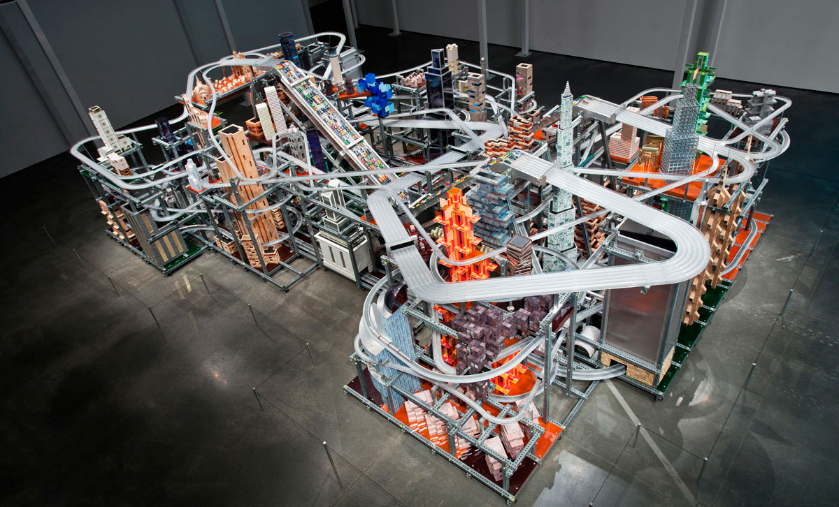
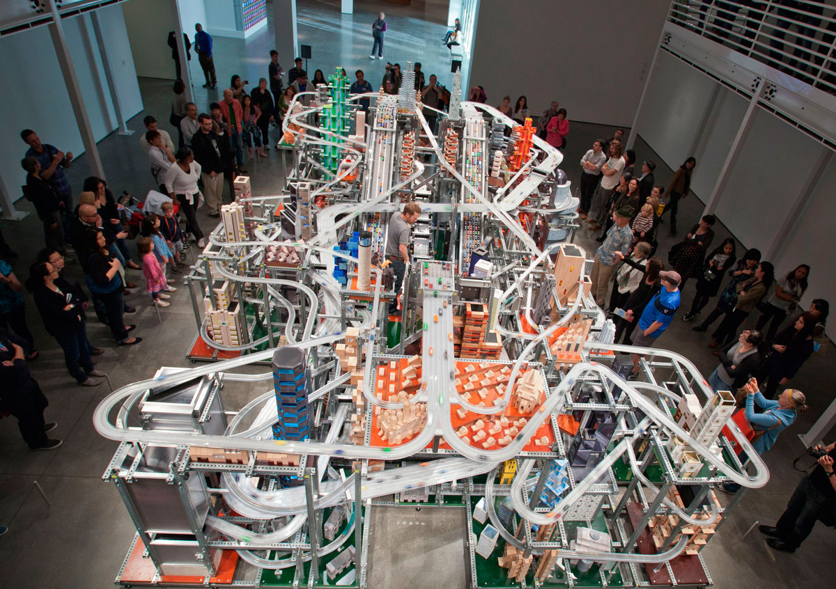
Created by artist Chris Burden, Metropolis II(2010) is a complex, large-scale kinetic sculpture modelled after a fast-paced modern city. The armature of the piece is constructed of steel beams, forming an eclectic grid interwoven with an elaborate system of eighteen roadways, including a six-lane freeway, train tracks, and hundreds of buildings. 1,100 miniature toy cars speed through the city at 240 scale miles per hour on the specially designed plastic roadways. Every hour, the equivalent of approximately 100,000 cars circulates through the sculpture. “The noise, the continuous flow of the trains, and the speeding toy cars, produces in the viewer the stress of living in a dynamic, active and bustling 21st Century city.”
Situated in the centre of the grid are three electrically powered conveyor belts, each studded with magnets at regular intervals. The magnets on the conveyor belt and those on the toy cars attract, enabling the cars to travel to the top of the sculpture without physical contact between the belt and cars. At the top, the cars are released one at a time and race down the roadways, weaving in and out of the structure, simulating rapid traffic and congestion.
Metropolis II is on long-term loan to LACMA, thanks to the generosity of LACMA Trustee Nicolas Berggruen. Beginning January 14, 2012, the work will be on view on the first floor of the Broad Contemporary Art Museum (BCAM) and run on weekends during the scheduled times below.
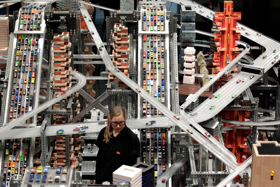
~ The cars are attached by a small magnet to the conveyor belt that brings them to the crest ~ The only motorisation of the cars is the conveyor belt to the top ~ Once the cars cross over the crest and head downward, their entire movement is by gravity ~ They travel at a scale speed of 240 mph, plus or minus ~ The tracks they take are Teflon coated to reduce friction ~ The tracks are beveled at 7 degrees to give added torque for speed when they come through corners and curves
Operator Alison Walker watches miniature cars move along the roads in Chris Burden’s latest kinetic sculpture, Metropolis II, at the Los Angeles County Museum of Art (LACMA) in Los Angeles, Wednesday, Jan. 11, 2012. The sculpture does more than just imitate life. The colorful display of roads, cars, trains and buildings is art imitating what the artist foresees life being like in five or 10 years.
Los Angeles County Museum of Art (LACMA) 5905 Wilshire Boulevard (at Fairfax Avenue) Los Angeles, CA, 90036 Phone: 323 857-6000
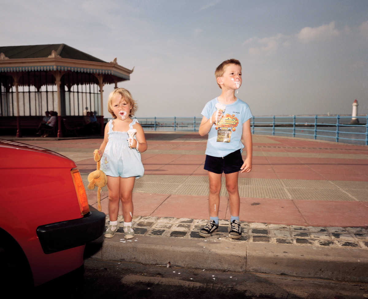
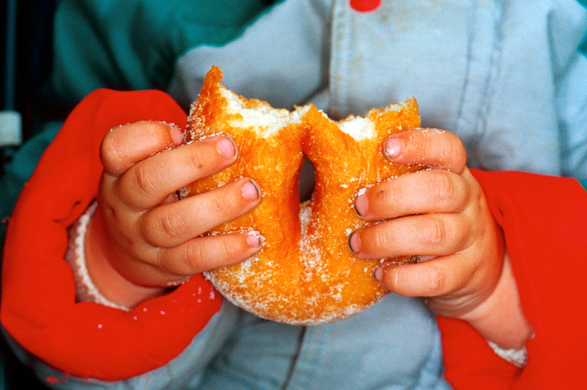
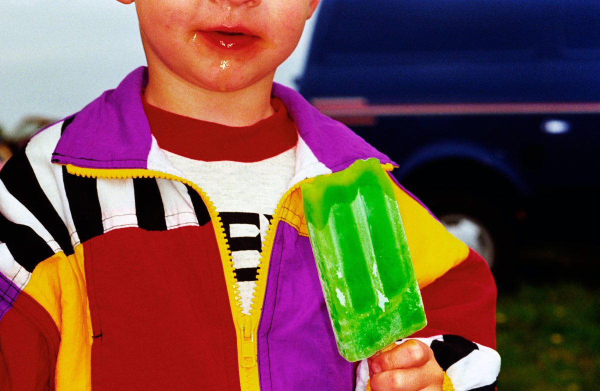
“And so it goes. The dirt under the fingernails of the child eating a doughnut, the lurid colours of the popsicle and jacket of the kid with dribble on his face…” Dr Marcus Bunyan
Exhibition dates: 6th March – 31st March, 2012
Curator: the artist
Martin Parr (British, 1952-2025) New Brighton, England From the series Last Resort 1983-1985 Pigment print Edition of 5 102 x 127cm Image courtesy of the artist and Niagara Galleries, Melbourne
This is a fine exhibition of the work of celebrated English photographer Martin Parr at Niagara Galleries, Richmond, albeit with one proviso.
The mainly large colour prints are handsomely displayed in plain white frames within the gallery space and are taken from his well known series: Last Resort, Luxury, New British and British Food. Parr’s work is at its best when he concentrates on the volume of space within the image plane and the details that emerge from such a concentrated visualisation – whether it be the tension points within the image, assemblage of colour, incongruity of dress, messiness of childhood or philistine nature of luxury.
The best photographs have a wonderful frisson about them, a genuine love of and resonance with the things he is imaging. This frisson can be seen in all of the photographs in this posting but most notably in :
~ The incursion of the surreal red colour to left in England. New Brighton (above) and Parr’s masterful use of vertical and horizontal lines within the image. Note the verticality: of the child’s toy, the two children themselves, the pillars of the pavilion and the lighthouse holding the whole image together at right. If this lighthouse were not there the eye would fall out of the image. As it is it is contained, forcing the viewer to look closely at the absurdity of the melting ice cream and the splashes that have fallen on the ground.
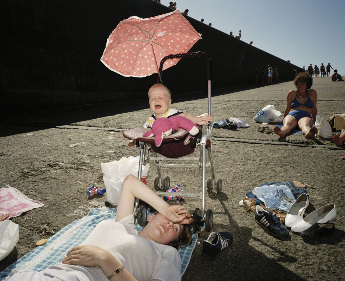
~ The complexity of the photograph England. New Brighton (below) where the eye does not know what to rest upon, constantly jumping from object to object. Do you look at the women on the ground, the shoes to right, the piece of fabric to left, the screaming baby, the sunlit pink umbrella, the women in blue bikini up the ramp, the long elongated shadowed wall with peek-a-boo heads leading to the outlined figures at the vanishing point of image – the top of the ramp. The understanding of light (with the use of flash) and the construction of the image is superlative. Wow!
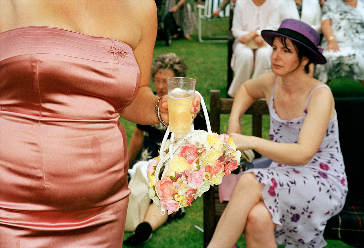
~ The incongruity evidenced in the photograph England, Ascot. 2003: the over tight pink sateen dress with unfortunate stain (which the eye is irrevocably drawn to), applique bow linked through to hideous flower embossed handbag which then contrasts with the seated women behind in hat and purple floral dress. In the large print in the gallery the background is more out of focus than in the small reproduction here, allowing the viewer’s eye an avenue of escape via the grass and deck chair beyond.
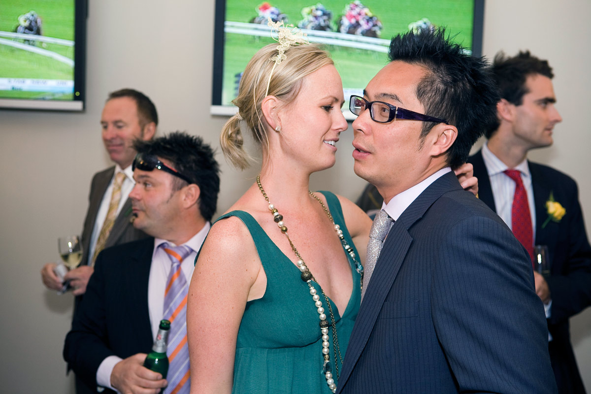
~ The delicious, choreographed mise-en-scène of Australia, The Melbourne Cup. 2008 – the suits, ties and glasses, the teezed hair, the alcohol – where none of the participants is looking at the camera, where only the ladies hand clutches at the back of the man’s shoulder. They look down, they look left, they look right, they look away, they never engage with each other or the viewer. The critical space in this assemblage is the distance between the man and the woman’s noses, that vitally small space of separation that is a synonym for the interactions occurring in the rest of the image. The blindness of Lux’ry, its crassness, its stain.
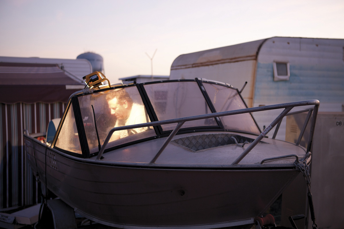
And so it goes. The dirt under the fingernails of the child eating a doughnut, the lurid colours of the popsicle and jacket of the kid with dribble on his face, all fantastic. There are moments of stasis, for example in the contemplative photograph Australia. South Hedland. Blackrock Tourist Park. 2011 (below) taken from Parr’s new series Australia, where Parr has photographed Australian life in three Western Australian port cities, Fremantle, Broome and Port Hedland. See the video at the bottom of the posting and listen to Parr talk about his work.
This is all fine and dandy, dressed up in polka dots and a lurid bow tie, but when the photographs become too reductive, as in the large photograph in the exhibition England. Dorset. West Bay. 1997 (see first column, fourth down) there is really not enough to hang your hat on. This feeling of over simplification, as though the photographer has said to himself “here’s something I have seen that you haven’t recognised, and I think it is important for you to recognise it” – the perceived essentialness of the object – can become a bit strained. I know that these type of images are part of the series about British or Scottish food or about objects from a specific place but do they really have this grand an importance in the scheme of things? This feeling is reinforced in the exhibition, and this is my proviso to show, when the images such as Scotland. Glasgow. Fairy cakes. 1999, England. Blackpool. 1995 (bread and butter on a plate on red check cloth) are presented at A4 size surrounded by heavy white frames. These photographs have to be large to have any chance of working at all and at the small size they fall flat.
The size of a photograph raises interesting questions about the display of contemporary photography. The giant light boxes of Jeff Wall, the huge group portraits of Thomas Struth, the huge portraits of Thomas Ruff, the huge environments of Candida Hofer and the huge panoramas of Andreas Gursky (to name but a few) are all points in case. Would they work at a smaller size? No. They rely on scale and detail, visual impact for their effect: the same with Martin Parr. What is really ‘In Focus’ is the visualisation of the artist, his ability to envisage the final print at this large size. The A4 prints in this exhibition simply do not work at that size, for these photographs.
Think of Ansel Adams’ famous Monolith, The Face of Half Dome, Yosemite National Park, Calif., (circa 1926). Originally printed as a contact 8″ x 10″ from the negative, Adams gradually increased the size of this image till it became a huge print as tall as a man in his later life. The image works at multiple sizes, it spoke to him (and the viewer) at all these sizes: the small contact is intense and gem-like, the larger imitating the monolithic structure of the Face itself. I feel that some large contemporary photographs are quite vacuous at this large size, that there is no reason for them to be at this size. In other words it is not appropriate for the image. Conversely it would seem that artists previsualise for this size in the end print, which is fine, but that the print cannot exist, cannot breathe in the world at a smaller size. Is this a problem? Does this matter? I believe it does, especially when a photograph is displayed at a size that simply doesn’t work. I was always taught to print a photograph at an appropriate size for the image, whatever size(s) that may be (and there can be multiples), as long as it has resonance for that particular image.
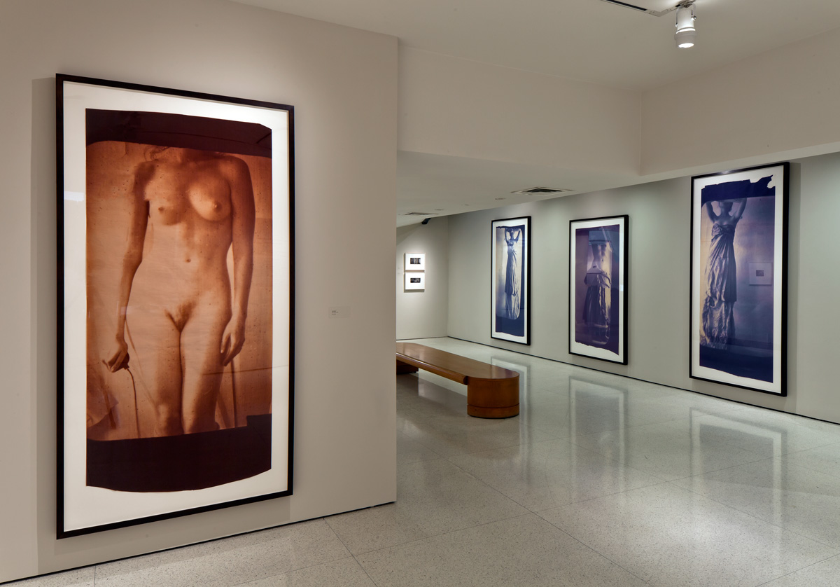
As evidenced in this exhibition, if the photograph cannot “work” at the size that it is to be exhibited then it should not be displayed at all – it is a diminution not just of the artists vision but of the resonance of the photograph, in this case going from large to small. In an upcoming posting about the retrospective of the work of American photographer Fransceca Woodman, there is an installation photograph of the exhibition at The Guggenheim, New York (see above). Her vintage prints (seen in the background) – small, intense visions – have been printed at a huge scale (with her permission) and they simply do not work at this floor to ceiling height. They have lost all of their intimacy, which is one of the strengths of her photography. Again, I believe it is a diminution of the artists vision and the integrity of the photograph, this time from small to large. Artists are not always right. The same can be said of the retrospective of Cartier-Bresson that I saw at the National Galleries of Scotland in Edinburgh in 2005. One room out of four had very small, intense vintage prints in brown hues and the other three galleries had large 20″ x 24″ grainy prints with strong contrast that really ruined any response I had to the work as evidenced by the vintage prints. They were almost reproductions, a simulacra of the real thing. I had a feeling that they weren’t even by the artist himself. The same could be said here.
To conclude I would say this is a fine exhibition of large photographs by Martin Parr that would have been even more focused without the small A4 prints. They are joyous paeans to the quirky, incongruous worlds in which we live and circulate. They evidence life itself in all its orthogonal absurdity. I love ’em!
Dr Marcus Bunyan
Many thankx to the artist and Niagara Galleries for allowing me to publish the photographs in the posting. Please click on the photographs for a larger version of the image.
Francesca Woodman installation photograph at The Guggenheim Museum, New York. Note the small, vintage prints on the far wall.
Martin Parr (British, 1952-2025) New Brighton, England From the series The Last Resort 1983-1985 Pigment print Edition of 5 102 x 127cm Image courtesy of the artist and Niagara Galleries, Melbourne
Martin Parr (British, 1952-2025) Blackrock Tourist Park, South Hedland, Australia, 2011 From the series Australia 2011 Pigment print Edition of 5 101.6 x 152.4cm Image courtesy of the artist and Niagara Galleries, Melbourne
Martin Parr (British, 1952-2025) Ascot, England, 2003 From the series Luxury 1995-2009 Traditional C-type print Edition of 5 101.6 x 152.4cm Image courtesy of the artist and Niagara Galleries, Melbourne
Martin Parr (British, 1952-2025) The Melbourne Cup, Australia, 2008 From the series Luxury 1995-2009 Pigment print Edition of 5 101.6 x 152.4cm Image courtesy of the artist and Niagara Galleries, Melbourne
Martin Parr (British, 1952-2025) Ramsgate, England, 1996 From the series New British 1994-1996 Traditional C-type print Edition of 5 105.5 x 157.5cm Image courtesy of the artist and Niagara Galleries, Melbourne
Martin Parr (British, 1952-2025) Car boot sale, Bristol, England, 1995 From the series British Food 1994-1995 Traditional C-type print Edition of 33 18 x 25.5cm Image courtesy of the artist and Niagara Galleries, Melbourne
No Worries: Martin Parr – FotoFreo 2012
Magnum photographer Martin Parr was asked by FotoFreo Festival Director Bob Hewitt to photograph three Western Australian port cities, Fremantle, Broome and Port Hedland. Photographer David Dare Parker was assigned to document the project, the work titled No Worries.
Exhibition dates: 9th December, 2011 – 1st April, 2012
Curator: Ann Thomas, Curator of Photographs
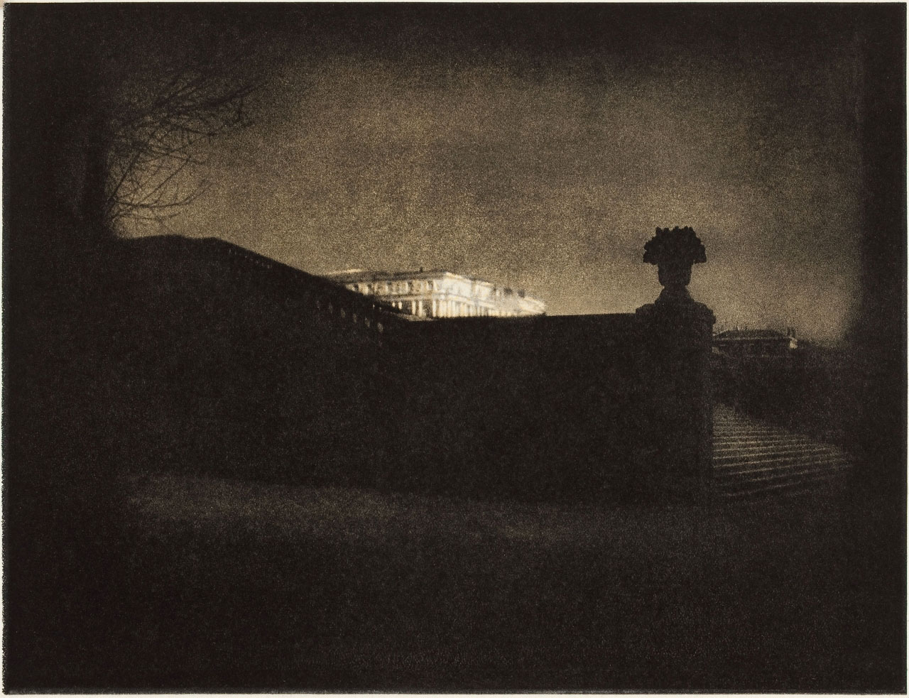
Edward Steichen (American, 1879-1973) Nocturne – Orangery Staircase, Versailles 1908 Purchased 1976 National Gallery of Canada, Ottawa
Stunning photographs in this posting: Steichen’sNocturne – Orangery Staircase, Versailles (1908) is just sublime; Sheeler’s Side of a White Barn (1917) is early Modernist perfection, rivalling Paul Strand’s The White Fence, Port Kent (1916); Barbara Morgan’s photograph of dancer Martha Graham (1940) portraying, radiantly, her divine dissatisfaction; and the most beautiful portrait by Imogen Cunningham of Frida Kahlo (1931).
Every time I see this portrait I nearly burst into tears – the light falling from the right and from the left onto the boards behind her, the texture of her cloak, the languorous nature of her hands, her absolute poise and beauty – looking straight into the camera, looking straight into your soul. What a beautiful woman, such strength and vulnerability.
A stunning photograph of an amazing woman.
The photograph just takes your breath away…
Dr Marcus Bunyan
Many thankx to the National Gallery of Canada for allowing me to publish the photographs in the posting. Please click on the photographs for a larger version of the image.
Charles Sheeler (American, 1883-1965) Side of a White Barn, Pennsylvania 1917 Gelatin silver print 7 5/8 x 9 5/8 in. The J. Paul Getty Museum
“Lines and texture define this view of the side of a white barn. In the photographic rendering, the white barn is a soft gray, punctuated by knots in the wood and shadows cast by the uneven boards. In the lower right corner of the image, a small window, a fence, and a chicken standing atop a pile of hay add visual weight yet surrender to the repetitive, vertical domination of the structure. Like every other line, the horizontal line dividing the areas of wood and plaster is drawn without a straight edge.”
Barbara Morgan (American, 1900-1992) Martha Graham, Letter to the World, “Kick” 1940, printed c. 1945 Gelatin silver print 38.6 x 48.2cm National Gallery of Canada, Ottawa
“There is a vitality, a life force, a quickening that is translated through you into action, and because there is only one of you in all time, this expression is unique. And if you block it, it will never exist through any other medium and be lost. The world will not have it. It is not your business to determine how good it is, nor how valuable it is, nor how it compares with other expressions. It is your business to keep it yours clearly and directly, to keep the channel open. You do not even have to believe in yourself or your work. You have to keep open and aware directly to the urges that motivate YOU. Keep the channel open… No artist is pleased… There is no satisfaction whatever at any time. There is only a queer, divine dissatisfaction; a blessed unrest that keeps us marching and makes us more alive than the others.”
Martha Graham to Agnes DeMille
In the first five decades of the 20th century photography came into its own – both as an art form and as a tool to document social and political change. American photographers were exploring both the poetic and transformative expressiveness of the medium, as well as recording the growth and change of the country in its various phases of industrial development. On view until April 1, 2012, Made in America 1900-1950: Photographs from the National Gallery of Canada looks at both approaches, and the divisions between the two, as they are necessarily porous and somewhat arbitrary.
“The Gallery’s collection is so rich in 20th century American photographs that it needs an exhibition in two parts and a catalogue in two volumes. This first presentation focuses on the period between 1900 and 1950,” noted NGC director Marc Mayer. “This comprehensive collection has been amassed in large part through the generosity of brilliant collectors.”
“Each of [the decades] is characterised by tremendous growth, change, and creative thought about the medium and its reception in the United States,” noted curator Ann Thomas in the catalogue, American Photographs 1900-1950.
It was a period of great technical and technological change: such as the introduction of the personal 35mm camera in the early 1920s, following the German model developed by Leica, and Ansel Adams’ and Fred Archer’s creation of the zone system to determine optimal film exposure and development.
Composed of over 130 photographs, two issues of Camera Work, one issue of Manuscripts, and several period cameras, the exhibition Made in America celebrates the exceptional contribution that American photographers made to the history of art in the 20th century. Made been 1900-1950, these photographs represent an extraordinarily fertile period in the evolution of photography. They include stunning works by Alfred Stieglitz, Edward Steichen, Clarence White, Paul Strand, Walker Evans, Margaret Bourke-White, Dorothea Lange, Berenice Abbott, Ansel Adams, Lisette Model, Weegee, and members of New York’s Photo League.
Made in America is the fourth in a series of exhibitions and catalogues presenting the Gallery’s outstanding collection of international photographs. It follows Modernist Photographs (2007), 19th Century French Photographs (2010), and 19th Century British Photographs (2011).
Made in America 1900-1950: Photographs from the National Gallery of Canada explores a dynamic period in the history of photography when the medium was emerging as both an art form and a tool for documenting social change. Presenting 134 works from the National Gallery’s extraordinary collection of American photographs, this exhibition chronicles the evolution of the medium, beginning with Pictorialism and moving through modernism, straight photography and documentary work. On the walls are some truly magnificent, iconic works by the most influential photographers, among them Alfred Stieglitz’s The Steerage, Edward Steichen’s Nocturne – Orangerie Staircase, Versailles, Ansel Adams’ Moonrise, Hernandez, New Mexico and Barbara Morgan’s Martha Graham, Letter to the World (Kick).
At the turn of the 20th century, American photographers were fully engaged in the Pictorialist aesthetic, creating pastoral landscapes, foggy street scenes and idealised portraits of women and children. With their soft focus and gentle lighting, the images convey a romantic moodiness. Pictorialist photographers often manipulated their negatives and prints to achieve painterly effects. Gertrude Käsebier’s Serbonne, for instance, is reminiscent of an Impressionist painting.
Around the mid-teens, artists such as Stieglitz, Paul Strand and Walker Evans came to reject the notion of photography imitating painting, and instead sought to take advantage of the medium’s inherent, unique characteristics, especially its ability to achieve sharp definition, even lighting and smooth surfaces. The result was ground-breaking modernist work such as Stieglitz’s Equivalent series, Alvin Langdon Coburn’s Vortograph and Charles Sheeler’s Side of White Barn.
Out on the west coast in the early 1930s, Group f.64 was committed to the ideal of pure, un-manipulated, or “straight” photography. Edward Weston’s nudes and juniper trees, and Imogen Cunningham’s portrait of Frida Kahlo demonstrate the hallmarks of f.64: crisp detail, sharp focus, and often a sensual minimalism.
The first decades of the 20th century also provided rich subject matter for documentary photographers, as social and economic changes dramatically transformed daily life. Lewis Hine’s photographs of immigrants and child labourers tell fascinating stories, as do images of the Depression by Dorothea Lange and Walker Evans. The Photo League sent its members out into New York’s streets to capture ordinary people on film. Helen Levitt, Jerome Liebling and Sol Libsohn chronicled small dramas unfolding on sidewalks.
Visitors familiar with Ansel Adams’ grand, sublime landscapes might be surprised by his more contemplative series of foaming Pacific waves, titled Surf Sequence. Sharing the gallery space is Minor White’s poetic series Song Without Words, made along the same coast. Both demonstrate an almost cinematic approach to photograph-making and plunge the viewer into seaside reverie.
Press release from the National Gallery of Canada website
Alvin Coburn (American, 1882-1966) Vortograph 1917 Gelatin silver print 11 1/8 x 8 3/8″ (28.2 x 21.2cm) Courtesy of George Eastman House, International Museum of Photography and Film
The intricate patterns of light and line in this photograph, and the cascading tiers of crystalline shapes, were generated through the use of a kaleidoscopic contraption invented by the American / British photographer Alvin Langdon Coburn, a member of London’s Vorticist group. To refute the idea that photography, in its helplessly accurate capture of scenes in the real world, was antithetical to abstraction, Coburn devised for his camera lens an attachment made up of three mirrors, clamped together in a triangle, through which he photographed a variety of surfaces to produce the results in these images. The poet and Vorticist Ezra Pound coined the term “vortographs” to describe Coburn’s experiments. Although Pound went on to criticise these images as lesser expressions than Vorticist paintings, Coburn’s work would remain influential.
Gallery label from Inventing Abstraction, 1910-1925, December 23, 2012 – April 15, 2013.
Gertrude Kasebier (American, 1852-1934) Serbonne 1902, printed 1903 From Camera Work, January 1903 Gum bichromate, halftone National Gallery of Canada, Ottawa
Imogen Cunningham (American, 1883-1976) Frida Kahlo 1931 Gelatin silver print National Gallery of Canada, Ottawa
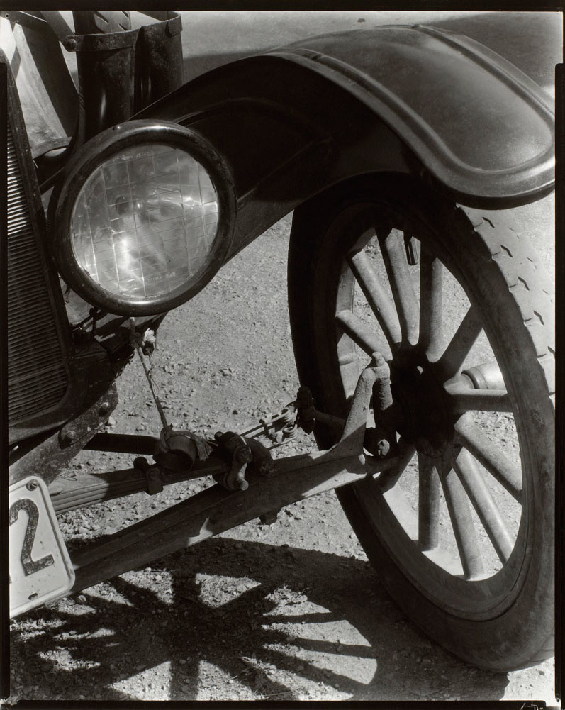
Ralph Steiner (American, 1899-1986) Model T 1929, printed later Gelatin silver print Image: 24.2 x 19.7cm National Gallery of Canada, Ottawa
“Every observation on contemporary politics, war and beauty regimes is concisely conceptualised and executed with panache and humour.” Dr Marcus Bunyan
Exhibition dates: 6th March – 24th March, 2012
Curator: the artist
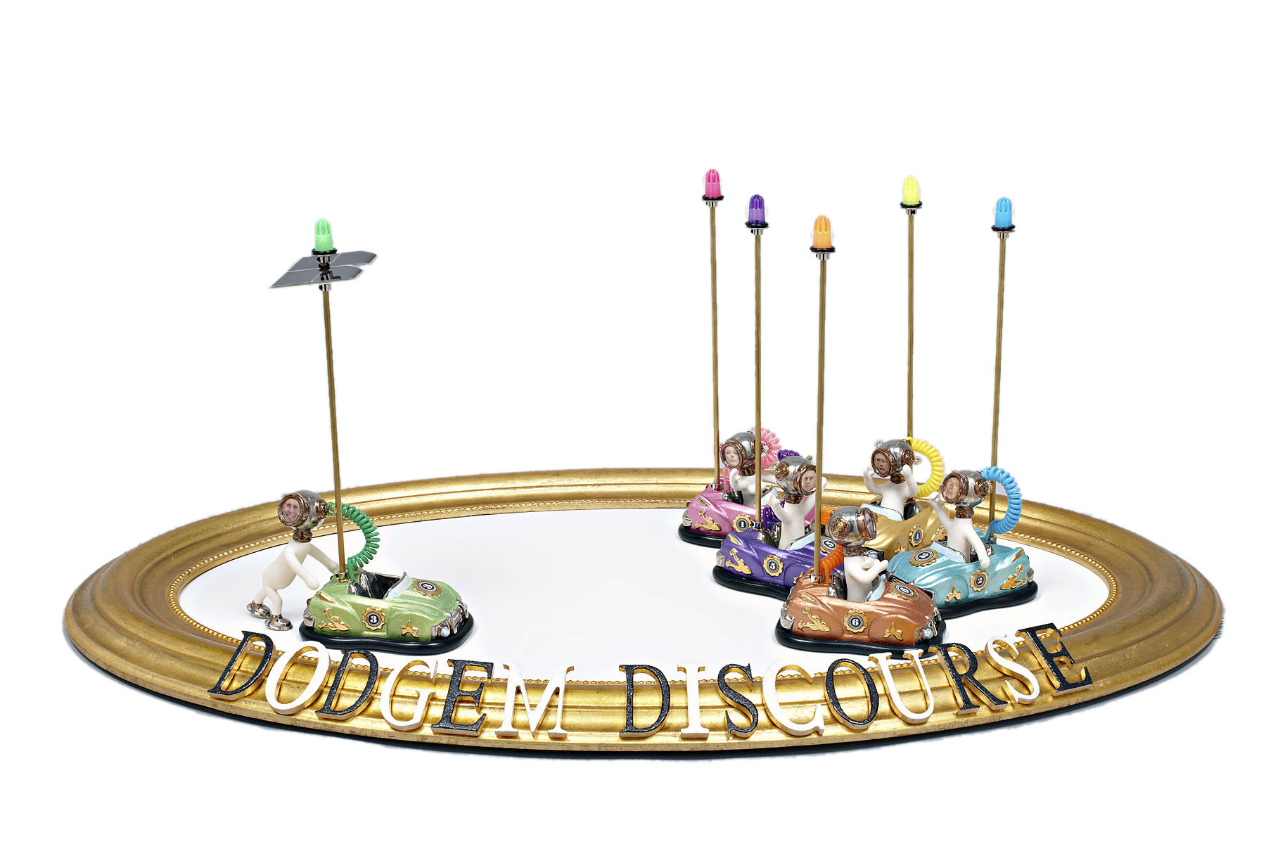
Robyn Hosking (Australian, b. 1948) Dodgem Discourse 2011 Mixed media
Although not the first to promote the concept, Anita Traverso Gallery must be congratulated for exhibiting nine unrepresented emerging and mid-career artists in the AT_SALON exhibition program. This inaugural exhibition features hand-picked artists practicing over a variety of media including ceramics, textiles, drawing, painting and photography allowing them to exhibit in a professional gallery environment which bridges the gap between artist-run spaces and full gallery representation.
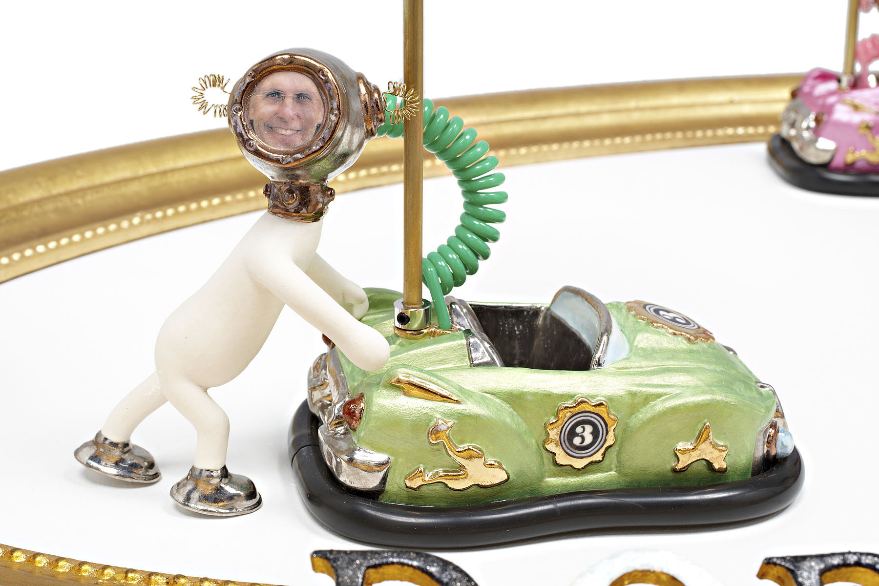
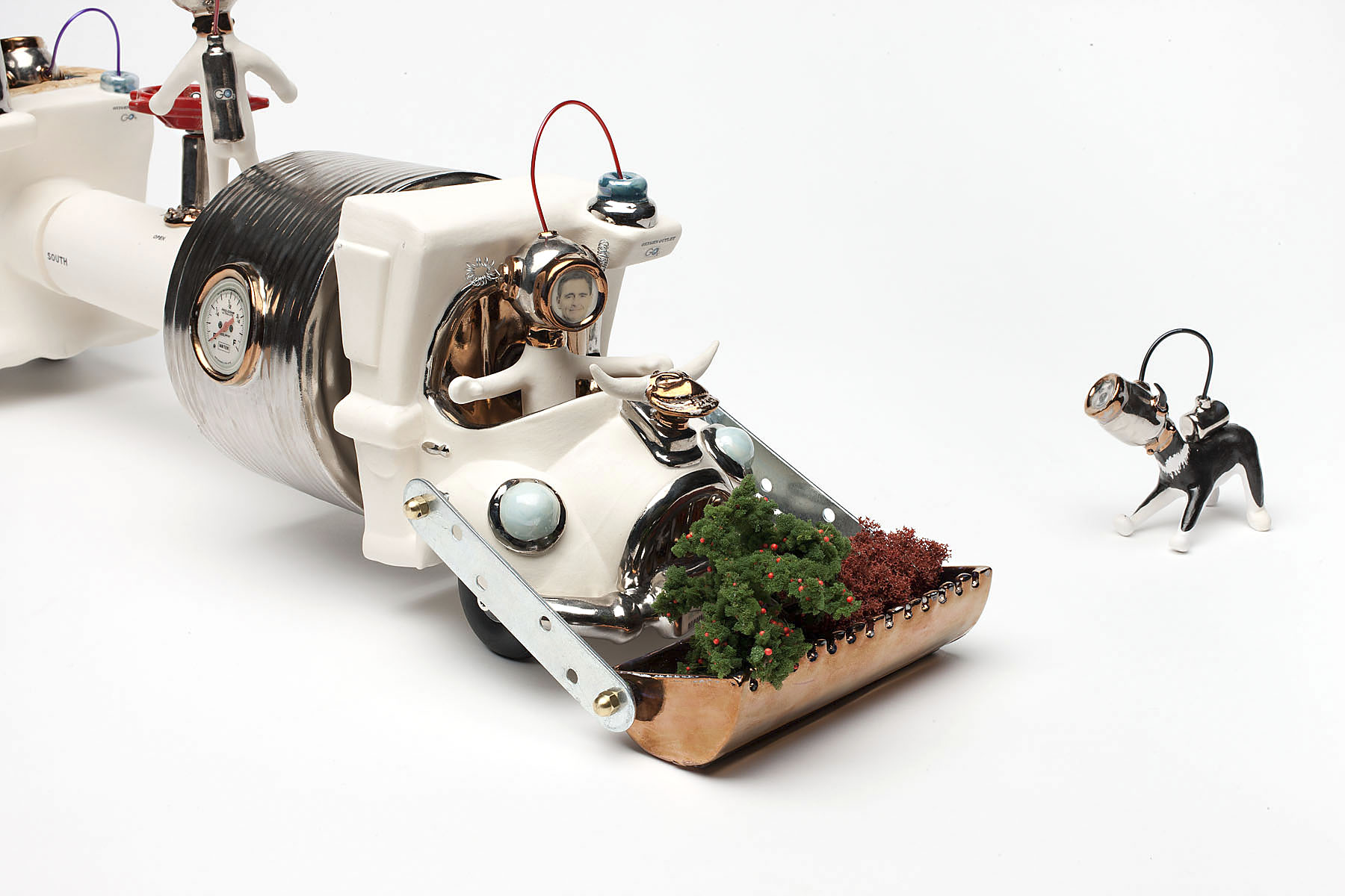
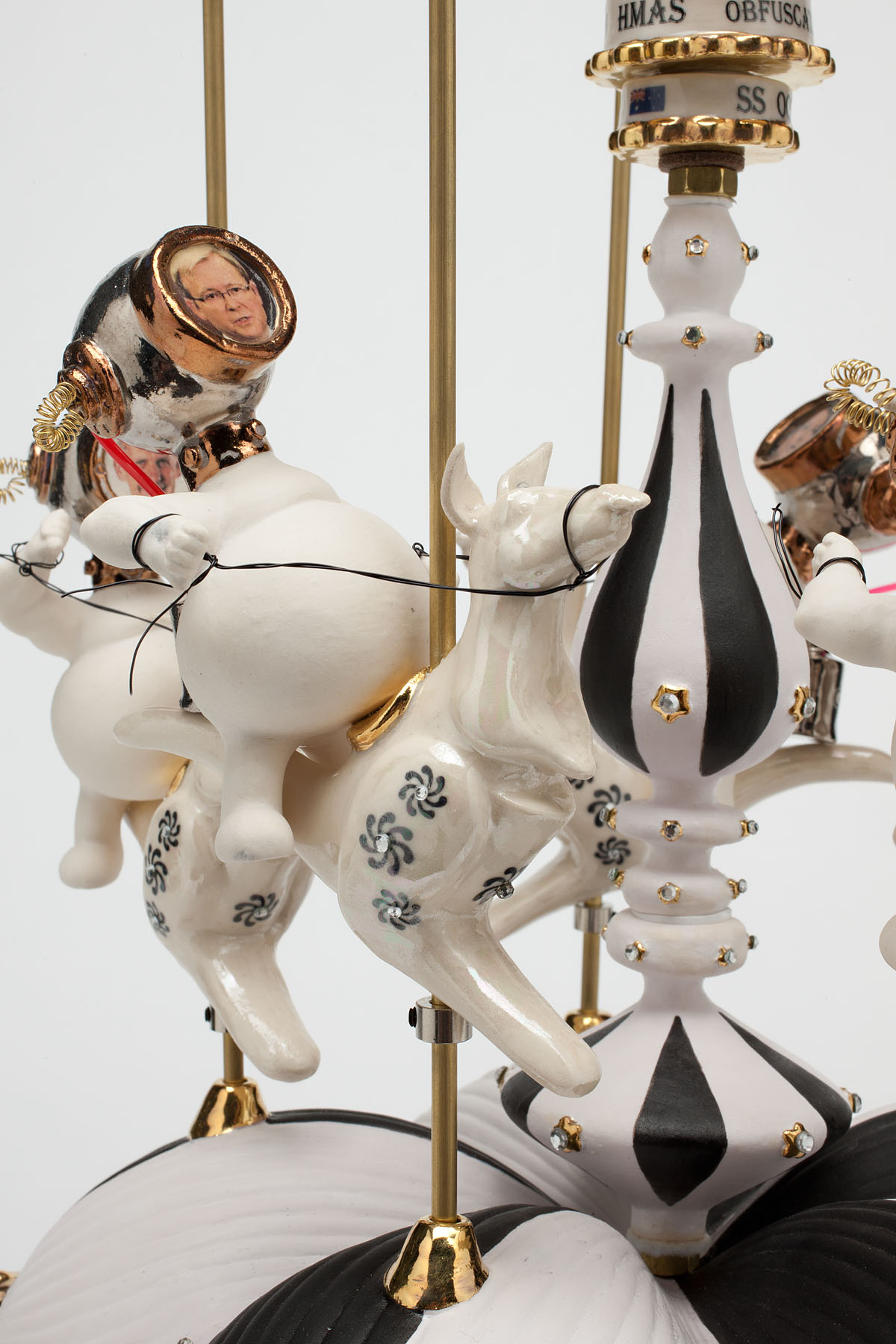
Out of the nine artists it was the hilarious work of Robyn Hosking that was the standout for me. While guffaw inducing one couldn’t help but be entranced by these waggish, chimerical creations and wonder at their technical brilliance. Every detail, every nuance is meticulously observed and the sculptures are beautifully made (mostly using glazed ceramics). Every observation on contemporary politics, war and beauty regimes is concisely conceptualised and executed with panache and humour. For example, in the work Dodgem Discourse (2011) Senator Bob Brown, leader of the Australian Greens, is the only diver figure not to be in his dodgem car while everyone else is bashing into each other, having got out to push his car because the solar power has failed. What you cannot see in the photograph is that the lights atop the dodgem poles flash on and off on every other car except his! While Julia Gillard’s car is emblazoned with the number 1 on its side, another gem is that the number plates say “Question Time” referring to question time in Parliament, but also a double entendre as the viewer questions the supposed wisdom of our elected officials.
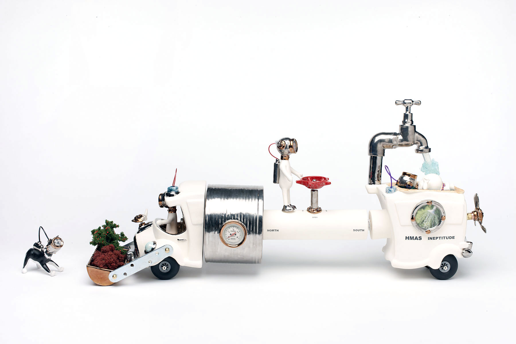
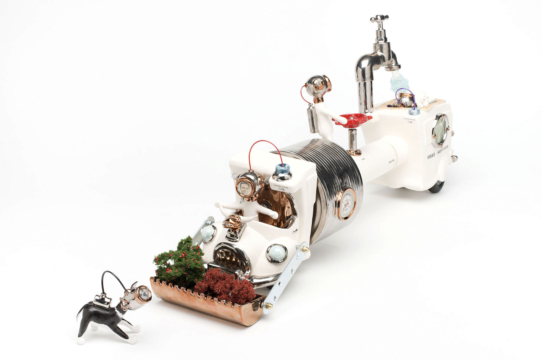
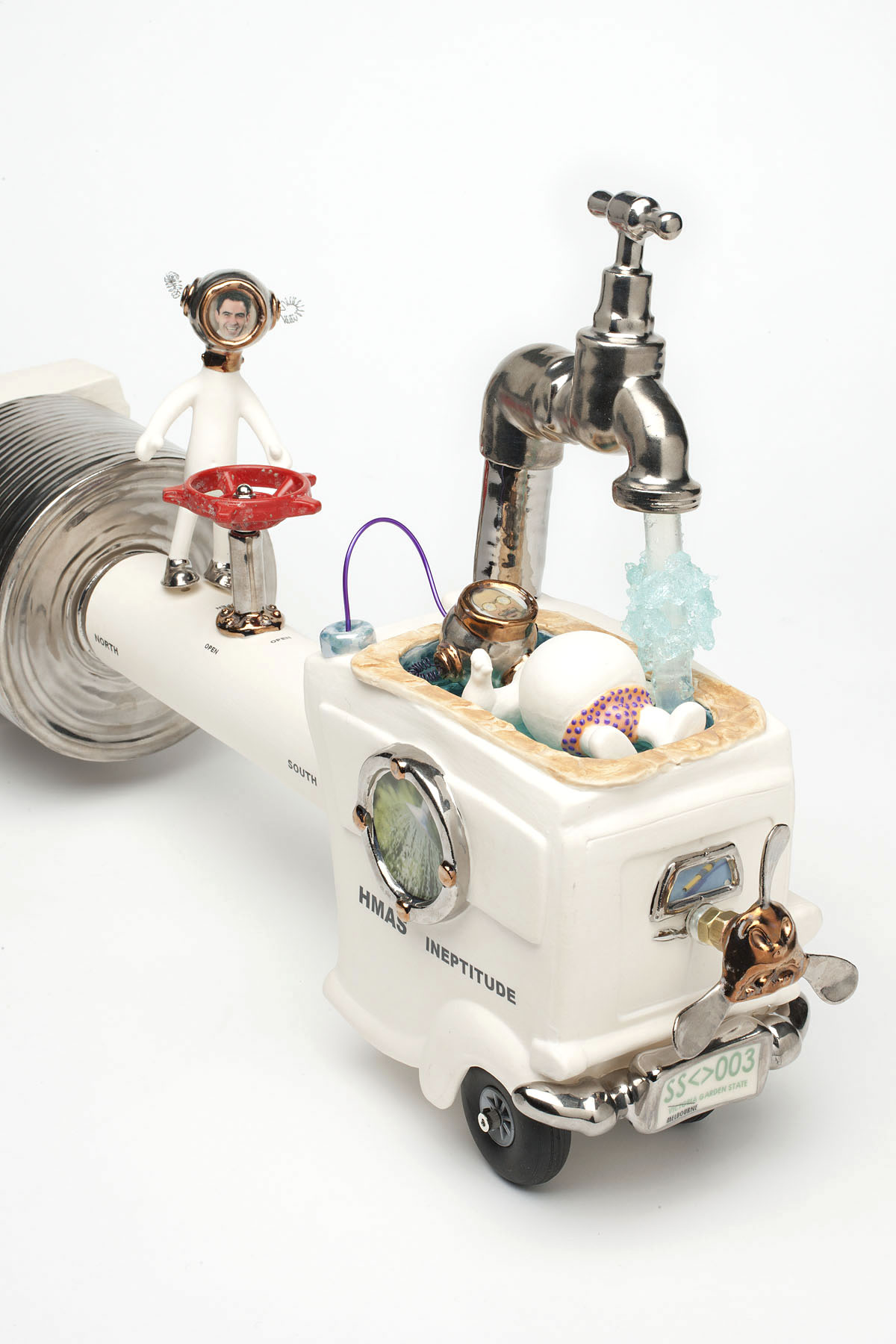
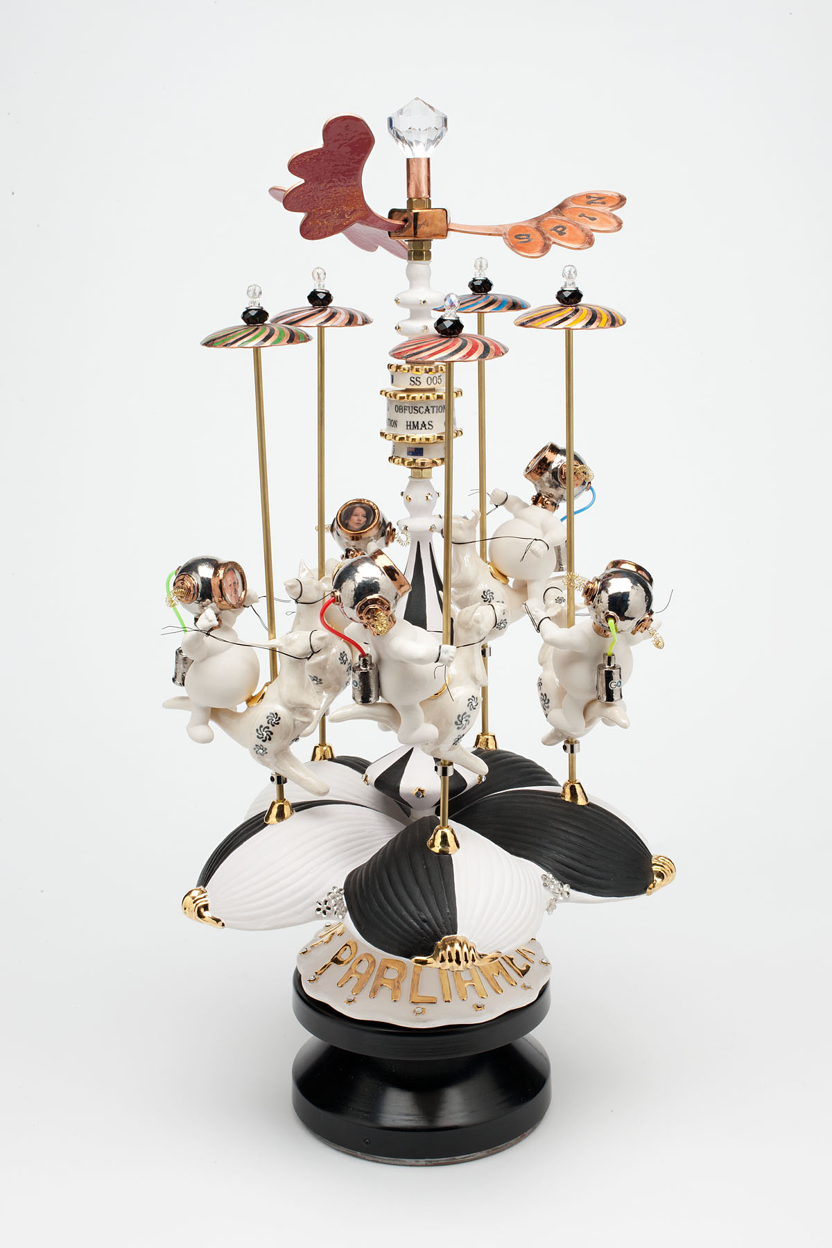
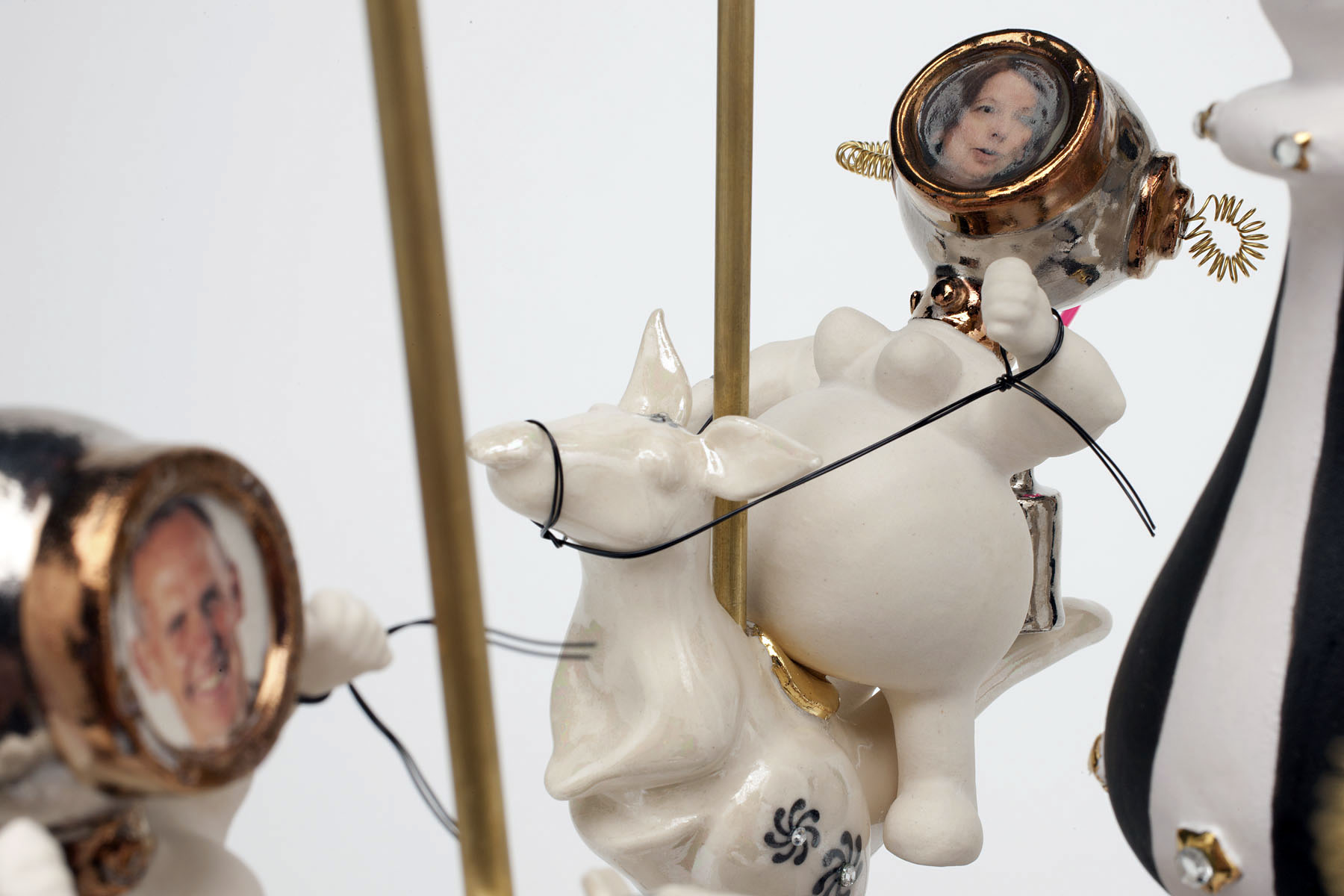
HMAS Ineptitude (2011) assiduously comments on the white elephant that is the North South pipeline while the slowly revolving HMAS Obfuscation (2011) – how I love that word: the hiding of intended meaning in communication, making communication confusing, wilfully ambiguous – spins the SPIN, spelt out on the wing-like form at the top of the sculpture, on the machinations of our politicians who are mounted on rearing ceramic kangaroos with the large, gold lettered word PARLIAMENT on the base. Profound, amusing and beautifully made.
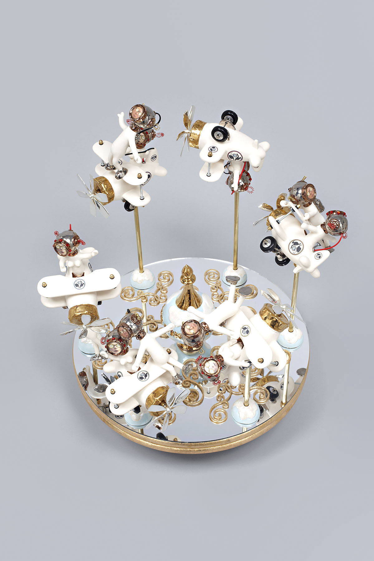
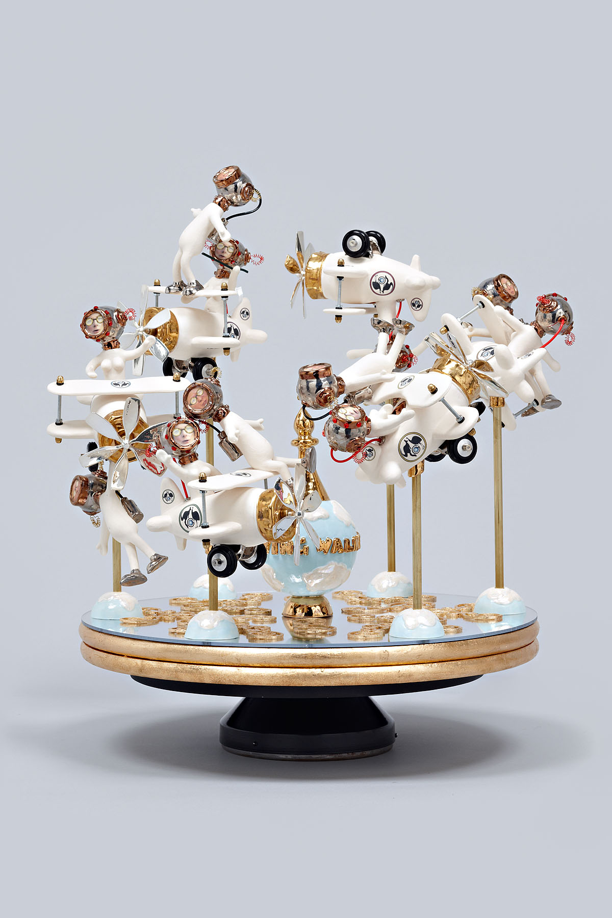
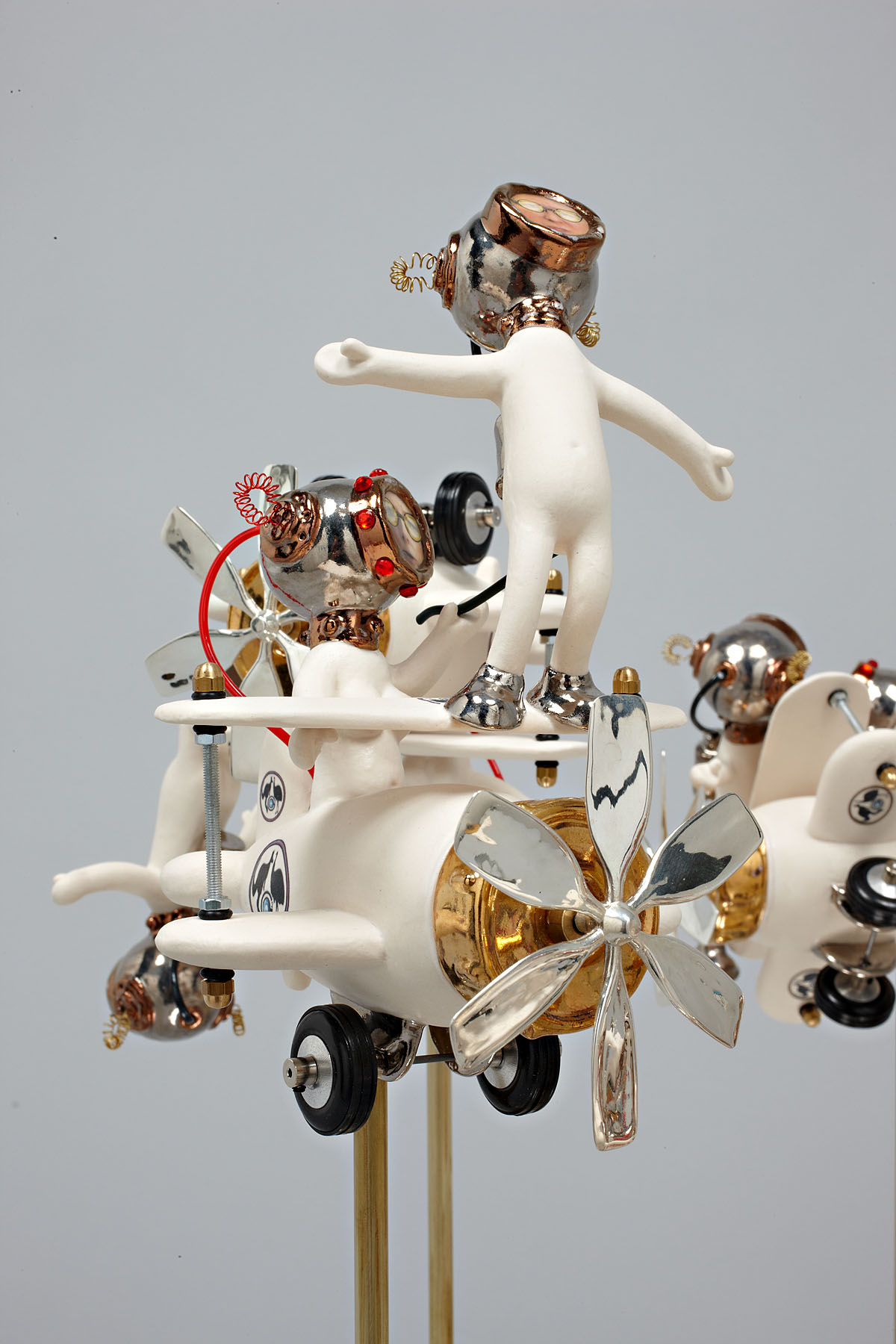
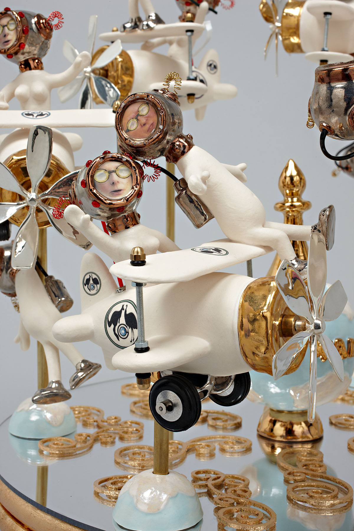
My favourite has to be The Wing Walker (2011) as an irate Julia Gillard tries to get rid of Kevin Rudd once and for all, even poking him with a stick to push him off the edge of the biplane. Balanced on a slowly revolving turntable with the world at its centre, this political merry-go round is panacea for the soul for people sick of politicians. This is brilliant political satire. The planes are all ends up and even when Julia thinks she has got rid of Kevin there he is, hanging on for dear life from the undercarriage of one of the planes. Priceless…
Reminding me of the fantasy creatures of Tom Moore, these whimsical manifestations deal with serious, life changing and challenging issues with purpose, feeling and a wicked sense of humour. I really enjoyed this art (and joy is the correct word) because it takes real world issues, melds fantasy and pointed observation and reflects it back, as the artist observes, in a funfair’s distorted mirror.
Magic!
Dr Marcus Bunyan
Many thankx to Anita for allowing me to publish the photographs in the posting. Please click on the photographs for a larger version of the image.
Robyn Hosking (Australian, b. 1948) Dodgem Discourse (detail) 2011 Mixed media
Robyn Hosking (Australian, b. 1948) The Wing Walker 2011 Mixed media
Robyn Hosking (Australian, b. 1948) The Wing Walker (detail) 2011 Mixed media
Robyn Hosking Artist Statement
My work launches a humorous, freewheeling attack on our desensitisation to the white noise and emptiness surrounding us. Looking like a hybrid between art, machine and toy, my sculptures maintain a circus-like sense of amusement and curiosity for the viewer, all the while sending up societal norms and politics.
I like to celebrate the lavishly eccentric design of past eras and the sense of possibility it embodied. As hackneyed as it sounds, a Brave New World is upon us, stranger perhaps than our imaginations can conceive of. While my work casts a disparaging eye at the use of technology for inane and selfish reasons – from Botox to weaponry – it retains a playful, humorous edge. I am not interested in producing depressingly macabre images. Every work becomes a caricature or parody, as though the world is being viewed in a funfair’s distorted mirror.
Robyn Hosking (Australian, b. 1948) HMAS Ineptitude 2011 Mixed media
Robyn Hosking (Australian, b. 1948) HMAS Ineptitude (detail) 2011 Mixed media
Robyn Hosking (Australian, b. 1948) HMAS Obfuscation 2011 Mixed media
Robyn Hosking (Australian, b. 1948) HMAS Obfuscation (detail) 2011 Mixed media
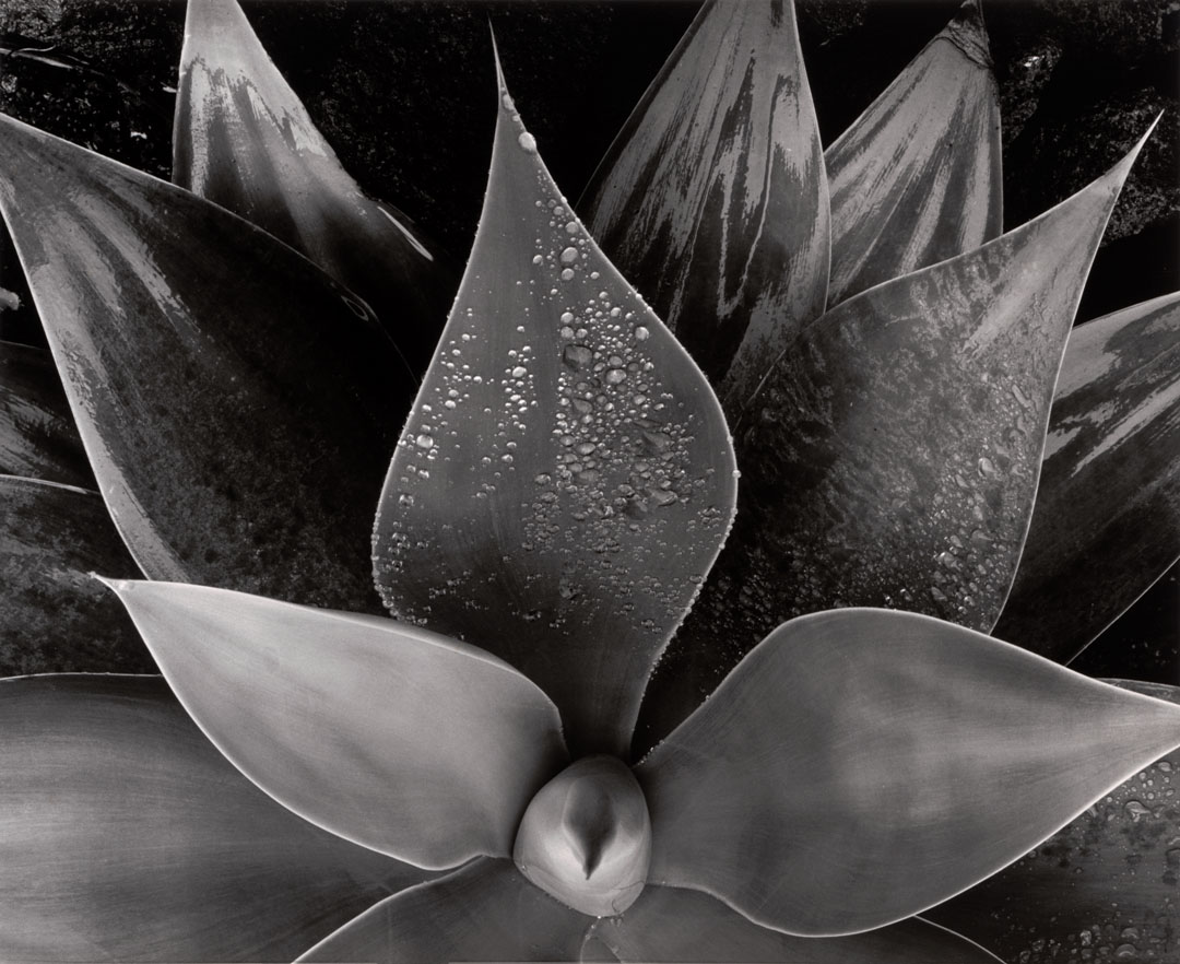
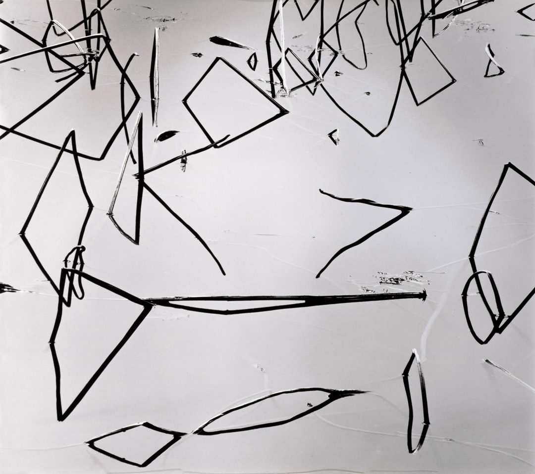
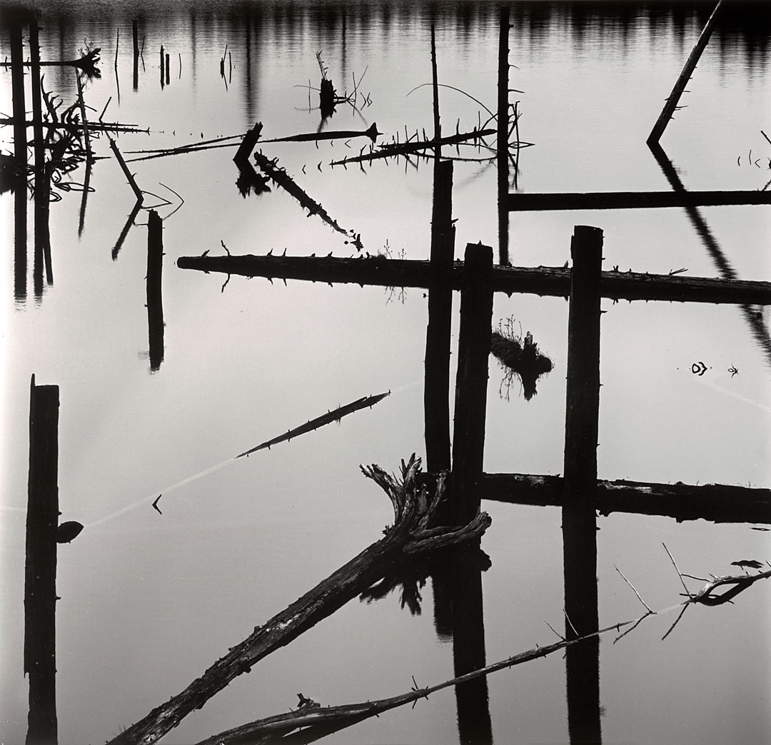
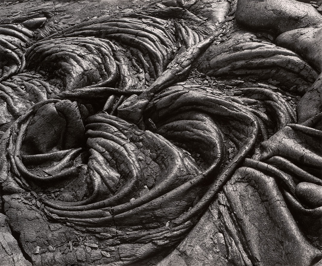
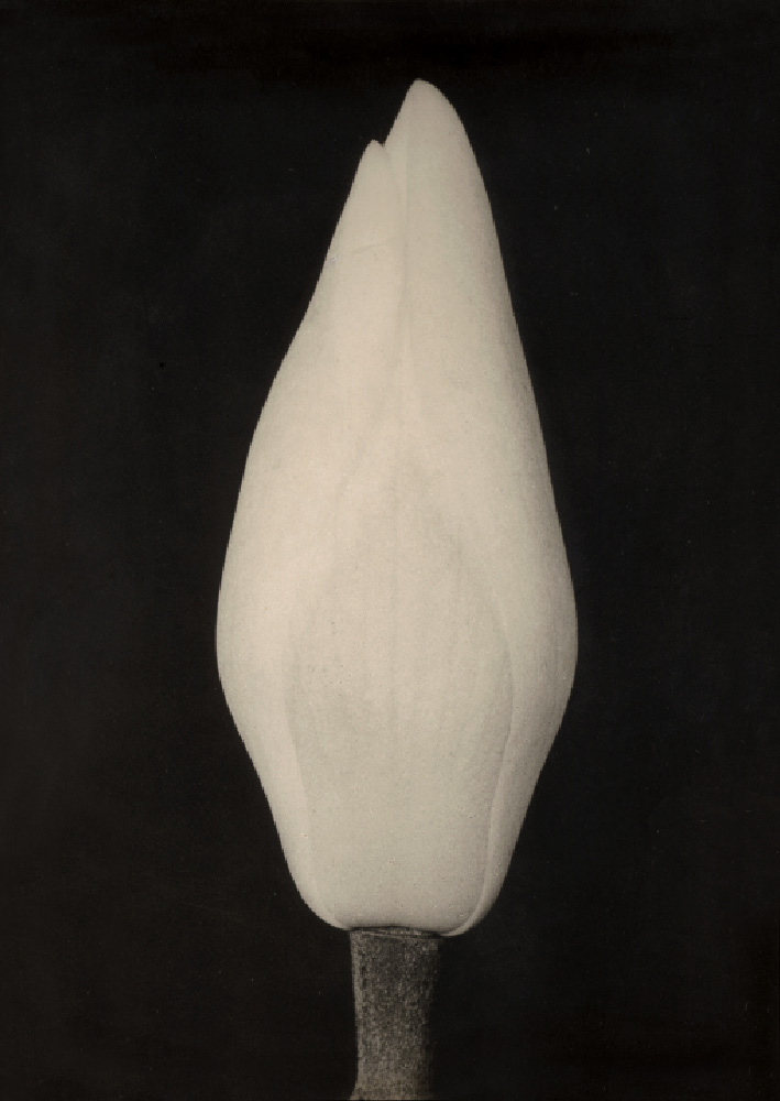
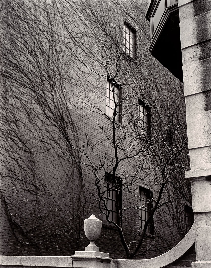
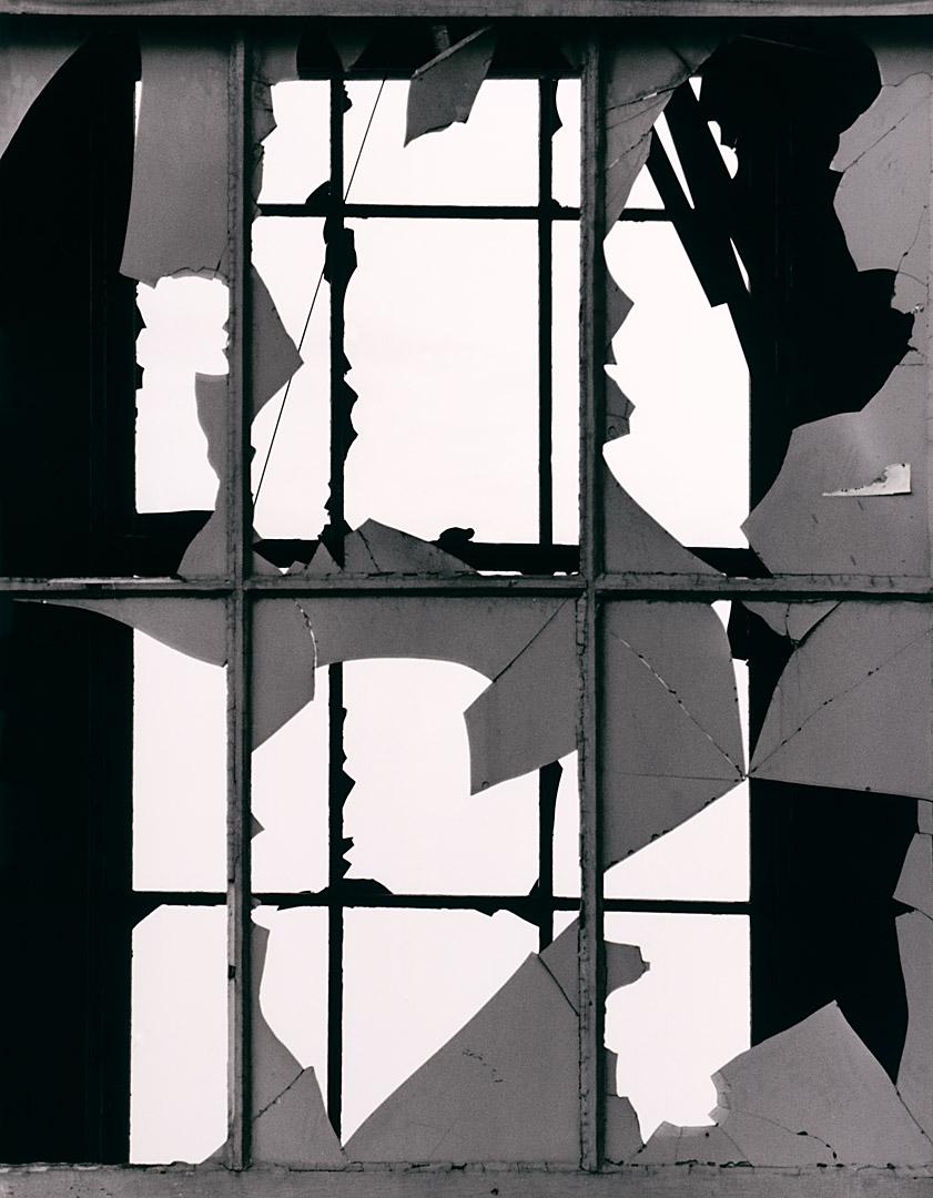
Brett Weston’s pictures are ageing well – the decorative aesthetic seems to have more currency today than previously when the values of his father were predominant. Perhaps this has to do with the continuing influence of the Bechers and the exhibition New Topographics: Photographs of a Man Altered Landscape (1975).
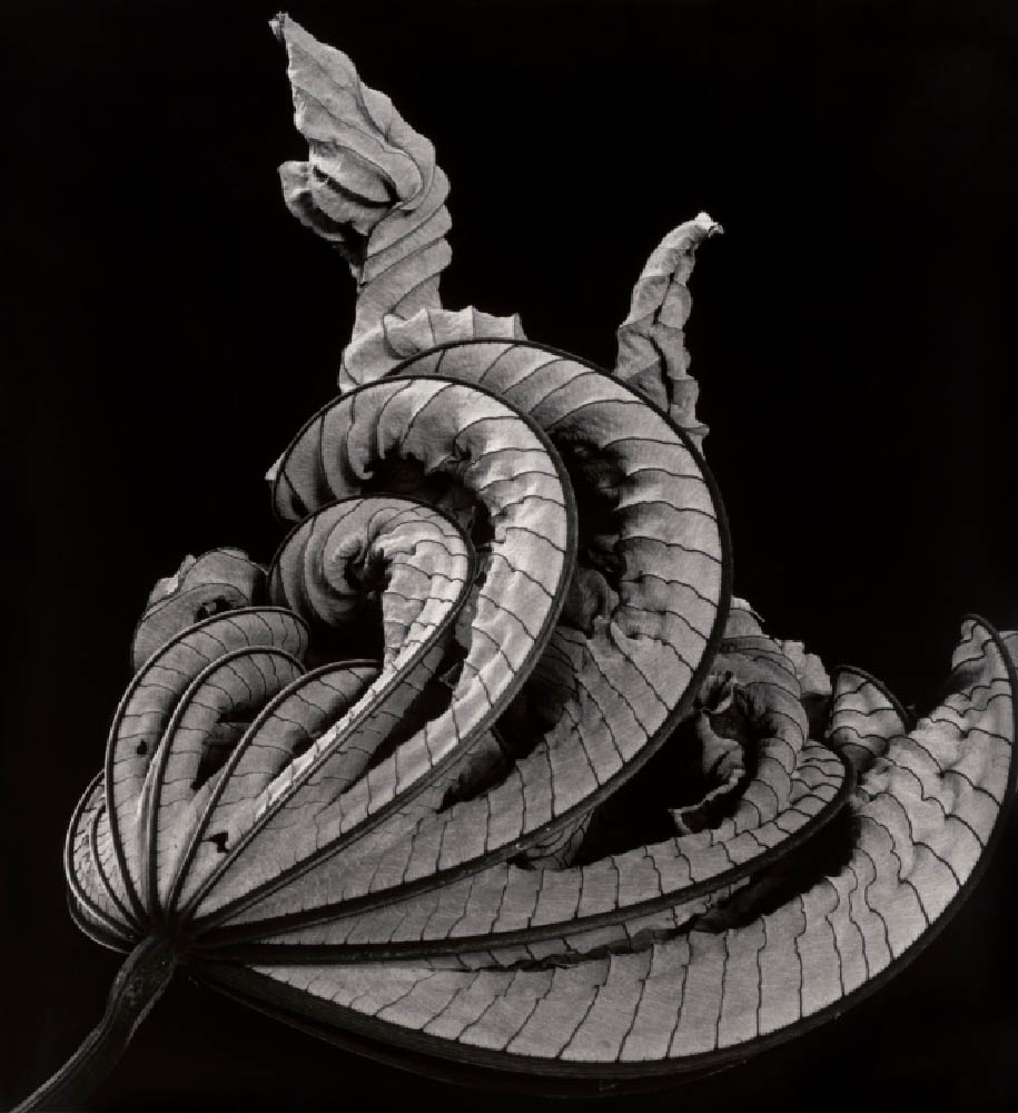
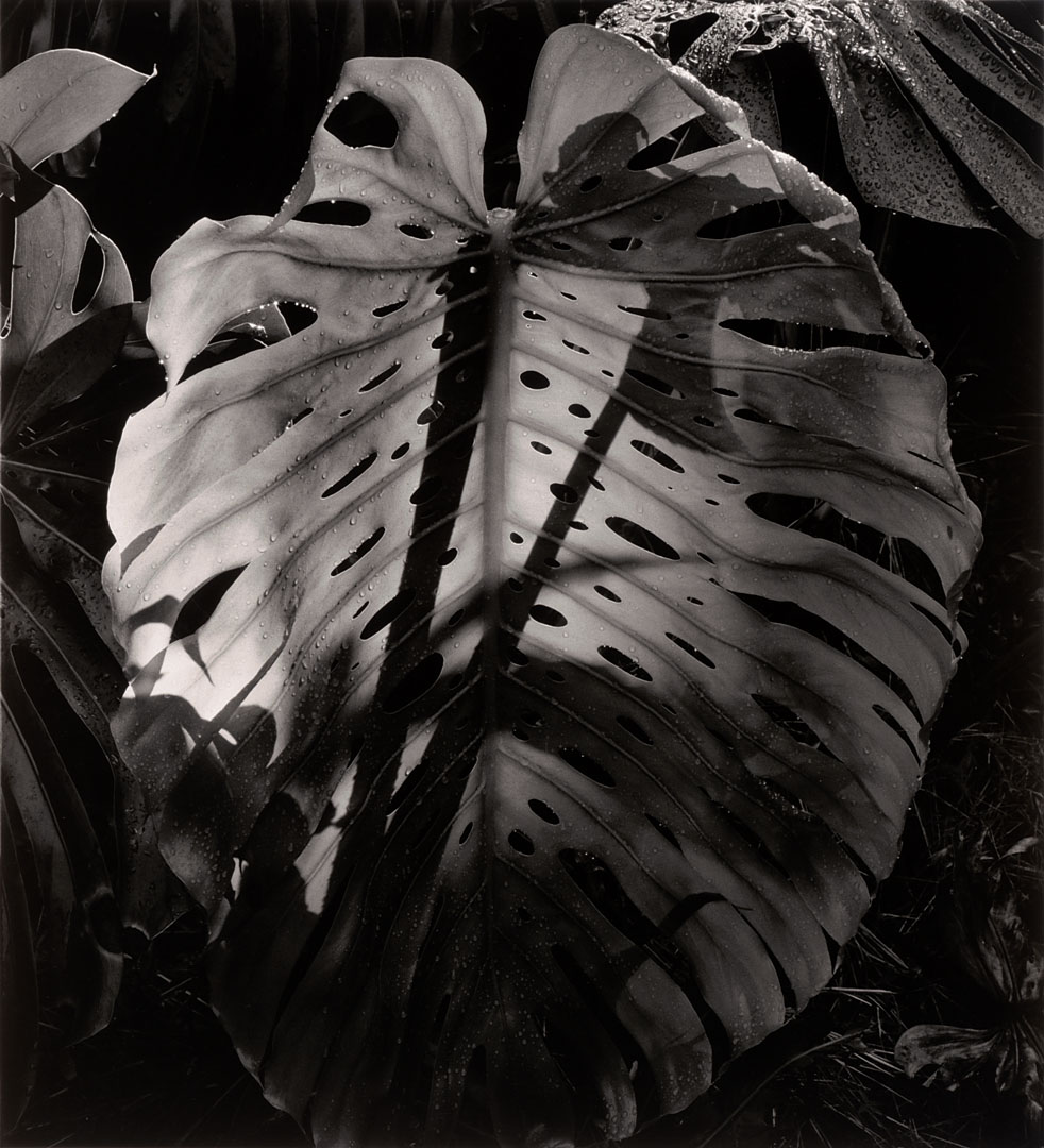
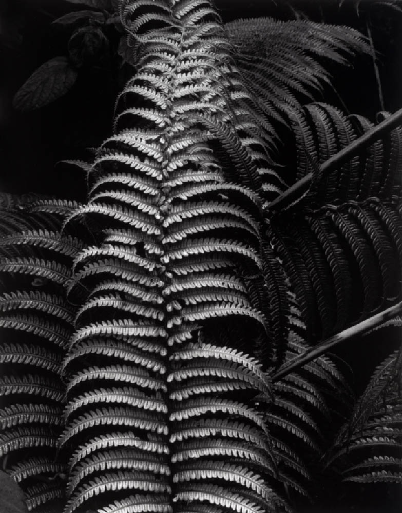
Although Weston photographs nature there is a beautiful, reductive minimalism to his photographs, an enticing simplicity of light and form that could be seen as decorative but today has taken on more symbolic weight; man and nature under threat, with hints of Atget and Wynn Bullock in the mix as well.
Under that seeming simplicity are sophisticated photographs that take a good eye to capture and bring to life – what seems simple isn’t by any means. The light is beautiful, the sensitivity to subject present beyond doubt.
His photographs will only gain greater currency in the future.
Dr Marcus Bunyan
Many thankx to The Nelson-Atkins Museum of Art for allowing me to publish the photographs in the posting. Please click on the photographs for a larger version of the image.
Over his long and prolific career, photographer Brett Weston (1911-1993) exemplified the modernist aesthetic. The son of famed photographer Edward Weston (1886-1958), Brett Weston was a “natural” with the camera: he was still a teenager when he first received high-level, international recognition as a creative artist.
The Photographs of Brett Weston, Nov. 23, 2011, through April 1, 2012, at The Nelson-Atkins Museum of Art in Kansas City, presents a condensed 40-print survey of his long and prolific career. While rare works from the Museum’s Hallmark Photographic Collection are also included, this exhibition celebrates a gift of 260 Weston prints from Christian K. Keesee, owner of the Brett Weston Archive in Oklahoma City.
“This generous gift from Mr. Keesee exemplifies the deep interest in our program on the part of leading collectors and estates across the nation,” said Keith F. Davis, senior curator of photography. “There is also a wonderful symmetry here: this gift of Brett Weston’s work compliments one of the earliest photography gifts to the Museum, when Mr. and Mrs. Milton McGreevy donated 60 Edward Weston prints in 1958.”
Brett Weston was one of photography’s greatest prodigies. After serving as his father’s apprentice, he achieved international recognition at the age of 17 through inclusion in a landmark exhibition in Stuttgart, Germany in 1929.
“Weston’s images are beautifully modulated, unmanipulated black-and-white prints,” said Davis. “He loved sharp lenses and precision cameras, and he applied this “purist” approach to a sustained exploration of the idea of abstraction.”
Weston always sought an energising balance between fact and form, the objective reality of the world and the purely graphic logic of pictorial shape and structure. In exploring the graphic language of form, Weston aimed to suggest the deeper possibilities, and mysteries, of familiar things.
Press release from The Nelson-Atkins Museum of Art website
Many thanx to Jason, Magali and Kent for inviting me to the gallery, and Kim for asking me to open the exhibition – it was fun!
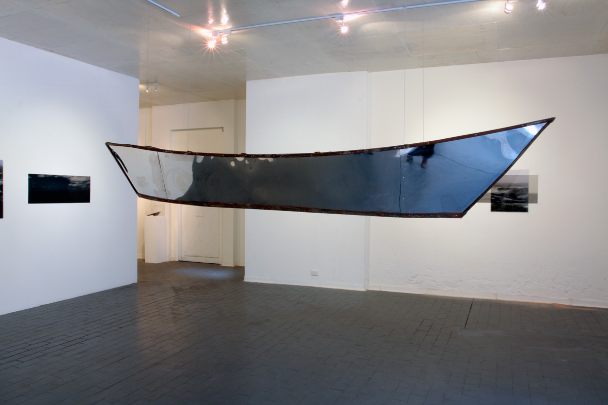
I have known Kim since the early 1990s when we both did our Bachelor of Arts in photography at RMIT University so it was wonderful to have opened her show yesterday. Reprinted below is the speech I gave at the opening with its musings on the (in)visibility of asylum seekers arriving by boat in Australia.
I hope you enjoy reading the text.
Marcus
Opening speech by Dr Marcus Bunyan, 10th March 2012
Out of Sight, Out of Mind __________________
“What I am about to say, my musings if you like, are inspired by Kim’s wonderful installation. The work before you is the basis of my inquiry. The issues involved are difficult and not to be dealt with lightly but I hope you will follow my drift, my traverse if you like.
I would like to take you on a journey – physical, metaphorical and maybe even philosophical. I want to ask questions of the world, questions about the journey we all take as human beings. These questions are prompted by my personal response to two elements of Kim’s work – water and the journey, specifically the image of asylum seekers arriving here in Australia. Imagine being an asylum seeker making that journey.
Imagine living in an (in)between space, living in a refugee camp over there. Marc Augé coined the phrase “non-place” to refer to places of transience that do not hold enough significance to be regarded as “places.”1 These camps are such places. Put yourself in that predicament, seeking a better life, seeking to escape persecution, war (of which we as a nation are often part), prejudice and death, deliberately placing yourself and your family in a fragile boat, like a seed pod floating upon the waters, taking the dangerous journey to reach Australia. Imagine the emotional and intellectual turmoil that must surround such a decision, the decision to place your life in the hands of the ocean. Important decisions affecting the entire course of one’s life are rarely made without some form of mental distress.
Nurtured in water, some baptised in it, water is the life-blood of the world and the asylum seeker must trust to its benevolence. Marc Augé “argues that we are in transit through non-place for more and more of our time, as if between immense parentheses.”2 This is the journey that the asylum seeker takes over water, a journey through an interstitial space that has no beginning and no end caught between a set of parentheses [insert life here / or not].
Now let us move our line of sight. What about a visual parentheses?
Asylum seekers are almost invisible from Australia living over there. They are over the horizon, out of sight and out of mind. When they journey across the sea – an open ended journey passing through a liminal space, a forgotten space – they suddenly appear as if by magic washed up on the shore, unseen despite surveillance planes, ships and other forms of tracking and reconnaissance. Think, for example, of the sudden and surprising arrival of the boat SIEV-221 when it was washed onto the rocks of Christmas Island in December 2010. The invisible made visible caught in a non-place.
This (in)visibility can be evidenced in other ways. The specks of humanity waving from the deck of the Tampa, the asylum seekers being escorted from arriving boats, seen for a few brief seconds on the evening news and then disappearing from view, almost like being sucked into the depths of the sea. Here and not here; here and there. Halfway between nothingness and being: they walk between one state and another, forward and backward, backward and forward.
Displacement Diaspora Disruption
The spectacle of the asylum seekers is despectacularised by and for the viewer. We remove ourselves from the emotion of these people, the presence of these images. They become ordinary as if seen from far away – glimpsed every so often as though viewing the world of another. They become Other.
The movement of the ship, the movement of the sky, the movement of vision is a constant decentering through a push / pull with something else – some other order of the world. Their journey into the unknown is a journey to submit to the ordering of another: the socially constructed system of classification: “refugee,” “asylum seeker.” The axis of visibility3 that operates in relation to subject, object, and space is not interrogated as to the representations that are constructed. This is what I am interested in here. These vital, alive human beings come from one taxonomic system (of ordered death, persecution, injustice), become visible from a brief instance, and are then fed into another taxonomic system of order – that of the detention centre.
Taking the metaphor of the horizon line further, I would argue that detention centres are like an inverted Panopticon. The Panopticon “is a type of institutional building, a prison, designed by English philosopher and social theorist Jeremy Bentham in the late eighteenth century. The concept of the design is to allow an observer to observe all inmates of an institution without them being able to tell whether or not they are being watched.”4 The guard sits in a central tower and can observe and inspect all prisoners on the outer 360 degree circle, while the prisoners cannot see the guard and can only presume he is there (an omnipresent God) and hence they behave.
Let us invert this concept.
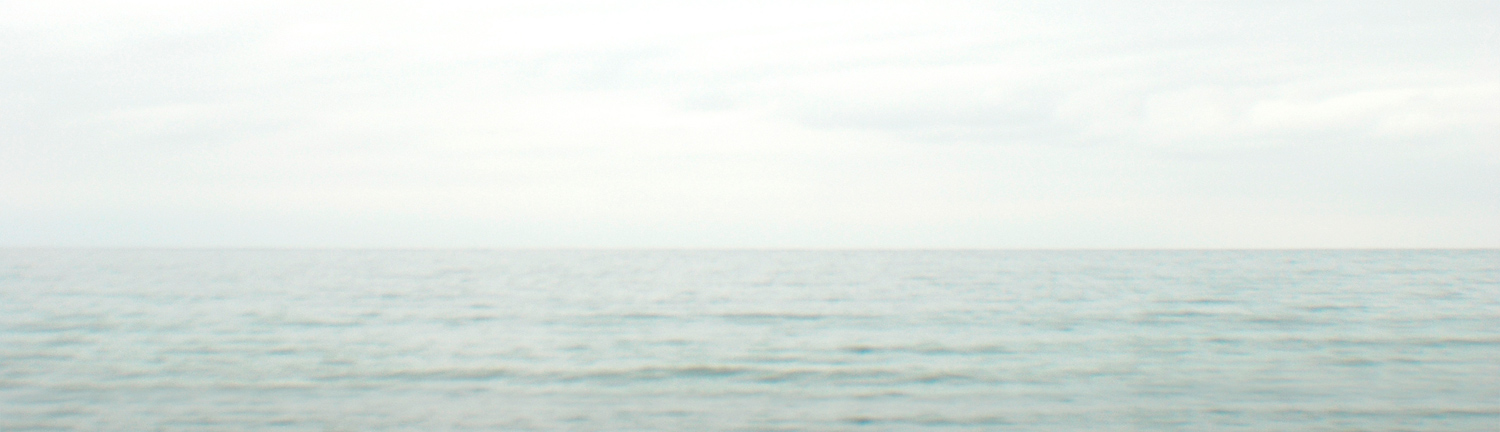
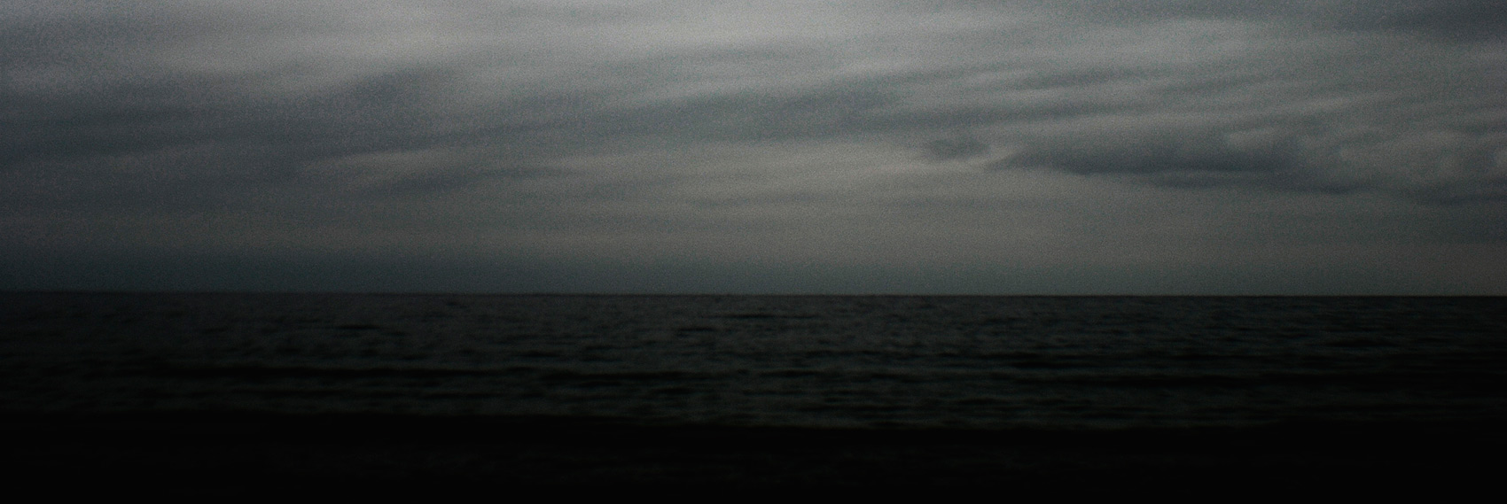
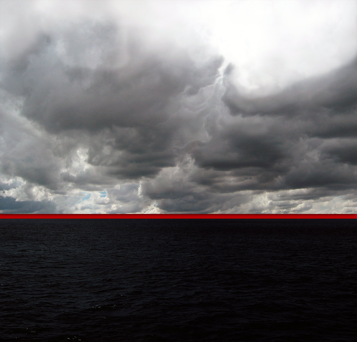
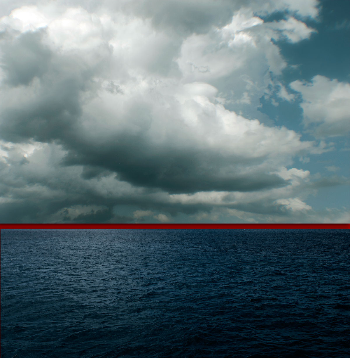
Now the asylum seekers sit in the tower looking outwards, seeing the promised land but unable to touch it and the guards (prison officers, government, the Australian people) are all around but most are blind. They look inwards but cannot see / they look outwards and most go about their daily business. The perimeter fence of the detention centre becomes the horizon line of the sea. As in Kim’s red lined horizons, over the horizon is out of sight, out of mind ___________________________________
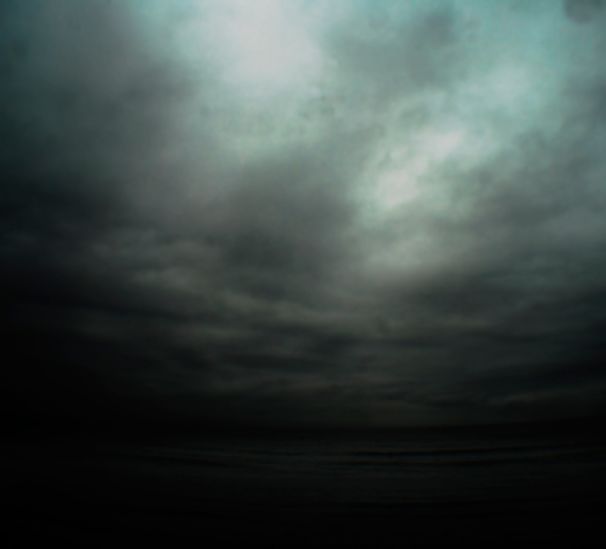
What Kim’s eloquent, minimal, brooding installation does is hold our attention and ask certain questions of us as human beings. If photography is a mode of visually addressing a certain order in the world – be it horror, war, peace, human tragedy, public, private – and then destabilising it, then Kim destabilises the binary sea / sky through fragmentation and isolation. She redlines our experience and asks us to inhabit the non-space, the non-place of the gallery, allowing us to hover between boat and image, between sea and sky, between seeing and feeling. Through her work she asks us to become more aware. She asks us to see things more clearly. Above all she asks us to have faith in the compassion of human beings.
The asylum seekers have faith: faith to get into a fragile boat to venture upon the sea in search of a better life. If we had more faith in ourselves then we would have less need to rely on the images of the past, a white colonial past.
I will finish with a quote from Jeff Brown.
“Sometimes we have to surrender to the not knowing. At other times, it is helpful to adventure outward and explore new possibilities. Like swashbucklers of the spirit, we bravely seek out any experience that might inform our path. When we are afraid of something, we live it fully and see what floats to the surface in the doing. We participate in our own revealing. We have faith in the shaping of what we cannot see.”5
The seekers surrender to the not knowing and have faith in the shaping of what they cannot see. These risk takers are the strong ones that are going to make a difference in a new society by the very fact of their strength and determination to survive and live in a free society, for the very fact of the risks undertaken. This exhibition informs their path as it informs our path. Be aware of the doing, be bold and forthright in the being. Enjoy.
Thank you
Dr Marcus Bunyan
Footnotes
1/ Augé, Marc (trans. John Howe). Non-Places: Introduction to an Anthropology of Supermodernity. London: Verso, 1995
2/ Ibid.,
3/ Hooper-Grenhill, Eilean. Museums and the Shaping of Knowledge. London: Routledge, 2000, p. 7
4/ Anon. “Panopticon,” on Wikipedia [Online] Cited 09/03/2012
5/ Brown, Jeff. Soulshaping. Berkeley, CA: North Atlantic Books, 2009, np quoted on Stroud, Jeff. The reluctant blogger website. [Online] Cited 09/03/2012
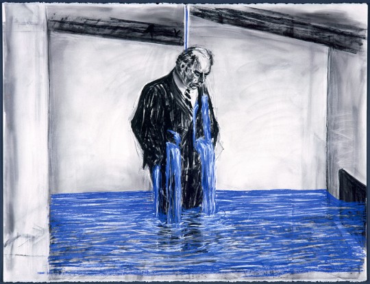
A munificence of Minor White and the revelation of the object through contemplation could be found in the lecture by William Kentridge. As an artist you must keep repeating and constructively playing and something else, some new idea, some new way of looking at the world may emerge. As a glimpse into the working methodology of one of the world’s great artists the lecture was fascinating stuff!
“At four in the morning there are no lack of branches for the crow of doubt to land upon.”
On Memory
“Memory – both memory and the forgetting of memory. For example, the building of monuments [monuments to the Holocaust, to wars] takes the responsibility of remembering away.”
On Play
“We absolutely want to make sense of the world in that way. That’s one of the principles of play – that however much you distort and break things apart, in the end we will try to reconstruct them in some way to make sense of the world. I think that every child does it. It’s fundamental.”
On Looking
“It’s the capacity for recognition that makes a difference between order and disorder in looking at visual images. And it’s the vocabulary of recognisable images that we have inside us, which is completely vital to what it is to see. I don’t really buy the idea that order and disorder are the same.”
William Kentridge
First History of the Cinema
Performances of Transformation
~ Cinema
~ Shadow dancing
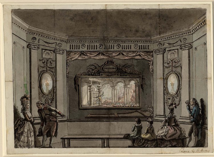
~ Eidophusikon (The Eidophusikon was a piece of art, no longer extant, created by 18th century English painter Philip James de Loutherbourg. It opened in Leicester Square in February 1781.Described by the media of his day as “Moving Pictures, representing Phenomena of Nature,” the Eidophusikon can be considered an early form of movie making. The effect was achieved by mirrors and pulleys.
~ Quick change artist
~ Stage magicians
All work against the time of the audience e.g. the quick change artist may take 3 seconds, the sunset in a Georges Méliès film may take 2 minutes instead of 2 hours. The technology / scrims / screens happen at different speeds but the different times become one in the finished film. There is an elision of time: appearances / disappearances. Stopping time [changing a scene, changing clothing etc…], starting time again.
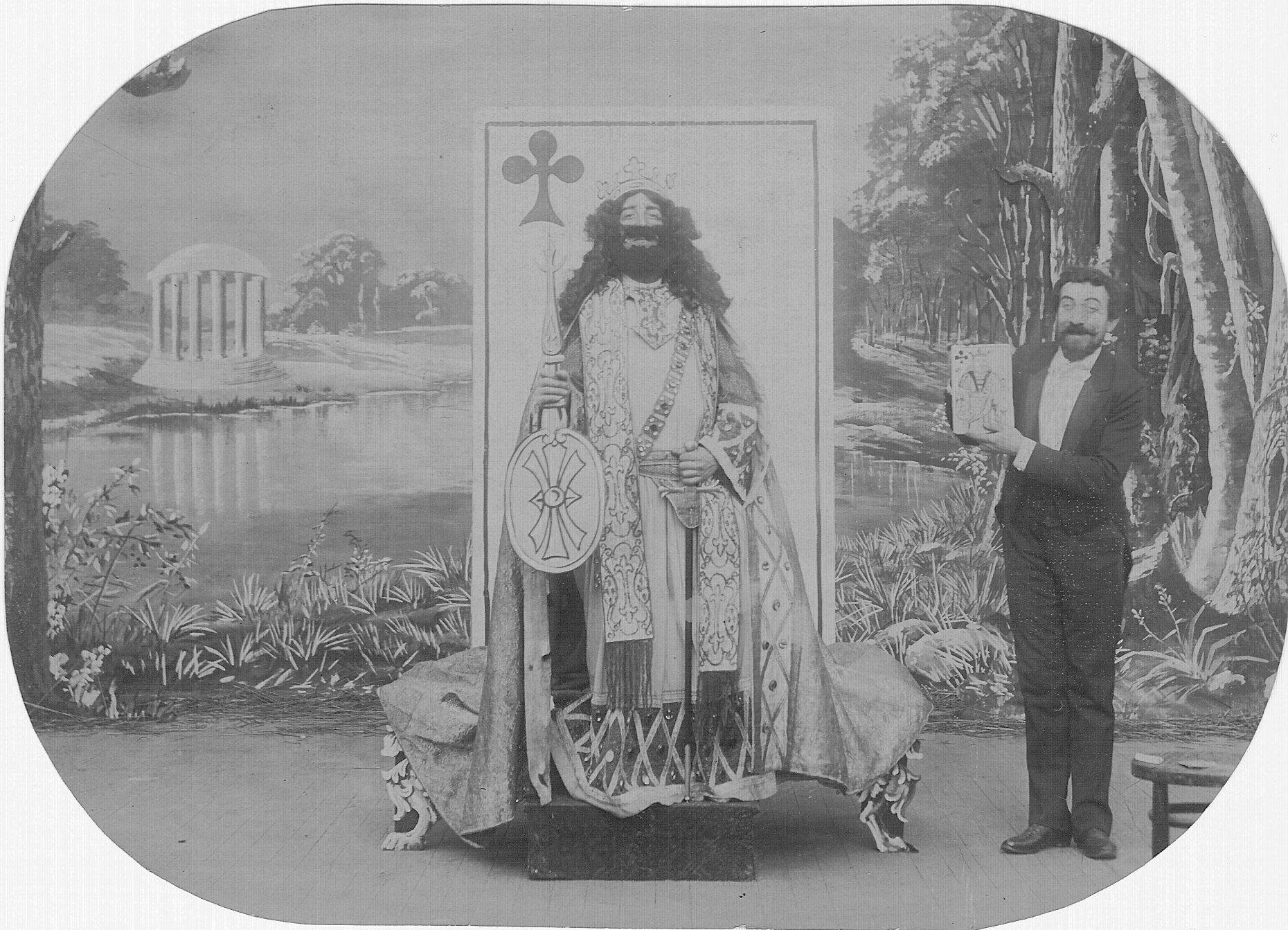
George Méliès starring in The Living Playing Cards (1904)
Second History of the Cinema
The sedimented gaze of the early camera. The slow chemicals meant that the object had to wait under the camera’s gaze for minutes. People were held in place by stiff neck braces to capture the trace of their likeness. Congealed time.
On the other hand, in cinema, a tear forward becomes a repair in reverse.
By rolling the film in reverse there is a REVERSAL of time, a REMAKING of the world – the power to be more than you are – by reversing to perfection. You throw a book or smash a plate: in reverse they become perfect again, a utopian world.
YOU MUST GIVE YOURSELF OVER TO PLAY!
Giving yourself over to what the medium suggests, you follow the metaphor back to the surface. Following the activity [of play] back to its root. Projecting forwards, projecting backwards. There is endless rehearsal, constant repetition, then discovering the nature of the final shot or drawing to be made. New ideas get thrown around: leaning into the experience, the experiment, the repetition, the rehearsal.
Four elements
1/ something to be seen
2/ the utopian perfection: perfectibility
3/ the grammar of learning that action
4/ Greater ideas, further ideas and thoughts; potentiality and its LOSS
Further meanings arise
How is this achieved?
Rehearsal, repetition
New thoughts will arise being led by the body in the studio NOT in the mind. Not conceptual but the feeling of the body walking in the studio.
The physical action as the starting point not the concept.
Six different degrees of tension
1/ Least tension in the body possible: slumped
2/ Relaxed
3/ Neutral
4/ Purpose: an impulse to make things happen – desire
5/ Insistence: listen to me, this is very important
What the body suggests is the construction of an image.
There are different degrees of tension in these performances. What do they suggest? This reverse osmosis from one state to another?
Third History of Cinema
Technologies of Looking
Pre-cinematic devices – a process of seeing in the world, of looking. Produces a reconfigured seeing, the invisible made [moving] visible.
Stereoscope
3D world made into a 2D image put back into 3D by our brains. The nature of binocularity, of depth perception. We see an illusion of depth, a construction by the eyes. Our brain is a muscle combining the two images. Depth of Field (DOF): focusing at different distances, we are inside the field of the image. Peripheral vision is blanked off; we look through a magnifying glass. A machine for demonstrating seeing.
There are erotics built into the language of the etching, but there is also a logic built into the machine used for etching. The Proof print, arriving at the first state. Going on the journey from artist as maker to artist as viewer through the mechanism of the etching press.
Artist/Maker unknown Claude Glass, manufactured in England 18th century V & A
Claude Glass
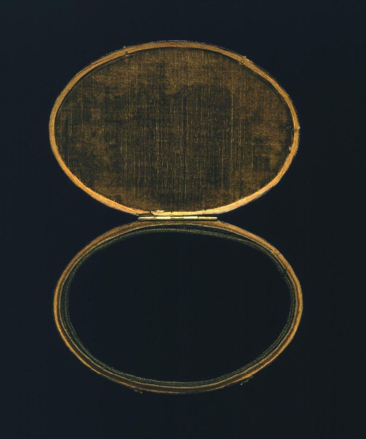
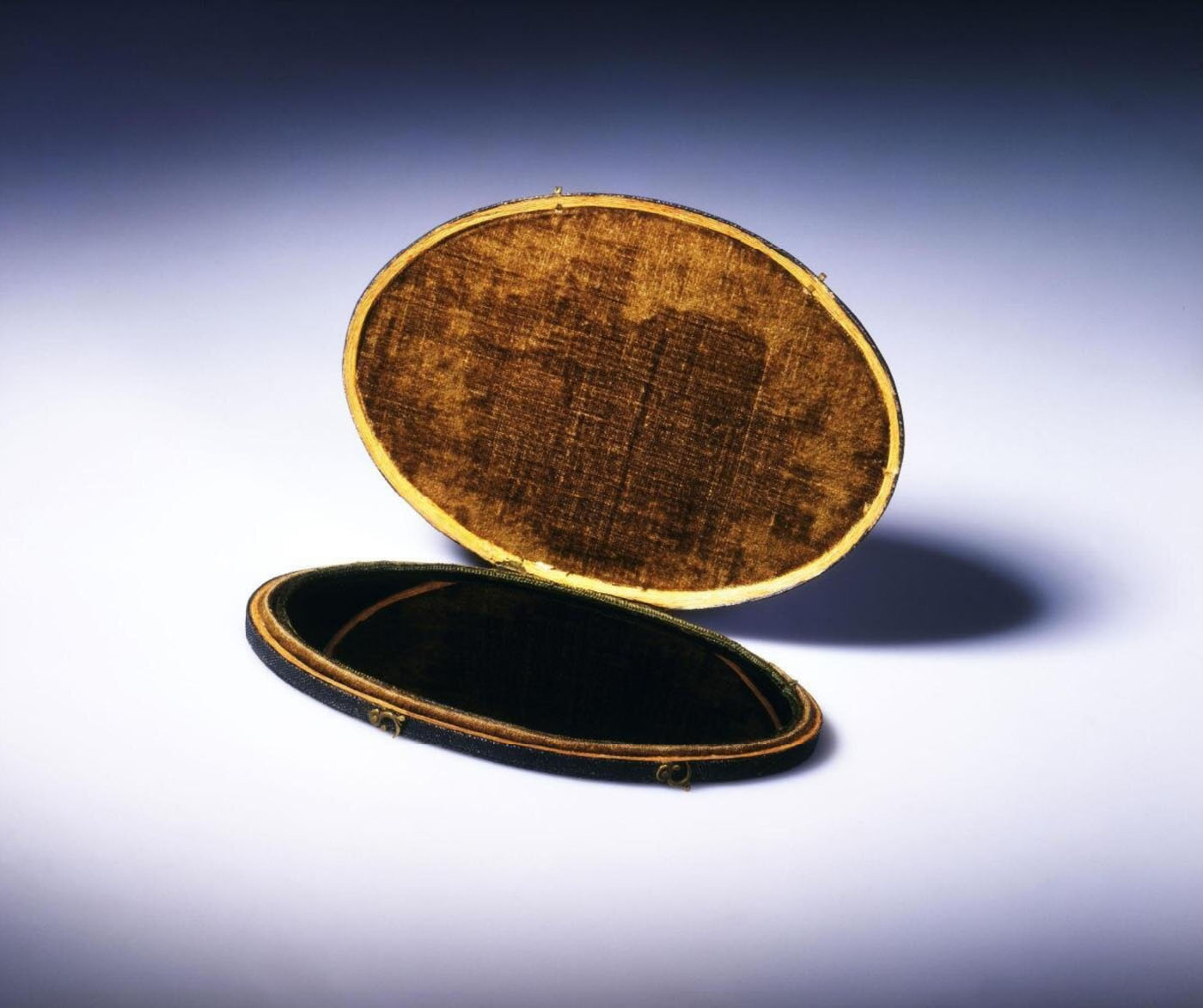
“A Claude glass (or black mirror) is a small mirror, slightly convex in shape, with its surface tinted a dark colour. Bound up like a pocket-book or in a carrying case, black mirrors were used by artists, travellers and connoisseurs of landscape and landscape painting. Black Mirrors have the effect of abstracting the subject reflected in it from its surroundings, reducing and simplifying the colour and tonal range of scenes and scenery to give them a painterly quality).”
The Claude glass was standard equipment for Picturesque tourists, producing instant tonal images that supposedly resembled works by Claude. “The person using it ought always to turn his back to the object that he views,” Thomas West explained in his Guide to the Lakes. “It should be suspended by the upper part of the case… holding it a little to the right or the left (as the position of the parts to be viewed require) and the face screened from the sun.”
Object Type
A Claude Glass – essentially a small, treated mirror contained in a box – is a portable drawing and painting aid that was widely used in the later 18th century by amateur artists on sketching tours. The reflections in it of surrounding scenery were supposed to resemble some of the characteristics of Italian landscapes by the famous 17th-century painter and sketcher Claude Lorrain, hence the name.
Materials & Use
The ‘glass’ consists of a slightly convex blackened mirror, which was carried in the hand and held up to the eye. The image thus seen was the scenery behind – rather than in front of – the user. The mirror’s convexity reduced extensive views to the dimensions of a small drawing. The use of a blackened rather than an ordinary silvered mirror resulted in a somewhat weakened reflection, which stressed the prominent features in the landscape at the expense of detail. It also lowered the colour key. A larger version of this device is said on occasion to have been fixed to the windows of horse-drawn carriages in order to reflect the passing scenery.
Artist / Maker unknown Claude Glass, manufactured in England 18th century V & A
Anamorphic Mirror
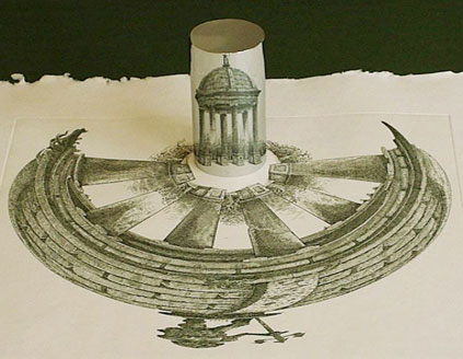
A counter intuitive way of drawing; turning 2D into 3D. The landscape has no edge, like a carrousel.
A LINK TO THE ENDLESS CIRCLING AND WALKING AROUND THE STUDIO!
Anamorphic drawing and cone shaped mirror
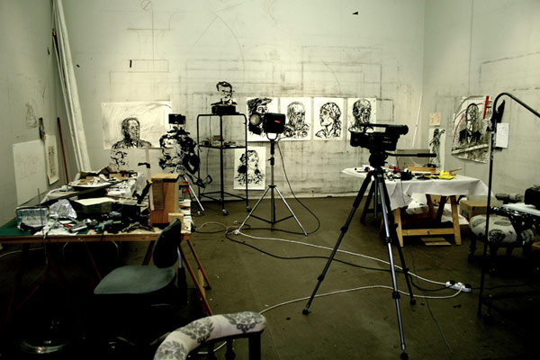
William Kentridge studio Photo by John Hodgkiss Art Tatler
The Studio
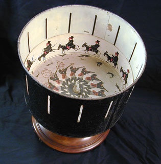
In the studio you gather the pieces together like a kind of Zoetrope. You may arrive at a new idea, a new starting point. Repetition, going around and around your head (at four in the morning!). There must be a truce between the artist as maker and the artist as viewer. As in earlier times, you walk the cloisters, you promenade.
You find the walk that is the prehistory of the drawing, that is the prehistory to the work.
A multiple, fragmented, layered performance of walking. You are trying to find the grammar of the studio – the necessary stupidity. Making a space for uncertainty. The conscious suppression of rationality. At some point, emerging, escaping the Zoetrope, from the physical making, something will be revealed. The spaces open up by the stupidities. Something new emerges.
THIS IS THE SPACE OF THE STUDIO.
Australian Centre for the Moving Image (ACMI) Federation Square, Melbourne, Australia
William Kentridge: Five Themes
Thursday 8 March – Sunday 27 May 2012 Exhibition open daily 10am – 6pm
Curator: Matthew S. Witkovsky, Curator and Chair of Photography at the Art Institute of Chicago
Many thankx to the Art Institute of Chicago for allowing me to publish the photographs in the posting. Please click on the photographs for a larger version of the image.
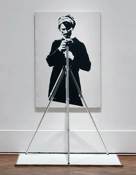
Marcel Broodthaers (Belgian, 1924-1976) Portrait of Maria Gilissen with Tripod 1967 Gelatin silver emulsion on canvas with tripod Approx. 66 x 43 x 24 inches
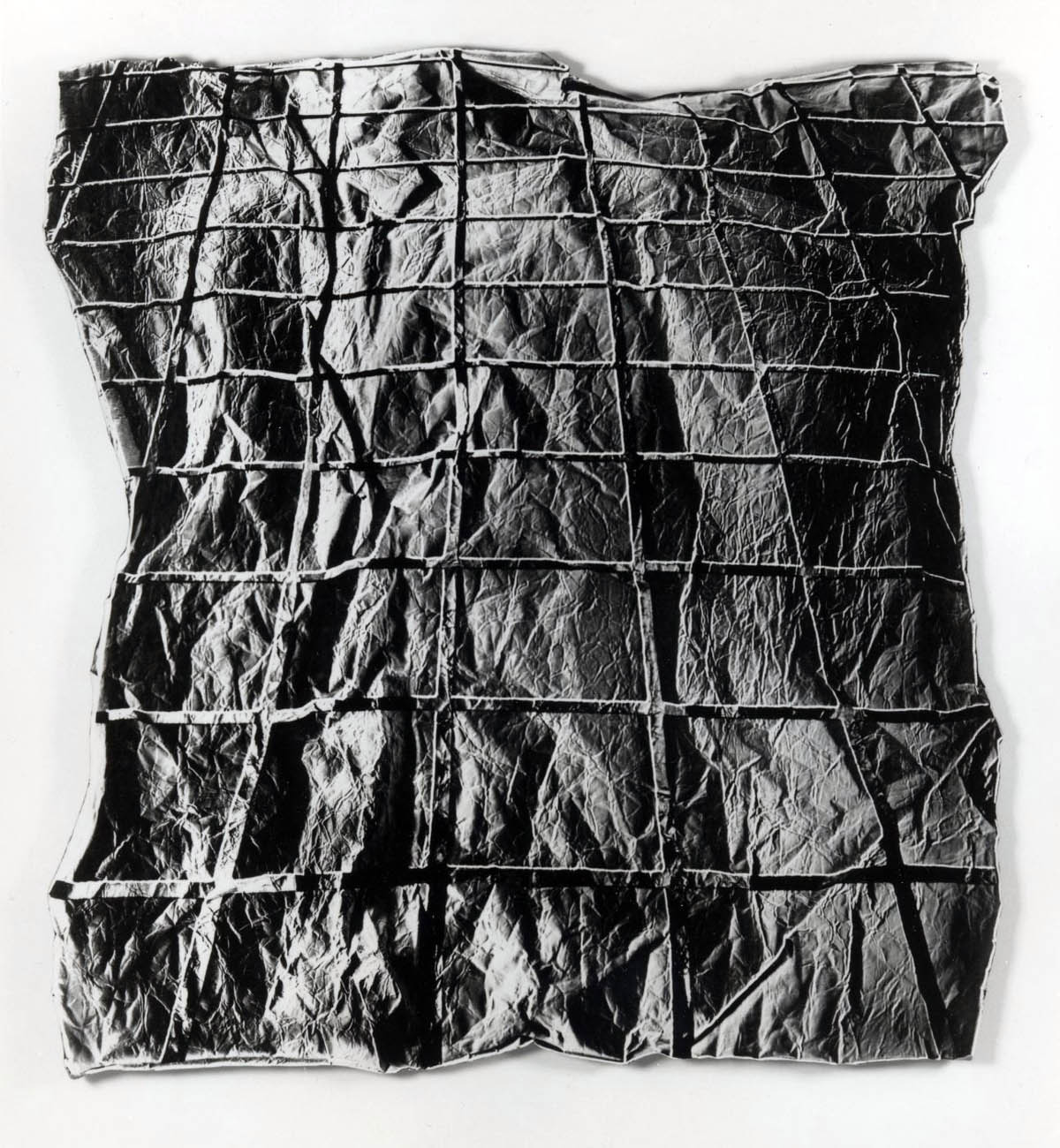
Mel Bochner (American, b. 1940) Surface Dis/Tension 1968 Gelatin silver print on aluminum mount 48 x 46″
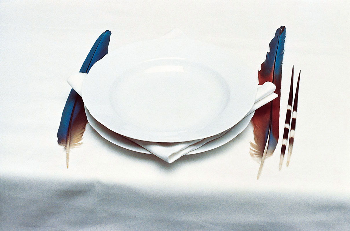
Lothar Baumgarten (German, 1944-2018) The Origin of Table Manners 1971 Chromogenic print 45 x 57.5cm Collection Sanders, Amsterdam
One of Baumgarten’s early works, The Origin of Table Manners is a wry illustration of the way in which colonial conquerors conflated Western notions of civility with notions of the civilised as part of their alibi for domination. Inspired by a text of the same name by the structuralist anthropologist Claude Levi-Strauss, the work consists of a table draped in a crisp, white tablecloth and set with fine china, with porcupine quills and the feathers of large birds standing in for silverware. When it was first shown, it was installed in a tony French restaurant near Baumgarten’s Paris gallery.
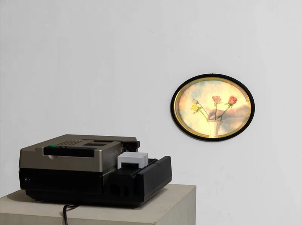
Ger van Elk (Dutch, b. 1941) The Rose more Beautiful than Art, but Difficult, therefore Art is Splendid 1972 Slide projection, elven chromogenic slides projected onto watercolour in wooden frame 9 4/5 x 12 2/5 in | 25 x 31.5cm Courtesy of the artist
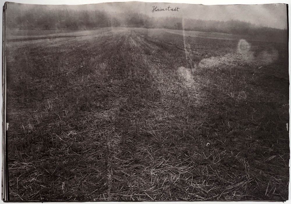
Anselm Kiefer (German, b. 1945) Ausbrennen des Landkreises Buchen (The Burning of the Rural District of Buchen) 1974 Bound gelatin silver prints with ferric oxide and oil on woodchip paper 62 x 45cm Hall colleciton
The 1960s and 1970s are recognised as the defining era of the Conceptual Art movement, a period in which centuries held assumptions about the nature of art itself were questioned and dissolved. Until now, the pivotal role that photography played in this movement has never been fully examined. The Art Institute of Chicago has organised the first major survey of influential artists of this period who used photography in ways that went far beyond its traditional definitions as a medium – and succeeded thereby in breaking down the boundaries of all mediums in contemporary art. Light Years: Conceptual Art and the Photograph, 1964-1977 –on view December 13, 2011 through March 11, 2012 – is the first exhibition to explore how artists of this era used photography as a hybrid image field that navigated among painting and sculpture, film, and book arts as well as between fine art and the mass media. More than 140 works by 57 artists will fill the Art Institute’s Regenstein Hall in this major exhibition that will be seen only in Chicago.
Bringing to the fore work from the Italian group Arte Povera as well as artists from Eastern Europe who are rarely shown in the United States, Light Years also includes many pieces that have not been on public display in decades by such major artists as Mel Bochner, Tony Conrad, Michael Heizer, Gordon Matta-Clark, and Emilio Prini. To open the exhibition, the Art Institute has arranged a special outdoor screening of Andy Warhol’s Empire, an eight-hour film of the Empire State Building. In a first for the United States, Warhol’s Empire will be projected from the Modern Wing’s third floor to be seen on the exterior of the Aon Center on Friday, December 9.
The acceptance of photography as fine art was an evolutionary process. Early 20th-century avant-garde movements such as Dada, Surrealism, and Constructivism articulated a new set of standards for art in which photography played a major role. By the 1930s, modernist photography found a small but influential niche in museum exhibitions and the art market, and vernacular forms such as photojournalism and amateur snapshots became a source of artistic inspiration. Engagement with mass media, exemplified in Pop Art, became prominent in the 1950s. Yet only with the advent of Conceptual Art did artists with training in painting, sculpture, and the graphic arts begin to make and exhibit their own photographs or photographic works as fine art.
Some Conceptual artists, such as Bruce Nauman, Ed Ruscha, and VALIE EXPORT took up photography seriously only for a few key months or years; others, like Eleanor Antin, John Baldessari, Jan Dibbets, and Annette Messager have worked in photography their entire careers. Photography showed the way forward from Minimal Art, Pop Art, and other movements in painting and sculpture. But it came with its own set of questions that these artists addressed with tremendous innovation. Questions of perspective, sequence, scale, and captioning which have a rich history in photography, were answered in entirely new ways and made into central concerns for art in general.
Photography in these artists’ hands was the antithesis of a separate and definable “medium.” It became instead “unfixed”: photobooks, photolithographs, photo canvases, photo grids, slide and film pieces, and even single prints all counted as valid creative forms. The variety of work showcased in Light Years is crucial to conveying the greatest contribution of the Conceptual era: to turn contemporary art into a field without a medium.
Light Years showcases a great number of works that have not been seen together – or at all – since the years around 1970. Victor Burgin’s Photopath, a life-size print of a 60-foot stretch of flooring placed directly on top of the floor that it records, has not been shown in more than 20 years and never in the United States. Likewise being shown for the first time in the U.S. are pieces by Italian artists Gilberto Zorio, Emilio Prini, Giulio Paolini, and others associated with the classic postwar movement Arte Povera. Paolini’s early photo-canvas Young Man Looking At Lorenzo Lotto (1967), an icon of European conceptualism, has only rarely been shown at all after entering a private collection in the early 1970s. Mel Bochner’s Surface Dis/Tension: Blowup (1969) has not been seen since its presentation at Marian Goodman Gallery in the now legendary 1970 exhibition Artists and Photographs, from which no visual documentation survives. Equally rare and important early works by Laurie Anderson, Marcel Broodthaers, Francesco Clemente, Tony Conrad, Gilbert & George, Dan Graham, Michael Heizer, and many others make the show a revelation for those interested in key figures of new art in the 1960s and ’70s. A special emphasis is placed on artists from Hungary, a centre for photoconceptual activity that has long been overlooked in Western Europe and the United States.
In Conversation with William Kentridge Tue 6 Mar 2012, 6.30pm at ACMI, Melbourne SOLD OUT
William Kentridge: Anti-Entropy Thu 8 March 2012, 6.30pm at ACMI, Melbourne
“One often thinks of seeing as a completely natural activity – your eyes open, there is the world in front of you, you’re not doing anything, just seeing. But what the studio and the process of making images demonstrates is that the activity of seeing is about constructing the world, constructing coherence… We are very involved in building coherence, in taking fragments that come from all places and acting as if there is a single coherent narrative.”
“I think to be an artist one does need a lack of self-consciousness, not thinking too hard about ‘What am I saying? Who am I?’. Who you are is going to be what you’ve made. There’s no escaping from who you are when the work is finally put together. If a work is pretentious, that tells you who you are. If it’s cautious, that tells you who you are. Whatever the subject matter, in the end it becomes about the person making it.”
William Kentridge quoted in Miriam Cosic. “Drawn from Life,” in Weekend Australian Review. Saturday March 3rd, 2012, p. 6.
Wise words from the master.
Paul Strand said that the work becomes more your own once you remove ego out of the equation. Perhaps not remove ego, but in Jung’s sense integrate ego into the Self through the process of individuation.
Then a more holistic, less grasping art might appear.
Dr Marcus Bunyan
Australian Centre for the Moving Image (ACMI) Federation Square, Flinders St Melbourne VIC 3000 Phone: (03) 8663 2200
In mid-December Foam will present the first major retrospective exhibition in the Netherlands of the work of Joel Sternfeld (1944, New York), one of the pioneers of colour photography. Foam will be showing more than one hundred photos from ten different series in an exhibition spanning two floors. A highlight is Sternfeld’s early work from the 1970s, which has never been previously exhibited. A large selection from famed series such as AmericanProspects, the result of his legendary journey through the United States, and Stranger Passing will also be on show. A constant factor in his work is his native land America, its inhabitants and the traces left by people on the landscape. With a subtle feeling for irony and an exceptional feeling for colour, Sternfeld offers us an image of daily life in America over the last three decades.
New Color Photography
Along with William Eggleston and Stephen Shore, Sternfeld saw to it that colour photography became a respected artistic medium in the 1970s. Until that time, colour was used widely in advertising and amateur photography, but was rarely seen in museums and galleries. Sternfeld was influenced by the colour theory of the Bauhaus and by the work of William Eggleston, whose exhibition in MoMA in 1976 marked the official acceptance of colour photography in the art world.
Early Work
A typical ‘street photographer’ style can be recognised in Sternfeld’s early and as yet unknown work, using a 35mm camera, to record everyday life in America. This work already contained the characteristics that made his later work so successful. In 1978, Joel Sternfeld began a long journey through the United States. For eight years he crisscrossed his homeland and recorded everything he encountered with his large-format camera. His investigation into the landscape and people moving within it resulted in the American Prospects series (1979-1983). In Stranger Passing (1987-2000) Sternfeld concentrated on people. He photographed them in an unambiguous way: from the same distance and looking directly into the camera. This series is a portrait of a society, comparable to the magnum opus of August Sander in the early twentieth century. Just as in American Prospect, there is evidence of a light absurdism as well as sympathy for those being portrayed.
The American Landscape
For the On This Site series (1993-1996), Sternfeld photographed urban and rural locations which were at first glance unremarkable. In the accompanying text, however, it becomes clear that these were the locations of ‘crime passionnels’, racial violence and stabbings. The photos thus acquire an entirely different connotation. In Sweet Earth (1993-2005) Sternfeld shows alternative lifestyles and communities which have arisen in America over the past two centuries. He travelled to the homes and communities of people that do not fit into conventional lifestyles and instead pursue another way of life. In Oxbow Archive (2005-2007) Sternfeld depicts the effects of the changing seasons on the landscape and how human behaviour influences nature.”

 x 19’2” (D) (297 cm x 862 cm x 584 cm)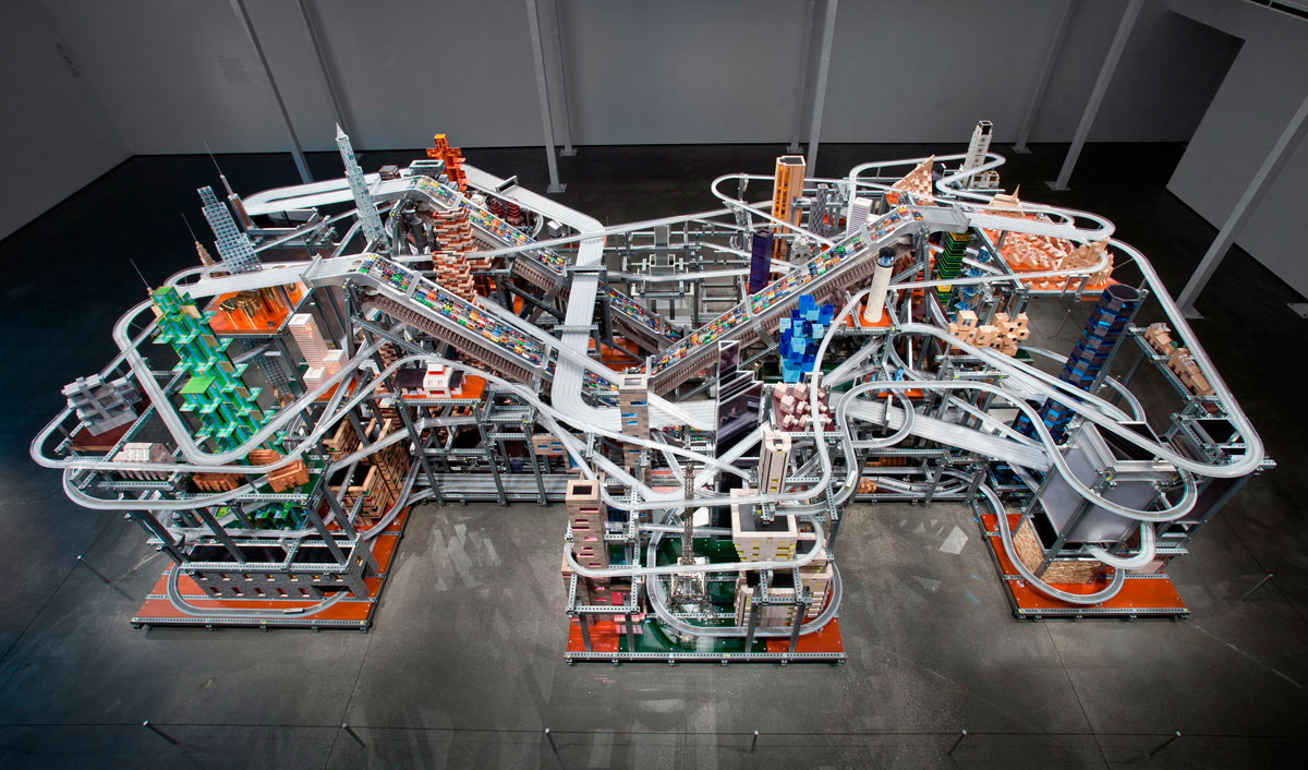

















 Art Blart _ art and cultural memory archive
You must be logged in to post a comment.