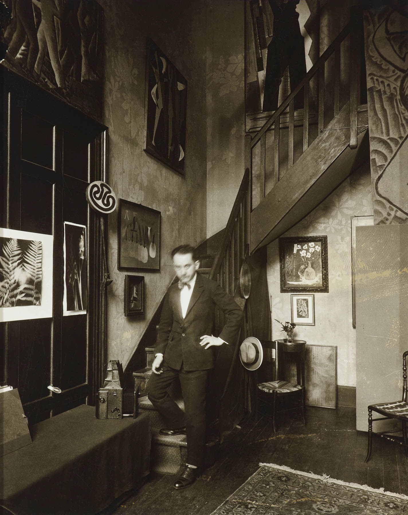
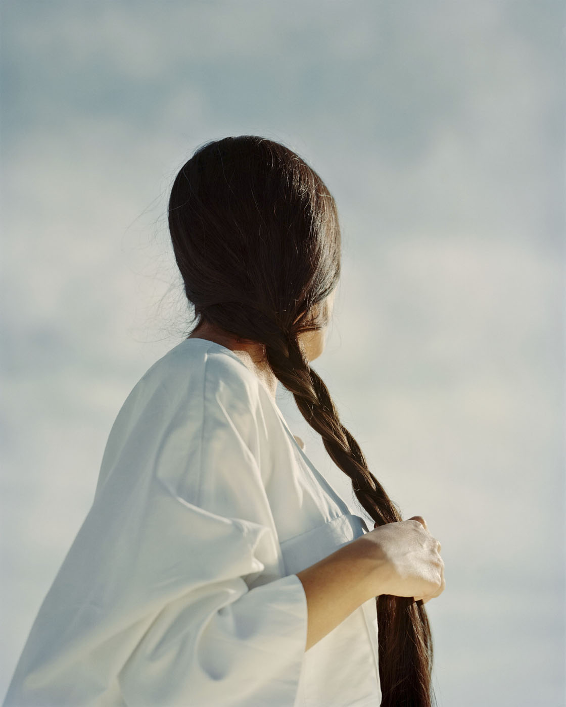
Curators: Stephanie D’Alessandro, Leonard A. Lauder Curator of Modern Art and Senior Research Coordinator in Modern and Contemporary Art at The Met, and Stephen C. Pinson, Curator in the Department of Photographs at The Met, with the assistance of Micayla Bransfield, Research Associate, Modern and Contemporary Art.
“Like the undisturbed ashes of an object consumed by flames these images are oxidized residues fixed by light and chemical elements of an experience, an adventure, not an experiment. They are the result of curiosity, inspiration, and these words do not pretend to convey any information.”
Man Ray1
The rayographs
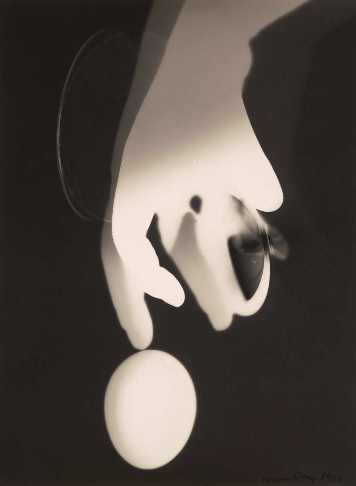
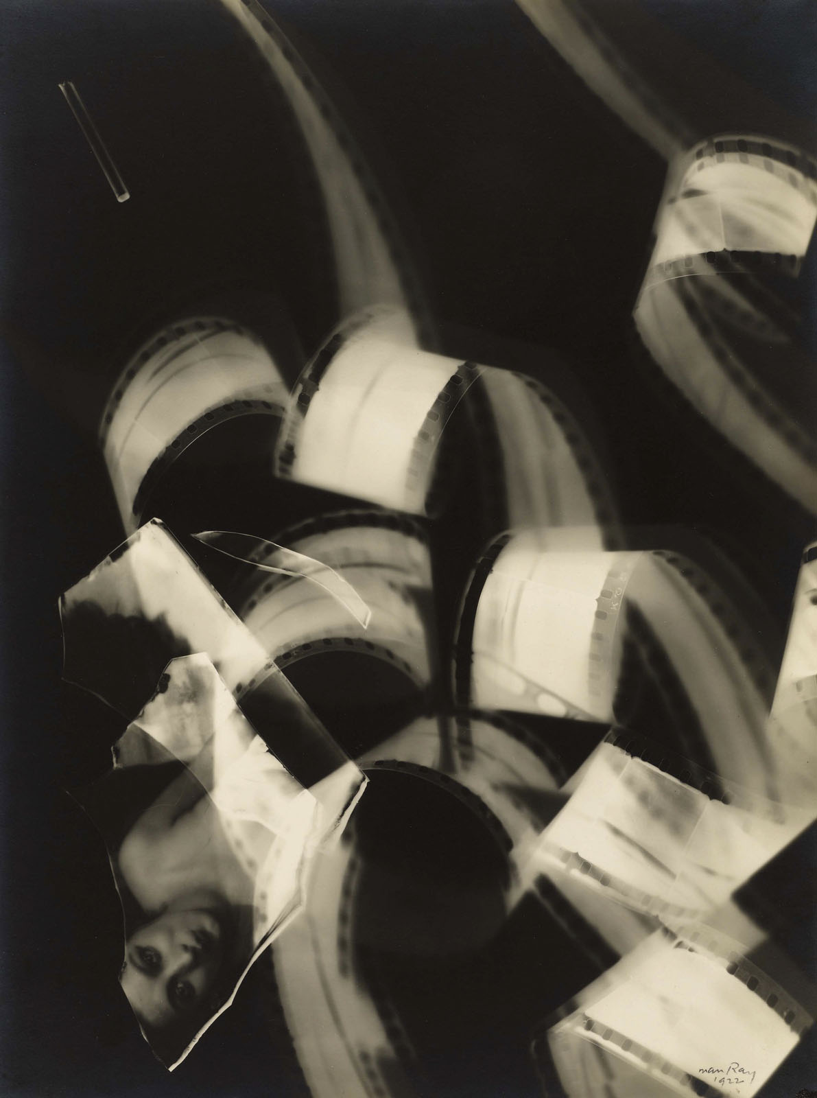
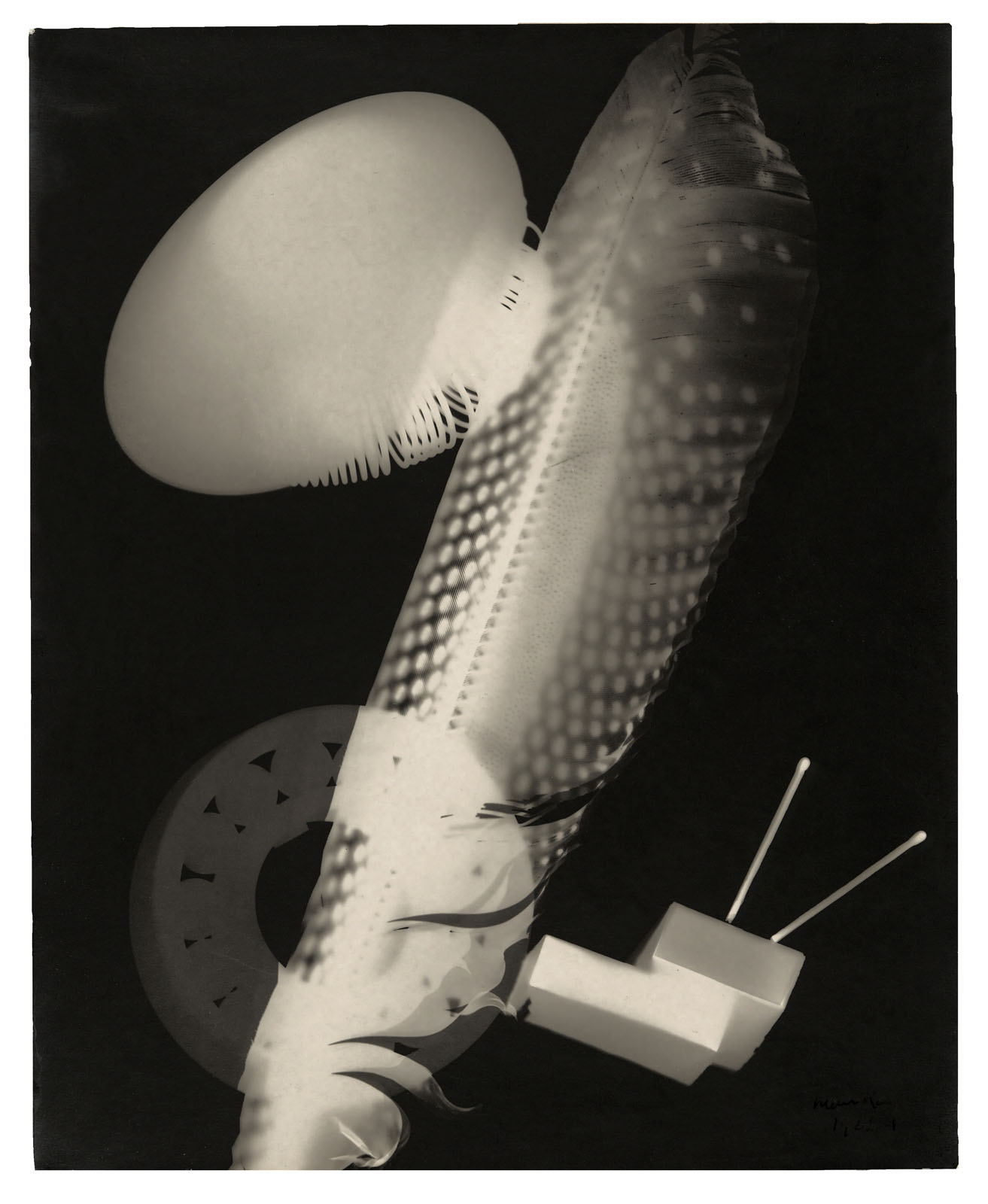
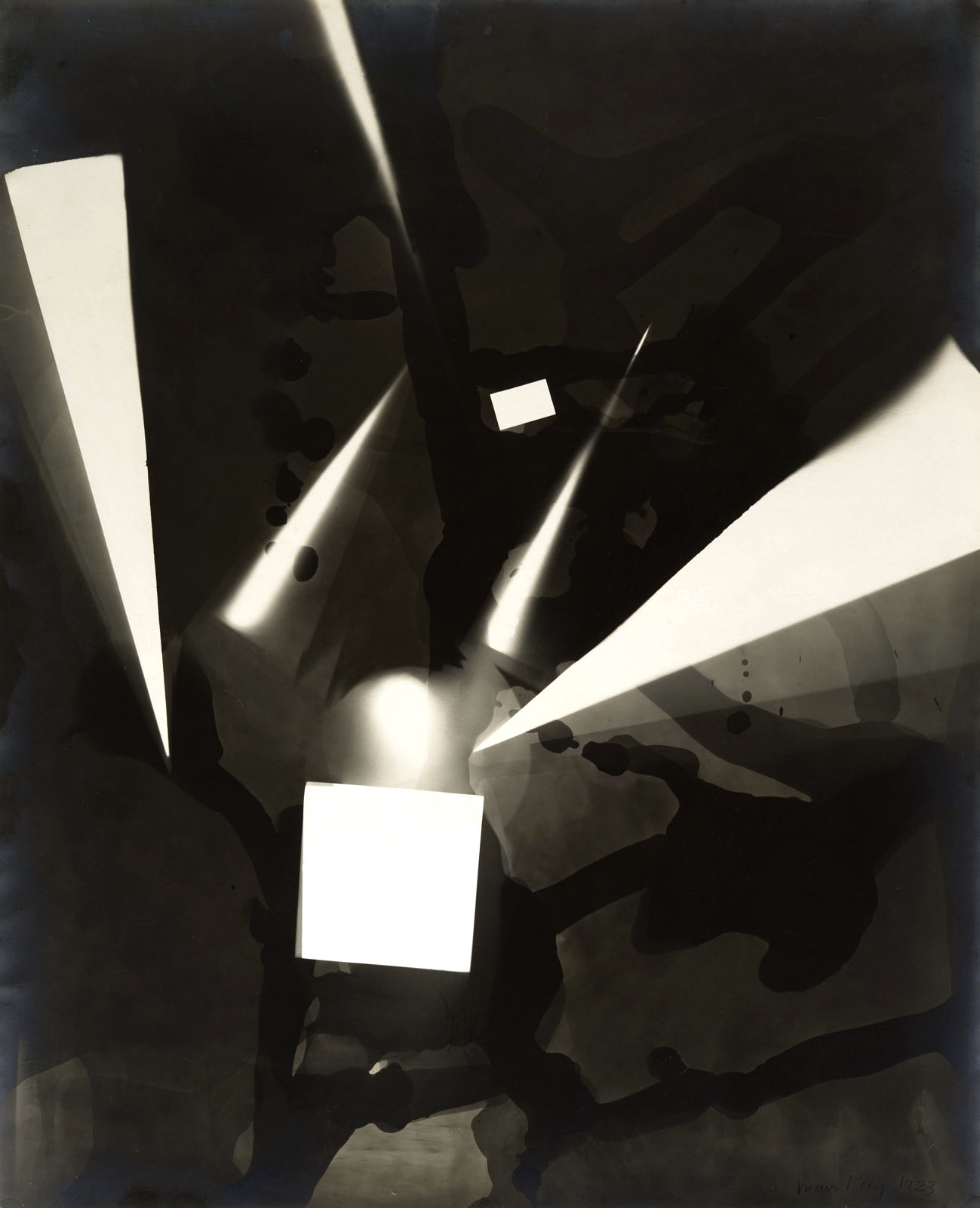
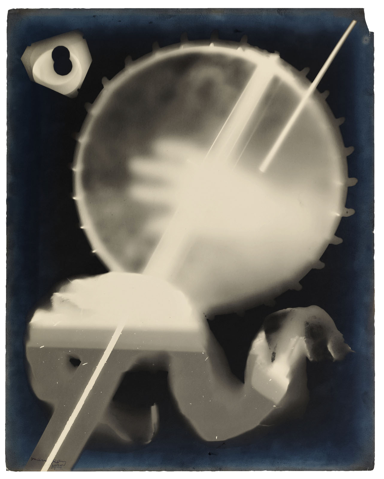
Although not the inventor of the photogram, a photograph made without the use of a camera by placing objects directly onto sensitised photographic paper and then exposing the paper to light, Man Ray’s rayographs have become the most recognisable and famous form that photograms have taken. This is because of their inventiveness, their subliminal connection to the psyche, and the use of “objects from the real world to make ambiguous dreamscapes.”7
It is interesting that Man Ray called his images rayographs, for a graph implies a topographical mapping, a laying out of statistics, whereas Lucia Moholy and László Moholy-Nagy’s photograms imply in the title of their technique the transmission of some form of message, like a telegram. The paradox is that, as the quotation above states, Man Ray always insisted that his rayographs imparted no information at all; perhaps they are only dreams made (un)stable. Contrary to this the other two artists believed that, “photographic images – cameraless and other – should not deal with conventional sentiments or personal feelings but should be concerned with light and form,”8 quite the reverse of the title of their technique.
After his arrival in Paris Man Ray started experimenting in his darkroom and discovered the technique for his rayographs by accident. With the help of his friend the Surrealist poet Tristan Tzara, he published a portfolio of twelve Rayographs in 1922 called Les champs délicieux (The delicious fields). “This title is a reference to ‘Les champs magnétiques’, a collection of writings by André Breton and Philippe Soupault composed from purportedly random thought fragments recorded by the two authors.”9 The rayographs are visual representations of random thought fragments, “photographic equivalents for the Surrealist sensibility that glorified randomness and disjunction.”10
Man Ray, “denied the camera its simplest joy: the ability to capture everything, all the distant details, all the ephemeral lights and shadows of the world”11 but, paradoxically, the rayographs are the most ephemeral of creatures, only being able to be created once, the result not being known until after the photographic paper has been developed. In fact, for Man Ray to create his portfolio Les champs délicieux (The delicious fields), he had to rephotograph the rayographs in order to make multiple copies.12
Man Ray “insisted in nearly every interview that the rayograph was not a photogram in the traditional sense. He did something that a photogram didn’t; he introduced depth into the images,”13 which denied the images their photographic objectivity by depicting an internal landscape rather than an external one.14 What the rayographs do not deny, however, is the subjectivity of the artist, his skill at placing the objects on the photographic paper, expressed in their dream-like nature, both a subjective ephemerality (because they could only be produced once) and an ephemeral subjectivity (because they were expressions of Man Ray’s fantasies, and therefore had little substance).
Through an alchemical process the latent images emerge from the photographic paper, representations of Man Ray’s fantasies as embodied in the ‘presence’ of the objects themselves, in the surface of the paper. Perhaps these objects offer, in Heidegger’s terms, ‘a releasement towards things’,15 “a coexistence between a conscious and unconscious way of perceiving which sustains the mystery of the object confusing the distinction between real time and sensual time, between inside and outside, input and output becoming neither here nor there.”16
Finally, within their depth of field the rayographs can be seen as both dangerous and delicious, for somehow they are both beautiful and unsettling at one and the same time. As Surrealism revels in randomness and chance these images enact the titles of other Man Ray photographs: Danger-Dancer, Anxiety, Dust Raising, Distorted House. The rayographs revel in chance and risk; Man Ray brings his fantasies to the surface, an interior landscape represented externally that can be (re)produced only once – those dangerous delicious fields.
1/ Man Ray quoted in Janus (trans. Murtha Baca). Man Ray: The Photographic Image. London: Gordon Fraser, 1980, p. 213
7/ Mark Greenberg (ed.,). In Focus: Man Ray: Photographs from the J. Paul Getty Museum. Los Angeles, The J. Paul Getty Museum, 1998, p. 38
8/ Naomi Rosenblum. A World History of Photography. New York: Abbeville Press, 1997, 394
9/ Greenberg, op. cit., p. 28
10/ Jed Perl (ed.,). Man Ray: Aperture Masters of Photography. New York: Aperture, 1997 pp. 11-12
11/ Perl, op. cit., pp. 5-6
12/ Greenberg, op. cit., p. 28
13/ Greenberg, op. cit., p. 112
14/ Greenberg, op. cit., p. 28
15/ “We stand at once within the realm of that which hides itself from us, and hides itself just in approaching us. That which shows itself and at the same time withdraws is the essential trait of what we call the mystery … Releasement towards things and openness to the mystery belong together. They grant us the possibility of dwelling in the world in a totally different way…”
Martin Heidegger. Discourse on Thinking. New York: Harper & Row, 1966, pp. 55-56 quoted in Mauro Baracco. “Completed Yet Unconcluded: The Poetic Resistance of Some Melbourne Architecture,” in Leon van Schaik (ed.,). Architectural Design Vol. 72. No. 2 (‘Poetics in Architecture’). London: John Wiley and Sons, 2002, 74, Footnote 6.
Many thankx to The Metropolitan Museum of Art for allowing me to publish the photographs in the posting. Please click on the photographs for a larger version of the image.
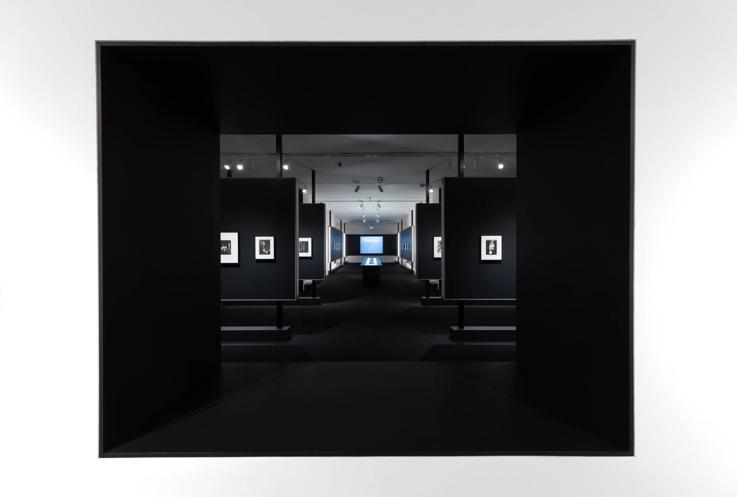
“Stepping into the exhibition Man Ray: When Objects Dream at The Metropolitan Museum of Art feels like entering the bellows of an old camera. Through a rectangular frame cut into the entry, the darkened walls unfold, accordion-like, to reveal a visual feast of the artist’s work, as Man Ray’s earliest film, “Retour à la raison (Return to Reason)” (1923), flickers across the screen opposite. Although the exhibition brings together approximately 160 works from an impressive array of lenders, it reveals itself gradually, taking the viewer through several turns before one can grasp its sheer enormity. When Objects Dream proves, thrillingly, that anyone left feeling jaded from the many, many recent exhibitions surrounding Surrealism’s centennial in 2024 can still see the movement’s key photographer with a fresh set of eyes.”
“Objects to touch, to eat, to crunch, to apply to the eye, to the skin, to press, to lick, to break, to grind, objects to lie, to flee from, to honor, things cold or hot, feminine or masculine, objects of day or night which absorb through your pores the greater part of our life. … These are the projections surprised in transparence, by the light of tenderness, of objects that dream and talk in their sleep.”
. Tristan Tzara, “When Objects Dream,” 1934
“One sheet of paper got into the developing tray – a sheet unexposed that had been mixed with those already exposed under the negatives. … Regretting the waste of paper, I mechanically placed a small glass funnel, the graduate, and the thermometer in the tray on the wetted paper. I turned on the light; before my eyes an image began to form, not quite a simple silhouette of the objects as in a straight photograph, but distorted and refracted by the glass more or less in contact with the paper and standing out against a black background. … I remembered when I was a boy, placing fern leaves in a printing frame with proof paper, exposing it to sunlight, and obtaining a white negative of the leaves. This was the same idea, but with an added three-dimensional quality and tone graduation. I made a few more prints … taking whatever came to hand; my hotel-room key, a handkerchief, some pencils, a brush, a candle, a piece of twine … excitedly, enjoying myself immensely. In the morning I examined the results. … They looked startlingly new and mysterious.”
American artist Man Ray (1890-1976) was a visionary known for his radical experiments that pushed the limits of photography, painting, sculpture, and film. In the winter of 1921, he pioneered the rayograph, a new twist on a technique used to make photographs without a camera. By placing objects on or near a sheet of light-sensitive paper, which he exposed to light and developed, Man Ray turned recognisable subjects into wonderfully mysterious compositions. Introduced in the period between Dada and Surrealism, the rayographs’ transformative, magical qualities led the poet Tristan Tzara to describe them as capturing the moments “when objects dream.”
The exhibition will be the first to situate this signature accomplishment in relation to Man Ray’s larger body of work of the 1910s and 1920s. Drawing from the collections of The Met and more than 50 U.S. and international lenders, the exhibition will feature approximately 60 rayographs and 100 paintings, objects, prints, drawings, films, and photographs – including some of the artist’s most iconic works – to highlight the central role of the rayograph in Man Ray’s boundary-breaking practice.
“Before my eyes an image began to form, not quite a simple silhouette of the objects as in a straight photograph, but distorted and refracted … In the morning I examined the results, pinning a couple of the rayographs – as I decided to call them – on the wall. They looked startlingly new and mysterious.” ~ Man Ray
Text from The Metropolitan Museum of Art website
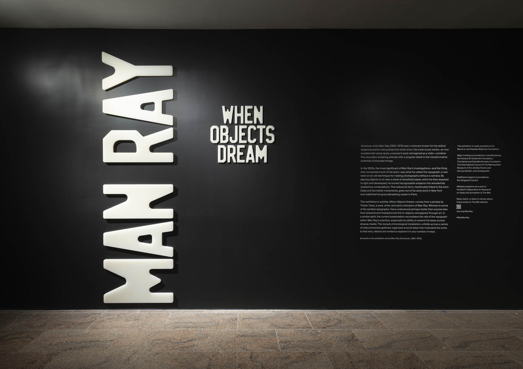
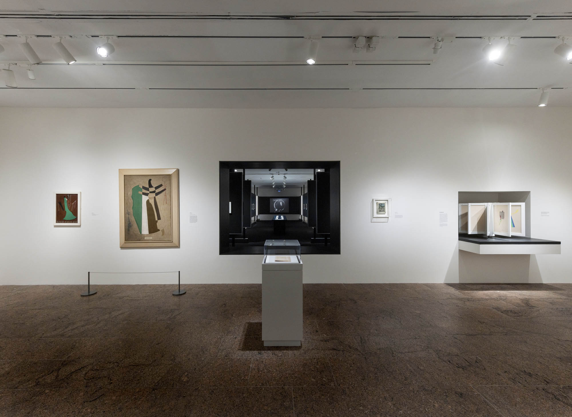
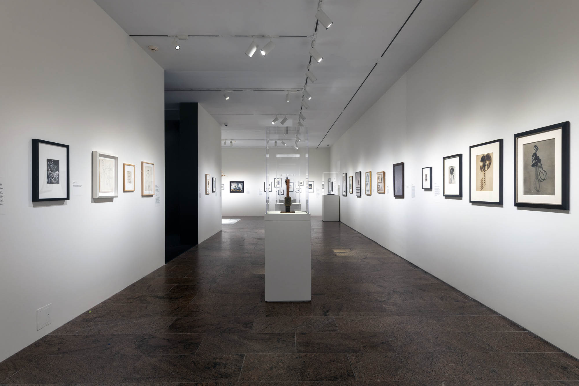
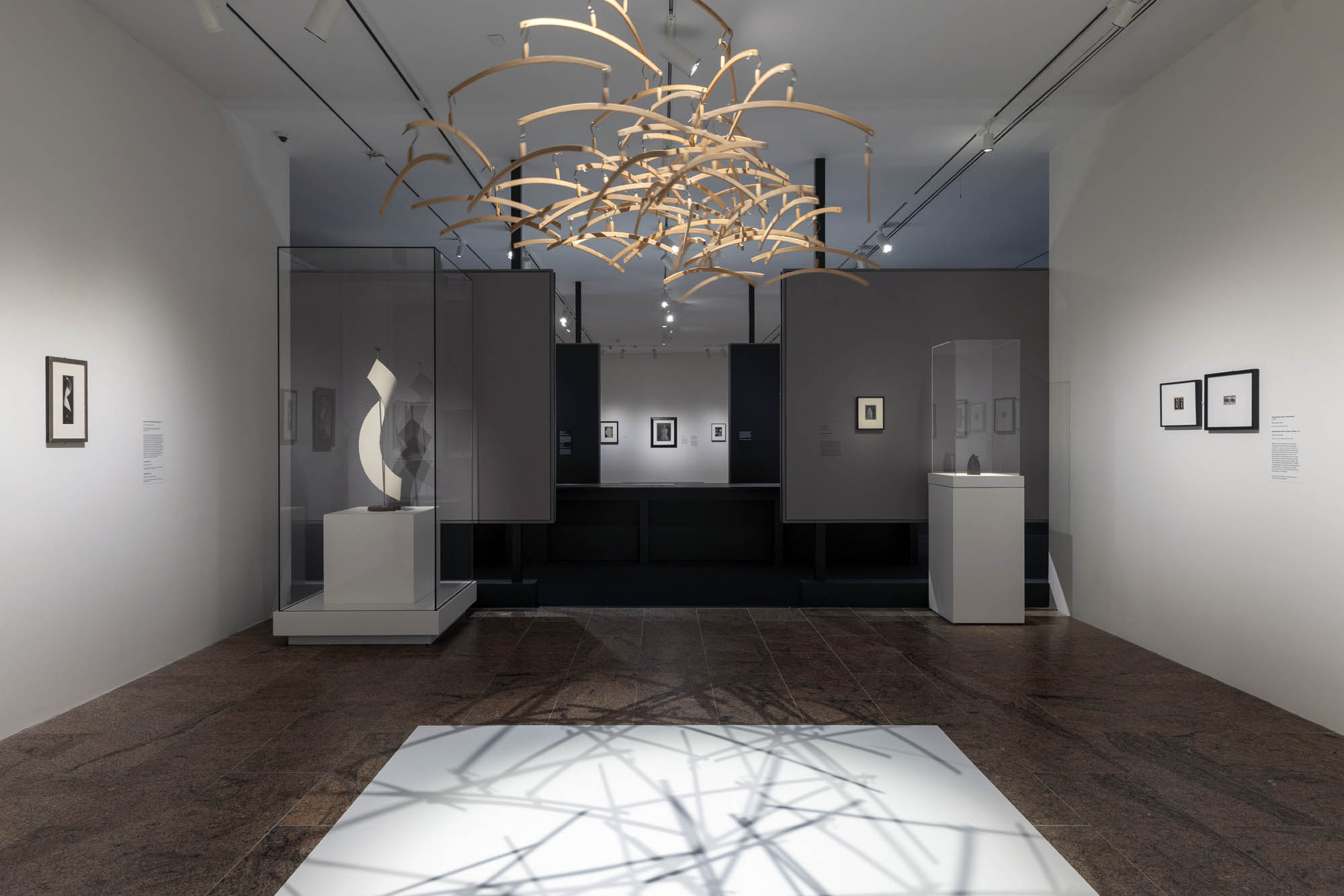
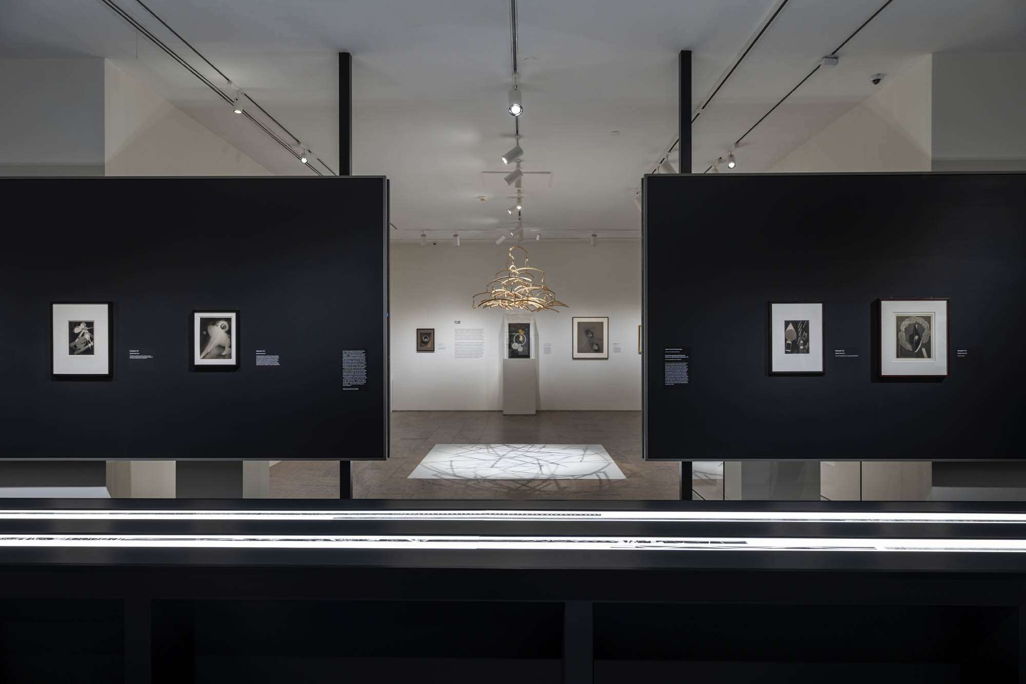
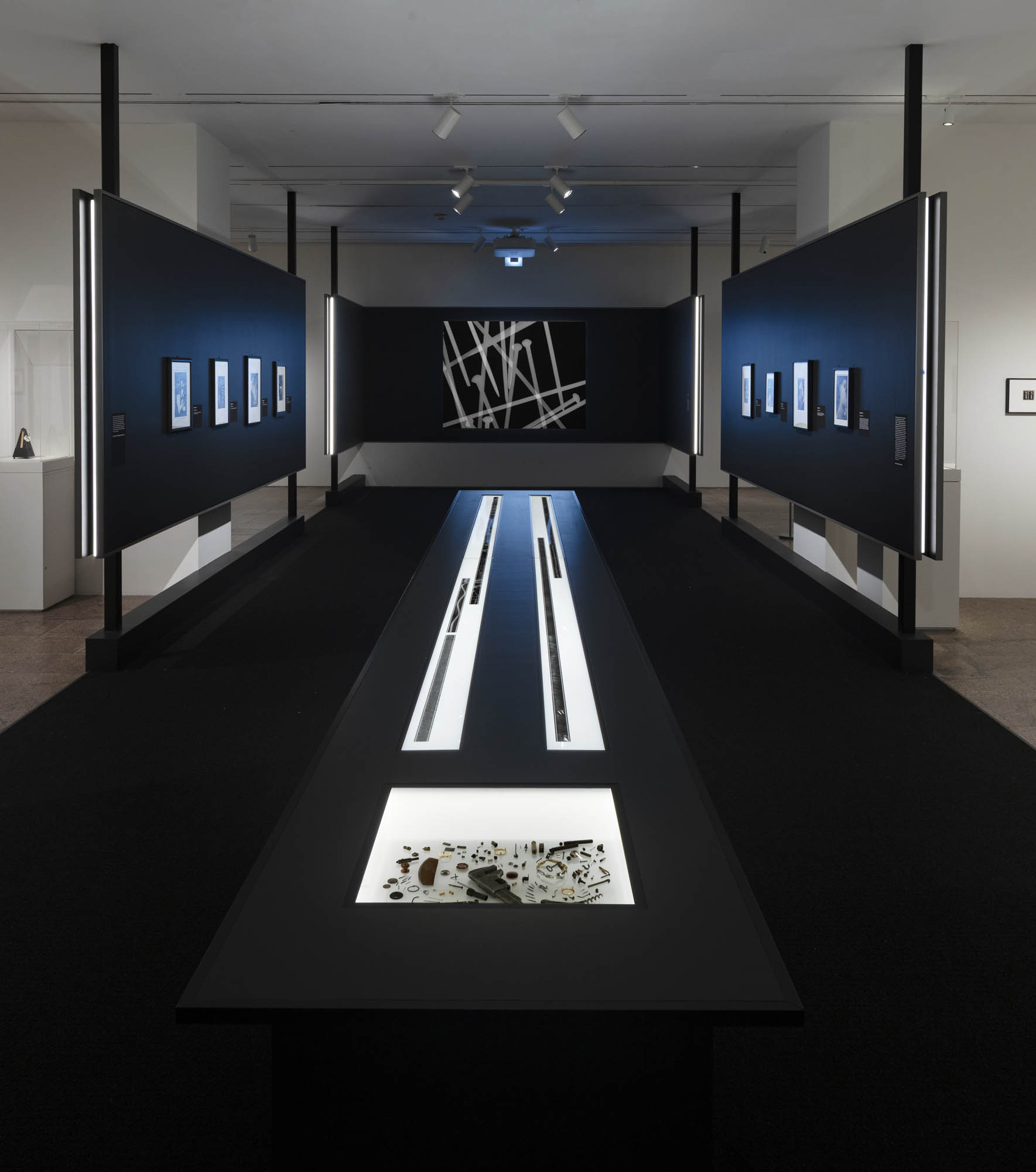
Installation views of the exhibition Man Ray: When Objects Dream at The Metropolitan Museum of Art, New York, September 2025 – February 2026
In the 1923 silent short of the same title, Man Ray filmed barely discernible scenes of Paris at night along with his own enigmatic photograms and conglomerations of spiraling or gyrating objects. The resulting sequence of near-total abstractions seems devoid of sense or purpose. The “return to reason” in the film comes finally in the form of a woman’s torso – modelled by cabaret personality Kiki de Montparnasse – turning to and fro beside a rain-covered windowpane. Man Ray reproduced the seductive finale, as well as other moments from the film, as photographs, singly and in strips. A still from Man Ray’s film, this particular photograph appeared on its own in the first issue of the key avant-garde journal La Révolution surréaliste, in 1924.
Le retour à la raison (Return to Reason), Man Ray, 1923
Emak-Bakia (1926) – directed by Man Ray
Emak-Bakia (Basque for Leave me alone) is a 1926 film directed by Man Ray. Subtitled as a cinépoéme, it features many techniques Man Ray used in his still photography (for which he is better known), including rayographs, double exposure, soft focus and ambiguous features.
Emak-Bakia shows elements of fluid mechanical motion in parts, rotating artifacts showing his ideas of everyday objects being extended and rendered useless. Kiki of Montparnasse (Alice Prin) is shown driving a car in a scene through a town. Towards the middle of the film Jacques Rigaut appears dressed in female clothing and make-up. Later in the film a caption appears: “La raison de cette extravagance” (the reason for this extravagance). The film then cuts to a car arriving and a passenger leaving with briefcase entering a building, opening the case revealing men’s shirt collars which he proceeds to tear in half. The collars are then used as a focus for the film, rotating through double exposures.
The film features sculptures by Pablo Picasso, and some of Man Ray’s mathematical objects both still and animated using a stop motion technique.
Originally a silent film, recent copies have been dubbed using music taken from Man Ray’s personal record collection of the time. The musical reconstruction was by Jacques Guillot.
When the film was first exhibited, a man in the audience stood up to complain it was giving him a headache and hurting his eyes. Another man told him to shut up, and they both started to fight. The theatre turned into a frenzy, the fighting ended up out in the street, and the police were called in to stop the riot.
Emak bakia can also mean “give peace” (“emak” is the imperative form of the verb “eman”, which means “give”) in Basque.
The film was based on Robert Desnon’s surrealist poem L’Étoile de mer.
The Met Presents First Major Exhibition on Man Ray’s Radical Reinvention of Art through the rayograph
Featuring 160 rayographs, paintings, objects, prints, drawings, films, and photographs, Man Ray: When Objects Dream highlights the principal place of the rayograph – a type of cameraless photograph – within the context of many of the artist’s most important works
This exhibition includes thirty-five works by Man Ray which are part of the major promised gift of nearly 200 works of Dada and Surrealist art from Trustee John Pritkzer
Man Ray: When Objects Dream at The Metropolitan Museum of Art is the first major exhibition to examine the radical experimentation of American artist Man Ray (1890-1976) through one of his most significant bodies of work, the rayograph. Man Ray coined the term rayograph to name his version of the 19th-century technique of making photographs without a camera. He created them by placing objects on or near a sheet of light-sensitive paper, which he then exposed to light and developed. These photograms – as they are also called – appear as reversed silhouettes, or negative versions, of their subjects. They often feature recognisable items that become wonderfully mysterious in the artist’s hands. Their transformative nature led the Dada poet Tristan Tzara to describe rayographs as capturing the moments “when objects dream.” While Man Ray acknowledged the photographic origins of his new works, he did not think of them as strictly bound by medium. Taking Man Ray’s lead, this presentation is the first – more than a century since he introduced the rayograph – to situate this signature accomplishment in relation to his larger artistic output. The exhibition is on view September 14, 2025, through February 1, 2026.
“As one of the most fascinating and multi-faceted artists in the avant-garde movements of the early 20th century, Man Ray challenged traditional narratives of modernism through his daring experimentation with diverse artistic mediums,” said Max Hollein, The Met’s Marina Kellen French Director and Chief Executive Officer. “Anchored by Man Ray’s innovative and mesmerising rayographs along with new research and discoveries, this exhibition invites visitors to explore his ground-breaking manipulation of objects, light, and media, which profoundly reframed his artistic practice and impacted countless other artists. We’re so thrilled to include thirty-five works by Man Ray in this exhibition as part of John’s incredible promised gift.”
Drawing from the collections of The Met and more than 50 U.S. and international lenders, the presentation includes more than 60 rayographs, many of which were featured in important publications and exhibitions at the time of their making, and 100 paintings, objects, prints, drawings, collages, films, and photographs to highlight the central role of the rayograph in Man Ray’s boundary-breaking practice. The exhibition marks a collaboration with the recently closed Lens Media Lab, Yale University, under the direction of Paul Messier, and with photography conservators and curators at various lending institutions, to study more than fifty rayographs.
In the winter of 1921, while working late in his Paris darkroom, Man Ray inadvertently produced a photogram by placing some of his glass equipment on top of an unexposed sheet of photographic paper he found among the prints in his developing tray. As he wrote in his 1963 autobiography, “Before my eyes an image began to form, not quite a simple silhouette of the objects as in a straight photograph, but distorted and refracted … In the morning I examined the results, pinning a couple of the rayographs – as I decided to call them – on the wall. They looked startlingly new and mysterious.” This supposed accident, now the stuff of legend, has obscured the fact that rayographs might be seen as the culmination of Man Ray’s work up to 1921 as well as the frame through which he would redefine his work thereafter. They harnessed his interests in working between dimensions, media, and artistic traditions, fittingly at the moment between Dada and Surrealism, which writer Louis Aragon once called the mouvement flou (flou means “hazy, blurry, or out of focus” in French).
Unfolding in a series of spaces that intersect with a central, dramatic presentation of rayographs, the exhibition illuminates their connections with Man Ray’s work in other media, including assemblage, painting, photography, and film. In approaching the rayograph in this expansive way, the exhibition also offers a reappraisal of the most productive and creatively significant period of his long career, beginning in New York around 1915 with his ambitious paintings and concluding in Paris in 1929 with his fine-tuning of the solarization process with Lee Miller. A critical factor across the exhibition is the central role of objects for Man Ray’s career, both in the creation of many of the rayographs and in his work more generally.
At its core, Man Ray: When Objects Dream focuses new attention on some of the artist’s most recognised, but little-studied, works, most particularly the rayograph. The exhibition opens with Champs délicieux (Delicious Fields) (1922), a portfolio of 12 rayographs which marks the first time Man Ray presented his photograms to the public. Critics hailed them for putting photography on the same plane as original pictorial works. The presentation concludes with the working copy of Champs délicieux, which the artist canceled and dedicated to his friend, Dada artist Tristan Tzara, in 1959.
Between these two works, twelve thematic sections of the exhibition explore such concepts as the silhouette, the dream, the body, the object, and the game, which are inspired by Man Ray’s experimentation with the rayograph. Other groupings will focus on specific media and techniques, and the artist’s studio, as well as watershed moments in the artist’s production, such as the years of 1923 and 1929, when Man Ray unexpectedly returned to painting. Three of his newly restored films, Retour à la raison (Return to Reason) (1923), Emak Bakia (1926), and L’étoile de mer (The Starfish) (1928), will be screened within the exhibition.
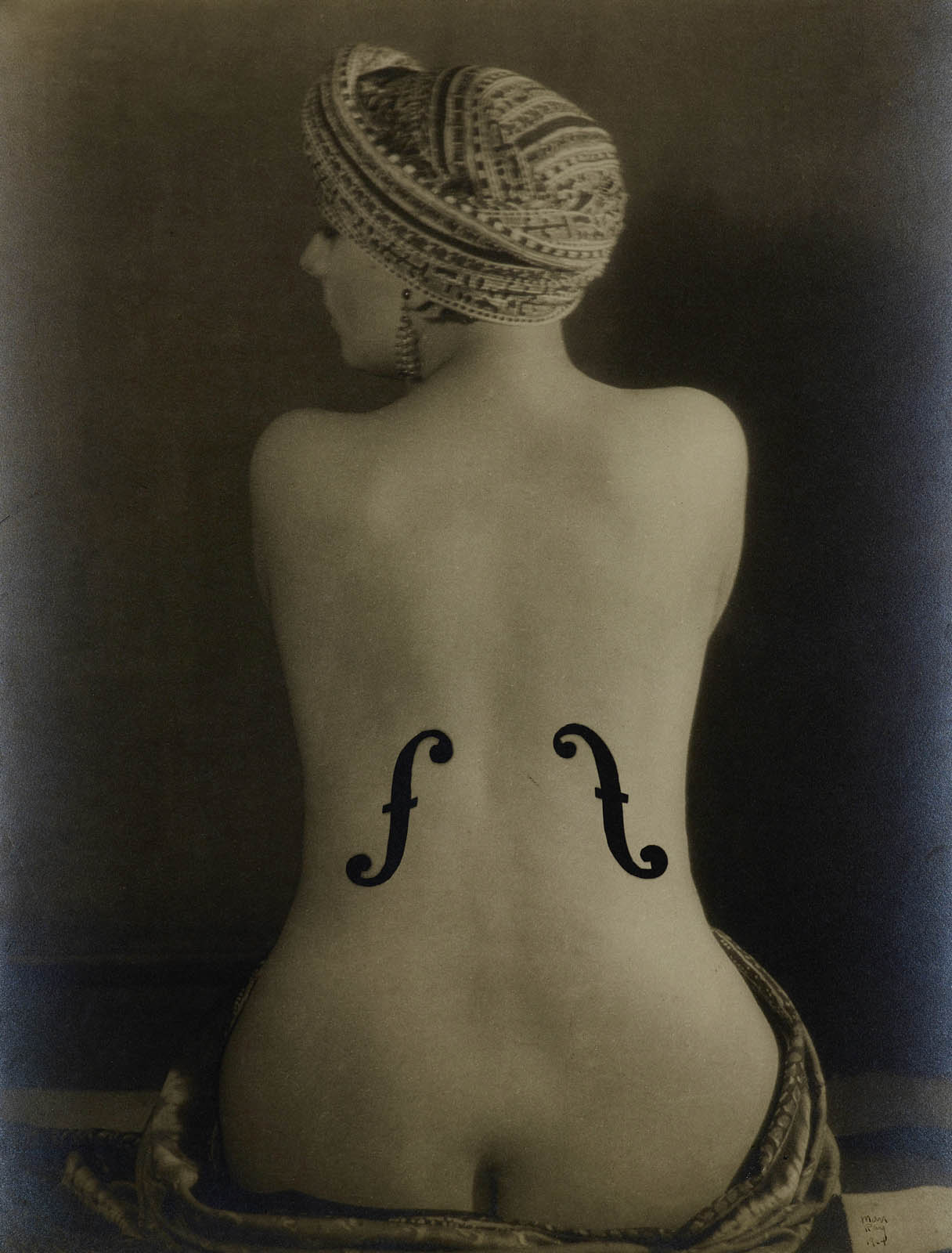
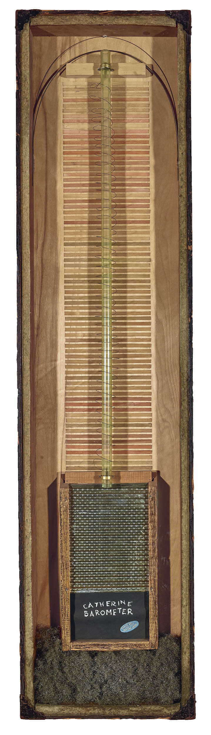
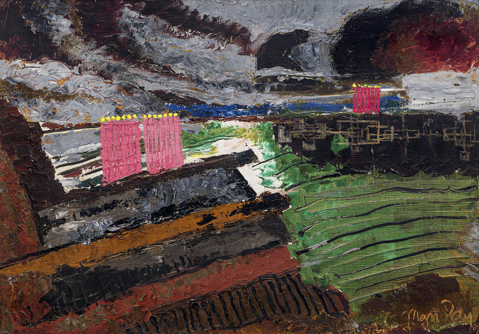
Highlights include such iconic objects like Man Ray’s iron studded with tacks, known as Cadeau (Gift) (1921), and his metronome, Object to be Destroyed (1923), that keeps time with the swinging eye of his companion, the photographer Lee Miller. Celebrated photographs, including his landmark Le violon d’Ingres (1924), in which the torso of the artist and performer Kiki de Montparnasse (Alice Prin) is depicted as a musical instrument, are also featured. The exhibition brings together some of his boldest but most refined experimental works – compositions like Aerograph (1919), a painting made with an airbrush and pigment sprayed through and around items from his studio. For Man Ray, objects could function as metaphors for the body, as demonstrated in works such as Catherine Barometer (1920) and L’homme (Man). Rarely seen paintings in the exhibition, including Paysage suédois (Swedish Landscape) (1926) record the artist’s great experimentation, working paint without a brush and in an almost sculptural way, building up and scraping down the surface that reflects his experiments in the darkroom.
Man Ray: When Objects Dream is curated by Stephanie D’Alessandro, Leonard A. Lauder Curator of Modern Art and Senior Research Coordinator in Modern and Contemporary Art at The Met, and Stephen C. Pinson, Curator in the Department of Photographs at The Met, with the assistance of Micayla Bransfield, Research Associate, Modern and Contemporary Art.
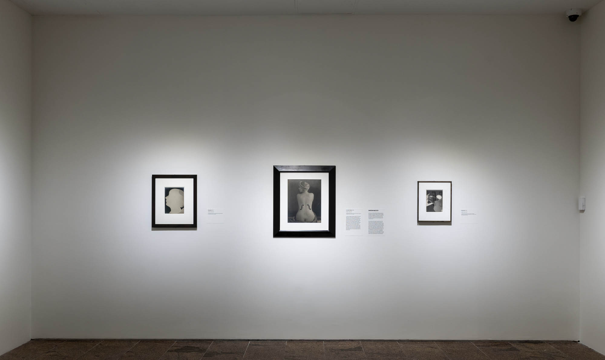
Installation view of the exhibition Man Ray: When Objects Dream at The Metropolitan Museum of Art, New York, September 2025 – February 2026 showing at centre, Man Ray’s photograph Le violon d’Ingres 1924 (below)
American artist Man Ray (1890-1976) was a visionary known for his radical experimentation that pushed the limits of art. His most iconic works – an iron studded with sharp tacks, a woman’s back reimagined as a violin – combine this boundary-breaking attitude with a singular belief in the transformative potential of everyday things.
In the 1920s, the most significant of Man Ray’s investigations – and the thing that connected much of his work – was what he called the rayograph, a new twist on an old technique for making photographs without a camera. By placing objects on or near a sheet of sensitised paper, which he then exposed to light and developed, he turned recognisable subjects into wonderfully mysterious compositions. This radical art form, inextricably linked to the era’s Dada and Surrealist movements, grew out of his early work in New York and redefined his groundbreaking career in Paris.
Introduction
This exhibition’s subtitle, When Objects Dream, comes from a phrase by Tristan Tzara, a poet, artist, and early champion of Man Ray. Witness to some of the earliest rayographs, Tzara understood perhaps better than anyone else their physical and metaphorical link to objects reimagined through art. In a similar spirit, the current presentation reconsiders the role of the rayograph within Man Ray’s practice, especially its ability to extend his ideas across diverse media. The loosely chronological installation unfolds across a series of interconnected galleries organized around ideas that motivated the artist; to that end, visitors are invited to explore it in any number of ways.
All works in the exhibition are by Man Ray (American, 1890-1976).
Champs délicieux
In April 1922, readers of a French literary journal discovered a curious announcement for an album titled Champs délicieux (Delicious Fields). Its twelve “original photographs” by Man Ray feature objects from his studio – tongs, a comb, string, a hotel room key – composed in groupings. The images are ordered without clear logic or narrative. Instead, as advertised, they mark a “state of mind,” the artist’s free play, alone at night and without work obligations, in his studio darkroom.
Man Ray introduced Champs délicieux in the period between two revolutionary movements that arose in the wake of World War I: Dada and Surrealism. Both challenged conventional art and society by upending traditional subjects, techniques, and expectations. Inspired in part by a collection of unconsciously driven, automatic writings by poets André Breton and Philippe Soupault, Man Ray sought to render everyday objects unfamiliar. As early subscriptions attest, the album found an enthusiastic audience who appreciated the language of the rayograph and its ability to open up a new visual world.
A New Art
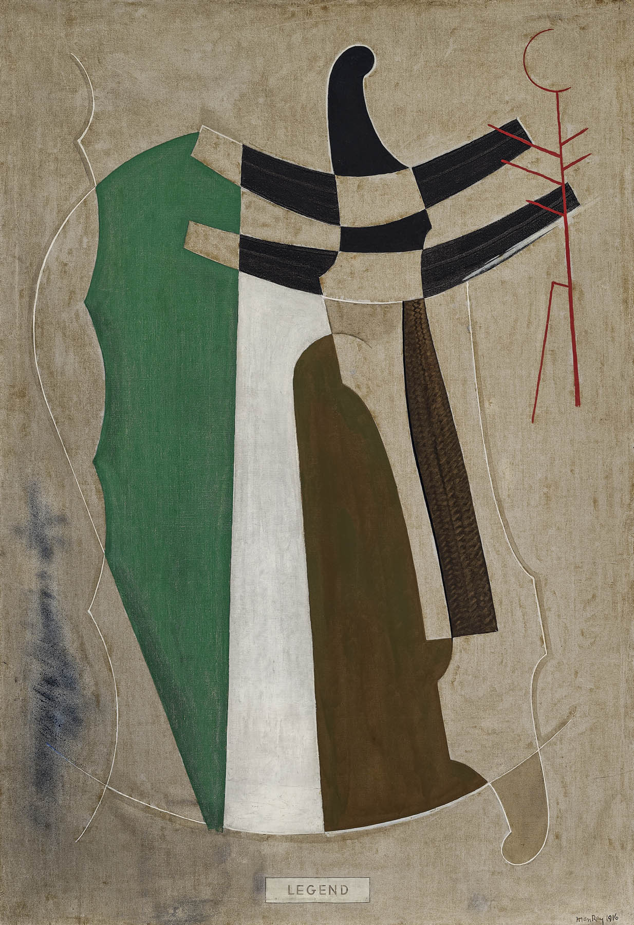
Before Man Ray first picked up a camera in 1915, he was focused on painting. He set out to stake his claim in the exhilarating avant-garde scene, his interest fueled by cutting-edge exhibitions at Alfred Stieglitz’s gallery, 291, and thrilling examples of Cubism, Expressionism, Fauvism, and Futurism at the modern art presentation known as The Armory Show in 1913. Unexpectedly, photography offered Man Ray a path forward. Noting the way a camera lens could compress and flatten space, he determined to endow art with a similar “concentration of life” while simultaneously freeing it from the burden of illusionism. “The creative force and the expressiveness of painting,” he wrote at the time, “reside materially in the colour and texture of pigment, in the possibilities of form invention and organisation, and in the flat plane on which these elements are brought to play.” He made paintings using palette knives and other tools instead of brushes and employed patterns, cutouts, and collage to create a self-proclaimed “new art of two dimensions.”
Objects At Hand
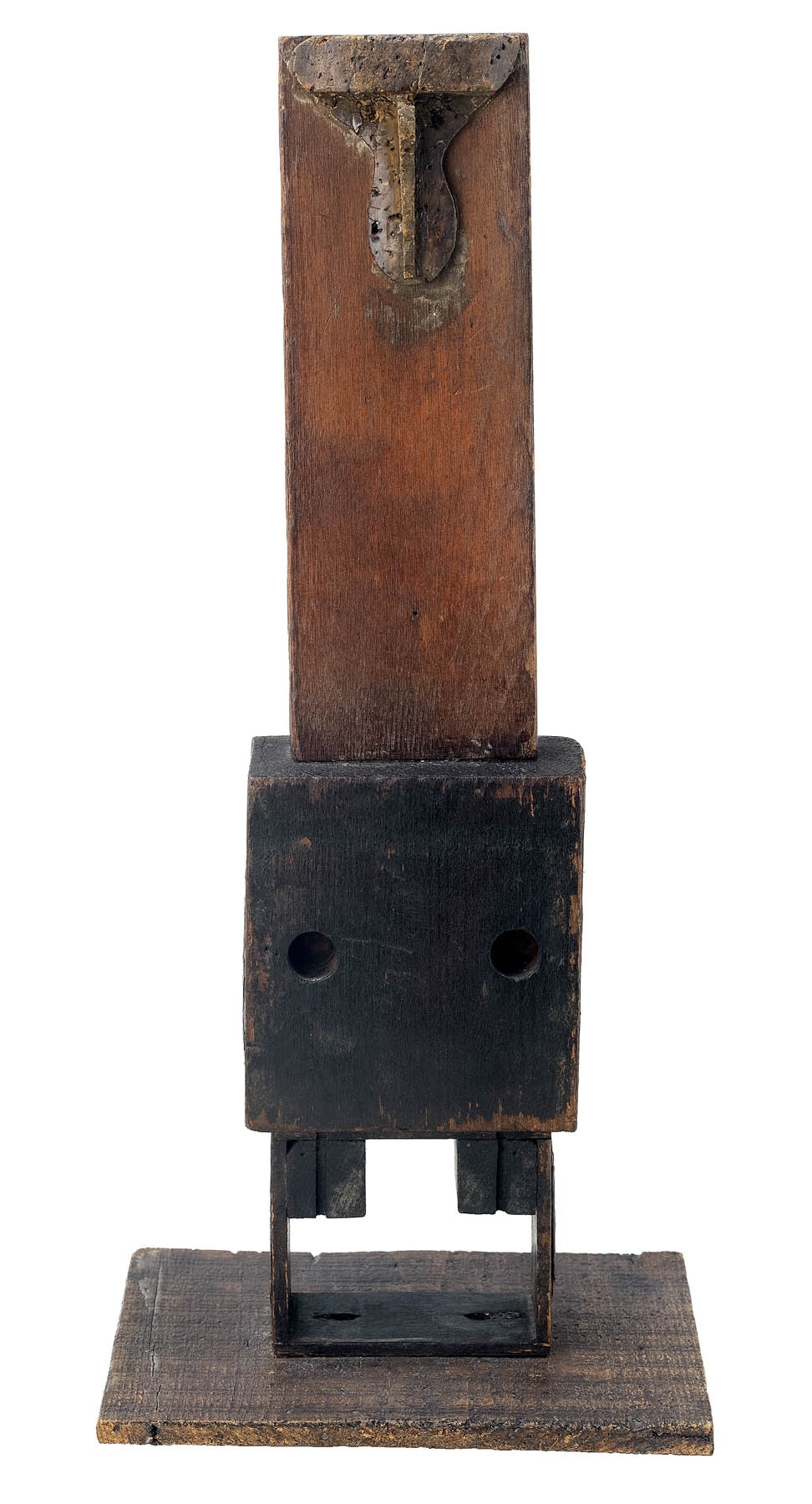
NOT RESPONSIBLE FOR GOODS LEFT OVER THIRTY DAYS. So reads a sign in a photo, displayed nearby, of Man Ray’s West Eighth Street studio in New York. It was one of several items the artist discovered in the trash heap at his apartment building and brought up to his top-floor space. He considered retooling the sign to read LEFT OVER GOODS NOT RESPONSIBLE FOR THIRTY DAYS but decided it was perfect as is. This act – of elevating junk to art – is a familiar one in histories of the avant-garde, especially for the Dada movement. Art did not have to be painted or modelled or made with traditional materials and tools; it could be found in the everyday world and appreciated for the idea that it introduced, not for its beauty.
As Man Ray developed his “new art,” he came to see the latent potential of all the objects within his studio. This spurred further investigations that likewise tested the limits of two and three dimensions and blurred the boundaries between media. At the same time, he continued to explore how the camera could be used not only to document his work but to open new perspectives onto ordinary objects and their creative possibilities.
Clichés-verre
While the rayograph is often described as Man Ray’s first experiment with cameraless photography, that moment occurred years earlier. Around 1917 he explored several photographically based techniques, including the cliché-verre, or “glass-plate” print. A nineteenth-century reproductive process that incorporates both photography and printmaking, a cliché-verre is traditionally made by covering a plate of glass with a darkened medium and drawing into it to produce clear lines. When set onto sensitised paper and exposed to a light source, the plate transmits the scratched away areas as dark lines. Man Ray chose to incise directly into the emulsion of an exposed photographic plate, which he then subjected to light again with paper below it to make a contact print.
Photography
Man Ray first picked up a camera in 1915, to document his art. Through this experience, he discovered that the works acquired new qualities when reproduced in black and white. He made photographic portraits, too, which in Paris would become a dependable source of income. Revelling in the camera’s transformative optical abilities, Man Ray soon used it as a tool to facilitate his self-appointed role as a “marvellous explorer of those aspects that our retinas will never record.” He sought to reveal the creative potential of objects in his studio and in 1918 began a series of photographs using specifically arranged everyday items.
Aerographs
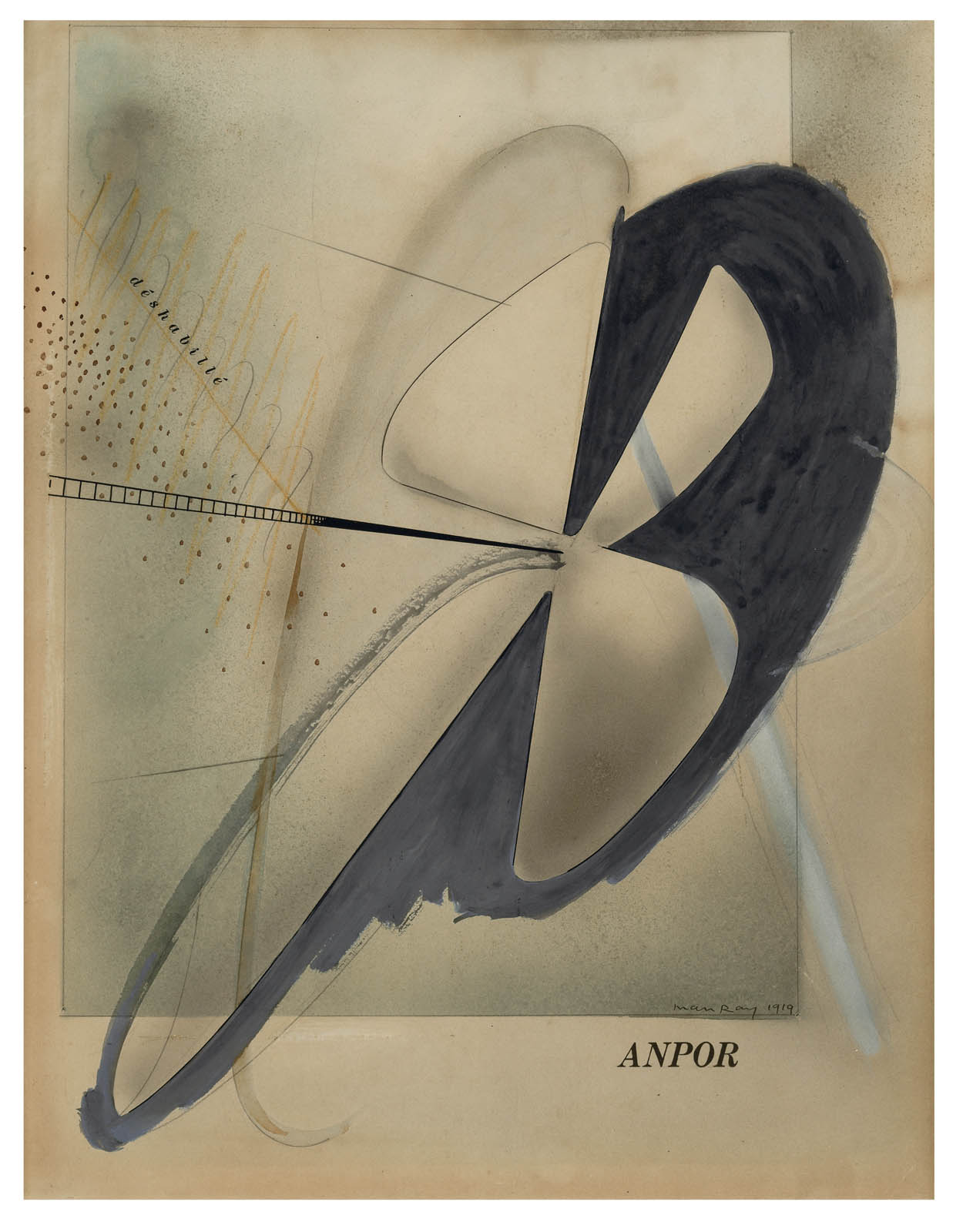
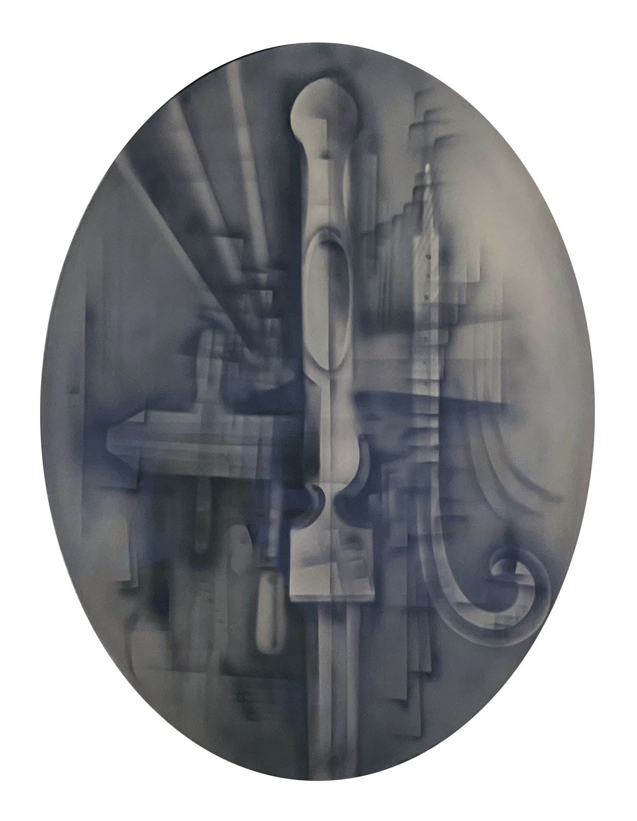
Still grappling with how to paint without a brush, Man Ray found inspiration at his day job working for an advertising agency, where he was introduced to an airbrush. He later brought the equipment back to his attic studio and began to experiment. Using an air compressor, the artist directed pigment through stencils and around masked areas and objects, which he rested on the composition board and repositioned as he worked. “It was thrilling,” he would later recount, “to paint a picture, hardly touching the surface – a purely cerebral act.” These works, which he termed “aerographs” were made, in effect, before they hit the paper. Objects were carved, shaped, and modeled in the air. Voids register as substance, and what we see on the paper is residue fused to the surface. “I tried above all,” Man Ray explained, “to create three-dimensional paintings on two-dimensional surfaces.”
Flou
Man Ray introduced his rayographs during a transitional period between the Dada and Surrealism movements that the French writer Louis Aragon called the mouvement flou – flou translating to “blurry” or “out of focus.” The term also suits these works, which viewers initially deemed curious and captivating but difficult to pin down. Rayographs, as cameraless photographs, exist in an indistinct place between photography and painting, the mechanical and the handmade, documentation and dream.
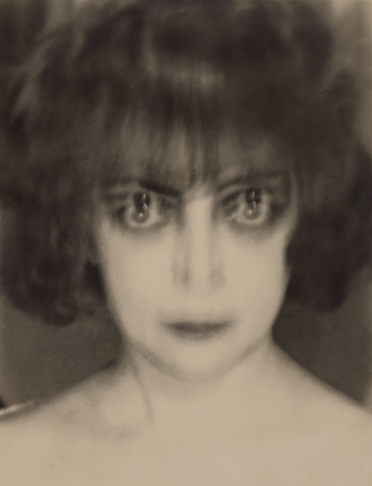
During the 1920s Man Ray also explored blurriness in his camera images. Even as technical improvements facilitated increased focus and detail, and the preference for sharp photographs grew, he generally pursued a flattering, soft-focus technique in his growing business of portrait commissions. At other times, he sought more radical effects, which the director Claude Heymann described as “strange, troubling blurs” produced “through distortions, prolonged poses or special focusing techniques.” The anomalies in the resulting photographs are visible signs of the effort and time Man Ray spent to realise the images – even if he later called them unplanned or accidental.
A New Field of Gravity
In his preface introducing the album Champs délicieux (Delicious Fields), Tristan Tzara remarked that rayographs “present to space an image that exceeds it, and the air, with its clenched fists and superior intelligence, seizes it and holds it next to its heart.” Indeed, objects in Man Ray’s images beckon us in but keep us thrillingly at the edge – or put another way, they test our senses of proximity and location. His experiments in New York expanded the bounds of the photograph, object, painting, and installation, and he developed a novel relationship between object and viewer. These works demonstrate in their construction what the French writer Georges Ribemont-Dessaignes would identify in the artist’s rayographs as a “new field of gravity.”
The rayograph
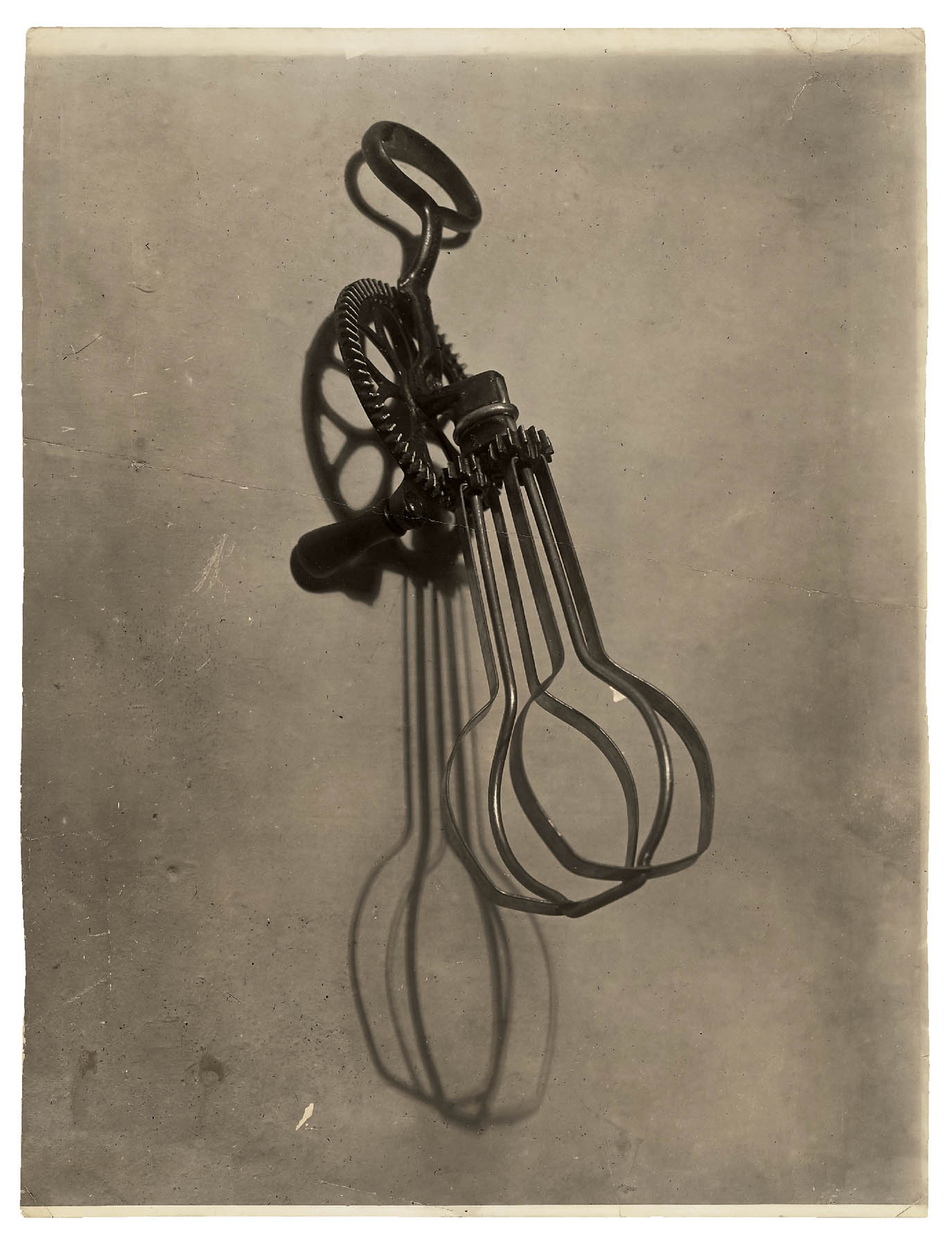
The term rayograph designates Man Ray’s version of a technique for making photographs without a camera: by setting objects on or near sensitised paper and exposing it to light. In his autobiography, the artist described happening upon the process by chance, late one night, while developing prints in his makeshift darkroom. For subjects, he looked no further than the things in his studio. When exposed to a directed flash of light, they appear as reversed silhouettes – but in Man Ray’s hands they also gained new life. The nature of the image depended on the items’ translucency, reflectivity, density, placement, and distance from the sheet, as well as the source and location of the illumination and the number of exposures. Surfaces could cast unexpected reflections or eclipse elements in darkness. Forms might multiply or transform. Sometimes Man Ray’s objects and the space between them acquired an insistent, compressed volume that registered on the paper. The resulting works present what writer Pierre Migennes described as a “metamorphosis of the most vulgar utensils.” Everyday things became wonderfully unfamiliar as Man Ray wielded light in the darkroom like a brush in paint.
As he prepared to launch his rayographs in Champs délicieux, Man Ray also considered how to disseminate them for reproduction in magazines. On November 1, 1922, he wrote to Harold Loeb, editor of Broom: “Each print is an original, no plate or duplicate exists, as the process is manipulated directly on the paper, like a drawing. If you could assure me that the … originals would be safely handled and returned, I shall gladly send them on [to Berlin]. If, however, you cannot guarantee their safe return, I can re-photograph them … which, while not having the intensity and contrast of the originals, would nevertheless reproduce well.” Loeb offered to transport them personally and published these four in Broom the following March.
Man Ray transformed and energised ordinary objects in his rayographs by tapping their powers of translucency or reflectance. Bodies and their proxies, however, remain stubbornly recognisable. Hands reach out, hold things, and interact with objects; heads turn to kiss and drink, even if the action might be staged. The artist’s rayographs tie the body to a kind of specificity that his objects do not experience; this might explain why there are fewer of these works with bodies than without. As Tristan Tzara explained in his appreciation of the rayographs in 1934, Man Ray approached objects in a manner that allowed them to be free “to dream.”
Dangerous Games
Reactions to Man Ray’s cameraless photographs consistently identified them with the realm of play. The first to comment on the rayograph was French poet Jean Cocteau, who wrote in an open letter, “You, my dear Man Ray, will nourish our minds with those dangerous games it craves.” He was soon joined by Tristan Tzara, who likened the rayograph to a “game of chess with the sun.”
Man Ray had a strong sense of the game as a strategy for producing art. For him, play was a state of readiness to engage. This comes through in the provocative humour of his objects and collages and in the invitation to chance embedded in the rayograph process – the “discovery” of which, he recounted, entailed real amusement. Marcel Duchamp once playfully defined his friend as synonymous with the joy of the game: “MAN RAY, n.m. synon. de joie, jouer, jouir” (joy, to play, to enjoy).
Chemical Paintings
In April 1922, the same month that the Champs délicieux album was announced, Man Ray proudly reported to friends and patrons that he had freed himself “from the sticky medium of paint.” His rayographs claimed a rebellious position aimed at the traditional hierarchy of fine art – and particularly its apex, painting. Critics asserted they had equal status, and New York’s Little Review even called them “chemical paintings.”
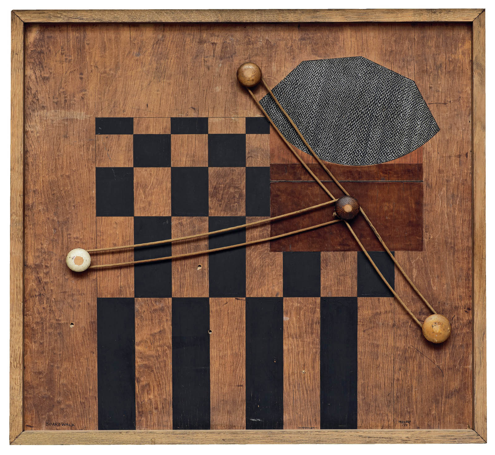
Just a year later, however, while his rayograph production remained steady, Man Ray quietly returned to painting. The works here show how his practice had changed. Abstract and relatively small, they were made on commercially available boards, wood, sandpaper, or metal supports. With their overlapping pictorial elements and dramatic contrasts of luminosity and shadow, angled and geometric forms, the compositions emulate aspects of rayographs. Each is a thorough exploration of depth on a flat surface and a bid to make paint reflect its own material reality.
Objects and Bodies
Man Ray’s experience of making rayographs informed his consideration of the human body, which he handled, at times, like an object, devoid of personhood and open for manipulation. Writing about the artist’s portraits and rayographs, André Breton noted that Man Ray considered the bodies of women in his work no different from the objects at hand in his darkroom:
The very elegant, very beautiful women who expose their tresses night and day to the fierce lights in Man Ray’s studios are certainly not aware that they are taking part in any kind of demonstration. How astonished they would be if I told them that they are participating for exactly the same reasons as a quartz gun, a bunch of keys, hoar-frost or fern!
For Man Ray, a body could function as a kind of concentrated equivalence, like the essence represented by an object. This attitude is visible in some of the most iconic works of his career, in which his presentation of female models such as the artist and performer Kiki de Montparnasse (Alice Prin) also involved darkroom manipulation. While his approach to men’s bodies was notably less sexualised, they too were posed and set up like the objects in his rayographs.
Darkroom Manoeuvres
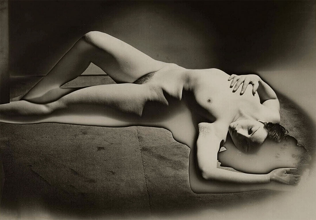
Like other pictures of Kiki de Montparnasse in this gallery, Le violon d’Ingres involved multiple darkroom campaigns. For the version published in Littérature, Man Ray worked on a print to sharpen the contours and smooth the forms; he added f-shaped sound holes directly onto it with dark ink.
The version here, larger than the first, is the result of further experimentation. Man Ray covered the entire print with a mask from which he hand cut two f-shaped forms. He then made a second exposure, which turned the exposed spaces black. Instead of ink shapes that disrupt the surface, these marks read as deep, dark space compressed within the flat surface of the photograph. Man Ray described this version as “a combination of a photo and a rayograph.” As such, the f-holes are eerily – seamlessly – part of the woman’s body. She appears as a kind of dreamlike human-instrument hybrid, a whole object to be visually taken in and possessed.
Dreams
Even before the Surrealist manifesto of 1924 claimed the fertile ground of the unconscious, many poets and artists in Man Ray’s circle focused on dreams. The same group, two years earlier, had followed André Breton’s experiments with hypnosis and trance states. They practiced séances and so‑called sleeping fits, writing down or drawing what came to them in order to reveal hidden desires. The poet Louis Aragon wrote of these slumberous escapades: “Dreams, dreams, dreams, the domain of dreams expands with every step.”
Apart from photographing the sleep sessions, Man Ray remained an independent supporter of the group, explaining, “It has never been my object to record my dreams, just the determination to realise them.” Even so, Aragon included him in his multipage inventory of dreamers, with a nod to the rayographs: “Man Ray … dreams in his own way with knife rests and salt cellars: he gives meaning to light, which now knows how to speak.” The artist found great support among the Surrealist circle in Paris, whose members acquired his work and included him in exhibitions and publications.
Dream Objects
Man Ray’s dreamlike rayographs have counterparts in the new kinds of hybrid objects he began to make at the same time. These mysterious works seize upon unexpected transformations: a fragile soap bubble rendered solid; the taut strings on a musical instrument’s neck turned loose and sensuous; or a budding plant metamorphosed into a pudgy hand.
The strange bundle wrapped with string has long been associated with the power of objects to stir the unconscious. In 1920 Man Ray assembled, photographed, and deconstructed the original object. The Untitled photograph appeared in the first issue of La revolution surréaliste, in 1924, with the text “Surrealism opens the door of the dream to all those for whom night is miserly.” Over the next decade, the image came to embody another phrase popular among the Paris Surrealist group, by the poet Isidore Ducasse: “as beautiful … as the chance encounter of a sewing machine and an umbrella on a dissecting table.”
“Objects to touch, to eat, to crunch, to apply to the eye, to the skin, to press, to lick, to break, to grind, objects to lie, to flee from, to honor, things cold or hot, feminine or masculine, objects of day or night which absorb through your pores the greater part of our life. … These are the projections surprised in transparence, by the light of tenderness, of objects that dream and talk in their sleep.” (Tristan Tzara, “When Objects Dream,” 1934)
Returns
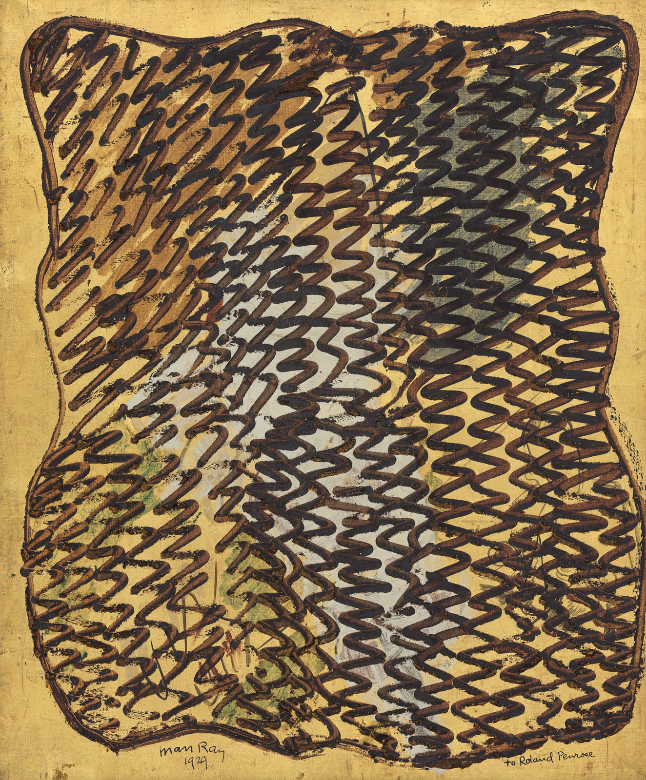
In 1929 Man Ray found himself “longing to touch paint again.” By the fall, he had taken a second Paris studio, near the Luxembourg Gardens, where he painted in the mornings before returning home to oversee photographic portraits and magazine work. In his new compositions, he let paint drip across a canvas from a poured line and squeezed pigment directly from the tube onto a support in a loose, calligraphic manner. Trading on narratives of chance and automatism, he later called these paintings “unpremeditated.”
Another return accompanied the arrival in Paris of Lee Miller, who became Man Ray’s apprentice in photography and then his personal and professional partner. As a result, he again embraced the camera as his primary tool of photographic experimentation, after years of making rayographs without one. Together, Miller and Man Ray discovered a creative synergy that led to their joint development of the solarization process. The same year signalled the near culmination of Man Ray’s exploration of the rayograph: by some accounts, he made one hundred in 1922, but just one in 1929.
Solarization
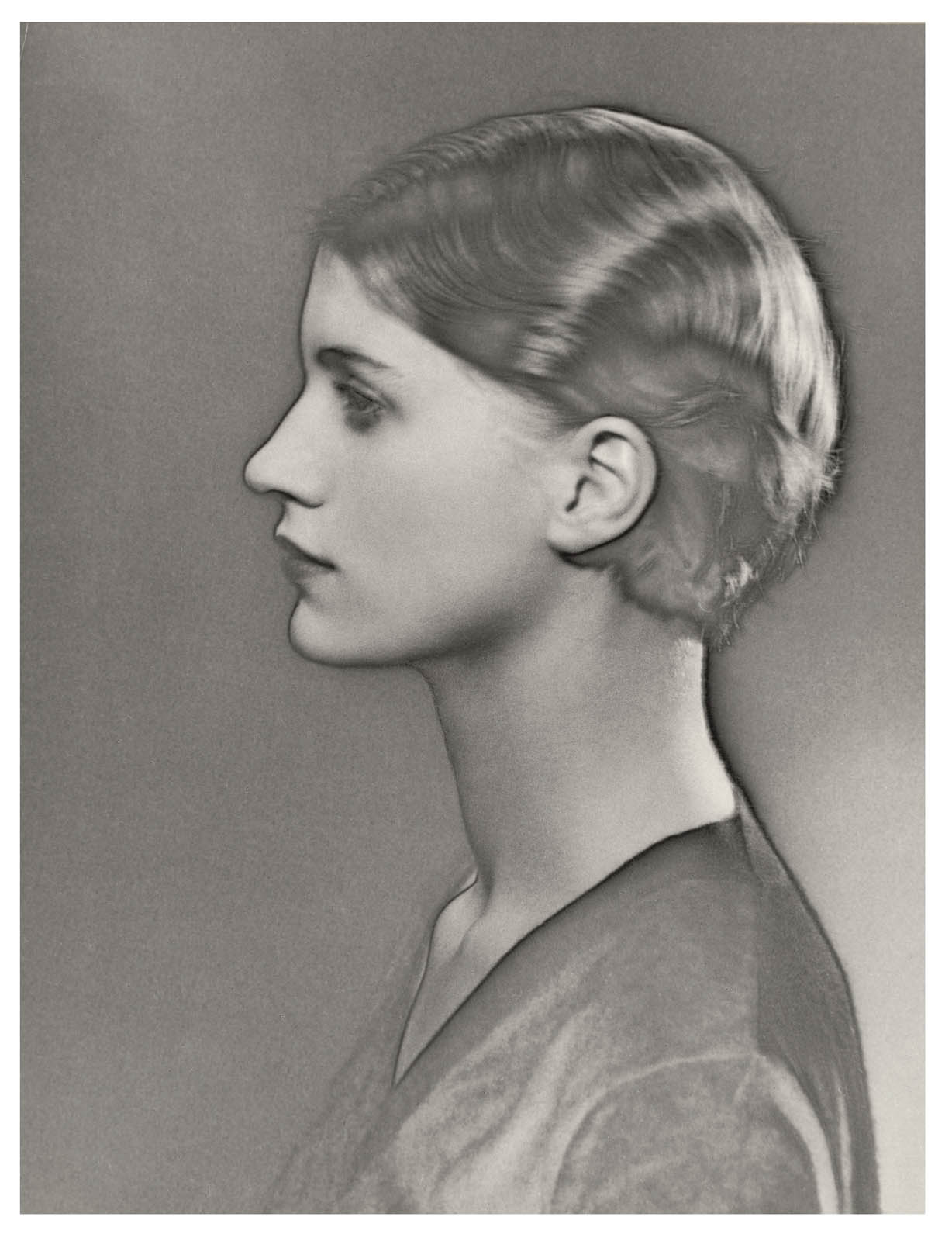
Together with Lee Miller, Man Ray developed a darkroom technique that complemented his return to painting. Like the rayograph, solarization was not entirely new, and both he and Miller claimed that it similarly resulted from an accident. The process involves exposing a negative a second time during development, which causes a reversal of the expected tonalities. Honed by Miller and Man Ray and applied to their portraits and nudes beginning in fall 1929, the process often endowed subjects with subtly glowing black contours that Miller called “halos.” This feature became so well-known – largely through reproductions of the solarized portrait of Miller shown nearby – that a 1932 article called it both “the beacon and despair of experimenters.” Like the drips and skeins in Man Ray’s 1929 paintings, these lines create a friction between the subject and surface of the image – a noted departure from the artist’s earlier approach to the flat plane.
Revisiting Champs délicieux
Man Ray completed his Champs délicieux project nearly forty years after its debut. A handwritten inscription to Tristan Tzara in the final copy (number 41, displayed here) refers to the sparks set off by their initial exploration of the rayograph; he added an almost identical inscription in his 1922 working copy. This suggests a Dada game between the two artists: the announcement laid out the rules and the inscriptions signified its end.
As promised in the 1922 first announcement of the album, the last copy features the canceled proofs (a practice meant to show that no further prints can be made from the originals). A canceled print edition is not unusual. In this case, however, a purposeful ambiguity was in play from the beginning of the project – when it was presented as an album of “original photographs” copied from unique rayographs – to the end. Only the negatives used to produce the album were canceled, meaning that the primary rayographs might still exist. Ever the prankster, Man Ray ensured that the game continues.
Man Ray (American, 1890-1976) Catherine Barometer 1920 Glass, metal, felt, washboard, tube, wire, wood, steel wool, gouache on paper, and paper stamp 48 1/8 × 12 × 2 1/8 in. (122.2 × 30.5 × 5.4cm) The Metropolitan Museum of Art, New York, Bluff Collection, Promised Gift of John A. Pritzker Photo courtesy of The Bluff Collection, photo by Ian Reeves
An exhibition by Die Photographische Sammlung/SK Stiftung Kultur in cooperation with the Bernd & Hilla Becher Studio, Düsseldorf
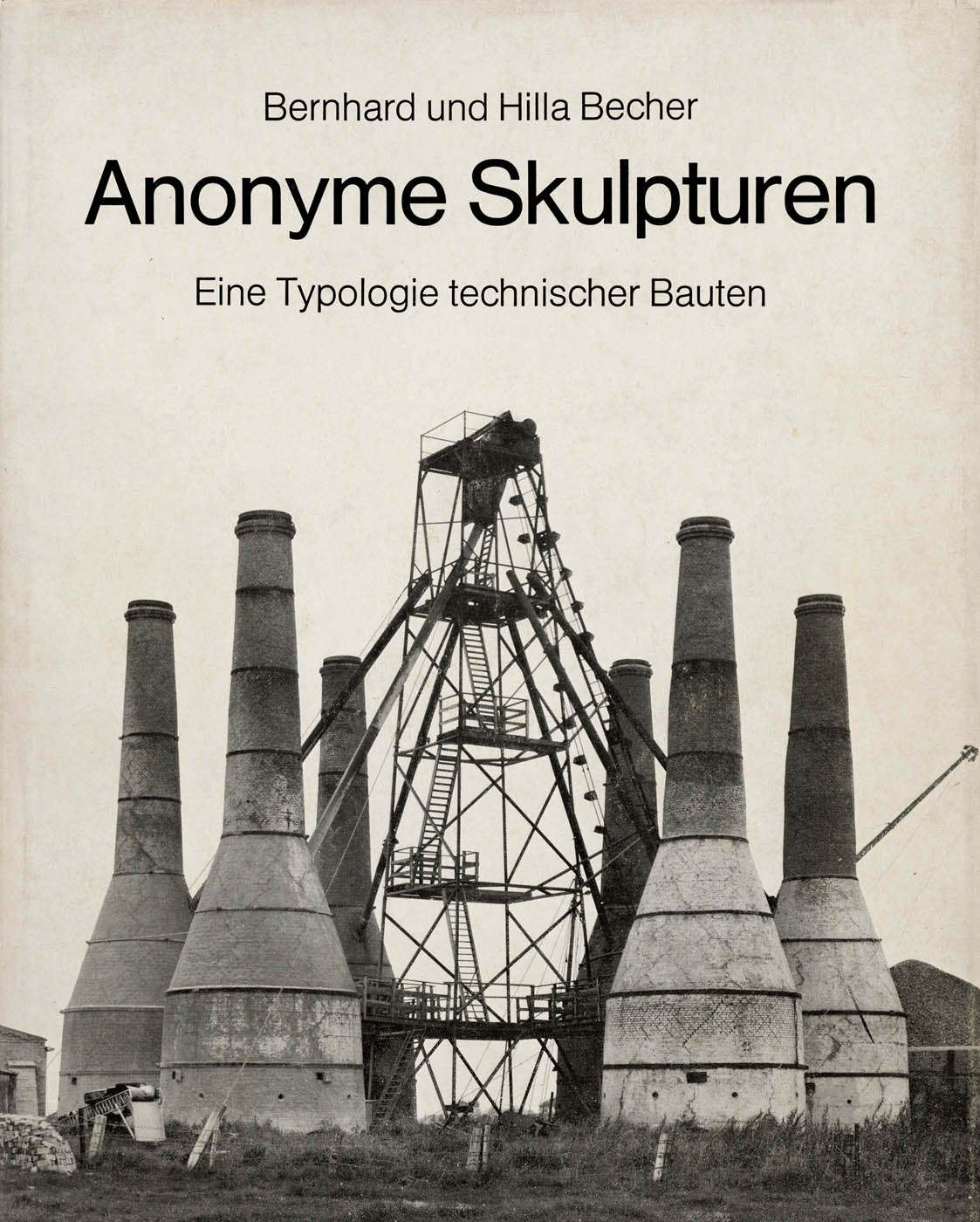
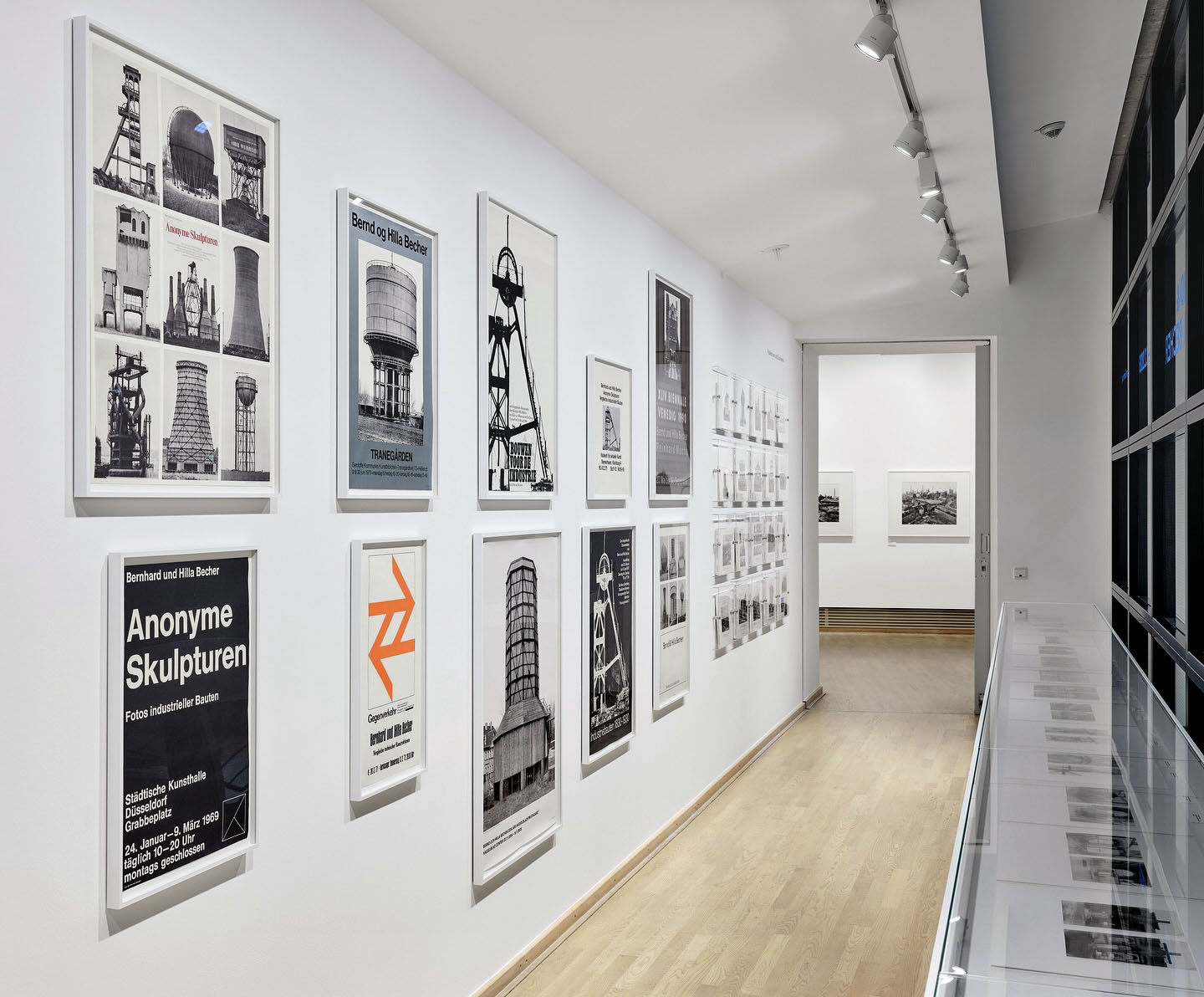
Anonyme Skulpturen. Eine Typologie technischer Bauten, Düsseldorf: Art-Press Anonymous Sculptures: A Typology of Technical Buildings, Düsseldorf: Art-Press 1970 (Buchcover) Courtesy Die Photographische Sammlung/SK Stiftung Kultur, Köln
When we think about the most influential photographers of the first five decades of the 20th century we conjure up names such as Eugène Atget, Alfred Stieglitz, Paul Strand, Walker Evans, László Moholy-Nagy, Dorothea Lange, and Berenice Abbott, to name just a few – and by influential, I mean those photographers that altered the intensification of the medium – the conceptualisation, creation, veracity, meaning and reception of the image.
In the last 50 years of the 20th century there are less of these medium-shifting artists that have really made a difference. Diane Arbus and Lee Friedlander are the two that readily spring to mind. And then there are the Bechers, Bernd & Hilla Becher. These German photographers changed the course of contemporary photographic practice, their conceptual art / objective photographic raison d’être still embedded at the heart of fine art photography today.
But, as I have argued elsewhere, their typologies and grids, their topographic state, their same same photographs and perspectives of industrial sculptures and landscapes are anything but objective. Their pictorial grammar, underlaid by a conceptual approach to subject matter, continuously reflected in the systematics of capture and display (the juxtaposition of works together), is constantly undermined by the ghost in the machine – those viral codes of mutation and difference which cannot be controlled.
While they professed to “eschew entirely entirely the aspects of beauty, emotion and opinion,” every photograph they took involves a subjective point of view, an element of uniqueness and beauty that can never be repeated.
“Despite protestations to the contrary (appeals to the objectivity of the image, eschewing entirely the aspects of beauty, emotion and opinion; the rigorous frontality of the individual images giving them the simplicity of diagrams, while their density of detail offers encyclopaedic richness) these are subjective images for all their objective desire. The paradox is the more a photographer strives for objectivity, the more ego drops away, the more the work becomes their own: subjective, beautiful, emotive.
Even though the Bechers’ demonstrate great photographic restraint with regard to documenting the object, the documentary gaze is always corrupted / mutated / distorted by personal interpretation: where to position the camera, what to include or exclude, how to interpret the context of place, how to crop or print the image, and how to display the image, in grids, sequences or singularly. In other words there are always multiple (con)texts to which artists conform or transgress. What makes great photographers, such as Eugène Atget, Walker Evans, August Sander and the Bechers, is the idiosyncratic “nature” of their vision: how Atget places his large view camera – at that particular height and angle to the subject – leaves an indelible feeling that only he could have made that image, to reveal the magic of that space in a photograph. It is their personal, unique thumbprint, recognisable in an instant. So it is with the Bechers.”1
For a deeper dive into the work of the Bechers, please see my text “Ghosts in the machine,” on the exhibition Bernd and Hilla Becher at the Metropolitan Museum of Art, New York, July – November, 2022.
Many thankx to Die Photographische Sammlung/SK Stiftung Kultur, Cologne for allowing me to publish the photographs in the posting. Please click on the photographs for a larger version of the image.
Installation view of the exhibition Bernd & Hilla Becher – History of a Method at Die Photographische Sammlung/SK Stiftung Kultur, Cologne
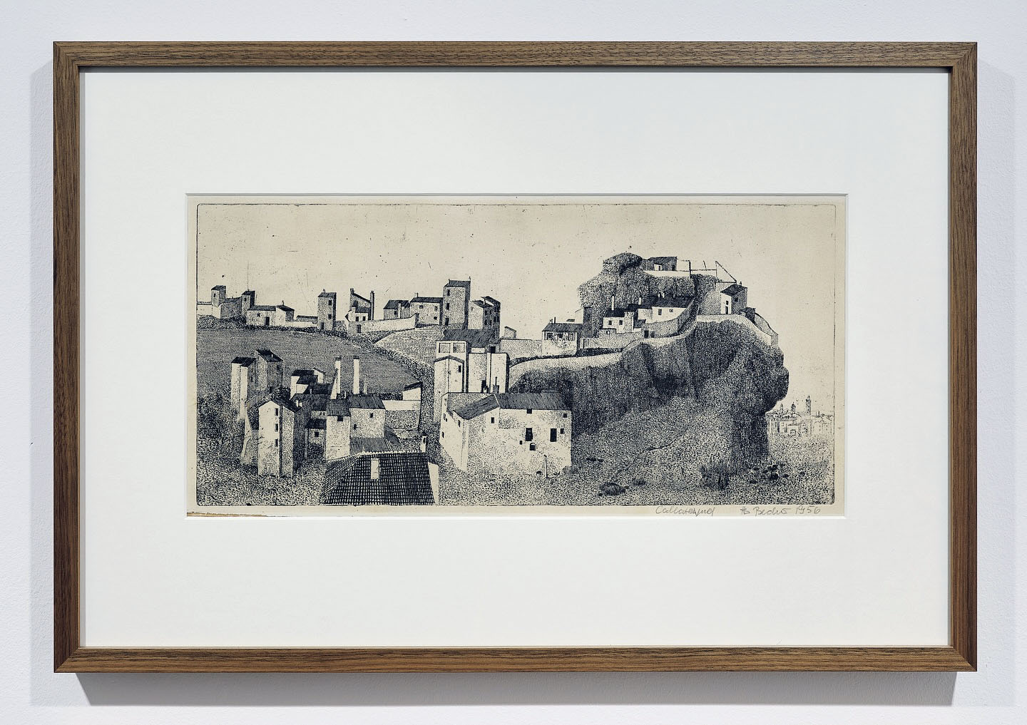
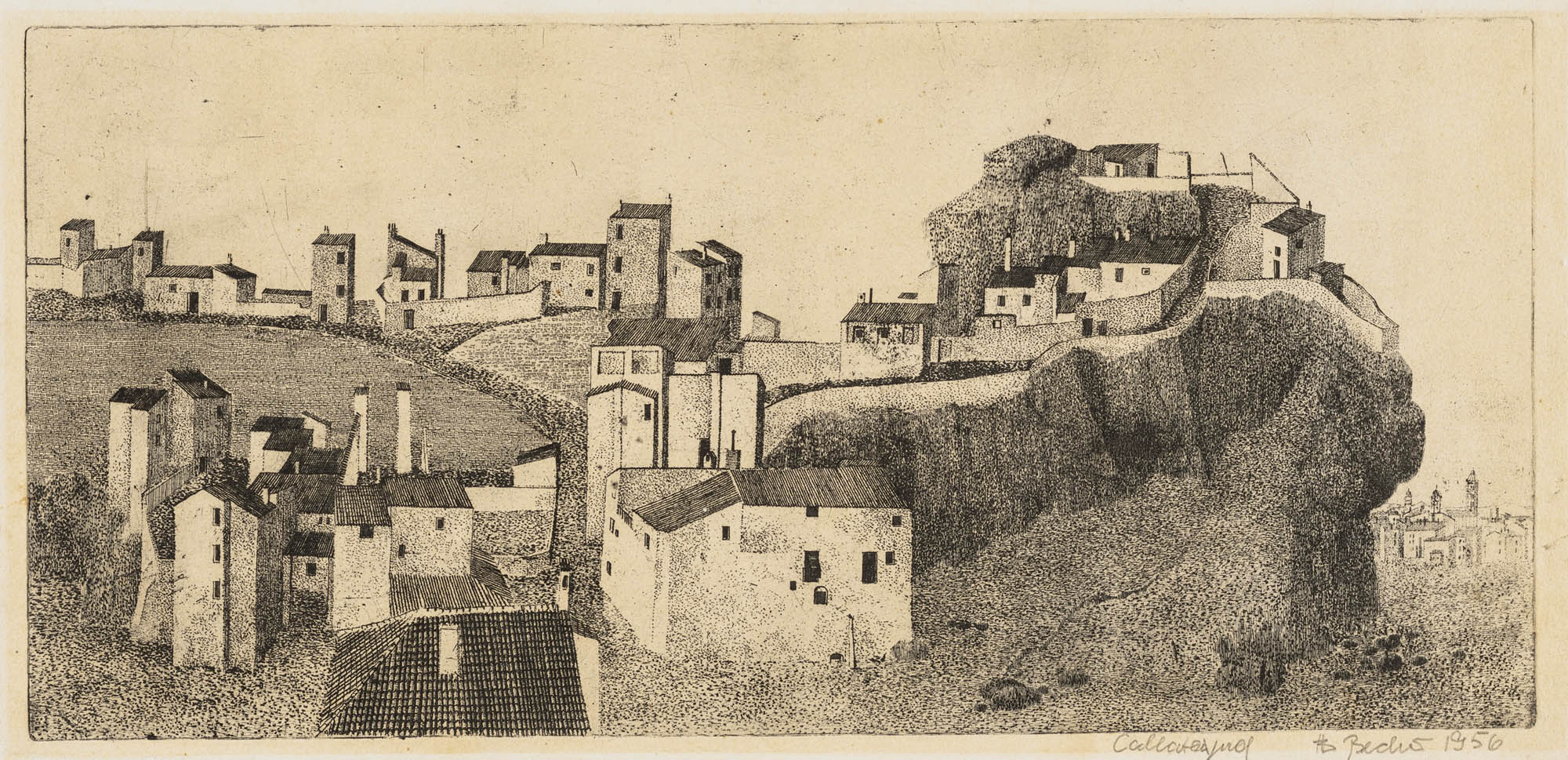
Installation view of the exhibition Bernd & Hilla Becher – History of a Method at Die Photographische Sammlung/SK Stiftung Kultur, Cologne showing Bernd Becher’s Calatayud 1956 (below)
Installation view of the exhibition Bernd & Hilla Becher – History of a Method at Die Photographische Sammlung/SK Stiftung Kultur, Cologne
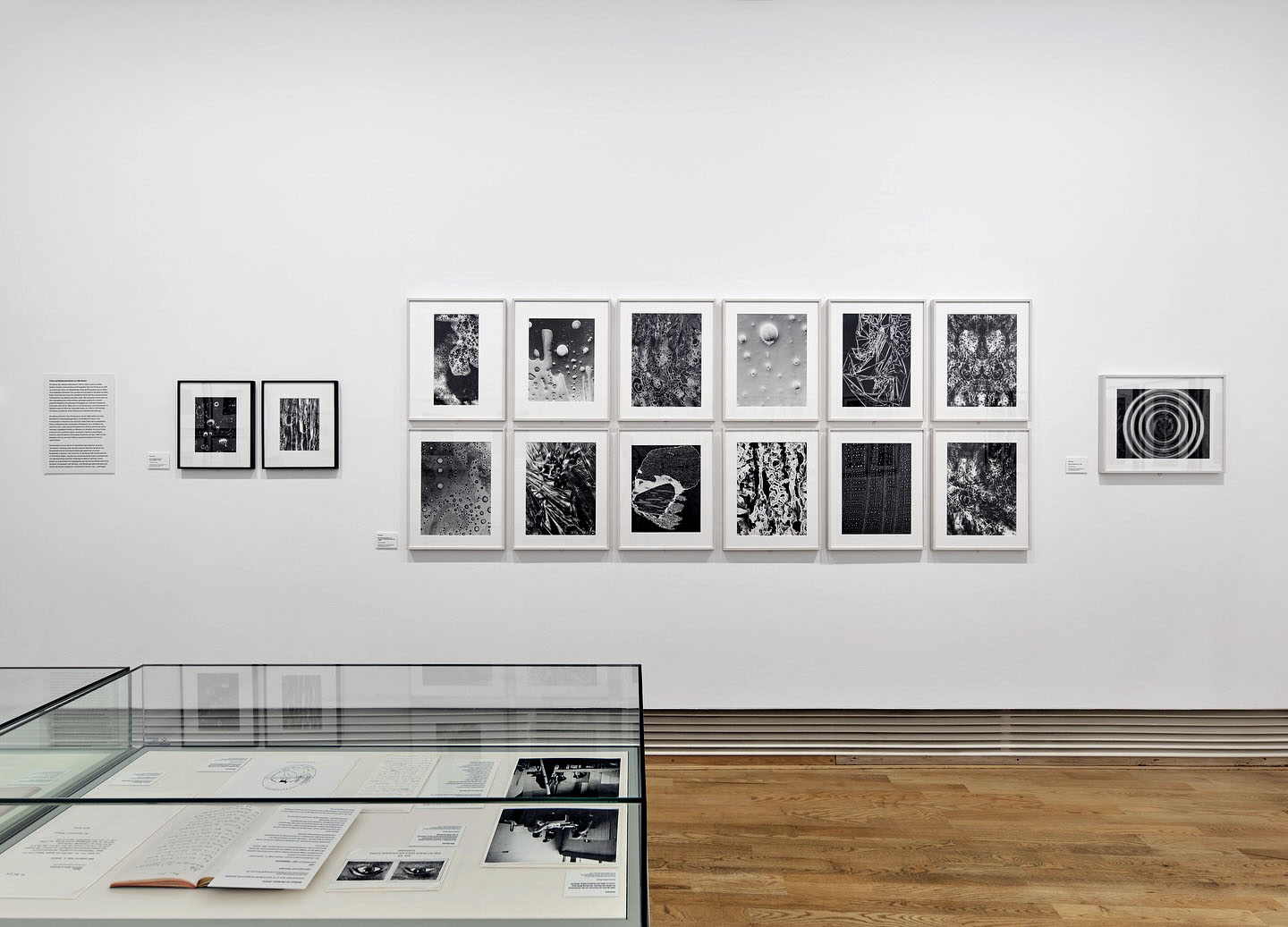
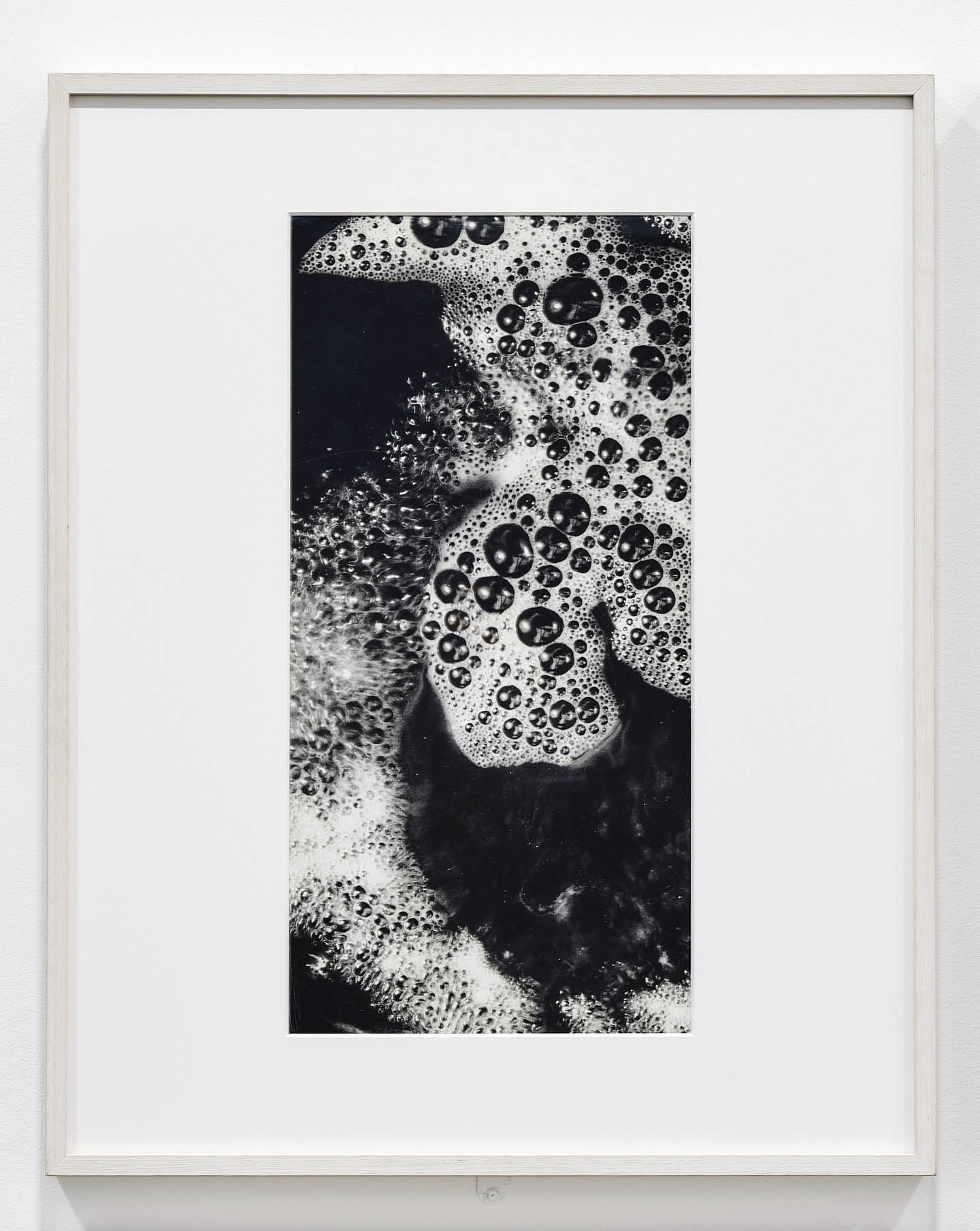
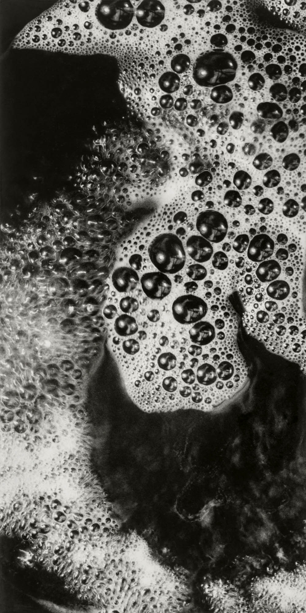
Installation view of the exhibition Bernd & Hilla Becher – History of a Method at Die Photographische Sammlung/SK Stiftung Kultur, Cologne showing Hilla Becher’s Untitled (Makroaufnahme von Schaum) (Macro shot of foam) c. 1960
Hilla Becher (née Wobeser) discovered photography as a teenager. Her mother had trained as a photographer at the Lette Verein in Berlin and supported her daughter’s interest. Accordingly, from 1951 to 1953, Hilla completed an apprenticeship as a photographer at the Walter Eichgrün studio in her hometown of Potsdam. In 1953, the family fled East Germany, and Hilla continued her career in West Germany. For example, in 1957 she worked at the Troost advertising agency in Düsseldorf, where she also met Bernd Becher.
The photograph shown above belongs to a series of surface and structural studies from around 1960. Nothing is known about the exact context of the photographs; however, their stylistic affinity to the “Subjective Photography” movement, which gained influence from the early 1950s onward, is interesting. Distortion techniques were an important tool in “Subjective Photography,” and Hilla Becher’s macro photographs utilise extreme proximity to the subject as a means of creating a sense of alienation.
Text from the SK Stiftung Kultur Die Photographische Sammlung Instagram page
An exhibition of Die Photographische Sammlung/SK Stiftung Kultur in cooperation with the Bernd & Hilla Becher Studio, Düsseldorf
The artist couple Bernd and Hilla Becher (1931-2007/1934-2015) has written photographic history. With their joint work, which they developed from 1959 until the 2000s on the basis of an almost uninterrupted photographic activity in the industrial regions of Germany, the Benelux countries, Great Britain, France, Italy, the USA and Canada, they created a new artistically motivated documentary style.
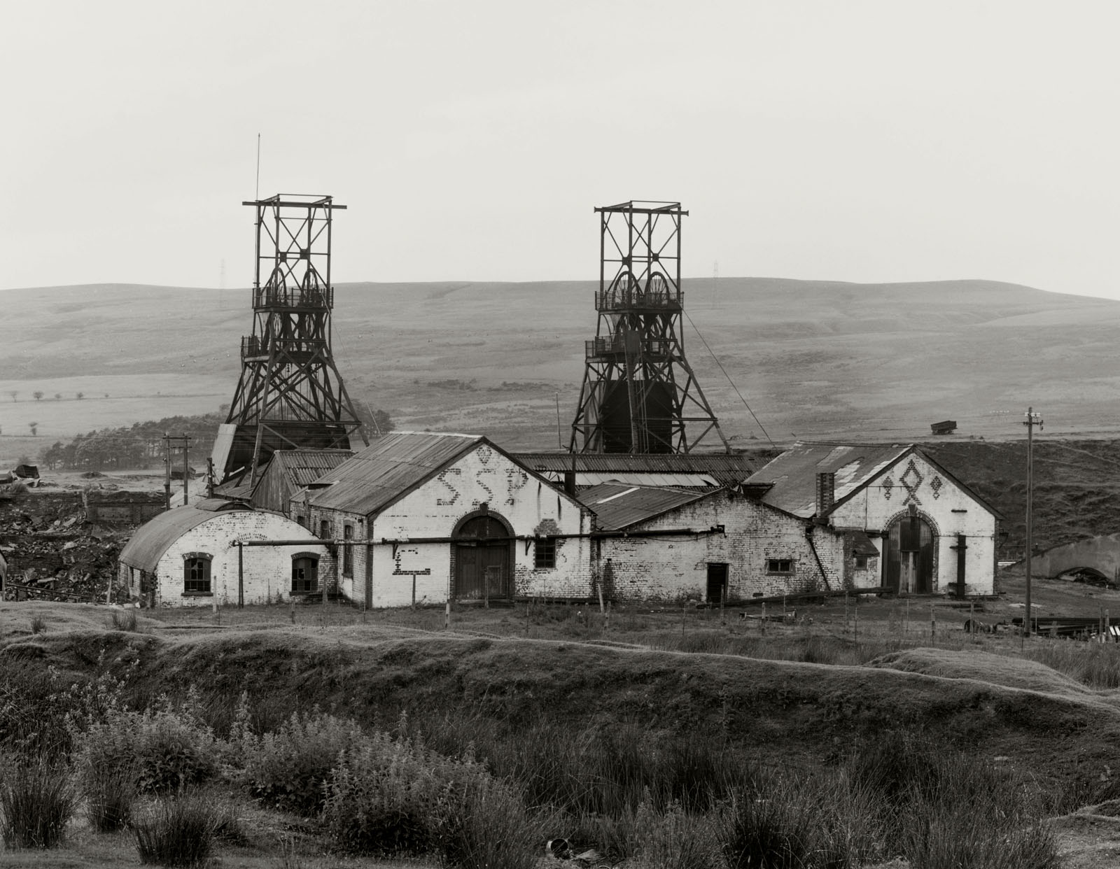
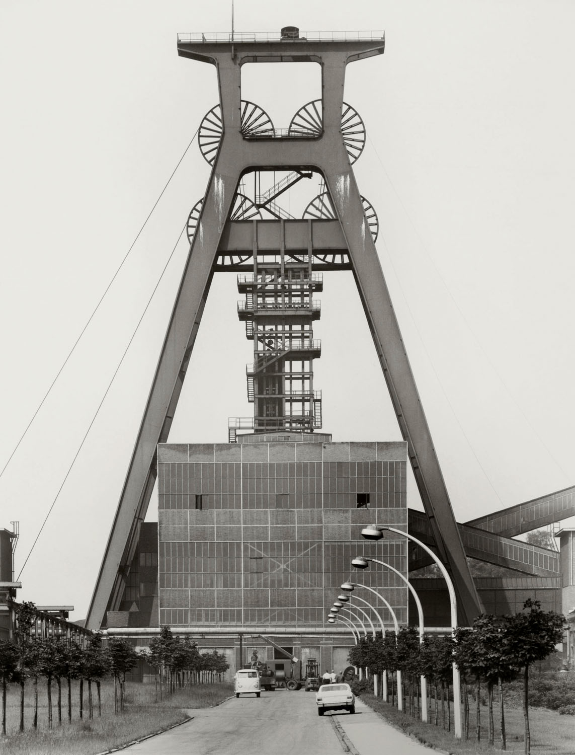
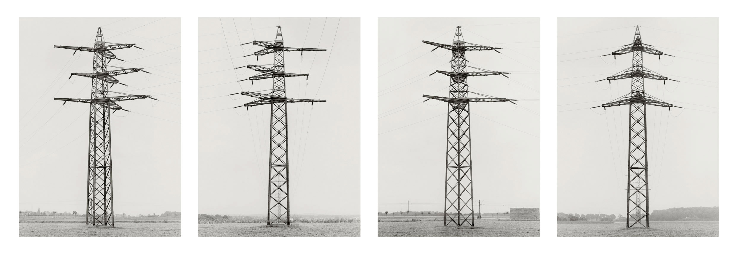
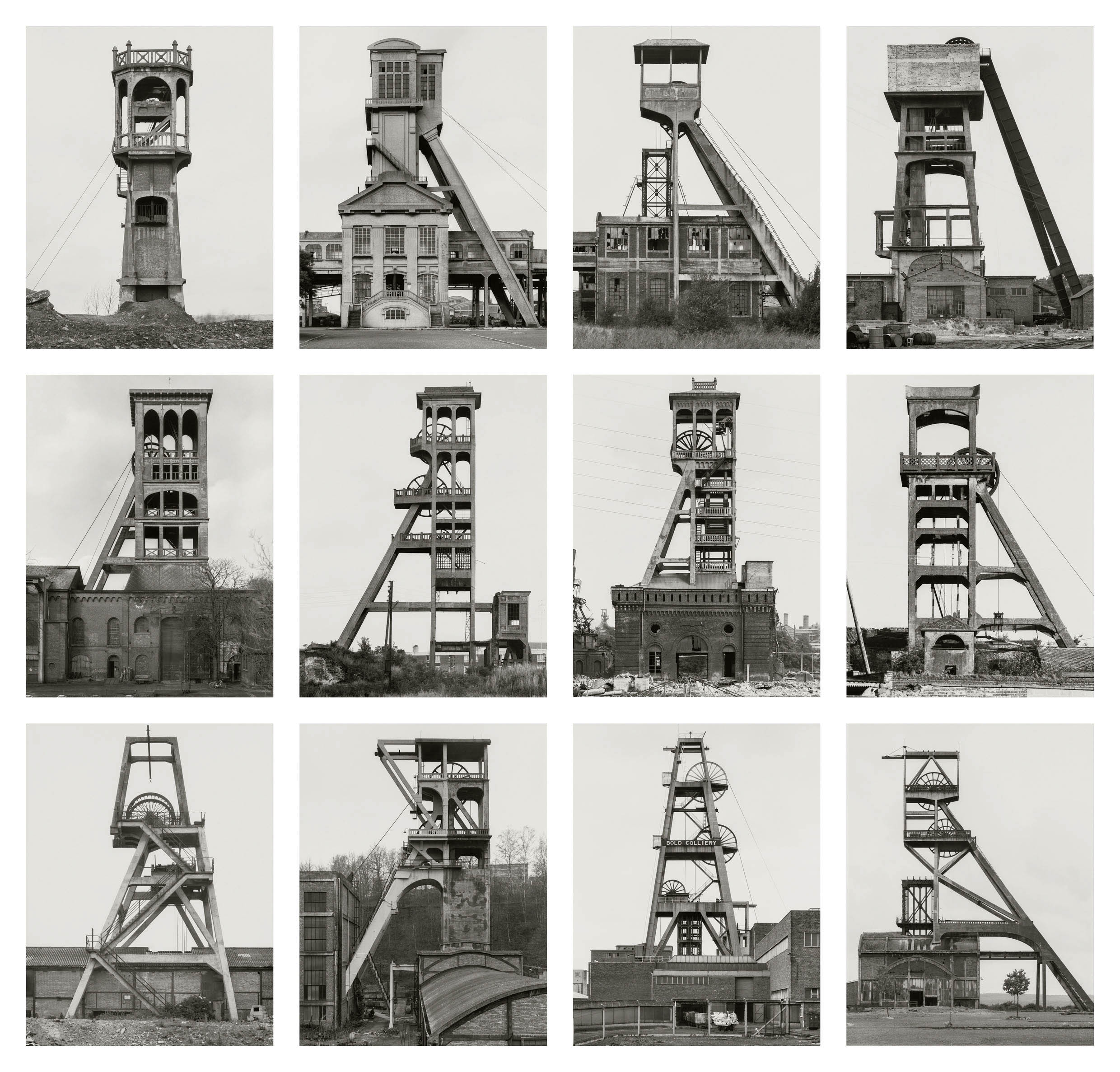
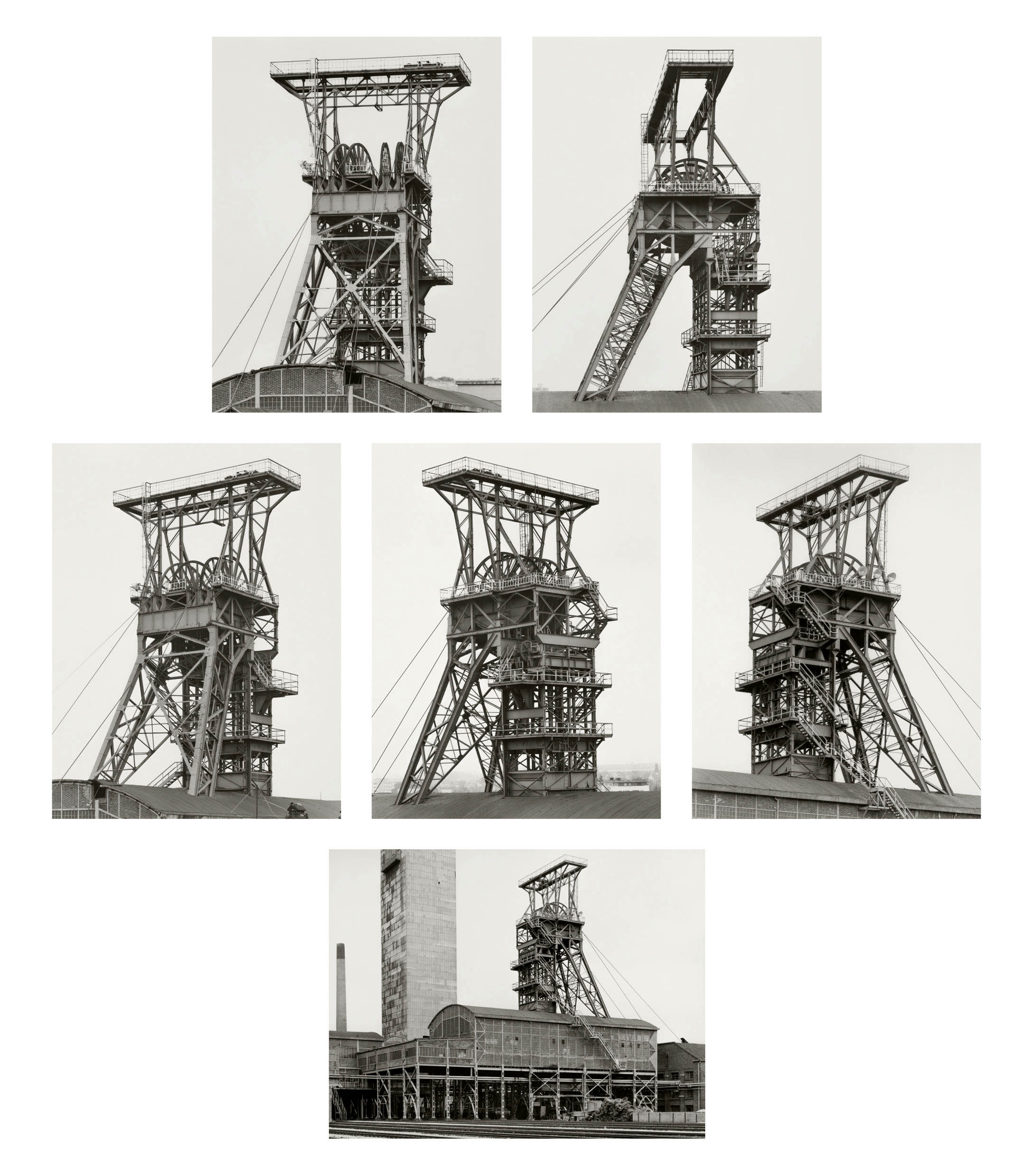
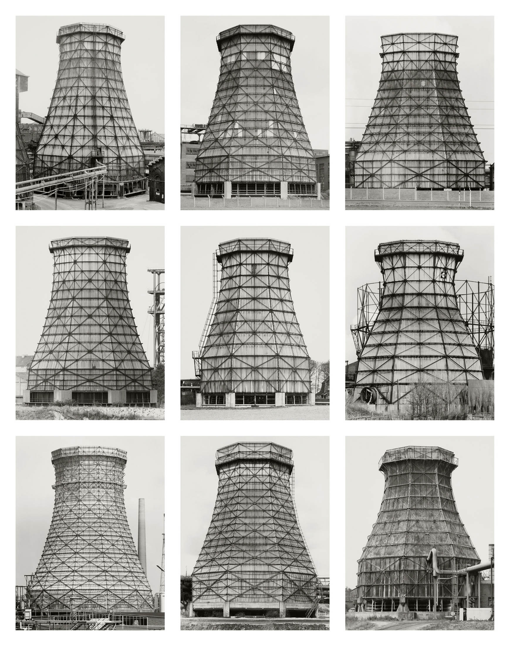
For the first time in Europe, this exhibition will present the methodological and thematic range of their oeuvre in great detail with over 300 original black and white photographs and other exhibits by the artist couple. In the individual sections, almost all of Becher’s found subjects can be located in a compilation and sequencing largely determined by themselves. Photographs of landscapes, winding towers, blast furnaces, cooling towers, gas tanks or even views of entire collieries etc. are considered her trademark. The juxtaposition of the groups of works authentically conveys the pictorial grammar developed by Bernd and Hilla Becher and their continuously reflected systematics and conceptual approach.
The exhibits come from the Bernd and Hilla Becher Archive in Die Photographische Sammlung/SK Stiftung Kultur and the Bernd & Hilla Becher Studio, Düsseldorf, in collaboration with Max Becher under the supervision of the Bernd & Hilla Becher Estate. There are also loans from Sprüth Magers and the LVR-Landesmuseum Bonn.
The publication accompanying the exhibition will be published by Schirmer / Mosel Verlag, with texts by Max Becher, Gabriele Conrath-Scholl, Marianne Kapfer and Urs Stahel.
Text from the Die Photographische Sammlung/SK Stiftung Kultur, Cologne website
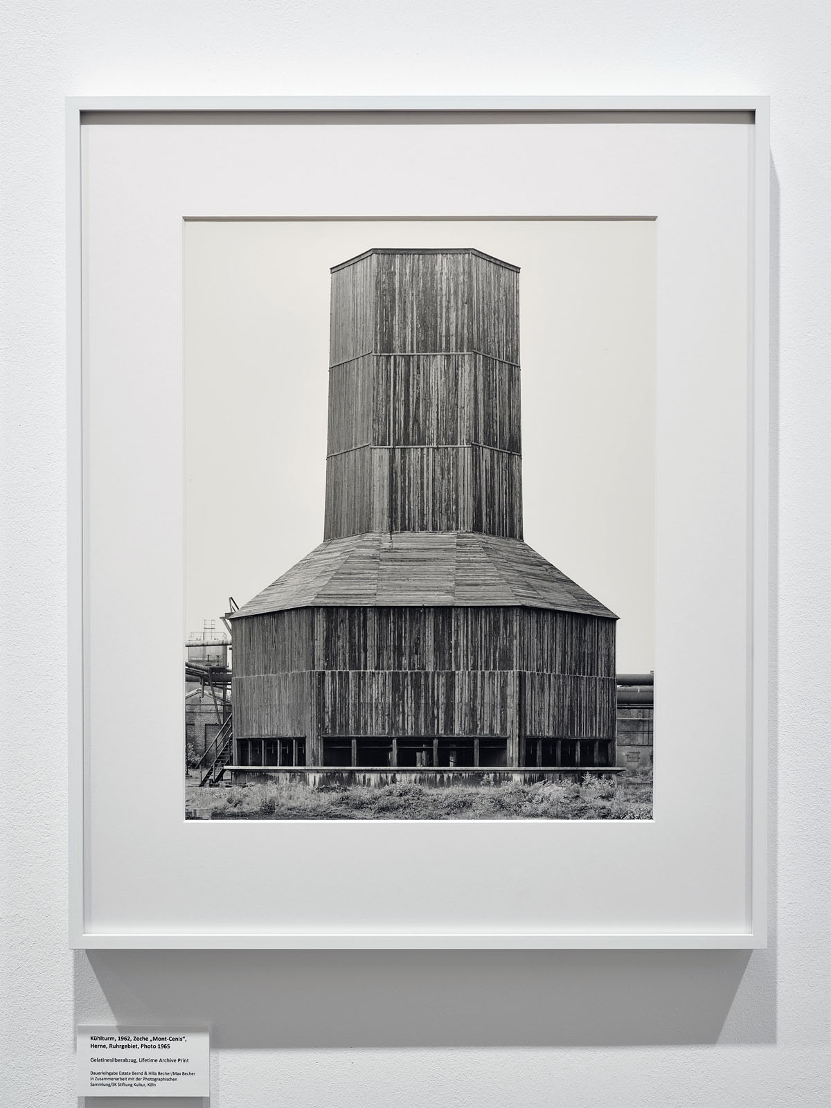
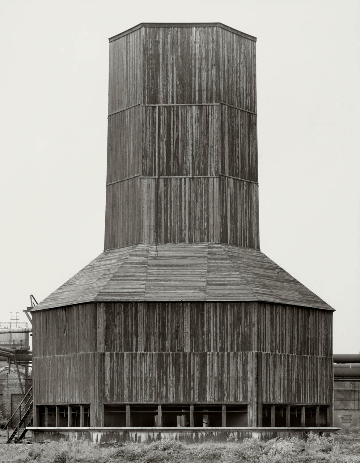
Installation view of the exhibition Bernd & Hilla Becher – History of a Method at Die Photographische Sammlung/SK Stiftung Kultur, Cologne showing Bernd and Hilla Becher’s photograph Kühlturm (Cooling tower) 1962, “Mont-Cenis” mine, Herne, Ruhr area 1965 (below)
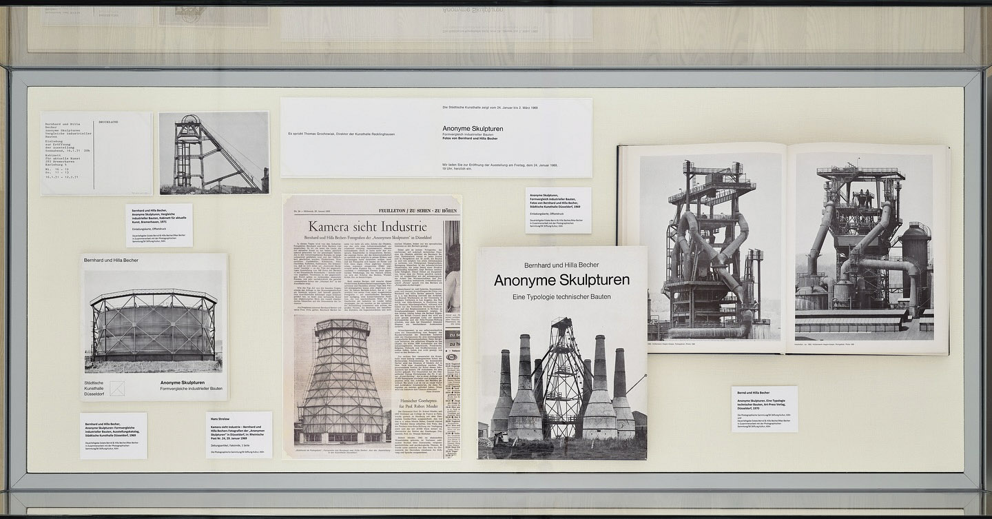
We have dedicated an entire room of our current exhibition to the group of “Anonymous Sculptures.” With this series of images, Bernd and Hilla Becher defined the building types that were important to them, such as cooling towers. The fundamental principle of the comparability of the motifs was introduced, and the work on publications, so crucial to Bernd and Hilla Becher’s artistic output, was also initiated.
You can trace the artists’ approach using 41 photographs that exemplify the building types presented in seven chapters of the 1970 publication “Anonymous Sculptures: A Typology of Technical Structures.” An exhibition at the Düsseldorf Municipal Art Gallery preceded the book in 1969 [see the book cover at the top of the posting].
The term “Anonymous Sculptures” establishes a link to conceptual art. This connection between Bernd and Hilla Becher’s work and the visual arts was important for their subsequent work and its presentation in museums and galleries.
Text from the SK Stiftung Kultur Die Photographische Sammlung Instagram page
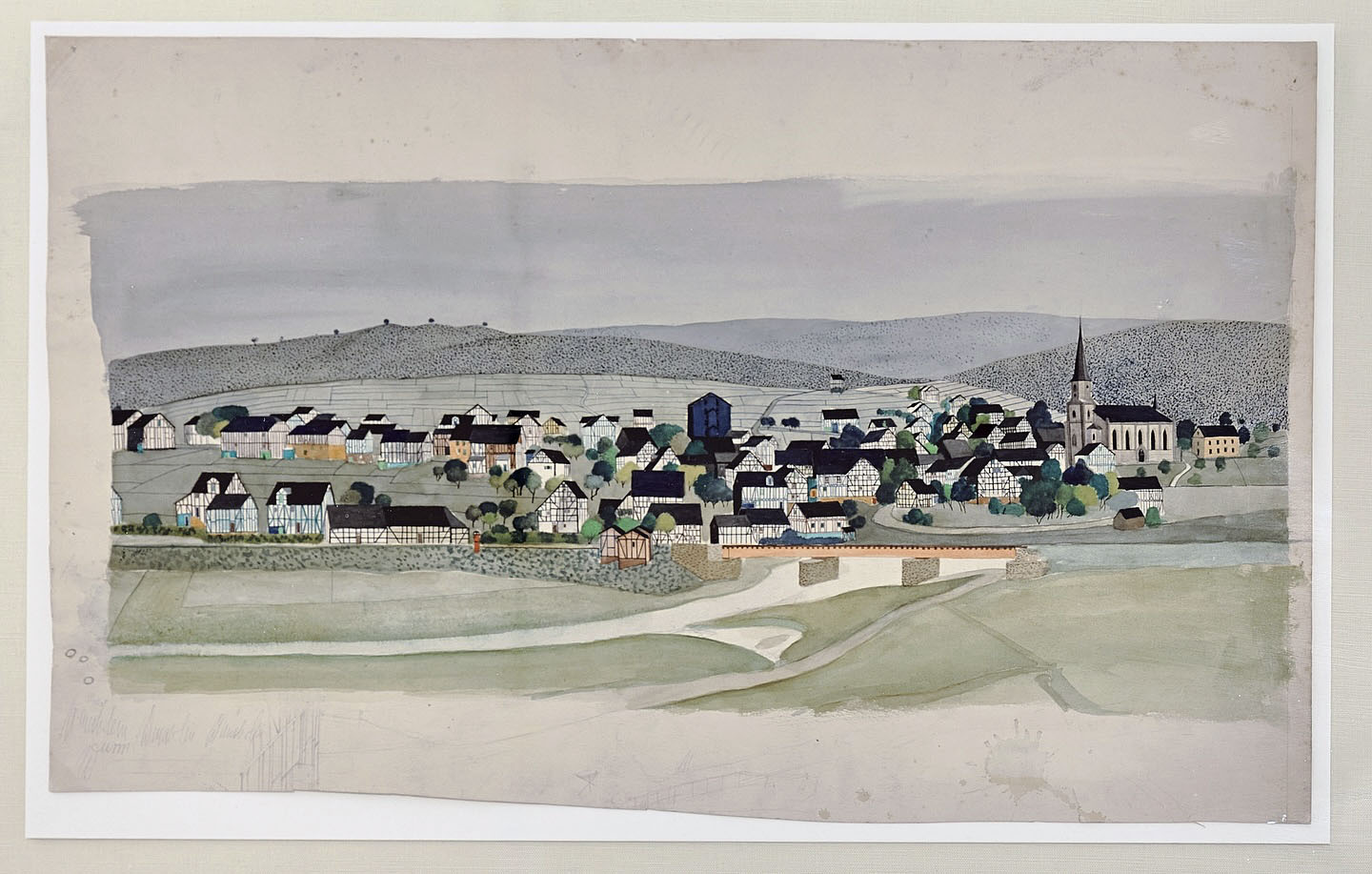
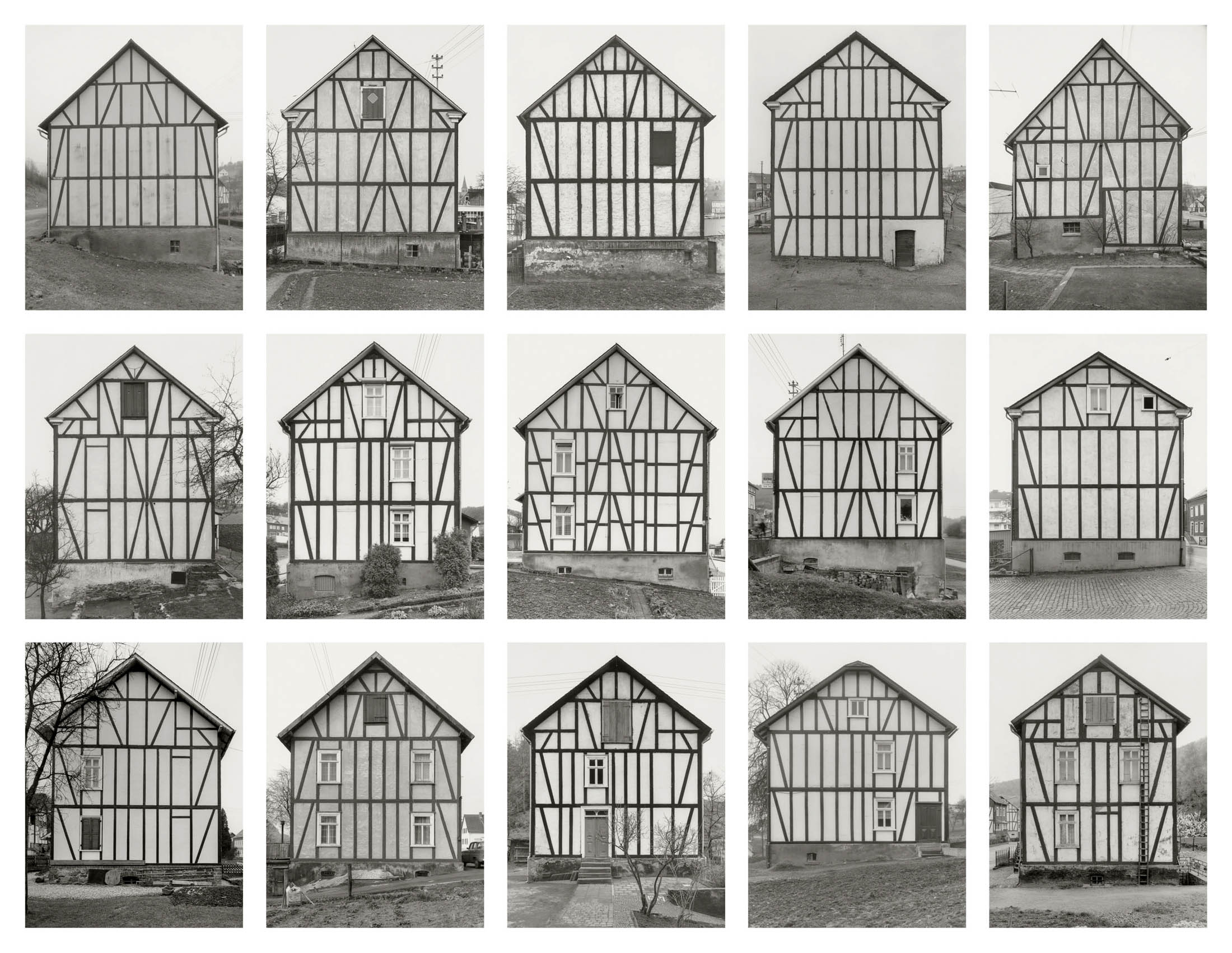
The first subjects Bernd and Hilla Becher photographed on their nearly fifty-year journey to documenting industrial buildings were half-timbered houses in the Siegerland region. For Bernd Becher, it was natural to photograph these “poor people’s houses,” as Hilla called them, from his childhood and youth. For the film “The Photographers Bernd and Hilla Becher,” we attempted to identify the Bechers’ subjects using the book “Siegerland Half-Timbered Houses” by Schirmer/Mosel. We asked locals and showed them the book. Although the Bechers provided the exact address of each house, they were often unrecognisable. Many, being drafty and cold, had been clad with asbestos cement, thus obscuring their exposed timber framing. Their original appearance is preserved only in the Bechers’ photographs.
Text from the Text from the SK Stiftung Kultur Facebook page
The artist couple Bernd and Hilla Becher (1931-2007/1934-2015) set a benchmark in the history of photography with their work. Beginning in 1959, they collaborated almost continuously for decades on a joint oeuvre, developed across Germany, the Benelux countries, the United Kingdom, France, Italy, the United States, and Canada. Their artistic style, characterised by a precise, documentary visual language and methodical systematisation, resonated significantly with movements such as Minimal Art and Conceptual Art. Against the backdrop of New Objectivity and inspired by 19th-century documentary photography, they created a visual grammar whose influence remains palpable in contemporary photography.
For the first time in Europe, Die Photographische Sammlung/SK Stiftung Kultur presents an extensive retrospective featuring over 300 original black-and-white photographs and complementary exhibits, showcasing the formal and thematic breadth and depth of Bernd and Hilla Becher’s work. The exhibition centers on the themes and methods developed by the Bechers: consistent methodical approaches to the photographic motif that evolved and were variably applied over decades. The exhibition explores how these methods emerged, how they developed, and how they reflected the Bechers’ perspective on the different shapes, functions, and integration of industrial buildings into the landscape.
Rare early works from both artists – created between the 1950s and 1970s – are on view, many for the first time. These pieces provide insight into the evolution of their shared aesthetic.
Room 2 is dedicated to the book Anonyme Skulpturen. Eine Typologie technischer Bauten (Anonymous Sculptures. A Typology of Technical Constructions), 1970, considered the foundation of their work. This publication systematically catalogued industrial structures and remains a key reference point. Quoted texts on the function of the objects and original prints illuminate its significance within their oeuvre.
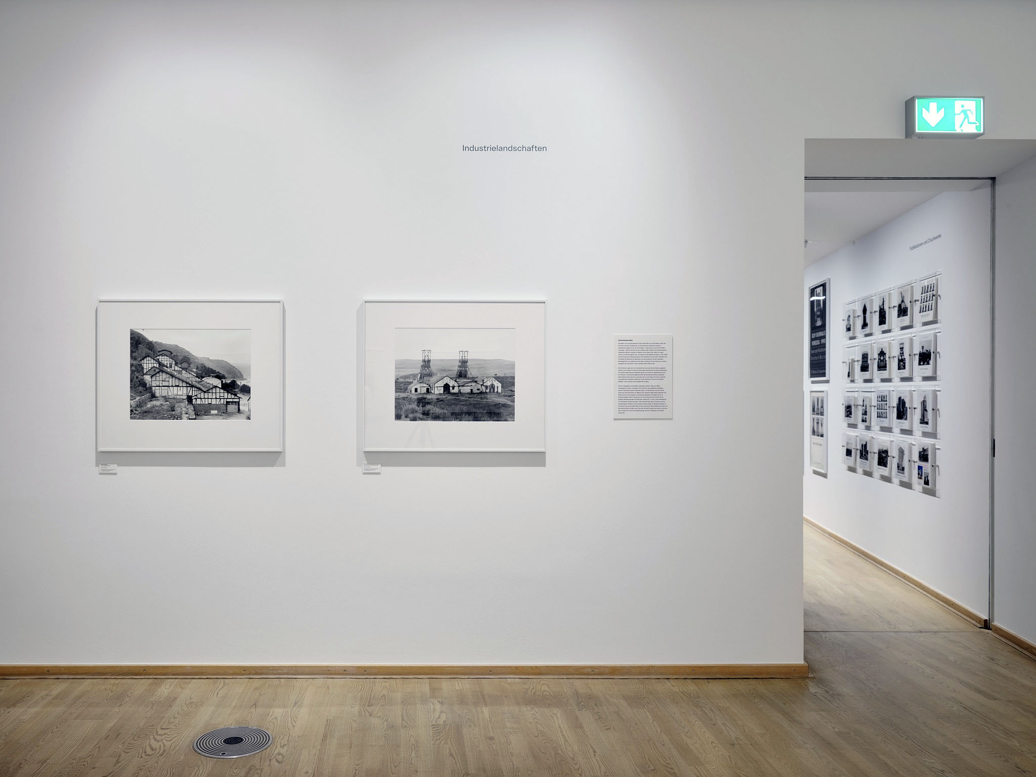
Industrial Landscapes and photographs of entire sites form another focus and demonstrate that the Bechers did not merely document isolated buildings, but also functional and spatial relationships. Featured works include views of the Zollern 2 coal mine in Dortmund (published 1977) and the Ewald Fortsetzung mine in Recklinghausen (1982-1985).
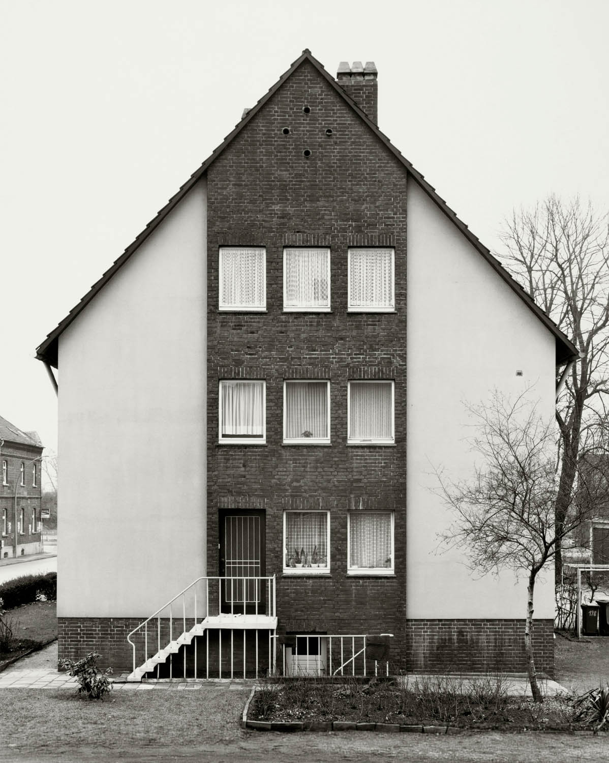
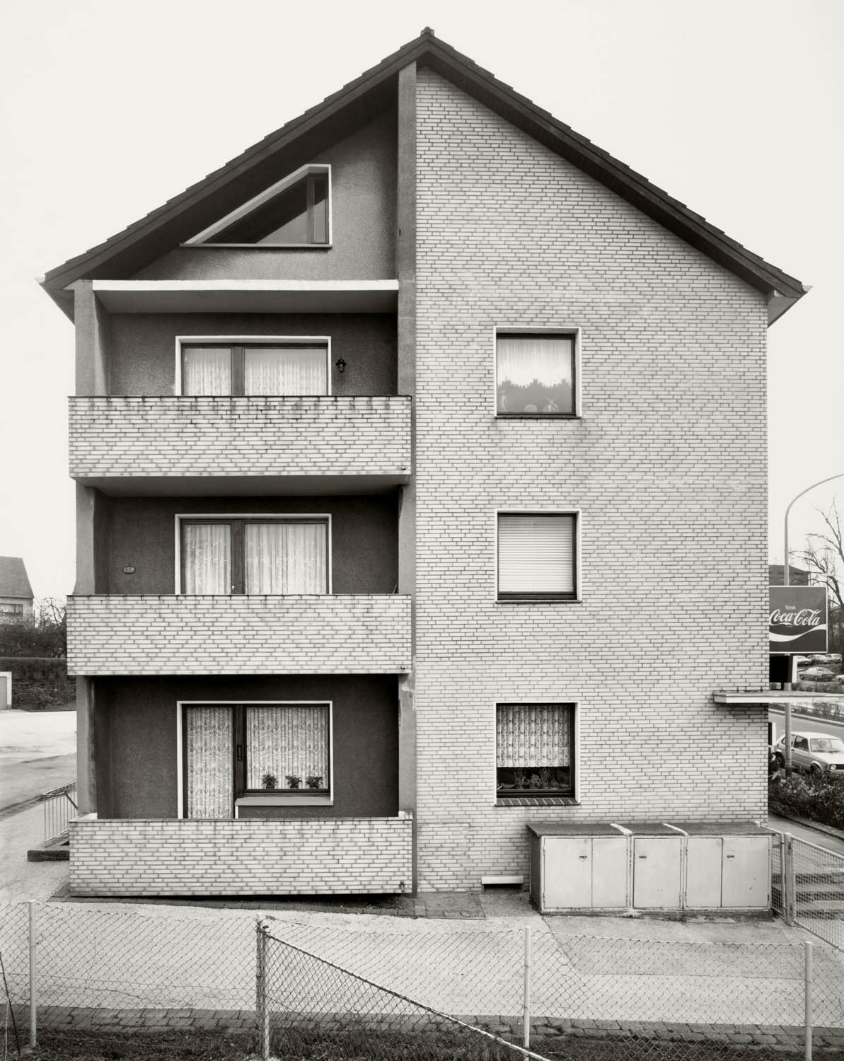
The exhibition also includes “portraits” of residential and settlement houses from the Ruhr region – especially from the post-war era – reflecting the everyday life and environment of industrial workers. A framework house from the Siegerland region is used to show how a single subject can take on different meanings depending on presentation and context.
“Sequences” or “unfoldings” are illustrated using various building groups, presenting structures from multiple perspectives, so that a sculptural image of the motifs is created.
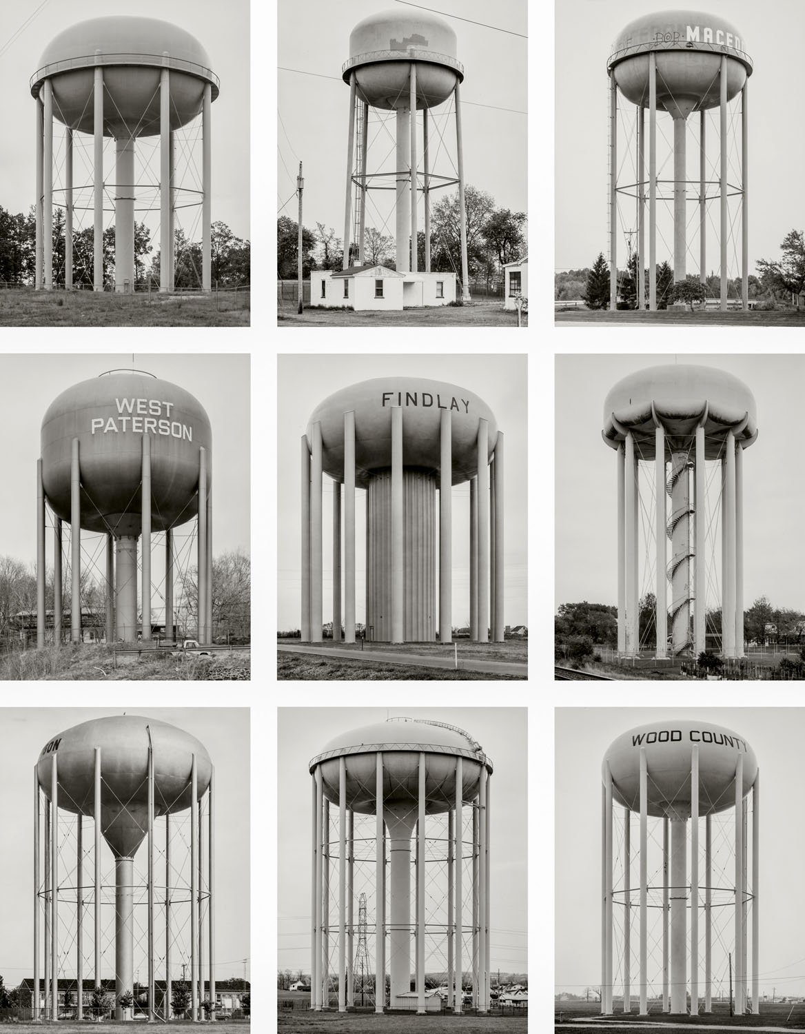
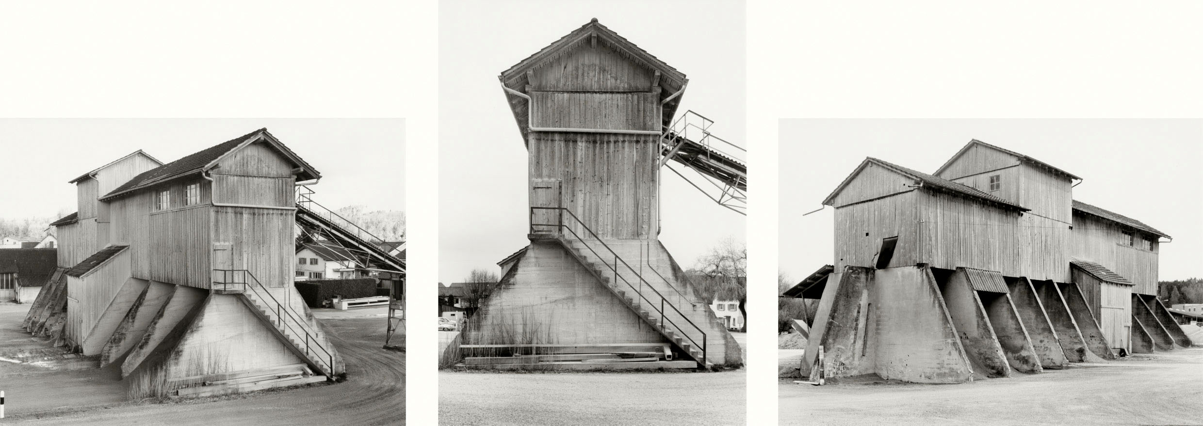
Lastly, the exhibition presents typologies – photographic series of coal bunkers, grain silos, winding and water towers, blast furnaces, and cooling towers. These highlight how the Bechers used specific representational strategies, systematic arrangement, and variation to achieve artistic expression. Created between the 1960s and early 2000s across different countries, the works powerfully demonstrate the visual grammar developed by the Bechers.
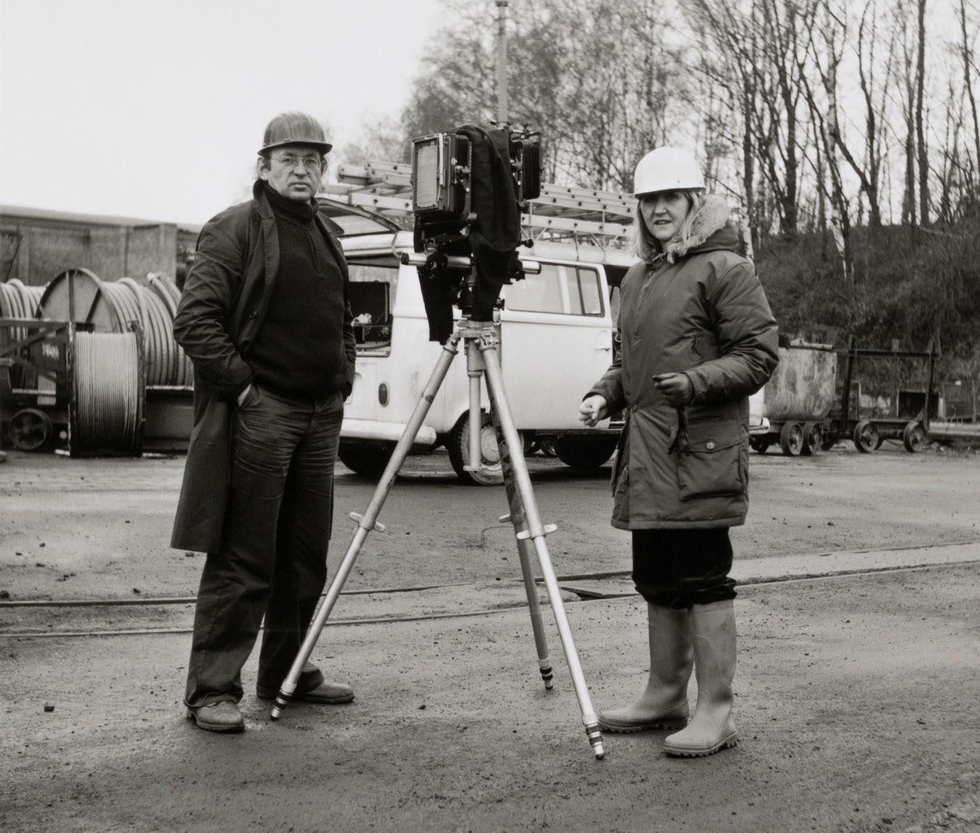
A kind of “cinematic epilogue” is provided by a video created by Max Becher, who accompanied his parents on a work trip to Ohio in 1987, offering an evocative glimpse into their working process.
The works are drawn from the Bernd and Hilla Becher Archive at Die Photographische Sammlung/SK Stiftung Kultur and the Bernd & Hilla Becher Studio in Düsseldorf, directed by Max Becher. Additional loans are provided by Sprüth Magers and the LVR-Landesmuseum Bonn.
A catalogue will accompany the exhibition, published by Schirmer/Mosel Verlag, Munich, with texts by Max Becher, Gabriele Conrath-Scholl, Marianne Kapfer, and Urs Stahel. (Will be released in early November.)
Press release from Die Photographische Sammlung/SK Stiftung Kultur
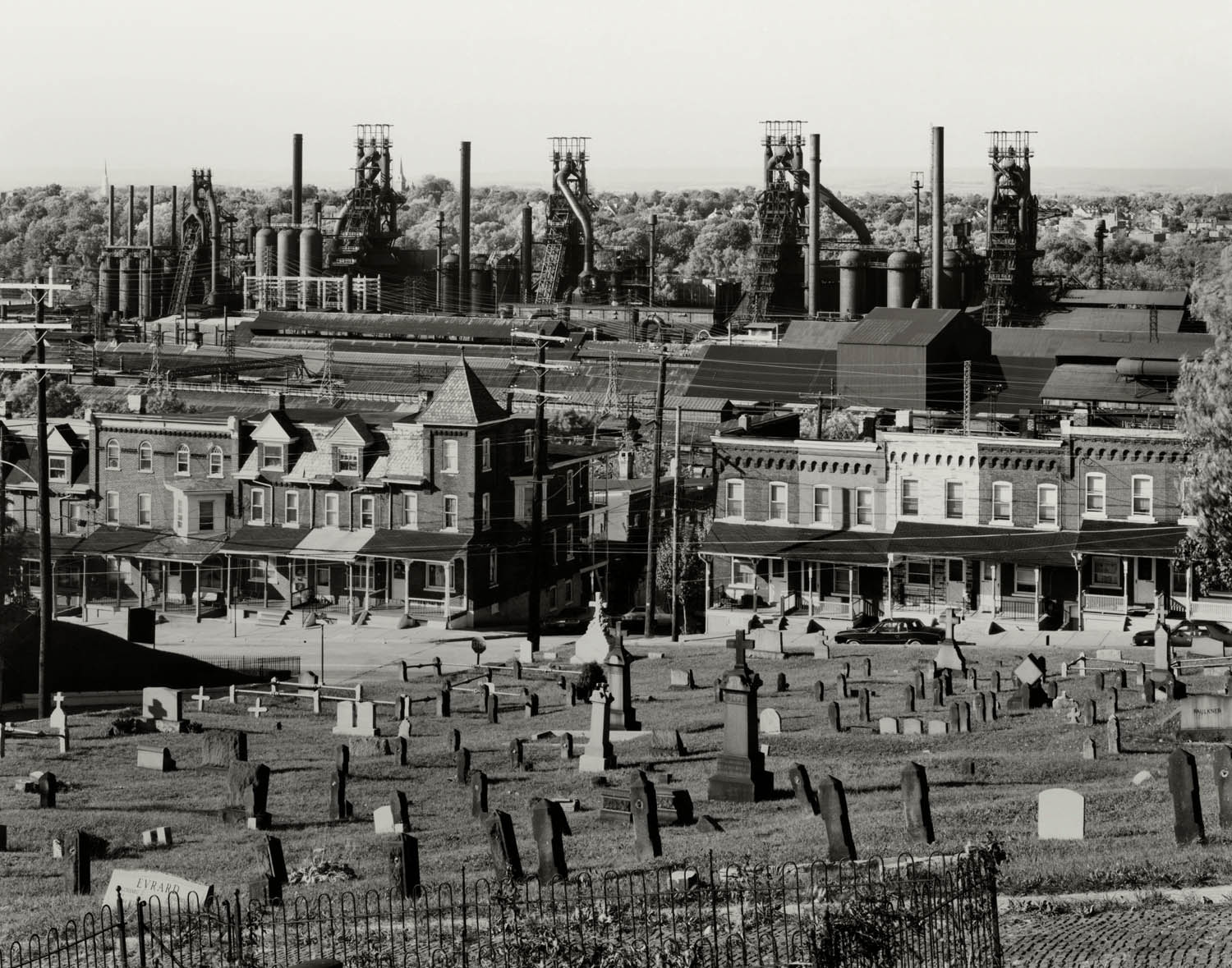
Walker Evans (United States of America 1903-1975) Graveyard and steel mill, Bethlehem, Pennsylvania 1935 Gelatin silver print
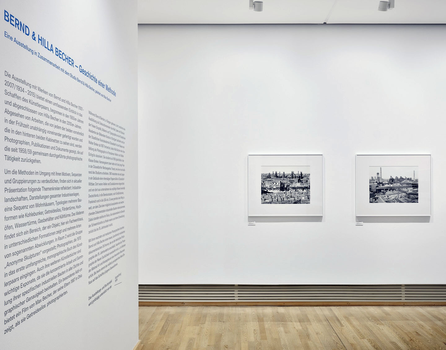
Installation view of the exhibition Bernd & Hilla Becher – History of a Method at Die Photographische Sammlung/SK Stiftung Kultur, Cologne showing at left Bernd and Hilla Becher’s photograph Bethlehem, Pennsylvania, USA 1986 (below)
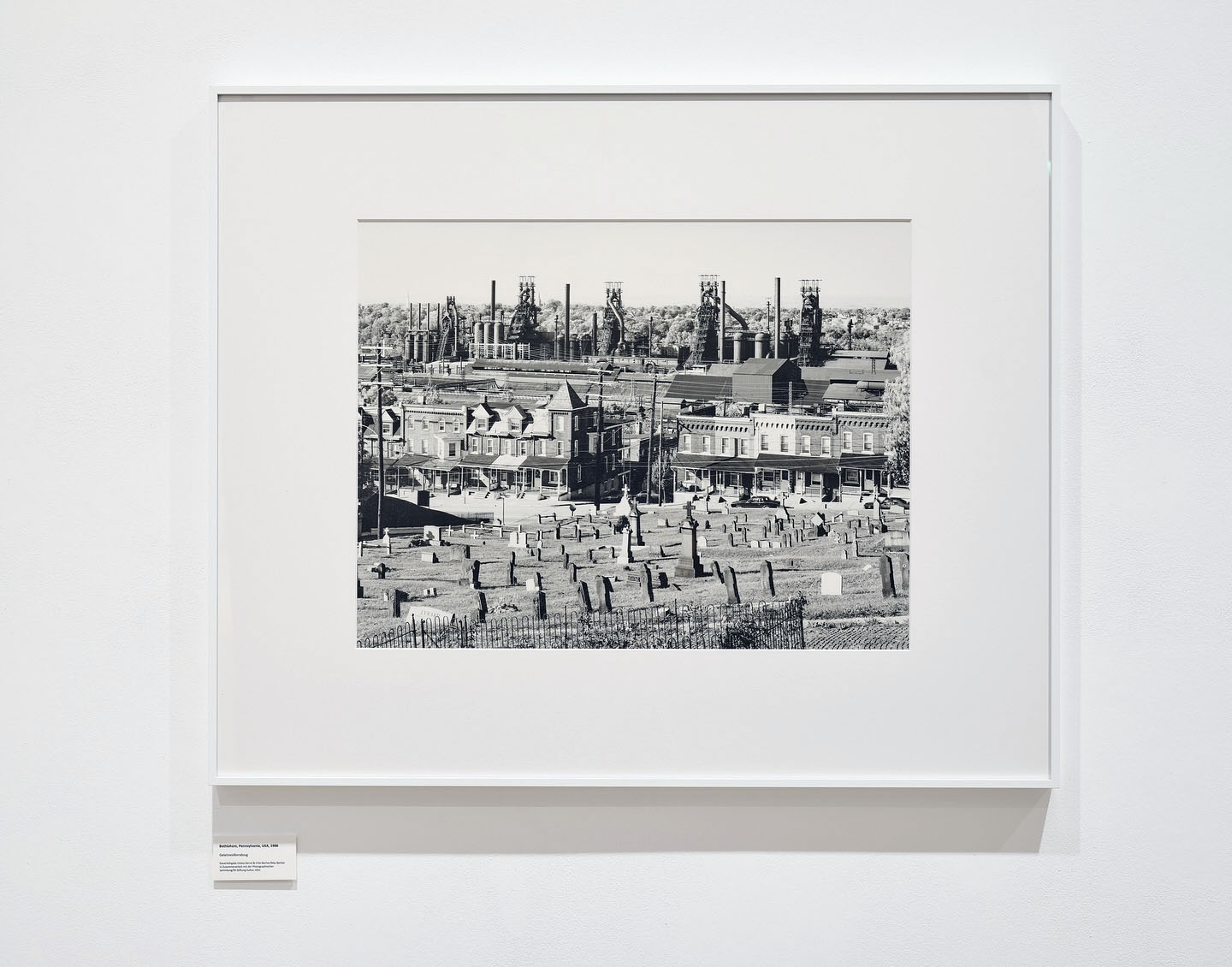
Installation view of the exhibition Bernd & Hilla Becher – History of a Method at Die Photographische Sammlung/SK Stiftung Kultur, Cologne showing Bernd and Hilla Becher’s photograph Bethlehem, Pennsylvania, USA 1986 (below)
With their blast furnaces, chimneys, pipes, and conveyor belts, steelworks are less buildings than gigantic machines. They are among the most imposing industrial structures that Bernd and Hilla Becher have photographed since the late 1950s. Anatomically speaking, blast furnaces are like a body without skin, the artist couple wrote in 1990: excessively high temperatures, too much pressure, too many gases make cladding the steel shell impossible; they are nothing but function. In Bethlehem, Pennsylvania, the enormous work practically hangs over the town. Photographed from an elevated vantage point (similar to the one Walker Evans had chosen in 1935), the blast furnaces, houses, and the cemetery – work, life, death – are compressed into an inescapable proximity. Space compressed, time compressed.
Dr. Maria Müller-Schareck, art historian and member of the PS/SK management team
Text from the SK Stiftung Kultur Die Photographische Sammlung Instagram page
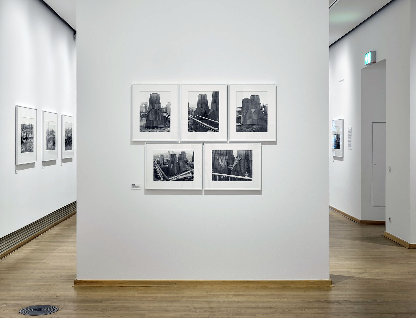
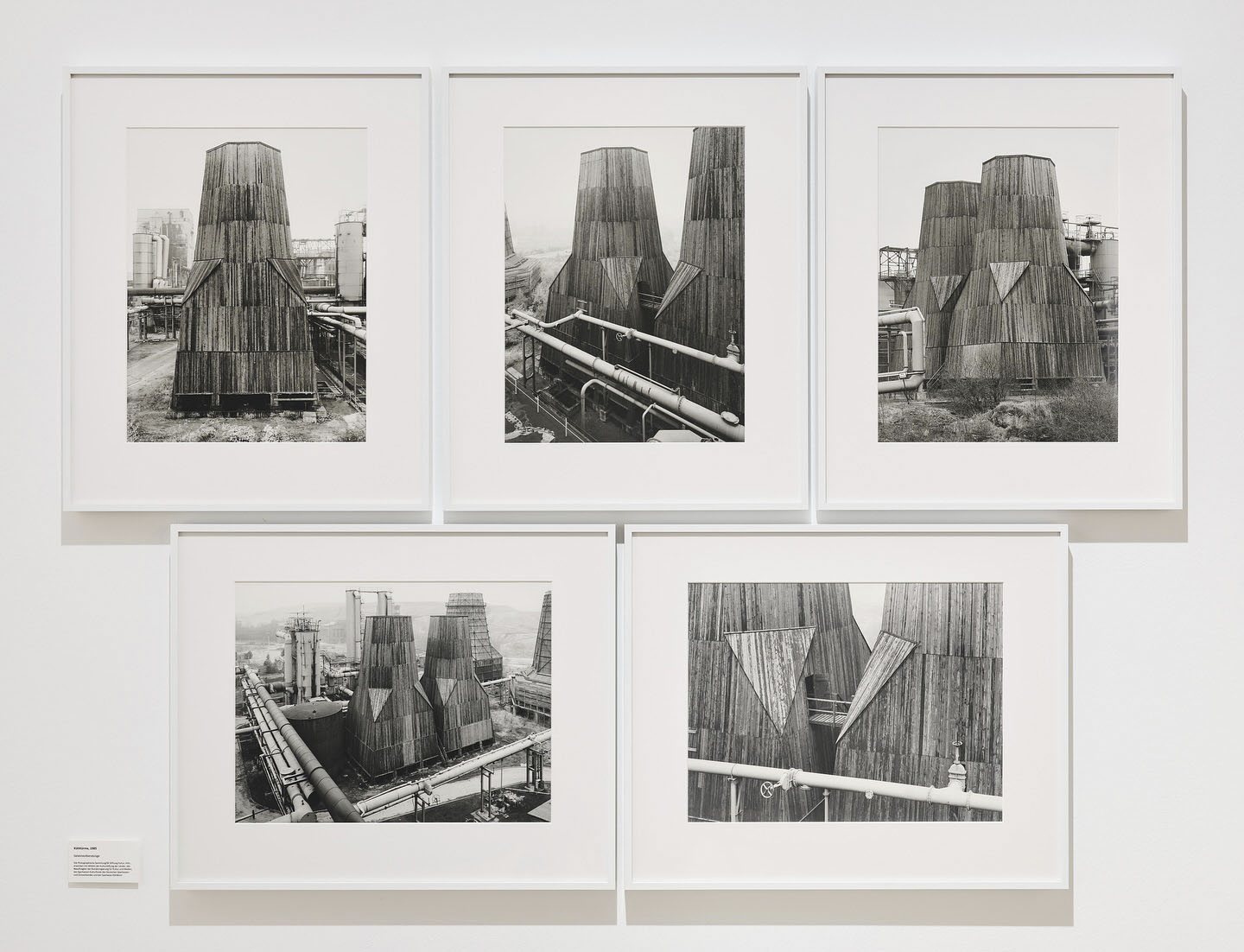
Installation views of the exhibition Bernd & Hilla Becher – History of a Method at Die Photographische Sammlung/SK Stiftung Kultur, Cologne showing Bernd and Hilla Becher’s Zeche Ewald Fortsetzung, Kühlturm/-türme (Ewald mine continuation, cooling tower(s)) 1985 (below)
Over the course of their artistic career, Bernd and Hilla Becher documented approximately 200 industrial sites, including the Ewald Fortsetzung coal mine in Recklinghausen, which we are featuring in our exhibition.
These documentations are based on systematic walks through the industrial sites and surrounding areas. A panoramic photograph, often central to each site, provides an overview of the grounds and allows the individual buildings to be located and understood in relation to one another.
The subsequent photographs portray the individual building types, in this case, two cooling towers. The five images in this group clearly demonstrate how Bernd and Hilla Becher approach their subject, photographing the building from different sides and perspectives, and highlighting a specific detail. The aim of this approach was to depict the industrial buildings in a way that is both technically clear and aesthetically pleasing.
Text from the SK Stiftung Kultur Die Photographische Sammlung Instagram page
Installation view of the exhibition Bernd & Hilla Becher – History of a Method at Die Photographische Sammlung/SK Stiftung Kultur, Cologne September, 2025 – February, 2026
Bernd & Hilla Becher – History of a Method book cover
Die Photographische Sammlung/SK Stiftung Kultur Im Mediapark 7, 50670 Cologne Phone: +49 221/888 95 300
“Although these artists were explicitly not dealing with mundane reality but instead with what lies beneath, behind and in-between, the still relatively new medium of photography was of great importance for many. Last but not least, they also used it to make visible what remains hidden to the naked eye without technical means: the distant, the tiny, the moving.” (Press release)
Expressing the unconscious mind through illogical, dreamlike imagery and ideas, exploring the irrational, challenging notions of reality through a technical instrument – the camera – to create “a rich and multifarious cosmos of idiosyncratic realities that radically transcended traditional aesthetics.”
In the dream of the mind and the camera’s eye. Over and above the real.
Dr Marcus Bunyan
Many thankx to the Museum für Fotografie for allowing me to publish the photographs in the posting. Please click on the photographs for a larger version of the image.
“The invention of modern photomontage in the early twentieth century by Max Ernst with his Dada colleagues Hannah Höch, John Heartfield, George Grosz and Raoul Hausmann established new history in a variety of ways. Expanding modern art with multimedia as well as placing found photographs into art cut from printed magazines, rather than chemical made prints from the darkroom. Redefining final works of art without the paint brush or canvas. Ernst freed imagery into the unconscious by self-made combinations of drawing with torn and pasted photographic fragments, evoking memories and other responses by viewers that continue today.”
Steve Yates, Fulbright scholar, photographic artist, author and curator
Max Ernst holds a prominent position within Dada and Surrealist Art. His name stands for genre-bending works that combine dream and reality. The exhibition FOTOGAGA: Max Ernst and Photography. A Visit from the Würth Collection is the first to search for points of intersection between his work and photography. Commemorating Surrealism’s centenary, the Museum für Fotografie (Museum of Photography) is showing a representative overview of Max Ernst’s artworks from the Würth Collection. These are complemented by works from the Kunstbibliothek, Kupferstichkabinett, Sammlung Scharf-Gerstenberg and the Staatsbibliothek zu Berlin, and other exceptional loans from museums and private collections in France and Germany.
Max Ernst and Photography – A Special Connection
The art of Max Ernst (1891-1976) was created at a time characterised by a new, creative approach to photography. Snapshots, scientific photographs and images of war machinery inspired him and served as working materials, especially for his collages. Technical and artistic developments in the medium of photography significantly influenced his work. He used photographic reproduction techniques to increase the visual impact of his works: enlargements allowed his small-format collages to hold their own alongside paintings in exhibitions; the production of photo postcards of the collages ensured that the works could be distributed quickly and easily; and the inversion of the tonal values in a photogram enhanced the effect of his frottages.
Max Ernst himself never used a camera for his art, but he liked to pose for the camera, whether for images taken by well-known photographers or made in photo booths. At times serious, at times a little “gaga”, the portraits illustrate not just the artist’s love for playfulness but also an occasionally strategic use of photography to promote his artistic agenda. The title of the exhibition – “FOTOGAGA” – is derived from a group of works by Hans Arp and Max Ernst, which they called “FATAGAGA”: the “FAbrication de TAbleaux GAsométriques Garantis (Fabrication of Guaranteed Gasometric Images)”. One of these photocollages, in which the two artists address their relationship as friends, can be seen in the exhibition.
A Century of Surrealism
Some 270 works will be exhibited, primarily works on paper but also paintings by Max Ernst and photographs, photograms, collages, and illustrated books by his Surrealist contemporaries. Although these artists were explicitly not dealing with mundane reality but instead with what lies beneath, behind and in-between, the still relatively new medium of photography was of great importance for many. Last but not least, they also used it to make visible what remains hidden to the naked eye without technical means: the distant, the tiny, the moving.
Max Ernst’s works are framed within the context of both contemporary and historical references. There are numerous and surprising parallels to photographs by other artists. An avid delight in experimentation and a creative game played with chance characterise the works selected for the exhibition. Their originators reflected on forgotten photographic processes from the 19th century and developed new techniques using light-sensitive materials. Semi-automatic methods, working with found objects, unusual combinations, and the blurring of traces have equally shaped the work of Max Ernst and the photographic oeuvres of many of his contemporaries and other artists that followed. Even a century after André Breton published the first Surrealist Manifesto on 15 October 1924, they have not lost any of their fascination.
A cooperation with tradition
The Staatliche Museen zu Berlin look back on a longstanding cooperation with the Würth Collection. FOTOGAGA: Max Ernst and Photography is the fourth exhibition in a series that began in 2019‒2020 with Anthony Caro: The Last Judgement Sculpture from the Würth Collection at the Gemä-ldegalerie. It was followed in 2021‒2022 by Illustrious Guests: Treasures from the Kunstkammer Würth in the Kunstgewerbemuseum and David Hockney – Landscapes in Dialogue. “The Four Seasons” from the Würth Collection in 2022, also shown at the Gemäldegalerie. The exhibition at the Museum für Fotografie draws on the Würth Collection’s extensive holdings, especially of Max Ernst’s graphic works, which are now being shown in Berlin for the first time.
Press release from the Museum für Fotografie
Max Ernst (German, 1891-1976) Above the Clouds Midnight Passes 1920 Photographic enlargement of a collage and ink, facsimile, 2024 73 x 55cm Kunsthaus Zürich Public domain
László Moholy-Nagy (Hungarian, 1895-1946) The broken marriage 1925 Photomontage 16.5 x 12.2cm Sammlung Siegert, München Public domain
Max Ernst (German, 1891-1976) The Stall of the Sphinx 1925 Pencil on paper 16.4 x 15.2cm Sammlung Ulla und Heiner Pietzsch, Berlin
Max Ernst (German, 1891-1976) Little Tables around the Earth (Petites tables autour de la terre) 1926 From Natural History (Histoire naturelle) Collotype of a frottage 50 x 32.5 cm (sheet) Paris: Éditions Jeanne Bucher Portfolio with 34 collotypes of frottages 51.7 x 35 x 1cm
Aenne Biermann (German, 1898-1933) Cactus 1929 Silver gelatin paper 12.4 x 17.3cm
“The object, which, in its surroundings, is never seen other than in its most mundane aspect, is given new life when isolated in the lens of the viewfinder. […] It seemed to me that the clarity of a constructed form, when removed from its overly distracting surroundings, could be depicted convincingly through the use of photography.”
~ Aenne Biermann
Max Ernst (1891–1976) Quiétude from The Hundred-Headless Woman 1929 Collage novel with 147 reproductions of collages Paris: Éditions du Carrefour 25 x 19cm
The Hundred Headless Woman is Ernst’s first collage novel. It features a loosely narrative sequence of uncanny Surrealist collages, made by cutting up and reassembling nineteenth-century illustrations, accompanied by Ernst’s equally strange captions. Ernst’s French title, La Femme 100 têtes, is a double entendre; when read aloud it can be understood as either “the hundred-headed woman” or “the headless woman.” Along with this enigmatic title character, the book marks the introduction of Ernst’s favourite alter ego, Loplop, “the Bird Superior.” Ernst was deeply engaged with illustrated books during the 1930s; in addition to collage novels, he created many etchings and lithographs to complement the poems and stories of Surrealist writers with whom he was closely associated.
Gallery label from Max Ernst: Beyond Painting, September 23, 2017-January 1, 2018 on the MoMA website Nd [online] Cited 31/03/2025
Max Ernst (German, 1891-1976) Loplop presents the members of the Surrealist group 1931 Reproduction of a collage in Le Surréalisme au service de la revolution, No. 4 27.4 x 19.9cm
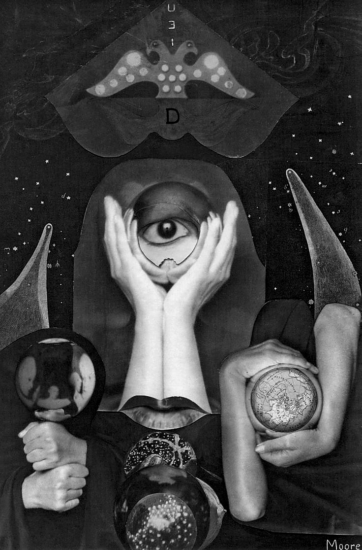
Claude Cahun (French, 1894-1954) / Marcel Moore (French, 1892-1972) Aveux non avenus / Disavowals (frontispiece) 1930 Paris: Éditions du Carrefour Book with 11 heliogravures of collages 22 x 17 x 2.8cm Sammlung Siegert, München
Raoul Ubac (Belgian, 1910-1985) The Battle of the Penthesilea II 1937 Photomontage, silver gelatin paper 18 x 24.2cm Sammlung Siegert, München
Max Ernst (1891-1976) is one of the most important representatives of Dadaism and Surrealism, two artistic movements that turned traditional norms on their head from the 1920s onwards. His boundary-crossing works combine dream and reality. His art also was created at a time characterized by a new, creative approach to photography. Snapshots, scientific photographs and images of war machinery inspired him and served as working materials, especially for his collages. Although he never used a camera for his art himself, technical and artistic developments in the medium of photography significantly influenced his work. Last but not least, Max Ernst liked to pose for the camera, whether for images taken by well-known photographers or made in photo booths.
Some 270 works will be exhibited, primarily works on paper but also paintings by Max Ernst and photographs, photograms, collages, and illustrated books by his Surrealist contemporaries. Although these artists were explicitly not dealing with mundane reality but instead with what lies beneath, behind and in-between, the still relatively new medium of photography was of great importance for many. Last but not least, they also used it to make visible what remains hidden to the naked eye without technical means: the distant, the tiny, the moving.
Max Ernst’s works are framed within the context of both contemporary and historical references. There are numerous and surprising parallels to photographs by other artists. Semi-automatic methods, working with found objects, unusual combinations, and the blurring of traces have equally shaped the work of Max Ernst and the photographic oeuvres of many of his contemporaries and other artists that followed. Even a century after André Breton published the first Surrealist Manifesto on 15 October 1924, they have not lost any of their fascination.
Gazes and Visions
The Motif of the Eye as a Surrealist Symbol
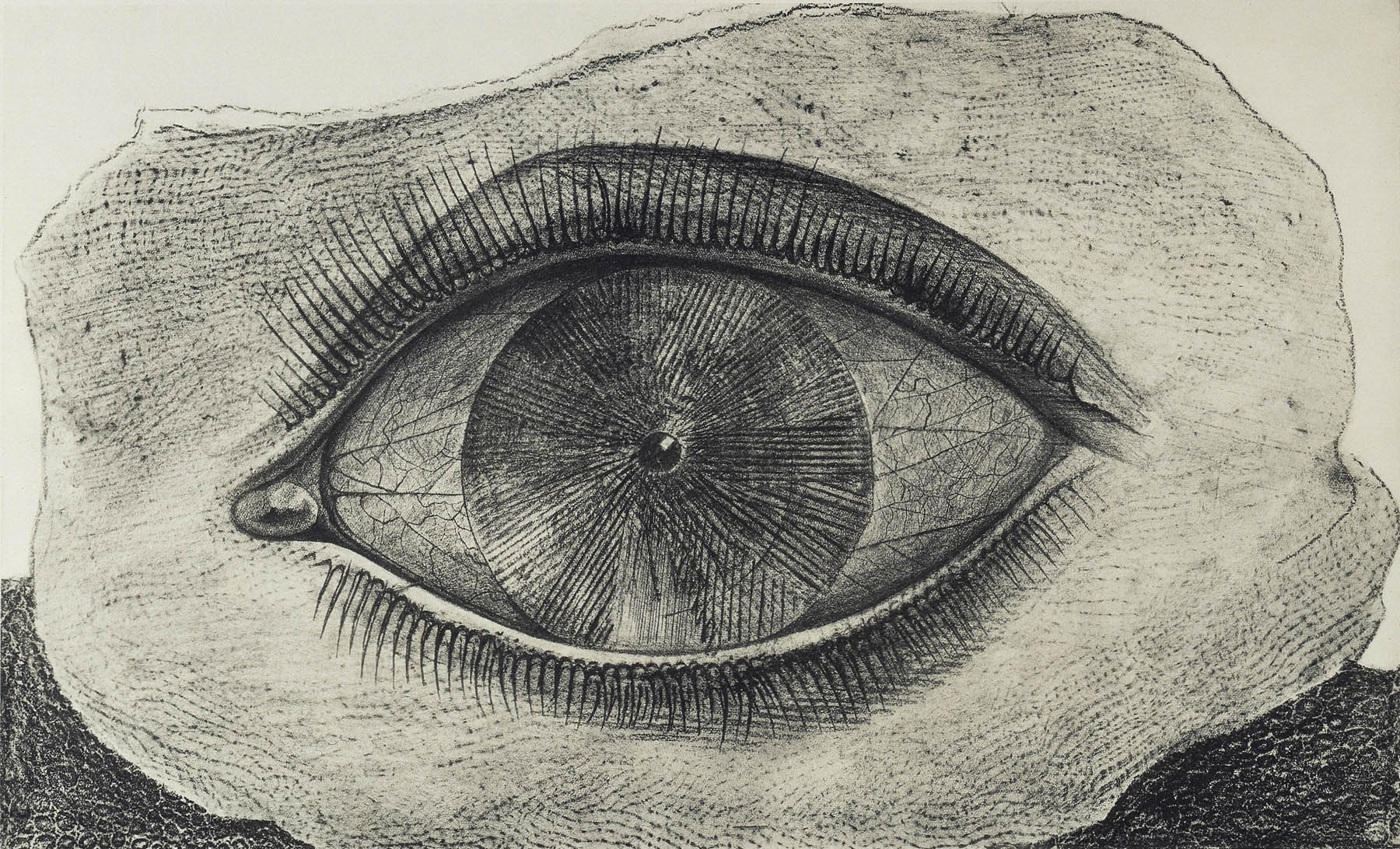
For the Surrealists, free, wild seeing opened up perspectives on an untamed world beyond reality – provided that the eyes were used in the right way or equipped with appropriate devices. Thus the motif of the eye symbolizes the translation of visions into perceptible images. Max Ernst’s frottages show radically enlarged, wide-open eyes hovering over a flat horizon. Visionary seeing can also be assisted by various instruments. In a coloured collage for Les malheurs des immortels, a young man gazes through two pipes, cheeks flushed with excitement: what might he be looking at?
The focus on inner vision becomes the theme of a 1929 collage, in which the portrait photos of the Surrealists, all shown with eyes closed, are arranged around the reproduction of a nude painting by René Magritte. In so doing, a very masculinely connoted group activity is simulated in which sexual desire makes possible the liberation of thought. A violent variation – a blinding, likewise understood as liberation – appears in the famous eyeball-slicing scene in the prologue of the 1928 film Un chien andalou by Luis Buñuel and Salvador Dalí.
Flora, fauna, firmament
Frottage, Nature Printing, and Plant Photography
Plantlike animals, seashell flowers, fishbone forests, crocheted stars – the visual world of Max Ernst is full of fantastic forms. For him, nature served as both inspiration and material. In his frottages, he used wood, leaves and much more for rubbings on paper. This is how the portfolio Histoire naturelle (Natural History) was created in 1926. The frottages were reproduced as collotype prints, photomechanically produced prints using an exposed glass plate as a printing block.
With Histoire Naturelle, Max Ernst drew on natural history encyclopaedias, but reworked the originals to create his own natural history. In so doing he dissected nature, showed the tiny and the distant, and created planar structures rather than views. This interest in the formal language of nature also resonates in the photography of the New Objectivity from around the same time, which reveal the aesthetic power of natural forms. That also made them interesting to the Surrealist movement.
In his artist’s book Maximiliana or the Illegal Practice of Astronomy from 1964, Max Ernst devoted himself entirely to celestial phenomena. As in photograms, Ernst used objects here like spirals or gears as stencils to evoke comets and nebulas.
Between Positive and Negative
Photogram, Cliché Verre, and Other Darkroom Experiments
The play of positive and negative effects is a recurring theme in Max Ernst’s oeuvre. Early works created using fine lines incised on a black ground show motifs that appear fragile and vague. He also used photographic techniques for some of his works and transformed his frottages into negative forms in Man Ray’s studio. In 1931, for example, he created dark photograms as illustrations for René Crevel’s text Mr. Knife, Miss Fork.
Max Ernst’s use of manually produced prototypes relates to a technique borrowed from the early days of photography: cliché verre, or glass printing. In this hybrid process, an etching is created on a glass plate coated with paint or ink, which then serves as a negative for the print. The twentieth century witnessed a rediscovery of cliché verre and the further amalgamation of photographic and drawing processes. The growing interest in camera-less photography led to a wide range of experiments using light and unconventional materials in various avant-garde circles.
Invisible Cuts
(Photo-) Collages, Collage Novels, and Surrealist Photography
For Max Ernst, collage is the fundamental mode of artistic production. It encompasses a colorful variety of methods for combining materials of all kinds, initiating an open-ended artistic process. Max Ernst had already experimented with collages of printed photographs during his Dada years. The combination of the most diverse illustrations and their fusion into a new image by painting and drawing over them all took place within the working process.
For his wood engraving collages, Max Ernst made use of old-fashioned illustrations from popular scientific magazines of the nineteenth century. Many of these images were also based on photographs; at that time, however, photos could not yet be reproduced and thus had to be rendered as wood engravings. His three collage novels featured visions and hallucinations alongside blasphemy, the critique of bourgeois morals, and the glorification of free love and revolution.
Photographers of the Surrealist movement from Claude Cahun to Karel Teige, from Georges Hugnet to Emila Medková created with the help of camera and darkroom as well as scissors and glue, a rich and multifarious cosmos of idiosyncratic realities that radically transcended traditional aesthetics.
Max Ernst in Front of the Camera
From Studio Portrait to Photo Booth
Max Ernst is one of the most frequently photographed artists of the twentieth century. He posed for the cameras of important photographers such as Berenice Abbott, Arnold Newman, Lee Miller, Irving Penn, and Man Ray. Their portraits demonstrate just how individual the view of a person can be. A whole series of photographs shows the artist at work, with his art, or in the studio. Whether in focused concentration wearing his painter’s smock, in the midst of creative chaos, or in intimate relation to his sculptures – such photographs reinforce or even create the iconic conception of the artist.
Another group of images shows Max Ernst with female companions such as the artists Leonora Carrington or Dorothea Tanning, which convey the intensity of their relations. As a member of the Surrealists Max Ernst frequently appears in group portraits. These images bear witness to the various stations of the movement – its beginnings in Paris or exile in America – as well as to constellations of fashion and gender. Whether individually or in a group, pensive, playful, joyful or serious, the photographs tell of Max Ernst’s delight in self-representation and in theatrical play.
Text from the Museum für Fotografie
George Platt Lynes (American, 1907-1955) Max Ernst, New York 1941 Silver gelatin paper, new print 25.1 x 20.1cm
Josef Breitenbach (German, 1896-1984) Max Ernst and the seahorse, New York 1942 Silver gelatin paper 24 x 19cm
Arnold Newman (American, 1918-2006) Max Ernst, New York 1942 Silver gelatin paper 24.2 x 18.6cm
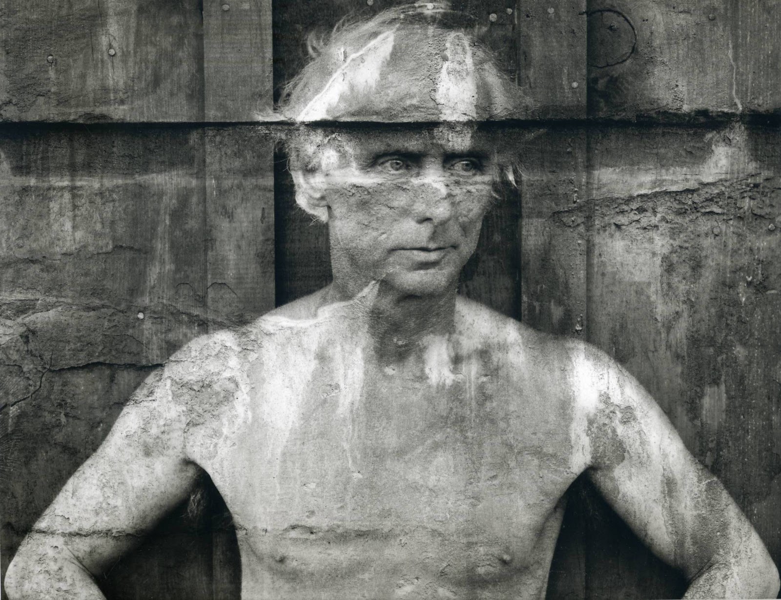
Frederick Sommer (American, 1905-1999) Max Ernst 1946 Gelatin silver print
A reproduction of this image on postcard for the Max Ernst retrospective: 30 Years of his Work – A Survey, Copley Galleries, Beverly Hills 1949 is included in the exhibition.
John Kasnetzis Dorothea Tanning and Max Ernst with the sculpture Capricorne, Arizona 1948 Silver gelatin print, later print 23.6 x 18.8cm
In the summer of 1947, Max Ernst, exuberant and inspired by the arrival of water piped to our house (up to then we had hauled it daily from a well 5 miles away), began playing with cement and scrap iron with assists from box tops, eggshells, car springs, milk cartons and other detritus, The result: Capricorn, a monumental sculpture of regal but benign deities that consecrated our “garden” and watched over its inhabitants. Years later, when we had gone, a sculptor friend made molds and sent them to their creator in Huismes, France where he reassembled his Capricorn for casting in bronze. The above photo is a one-shot, spur-of-the-moment caper made after taking a people-less documentary photo.
Dorothea Tanning from Birthday, Santa Monica: The Lapis Press, 1986
Denise Colomb (French, 1902-2004) Max Ernst on the roof terrace on the Quai Saint-Michel in Paris 1953 Silver gelatin paper, later print 28 x 22cm
Fritz Kempe (German, 1909-1988) Max Ernst, Hamburg 1964 Silver gelatin print 12.8 x 17.7cm
Max Ernst (German, 1891-1976) Seen at the Neuilly fair 1971 Colour reproduction of a collage, sheet 3 from the portfolio: Commonplaces. Eleven Poems and Twelve Collages 49 x 34.5cm
Museum für Fotografie Jebensstraße 2, 10623 Berlin
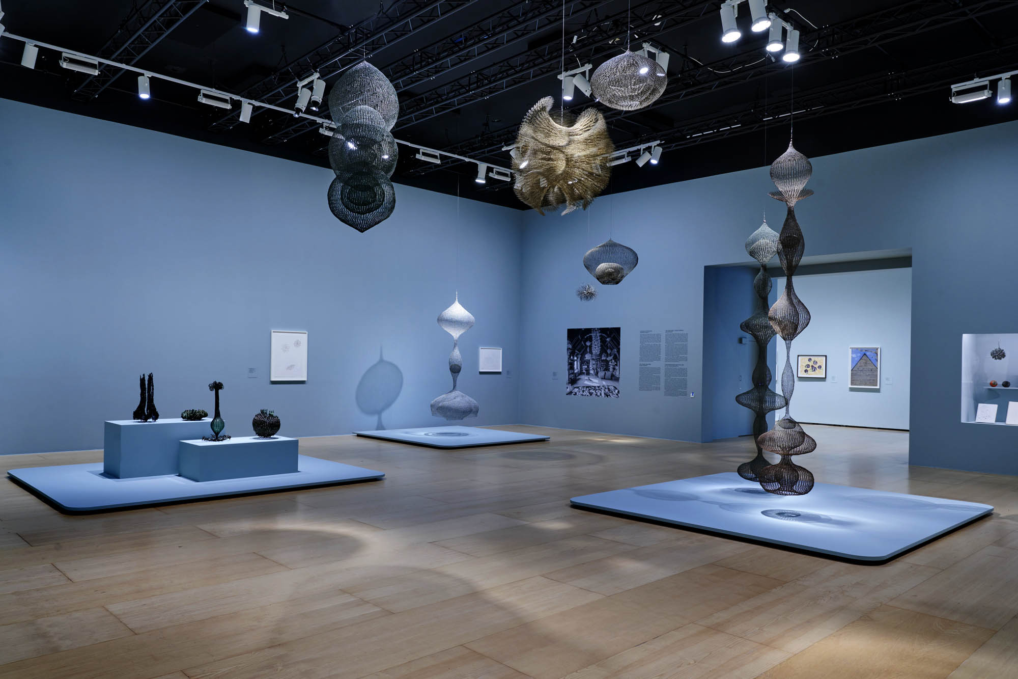
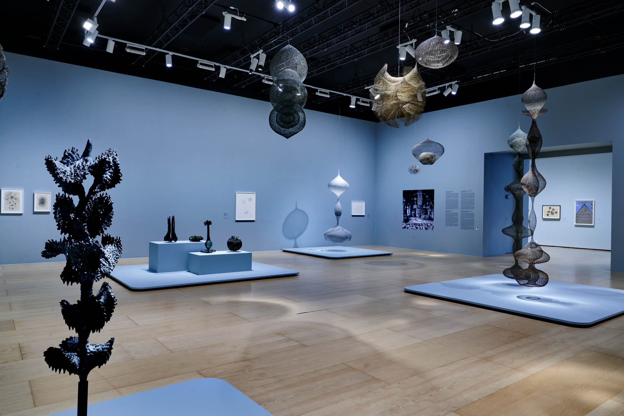
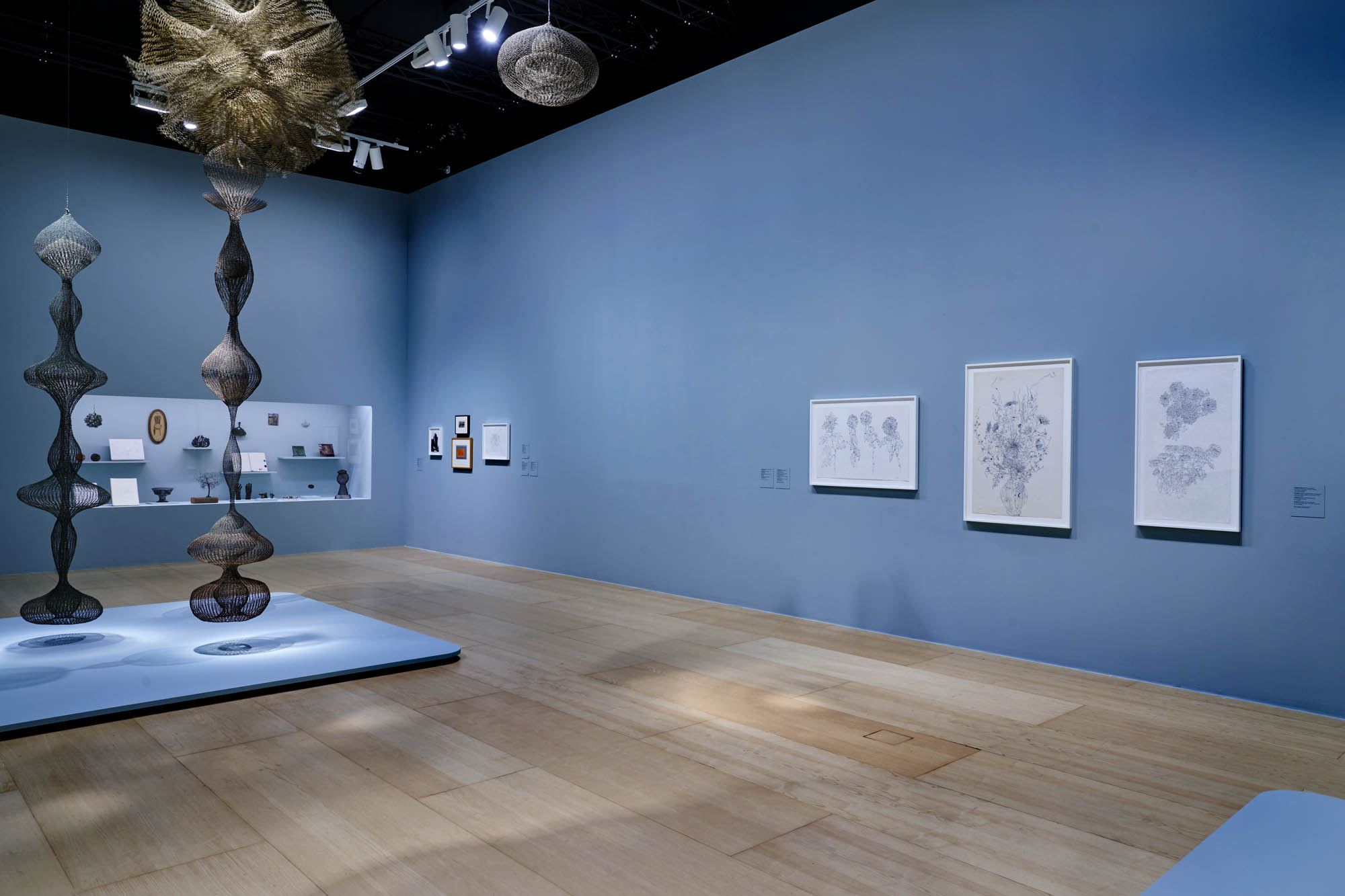
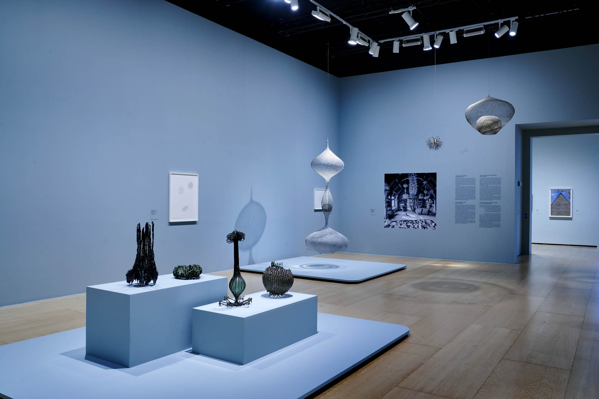
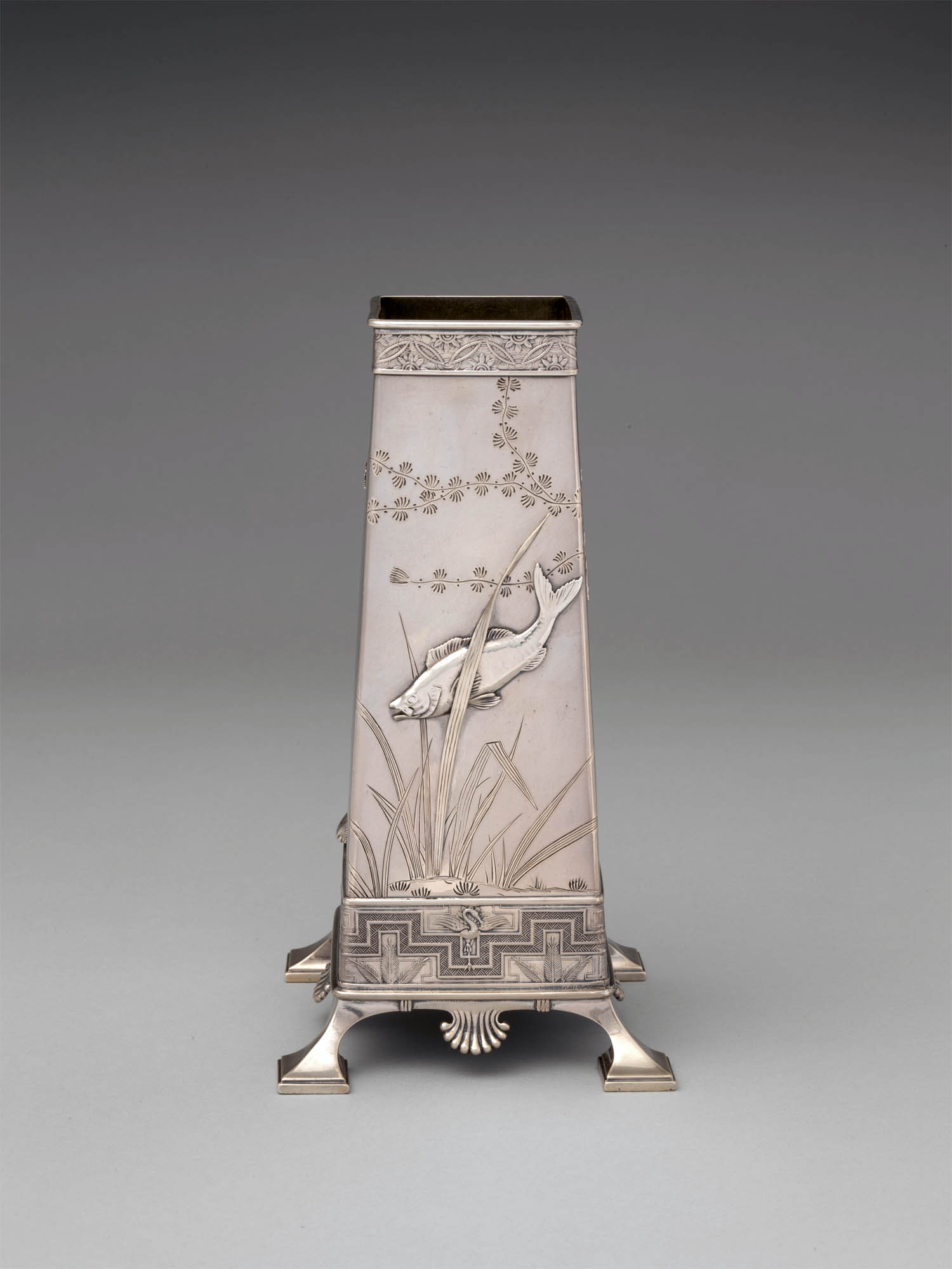
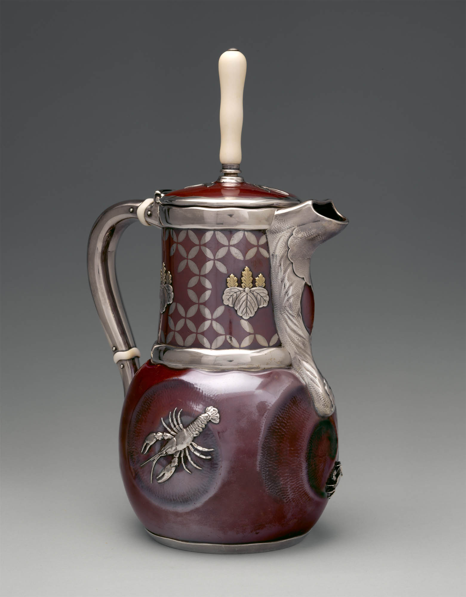
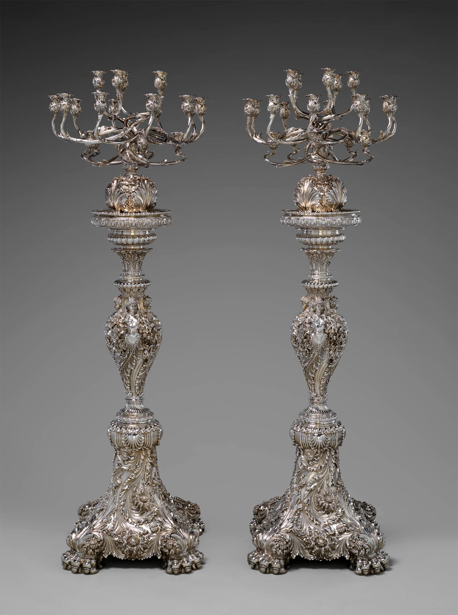
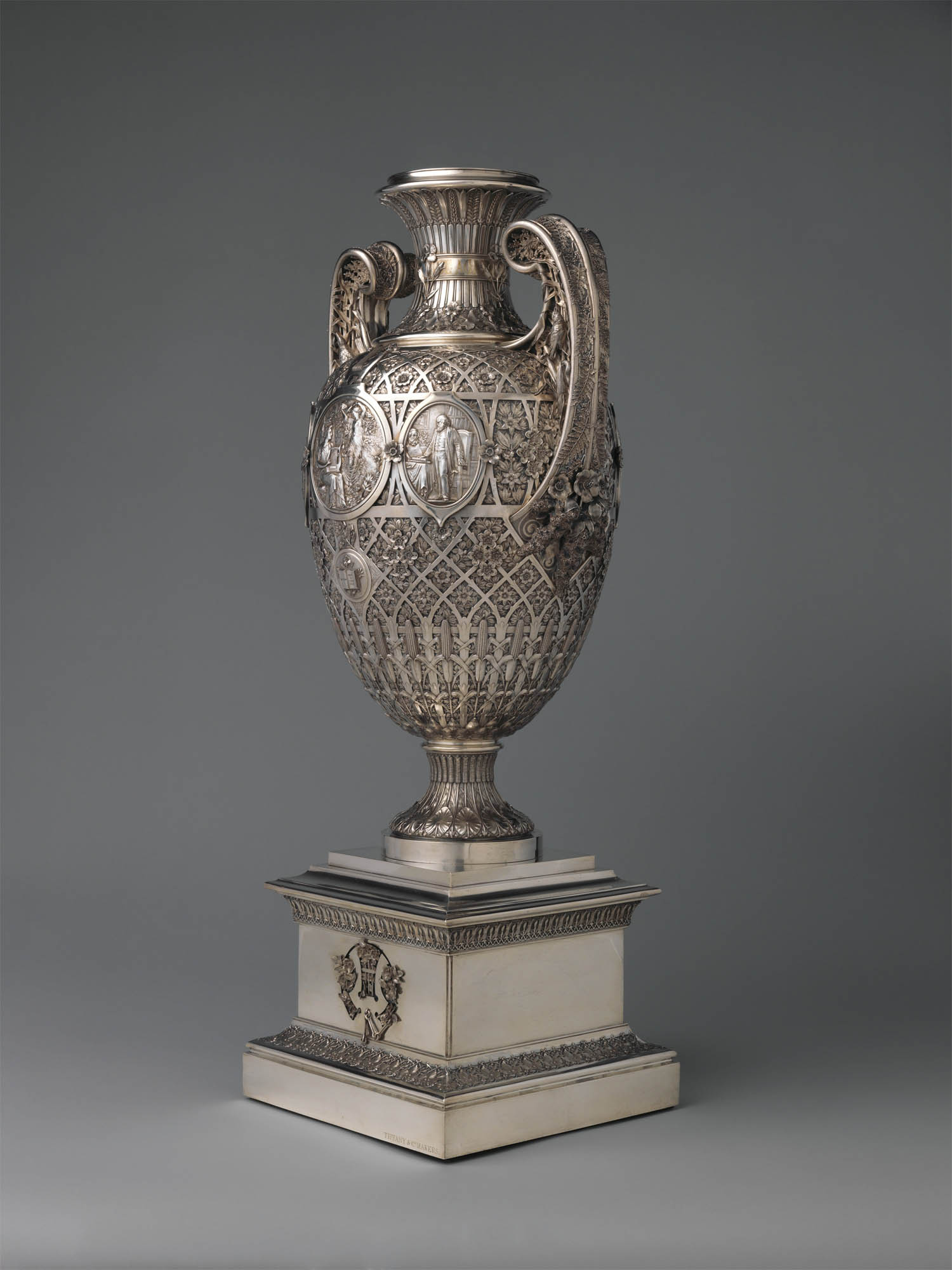
Curator: Medill Higgins Harvey, Ruth Bigelow Wriston Curator of American Decorative Arts and Manager of the Henry R. Luce Center for the Study of American Art in The Met’s American Wing
Edo period (1615-1868) Group of Inrō 18th century Metropolitan Museum of Art, New York Edward C. Moore Collection, Bequest of Edward C. Moore, 1891 Public domain
Inrō are small, light, tightly nested boxes worn hanging from a man’s obi sash, as a Japanese kimono had no pockets. The term’s literal meaning, “seal basket,” probably refers to an early function, but later they held small amounts of medicine. Once they became fashion items, inrō were carefully selected according to the season or occasion and coordinated with the attached ojime (sliding bead) and netsuke (toggle) as well as with the kimono and obi. Moore and his team surely studied the rich motifs and sophisticated production methods of the inrō he collected.
A change of pace this weekend.
Just because… I love beautiful things; I am a collector of antiques and object d’art; and I have a wonderful standing Tiffany picture frame at home.
Roman glass, Italian Murano glass, Austrian and German glass, Arabic and Persian metalwork, glass and earthenware, Japanese lacquer, wicker, metalware and pottery, Chinese glass and porcelain. All used as inspiration by Edward C. Moore, “the creative force who led Tiffany & Co. to unparalleled originality and success during the second half of the 19th century.”
Enjoy!
Dr Marcus Bunyan
Many thankx to The Metropolitan Museum of Art for allowing me to publish the photographs in the posting. All the text in the posting is from the Metropolitan Museum of Art website. Please click on the photographs for a larger version of the image.
Exhibition Tour – Collecting Inspiration: Edward C. Moore at Tiffany & Co. | Met Exhibitions
Edward C. Moore (1827-1891) – the creative force who led Tiffany & Co. to unparalleled originality and success during the second half of the 19th century – amassed a vast collection of decorative arts of exceptional quality and in various media, from Greek and Roman glass and Japanese baskets to metalwork from the Islamic world. These objects were a source of inspiration for Moore, a noted silversmith in his own right, and the designers he supervised. The exhibition Collecting Inspiration: Edward C. Moore at Tiffany & Co. will feature more than 180 extraordinary examples from Moore’s personal collection, which was donated to the Museum, alongside 70 magnificent silver objects designed and created at Tiffany & Co. under his direction.
Overview
Edward C. Moore (1827-1891) – the creative force who led Tiffany & Co. to unparalleled originality and success during the second half of the 19th century – amassed a vast collection of decorative arts of exceptional quality and in various media, from Greek and Roman glass and Japanese baskets to metalwork from the Islamic world. These objects were a source of inspiration for Moore, a noted silversmith in his own right, and the designers he supervised. The exhibition Collecting Inspiration: Edward C. Moore at Tiffany & Co. will feature more than 180 extraordinary examples from Moore’s personal collection, which was donated to the Museum, alongside 70 magnificent silver objects designed and created at Tiffany & Co. under his direction. Drawn primarily from the holdings of The Met, the display will also include seldom seen examples from a dozen private and public lenders. A defining figure in the history of American silver, Moore played a pivotal role in shaping the legendary Tiffany design aesthetic and the evolution of The Met’s collection.
Text from The Metropolitan Museum of Art website
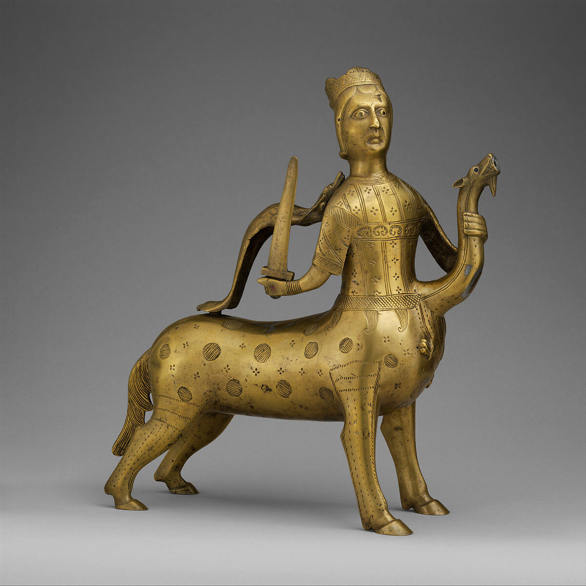
Edward C. Moore (American, New York 1827 – 1891 New York) Cup 1853 Silver and silver-gilt 3 3/4 x 3 1/4 x 4 3/4 in. (9.5 x 8.3 x 12.1cm); 6 oz. 14 dwt. (208.2 g) Metropolitan Museum of Art, New York Gift of Jerome B. Dwight, in memory of Charles Noyes de Forest and Henry Wheeler de Forest Jr., 2005 Public domain
This cup is an early example of Moore’s sophisticated design sensibilities and technical skills. While it was first thought to be the work of his father, a recently discovered sketch signed “E. C. M.” confirms the twenty-six-year-old Edward as its designer. Characteristic of his inventive eye and hand are the fluidity of the fuchsia vine and the dynamic play between the high-relief flowers and smooth, undecorated ground, which lend it a compositional coherence and show his understanding of the power of negative space. Engraved as a baby gift for Julia Brasher de Forest, sister of artist Lockwood de Forest, and marked “Moore,” the cup appears to have been a commission he considered a personal project.
Tiffany & Co. (1837-present) Mustard Pot c. 1879 Silver, copper, gold, patinated copper-gold alloy, patinated copper-platinum-iron alloy, and niello 3 3/16 x 2 1/2 x 2 in. (8.1 x 6.4 x 5.1cm) Metropolitan Museum of Art, New York Purchase, Friends of the American Wing Fund and Emma and Jay A. Lewis Gift, 2016 Public domain
Following the opening of Japan to the West in the 1850s and the subsequent display of Japanese art at international expositions, the Japanese taste began to captivate American consumers. In response, designers such as Edward C. Moore at New York’s Tiffany & Co. introduced a range of objects inspired by Japanese art works, including ceramics, metalwork, textiles, prints, lacquerware, and netsuke. The decoration on this mustard pot is particularly unusual and innovative. Its baluster form is completely transformed by the asymmetrical inset panels of mixed metal alloys – one of patinated copper and gold (a direct attempt to imitate Japanese Shakudō), and another of patinated copper, platinum, and iron – enclosed by scrolled “Snake Skin” borders. The mottled, multicoloured surface also evokes the swirling array of colours observed in Moore’s collection of ancient mosaic and core-formed glass. Labeled in the Tiffany & Co. Archives as “Mustard to go with Pepper 5493,” this is one of only six decorated versions produced. The Tiffany Archives also retains the Hammering & Inlaying Design drawings for this particular version (#853), which at a cost of $35 was the most expensive iteration.
Tiffany & Co. (1837-present) Cup and saucer c. 1881 Silver, patinated copper, patinated copper-platinum-iron alloy, and gold Cup: 2 1/8 x 2 1/2 x 1 7/8 in. (5.4 x 6.4 x 4.8cm) Saucer: 1/2 x 4 in. (1.3 x 10.2cm) Metropolitan Museum of Art, New York Purchase, Friends of the American Wing Fund and Emma and Jay A. Lewis Gift, 2016 Public domain
This cup and saucer represent a rare aspect of Tiffany & Co.’s production. As early as 1845 Tiffany & Co. was selling items they promoted as “Indian Goods,” including pipes, belts, pouches, moccasins, and “various fancy articles, made of Birch Bark.” Native American imagery and decorative vocabulary also appeared in Tiffany silver designs, particularly in works conceived by Eugene Soligny (1832-1901) and Paulding Farnham (1859-1927), two of the firm’s leading designers. Here the pattern of alternating red and black triangles is reminiscent of Navajo blankets. During the later decades of the nineteenth century, Tiffany & Co. designers drew inspiration from a diverse array of sources. They had access to the vast collection of books and objects from around the world assembled by the head of the silver division, Edward C. Moore. The decorative pattern on this cup and saucer bears striking similarity to a rendering of floor patterns in one of Moore’s books, The Basilica of San Marco in Venice. Whether referencing Navajo blankets, Venetian floors, or both, the cup and saucer are testaments to the fertile environment in which Tiffany & Co. designers and craftsmen created their innovative work.
Tiffany & Co. (1837-present) Cup and saucer c. 1881 Silver, patinated copper, patinated copper-platinum-iron alloy, and gold Cup: 2 1/8 x 2 1/2 x 1 7/8 in. (5.4 x 6.4 x 4.8cm) Saucer: 1/2 x 4 in. (1.3 x 10.2 cm) Metropolitan Museum of Art, New York Purchase, Friends of the American Wing Fund and Emma and Jay A. Lewis Gift, 2016 Public domain
Camillo Boito (editor) Ferdinando Ongania (1842-1911) (publisher) La Basilica di San Marco in Venezia illustrata nella storia e nell’arte da scrittori veneziani: [volume 3] 1881 41.3 x 34.1 x 3cm Metropolitan Museum of Art, New York Public domain
Moore assembled an extensive library, which includes a rare, lavish fourteen-volume publication on the Basilica of San Marco in Venice. Produced between 1881 and 1888 under the direction of Italian restoration architect and art historian Camillo Boito, it documents in text and chromolithograph illustrations virtually every detail of the centuries-old basilica. The volume on view here is devoted to the mosaic floors. The image replicates multicoloured geometric patterns from borders that frame some of the floors’ rectangular fields. Their variety and rhythmic energy would have resonated with Moore’s aesthetic sensibilities. Figure IX, in the lower right, bears striking similarities to the Tiffany cup and saucer displayed nearby.
Tiffany & Co. (1837-present) Two cups and saucers from the Mackay Service 1878 Silver-gilt and enamel 2 1/4 x 2 x 2 3/4 in. (5.7 x 5.1 x 7cm) Metropolitan Museum of Art, New York Purchase, Cranshaw Corporation Gift, 2017 Public domain
These gilded and enamelled cups and saucers are part of one of the most renowned and lavish dinner services ever created in America.
Commissioned in 1877 by John W. (1831-1902) and Marie Louise Hungerford (1843-1928) Mackay, the dinner service for twenty-four consisted of over 1,250 pieces. A poor Irish immigrant with little education, John W. Mackay became one of the wealthiest men in America when he and three partners, James Fair, James Flood, and William O’Brien, struck a silver deposit known as “The Big Bonanza” at Nevada’s Comstock Lode in 1873. During a visit to the mine, Marie Louise asked her husband for a silver dinner service “made by the finest silversmith in the country.” Her husband responded, “You shall have it. I like the notion of eating off silver brought straight from the Comstock.” He proceeded to have a half ton of silver delivered from the mine to Tiffany & Co., where two hundred men worked for almost two years to complete the commission. After being snubbed by New York City society, the Mackays established themselves in Paris. In 1878 the service was sent to be featured in Tiffany’s award-winning display at the Paris Exposition Universelle before being delivered to the Mackay’s home at 9 Rue de Tilsitt near the Arc de Triomphe. In an era of extravagant social affairs, Mrs. Mackay’s dinners and balls were legendary. The Mackay dinner service would have been at the centre of banquets that included royalty, aristocracy, President and Mrs. Ulysses S. Grant, and one of the most prominent celebrities of the day, Buffalo Bill. Identified in firm records as “Indian” in style, the Mackay service reflects the sophisticated and innovative design sensibilities of Edward C. Moore, the head of Tiffany’s silver division, and the team of designers, chasers, and craftsmen who conceived and realised this commission. The exquisite cloisonné enamelled decoration on these cups embodies Gilded Age extravagance and would have offered a dazzling finale to a meal served on a sea of elaborately chased silver wares in an “exotic” Indian and Near Eastern taste.
Tiffany & Co. (1837-present) Two cups and saucers from the Mackay Service 1878 Silver-gilt and enamel 2 1/4 x 2 x 2 3/4 in. (5.7 x 5.1 x 7cm) Metropolitan Museum of Art, New York Purchase, Cranshaw Corporation Gift, 2017 Public domain
Tiffany & Co. (1837-present) Ice Cream Dish from Mackay Service 1878 Silver, silver gilt 6 x 15 3/8 in. (15.2 x 39.1cm) Metropolitan Museum of Art, New York Purchase, Anonymous Gift, 2023 Public domain
This silver ice cream dish and accompanying plates are part of one of the most renowned and lavish dinner services ever created in America. Commissioned in 1877 by John W. (1831-1902) and Marie Louise Hungerford (1843-1928) Mackay, the dinner service for twenty-four consisted of over 1,250 pieces.
Tiffany & Co. (1837-present) Ice Cream Dish from Mackay Service 1878 Silver, silver gilt 6 x 15 3/8 in. (15.2 x 39.1cm) Metropolitan Museum of Art, New York Purchase, Anonymous Gift, 2023 Public domain
Tiffany & Co. (1837-present) Pitcher 1874-1875 Silver 9 3/8 x 7 x 8 3/8 in. (23.8 x 17.8 x 21.3cm) Metropolitan Museum of Art, New York Sansbury-Mills Fund, 2018 Public domain
This pitcher exemplifies the technical virtuosity and creativity that characterised Tiffany & Co.’s finest silver during the 1870s and 1880s. Under the direction of Edward C. Moore (1827-1891), the silver division at Tiffany & Co. produced a diverse array of exquisitely wrought and highly original work. Created in 1874 or 1875, this pitcher is an early example of Tiffany & Co.’s engagement with Near Eastern and Indian works of art. Edward C. Moore was a passionate and discerning collector of metalwork, glass, ceramics, and textiles from the Islamic world and the Indian subcontinent, and these objects had a profound impact on his creative vision and deigns. The elephant head draped with garlands and the surrounding panels of dahlias, lotus flowers, and other exotic vegetation reflect careful study of Indian and Near Eastern sources and attest to the masterful chasing skills of Eugene Soligny (1832-1901). Together with a matching pitcher that was made several years later, this pitcher was presented in 1883 by Julia Rhinelander (d. 1890) to her niece Mary Rhinelander Stewart (1859-1949) on the occasion of her wedding to Frank Spencer Witherbee (1852-1917).
This pitcher is an especially dynamic and successful example of Tiffany’s engagement with works of art from the Islamic world and the Indian subcontinent. The firm produced numerous versions of this form, most of which feature dahlias and other “Persian” motifs like those seen here. The exquisitely rendered details, particularly the elephant head, attest to the skills of Eugene Soligny, one of Tiffany’s most accomplished chasers. They also reflect ideals promoted by the silver workshop supervisor, Charles Grosjean, who urged careful consideration of the relationship between form and decoration: the pitcher’s curves define the swirling panels of ornament, and the scale and shape of the floral motifs have been carefully calibrated to complement and conform to the undulations.
Tiffany & Co. (1837-present) Pitcher (detail) 1874-1875 Silver 9 3/8 x 7 x 8 3/8 in. (23.8 x 17.8 x 21.3cm) Metropolitan Museum of Art, New York Sansbury-Mills Fund, 2018 Public domain
Tiffany & Co. (1837-present) Charles Osborne (1847-1920) (designer) Pitcher c. 1880 Silver 6 x 4 5/8 x 4 1/4 in. (15.2 x 11.7 x 10.8cm) Metropolitan Museum of Art, New York Purchase, Friends of the American Wing Fund and Emma and Jay A. Lewis Gift, 2016 Public domain
Ceramic vessels may have inspired the organic form of this pitcher, which was described in company records as “Pitcher Top thrown over.” Between 1878 and 1889, Tiffany offered variations of it in at least three decorative schemes. The crabs and crayfish scuttling across this version likely owe their lifelike detail to the designers’ careful study of living creatures alongside Japanese objects and books such as Katsushika Hokusai’s Manga. The silversmith Charles Osborne joined Tiffany around the time this pitcher was made, and similar animal forms and spirals appear on many of the designs produced during his collaboration with Moore: see, for example, the chocolate pot on view nearby, which features spirals and identical crayfish castings.
Tiffany & Co. began retailing and producing silver early in its history, quickly establishing itself as the preeminent silversmithing firm in the United States. This pitcher exemplifies the unprecedented innovation and creativity that characterised Tiffany & Co.’s work during the 1870s and 1880s. Under the direction of Edward C. Moore (1827-1891), the silver division at Tiffany & Co. produced a diverse array of exquisitely wrought and highly original silver, which in turn attracted many of the finest craftsmen and designers to the firm. Indeed, Charles Osborne (1847-1920), who is credited with designing this pitcher, left his position as the chief designer at one of Tiffany’s competitors, the Whiting Manufacturing Company, in order to learn from and work with Moore at Tiffany & Co. The silver that resulted from this mentorship and collaboration is among the finest produced during the second half of the nineteenth century.
Tiffany & Co. (1837-present) Vase 1877 Made in New York, New York, United States Silver 8 1/8 x 4 1/4 x 4 1/4 in. (20.6 x 10.8 x 10.8cm); 14 oz. 19 dwt. (464.5 g) Metropolitan Museum of Art, New York Purchase, Mr. and Mrs. H. O. H. Frelinghuysen Gift, 1982 Public domain
Although largely inspired by Japanese art, this group of objects demonstrates that Tiffany’s designers looked to a variety of sources when creating innovative designs. Manufacturing ledgers describe the creamer and sugar bowl as having “Persian Pierced Handles,” while the splayed feet on the vase mimic those seen on a thirteenth-century Iranian brass casket in Moore’s collection. The firm’s staff also devoted significant time to studying the natural world. The silver workshop supervisor, Charles Grosjean, recorded in his diary that he visited the city’s aquarium and also purchased fish from the Fulton Market, which he then had a colleague sketch. This dedication to close observation resulted in the highly accurate depictions of sunfish, pickerel, and yellow perch on the creamer and sugar bowl and Chinese Brama fish on the vase.
The opening of Japan to the West in the 1850s and subsequent displays of Japanese art at world’s fairs inspired great demand for Japanese-style objects in the United States. Edward C. Moore, the director of Tiffany’s silver department, was an early proponent and collector of Japanese art. The decorative motifs on this vase and their asymmetrical arrangement were clearly inspired by Japanese design. Originally, the vase had a lightly pebbled ground and oxidised accents that emulated Japanese metalwork.
Tiffany & Co. (1837-present) Tray 1879-1880 Silver, copper, brass, gold-copper alloy, and copper-platinum-iron alloy 9 1/8 x 7/8 in., 544.3g (23.2 x 2.2cm, 17.5 oz.) Metropolitan Museum of Art, New York Rogers Fund, 1966 Public domain
Buoyed by the phenomenal success of their Japanese-inspired wares at the 1878 Paris Exposition, Tiffany continued producing innovative designs featuring experimental mixed-metal techniques. A note on the meticulously annotated design drawing for this tray describes the sun or moon as “inlaid red gold, not coloured,” which according to the firm’s technical manual is a combination of “American Gold” and “Fine Copper.” Analysis of the metals reveals that each detail corresponds precisely with the formulas and techniques specified in the drawing. Moore had a particular penchant for objects depicting frogs. Reportedly frogs were kept in an aquarium at the studio for designers to study, so the one leaping and catching mosquitoes here may have been modelled from life.
This lively scene, featuring a frog leaping from the water to catch a mosquito in its open mouth, was part of a series of objects created by Tiffany & Co. in a distinctive Japanese style. The imagery both engraved and rendered in relief was derived from European print sources depicting the arts of Japan and art objects made in Japan collected by Edward C. Moore, head of the silver division and creative director at Tiffany. For example, the swarm of insects depicted on this tray mirrors a small mosquito printed as a page filler in L’Art Japonais, written by Louis Gonse and published in 1883 in Paris. The copy of this publication held in the Thomas J. Watson Library at the Met was Moore’s personal copy, donated in 1891.
Along with his copy of L’Art Japonais, Moore gave his collection of more than five hundred books and two thousand objects, collected from around the world, to The Metropolitan Museum of Art in 1891. His collection offers ample evidence of his interest in animal imagery, particularly frogs. Indeed, it included many objects depicting frogs and toads, including several small Japanese netsuke. Furthermore, live frogs were kept in the silver studio at Tiffany for designers to study. Rendering this frog from life rather than from a print source likely led to its dynamic pose and sense of movement.
The use of multiple metals and mixed-metal alloys to animate both the frog and rising sun were inspired by Japanese metalwork and Moore’s passion for innovative metalworking techniques and virtuosic craftsmanship. Looking closely at the body of the jumping frog, yellow, pink, and silver coloured metals have been used together to give the appearance of a lifelike, textured amphibian body. XRF (x-ray fluorescence) analysis was used to identify the metals and exact composition of the alloys used on this tray. This analysis, together with Tiffany’s design drawing for this tray and a surviving technical manual – allows for an understanding of what alloys Tiffany used to render certain colours and the shorthand for these mixtures. The rising sun was to be inlaid with “red gold,” determined to be a copper-gold alloy, the frog’s body was to be cast in “Y.M.;” (yellow metal), identified as an alloy of copper and zinc. The designer did not indicate what metal would comprise the pink coloured spots along the frog’s body and legs, but analysis revealed them to be an alloy of copper, platinum, and iron, which is similar to “Metal no, 47,” which the technical manual also describes as Japanese Gold #2 and “Shakado.”
Tiffany & Co. (1837-present) Charles Osborne (1847-1920) (designer) Chocolate Pot 1879 Silver, patinated copper, gold, and ivory 11 5/8 x 7 x 5 1/2 in. (29.5 x 17.8 x 14cm) Metropolitan Museum of Art, New York Purchase, Louis and Virginia Clemente Foundation Inc. and Emma and Jay A. Lewis Gifts, 2017 Public domain
The luminous red surface of this vessel, evoking Asian lacquer and ceramic glazes, established a new paradigm for silverwares. Tiffany records indicate that “Chocolate Pot Big Belly” was offered in two versions, the one seen here and another in silver with copper, gold, and “yellow metal” decoration. With a wholesale cost of $175, the copper version was more than twice as expensive to produce. The firm’s technical manual documents the painstaking experimentation undertaken to achieve red surfaces. References to Japanese sources include the inlaid silver pattern on the neck, which resembles the auspicious shippō pattern, as seen in a seventeenth-century incense box earlier in this exhibition, and the applied silver and gold kirimon (paulownia-tree crest), the emblem of the Japanese government.
This chocolate pot exemplifies the unprecedented innovation and creativity that characterised Tiffany & Co.’s work during the 1870s and 80s. Under the direction of Edward C. Moore (1827-1891), Tiffany’s produced exquisitely wrought and highly original silver, which in turn attracted many of the finest craftsmen and designers to the firm. Indeed, Charles Osborne (1847-1920), who is credited with designing this chocolate pot, left his position as chief designer at one of Tiffany’s competitors, the Whiting Manufacturing Company, in order to learn from and work with Moore at Tiffany’s. The silver that resulted from this mentorship and collaboration is among the finest produced during the second half of the nineteenth century. The spiral motifs accenting the pot’s body together with the masterfully chased leaves wrapping the spout are signatures of Osborne’s work. The lifelike cast ornaments of crawfish and crabs further demonstrate technical virtuosity and inventive aesthetic sensibilities, as does the rich red colour, the result of painstaking experimentation and innovative use of electrolytic technology to achieve new surface tones and effects. Moore and Osborne were inspired by Japanese objects; however, their work is in no way imitative. This striking chocolate pot makes clear why The Connoisseur celebrates Tiffany & Co. in an 1885 article entitled “Artistic Silverware” for having “raised the making of artistic silver to a height never reached to my knowledge by silversmiths in preceding ages.”
Tiffany & Co. (1837-present) Vase 1879 Silver, copper, gold, and silver-copper-zinc alloy 11 1/2 x 6 3/8 in. (29.2 x 16.2cm) Metropolitan Museum of Art, New York Sansbury-Mills Fund, 2019 Public domain
An accomplished manifestation of Tiffany’s mastery of techniques to redden copper, this bold vase presents an imaginative take on East Asian art and sensibilities. Surviving design drawings reveal that each detail was carefully planned. The seemingly random splatters on the body are all meticulously noted, with an indication that they should be made with fine silver. The trompe-l’oeil effect of cascading liquid spilling over the lip of the vase and down the body references Asian bronzes in Moore’s collection. Charles Grosjean, the workshop supervisor, recorded in his diary, “E. C. M. showed me … a Bronze with ‘drip’ ornament,” which could well be the vase surrounded by waves displayed nearby. Thereafter, Grosjean proudly declared the firm’s designs with drip motifs to be great successes.
This vase exemplifies the creativity and innovation that characterised Tiffany & Co.’s work during the 1870s and 1880s. Under the direction of Edward C. Moore (1827-1891), the silver division at Tiffany & Co. produced a diverse array of exquisitely wrought and highly original work, and this vase is a bold example of their experimentation with novel techniques and Asian-inspired designs. First conceived and created in 1879, this vase was produced both in copper with silver drips, as seen here, and in silver with copper drips. Surviving drawings for the vase reveal that the seemingly random splotches on the red surface and the layered, cascading drips were meticulously planned. Notes on the drawings also specify that the fine gold was to be “inlaid by chasers,” while the copper and green gold ornament was to be “inlaid by battery,” evidence of Tiffany’s progressive engagement with innovative electrolytic processes. Inspired by the colours in Asian ceramics as well as glass and ceramics from the ancient and Islamic worlds that Moore collected and made available to his staff, Tiffany’s craftsmen worked tirelessly to produce coloured surfaces. As one of very few extant examples of Tiffany’s work with red surface treatments and the only significant object currently known that employs drip ornament inspired by Japanese works of art in Moore’s collection (see Japanese bronze vase amid waves), this vase is a rare and important illustration of the firm’s imaginative and technically sophisticated responses to Asian art.
Tiffany & Co. (1837–present) Pair of Candelabra 1884 Silver 70 1/4 x 22 1/2 in. (178.4 x 57.2cm) Metropolitan Museum of Art, New York Purchase, Lila Acheson Wallace Gift, 2024 Public domain
Ideas inspired by the full range of Moore’s collections inform the design of these monumental candelabra. Tiffany records describe the form as “Roman,” and the female figures, paw feet, and baluster-shaped stand all evoke ancient Roman art. Yet the decorative scheme is also manifestly non-Western – the dense floral and vegetal composition enlivening the surface draws on East and West Asian sources as well as close study of natural specimens. Commissioned by Mary J. Morgan, one of Tiffany’s most avid and progressive patrons, these candelabra are the grandest works produced during Moore’s tenure.
These dazzling, monumental candelabra are the most ambitious and virtuosic examples of nineteenth-century American silver known. Created at Tiffany & Co. under the direction of Edward C. Moore (1827-1891), they exemplify the technical and artistic preeminence the firm had achieved by the late nineteenth century. The dynamic decoration that enlivens the almost six-foot high forms incorporates masterfully executed sinuous floral and vegetal ornament, informed by Moore’s extensive collection of works of art from Ancient Greece and Rome, Europe, East Asia, and the Islamic world that Moore’s heirs donated to The Met in 1891. The candelabra were commissioned by one of Tiffany & Co.’s most enthusiastic and progressive patrons, Mary Jane (Sexton) Morgan (1823-1885), wife of railroad, steamship, and iron magnate Charles Morgan (1795-1878). Like Moore, Morgan was an avid collector, and they appear to have been kindred spirits with respect to their passion for Asian art and innovative silver design. Upon her husband’s death, Morgan was reported to have a net worth of over five million dollars, and she set about assembling a significant collection of fine and decorative arts that ranged from paintings by Delacroix to Tiffany silver, European ceramics, and East Asian bronzes, ceramics, lacquerwares, and jades. In an era dominated by men, Morgan was a rare, pioneering collector. The Tiffany silver made for her is among the firm’s most technically and artistically innovative work, suggesting she was a sophisticated connoisseur of silver with an eye for avant-garde designs. Surviving ledger books in the Tiffany & Co. archives indicate 3050 ounces of silver were used to create these candelabra and that the cost associated with producing them was far more than any other works Tiffany had created. After Morgan’s death in 1885, her collection was sold at an auction attended by thousands. At the time, The New York Times reported: “The more the collection is viewed the greater one’s regret that she should have been taken before willing her treasures in a block to some established museum or to one to be established.”
Tiffany & Co. (1837-present) Designer: Designed by James Horton Whitehouse (1833-1902) Decorator: Chased by Eugene J. Soligny (1832-1901) Designer: Medallions by Augustus Saint-Gaudens (American, Dublin 1848–1907 Cornish, New Hampshire) The Bryant Vase 1876 Silver and gold 33 1/2 x 14 x 11 5/16 in. (85.1 x 35.6 x 28.7cm); Diam. 11 5/16 in. (28.7cm); 452 oz. 16 dwt. (14084.2 g) Metropolitan Museum of Art, New York Gift of William Cullen Bryant, 1877 Public domain
To honour the poet and newspaper editor William Cullen Bryant (1794-1878) on his eightieth birthday, a group of his friends commissioned “a commemorative Vase of original design and choice workmanship” that would “embody … the lessons of [his] literary and civic career.” Its design, which combines Renaissance Revival sensibilities with those of the Aesthetic movement, consists of a Greek vase form ornamented with symbolic imagery and motifs. The fretwork of American flora covering the body of the vase, including apple branches and blossoms, represents the beauty and wholesome quality of Bryant’s poetry, while the scenes in the oval medallions allude to his life and works. From the moment the commission was announced until well after its completion, the vase was widely publicised and celebrated. After it was presented to Bryant in 1876, Tiffany & Co. displayed it at the Centennial Exhibition in Philadelphia. The following year, the vase was presented to the Metropolitan Museum, making it the first acquisition of American silver to enter the Museum’s collection.
Manufactured by Tiffany & Co. (1837-present) Designer: Designed by James Horton Whitehouse (1833-1902) Decorator: Chased by Eugene J. Soligny (1832-1901) Designer: Medallions by Augustus Saint-Gaudens (American, Dublin 1848–1907 Cornish, New Hampshire) The Bryant Vase (detail) 1876 Silver and gold 33 1/2 x 14 x 11 5/16 in. (85.1 x 35.6 x 28.7cm); Diam. 11 5/16 in. (28.7cm); 452 oz. 16 dwt. (14084.2 g) Metropolitan Museum of Art, New York Gift of William Cullen Bryant, 1877 Public domain
Tiffany & Co. (1837-present) (manufacturer) The Magnolia Vase 1893 Silver, enamel, gold, and opals Overall: 30 7/8 x 19 1/2 in. (78.4 x 49.5cm); 838 oz. 11 dwt. (26081.6 g) Foot Diameter: 13 1/2 in. (34.3cm) Metropolitan Museum of Art, New York Gift of Mrs. Winthrop Atwill, 1899 Public domain
A triumph of enamelling that reflects Moore’s enduring legacy, this commanding vase presided over Tiffany’s celebrated display at the 1893 Chicago World’s Fair. In keeping with the event’s theme, the anniversary of Columbus’s voyage, Tiffany touted the work’s “American” materials and design. Pueblo pottery was cited as inspiration for the shape, and Toltec or Aztec objects for the handles. The decoration references different regions – pinecones and needles symbolise the North and East, magnolias the South and West, and cacti the Southwest, while the ubiquitous goldenrod unifies the composition. The enamelled blossoms captivated visitors, and one critic declared Tiffany’s display “the greatest exhibit in point of artistic beauty and intrinsic value that any individual firm has ever shown.”
The Magnolia Vase was the centrepiece of Tiffany & Co.’s display at the 1893 World’s Columbian Exposition in Chicago – a display Godey’s Magazine described as “the greatest exhibit in point of artistic beauty and intrinsic value, that any individual firm has ever shown.” The design of the vase was a self-conscious expression of national pride. Pueblo pottery inspired the form, while Toltec motifs embellish the handles. The vegetal ornament refers to various regions of the United States: pinecones and needles symbolise the North and East; magnolias, the South and West; and cacti, the Southwest. Representing the country as a whole is the ubiquitous goldenrod, fashioned from gold mined in the United States. The exceptional craftsmanship and innovative techniques manifested in the vase – particularly the naturalism of the enamelled magnolias – were much discussed in the contemporary press. Indeed, the work was heralded by the editor of the New York Sun as “one of the most remarkable specimens of the silversmith … art that has ever been produced anywhere.”
Tiffany & Co. (1837-present) (manufacturer) The Magnolia Vase (detail) 1893 Silver, enamel, gold, and opals Overall: 30 7/8 x 19 1/2 in. (78.4 x 49.5cm); 838 oz. 11 dwt. (26081.6 g) Foot Diameter: 13 1/2 in. (34.3cm) Metropolitan Museum of Art, New York Gift of Mrs. Winthrop Atwill, 1899 Public domain
Tiffany & Co. (1837-present) John T. Curran (1859-1933) (designer) “Umbrella” Magnolia 1891 Opaque and transparent watercolour, and graphite on paper Overall: 13 7/8 x 8 5/8 in. (35.2 x 21.9cm) Design: 13 7/8 x 8 5/8 in. (35.2 x 21.9cm) Matted: 19 1/4 x 14 1/4 in. (48.9 x 36.2cm) Metropolitan Museum of Art, New York Gift of Tiffany & Co., 1985 Public domain
Introduction
Edward C. Moore was the creative force behind the magnificent and inventive silver produced at Tiffany & Co. during the second half of the nineteenth century. His is a tale of phenomenal artistry, ambition, innovation, and vision. In his drive to study and create beauty, Moore sought inspiration in diverse cultures and geographies. He amassed a vast collection of artworks from ancient Greece and Rome, Asia, Europe, and the Islamic world with the aim of educating and sparking creativity among artists and artisans in the United States, particularly those at Tiffany. He believed American design could be transformed through engagement with historical and international exemplars, and his collection not only revolutionised Tiffany’s silver but also came to influence generations of artists and craftspeople.
Moore’s commitment to education led him to designate that his collection be bequeathed to a museum. Upon his death in 1891, his family donated his more than two thousand objects and five hundred books to The Met so that they would continue to be available to all. The Museum displayed the works together in a dedicated gallery until 1942, after which they were dispersed to specialised departments that had developed in the intervening decades.
This exhibition reunites more than 180 works from Moore’s collection, presenting them alongside Tiffany silver created under his direction. The juxtapositions reveal that Moore and his team engaged with these objects in dynamic ways, producing hybrid designs with experimental techniques that endowed silver with new colours, textures, decorative vocabularies, and aesthetic sensibilities.
Early Years
Throughout his career, Edward C. Moore guided the design and manufacture of silver bearing the Tiffany mark. Trained in his family’s New York City silversmithing shop, he proved to be a gifted designer and silversmith at an early age, and in 1849 he joined his father in the partnership John C. Moore and Son. Two years later, Tiffany, Young & Ellis, the firm that would later become Tiffany & Co., secured an agreement to be the sole retail outlet for Moore silver. Edward soon took charge of the family business and served as Tiffany’s exclusive supplier; later, in 1868, his silver manufactory was transferred to Tiffany & Co. in exchange for cash and shares in the newly incorporated company.
Moore’s position afforded him opportunities to travel and access to social and artistic circles that informed his collecting. His holdings became integral to the training and working methods of Tiffany designers and silversmiths; he set up a design room where a vast array of objects and an extensive library were made available to apprentices and staff. He created a collaborative work environment, and each exquisite piece reflects the contributions of many individuals. Their work soon attracted international attention, receiving awards and accolades at world’s fairs and enjoying avid patronage in the United States and around the globe.
Tiffany silver and Greek and Roman Art
Throughout the nineteenth century, Western collectors were captivated by the art of ancient Greece and Rome. Moore amassed an impressive assemblage of Greek and Roman glass vessels and fragments as well as terracotta vases, jugs, and lamps. Much of the silver produced under his direction reflects classical sources, as seen in the symmetrical forms, figural compositions inspired by black- and red-figure Greek vases, and distinctive decorative vocabulary such as helmets, shields, and stylised plant motifs.
Moore embraced the trend of collecting ancient glass; of the approximately 650 classical objects he left to The Met, 618 of them are glass. Spanning a range of manufacturing techniques from the late sixth century BCE through the sixth century CE, the exceptional collection features core-formed, cast, blown, and mold-blown vessels and fragments. Their lustrous surfaces and rich colours fuelled Moore’s experiments with mixed metal compositions and surface treatments for silver. Although Moore and his team were on the vanguard of looking beyond the canon that had defined Euro-American art for centuries – exploring more progressive and non-Western styles – Greek and Roman art remained foundational for Tiffany designers, and classically inspired silver continued to be a mainstay of the company’s production.
Tiffany silver and European Glass
Moore had a particular passion for glass. While his collection features a broad range of art forms, the modern European works are primarily glass. The selection on view here, drawn from the larger group of 116, conveys Moore’s fascination with the variety of colours and forms that could be realised through different glass working techniques.
Ranging in date from the 1500s to the mid-nineteenth century, Moore’s European glass collection is particularly strong in Venetian and façon de Venise (Venetian style) objects. The revival of the Venetian glass industry in the 1860s aligned with his own interest in invigorating contemporary design and artistic practice. He was clearly drawn to the dynamic hot-working techniques that exploited glass’s molten state to create new forms, integrate colours, and shape energetic decorative details. While some direct parallels in vessel shape and decoration exist between the glass and the silver produced at Tiffany, this part of the collection appears to have offered inspiration on a more abstract, visceral level, encouraging Moore and his designers to transcend silver’s traditionally monochromatic palette with the use of enamels, mixed metals, and tonal surface treatments.
Tiffany silver and Arts of the Islamic World
A pioneering American collector of art from the Islamic world, Moore created designs inspired by Islamic sources from his earliest days at Tiffany. He began acquiring outstanding examples of Islamic ceramics, glass, textiles, jewellery, and metalwork at a time when there was neither a U.S. market for this art nor notable domestic interest in it. His bequest of approximately four hundred works from Islamic lands remains the largest and most comprehensive collection of material of this type to have entered The Met.
This gallery reflects the quality and diversity of the objects he collected, marked by a chronological and geographic scope that ranges from the 1100s to the 1800s and from Spain to the Middle East and India. Sinuous forms, brilliant colours, and interlaced motifs appealed to Moore and reinvigorated Tiffany’s designs with new sensibilities and artistic vocabularies. The mixed-metal wares in Moore’s collection inspired experiments with what Tiffany called “chromatically decorated” silver, inlaid with reddish copper and black niello, while the firm’s success with enamelling techniques recalls the colourful enamelled glassware and Iznik ceramics. Inventive designs identified in company records as “Moresque,” “Persian,” and “Saracenic” brought Tiffany new patrons and critical acclaim.
Tiffany silver and Arts of East Asia
The decorative arts of East Asia captured Moore’s imagination and inspired inventive flights of fancy from Tiffany designers and craftspeople. About eight hundred Japanese works of art that he collected are now at The Met, including metalwork, textiles, lacquerware, ceramics, bamboo basketry, and sword fittings, and he gave an equally varied group of more than one hundred Chinese works. A fashion for Japanese art, or “Japanism,” swept through Europe and the United States following the 1854 opening of several ports in Japan for trade with the West, and many regarded Japanese artistic practices as an exemplar for avant-garde design reform. Guided by his desire to spark creativity and innovation, Moore acquired a range of exceptional objects and relatively inexpensive collectibles from the Edo (1615-1868) and Meiji (1868-1912) periods.
Moore and his team carefully studied materials, techniques, decorative vocabularies, and compositions in East Asian art. The related silver designs incorporate novel methods for creating multicoloured alloys and mixed-metal laminates, as well as fresh combinations of imagery – and they made Tiffany an international sensation. One critic wrote in 1878 that the artists’ study of “Japanese forms and styles … has led not to imitation of those models, but to adaptations that have resulted in the creation of a new order of production.”
Legacy
Moore’s legacy of creativity and innovation endured well beyond his death in 1891, as exemplified by the famed Magnolia Vase. Toward the end of his life, he was deeply engaged in planning for the 1893 Chicago World’s Fair. One of his last designs would be the centrepiece of the Tiffany & Co. exhibit, a grand vase embellished with exquisitely rendered enamelled magnolia blossoms.
A newspaper account heralding the vase and Moore’s role in its design reported, “It is a triumph of the goldsmith’s art to have overcome the difficulty of representing a dull surface by means of enamel.” Moore had long been passionate about perfecting and advancing the art of enamelling, experimenting especially with ways to achieve naturalistic effects with matte enamels. After much trial and error, his staff succeeded in replicating the velvety texture of magnolia petals through the controlled use of fluoric acid fumes. In a remarkable technical feat, they managed to adhere the enamels to an undulating, convex metal surface, while enlivening the design with subtle tonal shifts in the blossoms. Guided by Moore’s protégé and successor John Curran, more than fifteen different craftspeople, including lead enamelist Godfrey Swamby, worked for nearly two years to create a tour de force that fulfilled Moore’s ambitious vision.
Text from The Metropolitan Museum of Art website
Roman Fragments of ancient glass Late 1st century BCE – early 1st century CE
In addition to collecting intact glass vessels, Moore acquired 410 fragments of ancient glass. These fifteen pieces from cast mosaic bowls display a delightful variety of colours, shapes, and techniques. Moore recognised the differences, though he was more likely enticed by the bright patterns and diverse hues than by their technical features. While many of the pieces are small, almost all were repolished to bring out the vibrant colours and motifs.
Glass mosaic ribbed bowl fragment Period: Early Imperial Late 1st century BCE – early 1st century CE Culture: Roman Glass; cast and tooled 1 15/16 x 1 3/16 in. (4.9 x 3cm) Metropolitan Museum of Art, New York Edward C. Moore Collection, Bequest of Edward C. Moore, 1891 Public domain
Body fragment. Translucent cobalt blue, purple, and opaque white. Convex curving side tapering downward. Marbled mosaic pattern formed from sections of a single cane in blue ground with irregular white and purple threads and streaks; on exterior, vertical rib, tapering and becoming deeper with rounded outer edge. Polished exterior and edge along rib; pitting of surface bubbles on interior; pitting and dulling on interior; some weathering on jagged edges.
Glass mosaic ribbed bowl fragment Period: Early Imperial Late 1st century BCE – early 1st century CE Culture: Roman Glass; cast and tooled 2 3/8 x 1 7/16 in. (6.1 x 3.7cm) Metropolitan Museum of Art, New York Credit Line: Edward C. Moore Collection, Bequest of Edward C. Moore, 1891 Public domain
Body fragment. Translucent honey brown, cobalt blue, and opaque white. Slightly outsplayed neck; straight side tapering downward and curving in at bottom. Ribbon mosaic pattern formed from sections of a single cane in brown ground with irregular wavy white and blue threads in parallel lines; on exterior, two broad vertical ribs, fairly widely spaced, with flattened tops and rounded outer edges. Polished interior; pitting of surface bubbles on interior; dulling and patches of creamy iridescent weathering on exterior; some weathering and chipping of jagged edges.
Glass striped mosaic bowl fragment Period: Early Imperial Late 1st century BCE – early 1st century CE Culture: Roman Glass; cast 1 9/16 x 1 1/4 in. (4 x 3.2cm) Metropolitan Museum of Art, New York Edward C. Moore Collection, Bequest of Edward C. Moore, 1891 Public domain
Rim fragment. Translucent blue, turquoise blue, purple appearing opaque brick red, yellow, and white, with colourless glass. Applied coil rim with rounded, vertical lip; slightly convex side, curving inward at bottom. Rim in blue with white spiral thread; body decorated with bands slanting slightly from top right to bottom left, forming a pattern: yellow, colourless, yellow, blue with single spiral white thread, blue layered with white, blue, red, yellow, red, blue, blue layered with white, colourless with double spiral yellow threads, turquoise, colourless, and turquoise. Pinprick bubbles; exterior polished, with pitting of surface bubbles; creamy weathering on interior and some iridescent weathering on edges.
Glass mosaic ribbed bowl fragment Period: Early Imperial Late 1st century BCE – early 1st century CE Culture: Roman Glass; cast and tooled 1 11/16 x 2 3/16 in. (4.2 x 5.5cm) Metropolitan Museum of Art, New York Edward C. Moore Collection, Bequest of Edward C. Moore, 1891 Public domain
Body fragment. Translucent cobalt blue, purple, and opaque white. Slightly outsplayed neck; deep, slightly convex curving side, tapering downward. Composite mosaic pattern formed from polygonal sections of a single cane in a blue ground with a circle of white rods around a white circle surrounding a purple ground with a central white rod; on exterior, two broad vertical ribs, fairly widely spaced, with flattened tops and rounded outer edges, tapering downward. Polished interior; pitting of surface bubbles and iridescent weathering in one chip on interior; dulling and iridescent weathering on exterior and jagged edges.
Glass network mosaic fragment Period: Early Imperial late 1st century BCE – early 1st century CE Culture: Roman Glass; cast 15/16 x 1 1/16 in. (2.4 x 2.7cm) Metropolitan Museum of Art, New York Edward C. Moore Collection, Bequest of Edward C. Moore, 1891 Public domain
Rim fragment. Translucent blue, opaque yellow, and colourless. Applied coil rim with vertical rounded lip; slightly tapering side. Rim in blue with white spiral thread; body decorated with ten colourless vertical narrow canes, decorated with double spiral yellow threads. Pinprick bubbles; exterior polished, with slight pitting of surface bubbles; dulling and creamy iridescence weathering on interior; jagged, weathered edges.
Glass ribbed bowl and Glass ribbed bottle 1st century CE Culture: Roman Metropolitan Museum of Art, New York Edward C. Moore Collection, Bequest of Edward C. Moore, 1891 Public domain
Glass ribbed bowl Period: Early Imperial Mid-1st century CE Culture: Roman Glass; blown, trailed, and tooled Height: 2 9/16 in. (6.5cm) Diameter: 3 5/8 in. (9.2cm) Metropolitan Museum of Art, New York Edward C. Moore Collection, Bequest of Edward C. Moore, 1891 Public domain
Translucent deep purple; trail in opaque white. Outsplayed rim, with cracked off and ground lip; short concave neck; broad, globular body curving in to slightly convex and thicker bottom. Thick trail applied on bottom and wound spirally eleven times up side to neck, ending in a large blob; side tooled into fourteen widely-spaced, vertical ribs. Intact, except for one chip in rim, and short sections of trail on body missing through weathering; pinprick bubbles and one glassy inclusion on interior of bottom; some pitting, dulling, and iridescence, with creamy weathering covering most of trail on exterior, little weathering on interior.
Examples of this type of glass bowl are known from many sites across the Roman Empire. Those found in the eastern provinces are generally in pale, almost colourless, transparent glass, but those found in the West are made in rich, deep colours and usually have an opaque white trail decoration.
The ribs on these blown-glass vessels appear on earlier cast-glass versions and were likely added for decorative effect. Ribbed bowls and bottles reveal how shapes and styles of blown glass quickly spread throughout the Roman Empire in the first century CE, as a result of the invention of blowing and demand for glass vessels. The bowl is typical of examples found in Italy and the western provinces, while the rarer bottle has parallels from Cyprus.
Glass ribbed bottle Period: Early Imperial 1st century CE Culture: Roman Glass; blown and tooled Height: 3 1/2 in. (8.9cm) Diameter: 3 1/4 in. (8.3cm) Metropolitan Museum of Art, New York Edward C. Moore Collection, Bequest of Edward C. Moore, 1891 Public domain
Translucent blue. Everted rim, folded over and in; cylindrical neck, expanding downwards; pushed-in shoulder; squat, globular body; thick, slightly concave bottom. Twelve, regularly-spaced vertical ribs extending from rim down neck and body, ending above bottom, and forming projecting solid fins on side of body. Intact; pinprick bubbles; pitting, dulling, iridescence, and patches of limy encrustation and brownish weathering.
Glass perfume bottle Period: Early Imperial 1st century CE Culture: Roman Glass; blown Height: 4 1/4 in. (10.8cm) Diameter: 2 1/2 in. (6.4cm) Metropolitan Museum of Art, New York Edward C. Moore Collection, Bequest of Edward C. Moore, 1891 Public domain
Translucent purple. Thin, everted rim; slender cylindrical neck, with slightly bulging profile and tooled indent around base; horizontal shoulder, with rounded edge; carinated body, with side to long, upper body tapering downward and lower side curving in sharply; concave bottom. Body intact, but half of rim missing, with weathered edges; some bubbles; severe pitting and brilliant iridescence.
The free-blowing technique developed by the Romans made glass bottles relatively simple and quick to produce. Moore collected some unusual examples of this common type. The brightly striped container, made by fusing together slices of various colours before the bottle was shaped by blowing, resembles cast mosaic glass. The dark iridescent vessel imitates the shape of expensive cast bottles that incorporated gold leaf.
Glass garland bowl Period: Early Imperial, Augustan Late 1st century BCE Culture: Roman Glass; cast and cut Height: 1 13/16 in. (4.6cm) Diameter: 7 1/8 in. (18.1cm) Metropolitan Museum of Art, New York Edward C. Moore Collection, Bequest of Edward C. Moore, 1891 Public domain
Colourless, translucent purple, translucent honey yellow, translucent cobalt blue, opaque yellow, and opaque white. Vertical, angular rim; convex curving side, tapering downwards; base ring and concave bottom.
Four large segments of colourless, purple, yellow, and blue, and applied to the interior of the bowl at the centre of each segment a hanging garland, comprising an inverted V-shaped white string above a U-shaped swag made up of a mosaic pattern formed from polgonal or circular sections of four different composite canes: one in a yellow ground with a white spiral, a second in a purple ground with yellow rods, the third in a colourless ground with white lines radiating from a central yellow rod, and the fourth in a blue ground a white spiral. The four different canes are arranged in pairs side by side but the order in which they are placed differs in each swag. On interior, a single narrow horizontal groove below rim.
Intact, except for one small chip in rim; pinprick and larger bubbles; dulling, pitting of surface bubbles, faint iridescence on interior, and creamy iridescent weathering on exterior.
This cast glass bowl is a tour-de-force of ancient glass production. It comprises four separate slices of translucent glass – purple, yellow, blue, and colourless – of roughly equal size that were pressed together in an open casting mold. Each segment was then decorated with an added strip of millefiori glass representing a garland hanging from an opaque white cord. Very few vessels made of large sections or bands of differently coloured glass are known from antiquity, and this bowl is the only example that combines the technique with millefiori decoration. As such it represents the peak of the glass worker’s skill at producing cast vessels.
With its exceptional workmanship and design, this cast bowl is the most important ancient glass vessel in Moore’s collection. Few vessels with large sections of coloured glass survive from antiquity, and this is the only intact example that combines the technique with mosaic-inlay decoration. Four separate pieces of translucent glass – purple, yellow, blue, and colourless – of roughly equal size were pressed together in an open casting mold. Each segment was then embellished with mosaic glass representing a garland hanging from a white cord. Glass canes (rods) of four different colour combinations arranged in pairs form the individual swags. Bowls decorated with garlands have been found in Italy, Cyprus, and Egypt.
Situla Early 16th century Culture: Italian, Venice (Murano) Glass, enamelled and gilt Dimensions: confirmed, glass bowl only: 3 13/16 x 8 x 8 in. (9.7 x 20.3 x 20.3cm) Confirmed, as mounted, handle raised: 10 5/16 x 8 3/4 x 8 in. (26.2 x 22.2 x 20.3cm) Metropolitan Museum of Art, New York Edward C. Moore Collection, Bequest of Edward C. Moore, 1891 Public domain
Influenced by Islamic craftsmen, Venetian glassblowers began making gilt and enamelled vessels as early as the fifteenth century. The decorative scales on this situla resulted from a multi-step process, which entailed reheating the piece a second time after the vessel was blown. The crudely finished handle is most likely not original.
Moore collected several examples of colourful enamelled glass from both the Islamic and Venetian worlds, seeking decorative inspiration for his silver production. Influenced by craftspeople from Islamic lands, Venetian glassblowers started making gilt and enamelled vessels as early as the fifteenth century. The decoration on this situla is the result of a multistep process, which entailed reheating the piece a second time in the furnace. The crudely finished handle is most likely not original.
Footed vase (Vasenpokal) c. 1570-1590 Culture: Austrian, Innsbruck Glass; blown, applied mold-blown, impressed, and milled decoration, engraved, cold-painted, and gilded 12 3/4 x 8 1/2 in. (32.4 x 21.6cm) Metropolitan Museum of Art, New York Edward C. Moore Collection, Bequest of Edward C. Moore, 1891 Public domain
This vase is ambitiously ornamented in the Venetian style with engraved decoration and gold, red, and green cold painting. It also shows key characteristics of pieces from the glassworks that served the Innsbruck court in the late sixteenth century. Archduke Ferdinand II of Austria secured skilled glassworkers and raw materials from Venice, famed for its thin and clear glass known as cristallo. Glass was valued for the technical artistry that transformed humble sand, soda ash, and lime into a nearly weightless, translucent object precious enough to be adorned with gold.
Glassware made outside of Venice but in the same style is known as façon de Venise. This incredibly ambitious Austrian example of a footed vase with engraved decoration and gold, red, and green cold-painting likely came from the Innsbruck court glasshouse of Archduke Ferdinand II. At the time Moore purchased this piece, it had several missing pieces and cracks, which are now restored. The cold-painting is extremely well preserved considering the inherently fragile nature of the technique.
Tankard 1716 Culture: probably South German Glass; blown, applied and marvered decoration; pewter mount 7 9/16 x 5 1/2 x 4 5/8 in. (19.2 x 14 x 11.7cm) Metropolitan Museum of Art, New York Edward C. Moore Collection, Bequest of Edward C. Moore, 1891 Public domain
The shape of this tankard, with its bulbous bottom and flared foot, is typical of German pewter and stoneware vessels. The lid features a crudely engraved symbol of what appears to be carpenter’s tools, suggesting that the piece served as a guild vessel, possibly for a carpenters’ association. Its charm derives from the striking contrast between the rough-hewn pewter mounts and the calligraphic trails of white glass decorating the transparent purple glass body.
Beaker Mid-19th century Culture: Italian, Venice (Murano) 3 3/8 x 2 5/8 in. (8.6 x 6.7cm) Metropolitan Museum of Art, New York Edward C. Moore Collection, Bequest of Edward C. Moore, 1891 Public domain
One of the great Venetian innovations in glassblowing is filigrana. Drawn-out canes of colourless, white, and coloured glass were fused together to create the patterned structure of the vessel. Moore had several examples in his collection. This small beaker of more complex canes with multiple spiralling threads, referred to as filigrana a retorti, was made in Venice.
Tray Stand Mid-14th century (after 1342) Attributed to Egypt or Syria Brass; hammered, turned, and chased, inlaid with silver, copper, and black compound Height: 10 1/4 in. (26 cm) Diameter: 9 5/8 in. (24.4 cm) Metropolitan Museum of Art, New York Edward C. Moore Collection, Bequest of Edward C. Moore, 1891 Public domain
Similar stands were widely employed in the Mamluk period to host large rounded metal trays, on which fruits and other food were displayed.
The cup motif inlaid with copper stands out among the richly decoration of this tray. It was a blazon of the cupbearer, one of the differentiated offices of the court of the Mamluk sultans. The inscription reads Husain, son of Qawsun, who was cupbearer to Muhammad b. Qalawun (al-Malik al-Nasir) (1294-1340/41). Despite having been ousted after the sultan’s death, Qawsun’s prestige must have endured, as his sons continued to use his emblem of the ringed cup set within a divided shield.
This work consists of two truncated cones soldered together with a central ring and a flared foot and rim. It belongs to a group of medieval inlaid brass works from the Islamic world that are commonly identified as tray stands, and which supported circular metal platters that displayed and served food. French collectors introduced treasures like this one to the art market in Paris beginning in the 1860-1870s. Moore was likely drawn to them for the visual effects of the inlaid mixed metalwork.
Tray Stand (detail) Mid-14th century (after 1342) Brass; hammered, turned, and chased, inlaid with silver, copper, and black compound Height: 10 1/4 in. (26 cm) Diameter: 9 5/8 in. (24.4 cm) Metropolitan Museum of Art, New York Edward C. Moore Collection, Bequest of Edward C. Moore, 1891 Public domain
‘Umar ibn al-Hajji Jaldak (maker) Ewer with Inscription, Horsemen, and Vegetal Decoration Dated 623 AH/1226 CE Brass; inlaid with silver and black compound Height: 14 1/2 in. (36.8 cm) Width: 12 1/16 in. (30.6 cm) Diameter: 8 3/8 in. (21.3 cm) Metropolitan Museum of Art, New York Edward C. Moore Collection, Bequest of Edward C. Moore, 1891 Public domain
This lavishly decorated object is inscribed around the neck: “Made by ‘Umar ibn al-Hajji Jaldak, the apprentice of Ahmad al-Dhaki al-Naqqash al-Mawsili in the year 623 [1226 A.D.].” Ahmad al-Mawsili, originally from Mosul in Upper Mesopotamia, was a famous metalworker who had a number of pupils.
Moore was particularly interested in lavish works made by mixing and inlaying metals, techniques that artists in the Middle East had developed to a high art centuries earlier for the upper echelons of society. Blending complex geometric and vegetal compositions with fine calligraphy or expressive imagery, they created polychromatic effects comparable to those achieved in painting. The objects here hail from three different Islamic regions around 1100-1400, when the art form flourished.
The ewer is among the earliest dated examples of a prominent school of inlaid metalwork known as “al-Mawsili” (from Mosul) that thrived during the thirteenth and fourteenth centuries, first in Mosul and later in centres such as Cairo and Damascus. Their work often features thin foils of precious metals inlaid on a gleaming brass body. This example includes detailed scenes of the courtly activities of an ideal ruler and interlacing medallions.
‘Umar ibn al-Hajji Jaldak (maker) Ewer with Inscription, Horsemen, and Vegetal Decoration (detail) Dated 623 AH/1226 CE Brass; inlaid with silver and black compound Height: 14 1/2 in. (36.8 cm) Width: 12 1/16 in. (30.6 cm) Diameter: 8 3/8 in. (21.3 cm) Metropolitan Museum of Art, New York Edward C. Moore Collection, Bequest of Edward C. Moore, 1891 Public domain
Inscribed Pen Box Made in early – late 14th century; altered shortly before mid-15th century Probably originally from Northern Iraq or Western Iran. Attributed to Afghanistan, probably Herat Brass; engraved and inlaid with silver, gold, and black compound Length: 11 1/2 in. (29.2cm) Height: 2 3/8 in. (6cm) Width: 2 1/2 in. (6.4cm) Metropolitan Museum of Art, New York Edward C. Moore Collection, Bequest of Edward C. Moore, 1891 Public domain
Luxurious writing tools inlaid with precious metals reflected the literary culture of the upper classes from Cairo to Herat, including a respect for the transmission of knowledge. This pen box with its combination of techniques – filigree in relief on the lid and classical inlay on the body – made a fitting acquisition for a collector with a passion for inlaid metal.
This brass pen box was made in the late fourteenth century but significantly altered by the mid-fifteenth century. The interior decoration of a small-scale pattern of roundels with flying birds and running motifs provides a glimpse into the original decoration of the box. After the exterior surface was burnished to remove this original decoration, new patterns, including a series of interlocking medallions and cartouches and incised lotus blossoms, were set against a cross-hatched background. The inkwell and surrounding insert were added at a yet later date. The inscriptions in thuluth and naskh scripts include poetic verses and good wishes to the owner.
Inscribed Pen Box Made in early – late 14th century; altered shortly before mid-15th century Probably originally from Northern Iraq or Western Iran. Attributed to Afghanistan, probably Herat Brass; engraved and inlaid with silver, gold, and black compound Length: 11 1/2 in. (29.2cm) Height: 2 3/8 in. (6cm) Width: 2 1/2 in. (6.4cm) Metropolitan Museum of Art, New York Edward C. Moore Collection, Bequest of Edward C. Moore, 1891 Public domain
Plate with Vegetal Decoration in a Seven-pointed Star c. 1655-1680 Made in Iran, Kirman Stonepaste; polychrome-painted under transparent glaze H. 2 1/2 in. (6.4 cm) Diam. 18 1/4 in. (46.4cm) Metropolitan Museum of Art, New York Edward C. Moore Collection, Bequest of Edward C. Moore, 1891 Public domain
Moore collected ceramics from Iran, which during the 1870s and 1880s were shipped in great quantities to London, as well as a few pieces from the Ottoman lands (Iznik), Egypt, Syria, and Spain. The large platter from seventeenth-century Kirman, Iran, combines a central star with densely applied Chinese-inspired motifs and colours, features that Moore favoured and incorporated into his own designs.
Dish c. 1500 Spanish, Valencia Tin-glazed and luster-painted earthenware Irregular diameter: 3 1/8 x 18 7/8 in. (7.9 x 47.9cm) Metropolitan Museum of Art, New York Edward C. Moore Collection, Bequest of Edward C. Moore, 1891 Public domain
Moore clearly appreciated lusterware, with its distinctive shiny metallic surfaces. He owned a number of pieces; this dish and other examples from Spain are among the first works he collected. Braseros typically feature radial designs filled with dense patterns, and often present a heraldic emblem – here, a rising eagle, symbol of power and royalty across the Mediterranean.
Tin-glazed earthenware, of which lusterware is one type, was developed in the Middle East in the ninth and tenth centuries to imitate the porcelains produced in China. The opaque white glaze concealed the clay body, which could range from pale buff to brick red, allowing for brilliant effects created by painting the white surface with metal oxides that fired to a range of colours. This technique, as well as the use of metallic luster – an iridescent, coppery painted glaze – spread throughout the Muslim world, arriving among the potters of Valencia in the thirteenth century. The so-called Hispano-Moresque lusterware, with its fusion of Islamic and Gothic styles and motifs, often in shaped imitating those of metal vessels, was treasured by the elite in Spain during the fifteenth century and exported to the courts of Europe. The Valencian industry declined in the late sixteenth century, as colourful Italian Renaissance maiolica gained in popularity among the fashionable and as Spanish centres were founded to produce versions of its pictorial forms. Adding to this decline was the expulsion from Valencia in 1609 of all the remaining Moriscos (Muslims converted to Christianity), though Christian potters reestablished the industry shortly thereafter.
On the front of the dish, Manises lusterware braseros were decorated with radial designs and filled with dense, regularised vegetal motifs and other patterns, all organised around a central device. On the back, they were also luster-painted, usually with larger-scale designs and often with more exuberance. Puncture holes in the rims indicate that such dishes were sometimes displayed on walls when not in use.
Footed Bowl with Eagle Emblem Mid-13th century Attributed to probably Syria Glass; dip-moulded, blown, enamelled, and gilded Height: 7 3/16 in. (18.3cm) Maximum Diameter: 8 in. (20.3cm) Diameter of Base: 5 in. (12.7cm) Metropolitan Museum of Art, New York Edward C. Moore Collection, Bequest of Edward C. Moore, 1891 Public domain
Along with gilded examples, the most treasured glass objects in the Islamic world were enamelled ones. Developed during the thirteenth and fourteenth centuries in Syria and Egypt under the Ayyubids and Mamluks, they were rediscovered in the 1800s and copied extensively by Western manufactories. When Moore was collecting, this vessel was already celebrated among collectors, dealers, and artists. It was displayed at the 1867 Paris Exposition together with a glass copy by renowned French glassmaker Philippe Joseph Brocard. Moore acquired it from a leading French collector and scholar of Islamic glass, Charles Schefer. After it entered The Met, the bowl was lauded as “the gem of the collection” and “the most beautiful as well as valuable” example of enamelled glass.
Vessels of this characteristic shape, a rounded bowl with a pronounced, tall foot, were sometimes called tazze and were thought to evoke Christian chalices. They became popular in the Islamic eastern Mediterranean during the twelfth and thirteenth centuries, a period of active exchange between the Islamic and Christian worlds. This piece is among the earliest known examples of enamelled glass. Its ornament and iconography is part of the “courtly cycle” referring to the lifestyle of the rulers and elites of medieval Islamic societies from Egypt to Anatolia.
The design features four circular medallions with a bird of prey. While no particular ruler or officer can be associated with the emblem, such birds of prey were common symbols of power, kingship, and to a certain extent, protection in both Muslim and Christian contexts. Flanking the inscription band and on the foot, rows of dogs chasing hares evoke the hunt, while a frieze of seated musicians and feasting figures replaces part of the inscription. Both the hunt and the feast pertain to the courtly cycle and evoke ideals of kingship.
Footed Bowl with Eagle Emblem (detail) Mid-13th century Attributed to probably Syria Glass; dip-moulded, blown, enamelled, and gilded Height: 7 3/16 in. (18.3cm) Maximum Diameter: 8 in. (20.3cm) Diameter of Base: 5 in. (12.7cm) Metropolitan Museum of Art, New York Edward C. Moore Collection, Bequest of Edward C. Moore, 1891 Public domain
Mosque Lamp 14th century Probably from Egypt (Cairo) or Syria Glass; blown, enamelled, and gilded Height: 12 1/2 in. (31.8cm) Maximum Diameter: 8 13/16 in. (22.4cm) Diameter with handles: 9 1/8 in. (23.2 cm) Metropolitan Museum of Art, New York Edward C. Moore Collection, Bequest of Edward C. Moore, 1891 Public domain
Enamelled and gilded glass objects from Syria and Egypt are among the most sophisticated crafts created during the Middle Ages. This example has a characteristic shape that was used for portable lamps from Iran to Egypt. During Mamluk rule, enamelled “mosque lamps” were commissioned for many mosques, madrasas (public schools), tombs, and other buildings in the capital city of Cairo. In the nineteenth century, French individuals established in Cairo introduced treasures like these to the European market. Moore was likely intrigued by the lamp’s colours, sheen, and detailed ornamentation.
One of the conventions of Mamluk mosque lamp decoration was to execute one inscription band in blue and the other in reserve against a blue ground. On this lamp, the neck and foot repeat the phrase al‑’alim (“The Wise”), punctuated by an as yet unassigned emblem, while the body bears a formulaic dedicatory inscription but no name.
Swan-Neck Bottle (Ashkdan) Probably 19th century Attributed to Iran Glass; mold-blown, tooled Height: 15 1/8 in. (38.4 cm) Maximum Diameter: 4 7/16 in. (11.2cm) Metropolitan Museum of Art, New York Edward C. Moore Collection, Bequest of Edward C. Moore, 1891 Public domain
During Moore’s lifetime, European and American collectors were particularly drawn to glass made fairly recently in Iran or by the Ottomans at Beykoz in Istanbul. Moore and other collectors purchased many of these readily available and affordable wares and donated them to European and American museums. Moore’s eagerness to explore new shapes is evident in his later glass holdings. He often collected multiple examples of the same type, such as rosewater sprinklers, in different shapes and colours. Many were available for study at his Prince Street manufactory and a few directly inspired his designs.
The variety of forms and colours featured in this selection show the eclectic approach of Iranian glassmakers and their tendency to look both locally and globally for inspiration. The Qajar vessels’ shapes either follow Iranian metal and ceramic models or echo Venetian glass. For instance, the swan-neck bottle mimics Venetian glass, while the gulabpash and the ewer likely inherited their forms from long-standing design traditions in different media.
Two Rosewater Sprinklers Late 18th – 19th century Probably from Turkey, Beykoz, Istanbul Glass; blown Metropolitan Museum of Art, New York Edward C. Moore Collection, Bequest of Edward C. Moore, 1891 Public domain
Rosewater Sprinkler Late 18th – 19th century Probably from Turkey, Beykoz, Istanbul Glass; blown Height: 8 3/4 in. (22.2cm) Width: 3 3/8 in. (8.5cm) Diameter: 2 3/8 in. (6cm) Metropolitan Museum of Art, New York Edward C. Moore Collection, Bequest of Edward C. Moore, 1891 Public domain
This bottle is typical of the objects that were displayed in open niches in reception rooms of Ottoman-period upper-class Syrian homes.
During Moore’s lifetime, European and American collectors were particularly drawn to glass made fairly recently in Iran or by the Ottomans at Beykoz in Istanbul. Moore and other collectors purchased many of these readily available and affordable wares and donated them to European and American museums. Moore’s eagerness to explore new shapes is evident in his later glass holdings. He often collected multiple examples of the same type, such as rosewater sprinklers, in different shapes and colours. Many were available for study at his Prince Street manufactory and a few directly inspired his designs.
These two marbled Ottoman sprinklers reveal Moore’s keen eye for nuances in glassmaking techniques and patterns. In one, a mixture of red and brown opaque glass served as the base material, and the spiral marbling was created as the body was blown and turned into its distinctive onion-like form with cylindrical neck. In the other, a hot gather of greenish iridescent glass was rolled in crushed red glass and then blown into the final shape. This led to the patchy marbled pattern on the body that develops into alternating lines on the elongated neck.
Rosewater Sprinkler Late 18th – 19th century Probably from Turkey, Beykoz, Istanbul Glass; blown Height: 7 3/16 in. (18.2cm) Maximum Diameter: in. 2 13/16in. (7.2cm) Metropolitan Museum of Art, New York Edward C. Moore Collection, Bequest of Edward C. Moore, 1891 Public domain
Jar 14th century Attributed to Syria Stonepaste; polychrome-painted under transparent glaze Height: 13 1/4 in. (33.7cm) Maximum Diameter: 9 1/4 in. (23.5cm) Metropolitan Museum of Art, New York Edward C. Moore Collection, Bequest of Edward C. Moore, 1891 Public domain
This pear-shaped jar is characteristic of medieval ceramics from the eastern Mediterranean. The body is dominated by a cursive inscription wishing “Lasting glory, abundant power, and good fortune.” Messages on utilitarian vessels were intended to protect the owner as well as the contents. The blue-and-white colour palette derives from Chinese porcelain, which Mamluk rulers in Egypt and Syria collected for use during festive and ceremonial occasions or for diplomatic gifts. This jar thus reflects the taste of the elite, adjusted for a broader middle-class market.
Underglaze painting in blue and black on a white stonepaste body is characteristic of Mamluk production in Syria. The main decoration on this jar is the large inscription in thuluth: “Lasting glory, increasing prosperity, and good fortune.”
Vase in the Form of a Double Gourd Second half of the 17th century Attributed to Iran Stonepaste; painted under transparent glaze Height: 5 1/2 in. (14cm) Diameter: 2 3/4 in. (7cm) Metropolitan Museum of Art, New York Edward C. Moore Collection, Bequest of Edward C. Moore, 1891 Public domain
In the seventeenth century, as the Ming dynasty declined in China, Iranian potters in Kirman and Nishapur increased the production of blue-and-white stonepaste ceramics for domestic use and export. Some of these wares closely follow Chinese prototypes, while others, such as this small gourd-shaped vase, show ideas developed by Chinese potters used as a catalyst for distinctive creations. One side of the vase depicts a sketchily drawn walking crane in a Chinese style, while on the other side decorative rock forms, vegetation, and other floating elements follow Iranian tradition. The result resonates with Moore’s diverse collecting interests and the hybrid designs they inspired.
Bottle Late 17th century Made in Iran Stonepaste; luster-painted on opaque blue glaze, with silver fitting Height: 11 in. (27.9cm) Maximum Diameter: 6 1/2 in. (16.5cm) Metropolitan Museum of Art, New York Edward C. Moore Collection, Bequest of Edward C. Moore, 1891 Public domain
An invention of the Islamic world, lusterware ceramics have distinctive shiny metallic surfaces that particularly appealed to Moore. An early inventory of the Moore collection suggests that the bottle may have been acquired from the Castellani Collection, evidence of Moore’s engagement with networks of European collectors. To compensate for breakage, a silver mount and lid with embossed decoration and niello were added to this piece at some point. While decorated in an “Islamic” style, the mount was most likely made in the West, in either Europe or North America.
Very few pieces of Iranian lusterware survive from the fifteenth and sixteenth centuries, but this technique was revived in the seventeenth century. During this period, lusterware was produced in a relatively limited range of shapes, including elegant bottles, such as the one here, as well as dishes, bowls, cups, ewers and sand-shakers. This bottle may have been used for wine, and has a molded, pear-shaped body with a long neck, and is covered with a silver fitting and sealed with a silver top.
Bottle Late 17th century Attributed to Iran Stonepaste; luster-painted on yellow glaze ground with cobalt blue glaze Height: 15 in. (38.1cm) Maximum Diameter: 5 1/4 in. (13.3cm) Metropolitan Museum of Art, New York Edward C. Moore Collection, Bequest of Edward C. Moore, 1891 Public domain
This colourful lusterware bottle in yellow, ruby, and blue tones depicts myriad motifs, such as trees, flowering plants growing out of a grassy ground, birds, and lush vegetation with sinuous vines, poppy flowers, and a large iris. The combination of colours, sheen, and dense decoration aligns with Moore’s design sensibilities.
Edo period (1615-1868) Inrō with Stylised Flower Patterns in Interconnected Roundels 18th century Culture: Japan Inrō; four cases; lacquered wood with gold, silver, yellow, and red togidashimaki-e, mother-of-pearl inlay on black lacquer ground; ojime: malachite bead; netsuke: openwork (ryūsa); ivory Height: 2 7/8 in. (7.3cm) Width: 2 1/16 in. (5.2cm) Depth: 7/8 in. (2.2cm) Metropolitan Museum of Art, New York Edward C. Moore Collection, Bequest of Edward C. Moore, 1891 Public domain
The rare, early example in tortoiseshell was made at the beginning of the Edo period, when inrō were first developed.
Edo period (1615-1868) Inrō with Shells and Seaweeds amid Rocks and Waves 17th-18th century Culture: Japan Inrō; four cases; lacquered wood, gold and silver takamaki-e, hiramaki-e, togidashimaki-e, cutout gold foil application, silver inlay on gold ground; metal cord runners; ojime: copper with mixed-metal inlay and gilded details; netsuke: carved ivory Height: 3 1/16 in. (7.8cm) Width: 2 1/2 in. (6.3cm) Depth: 1 in. (2.5cm) Metropolitan Museum of Art, New York Edward C. Moore Collection, Bequest of Edward C. Moore, 1891 Public domain
Meiji period (1868-1912) Inrō with Lotus and Crab (obverse); Lotus and Tadpole (reverse) Second half 19th century Culture: Japan Inrō; four cases; wood with gold and silver takamaki-e, hiramaki-e, lead, mixed-metal inlay; ojime: tadpoles in a stream; copper alloy with mixed-metal inlays; netsuke: turtle in a lotus leaf; carved ivory with gilded copper Height: 3 1/16 in. (7.7cm) Width: 1 15/16 in. (5cm) Depth: 1 in. (2.5cm) Metropolitan Museum of Art, New York Edward C. Moore Collection, Bequest of Edward C. Moore, 1891 Public domain
Edo period (1615-1868) Inrō with Butterflies and Pampas Grass Mid-19th century Culture: Japan Inrō; three cases; lacquered wood with cherry bark, gold and silver hiramaki-e, gold and silver foil application; ojime: semiprecious stone bead; netsuke: Chinese boy (karako) with covered brazier; carved wood with red lacquer Height: 3 3/16 in. (8.1cm) Width: 1 15/16 in. (5cm) Depth: 1 in. (2.5cm) Metropolitan Museum of Art, New York Edward C. Moore Collection, Bequest of Edward C. Moore, 1891 Public domain
Some inrō likely served as inspiration for Tiffany design elements: the butterflies here are similar to those populating a colourful silver tray nearby, while the wisteria pattern could have inspired the silver vase embellished with the same motif.
Meiji period (1868-1912) Sake Bottle (Tokkuri) Mid-19th century Porcelain with overglaze enamel, gold and silver hiramaki-e (Kyoto ware) Height: 6 in. (15.2cm) Diameter: 2 3/4 in. (15.2 × 7cm) Diameter of rim: 7/8 in. (2.2cm) Diameter of base: 2 in. (5.1cm) Metropolitan Museum of Art, New York Edward C. Moore Collection, Bequest of Edward C. Moore, 1891 Public domain
The small porcelain sake bottle appears to be made of wood covered in lacquer. Its dark brown glaze, mimicking a black lacquer surface, is embellished with a gold and silver “sprinkled picture” (maki-e) bird-and-flower composition. The design may be based on a traditional pattern showing a warbler on a plum tree, an auspicious symbol of the new year that refers to the “First Song of Spring” (Hatsune) chapter of The Tale of Genji. Moore and his team designed a tea and coffee set around 1870-1875, on view nearby, that incorporates a similar composition.
Meiji period (1868-1912) Tea Caddy (Natsume) Second half 19th century Culture: Japan Stoneware with polychrome overglaze enamels and gold Height: 3 in. (7.6cm) Diameter: 3 in. (7.6cm) Metropolitan Museum of Art, New York Edward C. Moore Collection, Bequest of Edward C. Moore, 1891 Public domain
The surface of the unusual ceramic tea caddy shows fish and crabs behind a fishing net. The net pattern may have been inspired by lacquer tea caddies. Both the technique and the playful design bear resemblances to compositions by Makuzu Kōzan, one of the master potters of the period. Fish, crabs, and lobsters often appear on Moore’s silverwares. Examples include a creamer and sugar bowl designed in 1876 and a rectangular vase made in 1877 – both featuring a scene with fish and seaweed – and a chocolate pot from 1879 decorated with a lobster.
Meiji period (1868-1912) Brush Holder (Fude-zutsu) Early 1870s Culture: Japan Cast iron with relief inlay in silver, gold and shibuichi Height: 6 3/4 in. (17.1cm) Diameter of rim: 3 3/8 in. (8.6cm) Diameter of foot: 4 in. (10.2cm) Metropolitan Museum of Art, New York Edward C. Moore Collection, Bequest of Edward C. Moore, 1891 Public domain
On the patinated cast-iron surface of this vessel, various metal alloys are inlaid in relief to create effects of light and colour. Moonlight seems to glisten on the web executed in shibuichi (an alloy of roughly three parts copper and one part silver) that fans out over the cylindrical form. A spider, in patinated shibuichi, scurries toward the outer edge of the web, where a dragonfly of inlaid copper alloy and silver with gilt copper eyes is caught on the other side. A Tiffany vase displayed nearby closely replicates this decorative scheme. In response to sociocultural changes in the 1870s, Japanese craftspeople began to produce fine ornamental wares like this one with a focus on the Western market.
Edo period (1615–1868) Buddhist Altar Cloth (Uchishiki) First half 19th century Culture: Japan Twill-weave silk with supplementary weft patterning 28 x 27 in. (71.12 x 68.58cm) Metropolitan Museum of Art, New York Edward C. Moore Collection, Bequest of Edward C. Moore, 1891 Public domain
The Buddhist altar cloth (uchishiki) serves to cover the tops of tables and altars, especially the one placed in front of the temple’s main icon. This example here is decorated with lotus flowers in a roundel surrounded by large geometric patterns (hakogata) on a dark blue ground. Lotus flowers are revered in Japan for their ability to rise from muddy waters to become beautiful blossoms, and they are commonly associated with purity and the Buddhist achievement of enlightenment.
Edo period (1615–1868) Fragment 18th century Culture: Japan Twill-weave silk with brocading in silk and supplementary weft patterning in silk (karaori) Dimensions: Overall (a): 12 1/4 x 11 1/4 in. (31.1 x 28.6cm) Overall (b): 11 x 9 1/4 in. (27.9 x 23.5cm) Overall (c): 11 x 8 1/4 in. (27.9 x 21cm) Overall (d): 11 1/2 x 2 1/4 in. (29.2 x 5.7cm) Overall (f): 31 x 11 in. (78.7 x 27.9cm) Metropolitan Museum of Art, New York Edward C. Moore Collection, Bequest of Edward C. Moore, 1891 Public domain
This textile fragment features a pattern with a stylised fence or lattice and moonflowers (yūgao; literally, “evening faces”) of various colours against a white ground. Originally, it may have been part of a Noh theater costume. The moonflower plays a role in chapter 4 of The Tale of Genji, “The Lady of the Evening Faces.” Collecting textile samples as a kind of visual dictionary of motifs and a resource for technical analysis was common among Western collectors in Moore’s era.
Yuan dynasty (1271-1368) Incense Box 14th century Culture: China Carved lacquer Height: 1 1/4 in. (3.2cm) Diameter: 3 3/8 in. (8.6cm) Metropolitan Museum of Art, New York Edward C. Moore Collection, Bequest of Edward C. Moore, 1891 Public domain
This box exemplifies a sophisticated type of Chinese carved lacquer known as tixi, a term referring to the marbled appearance of its layers. The elegant design and skilful carving distinguish the box as the work of a master, and the signature of the fourteenth-century master Yang Mao is incised on the underside. Moore’s small but carefully selected collection of Chinese lacquer reflects the designer’s refined taste for the art form.
Meiji period (1868-1912) Plate Mid-19th century Culture: Japan Copper Height: 7/8 in. (2.2cm) Diameter: 12 in. (30.5cm) Metropolitan Museum of Art, New York Edward C. Moore Collection, Bequest of Edward C. Moore, 1891 Public domain
During the Edo and Meiji periods, several Japanese artists experimented with trompe l’oeil effects by simulating the appearance of one material with another. This plate’s copper body is covered with enamels to create a rich, shiny surface recalling the texture of ceramics. The eggplant motif is executed in gold and silver maki-e, a lacquer technique. In addition to its unusual combination of materials, the vessel has a shape that resembles that of a Western plate. A similar inquisitiveness and interest in bringing together East and West can also be found in Moore’s methods.
Edo (1615-1868) or Meiji period (1868-1912) Basketwork Box with Ivy Mid-19th century Culture: Japan Bamboo, and lacquer, with gold and silver hiramaki-e with red lacquer accents Height: 1 1/2 in. (3.8cm) Width: 5 1/2 in. (14cm) Length: 3 7/8 in. (9.8cm) Metropolitan Museum of Art, New York Edward C. Moore Collection, Bequest of Edward C. Moore, 1891 Public domain
The lid of this document box features fine strips of bamboo covered in lacquer and then decorated with a stylised autumn ivy vine design. A similar ivy motif appears on a silver Tiffany teapot (combined with a dragonfly) made about 1878; an early inventory suggests that Moore may have acquired this box that year at the Paris Exposition. A box like this is also mentioned in discussions of the colours Tiffany aspired to create in the Conglomerate Vase on view nearby.
Edo (1615-1868) or Meiji period (1868-1912) Basketwork Box with Ivy Mid-19th century Culture: Japan Bamboo, and lacquer, with gold and silver hiramaki-e with red lacquer accents Height: 1 1/2 in. (3.8cm) Width: 5 1/2 in. (14cm) Length: 3 7/8 in. (9.8cm) Metropolitan Museum of Art, New York Edward C. Moore Collection, Bequest of Edward C. Moore, 1891 Public domain
Knife Handle (Kozuka) With Lotus Motif (蓮図小柄) 19th century Culture: Japanese Copper, copper-silver alloy (shibuichi), gold Length: 3 7/8 in. (9.8cm) Width: 9/16 in. (1.4cm) Thickness: 1/4 in. (0.6cm); Wt. 1 oz. (28.3 g) Metropolitan Museum of Art, New York Edward C. Moore Collection, Bequest of Edward C. Moore, 1891 Public domain
Moore amassed a study collection of nearly 150 Japanese sword fittings along with complete mounts and blades for Tiffany’s designers to consult. A selection of the sword guards (tsuba) and utility knife handles (kozuka) is presented here. Regarded as autonomous works of art, the component parts of Japanese sword mounts were often signed by makers. Embellished with a wide range of decorative techniques, they typically feature representations of the natural world as well as depictions of social customs, scenes from popular stories, and religious symbols. They served as sources of inspiration for many of Tiffany’s Japanesque mixed-metal wares, as seen throughout this gallery.
The upper plate of this kozuka is of copper and carved in high relief, representing lotus, whose leaves and seeds are highlighted in gold. The reverse is of shibuichi, polished, and decorated with file marks (yasurime).
A kozuka is a handle of a by-knife that is part of a sword mounting. It is kept in a slot on the reverse of a katana scabbard, often with a matching kōgai (hairdressing tool).
Minzan (artist) Edo (1615-1868) or Meiji period (1868-1912) Mosquito Smoker (Katori) First half 19th century Culture: Japan Earthenware with white lead glaze and polychrome overglaze enamels (Sanuki ware) Height: 11 1/8 in. (28.3cm) Diameter: 3 in. (7.6cm) Width of base: 4 1/4 in. (7.6cm) Metropolitan Museum of Art, New York Edward C. Moore Collection, Bequest of Edward C. Moore, 1891 Public domain
Mosquito smokers were filled with plant material that was burned and then doused with water to produce insect-repelling smoke. The iris, a symbol of early summer in Japan, also refers to an episode in a famed tenth-century literary work The Tales of Ise. An inscription on the underside indicates that Moore purchased the smoker from his son William, an early dealer of Asian decorative arts.
Makuzu Kōzan I (Miyagawa Toranosuke) (Japanese, 1842-1916) Meiji period (1868–1912) Jar (Mizusashi) 1870-1880s Culture: Japan Stoneware with polychrome overglaze enamels and gold, wood lid, ivory knob (Makuzu ware) Height: 5 5/8 in. (14.3cm) Diameter: 6 1/4 in. (5.9cm) Height (with cover and finial): 7 1/2 in. (19.1cm) Metropolitan Museum of Art, New York Edward C. Moore Collection, Bequest of Edward C. Moore, 1891 Public domain
A star of the Moore ceramic collection, this freshwater jar features a whimsical composition with a procession of grasshoppers and a few wasps. The grasshoppers, carrying flowers as weapons or insignia, accompany an insect cage that echoes the palanquin of a high-ranking lady in a wedding procession or feudal lord’s procession. Inspired by paintings of the same subject, the theme must have appealed to Moore, who gravitated to anthropomorphic insects and animals. The Makuzu workshop exhibited a wide range of ceramics at the Philadelphia Centennial Exhibition of 1876.
Makuzu Kōzan I (Miyagawa Toranosuke) (Japanese, 1842-1916) Meiji period (1868–1912) Jar (Mizusashi) (detail) 1870-1880s Culture: Japan Stoneware with polychrome overglaze enamels and gold, wood lid, ivory knob (Makuzu ware) Height: 5 5/8 in. (14.3cm) Diameter: 6 1/4 in. (5.9cm) Height (with cover and finial): 7 1/2 in. (19.1cm) Metropolitan Museum of Art, New York Edward C. Moore Collection, Bequest of Edward C. Moore, 1891 Public domain
Meiji period (1868-1912) Vase Second half 19th century Culture: Japan Copper alloy with inlaid silver and gold Height: 11 in. (27.9cm) Width (at handles): 7 1/4 in. (18.4cm) Depth: 6 in. (15.2cm) Metropolitan Museum of Art, New York Edward C. Moore Collection, Bequest of Edward C. Moore, 1891 Public domain
After their goods began to appear at world’s fairs, metal smiths in Japan must have realised that Westerners appreciated not only their traditional, stylised motifs but also their more naturalistic designs. At the same time, decorative patterns of flowers, plants, birds, and insects proved to suit the Victorian taste. The resulting “hybrid” sensibility of the period is well represented by this vase imitating a bamboo basket, decorated with climbing vines and gourds as well as butterflies with fine inlaid patterns.
Hayakawa Shōkosai I (Japanese, 1815–1897) Meiji period (1868–1912) Karamono-Style Flower Basket (Hanakago) c. 1870s-1880s Culture: Japan Timber bamboo and rattan Height: 19 3/4 in. (50.2cm) Diameter: 16 in. (40.6cm) Metropolitan Museum of Art, New York Edward C. Moore Collection, Bequest of Edward C. Moore, 1891 Public domain
Shōkosai is believed to be the first master basket craftsman to sign his name to his compositions. This would also have verified that his Chinese-inspired (karamono) works were made by a Japanese individual. He concentrated mainly on tea utensils, reflecting the needs of participants in the period’s thriving sencha tea culture. Of the varied bamboo works Moore collected, most were made in the Osaka-Kyoto region around 1870-1890, in the Chinese style, and relate to the sencha tea tradition or ikebana flower arranging.
Meiji period (1868-1912) Flower Basket in the Shape of a Cicada Mid-19th century Culture: Japan Bamboo, rattan Height: 9 3/4 in. (24.8cm) Width: 7 1/2 in. (19.1cm) Metropolitan Museum of Art, New York Edward C. Moore Collection, Bequest of Edward C. Moore, 1891 Public domain
In Japan, the cicada represents summer. Since, depending on the species, this insect may take as long as seventeen years to develop underground before it emerges as a nymph, it has come to represent concepts such as hope for rebirth and immortality. Displayed on the pillar of the tokonoma (alcove) in the tearoom, this hanging flower basket would recall a cicada on a tree – a summer scene expressing the seasonal setting of the tea gathering.
Qing dynasty (1644-1911), Qianlong mark and period (1736-1795) Vase Mid-18th century Culture: China Glass, blown and ground Height: 5 3/4 in. (14.6cm) Diameter: 3 in. (7.6cm) Diameter of foot: 1 3/4 in. (4.4cm) Metropolitan Museum of Art, New York Edward C. Moore Collection, Bequest of Edward C. Moore, 1891 Public domain
Glass works made in the Qing imperial workshops in Beijing reflect both the royal taste for a substance not local to China and the dynamic technical exchange between that country and Europe. Under the direction of Jesuit missionaries, imperial glass production peaked between 1740 and 1760. The sleek octagonal shape and uniform blue tone of this vase exemplify this short but exciting era of Chinese glass production. This vessel enriched Moore’s extensive glass holdings.
Qing dynasty (1644–1911), Kangxi mark and period (1662–1722) Water coupe Late 17th century Culture: China Porcelain (Jingdezhen ware) Height: 3 1/4 in. (8.3cm) Diameter: 5 in. (12.7cm) Metropolitan Museum of Art, New York Edward C. Moore Collection, Bequest of Edward C. Moore, 1891 Public domain
The lush, pinkish-red glaze on this writing desk accessory is known as “peach bloom.” Works decorated in this way are arguably the most cherished type of imperial porcelain from the Kangxi period. In addition to being highly prized in China, peach-bloom porcelain enjoyed popularity among collectors in the United States during the late nineteenth and early twentieth centuries. Its presence in Moore’s collection reflects this collecting trend.
The Metropolitan Museum of Art 1000 Fifth Avenue at 82nd Street New York, New York 10028-0198 Phone: 212-535-7710
Exhibition dates: 24th April – 22nd September, 2024
Curator/Artist: David Trullo
Kaulak (Antonio Cánovas del Castillo y Vallejo) (Spanish, 1862-1933) Studio portrait 1921-1922 Photographic positive Museo Nacional de Artes Decorativas, Madrid
Kaulak (22 December 1862 – 13 September 1933), was a Spanish photographer, art critic, editor and amateur painter. His uncle was prime minister Antonio Cánovas del Castillo, assassinated in 1897 by an anarchist, hence his use of a pseudonym; the meaning of which is unexplained, although the word appears to be of Basque origin.
What fabulousesness!
An archive of ‘galant photography’ and other art works illustrating the intimate public and private scenes of a couple in Spain in the 1920s-1930s which builds a memory, a narrative. The exhibition combines photographs and documentation of the most varied kinds, with elements of the daily life of its time.
“… above all [the exhibition] makes us reflect on our own archives: what we keep and what we discard, what we hide and what we reveal, how we build and invent our own history, how we want to be remembered and what we leave to those who come after us.”
The appreciation and enjoyment of difference pictured through photography and art, telling a story otherwise long forgotten.
I have added appropriate bibliographic text where possible.
Dr Marcus Bunyan
Many thankx to the Museo Nacional de Artes Decorativas for allowing me to publish the photographs in the posting. Please click on the photographs for a larger version of the image.
Anonymous photographer Portrait c. 1935 Photographic positive Museo Nacional de Artes Decorativas, Madrid
The Museo Nacional de Artes Decorativas (MNAD) in Madrid, a state museum of the Ministry of Culture of Spain, joins the PHotoESPAÑA 2024 festival with the opening of Álbum de salón y alcoba. Una instalación de David Trullo, which can be visited free of charge until September 22.
From a forgotten collection that contained public -or living room- photographs and private -or bedroom- scenes of a couple in the 20s and 30s of the last century, the visual artist David Trullo has made this exhibition. The installation is “the result of opening an unnoticed time capsule and putting it in context with pieces from the museum and other collections to explore the limits of intimacy, leading the viewer to surpass them.”
In addition to putting a “rediscovered treasure” into context, the installation offers a review of how photographic documentation is exhibited and interpreted. It also proposes to reflect “on our own archives: what we keep and what we discard, what we hide and what we reveal, how we construct and invent our own history, how we want to be remembered and what we leave to those who come after us.”
The installation is, in itself, an album that captures the intimacy and public life of the 1920s and 1930s, combining the most varied photographs and documentation with elements of the everyday life of her time. It includes pieces and archives from several private collections, the Museo Sorolla, the Muséu del Pueblo d’Asturies, the Museo Nacional del Teatro de Almagro, the Asociación para la Enseñanza de la Mujer-Fundación Fernando de Castro and the Museo de Historia de Madrid, among others.
Between “the living room” and “the bedroom” a route is traced that goes from the preservation of intimate albums – among which a positive by Kaulak stands out, – through the first advances in amateur photography, to the ‘galant photography’, more or less erotic, and other genres of popular culture that include among its protagonists Tórtola Valencia, Sara Montiel, Conchita Piquer or the queer copla singer Miguel de Molina.
Text from the Museo Nacional de Artes Decorativas website
Advertising design for ‘Florido y Cía’ (Florido and Co.) c. 1930 Watercolour on paper Museo Nacional de Artes Decorativas, Madrid
Anonymous photographer Miguel de Molina 1937 Photographic positive Colección Pedro Víllora
Miguel Frías de Molina (Málaga, April 10, 1908 – Buenos Aires, March 4, 1993), known artistically as Miguel de Molina, was a Spanish singer of copla. Tortured, expelled from Spain and later persecuted by the Franco dictatorship for being a “faggot and a red”, he settled in Argentina in 1946, invited by Eva Perón.
He had an unmistakable personal style combining cabaret, flamenco dancing, deep vocal emotionalism, spectacular costumes and a narcissistic stage persona that made him extremely popular with audiences. His gay identity was openly acknowledged with a sense of humour that was very close to what today would be recognised as ‘low camp.’ Between 1936 and 1942 Molina spent most of the Spanish Civil War on Republican ground. This together with his homosexuality and sympathies for the Left had disastrous consequences for his career. He left Spain for Argentina, where he was hugely successful. But life in exile was not easy and the Argentinean government soon threatened him with expulsion. Molina credited the direct intervention of Eva Perón with helping him stay in the country and continue his career. Unfortunately his overt support for the Perón government made him a despised figure once the Peróns were driven from power. The rampant homophobia of the changed political climate and the cultural shift that accompanied it proved detrimental to his mental and emotional health, prompting him to withdraw from artistic life in 1960. While many personalities who were faced with persecution under Francoism were being rediscovered in the 1980s, Molina, by then bitter and withdrawn, languished in obscurity. It was not until two films that celebrated his life were released a decade later that his uniquely stylised performances and colourful life would finally be celebrated.
Anonymous. “Miguel de Molina – Nominee,” on The Legacy Project website Nd [Online] Cited 21/08/2024. Used under fair use conditions for the purposes of education and research
Anonymous maker Fan c. 1925 Lacquered wood and painted and corrugated paper Museo Nacional de Artes Decorativas, Madrid Photo: Masú del Amo
Bruno Zach (Austrian born Ukraine, 1891-1935) (designer) Figure of a woman with a fur coat c. 1920 Cast bronze Museo Nacional de Artes Decorativas, Madrid Photo: Fabián Álvarez
Bruno Zach (6 May 1891 – 20 February 1935) was an Austrian art deco sculptor of Ukrainian birth who worked in the early-to-mid 20th century. His output included a wide repertoire of genre subjects, however he is best known for his erotic sculptures of young women.
Muchas Gracias (Thank You) Magazine, Year VII – No. 344 September 13, 1930 Museo Nacional de Artes Decorativas, Madrid
Translated text at the bottom of the magazine:
Thank you very much For this rascal We want to tell this little bitch that it fits her well. But we stumbled upon the fit.
Oswald Haerdtl (Austrian, 1899-1959) Cocktail set 1924 Mouth-blown glass Museo Nacional de Artes Decorativas, Madrid Photo: Lucía Morate
Oswald Haerdtl was an important Austrian architect, designer, and architecture teacher.
He studied under Kolo Moser and Oskar Strnad at the Wiener Kunstgewerbeschule, and entered Josef Hoffmann’s master class in 1922, soon becoming his assistant. From 1935 to 1959, he was head of the architecture department. His teaching, architectural projects, and international connections, to Italy and France in particular, made him a lasting influence on post-war Modernism in Vienna, bringing a sense of lightness and elegance into the design vocabulary.
Ramón Peinador Checa (Spanish, 1897-1964) Advertising design for ‘Perfumes Oriente’ 1925 Wash on paper Museo Nacional de Artes Decorativas, Madrid Photo: Javier Rodríguez Barrera
Ramón Peinador Checa (Madrid, December 25, 1897 – Mexico City, May 26, 1964) was a Spanish painter, draftsman, engraver, illustrator, designer and decorator who, exiled in Mexico, became a naturalised citizen of that country.
Photography lies and deceives us. What the camera shows us is staged, either by us or by the eye of the person who creates the images. What we commonly call a “photographic archive” is nothing more than a fragmented collection transformed over the years, with which a memory, a narrative, is built.
From a forgotten collection containing public photographs -or from the living room- and private scenes -or from the bedroom- of a couple in the twenties and thirties of the last century, the visual artist David Trullo proposes this installation.
It is the result of opening an unnoticed time capsule and putting it in context with the pieces of the twentieth century that put an end to the monopoly of the professional photographer. Cameras and processes are simplified and photography is becoming an essential accessory for any occasion, and not only for amateurs, including the female sector: the Kodak Petite from 1926 is promoted as a camera ‘for smart and modern girls’.
In addition to putting a rediscovered treasure into context, the installation proposes a review of the way photographic documentation is displayed and interpreted, but above all it makes us reflect on our own archives: what we keep and what we discard, what we hide and what we reveal, how we build and invent our own history, how we want to be remembered and what we leave to those who come after us.
During this period, Madrid reinvented itself and became as cosmopolitan as other European cities, although it was the bourgeois and aristocratic elites who truly enjoyed it. A surprising and varied sexual atmosphere also emerged, along with new ways of understanding bodies, identities and relationships that were reflected in publications, advertising and photography, with the so-called ‘galant photography’ flourishing within it.
The National Museum of Decorative Arts joins PHotoESPAÑA 2024 with David Trullo’s installation ‘Album of living room and bedroom’
~ With a selection of images from the public and the private, the visual artist discovers a photographic capsule that time has preserved to be reread from the present day
~ The tour includes everything from photographic positives by Kaulak to portraits of Sara Montiel, Conchita Piquer or the queer copla singer Miguel de Molina
The National Museum of Decorative Arts (MNAD), a state museum of the Ministry of Culture, is joining the PHotoESPAÑA 2024 festival with the inauguration of ‘Album of living room and bedroom. Installation by David Trullo’, which can be visited free of charge until September 22.
From a forgotten collection containing public photographs – or from the living room – and private scenes – or from the bedroom – of a couple in the 1920s and 1930s, the visual artist David Trullo has created this proposal. The installation is “the result of opening an unnoticed time capsule and putting it in context with the pieces from the museum and from other collections to explore the limits of intimacy, leading the viewer to surpass them.”
In addition to putting a “rediscovered treasure” into context, the installation offers a review of the way of exhibiting and interpreting photographic documentation. It also suggests reflecting “on our own archives: what we keep and what we discard, what we hide and what we reveal, how we build and invent our own history, how we want to be remembered and what we leave to those who come after us.”
From living room to bedroom
The installation is, in itself, an album that captures the intimacy and public life of the 1920s and 1930s, combining photographs and documentation of the most varied kinds, with elements of the daily life of its time. It features pieces and archives from various private collections, from the Sorolla Museum, the Muséu del Pueblo d’Asturies, the Museo Nacional del Teatro de Almagro, the Asociación para la Enseñanza de la Mujer-Fundación Fernando de Castro or the Museo de Historia de Madrid, among others. Between “the living room” and “the bedroom” there is a journey that goes from the conservation of intimate albums – among which a positive by Kaulak stands out – through the first advances in photography for amateurs, to reaching ‘galant photography’, more or less erotic, and other genres of popular culture that include among their protagonists Tórtola Valencia, Sara Montiel, Conchita Piquer or the queer copla singer Miguel de Molina.
Text from the National Museum of Decorative Arts exhibition press dossier
Antonio Peyró (Spanish, 1882-1954) The Baticola (Elena Plá Toda) 1934 Glazed ceramic Museo Nacional de Artes Decorativas, Madrid Photo: Masú del Amo
Antonio Peyró Mezquita was a Spanish ceramist.
‘Reciprocal pleasure’, cover by Josep Renau Berenguer
1933
Museo Nacional de Artes Decorativas, Madrid
Photo: Masú del Amo
Josep Renau Berenguer (Spanish, 1907-1982) was an artist and communist revolutionary, notable for his propaganda work during the Spanish Civil War. Among his production, he is remarkable for his art deco period, his political propaganda during the Spanish Civil War, the photo murals of the Spanish Pavilion in the International Exhibition of 1937 in Paris, a series of photomontages titled Fata Morgana or The American Way of Life, and murals and paintings made in Mexico, such as Tropic, dated in 1945.
Louis-Jean-Sylvestre Majorelle, usually known simply as Louis Majorelle, (26 September 1859 – 15 January 1926) was a French decorator and furniture designer who manufactured his own designs, in the French tradition of the ébéniste. He was one of the outstanding designers of furniture in the Art Nouveau style, and after 1901 formally served as one of the vice-presidents of the École de Nancy.
Louis Majorelle is one of those who contributed the most to the transformation of furniture. Thanks to posterity, we recognise today a piece of furniture from him as we recognise a piece of furniture from André Charles Boulle and Charles Cressent, the french Prince regent’s favourite artists. During the early 18th century, Cressent replaced the magnificence of ebony and tortoiseshell associated with tin and copper by the softer harmonies of foreign woods. Like him, Louis Majorelle dressed the elegant structure of Art Nouveau furniture with exotic wood inlays.
Álvaro Retana (Spanish born Philippines, 1890-1970) Figure for Celia Gámez c. 1920 Ink and graphite on paper Colección Pedro Víllora
Álvaro Retana Ramírez de Arellano (Batangas, Philippines, August 26, 1890 – Torrejón de Ardoz, Madrid, February 10, 1970) was a writer, journalist, cartoonist, fashion designer, musician, libertine and Spanish couplet lyricist.
Celia Gámez Carrasco (August 25, 1905 – December 10, 1992) was an Argentinian film actress, and one of the icons of the Golden Age of Spanish theatre. She was more commonly known in Franco’s Spain, particularly in her later years, as La Protegida.
Vitín Cortezo (Spanish, 1908-1978) Figure for Celia Gámez 1939 Mixed technique on paper Colección Pedro Víllora
Víctor María Cortezo Martínez-Junquera, also known as Vitín Cortezo (Madrid, June 10, 1908 – March 2, 1978) was a Spanish painter, illustrator, costume designer and set designer.
Anonymous maker Bloomers and cotton slip with silk knit stockings c. 1930 Museo Nacional de Artes Decorativas, Madrid Photo: Fabián Álvarez
Karl Klaus and Franz Staudigl Figure (Serapis Wahliss series) 1913-1914 Painted and glazed ceramic Museo Nacional de Artes Decorativas, Madrid Photo: Fabián Álvarez
Karl Klaus (Austrian, 1889-1925) was a student of Josef Hoffmann. The figure was designed for Serapis-Wahliss, a noted Viennese retailer and manufacturer of porcelain. Franz Staudigl was an Austrian painter born 1885 – died 1944.
Anonymous photographer Concha Piquer 1927 Photographic positive Museo Nacional del Teatro, Almagro
María de la Concepción Piquer López (13 December 1906 – 12 December 1990), better known as Concha Piquer (and sometimes billed as Conchita Piquer), was a Spanish singer and actress. She was known for her work in the copla form, and she performed her own interpretations of some of the key pieces in the Spanish song tradition, mostly works of the mid-20th century trio of composers Antonio Quintero, Rafael de León y Manuel Quiroga.
Anonymous maker Perfume bottles 1850-1900 Engraved and gilded silver and blown glass Museo Nacional de Artes Decorativas. Madrid Photo: Fabián Álvarez
Anonymous maker Paul Koruna, Paris (no dates) (photographer) Promotional poster for ‘Rosalío’ Nd Montage of photographic positives Colección Ramón Gato
Anonymous maker Paul Koruna, Paris (no dates) (photographer) Promotional poster for ‘Rosalío’ (details) Nd Montage of photographic positives Colección Ramón Gato
Anonymous maker Manila shawl 1876-1925 Embroidered silk Museo Nacional de Artes Decorativas, Madrid Photos: Javier Rodríguez Barrera
National Museum of Decorative Arts c/ Montalbán, 12. Madrid
“Photographs posit a reality that promotes the dream, that verifies the dream, as ‘an offer you can’t refuse’.” Dr Marcus Bunyan
Exhibition dates: 20th March – 8th September, 2024
Curators: Philipp Engel and Francesc Muñoz
Suburbia. Building the American Dream exhibition poster
An offer you can’t refuse
“The “American dream” can be summed up in a mental image that seems frozen in time: a home of one’s own, surrounded by lawns, with a pool in the back garden and a couple of cars slumbering in the garage… Suburbia. Building the American Dream draws us into the imaginary of the idyllic family home and shows how this lifestyle has been sold and promoted by fiction and the entertainment industry.” (Text from the CCCB website)
To me, there has always be something slightly askew, slightly out of kilter about the “American dream”. It promotes a generalised simulation of a imaginary reality, sold as a lifestyle, more fiction than fact. It is the ghost of desire that haunts the everyday reality of life, entirely on the side of demand: I want therefore I must have.
This desire must be satiated in the nuclear family, the white picket fence, the idyllic family home, the loveable children – as much a surface that reflects the approbation of others as for the sustenance of the self. As Anthony Giddens observes we are inescapably involved in a
“‘reflexive project of the self’: this project is reflexive because it involves unremitting self-monitoring, self-scrutiny, planning and ordering of all elements of our lives appearances and performances in order to marshal them into a coherent narrative called ‘the self’. We have to interpret the past and plan the future in relation to an identity we are attempting to constitute in a particularly immediate and transient social present. Consumerism is central to this self-obsession. This is partly because we not only have to choose a self, but (as Foucault’s line of argument also indicates) have to constitute ourselves as a self who choses, a consumer.”1
The American Dream endeavours to direct the identity we are attempting to constitute (through consumerism), so that it fits into a particularly conformist idea of a wholesome life: patriarchal, hegemonic, puritan (most important in America), god fearing, white – a particularly hyperreal simulation of a world that never existed in the first place. An imaginary construction.2
Photographs reinforce this “imaginary” state of being, this desire for the American Dream. As the wonderful Victor Burgin observes,
“The structure of presentation – point-of-view and frame – is intimately implicated in the reproduction of ideology (the ‘frame of mind’ of our ‘points-of-view’). More than any other textual system, the photograph presents itself as ‘an offer you can’t refuse’. The characteristics of the photographic apparatus position the subject in such a way that the object photographed serves to conceal the textuality of the photograph itself – substituting passive receptivity for active (critical) reading. … With most photographs we see, […] decoding and investiture takes place instantaneously, unselfconsciously, ‘naturally’; but it does take place – the wholeness, coherence, identity, which we attribute to the depicted scene is a projection, a refusal of an impoverished reality in favour of an imaginary plenitude. The imaginary object here, however, is not ‘imaginary’ [as in fictive] in the usual sense of the word, it is seen, it has a projected image.”3 (My bold and italics)
The photographs of the American Dream, then, deny an impoverished reality in favour of a desired imaginary plenitude. You too can live the dream, because you have seen the evidence of the projected image, and this imaginary identification can have very real effects.
In the desire for the dream we witness (elsewhere in the world) the egocentric obsession of some of the builders in the British series “Grand Designs” where people mortgage themselves up to the hilt, become sick, have marriage breakdowns and can’t finish the project, because of a dream… to build huge houses with 7 bedrooms and 4 bathrooms that no one in their right mind needs to build for 2 people. Or the case of the Australian Melissa Caddick who, in a Ponzi scheme stole A$30 million from investors, including her friends and family, in order to appear a successful business woman. “Caddick used the proceeds of her crimes to acquire “all the trappings of wealth” and that her “success was all a façade and the financial services business was an elaborate front for Ms. Caddick’s Ponzi scheme”.”4
Ego is reinforced by the image reflected back to us by the photograph.
Christopher Lasch comments that, “The proliferation of recorded images undermines our sense of reality. As Susan Sontag observes in her study of photography, “Reality has come to seem more and more like what we are shown by cameras.” We distrust our perceptions until the camera verifies them. Photographic images provide us with the proof of our existence, without which we would find it difficult even to reconstruct a personal history…”5
Photographs posit a reality that promotes the dream, that verifies the dream, as ‘an offer you can’t refuse’.
Thankfully, some of the contemporary artists in this posting (I particularly like the work of Weronika Gęsicka) undermine the utopian ideal through wit, humour and critical inquiry.
Dr Marcus Bunyan
1/ Anthony Giddens. Modernity and Self-Identity: Self and Society in the Late Modern Age. Polity Press, Cambridge, 1991
2/ “In sociology, the imaginary as a Lacanian term refers to an illusion and fascination with an image of the body as coherent unity, deriving from the dual relationship between the ego and the specular or mirror image… “The term ‘imaginary’ is obviously cognate with ‘fictive’ but in its Lacanian sense it is not simply synonymous with fictional or unreal; on the contrary, imaginary identifications can have very real effects.””
David Macey, “Introduction”, Jacques Lacan, The Four Fundamental Concepts of Psycho-Analysis. London, 1994, p. xxi quoted in “Imaginary (sociology)” on the Wikipedia website [Online] Cited 01/09/2024
3/ Victor Burgin (ed.,). Thinking Photography. Macmillan, Basingstoke, 1982, pp. 146-148.
4/ Farid Assaf SC quoted in Kate McClymont. “Melissa Caddick’s ‘trappings of wealth’ a front for her Ponzi scheme”. The Sydney Morning Herald 29 June 2021 in “Melissa Caddick,” on the Wikipedia website [Online] Cited 01/09/2024
5/ Christopher Lasch. The Culture of Narcissism. W.W.Norton and Company, New York, 1978, p. 48.
Many thankx to the Centre de Cultura Contemporània de Barcelona for allowing me to publish the photographs in the posting. Please click on the photographs for a larger version of the image.
Inside the exhibition: Suburbia. Building the American Dream
Philipp Engel, curator of the exhibition “Suburbia”, examines the origin and vast expansion of residential neighbourhoods in the United States, an urban model centred on constructing large swathes of single-family homes on the outskirts of cities. Engel reflects on the allure that suburban landscapes have stirred in Western culture while highlighting the main issues and contradictions of the model, including segregation, safety paranoia and unsustainable consumption of water and energy.
Introduction
Greg Stimac (American, b. 1976) Chandler, Arizona 2006 From Mowing the Lawn portfolio Impressió digital Museum of Contemporary Photography, Columbia College Chicago
Who hasn’t longed for the American dream? A big house with a garden, a swimming pool and a couple of cars in the garage. A quiet, safe place to live as a family, close to nature in a people-friendly neighbourhood. This exhibition traces the cultural history of a lifestyle ideal that has been endlessly reproduced on television, in advertising and in cinema, and analyses the validity and the most controversial aspects of its urban planning model.
Suburbia. Building the American Dream draws us into the imaginary of the idyllic family home and shows how this lifestyle has been sold and promoted by fiction and the entertainment industry. The exhibition goes back to the origins of residential neighbourhoods in the early nineteenth century, explains how they developed massively in the 1950s, and reviews the economic, political and social context of their relentless expansion across the United States.
Now, when more and more families are pursuing their own version of the dream on the outskirts of cities, it is a good moment to analyse the contradictions of an urban planning model based on social, ethnic and gender segregation.
The dream of living in a house with a swimming pool is still very much alive today and has been exported all over the world. The exhibition shows the impact of this highly unsustainable model, based on constant car use, with examples of developments around Barcelona and Madrid.
With abundant historical material, period documentaries, photographs, paintings, films and series, novels and magazines, works of art and everyday objects, the exhibition places us in the mental paradise of the suburb and invites us to rethink the value of the city and public space today.
Suburbia. Building the American Dream presents the work of foremost creators who, from different points of view, help us to take a critical look at the famed American way of life: Jessica Chou, Gregory Crewdson, Thomas Doyle, Gerard Freixes, Rodrigo Fresán, Gabriele Galimberti, Weronika Gesicka, Benjamin Grant, Todd Hido, Joel Meyerowitz, Matthias Müller, Blanca Munt, Alberto Ortega, Bill Owens, Sheila Pree Bright, León Siminiani, Todd Solondz, Amy Stein, Greg Stimac, Angela Strassheim, Deborah Stratman, Ed & Deanna Templeton, Kate Wagner and Christopher Willan.
Text from the CCCB website
Joel Meyerowitz (American, b. 1938) Land. Provincetown 1976 Archival pigment print Collecció Pancho Saula i Michelle Ferrara / Galeria Alta, Andorra
Joel Meyerowitz (American, b. 1938) Dusk. New Jersey 1978 Archival pigment print Collecció Pancho Saula i Michelle Ferrara / Galeria Alta, Andorra
The “American dream” can be summed up in a mental image that seems frozen in time: a home of one’s own, surrounded by lawns, with a pool in the back garden and a couple of cars slumbering in the garage. Suburbia. Building the American Dream traces the cultural history of a lifestyle ideal shared far and wide by literature, television, advertising and cinema, and analyses the most controversial aspects of an urban planning model that has spread beyond US territory and reached our shores. Journalist Philipp Engel curates this exhibition with geographer Francesc Muñoz collaborating as adviser on the model in the local context.
Suburbia. Building the American Dream draws us into the imaginary of the idyllic family home and shows how this lifestyle has been sold and promoted by fiction and the entertainment industry. The exhibition goes back to the origins of residential neighbourhoods in the early nineteenth century, explains how they developed massively in the 1950s, and reviews the economic, political and social context of their relentless expansion across the United States.
Since the 1990s most of the American population has lived in this sprawling urban mass that has continued to spread, even beyond US borders. At a time when more and more families are pursuing their own version of the dream on city outskirts, the exhibition analyses the contradictions of an urban planning model based on social, ethnic and gender segregation. It also shows the impact of this highly unsustainable model, based on constant car use, with examples of developments around Barcelona and Madrid. With abundant historical material, photographs, paintings, audiovisuals, literature, works of art and everyday objects, the exhibition situates us in the mental paradise of the model of residential development inspired by American suburbia, and invites us to rethink the value of the city and public space today.
Suburbia. Building the American Dream decodes an almost abstract landscape that is still valid in pop culture. It does so through the work of foremost creators who help us take a critical look at the famed American way of life. It includes works by Jessica Chou, Gregory Crewdson, Thomas Doyle, Gerard Freixes, Gabriele Galimberti, Weronicka Gęsicka, Benjamin Grant, Todd Hido, Joel Meyerowitz, Matthias Müller, Blanca Munt, Alberto Ortega, Bill Owens, Sheila Pree Bright, León Siminiani, Amy Stein, Greg Stimac, Angela Strassheim, Deborah Stratman, Ed & Deanna Templeton, Kate Wagner and Christopher Willan, among others.
Charlotte Brooks (American, 1918-2014) [Image from LOOK – Job 57-7621 titled Myers family] 20th December 1957 Film negative Look magazine photograph collection (Library of Congress) Library of Congress Prints and Photographs Division Washington, D.C.
Installation view of the exhibition Suburbia. Building the American Dream at the Centre de Cultura Contemporània de Barcelona | CCCB showing photographs by Gregory Crewdson (below)
Gregory Crewdson (American, b. 1962) Untitled (Dream House) 2002 Digital C-print 29 x 44 inches
American photographer Gregory Crewdson is best known for his uncanny images of deceptively serene suburban life. Using Hollywood film techniques and elaborate sets, Crewdson creates what he calls “frozen moments”: meticulously staged scenes whose narrative meaning remains a mystery. Throughout this series, special attention is paid to light. The twilight setting favoured by the photographer functions as a metaphor, an eerie evocation of the darkness on the edge of town.
Crewdson created this twelve-part portfolio, Dream House, as a commission for The New York Times Magazine in 2002. The cinematic character of these frozen vignettes is underscored by the use of Hollywood actors (Gwyneth Paltrow, Tilda Swinton, and Philip Seymour Hoffman among others) whose celebrity contrasts with the “Anytown” anonymity of their environments.
Gregory Crewdson (American, b. 1962) Julianne Moore (Dream House) 2002 Digital C-print 29 x 44 inches
Sections of the exhibition
Planning A Dream
When the Industrial Revolution reached the USA in the first half of the 19th century, big cities became engines of progress, but they were also seen as dangerous places, in contrast with the opulent nature of the New World. With the emergence of the railway, the tram and the automobile, the mobility revolution prompted the gradual colonisation of city outskirts, transforming the countryside into residential neighbourhoods.
From Llewellyn Park (New Jersey) to Tuxedo Park (New York), throughout the 19th century the first gated communities began to pop up across the United States. At the end of the century, after the West was won, the appearance of the tram gave the middle classes access to the periphery, giving rise to a new type of housing that led to an orderly arrangement of city grids. But it wasn’t until the popularisation of the famous Ford Model T that the US landscape was radically transformed, crisscrossed by roads that became freeways. The automobile became a symbol of freedom, marking the birth of the suburbs that were to spring up everywhere.
This first section includes historical material like the original lithograph View of New York by John William Hill (1836); The American Woman’s Home by Catharine Beecher, the bible of “domestic feminism”; a Ford T Touring (1923) produced by General Motors, and films like The Suburbanite (1908), among other Harold Lloyd and Buster Keaton classics.
Alexander Jackson Davis (American, 1803–1892) Villa for David Codwise, near New Rochelle, NY (project; elevation and four plans) 1835 Pen and ink, watercolour, graphite Sheet: 14 5/16 x 9 in. (36.4 x 22.9 cm) Metropolitan Museum of Art, New York Harris Brisbane Dick Fund, 1924 Public domain
Alexander Jackson Davis (American, 1803–1892) Ericstan, for John J. Herrick, Tarrytown, New York (perspective) 1855 Watercolour, ink, and graphite on paper 25 5/16 x 30in. (64.3 x 76.2cm) Metropolitan Museum of Art, New York Harris Brisbane Dick Fund, 1924 Public domain
Davis’ most successful castellated villa was built for dry-goods merchant John J. Herrick. The design was dominated by an enormous three-story circular tower facing west over the Hudson River. The tower housed an extraordinary circular parlor that had an intricately vaulted ceiling springing from a massive central cluster of delicate Gothic columns. Ericstan was demolished in 1944.
After Alexander Jackson Davis (American, 1803-1892) Friend & Aub (Publisher Philadelphia, Pennsylvania) Map of Llewellyn Park and Villa Sites, on Eagle Ridge in Orange & West Bloomfield 1857 Lithograph 14 7/16 x 23 7/16 in. (36.7 x 59.6cm) Metropolitan Museum of Art, New York Harris Brisbane Dick Fund, 1924 Public domain
Morse & Fronti (Charles W. Morse and J. Fronti) Residence of Mr. E. Hooker, Fremont Ave., Orange, N.J. 1860 The Miriam and Ira D. Wallach Division of Art, Prints and Photographs: Photography Collection The New York Public Library Public domain
Currier & Ives (Publisher, New York active between 1856-1907) Sunnyside on the Hudson 1856-1871 Hand coloured lithograph Library of Congress Prints and Photographs Division Washington, D.C. Public domain
Currier & Ives (Publisher, New York active between 1856-1907) Sunnyside on the Hudson (detail) 1856-1871 Hand coloured lithograph Library of Congress Prints and Photographs Division Washington, D.C. Public domain
Currier & Ives (Publisher, New York active between 1856-1907) American railroad scene: lightning express trains leaving the junction 1874 Hand coloured lithograph Library of Congress Prints and Photographs Division Washington, D.C. Public domain
Advertising by Samuel. E. Gross. August Gast & Co. New York c. 1900 Lithography Library of Congress
Advertising by Samuel. E. Gross. August Gast & Co. New York (detail) c. 1900 Lithography Library of Congress
Anonymous photographer Bain News Service (publisher) Skaters on the lake at Tuxedo Park 1910 Glass negative Library of Congress Prints and Photographs Division Washington, D.C. Public domain
Anonymous photographer Thomas Edison in the garden of his residence in Glenmont 1917 Thomas Edison National Historical Park, West Orange, New Jersey
Anonymous photographer General Motors Pavilion: Futurama, Norman Bel Geddes. New York World’s Fair. General Motors – Crowds leading into Futurama 1939 New York World’s Fair 1939-1940 records Manuscripts and Archives Division, The New York Public Library Public domain
Catalog of the Aladdin company selling houses by mail 1950 Courtesy Historic New England
Federal Housing Administration, Minneapolis and St. Paul, Minnesota c. 1950 Courtesy Minnesota Streetcar Museum, Minneapolis
The advertisement reads, “With a small down payment your rent money will buy a home. Consult your architect, builder, material dealer or any participating financial institution. Federal Housing Administration.”
The Suburban Room
The suburban explosion was first and foremost demographic, occurring as World War II soldiers returned, eager to set up home. There was no room for them in the crowded cities. With the support of the state, which offered generous loans, suburbs were built using the Fordist assembly-line production logic. It was the “American way of life”, the start of a collective dream that fascinated the whole world.
And so the baby boom took place in 11 million single-family homes fitted with all kinds of electrical domestic appliances, presided over by a brand new television set on which the new suburbanites watched idealised versions of themselves with identical skin colour and the same war experiences, age, mortgage and feeling of uprootedness. The media echoed this phenomenon, and cinema and literature reflected this standardised landscape in which a wife waited at home for her husband with a drink for him in her hand, children went everywhere by bicycle, and everyone had barbecues on Sundays.
Sponsored by the state, Suburbia became a paradise that excluded racial minorities. But little by little, by the sixties, the gates of paradise were opened to African Americans and other minorities, giving rise to a white exodus, the white flight.
As well as a variety of historical material, this section reviews sitcoms portraying the suburbs, from the 1940s to the present day. It also includes the famous illustration New Kids in the Neighborhood by Norman Rockwell and a broad selection of the photographs that make up Bill Owens’ Suburbia (1972), the first book of photographs about this American urban planning model.
Arthur S. Siegel (American, 1913-1978)
Detroit, Michigan. Riot at the Sojourner Truth homes, a new U.S. federal housing project, caused by white neighbours’ attempt to prevent Negro tenants from moving in. Mounted police and whites Detroit 1942 Library of Congress Public domain
General Electric advertisement It’s a promise 1945 Private collection, Barcelona
Anonymous photographer Aerial view of Levittown 1949 Courtesy Levittown Public Library
Mural of household appliance advertisements published in different American magazines 1947-1962
Mural of household appliance advertisements published in different American magazines (details) 1947-1962
Getting to Work. The Trials to U.S. commuters Time, January 18, 1960 Library of Catalonia, Barcelona
John Cheever Time, March 27, 1964 Library of Catalonia, Barcelona
Norman Rockwell (American, 1894-1978) New Kids in the Neighbourhood 1967 Lithograph Norman Rockwell Museum Collection
Bill Owens (American, b. 1938) Suburbia, Cul de sac, Pleseanton, California 1972 Gelatin silver Bill Owens Archive, Milan
Bill Owens (American, b. 1938) I don’t feel that Richie playing with guns will have a negative effect on his personality. (He already wants to be a policeman.) 1972 Gelatin silver Bill Owens Archive, Milan
The Residential Nightmare
And night fell on Suburbia. What had been a dream became a nightmare. The idea of a safe, healthy, happy place was gradually contaminated with fears, terrors and paranoias. Doors were bolted and alarms installed. After all, in the American Gothic tradition, the house, often haunted, had always been a source of horror – evil lurked there. With the appearance of mass-produced housing, a new sub genre called Suburban Gothic was consolidated, and began to manifest itself both in literature and in cinema. Unlike the traditional Gothic, in this new landscape the family residence was no longer tied to a specific territory, as it had been in New England; now, with its white picket fence and green lawn, it could be anywhere in the country. And evil came from outside, it threatened to invade the home and even undermine it. Under the guise of shiny normality, American suburbs always conceal cracks through which terror creeps.
To illustrate this residential nightmare, we take in historical materials of the atomic age, photographs of the dark side of suburbia by Amy Stein, Todd Hido, Gregory Crewdson, Angela Strassheim and Gabriele Galimberti, and Kate Wagner’s installation, McMansionHell. Alberto Ortega, an artist from Seville resident in the US who has devoted himself to painting the suburbs at night, presents two works for the first time at the CCCB.
Todd Hido (American, b. 1968) Untitled #2214 1998 From the series House Hunting
Angela Strassheim (American, b. 1969) Untitled (Elsa) 2005 Left Behind series Courtesy of the artist
Installation view of the exhibition Suburbia. Building the American Dream at the Centre de Cultura Contemporània de Barcelona | CCCB showing the work of Gabriele Galimberti from the series The Ameriguns with at top right, Joel, Lynne, Paige and Joshua (44, 43, 5 and 11 years old) – central Texas 2021; and at bottom right, Eric Arnsberger (30) and Morgan Gagnier (22) – Lake Forest, California 2021
Gabriele Galimberti (Italian, b. 1977) Joel, Lynne, Paige and Joshua (44, 43, 5 and 11 years old) – central Texas 2021 Digital printing Courtesy of the artist
Gabriele Galimberti (Italian, b. 1977) Avery Skipalis (33) – Tampa, Florida 2021 Digital printing Courtesy of the artist
Avery Skipalis (33) stands with her firearms in front of her house in Tampa, Florida, USA. Her son looks on from a window. Avery joined the US Air Force when she was 17, and after serving in the UAE, Japan and Germany, left to start a company that offers firearms safety classes to adults and children.
Alberto Ortega (American born Spain, b. 1976) Annunciation 2023 Oil on aluminium panel Courtesy of the artist
Alberto Ortega (Sevilla, Spain 1976) creates oil paintings made after miniature sets that he builds as references. The small-scale sets enable him to recreate suburban scenes using details that recall the 1950s. Since he’s able to control the angle and point of view, the lighting, the location of every element, much like a film director would do, his works have a strong cinematic feel.
As an immigrant to the United States, Alberto is intrigued by American suburban life as depicted in film, literature, and visual art. Through these images of American homes, buildings, and neighbourhoods, he portrays society and some of its contradictions. These scenes represent hopes and dreams, the threat of their failure, and alienation.
Text from the Alberto Ortega website
Kate Wagner (American, b. 1993) Observations from McMansion Hell 2023 Digital print on palboard Courtesy of the artist
McMansion Hell is a blog that humorously critiques McMansions, large suburban homes typically built from the 1980s to 2008 and known for their stylistic attempt to create the appearance of affluence using mass-produced architecture. The website is run by Kate Wagner, an architectural writer. …
The blog uses Wagner’s commentary atop images of the interiors and exteriors of McMansions, using arrows to note features she finds questionable or in poor taste. Besides critiquing the homes themselves, the website also criticises the perceived material culture of wastefulness McMansions can represent, gives anecdotes of situations when McMansions have been a poor financial investment, and provides other essays on urban planning and architectural history. The blog offers subscriptions with bonus content, generating sufficient funding for Wagner to work on the blog full-time.
The appearance of New Urbanism in the 1990s began to herald the inevitable death of Suburbia due to the announced depletion of oil that has not yet occurred. Meanwhile, Suburbia continues to spread, transform and diversify. Today, 8 out of 10 Americans live in sprawl and single-family homes, representing 75% of the residential areas where new generations continue to dream of living. This is a new suburbia that is more open but also more unequal.
This suburb is made up of very diverse communities, as captured by the cameras of the photographers Sheila Pree Bright (who portrays African American life around Atlanta) and Jessica Chou (who immortalises the Asian community in Monterrey Park, California). New lifestyles also proliferate there, like at Huntington Beach, a “contemporary suburb” and surfing capital featured in the works of artist and skateboarder Ed Templeton.
This section also focuses on the environmental impact of this highly polluting city model, through the apocalyptic bonsai of artist Thomas Doyle and the satellite photographs of Benjamin Grant, a lethal panorama of the effects of the sprawling city.
Thomas Doyle (American, b. 1976) Proxy (Haven Ln.) 2012 Mixed media Courtesy of the artist
Thomas Doyle work mines the debris of memory through the creation of intricate worlds sculpted in 1:43 scale and smaller. Often sealed under glass, the works depict the remnants of things past – whether major, transformational experiences, or the quieter moments that resonate loudly throughout a life. In much the way the mind recalls events through the fog of time, the works distort reality through a warped and dreamlike lens.
Weronika Gęsicka (Polish, b. 1984) Untitled #16 2015-2017 From the series Traces Digital printing Courtesy of the artist and Jednostka Gallery, Warsaw
For her series “Traces”, Polish artist Weronika Gęsicka searched through various online image databases for photographs from the 1940s to the 1960s that in her eyes reflect the American way of life at that time. Many of these scenes are full of clichés, showing happy-looking people in an apparently perfect world. The exact origin of the pictures is not verifiable. As a result, they are a mixture of advertisements and private photos. Gęsicka manipulates the idyllic scenes in a playful way by digitally distorting the images. In doing so, she does not follow a strict pattern, but instead decides intuitively what detail she finds fascinating and will edit. In this way, the rather stereotypical scenes of suburban American life are transformed into a humorous, but also uncomfortable reality. Covered faces, deformed bodies and peculiar superimpositions create a distorted version of the American dream. Gęsicka’s photos are characterised by a discomforting, almost oppressive mood that sometimes only reveals itself at second glance: young men at a tea dance, whose heads are submerged in the cleavages of their oversized female partners, family members hidden behind a curtain at the dinner table, or a father coming home from work, separated by a trench from his children, who are running towards him.
In “Traces”, Weronika Gęsicka questions how we perceive images. In doing so, she makes us aware that even the medium of photography, which allegedly reflects reality, is not objective. Each photograph merely satisfies a perception of what is happening and, in the photographer’s eye, remains a subjective likeness. By modifying the images, she is playing with the observer, who is initially confident that he can quickly classify and identify the scene – until he notices that nothing in these pictures is as it seems at first glance.
Anonymous. “Weronika Gęsicka: A Disconcerting Idyll,” on the Deutsche Börse Photography Foundation website Nd [Online] Cited 13/08/2024. Used under fair use conditions for the purposes of education and research
Weronika Gęsicka (Polish, b. 1984) Untitled #52 2015-2017 From the series Traces Digital printing Courtesy of the artist and Jednostka Gallery, Warsaw
Ed Templeton (American, b. 1972) Contemporary Suburbium 2017 Digital printing on baryta paper Courtesy of Roberts Projects, Los Angeles
Jessica Chou (American born Taiwan, b. 1985) The Mark Keppel High School Dance Team at the 2019 Miss Dance Drill Team USA National Dance Competition 2019 Digital printing Courtesy of the artist
Overview takes its inspiration from Daily Overview – an Instagram account established by author Benjamin Grant. Since he began the project in December 2013, his daily posts have both delighted and challenged his audience from all corners of the globe. For Overview, Grant has curated and created more than 200 original images by stitching together numerous high-resolution satellite photographs. With each Overview, Grant aims to not only inspire a fresh perspective of our planet but also encourage a new understanding of what human impact looks like. He lives and rides his bike in New York City.
The formation of Suburbia as a cultural phenomenon in Catalonia is a reality historically ignored by narratives about the Catalan process of urbanisation, too focused on city growth and the ideological differentiation between an urban, Barcelona-based Catalonia and an “inner” Catalonia, the birthplace of what still today we call the “countryside”.
Suburban Catalonia shows how, in many territories, urban growth no longer corresponds to the well-known metaphor of city growth as an “oil stain”. In fact, an endless mass of oil stains has spread across the territory, giving rise to the same cloned reality everywhere: regional urban sprawl. The sprawl that is so commonplace today developed with the motorisation of society starting in the latter half of the 20th century as part and parcel of a very heterogeneous cultural discourse: the ideological propaganda of the American way of life mixed with local traditions derived from criticism of the built-up, crowded industrial city popularly disseminated in expressions such as “la caseta i l’hortet” (a little house and a garden) that idealised rural life. The path leading from those initial suburban choices to today’s regional urban sprawl is not a straight one, making the Catalan suburb a world yet to be discovered.
Christopher Willan has made a photographic reportage about the Catalan suburban world specially for the exhibition, which also includes Blanca Munt’s installation Mira-Sol Alert about the neighbourhood’s paranoid state of alert and an audiovisual piece by filmmaker León Siminiani that closes the exhibition.
Pere Torné Esquius (Spanish, 1879-1936) The rocking chair (El balancí) 1913 Oil on canvas National Art Museum of Catalonia, Barcelona
For different reasons, the singular work of the painter, illustrator and cartoonist Pere Torné Esquius (Barcelona 1879 – Flavancourt, France, 1936) doesn’t fit in with either the modernist proposals or the noucentista style (turn of the century), even though the latter considered him to be one of theirs.
Settled in Paris from 1905 onwards, although he would often return to Barcelona to regularly exhibit there, his work, of apparent simplicity, responded to a certain primitivism which was somewhat naive and with a strong French influence. His painting, highly singular, maintained pictorial and atmospheric values which provided the whole production with a sense of unity.
The favourite topics of Torné Esquius were interior or secluded spaces, such as gardens or living rooms, humble or of artisan extraction. It is worth highlighting, very often, the absence of the human figure and the main presence of inanimate elements that on occasions would cause a disturbing or even alarming effect. He also produced other genres such as landscapes or portraits.
Despite the fact that he was a painter, his professional work was based on illustration, focused on three main lines: children’s literature, the illustration of literary texts and the collaboration in magazines and periodical publications, often satirical, such as Papitu, Picarol or Le Rire, amongst others.
Anonymous. “Torné Esquius. Poetics of the Everyday,” on the Museu Nacional D’Art De Catalunya website 2017 [Online] Cited 13/08/2024. Used under fair use conditions for the purposes of education and research
XXIII Barcelona International Exhibition Fair, 1955. USA Pavilion. OITF: Office of International Trade Fair. Single-family house model: “house beautiful prefabricated” 1955 Historical Archive of the College of Architects of Catalonia
Barcelona Metropolitan Area Orthophoto. Dispersed urbanisation in the municipality of Corbera de Llobregat 2015
Blanca Munt (Spanish, b. 1997) Mira-sol alert 2023 Digital printing Courtesy of the artist
In 2019, photographer Blanca Munt engaged in a neighbourhood chat group created to surveil her own neighbourhood and alert to any potential home burglaries or other suspicious activity. What is initially presented as an effective tool for the neighbours soon becomes a source of speculation, suspicion and paranoia. The seemingly quiet community life in a neighbourhood of well-lit streets and conventional homes founders due to the actual burglaries, but also due to the disintegration of the idea of community when personal security is at stake: mistrust, typically based on suspicious appearance or behaviour, now extends to any neighbours who fail to rigorously conform to the group’s purpose.
With a clean and sober design reminiscent of a real estate or security company brochure, the dispassionate pictures portrayed in Mira-sol Alert intertwine with the mental images stemming from an inflamed rhetoric, which gradually take shape as we learn the self-interested views of the different actors in this landscape – neighbours, suspects, police officers, local authorities – and which appeal strongly to our fears and contradictions. In her own words, Blanca Munt calls for a “reflection on the tension between the privilege of living in a peaceful place and the constant sense of lurking threat encouraged by our current culture of fear.”
Christopher Willan (British lives Spain) Sant Quirze del Vallès 2023 Digital printing Courtesy of the artist
Christopher Willan (British lives Spain) Els Trullols Park-1 2023 Digital printing Courtesy of the artist
The Curators
Philipp Engel: Graduate in Modern Literature from the University of Toulouse, with a thesis on Bret Easton Ellis. After ten years in the music sales and distribution business, he started to work as a cultural journalist, specializing in cinema and literature. He is currently a contributor to various periodicals, such as Cultura(s), El Mundo, Cinemanía, Sofilm and Coolt.
Francesc Muñoz: Lecturer in Urban Geography, director of the Observatory of Urban Planning at the Universitat Autònoma de Barcelona, and professor at the Università IUAV di Venezia. He has received prizes such as the Prize for the Best Doctoral Thesis Attending to Human Values in Engineering (UPC, 2004) and the Bonaplata Award for the exhibition The Light Factory, about the power station in Sant Adrià de Besòs (2014). He has curated shows such as the commemorative exhibition of 30 years of democratic town councils, Local, Local! The City to Come (CCCB, 2010), and the exhibition Architectures on the Waterfront (Fundació Mies van der Rohe, 2019), and was a member of the Cerdà Year Advisory Board (2010).
Press release from the CCCB
Centre de Cultura Contemporània de Barcelona | CCCB Montalegre, 5 – 08001 Barcelona Phone: (+34) 933 064 100
Opening hours: From Tuesday to Sunday and bank holidays 11.00 – 20.00 Closed Monday
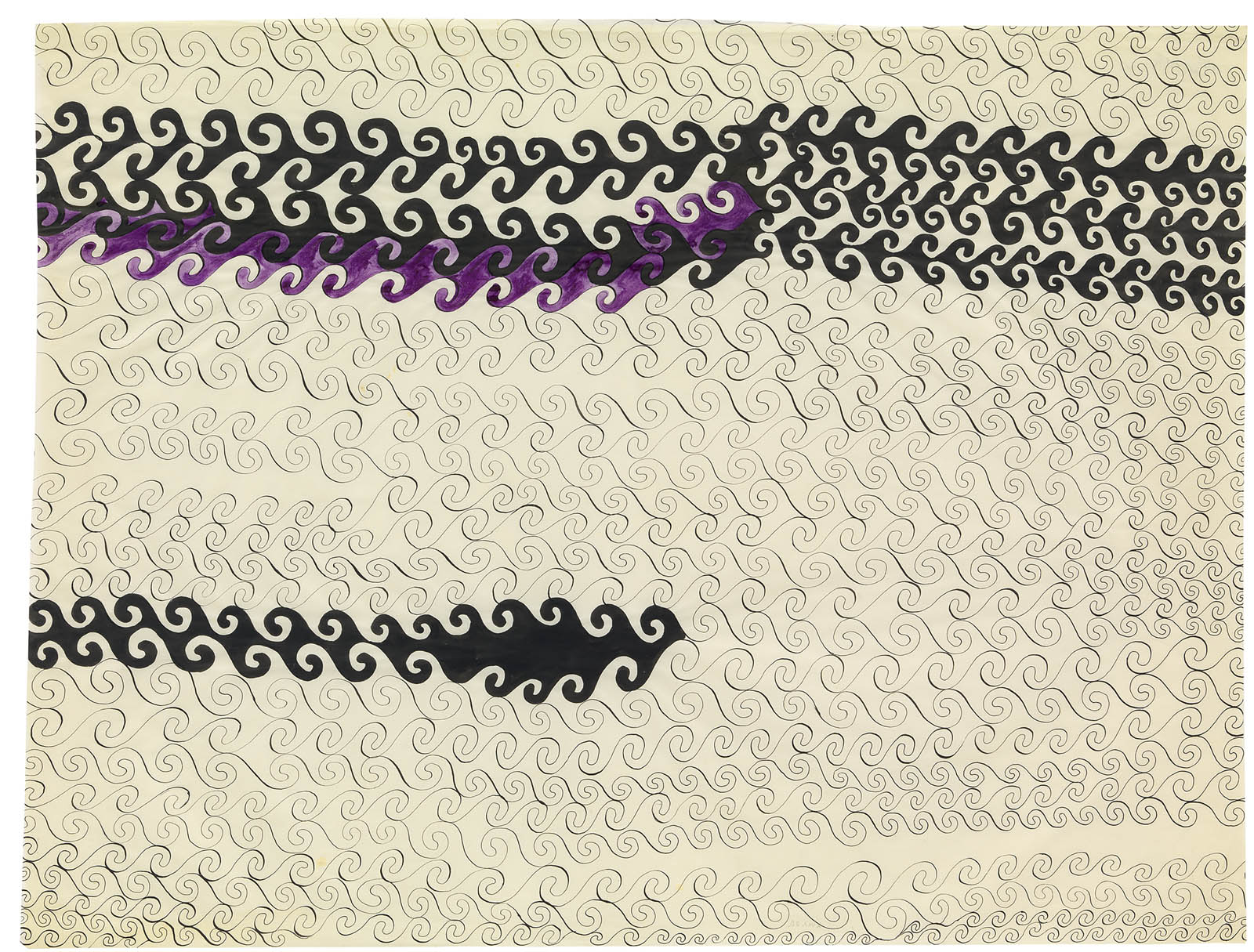
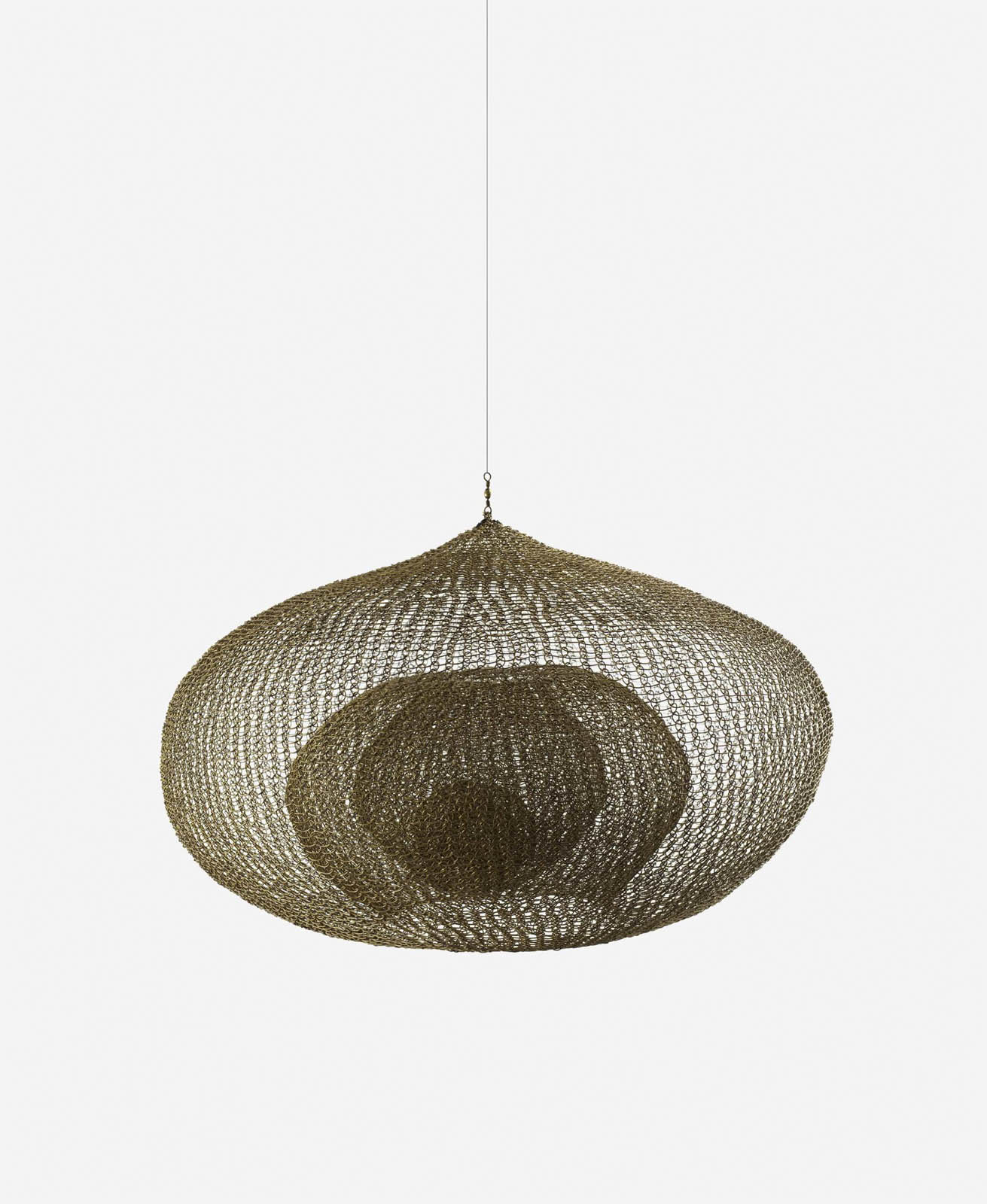
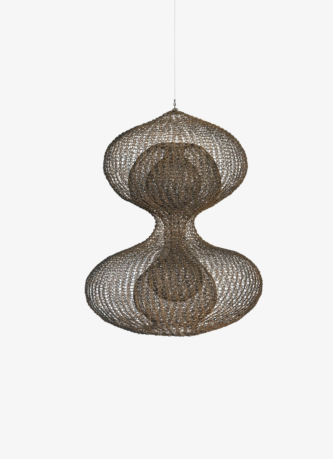
“Mixed-up times are overflowing with both pain and joy – with vastly unjust patterns of pain and joy, with unnecessary killing of ongoingness but also with necessary resurgence. The task is to make kin in lines of inventive connection as a practice of learning to live and die well with each other in a thick present. Our task is to make trouble, to stir up potent response to devastating events, as well as to settle troubled waters and rebuild quiet places.”
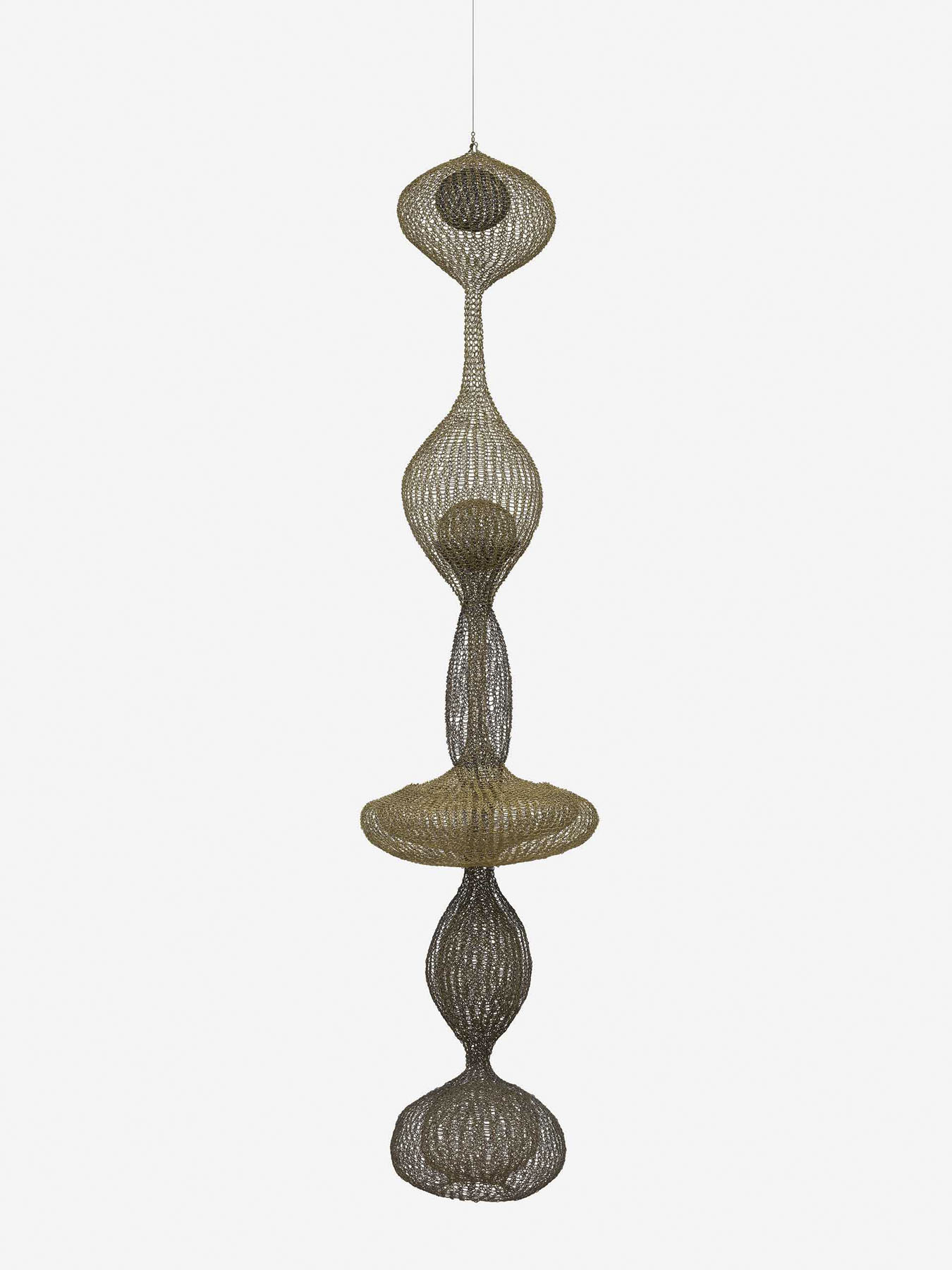
Donna Haraway, 2016
“… according to one’s structure and position, each of us sees certain facets, certain parts of facets (…).”
Alberto Giacometti
It’s great to see Melbourne artist Hoda Afshar have a mid-career survey exhibition at the Art Gallery of New South Wales. With her strong bodies of work over recent years she surely deserves such an accolade.
Unfortunately I can’t make any comment on the exhibition Hoda Afshar: A Curve is a Broken Line itself – its flow from body of work to body of work, from space to space; the colours used behind the photographs; the sequencing of the work; and how the different sizes of the photographs bring the viewer forward and push them back – because I have not seen the exhibition. But, as always with the work of Afshar, it would seem her compassionate, lyrical, conceptual images are displayed with a clear seeing and focus on the stories that the artist wishes to tell.
Many words have been written by others (below) about significant aspects of Afshar’s work: the layers of displacement, difference and marginality; othering and image-making; war, statelessness, diaspora, oppression, corruption, torment, identity, place … which relate to the “relativity of reality” (the view that people are active participants in the construction of their own reality) imbued in her work. Indeed, “concepts of identity develop across the social spectrum – from within the self, within the culture, and within the political arena.”1 You can read these texts at your leisure. But from what I can see in the media images the exhibition exemplifies, as writer Celina Lei notes, “how her practice has matured while still carrying forth that visual pull – aesthetically, intellectually and emotionally.”
From what I can observe and feel the images are strongly composed, rigorously conceived and carry emotional weight when combined in sequences. Single images are ambiguous but when combined into a flow of images the narrative comes alive. People are framed against contextless backgrounds, they turn away from the camera, they shield their eyes and their identity or have their faces obscured by tree branches – so much of Afshar’s work is about absence, loss, longing, persecution, the impermanence of identity and the conflicting perceptions of a constructed, lived reality.
What I take issue with is John McDonald’s comparison of Afshar’s work with that of William Eggleston: works in her ongoing series In the exodus, I love you more (2014-) which capture diverse images of Iran “have the same mixture of ordinariness and oddity one finds in the work of a photographer such as William Eggleston.”2 Nothing could be farther from a form of reality. Eggleston’s images are never ordinary, are frequently surreal and bizarre, shot from a low or high angle (often with lurid colour ways) and possess a cutting social commentary on American culture … whereas Afshar’s photographs are poetic, sublime, lyrical emanations of ‘reality’ and if they do picture some oddity they lack the intense “bite” of an Eggleston image – something I would like to see Afshar reintroduce into her image making.
Many of her images are reflective, meditative, and approach the subject matter in an oblique manner which illuminates “how photography can activate new ways of thinking” … all well and good, but I long for a little more guts and directness to some of her individual images (physically, literally not intellectually). Her early series Under Western Eyes for example, contains biting, quirky creativity but for obvious reasons has not been included in this exhibition because it doesn’t fit the style of the smooth, polished, buffed, ambiguous and other worldly later work.
I also take issue with Tom Williams’ observation. “Even in her early, nominally “documentary” series, you can sense an embracing of the ambiguity of the still image, and an interest in composing a reality more vivid (and perhaps genuine) than dispassionate reportage might be capable of.”3
I disagree with the second part of this statement.
Having recently spent hours assembling a huge posting of photographs on the war in Ukraine – images which picture the ordinariness and atrocity of war – nothing, literally nothing, can be more vivid and genuine than the images of that war captured by brave Ukrainian photographers (see examples below). The same can be said of the genocide happening in Gaza and the photographs emerging from that massacre.
But as John McDonald intelligently observes, “The tragic events that have unfolded in Israel and Gaza over the past month should be enough to remind us that art is powerless in the face of real political upheaval. The most an artist can do to effect social and political change is to create a few striking images that circulate beyond the thought-absorbing walls of the art museum. Even then, any change to people’s attitudes is bound to be incremental and highly personal.”4
Most images then, have little power to change public and personal opinion… all they can do is proffer alternate visions and interpretations of the world and hope that some glimmer of recognition of injustice, difference and otherness will permeate the mind of the viewer. And while Afshar’s photographs do not affect social and political change what they do is bring to consciousness in the viewer “other” aspects of the realities of the world. Through the visibility of her images she exposes the phallocracy of the masculine, singular definition of truth. As David Smail suggests when speaking on the nature of ‘truth’,
“Though the truth is not just a matter of personal perspective, neither is it fixed and certain, objectively ‘out there’ and independent of human knowing. ‘The truth’ changes according to, among other things, developments and alterations in our values and understandings… the ‘non-finality’ of truth is not to be confused with a simple relativity of ‘truths’.”5
Afshar’s photographs address the simple relativity of many ‘truths’, the tension between “forms” … of truth and reality. Truths and realities, what is seen and not seen. So much of being alive is breaking…
Dr Marcus Bunyan
Footnotes
1/ Ari Hakkarainen. “‘The Urgency of Resistance’: Rehearsals of Death in the Photography of David Wojnarowicz” 2018
5/ David Smail. Illusion & Reality: The Meaning of Anxiety. London: J.M. Dent & Sons, 1984, p. 152.
Many thankx to the Art Gallery of New South Wales for allowing me to publish the photographs in the posting. Please click on the photographs for a larger version of the image.
Mstyslav Chernov (Ukrainian, b. 1985) / AP Doctors unsuccessfully try to resuscitate a girl hit by Russian shelling in Mariupol, Ukraine. February 27, 2022 2022
Used under fair use conditions for the purposes of education, research, criticism and review
Alexey FurmanAlexey Furman (Ukrainian, b. 1991) / Getty Images A young girl cries as a man bids his daughter goodbye at the railway station in Lviv, Ukraine, on March 22, 2022. Lviv has served as a stopover and shelter for the millions of Ukrainians fleeing the Russian invasion, either to the safety of nearby countries or the relative security of western Ukraine’ 2022
Used under fair use conditions for the purposes of education, research, criticism and review
Sergi Mykhalchuk (Ukrainian, b. 1972) Evacuation of civilians from Irpіn, Ukraine. March 4-5, 2022 2022
Used under fair use conditions for the purposes of education, research, criticism and review
Mstyslav Chernov (Ukrainian, b. 1985) / AP Mariana Vishegirskaya stands outside a maternity hospital that was damaged by shelling in Mariupol, Ukraine, March 9, 2022. Vishegirskaya survived the shelling and later gave birth to a girl in another hospital in Mariupol 2022
Used under fair use conditions for the purposes of education, research, criticism and review
“I see art-making as a process of “unselfing” – you can be outside of your body, less focused on what’s inside, and see yourself in relation to the broader world.”
Hoda Afshar
“In co-opting the documentary genre, Afshar harnesses its truth-telling power while simultaneously telling another story – one that is often unspoken or at odds with what we are told by those in power.”
Through her poetically constructed images, Hoda Afshar illuminates a world overshadowed by history and atrocity. Yet we never see despair: we see defiance, comradeship, reinvention and a search for how photography can activate new ways of thinking. …
What unites her materially diverse work is a concern with visibility: who is denied it, what is made visible by media, and how photography can reveal, overlook and manipulate truth.
Much of her work addresses critical humanitarian issues of our time: war, statelessness, diaspora, oppression, corruption. She challenges stereotypes. We don’t see passive victims or closed narratives: we are introduced to new perspectives that might lead us to reappraise the world we inhabit.
The title of the exhibition was inspired by lines in a poem by Kaveh Akbar:
a curve is a straight line broken at all its points so much of being alive is breaking.
Through her photographs and moving image works, Iranian-born, Melbourne-based Hoda Afshar examines the politics of image-making. Deeply researched yet emotionally sensitive, her work can be seen as a form of activism as much as an artistic inquiry.
Afshar uses the camera to give visibility to those who have been denied it, resolutely insisting on the humanity of her subjects. She makes us contend with violence and brutality, not through blunt imagery but through evocation. Her work is anchored in empathy yet also radical in the way it wrestles with injustice.
This exhibition will feature photography and film from the past decade to present a comprehensive overview of Afshar’s recent practice, including a newly commissioned series. Amassed together in dialogue for the first time in a major public institution, these works offer a poignant reminder of the power of images and their coercive potential.
An accompanying publication offers critical insight into Afshar’s work as well as creative and experimental responses from a range of writers.
Text from the Art Gallery of New South Wales website
“The tragic events that have unfolded in Israel and Gaza over the past month should be enough to remind us that art is powerless in the face of real political upheaval. The most an artist can do to effect social and political change is to create a few striking images that circulate beyond the thought-absorbing walls of the art museum. Even then, any change to people’s attitudes is bound to be incremental and highly personal. …
Like Valamanesh, Afshar has never been able to let go of her brutalised, much-maligned country. In her ongoing series, In the exodus, I love you more (2014-), which takes its title from a line by Palestinian poet Mahmoud Darwish, she returns time and again to Iran, capturing diverse images that have the same mixture of ordinariness and oddity one finds in the work of a photographer such as William Eggleston. Landscapes, street scenes, portraits, horses, peacocks, a building draped in heavy curtains, a hose in a courtyard … nothing is disqualified from an idiosyncratic overview that digs under the skin of her birthplace. The same applies, but with added eeriness, to the series Speak to the wind (2015-22), set on the island of Hormuz, off the southern coast of Iran.”
“Through her poetically constructed images, Hoda Afshar illuminates a world overshadowed by history and atrocity. Yet we never see despair: we see defiance, comradeship, reinvention and a search for how photography can activate new ways of thinking. …
Even in her early, nominally “documentary” series, you can sense an embracing of the ambiguity of the still image, and an interest in composing a reality more vivid (and perhaps genuine) than dispassionate reportage might be capable of. …
What unites her materially diverse work is a concern with visibility: who is denied it, what is made visible by media, and how photography can reveal, overlook and manipulate truth.
Much of her work addresses critical humanitarian issues of our time: war, statelessness, diaspora, oppression, corruption. She challenges stereotypes. We don’t see passive victims or closed narratives: we are introduced to new perspectives that might lead us to reappraise the world we inhabit. …
Hoda Afshar’s work addresses conflict, injustice, mobility and the often fragile state of being alive. It reminds us that dominant powers can be challenged by exposing truth and envisioning something new.”
“Social and political commentary is a given in much of her work, but her lens remains sympathetic, never othering. This is highlighted in sections throughout Hoda Afshar: A Curve is a Broken Line. Her portraits of stateless asylum seekers on Manus Island, Papua New Guinea, taken in 2018, display power and dignity in visibility, despite lived experiences of harshness and torment.”
In the exodus, I love you more (2014-) is a portrait of her home country formed by experiences of familiarity and distance. The artist is both at home and searching, like an outsider. Images suggest at times an intimate proximity, and at others a separation akin to the one made by raising a camera to your eye.
Afshar examines her experience of migration and, she tells me, seeks to “dismantle the idea of there being one way of seeing Iran.”
The final image in this series shows the erasure of a woman’s face in a painted Persian miniature.
In September, the Art Gallery of New South Wales will present Hoda Afshar: A Curve is a Broken Line, the first major solo exhibition of one of Australia’s most innovative and unflinching photo-media artists, Iranian-born, Melbourne-based Hoda Afshar.
Featuring photographs and moving image works from the past decade, including a newly commissioned series, the comprehensive exhibition provides an overview of the artist’s recent practice and examines the politics of art making. Amassed together in dialogue for the first time by a major public institution, these works offer a poignant reminder of the power of images and their coercive potential.
Art Gallery of NSW director Michael Brand said it is a great pleasure to present Afshar’s first major solo exhibition at the Art Gallery of NSW.
‘Hoda Afshar is one of the most exciting artists working in Australia today. While her work explores themes of violence and pain, it also speaks to the transformative potential of image-making which is of profound importance to art institutions, as agents of advocacy and emotional encounter,’ said Brand.
‘Her work gives visibility to marginalised voices and serves as a powerful reminder of art’s capacity to embolden, inspire, and move. Her own voice as an artist is a defiantly international one.’
Since she first began working with photography in the early 2000s, Afshar has resolutely insisted on the humanity of her subjects. She is sensitive to the camera’s status as an imperialist tool that has long been used to define how history is told and how power is consolidated. Throughout her practice, she has involved her subjects in the act of photographing them in order to equalise the power dynamic that exists between photographer and photographed and return agency to those she depicts.
Exhibition curator, Art Gallery of NSW senior curator of contemporary Australian art Isobel Parker Philip said: ‘Hoda Afshar’s work is both deeply researched and poetically resonant and can be seen as a form of activism as much as an artistic inquiry.
‘Hoda’s approach is unique in that she makes us contend with brutality, not through blunt imagery but through evocation. Her work is anchored in compassion yet also radical in the way it wrestles with injustice.
‘Hoda’s photographs and videos are emotionally embroiled in the world they depict. It is this fact that makes a survey of her work both compelling and timely.’
Hoda Afshar: A Curve is a Broken Line includes the reveal of a new body of work commissioned for the exhibition, titled In turn 2023, which is a series of large-scale photographs depicting Iranian women who, like Afshar, live in Australia and have watched, from afar, the women-led Iranian uprising that began in September 2022. Presented one year on from when the uprising started, the portrait series is something of an elegy, speaking to their shared grief and their shared hope.
Among the most recognisable works featured in the exhibition, is Behrouz Boochani – Manus Island 2018, which was acquired by the Art Gallery in 2020 from Afshar’s pivotal series Remain 2018, which comprises a video and suite of photographs. Made on Manus Island, Papua New Guinea with a group of stateless asylum seekers, the video and photographs of Remain serve as testimony to the lived impact of Australia’s border protection policy.
The exhibition is accompanied by a publication, Hoda Afshar: A Curve is a Broken Line (RRP$65) featuring new writing by curator Isobel Parker Philip and writers including Hala Alyan, Elyas Alavi, Behrouz Boochani, Andrew Brooks and Astrid Lorange (working as the duo Snack Syndicate), Taous Dahmani, Shahram Khosravi and Sarah Sentilles.
Press release from the Art Gallery of New South Wales
The series Behold was made while the artist was travelling in the Middle East and befriended a group of young gay men who invited her to photograph them in a local male-only bathhouse.
The title Behold is alluding to the role of the viewer, the camera, in partially constructing the meaning of these images. For instance, the visible expressions of male intimacy tend to be viewed through a very narrow sexualized frame in the West, but in Iran, like elsewhere in the East, it is quite normal to see men engaged in physical contact, embracing each other and kissing cheeks, physically massaging each other in bathhouses, without it being sexualized. It is like public displays of breastfeeding and images of naked infants or adolescents – and also male intimacy – it is always interesting for me the reactions that these things engender in the West – the weird sort of prohibitions, and paranoias that surround the displaying of certain bodies or their interactions.
Picking up on something that John Berger said for example – if we were to replace the men in these images with women then of course the reaction would be very different. So returning to the idea of viewing: this work for me (now, upon reflection) is also about challenging the viewer – or different viewers – about these things. because despite the points just mentioned, the dominant reading of the work will still likely be about the censorship of bodies and identities in a particularly religious environment. But again what I am suggesting is that this has something, though not everything, to do with our own framing.
Hoda Afshar Instagram page. Used under fair use conditions for the purposes of education and research
In Behold (2016), once more we see acts of resolute defiance by people performing for the camera. Afshar was invited by a group of gay men to observe re-enacted gestures of protection and intimacy outlawed in most of the Middle East.
Unable to freely express their love in society, they disclose and affirm it for Afshar and her lens.
Behold was made unexpectedly, and without design. I was travelling in a city that I sometimes return to, and I got to know a group of gay men. There, where they live, these men (and many others like them) are mostly left to be. But only on the condition that they lead one part of their lives in secret. Rarely, that is, do their bodies ever meet in open honesty outside, in public. Only here, in this bathhouse, where their desire to be seen and embraced by others – just to be and to be held – is played out the partial openness of these four closed walls.
The bathhouse no longer exists. But while it still did, these men invited me to document it and a little glimpse of their lives in it. We arrived, but I was not allowed to enter. So we rented the place, and for a few hours I took pictures while these men played themselves performing their lives for my peering camera, in order that their desire to be seen might be realised, in part at least, here in the world of the images – in the act of beholding, where the bare thereness of life is transformed from mere appearing or appearance, into something more meaningful … into recognition.
Hoda Afshar. “11 Works by Hoda Afshar,” on the Cordite website 1 August 2018 [Online] Cited 09/11/2023. Used under fair use conditions for the purposes of education and research
Remain addresses Australia’s contentious border protection policy and the human rights of asylum seekers. The work was made in collaboration with several of the men who remained on Manus Island, Papua New Guinea, six or more years after they left their homelands to seek asylum in Australia, but instead were sent to languish in the remote offshore detention centre. The work involves these men retelling their individual and shared stories through staged images, words, and poetry, and bearing witness to life in the Manus camps: from the death of friends and dreams of freedom, to the strange air of beauty, boredom, and violence that surrounds them on the island.
Afshar believes ‘typical images of refugees only reinforce in the eyes of the viewer their inferior image and position’. Afshar, in collaboration with the people in her
portraits, attempted to create ‘an artwork – using the language of poetry, performance, and song – that defies such logic, and forces the viewer to confront their
own incomprehension, as well as the very inexplicableness of the situation that these men face.’ Collaboration, trust and empathy is an important aspect of Afshar’s art practice. She says:
One portrait shows a stateless Kurdish refugee called Emad struggling under a downpour of sand. When I asked him what natural element he wanted to use in his image, he chose soil. He said: ‘It reminds me of land; the land that I was torn from; the land that has been torn from me. From us. Soil is the most precious idea in Kurdish culture. But we are stateless. I’ve been stateless my whole life.’
Afshar’s criticism of documentary photography isn’t aimed at photographers themselves, or their intentions: ‘It’s important for all of us to look at the visual languages that we inherited, that are predominantly imperial visual languages, and ask questions about why we’re framing things in a certain way.’
Hoda Afshar’s 2018 body of work Remain is an unflinchingly political commentary on Australia’s border protection policy and serves as testimony to its assault of human rights. Encompassing a film and a suite of photographic portraits, Remain speaks the stories of a group of stateless men who remained on Manus Island, Papua New Guinea, after the immigration detention centre closed in October 2017. In the film, their experiences are recounted as episodic fragments shot through with violence in voice overs that are by turns lyrical and brutal. Some recite poetry, some sing, some remember the riots and the suicides. As their stories unfold, the camera pans over a picturesque landscape – lush foliage and crystal-clear water. A ‘green hell’ as one man describes it. It is the abrupt collision of these two registers, the haunting narrative and the idyllic imagery, that carries the emotional force of the work. It is beautiful and horrifying at the same time.
The accompanying photographic portraits of the same protagonists are insistent and powerful. They stand before us, in the foreground of the image, against a dark backdrop. In these photographs, there is nothing to distract us from the figures themselves. Nothing to detract from the simple fact of their presence. They each assert their right to be seen. The bluntness of this gesture is itself a political act. For that is what detention does; it makes individuals invisible. In these portraits, Afshar acknowledges the plight of these men metaphorically. They are beset by the elements, by fire, water and earth. But at no point is their humanity questioned.
Text from the Art Gallery of New South Wales website
Behrouz Boochani (Persian: بهروز بوچانی; born 23 July 1983) is a Kurdish-Iranian journalist, human rights defender, writer and film producer living in New Zealand. He was held in the Australian-run Manus Island detention centre in Papua New Guinea from 2013 until its closure in 2017. He remained on the island before being moved to Port Moresby along with the other detainees around September 2019. On 14 November 2019 he arrived in Christchurch on a one-month visa, to speak at a special event organised by WORD Christchurch on 29 November, as well as other speaking events. In December 2019, his one month visa to New Zealand expired and he remained on an expired visa until being granted refugee status in July 2020, at which time he became a Senior Adjunct Research Fellow at the University of Canterbury.
Boochani is the co-director, along with Iranian film maker Arash Kamali Sarvestani, of the documentary Chauka, Please Tell Us the Time, has published numerous articles in leading media internationally about the plight of refugees held by the Australian government on Manus Island, and has won several awards.
His memoir, No Friend But the Mountains: Writing from Manus Prison, won the Victorian Prize for Literature and the Victorian Premier’s Prize for Nonfiction in January 2019. The book was tapped out on a mobile phone in a series of single messages over time and translated from Persian into English by Omid Tofighian.
After the November 2022 publication of his second collection of writings, Freedom, Only Freedom: The Prison Writings of Behrouz Boochani, Boochani visited Australia for the first time to promote the book in December 2022.
Hoda Afshar’s 2018 body of work Remain is an unflinchingly political commentary on Australia’s border protection policy and serves as testimony to its assault of human rights. Encompassing a film and a suite of photographic portraits, Remain speaks the stories of a group of stateless men who remained on Manus Island, Papua New Guinea, after the immigration detention centre closed in October 2017. In the film, their experiences are recounted as episodic fragments shot through with violence in voice overs that are by turns lyrical and brutal. Some recite poetry, some sing, some remember the riots and the suicides. As their stories unfold, the camera pans over a picturesque landscape – lush foliage and crystal-clear water. A ‘green hell’ as one man describes it. It is the abrupt collision of these two registers, the haunting narrative and the idyllic imagery, that carries the emotional force of the work. It is beautiful and horrifying at the same time.
The accompanying photographic portraits of the same protagonists are insistent and powerful. They stand before us, in the foreground of the image, against a dark backdrop. In these photographs, there is nothing to distract us from the figures themselves. Nothing to detract from the simple fact of their presence. They each assert their right to be seen. The bluntness of this gesture is itself a political act. For that is what detention does; it makes individuals invisible. In these portraits, Afshar acknowledges the plight of these men metaphorically. They are beset by the elements, by fire, water and earth. But at no point is their humanity questioned.
Text from the Art Gallery of New South Wales website
On the islands in the Strait of Hormuz, a belief exists that a wind, known as zār, can possess a person, and can be exorcised from them through an intense ceremony of dance and music.
On the islands of the Strait of Hormuz, near the southern coast of Iran, there is a belief that the winds – generally believed to be harmful – can possess a person, causing them to experience illness or disease. As part of a ritual placating the winds’ harmful effects, the islands’ inhabitants practice a ceremony involving incense, music and movement, in which a hereditary cult leader speaks with the wind through the afflicted patient in order to negotiate its exit.
When artist Hoda Afshar first visited the islands in 2015, she found herself drawn not only to these distinctive customs practiced by its inhabitants but also to its otherworldly landscapes – the strange valleys and statue-like mountains, themselves sculpted by the wind over many millennia. While the exact origins remain unclear, the existence of similar beliefs in many African countries suggests that the cult may have been brought to the south of Iran from southeast Africa through the Arab slave trade. This seldom spoken history became a starting point into an intriguing project for Afshar, who sought to document the story of these winds and the traces they have left on these islands and inhabitants.
Mack Books on Intagram. Used under fair use conditions for the purposes of education and research
With 110 cameras functioning instantaneously in a photo studio, Afshar created 3D images of her subjects and used a 3D printer to convert them into statues.
An officer and lawyer in the Australian Special Forces
While serving in Afghanistan, he raised concerns that the Australian government were covering up the corruption of Australia’s defence force for political gain, and sacrificing the lives of Australian soldiers. After his concerns were consistently ignored, he copied over a hundred secret documents and distributed them to several journalists and to the ABC. He faces trial on five charges relating to National Security. If found guilty, he will face lifetime imprisonment.
Portrait of Rod St George, who exposed atrocious conditions at the Manus Island detention centre
Agonistes (2020)
Hoda Afshar explores the experiences of people who have spoken out. The artist worked with people known as whistle-blowers, who have brought to light various transgressions perpetrated in Australian institutions today. Although whistleblowing in Australia is considered a hallmark of our democracy, whistle blowers take great personal risks when drawing attention to institutional wrongdoing.
Agonistes is based on the experiences of several men and women – former employees in the areas of immigration, youth detention, disability care, and other government agencies – who chose to speak out, and who now live with the consequences. They describe the personal and professional ruin, the breakdown of friendships and family relationships, and the physical and mental anguish that followed their decision to call out alleged abuses, and the reasons that led them to do so, despite knowing their possible fate. They explain that if they could go back, they would do it all again.
While their individual stories differ, the shared struggle of these men and women and their portraits expose the same agonizing truth: that the choice between responsibility and obligation – between morality and the law – is, in a very real sense, the essence of tragedy. Afshar produced a 3D scan of each of the whistle blowers. This was then 3D printed to create a bust. Afshar created studio photographs of the busts, which resulted in a suite of images that abstracts the identity of each subject. The eyes – a feature we usually use to identify people in photographs – become curiously blank.
“It took me 14 years to find that level of courage, or knowledge or connection to the place [Australia] to make a work like the Agonistes, to turn the lens inward, to feel like I’m authorised to talk about it as a citizen,” says Afshar.
To identify the whistleblowers to approach for the project, Afshar worked with Claire Loughnan, a lecturer in criminology at the University of Melbourne.
She flew each person to Melbourne and photographed them using a system of 110 cameras – which allowed her to essentially create a 360-degree portrait. She used this composite image to generate a 3D-printed sculpture of each whistleblower. …
Afshar was fascinated to discover that the one thing that the 110 cameras could not capture was the details of her subjects’ eyes – resulting in a glazed-over effect.
This accidental byproduct of the process had a certain poetic resonance for the photographer: it reminded her of the eyes on ancient Greek busts.
She points out that democracy and tragedy emerged in ancient Greece at the same time.
“Often in the tragic narratives, the main character is the one that is caught between two conflicting choices: responsibility and obligation, or morality and the law … [or] the public and the state.”
“The reality of Athens at the time was a system that was rooted in patriarchy, slavery, xenophobia, refugee crisis – which are still the struggles of our time. And the function of tragedy then was to give voice to the excluded voices.”
In the Agonistes video work, we hear the excluded voices of the whistleblowers while Afshar zooms in on her subjects’ eyes, mouths, hands.
In the adjoining room, the new series In turn (2023) is a suite of large, framed photographs of Iranian women based in Australia. Many images show them as they tenderly braid one another’s hair. These women are unidentifiable, apart from artist and activist Mahla Karimian, who appears airborne with a pair of flying doves.
This work was catalysed by the women-led protest movement sparked by the death of Mahsa Jina Amini, an Iranian Kurdish woman arrested in September 2022 for not following Iran’s strict female dress codes. The uprising filled the streets with women chanting “Women, Life, Freedom!” and “Say her name!” in fearless defiance of authorities, who responded with murderous retaliation.
Afshar was observing her homeland from afar. She says she wanted to “share voices the media was ignoring”. She was inspired by social media images of women plaiting each other’s hair in public: a rebellious act that echoes a practice of female Kurdish fighters preparing for battle.
But the images aren’t violent. They’re quietly peaceful, showing solidarity in grief, hope and determination. In making this “visual letter” to her Iranian sisters, Afshar has risked long-term exile from her country of birth.
Curators:Hiroshi Sugimoto: Time Machine is curated by Hayward Gallery Director Ralph Rugoff with Assistant Curators Thomas Sutton and Gilly Fox, and Curatorial Assistant Suzanna Petot.
Rachael Smith Hiroshi Sugimoto in the Hayward Gallery with his ‘Seascapes’ series 2023
The world is a reality, not because of the way it is, but because of the possibilities it presents
Frederick Sommer
Almost real
I have an ambivalent relationship with the work of Hiroshi Sugimoto.
On the one hand I truly admire the beauty and presence of Sugimoto’s photographs; how his images “contradict the medium’s conventional tasks – to record reality as precisely as possible”; and how his work, through an investigation of “fundamental questions of space and time, past and present, art and science, imagination and reality” push at the boundaries of what a photograph is and can be through an exploration of the very nature of photography.
Through this erudite, conceptual, scientific and creative investigation, Sugimoto’s staged images proffer a reorientation of the referent – of the world, in the world – unsettling the certainty of the truth of the photograph as a visual record of the world.
In my favourite series – such as the movie in a moment Theaters (1976 – ), the stuffed animal Dioramas (1974 – ), some of the wax works dead pan Portraits (1999 -) (particularly Oscar Wilde, Queen Victoria and Princess Diana), and the Seascapes (1980 -) – I feel released from the bounds of reality as we perceive it. The artist takes me out of myself and into a new plane of existence. He has reanimated the in/animate through an alchemical process, a mystery of mysteries, to create new life – a transubstantiation of the elements earth, air, water, fire.
On the other hand I am less impressed with bodies of work that simply do not work for me… that leave me feeling cold, lifeless. Series such as Revolution (1990/2012), Lightning Fields (2009), Photogenic Drawings (2009), Architecture (1997 – below) and the recent Opticks (2018 – below), while not derivative, owe a great debt to other artists that have already strode that golden path… and have done it better.
As I have observed in another review of Sugimoto’s work: “I’m not saying Sugimoto is derivative but because of these other works, they don’t have much room to move. Indeed, they hardly move at all. They are so frozen in attitude that all the daring transcendence of light, the light! of space time travel, the transition from one state to another, has been lost. The Flame of Recognition (Edward Weston) – has gone.”
Taking his work as a whole, we observe in Sugimoto’s work a slightly malevolent aura – follow my argument here – not in the sense of the work “showing a wish to do evil to others” but through the photographs unsettling ability to confound the reality of others. The artist’s work is very male/volent, very masculine and in the Latin etymology of the word “volent” (present participle of velle to will, wish) very much (reality) constructed at the will and wish of the artist.
While Sugimoto’s volition (from Latin volo ‘I wish’) creates beautiful and subversive images of true presence and power, it is the artist’s ability to will into existence images that engage with mystical forces beyond the apparent and the factual but which live as completely real and part of the total world of man and nature … that is his most impressive attribute as an artist. Through his photographs he brings to consciousness things only a small portion of which most of us experience directly.1
Dr Marcus Bunyan
1/ Adapted from Ansel Adams’ essay for The Flame of Recognition 1964 in “Edward Weston’s The Flame of Recognition” on the Aperture website August 12, 2015 [Online] Cited 22/12/2023
Many thankx to the Hayward Gallery for allowing me to publish the photographs in the posting. Please click on the photographs for a larger version of the image.
“All my life I have made a habit of never believing my eyes.”
Hiroshi Sugimoto
“Sugimoto’s unique accomplishments in his genre contradict the medium’s conventional tasks – to record reality as precisely as possible. In Sugimoto’s work, one is confronted with the formal reduction of conceptual images, in which he addresses fundamental questions of space and time, past and present, art and science, imagination and reality. “I was concerned,” noted the artist in 2002, “with revealing an ancient stage of human memory through the medium of photography. Whether it is individual memory or the cultural memory of mankind itself, my work is about returning to the past and remembering where we came from and how we came about.” His pictures, which leave a lasting impression through their beauty and their auratic effect, interweave Japanese traditions with Western ideas. This East-West dialogue remains characteristic of his work today, which is captivating in its exceptional craftsmanship and strong aesthetic presence, and can exercise an almost magical effect on viewers.”
Anonymous. “Hiroshi Sugimoto. Revolution,” on the Museum Brandhorst website February 8, 2013
Hiroshi Sugimoto | curator tour with Ralph Rugoff | Hayward Gallery
Hiroshi Sugimoto: ‘My camera works as a time machine’ | Hayward Gallery
‘A camera can be able to stop the world, in that we stop the world and then investigate what is there, carefully.’
~ Hiroshi Sugimoto
Ahead of the opening of Hiroshi Sugimoto: Time Machine at the Hayward Gallery – the largest survey to date of the Sugimoto’s works – we travelled to meet the photographer at the Enoura Observatory in Japan. Situated against the outer rim of the country’s Hakone Mountains, the observatory was designed by Sugimoto as a forum for disseminating art and culture.
In this short video interview Sugimoto considers the impact of the invention of the camera – with this new ability to pause the world around us – and explains how his own photography, such as his Seascapes series, draws on this idea of the camera’s ability to distort linear time.
Dioramas (1974 – )
Installation view of Hiroshi Sugimoto, Dioramas (1974 – ) Silver gelatin prints Photo: Mark Blower. Courtesy the artist and the Hayward Gallery
‘My life as an artist began the moment I saw that I had succeeded in bringing the bear back to life on film,’ said Sugimoto about his 1976 work Polar Bear. The image is of an Arctic diorama in the American Museum of Natural History in New York, but through clever use of framing and exposure, Sugimoto was able to make the scene appear real. As well as revisiting the museum, and others across the US, to expand his Dioramas series, Sugimoto later took a similar approach to the waxworks of Madame Tussauds in his Portraits. By removing the figures from their staged displays, and photographing them against a black backdrop with sympathetic lighting, the artist gave the impression that these famous faces had themselves modelled for his portraiture.
Installation view of Hiroshi Sugimoto, Polar Bear, 1976. Silver gelatin print Photo: Mark Blower. Courtesy the artist and the Hayward Gallery
“Polar Bear” (1976) shows the majestic white animal roaring over a fresh kill: the bloodied body of a seal whose inert form is bulky and dark against an Arctic white background that stretches into the distance. Look closely and behind the bear – with its luscious coat of fur, its big paws so heavy in the snow you can almost hear it crunch – the line between two and three dimensions is just visible: a jagged crevasse in the ice floe beneath the two animals merges almost seamlessly with a painted backdrop of receding icy peaks.
The eye judders between these realities. The dead bear, momentarily brought to life by the vividness of the photograph, dies again, and is preserved again, a copy of a copy, frozen between past and present. Similar fates await a pair of ostriches defending their new hatchlings against a family of wart hogs (“Ostrich-Wart Hog,” 1980) and a placidly floating mother manatee and her calf (“Manatee,” 1994).
Emily LaBarge. “What Is Photography? (No Need to Answer That),” on the New York Times website Nov. 21, 2023 [Online] Cited 23/11/2023. Used under fair use conditions for the purposes of education and research
Installation view of Hiroshi Sugimoto, Theaters series (1976 – ) Gelatin silver prints Photo: Mark Blower. Courtesy the artist and the Hayward Gallery
Installation view of Hiroshi Sugimoto, Goshen Indiana, 1980. Gelatin silver print Photo: Mark Blower. Courtesy the artist and the Hayward Gallery
Installation view of Hiroshi Sugimoto, Cabot Street Cinema, Beverly, Massachusetts 1978. Gelatin silver print
Installation view of Hiroshi Sugimoto, Abandoned Theaters series (2015 – ). Gelatin silver prints Photo: Mark Blower. Courtesy the artist and the Hayward Gallery
Installation view of Hiroshi Sugimoto, Union City Drive-in, Union City, 1993. Gelatin silver print Photo: Mark Blower. Courtesy the artist and the Hayward Gallery
The largest survey to date of Hiroshi Sugimoto, an artist renowned for creating some of the most alluringly enigmatic photographs of our time. Over the past 50 years, Sugimoto has created pictures which are meticulously crafted, deeply thought-provoking and quietly subversive.
Featuring key works from all of the artist’s major photographic series, this survey highlights Sugimoto’s philosophical yet playful inquiry into our understanding of time and memory, and photography’s ability to both document and invent.
The exhibition also includes lesser-known works that reveal the artist’s interest in the history of photography, as well as in mathematics and optical sciences.
Often employing a large-format wooden camera and mixing his own darkroom chemicals, Sugimoto has repeatedly re-explored ideas and practices from 19th century photography while capturing subjects including dioramas, wax figures and architecture. His work has stretched and rearranged concepts of time, space and light that are integral to the medium.
Born and raised in Tokyo, Japan, Hiroshi Sugimoto divides his time between Tokyo and New York City. Over the past five decades, his photographs have received international acclaim and have been presented in major institutions across the globe.
While best known as a photographer, Sugimoto has more recently added architecture and sculpture to his multidisciplinary practice, as well as being artistic director on performing arts productions.
Text from the Hayward Gallery website
Seascapes (1980 -)
Installation view of Hiroshi Sugimoto, Seascapes series. Gelatin silver prints Photo: Mark Blower. Courtesy the artist and the Hayward Gallery
Over the past 50 years, Hiroshi Sugimoto has created some of the most alluringly enigmatic photographs of our time: pictures that are precisely crafted and deeply thought-provoking, familiar yet tantalisingly ambiguous. Featuring key works from all of the artist’s major photographic series, this survey highlights the artist’s philosophical yet playful inquiry into our understanding of time and memory, and the ambiguous character of photography as a medium suited to both documentation and invention.
The exhibition also includes lesser-known works that illuminate the artist’s interest in the history of photography as well as in mathematics and optical sciences. Often employing a large-format wooden camera, mixing his own darkroom chemicals and developing his black-and-white prints by hand, Sugimoto has repeatedly re-explored ideas and practices from 19th century photography, including subjects such as dioramas, wax figures and architecture. In the process, his work has stretched and rearranged concepts of time, space and light that are integral to the medium.
Hiroshi Sugimoto says: “The camera is a time machine capable of representing the sense of time… The camera can capture more than a single moment, it can capture history, geological time, the concept of eternity, the essence of time itself… The more I think about that sense of time, the more I think this is probably one of the key factors of how humans became humans.”
Ralph Rugoff, Director of the Hayward Gallery, says: “Hiroshi Sugimoto is a brilliant visual poet of paradox, a polymath postmodern who embraces meticulous old school craftsmanship to produce exquisite, uncanny pictures that reference science and maths as well as abstract art and Renaissance portraits. Juggling different conceptions of time, and evoking visions ranging from primordial prehistory to the end of civilisation, his photographs ingeniously recalibrate our basic assumptions about the medium, and alter our sense of history, time and existence itself. Amidst all his peers, his work stands apart for its depth and striking originality of thought.”
Time Machine commences with a selection of Sugimoto’s black-and-white photographs of natural history dioramas, a series he began in the mid-1970s. The Dioramas photos draw attention less to the natural world than to its theatrical representation in museums, whilst at the same time conjuring what the artist has called the ‘fragility of existence’.
The subject of time is also explored in two subsequent bodies of work featured in the exhibition: shot in movie palaces as well as drive-ins, Sugimoto’s Theaters (1976 – ) capture entire films with a single long exposure, thus compressing all the dramatic action that appeared on screen into a single image of radiant whiteness. His renowned Seascapes (1980 -), which depict evenly divided expanses of sea and sky unmarked by any trace of human existence, are equally beguiling in their temporal reference, evoking the immediacy of abstract painting even as they speak to Sugimoto’s interest in focusing on vistas that, as he remarks, “are before human beings and after human beings.”
For Architecture (1997 – ), a series of deliberately out-of-focus studies of iconic modernist buildings – ranging from the Eiffel Tower to the Twin Towers – Sugimoto displays the expansive ambiguity that informs his art, at the same time conveying a sense of the visual germ of an idea in an architect’s imagination, as well as fashioning ghostly images of what he has described as “architecture after the end of the world.” For his subsequent Portraits (1999) series, meanwhile, the artist focused his camera on wax models of famous historical figures from Madame Tussauds; rendered more life-like in black-and-white, figures ranging from Queen Elizabeth II to Oscar Wilde and Salvador Dali take on a disarmingly lively appearance, underscoring the camera’s potential for altering our perception. As the artist has noted, “However fake the subject, once photographed, it’s as good as real.”
A final section of Hiroshi Sugimoto: Time Machine focuses on photographs that evoke different notions of timelessness, including his Sea of Buddha (1995) series, which portrays an installation in a 12th century Kyoto temple featuring 1001 gilded wooden statues of Buddha; and Lightning Fields (2006 – ), spectacular camera-less photographs created by exposing sensitised paper to electrical impulses produced by a Van der Graaf generator.
The exhibition comes to a stunning conclusion with a gallery dedicated to Sugimoto’s Opticks (2018 – ), intensely coloured photographs of prism-refracted light. Taking inspiration from Newton’s research into the properties of light whilst calling to mind colour field painting and artists like Mark Rothko, Opticks presents deeply immersive fields of subtly varying hues.
Alongside his photographs, two of Sugimoto’s elegantly contoured and polished aluminium sculptural models are presented, alluding to both mathematical equations and the abstract forms favoured by modernists such as Constantin Brâncuși.
The exhibition is accompanied by a fully-illustrated, 216pp catalogue with newly commissioned essays and an illustrated chronology, co-published with Hatje Cantz. Texts by Ralph Rugoff (on Dioramas), James Attlee (on Theaters), Mami Kataoka (on Seascapes), Lara Strongman (on Portraits), Geoffrey Batchen (on Lightning Fields), Edmund de Waal (on Sea of Buddha), Margaret Wertheim (on Conceptual Forms), Allie Biswas (on Opticks) and David Chipperfield (in conversation, on Architecture).
The show is set to tour internationally in 2024, at the UCCA Center for Contemporary Art (23 March – 23 June 2024) and The Museum of Contemporary Art Australia (2 August – 27 October 2024).
Press release from the Hayward Gallery
Sea of Buddha (1995)
Installation views of Hiroshi Sugimoto, Sea of Buddha series. Gelatin silver prints Photo: Mark Blower. Courtesy the artist and the Hayward Gallery
Installation view of Hiroshi Sugimoto, Sea of Buddha 049 (Triptych) 1995. Gelatin silver print Photo: Mark Blower. Courtesy the artist and the Hayward Gallery
Chamber of Horrors (1994 – ) and Portraits (1999 -)
Installation view of Hiroshi Sugimoto, Chamber of Horrors series. Gelatin silver prints Photo: Mark Blower. Courtesy the artist and the Hayward Gallery
Installation view of Hiroshi Sugimoto, The Garrote 1994. Gelatin silver print Photo: Mark Blower. Courtesy the artist and the Hayward Gallery
Installation view of Hiroshi Sugimoto, The Electric Chair 1994. Gelatin silver print Photo: Mark Blower. Courtesy the artist and the Hayward Gallery
Installation views of Hiroshi Sugimoto, Diana, Princess of Wales 1999. Gelatin silver print Photo: Mark Blower. Courtesy the artist and the Hayward Gallery
Hiroshi Sugimoto: formative years and significant works
For five decades the work of photographer Hiroshi Sugimoto has received international acclaim, whilst being presented in major galleries and institutions the world over.
Sugimoto’s photographs are meticulously crafted, often stretching and rearranging the concept of time, and our understanding of the world around us, and he has often re-explored ideas and practices from photography’s earliest exponents. Over the past 50 years, he has often revisited and expanded upon his own ideas, and series, which we take a closer look at, along with the artist’s formative years, here.
Hiroshi Sugimito: early years
Hiroshi Sugimoto was born in Tokyo in 1948 to a family of merchants. Among the young Sugimoto’s interests were trains, electronics, carpentry and photography, with his early fascination with the latter further enhanced by one of his elementary school science teachers, who showed Sugimoto and his classmates how to use photosensitive paper to make photograms. ‘He used spoons and forks and other items and he exposed the paper under the light for five or six minutes.’ explained Sugimoto, looking back. ‘When he removed it, the shapes of the spoons and forks remained on the paper. It was an amazing experience for me that left a lasting impression’.
At the age of 12 Sugimoto was given his first camera, a Mamiya 6 medium-format, by his father, which he would use to take photographs of trains and gather reference material for model-making. When he moved on to high school, Sugimoto joined the photography club and also began developing an interest in the cinema, which he would visit regularly. It wasn’t long before his love of film and photography combined, as he recalls, ‘Audrey Hepburn was beautiful and I fell in love with her on the screen. I wanted her portrait so I brought my Minolta SR7 camera into a movie theatre, and I studied how to stop the image on the screen. I found that one-fifteenth and one-thirteenth of a second stops the image’.
In 1970, after graduating in Economics from Tokyo’s Rikkyo University, Sugimoto backpacked across Russia and Europe. Influenced by communist ideology, and the writings of Karl Marx and Friedrich Engels as a student, he had wanted to experience Russian society, but disillusioned by what he found, he duly continued on to Europe. ‘I kept moving westwards. I stayed in Moscow for a few weeks and took another train to Poland, and then to Czechoslovakia, Bulgaria and other Eastern European countries. After several weeks I arrived in Vienna for my first taste of Western civilization’.
Hiroshi Sugimoto in America
Later in 1970 Sugimoto would get another taste of Western civilisation as he travelled to the US, and California. Here he studied at Los Angeles’ ArtCentre College of Design, specialising in photography. Speaking of his studies here, Sugimoto has said ‘ArtCenter College was more like a training school for technicians: car design and advertising. For photography you trained to be a commercial photographer, which is what I wanted. I wasn’t interested in academic study at all’.
After completing his study in Los Angeles Sugimoto moved to New York in 1974 in order to pursue a full-time career in photography. Here, Sugimoto soon became part of the city’s hippy counter-culture. ‘I got serious about using photography as a tool in my art after I moved to New York’, says Sugimoto. ‘I saw many good shows, mainly minimalist shows: Sol LeWitt, Dan Flavin, Donald Judd. When I moved to the East Coast I found so many interesting people that I decided to stay. I’d just finished my photographic studies and was hungry to work. Since photography was considered a second-class citizen in the art world then why not use photography? It was more interesting for me to start with something a step down and bring it up’.
Dioramas
In 1974, Sugimoto made his first visit to the American Museum of Natural History in New York, it was a visit that would inspire his first major breakthrough in photography. ‘I made a curious discovery while at the exhibition of animal dioramas,’ the artist explains. ‘The stuffed animals positioned before painted backdrops looked utterly fake, yet by taking a quick peek with one eye closed, all perspective vanished, and suddenly they looked very real. I had found a way to see the world as a camera does. However fake the subject, once photographed, it’s as good as real’.
Inspired by these taxidermy dioramas, he went on to commence his Dioramas series, which among its initial works included Polar Bear (1976) and Hyena – Jackal – Vulture (1976). Sugimoto would return to this idea two decades on, adding more works to Dioramas in the 1990s including 1994’s Earliest Human Relatives. In 1978 Polar Bear was acquired by The Museum of Modern Art, representing Sugimoto’s first photographic sale. The work was also exhibited in the museum’s Recent Acquisitions show, that same year.
Theaters
It was whilst working on his Dioramas series, that Sugimoto also found the inspiration for his next series, Theaters, as he would later detail. ‘I am a habitual self-interlocutor. One evening while taking photographs at the American Museum of Natural History, I had a near-hallucinatory vision. My internal question-and-answer session leading up to this vision went something like this: ‘Suppose you shoot a whole movie in a single frame?’ The answer: ‘You get a shining screen.’ Immediately I began experimenting in order to realise this vision’.
He began this series in 1976, by photographing St. Marks Cinema in Manhattan’s East Village, and the first group of works would also see Sugimoto capture other movie theatres and cinemas in the Northeast and Midwest of the US. It was an approach that the photographer has returned to again and again over the course of his career, firstly in 1993 when he broadened the Theaters series to include depictions of Drive-Ins across the US. The photographer later travelled to Europe, primarily Italy, to replicate the approach with Opera Houses in 2014, and then in 2015 began photographing Abandoned Theaters.
Seascapes
The seeds for Sugimoto’s Seascapes series were sown in 1980. ‘One New York night, during another of my internal question-and-answer sessions I pictured two great mountains’, the photographer has explained. ‘One, today’s Mount Fuji, and the other, Mount Hakone in the days before its summit collapsed, creating the Ashinoko crater lake. When hiking up from the foothills of Hakone, one would see a second freestanding peak as tall as Mount Fuji. Two rivals in height – what a magnificent sight that must have been! Unfortunately, the topography has changed. Although the land is forever changing its form, the sea, I thought, is immutable. Thus began my travels back through time to the ancient seas of the world’.
Sugimoto began the series that same year with a photograph of the Caribbean Sea, taken from a bluff in Jamaica while on a family holiday to the island. Seascapes would subsequently lead Sugimoto across the globe, photographing bodies of water from the Ligurian Sea viewed from Italy to the North Pacific Ocean viewed from Japan.
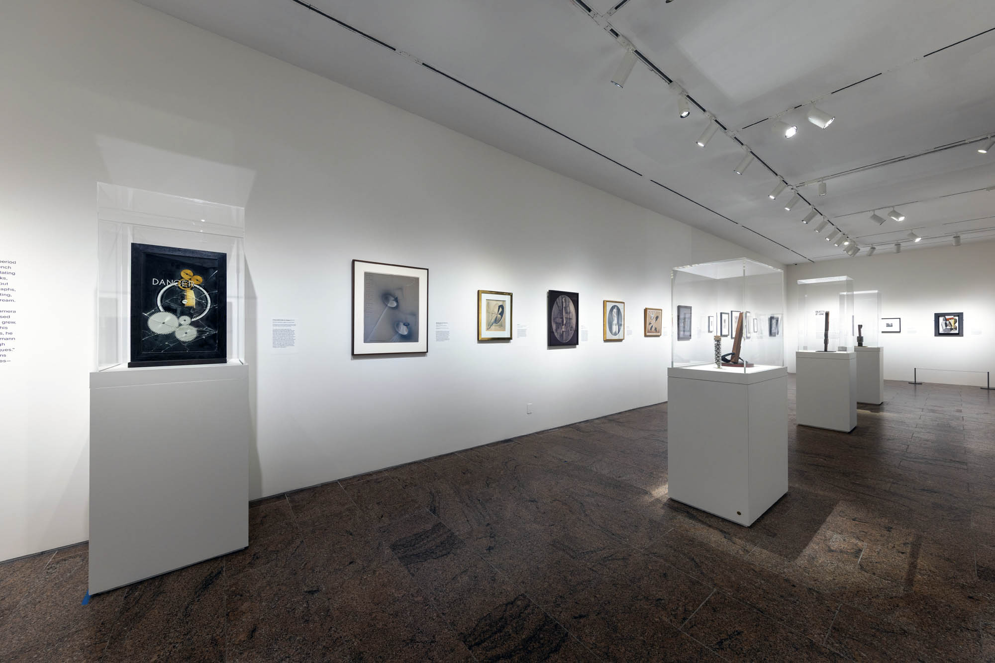
Chamber of Horrors and Portraits
In 1994 Sugimoto made his first visit to Madame Tussaud’s in London, where he photographed his Chamber of Horrors series on location. ‘I saw the blade that guillotined Louis XVI and Marie Antoinette, and the electric chair that executed the Lindbergh baby’s kidnapper, among other exhibits. They all looked very real to me’, Sugimoto said. ‘To corroborate these various murderous instruments invented by civilised men, I took the requisite eye-witness photographs: thus did people in times past face death head on’.
Sugimoto would return to the wax museum five years later to photograph his Portraits series, for which he was given special permission to remove selected figures from the display to photograph individually, among them Diana, Princess of Wales (1999), Fidel Castro (1999) and Anne of Cleeves (1999). However, he found that the exhibits he had previously captured for Chamber of Horrors had now been removed from the museum. ‘When I asked why,’ he said ‘I was told they’d been removed in a gesture to political correctness. Must we moderns be so sheltered from death?’
Opticks
In 2018 Sugimoto began printing his Opticks series, which was inspired by an 1704 work of the same name by Isaac Newton, in which Newton, through his experiments with prisms presented proof that natural light was not purely white. Drawing on Newton’s approach, Sugimoto used a batch of Polaroid film he had been gifted – one of the last batches of film Polaroid ever produced – along with a glass prism and a mirror to create condensed vivid compositions of pure colour. Sugimoto then enlarged these works into chromogenic prints. Opticks was presented for the first time in 2020 at the Kyoto City KYOCERA Museum of Art in Japan, and received its first UK presentation here at the Hayward Gallery.
Installation views of Hiroshi Sugimoto, Opticks series. Chromogenic prints Photo: Mark Blower. Courtesy the artist and the Hayward Gallery
Opticks isn’t the only series in which Sugimoto has experimented with historic techniques. In his 2006 series Lightning Fields, informed by the work of 19th century photography pioneer Henry Fox Talbot, Sugimoto captured the lightning-like shapes of electrical currents as they passed across a negatively-charged metal plate.
In his commitment to historic approaches the artist had initially attempted to supply the current to the plates using a hand-operated 18th century Wimshurst Electrostatic Machine, before switching to a more consistent Van de Graaff Generator.
In 2009, Sugimoto was gifted a batch of colour Polaroid film to see how a photographer who worked primarily in black and white might use it. This proved to be one of the last batches of the film ever produced (Polaroid went out of business in that same year) and would eventually find use in Sugimoto’s 2018 series, Opticks.
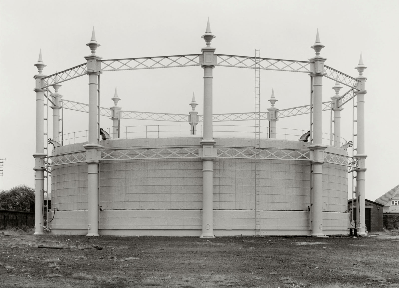
The images in Opticks – Sugimoto’s newest series, which has yet to be featured in any surveys of the artist’s work – are inspired by Isaac Newton’s seminal 1704 work of the same name, in which he presented proof that natural light was not purely white. Taking his cue from Newton’s experiments with prisms, Sugimoto used the Polaroid, along with glass and a mirror, to create condensed yet vivid compositions of colour in its purest form, before later enlarging these works into chromogenic prints.
Installation views of Hiroshi Sugimoto, Opticks series. Chromogenic print Photo: Mark Blower. Courtesy the artist and the Hayward Gallery
Installation view of Hiroshi Sugimoto, Opticks series. Chromogenic print Photo: Mark Blower. Courtesy the artist and the Hayward Gallery
Rachael Smith Hiroshi Sugimoto in the Hayward Gallery with his ‘Opticks’ series 2023
Installation view of Hiroshi Sugimoto, Conceptual Forms 0003 and Mathematical Model 002. Gelatin silver print, aluminium and steel Photo: Mark Blower. Courtesy the artist and the Hayward Gallery
Installation view of Hiroshi Sugimoto, Conceptual Forms 0003 2004. Gelatin silver print Photo: Mark Blower. Courtesy the artist and the Hayward Gallery
Installation view of Hiroshi Sugimoto, Conceptual Forms and Mathematical Model 006. Gelatin silver print, aluminium and steel Photo: Mark Blower. Courtesy the artist and the Hayward Gallery
Installation view of Hiroshi Sugimoto, Conceptual Form Surface 0001 Helicoid: Minimal Surface 2004. Gelatin silver print Photo: Mark Blower. Courtesy the artist and the Hayward Gallery
“Let the objects speak to us directly or not at all.” Dr Marcus Bunyan
Exhibition dates: 26th August – 31st December, 2023
Curatorium: Leo Schofield AM (curatorium chair), Ronan Sulich (advisor), Mark Sutcliffe (advisor) and Eva Czernis-Ryl (Powerhouse) Assistant curator: Chloe Appleby (Powerhouse) Exhibition manager: Anna Gardner (Powerhouse) Exhibition coordinator: Kerrie Goodwin (Powerhouse) Exhibition designers: Pip Runciman, Julie Lynch and Ross Wallace Lighting Designer: Damien Cooper
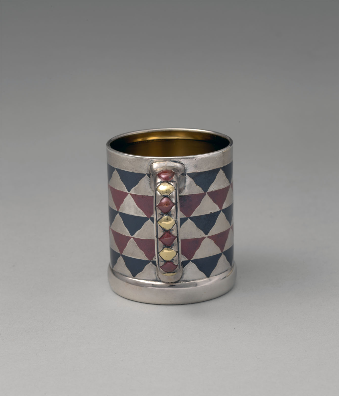
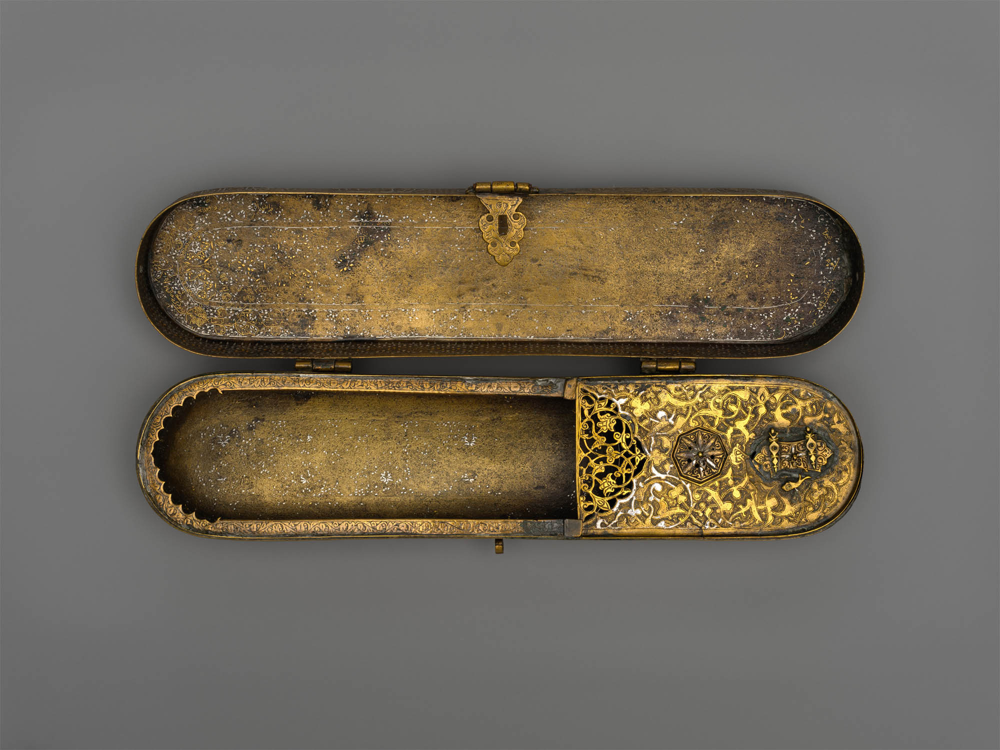
Wedgwood & Bentley (English, manufacturer) Venus Early 1800s Black basalt, stoneware Height: 350 mm Width: 210 mm Depth: 150 mm Powerhouse Collection Purchased 1949
Many rooms of wonder
What a visual feast we have for you this week!
Being an inveterate collector of eclectic objects who then puts them together in disparate but sympathetic arrangements (as in a Wunderkammer or ‘Cabinet of Curiosities’), the exhibition 1,001 Remarkable Objects at Powerhouse Ultimo, Sydney was a natural for me to post on.
“… the idea of a Wunderkammer was fully born in the sixteenth century as the princely courts of Europe became less peripatetic and as humanist philosophy spread. It was no longer enough simply to show off one’s wealth; every object should also enhance the virtues of the prince. In Inscriptiones vel tituli theatre amplissimi (1565), Samuel Quiccheberg detailed the ideal formula for the Wunderkammer as including naturalia (items created by the earth and items drawn from nature), mirabilia (unusual natural phenomena), artificialia (items wrought by man), ethnographica (items from the wider world), scientifica (items that brought a great understanding of the universe) and artefacta (items relating to history). Together these works would bring the wider world into the court and provide an understanding of the entire universe.”1
While Wunderkammer were the playthings of princes they brought to wider attention the miracles of the universe both natural and manmade. They made human beings aware of the enormity of the forces of nature and (human) industry that surrounded them … through the history and memory of objects.
John McDonald observes every piece has a story. But it is only through (in my case as a collector) being in the presence of these objects and physically handling them that we begin to understand the difference between one piece of Chinese bronze and another, one from the Ming dynasty and another from the Qing dynasty… and the difference in feeling between the two in terms of quality, casting, detail, aesthetics, form. Only through the physical handling of objects do we begin to understand the difference between an original and a fake, how old they are, how they were constructed, what their patina means, and what aura and power the object possesses. I have several pieces of treen (carved wood) in my collection and through the act of holding these objects I wonder about their history. The process is as much a tactile experience as it is a visual one.
The exhibition curators know their art. It is with great pleasure that I observe in an installation photograph in this posting the conflation of two objects that form what Minor White would call “ice/fire” where two disparate objects play off of each other: in this case a vase by that most famous and radical 19th century British designer Sir Christopher Dresser paired with a plate by the equally radical 20th century Russian designer El Lissitzky. A match made in heaven that plays out across the decades, repeated in numerous quirky juxtapositions and inspired nexus throughout the exhibition.
What further sets this exhibition off for me if the absolutely gorgeous and sympathetic “theatrical environments for these whimsical-but-rational groupings.” Exhibition designers Pip Runciman, Julie Lynch and Ross Wallace evoke a visually ravishing atmosphere in which the exhibition flâneur/flâneuse can stroll and take in the sights. Compare this stunning installation to the execrable rooting of the June 2023 Melbourne Winter Masterpieces exhibition Pierre Bonnard at the National Gallery of Victoria, Melbourne which presented the iridescent paintings of Bonnard within immersive scenography by Paris-based designer India Mahdavi. Here the work of Pierre Bonnard (which was supposed to be the subject of the exhibition not its addendum) was almost completely overwhelmed by the manic graphic design background of the installation. “Immersive scenography” = art speak for a load of no/sense.
Let the objects speak to us directly or not at all.
Many thankx to the Powerhouse Ultimo for allowing me to publish the photographs in the posting. Please click on the photographs for a larger version of the image.
“Every piece in this show has a story, but they are best sampled first-hand. Curatorially, 1,001 Remarkable Objects is a cultural pot-pourri, with disparate items clustered together based on a shared motif or theme. In some rooms, it’s as if Schofield, along with Mark Sutcliffe, Ronan Sulich and Eva Czernis-Ryl, simply put a word such as “peacock” or “music” into the collection database and selected the strangest things that popped up.
Ephemeral items of pop culture are juxtaposed with artefacts of ancient civilisations, tiny pieces of jewellery are linked with great clunking pieces of furniture. Viewers see everything from an Arnott’s biscuit to an electric car manufactured in Detroit in 1917. One extraordinary pairing puts a medieval suit of armour alongside the wheel of the plane in which Charles Kingsford-Smith perished when he crashed in November 1935.
The effect is almost hallucinogenic, and here one needs to give credit to exhibition designers Pip Runciman, Julie Lynch and Ross Wallace, who have created appropriately theatrical environments for these whimsical-but-rational groupings.
This approach, so contrary to the usual curatorial processes, harks back to the ancestor of the modern museum: the Wunderkammer, or cabinet of curiosities, in which royal courts and wealthy connoisseurs in the 17th and 18th centuries would display historical treasures, works of art, items of natural history and ingenious mechanisms.
Johann Joachim Kändler (modeller) Royal Saxon Porcelain Manufactory (manufacturer, Meissen, Germany) Portrait bust, ‘Baron Schmiedel’ 1739 Hard-paste porcelain Height: 475 mm Width: 360 mm Depth: 260 mm Powerhouse Collection Purchased 1951
Baron Schmiedel bust by Joachim Kändler
The satirical portrait bust of the court jester Johann Gottfried Tuscheer (born as Johann Gottfried Graf), better known as Baron Schmiedel or Postmaster Schmiedel, was one of the last royal commissions for the Japanese Palace of Augustus the Strong, King of Poland (ruled 1694-1733) and Elector of Saxony. The Japanese Palace was a lavish structure in Dresden refurbished to house both the fabulous royal collection of East Asian porcelains and the amazing new products of the Royal Saxon Porcelain Manufactory in Meissen near Dresden in Germany. Established in 1710, following re-discovery of secret Chinese porcelain formula by the King’s imprisoned alchemist Johann Joachim Böttger, Meissen was Europe’s first factory to make true or hard-paste porcelain. By the mid 1730s, the factory had been able to make monumental animal sculptures, apostle figures and even architectural elements alongside their exquisitely painted vases and tableware.
The bust was modelled by Johann Joachim Kändler (1706-75), the court ‘Modellmeister’ (master modeller) who worked at the Meissen manufactory from 1731 until his death in 1775. The bust was ordered by Augustus III, Augustus the Strong’s son and successor. The medallion on Schmiedel’s chest is based on one of Augustus’ coronation medals.
A highly talented individual who delighted in dressing in the latest fashions, Schmiedel was one of two most prominent jesters at the Saxon court at the time. His role as a jester involved attending the kings in their dressing rooms, at dinners and even at the most intimate court gatherings. He kept company with the kings on visits and hunting expeditions, always ready to crack a joke, exchange witty badinage or play magic tricks with mice while pretending to have morbid fear of rodents. Schmiedel was rewarded with numerous ‘titles’ and valuable presents including Meissen porcelain.
The Schmiedel bust was discovered in Sydney in 1949 by the noted Sydney antique dealer William Bradshaw at a time when its importance and history had been long forgotten. It was acquired by the Museum in 1951. One of the most important objects in the Powerhouse Museum’s collection of ceramics, it is one of only four surviving the the world.
Eva Czernis-Ryl, Curator
For full story see: E. Czernis-Ryl, ‘The golden years of Meissen porcelain and Saxon jesters: the Schmiedel bust in Australia’, Keramik-Freunde der Schweiz (Bulletin des Amis Suisses de la Ceramique), Mitteilungsblatt nr 104, October 1989, pp. 5-11
Installation view of the exhibition 1,001 Remarkable Objects at Powerhouse Ultimo, Sydney showing at top, El Lissitzky’s Plate (c. 1923, below); and at bottom, Christopher Dresser’s Vase (c. 1888, below)
Lazar Markovich Lissitzky (El Lissitzky, Russian, 1890-1941)(designer and maker, Germany) Plate (installation view) c. 1923 Unglazed, earthenware Depth: 26 mm Diameter: 190 mm Powerhouse Collection Purchased 2002
Plate by Lazar Markovich Lissitzky
A round plate made of heavy unglazed earthenware. Decorated in red enamel, sprayed in a stencil like manner (schablonendecor), with geometric motifs along the rim. Three red circles of differing sizes decorate one side of the plate. Two red curved rectangular bands, one short and one long, decorate the other side of the plate. The text ‘Z 2864’ is impressed on the base of the plate.
An architect and graphic designer, El Lissitzky (1890-1941) was among the most important Russian artists to influence Modernism and one of the great avant-garde figures of the 20th century.
His lifetime involvement with abstract art began in 1919 soon after he met the Suprematist artist Kazimir Malevich (see the ‘Design’ section for a summary of his artistic development and achievements). Between December 1921 and January 1924 he lived and worked in Germany and in 1924 was being treated for tuberculosis in Switzerland. Although initially reluctant to apply his distinctive pictorial vocabulary to utilitarian objects, it is during that time that his abstract pictures known as Prouns began to inform Lissitzky’s designs for a group of ceramics. Soon Prouns were also to become the source of his typography, photography and book, furniture and poster design.
This boldly coloured plate is one of the relatively rare examples of Lissitzky’s ceramics. Examples of plates for the same series comprising plates of different sizes can be found in the Sammlung Ludewig in Berlin, National Museum in Nuremberg, Deutsches Museum in Munich, Australian National Gallery in Canberra and in other collections.
Christopher Dresser (designer, British, 1834-1906) Linthorpe Pottery (manufacturer, Middlesbrough, Yorkshire, England) Vase (installation view) c. 1888 Earthenware Powerhouse Collection Gift of Bob Meyer under the Tax Incentives for the Arts Scheme, 1997
As opposed to John Ruskin and William Morris, Christopher Dresser was an enthusiastic advocate of scientific progress and the machine. The association of simplicity with progress led him to reject the taste for rich decoration of 19th century historical styles and Naturalism which used representational decoration and high-relief ornaments indiscriminately applied to objects. Dresser’s interest in forms based on the structure of plants, his emphasis on function in design and the economic use of materials such as electroplated silver, have no precedent in Western design traditions.The restrained design of this striking vase is a fine example of Dresser’s innovative pottery produced by the Linthrope Pottery.
Carlo Scarpa for VSM Paolo Venini & Co (Murano, Venice, Italy) Carlo Scarpa (designer, Italian, 1906-1978) Bowl c. 1940 Murrine opache Height: 60 mm Width: 232 mm Depth: 365 mm Powerhouse Collection Purchased 1984
Before Carlo Scarpa began designing some of Italy’s most celebrated modernist buildings, he spent 15 years with Venini, pushing the boundaries of Venetian glassblowing techniques. He worked for Venini between 1932 and 1947, both pioneering new techniques and reviving traditional Veentian techniques. Franco Deboni, observes: ‘Scarpa’s glass was so radical and innovative for its time. You can see it in the colours, shapes, textures and quality of execution…When you start to analyse the glass, you also realise how extremely complex it was for the master blowers to execute.’ Many of Scarpa’s designs reinterpreted historical designs using modern methods. His murrine romane combined the traditionally round murrina patterns with the square tiles of Roman mosaics. Revealed at the XXII Venice Biennale of 1940, the Murrine Opache technique is amongst the architect’s greatest technical and stylistic achievements.
Installation view of the exhibition 1,001 Remarkable Objects at Powerhouse Ultimo, Sydney showing at top left, Bowl, murrine opache, Carlo Scarpa for VSM Paolo Venini & Co, Murano, Venice, Italy, c. 1940; at top centre, Bowl form, Untitled, kiln formed fused mosaic glass, designed and made by Klaus Moje, Canberra, Australian Capital Territory, Australia, 1990-1991; at top right, Vase, blown glass with cane inclusions, Lino Tagliapietra, Rozelle, New South Wales, Australia, 1997; and at centre back, Textile length, Mohnkopfe (poppy heads), silk-double weave, Art Nouveau style, woven by Johann Backhausen and Sohne, Vienna, Austria, made by Koloman Moser, Vienna, Austria, 1900-1903
Klaus Moje (Australian born Germany, 1936-2016) (designer and maker, Canberra, Australian Capital Territory, Australia) Bowl form, Untitled 1990-1991 Kiln formed fused mosaic glass Height: 75 mm Diameter: 540 mm Powerhouse Collection Purchased 1991
Fused Mosaic Glass Bowl by Klaus Moje
This bowl form, ‘Untitled’, was made from fused mosaic Bullseye glass, in Canberra, Australian Capital Territory, Australia, 1990-1991.
Klaus Moje (1936-2016, born Hamburg, Germany) was one of Australia’s most significant glass artists, and also one of the most influential through his teaching in Canberra for 10 years from 1982. His international connections provided many exhibiting and teaching opportunities for others.
The Bullseye Glass Company had been set up in Portland, Oregon, in 1974 by three young glassblowers, Daniel Schwoerer, Boyce Lundstrom and Ray Ahlgren. Schwoerer had also studied glass as graduate assistant to Harvey Littleton at the University of Wisconsin in the 1960s as well as doing graduate work in engineering. Although they were glass blowers, they wanted to support their art through an income-generating industry and saw a need for a manufacturer of flat glass. Schwoerer explains, ‘In the early ’70s the few American companies making opalescent glass were back-ordered for at least two years and weren’t taking on new customers.’ In the following years Ahlgren and Lundstrom both left to start up other glass-related ventures and Lani McGregor, now artistic director of the Bullseye Connection gallery, joined Schwoerer as partner in 1985.
Bullseye kept closely involved with the needs of the marketplace through direct connections with the art world. In the early 1980s Klaus Moje wanted to make kilnformed mosaic glass and needed colours that fused compatibly. He met Lundstrom at the Pilchuck Glass School and found they had a mutual interest in the development of what became Bullseye’s Tested Compatible sheet glasses. ‘Moje provided a huge further inspiration to continue on this path which really had no justifiable commercial rationale at that time,’ says Lani McGregor. This liaison had far-reaching repercussions, especially for Australians, because Moje moved to teach at the Canberra School of Art in 1982: ‘Bullseye made hand-rolled glass for architectural purposes. They saw the problems I had with compatible glass and a limited colour palette…[and] started to see a serious way of entering the studio glass movement with their product.’
By the 1990s Moje wanted to make vessel forms from his fused mosaic sheets. It required further collaboration to develop a glass working process to enable this to happen. He first tried with Bullseye glass at Pilchuck with glassblower Billy Morris in 1987 and again with Dante Marioni in Portland in 1993. Bullseye provided a compatible blowing glass for these sessions, where the sheets were wrapped around a gather of furnace glass, but ‘what eventually came out of them’ says McGregor, ‘was that Klaus discovered that a blowing glass is not necessary for blowing previously fused forms. What Dante was doing was a variation on the long-known Italian pick-up method. What evolved was the truly amazing Australian Roll-up that – although we do now make a blowing compatible glass – doesn’t need it’. Artists were to discover, however, that the provision of these two compatible glasses allows other processes to take place, where, for example, sections of blown and fused glass can be successfully joined using the encalmo technique.
Bullseye’s connection with Australia was established mainly through Moje’s interest in providing opportunities for graduates and colleagues to travel, study and exhibit elsewhere, that were continued later by his successor Stephen Procter, and Jane Bruce. In turn Bullseye became involved in supporting programs in Australia, the most notable being the Latitudes workshops and exhibitions of 1995 and 1997 organised at the Canberra School of Art by Kirstie Rea, where participants experimented with the many options now possible. Kirstie Rea and Scott Chaseling continued their own explorations of these new possibilities, and became well-known in the 1990s for their international ‘Roll-up’ workshops.
Installation view of the exhibition 1,001 Remarkable Objects at Powerhouse Ultimo, Sydney showing at top, Carved form, Echidna shape, bean wood / echidna quills, painted, Louie Pwerle, Ngkawenyerre camp, Utopia, Northern Territory, Australia, 1996; and at second top, Figure, dog, Devil Dog, wood, Billy Petyarre, Utopia Station, Northern Territory, Australia, 1991; at second bottom, Coolamon, Bush Tomato Dreaming, wood / acrylic paint, Billy Petyarre, Utopia Station, Northern Territory, 1990-1991
Installation view of the exhibition 1,001 Remarkable Objects at Powerhouse Ultimo, Sydney showing at top, Carved form, Echidna shape, bean wood / echidna quills, painted, Louie Pwerle, Ngkawenyerre camp, Utopia, Northern Territory, Australia, 1996; and at second top, Figure, dog, Devil Dog, wood, Billy Petyarre, Utopia Station, Northern Territory, Australia, 1991
Louie Pwerle (Cowboy ‘Louie’ Pula Pwerle (Australian, c. 1940-2022)(Ngkawenyerre camp, Utopia, Northern Territory, Australia) Carved form, echidna shape 1996 Bean wood/ echidna quills, painted Height: 160 mm Width: 170 mm Powerhouse Collection Purchased 1996
Carved Echidna by Louie Pwerle
Carved animals and dishes, and painted seed necklaces, are made variously by artists including Queenie Kemarre, Louie Pwerle, Billy Petyarre, Wally Pwerle, Elizabeth Kngwarreye, Angelina Pwerle at the Ngkawenterre camp in the Utopia homelands. This particular camp is known for the carved animals made there.
Goannas, lizards, echidnas and kangaroos are sought after for food, as ‘bush tucker’, while the dogs are ‘devil dogs’. The devil dogs assist the ritual law enforcer, Kwertatye, in the beliefs of this group of Aboriginal people. Carved figures were made in earlier times, but it is not known what these were. The Ngkwarlerlaneme people at Utopia have revived the practice, following the introduction of acrylic painting in the 1980s; the dogs are painted in the manner of acrylic painting. Similalry the silk batiks made by this group often include figures or representations of animals and figures, real or mythological.
Designed and made by Louie Pwerle from a soft wood, locally called beanwood. The echidna is well-known as a form of bush tucker. Louie is part of a family who live at the Ngkawenterre camp in the Utopia homelands, and mostly carves and paints animals. He made three kangaroos in 1989 and none other until 1996, after Rodney Gooch brought back a ‘tree kangaroo’ (squirrel or possum) from Indonesia; following this Louie started to make kangaroos again. Only a few echidnas appear to be made (about 12 in the last 6 years), and only two with real quills seen by the Sydney agent in the last few years. This is (in 1996) the only camp where carved animals, figures and bowls are made, and paintings on canvas are also made at this camp. All the works in this particular collection are made by members of this family at this camp. All are consistent carvers, some like Queenie and Louie since about 1988.
AW Standfield and Co (manufacturer, Mascot, New South Wales, Australia, active 1925-2000) ‘Supreme’ Mouse Trap Making Machine 1942-1943 Metal/wood 1950 mm H x 2470 mm W x 1500 mm D Weight: 830 kg Powerhouse Collection Acquired October 2001
‘Supreme’ Mouse Trap Making Machine
This mouse trap making machine is part of the Museum’s Standfield collection of trap-making machines and associated items which are an unusual, indeed curious, ensemble of purpose-built machines and products that defined an Australian industry for sixty years.
The collection exemplifies a ‘making do’ approach to manufacturing in that the machines were built from secondhand parts from a range of sources; it also exemplifies the notion of technological stasis in that the machines were always considered efficient and sophisticated artefacts for the making of rodent traps. Likewise, the organisation, traditional skills, and daily customs of the Standfield firm did not change from the Second World War to the end of the twentieth century, a period when rapid industrial change was the norm.
The nature of production at Standfields was based on a belief that a unique machine would provide a quality product whose market was based upon the natural cycle of rodent population size. According to the Standfields, production was never based upon the traditional economic factors of supply and demand, as these concepts did not seem applicable to a production facility of this nature, size, and scale. Productivity was rarely increased or decreased from the machine’s range, that is, 1,000 traps per hour. Product stockpiling was a normative value that was practised by the firm.
Less demonstrative, but deeply embedded in the Standfield approach to manufacturing, was a belief that a well-made and simple product defined an Australian approach to the making of things.
The mouse trap making machine is made from a variety of metal and electronic components, painted white for framework and left plain for working parts. The machine can be divided into two segments consisting of the mouse trap assembly line and the spring and hammer making mechanism.
The front section of the machine features the assembly line from right to left. This section contains an intricate series of levers, pulleys and gears which feed the wooden mouse trap platforms through the production line. On the right is the platform feeder, filled with wooden platforms. From here the bases are pressed in a stamper, leaving the imprint, ‘Supreme / MOUSE TRAP / MADE IN AUSTRALIA’ on the top. The next phase involves the the catch or baiter and the holding bar both being stapled on to the platform. Once through this process, there is an open section in the centre for a worker to manually attach the spring and hammer device to the mousetrap and then place the traps back in the conveyor channel. The traps then pass through a plane or sander to remove any points on the base, and the process is complete. The power switch for this portion of the machine is positioned just below the sander, with a speed switch also present in the machines centre. On each side of the production line segment are different coils of metal, for each of the components used in constructing the mouse traps. Each of the coils is labelled with different specifications, based on their thickness, with some spare coils placed underneath. A counter, in a red casing, can be seen in the centre of the machine, indicating the number of traps which have been processed. Above the counter are two lamps, plugged into a powerboard at the top of the machine, for providing additional light in the dark workshop.
The back section is designed with the specific purpose of constructing the spring and hammer mechanism for the traps. This section also works like a production line with two sets of metal coils, suspended on metal poles, on the right and left sides of the machine. The wires are fed through a set of gears, pulleys and levers, which bend, coil and shape the wire to create the spring and hammer. The finished product reaches the end of the production line and is released down a slide or ramp, into a white tray at the front of the main production line for the worker to retrieve. A power switch can be found on the right side of this section
At the front of the machine is a black and white image of Arnold Wesley Standfield woking on the machine, with the final mousetrap that the machine made stuck to the front. A number of finished and half finished mousetraps as well plain platforms can be found on a wooden shelf on the machines right.
Formal patent applications were taken by Arnold Wesley Standfield for the ‘Westan’ all metal rodent trap, and the Kyogle cow-tail clip. The patent documents are supplemented with schematic designs, which illustrate the operational requirements of the products. Interestingly, no formal machine design or patent was ever taken on Standfield’s principal item, namely, the mouse-trap machine. The Standfield archives hold the patent applications for the ‘Westan’ mouse trap and Kyogle cow-tail clip, as well as other documentary accounts of these items.
The machines, traps, and the cow-tail clip, were entirely the creations of Arnold Wesley Standfield (1901-1990), the founder of A.W. Standfield and Co., ‘Supreme’ Mouse and Rat Traps. His sons Dave and Ron Standfield assisted their father with the repair and maintenance of the machines, and the sons became the owners and managers of the firm upon the death of their father. Knowledge of the machines and its products was passed to the sons by their father, and in turn they passed on knowledge and skill to long-term employees of the firm.
A.W. Standfield made the machine from wheels, gears and pieces of metal taken from scrapped machines he found in scrap-iron yards around Sydney. Although Standfield had no formal training in machining or associated trades, his accomplishment does suggest that he had an innate ability to build production machines. In a single operation, a mouse trap can be assembled in 1.5 seconds. The standard production rate is “over 1,000 traps per hour” (‘Mouse-Trap Making Machine’, n.d. probably composed by A.W. Standfield, Standfield archives).
The machine was made over a two-year period (1942-1943) and the first traps ‘came off’ the machine on 7 January, 1944. The machine is as it was first made, although broken and worn parts have been replaced over the years.
The machine itself makes all parts, and, as mentioned above, assembles a trap in 1.5 seconds. In operational terms, four strands of staple wire are fed, straightened, cut off, folded and driven into the base of the trap. The machine grounds off protruding staple ends. It feeds, straightens, cuts off, and forms into a trigger, wire of 3″ (76.2mm) length of 17 gauge wire, which was supplied by BHP. The machine staples the trigger wire to the pine base.
The machine makes and assembles the bait holder. The machine selects the length of steel for the bait-holder, cuts it, punches and forms the steel into the bait holder and affixes the holder (under the staple) to the pine base. The machine feeds, straightens, and cuts off 18″ (457.2mm) of 17 gauge spring wire and forms this as the mouse-trap spring. In the process, the wire is turned and bent 23 times at varying degrees to make a spring. The mouse-trap machine pushes the piece of pine along a slot and brands the base. The machine turns the spring ends. The spring is fed through and stapled by hand to the base. This operation completes the assembly of a mouse trap.
Lockheed Aircraft Company (manufacturer, Burbank, California, United States of America) Aircraft undercarriage from Lockheed Altair monoplane ‘Lady Southern Cross’, starboard side Probably 1933 Metal/rubber Height: 1420 mm Width: 480 mm Diameter/Length: 1000 mm Powerhouse Collection Acquired February 1994
Aircraft undercarriage from the Lady Southern Cross
The only surviving fragment of aircraft in which Sir Charles Kingsford Smith died, 8 November 1935
This wheel and oleo strut are part of the starboard undercarriage used by Sir Charles Kingsford Smith (Smithy) in his Lockheed Altair aircraft VH-USB ‘Lady Southern Cross’ for his attempt at a record breaking flight from England to Australia in 1935. On 8 November 1935 ‘Lady Southern Cross’ is estimated to have crashed into the Gulf of Martaban in the vicinity of Aye Island off the coast of Burma, now Myanmarm, at approximately 0216 local time. The undercarriage is the only major component to have been located and preserved after the loss of the aircraft with Smithy and his co-pilot/engineer, Tom Pethybridge, on board.
Sir Charles Kingsford Smith is Australia’s most renowned pioneer aviator. He established a number of records in a variety of aircraft, most notably the Fokker Trimotor, ‘Southern Cross’. His interest in competing in the MacRobertson Air Race of 1934 gave him the impetus to purchase the Lockheed Altair as an aircraft with the capability of achieving first place, but engineering problems and lack of time mean that he had to withdraw from the race. In testing the aircraft in Australia, he established a number of city to city speed records in the Altair. To ‘save face’ for withdrawing from the race he flew the Pacific instead in the west east direction establishing another record. Smithy and Tom Pethybridge, lost their lives endeavouring to break yet another record, the England-Australia speed record.
The single engined Lockheed monoplane aircraft of the late 1920s and 1930, encompassing the Sirius, Orion, Altair, Air Express, Explorer and Vega, were considered to be revolutionary in their time. According the their ‘biographer’, Richard Sanders Allen in ‘Revolution in the Sky’, those fabulous Lockheeds, the pilots who flew them, “…became the most copied, coveted, news making airplanes of their era”. They achieved a number of records in the hands of such famous aviators as Amelia Earhart, Charles Lindbergh, Wiley Post, Hubert Wilkins and Sir Charles Kingsford Smith, to name a few. As well as providing record breaking aircraft the Lockheed Aircraft Corporation, as it became, used the basic designs and manufacturing techniques to produce small airliners such as the Orion, Air Express and Vega. After the completion of the last of this series of designs Lockheed went on to design and manufacture such significant airliners as the Lockheed 10 Electra and the Lockheed 14 Super Electra. During World War II, Lockheed designed the Constellation which became the backbone of many airlines restarting services post-world War II. Qantas based its fleet on the Constellation before converting to the gas turbine powered Boeing 707.
John Lyon Gardiner (maker, Sydney Technical College, Sydney, New South Wales, Australia) Model staircase 1891 Cedar (Toona australis) Height: 2730 mm Width: 1390 mm Depth: 990 mm Powerhouse Collection Presented by Sydney Technical College, 11 November 1953
Model staircase
This model staircase is a significant example of the work of Sydney Technical College instructor, John Lyon Gardiner. It was built to demonstrate the principles of stair construction. Almost from its inception the Museum had a close relationship with the Technical College which was its immediate neighbour in Harris Street. At the time there was a new interest in education through observation or ‘learning by looking’. This was thought particularly important in the training of ‘practical men’ and museum’s were an essential part of this process. As the English philanthropist, Thomas Twining, wrote in Science made easy (1876) about the purpose behind his own Museum in Twickenham, outside London:
‘I became more and more impressed with the desirableness of propagating among the working population, sound practical knowledge calculated to secure for steady persevering industry, a well earned mead of Health and Comfort … [through] VISUAL EDUCATION.’
The staircase is made from cedar which is also significant as, at the time, the Museum was actively promoting commercial applications for colonial timbers.
James Brewer (maker, Darlestone, United Kingdom) Long case clock 1690 Wood/glass/brass/metal Height: 2240 mm Width: 495 mm Depth: 300 mm Powerhouse Collection Purchased 1963
John Dewe (maker, London, England) Long case clock 1733-1764 Lapis-blue Japanned case, wood/metal Height: 2240 mm Width: 515 mm Depth: 240 mm Powerhouse Collection Purchased 1964
Installation view of the exhibition 1,001 Remarkable Objects at Powerhouse Ultimo, Sydney showing at top, Man’s ceremonial headpiece (lamba), sheet gold alloy, Sumba, Indonesia, 1880-1950; and at second top, Textile length (mens waist cloth), handwoven cotton / shells / beads, maker unknown, East Sumba, Indonesia, 2000-2004
Installation view detail of the exhibition 1,001 Remarkable Objects at Powerhouse Ultimo, Sydney showing at top, Man’s ceremonial headpiece (lamba), sheet gold alloy, Sumba, Indonesia, 1880-1950; and at second top, Textile length (mens waist cloth), handwoven cotton / shells / beads, maker unknown, East Sumba, Indonesia, 2000-2004
This exceptionally long and narrow pictorial textile was woven on the island of Sumba in Indonesia. While the textile exemplifies the renowned skills of the Sumbanese women weavers, its design is highly innovative and a distinct departure from tradition. Innovation in textile design was not new to the Sumbanese weavers who certainly embodied strong traditions but who, under Dutch colonial rule, were encouraged to produce textiles specially designed to appeal to the Dutch market.
This long textile was probably produced for the tourist trade and reflects innovative approaches to design and production in several respects.
Supplementary warp patterning, known as pahikung on Sumba, has been used in the central decorative band for the full five metre length of the textile. In accomplishing such an extended length of pahikung, the weaver has produced a masterpiece of intricate and evenly tensioned weaving. This exacting technique was generally used for the short and highly decorative bands around a woman’s tube skirt or sarong whereas here it has been combined with the traditional five metre long men’s waist wraps called rohobanggi. However rohobanggi, which had a ritual function, were always woven with a simple design of stripes and had no additional ornament.
The most dominant motif in the textile, which is repeated in pahikung down the middle of the cloth, is a sailing boat with one person wearing a large hat at the tiller and three passengers. Boat motifs are not part of the traditional iconography of Sumbanese art; they are common in Sumatra however, where ‘ship cloths’ appear in several well-known forms. The ship imagery must have been brought to Sumba in some form, probably from Sumatra, for incorporation into the weavers’ design repertoire. Forming a wide border down each side of the cloth, are motifs traditional to Sumba which depict water creatures such as crocodiles, turtles and crayfish and have been worked in beads and small shells. Traditionally, shell decoration was also restricted to women’s tube skirts or sarongs.
Sumbanese textiles have changed significantly through interaction with the Dutch and other global markets, especially during the last decades during which tourism has grown exponentially in Indonesia. As exemplified in this remarkable example, textiles in Sumba today combine ancient ancestral symbols with contemporary images drawn from other sources. Their designers can pick and choose from a wealth of possibilities while still maintaining non-negotiable traditional design forms, weaving techniques and iconography.
Installation view of the exhibition 1,001 Remarkable Objects at Powerhouse Ultimo, Sydney showing The Transparent Woman (1950-1953, below)
Installation view detail of the exhibition 1,001 Remarkable Objects at Powerhouse Ultimo, Sydney showing a detail of The Transparent Woman (1950-1953, below)
The German Health Museum (Cologne, Germany) Anatomical model, full size, ‘The Transparent Woman’ 1950-1953 Used by Museum of Applied Arts and Sciences, Sydney, New South Wales, Australia, 1954-2007 Perspex/aluminium/metal/wood/plastic Height: 1740 mm Width: 1060 mm Powerhouse Collection Purchased 1958
The Transparent Woman
This the first transparent anatomical model of a woman ever to be exhibited in Australia.
In 1939 the director of the Museum, Arthur Penfold, embarked on an international study tour visiting many different museums and galleries overseas. He visited museums in both Chicago and New York and became captivated by their displays of transparent human models and their promotion of healthy living and sanitary practices. Due to lack of funding, the Transparent Woman was not acquired by the Museum until 1954. She was the first electronic scientific anatomical model to be displayed in Australia and was acquired to further the Museum’s mission to shape model citizens.
People have historically been curious about seeing what is inside objects, especially the human body. In the nineteenth century members of the public were able to witness dissections on cadavers; however the sights, and smells must have been overwhelming at times. The technology then became available to preserve human organs and make them semi-transparent by passing light through them. People were able to see what was inside the body without the blood and guts of dissections. Papier mache and wax models were used and, with advancements in plastics technology, clear and flexible plastic became available for model making.
These models were a German innovation, originating in the early 1930s at the Museum of Hygiene in Dresden. They served as a teaching aid for students of anatomy, and promoted a message of health and sanitation to the general public. The models were based on ‘perfect forms’, of young men and women, and symbolised the healthy body that people should strive to achieve. Germany was undergoing rapid industrialisation; thus prompted rapid urban growth accompanied by inadequate sanitation. The German Government promoted the use of these models as a way of educating and preserving a healthy working class. In the early 1950s the Health Museum in Cologne, West Germany, was established and began producing the transparent models and exporting them to America and other countries.
In the late 1930s some thought that the transparent models were symbols of Nazi ideal racial ideology, most who saw them were transfixed by the eugenic ideal of a healthy body. The Powerhouse Museum’s Transparent Woman arrived in 1954 to advocate a message of individual responsibility to maintain a healthy body.
It is hard to imagine being shocked or offended by this model, but the Transparent Woman must have been something of a spectacle in the 1950s. On importation it is recorded that one customs official was so offended by the nature of the exhibit that she almost never made it into the country. To cover some of the huge cost involved in obtaining the model, she was put on displayed in the State Theatre and the public were charged 2 shillings per adult and 9 pence per child to see her. The viewing sessions were segregated by gender and a trained nurse was on standby to assist if anyone was overcome by the experience. To add to the sensationalism she was marketed using images depicting a dark and shadowy ‘sex siren’ type of woman.
After several months at the State Theatre, the Transparent Woman was moved to the Museum where she continued efforts to promote health and hygiene. The accompanying souvenir booklet proclaimed, “The transparent woman will help us to understand the mysteries of our body, nature’s crowning masterpiece. The transparent woman tells us how our body is made and how it works [she] provides us with the means towards greater understanding of ourselves – so necessary to our wellbeing and healthy living, it is the responsibility of the individual to keep his body healthy so that he may live a useful and a successful life.”.
She later assisted in the Museum’s first attempts to discuss the subject of sex. During the 1970s and 1980s the museum utilised the Transparent Woman to provide human anatomy lessons for school groups. Children were allowed to ask questions and teachers were assured that the museum’s education officers would “endeavour to answer each question openly and as scientifically as possible if the subject of reproduction was raised”. The model was a significant public education tool and, as her accompanying booklet declares, “has helped lift the veil of mystery from womanhood”.
The Transparent Woman has a long history of service to Museum. Starting life as a controversial sensation, she then became the iconic symbol of the Museum’s hygienic crusade. In the past 50 years she has been used to demonstrate how the nervous system works, for sex education, and to demonstrate the areas of the body where contraceptive activities take place. The Powerhouse Museum has a collection of over 380,000 objects, only a small amount of which are on display at any one time, yet the Transparent Woman has spent little of her working life in storage.
References
Correspondence. A. R. Penfold to F.R. Morrison, 27th Oct 1952, museum records. The Transparent Woman [souvenir booklet]. Sydney, 1954. Internal Correspondence. A.R. Penfolds overseas trip, 1939, museum records. Internal Correspondence. Memorandum to the Secretary: Department of Technical Education, Sydney, From A. R. Penfold, Museum Director, 22nd November, 1954, museum records. Terence Measham, Discovering the Powerhouse Museum, Powerhouse Publishing, Sydney, 1997, pp. 139-147. Klaus Vogel. Manifesting Medicines, Bodies and Machines: The transparent man- some comments on the history of a symbol, Harwood Academic Publishers, Netherlands, 1999. Graeme Davidson and Kimberley Webber. Yesterday’s Tomorrows: The Powerhouse Museum and its Precursors 1880-2005. Powerhouse Publishing, Sydney, 2005, pp. 68-81. The Museum of Applied Arts and Sciences Annual Report, 1954, museum records.
Written by Erika Dicker Assistant Curator, October 2007
A life-size anatomical model of a woman with transparent plastic casing revealing her internal construction. The skeleton is cast aluminium painted white. The arterial and venous systems are represented by red and blue coloured plastic tubing. The nervous and lymphatic systems are represented by brown and green coloured plastic tubing.
The body organs and brain are made from pink, orange, brown and yellow plastics. The plastic organs consist of the brain, larynx, thyroid gland, lungs, heart, liver, gall bladder, spleen, pancreas, stomach, small intestine, caecum, transverse intestine, large intestine, rectum, kidneys, bladder, ovaries, womb and breasts. The organs and brain are fitted with small pilot lights that are controlled from the console to illuminate during different parts of a pre-recorded presentation.
The figure is standing on a turntable, is raised on a two tier platform, which contains rotating mechanisms and loud speakers. The wooden console contains an automatic operating tape recorder and relay switches to operate lighting of organs and rotation of figure.
Philippe Starck (designer) (French, b. 1949) Daum Crystal (manufacturer, Nancy, France) Table vase, ‘Quatre Etrangetes sous un mur’ (Four curiosities below a wall) 1988 Glass Height: 490 mm Width: 600 mm Depth: 500 mm Powerhouse Collection Purchased 1996
Powerhouse today unveiled 1001 Remarkable Objects, a major new exhibition led by Leo Schofield AM.
‘Our vision for 1001 Remarkable Objects was a seemingly simple one: to create an exhibition celebrating the sheer scale, breadth and relevance of the Powerhouse Collection. But how to choose? We rejected the nomenclature of ‘treasures’ or ‘masterpieces’ and instead determined all choices must be in some way ‘remarkable’ – whether by virtue of rarity, visual appeal, social history or an ability to invoke wonder. The result is a cornucopia of eras, styles, form, function, size and colour, to stoke memories that so many have of this iconic institution and signal the beginning of a new phase in its marvellous existence’, said Curatorium Chair Leo Schofield AM.
Leo Schofield AM has a long association with Powerhouse, as a former member of the Board of Trustees and a significant donor. He has worked in collaboration with advisors Ronan Sulich, Mark Sutcliffe and Powerhouse curator Eva Czernis-Ryl to select 1001 objects from the more than half a million objects within the collection. This selection includes objects that have never been exhibited before alongside much loved collection icons.
The Powerhouse Collection will be presented across the applied arts and applied sciences including the decorative arts, jewellery, costume, textiles, furniture, clocks, musical instruments, industrial design and social history.
Exhibition designers Pip Runciman, Julie Lynch and Ross Wallace were invited to respond to underlying themes of nature, power, movement and joy. They have created an exhibition that features more than 25 rooms, presenting an unexpected juxtaposition of objects and leads visitors on a journey across time and memory.
Extraordinary objects include a rare Meissen porcelain satirical portrait bust of the court jester known as Baron Schmiedel, made in 1739; the only surviving fragment of the Lockheed Altair aircraft Lady Southern Cross flown by pioneer aviator Sir Charles Kingsford Smith for his final flight in 1935; an Edo period samurai warrior’s suit of armour; and a Detroit Electric car manufactured in 1917.
Musical instruments include a double bass made in 1856 by John Devereux, one of the oldest surviving bowed string instruments made in Australia by a professional instrument maker; an acoustic guitar decorated with hand painted designs by Harold ‘The Kangaroo’ Thornton; and an upright bookcase grand piano, made in 1809.
Fashion highlights include a 1700s court dress; an evening dress by Gabrielle ‘Coco’ Chanel for her Spring collection of 1939; a pair of Super Elevated Gillie platform shoes by British designer Vivienne Westwood from Anglomania, her Autumn/Winter collection 1993-1994; and Romance Was Born’s 2009 ‘Iced VoVo’ dress.
Costumes include the ‘Showgirl’ costume worn by Kylie Minogue for the Closing Ceremony of the Sydney 2000 Olympic Games; the ‘Pink Diamonds’ dress worn by Nicole Kidman in the Baz Luhrmann film, Moulin Rouge and the ‘Fruity Mambo’ costumes designed by Catherine Martin for Strictly Ballroom the Musical.
More than 100 rare and remarkable pieces of jewellery will highlight a recent major donation by Anne Schofield AM. This includes Egyptian revival designs from the 1800s and mourning jewellery crafted from human hair, which will be on display at Powerhouse for the first time.
French and Venetian glass from the 1800-1900s will be presented, as will an English stained-glass window, ‘The Delphic Sibyl’, based on an 1873 painting by Sir Edward Coley Burne-Jones made by Morris & Co about 1900, alongside key examples of Australian and international studio glass ranging from Dale Chihuly to Canberra-based artist Jennifer Kemarre Martiniello and Sydney-based artist Brian Hirst.
‘Leo Schofield and his collaborators, through this exhibition, shed new light and new perspectives on the Powerhouse Collection. In 1001 Remarkable Objects we continue to extend our commitment to sharing with our communities the Powerhouse Collection and the many insights and connections it makes to both our past and our future’, said Powerhouse Chief Executive Lisa Havilah.
Powerhouse will present two special Powerhouse Late programs presented in collaboration with Liquid Architecture. The first program on 5 October is an exploration of the unusual and remarkable sonics in response to the exhibition with creative practitioners who evoke a range of moods through their work. On 23 November, a range of artists will take inspiration from the designers who have created unique worlds for these objects in conjunction with a celebration to launch companion publication 1001.
Press release from the Powerhouse
Hubert Newman (photographer, Sydney, New South Wales, Australia) (Australian, c. 1835-1916) Untitled [young boy in sailor suit] Nd Carte de visite Paper/card Height: 165 mm Width: 107 mm Powerhouse Collection Acquired September 1984
Charles Letaille (designer) J Pintard (publisher, Rue Saint-Jacques, Paris, France) Toy theatre, ‘La Pleine Mer, Scenes Maritimes en Action’ 1836 Paper/cardboard/textile/metal/timber Height: 320 mm Width: 704 mm Depth: 85 mm Powerhouse Collection Purchased with funds donated by the Patrons of the Powerhouse, 1985
Children’s toy theatre, ‘La Pleine Mer’ (The Open Sea) by Charles Lataille
This extremely rare, hand-coloured, French children’s toy theatre ‘La Pleine Mer, Scenes Maritimes en Action’ (‘The Open Sea, Maritime Scenes in Action’) dates from 1836. The theatre comprises an ocean backdrop, a middle ground of waves and foreground of a South Pacific island reef. Numerous cardboard pieces of French ships, long boats, a drowning sailor and a shark attack can be slid in and out of the scene. By means of a booklet of seven short melodramatic plays (in French), to be read aloud by an adult or teacher, the drama and excitement of maritime adventures in the exotic South Pacific can be performed. The plays cover accounts of Australian aborigines fishing and building canoes, visits by French wayfarers to the Solomon Islands and Tahiti, and Maoris in New Zealand.
Many children’s theatres were made in the early 19th century with their popularity peaking between 1830 and 1860 when adult theatre was enjoying an unprecedented success with melodramas, masques and pantomimes. English toy theatres were the most complex often with a proscenium, stage, trap-doors, machinery for working curtains and trick effects, supports for scenery and a multitude of characters. However, Continental publishers produced simplified versions, although what they lacked in technical complexity was made up in settings and characters. French theatres, such as this one produced by J. Pintard in Paris, were noted for their beautiful hand-colouring.
Toys of the mid to late 19th century were designed to be educational rather than for play. The toy theatre, ‘La Pleine Mer’, would have instructed children in aspects of navigation, maritime life, exploration, geography and the people of the Pacific. The theatre features an unusual and appealing use of maritime pictorial material which is drawn heavily from books, paintings and journals of discovery of the day. It illustrates a popular representation of Australia and the South Pacific at the time. The theatre is one of the earliest graphic representations of Australia and the South Seas in the Museum’s collection. Furthermore, whereas the books, journals and paintings of this period survive in state, national and international libraries and art galleries virtually no toys depicting content related to Australia and the South Pacific in the 1830s are extant worldwide.
Margaret Simpson Curator, Transport & Toys August 2011
Mitchell, Louise, ‘La Pleine Mer Sailing over a cardboard sea’, in The Australian Antique Collector, 36th edition, 1988. pp. 37-41.
Publication of La Pleine Mer noted in Bibliographie de la France, 10 December 1836, p. 597, entry No. 6239.
Toy theatre comprising 27 printed and hand-coloured lithographic cardboard pieces, in a South Pacific setting. When assembled the theatre comprises a painted backdrop with two ships under sail flying French colours, a longboat pulling away, more ships in the background and a blue sky with clouds. Between this and the proscenium are five ranks of waves (two of which have wooden runners to support the moving pieces).
The foreground features lush tropical vegetation and a reef battered by breakers. It is in three parts with a base showing the shore and large pieces which are installed at the left and right composed of trees and rocks. There are seven separate lithograph boats, one for each of the plays, with a further six separate pieces to be added in where instructed in the script. The scenes are either fixed into slots in the foreground or locked into a balance placed on wooden runners obscured by the middle waves.
The script comprises a 32-page booklet designed to be read aloud by an adult or older child while the different scenes are activated. The plays depict customs of the Solomon Islands, Natives of New Guinea and Tahiti, whaling activity in the South Pacific and landing in New Zealand.
According to the ‘Bibliographie de la France’, this toy theatre was produced by J. Pintard on 10 December 1836. Pintard’s other toy theatres had titles including ‘Le Theatre Enfantin’, ‘Le Spectacle Asiatique’, ‘Ou Danse et Voltige sur La Corde’ and ‘La Voiere’.
In keeping with most toymakers of the period, Pintard produced a variety of toys and related material aimed at educating children in art, geography, scripture, history and natural history. Advertising his stock at the conclusion of the ‘La Pleine Mer’ script, he claimed “L’enseignement de la moral la plus pure forme la base de tous ces petits ouvrages instructifs” (“The moral teaching in its purest form is the basis of all these little educational works”).
This toy theatre, ‘La Pleine Mer’, includes seven plays written by Charles Letaille, who also produced the lithography. Letaille collaborated with his publisher to produce other children’s material during the 1830s and 1840s. The first play is entitled ‘The Sea, The Birth of Navigation’ and describes the simple craft of the natives of New Holland (Australia) and concludes with an account of the carved and outrigger canoes of New Guinea and Tahiti.
In the more dramatic second play, ‘The Whale’, native canoes are replaced with a spouting whale and a long boat from the whaling ship ‘Albatross’. The narrative begins in a bay of the Chilean coast and concludes with a whale-hunting drama. The play instructs children about the uses of whale products, (whale rib bones for umbrellas and whale fat boiled on board in large vats for oil) and includes a gruesome description of the sailors climbing over the carcass of the whale while tied to the side of the ship to remove the ribs, skin and fat.
The third and fourth plays, entitled ‘Man Overboard’ and ‘The Rescue’, describe an unlucky sailor falling overboard from the ship and being thrown a woven cane life preserver. In the meantime the ship is brought into the wind and the long boat launched for the sailor’s rescue.
The next play ‘The Shark’ begins with the deceptively calm description: “We are aboard the American three-master ‘Oceanic’ the sea breeze was barely enough to cause the waves to break on the nearby beach”. The pace picks up quickly with nail biting anticipation as it is revealed the ship’s master is repeatedly diving from the ship and hauling himself up on a rope to cool off from the heat while a short distance away a shark’s fin creates a “frothing shimmering wake”. Climbing into a small boat, the sailors go to his rescue. Gripped with fear they ‘could all foresee the struggle that was about to take place between themselves and the shark; a terrible struggle with a man as the contest’.
In the final play, ‘Putting in at New Zealand’, native figures are slotted into the foreground and a longboat is set into the waves. The play relates the meeting between French sailors and friendly Maoris. After an exchange of branches, the natives return with the sailors in their canoes and a priestess is invited on board ship. Attempts to rub noses with the ship’s steward end in chaos when he makes a sudden movement dislodging his wig and frightening the priestess into believing that he is a sorcerer.
According to Louise Mitchell in her article ‘La Pleine Mer Sailing over a cardboard sea’ many of the original details in the lithographs seen in this toy theatre can be traced to paintings, books and journals of the period. For example, the lithograph depicting New Holland natives tumbling from their capsized canoe while spearing fish, can be traced to an illustration by the Scottish engraver and miniaturist, John Heaviside Clark (c. 1777-1863). Clark had never seen Australian aborigines but adhered to the popular European imagery of them as being noble and savage sportsmen. The illustration appeared in a book published in London in 1813 with the title ‘Field sports & of the Native Inhabitants of New South Wales’, reprinted a year later as a supplement to ‘Foreign Field Sports, Fisheries, Sporting Anecdotes, etc’.
Several of the script’s plays can be traced to a journal entitled ‘La France Maritime’. The shark attack lithograph was derived from an American romantic horror-painting of 1778 by John Singleton Copley (1738-1815) ‘Watson and the Shark’. In the toy theatre play the man overboard facing a shark’s jaws of death is pulled to safety. Ironically, the victim in the play ends up being the 16-foot shark which is split open by the ship’s cook. In a scene which initially evokes terror the mood is transformed into humour when the sailors discover that a man’s otter-skin hat belonging to the ship’s doctor is inside the shark’s stomach. (Clothes and belongings hung over the side of ships were regularly eaten by sharks).
Other illustrations can be traced to ‘Le Voyage Pittoresque Autour du Monde’ also published in 1836 by the French explorer of the South Pacific renowned for his seamanship, Jules Dumont d’Urville (1790-1842). A canoe from the Solomon Islands and a Tahitian sailing boat are directly derived from d’Urville’s book.
By the 1830s Europeans were familiar with many popular accounts of seamen’s journals of scientific and exploratory maritime expeditions. Suitable pictorial material was also available from the atlases of the Pacific voyages of Cook, La Perouse, d’Urville and others, and were reproduced extensively in all kinds of publications.
Charles Letaille (designer) J Pintard (publisher, Rue Saint-Jacques, Paris, France) Toy theatre, ‘La Pleine Mer, Scenes Maritimes en Action’ 1836 Paper/cardboard/textile/metal/timber Height: 320 mm Width: 704 mm Depth: 85 mm Powerhouse Collection Purchased with funds donated by the Patrons of the Powerhouse, 1985
Charles Letaille (designer) J Pintard (publisher, Rue Saint-Jacques, Paris, France) Toy theatre, ‘La Pleine Mer, Scenes Maritimes en Action’ (detail) 1836 Paper/cardboard/textile/metal/timber Height: 320 mm Width: 704 mm Depth: 85 mm Powerhouse Collection Purchased with funds donated by the Patrons of the Powerhouse, 1985
Installation view of the exhibition 1,001 Remarkable Objects at Powerhouse Ultimo, Sydney showing at centre an architectural model of the Macquarie Lighthouse made by the Department of Navigation, Sydney, New South Wales, Australia, c. 1880
Installation view detail of the exhibition 1,001 Remarkable Objects at Powerhouse Ultimo, Sydney showing at centre an architectural model of the Macquarie Lighthouse made by the Department of Navigation, Sydney, New South Wales, Australia, c. 1880
Architectural model, Macquarie Lighthouse, c. 1880
This lighthouse model is a record of a significant Sydney building and landmark. It shows the design of the second lighthouse built on the sight at Dunbar Head, Vaucluse, lit in 1883, and designed by colonial architect James Barnet. The original lighthouse, designed by convict architect Francis Greenway and lit in 1818 had deteriorated by 1823 due to the soft sandstone used in construction.
Scottish immigrant James Barnet arrived in Sydney in 1854. A trained builder and architect, he became Clerk of Works at the University of Sydney soon after his arrival. in 1860 he joined the Colonial Architect’s Office, and within two years was its Head. Barnet was strongly influenced by the Italian Renaissance, and had no sympathy for new American styles of architecture which were becoming fashionable in Sydney at the end of the century. He was equally critical of domestic architecture cluttered with ornamentation. As colonial architect for twenty-five years he has had a lasting influence the architecture of Sydney. As well as the genesis of the Museum of Applied Arts and Sciences, the 1879 Sydney International Exhibition Garden Palace building, Barnet’s buildings include the 1857 new wing of the Australian Museum, the Sydney General Post Office at Martin Place, Customs House, Medical School Anderson Stuart building at the University of Sydney, Callan Park Lunatic Asylum, East Sydney Technical College, Darlinghurst Court House, Victoria Lodge at the Botanical Gardens, and Mortuary Station, Central Railway.
The Macquarie Lighthouse is Australia’s longest serving lighthouse, and its current state is still well represented by this over-a-century year old model.
Department of Navigation, Sydney, New South Wales, Australia Architectural model, Macquarie Lighthouse c. 1880 Wood / plastic Height: 1885 mm Width: 975 mm Depth: 420 mm Powerhouse Collection Gift of Port Authority of New South Wales, 2015
Installation views of the exhibition 1,001 Remarkable Objects at Powerhouse Ultimo, Sydney showing 1880s Murano glass from Venice, Italy made by the Venice & Murano Glass and Mosaic Co. (except from the very top piece in the first image, which is a vase, ‘Ronces’ (Thorns), model 946, glass, designed by René Lalique, 1921, made by René Lalique et Cie, Wingen-sur-Moder, France, c. 1950)
W & M Stodart (maker, London, England) Upright grand piano 1809 Timber, metal/ivory/fabric Height: 2480 mm Width: 1100 mm Depth: 560 mm Powerhouse Collection Bequest of Mr William F Bradshaw, 2010
Upright Grand Piano by W & M Stodart
This upright grand bookcase piano is the first of its type to enter the Powerhouse Museum’s collection and the earliest upright piano to be found in it. Dating from 1809 it is made by one of London’s leading piano manufacturers, Matthew and William Stodart, and one of the few examples of this type of piano to be found in Australia. Apart from its rarity it is significant for its construction and design showing the transition from the standard horizontal grand piano to the cabinet piano, which then developed further into the upright piano known today.
This style of upright grand is also unique as it was purposely designed to incorporate a bookcase and therefore had the dual function of musical instrument and drawing room furniture. The style was first patented by William Stodart, one of the makers of this piano, in 1795. Rosamond Harding recounts that Joseph Haydn visited the Stodart shop and “expressed himself delighted with the new possibilities it foreshadowed in case-making and with the quality of tone.” (Harding, p. 63).
Unlike later upright pianos the design is similar to a horizontal grand which has been inverted to the vertical from the keyboard. This accounts for the great height of these instruments, having approximately the same string length as horizontal grand pianos of the time. The bookcase piano was an ornate instrument and expensive to buy as well as produce. This together with their unwieldy height and lack of portability as well as tuning difficulties contributed to bookcase grands only being produced up until about 1825. From this time the upright idea evolved further into the cabinet piano where the string and soundboard section of the piano was dropped to floor level thus reducing the height. This created other problems related to the position the hammers needed to be in to strike the strings to produce an optimum tone. This lead to further developments in piano action design to overcome the problem.
However, the trend to make pianos as ornate pieces of domestic furniture continued well into the 19th century when cabinet pianos would continue to be decorated with ornate fabric fronts or large mirrors, suitable for large domestic rooms.
Michael Lea Curator, music & musical instruments March 2010
Installation view of the exhibition 1,001 Remarkable Objects at Powerhouse Ultimo, Sydney showing John Devereux’s Double bass (1856, below)
John Devereux (Australian born England, (c. 1815-1883)(maker, Melbourne, Victoria, Australia) Double bass 1856 Red brown varnish, European Spruce / European Maple / Australian Cedar / brass / paper Height: 1990 mm Width: 655 mm Depth: 385 mm Powerhouse Collection Purchased with the assistance of the Australian Government through the National Cultural Heritage Account and supporters of the Powerhouse Museum Foundation and the Pinchgut Opera, 2007
Double Bass made by John Devereux
John Devereux is one of the earliest violin makers known to have been working in Australia and is seen as Australia’s first professional bowed string instrument maker. He had a significant reputation and output from the 1860s to 1880s and was a contemporary of Australia’s other great maker of this period William Dow, also of Melbourne. Born in England in 1810, Devereux arrived in Australia in 1854 from London where he had been working in the workshop of violin maker Bernhard Simon Fendt (1800-1852). He settled in Melbourne and operated a violin making business there until his death in 1883. Apart from double basses he is known to have made violins, violas and cellos. He was apparently an accomplished double bass player and performed regularly at Government House in Melbourne. …
This double bass is possibly Devereux’s earliest instrument made in Australia that still survives. The instrument is made as a 3 string rather than 4 string bass which denotes an early period in bass making generally. Although the label is not original the bass has all the same characteristics of Devereux’s other instruments including two features that typify his work in Australia – his use in his double basses of Australian cedar especially for the back and an internal tension bar running the length of the body of the instrument from top to bottom. Independent assessments of the instrument also confirm this as a Devereux instrument. Most Devereux instruments remaining in original condition contain the tension bar which he devised in Australia to strengthen the instrument and prevent twisting of it in the Australian climate. This rigidity was also a way of keeping his instruments in tune in the local climate. There are only 4 other Australian made Devereux basses known to exist which date from a later period to this one.
In addition to the double bass the Powerhouse Museum also contains 2 violins by Devereux dating from 1869 and 1871 respectively, a viola by Devereux dated 1869, the 1866 gold medallion inter-colonial exhibition award, referred to above, and a separate tension bar and labels.
The exact number of instruments John Devereux made is unknown. Double basses made by Devereux both when he worked in London and in Australia survive, however, only five Australian made basses are currently known. Devereux also made violins, violas and cellos in Australia and examples of his work in general exist. He exhibited in a number of inter-colonial exhibitions and the catalogues of these mention the types of instruments he made. These catalogues also state that he used both European and Australian native timbers for his instruments.
Michael Lea, Curator, music and musical instruments May 2007
Lorenzo (maker, Japan) Guitar c. 1975 Painted and used by Harold ‘The Kangaroo’ Thornton, Sydney, New South Wales, Australia, 1980-2000 Handpainted, wood/nylon/plastic/metal/paper Height: 1150 mm Width: 375 mm Depth: 97 mm Powerhouse Collection Gift of Philip Thornton, 2018
Hand painted Guitar by Harold ‘The Kangaroo’ Thornton
The guitar is part of a collection of extraordinary outfits and objects belonging to artist Harold ‘The Kangaroo’ Thornton (1915-2004), the creator of one of Australia’s rare historically themed art works, ‘Dr Brown and Green Old Time Waltz’. Hand painted by Harold, the guitar beautifully represents Harold’s personality and passion for art which shines through all of his works. In common with the other painted pieces in the collection, the artwork on the guitar is characterised by a sense of exuberant boldness and carefree abandon. The use of kaleidoscopic colours, uninhibited patterns both geometric and organic, mirrors Harold’s sense of playfulness and joy for life.
Largely self taught, Harold began painting at 8 years of age following the traditional art conventions of the times. It wasn’t until the 1980s however that Harold began painting in the style that perfectly matched his personality and philosophy of life. Stylistically, his work has been described as ‘psychedelic, naive or magic realistic’. Harold was never interested in making money or being aligned to a specific genre. His single-minded focus was to paint whatever took his fancy in his own inimitable way.
Several well-known Australian artists including Ken Done, Martin Sharp and body artist, Tim Gratton acknowledge Harold’s influence on their work. Largely denied recognition as a serious artist in life, over time there has been a growing appreciation of Harold’s artistic gift.
Glynis Jones and Wendy Circosta, 2017 Curator and Curatorial Volunteer
This guitar was hand painted by artist, Harold ‘The Kangaroo’ Thornton in Sydney possibly between 1980 and 1995.
Prominent Australian, Dr Bob Brown has described Harold as a ‘very unusual character. He had a little goatee, a wisp of beard coming out of his chin and he had a naked woman enamelled on to one of his teeth.’ Born in Enfield, an inner west suburb of Sydney, in 1915, Harold Leslie Thornton began his art career at the age of 8 when he used to write signs for the local butcher and grocer. Finding school a waste of time, he left at age 14 to work as a sign writer, learning by watching how others worked. In later years he spent some time at the Julian Ashton Art School and Desiderius Orban School of Art (1944-46), though he remained largely self-taught. In 1937, Harold departed Sydney with a friend on a motorbike and ended up settling in Griffith, New South Wales until 1941. Painting and wrestling were sources of income at this time. During the remainder of World War II, he lived in Sydney and worked as a sign painter at several places in the war industry. It wasn’t until after World War II that Harold began painting in earnest.
Harold returned to Griffith in 1947 and ran a sign writing business. In 1950 he began touring the Australian countryside setting up his own mini exhibitions in places such as Condobolin, Leeton, Wagga Wagga, Wollongong and Griffith for the next 10 years. He returned to Sydney in 1963.
He has said in both print and recorded interviews that he didn’t fit the mould of what the established art world considered an artist. From head to toe, he dressed flamboyantly in clothes which he’d fashioned and painted and he revelled in fun, whimsy and theatricality that had the art world questioning, ‘was he an artist or a showman’. Self-styled ‘ The Greatest Genius That Ever Lived’, Harold believed very much tongue in cheek that ‘You are what the public thinks you are so I’m the greatest genius that ever lived!’
Not represented by any local dealers and disenchanted with the power of art critics to make or break an artist, Harold left Australia to live in Papua New Guinea from 1968-1970 before making his way to Amsterdam where he spent many years creating art, writing songs and modelling for art classes. In Amsterdam, Harold received the recognition that the Sydney academic art world denied him. Known for his painted murals on shop windows, he was a well-loved and recognised figure in Amsterdam. His most famous mural was painted in 1975 on ‘The Bulldog’, one of the first establishments where marijuana from around the world could be sampled. It is now a landmark site protected by the Netherlands National Trust.
Harolds’s earlier works followed the more conventional style of realistic portraiture and landscapes. It wasn’t until the 1980s that Harold developed his own ‘magic realistic’ style. Nonconformist and reminiscent of psychedelia describes not only his art but Harold himself. A larger than life figure, he dedicated his life to his art, surrounding himself with objects that had received the ‘genius’ treatment, including clothing, accessories, his van, and a guitar and suitcase which are both included in the Museum’s collection.
Professionally, Harold had three portraits selected as finalists in the prestigious Archibald Prize which is held annually at the Art Gallery of NSW: comic Roy Rene (1948), Al Grassby (1982) Minister for Immigration in the Whitlam Government and Dr Bob Brown (1983), founder and leader of the Greens political party. Dr Brown was the subject of a very important Australian historical work, ‘Dr Brown and Green Old Time Waltz’ which is held in the National Portrait Gallery in Canberra. It documents the story of one of Australia’s most controversial environmental issues – the Gordon-below-Franklin Project. He also held several exhibitions in Sydney, Griffith and Amsterdam and has influenced well known Australian artists, Martin Sharp, Ken Done and Tim Gratton.
Harold died on 7 April 2004, leaving an archive of over 200 paintings. His greatest wish was for all of his paintings to be in the one place on permanent exhibition.
Edward William Godwin (designer) (English, 1833-1886) William Watt (maker, England, 1834-1885) Sideboard 1867-1880 Oak/metal Height: 1810 mm Width: 2550 mm Depth: 520 mm Powerhouse Collection Purchased 1991
Sideboard designed by Edward William Godwin
Edward William Godwin (1833-1886) was one of the most important designers of the English design reform movement in the second half of the 19th century. He was an active and influential member of the Aesthetic Movement and the first 19th century English furniture designer to turn to Japanese art for inspiration. His emphasis on the need to reconcile function and design, utility and beauty did much to redirect Victorian design and is now believed to have influenced the direction of 20th century design. The Anglo-Japanese sideboard is one of the earliest pieces of furniture by Godwin and expresses his enthusiasm for Japanese design as well as the importance he attached to function, lightness and simplicity. The sideboard remained his most radical Japanese-inspired design and is his best known piece of furniture.
Christopher Dresser (designer, British, 1834-1906) J.W. Hukin and J.T. Heath (maker, London, England) Kettle and burner on stand 1878 Electroplated silver/wood Height: 275 mm Width: 223 mm Depth: 170 mm Powerhouse Collection Purchased 1991
Kettle and burner on stand designed by Christopher Dresser
This kettle was designed by Christopher Dresser for J.W. Hukin and J.T. Heath in London in 1878. A trained botanist and a visionary designer who bridged the gap between art and industry in Victorian England, Dr Christopher Dresser was a leading design reformer of the era. As opposed to John Ruskin and William Morris, Christopher Dresser was an enthusiastic advocate of the machine, believing that household items should be more affordable while being both beautiful and functional. The association of simplicity with progress led him to reject the taste for rich decoration of Victorian historicism and naturalism which used representational, often relief ornaments indiscriminately applied to objects. Dresser’s interest in forms based on the structure of plants, his emphasis on function in design and the economic use of materials such as electroplated silver, have no precedent in Western design traditions.
Dresser had a passion for Japanese art, which was rediscovered by the West in the 1850s, strengthened by his travel to Japan in 1876. The kettle’s chased plum-blossom-and-bamboo decoration, the angular spout and feet, straight wooden handle and exposed rivets reference the Japanese aesthetic. Dresser diverse designs for metal, textiles, glass and ceramics inspired by Japanese art and design are also associated with the Aesthetic movement which has a strong impact on the visual arts, literature and fashionable living in Britain from the 1860s to the 1895 trial of the writer Oscar Wilde, the movement’s best-known advocate and exponent. With its famous credo ‘art for art’s sake’, it highlighted the aesthetic value of the arts, privileging beauty over any moral or didactive purpose.
Sir Edward Coley Burne-Jones (English, 1833-1898)(designer) William Morris Workshops (maker, England) Stained glass window, ‘The Delphic Sibyl’ 1869-1875 Glass/lead Height: 1549 mm Width: 915 mm Depth: 140 mm Powerhouse Collection Purchased with funds donated by the Patrons of the Powerhouse, 1984
‘The Delphic Sibyl’ window designed by Sir Edward Coley Burne-Jones
This magnificent stained-glass window entitled, ‘Sibylla Delphica’, was produced in about 1900 in the workshops of Morris & Co. at Merton Abbey southwest of London after designs by the pre-Raphaelite painter, Sir Edward Coley Burne-Jones.
The window is an example of work from the Arts and Crafts Movement (1850s-1930s), which was born in industrialised England out of enthusiasm for the ‘morally superior’ work of the medieval craftsman. The movement was led by the great Victorian philosopher and art critic, John Ruskin, and the influential designer, William Morris.
While the Arts and Crafts movement drew on different cultures and periods, its members were united in their opposition to poor design standards and the dehumanising effects of industrialisation. They mostly handcrafted objects in small workshops, explored traditional techniques and materials and intended to make beautiful objects for all.
William Morris set out to produce only the finest quality furnishings for discerning customers including furniture and stained glass. This window is a later version of one made in England for the chapel of Jesus College, Cambridge, in 1872. Morris was most likely responsible for the pale painted botanical patterned background and stylised canopy of vines which frame the figure of Sibyl. (Sibyls were women the Ancient Greeks believed were oracles).
William Morris was a poet, writer, politician and conservationist as well as being an artist, designer and manufacturer, whose products underpinned a successful, long-lasting business. His innate ability to unify form, colour and pattern and his boundless creativity made him the most innovative and outstanding pattern designer of his generation. Even in the 1900s Morris’ wallpaper and textile designs remained popular.
Attributed to the painter of ‘Group of Taranto 305’, Athens, Greece Amphora with cover, Attic black figure 530-510 BC Red earthenware Height: 470 mm Width: 265 mm Depth: 270 mm Powerhouse Collection Gift of Sir Robert Webster and Sir Norman Rydge, 1952
Attic Black Figure Amphora
The amphora was made in Greece, c. 530-510 BC. The amphora is part of a large group of over 300 vessels (mostly amphorae) which are stylistically very closely related. More than 150 of these vessels have been divided into closely related groups, one called ‘Group of Taranto 305’ to which this amphora belongs, probably painted by one artist.
Terracotta amphora with Attic black figure design on a red ground. The amphora has a pedestalled foot, bulbous body, rounded shoulders and slim neck with flaring rim. Two ribbed strap handles extend from the shoulders to the top of neck. On one side is a female figure holding her cloak around her head and shoulders like a veil, a traditional gesture of modesty, especially associated with a bride. To the left, a satyr approaches with one arm outstretched; another satyr approaches from the right. This scene possibly represents Ariadne about to be conducted to her marriage to Dionysus. On the other side of the amphora are two young naked horsemen, each carrying two spears. The subsidiary decoration includes a double lotus and palmette chain on the neck of the vase; an elaborate palmette cross under the handles; a band of alternately black and red tongues around the base of the neck; a band of rays around the base of the vase and an animal frieze below the figured area. The lid or cover of the amphora is circular and has a knob handle. It features four concentric circles and two rows of small hearts or leaves around the perimeter of the rim.
Jean-Charles Develly (French, 1783-1862)(painter) Sevres Royal Porcelain Manufactory (manufacturer, Sevres, Paris, France) Plate, ‘Impression sur Etoffes: Teinture’, from the ‘Service des Arts Industriels’ (Industrial Arts Service), with a scene illustrating textile dyeing workshop in the Manufacture Royale de Jouy 1830 Hard paste porcelain Height: 32 mm Width: 240 mm Depth: 240 mm Powerhouse Collection Purchased 1993
Sevres plate with painted textile workshop scene
This unique plate belongs to a relatively small group of sumptuous tableware that survive today from the unique 173-piece dessert service known as ‘Service des Arts Industriels’ (industrial arts service). There were 108 plates in the service.
The Sevres Royal Porcelain Manufactory took 15 years to complete the set, which was never replicated. The service was presented by King Louis-Philippe to the Austrian chancellor Prince von Metternich in 1836. Later it belonged to the royal house of Romania.
The service is among the Sèvres factory’s most brilliant technological and artistic achievements. It was made from true (hard-paste) porcelain and its scenes are painted with newly developed pigments that produced colours as richly toned as in oil paintings. These were developed under Alexandre Brongniart (1770-184), the Sèvres factory’s director. The scenes were painted by Jean-Charles Develly who based them on his sketches drawn entirely from life. This was a significant innovation as most services were decorated with subjects copied from engravings or paintings. The service celebrated the progress of technology as applied to different industries in France at the time. The choice of this unusual subject reflected the economic and political importance of a wide range of crafts and industries in France in the early 1800s. The scene decorating the well of this plate is entitled ‘Impression sur etoffes. Teinture.’ and depicts various activities in the textile dyeing workshop at the Manufacture Royale de Jouy in Josas (Yvelines).
The service is a late example of the Empire style in ceramics. The style was developed by the Sèvres factory under the patronage of Napoleon Bonaparte (1805-15) and was widely imitated by other European ceramic factories, remaining popular long after the defeat of Napoleon.
Eva Czernis-Ryl, 1993
References
Pierre Ennès, ‘Four Plates from the Sèvres “Service des Arts Industriels” (1820 – 1835),’ Journal of the Museum of Fine Arts, Boston 2 (1990): 89-106 Tamara Préaud, ‘Brongniart as Administrator,’ in The Sèvres Porcelain Manufactory: Alexandre Brongniart and the Triumph of Art and Industry, 1800-1847, ed. Derek E.Ostergard (New Haven and London: Yale University Press, 1997), 43-53.
Biagio Barzotti (Italian, 1835-1908)(maker, Rome, Italy) Roman Ruins c. 1876 Mosaic panel, framed Glass/gilt and stained wood/metal Height: 1261 mm Width: 2005 mm Depth: 170 mm Weight: 250 kg Powerhouse Collection Purchased 1948
This framed mosaic panel is entitled ‘Roman Ruins’. It was created by Biagio Barzotti (1835-1908) in Italy in about 1876 by means of a mosaic of coloured glass ‘tesserae’. Rome’s Forum was not completely excavated until the 1870s. Like the many ancient sites uncovered during the 1800s, its exposure increased interest in the classical past and inspired numerous artistic representations.
Thomas Hope (English born Holland, 1769-1831)(designer) Settee, Regency Egyptian Revival style c. 1802 Ebonised and gilt beech/bronze and gilt brass mounts/reproduction silk damask and trimmings Height: 610 mm Width: 1676 mm Depth: 660 mm Powerhouse Collection Purchased with the funds donated by the Patrons of the Powerhouse, 1987 Bronze lions reproduced courtesy of Lord Faringdon, Buscot Park, England The assistance of George Levy, H Blairman & sons, London is gratefully acknowledged
Regency Egyptian Revival settee by Thomas Hope
This pair of armchairs and settee in the Egyptian Revival style were designed by the English Regency designer, Thomas Hope, as part of the furnishings for the Egyptian room of his grand Robert Adam-designed residence in Duchess Street, London. The house was created as a showpiece for Hope’s collection of antiquities, and featured themed rooms with suites of furniture designed by Hope to provide a suitable background for his collection of classical and neoclassical statuary and objets d’art. His Egyptian room was located on the first floor, which was intended to be opened ‘museum-like’ to the public.
Thomas Hope was born in Amsterdam in 1769 into a wealthy Dutch banking family of Scottish descent. He settled in England around 1796 after an exhaustive eight-year grand tour of the Mediterranean countries, including Egypt, Turkey, Greece and Italy. His work in the Egyptian style has various sources including inspiration from his own travels and publications such as V. Denon’s “Voyage dans la basse et la haute Egypte” of 1802. The entire suite and its placement within the Egyptian room is illustrated in a meticulous line drawing in Thomas Hope’s “Household Furniture and Interior Decoration” of 1807 (plate VIII), an exceptional publication which established Hope’s reputation as a designer of outstanding vision and influential style. The Museum’s armchairs and couch form half of the suite of seating furniture originally in the Egyptian room; the other half is presently owned by the Faringdon Collection Trust, Buscot Park, England.
The provenance of the Powerhouse Museum’s pieces is interesting. A businessman, Sir Alfred Ashbolt, brought the suite to Australia in 1924 when he returned to Hobart after a term in London as agent-general for Tasmania (1919-1924). The furniture had been sold from the Hope estate to a London antique dealer in 1917. The couch and chairs were sold again at auction in the 1940s by the family of Sir Alfred Ashbolt. From then on, knowledge about their significance and origin appears to have faded until the armchairs were acquired at a Sydney auction by the Powerhouse Museum in 1984, and the couch acquired three years later, in 1987.
Unknown maker (Japan, Edo period) Suit of armour and horse tack, possibly insignia of samurai officer Koma Kaemon of Bizen clan Possibly 1775 Textile/leather/wood/lacquer/metal/paper/fibre/hair Height: 1430 mm Width: 800 mm Depth: 520 mm Powerhouse Collection Purchased by the museum from Lawson’s auctioneers, Sydney, 1948
Unknown maker (Japan, Edo period) Suit of armour and horse tack, possibly insignia of samurai officer Koma Kaemon of Bizen clan (detail) Possibly 1775 Textile/leather/wood/lacquer/metal/paper/fibre/hair Height: 1430 mm Width: 800 mm Depth: 520 mm Powerhouse Collection Purchased by the museum from Lawson’s auctioneers, Sydney, 1948
Gelugpa school (China, Ming dynasty, Yongle reign) Figures (2), Sino-Tibetan deities, Brahma and Chandra, from Vajrabhairava group 1403-1424 or Xuande reign, 1426-1435 Gilt copper alloy/wood Height: 350 mm Width: 320 mm Depth: 135 mm Powerhouse Collection Presented to the New South Wales Collection of Applied Art by Dame Eadith Campbell Walker, 1927
Sino-Tibetan figures from Vajrabhairava group
Manifestations of Hindu deities (Brahma and Chandra), which would have originally formed part of a Vajrabhairava group. (-1) Figure, Brahma, seated, single head with 6 faces and four arms. (-2) Figure, Chandra, similar to (-1) but with single head and two arms.
These two gilt bronze Sino-Tibetan figures are part of a set of eight Hindu gods enshrined in a Tibetan Buddhist temple in Beijing in the 15th century. These two figures would have been fourth and sixth from the left: Brahma and Chandra. These were most likely imperially commissioned, given the scale and quality of the figures, and were made by Newari metal craftsman who moved to China from Kathmandu Valley. The figures would have decorated the base of a monumental image of the cosmic deity Vajrabhairava, the wrathful manifestation of the Buddhisattva Manjusuri, the god of knowledge and wisdom. He is an important meditational deity of the Gelukpas, the largest and most powerful Buddhist order in Tibet. His form is characterised by multiple heads, including a buffalo head, and multiple limbs. The propositions of the present attendant figure suggest that the original sculpture would have stood over five feet high, arguable marking it one of the most important early Buddhist images recorded. A large embroidered silk thangka (Tibetan Buddhist painting) of Vajrabhairava in the Jokhang temple demonstrates the actual convention, showing eight deities in order were Shiva, Vishnu, Indra, Brahma, Katikeya, Chandra, Surya and Gannesha.
Gelugpa school (China, Ming dynasty, Yongle reign) Figures (2), Sino-Tibetan deities, Brahma and Chandra, from Vajrabhairava group (details) 1403-1424 or Xuande reign, 1426-1435 Gilt copper alloy/wood Height: 350 mm Width: 320 mm Depth: 135 mm Powerhouse Collection Presented to the New South Wales Collection of Applied Art by Dame Eadith Campbell Walker, 1927
Charles Rennie Mackintosh (Scottish, 1868-1928)(designer, Glasgow, Scotland) Chair, ‘Argyle’ 1898-1899 Designed for the Argyle Street Tearooms, Glasgow, c. 1897 Height: 1370 mm Width: 505 mm Depth: 470 mm Powerhouse Collection Purchased with funds donated by the Patrons of the Powerhouse, 1984
‘Argyle’ chair by Charles Rennie Mackintosh
This unusually high backed chair was designed by the Scottish architect, Charles Rennie Mackintosh for Catherine Cranston’s Argyle Street Tearooms in Glasgow around 1898-1899. The design for the furniture of the tearooms was the first major private commission of Mackintosh’s career. The Argyle chair was shown at the Eighth Exhibition of the Vienna Secession, Austria in 1900 where Mackintosh’s highly individual style strongly influenced and contributed to the development of work at the Wiener Werkstatte.
The attenuated lines and exaggerated height of its back anticipated many of Mackintosh’s later designs. It is the first of his high back chairs to feature the top rail as an emblematic iconic symbol. The back uprights support an enlarged oval headrest with a fretted stylised flying swallow shape. Mackintosh raised the height of the chairs in order that the furniture make a dramatic statement within the room.
Mackintosh’s concentration on the formal qualities of the furniture within the interior very much anticipated the spirit of 20th century modernism. Although he was not as appreciated at home as he was on the continent (he died in relative poverty in London in 1928), his architecture and design went on to be revered worldwide and is appreciated for forming an important bridge between the 19th and 20th centuries, and between England and continental Europe.
Unknown maker (English) Mourning brooch c. 1870 Metal/human hair Height: 50 mm Width: 75 mm Depth: 25 mm Powerhouse Collection Gift of Margaret Vella, 1995
Meticulously crafted from human hair about 1870, this brooch is an example of a practice which flourished in Europe for almost four centuries. Wearing finger-rings as a memento of a deceased relative or friend had been well established by the 1400s, but it was during the late 1700s that mourning jewellery became truly fashionable. Rings, brooches, bracelets and even earrings made from black-enamelled gold, jet and human hair were widely worn particularly in Britain and colonies including Australia.
Alongside a flourishing hair-jewellery industry that sprang up in the 1800s, self-help manuals provided patterns and instructions for braiding and plaiting of hair into jewellery at home. Sometimes seen as macabre, the keeping of the deceased relative’ s hair reflects a different sensibility from the modern sanitised view of death. Although most hair jewellery was intended for mourning, it was also made to celebrate love. Sadly, we don’ t know who wore this brooch. Though it was probably an expression of someone’ s grief, it could also have been intended as a token of love as the hair appears to have belonged to two people. It was made at a time when the fashion for hair jewellery was fading.
Ken + Julia Yonetani (Katoomba, New South Wales, Australia) Chandelier, ‘USA’ 2013 From art installation Crystal Palace: The Great Exhibition of the Works of Industry of All Nuclear Nations Uranium glass/UV lights/metal Height: 2000 mm Width: 1600 mm Weight: 80 kg Powerhouse Collection Purchased with funds donated through the annual appeal and from the MAAS Foundation, 2016
‘USA’ Chandelier by Ken + Julia Yonetani
The chandelier is part of an installation created in response to the 2011 Fukushima Daiichi nuclear disaster. There are 31 chandeliers in the installation, each representing a country with nuclear power stations. Their sizes correspond to the nuclear capacity in that country, with the USA chandelier being the largest. All chandeliers are densely covered with specially sourced uranium glass beads and feature uranium glass crystal pendants. When lit in darkness, the ultraviolet light tubes react with the uranium inside the glass to create a fluorescent green effect, reminiscent of the presence of radiation. (Uranium glass contains very small traces of uranium and poses no health risks).
Working with a thrilling variety of conventional and unconventional materials including sugar and salt, Ken (b. 1971, Tokyo) who is Japanese with Australian residency, and his Australian partner Julia (b. 1972, Tokyo) are among the most creative contemporary artists emerging on the international art scene today. They explore environmental concerns through powerful installations such as the ‘Sweet Barrier Reef’ which comments on the effects of climate change and was first shown at the 2009 Venice Biennale. Other international shows include an installation at the 2013 Singapore Biennale and a major solo exhibition at the Abbey de Maubuisson in Paris in 2015.
The Yonetanis divide their time between Australia and Japan. The Fukushima plant accident had a profound effect on the artists and this installation explores their deeply-felt sense of fear associated with the impacts of radiation. Inspired by the world’s first large-scale international expo, the 1851 Great Exhibition of the Works of Industry of All Nations, the artists have created a provocative statement on our accelerating seduction with nuclear technology and power. Eerily beautiful, they mesmerise the viewer with the chandeliers’ magical presence while also posing timely questions. The artists explain: ‘You can’t see, smell or perceive radiation with your senses, but it becomes visible in our works when illuminated with ultraviolet lights… We hope to prompt viewers to react in their own way to this radioactive presence.’ (Interview, National Gallery of Australia, Canberra 2016)
In the MAAS context, this multi-media artwork highlights this Museum’s own history and its interlinked arts, design and technology collections: MAAS was modelled on London’s South Kensington Museum (now The Victoria & Albert Museum), a direct result of the Great Exhibition. This Museum also originated as a response to the 1879 Sydney International Exhibition, the first world’s fair in the southern hemisphere.
Installation view of the exhibition 1,001 Remarkable Objects at Powerhouse Ultimo, Sydney showing numerous examples of Australian colonial silver in the Powerhouse Collection including at centre, Evan Jones’ Inkstand, seated emu form (c. 1875, below)
Evan Jones (Australian born England)(Sydney, New South Wales, Australia) Inkstand, seated emu form (installation view) c. 1875 Silver gilt/emu egg shell/glass/wood Height: 350 mm Width: 400 mm Depth: 260 mm Weight: 6.5 kg Powerhouse Collection Purchased 1984
Silver Gilt Emu Inkstand by Evan Jones
This inkstand is the only one of its kind known to have been made in colonial Australia. It is a fine example of Australian-made presentation pieces bought or commissioned from silversmiths working in gold-rush Australia between the late 1850s and the depression of the early 1890s. Before that time, presentation silver was imported, mostly from England. From the late 1850s, newly arrived immigrant silversmiths from England, Ireland and continental Europe could more than satisfactorily meet the growing demand for silver or gold testimonials and sporting trophies. They developed a uniquely Australian style using Australian motifs such as the emu and kangaroo, and incorporating local materials, particularly the vivid-green emu egg and Australian malachite that provided such a striking contrast to polished silver.
This inkstand is one of the most impressive works made by Evan Jones, a leading silversmith in late colonial Sydney. Born in England, Jones worked as silversmith, watchmaker, medallist and jeweller in Sydney between about 1873 and 1917. At the age of twelve Jones became an apprentice at Hardy Brothers, and he later gained experience at the renowned firm of Hogarth, Erichsen & Co, and with Christian L Qwist. His business was first listed in the Sydney Directory in 1873 at 15 Hunter Street, a former address of Qwist. He established several branches in the city in the 1890s, but his principal workshop was in Erskine Street.
Evan Jones frequently exhibited in colonial and international exhibitions. It was reported, for example, that in the Sydney International Exhibition of 1879, Australia’s first, he showed “emu’s eggs …mounted in 101 different ways”. Jones also produced gold and silver racing cups, rowing and sculling trophies, and decorative tableware including spectacular silver epergnes (table centrepieces) with Australian motifs. His modelling skills in silver can be best appreciated in this marvellous sculptural inkstand made about 1875.
Installation view of the exhibition 1,001 Remarkable Objects at Powerhouse Ultimo, Sydney showing William Kerr’s Presentation trowel(c. 1883, below)
William Kerr (Australian born Ireland, 1838-1896)(maker, Sydney, New South Wales, Australia) Presentation trowel (installation view) c. 1883 Used by Lizzie Henrietta Harris to lay the foundation stone of the Great Hall of Sydney Town Hall, Sydney, New South Wales, Australia, 1883 Silver/gold/ivory Width: 97 mm Depth: 53 mm Weight: 283.5 g Powerhouse Collection Donated through the Australian Government’s Cultural Gifts Program by John Atkinson, 2006
Presentation trowel used in laying the foundation stone of Sydney Town Hall
This trowel was used in laying the foundation stone of the Great Hall of Sydney Town Hall on 13 November 1883.
It relates to the history of a prominent Sydney family. Lizzie Henrietta Harris, to whom the trowel was presented by aldermen of the city, was wife of John Harris, Mayor of Sydney. Their daughter Mary Ann was herself Mayoress of Sydney in 1888 and 1889, during the five terms in which her father was Mayor.
It was made in the workshop of William Kerr (1838-1896), a leading watchmaker, jeweller and silversmith in Sydney in late 19th century. Today, Kerr is mostly remembered for his distinctive silver trophies, three of them receiving an award at Australia’s first International Exhibition which took place in Sydney in 1879. Kerr’s work was commended for ‘tasteful design’ and ‘careful workmanship’.
William Kerr was born in Northern Ireland and came to Australia on board of the ‘New York Packet’ with his family in 1841. Kerr obtained many important commissions for presentation pieces, like this trowel, often from the Sydney City Council. Recognising the importance of sporting life in Australia, Kerr also sponsored clubs which gave him a steady stream of orders. He used Australian motifs, mostly plants and animals, in his distinctive, finely worked pieces.
The striking design and execution as well as the original condition of the trowel, which is applied with Australian flowers crafted in gold, make it an outstanding item of Australian metalwork of the period. It is the only example of its kind known to have been made and survived.
William Edwards (Australian born England, c. 1819 – c. 1889)(maker) Kilpatrick & Co (retailer est. 1853, Melbourne, Victoria, Australia) Inkstand with kangaroo and emu motifs, gold and silver, presented to John Todd by Thomas Bibby Guest 1865 Gold and silver Height: 245 mm Width: 320 mm Depth: 190 mm Powerhouse Collection Purchased with the assistance of Silvanus Gladstone Evans bequest, 1986
Inkstand with Kangaroo and Emu Motifs by William Edwards
Only twenty four significant examples of Australian-made secular presentation pieces crafted in gold are known to have survived from the colonial period; almost eighty are known to have been made. This unique inkstand is one of the most striking, particularly in its use of sculptural elements and Australian iconography. Fashioned in silver and almost pure gold, it was made in the workshop of William Edwards (c. 1819 -c. 1889) in Melbourne in 1865 and retailed by Kilpatrick & Co (est. 1853). The son of a London silversmith and a manufacturing silversmith, Edwards came to Australia in 1857. Until about 1872 he ran a business in Melbourne which supplied silverware to major retailers; some objects were imported from the family business in London. From about 1873 Edwards was in partnership with Alexander Kaul.
William Edwards’ workshop excelled in the production of silver-mounted emu egg trophies and is credited with making the earliest surviving piece, the covered cup presented in 1859 to a Melbourne University scholar by his students (also in this Museum’s collection). Although silver-mounted emu eggs form the largest surviving body of Edward’s output, his workshop also produced a number of silver and occasionally gold trophies and epergnes, some of which were displayed in international exhibitions. Edwards was also responsible for major commissions such as the gifts for Prince Alfred, Duke of Edinburgh which subsequently brought him an appointment as goldsmith and jeweller the the Duke’s household.
The majority of the firm’s wares were designed in the naturalistic and rococo revival styles. From the early 1860s, classical revival motifs and forms began appearing, often in combination with rococo and sometimes gothic elements. Regency detailing, evident in the design of the base of this inkstand, was rare. Also well known are Edward’s silver claret jugs of the 1860s, which were made in many variations including richly repoussed pieces and even emu and ostrich egg versions.
Thomas Bibby Guest was a steam biscuit manufacturer in William Street in Melbourne who succumbed to the lure of the goldfields in about 1857 and ‘made a considerable sum of money in mining [and] … lost most of it’. John Todd, his English business associate, helped Guest by sending the latest biscuit-making machinery on credit which enabled Guest “to produce such a quality that no one else could & by this means I have got back my lost trade, & my returns… more than trebled & still go on increasing” ( TB Guest & Co, papers, University of Melbourne Archives, 1875). The loan was repaid in full in August 1865, when the inkstand was delivered to Todd in Manchester. Guest’s biscuit works were relocated to North Melbourne in 1897, and in 1900 the business was converted into a proprietary company. Guest died on 3 April 1908 as ‘a man of exceptional business capacity, and his enterprise in starting a new industry so early, earned him the esteem and respect of his fellow colonists.” (‘Age’, 4 April 1908, p. 17). John Todd died in Manchester in 1875, and the fate of his inkstand, until it was located in 1986 in England and purchased by the Powerhouse Museum, is unknown. The original invoice for the inkstand, for 100 pounds, dated 11 April 1865 and made out to TB Guest still survives in the University of Melbourne Archives.
Eva Czernis-Ryl, September 2007
Recommended further reading
C Thompson, ‘Substantial evidence of your gratitude… A silver and gold presentation inkstand by William Edwards, Melbourne, 1865’, Australiana, August 1987, pp 91-95.
Installation views of the exhibition 1,001 Remarkable Objects at Powerhouse Ultimo, Sydney showing examples of 19th century Australian gold jewellery in the Powerhouse Collection including at top, a parure comprising necklace, locket and earrings (pair), gold/operculum by F Allerding & Son, Sydney, New South Wales, Australia, 1879-1884 (below); and at second top centre, Bangle, ‘Soyons toujours unis / Par un divin amour’, 18 carat gold, Henry Steiner, Adelaide, South Australia, c. 1878 (below)
F Allerding & Son (maker, Sydney, New South Wales, Australia) Necklace from a parure which includes locket and earrings (pair) (installation view) 1879-1884 Gold/operculum Powerhouse Collection Purchased, 1994
Operculum and Gold Parure by F Allerding & Son
This parure is probably the finest known surviving example of gold-mounted operculum jewellery made (and fully marked) in colonial Australia. Among the more unusual materials used in 19th century jewellery in Australia were shells of many varieties- nautilus, trigonia mother of pearl and operculum, the shell valve of the mouth of a sea-snail shell, which, when polished, resembles a ‘cat’s eye’. A fine necklace of operculum mounted in gold was shown by F Allerding & Son at the Sydney International Exhibition in 1879, alongside some examples by other Sydney jewellers: Evan Jones, William Kerr and Hippoyte Delarue.
F. Allerding & Son were jewellers and scientific instrument retailers who operated from 25 Hunter Street in Sydney. Friederich Allerding had been operating a shop in Hunter Street from as early as 1863 and around 1879 changed the name to incorporate his son Henry into the business. The firm’s name was changed to Allerding F. & Co. around 1892 and Henry continued to operate the business into the early 1900s.
Allerding was obviously well regarded by the local scientists in Sydney as he was invited by H. C. Russell, the Government Astronomer, to participate in the observation of the 1874 Transit of Venus. Allerding viewed the transit from the back-yard of his Hunter Street business and this is recorded in Russell’s book on the Transit observations. This books also refers to the fact that Allerding at this time was listed as a ‘chronometer maker’ although it appears more likely that he was a retailer of imported chronometers. This was not uncommon for the maker whose name is on the instrument typically organised for the parts to be brought together and supervised the final stages of its construction such as ‘springing’ or adjusting the mechanism. However the company also specialised in jewellery making and at the Sydney International Exhibition in 1879 were commended ‘for skilful workmanship and good quality of gold and shell jewellery’. Designed in the style popular in England particularly in the late 1870s and 1880s, this the finest example of Allerding’s parure work known to exist.
Eva Czernis-Ryl and Geoff Barker, Curatorial, 2007-2008
Further reading
A.Schofield, ‘Materials used in 19th century Australian jewellery’, The Australian Antique Collector, April-October 1996, pp. 157-159.
Henry Steiner (Australian born Germany, 1835-1914)(maker, Adelaide, South Australia) Bangle, ‘Soyons toujours unis / Par un divin amour’ (installation view) c. 1878 18 carat gold Height: 32 mm Width: 59 mm Depth: 68 mm Powerhouse Collection Purchased 1988
Gold Bangle by Henry Steiner
Only a small number of substantial, fully marked gold jewellery crafted in colonial Australia has survived and this rare bangle is one such work. Its significance is further enhanced by its believed association with the Paris Universal Exposition of 1878 where Steiner in known to have exhibited jewellery. This piece is one of Steiner’s finest. Meticulously crafted and decorated with a lavish French inscription, the bangle was most likely made for the Paris Universal Exposition of 1878 where Steiner exhibited.
Born in Bremen, Germany in 1835, Johann Henry Steiner arrived in Australia about 1858 and was first listed in the South Australian Almanac in 1864. While Steiner is best known for his silver presentation pieces (including silver-mounted emu eggs) often decorated with Australian flora and fauna, he also supplied a wide range of gold jewellery in Adelaide between 1864 and 1884, when he sold the business to August Brunkhorst, another German-born jeweller and silversmith. Steiner exhibited at a number of international exhibitions in Australia and overseas, receiving a first degree of merit in Sydney in 1879. Alongside J M Wendt, Henry Steiner was also a leading retailer of other silversmiths’ work in Adelaide.
Unknown maker (English) Diamond brooch in the form of a bee with sapphires on his head and in stripes across his body and with ruby eyes 1860-1870 Gold/diamonds/sapphires/rubies
Tooth & Co Ltd (Sydney, New South Wales, Australia) Advertising signage (1 of 5), white horse rampant (installation view) c. 1930s Plaster Height: 610 mm Width: 188 mm Depth: 433 mm Powerhouse Collection Acquired 1986
Installation views of the exhibition 1,001 Remarkable Objects at Powerhouse Ultimo, Sydney showing in the foreground, Figure, ‘Peacock’, earthenware with majolica glazes, modelled by Paul Comolera, made by Mintons, Stoke-on-Trent, Staffordshire, England, c. 1873-1875
Florence Broadhurst (Australian, 1899-1977)(designer) Florence Broadhurst Wallpapers Pty Ltd (maker, Sydney, New South Wales, Australia) Wallpaper roll, ‘Peacocks’ design (installation view) 1969-1977 Polyester/paper Width: 758 mm
Wallpaper roll, ‘Peacocks’ design by Florence Broadhurst Wallpapers
Florence Broadhurst perceived her ‘Peacocks’ wallpaper as one of her best mature works. It became a ‘signature’ piece when Florence posed in front of it for her business advertisements in the 1970s. Sydney identities used the design in their homes, including Jill Wran and her husband Neville Wran, former Premier of NSW.
The full set of screens required to print the original ‘Peacocks’ design were acquired into the Museum’s collection in 1997 (97/322/2). Unused lengths or rolls of the ‘Peacocks’ wallpaper are extremely rare. This length was acquired opportunistically by the donor who purchased it from a local St Vincent de Paul outlet.
Florence Broadhurst is most renowned in Australia for her Sydney-based wallpaper business. As well as being a business woman, wallpaper and textile designer, Florence also had earlier careers as an artist (painter), dress consultant/designer and performer (singer and banjolele player). Born in Mt Perry, Queensland in 1899, she died in Sydney during 1977.
She established Australian (Hand Printed) Wallpapers Pty Ltd in St Leonards in 1959 moving to 12-24 Roylston Street, Paddington in 1969. She then changed the name of the business to Florence Broadhurst Wallpapers Pty Ltd advertising it as ‘the only studio of its kind in the world’. With the aid of a small number of production, office and design staff, Florence designed, manufactured and single-handedly marketed, locally-produced high quality, hand-crafted wallpapers with luxurious, oversized patterns in vivid combinations of psychedelic colours. The designs were drawn from, and inspired by, an eclectic range of sources. The colourful peacock, along with bold geometric, stripe and floral designs printed on metallic papers, became hallmark designs.
As well as being renowned for her flamboyant wallpapers, Florence was also a Sydney personality. With her vibrant personality she represented many charitable and fund raising organisations and committees, in particular those associated with the manifestation of memorable public occasions such as grand fund-raising balls for which Florence occasionally prepared elaborate festive decorations. …
Anne-Marie Van de Ven, Curator June 2002
Locally Broadhurst’s reputation hinges on her vibrant personality and her renowned and flamboyant wallpapers. She established Australian (Hand Printed) Wallpapers Pty Ltd in 1959 in premises behind her husband’s trucking business, L. Lewis & Son Pty. Ltd., 466 Pacific Highway, St. Leonards, Sydney. With the aid of a small number of production, office and design staff, she set out to design, manufacture and single-handedly market, locally-produced high quality, hand-crafted wallpapers with luxurious, oversized patterns in vivid combinations of psychedelic colours, often on metallic surfaces – the designs inspired by an eclectic range of sources. Brightly coloured peacocks became a hallmark piece, along with bold geometric, stripe and floral designs. Innovations included printing onto metallic surfaces, developing a washable vinyl coating finish and installing a drying rack system that allowed her wallpapers to be produced in large quantities.
Florence moved Australian (Hand Printed) Wallpapers to 12-24 Roylston Street, Paddington on 1 July, 1969. The company then became known as Florence Broadhurst Wallpapers Pty Ltd, advertising as ‘ the only studio of its kind in the world’ and ‘exporting to America, England, Hawaii, Kuwait, Peru, Norway, Paris, and Oslo’. In 1972, the Australia News and Information Bureau issued a press release titled ‘Australian Designer has international reputation’. By the mid 1970s, Florence Broadhurst Wallpapers reportedly contained around 800 designs in 80 different colour ways. With her eyesight and hearing failing, Florence flew to the United Kingdom to attend a Cell Therapy Clinic in 1973 in the hope of improving her health and rejuvenating her body. Four years later, she was brutally murdered on Saturday, 15 October 1977 in her Paddington premises. Her body was not discovered until the morning of Sunday 16 October. The murderer has never been convicted. Florence was cremated at Sydney’s Northern Suburbs Crematorium.
Installation views of the exhibition 1,001 Remarkable Objects at Powerhouse Ultimo, Sydney showing in the background, Painting, ‘Althouse & Geiger / Sign Writers, Painters, Decorators’, glass / oil / gold leaf, designed and made by Althouse and Geiger Pty Ltd, Sydney, New South Wales, Australia, 1895-1905; and in the foreground Chair, reproduction, based on Lucien Henry, ‘Lyrebird’ or ‘staghorn fern’ design, jelutong & kauri timber / gesso finish / needlework, made by International Conservation Services Pty Ltd, Australia, 2000
International Conservation Services Pty Ltd (maker, Australia) Chair, reproduction, based on Lucien Henry, ‘Lyrebird’ or ‘staghorn fern’ design (installation view) 2000 Jelutong & kauri timber/gesso finish/needlework Height: 979 mm Width: 500 mm Depth: 470 mm Powerhouse Collection Purchased 2000
Reproduction chair based on ‘Lyrebird’ or ‘Staghorn Fern’ Design by Lucien Henry
Lucien Felix Henry was born in 1850 in Provence, in the south of France. He arrived in Paris to study art in 1867 and was accepted into Gerome’s studio at the Ecoles des Beaux Arts. His studies were disrupted by the Franco-Prussian War and the siege of Paris. He played a leading role in the popular movement to defend the Paris Commune in 1871 as Chef de la Legion, responsible for the defence of the 14th arrondissement. After their defeat, Henry, along with some 4000 other Communards, was incarcerated in the French penal colony of New Caledonia for seven years. In 1879 the Communards were given amnesty and Henry arrived in Sydney.
That year the International Exhibition was held in Sydney, ushering in a decade of prosperous growth for the colony. Henry successfully argued for state involvement in art education and by the end of the decade he had become a widely respected teacher and artist at Sydney Technical College. His Parisian art education had encouraged interdisciplinary work between the arts and industry which he sought to foster locally. Coinciding with the movement towards federation, Henry expressed a strong desire to see the development of an ‘Australian Style’. Henry proposed to reinvigorate the classical language of decoration with stylised versions of Australian flora and fauna as ‘motives for the decoration of any construction from a cottage to a public building’. His major project was to be a book entitled ‘Australian Decorative Arts’ for which he made some one hundred watercolour designs between 1889-91. In 1891 Henry returned to Paris to seek a publisher. The accompanying text, however, remained largely unwritten and the severe economic depression of the 1890s made publication of such a lavish work impossible. Henry died in 1896 before the book could be published.
The watercolour designs from the unpublished book were given to the Museum in 1911 by Elizabeth Catherine Sea. These designs reflect Henry’s intense interest in the use of native motifs, and in particular explore what Henry argued was the artistic potential of the waratah. Henry wrote that the waratah’s ‘rigid lines offer themselves ready for use for constructive ornamentation…it carries qualities of style and a firmness such as very few flowers, if any, could give so abundantly.’ The illustrations were championed at the time of acquisition by the Museum’s director, R T Baker, who shared Henry’s interest in the potential of Australian imagery to define a distinctively Australian school of decorative art. Baker described Henry as ‘an artist possessing real genius, and his originality in design and other fields of fine and Applied Art will live long in the annals of New South Wales technical education’. However, the illustrations were subsequently overlooked for half a century until they were rediscovered in a storeroom in 1977.
In 2000, the Powerhouse Museum commissioned International Conservation Services to realise Lucien Henry’s ‘Lyrebird chair’ from full-size computer designs based on his three elevations. Vladimir Tsourkan carved the lyrebird, rising sun and staghorn fern on the reverse from jelutong timber on a kauri and hoop-pine frame. Tessa Evans made the needlework seat from Henry’s circular design. henry’s designs in their vernacular interpretation of classicism suggest a local version of the Neo-Grec style, popular when he was a student at the Ecole des Beaux-Arts in the late 1860s. As few of his designs were realised the reproduction chair provides an excellent opportunity to display henry’s innovative and witty combination of European style with local materials. Such hybrid forms give expression to the diverse forces that have shaped Australian culture.
Henry relished the possibility of transforming native flora and fauna into decorative forms. As an instructor in art at Sydney Technical College, he championed their use in the decorative arts, design and architecture. His own work draws on the shapes and forms of Australian native plants as the basis of his designs, as reflected in his design for the ‘Lyrebird/staghorn fern’ chair.
Unknown maker (English) Court dress, comprising open robe, petticoat, length of fabric and galloon (2) c. 1760 Silk brocade Height: 1650 mm Width: 1470 mm Depth: 1220 mm Powerhouse Collection Gift of Nadine Turner through the Australian Costume and Textile Society, 1985
Court dress of silk brocade
The robe à la française or sack-back open robe was the most popular and lasting dress style for the fashionable women in the 18th century. So named for its association with the French court at Versailles and for the loose double box pleat of drapery that falls down the back from the shoulders. The gown is slipped on like a coat and is open at the front to reveal a matching petticoat and a triangular shaped bodice piece (which covers the corset) called the stomacher. Stomachers were usually pinned or tied in place and could be in a different fabric or match the rest of the open-robe like this one.
For much of the 18th century women’s fashionable dress featured an exaggerated wide-hipped silhouette which displayed the beautiful and costly silk fabrics to full advantage. This dress features a cream silk fabric which has been brocaded in silver thread with a design of bows, ribbons and flowers. Enhancing its sumptuous appearance is an applied border of metallic bobbin lace. It was probably worn for grand occasions like attendance at court. Although the basic construction of the sack gown remained relatively unchanged, the design of fabrics changed yearly.
The exaggerated shape was achieved by layers of foundation garments including linen stays stiffened with whalebone and a hoop shaped with insertions of cane or whalebone to create a pannier effect at the sides of the garment. At a time when baths were not a daily occurrence layers of washable linen kept the costly silks away from the skin. Accessories were an important part of the total look and would include a fan, high-heeled shoes and a powdered wig.
The sack-back robe was in origin a more informal negligee gown but by the mid 1700s was worn at court and formal occasions. While women’s dress changed dramatically in style in the last quarter of the 18th century these lavish panniered dresses continued to be worn as formal court dress into the early 19th century. The provenance accompanying this dress suggested it may have been worn by Lady Collingwood.
Over the four decades that Gabrielle Chanel worked in haute couture she created many diverse styles of dress. She was known in the 1920s for her cardigan suits or sheath-like dresses and the 1950s and early 1960s when her braid trimmed, English tweed suits fastened with gilt buttons, became the default uniform for many affluent matrons.
Arguably, Chanel’s designs from the 1930s are less recognisable yet it was a period when the designer produced some of her most interesting work such as this full-length evening dress from the Chanel Spring 1939 collection. This strapless dress, made from a fine lightweight plain silk weave printed with a painterly feather motif in cyclamen, green, blue and yellow on a black ground, features cut-outs of the individual feather designs with meticulously oversewn edges, adorning the surface of the print, bringing the two-dimensional design to life. Chanel’s clothes were not usually known for their wit yet this effect, heightened with the use of dyed ostrich feathers around the bodice is a playful nod to Surrealist art of the 1930s.
Catherine Martin (Australian, b. 1965)(designer) Bazmark workrooms (maker, Sydney, New South Wales, Australia) Headpiece by Rosie Boylan (maker, Sydney, New South Wales, Australia) Performance costumes (2), ‘Fruity Mambo’, mens and womens, for ‘Strictly Ballroom The Musical’ 2014 Lycra/leather/suede/cotton/synthetic/metal/plastic Powerhouse Collection
Luke Sales and Anna Plunkett of Romance Was Born (designer and maker, Sydney, New South Wales, Australia) Outfit, ‘Iced Vo Vo’, comprising of dress and shoes (pair), womens, Doilies and Pearls, Oysters and Shells collection, spring-summer 2009/2010 2009 Textile/metal/leather Powerhouse Collection Purchased 2010
‘Iced VoVo’ Outfit by Romance Was Born
The Iced VoVo dress by fashion design label Romance Was Born is an eccentric and cheeky take on an iconic Australian biscuit. Larrikin designers, Anna Plunkett and Luke Sales are famous for their portrayal of Australian kitsch and use of traditional craft techniques. Shown at Rosemount Australian Fashion Week, Spring/Summer 2009/2010 as part of the Doilies and Lace collection it was widely covered by both newspapers and magazine. Flamboyant and whimsical the collection included everything from a crochet dress, octopus hats and a budgie inspired dress. Their clothes have graced the cover of Australian Vogue and in 2009 they won the Woolmark Young Designer Award.
Anna Plunkett and Luke Sales met and became firm friends while studying at The Fashion Design Studio, Sydney Institute of Technology. After graduation they were selected to attend The Fourth International Support Awards in Italy where they famously turned down an invitation to intern with John Galliano designer for fashion house Dior. The pair had other plans for their designs and launched their label, Romance Was Born shortly after. Inspired by iconic 1980’s Australian designers Linda Jackson and Jenny Kee they are in Luke’s own words, ‘obsessed’! This influence can be seen through the use of bright eclectic prints, collaboration with Indigenous Australian artist, Esme Timbery and a recurring Australian theme. The duo have also collaborated with artist Del Kathryn Barton and high street fashion store Sportsgirl. They have dressed musicians Karen O of the Yeah Yeah Yeahs, Cindy Lauper, Bat For Lashes, Debbie Harry, Lilly Allen, MIA, the Presets and Architecture in Helsinki. Australian actress and Academy Award winner, Cate Blanchett has also worn their designs.
This Iced VoVo dress is significant as an example of unique and original contemporary Australian fashion design. It represents Australian themes in a playful manner and was one of the most talked about and acclaimed collections at Rosemount Australian Fashion Week, Spring/Summer 2009/2010. Anna Plunkett and Luke Sales are among the most creative and challenging Australian design teams to emerge in the last decade.
Exhibition dates: 23rd February – 3rd September 2023
Curator: Dr Kristina Lemke (Head of Photography, Städel Museum)
Giorgio Sommer (Italian born Germany, 1834-1914) Pompeii: The Oil Merchant’s Shop After 1873 Albumen print mounted on cardboard 20.5 x 25.3cm Städel Museum, Frankfurt am Main Acquired in the 19th century
Perhaps I was born in the wrong age for the more I view the wonders of 19th century photography the more disappointed I am at the vacuousness of a large proportion of contemporary photography.
In these photographs there seems to be a secret language of the photograph … where a certain piece of paper has a certain aesthetics of the image inherently buried in its structure which is then revealed. This is the place I long to be.
Thinking of the exhibition listings and texts for a recent major photographic biennale, the vacuousness of the concepts/themes and the resulting photographs was astounding. This, given the utter tsunami of the photo-digital and primacy of the visual in every day life, and every other aspect of our existence, is not a good situation. As my friend and artist Elizabeth Gertsakis observed, “‘Vacuousness’ is like a mirror without a capacity for reflection.” Or too much (self) reflection.
‘Self’ alone lacks both knowledge and authenticity.
Contemporary conceptual photography is full of false prophecies.
Perhaps the photographers need to ask: what really matters? What are the things in my life that I will not negotiate on. That I hold onto at the core of my being. Then perhaps the images that emerge from that investigation will again begin to mean something to them… and to others.
Dr Marcus Bunyan
Many thankx to the Städel Museum for allowing me to publish the photographs in the posting. Please click on the photographs for a larger version of the image.
Gondoliers on the Grand Canal, the Leaning Tower of Pisa, and the antiquities of Rome: numerous photographs by Giorgio Sommer, the Alinari brothers, Carlo Naya, and Robert Macpherson, among others, shaped the image of Italy as a place of longing. The Städel Museum is presenting a selection of early photographs of Italy. The exhibition unites altogether ninety major photos of the years 1850 to 1880 from the museum’s own collection.
About the exhibition
People have been dreaming their way to Italy for generations: the Mediterranean climate, multifaceted natural environment, and wealth of culture and art treasures have long since made the country a favourite travel destination. When the development of the railway system led to a boom in tourism in the second half of the nineteenth century, photography studios opened in the vicinity of the most popular sights. Even before the invention of the picture postcard, the photographic views on sale there were a prized souvenir for travellers, and also sold internationally by mail order. Johann David Passavant, then director of the Städel, began purchasing photos for the museum’s collection as far back as the 1850s. From these prints, both the art-interested public and students of the affiliated art academy were able to get an idea of southern Europe and its artistic and natural treasures. This brought distant countries closer while, simultaneously, the motifs in circulation determined what was considered worth seeing. To this day, the sceneries captured in photographs at that time continue to have an impact.
Text from the Städel Museum, Frankfurt
Installation views of the exhibition Images of Italy: Places of Longing in Early Photography at the Städel Museum, Frankfurt showing in the bottom image at left, Venice, Ca’ d’Oro (c. 1870-1880, below); and at centre, Carla Naya’s Venice: View of the Marciana Library, the Campanile and the Doge’s Palace (c. 1875, below)
Carlo Ponti (Italian 1823-1893) Venice, Ca’ d’Oro c. 1870-1880 Albumen print mounted on cardboard 24.9 x 33.1cm Städel Museum, Frankfurt am Main Acquired in 2012 as a gift from Alexander Rasor
The Ca’ d’Oro is the most famous of the more than 200 palaces lining the Canal Grande on both sides. Even today, a ride down the main waterway is one of the most popular tourist attractions in Venice. Captured in a frontal view from the canal and for the part isolated from its surroundings, the facade offers an opportunity for in-depth study of the architectural details. The rich decoration, complete with colonnades, tracery, and reliefs, is distinct down to the tiniest detail. The objective character of the view is underscored by the text on the back, which provides basic information on the building and its owners in a few sentences. By accompanying his prints with remarks of this kind in at least two languages, Carlo Ponti catered to a broad public – not only tourists but also exponents fo the young discipline of art history.
Wall text from the exhibition
Carlo Naya (Italian, 1816-1882) Venice: View of the Marciana Library, the Campanile and the Doge’s Palace c. 1875 Albumen print mounted on cardboard 41.3 x 54.1cm Städel Museum, Frankfurt am Main
Against the backdrop of the Doge’s Palace on the Piazza San Marco, the gondola glides across the surface of the water, seemingly without a sound. At first sight, what we have before us is a snapshot bearing close resemblance to those taken by present-day visitors to Venice in their effort to capture the special charm of the onetime maritime republic. However, closer inspection reveals that there is nothing at all spontaneous about this image. The two gondoliers merely stage the poses required to propel the vessel forwards. In fact, they are using their oars to hold the gondola in place so that the shot of it will be in focus. Over the course of his long career, Carlo Naya photographed nearly eery one of Venice’s architectural landmarks – and thus advanced to become the city’s most prominent chronicler in the second half of the nineteenth century
Wall text from the exhibition
Installation views of the exhibition Images of Italy: Places of Longing in Early Photography at the Städel Museum, Frankfurt showing in the bottom image at centre, Robert Macpherson’s Tivoli: Waterfall (c. 1860-1865, below); and at right, Adolphe Braun’s Rome: Detail of Michelangelo’s Moses (c. 1875, below)
Robert Macpherson (Scottish lived Italy, 1814-1872) Tivoli: Waterfall c. 1860-1865 Albumen print mounted on cardboard 40 x 30.5cm Städel Museum, Frankfurt am Main, property of the Städelscher Museums-Verein e.V.
Adolphe Braun (French, 1811-1877) Rome: Detail of Michelangelo’s Moses c. 1875 Carbon print 48.6 x 36.1cm Acquired in 2011 with support from the Kulturstiftung der Länder and the Hessischer Kulturstiftung, property of the Städelscher Museums-Verein e.V.
Owing to their immovability, sculptures were gratifying motifs for photographers. Every shot nevertheless posed many challenges. Meticulous calculations of the light were necessary to capture the plasticity of the three-dimensional works in the best way possible. Depending on the surface structure, various reflections might appear, and they were to be avoided. In the case of Michelangelo’s famous Moses from the tomb of Pope Julius II in Rome, Adolphe Braun concentrated on the upper body. The indeterminate dark background sets off the silhouette and three-dimensional forms of the white marble to particularly striking effect. To conceal the niche behind the sculpture, the photographer applied an asphalt solution to the negative. He moreover retraced certain details – for example the prophet’s left eye and the tip of his beard – with grey ink to heighten the contrasts.
Text from the Städel Museum website
Adolphe Braun (French, 1811-1877) Rome: Detail of Michelangelo’s Moses (detail) c. 1875 Carbon print 48.6 x 36.1cm Acquired in 2011 with support from the Kulturstiftung der Länder and the Hessischer Kulturstiftung, property of the Städelscher Museums-Verein e.V.
Installation view of the exhibition Images of Italy: Places of Longing in Early Photography at the Städel Museum, Frankfurt showing Giorgio Sommer’s Gulf of Naples: View of Sorrento (c. 1880-1890, below)
Giorgio Sommer (Italian born Germany, 1834-1914) Sorrento: View of the City from the West [Gulf of Naples: View of Sorrento] c. 1880-1890 Albumen print mounted on cardboard 20.9 x 25.5cm Städel Museum, Frankfurt am Main Acquired in the 19th century
Installation view of the exhibition Images of Italy: Places of Longing in Early Photography at the Städel Museum, Frankfurt showing at top left, Carlo Naya’s Venice. Cavalli Palace and the Grand Canal looking towards the Santa Maria della Salute church (c. 1877, below); and at bottom left, Carlo Naya’s Venice: View of the Canal Grande and Santa Maria della Salute from the Ponte della Carità (Moonlight Effect) (c. 1870, below)
Carlo Naya (Italian, 1816-1882) Venice. Cavalli Palace and the Grand Canal looking towards the Santa Maria della Salute church c. 1877 Albumen print mounted on cardboard Städel Museum, Frankfurt am Main
Carlo Naya (Italian, 1816-1882) Venice: View of the Canal Grande and Santa Maria della Salute from the Ponte della Carità (Moonlight Effect) c. 1870 Albumen print mounted on cardboard Städel Museum, Frankfurt am Main Acquired in the 19th century
The mysterious aura of the “Floating City” in the silvery light of the moon had already been discovered in painting. The painter Friedrich Nerly, for example, had made a name for himself with nocturnal views of Venice. In the photography medium, it was Carlo Naya who specialised in this area. He had to go to tremendous pains, however, to achieve comparable effects. He shot the buildings and the cloudy sky separately during the day, strongly underexposing the film, and then assembled the negatives. When the print was developed on bluish prepared photo paper, the lighter zones took on the appearance of reflected moonlight. The scenes were extremely popular with tourists because they intensified the myth of Venice conveyed by romantic literature – as a place of intrigues and secret love affairs. Naya and Nerly were acquainted, and the photographer reproduced the works of the painter from 1865 onwards.
Text from the Städel Museum website
Giorgio Sommer (Italian born Germany, 1834-1914) (attributed) Venice: View of the Canal Grande and Santa Maria della Salute from the Ponte della Carità c. 1860-1870 Albumen print mounted on cardboard 18.0 x 23.9cm Städel Museum, Frankfurt am Main Acquired in the 19th century
Early photographers took orientation from veduta painting, which owed its development to eighteenth-century tourism. As in Nerly’s composition, the dome of Santa Maria della Salute also dominates the scene in the shot by Carlo Naya. Here, however, it does not mark the centre of the composition but has been shifted to the right, drawing the viewer’s gaze somewhat further into the depths towards the Adriatic Sea. Owing to technical limitations, photographers had to do without the reproduction of atmospheric phenomena. The long exposure times transformed the waves into a smooth surface. To prevent the movement of the clouds in the sky from causing streaks, the photographer covered that area of the negative with black or red ink before exposure. The result was an evenly bright background that sets off the minute details of the pin-sharp architecture to especially good effect.
Text from the Städel Museum website
Installation views of the exhibition Images of Italy: Places of Longing in Early Photography at the Städel Museum, Frankfurt showing various photographers’ views (including Carlo Naya, Giovanni Battista Brusa and Carlo Ponti) of the Bridge of Sighs (see below) Photo: Städel Museum – Norbert Miguletz
Giovanni Battista Brusa (Italian, active in Italy c. 1860-1880) Venice, Bridge of Sighs c. 1860 Albumen print mounted on cardboard 26.4 x 19.7cm Städel Museum, Frankfurt am Main Acquired in the 19th century
The so-called Bridge of Sighs led from the Doge’s Palace to the Prigioni Nuove, the “New Prison”. On their way across, convicts are said to have issued a sigh at the brief glimpse of freedom. The famous Venice landmark is one of the world’s most photographed bridges – and that was already the case in the nineteenth century. Countless photographers have adopted the same slightly oblique angle of view from the pedestrian bridge Ponte della Paglia opposite the south façade of the Bridge of Sighs. Their photos differ in the play of shadows – as determined by the respective position of the sun – the tonal richness, and the number of gondolas. This perspective on the bridge has etched itself in the collective visual memory and is still encountered in the social media today as the ideal angle for holiday pics.
Text from the Städel Museum website
Carlo Ponti (Italian, 1823-1893) Venice, Bridge of Sighs c. 1860-1870 Albumen print mounted on cardboard 35.2 x 25.5cm Städel Museum, Frankfurt am Main Acquired in the 19th century
Travel routes to art: owing to its ancient past and wealth of art treasures, Italy had already long been a favourite destination for artists, scholars, and affluent citizens. In the mid-nineteenth century, the new medium of photography further inflamed the yearning for Italy. In the years that followed,thanks to the invention of the railway, more people than ever were able to set off for the South and the land of their dreams. Photographic views of the most popular destinations were sold as souvenirs right on site or marketed all over Europe by way of mail-order trade. The spread and technical refinement of photography moreover offered art scholars a means of studying artworks in faithful reproductions independently of location. It was in the 1850s that then director Johann David Passavant acquired the first photographs for the Städel collection. In the German art-historical perception, Italy and its art were outstanding and exemplary. Photographic views of the same accordingly account for a large proportion of the Städel Museum’s photography holdings. They have lost nothing of their appeal to this day.
Text from the Städel Museum website
Enrico Van Lint (Italian, 1808-1884) Pisa: The Leaning Tower c. 1855 Albumen print mounted on cardboard 14.5 x 10.9cm Städel Museum, Frankfurt am Main
To this day, the Leaning Tower of Pisa is one of the most photographed sights in Italy. In the 1850s, the trained sculptor Enrico Van Lint repeatedly photographed the tower and the other buildings on the Cathedral Square from different perspectives. Under good weather conditions, the exposure times ranged between 20 seconds and 7 minutes, on overcast days up to 18 minutes. In the second half of the nineteenth century – long before the invention of the picture postcard – travellers to Italy could purchase the small-scale prints as souvenirs. This view by Enrico Van Lint is one of the oldest objects in the Städel Museum’s ancient photography collection which, like the photo itself, dates back to around 1850.
Text from the Städel Museum website
Jakob August Lorent (American lived Italy, 1813-1884) Venice: View of Santa Maria della Salute from the Molo c. 1853 Albumen print from wax-paper negative 38.4 x 47.7cm Städel Museum, Frankfurt am Main Acquired in 2011 with support from the Kulturstiftung der Länder and the Hessische Kulturstiftung, property of the Städelscher Museums-Verein e.V.
Gondoliers on the Grand Canal, the Leaning Tower of Pisa, and the antiquities of Rome: Numerous photographs by Giorgio Sommer, the Alinari brothers, Carlo Naya, and Robert Macpherson, among others, shaped the image of Italy as a place of longing. From 23 February to 3 September 2023, the Städel Museum is presenting a selection of early photographs of Italy. The exhibition unites altogether ninety major photos of the years 1850 to 1880 from the museum’s own collection, taking visitors on a photographic tour along the best-known routes with stops in Milan, Venice, Florence, Rome, and Naples.
People have been dreaming their way to Italy for generations: the Mediterranean climate, multifaceted natural environment, and wealth of culture and art treasures have long since made the country a favourite travel destination. When the development of the railway system led to a boom in tourism in the second half of the nineteenth century, photography studios opened in the vicinity of the most popular sights. Even before the invention of the picture postcard, the photographic views on sale there were a prized souvenir for travellers, and also sold internationally by mail order. Johann David Passavant, then director of the Städel, began purchasing photos for the museum’s collection as far back as the 1850s. From these prints, both the art interested public and students of the affiliated art academy were able to get an idea of southern Europe and its artistic and natural treasures. This brought distant countries closer while, simultaneously, the motifs in circulation determined what was considered worth seeing. To this day, the sceneries captured in photographs at that time continue to have an impact.
Philipp Demandt, director of the Städel Museum, on the exhibition: “‘Images of Italy’ invites visitors along on a photographic journey: from Milan, Venice, and Florence to Rome and Naples. At the same time, the show offers insights into the history of the Städel Museum’s photography collection. Johann David Passavant, the museum’s director at the time, recognised the possibility of providing unlimited access to artworks and cultural treasures with the help of the photography medium early on – thus upholding our founder Johann Friedrich Städel’s guiding principle in splendid manner.”
The beginnings of the photography collection
With reproductions of artworks, photography also created new possibilities for the developing discipline of art history. It was in the 1850s that Johann David Passavant (1787-1861), then director of the Städelsches Kunstinstitut, acquired the first photographs for the museum. Amassed from a range of different sources, the prints convey the wealth of motifs and forms distinguishing a cultural region appreciated at the time as one of Europe’s most important. In the German art-historical perception, Italy and its art were outstanding and exemplary. Photographic views of them accordingly account for a large proportion of the Städel Museum’s photography holdings. They served visitors and students alike as study objects and a means of exploring proportions, light conditions, and perspectives.
“The exhibition retraces the unique history of the development of photography in nineteenth-century Italy. The first section looks at how the medium entered the Städel Museum in the form of collection items and took on ever greater importance in connection with the emerging tourist industry. From there the show proceeds to images of Italy’s most important destinations, thus presenting a comprehensive – and singularly striking – stocktaking of its cultural landscape in the period in question. The sights of those days still attract the photographic eye today. The views are often the same ones we travel to now,” comments exhibition curator Kristina Lemke.
A tour of Italy in pictures
After crossing the Alps, the classical route of a trip to Italy for purposes of education and enjoyment took travellers through the North to Milan, Genoa, and Venice, onwards from there to Florence and Rome, and finally to Naples and Pompeii. Starting in the 1850s, photographers recorded the main architectural and natural attractions in pictures. In terms of visual language, the photographs exhibit a close similarity to paintings, drawings, and prints. To lend images an idyllic mood, the photographers chose their vantage points with care, waited for a time of day that would produce a finely gradated play of light and shade, and integrated models to enliven their compositions. Many of them, such as Pompeo Pozzi (1817-1880), Gioacchino Altobelli (1814-1878), and Enrico Van Lint (1808-1884) had initially trained as artists. The rapidly growing photography trade also offered numerous emigrants a source of income: Robert Macpherson (1814-1872), Eugène Constant (active in Rome 1848-1852), Jakob August Lorent (1813-1884), Alfred August Noack (1833-1895), and Giorgio Sommer (1834-1914), for example, came to Italy from the United Kingdom, France, and Germany. The widely circulating motifs shaped the travel canon.
The photographic views popular back then convey an image of Italy as a timeless place of longing. Only to an extent can they be understood as mirrors of reality. The region was shaped above all by a national unification movement that got underway after 1815: the Risorgimento, which – punctuated by frequent military disputes – would only end in 1870 with the capture of Rome. Yet the political conflicts did little to discourage the development of tourism and photography taking place in the same decades.
Photographers and motifs – a selection
To this day, the Leaning Tower of Pisa is one of the most photographed sights in Italy. In the 1850s, the trained sculptor Enrico Van Lint (Pisa 1808-1884) repeatedly photographed the tower and the other buildings on the Cathedral Square from different perspectives. Under good light conditions, the exposure times ranged between 20 seconds and 7 minutes, on overcast days between 8 and 18 minutes. Dating from around 1855, the view by Van Lint on display in the show is one of the oldest objects in the Städel Museum’s photography collection.
Alfred Noack (Dresden 1833 – Genoa 1895) completed artistic training in Dresden before emigrating to Italy in the late 1850s. After four years in Rome, he opened a photo studio in Genoa that served him as a base for explorations of the Ligurian Riviera. Here he captured the Sestri Levante section of the coast, a popular holiday destination, in photos he composed in painting-like manner. By reducing the depth of field after the manner of traditional landscape painting, Noack was able to create suggestive atmospheric images.
In 1856, the photographer Georg Sommer (1834 – Naples 1914) moved to Italy and, under the name Giorgio Sommer, became one of Naples’s most successful entrepreneurs. The exhibition presents, among others, his views of the Galleria Vittorio Emanuele II (c. 1868-1873) in Milan, the island of Capri, and a spectacular series of shots capturing the eruption of Mount Vesuvius in April 1872. Sommer photographed the rare natural spectacle at half-hour intervals from a boat lying at anchor a safe distance away in the Gulf of Naples. The Leipzig Illustrierte Zeitung featured woodcut reproductions of these images that can be regarded as forerunners of the later emerging field of photojournalism.
Carlo Naya (Tronzano Vercellese 1816 – Venice 1882) advanced to become the most prominent chronicler of Venice in the second half of the nineteenth century. At first sight, his photo of a gondola against the backdrop of the Library of Saint Mark, Campanile, and Doge’s Palace (c. 1875) looks like a snapshot, but nothing about it is spontaneous. Over the course of his long career, Naya captured nearly every one of Venice’s architectural landmarks, among them the so-called Bridge of Sighs. In the nineteenth century, the famous sight was one of the world’s most photographed bridges. Countless photographers have set up their camera on the same spot. The resulting view of the bridge has etched itself in the collective visual memory and is still encountered in the social media today as the ideal angle for holiday pics.
Carlo Ponti (Sagno 1823 – Venice 1893) produced views of popular architectural sights in Venice. Among the photos by Ponti on display in the exhibition is one of the Ca’ d’Oro (c. 1870-1880) providing information about the edifice in two languages on the back. With this souvenir, the photographer catered not only to tourists, but also to persons interested or specialising in the history of art and culture. In the image, the building’s rich decoration – with colonnades, tracery, and reliefs – is distinct down to the tiniest detail.
Leopoldo Alinari, who had trained as an engraver, went into business for himself as a photographer in 1852. Two years later he founded a studio with his brothers Romualdo and Giuseppe. In addition to portraits, the Fratelli Alinari offered views of the city’s famous monuments. In 1859, they came to international fame with reproductions of drawings by Raphael. From that time forward, photographic reproductions of artworks, for example from the Uffizi, were a permanent feature of the family company’s product range – and likewise among the Städelsches Kunstinstitut’s purchases.
The exhibition also presents the remarkable photographic composition entitled Rome: Fishermen on the Tiber near the Castel Sant’Angelo (c. 1860) by Gioacchino Altobelli (Terni 1814 – Rome 1878), who had previously been active as a history and portrait painter. Altobelli was one of Rome’s most successful photographers. The Ponte Sant’Angelo with its Baroque sculptures by Gian Lorenzo Bernini divides the pictorial field about halfway between top and bottom, leaving plenty of space for the reflections of St Peter’s Basilica and the Castel Sant’Angelo in the smooth surface of the Tiber. The photographer was judicious in his choice of staffage in the foreground: the figures serve to point the viewer’s gaze to the main monuments.
Meticulous calculations of the light were necessary to capture the plasticity of sculptures in the best way possible. That is because, depending on the surface structure, various reflections might appear, and they were to be avoided. In the case of Michelangelo’s figure of Moses from the tomb of Pope Julius II in Rome, Adolphe Braun (Besançon 1811 – Dornach 1877) concentrated on the upper body. To conceal the niche behind the sculpture, the photographer applied an asphalt solution to the negative. He moreover retraced certain details – for example the prophet’s left eye and the tip of his beard – with grey ink to heighten the contrasts.
In the shot of the Pantheon (c. 1870) by the Fratelli D’Alessandri, the building still boasts a feature today no longer extant – the bell towers by the great Roman Baroque artist Gian Lorenzo Bernini. Thanks to the angle of view, the photograph captures not only the temple façade with its rectangular outline, but also the domed rotunda. At the same time it portrays the urban setting, complete with cafés, shops, and pedestrians, creating a suspenseful contrast between the permanence of the structure and the fugacity of the moment.
For nineteenth-century travellers to Rome, an excursion to the surrounding region was a must. In Tivoli, the great waterfall in the park of the Villa Gregoriana had already been attracting artists since the eighteenth century. They usually concentrated on staging the spectacular natural scenery in interplay with the remains of ancient culture. In Tivoli: Waterfall (c. 1860-1865), Robert Macpherson (Edinburgh 1814 – Rome 1872) – a surgeon by training – focussed solely on the plunging water and the bright reflections off the mist it causes. The oval shape heightens the image’s poetic effect and draws all the more attention to the motif.
Press release from the Städel Museum
A. De Bonis (Italian, active 1850-1870) (attributed) Rome: Man Reading in the Garden of the Cloister of San Giovanni in Laterano c. 1855-1860 Albumen print mounted on cardboard 25.5 x 19.6cm Städel Museum, Frankfurt am Main Acquired in 2011 with support from the Kulturstiftung der Länder and the Hessischer Kulturstiftung, property of the Städelscher Museums-Verein e.V.
Fratelli D’Alessandri (Italian, 1858-1930) Antonio D’Alessandri (Italian, 1818-1893) Paolo Francesco D’Alessandri (Italian, 1827-1889) Rome: Pantheon c. 1870 Albumen print mounted on cardboard 17.1 x 21.9cm Städel Museum, Frankfurt am Main Acquired in the 19th century
No other metropolis offered a comparable rich and closely interwoven legacy of built monuments and art treasures from antiquity to the modern age. The Pantheon is a prime manifestation of Rome’s special status as the “Eternal City”. The best-preserved edifice of Roman antiquity, it was converted into a Christian church in AD 609. Since the Renaissance it has moreover served as the final resting place of prominent personages, among them Raphael. In this shot, the building still boasts a feature today no longer extant – the bell towers by the great Roman Baroque artist Gian Lorenzo Bernini. Thanks to the angle of view, the photograph by the D’Alessandri brothers captures not only the temple façade with its rectangular outline, but also the domed rotunda. At the same time it portrays the urban setting, complete with cafés, shops, and pedestrians, creating a suspenseful contrast between the permanence of the structure and the fugacity of the moment.
Text from the Städel Museum website
Jakob August Lorent (American lived Italy, 1813-1884) Venice: The Horses of San Marco c. 1853 Salt print mounted on cardboard 33.6 x 46.4cm Städel Museum, Frankfurt am Main Acquired in 2011 with support from the Kulturstiftung der Länder and the Hessische Kulturstiftung, property of the Städelscher Museums-Verein e.V.
Robert Macpherson (Scottish lived Italy, 1814-1872) Rome: The Fountain of the Dioscuri on Quirinal Hill 1860 39.6 x 30.9cm Albumen print mounted on cardboard Städel Museum, Frankfurt am Main Acquired in 2011 with support from the Kulturstiftung der Länder and the Hessischer Kulturstiftung, property of the Städelscher Museums-Verein e.V.
Carlo Naya (Italian, 1816-1882) Venice: Riva degli Schiavoni (with Carlo Naya’s studio in the left foreground) c. 1865-1875 Albumen print mounted on cardboard 43.7 x 53.9cm Städel Museum, Frankfurt am Main Acquired in 2011 with support from the Kulturstiftung der Länder and the Hessischer Kulturstiftung, property of the Städelscher Museums-Verein e.V.
August Alfred Noack (Italian, 1833-1895) Genoa: Fishing Boat on the Beach of Nervi, View of Torre Gropallo and Monte Fasce c. 1870 Albumen print mounted on cardboard 20.5 x 28.0cm Städel Museum, Frankfurt am Main Acquired in the 19th century
In the 1850s Alfred Noack immigrated to Italy, like Giorgio Sommer. After four years in Rome he opened a photographic studio in Genoa and intensely studied the landscapes of the coast of Liguria. His photographs of the beach of Nervi, with rocky bits of land reaching diagonally into the picture plane, appear exceptionally modern. The angle he chose draws the viewer into the picture, an effect heightened by the abandoned boat. The careful tinting makes the single elements of the landscape melt into monotone areas, clearly distinguished by sharp contours.
Text from the Städel Museum website
August Alfred Noack (Italian, 1833-1895) Riviera di Levante: The Coast near Sestri Levante c. 1870 Albumen print mounted on cardboard 21.6 x 27.8cm Städel Museum, Frankfurt am Main
Alfred Noack completed artistic training in Dresden before emigrating to Italy in the late 1850s. After four years in Rome, he opened a photo studio in Genoa which served him as a base for explorations of the Ligurian Riviera. Here he captured the Sestri Levante section of the coast, a popular holiday destination, in a photo composed in painting-like manner. The splendid agave blossom in the foreground leads the gaze from lower left to upper right, close up to far away. By reducing the depth of field after the manner of traditional landscape painting, Noack has achieved a suggestive atmospheric image. This effect is further enhanced by the path alluded to at the lower left, which prompts the viewers to stroll through the Mediterranean landscape themselves – at least in their imaginations.
Text from the Städel Museum website
Gioacchino Altobelli (Italian, 1814-1878?) Rome: Fishermen on the Tiber near the Castel Sant’Angelo c. 1860 Albumen print mounted on cardboard 27.7 x 38.0cm Städel Museum, Frankfurt am Main Acquired in the 19th century
Gioacchino Altobelli had previously been active as a history and portrait painter. Here he staged Christian Rome in a photographic composition distinguished by the utmost harmony. The Ponte Sant’Angelo with its Baroque sculptures by Gian Lorenzo Bernini divides the pictorial field about halfway between top and bottom, leaving plenty of space for the reflections of St Peter’s Basilica and the Castel Sant’Angelo in the smooth surface of the Tiber. The photographer was judicious in his choice of staffage in the foreground. The pipe smoker’s fishing rod and the long stick leaning against the shoulder of the man on the bank point the viewer’s gaze to the main monuments, which appear all the more imposing as a result. At the same time, with the fishing motif Altobelli was alluding to symbolic imagery widespread in the Christian pictorial tradition. He was one of the city’s most successful photographers.
Text from the Städel Museum website
Edizioni Brogi (Italian, active 1860s-1920s publisher) Giacomo Brogi (Italian, 1822-1881) Carlo Brogi (Italian, 1850-1925) son of Giacomo Brogi Naples: Macaroni Maker c. 1880-1890 Albumen print mounted on cardboard 19.9 x 25.2cm Städel Museum, Frankfurt am Main Acquired in the 19th century
Naples held great appeal for tourists not only because of its charming coastal scenery and awe-inspiring Mount Vesuvius, but also thanks to its customs and traditions. Particularly from the 1880s onwards, Italian-based photographers increasingly marketed studies of human beings that shaped and continually fuelled the cliché of the poor but carefree population of Southern Italy. The Edizioni Brogi company staged its native performers against the backdrop of an osteria. In the foreground, a scruffy-looking man and two barefoot boys stand side by side, grinning cheerfully into the camera while eating macaroni with their hands as if it was the most natural thing in the world. To lend the artificial arrangement a connection to reality, Brogi claims in the printed text above that the photograph had been made “from life”.
Text from the Städel Museum website
Fratelli Alinari (founded 1852) Leopoldo Alinari (Italian, 1832-1865) Romualdo Alinari (Italian, 1830-1891) Giuseppe Alinari (Italian, 1836-1890) Florence: Loggia dei Lanzi c. 1870 Albumen print mounted on cardboard 41.2 x 32.5cm Städel Museum, Frankfurt am Main Acquired in the 19th century
Along with Venice, Rome, and Naples, Florence also made a name for itself as an important centre for photography in Italy. It was there that Leopoldo Alinari, who had trained as an engraver, set up his own business in 1852. Two years later his brothers Romualdo and Giuseppe founded a photo studio. In addition to portraits, the Alinari offered views of the city’s famous monuments which they sold primarily to tourists. In 1859, they came to international fame with reproductions of drawings by Raphael in photographs of “high artistic value”, as the Photographisches Journal reported. From that time forward, photographic reproductions of artworks, for example from the Uffizi, were a permanent feature of the family company’s product range. Still in existence today, the Alinari Archive is a unique document of Italian art and architecture.
Text from the Städel Museum website
Giorgio Sommer
Giorgio Sommer (Italian born Germany, 1834-1914) Florence: Fountain of Neptune c. 1860-1870 Albumen print mounted on cardboard 18.1 x 24.5cm Städel Museum, Frankfurt am Main
Giorgio Sommer (Italian born Germany, 1834-1914) Rome: The Market on Piazza Navona c. 1862 Albumen print mounted on cardboard 27.4 x 37.4cm Städel Museum, Frankfurt am Main Acquired in 2011 with support from the Kulturstiftung der Länder and the Hessischer Kulturstiftung, property of the Städelscher Museums-Verein e.V.
Giorgio Sommer (Italian born Germany, 1834-1914) Amalfi: Valle dei Mulini c. 1860-1870 Albumen print mounted on cardboard 17.6 x 23.5cm Städel Museum, Frankfurt am Main Acquired in the 19th century
Giorgio Sommer (Italian born Germany, 1834-1914) Amalfi: View from the Coast c. 1860-1870 Albumen print mounted on cardboard 18.4 x 24.3cm Städel Museum, Frankfurt am Main Acquired in the 19th century
The area on the Gulf of Salerno figured prominently in Giorgio Sommer’s product range. By photographing striking sites from different perspectives, he amassed a large repertoire of multifarious views. Here we see the harbour of the once-powerful maritime republic Amalfi from a slightly elevated vantage point. On the beach, nets have been spread out between the boats for patching. The long masts of the sailing vessels point our gaze to the characteristic steep cliffs. According to the Baedeker travel guide of 1867, the region offers “a charming new landscape scene at almost every turn”. The intricately interleaved and overlapping houses have carved out a place for themselves at the foot of the rugged slopes.
Text from the Städel Museum website
Giorgio Sommer (Italian born Germany, 1834-1914) (attributed) Amalfi: Seaside Promenade c. 1860-1870 Albumen print mounted on cardboard 17.8 x 24.1cm Städel Museum, Frankfurt am Main Acquired in the 19th century
The area on the Gulf of Salerno figured prominently in Giorgio Sommer’s product range. By photographing striking sites from different perspectives, he amassed a large repertoire of multifarious views. Here we see the harbour of the once-powerful maritime republic Amalfi from a slightly elevated vantage point. On the beach, nets have been spread out between the boats for patching. The long masts of the sailing vessels point our gaze to the characteristic steep cliffs. According to the Baedeker travel guide of 1867, the region offers “a charming new landscape scene at almost every turn”. The intricately interleaved and overlapping houses have carved out a place for themselves at the foot of the rugged slopes.
Wall text from the exhibition
Giorgio Sommer (Italian born Germany, 1834-1914) Milan: Galleria Vittorio Emanuele II c. 1868-1873 Albumen print mounted on cardboard 24.0 x 18.2cm Städel Museum, Frankfurt am Main Acquired in the 19th century
The shopping mall erected in Milan between 1865 and 1867 inspired praise from the author of Baedeker’s Handbook for Travellers (1870): “Among Europe’s glass arcades, this is the most beautiful and magnificent by far.” Giorgio Sommer captured the prestigious edifice in a single shot. On the one hand the angle of view emphasises the longitudinal axis connecting the Piazza della Scala and the Piazza del Duomo. On the other hand, the choice of a vantage point to the left of the centre enables the onlooker to appreciate the richly ornamented arcades. Sommer moreover made use of the light entering from above to bring out the delicate structure of the architecture.
Wall text
Giorgio Sommer (Italian born Germany, 1834-1914) Milan: Galleria Vittorio Emanuele II c. 1868-1873 Albumen print mounted on cardboard 24.0 x 18.2cm Städel Museum, Frankfurt am Main Acquired in the 19th century
Giorgio Sommer (Italian born Germany, 1834-1914) Naples: The Eruption of Mount Vesuvius on 26 April 1872, 3.00 pm, 1872 1872 Albumen print mounted on cardboard 18.1 x 24.1cm Städel Museum, Frankfurt am Main, property of the Städelscher Museums-Verein e.V.
When Mount Vesuvius began emitting masses of lava in April 1872, Giorgio Sommer photographed the rare natural spectacle at half-hour intervals from a boat lying at anchor a safe distance away in the Gulf of Naples. In the end he had created a series of shots documenting the volcanic emission. A display of the omnipotence of natural forces, the tower of ash several kilometres high sends shivers down the viewer’s spine. The photographs met with keen interest not only from tourists. In the Illustrierte Zeitung (Leipzig) they were also reproduced as woodcuts that can be regarded as forerunners of photojournalism. Unlike the relatively matter-of-fact photos that served as their basis, the printed reproductions turn the scene into an emotionally charged landscape veduta. The gulf and the city of Naples fill the foreground; the fire-spewing mountain looms up behind them like a mighty omen.
Text from the Städel Museum website
Giorgio Sommer (Italian born Germany, 1834-1914) (attributed) Naples: View of Capri from Massa Lubrense c. 1860-1865 Albumen print mounted on cardboard 18.0 x 23.8cm Städel Museum, Frankfurt am Main Acquired in the 19th century
On his wanderings in Southern Italy, Giorgio Sommer concentrated more than most of his photographer colleagues on the beauty of the landscape. He had the help of natural circumstances to arrive at this especially striking shot of Capri, an island in the Gulf of Naples that is still as popular with tourists as ever. The olive trees at the left and right frame it in such a way as to create a picture within a picture. The use of treetops for this purpose is a classical element of landscape painting. The two barefoot boys at the left not only enliven the composition but also serve as scale figures and underscore the vastness of natural setting. At the same time, they point to another area of Sommer’s repertoire: genre scenes from what was imagined to be typical everyday life in Southern Italy.
Text from the Städel Museum website
Giorgio Sommer (Italian born Germany, 1834-1914) (attributed) Naples: Largo del Municipio c. 1860-1870 Albumen print mounted on cardboard 18.1 x 23.9cm Städel Museum, Frankfurt am Main Acquired in the 19th century
Giorgio Sommer (Italian born Germany, 1834-1914) Pompeii: Panoramic View c. 1860-1870 Albumen print mounted on cardboard 18.2 x 24.1cm Städel Museum, Frankfurt am Main Acquired in the 19th century
Giorgio Sommer (Italian born Germany, 1834-1914) Monreale: Panoramic View Before 1886 Albumen print mounted on cardboard 20.2 x 25.6cm Städel Museum, Frankfurt am Main Acquired in the 19th century
You must be logged in to post a comment.