Curators:Hiroshi Sugimoto: Time Machine is curated by Hayward Gallery Director Ralph Rugoff with Assistant Curators Thomas Sutton and Gilly Fox, and Curatorial Assistant Suzanna Petot.
Rachael Smith Hiroshi Sugimoto in the Hayward Gallery with his ‘Seascapes’ series 2023
The world is a reality, not because of the way it is, but because of the possibilities it presents
Frederick Sommer
Almost real
I have an ambivalent relationship with the work of Hiroshi Sugimoto.
On the one hand I truly admire the beauty and presence of Sugimoto’s photographs; how his images “contradict the medium’s conventional tasks – to record reality as precisely as possible”; and how his work, through an investigation of “fundamental questions of space and time, past and present, art and science, imagination and reality” push at the boundaries of what a photograph is and can be through an exploration of the very nature of photography.
Through this erudite, conceptual, scientific and creative investigation, Sugimoto’s staged images proffer a reorientation of the referent – of the world, in the world – unsettling the certainty of the truth of the photograph as a visual record of the world.
In my favourite series – such as the movie in a moment Theaters (1976 – ), the stuffed animal Dioramas (1974 – ), some of the wax works dead pan Portraits (1999 -) (particularly Oscar Wilde, Queen Victoria and Princess Diana), and the Seascapes (1980 -) – I feel released from the bounds of reality as we perceive it. The artist takes me out of myself and into a new plane of existence. He has reanimated the in/animate through an alchemical process, a mystery of mysteries, to create new life – a transubstantiation of the elements earth, air, water, fire.
On the other hand I am less impressed with bodies of work that simply do not work for me… that leave me feeling cold, lifeless. Series such as Revolution (1990/2012), Lightning Fields (2009), Photogenic Drawings (2009), Architecture (1997 – below) and the recent Opticks (2018 – below), while not derivative, owe a great debt to other artists that have already strode that golden path… and have done it better.
As I have observed in another review of Sugimoto’s work: “I’m not saying Sugimoto is derivative but because of these other works, they don’t have much room to move. Indeed, they hardly move at all. They are so frozen in attitude that all the daring transcendence of light, the light! of space time travel, the transition from one state to another, has been lost. The Flame of Recognition (Edward Weston) – has gone.”
Taking his work as a whole, we observe in Sugimoto’s work a slightly malevolent aura – follow my argument here – not in the sense of the work “showing a wish to do evil to others” but through the photographs unsettling ability to confound the reality of others. The artist’s work is very male/volent, very masculine and in the Latin etymology of the word “volent” (present participle of velle to will, wish) very much (reality) constructed at the will and wish of the artist.
While Sugimoto’s volition (from Latin volo ‘I wish’) creates beautiful and subversive images of true presence and power, it is the artist’s ability to will into existence images that engage with mystical forces beyond the apparent and the factual but which live as completely real and part of the total world of man and nature … that is his most impressive attribute as an artist. Through his photographs he brings to consciousness things only a small portion of which most of us experience directly.1
Dr Marcus Bunyan
1/ Adapted from Ansel Adams’ essay for The Flame of Recognition 1964 in “Edward Weston’s The Flame of Recognition” on the Aperture website August 12, 2015 [Online] Cited 22/12/2023
Many thankx to the Hayward Gallery for allowing me to publish the photographs in the posting. Please click on the photographs for a larger version of the image.
“All my life I have made a habit of never believing my eyes.”
Hiroshi Sugimoto
“Sugimoto’s unique accomplishments in his genre contradict the medium’s conventional tasks – to record reality as precisely as possible. In Sugimoto’s work, one is confronted with the formal reduction of conceptual images, in which he addresses fundamental questions of space and time, past and present, art and science, imagination and reality. “I was concerned,” noted the artist in 2002, “with revealing an ancient stage of human memory through the medium of photography. Whether it is individual memory or the cultural memory of mankind itself, my work is about returning to the past and remembering where we came from and how we came about.” His pictures, which leave a lasting impression through their beauty and their auratic effect, interweave Japanese traditions with Western ideas. This East-West dialogue remains characteristic of his work today, which is captivating in its exceptional craftsmanship and strong aesthetic presence, and can exercise an almost magical effect on viewers.”
Anonymous. “Hiroshi Sugimoto. Revolution,” on the Museum Brandhorst website February 8, 2013
Hiroshi Sugimoto | curator tour with Ralph Rugoff | Hayward Gallery
Hiroshi Sugimoto: ‘My camera works as a time machine’ | Hayward Gallery
‘A camera can be able to stop the world, in that we stop the world and then investigate what is there, carefully.’
~ Hiroshi Sugimoto
Ahead of the opening of Hiroshi Sugimoto: Time Machine at the Hayward Gallery – the largest survey to date of the Sugimoto’s works – we travelled to meet the photographer at the Enoura Observatory in Japan. Situated against the outer rim of the country’s Hakone Mountains, the observatory was designed by Sugimoto as a forum for disseminating art and culture.
In this short video interview Sugimoto considers the impact of the invention of the camera – with this new ability to pause the world around us – and explains how his own photography, such as his Seascapes series, draws on this idea of the camera’s ability to distort linear time.
Dioramas (1974 – )
Installation view of Hiroshi Sugimoto, Dioramas (1974 – ) Silver gelatin prints Photo: Mark Blower. Courtesy the artist and the Hayward Gallery
‘My life as an artist began the moment I saw that I had succeeded in bringing the bear back to life on film,’ said Sugimoto about his 1976 work Polar Bear. The image is of an Arctic diorama in the American Museum of Natural History in New York, but through clever use of framing and exposure, Sugimoto was able to make the scene appear real. As well as revisiting the museum, and others across the US, to expand his Dioramas series, Sugimoto later took a similar approach to the waxworks of Madame Tussauds in his Portraits. By removing the figures from their staged displays, and photographing them against a black backdrop with sympathetic lighting, the artist gave the impression that these famous faces had themselves modelled for his portraiture.
Installation view of Hiroshi Sugimoto, Polar Bear, 1976. Silver gelatin print Photo: Mark Blower. Courtesy the artist and the Hayward Gallery
“Polar Bear” (1976) shows the majestic white animal roaring over a fresh kill: the bloodied body of a seal whose inert form is bulky and dark against an Arctic white background that stretches into the distance. Look closely and behind the bear – with its luscious coat of fur, its big paws so heavy in the snow you can almost hear it crunch – the line between two and three dimensions is just visible: a jagged crevasse in the ice floe beneath the two animals merges almost seamlessly with a painted backdrop of receding icy peaks.
The eye judders between these realities. The dead bear, momentarily brought to life by the vividness of the photograph, dies again, and is preserved again, a copy of a copy, frozen between past and present. Similar fates await a pair of ostriches defending their new hatchlings against a family of wart hogs (“Ostrich-Wart Hog,” 1980) and a placidly floating mother manatee and her calf (“Manatee,” 1994).
Emily LaBarge. “What Is Photography? (No Need to Answer That),” on the New York Times website Nov. 21, 2023 [Online] Cited 23/11/2023. Used under fair use conditions for the purposes of education and research
Installation view of Hiroshi Sugimoto, Theaters series (1976 – ) Gelatin silver prints Photo: Mark Blower. Courtesy the artist and the Hayward Gallery
Installation view of Hiroshi Sugimoto, Goshen Indiana, 1980. Gelatin silver print Photo: Mark Blower. Courtesy the artist and the Hayward Gallery
Installation view of Hiroshi Sugimoto, Cabot Street Cinema, Beverly, Massachusetts 1978. Gelatin silver print
Installation view of Hiroshi Sugimoto, Abandoned Theaters series (2015 – ). Gelatin silver prints Photo: Mark Blower. Courtesy the artist and the Hayward Gallery
Installation view of Hiroshi Sugimoto, Union City Drive-in, Union City, 1993. Gelatin silver print Photo: Mark Blower. Courtesy the artist and the Hayward Gallery
The largest survey to date of Hiroshi Sugimoto, an artist renowned for creating some of the most alluringly enigmatic photographs of our time. Over the past 50 years, Sugimoto has created pictures which are meticulously crafted, deeply thought-provoking and quietly subversive.
Featuring key works from all of the artist’s major photographic series, this survey highlights Sugimoto’s philosophical yet playful inquiry into our understanding of time and memory, and photography’s ability to both document and invent.
The exhibition also includes lesser-known works that reveal the artist’s interest in the history of photography, as well as in mathematics and optical sciences.
Often employing a large-format wooden camera and mixing his own darkroom chemicals, Sugimoto has repeatedly re-explored ideas and practices from 19th century photography while capturing subjects including dioramas, wax figures and architecture. His work has stretched and rearranged concepts of time, space and light that are integral to the medium.
Born and raised in Tokyo, Japan, Hiroshi Sugimoto divides his time between Tokyo and New York City. Over the past five decades, his photographs have received international acclaim and have been presented in major institutions across the globe.
While best known as a photographer, Sugimoto has more recently added architecture and sculpture to his multidisciplinary practice, as well as being artistic director on performing arts productions.
Text from the Hayward Gallery website
Seascapes (1980 -)
Installation view of Hiroshi Sugimoto, Seascapes series. Gelatin silver prints Photo: Mark Blower. Courtesy the artist and the Hayward Gallery
Installation view of Hiroshi Sugimoto, Seascapes series. Gelatin silver prints Photo: Mark Blower. Courtesy the artist and the Hayward Gallery
Over the past 50 years, Hiroshi Sugimoto has created some of the most alluringly enigmatic photographs of our time: pictures that are precisely crafted and deeply thought-provoking, familiar yet tantalisingly ambiguous. Featuring key works from all of the artist’s major photographic series, this survey highlights the artist’s philosophical yet playful inquiry into our understanding of time and memory, and the ambiguous character of photography as a medium suited to both documentation and invention.
The exhibition also includes lesser-known works that illuminate the artist’s interest in the history of photography as well as in mathematics and optical sciences. Often employing a large-format wooden camera, mixing his own darkroom chemicals and developing his black-and-white prints by hand, Sugimoto has repeatedly re-explored ideas and practices from 19th century photography, including subjects such as dioramas, wax figures and architecture. In the process, his work has stretched and rearranged concepts of time, space and light that are integral to the medium.
Hiroshi Sugimoto says: “The camera is a time machine capable of representing the sense of time… The camera can capture more than a single moment, it can capture history, geological time, the concept of eternity, the essence of time itself… The more I think about that sense of time, the more I think this is probably one of the key factors of how humans became humans.”
Ralph Rugoff, Director of the Hayward Gallery, says: “Hiroshi Sugimoto is a brilliant visual poet of paradox, a polymath postmodern who embraces meticulous old school craftsmanship to produce exquisite, uncanny pictures that reference science and maths as well as abstract art and Renaissance portraits. Juggling different conceptions of time, and evoking visions ranging from primordial prehistory to the end of civilisation, his photographs ingeniously recalibrate our basic assumptions about the medium, and alter our sense of history, time and existence itself. Amidst all his peers, his work stands apart for its depth and striking originality of thought.”
Time Machine commences with a selection of Sugimoto’s black-and-white photographs of natural history dioramas, a series he began in the mid-1970s. The Dioramas photos draw attention less to the natural world than to its theatrical representation in museums, whilst at the same time conjuring what the artist has called the ‘fragility of existence’.
The subject of time is also explored in two subsequent bodies of work featured in the exhibition: shot in movie palaces as well as drive-ins, Sugimoto’s Theaters (1976 – ) capture entire films with a single long exposure, thus compressing all the dramatic action that appeared on screen into a single image of radiant whiteness. His renowned Seascapes (1980 -), which depict evenly divided expanses of sea and sky unmarked by any trace of human existence, are equally beguiling in their temporal reference, evoking the immediacy of abstract painting even as they speak to Sugimoto’s interest in focusing on vistas that, as he remarks, “are before human beings and after human beings.”
For Architecture (1997 – ), a series of deliberately out-of-focus studies of iconic modernist buildings – ranging from the Eiffel Tower to the Twin Towers – Sugimoto displays the expansive ambiguity that informs his art, at the same time conveying a sense of the visual germ of an idea in an architect’s imagination, as well as fashioning ghostly images of what he has described as “architecture after the end of the world.” For his subsequent Portraits (1999) series, meanwhile, the artist focused his camera on wax models of famous historical figures from Madame Tussauds; rendered more life-like in black-and-white, figures ranging from Queen Elizabeth II to Oscar Wilde and Salvador Dali take on a disarmingly lively appearance, underscoring the camera’s potential for altering our perception. As the artist has noted, “However fake the subject, once photographed, it’s as good as real.”
A final section of Hiroshi Sugimoto: Time Machine focuses on photographs that evoke different notions of timelessness, including his Sea of Buddha (1995) series, which portrays an installation in a 12th century Kyoto temple featuring 1001 gilded wooden statues of Buddha; and Lightning Fields (2006 – ), spectacular camera-less photographs created by exposing sensitised paper to electrical impulses produced by a Van der Graaf generator.
The exhibition comes to a stunning conclusion with a gallery dedicated to Sugimoto’s Opticks (2018 – ), intensely coloured photographs of prism-refracted light. Taking inspiration from Newton’s research into the properties of light whilst calling to mind colour field painting and artists like Mark Rothko, Opticks presents deeply immersive fields of subtly varying hues.
Alongside his photographs, two of Sugimoto’s elegantly contoured and polished aluminium sculptural models are presented, alluding to both mathematical equations and the abstract forms favoured by modernists such as Constantin Brâncuși.
The exhibition is accompanied by a fully-illustrated, 216pp catalogue with newly commissioned essays and an illustrated chronology, co-published with Hatje Cantz. Texts by Ralph Rugoff (on Dioramas), James Attlee (on Theaters), Mami Kataoka (on Seascapes), Lara Strongman (on Portraits), Geoffrey Batchen (on Lightning Fields), Edmund de Waal (on Sea of Buddha), Margaret Wertheim (on Conceptual Forms), Allie Biswas (on Opticks) and David Chipperfield (in conversation, on Architecture).
The show is set to tour internationally in 2024, at the UCCA Center for Contemporary Art (23 March – 23 June 2024) and The Museum of Contemporary Art Australia (2 August – 27 October 2024).
Press release from the Hayward Gallery
Sea of Buddha (1995)
Installation views of Hiroshi Sugimoto, Sea of Buddha series. Gelatin silver prints Photo: Mark Blower. Courtesy the artist and the Hayward Gallery
Installation view of Hiroshi Sugimoto, Sea of Buddha 049 (Triptych) 1995. Gelatin silver print Photo: Mark Blower. Courtesy the artist and the Hayward Gallery
Chamber of Horrors (1994 – ) and Portraits (1999 -)
Installation view of Hiroshi Sugimoto, Chamber of Horrors series. Gelatin silver prints Photo: Mark Blower. Courtesy the artist and the Hayward Gallery
Installation view of Hiroshi Sugimoto, The Garrote 1994. Gelatin silver print Photo: Mark Blower. Courtesy the artist and the Hayward Gallery
Installation view of Hiroshi Sugimoto, The Electric Chair 1994. Gelatin silver print Photo: Mark Blower. Courtesy the artist and the Hayward Gallery
Installation views of Hiroshi Sugimoto, Diana, Princess of Wales 1999. Gelatin silver print Photo: Mark Blower. Courtesy the artist and the Hayward Gallery
Hiroshi Sugimoto: formative years and significant works
For five decades the work of photographer Hiroshi Sugimoto has received international acclaim, whilst being presented in major galleries and institutions the world over.
Sugimoto’s photographs are meticulously crafted, often stretching and rearranging the concept of time, and our understanding of the world around us, and he has often re-explored ideas and practices from photography’s earliest exponents. Over the past 50 years, he has often revisited and expanded upon his own ideas, and series, which we take a closer look at, along with the artist’s formative years, here.
Hiroshi Sugimito: early years
Hiroshi Sugimoto was born in Tokyo in 1948 to a family of merchants. Among the young Sugimoto’s interests were trains, electronics, carpentry and photography, with his early fascination with the latter further enhanced by one of his elementary school science teachers, who showed Sugimoto and his classmates how to use photosensitive paper to make photograms. ‘He used spoons and forks and other items and he exposed the paper under the light for five or six minutes.’ explained Sugimoto, looking back. ‘When he removed it, the shapes of the spoons and forks remained on the paper. It was an amazing experience for me that left a lasting impression’.
At the age of 12 Sugimoto was given his first camera, a Mamiya 6 medium-format, by his father, which he would use to take photographs of trains and gather reference material for model-making. When he moved on to high school, Sugimoto joined the photography club and also began developing an interest in the cinema, which he would visit regularly. It wasn’t long before his love of film and photography combined, as he recalls, ‘Audrey Hepburn was beautiful and I fell in love with her on the screen. I wanted her portrait so I brought my Minolta SR7 camera into a movie theatre, and I studied how to stop the image on the screen. I found that one-fifteenth and one-thirteenth of a second stops the image’.
In 1970, after graduating in Economics from Tokyo’s Rikkyo University, Sugimoto backpacked across Russia and Europe. Influenced by communist ideology, and the writings of Karl Marx and Friedrich Engels as a student, he had wanted to experience Russian society, but disillusioned by what he found, he duly continued on to Europe. ‘I kept moving westwards. I stayed in Moscow for a few weeks and took another train to Poland, and then to Czechoslovakia, Bulgaria and other Eastern European countries. After several weeks I arrived in Vienna for my first taste of Western civilization’.
Hiroshi Sugimoto in America
Later in 1970 Sugimoto would get another taste of Western civilisation as he travelled to the US, and California. Here he studied at Los Angeles’ ArtCentre College of Design, specialising in photography. Speaking of his studies here, Sugimoto has said ‘ArtCenter College was more like a training school for technicians: car design and advertising. For photography you trained to be a commercial photographer, which is what I wanted. I wasn’t interested in academic study at all’.
After completing his study in Los Angeles Sugimoto moved to New York in 1974 in order to pursue a full-time career in photography. Here, Sugimoto soon became part of the city’s hippy counter-culture. ‘I got serious about using photography as a tool in my art after I moved to New York’, says Sugimoto. ‘I saw many good shows, mainly minimalist shows: Sol LeWitt, Dan Flavin, Donald Judd. When I moved to the East Coast I found so many interesting people that I decided to stay. I’d just finished my photographic studies and was hungry to work. Since photography was considered a second-class citizen in the art world then why not use photography? It was more interesting for me to start with something a step down and bring it up’.
Dioramas
In 1974, Sugimoto made his first visit to the American Museum of Natural History in New York, it was a visit that would inspire his first major breakthrough in photography. ‘I made a curious discovery while at the exhibition of animal dioramas,’ the artist explains. ‘The stuffed animals positioned before painted backdrops looked utterly fake, yet by taking a quick peek with one eye closed, all perspective vanished, and suddenly they looked very real. I had found a way to see the world as a camera does. However fake the subject, once photographed, it’s as good as real’.
Inspired by these taxidermy dioramas, he went on to commence his Dioramas series, which among its initial works included Polar Bear (1976) and Hyena – Jackal – Vulture (1976). Sugimoto would return to this idea two decades on, adding more works to Dioramas in the 1990s including 1994’s Earliest Human Relatives. In 1978 Polar Bear was acquired by The Museum of Modern Art, representing Sugimoto’s first photographic sale. The work was also exhibited in the museum’s Recent Acquisitions show, that same year.
Theaters
It was whilst working on his Dioramas series, that Sugimoto also found the inspiration for his next series, Theaters, as he would later detail. ‘I am a habitual self-interlocutor. One evening while taking photographs at the American Museum of Natural History, I had a near-hallucinatory vision. My internal question-and-answer session leading up to this vision went something like this: ‘Suppose you shoot a whole movie in a single frame?’ The answer: ‘You get a shining screen.’ Immediately I began experimenting in order to realise this vision’.
He began this series in 1976, by photographing St. Marks Cinema in Manhattan’s East Village, and the first group of works would also see Sugimoto capture other movie theatres and cinemas in the Northeast and Midwest of the US. It was an approach that the photographer has returned to again and again over the course of his career, firstly in 1993 when he broadened the Theaters series to include depictions of Drive-Ins across the US. The photographer later travelled to Europe, primarily Italy, to replicate the approach with Opera Houses in 2014, and then in 2015 began photographing Abandoned Theaters.
Seascapes
The seeds for Sugimoto’s Seascapes series were sown in 1980. ‘One New York night, during another of my internal question-and-answer sessions I pictured two great mountains’, the photographer has explained. ‘One, today’s Mount Fuji, and the other, Mount Hakone in the days before its summit collapsed, creating the Ashinoko crater lake. When hiking up from the foothills of Hakone, one would see a second freestanding peak as tall as Mount Fuji. Two rivals in height – what a magnificent sight that must have been! Unfortunately, the topography has changed. Although the land is forever changing its form, the sea, I thought, is immutable. Thus began my travels back through time to the ancient seas of the world’.
Sugimoto began the series that same year with a photograph of the Caribbean Sea, taken from a bluff in Jamaica while on a family holiday to the island. Seascapes would subsequently lead Sugimoto across the globe, photographing bodies of water from the Ligurian Sea viewed from Italy to the North Pacific Ocean viewed from Japan.
Chamber of Horrors and Portraits
In 1994 Sugimoto made his first visit to Madame Tussaud’s in London, where he photographed his Chamber of Horrors series on location. ‘I saw the blade that guillotined Louis XVI and Marie Antoinette, and the electric chair that executed the Lindbergh baby’s kidnapper, among other exhibits. They all looked very real to me’, Sugimoto said. ‘To corroborate these various murderous instruments invented by civilised men, I took the requisite eye-witness photographs: thus did people in times past face death head on’.
Sugimoto would return to the wax museum five years later to photograph his Portraits series, for which he was given special permission to remove selected figures from the display to photograph individually, among them Diana, Princess of Wales (1999), Fidel Castro (1999) and Anne of Cleeves (1999). However, he found that the exhibits he had previously captured for Chamber of Horrors had now been removed from the museum. ‘When I asked why,’ he said ‘I was told they’d been removed in a gesture to political correctness. Must we moderns be so sheltered from death?’
Opticks
In 2018 Sugimoto began printing his Opticks series, which was inspired by an 1704 work of the same name by Isaac Newton, in which Newton, through his experiments with prisms presented proof that natural light was not purely white. Drawing on Newton’s approach, Sugimoto used a batch of Polaroid film he had been gifted – one of the last batches of film Polaroid ever produced – along with a glass prism and a mirror to create condensed vivid compositions of pure colour. Sugimoto then enlarged these works into chromogenic prints. Opticks was presented for the first time in 2020 at the Kyoto City KYOCERA Museum of Art in Japan, and received its first UK presentation here at the Hayward Gallery.
Installation views of Hiroshi Sugimoto, Opticks series. Chromogenic prints Photo: Mark Blower. Courtesy the artist and the Hayward Gallery
Opticks isn’t the only series in which Sugimoto has experimented with historic techniques. In his 2006 series Lightning Fields, informed by the work of 19th century photography pioneer Henry Fox Talbot, Sugimoto captured the lightning-like shapes of electrical currents as they passed across a negatively-charged metal plate.
In his commitment to historic approaches the artist had initially attempted to supply the current to the plates using a hand-operated 18th century Wimshurst Electrostatic Machine, before switching to a more consistent Van de Graaff Generator.
In 2009, Sugimoto was gifted a batch of colour Polaroid film to see how a photographer who worked primarily in black and white might use it. This proved to be one of the last batches of the film ever produced (Polaroid went out of business in that same year) and would eventually find use in Sugimoto’s 2018 series, Opticks.
The images in Opticks – Sugimoto’s newest series, which has yet to be featured in any surveys of the artist’s work – are inspired by Isaac Newton’s seminal 1704 work of the same name, in which he presented proof that natural light was not purely white. Taking his cue from Newton’s experiments with prisms, Sugimoto used the Polaroid, along with glass and a mirror, to create condensed yet vivid compositions of colour in its purest form, before later enlarging these works into chromogenic prints.
Installation views of Hiroshi Sugimoto, Opticks series. Chromogenic print Photo: Mark Blower. Courtesy the artist and the Hayward Gallery
Installation views of Hiroshi Sugimoto, Opticks series. Chromogenic print Photo: Mark Blower. Courtesy the artist and the Hayward Gallery
Installation view of Hiroshi Sugimoto, Opticks series. Chromogenic print Photo: Mark Blower. Courtesy the artist and the Hayward Gallery
Installation view of Hiroshi Sugimoto, Opticks series. Chromogenic print Photo: Mark Blower. Courtesy the artist and the Hayward Gallery
Rachael Smith Hiroshi Sugimoto in the Hayward Gallery with his ‘Opticks’ series 2023
Installation view of Hiroshi Sugimoto, Conceptual Forms 0003 and Mathematical Model 002. Gelatin silver print, aluminium and steel Photo: Mark Blower. Courtesy the artist and the Hayward Gallery
Installation view of Hiroshi Sugimoto, Conceptual Forms 0003 2004. Gelatin silver print Photo: Mark Blower. Courtesy the artist and the Hayward Gallery
Installation view of Hiroshi Sugimoto, Conceptual Forms and Mathematical Model 006. Gelatin silver print, aluminium and steel Photo: Mark Blower. Courtesy the artist and the Hayward Gallery
Installation view of Hiroshi Sugimoto, Conceptual Form Surface 0001 Helicoid: Minimal Surface 2004. Gelatin silver print Photo: Mark Blower. Courtesy the artist and the Hayward Gallery
“Let the objects speak to us directly or not at all.” Dr Marcus Bunyan
Exhibition dates: 26th August – 31st December, 2023
Curatorium: Leo Schofield AM (curatorium chair), Ronan Sulich (advisor), Mark Sutcliffe (advisor) and Eva Czernis-Ryl (Powerhouse) Assistant curator: Chloe Appleby (Powerhouse) Exhibition manager: Anna Gardner (Powerhouse) Exhibition coordinator: Kerrie Goodwin (Powerhouse) Exhibition designers: Pip Runciman, Julie Lynch and Ross Wallace Lighting Designer: Damien Cooper
Wedgwood & Bentley (English, manufacturer) Venus Early 1800s Black basalt, stoneware Height: 350 mm Width: 210 mm Depth: 150 mm Powerhouse Collection Purchased 1949
Many rooms of wonder
What a visual feast we have for you this week!
Being an inveterate collector of eclectic objects who then puts them together in disparate but sympathetic arrangements (as in a Wunderkammer or ‘Cabinet of Curiosities’), the exhibition 1,001 Remarkable Objects at Powerhouse Ultimo, Sydney was a natural for me to post on.
“… the idea of a Wunderkammer was fully born in the sixteenth century as the princely courts of Europe became less peripatetic and as humanist philosophy spread. It was no longer enough simply to show off one’s wealth; every object should also enhance the virtues of the prince. In Inscriptiones vel tituli theatre amplissimi (1565), Samuel Quiccheberg detailed the ideal formula for the Wunderkammer as including naturalia (items created by the earth and items drawn from nature), mirabilia (unusual natural phenomena), artificialia (items wrought by man), ethnographica (items from the wider world), scientifica (items that brought a great understanding of the universe) and artefacta (items relating to history). Together these works would bring the wider world into the court and provide an understanding of the entire universe.”1
While Wunderkammer were the playthings of princes they brought to wider attention the miracles of the universe both natural and manmade. They made human beings aware of the enormity of the forces of nature and (human) industry that surrounded them … through the history and memory of objects.
John McDonald observes every piece has a story. But it is only through (in my case as a collector) being in the presence of these objects and physically handling them that we begin to understand the difference between one piece of Chinese bronze and another, one from the Ming dynasty and another from the Qing dynasty… and the difference in feeling between the two in terms of quality, casting, detail, aesthetics, form. Only through the physical handling of objects do we begin to understand the difference between an original and a fake, how old they are, how they were constructed, what their patina means, and what aura and power the object possesses. I have several pieces of treen (carved wood) in my collection and through the act of holding these objects I wonder about their history. The process is as much a tactile experience as it is a visual one.
The exhibition curators know their art. It is with great pleasure that I observe in an installation photograph in this posting the conflation of two objects that form what Minor White would call “ice/fire” where two disparate objects play off of each other: in this case a vase by that most famous and radical 19th century British designer Sir Christopher Dresser paired with a plate by the equally radical 20th century Russian designer El Lissitzky. A match made in heaven that plays out across the decades, repeated in numerous quirky juxtapositions and inspired nexus throughout the exhibition.
What further sets this exhibition off for me if the absolutely gorgeous and sympathetic “theatrical environments for these whimsical-but-rational groupings.” Exhibition designers Pip Runciman, Julie Lynch and Ross Wallace evoke a visually ravishing atmosphere in which the exhibition flâneur/flâneuse can stroll and take in the sights. Compare this stunning installation to the execrable rooting of the June 2023 Melbourne Winter Masterpieces exhibition Pierre Bonnard at the National Gallery of Victoria, Melbourne which presented the iridescent paintings of Bonnard within immersive scenography by Paris-based designer India Mahdavi. Here the work of Pierre Bonnard (which was supposed to be the subject of the exhibition not its addendum) was almost completely overwhelmed by the manic graphic design background of the installation. “Immersive scenography” = art speak for a load of no/sense.
Let the objects speak to us directly or not at all.
Many thankx to the Powerhouse Ultimo for allowing me to publish the photographs in the posting. Please click on the photographs for a larger version of the image.
“Every piece in this show has a story, but they are best sampled first-hand. Curatorially, 1,001 Remarkable Objects is a cultural pot-pourri, with disparate items clustered together based on a shared motif or theme. In some rooms, it’s as if Schofield, along with Mark Sutcliffe, Ronan Sulich and Eva Czernis-Ryl, simply put a word such as “peacock” or “music” into the collection database and selected the strangest things that popped up.
Ephemeral items of pop culture are juxtaposed with artefacts of ancient civilisations, tiny pieces of jewellery are linked with great clunking pieces of furniture. Viewers see everything from an Arnott’s biscuit to an electric car manufactured in Detroit in 1917. One extraordinary pairing puts a medieval suit of armour alongside the wheel of the plane in which Charles Kingsford-Smith perished when he crashed in November 1935.
The effect is almost hallucinogenic, and here one needs to give credit to exhibition designers Pip Runciman, Julie Lynch and Ross Wallace, who have created appropriately theatrical environments for these whimsical-but-rational groupings.
This approach, so contrary to the usual curatorial processes, harks back to the ancestor of the modern museum: the Wunderkammer, or cabinet of curiosities, in which royal courts and wealthy connoisseurs in the 17th and 18th centuries would display historical treasures, works of art, items of natural history and ingenious mechanisms.
Johann Joachim Kändler (modeller) Royal Saxon Porcelain Manufactory (manufacturer, Meissen, Germany) Portrait bust, ‘Baron Schmiedel’ 1739 Hard-paste porcelain Height: 475 mm Width: 360 mm Depth: 260 mm Powerhouse Collection Purchased 1951
Baron Schmiedel bust by Joachim Kändler
The satirical portrait bust of the court jester Johann Gottfried Tuscheer (born as Johann Gottfried Graf), better known as Baron Schmiedel or Postmaster Schmiedel, was one of the last royal commissions for the Japanese Palace of Augustus the Strong, King of Poland (ruled 1694-1733) and Elector of Saxony. The Japanese Palace was a lavish structure in Dresden refurbished to house both the fabulous royal collection of East Asian porcelains and the amazing new products of the Royal Saxon Porcelain Manufactory in Meissen near Dresden in Germany. Established in 1710, following re-discovery of secret Chinese porcelain formula by the King’s imprisoned alchemist Johann Joachim Böttger, Meissen was Europe’s first factory to make true or hard-paste porcelain. By the mid 1730s, the factory had been able to make monumental animal sculptures, apostle figures and even architectural elements alongside their exquisitely painted vases and tableware.
The bust was modelled by Johann Joachim Kändler (1706-75), the court ‘Modellmeister’ (master modeller) who worked at the Meissen manufactory from 1731 until his death in 1775. The bust was ordered by Augustus III, Augustus the Strong’s son and successor. The medallion on Schmiedel’s chest is based on one of Augustus’ coronation medals.
A highly talented individual who delighted in dressing in the latest fashions, Schmiedel was one of two most prominent jesters at the Saxon court at the time. His role as a jester involved attending the kings in their dressing rooms, at dinners and even at the most intimate court gatherings. He kept company with the kings on visits and hunting expeditions, always ready to crack a joke, exchange witty badinage or play magic tricks with mice while pretending to have morbid fear of rodents. Schmiedel was rewarded with numerous ‘titles’ and valuable presents including Meissen porcelain.
The Schmiedel bust was discovered in Sydney in 1949 by the noted Sydney antique dealer William Bradshaw at a time when its importance and history had been long forgotten. It was acquired by the Museum in 1951. One of the most important objects in the Powerhouse Museum’s collection of ceramics, it is one of only four surviving the the world.
Eva Czernis-Ryl, Curator
For full story see: E. Czernis-Ryl, ‘The golden years of Meissen porcelain and Saxon jesters: the Schmiedel bust in Australia’, Keramik-Freunde der Schweiz (Bulletin des Amis Suisses de la Ceramique), Mitteilungsblatt nr 104, October 1989, pp. 5-11
Installation view of the exhibition 1,001 Remarkable Objects at Powerhouse Ultimo, Sydney showing at top, El Lissitzky’s Plate (c. 1923, below); and at bottom, Christopher Dresser’s Vase (c. 1888, below)
Lazar Markovich Lissitzky (El Lissitzky, Russian, 1890-1941)(designer and maker, Germany) Plate (installation view) c. 1923 Unglazed, earthenware Depth: 26 mm Diameter: 190 mm Powerhouse Collection Purchased 2002
Plate by Lazar Markovich Lissitzky
A round plate made of heavy unglazed earthenware. Decorated in red enamel, sprayed in a stencil like manner (schablonendecor), with geometric motifs along the rim. Three red circles of differing sizes decorate one side of the plate. Two red curved rectangular bands, one short and one long, decorate the other side of the plate. The text ‘Z 2864’ is impressed on the base of the plate.
An architect and graphic designer, El Lissitzky (1890-1941) was among the most important Russian artists to influence Modernism and one of the great avant-garde figures of the 20th century.
His lifetime involvement with abstract art began in 1919 soon after he met the Suprematist artist Kazimir Malevich (see the ‘Design’ section for a summary of his artistic development and achievements). Between December 1921 and January 1924 he lived and worked in Germany and in 1924 was being treated for tuberculosis in Switzerland. Although initially reluctant to apply his distinctive pictorial vocabulary to utilitarian objects, it is during that time that his abstract pictures known as Prouns began to inform Lissitzky’s designs for a group of ceramics. Soon Prouns were also to become the source of his typography, photography and book, furniture and poster design.
This boldly coloured plate is one of the relatively rare examples of Lissitzky’s ceramics. Examples of plates for the same series comprising plates of different sizes can be found in the Sammlung Ludewig in Berlin, National Museum in Nuremberg, Deutsches Museum in Munich, Australian National Gallery in Canberra and in other collections.
Christopher Dresser (designer, British, 1834-1906) Linthorpe Pottery (manufacturer, Middlesbrough, Yorkshire, England) Vase (installation view) c. 1888 Earthenware Powerhouse Collection Gift of Bob Meyer under the Tax Incentives for the Arts Scheme, 1997
As opposed to John Ruskin and William Morris, Christopher Dresser was an enthusiastic advocate of scientific progress and the machine. The association of simplicity with progress led him to reject the taste for rich decoration of 19th century historical styles and Naturalism which used representational decoration and high-relief ornaments indiscriminately applied to objects. Dresser’s interest in forms based on the structure of plants, his emphasis on function in design and the economic use of materials such as electroplated silver, have no precedent in Western design traditions.The restrained design of this striking vase is a fine example of Dresser’s innovative pottery produced by the Linthrope Pottery.
Carlo Scarpa for VSM Paolo Venini & Co (Murano, Venice, Italy) Carlo Scarpa (designer, Italian, 1906-1978) Bowl c. 1940 Murrine opache Height: 60 mm Width: 232 mm Depth: 365 mm Powerhouse Collection Purchased 1984
Before Carlo Scarpa began designing some of Italy’s most celebrated modernist buildings, he spent 15 years with Venini, pushing the boundaries of Venetian glassblowing techniques. He worked for Venini between 1932 and 1947, both pioneering new techniques and reviving traditional Veentian techniques. Franco Deboni, observes: ‘Scarpa’s glass was so radical and innovative for its time. You can see it in the colours, shapes, textures and quality of execution…When you start to analyse the glass, you also realise how extremely complex it was for the master blowers to execute.’ Many of Scarpa’s designs reinterpreted historical designs using modern methods. His murrine romane combined the traditionally round murrina patterns with the square tiles of Roman mosaics. Revealed at the XXII Venice Biennale of 1940, the Murrine Opache technique is amongst the architect’s greatest technical and stylistic achievements.
Installation view of the exhibition 1,001 Remarkable Objects at Powerhouse Ultimo, Sydney showing at top left, Bowl, murrine opache, Carlo Scarpa for VSM Paolo Venini & Co, Murano, Venice, Italy, c. 1940; at top centre, Bowl form, Untitled, kiln formed fused mosaic glass, designed and made by Klaus Moje, Canberra, Australian Capital Territory, Australia, 1990-1991; at top right, Vase, blown glass with cane inclusions, Lino Tagliapietra, Rozelle, New South Wales, Australia, 1997; and at centre back, Textile length, Mohnkopfe (poppy heads), silk-double weave, Art Nouveau style, woven by Johann Backhausen and Sohne, Vienna, Austria, made by Koloman Moser, Vienna, Austria, 1900-1903
Installation view of the exhibition 1,001 Remarkable Objects at Powerhouse Ultimo, Sydney showing at top left, Bowl, murrine opache, Carlo Scarpa for VSM Paolo Venini & Co, Murano, Venice, Italy, c. 1940; at top centre, Bowl form, Untitled, kiln formed fused mosaic glass, designed and made by Klaus Moje, Canberra, Australian Capital Territory, Australia, 1990-1991; at top right, Vase, blown glass with cane inclusions, Lino Tagliapietra, Rozelle, New South Wales, Australia, 1997; and at centre back, Textile length, Mohnkopfe (poppy heads), silk-double weave, Art Nouveau style, woven by Johann Backhausen and Sohne, Vienna, Austria, made by Koloman Moser, Vienna, Austria, 1900-1903
Klaus Moje (Australian born Germany, 1936-2016) (designer and maker, Canberra, Australian Capital Territory, Australia) Bowl form, Untitled 1990-1991 Kiln formed fused mosaic glass Height: 75 mm Diameter: 540 mm Powerhouse Collection Purchased 1991
Fused Mosaic Glass Bowl by Klaus Moje
This bowl form, ‘Untitled’, was made from fused mosaic Bullseye glass, in Canberra, Australian Capital Territory, Australia, 1990-1991.
Klaus Moje (1936-2016, born Hamburg, Germany) was one of Australia’s most significant glass artists, and also one of the most influential through his teaching in Canberra for 10 years from 1982. His international connections provided many exhibiting and teaching opportunities for others.
The Bullseye Glass Company had been set up in Portland, Oregon, in 1974 by three young glassblowers, Daniel Schwoerer, Boyce Lundstrom and Ray Ahlgren. Schwoerer had also studied glass as graduate assistant to Harvey Littleton at the University of Wisconsin in the 1960s as well as doing graduate work in engineering. Although they were glass blowers, they wanted to support their art through an income-generating industry and saw a need for a manufacturer of flat glass. Schwoerer explains, ‘In the early ’70s the few American companies making opalescent glass were back-ordered for at least two years and weren’t taking on new customers.’ In the following years Ahlgren and Lundstrom both left to start up other glass-related ventures and Lani McGregor, now artistic director of the Bullseye Connection gallery, joined Schwoerer as partner in 1985.
Bullseye kept closely involved with the needs of the marketplace through direct connections with the art world. In the early 1980s Klaus Moje wanted to make kilnformed mosaic glass and needed colours that fused compatibly. He met Lundstrom at the Pilchuck Glass School and found they had a mutual interest in the development of what became Bullseye’s Tested Compatible sheet glasses. ‘Moje provided a huge further inspiration to continue on this path which really had no justifiable commercial rationale at that time,’ says Lani McGregor. This liaison had far-reaching repercussions, especially for Australians, because Moje moved to teach at the Canberra School of Art in 1982: ‘Bullseye made hand-rolled glass for architectural purposes. They saw the problems I had with compatible glass and a limited colour palette…[and] started to see a serious way of entering the studio glass movement with their product.’
By the 1990s Moje wanted to make vessel forms from his fused mosaic sheets. It required further collaboration to develop a glass working process to enable this to happen. He first tried with Bullseye glass at Pilchuck with glassblower Billy Morris in 1987 and again with Dante Marioni in Portland in 1993. Bullseye provided a compatible blowing glass for these sessions, where the sheets were wrapped around a gather of furnace glass, but ‘what eventually came out of them’ says McGregor, ‘was that Klaus discovered that a blowing glass is not necessary for blowing previously fused forms. What Dante was doing was a variation on the long-known Italian pick-up method. What evolved was the truly amazing Australian Roll-up that – although we do now make a blowing compatible glass – doesn’t need it’. Artists were to discover, however, that the provision of these two compatible glasses allows other processes to take place, where, for example, sections of blown and fused glass can be successfully joined using the encalmo technique.
Bullseye’s connection with Australia was established mainly through Moje’s interest in providing opportunities for graduates and colleagues to travel, study and exhibit elsewhere, that were continued later by his successor Stephen Procter, and Jane Bruce. In turn Bullseye became involved in supporting programs in Australia, the most notable being the Latitudes workshops and exhibitions of 1995 and 1997 organised at the Canberra School of Art by Kirstie Rea, where participants experimented with the many options now possible. Kirstie Rea and Scott Chaseling continued their own explorations of these new possibilities, and became well-known in the 1990s for their international ‘Roll-up’ workshops.
Installation view of the exhibition 1,001 Remarkable Objects at Powerhouse Ultimo, Sydney showing at top, Carved form, Echidna shape, bean wood / echidna quills, painted, Louie Pwerle, Ngkawenyerre camp, Utopia, Northern Territory, Australia, 1996; and at second top, Figure, dog, Devil Dog, wood, Billy Petyarre, Utopia Station, Northern Territory, Australia, 1991; at second bottom, Coolamon, Bush Tomato Dreaming, wood / acrylic paint, Billy Petyarre, Utopia Station, Northern Territory, 1990-1991
Installation view of the exhibition 1,001 Remarkable Objects at Powerhouse Ultimo, Sydney showing at top, Carved form, Echidna shape, bean wood / echidna quills, painted, Louie Pwerle, Ngkawenyerre camp, Utopia, Northern Territory, Australia, 1996; and at second top, Figure, dog, Devil Dog, wood, Billy Petyarre, Utopia Station, Northern Territory, Australia, 1991
Louie Pwerle (Cowboy ‘Louie’ Pula Pwerle (Australian, c. 1940-2022)(Ngkawenyerre camp, Utopia, Northern Territory, Australia) Carved form, echidna shape 1996 Bean wood/ echidna quills, painted Height: 160 mm Width: 170 mm Powerhouse Collection Purchased 1996
Carved Echidna by Louie Pwerle
Carved animals and dishes, and painted seed necklaces, are made variously by artists including Queenie Kemarre, Louie Pwerle, Billy Petyarre, Wally Pwerle, Elizabeth Kngwarreye, Angelina Pwerle at the Ngkawenterre camp in the Utopia homelands. This particular camp is known for the carved animals made there.
Goannas, lizards, echidnas and kangaroos are sought after for food, as ‘bush tucker’, while the dogs are ‘devil dogs’. The devil dogs assist the ritual law enforcer, Kwertatye, in the beliefs of this group of Aboriginal people. Carved figures were made in earlier times, but it is not known what these were. The Ngkwarlerlaneme people at Utopia have revived the practice, following the introduction of acrylic painting in the 1980s; the dogs are painted in the manner of acrylic painting. Similalry the silk batiks made by this group often include figures or representations of animals and figures, real or mythological.
Designed and made by Louie Pwerle from a soft wood, locally called beanwood. The echidna is well-known as a form of bush tucker. Louie is part of a family who live at the Ngkawenterre camp in the Utopia homelands, and mostly carves and paints animals. He made three kangaroos in 1989 and none other until 1996, after Rodney Gooch brought back a ‘tree kangaroo’ (squirrel or possum) from Indonesia; following this Louie started to make kangaroos again. Only a few echidnas appear to be made (about 12 in the last 6 years), and only two with real quills seen by the Sydney agent in the last few years. This is (in 1996) the only camp where carved animals, figures and bowls are made, and paintings on canvas are also made at this camp. All the works in this particular collection are made by members of this family at this camp. All are consistent carvers, some like Queenie and Louie since about 1988.
AW Standfield and Co (manufacturer, Mascot, New South Wales, Australia, active 1925-2000) ‘Supreme’ Mouse Trap Making Machine 1942-1943 Metal/wood 1950 mm H x 2470 mm W x 1500 mm D Weight: 830 kg Powerhouse Collection Acquired October 2001
‘Supreme’ Mouse Trap Making Machine
This mouse trap making machine is part of the Museum’s Standfield collection of trap-making machines and associated items which are an unusual, indeed curious, ensemble of purpose-built machines and products that defined an Australian industry for sixty years.
The collection exemplifies a ‘making do’ approach to manufacturing in that the machines were built from secondhand parts from a range of sources; it also exemplifies the notion of technological stasis in that the machines were always considered efficient and sophisticated artefacts for the making of rodent traps. Likewise, the organisation, traditional skills, and daily customs of the Standfield firm did not change from the Second World War to the end of the twentieth century, a period when rapid industrial change was the norm.
The nature of production at Standfields was based on a belief that a unique machine would provide a quality product whose market was based upon the natural cycle of rodent population size. According to the Standfields, production was never based upon the traditional economic factors of supply and demand, as these concepts did not seem applicable to a production facility of this nature, size, and scale. Productivity was rarely increased or decreased from the machine’s range, that is, 1,000 traps per hour. Product stockpiling was a normative value that was practised by the firm.
Less demonstrative, but deeply embedded in the Standfield approach to manufacturing, was a belief that a well-made and simple product defined an Australian approach to the making of things.
The mouse trap making machine is made from a variety of metal and electronic components, painted white for framework and left plain for working parts. The machine can be divided into two segments consisting of the mouse trap assembly line and the spring and hammer making mechanism.
The front section of the machine features the assembly line from right to left. This section contains an intricate series of levers, pulleys and gears which feed the wooden mouse trap platforms through the production line. On the right is the platform feeder, filled with wooden platforms. From here the bases are pressed in a stamper, leaving the imprint, ‘Supreme / MOUSE TRAP / MADE IN AUSTRALIA’ on the top. The next phase involves the the catch or baiter and the holding bar both being stapled on to the platform. Once through this process, there is an open section in the centre for a worker to manually attach the spring and hammer device to the mousetrap and then place the traps back in the conveyor channel. The traps then pass through a plane or sander to remove any points on the base, and the process is complete. The power switch for this portion of the machine is positioned just below the sander, with a speed switch also present in the machines centre. On each side of the production line segment are different coils of metal, for each of the components used in constructing the mouse traps. Each of the coils is labelled with different specifications, based on their thickness, with some spare coils placed underneath. A counter, in a red casing, can be seen in the centre of the machine, indicating the number of traps which have been processed. Above the counter are two lamps, plugged into a powerboard at the top of the machine, for providing additional light in the dark workshop.
The back section is designed with the specific purpose of constructing the spring and hammer mechanism for the traps. This section also works like a production line with two sets of metal coils, suspended on metal poles, on the right and left sides of the machine. The wires are fed through a set of gears, pulleys and levers, which bend, coil and shape the wire to create the spring and hammer. The finished product reaches the end of the production line and is released down a slide or ramp, into a white tray at the front of the main production line for the worker to retrieve. A power switch can be found on the right side of this section
At the front of the machine is a black and white image of Arnold Wesley Standfield woking on the machine, with the final mousetrap that the machine made stuck to the front. A number of finished and half finished mousetraps as well plain platforms can be found on a wooden shelf on the machines right.
Formal patent applications were taken by Arnold Wesley Standfield for the ‘Westan’ all metal rodent trap, and the Kyogle cow-tail clip. The patent documents are supplemented with schematic designs, which illustrate the operational requirements of the products. Interestingly, no formal machine design or patent was ever taken on Standfield’s principal item, namely, the mouse-trap machine. The Standfield archives hold the patent applications for the ‘Westan’ mouse trap and Kyogle cow-tail clip, as well as other documentary accounts of these items.
The machines, traps, and the cow-tail clip, were entirely the creations of Arnold Wesley Standfield (1901-1990), the founder of A.W. Standfield and Co., ‘Supreme’ Mouse and Rat Traps. His sons Dave and Ron Standfield assisted their father with the repair and maintenance of the machines, and the sons became the owners and managers of the firm upon the death of their father. Knowledge of the machines and its products was passed to the sons by their father, and in turn they passed on knowledge and skill to long-term employees of the firm.
A.W. Standfield made the machine from wheels, gears and pieces of metal taken from scrapped machines he found in scrap-iron yards around Sydney. Although Standfield had no formal training in machining or associated trades, his accomplishment does suggest that he had an innate ability to build production machines. In a single operation, a mouse trap can be assembled in 1.5 seconds. The standard production rate is “over 1,000 traps per hour” (‘Mouse-Trap Making Machine’, n.d. probably composed by A.W. Standfield, Standfield archives).
The machine was made over a two-year period (1942-1943) and the first traps ‘came off’ the machine on 7 January, 1944. The machine is as it was first made, although broken and worn parts have been replaced over the years.
The machine itself makes all parts, and, as mentioned above, assembles a trap in 1.5 seconds. In operational terms, four strands of staple wire are fed, straightened, cut off, folded and driven into the base of the trap. The machine grounds off protruding staple ends. It feeds, straightens, cuts off, and forms into a trigger, wire of 3″ (76.2mm) length of 17 gauge wire, which was supplied by BHP. The machine staples the trigger wire to the pine base.
The machine makes and assembles the bait holder. The machine selects the length of steel for the bait-holder, cuts it, punches and forms the steel into the bait holder and affixes the holder (under the staple) to the pine base. The machine feeds, straightens, and cuts off 18″ (457.2mm) of 17 gauge spring wire and forms this as the mouse-trap spring. In the process, the wire is turned and bent 23 times at varying degrees to make a spring. The mouse-trap machine pushes the piece of pine along a slot and brands the base. The machine turns the spring ends. The spring is fed through and stapled by hand to the base. This operation completes the assembly of a mouse trap.
Lockheed Aircraft Company (manufacturer, Burbank, California, United States of America) Aircraft undercarriage from Lockheed Altair monoplane ‘Lady Southern Cross’, starboard side Probably 1933 Metal/rubber Height: 1420 mm Width: 480 mm Diameter/Length: 1000 mm Powerhouse Collection Acquired February 1994
Aircraft undercarriage from the Lady Southern Cross
The only surviving fragment of aircraft in which Sir Charles Kingsford Smith died, 8 November 1935
This wheel and oleo strut are part of the starboard undercarriage used by Sir Charles Kingsford Smith (Smithy) in his Lockheed Altair aircraft VH-USB ‘Lady Southern Cross’ for his attempt at a record breaking flight from England to Australia in 1935. On 8 November 1935 ‘Lady Southern Cross’ is estimated to have crashed into the Gulf of Martaban in the vicinity of Aye Island off the coast of Burma, now Myanmarm, at approximately 0216 local time. The undercarriage is the only major component to have been located and preserved after the loss of the aircraft with Smithy and his co-pilot/engineer, Tom Pethybridge, on board.
Sir Charles Kingsford Smith is Australia’s most renowned pioneer aviator. He established a number of records in a variety of aircraft, most notably the Fokker Trimotor, ‘Southern Cross’. His interest in competing in the MacRobertson Air Race of 1934 gave him the impetus to purchase the Lockheed Altair as an aircraft with the capability of achieving first place, but engineering problems and lack of time mean that he had to withdraw from the race. In testing the aircraft in Australia, he established a number of city to city speed records in the Altair. To ‘save face’ for withdrawing from the race he flew the Pacific instead in the west east direction establishing another record. Smithy and Tom Pethybridge, lost their lives endeavouring to break yet another record, the England-Australia speed record.
The single engined Lockheed monoplane aircraft of the late 1920s and 1930, encompassing the Sirius, Orion, Altair, Air Express, Explorer and Vega, were considered to be revolutionary in their time. According the their ‘biographer’, Richard Sanders Allen in ‘Revolution in the Sky’, those fabulous Lockheeds, the pilots who flew them, “…became the most copied, coveted, news making airplanes of their era”. They achieved a number of records in the hands of such famous aviators as Amelia Earhart, Charles Lindbergh, Wiley Post, Hubert Wilkins and Sir Charles Kingsford Smith, to name a few. As well as providing record breaking aircraft the Lockheed Aircraft Corporation, as it became, used the basic designs and manufacturing techniques to produce small airliners such as the Orion, Air Express and Vega. After the completion of the last of this series of designs Lockheed went on to design and manufacture such significant airliners as the Lockheed 10 Electra and the Lockheed 14 Super Electra. During World War II, Lockheed designed the Constellation which became the backbone of many airlines restarting services post-world War II. Qantas based its fleet on the Constellation before converting to the gas turbine powered Boeing 707.
John Lyon Gardiner (maker, Sydney Technical College, Sydney, New South Wales, Australia) Model staircase 1891 Cedar (Toona australis) Height: 2730 mm Width: 1390 mm Depth: 990 mm Powerhouse Collection Presented by Sydney Technical College, 11 November 1953
Model staircase
This model staircase is a significant example of the work of Sydney Technical College instructor, John Lyon Gardiner. It was built to demonstrate the principles of stair construction. Almost from its inception the Museum had a close relationship with the Technical College which was its immediate neighbour in Harris Street. At the time there was a new interest in education through observation or ‘learning by looking’. This was thought particularly important in the training of ‘practical men’ and museum’s were an essential part of this process. As the English philanthropist, Thomas Twining, wrote in Science made easy (1876) about the purpose behind his own Museum in Twickenham, outside London:
‘I became more and more impressed with the desirableness of propagating among the working population, sound practical knowledge calculated to secure for steady persevering industry, a well earned mead of Health and Comfort … [through] VISUAL EDUCATION.’
The staircase is made from cedar which is also significant as, at the time, the Museum was actively promoting commercial applications for colonial timbers.
James Brewer (maker, Darlestone, United Kingdom) Long case clock 1690 Wood/glass/brass/metal Height: 2240 mm Width: 495 mm Depth: 300 mm Powerhouse Collection Purchased 1963
John Dewe (maker, London, England) Long case clock 1733-1764 Lapis-blue Japanned case, wood/metal Height: 2240 mm Width: 515 mm Depth: 240 mm Powerhouse Collection Purchased 1964
Installation view of the exhibition 1,001 Remarkable Objects at Powerhouse Ultimo, Sydney showing at top, Man’s ceremonial headpiece (lamba), sheet gold alloy, Sumba, Indonesia, 1880-1950; and at second top, Textile length (mens waist cloth), handwoven cotton / shells / beads, maker unknown, East Sumba, Indonesia, 2000-2004
Installation view detail of the exhibition 1,001 Remarkable Objects at Powerhouse Ultimo, Sydney showing at top, Man’s ceremonial headpiece (lamba), sheet gold alloy, Sumba, Indonesia, 1880-1950; and at second top, Textile length (mens waist cloth), handwoven cotton / shells / beads, maker unknown, East Sumba, Indonesia, 2000-2004
This exceptionally long and narrow pictorial textile was woven on the island of Sumba in Indonesia. While the textile exemplifies the renowned skills of the Sumbanese women weavers, its design is highly innovative and a distinct departure from tradition. Innovation in textile design was not new to the Sumbanese weavers who certainly embodied strong traditions but who, under Dutch colonial rule, were encouraged to produce textiles specially designed to appeal to the Dutch market.
This long textile was probably produced for the tourist trade and reflects innovative approaches to design and production in several respects.
Supplementary warp patterning, known as pahikung on Sumba, has been used in the central decorative band for the full five metre length of the textile. In accomplishing such an extended length of pahikung, the weaver has produced a masterpiece of intricate and evenly tensioned weaving. This exacting technique was generally used for the short and highly decorative bands around a woman’s tube skirt or sarong whereas here it has been combined with the traditional five metre long men’s waist wraps called rohobanggi. However rohobanggi, which had a ritual function, were always woven with a simple design of stripes and had no additional ornament.
The most dominant motif in the textile, which is repeated in pahikung down the middle of the cloth, is a sailing boat with one person wearing a large hat at the tiller and three passengers. Boat motifs are not part of the traditional iconography of Sumbanese art; they are common in Sumatra however, where ‘ship cloths’ appear in several well-known forms. The ship imagery must have been brought to Sumba in some form, probably from Sumatra, for incorporation into the weavers’ design repertoire. Forming a wide border down each side of the cloth, are motifs traditional to Sumba which depict water creatures such as crocodiles, turtles and crayfish and have been worked in beads and small shells. Traditionally, shell decoration was also restricted to women’s tube skirts or sarongs.
Sumbanese textiles have changed significantly through interaction with the Dutch and other global markets, especially during the last decades during which tourism has grown exponentially in Indonesia. As exemplified in this remarkable example, textiles in Sumba today combine ancient ancestral symbols with contemporary images drawn from other sources. Their designers can pick and choose from a wealth of possibilities while still maintaining non-negotiable traditional design forms, weaving techniques and iconography.
Installation view of the exhibition 1,001 Remarkable Objects at Powerhouse Ultimo, Sydney showing The Transparent Woman (1950-1953, below)
Installation view detail of the exhibition 1,001 Remarkable Objects at Powerhouse Ultimo, Sydney showing a detail of The Transparent Woman (1950-1953, below)
The German Health Museum (Cologne, Germany) Anatomical model, full size, ‘The Transparent Woman’ 1950-1953 Used by Museum of Applied Arts and Sciences, Sydney, New South Wales, Australia, 1954-2007 Perspex/aluminium/metal/wood/plastic Height: 1740 mm Width: 1060 mm Powerhouse Collection Purchased 1958
The Transparent Woman
This the first transparent anatomical model of a woman ever to be exhibited in Australia.
In 1939 the director of the Museum, Arthur Penfold, embarked on an international study tour visiting many different museums and galleries overseas. He visited museums in both Chicago and New York and became captivated by their displays of transparent human models and their promotion of healthy living and sanitary practices. Due to lack of funding, the Transparent Woman was not acquired by the Museum until 1954. She was the first electronic scientific anatomical model to be displayed in Australia and was acquired to further the Museum’s mission to shape model citizens.
People have historically been curious about seeing what is inside objects, especially the human body. In the nineteenth century members of the public were able to witness dissections on cadavers; however the sights, and smells must have been overwhelming at times. The technology then became available to preserve human organs and make them semi-transparent by passing light through them. People were able to see what was inside the body without the blood and guts of dissections. Papier mache and wax models were used and, with advancements in plastics technology, clear and flexible plastic became available for model making.
These models were a German innovation, originating in the early 1930s at the Museum of Hygiene in Dresden. They served as a teaching aid for students of anatomy, and promoted a message of health and sanitation to the general public. The models were based on ‘perfect forms’, of young men and women, and symbolised the healthy body that people should strive to achieve. Germany was undergoing rapid industrialisation; thus prompted rapid urban growth accompanied by inadequate sanitation. The German Government promoted the use of these models as a way of educating and preserving a healthy working class. In the early 1950s the Health Museum in Cologne, West Germany, was established and began producing the transparent models and exporting them to America and other countries.
In the late 1930s some thought that the transparent models were symbols of Nazi ideal racial ideology, most who saw them were transfixed by the eugenic ideal of a healthy body. The Powerhouse Museum’s Transparent Woman arrived in 1954 to advocate a message of individual responsibility to maintain a healthy body.
It is hard to imagine being shocked or offended by this model, but the Transparent Woman must have been something of a spectacle in the 1950s. On importation it is recorded that one customs official was so offended by the nature of the exhibit that she almost never made it into the country. To cover some of the huge cost involved in obtaining the model, she was put on displayed in the State Theatre and the public were charged 2 shillings per adult and 9 pence per child to see her. The viewing sessions were segregated by gender and a trained nurse was on standby to assist if anyone was overcome by the experience. To add to the sensationalism she was marketed using images depicting a dark and shadowy ‘sex siren’ type of woman.
After several months at the State Theatre, the Transparent Woman was moved to the Museum where she continued efforts to promote health and hygiene. The accompanying souvenir booklet proclaimed, “The transparent woman will help us to understand the mysteries of our body, nature’s crowning masterpiece. The transparent woman tells us how our body is made and how it works [she] provides us with the means towards greater understanding of ourselves – so necessary to our wellbeing and healthy living, it is the responsibility of the individual to keep his body healthy so that he may live a useful and a successful life.”.
She later assisted in the Museum’s first attempts to discuss the subject of sex. During the 1970s and 1980s the museum utilised the Transparent Woman to provide human anatomy lessons for school groups. Children were allowed to ask questions and teachers were assured that the museum’s education officers would “endeavour to answer each question openly and as scientifically as possible if the subject of reproduction was raised”. The model was a significant public education tool and, as her accompanying booklet declares, “has helped lift the veil of mystery from womanhood”.
The Transparent Woman has a long history of service to Museum. Starting life as a controversial sensation, she then became the iconic symbol of the Museum’s hygienic crusade. In the past 50 years she has been used to demonstrate how the nervous system works, for sex education, and to demonstrate the areas of the body where contraceptive activities take place. The Powerhouse Museum has a collection of over 380,000 objects, only a small amount of which are on display at any one time, yet the Transparent Woman has spent little of her working life in storage.
References
Correspondence. A. R. Penfold to F.R. Morrison, 27th Oct 1952, museum records. The Transparent Woman [souvenir booklet]. Sydney, 1954. Internal Correspondence. A.R. Penfolds overseas trip, 1939, museum records. Internal Correspondence. Memorandum to the Secretary: Department of Technical Education, Sydney, From A. R. Penfold, Museum Director, 22nd November, 1954, museum records. Terence Measham, Discovering the Powerhouse Museum, Powerhouse Publishing, Sydney, 1997, pp. 139-147. Klaus Vogel. Manifesting Medicines, Bodies and Machines: The transparent man- some comments on the history of a symbol, Harwood Academic Publishers, Netherlands, 1999. Graeme Davidson and Kimberley Webber. Yesterday’s Tomorrows: The Powerhouse Museum and its Precursors 1880-2005. Powerhouse Publishing, Sydney, 2005, pp. 68-81. The Museum of Applied Arts and Sciences Annual Report, 1954, museum records.
Written by Erika Dicker Assistant Curator, October 2007
A life-size anatomical model of a woman with transparent plastic casing revealing her internal construction. The skeleton is cast aluminium painted white. The arterial and venous systems are represented by red and blue coloured plastic tubing. The nervous and lymphatic systems are represented by brown and green coloured plastic tubing.
The body organs and brain are made from pink, orange, brown and yellow plastics. The plastic organs consist of the brain, larynx, thyroid gland, lungs, heart, liver, gall bladder, spleen, pancreas, stomach, small intestine, caecum, transverse intestine, large intestine, rectum, kidneys, bladder, ovaries, womb and breasts. The organs and brain are fitted with small pilot lights that are controlled from the console to illuminate during different parts of a pre-recorded presentation.
The figure is standing on a turntable, is raised on a two tier platform, which contains rotating mechanisms and loud speakers. The wooden console contains an automatic operating tape recorder and relay switches to operate lighting of organs and rotation of figure.
Philippe Starck (designer) (French, b. 1949) Daum Crystal (manufacturer, Nancy, France) Table vase, ‘Quatre Etrangetes sous un mur’ (Four curiosities below a wall) 1988 Glass Height: 490 mm Width: 600 mm Depth: 500 mm Powerhouse Collection Purchased 1996
Powerhouse today unveiled 1001 Remarkable Objects, a major new exhibition led by Leo Schofield AM.
‘Our vision for 1001 Remarkable Objects was a seemingly simple one: to create an exhibition celebrating the sheer scale, breadth and relevance of the Powerhouse Collection. But how to choose? We rejected the nomenclature of ‘treasures’ or ‘masterpieces’ and instead determined all choices must be in some way ‘remarkable’ – whether by virtue of rarity, visual appeal, social history or an ability to invoke wonder. The result is a cornucopia of eras, styles, form, function, size and colour, to stoke memories that so many have of this iconic institution and signal the beginning of a new phase in its marvellous existence’, said Curatorium Chair Leo Schofield AM.
Leo Schofield AM has a long association with Powerhouse, as a former member of the Board of Trustees and a significant donor. He has worked in collaboration with advisors Ronan Sulich, Mark Sutcliffe and Powerhouse curator Eva Czernis-Ryl to select 1001 objects from the more than half a million objects within the collection. This selection includes objects that have never been exhibited before alongside much loved collection icons.
The Powerhouse Collection will be presented across the applied arts and applied sciences including the decorative arts, jewellery, costume, textiles, furniture, clocks, musical instruments, industrial design and social history.
Exhibition designers Pip Runciman, Julie Lynch and Ross Wallace were invited to respond to underlying themes of nature, power, movement and joy. They have created an exhibition that features more than 25 rooms, presenting an unexpected juxtaposition of objects and leads visitors on a journey across time and memory.
Extraordinary objects include a rare Meissen porcelain satirical portrait bust of the court jester known as Baron Schmiedel, made in 1739; the only surviving fragment of the Lockheed Altair aircraft Lady Southern Cross flown by pioneer aviator Sir Charles Kingsford Smith for his final flight in 1935; an Edo period samurai warrior’s suit of armour; and a Detroit Electric car manufactured in 1917.
Musical instruments include a double bass made in 1856 by John Devereux, one of the oldest surviving bowed string instruments made in Australia by a professional instrument maker; an acoustic guitar decorated with hand painted designs by Harold ‘The Kangaroo’ Thornton; and an upright bookcase grand piano, made in 1809.
Fashion highlights include a 1700s court dress; an evening dress by Gabrielle ‘Coco’ Chanel for her Spring collection of 1939; a pair of Super Elevated Gillie platform shoes by British designer Vivienne Westwood from Anglomania, her Autumn/Winter collection 1993-1994; and Romance Was Born’s 2009 ‘Iced VoVo’ dress.
Costumes include the ‘Showgirl’ costume worn by Kylie Minogue for the Closing Ceremony of the Sydney 2000 Olympic Games; the ‘Pink Diamonds’ dress worn by Nicole Kidman in the Baz Luhrmann film, Moulin Rouge and the ‘Fruity Mambo’ costumes designed by Catherine Martin for Strictly Ballroom the Musical.
More than 100 rare and remarkable pieces of jewellery will highlight a recent major donation by Anne Schofield AM. This includes Egyptian revival designs from the 1800s and mourning jewellery crafted from human hair, which will be on display at Powerhouse for the first time.
French and Venetian glass from the 1800-1900s will be presented, as will an English stained-glass window, ‘The Delphic Sibyl’, based on an 1873 painting by Sir Edward Coley Burne-Jones made by Morris & Co about 1900, alongside key examples of Australian and international studio glass ranging from Dale Chihuly to Canberra-based artist Jennifer Kemarre Martiniello and Sydney-based artist Brian Hirst.
‘Leo Schofield and his collaborators, through this exhibition, shed new light and new perspectives on the Powerhouse Collection. In 1001 Remarkable Objects we continue to extend our commitment to sharing with our communities the Powerhouse Collection and the many insights and connections it makes to both our past and our future’, said Powerhouse Chief Executive Lisa Havilah.
Powerhouse will present two special Powerhouse Late programs presented in collaboration with Liquid Architecture. The first program on 5 October is an exploration of the unusual and remarkable sonics in response to the exhibition with creative practitioners who evoke a range of moods through their work. On 23 November, a range of artists will take inspiration from the designers who have created unique worlds for these objects in conjunction with a celebration to launch companion publication 1001.
Press release from the Powerhouse
Hubert Newman (photographer, Sydney, New South Wales, Australia) (Australian, c. 1835-1916) Untitled [young boy in sailor suit] Nd Carte de visite Paper/card Height: 165 mm Width: 107 mm Powerhouse Collection Acquired September 1984
Charles Letaille (designer) J Pintard (publisher, Rue Saint-Jacques, Paris, France) Toy theatre, ‘La Pleine Mer, Scenes Maritimes en Action’ 1836 Paper/cardboard/textile/metal/timber Height: 320 mm Width: 704 mm Depth: 85 mm Powerhouse Collection Purchased with funds donated by the Patrons of the Powerhouse, 1985
Children’s toy theatre, ‘La Pleine Mer’ (The Open Sea) by Charles Lataille
This extremely rare, hand-coloured, French children’s toy theatre ‘La Pleine Mer, Scenes Maritimes en Action’ (‘The Open Sea, Maritime Scenes in Action’) dates from 1836. The theatre comprises an ocean backdrop, a middle ground of waves and foreground of a South Pacific island reef. Numerous cardboard pieces of French ships, long boats, a drowning sailor and a shark attack can be slid in and out of the scene. By means of a booklet of seven short melodramatic plays (in French), to be read aloud by an adult or teacher, the drama and excitement of maritime adventures in the exotic South Pacific can be performed. The plays cover accounts of Australian aborigines fishing and building canoes, visits by French wayfarers to the Solomon Islands and Tahiti, and Maoris in New Zealand.
Many children’s theatres were made in the early 19th century with their popularity peaking between 1830 and 1860 when adult theatre was enjoying an unprecedented success with melodramas, masques and pantomimes. English toy theatres were the most complex often with a proscenium, stage, trap-doors, machinery for working curtains and trick effects, supports for scenery and a multitude of characters. However, Continental publishers produced simplified versions, although what they lacked in technical complexity was made up in settings and characters. French theatres, such as this one produced by J. Pintard in Paris, were noted for their beautiful hand-colouring.
Toys of the mid to late 19th century were designed to be educational rather than for play. The toy theatre, ‘La Pleine Mer’, would have instructed children in aspects of navigation, maritime life, exploration, geography and the people of the Pacific. The theatre features an unusual and appealing use of maritime pictorial material which is drawn heavily from books, paintings and journals of discovery of the day. It illustrates a popular representation of Australia and the South Pacific at the time. The theatre is one of the earliest graphic representations of Australia and the South Seas in the Museum’s collection. Furthermore, whereas the books, journals and paintings of this period survive in state, national and international libraries and art galleries virtually no toys depicting content related to Australia and the South Pacific in the 1830s are extant worldwide.
Margaret Simpson Curator, Transport & Toys August 2011
Mitchell, Louise, ‘La Pleine Mer Sailing over a cardboard sea’, in The Australian Antique Collector, 36th edition, 1988. pp. 37-41.
Publication of La Pleine Mer noted in Bibliographie de la France, 10 December 1836, p. 597, entry No. 6239.
Toy theatre comprising 27 printed and hand-coloured lithographic cardboard pieces, in a South Pacific setting. When assembled the theatre comprises a painted backdrop with two ships under sail flying French colours, a longboat pulling away, more ships in the background and a blue sky with clouds. Between this and the proscenium are five ranks of waves (two of which have wooden runners to support the moving pieces).
The foreground features lush tropical vegetation and a reef battered by breakers. It is in three parts with a base showing the shore and large pieces which are installed at the left and right composed of trees and rocks. There are seven separate lithograph boats, one for each of the plays, with a further six separate pieces to be added in where instructed in the script. The scenes are either fixed into slots in the foreground or locked into a balance placed on wooden runners obscured by the middle waves.
The script comprises a 32-page booklet designed to be read aloud by an adult or older child while the different scenes are activated. The plays depict customs of the Solomon Islands, Natives of New Guinea and Tahiti, whaling activity in the South Pacific and landing in New Zealand.
According to the ‘Bibliographie de la France’, this toy theatre was produced by J. Pintard on 10 December 1836. Pintard’s other toy theatres had titles including ‘Le Theatre Enfantin’, ‘Le Spectacle Asiatique’, ‘Ou Danse et Voltige sur La Corde’ and ‘La Voiere’.
In keeping with most toymakers of the period, Pintard produced a variety of toys and related material aimed at educating children in art, geography, scripture, history and natural history. Advertising his stock at the conclusion of the ‘La Pleine Mer’ script, he claimed “L’enseignement de la moral la plus pure forme la base de tous ces petits ouvrages instructifs” (“The moral teaching in its purest form is the basis of all these little educational works”).
This toy theatre, ‘La Pleine Mer’, includes seven plays written by Charles Letaille, who also produced the lithography. Letaille collaborated with his publisher to produce other children’s material during the 1830s and 1840s. The first play is entitled ‘The Sea, The Birth of Navigation’ and describes the simple craft of the natives of New Holland (Australia) and concludes with an account of the carved and outrigger canoes of New Guinea and Tahiti.
In the more dramatic second play, ‘The Whale’, native canoes are replaced with a spouting whale and a long boat from the whaling ship ‘Albatross’. The narrative begins in a bay of the Chilean coast and concludes with a whale-hunting drama. The play instructs children about the uses of whale products, (whale rib bones for umbrellas and whale fat boiled on board in large vats for oil) and includes a gruesome description of the sailors climbing over the carcass of the whale while tied to the side of the ship to remove the ribs, skin and fat.
The third and fourth plays, entitled ‘Man Overboard’ and ‘The Rescue’, describe an unlucky sailor falling overboard from the ship and being thrown a woven cane life preserver. In the meantime the ship is brought into the wind and the long boat launched for the sailor’s rescue.
The next play ‘The Shark’ begins with the deceptively calm description: “We are aboard the American three-master ‘Oceanic’ the sea breeze was barely enough to cause the waves to break on the nearby beach”. The pace picks up quickly with nail biting anticipation as it is revealed the ship’s master is repeatedly diving from the ship and hauling himself up on a rope to cool off from the heat while a short distance away a shark’s fin creates a “frothing shimmering wake”. Climbing into a small boat, the sailors go to his rescue. Gripped with fear they ‘could all foresee the struggle that was about to take place between themselves and the shark; a terrible struggle with a man as the contest’.
In the final play, ‘Putting in at New Zealand’, native figures are slotted into the foreground and a longboat is set into the waves. The play relates the meeting between French sailors and friendly Maoris. After an exchange of branches, the natives return with the sailors in their canoes and a priestess is invited on board ship. Attempts to rub noses with the ship’s steward end in chaos when he makes a sudden movement dislodging his wig and frightening the priestess into believing that he is a sorcerer.
According to Louise Mitchell in her article ‘La Pleine Mer Sailing over a cardboard sea’ many of the original details in the lithographs seen in this toy theatre can be traced to paintings, books and journals of the period. For example, the lithograph depicting New Holland natives tumbling from their capsized canoe while spearing fish, can be traced to an illustration by the Scottish engraver and miniaturist, John Heaviside Clark (c. 1777-1863). Clark had never seen Australian aborigines but adhered to the popular European imagery of them as being noble and savage sportsmen. The illustration appeared in a book published in London in 1813 with the title ‘Field sports & of the Native Inhabitants of New South Wales’, reprinted a year later as a supplement to ‘Foreign Field Sports, Fisheries, Sporting Anecdotes, etc’.
Several of the script’s plays can be traced to a journal entitled ‘La France Maritime’. The shark attack lithograph was derived from an American romantic horror-painting of 1778 by John Singleton Copley (1738-1815) ‘Watson and the Shark’. In the toy theatre play the man overboard facing a shark’s jaws of death is pulled to safety. Ironically, the victim in the play ends up being the 16-foot shark which is split open by the ship’s cook. In a scene which initially evokes terror the mood is transformed into humour when the sailors discover that a man’s otter-skin hat belonging to the ship’s doctor is inside the shark’s stomach. (Clothes and belongings hung over the side of ships were regularly eaten by sharks).
Other illustrations can be traced to ‘Le Voyage Pittoresque Autour du Monde’ also published in 1836 by the French explorer of the South Pacific renowned for his seamanship, Jules Dumont d’Urville (1790-1842). A canoe from the Solomon Islands and a Tahitian sailing boat are directly derived from d’Urville’s book.
By the 1830s Europeans were familiar with many popular accounts of seamen’s journals of scientific and exploratory maritime expeditions. Suitable pictorial material was also available from the atlases of the Pacific voyages of Cook, La Perouse, d’Urville and others, and were reproduced extensively in all kinds of publications.
Charles Letaille (designer) J Pintard (publisher, Rue Saint-Jacques, Paris, France) Toy theatre, ‘La Pleine Mer, Scenes Maritimes en Action’ 1836 Paper/cardboard/textile/metal/timber Height: 320 mm Width: 704 mm Depth: 85 mm Powerhouse Collection Purchased with funds donated by the Patrons of the Powerhouse, 1985
Charles Letaille (designer) J Pintard (publisher, Rue Saint-Jacques, Paris, France) Toy theatre, ‘La Pleine Mer, Scenes Maritimes en Action’ (detail) 1836 Paper/cardboard/textile/metal/timber Height: 320 mm Width: 704 mm Depth: 85 mm Powerhouse Collection Purchased with funds donated by the Patrons of the Powerhouse, 1985
Installation view of the exhibition 1,001 Remarkable Objects at Powerhouse Ultimo, Sydney showing at centre an architectural model of the Macquarie Lighthouse made by the Department of Navigation, Sydney, New South Wales, Australia, c. 1880
Installation view detail of the exhibition 1,001 Remarkable Objects at Powerhouse Ultimo, Sydney showing at centre an architectural model of the Macquarie Lighthouse made by the Department of Navigation, Sydney, New South Wales, Australia, c. 1880
Architectural model, Macquarie Lighthouse, c. 1880
This lighthouse model is a record of a significant Sydney building and landmark. It shows the design of the second lighthouse built on the sight at Dunbar Head, Vaucluse, lit in 1883, and designed by colonial architect James Barnet. The original lighthouse, designed by convict architect Francis Greenway and lit in 1818 had deteriorated by 1823 due to the soft sandstone used in construction.
Scottish immigrant James Barnet arrived in Sydney in 1854. A trained builder and architect, he became Clerk of Works at the University of Sydney soon after his arrival. in 1860 he joined the Colonial Architect’s Office, and within two years was its Head. Barnet was strongly influenced by the Italian Renaissance, and had no sympathy for new American styles of architecture which were becoming fashionable in Sydney at the end of the century. He was equally critical of domestic architecture cluttered with ornamentation. As colonial architect for twenty-five years he has had a lasting influence the architecture of Sydney. As well as the genesis of the Museum of Applied Arts and Sciences, the 1879 Sydney International Exhibition Garden Palace building, Barnet’s buildings include the 1857 new wing of the Australian Museum, the Sydney General Post Office at Martin Place, Customs House, Medical School Anderson Stuart building at the University of Sydney, Callan Park Lunatic Asylum, East Sydney Technical College, Darlinghurst Court House, Victoria Lodge at the Botanical Gardens, and Mortuary Station, Central Railway.
The Macquarie Lighthouse is Australia’s longest serving lighthouse, and its current state is still well represented by this over-a-century year old model.
Department of Navigation, Sydney, New South Wales, Australia Architectural model, Macquarie Lighthouse c. 1880 Wood / plastic Height: 1885 mm Width: 975 mm Depth: 420 mm Powerhouse Collection Gift of Port Authority of New South Wales, 2015
Installation views of the exhibition 1,001 Remarkable Objects at Powerhouse Ultimo, Sydney showing 1880s Murano glass from Venice, Italy made by the Venice & Murano Glass and Mosaic Co. (except from the very top piece in the first image, which is a vase, ‘Ronces’ (Thorns), model 946, glass, designed by René Lalique, 1921, made by René Lalique et Cie, Wingen-sur-Moder, France, c. 1950)
W & M Stodart (maker, London, England) Upright grand piano 1809 Timber, metal/ivory/fabric Height: 2480 mm Width: 1100 mm Depth: 560 mm Powerhouse Collection Bequest of Mr William F Bradshaw, 2010
Upright Grand Piano by W & M Stodart
This upright grand bookcase piano is the first of its type to enter the Powerhouse Museum’s collection and the earliest upright piano to be found in it. Dating from 1809 it is made by one of London’s leading piano manufacturers, Matthew and William Stodart, and one of the few examples of this type of piano to be found in Australia. Apart from its rarity it is significant for its construction and design showing the transition from the standard horizontal grand piano to the cabinet piano, which then developed further into the upright piano known today.
This style of upright grand is also unique as it was purposely designed to incorporate a bookcase and therefore had the dual function of musical instrument and drawing room furniture. The style was first patented by William Stodart, one of the makers of this piano, in 1795. Rosamond Harding recounts that Joseph Haydn visited the Stodart shop and “expressed himself delighted with the new possibilities it foreshadowed in case-making and with the quality of tone.” (Harding, p. 63).
Unlike later upright pianos the design is similar to a horizontal grand which has been inverted to the vertical from the keyboard. This accounts for the great height of these instruments, having approximately the same string length as horizontal grand pianos of the time. The bookcase piano was an ornate instrument and expensive to buy as well as produce. This together with their unwieldy height and lack of portability as well as tuning difficulties contributed to bookcase grands only being produced up until about 1825. From this time the upright idea evolved further into the cabinet piano where the string and soundboard section of the piano was dropped to floor level thus reducing the height. This created other problems related to the position the hammers needed to be in to strike the strings to produce an optimum tone. This lead to further developments in piano action design to overcome the problem.
However, the trend to make pianos as ornate pieces of domestic furniture continued well into the 19th century when cabinet pianos would continue to be decorated with ornate fabric fronts or large mirrors, suitable for large domestic rooms.
Michael Lea Curator, music & musical instruments March 2010
Installation view of the exhibition 1,001 Remarkable Objects at Powerhouse Ultimo, Sydney showing John Devereux’s Double bass (1856, below)
John Devereux (Australian born England, (c. 1815-1883)(maker, Melbourne, Victoria, Australia) Double bass 1856 Red brown varnish, European Spruce / European Maple / Australian Cedar / brass / paper Height: 1990 mm Width: 655 mm Depth: 385 mm Powerhouse Collection Purchased with the assistance of the Australian Government through the National Cultural Heritage Account and supporters of the Powerhouse Museum Foundation and the Pinchgut Opera, 2007
Double Bass made by John Devereux
John Devereux is one of the earliest violin makers known to have been working in Australia and is seen as Australia’s first professional bowed string instrument maker. He had a significant reputation and output from the 1860s to 1880s and was a contemporary of Australia’s other great maker of this period William Dow, also of Melbourne. Born in England in 1810, Devereux arrived in Australia in 1854 from London where he had been working in the workshop of violin maker Bernhard Simon Fendt (1800-1852). He settled in Melbourne and operated a violin making business there until his death in 1883. Apart from double basses he is known to have made violins, violas and cellos. He was apparently an accomplished double bass player and performed regularly at Government House in Melbourne. …
This double bass is possibly Devereux’s earliest instrument made in Australia that still survives. The instrument is made as a 3 string rather than 4 string bass which denotes an early period in bass making generally. Although the label is not original the bass has all the same characteristics of Devereux’s other instruments including two features that typify his work in Australia – his use in his double basses of Australian cedar especially for the back and an internal tension bar running the length of the body of the instrument from top to bottom. Independent assessments of the instrument also confirm this as a Devereux instrument. Most Devereux instruments remaining in original condition contain the tension bar which he devised in Australia to strengthen the instrument and prevent twisting of it in the Australian climate. This rigidity was also a way of keeping his instruments in tune in the local climate. There are only 4 other Australian made Devereux basses known to exist which date from a later period to this one.
In addition to the double bass the Powerhouse Museum also contains 2 violins by Devereux dating from 1869 and 1871 respectively, a viola by Devereux dated 1869, the 1866 gold medallion inter-colonial exhibition award, referred to above, and a separate tension bar and labels.
The exact number of instruments John Devereux made is unknown. Double basses made by Devereux both when he worked in London and in Australia survive, however, only five Australian made basses are currently known. Devereux also made violins, violas and cellos in Australia and examples of his work in general exist. He exhibited in a number of inter-colonial exhibitions and the catalogues of these mention the types of instruments he made. These catalogues also state that he used both European and Australian native timbers for his instruments.
Michael Lea, Curator, music and musical instruments May 2007
Lorenzo (maker, Japan) Guitar c. 1975 Painted and used by Harold ‘The Kangaroo’ Thornton, Sydney, New South Wales, Australia, 1980-2000 Handpainted, wood/nylon/plastic/metal/paper Height: 1150 mm Width: 375 mm Depth: 97 mm Powerhouse Collection Gift of Philip Thornton, 2018
Hand painted Guitar by Harold ‘The Kangaroo’ Thornton
The guitar is part of a collection of extraordinary outfits and objects belonging to artist Harold ‘The Kangaroo’ Thornton (1915-2004), the creator of one of Australia’s rare historically themed art works, ‘Dr Brown and Green Old Time Waltz’. Hand painted by Harold, the guitar beautifully represents Harold’s personality and passion for art which shines through all of his works. In common with the other painted pieces in the collection, the artwork on the guitar is characterised by a sense of exuberant boldness and carefree abandon. The use of kaleidoscopic colours, uninhibited patterns both geometric and organic, mirrors Harold’s sense of playfulness and joy for life.
Largely self taught, Harold began painting at 8 years of age following the traditional art conventions of the times. It wasn’t until the 1980s however that Harold began painting in the style that perfectly matched his personality and philosophy of life. Stylistically, his work has been described as ‘psychedelic, naive or magic realistic’. Harold was never interested in making money or being aligned to a specific genre. His single-minded focus was to paint whatever took his fancy in his own inimitable way.
Several well-known Australian artists including Ken Done, Martin Sharp and body artist, Tim Gratton acknowledge Harold’s influence on their work. Largely denied recognition as a serious artist in life, over time there has been a growing appreciation of Harold’s artistic gift.
Glynis Jones and Wendy Circosta, 2017 Curator and Curatorial Volunteer
This guitar was hand painted by artist, Harold ‘The Kangaroo’ Thornton in Sydney possibly between 1980 and 1995.
Prominent Australian, Dr Bob Brown has described Harold as a ‘very unusual character. He had a little goatee, a wisp of beard coming out of his chin and he had a naked woman enamelled on to one of his teeth.’ Born in Enfield, an inner west suburb of Sydney, in 1915, Harold Leslie Thornton began his art career at the age of 8 when he used to write signs for the local butcher and grocer. Finding school a waste of time, he left at age 14 to work as a sign writer, learning by watching how others worked. In later years he spent some time at the Julian Ashton Art School and Desiderius Orban School of Art (1944-46), though he remained largely self-taught. In 1937, Harold departed Sydney with a friend on a motorbike and ended up settling in Griffith, New South Wales until 1941. Painting and wrestling were sources of income at this time. During the remainder of World War II, he lived in Sydney and worked as a sign painter at several places in the war industry. It wasn’t until after World War II that Harold began painting in earnest.
Harold returned to Griffith in 1947 and ran a sign writing business. In 1950 he began touring the Australian countryside setting up his own mini exhibitions in places such as Condobolin, Leeton, Wagga Wagga, Wollongong and Griffith for the next 10 years. He returned to Sydney in 1963.
He has said in both print and recorded interviews that he didn’t fit the mould of what the established art world considered an artist. From head to toe, he dressed flamboyantly in clothes which he’d fashioned and painted and he revelled in fun, whimsy and theatricality that had the art world questioning, ‘was he an artist or a showman’. Self-styled ‘ The Greatest Genius That Ever Lived’, Harold believed very much tongue in cheek that ‘You are what the public thinks you are so I’m the greatest genius that ever lived!’
Not represented by any local dealers and disenchanted with the power of art critics to make or break an artist, Harold left Australia to live in Papua New Guinea from 1968-1970 before making his way to Amsterdam where he spent many years creating art, writing songs and modelling for art classes. In Amsterdam, Harold received the recognition that the Sydney academic art world denied him. Known for his painted murals on shop windows, he was a well-loved and recognised figure in Amsterdam. His most famous mural was painted in 1975 on ‘The Bulldog’, one of the first establishments where marijuana from around the world could be sampled. It is now a landmark site protected by the Netherlands National Trust.
Harolds’s earlier works followed the more conventional style of realistic portraiture and landscapes. It wasn’t until the 1980s that Harold developed his own ‘magic realistic’ style. Nonconformist and reminiscent of psychedelia describes not only his art but Harold himself. A larger than life figure, he dedicated his life to his art, surrounding himself with objects that had received the ‘genius’ treatment, including clothing, accessories, his van, and a guitar and suitcase which are both included in the Museum’s collection.
Professionally, Harold had three portraits selected as finalists in the prestigious Archibald Prize which is held annually at the Art Gallery of NSW: comic Roy Rene (1948), Al Grassby (1982) Minister for Immigration in the Whitlam Government and Dr Bob Brown (1983), founder and leader of the Greens political party. Dr Brown was the subject of a very important Australian historical work, ‘Dr Brown and Green Old Time Waltz’ which is held in the National Portrait Gallery in Canberra. It documents the story of one of Australia’s most controversial environmental issues – the Gordon-below-Franklin Project. He also held several exhibitions in Sydney, Griffith and Amsterdam and has influenced well known Australian artists, Martin Sharp, Ken Done and Tim Gratton.
Harold died on 7 April 2004, leaving an archive of over 200 paintings. His greatest wish was for all of his paintings to be in the one place on permanent exhibition.
Edward William Godwin (designer) (English, 1833-1886) William Watt (maker, England, 1834-1885) Sideboard 1867-1880 Oak/metal Height: 1810 mm Width: 2550 mm Depth: 520 mm Powerhouse Collection Purchased 1991
Sideboard designed by Edward William Godwin
Edward William Godwin (1833-1886) was one of the most important designers of the English design reform movement in the second half of the 19th century. He was an active and influential member of the Aesthetic Movement and the first 19th century English furniture designer to turn to Japanese art for inspiration. His emphasis on the need to reconcile function and design, utility and beauty did much to redirect Victorian design and is now believed to have influenced the direction of 20th century design. The Anglo-Japanese sideboard is one of the earliest pieces of furniture by Godwin and expresses his enthusiasm for Japanese design as well as the importance he attached to function, lightness and simplicity. The sideboard remained his most radical Japanese-inspired design and is his best known piece of furniture.
Christopher Dresser (designer, British, 1834-1906) J.W. Hukin and J.T. Heath (maker, London, England) Kettle and burner on stand 1878 Electroplated silver/wood Height: 275 mm Width: 223 mm Depth: 170 mm Powerhouse Collection Purchased 1991
Kettle and burner on stand designed by Christopher Dresser
This kettle was designed by Christopher Dresser for J.W. Hukin and J.T. Heath in London in 1878. A trained botanist and a visionary designer who bridged the gap between art and industry in Victorian England, Dr Christopher Dresser was a leading design reformer of the era. As opposed to John Ruskin and William Morris, Christopher Dresser was an enthusiastic advocate of the machine, believing that household items should be more affordable while being both beautiful and functional. The association of simplicity with progress led him to reject the taste for rich decoration of Victorian historicism and naturalism which used representational, often relief ornaments indiscriminately applied to objects. Dresser’s interest in forms based on the structure of plants, his emphasis on function in design and the economic use of materials such as electroplated silver, have no precedent in Western design traditions.
Dresser had a passion for Japanese art, which was rediscovered by the West in the 1850s, strengthened by his travel to Japan in 1876. The kettle’s chased plum-blossom-and-bamboo decoration, the angular spout and feet, straight wooden handle and exposed rivets reference the Japanese aesthetic. Dresser diverse designs for metal, textiles, glass and ceramics inspired by Japanese art and design are also associated with the Aesthetic movement which has a strong impact on the visual arts, literature and fashionable living in Britain from the 1860s to the 1895 trial of the writer Oscar Wilde, the movement’s best-known advocate and exponent. With its famous credo ‘art for art’s sake’, it highlighted the aesthetic value of the arts, privileging beauty over any moral or didactive purpose.
Sir Edward Coley Burne-Jones (English, 1833-1898)(designer) William Morris Workshops (maker, England) Stained glass window, ‘The Delphic Sibyl’ 1869-1875 Glass/lead Height: 1549 mm Width: 915 mm Depth: 140 mm Powerhouse Collection Purchased with funds donated by the Patrons of the Powerhouse, 1984
‘The Delphic Sibyl’ window designed by Sir Edward Coley Burne-Jones
This magnificent stained-glass window entitled, ‘Sibylla Delphica’, was produced in about 1900 in the workshops of Morris & Co. at Merton Abbey southwest of London after designs by the pre-Raphaelite painter, Sir Edward Coley Burne-Jones.
The window is an example of work from the Arts and Crafts Movement (1850s-1930s), which was born in industrialised England out of enthusiasm for the ‘morally superior’ work of the medieval craftsman. The movement was led by the great Victorian philosopher and art critic, John Ruskin, and the influential designer, William Morris.
While the Arts and Crafts movement drew on different cultures and periods, its members were united in their opposition to poor design standards and the dehumanising effects of industrialisation. They mostly handcrafted objects in small workshops, explored traditional techniques and materials and intended to make beautiful objects for all.
William Morris set out to produce only the finest quality furnishings for discerning customers including furniture and stained glass. This window is a later version of one made in England for the chapel of Jesus College, Cambridge, in 1872. Morris was most likely responsible for the pale painted botanical patterned background and stylised canopy of vines which frame the figure of Sibyl. (Sibyls were women the Ancient Greeks believed were oracles).
William Morris was a poet, writer, politician and conservationist as well as being an artist, designer and manufacturer, whose products underpinned a successful, long-lasting business. His innate ability to unify form, colour and pattern and his boundless creativity made him the most innovative and outstanding pattern designer of his generation. Even in the 1900s Morris’ wallpaper and textile designs remained popular.
Attributed to the painter of ‘Group of Taranto 305’, Athens, Greece Amphora with cover, Attic black figure 530-510 BC Red earthenware Height: 470 mm Width: 265 mm Depth: 270 mm Powerhouse Collection Gift of Sir Robert Webster and Sir Norman Rydge, 1952
Attic Black Figure Amphora
The amphora was made in Greece, c. 530-510 BC. The amphora is part of a large group of over 300 vessels (mostly amphorae) which are stylistically very closely related. More than 150 of these vessels have been divided into closely related groups, one called ‘Group of Taranto 305’ to which this amphora belongs, probably painted by one artist.
Terracotta amphora with Attic black figure design on a red ground. The amphora has a pedestalled foot, bulbous body, rounded shoulders and slim neck with flaring rim. Two ribbed strap handles extend from the shoulders to the top of neck. On one side is a female figure holding her cloak around her head and shoulders like a veil, a traditional gesture of modesty, especially associated with a bride. To the left, a satyr approaches with one arm outstretched; another satyr approaches from the right. This scene possibly represents Ariadne about to be conducted to her marriage to Dionysus. On the other side of the amphora are two young naked horsemen, each carrying two spears. The subsidiary decoration includes a double lotus and palmette chain on the neck of the vase; an elaborate palmette cross under the handles; a band of alternately black and red tongues around the base of the neck; a band of rays around the base of the vase and an animal frieze below the figured area. The lid or cover of the amphora is circular and has a knob handle. It features four concentric circles and two rows of small hearts or leaves around the perimeter of the rim.
Jean-Charles Develly (French, 1783-1862)(painter) Sevres Royal Porcelain Manufactory (manufacturer, Sevres, Paris, France) Plate, ‘Impression sur Etoffes: Teinture’, from the ‘Service des Arts Industriels’ (Industrial Arts Service), with a scene illustrating textile dyeing workshop in the Manufacture Royale de Jouy 1830 Hard paste porcelain Height: 32 mm Width: 240 mm Depth: 240 mm Powerhouse Collection Purchased 1993
Sevres plate with painted textile workshop scene
This unique plate belongs to a relatively small group of sumptuous tableware that survive today from the unique 173-piece dessert service known as ‘Service des Arts Industriels’ (industrial arts service). There were 108 plates in the service.
The Sevres Royal Porcelain Manufactory took 15 years to complete the set, which was never replicated. The service was presented by King Louis-Philippe to the Austrian chancellor Prince von Metternich in 1836. Later it belonged to the royal house of Romania.
The service is among the Sèvres factory’s most brilliant technological and artistic achievements. It was made from true (hard-paste) porcelain and its scenes are painted with newly developed pigments that produced colours as richly toned as in oil paintings. These were developed under Alexandre Brongniart (1770-184), the Sèvres factory’s director. The scenes were painted by Jean-Charles Develly who based them on his sketches drawn entirely from life. This was a significant innovation as most services were decorated with subjects copied from engravings or paintings. The service celebrated the progress of technology as applied to different industries in France at the time. The choice of this unusual subject reflected the economic and political importance of a wide range of crafts and industries in France in the early 1800s. The scene decorating the well of this plate is entitled ‘Impression sur etoffes. Teinture.’ and depicts various activities in the textile dyeing workshop at the Manufacture Royale de Jouy in Josas (Yvelines).
The service is a late example of the Empire style in ceramics. The style was developed by the Sèvres factory under the patronage of Napoleon Bonaparte (1805-15) and was widely imitated by other European ceramic factories, remaining popular long after the defeat of Napoleon.
Eva Czernis-Ryl, 1993
References
Pierre Ennès, ‘Four Plates from the Sèvres “Service des Arts Industriels” (1820 – 1835),’ Journal of the Museum of Fine Arts, Boston 2 (1990): 89-106 Tamara Préaud, ‘Brongniart as Administrator,’ in The Sèvres Porcelain Manufactory: Alexandre Brongniart and the Triumph of Art and Industry, 1800-1847, ed. Derek E.Ostergard (New Haven and London: Yale University Press, 1997), 43-53.
Biagio Barzotti (Italian, 1835-1908)(maker, Rome, Italy) Roman Ruins c. 1876 Mosaic panel, framed Glass/gilt and stained wood/metal Height: 1261 mm Width: 2005 mm Depth: 170 mm Weight: 250 kg Powerhouse Collection Purchased 1948
This framed mosaic panel is entitled ‘Roman Ruins’. It was created by Biagio Barzotti (1835-1908) in Italy in about 1876 by means of a mosaic of coloured glass ‘tesserae’. Rome’s Forum was not completely excavated until the 1870s. Like the many ancient sites uncovered during the 1800s, its exposure increased interest in the classical past and inspired numerous artistic representations.
Thomas Hope (English born Holland, 1769-1831)(designer) Settee, Regency Egyptian Revival style c. 1802 Ebonised and gilt beech/bronze and gilt brass mounts/reproduction silk damask and trimmings Height: 610 mm Width: 1676 mm Depth: 660 mm Powerhouse Collection Purchased with the funds donated by the Patrons of the Powerhouse, 1987 Bronze lions reproduced courtesy of Lord Faringdon, Buscot Park, England The assistance of George Levy, H Blairman & sons, London is gratefully acknowledged
Regency Egyptian Revival settee by Thomas Hope
This pair of armchairs and settee in the Egyptian Revival style were designed by the English Regency designer, Thomas Hope, as part of the furnishings for the Egyptian room of his grand Robert Adam-designed residence in Duchess Street, London. The house was created as a showpiece for Hope’s collection of antiquities, and featured themed rooms with suites of furniture designed by Hope to provide a suitable background for his collection of classical and neoclassical statuary and objets d’art. His Egyptian room was located on the first floor, which was intended to be opened ‘museum-like’ to the public.
Thomas Hope was born in Amsterdam in 1769 into a wealthy Dutch banking family of Scottish descent. He settled in England around 1796 after an exhaustive eight-year grand tour of the Mediterranean countries, including Egypt, Turkey, Greece and Italy. His work in the Egyptian style has various sources including inspiration from his own travels and publications such as V. Denon’s “Voyage dans la basse et la haute Egypte” of 1802. The entire suite and its placement within the Egyptian room is illustrated in a meticulous line drawing in Thomas Hope’s “Household Furniture and Interior Decoration” of 1807 (plate VIII), an exceptional publication which established Hope’s reputation as a designer of outstanding vision and influential style. The Museum’s armchairs and couch form half of the suite of seating furniture originally in the Egyptian room; the other half is presently owned by the Faringdon Collection Trust, Buscot Park, England.
The provenance of the Powerhouse Museum’s pieces is interesting. A businessman, Sir Alfred Ashbolt, brought the suite to Australia in 1924 when he returned to Hobart after a term in London as agent-general for Tasmania (1919-1924). The furniture had been sold from the Hope estate to a London antique dealer in 1917. The couch and chairs were sold again at auction in the 1940s by the family of Sir Alfred Ashbolt. From then on, knowledge about their significance and origin appears to have faded until the armchairs were acquired at a Sydney auction by the Powerhouse Museum in 1984, and the couch acquired three years later, in 1987.
Unknown maker (Japan, Edo period) Suit of armour and horse tack, possibly insignia of samurai officer Koma Kaemon of Bizen clan Possibly 1775 Textile/leather/wood/lacquer/metal/paper/fibre/hair Height: 1430 mm Width: 800 mm Depth: 520 mm Powerhouse Collection Purchased by the museum from Lawson’s auctioneers, Sydney, 1948
Unknown maker (Japan, Edo period) Suit of armour and horse tack, possibly insignia of samurai officer Koma Kaemon of Bizen clan (detail) Possibly 1775 Textile/leather/wood/lacquer/metal/paper/fibre/hair Height: 1430 mm Width: 800 mm Depth: 520 mm Powerhouse Collection Purchased by the museum from Lawson’s auctioneers, Sydney, 1948
Gelugpa school (China, Ming dynasty, Yongle reign) Figures (2), Sino-Tibetan deities, Brahma and Chandra, from Vajrabhairava group 1403-1424 or Xuande reign, 1426-1435 Gilt copper alloy/wood Height: 350 mm Width: 320 mm Depth: 135 mm Powerhouse Collection Presented to the New South Wales Collection of Applied Art by Dame Eadith Campbell Walker, 1927
Sino-Tibetan figures from Vajrabhairava group
Manifestations of Hindu deities (Brahma and Chandra), which would have originally formed part of a Vajrabhairava group. (-1) Figure, Brahma, seated, single head with 6 faces and four arms. (-2) Figure, Chandra, similar to (-1) but with single head and two arms.
These two gilt bronze Sino-Tibetan figures are part of a set of eight Hindu gods enshrined in a Tibetan Buddhist temple in Beijing in the 15th century. These two figures would have been fourth and sixth from the left: Brahma and Chandra. These were most likely imperially commissioned, given the scale and quality of the figures, and were made by Newari metal craftsman who moved to China from Kathmandu Valley. The figures would have decorated the base of a monumental image of the cosmic deity Vajrabhairava, the wrathful manifestation of the Buddhisattva Manjusuri, the god of knowledge and wisdom. He is an important meditational deity of the Gelukpas, the largest and most powerful Buddhist order in Tibet. His form is characterised by multiple heads, including a buffalo head, and multiple limbs. The propositions of the present attendant figure suggest that the original sculpture would have stood over five feet high, arguable marking it one of the most important early Buddhist images recorded. A large embroidered silk thangka (Tibetan Buddhist painting) of Vajrabhairava in the Jokhang temple demonstrates the actual convention, showing eight deities in order were Shiva, Vishnu, Indra, Brahma, Katikeya, Chandra, Surya and Gannesha.
Gelugpa school (China, Ming dynasty, Yongle reign) Figures (2), Sino-Tibetan deities, Brahma and Chandra, from Vajrabhairava group (details) 1403-1424 or Xuande reign, 1426-1435 Gilt copper alloy/wood Height: 350 mm Width: 320 mm Depth: 135 mm Powerhouse Collection Presented to the New South Wales Collection of Applied Art by Dame Eadith Campbell Walker, 1927
Charles Rennie Mackintosh (Scottish, 1868-1928)(designer, Glasgow, Scotland) Chair, ‘Argyle’ 1898-1899 Designed for the Argyle Street Tearooms, Glasgow, c. 1897 Height: 1370 mm Width: 505 mm Depth: 470 mm Powerhouse Collection Purchased with funds donated by the Patrons of the Powerhouse, 1984
‘Argyle’ chair by Charles Rennie Mackintosh
This unusually high backed chair was designed by the Scottish architect, Charles Rennie Mackintosh for Catherine Cranston’s Argyle Street Tearooms in Glasgow around 1898-1899. The design for the furniture of the tearooms was the first major private commission of Mackintosh’s career. The Argyle chair was shown at the Eighth Exhibition of the Vienna Secession, Austria in 1900 where Mackintosh’s highly individual style strongly influenced and contributed to the development of work at the Wiener Werkstatte.
The attenuated lines and exaggerated height of its back anticipated many of Mackintosh’s later designs. It is the first of his high back chairs to feature the top rail as an emblematic iconic symbol. The back uprights support an enlarged oval headrest with a fretted stylised flying swallow shape. Mackintosh raised the height of the chairs in order that the furniture make a dramatic statement within the room.
Mackintosh’s concentration on the formal qualities of the furniture within the interior very much anticipated the spirit of 20th century modernism. Although he was not as appreciated at home as he was on the continent (he died in relative poverty in London in 1928), his architecture and design went on to be revered worldwide and is appreciated for forming an important bridge between the 19th and 20th centuries, and between England and continental Europe.
Unknown maker (English) Mourning brooch c. 1870 Metal/human hair Height: 50 mm Width: 75 mm Depth: 25 mm Powerhouse Collection Gift of Margaret Vella, 1995
Meticulously crafted from human hair about 1870, this brooch is an example of a practice which flourished in Europe for almost four centuries. Wearing finger-rings as a memento of a deceased relative or friend had been well established by the 1400s, but it was during the late 1700s that mourning jewellery became truly fashionable. Rings, brooches, bracelets and even earrings made from black-enamelled gold, jet and human hair were widely worn particularly in Britain and colonies including Australia.
Alongside a flourishing hair-jewellery industry that sprang up in the 1800s, self-help manuals provided patterns and instructions for braiding and plaiting of hair into jewellery at home. Sometimes seen as macabre, the keeping of the deceased relative’ s hair reflects a different sensibility from the modern sanitised view of death. Although most hair jewellery was intended for mourning, it was also made to celebrate love. Sadly, we don’ t know who wore this brooch. Though it was probably an expression of someone’ s grief, it could also have been intended as a token of love as the hair appears to have belonged to two people. It was made at a time when the fashion for hair jewellery was fading.
Ken + Julia Yonetani (Katoomba, New South Wales, Australia) Chandelier, ‘USA’ 2013 From art installation Crystal Palace: The Great Exhibition of the Works of Industry of All Nuclear Nations Uranium glass/UV lights/metal Height: 2000 mm Width: 1600 mm Weight: 80 kg Powerhouse Collection Purchased with funds donated through the annual appeal and from the MAAS Foundation, 2016
‘USA’ Chandelier by Ken + Julia Yonetani
The chandelier is part of an installation created in response to the 2011 Fukushima Daiichi nuclear disaster. There are 31 chandeliers in the installation, each representing a country with nuclear power stations. Their sizes correspond to the nuclear capacity in that country, with the USA chandelier being the largest. All chandeliers are densely covered with specially sourced uranium glass beads and feature uranium glass crystal pendants. When lit in darkness, the ultraviolet light tubes react with the uranium inside the glass to create a fluorescent green effect, reminiscent of the presence of radiation. (Uranium glass contains very small traces of uranium and poses no health risks).
Working with a thrilling variety of conventional and unconventional materials including sugar and salt, Ken (b. 1971, Tokyo) who is Japanese with Australian residency, and his Australian partner Julia (b. 1972, Tokyo) are among the most creative contemporary artists emerging on the international art scene today. They explore environmental concerns through powerful installations such as the ‘Sweet Barrier Reef’ which comments on the effects of climate change and was first shown at the 2009 Venice Biennale. Other international shows include an installation at the 2013 Singapore Biennale and a major solo exhibition at the Abbey de Maubuisson in Paris in 2015.
The Yonetanis divide their time between Australia and Japan. The Fukushima plant accident had a profound effect on the artists and this installation explores their deeply-felt sense of fear associated with the impacts of radiation. Inspired by the world’s first large-scale international expo, the 1851 Great Exhibition of the Works of Industry of All Nations, the artists have created a provocative statement on our accelerating seduction with nuclear technology and power. Eerily beautiful, they mesmerise the viewer with the chandeliers’ magical presence while also posing timely questions. The artists explain: ‘You can’t see, smell or perceive radiation with your senses, but it becomes visible in our works when illuminated with ultraviolet lights… We hope to prompt viewers to react in their own way to this radioactive presence.’ (Interview, National Gallery of Australia, Canberra 2016)
In the MAAS context, this multi-media artwork highlights this Museum’s own history and its interlinked arts, design and technology collections: MAAS was modelled on London’s South Kensington Museum (now The Victoria & Albert Museum), a direct result of the Great Exhibition. This Museum also originated as a response to the 1879 Sydney International Exhibition, the first world’s fair in the southern hemisphere.
Installation view of the exhibition 1,001 Remarkable Objects at Powerhouse Ultimo, Sydney showing numerous examples of Australian colonial silver in the Powerhouse Collection including at centre, Evan Jones’ Inkstand, seated emu form (c. 1875, below)
Evan Jones (Australian born England)(Sydney, New South Wales, Australia) Inkstand, seated emu form (installation view) c. 1875 Silver gilt/emu egg shell/glass/wood Height: 350 mm Width: 400 mm Depth: 260 mm Weight: 6.5 kg Powerhouse Collection Purchased 1984
Silver Gilt Emu Inkstand by Evan Jones
This inkstand is the only one of its kind known to have been made in colonial Australia. It is a fine example of Australian-made presentation pieces bought or commissioned from silversmiths working in gold-rush Australia between the late 1850s and the depression of the early 1890s. Before that time, presentation silver was imported, mostly from England. From the late 1850s, newly arrived immigrant silversmiths from England, Ireland and continental Europe could more than satisfactorily meet the growing demand for silver or gold testimonials and sporting trophies. They developed a uniquely Australian style using Australian motifs such as the emu and kangaroo, and incorporating local materials, particularly the vivid-green emu egg and Australian malachite that provided such a striking contrast to polished silver.
This inkstand is one of the most impressive works made by Evan Jones, a leading silversmith in late colonial Sydney. Born in England, Jones worked as silversmith, watchmaker, medallist and jeweller in Sydney between about 1873 and 1917. At the age of twelve Jones became an apprentice at Hardy Brothers, and he later gained experience at the renowned firm of Hogarth, Erichsen & Co, and with Christian L Qwist. His business was first listed in the Sydney Directory in 1873 at 15 Hunter Street, a former address of Qwist. He established several branches in the city in the 1890s, but his principal workshop was in Erskine Street.
Evan Jones frequently exhibited in colonial and international exhibitions. It was reported, for example, that in the Sydney International Exhibition of 1879, Australia’s first, he showed “emu’s eggs …mounted in 101 different ways”. Jones also produced gold and silver racing cups, rowing and sculling trophies, and decorative tableware including spectacular silver epergnes (table centrepieces) with Australian motifs. His modelling skills in silver can be best appreciated in this marvellous sculptural inkstand made about 1875.
Installation view of the exhibition 1,001 Remarkable Objects at Powerhouse Ultimo, Sydney showing William Kerr’s Presentation trowel(c. 1883, below)
William Kerr (Australian born Ireland, 1838-1896)(maker, Sydney, New South Wales, Australia) Presentation trowel (installation view) c. 1883 Used by Lizzie Henrietta Harris to lay the foundation stone of the Great Hall of Sydney Town Hall, Sydney, New South Wales, Australia, 1883 Silver/gold/ivory Width: 97 mm Depth: 53 mm Weight: 283.5 g Powerhouse Collection Donated through the Australian Government’s Cultural Gifts Program by John Atkinson, 2006
Presentation trowel used in laying the foundation stone of Sydney Town Hall
This trowel was used in laying the foundation stone of the Great Hall of Sydney Town Hall on 13 November 1883.
It relates to the history of a prominent Sydney family. Lizzie Henrietta Harris, to whom the trowel was presented by aldermen of the city, was wife of John Harris, Mayor of Sydney. Their daughter Mary Ann was herself Mayoress of Sydney in 1888 and 1889, during the five terms in which her father was Mayor.
It was made in the workshop of William Kerr (1838-1896), a leading watchmaker, jeweller and silversmith in Sydney in late 19th century. Today, Kerr is mostly remembered for his distinctive silver trophies, three of them receiving an award at Australia’s first International Exhibition which took place in Sydney in 1879. Kerr’s work was commended for ‘tasteful design’ and ‘careful workmanship’.
William Kerr was born in Northern Ireland and came to Australia on board of the ‘New York Packet’ with his family in 1841. Kerr obtained many important commissions for presentation pieces, like this trowel, often from the Sydney City Council. Recognising the importance of sporting life in Australia, Kerr also sponsored clubs which gave him a steady stream of orders. He used Australian motifs, mostly plants and animals, in his distinctive, finely worked pieces.
The striking design and execution as well as the original condition of the trowel, which is applied with Australian flowers crafted in gold, make it an outstanding item of Australian metalwork of the period. It is the only example of its kind known to have been made and survived.
William Edwards (Australian born England, c. 1819 – c. 1889)(maker) Kilpatrick & Co (retailer est. 1853, Melbourne, Victoria, Australia) Inkstand with kangaroo and emu motifs, gold and silver, presented to John Todd by Thomas Bibby Guest 1865 Gold and silver Height: 245 mm Width: 320 mm Depth: 190 mm Powerhouse Collection Purchased with the assistance of Silvanus Gladstone Evans bequest, 1986
Inkstand with Kangaroo and Emu Motifs by William Edwards
Only twenty four significant examples of Australian-made secular presentation pieces crafted in gold are known to have survived from the colonial period; almost eighty are known to have been made. This unique inkstand is one of the most striking, particularly in its use of sculptural elements and Australian iconography. Fashioned in silver and almost pure gold, it was made in the workshop of William Edwards (c. 1819 -c. 1889) in Melbourne in 1865 and retailed by Kilpatrick & Co (est. 1853). The son of a London silversmith and a manufacturing silversmith, Edwards came to Australia in 1857. Until about 1872 he ran a business in Melbourne which supplied silverware to major retailers; some objects were imported from the family business in London. From about 1873 Edwards was in partnership with Alexander Kaul.
William Edwards’ workshop excelled in the production of silver-mounted emu egg trophies and is credited with making the earliest surviving piece, the covered cup presented in 1859 to a Melbourne University scholar by his students (also in this Museum’s collection). Although silver-mounted emu eggs form the largest surviving body of Edward’s output, his workshop also produced a number of silver and occasionally gold trophies and epergnes, some of which were displayed in international exhibitions. Edwards was also responsible for major commissions such as the gifts for Prince Alfred, Duke of Edinburgh which subsequently brought him an appointment as goldsmith and jeweller the the Duke’s household.
The majority of the firm’s wares were designed in the naturalistic and rococo revival styles. From the early 1860s, classical revival motifs and forms began appearing, often in combination with rococo and sometimes gothic elements. Regency detailing, evident in the design of the base of this inkstand, was rare. Also well known are Edward’s silver claret jugs of the 1860s, which were made in many variations including richly repoussed pieces and even emu and ostrich egg versions.
Thomas Bibby Guest was a steam biscuit manufacturer in William Street in Melbourne who succumbed to the lure of the goldfields in about 1857 and ‘made a considerable sum of money in mining [and] … lost most of it’. John Todd, his English business associate, helped Guest by sending the latest biscuit-making machinery on credit which enabled Guest “to produce such a quality that no one else could & by this means I have got back my lost trade, & my returns… more than trebled & still go on increasing” ( TB Guest & Co, papers, University of Melbourne Archives, 1875). The loan was repaid in full in August 1865, when the inkstand was delivered to Todd in Manchester. Guest’s biscuit works were relocated to North Melbourne in 1897, and in 1900 the business was converted into a proprietary company. Guest died on 3 April 1908 as ‘a man of exceptional business capacity, and his enterprise in starting a new industry so early, earned him the esteem and respect of his fellow colonists.” (‘Age’, 4 April 1908, p. 17). John Todd died in Manchester in 1875, and the fate of his inkstand, until it was located in 1986 in England and purchased by the Powerhouse Museum, is unknown. The original invoice for the inkstand, for 100 pounds, dated 11 April 1865 and made out to TB Guest still survives in the University of Melbourne Archives.
Eva Czernis-Ryl, September 2007
Recommended further reading
C Thompson, ‘Substantial evidence of your gratitude… A silver and gold presentation inkstand by William Edwards, Melbourne, 1865’, Australiana, August 1987, pp 91-95.
Installation views of the exhibition 1,001 Remarkable Objects at Powerhouse Ultimo, Sydney showing examples of 19th century Australian gold jewellery in the Powerhouse Collection including at top, a parure comprising necklace, locket and earrings (pair), gold/operculum by F Allerding & Son, Sydney, New South Wales, Australia, 1879-1884 (below); and at second top centre, Bangle, ‘Soyons toujours unis / Par un divin amour’, 18 carat gold, Henry Steiner, Adelaide, South Australia, c. 1878 (below)
F Allerding & Son (maker, Sydney, New South Wales, Australia) Necklace from a parure which includes locket and earrings (pair) (installation view) 1879-1884 Gold/operculum Powerhouse Collection Purchased, 1994
Operculum and Gold Parure by F Allerding & Son
This parure is probably the finest known surviving example of gold-mounted operculum jewellery made (and fully marked) in colonial Australia. Among the more unusual materials used in 19th century jewellery in Australia were shells of many varieties- nautilus, trigonia mother of pearl and operculum, the shell valve of the mouth of a sea-snail shell, which, when polished, resembles a ‘cat’s eye’. A fine necklace of operculum mounted in gold was shown by F Allerding & Son at the Sydney International Exhibition in 1879, alongside some examples by other Sydney jewellers: Evan Jones, William Kerr and Hippoyte Delarue.
F. Allerding & Son were jewellers and scientific instrument retailers who operated from 25 Hunter Street in Sydney. Friederich Allerding had been operating a shop in Hunter Street from as early as 1863 and around 1879 changed the name to incorporate his son Henry into the business. The firm’s name was changed to Allerding F. & Co. around 1892 and Henry continued to operate the business into the early 1900s.
Allerding was obviously well regarded by the local scientists in Sydney as he was invited by H. C. Russell, the Government Astronomer, to participate in the observation of the 1874 Transit of Venus. Allerding viewed the transit from the back-yard of his Hunter Street business and this is recorded in Russell’s book on the Transit observations. This books also refers to the fact that Allerding at this time was listed as a ‘chronometer maker’ although it appears more likely that he was a retailer of imported chronometers. This was not uncommon for the maker whose name is on the instrument typically organised for the parts to be brought together and supervised the final stages of its construction such as ‘springing’ or adjusting the mechanism. However the company also specialised in jewellery making and at the Sydney International Exhibition in 1879 were commended ‘for skilful workmanship and good quality of gold and shell jewellery’. Designed in the style popular in England particularly in the late 1870s and 1880s, this the finest example of Allerding’s parure work known to exist.
Eva Czernis-Ryl and Geoff Barker, Curatorial, 2007-2008
Further reading
A.Schofield, ‘Materials used in 19th century Australian jewellery’, The Australian Antique Collector, April-October 1996, pp. 157-159.
Henry Steiner (Australian born Germany, 1835-1914)(maker, Adelaide, South Australia) Bangle, ‘Soyons toujours unis / Par un divin amour’ (installation view) c. 1878 18 carat gold Height: 32 mm Width: 59 mm Depth: 68 mm Powerhouse Collection Purchased 1988
Gold Bangle by Henry Steiner
Only a small number of substantial, fully marked gold jewellery crafted in colonial Australia has survived and this rare bangle is one such work. Its significance is further enhanced by its believed association with the Paris Universal Exposition of 1878 where Steiner in known to have exhibited jewellery. This piece is one of Steiner’s finest. Meticulously crafted and decorated with a lavish French inscription, the bangle was most likely made for the Paris Universal Exposition of 1878 where Steiner exhibited.
Born in Bremen, Germany in 1835, Johann Henry Steiner arrived in Australia about 1858 and was first listed in the South Australian Almanac in 1864. While Steiner is best known for his silver presentation pieces (including silver-mounted emu eggs) often decorated with Australian flora and fauna, he also supplied a wide range of gold jewellery in Adelaide between 1864 and 1884, when he sold the business to August Brunkhorst, another German-born jeweller and silversmith. Steiner exhibited at a number of international exhibitions in Australia and overseas, receiving a first degree of merit in Sydney in 1879. Alongside J M Wendt, Henry Steiner was also a leading retailer of other silversmiths’ work in Adelaide.
Unknown maker (English) Diamond brooch in the form of a bee with sapphires on his head and in stripes across his body and with ruby eyes 1860-1870 Gold/diamonds/sapphires/rubies
Tooth & Co Ltd (Sydney, New South Wales, Australia) Advertising signage (1 of 5), white horse rampant (installation view) c. 1930s Plaster Height: 610 mm Width: 188 mm Depth: 433 mm Powerhouse Collection Acquired 1986
Installation views of the exhibition 1,001 Remarkable Objects at Powerhouse Ultimo, Sydney showing in the foreground, Figure, ‘Peacock’, earthenware with majolica glazes, modelled by Paul Comolera, made by Mintons, Stoke-on-Trent, Staffordshire, England, c. 1873-1875
Florence Broadhurst (Australian, 1899-1977)(designer) Florence Broadhurst Wallpapers Pty Ltd (maker, Sydney, New South Wales, Australia) Wallpaper roll, ‘Peacocks’ design (installation view) 1969-1977 Polyester/paper Width: 758 mm
Wallpaper roll, ‘Peacocks’ design by Florence Broadhurst Wallpapers
Florence Broadhurst perceived her ‘Peacocks’ wallpaper as one of her best mature works. It became a ‘signature’ piece when Florence posed in front of it for her business advertisements in the 1970s. Sydney identities used the design in their homes, including Jill Wran and her husband Neville Wran, former Premier of NSW.
The full set of screens required to print the original ‘Peacocks’ design were acquired into the Museum’s collection in 1997 (97/322/2). Unused lengths or rolls of the ‘Peacocks’ wallpaper are extremely rare. This length was acquired opportunistically by the donor who purchased it from a local St Vincent de Paul outlet.
Florence Broadhurst is most renowned in Australia for her Sydney-based wallpaper business. As well as being a business woman, wallpaper and textile designer, Florence also had earlier careers as an artist (painter), dress consultant/designer and performer (singer and banjolele player). Born in Mt Perry, Queensland in 1899, she died in Sydney during 1977.
She established Australian (Hand Printed) Wallpapers Pty Ltd in St Leonards in 1959 moving to 12-24 Roylston Street, Paddington in 1969. She then changed the name of the business to Florence Broadhurst Wallpapers Pty Ltd advertising it as ‘the only studio of its kind in the world’. With the aid of a small number of production, office and design staff, Florence designed, manufactured and single-handedly marketed, locally-produced high quality, hand-crafted wallpapers with luxurious, oversized patterns in vivid combinations of psychedelic colours. The designs were drawn from, and inspired by, an eclectic range of sources. The colourful peacock, along with bold geometric, stripe and floral designs printed on metallic papers, became hallmark designs.
As well as being renowned for her flamboyant wallpapers, Florence was also a Sydney personality. With her vibrant personality she represented many charitable and fund raising organisations and committees, in particular those associated with the manifestation of memorable public occasions such as grand fund-raising balls for which Florence occasionally prepared elaborate festive decorations. …
Anne-Marie Van de Ven, Curator June 2002
Locally Broadhurst’s reputation hinges on her vibrant personality and her renowned and flamboyant wallpapers. She established Australian (Hand Printed) Wallpapers Pty Ltd in 1959 in premises behind her husband’s trucking business, L. Lewis & Son Pty. Ltd., 466 Pacific Highway, St. Leonards, Sydney. With the aid of a small number of production, office and design staff, she set out to design, manufacture and single-handedly market, locally-produced high quality, hand-crafted wallpapers with luxurious, oversized patterns in vivid combinations of psychedelic colours, often on metallic surfaces – the designs inspired by an eclectic range of sources. Brightly coloured peacocks became a hallmark piece, along with bold geometric, stripe and floral designs. Innovations included printing onto metallic surfaces, developing a washable vinyl coating finish and installing a drying rack system that allowed her wallpapers to be produced in large quantities.
Florence moved Australian (Hand Printed) Wallpapers to 12-24 Roylston Street, Paddington on 1 July, 1969. The company then became known as Florence Broadhurst Wallpapers Pty Ltd, advertising as ‘ the only studio of its kind in the world’ and ‘exporting to America, England, Hawaii, Kuwait, Peru, Norway, Paris, and Oslo’. In 1972, the Australia News and Information Bureau issued a press release titled ‘Australian Designer has international reputation’. By the mid 1970s, Florence Broadhurst Wallpapers reportedly contained around 800 designs in 80 different colour ways. With her eyesight and hearing failing, Florence flew to the United Kingdom to attend a Cell Therapy Clinic in 1973 in the hope of improving her health and rejuvenating her body. Four years later, she was brutally murdered on Saturday, 15 October 1977 in her Paddington premises. Her body was not discovered until the morning of Sunday 16 October. The murderer has never been convicted. Florence was cremated at Sydney’s Northern Suburbs Crematorium.
Installation views of the exhibition 1,001 Remarkable Objects at Powerhouse Ultimo, Sydney showing in the background, Painting, ‘Althouse & Geiger / Sign Writers, Painters, Decorators’, glass / oil / gold leaf, designed and made by Althouse and Geiger Pty Ltd, Sydney, New South Wales, Australia, 1895-1905; and in the foreground Chair, reproduction, based on Lucien Henry, ‘Lyrebird’ or ‘staghorn fern’ design, jelutong & kauri timber / gesso finish / needlework, made by International Conservation Services Pty Ltd, Australia, 2000
International Conservation Services Pty Ltd (maker, Australia) Chair, reproduction, based on Lucien Henry, ‘Lyrebird’ or ‘staghorn fern’ design (installation view) 2000 Jelutong & kauri timber/gesso finish/needlework Height: 979 mm Width: 500 mm Depth: 470 mm Powerhouse Collection Purchased 2000
Reproduction chair based on ‘Lyrebird’ or ‘Staghorn Fern’ Design by Lucien Henry
Lucien Felix Henry was born in 1850 in Provence, in the south of France. He arrived in Paris to study art in 1867 and was accepted into Gerome’s studio at the Ecoles des Beaux Arts. His studies were disrupted by the Franco-Prussian War and the siege of Paris. He played a leading role in the popular movement to defend the Paris Commune in 1871 as Chef de la Legion, responsible for the defence of the 14th arrondissement. After their defeat, Henry, along with some 4000 other Communards, was incarcerated in the French penal colony of New Caledonia for seven years. In 1879 the Communards were given amnesty and Henry arrived in Sydney.
That year the International Exhibition was held in Sydney, ushering in a decade of prosperous growth for the colony. Henry successfully argued for state involvement in art education and by the end of the decade he had become a widely respected teacher and artist at Sydney Technical College. His Parisian art education had encouraged interdisciplinary work between the arts and industry which he sought to foster locally. Coinciding with the movement towards federation, Henry expressed a strong desire to see the development of an ‘Australian Style’. Henry proposed to reinvigorate the classical language of decoration with stylised versions of Australian flora and fauna as ‘motives for the decoration of any construction from a cottage to a public building’. His major project was to be a book entitled ‘Australian Decorative Arts’ for which he made some one hundred watercolour designs between 1889-91. In 1891 Henry returned to Paris to seek a publisher. The accompanying text, however, remained largely unwritten and the severe economic depression of the 1890s made publication of such a lavish work impossible. Henry died in 1896 before the book could be published.
The watercolour designs from the unpublished book were given to the Museum in 1911 by Elizabeth Catherine Sea. These designs reflect Henry’s intense interest in the use of native motifs, and in particular explore what Henry argued was the artistic potential of the waratah. Henry wrote that the waratah’s ‘rigid lines offer themselves ready for use for constructive ornamentation…it carries qualities of style and a firmness such as very few flowers, if any, could give so abundantly.’ The illustrations were championed at the time of acquisition by the Museum’s director, R T Baker, who shared Henry’s interest in the potential of Australian imagery to define a distinctively Australian school of decorative art. Baker described Henry as ‘an artist possessing real genius, and his originality in design and other fields of fine and Applied Art will live long in the annals of New South Wales technical education’. However, the illustrations were subsequently overlooked for half a century until they were rediscovered in a storeroom in 1977.
In 2000, the Powerhouse Museum commissioned International Conservation Services to realise Lucien Henry’s ‘Lyrebird chair’ from full-size computer designs based on his three elevations. Vladimir Tsourkan carved the lyrebird, rising sun and staghorn fern on the reverse from jelutong timber on a kauri and hoop-pine frame. Tessa Evans made the needlework seat from Henry’s circular design. henry’s designs in their vernacular interpretation of classicism suggest a local version of the Neo-Grec style, popular when he was a student at the Ecole des Beaux-Arts in the late 1860s. As few of his designs were realised the reproduction chair provides an excellent opportunity to display henry’s innovative and witty combination of European style with local materials. Such hybrid forms give expression to the diverse forces that have shaped Australian culture.
Henry relished the possibility of transforming native flora and fauna into decorative forms. As an instructor in art at Sydney Technical College, he championed their use in the decorative arts, design and architecture. His own work draws on the shapes and forms of Australian native plants as the basis of his designs, as reflected in his design for the ‘Lyrebird/staghorn fern’ chair.
Unknown maker (English) Court dress, comprising open robe, petticoat, length of fabric and galloon (2) c. 1760 Silk brocade Height: 1650 mm Width: 1470 mm Depth: 1220 mm Powerhouse Collection Gift of Nadine Turner through the Australian Costume and Textile Society, 1985
Court dress of silk brocade
The robe à la française or sack-back open robe was the most popular and lasting dress style for the fashionable women in the 18th century. So named for its association with the French court at Versailles and for the loose double box pleat of drapery that falls down the back from the shoulders. The gown is slipped on like a coat and is open at the front to reveal a matching petticoat and a triangular shaped bodice piece (which covers the corset) called the stomacher. Stomachers were usually pinned or tied in place and could be in a different fabric or match the rest of the open-robe like this one.
For much of the 18th century women’s fashionable dress featured an exaggerated wide-hipped silhouette which displayed the beautiful and costly silk fabrics to full advantage. This dress features a cream silk fabric which has been brocaded in silver thread with a design of bows, ribbons and flowers. Enhancing its sumptuous appearance is an applied border of metallic bobbin lace. It was probably worn for grand occasions like attendance at court. Although the basic construction of the sack gown remained relatively unchanged, the design of fabrics changed yearly.
The exaggerated shape was achieved by layers of foundation garments including linen stays stiffened with whalebone and a hoop shaped with insertions of cane or whalebone to create a pannier effect at the sides of the garment. At a time when baths were not a daily occurrence layers of washable linen kept the costly silks away from the skin. Accessories were an important part of the total look and would include a fan, high-heeled shoes and a powdered wig.
The sack-back robe was in origin a more informal negligee gown but by the mid 1700s was worn at court and formal occasions. While women’s dress changed dramatically in style in the last quarter of the 18th century these lavish panniered dresses continued to be worn as formal court dress into the early 19th century. The provenance accompanying this dress suggested it may have been worn by Lady Collingwood.
Over the four decades that Gabrielle Chanel worked in haute couture she created many diverse styles of dress. She was known in the 1920s for her cardigan suits or sheath-like dresses and the 1950s and early 1960s when her braid trimmed, English tweed suits fastened with gilt buttons, became the default uniform for many affluent matrons.
Arguably, Chanel’s designs from the 1930s are less recognisable yet it was a period when the designer produced some of her most interesting work such as this full-length evening dress from the Chanel Spring 1939 collection. This strapless dress, made from a fine lightweight plain silk weave printed with a painterly feather motif in cyclamen, green, blue and yellow on a black ground, features cut-outs of the individual feather designs with meticulously oversewn edges, adorning the surface of the print, bringing the two-dimensional design to life. Chanel’s clothes were not usually known for their wit yet this effect, heightened with the use of dyed ostrich feathers around the bodice is a playful nod to Surrealist art of the 1930s.
Catherine Martin (Australian, b. 1965)(designer) Bazmark workrooms (maker, Sydney, New South Wales, Australia) Headpiece by Rosie Boylan (maker, Sydney, New South Wales, Australia) Performance costumes (2), ‘Fruity Mambo’, mens and womens, for ‘Strictly Ballroom The Musical’ 2014 Lycra/leather/suede/cotton/synthetic/metal/plastic Powerhouse Collection
Luke Sales and Anna Plunkett of Romance Was Born (designer and maker, Sydney, New South Wales, Australia) Outfit, ‘Iced Vo Vo’, comprising of dress and shoes (pair), womens, Doilies and Pearls, Oysters and Shells collection, spring-summer 2009/2010 2009 Textile/metal/leather Powerhouse Collection Purchased 2010
‘Iced VoVo’ Outfit by Romance Was Born
The Iced VoVo dress by fashion design label Romance Was Born is an eccentric and cheeky take on an iconic Australian biscuit. Larrikin designers, Anna Plunkett and Luke Sales are famous for their portrayal of Australian kitsch and use of traditional craft techniques. Shown at Rosemount Australian Fashion Week, Spring/Summer 2009/2010 as part of the Doilies and Lace collection it was widely covered by both newspapers and magazine. Flamboyant and whimsical the collection included everything from a crochet dress, octopus hats and a budgie inspired dress. Their clothes have graced the cover of Australian Vogue and in 2009 they won the Woolmark Young Designer Award.
Anna Plunkett and Luke Sales met and became firm friends while studying at The Fashion Design Studio, Sydney Institute of Technology. After graduation they were selected to attend The Fourth International Support Awards in Italy where they famously turned down an invitation to intern with John Galliano designer for fashion house Dior. The pair had other plans for their designs and launched their label, Romance Was Born shortly after. Inspired by iconic 1980’s Australian designers Linda Jackson and Jenny Kee they are in Luke’s own words, ‘obsessed’! This influence can be seen through the use of bright eclectic prints, collaboration with Indigenous Australian artist, Esme Timbery and a recurring Australian theme. The duo have also collaborated with artist Del Kathryn Barton and high street fashion store Sportsgirl. They have dressed musicians Karen O of the Yeah Yeah Yeahs, Cindy Lauper, Bat For Lashes, Debbie Harry, Lilly Allen, MIA, the Presets and Architecture in Helsinki. Australian actress and Academy Award winner, Cate Blanchett has also worn their designs.
This Iced VoVo dress is significant as an example of unique and original contemporary Australian fashion design. It represents Australian themes in a playful manner and was one of the most talked about and acclaimed collections at Rosemount Australian Fashion Week, Spring/Summer 2009/2010. Anna Plunkett and Luke Sales are among the most creative and challenging Australian design teams to emerge in the last decade.
Exhibition dates: 23rd February – 3rd September, 2023
Curator: Dr Kristina Lemke (Head of Photography, Städel Museum)
Giorgio Sommer (Italian born Germany, 1834-1914) Pompeii: The Oil Merchant’s Shop After 1873 Albumen print mounted on cardboard 20.5 x 25.3cm Städel Museum, Frankfurt am Main Acquired in the 19th century
Perhaps I was born in the wrong age for the more I view the wonders of 19th century photography the more disappointed I am at the vacuousness of a large proportion of contemporary photography.
In these photographs there seems to be a secret language of the photograph … where a certain piece of paper has a certain aesthetics of the image inherently buried in its structure which is then revealed. This is the place I long to be.
Thinking of the exhibition listings and texts for a recent major photographic biennale, the vacuousness of the concepts/themes and the resulting photographs was astounding. This, given the utter tsunami of the photo-digital and primacy of the visual in every day life, and every other aspect of our existence, is not a good situation. As my friend and artist Elizabeth Gertsakis observed, “‘Vacuousness’ is like a mirror without a capacity for reflection.” Or too much (self) reflection.
‘Self’ alone lacks both knowledge and authenticity.
Contemporary conceptual photography is full of false prophecies.
Perhaps the photographers need to ask: what really matters? What are the things in my life that I will not negotiate on. That I hold onto at the core of my being. Then perhaps the images that emerge from that investigation will again begin to mean something to them… and to others.
Dr Marcus Bunyan
Many thankx to the Städel Museum for allowing me to publish the photographs in the posting. Please click on the photographs for a larger version of the image.
Installation views of the exhibition Images of Italy: Places of Longing in Early Photography at the Städel Museum, Frankfurt showing in the bottom image at left, Venice, Ca’ d’Oro (c. 1870-1880, below); and at centre, Carla Naya’s Venice: View of the Marciana Library, the Campanile and the Doge’s Palace (c. 1875, below)
Gondoliers on the Grand Canal, the Leaning Tower of Pisa, and the antiquities of Rome: numerous photographs by Giorgio Sommer, the Alinari brothers, Carlo Naya, and Robert Macpherson, among others, shaped the image of Italy as a place of longing. The Städel Museum is presenting a selection of early photographs of Italy. The exhibition unites altogether ninety major photos of the years 1850 to 1880 from the museum’s own collection.
About the exhibition
People have been dreaming their way to Italy for generations: the Mediterranean climate, multifaceted natural environment, and wealth of culture and art treasures have long since made the country a favourite travel destination. When the development of the railway system led to a boom in tourism in the second half of the nineteenth century, photography studios opened in the vicinity of the most popular sights. Even before the invention of the picture postcard, the photographic views on sale there were a prized souvenir for travellers, and also sold internationally by mail order. Johann David Passavant, then director of the Städel, began purchasing photos for the museum’s collection as far back as the 1850s. From these prints, both the art-interested public and students of the affiliated art academy were able to get an idea of southern Europe and its artistic and natural treasures. This brought distant countries closer while, simultaneously, the motifs in circulation determined what was considered worth seeing. To this day, the sceneries captured in photographs at that time continue to have an impact.
Text from the Städel Museum, Frankfurt
Carlo Ponti (Italian 1823-1893) Venice, Ca’ d’Oro c. 1870-1880 Albumen print mounted on cardboard 24.9 x 33.1cm Städel Museum, Frankfurt am Main Acquired in 2012 as a gift from Alexander Rasor
The Ca’ d’Oro is the most famous of the more than 200 palaces lining the Canal Grande on both sides. Even today, a ride down the main waterway is one of the most popular tourist attractions in Venice. Captured in a frontal view from the canal and for the part isolated from its surroundings, the facade offers an opportunity for in-depth study of the architectural details. The rich decoration, complete with colonnades, tracery, and reliefs, is distinct down to the tiniest detail. The objective character of the view is underscored by the text on the back, which provides basic information on the building and its owners in a few sentences. By accompanying his prints with remarks of this kind in at least two languages, Carlo Ponti catered to a broad public – not only tourists but also exponents fo the young discipline of art history.
Wall text from the exhibition
Carlo Naya (Italian, 1816-1882) Venice: View of the Marciana Library, the Campanile and the Doge’s Palace c. 1875 Albumen print mounted on cardboard 41.3 x 54.1cm Städel Museum, Frankfurt am Main
Against the backdrop of the Doge’s Palace on the Piazza San Marco, the gondola glides across the surface of the water, seemingly without a sound. At first sight, what we have before us is a snapshot bearing close resemblance to those taken by present-day visitors to Venice in their effort to capture the special charm of the onetime maritime republic. However, closer inspection reveals that there is nothing at all spontaneous about this image. The two gondoliers merely stage the poses required to propel the vessel forwards. In fact, they are using their oars to hold the gondola in place so that the shot of it will be in focus. Over the course of his long career, Carlo Naya photographed nearly eery one of Venice’s architectural landmarks – and thus advanced to become the city’s most prominent chronicler in the second half of the nineteenth century
Wall text from the exhibition
Installation views of the exhibition Images of Italy: Places of Longing in Early Photography at the Städel Museum, Frankfurt showing in the bottom image at centre, Robert Macpherson’s Tivoli: Waterfall (c. 1860-1865, below); and at right, Adolphe Braun’s Rome: Detail of Michelangelo’s Moses (c. 1875, below)
Robert Macpherson (Scottish lived Italy, 1814-1872) Tivoli: Waterfall c. 1860-1865 Albumen print mounted on cardboard 40 x 30.5cm Städel Museum, Frankfurt am Main, property of the Städelscher Museums-Verein e.V.
Adolphe Braun (French, 1811-1877) Rome: Detail of Michelangelo’s Moses c. 1875 Carbon print 48.6 x 36.1cm Acquired in 2011 with support from the Kulturstiftung der Länder and the Hessischer Kulturstiftung, property of the Städelscher Museums-Verein e.V.
Owing to their immovability, sculptures were gratifying motifs for photographers. Every shot nevertheless posed many challenges. Meticulous calculations of the light were necessary to capture the plasticity of the three-dimensional works in the best way possible. Depending on the surface structure, various reflections might appear, and they were to be avoided. In the case of Michelangelo’s famous Moses from the tomb of Pope Julius II in Rome, Adolphe Braun concentrated on the upper body. The indeterminate dark background sets off the silhouette and three-dimensional forms of the white marble to particularly striking effect. To conceal the niche behind the sculpture, the photographer applied an asphalt solution to the negative. He moreover retraced certain details – for example the prophet’s left eye and the tip of his beard – with grey ink to heighten the contrasts.
Text from the Städel Museum website
Adolphe Braun (French, 1811-1877) Rome: Detail of Michelangelo’s Moses (detail) c. 1875 Carbon print 48.6 x 36.1cm Acquired in 2011 with support from the Kulturstiftung der Länder and the Hessischer Kulturstiftung, property of the Städelscher Museums-Verein e.V.
Installation view of the exhibition Images of Italy: Places of Longing in Early Photography at the Städel Museum, Frankfurt showing Giorgio Sommer’s Gulf of Naples: View of Sorrento (c. 1880-1890, below)
Giorgio Sommer (Italian born Germany, 1834-1914) Sorrento: View of the City from the West [Gulf of Naples: View of Sorrento] c. 1880-1890 Albumen print mounted on cardboard 20.9 x 25.5cm Städel Museum, Frankfurt am Main Acquired in the 19th century
Giorgio Sommer (Italian born Germany, 1834-1914) Sorrento: View of the City from the West [Gulf of Naples: View of Sorrento] c. 1880-1890 Albumen print mounted on cardboard 20.9 x 25.5cm Städel Museum, Frankfurt am Main Acquired in the 19th century
Installation view of the exhibition Images of Italy: Places of Longing in Early Photography at the Städel Museum, Frankfurt showing at top left, Carlo Naya’s Venice. Cavalli Palace and the Grand Canal looking towards the Santa Maria della Salute church (c. 1877, below); and at bottom left, Carlo Naya’s Venice: View of the Canal Grande and Santa Maria della Salute from the Ponte della Carità (Moonlight Effect) (c. 1870, below)
Carlo Naya (Italian, 1816-1882) Venice. Cavalli Palace and the Grand Canal looking towards the Santa Maria della Salute church c. 1877 Albumen print mounted on cardboard Städel Museum, Frankfurt am Main
Carlo Naya (Italian, 1816-1882) Venice: View of the Canal Grande and Santa Maria della Salute from the Ponte della Carità (Moonlight Effect) c. 1870 Albumen print mounted on cardboard Städel Museum, Frankfurt am Main Acquired in the 19th century
The mysterious aura of the “Floating City” in the silvery light of the moon had already been discovered in painting. The painter Friedrich Nerly, for example, had made a name for himself with nocturnal views of Venice. In the photography medium, it was Carlo Naya who specialised in this area. He had to go to tremendous pains, however, to achieve comparable effects. He shot the buildings and the cloudy sky separately during the day, strongly underexposing the film, and then assembled the negatives. When the print was developed on bluish prepared photo paper, the lighter zones took on the appearance of reflected moonlight. The scenes were extremely popular with tourists because they intensified the myth of Venice conveyed by romantic literature – as a place of intrigues and secret love affairs. Naya and Nerly were acquainted, and the photographer reproduced the works of the painter from 1865 onwards.
Text from the Städel Museum website
Giorgio Sommer (Italian born Germany, 1834-1914) (attributed) Venice: View of the Canal Grande and Santa Maria della Salute from the Ponte della Carità c. 1860-1870 Albumen print mounted on cardboard 18.0 x 23.9cm Städel Museum, Frankfurt am Main Acquired in the 19th century
Early photographers took orientation from veduta painting, which owed its development to eighteenth-century tourism. As in Nerly’s composition, the dome of Santa Maria della Salute also dominates the scene in the shot by Carlo Naya. Here, however, it does not mark the centre of the composition but has been shifted to the right, drawing the viewer’s gaze somewhat further into the depths towards the Adriatic Sea. Owing to technical limitations, photographers had to do without the reproduction of atmospheric phenomena. The long exposure times transformed the waves into a smooth surface. To prevent the movement of the clouds in the sky from causing streaks, the photographer covered that area of the negative with black or red ink before exposure. The result was an evenly bright background that sets off the minute details of the pin-sharp architecture to especially good effect.
Text from the Städel Museum website
Installation views of the exhibition Images of Italy: Places of Longing in Early Photography at the Städel Museum, Frankfurt showing various photographers’ views (including Carlo Naya, Giovanni Battista Brusa and Carlo Ponti) of the Bridge of Sighs (see below) Photo: Städel Museum – Norbert Miguletz
Giovanni Battista Brusa (Italian, active in Italy c. 1860-1880) Venice, Bridge of Sighs c. 1860 Albumen print mounted on cardboard 26.4 x 19.7cm Städel Museum, Frankfurt am Main Acquired in the 19th century
The so-called Bridge of Sighs led from the Doge’s Palace to the Prigioni Nuove, the “New Prison”. On their way across, convicts are said to have issued a sigh at the brief glimpse of freedom. The famous Venice landmark is one of the world’s most photographed bridges – and that was already the case in the nineteenth century. Countless photographers have adopted the same slightly oblique angle of view from the pedestrian bridge Ponte della Paglia opposite the south façade of the Bridge of Sighs. Their photos differ in the play of shadows – as determined by the respective position of the sun – the tonal richness, and the number of gondolas. This perspective on the bridge has etched itself in the collective visual memory and is still encountered in the social media today as the ideal angle for holiday pics.
Text from the Städel Museum website
Carlo Ponti (Italian, 1823-1893) Venice, Bridge of Sighs c. 1860-1870 Albumen print mounted on cardboard 35.2 x 25.5cm Städel Museum, Frankfurt am Main Acquired in the 19th century
Travel routes to art: owing to its ancient past and wealth of art treasures, Italy had already long been a favourite destination for artists, scholars, and affluent citizens. In the mid-nineteenth century, the new medium of photography further inflamed the yearning for Italy. In the years that followed,thanks to the invention of the railway, more people than ever were able to set off for the South and the land of their dreams. Photographic views of the most popular destinations were sold as souvenirs right on site or marketed all over Europe by way of mail-order trade. The spread and technical refinement of photography moreover offered art scholars a means of studying artworks in faithful reproductions independently of location. It was in the 1850s that then director Johann David Passavant acquired the first photographs for the Städel collection. In the German art-historical perception, Italy and its art were outstanding and exemplary. Photographic views of the same accordingly account for a large proportion of the Städel Museum’s photography holdings. They have lost nothing of their appeal to this day.
Text from the Städel Museum website
Enrico Van Lint (Italian, 1808-1884) Pisa: The Leaning Tower c. 1855 Albumen print mounted on cardboard 14.5 x 10.9cm Städel Museum, Frankfurt am Main
To this day, the Leaning Tower of Pisa is one of the most photographed sights in Italy. In the 1850s, the trained sculptor Enrico Van Lint repeatedly photographed the tower and the other buildings on the Cathedral Square from different perspectives. Under good weather conditions, the exposure times ranged between 20 seconds and 7 minutes, on overcast days up to 18 minutes. In the second half of the nineteenth century – long before the invention of the picture postcard – travellers to Italy could purchase the small-scale prints as souvenirs. This view by Enrico Van Lint is one of the oldest objects in the Städel Museum’s ancient photography collection which, like the photo itself, dates back to around 1850.
Text from the Städel Museum website
Jakob August Lorent (American lived Italy, 1813-1884) Venice: View of Santa Maria della Salute from the Molo c. 1853 Albumen print from wax-paper negative 38.4 x 47.7cm Städel Museum, Frankfurt am Main Acquired in 2011 with support from the Kulturstiftung der Länder and the Hessische Kulturstiftung, property of the Städelscher Museums-Verein e.V.
Gondoliers on the Grand Canal, the Leaning Tower of Pisa, and the antiquities of Rome: Numerous photographs by Giorgio Sommer, the Alinari brothers, Carlo Naya, and Robert Macpherson, among others, shaped the image of Italy as a place of longing. From 23 February to 3 September 2023, the Städel Museum is presenting a selection of early photographs of Italy. The exhibition unites altogether ninety major photos of the years 1850 to 1880 from the museum’s own collection, taking visitors on a photographic tour along the best-known routes with stops in Milan, Venice, Florence, Rome, and Naples.
People have been dreaming their way to Italy for generations: the Mediterranean climate, multifaceted natural environment, and wealth of culture and art treasures have long since made the country a favourite travel destination. When the development of the railway system led to a boom in tourism in the second half of the nineteenth century, photography studios opened in the vicinity of the most popular sights. Even before the invention of the picture postcard, the photographic views on sale there were a prized souvenir for travellers, and also sold internationally by mail order. Johann David Passavant, then director of the Städel, began purchasing photos for the museum’s collection as far back as the 1850s. From these prints, both the art interested public and students of the affiliated art academy were able to get an idea of southern Europe and its artistic and natural treasures. This brought distant countries closer while, simultaneously, the motifs in circulation determined what was considered worth seeing. To this day, the sceneries captured in photographs at that time continue to have an impact.
Philipp Demandt, director of the Städel Museum, on the exhibition: “‘Images of Italy’ invites visitors along on a photographic journey: from Milan, Venice, and Florence to Rome and Naples. At the same time, the show offers insights into the history of the Städel Museum’s photography collection. Johann David Passavant, the museum’s director at the time, recognised the possibility of providing unlimited access to artworks and cultural treasures with the help of the photography medium early on – thus upholding our founder Johann Friedrich Städel’s guiding principle in splendid manner.”
The beginnings of the photography collection
With reproductions of artworks, photography also created new possibilities for the developing discipline of art history. It was in the 1850s that Johann David Passavant (1787-1861), then director of the Städelsches Kunstinstitut, acquired the first photographs for the museum. Amassed from a range of different sources, the prints convey the wealth of motifs and forms distinguishing a cultural region appreciated at the time as one of Europe’s most important. In the German art-historical perception, Italy and its art were outstanding and exemplary. Photographic views of them accordingly account for a large proportion of the Städel Museum’s photography holdings. They served visitors and students alike as study objects and a means of exploring proportions, light conditions, and perspectives.
“The exhibition retraces the unique history of the development of photography in nineteenth-century Italy. The first section looks at how the medium entered the Städel Museum in the form of collection items and took on ever greater importance in connection with the emerging tourist industry. From there the show proceeds to images of Italy’s most important destinations, thus presenting a comprehensive – and singularly striking – stocktaking of its cultural landscape in the period in question. The sights of those days still attract the photographic eye today. The views are often the same ones we travel to now,” comments exhibition curator Kristina Lemke.
A tour of Italy in pictures
After crossing the Alps, the classical route of a trip to Italy for purposes of education and enjoyment took travellers through the North to Milan, Genoa, and Venice, onwards from there to Florence and Rome, and finally to Naples and Pompeii. Starting in the 1850s, photographers recorded the main architectural and natural attractions in pictures. In terms of visual language, the photographs exhibit a close similarity to paintings, drawings, and prints. To lend images an idyllic mood, the photographers chose their vantage points with care, waited for a time of day that would produce a finely gradated play of light and shade, and integrated models to enliven their compositions. Many of them, such as Pompeo Pozzi (1817-1880), Gioacchino Altobelli (1814-1878), and Enrico Van Lint (1808-1884) had initially trained as artists. The rapidly growing photography trade also offered numerous emigrants a source of income: Robert Macpherson (1814-1872), Eugène Constant (active in Rome 1848-1852), Jakob August Lorent (1813-1884), Alfred August Noack (1833-1895), and Giorgio Sommer (1834-1914), for example, came to Italy from the United Kingdom, France, and Germany. The widely circulating motifs shaped the travel canon.
The photographic views popular back then convey an image of Italy as a timeless place of longing. Only to an extent can they be understood as mirrors of reality. The region was shaped above all by a national unification movement that got underway after 1815: the Risorgimento, which – punctuated by frequent military disputes – would only end in 1870 with the capture of Rome. Yet the political conflicts did little to discourage the development of tourism and photography taking place in the same decades.
Photographers and motifs – a selection
To this day, the Leaning Tower of Pisa is one of the most photographed sights in Italy. In the 1850s, the trained sculptor Enrico Van Lint (Pisa 1808-1884) repeatedly photographed the tower and the other buildings on the Cathedral Square from different perspectives. Under good light conditions, the exposure times ranged between 20 seconds and 7 minutes, on overcast days between 8 and 18 minutes. Dating from around 1855, the view by Van Lint on display in the show is one of the oldest objects in the Städel Museum’s photography collection.
Alfred Noack (Dresden 1833 – Genoa 1895) completed artistic training in Dresden before emigrating to Italy in the late 1850s. After four years in Rome, he opened a photo studio in Genoa that served him as a base for explorations of the Ligurian Riviera. Here he captured the Sestri Levante section of the coast, a popular holiday destination, in photos he composed in painting-like manner. By reducing the depth of field after the manner of traditional landscape painting, Noack was able to create suggestive atmospheric images.
In 1856, the photographer Georg Sommer (1834 – Naples 1914) moved to Italy and, under the name Giorgio Sommer, became one of Naples’s most successful entrepreneurs. The exhibition presents, among others, his views of the Galleria Vittorio Emanuele II (c. 1868-1873) in Milan, the island of Capri, and a spectacular series of shots capturing the eruption of Mount Vesuvius in April 1872. Sommer photographed the rare natural spectacle at half-hour intervals from a boat lying at anchor a safe distance away in the Gulf of Naples. The Leipzig Illustrierte Zeitung featured woodcut reproductions of these images that can be regarded as forerunners of the later emerging field of photojournalism.
Carlo Naya (Tronzano Vercellese 1816 – Venice 1882) advanced to become the most prominent chronicler of Venice in the second half of the nineteenth century. At first sight, his photo of a gondola against the backdrop of the Library of Saint Mark, Campanile, and Doge’s Palace (c. 1875) looks like a snapshot, but nothing about it is spontaneous. Over the course of his long career, Naya captured nearly every one of Venice’s architectural landmarks, among them the so-called Bridge of Sighs. In the nineteenth century, the famous sight was one of the world’s most photographed bridges. Countless photographers have set up their camera on the same spot. The resulting view of the bridge has etched itself in the collective visual memory and is still encountered in the social media today as the ideal angle for holiday pics.
Carlo Ponti (Sagno 1823 – Venice 1893) produced views of popular architectural sights in Venice. Among the photos by Ponti on display in the exhibition is one of the Ca’ d’Oro (c. 1870-1880) providing information about the edifice in two languages on the back. With this souvenir, the photographer catered not only to tourists, but also to persons interested or specialising in the history of art and culture. In the image, the building’s rich decoration – with colonnades, tracery, and reliefs – is distinct down to the tiniest detail.
Leopoldo Alinari, who had trained as an engraver, went into business for himself as a photographer in 1852. Two years later he founded a studio with his brothers Romualdo and Giuseppe. In addition to portraits, the Fratelli Alinari offered views of the city’s famous monuments. In 1859, they came to international fame with reproductions of drawings by Raphael. From that time forward, photographic reproductions of artworks, for example from the Uffizi, were a permanent feature of the family company’s product range – and likewise among the Städelsches Kunstinstitut’s purchases.
The exhibition also presents the remarkable photographic composition entitled Rome: Fishermen on the Tiber near the Castel Sant’Angelo (c. 1860) by Gioacchino Altobelli (Terni 1814 – Rome 1878), who had previously been active as a history and portrait painter. Altobelli was one of Rome’s most successful photographers. The Ponte Sant’Angelo with its Baroque sculptures by Gian Lorenzo Bernini divides the pictorial field about halfway between top and bottom, leaving plenty of space for the reflections of St Peter’s Basilica and the Castel Sant’Angelo in the smooth surface of the Tiber. The photographer was judicious in his choice of staffage in the foreground: the figures serve to point the viewer’s gaze to the main monuments.
Meticulous calculations of the light were necessary to capture the plasticity of sculptures in the best way possible. That is because, depending on the surface structure, various reflections might appear, and they were to be avoided. In the case of Michelangelo’s figure of Moses from the tomb of Pope Julius II in Rome, Adolphe Braun (Besançon 1811 – Dornach 1877) concentrated on the upper body. To conceal the niche behind the sculpture, the photographer applied an asphalt solution to the negative. He moreover retraced certain details – for example the prophet’s left eye and the tip of his beard – with grey ink to heighten the contrasts.
In the shot of the Pantheon (c. 1870) by the Fratelli D’Alessandri, the building still boasts a feature today no longer extant – the bell towers by the great Roman Baroque artist Gian Lorenzo Bernini. Thanks to the angle of view, the photograph captures not only the temple façade with its rectangular outline, but also the domed rotunda. At the same time it portrays the urban setting, complete with cafés, shops, and pedestrians, creating a suspenseful contrast between the permanence of the structure and the fugacity of the moment.
For nineteenth-century travellers to Rome, an excursion to the surrounding region was a must. In Tivoli, the great waterfall in the park of the Villa Gregoriana had already been attracting artists since the eighteenth century. They usually concentrated on staging the spectacular natural scenery in interplay with the remains of ancient culture. In Tivoli: Waterfall (c. 1860-1865), Robert Macpherson (Edinburgh 1814 – Rome 1872) – a surgeon by training – focussed solely on the plunging water and the bright reflections off the mist it causes. The oval shape heightens the image’s poetic effect and draws all the more attention to the motif.
Press release from the Städel Museum
A. De Bonis (Italian, active 1850-1870) (attributed) Rome: Man Reading in the Garden of the Cloister of San Giovanni in Laterano c. 1855-1860 Albumen print mounted on cardboard 25.5 x 19.6cm Städel Museum, Frankfurt am Main Acquired in 2011 with support from the Kulturstiftung der Länder and the Hessischer Kulturstiftung, property of the Städelscher Museums-Verein e.V.
Fratelli D’Alessandri (Italian, 1858-1930) Antonio D’Alessandri (Italian, 1818-1893) Paolo Francesco D’Alessandri (Italian, 1827-1889) Rome: Pantheon c. 1870 Albumen print mounted on cardboard 17.1 x 21.9cm Städel Museum, Frankfurt am Main Acquired in the 19th century
No other metropolis offered a comparable rich and closely interwoven legacy of built monuments and art treasures from antiquity to the modern age. The Pantheon is a prime manifestation of Rome’s special status as the “Eternal City”. The best-preserved edifice of Roman antiquity, it was converted into a Christian church in AD 609. Since the Renaissance it has moreover served as the final resting place of prominent personages, among them Raphael. In this shot, the building still boasts a feature today no longer extant – the bell towers by the great Roman Baroque artist Gian Lorenzo Bernini. Thanks to the angle of view, the photograph by the D’Alessandri brothers captures not only the temple façade with its rectangular outline, but also the domed rotunda. At the same time it portrays the urban setting, complete with cafés, shops, and pedestrians, creating a suspenseful contrast between the permanence of the structure and the fugacity of the moment.
Text from the Städel Museum website
Jakob August Lorent (American lived Italy, 1813-1884) Venice: The Horses of San Marco c. 1853 Salt print mounted on cardboard 33.6 x 46.4cm Städel Museum, Frankfurt am Main Acquired in 2011 with support from the Kulturstiftung der Länder and the Hessische Kulturstiftung, property of the Städelscher Museums-Verein e.V.
Robert Macpherson (Scottish lived Italy, 1814-1872) Rome: The Fountain of the Dioscuri on Quirinal Hill 1860 39.6 x 30.9cm Albumen print mounted on cardboard Städel Museum, Frankfurt am Main Acquired in 2011 with support from the Kulturstiftung der Länder and the Hessischer Kulturstiftung, property of the Städelscher Museums-Verein e.V.
Carlo Naya (Italian, 1816-1882) Venice: Riva degli Schiavoni (with Carlo Naya’s studio in the left foreground) c. 1865-1875 Albumen print mounted on cardboard 43.7 x 53.9cm Städel Museum, Frankfurt am Main Acquired in 2011 with support from the Kulturstiftung der Länder and the Hessischer Kulturstiftung, property of the Städelscher Museums-Verein e.V.
August Alfred Noack (Italian, 1833-1895) Genoa: Fishing Boat on the Beach of Nervi, View of Torre Gropallo and Monte Fasce c. 1870 Albumen print mounted on cardboard 20.5 x 28.0cm Städel Museum, Frankfurt am Main Acquired in the 19th century
In the 1850s Alfred Noack immigrated to Italy, like Giorgio Sommer. After four years in Rome he opened a photographic studio in Genoa and intensely studied the landscapes of the coast of Liguria. His photographs of the beach of Nervi, with rocky bits of land reaching diagonally into the picture plane, appear exceptionally modern. The angle he chose draws the viewer into the picture, an effect heightened by the abandoned boat. The careful tinting makes the single elements of the landscape melt into monotone areas, clearly distinguished by sharp contours.
Text from the Städel Museum website
August Alfred Noack (Italian, 1833-1895) Riviera di Levante: The Coast near Sestri Levante c. 1870 Albumen print mounted on cardboard 21.6 x 27.8cm Städel Museum, Frankfurt am Main
Alfred Noack completed artistic training in Dresden before emigrating to Italy in the late 1850s. After four years in Rome, he opened a photo studio in Genoa which served him as a base for explorations of the Ligurian Riviera. Here he captured the Sestri Levante section of the coast, a popular holiday destination, in a photo composed in painting-like manner. The splendid agave blossom in the foreground leads the gaze from lower left to upper right, close up to far away. By reducing the depth of field after the manner of traditional landscape painting, Noack has achieved a suggestive atmospheric image. This effect is further enhanced by the path alluded to at the lower left, which prompts the viewers to stroll through the Mediterranean landscape themselves – at least in their imaginations.
Text from the Städel Museum website
Gioacchino Altobelli (Italian, 1814-1878?) Rome: Fishermen on the Tiber near the Castel Sant’Angelo c. 1860 Albumen print mounted on cardboard 27.7 x 38.0cm Städel Museum, Frankfurt am Main Acquired in the 19th century
Gioacchino Altobelli had previously been active as a history and portrait painter. Here he staged Christian Rome in a photographic composition distinguished by the utmost harmony. The Ponte Sant’Angelo with its Baroque sculptures by Gian Lorenzo Bernini divides the pictorial field about halfway between top and bottom, leaving plenty of space for the reflections of St Peter’s Basilica and the Castel Sant’Angelo in the smooth surface of the Tiber. The photographer was judicious in his choice of staffage in the foreground. The pipe smoker’s fishing rod and the long stick leaning against the shoulder of the man on the bank point the viewer’s gaze to the main monuments, which appear all the more imposing as a result. At the same time, with the fishing motif Altobelli was alluding to symbolic imagery widespread in the Christian pictorial tradition. He was one of the city’s most successful photographers.
Text from the Städel Museum website
Edizioni Brogi (Italian, active 1860s-1920s publisher) Giacomo Brogi (Italian, 1822-1881) Carlo Brogi (Italian, 1850-1925) son of Giacomo Brogi Naples: Macaroni Maker c. 1880-1890 Albumen print mounted on cardboard 19.9 x 25.2cm Städel Museum, Frankfurt am Main Acquired in the 19th century
Naples held great appeal for tourists not only because of its charming coastal scenery and awe-inspiring Mount Vesuvius, but also thanks to its customs and traditions. Particularly from the 1880s onwards, Italian-based photographers increasingly marketed studies of human beings that shaped and continually fuelled the cliché of the poor but carefree population of Southern Italy. The Edizioni Brogi company staged its native performers against the backdrop of an osteria. In the foreground, a scruffy-looking man and two barefoot boys stand side by side, grinning cheerfully into the camera while eating macaroni with their hands as if it was the most natural thing in the world. To lend the artificial arrangement a connection to reality, Brogi claims in the printed text above that the photograph had been made “from life”.
Text from the Städel Museum website
Fratelli Alinari (founded 1852) Leopoldo Alinari (Italian, 1832-1865) Romualdo Alinari (Italian, 1830-1891) Giuseppe Alinari (Italian, 1836-1890) Florence: Loggia dei Lanzi c. 1870 Albumen print mounted on cardboard 41.2 x 32.5cm Städel Museum, Frankfurt am Main Acquired in the 19th century
Along with Venice, Rome, and Naples, Florence also made a name for itself as an important centre for photography in Italy. It was there that Leopoldo Alinari, who had trained as an engraver, set up his own business in 1852. Two years later his brothers Romualdo and Giuseppe founded a photo studio. In addition to portraits, the Alinari offered views of the city’s famous monuments which they sold primarily to tourists. In 1859, they came to international fame with reproductions of drawings by Raphael in photographs of “high artistic value”, as the Photographisches Journal reported. From that time forward, photographic reproductions of artworks, for example from the Uffizi, were a permanent feature of the family company’s product range. Still in existence today, the Alinari Archive is a unique document of Italian art and architecture.
Text from the Städel Museum website
Giorgio Sommer
Giorgio Sommer (Italian born Germany, 1834-1914) Florence: Fountain of Neptune c. 1860-1870 Albumen print mounted on cardboard 18.1 x 24.5cm Städel Museum, Frankfurt am Main
Giorgio Sommer (Italian born Germany, 1834-1914) Rome: The Market on Piazza Navona c. 1862 Albumen print mounted on cardboard 27.4 x 37.4cm Städel Museum, Frankfurt am Main Acquired in 2011 with support from the Kulturstiftung der Länder and the Hessischer Kulturstiftung, property of the Städelscher Museums-Verein e.V.
Giorgio Sommer (Italian born Germany, 1834-1914) Amalfi: Valle dei Mulini c. 1860-1870 Albumen print mounted on cardboard 17.6 x 23.5cm Städel Museum, Frankfurt am Main Acquired in the 19th century
Giorgio Sommer (Italian born Germany, 1834-1914) Amalfi: View from the Coast c. 1860-1870 Albumen print mounted on cardboard 18.4 x 24.3cm Städel Museum, Frankfurt am Main Acquired in the 19th century
The area on the Gulf of Salerno figured prominently in Giorgio Sommer’s product range. By photographing striking sites from different perspectives, he amassed a large repertoire of multifarious views. Here we see the harbour of the once-powerful maritime republic Amalfi from a slightly elevated vantage point. On the beach, nets have been spread out between the boats for patching. The long masts of the sailing vessels point our gaze to the characteristic steep cliffs. According to the Baedeker travel guide of 1867, the region offers “a charming new landscape scene at almost every turn”. The intricately interleaved and overlapping houses have carved out a place for themselves at the foot of the rugged slopes.
Text from the Städel Museum website
Giorgio Sommer (Italian born Germany, 1834-1914) (attributed) Amalfi: Seaside Promenade c. 1860-1870 Albumen print mounted on cardboard 17.8 x 24.1cm Städel Museum, Frankfurt am Main Acquired in the 19th century
The area on the Gulf of Salerno figured prominently in Giorgio Sommer’s product range. By photographing striking sites from different perspectives, he amassed a large repertoire of multifarious views. Here we see the harbour of the once-powerful maritime republic Amalfi from a slightly elevated vantage point. On the beach, nets have been spread out between the boats for patching. The long masts of the sailing vessels point our gaze to the characteristic steep cliffs. According to the Baedeker travel guide of 1867, the region offers “a charming new landscape scene at almost every turn”. The intricately interleaved and overlapping houses have carved out a place for themselves at the foot of the rugged slopes.
Wall text from the exhibition
Giorgio Sommer (Italian born Germany, 1834-1914) Milan: Galleria Vittorio Emanuele II c. 1868-1873 Albumen print mounted on cardboard 24.0 x 18.2cm Städel Museum, Frankfurt am Main Acquired in the 19th century
The shopping mall erected in Milan between 1865 and 1867 inspired praise from the author of Baedeker’s Handbook for Travellers (1870): “Among Europe’s glass arcades, this is the most beautiful and magnificent by far.” Giorgio Sommer captured the prestigious edifice in a single shot. On the one hand the angle of view emphasises the longitudinal axis connecting the Piazza della Scala and the Piazza del Duomo. On the other hand, the choice of a vantage point to the left of the centre enables the onlooker to appreciate the richly ornamented arcades. Sommer moreover made use of the light entering from above to bring out the delicate structure of the architecture.
Wall text
Giorgio Sommer (Italian born Germany, 1834-1914) Milan: Galleria Vittorio Emanuele II c. 1868-1873 Albumen print mounted on cardboard 24.0 x 18.2cm Städel Museum, Frankfurt am Main Acquired in the 19th century
Giorgio Sommer (Italian born Germany, 1834-1914) Naples: The Eruption of Mount Vesuvius on 26 April 1872, 3.00 pm, 1872 1872 Albumen print mounted on cardboard 18.1 x 24.1cm Städel Museum, Frankfurt am Main, property of the Städelscher Museums-Verein e.V.
When Mount Vesuvius began emitting masses of lava in April 1872, Giorgio Sommer photographed the rare natural spectacle at half-hour intervals from a boat lying at anchor a safe distance away in the Gulf of Naples. In the end he had created a series of shots documenting the volcanic emission. A display of the omnipotence of natural forces, the tower of ash several kilometres high sends shivers down the viewer’s spine. The photographs met with keen interest not only from tourists. In the Illustrierte Zeitung (Leipzig) they were also reproduced as woodcuts that can be regarded as forerunners of photojournalism. Unlike the relatively matter-of-fact photos that served as their basis, the printed reproductions turn the scene into an emotionally charged landscape veduta. The gulf and the city of Naples fill the foreground; the fire-spewing mountain looms up behind them like a mighty omen.
Text from the Städel Museum website
Giorgio Sommer (Italian born Germany, 1834-1914) (attributed) Naples: View of Capri from Massa Lubrense c. 1860-1865 Albumen print mounted on cardboard 18.0 x 23.8cm Städel Museum, Frankfurt am Main Acquired in the 19th century
On his wanderings in Southern Italy, Giorgio Sommer concentrated more than most of his photographer colleagues on the beauty of the landscape. He had the help of natural circumstances to arrive at this especially striking shot of Capri, an island in the Gulf of Naples that is still as popular with tourists as ever. The olive trees at the left and right frame it in such a way as to create a picture within a picture. The use of treetops for this purpose is a classical element of landscape painting. The two barefoot boys at the left not only enliven the composition but also serve as scale figures and underscore the vastness of natural setting. At the same time, they point to another area of Sommer’s repertoire: genre scenes from what was imagined to be typical everyday life in Southern Italy.
Text from the Städel Museum website
Giorgio Sommer (Italian born Germany, 1834-1914) (attributed) Naples: Largo del Municipio c. 1860-1870 Albumen print mounted on cardboard 18.1 x 23.9cm Städel Museum, Frankfurt am Main Acquired in the 19th century
Giorgio Sommer (Italian born Germany, 1834-1914) Pompeii: Panoramic View c. 1860-1870 Albumen print mounted on cardboard 18.2 x 24.1cm Städel Museum, Frankfurt am Main Acquired in the 19th century
Giorgio Sommer (Italian born Germany, 1834-1914) Monreale: Panoramic View Before 1886 Albumen print mounted on cardboard 20.2 x 25.6cm Städel Museum, Frankfurt am Main Acquired in the 19th century
Out of balance or, how to kill the love for an artist in one easy lesson
I have always had an innate, incendiary love for the work of British artist Barbara Hepworth ever since I first saw her work in books and online, especially the stunning string sculptures full of tensioned negative and positive space. Therefore, I was so excited to visit Heide Museum of Modern Art to see my first Hepworth exhibition in the flesh. The work itself was as superb as I knew it would be, but the installation of it totally ruined my feeling for the art.
Usually when I write about art I follow the maxim if you can’t say anything positive, don’t say anything at all. A good principle to follow. But here I am having to write not about the art but its installation in the gallery spaces which crushed the soul – of the work and of this viewer.
The salient points are thus:
1/ Stygian gloom in the main gallery, so dark the sculptures were drained of life. Why? They are not going to fade being made of bronze and wood! And the iPhone images in this posting are, as usual, way too bright, about 3 times brighter than it actually was…
2/ Two thirds of the small sculptures were encased in Perspex casting shadows over them which again drained them of any “presence”. Walking around the main gallery I felt like I was all at sea, the Titanic surrounded by a sea of floating icebergs, afraid of stepping backwards for fear of knocking into one of the plinths and the sculpture being sunk without trace. There was no room, or light, or “air” to let the sculptures actually breathe…
3/ The small galleries at the end of the main galleries hung with drab, overpowering floor to ceiling curtains. I felt like I was in a cheap multiplex cinema. The sculptures were asymmetrically placed in the spaces so you could not see them in the round there being only a foot or so to walk between the plinth and the curtains. Ridiculous.
4/ And in the second gallery (and this was the worst), poo brown walls which clashed terribly with the work… She lived and worked in St Ives for gods’s sake = light, bright, sea, clouds, energy – not poo brown
The late Dame Barbara Hepworth was not an average British artist living in St Ives. She never set foot in Australia but her work has surely been murdered here, leaving her rolling in her grave. As an artist friend of mine said on the Art Blart Facebook page: ‘What a missed opportunity’
Installation views of the exhibition Barbara Hepworth: In Equilibrium at the Heide Museum of Modern Art, Melbourne Photos: Marcus Bunyan
Barbara Hepworth (British, 1903-1975) Spring (installation views) 1966 Bronze, paint and string Arts Council Collection, Southbank Centre, London Photos: Marcus Bunyan
Installation view of the exhibition Barbara Hepworth: In Equilibrium at the Heide Museum of Modern Art, Melbourne showing at left Sculpture with Colour (Deep Blue and Red) [6] 1940; and at right Eidos 1947 Photo: Marcus Bunyan
Barbara Hepworth (British, 1903-1975) Sculpture with Colour (Deep Blue and Red) [6] (installation views) 1940 Plaster, paint and string Private collection, United Kingdom Photos: Marcus Bunyan
Barbara Hepworth (British, 1903-1975) Eidos (installation views) 1947 Portland stone and paint National Gallery of Victoria, Melbourne Purchased with the assistance of the Samuel E. Wills Bequest to commemorate the retirement of Dr E. Westbrook, Director of Arts for Victoria 1981 Photos: Marcus Bunyan
Installation view of the exhibition Barbara Hepworth: In Equilibrium at the Heide Museum of Modern Art, Melbourne showing at left Curved Form (Wave II) 1959; and at right Eidos 1947 Photo: Marcus Bunyan
Barbara Hepworth (British, 1903-1975) Curved Form (Wave II) (installation views) 1959 Bronze and steel The State Art Collection, The Art Gallery of Western Australia, Perth Purchased 1963 Photos: Marcus Bunyan
The doyenne of modernist sculpture, Barbara Hepworth was one of the leading British artists of her generation and the first woman sculptor to achieve international recognition. The first exhibition of her work in Australia, Barbara Hepworth: In Equilibrium brings together more than forty works from prestigious international and national collections, including sculptures in stone, wood, bronze and other metals and a select group of paintings. Introducing Australian audiences to her remarkable oeuvre, the exhibition has been developed in consultation with the Hepworth Estate and has been designed by award-winning architecture firm Studio Bright.
Married to the painter Ben Nicholson, from 1938 to 1951, Hepworth was a central figure in a network of major international abstract artists and closely linked with the School of Paris. From 1939 she was based in the creative community of St Ives, Cornwall, where she drew much inspiration from the natural environment. An early practitioner of the avant-garde method of direct carving, which dispensed with the tradition of preparatory models or maquettes, she later made large-scale cast and constructed sculptures. Her pioneering practice and technique of piercing the form had an enduring influence on the development of new sculptural vocabularies.
The exhibition demonstrates the shift in Hepworth’s approach from figurative and naturalistic to increasingly simplified and abstract forms. Though concerned with abstraction, she created work that was predominantly about relationships: between the human figure and the landscape; between forms presented side-by-side; between colour and texture; and between individuals and groups of people.
Text from the Heide Museum of Modern Art website
Gallery 1 continued…
Barbara Hepworth (British, 1903-1975) Disc with Strings (Moon) (installation views) 1969 Aluminium and string Private collection, Oxford, United Kingdom Photos: Marcus Bunyan
Sculptures with strings wall text
Barbara Hepworth (British, 1903-1975) Orpheus (Maquette 2) Version II (installation views) 1956, 1959 edition, edition 1/3 Brass and string on wooden base Art Gallery of New South Wales, Sydney Purchased 1959
Installation view of the exhibition Barbara Hepworth: In Equilibrium at the Heide Museum of Modern Art, Melbourne showing at front Stringed Figure (Curlew) (Maquette) 1956; and at rear Maquette for Winged Figure 1957 Photo: Marcus Bunyan
Barbara Hepworth (British, 1903-1975) Stringed Figure (Curlew) (Maquette) (installation views) 1956 Brass and string on wooden base Private collection, United Kingdom Photos: Marcus Bunyan
Barbara Hepworth (British, 1903-1975) Maquette for Winged Figure (installation views) 1957 Brass and string on wooden base British Council Collection, London Purchased 1960 Photos: Marcus Bunyan
Barbara Hepworth (British, 1903-1975) Sculpture with Colour and Strings (installation views) 1939, cast 1961, edition 1/9 Bronze and string The Ingram Collection of Modern British Art, London Photos: Marcus Bunyan
Barbara Hepworth (British, 1903-1975) Landscape Sculpture (installation views) 1944, cast 1961 Bronze on bronze base Photos: Marcus Bunyan
Early Years: Towards Abstraction wall text
Barbara Hepworth (British, 1903-1975) Kneeling Figure (installation view) 1932 Rosewood The Hepworth Wakefield, Yorkshire Wakefield Council Permanent Art Collection Purchased with aid from the Wakefield Permanent Art Fund (Friend of Wakefield Art Galleries and Museums,) V&A Purchase Grant Fund and Wakefield Girls’ High School 1944 Photos: Marcus Bunyan
Installation views of the exhibition Barbara Hepworth: In Equilibrium at the Heide Museum of Modern Art, Melbourne showing at left Three Forms (Carving in Grey Alabaster) 1935; at centre Mother and Child 1934; and at right Pierced Hemisphere II 1937-1938 Photos: Marcus Bunyan
Barbara Hepworth (British, 1903-1975) Three Forms (Carving in Grey Alabaster) (installation views) 1935 Alabaster on marble base Tate, London Presented by the executors of the artist’s estate, in accordance with her wishes 1980 Photos: Marcus Bunyan
Barbara Hepworth (British, 1903-1975) Mother and Child (installation view) 1934 Pink Ancaster stone The Hepworth Wakefield, Yorkshire Wakefield Council Permanent Art Collection Purchased by Wakefield Corporation 1951 Photo: Marcus Bunyan
Barbara Hepworth (British, 1903-1975) Pierced Hemisphere II (installation views) 1937-1938 Hoptonwood stone on Portland stone base Tate, London Accepted by HM Government in lieu of inheritance tax and allocated to Tate 2004 Photos: Marcus Bunyan
Installation view of the exhibition Barbara Hepworth: In Equilibrium at the Heide Museum of Modern Art, Melbourne showing at front Pierced Hemisphere II 1937-1938; at background left Conicoid 1937; and at background right Pierced Round Form 1959-1960 Photo: Marcus Bunyan
Barbara Hepworth (British, 1903-1975) Conicoid (installation views) 1937 Teak Leeds Museums and Galleries, Leeds, United Kingdom Purchased from the artist 1943 Photos: Marcus Bunyan
Barbara Hepworth (British, 1903-1975) Pierced Round Form (installation views) 1959-1960 Bronze on wooden base British Council Collection, London Purchased 1960 Photos: Marcus Bunyan
Barbara Hepworth (British, 1903-1975) Figure (installation views) 1933 Alabaster on slate base Tate, London Lent from a private collection 2016 On long term loan Photos: Marcus Bunyan
Barbara Hepworth (British, 1903-1975) Rock Face (installation views) 1973 Ancaster stone on beechwood base Tate, London Bequeathed by the artist 1976 Photos: Marcus Bunyan
Barbara Hepworth (British, 1903-1975) Two Heads (installation views) 1932 Cumberland alabaster Photos: Marcus Bunyan
Barbara Hepworth (British, 1903-1975)
Maquette for ‘The Unknown Political Prisoner’ (Truth) 1952 Mahogany Tate, London Accepted by HM Government in lieu of inheritance tax and allocated to Tate 2005
Maquette for ‘The Unknown Political Prisoner’ (Prisoner) 1952 Beechwood and iron Tate, London Accepted by HM Government in lieu of inheritance tax and allocated to Tate 2005
Maquette for ‘The Unknown Political Prisoner’ (Knowledge) 1952 Mahogany Tate, London Collection of the Lucas family, United Kingdom
(installation views) Photos: Marcus Bunyan
Barbara Hepworth (British, 1903-1975) Corinthos (installation views) 1954-1955 Guarea wood and paint on wooden base Tate, London Purchased 1962 Photos: Marcus Bunyan
Heide Museum presents first major Australian survey of pioneering modernist British sculptor Barbara Hepworth
Heide Museum of Modern Art today announced the first major survey in Australia of the celebrated British artist Dame Barbara Hepworth DBE (1903-1975). A leading figure of modernist sculpture in Britain in the 20th century, Hepworth is best known for her abstract sculptures and pioneering method of ‘piercing’ the form. Presented at Heide from 5 November 2022 to 13 March 2023, the exhibition Barbara Hepworth: In Equilibrium brings together more than forty works from significant international and national collections, introducing Australian audiences to Hepworth’s enduring oeuvre and remarkable story.
Presented throughout Heide’s main galleries, the exhibition charts the trajectory of Hepworth’s artistic career. From early figurative marble carvings through to large-scale purely abstract forms, the exhibition will feature works on loan from the the collections of Tate Britain, Hepworth Wakefield and the British Council, as well as prominent Australian and New Zealand public collections including the National Gallery of Victoria, Art Gallery of South Australia, Art Gallery of New South Wales, and Te Papa Tongarewa, Museum of New Zealand.
Heide Museum of Modern Art Director Lesley Harding said: “It is with great pleasure that Heide brings together works by one of the most important artists of the 20th century, many never-before-seen here in Australia. The exhibition reflects our commitment to foregrounding modernist women artists, and is the result of extensive research and support from national and international organisations and the Hepworth Estate.”
A key figure of the abstract art movement in Britain, Hepworth’s pioneering practice enriched the language of modern sculpture. While the artist’s early works featured figurative and naturalistic forms, her sculptures would become increasingly simplified and abstract. Highlighted in the exhibition is Hepworth’s significant exploration of the tension between mass and negative space, with sculptures that are ‘pierced’ by large holes. This technique of piercing the form exemplifies Hepworth’s revolutionary contribution to the development of new sculptural vocabularies that influenced not only her contemporaries, but future generations of sculptors.
Heide Museum of Modern Art Head Curator Kendrah Morgan said: “A true pioneer, Barbara Hepworth’s contribution to the evolution of modern art cannot be underestimated. Hepworth’s combination of modernist reductive form and timeless materials produces its own particular magic.”
Heide has enlisted award-winning Melbourne-based architecture practice Studio Bright to design the exhibition, with a focus on connecting the museum’s inside galleries to the surrounding landscape. Central to Hepworth’s practice was the influence of nature, with the artist inspired by the coastal landscape of St Ives in Cornwall, where she lived and worked for much of her career. From the movement of tides to the ancient standing stones of west Cornwall, the artist’s later sculptures are grounded in references to patterns and forms found in nature.
Barbara Hepworth: In Equilibrium brings together more than forty artworks by British artist Barbara Hepworth, in what is a rare chance for Australian audiences to experience a major survey of one of the world’s greatest woman sculptors.
Press release from Heide Museum of Modern Art
Gallery two
Installation view of the exhibition Barbara Hepworth: In Equilibrium at the Heide Museum of Modern Art, Melbourne showing at left Sea Form (Porthmeor) 1958; and at right Twin Forms in Echelon 1961 Photos: Marcus Bunyan
Barbara Hepworth (British, 1903-1975) Sea Form (Porthmeor) (installation views) 1958 Bronze on bronze base on wood veneer base Tate, London Presented by the artist 1967 Photos: Marcus Bunyan
Barbara Hepworth (British, 1903-1975) Twin Forms in Echelon (installation views) 1961, edition of 7 Bronze The State Art Collection, The Art Gallery of Western Australia, Perth Purchased 1979 Photos: Marcus Bunyan
Later Works: Figures in the Landscape wall text
Barbara Hepworth (British, 1903-1975) Forms in Movement (Galliard) (installation view) 1956 Copper and bronze Wairarapa Cultural Collection Aratoi Wairarapa Museum of Art and History, Masterton, New Zealand Photo: Marcus Bunyan
Barbara Hepworth (British, 1903-1975) Head (Ra) (installation views) 1971 Bronze on wooden base Art Gallery of South Australia, Adelaide Gift of Lesley Lynn through the Art Gallery of South Australia Foundation, in memory of her husband Dr Kenneth Lynn 2001 Photos: Marcus Bunyan
Installation view of the exhibition Barbara Hepworth: In Equilibrium at the Heide Museum of Modern Art, Melbourne showing at centre Twin Forms in Echelon 1961; and at right Maquette (Variation on a Theme) and Figure (Oread) both 1958 Photo: Marcus Bunyan
Installation views of the exhibition Barbara Hepworth: In Equilibrium at the Heide Museum of Modern Art, Melbourne showing at left Maquette (Variation on a Theme) 1958; and at right Figure (Oread) 1958 Photos: Marcus Bunyan
Barbara Hepworth (British, 1903-1975) Maquette (Variation on a Theme) (installation view) 1958 Bronze on a wooden base British Council Collection, London Purchased 1950 Photo: Marcus Bunyan
Barbara Hepworth (British, 1903-1975) Figure (Oread) (installation view) 1958 Bronze British Council Collection, London Purchased 1950 Photo: Marcus Bunyan
Barbara Hepworth (British, 1903-1975) Two Figures (Menhirs) (installation views) 1964 Slate on wooden base Tate, London Purchased 1964 Photos: Marcus Bunyan
Installation view of the exhibition Barbara Hepworth: In Equilibrium at the Heide Museum of Modern Art, Melbourne showing at left Oval form (Trezion) 1964; and at right Single Form (Chûn Quoit) 1961 Photo: Marcus Bunyan
Barbara Hepworth (British, 1903-1975) Oval form (Trezion) (installation views) 1964 Bronze on wooden base Te Papa Tongarewa Museum of New Zealand, Wellington Purchased with assistance from the Queen Elizabeth II Arts Council of New Zealand, Contemporary Art Society, London, and Lindsay Buick Bequest funds 1964 Photos: Marcus Bunyan
Barbara Hepworth (British, 1903-1975) Single Form (Chûn Quoit) (installation views) 1961 Bronze, edition of 7 The Hepworth Wakefield, Yorkshire Wakefield Council Permanent Art Collection On loan from the Hepworth Estate Photos: Marcus Bunyan
Barbara Hepworth (British, 1903-1975) Group of Three Magic Stones (installation views) 1973 Silver on ebony base Kettle’s Yard, University of Cambridge, Cambridge Bequest of Priaulx Rainier 1986 Photos: Marcus Bunyan
Barbara Hepworth (British, 1903-1975) short biography
Barbara Hepworth, in full Dame Jocelyn Barbara Hepworth, (born January 10, 1903, Wakefield, Yorkshire, England – died May 20, 1975, St. Ives, Cornwall), sculptor whose works were among the earliest abstract sculptures produced in England. Her lyrical forms and feeling for material made her one of the most influential sculptors of the mid-20th century.
Fascinated from early childhood with natural forms and textures, Hepworth decided at age 15 to become a sculptor. In 1919 she enrolled in the Leeds School of Art, where she befriended fellow student Henry Moore. Their lifelong friendship and reciprocal influence were important factors in the parallel development of their careers.
Hepworth’s earliest works were naturalistic with simplified features. Purely formal elements gradually gained greater importance for her until, by the early 1930s, her sculpture was entirely abstract. Works such as Reclining Figure (1932) resemble rounded biomorphic forms and natural stones; they seem to be the fruit of long weathering instead of the hard work with a chisel they actually represent. In 1933 Hepworth married (her second husband; the first was the sculptor John Skeaping) the English abstract painter Ben Nicholson, under whose influence she began to make severe, geometric pieces with straight edges and immaculate surfaces.
As Hepworth’s sculpture matured during the late 1930s and ’40s, she concentrated on the problem of the counterplay between mass and space. Pieces such as Wave (1943-1944) became increasingly open, hollowed out, and perforated, so that the interior space is as important as the mass surrounding it. Her practice, increasingly frequent in her mature pieces, of painting the works’ concave interiors further heightened this effect, while she accented and defined the sculptural voids by stretching strings taut across their openings.
During the 1950s Hepworth produced an experimental series called Groups, clusters of small anthropomorphic forms in marble so thin that their translucence creates a magical sense of inner life. In the next decade she was commissioned to do a number of sculptures approximately 20 feet (6 metres) high. Among the more successful of her works in this gigantic format is the geometric Four-Square (Walk Through) (1966).
“Barbara Hepworth,” on the Britannica website Last Updated: Jan 6, 2023 [Online] Cited 13/02/2023
Descending walk way
Installation views of the exhibition Barbara Hepworth: In Equilibrium at the Heide Museum of Modern Art, Melbourne Photos: Marcus Bunyan
Heide Museum of Modern Art 7, Templestowe Road Bulleen, Victoria 3105
Opening hours: (Heide II and Heide III) Tuesday – Sunday 10.00am – 5.00pm
Curator: Karen Haas, Lane Senior Curator of Photographs at the Museum of Fine Arts, Boston
William Henry Fox Talbot (English, 1800-1877) Articles of China Before 1844 Salt print from a paper negative The Lane Collection
The world is a reality, not because of the way it is, but because of the possibilities it presents.
Frederick Sommer
A small but vibrant posting. Beautiful still life photographs my favourite being those by Mather, Sommer, Weston, Cunningham, Sudek and Morrell.
Dr Marcus Bunyan
Many thankx to the Museum of Fine Arts, Boston for allowing me to publish the photographs in the posting. Please click on the photographs for a larger version of the image.
Margrethe Mather (American, 1886-1952) Water Lily 1922 Palladium print The Lane Collection
This exhibition presents nearly 60 innovative photographs – all departures from the traditional still life – drawn from the MFA’s Lane Collection. Grouped thematically, the works on view span the entire history of photography, from its first introduction in England during the 1840s by William Henry Fox Talbot to the work of contemporary artists such as Adam Fuss, David Hilliard, Kenro Izu, Abelardo Morell, and Olivia Parker. Works by American modernists are prominently featured, with unexpected takes on the still life by Ansel Adams, Imogen Cunningham, Charles Sheeler, and Edward Weston – photographers better known for capturing vast landscapes and portraits of people.
One of the largest gifts in the MFA’s history, the Lane Collection was promised to the Museum in 2012. This exhibition is the latest in a series that has celebrated the single most important donation to the Museum’s photography holdings.
Text from the Museum of Fine Arts, Boston website
Charles Sheeler (American, 1883-1965) Still Life Early 1920s Gelatin silver print The Lane Collection
Loosely organised by subject from messy desktops, kitchen utensils, and flora to empty chairs or found objects, the exhibit revels the mid-twentieth century strengths of the collection with works by modernists such as Ansel Adams, Edward Weston and especially Charles Sheeler. Sheeler pays homage to the painter Morandi with two still lifes featuring a simple ewer and ceramic vase and to Cezanne in a composition of apples. Often overlooked among the modernist masters are women such as Margaret Mather and Imogen Cunningham. Mather’s wispy pine needles and delicate water lily classically weave light, form and abstraction while Cunningham brings a geometric edge to the aloe plant she photographed on her window sill.
Suzanne Révy. “The Stillness of Things,” on the What Will You Remember website September 14, 2022 [Online] Cited 31/01/2023. Used under fair use conditions for the purposes of education and research
Imogen Cunningham (American, 1883-1976) Aloe Variagata Early 1930’s Gelatin silver print The Lane Collection
Charles Sheeler (American, 1883-1965) Cactus and Photographer’s Lamp 1931 Gelatin silver print The Lane Collection
Olivia Parker’s green and purple artichoke dangling from a string is a nod to the Spanish painter Juan Sánchez Cotán whose vegetable paintings depict foodstuffs hung high to keep rodents at bay. Her work is installed near two surrealist pictures by Frederick Sommer. His jarring but beautiful compositions of chicken heads and innards brim with the tension between the life sustaining nourishment the chicken may have provided and the stark reminder of our mortality. And in an ironic twist, David Hilliard’s ebullient polyptych, Perennial, features an aisle of plastic Walmart flowers that were his mother’s favorites, in striking contrast to the ephemeral flowers featured in countless still life paintings in the galleries of the museum.
Suzanne Révy. “The Stillness of Things,” on the What Will You Remember website September 14, 2022 [Online] Cited 31/01/2023. Used under fair use conditions for the purposes of education and research
This posting is for my friend Terence who has been a collector of antiques for over 65 years, whereas I have been collecting only 45 years. I thank him for his friendship and advice…
Dr Marcus Bunyan
Many thankx to the Rijksmuseum van Oudheden, RMO for allowing me to publish the photographs in the posting. Please click on the photographs for a larger version of the image.
The National Museum of Antiquities (Rijksmuseum van Oudheden, RMO) has acquired a unique collection of cameos. These are 444 miniature works of art of an exceptionally high level, ‘cut’ from colourful types of stone. The objects date from Classical Antiquity, the Middle Ages up to the seventeenth century. It concerns the private collection of Derek Content, an American of Dutch descent. With this acquisition, the collection of carved stones of the National Museum of Antiquities is one of the top collections in Europe. More than three hundred copies are now on display in the museum. The RMO bought almost the entire collection for over 5.4 million euros. Nearly the half of this sum was contributed by the Rembrandt Association, for the purchase of 42 masterpieces from the collection.
This white-grey sardonyx cameo is of exceptional quality. The stone shows the upper body of a dancing follower of Dionysos. She has thrown her head back in ecstasy, her curls flying in all directions. The cameo was probably made by a Greek artist.
The scene shows a drunken Silenus (a follower of Dionysos), who has fallen to the ground. On the left is a satyr trying to get him back on his feet. The original cameo was larger: on the right is a hand of a second satyr, also trying to help.
Elegance and beauty
The elegance and beauty of cameos are the focus of this permanent exhibition, which consists of more than a hundred specimens from the recently acquired Content Family Collection. The cameos (‘carved stones’) date from an elongated period: from Classical Antiquity and the Middle Ages to the seventeenth century. The Content Family Collection is the collection of Derek Content, an American of Dutch descent. The National Museum of Antiquities recently purchased almost its entire collection. Thanks to the acquisition, the museum’s collection of carved stones is one of the top collections in Europe.
Cameos: decorative stone objects
Cameos are small decorative stone objects in which a representation has been worked out in relief down to the smallest detail. Often they are no bigger than a fingertip. In ancient times cameos were popular as jewellery, showpiece and talisman. The depictions range from emperor portraits, gods and animals to symbols, spells and personal texts. You will see technically complex feats, unique specimens in their original setting and various text cameos. Some stones are thousands of years old, while others were made as recently as the seventeenth century.
Fund support
42 masterpieces of the new cameo collection have been purchased with considerable support from the Rembrandt Association , thanks in part to its Eleonora Jeuken-Tesser Fund, its 1931 Fund, its Antiquity and Archeology Fund, and the annual contribution of the Prince Bernhard Culture Fund. Other funding was obtained from the VriendenLoterij , private donations and private RMO funds: Elisabet Huss Fund, Van der Schans Fund, Asklepios Fund, Eega van Asklepios Fund and Gildemeester Fund.
Text from the Rijksmuseum van Oudheden, RMO website
This cameo is carved in very high relief from a sardonyx with a black and a white band. The nereid (sea nymph) seems to cling to a hippocampus. A dolphin swims among them. A hippocampus is a mythical sea creature with the head and forelegs of a horse, and the tail of a fish. The Nereids are the daughters of the sea god Nereus.
The hero Phrixus kills the ram with the golden fleece (the “golden fleece”, symbol of royal authority), on whose back he and his sister Helle have escaped the vengeance of their stepmother Ino. Later, the Greek Jason obtains the golden fleece and thereby secures the claim to the throne of his homeland.
This is a typical cameo from the reign of Emperor Augustus, in which the lovely, idyllic nature and idealised pastoral world are central. In 1841 the cameo was set in a gold ring by Gustav Mollenborg, the court jeweller of the Swedish royal family. The ring has a hidden pocket in the shaft.
Carnelian (also called carnelian) is a brown-red stone, which was mined in ancient times in Arabia, India and Egypt. The name is derived from the Latin word caro, meaning “meat”. The relief is particularly deeply worked out. It shows a three-quarter perspective portrait of a young woman with a veil and headband. Her hairstyle is reminiscent of portraits of empresses from the Julio-Claudian imperial house, such as Livia and Antonia Minor.
This cameo shows the portrait of the young emperor Nero. He is shown in profile with idealised facial features. In his younger years he was popular, especially with the people. He participated in chariot races and acted as an actor and singer in the theatre. That was less in line with the norms and values of the Roman senators.
The National Museum of Antiquities of the Netherlands (Rijksmuseum van Oudheden, RMO) has purchased a unique collection of cameos. It consists of 444 miniature artworks of exceptional quality, ‘carved’ from colourful types of stone. The pieces date from Classical Antiquity through to the Middle Ages and the 17th century. They are from the private collection of Derek Content, an American of Dutch origin. With this acquisition, the RMO’s collection of ‘carved stones’ takes its place among the best collections in Europe. More than 300 of the cameos will henceforth be on display in the museum. The RMO bought almost the entire collection for over 5.4 million euros. Nearly the half of this sum was contributed by the Rembrandt Association, for the purchase of 42 masterpieces from the collection.
Cameos are small stone ornaments decorated with a scene in relief, often in the finest detail. In ancient times, cameos were popular as jewellery, showpieces and talismans. The depictions range from imperial portraits, gods and animals to symbols, proverbs and personal texts. The Content Family Collection contains many antique cameos, including technical feats of craftmanship, unique pieces in their original settings, and 93 text cameos – the largest collection in private hands. The purchase is an exceptional addition to the RMO’s collection. Both geographically and chronologically, the new cameo collection perfectly complements that of the RMO. Together they show the development of cameo art over two millennia, and offer insight into the private lives of people in ancient times.
42 Masterpieces in the new cameo collection were acquired with major support from the Rembrandt Association, thanks in part to its Eleonora Jeuken-Tesser Fund, its 1931 Fund, its Antiquities and Archaeology Theme Fund, and the annual contribution of the Prince Bernhard Culture Fund. The Rembrandt Association contributed 2.5 million euros, almost half of the total purchase amount. Additional funding was provided by the VriendenLoterij, private donations and private RMO funds: the Elisabet Huss Fund, the Van der Schans Fund, the Asklepios Fund, the Eega van Asklepios Fund and the Gildemeester Fund.
A place of honour in the museum’s galleries
The elegance and beauty of cameos form the focus of the new exhibition, Cameos. Miniature masterpieces. More than one hundred pieces are on display in the exhibition. A short film by artist duo Scheltens & Abbenes, known for photographing luxury fashion and design brands, features marble statues from the museum’s collection wearing the cameos like jewels – as they were once intended. The design of the exhibition and the idea for the film are by Anika Ohlerich (Archetypisch), and the graphic design is by Esther de Vries.
In future, the museum will use the new cameos in temporary exhibitions and educational programmes. Some two hundred of the new cameos have already been added to the museum’s permanent display on the Greeks and Romans. A publication (in Dutch) about the acquisition and the masterpieces is available for €10 in the museum shop and web shop.
Before and after the acquisition
Having started collecting cameos fifty years ago, Derek Content accumulated one of the largest private cameo collections in the world. Part of the Content Family Collection was on display at the Ashmolean Museum in Oxford for more than a decade. The collection has been published several times and in full, most recently in 2018.
The original provenance of the stones is nevertheless difficult to determine in many cases. After all, cameos were found throughout the ancient world, and – like coins – their small size made them easy to trade: they were passed from hand to hand for centuries. For this reason, three years were spent documenting the cameos and their provenance history in preparation for the purchase. The acquisitions have since been added to the collection finder on the museum’s website (www.rmo.nl), along with descriptions, known provenance details and high-resolution photos. In this way, the entire collection has been made digitally accessible for interested parties and further research, both at and beyond the museum.
Press release from the Rijksmuseum van Oudheden, RMO
This cameo shows a snapshot: a rider holds his horse by the bridle and is depicted during the jump to the ground. On his left arm hangs a shield with an evil-fighting Medusa. The ascent and descent went without the use of stirrups. They were only introduced after the fall of the Western Roman Empire in the fifth century AD.
The bond between two spouses could be expressed with a double portrait or with an image of two clasped hands, of a lady with a bracelet and of a gentleman. In this case, the handshake is sealed with the text “OMONOIA” (“Unity”).
Athena wears a cuirass and a helmet, from which her hair flows. The densely worked gold setting suggests that only the white layer of the cameo should be visible. At the back are two hooks to wear the piece of jewellery as a brooch or in a hairdo.
This cameo is carved from very thin grey-white sardonyx. For reinforcement, the stone has been attached to a slice of slate since ancient times. The scene is reminiscent of the mythical hero Bellerophon on the winged horse Pegasus. A rider on a prancing horse with wings can be seen. He stabs a panther in the mouth with a spear. The panther in turn pounces on a helpless hare.
Storks had a special significance in ancient times. It was thought that young storks took care of their needy parents and so the stork was worn in ring stones as a symbol of conscientiousness (pietas). The left animal drinks water and the right animal raises its head towards a fluttering butterfly.
This cameo shows a portrait of the Virgin Mary. Her face is surrounded by a circle of light (nimbus). She raises both hands in a gesture of blessing. The Greek letters on either side of Mary form an abbreviation for the words MHTHP ΘEOY, “Mother of God.”
The cameo depicts an Indian Ashoka tree with three fan-shaped blossom bundles and leafy branches. The ashoka tree is a beloved theme in Indian classical poetry and art, with strong roots in Buddhism and Hinduism. The name means ‘that which brings no sorrow’. The tree has traditionally been attributed medicinal powers, especially with regard to gynaecological ailments.
With this portrait of Shah Jahan, the newly acquired Content collection can be linked to the RMO’s existing cameo collection. The famous Leiden Large Cameo (Gemma Constantiniana) from the Leiden collection was offered for sale in the 17th century in Hindoustan (India) by Dutch traders to the Great Mughal Shah Jahan. The sale fell through, after which the Grote Cameo was shipped back to the Netherlands.
Exhibition curators: Tatyana Franck, President of the French Institute Alliance Française in New York, former director of Photo Elysée Emilie and Delcambre Hirsch Agnès Sire, Artistic director, for the Paris version
Well no. No it isn’t. Groover is not one of my favourite photographers but I acknowledge how she broadened the definition of what a photograph can be. But her photographs are too clinical for my taste. They leave me cold. I like a little serendipity and spirit in my photography…
A painter before she became a photographer.
All images are constructions.
She composed her photographs as artists compose their paintings.
She wanted to “reinvent everything”.
Still life were influenced by Edward Weston, Paul Outerbridge and Alfred Stieglitz.
The reality is in the detail.
Nothing was left to chance. Every photograph had a plan:
“Spotlight on the house sink: who would have thought that so much beauty was nestled there? Reflection of a fork, transparency of a glass, sliding of water, damaged enamel, burning of coffee: under its tight framing, effects and materials are intertwined. Nothing is left to chance, each arrangement is first sketched out in pencil, tested with Polaroid.”1
concept [of] space
elements [of] reality
perception [of] image
photographs [of] objects
Dr Marcus Bunyan
1/ Emmanuelle Lequeux. “Jan Groover, l’abstraction du réel,” on the Le Monde website 18 September 2019 [Online] Cited 10/01/2022. Translated from the French by Google Translate
Many thankx to the Fondation Henri Cartier-Bresson for allowing me to publish the photographs in the posting. Please click on the photographs for a larger version of the image.
“And then one day I had the thought that I didn’t want to have to make everything up, so I quit painting. Then I found out that you have to make everything up anyway.”
Jan Groover, in Pure invention: The Tabletop Still Life, 1990
“I had some wild concept that you could change space – which you can… If the thing doesn’t look like the way I want it to look, I’ll try something else.”
Jan Groover, 1994
Interview with Tatyana Franck around the Jan Groover. Laboratory of Forms exhibition
A singular artist, Jan Groover (1943-2012), of American origin, had a considerable impact on the recognition of colour photography. This exhibition, the first retrospective to be dedicated to her since her death in 2012, shows the evolution of her work, from her original polyptychs to the still lifes that she would produce throughout her life. Thanks to the donation of Jan Groover’s archives to Photo Elysée (Lausanne) in 2017, this exhibition, presented in 2019 in Lausanne, pays tribute to an artist who has constantly renewed herself, thus becoming part of the history of photography.
Born in the United States, singular artist Jan Groover (1943-2012) played a significant role in the appreciation of colour photography. In the first retrospective since her death in 2012, the exhibition shows the development of Groover’s work, from original polyptychs to still lifes she produced throughout her career. Thanks to a donation from the Jan Groover archives at Photo Elysée (Lausanne) in 2017, the exhibition, shown in Lausanne in 2019, pays tribute to an artist who constantly reinvented herself, thus leaving her mark on the history of photography.
Jan Groover took up photography as a sort of challenge. Noting that “photography wasn’t taken seriously” in the United States in the 1960s, she distanced herself from abstract painting, which she’d previously studied. In 1967, Groover bought her first camera in what she described as her “first adult decision.” Her fondness for abstraction and the pictorial can already be seen in her first series of polyptychs, where the subject is multiplied, divided, or hidden behind opaque forms to the point of negation.
Starting in the late 1970s, Groover turned to the still life, a traditional genre in pictorial art, experimenting with it until the end of her life through impressively diverse subjects, formats and techniques. At a time when documentary photography was at the forefront in magazines like LIFE, Groover applied her background in painting to photography, giving abstract photography due credit by creating images for the sake of form, far from signification and statement. On top of her still lifes, Groover also produced series on freeways, portraits, and Body Parts.
As an actor in rendering the photographic medium more versatile – a property then attributed to painting and drawing – Groover explored different creative techniques, as in the use of platinum and palladium prints for her urban series and portraits of close friends (John Coplans or Janet Borden, with whom she was in constant intellectual dialogue).
In Jan Groover. Laboratory of Forms, colour and black-and-white vintage prints are presented, along with the artist’s work materials (polaroids, notebooks, etc.). The exhibition explores Groover’s artistic process and gives us insight into the experimental nature of her work and her influence on modern photography.
Biography
Born on April 24, 1943, in Plainfield, New Jersey, Jan Groover first studied abstract painting at the Pratt Institute in New York before taking up photography, with the purchase of her first camera in the early 1970s. This marked the beginning of a diverse career made of polyptychs, series of shots of the same location, portraits and still lifes (a recurring theme of her art). In 1970, she earned a Master’s in Art Education from Ohio State University, Columbus. She then moved to New York with her partner, painter and art critic Bruce Boice.
In New York, a center of contemporary art, she gradually gained recognition on the art scene and experimented with other techniques in photography, like platinum/palladium prints.
In 1974, the Light Gallery put on her first solo exhibition, and in 1978 she received a grant from the federal agency National Endowment for the Arts. As a respected teacher at Purchase College, she taught photographers Gregory Crewdson, Laurie Simmons and Philip-Lorca diCorcia, for a few.
In 1987, the New York Museum of Modern Art (MoMA) held a retrospective on Groover’s work.
The Groover-Boice couple turned in this way on the New York art scene until 1991, the year they settled in the Dordogne region of France. Groover continued her series of still lifes despite falling ill in 1998. The couple gained French nationality in 2005. Jan Groover passed away a few years later, on January 1st, 2012.
Thanks to Bruce Boice’s donation, Photo Elysée in Lausanne was able to expand its collection with the archive of Jan Groover, including a great majority of her work as well as unpublished archival material from her studio. The museum ensures the conservation, study and distribution of the archive.
Text from the Fondation Henri Cartier-Bresson website
In 1978, another radical turning point.Jan Groover focuses all her efforts on still life.Spotlight on the house sink: who would have thought that so much beauty was nestled there?Reflection of a fork, transparency of a glass, sliding of water, damaged enamel, burnt coffee: under its tight framing, effects and materials are intertwined.Nothing is left to chance, each arrangement is first sketched out in pencil, tested with Polaroid.In fact, she has never stopped painting: she simply does it with the elements of reality.Her challenge, “that the entire surface of the photo have the same magnetism and the same importance,” summarises the painter Bruce Boice, her husband.
Resounding success: her Kitchen Still Lifes establish her as an immense visual artist. In the eyes of Susan Kismaric, curator in the photography department at MoMA in New York, she invented “nothing less than a resplendent new way of seeing”. An “anomaly of the photographic world”? Some call it that. But of those who have a sacred heritage: initiated by Jan Groover, photographers Gregory Crewdson and Philip-Lorca diCorcia bring her composition lessons to incandescence.
Emmanuelle Lequeux. “Jan Groover, l’abstraction du réel,” on the Le Monde website 18 September 2019 [Online] Cited 10/01/2022. Translated from the French by Google Translate. Used under fair use conditions for the purposes of education and research
A summary inventory of Groover’s archive tallied a total of 11,663 negatives, 525 slides, and 9,485 paper prints, along with unpublished drawings and all of her camera equipment. “Jan Groover was not only interested in beautiful prints, but she was very much interested in techniques, and the artisanal way of making images,” says Franck. “We were very lucky to have been able to find a complete laboratory with all of her prints, negatives, everything was kept in her house.”
Marigold Warner. “Jan Groover: Laboratory of Forms,” on the British Journal of Photography website 8th November 2019 [Online] Cited 10/01/2022. Used under fair use conditions for the purposes of education and research
An unpublished exhibition, from the artist’s archive
This exhibition looks back over the life’s work of Jan Groover (1943- 2012), the American photographer whose personal collection was added to the Musée de l’Elysée’s collections in 2017. Based on a selection of archives from her personal collections, the exhibition evokes not only the artist’s years in New York but also her years in France – a less known part of her career. With the will to enrich research on Jan Groover, the exhibition displays the first results of the considerable work on the collection conducted by the museum – from the perspective both of conservation as well as historical documentation.
Formalism is everything
Taking Jan Groover’s statement as a guiding principle, the exhibition highlights the eminently plastic design pursued by the photographer throughout her career. Conducted in a spirit of endless experimentation, this research and the creative process it involves are emphasised not only by the presentation of early tests and experiments but also by the inclusion of unique documents, notes and preparatory notebooks.
In the early 1970s, abandoning her earlier vocation as a painter, Jan Groover began to attract attention with her photographic polyptychs constructed around the motifs of the road, cars and the urban environment. As the early stages of her formal and aesthetic explorations, they offer an opportunity to re-examine the reflections initiated at the time by the conceptual trend (especially with regard to notions of seriality and sequence).
By 1978, Jan Groover had radically changed subject, turning to still life. She embarked on pictures that were to form the main body of her work and thanks to which she remains to this day one of the eminent figures of the genre. Mostly created in her studio, her compositions use a variety of processes. In the 1980s, they actively contributed to the recognition of colour photography. Despite the indisputable pre-eminence of her photographs of objects, Jan Groover’s work is also studded with landscapes, bodies and portraits, often in monochrome. She developed a keen interest in the technique of platinum and palladium, which she studied in greater depth when she arrived in France, with several series in a very specific elongated format (banquet camera) concluding the exhibition.
Tatyana Franck (author) Photo Elysée & Scheidegger and Spiess (publisher) February, 2020 (date of publication) ISBN 978-3858818386 192 pages 48 euros
This book accompanies the eponymous exhibition presented at Photo Elysée from September 18, 2019 to January 5, 2020, then at the Fondation Henri Cartier-Bresson from November 8, 2022 to February 12, 2023.
“Formalism is everything”: Jan Groover’s statement alone sums up the plastic ambition of a work that today embodies one of the key moments in the history of photography and the genre of still life.
Conducted through constant and varied experimentation, her research focused on forms and their ability to transform the perception of the image. In the early 1970s, the photographer was noticed by the New York art scene for her polyptychs based on the motifs of the car and the urban environment. Around 1978, Jan Groover radically changed the subject to still life, which would form the main part of his later work. Produced in the studio, her compositions use a variety of techniques; in the 1970s and 1980s, they actively contributed to the institutional and artistic recognition of colour photography. She then developed a great interest in a late 19th century process, the platinum-palladium.
Defending the historical and technical importance of her work, the publication thus puts Jan Groover’s work in perspective with the analysis of the archival finds given by her husband, Bruce Boice, to Photo Elysée.
Edited by Tatyana Franck
With contributions from Bruce Boice, Emilie Delcambre Hirsch, Paul Frèches, Tatyana Franck, Sarah Hermanson Meister, and Pau Maynés Tolosa
21 x 27 cm. Texts in English
Fondation Henri Cartier-Bresson 79 rue des Archives 75003 Paris
Curators: Jeff L. Rosenheim, Joyce Frank Menschel Curator, Department of Photographs, assisted by Virginia McBride, Research Associate, Department of Photographs, Metropolitan Museum of Art, New York.
Bernd & Hiller Becher exhibition banner
Ghosts in the machine
In a way that Plato would recognise with his perfect forms (abstract yet perfect, unchanging concepts or ideals that transcend time and space and live on a spiritual plane behind the representation of a physical reality), I feel as though Neue Sachlichkeit (New Objectivity) has existed outside of time – a model of directness that was always there – in a timeless way, before the actual concept emerged into consciousness in the 1920s German art tradition.
German photographers Bernd & Hiller Becher (1931-2007; 1934-2015) were devoted to the ideals of Neue Sachlichkeit (New Objectivity) and their work evolved from these older traditions of objective photography as practiced by artists such as August Sander (German, 1876-1964) and Karl Blossfeldt (German, 1865-1932) during the 1920s. The typologies that the Bechers collected – their beautiful, multiple, conceptual, objective, documentary fine art ‘record photographs’ – made them among the most important figures in postwar German photography.
Their teaching at the Kunstakademie Dusseldorf in the mid 1970s lead to the formation of the Dusseldorf School of Photography which refers to a group of photographers who studied under the artist duo who also shared (and then modified) their aesthetic – a commitment to controlled objectivity and a documentary orientation. These important next generation artists included people such as Andreas Gursky, Candida Höfer, Axel Hütte, Thomas Ruff and Thomas Struth. The Bechers influence on contemporary documentary fine art photography continues today.
“The Bechers specialized in the photography of anonymous industrial sites and structures, methodically employing the same neutral perspective in each image, as in Water Towers. The nine nineteenth-century metal water towers are displayed in a grid as a single work, the black-and-white images revealing the differences between objects that had an identical function, and so bestowing an aesthetic value on them.”1
Here a definition of typology may be useful. ‘Typology’ is the study and interpretation of types and symbols, a classification according to a general type, especially in archaeology, psychology, or the social sciences. In this sense, the Becher’s photographs of industrial archetypes displayed in grids are excavations of historical types, representations of both pattern (type, grid) and randomness (interpretation, aesthetics). What does this mean? According to Katherine Hayles, pattern (in this case grids of photographs of the same archetype) cannot exist without its opposite, randomness, enacted through mutation of the code.
“Although mutation disrupts pattern, it also presupposes a morphological standard against which it can be measured and understood as mutation. We have seen that in electronic textuality, the possibility for mutation within the text are enhanced and heightened by long coding chains. We can now understand mutation in more fundamental terms. Mutation is critical because it names the bifurcation point at which the interplay between pattern and randomness causes the system to evolve in a new direction…
Mutation is the catastrophe in the pattern/randomness dialectic… It marks a rupture of pattern so extreme that the expectation of continuous replication can no longer be sustained… The randomness to which mutation testifies is implicit in the very idea of pattern, for only against the background of nonpattern can pattern emerge. Randomness is the contrasting term that allows pattern to be understood as such.”2
The pattern of the Bechers photographs are the grids, the randomness evidenced as we move in to observe individual images within the grid, for every water tower is different and its own form… and then we pull back to compare one image with another, one mutation with another. As we move closer the individual image becomes whole in its own right, but contains within the pictorial frame evidence of the subjects mutation through decay, evidence of an industrial revolution and means of production that is now archaic and arcane. It is as though we are looking at a fractal in which similar patterns recur at progressively smaller scales, but which in fact describe partly random or chaotic phenomena, the seeds of their own mutation. And the possibility for mutation within the text is enhanced and heightened by long coding chains, such as large typologies of objects and large grids of images.
As much as the Bechers objective photographs seek a cool sameness, they undermine their own project by their photographs inherent subversiveness. It’s as though the beauty of their object of desire is being played off against a rage against the machine, a critique of what industrialisation is doing to the divine landscape of the earth.
Of course images are always seen in context which, together with their formal characteristics and conditions, limits the meanings available from them at any one moment. As Annette Kuhn observes, “Meanings do not reside in images, then: they are circulated between representation, spectator and social function.”3 We understand the Bechers images then, through a representation of reality which always and necessarily entails, “the use of the codes and conventions of the available cultural forms of presentation. Such forms restrict and shape what can be said by and / or about any aspect of reality in a given place in a given society at a given time, but if that seems like a limitation on saying, it is also what makes saying possible at all.”4 Richard Dyer continues,
“I accept that one apprehends reality only through representations of reality, through texts, discourse, images; there is no such thing as unmediated access to reality. But because one can see reality only through representation, it does not follow that one does not see reality at all. Partial – selective, incomplete, from a point of view – vision of something is not no vision of it whatsoever.”4
Despite the Bechers attempt to catalogue vast typologies, there is no order without disorder. Their vision, and our vision, is only ever selective, incomplete and from a point of view. Much as they desire an enchantment of the subject so that the object of desire falls under their spell in order to validate its presence, so there is no single determinate meaning to any presentation of their work, for people make sense of images in different ways, according to the cultural codes available to them. “What is re-presented in representation is not directly reality itself but other representations. The analysis of images always needs to see how any given instance is embedded in a network of other instances…”4
The ghosts in the machine of the Bechers networks, those random bits of code that lurk behind a not so perfect representation, group together to form unexpected protocols seen from different points of view. “Unanticipated, these free radicals engender questions of free will, creativity, and even the nature of what we might call the soul.” (Asimov)
Dr Marcus Bunyan
Footnotes
1/ Anonymous. “A Movement in a Moment: The Düsseldorf School,” on the Phaidon website [Online] Cited 01/11/2022
2/ Katherine Hayles. How We Became Posthuman: Virtual Bodies in Cybernetics, Literature, and Informatics. Chicago: University of Chicago Press, 1999, p. 33.
3/ Annette Kuhn. The Power of the Image: Essays on Representation and Sexuality. London: Routledge and Kegan Paul, 1985, p. 6.
4/ Richard Dyer. The Matter of Images: Essays on Representations. London: Routledge, 1993, pp. 2-3.
Many thankx to the Metropolitan Museum of Art for allowing me to publish the photographs in the posting. Please click on the photographs for a larger version of the image.
“I think it’s best to imagine that they cast a doubting eye on earlier aspirations to scientific and technical order. After all, the Bechers hit their stride as artists in the 1960s and early ’70s, at just the moment when any aspiring intellectual was reading Thomas Kuhn’s “The Structure of Scientific Revolutions,” which pointed to how the sociology of science (who holds power in labs and who doesn’t) shapes what science tells us. The French philosopher Roland Barthes had killed off the all-powerful author and let the rest of us be the true makers of meaning, even if that left it unstable. European societies were in turmoil as they faced the terrors of the Red Brigades and Baader-Meinhof gang, so brilliantly captured in the streaks and smears of Gerhard Richter, that other German giant of postwar art. The Bechers were working in that world of unsettled and unsettling ideas. By parroting the grammar of technical imagery, without actually achieving any technical goals, their photos seem to loosen technology’s moorings. By collecting water towers the way someone else might collect cookie jars, they cut industry down to size… To get the full meaning and impact of the Bechers’ Machine Age black-and-whites, they should really be viewed through the windows of their Information Age orange van.”
Blake Gopnik. “Photography’s Delightful Obsessives,” on The New York Times website July 28, 2022 [Online] Cited 20/10/2022. Used under fair use conditions for the purposes of education and research
Installation view of the exhibition Bernd & Hilla Becher at The Metropolitan Museum of Art showing at centre, Water Tower, Verviers, Belgium 1983, below Photo: Anna-Marie Kellen/The Met
00 Basic Forms 01 Framework Houses 02 Early Work 03 Industrial Landscapes 04 Zeche Concordia 05 Art and Evolution 06 Typologies
Bernd and Hilla Becher (German, active 1959-2007) Bernd Becher (German, 1931-2007) Hilla Becher (German, 1934-2015) Water Tower, Verviers, Belgium 1983 Gelatin silver print Image: 23 7/8 × 19 13/16 in. (60.6 × 50.4cm) Purchase, The Horace W. Goldsmith Foundation Gift, through Joyce and Robert Menschel, 1992
Both as artists and teachers, Bernhard and Hilla Becher are among the most important figures in postwar German photography. For the last thirty years, the artists have examined the dilapidated industrial architecture of Europe and North America, from water towers and blast furnaces to the surrounding workers’ houses. Photographing against a blank sky and without any pictorial tricks or effects, the artists treat these forgotten structures as the exotic specimens of a long-dead species.
The renowned German artists Bernd and Hilla Becher (1931-2007; 1934-2015) changed the course of late twentieth-century photography. Working as a rare artist couple, they focused on a single subject: the disappearing industrial architecture of Western Europe and North America that fuelled the modern era. Their seemingly objective style recalled nineteenth- and early twentieth-century precedents but also resonated with the serial approach of contemporary Minimalism and Conceptual art. Equally significant, it challenged the perceived gap between documentary and fine-art photography.
Using a large-format view camera, the Bechers methodically recorded blast furnaces, winding towers, grain silos, cooling towers, and gas tanks with precision, elegance, and passion. Their rigorous, standardised practice allowed for comparative analyses of structures that they exhibited in grids of between four and thirty photographs. They described these formal arrangements as “typologies” and the buildings themselves as “anonymous sculpture.”
This posthumous retrospective celebrates the Bechers’ remarkable achievement and is the first ever organised with full access to the artists’ personal collection of working materials and their comprehensive archive.
Text from the Metropolitan Museum of Art website
Bernd Becher (German, 1931-2007) Eisernhardter Tiefbau Mine, Eisern, Germany 1955-1956 Graphite and watercolour on paper 16 5/16 × 16 5/16 in. (41.5 × 41.5cm) Estate Bernd & Hilla Becher, represented by Max Becher, courtesy Die Photographische Sammlung/SK Stiftung Kultur – Bernd & Hilla Becher Archive, Cologne
The earliest surviving independent works by Bernd Becher are several rare drawings and photocollages of the Eisernhardter Tiefbau Mine, made before the formation of his artistic partnership with Hilla Wobeser in 1959. These include the works presented on this wall and directly opposite. They reveal the artist’s lifelong interest in the accurate description of mining and manufacturing structures familiar to him from his childhood. Here, Bernd takes special care to focus on the mine’s wooden framework features and its idiosyncratic winding tower, which rises above the buildings like an enormous windblown flag.
Bernd Becher (German, 1931-2007) Eisernhardter Tiefbau Mine, Eisern, Germany 1957 Collage of five gelatin silver prints Sheet: 15 3/4 × 11 3/4 in. (40 × 29.9cm) Estate Bernd & Hilla Becher, represented by Max Becher, courtesy Die Photographische Sammlung/SK Stiftung Kultur – Bernd & Hilla Becher Archive, Cologne
Bernd Becher (German, 1931-2007) [Assemblage of Pipes] 1964 or later Gelatin silver prints with graphite Sheet: 14 3/8 × 13 1/16 in. (36.5 × 33.2cm) Estate Bernd & Hilla Becher, represented by Max Becher, courtesy Die Photographische Sammlung/SK Stiftung Kultur – Bernd & Hilla Becher Archive, Cologne
This exceptional assemblage includes three razor-cut photographs of blast-furnace pipes braided together into a handsome knot. Part Giorgio de Chirico (one of the artist’s favourite painters), part pretzel, the metaphysical work shows Bernd Becher’s playful sense of humour and appreciation for the complexity and visual wonderment of industrial forms.
Hilla Becher (German, 1934-2015) [Mountain Elm Leaf] 1965 Gelatin silver print 9 5/16 × 6 15/16 in. (23.7 × 17.7cm) Estate Bernd & Hilla Becher, represented by Max Becher, courtesy Die Photographische Sammlung/SK Stiftung Kultur – Bernd & Hilla Becher Archive, Cologne
In these studies of tree leaves, Hilla Becher is operating in a long tradition of natural realism that connects her work to that of many earlier German artists, including the photographs of Karl Blossfeldt and the printed botanical and zoological studies of Ernst Haeckel (see display case). What was important to Blossfeldt, Haeckel, and the Bechers was not simple exactitude but a particular type of graphic description and presentation that could reveal the unique, often quirky, and at times humorous structure of any form.
Hilla Becher (German, 1934–2015) [Shell, for the German Industrial Exhibition, Khartoum, Sudan] 1961 Gelatin silver print 15 3/8 × 11 7/8 in. (39 × 30.1cm) Estate Bernd & Hilla Becher, represented by Max Becher, courtesy Die Photographische Sammlung/SK Stiftung Kultur – Bernd & Hilla Becher Archive, Cologne.
Even after the establishment of the Bechers’ professional partnership in 1959, Hilla continued to accept commission work. She produced this study of the inner architecture of a seashell as a graphic for a display of industrial design at a German trade fair in Khartoum. This vintage photograph was copied and used by the pavilion designer as oversize enlargements. Hilla also documented the interior and exterior of the innovative prefabricated shed pavilion with its lively metal banding.
Ernst Haeckel (German, 1834-1919) “Echinidea. – Igelsterne” Kunstformen der Natur (Leipzig and Vienna: Verlag des Bibliographischen Instituts, 1904) 1904 Lithograph Sheet: 13 5/8 × 10 1/4 in. (34.6 × 26cm) Joyce Frank Menschel Library, Department of Photographs, The Metropolitan Museum of Art
For both research purposes and aesthetic pleasure, Hilla Becher assembled a collection of illustrated books dedicated to scientific classification. None on the theme of biological order was more important to the artists’ development than Ernst Haeckel’s 1904 Kunstformen der Natur. The plate from a disbound volume presented here shows a typological comparison of sea urchins and sand dollars.
From July 15 to November 6, 2022, the renowned American museum is showing a retrospective of the important artist couple in cooperation with Studio Bernd & Hilla Becher, Dusseldorf, and Die Photographische Sammlung/SK Stiftung Kultur, Cologne.
Bernd and Hilla Becher (1931-2007, 1934-2015) are among the most important artists of the second half of the 20th century. Since the 1960s, their works have provided decisive impetus for photography, art and also generally for dealing with our culture, economy, science and society. For more than 50 years, the artist couple has devoted themselves to the subject of the industrial landscape, the functional buildings and constructions of the mining industry in Western Europe and North America. They created countless black-and-white photographs, which they took with their large-format cameras, of winding towers, blast furnaces, water and cooling towers, coal bunkers, gas tanks, half-timbered houses, entire industrial plants and landscapes. The photographs show precise, at the same time analytical views and individual forms, which Bernd and Hilla Becher subjected to a comparative analysis. So-called typologies, unfolding photographic sets or also large-format typologically conceived individual photographs were the results of their collaboration, which they exhibited internationally and published in monographs. Works that received a special appreciation under the term “Anonymous Sculptures” and attained top-class awards.
The method used by the Bechers can be regarded as style-defining. It transformed the descriptive, objective view of photography of the 19th and early 20th century, which the artist couple highly valued, into a new era, integrating it into clearly sequenced series of images and thus at the same time pointing to perspectives of minimal and conceptual art, which further underscores the innovative power of their work.
Between 1976 and 1996 Bernd Becher taught at the Art Academy in Dusseldorf. Numerous well-known photographers and artists emerged from his photography class. As of the 1960s Bernd and Hilla Becher had their studio in Dusseldorf. Today the studio is being continued as the Bernd & Hilla Becher Studio by their son, estate administrator and artist Max Becher. From 1995 until their death, the artist couple worked together with Die Photographische Sammlung / SK Stiftung Kultur in Cologne, from which the Bernd & Hilla Becher Archive emerged. The majority of the exhibition is furnished from this collection, including numerous previously little-shown and unknown materials by Bernd and Hilla Becher. Overall, the retrospective, which will be on view in a second venue at the SFMoMA between December 17, 2022 and April 2, 2023, introduces all of the artist couple’s areas of work.
The exhibition was curated by Jeff L. Rosenheim, Joyce Frank Menschel Curator, Department of Photographs, assisted by Virginia McBride, Research Associate, Department of Photographs, Metropolitan Museum of Art, New York.
Text from the Metropolitan Museum of Art website
Unknown photographer Bernd and Max Becher, Kintzel Coal Company, Big Lick Mountains, Schuylkill County, Pennsylvania 1978 Chromogenic print 4 3/8 × 3 7/16 in. (11.1 × 8.8cm) Estate Bernd & Hilla Becher, represented by Max Becher, courtesy Die Photographische Sammlung/SK Stiftung Kultur – Bernd & Hilla Becher Archive, Cologne
Unknown photographer Bernd and Hilla Becher, Ensdorf Mine, Saarland, Germany 1979 Gelatin silver print 4 3/4 × 5 9/16 in. (12 × 14.1cm) Estate Bernd & Hilla Becher, represented by Max Becher, courtesy Die Photographische Sammlung/SK Stiftung Kultur – Bernd & Hilla Becher Archive, Cologne
Their camera’s lens, facing Hilla, has been raised higher than the film plane that’s facing Bernd, a trick that lets them capture the tops of tall structures.
Unknown photographer Hilla Becher, Youngstown, Ohio, United States 1981 Instant diffusion transfer print (Polaroid) 2 7/8 × 3 3/4 in. (7.3 × 9.5cm) Estate Bernd & Hilla Becher, represented by Max Becher, courtesy Die Photographische Sammlung/SK Stiftung Kultur – Bernd & Hilla Becher Archive, Cologne
Bouwen voor de Industrie in de 19e en 20e eeuw, een fotografische dokumentatie door Bernd en Hilla Becher, Stedelijk van Abbemuseum, Eindhoven, The Netherlands 1968 Photomechanical reproduction Sheet: 34 5/8 × 24 3/16 in. (88 × 61.5cm) Frame: 36 15/16 × 26 7/16 in. (93.8 × 67.2cm) Estate Bernd & Hilla Becher, represented by Max Becher, courtesy Die Photographische Sammlung/SK Stiftung Kultur – Bernd & Hilla Becher Archive, Cologne
Bernd and Hilla Becher were notoriously exacting about how their photographs were constructed in the camera, printed in the darkroom, and sequenced and reproduced in their many publications. Interestingly, they were rather generous with how and where their photographs were used in other printed materials, such as promotional leaflets, invitations, and exhibition posters. The posters gathered in this exhibition display a variety of typographic treatments and arrangements.
Bernd och Hilla Becher, Form genom Funktion, Moderna Museet, Stockholm, Sweden 1970 Photomechanical reproduction Sheet: 39 5/16 × 27 1/2 in. (99.8 × 69.8cm) Frame: 41 9/16 × 29 3/4 in. (105.6 × 75.6cm) Estate Bernd & Hilla Becher, represented by Max Becher, courtesy Die Photographische Sammlung/SK Stiftung Kultur – Bernd & Hilla Becher Archive, Cologne
Bernd und Hilla Becher, Typologien industrieller Bauten, Museum für Fotografie im Hamburger Bahnhof, Museum für Gegenwart, Berlin, Germany 2005 Photomechanical reproduction Sheet: 46 7/8 × 33 1/16 in. (119 × 84cm) Frame: 49 1/16 × 35 5/16 in. (124.6 × 89.7cm) Estate Bernd & Hilla Becher, represented by Max Becher, courtesy Die Photographische Sammlung/SK Stiftung Kultur – Bernd & Hilla Becher Archive, Cologne
Bernd & Hilla Becher, First Posthumous Retrospective of the Highly Influential Photographers to Open at The Met July 15
Bernd and Hilla Becher (1931-2007; 1934-2015) are widely considered the most influential German photographers of the postwar period. Working as a rare artist couple, they developed a rigorous practice focused on a single subject: the disappearing industrial architecture of Western Europe and North America that fuelled the modern era. Opening at The Metropolitan Museum of Art on July 15, 2022, Bernd & Hilla Becher features some 200 works of art and is the artists’ first posthumous retrospective of their 50-year career. It is organised with full access to the Becher’s comprehensive archive and personal collection of working materials and is the first American retrospective since 1974 (when their mature style was still evolving).
The exhibition is made possible by Joyce Frank Menschel, the Barrie A. and Deedee Wigmore Foundation, the Edward John & Patricia Rosenwald Foundation, and Linda Macklowe. It is organised by The Metropolitan Museum of Art, in association with Studio Bernd & Hilla Becher and Die Photographische Sammlung / SK Stiftung Kultur.
“Bernd and Hilla Becher changed the course of late 20th-century photography, and their groundbreaking work continues to influence artists to this day,” said Max Hollein, Marina Kellen French Director of The Met. “It is a privilege to present this first posthumous retrospective and to celebrate their legacy and remarkable artistic achievement.”
Exhibition overview
The Bechers seemingly objective aesthetic looked back to 19th- and early 20th-century precedents but also resonated with the serial, premeditated progressions of contemporary Minimalism and Conceptual art. Equally significant, their aesthetic challenged the perceived gap between documentary and fine-art photography. The artists used a large-format view camera – similar to those used by 19th-century photographers such as the Bisson Frères in France and Carleton Watkins in the American West – and spurned the handheld, 35 mm roll-film cameras of the type preferred by journalists and pre- and postwar artists such as Henri Cartier-Bresson and Robert Frank. They worked exclusively with black-and-white photographic materials, intentionally avoiding the medium’s inevitable move to colour that took place during the 1960s and 1970s, and methodically recorded blast furnaces, winding towers, grain silos, cooling towers, and gas tanks with precision, elegance, and passion. Their standardised approach allowed for comparative analyses of structures that they exhibited in grids of between 4 and 30 photographs. They described these formal arrangements as “typologies” and the buildings themselves as “anonymous sculpture.”
The Bechers had a direct and profound influence on several generations of students at the renowned art academy Kunstakademie Düsseldorf, where Bernd was appointed the first professor of photography in 1976. Among the members of the so-called Becher School or Düsseldorf School of Photography are some of the most recognised German artists of the past 40 years, such as Thomas Struth, Andreas Gursky, Candida Höfer, and Thomas Ruff.
Featured in the exhibition alongside the individual and grids of photographs for which the Bechers are best known are extraordinary works in photography and other media executed by them before and after the formation of their creative partnership in 1959. These rarely seen lithographs, collages, photographs, ink and pencil sketches, Polaroids, and personal snapshots offer a deep understanding of the artists’ working methods and intellectual processes.
Following its debut at The Met, the exhibition will travel to the San Francisco Museum of Modern Art (SFMOMA), where it will be on view from December 17, 2022 through April 2, 2023. Bernd & Hilla Becher is curated by Jeff L. Rosenheim, Joyce Frank Menschel Curator in Charge of the Department of Photographs, with assistance from Virginia McBride, Research Assistant in the Department of Photographs, both at The Met. The Met developed the exhibition with Max Becher, the artists’ son, and with Gabriele Conrath-Scholl, director of the Photographische Sammlung / SK Stiftung Kultur in Cologne, where the artists’ vast photographic print archive is preserved.
The exhibition is accompanied by a scholarly publication, the first posthumous monograph published on the Bechers. It features essays by Gabriele Conrath-Scholl; Dr. Virginia Heckert, curator of photographs at the J. Paul Getty Museum and an expert on the Bechers; and Lucy Sante, arts critic, essayist, artist, and visiting professor of writing and photography at Bard College. The publication also includes an extensive interview with Max Becher that, together with the essays, introduces and surveys the Bechers’ photographs and the significance of their achievement over a remarkably productive half-century career. The catalogues is made possible by the Mary C. and James W. Fosburgh Publications Fund.
Press release from the Metropolitan Museum of Art
Bernd and Hilla Becher (German, active 1959-2007) Bernd Becher (German, 1931-2007) Hilla Becher (German, 1934-2015) Blast Furnaces (United States, Germany, Luxembourg, France, and Belgium) 1968-1993 Gelatin silver prints Estate Bernd & Hilla Becher, represented by Max Becher
Such series may have been less about the glories of heavy industry than its approaching demise in the West.
Bernd and Hilla Becher (German, active 1959-2007) Bernd Becher (German, 1931-2007) Hilla Becher (German, 1934-2015) Blast Furnace, Youngstown, Ohio, United States 1983 Gelatin silver print 23 1/8 × 18 1/4 in. (58.8 × 46.4cm) Estate Bernd & Hilla Becher, represented by Max Becher, courtesy Die Photographische Sammlung/SK Stiftung Kultur – Bernd & Hilla Becher Archive, Cologne
The buildings Bernd and Hilla Becher chose to photograph were meant to be altered or demolished when superseded technologically. Given the planned obsolescence of their subjects, the artists’ timing played an important role in the success of their practice. In one of their last books, Industrial Landscapes (2002), they commented: “Once we were in northern France, where we found a wonderful headgear [the top of a blast furnace] – a veritable Eiffel Tower. When we arrived the weather was hazy and not ideal for our work so we decided to postpone taking the photos for a day. When we arrived the next day, it had already been torn down, the dust was in the air.”
Bernd and Hilla Becher (German, active 1959-2007) Bernd Becher (German, 1931-2007) Hilla Becher (German, 1934-2015) Gravel Plants 1988-2001 Gelatin silver prints
Bernd and Hilla Becher (German, active 1959-2007) Bernd Becher (German, 1931-2007) Hilla Becher (German, 1934-2015) Gravel Plant, Günzburg, Germany 1989 Gelatin silver print 24 3/16 × 19 3/16 in. (61.4 × 48.7cm) Estate Bernd & Hilla Becher, represented by Max Becher, courtesy Die Photographische Sammlung/SK Stiftung Kultur – Bernd & Hilla Becher Archive, Cologne
In the late 1980s and early 1990s, Bernd and Hilla Becher completed a thorough documentation of the many gravel plants in and near Günzburg, a small city on the Danube River in Bavaria. This oddly shaped yet functional building was used as a stone breaker to produce gravel, the still-lucrative industrial material required for making roads and high-quality concrete. The asymmetrical facade delights the eye, recalling the Bechers’ frequently stated agenda: “We were fascinated above all by the shape of technical architecture, and hardly by its history.”
Bernd and Hilla Becher (German, active 1959-2007) Bernd Becher (German, 1931-2007) Hilla Becher (German, 1934-2015) Cooling Tower, Zeche Mont Cenis, Herne, Ruhr Region, Germany 1965 Gelatin silver print 23 5/8 x 18 1/4 in. (60.5 x 46.4cm) Collection of James Kieth Brown and Eric Diefenbach
Influenced by the formal rigour and conceptual methods of pre-World War II artists, such as August Sander and Walker Evans, Bernd and Hilla Becher were considered equals and fellow travellers by Minimalist sculptors, such as Carl Andre and Sol LeWitt. They treated their subject matter – the disappearing industrial architecture of the West – as “anonymous sculpture.” Here, a fabulous tower used to cool water at the Mont Cenis colliery rises from the ground like a modernist top hat made for a wooden giant. In 1978, just thirteen years after the Bechers visited the busy complex, it closed permanently, ending more than one hundred years of coal extraction on the site.
The Bechers photographed against a blank sky and without any pictorial tricks or effects, using an old-fashioned tripod-mounted view camera of the kind used by Eugène Atget and Walker Evans. They treated their subjects as “anonymous sculpture” (the name of their first monograph) that could only be fully rendered through either multiple views from different perspectives or more often, through the typological accumulation and serial presentation of multiple specimens. Although they were artists not scientists, the Bechers used an almost Linnean system of classification – another important 19th century precedent which they made resolutely modern.
Bernd and Hilla Becher (German, active 1959-2007) Bernd Becher (German, 1931-2007) Hilla Becher (German, 1934-2015) Cooling Tower, Caerphilly, South Wales, Great Britain 1966 Gelatin silver print Image: 14 5/8 × 11 3/4 in. (37.1 × 29.9cm) Gift of the LeWitt Family, in memory of Bernd and Hilla Becher, 2018
As both artists and professors at the Kunstakademie in Düsseldorf, the husband-and-wife team of Bernd and Hilla Becher have influenced an entire generation of German photographers with their typological approach to the medium, in which a single archetypal subject is described through an accumulation of diverse examples. For more than three decades, they have systematically examined the dilapidated industrial architecture of Europe and North America, from water towers and blast furnaces to the surrounding workers’ houses, all recorded against a blank sky and without expressive effects. As it developed in the 1960s, the Bechers’ project chimed with Conceptual Art in its emphasis on impersonal series as well as with older traditions of objective photography as practiced by such artists such as August Sander and Karl Blossfeldt.
Bernd and Hilla Becher (German, active 1959-2007) Bernd Becher (German, 1931-2007) Hilla Becher (German, 1934-2015) Cooling Towers (Wood) 1976 Gelatin silver prints 16 × 12 in. (40.6 × 30.5cm), each Fraenkel Gallery, San Francisco
Bernd and Hilla Becher (German, active 1959-2007) Bernd Becher (German, 1931-2007) Hilla Becher (German, 1934-2015) Cooling Towers (Wood) (detail) 1976 Gelatin silver prints 16 × 12 in. (40.6 × 30.5cm), each Fraenkel Gallery, San Francisco
Bernd and Hilla Becher (German, active 1959-2007) Bernd Becher (German, 1931-2007) Hilla Becher (German, 1934-2015) Cooling Towers (Wood) (detail) 1976 Gelatin silver prints 16 × 12 in. (40.6 × 30.5cm), each Fraenkel Gallery, San Francisco
The Bechers’ purpose has always been to make the clearest possible photographs of industrial structures. They are not interested in making euphemistic, socio-romantic pictures glorifying industry, nor doom-laden spectacles showing its costs and dangers. Equally, they have nothing in common with photographers who seek to make pleasing modernist abstractions, treating the structures as decorative shapes divorced from their function.
The Bechers’ goal is to create photographs that are concentrated on the structures themselves and not qualified by subjective interpretations. To them, these structures are the ‘architecture of engineers’ and their pictures should be seen as the photography of engineers – that is, record pictures. …
[Record photographers are the unsung heroes of the history of photography. They are the anonymous commercial photographers who were commissioned to record both great and everyday industrial and civic projects, from the construction of canals to the blooming of floral clocks.]
The Bechers are fascinated by the idiosyncratic appearance of each structure. The mass-produced, design-conscious assemblies devised by architects with an eye on appearance do not appeal as much as those with a mindfulness of function. What interests the Bechers are constructions made by engineers whose plans are pragmatic, where function dictates the form, rather than, as is increasingly the case, the other way round. In the words of Bernd: ‘There is a form of architecture that consists in essence of apparatus, that has nothing to do with design, and nothing to do with architecture either. They are engineering constructions with their own aesthetic.’
Their fascination is rooted in an understanding of the structures. The Bechers are the first to acknowledge the primarily functional role of the constructions, that their existence is justified solely by their industrial performance, and that once this has been superseded the structures will be modified or demolished. They liken the way a blast furnace develops over time, as furnaces and pipework are added, to the organic but apparently chaotic growth of a medieval city. This purpose-led rationale is what attracts them. They refer to some of the structures as ‘nomadic architecture’. Once they photographed a blast furnace that was being dismantled by Chinese workers in Luxembourg, who then had to reassemble it in China.
By placing photographs of similar subjects alongside each other, the individual differences emerge, making the fine details in each picture more noticeable, more distinct. Drawing on this, they began exhibiting the pictures as typologies; by the early 1960s they showed their work only in typological groups. Typically, a piece of work would comprise four small prints of, for example, water towers, adjacent to a larger print of one of the four. They would not supply prints of individual pictures; the typology was the work. Later, their typologies contained prints of equal size, measuring 30 cm by 40 cm. It could be three rows of five prints, a grid of nine or, in one case, 28 blast furnaces in three rows; a symphony of industrial structures.
The Bechers’ pictures do not have to be viewed in typologies in order to make sense, as they have validity as individual images. The typology has been developed for two reasons. First, by amassing such a detailed survey of industrial structures they are revealing sets and subsets, much like 19th-century zoologists did. With water towers, for example, there are round steel ones with conical tops, like hats, and semi-circular ones. Others are circular with sloping roofs, or without roofs, or on steel derricks, or brick towers, and so on. The more fine the differences, the better they are illustrated by the typology.
Second, the typology used by the Bechers emphasises the rewards of close scrutiny, and it is this that makes each and every one of their pictures fascinating. By presenting 15 water towers in a grid, the first effect is an imposing mass of industrial structures. You must stand back in order to take them all in as a group, but to look closer at an individual picture it is necessary to draw nearer.
Up close, only one tower is visible at a time. Isolated in pristine, black-and-white definition, this everyday object is revealed as an ‘anonymous sculpture’, an unostentatious but fabulous creation by mankind. To compare it with the others is to stand back again, and from here the impulse is to step up and examine another. Just as the beauty of the individual structure (for that is what they are) is there to see, so together as a typology they are a thrilling spectacle. …
There is a wisdom and honour in the Bechers’ work which frees them from imposing a conditional reading upon the viewer. The wisdom is the methodology they recognise in the ‘neutral’ depiction of record photography. The honour stems from a principle about not imposing their ideas on other people.
Hilla and Bernd both grew up under Adolf Hitler. They saw how he corrupted German art to promote his propaganda. This was particularly pertinent to photography, and it remained tainted after the war; witness the grim examples of Leni Riefensthal’s glorifying images of Nazis and the pseudo-scientific eugenic portrait studies that were published to defend anti-semitism and supremacism. This is why the legacy of August Sander (1876-1964), whose neutral approach to portraiture was damned by the Nazis, is so precious in Germany. It is also why the Bechers’ continuing example is extremely important. …
Because photography has, for so long, been used for commercial reasons, notably in advertising, people are accustomed to absorbing manipulative images, and have come to expect – or even rely on – a conditional presentation. Take away this interpretative control and the viewer is left free, which is unnerving if one is not used to it. This is why some regard the Bechers’ photographs as ‘cold’. There is no editorial, no soundtrack, no suggestions nor judgments. You are left to your own devices.
Of course, their motivations are not invisible, nor their presence unfelt. What does it mean when something ‘rings true’? How is it that one can sense the sincerity in another’s words? Perhaps this lies in the realm of intuition, not explanation. To analyse art is not necessarily to experience it. Sometimes, by focusing on a deliberation of it, one limits the engagement to a cerebral encounter. In the West particularly, we use explanations to try to control the unknown, to make uncertainties certain. Maybe there is a wisdom we have that is not learnt but is within us. Far better to look rather than puzzle, and to open one’s senses to what is there.
Here lies the wonder in the Bechers’ photographs. They are like rounding a hill and seeing a view spread out before you. In Cwmcynon Colliery, Mountain Ash, South Wales, 1966, a minehead stands above lines of terraced houses in the village. The giant pair of wheels on top of the single-tier steel headframe is an engineer’s structure. A device to do a job, not to win design awards. You could not dream up such structures, neither could you invent, say, your grandparents’ kitchen. These things arise from the conditions in which they are used.
They are the lines on the face of the world. The photographs are portraits of our history. And when the structures have been demolished and grassed over, as though they were never there, the pictures remain.
Michael Collins, “The long look,” Tate Research Publication, 2002 originally published in Tate Magazine issue 1 on the Tate website [Online] Cited 01/11/2022. Used under fair use conditions for the purposes of education and research
Bernd and Hilla Becher (German, active 1959-2007) Bernd Becher (German, 1931-2007) Hilla Becher (German, 1934-2015) Winding Towers (Belgium and France) 1967-1988 Gelatin silver prints 15 15/16 × 12 3/8 in. (40.5 × 31.5cm), each The Doris and Donald Fisher Collection at the San Francisco Museum of Modern Art
Bernd and Hilla Becher (German, active 1959-2007) Bernd Becher (German, 1931-2007) Hilla Becher (German, 1934-2015) Winding Tower, Cwm Cynon Colliery, Mountain Ash, South Wales, Great Britain 1966 Gelatin silver print Image: 15 9/16 × 11 13/16 in. (39.6 × 30cm) Purchase, Vital Projects Fund Inc. Gift, through Joyce and Robert Menschel, Denise and Andrew Saul Fund, Louis V. Bell, Harris Brisbane Dick, Fletcher, and Rogers Funds and Joseph Pulitzer Bequest, and Jade Lau Gift, 2018
Bernd and Hilla Becher (German, active 1959-2007) Bernd Becher (German, 1931-2007) Hilla Becher (German, 1934-2015) Winding Tower, Zeche Neu-Iserlohn, Bochum, Germany 1963 Gelatin silver print Image: 15 9/16 × 11 1/4 in. (39.5 × 28.5cm) Purchase, Vital Projects Fund Inc. Gift, through Joyce and Robert Menschel, Denise and Andrew Saul Fund, Louis V. Bell, Harris Brisbane Dick, Fletcher, and Rogers Funds and Joseph Pulitzer Bequest, and Jade Lau Gift, 2018
Bernd and Hilla Becher (German, active 1959-2007) Bernd Becher (German, 1931-2007) Hilla Becher (German, 1934-2015) Water Towers (Germany, France, Belgium, United States, and Great Britain) 1963-1980 Gelatin silver prints Estate Bernd & Hilla Becher, represented by Max Becher
Is there some quiet comedy in revealing all the ways industry has managed the single job of storing water?
Bernd and Hilla Becher (German, active 1959-2007) Bernd Becher (German, 1931-2007) Hilla Becher (German, 1934-2015) Water Towers (New York, United States) 1978-1979 Gelatin silver prints 15 15/16 × 12 3/8 in. (40.5 × 31.5cm), each Estate Bernd & Hilla Becher, represented by Max Becher, courtesy Die Photographische Sammlung/SK Stiftung Kultur – Bernd & Hilla Becher Archive, Cologne
Bernd and Hilla Becher (German, active 1959-2007) Bernd Becher (German, 1931-2007) Hilla Becher (German, 1934-2015) Water Towers (New York, United States)(detail) 1978-1979 Gelatin silver prints 15 15/16 × 12 3/8 in. (40.5 × 31.5cm), each Estate Bernd & Hilla Becher, represented by Max Becher, courtesy Die Photographische Sammlung/SK Stiftung Kultur – Bernd & Hilla Becher Archive, Cologne
One wall is gridded up with photos of industrial cooling towers, portrayed in wildly detailed black-and-white.
Another gives us 30 different views of blast furnaces, at plants across Western Europe and the United States. You can just about make out each bolt in their twisting pipework.
An entire gallery surveys the vast Concordia coal plant in Oberhausen, Germany: Teeming photos present its gas-storage tanks, its “lean gas generator,” its “quenching tower,” its “coke pushers.”
These and something like another 450 images fill “Bernd & Hilla Becher,” a fascinating, frankly gorgeous show at the Metropolitan Museum of Art. The Met’s curator of photography, Jeff Rosenheim, has organized a thorough retrospective for the Bechers, a German couple who made some of the most influential art photos of the past half-century. Bernd (1931-2007) and Hilla (1934-2015) mentored generations of students at Düsseldorf’s great Kunstakademie, whose alumni include major photographic artists such as Andreas Gursky and Candida Höfer.
But for all the heft of the heavy industry on view in the Met show – it’s easy to imagine the stink and smoke and racket that pressed in on the Bechers as they worked – you come away with an overall impression of lightness, of delightful order, even sometimes of gentle comedy.
Wall after wall of gridded grays soothe the eye and calm the soul, like the orderly, light-filled abstractions of Agnes Martin or Sol LeWitt. The very fact of gathering 16 different water towers, from both sides of the Atlantic, onto a single museum wall helps to domesticate them, removing their industrial angst and original functions and turning them into something like curios, or collectibles. A catalog essay refers to the Bechers’ “rigorous documentation of thousands of industrial structures,” which is right – but it’s the rigour of a trainspotter, not an engineer. Despite their concrete grandeur, the assorted water towers come off as faintly ridiculous: Whether you’re collecting cookie jars or vintage wines – or shots of water towers – it’s as much about our human instinct to amass and organise as it is about the actual things you collect.
Consider the 32 Campbell’s Soup Cans (1962) that launched Andy Warhol’s pop career, which are a vital precedent for the Bechers’ ordered seriality. You can read the Soup Cans as a critical portrayal of American consumerism, but a catalog of canned soups also reads as a quiet joke, at least when it’s presented for the sake of art, not shopping. Ditto, I think, for the Bechers’ famous “typologies” of industrial buildings, presented without anything like an industrial goal.
Indeed, the one thing you don’t come away with from the Becher show is real knowledge of mechanical engineering, or coal processing, or steel making. In long-ago student days, I cut out and framed a wallful of images from the Bechers’ glorious book of blast-furnace photos. (Their art has always existed as much in their books as in exhibitions.) After living with my furnaces for a decade or so, I can’t say I could have passed a quiz from Smelting 101.
Early coverage referred to the Bechers as “photographer-archaeologists” and the Met’s catalog talks about how they revealed the “functional characteristics of industrial structures.” There are certainly parallels between the preternatural clarity and unmediated “objectivity” of their images and earlier, purely technical and scientific photos meant to teach about the constructions and processes of industry. The Bechers admired such pictures. But however systematic their own project might seem, its goal was art, which means it was always bound to let function and meaning float free.
I think it’s best to imagine that they cast a doubting eye on earlier aspirations to scientific and technical order. After all, the Bechers hit their stride as artists in the 1960s and early ’70s, at just the moment when any aspiring intellectual was reading Thomas Kuhn’s “The Structure of Scientific Revolutions,” which pointed to how the sociology of science (who holds power in labs and who doesn’t) shapes what science tells us. French philosopher Roland Barthes had killed off the all-powerful author and let the rest of us be the true makers of meaning, even if that left it unstable. European societies were in turmoil as they faced the terrors of the Red Brigades and Baader-Meinhof gang, so brilliantly captured in the streaks and smears of Gerhard Richter, that other German giant of postwar art. The Bechers were working in that world of unsettled and unsettling ideas. By parroting the grammar of technical imagery, without actually achieving any technical goals, their photos seem to loosen technology’s moorings. By collecting water towers the way someone else might collect cookie jars, they cut industry down to size.
The Bechers weren’t the only artists working that seam. Their era’s conceptualists also played games with science and industry. When John Baldessari had himself photographed throwing three balls into the air so they’d form a straight line, he was simulating experimentation, not aiming for any real experimental result: The repeated throwing and its failure was the point, not the straight line that could never get formed, anyway. When the Bechers’ friend Robert Smithson poured oceans of glue down a hillside or bulldozed dirt onto a shed until its roof cracked, he was mimicking the moves of heroic construction, not aiming to build anything.
What made the Bechers different from their peers is that they did their mimicking from the inside: They used the language of advanced photographic technology to inhabit the technophilic world they portrayed. Their photos are almost as constructed as any “lean gas generator” they might depict. The just-the-facts-ma’am objectivity of their images is only achieved through serious photographic artifice.
Take the Bechers’ four-square photos of four-square workers’ houses. Several houses are photographed from so close that, standing right in front of them, you’d never take in their entire facades at one glance, as the Bechers do in their images. It takes a wide-angle lens to allow that trick, and only if it’s installed on the kind of technical view camera whose bellows lets lens and film slide in opposite directions. That’s how the Bechers manage to line up our eyes with the top step on a stoop (we see it edge-on) while also catching the home’s gables, high above.
The preternatural level of detail on view and its glorious range of grays and blacks require negatives the size of a man’s hand, a tripod as big as a sapling, lens filters and an advanced darkroom technique. And the couple were relying on such labour-intensive technology at just the moment when most of their photographic peers, and millions of average people, had moved on to cameras and film that let them shoot on the fly, in lab-processed colour. With the Bechers, the “decisive moment” of 35 mm photography gets replaced by a gray-on-gray stasis that feels as though it could last forever – as though it’s as immovable as the steel girders it depicts.
But, in fact, those steel girders were more time-bound than the Bechers’ photos let on. “Just as Medieval thinking manifested itself in Gothic cathedrals, our era reveals itself in technological equipment and buildings,” the Bechers once declared, yet the era they revealed wasn’t really the one they were working in. In many cases, their factories and plants and mines were about to close when the Bechers shot them – a few had already been abandoned – as Western economies made the switch to services and design and computing. The outdatedness of the Bechers’ technique matches up with their subjects. Both represent a last-gasp moment in the “industrial” revolution, which is why there’s something almost poignant about this show.
One of its most revealing moments involves a film, not a photo, and it’s not even by the power couple. The Bechers’ young son, Max, who has since become a noted artist in his own right, once captured his parents in moving colour as they set out to document silos in the American Midwest. Max filmed Bernd and Hilla unloading their heavy-duty equipment, still much as it was in Victorian times, from a classic Volkswagen camper of the 1960s. It was an absurdly underpowered machine, but who could resist its colourful paint job or its mod lines and stylings?
To get the full meaning and impact of the Bechers’ Machine Age black-and-whites, they should really be viewed through the windows of their Information Age orange van.
Blake Gopnik. “Photography’s Delightful Obsessives,” on The New York Times website July 28, 2022 [Online] Cited 30/07/2022. Used under fair use conditions for the purposes of education and research
Bernd and Hilla Becher (German, active 1959-2007) Bernd Becher (German, 1931-2007) Hilla Becher (German, 1934-2015) Lime Kiln, Brielle, Netherlands 1968 Gelatin silver print 24 in. × 19 1/2 in. (61 × 49.5cm) Estate Bernd & Hilla Becher, represented by Max Becher, courtesy Die Photographische Sammlung/SK Stiftung Kultur – Bernd & Hilla Becher Archive, Cologne
Lime, an important building material since ancient times, is used in the production of mortar and cement. Here, the Bechers focused their attention on six towering brick chimneys that look as much like sprouting asparagus as utilitarian structures. The artists chose a similar view of lime kilns for the cover image of Anonyme Skulpturen (1970), their ambitious first publication. The book presents comparative sequences of different industrial forms, from kilns and gasometers to cooling towers, blast furnaces, and winding towers.
Bernd and Hilla Becher (German, active 1959-2007) Bernd Becher (German, 1931-2007) Hilla Becher (German, 1934-2015) Gas Tank, Wesseling / Cologne, Germany 1983 24 in. × 19 13/16 in. (60.9 × 50.3cm) Estate Bernd & Hilla Becher, represented by Max Becher, courtesy Die Photographische Sammlung/SK Stiftung Kultur – Bernd & Hilla Becher Archive, Cologne
Bernd and Hilla Becher (German, active 1959-2007) Bernd Becher (German, 1931-2007) Hilla Becher (German, 1934-2015) Framework House, Schloßblick 17, Kaan-Marienborn, Siegen, Germany 1962 Gelatin silver print Image: 15 7/8 × 11 5/8 in. (40.3 × 29.6cm) Purchase, Vital Projects Fund Inc. Gift, through Joyce and Robert Menschel, Denise and Andrew Saul Fund, Louis V. Bell, Harris Brisbane Dick, Fletcher, and Rogers Funds and Joseph Pulitzer Bequest, and Jade Lau Gift, 2018
Both as artists and teachers, Bernd and Hilla Becher are the most important figures in European photography since 1950. Influenced by the formal rigour and typological method of prewar artists such as August Sander and Walker Evans, they were considered equals and fellow travellers by Minimalist sculptors such as Carl Andre and Sol LeWitt and paved the way for the medium’s integration into the broader arena of contemporary art. As professors at the Kunstakademie Düsseldorf, their influence was paramount on the celebrated generation of photographers known as the “Düsseldorf School” such as Thomas Struth, Andreas Gursky, Thomas Ruff, and Candida Höfer.
Bernd and Hilla Becher (German, active 1959-2007) Bernd Becher (German, 1931-2007) Hilla Becher (German, 1934-2015) High Tension Pylon near Düsseldorf, Germany 1969 Gelatin silver print Image: 15 13/16 × 11 11/16 in. (40.2 × 29.7cm) Purchase, Vital Projects Fund Inc. Gift, through Joyce and Robert Menschel, Denise and Andrew Saul Fund, Louis V. Bell, Harris Brisbane Dick, Fletcher, and Rogers Funds and Joseph Pulitzer Bequest, and Jade Lau Gift, 2018
Bernd and Hilla Becher (German, active 1959-2007) Bernd Becher (German, 1931-2007) Hilla Becher (German, 1934-2015) High Tension Pylon near Düsseldorf, Germany 1969 Gelatin silver print Image: 15 3/4 x 11 1/2 in. (40 x 29.2cm) Purchase, Vital Projects Fund Inc. Gift, through Joyce and Robert Menschel, Denise and Andrew Saul Fund, Louis V. Bell, Harris Brisbane Dick, Fletcher, and Rogers Funds and Joseph Pulitzer Bequest, and Jade Lau Gift, 2018
Bernd and Hilla Becher (German, active 1959-2007) Bernd Becher (German, 1931-2007) Hilla Becher (German, 1934-2015) Comparative Juxtaposition, Nine Objects, Each with a Different Function 1961-1972 Gelatin silver prints Estate Bernd & Hilla Becher, represented by Max Becher
These photographs show that the photographers Bernd and Hilla Becher were sometimes more interested in aesthetic form than in what industry actually does.
Bernd and Hilla Becher found artistic inspiration in the under appreciated beauty of the built environment, specifically, commonplace industrial and residential architecture. The Bechers’ use of typological ordering, as seen here in a grid of fifteen framework-house studies, can be traced to Hilla’s interest in the concepts of taxonomy and morphology, which are systems of biological classification based on shape and function. They called their assemblages “typologies” and used this effective graphic structure to compare similar and different forms, as would a researcher studying a collection of fossils or butterflies.
Bernd and Hilla Becher (German, active 1959-2007) Bernd Becher (German, 1931-2007) Hilla Becher (German, 1934-2015) Terre Rouge, Esch-sur-Alzette, Luxembourg 1979 Gelatin silver print 17 5/8 × 23 1/2 in. (44.8 × 59.7cm) Estate Bernd & Hilla Becher, represented by Max Becher, courtesy Die Photographische Sammlung/SK Stiftung Kultur – Bernd & Hilla Becher Archive, Cologne
Bernd and Hilla Becher (German, active 1959-2007) Bernd Becher (German, 1931-2007) Hilla Becher (German, 1934-2015) Charleroi-Montignies, Belgium 1971 Gelatin silver print 19 in. × 23 1/4 in. (48.2 × 59cm) Estate Bernd & Hilla Becher, represented by Max Becher, courtesy Die Photographische Sammlung/SK Stiftung Kultur – Bernd & Hilla Becher Archive, Cologne
Bernd and Hilla Becher (German, active 1959-2007) Bernd Becher (German, 1931-2007) Hilla Becher (German, 1934-2015) Duisburg-Bruckhausen, Ruhr Region, Germany 1999 19 3/8 × 23 7/8 in. (49.2 × 60.6cm) Estate Bernd & Hilla Becher, represented by Max Becher, courtesy Die Photographische Sammlung/SK Stiftung Kultur – Bernd & Hilla Becher Archive, Cologne
The Metropolitan Museum of Art 1000 Fifth Avenue at 82nd Street New York, New York 10028-0198 Phone: 212-535-7710
” Consumerism, capitalism, money, power, greed. I despair of the human race saving the earth. We might end up with ‘being’ only to be confronted by ‘nothingness’.” Dr Marcus Bunyan
Exhibition dates: 15th July – 31st October, 2022
Curators: The exhibition is curated by artist, author and curator Boaz Levin and Dr. Esther Ruelfs, Head of the Photography and New Media Collection at MK&G.
Artists: Ignacio Acosta, Lisa Barnard, F& D Cartier, Optics Division of the Metabolic Studio (Lauren Bon, Tristan Duke und Richard Nielsen), Susanne Kriemann, Mary Mattingly, Daphné Nan Le Sergent, Lisa Rave, Alison Rossiter, Robert Smithson, Simon Starling, Anaïs Tondeur, James Welling, Noa Yafe, Tobias Zielony
A worthy subject I had never really thought about. Kudos to the curators for digging into (pardon the pun) and conceptualising the “five chapters following the different materials used for photographic production: Copper for the daguerreotypes, fossil fuels and their derivatives such as coal and bitumen for the printing processes, silver for the widely used silver gelatin prints of the 20th century, Paper as a carrier material, and, today, rare earths and metals for our ever-shrinking cameras and smartphones, and the energy required for the so-called “cloud”.”
Something has to change very quickly because almost everything the human race produces seems to add to the burden of this earth. Consumerism, capitalism, money, power, greed. I despair of the human race saving the earth. We might end up with ‘being’ only to be confronted by ‘nothingness’.
Dr Marcus Bunyan
Many thankx to the Museum fur Kunst und Gewerbe Hamburg for allowing me to publish the photographs in the posting. Please click on the photographs for a larger version of the image.
Installation view of the exhibition Mining Photography. The Ecological Footprint of Image Production at the Museum für Kunst und Gewerbe Hamburg showing at left, work from Anaïs Tondeur’s series Carbon Black
Installation view of the exhibition Mining Photography. The Ecological Footprint of Image Production at the Museum für Kunst und Gewerbe Hamburg showing on the table the work of Ignacio Acosta; and at far right, a contemporary enlargement of G.H. Johnson’s Outdoor view of a large mining operation on the North Fork American River 1852 Daguerreotype enhanced with gold
The exhibition Mining Photography: The Ecological Footprint of Image Production is dedicated to the material history of key resources used for image production, addressing the social and political context of their extraction and waste and its relation to climate change. Using historical photographs and contemporary artistic positions as well as interviews with restorers, geologists, and climate researchers, the exhibition tells the story of photography as one of industrial production, showing the extent to which the medium has been deeply intertwined with human change of the environment. By focusing on the ways by which industrial image production has been materially and ideologically implicated in climate change, rather merely using it to depict its consequences, the exhibition employs a radically new perspective towards this subject.
Ever since its invention, photography has depended on the global extraction and exploitation of so-called natural resources. In the early 19th century, these were salt, fossil fuels such as bitumen and carbon, as well as copper and silver, which were all used for the first images on copper plates and for salt paper prints. By the late 20th century, the photographic industry was one of the most important consumers of silver, responsible, at its peak, for about a quarter of the metal’s global consumption. Today, with the advent of digital photography and the ubiquity of mobile devices, image production is contingent on rare earths and metals such as coltan, cobalt, and europium. Image storage and distribution also consume immense amounts of energy. One scholar recently observed that Americans produce more photographs every two minutes than were made in the entire nineteenth century. Mining Photography: The Ecological Footprint of Image Production is dedicated to the material history of key resources used for image production, addressing the social and political context of their extraction and waste and its relation to climate change. Using historical photographs and contemporary artistic positions as well as interviews with restorers, geologists, and climate researchers, the exhibition tells the story of photography as one of industrial production, showing the extent to which the medium has been deeply intertwined with human change of the environment. By focusing on the ways by which industrial image production has been materially and ideologically implicated in climate change, rather merely using it to depict its consequences, the exhibition employs a radically new perspective towards this subject.
The exhibition is divided into five chapters following the different materials used for photographic production: Copper for the daguerreotypes, fossil fuels and their derivatives such as coal and bitumen for the printing processes, silver for the widely used silver gelatin prints of the 20th century, Paper as a carrier material, and, today, rare earths and metals for our ever-shrinking cameras and smartphones, and the energy required for the so-called “cloud”.
Interviews with conservators, climate scientists, and geologists highlight various aspects of the production process in relation to its ecological footprint. The exhibition thus consists of historical materials used during different image production techniques, historical artefacts, contemporary works, as well as information conveyed by the interviews.
“Mining Photography” traces exemplary individual supply chains, and analyses how photography’s materiality – which remains invisible to naked eye – has changed over the years. For instance, it will ask where the copper and silver used for Hermann Biow’s daguerreotype of the polymath, explorer and mining officer Alexander von Humboldt came from?
The “Copper, Gold, and the Daguerreotype” section looks at the copperplates that were photography’s first image supports in the 1840s and 1850s. The plates were produced on an industrial scale, primarily in Paris, and sold around the world. Copper was refined in Wales, in the area of Swansea, powered by the burgeoning fossil fuel industry. Ores were shipped to England from all over the world and smelted there to be traded worldwide. Photography was dependent on the copper trade, and the rapid proliferation of the medium would have been inconceivable without fossil fuels, colonial expansion, and the exploitative extraction of minerals.
The photographs from the time of the gold rush give a clear indication of the impact of the extractive mining industry, providing a documentary record of both the destruction of the landscape and the self-enactment of the gold miners, who proudly present themselves to the camera as entrepreneurs. Their female counterparts, the “Pit Brow Women” from Wigan represent the invisible labor that accompanies an industrialised product like photography. Specially created for the exhibition, Ignacio Acosta’s Hygieia Watches Over Us links the copper sculpture depicting the personification of health and hygiene with the copper-producing company Aurubis in Hamburg. It is part of the artist’s “Copper Geographies” project (ongoing since 2010), which traces the international trade routes followed by copper originating from his native Chile.
In “Fossil Fuels, Coal, and Bitumen”, we focus on the use of soot or coal as a pigment that is mixed in with photographic dyes, as can be seen, for example, in works by Anaïs Tondeur, Oscar and Theodor Hofmeister, Eduard Arning, and Susanne Kriemann. The motifs that are shown present us with moor landscapes in which coal is mined. An authentic “material unconscious” is laid down here as picture content in the photographs. Another fossil fuel is light-sensitive bitumen, a naturally occurring asphalt that was used in photographic production. For the exhibition, Noa Yafe created a work that shows the Dead Sea landscapes in which this raw material naturally occurs.
“Paper and Its Coating” focuses on the materials cotton, cellulose, gelatin, and celluloid. Europe was the centre of paper production in the 19th century, with cotton or flax rags initially used to make it. In the period around 1860, cotton was planted and harvested in the southern states of the US using slave labor. It was then shipped to Europe, where it was processed into fabrics, which served, in the form of rags, as the basis for most of the paper that was produced. It was not until the 20th century that cellulose derived from wood was first used in paper production. The photographers Alison Rossiter and F&D Cartier explore the different materiality of historical photographic papers in “discovered” images with an abstract poetic quality. Animal products were a vital ingredient used for coating the papers. In the 19th century, it was eggs, followed in the 20th century by gelatin, most of which was obtained from the bones of cows. In their pictures, which centre in different ways on the materials used in photographic coating, Madame d’Ora and James Welling document and reflect upon the brutal reality of industrialised meat production. Another work, especially created for the exhibition by Tobias Zielony and based on research he conducted at the former Agfa Filmfabrik Wolfen, focuses on the aspects of labor and ecology in the photographic industry.
The precious metal silver forms the basis of the photographic image, which still relies on it today. Of all the raw materials dealt with in the exhibition, silver is absolutely key to the global photographic industry, which, at least for now, is at present its largest consumer. It is here that we get the clearest indication of the sheer quantity of material that is required. The works of Daphné Nan Le Sergent, Simon Starling, and Metabolic Studio’s Optics Division allude to the connections between silver mining’s colonial background, the extraction of the raw material, and the process of refining it. Sergent also shows how the metals’ market value has been a the influence of the market value of metals, a driving force behind photographic technical innovations, which it has made that has made them more lucrative. Rather than being brilliant individual success stories, inventions are only possible and fruitful at a particular time and under particular conditions: witness the work of Hercule Florence, whose parallel development of a photographic process in South America remained unknown.
Lastly, “The Weight of the Cloud: Rare Earths, Metals, Energy, and Waste” looks at the resources that are needed to produce, display, and store digital images. Mining rare earths requires considerable amounts of energy: together with the “conflict minerals”, they are built into our smartphones and data storage devices used in the distribution of images. The rare earths ultimately end up in the burgeoning mountains of e-waste in the Global South, which are constantly growing to keep pace with our hunger for new devices. Lisa Barnard’s research-based work The Canary and the Hammer looks at the aspect of recycling with a focus on the precious metal gold. Mary Mattingly tracks cobalt’s complex and often opaque supply chains, mapping their course and constantly updating her rendering of them in response to market events. Lisa Rave’s video essay centres on the rare-earth metal europium. The app developed by Christoph Knoth and Konrad Renner together with their students at the University of Fine Arts Hamburg (HFBK) allows visitors to look at their phones in terms of their durability and recyclability, enabling them to probe into their own energy consumption.
Historical Material and Loans
The exhibition shows historical works by Eduard Christian Arning, Hermann Biow and Oscar and Theodor Hofmeister, Jürgen Friedrich Mahrt and Hermann Reichling. Together with historical photographic material from the Agfa Fotohistorama Leverkusen, photographic material from the Eastman Kodak Archive, Rochester, the FOMU Antwerpen and mineral samples collected by Alexander von Humboldt from the collection of the Museum für Naturkunde, Berlin, they represent the wealth of photographic products and processes whose raw materials the exhibition focuses on.
The exhibition is curated by artist, author and curator Boaz Levin and Dr. Esther Ruelfs, Head of the Photography and New Media Collection at MK&G.
Catalogue
The exhibition will be accompanied by a publication (German/English) with contributions by Siobhan Angus, Nadia Bozak, Boaz Levin, Brett Neilson, Esther Ruelfs, Christoph Ribbat, Karen Soli, 174 pages, Spector Verlag, Leipzig
Press release from the Museum für Kunst und Gewerbe Hamburg
Ever since its invention, photography has depended on the global extraction and exploitation of so called natural resources. In the early 19th century, these were salt, fossil fuels such as bitumen and carbon, and copper and silver, which were all used for the first images on copper plates and for salt paper prints. By the late 20th century, the photographic industry was one of the most important consumers of silver, responsible, at its peak, for over half of the metal’s global consumption. Today, with the advent of digital photography and the ubiquity of mobile devices, image production is contingent on rare earths and metals such as coltan, cobalt, and europium. The storage and distribution of images also generate immense amounts of CO2.
The exhibition is dedicated to the material history of the key resources used for photography. It traces the social and political context of their extraction and disposal and how this relates to climate change. Using historical photographs and contemporary artistic positions as well as interviews with a chemist, an activist, a restorer, a mineralogist, and a biologist, the exhibition tells the story of photography as one of industrial production, showing the extent to which the medium is implicated in climate change.
Copper and the Daguerreotype
In 1802, Alexander von Humboldt collected mineral samples containing copper and silver on his research trip through South and Central America. A good forty years later, the use of such materials made it possible for Humboldt to be photographed. Silver-coated copper plates were the first image supports to enjoy widespread usage in photography. The silver layer of these daguerreotypes, made light sensitive by iodine, was applied to a base of copper, which resulted in plates that were both more robust and less expensive. In 1839, when the daguerreotype was invented, such silver-coated copper sheets, produced using the so-called Sheffield Plate technique, were an inexpensive material employed for a whole range of silver household items, from trays to candlesticks. In Paris alone, the production of daguerreotypes required 100 tons of copper a year, producing in 1851 almost a million whole plates. Photography thus benefited decisively from the upswing in copper processing.
Beginning in the early 18th century in Swansea, Wales, coal was used to smelt copper ore on an industrial scale far away from the site where it was found. By the 1840s, ores from Cuba, Mexico, Colombia, Chile, Peru, Australia, and New Zealand were being processed in Swansea smelting works, which now produced more than a third of the copper that was traded worldwide – not without consequences for people and the environment. A look at Swansea reveals that photography’s global success would have been inconceivable without the use of fossil fuels, colonial expansion, and the world-wide extraction of metal deposits.
Hermann Biow and Alexander von Humboldt
Photographic pioneer Hermann Biow’s clear, unfussy visual language quickly made him a sought-after portraitist in prominent circles. In 1850, his Deutsche Zeitgenossen (German Contemporaries) portfolio was published with copperplate engravings from his photographs of artists, scientists, and politicians. In 1847, Biow had also photographed the famous naturalist Alexander von Humboldt in Berlin for the project. Humboldt, whose goal it was to depict the entire physical world in one work, was employed as a mining official for the Prussian authorities before setting out in 1799 on his first major research trip through South, Central, and North America. He brought back from there samples of the metals that would be the key elements in Biow’s daguerreotypes half a century later. The silver- and copper-bearing minerals that he collected give a sense of how these raw materials occur in nature and how, after the complex processing steps, their materiality is ultimately concealed by the finished photograph. Humboldt also recorded the way these precious metals circulated between the continents – a requirement for the industrial-scale production of daguerreotype plates – in a map in his Geographical and Physical Atlas of the Kingdom of New Spain, published in 1811. There is still some dispute, however, as to whether Humboldt was the first to warn of the dangers of anthropogenic climate change when, in 1843, he raised the question in his publication Central-Asien of the extent to which humans were influencing the climate “by felling the forests, altering the arrangement of bodies of water, and developing large masses of steam and gas at the epicenters of industry.”
Hermann Biow (b. 1804 in Breslau, d. 1850 in Dresden) was a portrait painter and lithographer and an important pioneer of photography in Germany. His documentation of the devastation of Hamburg after the fire of 1842 was the first photo reportage in history. The natural scientist Alexander von Humboldt (b. 1769 in Berlin, d. 1859 in Berlin) was an early fan of photography and saw it as “one of the most delightful and wondrous discoveries” of his time, even if he never operated a camera himself.
Daguerreotypes of the Californian Gold Rush
When, in 1848, it became known that gold had been discovered in the bed of the American River, people headed west to California in their hundreds of thousands to seek their fortune, together with traders, merchants, and photographers. Every gold prospector was also a potential customer wanting to send home a photo after a successful dig. The gold rush led to a boom in early photography and became the first event in US history to be comprehensively documented in photographs. Many daguerreotypists travelled straight to the mines as itinerant photographers. They portrayed gold diggers in threadbare clothing with tools and weapons, thereby presenting the Californian adventurers as the antithesis of the sophisticated denizens of the big cities. At the same time, they recorded the ongoing evolution of the techniques used in gold prospecting. The prospectors started out manually washing the precious metal from the river sediment using pans. But in the 1850s companies began extracting gold on an industrial scale. Watercourses were diverted so that gold could be retrieved from the drained riverbeds; “hydraulic” mining applied high pressure jets of water to detach gold-bearing sediments from hillsides and cliffs; and explosives and heavy equipment were used to dig veins of gold from underground. The gold rush daguerreotypes are thus the first documentation too of environmentally destructive mining practices. Here, it is easy to miss the fact that the images also record the mining of a material that was necessary for their own production: gold chloride had been in constant use as a fixative for daguerreotypes since 1841. Mercury represents another link between mining and photography. While photographers’ use of it as a developing agent jeopardised their own health primarily, its accessory role in gold washing caused the contamination of entire rivers in the area around the mines.
Cartes de visite of pit brow women
The photographs show the women who, from the early 17th century on, worked unseen in Britain’s coal mines, first below ground, and later, following the passage of the Mines and Collieries Act (1842), carrying out the lower-paid jobs on the surface. As mine workers, they moved lumps of coal with shovels and carts and separated them from the gangue using large sieve pans. Their work was a major economic contributor to Britain’s industrial success. Coal was a key element underpinning many production sectors, and it was crucial for the processing of copper, which was used in manufacturing daguerreotype plates. The British poet Arthur J. Munby collected photographs of working-class women, which catered to his interest in sociology. He bought photographs of women workers distributed as cartes de visite and also had studio photographs taken that depicted the women in their work clothes and pit gear. Unlike the Californian prospectors, who presented themselves in daguerreotypes as gold rush entrepreneurs and adventurers, the women seen in these images had little in common with the classical notions of the Victorian era. The view they showed of women in dirty work clothes (including trousers) turned the pictures into collectible motifs. We see the women sitting with legs apart and hands on hips – self-reliant poses with strong male connotations – photographed in a studio setting, where the furnishings were at odds with their class affinities.
Ignacio Acosta
Created for the exhibition, Ignacio Acosta’s multimedia installation centres on forty photographs arranged in a four-row grid structure. They combine three motifs linked together in a visually associative network, straddling copper production and water consumption. In the topmost rank, we see a smokestack belonging to the Hamburg copper producer Aurubis AG rising aloft, paralleled by the sculpture of Hygieia, which is mounted on a fountain with her back turned on Hamburg’s city hall, looking towards the Chamber of Commerce. Acosta makes a connection between the resource-intensive and, above all, water intensive industry – a major source of pollution for the Elbe River – and the politically charged sculpture commemorating the dreadful cholera epidemic of 1892, which was caused by contaminated water. In the rows below, close-up views of the fountain are interlaced with stained rubber suits worn by Aurubis AG’s workers to protect themselves from sulfuric acid. Visual and material analogies arise, linking the copper parts of the bronze sculpture, which have been oxidised to a green patina, with the tokens of “dirty” work in the copper plant – a thematic examination of the relationships between industry, politics, and society in terms of water and resource consumption. Acosta delves deeper into these themes in a video interview with Klaus Baumgardt from the Hamburg-based environmental protection initiative “Save the Elbe.” This new installation thus expands on his work Copper Geographies, an investigation into the global mobility of mined copper that he began in 2010.
Text from the Museum für Kunst und Gewerbe Hamburg
John Cooper (British) Woman miner 1860s Carte de visite Trinity College Library, Cambridge
Installation view of the exhibition Mining Photography. The Ecological Footprint of Image Production at the Museum für Kunst und Gewerbe Hamburg showing the work of Ignacio Acosta
The majority of photographic processes popular around 1900, such as pigment printing, rubber printing, and heliogravure, did not require silver. In pigment or carbon printing, charcoal powder or lampblack, which consists of nearly pure carbon, replaces the silver grains. The heliogravure technique uses plates coated with bitumen and pigments, which lend the images their colour. This section of the exhibition deals with different perceptions of the landscapes in which the raw materials were found and extracted: peat bogs and moors in northern Germany, bitumen in the area around the Dead Sea in Jordan.
The pictures produced by Reichling and Mahrt – natural scientist and farmer, respectively – document the transformation of the moors and the shift from peasant labour to turf cutting and industrialised peat extraction. At the turn of the 20th century, when the work of draining, reclaiming, and burning the moorland began on a large scale, the landscape, which had been transformed by human intervention, was also consciously aestheticised and presented as an artistic ideal.
The raw materials used to produce these images originated in the moors too. The coal dust used as a pigment is created from dead trees, enriched with solar energy, that over the course of millennia have been pressed first into peat and then into coal. The photographs by Louis Vignes, and Charles Nègre’s prints of these images, depict the landscape of the Dead Sea, an area where bitumen, a form of petroleum, occurs naturally. Nègre used this material to coat the plates for their production of Vignes’s photos. This knowledge makes evident the connection between the motif, the landscape from which the raw material is extracted, and bitumen. Although invisible at first, this material relation inscribes in the image a kind of second, unconscious history.
Theodor and Oscar Hofmeister
The Hofmeister brothers present the moorlands around Hamburg as an area imbued with longing. The white blooms of the cottongrass accentuate the charming, painterly qualities of the idealised landscape, which is rendered in vertical format in the style of Japanese woodblock prints. The Hofmeisters do not show the furrowed ground, marked by the incipient signs of systematic peat extraction, or the geometrical lines of the drainage ditches. Instead, our eye is drawn in by a walkway projecting into the picture at an angle. The technique of multicolour gum bichromate printing, which came into vogue in the 1890s, uses pigments to render the photographic masters as prints that are made more durable by the admixture of soot.
Theodor Hofmeister (b. 1868 in Hamburg, d. 1943 in Hamburg) and Oscar Hofmeister (b. 1871 in Hamburg, d. 1937 in Ichenhausen) were amateur photographers alongside their professional work (as businessman and legal clerk, respectively). Exponents of the Pictorialist approach, they began exhibiting their work internationally in 1895. They specialised in multicolour gum bichromate printing.
Jürgen Friedrich Mahrt and Hermann Reichling
Moorlands contain the organic commodity peat. Once it has been drained, dug, and dried, it can be burned as a source of energy. This usage has a long history and was of great importance until the emergence of the coal industry. As naturalists, Jürgen Friedrich Mahrt and Hermann Reichling recorded how peat cutting infringed on nature and documented the massive impact it had. While Mahrt’s hand-coloured photographs are illustrative of the arduous manual labor involved, Reichling’s work gives a palpable sense of the industrial scale of this undertaking. He often seeks out compositions that set up a contrast between the supposedly pristine moor – which represents such an important habitat – and the drastic impact of human agency. In this way, he clearly shows how the natural vegetation is inscribed with an industrial grid of furrows, which gives structure to the photographs’ pictorial space as a graphical raster. It becomes evident here how nature is turned into a commodity, how with every cut that is dug, whether with a spade or an excavator, sods of peat are removed from the earth as a monetisable product. The shots showing the edges of the peat in cross section – as documented by both photographers – also allude to the temporal dimension of the resource: in the right conditions, it takes a thousand years to produce 1 meter of peat from organic material. However, the climate is being damaged not only by the commercial exploitation of the moorlands but also by the process of draining them, which releases huge amounts of CO2.
Jürgen Friedrich Mahrt (b. 1881 in Elsdorf, d. 1940 in Rendsburg) was a farmer and Hermann Reichling (b. 1890 in Heiligenstadt, d. 1948 in Münster) a biologist. As self-taught photographers, they made a record of their cultural and natural surroundings. In the 1920s, Mahrt founded a private museum in Elsdorf in which he exhibited natural history dioramas and photographs. Reichling was director of Münster’s museum of natural history, Provinzialmuseum für Naturkunde, from 1921 to 1948.
Eduard Arning
If you look closely at Eduard Arning’s large-format gum bichromate print of an iron and steel works, it has a leathery look that resembles skin. The print’s surface structure contains the pigments that give it its murkily indistinct visual effect. This is produced in large part by a blue-black colour produced when larger amounts of soot were mixed into the pigments. The surface of the paper, which has been treated with pigments and a binding agent, is exposed: these areas become fixed, while less exposed parts are rinsed away and remain lighter. In this case, the result is a nocturnal view of an iron and steel works, whose chimneys spout fire and belch smoke. The leaping flames and brightly lit windows were added after the fact by Arning and convey a Romantic idea of industrial production at the turn of the 20th century. To the right of the picture, a shadowy heap of ore looms large in the foreground, while on the left a somewhat brighter swath leads the eye into the depths of the picture and the glowing entrance to the factory. Towering next to it is the monumental chimney from which soot rises – a symbol of industrial progress. This returns in material form as blue-black pigment, extending right to the frontmost plane of the picture and giving the dark pile of ore its shape.
Anaïs Tondeur
Anaïs Tondeur’s work Carbon Black sees her delving into soot particles, which were an essential component used in photographic methods at the turn of the 20th century. A product of industrial combustion processes, consisting almost exclusively of carbon, soot is carried by wind and air currents and does not usually fall to the ground until it is hundreds of kilometres from the site of emission. The black particles of carbon absorb the sun’s rays, warming the atmosphere and thus contributing to the melting of the ice caps. Soot enters the human body through the lungs as a fine dust measuring less than 2.5 micrometers – breathed into the alveoli, it is transported into the bloodstream and finds its way into the internal organs. Working together with two climate researchers, the artist set out on a fifteen-day expedition traversing the UK. Using airflow analyses, the team determined the trajectory of soot particles, a trail that led from Fair Isle in Scotland to the port of Folkestone in the south of England. At each stop on their journey, they took photographs of the horizon using a helmet camera, measured the concentration of particulate matter, and recovered soot particles from the air. Inserted into printer cartridges as pigment, these particles were then used to produce a landscape photograph whose colour characteristics are specific to the site where the picture was taken. The severity of the air pollution is thus given expression in the dramatic grey and black tones of the cloud constellations depicted.
Anaïs Tondeur (b. 1985 in France) studied at Central Saint Martins and at the Royal College of Arts in London. Her research-based work explores the dynamic realm connecting the natural sciences, anthropology, and mythic narratives.
Susanne Kriemann
The artist works with heliogravure, a manual printing technique that is now no longer used in practice: the copper plate is dusted with asphalt powder and printed using a highly pigmented paint mixed with soot. In 2017, Susanne Kriemann began accompanying scientists from the University of Jena on their research trips to investigate the renaturation of the uranium mining area formerly operated by SDAG Wismut in the Ore Mountains (Erzgebirge). Uranium ore, a highly radioactive substance, was mined there between 1949 and 1990. Today, its soil is severely contaminated with heavy metals. Kriemann uses photography for her artistic research on the project – her logging of contaminated plants stretches the medium to the very limits of what it can depict, as the radiation measured by the researchers cannot be seen in the photograph. Notwithstanding, Kriemann has devised a method that allows her to inscribe the radioactivity in the image: she harvests individual plants that she has previously photographed and processes them to produce different-coloured pigments, which she mixes with soot and uses to print her heliogravures. This technique allows her to include the plants directly in the work she creates. In this way, the radioactivity becomes a physical element in her images.
Susanne Kriemann (b. 1972 in Erlangen) studied at the Stuttgart State Academy of Art and Design (ABK Stuttgart) and the École nationale supérieure des Beaux-Arts in Paris. Her research-based work is concerned with the technical requirements and historical conditions of photographic production.
Robert Smithson
In his 1969 work Asphalt Rundown, Robert Smithson abandoned the gallery space completely to realise his first outdoor earthwork. In a stone quarry south of Rome, he had a truckload of hot, liquid asphalt tipped down an eroding slope. In choosing the quarry, he opted for a landscape that bore the marks of human intervention, the first link in a variety of industrial supply chains. Smithson’s Asphalt Lump from 1968 had already demonstrated his interest in industrial composites and nature as shaped by humanity: it was at this point that he was invited by the Konrad Fischer Galerie to conduct research on the slag heaps in the Ruhr, together with the photographer couple Bernd and Hilla Becher. In the work in Rome, the inky black mass covers the barren earth in next to no time, causing the ground to disappear beneath it as it pushes its way down the slope like a natural river, cooling and congealing.
Smithson conceived the sculpture as a symbol of frozen time. In his view, time does not simply pass – rather, it is deposited in an ongoing process like layers of sediment in the soil. As a language construct, Asphalt Rundown links into the idea of photographic images as frozen moments. On the material level, meanwhile, Smithson’s use of asphalt also alludes to Nicéphore Niépce’s heliographic experiments, where the hardening of asphalt on a tin plate under the action of light was used to record fleeting images and was thus a means to freeze time. The natural asphalt used by Niépce can be found as bitumen judaicum in the area around the Dead Sea, where the visual scenery bears a striking resemblance to Smithson’s artificially created volcanic landscape.
Robert Smithson (b. 1938 in Passaic, New Jersey, d. 1973 in Texas) gained a reputation as an early exponent of land art. He applied his conceptual approaches to a study of the relationships between humans and nature, drawing parallels between industrial and geological processes.
Honoré d’Albert de Luynes, Louis Vignes, Charles Nègre
The atlas Voyage d’exploration à la mer Morte is a documentary account of the 1864 scientific, archaeological, and artistic expedition to the Dead Sea basin and the interior of Jordan. Financed by Honoré d’Albert, duc de Luynes, an archaeologist, scientist, and art connoisseur, the expedition was accompanied by, among others, the geologist Louis Lartet and the photographer Louis Vignes. D’Albert subsequently commissioned Charles Nègre – who was one of France’s best-known photographers and had developed a photomechanical reproduction process – to translate Vignes’s photographs into an official report on the expedition using photogravure plates. The publication that came out of this process can still be termed a handmade book. Nègre was not merely an accomplished technician, he also had the eye of an art photographer and created intermediate tonalities and shadows for Vignes’s images, which turned out to have too much contrast. His prints, which are rich in detail and the play of light and shadow, were on occasion composed of several negatives, and, in some cases, the clouds were superimposed. The atlas shows, among other things, the sites where the natural deposits of bitumen were found: this was the basis, in turn, for the gravure printing process that Nègre refined.
Honoré Théodoric Paul Joseph d’Albert de Luynes (b. 1802 in Paris, d. 1867 in Rome) was a numismatist, archaeologist, collector, scholar, and art lover. Born into an aristocratic family, he was endowed with a considerable fortune and financed the research trip to Jordan, in which he also took part. Louis Vignes (b. 1831 in Bordeaux, d. 1896 in Paris) was an admiral in the French navy and an amateur photographer. Charles Nègre (b. 1820 in Grasse, d. 1880 in Grasse) was a painter and photographer as well as a technician and inventor of his own photogravure method.
Noa Yafe
At first glance, we see a two-dimensional image, and it is only when we get closer to what is apparently a photograph mounted in the exhibition space that we register the three-dimensional sculpture let into the wall surface, which opens up like a diorama into the space behind it. Noa Yafe’s sculptures are based on photographs: these are used as templates. It is often scientific images that capture her imagination. The artist deals with the verity of photography and the moment of illusion; at the same time, by turning photographs into objects, she also addresses materiality in an age in which images have become immaterial. The master for the work she made for the exhibition is the black-and-white photograph Vue Prise au dessus de Mar Saba (View over Mar Saba) of the Jordanian hillscape around the Dead Sea. The picture was taken by Louis Vignes and reproduced by Charles Nègre using the photogravure technique: it appeared in the atlas Voyage d’exploration à la mer Morte (Expedition to the Dead Sea, 1868-1874). The artist uses real materials for the “photograph” she constructs.
Noa Yafe (b. 1978 in Israel) studied at the HaMidrasha School of Art at Beit Berl College and at the School of Visual Arts in New York City. She works in the medium of photography and sculpture.
Text from the Museum für Kunst und Gewerbe Hamburg
Jürgen Friedrich Mahrt (German, 1882-1940) Making baked peat on Hartshoper Moor c. 1930 Gelatine silver paper, hand coloured Collection Mahrt/Storm, Rendsburg/Berlin
Installation view of the exhibition Mining Photography. The Ecological Footprint of Image Production at the Museum für Kunst und Gewerbe Hamburg showing the work of Robert Smithson
When the Bechers’ friend Robert Smithson poured oceans of glue down a hillside, or bulldozed dirt onto a shed until its roof cracked, he was mimicking the moves of heroic construction, not aiming to build anything.
Blake Gopnik. “Photography’s Delightful Obsessives,” on The New York Times website July 28, 2022 [Online] Cited 20/10/2022
Installation view of the exhibition Mining Photography. The Ecological Footprint of Image Production at the Museum für Kunst und Gewerbe Hamburg showing work from Anaïs Tondeur’s series Carbon Black
Anaïs Tondeur (French, b. 1985) North Sea, 27.05.2017, Carbon Black Level (PM2.5): 13,8 µg/m 2017-2018 From the series Carbon Black 15 Carbon ink prints photographs, carbon black particles, cartography 100 x 150cm
Despite the absence of industries, the inhabitants of the isle of Fair suffer from suffocation. As Anaïs Tondeur reached the island she sent her geographic coordinates to climate modellers Rita van Dingenen and Jean-Philippe Putaud (JRC, European Commission) who retraced the itinerary of the particulate matters meeting her. By means of atmospheric backward trajectory models and the analyses of anthropogenic emission of air pollutants, they could define the site of emission of the particles. This abstract trajectory line lead the artist to an expedition of 837 miles by foot, ferry, fishing boat and car unravelling the journey of the anthropic meteors.
She crystallised each day in a photograph of the sky as well as filtering black carbon particles she encountered through breathing masks. The particles were later extracted by scientist J.P Putaud and turned into ink. In point of fact, black carbon is a collateral form of soot, used for centuries as the primary component of Indian ink. The photographs are thus printed with some ink composed from the particles captured in the sky where they were shot.
Text from the Anaïs Tondeur website [Online] Cited 16/10/2022. Used under fair use conditions for the purposes of education and research
Anaïs Tondeur (French, b. 1985) Edinburg, 30.05.2017, Carbon Black Level (PM2.5): 8,18 µg/m³ 2017-2018 From the series Carbon Black 15 Carbon ink prints photographs, carbon black particles, cartography 100 x 150cm
Installation view of the exhibition Mining Photography. The Ecological Footprint of Image Production at the Museum für Kunst und Gewerbe Hamburg showing at left in the bottom photograph, heliogravures by Susanne Kriemann
Paper and Its Coating: Cotton, Pulp, Gelatin, and Celluloid
The development of photography as a mass product, first made possible using paper as a material substrate, came at a cost. For most of the 19th century, photographic paper consisted primarily of rag made of cotton and flax. European manufacturers dominated the markets for textiles and paper throughout the century, but much of the raw material they used was sourced from the United States, which became cotton’s leading cultivator through its utilisation of slave labour and, after the Civil War, of share croppers and tenant farmers.
The cultivation of cotton was closely intertwined with the often-violent emergence of capitalism, precipitating the drainage of wetlands – whose ecosystems play a crucial role in carbon storage – and thus accelerating climate change. This cotton was then exported to Europe, where it was spun into clothes, which, when worn out, were collected by ragpickers – predominantly working-class children and women – and sold back to European paper mills, where women prepared them for pulping, removing buttons and bleaching them white using newly discovered toxic chlorine compounds.
The ever-increasing demand eventually led producers to seek an alternative to cotton. Perfected in Germany, wood pulping in entails the boiling of wood in sulfuric acid so as to separate it into individual cellulose fibres. The photo-paper industry’s use of animal-derived substances, such as albumin and gelatin, relied on industrialised farming and slaughter houses. A single photographic paper producer in Dresden used six million eggs a year for albumen coating, and as late as 1999 Kodak was still processing over thirty million kilos of cow skeletons every year.
Gevaert Photographic Paper
The 1964 merger of the German corporation Agfa AG and the Belgian company Gevaert Photo-Producten NV led to the creation of the Agfa- Gevaert Group. These two enterprises, each with a long tradition, combined to form one of the world’s leading producers of photographic goods, whose line extended from cameras to X-ray film. If we take, for example, black-and-white gelatin silver paper – one of Agfa-Gevaert’s core products and a staple of the photographic industry in general – it is still manufactured according to the same principles today. The paper substrate is coated with a layer of barium sulfate (also known as baryte), which covers the paper fibres and ensures that the emulsion of gelatin and light-sensitive silver halide grains applied at the end adheres to the base. The pictures from the Agfa archive offer an insight into this process. Although the layers were always built up in the same way, there was considerable variety in the photographic paper that was produced. The possible surfaces might be white or cream coloured, glossy or matte, smooth or textured and were available in up to six variants to allow the motif to be rendered with different degrees of contrast, from extra soft to ultra hard. Systematic research into photographic papers and their material properties did not start until a few years ago. One such example is the documentation of Gevaert papers by the FOMU Photo Museum in Antwerp, which should provide a better understanding of these products and facilitate their processing in both artistic and technical terms. A study of the packaging reveals that successful product lines were offered over a period of decades, even if their outer form changed with the times in line with contemporary tastes.
Alison Rossiter
Alison Rossiter’s photographic work is created without a camera or a lens, using expired photographic paper. Since 2007, the artist has collected approximately fifteen hundred packages of old photographic paper, starting from the late 19th century and representing every decade of the 20th. Rossiter mines what she describes as a “cross section of the history of photographic print materials” for their latent images – created by the effect on the paper over time of oxidation, light leaks, pollutants, or physical damage and then developed by the artist in the darkroom to reveal “found photograms.” At times, the artist marks the surface intentionally by pouring or pooling photographic developer directly onto the paper, or else limiting its contact with it, deftly combining chance and skill. The results are abstract images, fields of texture, spilled marks, and monochromes, in a subtle array of blacks, greys, and whites reminiscent of mid-century modernist painting. Each work’s title contains three facts: the manufacturer and type of paper, its expiration date as stated on its package, and the date that Rossiter processed the material. As indicated by its title, a work consisting of six prints included in the exhibition was produced using Gevaert Gevaluxe Velours paper, but their exact expiration date is unknown. First produced by Gevaert in 1933, Gevaluxe Velours was advertised by the company as the “most beautiful paper ever made” and is considered to this day to have been one the best commercially available papers due to its matte surface and intensely deep black shadows. A second work comprises of two images printed using an unnamed photographic paper produced by The Haloid Company, Rochester, for the US military. The abstract geometrical compositions’ material provenance reveals their connection to what could be called the military-photo-industrial-complex, but also hints at the origins of digital technologies within the photographic industries: in 1961 Haloid changed its name to Xerox Corporation, and would go on to invent some of the key technologies in personal computing.
F & D Cartier, Wait and See – The Never Taken Images
In 1998, F & D Cartier began investigating the materiality of photographic paper in a work group entitled Wait and See. For them, the work is an exploration of the rudiments of the medium and a way of engaging with the flood of photographic images produced in the digital age. In their installations, the artists use expired photographic papers dating from the years 1890 to 2000, which have lost some of their sensitivity but still respond to light. Their exposure in the exhibition space triggers an ongoing process of slow change as their appearance constantly alters. Without any recourse to a camera or photochemistry, the duo thus brings to life images that were never taken and examines their potential. At the same time, their radically simplified experiment, designed to record light and time, connects back to the early days of the medium, when developing photographic paper was still unusual and daylight exposure was the principal means of blackening the silver salts. The surprising colours produced by the undeveloped gelatin silver emulsions reveal another invisible aspect of analog photography: in this way, F & D Cartier’s experiment conveys a profound sense of the complexity of a material that was ubiquitous in the 20th century.
Françoise Cartier (b. 1952 in Tavannes) studied sculpture at École des Arts Appliqués in Bern; Daniel Cartier (b. 1950 in Biel/Bienne) studied photography at Zurich University of the Arts (ZHdK). Their experiments with photographic materials, which they embarked on together in 1995, have been devoted to themes relating to remembering, forgetting, and the passing of time.
James Welling
Throughout his career, James Welling has reflected on photography’s history and nature by examining the medium’s materiality through the lens of its most common components. Used as a binding layer for gelatin silver prints, gelatin’s prevalence in photographic images normally remains invisible to the naked eye. In this series, produced in 1984, Welling chose to portray the substance in a style reminiscent of product photography. Infused with black ink and then cooled, the sculpted chunks of gelatin were placed against a seamless white background, creating semi-abstract compositions with the appearance of shining coal or black glass. Welling’s work highlights photography’s artifice: reflecting on the way it is consciously and explicitly staged, its choice of subject, and its referential indeterminacy. This is accentuated by the fact that it is difficult at first to tell what exactly it is we are looking at. In his work, Welling often creates a delay between the moment an image is seen and the time viewers understand what it depicts. Here, what the image is of is exactly what it is made of: as if by sleight of hand, Welling reveals image and substrate to be one and the same, reflecting on all that is normally left out of the frame or taken for granted – or all that is hidden by it – when we normally think of what photography is, and what it does to the world.
James Welling (b. 1951, Connecticut, US) studied at Carnegie Mellon University and the University of Pittsburgh and later at the California Institute of the Arts in Valencia. Throughout his career, Welling has experimented with different photographic media, exploring the tensions within and between representation and abstraction and challenging the medium’s conventions.
Madame d’Ora
Between 1949 and 1953, Madame d’Ora produced an unsparing photographic study of two Parisian slaughterhouses, which she would go on to describe as her “great final work.” Built during the 19th century under Napoleonic decree and in keeping with Baron Haussmann’s vision, slaughterhouses such as the Abattoir Ivry Les Halles and Abattoir de Vaugirard signalled the emergence in France of industrialised meat production governed by capitalist imperatives. It was in such abattoirs that the repetitive, procedural, and rationalised mode of the factory was first introduced into the realm of animal slaughter, a practice that was later perfected in the US with the introduction of the assembly line. Enabled by such developments, the exponential growth of the cattle industry during the 19th century contributed to the dramatic acceleration in carbon emissions that began in those years. To this day, cattle are considered the number one agricultural source of greenhouse gases worldwide (responsible for about 14 percent of total human-induced emissions). Madame d’Ora’s images seem to dissect her subjects, portraying them with a sense of tactility and precision and, at times, of the absurd. In some images, skin is stretched across the picture plane, resulting in near abstraction, while, in others, pools of blood and rows of clipped and flayed corpses fill the frame to capacity, creating a mood of excess and serialised death. Evoking a mixture of detachment and brutality, distance and cruelty, reminiscent of the horrors of the 20th century, the series has often been read as an implicit response to the Holocaust, during which many of d’Ora’s family members, including her sister Anna, were killed. By documenting the unpleasant reality behind industrial meat production, an essential component in many everyday commodities – including the gelatin-silver paper used for these prints – d’Ora sheds light on a dark and often ignored aspect of modernity.
Madame d’Ora (née Dora Philippine Kallmus, b. 1881 in Vienna, d. 1963 in Frohnleiten, Austria) was an Austrian Jewish photographer and one of the most acclaimed portraitists of fin-de-siècle Vienna. After the war, d’Ora was commissioned to produce a series representing refugees and displaced persons by the United Nations. It was at that time too that she started working on her slaughterhouse series.
Tobias Zielony
For Blackbox Wolfen, Tobias Zielony has created a fictional archive of the AGFA-ORWO film factory in Wolfen, combining still images and interviews with former employees who worked in the factory’s darkrooms. Predominantly women, the workers had to perform their tasks in near pitch darkness, in extreme cold or heat, exposed to various toxic chemicals. For the GDR, filmstock represented a valuable commodity that could be traded with the Soviet Union in exchange for silver, oil, and gas. ORWO also supplied cinematographic material to other socialist countries, as well as non-socialist economies such as Egypt and Brazil. One of the biggest export markets for ORWO film was India, which needed stock for its burgeoning movie industry and provided sun-bleached cow bones, used for high-quality film gelatin, in exchange. Today, only a single small company exists in Wolfen, primarily producing a highly specialised black-and-white archival film. Used by the German Federal Archive, the film is said to survive for up to a thousand years once exposed if it is stored in dark and cold environments, such as Germany’s National archive, which is located deep underground in the decommissioned silver mine of
Tobias Zielony (b. 1973 in Wuppertal, Germany) studied photography at the University of Wales, Newport, and later at the Academy of Fine Arts (HGB) Leipzig. He is known for his photographic and filmic depictions of youth and subcultures, which employ a critical approach to documentary photography.
Text from the Museum für Kunst und Gewerbe Hamburg
Madame d’Ora (Dora Kallmus) (Austrian, 1881-1963) Severed cows legs in a Parisian abattoir c. 1953-1954 Gelatin silver print Museum für Kunst und Gewerbe Hamburg
Madame d’Ora (Dora Kallmus) (Austrian, 1881-1963) Severed calf’s head in a Parisian slaughterhouse c. 1953-1954 Gelatin silver print 31.7 × 24.5cm Museum für Kunst und Gewerbe Hamburg
Since the advent of the medium, silver has been the basis of the photographic image and the most important raw material used in the photochemical industry. In the popular gelatin silver process, it is embedded in the gelatin layer of the photographic paper, and the light-sensitive material then registers the image. The final image consists of small particles of metallic silver that turn black when exposed to light, while the unexposed silver halide crystals are washed away.
It was only the automation of production and commercial film development services that enabled photography to become a veritable mass medium. The growing number of amateur photographers caused the industry’s silver consumption to explode. Photography remained the largest consumer of silver worldwide, even after 1979, when a massive rise in the price of silver led to the development of smaller photographic formats such as 110 film as well as research into digital photography. Photography is interwoven with global trade, the extraction of raw materials, and colonialism. The exploitation of Cerro Rico (“Rich Mountain”) in the Potosí region of Bolivia started back in the 15th century, and until the mid-20th century most silver was sourced in North and South America.
The production of film and photographic paper and its development has always been accompanied by significant environmental pollution, through both its high levels of water consumption and the contamination of waste water with alkalis, acids, and traces of silver. The impact of such pollution is to this day clearly visible in the areas around Eastman Kodak’s headquarters in Rochester (USA) and the ORW Ofactories in Bitterfeld-Wolfen.
The recovery of silver from photographic waste was first developed for economic reasons during the 19th century but was only established as standard practice in photographic production in the 1960s. Today such recycling processes are important – and not just with regard to a single finite raw material.
Simon Starling
In his sculptural work, Starling zooms in on the materiality of the photograph, using an electron microscope to single out two silver particles in the emulsion of a historical photo and then rendering them, with the help of a computer program, at a magnification of 1:1,000,000. This rendering is converted into a stainless-steel three-dimensional sculpture that is larger than a person, its seemingly fluid polished surface creating a virtual effect. Starling has described the photograph as a “deposit of matter”, an image produced by an agglomeration of silver particles. His rendering has its origins in the materiality and documentary function of a stereo-photograph showing Chinese migrant workers who had been brought to Massachusetts in 1870 to break a strike in a shoe factory. Made in China because of lower production costs, the sculptures reverse the trajectory in this story of labour migration. The Nanjing Particles can also be regarded, therefore, as a work about the development of systems of global production. Starling treats photographs as material objects that need to be produced and preserved. In the process, photographs activate memory and knowledge, at times revealing stories that have been suppressed.
Simon Starling (b. 1967 in Epsom) studied art and photography at various institutions, including the Glasgow School of Art. He works in the area of conceptual art. Starling’s work draws on models of sustainability and wasteful extravagance to focus on the historical trajectories of exploitation.
Optics Division of the Metabolic Studio (Lauren Bon, Tristan Duke, and Richard Nielsen)
The dry expanse of Owens Lake in the California desert is not only the subject of the work by the artists’ collective, it also supplies the material for it. Liminal Prints Buried in Owens Lake shows two large format photographs buried in the mud of the lake, where they are being “developed.” These images are on show in the exhibition along with the utensils used for the purpose. The silver nugget on display is the silver from two years of photographic work – including the exposures from the AgH2O series – that has been recovered from the fixer by a process of electrolysis.
The group of works originated with the artists’ attempt to produce their own photographic materials. The members of Metabolic Studio collected silver from the disused Cerro Gordo mine, harvested halide salts from the bottom of the lake, and processed gelatin from cattle from the region. The darkroom was replaced by the nighttime darkness, and the chemicals by brine from the lakebed, which contains large quantities of sodium thiosulfate, a fixing agent employed since the invention of photography. This rarely occurring element is produced by the microorganisms present there – archaea – which metabolise sulfur. The lakebed develops the images and fixes them at the same time.
To create the photographs in the AgH2O series, the collective used its “Liminal Camera,” a shipping container that has been converted into a large-format camera. The container symbolises the global trade in silver and water and the overexploitation of these resources: the silver from the Owens Valley was mostly used by Eastman Kodak to produce film (the company also supplied Hollywood), while, from 1913 on, the water slaked the increasing thirst of Los Angeles’s expanding metropolis. By 1924, the lake was all but dry. The landscape in the photographs is itself a quotation: we are familiar with the steppe valley from Hollywood westerns and Ansel Adams’s landscape images.
Lauren Bon (b. 1962 in New Haven), Tristan Duke (b. 1981 in Campaign), and Richard Nielsen (b. 1966 in Vancouver) started Optics Division of the Metabolic Studio in 2010: the artists’ collective examines the relationship between Los Angeles and Owens Valley as part of an ongoing process.
Daphné Nan Le Sergent
The film L’image extractive (The Extractive Image) intercuts macro photography of a silver surface with black-and-white landscape shots showing silver and gold mining in the Americas. This takes us on a journey to Mexico’s mining regions. The video essay weaves together fact and fiction. It tells the story of how photography was invented: the artist does not begin her account in 1839 but rather starts with the discovery and mining of silver in South America. The film tells of the legendary El Dorado and recounts an alternative story of the medium’s invention set in Brazil, where photographic pioneer Hercule Florence secretly discovered a gold-based process at the same time as French inventors Daguerre and Arago made their own discoveries. This is followed by images of die stamping, of silver’s stock price, and of miners. On the soundtrack, the artist speaks of the photographic industry’s late 19th-century boom, which she associates with the introduction of the gold standard around 1870 and the devaluation of silver. She recalls how the vertiginous rise in the price of silver led to the invention of digital photography in 1985. She also suggests a link between the P. G. Morgan company’s interests in silver speculation and its promotional work in the field of art photography. Her narrative arc ranges from the gold rush to data mining. She uses haunting music to underscore the repetitive loop of images showing gold and silver prospecting and the landscape being scoured in search of gold nuggets. The textual layer of the film uses a staccato verse sequence to tell a hypothetical and speculative story, drawing on a plethora of historical facts from Le Sergent’s artistic research.
Daphné Le Sergent (b. 1975 in Seoul) grew up in Paris. Her work deals with geopolitical issues and the way they inscribe themselves in the bodies of individuals.
Text from the Museum für Kunst und Gewerbe Hamburg
Unknown photographer Silver bars in the Kodak vault 1945 Gelatine silver paper Kodak Historical Collection #003, Rare Books, Special Collections, and Preservation, University of Rochester Used with permission from Eastman Kodak Company
On moonless nights on the Owens Valley dry lakebed, to the soundtrack of KPPG Live on the radio, Lauren Bon and Optics Division’s Rich Nielsen and Tristan Duke use the valley as their photographic darkroom. They take light-sensitive photographic paper and bury it for the night in the concentrated salt brine. The lakebed’s bio- and geo-chemistry works on the paper with unconventional developing and fixing properties, yielding unique renderings of and by the lakebed. These unique photographs are developed and fixed by the chemicals in the lakebed, creating warm, earthy, and metallic tones.
Simon Starling (English, b. 1967) The Nanjing Particles 2008 Forged stainless steel 200 x 420 x 150cm and 200 x 450 x 170cm Courtesy of the artist and Casey Kaplan, New York
The Weight of the Cloud: Rare Earths, Metals, Energy, and Waste
Digital photography’s materiality is even less visible than its analog predecessor. In 2021, it was estimated that over ninety percent of all images were taken using phones, with more than a trillion images produced that year alone. Most digital images are archived digitally or shared using “social media” platforms, which have developed in parallel with the rise of smart phones and their cameras and are fuelled by their visual content. User data, stored on the so-called cloud, is “mined” by tech companies for targeted advertising. Yet it’s not only data that is mined. The cloud – though advertised as ephemeral and virtual – is heavy with metals and waste. Digital photography relies on a vast material network: from the mining of metals and rare earths used for electronic circuitry to elaborate supply chains operating on a global scale, data storage facilities with ever-growing carbon emissions, and, ultimately, vast amounts of electronic waste. Fifty-four million tons of e-waste were generated in 2019 alone, with Northern Europe being responsible for the highest per capita waste globally. Most of it is exported to lower-income countries, causing environmental damage and increasing health risks. A single smart phone can require up to 75 elements for its production (out of the 118 elements in the periodic table), many of which – such as gold, tin, cobalt, coltan, and tungsten – are considered “conflict minerals,” whose trade involves forced labour and finances armed militias. Even small quantities of metal necessitate large amounts of mining: it has been estimated that 34 kilograms of ore would have to be mined to produce the metals that make up a single 129-gram iPhone.
Lisa Rave
Structured like a nautilus shell, with layers of narrative gradually unfolding and echoing each other in the process, Lisa Rave’s Europium makes visible connections between Papua New Guinea’s colonial past and the planned excavation of the rare earth element Europium from the Bismarck Sea. Using a combination of historical found footage, interviews, and performative sequences, the essay film revolves around the rare earth Europium, whose fluorescent qualities are used to validate European banknotes and to ensure the brilliance of colours on flat-screen surfaces. Pointing to the human and ecological violence inherent in the extraction of so-called resources and their transformation into monetary value, Rave directs her anthropological gaze back toward our own society, exposing the ghosts of the past as they appear in the technologies and screens that surround us.
Lisa Rave (b. 1979, London) is a Berlin-based artist and filmmaker. Rave studied experimental film at the University of Arts Berlin and photography at Bard College, New York. In her work, Rave connects the histories of colonial domination with current forms of extraction and ecological violence.
Mary Mattingly
Combining chalk-drawn maps of global supply chains, satellite imagery, staged photographs of sculptural assemblages, and documentary images, Mary Mattingly’s series Cobalt – a selection of which is shown in the exhibition – is an attempt to comprehend a system of immense scale, scope, and complexity that remains hidden in plain sight. Over 60 percent of the world cobalt extraction, the “blood diamond of batteries,” takes place in the Democratic Republic of Congo in dangerously precarious conditions. The extracted metal, mined predominantly as a by-product of copper or nickel, is purchased by Chinese manufacturers, who process and then retail it to clients in the consumer market. Cobalt is then used in our phone’s sensor components and lithium-ion batteries of all kinds (from laptops to vacuum cleaners to electric cars). Capable of withstanding extreme heat, the mineral is also used in weapons and alloyed steel and has been classified as a “strategic mineral” by the US, in an attempt to encourage its local mining and production. In Mattingly’s work, we can see different stages in cobalt’s life cycle: mineral seepage visible in an exposed cliff face; a recently opened mine in Michigan, whose manmade structures protrude from the natural landscape; an ore transportation station. Weaving them all together is an elaborate map, tracing its supply chain across its different stages. Mattingly’s work seeks to address the ways in which we are inevitably entangled in the violent and extractive logic of neoliberalism and its ecological toll. Through her attentive mapping, we see how even forms of critical representation are dialectically bound to a mode of production wrought by ecological devastation and radical inequality. It is only by recognising these conditions, Mattingly suggests, that we can begin to work toward changing them.
Mary Mattingly (b. 1979, Connecticut) studied at Parsons School of Design, New York, and the Pacific Northwest College of Art in Portland, Oregon. Mattingly creates photographs, sculptures, and large-scale public art projects that address climate change, thereby tracing connections between the social and economic forces behind the current political ecology impacting our environment.
Lisa Barnard
In the “The Fox and the Rooster” section of her extensive project The Canary and the Hammer, Lisa Barnard uses documentary photography to examine the economy of waste surrounding the precious metal gold. One of the most expensive materials on earth, gold is used in making our smartphones, cameras, and televisions, turning worn-out devices into a precious commodity. However, e-waste contains not only precious substances but also some that are extremely poisonous – metals such as lead, mercury, and cadmium, which are highly toxic for both humans and the environment. China, which is responsible for 10 million tons of toxic substances every year, is one of the world’s largest sources of e-waste as well as its biggest importer. In her research, the artist looks at China’s trade in illegal e-waste, in which gold is extracted from old devices using aqua regia, a highly explosive mixture of hydrochloric acid and nitric acid, whose name is derived from its ability to dissolve the precious metals gold and platinum. An illustration of this reaction can be found in alchemist Basilius Valentinus’s treatise “The Twelve Keys,” which was published in 1599. The work contains a woodcut showing a rooster (symbolising gold) eating a fox, which in turn is eating a rooster. The gold is dissolved not by the acid itself but rather by the products it creates when it reacts with the precious metal. Barnard’s choice of title thus makes reference to the potential dangers involved in recovering gold as well as to the mysterious aura that still surrounds it, even in the recycling loop that is a feature of the modern tech economy.
Lisa Barnard (b. 1967) studied photography at the University of Brighton and critical theory at the University of South Wales. Her documentary practice is concerned with current debates about materiality and global capitalism.
Mari Lebanidze, Cleo Miao, Leon Schweer, Marco Wesche with the mentoring of Prof. Christoph Knoth and Prof. Konrad Renner of the University of Fine Arts (HFBK) Hamburg – Digital Graphics class
Using the same sort of facial recognition technologies employed by tech companies to mine behavioural data for speculative value, Terraformed Self tracks exhibition visitors’ behaviour. Having identified people using their smartphone, the interactive installation informs visitors about their own contribution to the ecological footprint of digital image production using a playful game-like animation. How many selfies have been taken in front of this screen? How much carbon dioxide are they responsible for? What is the equivalent of a minute of scrolling on Instagram? While the work seems to invite visitors to take the obligatory exhibition selfie in front of the large, mirrored structure, it offers a sobering reflection on how our daily smartphone habits are implicated in a planetary system of resource extraction. The work is accompanied by an Instagram face filter – using the platform to reflect on its own footprint.
Digital Graphics class. Against the backdrop of omnipresent digital forms that mingle with artefacts from the past, the class, led by Prof. Christoph Knoth and Prof. Konrad Renner of the University of Fine Arts (HFBK) Hamburg, explores the integrity of modern technologies and conceives visual models in the context of culture and digital possibilities.
Text from the Museum für Kunst und Gewerbe Hamburg
Installation view of the exhibition Mining Photography. The Ecological Footprint of Image Production at the Museum für Kunst und Gewerbe Hamburg showing the work of Mary Mattingly
Events in the history of capitalism, ecology, and photography
With excerpts from the time line compiled by Lukas Egger and Nils Güttler for the exhibition “Nach uns die Sintflut (After Us, the flood)” at Kunst Haus Wien
1492 Columbus arrives in the Americas, setting in motion a process described as the “Columbian exchange”: the movement of diseases, ideas, food, crops, and populations between the New World and the Old World brought about by European colonisation.
1556Dere Metallica (On the Nature of Metals) by Georgius Agricola (Georg Bauer), is published. Illustrated with over 270 woodcuts, the treatise quickly became the authoritative text of its day on mining and helped popularise technical knowledge in the field.
1717 The German polymath Johann Heinrich Schulze (1687-1744) is the first to demonstrate the photosensitivity of silver salts.
1776 James Watt’s steam engine, originally invented and perfected to be used in mines, is introduced. Signalling the advent of the first industrial revolution, steam power allows for previously labour-intensive forms of production to become mechanised, especially in the textile industry. Coal is now an increasingly important energy source.
1800 While traveling in Venezuela, Alexander von Humboldt is one of the first scientists to describe the harmful effects of Human-induced climate change and its relation to colonialism, observing the adverse effects of the deforestation brought about by Europeans on the local soil quality and the moisture levels in the atmosphere.
1807 Claude and Nicéphore Niépce obtain a patent for the Pyréolophore (from Greek: pyr = fire, aeolos = the keeper of wind, and phore = carrier) one of the earliest internal combustion engines, fuelled by coal mixed with resin.
1827 Joseph Nicéphore Niépce produces the first Heliograph (Greek for “writing with sun”), by dissolving light-sensitive “bitumen of Judea,” a semi-solid form of petroleum, in oil of lavender, and applying a thin coating over a polished pewter plate.
1838 The first steam-powered crossing of the Atlantic ocean.
1839 Louis Daguerre presents the Daguerreotype before the French Académie des Sciences.
1840 William Henry Fox Talbot submits his first patent for an internal combustion engine titled “Obtaining Motive Power”. By 1852, he had registered four additional engine patents.
1844-1846 Wiliam Henry Fox Talbot publishes “The Pencil of Nature”, widely considered to be the first commercially published photo-illustrated book.
1846 Nitrocellulose (also known as “gun cotton”) is patented. It is used as an explosive in mines, as well as for the production of early – infamously flammable – cellulose film. It led to the invention of thermoplastic.
1851 A staggering 893,000 daguerreotype plates are produced in Paris alone in only one year. Converted to the standard portrait size of a quarter or eighth plates, 3-8 million portrait images could betaken.
1859 British glaciologist John Tyndall begins a series of laboratory experiments to demonstrate the significance of atmosphere gasses – including CO2 – for global warming.
1862 Writing for the US magazine Atlantic Monthly, Oliver Wendell Holmes estimates the annual consumption of precious metals for photography at ten tons of silver and half a ton of gold.
1870 Start of the Second Industrial Revolution, the electrification of production processes and of spheres of private life begins. Crude oil becomes increasingly important as a fuel for powering combustion engines.
1872 The correspondent of the English journal The Year-Book of Photography describes various methods of silver recovery from the developer fluids of photochemistry – for example, by reducing silver nitrate with the help of charcoal or by burning the papers and dissolving the ash with nitric acid and water.
1877 Founding of the Moorversuchsstation (Moor Experiment Station) in Bremen, the first NGO to campaign against moor burning. The first provisions pertaining to air pollution control are issued in a number of countries.
1888 The Eastman Kodak Company introduces the Kodak No.1 camera model, marking the beginning of the industrial processing of photographs in the laboratory. Advertised with the slogan “You press the button – we do the rest!,” the new camera and the company’s service relieved photographers of the chemical processing of their photos, introducing photography to a popular audience.
1901 The discovery of the Spindletop oilfield in Texas marks the dawn of the age of crude oil in the United States, which soon takes on a global dimension with the discovery of large oilfields in the Middle East and Venezuela.
1913 Henry Ford introduces a continual assembly line for the first time in automobile production, boosting productivity eightfold.
1945 The United States drops atomic bombs on Hiroshima and Nagasaki, heralding the beginning of the “nuclear age.” In the 1950s, the first commercially used nuclear power plants are introduced.
1947 Physicist Edwin Land introduces the firs tPolaroid camera in the USA.
1948 In their books Road to Survival and Our Plundered Planet, ornithologist William Vogt and palaeontologist Henry Fairfield Osborn warn of the devastating ecological consequences of global industrial capitalism.
1958 At the Mauna Loa Observatory in Hawaii, atmospheric scientist Charles David Keeling begins to take regular measurements of the CO2 concentrations in the Earth’s atmosphere. The data provides the basis for the Keeling Curve, which is now regarded as the measurement-based evidence of anthropogenic contribution to global warming.
1970 In the United States, some 20 million people take part in the first-ever “Earth Day”, an international day of environmental campaigning. The following year, the Greenpeace environmental organisation is founded in Vancouver.
1975 The first digital still camera is developed by Eastman Kodak’s engineer Steven Sasson.
1980 In what came to be known as “Silver Thursday,” silver prices reach an all-time high and immediately crash. Following a decade-long surge, which leads manufacturers to search for ways to reduce their dependency on the precious metal, a speculative frenzy sends the price up 713% within a year.
1992 The United Nations Conference on Environment and Development is held in Rio de Janeiro. Along with the 1972 Stockholm Conference, it is considered a milestone in the political implementation of global environmental and development efforts.
1993 The US office of industries lists photography as the principal application for silver in its yearly report, accounting for over 50 percent of U.S. silver fabrication demand that year.
1999 Toshiba launched the Camesse, the first cell phone with an integrated camera, which paved the way for much faster and broader communication based on pictures.
2000 Nobel laureate chemist Paul Crutzen and biologist Eugene F. Stoermer describe the effects of humans on the global environment as constituting a new human-dominated geological epoch: the Anthropocene. According to Crutzen and Stoermer, the Anthropocene started in the latter part of the eighteenth century, which marks the beginning of growing global concentrations of carbon dioxide and methane in the atmosphere. As they write, this date also happens to coincide with the commercial introduction of James Watt’s steam engine in 1786.
2010 Instagram is launched.
2011 Economist David Ruccio first publishes the term Capitalocene, describing capitalism as the driving force behind climate change.
2013 For the first time, a majority of the digital images produced are taken on phones.
2017 According to a report by the United Nations Environment Programme (UNEP), 12.6 million people die each year worldwide as a result of industrial pollution. The worst affected regions are South-East Asia, the Western Pacific, and Africa.
2018 In Sweden, schoolgirl and environmental activist Greta Thunberg initiates the “Skolstrejk för klimatet”, which soon resonates world wide and leads to the global “Fridays for Future” movement.
2020 It is estimated that 1.4 trillion digital images have been taken during 2020 alone, over 90% of which are taken on phones.
2030 In order to limit global warming to 1.5°C – a target meant to stave off severe climate disruptions that could exacerbate hunger, conflict, and drought worldwide – global greenhouse gas emissions must peak before 2025, at the latest, and be reduced by 43 percent by 2030.
Text from the Museum für Kunst und Gewerbe Hamburg
Museum für Kunst und Gewerbe Hamburg Steintorplatz, 20099 Hamburg
This exhibition finishes tomorrow, Friday 7th October 2022.
I adore the small intimacies and dark German noir of the early 1970s – 1980s photographs of East Berlin and New York – papier-mâché models dancing, shop windows, desolate buildings, bound statues, ballroom encounters and alienated human beings. The photographs have a very pared back aesthetic, a very cool hands off, socialist feel to them.
Masks upon masks upon masks and hostile glances. People lonely, unhappy and isolated, rushing for work with nary a thought for each other. And then the ecstasy and fear of Mauerpark, Berlin (1996, below).
Taking the position of a slightly aloof observer, Bergemann’s urban landscapes and street scenes bare melancholy and beauty. The poetics of the everyday.
Dr Marcus Bunyan
Many thankx to Kicken Berlin for allowing me to publish the photographs in this post. Please click on the photographs for a larger version of the image.
Katharina Thalbach (German, actually Katharina Joachim genannt Thalbach, born 19 January 1954) is a German actress and stage director. She played theatre at the Berliner Ensemble and at the Volksbühne Berlin, and was actress in the film The Tin Drum. She worked as a theatre and opera director.
Installation view of the exhibition Sheroes of Photography Part IV: Sibylle Bergemann at Kicken Berlin showing at left, Bergemann’s Kirsten, Hoppenrade (1975, below)
Installation view of the exhibition Sheroes of Photography Part IV: Sibylle Bergemann at Kicken Berlin showing photographs from Sibylle Bergemann’s Clärchens Ballhaus (1976, some photographs below)
Fritz Bühler (1862-1929) and his wife Clara Bühler (1886-1971) opened Bühler’s Ballhaus on September 13, 1913, in the rear building at Auguststrasse 24/25. The house was built around 1895 with two halls: the dance hall on the ground floor and the hall of mirrors on the upper floor. After Fritz Bühler’s death, Clara initially continued to run the dance hall, popularly known as Clärchens Ballhaus after its owner, on her own. In 1932 she married Arthur Habermann (1885-1967), who supported her in her work. The front building was in World War IIdestroyed, but operations resumed after the end of the war. Clärchens Ballhaus always remained a private company during the GDR era. In 1965, after much pressure, the ruins of the former front building were removed, the area is still undeveloped today. From 1967 to 1989 the management of the ballroom went to Clärchen’s stepdaughter Elfriede Wolff (daughter of Arthur Habermann). Then their son Stefan took over the business. After German reunification, Clara Habermann’s biological daughter was granted the property, whose son in turn sold the building in 2003 as the next heir. The new owner, Hans-Joachim Sander, left the family business, which then ceased operations after 91 years.
After the previous operators left the Ballhaus on New Year’s Eve 2004, Christian Schulz and David Regehr took over the location and left it largely unchanged. Since then, the space in front of the Ballhaus has also been managed, where the front building stood before the Second World War. The hall of mirrors on the upper floor, which was only used as a storage room for years, has since been used as an event room.
In the summer of 2018 the house was bought by Yoram Roth. He chose the Berlin catering company Berlin Cuisine Jensen GmbH as a partner for the construction of a new restaurant and as the operator of the location, with which Clärchens Ballhaus reopened in July 2020.
Importance
Clärchen’s ball house is one of the last remaining ball houses from around 1900 in Berlin. During the GDR era, it was known to both East and West Germans as a meeting place. In the media it was repeatedly represented in reports, for example in the film by Wilma Pradetto about the cloakroom operator Günter Schmidtke, in the documentary Edith bei Clärchen ( Andreas Kleinert 1985) or on ZDF . It also served as a filming location for movies Stauffenberg (2004), Inglourious Basterds (2009) and We Do It For Money (2014). In 2019 Max Raabe’s MTV Unplugged concert was recorded in the Ballhaus .
In addition to evening events, dance courses also take place in the Ballhaus.
Installation view of the exhibition Sheroes of Photography Part IV: Sibylle Bergemann at Kicken Berlin showing Bergemann’s Das Denkmal, Gummlin, Usedom, Dezember 1980 (1980, below)
Installation view of the exhibition Sheroes of Photography Part IV: Sibylle Bergemann at Kicken Berlin showing at right, Bergemann’s Berlin (Frieda) (1982, below)
Installation view of the exhibition Sheroes of Photography Part IV: Sibylle Bergemann at Kicken Berlin showing photographs from Bergemann’s New York series (1984, some photographs from the series below)
Installation view of the exhibition Sheroes of Photography Part IV: Sibylle Bergemann at Kicken Berlin showing photographs from Bergemann’s New York series (1984, some photographs from the series below)
Installation view of the exhibition Sheroes of Photography Part IV: Sibylle Bergemann at Kicken Berlin showing a photograph from Bergemann’s New York series (1984, below)
As the fourth part of the exhibition series ‘Sheroes of Photography’ started last year and on the occasion of the artist’s comprehensive exhibition this summer at the Berlinische Galerie, Kicken Berlin will be showing a selection of rarely seen series from Sibylle Bergemann’s extensive oeuvre in a cooperation with her estate.
Sibylle Bergemann is considered one of the most important German photographers since the 1970s. Together with her husband, Arno Fischer, she assumed a key position in the GDR’s photo scene and published her works in renowned art and culture journals such as Sibylle, Sonntag and Das Magazin and in book publications. After reunification, she extended her radius to include West German and international commissions. A cofounder of Agentur Ostkreuz in 1990, she helped shape a responsible form of visual journalism. Her photographic essays reflected societal reality without whitewashing it and often moved symbolically beyond. Fashion and portrait photography were on equal footing among her central themes alongside urban landscapes and situative street scenes, just as was the poetics of the everyday. Sibylle Bergemann’s works are held by international museums and collections, including the Museum of Modern Art, New York; Tate Modern, London; Pinakothek der Moderne, Munich; and the Berlinische Galerie.
People and places significantly influenced and inspired Bergemann’s work. In Berlin, her home base, the photographer sought out the quiet places on the city’s edge, rather than the representative center, for both private and commissioned works. Travels to “non-socialist places abroad” were strictly regimented and nearly impossible. “I always had Fernweh,” or a longing for the faraway, Bergemann said reminiscing during a conversation with the Deutsche Börse Photography Foundation. Already in 1984, however, long before the fall of the Wall, she was able to travel to New York and Los Angeles as a member of the Verband Bildender Künstler (Association of Fine Artists).
From the early 1970s, Sibylle Bergemann assumed a position of observer in Berlin, participating in the situation, yet reserved. She had an eye for particular places and people, for unexpected encounters, for the particularities of foreign quotidian scenes, for melancholy and beauty. The transformations and transitory moments of the everyday never failed to draw the photographer’s attention, be it in the GDR, during the transition of reunification, or thereafter. She exposed a poetic and even visionary potential, such as in the series Das Denkmal (The Monument) about the Marx-Engels monument by sculptor Ludwig Engelhardt.
Her sense of nuance within a milieu, a social microcosm, is made visible in the series Clärchens Ballhaus from the 1970s. Another series about women in the working world in the early 1990s will be shown with several select examples for the first time publicly in Kicken Berlin’s exhibition. Women in a large variety of fields – offices, businesses, workshops, in both urban and rural settings, in primary and secondary sectors – stand before the camera to state their position, quite literally. They retain their own space and their own dignity, even when possibly in a state of upheaval.
Observing her foreign and uncertain but also intriguing and new surroundings, Bergemann moved first through the US and later Western Europe and Africa. In Manhattan she adopted a flaneur’s perspective, drifting through the concrete canyons, falling in step with the flow of people. Her images show her affinity to American masters of street photography like Walker Evans and Garry Winogrand and yet retain their own identity. The photographer turns her marvelling, roaming gaze to this Verwunderte Wirklichkeit (Astonished Reality, the title of a book by Bergemann from 1992).
With the faraway travels in the 1990s and new commissions, colour entered Bergemann’s work as a foundational element. In West Africa and on the edges of Western Europe, in Portugal, the photographer explored the feel and shape of local colours, eventually making them into a constitutive feature of her fashion photography. Strong contrasts were as crucial as finely graduated colour scales, both of which sensitively conveyed the genius loci of each place.
Text from the Kicken Berlin website
Biography
Sibylle Bergmann (German, 1941-2010) received a clerical training in East Berlin between 1958 and 1960. She subsequently held a white-collar job. From 1965 to 1967 she worked on the editorial staff of the monthly Das Magazin (The Magazine), where she developed an interest in photography. At this job she first met photographer Arno Fischer in 1966, with whom she lived until her death. He influenced her eventual decision to be an independent photographer, commencing her photographic training with Fischer in 1966. The apartment they shared in Berlin became an intellectual center for the alternative photography community in the GDR. From 1967 on, she worked as a freelance photographer for various magazines, such as for legendary fashion magazine Sibylle, and she became a member of the DIREKT group. In 1990 she became a founding member of Ostkreuz – Agentur der Fotografen (Agency of Photographers) in Berlin, and in 1994 a member of the Academy of the Arts in Berlin. In the 1990s she traveled extensively around the globe to take photos for internationally renowned magazines. Bergemann’s photographs focus on quiet, atmospheric moments, not on strong symbols or grand gestures. She sidestepped the prohibited ideas by opting for fashion photography and everyday shots of her immediate surroundings.
Installation view of the exhibition Sheroes of Photography Part IV: Sibylle Bergemann at Kicken Berlin showing Bergemann’s Das Denkmal (Berlin, Februar 1986) (1986, below)
Installation view of the exhibition Sheroes of Photography Part IV: Sibylle Bergemann at Kicken Berlin showing at left, photographs from Bergemann’s Workplace series (various dates, see below); and at right, Bergemann’s Berlin (Frieda) (1982, above)
Installation view of the exhibition Sheroes of Photography Part IV: Sibylle Bergemann at Kicken Berlin showing photographs from Bergemann’s Workplace series (various dates, see below)
Installation view of the exhibition Sheroes of Photography Part IV: Sibylle Bergemann at Kicken Berlin showing Bergemann’s Frieda, New York (1991, below)
Installation view of the exhibition Sheroes of Photography Part IV: Sibylle Bergemann at Kicken Berlin showing at left, Bergemann’s Dakar (2001, below); at centre, Bergemann’s Raky, Dakar (2001, below); and at right, Bergemann’s Shibam, Jemen (1999, below)

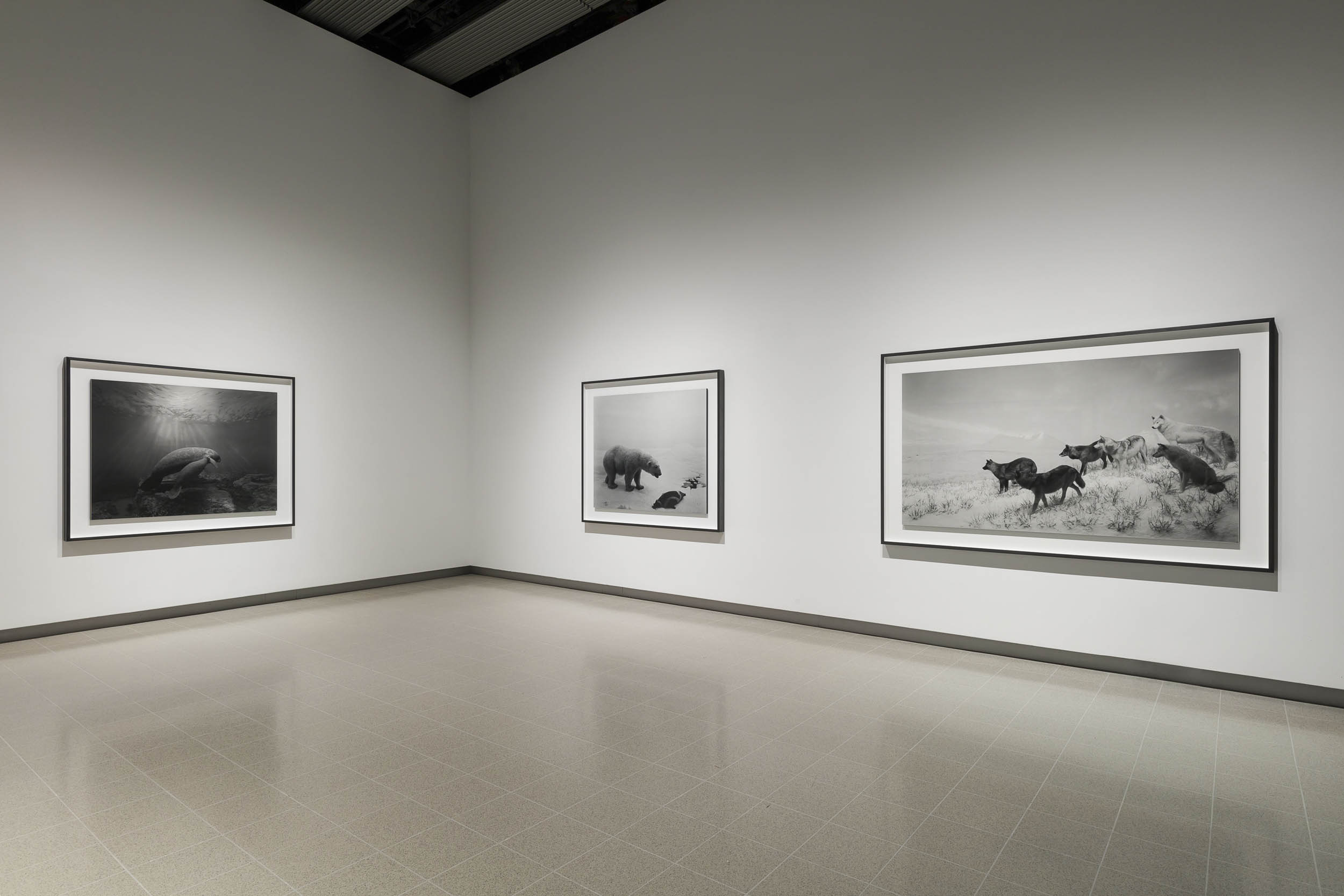

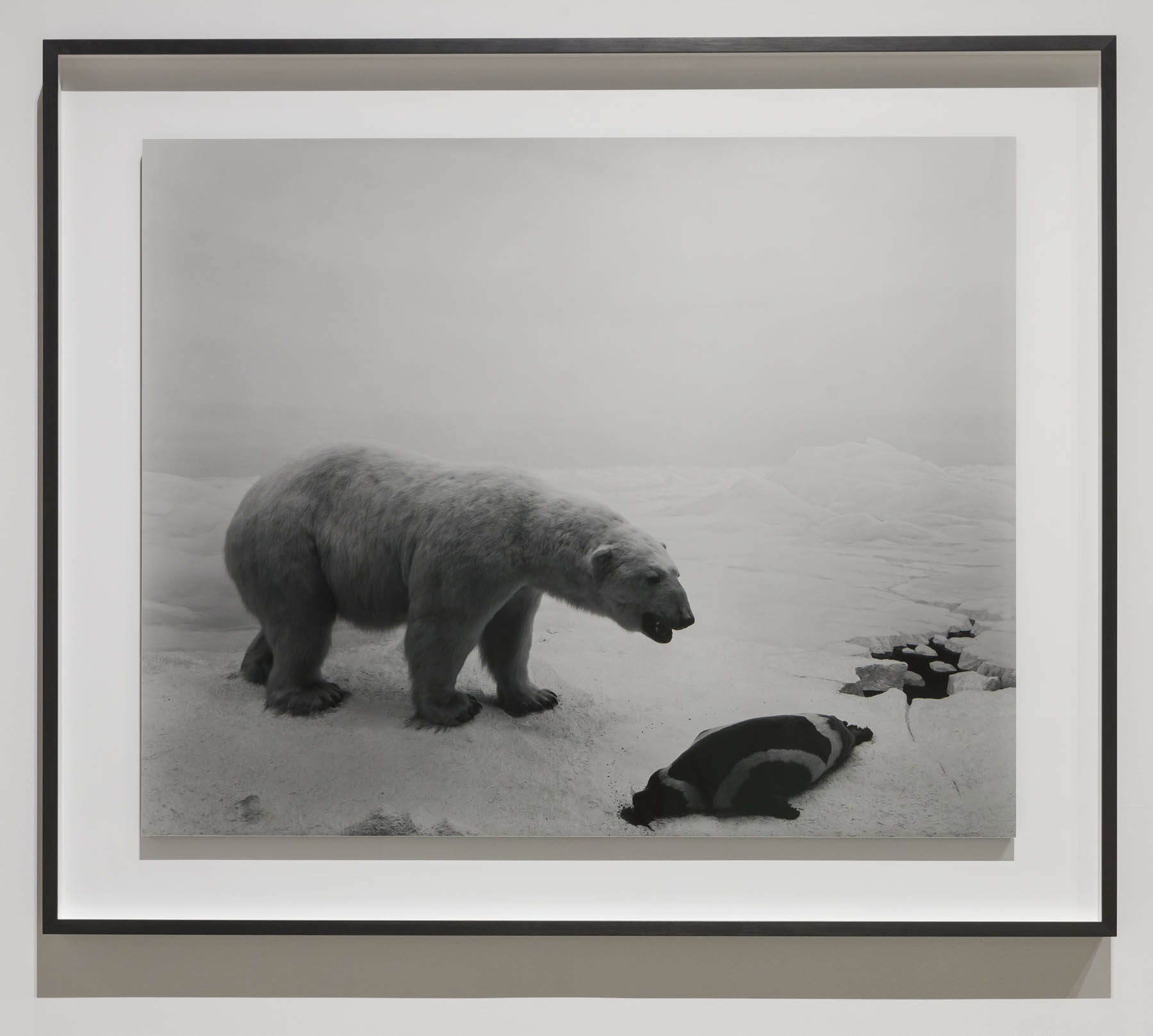
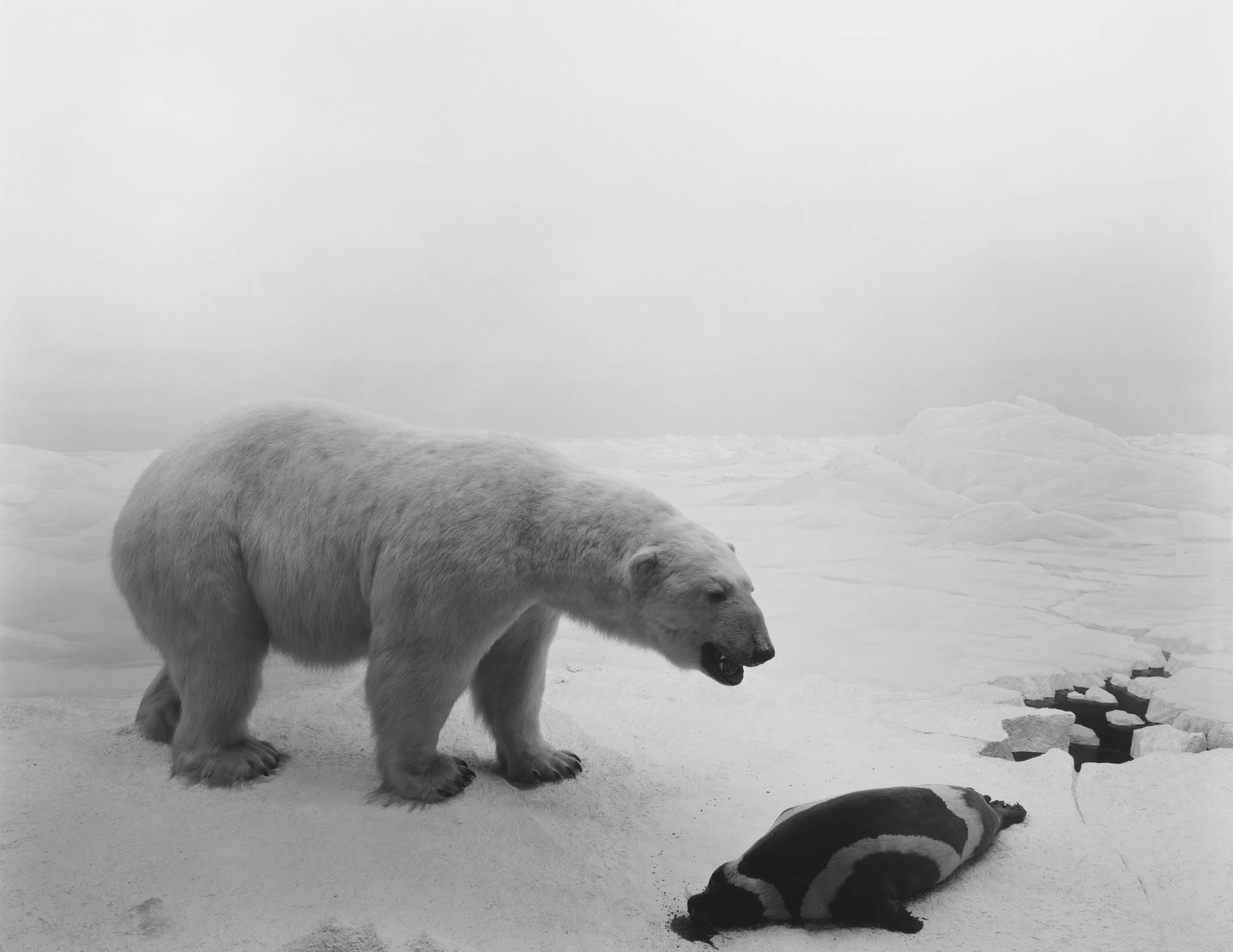
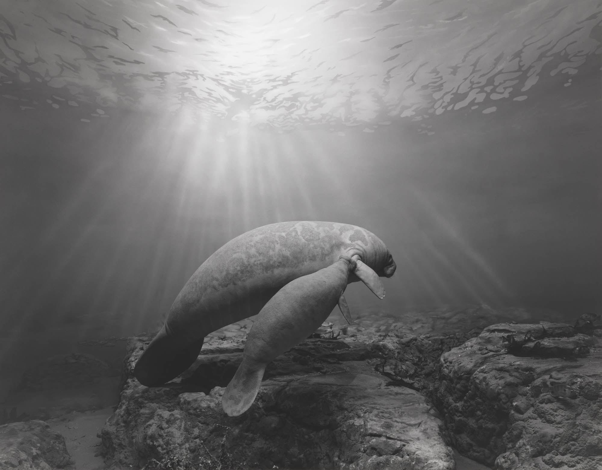


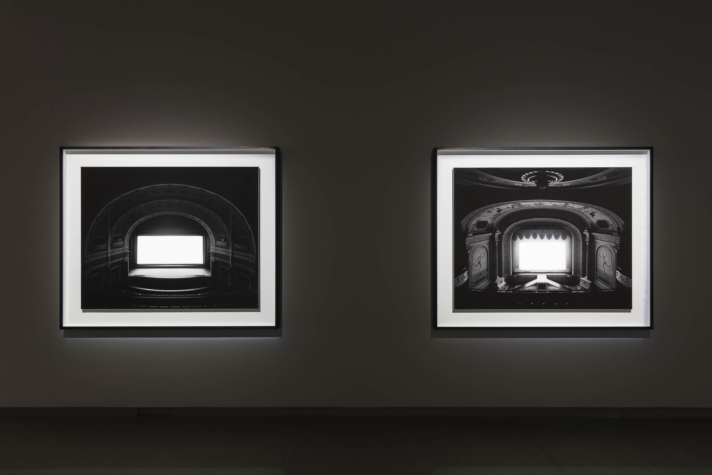
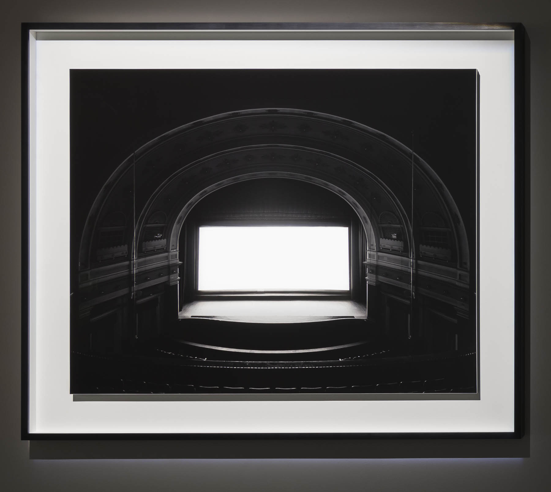


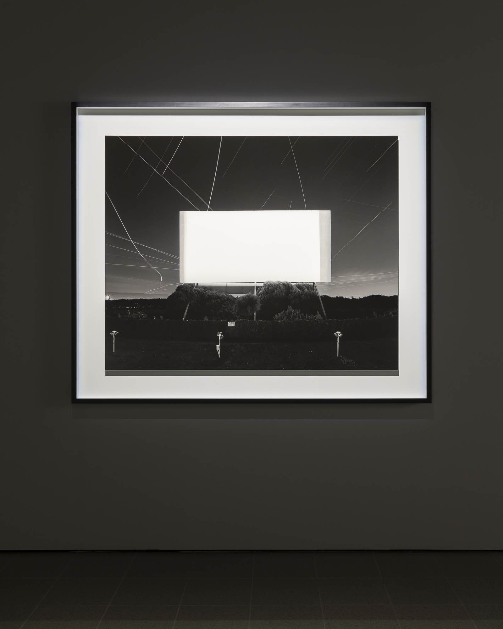
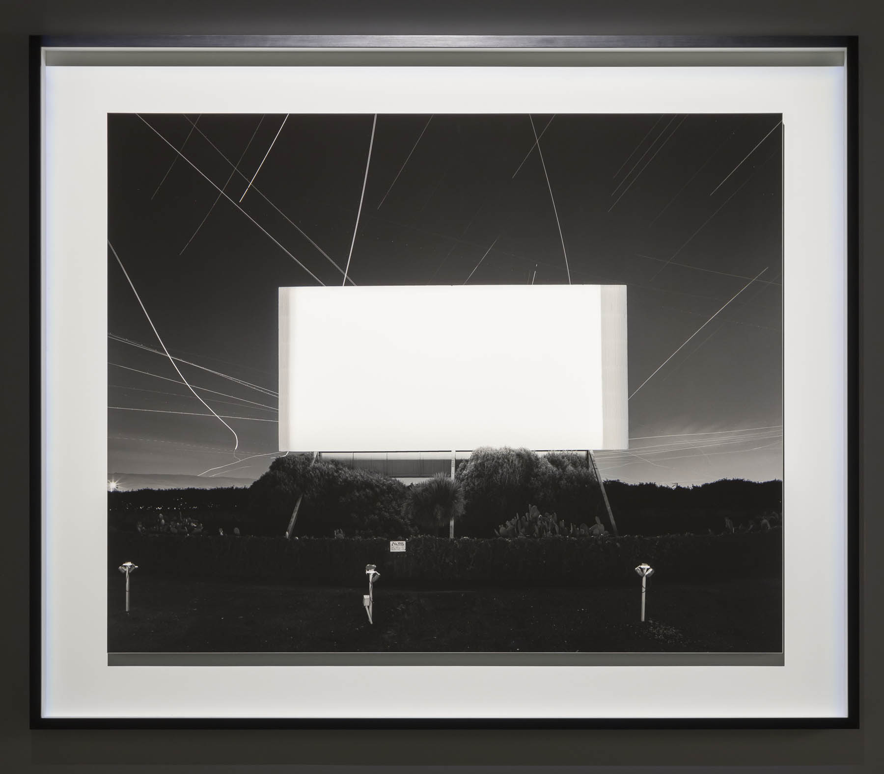
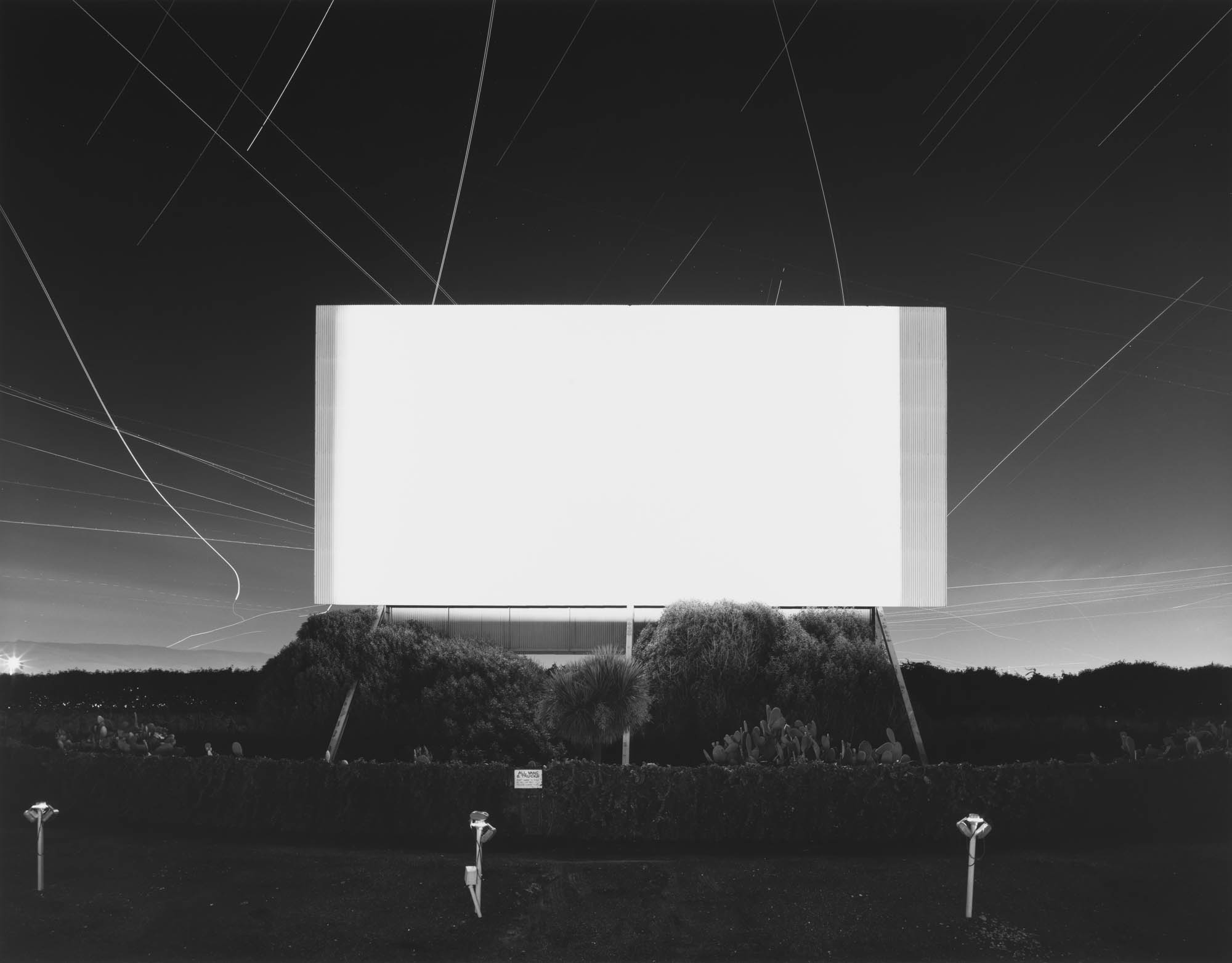


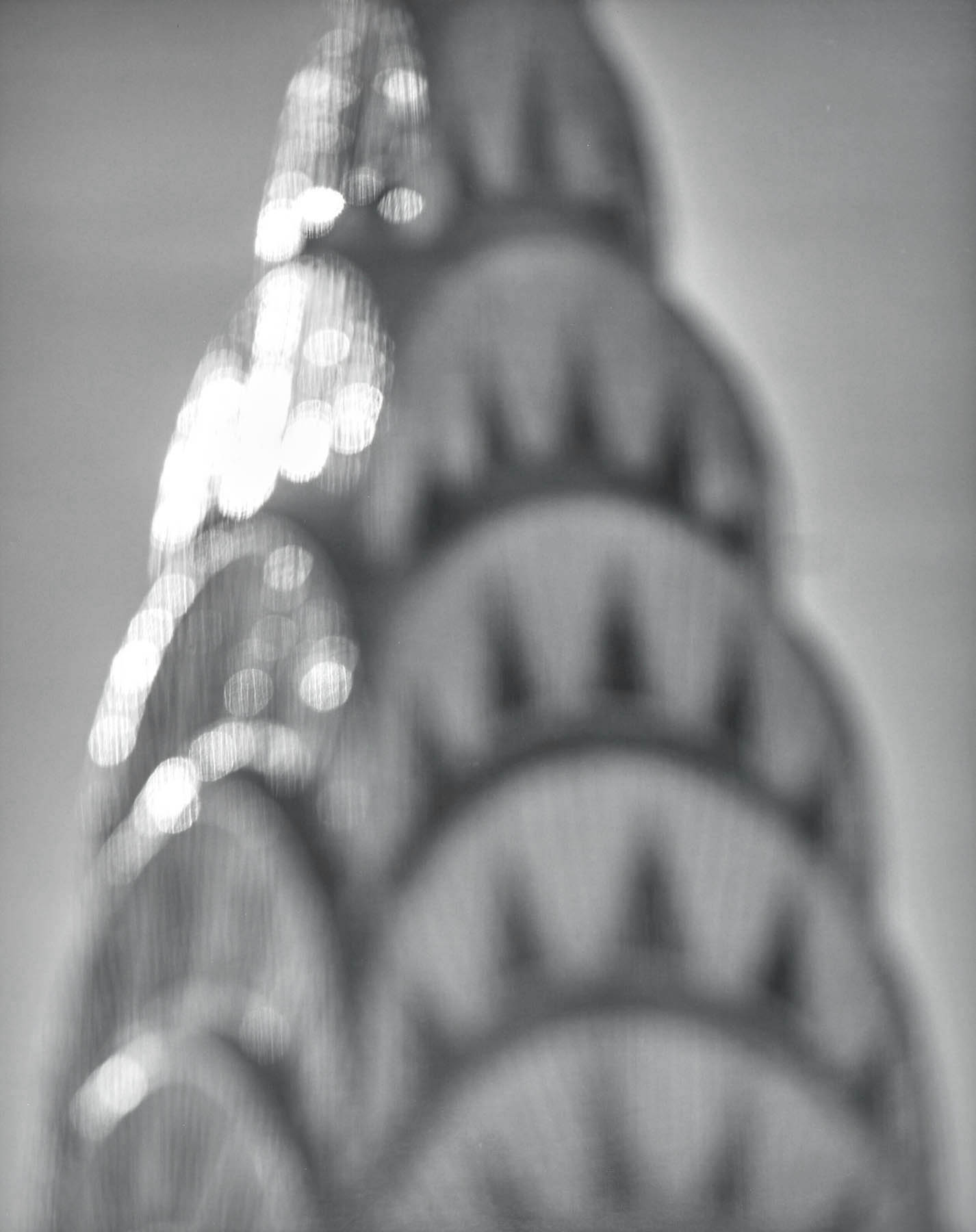

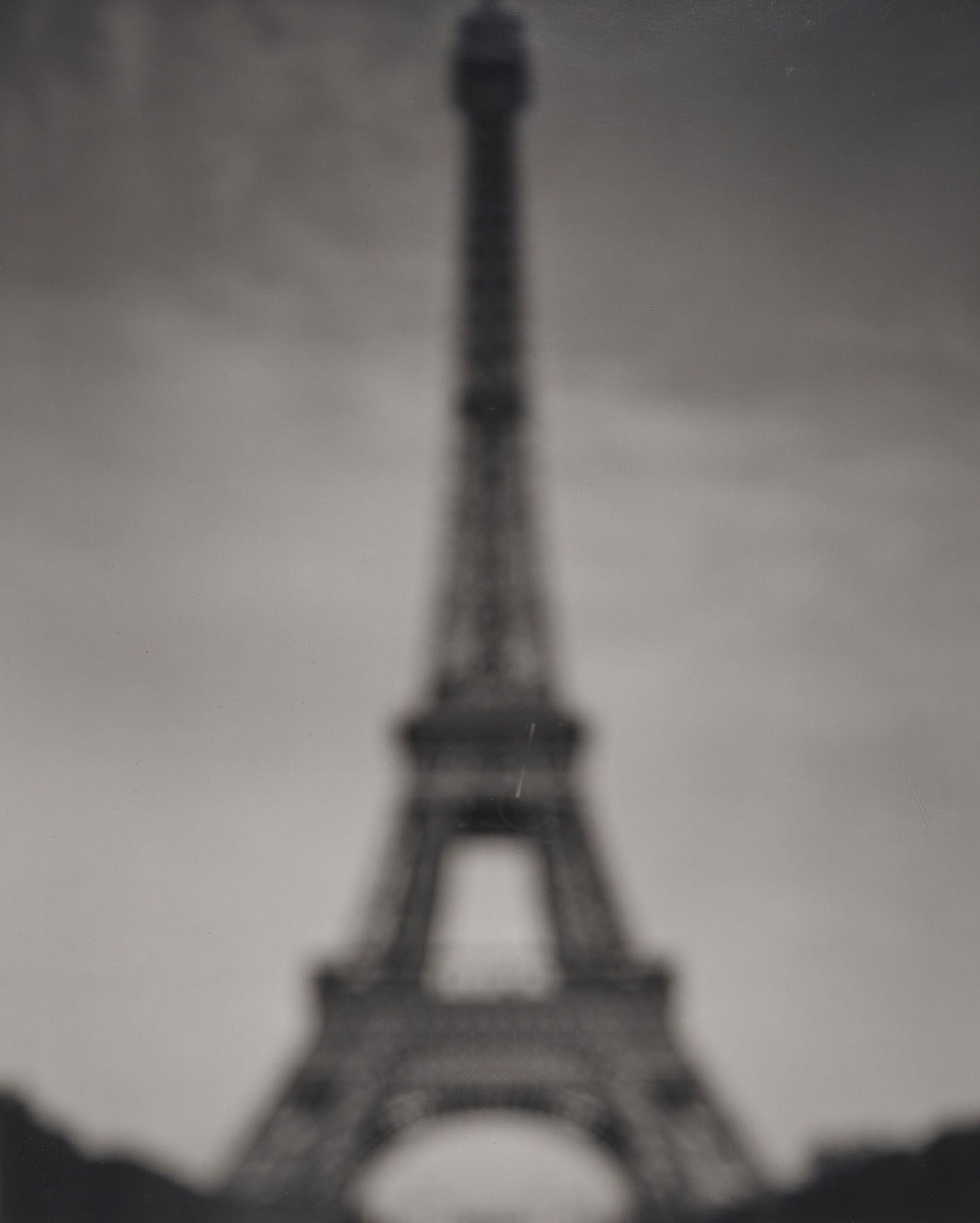


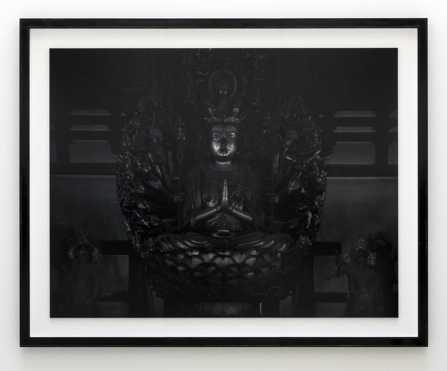
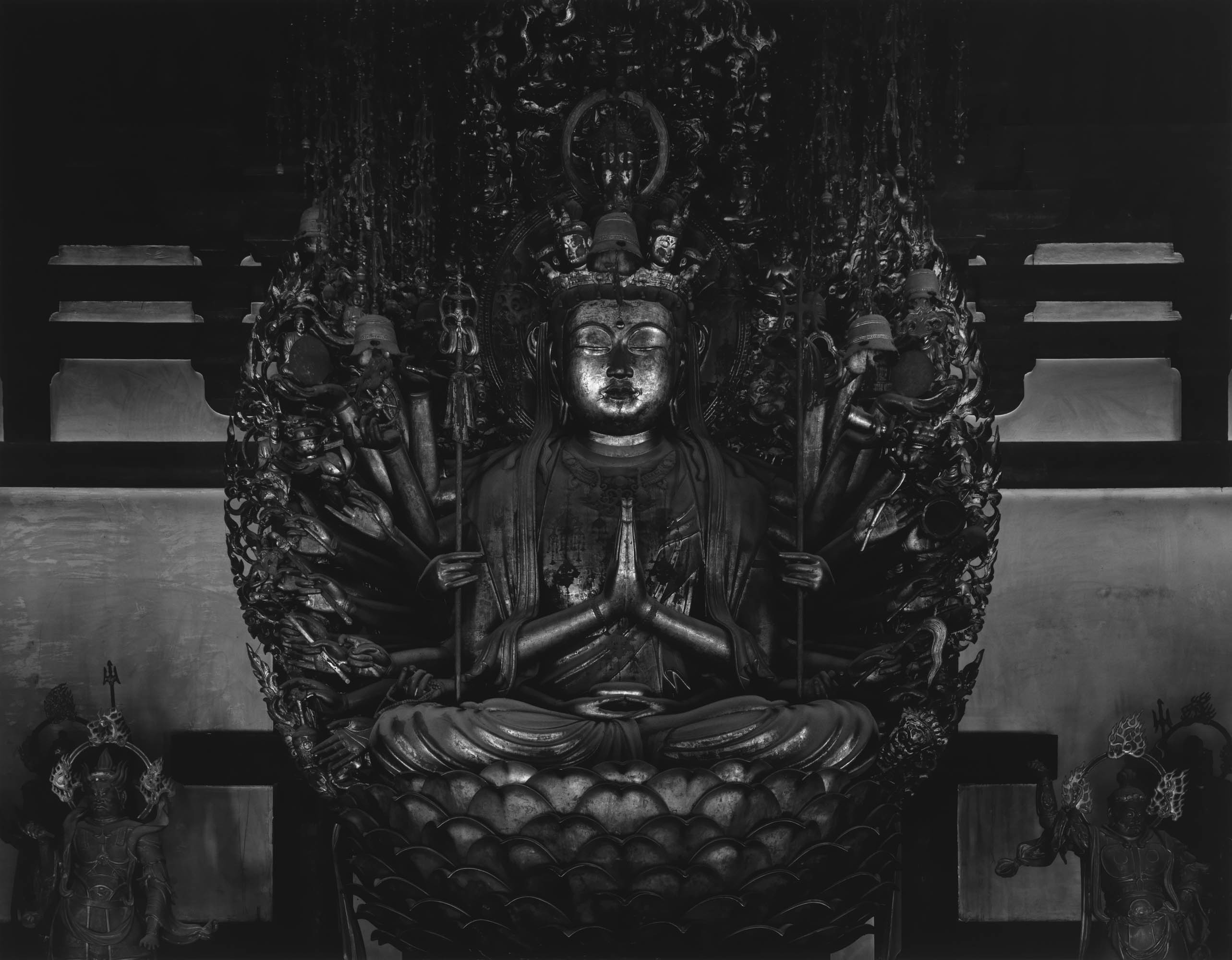
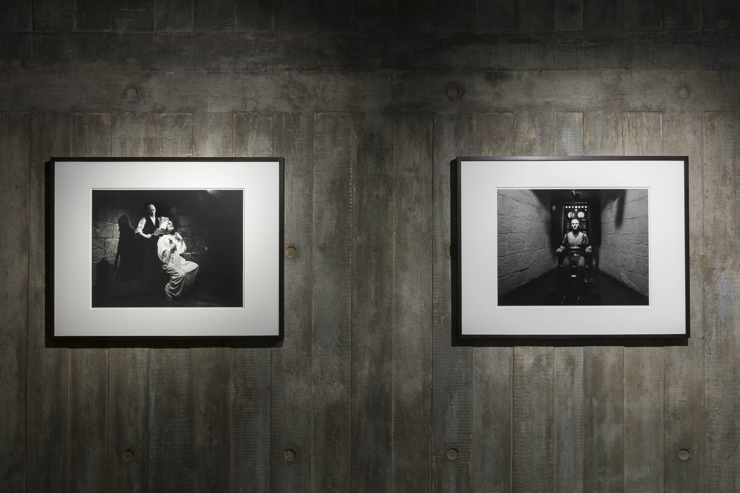

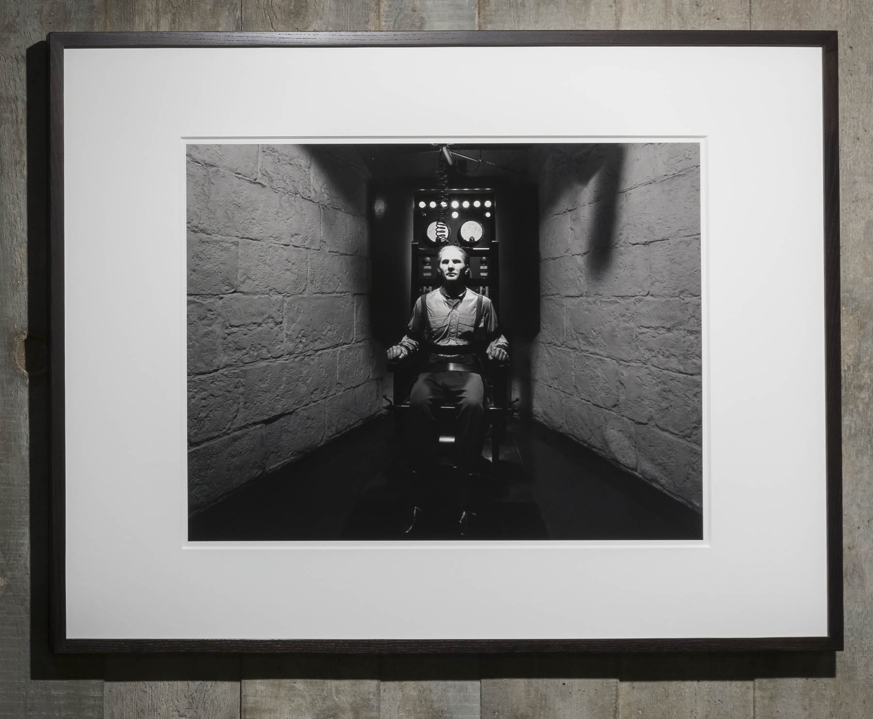


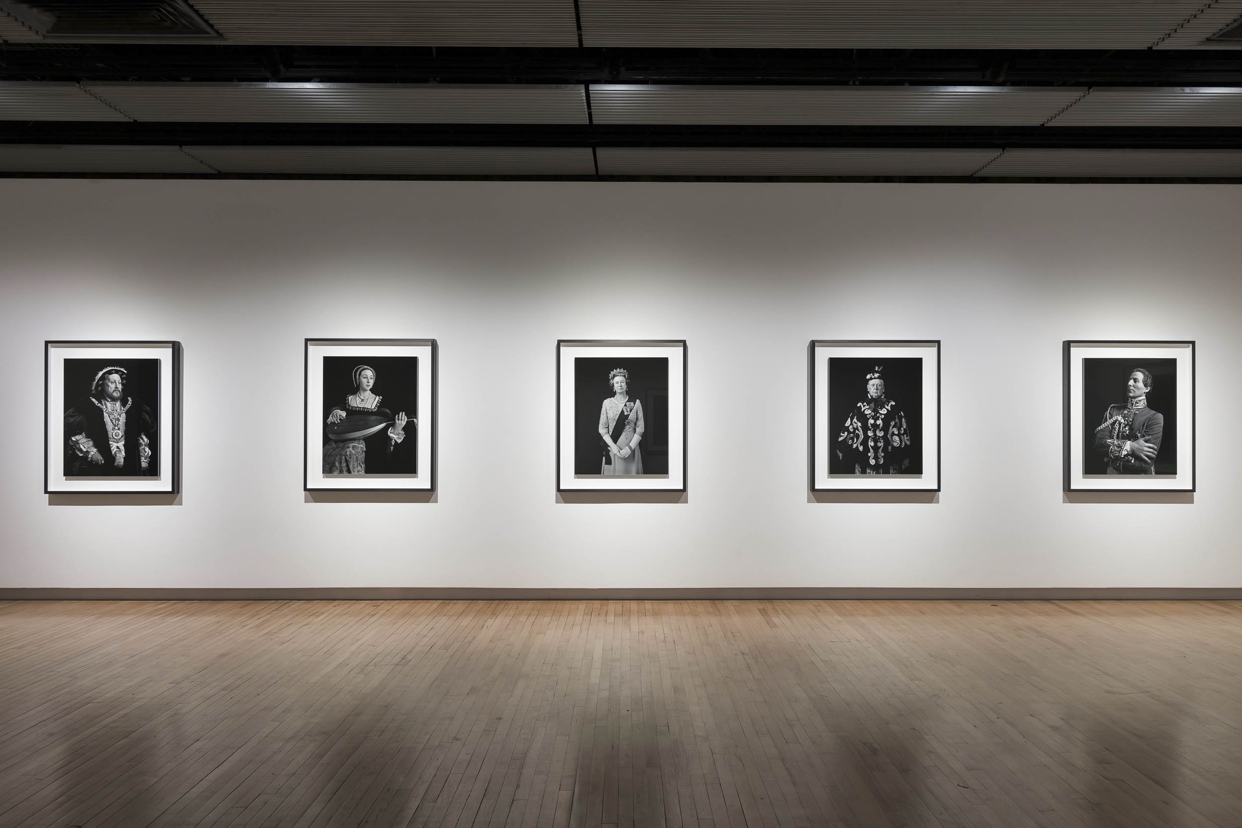

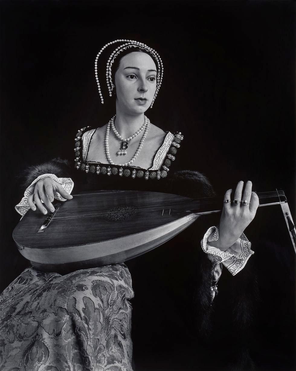

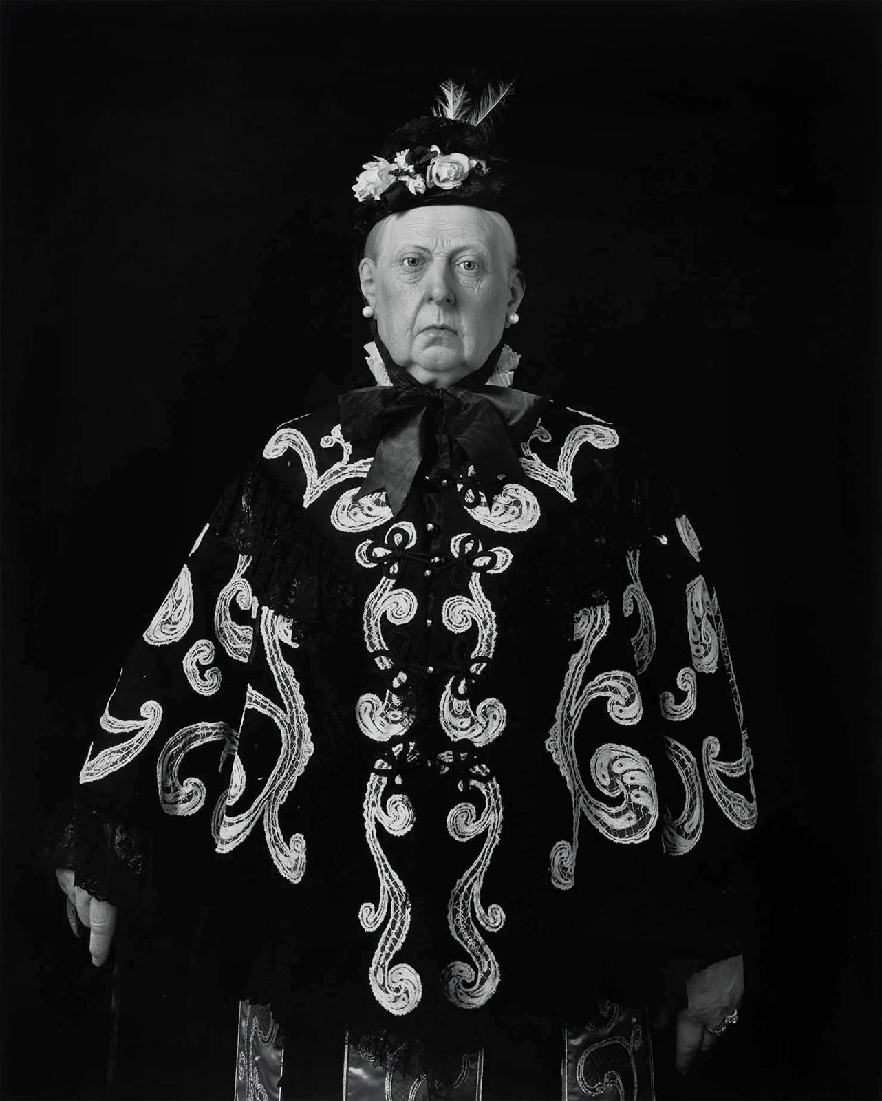


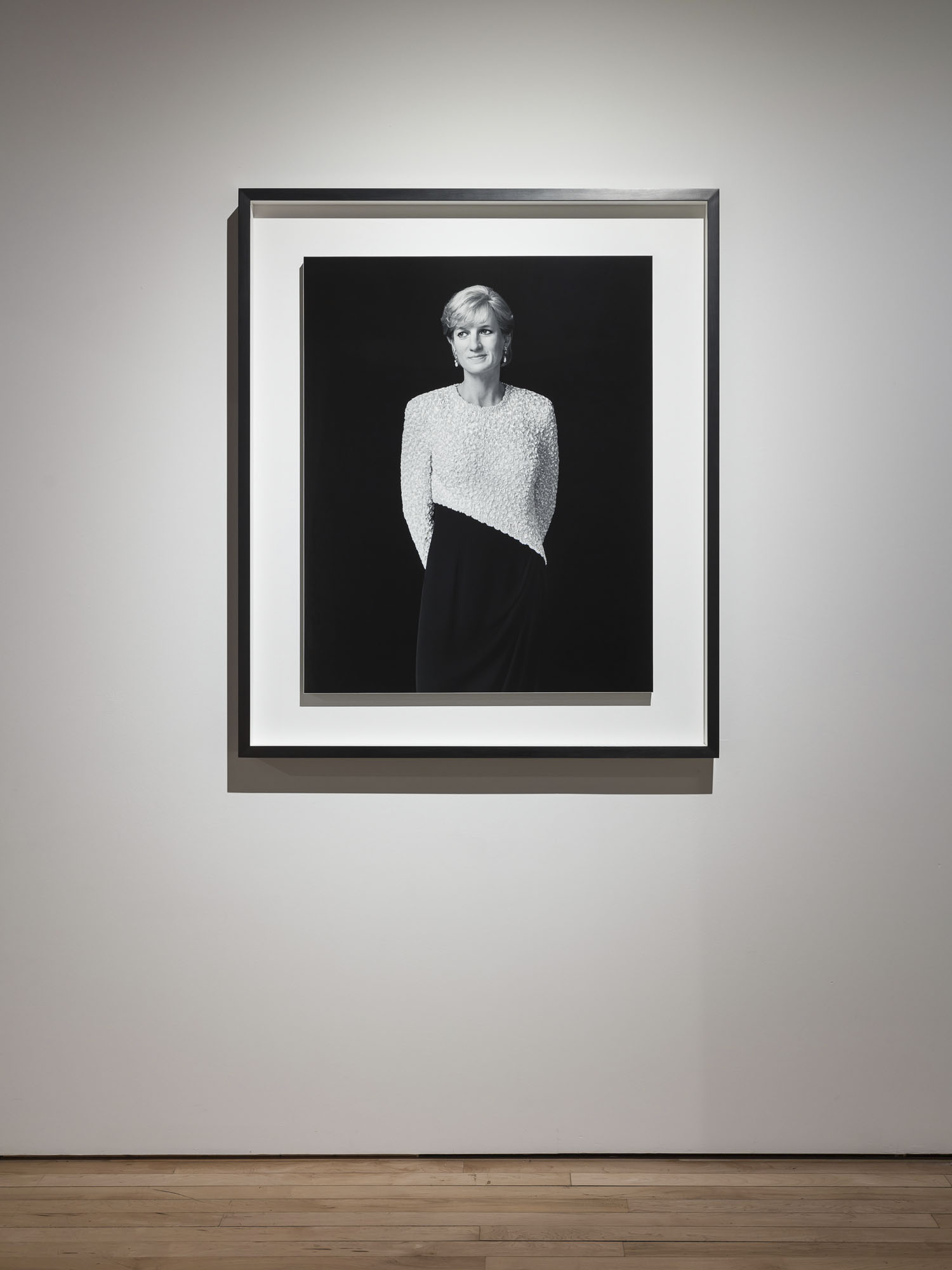
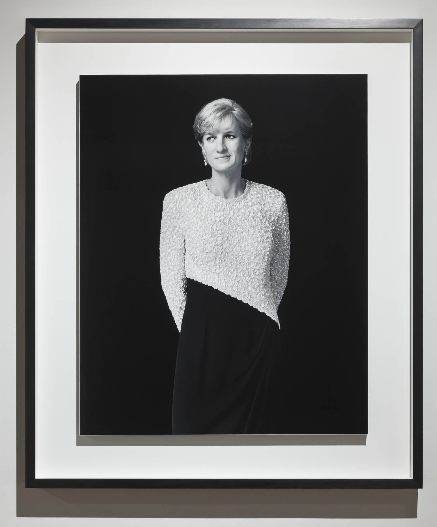
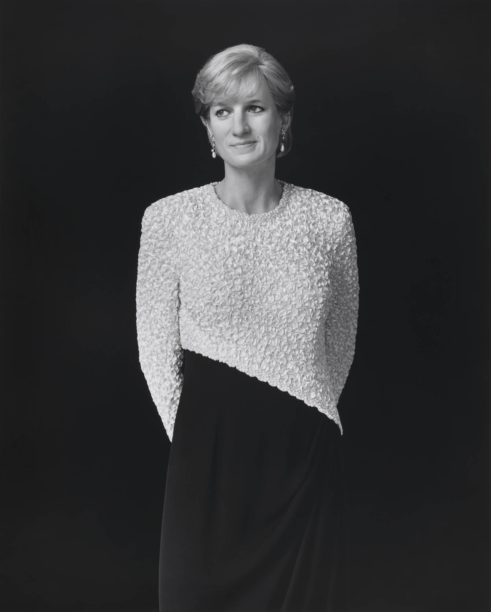
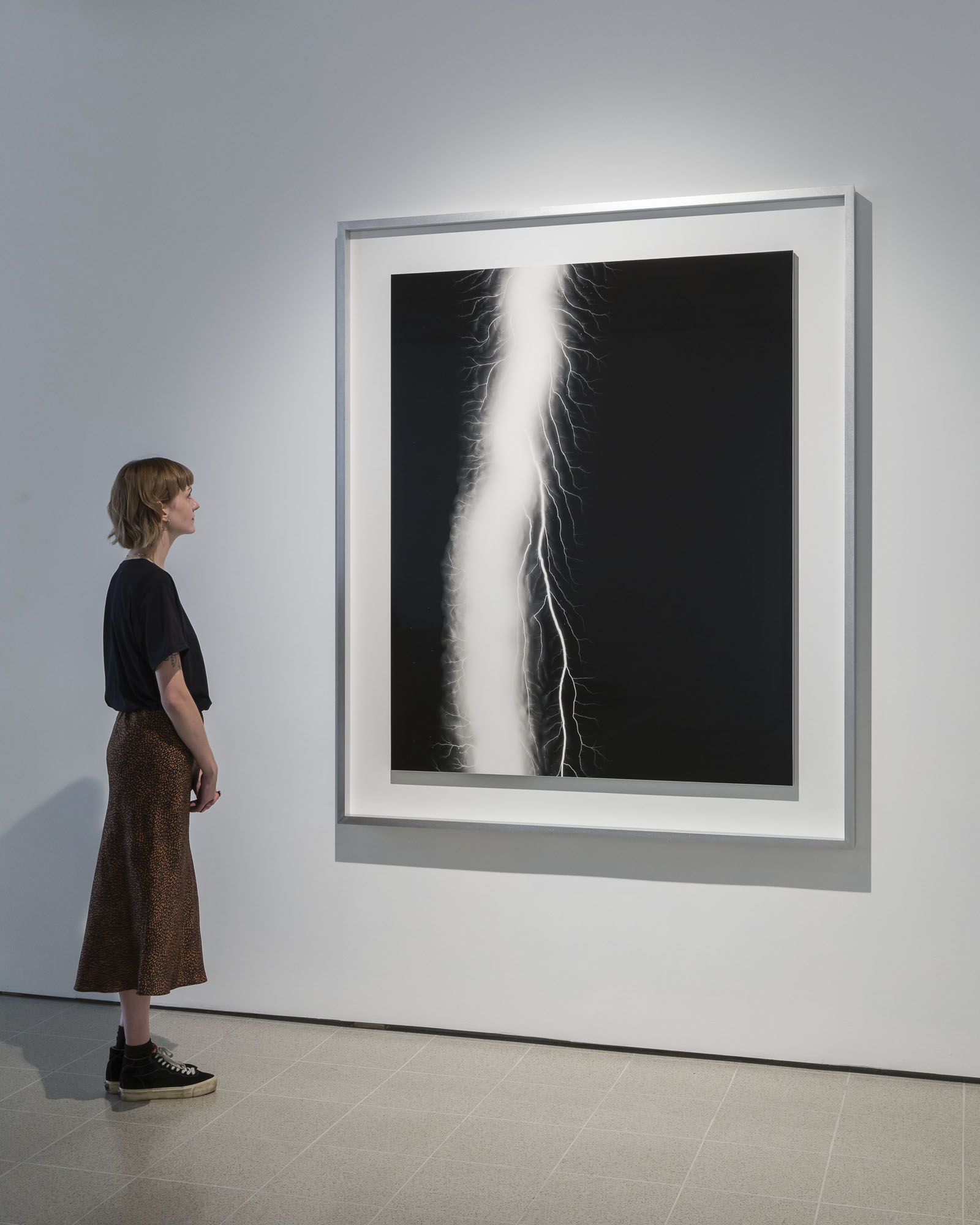
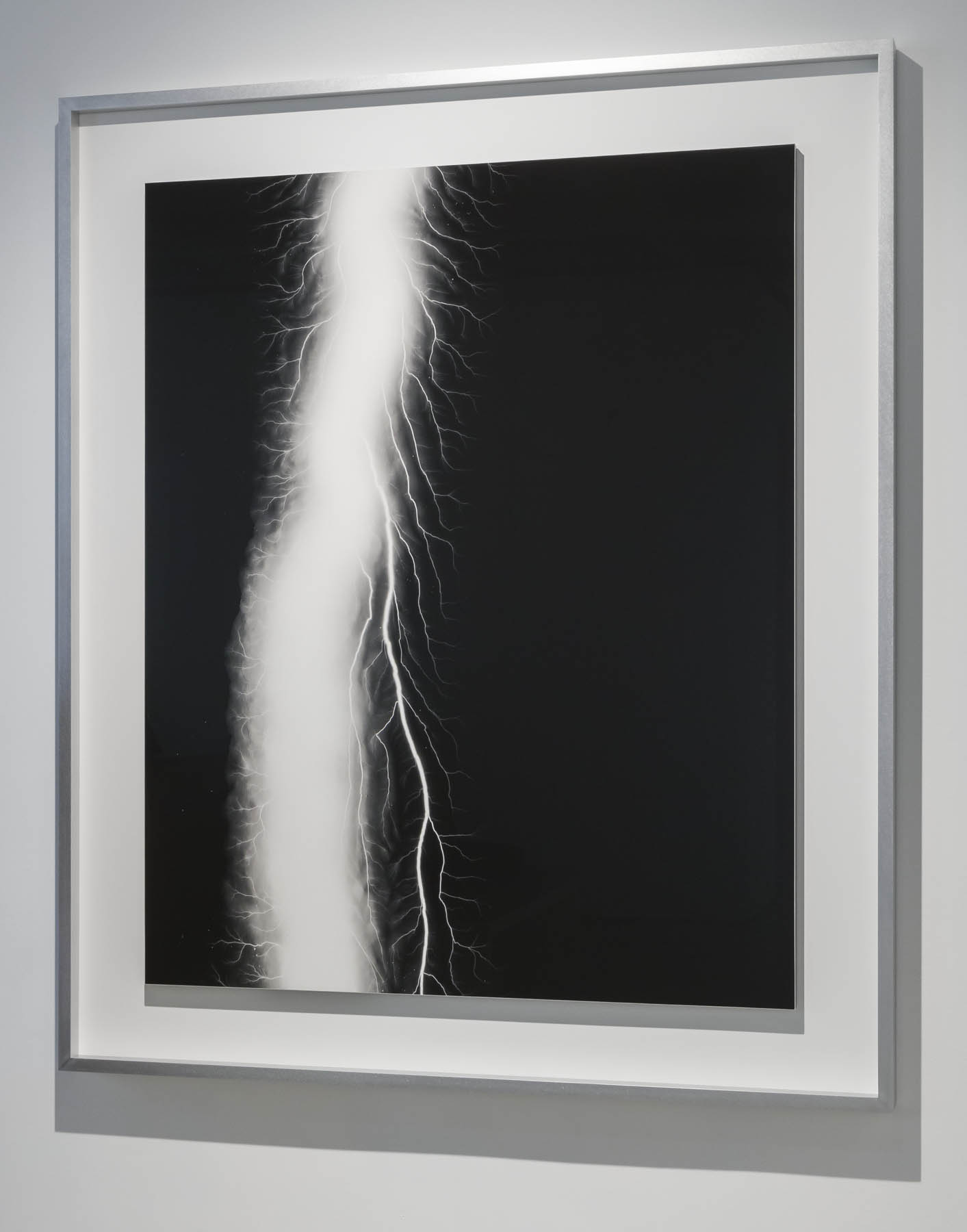

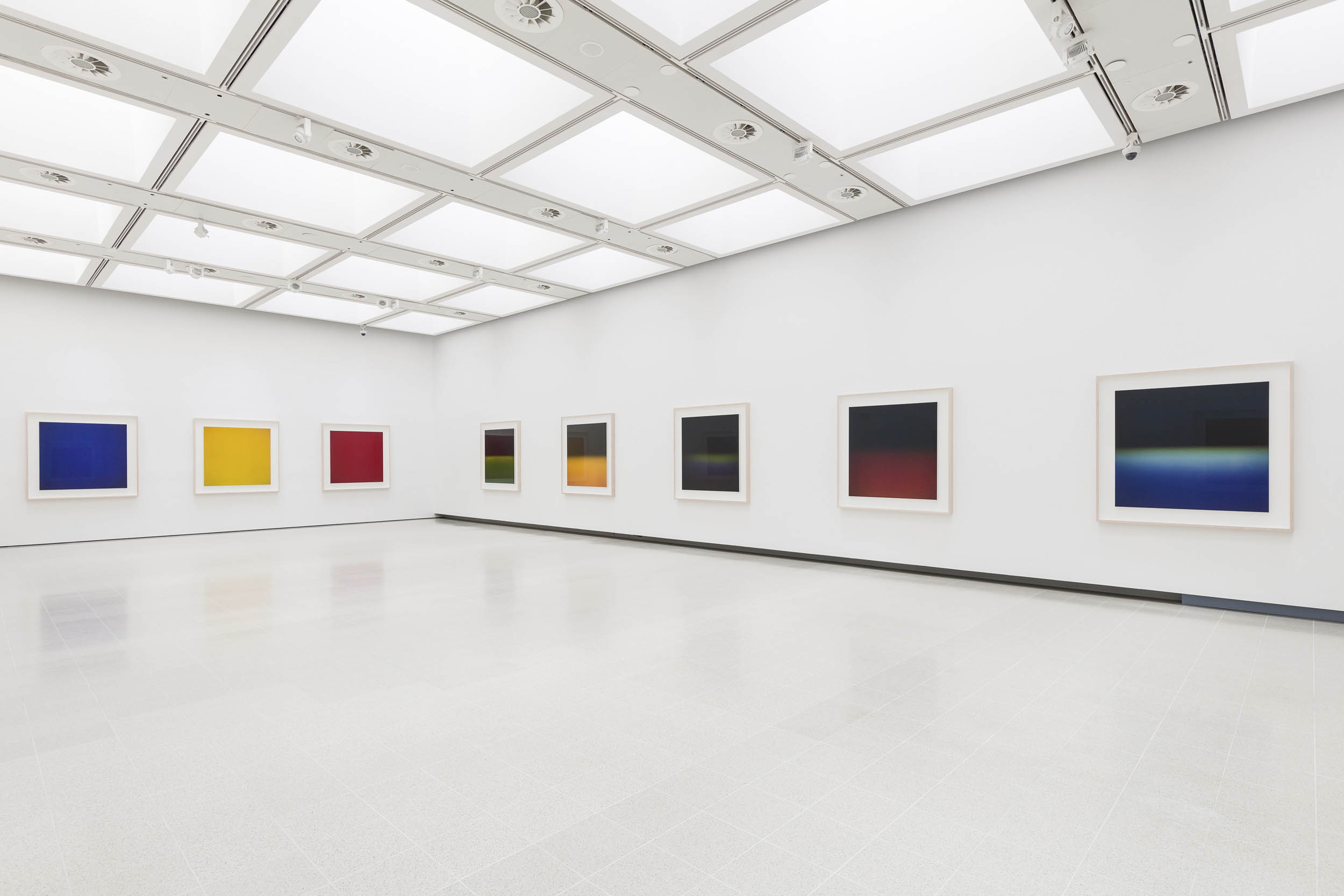
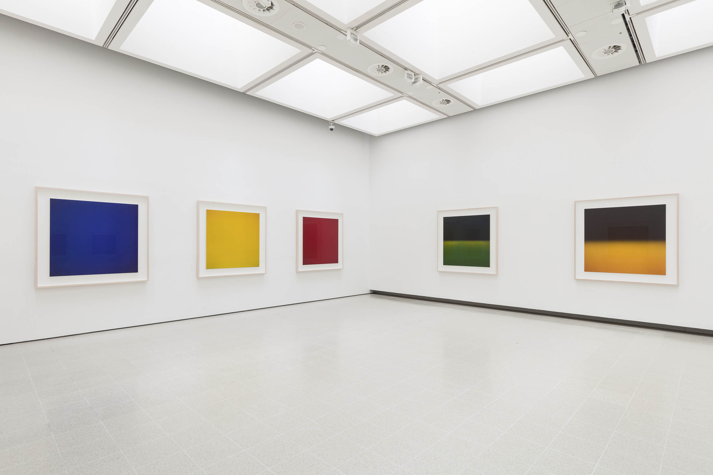
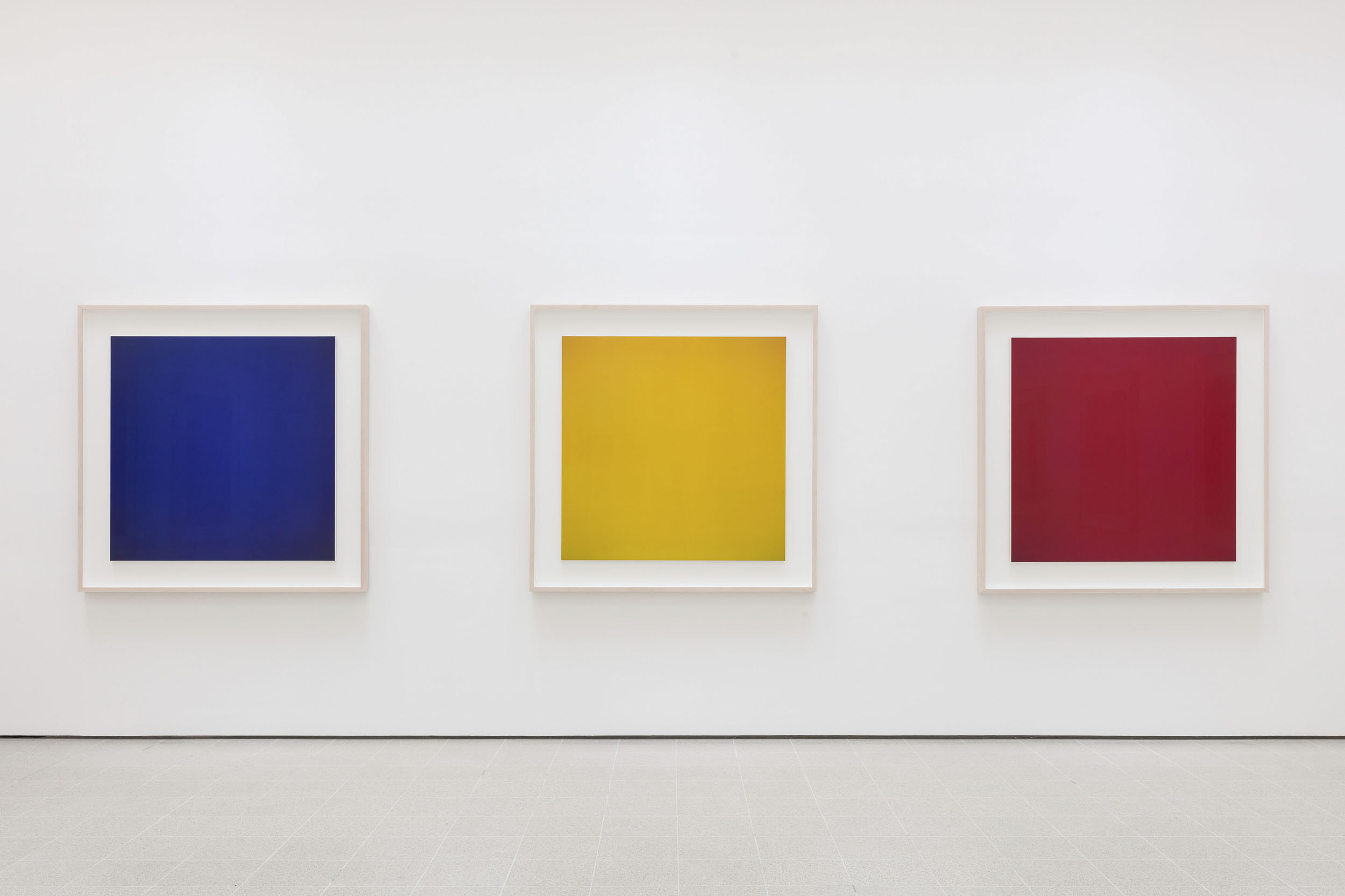

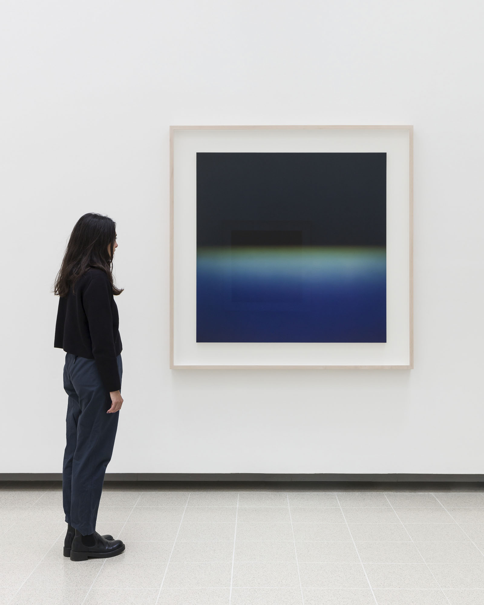
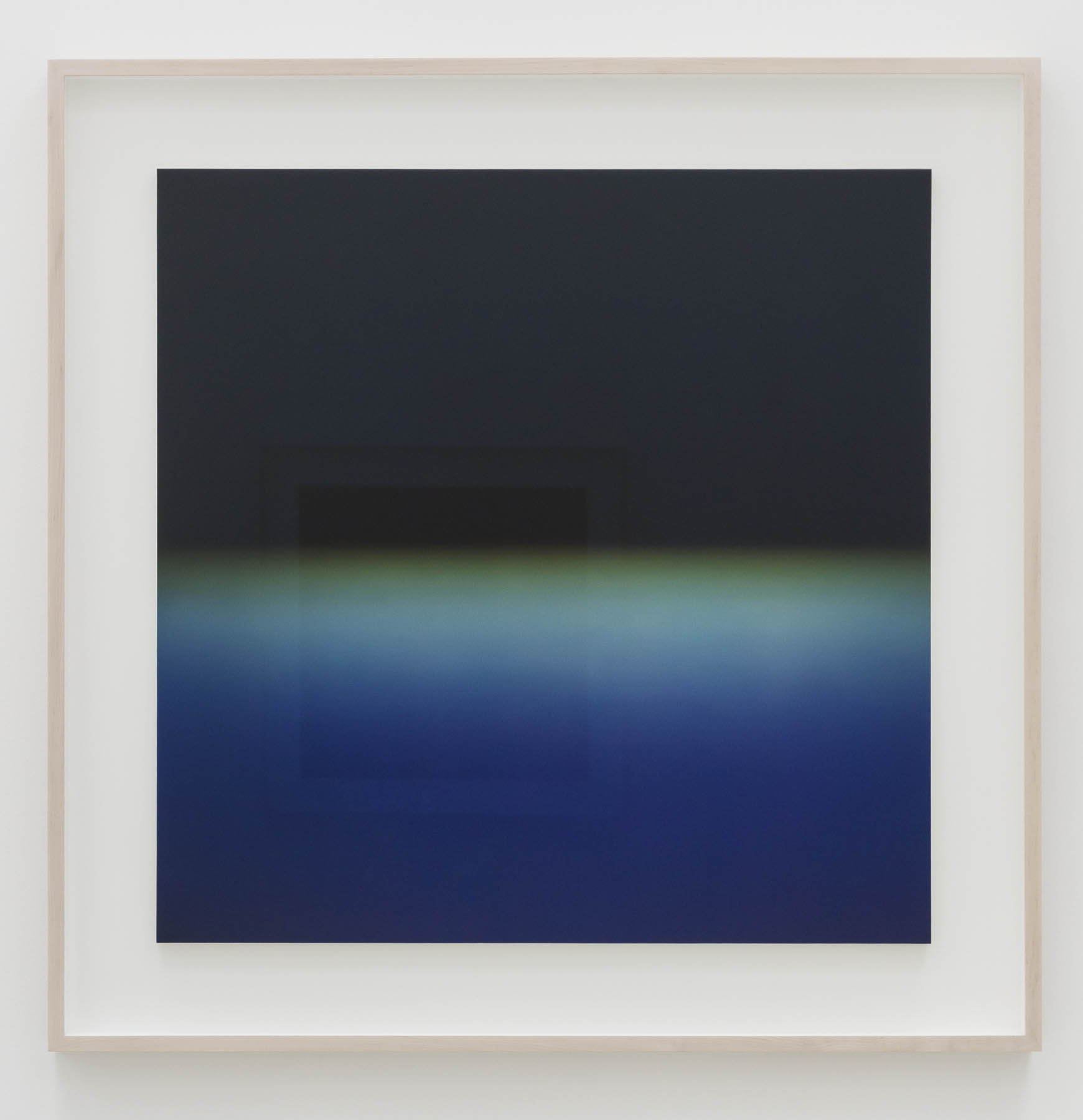
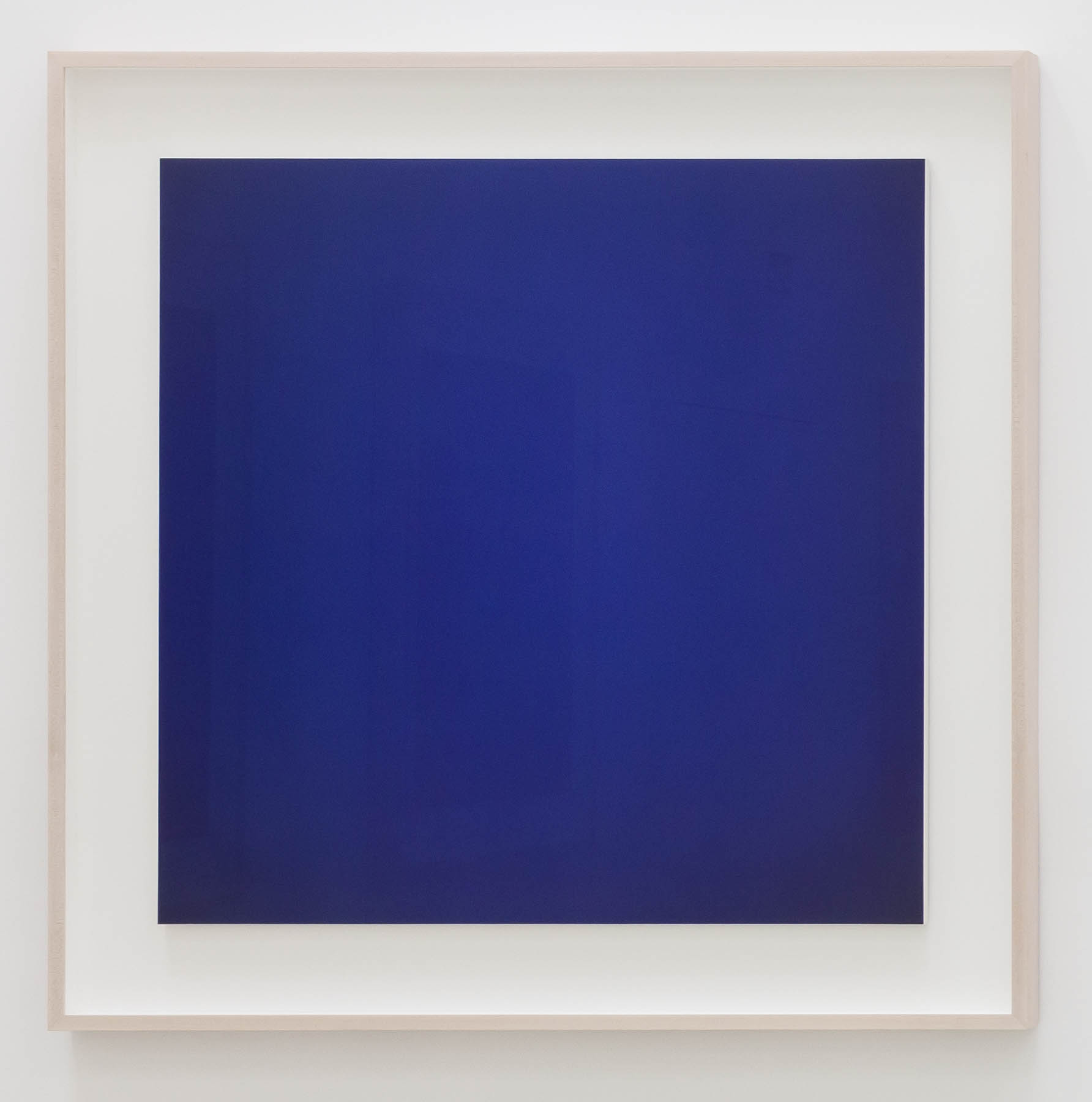


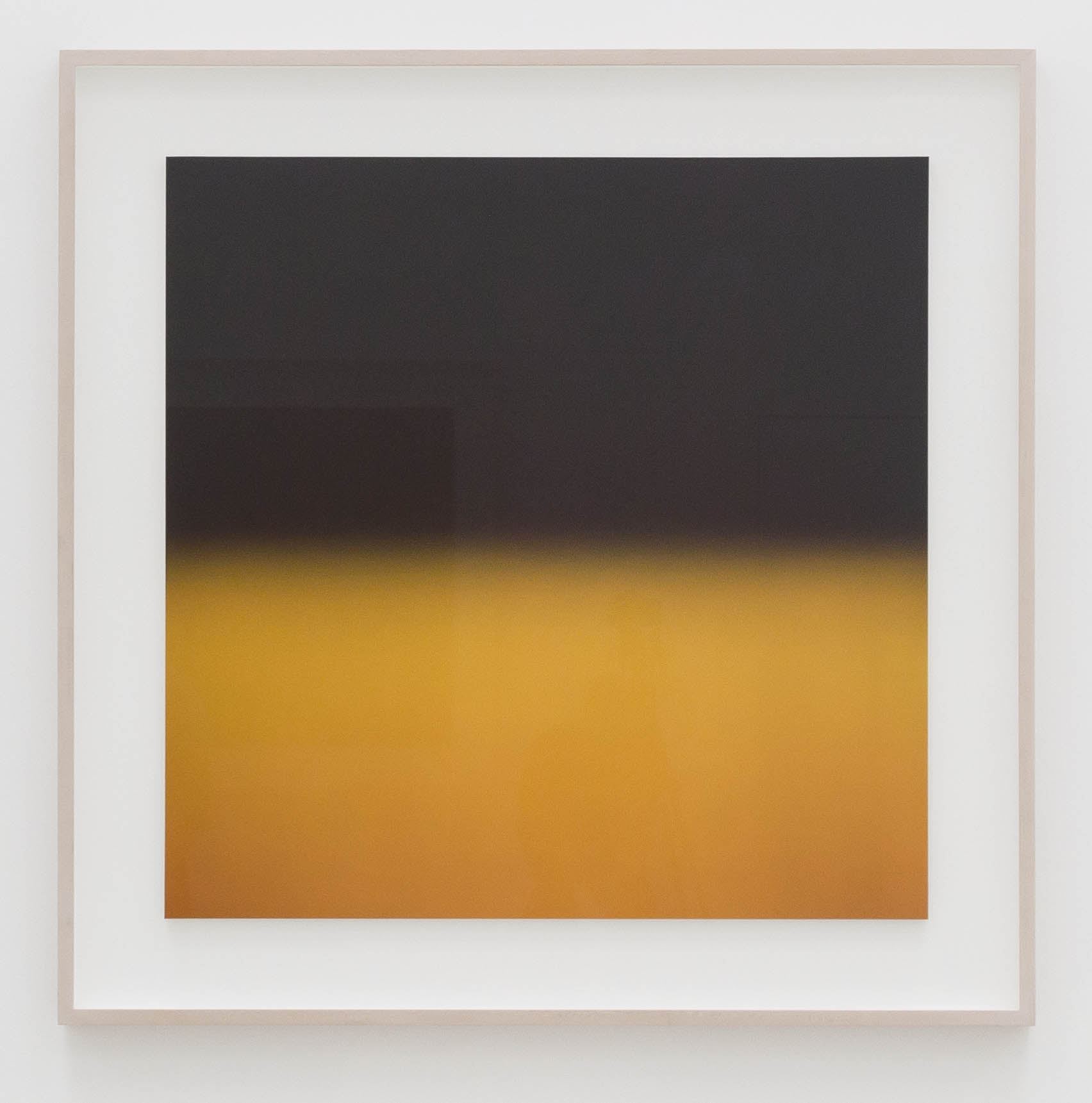

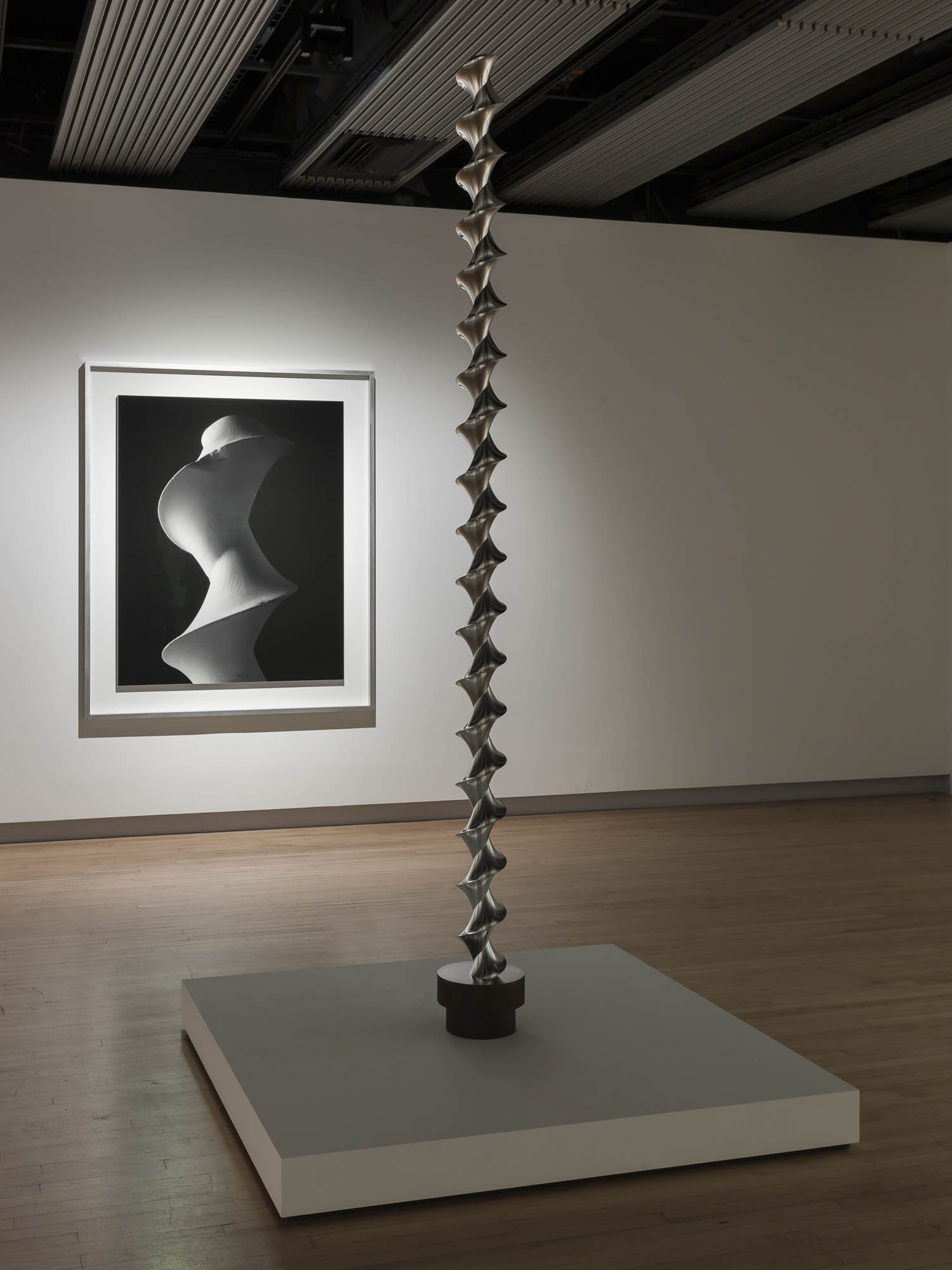
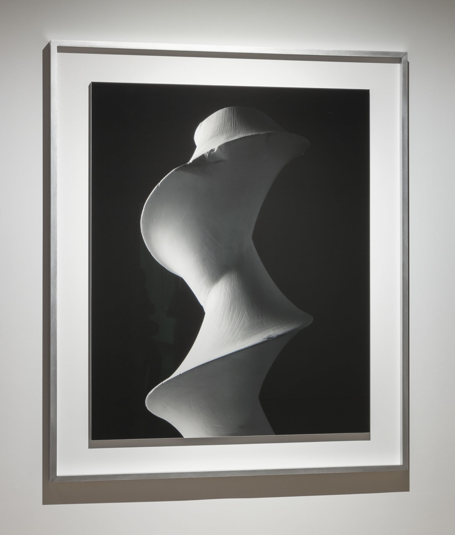
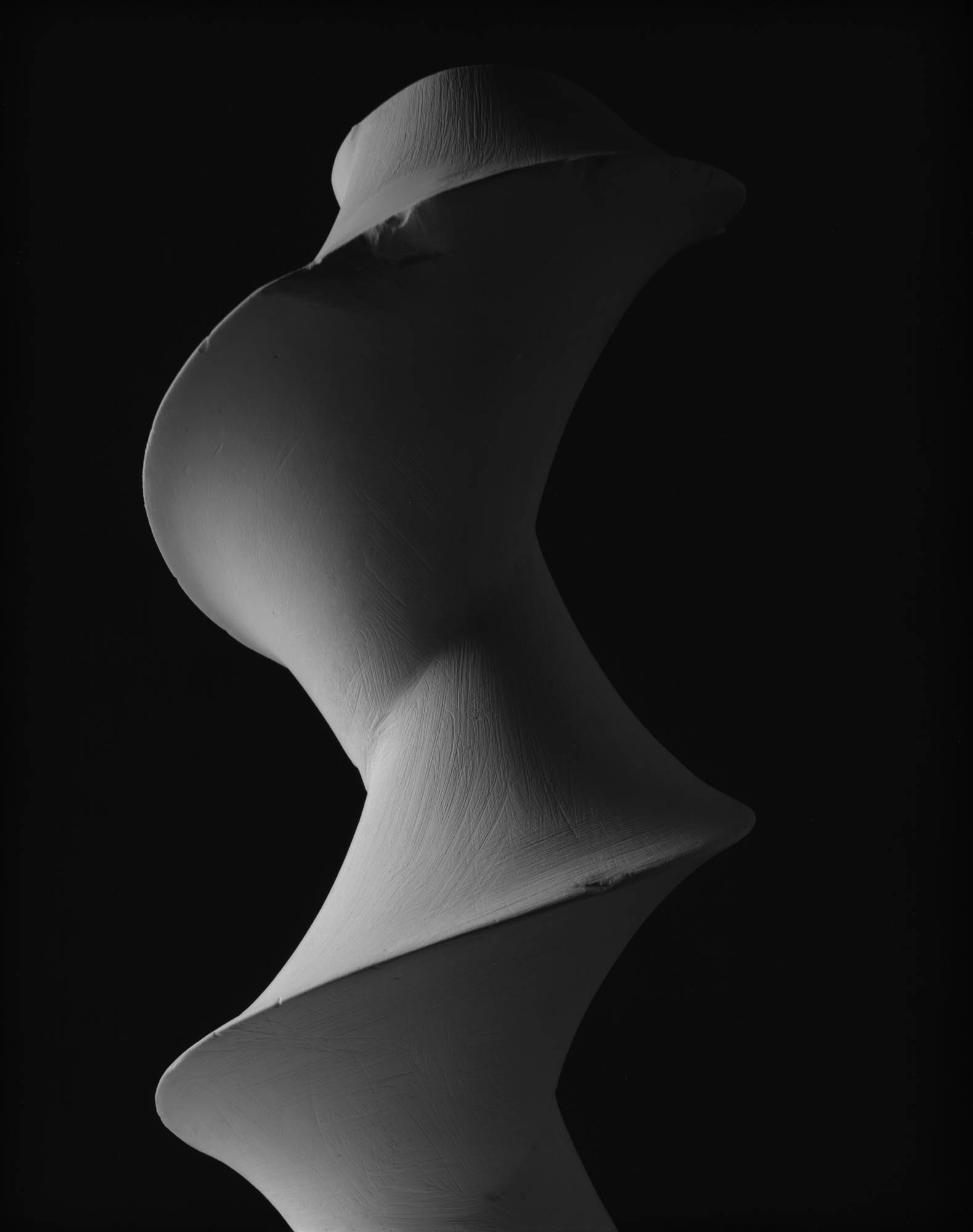
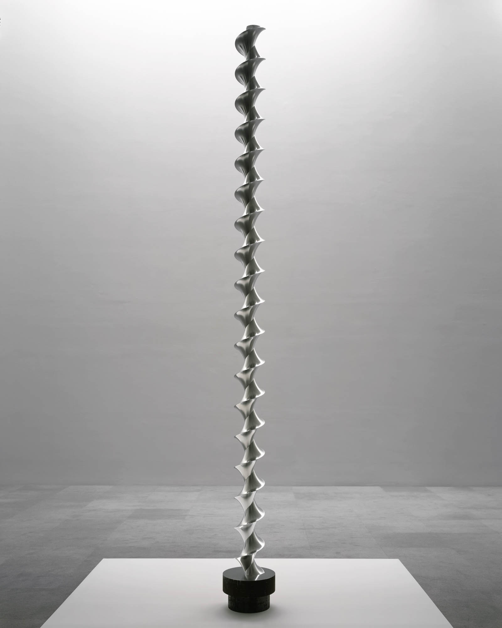


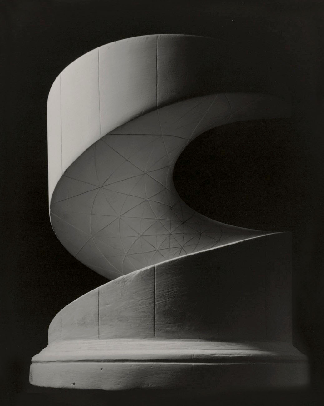
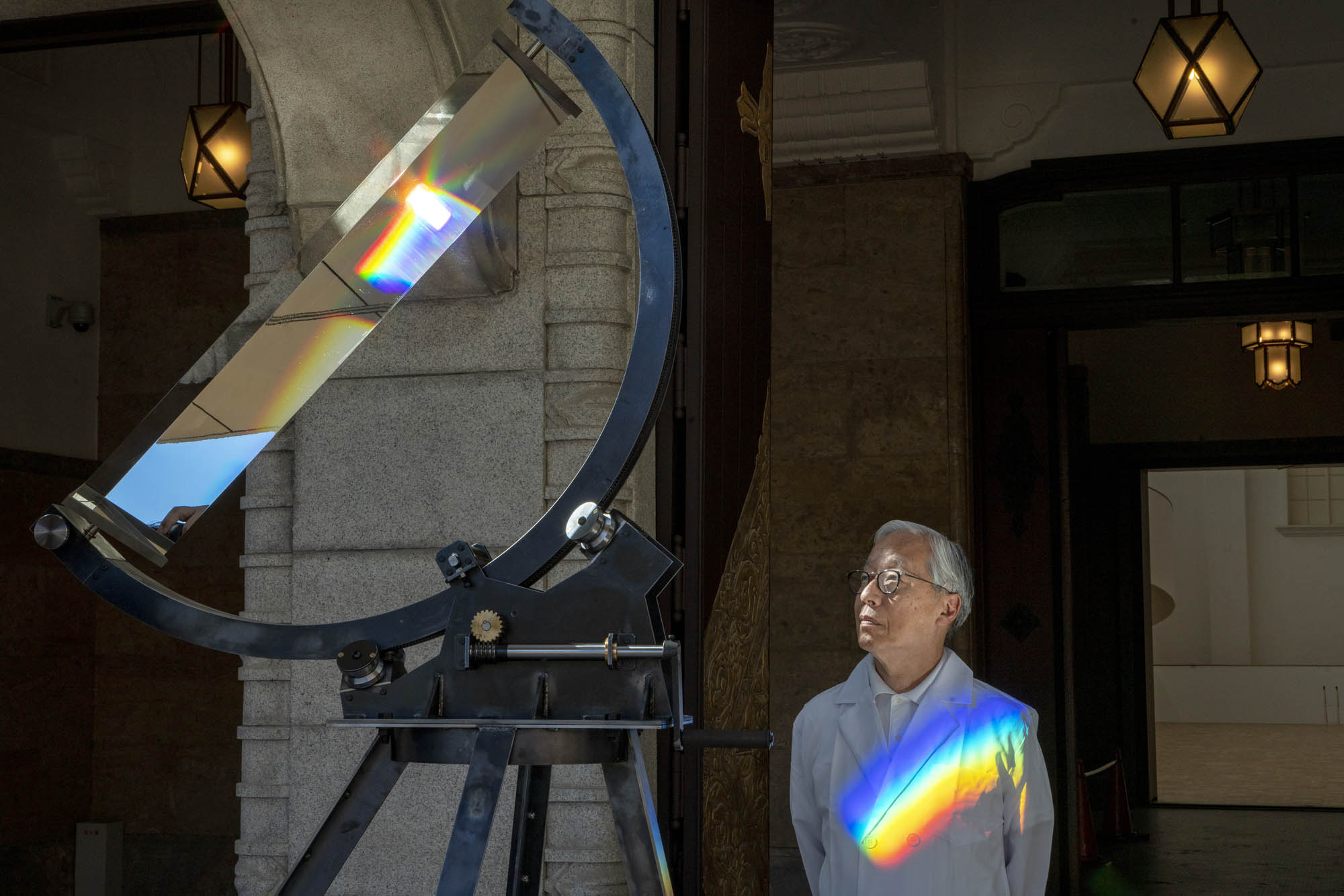

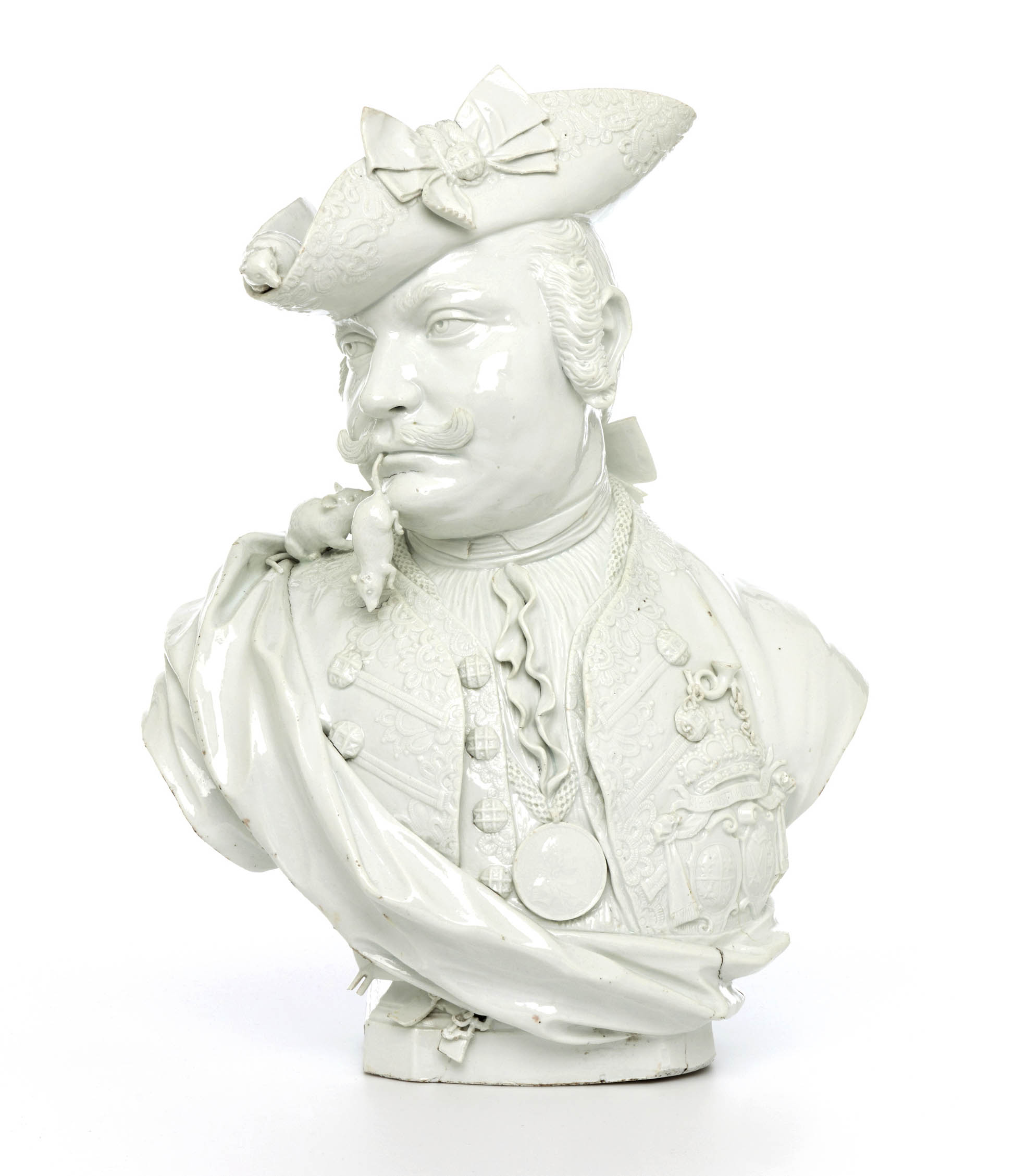

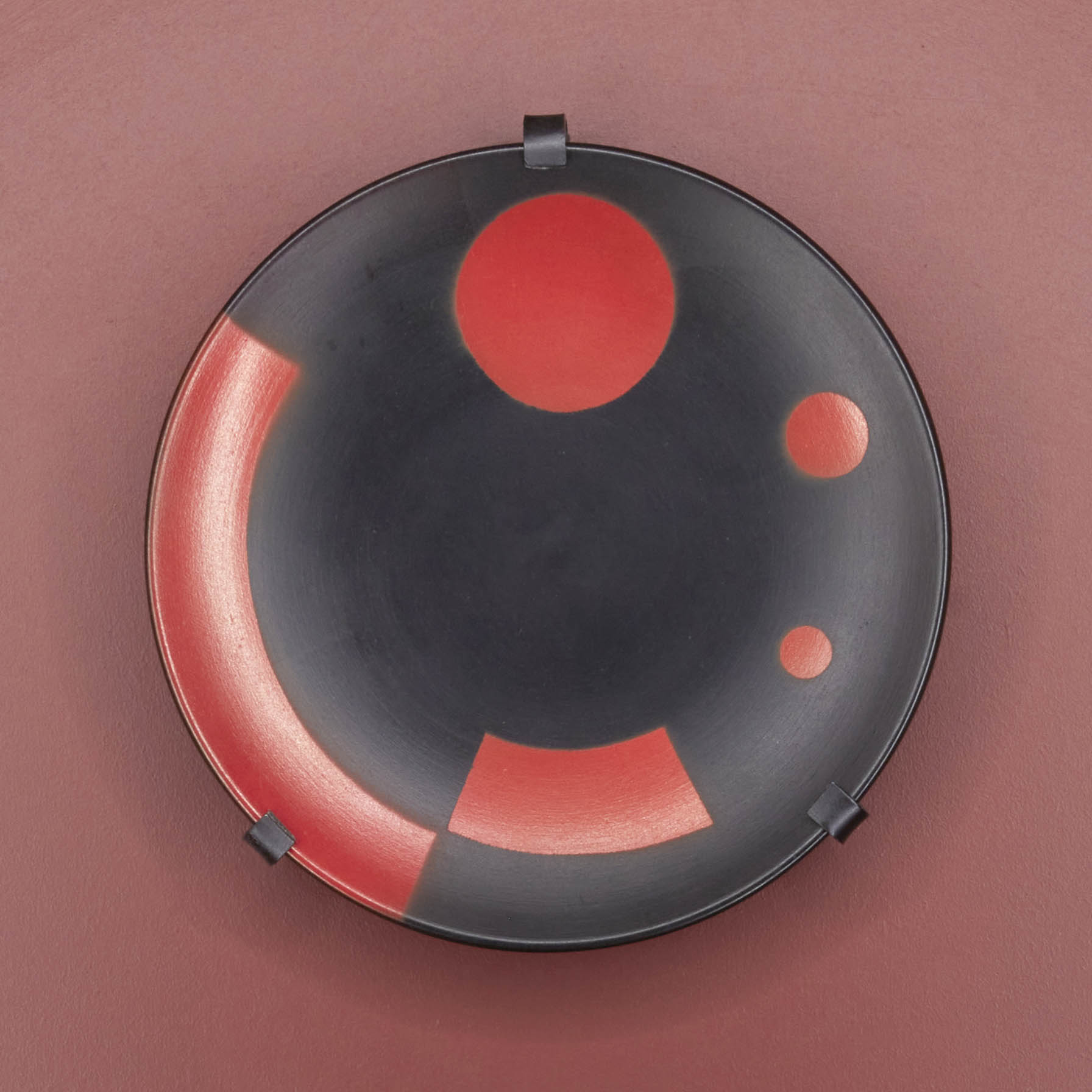
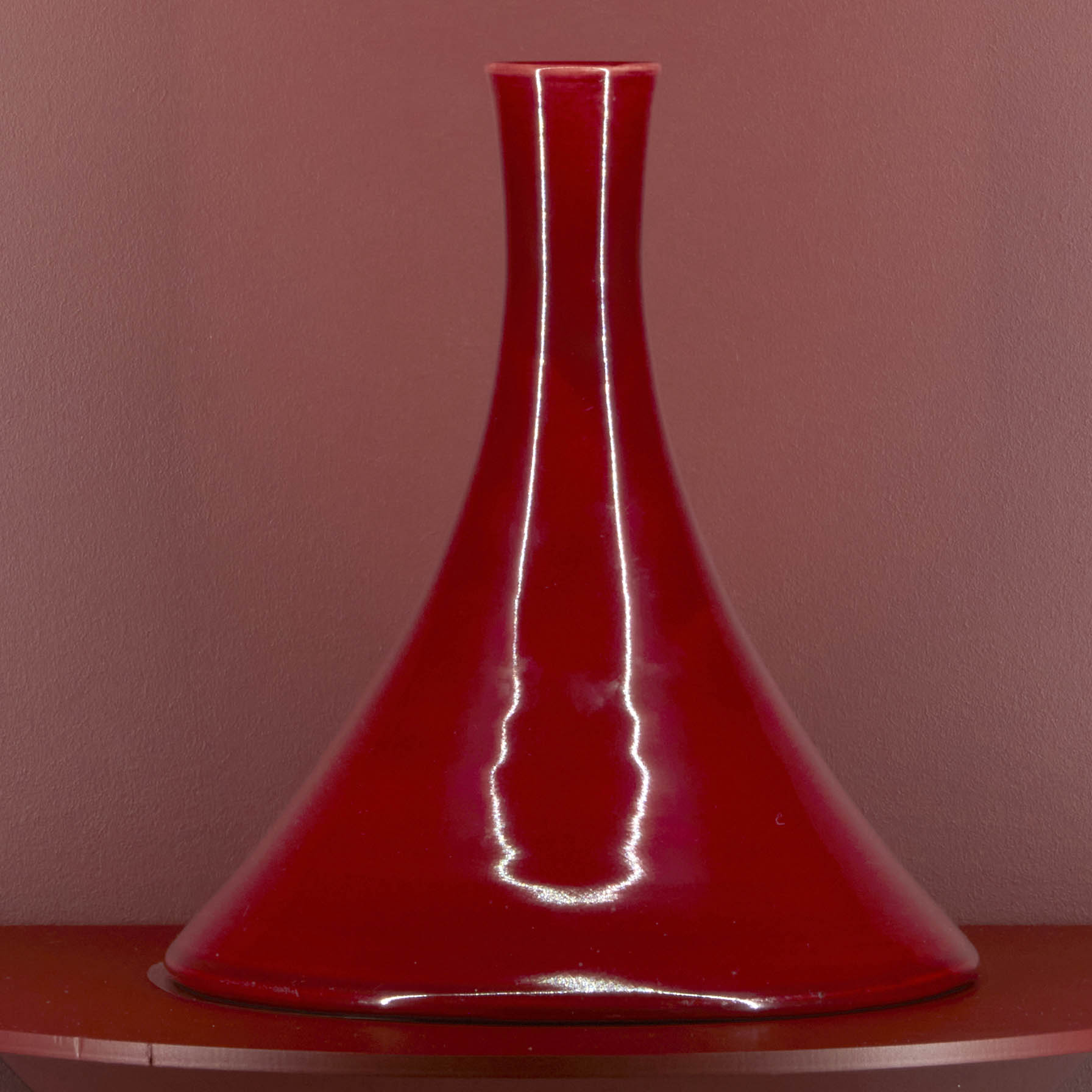
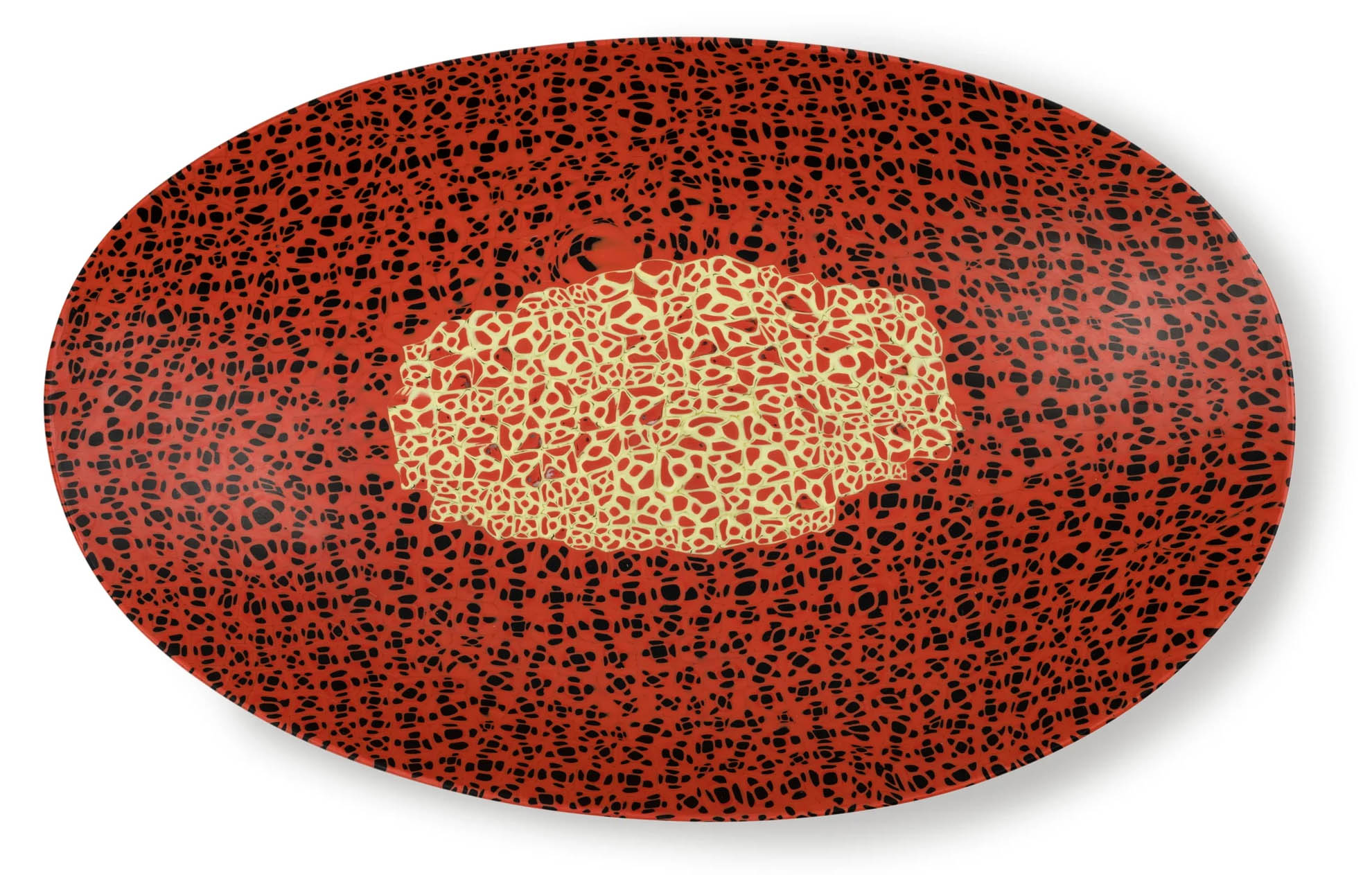
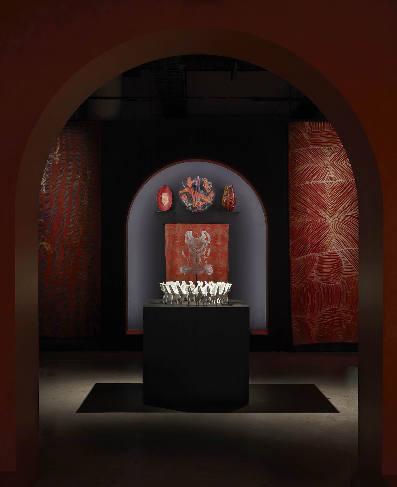
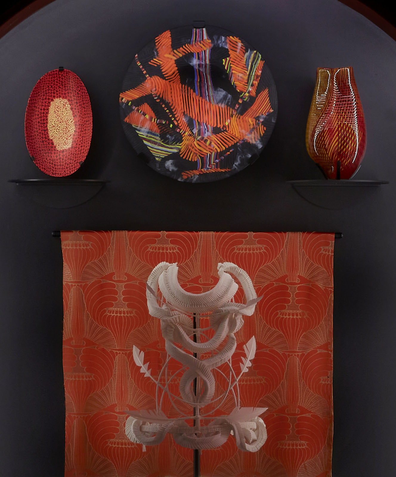
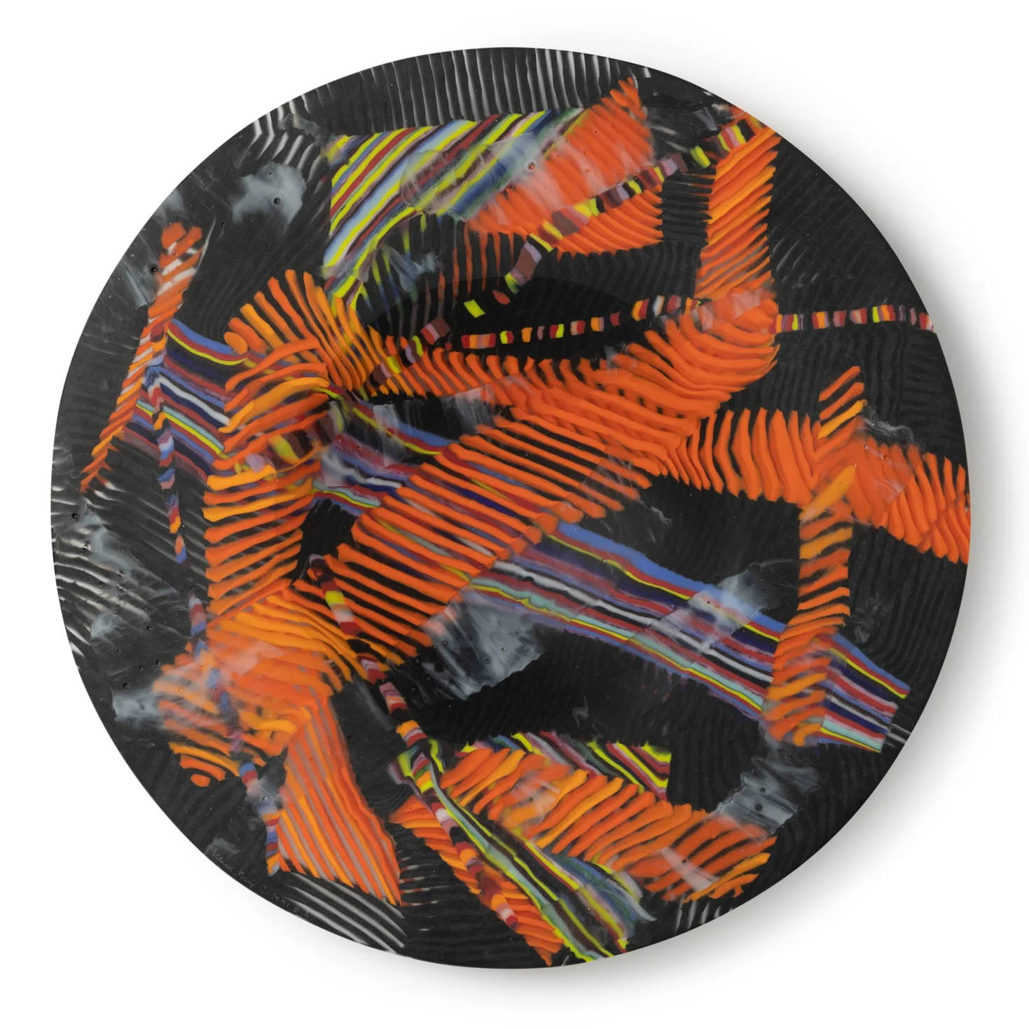
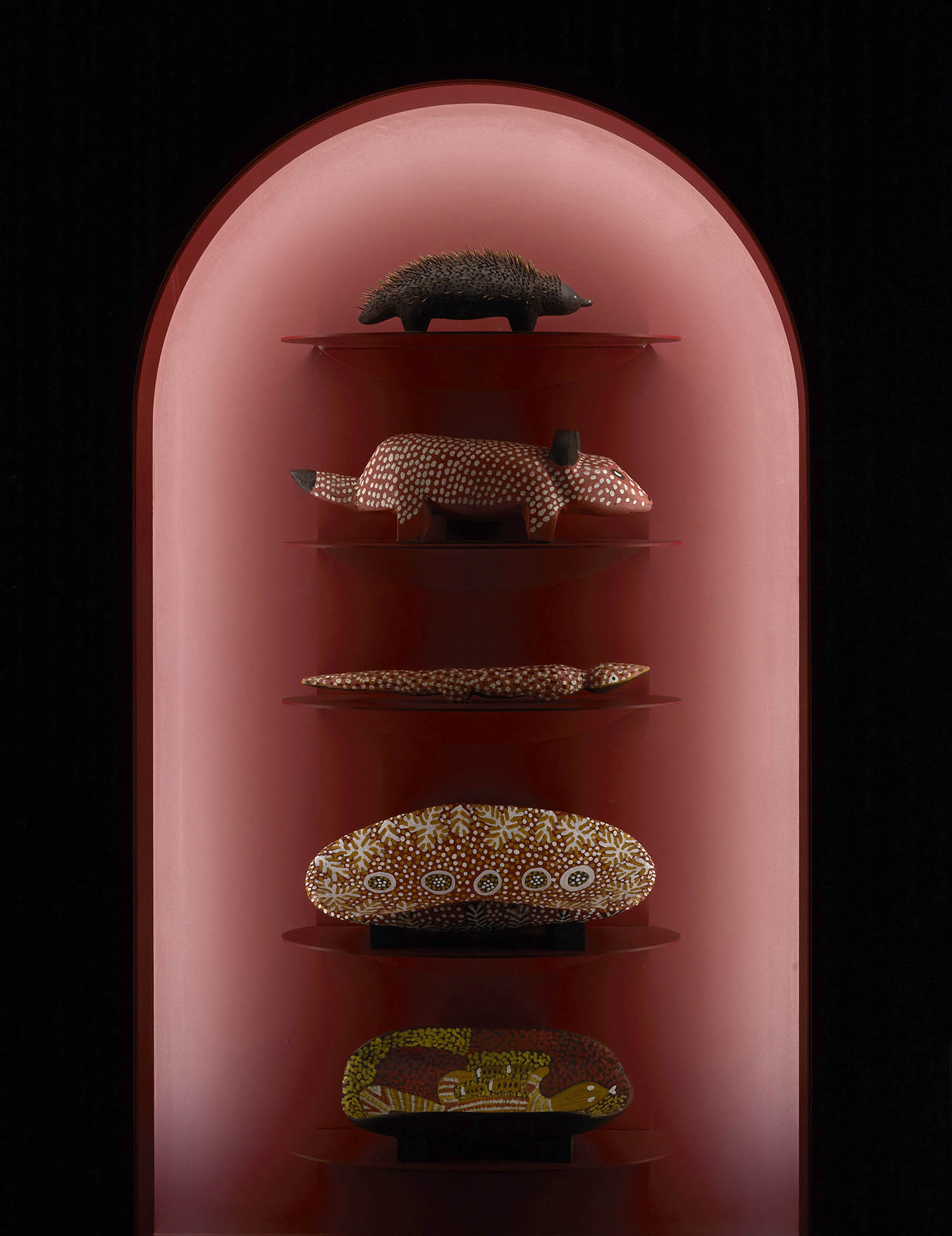
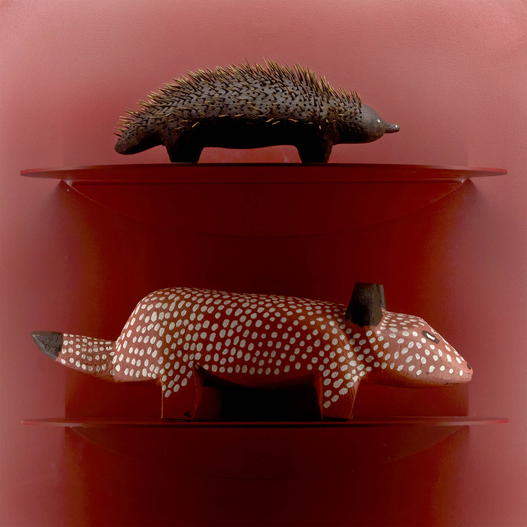
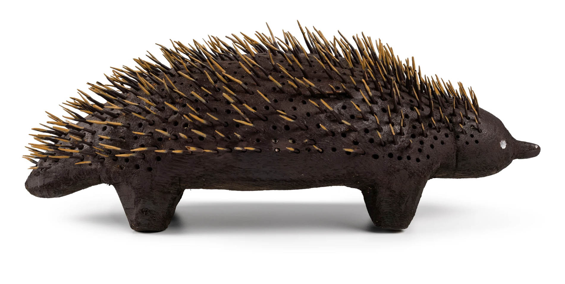
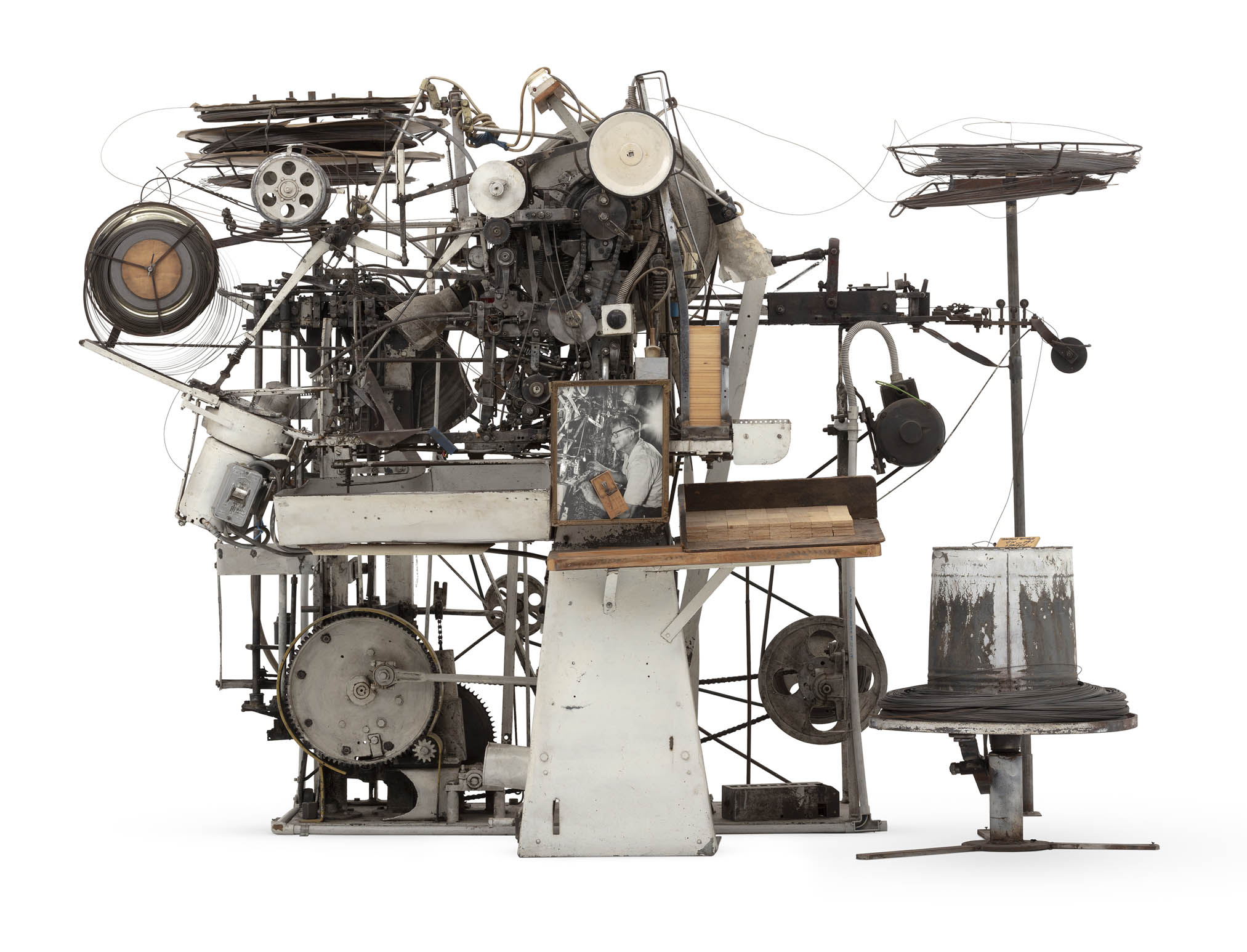
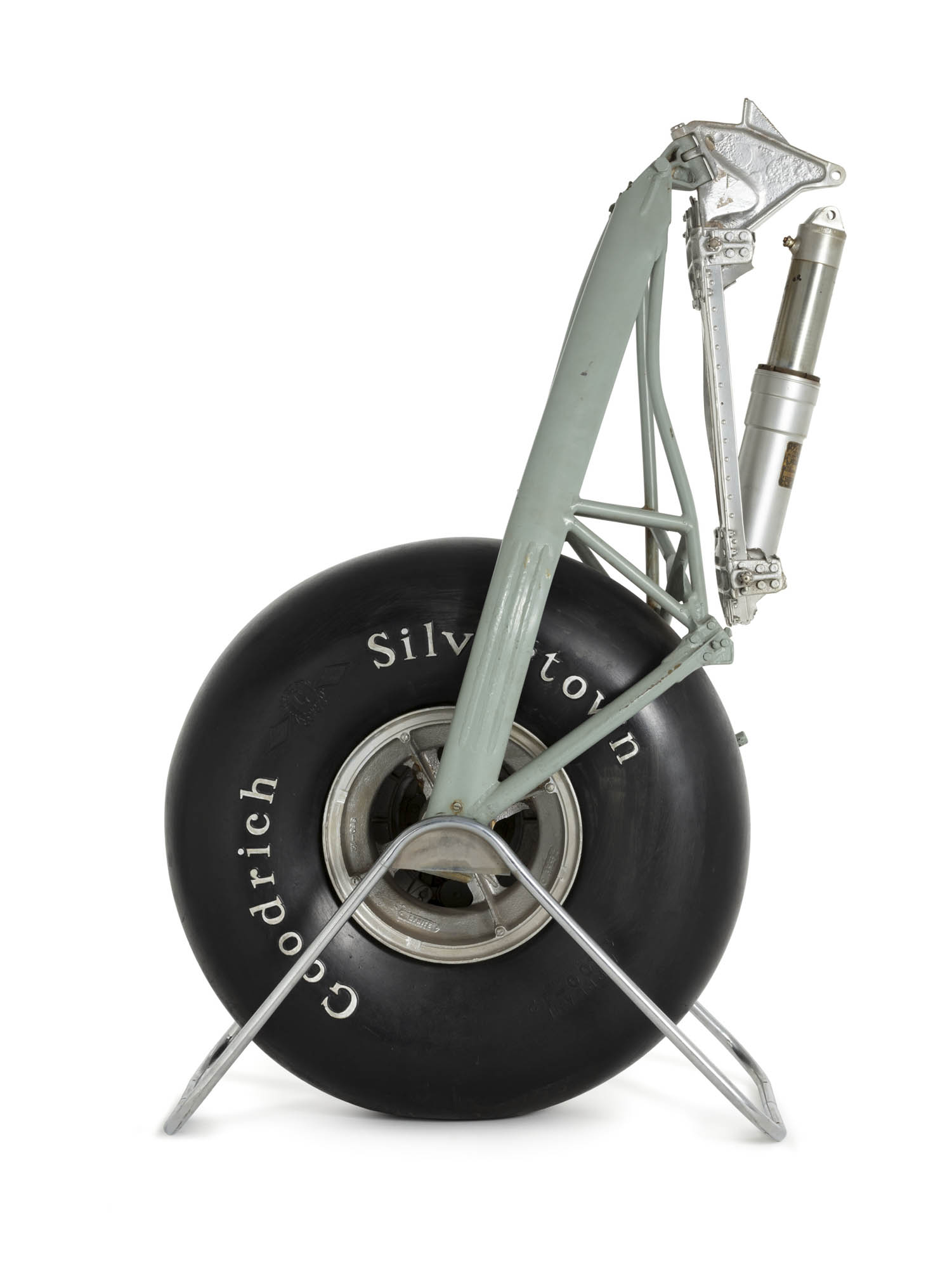
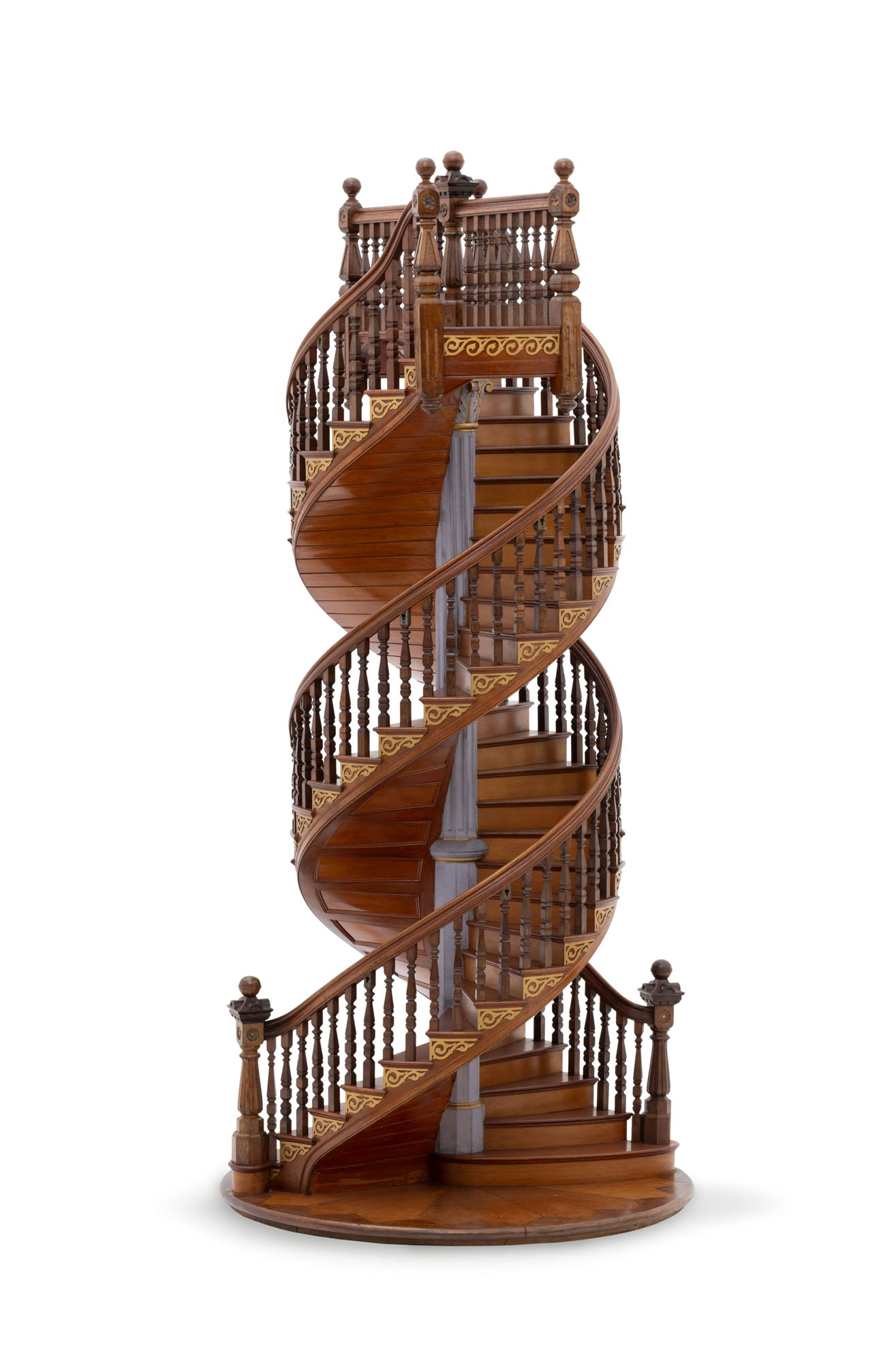
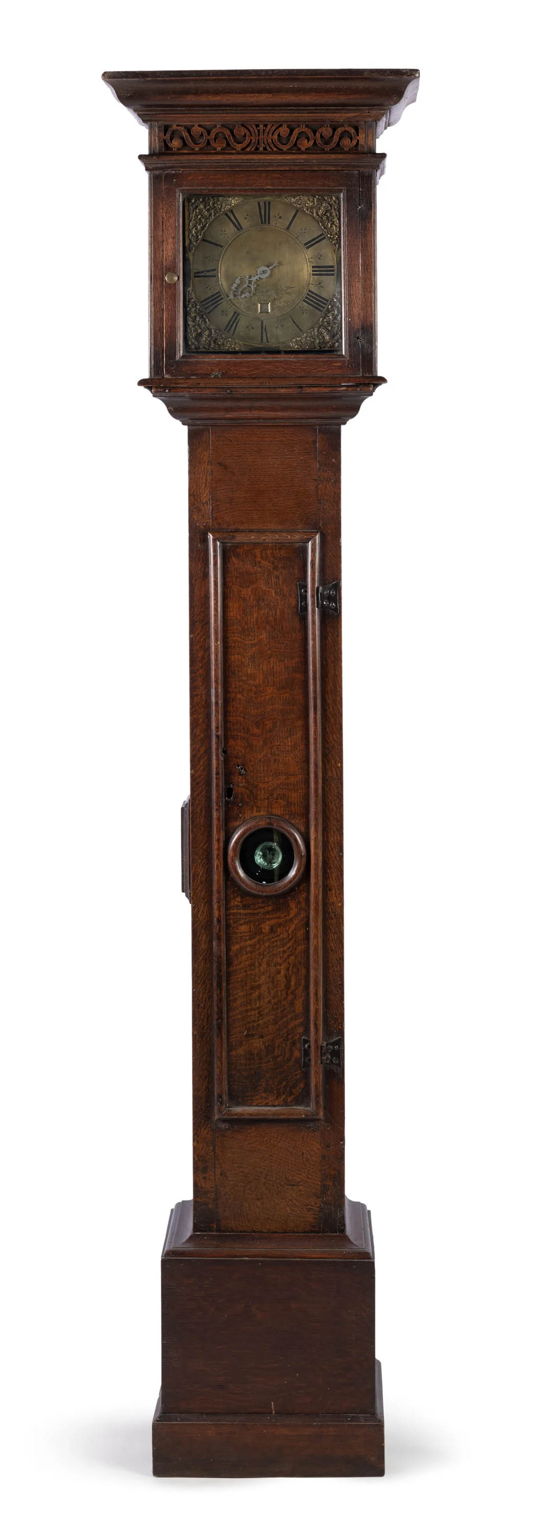
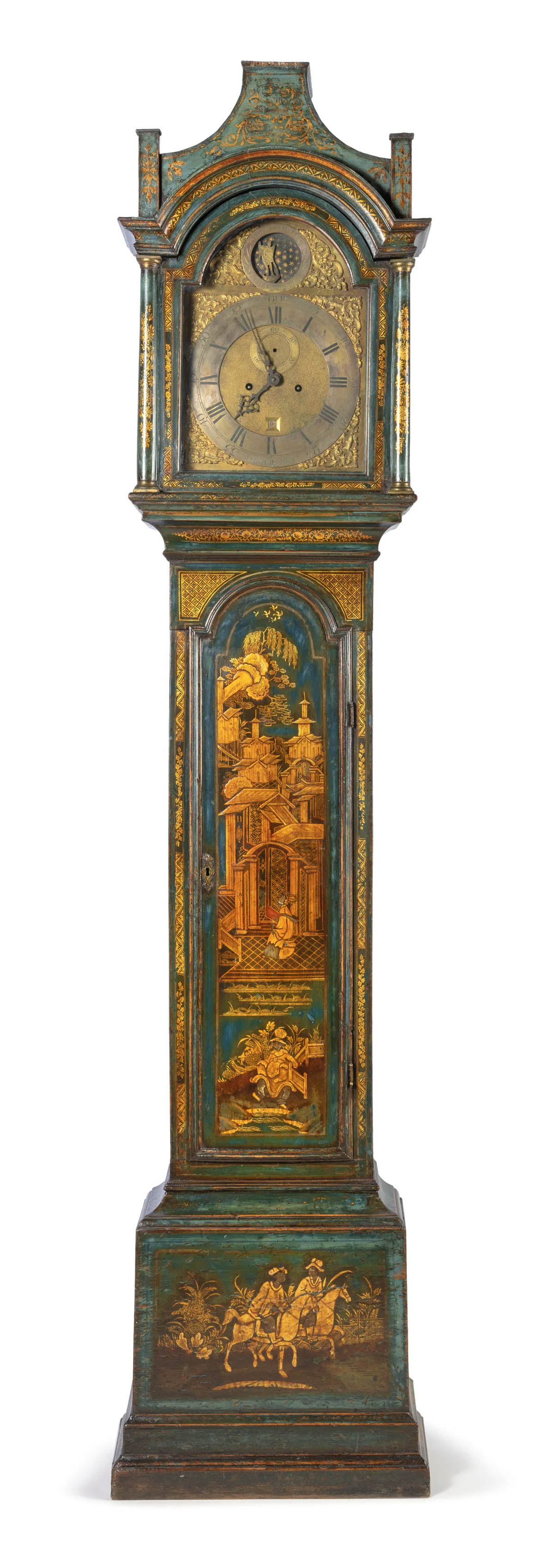
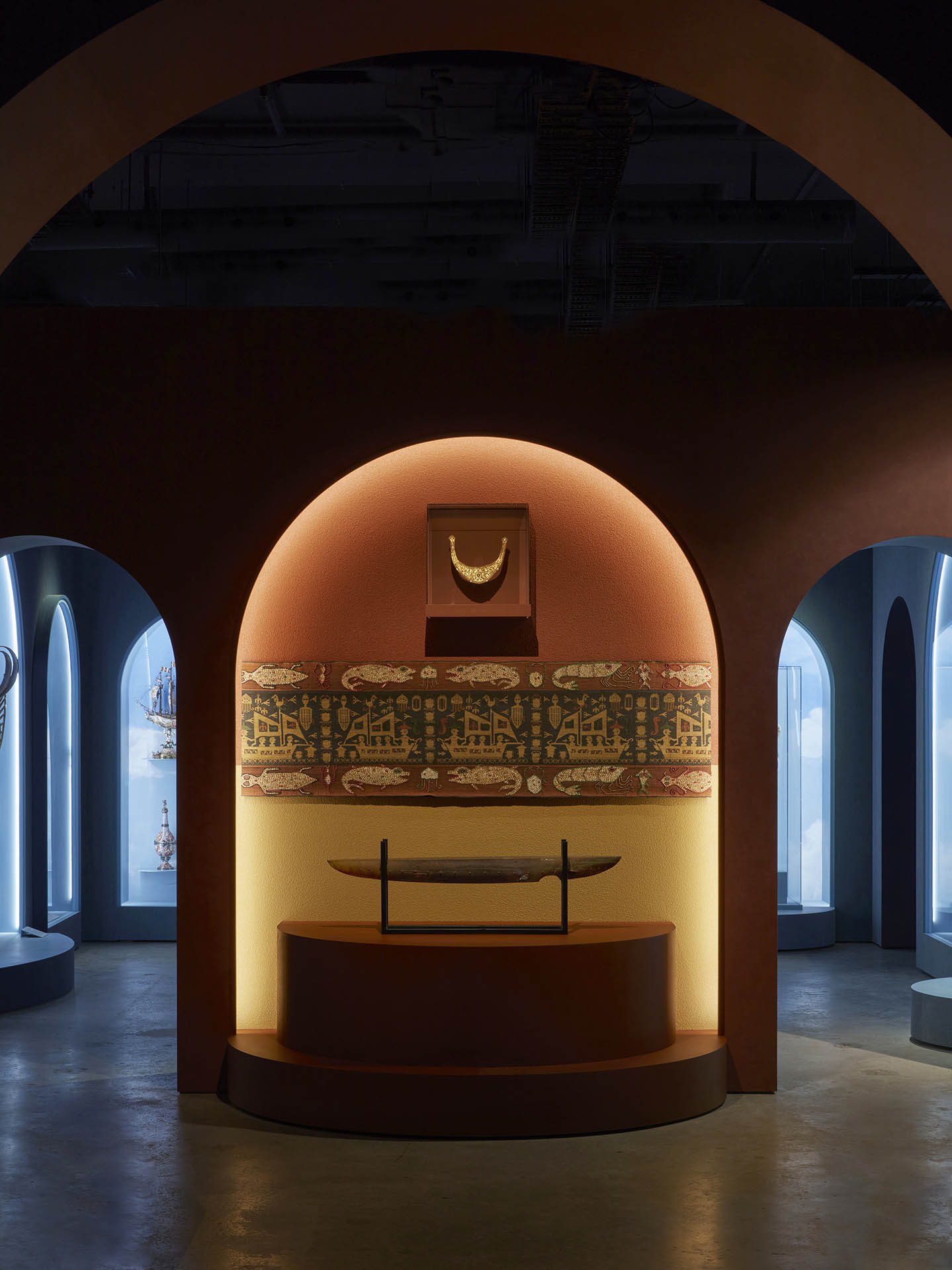
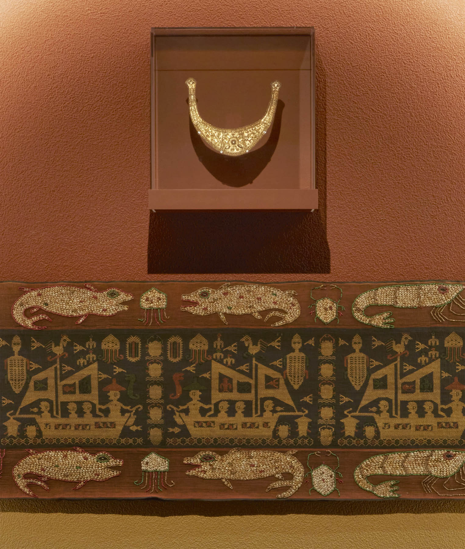
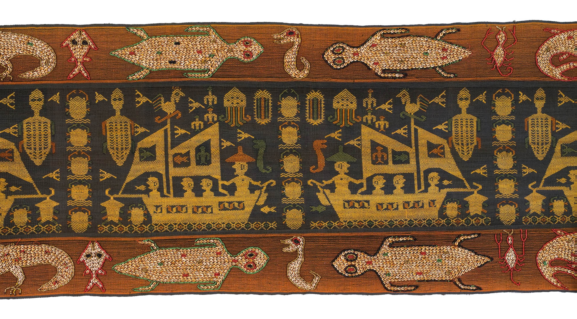
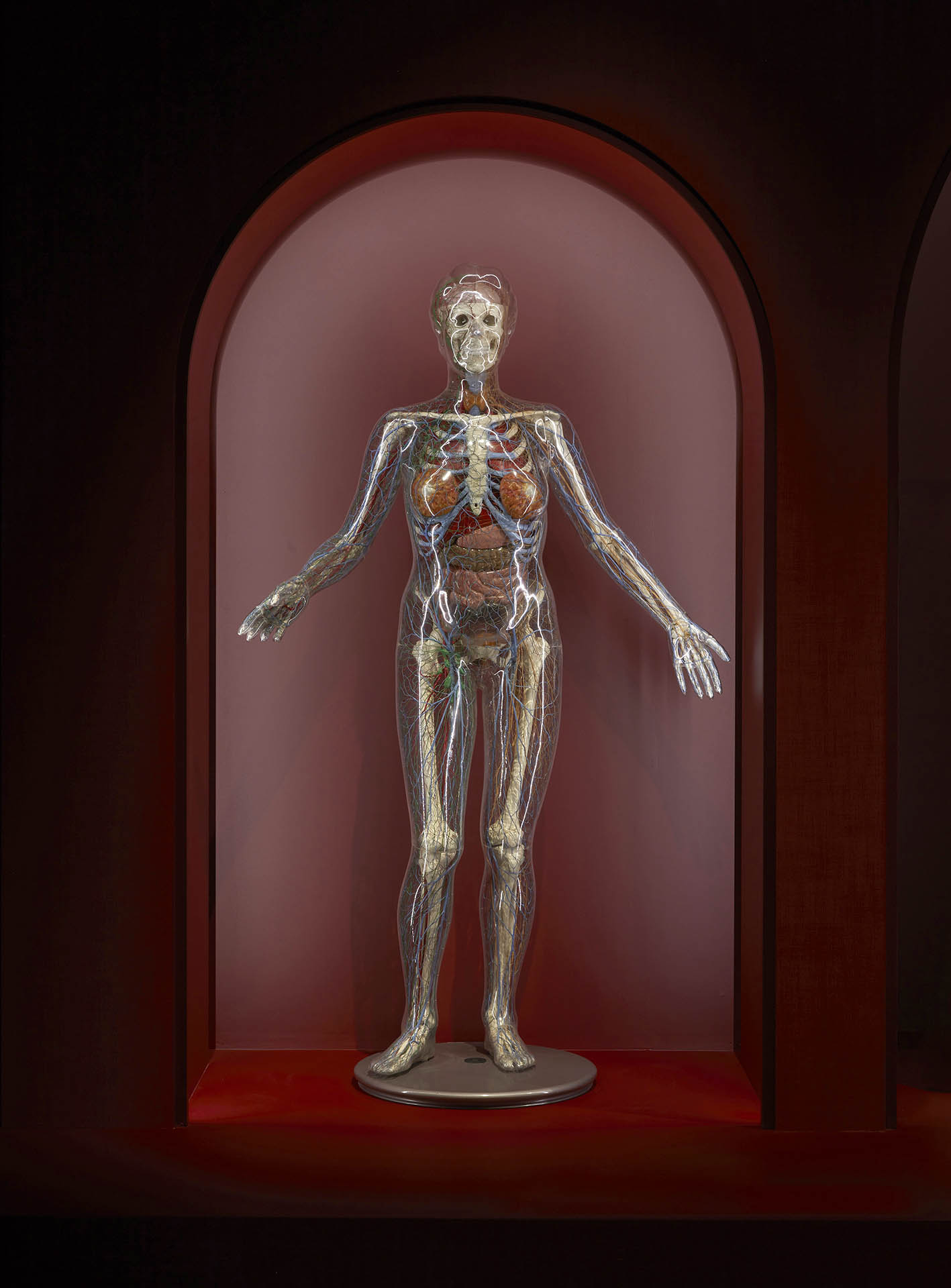
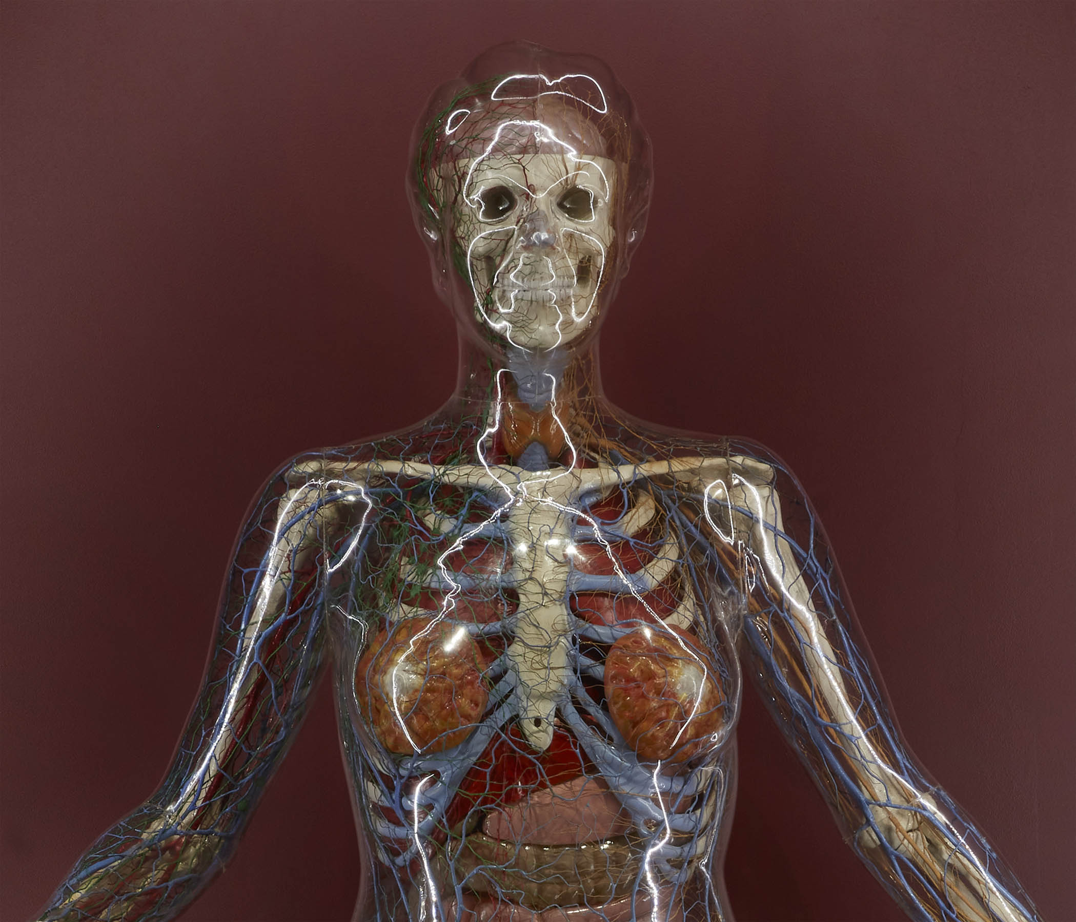
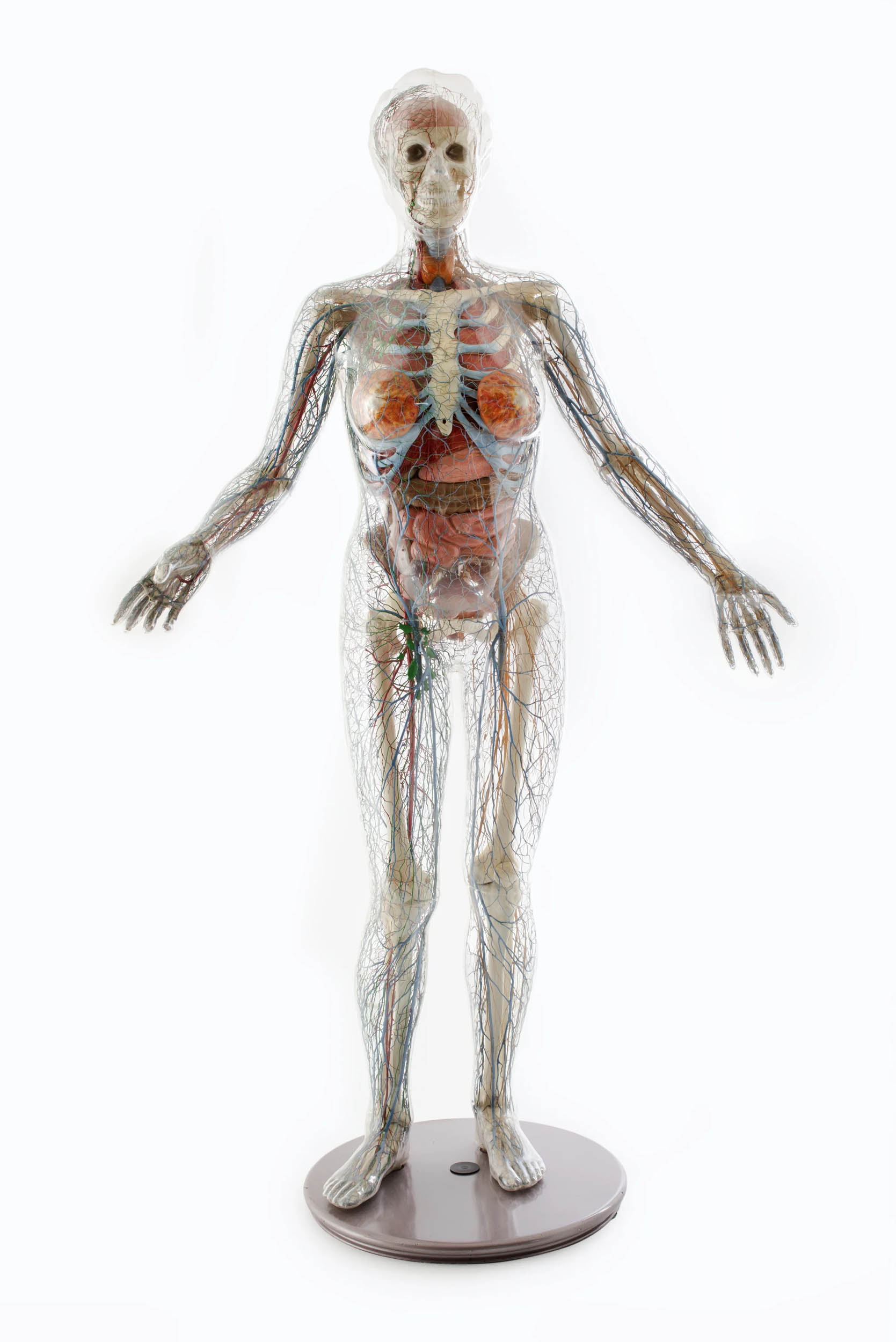
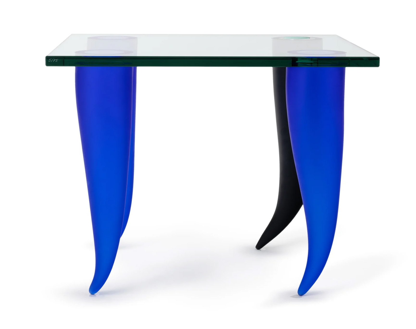
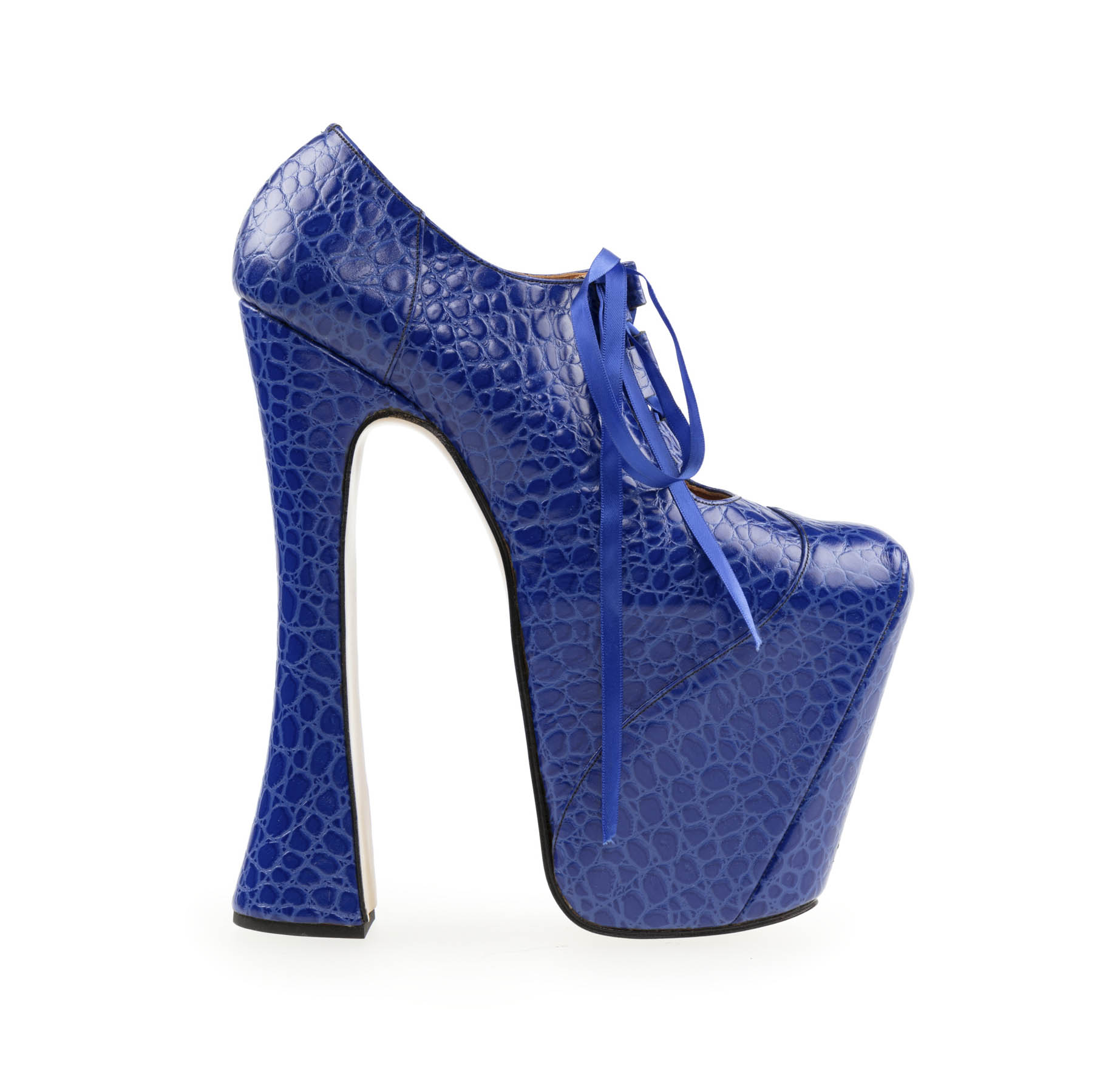

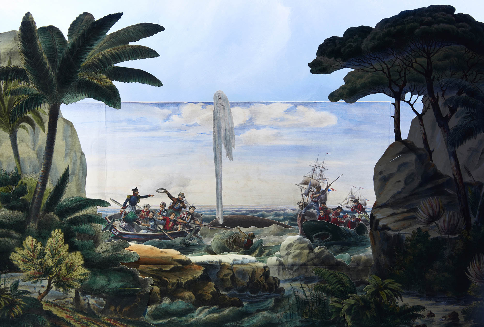
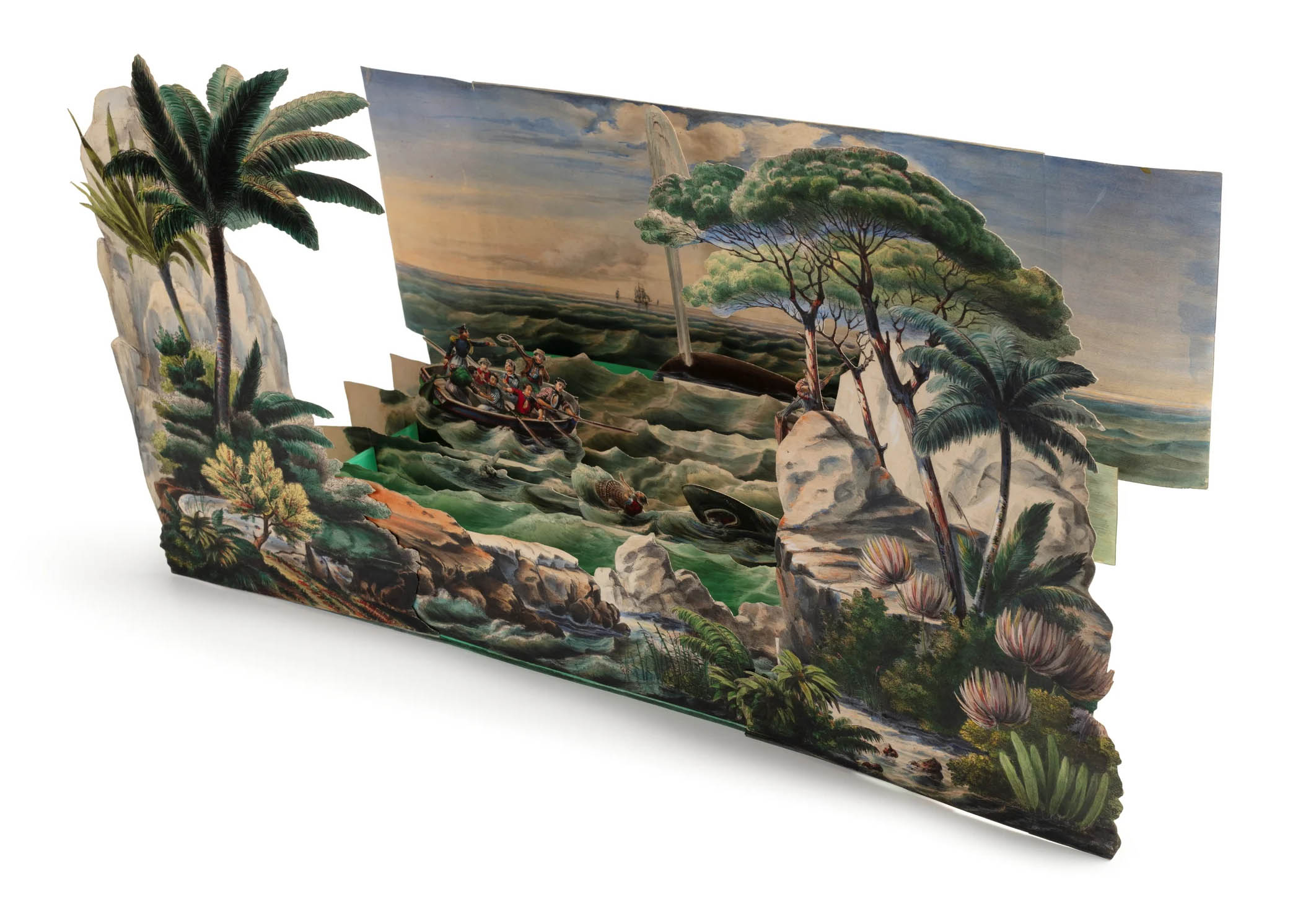
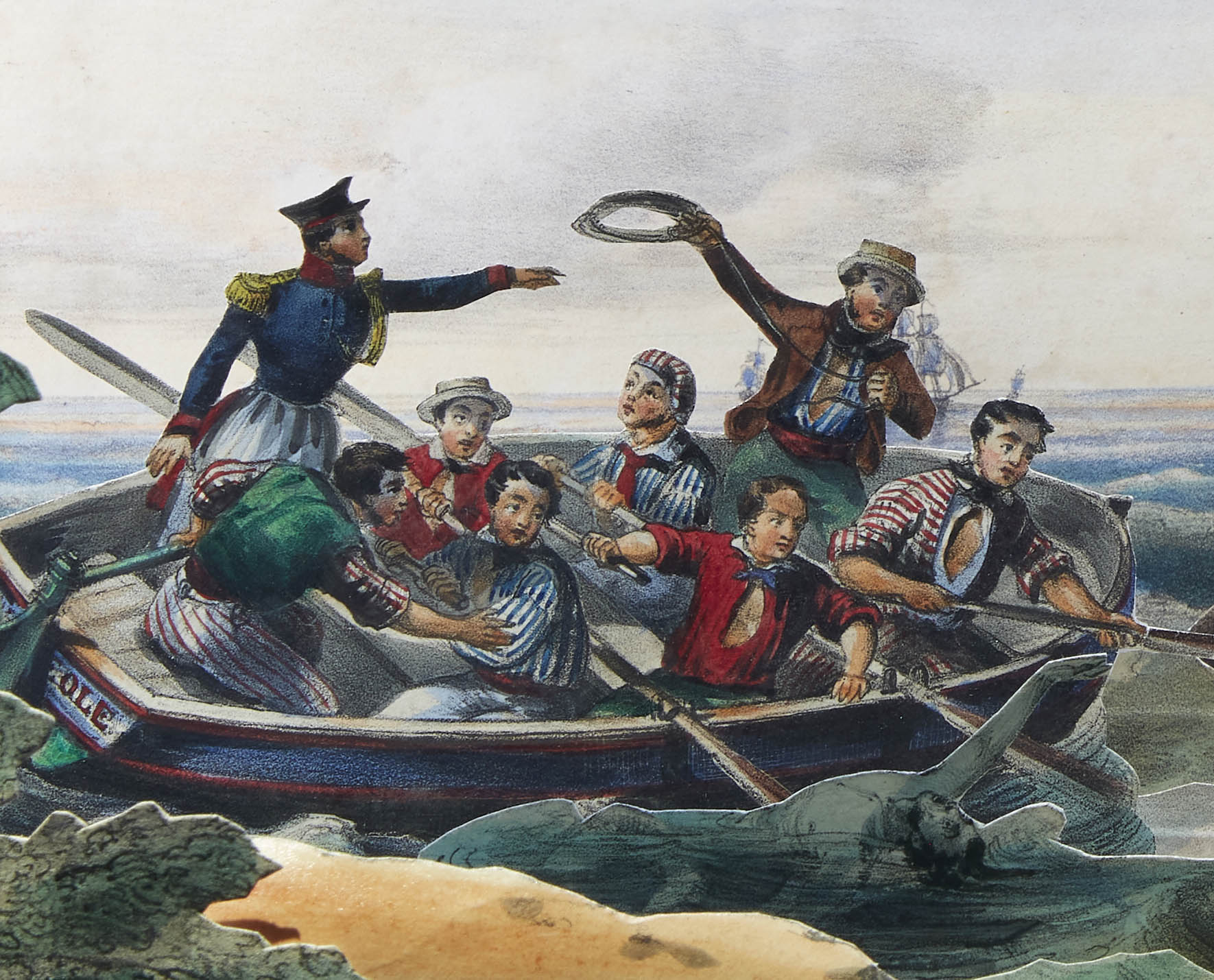
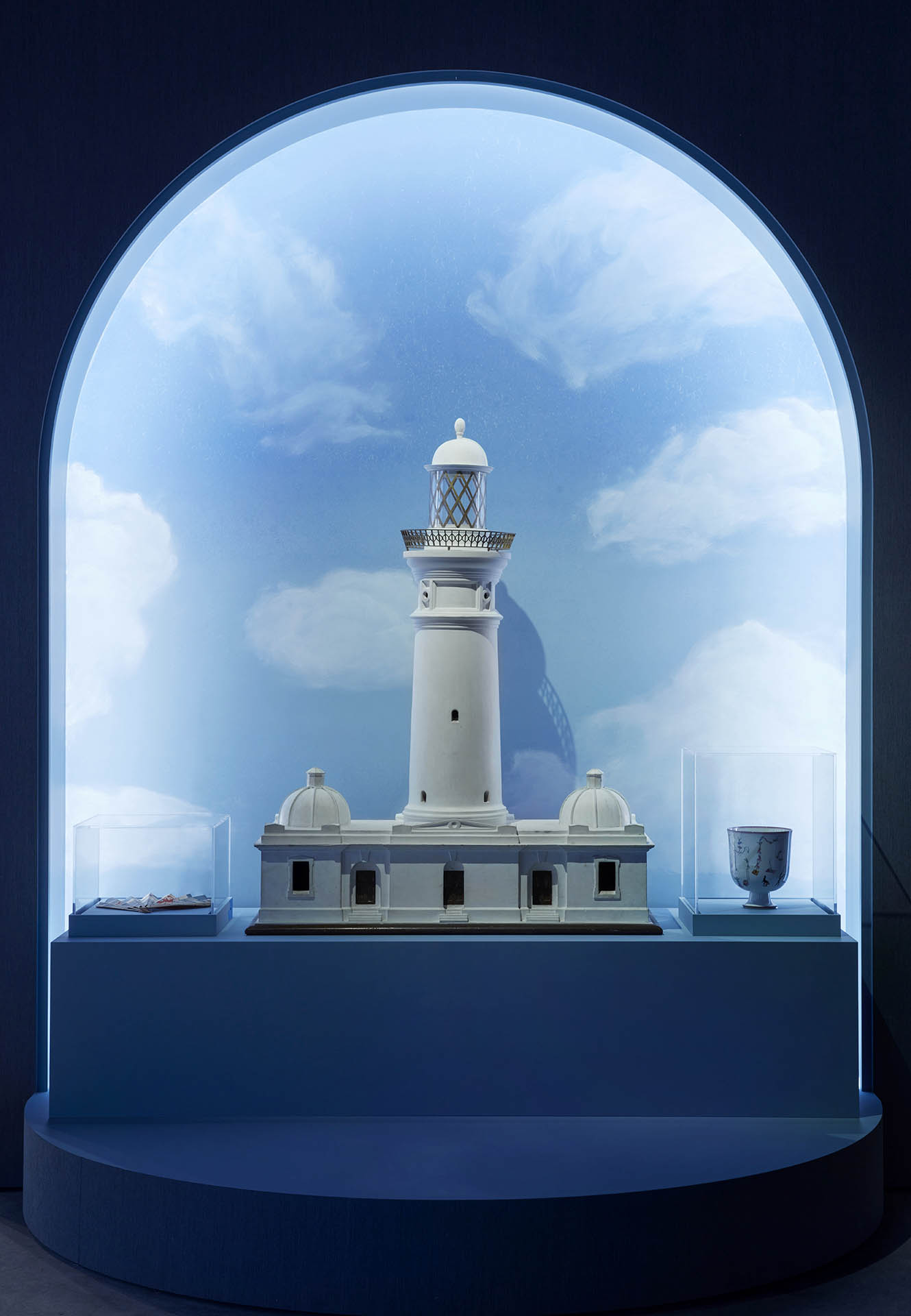
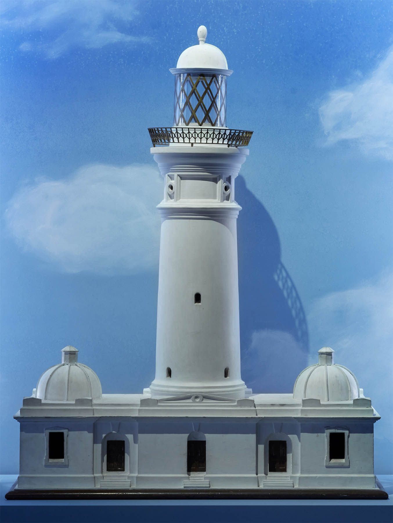
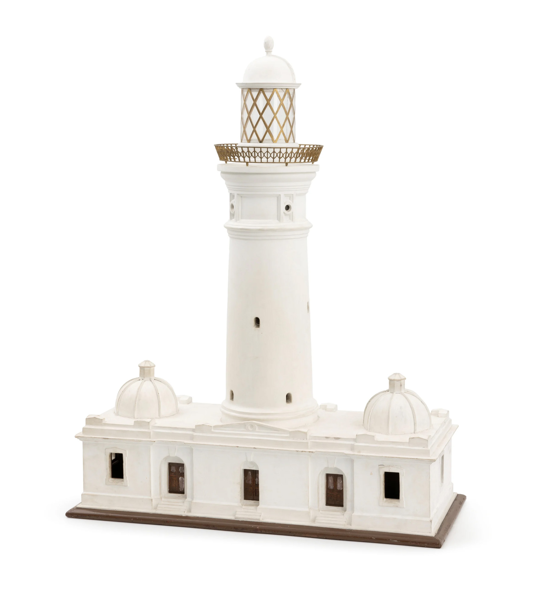
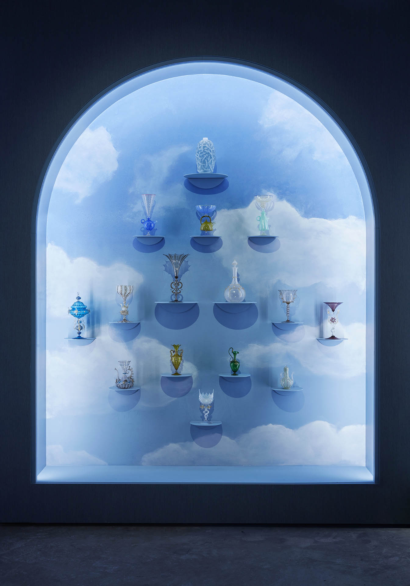
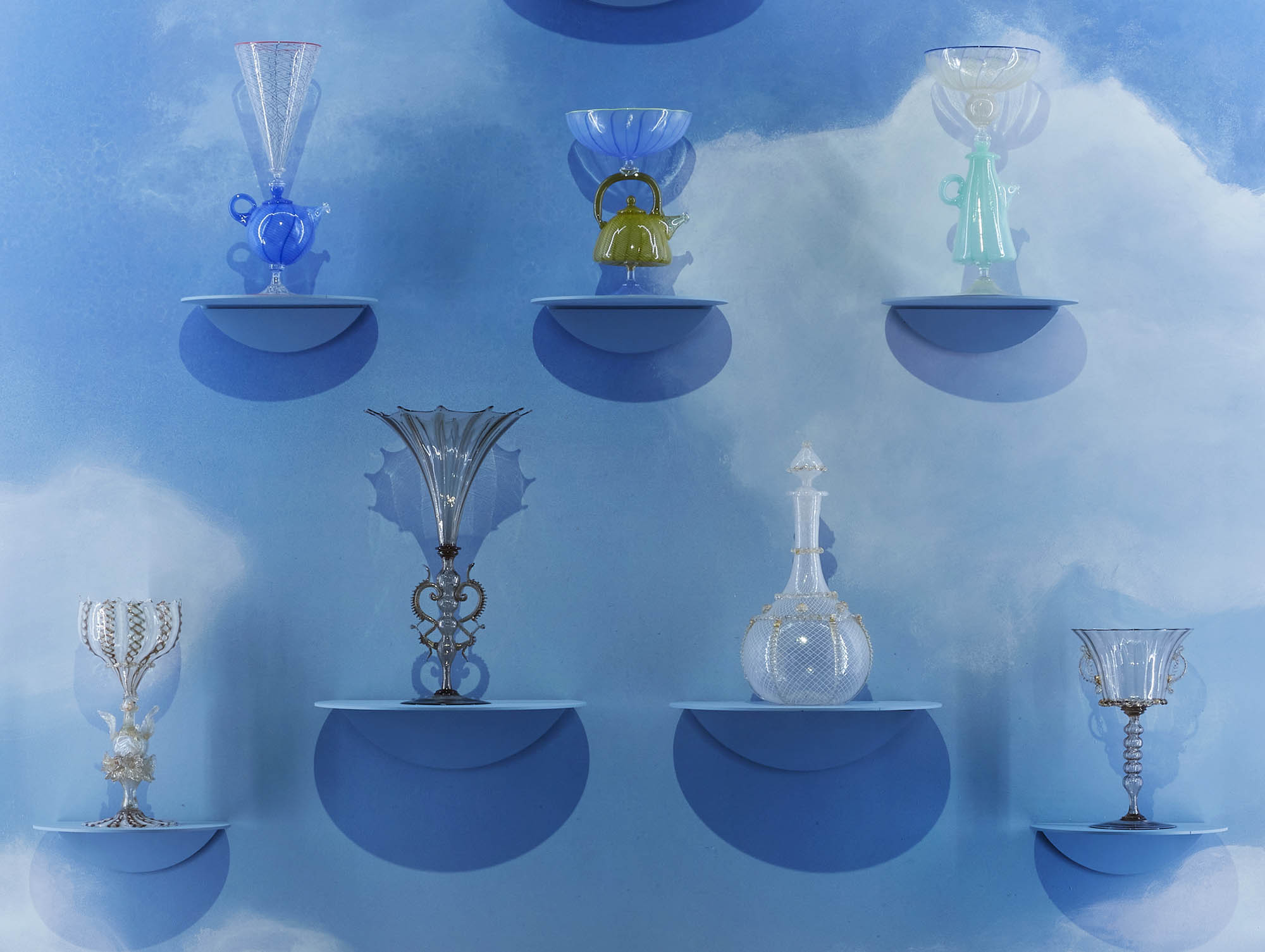
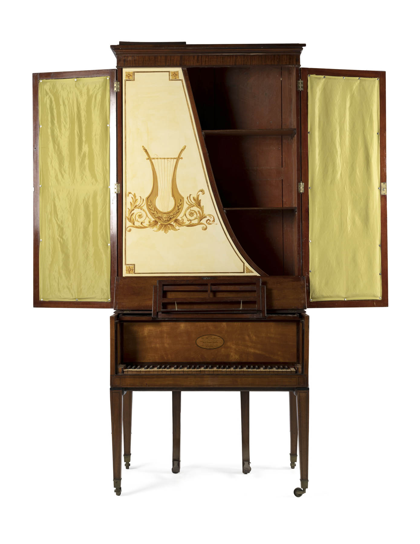
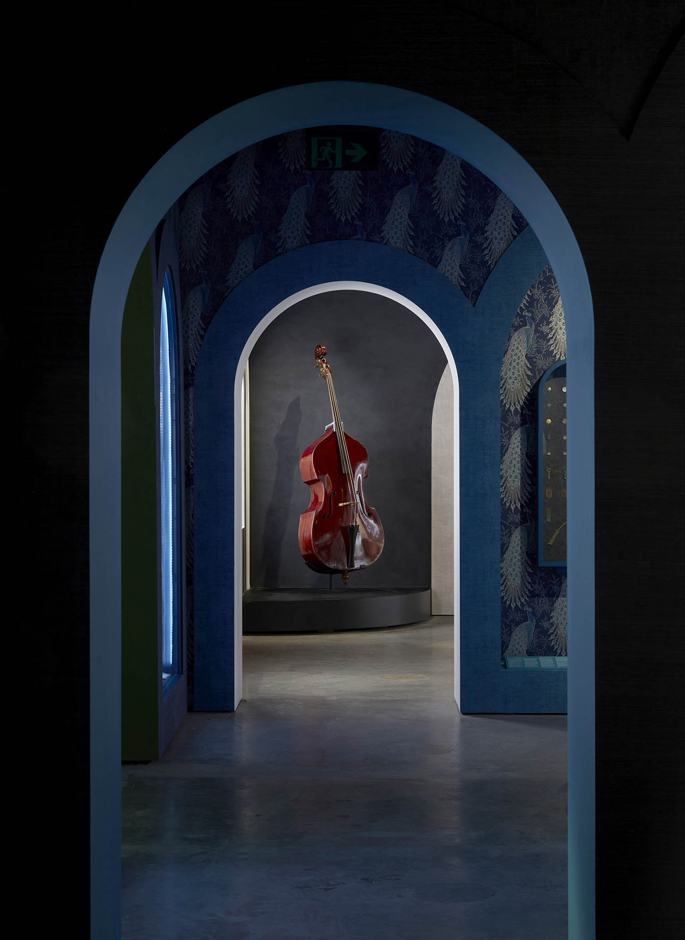
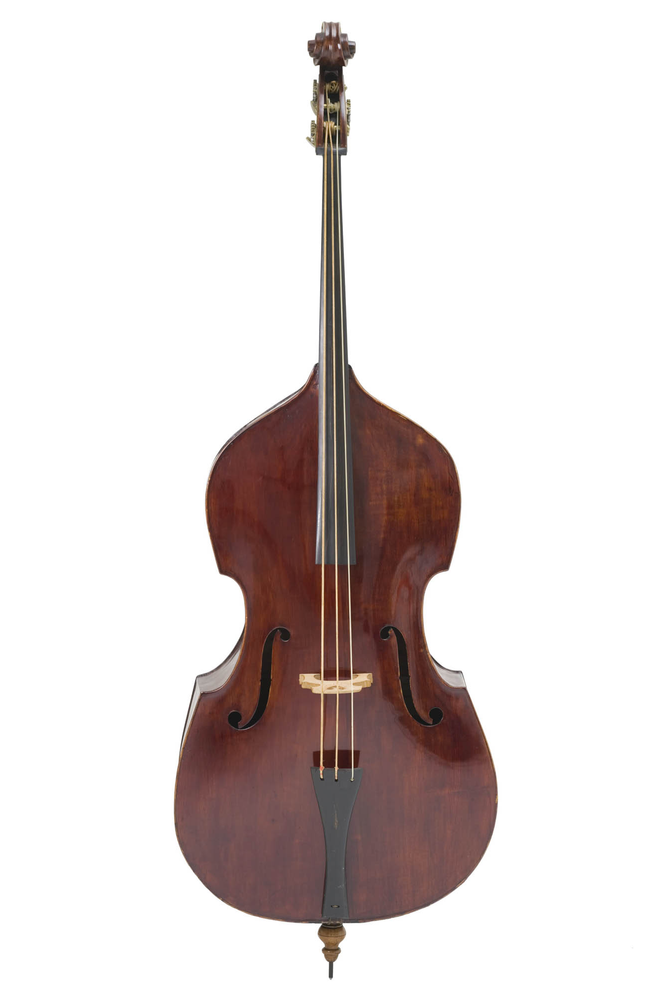
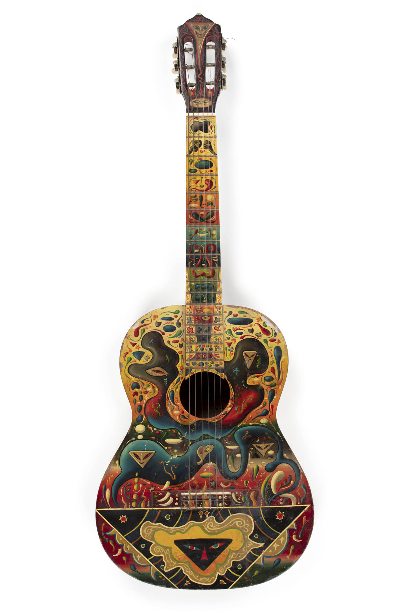
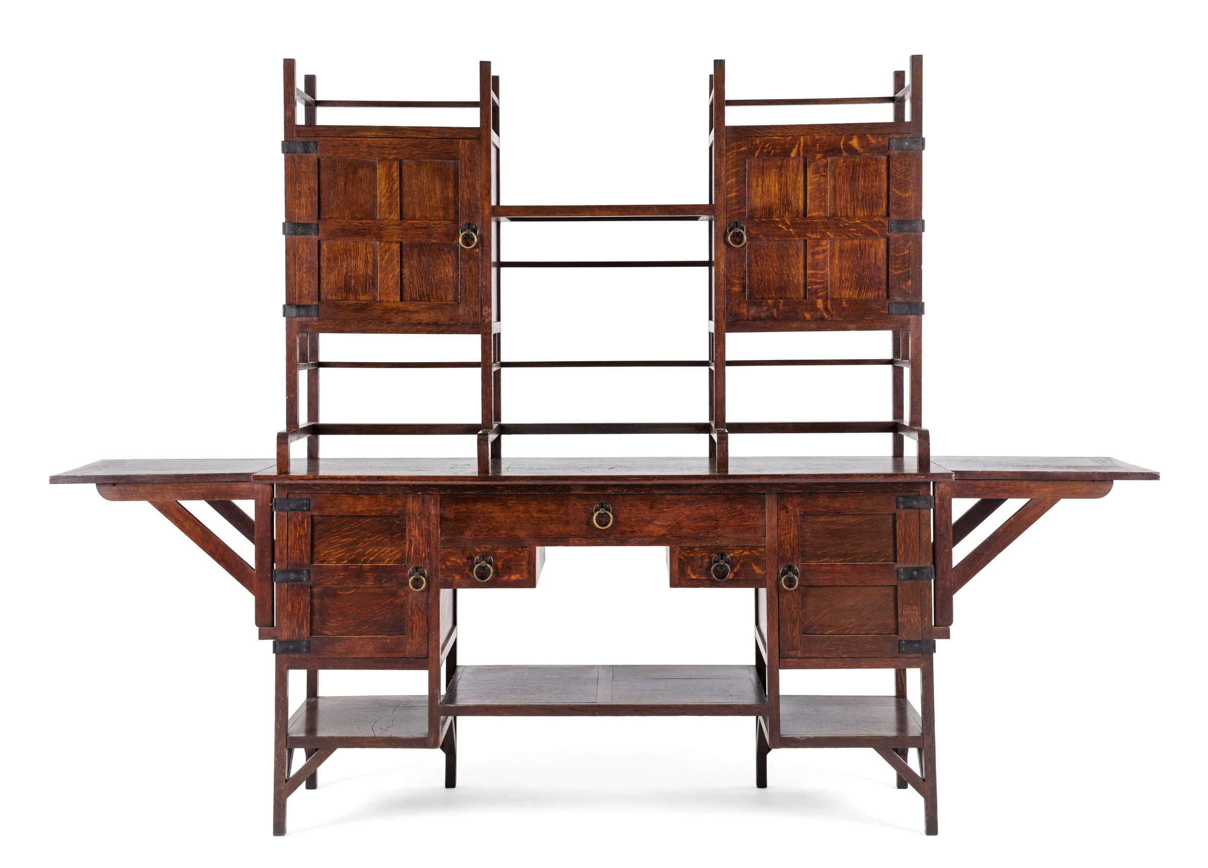
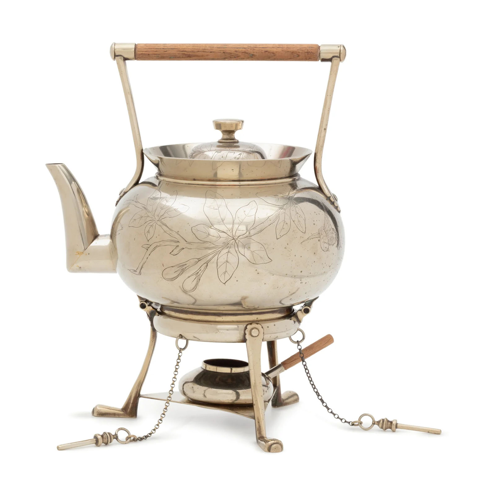
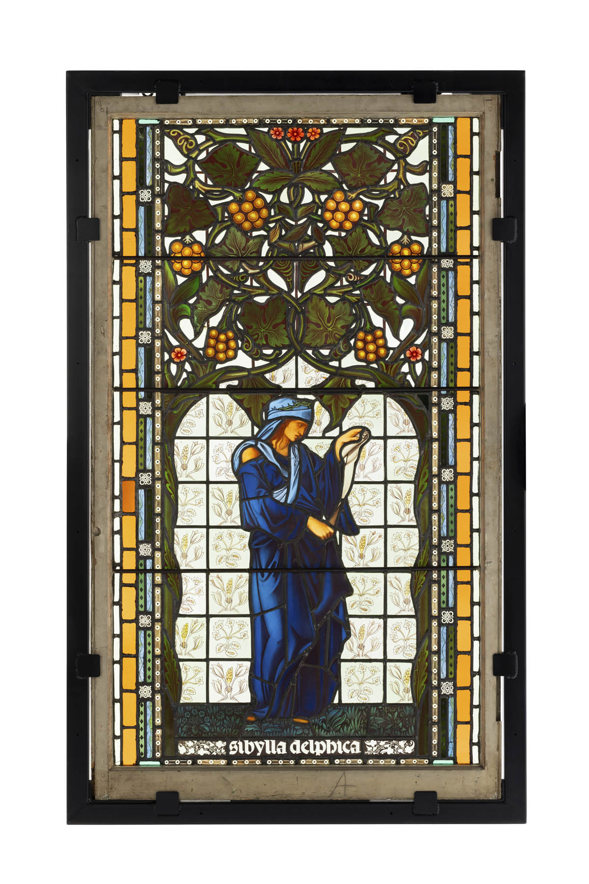
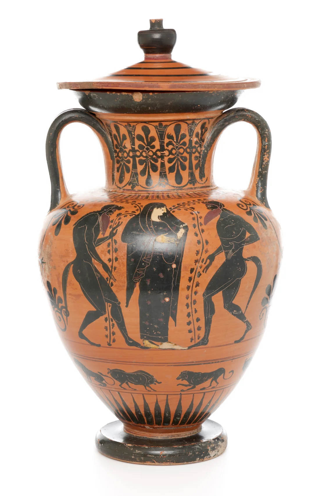
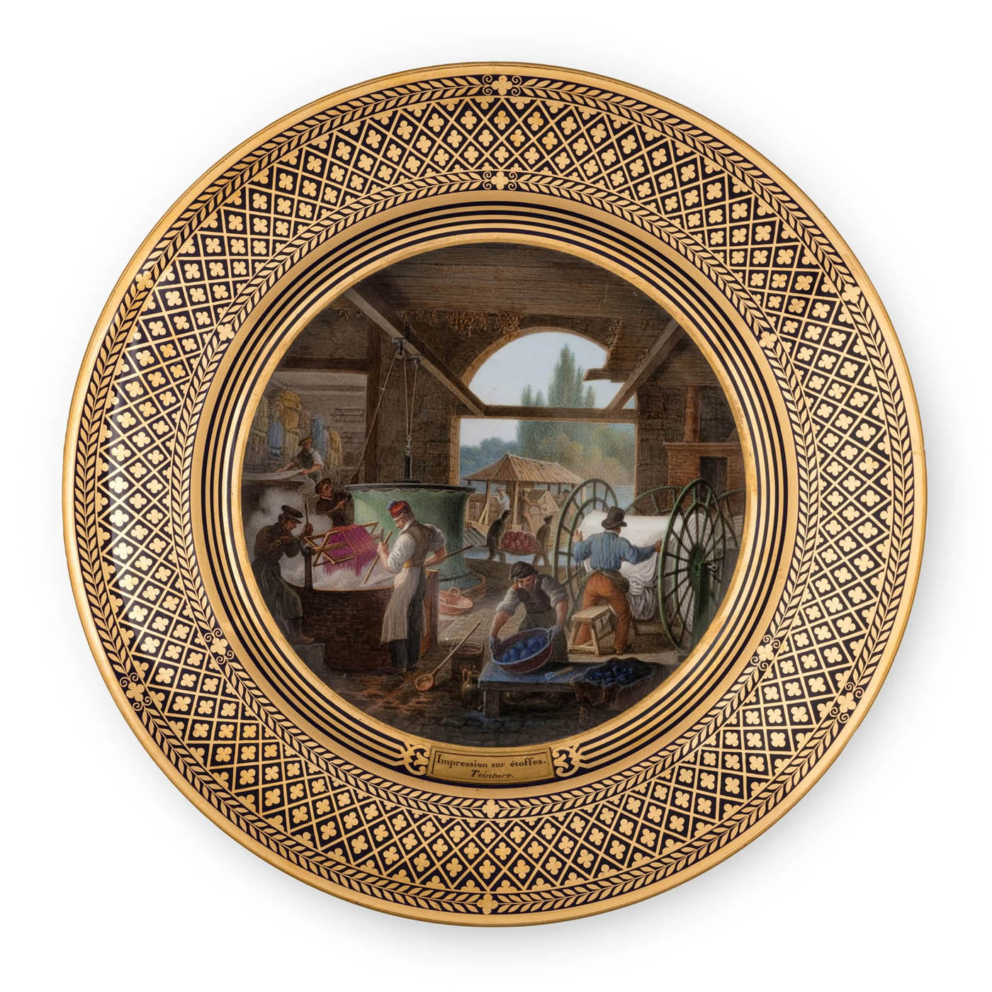
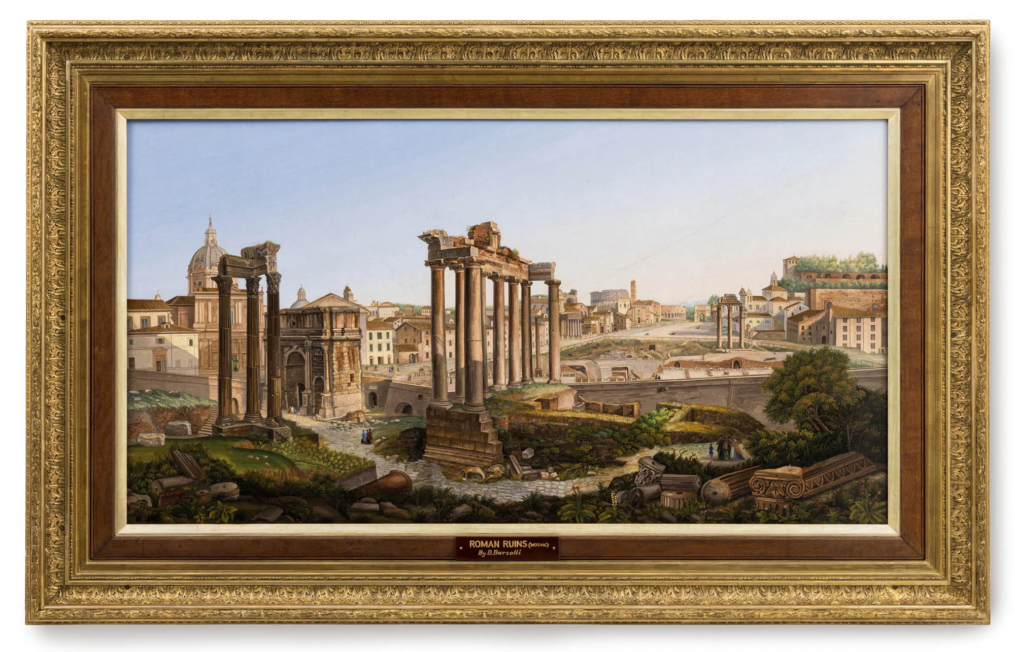
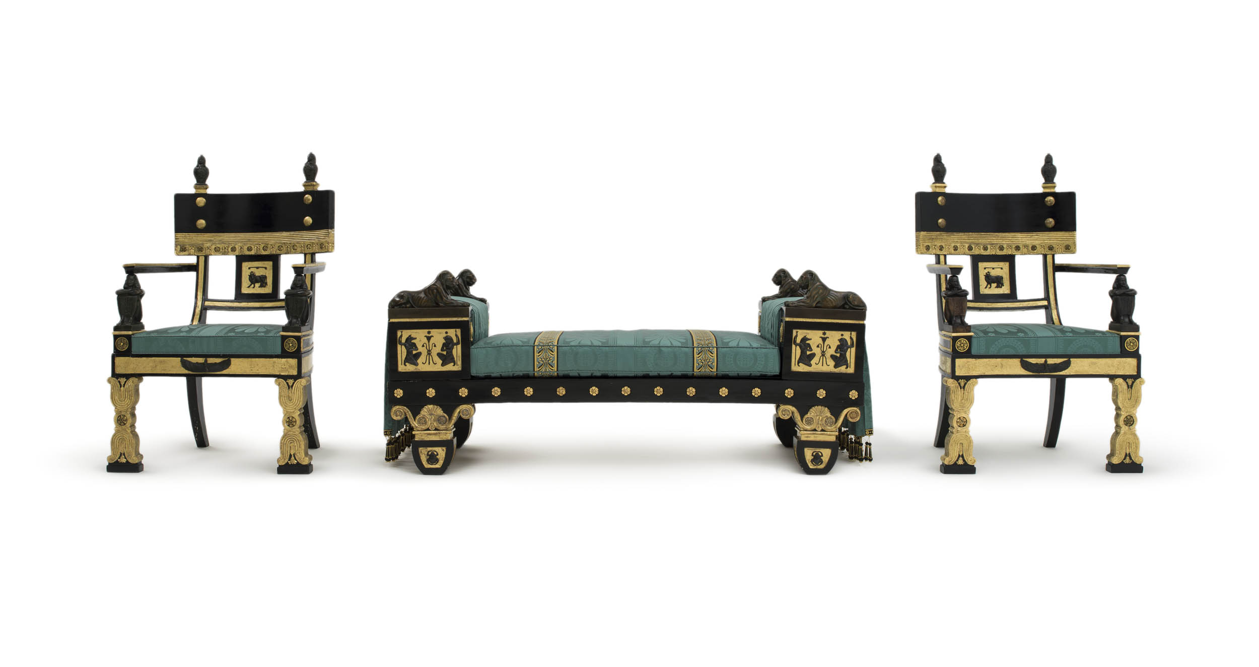
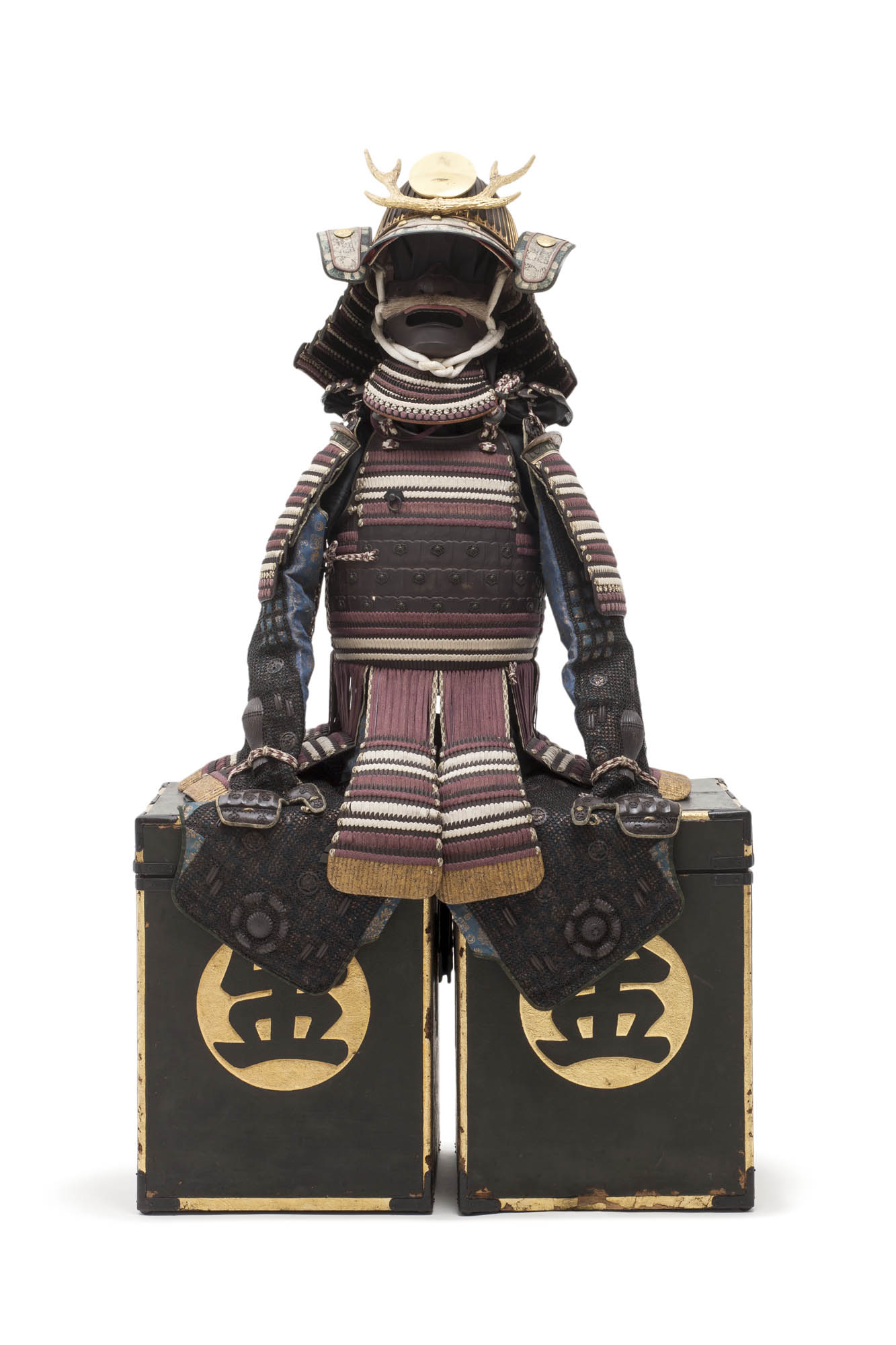
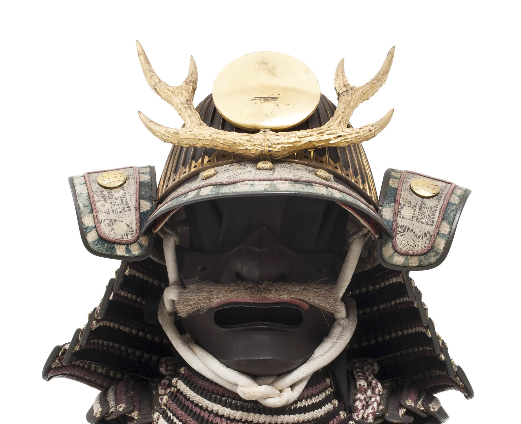
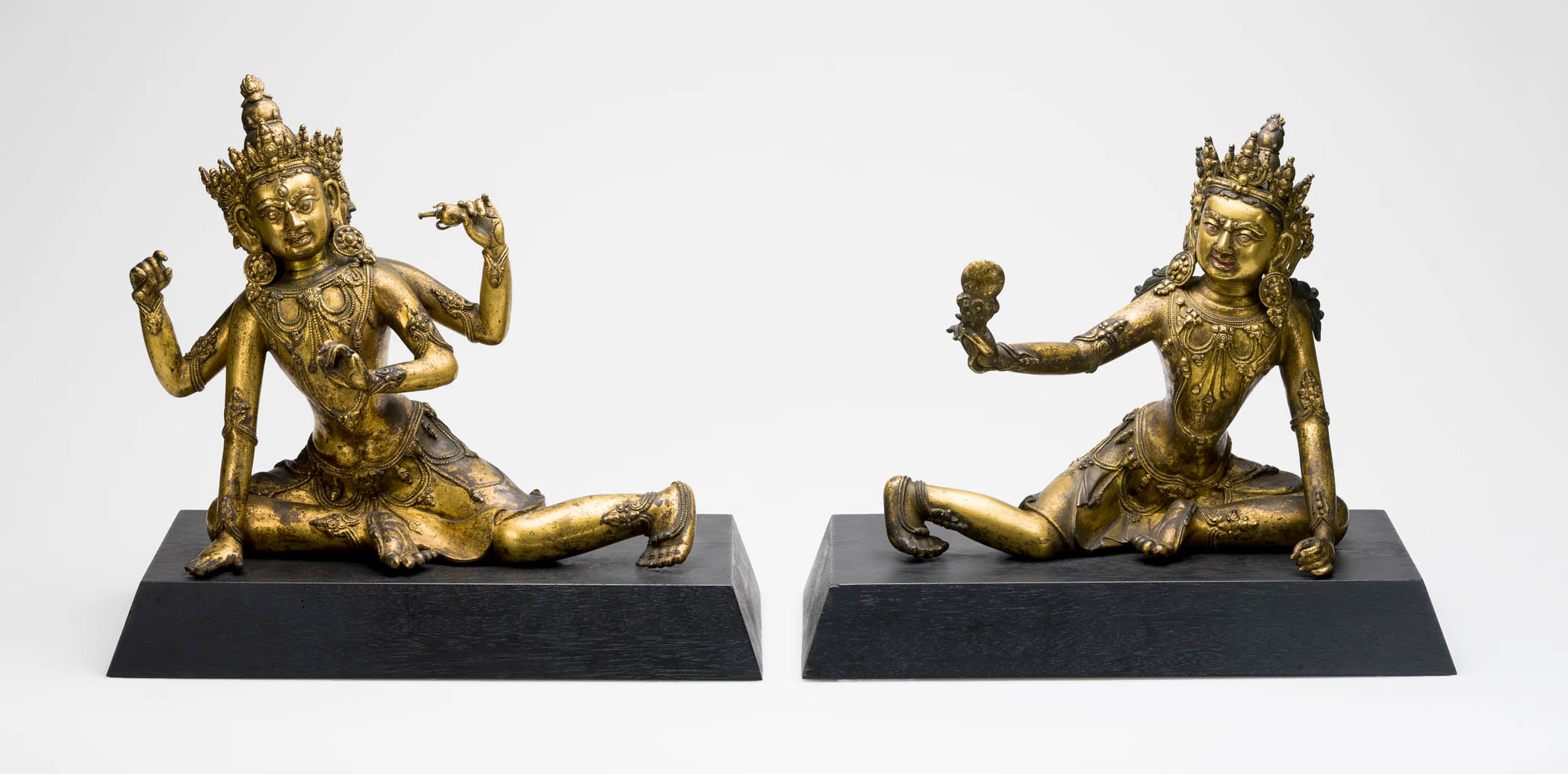
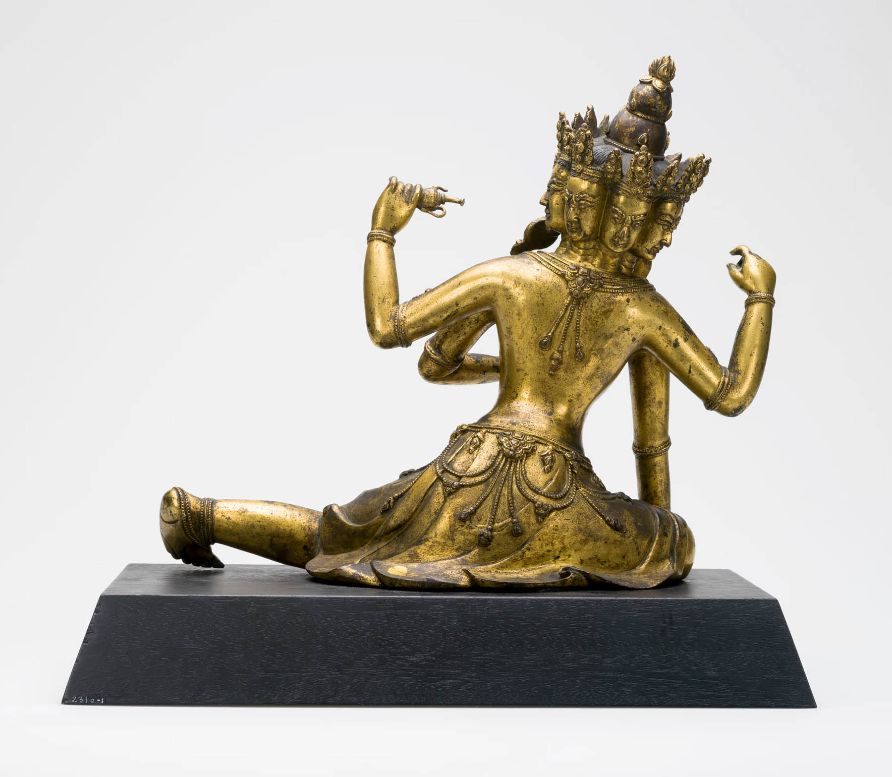
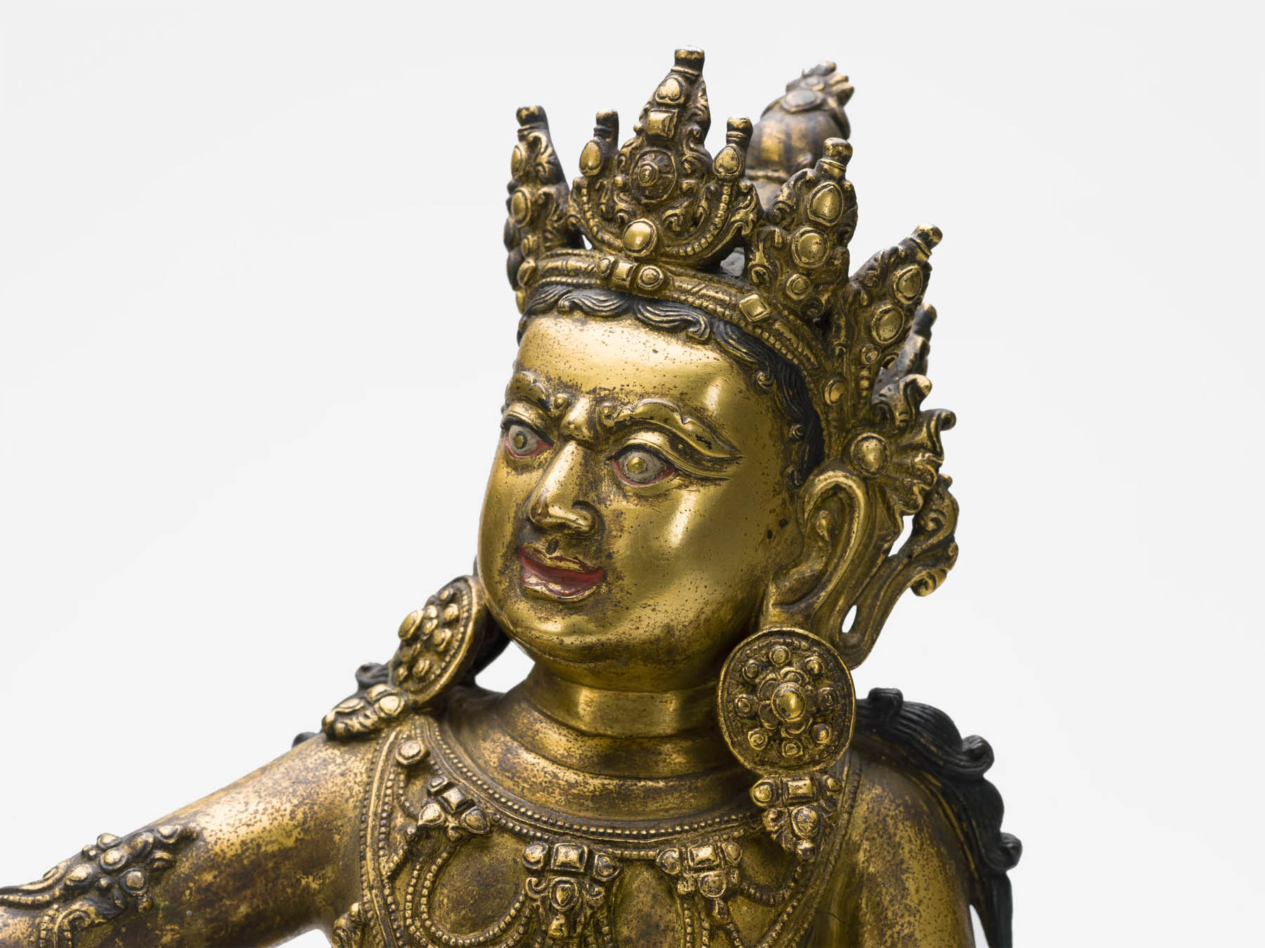
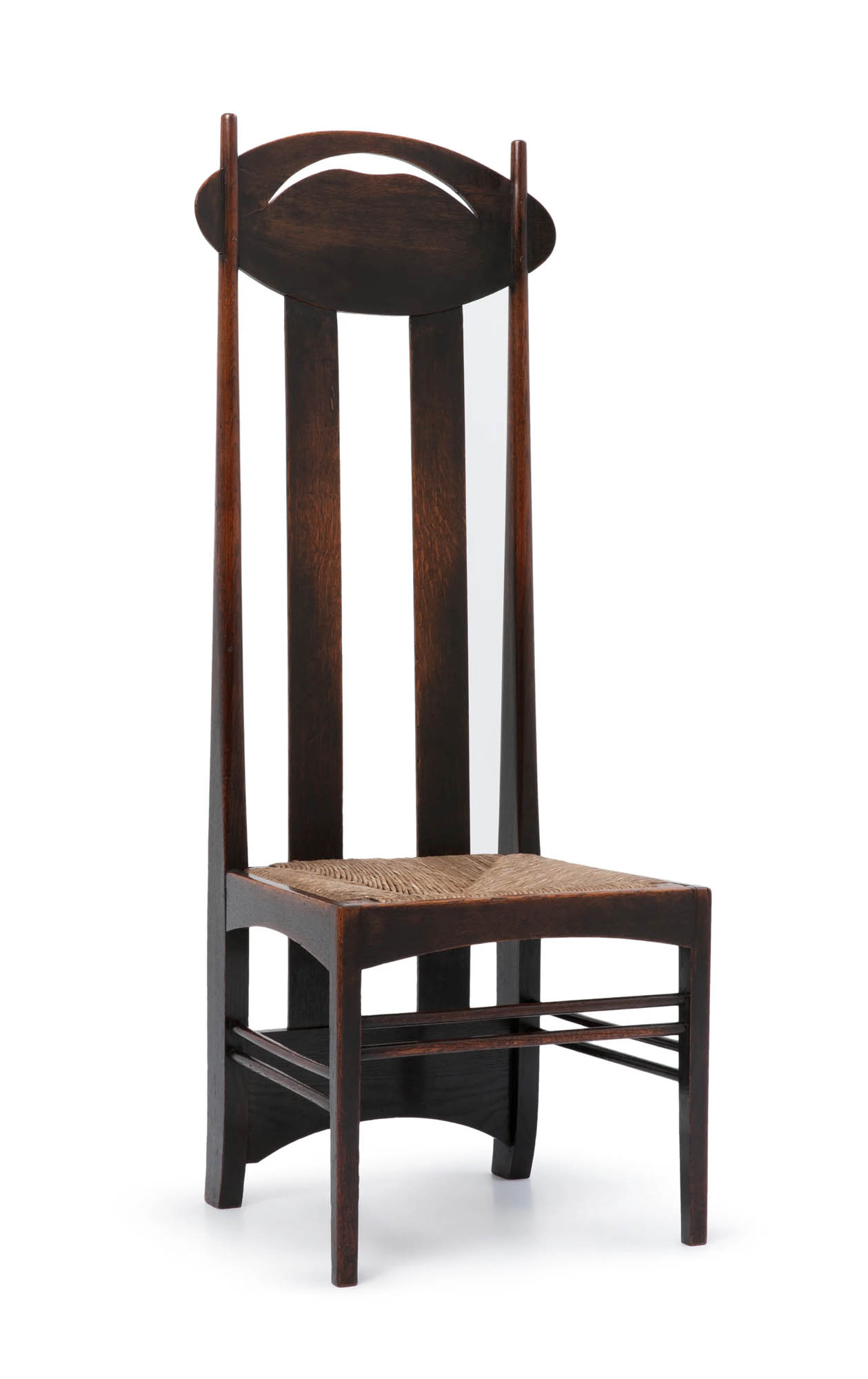
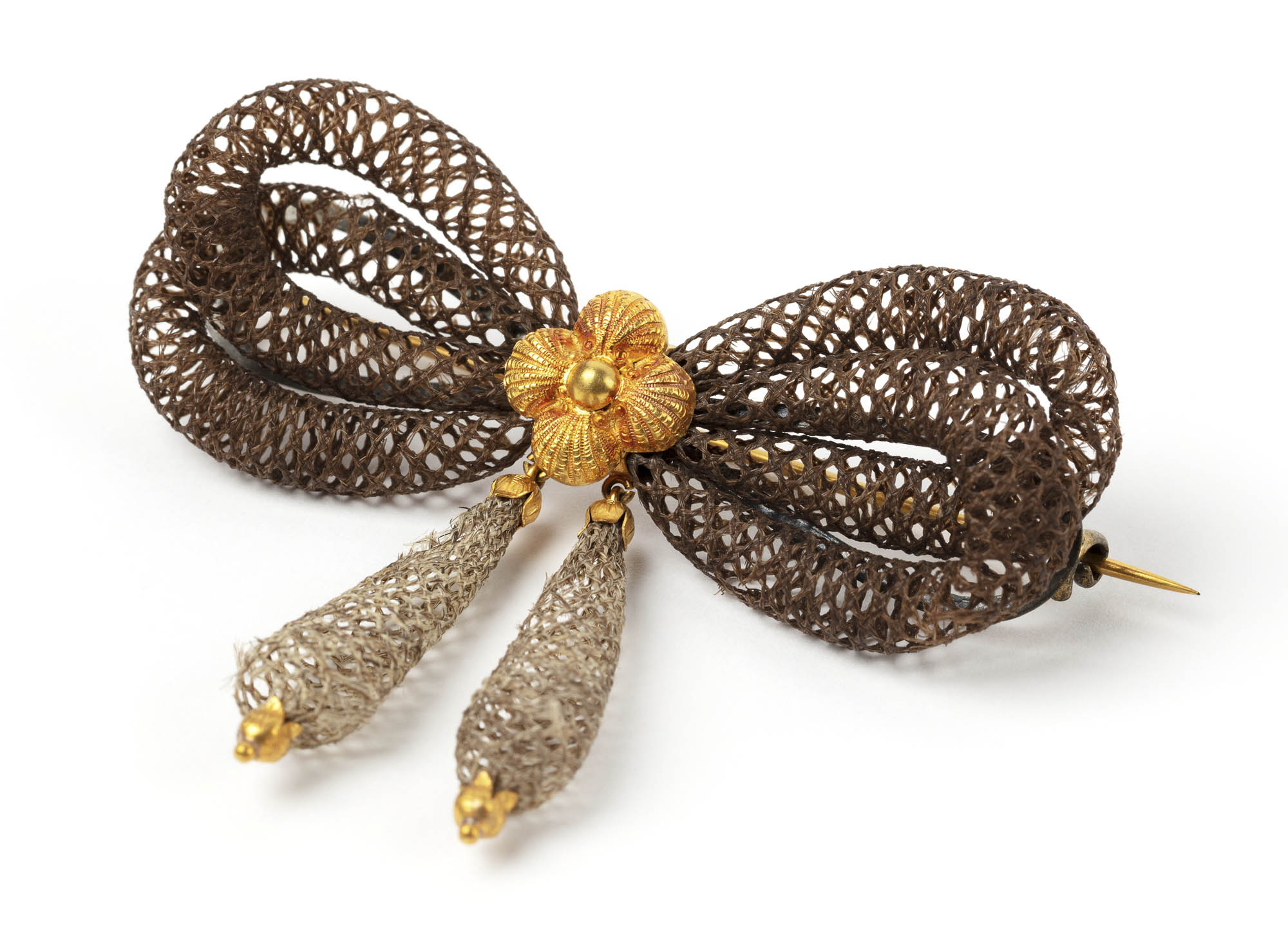
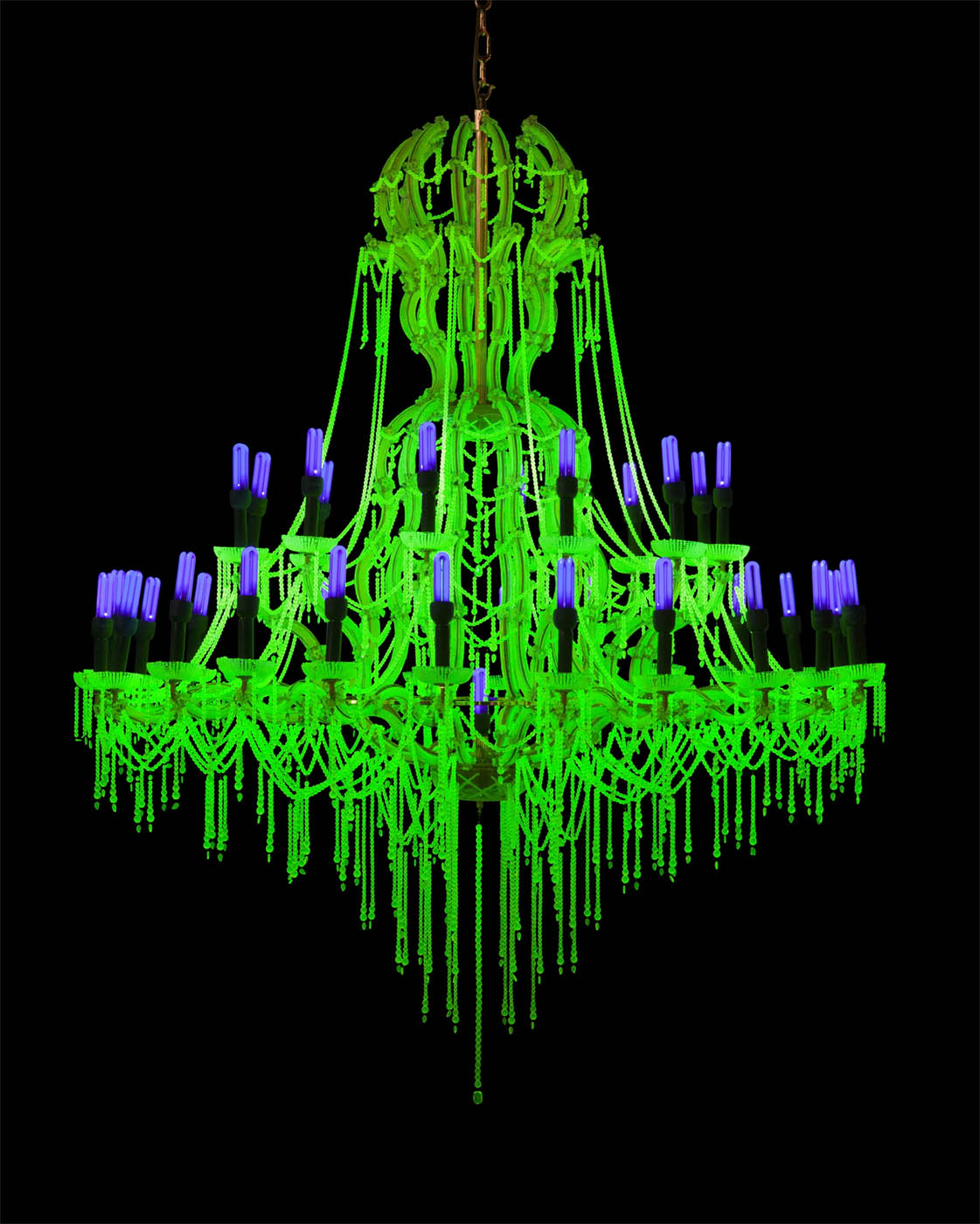
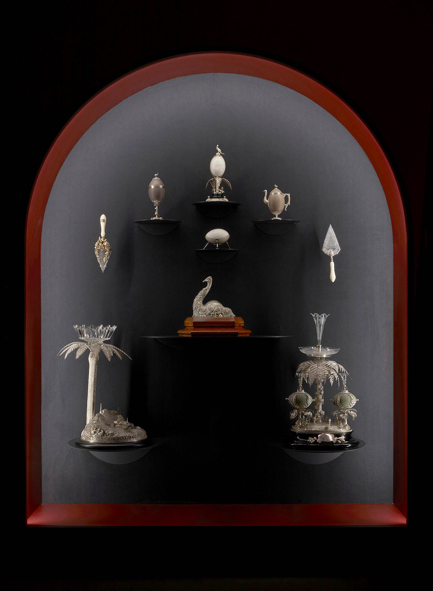
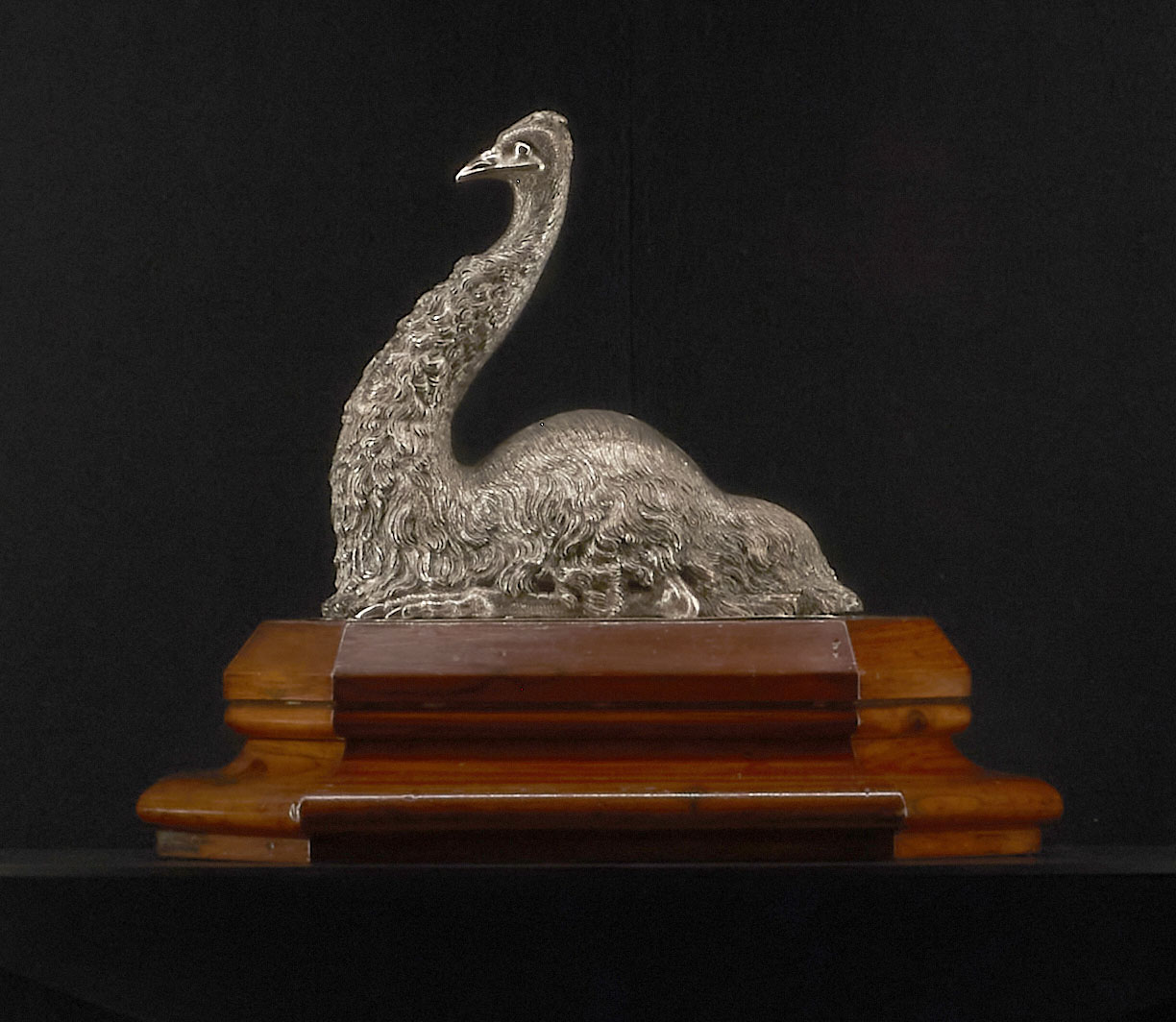
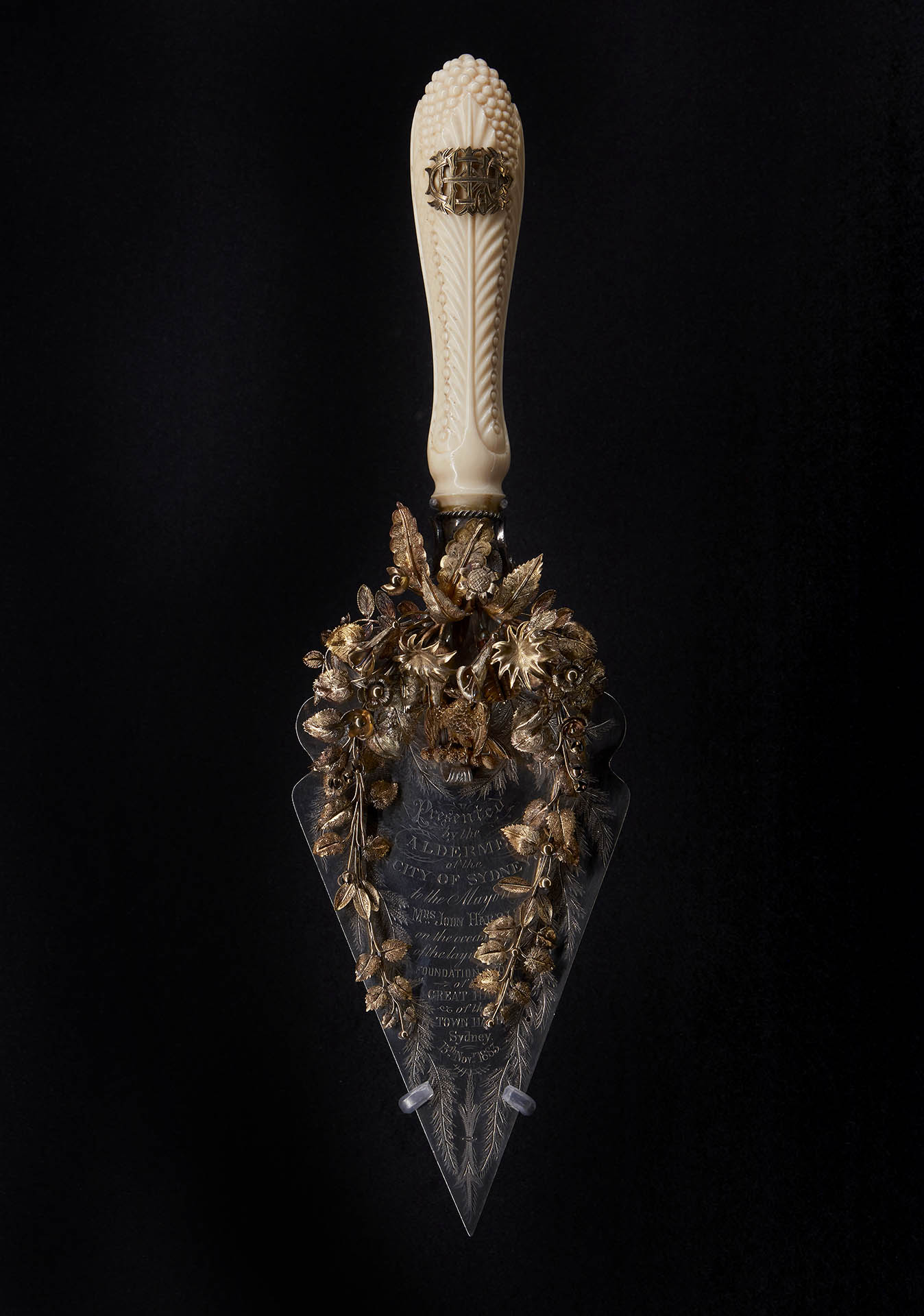
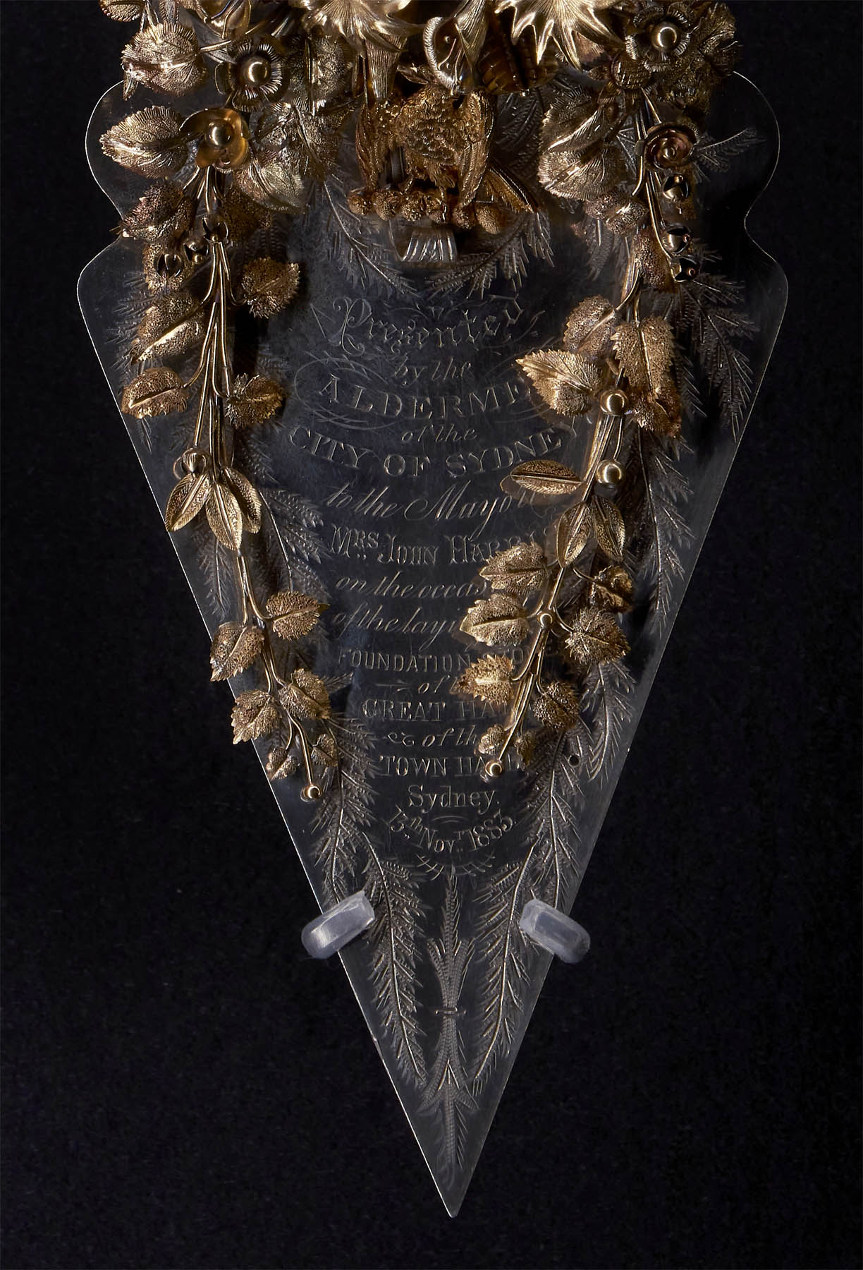
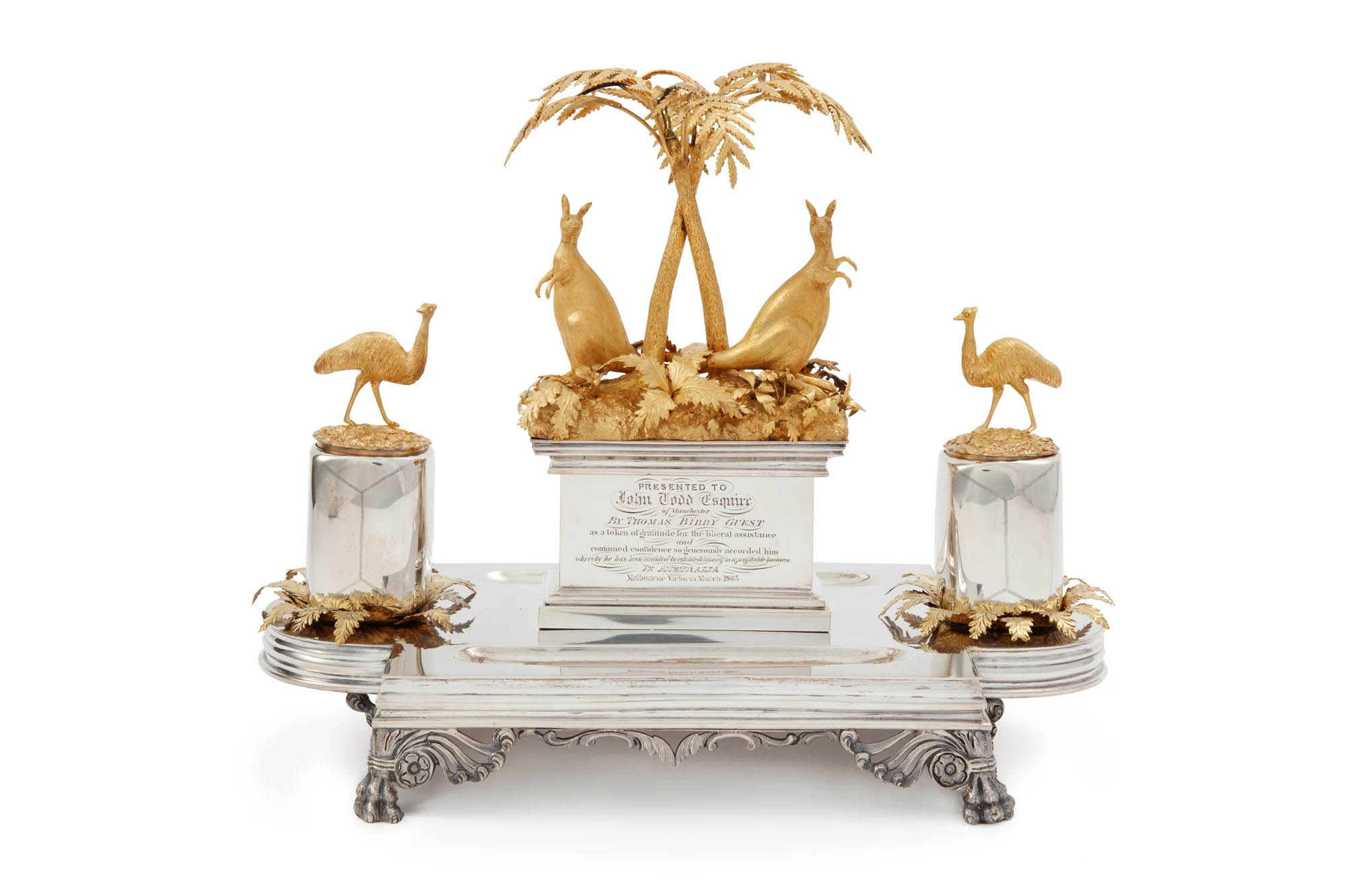
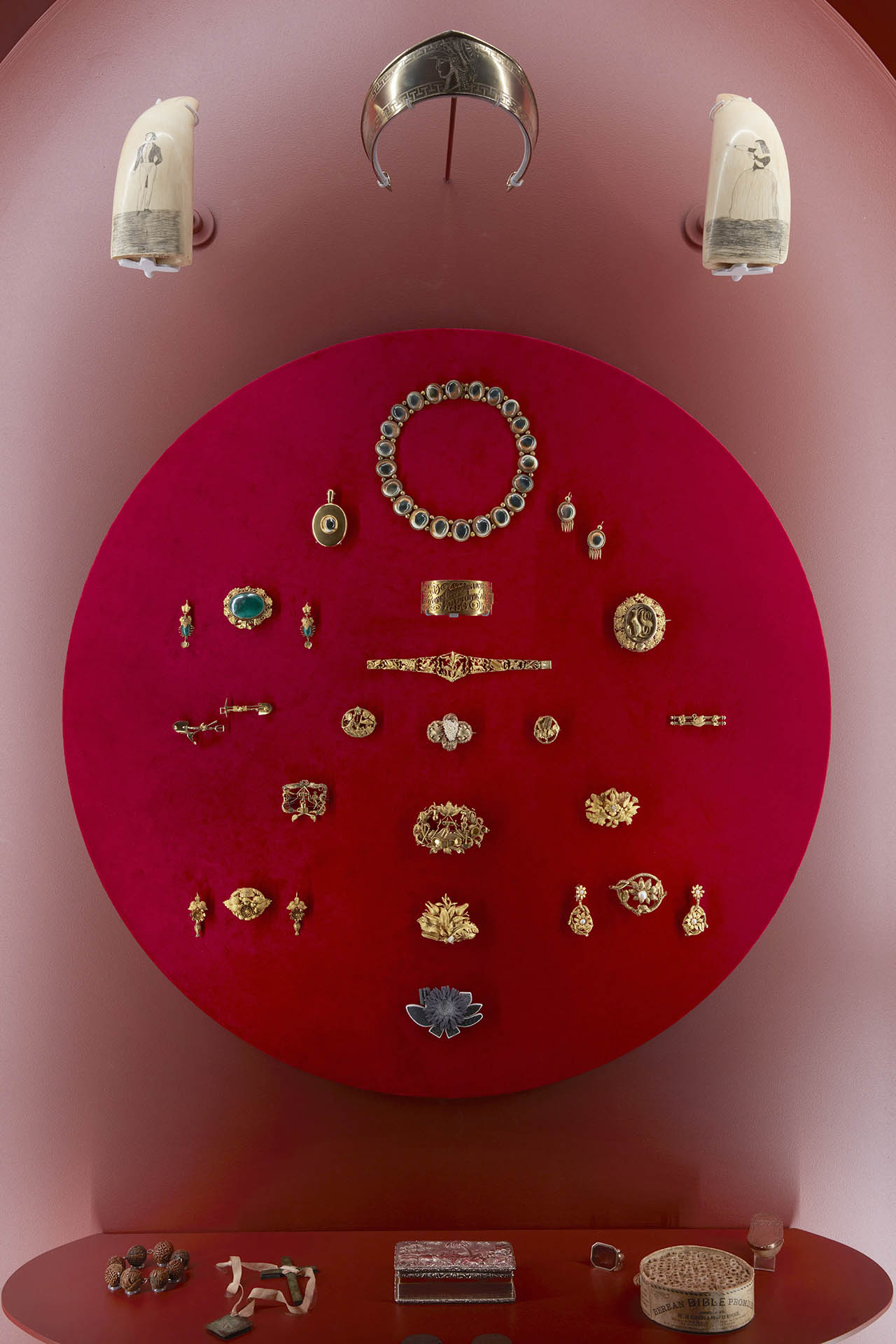
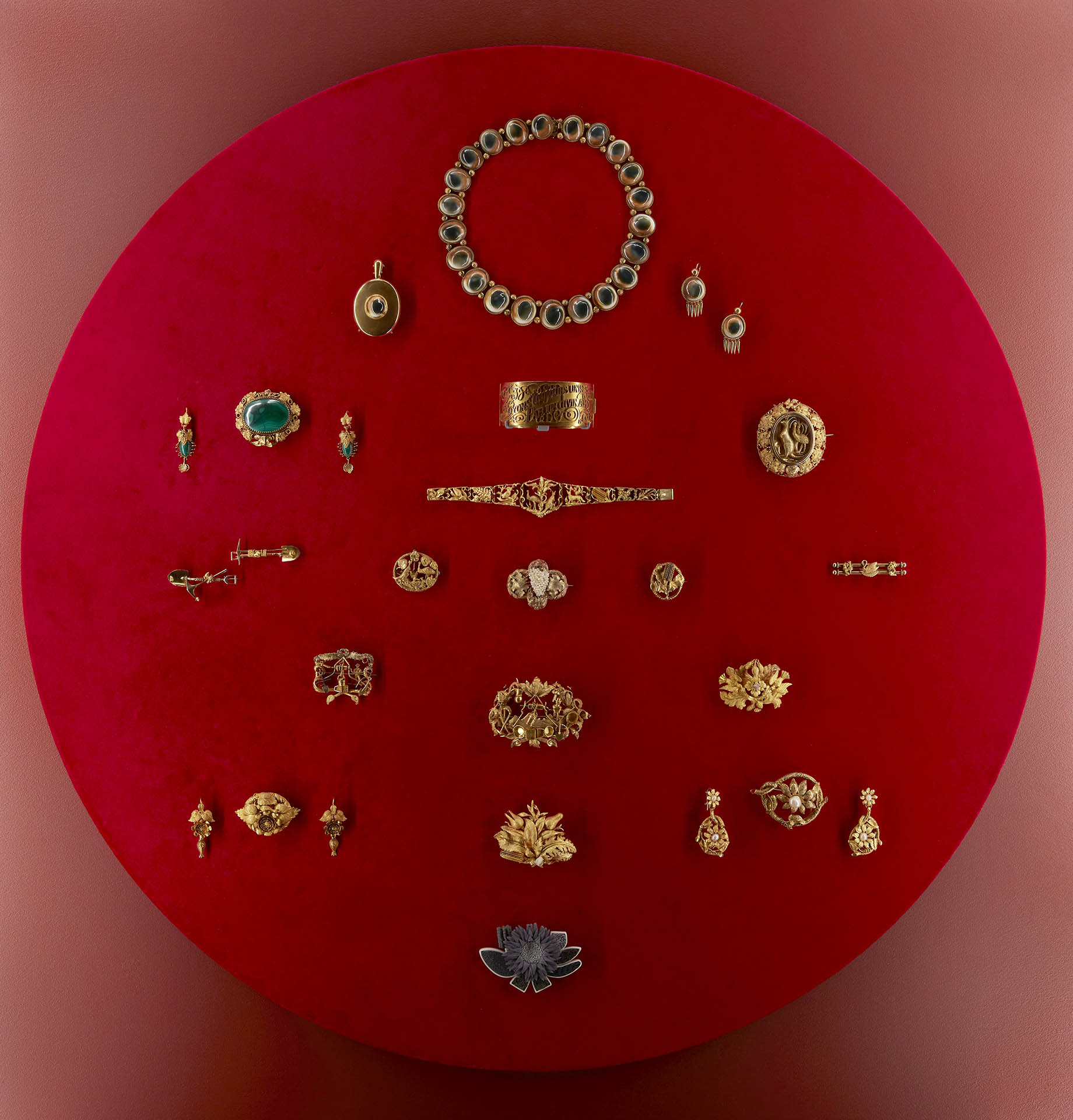
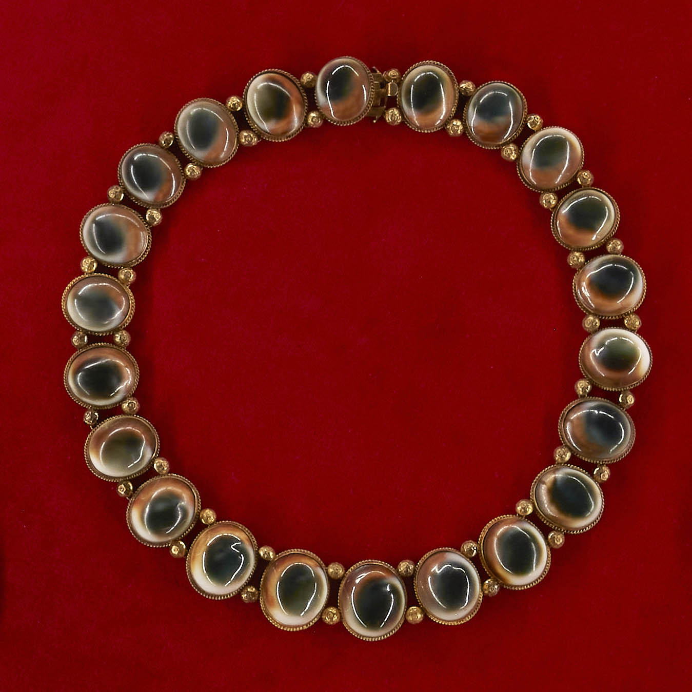
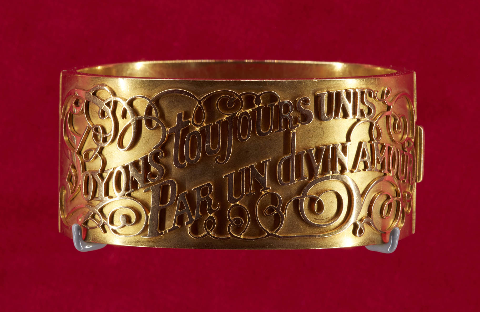
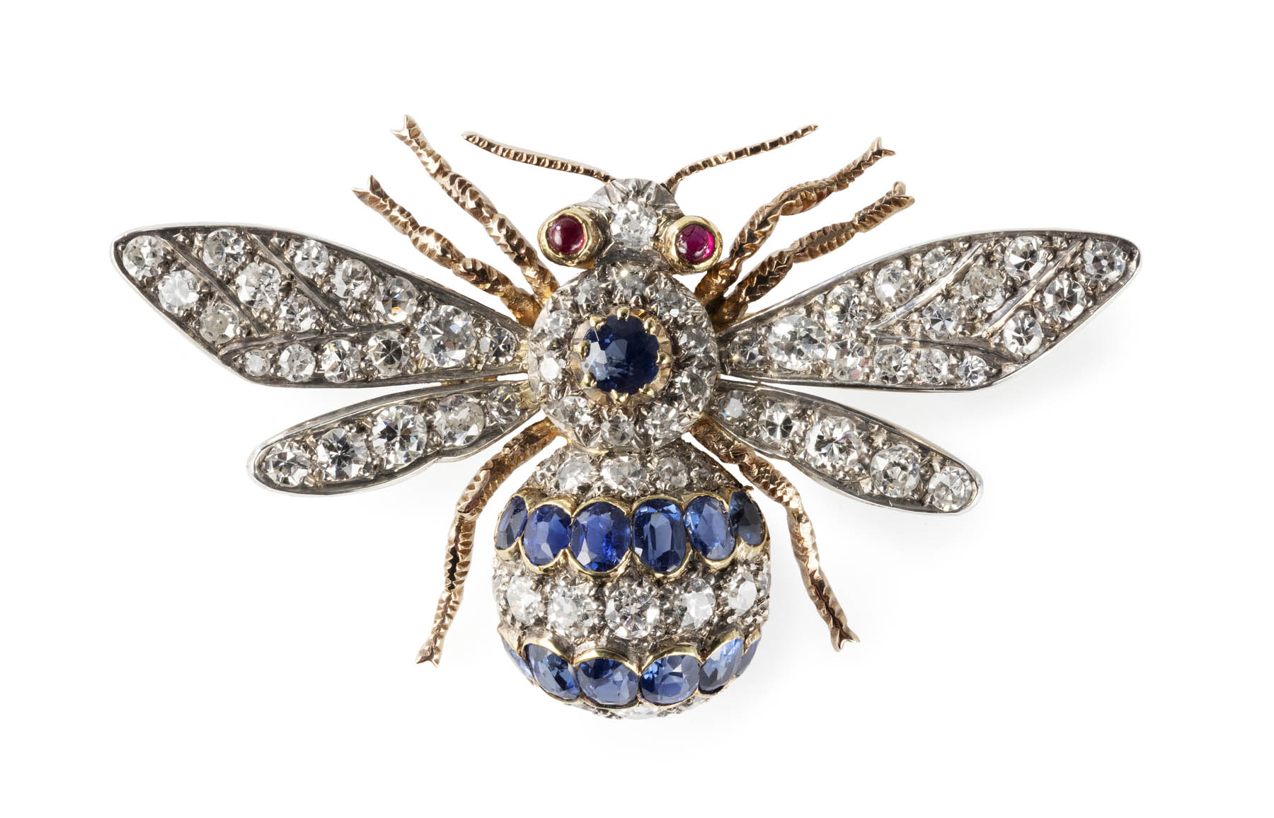
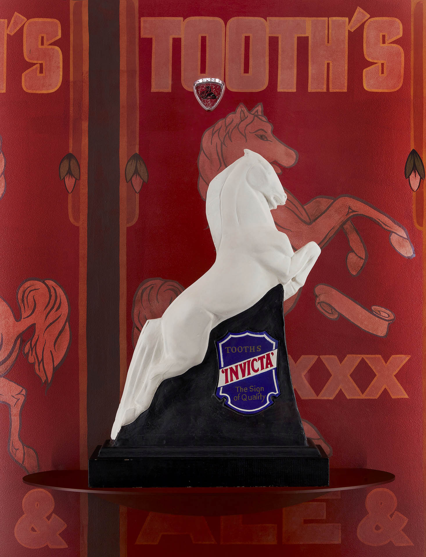
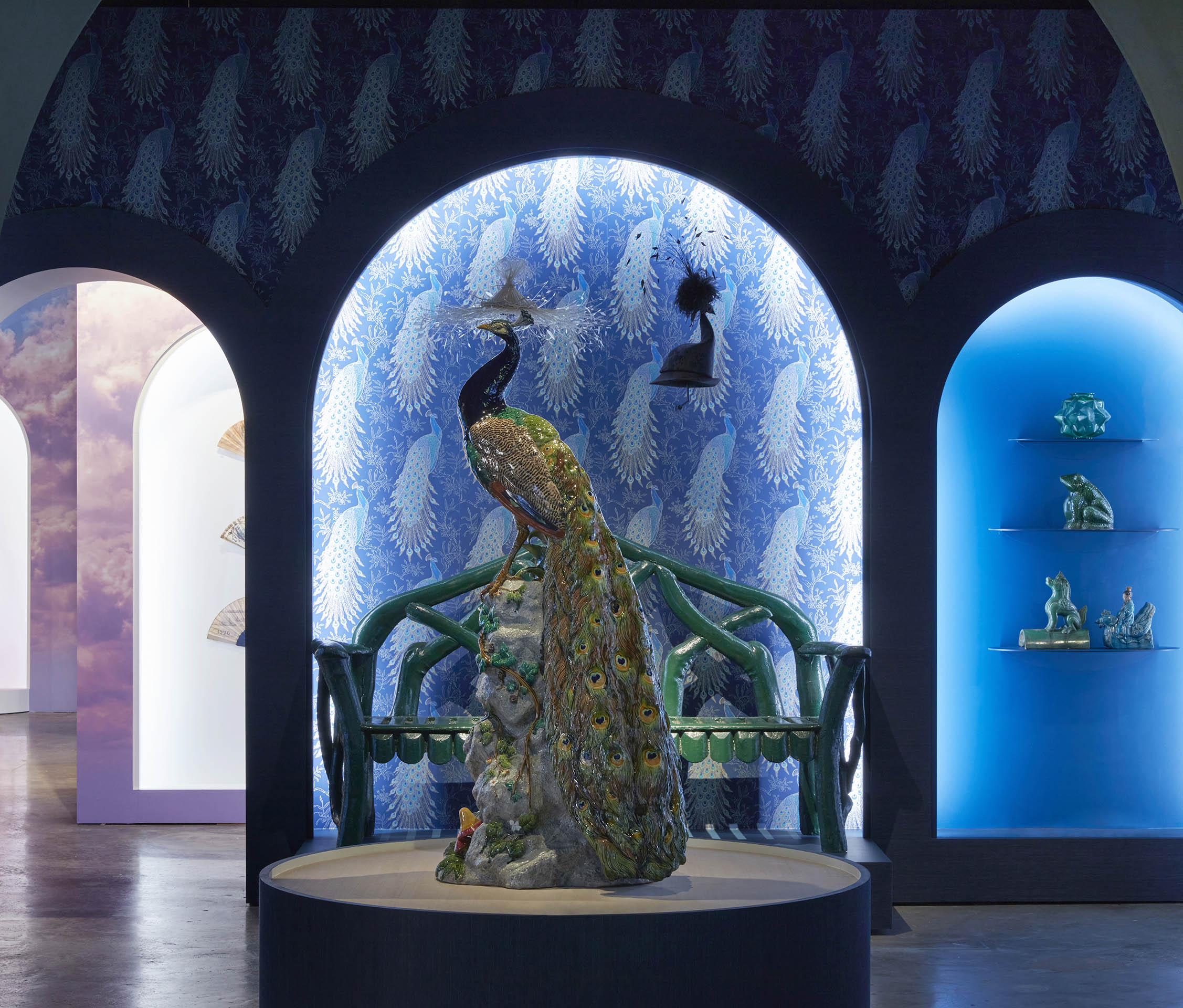
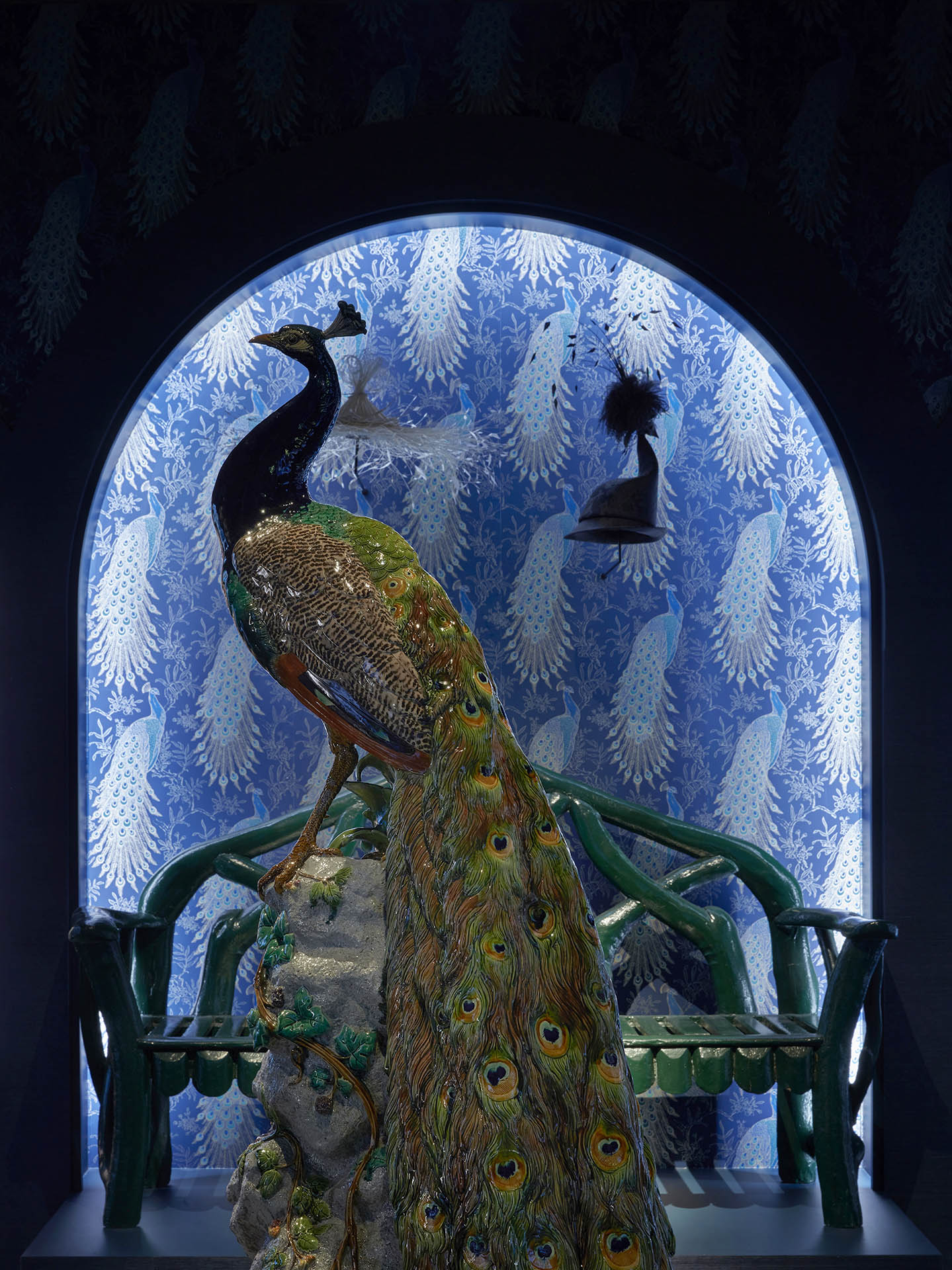
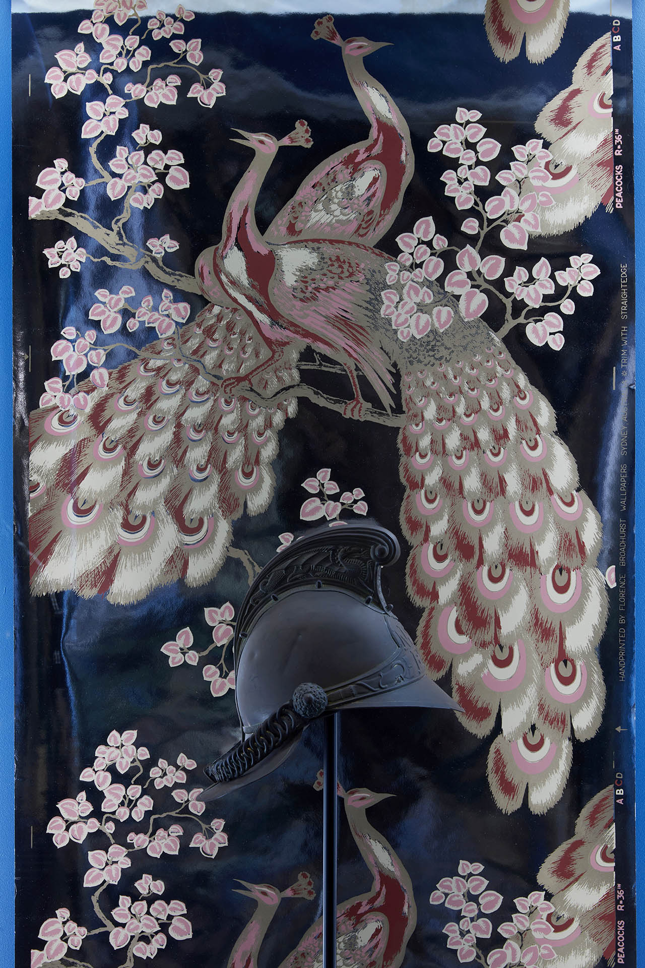
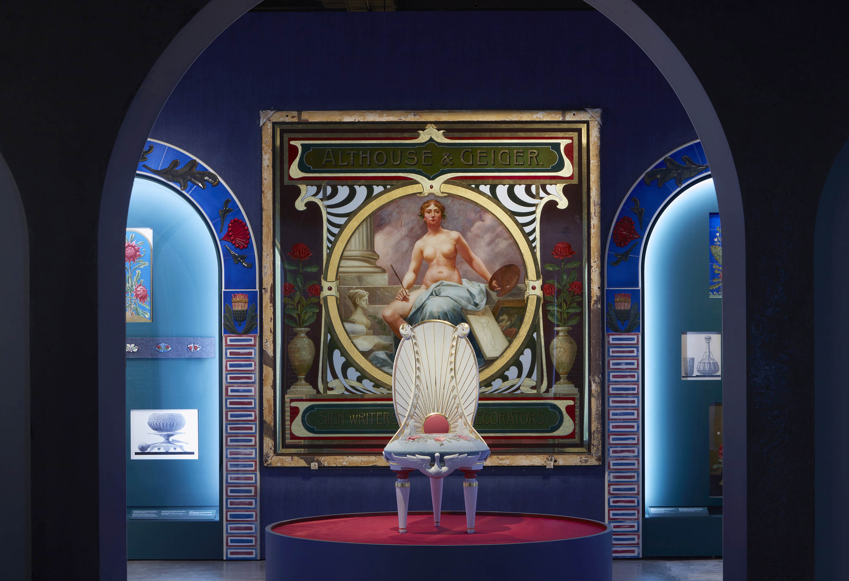
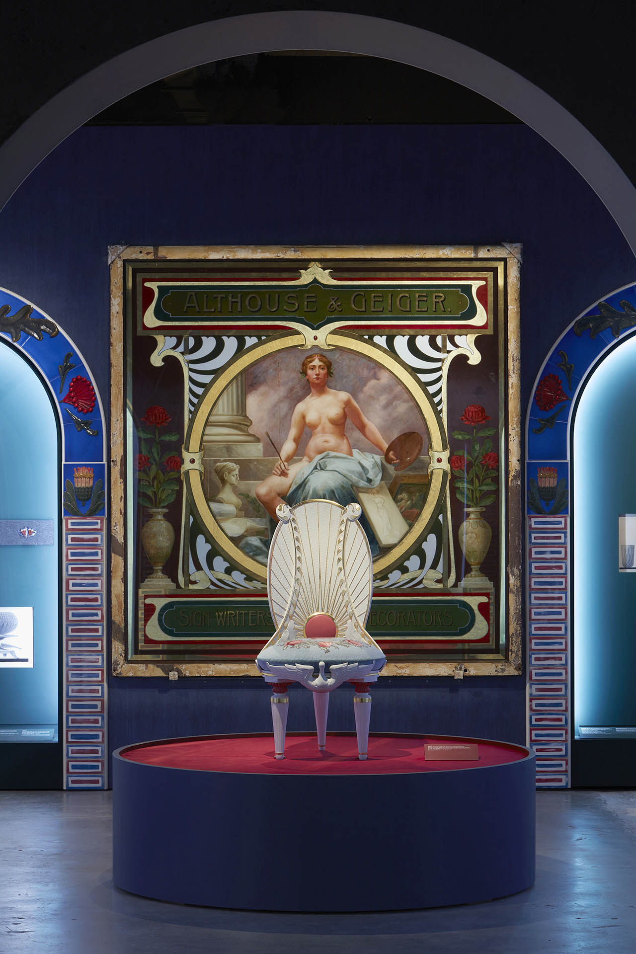
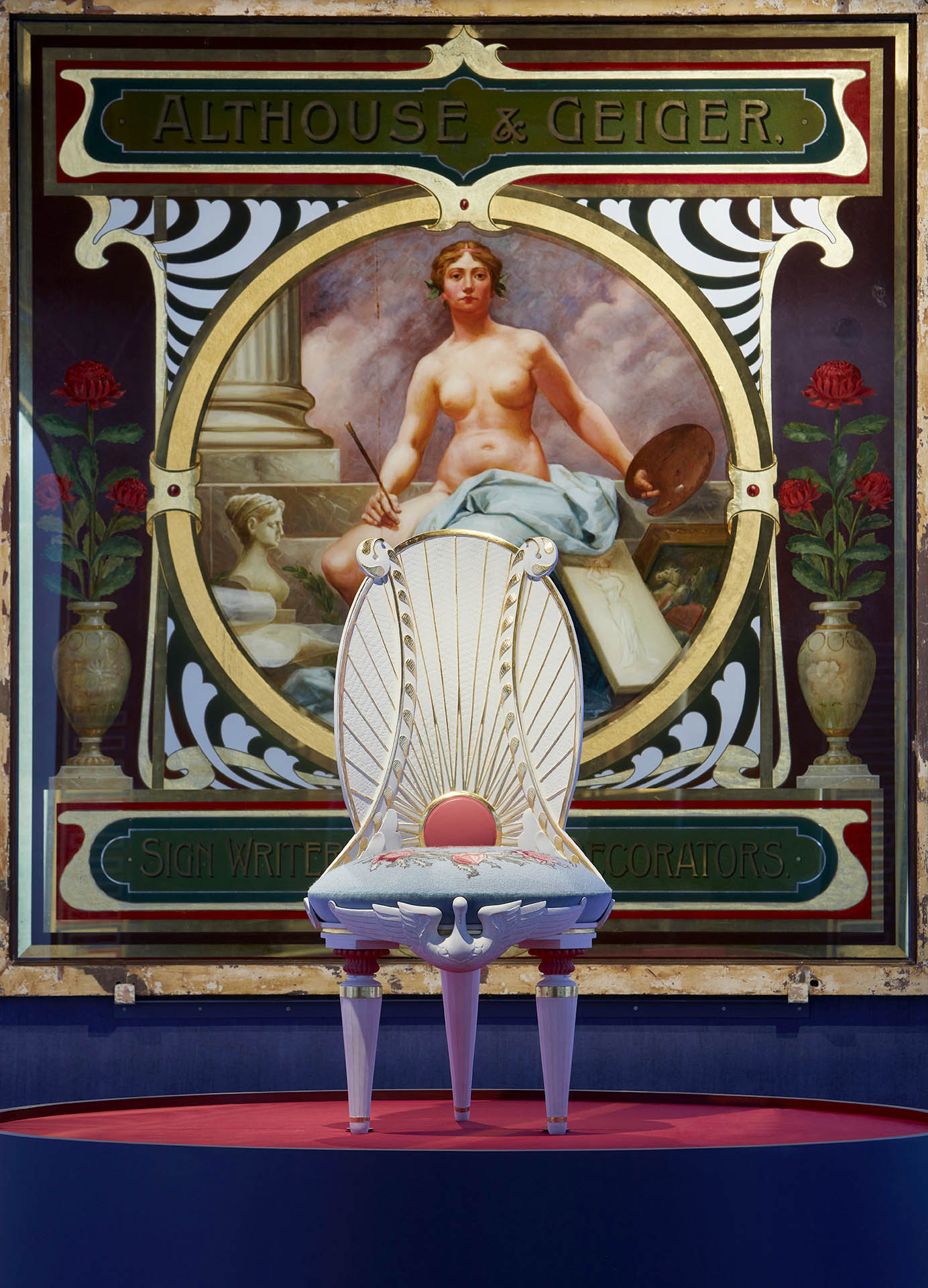
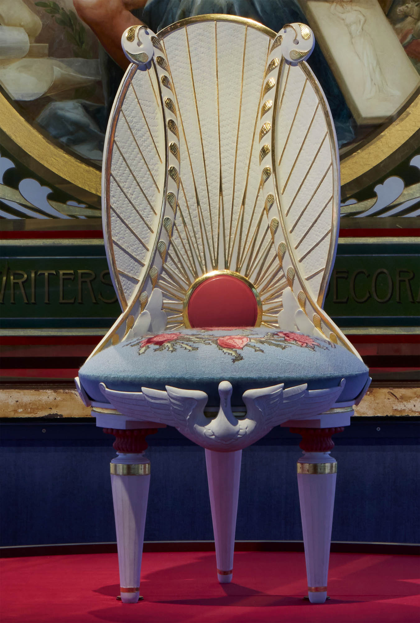
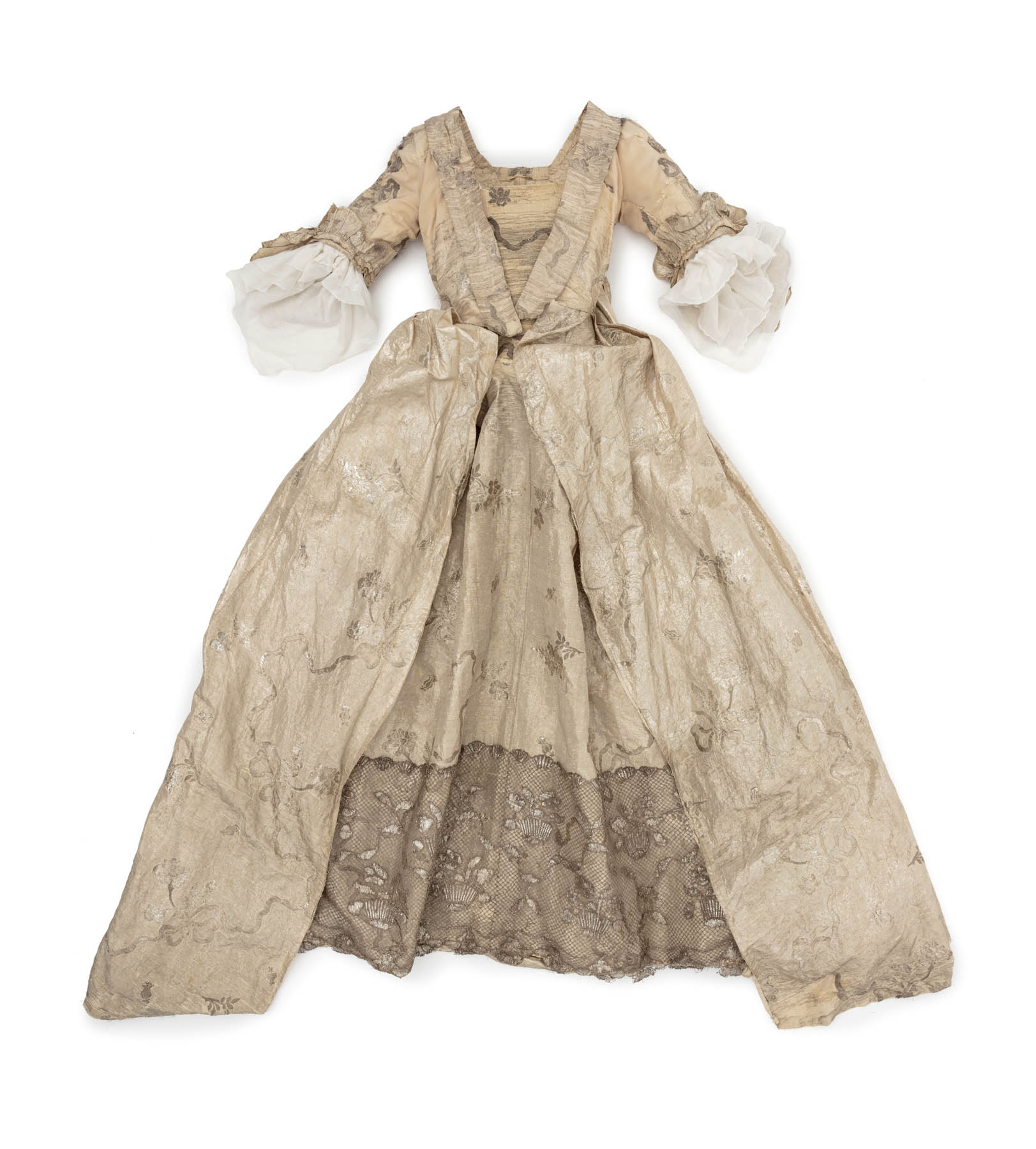
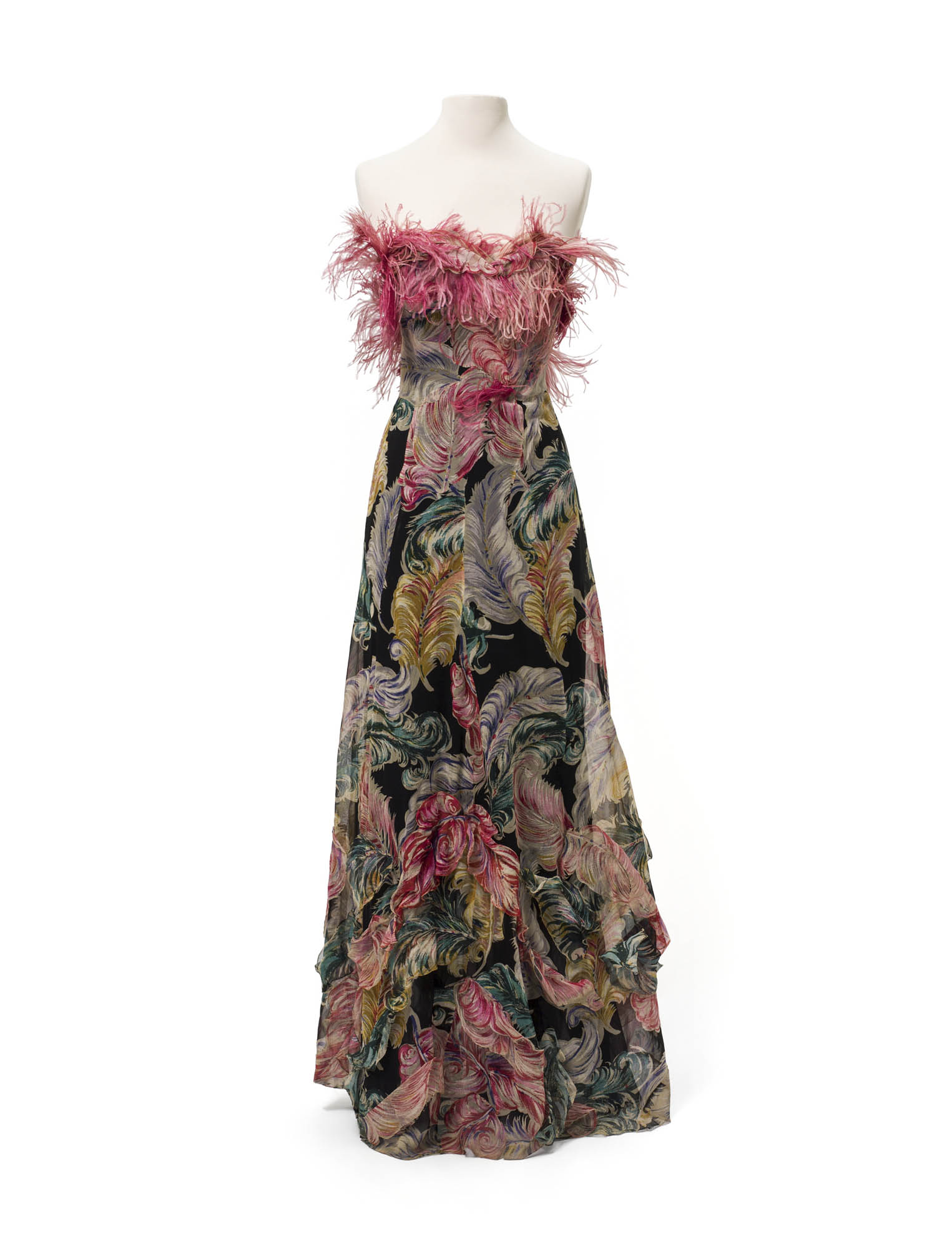
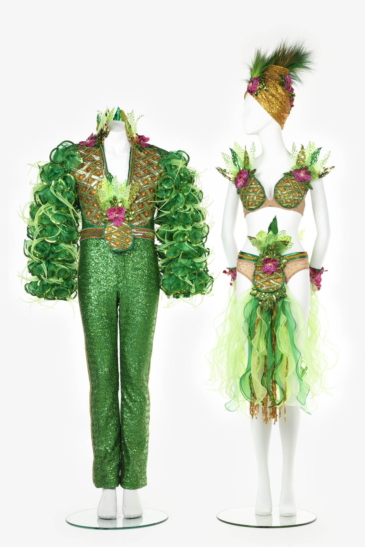
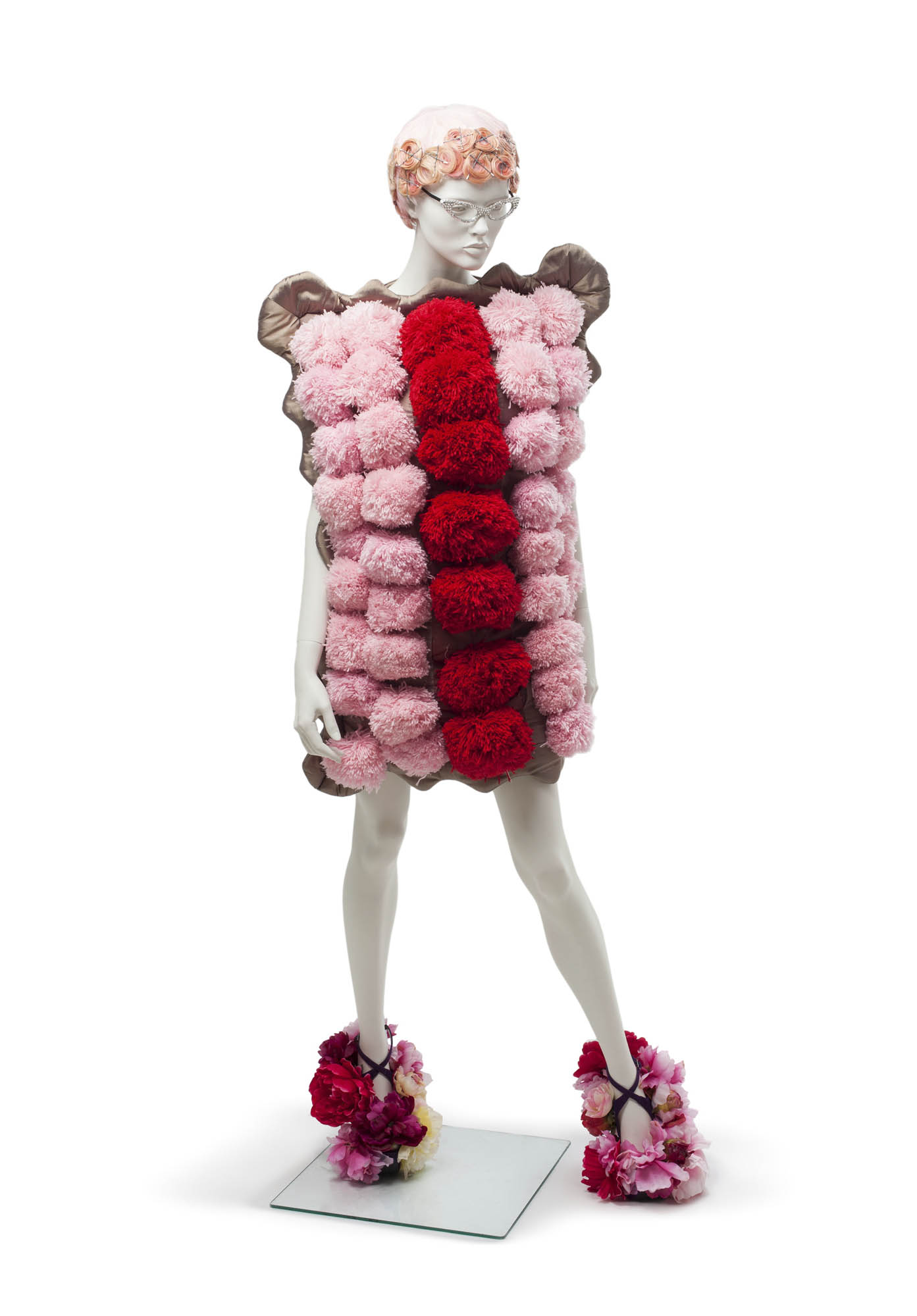


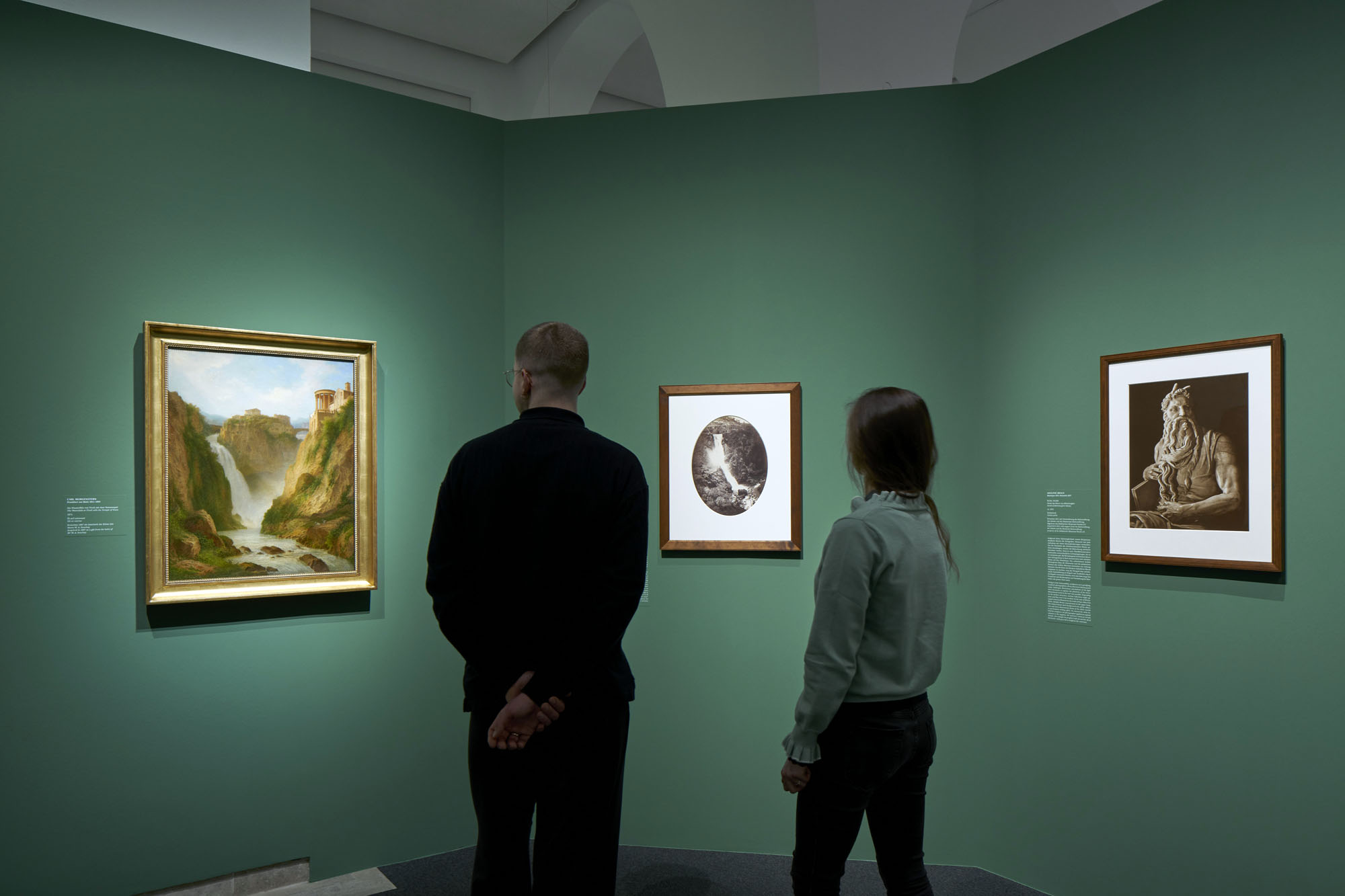






















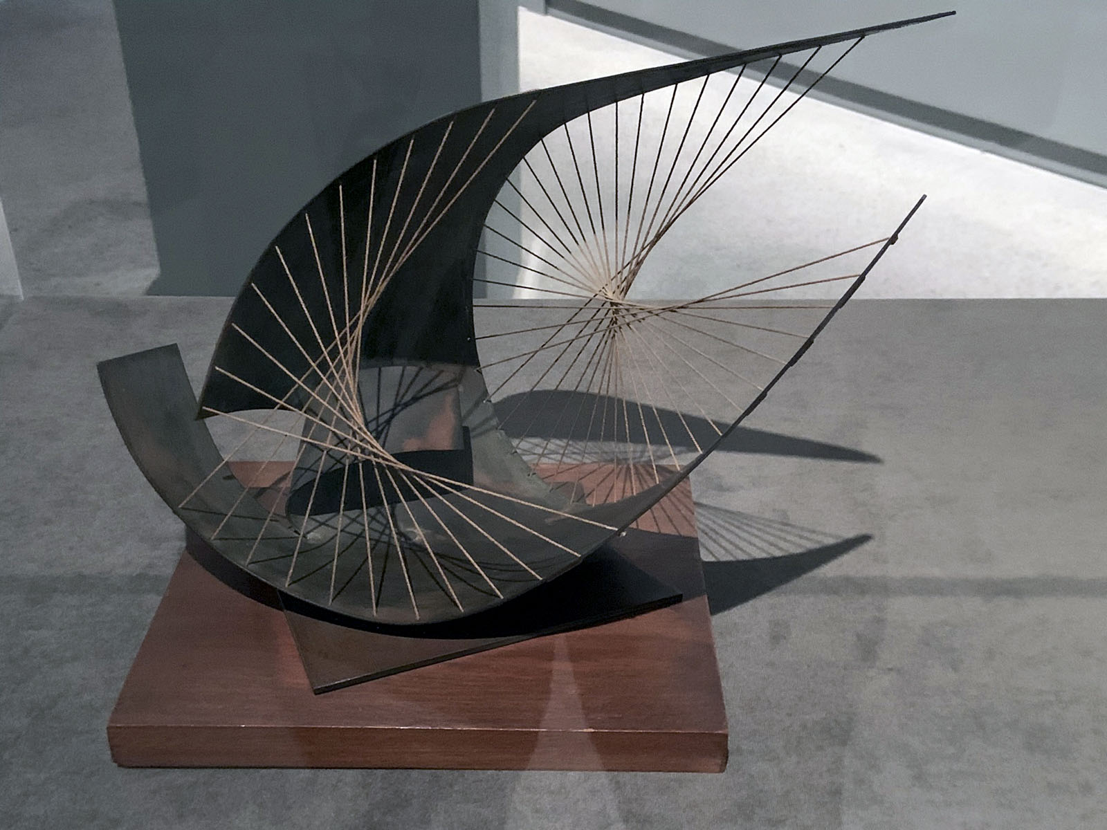

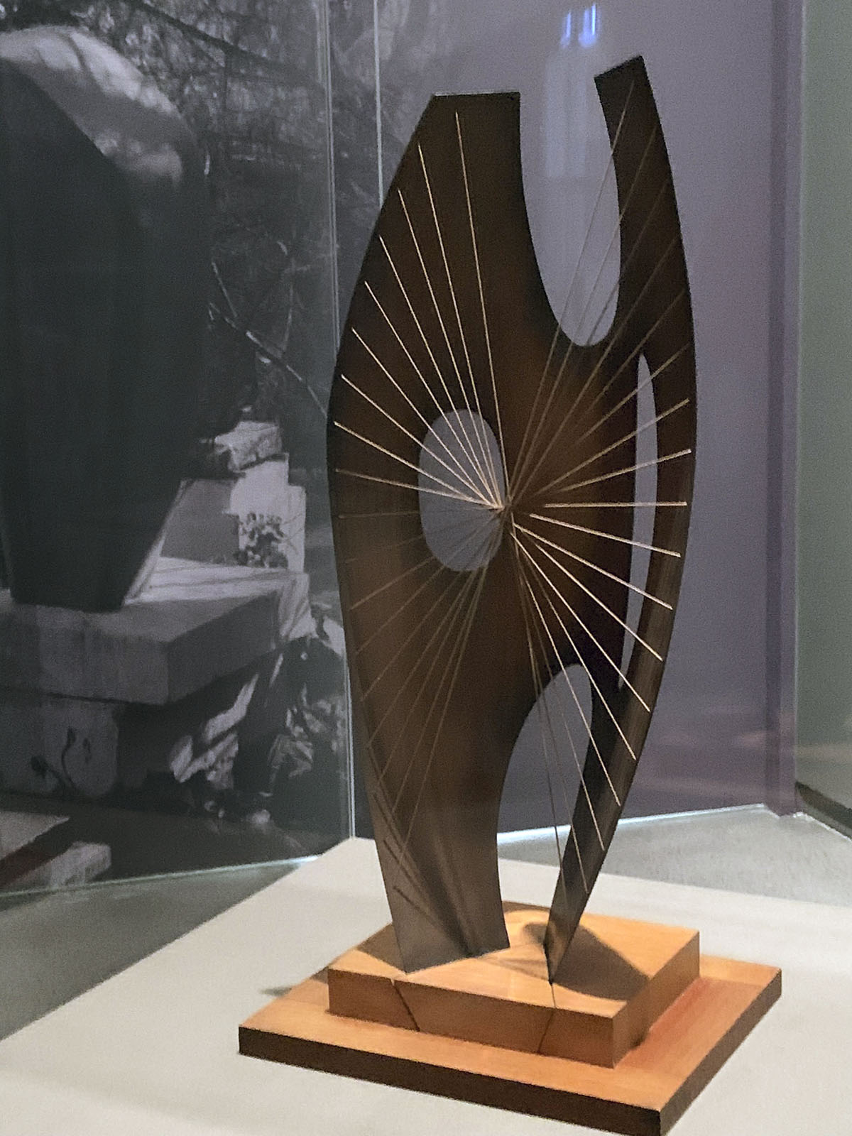

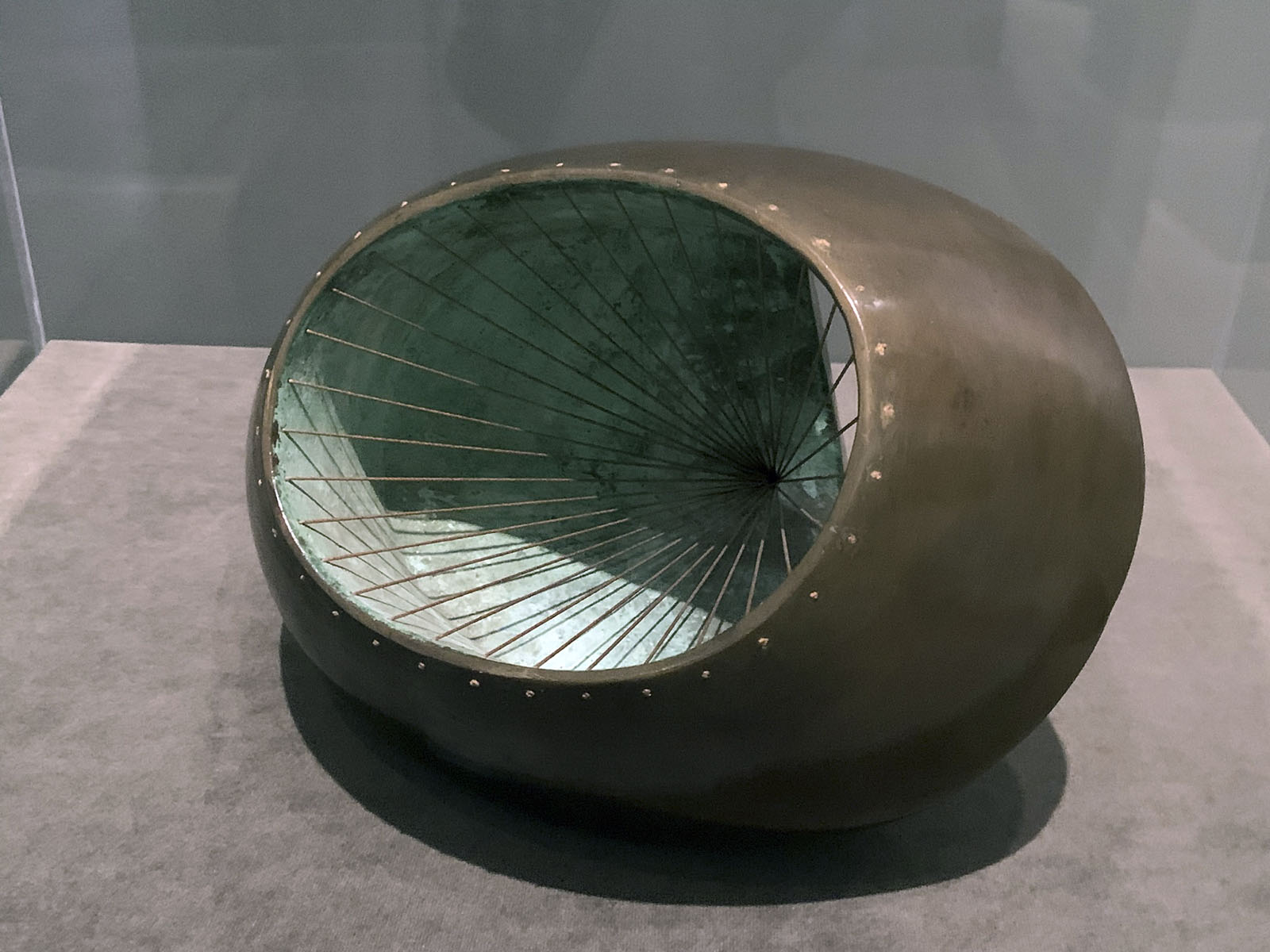
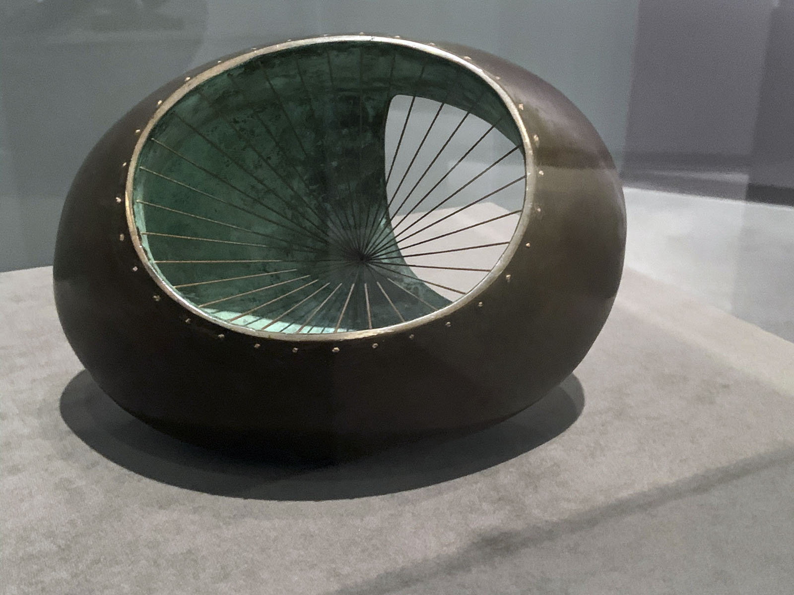
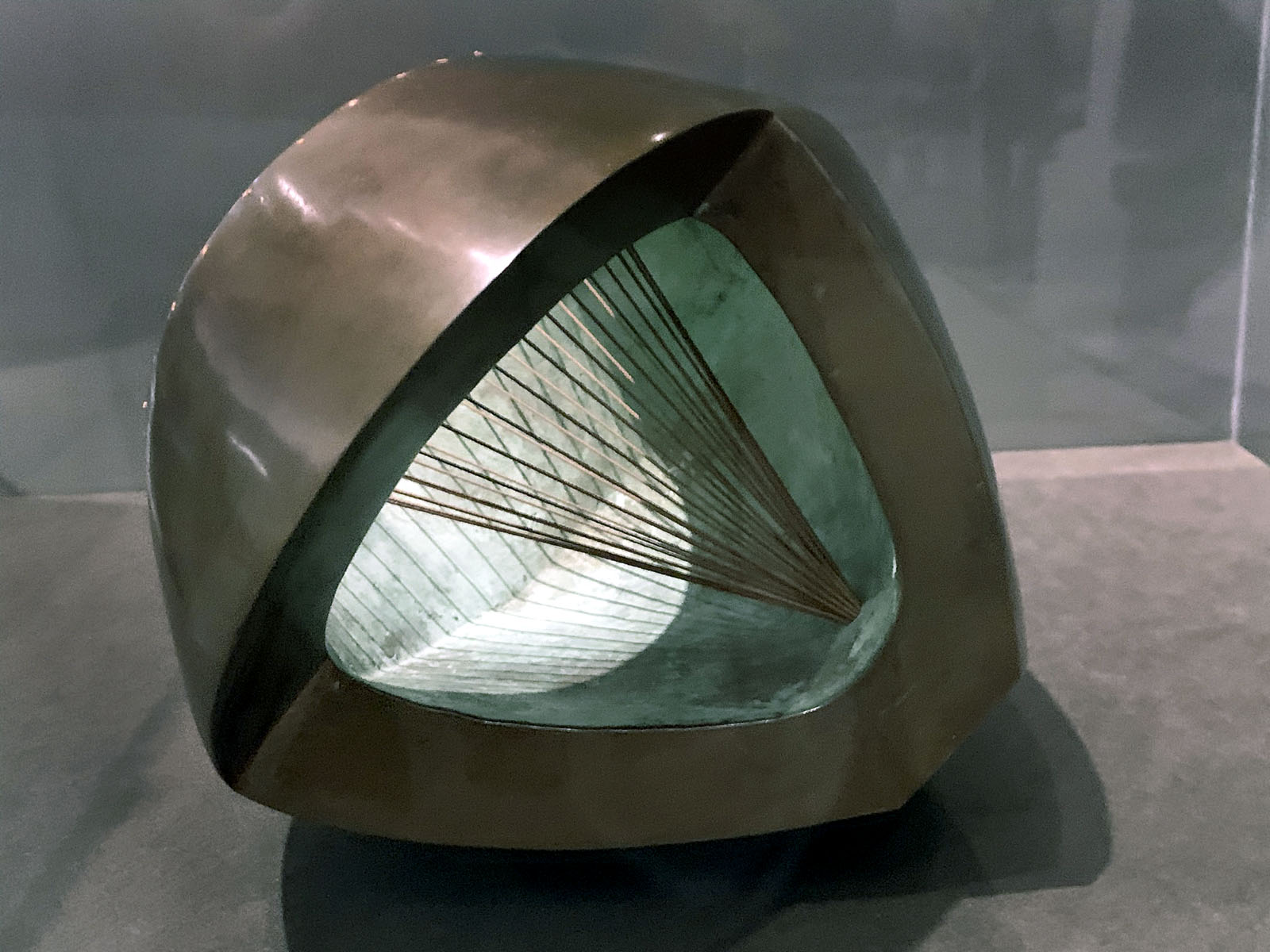
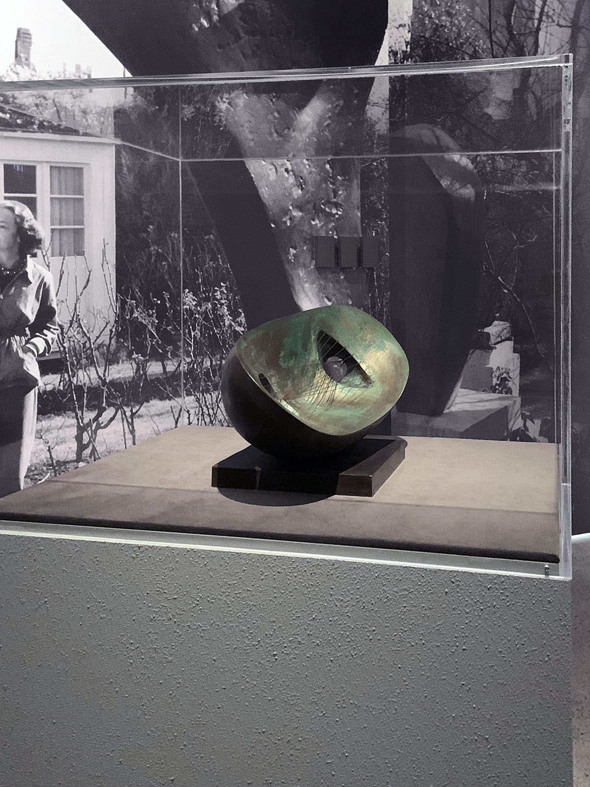


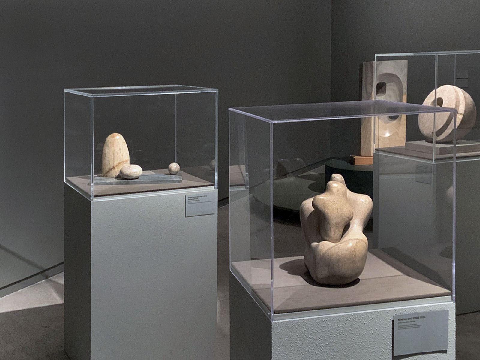


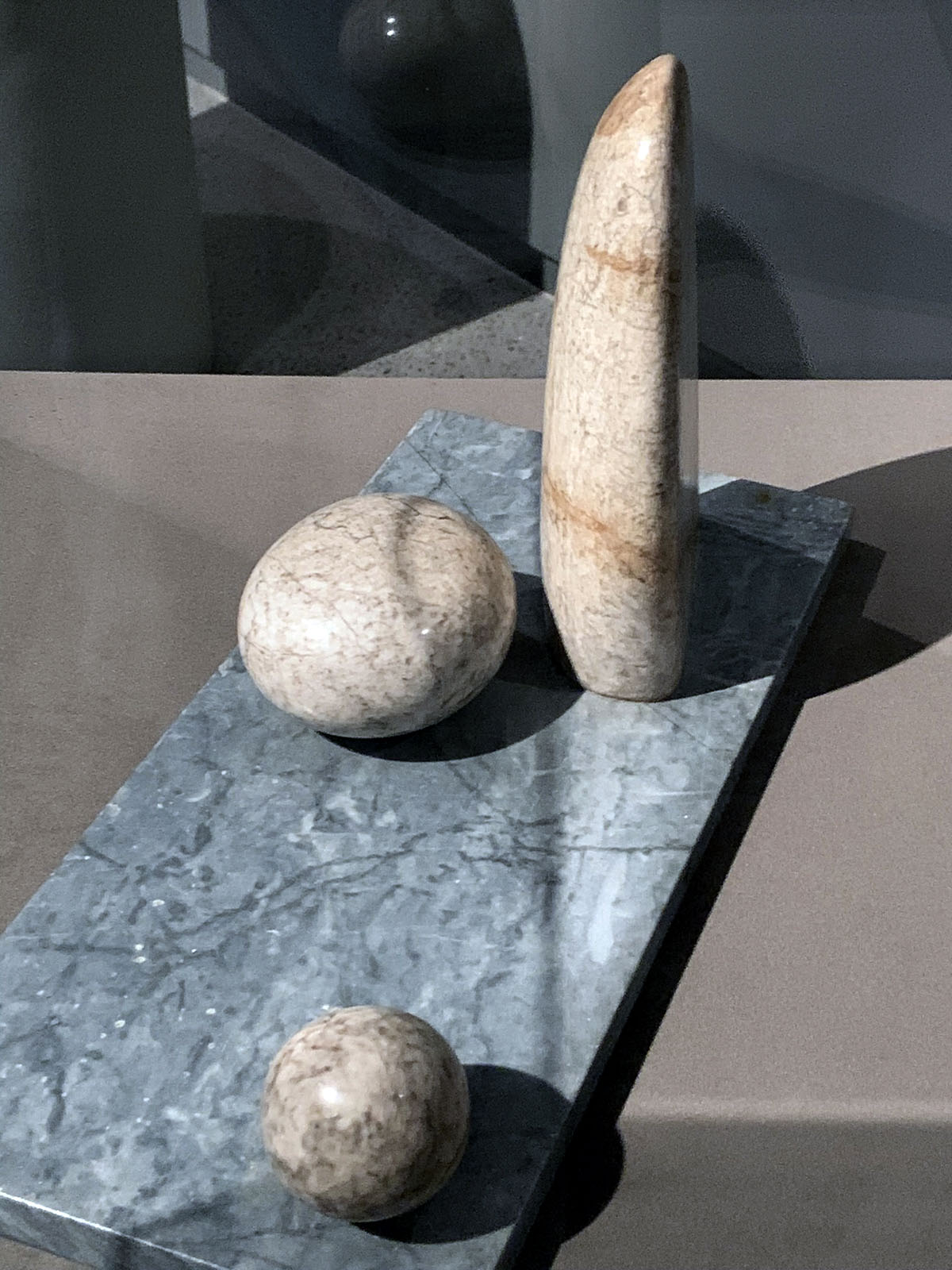
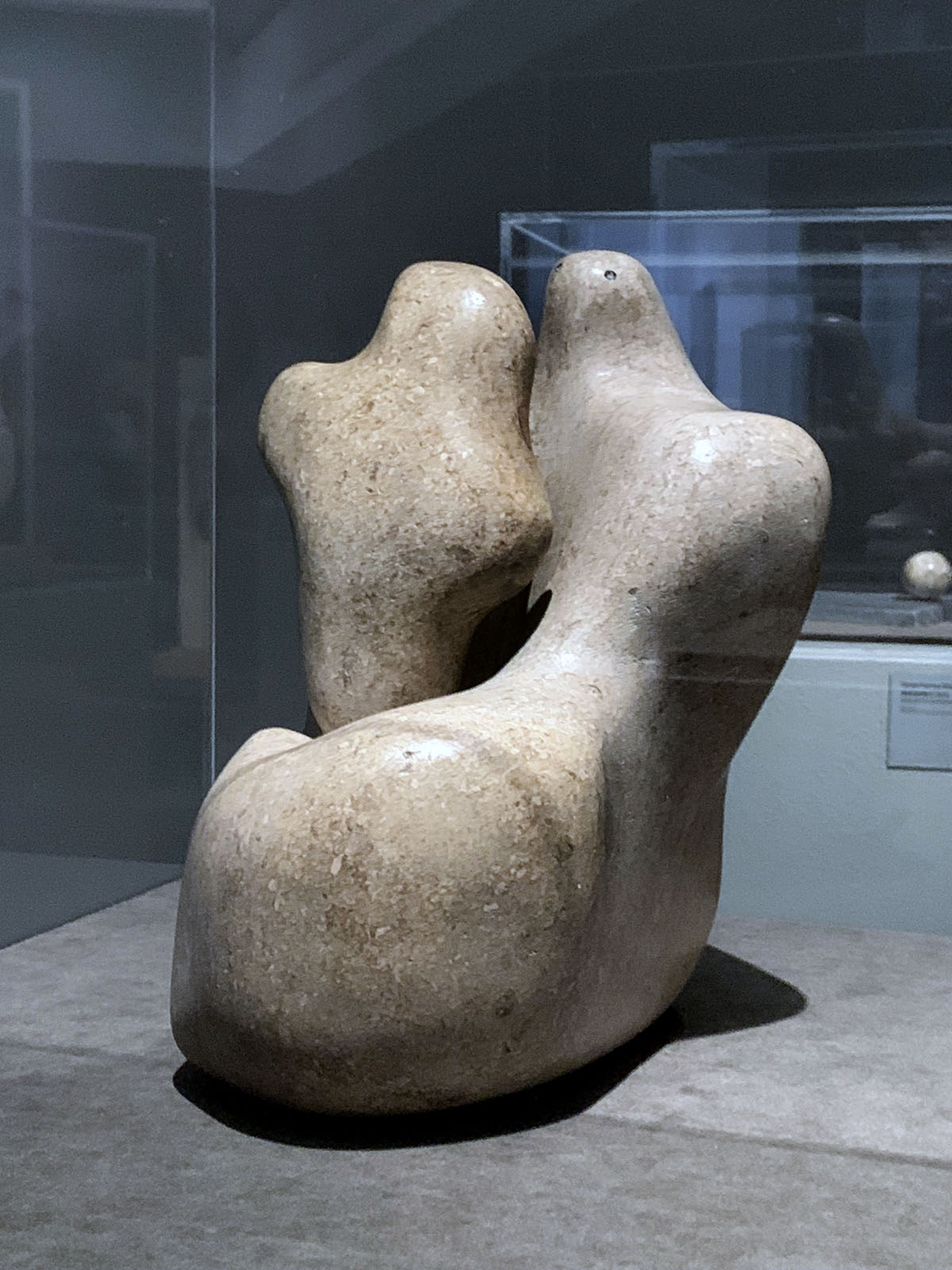
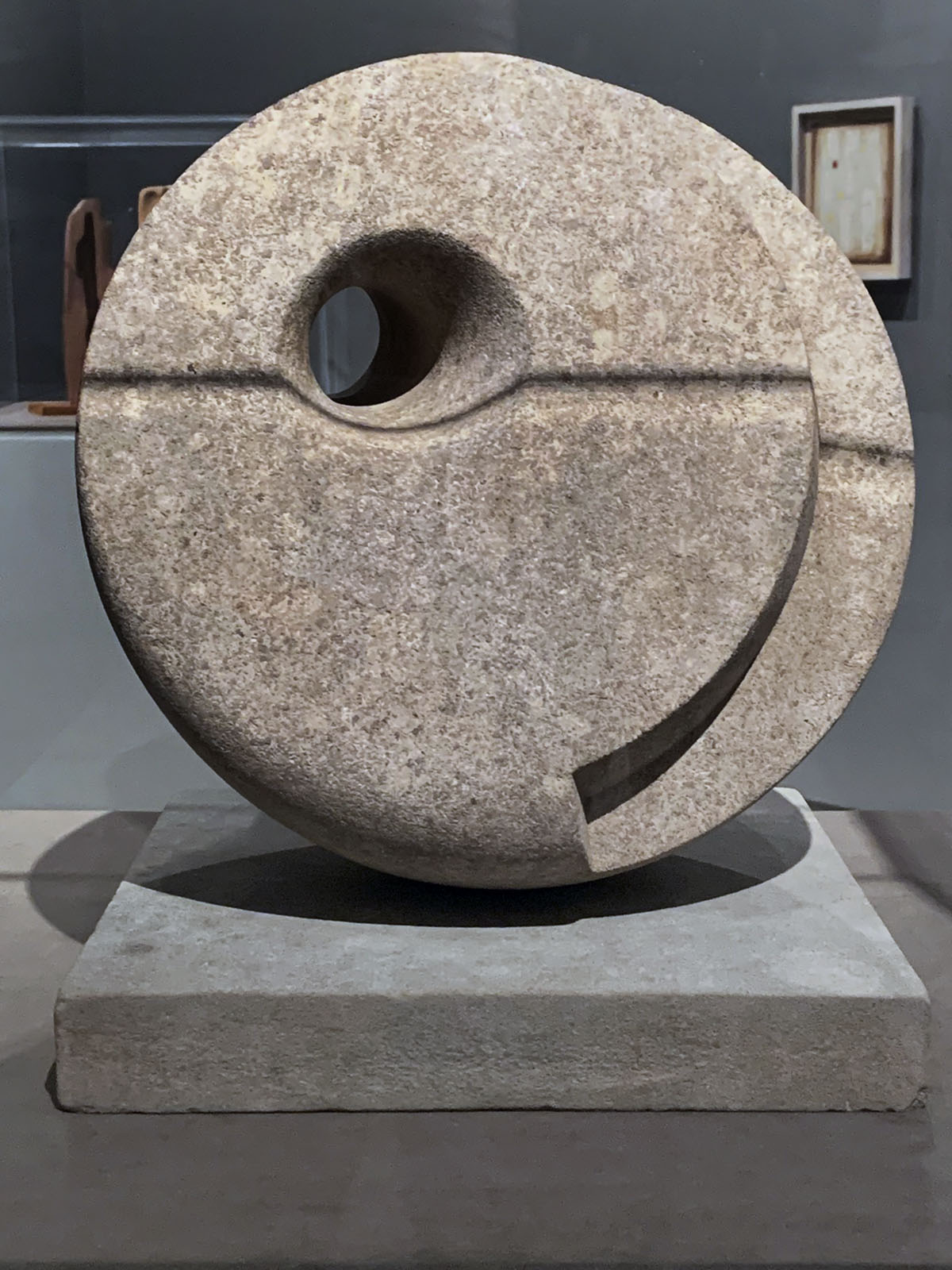
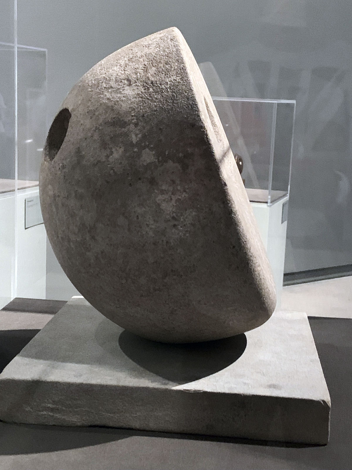
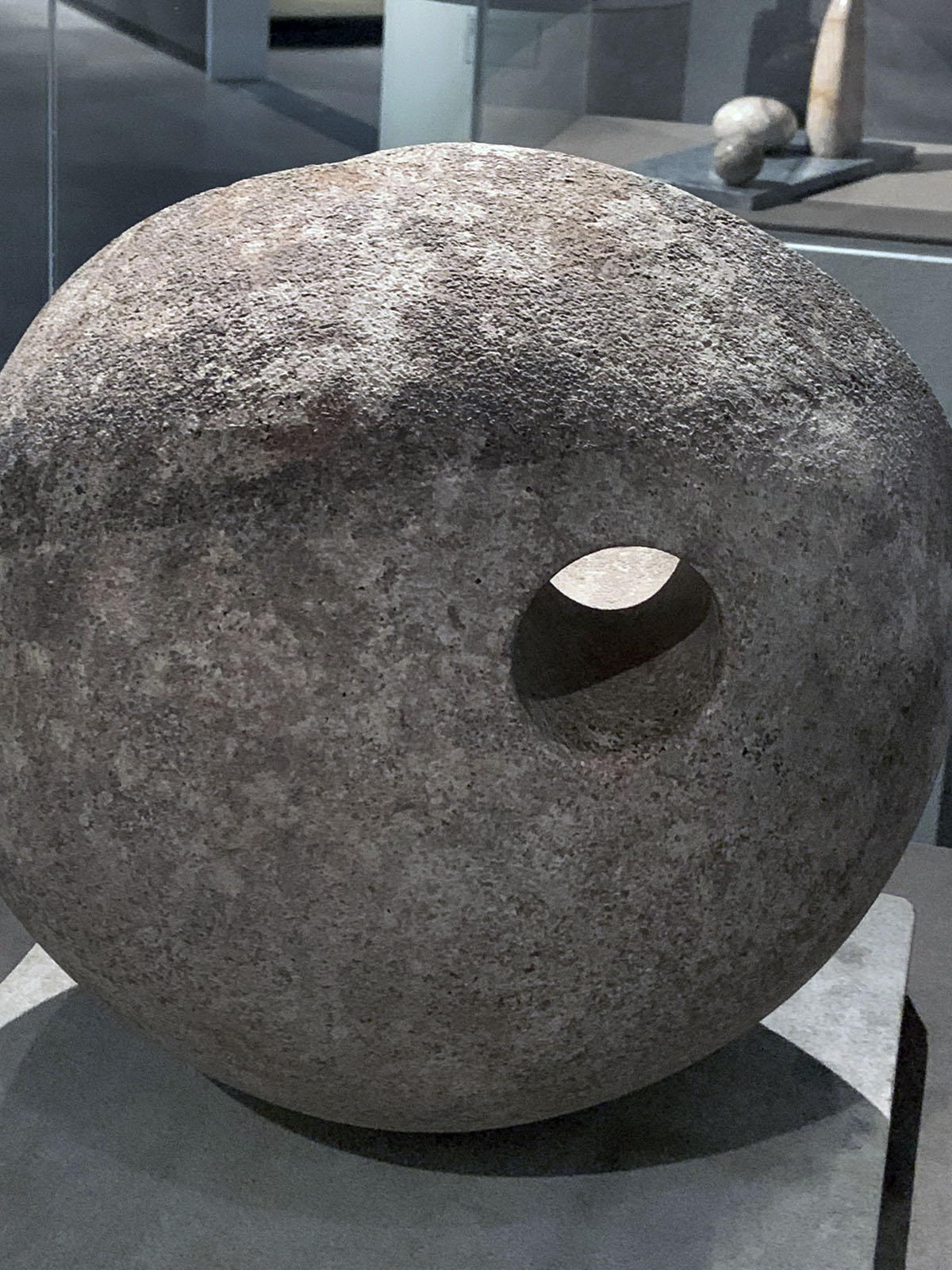
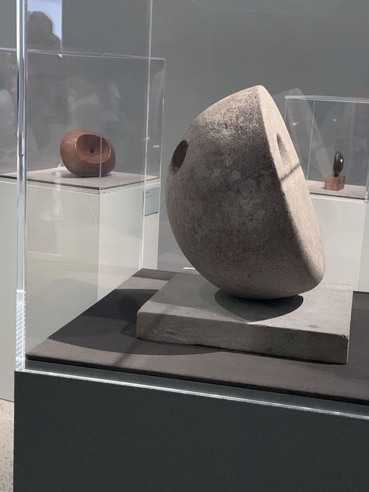

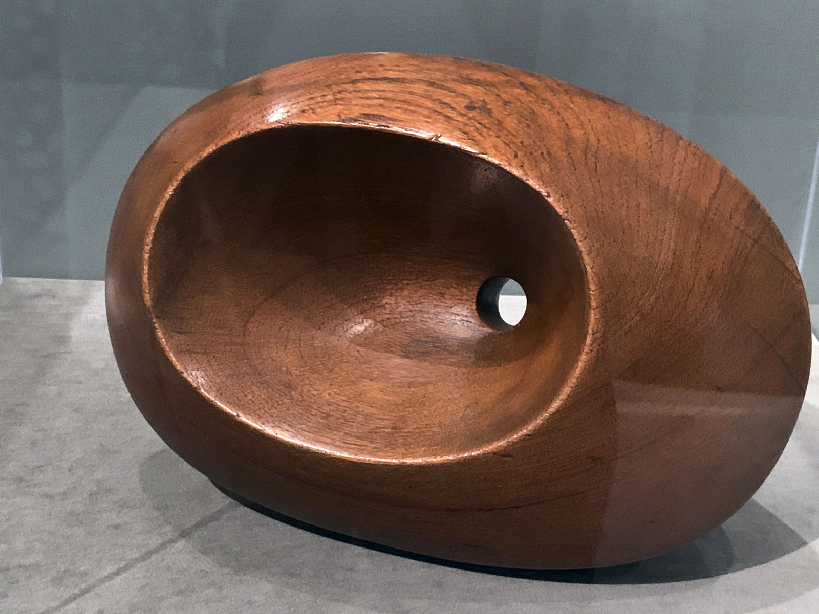
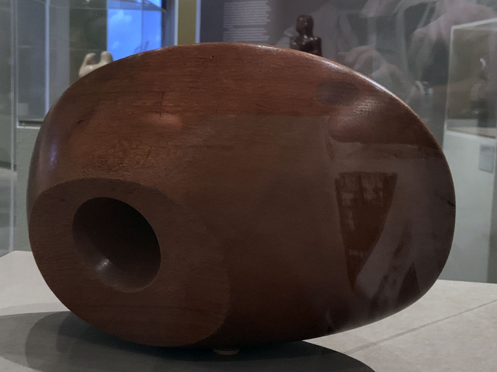
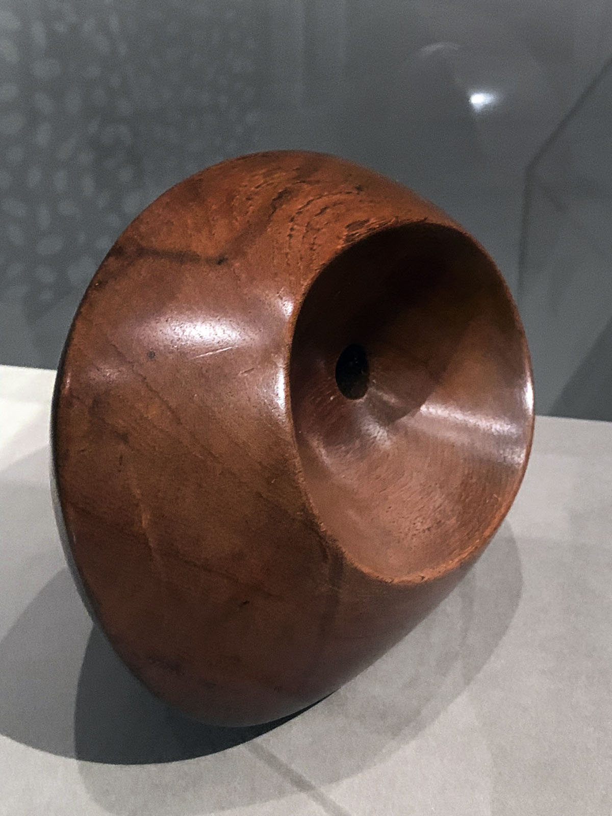


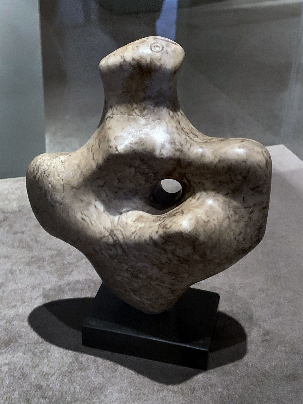
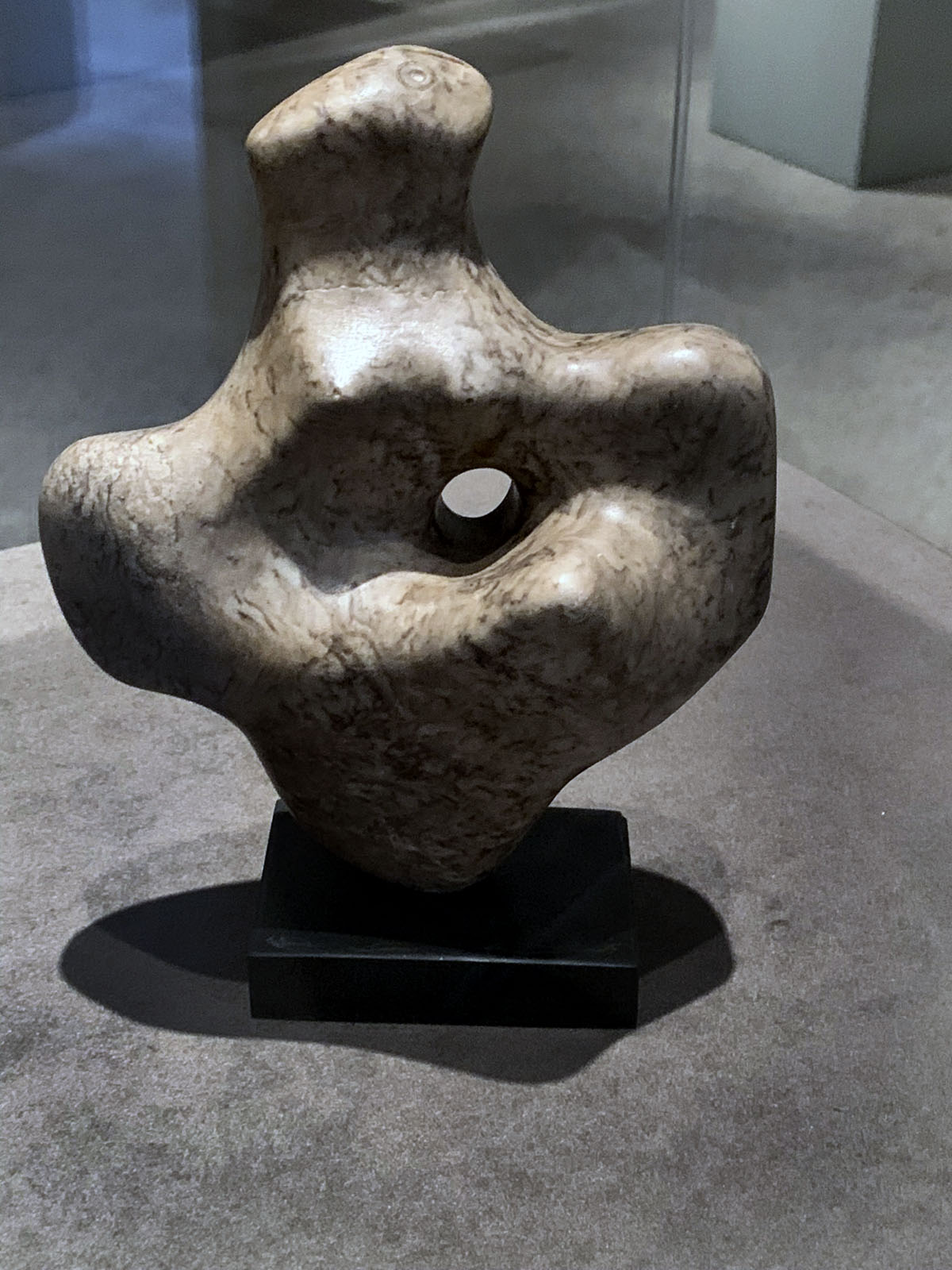
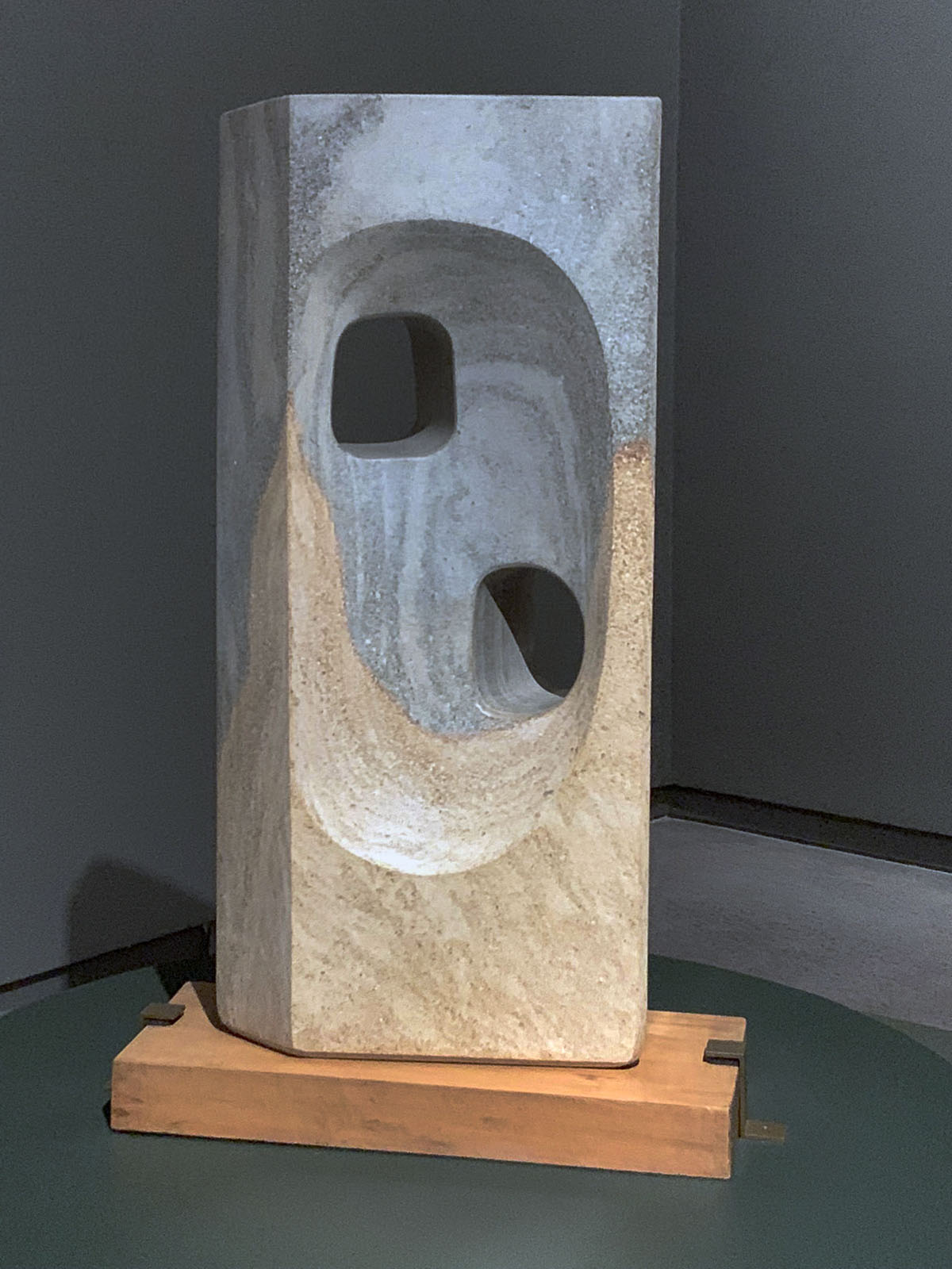

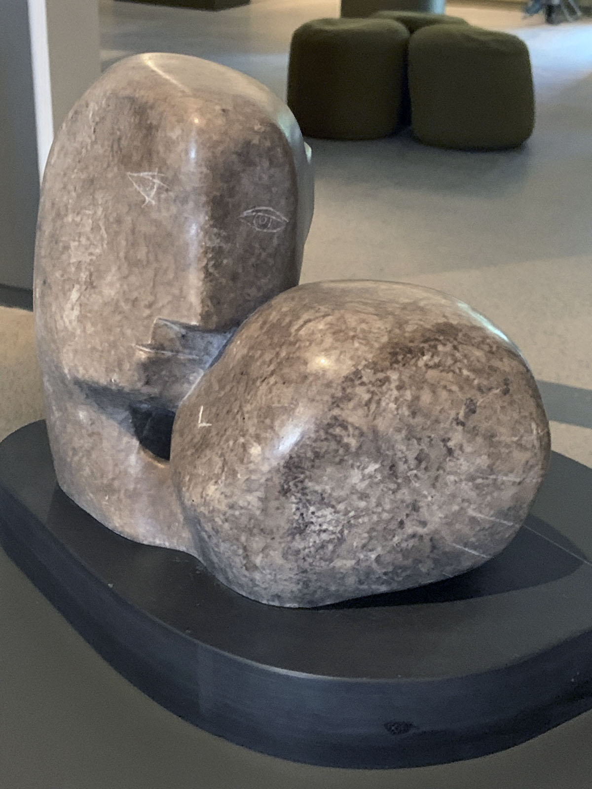
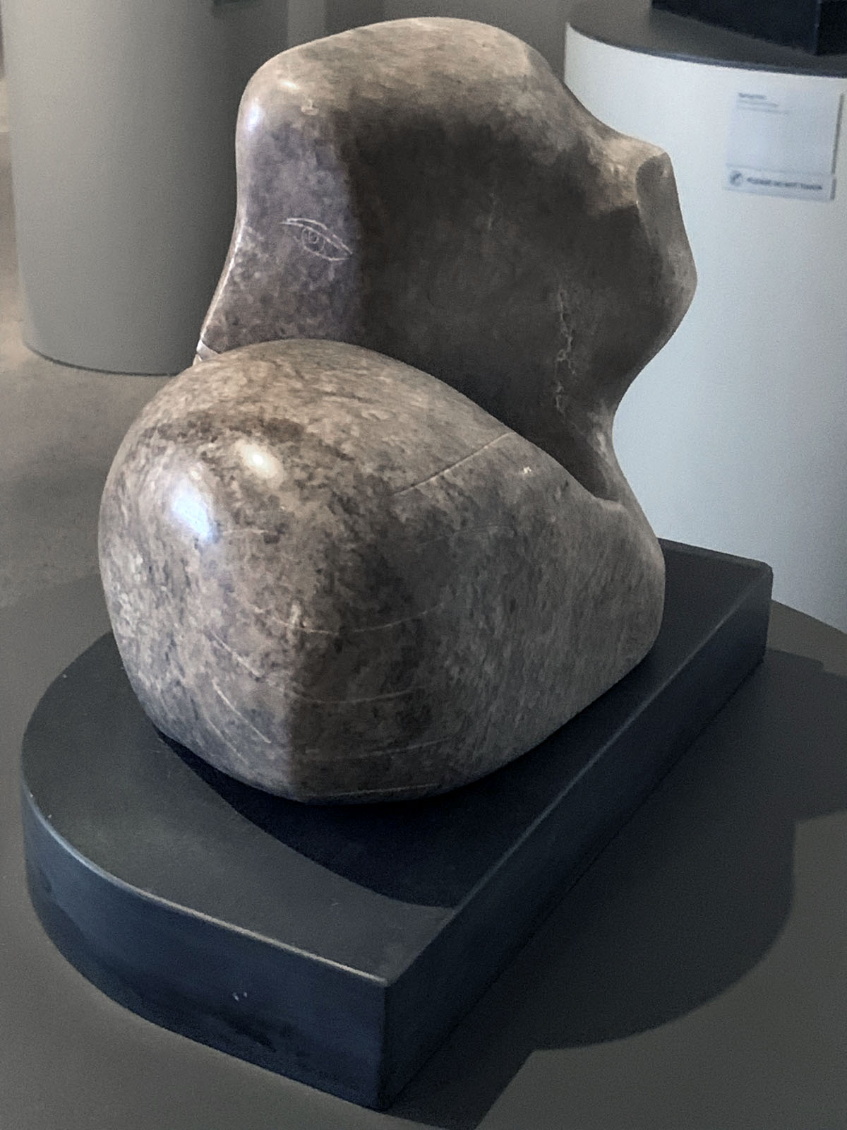

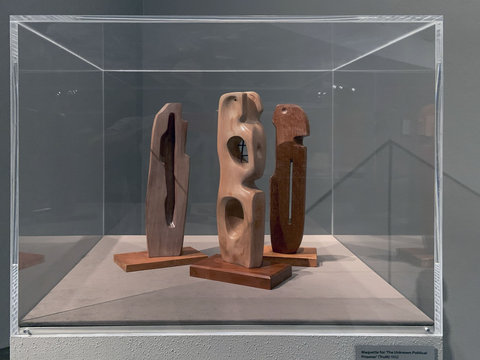



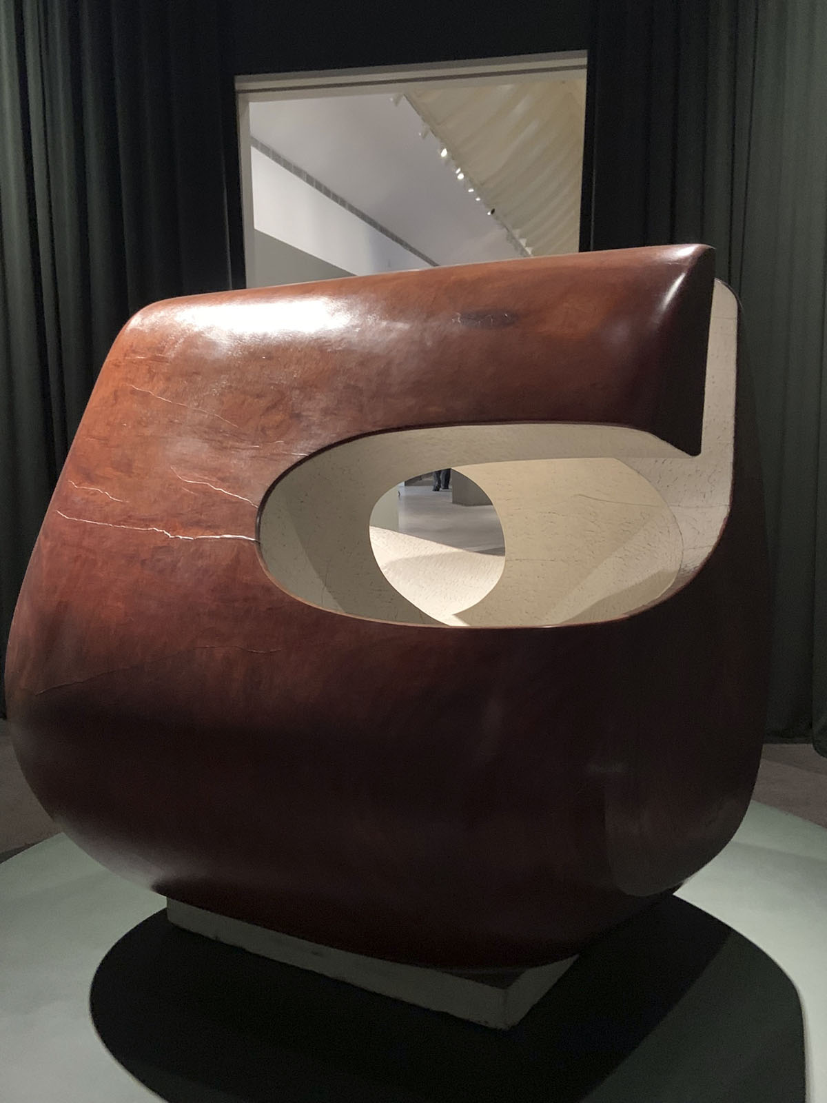

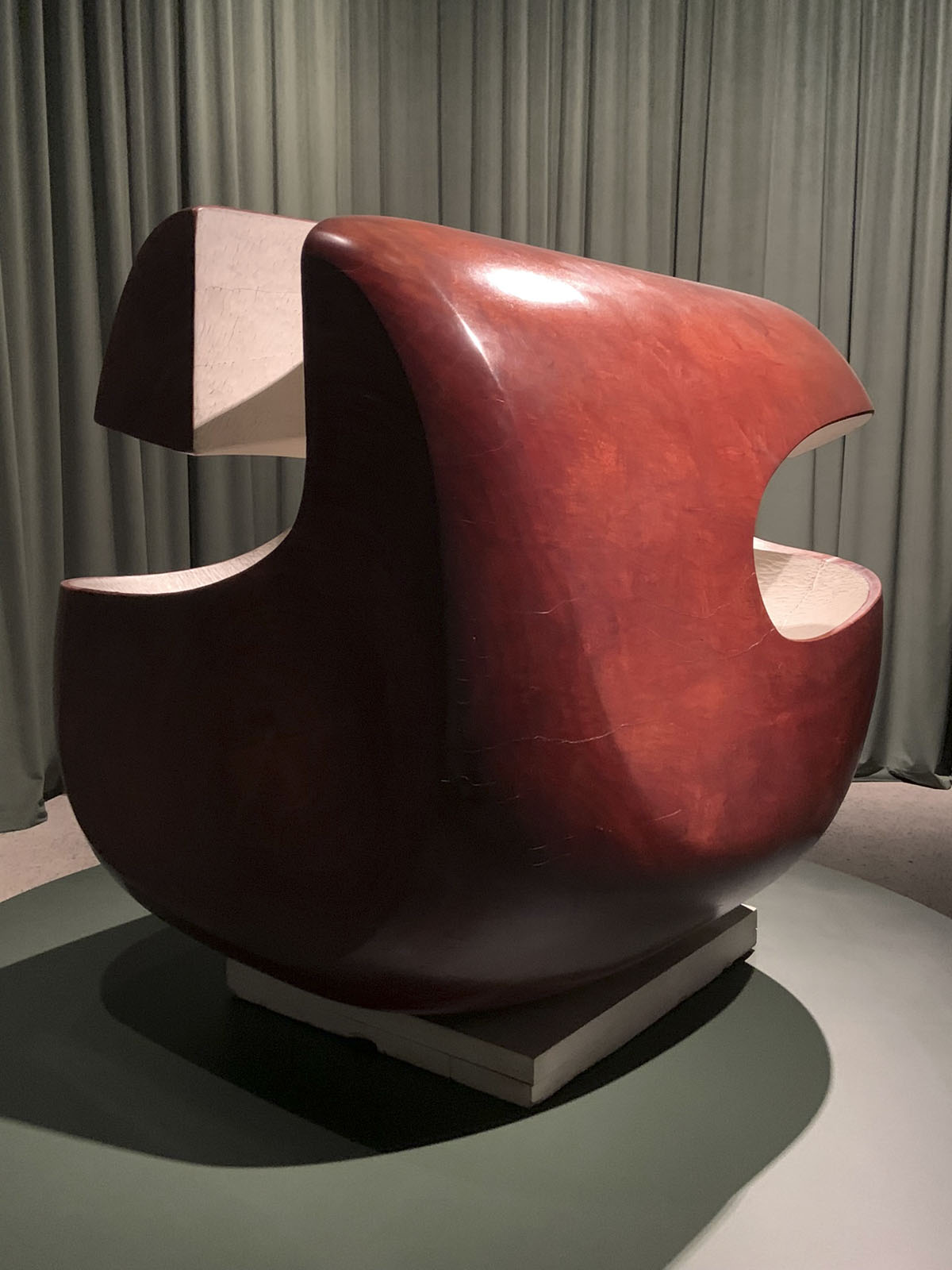
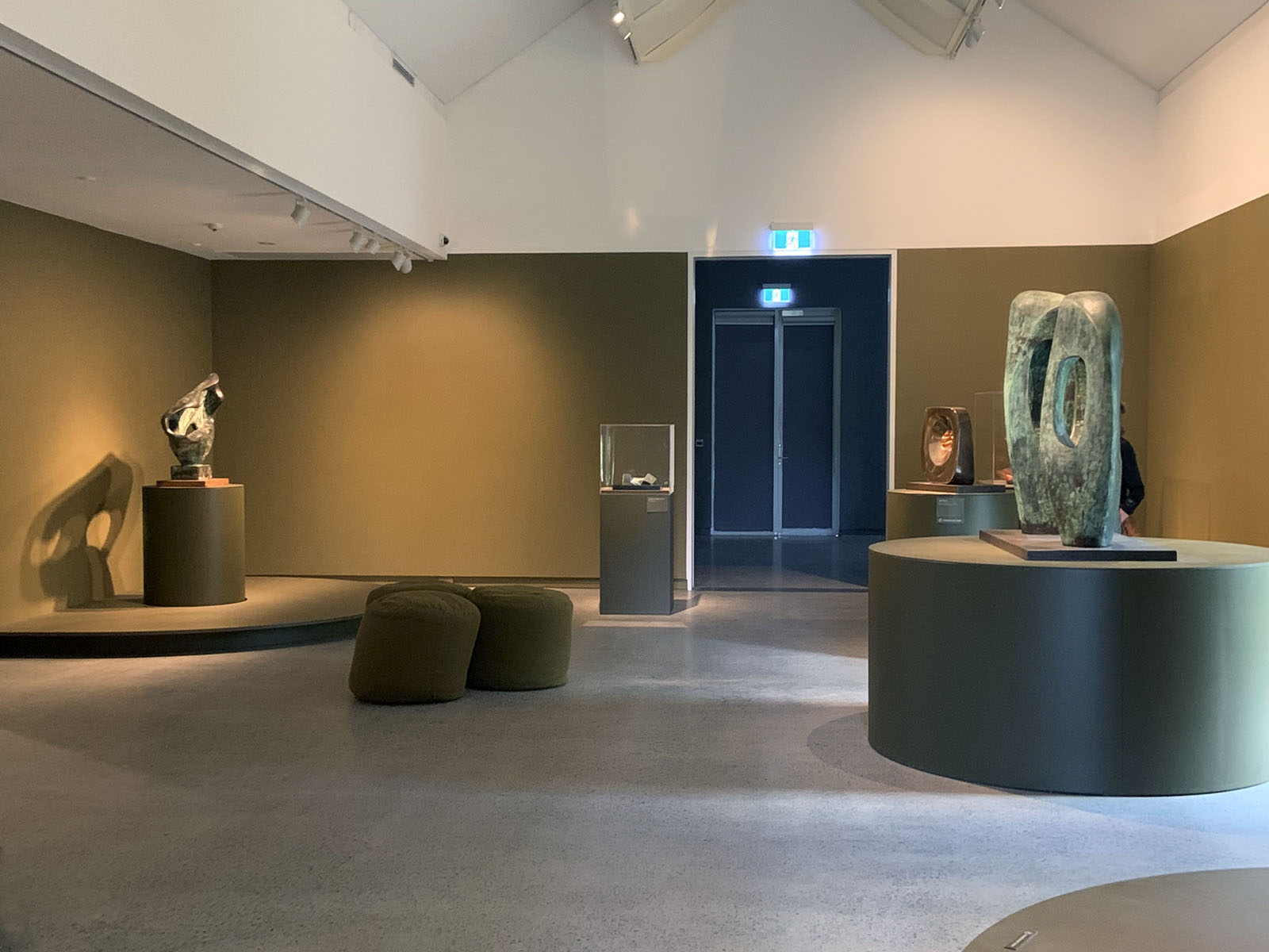
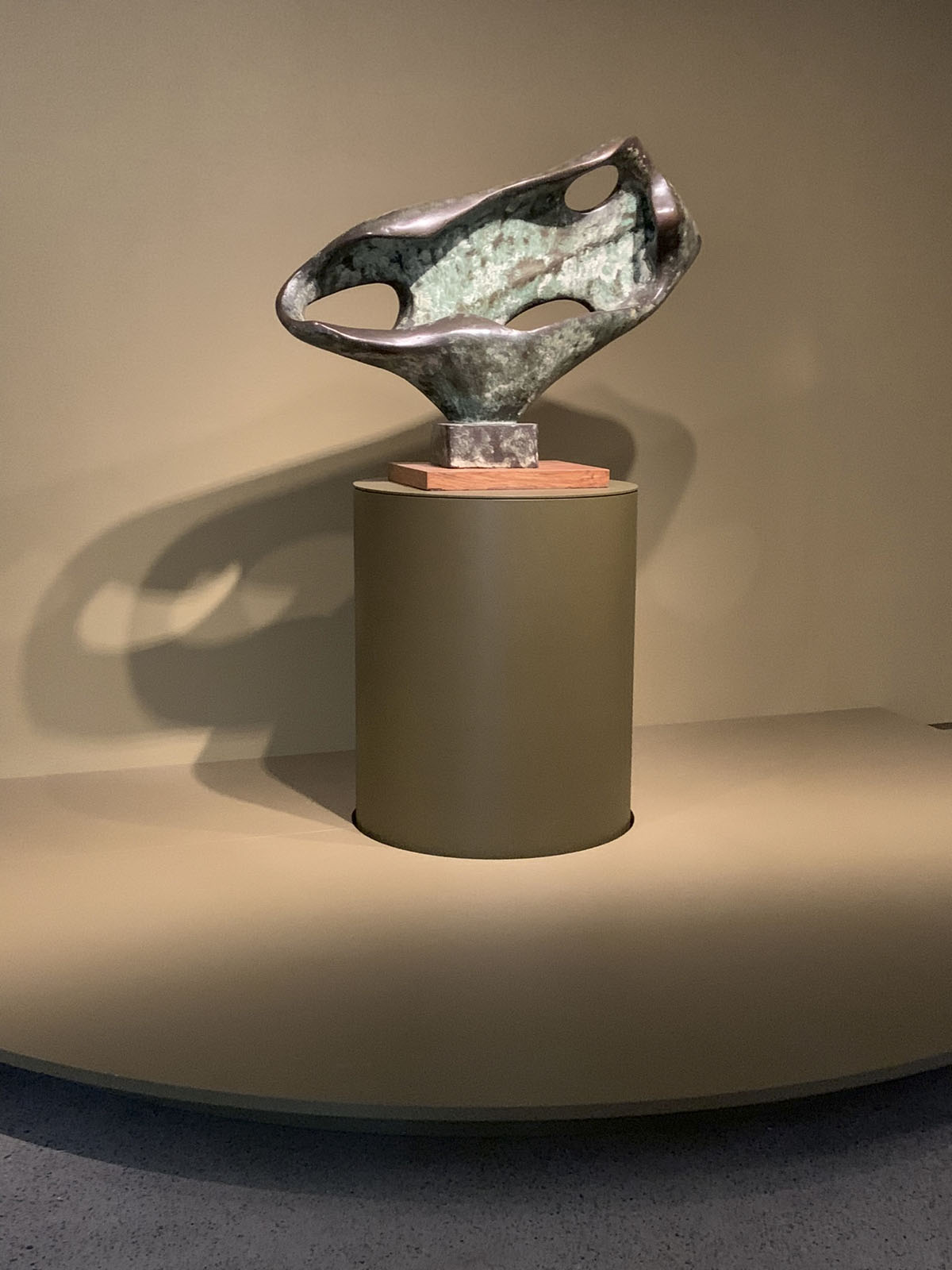




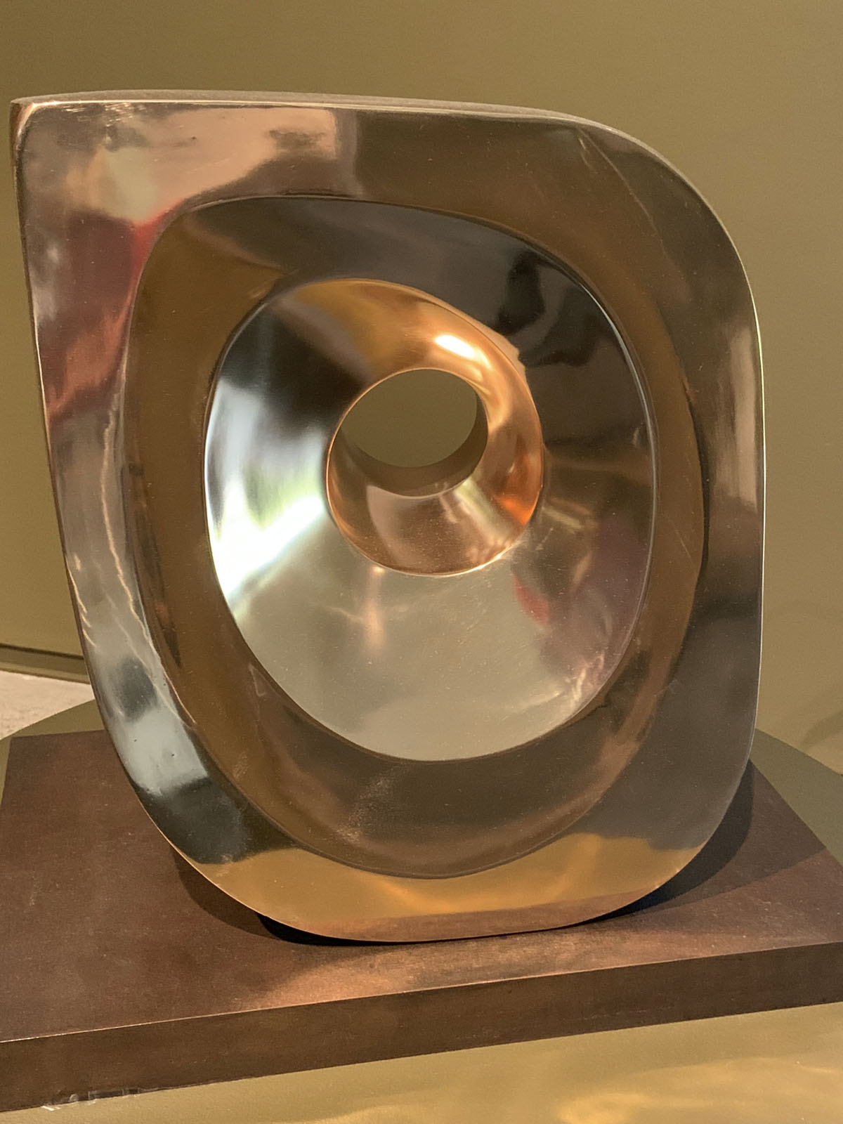
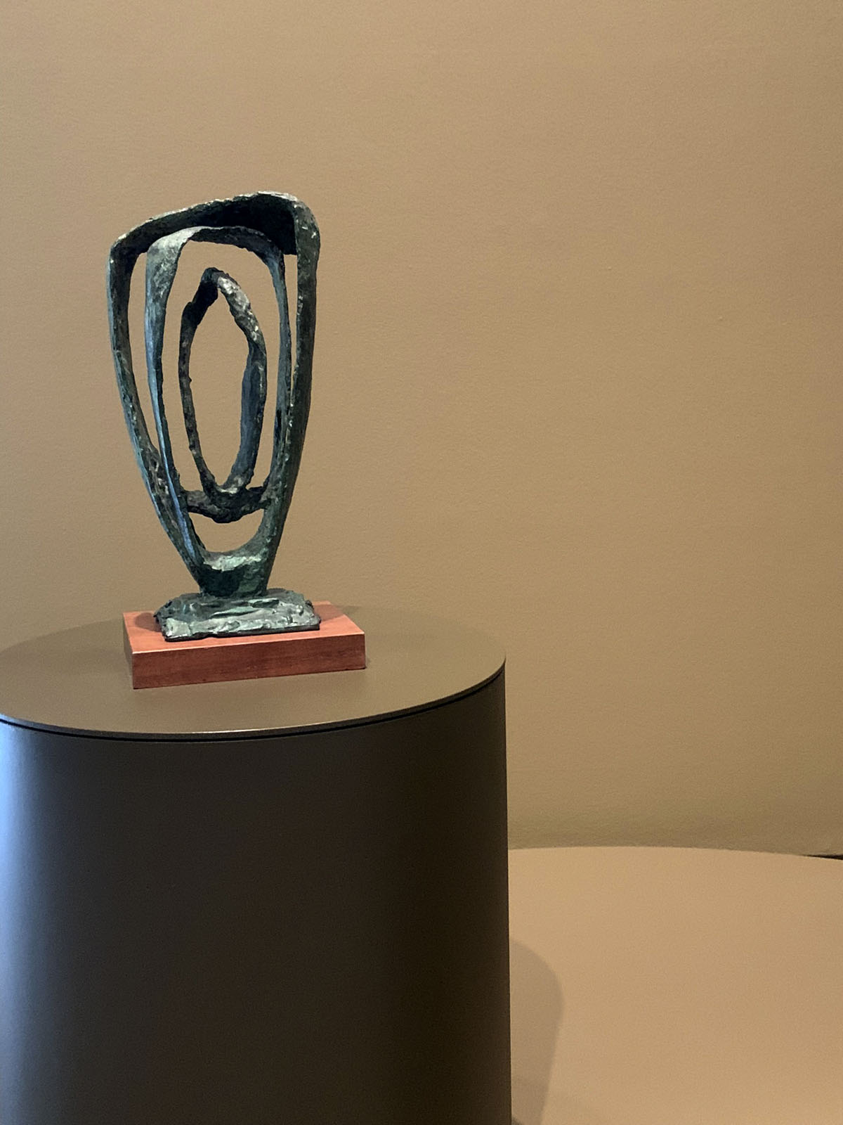

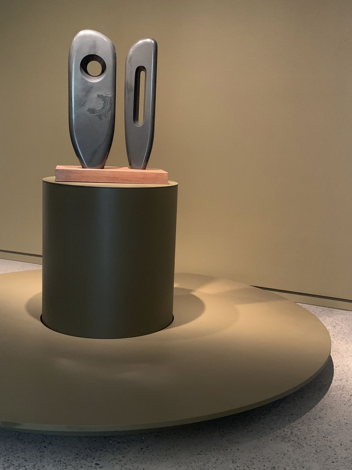
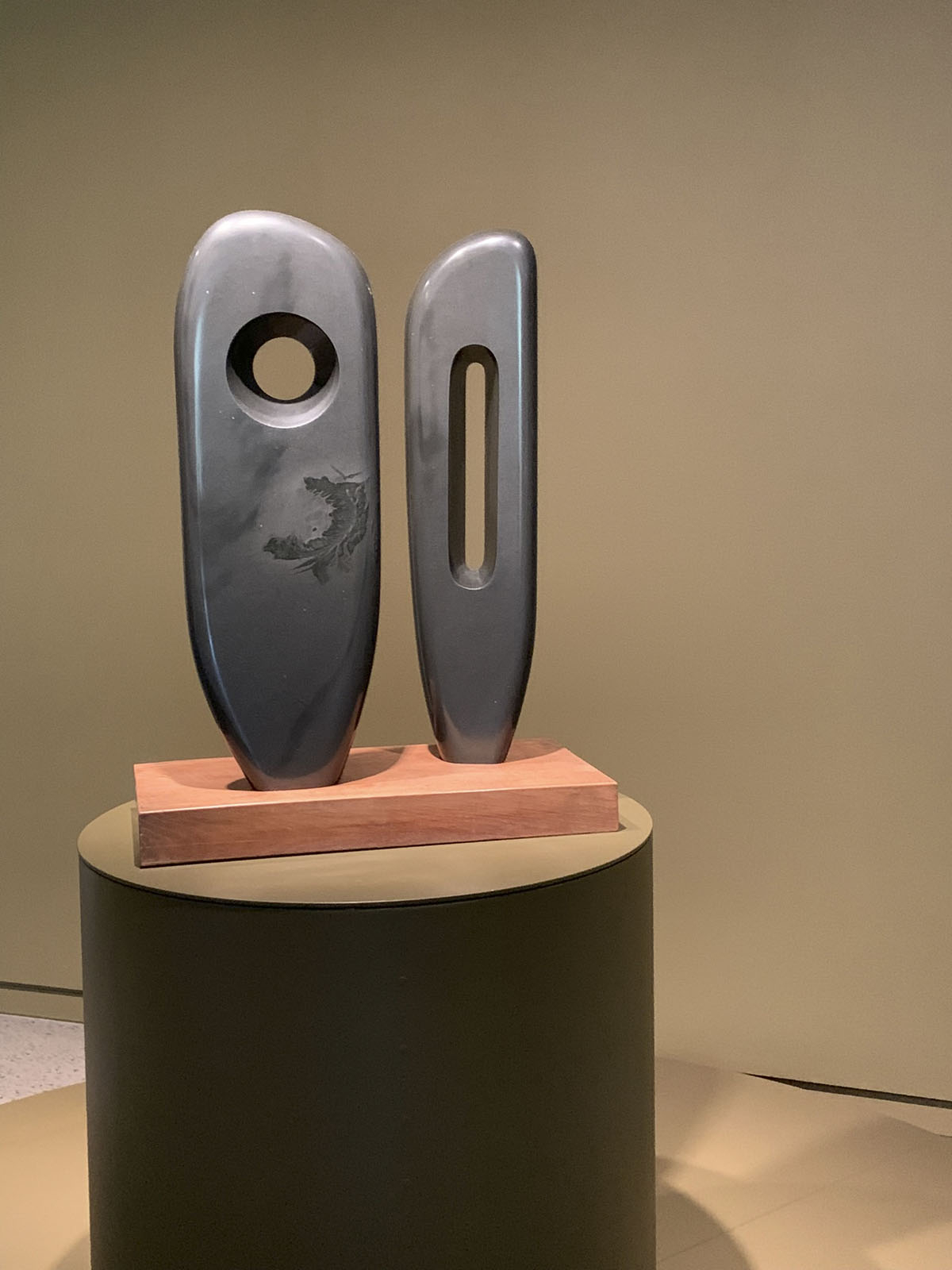

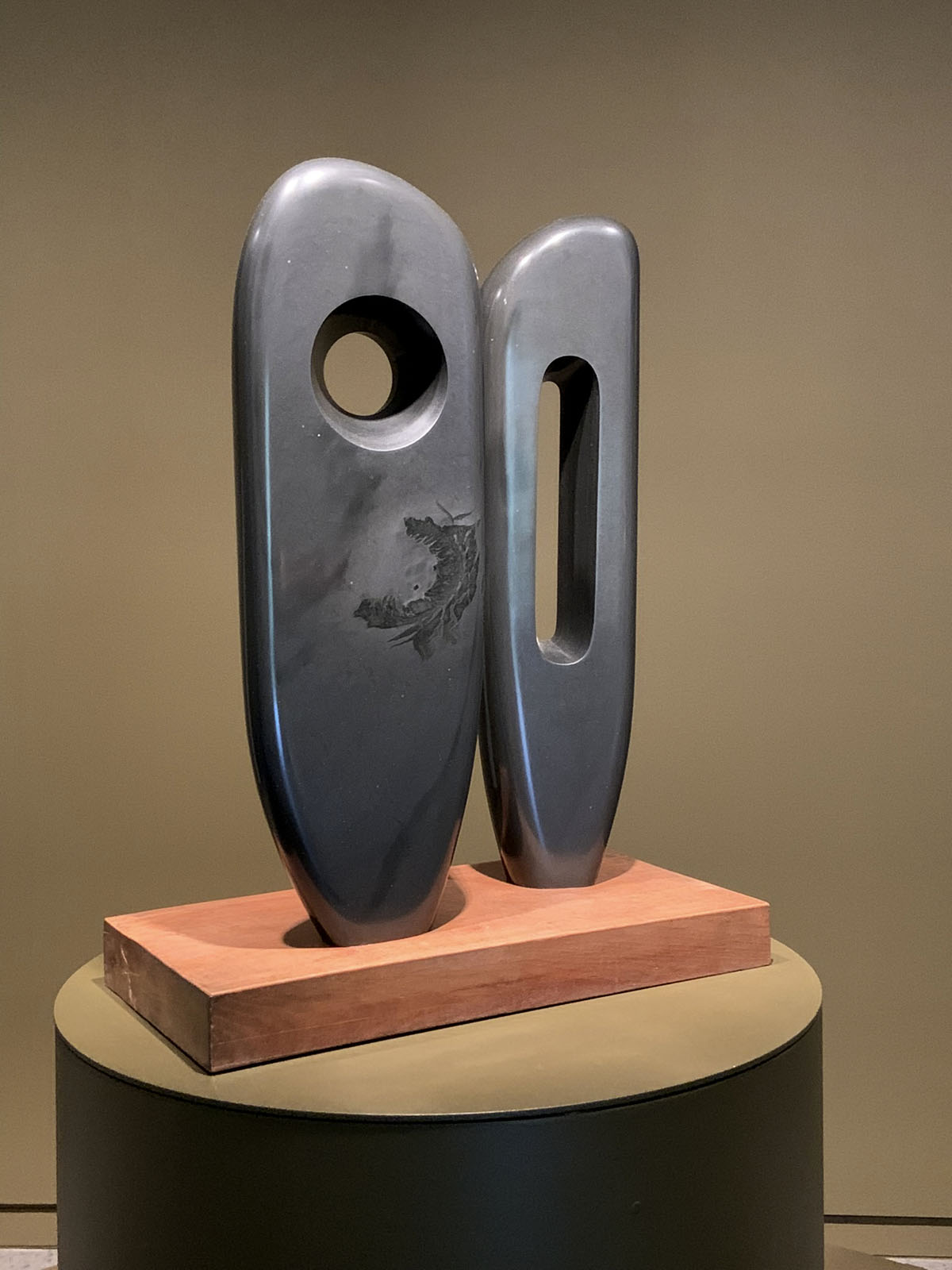
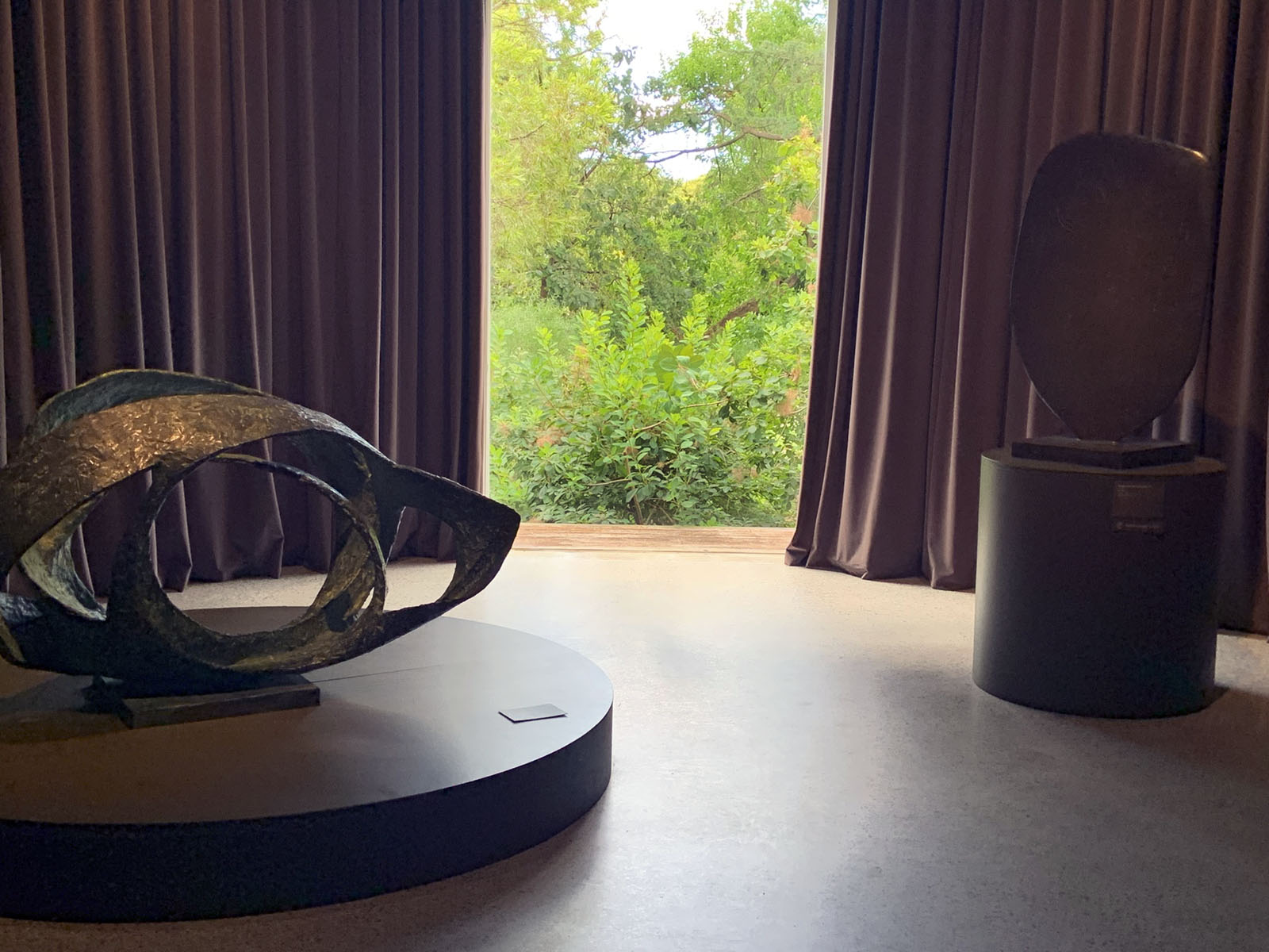
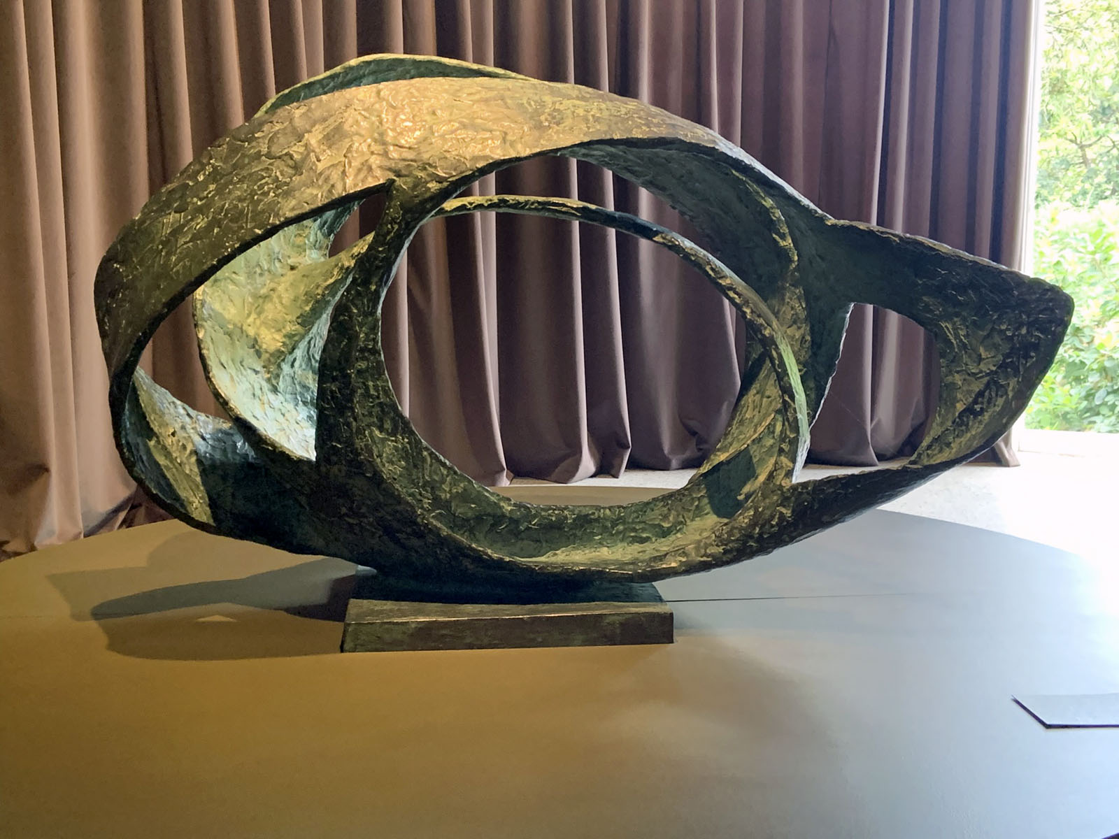
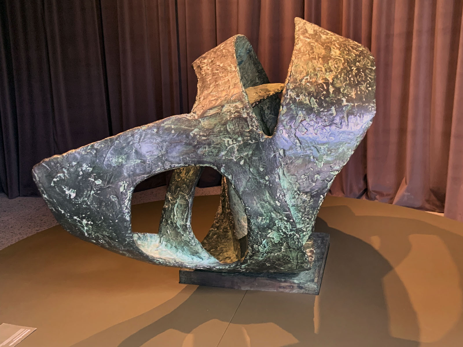
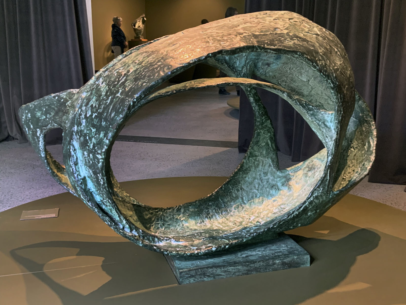
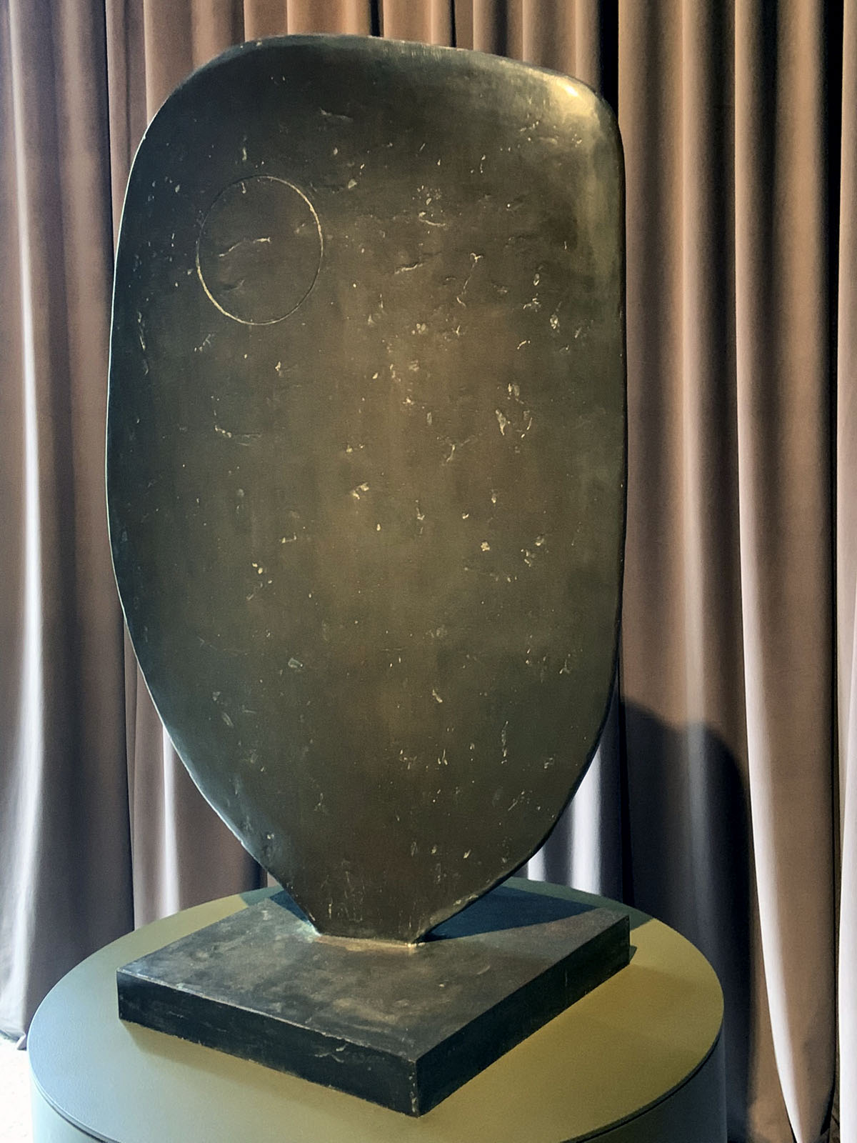

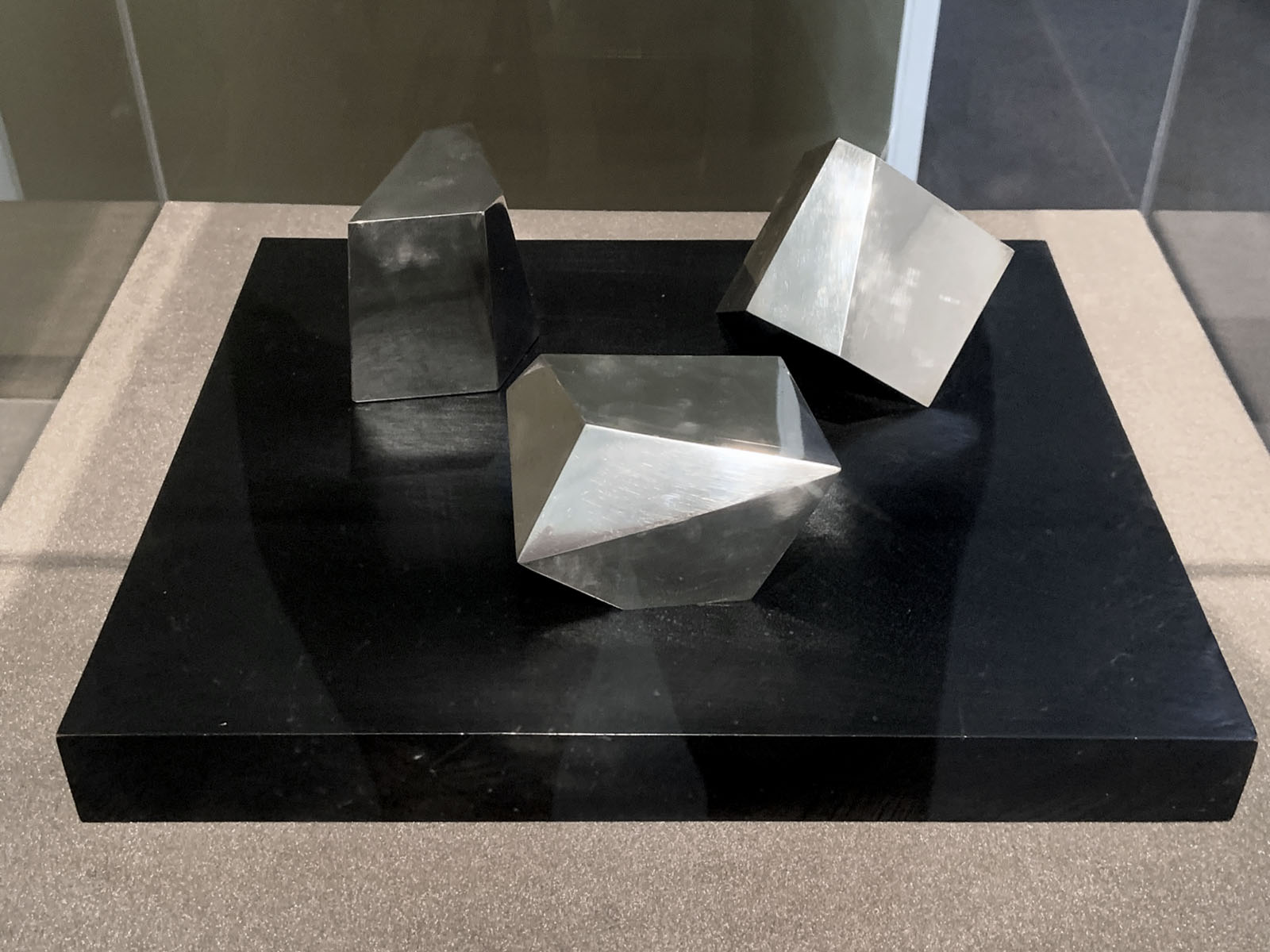


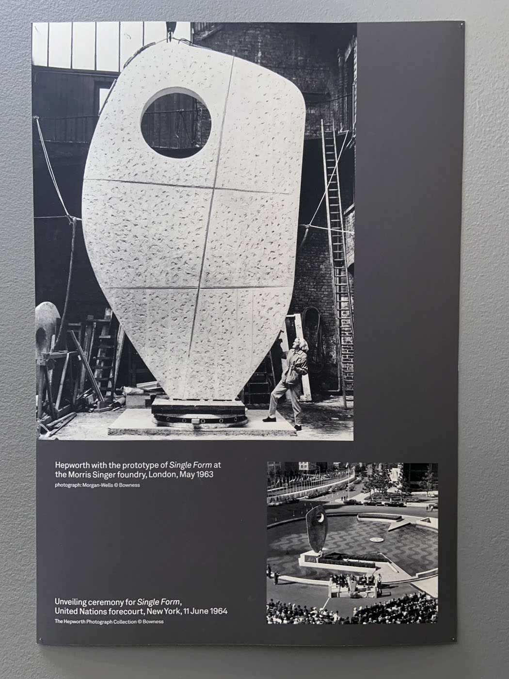
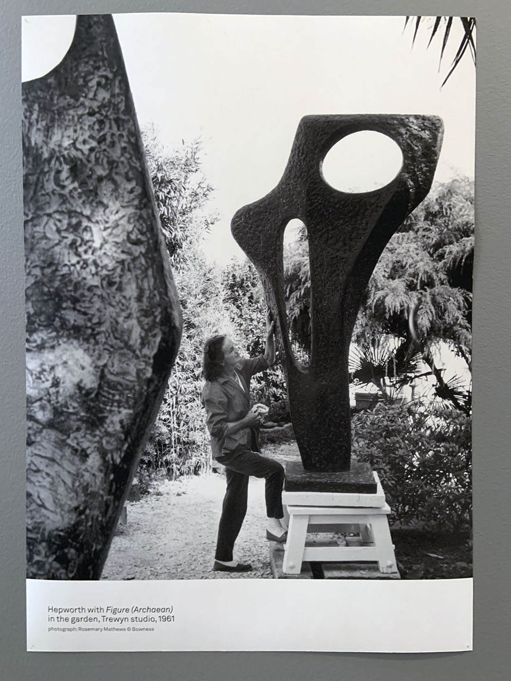







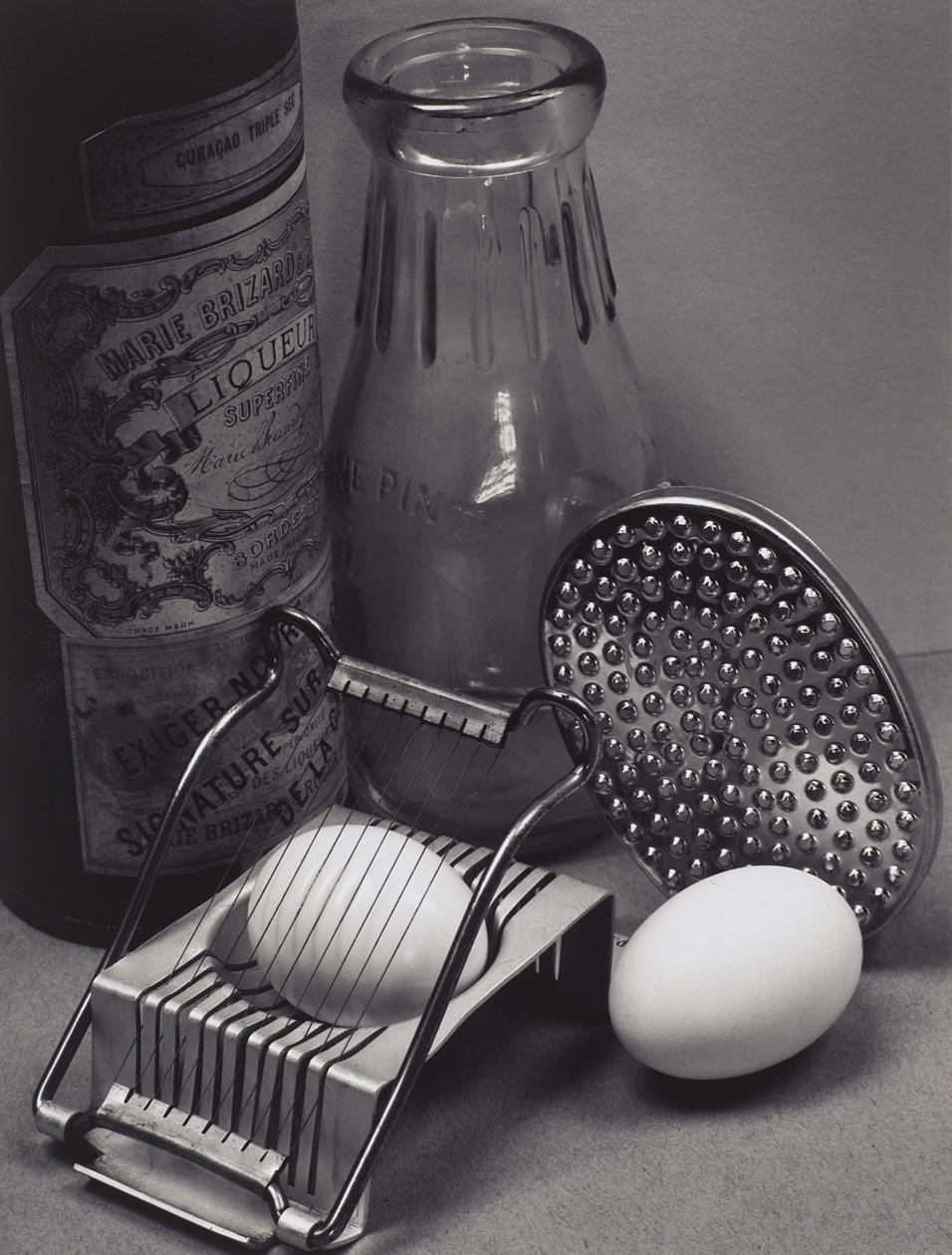


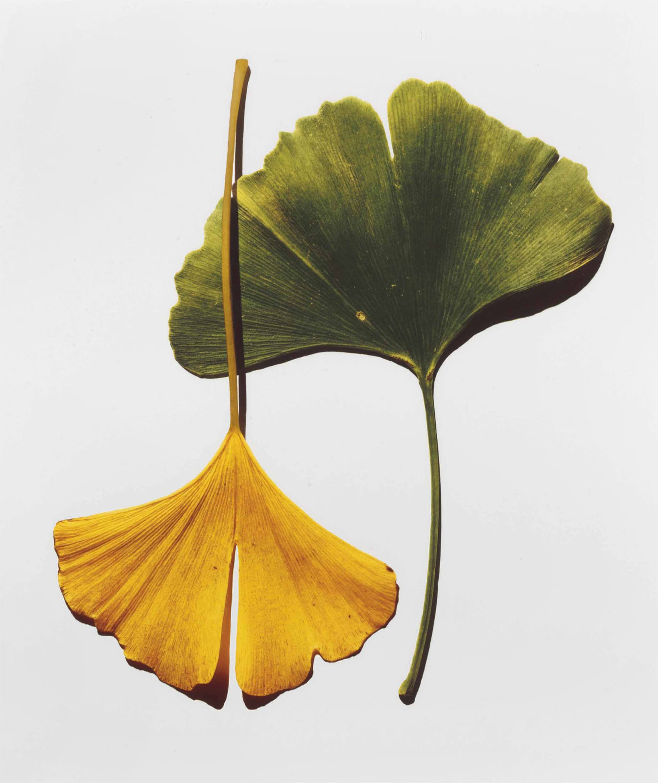
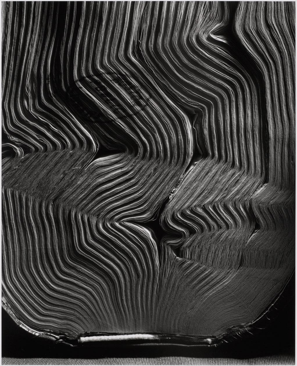

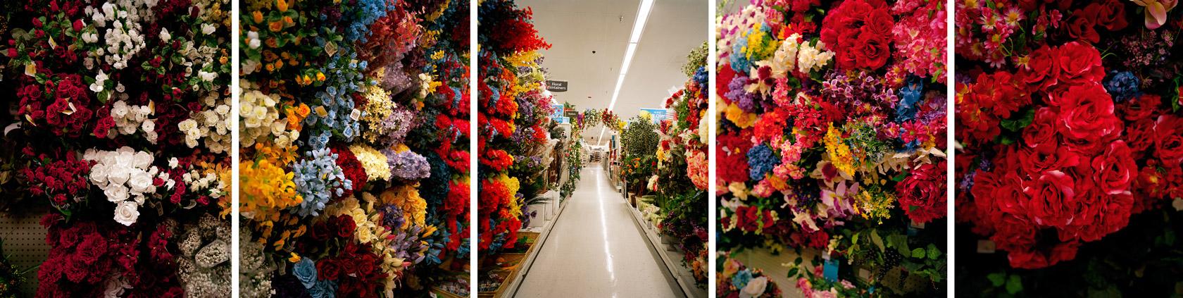
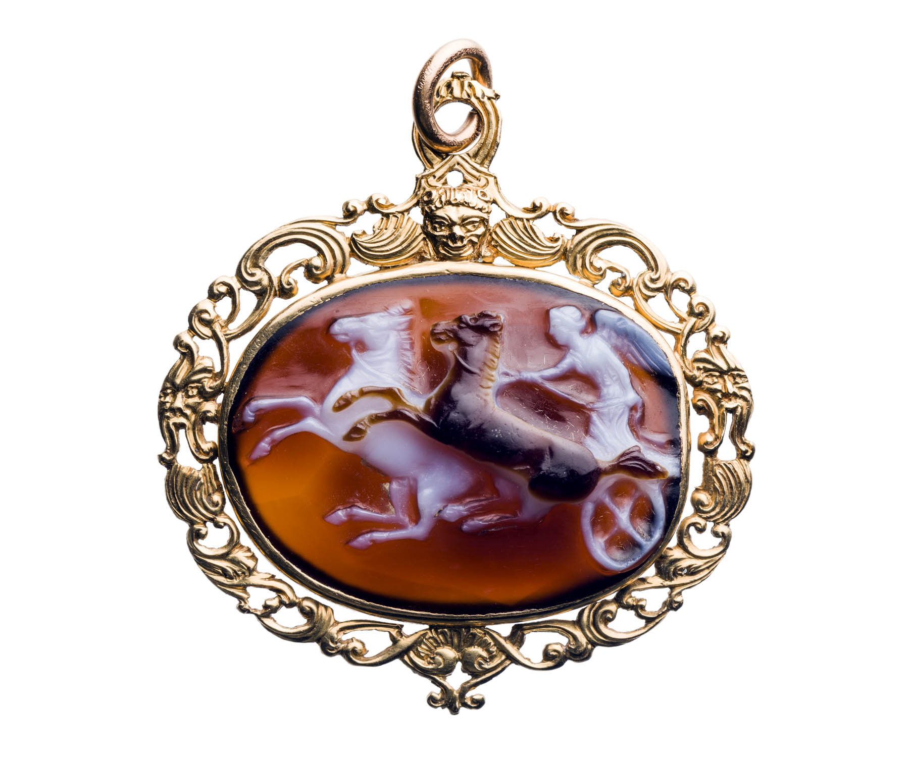
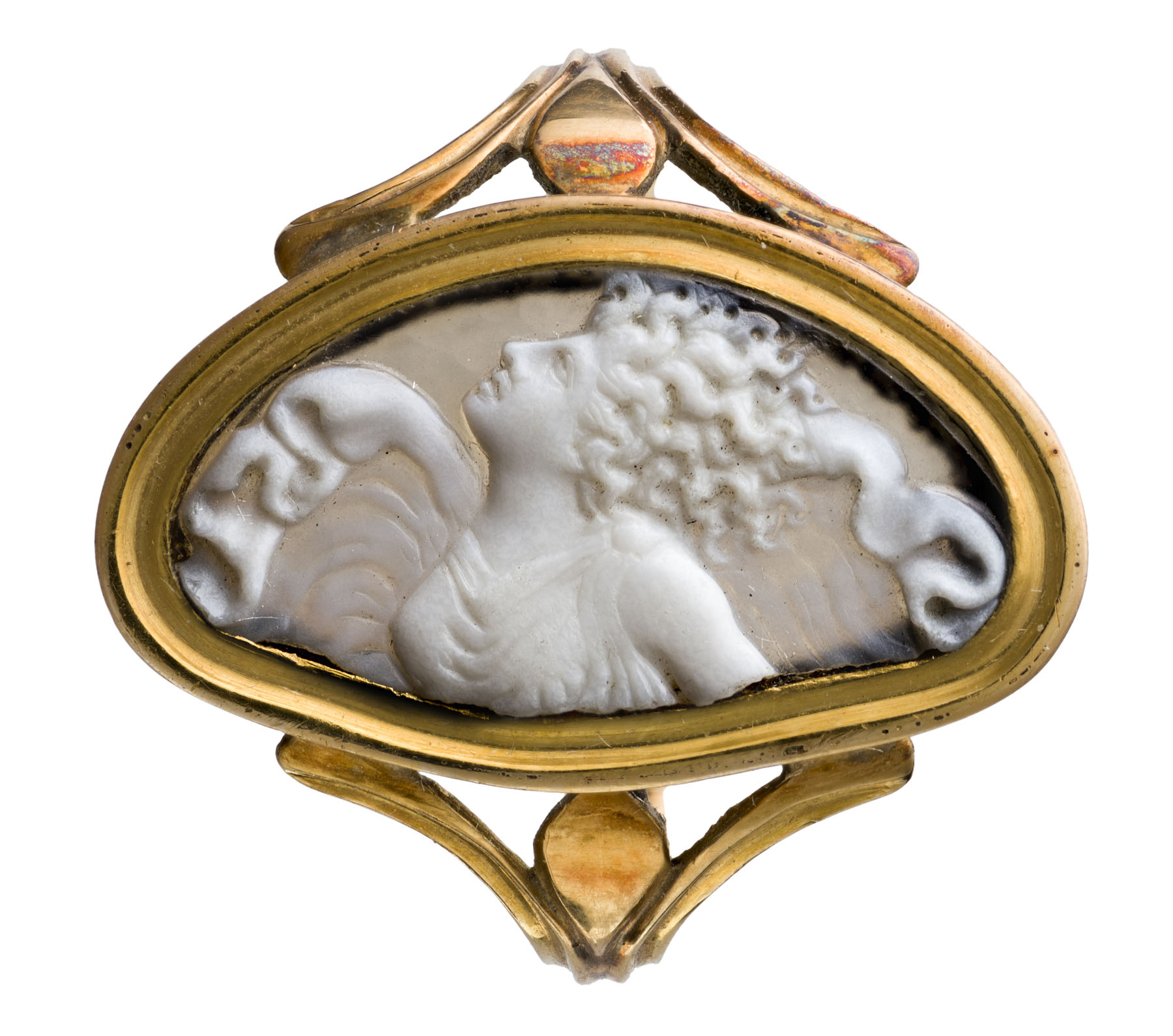
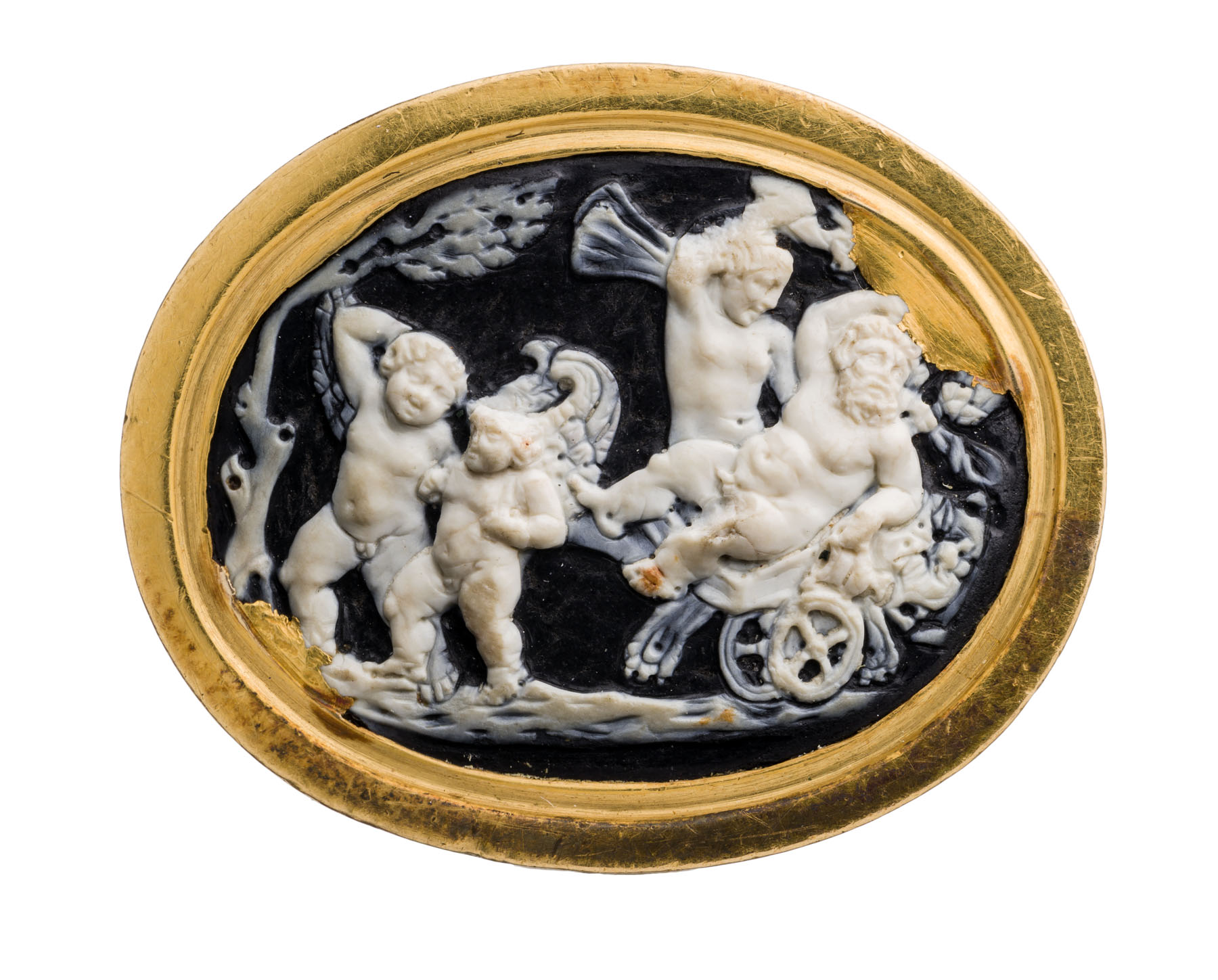
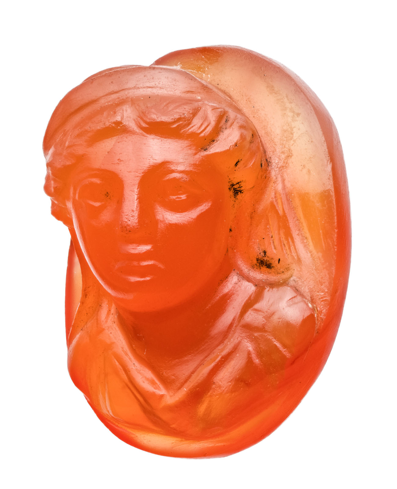
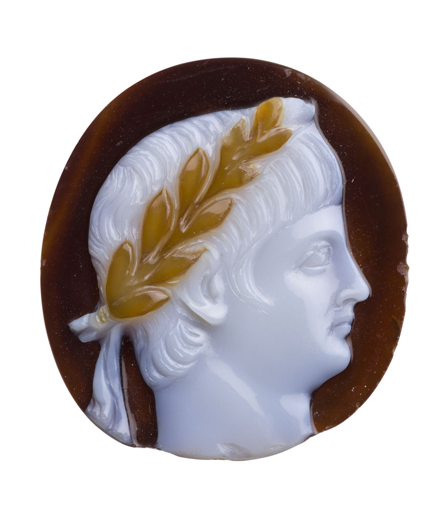
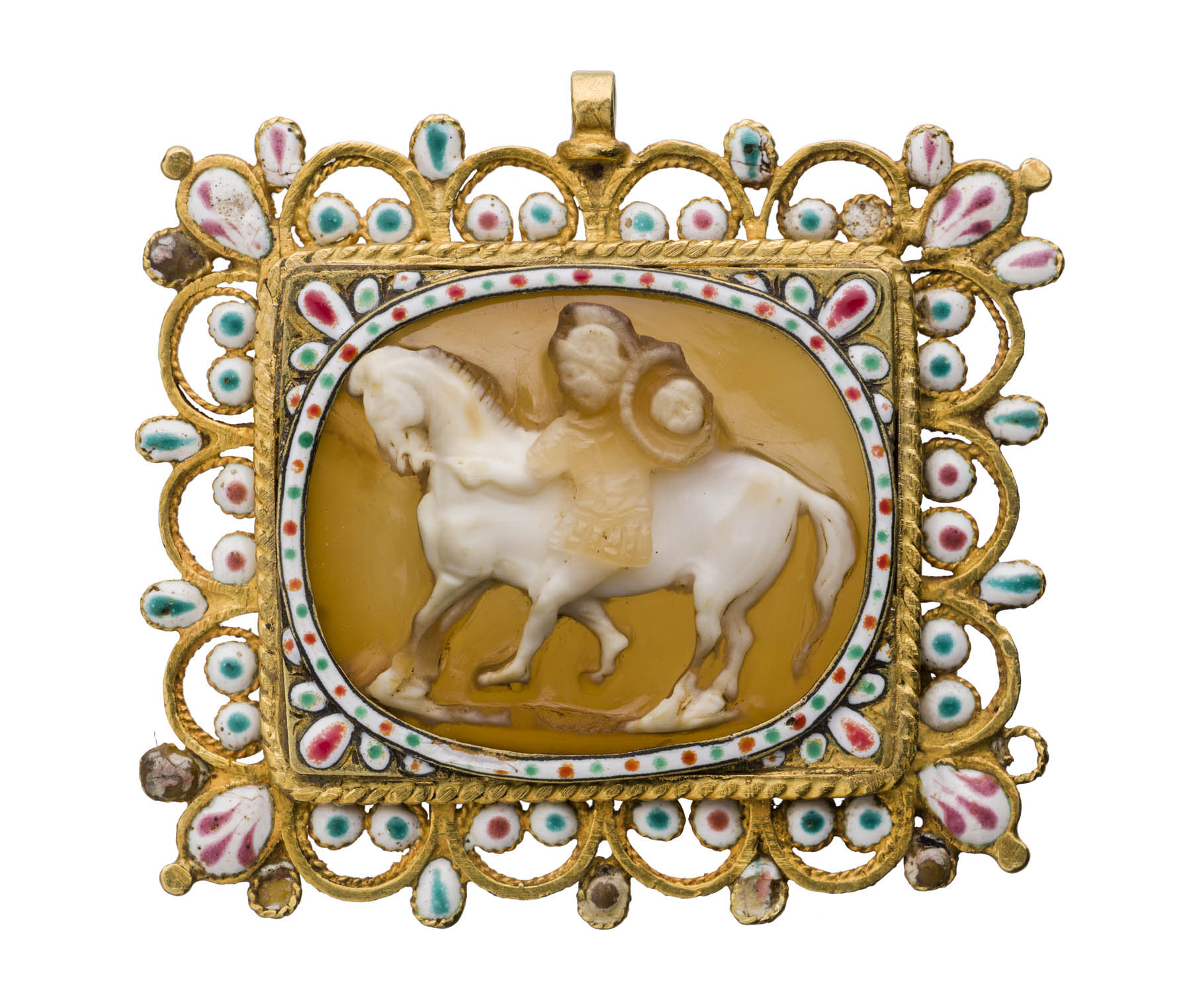
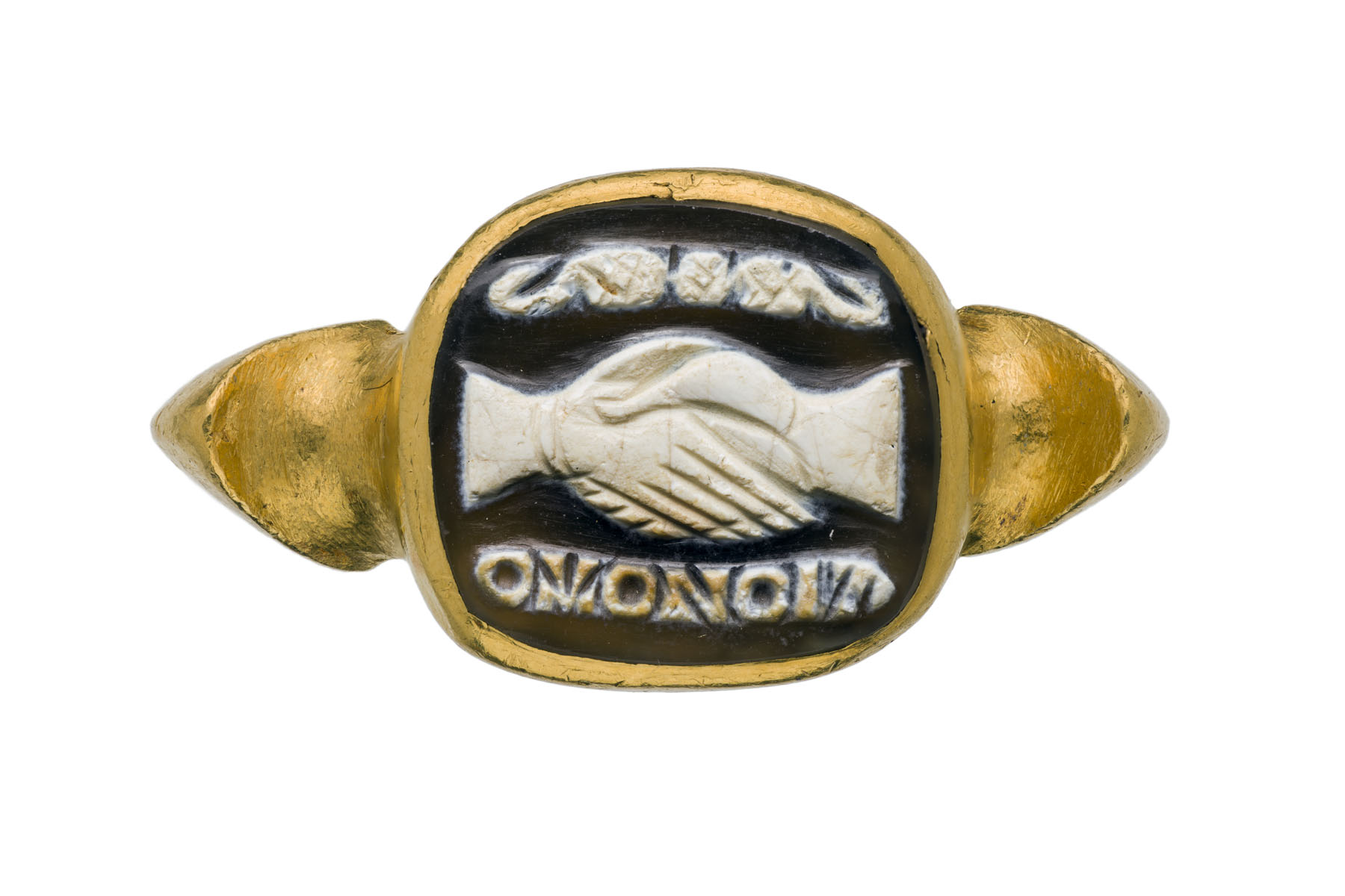


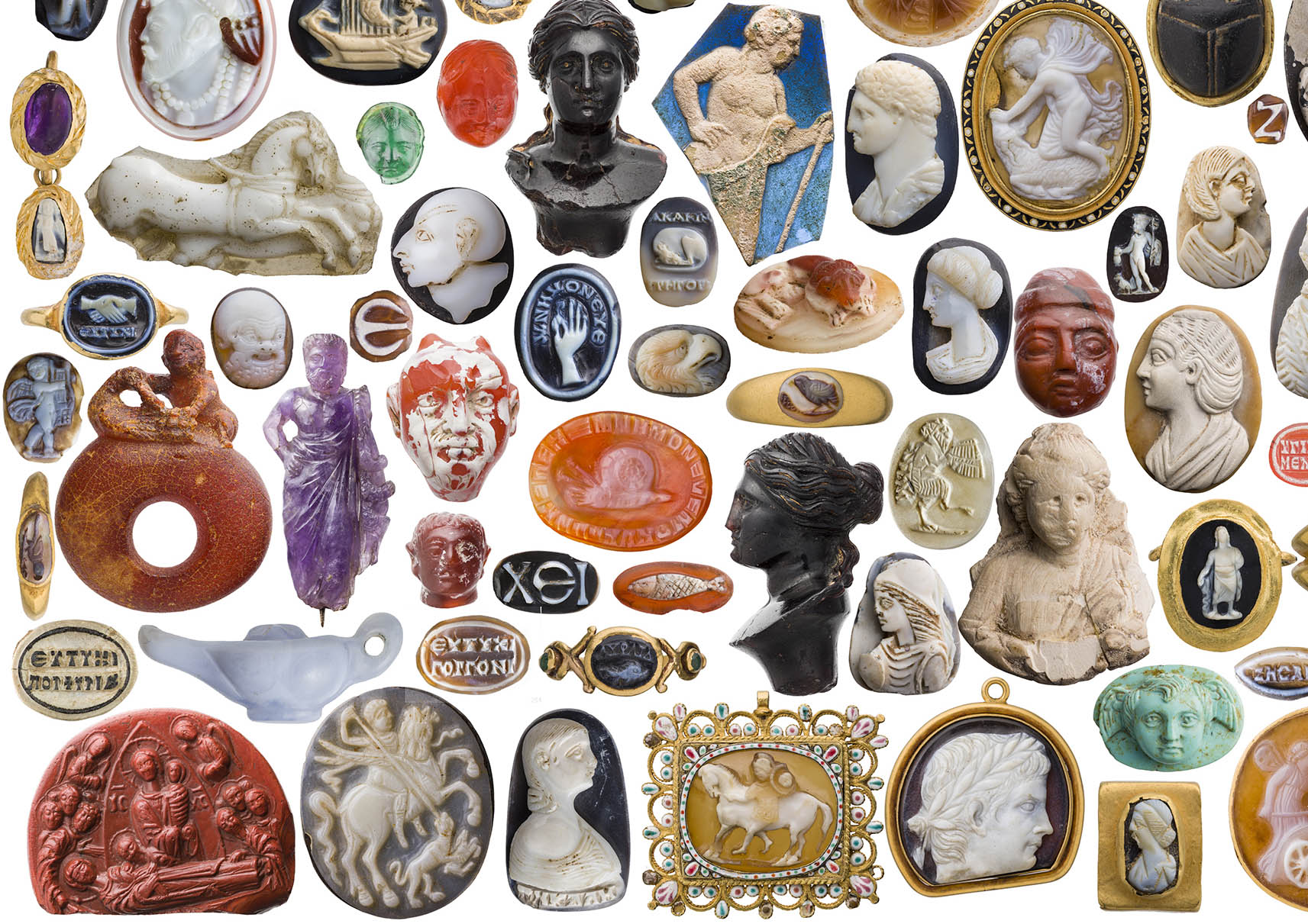
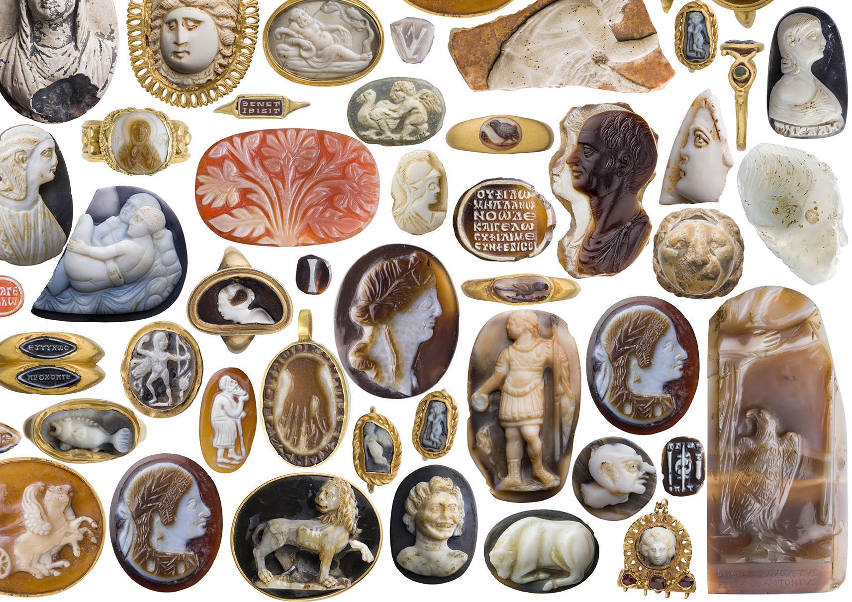
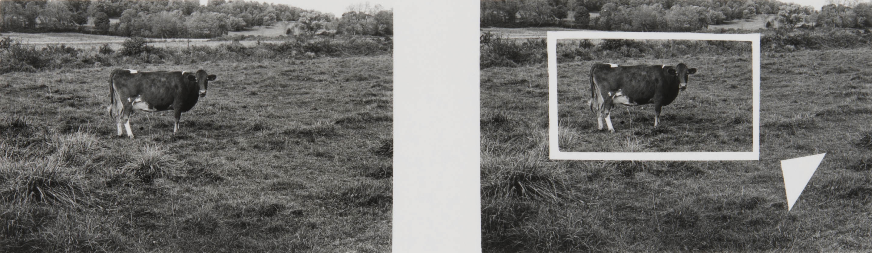
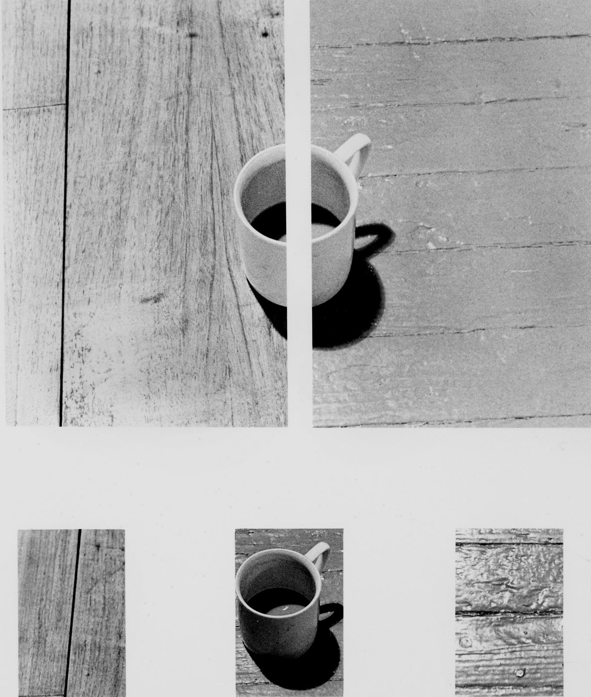
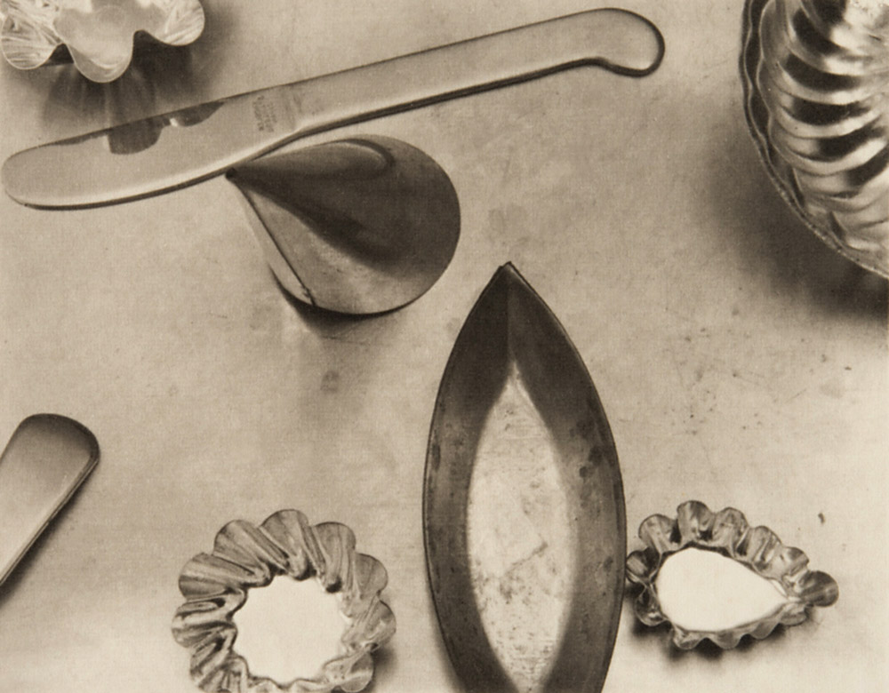
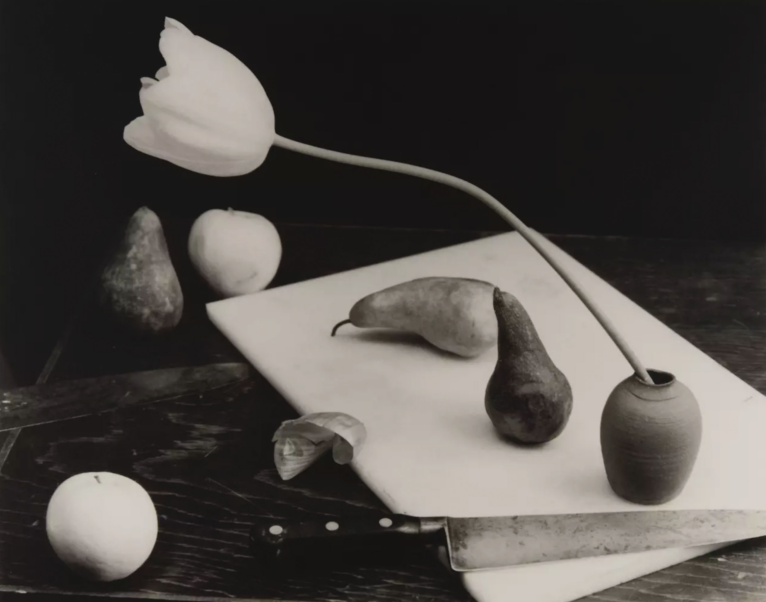
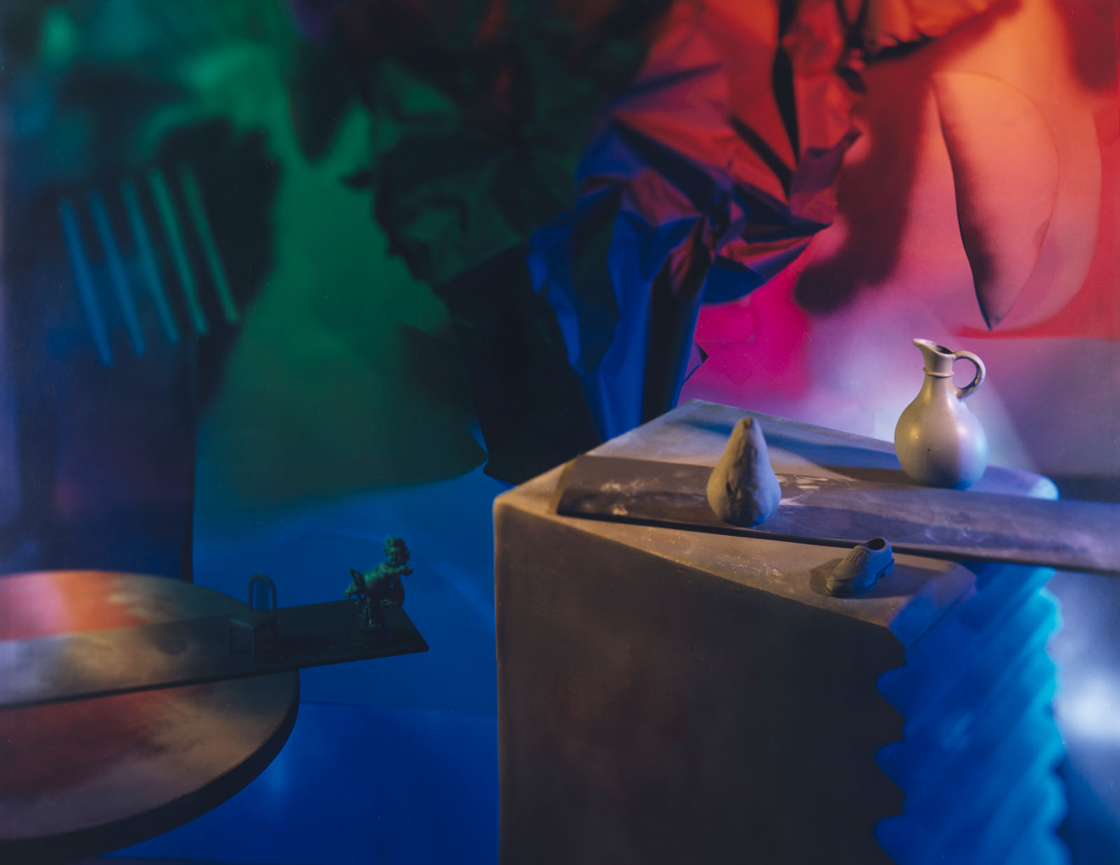
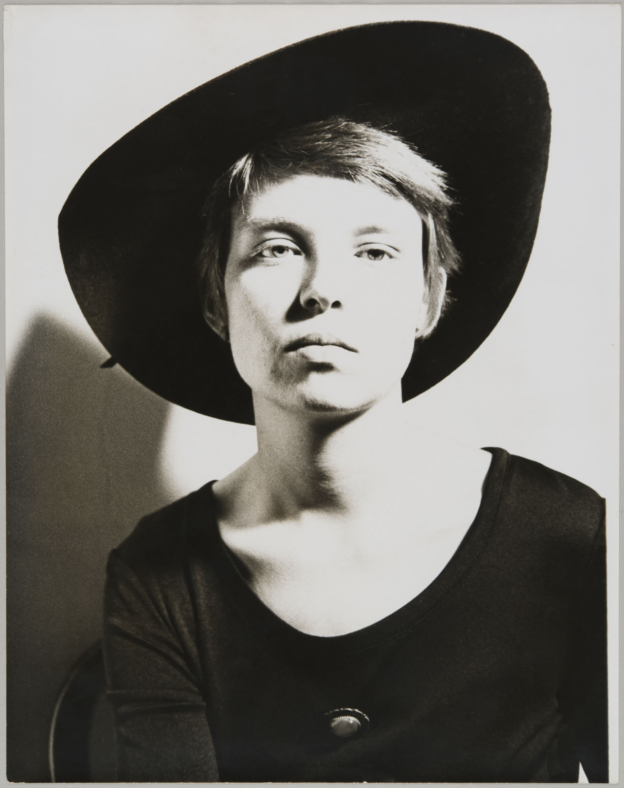








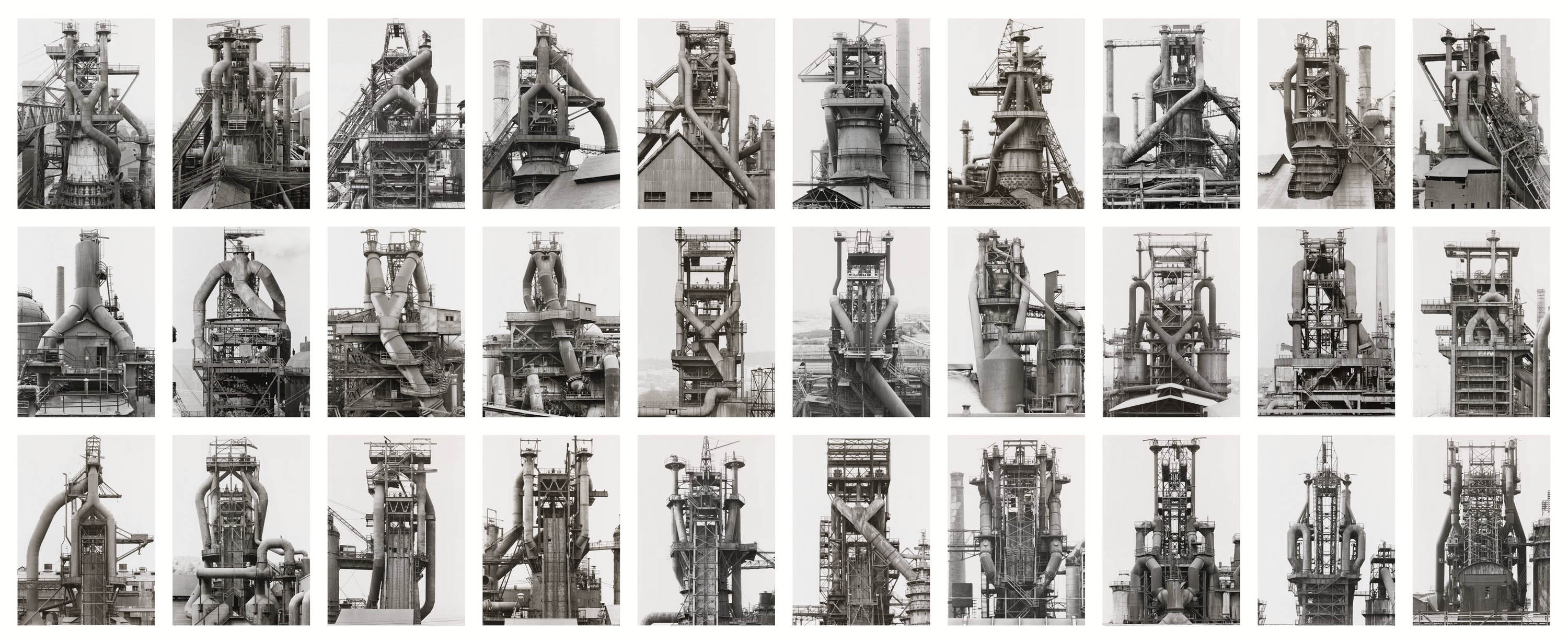
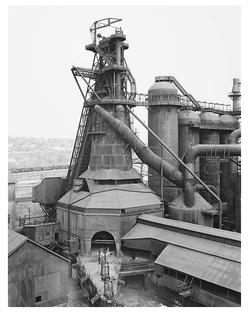


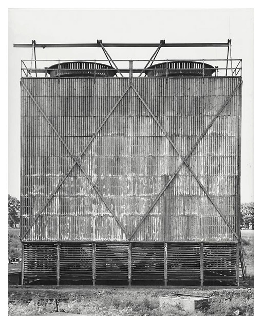


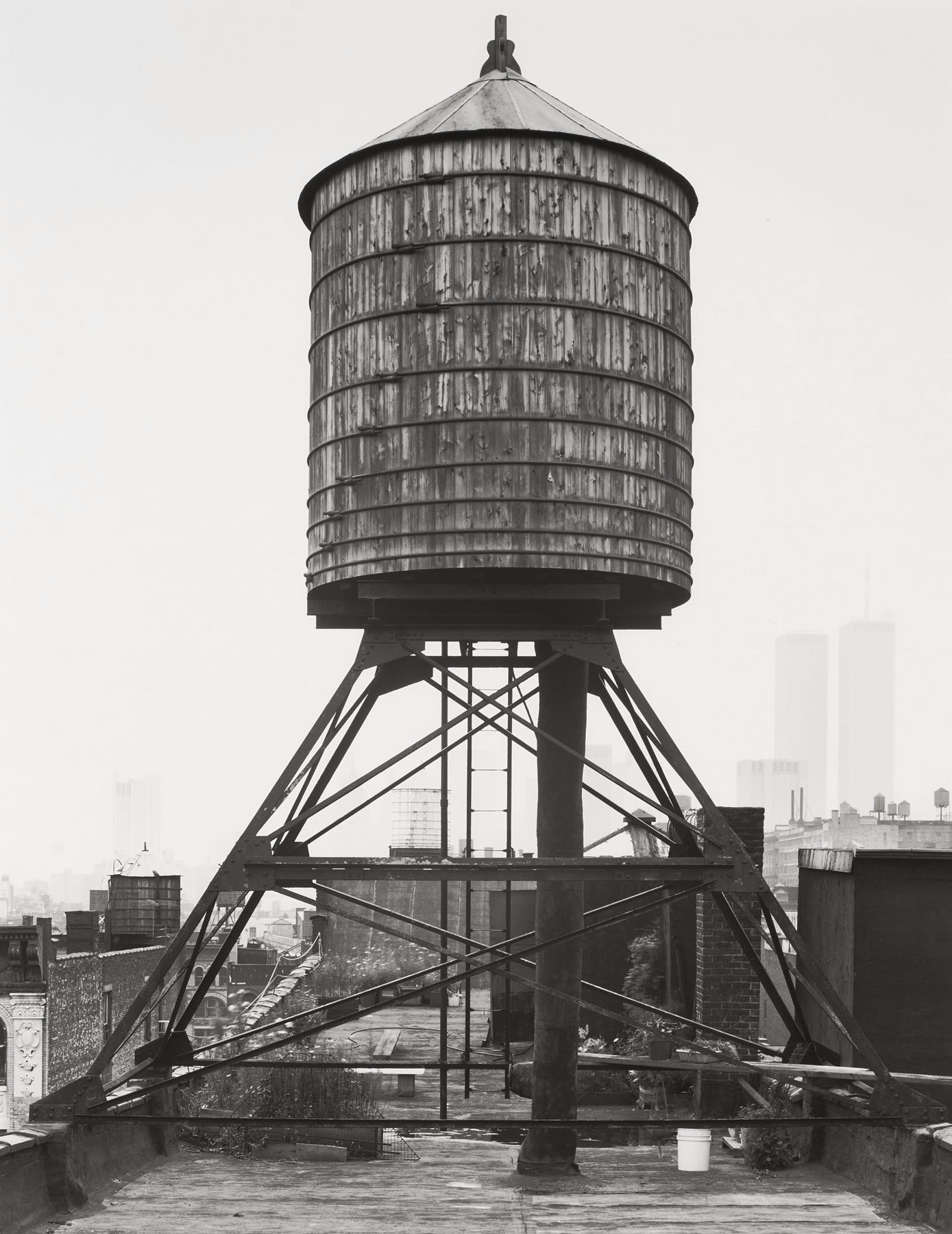






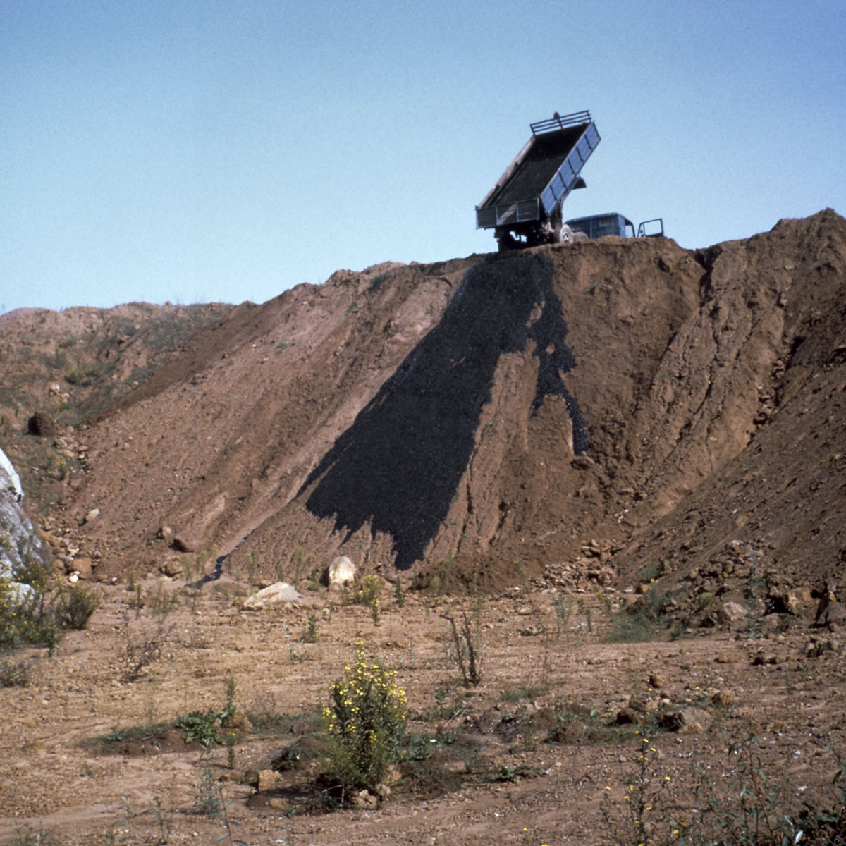
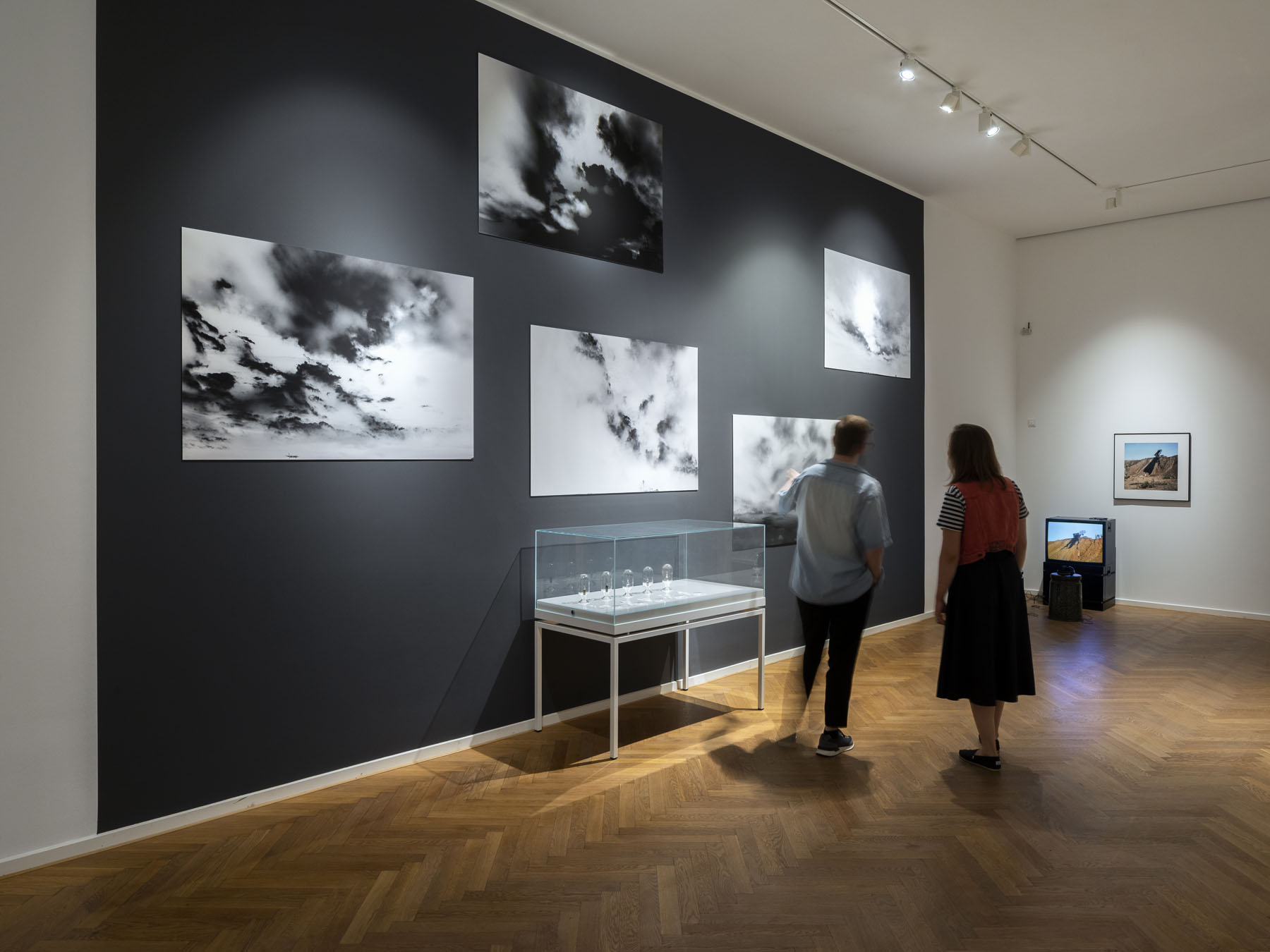
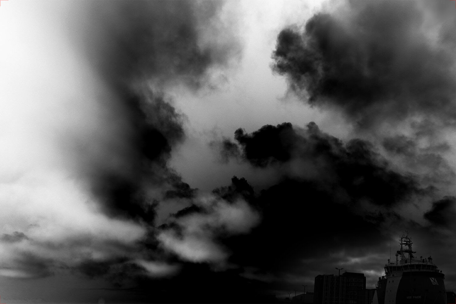
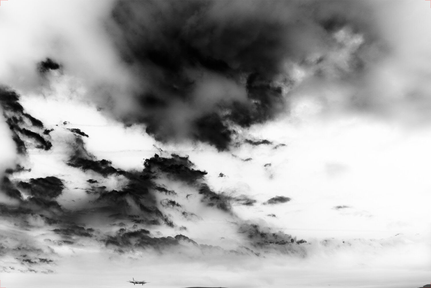

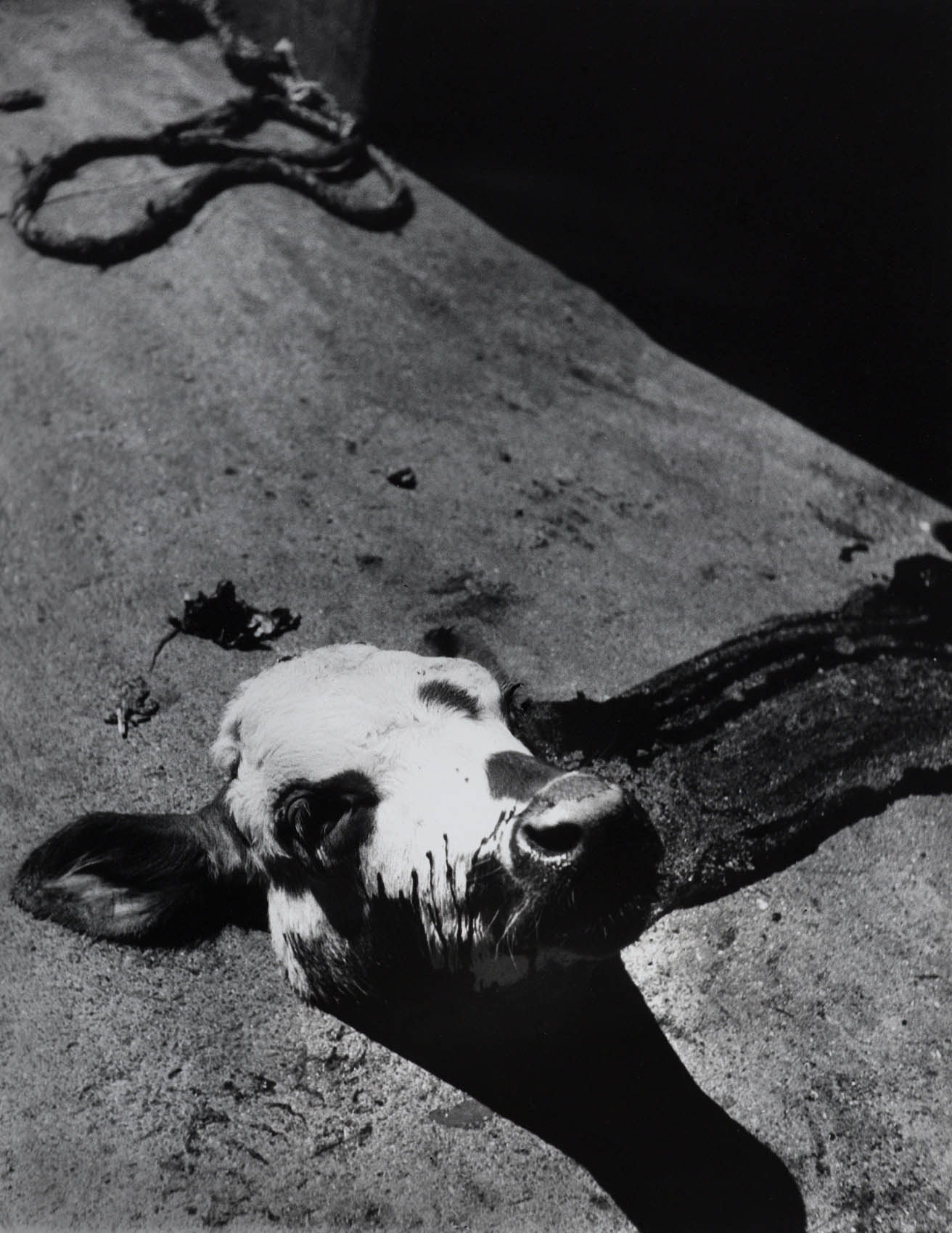
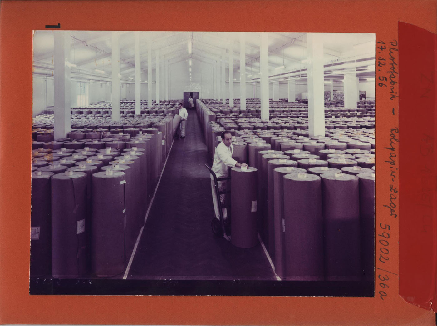
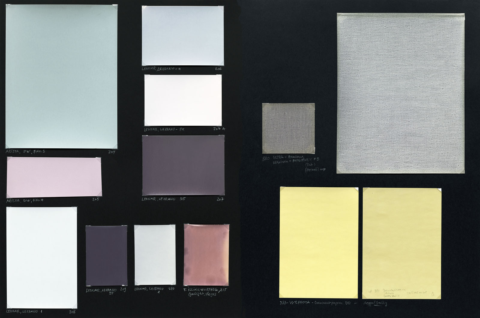
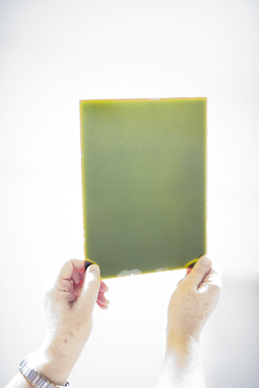
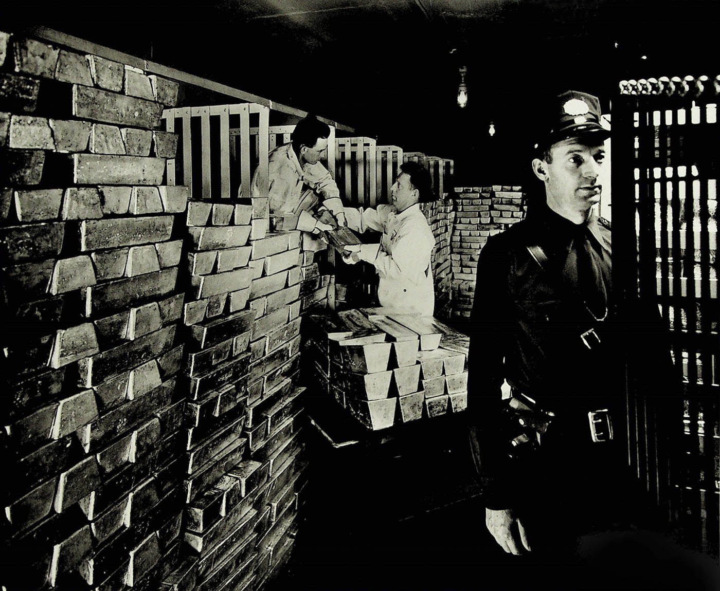

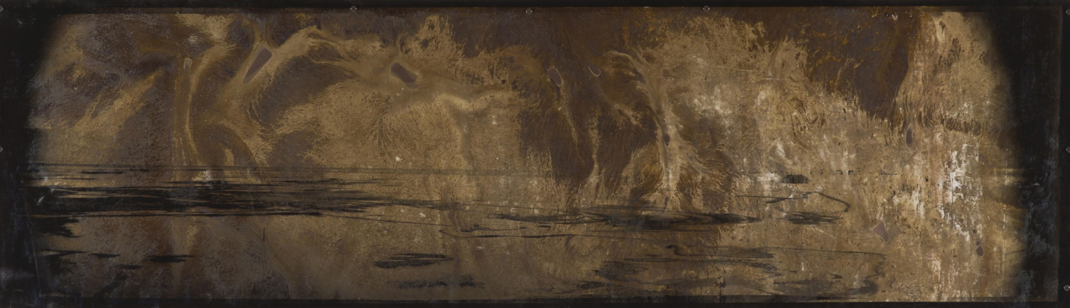

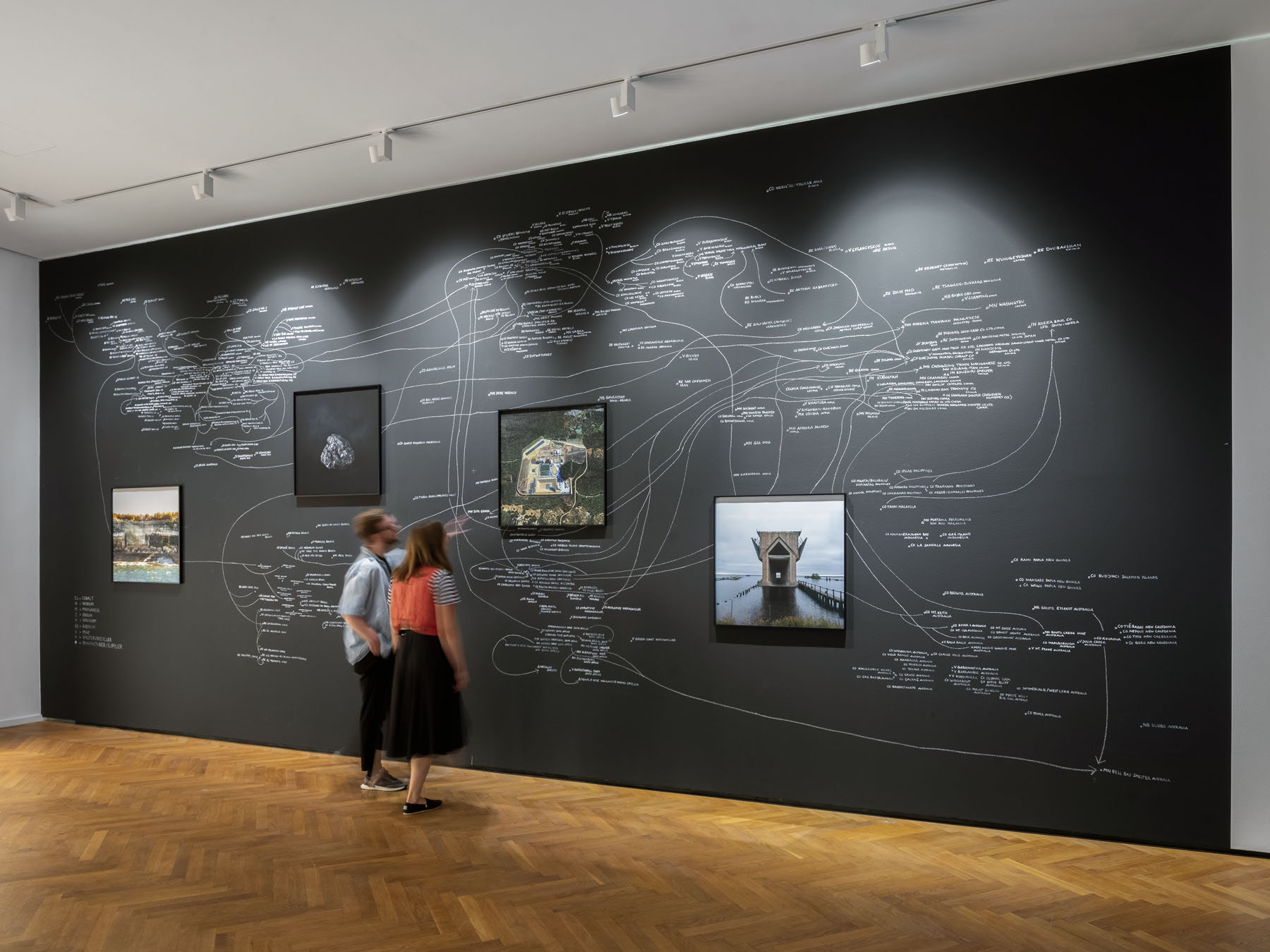


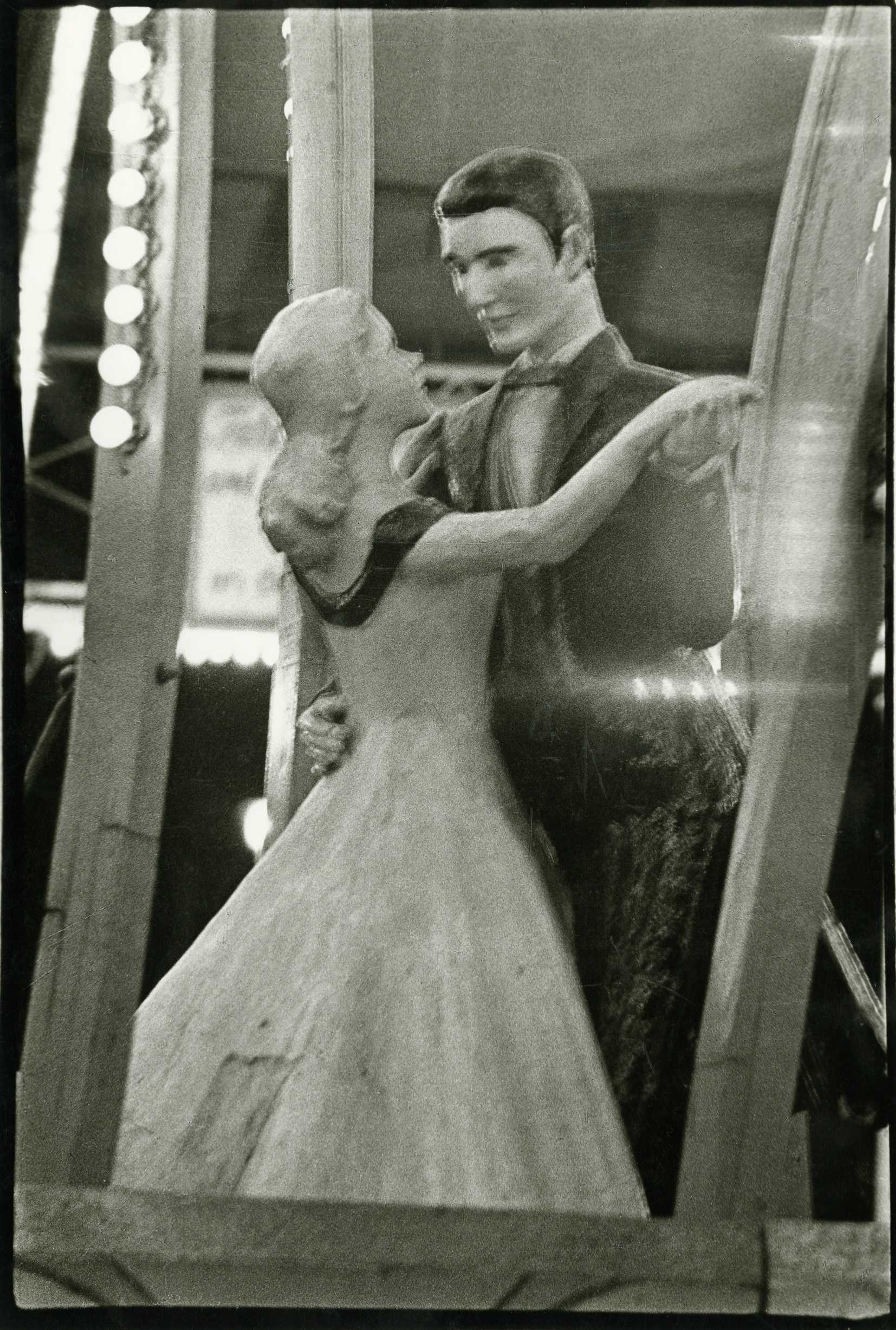

















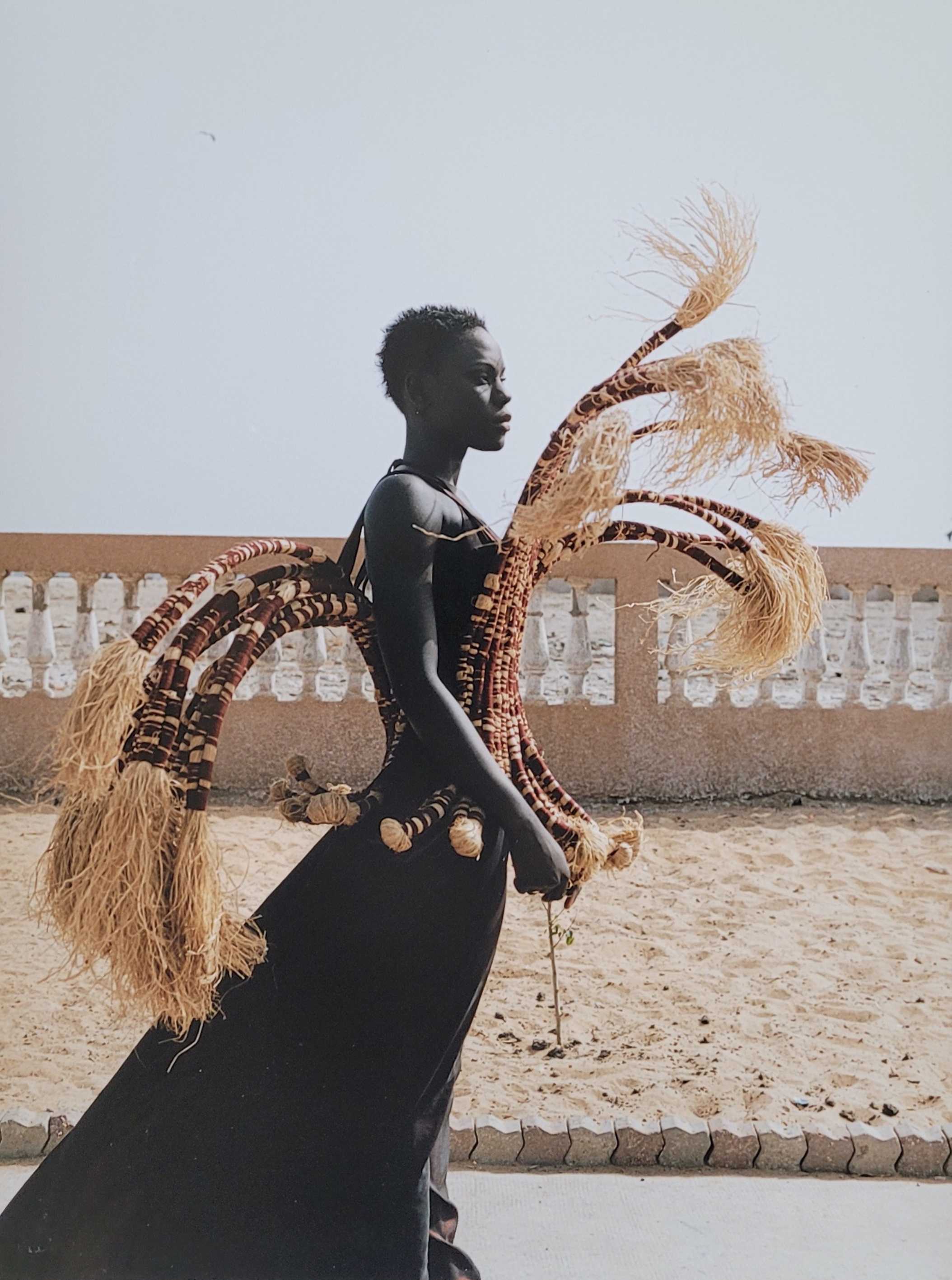


You must be logged in to post a comment.