
Exhibition dates: 19th September, 2024 – 5th January, 2025
Curator: Patricia Mayayo
Artists: Djuna Barnes / Xenia Cage / Leonora Carrington / Leonor Fini / Suzy Frelinghuysen / Elsa von Freytag-Loringhoven / Meraud Guinness Guevara / Anne Harvey / Valentine Hugo / Buffie Johnson / Frida Kahlo / Jacqueline Lamba / Eyre de Lanux / Gypsy Rose Lee / Hazel McKinley / Aline Meyer Liebman / Louise Nevelson / Meret Oppenheim / Milena Pavlovic-Barilli / Barbara Poe-Levee Reis / Irene Rice Pereira / Kay Sage / Gretchen Schoeninger / Sonja Sekula / Esphyr Slobodkina / Hedda Sterne / Sophie Taeuber-Arp / Dorothea Tanning / Julia Thecla / Pegeen Vail Guggenheim / Maria Helena Vieira da Silva
 'Gray Day (Sand Dunes)' c. 1929 from the exhibition '31 Women. An Exhibition by Peggy Guggenheim' at Fundación MAPFRE, Madrid, Sept 2024 - Jan 2025")
Aline Meyer Liebman (American, 1879-1966)
Gray Day (Sand Dunes)
c. 1929
Gouache on board
35.5 x 48cm
The 31 Women Collection
© 2022-2024 JPS Artworks LLC
Short biography: Aline Meyer Liebman (1879-1966). Born in Los Angeles, Aline Meyer Liebman studied at the Art Students League in New York and received the support of Georgia O’Keeffe and Alfred Stieglitz. By the 1930s she had already become a consolidated artist and was the subject of a solo show at Walker Galleries in 1936. Meyer Liebman was also known for her work as a collector of art and photography. She acquired works by O’Keeffe, Stieglitz, Edward Weston, and Max Ernst, among others. Liebman kept a broad circle of relationships with key people in the New York art world, such as Peggy Guggenheim, who included her work Painted Dream (1935) in Exhibition by 31 Women. Other notable facets include her political and philanthropic work: aside from supporting President Roosevelt, she became a member of the New York League of Women Voters and designed a poster for the organization in 1944.
While it is fantastic to see this “recreation” (many of the original art works are unknown or missing and others have been substituted by the same artist in their place) of Peggy Guggenheim’s 1943 Exhibition by 31 Women “organised in her New York gallery ‘Art of This Century’, one of the first exhibitions in the United States to showcase works exclusively by European and American women,” I am conflicted by this exhibition. Conflicted, conflicted, conflicted.
Wealthy white women uses influence and money to promote women artists when no one else would, a patron reinforcing female participation introducing “well-established figures within the artistic landscape as well as emerging talent.” But I have a feeling that this group of female artists was part of an elite cohort – a privileged, internalist, internationalist, undoubtedly incestuous (in terms of knowing each other) clique of humans that knew the right people, especially through their connections with male artists.
As ever with the art world, it’s not what you know it’s who you know. Which artist has the ear of which curator; which artist is “fashionable” at the moment; and which artist is supported by which patron and gallery. It’s all about connections, and these women, whether emerging or established, had those connections. They were part of an educated elite that was at one and the same time, both exclusive and excluding (no Black American or Asian artists here… think of the times!)
And while the relationship between art and bourgeois life central to an earlier ideal of culture (the artist and their patron) has changed since the Second World War and the playing field has become much more egalitarian, my cynicism and socialism still rails at those with power and how they withhold their largesse. You only have to look at the photograph of Peggy Guggenheim in the entrance hall of her eighteenth century Venetian palace or the naming of so many galleries in art museums after wealthy patrons to understand what I mean.
What did it mean for these women artists, at what level was it a recognition of their undoubted skill as artists, when so many largely vanished without trace?
Dr Marcus Bunyan
Many thankx to Fundación MAPFRE for allowing me to publish the photographs in the posting. Please click on the photographs for a larger version of the image.
The idea of the artist as central member of a spiritual elite embodying an alternative to Philistine commercialism, or even pointing the way to humankind’s salvation, has powered a variety of movements as different as Aestheticism, Realism, Dada, De Stijl, and Russian Constructivism. This was the conception of culture that crystallized in the notion of the avant-garde, whose “function” – in Clement Greenberg’s classic formulation of 1939 – was “to find a path along which it would be possible to keep culture moving in the midst of ideological confusion and violence.”[1]
Greenberg’s text touchingly reveals the double sense of the idea of culture, as both redeeming force of the existing system and as a sort of critique by enactment of an alternative set of values. In this conception, the essence of art, incarnated in the avant-garde, is its alienation from the norms of bourgeois society (hence, in the case of modernist abstraction, its abandonment of going systems of representation). On the other hand, Greenberg acknowledged that “No culture can develop without a social basis, without a source of stable income” and even that “in the case of the avant-garde, this was provided by an elite among the ruling class of that society from which it assumed itself to be cut off, but to which it has always remained attached by an umbilical cord of gold. The paradox is real.”[2]
This paradox is nothing but the place of culture in capitalist society, in its most concentrated form. Given the distinctive social character of art objects, as handmade luxury goods in a world dominated by mechanized mass production, they offer both their producers and their consumers an experience outside the “everyday life” of the market. Expressive, in its very freedom from monetary considerations, of the power of money and of the access to free time made possible by money, art is a token and a perk of social distinction for those who own and even for those who merely appreciate it. The artist, as producer of this token, shares in the distinction, though (for the most part) not in the wealth that supports the social practice of art as a whole. It was the very separation of the world of cultural production from the norm of capitalist investment and production that made it potentially so valuable. By means of critique, culture cleanses modern society of the sin of commercialism, allowing its dominating classes to see themselves as worthy inheritors of the position of the aristocracy they displaced.
The picture I have sketched here, hardly a novel one, evidently owes a great deal to Pierre Bourdieu’s analysis of what he calls “the field of cultural production.” That analysis reveals in particular the close relation between, on the one hand, the social antagonism between the producers of culture and the upper-class consumers from whom they are separated by style of life and self-conception as well as degree of social power, and, on the other, the fact that “the cult of art and the artist… is one of the necessary components of the bourgeois ‘art of living,’ to which it brings a ‘supplément d’âme,’ its spiritualistic point of honor.”[3] This cultural system, evolved during the nineteenth century, survived until well into the twentieth. But the last twenty years have seen the acceleration of a process of change, whose origin is traceable to the end of the Second World War.[4] What changed was not the centrality of the “cult of art” to the bourgeois “art of living” but the felt antipathy between art and bourgeois life central to the earlier ideal of culture.
Paul Mattick. “After the Gold Rush,” on the American Society for Aesthetics website 2010 [Online] Cited 12/12/2024. Used under fair use conditions for the purposes of education and research
1/ C. Greenberg, “Avant-garde and Kitsch,” in idem, Art and Culture (Boston: Beacon Press, 1961), p. 5.
2/ Ibid., p. 8
3/ P. Bourdieu, The Field of Cultural Production (New York: Columbia University Press, 1993), p. 44.
4/ For an in-depth discussion, see Katy Siegel, Since ’45: American Art in the Age of Extremes (London: Reaktion, 2016)
; at second left, Leonora Carrington's 'The Horses of Lord Candlestick' (1938); and at right, Buffie Johnson's 'The Middle Way / The Great Mother Rules the Sky (Astor Mural)' (1949-1959)")
Installation view of the exhibition 31 Women. An Exhibition by Peggy Guggenheim at Fundación MAPFRE showing at left, Milena Pavlovic-Barilli’s Juno and Vulcan (1936, below); at second left, Leonora Carrington’s The Horses of Lord Candlestick (1938, below); and at right, Buffie Johnson’s The Middle Way / The Great Mother Rules the Sky (Astor Mural) (1949-1959, below)
In 1943, the renowned art collector Peggy Guggenheim organised in her New York gallery ‘Art of This Century’, one of the first exhibitions in the United States to showcase works exclusively by European and American women, titled Exhibition by 31 Women. The show was conceived by Guggenheim in collaboration with Marcel Duchamp, and the artists were selected by a jury whose members included André Breton, Max Ernst and Duchamp himself. Guggenheim, as the sole woman on the jury, was in a privileged position to provide a female perspective in the selection process.
These women, many of whom were associated with Surrealism or abstraction, maintained an ambiguous position within both trends. Often, they employed these styles to reformulate and challenge them, preserving their independence and shedding light on the patriarchal assumptions underlying these artistic movements.
31 Women. An Exhibition by Peggy Guggenheim presents a curated selection and reinterpretation of that initiative, including all the artists featured in the original show. With this exhibition, the Foundation aims not only to honor Peggy Guggenheim’s significant role as one of the foremost patrons and collectors of the 20th century, but also shift the narrative away from viewing these women primarily through their connections with male artists. Instead, it highlights the networks of collaboration, solidarity, and friendship they established among themselves.
Text from the Fundación MAPFRE website
 'Waiting for Foam' 1944 from the exhibition '31 Women. An Exhibition by Peggy Guggenheim' at Fundación MAPFRE, Madrid, Sept 2024 - Jan 2025")
Sonja Sekula (American, 1918-1963)
Waiting for Foam
1944
Oil on canvas
40.3 x 49.8cm
The 31 Women Collection
© Estate of Sonja Sekula
© 2022-2024 JPS Artworks LLC
Short biography: Sonja Sekula (1918-1963). Born in Lucerne from a Hungarian father and a Swiss mother, Sonja Sekula emigrated to New York in 1936, where her father had moved their family business. In 1938 she attempted suicide for the first time and from that point onward began suffering from mental health issues. Through her well-connected family, Sekula was able to meet André Breton and other European Surrealists in the early 1940s. In mid-decade, she travelled to Mexico and came into contact with Frida Kahlo and Leonora Carrington. Later, she traversed the northeastern United States, discovering the imagery of Native American people. The primitivist symbols in her canvases are interwoven with decorative patterns, intense colours, and a juxtaposition of viewpoints. At the time, Sekula’s work was well received by critics, some suggesting that there was a hidden symbolism related to her homosexuality. Aside from including her painting Composition at Exhibition by 31 Women, Peggy Guggenheim dedicated a solo exhibition to Sekula’s work in 1946. Two years later Sonja Sekula joined the Betty Parsons Gallery, which would host five solo exhibitions between 1948 and 1957. In 1951, a day after the opening of her third exhibition, she suffered a nervous breakdown. The artist spent the following years coming in and out of mental health clinics in the United States and Switzerland. In 1963 she committed suicide in her Zurich studio.
 'Untitled' 1933 from the exhibition '31 Women. An Exhibition by Peggy Guggenheim' at Fundación MAPFRE, Madrid, Sept 2024 - Jan 2025")
Louise Nevelson (American, 1899-1988)
Untitled
1933
Black painted terracotta
The 31 Women Collection
© Louise Nevelson, VEGAP, Madrid, 2024
© 2022-2024 JPS Artworks LLC
Short biography: Louise Nevelson (1899-1988). Born in Ukraine, Louise Nevelson emigrated to the United States with her family at the age of six. After studying in Germany under Hans Hofmann, she settled in New York, where she met Frida Kahlo and Diego Rivera. Nevelson collaborated on one of Rivera’s murals while receiving lessons from George Grosz and Chaim Gross. Her first terracotta works – painted in black and often subject to the application of a form of engraving – reveal the influence of Central American art that she had come to know through Kahlo and Rivera. Furthermore, Louise Nevelson participated in the association American Abstract Artists (AAA) and was often in the company of Frederick Kiesler and Peggy Guggenheim, who selected her work Column for Exhibition by 31 Women. In the 1950s she began to accumulate a large collection of wooden fragments, which would give rise to her most characteristic working method. First, she painted each piece black, white, or gold. Later, she piled and stored the fragments. Finally, she assembled the pieces in large abstract constructions. In 1956 she began to use milk cartons and wood to produce small embedded reliefs, combining them to create increasingly large ensembles. Her work received much critical acclaim after her participation in the Moon Garden Plus exhibition in New York, in 1958.
Highlight
Fundación MAPFRE presents 31 Women. An Exhibition by Peggy Guggenheim, featuring works by thirty-one artists who participated in Exhibition by 31 Women, a show organised in 1943 by Peggy Guggenheim at her Art of This Century gallery in New York. Most of these creators, who came from Europe and the United States, were linked to the Surrealist movement or to abstraction, and included both well-established figures within the artistic landscape as well as emerging talent.
The exhibition highlights Peggy Guggenheim’s important role as a patron, addressing the context in which the artists she became associated with at her New York gallery developed their work, as well as the networks of collaboration that were established between them.
KEYS
Art Also Belongs to Women
In her famous article of 1971, “Why Have There Been No Great Women Artists”, Linda Nochlin stated: “In the field of art history, the white Western male viewpoint, has been unconsciously accepted as the viewpoint of the art historian.” This text finally advocated the role played by many women who had been dismissed on the basis of their gender throughout the history of art and have only recently begun to occupy the place they deserve – along with writers, mathematicians, philosophers, etc. The artists featured in 31 Women. An Exhibition by Peggy Guggenheim, such as Frida Kahlo, Maria Helena Vieira da Silva, Valentine Hugo, and Dorothea Taning, could easily figure in Nochlin’s list, which included figures such as Artemisia Gentileschi, Angelica Kauffmann, Safo, Jane Austen, Virginia Woolf, Gertrude Stein, and Emily Dickinson.
Surrealism
Surrealism, a term coined by Guillaume Apollinaire in 1917, refers to the movement led by André Breton, who defined it as “Psychic automatism in its pure state, by which one proposes to express – verbally, by means of the written word, or in any other manner – the actual functioning of thought.” Rooted in Dadaism and Sigmund Freud’s theories of psychoanalysis, Surrealists expressed themselves through writing, photography, performance, painting, collage, and music. Although Surrealism in principle advocated gender equality and supported the work of women artists, in practice women were considered almost as objects, rather than creative subjects.
Peggy Guggenheim
Patron and art lover, Peggy Guggenheim (New York, 1898 – Padova, 1979) was one of the most important collectors and promoters of avant-garde art of the 20th century. The daughter of Benjamin Guggenheim and Florette Seligman, and niece of Solomon R. Guggenheim, founder of the Guggenheim Museum in New York, she decided to move to Europe in 1921. In Paris she established relationships with Marcel Duchamp, Constantin Brancusi, and Djuna Barnes, among others. Later, she settled in London, where she opened her first gallery in 1938. Under the name Guggenheim Jeune, the gallery featured works by Vasili Kandinsky and Yves Tanguy. Prior to the Nazi occupation of France, Guggenheim returned to Paris and acquired some of the most important works in her collection, which she managed to take with her when she fled to the United States.
In 1942, once she had settled in New York, Guggenheim opened the Art of This Century Gallery on West 57th street. Aside from displaying her own collection, the space became a platform for young artists, among which were the women who took part in Exhibition by 31 Women.
THE EXHIBITION
In 1943 the renowned collector Peggy Guggenheim organised one of the first exhibitions dedicated exclusively to the work of European and North American women artists at her New York gallery Art of This Century. Titled Exhibition by 31 Women, the show was conceived by Guggenheim in collaboration with Marcel Duchamp. The selection of artists was carried out by a jury whose members included André Breton, Max Ernst, and Duchamp himself. As the only woman in the jury, Guggenheim was able to contribute a female perspective to the process. In the press release, the gallerist herself presented the exhibition as a “testimony to the fact that the creative ability of women is by no means restricted to the decorative vein, as could be deduced from the history of art by women throughout the ages.” Her objective was to present the work of these creators as independent artists, distancing them from the traditional roles they had been given as muses or models.
The list of works published for the exhibition did not contain photographs, only titles, which were often quite unspecific, such as “still life” or “composition”. With the exception of a few cases, it is difficult to ascertain which works were on display at 31 Women.
31 Women. An Exhibition by Peggy Guggenheim presents a selection and a reinterpretation of The 31 Women Collection repository; a collection created by the North American producer and collector Jenna Segal in 2020, featuring works by the same artists who participated in the historic exhibition of 1943.
Through this exhibition, Fundación MAPFRE aims to disseminate the work and vision conceived by Peggy Guggenheim at her New York Gallery, further breaking with the narrative that has often valued the contributions of women artists in terms of their relationships with male artists, while focusing more specifically on the networks of collaboration, solidarity, and friendship that were established between them. Associated mostly with Surrealism or abstraction, these women used said languages in an effort to reformulate and question them, maintaining their independence and highlighting the patriarchal precepts such movements were based on.
All of the works on display – close to forty – belong to The 31 Women Collection. Likewise, the exhibition also features photographs, publications, and other pieces; contextualising and complementing the show’s approximation to the scene of North American women artists of the time. Along with the exceptional loan from The 31 Women Collection, the exhibition is also supported by the Vitra Design Museum, the Lafuente Archive, and the Museo Nacional Centro de Arte Reina Sofía Documentation Center.
The exhibition discourse is articulated in different sections, the first of which introduces the viewer to the work carried out by Peggy Guggenheim at her Art of This Century gallery, and in particular her support of women artists of the time. The following sections pose an approximation to some of the main thematic axes and strategies explored by the creators featured in Exhibition by 31 Women, who sought to assert their independence and avoid clichés associated with the label “female artist” that were commonplace in the world of art at the time.
Art of This Century
In 1942 Peggy Guggenheim opened the Art of This Century gallery on the top floor of a building on West 57th Street in New York. Determined to create a space that would generate expectation, she hired the Austrian architect Frederick Kiesler, who designed custom furniture – one piece being featured in this exhibition – and projected a groundbreaking exhibition device to stimulate interactions between viewers and artworks.
The space had a profound impact on the artistic scene through a program of solo exhibitions that Guggenheim dedicated to numerous artists who would later become some of the most renowned creators of their time. The gallery also became an essential meeting point for European and North American avant-gardes. Among the most important initiatives developed by Guggenheim at her gallery were her support and promotion of the work of women artists, not only through group exhibitions, such as Exhibition by 31 Women and later The Women (1945), but also through the solo shows dedicated to some of the participants in said exhibitions, such as Sonja Sekula or Irene Rice Pereira.
The “Self” as Art
The role played by self-representation in the work of these artists was fundamental in their claim for independence and in their efforts to assert their identity versus traditional art historiography, in which women – when mentioned – appeared as secondary figures relegated to the roles of muses, wives, or companions of their male counterparts. Furthermore, in order to construct identities that were different to those assigned to them and escape from the gender roles imposed by the patriarchal society of the time, they adopted a number of languages that included autobiographical components, costumes, performances, and self-portraiture. This can be observed in works such as Woman in Armor I, by Leonor Fini, or Untitled (Self-Portrait), by Dorothea Tanning, for example.
In their quest to escape from social expectations and gender roles, self-representation became one of the creative strategies most widely adopted by women artists in the first half of the 20th century. Through elaborate costumes and extravagant make-up, which they wore in their daily lives or during improvised performances, Elsa von Freytag-Loringhoven and Leonor Fini constructed alternate identities that allowed them to elude the rigid female behavioral models determined by bourgeois ideology. Likewise, Hedda Sterne, Dorothea Tanning, and Meret Oppenheim spoke of their interest in blurring the boundaries of conventionally constructed identities through doubling, masquerades, and the confusion of reality against its reflection, which can be observed in their self-portraits. Similarly, Gypsy Rose Lee reinvented the genre of striptease – traditionally linked to popular culture – by challenging the contemporary understanding of the pose and of female nudes.
Elsa von Freytag-Loringhoven, Gypsy Rose Lee, and Leonora Carrington completed their self-creation work with the writing of their autobiographies, which seamlessly combined reality and invention. Writing novels about themselves allowed these artists to reflect on aspects of their past that might have been considered lurid – for instance, becoming the victim of rape by a group of men in Madrid as Carrington recounted in Down Below – or imagining alternative narratives of their lives. In similar fashion, Leonor Fini frequently took photographs of herself posing in black feather wigs and other props through which she fabricated imaginary personalities. Both Elsa von Freytag-Loringhoven and Gypsy Rose Lee, who had worked as dancers and strippers in burlesque shows and as professional models in art schools, were very aware of the need to take control of their own image, subverting the passive role that muses and female models still played within the avant-garde.
 'Gypsy Rose Lee images for Tru-Vue stereoscope film: Striptease Stereoview #1306 Burlesque' 1933 (detail)")
Gypsy Rose Lee (American, 1911-1970)
Gypsy Rose Lee images for Tru-Vue stereoscope film: Striptease Stereoview #1306 Burlesque (detail)
1933
Vintage Tru-Vue 16 pictures in film (13 of Gypsy Rose Lee)
The 31 Women Collection
Gypsy Rose Lee began performing as a stripper in burlesque shows and went on to appear in Broadway theaters. Her stripteases were greatly successful, allowing her to transform the genre. The fact that she talked while striping was truly groundbreaking and enabled her to draw attention away from the mere act of stripping, while presenting herself as a modern and entertaining woman. Likewise, her enunciation was unlike street slang: she recited with an outlandish high-class accent and incorporated phrases in French.
Short biography: Gypsy Rose Lee (1911-1970). Born under the name Rose Luise Hovick into a working-class family that performed in vaudeville theaters in Seattle, Washington, Gypsy Rose Lee began to work as a stripper in burlesque shows at the age of sixteen and went on to perform at important Broadway theaters. Her acts were enormously popular at the time, granting the genre respect and transforming it into something beyond the act of stripping. She began to collect works of art in the 1940s. Among such purchases were works by Max Ernst. This opened the doors to meetings with Peggy Guggenheim, who at that time was married to the German painter and would host the encounters at her house. In Exhibition by 31 Women, she exhibited a collage titled Self-Portrait. In 1957 Gypsy Rose Lee published her autobiography, culminating the life-long self-promotion and self-invention work that drove her entire career.
 'Untitled (Self-Portrait)' c. 1940")
Dorothea Tanning (American, 1910-2012)
Untitled (Self-Portrait)
c. 1940
Watercolour, ink and crayon on paper
36.5 x 29.2cm
The 31 Women Collection
© The estate of Dorothea Tanning, VEGAP, Madrid, 2024
© 2022-2024 JPS Artworks LLC
In this self-portrait from the early 1940s, Dorothea Tanning experimented with the limits of reality and representation. In a style akin to fashion figurines that often appeared in women’s magazines of the time, the artist portrayed herself in a room full of empty canvases. Her naked legs are reflected onto a framed glass that is pointed at the viewer, creating an impossible interplay of mirrors and altering the relationship between reality and reflection; inside and out.
Short biography: Dorothea Tanning (1910-2012). Born in a small town in Illinois, where she lived a solitary childhood, Dorothea Tanning developed an interest in dreams and fantasy since she was a child. After visiting Fantastic Art, Dada, Surrealism (1936) at MoMA, she felt attracted to Surrealism and travelled to Paris three years later with the objective of coming into contact with said group. Although she was forced to cut her stay short due to the outbreak of the war, the paintings she created upon her return to New York are proof of her strong Surrealist bias. In 1942, following the advice of gallerist Julien Levy, Max Ernst visited her studio and selected the works Birthday and Children’s Game for Exhibition by 31 Women. The visit also signified the beginning of a relationship between Tanning and Ernst, who separated from Peggy Guggenheim and married the artist in 1946. From the 1930s to the late 90s Tanning developed a prolific career. Her paintings, ballet designs, soft sculptures, and literary works reflect some of her recurring obsessions: the subversion of the bourgeoise domestic space, metamorphosis, the power of imagination, the gothic novel, and non-conventional images of girls and feminine figures.
 'Forggtten Like This Parapluie Am I By You - Faithless Bernice!' 1923-1924")
Elsa von Freytag-Loringhoven (German, 1874-1927)
Forggtten Like This Parapluie Am I By You – Faithless Bernice!
1923-1924
Gouache on foil
13 x 12cm
The 31 Women Collection
© 2022-2024 JPS Artworks LLC
The autobiographical component of this work has been linked to the closed umbrella, which lies uselessly at the center of the image and represents the loneliness felt by Elsa von Freytag-Loringhoven at a point when she had been abandoned by those who supported her both emotionally and financially. The treading foot that appears on the left of the composition symbolizes the passing of the years. The title of the work also expands on this notion, which is a direct interpellation to her friend and patron Berenice Abbott. On the other hand, the silhouette of the urinal alludes to the famous readymade by Marcel Duchamp, a work that a number of recent studies have attributed to Freytag-Loringhoven.
Short biography: Elsa von Freytag-Loringhoven (1874-1927). Born in Germany under the name Else Plötz, she became known as Else Endell, Else Greve, and finally Elsa von Freytag-Loringhoven through her numerous marriages over the course of several decades; evidence of her early interest in constructing herself as a character. At the age of eighteen she settled in Berlin, where she began to study art and worked as a variety artist and model. In 1913 she emigrated to New York and joined the Dadaist circle that gathered around the collectors Louise and Walter Arensberg. Elsa von Freytag’s work spanned several genres: poetry, autobiography, art, and artistic self-representation. Aside from producing sculptures with found elements, she used materials rescued from the streets and objects stolen from department stores to create costumes that she wore at Greenwich Village balls and during her walks through New York, combining them with striking make-up, extravagant hairdos, and other decorations. One of the objects she created with fragments from plumbing materials was on display at Exhibition by 31 Women. In 1923 she returned to Berlin and shortly after settled in Paris, where she scraped a living with the help of friends like Berenice Abbott and Djuna Barnes. She died under uncertain circumstances in 1927. Very few of her performances where documented and her work remained invisible to a great extent until the early 21st century. Some research suggests that she was the author of the famous readymade Fountain, considered one of Marcel Duchamp’s key works.
Strangely Familiar
In 1919 Freud coined the term unheimlich – which roughly translates into English as “ominous” or “uncanny”, and into French as “unsettling strangeness”. This aesthetic category, which is verging on beautiful, was adopted by the Surrealist movement and generally alludes to things that are familiar and attractive, but simultaneously produce a sense of unease and rejection. This is the underlying feeling in Gray Day (Sand Dunes), by Aline Meyer Liebman, or in the still lives by Meraud Guinness Guevara and Meret Oppenheim, which portray decontextualised familiar objects, provoking a sense of unease that is hard to explain. This sensation is accentuated in Spanish Customs by Dorothea Tanning and in Kay Sage’s The Fourteen Daggers, in which two mysterious figures covered in fabric seem to ascend a staircase to the sky.
Hence, Aline Meyer Liebman’s yellowish dunes are striking for their anthropomorphic forms, the Connecticut night sky appears as a fantastic explosion of flowers and stars in Jacqueline Lamba’s painting, and the viewer is unsettled by the incongruent characters and scenes that disrupt the peacefulness in Hazel McKinley and Pegeen Vail’s colourful landscapes. Furthermore, familiar objects seem to have lost their usual meaning in the puzzling dreamlike still lives by Meraud Guinness Guevara, Anne Harvey, Meret Oppenheim, and Gypsy Rose Lee, while Eyre de Lanux and Evelyn Wild’s rug designs combine primitivist and avant-garde elements that question the ideals of purity associated with modern domestic interiors. Kay Sage and Dorothea Tanning’s paintings are particularly unnerving as they transform the bourgeois house into a strange territory inhabited by ghostly figures and elongated shadows.
 'Spanish Customs' 1943")
Dorothea Tanning (American, 1910-2012)
Spanish Customs
1943
Oil on canvas
25.4 x 20.3cm
The 31 Women Collection
© The estate of Dorothéa Tanning, VEGAP, Madrid, 2024
© 2022-2024 JPS Artworks LLC
 'Souvenir of the Lunch in fur' 1936 / 1972")
Meret Oppenheim (Swiss born Germany, 1913-1985)
Souvenir of the Lunch in fur
1936 / 1972
Fabric, paper, artificial fur and artificial flowers encased under glass
16.7 × 19.8cm
The 31 Women Collection
© Meret Oppenheim / VEGAP, Madrid, 2024
© 2022-2024 JPS Artworks LLC
Produced in 1972, this piece is a reinterpretation of one of Meret Oppenheim’s most renowned works, Déjeuner en Fourrure, which was on display for the first time in 1936 – the year it was produced – at an exhibition dedicated to Surrealist objects. The work garnered much recognition and was selected by Peggy Guggenheim for Exhibition by 31 Women. Dipleased by always seeing her name associated with this work, the artist wanted to make an ironic version of her infamous mug, recreating it with cheap materials: a perfect kitsch souvenir of the iconic work.
Short biography: Meret Oppenheim (1913-1985). Born in Berlin into a family of the liberal bourgeoisie, Meret Oppenheim studied at Rudolf Steiner’s school in Basel. Between 1932 and 1937 she spent much of her time in Paris, where she became close to the Surrealist movement. The photographs in which she posed for Man Ray and the enormous success of her objects – in particular Déjeuner en Fourrure [Breakfast with Furs] from 1936, acquired by MoMA and also on display at Exhibition by 31 Women – make her a Surrealist muse of sorts. Later, she expressed her irritation at seeing her name associated solely to that work and to Surrealism. In 1937 Oppenheim returned to Basel, where she battled depression and produced very little until 1954, when she resumed her artistic work with great impetus. Myths, dreams, literary sources, Jung’s psychoanalysis, gender roles, and social stereotyping were interwoven within her work, which also incorporated magical objects, poems, photographs, theatre costumes, and textile designs.
 'Roxbury, stars' 1946")
Jacqueline Lamba (French, 1910-1993)
Roxbury, stars
1946
Oil on canvas
The 31 Women Collection
© Jacqueline Lamba, VEGAP, Madrid, 2024
© 2022-2024 JPS Artworks LLC
In the mid-1940s, Jacqueline Lamba and the North American Surrealist artist David Hare took a trip together through the western United States, where they came into contact with the cosmology and art of the indigenous peoples of North America. The typical brown colours of Amerindian fabrics dominate the palette of this canvas, in which Lamba portrayed the surroundings of her house in Roxbury and captured the unexpected reality that lies hidden behind a seemingly mundane landscape.
Short biography: Jacqueline Lamba (1910-1993). Born in France, Jacqueline Lamba spent her early years in Egypt, where her father – an engineer – passed away in a car accident in 1914. She returned to Paris with her mother and attended the École de l’Union Centrale des Arts Décoratifs. After the passing of her mother in 1927 Lamba survived with the meager wages she earned from her design work. Fascinated by André Breton’s Communicating Vessels, she began an intense and difficult romantic relationship with him. The couple married shortly after and had a daughter named Aube. Jacqueline Lamba always lamented being more recognised as Breton’s muse than for her collages, cadavre exquis, objects, and paintings, which would soon be on display at Surrealist exhibitions. In 1938 she travelled to Mexico with her husband. The couple was hosted by Diego Rivera and Frida Kahlo, whom she established a profound relationship with. Thanks to the patronage of Peggy Guggenheim, Lamba and Breton settled in New York in 1941 as they fled from the Nazis. Lamba exhibited her work at the inaugural show of the Art of This Century Gallery and participated in Exhibition by 31 Women. In 1944 she divorced Breton and began a relationship with David Hare. They settled in Connecticut in 1948 and had a son. Lamba lost interest in Surrealism and veered toward abstraction, focusing on the mythologies of indigenous populations from Mexico and the United Sates. In 1954, after separating from Hare, she returned to Paris and destroyed much of her prior work. She later confessed that she had first tried to please Breton and then Hare with her paintings, ensuring that she would only paint to please herself from that point onward. In 1967 the most comprehensive exhibition dedicated to her work in her lifetime was hosted at the Musée Picasso in Antibes.

Kay Sage (American, 1898-1963)
The Fourteen Daggers
1942
Oil on canvas
40.6 × 33.3cm
The 31 Women Collection
© 2024 Estate of Kay Sage / VEGAP
© 2022-2024 JPS Artworks LLC
The conversion of domestic space into unusual territory reached its pinnacle in works such as this one. Sage imagined a bizarre interior space that opens up to a door behind which lies a staircase leading to the sky. The scene is inhabited by two ghostly figures covered in fabric that cast elongated shadows on the ground and accentuate the air of mystery. The motif of the open door reappears in Dorothea Tanning’s oil painting Spanish Customs, also on display in this room.
Short biography: Kay Sage (1898-1963). Born under the name Katherine Linn Sage into a wealth family from Albany, Kay Sage spent most of her childhood travelling through Europe with her mother, who had divorced her father in 1908. Although she never received a formal education, she went on to study at the Corcoran School of Art in Washington D. C. and at the British Academy in Rome, where she settled in 1920. Aside from coming into contact with the local artistic scene, Sage met Prince Ranieri di San Faustino, whom she married in 1925. During their ten years as a married couple, Sage dedicated little time to art. In 1937 she moved to Paris, where she came into contact with the members of the Surrealist group and began a romantic relationship with the painter Yves Tanguy, whom she married in 1941. With the outbreak of World War II, the couple migrated to Connecticut, where they would reside for the following years. During that period Sage developed her own style: uninhabited landscapes intersected by austere architectural forms, shadows, and floating fabrics that are simultaneously recognisable and enigmatic. Peggy Guggenheim selected her painting from 1942 At the Appointed Time – today preserved at the Newark Museum of Art – for Exhibition by 31 Women. In 1955 Tanguy died suddenly. This event led Sage into depression. Coupled with eyesight problems, she drifted away from painting. In the late 1950s she began to produce collages and write poetry. However, in January of 1963 Sage took her own life.
Bestiaries
Many of the artists featured in this exhibition – particularly those whose works are more closely linked with Surrealism – experimented with multiple personalities, which led them to identify themselves with animals that became their alter egos. As noted by Patricia Mayayo, curator of the show, “the animals embodied the search for other mythical or imaginary worlds where they could finally be free”. Hence, the female body is transformed into an eagle, a crow, or a deer in the works of Barbara Poe-Levee Reis, Milena Pavlovic-Barilli, Julia Thecla, and Frida Kahlo, while in Leonora Carrington’s The Horses of Lord Candlestick, the horse simultaneously embodies the dreaded paternal figure and the artist herself.
Women artists close to Surrealism granted particular importance to the representation of animals. Such is the case with works by Barbara Poe-Levee Reis and Milena Pavlovic-Barilli, in which animals often inhabited fictional landscapes or mythical worlds where women could imagine themselves freed from patriarchal norms. Likewise, in works by Julia Thecla, Frida Kahlo, and Leonor Fini, the depiction of women’s bodies being transformed into crows, deer, and cats refers to an alternate reality in which humans and animals are hybridized. Djuna Barnes imagined a collection of grotesque women with animal-like traits that challenged normative understandings of the feminine in an illustrated book of poems published in 1915. Valentine Hugo was inspired by the animals of the zodiac when designing costumes for a theatrical performance that took place at the Théâtre Champs-Elysées in Paris. Lastly, in Leonora Carrington’s painting, the horse appears as a more ambivalent figure that simultaneously embodies patriarchal authority and the liberation of women.
Since the 1930s, women had a growing presence in Surrealist initiatives. For example, in 1936 Leonor Fini, Valentine Hugo, Meret Oppenheim, and Sophie Taeuber-Arp participated in the exhibition Art, Dada, Surrealism hosted at MoMA. Six years later, Leonora Carrington and Kay Sage exhibited their work at First Papers of Surrealism, organised by André Breton and Marcel Duchamp in New York . Women also collaborated on the movement’s publications, either as authors or as illustrators; an example of which includes the series of eighteen drawings that Hugo produced in 1951 for Paul Éluard’s book of poems Le Phénix. Peggy Guggenheim’s work as a patron undoubtedly helped to reinforce female participation. Many of the artists included in the exhibition of 1943 had attended the meetings between North Americans and exiled Europeans organised by the collector at her house in New York. Some of the works on display at 31 Women were reproduced in the double issue of the Surrealist magazine VVV in 1943; an acknowledgement that most likely contributed to the show’s repercussion.
 'Fish. Costume project for the Théâtre des Champs-Elysées, Paris' 1950")
Valentine Hugo (French, 1887-1968)
Fish. Costume project for the Théâtre des Champs-Elysées, Paris
1950
Pastel sobre papel negro
28.5 × 16cm
The 31 Women Collection
© Valentine Hugo, VEGAP, Madrid, 2024
© 2022-2024 JPS Artworks LLC
Short biography: Valentine Hugo (1887-1968). Born in Boulogne-sur-Mer under the name Valentine Gross, Valentine Hugo possessed a natural talent for drawing since her childhood. She studied at the École des Beaux-Arts in Paris, produced illustrations for fashion magazines, and frequently attended Diaghilev’s Ballets Russes. Inspired by the subject of dance, her drawings and paintings were on display at the Thèatre des Champs-Elysées in 1913. A friend of Erik Satie and Jean Cocteau, she also collaborated she also collaborated on thaeatrical sets and designs with Jean Hugo, her husband at the time. In 1926 she met André Breton – whom she would establish a short-lived romantic relationship with – and joined the circle of Surrealists. She participated in the exhibition Fantastic Art, Dada, Surrealism (MoMA, 1936), in the development of numerous cadavre exquis, and the illustration of Surrealist books. The influence of Surrealism can be perceived in her constructions, which are based on the unexpected encounter with objects and materials, as well as in the importance she grants to motifs such as dreams, night-time atmospheres, the marvelous, and ghostly apparitions. The drawing that was featured at Exhibition by 31 Women – which has since been lost – was poignantly titled Dream of 17/1/34. Hugo remained in France during the war, after which she focused on illustration, writing books of poems, and the production of theater costumes and sets.
 'Woman in Armor I' 1938")
Leonor Fini (Argentine-Italian, 1907-1996)
Woman in Armor I
1938
Oil on canvas
37 x 27cm
The 31 Women Collection
© Leonor Fini, VEGAP, Madrid, 2024
© 2022-2024 JPS Artworks LLC
Short biography: Leonor Fini (1907-1996). Born in Argentina into a family marked by a dominant father, Leonor Fini fled with her mother to Trieste, Italy, when she was still a young girl. Fini taught herself art. At the age of seventeen she left the family home and moved to Milan and later to Paris, where her interest in the world of dreams and the unconscious led her to come into contact with the Surrealists. Although she was not officially part of the group, she participated in important Surrealist exhibitions such as Fantastic Art, Dada, Surrealism at MoMA in 1936. Hybrid figures such as the sphynx dominate her paintings, a motif she also explored through costumes and self-representation. The painting that was on display at Exhibition by 31 Women was in fact titled The Shepherdess of the Sphinxes. During the war she remained in Europe. Between 1944 and 1972, aside from continuing to paint, she focused intensely on the design of theatrical costumes and sets.
 'Juno and Vulcan' 1936")
Milena Pavlovic-Barilli (Serbian, 1909-1945)
Juno and Vulcan
1936
Oil on canvas
95.3 × 64.8cm
The 31 Women Collection
© 2022-2024 JPS Artworks LLC
The painting by Pavlovic draws from various sources: Mannerist art from the 16th century, Magical Realism, and Surrealism. It also incorporates motifs and mythical figures from classical antiquity, such as the Roman goddess Juno and her son Vulcan, protagonists of this canvas. The use of diluted colours, the impression that the characters are floating in space, and the apparently incongruent combination of a wide range of elements (the eagle, the piano, the wheel, the drapery, the bouquet of flowers, and the mirror) grant this painting a dreamlike and mysterious atmosphere.
Short biography: Milena Pavlovic-Barilli (1909-1945). Born in Serbia into a family with artistic inclinations, Milena Pavlovic-Barilli studied art in Munich between 1926 and 1928. There she was introduced to painting, fashion illustration, and drawing, creating an iconography based on stylised figures and wavy lines in which the influence of Art Nouveau is combined with echoes of orient. In 1931 she settled in Paris, where she came into contact with figures of Surrealism, such as André Breton, Jean Cocteau, and Paul Valéry. Regardless, her work drifted into a style that critics considered closer to Magical Realism. Everyday life was fused with fantasy in her paintings, while space was filled with enigmatic symbols: ancient columns that levitate, veiled faces of women, winged youths painted in pale hues, all of which grants her work a supernatural feel. She lived in New York between 1939 and 1945, where she focused on fashion illustration and costume and set designs for the theater. Her paintings, populated with elongated figures in architectural environments that seem rooted in the Renaissance, reflect her admiration for Mannerism. In 1940 she exhibited her work at the Julien Levy Gallery and established ties with the group of Surrealist immigrants. Her work Insomnia (1942) – which has since been lost – was on display at Exhibition by 31 Women. Her premature death in an accident in 1945 cut her career shot. In 1962 the Milena Pavlovic-Barilli Museum opened its doors at the house where she was born. The museum includes a broad selection of her paintings, drawings, letters, and personal objects.
 'The Horses of Lord Candlestick' 1938")
Leonora Carrington (Mexican born United Kingdom, 1917-2011)
The Horses of Lord Candlestick
1938
Oil on canvas
35.5 ×46cm
The 31 Women Collection
© 2024 Estate of Leonora Carrington / VEGAP
© 2022-2024 JPS Artworks LLC
Short biography: Leonora Carrington (1917-2011). Born into a wealthy English family, Leonora Carrington was fascinated by fairy tales and fantasy literature since she was a young girl. She studied art in Florence, Paris, and London under the guidance of Amédée Ozenfant. Her first works recreate legendary worlds populated by hybrid animal species and powerful female figures. In 1936 she discovered Surrealism during a visit to the International Surrealist Exhibition. Two years later she settled in the south of France with Max Ernst – whom she had established a relationship with – in an old house that the couple transformed into a work of total art. Carrington began to publish her first books containing short stories. In 1940, after the outbreak of the war and the arrest of Max Ernst, she fled to Madrid, where she became the victim of rape and was subsequently admitted to a psychiatric hospital in Santander; she would recount this experience in her book Down Below. After managing to migrate to New York in 1941 she participated in a number of initiatives promoted by exiled Surrealists, such as the exhibition First Papers of Surrealism and the magazine VVV. Peggy Guggenheim included two of her works The Horses of Lord Candlestick (1938, above) and the Joy of Skating (1941, below) in Exhibition by 31 Women. In 1943 Carrington settled in Mexico, where she would live until her death. She integrated into the community of exiled artists along with Kati Horna, Remedios Varo, and Benjamin Péret. Her paintings re-elaborated old themes and she delved into new ones: fantasy literature, female divinities, alchemy, magic, and Mexican mythologies.
 'Joy of Skating' 1941")
Leonora Carrington (Mexican born United Kingdom, 1917-2011)
Joy of Skating
1941
Oil on canvas
© 2024 Estate of Leonora Carrington / VEGAP
 'The Book of Repulsive Women, 4th image in the 1st edition' 1915")
Djuna Barnes (American, 1892-1982)
The Book of Repulsive Women, 4th image in the 1st edition
1915
The 31 Women Collection
In the modern age of Taylorism and Fordism, women played a vital role in the functioning of the American system by efficiently arranging domestic life with a precision similar to that of the nation’s industry. In contrast with this mechanical monotony, Barnes imagined the “repulsive women” that appear in her poems and drawings as the antithesis of the model housewife. Some of these figures, such as the woman with donkey ears and animal-like features that can be observed in one of her illustrations, manage to question the very the boundaries of humanity.
Short biography: Djuna Barnes (1892-1982). Born in a colony of artists north of New York, Djuna Barnes studied art at the Pratt Institute and at the Art Students League. In 1915 she settled in the bohemian neighborhood of Greenwich Village, where she began her career as an artist and a writer. That same year she published The Book of Repulsive Women, a collection of poems that included her own illustrations, and began to work as a journalist. Best known for her experimental novel from 1936, Nightwood, Barnes cultivated all genres: narrative, poetry, theater, and journalism. In 1921 she moved to Paris, where she began a romantic relationship with the sculptor Thelma Wood and began to frequent the avant-garde circles of the Rive Gauche, establishing friendships with Gertrude Stein, Berenice Abbott, Natalie Clifford Barney, Elsa von Freytag-Loringhoven, and Peggy Guggenheim herself. With the outbreak of World War II, she moved back to New York, where her work Portrait of Alice was put on display at Exhibition by 31 Women.
The Middle Way: Languages of Abstraction
Although many of the artists who participated in 31 Women fell within the sphere of influence of Surrealism, some of them were more inclined toward abstract languages. In the 1930s the North American art scene was dominated by social realism and regionalism. In an effort to promote abstraction, the association American Abstract Artists (AAA) was founded, an association which included members such as Suzy Frelinghuysen, Louise Nevelson, Irene Rice Pereira, and Esphyr Slobodkina. Abstraction began to progressively dominate the artistic landscape of North America and was configured in a way that highlighted the ideal of masculinity, whose epitome was Jackson Pollock. In the face of a discourse that hailed the language of expressionism as a reflection of the North American male, many of these artists opted to explore a “middle way” that could account for all of the possibilities afforded by abstraction. A great example of this can be found in The Middle Way / The Great Mother Rules the Sky (Astor Mural) by Buffie Johnson.
The association American Abstract Artists (AAA) was founded in 1936 with the objective of fostering the development of abstraction in the United States. It included members such as Suzy Frelinghuysen, Louise Nevelson, Irene Rice Pereira, and Esphyr Slobodkina. It is no coincidence that Slobodkina was one of the artists included by Ad Reinhardt in his vignette “How to Look at Modern Art in America” (1946), in which he traced the family tree of North American modern art. Other creators participated in key initiatives for the renovation of abstract practice in the United States, such as Gretchen Schoeninger, who attended the experimental art school New Bauhaus, founded by László Moholy-Nagy – a former professor at the historic German Bauhaus – in Chicago in 1947. Regardless, few artists who took part in 31 Women occupy an important place in the dominant narratives of North American abstract art. As Xenia Cage jokingly suggested in a collage produced from one of Jackson Pollock’s action paintings, perhaps the value of these artist’s works is compromised by the strong exaltation of masculinity, which at the time was characteristic of discourse. Buffie Johnson became aware of the marginalisation suffered by women in Abstract Expressionist circles early on. In the 1940s, determined to give value to female legacies, she undertook a research project on the imagery of the goddess mothers of antiquity, culminating in a book published in 1988.
The exhibition concludes with a relationship map detailing the connections established between the thirty-one artists who participated in the exhibition and Peggy Guggenheim. By highlighting the network of professional and personal links they constructed, the chart depicts the important role these artists played as agents in the art scene of the time beyond traditional conceptions of women artists as supporting characters.
 'Untitled (Brahms Abstract)' 1945")
Suzy Frelinghuysen (American, 1911-1988)
Untitled (Brahms Abstract)
1945
Oil and collage on Masonite
Suzy Frelinghuysen was part of the group of artists known as The Park Avenue Cubists, who proposed a reinterpretation of European Cubist heritage from a North American perspective. In her works, Frelinghuysen combined the influence of Synthetic Cubism, which she expanded on through the use of blue, lavender, and rusty hues, with constant references to the world of music; a field in which the artist also excelled as an opera singer.
Short biography: Suzy Frelinghuysen (1911-1988). Born into a wealthy family from Newark, New Jersey, Suzy Frelinghuysen was part of the group of artists knowns as The Park Avenue Cubists, along with Albert Eugene Gallatin, Charles G. Shaw, and George L. K. Morris – whom she married in 1935 – who advocated for a reinterpretation of European Cubist heritage from a North American perspective. In 1937 Frelinghuysen joined the association American Abstract Artists (AAA), founded in an effort to promote the development of abstract art in the United States, whose members included Louise Nevelson, Irene Rice Pereira, and Esphyr Slobodkina. After the war she temporarily quit art to focus on music, becoming a renowned opera singer. In her work, which was included in important group shows such as Exhibition by 31 Women, the influence of Synthetic Cubism was combined with constant references to the world of music.
 'Peacock Garden' 1938")
Esphyr Slobodkina (American born Russia, 1908-2002)
Peacock Garden
1938
Oil on board
From the late 1930s, Slobodkina developed a style of her own based on the poetic combination of curved forms painted in lyrical hues. Along with the influence of Cubism and the technique of collage, the artist also demonstrated her interest in sewing and working with scraps, which she learned from her mother, a professional seamstress. One of the defining traits of her work was its interdisciplinary nature: aside from painting, Slobodkina created assemblages, produced murals, illustrated children’s books, and designed costumes and jewellery.
Short biography: Esphyr Slobodkina (1908-2002). Originally from Siberia, Esphyr Slobodkina moved to Manchuria with her family in order to escape from the Soviet Revolution. Since she was a child, she studied in the fields of art and music. In 1928 she moved to New York on her own, where she continued her studies at the National Academy of Design. From the late 1930s she developed her own style based on a combination of wavy forms in lyrical tones that, along with the influence of Cubism and collage, reflect her interest in the tradition of decorative arts from her native country. Her work stands out for its interdisciplinary nature: aside from painting, Slobodkina focused on assemblage, murals, the illustration of children’s books, and on jewelry and costume design. As one of the founders of the association American Abstract Artists (AAA), which she presided – also acting as treasurer and secretary – Slobodkina played an important role in the promotion of abstraction in the United States. Alfred H. Barr, director of MoMA, recommended her work to Peggy Guggenheim, who decided to include Memories (1942) – which has since been lost – in Exhibition by 31 Women.
 'The Middle Way / The Great Mother Rules the Sky (Astor Mural)' 1949-1959")
Buffie Johnson (American, 1912-2006)
The Middle Way / The Great Mother Rules the Sky (Astor Mural)
1949-1959
Oil on canvas
124.5 × 152.4cm
The 31 Women Collection
© Estate of Buffie Johnson
Between 1949 and 1959, Buffie Johnson produced what is considered one of her most important works: a great mural intended to decorate the Astor Theater in New York. This project was a true challenge for all those who negated women’s ability to create large format paintings. Thanks to the recovery of the mural by part of the Women’s Caucus prior to the theater’s demolition in 1982, some fragments, such as the one on display in this exhibition, are today part of public and private collections.
Short biography: Buffie Johnson (1912-2006). Born in New York, Buffie Johnson studied art at the University of Los Angeles. She later spent two years in Paris, where she established a friendship with Sonia Delaunay and other painters of the Parisian avant-garde. After completing her studies at the Académie Julian, she settled in New York in 1939. Johnson began to frequent several artistic circles, such as Peggy Guggenheim’s, who invited her to participate in Exhibition by 31 Women with the painting Déjeuner sur mer (1942). Outraged by the response of a Time Magazine critic who refused to review the exhibition arguing that he had never heard of outstanding women creators, Johnson attempted to publish an article on women artists that was rejected by several art magazines. This experience entailed the first awakening of her feminist consciousness. During the 1950s her work pivoted toward Abstract Expressionism. In parallel to her artistic career, she received a grant to study the imagery of the goddess mothers of antiquity, a work she would publish in 1988. Johnson’s early interest in the matriarchal tradition, which would also be reflected in many of her paintings, was embraced by second wave feminism in the late 1960s; a movement the artist would be actively involved in.
![Sophie Taeuber-Arp (Swiss, 1889-1943) and Jean (Hans) Arp (German-French, 1886-1966) 'Vertical-Horizontal Composition [Conceived by Sophie Taeuber-Arp and executed in relief by Jean Arp]' 1927-1928 / 1943-1956](https://artblart.com/wp-content/uploads/2024/11/13.jpg "Sophie Taeuber-Arp (Swiss, 1889-1943) and Jean (Hans) Arp (German-French, 1886-1966) 'Vertical-Horizontal Composition [Conceived by Sophie Taeuber-Arp and executed in relief by Jean Arp]' 1927-1928 / 1943-1956")
Sophie Taeuber-Arp (Swiss, 1889-1943) and Jean (Hans) Arp (German-French, 1886-1966)
Vertical-Horizontal Composition [Conceived by Sophie Taeuber-Arp and executed in relief by Jean Arp]
1927-1928 / 1943-1956
Oil on wood relief mounted on pavatex
The 31 Women Collection
© Arp Jean / Hans Arp, VEGAP, Madrid, 2024
© 2022-2024 JPS Artworks LLC
Sophie Taeuber-Arp produced works that were marked by the dissolution of artistic hierarchies and were very much her own. She experimented with painting, dance, sculpture, tapestry design, and puppet making. Vertical-Horizontal Composition might be related to the designs that the artist produced for the Café Aubette in Strasbourg. Taeuber-Arp’s protagonism in this work of total art, conceived on the basis of a dialogue between different artistic disciplines, has nevertheless been overshadowed by Jean Arp and Theo Van Doesburg’s participation in the project.
Short biography: Sophie Taeuber-Arp (1889-1943). Born in the Alpine city of Davos, Sophie Taeuber-Arp studied in Munich and Hamburg, where she absorbed the ideals of artistic fusion from the Arts and Crafts movement. She moved to Zurich during the outbreak of World War I and became involved in the Dada movement along with her future husband Hans Arp. She taught arts and crafts at the Zurich School of Commerce – a job that would support the couple for the following years – while attending expressive dance classes under Rudolf von Laban. She developed a style of work very much of her own, marked by the dissolution of artistic hierarchies. Taeuber-Arp experimented with painting, dance, furniture design, tapestries, interior design, and the construction of puppets and assemblages. In 1929 she quit teaching and moved to a house on the outskirts of Paris with her husband. Like other creators linked to non-objective art, she reacted to the push of Surrealism by becoming involved in associations such as Cercle et Carré and Abstraction-Création. In 1941 the couple left Paris fleeing from the arrival of the Nazis. They stayed at Peggy Guggenheim’s house in Veyrier for a few days before heading to the south of France. They decided not to leave Europe and sought refuge in Zurich. In 1943 Taeuber-Arp died in Zurich due to accidental poisoning from a heater.
Catalogue
Along with the reproduction of works on display and other materials within the exhibition, the catalogue includes an essay by Patricia Mayayo, curator of the show and professor of Art History at the Universidad Autónoma in Madrid, and a text by Lekha Hileman Waitoller, curator at the Guggenheim Museum in Bilbao. The publication also includes a succinct biography of each artist and a relationship map depicting the connections between Peggy Guggenheim and the artists featured in Exhibition by 31 Women.
 'Untitled (Helene Mayer)' 1936")
Meret Oppenheim (Swiss born Germany, 1913-1985)
Untitled (Helene Mayer)
1936
The 31 Women Collection
Helene Julie Mayer (1910-1953) was a German-born fencer who won the gold medal at the 1928 Olympics in Amsterdam, and the silver medal at the 1936 Olympics in Berlin. She competed for Nazi Germany in Berlin, despite having been forced to leave Germany in 1935 and resettle in the United States because she was of Jewish descent.
 'Self Portrait' 1936-1939")
Hedda Sterne (American born Romania, 1910-2011)
Self Portrait
1936-1939
The 31 Women Collection
Short biography: Hedda Sterne (1910-2011). Born in Bucharest, Romania, under the name Hedwig Lindenberg, Hedda Sterne came into contact with her city’s Dada and Constructivist scenes from a young age. In 1928 she moved to Vienna and later to Paris, where she continued her studies attending the Académie de la Grande Chaumière and the studios of Fernand Léger and André Lhote. The following year she began to study philosophy and art history at the University of Bucharest. In 1932 she married her classmate Frederick Stern, whom she separated from a few years later. She came into contact with Parisian Surrealism through Romanian Surrealist Victor Brauner, which would greatly influence her early work. Thanks to recommendations by Brauner and Jean Arp, Peggy Guggenheim included several of Sterne’s collages in a group exhibition at her Guggenheim Jeune gallery in London. In 1941 she settled in New York, in an apartment close to Guggenheim’s mansion, who invited her to participate in her meetings of “exiled Surrealists” and included her work in Exhibition by 31 Women and The Women. Sterne also participated in important Surrealist exhibitions such as First Papers of Surrealism (1942). After the war she joined the Betty Parsons gallery, taking part in the circles of Abstract Expressionism. She was the only woman present in the famous image of the North American abstraction group “The Irascibles”, published in Life Magazine in 1951. Sterne would later express her discomfort in being more famous for her presence in said photograph than for her extensive career.
 in the entrance hall of her eighteenth century Venetian palace")
Peggy Guggenheim (1898-1979) in the entrance hall of her eighteenth century Venetian palace. Hanging from the ceiling is a 1941 Alexander Calder mobile and behind her is a 1937 painting by Picasso titled On The Beach.
The 31 Women Collection
Photo: Keystone Features/Getty Images
 'Peggy Guggenheim' 1926")
Berenice Abbott (American, 1898-1991)
Peggy Guggenheim
1926
Gelatin Silver Print
The 31 Women Collection
© 2024 Estate of Berenice Abbott
![Berenice Abbott (American, 1898-1991) [attributed to] 'Peggy Guggenheim poses at her Art of This Century Gallery in New York, October 22, 1942'](https://artblart.com/wp-content/uploads/2024/11/16.jpg "Berenice Abbott (American, 1898-1991) [attributed to] 'Peggy Guggenheim poses at her Art of This Century Gallery in New York, October 22, 1942'")
Berenice Abbott (American, 1898-1991) [attributed to]
Peggy Guggenheim poses at her Art of This Century Gallery in New York, October 22, 1942
© AP Photo / Tom Fitzsimmons
© 2024 Estate of Berenice Abbott
Fundación MAPFRE
Recoletos Exhibition Hall
Paseo Recoletos 23, 28004 Madrid
Opening hours:
Mondays (except holidays): 2pm – 8pm
Tuesday to Saturday: 11am – 8pm
Sunday and holidays: 11am – 7pm
 (Spanish, 1862-1933) 'Studio portrait' 1921-1922 from the exhibition 'Álbum de salón y alcoba (The Bedroom and Dressing Room Album). Instalación de David Trullo' at Museo Nacional de Artes Decorativas, Madrid, April - September, 2024")

 c. 1930 from the exhibition 'Álbum de salón y alcoba (The Bedroom and Dressing Room Album). Instalación de David Trullo' at Museo Nacional de Artes Decorativas, Madrid, April - September, 2024")


 (designer) 'Figure of a woman with a fur coat' c. 1920")
 Magazine, Year VII - No. 344' September 13, 1930")
 'Cocktail set' 1924")
 Advertising design for 'Perfumes Oriente' 1925")
 'The Baticola (Elena Plá Toda)' 1934")

 (designer) 'Sofa' 1901-1926")
 'Figure for Celia Gámez' c. 1920")
 'Figure for Celia Gámez' 1939")

' 1913-1914")


 (photographer). 'Promotional poster for 'Rosalío'' Nd")
 (photographer). 'Promotional poster for 'Rosalío'' Nd. 'Promotional poster for 'Rosalío'' Nd (detail)")
 (photographer). 'Promotional poster for 'Rosalío'' Nd. 'Promotional poster for 'Rosalío'' Nd (detail)")
 (photographer). 'Promotional poster for 'Rosalío'' Nd. 'Promotional poster for 'Rosalío'' Nd (detail)")
 (photographer). 'Promotional poster for 'Rosalío'' Nd. 'Promotional poster for 'Rosalío'' Nd (detail)")


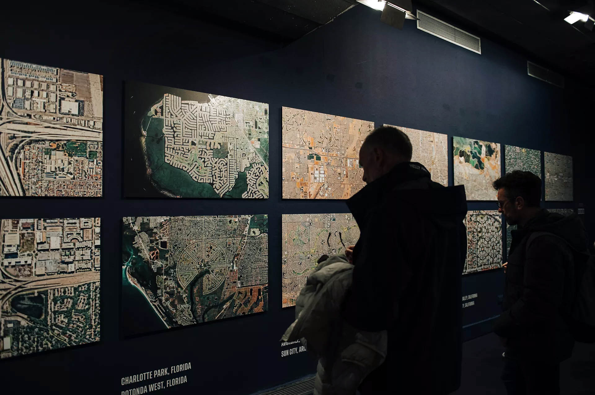
 'Chandler, Arizona' 2006 From 'Mowing the Lawn' portfolio from the exhibition 'Suburbia. Building the American Dream' at the Centre de Cultura Contemporània de Barcelona | CCCB, March - September, 2024")
 'Land. Provincetown' 1976 from the exhibition 'Suburbia. Building the American Dream' at the Centre de Cultura Contemporània de Barcelona | CCCB, March - September, 2024")
 'Dusk, New Jersey' 1978")


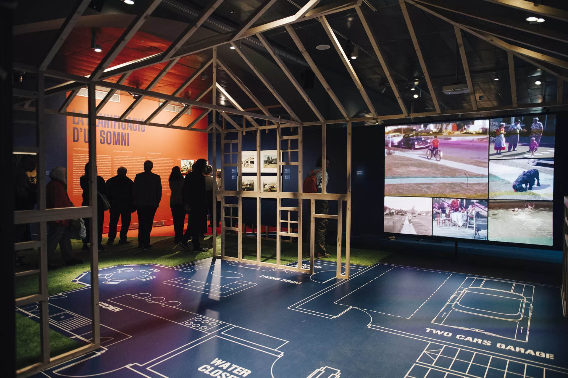
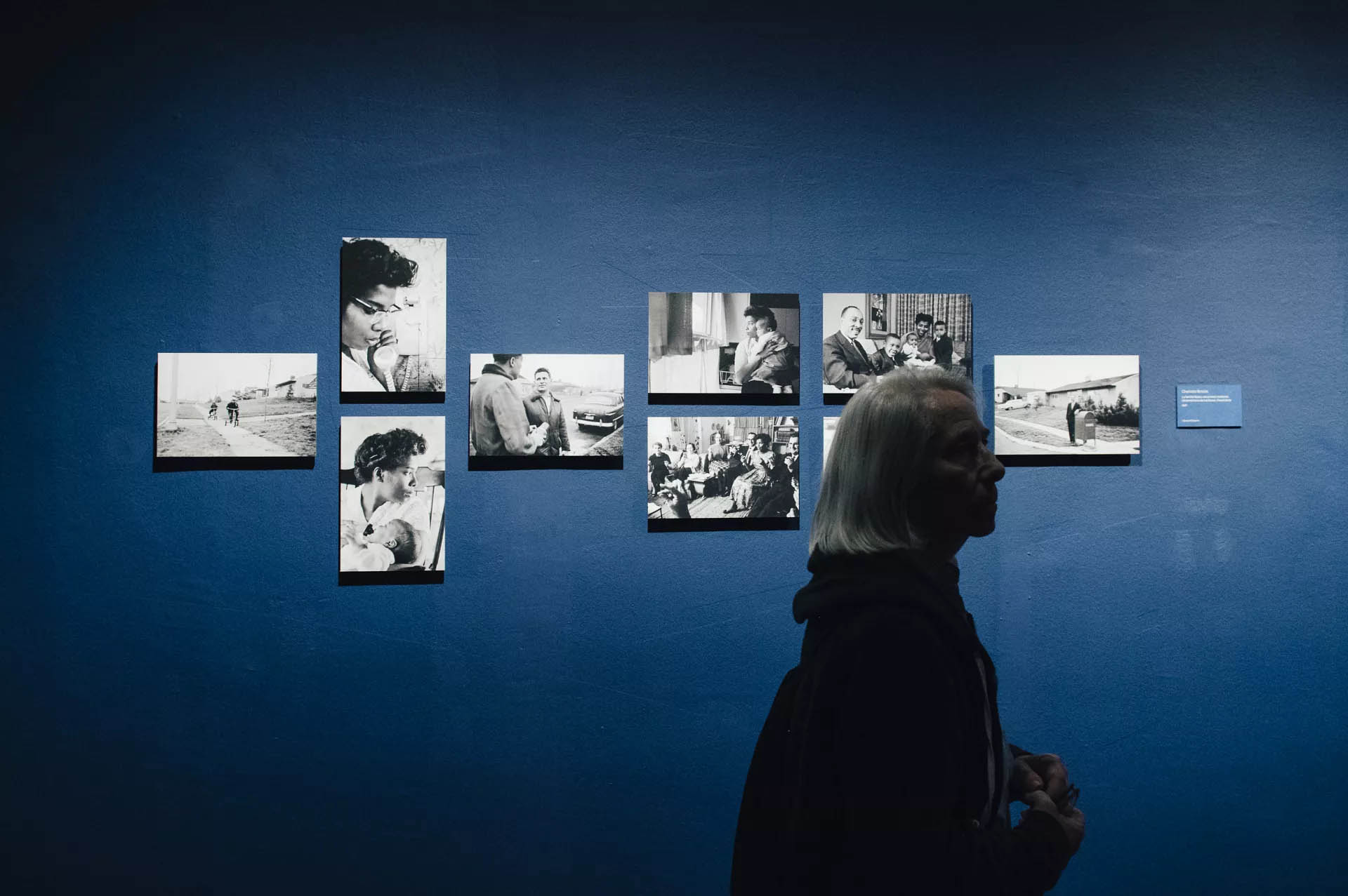
![Charlotte Brooks (American, 1918-2014) '[Image from LOOK - Job 57-7621 titled Myers family]' 20th December 1957](https://artblart.com/wp-content/uploads/2024/08/brooks-image-from-look-a.jpg "Charlotte Brooks (American, 1918-2014) '[Image from LOOK - Job 57-7621 titled Myers family]' 20th December 1957")

 'Untitled (Dream House)' 2002")
 'Julianne Moore (Dream House)' 2002")
 'Villa for David Codwise, near New Rochelle, NY (project; elevation and four plans)' 1835")
 'Ericstan, for John J. Herrick, Tarrytown, New York (perspective)' 1855")
 Friend & Aub (Publisher Philadelphia, Pennsylvania) 'Map of Llewellyn Park and Villa Sites, on Eagle Ridge in Orange & West Bloomfield' 1857")
 'Residence of Mr. E. Hooker, Fremont Ave., Orange, N.J.' 1860")
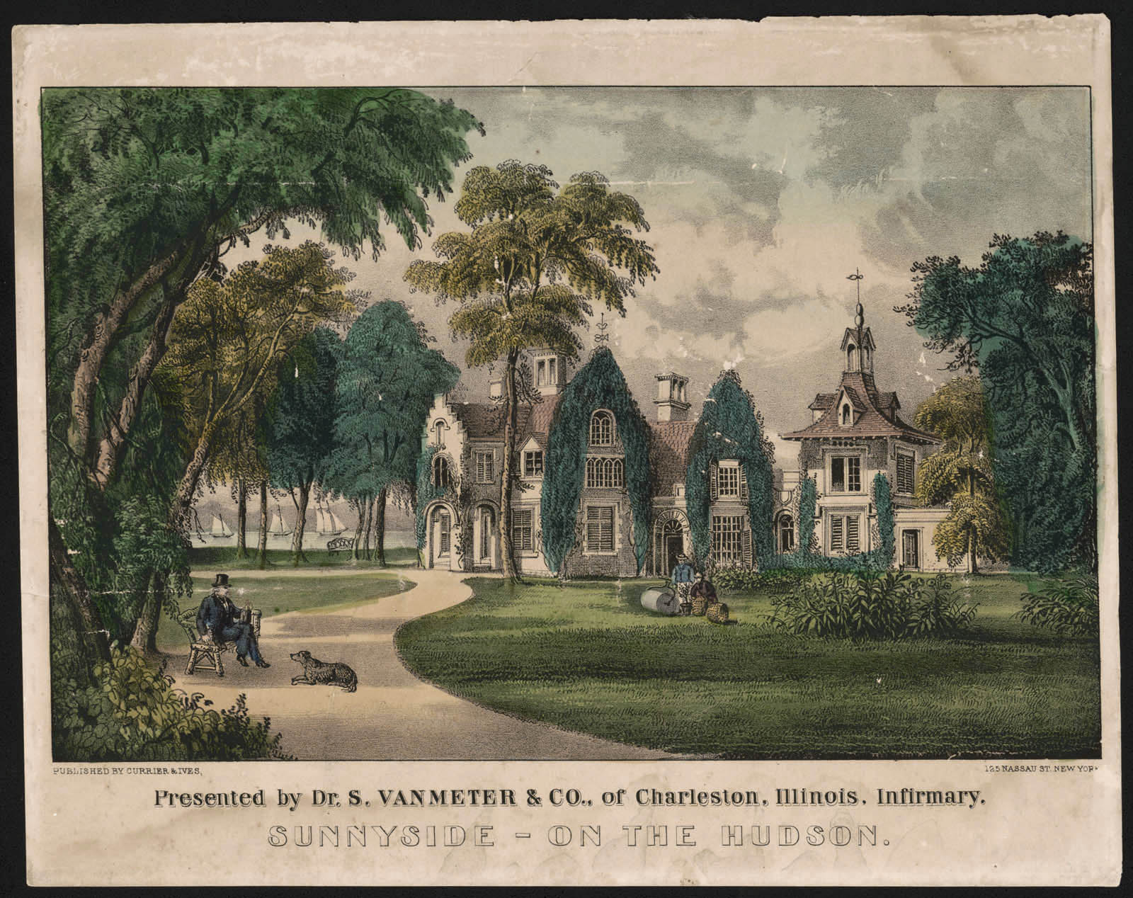
 'Sunnyside on the Hudson' 1856-1871 (detail)")
 'American railroad scene: lightning express trains leaving the junction' 1874")

")
 'Skaters on the lake at Tuxedo Park' 1910")


 'Detroit, Michigan. Riot at the Sojourner Truth homes, a new U.S. federal housing project, caused by white neighbours' attempt to prevent Negro tenants from moving in. Mounted police and whites' Detroit 1942")


")
")
")
")


 'New Kids in the Neighbourhood' 1967")
 'Suburbia, Cul de sac, Pleseanton, California' 1972")
 'I don't feel that Richie playing with guns will have a negative effect on his personality. (He already wants to be a policeman.)' 1972")
 'Untitled #2214' 1998")
 'Untitled (Elsa)' 2005")
 – central Texas' 2021; and at bottom right, 'Eric Arnsberger (30) and Morgan Gagnier (22) – Lake Forest, California' 2021")
 'Joel, Lynne, Paige and Joshua (44, 43, 5 and 11 years old) – central Texas' 2021")
 'Avery Skipalis (33) – Tampa, Florida' 2021")

 'Observations from McMansion Hell' 2023")
 'Proxy (Haven Ln.)' 2012")
 'Untitled #16' 2015-2017 From the series 'Traces'")
 'Untitled #52' 2015-2017 From the series 'Traces'")
 'Contemporary Suburbium' 2017")
 'The Mark Keppel High School Dance Team at the 2019 Miss Dance Drill Team USA National Dance Competition' 2019")
 'Berwyn, Illinois' 2023")
 'Berwyn, Illinois' 2023 (detail)")
 'The rocking chair' 1913")


 'Mira-sol alert' 2023")
 'Sant Quirze del Vallès' 2023")
 'Els Trullols Park-1' 2023")
 'Four Roses Whiskey: Worth Reaching For' 1949 from the exhibition 'The Real Thing: Unpackaging Product Photography' at the Metropolitan Museum of Art, New York, March - August, 2024")
 'Howard – Watchmaker and Jeweller' 1890s-1910s?")
 'Howard – Watchmaker and Jeweller' 1890s-1910s?")

 and F. D. Hampson's Panama Hats, from a Sloan-Force Co. Catalogue c. 1916 (below)")

; and at third right, 'Vermont Marble Tombstone Catalogue' (1880s)")
 'Articles of Glass' before June 1844 from the exhibition 'The Real Thing: Unpackaging Product Photography' at the Metropolitan Museum of Art, New York, March - August, 2024")
 Case manufactured by Hiram Studley (American, active 1840s) 'The Silver Merchants' c. 1850")
 'Pitcher and Two Glasses, Venetian, 15th Century' 1854")
![Charles Nègre (French, 1820-1880) '[Plaster Casts of Bishops' Miters, South Porch, Chartres]' c. 1855](https://artblart.com/wp-content/uploads/2024/06/negre-plaster-casts.jpg "Charles Nègre (French, 1820-1880) '[Plaster Casts of Bishops' Miters, South Porch, Chartres]' c. 1855")

![Pine & Bell (photographic studio) (American, active 1860s, Troy, New York) William H. Bell (American born England, Liverpool 1831-1910 Philadelphia, Pennsylvania) George W. Pine (American, active 1860s, Troy, New York) '[Display of Hats and Accessories of 1868]' 1868](https://artblart.com/wp-content/uploads/2024/06/pine-bell-display-of-hats-and-accessories-of-1868.jpg "Pine & Bell (photographic studio) (American, active 1860s, Troy, New York) William H. Bell (American born England, Liverpool 1831-1910 Philadelphia, Pennsylvania) George W. Pine (American, active 1860s, Troy, New York) '[Display of Hats and Accessories of 1868]' 1868")
![Unknown photographer. '[E. Adkins Gun Merchant]' c. 1874](https://artblart.com/wp-content/uploads/2024/06/unknown-photographer-e.-adkins-gun-merchant.jpg "Unknown photographer. '[E. Adkins Gun Merchant]' c. 1874")
 'Fashions 1837-1887 by William Charles Brown (British, active late 19th century)' 1888")
![Frank M. Sutcliffe (British, 1853-1941) '[Display of Whitby Seascape Photographs]' c. 1888](https://artblart.com/wp-content/uploads/2024/06/sutcliffe-display-of-whitby-seascape-photographs.jpg "Frank M. Sutcliffe (British, 1853-1941) '[Display of Whitby Seascape Photographs]' c. 1888")
![Unknown (American) '[Vermont Marble Tombstone Catalogue]' 1880s](https://artblart.com/wp-content/uploads/2024/06/unknown-vermont-marble-tombstone-catalogue.jpg "Unknown (American) '[Vermont Marble Tombstone Catalogue]' 1880s")
![Schadde Brothers (American, active Minneapolis, 1890s-1910s) Alvin J. Schadde (American, 1872-1937) Herman T. Schadde (American, 1874-1937) '[High Grade Jelly Eggs, from a Brandle & Smith Co. Catalogue]' c. 1915](https://artblart.com/wp-content/uploads/2024/06/schadde-brothers-high-grade-jelly-eggs.jpg "Schadde Brothers (American, active Minneapolis, 1890s-1910s) Alvin J. Schadde (American, 1872-1937) Herman T. Schadde (American, 1874-1937) '[High Grade Jelly Eggs, from a Brandle & Smith Co. Catalogue]' c. 1915")
![Schadde Brothers (American, active Minneapolis, 1890s-1910s) Alvin J. Schadde (American, 1872-1937) Herman T. Schadde (American, 1874-1937) '[Satinettes, Filled Confections and Ye Old Style Stick Candy, from a Brandle & Smith Co. Catalogue]' c. 1915](https://artblart.com/wp-content/uploads/2024/06/schadde-brothers-satinettes.jpg "Schadde Brothers (American, active Minneapolis, 1890s-1910s) Alvin J. Schadde (American, 1872-1937) Herman T. Schadde (American, 1874-1937) '[Satinettes, Filled Confections and Ye Old Style Stick Candy, from a Brandle & Smith Co. Catalogue]' c. 1915")
 'Panama Hats, from a Sloan-Force Co. Catalogue' c. 1916")
![Ralph Bartholomew Jr. (American, 1907-1985) '[Soap Packaging]' 1936](https://artblart.com/wp-content/uploads/2024/06/bartholomew_soap-packaging.jpg "Ralph Bartholomew Jr. (American, 1907-1985) '[Soap Packaging]' 1936")
 'RCA Speakers' 1933")
 'KPM Ceramics' 1930")
 'Ide Collar' 1922")
 'Automotive Component' February 22, 1927")
 'Pass & Seymour Switch Plate' c. 1949")
 'A.S. Beck \"Executive\" Shoe' 1957")
; and at third right, H. Raymond Ball's 'Pocket Comb' (1930s)")
![Edward J. Steichen (American born Luxembourg, Bivange 1879 - 1973 West Redding, Connecticut) '["Sugar Lumps" Pattern Design for Stehli Silks]' 1927](https://artblart.com/wp-content/uploads/2024/06/steichen-sugar-lumps.jpg "Edward J. Steichen (American born Luxembourg, Bivange 1879 - 1973 West Redding, Connecticut) '[\"Sugar Lumps\" Pattern Design for Stehli Silks]' 1927")
![August Sander (German, 1876-1964) '[Osram Light Bulbs]' c. 1930](https://artblart.com/wp-content/uploads/2024/06/august-sander_osram-light-bulbs.jpg "August Sander (German, 1876-1964) '[Osram Light Bulbs]' c. 1930")
 'Pocket Comb' 1930s")
![César Domela (Dutch, 1900-1992) '[Ruthsspiecher Tanks]' 1928](https://artblart.com/wp-content/uploads/2024/06/domela-ruthsspiecher-tanks.jpg "César Domela (Dutch, 1900-1992) '[Ruthsspiecher Tanks]' 1928")
![Unknown (American) '[Montage for Packard Super Eight]' c. 1940](https://artblart.com/wp-content/uploads/2024/06/unknown_montage-for-a-packard-super-eight.jpg "Unknown (American) '[Montage for Packard Super Eight]' c. 1940")
; and at second and third right, ringl + pit's 'Dents' (c. 1934) and 'Komol' (1931)")
 'Fork' 1928")
 Grete Stern (German, 1904-1999) Ellen Auerbach (German 1906-2004) 'Komol' 1931")
 'Ipana Toothpaste' c. 1937")
 'The Coffee Drinkers' 1940")

' 2021")


 'Pavane Fantastique' c. 1916/1917")


 'Claire Waldoff' c. 1930")


, 1925")

; and at left centre in the display cabinet, an image by an unknown photographer Trans* people in the Eldorado in Berlin (1926)")


, September 1932, and Liebende Frauen (Women in Love), 1929")
 26. December 1927")

 c. 1925-1930")

 'Transvestites in Front of the Institute of Sexology' 1921")

 'Bisexuality' German edition from 1981")

 'Que me veux tu?' 1929")
 'Untitled (Hannah Höch at her easel, The Hague; self-portrait (double exposure) with the painting Symbolic Landscape III)' 1930")

 'Rosa Nachthemd und schwarzer Pyjama' (Pink nightgown and black pyjamas) 1928")

 'The vaudeville and trapeze artist Barbette' Nd")
 'The vaudeville and trapeze artist Barbette' Nd (detail)")


 'Solidarity: Prisoner Supports His Exhausted Comrade' 1945-1947")

 Wust's diary entry on the deportation of her Jewish partner Felice Schragenheim to the Theresienstadt concentration camp' August 21, 1944")
 Wust's diary entry on the deportation of her Jewish partner Felice Schragenheim to the Theresienstadt concentration camp' August 21, 1944 (detail)")

; and at right on the wall, Paul Hoecker's painting 'Pierrot' (Nd)")
 'Young Man's Head' Cover of 'Jugen' magazine, volume 44, 1901")
 'Dove Sei? / Where Are You?' 1914/1918")

 From the portfolio 'Les amies' c. 1924")
 'Doppelportrait Heinz Loew und Hermann Trinkaus im Atelier, Bauhaus Dessau, Doppelbelichtung' (Double portrait of Heinz Loew and Hermann Trinkaus in the studio, Bauhaus Dessau, double exposure) 1927")
 'Boys in Love' (Liebende Knaben), 1929")
 'Stillleben mit Mimosen' (Still Life with Mimosas) 1932")
. 'Lili with a Feather Fan' 1920")
. 'Lili Elbe' c. 1928")
. 'At the mirror' 1931-1936")

 'Damenbar' (Lesbian Bar) c. 1930-1932")
 'Siesta' c. 1930-1932")
 'Hermaphrodite' c. 1945")
 'Beachcomber, Baltic Sea' 1933")
 'Zwei stehende Rehe' (Two Standing Deer) 1948")
 'Girl Under Trees' 2016")
 'These hands – a world without equal' 2022")
 'These hands – a world without equal' 2022")
' (2002)")
 'The Cock (Kiss)' 2002")


' (2021)")
 'Quilt #50 (Lil Picard)' 2022")
 and Ricardo Portilho (Brazilian) In Frauenkleidung (In Women's Clothing) 2019")
 and Ricardo Portilho (Brazilian) 'Ein Sprung und der Hummer' (A Jump and the Lobster) 2018/2022 (installation view)")
 and Ricardo Portilho (Brazilian) 'Ein Sprung und der Hummer' (A Jump and The Lobster) 2018/2022")
 and Ricardo Portilho (Brazilian) 'Ein Sprung und der Hummer' (A Jump and The Lobster) 2018/2022")
 'Andy Warhol on the red couch at the Factory, New York' 1964 from the exhibition 'Andy Warhol and Photography: A Social Media' at the Art Gallery of South Australia, Adelaide, March - May, 2023")


 'Elvis' 1963 from the exhibition 'Andy Warhol and Photography: A Social Media' at the Art Gallery of South Australia, Adelaide, March - May, 2023")
 'Andy Warhol in Gristedes Supermarket, New York City' 1965 from the exhibition 'Andy Warhol and Photography: A Social Media' at the Art Gallery of South Australia, Adelaide, March - May, 2023")
 'Edie Sedgwick, Andy Warhol, and others at a party' 1965")
 'Silver Clouds installation, Leo Castelli Gallery' 1966")
 'Cream of mushroom soup' 1968")
 'Andy Warhol' 1971")
 'Andy Warhol' 1975")
 'Bianca Jagger at Halston's house, New York', no. 1 from the portfolio 'Photographs' 1976, published 1980")
 'Halston at home, New York', no. 7 from the portfolio 'Photographs' c. 1976-1979, published 1980")
 'Truman Capote at home, New York', no. 4 from the portfolio 'Photographs' c. 1976-1979")
 'Andy taping Christopher Reeves for 'Interview' magazine' 1977")
 'Muhammad Ali, his infant daughter, Hanna, and wife, Veronica at Ali's training camp in Deer Lake, PA' August 18, 1977")
 'Andy Warhol showing his artistry' 1978")
 'Andy Warhol and Liza Minnelli' 1978")
 'Andy Warhol Kissing John Lennon' 1978")
 'Liza Minnelli' 1978")
 'Debbie Harry' 1980")
 'Andy Warhol in a row boat in Paris's Bois de Boulogne' 1981")
 'Altered Image' from the portfolio 'Altered Image: Five Photographs of Andy Warhol' 1981; published 1982")
 'Woman on the street' 1982")
 'Andy Warhol in American flag, Madrid' 1983")
 'Henry Gillespie' 1985")
 'Self-portrait no.9' 1986")
 'Curiosity Killed the Cat' 1986")
 'Andy Warhol' 1986")
 'Portrait of a man (resembling Jabez Hogg) operating a daguerreotype camera' c. 1845 from the exhibition 'A New Power: Photography in Britain 1800-1850' at the S T Lee Gallery, Weston Library, Bodleian Libraries, Oxford, February - May, 2023")
 'Iron Works, Coalbrook Dale' c. 1824 from the exhibition 'A New Power: Photography in Britain 1800-1850' at the S T Lee Gallery, Weston Library, Bodleian Libraries, Oxford, February - May, 2023")
 'Power loom factory of Thomas Robinson Esqr. Stockport, Cheshire' c. 1849-1850")
 'Study of clouds' 1822")
 'Bust of Miss Mundy' 1825-1826")
")
 from the exhibition 'A New Power: Photography in Britain 1800-1850' at the S T Lee Gallery, Weston Library, Bodleian Libraries, Oxford, February - May, 2023")
 v")
 'Experimental photogenic drawing of the mounting of Sir William Herschel’s 40-foot telescope in the garden of Herschel’s house at Slough' October 1839")
 (French, 1807-1873) 'West façade of Notre Dame cathedral, Paris' 1839-1840")
 'Plate 6: Egypte: Harem de Méhémet-Ali a Alexandre' c. 1840")
 'Plate 4, England, St Pauls and London' c. 1840")
 'Fossils, engraved on a daguerreotype plate' 1840")
 'Sargassum bacciferum' 1843")
 'View of one of the towers of Orleans Cathedral' Taken on 21 June 1843")
 'The West Façade of Westminster Abbey' Taken before May 1845")
 'Palace of Justice, Rouen' Taken in May 1843")
 'Parliament Street from Trafalgar Square' 1839")
 et al 'London in 1842, Taken from the Summit of the Duke of York's Column (north view)'")
")
")
")
")
")
 'London labour and the London poor; a cyclopedia of the condition and earnings of those that will work, those that cannot work, and those that will not work: The London street-folk; comprising, street sellers. Street buyers. Street finders. Street performers. Street artizans. Street labourers. With numerous illustrations from photographs' London, 1851")
![Alonzo Chappel (American, 1828-1887)(engraver) 'Thomas Chalmers: Likeness from a daguerreotype by Claudets [sic]' 1873](https://artblart.com/wp-content/uploads/2023/02/chappel-thomas-chalmers.jpg "Alonzo Chappel (American, 1828-1887)(engraver) 'Thomas Chalmers: Likeness from a daguerreotype by Claudets [sic]' 1873")
 and 'Lieutenant Graham Gore, Commander' (May 1845)")
 'Sir John Franklin' May 1845")
 'Lieutenant Graham Gore, Commander' May 1845")
 'Tyrolese Singers' 1851-1852")
 'The Tyrolese Minstrels – from a photograph taken by Beard, by desire of H.R.H. The Duchess of Kent'")
 'Seated man holding a copy of the 'Illustrated London News'' c. 1850")
 'The Walpole Islanders at the Panopticon. – From a photograph by Claudet' 1856")
 'The Spitalfields Ball. Costume Portraits, from daguerreotypes, by Beard'")
 'Australia Felix'")
 (Royal Polytechnic Institution, London) 'Portrait of Maria Edgeworth' May 1841")
 (Royal Polytechnic Institution, London) 'Portrait of an older man' c. 1841")
 London, 1842")
 (Adelaide Gallery, London) 'Portrait of Michael Faraday' c. 1848")
 (18 King William St Strand) 'Portrait of seated man and woman' c. 1850")
 'Queen Victoria et al' 17 January 1852")
 'Prince Albert' (1819-1861) 1848")
 'Portrait bust of a man' c. 1845")
 'Portrait of a standing man, Calcutta' c. 1855")
 (234 Regent St, London) 'The Chartist Meeting on Kennington Common, 10 April 1848' 10 April 1848")
 and John Hobbs (?) 'View of the façade of a building in Venice' c. 1850")
 'Copy of an 1852 painting of Ada Lovelace by Henry Wyndam Phillips' 13 August 1852")
 (engraver) 'Mr Couldock as Richard III' 1851")
 'Mr Charles Kean as Hamlet' 1851")

 'The Great Exhibition: The east nave, viewed from the south-western gallery' 1851")
 (engraver) 'Joseph Paxton, designer of the Crystal Palace' c. 1851")
 and Jacob George Strutt (British, 1790-1864) 'Tallis's history and description of the Crystal Palace, and the exhibition of the world's industry in 1851' (p. 13) 1852")
 (234 Regent St, London) 'Portrait of Jenny Lind standing at a piano' 1848")
 'Portrait of the Duke of Wellington' 1 May 1844")
 'The Duke of Wellington' 1852")
 'Lace' Early 1840s")
 'Colosseum, Rome, 2nd view' 1846")
 'Loch Katrine' 1844")
 'Portrait of James Inglis' 2 October 1844")
 'An Ancient Door in Magdalen College, Oxford' April 1843")

 'Landscape' 1912 from the exhibition 'In the Eye of the Storm: Modernism in Ukraine, 1900-1930s' at the Thyssen-Bornemisza Museum, Madrid, November, 2022 - April, 2023")

 'Ukrainian Peasant Woman' 1910-1911 from the exhibition 'In the Eye of the Storm: Modernism in Ukraine, 1900-1930s' at the Thyssen-Bornemisza Museum, Madrid, November, 2022 - April, 2023")

 and at right 'Still Life' (1915)")

 'Adam and Eve' 1912 from the exhibition 'In the Eye of the Storm: Modernism in Ukraine, 1900-1930s' at the Thyssen-Bornemisza Museum, Madrid, November, 2022 - April, 2023")
 'Landscape, Locomotive' 1914-1915 from the exhibition 'In the Eye of the Storm: Modernism in Ukraine, 1900-1930s' at the Thyssen-Bornemisza Museum, Madrid, November, 2022 - April, 2023")
 'Still Life' 1913 from the exhibition 'In the Eye of the Storm: Modernism in Ukraine, 1900-1930s' at the Thyssen-Bornemisza Museum, Madrid, November, 2022 - April, 2023")
 'Composition' 1918-1920s")


 'Sketch for choreographic movement \"Masks\" for Bronislava Nijinska's School of Movements, Kyiv' 1919")
 'Carousel' 1921")
 'Dairy Maid' 1922-1923")
")
")
 'Disabled' 1924")
 'Simultaneous Dresses (Three Women, Forms, Colours)' 1925")
")
")
 'Jewish Pogrom' 1926")
 'Photographer' 1927")
![Vasyl Yermilov (Ukrainian, 1894-1967) 'Nove Mystetstvo' ([New Art], magazine cover design) c. 1927](https://artblart.com/wp-content/uploads/2023/03/yermilov_nove_mystetsvo.jpg "Vasyl Yermilov (Ukrainian, 1894-1967) 'Nove Mystetstvo' ([New Art], magazine cover design) c. 1927")
")
 'Sharpening the Saws' 1927")

 'Costume designs for Minister Pinh in the opera 'Turandot’'at the State Opera Theatre, Kharkiv' 1928")
")
 'The 1st of May' 1929")
 'Portrait of Mykhailo Semenko' 1929")
 'Sketch of the painting for the conference hall of the All-Ukrainian Academy of Sciences, Kyiv' 1930")

 'Portrait' Late 1920s - early 1930s")
 'In the Shooting Gallery' 1932")

 'Helen of Troy' 1863")


 'Die Lureley' 1835")
 'Circe offering the cup to Ulysses' 1891")
 'Lilith' 1887")
 Henry Treffry Dunn (British, Truro 1838 - 1899 London) 'Lady Lilith' 1867")
 'Medea' Nd")
 'Oedipus and the Sphinx' 1864")
 'The Idol of Perversity' (L'idole de la perversite) 1891")
 'Who Shall Deliver Me? (Christina Georgina Rossetti)' 1891")
 'Egyptian Sword Dancer' 1891")
 'Judith and Holofernes' 1926")
 'Salammbô' 1882")
 'Salammbô' 1894")
 'Sirens' 1875")
 'Sphinx' 1904")
 'The Satiated Siren' (Die gesättigte Sirene) 1905")
 'Head of Medusa' c. 1897")
 'The Toilette of Salome' (second version) 1893")
 'J’ai baisé ta bouche Iokanaan' 1892-1893")
 'John and Salome' 1893")
 'Madonna' 1895")
 'Vampire in the forest' 1916-1918")
 'Tapp und Tastkino' / 'Tap and Touch Cinema' (detail) 1968")
 'The Devil Showing Woman to the People' 1898")
 'The Mortar' 1900")
 'Salome II' 1899/1900")
 'Samson and Delila' 1902")
 'Anita Berber and Sebastian Droste' 1922")
 'Man and Medusa' 1910-1914")
 'She represents!' 1928")
 'Serpent Queen' 1894")
 'Queen of Hearts (Lili)' 1928")
 'Lilith' 1967")
 'Woman Power' 1979")
 'Untitled, 1975-1980' 1975-1980")
 'House #4', Providence, Rhode Island, 1976")
 'C performing as Madonna, Bangkok' 1992")
 'Lounging 1: G fabulous' 2021")
 'The Masked Woman' 2014")
 'Head of Medusa' c. 1892")
 'The Apparition' After 1875")
 'Untitled (Olga)' 1979")
 'Untitled (Self with pelts)' 1974/1977")
 'The Statue Of Liberty' 1977")
 'Racquel: Come to me' 2016")
 'Carnegie Deli, New York, NY' 2008 from the exhibition Exhibition: '\"I'll Have What She's Having\": The Jewish Deli' at the New-York Historical Society, Nov 2022 - April 2023")
 'Louis Klepper Confectionary and Sausage Manufacturers, 45 E. Houston Street, New York' c. 1900 from the exhibition Exhibition: '\"I'll Have What She's Having\": The Jewish Deli' at the New-York Historical Society, Nov 2022 - April 2023")

 'Anne Russ Federman serving customers at New York's Russ & Daughters, with Hattie Russ Gold in the background' 1939 from the exhibition Exhibition: '\"I'll Have What She's Having\": The Jewish Deli' at the New-York Historical Society, Nov 2022 - April 2023")
 'Letter to Judith Berman, April 23, 1944'")
 'Frankfurter and Lemonade from Manhattan Crosstown' series c. 1945")
!['Reuben's Delicatessen Menu [autographed by Arnold Reuben]' 1946](https://artblart.com/wp-content/uploads/2023/02/reubensdelicatessenmenu.jpg "'Reuben's Delicatessen Menu [autographed by Arnold Reuben]' 1946")
 'Save Freedom of Worship: Buy War Bonds' 1943")

")
 'Rena and Harry Drexler at Drexler's Deli, North Hollywood, CA' c. 1970s")
 'Vienna Beef Factory, inspecting sausages Chicago, IL' c. 1950s")
 'Vienna Beef Factory, curing pastrami Chicago, IL' c. 1950s")


 'You don't have to be Jewish to love Levy's real Jewish Rye' 1965")
 'You don't have to be Jewish to love Levy's real Jewish Rye' 1965")
 New York City, 1968")


 'Abe Lebewohl with hero, from the 2nd Ave Deli, New York, NY' c. 1990")
 'Snack at Manny's Delicatessen Chicago, IL' 2010")

You must be logged in to post a comment.