“There is little love and tenderness here, little magic or generosity of spirit. Goldin’s attitude to the world at the time seems to be one of hostility and resentment. It’s all very well portraying the underbelly of society – the depravity, violence and degradation – but if your point of departure is one of anger and animosity, this is always going to be reflected in your art. I remember going out with my friends partying in the 1980s, the drugs, the sex, the pushing it to the edge, but you know what – we cared about each other. Nothing could be further from the truth in Goldin’s hedonistic (not heuristic) approach to her aura. …”
Over six years later it was time to reevaluate my feelings towards the work by looking again. Had my feelings changed in the intervening years? Or was I just being an obtuse human at the time who couldn’t see what everyone else could see, the genius of the work?
I have reflected long and hard on my feelings in relation to these photographs. Perhaps I was too close to the subject matter, that the series cut too close to the bone: many years of partying in London taking drugs, so many friends and lovers lost to HIV/AIDS. But that is not the case.
The problem for me with this work is its rather sad detachment from life and a pervading sadness attached to each of these photographs. While Goldin announces that “For me it is not a detachment to take a picture” I feel the opposite is true: Goldin seems uber detached when taking these photographs. The artist goes “diving for pearls” hoping to create some magical, random psychological subtexts where the subconscious is made visible, but she doesn’t ever know whether it’s her or the camera’s subconscious that is revealed or who (the camera or the artist) is doing the work. So much for knowing thyself, being responsible to the world, to others, and to oneself, intellectually, morally, and practically.
While the diaristic photographs of this “seminal” body of work feature intimate moments of love and loss, moments of bohemian sex, transgression, beauty, spontaneity, and suffering captured in photographs of “unflinching candour, rich hues, and a keen sense of empathy and lyricism” where is the real Goldin in all of this observational performance (Goldin says her photographs ‘come out of relationships, not observation’.) I’ll just leave that one there…
What I would really like to see is the full 700 slide sequence, live, with the music that was supposed to go with these slides. I want to feel the context of these photographs and their intimacies in the flesh with the freshness and passion of what was happening at the time in New York:
Images and words and music
the real memory the real experience
HIV/AIDS death life bitterness love anger immediacy
Mark Morrisroe David Wojnarowicz Peter Hujar Cookie Mueller Keith Haring Kiki Smith
addiction music with the ballad of sexual dependency = I put a spell on you witness… to life, to the hurt conformity and denial rebellion
Each period reframes issues surrounding gender, sex, drug use and death … and what it means to be free. These images would feel totally different in 1980s New York but today, they feel cold, desperate and sad and I can’t identify with them or their photographic pathology, their study of suffering.
Have my feelings changed towards this work six years on. Yes they have. I more fully appreciate their photographic snapshot composition, their colour, their diaristic bravado. But I still don’t like their energy…. nor their masochistic indulgence.
Perhaps I just want to feel the real memory, the real experience (the energy and atmosphere of being in New York at the time) not viewed through the prism of this distanced, distancing monologue.
Dr Marcus Bunyan
Many thankx to the National Gallery of Australia for allowing me to publish the photographs in the posting. Please click on the photographs for a larger version of the image.
The photographs in Nan Goldin’s The ballad of sexual dependency depict the everyday lives, often in intimate detail, of people in Goldin’s immediate community during the late 1970s and early 1980s. Please be advised that works of art in this exhibition depict explicit nudity, sexual acts, drug use, and the impacts of violence against women. Viewer discretion is advised. This exhibition is not suitable for children under the age of 15.
‘For me it is not a detachment to take a picture. It’s a way of touching somebody – it’s a caress, I think that you can actually give people access to their own soul.’
Nan Goldin
‘The people who have been photographed extensively by me feel that my camera is as much a part of their life as any other aspect of their life with me. It then becomes perfectly natural to be photographed. It ceases to be an external experience and becomes a part of the relationship, which is heightened by the camera, not distanced. The camera connects me to the experience and clarifies what is going on between me and the subject.’
Nan Goldin, wall text from the exhibition
“Since David Armstrong and I were young he always referred to photography as “diving for pearls.” If you took a million pictures you were lucky to come out with one or two gems. … I never learned control over my machines. I made every mistake in the book. But the technical mistakes allowed for magic. … Random psychological subtexts that I never would have thought to intentionally create. The subconscious made visible – though whether mine or the camera’s I don’t know …”
Nan Goldin. “Diving for Pearls,” quoted in Hilton Als. “Nan Goldin’s Life in Progress,” on The New Yorker website, July 4, 2016 [Online] Cited 18/11/2021
‘Nan Goldin’s nostalgic snapshots depict intimate moments of bohemian sex, transgression, beauty, spontaneity, and suffering. Her frames are marked by unflinching candour, rich hues, and a keen sense of empathy and lyricism. Goldin’s most famous work, ‘The Ballad of Sexual Dependency’ (1985), is a slideshow that presents nearly 700 images from her life in New York [and around the world] during the 1970s and ’80s; throughout the reel, the artist lies in bed with her lover, drag queens kiss in bars, and the AIDS epidemic ravages the photographer’s community.’
Anonymous text from the Artsy website
All The Beauty And The Bloodshed Official Trailer
Directed by Academy Award-winning filmmaker Laura Poitras, All the Beauty And The Bloodshed is an epic, emotional and interconnected story about internationally renowned artist and activist Nan Goldin told through her slideshows, intimate interviews, ground-breaking photography, and rare footage of her personal fight to hold the Sackler family accountable for the overdose crisis.
Installation views, Nan Goldin: the ballad of sexual dependency, National Gallery of Australia, Kamberri / Canberra, 2023 Photos: Karlee Holland
The ballad of sexual dependency is a defining artwork of the 1980s. Nan Goldin’s extended photographic study of her chosen family – her ‘tribe’ – began life as a slide show screened in the clubs and bars of New York where Goldin and her friends worked and played. The slide show was then distilled to a series of 126 photographs, which has recently become part of the National Gallery’s collection.
Goldin takes photographs to connect, to keep the people she loves in her memory. She is committed to the idea that photography can faithfully record a time and place, and do so in a way that has real social purpose. Using a documentary, snapshot style, she lays bare her life in the manner of a family album. We see her alongside her friends and lovers as they live their lives – hanging out, falling in and out of love, having children. But this is a community that would be decimated by HIV / AIDS and drug-related deaths. The ballad has become as much a testament to how much Goldin and her community have lost, as it is a record of the look and feel of a past time.
Goldin refers to The ballad as her ‘public diary’, stating that her photographs ‘come out of relationships, not observation’. The work’s overriding themes, she has stated, are those of love and empathy and the tension between autonomy and interdependence in relationships – relationships in which all genders struggle to find a common language.
Nan Goldin is one of the world’s most influential photographers and her iconic series of 126 photographs The ballad of sexual dependency is a defining artwork of the 1980s. The National Gallery recently acquired the last, complete edition of this cornerstone work, which will be shown at the Gallery from 8 July.
Decades in the making, Goldin’s extended photographic study of her chosen family – her ‘tribe’ – is a deeply moving portrayal of life in the 1970s and 1980s, as the artist and her loved ones navigate a time of unrelenting energy and extremes.
National Gallery Curator of Photography Anne O’Hehir said Goldin’s rich and evocative series explores themes of sexual identity, community, and love and loss against the backdrop of New York City and has shaped a generation who’ve fallen in love with the unvarnished intimacy of her storytelling.
‘Goldin takes photographs to connect, to keep the people she loves in her memory. She is committed to the idea that photography can faithfully record a time and place and do so in a way that has real social purpose,’ O’Hehir said.
‘Using a documentary, snapshot style, she lays bare her life in the manner of a family album. We see her alongside her friends and lovers as they live their lives – hanging out, falling in and out of love, having children. But this is a community that would soon be decimated by HIV / AIDS and drug-related deaths.
‘The ballad of sexual dependency has become as much a testament to how much Goldin and her community have lost, as it is a record of the look and feel of a past time.’
O’Hehir said this engaged and at times moving series urges you to empathise with stories and experiences that are rarely depicted. ‘Goldin is committed to making public that which is usually hidden and private, and to the truthful recording of her life,’ O’Hehir said.
Goldin refers to The ballad of sexual dependency as her ‘public diary’, stating that her photographs ‘come out of relationships, not observation’. The work’s overriding themes, she has stated, are those of love and empathy and the tension between autonomy and interdependence in relationships – relationships in which all genders struggle to find a common language.
The ballad of sexual dependency began its life as a slideshow presented by Goldin at parties and in clubs and bars in New York City’s downtown art scene. The slide show was then distilled to a series of 126 photographs, which are now part of the national collection.
The opening of The ballad of sexual dependency at the National Gallery coincides with the release of Goldin’s acclaimed documentary All The Beauty And The Bloodshed on DocPlay. Directed by Academy Award®-winning filmmaker Laura Poitras, All The Beauty And The Bloodshed is an epic, emotional and interconnected story about Goldin’s life, work and activism, focussing on her recent fight to hold the Sackler family accountable for the opioid crisis. The biographical film will also be screened at the National Gallery on Saturday 22 July.
Nan Goldin’s The ballad of sexual dependency is free and will be on display at the National Gallery in Kamberri / Canberra from 8 July 2023 – 28 Jan 2024. This exhibition is part of the National Gallery of Australia’s 40th Anniversary celebrations and continues the Know My Name gender equity initiative. Nan Goldin’s exhibition The ballad of sexual dependency is supported by DocPlay, the streaming home of the world’s best documentaries.
Curator: Anne O’Hehir, Curator, Photography
Press release from the National Gallery of Australia
Curators: Caroline Corbeau-Parsons, Curator of British Art 1850-1915, and Stephen Calloway with Alice Insley, Assistant Curator, Historic British Art
#MuseumFromHome
Frederick Evans (British, 1853-1943) Aubrey Beardsley [with hands] 1893 Platinum print and photogravure, mounted on opposing pages of a paper folio Wilson Centre for Photography
While working as a clerk, Beardsley spent his lunchtimes browsing in Frederick Evans’ nearby second-hand bookshop. This had an important impact on his developing artistic and literary tastes. Beardsley became close friends with Evans, who was also a talented amateur photographer. The image on the left has become known as the ‘gargoyle portrait’ because Beardsley’s pose echoes the famous carved figure on Notre-Dame Cathedral in Paris. This portrait was used in early editions of Beardsley’s work and has become the defining image of the artist.
There he is
There he is, all aquiline nose, patrician air; thin wrists and hands that infinity strengthens,
Mannerist hands, hands like the buttresses of some great cathedral, supporting that noble face.
There he is, this genius of invention, this suave sophisticate, this pervader of decadent beauty,
this grotesque who produced a thousand drawings in seven years, who lived a thousand lives in just seven years.
There he is, this son of Blake, this offspring of Lautrec and japonaiserie,
all primed in subtle sexualities, shocking, fame, subversion… strange.
There he is, love of yellow, flowering enormous genitalia, erotic illustrations of distorting scale, women ambiguity,
as bold as life, diseased as death, driving his body on while his mind accretes mythologies.
Now he stands, a fantastical visionary, existing as product of unchecked imagination.
An illusion, a fabrication of the mind; an unrealisable dream, a fancy,
his utopia a grotesque, chimerical beauty.
Dr Marcus Bunyan
Many thankx to Tate Britain for allowing me to publish the media images in the posting. Please click on the photographs for a larger version of the image.
Tate Britain’s major new exhibition celebrates the brief but astonishing career of Aubrey Beardsley. Although he died tragically young at the age of just 25, Beardsley’s strange, sinuous black-and-white images have continued to shock and delight for over a century. Bringing together 200 spectacular works, this is the largest display of his original drawings in over 50 years and the first exhibition of his work at Tate since 1923.
Beardsley (1872-1898) became one of the enfants terribles of fin-de-siècle London, best remembered for illustrating Oscar Wilde’s controversial play Salomé. His opulent imagery anticipated the elegance of Art Nouveau but also alighted on the subversive and erotic aspects of life and legend, shocking audiences with a bizarre sense of humour and fascination with the grotesque. Beardsley was prolific, producing hundreds of illustrations for books, periodicals and posters in a career spanning just under seven years. Line block printing enabled his distinct black-and-white works to be easily reproduced and widely circulated, winning notoriety and admirers around the world, but the original pen and ink drawings are rarely seen. Tate Britain exhibits a huge array of these drawings, revealing his unrivalled skill as a draughtsman in exquisite detail.
The exhibition highlights each of the key commissions that defined Beardsley’s career as an illustrator, notably Malory’s Le Morte d’Arthur 1893-1894, Wilde’s Salomé 1893 and Alexander Pope’s The Rape of the Lock 1896, of which five of the original drawings are shown together for the first time. As art director of the daring literary quarterly The Yellow Book, the artist also created seminal graphic works that came to define the decadence of the era and scandalised public opinion. Bound editions and plates are displayed alongside subsequent works from The Savoy and illustrations for Volpone 1898 and Lysistrata 1896, in which Beardsley further explored his fascination with eroticism and the absurd.
Beardsley’s imagination was fuelled by diverse cultural influences, from ancient Greek vases and Japanese woodblock prints, to illicit French literature and the Rococo. He also responded to his contemporaries such as Gustave Moreau, Edward Burne-Jones and Toulouse Lautrec, whose works are shown at Tate Britain to provide context for Beardsley’s individual mode of expression. A room in the exhibition is dedicated to portraits of Beardsley and the artist’s wider circle, presenting him at the heart of the arts scene in London in the 1890’s despite the frequent confinement of his rapidly declining health. As notorious for his complex persona as he was for his work, the artist had a preoccupation with his own image, relayed throughout the exhibition by striking self-portraits and depictions by the likes of Walter Sickert and Jacques-Emile Blanche.
Additional highlights include a selection of Beardsley’s bold poster designs and his only oil painting. Charles Bryant and Alla Nazimova’s remarkable 1923 film Salomé is also screened in a gallery adjacent to Beardsley’s illustrations, showcasing the costume and set designs they inspired. The exhibition closes with an overview of Beardsley’s legacy from Art Nouveau to the present day, including Picasso’s Portrait of Marie Derval 1901 and Klaus Voormann’s iconic artwork for the cover of Revolver 1966 by the Beatles.
Aubrey Beardsley is organised by Tate Britain in collaboration with the Musée d’Orsay, Paris, with the generous support of the V&A, private lenders and other public institutions. It is curated by Caroline Corbeau-Parsons, Curator of British Art 1850-1915, and Stephen Calloway with Alice Insley, Assistant Curator, Historic British Art.
Press release from the Tate Britain website
Aubrey Beardsley at Tate Britain – Exhibition Tour | Tate
Join Tate curators Caroline Corbeau-Parsons and Alice Insley as they discuss the iconic illustrator’s short and scandalous career.
Before his untimely death aged twenty-five, Beardsley produced over a thousand illustrations. He drew everything from legendary tales featuring dragons and knights, to explicit scenes of sex and debauchery. His fearless attitude to art continues to inspire creatives more than a century after his death.
Aubrey Beardsley (British, 1872-1898) Withered Spring 1891 Graphite, ink and gouache on paper National Gallery of Art, Washington, Rosenwald Collection
The framing of the main image by ornamental panels and lettering shows the influence of aesthetic movement illustrators, as well as that of Burne-Jones. The inscription on the gate behind the figure is partly obscured. In full it would read ‘Ars Longa Vita Brevis’ (‘art is long-lasting, life is short’). As Beardsley was diagnosed with tuberculosis aged seven, this Latin saying must have had personal resonance.
Introduction
Few artists have stamped their personality so indelibly on their era as Aubrey Beardsley. He died in 1898 at the age of just 25 but had already become one of the most discussed and celebrated artists in Europe. His extraordinary black-and-white drawings were instantly recognisable. Then, as now, he seemed the quintessential figure of 1890s decadence.
At the end of the 19th century, a period that had seen vast social and technological changes, many began to fear that civilisation had reached its peak and was doomed to crumble. ‘Decadent’ artists and writers retreated into the imagination. Severing the link between art and nature, they created a new sensibility based upon self-indulgence, refinement and often a love of the bizarre. No other artist captured the danger and the beauty, the cynicism and brilliance of the age as Beardsley did with pen and ink.
Beardsley was diagnosed with tuberculosis at the age of seven. The disease was then incurable, so he knew from childhood that his life would be a brief one. This led him to work at a hectic pace. One contemporary described his determination ‘to fill his few working years with the immediate echo of a great notoriety’. Moving rapidly from style to style, he created well over a thousand illustrations and designs in just five years. Beardsley was catapulted to fame in 1893 by an article about his work in The Studio magazine. He went on to illustrate Oscar Wilde’s play Salome and become art editor of The Yellow Book, a periodical that came to define the era.
Beardsley’s illustrations displayed remarkable skill and versatility, but few people ever saw his actual drawings. He always drew for publication and his work was seen primarily in books and magazines. He was one of the first artists whose fame came through the easy dissemination of images, his reputation growing day by day as his sensational designs appeared.
This exhibition offers a rare chance to see many of Beardsley’s original drawings. It also sets Beardsley in his social and artistic context. Works by other artists punctuate the exhibition, showing how he absorbed diverse artistic influences but always retained his own style.
Aubrey Beardsley (British, 1872-1898) Incipit Vita Nova 1892 Graphite, ink and gouache on paper Linda Gertner Zatlin
The title of this drawing refers to Dante Alighieri’s 1294 text La Vita Nuova and translates as ‘New Life Begins’. Some have seen the foetus as a potent symbol for Beardsley. Its significance is unclear beyond linking sexuality, life and death, all key themes in Beardsley’s work. It also reflects his fascination with shocking imagery and the grotesque, the term used traditionally to describe deliberate distortions and exaggerations of forms to create an effect of fantasy or strangeness. He once said, ‘if I am not grotesque I am nothing’.
Beginnings
Beardsley’s artistic career spanned just under seven years, between 1891 and 1898. When he was 18 he met the Pre-Raphaelite painter Edward Burne-Jones, an artist he deeply admired. Having seen Beardsley’s portfolio, Burne-Jones responded: ‘I seldom or never advise anyone to take up art as a profession, but in your case I can do nothing else.’ On his recommendation, for a short time Beardsley attended classes at Westminster School of Art.
Beardsley longed for fame and recognition. This went hand in hand with an intensely cultivated self-image and pose as a dandy-aesthete. This important aspect of his identity is illuminated through self-portraits and portraits by his contemporaries throughout the exhibition.
Witty, tall, ‘spotlessly clean & well-groomed’, Beardsley was soon noted for his dandyism. A delight in refinement and artificiality in both dress and manner, dandyism was integral to the decadent creed. Some contemporaries related the artist’s extreme thinness and fragile physical appearance to ideas of morbidity also associated with decadence.
While Beardsley rejected the label of decadence, his work explores many aspects of it, such as a fascination with the ‘anti-natural’ and the bizarre, with sexual freedom and gender fluidity. What present-day society refers to as LGBTQIA+ identities were only just beginning to be formulated and articulated during his lifetime. Beardsley was attracted to women, but he was a pioneer in representing what we might now call queer desires and identities. Though fascinated by all aspects of sexuality, it seems likely that his explorations of these interests were primarily through literature and art.
Aubrey Beardsley (British, 1872-1898) Self-portrait 1892 Ink on paper British Museum Presented by Robert Ross in 1906
Apart from a few childish sketches, this is Beardsley’s first recorded self-portrait, made at the age of about 19. His newly adopted centre-parted fringe, fashionable high collar and large bow tie show that he had already formed a distinctive self-image. A few months earlier, he had described himself as having ‘a vile constitution, a sallow face and sunken eyes’.
Russell & Sons (Photographers) Portrait of Aubrey Beardsley c. 1893? Cartes de visite / cabinet card Albumen print
Please note: This photograph is not in the exhibition
Edward Coley Burne-Jones (British, 1833-1898) The Finding of Medusa; The Death of Medusa (The Birth of Pegasus and Chrysaor); Perseus Pursued by the Gorgons 1875-1876 Gouache, paint and ink on paper Tate. Presented by the Trustees of the Chantrey Bequest 1919 Image released under Creative Commons CC-BY-NC-ND (3.0 Unported)
This design forms part of Burne-Jones’s ambitious scheme for a series of large wall decorations on the theme of Perseus. Although the work was never completed as he intended, Burne-Jones still proudly displayed ten full-scale preparatory drawings for the panels in his garden studio. They must have made a strong impression on Beardsley when he visited Burne-Jones in August 1891.
Edward Coley Burne-Jones (British, 1833-1898) The Finding of Medusa 1875-1876 Gouache, paint and ink on paper Tate. Presented by the Trustees of the Chantrey Bequest 1919 Image released under Creative Commons CC-BY-NC-ND (3.0 Unported)
Edward Coley Burne-Jones (British, 1833-1898) The Death of Medusa (The Birth of Pegasus and Chrysaor) 1875-1876 Gouache, paint and ink on paper Tate. Presented by the Trustees of the Chantrey Bequest 1919 Image released under Creative Commons CC-BY-NC-ND (3.0 Unported)
Edward Coley Burne-Jones (British, 1833-1898) Perseus Pursued by the Gorgons 1875-1876 Gouache, paint and ink on paper Tate. Presented by the Trustees of the Chantrey Bequest 1919 Image released under Creative Commons CC-BY-NC-ND (3.0 Unported)
Perseus eventually discovers Medusa with her sisters, the Gorgons. Unlike her they are all immortal. Using Athena’s mirror to defend himself, Perseus beheads Medusa, at which point the winged horse Pegasus and the warrior Chrysaor spring from her decapitated body. When the Gorgons attempt to punish Perseus for killing their sister, he evades them by using the helmet given to him by the sea nymphs, thus becoming invisible.
Gallery label, June 1993
Aubrey Beardsley (British, 1872-1898) The Litany of Mary Magdalen 1891 Graphite on cream wove paper laid down on board 227 × 169 mm The Art Institute of Chicago, The Charles Deering Collection Public domain
The Italian painter Andrea Mantegna (c. 1431-1506) was a key reference for both Burne-Jones and Beardsley. At Burne-Jones’s suggestion, Beardsley particularly studied the early engravings after Mantegna’s designs. Throughout his life Beardsley kept a set of reproductions of these prints pinned to his wall. In this subject of his own invention, he freely borrows details of costume, pose and gesture from figures in various of Mantegna’s works, particularly The Entombment (c. 1465-1470).
Andrea Mantegna (Italian, c. 1431-1506) The Entombment of Christ c. 1465-1475 Engraving and drypoint; second state of two 11 7/16 × 16 3/8 in. (29 × 41.6cm) The Metropolitan Museum of Art, Harris Brisbane Dick Fund, 1937 Public domain
Please note: This engraving is not in the exhibition
Aubrey Beardsley (British, 1872-1898) Tannhäuser 1891 Ink, wash and gouache on paper National Gallery of Art, Washington, Rosenwald Collection Public domain
Beardsley was an avid opera-goer. He attended several performances of Wagner’s works at this time, including Tannhäuser at Covent Garden in April or May 1891. He would return to Wagnerian subjects many times in his art and writings. The story of Tannhäuser was a particular favourite. He later made it the subject of his own erotic novella The Story of Venus and Tannhäuser. Here he shows the knight in pilgrim’s robes, among trees that appear like prison bars, trying to find his way back to the goddess’s enchanted realm, the Venusberg.
Aubrey Beardsley (British, 1872-1898) Die Götterdämmerung 1892 Ink, wash and gouache on paper Aubrey Beardsley Collection, Manuscripts Division, Department of Special Collections, Princeton University
Beardsley took this subject from Wagner’s opera, the title of which translates as ‘The Twilight of the Gods’. It has been suggested that the frieze-like composition depicts three different moments of the story. According to this interpretation, the scene to the right refers to the prologue, showing the Fates, with the bearded Wotan holding his magic spear. He also appears seated at the centre of the composition with Siegfried standing by him to tell his story to a group of hunters. Finally, Wotan may be represented again seated, in profile, wearing his Wanderer’s hat.
Götterdämmerung (Twilight of the Gods), is the last in Richard Wagner’s cycle of four music dramas titled Der Ring des Nibelungen (The Ring of the Nibelung, or The Ring for short). It received its premiere at the Bayreuth Festspielhaus on 17 August 1876, as part of the first complete performance of the Ring.
“Die Götterdämmerung,” notes Emma Sutton in Aubrey Beardsley and British Wagnerism in the 1890s (2002), “Beardsley’s only drawing of the concluding part of the Ring cycle, was probably prompted by the first performance for a decade of the Ring in London in June and July 1892. It is extremely likely that he attended a performance of the drama; he certainly attended Siegfried, and produced drawings on Siegfried and Götterdämmerung, and of the principle singers, in this year.
No interpretation of the drawing has, to my knowledge, ever been offered, perhaps because its stylistics might suggest that it is an incomplete or experimental, Impressionistic work. The drawing is, however, an intricate and highly knowledgeable representation of Wagner’s work, demonstrating Beardsley’s comprehensive knowledge of Die Götterdämmerung (and, indeed, of the whole cycle) from the very start of the decade. Beardsley presents the gods shrouded in long drapes in a bleak forest setting; with their elongated limbs and enveloping robes they appear androgynous figures, listless and melancholy, entrapped by the sharp bare stems that rise from the border and ground around them.
Despite the undulating lines of the landscape, Die Gotterdammerung is a scene of desolate stasis, bleakly portraying Wagner’s Twilight of the Gods. A compression of several scenes from Wagner’s drama, the drawing is, I would suggest, an extraordinarily innovative and ambitious attempt to evoke concisely the narrative events and cumulative tone of the entire drama.”
~ Emma Sutton, Aubrey Beardsley and British Wagnerism in the 1890s (2002)
Anonymous. “Aubrey Beardsley’s “Die Götterdämmerung”,” on the Graphic Arts Collection, Princeton website [Online] Cited 02/03/2020
Le Morte Darthur
In early 1892, Beardsley received his first major commission. His friend, the photographer and bookseller Frederick H. Evans, introduced him to J.M. Dent. The energetic and enterprising publisher was looking for an illustrator for Le Morte Darthur, Sir Thomas Malory’s 15th-century version of the legends of King Arthur. Dent planned a substantial edition in the style of William Morris’s Kelmscott Press books. Between autumn 1892 and June 1894 Beardsley produced 353 drawings, including full and double-page illustrations, elaborate border designs and numerous small-scale ornamental chapter headings. He received £250 over the course of this commission. This freed him to leave his hated job as a clerk and focus on art-making.
Beardsley gradually grew weary of this colossal undertaking and went off-brief. Subversive details started to appear in his drawings. He also introduced incongruous characters such as mermaids and satyrs, goat-legged hybrid creatures from classical mythology.
His illustrations were reproduced using the relatively new and economical line block printing process in which drawings are transferred onto printing plates photographically. Beardsley was at first disappointed with the printing of his drawings, but he quickly adapted his style to suit the line block process. Uniquely, this could reproduce both the finest of lines and large, flat areas of black.
The works in this room demonstrate the development of Beardsley’s art over two years, and how he combined many different sources to create his own visual language.
Aubrey Beardsley (British, 1872-1898) The Achieving of the Sangreal 1892 Ink and wash on paper Private collection
This is the sample drawing that secured Beardsley the Morte Darthur commission. Dent declared it ‘a masterpiece’, and it was used as the frontispiece for Volume II. It seems to refer to the crucial episode of the book, in Chapter XIV, where Sir Percival kneels to make a prayer to Jesus in the presence of Sir Ector, and the Sangreal (popularly called the Holy Grail) appears to him, ‘borne by a maiden’.
Aubrey Beardsley (British, 1872-1898) How Morgan Le Fay Gave a Shield to Sir Tristram 1893 Ink on paper The Syndics of the Fitzwilliam Museum, University of Cambridge
(Illustration from: Sir Thomas Malory, Le Morte d’Arthur. London: Dent, 1894)
Aubrey Beardsley (British, 1872-1898) How la Beale Isoud Wrote to Sir Tristram c. 1893 Ink over graphite on paper Alessandra and Simon Wilson
This drawing brings to mind the comment by the art historian John Rothenstein that ‘the greatest among Beardsley’s gifts was his power of assimilating every influence and yet retaining, nay developing, his own peculiar individuality’.
Isoud (Isolde) here resembles the Pre-Raphaelite figure Jane Morris. The German Renaissance form of her desk is borrowed from Albrecht Dürer’s engraving St Jerome in his Study (1513-1514). The simple, flattened construction of the space reflects Beardsley’s interest in Japanese prints. These contrast with the flowing lines of the sunflower border, a typical aesthetic motif.
Aubrey Beardsley (British, 1872-1898) How Sir Tristram Drank of the Love Drink 1893 Ink on paper Harvard Art Museums/Fogg Museum, Bequest of Scofield Thayer
This is one of Beardsley’s boldest and most rhythmic drawings. Tristram’s outstretched arm follows the movement of the hybrid flower. The flat outline of Isolde’s recoiling body parallels that of Tristram’s cloak, all against the strong vertical and horizontal lines formed by the curtains with their stylised rose border. Isolde’s long cape, seen from the back, is a forerunner of Beardsley’s famous Peacock Skirt in his Salome illustrations (on display later in this exhibition).
Aubrey Beardsley (British, 1872-1898) How La Beale Isoud Nursed Sir Tristram 1893 Ink over graphite on paper Harvard Art Museums/Fogg Museum, Bequest of Scofield Thayer
Aubrey Beardsley (British, 1872-1898) How King Arthur saw the Questing Beast, and thereof had great marvel 1893 Ink and wash on paper Victoria and Albert Museum
Together with Siegfried Act II (shown nearby), this drawing reflects the height of Beardsley’s fine ‘hair-line manner’. The drawing has great variety of treatment, showing that Beardsley’s style evolved while working on the commission. To alleviate boredom, he took great liberties with Malory’s text. He introduced mythological characters with little to do with the Arthurian legend, such as Pan, here. There are also discreet additions, including a treble clef top right, and even a phallus on the far left of the bank.
Something suggestive of Japan
The European craze for Japanese visual culture had begun in the 1860s after trade links were re-established. Beardsley grew up surrounded by western interpretations of Japanese art. In the summer of 1891, together with his sister Mabel, he visited the London mansion of the shipping magnate Frederick Leyland. There he saw the ‘Peacock Room’ created 15 years earlier by the expatriate North American artist James McNeill Whistler. Decorated with borrowed and reworked Japanese motifs, this masterpiece of the aesthetic movement had become one of the most celebrated interiors in London. Mesmerised by his visit, Beardsley began to introduce such details into his own drawings.
Japanese woodblock prints (Ukiyo-e) were also an important influence. Beardsley adopted their graphic conventions. His new style included areas of flat pattern contrasted with precisely drawn figures against abstracted or empty backgrounds. Like several artists at this time, he also favoured the distinctive, tall and narrow format of traditional Japanese kakemono scrolls.
In a letter to a friend, Beardsley bragged, ‘I struck for myself an entirely new method of drawing and composition, something suggestive of Japan… The subjects were quite mad and a little indecent.’
Aubrey Beardsley (British, 1872-98) Design for a Frontispiece to Virgilius the Sorcerer c. 1893 Ink over graphite on paper laid down on board The Art Institute of Chicago, Gift of Robert Allerton
Following the glowing article in The Studio, many publishers approached Beardsley with commissions for illustrations and book covers. David Nutt, an old established publishing firm, generally specialised in early texts and folklore. Although made for Nutt’s ‘medieval legends’ series, Beardsley’s design is, somewhat incongruously, in the style of a Japanese print.
A New Illustrator
Beardsley first came to public notice in April 1893. He was the subject of the lead article, ‘A New Illustrator’, in the first issue of the new art magazine The Studio. In it, the graphic art expert Joseph Pennell praised Beardsley’s work as ‘quite as remarkable in its execution as in its invention: a very rare combination.’
Pennell welcomed Beardsley’s use of ‘mechanical reproduction for the publication of his drawings’. The article highlighted how photographic line block printing showed the true quality of an artist’s line.
The reproductions in The Studio article included both medieval and Pre-Raphaelite style illustrations for the forthcoming Le Morte Darthur and examples of Beardsley’s work inspired by Japanese woodblock prints. This displayed his versatility and led to further commissions for books and popular journals, such as the Pall Mall Magazine. J.M. Dent, the publisher of Le Morte Darthur, rightly worried Beardsley would get bored of that long-term project. To keep him interested, he invited him to create hundreds of tiny ‘grotesque’ illustrations for the Bon-Mots series, three miniature books of witty sayings. In this context, the term grotesque relates to distortion or exaggeration of form to create an effect of fantasy or strangeness. For Beardsley the idea was central to his way of seeing the world. Summing up his own art, he later said, ‘I am nothing if I am not grotesque.’
Grotesque
In art history, the grotesque – which originally referred to the decoration of grottoes – has come to denote a strand of Renaissance art composed of deliberately weird elements, often including imaginary hybrid forms. These often combine parts of human heads and bodies, animals and plants. Mermaids, satyrs, fauns and other mythical figures frequently appear in Beardsley’s art. But he also added foetuses, often with adult bodies, and other distorted figures to his grotesque repertoire. The resulting imagery is playful, irreverent and fantastical, but also has dark undertones. The grotesque lies at the heart of Beardsley’s art. He explained: ‘I see everything in a grotesque way. When I go to the theatre, for example, things shape themselves before my eyes just as a I draw them… They all seem weird and strange to me. Things have always impressed me in this way.’
Aubrey Beardsley (British, 1872-1898) The Kiss of Judas 1893 Ink on paper Victoria and Albert Museum
This drawing illustrates a short story by ‘X.L’ (the North American writer of horror fiction Julian Osgood Field). The macabre tale tells of a legend of the descendants of Judas, the disciple who betrayed Jesus in the Christian New Testament. It is written with the arch tone of much 1890s fiction:
‘They say that the children of Judas, lineal descendants of the arch traitor, are prowling about the world, seeking to do harm, and that they will kill you with a kiss.’ ‘Oh, how delightful!’ murmured the Dowager Duchess.
Smaller figures appear in many of Beardsley’s works, such as the nude in The Kiss of Judas. Some viewers have read these as representations of people with dwarfism. In most cases we do not know if this was Beardsley’s intention. He never strived for realism in his work. He played with scale, exaggerating and distorting lines and shapes, including in self-portraits. But the cultural stereotyping of people with dwarfism was prevalent in Beardsley’s lifetime. In the late 19th and early 20th century, they were predominantly seen as sources of entertainment in ‘freak shows’ and carnivals. These offensive attitudes almost certainly influenced Beardsley’s imagery to some extent.
Salomé
In 1892, Beardsley made a drawing in response to Salomé, Oscar Wilde’s play, originally written in French and based on the biblical story. Salomé falls in love with Iokanaan (John the Baptist). When he rejects her, she demands his head from her step-father, Herod Antipas, as a reward for performing the dance of the seven veils. Beardsley depicts her about to kiss Iokanaan’s severed head. Wilde admired the drawing and he and his publisher, John Lane, chose Beardsley to illustrate the English translation of the play. The illustrations weave together themes of sensuality and death, and explore a wide range of sexual desires. The play’s publication created a sensation, just as Beardsley and Wilde had hoped.
Beardsley delighted in hiding provocative elements in his drawings. Lane recalled, ‘one had, so to speak, to place his drawings under a microscope, and look at them upside down’. Nervously, he censored ‘problematic’ details in Beardsley’s title page and the illustration Enter Herodias and rejected two designs altogether from the first edition. Even so, Lane missed many erotic details and, surprisingly, also allowed publication of Beardsley’s teasing drawings that include caricatures of Wilde.
Beardsley produced 18 designs in total, of which only 10 appeared in the first printing of the play. The impressions exhibited here come from the portfolio which Lane issued in 1907, almost a decade after Beardsley’s death. This was the first edition to contain all the original designs and an additional one, Salome on Settle.
Aubrey Beardsley (British, 1872-1898) The Climax 1893 Line block print on paper Stephen Calloway
The flowing, sinuous lines in this design demonstrate how much art nouveau is indebted to Beardsley. He abandoned the Japanese kakemono format and hairline style of his original version of the image J’ai baisé ta bouche, Iokanaan (also in this room). By simplifying the lines of the design, he creates a more powerful focus on the moment when Salome can finally kiss Jokanaan’s lips – now that he has been beheaded. The stream of blood forms an elegant ribbon, while the lily rising from the pool that the fluid creates symbolises his chastity.
The Climax
The Climax is an 1893 illustration by Aubrey Beardsley (1872-1898), a leading artist of the Decadent (1880-1900) and Aesthetic movements. It depicts a scene from Oscar Wilde’s play Salome, in which the femme fatale Salome has just kissed the severed head of John the Baptist, which she grasps in her hands. Elements of eroticism, symbolism, and Orientalism are present in the piece. This illustration is one of sixteen Wilde commissioned Beardsley to create for the publication of the play. The series is considered to be Beardsley’s most celebrated work, created at the age of 21. …
First published in 1894, The Climax consists of strong, precise lines, decorative motifs characteristic of the developing Art Nouveau style, and the use of only black ink. Beardsley’s style was influenced by Japanese woodcuts also known as Ukiyo-e, which comes through in the flatness of imagery, compositional arrangement, and the stylistic motifs. Elements of eroticism are also apparent.
The main focus of this illustration, Salome, floats in midair and in her hands she holds the head of John the Baptist just after she kissed it, depicting the final words said by Salome in the play “J’ai baisé ta bouche Iokanaan, j’ai baisé ta bouche” (“I have kissed your mouth, Jokannan, I have kissed your mouth”). Her hair billows in snake-like tendrils above her as she stares powerfully into the eyes of John the Baptist. His severed head drips blood that nourishes the phallic lily. The flower also symbolises purity. Composing the background behind these two figures is a white quarter section of the moon and a stylised depiction of peacock feathers, a signature motif in Beardsley’s illustrations, made of concentric circles.
Beardsley satirised Victorian values regarding sex, that at the time highly valued respectability, and men’s fear of female superiority, as the women’s movement made gains in economic rights and occupational and educational opportunities by the 1880s. Salome’s power over men can be seen in the way that Beardsley presents her as a monster-like figure, reminiscent of Medusa.
Reaction
Beardsley said of his drawing that rather than using thicker lines for the foreground than those for the background, he felt that the lines should be the same width. Morgan Meis of The New Yorker states that “his influence on the look of Art Nouveau, and then on early modernism, is hard to overstate. His thick black lines fused the graphical ideas of the past with the techniques and subject matter of a new age just on the horizon.” He was an inspiration to Japanese illustrators, graphic designers, and printmakers of the early 20th century Taishō period.
The Climax is described as among his finest works by Ian Fletcher and established him as one of the “Decadence”. It was not appreciated, though, by mainstream art critics of the time, who found the Salome drawings repulsive and unintelligible. Art historian Kenneth Clark said that it “aroused more horror and indignation than any graphic work hitherto produced in England.”
Aubrey Beardsley (British, 1872-1898) The Dancer’s Reward 1893 Line block print on paper Stephen Calloway
Salome is contemplating her prize. Gaping, she tilts Jokanaan’s severed and bleeding head towards her. Once again, their expressions mirror each other. The elongated arm of the executioner holds up the platter on which the head rests. This drawing resonates with European symbolist art, in which the contemplation of a severed head is a recurring image.
Aubrey Beardsley (British, 1872-1898) The Toilette of Salome (second version) 1893 Line block print on paper Stephen Calloway
Aubrey Beardsley (British, 1872-1898) The Stomach Dance 1893 Line block print on paper Stephen Calloway
Salome is shown performing her celebrated dance to the sounds produced by an impish musician. Wilde wrote appreciatively to Beardsley after Salome was published: ‘For Aubrey: for the only artist who, besides myself, knows what the dance of the seven veils is, and can see that invisible dance.’
Aubrey Beardsley (British, 1872-1898) The Eyes of Herod 1893 Line block print on paper Stephen Calloway
This illustrates the passage before Salome’s famous dance in exchange for the head of Jokanaan. Talking about Herod, Salome remarks pensively: ‘Why does the Tetrarch look at me all the while with his mole’s eyes under his shaking eyelids? It is strange that the husband of my mother looks at me like that. I know not what it means. Of a truth I know it too well.’
Aubrey Beardsley (British, 1872-1898) Enter Herodias 1893 (published 1907) Stephen Calloway
Enter Herodias is named after a stage direction in Oscar Wilde’s play Salomé. Wilde originally wrote the play in French, and he chose Beardsley to illustrate the English translation of the play. Beardsley drew erotic and satirical images, some of which were entirely unrelated to the plot of play.
Enter Herodias shows the moment when Salome’s mother enters the stage. To the bottom right there is a caricature of Oscar Wilde holding a copy of Salome and gesturing up at his own play. It also includes two nude figures. Herodias’s breasts are exposed but she is covered by the large cloak. John Lane, who was Beardsley’s publisher, demanded that Beardsley cover the page on the right’s genitalia with a fig-leaf. But he failed to spot the penis-shaped candles the artist had drawn in the foreground, and the erection of the figure to the left.
Beardsley’s obsession with the erotic played upon Victorian taboos. Beardsley was often deliberately trying to be provocative. Many people at the time thought that Beardsley’s obsession with erotic art came from the fact that he was young and ‘consumptive’. Today we call ‘consumption’ Tuberculosis (or TB). A strange, but frequent 19th century perception of TB was that it went hand in hand with an obsession about sex.
Aubrey Beardsley (British, 1872-1898) John and Salome 1893 Line block print on paper Stephen Calloway
This depicts a scene of powerful tension between Jokanaan (left) and Salome (right). By the use of mirrored poses and interlocking folds of drapery – like an image of yin and yang – he expresses the characters’ conflicted feelings of attraction and rejection. John Lane refused the design, either because of the partial nudity of Salome, or possibly because of the androgynous appearance of the Baptist who could here be Salome’s twin.
Aubrey Beardsley (British, 1872-1898) The Black Cape 1893 Line block print on paper Stephen Calloway
Aubrey Beardsley (British, 1872-1898) The Peacock Skirt 1893 Line block print on paper Stephen Calloway
This is one of Beardsley’s most famous and acclaimed designs. It conflates two scenes from the play. In one, the page of Herodias warns the young Syrian about looking too much at Salome. In the other, Herod promises 50 of his white peacocks in exchange for Salome’s dance and imagines them forming a ‘great white cloud’ around her. The scene was abstracted by Beardsley in a flamboyant demonstration of his calligraphic skills.
Aubrey Beardsley (British, 1872-1898) J’ai baisé ta bouche Iokanaan 1892-3 Ink and wash on paper Aubrey Beardsley Collection, Manuscripts Division, Department of Special Collections, Princeton University
This is Beardsley’s first interpretation of Oscar Wilde’s play, before it was translated into English. It was reproduced in the first issue of The Studio, and it is characteristic of Beardsley’s intricate hairline style. It may well have been a bid to illustrate the play. If it was, it paid off, as Wilde did ask John Lane to commission Beardsley. The artist applied some green watercolour to the drawing after it was published.
Gustave Moreau (French, 1826-1898) The Apparition (detail) 1874-1876 Watercolour on paper Musée d’Orsay, Paris, gift of Charles Ayem
This watercolour made a strong impression on Oscar Wilde at the 1876 Paris Salon exhibition. It represents the bloody vision of John the Baptist’s head appearing while Salomé dances for Herod. It featured in Joris-Karl Huysmans’s 1884 novel À Rebours (Against Nature). In it, the reclusive hero contemplates this watercolour. Wilde could quote at length from this ‘bible’ of decadence. Both the novel and The Apparition played a part in the creation of Wilde’s own Salomé.
Alla Nazimova (1879-1945) Charles Bryant (1879-1948) Salomé 1923 Film, 35 mm, black and white Running time: 1hr 12mins Sets and costumes by Natacha Rambova, after Aubrey Beardsley
This 1923 silent “Salome” is probably the best filmed version of the scandalous Oscar Wilde one-act play. It’s basically a photographed avant-garde theatre production performed on a single set based on Aubrey Beardsley’s illustrations for the published play.
Alla Nazimova’s Salomé
This 1923 silent film is an adaptation of Oscar Wilde’s play. The imaginative set and costumes by Natacha Rambova are directly inspired by Beardsley’s drawings, and credited as such. The project was conceived and led by Alla Nazimova, a famous Hollywood actor during the silent movie era. She was drawn to Salome and financed its screen adaptation herself. Nazimova had relationships with women and her film reflects themes of same-sex desire present in Beardsley’s drawings. Charles Bryant, with whom she pretended to be married, was credited as the director, as women did not have equal status in Hollywood.
This film perpetuates some demeaning stereotypes that were current during Beardsley’s lifetime and beyond. This is reflected particularly in the portrayal of the musicians with dwarfism. At that time people with restricted growth were widely associated with servitude and treated as a source of spectacle.
Posters
When Beardsley first travelled to Paris in 1892, he was enthralled by the many posters that adorned the city. The French posters showed the possibilities of this new mass-produced outdoor format and the potential of large-scale colour reproduction. Beardsley was quick to embrace this. Understanding that posters would be viewed in passing, often at a distance, his designs experimented with bold, simplified forms and solid blocks of colour. For Beardsley, advertising was central to modern life and an opportunity to integrate art into everyday experience. As he put it, ‘Beauty has laid siege to the city’.
In the autumn of 1894, the first ever English exhibition of posters opened in London. Pictorial posters were enjoying a boom in Britain and were beginning to be recognised as an art form. The exhibition featured work by celebrated French artists such as Jules Chéret and Henri de Toulouse-Lautrec, known as the ‘fathers’ of the modern poster. Significantly, it also included several works by Beardsley. Not only did this place Beardsley’s posters on a par with the art that had inspired him, it also attested to his importance in the development of British poster design.
Henri de Toulouse-Lautrec (French, 1864-1901) Divan Japonais 1892 Colour lithograph on paper Victoria and Albert Museum
In Paris, Beardsley would have encountered Toulouse-Lautrec’s posters, including this one, on hoardings across the city. It advertises the popular cabaret nightspot, the Divan Japonais, and depicts two stars of Parisian nightlife, the singer Yvette Guilbert and the dancer Jane Avril. Beardsley was inspired as much by Toulouse-Lautrec’s vivid portrayal of modern life as his striking style, typified by dramatic blocks of colour, silhouettes and bold outlines. The admiration was mutual: Toulouse-Lautrec also expressed the wish to buy a copy of Salome.
Aubrey Beardsley (British, 1872-1898) The Pseudonym and Autonym Libraries 1894 Colour lithograph on paper Victoria and Albert Museum
This poster shares its title with the series of novels and short story collections it promotes. The name was inspired by the publisher, T. Fisher Unwin’s, recognition that women often wrote under a pseudonym, whereas men used their actual name (autonym). The woman pictured here appears confident as she rushes towards the bookshop, implying that knowledge brings freedom.
Aubrey Beardsley (British, 1872-1898) Isolde Printed 1899 Colour lithograph and line block print on paper Victoria and Albert Museum
Turning again to Wagner for inspiration, Beardsley depicts the tragic heroine, Isolde, on the brink of drinking the fateful love potion. She stands against a stage curtain, bright red in the original design and equally bold in the orange used for this first printing. Beardsley asserted, ‘I have no great care for colour, but [in posters] colour is essential’. This design was published as a colour lithograph supplement in The Studio in October 1895.
Aubrey Beardsley (British, 1872-1898) A Comedy of Sighs 1894 Colour lithograph on paper Victoria and Albert Museum
This was Beardsley’s first poster design. It appeared on walls and hoardings around London shortly after the publication of Salome and introduced his art to an even wider audience. The poster stole the limelight from the performances of the two short plays it advertised. Critics were outraged by the woman’s ‘ugliness’ and the indecency of her plunging neckline. Punch magazine even punned, ‘Let’s “Ave-a-nue” Poster!’
Beardsley’s Circle
This room introduces the key figures in Beardsley’s life. The glowing article in The Studio and his success with Le Morte Darthur had brought him into the public eye at the age of 20. Following this, a sequence of fortuitous meetings with leading cultural figures of the day led him to the heart of avant-garde literary and artistic circles in 1890s London. Witty, talented and well-read, he was rapidly taken up by a group of young artists and writers who identified as aesthetes, acutely sensitive to art and beauty. These included the portrait painter William Rothenstein; Max Beerbohm, the essayist and caricaturist; and the art critic and dealer Robert Ross, the friend and former lover of Oscar Wilde. Beardsley’s fame grew with the publication of his illustrations to Wilde’s Salome in 1894 and his involvement in the fashionable magazine The Yellow Book, a period addressed in the following room. At this point his group of friends began to expand rapidly. But with the fall of Wilde early in 1895, Beardsley moved first to Dieppe, and thereafter spent little time in England.
In his last years his circle included fellow contributors to The Savoy magazine: the poets W.B. Yeats and Arthur Symons and the painter Charles Conder. The wealthy French-Russian poet and writer Marc-André Raffalovich became an important supporter and patron. His most significant friend in this period was Leonard Smithers, his endearing but unscrupulous publisher.
His mother and sister Mabel were constants throughout his brief life. They were with him when he died at Menton on the French Riviera in 1898.
This room nods at Beardsley’s orange and black decoration scheme in the Pimlico house that he and Mabel owned briefly in 1894. ‘Orangé’ was famously described as the chief decadent colour by Joris-Karl Huysmans in his 1884 novel À rebours (Against Nature), which may have informed Beardsley’s choice.
Aubrey Beardsley (British, 1872-1898) Professor Fred Brown 1892 Graphite and ink on paper Tate. Presented by Mrs Helen Thorp 1927
In 1891 Beardsley enrolled at the Westminster School of Art on the advice of Edward Burne-Jones. For just a few months he attended evening classes given by the school’s principal, the painter Fred Brown. Brown was a pillar of the avant-garde exhibiting society, the New English Art Club. Beardsley added the society’s initials to Brown’s name in the title of this drawing.
Jacques-Émile Blanche (French, 1861-1942) Charles Conder 1904 Oil paint on canvas Tate, Presented by Georges A. Mevil-Blanche 1947
Conder specialised in painting fans and small pictures on silk depicting romanticised figures in 18th-century costume. He and Beardsley became close during the planning of The Savoy magazine in the summer of 1895 when many of their circle were gathered in Dieppe.
Jacques-Emile Blanche lived near Dieppe and was a friend of Degas, Manet and Renoir. However, he also made frequent visits to England, where he painted and exhibited and was well known in artistic and society circles. This is a portrait of the British painter Charles Conder (1868-1909), who was greatly interested in contemporary French art. Conder befriended Toulouse-Lautrec who helped him obtain an exhibition in Paris. Blanche first met Conder in Paris, but they became friends in 1895 when they both spent the summer in Dieppe. This portrait, which captures his flamboyant character, was painted in Conder’s house in London.
Gallery label, August 2004
Jacques-Émile Blanche (French, 1861-1942) Aubrey Beardsley 1895 Oil paint on canvas National Portrait Gallery, London
The society painter Blanche welcomed many of the English artists and writers who visited Dieppe to his nearby family home. This portrait, painted during the summer of 1895, shows the extent to which Beardsley had adopted the dress and cultivated the manner of Parisian dandies such as Comte Robert de Montesquiou.
Walter Richard Sickert (British, 1860-1942) Aubrey Beardsley 1894 Tempera on canvas Tate, Purchased with assistance from the Art Fund 1932
Sickert observed Beardsley in Hampstead churchyard following a ceremony for the unveiling of a bust commemorating the Romantic poet John Keats (1795-1821). Though angular and painfully thin, he was elegantly dressed as always. Keats had died young from tuberculosis. The parallel between the poet and the artist cannot have been lost on those friends, like Sickert, who knew of Beardsley’s condition.
Alvin Langdon Coburn (English born America, 1882-1966) W.B. Yeats 1908 Photo-etching on paper National Portrait Gallery, London
Yeats was a leading figure of the Irish poetic and nationalist movement, the ‘Celtic Twilight’. He was also central as an activist in London literary circles. The idea of the poets, writers and artists of the 1890s as sensitive, decadent and doomed owes much to Yeats’s myth-making in his later memoirs. In these he painted a compelling picture of ‘The Tragic Generation’.
The writer and art critic Robert Ross was a pivotal figure in the aesthetic and decadent culture of 1890s London. He was Oscar Wilde’s first male lover and later became his literary executor, working tirelessly to safeguard his works and re-establish his reputation. Ross also used his connections and influence to promote and protect many friends, including Beardsley and his family. His 1909 book on Beardsley was one of the first serious studies and remains a valuable source of insights.
Reginald Savage (British, 1886-1932) John Gray c. 1896-1897 Lithograph on paper National Portrait Gallery, London
As a young poet John Gray was initially a protégé of Oscar Wilde. He later moved away from the decadents and converted to Catholicism. He was ordained in 1901 and served for many years as the priest at St Peter’s Morningside, Edinburgh. The church was built by his lifelong companion Marc-André Raffalovich, a wealthy writer who provided Beardsley’s principal financial support in his last years.
The Yellow Book
In 1894, Beardsley became art editor of The Yellow Book, a magazine that would become the most iconic publication of the decade. Its distinctive appearance immediately set the tone. Yellow was fashionable, urban, ironic and risqué, recalling the yellow wrappers of popular French erotic novels. The first volume was an instant and controversial success. Notably, it put art and literature on an equal footing. But it was Beardsley’s drawings that stole the show and gave the magazine its avant-garde reputation. Their bold style and daring modernity received praise and scorn in equal measure. With each new volume, his notoriety increased. To many the publication embodied the decadent spirit, and, as one critic observed, ‘to most, Aubrey Beardsley is The Yellow Book.‘
However, Beardsley’s meteoric success was short-lived. In 1895, Oscar Wilde was put on trial for sexual relationships with men and prosecuted for ‘gross indecency’. As the scandal tore through London, the backlash turned towards the notorious magazine and its audacious art editor. In the public mind, Beardsley was already connected to Wilde through his Salome illustrations. When Wilde was seen at his arrest carrying a yellow book (in fact a French novel, not The Yellow Book), the link between the author and the artist was damning. Outraged crowds broke the windows of the publishing house. John Lane, the publisher, succumbed to pressure and sacked Beardsley.
Aubrey Beardsley (British, 1872-1898) Cover Design for The Yellow Book Vol.I 1894 Ink on paper Tate. Bequeathed by John Lane 1926
Beardsley instantly set the tone for the magazine with this design for the first volume. His highly stylised manner, dramatically setting pure white against flat black, was completely new. The subject, two masked revellers abandoning themselves to hedonism, was also bold. The overt sensuality of the laughing woman was particularly shocking for the time. Oscar Wilde described her as ‘a terrible naked harlot’.
Aubrey Beardsley (British, 1872-1898) Edited by Aubrey Beardsley 1872-1898 (art) and Henry Harland 1861-1905 (literature) The Yellow Book, Volume I 1894 Elkin Mathews & John Lane, London April 1894 Stephen Calloway
In 1894 Aubrey Beardsley became the first Art Editor for The Yellow Book, a new literary periodical. There were hostile reactions to The Yellow Book from the wider press, who were alarmed by the shocking and ‘immoral’ illustrations and writing. The Westminster Gazette even commented that the publication should be made illegal. Things only got worse for Beardsley and The Yellow Book in 1895. The trial and conviction of Oscar Wilde for ‘gross indecency’ with men became linked to the publication. The press mistakenly reported seeing Wilde leaving the Cadogan Hotel with a copy of The Yellow Book under his arm. In fact, he was carrying a French erotic novel, which often had yellow covers.
Beardsley, who had collaborated with Wilde on Salome and whose art was strongly linked with The Yellow Book, was caught up in the scandal. He was dismissed as editor for The Yellow Book. Having lost his regular source of income, he was forced to sell his house and he temporarily moved to France.
Aubrey Beardsley (British, 1872-1898) The Slippers of Cinderella 1894 Ink and watercolour on paper Mark Samuels Lasner Collection, University of Delaware Library, Museums and Press
This is one of the rare drawings in which Beardsley used colour. It was first printed in black and white as he added the watercolour later. When it was published in the second volume of The Yellow Book, it was accompanied by a caption, probably written by the artist himself. This outlined a darker version of the Cinderella story, in which she is poisoned by powdered glass from her own slippers.
Aubrey Beardsley (British, 1872-1898) La Dame aux Camélias 1894 Ink and watercolour on paper Tate. Presented by Colonel James Lister Melvill at the request of his brother, Harry Edward Melvill 1931
Beardsley was fascinated with the depiction of women at their dressing-tables. Here, the woman gazing into the mirror is the tragic heroine of the novel La Dame aux Camélias (1848), by French writer Alexandre Dumas. Beardsley may have identified with her because she, like him, had tuberculosis. He added washes of watercolour to the drawing between 1894 and 1897, after it had been published in The Yellow Book.
The title refers to the novel by Alexandre Dumas fils, published in 1852, which tells the tragic story of a courtesan who sacrificed herself for her lover. The picture is part of a group of drawings of a woman at her dressing table and was originally published simply as Girl at Her Toilet. It is not clear whether Beardsley intended it from the outset to be a portrait of Madeleine Gautier, but it appears to relate to an earlier drawing of 1890, which is inscribed with the title of Dumas’s novel and bears some resemblance to this work in the silhouetted figure and treatment of the draperies. Beardsley may have identified with Madeleine Gautier, since, like her, he suffered from tuberculosis and would eventually also die of the disease.
The leitmotif of a woman admiring herself in a mirror recalls the paintings of Dante Gabriel Rossetti (1828-1882), which Beardsley would have known. He may also have had in mind the work of Edgar Degas (1834-1917), who devoted much of his later career to pictures of woman at their toilet. Like many of Beardsley’s drawings of this period the picture is highly stylised. A solid black mass envelops the lower half of the room and seems about to consume the figure. Her arms have disappeared altogether, and her face is barely revealed above the extravagant collar of her frilly overcoat. The influence of Japanese woodcuts, which Beardsley collected, is apparent in the broad flat areas of colour and the use of silhouette. The most carefully realised passages in the drawing are the objects on the dressing table and the floral pattern of the wallpaper, which depicts either roses or camellias. The woman’s profile reveals dark shadows under the narrowed eyes and a turned down mouth, giving the impression of either illness or dissipation. However, in general, realism and individuality are suppressed in favour of surface pattern and overall design.
The drawing was first published in the journal St Paul’s on 2 April 1894, and at the time it was one of Beardsley’s most popular works. Six months later it was illustrated with the present title in Volume Three of The Yellow Book, an avant-garde journal of which Beardsley was art editor. Between 1894 and 1897 Beardsley added watercolour washes of pinkish-purple to the drawing, reducing the clarity of the image.
Aubrey Beardsley (British, 1872-1898) The Black Cat 1894-1895 Line block print on paper Stephen Calloway
Commissioned by a North American publisher, Beardsley made four designs for the macabre tales of Edgar Allan Poe (1809-1849). This illustrates Poe’s story of a man who tries to cover up the murder of his wife by concealing her body in the wall. He is betrayed by the shrieks of his black cat, mistakenly enclosed in the wall as well. The fearsome cat appears out of the darkness, its form outlined in white and starkly contrasting with the white of the dead woman’s face.
Aubrey Beardsley (British, 1872-1898) Frontispiece to Chopin’s Third Ballade 1895 Ink and wash on paper Tate. Presented by the Patrons of British Art through the Tate Gallery Foundation 1999 Image released under Creative Commons CC-BY-NC-ND (3.0 Unported)
The Polish composer Frédéric Chopin (1810-1849) was one of Beardsley’s musical heroes. Beardsley emphasises his delicately pointed fingers here. This relates to Chopin’s reputation as a powerful and subtle pianist. Beardsley’s setting is not historically accurate. Instead it is reminiscent of 1870s aesthetic movement interiors. The position of the figure and the curtain recall Whistler’s celebrated portrait of his mother, copied by Beardsley in the letter nearby.
Private collection, Maas Gallery
The Third Ballade was one of the greatest compositions by the Polish pianist and composer Frédéric Chopin who died in 1849 at the age of thirty nine. While an initial viewing might suggest a simple equestrian portrait, there is an implicit subtext of female domination in the woman’s mastery of the horse. Her determined expression, and the disparity between the horse and rider, reinforce this. Although never published in his lifetime, this design was used to illustrate Beardsley’s obituary in The Studio in 1898.
Gallery label, August 2004
Aubrey Beardsley (British, 1872-1898) The Fat Woman 1894 Ink on paper Tate. Presented by Colonel James Lister Melvill at the request of his brother, Harry Edward Melvill 1931
John Lane refused to publish this drawing in The Yellow Book. The most likely reason is because it is an unflattering caricature of the artist Beatrice Whistler, James McNeill Whistler’s wife. Seated in the Café Royal, she is depicted as a domineering member of the demi-monde. Beardsley’s alternative title for the drawing – A Study in Major Lines – emphasises its artistic qualities but also jibes at Whistler’s musical titles.
Aubrey Beardsley (British, 1872-1898) Title page to The Story of Venus and Tannhäuser 1895 Line block and letterpress print on paper Victoria and Albert Museum
This design was planned as the frontispiece for Beardsley’s own novel. The story was an erotic and humorous version of the Tannhäuser legend, in which the poet discovers the home of Venus and becomes one of her worshippers. Beardsley had ambitions to be a writer and he continued to obsess over the ultimately unfinished novel until his death. He admitted early on that it progressed ‘tortoise fashion but admirably’. Initially Lane agreed to publish the novel, but in the aftermath of Wilde’s trial he did not dare.
Aubrey Beardsley (British, 1872-1898) The Mirror of Love 1895 Ink over traces of graphite on paper Victoria and Albert Museum
Beardsley first met Marc-André Raffalovich, a poet and writer, in April 1895. It was not long afterwards that he drew this frontispiece for his collection of poems, The Thread and the Path. The figure in the mirror expresses the theme of the first poem: the quest towards a new ideal that transcended traditional definitions of gender and sexuality. However, the publisher, David Nutt, was shocked by the figure which he believed had both female and male attributes and refused to print it.
Aubrey Beardsley (British, 1872-1898) Venus between Terminal Gods 1895 Ink on paper Trustees of the Cecil Higgins Art Gallery (The Higgins Bedford)
This drawing was also intended as an illustration for Beardsley’s unrealised novel for John Lane. It depicts Venus framed by two statues of male gods in the form of herms. Frederic Leighton (1830-1896), then President of the Royal Academy, was interested in the rising generation of artists and often commissioned drawings from them. Beardsley recorded that Leighton was encouraging about his work and greatly admired this design.
Aubrey Beardsley (British, 1872-1898) Caprice Verso: Masked Woman with a White Mouse c. 1894 Oil paint on canvas Tate. Purchased 1923
This is Beardsley’s only known oil painting. Unusually, it is double-sided. He began it in Walter Sickert’s studio, under his guidance. The subject on the front, Caprice, was painted first and relates closely to The Comedy Ballet of Marionettes I, displayed nearby. It shows a young woman being led through a doorway by an unfinished figure in a fanciful 18th-century costume. In the late-17th and 18th centuries, servants in European noble households included people of colour who were often enslaved and people with dwarfism. They were considered as ‘trophies’, demonstrating the power and status of those they served. Servants with dwarfism were often treated as ‘pets’, expected to amuse and entertain.
This is the only known oil painting by the illustrator Aubrey Beardsley and was painted in the studio of Walter Sickert. It comprises two pictures on one canvas. Caprice, in which a woman is invited through a doorway by a dwarf, and on the back, Woman with a White Mouse. Both are ambiguous scenes that appear to represent carnival. Caprice derives from the drawing Comedy Ballet of Marionettes I which appeared in The Yellow Book in 1894. Like Beardsley’s drawings, Caprice simplifies shape and colour to strengthen the effect.
Gallery label, February 2016
This is the only known oil painting by Beardsley and, unusually, it comprises two pictures on the one canvas. The first painting to be completed appears to have been A Caprice, a fanciful yet sinister work, depicting a woman in a black dress with green trimmings and a black dwarf in a red costume. On the other side, painted between the stretchers, is an almost surreal image of a masked woman with a white mouse. Both works are unfinished, and should be regarded as experimental
A Caprice appears to derive from the drawing Comedy Ballet of Marionettes I, one of a series of three which appeared in the avant-garde journal, The Yellow Book, in July 1894. In both drawing and painting the woman is being invited by the sinister dwarf to pass through a doorway. The sexual connotations of this gesture are made more overt in the drawing, where the phallic form of the door is emphasised. Beardsley was constantly challenging the conventional view of male-female relations and in the second drawing in the series the woman approaches a door symbolising the female sexual organs.
The symbolism of Woman with a White Mouse also appears to be sexual, and Wilson refers to Freud’s theory that in dreams such things as mice become a substitute for the penis. Nevertheless, although Reade, too, describes the symbolism in this picture as ‘Freudian’, he also points out that Freud’s work was unknown in England in 1894.
Aware of the dramatic potential of black and shadowed areas, Beardsley contrasts areas of dark and light to great effect in both works. He also employs his favourite complementaries, red and green, to provide a stronger colour note in A Caprice. Stylistically he may have been influenced in these paintings by the early work of William Rothenstein (1872-1945), with whom he shared a studio, and whose pictures are inhabited by similarly bold and gloomy saturated forms. He may also have had in mind the work of the Venetian artist Pietro Longhi (1702-1783).
The title A Caprice was invented by the Beardsley scholar R.A. Walker who was the picture’s first owner. The name invites associations with the work of the fin-de-siècle poet Théodore Wratislaw (1871-1933), who published a selection of poems entitled Caprices in 1893.
Frances Fowle December 2000
Aubrey Beardsley (British, 1872-1898) Masked Woman with a White Mouse c. 1894 Oil paint on canvas Tate. Purchased 1923
Masked Woman with a White Mouse was painted second. Beardsley seems to have preferred this side and hung it on the wall in the house he bought in Pimlico.
The Savoy
Dismissed from The Yellow Book, Beardsley faced the loss of his income and a newly hostile atmosphere in London. Despite his international fame, his financial situation was precarious, and he was forced to sell his house. Beardsley left England for Dieppe, the favourite French seaside resort of English writers and artists. There he encountered Leonard Smithers, an enterprising publisher (and occasional pornographer). Smithers proposed starting a new magazine to rival The Yellow Book.
With Beardsley as art editor and the poet Arthur Symons in charge of literature, The Savoy was launched in 1896, at first as a quarterly. After two issues, Smithers – perhaps unwisely – decided to publish monthly. The consequent strain on his resources meant The Savoy folded after just a year. However, over just eight numbers it became one of the most significant and most beautifully produced ‘little magazines’ of the period.
The Savoy was published in Britain, but social and artistic conservatism were on the rise there following Wilde’s trial. Smithers was the only publisher who would print work by Wilde or Beardsley at this time. Some booksellers, like W.H. Smith, refused to display works by Beardsley in their windows. W.B. Yeats famously declared that The Savoy had valiantly waged ‘warfare on the British public at a time when we had all against us’.
Aubrey Beardsley (British, 1872-1898) The Savoy, Number 1 1896 Edited by Aubrey Beardsley 1872-1898 (art) and Arthur Symons 1865-1945 (literature) Leonard Smithers, London, January 1896 Stephen Calloway
Aubrey Beardsley (British, 1872-1898) Third Tableau of Das Rheingold c. 1896 Ink on paper Lent by Museum of Art, Rhode Island School of Design, Providence, Museum Appropriation Fund
This drawing, like a play-within-a-play, illustrates an episode in Under the Hill in which the Abbé is ‘ravished with the wit and beauty’ of a performance of Wagner’s opera Das Rheingold.
Aubrey Beardsley (British, 1872-1898) The Savoy, Number 2 1896 Edited by Aubrey Beardsley 1872-1898 (art) and Arthur Symons 1865-1945 (literature) Leonard Smithers, London, April 1896 Stephen Calloway
Aubrey Beardsley (British, 1872-1898) Ave Atque Vale 1896 Ink on paper Private collection
This drawing accompanies Beardsley’s translation of the Hail and Farewell poem (Carmen CI) by Catullus (c. 84 – c. 54 BCE). In it, the Roman poet addresses his dead brother. Beardsley’s spare and beautiful composition captures the moving spirit of the poem. It attracted considerable praise when it appeared in the seventh number of The Savoy. Max Beerbohm wrote that ‘Catullus could not have craved a more finely emotional picture for his elegy’.
The Rape of Lock
Beardsley was a great admirer of the poet Alexander Pope (1688-1744). Oscar Wilde had ridiculed his poetic taste, claiming ‘there are two ways of disliking poetry; one way is to dislike it, the other is to like Pope’.
Yet in 1896 Beardsley embarked on the illustration of his mock-epic poem, The Rape of the Lock (1712). In Pope’s title, the word ‘rape’ is used in its original sense of theft or abduction, rather than referring to sexual assault. The poem makes fun of a real incident during which Lord Petre (renamed ‘the Baron’) cut off a lock of the hair of Arabella Fermor (‘Belinda’ in the poem) without her permission, causing a feud between their families.
Inspired by the linear intricacies of French 18th-century copper-plate engravings, which he admired and collected, Beardsley developed a new, highly decorative style. The title page amusingly credits him as having ’embroidered’ the illustrations.
This is the first time that so many of the original drawings for the book have been exhibited together.
Aubrey Beardsley (British, 1872-1898) The Dream 1896 Ink over graphite on paper The J. Paul Getty Museum, Los Angeles
Beardsley drew this as the frontispiece for Pope’s poem. It illustrates Ariel, Belinda’s guardian sylph (a spirit of the air), by her bed, while she is still dreaming. Beardsley used his new ‘stippled manner’ or use of dots, to render the intricate patterns on the bed curtains.
Aubrey Beardsley (British, 1872-1898) The Baron’s Prayer 1896 Ink and graphite on paper Harvard Art Museums/Fogg Museum, Bequest of Scofield Thayer
The Baron is depicted kneeling at an altar made from a pile of books of love stories. He prays to the God of Love for help to obtain the prize of a lock of Belinda’s hair.
Aubrey Beardsley (British, 1872-1898) The Rape of the Lock 1896 Ink over graphite on paper Private collection
The drawing illustrates the fateful moment when the Baron approaches to cut a lock of Belinda’s hair. She is unaware, her back turned to him. The fancifully dressed pageboy in the foreground (who may be a person with dwarfism) seems to reference a similar character in The Toilette scene in the Marriage A-la-mode series by William Hogarth (1697-1764). This adds an 18th-century connection to the work. He is the only figure to engage with the viewer, as if to point knowingly to the Baron’s mischief.
Aubrey Beardsley (British, 1872-1898) The Cave of Spleen 1896 Ink on paper Museum of Fine Arts, Boston. William Sturgis Bigelow Collection
Belinda, sitting to the right, across the drawing, has sought refuge in the Cave of Spleen. Umbriel, a gnome, is addressing her. Beardsley interpreted the author’s fantastical description of the cave and creatures within. This unleashed his delight in grotesque forms:
Unnumbered throngs on every side are seen of bodies changed to various forms by Spleen. Here living teapots stand, one arm held out, One bent; the handle this, and that the spout… Men prove with child, a powerful fancy works, And maids, turned bottles, cry aloud for corks.
Aubrey Beardsley (British, 1872-1898) The Battle of the Beaux and the Belles c. 1896 Ink on paper The Henry Barber Trust, the Barber Institute of Fine Art, The University of Birmingham
Belinda, furious at the theft of the lock of her hair, faces her attacker the baron. Beardsley chose to depict the moment in the poem just before she throws a pinch of snuff in his face and overpowers him. This drawing was praised for its dramatic action. Beardsley’s virtuosity as a draughtsman is seen in the close-laid lines of his Rape of the Lock illustrations which were particularly admired by his contemporaries. Many thought this series of designs his best work.
Mademoiselle de Maupin
Beardsley worked on illustrating Théophile Gautier’s novel Mademoiselle de Maupin (1835) for Leonard Smithers between February and October 1897. The hero of the story, D’Albert, searches for the ‘perfect’ woman. Instead he becomes overwhelmingly drawn to a young man. The object of his desire is eventually revealed to be Madelaine de Maupin, a woman who does not conform to gender expectations of the day, particularly through dress, and is attracted to both men and women. The plot reflects on an ideal unification of male and female attributes, a widely discussed idea in literary and artistic circles in 19th-century Europe.
In his preface, Gautier promoted ‘art for art’s sake’. This would become the doctrine of the aesthetic movement, which developed in the late 19th century to promote beauty over meaning or morality in art. D’Albert and de Maupin’s sexual encounter is described in terms of aesthetic perfection. However, de Maupin leaves D’Albert immediately afterwards.
Beardsley used watercolour in his drawings to create a new softer decorative style. His friend Robert Ross suggested that this technique was ‘less demanding’ at a time when his health was in rapid decline. But Beardsley later reverted to a more detailed approach, showing that he was simply exploring new modes of expression.
Aubrey Beardsley (British, 1872-1898) Mademoiselle de Maupin 1898 Photo-etching on paper Stephen Calloway
This is Beardsley’s frontispiece for Mademoiselle de Maupin. It shows the heroine dressed in her preferred outfit, men’s clothes as imagined by Beardsley. This is the first illustration of just six that Beardsley completed for Smithers’s planned edition of Gautier’s novel. He had optimistically intended to draw 32 but was too unwell to fulfil this ambition.
Aubrey Beardsley (British, 1872-1898) The Lady with the Rose 1897 Ink, wash and graphite on paper Harvard Art Museums/Fogg Museum, Bequest of Scofield Thayer
D’Albert does not find Madelaine de Maupin straight away. He first embarks on an affair with a woman he calls Rosette, the subject of this illustration. Beardsley developed different ‘types’ of women in his work, defined by particular features. Here, Rosette, sultry with large, heavy-lidded eyes, conforms to Beardsley’s late ‘type’. The striped walls of the room recall the style of interior decoration that Beardsley had favoured in his own house at 114 Cambridge Street, Pimlico.
Curiosa
While recuperating in the south of England during the summer of 1896, Beardsley began his two most explicit series of drawings yet. These were both inspired by classical sources. The first was a set of eight designs for the Ancient Greek comedy, Lysistrata, by Aristophanes. In this famous satirical play, Athenian and Spartan women bring an end to conflict by refusing to have sex with their warring menfolk until there is peace between their two cities. Beardsley’s other, equally outrageous set of drawings was made for Juvenal’s Sixth Satire, a misogynistic attack on the morals and sexual habits of the women of Ancient Rome.
These subjects chimed with Beardsley’s own irreverent humour and fascination with all aspects of sexuality – and, perhaps, his own sexual frustrations. Smithers, who prided himself that he would ‘publish what all the others are afraid to touch’, no doubt encouraged him. Matching the exuberant eroticism of the texts, Beardsley adopted a starkly linear style for these drawings. This bold new direction was inspired by his knowledge of Ancient Greek vase painting and Japanese erotic prints.
Very few of Beardsley’s contemporaries would have known of these drawings. Their ‘indecency’ meant they could not be published and advertised in the usual way. Instead they were only made available by Smithers to a select group of like-minded collectors through private subscription. Even so, Beardsley seems to have had second thoughts, perhaps prompted by his growing Catholic faith. On his deathbed, he wrote to Smithers imploring him to destroy all his ‘obscene drawings’, a request that Smithers ignored.
Aubrey Beardsley (British, 1872-1898) Lysistrata Shielding her Coynte 1896 Ink over graphite on paper Victoria and Albert Museum
Beardsley made this as the frontispiece image for the book. It introduces the key themes of the play. Lysistrata, the women’s leader, turns her back on a statue of an aroused male deity, usually a symbol of fertility and virility. With one hand she seems to bar sexual relations or, perhaps, pleasure herself. With the other she holds an olive branch and delicately touches the top of an enormous phallus. The implication is that peace will bring an end to war and male sexual frustration. Her knowing smile reveals her control. Her sexual empowerment disrupts traditional Victorian views of male power and of female ignorance about sex.
Aubrey Beardsley (British, 1872-1898) Two Athenian Women in Distress 1896 Collotype print on paper Victoria and Albert Museum
Beardsley referred to this scene as ‘the rampant women’. The play describes the women deserting Athens as abstinence begins to take its toll. One woman even tries to escape by flying on the back of a sparrow. The bird was used as a symbol for male virility and dominance in contemporary pornography, as Beardsley would have known. He subverts that association here by making the sparrow a symbol of female sexual liberation. The drawing for this illustration was destroyed in a fire in 1929. Fortunately, a set of full-size collotype photographic reproductions had been made shortly before.
Aubrey Beardsley (British, 1872-1898) Cinesias Entreating Myrrhina to Coition 1896 Line block printed in purple on paper Victoria and Albert Museum Wikipedia Commons Public domain
Originally Beardsley wanted to print the Lysistrata series in purple ink, but Smithers abandoned this idea, probably for financial reasons. It depicts Myrrhina dashing away after teasing her husband, Cinesias. Myrrhina has provoked him to the point that he will do anything in return for sex. She has all the power while her husband is incapacitated by desire. Her clothes, particularly the thigh-high black stockings, suggest Beardsley was influenced by 18th-century pornography and more recent erotic works such as those of the Belgian artist Félicien Rops (1833-1898).
Aubrey Beardsley (British, 1872-1898) The Examination of the Herald 1896 Ink over graphite on paper Victoria and Albert Museum
Beardsley was greatly inspired by Japanese shunga (erotic) prints. He even hung a series by Utamaro (c. 1753-1806) on the walls of his house in Pimlico, London – to the shock of those that visited. His study of such art is apparent in his adoption of exaggeratedly large phalluses to dramatise the extent of the men’s sexual frustration. In this illustration, the herald’s arrival in Athens to announce that Sparta is prepared to make peace becomes a bawdy joke. The young Spartan is conspicuously vigorous and virile. In contrast, the Athenian is elderly and shrivelled. His close inspection could be read as desire for the younger man or an interest in restoring his own virility.
Aubrey Beardsley (British, 1872-1898) The Lacedaemonian Ambassadors 1896 Ink over graphite on paper Victoria and Albert Museum
The success of the women’s sex strike is apparent in this drawing. The Lacedaemonian (or Spartan) ambassadors arrive in Athens to make peace, their frustrated sexual desires evident in their absurdly enlarged erections. Beardsley subverts this symbol of male virility and power as it incapacitates the Spartans and makes them ridiculous. The drawing also reveals Beardsley’s knowledge of classical culture. In Ancient Greek comic stage performances, actors sometimes wore large stage-prop phalluses to signal aspects of their character to the more distant sections of the audience.
Aubrey Beardsley (British, 1872-1898) The Impatient Adulterer 1896-7 Ink over graphite on paper Victoria and Albert Museum
Beardsley described this drawing as ‘the adulterer fiddling with his foreskin in impatient expectation’. It illustrates Juvenal’s warning against Roman women who pretend to be ill, only so they can stay in bed and await their lovers. The man’s intention is clear, his toes are curled in desire and echo his insulting hand gesture, making the horns of a cuckold (a man whose wife is unfaithful). Contemporary viewers would also have identified his low brow as an indicator of an unintelligent and brutish character – perhaps a subtle signal that this is not his plot, but that of his scheming lover.
Aubrey Beardsley (British, 1872-1898) Messalina and her Companion 1895 Graphite, ink and watercolour on paper Tate. Presented by A.L. Assheton 1928
Messalina was the third wife of the Roman Emperor, Claudius I, and a shrewd political strategist. Yet historically she has been portrayed entirely in terms of her sexuality, either as a woman with no control over her desires or as a ruthless courtier using sex to achieve her goals. In his Sixth Satire, Juvenal perpetuated the myth that she secretly volunteered in a brothel. In this, Beardsley’s first depiction of the empress, he shows her disguised in a blonde wig and hooded cloak as she goes on one of her nightly visits. It was rejected from The Yellow Book as too daring.
Epilogue
After a wild spur-of-the-moment trip to Brussels in the spring of 1896, Beardsley suffered a much more severe haemorrhage of the lung from which he never fully recovered. Painfully aware of his own mortality, he moved from place to place in search of the ‘healthier’ air his doctors advised. Though the advance of his condition was relentless, with each change of location came new inspiration. His final years are characterised by a pattern of enthusiastically taking up new projects only to grow tired and abandon them. While his focus and energy gradually diminished, his late works show that his ambition, intellect, imagination and technical power did not.
Beardsley died in Menton in the south of France on 16 March 1898. He was 25 years old. As his friend Robert Ross commented: ‘there need be no sorrow for an “inheritor of unfulfilled renown.” Old age is no more a necessary complement to the realisation of genius than premature death. Within six years… he produced masterpieces he might have repeated but never surpassed.’
William Rothenstein (English, 1872-1945) Aubrey Beardsley 1897 (published 1899) Lithograph on paper National Portrait Gallery, London
This sensitive portrait of Beardsley was drawn by Rothenstein, one of his closest friends. It was probably done while Beardsley was in Paris in April 1897. The city – with its promenades, shops and cafés – raised his spirits and temporarily revived his health.
Aubrey Beardsley (British, 1872-1898) Volpone Adoring his Treasure 1898 Ink over graphite on paper Aubrey Beardsley Collection, Manuscripts Division, Department of Special Collections, Princeton University Library
Beardsley’s final project was to illustrate Ben Jonson’s 17th-century play, Volpone or the Foxe. He had originally planned a sequence of 24 illustrations but died before the project was completed. This picture of Volpone worshipping at the altar of his wealth is a testament to Beardsley’s technical skill. Evoking 17th-century engravings, the drawing balances intricate linework with curving forms and blocks of white space. This was to be his last great drawing. It poignantly shows that Beardsley’s imagination and stylistic development continued even as his health was declining.
Monsieur Abel Aubrey Beardsley in the room in which he died, Hôtel Cosmopolitain, Menton 1897 Photograph, collodion printing-out paper print on paper National Portrait Gallery, London
This photograph is the last portrait of Beardsley before his death. Despite his poor health, he is still dressed elegantly and languorously posed. The walls are covered with his cherished prints by Andrea Mantegna (c. 1431-1506). The bookshelf is lined with photographs of those he loved and admired: his mother and sister, Raffalovich and a likeness of Wagner. On his desk stands a crucifix, reflecting his recent conversion to Catholicism.
Aubrey Beardsley (British, 1872-1898) Ali Baba 1897 Line block print on paper Victoria and Albert Museum
This is Beardsley’s only other completed design for Ali Baba and the Forty Thieves. It was made almost a year after his first drawing (shown nearby) and intended as the cover of the book. Ali Baba is shown, having discovered the cave of treasures, dripping in jewels and grown fat.
After Beardsley – The Early Years
The fall of Oscar Wilde was a blow from which the decadent artistic and literary world of the fin de siècle (‘end of century’) never fully recovered. But it was Beardsley’s death in 1898 that truly marked the end of an era. His friend Max Beerbohm caught this mood when he wrote of himself, ‘I belong to the Beardsley period’.
Beardsley’s drawings had been much imitated in his lifetime. Following his death, many young illustrators sought to step into his shoes. They worked in his style or, in some cases, made deliberate forgeries of his work. Few approached his skill as a draftsman or the rich fantasy of his imagination. Gathered here are some notable exceptions.
Collected editions of Beardsley’s drawings published after his death brought his work to an even wider audience. Alongside the illustrations to his most famous books, these included many of his drawings previously printed only in ephemeral publications. His designs proved influential for artists not only in Britain, but also throughout Europe and in Russia and Japan.
The large stylised flower held by the woman and the bold expressive lines used by Mackintosh in this poster were enough for contemporaries to make a link with Beardsley. The art dealer Alexander Reid exhibited posters and designs by Mackintosh, Beardsley and others together in his Glasgow gallery in 1895. This prompted a comparison between both artists in the press.
Harry Clarke (Irish, 1889-1931) The Hindu Maid 1916 In Hans Christian Andersen, Fairy Tales, 1st edition, George Harrap & Co, London 1916 Private collection
Harry Clarke (Irish, 1889-1931) ‘Music! Music’ cried the Emperor. ‘You little precious golden bird, sing!’ 1916 In Hans Christian Andersen, Fairy Tales, 1st edition, George Harrap & Co, London 1916 Private collection
The Irish artist Harry Clarke became known for his book illustrations and, later in his career, for his stained-glass windows. His illustrations for Hans Christian Andersen’s Fairy Tales were his first to be published, in 1916. They reveal a close observation of Beardsley’s intricate lines, but also of his subjects. ‘Music! Music’ … in particular seems to pay homage to Beardsley’s Self-portrait in Bed, published in The Yellow Book.
Harry Clarke (Irish, 1889-1931) ‘I know what you want,’ said the Sea Witch 1916 In Hans Christian Andersen, Fairy Tales, 1st edition, George Harrap & Co, London 1916 Private collection Wikipedia Commons Public domain
Tate Britain Millbank, London SW1P 4RG United Kingdom Phone: +44 20 7887 8888
There is nothing that I need to add about the themes, re-sources and beauty of the photographs in this exhibition, than has not been commented on in Christopher Allen’s erudite piece of writing “Bill Henson images reflect the dark past at NGV” posted on The Australian website. It is all there for the reader:
“Figurative works like these, which invite an intense engagement because of our imaginative and affective response to beauty, are punctuated with landscapes that offer intervals of another kind of contemplation, a distant rather than close focus, an impersonal rather than a personal response, a meditation on time and space. …
Henson’s pictorial world is an intensely, almost hypnotically imaginative one, whose secret lies in a unique combination of closeness and distance. He draws on the deep affective power of physical beauty, and particularly the sexually ambiguous, often almost androgynous beauty of the young body, filled with a kind of potential energy, but not yet fully actualised. Yet these bodies are distanced and abstracted by their sculptural, nearly monochrome treatment, and transformed by a kind of alchemical synthesis with the ideal, poetic bodies of art. …
The figures are bewitching but withdraw like mirages, disembodied at the sensual level, only to be merged with the images of memory, the echoes of great works of the past, and to be reborn from the imagination as if some ancient sculpture were arising from darkness into the light of a new life.”
What I can add are some further observations. Henson is not so serious as to miss sharing a joke with his audience, as when the elbow of the classical statue in Untitled 2008/09 is mimicked in the background by the elbow of a figure. Henson is also a masterful storyteller, something that is rarely mentioned in comment upon his work. When you physically see this exhibition – the flow of the images, the juxtaposition of landscape and figurative works, the lighting of the work as the photographs emerge out of the darkness – all this produces such a sensation in the viewer that you are taken upon a journey into your soul. I was intensely moved by this work, by the bruised and battered bodies so much in love, that they almost took my breath away.
Another point of interest is the relationship between the philanthropist, the artist and the gallery. Due to the extraordinary generosity of Bill Bowness, whose gift of twenty-one photographs by Henson makes the NGV’s collection of his work the most significant of any public institution, the gallery was able to stage this exhibition. This is how art philanthropy should work: a private collector passionate about an artist’s work donating to an important institution to benefit both the artist, the institution and the art viewing public.
But then all this good work is undone in the promotion of the exhibition. I was supplied with the media images: five landscape images supplemented by five installation images of the same photographs. Despite requests for images of the figurative works they were not forthcoming. So I took my own.
We all know of the sensitivity around the work of Henson after his brush with the law in 2008, but if you are going to welcome 21 photographs into your collection, and stage a major exhibition of the donated work… then please have the courage of your convictions and provide media images of the ALL the work for people to see. For fear of offending the prurient right, the obsequiousness of the gallery belittles the whole enterprise.
If this artist was living in New York, London or Paris he would be having major retrospectives of his work, for I believe that Bill Henson is one of the greatest living photographers of his generation.
Dr Marcus Bunyan in front of Bill Henson’s Untitled 2009/10 which features Rembrandt’s The return of the prodigal son c. 1662 which is in the Hermitage, St. Petersburg Photo: Jeff Whitehead
The solo exhibition, Bill Henson, will showcase recent works by the Australian photographer, who is celebrated for his powerful images that sensitively explore the complexities of the human condition.
The exhibition brings together twenty-three photographs selected by the artist, traversing the key themes in the artist’s oeuvre, including sublime landscapes, portraiture, as well as classical sculpture captured in museum settings.
Inviting contemplation, Henson’s works present open-ended narratives and capture an intriguing sense of the transitory. Henson’s portraits show his subjects as introspective, focused on internal thoughts and dreams; his landscapes are photographed during the transitional moment of twilight; and the images shot on location inside museums juxtapose graceful marble statues against the transfixed visitors observing them.
Henson’s work is renowned for creating a powerful sense of mystery and ambiguity through the use of velvet-like blackness in the shadows. This is achieved through the striking use of chiaroscuro, an effect of contrasting light and shadow, which is used to selectively obscure and reveal the form of the human body, sculptures and the landscape itself.
“Henson’s photographs have a palpable sense of the cinematic and together they form a powerful and enigmatic visual statement,” said Tony Ellwood, Director, NGV. “The NGV mounted Bill Henson’s first solo exhibition in 1975 when Henson was only 19. Over forty years later, audiences to the NGV will be captivated by the beauty of Henson’s images once more,” said Ellwood.
On display at the National Gallery of Victoria as part of the inaugural NGV Festival of Photography, the exhibition has been made possible by the extraordinary generosity of Bill Bowness, whose gift of twenty-one photographs by Henson makes the NGV’s collection of his work the most significant of any public institution.
Press release from the National Gallery of Victoria
Installation view of the exhibition Bill Henson at the National Gallery of Victoria. Presented as part of the NGV Festival of Photography Photo: Sean Fennessy
Installation view of the exhibition Bill Henson at the National Gallery of Victoria. Presented as part of the NGV Festival of Photography Photo: Wayne Taylor
Installation view of the exhibition Bill Henson at the National Gallery of Victoria. Presented as part of the NGV Festival of Photography Photo: Sean Fennessy
If one thing matters, everything matters (A love letter to Wolfgang Tillmans)
I believe that Wolfgang Tillmans is the number one photo-media artist working today. I know it’s a big call, but that’s how I see it.
His whole body of work is akin to a working archive – of memories, places, contexts, identities, landscapes (both physical and imagined) and people. He experiments, engages, and imagines all different possibilities in and through art. As Adrian Searle observes in his review of the exhibition, “Tillmans’ work is all a kind of evidence – a sifting through material to find meaning.” And that meaning varies depending on the point of view one comes from, or adopts, in relation to the art. The viewer is allowed to make their own mind up, to dis/assemble or deepen relationships between things as they would like, or require, or not as the case may be. Tillmans is not didactic, but guides the viewer on that journey through intersections and nodal points of existence. The nexus of life.
Much as I admire the writing of art critic John McDonald, I disagree with his assessment of the work of Wolfgang Tillmans at Tate Modern (see quotation below). Personally, I find that there are many memorable photographs in this exhibition … as valuable and as valid a way of seeing the world in a contemporary sense, as Eggleston’s photographs are in a historic visualisation. I can recall Tillmans’ images just an intimately as I can Eggleston’s. But they are of a different nature, and this is where McDonald’s analysis is like comparing apples and pears. Eggleston’s classical modernist photographs depend on the centrality of composition where his images are perfectly self-contained, whether he is photographing a woman in a blue dress sitting on a kerb or an all green bathroom. They are of their time. Times have changed, and how we view the world has changed.
For Tillmans no subject matter is trivial (If One Thing Matters, Everything Matters – the title of a 2003 exhibition at Tate Britain), and how he approaches the subject is totally different from Eggleston. As he says of his work, his images are “calls to attentiveness.” What does he mean by this? Influenced by the work of the philosopher Jiddu Krishnamurti whom I have also studied, a call to attentiveness is a way of being open and responsive to the world around you, to its infinite inflections, and to not walk around as if in a dream, letting the world pass you by. To be open and receptive to the energies and connections of the world spirit by seeing clearly.
Krishnamurti insightfully observed that we do not need to make images out of every word, out of every vision and desire. We must be attentive to the clarity of not making images – of desire, of prejudice, of flattery – and then we might become aware of the world that surrounds us, just for what it is and nothing more.1 Then there would be less need for the absenting of self into the technological ether or the day dreams of foreign lands or the desire for a better life. But being aware is not enough, we must be attentive of that awareness and not make images just because we can or must. This is a very contemporary way of looking at the world. As Krishnamurti says,
“Now with that same attention I’m going to see that when you flatter me, or insult me, there is no image, because I’m tremendously attentive … I listen because the mind wants to find out if it is creating an image out of every word, out of every contact. I’m tremendously awake, therefore I find in myself a person who is inattentive, asleep, dull, who makes images and gets hurt – not an intelligent man. Have you understood it at least verbally? Now apply it. Then you are sensitive to every occasion, it brings its own right action. And if anybody says something to you, you are tremendously attentive, not to any prejudices, but you are attentive to your conditioning. Therefore you have established a relationship with him, which is entirely different from his relationship with you. Because if he is prejudiced, you are not; if he is unaware, you are aware. Therefore you will never create an image about him. You see the difference?”2
Then you are sensitive to every occasion, it brings its own right action. You are attentive and tremendously awake.
This is the essence of Tillmans work. He is tremendously attentive to the images he is making (“a representation of an unprivileged gaze or view” as he puts it) and to the associations that are possible between images, that we make as human beings. He is open and receptive to his conditioning and offers that gift to us through his art, if we recognise it and accept it for what it is. If you really look and understand what the artist is doing, these images are music, poetry and beauty – are time, place, belonging, voyeurism, affection, sex. They are archaic and shapeless and fluid and joy and magic and love…
They are the air between everything.
Dr Marcus Bunyan
1/ Krishnamurti. Beginnings of Learning. London: Penguin, 1975, p. 131 2/ Ibid., pp. 130-131
Many thankx to the Tate Modern for allowing me to publish the art work in the posting. Please click on the photographs for a larger version of the image.
“To look at Eggleston alongside those he has inspire [Wolfgang Tillmans and Juergen Teller for example] is to see a surprisingly old-fashioned artist. No matter how instinctive his approach or how trivial his subjects, Eggleston believes in the centrality of composition. His images are perfectly self-contained. They don’t depend on a splashy, messy installation or a political stance. …
In the current survey of Tillmans’s work at Tate Modern photos of every description are plastered across the walls in the most anarchic manner, with hardly a memorable composition. Yet this shapeless stuff is no longer reviled by the critics – it’s the height of fashion.”
John McDonald for The Sydney Morning Herald column. “William Eggleston: Portraits” on the John McDonald website June 1, 2017 [Online] Cited 17/12/2021
“For a long time in Britain, there was a deep suspicion of my work. People saw me as a commercial artist trying to get into the art world, and the work was dismissed as shallow or somehow lightweight. There are still many misconceptions about what I do – that my images are random and everyday, when they are actually neither. They are, in fact, the opposite. They are calls to attentiveness.”
The Tate show includes a room full of his “truth study centres”, which comprise often contradictory newspaper cuttings as well as photographs and pamphlets that aim to show how news is manipulated according to the political loyalties of those who produce it. As activists go, though, Tillmans is defiantly centre ground. “This is about strengthening the centre. I can understand left-wing politics from a passionate, idealistic point of view, but I do not think it is the solution to where we are now. The solution is good governance, moderation, agreement. Post-Brexit, post-Trump, the voices of reason need to be heard more than ever.”
The State We’re In, A, is part of Neue Welt [New World], the loose family of pictures I began at the end of the last decade. These had two points of departure: “What does the outside world look like to me 20 years after I began photographing?” and “What does it look like in particular with a new photographic medium?”
Wolfgang Tillmans
“This exhibition is not about politics, it’s about poetry, it’s about installation art. It’s about thinking about the world. I’ve never felt that l can be separated, because the political is only the accumulation of many people’s private lives, which constitute the body politics…”
“My work has always been motivated by talking about society, by talking about how we live together, by how we feel in our bodies. Sexuality, like beauty, is never un-political, because they relate to what’s accepted in society. Two men kissing, is that acceptable? These are all questions to do with beauty.”
“There is music. There is dancing. Bewilderment is part of the pleasure, as we move between images and photographic abstractions. Tillmans’ asks us to make connections of all kinds – formal, thematic, spatial, political. He asks what the limits of photography are. There are questions here about time, place, belonging, voyeurism, affection, sex. After a while it all starts to tumble through me.”
What are we to make of the world in which we find ourselves today? Contemporary artist Wolfgang Tillmans offers plenty of food for thought.
This is Wolfgang Tillmans’s first ever exhibition at Tate Modern and brings together works in an exciting variety of media – photographs, of course, but also video, digital slide projections, publications, curatorial projects and recorded music – all staged by the artist in characteristically innovative style. Alongside portraiture, landscape and intimate still lifes, Tillmans pushes the boundaries of the photographic form in abstract artworks that range from the sculptural to the immersive.
The year 2003 is the exhibition’s point of departure, representing for Tillmans the moment the world changed, with the invasion of Iraq and anti-war demonstrations. The social and political form a rich vein throughout the artist’s work. German-born, international in outlook and exhibited around the world, Tillmans spent many years in the UK and is currently based in Berlin. In 2000, he was the first photographer and first non-British artist to receive the Turner Prize.
Room one
Static interference typically appears on a television screen when an analogue signal is switched off. This can occur when a station’s official programme finishes for the night or if a broadcast is censored. In Tillmans’s Sendeschluss / End of Broadcast 2014 it represents the coexistence of two different generations of technology. The chaotic analogue static was displayed on a digital television, which allowed Tillmans’s high-resolution digital camera to record the pattern as it really appeared, something that would not have been possible with a traditional cathode ray tube television. This work shows Tillmans’s interest in questioning what we believe to be true: the seemingly black-and-white image turns out to be extremely colourful when viewed very close up.
Other works in this room reflect on digital printmaking and photography today. For example, the technical ability to photograph a nightscape from a moving vehicle without blurring, as in these images of Sunset Boulevard, is unprecedented. Itself the subject of many famous art photographs, this iconic roadway appears here littered with large format inkjet prints in the form of advertising billboards. In Double Exposure 2012-2013 Tillmans juxtaposes images of two trade fairs – one for digital printers, the other for fruit and vegetables. Encounter 2014 shows a different photo-sensitive process. A pot had been left on top of a planter preventing light from reaching the sprouts underneath and leaving them white, while the surrounding growths that caught the daylight turned green.
Television white noise that the artist photographed while in Russia. For Tillmans, the image signifies resistance on his part to making clear images, but without the text its ostensibly radical nature would not be known.
Installation view of room 1 (detail), with Sendeschluss / End of Broadcast I, 2014, at left
Tillmans spends much of his time in the studio, yet he only occasionally uses it as a set for taking portraits. Instead, it is where prints are made and exhibitions are planned in architectural models, and where he collects materials and generates ideas. Over the years this environment has become a subject for his photographs, presenting a radically different view of the artist’s studio to the more traditional depictions seen in paintings over the centuries.
These works made around the studio demonstrate Tillmans’s concern with the physical process of making photographs, from chemical darkroom processes and their potential to create abstract pictures without the camera, to digital technology that is vital to the production of contemporary images, and the paper onto which they are printed. Tillmans’s understanding of the material qualities of paper is fundamental to his work, and photographs can take on a sculptural quality in series such as Lighter, 2005-ongoing and paper drop, 2001-ongoing, seen later in the exhibition.
In CLC 800, dismantled 2011 Tillmans uses photography to record a temporary installation, the result of unfastening every single screw in his defunct colour photocopier. He prefers to photograph his three-dimensional staged scenarios rather than actually displaying them as sculptures. He has often described the core of his work as ‘translating the three dimensional world into two dimensional pictures’.
Perhaps as a continuation of his more textural photographs – depicting fabrics and still lifes so close up they become difficult to read – experiments in abstraction followed suit, many of them featuring what is perhaps his favourite motif: the fold, which, as the exhibition’s curator Chris Dercon kindly reminded us, was considered by the philosopher Leibniz as one of the most accurate ways to depict the complexities of the human soul.
Having spent the preceding decade working largely on conceptual and abstract photographs, in 2009 Tillmans embarked on the four-year project Neue Welt. Looking at the world with fresh eyes, he aimed to depict how it has changed since he first took up the camera in 1988. He travelled to five continents to find places unknown to him and visited familiar places as if experiencing them for the first time. Interested in the surface of things as they appeared in those lucid first days of being in a new environment, he immersed himself in each location for just a brief period. Now using a high resolution digital camera, Tillmans captured images in a depth of detail that is immediately compelling, but also suggests the excess of information that is often described as a condition of contemporary life.
Communal spaces, people, animals, and still-life studies of nature or food are just some of the subjects that feature in Neue Welt. Seen together, these images offer a deliberately fragmented view. Rather than making an overarching statement about the changing character of modern life, Tillmans sought only to record, and to create a more empathetic understanding of the world. Over the course of the project, however, some shrewd observations about contemporary worldviews did emerge. One related to the changing shape of car headlights, which he noted are now very angular in shape, giving them a predatory appearance that might reflect a more competitive climate.
In the mid-2000s, prompted by global events, such as the claim that Iraq had weapons of mass destruction, Tillmans became interested in the assertions made by individuals, groups or organisations around the world that their viewpoint represented the absolute truth about a number of political and ethical questions.
He began his wryly-named truth study center project in 2005. Photographs, clippings from newspapers and magazines, objects, drawings, and copies of his own images are laid out in deliberate – and often provocative – juxtapositions. These arrangements reflect the presentation of information by news outlets in print and online. They also draw attention to gaps in knowledge, or areas where there is room for doubt. For each installation, the material presented in the truth study centers is selected according to its topical and geographic context. In 2017, the subject of truth and fake news is at the heart of political discourse across the world. This iteration of the project focuses in particular on how constructions of truth work on a psychological and physiological level.
The Silver 1998-ongoing prints connect to reality in a different way. Made by passing monochromatically exposed photographic paper through a dirty photo-developing machine, they collect particles and residue from the rollers and liquids. This makes them, in effect, a record of the chemical and mechanical process from which they originate.
Tillmans has described how, as a photographer, he feels increasingly less obligated to reflect solely on the outside world through documentary images. In his abstract works, he looks inwards: exploring the rudiments of photographic processes and their potential to be used as a form of self-expression.
Like the Silver works in the previous room, the abstract Greifbar 2014-2015 images are made without a camera. Working in the darkroom, Tillmans traces light directly onto photographic paper. The vast swathes of colour are a record of the physical gestures involved in their construction, but also suggest aspects of the body such as hair, or pigmentation of the skin. This reference to the figurative is reflected in the title, which translates as ‘tangible’.
Tillmans has observed that even though these works are made by the artist’s hand, they look as though they could be ‘scientific’ evidence of natural processes. For him, this interpretation is important, because it disassociates the works from the traditional gestural technique of painting. That the image is read as a photographic record, and not the result of the artist’s brushstroke, is essential to its conceptual meaning.
Tillmans is interested in social life in its broadest sense, encompassing our participation in society. His photographs of individuals and groups are underpinned by his conviction that we are all vulnerable, and that our well-being depends upon knowing that we are not alone in the world.
Tillmans has observed that although cultural attitudes towards race, gender and sexuality have become more open over the three decades since he began his artistic practice, there is also greater policing of nightlife, and urban social spaces are closing down. His photographs taken in clubs, for example, testify to the importance of places where people can go today to feel safe, included, and free.
This concern with freedom also extends to the ways in which people organise themselves to make their voices heard. Images of political marches and protests draw attention to the cause for which they are fighting. They also form part of a wider study of what Tillmans describes as the recent ‘re-emergence’ of activism.
Playback Room is a space designed for listening to recorded music. The project first ran at Between Bridges, the non-profit exhibition space Tillmans opened in London in 2006 and has since transferred to Berlin. In three exhibition (‘Colourbox’, ‘American Producers’ ‘Bring Your Own’) that took place between September 2014 and February 2015, he invited visitors to come and listen to music at almost the same quality at which it was originally mastered.
Whereas live music can be enjoyed in concert halls and stadiums, and visual art can be enjoyed in museums, no comparable space exists for appreciating studio music. Musicians and producers spend months recording tracks at optimal quality, yet we often listen to the results through audio equipment and personal devices that are not fit for perfect sound reproduction. Playback Room is a response to this. An example of Tillmans’s curatorial practice, he has chosen to include it here to encourage others to think about how recorded music can be given prominence within the museum setting.
The three tracks you hear in this room are by Colourbox, an English band who were active between 1982 and 1987. Tillmans, a long-term fan of the band, chose their music for Playback Room because they never performed live, thus emphasising the importance of the studio recordings.
Room eight
Tillmans began experimenting with abstraction while in high school, using the powerful enlargement function of an early digital photocopier to copy and degrade his own photographs as well as those cut from newspapers. He describes the coexistence of chance and control involved in this process as an essential ingredient in most of his work.
Ever since then, he has found ways to resist the idea that the photograph is solely a direct record of reality. In 2011, this area of his practice was compiled for the first time in his book Abstract Pictures. For a special edition of 176 copies Tillmans manipulated the printing press, for example by running it without plates or pouring ink into the wrong compartments, to create random effects and overprinted pages.
Some of his abstract photographs are made with a camera and others without, through the manipulation of chemicals, light, or the paper itself. Importantly, however, Tillmans does not distinguish between the abstract and the representational. He is more interested in what they have in common. The relationship between photography, sculpture and the body, for example, is expressed in abstract photographs made by crumpling a sheet of photographic paper, but also in close-ups of draped and wrinkled clothing such as Faltenwurf (Pines) a, 2016 in Room 9.
Artist books, exhibition catalogues, newspaper supplements and magazine spreads, posters and leaflets are an integral part of Tillmans’s output. These various formats and the ways in which they are distributed or made visible in the public space allow him to present work and engage audiences in a completely different manner to exhibitions. For him the printed page is as valid a venue for artistic creation as the walls of a museum. Many such projects are vital platforms on which he can speak out about a political topic, or express his continued interest in subjects such as musicians, or portraiture in general.
Recently, the print layout has enabled Tillmans to share a more personal aspect of his visual archive. Originally designed as a sixty-six page spread for the Winter 2015/Spring 2016 edition of Arena Homme +, this grid of images looks back at Fragile, the name he gave as a teenager to his creative alter-ego. Spanning 1983 to 1989 – the year before he moved to England to study – the photographs and illustrations provide a sensitive insight into a formative period in Tillmans’s life, predating the time when he chose photography as his main medium of expression.
The layout is also an example of the intricate collaging technique that he has employed in printed matter since 2011, deliberately obscuring some images by overlapping others on top of them
An acute awareness of fragility endures across Tillmans’s practice in all of its different forms. Often this is expressed in his attentiveness to textures and surfaces. Collum 2011 is taken from Central Nervous System 2008-2013, a group of portraits featuring only one subject, where the focus on intimate details, such as the nape of the neck or the soft skin of the outer ear, both emphasises and celebrates the frailty of the human body.
Weed 2014, a four-metre tall photograph taken in the garden of the artist’s London home, invites us to consider the beauty and complexity of a plant usually seen as a nuisance. The dead leaf of a nearby fig tree appears as both a sculptural form and a memento mori. Dusty Vehicle 2012, photographed in Jeddah, Saudi Arabia, is highly specific in its depiction of texture, yet the reasons leading to this roadside arrangement remain a mystery.
The focus on a very few works in this room serves as an example of Tillmans’s varied approaches to exhibiting his prints. Though best known for installations comprising many pictures, he always places emphasis on the strength of the individual image. By pinning and taping work to the wall, as well as using frames, Tillmans draws attention to the edges of the print, encouraging the viewer to interact with the photograph as an object, rather than a conduit for an image.
In this room Tillmans highlights the coexistence of the personal, private, public, and political spheres in our lives. The simultaneity of a life lived as a sexual being as well as a political being, or in Tillmans’s case as a conceptual artist as well as a visually curious individual, plays out through the installation.
The entirely white view taken from the inside of a cloud, a word charged with multiple meanings, is presented alongside the close-up and matter-of-fact view of male buttocks and testicles. Like nackt, 2 2014, the small photograph The Air Between 2016 is the result of a lifelong interest in visually describing what it feels like to live in our bodies. Here the attention lies in photographing the air, the empty space between our skin and our clothes.
In still life, Calle Real II 2013, a severed agave chunk is placed on a German newspaper article describing the online depiction of atrocities by Islamic State. The image is as startling in its depiction of the finest green hues as it is in capturing how, simultaneously, we take in world events alongside details of our personal environment.
This room, which Tillmans considers as one work or installation in its entirety, is an example of his innovative use of different photographic prints and formats to reflect upon how we experience vastly different aspects of the world at the same time.
Tillmans has always been sensitive to the public side of his role as an artist, acknowledging that putting images out in the public world unavoidably places himself in the picture as well. His participation in activities such as lectures and interviews has been a platform for his voice from the beginning of his career.
Since 2014 he has also allowed performance to become a more prominent strand of his practice. Filmed in a hotel room in Los Angeles and an apartment in Tehran, Instrument 2015 is the first time that Tillmans has put himself in front of the camera for a video piece. Across a split screen, we see two separate occasions on which he has filmed himself dancing. The accompanying soundtrack was created by distorting the sound of his feet hitting the floor. In the absence of any other music, his body becomes an instrument.
On one side of the screen we see his body, on the other only his shadow. Referring to the shadow, New York Times critic Roberta Smith commented that:
“Disconcertingly, this insubstantial body is slightly out of sync with the fleshly one. It is a ghost, a shade, the specter that drives us all. The ease with which we want to believe that the two images are connected, even though they were filmed separately, might also act as a reminder to question what we assume to be true.”
Room thirteen
Portraiture has been central to Tillmans’s practice for three decades. For him, it is a collaborative act that he has described as ‘a good levelling instrument’. No matter who the sitter – a stranger or someone close to him, a public figure, an unknown individual, or even the artist himself – the process is characterised by the same dynamics: of vulnerability, exposure, honesty and always, to some extent, self-consciousness. Tillmans sees every portrait as resulting from the expectations and hopes of both sitter and photographer.
The portrait’s ability to highlight the relationship between appearance and identity is a recurring point of interest. In 2016, at HM Prison Reading, Tillmans took a distorted self-portrait in a damaged mirror once used by inmates. The disfigured result is the artist’s expression of the effects on the soul wrought by physical and psychological confinement and also censorship. Whoever looked into the reflective surface would gain a completely inaccurate impression of what they looked like, and how they are perceived by others.
“The image’s reference to both Dorian Gray and Francis Bacon is evident. This catapults a new association: perhaps Bacon was painting Gray all along. Insistently, fearlessly, longingly.
As with much of Bacon’s oeuvre, and the very particular picture of Dorian Gray, a distorted, forward-facing male figure intimidates the viewer with his unmade face. However, Tillsman’s piece is not a picture, it is a photograph. Here, the artist (as was the case with Bacon/Wilde) is not the one dissembling what’s inside the frame, subjecting it with his brush. No. In Tillsman’s image, a piece of thick glass distorts the artist. Here, the artist is no longer the lens that is able to affect his surroundings. Here, the surroundings distort the artist.
The message Tillsman delivers is clear: things have changed. The world disfigures the subject while the artist is trapped, forced to stand there and watch.”
Text by Ana Maria Caballero on The Drugstore Notebook website [Online] Cited 07/06/2017. No longer available online
Room fourteen
Symbol and allegory are artistic strategies Tillmans is usually keen to avoid. The State We’re In, A 2015 is a departure from this stance: the work’s title is a direct reference to current global political tensions. Depicting the Atlantic Ocean, a vast area that crosses time zones and national frontiers, it records the sea energised by opposing forces, but not yet breaking into waves. Differing energies collide, about to erupt into conflict.
The photographs in this room deal with borders and how they seem clear-cut but are actually fluid. In these images, borders are made tangible in the vapour between clouds, the horizon itself or the folds in the two Lighter photo-objects. The shipwreck left behind by refugees on the Italian island of Lampedusa, depicted in this photograph from 2008, is a reminder that borders, represented elsewhere in more poetic delineations, can mean a question of life and death.
The text and tables sculpture Time Mirrored 3 2017 represents Tillmans’s interest in connecting the time in which we live to a broader historical context. He always understands the ‘Now’ as the history of the future. Events perceived as having happened over a vast gulf of time between us and the past, become tangible when ‘mathematically mirrored’ and connected to more recent periods of time in our living memory.
In contrast to the epic themes of sea and time, the pictures of an apple tree outside the artist’s London front door, a subject he has photographed since 2002, suggest a day-to-day positive outlook.
Book for Architects 2014 is the culmination of Tillmans’s longstanding fascination with architecture. First presented at Rem Koolhaas’s 14th International Architecture Exhibition, Venice, 2013, it explores the contrast between the rationality and utopianism that inform design and the reality of how buildings and streets come to be constructed and inhabited.
In 450 images taken in 37 countries, across 5 continents, Tillmans hones in on the resourceful and ingenious ways in which people adapt their surroundings to fit their needs. These are individual and uncoordinated decisions that were not anticipated in architects’ plans, but still impact the contemporary built environment.
Across the double projection, we see examples of how buildings come to sit within a city plan, the ad-hoc ways in which they are modified, and the supposed ‘weaknesses’ of a space such as the corners where there are service doors, fire escapes, or alarm systems.
“He has said of his photographs that “they are a representation of an unprivileged gaze or view … In photography I like to assume exactly the unprivileged position, the position that everybody can take, that chooses to sit at an airplane window or chooses to climb a tower.”
Wolfgang Tillmans quoted in Peter Halley, Midori Matsui, Jan Verwoert, Wolfgang Tillmans, London 2002, p. 136
Wolfgang Tillmans has earned recognition as one of the most exciting and innovative artists working today. Tate Modern presents an exhibition concentrating on his production across different media since 2003. First rising to prominence in the 1990s for his photographs of everyday life and contemporary culture, Tillmans has gone on to work in an ever greater variety of media and has taken an increasingly innovative approach to staging exhibitions. Tate Modern brings this variety to the fore, offering a new focus on his photographs, video, digital slide projections, publications, curatorial projects and recorded music.
Social and political themes form a rich vein throughout Tillmans’s work. The destabilisation of the world has arisen as a recurring concern for the artist since 2003, an important year when he felt the world changed with the invasion of Iraq and anti-war demonstrations. In 2017, at a moment when the subject of truth and fake news is at the heart of political discourse, Tillmans presents a new configuration of his tabletop installation truth study center 2005-ongoing. This ongoing project uses an assembly of printed matter from pamphlets to newspaper cuttings to his own works on paper to highlight Tillmans’s continued interest in word events and how they are communicated in the media.
Wolfgang Tillmans: 2017 will particularly highlight the artist’s deeper engagement with abstraction, beginning with the important work Sendeschluss / End of Broadcast I 2014. Based on images the artist took of an analogue TV losing signal, this work combines two opposing technologies – the digital and the analogue. Other works such as the series Blushes 2000-ongoing, made without a camera by manipulating the effects of light directly on photographic paper, show how the artist’s work with abstraction continues to push the boundaries and definitions of the photographic form.
The exhibition includes portraiture, landscape and still lives. A nightclub scene might record the joy of a safe social space for people to be themselves, while large-scale images of the sea such as La Palma 2014 or The State We’re In, A 2015 document places where borders intersect and margins are ever shifting. At the same time, intimate portraits like Collum 2011 focus on the delicacy, fragility and beauty of the human body. In 2009, Tillmans began using digital photography and was struck by the expanded opportunities the technology offered him. He began to travel more extensively to capture images of the commonplace and the extraordinary, photographing people and places across the world for the series Neue Welt 2009-2012.
The importance of Tillmans’s interdisciplinary practice is showcased throughout the exhibition. His Playback Room project, first shown at his Berlin exhibition space Between Bridges, provides a space within the museum for visitors to experience popular music by Colourbox at the best possible quality. The video installation Instrument 2015 shows Tillmans dancing to a soundtrack made by manipulating the sound of his own footsteps, while in the Tanks Studio his slide projection Book for Architects 2014 is being shown for the first time in the UK. Featuring thirty-seven countries and five continents, it reveals the tension between architectural form and function. In March, Tillmans will also take over Tate Modern’s south Tank for ten days with a specially-commissioned installation featuring live music events.
Wolfgang Tillmans: 2017 is co-curated by Chris Dercon and Helen Sainsbury, Head of Programme Realisation, Tate Modern with Emma Lewis, Assistant Curator, Tate Modern. The exhibition is accompanied by a catalogue from Tate Publishing designed by Wolfgang Tillmans and a programme of talks and events in the gallery.
Press release from Tate Modern
Images from the exhibition
Installation view of the exhibition Wolfgang Tillmans: 2017 with at left, Sunset night drive (2014) and at centre right, Young Man, Jeddah (2012)
“Now the camera is staring into a big cardboard box, half-filled with pharmacist’s tubs and packages, 17 years’ supply of antiretroviral and other medications to treat HIV/AIDS. I imagine the sound that box would make if you shook it, what that sound might say about a human life, its vulnerability and value.”
Edward Steichen (American, 1879-1973) Self-Portrait with Studio Camera 1917; printed 1982 Silver gelatin print 13 1/8 x 10 5/8 inches (image and paper) Gift of Stephen L. Singer and Linda G. Singer
Just for enjoyment.
Marcus
Many thankx to the deCordova Sculpture Park and Museum for allowing me to publish the photographs in the posting. Please click on the photographs for a larger version of the image.
Edward Steichen (American, 1879-1973) Self-Portrait with Studio Camera c. 1917 Gelatin silver print
Edward Steichen (American, 1879-1973) Self-Portrait with photographers paraphernalia 1929 Gelatin silver print
Installation view of Edward Steichen: Twentieth-Century Photographer at the deCordova Sculpture Park and Museum Courtesy Photo/Clements Photography and Design, Boston Creative Commons
DeCordova Sculpture Park and Museum is pleased to present the upcoming exhibition Edward Steichen: Twentieth-Century Photographer. Edward Steichen (1879-1973) is known for his role in expanding the breadth of twentieth-century photography through his memorable images and his work as a gallery director and museum curator. Steichen was a painter, horticulturalist, museum curator, graphic designer, publisher, and film director. He also served as a military photographer in both World Wars, and lived a life that embraced a century transformed by modernisation. On view in the James and Audrey Foster Galleries, the exhibition is drawn from deCordova’s permanent collection, and features important loans from private collectors and select institutions. The majority of photographs included in this show were made from Steichen’s original negatives and printed after his death in the 1980s by photographer George Tice. The exhibition also features a select number of vintage prints printed by Steichen in the 1910s and 1920s that reveal the lush interpretations he made with experimental printing techniques.
From his early Pictorialist images with their painterly quality, to his decades-long work as a commercial photographer for Condé Nast, Steichen explored the full range of the photographic medium. In his role as the Director of Photography at the Museum of Modern Art, New York, he often reproduced and integrated other photographers’ work into groundbreaking exhibitions that reflected his curatorial practice. The combined aspects of his career as a photographer and curator positioned Steichen to become a controversial yet prescient advocate for photography’s ability to record and amplify human observation, endeavour, and creativity.
The exhibition includes portraits of glamorous celebrities and socialites, still-life photographs of plants and flowers, dynamic cityscapes, and commercial advertisements. Also on view are Steichen’s portraits of fellow artists and writers that reveal his place among avant-garde cultural communities in New York and Europe. Edward Steichen also explores his work as the head of the Naval Aviation Photographic Unit in World War II, and traces his role at the Museum of Modern Art, NY where he curated over forty exhibitions. The aesthetic range of the images shows Steichen’s experimentation throughout his career with new techniques for lighting, composing, and printing photographs.
Edward Steichen continues deCordova’s longstanding commitment to the exhibition and collection of important photographic works. The exhibition opens to the public on October 7, 2016 and will be on view until March 26, 2017.
Press release from the deCordova Sculpture Park and Museum
Edward Steichen (American, 1879-1973) Auguste Rodin and the Monument to Victor Hugo 1902 Gum bichromate print
When Edward Steichen arrived in Paris in 1900, Auguste Rodin (1840-1917) was regarded not only as the finest living sculptor but also perhaps as the greatest artist of his time. Steichen visited him in his studio in Meudon in 1901 and Rodin, upon seeing the young photographer’s work, agreed to sit for his portrait. Steichen spent a year studying the sculptor among his works, finally choosing to show Rodin in front of the newly carved white marble of the “Monument to Victor Hugo,” facing the bronze of “The Thinker.” In his autobiography, Steichen describes the studio as being so crowded with marble blocks and works in clay, plaster, and bronze that he could not fit them together with the sculptor into a single negative. He therefore made two exposures, one of Rodin and the “Monument to Victor Hugo,” and another of “The Thinker.” Steichen first printed each image separately and, having mastered the difficulties of combining the two negatives, joined them later into a single picture, printing the negative showing Rodin in reverse.
Edward Steichen (American, 1879-1973) J. Pierpont Morgan, Esq. 1903 Gum bichromate over platinum print
Edward Steichen (American, 1879-1973) The Flatiron 1904 Gum bichromate over platinum print
While Steichen’s palette recalls Whistler’s Nocturne paintings and the foreground branch echoes those often found in the Japanese prints that were much in vogue in turn-of-the-century Paris, his subject is distinctly modern and American. The newly completed, twenty-two-story skyscraper soars so high above Madison Square in New York that it could not be contained within the photographer’s frame… Steichen’s three variant printings of The Flatiron, each in a different tonality, evoke successive moments of twilight and forcefully assert that photography can rival painting in scale, colour, individuality, and expressiveness.
Edward Steichen (American, 1879-1973) Lotus, Mount Kisco, New York 1915; printed 1982 Silver gelatin print 13 1/4 x 10 1/2 inches (image and paper) Gift of Diane Singer in honour of the marriage of Diane Singer to Eric Pearlman
Edward Steichen (American, 1879-1973) Alfred Stieglitz 1915; printed 1982 Silver gelatin print 9 5/8 x 7 3/4 inches (image and paper) Gift of Stephen L. Singer and Linda G. Singer
The most recognisable of these images involve celebrity. Artists – Constantin Brancusi, Eugene O’Neill – and actors Charlie Chaplin, Lillian Gish, Marlene Dietrich, the unforgettable Greta Garbo – all sat for Steichen, who strove for a discovery of the individual.
In black-and-white photography, composition, cast and shadow take prominence. Looming stage equipment behind a smiling Chaplin quietly recalls his movie roles. Garbo, clutching her “terrible hair,” wordlessly speaks volumes about her self- and public images. Carl Sandburg (Steichen’s brother-in-law) gazes poetically away from the camera. German author Gerhart Hauptmann stares directly into the camera under the starry firmament. The British dramaturge E. Gordon Craig poses foppishly in front of Notre-Dame cathedral in Paris.
Keith Powers. “DeCordova focuses on the varied career photographer Edward Steichen,” on The Metro West Daily News website [Online] Cited 21/03/2017. No longer available online
Edward Steichen (American, 1879-1973) Brancusi, Voulangis, France c. 1922; printed 1987 Silver gelatin print 13 x 10 1/2 inches (image and paper) Gift of Stephen L. Singer and Linda G. Singer
Edward Steichen (American, 1879-1973) Carl Sandburg, Umpawaug, Connecticut 1930 Gelatin silver print
Carl Sandburg (January 6, 1878 – July 22, 1967) was an American poet, writer, and editor who won three Pulitzer Prizes: two for his poetry and one for his biography of Abraham Lincoln. During his lifetime, Sandburg was widely regarded as “a major figure in contemporary literature”, especially for volumes of his collected verse, including Chicago Poems (1916), Cornhuskers (1918), and Smoke and Steel (1920). He enjoyed “unrivalled appeal as a poet in his day, perhaps because the breadth of his experiences connected him with so many strands of American life”, and at his death in 1967, President Lyndon B. Johnson observed that “Carl Sandburg was more than the voice of America, more than the poet of its strength and genius. He was America.”
Edward Steichen (American, 1879-1973) Greta Garbo 1929 Silver gelatin print
Edward Steichen (American, 1879-1973) E. Gordon Craig, Paris 1920, printed in 1987 Gelatin silver print
Edward Henry Gordon Craig (English, 1872-1966)
Edward Henry Gordon CraigCH OBE (16 January 1872 – 29 July 1966), sometimes known as Gordon Craig, was an English modernist theatre practitioner; he worked as an actor, director and scenic designer, as well as developing an influential body of theoretical writings…
Craig’s idea of using neutral, mobile, non-representational screens as a staging device is probably his most famous scenographic concept. In 1910 Craig filed a patent which described in considerable technical detail a system of hinged and fixed flats that could be quickly arranged to cater for both internal and external scenes. He presented a set to William Butler Yeats for use at the Abbey Theatre in Ireland, who shared his symbolist aesthetic.
Craig’s second innovation was in stage lighting. Doing away with traditional footlights, Craig lit the stage from above, placing lights in the ceiling of the theatre. Colour and light also became central to Craig’s stage conceptualisations…
The third remarkable aspect of Craig’s experiments in theatrical form were his attempts to integrate design elements with his work with actors. His mise en scène sought to articulate the relationships in space between movement, sound, line, and colour. Craig promoted a theatre focused on the craft of the director – a theatre where action, words, colour and rhythm combine in dynamic dramatic form.
All of his life, Craig sought to capture “pure emotion” or “arrested development” in the plays on which he worked. Even during the years when he was not producing plays, Craig continued to make models, to conceive stage designs and to work on directorial plans that were never to reach performance. He believed that a director should approach a play with no preconceptions and he embraced this in his fading up from the minimum or blank canvas approach.
Edward Steichen (American, 1879-1973) The Blue Sky, Long Island, New York 1923; printed 1987 Silver gelatin print 9 1/2 x 7 1/4 inches (image and paper) Gift of Stephen L. Singer and Linda G. Singer
DeCordova Sculpture Park and Museum 51 Sandy Pond Road in Lincoln, Massachusetts
John Berger once said, “The Renaissance artist imitated nature. The Mannerist and Classic artist reconstructed examples from nature in order to transcend nature. The Cubist realised that his awareness of nature was part of nature.”
And the postmodernist?
The postmodern artist regarded nature as a series of multiplicities that were impossibly complex to define, so were at once irrelevant but also beyond any new mythologizing. Nature was the green screen background used to mask (and transform) lives into any new series of narratives.
Thinking about the sculpture of Bronwyn Oliver in this magnificent retrospective of her work, I was struck by the classical beauty of form, attention to detail and delicacy of their construction. I noted their monochromatic palette and the self contained nature of all the works (with one word titles such as Wrap, Husk, Flare and Siren), as though they could not exist outside of themselves. And yet they do.
I thought long and hard about how Oliver’s biomorphic sculptures transcend time and space, how intractable metal becomes mutable object, metal into cosmos, nature. How they become a “form” (in energy terms) of transmitted, transmuted reality. And how you access that energy through their punctum, the shadows that they cast on the wall. And I had this feeling, of a lump in the throat, of a most visceral experience which made me have a tear in my eye for most of the time I was walking around the gallery.
For Oliver has created a new mythology through her imagination and in her nature through a series of multiplicities which is anything but irrelevant.
These objects from another time have an ancient feeling, slipping and slithering through the mud of evolution, nursing their young in enclosed spirals, or waiting for prey – open mouthed like pitcher plants – waiting for prey to drop into their interior. There is a darker side to these sculptures that is usually unacknowledged. Order and chaos, a formal, sculptural logic and poetic logic, always go hand in hand. In both dark light (ying yang), the complexity and simplicity of everything presented here vibrates and hums with energy. I imagine much like the artist herself.
When work is inspired like this, the sculptures seem to attain another temporal dimension. They take the viewer out of themselves and into another world. How does the artist make this happen?
Oliver makes this happen through reading either side of the sign. While there are obvious references to shell, heart, calligraphy, text, wrap, cloak, cell, flower, comet, spiral, sphere, ring and more in her work, she never didactically forces these signs on the viewer. She invites them to reimagine, to see the world and its land / marks in unfamiliar ways by shaping, twisting, and reinterpreting the sign. Individually and collectively, the nexus of the work (the series of connections linking two or more things) creates, “A presence, energy in my objects that a human being can respond to on the level of soul or spirit.”
This is the strength and beauty and energy of her work.
While the works look absolutely stunning in TarraWarra Museum of Art galleries, not everything is sunshine and light. Some of the shadows cast on the wall were unfocussed and lacked definition, inhibiting access to the appearance and disappearance of form and the multiplying physicality of the works. Stronger and more focused lighting was needed in these instances. Perhaps another curatorial opportunity was lost in not bringing together the numerous forms of sculpture such as Eddy 1993 and Swathe 1997 in one grouping within the gallery. On their own the forms became slightly repetitious; together, as Oliver notes of her circular works being in a series, “They each have the same format, but very different energies. Different lives.” I would have liked to have had the opportunity to compare and feel those different energies in a group, side by side. These are minor quibbles, however, as this is one of the most memorable exhibitions I have seen in years.
I cannot recommend this exhibition highly enough: not to be missed!
“I am trying to create life. Not in the sense of beings, or animals, or plants, or machines, but ‘life’ in the sense of a kind of force. A presence, energy in my objects that a human being can respond to on the level of soul or spirit.”
“I am quite please about the circular works being in a series. I have not worked through an idea like this before. I think they will look quite strong together. They each have the same format, but very different energies. Different lives.”
Bronwyn Oliver (1959-2006) was one of the most significant Australian sculptors of recent decades. This first comprehensive survey of 50 key works, from the mid-1980s to the final solo exhibition in 2006, includes early works made in paper, major sculptures from public collections, and maquettes for many of her much-loved public sculptures.
Emerging in the early 1980s when many artists were turning to installation, video and other ephemeral art forms, Oliver resolutely pursued making complex and substantial works in a variety of materials, eventually exclusively in metal. Studying in the UK and working in Europe, Oliver came to artistic maturity at the time of an international resurgence of sculpture; having attained a Masters degree at Chelsea School of Art in 1982-83, she witnessed the nascent years of the ‘New British Sculpture’.
This exhibition reveals Bronwyn Oliver’s lyrical sensibility and inventiveness. She developed an original, distinctive and enduring vocabulary that expressed her fascination with the inner life and language of form, and she tenaciously followed the beguiling demands of her chosen materials.
‘My work is about structure and order. It is a pursuit of a kind of logic: a formal, sculptural logic and poetic logic. It is a conceptual and physical process of building and taking away at the same time. I set out to strip the ideas and associations down to (physically and metaphorically) just the bones, exposing the life still held inside.’1
Oliver brought poetic brevity and decision to her sculpture. Many works suggest aspects of the natural world and its metaphorical potential, and a number of the public works are located in gardens. Yet works such as Home of a Curling Bird and Eddy evoke associations with shelter or natural movement or, as with Curlicue,conjure human mark-making with studied panache. Oliver’s work encompasses what appear to be archetypal forms, like shells, spirals, circles, and spheres; their delicate shapes trace shadows that become spectral drawings on the gallery wall, multiplying the physicality of the works.
Between 1986 and her death in 2006, Oliver presented 18 solo exhibitions and from 1983 participated in numerous group exhibitions in Australia and in Japan, the United Kingdom, France, Spain, Germany, New Zealand, Korea and China. At the same time, she undertook many commissions where she worked closely with clients and stakeholders, and for 19 years taught art to primary school students at Sydney’s Cranbrook School. Prodigiously hardworking, Oliver devised exquisite sculptures for the public domain, in locations as various as the Royal Botanic Gardens, Hilton Hotel and Quay Restaurant in inner-city Sydney, and at the University of New South Wales, as well as in Brisbane, Adelaide and Orange in regional NSW. Her work is held in most major Australian public collections, and in numerous collections in New Zealand, the United Kingdom, Europe and the USA.
As writer Hannah Fink memorably observed in 2006, ‘Bronwyn Oliver had that rarest of all skills: she knew how to create beauty.’ This exhibition is a tribute to that power.
Text from the TarraWarra Museum of Art website
1/ Bronwyn Oliver quoted in Hannah Fink, ‘Strange things: on Bronwyn Oliver’, in Burnt Ground, (ed. Ivor Indyk), Heat 4. New series, Newcastle: Giramondo Publishing Co, 2002, pp. 177-187.
“‘… the act of fabrication’ [is essential] … A couple of pairs of pliers, a wire-cutter, hand-drill, rivet gun and a Stanley knife is my usual kit. That’s what I’ll be taking to France. I’m compulsive. I’ll start work within 24 hours.” ~ Bronwyn Oliver, 1994
“All in this series have a ‘ruched’ copper surface in common, and the idea of a swelling / breathing form beneath the surface. (Idea began with a (dreadful) sculpture seen in the Musée d’Orsay in 1990-91. Sculpture of a gladiator, in bronze, wearing ‘ruched’ leggings, with musculature taut beneath the surface of the cloth). Final work completed in Hautvillers studio.”
Oliver developed an original, distinctive and enduring vocabulary that expressed her fascination with the inner life and language of form and the strict but beguiling demands of her chosen materials.
Above all, she brought an almost poetic brevity and decision to her sculpture. Many works suggest aspects of the natural world and its metaphorical potential, and some of the most successful public works are located in gardens. Yet Oliver always tenaciously followed the logic of her material, making works such as Eyrie or Eddy that evoke associations with shelter or natural movement or, as with Curlicue, conjure human mark-making with deliberate panache.
TarraWarra Director, Victoria Lynn, described the exhibition as a testament to the short but poignant contribution made by Oliver to Australian sculpture – a vision that remains exceptional in the history of Australian contemporary art.
“Oliver’s unique and labour-intensive approach involved joining threads of copper wire to create what appear to be woven forms that allow light to pass through their surface and cast shadows on the walls and floors. Her works resonate with the force of archetypes, and their green and brown patinas suggest an enduring presence that remains as relevant now as when they were first created. Some appear to be rescued from an archaeological past, while others resemble the quintessential forms found in nature: spirals, spheres, rings and loops,” Ms Lynn said.
Oliver was renowned for sensitive and inventive sculptures placed in the public domain, and she worked closely with clients, stakeholders and architects in their installation. This exhibition will include maquettes of some of Oliver’s much-loved public works, accompanied by working documents and images. Exhibition curator Julie Ewington said the exhibition, located within the museum building in TarraWarra’s magnificent grounds, will be the perfect setting for appreciating Oliver’s work.
Bronwyn Oliver (1959-2006)
Bronwyn Oliver was one of the outstanding Australian artists of her generation, and perhaps its leading sculptor. Originally working in cane and paper, by 1988 Oliver began working in metal, especially copper, and in the next two decades achieved a distinctive and enduring body of work. As writer Hannah Fink memorably observed in 2006, ‘Bronwyn Oliver had that rarest of all skills: she knew how to create beauty’.
Raised near Inverell in country New South Wales, in 1959, Bronwyn Oliver first studied sculpture in Sydney at Alexander Mackie College of Advanced Education from 1977-80. She said of her arrival at the College sculpture department, ‘I knew straight away I was in the right place’. After gaining the NSW Travelling Art Scholarship, Oliver completed a Masters’ degree in London at the Chelsea School of Arts in 1982-3. The recipient of numerous awards and fellowships, in 1988 Oliver was artist-in-residence in the French coastal city of Brest, where she studied Celtic metalworking; in 1994 she won the prestigious Moët & Chandon Award, which allowed her to spend a year living and working in France.
Oliver emerged in the 1980s at the same time as an international resurgence of contemporary sculpture. In response to the Conceptual and Minimal art of the prior decade, artists returned to the fabrication of sculptural form. Having attained a Masters of Sculpture at Chelsea School of Art in 1982-83, Oliver was witness to the nascent years of this celebration of form in British art, where it was known as ‘New British Sculpture’.
Between 1986, with her first solo show at Sydney’s Roslyn Oxley9 Gallery, and her death in 2006, Oliver presented 19 solo exhibitions, including a number at Christine Abrahams Gallery, Melbourne; in 2005-6, McClelland Gallery, at Langwarrin in Victoria, presented a selected survey of her work; and from 1983 onwards Oliver participated in numerous group exhibitions in Australia and internationally, including in Japan, the United Kingdom, France, Spain, Germany, New Zealand, Korea and China (her final solo exhibition was posthumous). At the same time, she undertook many commissions where she worked closely with clients and stakeholders, and for 19 years taught art to primary school students at Sydney’s Cranbrook School.
Prodigiously hardworking, Oliver was renowned for devising exquisite sculptures for the public domain, installed in locations as various as the Royal Botanic Gardens, the Hilton Hotel and Quay Restaurant in inner-city Sydney, and on the Kensington campus of the University of New South Wales. Other noted public works are in the Queen Street Mall, Brisbane, Hyatt Hotel, Adelaide and Orange Regional Gallery in regional NSW. Her work is also held in most major Australian public collections, and in numerous important public and private collections in New Zealand, the United Kingdom, Europe and the USA.
The Estate of Bronwyn Oliver is represented by Roslyn Oxley9 Gallery, Sydney.
The von Gloeden is stunning and some of the paintings are glorious: the muscularity / blood red colour in Falguière by Lutteurs d’Alexandre (1875, below); the beauty of Ángel Zárraga’s Votive Offering (Saint Sebastian) (1912, below); the sheer nakedness and earthiness of the Freud; and the colour, form and (homo)eroticism of The Bath by Paul Cadmus (1951, below), with their pert buttocks and hands washing suggestively.
But there is nothing too outrageous here. Heaven forbid!
After all, this is the male nude as curatorial commodity.
Dr Marcus Bunyan
Many thankx to the Musée d’Orsay for allowing me to publish the art work in the posting. Please click on the photographs for a larger version of the image.
“The high brow peep show is divided thematically into depictions of religion, mythology, athleticism, homosexuality, and shifting notions of manliness. Wandering the Musee’s grand halls you will see rippling Greco-Roman Apollonian gods, Egon Schiele’s finely rendered, debauched self portraits and David LaChapelle’s 90s macho-kitsch celebs. Edward Munch’s hazy, pastel bathers mingle with Lucian Freud’s grossly erotic fleshy animals and reverent depictions of Christ and Saint Sebastian, showing the many ways to interpret a body sans outerwear.”
Priscilla Frank. “‘Masculine/Masculine’ Explores Male Nude Throughout Art History And We Couldn’t Be Happier (NSFW),” on the Huffpost Arts and Culture website, 26/09/2013 updated 07/12/2017 [Online] Cited 02/01/2021. Used under fair use conditions for the purposes of education and research
In the late 19th century, Belgium was one of the great centres of European symbolism. Jean Delville’s paintings and writings expressed the most esoteric side of the movement. In the mid-1880s, Delville’s discovery of the symbolist milieu in Paris and the friendships he made there led him to break with the naturalism inherited from his academic training. Thus his friendship with the Sâr Péladan and his regular attendance at the Salon of the Rose+Croix, testified to his belief in an intellectual art which focused on evocation more than description.
School of Plato, a decoration intended for the Sorbonne but never installed there, is a striking work in many respects. Its monumental size and its ambitious message – an interpretation of classical philosophy seen through the prism of the symbolist ideal – set it apart. The manifesto makes no secret of its references, from Raphael to Puvis de Chavannes, but envelops them in the strange charm of a deliberately unreal colour range. The ambiguity emanating from this fin de siècle Mannerism knowingly blurs the borderline between purity and sensuality.
In this work the arrangement of the bathers is brilliantly orchestrated – a complex grouping of foregrounded figures is contrapuntally arranged against another group occupying the middle ground. There is a strong classical echo to the triangular, pedimental architecture of these four foregrounded figures, anchoring the work compositionally. The effect is to create an architecturally interlocking circle of figures surrounding a group of bathers in the water or sitting on the banks. The corporeal presence of the foregrounded figures and the luminosity of their skin tones are echoed in the volumetric forms of the cumulus clouds that loom in the background. We see Cézanne’s technical confidence in the way the terrain has been flattened and the treescape simplified. He uses trees here not for their anecdotal fidelity, but to anchor the composition at key points.
There is an undeniable sense of ritual in this work. Some commentators interpret the scene as baptismal – Cézanne became a devout catholic in 1890 – with the figure at left pouring water over the head of a partially submerged bather to his right. But it is also clear here that Cézanne mixes the sacred with the profane. There is a celebratory, Arcadian purity which finds its mirror in the compositional structure as a whole, whether it be the way in which light reflects off the facets of the bodies or in which it is refracted off the looming cloud masses. A paganistic, sensual exuberance informs the way in which the figures circle the bathers in the water, which Henri Matisse’s famous The dance 1910 will later recall. (Matisse was a great admirer of Cézanne’s work and owned a number of his paintings.) And it is probably no coincidence that the ‘attendant’ holds a luminous, vulva-shaped towel at the very centre of the composition. Grammatically, the title Baigneurs does not preclude the possibility that some of the participants may be female – the seated figure who is, significantly, adjacent to the towel, appears to be clearly female, for example. Bathers, then, is redolent with meaning. This is a powerfully multivalent work, and along with the later The large bathers paintings of 1894-1905 and 1900-1905, is considered to be one of Cézanne’s great masterpieces.
Mark Henshaw
Text from the National Gallery of Canberra website [Online] Cited 02/01/2021
This red/pink monochrome that characterises The Adolescents first appeared after Picasso’s visit to Gosol with his partner Fernande. The earth in this village in the Catalan Pyrenees was done in an unusual ochre colour that Picasso included in his “Rose Period” (1904-1906). Two nude figures, outlined and modelled on a monochrome background, give the image a sculptural and classical character. The poses are hieratic: the young man crosses his arms above his head, while the young woman, or androgynous adolescent, balances a pitcher on her head in a timeless pose. Jean Cassou highlighted the Mediterranean character of this brief phase in Picasso’s art, and its relationship with the art of Maillol (1861-1944). Undulating lines can be made out below the legs of the two figures. This in fact is the sketch from another composition intended to be in horizontal format, but which the artist chose to erase. Paul Guillaume bought this beautiful painting in 1930. It came from the art dealer Ambroise Vollard (1866-1939). The “pink classicism” of this painting seems to anticipate the period after 1906 of the “return to order”, which characterised Picasso’s work in the 1920s, and which corresponds with other paintings in the Orangerie like the large Bathers of the 1920s.
Provenance: Ambroise Vollard, Paris; Paul Guillaume (1930); Domenica Walter
Text from the Musée de l’Orangerie website [Online] Cited 08/01/2021
Auguste Rodin (French, 1840-1917) The Age of Bronze 1875-1876 Bronze H. 180.5cm ; W. 68.5cm ; D. 54.5cm
Made in Brussels, this figure, one of Rodin’s most famous works, attests to the sculptor’s masterly skill and his attention to living nature that informs the pose and the modelling. A young Belgian soldier, Auguste Ney,was the model for this statue devoid of any element that would shed light on the subject’s identity. The untitled work was exhibited at the Cercle Artistique, Brussels, in 1877, then, entitled The Age of Bronze, at the Salon in Paris, where it caused a scandal.
Also known as The Awakening Man or The Vanquished One, the statue recalls one of the early ages of mankind. There was originally a spear in the left hand, as is shown in a photograph by Gaudenzio Marconi, but Rodin decided to suppress the weapon so as to free the arm of any attribute and infuse the gesture with a new liberality.
Accused of having used a life cast of his sitter, when the statue was shown in Paris, Rodin had to prove that the quality of his sculpture’s modelling came from a thorough study of profiles, not from a life cast. His critics eventually recognised that the sculptor was innocent of any trickery. The scandal, however, did draw attention to Rodin and earned him the commission for The Gates of Hellin 1880.
Text from the Musée Rodin website [Online] Cited 08/01/2020. Used under fair use conditions for the purposes of education and research
While it has been quite natural for the female nude to be regularly exhibited, the male nude has not been accorded the same treatment. It is highly significant that until the show at the Leopold Museum in Vienna in the autumn of 2012, no exhibition had opted to take a fresh approach, over a long historical perspective, to the representation of the male nude. However, male nudity was for a long time, from the 17th to 19th centuries, the basis of traditional Academic art training and a key element in Western creative art. Therefore when presenting the exhibition Masculine/Masculine, the Musée d’Orsay, drawing on the wealth of its own collections (with several hitherto unknown sculptures) and on other French public collections, aims to take an interpretive, playful, sociological and philosophical approach to exploring all aspects and meanings of the male nude in art. Given that the 19th century took its inspiration from 18th century classical art, and that this influence still resonates today, the Musée d’Orsay is extending its traditional historical range in order to draw a continuous arc of creation through two centuries down to the present day. The exhibition will include the whole range of techniques: painting, sculpture, graphic arts and, of course, photography, which will have an equal place in the exhibition.
To convey the specifically masculine nature of the body, the exhibition, in preference to a dull chronological presentation, takes the visitor on a journey through a succession of thematic focuses, including the aesthetic canons inherited from Antiquity, their reinterpretation in the Neo-Classical, Symbolist and contemporary eras where the hero is increasingly glorified, the Realist fascination for truthful representation of the body, nudity as the body’s natural state, the suffering of the body and the expression of pain, and finally its eroticisation. The aim is to establish a genuine dialogue between different eras in order to reveal how certain artists have been prompted to reinterpret earlier works. In the mid 18th century, Winckelmann examined the legacy of the divine proporzioni of the body inherited from Antiquity, which, in spite of radical challenges, still apply today having mysteriously come down through the history of art as the accepted definition of beauty. From Jacques-Louis David to George Platt-Lynes, LaChapelle and Pierre et Gilles, and including Gustave Moreau, a whole series of connections is revealed, based around issues of power, censorship, modesty, the boundaries of public expectation and changes in social mores.
Winckelmann’s glorification of Greek beauty reveals an implicit carnal desire, relating to men as well as women, which certainly comes down through two centuries from the “Barbus” group and from David’s studio, to David Hockney and the film director James Bidgood. This sensibility also permeates the turn of the 19th and 20th centuries as it questions its own identity, as we see in the extraordinary painting École de Platon [School of Plato], inexplicably purchased by the French state in 1912 from the Belgian artist Delville. Similarly, the exhibition will reveal other visual and intellectual relationships through the works of artists as renowned as Georges de La Tour, Pierre Puget, Abilgaard, Paul Flandrin, Bouguereau, Hodler, Schiele, Munch, Picasso, Bacon, Mapplethorpe, Freud and Mueck, while lining up some surprises like the Mexican Angel Zarraga’s Saint Sébastien (Saint Sebastian), De Chirico’s Les Bains mystérieux (Mysterious Baths) and the erotica of Americans Charles Demuth and Paul Cadmus.
This autumn therefore, the Musée d’Orsay will invite the visitor to an exhibition that challenges the continuity of a theme that has always interested artists, through unexpected yet productive confrontations between the various revivals of the nude man in art.”
Why had there never been an exhibition dedicated to the male nude until Nackte Männer at the Leopold Museum in Vienna last year? In order to answer this question, the exhibition sets out to compare works of different eras and techniques, around great themes that have shaped the image of the male body for over two centuries.
We must distinguish above all between nudity and the nude: a body simply without clothes, that causes embarrassment with its lack of modesty, is different from the radiant vision of a body restructured and idealised by the artist. Although this distinction can be qualified, it highlights the positive, uninhibited approach to the nude in western art since the Classical Period.
Today, the nude essentially brings to mind a female body, the legacy of a 19th century that established it as an absolute and as the accepted object of male desire. Prior to this, however, the female body was regarded less favourably than its more structured, more muscular male counterpart. Since the Renaissance, the male nude had been accorded more importance: the man as a universal being became a synonym for Mankind, and his body was established as the ideal human form, as was already the case in Greco-Roman art. Examples of this interpretation abound in the Judeo-Christian cultural heritage: Adam existed before Eve, who was no more than his copy and the origin of sin. Most artists being male, they found an “ideal me” in the male nude, a magnified, narcissistic reflection of themselves. And yet, until the middle of the 20th century, the sexual organ was the source of a certain embarrassment, whether shrunken or well hidden beneath strategically placed drapery, thong or scabbard.
From the 17th century, training of the highest standard was organised for the most privileged artists. In sculpture and in history painting, the ultimate aim of this teaching was to master the representation of the male nude: this was central to the creative process, as the preparatory studies had to capture the articulation of the body as closely as possible, whether clothed or not, in the finished composition.
In France, pupils studied at the Académie Royale then at the Académie des Beaux-Arts, working from drawings, engravings, sculptures “in the round” and life models. Right up until the late 20th century, these models were exclusively male, for reasons of social morality, but also because the man was considered to have the archetypal human form. In order to be noble and worthy of artistic representation, and to appeal to all, this could not be the body of an ordinary man: the distinctive features of the model had to be tempered in order to elevate the subject.
Above all, the artists of Antiquity and of the Renaissance were considered to have established an ideal synthesis of the human body without being distracted by individual characteristics. For Winckelmann, the German 18th century aesthete, the ideal beauty of Greek statues could only be embodied by the male nude. But although it inspired numerous artists, the “noble simplicity and quiet grandeur” of Winckelmann’s gods was undermined by other interpretations of Classical art: the torment of Laocoon, a work from late Antiquity, can be seen in the work of the Danish painter Abildgaard, while David advocated a much more Roman masculinity. Even when challenged, reinterpreted and renewed by the 20th century avant-garde, the Classical male nude and its rich legacy remains an object of fascination right up to the inter-war years and up to the present day.
The concept and the word “hero” itself come from ancient Greece: whether a demigod or simply a mortal transcending his human condition to become an exemplum virtutis, he embodies an ideal. The admiration for Classical art and culture explains the ubiquity of the hero in Academic painting, particularly in subjects given to candidates of the Prix de Rome: great history painting thrived on the exploits of supermen in the most perfect bodies.
This connection between anatomy and heroic virtue, conveying noble and universal values, goes back to the Neo-Platonic concept linking beauty and goodness. The hero’s nudity has been so self-evident that the “heroic nude” has become the subject of a recurrent debate about the representation of great men, past or present, no matter how incongruous the result may appear.
Heroism is not a state, rather a means by which the strength of character of an exceptional being man is revealed: although Hercules’ strength is inseparable from his exploits, it was David’s cunning that overcame the powerful Goliath. In both cases they are endowed with a warrior’s strength, which was particularly valued by a 19th century thirsting for virility and patriotic assertion: more than ever, this was the ideal to be attained. We had to wait for the 20th century crisis of masculinity before we could see the renewal of the status of the increasingly contemporary hero, and the diversification of his physical characteristics. However, whether a star or a designer like Yves Saint-Laurent, or even the young men on the streets of Harlem painted by the American Kehinde Wiley, the evocative power of nudity remains.
The 20th century witnessed the start of a new way of looking at the human body where the focus was on medical aspects and hygiene, and this had a considerable impact on the concept of the artistic nude. Numerous physical education movements and gymnasia appeared. People were captivated by the figure of the “sportsman” and, as in the work of the painter Eugene Jansson, came to admire and covet the virile power of his body in action. This concept is realised in culturalism, the narcissistic admiration of a body that has become an object to be fashioned like an artwork in its own right. Modern man with his athletic morphology has become a new potential ideal: he embodies a beauty that invites comparison with Greco-Roman art.
Linked with the affirmation of national identity, the athlete has come to personify the brute force of the nation and an ability to defend the country in times of war. During the 1930s in the United States, the image of the athlete evolved in a distinctive way, highlighting the ordinary man as a mixture of physical strength and bravery. Totalitarian regimes, however, perverted the cult of the athlete in order to promote their own ideology: Germany linked it in a demiurgic way with the made-up concept of the “Aryan” race, while Mussolini’s government erected marble idols on the Stadio dei Marmi.
As he moves outside the established order, the mythological hero risks the anger of the gods and the jealousy of men. Although his passions, his moral shortcomings and occasionally his frailties stem from his human condition, he is happy to possess the perfect form of the gods: thus the artist and the spectator find expression of a perfect self. The great dramatic destinies thus give character to the compositions, and enable them to interpret a whole range of emotions from determination to despair, from hostility to eternal rest.
Although it is a platitude to say that feelings are expressed most accurately in the face – from the theorised and institutional drawings of Charles Le Brun to the “tête d’expression” competition at the Ecole des Beaux-Arts – one must not underestimate the key role of the body and the anatomy as vehicles for expressing emotion: certain formal choices even led to generally accepted conventions.
Mythology and the Homeric epic abound with stories of the ill-fated destinies and destructive passions of heroes, whose nudity is justified by its origins in ancient Greece: Joseph-Désiré Court displays the broken body of the ill-fated Hippolytus, a premonition of the transposition in the ancient world of Mort pour la patrie [Dying for The Fatherland] of Lecomte du Nouÿ.
Nude Veritas
The Realist aesthetic, which came to the fore in western art during the 19th century, had a dramatic effect on the representation of male nudity. The human body, represented as nature intended, was no longer seen from the decorous distance that characterised the idealised image of the nude, a goal to be achieved through Academic drawing exercises. In this context, where revealing the body was an affront to modesty – in the male-dominated society of the 19th century, the unclothed male appeared even more obscene and shocking than the unclothed female – the male nude gradually became less common as female figures proliferated.
This reversal did not mean, however, that naked men disappeared altogether: scientific study of the male nude, aided by new techniques such as the decomposition of movement through a series of photographs taken in rapid succession – chronophotography – brought advances in the study of anatomy and transformed the teaching of art students. From then on, it was less a case, for the most avant-garde artists, of striving to reproduce a canon of beauty inherited from the past, than of representing a body that retained the harmony of the model’s true characteristics.
The evocative power of the nude inspired artists like the Austrian Schiele to produce nude self portraits that revealed the existential torments of the artist. Invested at times with a Christ-like dimension, these depictions, moving beyond realism into introspection, continued to be produced right up to the 21st century, especially in photography.
The fascination for reality established in artistic circles in the mid 19th century prompted a thorough renewal of religious painting. Although resorting to the classical idealisation of the body seemed to be consistent with religious dogma, artists like Bonnat breathed fresh life into the genre by depicting the harsh truth of the physical condition of biblical figures.
This principle was already at work in Egalité devant la mort (Equality before Death), by Bouguereau, who, in his early work, in the final days of Romanticism, exploited the power of the image of an ordinary corpse. Rodin, far from enhancing the appearance of the novelist that he was invited to celebrate, sought to render Balzac’s corpulent physique with implacable accuracy, without diminishing his grandeur in any way.
The question is thus raised of art’s relationship to reality, a question Ron Mueck tackles in his work. And the strange effect brought about by a change of scale gives an intensity to the dead body of his father that echoes the dead figure in Bouguereau’s painting.
Including the naked body in a landscape was not a new challenge for 19th century artists. In many aspects, this was recurrent in large-scale history painting, and a demanding artistic exercise by which a painter’s technical mastery was judged. It was about making the relationship between the naked body and its setting as accurate as possible in terms of proportion, depth and light. Although Bazille’s Pêcheur à l’épervier [Fisherman with a Net] is one of the most successful attempts – in a contemporary context – at depicting a naked man in an atmospheric light that the Impressionists later took for their own, he nevertheless observed the principles of academic construction.
Masculine nudity in nature took another meaning as society was transformed through technical advances and urbanisation. Man was now seeking a communion with nature, that could reconcile him with the excesses and the sense of dislocation created by the modern world, while still conforming to the theories of good health advocating physical exercise and fresh air.
In pain
In allowing themselves to deviate from the classical norms, artists opened up new possibilities for a more expressive representation of a body in the throes of torment or pain. The decline of the Academic nude and of classical restraint explains this predilection for ordeals: Ixion’s for example, condemned by Zeus to be bound to an eternally spinning wheel of fire.
The writhing body can also express torment of a more psychological nature. The pain experienced by the male body naturally relates to the issues of power between men and women in contemporary society: the naked body can be demeaning and, in certain circumstances, likely to call into question virility and male domination. In this respect, Louise Bourgeois’ choice of a male figure for her Arch of Hysteria was not a random one.
The martyr can, nevertheless, inspire compositions other than the tortured body: the death of Abel, killed by his brother Cain in the Book of Genesis, seems, on the contrary, to have inspired the pose of a totally relaxed body at the point of death. This abandon, however, conveyed a certain ambivalence that artists were determined to exploit: the body, often magnified and in state of morbid ecstasy, was in fact there for the spectator to relish. In these cases, suffering was merely a device to justify fetishising the body once again. In contrast with this seductive treatment, photographers engaged in experiments to divide the body into individual parts, in an aesthetic or even playful approach.
Judeo-Christian culture has undeniably influenced the representation of the naked man since the beginning of modern art. However, the Catholic concept of the body has been at variance with nudity since Paleochristian times: the body is merely the corporeal envelope from which the soul is freed on death. Influenced by theologians advocating the union of the sensory and the spiritual, nudity gradually became accepted for important figures such as Christ and Saint Sebastian. Their martyred bodies, transcended by suffering endured through faith, paradoxically allowed the human soul to come close to God.
For the Catholic church, the vulnerability of Christ’s body, subjected to suffering and bearing the stigmata, is evidence of his humanity, while his divinity is revealed in his inspired expression and his idealised body, a legacy of the underlying classical models. The figure of Saint Sebastian is especially complex: this popular saint, the epitome of the martyr who survives his first ordeal, embodies the victory of life over death. This life force is no doubt related to his youthful beauty and his naked body, both of which made their appearance in the 17th century. This being the case, his representation gradually moves away from Catholic dogma, and acquires an unprecedented freedom and life of its own: his sensuality is more and more obvious, whereas his suffering is at times impossible to detect. In this quest for sensual pleasure, and until the 20th century, the only taboo was to reveal the penis.
Boris Ignatovitch (Russian, 1899-1976) Douche (Shower) 1932 Silver gelatin photograph
In Shower, a group of young athletes enjoys a therapeutic water massage; in the foreground is the back of a young man, whose stately figure takes up almost the entire frame. The masterful light and airiness of the image have a stunning aesthetic effect, illuminating the drops of water that are sprinkled across the spine and muscles of his tanned back. Aleksandr Deineka (1899-1969) was so captivated by the powerful composition of Shower that he recreated the scene in his painting After the Battle (1937-1942, below).
Text from the Nailya Alexander Gallery website [Online] Cited 10/01/2021
Aleksandr Deyneka (Russian, 1899-1969) After the Battle 1937-1942 Oil on canvas Kursk State Art Gallery
This painting was inspired by a photograph by legendary Soviet photographer Boris Ignatovich that he had presented to Deyneka (above). The artist thought the composition with an athlete in the foreground was perfection itself. However, he had difficulty transferring it to the canvas, and the painting took five years to complete. Deyneka finished it at the height of World War II, which is why the athletes in the title had turned into soldiers.
Anonymous text from the Russia Beyond website December 2019 [Online] Cited 10/01/2021
“This male homoeroticism maintains close ties with the revolutionary project to destroy the family and traditional marriage and the construction of new types of social relations based on collective values above all, with the idea that the bonds of friendship and camaraderie between men (homosociality, “male bonding”) are equally or more important than heterosexual bonding. It is mainly in the period from the Revolution to the 1930s the values of friendship and camaraderie seem particularly highlighted the detriment of the bonds of love, very devalued as “petty-bourgeois”, but even more later, with the Stalinist project of “restoration” of the family, it can be assumed that the emotional and romantic in the heterosexual couple have never been a pervasive and rewarding cultural representation of magnitude of that which may be known in the West. [11] The researcher Lilya Kaganovsky, analysing the Soviet visual culture (especially cult films of the 1930s and 1940s), speaks of “heterosexual panic” in response to the concept of “homosexual panic” coined by Eve K. Segdwick: according Kaganovsky, Soviet cultural works largely reflects the idea that the relations of friendship, especially homosocial, particularly between men, is a moral value than heterosexual relationships. [12] In such a cosmology, heterosexual relationships could be perceived from within oneself and risk jeopardising the homosocial relationships of camaraderie and friendship, and the same social and national cohesion, thought to be based on collective values that conflicts with the value of exclusivity in the couple, “cozy comforts of home” [13].”
Mona. “Représenter le corps socialiste: l’exemple du peintre A. Deïneka (1899-1969),” on the Genre, politique et sexualités website, 16th April 2012 (translation by Google translate). No longer available online. Used under fair use conditions for the purposes of education and research
The Temptation of the male
An acknowledged desire for the male body, and the liberalisation of social conventions gave rise to some daring works from the mid 20th century onwards. In the United States, in spite of its puritan outlook since the Second World War, Paul Cadmus did not balk at depicting a pick up scene between men in a most unlikely Finistère. While the physical attraction of the body remained confined for a long time to the secrecy of private interiors, it was increasingly evident in public, in exclusively masculine social situations like communal showers or in the guise of a reconstructed Platonic Antiquity.
Eroticism is even presented quite crudely by Cocteau, whose influence on the young Warhol is undeniable. Beauty and seduction part company when the ideal transmitted by references to the past takes root in idiosyncratic practices and contemporary culture, as Hockney has expressed so accurately in his painting.
For many years, the male body in art had been the subject of “objectification”. The unrestrained admiration for the perfection of the Greco-Roman nudes, a purely intellectual reconstruction of a body that had become the canon of beauty, meant that no interpretation of the nude was considered improper, even Winckelmann’s, with its powerful erotic charge.
Although Academic circles naturally encouraged the nude in great history paintings, certain subjects retained elements of sensuality and ambiguity. At the turn of the 19th century, discussion of the characteristics of the two sexes and their respective boundaries aroused interest in the bisexual amours of Jupiter and Apollo, while the formula of the young hero dying in the arms of his male lover was met with particular interest.
Girodet’s Endymion is depicted as an ephebe, his body caressed sensuously by the rays of the moon goddess, inspiring numerous homoerotic interpretations. With the Symbolists, as with Gustave Moreau, the difference between the sexes results in the downfall of a vulnerable man overcome by an inexorable and destructive force that is seen as feminine. However, at the other extreme, and in a less dramatic way, Hodler depicts the awakening of adolescent love between a self-obsessed young man and a girl who is captivated by his charm.
The sensuality and acknowledged eroticisation considered to be appropriate to the female body during the 19th century struck a serious blow against the traditional virility of the male nude: this blow was not fatal however, as the male nude was still very visible in the 20th century. Sexual liberation expressed, loud and clear, a feeling of voluptuousness and, often with few reservations, endowed the male body with a sexual charge. The model was usually identified, an assertive sign as a statement of the individuality: with Pierre and Gilles, where mythology and the contemporary portrait become one.
From the 1870s, Alexandre Falguière worked simultaneously as a painter and sculptor. Wrestlers, which was his first large painting, caught the critics’ eye and won him a second-class medal at the Salon in 1875. The theme of modern wrestling, fashionable in the Romantic period, had enjoyed a revival in the 1850s. After the Franco-Prussian War of 1870, the figure of the wrestler took on another meaning: his courage was held up as an example to develop the young citizens’ fighting spirit.
Critics were divided between those who scorned “the painting of a sculptor” and the larger group of those who recognised that Falguière had the talent of a true painter. The discussion also focused on the painting’s realism. Some commentators, who preferred the antique, slated the triviality of the theme, seeing nothing more than banal fairground wrestlers. Defenders of realism, on the other hand, enthused over the modernity of the subject and the lack of idealisation.
From 1876, Falguière nonetheless forsook modern subjects in his painting and turned to historical, mythological, literary or religious themes. If Castagnary is to be believed, the painting “was no more than a response to a dare by a painter faintly infatuated with himself and his talent.” Falguière perhaps produced The Wrestlers to prove that he was also a painter.
Text from the Musée d’Orsay website [Online] Cited 06/01/2021
Lucian Freud (British, 1922-2011) Naked Man on Bed 1989 Oil on canvas
Lucian Freud (British, 1922-2011) David and Eli 2004 Oil on canvas
Masculin / Masculin – La video on YouTube
Musée d’Orsay 62, rue de Lille 75343 Paris Cedex 07 France
I admit that I went through a stage of disliking Herb Ritts photographs – no longer!
In contemplation, his formal aestheticism confirms a serene beauty – spare, refined, erotic.
Dr Marcus Bunyan
Fred with Tires became the archetypal photograph of the male body in the 1980s and made the world-wide reputation of its commercial photographer, Herb Ritts. Gay men flocked to buy it, myself included. I was drawn by the powerful, perfectly sculpted body, the butchness of his job, the dirty trousers, the boots and the body placed within a social context. At the time I realised that the image of this man was a constructed fantasy, ie. not the ‘real’ thing, and this feeling of having been deceived has grown ever since. His hair is teased up and beautifully styled, the grease is applied to his body just so, his body twisted to just the right degree to accentuate the muscles of the stomach and around the pelvis. You can just imagine the stylist standing off camera ready to readjust the hair if necessary, the assistants with their reflectors playing more light onto the body. This/he is the seduction of a marketable homoeroticsm, the selling of an image as sex, almost camp in its overt appeal to gay archetypal stereotypes.
Herb Ritts, whether in his commercial work or in his personal images such as those of the gay bodybuilders Bob Paris and Rod Jackson, has helped increase the acceptance of the openly homoerotic photograph in a wider sphere but this has been possible only with an increased acceptance of homosexual visibility within the general population. Openly gay bodies such as that of Australian rugby league star Ian Roberts or American diver Greg Luganis can become heroes and role models to young gay men coming out of the closet for the first time, visible evidence that gay men are everywhere in every walk of life. This is fantastic because young gay men do need gay role models to look up to but the bodies they possess only conform to the one type, that of the muscular mesomorph and this reinforces the ideal of a traditional masculinity. Yes, the guy in the shower next to you might be a poofter, might be queer for heavens sake, but my God what a body he’s got!”
Marcus Bunyan. “Historical Pressings,” from Pressing the Flesh: Sex, Body Image and the Gay Male (Phd thesis) 2001
Many thankx to Oklahoma City Museum of Art for allowing me to publish the photographs in the posting. Please click on the photographs for a larger version of the image.
The American photographer Herb Ritts produced a body of work in the 1980s and 1990s that seems to embody the outdoor lifestyle and glamour of the southern California beautiful set. This photograph, taken at El Mirage Dry Lake in California, appeared on the cover of Italian designer Gianni Versace’s September 1990 catalogue and incorporates a formalism and contemporary sensuality characteristic of Ritts’s aesthetic. Ritts’s photograph appeals through its boldly contrasting lights and darks.
Herb Ritts: Beauty and Celebrity will be on view at the Oklahoma City Museum of Art from May 9 through July 28, 2013. Organised by the Museum of Fine Arts, Boston with the support of the Herb Ritts Foundation and the Oklahoma City Museum of Art, this exhibition will feature over eighty large-scale black-and-white photographs by acclaimed photographer, Herb Ritts (American, 1952-2002). Ranging in scale from intimate portraits to ten foot murals, the exhibition will highlight the diversity of the artist’s work. Known for his innovative approach to fashion, intimate portraiture of celebrities, and the classical treatment of the nude, Ritts emerged in the 1980s to become one of the most successful celebrity and fashion photographers of the late twentieth century and an important part of the history of American photography.
Herb Ritts grew up in Los Angeles and maintained his studio in Hollywood. A self-taught photographer, Ritts first began taking photographs in the late 1970s after studying economics at Bard College. The intimate publicity images that he made of Richard Gere were among his first serious portraits and helped to launch his career. Throughout the 1980s and 1990s, Ritts built his reputation as a leading celebrity portraitist and fashion photographer, contributing regularly to publications such as GQ, Mademoiselle, Vogue, and Vanity Fair. From 1988, he also made music videos and commercials for which he won numerous awards.
The photographs included in the exhibition represent some of Herb Ritts’s most iconic works which incorporate the natural light of the California sun while emphasising shapes, unusual juxtapositions, and the beauty of the human form. Ritts celebrates nature and the human body in evoking the tactile appeal of surface textures of grains of sand, veiled fabric, drying mud, and cascading water seen in Waterfall 4 (1988), Backflip (1987), and Woman in Sea (1988). Fashion photographs on view include such as Versace Veiled Dress, El Mirage (1990), Stephanie, Cindy, Christy, Tatjana, Naomi, Hollywood (1989), and Djimon with Octopus (1989). Examples of celebrity portraiture include Richard Gere, Jack Nicholson, Madonna, Elizabeth Taylor, Johnny Depp, Bruce Springsteen, Drew Barrymore, David Bowie, Matthew McConaughey, and Mick Jagger. Also included in the exhibition are poetic and eternal images in Ritts’s Africa series, taken in 1993 when he traveled to East Africa, and examples from the rare Corps et Ames (1999) series of photographs, portraying dancers in motion.
This exhibition – drawn from the photography collection at the Museum of Fine Arts, Boston, and the Herb Ritts Foundation – present Herb Ritts’ style and the range of his career.
Press release from the Oklahoma City Museum of Art website
Curator: Thomas Seelig, with Daniela Janser serving as the research assistant
Anonymous photographer Hardstrasse with Hardbrücke in construction 1972 Gelatin silver print 8.8 x 12.6cm Baugeschichtliches Archiv der Stadt Zürich
When creating this archive, so much of my time is spent cleaning up clearly inadequate media images, an example of which can be seen below. I have become very adept at this process and my thoughts are this: would you want to be the artist whose work is displayed to the public in a remarkably decomposed manner, one not up to a standard of any artist who cares about their prints and reputation? I certainly would not.
It is a wonder to me that museums and galleries spend thousands of dollars staging exhibitions and producing costly catalogues and yet cannot spend a tiny proportion of time, money and care on their media images to promote artist and said exhibition. I had to spend a lot of time on over half of these images to bring them up to presentable standard.
Having said that, there are some cracking photographs in this posting. The Sugimoto is sublime, Walker Evans so muscular, Lucien Hervé a masterpiece of light and texture, and Moriz Nähr a symphony of light and tone, to name but a few. I hope you enjoy all the effort it takes to bring these images to you.
Dr Marcus Bunyan
Many thankx to the Fotomuseum Winterthur, Zurich for allowing me to publish the photographs in the posting. Please click on the photographs for a larger version of the image.
Michael Wesely (born 1963 in Munich) is a German art photographer who is best known for his photos of cities, buildings, landscapes, and still lives of flowers taken with a special ultra-long exposure technique. …
Wesely’s works deal with the subject of time and the change that takes place over time. Due to the extremely long exposure and the special bulb he uses, those elements that move the least dominate his images, while those moving will later be seen as transparent figures or the outlines of newly erect buildings overlapping. The pictures “reveal the passage of time by showing the changing skyline, the skeletons of cranes. the rise of new buildings, and the disappearance of others. Beams of sunlight, the residue of the ever-changing positions (tithe earth and sun, are also evident, like a palimpsest of seasons”. Everything that ever happened on the scene during exposure (during weeks, months, or even up to two or three years) will be seen in one single picture. Wesely’s photographs have been described as a metaphor on the change of Berlin after 1989 because “at once strikingly energetic and ghostly and uninhabited. This formal paradox aptly describes Berlin, which had only been unified for ten years at the time the images were taken. In that way, the photographs offer a larger commentary on time’s passage.”
William Henry Fox Talbot (English, 1800-1877) The Bridge of Sighs, St. John’s College, Cambridge 1845 Salt print from calotype negative 16.4 x 20.6cm Museum Folkwang Essen
Charles Marville (French, 1813-1879) 24, Rue Bièvre, Paris 1865-1869 Albumen print 27.4 x 36.6cm Collection Thomas Walther
Lucien Hervé is considered to be one of the great architectural photographers of the 20th century. He collaborated with Le Corbusier from 1949 until the architect’s death in 1965, developing a great rapport. Le Corbusier even once pronounced Hervé to have ‘the soul of an architect.’ In 1949, Hervé travelled from Paris to Marseille to see Le Corbusier’s recently designed housing complex, Unité d’Habitation. Awed by the groundbreaking modern design, Hervé took 650 photographs of it in a single day and it was from then onwards they worked closely with one another.
Through light and shadow, he defined the dialogue between substance and form. By delineating a strong contrast between the light and shadows in his subject as well as placing emphasis on building details, Hervé was able to communicate the depth of a room, the surface of a wall, or the strength of a building’s framework.
Born 1910 in Hungary, Hervé (born László Elkán) moved to Paris at the age of 19 and earned French citizenship in 1938. During World War II, he was captured by the Germans, escaped and became a member of the French Resistance under the name of Lucien Hervé, which he kept thereafter. After the war he left politics behind to write for art journals. It was one of his editors, in fact, who suggested he visit Unité d’Habitation. Hervé began experimenting with photography, over or underexposing images and often severely cropping them to attain unusual compositions following the work of avant-garde artists such as Piet Mondrian, László Moholy-Nagy, and Alexander Rodchenko.
Laurence Bonvin (born 1967 in Sierre) is a Swiss photographer and director living between Berlin, Valais and Lisbon. Her documentary approach has for many years focused on the phenomena of transformation in urban and natural environments.
Architectures and cities are both volumes and images alike. We experience them directly, physically and sensually, as well as through pictures. Pictures speak a language of their own. They offer a discourse that is quite unlike the physical experience of architecture. They transform volume into surface; distil matter into forms and signs – rarely, if ever, leaving it as it is. That is probably why so many architects try to get involved in determining the image of their buildings. Concrete – Photography and Architecture seeks to approach the singular and complex relationship between architecture and photography in light-hearted, narrative and dialectical ways. The exhibition explores issues of history and ideology, as well as the specifics of form and material, in the photographic image.
The visual appeal of destroyed or dilapidated buildings is also addressed, as are their powerful demonstrations of power and exclusivity, fragility and beauty. To what extent does photography influence not only the way architecture is perceived, but also the way it is designed? How does an image bring architecture to life, and at what point does it become uncanny? How do settlements develop into cities? Or, in sociological terms: how do work and life interconnect differently in, say, Zurich and Winterthur, as opposed to, say, Calcutta? And how do skyscrapers and living spaces translate into the flat, two-dimensional world of photography?
Concrete – Photography and Architecture is not, however, chronologically arranged. Instead, it is based on compelling positions, counterpositions and thematic fields that connect various concrete, fundamental and historical aspects. Alongside everyday buildings and prestigious architecture, structured by horizontal and vertical axes, alongside homes and houses, utopian fantasies, design and reality, an important aspect of the exhibition is the compelling appeal of architectural decay due to the passage of time, through both natural and deliberate destruction. It is almost as though photography were providing a moral reminder even such magnificence and presence, whether hewn in stone or cast in concrete, has its weaknesses too.
Architecture has always been an important platform for the frequently heated discussion of ideas and views, zeitgeist and weltanschauung, everyday life and aesthetics. Architecture is the bold materialisation of private and public visions, functionality and avant-garde art alike. It is, as Slavoj Žižek puts it, ideology in stone. Photography and architecture both play an undisputed role in our everyday lives. They confront us on a daily basis, often without our even noticing, and they influence how we think, act and live in subliminal and lasting ways. Concrete – Photography and Architecture provides visual answers to the question of what it is that makes up the intimate yet complex relationship between architecture and photography, architect and photographer.
The exhibition presents more than 400 photographs and groups of works from the 19th, 20th and 21st centuries, including William Henry Fox Talbot, Domenico Bresolin and Charles Marville as well as Germaine Krull, Lucia Moholy and Julius Shulman, and spanning an arc to contemporary works by Georg Aerni, Iwan Baan, Luisa Lambri and Hiroshi Sugimoto. Projects such as the long-term observations of Schlieren photography or Wolfgang Scheppe’s Migropolis show how the art of photography is playing an increasingly important role as an instrument of research and knowledge. The exhibition is accompanied by a lavishly illustrated book published by Scheidegger & Spiess, with some 300 colour and black-and-white pictures, essays by Jochen Becker, Johannes Binotto, Verena Huber Nievergelt, Michael Jakob, Nicoletta Leonardi, Lorenzo Rocha, Caspar Schärer, Aveek Sen and Urs Stahel as well as a conversation with Annette Gigon, Meret Ernst and Armin Linke.
Press release from the Fotomuseum Winterthur website
Guido Guidi (born January 1, 1941) is an Italian photographer. His work, spanning over more than 40 years, has focused in particular on rural and suburban geographies in Italy and Europe. He photographs places that are normally overlooked. His published works include In Between Cities, Guardando a Est, A New Map of Italy and Veramente. …
Guidi began experimenting in the late 1960s with pseudo-documentary images that interrogated photography’s objectivity. Influenced by neorealist film and conceptual art, in the 1970s he began investigating Italy’s man-altered landscape. Working in marginal and decayed spaces with an 8×10 large format camera, he creates dense sequences intended as meditations on the meaning of landscape, photography, and seeing. Later he investigated the life and death of modernist architecture, with projects on Scarpa, van der Rohe, and Le Corbusier. Photography for Guidi is something autobiographical. It is synonymous with inhabiting, and the camera is the instrument that allows him to observe, appropriate and collect what lies beyond his doorstep.
“Guidi was a leading voice in the resurgence of Italian photography of the 1970s and 1980s”. “Since then, working mostly in colour with a large-format camera, he has patiently returned to the same places – his native Romagna and the area around Venice – documenting the shift from a rural to a post-industrial landscape.”
Moriz Nähr (Austrian, 1859-1945) Stiegenhaus im Haus Stonborough-Wittgenstein [Staircase in the house Stonborough-Wittgenstein] (composite cleaned) 1928
Moriz Nähr (1859-1945) is one of the most important innovators of photography in “Vienna around 1900”. His photographic oeuvre is mentioned today in the same breath as that of the famous Parisian photographer Eugène Atget. Nähr enjoyed a life-long artist’s friendship with Gustav Klimt and was connected with the artist through a special network of eminent personalities from the arts, culture and philosophy. Numerous portrait photographs of Klimt emphatically document the two artists’ bond. Klimt was also inspired by Nähr’s photographic motifs, as illustrated by the conformities in the photographer’s pictures and Klimt’s painting Beech Forest I created in 1902. The legends surrounding Moriz Nähr are based on the one hand on his close ties with Gustav Klimt and the Vienna Secession and on the other hand on his connections with the family of Ludwig Wittgenstein and the imperial Habsburg family, especially with the heir to the throne Archduke Franz Ferdinand, who appointed him court photographer in 1908. Owing to his work as a freelance photographer as well as to his various commissions, he has left behind a multi-faceted oeuvre comprising not only landscape-, architecture-, and portrait photography but also street photography (Scenes from the Naschmarkt, 1918) as well as photographs documenting exhibitions (Vienna Secession).
Anonymous. “Moriz Nähr: Photographer of Viennese Modernism,” on the Leopold Museum website 2018 [Online] Cited 14/07/2024. Used under fair use conditions for the purposes of education and research
Haus Wittgenstein, also known as the Stonborough House and the Wittgenstein House) is a house in the modernist style designed and built on the Kundmanngasse, Vienna, by the Austrian architect Paul Engelmannand the Austrian philosopher Ludwig Wittgenstein.
In November 1925, Wittgenstein’s sister Margaret Stonborough-Wittgenstein commissioned Engelmann to design and build a large townhouse. Margaret also invited her brother to help with the design in part to distract him from an incident that had happened while he had been a primary school teacher: he had hit a boy for getting an answer wrong and the boy had collapsed. The architect was Paul Engelmann, someone Wittgenstein had come to know while training to be an Artillery Officer in Olmutz. Engelmann designed a spare modernist house after the style of Adolf Loos: three rectangular blocks. Wittgenstein showed a great interest in the project and in Engelmann’s plans and poured himself into the project for over two years. He focused on the windows, doors, door knobs, and radiators, demanding that every detail be exactly as he specified, to the point where everyone involved in the project was exhausted. One of the architects, Jacques Groag, wrote in a letter: “I come home very depressed with a headache after a day of the worst quarrels, disputes, vexations, and this happens often. Mostly between me and Wittgenstein.” When the house was nearly finished he had a ceiling raised 30mm so the room had the exact proportions he wanted.
Waugh writes that Margaret eventually refused to pay for the changes Wittgenstein kept demanding, so he bought himself a lottery ticket in the hope of paying for things that way. It took him a year to design the door handles, and another to design the radiators. Each window was covered by a metal screen that weighed 150 kg, moved by a pulley Wittgenstein designed. Bernhard Leitner, author of The Architecture of Ludwig Wittgenstein, said of it that there is barely anything comparable in the history of interior design: “It is as ingenious as it is expensive. A metal curtain that could be lowered into the floor.”
The house was finished by December 1928, and the family gathered there that Christmas to celebrate its completion. Describing the work, Ludwig’s eldest sister, Hermine, wrote: “Even though I admired the house very much, I always knew that I neither wanted to, nor could, live in it myself. It seemed indeed to be much more a dwelling for the gods than for a small mortal like me”. Paul Wittgenstein, Ludwig’s brother, disliked it, and when Margaret’s nephew came to sell it, he reportedly did so on the grounds that she had never liked it either. Wittgenstein himself found the house too austere, saying it had good manners, but no primordial life or health. He nevertheless seemed committed to the idea of becoming an architect: the Vienna City Directory listed him as “Dr Ludwig Wittgenstein, occupation: architect” between 1933 and 1938.
After World War II, the house became a barracks and stables for Russian soldiers. It was owned by Thomas Stonborough, son of Margaret until 1968 when it was sold to a developer for demolition. For two years after this the house was under threat of demolition. The Vienna Landmark Commission saved it – after a campaign by Bernhard Leitner – and made it a national monument in 1971, and since 1975 it has housed the cultural department of the Bulgarian Embassy.
Lala Aufsberg (actually, Ida Louise Aufsberg, born 26 February 1907 in Sonthofen, May 18, 1976) was a well-known art photographer. After attending primary school and six years of school for Higher daughters in Immenstadt she began training for the 1932 photo dealer in Oberstdorf. After completion of the training Lala Aufsberg moved to Nuremberg, where she worked in the photographers’ studios of Seitz and Rosemary. In 1931 she joined the photo club of friends of photography in Nuremberg.
From April 1938 Lala Aufsberg attended the State School of Applied Arts and Crafts in Weimar, Department Lichtbildnerei at Walter Hege. In July 1938, she passed the exam for the master photographer’s craft, and in the same year returned to Sonthofen and opened a photographic studio. In the years 1937 and 1938 she documented the Nazi Party rallies in Nuremberg (see above photograph). She received her first artistic job in the years 1941-1942, in which she photographed the murals in churches and monasteries in Carinthia and Styria. Owned by the University of Marburg “German documentation center for art history” – Bildarchiv Foto Marburg (listed in UNESCO Archives Portal) acquired 1976/1977 and 1996, the Lala-Aufsberg archive with about 46,000 art history, black and white negatives in sizes 6 x 6 and 9 x 12 and 103,000 photos.
PLEASE NOTE: THIS POSTING CONTAINS ART PHOTOGRAPHS OF MALE NUDITY – IF YOU DO NOT LIKE PLEASE DO NOT LOOK, FAIR WARNING HAS BEEN GIVEN
Marcus Bunyan (Australian, b. 1958) Untitled 1994 From the series Ignudi Silver gelatin photograph
This series of photographs is a reconceptualisation of Michelangelo’s Ignudi from the Sistine Chapel. The Ignudi (singular: ignudo, from the Italian adjective nudo, meaning “naked”) are the 20 athletic, nude male figures that Michelangelo painted at the four corners of the five smaller scenes of Creation. Recontextualising the figures implicitly fetches elements from other texts – the meaning of the male body based on its meaning in other contexts and ages (beauty, desire, homoeroticism, nudity, power of the body/phallus) – realising a continual unfolding of texts, discourses and conversations in a field of production.
These prints are incredibly rare. There are probably 3 vintage photographs on fibre-base paper of each image at 12″ x 16″ size.
I am scanning my negatives made during the years 1991-1997 to preserve them in the form of an online archive as a process of active memory, so that the images are not lost forever. These photographs were images of my life and imagination at the time of their making, the ideas I was thinking about and the people and things that surrounded me.
Photographs are available from this series for purchase. As a guide, a vintage 8″ x 10″ silver gelatin print costs $700 plus tracked and insured shipping. For more information please see my Store web page.
Marcus Bunyan (Australian, b. 1958) Untitled 1994 From the series Ignudi Silver gelatin photograph
Marcus Bunyan (Australian, b. 1958) Untitled 1994 From the series Ignudi Silver gelatin photograph
Marcus Bunyan (Australian, b. 1958) Untitled 1994 From the series Ignudi Silver gelatin photograph
Marcus Bunyan (Australian, b. 1958) Untitled 1994 From the series Ignudi Silver gelatin photograph
Marcus Bunyan (Australian, b. 1958) Untitled 1994 From the series Ignudi Silver gelatin photograph
Marcus Bunyan (Australian, b. 1958) Untitled 1994 From the series Ignudi Silver gelatin photograph
Marcus Bunyan (Australian, b. 1958) Untitled 1994 From the series Ignudi Silver gelatin photograph
Marcus Bunyan (Australian, b. 1958) Untitled 1994 From the series Ignudi Silver gelatin photograph
Marcus Bunyan (Australian, b. 1958) Untitled 1994 From the series Ignudi Silver gelatin photograph
Marcus Bunyan (Australian, b. 1958) Untitled 1994 From the series Ignudi Silver gelatin photograph

 'Cookie at Tin Pan Alley, New York City' 1983 from the exhibition 'Nan Goldin' at the National Gallery of Australia, Canberra, July 2023 - January 2024")


 'Mark tattooing Mark, Boston' 1978")
 'Couple in Bed, Chicago' 1977")
 'Buzz and Nan at the Afterhours, New York City' 1980")
 'Flaming car, Salisbury Beach, N.H.' 1979")
 'Brian's face, West Berlin' 1984")

 'Suzanne in the green bathroom, Pergamon Museum, East Berlin' 1984")
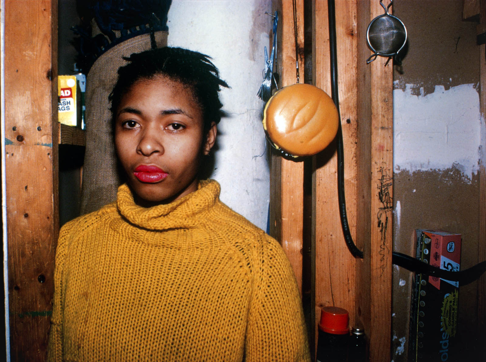
 'Edwidge behind the bar at Evelyne's, New York City' 1985")
 'Greer on the bed, New York City' 1983")


 'Twisting at my birthday party, New York City' 1980")
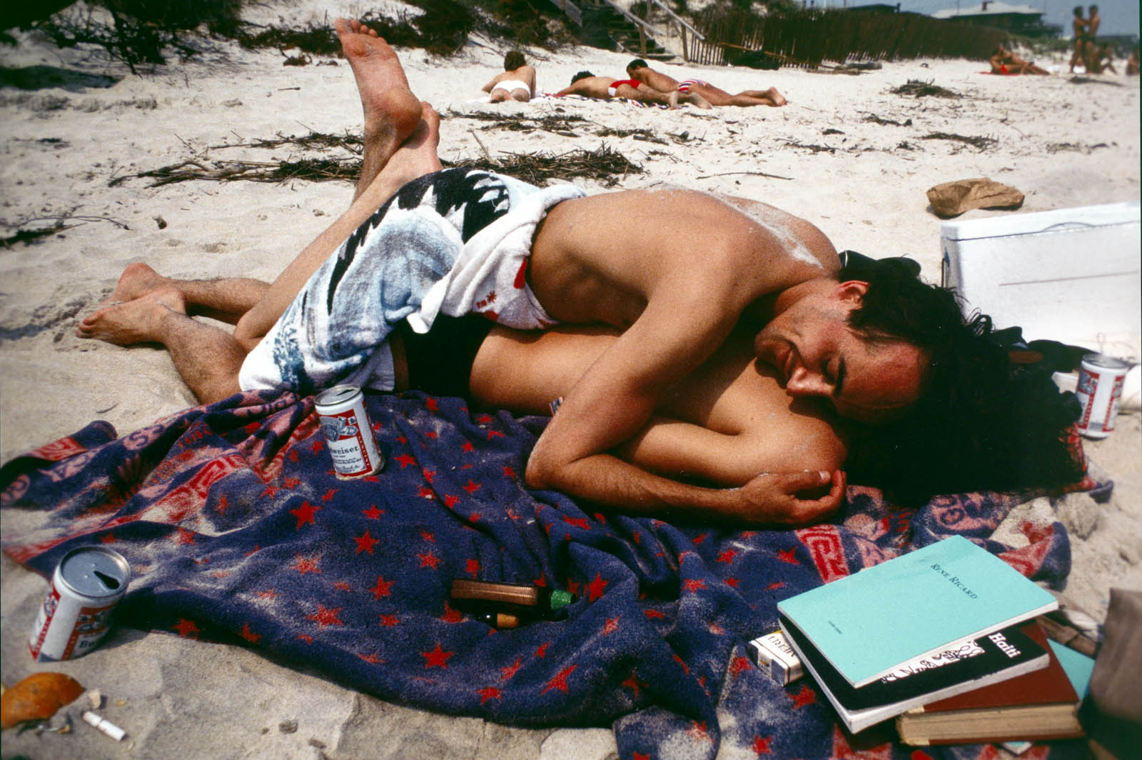
 'French Chris on the convertible, New York City' 1979")
 'Philippe H. and Suzanne Kissing at Euthanasia, New York City' 1981")
 'Rise and Monty Kissing, New York City' 1980")
 'Heart-Shaped Bruise, New York City' 1980")
 'Nan and Dickie in the York Motel, New Jersey' 1980")
 'The Hug, New York City' 1980")

 'Thomas shaving, Boston' 1977")
 'Scarpota at the Knox bar, West Berlin' 1984")
 'Brian on the Bowery roof, New York City' 1982")
 'C.Z. and Max on the beach, Truro, Mass.' 1976")
 'Vivienne in the green dress, New York City' 1980")
 'Bruce with his portrait, New York City' 1981")


![Frederick Evans (British, 1853-1943) 'Aubrey Beardsley [with hands]' 1893 from the exhibition 'Aubrey Beardsley' at Tate Britain, London, March - May, 2020](https://artblart.com/wp-content/uploads/2020/04/frederick-evans-portrait-of-aubrey-beardsley.jpg "Frederick Evans (British, 1853-1943) 'Aubrey Beardsley [with hands]' 1893 from the exhibition 'Aubrey Beardsley' at Tate Britain, London, March - May, 2020")
 'Withered Spring' 1891 from the exhibition 'Aubrey Beardsley' at Tate Britain, London, March - May, 2020")
 'Incipit Vita Nova' 1892")
 'Self-portrait' 1892")

 'The Finding of Medusa; The Death of Medusa (The Birth of Pegasus and Chrysaor); Perseus Pursued by the Gorgons' 1875-1876")
 'The Finding of Medusa' 1875-1876")
 'The Death of Medusa (The Birth of Pegasus and Chrysaor)' 1875-1876")
 'Perseus Pursued by the Gorgons' 1875-1876")
 'The Litany of Mary Magdalen' 1891")
 'The Entombment of Christ' c. 1465-1475")
 'Tannhäuser' 1891")
 'Die Götterdämmerung' 1892")
 'The Achieving of the Sangreal' 1892")
 'How Morgan Le Fay Gave a Shield to Sir Tristram' 1893")
 'How la Beale Isoud Wrote to Sir Tristram' c. 1893")
 'How Sir Tristram Drank of the Love Drink' 1893")
 'How La Beale Isoud Nursed Sir Tristram' 1893")
 'How King Arthur saw the Questing Beast, and thereof had great marvel' 1893")
 Design for a Frontispiece to 'Virgilius the Sorcerer' c. 1893")
 'The Kiss of Judas' 1893")
 'The Climax' 1893")
 'The Dancer’s Reward' 1893")
 'The Toilette of Salome' (second version) 1893")
 'The Stomach Dance' 1893")
 'The Eyes of Herod' 1893")
 'Enter Herodias' 1893")
 'John and Salome' 1893")
 'The Black Cape' 1893")
 'The Peacock Skirt' 1893")
 'J’ai baisé ta bouche Iokanaan' 1892-1893")
")
 Divan Japonais 1892")
 'The Pseudonym and Autonym Libraries' 1894")
 'Isolde' Printed 1899")
 'A Comedy of Sighs' 1894")
 'Professor Fred Brown' 1892")
 'Charles Conder' 1904")
 'Aubrey Beardsley' 1895")
 'Aubrey Beardsley' 1894")
 'W.B. Yeats' 1908")
 'Robbie Ross' 1895-1930")
 'John Gray' c. 1896-1897")
 'Cover Design for 'The Yellow Book'' Vol.I 1894")
 'The Yellow Book' Volume I 1894")
 'The Slippers of Cinderella' 1894")
 'La Dame aux Camélias' 1894")
 'The Black Cat' 1894-1895")
 'Frontispiece to Chopin’s Third Ballade' 1895")
 'The Fat Woman' 1894")
 Title page to 'The Story of Venus and Tannhäuser' 1895")
 'The Mirror of Love' 1895")
 'Venus between Terminal Gods' 1895")
 'Caprice' c. 1894")
 'Masked Woman with a White Mouse' c. 1894")
 'The Savoy', Number 1 1896")
 'Third Tableau of Das Rheingold' c. 1896")
 'The Savoy', Number 2 1896")
 'Ave Atque Vale' 1896")
 'The Dream' 1896")


 'The Cave of Spleen' 1896")
 'The Battle of the Beaux and the Belles' c. 1896")
 'Mademoiselle de Maupin' 1898")
 'The Lady with the Rose' 1897")
 'Lysistrata Shielding her Coynte' 1896")
 'Two Athenian Women in Distress' 1896")
 'Cinesias Entreating Myrrhina to Coition' 1896")
 'The Examination of the Herald' 1896")
 'The Lacedaemonian Ambassadors' 1896")
 'The Impatient Adulterer' 1896-1897")
 'Messalina and her Companion' 1895")
 'Aubrey Beardsley' 1897")
 'Volpone Adoring his Treasure' 1898")

 'Ali Baba' 1897")
 'Poster for ‘The Glasgow Institute of Fine Arts’' 1894-1896")
 'The Hindu Maid' 1916")
 '‘Music! Music’ cried the Emperor. ‘You little precious golden bird, sing!’' 1916")
 ''I know what you want,' said the Sea Witch' 1916")
 'Untitled #5' 2011/2012 from the exhibition 'Bill Henson' as part of the NGV Festival of Photography, NGV International, Melbourne, March - August, 2017")
 'Untitled #5' 2011/2012 (detail) from the exhibition 'Bill Henson' as part of the NGV Festival of Photography, NGV International, Melbourne, March - August, 2017")

 'Untitled #35' 2009/2010 (installation view)")
 'Untitled #8' 2008/2009 (installation view)")

 'Untitled #1' 2010/2011 (installation view)")


 'Untitled' 2010/2011 (installation view)")
 'Untitled #9' 2008/2009 (installation view)")
 'Untitled' 2010/2011 (installation view)")


 'Untitled #2' 2010/2011 (installation view)")
 'Untitled #10' 2011/2012 (installation view detail)")
 'Untitled #3' 2008/2009 (installation view)")


 'Untitled #10' 2008/2009 (installation view)")
 'Untitled #15' 2008/2009 (installation view)")
 'Untitled' 2012/13 (installation view)")
 'Untitled' 2012/13 (installation view detail)")
 'Untitled' 2012/13 (installation view detail)")
 'Untitled #2' 2009/2010 (installation view detail)")

 'Untitled 2008/09'")

 'Untitled 2008/09'")
 'Untiled 2009/10'")
 'Untiled 2009/10'")
 'Untiled 2009/10' 2009-2010 (installation view)")

 'Untitled 2008/09'")

 'The State We're In, A' 2015 from the exhibition 'Wolfgang Tillmans: 2017' at Tate Modern, London, Feb - June, 2017")
 'The Cock (Kiss)' 2002 from the exhibition 'Wolfgang Tillmans: 2017' at Tate Modern, London, Feb - June, 2017")
 from the exhibition 'Wolfgang Tillmans: 2017', which includes the latest iteration of the 'truth study centre' project")
 from the exhibition 'Wolfgang Tillmans: 2017' at Tate Modern")
 'Eleanor / Lutz, a' 2016")

 'Tag/Nacht II' 2010")
 'Sendeschluss / End of Broadcast I' 2014")
, with 'Sendeschluss / End of Broadcast I' 2014, at left")
 'Double Exposure' 2012-2013")
 'paper drop' 2014")
 'CLC 800, dismantled' 2011")
 'astro crusto, a' 2012")
' 2012, at left; and 'Munuwata sky', 2011 at right")
 'Headlight (f)' 2012")
 'Munuwata sky' 2011")
 'truth study center' 2017")
 'Greifbar 29' 2014")
 'The Blue Oyster Bar, Saint Petersburg' 2014")
 'NICE HERE but ever been to KRYGYZSTAN free Gender Expression WORLDWIDE' 2006")
 'Concorde L433-11' 1997")
 'Faltenwurf (Pines), a' 2016")
 'Tukan' 2010")
 'Dusty Vehicle' 2012")
 'Collum' 2011")
 'Weed' 2014")
 'The Air Between' 2016")
 'Still life, Calle Real II' 2013")
 'Nackt, 2 (nude, 2)' 2014")
 'Separate System, Reading Prison' 2016")
 'Anders pulling splinter from his foot' 2004")
 'Italian Coastal Guard Flying Rescue Mission off Lampedusa' 2008")
 'Lampedusa' 2008")
, featuring at left, pictures of an apple tree outside the artist's London front door and at right, 'La Palma' 2014")
 'La Palma' 2014")
 'Apple tree' 2007")
 'Apple tree' Various dates")
 'Shit buildings going up left, right and centre' 2014")
 'Untitled' 2012")
 and at centre right, 'Young Man, Jeddah' (2012)")
 'Sunset night drive' 2014")
 'Young Man, Jeddah' 2012")
 'Young Man, Jeddah (B)' 2012")
 '17 Years Supply' 2014")
 'Market I' 2012")
 'Studio still life, c' 2014")
 'Juan Pablo & Karl Chingaza' 2012")
 'Iguazu' 2010")
 'Oscar Niemeyer' 2010")
 'Tube escalator joint' 2009")
 'JAL' 1997")
 'Port-au-Prince' 2010")
 'London Olympics' 2012")
 'Fespa Car' 2012")
 'The Spectrum Dagger' 2016")
 'Gaza Wall' 2009")
 'Simon, Sebastian Street' 2013")
 'Arms and Legs' 2014")
 'Self-Portrait with Studio Camera' 1917; printed 1982 from the exhibition Exhibition: 'Edward Steichen: Twentieth-Century Photographer' at deCordova Sculpture Park and Museum, Lincoln, MA, Oct 2016 - March 2017")
 'Self-Portrait with Studio Camera' c. 1917 from the exhibition Exhibition: 'Edward Steichen: Twentieth-Century Photographer' at deCordova Sculpture Park and Museum, Lincoln, MA, Oct 2016 - March 2017")
 'Self-Portrait with photographers paraphernalia' 1929")

 'Auguste Rodin and the Monument to Victor Hugo' 1902")
 'J. Pierpont Morgan, Esq.' 1903")
 'The Flatiron' 1904")
 'Lotus, Mount Kisco, New York' 1915; printed 1982")
 Alfred 'Stieglitz' 1915; printed 1982")
 'Brancusi, Voulangis, France' c. 1922; printed 1987")
 'Carl Sandburg, Umpawaug, Connecticut' 1930")
 'Greta Garbo' 1929")
 'E. Gordon Craig, Paris' 1920, printed in 1987")
 'The Blue Sky, Long Island, New York' 1923; printed 1987")
 'Mantle' 1985 from the exhibition 'The sculpture of Bronwyn Oliver' at TarraWarra Museum of Art, Healesville, Victoria, Nov 2016 - Feb 2017")
 'Siren' 1986 from the exhibition 'The sculpture of Bronwyn Oliver' at TarraWarra Museum of Art, Healesville, Victoria, Nov 2016 - Feb 2017")
 'Home of a Curling Bird' 1988")
 'Apostrophe' 1987")
 'Curlicue' 1991 (detail)")
 'Bronwyn Oliver' 2006")
 'Ring II' 1994")
 'Wrap' 1997")
 'Husk' 1994")
 'Flare' 1997")
 'Iris' 1989")
 'Iris' 1989 (detail)")
 'Hatchery' 1991")
 'Hatchery' 1991")
 'Hatchery' (1991) with 'Heart' (1988) beyond")

 'Slip' 1998")
 'Clef' 1993")
 'Clef' 1993 (detail)")
 'Anthozoa' 2006 (detail)")

 'Eddy' 1993 (detail)")
 'Swathe' 1997")
 'Swathe' 1997 (detail)")
 'Swathe' 1997 (detail)")
 'Bronwyn Oliver' 2006")
 'Shield' 1995")
 'Lily' 1995 (detail)")

 'Rose' 2006")
 'Rose' 2006 (detail)")
 'Umbra' 2003")
 'Umbra' 2003 (detail)")
 'Umbra' 2003 (detail)")
 'Lock' 2002")
")
 'Sakura' 2006")
 'Ammonite' 2005")

 'Spiral IV' 2003 (detail)")
 'Spiral IV' 2003 (detail)")
 'Women's Suffrage maquette' 2002 (detail)")
 'Women's Suffrage maquette' 2002 (detail)")
 'Abel' 1874-1875")
 'École de Platon' (School of Plato) 1898")
 'Ixion Thrown Into the Flames' 187")
 'Motion Study (Men wrestling)' 1887")
 'Death of Abel Study' 2008")
 'Baigneurs' (Bathers) 1890")
 'Les adolescents' (Teenagers) 1906")
 'The Age of Bronze' 1875-1876")
 'Academy Drawing of a Man, said to be Patroclu' 1778")
 'Le Berger Pâris' (The Shepherd, Paris) 1787")
 'Horst P. Horst, Photographie' 1932")
 'Vive la France' 2006")
 'Orlando Furioso' 1867")
 'Equality before Death' 1848")
 'Fisherman with a Net' 1868")
 'Nude Youth Sitting by the Sea, Study' 1836")
 'Cain, Taormine, Sicile' 1911")
 'The Dying Saint Sebastian' 1789")
 'Votive Offering (Saint Sebastian)' 1912")
 'The Bath' 1951")
 'Douche (Shower)' 1932")
 'After the Battle' 1937-1942")
 'The Sleep of Endymion' 1791")
 'Mercury' 2001")
 'David' 1872")
 'Eminem - About to Blow' 1999")
 'Les bains mystérieux' (Mysterious Baths) c. 1934-36")
 'Self-Portrait, Kneeling' 1910")
 'Fléau! (Scourge!)' 1901")
 'Le Printemps' (Spring) c. 1900")
 'Grand Guerrier avec Jambe' 1893-1902")
 'Le Somnambule (The Sleepwalker)' 1935")
 'Falguière' 1875")
 'Naked Man on Bed' 1989")
 'David and Eli' 2004")
 'Fred with Tires - Bodyshop Series, Hollywood' 1984 from the exhibition 'Herb Ritts: Beauty and Celebrity' at Oklahoma City Museum of Art, Oklahoma City, May - July, 2013")
 'Djimon with Octopus, Hollywood' 1989 from the exhibition 'Herb Ritts: Beauty and Celebrity' at Oklahoma City Museum of Art, Oklahoma City, May - July, 2013")
 'Tony with shadow, Los Angeles' 1988")
 'Jackie Joyner-Kersee, Point Dume' 1987")
 'Versace Dress, Back View, El Mirage' 1990")
 'Versace Veiled Dress, El Mirage' 1990")
 'Now and Zen 1, El Mirage' 1999")
 'Male Nude with Bubble, Los Angeles' 1987")
 'Wrapped Torso, Los Angeles' 1989")
 'Backflip, Paradise Cove' 1987")
 'Corp et Âmes - 14, Los Angeles' 1999")
 'Chrissy Turlington, Versace 3, Milan' 1991")
 'Madonna (True Blue Profile), Hollywood' 1986")
 'Matthew McConaughey, Palmdale' 1996")
 'Loriki with Spear, Africa' 1993")
 'Tony Ward' 1986")
 'Waterfall IV, Hollywood' 1988")
 'Woman in Sea, Hawaii' 1988")
 'Bill T. Jones VI, Los Angeles' 1995")
 'Man with Chain, Los Angeles' 1985")


'Canadian Embassy, Leipziger Platz, Berlin (5.2.2003 - 28.4.2005)'")
 'The Bridge of Sighs, St. John’s College,
Cambridge' 1845 from the exhibition 'Concrete – Photography and Architecture' at Fotomuseum Winterthur, Zurich, March - May, 2013")
 '24, Rue Bièvre, Paris' 1865-1869")
 'Le Corbusier: Façade of the Secretariat Building, Chandigarh, 1961' 1961")
 '\"Op Art\" bathing suit by Sinz, Vouliagmeni/Greece' 1966")
 'Blikkiesdorp, Cape Town, South Africa' 2009")


'Le Vele di Scampia' 2009")
 'Seagram Building, New York City' 1997")

'Arne Jacobsen: Rødovre Town Hall' 1955")

'Stiegenhaus im Haus Stonborough-Wittgenstein' 1928 (composite cleaned)")
 '
Stiegenhaus im Haus Stonborough-Wittgenstein' 1928")

'Cathedral of Light' c. 1937")

'Chrysler Building under construction, New York' 1929")
 'Untitled' 1994 from the series 'Ignudi'")
 'Untitled' 1994 from the series 'Ignudi'")
 'Untitled' 1994 from the series 'Ignudi'")
 'Untitled' 1994 from the series 'Ignudi'")
 'Untitled' 1994 from the series 'Ignudi'")
 'Untitled' 1994 from the series 'Ignudi'")
 'Untitled' 1994 from the series 'Ignudi'")
 'Untitled' 1994 from the series 'Ignudi'")
 'Untitled' 1994 from the series 'Ignudi'")
 'Untitled' 1994 from the series 'Ignudi'")
 'Untitled' 1994 from the series 'Ignudi'")

You must be logged in to post a comment.