“These images unsettle our idea of Oztraliana, our perceived sense of Self and our place in the world.” Dr Marcus Bunyan
Exhibition dates: 25th April – 12th May, 2012
Curator: the artist
Jane Brown (Kuwait, Australia, b. 1967) Big Trout, New South Wales 2010 Museo silver rag print 59 x 46cm
As you should know by now, this archive tries to promote the work of less well known artists and subject matter. So instead of concentrating on the wonderful aerial bushfire photographs of the well-known artist John Gollings (showing in the same gallery in different spaces with the work of Michael Norton) I have decided to do a posting on the exhibition Australian Gothic by Jane Brown.
This is a good exhibition of small, darkly hewn, traditionally printed silver gelatin photographs, beautifully hung in the small gallery at Edmund Pearce and lit in the requisite, ambient manner. There are some outstanding photographs in the exhibition.
The strongest works are the surrealist tinged, film noir-ish mise-en-scènes, the ones that emphasise the metaphorical darkness of the elements gathered upon the stage. Photographs such as Big Trout, The Female Factory, Adelong, New South Wales and Captain’s Flat Hotel, New South Wales really invoke a feeling of unhomely (or unheimlich), where nature is out of kilter.
These images unsettle our idea of Oztraliana, our perceived sense of Self and our place in the world. They disrupt normal transmission; they transmutate the seen environment, transforming appearance, nature and form.
Less successful in this quest are the bushfire landscapes. I feel these add little to the narrative thread of the exhibition and could have easily been left out in a judicious cull of the photographs. This would have made the overarching story line stronger still.
One of the best photographs in the exhibition is Lathamstowe (2011, below). This dark, brooding, intense photograph is a beautifully realised visualisation, one that balances scale, tone, light, form and darkness to create a haunting image that stays with you a long time after you have seen it. This one images says it all: the artist has talent. More please!
Dr Marcus Bunyan
Many thankx to Edmund Pearce Gallery for allowing me to publish the photographs in the posting. Please click on the photographs for a larger version of the image.
Jane Brown (Kuwait, Australia, b. 1967) Bushfire Landscape I 2011 Fibre based, silver gelatin print 16.5 x 20.5cm
Jane Brown (Kuwait, Australia, b. 1967) Bushfire Landscape II, Lake Mountain, Victoria 2010 Fibre based, silver gelatin print 16.5 x 19.5cm
Jane Brown (Kuwait, Australia, b. 1967) The Female Factory (convict women’s prison), Ross, Tasmania 2009 Fibre based, silver gelatin print 15.8 x 19.5cm
Jane Brown (Kuwait, Australia, b. 1967) Front Bar, Wonthaggi Hotel, Victoria 2012 Fibre based, selenium toned, gelatin silver print
Jane Brown (Kuwait, Australia, b. 1967) Bush Christmas, Victoria 2011 Fibre based, selenium toned, gelatin silver print
Jane Brown (Kuwait, Australia, b. 1967) Lathamstowe 2011 Fibre based, silver gelatin print 16.5 x 16.5cm
“I find it interesting how monochrome is used to differentiate the living and the dead, the past and the present. It has an ability to transcend the constraints of time, memory and death. I examine this a lot in my work – landscapes seem to have vestiges or traces of past life and memorials become otherworldly.”
Jane Brown. ‘Weekend Australian Review’, August 2011
“The antipodes was seen as a world of reversals, the dark subconscious of Britain. It was for all intents and purposes Gothic par excellence.”
Gary Turcotte. “Australian Gothic,” in Marie Mulvey-Roberts (ed.). The Handbook to Gothic Literature. 1998
Comprising photographs taken in rural New South Wales, the ACT, Victoria and Tasmania, this exhibition takes its cue from the gothic imaginings of colonial Australia. We see images of a convict past, the bush Christmas, unforgiving landscapes and melancholic hotels. It carries echoes of the cinema of Wake in Fright (1971) and the Cars that Ate Paris (1974). Rendering visible the themes of the melancholic and the uncanny, Australian Gothic manifests itself in rural isolation – where the homely becomes unhomely (or unheimlich) and where nature is out of kilter.
Jane Brown (Kuwait, Australia, b. 1967) Adelong, New South Wales 2011 Fibre based, silver gelatin print 16.5 x 20.5cm
Jane Brown (Kuwait, Australia, b. 1967) Tumbarumba, New South Wales 2012 Fibre based, silver gelatin print 16.5 x 19.5cm
Jane Brown (Kuwait, Australia, b. 1967) One Way, Hobart, Tasmania 2009 Fibre based, silver gelatin print 16.5 x 19.5cm
Jane Brown (Kuwait, Australia, b. 1967) Unheimlich, French Island, Victoria 2010 Fibre based, silver gelatin print 19 x 16cm
Jane Brown (Kuwait, Australia, b. 1967) Captain’s Flat Hotel, New South Wales 2012 Fibre based, silver gelatin print 21.5 x 17.5cm
While Anthony Friedkin has documented subjects as diverse as the marginalised gay community of San Francisco, convicts at Folsom Prison, and brothels in New York, it is the Southern California coastline that has remained a recurrent theme throughout his forty-five-year career. The Los Angeles native took up photography about the same time he learned to surf. His images of waves deftly communicate the primordial power and elusive mysteries that he ascribes to the ocean. This photograph of surfer Rick Dano on an early morning drive up the coast conveys a mood of quiet, anticipatory harmony.
Text from Pacific Standard Time at the Getty
I have never particularly liked Los Angeles as a city. There seems to be something unappealing about the place, some energy lurking just beneath the surface that you can’t quite put your finger on. Maybe it is the comparison with the vivacious San Francisco just up the coast, the awful public transport or, more spookily, the lack of people on the street. People never walk anywhere in LA, it’s a car town. When I did walk on the street I felt vulnerable and surveyed with suspicion by people in cars, like a rabbit caught in the headlights.
These photographs confirm this feeling. Unlike the visual acoustics of the architectural photographs of Julius Shulman (photographs that mythologised this urban metropolis and then exported that idealised presence and Californian mid-century design to the rest of the world) these photographs have an unbelievably desolatory nature to them. They seem to be joyless and sorrowful, devoid of warmth, comfort, or hope – as though the human and the city were separated, as if we are separated from a loved one.
The row after row of tinderbox houses, the ubiquitous cars, the sense of emptiness, hopelessness and menace (see Gary Winogrand Los Angeles 1964, below – if looks could kill this would be it, the bandaged broken nose just perfect for the photograph) all paint a picture of despair. Even the supposedly quiet, anticipatory harmony of the photograph of surfer Rick Dano by Anthony Friedkin (1978, below top) is, to me, full of unresolved tension. The mist in the background hanging over the rocks, blocking out the view, the filthy hands and the bandaged little finger of the right hand, the downcast eyes, the impossibly long cigarette handing from his lips and most importantly the empty distance between the figure and the safety of the automobile. The tension in that distance and the downcast eyes says nothing to me of harmony but of isolation, sadness and regret.
Los Angeles is not my favourite city but it is a fascinating place none the less, as these photographs attest.
Dr Marcus Bunyan
Many thankx to the J. Paul Getty Museum for allowing me to publish the photographs in the posting. Please click on the photographs for a larger version of the image.
Hernandez started photographing what he refers to as “automotive landscapes” in 1977, using a 35mm camera until he realised that a large-format camera loaded with 5 x 7-inch negative film would provide the detail he desired. Taken from a slightly elevated vantage point, Hernandez’s image of an immobilised truck and its lone mechanic in front of a repair shop presents a sobering view of Los Angeles’s car-dominant culture.
This image of a couple seated in a parked convertible in front of a nightclub on Sunset Boulevard simultaneously captures the glamour and seediness associated with Hollywood. Evoking a 1940s or ’50s film noir crime drama, a seeming tough guy and femme fatale continue their heated conversation, apparently oblivious to the traffic around them – and to the photographer observing them. A native of New York City, Winogrand studied painting at Columbia University and photography at the New School for Social Research before doing freelance commercial work. He photographed incessantly, using a 35mm camera to create wide-angled or tilted shots that are densely composed and layered with meaning. More than 2,500 rolls of film remained undeveloped at the time of his death in 1984.
Text from Pacific Standard Time at the Getty
As part of the region-wide Pacific Standard Time: Art in L.A., 1945-1980 initiative, The J. Paul Getty Museum presents In Focus: Los Angeles, 1945-1980, an exhibition of photographs from the permanent collection made by artists whose time in Los Angeles inspired them to create memorable images of the city, on view at the Getty Center from December 20, 2011 – May 6, 2012.
This exhibition features both iconic and relatively unknown work by artists whose careers are defined by their association with Los Angeles, who may have lived in the city for a few influential years, or who might have visited only briefly,” said Virginia Heckert, curator, Department of Photographs, the J. Paul Getty Museum, and curator of the exhibition.
The photographs are loosely grouped around the themes of experimentation, street photography, architectural depictions, and the film and entertainment industry. Works featured in the exhibition are from artists such as Jo Ann Callis, Robert Cumming, Joe Deal, Judy Fiskin, Anthony Friedkin, Robert Heinecken, Anthony Hernandez, Man Ray, Edmund Teske, William Wegman, Garry Winogrand, and Max Yavno. Two of the works in the exhibition by Anthony Hernandez and Henry Wessel Jr. were acquired with funds from the Getty Museum Photographs Council. Drawn from the Museum’s permanent collection, including several recent acquisitions inspired by the Pacific Standard Time initiative, the exhibition offers visitors the opportunity to familiarise themselves with a broad range of approaches to the city of Los Angeles as a subject and to the photographic medium itself.
One of the most well-known works in the exhibition is Garry Winogrand’s photograph of two women walking towards the landmark theme building designed by Charles Luckman and William Pereira that has come to symbolise both Los Angeles International Airport and mid-century modern architecture in popular culture. Though a quintessential New Yorker, Winogrand made some of his most memorable photographs in Los Angeles, where he chose to settle in the final years of his life. Also included in the exhibition is Diane Arbus’ dreamily lit photograph of Sleeping Beauty Castle at Disneyland park in Anaheim. Although technically not located in either the city or the county of Los Angeles, Disneyland – and Arbus’ photograph – continues to capture the notion of entertainment and fantasy that has come to be so intrinsically associated with the city.
Other photographers in the In Focus: Los Angeles exhibition who produced the majority of their most creative work in the city include Edmund Teske, with his experimentation in the darkroom and his complex double solarisation process; Robert Heinecken, with images that are equally complex but often incorporate existing printed materials, such as negatives; Anthony Hernandez, whose portraits of Angelenos on the street emphasise the isolation of the individual in an urban environment; and Anthony Friedkin, who combines his passions for surfing and the Southland beaches in his photographs. The inclusion of three photographs from Judy Fiskin’s earliest photographic series, Stucco (1973-1976), provided the impetus for a monographic presentation of the artist’s complete photographic work by Getty Publications. Entitled Some Aesthetic Decisions: The Photographs of Judy Fiskin and featuring an introductory essay by curator Virginia Heckert, the book will be published concurrently with this exhibition.
Press release from the J. Paul Getty Museum website
The reduced scale and regular spacing of shapes lend a toy-like quality to Garnett’s suite of prints depicting construction phases of tract housing in the Los Angeles County suburb of Lakewood. The deep shadows, overall patterning, and dramatic diagonals that slice through each composition introduce a sophisticated sense of design and abstraction. After studying photography at Art Center College of Design and military service during World War II, William Garnett learned to fly so that he could photograph his subjects from his Cessna 170-B airplane. Although he was hired by developers to document the construction of 17,500 affordable single-family residences in Lakewood, the majority of his aerial photographs depict the beauty of America’s landscape.
After working for ten years as a commercial photographer, Sydney native Grant Mudford received funding from the Australia Council for the Arts, enabling him to travel throughout the United States to pursue personal work. Mudford’s love of architecture – particularly the vernacular, often anonymous structures of urban America – is evident in the photographs he produced. His head-on depictions of the façades of simple commercial buildings are enlivened by signage, the play of light and shade, the placement of doors and windows, or, as in this image, the rich variety of textures.
Joe Deal rose to prominence in the mid-1970s when work he made as a graduate student at the University of New Mexico was included in the exhibition New Topographics: Photographs of a Man-Altered Landscape (1975). From 1976 to 1989, he taught photography at the University of California, Riverside, where he was instrumental in establishing a photography program and developing the university-affiliated California Museum of Photography. His photographs of Diamond Bar feature backyards of this primarily residential suburb located at the junction of the Pomona and Orange freeways in eastern Los Angeles County. Deal’s implementation of a slightly elevated perspective that eliminates the horizon line and provides a view into neighbouring yards effectively conveys the close quarters of life in a master-planned community.
“It is immediately apparent that no city has ever been produced by such an extraordinary mixture of geography, climate, economics, demography, mechanics and culture; nor is it likely that an even remotely similar mixture will ever occur again.” ~ Reyner Banham, Los Angeles: The Architecture of Four Ecologies, 1971
This exhibition features photographs – made between 1945 and 1980 – from the Museum’s collection that represent diverse responses to the city of Los Angeles as a subject and to photography as a medium for documentary and creative expression. It is loosely grouped around the themes of experimental photography, vernacular architecture, car culture, and fantasy and the film industry.
Both iconic and relatively unknown works are included. One of the best known is Garry Winogrand’s image of two women walking towards the Theme Building at L.A. International Airport (see image above). Though a quintessential New Yorker, Winogrand settled in Los Angeles near the end of his life.
Experimental Photography
With its reclining figure set against a patterned background, Robert Heineken’s image recalls the odalisques of French painter Henri Matisse (see image above). To Heineken, however, traditional subjects and techniques were of little interest. He created this camera-less photograph by using a page torn from a magazine as the negative. This allowed light to pass through and merge depictions on both sides of the page into a single image with reversed tones.
In 1963, Heineken founded the photography program at the University of California, Los Angeles. He forged new directions in photography, utilising strategies of manipulation and appropriation to address themes of consumer culture and sexual politics.
Vernacular Architecture
Judy Fiskin’s propensity to backlight her subjects makes it difficult to read the details in the modest examples of vernacular architecture found in Westside neighbourhoods of Los Angeles that she photographed for her Stucco series. Viewers may be inclined to squint against the harsh light of Southern California that Fiskin makes so palpable. Nevertheless, the small scale of her images, contained by the black edges of the negative, encourages close viewing.
After completing graduate studies in art history at UCLA, Fiskin joined the faculty of the California Institute of Arts in 1977.
Car Culture
A native of Los Angeles, following two years of study at East Los Angeles College and two years of service in the U.S. Army, Anthony Hernandez took up photography in earnest around 1970.
For this image, Hernandez preset his 35mm camera so that objects within a specific range would be in focus. Then, while walking the streets of downtown Los Angeles, he swung the camera to his eye for a fraction of a second to capture fellow pedestrians as well as the ambient mood of a city more typically experienced from the driver’s seat (see image below).
Fantasy and the Film Industry
Los Angeles native Anthony Friedkin took up photography about the same time he learned to surf, and was already an accomplished photographer by age 16. He then studied at Art Center College of Design and the University of California, Los Angeles.
Friedkin began working as a still photographer for motion pictures in 1975. His depiction of row after row of film cans might be viewed as a historical document of a medium that has been replaced by new technology (see image below).
Following two years of study at East Los Angeles College and two years of service in the U.S. Army, Anthony Hernandez took up photography in earnest around 1970. For this image, he preset his 35mm camera so that objects within a specific range would be in focus. Then, while walking the streets of downtown Los Angeles, he swung the camera to his eye for a fraction of a second to capture fellow pedestrians as well as the ambient mood of a city more typically experienced from the driver’s seat. A native of Los Angeles, Hernandez has continued to photograph the city, addressing issues of community, shelter, and survival in his work.
Anthony Friedkin began taking photographs at a young age and had already published his work by the time he was 16. He nonetheless found it important to study photography seriously and did so at Art Center College of Design and the University of California, Los Angeles. Employment as a still photographer for motion pictures beginning in 1975 undoubtedly prepared him to create a portfolio of images of Universal Studios a few years later. His depiction of row after row of film cans might be viewed as a historical document of a medium that has been replaced by new technology. Friedkin’s continued commitment to shooting black-and-white film that he develops and prints in his own darkroom has become increasingly rare.
After completing his undergraduate degree in design at the University of California, Los Angeles, Darryl Curran entered the school’s newly established photography program, studying with Robert Heinecken, who is positioned toward the center of this image in a black turtleneck. The repeated printing of two frames is typical of Curran’s approach to the photographic medium and the ease with which he employs techniques and strategies derived from his background in printmaking and design. Another form of “mirroring” occurs in the placement of a Heineken beer bottle opposite Heinecken the artist. Curran founded the Department of Photography at California State University, Fullerton, where he taught from 1967 to 2001.
Henry Wessel began taking photographs while majoring in psychology at Pennsylvania State University in the mid-1960s. Travel throughout the United States in subsequent years led him to direct his gaze increasingly to details of human interaction with the natural and man-made environment. Wessel’s move to the West Coast in the early 1970s inspired him to incorporate light and climate into his work. His inclusion in the seminal exhibition New Topographics: Photographs of a Man-Altered Landscape, organised in 1975 by the George Eastman House in Rochester, New York, solidified his reputation as a keen observer of the American topography. In this image, electrical and telephone lines tether a row of modest residences to a single utility pole.
Text from Pacific Standard Time at the Getty
The J. Paul Getty Museum 1200 Getty Center Drive Los Angeles, California 90049
“These neophytes on the path of life, both old/wise, young/hidden pass through (into?) our dreams.” Dr Marcus Bunyan
Exhibition dates: 28th March – 5th May, 2012
Curator: the artist
Polixeni Papapetrou (Australian, 1960-2018) The Wanderer No. 3 2012 From The Dreamkeepers Pigment print 105 x 105cm
I absolutely love these. The colours, the spaces, the ambiguous vistas, the fantastical archetypes, the fables. What springs to mind, with the use of masks to disguise youth positioned within the decorous landscape, is the notion of “passing”. Passing on (as in dying), passing through (as in travelling), in passing (as in an aside) and just “passing” (passing yourself off as someone or something else) to hide your true character or feelings. Gay men did this in the 1950s and 60s all the better to fit into society, for if it was found that you were homosexual you could loose your job, your apartment and even your life. Of course, there is also the passing of time, the longing for misspent youth in these masked ephebes and adolescent women. Age shall not weary them…
Wandering, dreaming, remembering, keeping, collecting, counting. These neophytes on the path of life, both old/wise, young/hidden pass through (into?) our dreams. Papapetrou creates visions that elude the senses, visions that slip between dreaming and waking, between conscious and subconscious realms. As John Berger and Jean Mohr have observed,
“Cameras are boxes for transporting appearances. Are the appearances which a camera transports a construction, a man-made cultural artefact, or are they, like a footprint in the sand, a trace naturally left by something that has passed? The photographer choses the events he photographs. This choice can be thought of as a cultural construction. The space for this construction is, as it were, cleared by his rejection of what he did not choose to photograph.”1
As an artist Papapetrou has the intelligence to leave this nature/nurture question open in her photographs. Her skill as an artist is in choosing the right things to photograph. This enables her creatures to pass through liminal spaces, the space of our consciousness. Through this process a trace will always be left with us, for this is a strong body of work, well realised, in passing.
Dr Marcus Bunyan
1/ Berger, John and Mohr, Jean. Another Way of Telling. New York: Pantheon Books, 1982, pp. 92-93.
Many thankx to Stills Gallery for allowing me to publish the photographs in the posting. Please click on the photographs for a larger version of the image.
Polixeni Papapetrou (Australian, 1960-2018) The Wave Counter 2011 From The Dreamkeepers Pigment print 105 x 105cm
Polixeni Papapetrou (Australian, 1960-2018) The Mystical Mothers 2011 From The Dreamkeepers Pigment print 105 x 105cm
Polixeni Papapetrou (Australian, 1960-2018) The Lantern Keeper 2012 From The Dreamkeepers Pigment print 105 x 105cm
“These transitional places in one’s life are often the most creative, and as we grapple for answers and clarity what is often realized is ambiguity and confusion that reigns supreme. Like fairy stories, Papapetrou uses absurdity to make symbolic sense of world she struggles to understand.”
Susan Bright. Between Worlds catalogue 2009
In Polixeni Papapetrou’s work there is identification with the world of children that is rare and remarkable. She sees children themselves as ‘between worlds’, between infancy and adulthood. Yet she does more than identify, creating fantastical worlds that only adults can truly understand and relate to.
A man in blue striped pyjamas stands on a rock by the sea, leaning into the wind. His body seems young yet he supports himself with a walking frame. His face is old, oversized, a little grotesque. He is The Wavecounter. Like the other characters in Polixeni Papapetrou’s series The Dreamkeepers, he is lithe in body yet gnarly of physiognomy, both young and old. Gazing out in contemplation these dream keepers look with anticipation to the future, or is it with nostalgia to the past? The timeless backdrops of shoreline or hilltop reflect this ambiguity, echoing through landscape the collapsing of thresholds and blurring of boundaries.
Papapetrou’s art practice has involved collaboration with her children and their friends for over 10 years. As they have grown and transformed so too have the roles they perform and spaces they inhabit. It is the awkward evolution of adolescence that informs the in-between space of The Dreamkeepers. To parallel the cripplingly self-conscious yet powerfully self-realising period of our lives, Papapetrou engages part reality, part fantasy from which a space of unreality emerges, the space of archetype. Here the anonymity afforded by masks separates her adolescent actors from who they really are, and allows them to stand in for us all. In this way, Papapetrou asks us to consider how masks, whether symbolic or literal, not only conceal identity, but also expand and transform it.
The aged masks do so in The Dreamkeepers by confounding adolescence, as the characters exude a quiet lack of self-consciousness, despite their disturbing appearance. They arouse a gentle pathos, reminding us of our own shapeshifting, of time playing out on our bodies and minds. The abstract meeting of these two ages may indicate the latent wisdom and self-acceptance that only realises with maturity, or the cyclical nature of our life spans that inevitably brings us back to the vulnerability of youth. In either case the work is a powerful testament to the surrendering of childhood.
Also on exhibition is a small selection of works from Papapetrou’s current work in progress. Using ghillie suits, she transforms her actors into animate objects – rocks with life and seaweed with attitude.
Press release from the Stills Gallery website
Polixeni Papapetrou (Australian, 1960-2018) The Holiday Makers 2011 From The Dreamkeepers Pigment print 105 x 105cm
Polixeni Papapetrou (Australian, 1960-2018) The Mender 2011 From The Dreamkeepers Pigment print 105 x 105cm
Polixeni Papapetrou (Australian, 1960-2018) The Joy Pedlars 2011 From The Dreamkeepers Pigment print 105 x 105cm
Polixeni Papapetrou (Australian, 1960-2018) The Shell Collectors 2012 From The Dreamkeepers Pigment print 105 x 105cm
Polixeni Papapetrou (Australian, 1960-2018) The Lighthouse Keepers 2011 From The Dreamkeepers Pigment print 105 x 105cm
Polixeni Papapetrou (Australian, 1960-2018) The Photographer 2011 From The Dreamkeepers Pigment print 105 x 105cm
It is not her portraits or the road trip photographs, nor her scientific work for which Berenice Abbott will be remembered.
Firstly, she will always be remembered as the person who photographed Eugene Atget in 1927 just before he died and who bought the remainder of his negatives (after the French government had bought over 2,000 in 1920 and another 2,000 had been sold after his death). She then tirelessly promoted Atget’s work helping him gain international recognition until her sale of the archive to the Museum of Modern Art in 1968.
Secondly, she is remembered for her magnificent photographs of New York City and its urban environs, photographs that show the influence of Atget in their attention to detail and understanding of the placement of the camera, and imaging of old and new parts of the city (much as Atget had photographed old Paris before it was destroyed). However, these photographs are uniquely her own, with their modernist New Vision aesthetic, bold perspectives and use of deep chiaroscuro to enhance form within the photograph. Abbott’s best known project, Changing New York (1935-1939) eventually consisted of 305 photographs that document the buildings of Manhattan, some of which are now destroyed.
“Abbott’s project was primarily a sociological study imbedded within modernist aesthetic practices. She sought to create a broadly inclusive collection of photographs that together suggest a vital interaction between three aspects of urban life: the diverse people of the city; the places they live, work and play; and their daily activities. It was intended to empower people by making them realise that their environment was a consequence of their collective behaviour (and vice versa). Moreover, she avoided the merely pretty in favour of what she described as “fantastic” contrasts between the old and the new, and chose her camera angles and lenses to create compositions that either stabilised a subject (if she approved of it), or destabilised it (if she scorned it).”
In the text (below) Gaëlle Morel observes, “Rather than the kind of nostalgic approach often brought to bear on a city’s landmarks and typical sites, this ensemble offers an exploration of the nature of modernity and focuses on the ways in which the past and future are temporarily linked together. Seeking to reinvent the forms and functions of photography in relation to the practice of documentary, Abbott sets out to capture the “disappearance of the moment” by juxtaposing motifs from a city subject to an unprecedented process of demolition and reconstruction.”
While Abbott’s photographs are definitely modernist in nature I believe that today they can also be seen as deeply nostalgic, emerging as they do in the period after the Great Depression when the economy was on the move again, a peaceful time before the oncoming armageddon of the Second World War, closely followed by the fear of nuclear annihilation and the threat of communist indoctrination. They are timeless portraits of a de/reconstructed city. The images seem to float in the air, breathe in the shadows. This is the disappearance of the moment into the enigma of past, present, future – where the photograph becomes eternal, where the best work of both Atget and Abbott resides.
Dr Marcus Bunyan
Many thankx to Jeu de Paume for allowing me to publish the photographs in the posting. Please click on the photographs for a larger version of the image.
“The tempo of the city is not that of eternity, nor that of time, but that of the ephemeral. That is why recording it is so important, in both documentary and artistic terms.”
“All the photographs of New York took a long time to make, because the camera had to be carefully positioned. There is nothing fortuitous about these photographs.”
The exhibition features a substantial collection from Abbott’s best known project, Changing New York (1935-1939). Commissioned by the Roosevelt administration as part of its response to the nationwide economic crisis, Abbott saw this piece of work as both a way of documenting the City and as a personal work of art. Eighty of the 305 photographs taken by Abbott are on show here, along with various documents providing insight into the background of this major photographic undertaking, including posters and views of the exhibition organised by the Museum of the City of New York in 1937, sketches and historical notes made by the team of journalists working with Abbott on the project, and proofs and dummies of the layout made by the photographer before she started work.
Abbott homes in on the contrasts between old and new elements in the City’s structure. Her images alternate between a New Vision aesthetic, characterised by an emphasis on details and bold perspectives, and a more documentary style that is frontal and neutral. Rather than the kind of nostalgic approach often brought to bear on a city’s landmarks and typical sites, this ensemble offers an exploration of the nature of modernity and focuses on the ways in which the past and future are temporarily linked together. Seeking to reinvent the forms and functions of photography in relation to the practice of documentary, Abbott sets out to capture the “disappearance of the moment” by juxtaposing motifs from a city subject to an unprecedented process of demolition and reconstruction.
In 1938, hoping to take advantage of the fifty million visitors expected at the New York World’s Fair of 1939, the publisher, E.P. Dutton, offered to bring out a selection of one hundred images from the project accompanied by a text by the renowned art critic Elizabeth McCausland, who also happened to be Abbott’s companion and staunch supporter. Going against the women’s original ideas for an art book, Dutton produced a more standard tourist guide, breaking the City down into a series of tours, from south to north and from the centre outwards. The text, too, was shorn of its poetic and pedagogical dimensions, leaving only informative entries about the buildings in the pictures.
In the exhibition, this set of architectural photographs is rounded out by a selection of pictures of vernacular architecture taken by Abbott during a journey in the southern states of the US in the 1930s and when she was travelling along Route 1 in the 1950s. Here, portraits of farmers and wooden houses alternate with pictures of streets and local events.
Berenice Abbott Petit Journal
With over 120 photographs, plus a selection of books and documents never shown before, this is the first exhibition in France to cover the many different facets of the American photographer Berenice Abbott (1898-1991), who is also famous for her international advocacy of Eugène Atget. She came to Paris in 1921 where she learnt her craft from Man Ray before opening her own studio and embarking on a successful career as a portraitist. Returning to New York City in 1929, she conceived what remains her best‑known project, Changing New York (1935-1939). This was financed by the Works Progress Administration as part of its response to the economic crisis sweeping the country. The photographs she took in 1954 when travelling along the US East Coast on Route 1 (the exhibition presents a previously unseen selection of these images) reflect her ambition to represent the whole of what she called the “American scene.” Furthermore, in the 1950s, she also worked on a set of images for the Massachusetts Institute of Technology (MIT) designed to illustrate the principles of mechanics and light for educational purposes.
A committed member of the avant‑garde from the early 1920s, and a staunch opponent of Pictorialism and the school of Alfred Stieglitz, Abbott spent the whole of her career exploring the limits and nature of documentary photography and photographic realism. This exhibition shows the rich array of her interests and conveys both the unity and diversity of her work.
Portraits
Berenice Abbott moved to New York City in the early 1920s and went about becoming a sculptor. Mixing in the bohemian circles of Greenwich Village, she met writers and artists such as Djuna Barnes, Sadakichi Hartmann and Marcel Duchamp. She also posed for Man Ray. Economic hardship at home and the allure of what then seemed the cultural Eldorado of Europe impelled several of these artists to try their luck in Paris, and Abbott herself joined this group of American expatriates in 1921.
In 1923 she became the assistant of Man Ray, who had opened a portrait studio shortly after his arrival in France in 1921. While a fair portion of the studio’s clients were American tourists, Abbott found herself at the heart of the avant-garde scene – especially that of the Surrealists. Between 1923 and 1926 she thus learnt about darkroom techniques and portrait photography while at the same time picking up a broader intellectual and artistic education. She produced her portraits in Man Ray’s studio before opening her own in 1926. Success soon followed. Her clientele was a mixture of French cultural figures and American expatriates, of bourgeois, bohemians and literary types. Her portraits were on occasion manifestly influenced by Surrealism, and more generally show an interest in masquerade, play and disguise, but sometimes even in their use of overprinting and distortion.
The female models express a kind of sexual ambiguity, notably by their masculine haircut or clothes, deliberately exuding a sense of uncertainty with regard to their identity. In composing her portraits, Abbott developed a distinctive aesthetic, far removed from the usual commercial conventions. The absence of a set, with the background usually no more than a plain wall, helped to focus on the sitter and their posture, the position of their body and their facial expression. The use of a tripod and long-focus lenses placed at eye-height allowed her to avoid distortions and thus heighten the physical presence of the models. In early 1929 Abbott left Paris for New York City. Back in America she continued with the same activities, opening a new portrait studio and taking part in exhibitions of modernist photography, while also promoting the work of Eugène Atget, having bought part of his estate in 1928.
New York City
In the early 1930s, Abbott set about her project for a great documentary portrait of the City of New York, but had no luck when she approached institutions such as the Museum of the City of New York and the New York Historical Society for funding. She assembled her first efforts in an album (eight pages of which are exhibited here) in order to convey the scale of her ambitious undertaking, and in 1934 exhibited her photographs of the City at the Museum of the City of New York in the hope of attracting sponsors. In 1935, support was at last forthcoming from the Federal Art Project, a programme set up to aid artists by the Works Progress Administration as part of the New Deal; she now had the support of a team of researchers who produced an information pack with text and drawings to accompany each image. Entitled Changing New York, she conceived this commission as both a vast documentary record of the City and a personal work of art. Eighty of the 305 photographs constituting this project have been selected for the exhibition. These are accompanied by documents – a poster, exhibition views, sketches and historical notes, proofs, pages from the preparatory album and original editions – that help to convey the concerns and ambitions behind this major photographic undertaking.
Abbott focused on the contrasts and links between old and new in the City’s structure. Her images alternate between a New Vision aesthetic, characterised by an emphasis on details and bold perspectives, and a more documentary style that is frontal and neutral. Rather than the kind of nostalgic approach often brought to bear on a city’s landmarks and typical sites, this ensemble offers an exploration of the nature of modernity and focuses on the ways in which the past and future are temporarily linked together. Seeking to reinvent the forms and functions of photography in relation to the practice of documentary, Abbott sets out to capture the “vanishing instant” by juxtaposing motifs from a city subject to an unprecedented process of demolition and reconstruction.
The upshot of all this work was the publication of a book, Changing New York, in 1939. But there was considerable tension between the publisher, whose concerns were commercial, and the photographer, with her artistic ambitions. In 1938, hoping to take advantage of the fifty million visitors expected at the New York World’s Fair of 1939, the publishing house E.P. Dutton proposed to bring out a selection of one hundred images from the project accompanied by a text from the renowned art critic Elizabeth McCausland, who also happened to be Abbott’s companion and unfailing supporter. Straying far from the project originally envisaged by the two women, Dutton changed the presentation of the photographs and produced what was a standard tourist guide, breaking the City down into a series of tours, from south to north and from the centre outwards. The text, too, was shorn of its poetic and pedagogical dimensions, leaving only information about the buildings in the pictures.
The “American scene”
This set of architectural images is completed by a selection of vernacular photographs. In the summer of 1935, Berenice Abbott went on a road trip down to the Southern US in order to create a portrait of a rural world in crisis. Choosing the kind of documentary style that would be the hallmark of the photographic survey launched by the Farm Security Administration (FSA) that same year, she focused on the modest wooden houses and the farmers. Driving around these states with Elizabeth McCausland, Abbott took some two hundred photographs which the two women saw as part of an ambitious photographic portrait of America in book form, although in the end this was never published. A similar fate befell Abbott’s piece on the small towns and villages along Route 1, which she travelled in 1954. Covering approximately 6,500 kilometres as she followed this road along the East Coast of the US, she took some 2,400 photographs, taking in stalls, shops, portraits of farmers, diners and bars and dance halls. Her photography alternated between the documentary aesthetic and Street Photography. With Route 1, Abbott continued to pursue her ambition of representing the whole of the “American scene.”
Science
Abbott started photographing scientific phenomena in 1939. In 1944 she was recruited by the journal Science Illustrated, where she published some of her own pictures, as head of its photography department. Abbott took a committed, pedagogical approach, seeing her images as a vital bridge between modern science and the general public. In 1957, as a result of the anxiety about national science stirred by the Soviet launch of the Sputnik into outer space, at the height of the Cold War, the National Science Foundation set up a Physical Science Study Committee at Massachusetts Institute of Technology. Its role was to develop new textbooks for the teaching of science in schools and to use innovative photographs to illustrate the principles of quantum mechanics. Abbott was hired by MIT to produce photographs for the popularisation and teaching of the sciences. Using abstract forms to visually express complex mechanical concepts and invisible mechanical laws, she used black grounds to reveal principles such as gravity and light waves. The exhibition features a score of Abbott’s scientific and experimental images, as well as some of the books for which they were used. Harking back to the experiments of the avant-gardes, and in particular the Rayogram technique, she was able to produce visually attractive and surprising images that were also rich in discovery, thus combining documentary information with a sense of wonder.”
Text by Gaëlle Morel, curator of the exhibition, on the Jeu de Paume website
Presentation of the exhibition Berenice Abbott
The exhibition “Berenice Abbott (1898-1991), photographies” reveals for the first time in France the different stages of the career of this American photographer. This retrospective offers more than 120 photographs, original works and a series of unpublished documents. By presenting portraits, architectural photographs and scientific shots, the exhibition shows the multiple facets of a work often reduced to a few images.
Meaning arises out of context – or the lack of it. Unlike the grids of the Bechers which promote multiple ways of seeing and construct narrative tension these images do not increase the photographic narrative. They are like the parrots, finches or scarab beetles in a display case at a natural history museum – part of a taxonomic classification system, where one out of a thousand is the most impressive beetle, the bird with the brightest plumage, where the composition is the most surprising. Multiples as collected here are fascinating but emerge from a slightly obsessive mind (which any collectors mind is!)
This photomontage of impressions, ground and movement blurs the history and memory embedded in each photograph. The assemblage of all these visions ranges far and wide but ultimately collapses time and space into one huge universal snapshot. As in advertising imagery the individual documentary-style images mean relatively little – it is the overall impression that impinges on the consciousness. If you watch MTV and stop to analyse the individual images in a pop video you soon acknowledge their vacuousness. The context of the singular image is lost. In this display the grid controls the photographs position relative to each other and the viewer – a compositional design matrix that has a symbolic function. The grid both decontextualises and recontextualises the floating signifier.
Richter obviously uses them as an aide-memoire. Some remind me of the folded photographs found in Francis Bacon’s studio; others Bacon’s portraits of blurred bodies; yet more, ethnographic mappings of Indigenous bodies or criminals cut out of newspapers. Others remind me of surrealist experiments and the overpainted colour photographs of the artist.
They may be the source material of a great artist but in this regimented form of prosaic knowledge they become like bugs caught in amber.
Dr Marcus Bunyan
Many thankx to the Staatliche Kunstsammlungen Dresden for allowing me to publish the photographs in the posting. Please click on the photographs for a larger version of the image.
“I see countless landscapes, photograph barely one in 100,000, and paint barely 1 in 100 of those that I photograph,”
Gerhard Richter, 1986
“If the grids of art are about arrangement, synchronic vision, connections and knowledge, a standing back to grasp a pattern, then the grids of life are just as much about chance, disconnections among the connections, and the inability of the elements within the grid to perceive, and know, the larger patterns of which they are a part, so that it is only a ‘higher’ consciousness standing outside the grid that will be able to see it all (with or without understanding it). How you know and form a grid depends on whether you are inside or outside it. You can ‘form’ a grid both actively and passively, wittingly and unwittingly – either by simply being part of a grid or by actually assembling one… The grid becomes a potentially totalizing system with which reality (the real of experience as well as the real of the mind), another totalizing system, must endlessly play its games of elusiveness and containment, chaos and order, freedom and necessity.”
Aveek Sen. “The Grid and More,” in ‘What We Talk About When We Talk About Photography,’ on the Fotomuseum Winterthur website, 7th April 2012
Gerhard Richter. Atlas
The film for the special exhibition!
The ATLAS occupies an outstanding position in Gerhard Richter’s entire work. It is both the basis of his painterly oeuvre and an independent work. As a so-called work in progress, the artist, who was born on February 9, 1932 in Dresden, has repeatedly revised and supplemented the ATLAS for more than four decades.
The ATLAS was on display in a special exhibition at the Gerhard Richter Archive of the Dresden State Art Collections.
In celebration of Gerhard Richter’s 80th birthday, the Gerhard Richter Archive of the Staatliche Kunstsammlungen Dresden presents the ATLAS of the artist in the Kunsthalle im Lipsiusbau. The ATLAS takes a prominent role in the oeuvre of Gerhard Richter. It is the basis of many of his paintings just as it is an artwork in its own right. The ATLAS consists of approximately 800 framed panels with more than 15,000 photographs, newspaper clippings, sketches and designs, which Richter had accumulated for work in his studio from the early 1960s onwards. In 1972, he ordered and arranged the collection on boards and presented it under the title ATLAS for the first time. Ever since then, he has continuously added new material. The conceptual character of the ATLAS offers unique insights into the mindset of the artist, into the development of some ideas for works as well as into the creational process of several of his paintings.
Gerhard Richter’s ATLAS merits a special place within his oeuvre as a whole. It not only forms the basis of his entire work as a painter but is also an autonomous artwork in its own right. Born in Dresden on 9th February 1932, Richter has been constantly revising and augmenting this “work in progress” for more than four decades.
ATLAS may be seen as an accompaniment, commentary and extension of the entire oeuvre of Gerhard Richter, for it also develops its own perspectives and poses its own questions. ATLAS is Richter’s reflection not only on his own work but also on the everyday world of images that he himself has documented photographically in their thousands. “I see countless landscapes, photograph barely one in 100,000, and paint barely 1 in 100 of those that I photograph,” Richter wrote in 1986. This photographed, yet and seemingly inexhaustible flood of images has afforded Richter a concentrated, ready accessibility of motifs for his future works. Indeed, for some of his paintings, he has been able to draw upon old motifs in his ATLAS, some of them dating back more than a decade.
The accompanying artist’s book “ATLAS” is not just intended as a means of documenting the exhibition. Gerhard Richter sees it as an alternative presentation to the exhibited panels, one that permits an additional, different, non-linear approach to the material. By 1964, Richter had collected a vast amount of pictorial source material for his painting, first keeping it in drawers and portfolios. Five years later he began to sift through this material with a critical eye, grouping the individual photographs, reproductions and sketches into different themes and pasting them onto separate panels. Richter then soon recognised the intrinsic artistic quality of these collections of source material and, in 1972, framed the panels and exhibited them at the Museum Hedendaagse Kunst in Utrecht under the title ATLAS. Meanwhile this repository of source material has grown from its original 343 panels to its present 783, with more than 8,000 individual motifs.
Press release from the Staatliche Kunstsammlungen Dresden website
Karlheinz Weinberger (Swiss, 1921-2006) Hardau, Zürich
1962
Schwarz-Weiss Fotografie
50.7 x 58cm
Courtesy The Estate of Karlheinz Weinberger in care of Patrik Schedler, Zürich
Another relatively unknown artist, people whose work I like promoting in this archive. I certainly had never heard of this photographer. A self-taught part-time photographer who worked as a warehouseman most of his life, Weinberger published photographs in the homosexual magazine “Der Kreis,” the same early gay magazine that George Platt Lynes submitted photographs to in the last stages of his life.
While there might seem to be a dichotomy between the desirous photographs of male youth and the city toughs and “rowdies”, gay men have always been drawn to rough trade: from Oscar Wilde who was more sexually drawn towards the swarthy young rough trade to contemporary iconography of gay skinheads and punks, still a prevalent culture in London for example. Tattoos, shaved heads, braces, Docs – in Weinberger’s case rockabillies.
Notice how in the photograph of the male reclining with candlestick, the form of the candlestick mimics the spidery tattoo on the hand in the photograph above. Notice also how the crouching nude lad looks almost identical to the lad in the photograph below, with his hands thrust into his pockets emphasising the crutch area.
The earlier crutch photograph with the mating of Elvis and Vince over a skull and cross bones has delicious, subversive homosocial overtones. Toughs or not, there is always the desire for the dangerous and different.
Dr Marcus Bunyan
Many thankx to the Kunstmuseum Basel for allowing me to publish the photographs in the posting. Please click on the photographs for a larger version of the image.
Karlheinz Weinberger (Swiss, 1921-2006) Knabenschiessen, Albisgütli, Zürich 1961 Schwarz-Weiss Fotografie 50.5 x 60.5cm Courtesy The Estate of Karlheinz Weinberger in care of Patrik Schedler, Zürich
Karlheinz Weinberger (Swiss, 1921-2006) Fisherman with Hat, Sicily c. 1960 Schwarz-Weiss Fotografie 18.5 x 24cm Courtesy The Estate of Karlheinz Weinberger in care of Patrik Schedler, Zürich
Karlheinz Weinberger (Swiss, 1921-2006) Drei zusammen (three together) c. 1965 Schwarz-Weiss Fotografie 50 x 53.5cm Courtesy The Estate of Karlheinz Weinberger in care of Patrik Schedler, Zürich
Karlheinz Weinberger (Swiss, 1921-2006) Untitled, Zürich c. 1962 Schwarz-Weiss Fotografie 23.8 x 30.4cm Courtesy The Estate of Karlheinz Weinberger in care of Patrik Schedler, Zürich
Karlheinz Weinberger (Swiss, 1921-2006) Untitled, Zurich c. 1962 Schwarz-Weiss Fotografie 23.8 x 30.4cm Courtesy The Estate of Karlheinz Weinberger in care of Patrik Schedler, Zürich
Karlheinz Weinberger (Swiss, 1921-2006) Untitled, Zurich c. 1962 Schwarz-Weiss Fotografie 23.8 x 30.4cm Courtesy The Estate of Karlheinz Weinberger in care of Patrik Schedler, Zürich
Karlheinz Weinberger (Swiss, 1921-2006) Untitled, Zurich c. 1962 Schwarz-Weiss Fotografie 29.7 x 39.1cm Courtesy The Estate of Karlheinz Weinberger in care of Patrik Schedler, Zürich
The exhibition presents the rarely shown work of the photographer Karlheinz Weinberger (1921-2006). Together with magazines and a selection of vintage apparel, the pictures document a youth culture in Zurich that emerged after World War II whose members sought to subvert contemporary notions of “Swiss correctness.”
Weinberger spent the largest part of his life working as a warehouseman for Siemens-Albis in Zurich. In his free time, he was a self-taught photographer, portraying his lovers and people he met in the street. From the late 1940s on, he frequently published his pictures in “Der Kreis,” a homosexual magazine produced in Zurich from 1943 until 1967 that garnered international attention, pseudonymously signing his work as “Jim.” In 1958, he launched a major project for which he would photograph a group of teenagers, the city’s so-called “Halbstarke,” over an extended period of time. Weinberger’s unfailingly respectful approach allowed him to capture the non-conformism of these “rowdies” with regard to social convention and their play with stereotypes of masculinity and femininity, most readily evident in the way they dressed.
Wearing embroidered denim jackets and oversized belt buckles adorned with the likenesses of idols such as Elvis or James Dean, Weinberger’s adolescent subjects present themselves to his camera in public settings like members of a gang. Photographs such as those taken at the Knabenschiessen, a target shooting competition held at Zurich’s Albisgüetli, show them sprawling on the ground between fairground stalls and compact vans, illustrating the “Halbstarke”‘s refusal to fit in with the traditions surrounding this Zurich folk festival. In addition to the photographs in public settings, Weinberger also took pictures in the improvised studio in his living room. Scantily clad, some of his subjects, mostly young men, strike confident poses showing off their denim shorts and hats, while others cower, their eyes glancing at the camera with a vulnerable expression. Weinberger’s role is that of an Intimate Stranger: he records the attitudes of a generation and its marginal social position in unvarnished pictures and develops the photographs capturing the objects of his fascination in his own photo laboratory.
In an oeuvre that spanned many years, Weinberger portrayed what lay behind the curtains of 1960s bourgeois Switzerland, finding ways to document deviancy without ever putting his protagonists on display.
Press release from the Kunstmuseum Basel website
Karlheinz Weinberger (Swiss, 1921-2006) Untitled c. 1969 Schwarz-Weiss Fotografie 30.4 x 23.8cm Courtesy The Estate of Karlheinz Weinberger in care of Patrik Schedler, Zürich
Karlheinz Weinberger (Swiss, 1921-2006) Untitled c. 1961 Schwarz-Weiss Fotografie 24 x 18cm Courtesy The Estate of Karlheinz Weinberger in care of Patrik Schedler, Zürich
Karlheinz Weinberger (Swiss, 1921-2006) Untitled c. 1960 Schwarz-Weiss Fotografie 39 x 29cm Courtesy The Estate of Karlheinz Weinberger in care of Patrik Schedler, Zürich
What is the story behind Karlheinz Weinberger and his photographs?
Weinberger was totally fascinated with photography. From the day he received his first camera at a very young age, which was given to him by a lover, he felt the urge to take pictures. Although he had a day job as warehouseman and never really made money with his shots, he maintained this passion until the end of his life. Under the pseudonym Jim he began, in the mid 50s, to publish portraits in a gay magazine. Most of them were taken whilst travelling in Southern Italy. In 1958, he met a young rocker named Jimmy Oechslin in the streets of Zurich and asked him, excitedly, if he could take his portrait. Through him he was introduced to the burgeoning gang culture in Switzerland. Teenagers under the influence of American culture celebrated their own lifestyle by wearing customised jeans and by riding motorcycles. Eventually, in the 80s and 90s, Weinberger went on to photograph the Hell’s Angels in Switzerland.
How would you describe Weinberger’s aesthetic?
Rough, personal, artistic. He was at times very commanding during photo shoots and had an almost ethnographic interest in gangs and biker culture. At times, a buckle belt was more important than a face. Through his passion for photography he was part of gangs without adopting their lifestyle.
Who are the people in these images?
In Germany and Switzerland the German term ‘Halbstarker’ was created in the 50s. It literally means half strong. The ‘half strongs’ were gangs of young people who were looking for an identity of their own. They rejected society’s expectation and were pioneers in the establishment of youth culture through music, cloths and assimilation of American culture.
Ricky Lee. “Karlheinz Weinberger: Rebel Youth,” on the AnOther website February 7th, 2011 [Online] Cited 06/04/2012. Used under fair use conditions for the purposes of education and research
Karlheinz Weinberger (Swiss, 1921-2006) The Jets, Basel 1962 Schwarz-Weiss Fotografie Courtesy The Estate of Karlheinz Weinberger in care of Patrik Schedler, Zürich
Karlheinz Weinberger (Swiss, 1921-2006) The Lions, Basel c. 1962 Schwarz-Weiss Fotografie Courtesy The Estate of Karlheinz Weinberger in care of Patrik Schedler, Zürich
Karlheinz Weinberger (Swiss, 1921-2006) Zürich am Limmatquai 1962 Schwarz-Weiss Fotografie 30 x 24cm Courtesy The Estate of Karlheinz Weinberger in care of Patrik Schedler, Zürich
Karlheinz Weinberger (Swiss, 1921-2006) Milchbuck, Zürich c. 1962 Schwarz-Weiss Fotografie 60.5 x 49cm Courtesy The Estate of Karlheinz Weinberger in care of Patrik Schedler, Zürich
Karlheinz Weinberger(Swiss, 1921-2006)
Career
Karlheinz Weinberger was a self-taught photographer spending over sixty years producing intimate, often homoerotic photographs of rebellious male youth, mostly working-class men. Weinberger worked in the warehouse at Zürich’s Siemens factory during the day and his nights he spent shooting portraits of construction workers, bikers, and athletes for the underground gay journal Der Kreis. Weinberger published his works under the pseudonym Jim. In 1958 he began focusing his camera on the Halbstarken, an edgy, antiauthoritarian teen subculture whose members styled themselves as bad boys à la James Dean in Rebel Without a Cause or Elvis Presley.
Work
As early as 1948, Weinberger made contact with the gay magazine Der Kreis, where he used the pseudonym “Jim”. At the parties of the district subscribers, he showed off his musical talent and was the “house photographer”. From September 1952 to 1965 his photographs were an integral part of the circle. With around 80 photos published, he had a significant impact on homosexual aesthetics until the end of the magazine in 1967 and its successor magazine Club68. The photographs, which Weinberger published under the pseudonym “Jim”, mainly show workers and evoke the homoeroticism of simple men.
From 1958 Weinberger began photographing the hooligan scene in Zürich. He was also interested in rockers and tattooed people. Weinberger was one of the first photographers to get permission to document the Hells Angels’ local offshoot. Between 1964 and 1976 Weinberger also worked as a freelancer for various sports magazines and specialised in sports reports.
Karlheinz Weinberger (Swiss, 1921-2006) Adler Gang, Zurich c. 1966 Schwarz-Weiss Fotografie Courtesy The Estate of Karlheinz Weinberger in care of Patrik Schedler, Zürich
Karlheinz Weinberger (Swiss, 1921-2006) Lone Star Camp, Gossau 1967 Schwarz-Weiss Fotografie Courtesy The Estate of Karlheinz Weinberger in care of Patrik Schedler, Zürich
West Bengali woman embroidering the Disappearances
I have always loved the work of Nicola Loder ever since I saw her solo exhibition Child 1-175: A Nostalgia for the Present at Stop 22 Gallery in St Kilda in 1996. This exhibition is no exception. Loder is the consummate professional, her work is as imaginative and intriguing as ever and there has been a consistent thematic development of ideas within her work over a long period of time. These ideas relate to the nature of seeing and being seen, the mapping of identity and the process of its (dis)appearance.
This latest iteration of her ongoing series Tourist (described in detail, below, in the erudite essay by Stuart Koop) again involves de/reconstructions of identity through slippages, elisions, deletions, disappearances and transformations. In Tourist #5: Disappearing Project 1-41 the shroud-like effigies that result from Loder’s project, a reference reinforced by the muslin cloth lying over the bench in the gallery space (see the installation photographs below), are a repeated re-presentation of a lost or missing identity: the disappearance of the person in their own minds; photography’s “capture” of the original person; Loder’s deletion of this identity (I was there) to be substituted by Photoshop’s geometric algorithms; the West Bengali women’s reinterpretation of this disappearance; and the reappearance of a new energy in the colourful, embroidered reinterpretations. I have very much a feeling of a spiritual energy in this last embodiment – think of the link between death and the spirit (as in the Shroud of Turin).
The images have multiple narratives and are already textualised but Loder disrupts this marking, the continual reiteration of norms by weaving a lack of fixity into her objects. In her reconceptualisations of space and matter Loder redefines the significations of the body in the fold of inscription, through a process of materialisation. But this materialisation, like the image seared into the fabric of the Shroud of Turin, still somehow eludes us. This is what makes this work so tantalising…
This interweaving of texts culminates in the body inscribed on another plane existing in, as Loder herself describes it, a “de-constructed non-space somewhere between image, imagination, identity, language and being,” which, as Stuart Koop observes, “is… not a removal or deletion but a reconfiguration beyond verisimilitude, beyond our appearance to others and ourselves.” This is the navigation through a virtual space that Sherry Turkle posits in the quotation below, where the self is decentred and identity is fluid and multiple.
Loder’s exquisitely sensuous description of disappearance allows us to see the phenomenal word afresh. I look forward with a sense of anticipation to the next voyage of discovery the artist will take me on.
Dr Marcus Bunyan
Many thankx to Nicola Loder, Stuart Koop and Helen Gorie Galerie for allowing me to publish the text and photographs in the posting. Please click on the photographs for a larger version of the image.
Fredric Jameson wrote that in the postmodern world, the subject is not alienated but fragmented. He explained that the notion of alienation presumes a centralized, unitary self who could become lost to himself or herself. But if, as a postmodernist sees it, the self is decentred and multiple, the concept of alienation breaks down. All that is left is an anxiety of identity… In simulation, identity can be fluid and multiple, a signifier no longer points to a thing that is signified, and understanding is less likely to proceed through analysis than by navigation through virtual space.
Sherry Turkle. Life on The Screen: Identity in the Age of the Internet. New York: Simon and Schuster, 1995, p. 49.
Tourist #5: Disappearing Project 1-41 by Nicola Loder, installation photograph at Helen Gorie Galerie Photos: Marcus Bunyan
Photographer Nicola Loder explores the way in which people see.
The purpose of photography is largely to make things visible. Inspired in part by her experiences teaching blind children photography, Loder reverses photography’s function using it instead to capture objects and experiences that aren’t visible. She embraces Photoshop but counters its typical role of improving clarity and focus, rather using it to collapse images into layers of pattern and colour.
Tourist #5: disappearing project 1-40 is a multi-faceted project that teases out notions of seeing and being seen and the role of creator as truth teller. Loder sent out a flyer inviting people who had disappeared to send her a full-length image of themselves with a written description of what happened when they disappeared. The stories and images she received range from out of body near death experiences to the mundane act of sleeping, each shedding light on what people identify as disappearing. Loder then manipulated the submitted images into highly colourful digital patterns, resonant of her earlier photographic work. She took the reworked images to India where they were embroidered onto muslin by local women in West Bengal. The result is beautiful hand-embroidered works that reflect the women’s personal interpretations of the images and incorporate their rich history, cultural patterns and iconography.
“The obliterated, atomised, reconfigured portraits ‘rematerialise’ as tapestries executed by women from a small rural village, at the margins of Indian society, who – but for NGOs dedicated to overcome disadvantage, in this case Street Survivors empowering rural women through skills development – are largely invisible to their communities, to politicians, as well as their castes.
Of course, Loder has paid these women, a means of recognising and honouring their work, a means of bringing them into view, at the margins of economy, welfare and community. Indeed, she has taken their portraits and documented them at work, and it’s a startling contrast. Our middle-class stories, anxieties and interests ending up in the careful hands of these women in colourful saris, sitting and working together, our (largely) passing concerns darned into the muslin cloth in their laps, our own saturated photographic hues indistinguishable from the bright chaos of folded cloth and pleated skirts, with their nimble fingers tracing our desires and cares in bright lurid threads.” (Stuart Koops, 2012)
For Loder India is a central tenet of the project given its multiple associations with disappearing, from the focus on meditation to the burning of bodies at the Ghats in Varanasi, the final act of disappearing. On a personal level Loder lived in Calcutta as a child and views her experience of leaving India as another act of disappearing: both her Indian Ayah (Moti) and India physically disappeared from her life. Involving the women from her Ayah’s village is Loder’s reflection on and tribute to those experiences of disappearing.
Press release from Helen Gorie Galerie website
Nicola Loder (Australian, b. 1964) Tourist #5: Disappearing Project 1-41 (no 11) 2012 Polyester thread, muslin 86 x 69cm
Nicola Loder (Australian, b. 1964) Tourist #5: Disappearing Project 1-41 (no 16) 2012 Polyester thread, muslin 86 x 69cm
Catalogue Essay by Stuart Koops
Nicola Loder has facilitated childrens’ photography projects before, on several occasions working with marginalised groups, including kids from low socio-economic and non-English speaking schools and kids from the Royal Victorian Institute for the Blind. Indeed she chose these groups with purpose, to consider the role of photography in highlighting certain communities most often occluded on the basis of an incapacity – making the invisible visible, making those who cannot see visible to us, giving those without the means of expression a language we can understand – in many ways, reversing the polarity of familiar concepts, disrupting our conventional understanding.
In teaching blind kids especially, Nicola told me she felt like she was disappearing. Not surprising, I guess, when you try to describe the camera, the lens, optics, focus, framing, composition. When your identity or your role as a photographer dissipates along with the explanatory power of these foundation terms and concepts. And practical demonstrations must at first seem frustratingly pointless.
That profound experience seems to have led Loder to use photography in reverse, as the means to decompose images; to utilise Photoshop’s algorithms, not to augment or highlight certain attributes in her portraits she ultimately took of these kids, but return images to an undifferentiated field of static, the digital correlate to the original photochemical chaos, the entropy of raw silver halides, which the ‘irrefutable sun’ miraculously sorts into resemblance. In short, to unphotograph the kids somehow, commensurate with their disability and her own disappearance in the workshops.
But it’s not just Loder who has had the experience of disappearing. It’s a profound sensation shared by many and for different reasons, and Loder has collected different accounts of the experience which illustrate the further registers in which one may ‘disappear’; from spiritual attainment in transcending physical reality to out of body transcendental near-death experiences, from relief at escaping a difficult situation, to feelings of terror as a child abandoned, or worse, abducted, from the social isolation and alienation of teenagers and adults, to a freedom or liberation from social constraint and physical containment, wanting to leave behind an unhappy circumstance or just wanting to be magically, wonderfully invisible.
Practically speaking, there’s considerable interest in – and information on – how to disappear, especially in America. In 2008 artist Seth Price published How to Disappear from America, excerpted text from found sectarian tracts, paranoid rants and helpful DIY tips to assist anyone wishing to get off the grid without a trace (burn your credit cards, dump your car, hide your tracks, grow your own, etc) including great suggestions about where to go (motorcycle hangouts, punk rocks groups, new age dance studios, soup kitchens, churches, and homeless shelters).
But Loder’s more interested in the personal, individual experience of disappearing. She asked for photo-portraits to accompany people’s descriptions of disappearing, from which she has seemingly excised each subject, using Photoshop as she did before with the blind kids, leaving a whorl of digital effect in the vacant space within their outline, set in high relief against a lounge-room, or a yard, or other family members. Yet on closer inspection this is perhaps a matter of transformation, since ‘disappearing’ may be very different from ‘deletion’.
In Photoshop we are each just so much chroma, luma and shape. A touch of the magic wand and we are separated from the rest of our lives, ‘lassooed’, a godly power to designate liberated from special-effects cinema by the Knoll brothers in 1988 and given to every geek with a Mac II. Since when it’s just too easy to be deleted; two clicks and we’re in the trash.
But in Loder’s work our data is recast, colour intensified, details blurred, outlines softened, curves modified, screens overlaid and so it seems Photoshop’s myriad algorithms – set against their intended technical imperative to optimise appearances – might provide a metaphor for our disappearing, which is indeed not a removal or deletion but a reconfiguration beyond verisimilitude, beyond our appearance to others and ourselves. And while we might lose visual coherence as an image, we are inscribed upon another plane altogether, one at odds with photographic realism, and which Loder describes as a “de-constructed non-space somewhere between image, imagination, identity, language and being.” Like the shimmering dissipation of Kirk on the teleporter’s deck in Star Trek, these subjects are transported to another realm, different orders of reality merging into a new volatile blend. Perhaps it’s a higher plane too where all souls mingle and coalesce as either zeros or ones, a digital afterlife in which everything is equivalent and a new digital equanimity prevails.
Stuart Koops 2012
Nicola Loder (Australian, b. 1964) Tourist #5: Disappearing Project 1-41 (no 8) 2012 Polyester thread, muslin 86 x 69cm
Nicola Loder (Australian, b. 1964) Tourist #5: Disappearing Project 1-41 (no 17) 2012 Polyester thread, muslin 86 x 69cm
Nicola Loder (Australian, b. 1964) Tourist #5: Disappearing Project 1-41 (no 18) 2012 Polyester thread, muslin 86 x 69cm
West Bengali women embroidering the Disappearances
What an astonishing photographer this man was. These photographs are a revelation. African American artist Charles “Teenie” Harris, captured “the essence of daily African-American life in the 20th century. For more than 40 years, Harris – as lead photographer of the influential Pittsburgh Courier newspaper – took almost 80,000 pictures of people from all walks: presidents, housewives, sports stars, babies, civil rights leaders and even cross-dressing drag queens.”
While Harris is most famous for depicting an innovative and thriving black urban community – daily life in Pittsburgh’s Hill District – it is the less figurative, more abstract urban landscape work that I am interested in here. Hence I have put four outstanding photographs that I picked out from the Archive at the top of the posting.
Earlier photographs of the city from the 1940s, such as Large two story home with attic, porch, double entryway, and yard, with young child on steps alone, next to smaller two story home with porches on both stories (c. 1940-45, below) have a touch of Walker Evans about them. Note how in this photograph the eve of the large two story home roof touches the top of the negative (allowing an exit for the eye at the top of the image), beautifully balanced on the left-hand side by the intrusion of the roof of another out of frame building and its shadow cast on the ground. The spatial separation between this roof and the porch of the smaller two story home is critical, as is the punctum of the child standing on the stoop. There are beautiful spaces in this photograph, as the eye plays across its surface, taking in form and detail, light and shade, eventually escaping down the right hand side of the building to the sky beyond.
It is only when we get to the 1950s that Harris really seems to hit his straps in these photographs of the urban landscape. Personally, I can’t remember any other photographs like them. By this time he has developed his own signature, his own voice. And what a voice it is!
In the three remaining photographs at the top of the posting there is a conciseness to his vision of the world, a spatial spareness, even sparseness that is very eloquent. In Construction site with bulldozer (c. 1954, below), possibly a photograph of the site of Belmar Gardens, Pittsburgh’s first black-owned housing cooperative, the landscape is shot from below up a slight incline, bookended with raised bank at left and car at right framing the image plane and holding it together. But it is the space around the central figures as they look off into the distance that is so magical – the blackened, textural ground playing off the cloudless sky with single tree at left. That space in the foreground, between the bottom of the image and the figures is tensioned so well with the distance between the figures and the top edge of the negative: Harris has an intimate understanding of what he wants to achieve in this image – spatially and narratively. The hope of the future.
The same can be said for Three story brick row houses with mansard roofs (c. 1958, below). Again, there is a spareness to his rendition of space and a complexity to his imaging of tone. It is almost like there is a dividing line between night and day, between the city in snow and the city in darkness, the ying yang of existence. Observe the light car is in darkness and the dark car in light; the dark trees, the light telegraph post; the space between the cars which no car could ever fit through; and the smallness of the child walking down the street. Incredible. Again, there is a openness to Harris’ rendition of space in Young men playing sandlot baseball with steel mill in background (c. 1955, below). Let your eyes soak in the open sky; the verticals of dark chimneys, left and light chimneys, right; the building at left perched atop the embankment; the composition of the figures across the middle of the image, reminiscent of a piece of music; the open space of the baseball sandlot at the bottom of the photograph with faint white line delineation and figure at right holding up the edge of the image. This is a master at work.
In this mature style, Harris has no need to fill space with an urban mass or congeries. These are spaces that matter, spaces of matter but these spaces are not empty, negative spaces, but active, fluid spaces, the space of possibilities. He understands what he wants to say so well, he is so confident of his previsualisation of the urban spaces of the city they become uniquely his own – open, engaging, optimistic. This is his voice, his gift, his legacy to the world – for me, not so much the portraits of Afro-American culture, but the spaces of the city as a metaphor for change within that culture.
His reading of the landscape is his unique field of vision: in the stillness of these photographs time no longer passes, for the author and for the viewer. His images transcend place and, as such, like Atget before him, he deserves to be recognised as an artist who captured a changing world.
Further research on this aspect of his art would seem more than appropriate.
Dr Marcus Bunyan
I am most grateful to Tey Stiteler for allowing me to pick the photographs I wanted for this posting. This help was crucial as I wanted to talk about the less figurative work in the Teenie Harris Archive.
Many thankx to the Carnegie Museum of Art and the Teenie Harris Archive for allowing me to publish the photographs and book pdf in the posting. Please click on the photographs for a larger version of the image.
Carnegie Museum of Art presents a groundbreaking retrospective of African American photographer Charles “Teenie” Harris (1908-1998), featuring nearly a thousand of Harris’s most beautiful, appealing, and historically significant images. Harris’s photographs – made in his studio and for the Pittsburgh Courier, the leading Black newspaper of the time – chronicle a vibrant Black urban community during the Jim Crow and Civil Rights eras. He captured the poetry of everyday common experience, as well as the extraordinary people who shaped the 20th century: entertainer Lena Horne, baseball star Jackie Robinson, and leaders such as John F. Kennedy and Martin Luther King, Jr. Carnegie Museum of Art was entrusted with the archive of nearly 80,000 Teenie Harris negatives in 2001. Drawing on 10 years of research into archive, Teenie Harris, Photographer: An American Story features immersive life-size projections combined with a newly commissioned jazz soundtrack. A large-scale chronology and a web-based interactive introduce visitors to the rich visual resources of the archive and offer access to firsthand accounts by Harris’s contemporaries. The final section of the exhibition is dedicated to an in-depth evaluation of Harris as an artist.
Teenie Harris, Photographer: An American Story, the first major retrospective exhibition of the work and legacy of African American artist Charles “Teenie” Harris, will be on view at Carnegie Museum of Art from October 29, 2011, to April 7, 2012.
The groundbreaking exhibition will celebrate the artist/photographer whose work is considered one of the most complete portraits anywhere of 20th-century African American experience. Large-scale, themed photographic projections of nearly 1,000 of Teenie Harris’s greatest images accompanied by an original jazz soundtrack will generate an immersive experience in the exhibition’s opening gallery. Subsequent galleries will present a chronological display of these photographs at a conventional scale, and give visitor access to the more than 73,000 catalogued and digitised images in the museum’s Teenie Harris Archive. The exhibition will offer an examination of Harris’s working process and artistry, and audio commentary on the man and his work by the people who knew him. In addition, the photographs and many of these materials will be accessible on Carnegie Museum of Art’s website.
“Since 2001, our museum has been the repository of the Teenie Harris Archive. This exhibition marks the culmination of a long effort to preserve and document an extensive collection of historically and artistically important images,” says Lynn Zelevansky, The Henry J. Heinz II Director of Carnegie Museum of Art. “We are honoured to present this retrospective of a photographer whose body of work gives so much to us.”
During his 40-year career as freelance and staff photographer for the Pittsburgh Courier, one of the nation’s most influential black newspapers, Teenie Harris (1908-1998) produced more than 80,000 images of Pittsburgh’s African American community. The photographs, taken from the 1930s to the 1970s, capture a period of momentous change for black Americans. His subjects ranged from the everyday lives of ordinary people to visits by powerful and glamorous national figures to Pittsburgh, the nation’s industrial centre. From birthday celebrations to civil rights boycotts, the distinctive vision of Harris’s photographs folds into the larger narrative of American history, art, and culture.
Charles “Teenie” Harris
Teenie Harris grew up in Pittsburgh’s Hill District, a neighbourhood once called “the crossroads of the world.” A serious photographer from the age of 18, he started his professional photographic career in 1937 when he opened a studio and began to take on freelance assignments. In 1941, Harris was appointed staff photographer for the Pittsburgh Courier, the nation’s preeminent black newsweekly. His images were disseminated nationally through the Courier, and played a key role in how African Americans visualised themselves.
Like the Scurlock Studio in Washington, DC, James Van Der Zee in New York, and P. H. Polk in Alabama, Harris depicted an innovative and thriving black urban community, in spite of the segregationist policies and attitudes of mid-century America. His images captured daily life in the Hill – weddings, funerals, family portraits, parades, church events, street scenes, graduations – as well as of the great men and women who visited the neighbourhood, including Martin Luther King Jr., Paul Robeson, John F. Kennedy, Eleanor Roosevelt, Lena Horne, and Muhammad Ali. Some of the country’s finest jazz musicians – Louis Armstrong, Dizzy Gillespie, Ahmad Jamal, Sarah Vaughan, and Duke Ellington – were photographed by Harris alongside bartenders, waitresses, and dancing crowds.
The longevity of Harris’s career offers an outlook on historic shifts that took place in the lives of African Americans everywhere. In the era of segregated baseball, for example, Harris photographed two legendary Negro League baseball teams, the Pittsburgh Crawfords (which Harris cofounded in the mid-1920s) and Homestead Grays. Later, when baseball’s color barrier was broken, he photographed African American major league baseball players like Jackie Robinson and Roberto Clemente along with their teammates. The pride and optimism evident in Harris’s photos of the Double V campaign from the World War II era (victory abroad, victory for racial equality at home), turned to growing moods of frustration and anger evident in images of militant protests in the late 1950s and 1960s. These photographs provide important insights to issues that are still pertinent today.
“Teenie Harris had great empathy with his subjects and a talent for storytelling,” says Lippincott. “His images transcend place. Powerful and personal, they connect today’s viewers with a proud past and a vibrant artistic and cultural heritage. We hope that through this retrospective and traveling exhibition, Harris will be established in the canons of art, history, and photography.”
About the Exhibition
Nearly 1,000 of Harris’s most striking and iconic photographs will be digitally projected as life-sized images in the opening gallery. The images, organised into seven sections – “Crossroads,” “Gatherings,” “Urban Landscapes,” “Style,” “At Home,” “The Rise and Fall of the Crawford Grill,” and “Words and Signs” – will be synchronised with an original jazz score produced by MCG Jazz, one of the nation’s top organisations dedicated to the preservation, presentation, and promotion of jazz music. A second gallery will feature a chronological installation of small prints of the projected images that will include a referencing system for in-depth exploration of each photograph through a bank of computers and books also located in the gallery. In addition, the computers will provide access to the interactive website that has been created for the show.
At the entrance to the third gallery, a mini exhibition of 12 fine-art-quality 16 x 20″ prints selected by 12 experts will be accompanied by their personal analyses of the meaning, significance, and beauty of the chosen images. This gallery will also feature a large-scale map showing the places Harris lived, worked, and photographed and a multimedia presentation called “Artist at Work” that demonstrates Harris’s technical skill and artistic vision, and shows how newspapers and publishers cropped and edited his work in order to tell a particular story. “Artist at Work” marries audio recordings of the stories and memories of Teenie Harris, as told by his family, friends, colleagues, and models, with a montage of projected images relating to their tales.
In addition to an exhibition-specific website, the museum is collaborating with the University of Pittsburgh Press on an illustrated book offering new and unpublished scholarship about Harris, his work, and his times that will impact the fields of American and African American art, culture, and history.
About the Teenie Harris Archive
In 2001, Carnegie Museum of Art acquired the Teenie Harris archive from the Harris family and began a multiyear project to preserve, catalogue, digitise, and make the images available on the museum’s website for public view. Few of Harris’s negatives were titled and dated; since the acquisition of the archive, the museum has invited the public to help in the identification of the people, places, and activities in the photographs through a series of museum-based displays of his work, outreach presentations, meetings with oral historians, and online response forms that accompany the continually growing display of images on the museum’s website.
The Teenie Harris Archive Project is supported by the National Endowment for the Humanities, which designated the archive a “We the People” project in the spring of 2007. “We the People” is an initiative to encourage and strengthen the teaching, study, and understanding of American history and culture. Initial support for the Teenie Harris Archive Project was provided by the Heinz Endowments.
Press release from the Carnegie Museum of Art website
Charles “Teenie” Harris had a photographic mission: going beyond the obvious or sensational to capture the essence of daily African-American life in the 20th century. For more than 40 years, Harris – as lead photographer of the influential Pittsburgh Courier newspaper – took almost 80,000 pictures of people from all walks: presidents, housewives, sports stars, babies, civil rights leaders and even cross-dressing drag queens. Now, a new exhibit and online catalog is showing the depth of Harris’ work, an archive showing a major artistic achievement that influenced people around the country.
“His shots of everyday people are amazing. People seem to kind of jump off the page,” said Stanley Nelson, an Emmy Award-winning documentary filmmaker and MacArthur genius grant winner who has made a number of acclaimed films on African-American artists, business people, and workers. “They don’t have the sense of somebody kind of looking in and spying on the community. For me his pictures are very unique,” Nelson said.
Harris was a gifted basketball player as a young man, and helped start a Negro League baseball team, too. His brother was Pittsburgh’s biggest bookie, and that gave him access to people throughout the city. But he found his mission at the Pittsburgh Courier, which was distributed all over the country via a network of Pullman train porters. Through the paper Harris had endless opportunities to chronicle daily life and to meet the rich, famous, and powerful. Harris photographed Richard Nixon, Jackie Robinson, Martin Luther King Jr., John F. Kennedy and many musical greats, such as Nat King Cole and Duke Ellington. “That was the black national paper of record at the time,” said Laurence Glasco, a professor of history at the University of Pittsburgh.
Many people stopped by the Courier offices because of its clout with African-Americans, Glasco said. Yet Harris neither pandered to nor looked down on celebrities, he added. “He really didn’t have a cult of celebrity. He wouldn’t cross a street to shake a celebrity’s hand. He was interested in them, but he really saw them as just people. And that really comes out in his photographs,” Glasco said. A young Muhammad Ali, for example, is shown picking up his mother and holding her in his arms. “He had an equal opportunity lens,” recalled Teenie’s son, Charles Harris. “He just liked people.”
The partnership with the Courier was a perfect match, since its reporters and editors were also pushing for equal rights. And true to Pittsburgh traditions, Teenie Harris was a hard worker, on call virtually 24-hours a day. “No matter what time it was, they could call. A lot of times he didn’t sleep,” his son said.
Louise Lippincott, the Carnegie Museum of Art Curator, worked closely with Harris in the last years of his life. “He had a very strong personal desire to complete a positive view of African-Americans and counter the negative stereotypes in the white press. On the other hand, there’s nothing sugarcoated,” said Lippincott. Glasco adds that Harris took pictures of very poor people without exaggerating their situation. “You can look at them and say, ‘These are real people; they happen to be very poor.’ They’re more than those clothes they’re wearing. They were first and foremost a person.” One picture shows a little girl with a big smile sitting on the floor of a newsstand, reading a comic book with a small dog on her lap. A key piece of history that Harris and the Courier covered heavily was African-Americans who served in World War II and returned home demanding that they be accorded rights equal to white soldiers, sailors, and airmen.
“The drive for civil rights really began in World War II,” Lippincott said, far earlier than many imagine. Yet the photographs are more than just a rich trove of mid-century American history. They emerge as art because Harris became a master of composition and for decades took each picture with a large-format camera that had to be hand-loaded with a single piece of film for each shot. “I remember being just shocked and amazed at what an incredible photographer he was. He just had this incredible eye,” said Nelson, who noted that Harris earned the nickname “One Shot” for his ability to deliver an assignment with one photograph.
Many of the pictures show a successful – and happy – black middle class. One young woman is depicted posing on the hood of a 1950s car, with steel mills in the background, while another simply kneels while playing with two small dogs. And even before the civil rights movement, there are many pictures showing black and white children and adults together. Glasco notes that even some controversial pictures seem to defy current expectations of what the past was like. In one, a man in a car has a cross-dressing male companion on each side.
“They’re happy, they’re proud, they’re smiling. It’s a joyful thing,” Glasco said of the men openly dressing as women. At an annual parade in Pittsburgh’s Hill district, one car was often filled with cross-dressers who waved at crowds, he added. Glasco once saw a Harris picture of cross-dressers next to contemporary pictures with the same subject, and was struck by the anger and hostility of the people in the new pictures, and the openness of the people in the older ones.
The Carnegie Museum of Art purchased Harris’ entire collection in 2001, through the Heinz Family Fund. The exhibit at the museum includes almost 1000 photographs, slide shows, and a jazz soundtrack commissioned especially for the show, which is up until next April. It’s also scheduled to travel to Chicago, Birmingham, Alabama, and Atlanta in the future. People who can’t get to one of those museums can view almost 60,000 Harris images that have been scanned and put online along with audio interviews of people who knew him.”
Kevin Begos. “Pa. exhibit showcases legendary black photographer,” Associated Press on the Boston.com website November 27, 2011 [Online] Cited 21/03/2012. Used under fair use conditions for the purposes of education and research
“And so it goes. The dirt under the fingernails of the child eating a doughnut, the lurid colours of the popsicle and jacket of the kid with dribble on his face…” Dr Marcus Bunyan
Exhibition dates: 6th March – 31st March, 2012
Curator: the artist
Martin Parr (British, 1952-2025) New Brighton, England From the series Last Resort 1983-1985 Pigment print Edition of 5 102 x 127cm Image courtesy of the artist and Niagara Galleries, Melbourne
This is a fine exhibition of the work of celebrated English photographer Martin Parr at Niagara Galleries, Richmond, albeit with one proviso.
The mainly large colour prints are handsomely displayed in plain white frames within the gallery space and are taken from his well known series: Last Resort, Luxury, New British and British Food. Parr’s work is at its best when he concentrates on the volume of space within the image plane and the details that emerge from such a concentrated visualisation – whether it be the tension points within the image, assemblage of colour, incongruity of dress, messiness of childhood or philistine nature of luxury.
The best photographs have a wonderful frisson about them, a genuine love of and resonance with the things he is imaging. This frisson can be seen in all of the photographs in this posting but most notably in :
~ The incursion of the surreal red colour to left in England. New Brighton (above) and Parr’s masterful use of vertical and horizontal lines within the image. Note the verticality: of the child’s toy, the two children themselves, the pillars of the pavilion and the lighthouse holding the whole image together at right. If this lighthouse were not there the eye would fall out of the image. As it is it is contained, forcing the viewer to look closely at the absurdity of the melting ice cream and the splashes that have fallen on the ground.
~ The complexity of the photograph England. New Brighton (below) where the eye does not know what to rest upon, constantly jumping from object to object. Do you look at the women on the ground, the shoes to right, the piece of fabric to left, the screaming baby, the sunlit pink umbrella, the women in blue bikini up the ramp, the long elongated shadowed wall with peek-a-boo heads leading to the outlined figures at the vanishing point of image – the top of the ramp. The understanding of light (with the use of flash) and the construction of the image is superlative. Wow!
~ The incongruity evidenced in the photograph England, Ascot. 2003: the over tight pink sateen dress with unfortunate stain (which the eye is irrevocably drawn to), applique bow linked through to hideous flower embossed handbag which then contrasts with the seated women behind in hat and purple floral dress. In the large print in the gallery the background is more out of focus than in the small reproduction here, allowing the viewer’s eye an avenue of escape via the grass and deck chair beyond.
~ The delicious, choreographed mise-en-scène of Australia, The Melbourne Cup. 2008 – the suits, ties and glasses, the teezed hair, the alcohol – where none of the participants is looking at the camera, where only the ladies hand clutches at the back of the man’s shoulder. They look down, they look left, they look right, they look away, they never engage with each other or the viewer. The critical space in this assemblage is the distance between the man and the woman’s noses, that vitally small space of separation that is a synonym for the interactions occurring in the rest of the image. The blindness of Lux’ry, its crassness, its stain.
And so it goes. The dirt under the fingernails of the child eating a doughnut, the lurid colours of the popsicle and jacket of the kid with dribble on his face, all fantastic. There are moments of stasis, for example in the contemplative photograph Australia. South Hedland. Blackrock Tourist Park. 2011 (below) taken from Parr’s new series Australia, where Parr has photographed Australian life in three Western Australian port cities, Fremantle, Broome and Port Hedland. See the video at the bottom of the posting and listen to Parr talk about his work.
This is all fine and dandy, dressed up in polka dots and a lurid bow tie, but when the photographs become too reductive, as in the large photograph in the exhibition England. Dorset. West Bay. 1997 (see first column, fourth down) there is really not enough to hang your hat on. This feeling of over simplification, as though the photographer has said to himself “here’s something I have seen that you haven’t recognised, and I think it is important for you to recognise it” – the perceived essentialness of the object – can become a bit strained. I know that these type of images are part of the series about British or Scottish food or about objects from a specific place but do they really have this grand an importance in the scheme of things? This feeling is reinforced in the exhibition, and this is my proviso to show, when the images such as Scotland. Glasgow. Fairy cakes. 1999, England. Blackpool. 1995 (bread and butter on a plate on red check cloth) are presented at A4 size surrounded by heavy white frames. These photographs have to be large to have any chance of working at all and at the small size they fall flat.
The size of a photograph raises interesting questions about the display of contemporary photography. The giant light boxes of Jeff Wall, the huge group portraits of Thomas Struth, the huge portraits of Thomas Ruff, the huge environments of Candida Hofer and the huge panoramas of Andreas Gursky (to name but a few) are all points in case. Would they work at a smaller size? No. They rely on scale and detail, visual impact for their effect: the same with Martin Parr. What is really ‘In Focus’ is the visualisation of the artist, his ability to envisage the final print at this large size. The A4 prints in this exhibition simply do not work at that size, for these photographs.
Think of Ansel Adams’ famous Monolith, The Face of Half Dome, Yosemite National Park, Calif., (circa 1926). Originally printed as a contact 8″ x 10″ from the negative, Adams gradually increased the size of this image till it became a huge print as tall as a man in his later life. The image works at multiple sizes, it spoke to him (and the viewer) at all these sizes: the small contact is intense and gem-like, the larger imitating the monolithic structure of the Face itself. I feel that some large contemporary photographs are quite vacuous at this large size, that there is no reason for them to be at this size. In other words it is not appropriate for the image. Conversely it would seem that artists previsualise for this size in the end print, which is fine, but that the print cannot exist, cannot breathe in the world at a smaller size. Is this a problem? Does this matter? I believe it does, especially when a photograph is displayed at a size that simply doesn’t work. I was always taught to print a photograph at an appropriate size for the image, whatever size(s) that may be (and there can be multiples), as long as it has resonance for that particular image.
As evidenced in this exhibition, if the photograph cannot “work” at the size that it is to be exhibited then it should not be displayed at all – it is a diminution not just of the artists vision but of the resonance of the photograph, in this case going from large to small. In an upcoming posting about the retrospective of the work of American photographer Fransceca Woodman, there is an installation photograph of the exhibition at The Guggenheim, New York (see above). Her vintage prints (seen in the background) – small, intense visions – have been printed at a huge scale (with her permission) and they simply do not work at this floor to ceiling height. They have lost all of their intimacy, which is one of the strengths of her photography. Again, I believe it is a diminution of the artists vision and the integrity of the photograph, this time from small to large. Artists are not always right. The same can be said of the retrospective of Cartier-Bresson that I saw at the National Galleries of Scotland in Edinburgh in 2005. One room out of four had very small, intense vintage prints in brown hues and the other three galleries had large 20″ x 24″ grainy prints with strong contrast that really ruined any response I had to the work as evidenced by the vintage prints. They were almost reproductions, a simulacra of the real thing. I had a feeling that they weren’t even by the artist himself. The same could be said here.
To conclude I would say this is a fine exhibition of large photographs by Martin Parr that would have been even more focused without the small A4 prints. They are joyous paeans to the quirky, incongruous worlds in which we live and circulate. They evidence life itself in all its orthogonal absurdity. I love ’em!
Dr Marcus Bunyan
Many thankx to the artist and Niagara Galleries for allowing me to publish the photographs in the posting. Please click on the photographs for a larger version of the image.
Francesca Woodman installation photograph at The Guggenheim Museum, New York. Note the small, vintage prints on the far wall.
Martin Parr (British, 1952-2025) New Brighton, England From the series The Last Resort 1983-1985 Pigment print Edition of 5 102 x 127cm Image courtesy of the artist and Niagara Galleries, Melbourne
Martin Parr (British, 1952-2025) Blackrock Tourist Park, South Hedland, Australia, 2011 From the series Australia 2011 Pigment print Edition of 5 101.6 x 152.4cm Image courtesy of the artist and Niagara Galleries, Melbourne
Martin Parr (British, 1952-2025) Ascot, England, 2003 From the series Luxury 1995-2009 Traditional C-type print Edition of 5 101.6 x 152.4cm Image courtesy of the artist and Niagara Galleries, Melbourne
Martin Parr (British, 1952-2025) The Melbourne Cup, Australia, 2008 From the series Luxury 1995-2009 Pigment print Edition of 5 101.6 x 152.4cm Image courtesy of the artist and Niagara Galleries, Melbourne
Martin Parr (British, 1952-2025) Ramsgate, England, 1996 From the series New British 1994-1996 Traditional C-type print Edition of 5 105.5 x 157.5cm Image courtesy of the artist and Niagara Galleries, Melbourne
Martin Parr (British, 1952-2025) Car boot sale, Bristol, England, 1995 From the series British Food 1994-1995 Traditional C-type print Edition of 33 18 x 25.5cm Image courtesy of the artist and Niagara Galleries, Melbourne
No Worries: Martin Parr – FotoFreo 2012
Magnum photographer Martin Parr was asked by FotoFreo Festival Director Bob Hewitt to photograph three Western Australian port cities, Fremantle, Broome and Port Hedland. Photographer David Dare Parker was assigned to document the project, the work titled No Worries.
“Every observation on contemporary politics, war and beauty regimes is concisely conceptualised and executed with panache and humour.” Dr Marcus Bunyan
Exhibition dates: 6th March – 24th March, 2012
Curator: the artist
Robyn Hosking (Australian, b. 1948) Dodgem Discourse 2011 Mixed media
Although not the first to promote the concept, Anita Traverso Gallery must be congratulated for exhibiting nine unrepresented emerging and mid-career artists in the AT_SALON exhibition program. This inaugural exhibition features hand-picked artists practicing over a variety of media including ceramics, textiles, drawing, painting and photography allowing them to exhibit in a professional gallery environment which bridges the gap between artist-run spaces and full gallery representation.
Out of the nine artists it was the hilarious work of Robyn Hosking that was the standout for me. While guffaw inducing one couldn’t help but be entranced by these waggish, chimerical creations and wonder at their technical brilliance. Every detail, every nuance is meticulously observed and the sculptures are beautifully made (mostly using glazed ceramics). Every observation on contemporary politics, war and beauty regimes is concisely conceptualised and executed with panache and humour. For example, in the work Dodgem Discourse (2011) Senator Bob Brown, leader of the Australian Greens, is the only diver figure not to be in his dodgem car while everyone else is bashing into each other, having got out to push his car because the solar power has failed. What you cannot see in the photograph is that the lights atop the dodgem poles flash on and off on every other car except his! While Julia Gillard’s car is emblazoned with the number 1 on its side, another gem is that the number plates say “Question Time” referring to question time in Parliament, but also a double entendre as the viewer questions the supposed wisdom of our elected officials.
HMAS Ineptitude (2011) assiduously comments on the white elephant that is the North South pipeline while the slowly revolving HMAS Obfuscation (2011) – how I love that word: the hiding of intended meaning in communication, making communication confusing, wilfully ambiguous – spins the SPIN, spelt out on the wing-like form at the top of the sculpture, on the machinations of our politicians who are mounted on rearing ceramic kangaroos with the large, gold lettered word PARLIAMENT on the base. Profound, amusing and beautifully made.
My favourite has to be The Wing Walker (2011) as an irate Julia Gillard tries to get rid of Kevin Rudd once and for all, even poking him with a stick to push him off the edge of the biplane. Balanced on a slowly revolving turntable with the world at its centre, this political merry-go round is panacea for the soul for people sick of politicians. This is brilliant political satire. The planes are all ends up and even when Julia thinks she has got rid of Kevin there he is, hanging on for dear life from the undercarriage of one of the planes. Priceless…
Reminding me of the fantasy creatures of Tom Moore, these whimsical manifestations deal with serious, life changing and challenging issues with purpose, feeling and a wicked sense of humour. I really enjoyed this art (and joy is the correct word) because it takes real world issues, melds fantasy and pointed observation and reflects it back, as the artist observes, in a funfair’s distorted mirror.
Magic!
Dr Marcus Bunyan
Many thankx to Anita for allowing me to publish the photographs in the posting. Please click on the photographs for a larger version of the image.
Robyn Hosking (Australian, b. 1948) Dodgem Discourse (detail) 2011 Mixed media
Robyn Hosking (Australian, b. 1948) The Wing Walker 2011 Mixed media
Robyn Hosking (Australian, b. 1948) The Wing Walker (detail) 2011 Mixed media
Robyn Hosking Artist Statement
My work launches a humorous, freewheeling attack on our desensitisation to the white noise and emptiness surrounding us. Looking like a hybrid between art, machine and toy, my sculptures maintain a circus-like sense of amusement and curiosity for the viewer, all the while sending up societal norms and politics.
I like to celebrate the lavishly eccentric design of past eras and the sense of possibility it embodied. As hackneyed as it sounds, a Brave New World is upon us, stranger perhaps than our imaginations can conceive of. While my work casts a disparaging eye at the use of technology for inane and selfish reasons – from Botox to weaponry – it retains a playful, humorous edge. I am not interested in producing depressingly macabre images. Every work becomes a caricature or parody, as though the world is being viewed in a funfair’s distorted mirror.
Robyn Hosking (Australian, b. 1948) HMAS Ineptitude 2011 Mixed media
Robyn Hosking (Australian, b. 1948) HMAS Ineptitude (detail) 2011 Mixed media
Robyn Hosking (Australian, b. 1948) HMAS Obfuscation 2011 Mixed media
Robyn Hosking (Australian, b. 1948) HMAS Obfuscation (detail) 2011 Mixed media


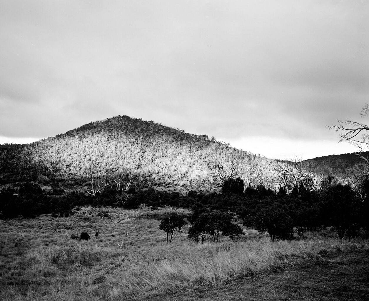
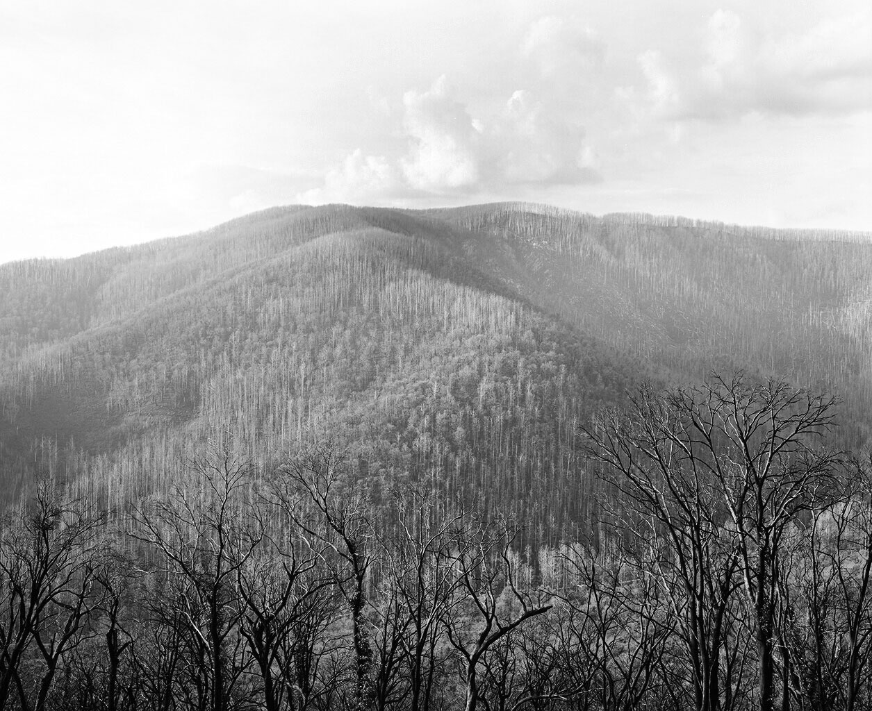
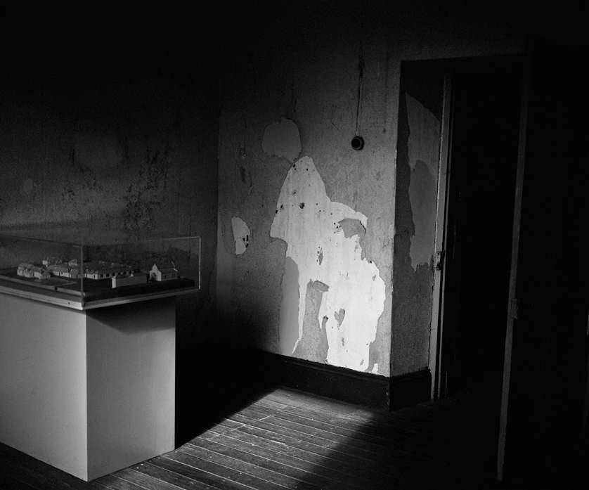
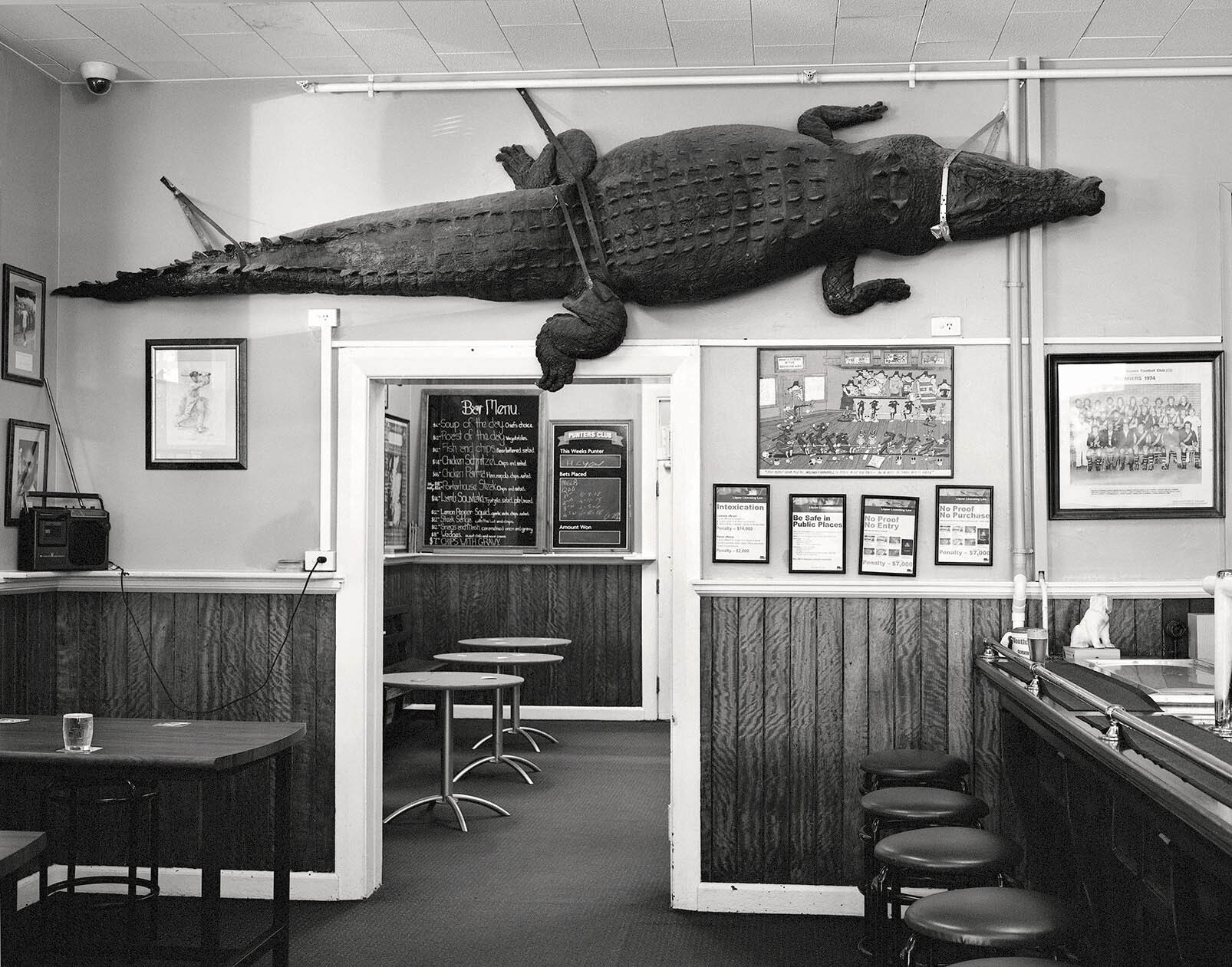
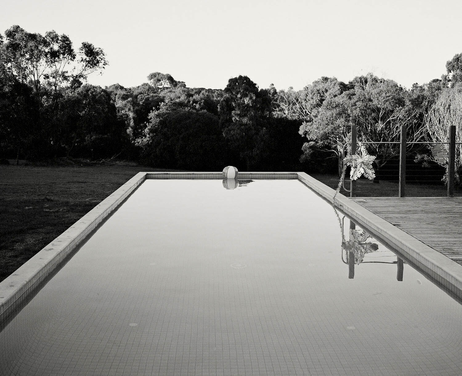
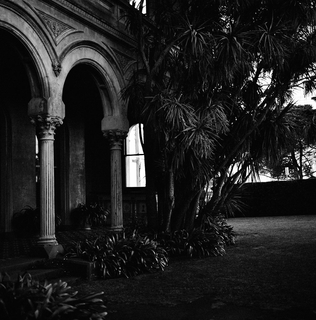


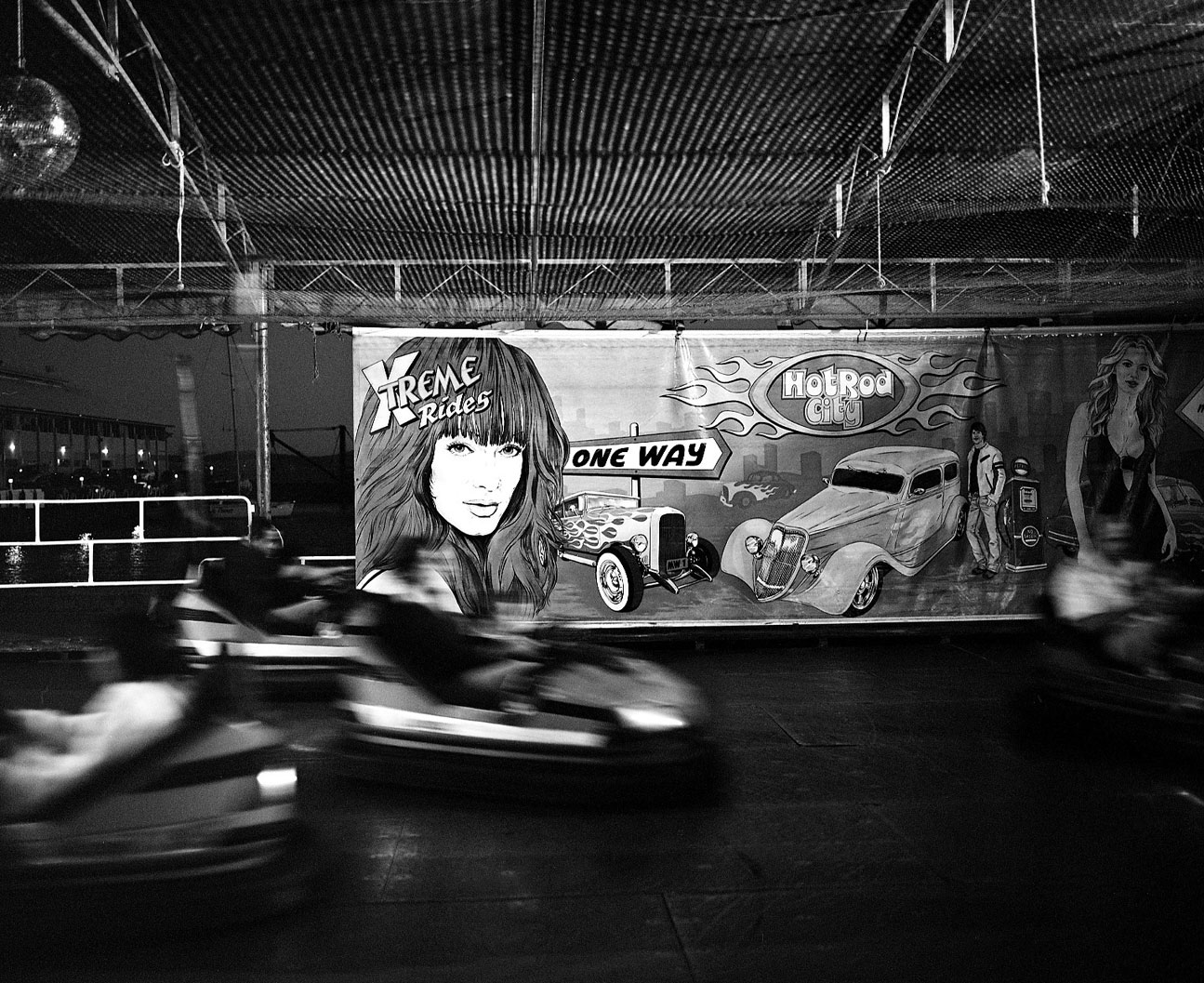

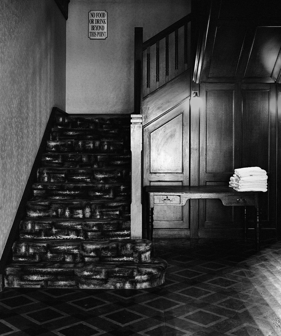

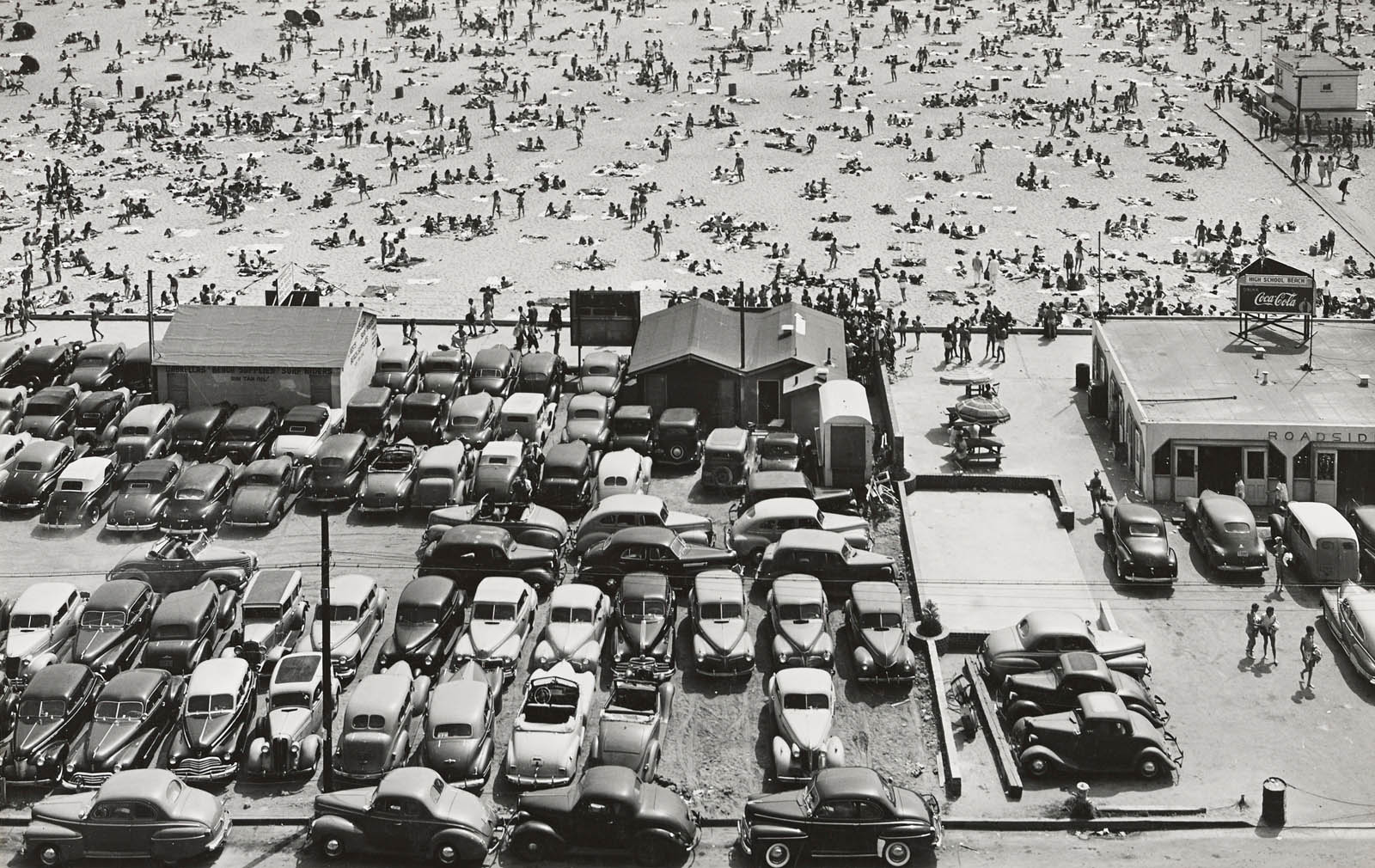
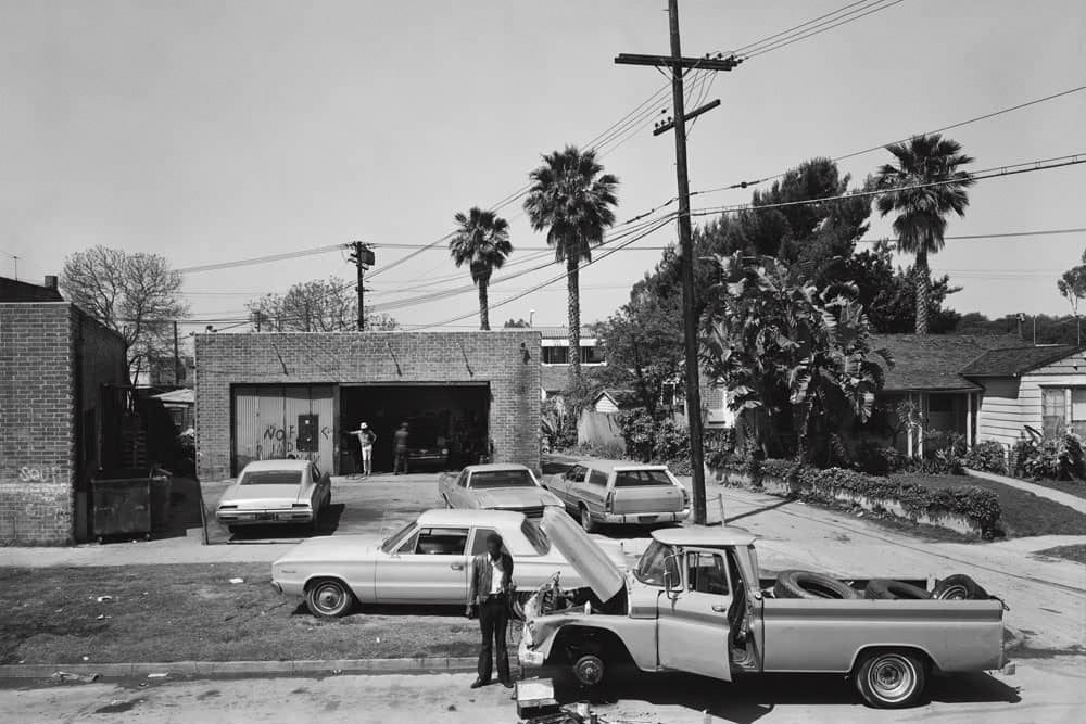

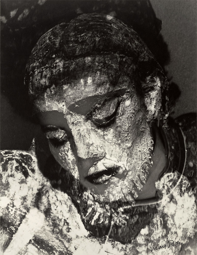
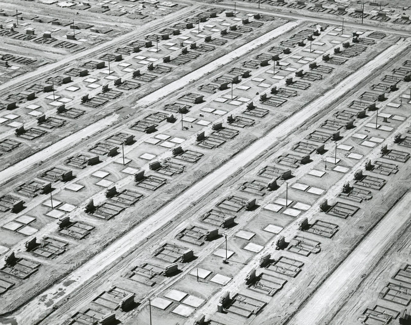
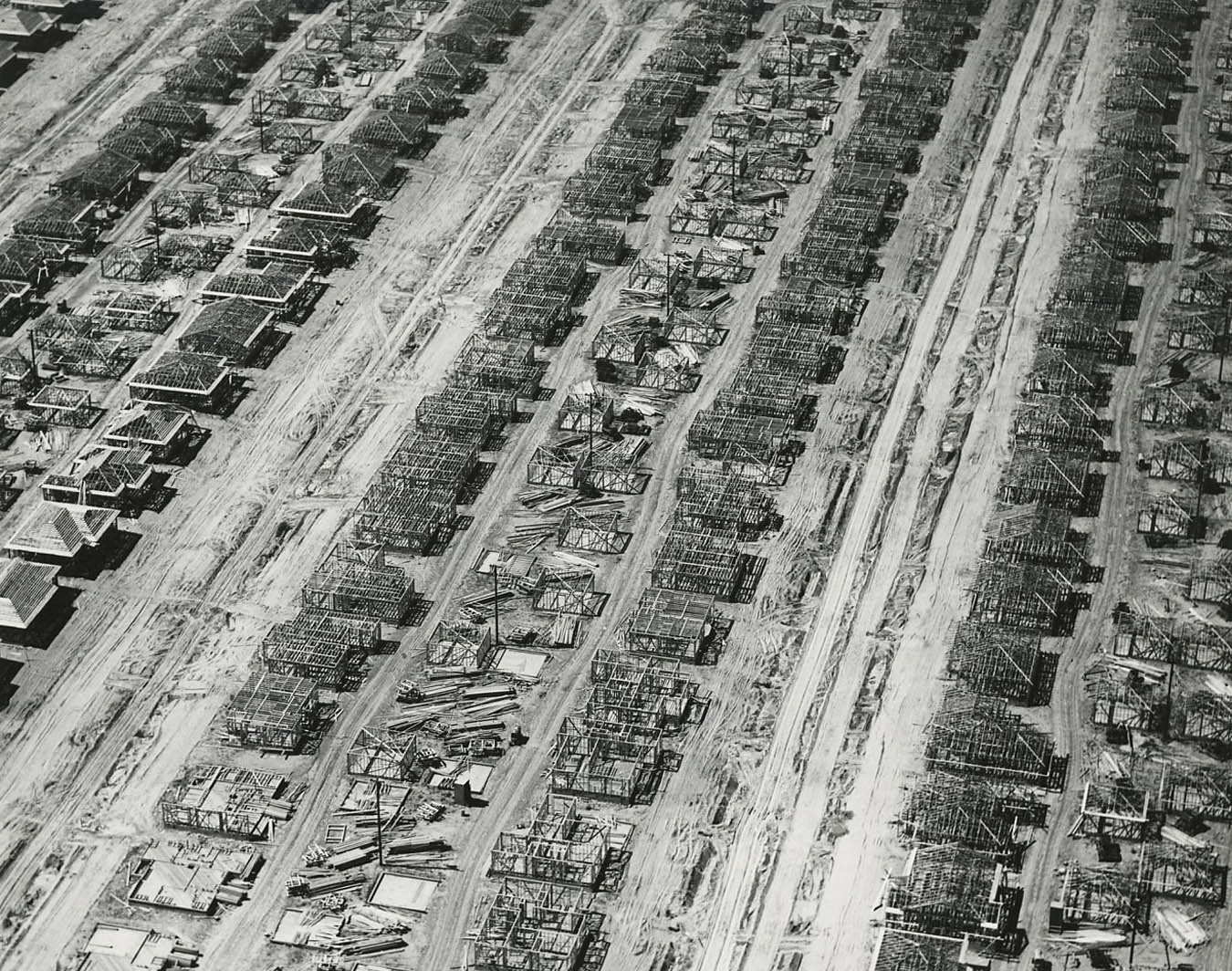
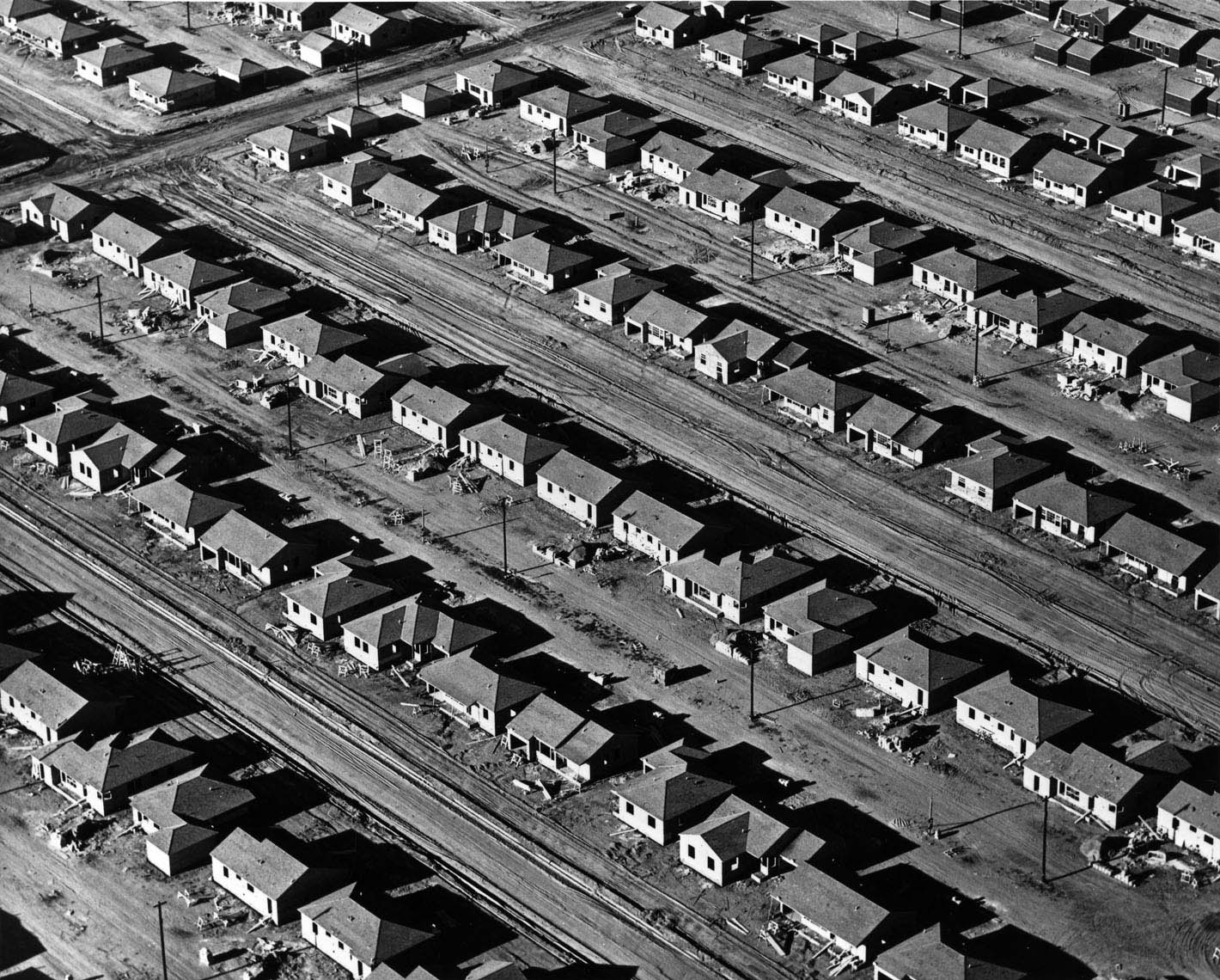
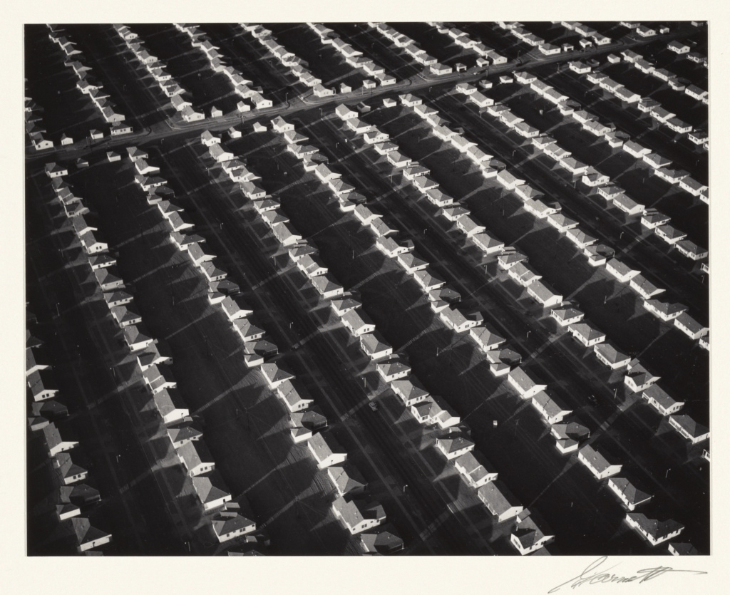
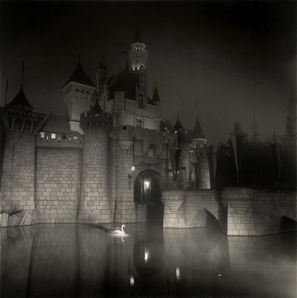
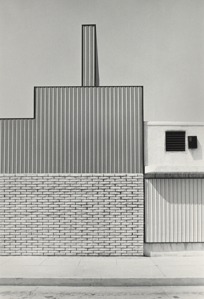

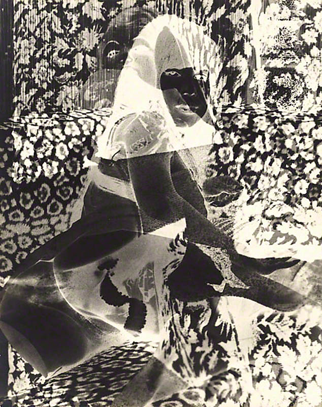
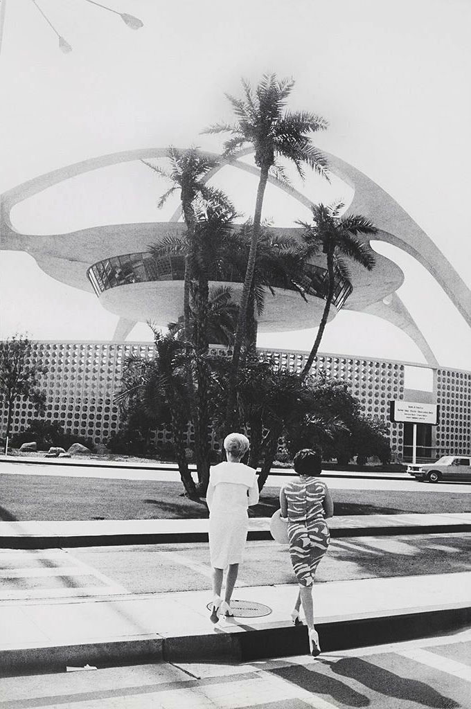
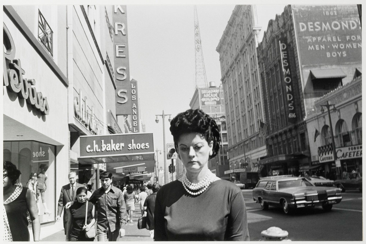


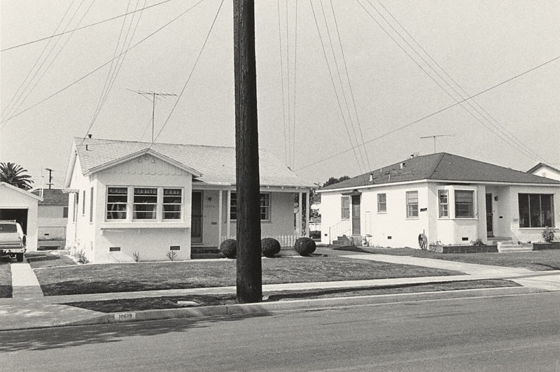

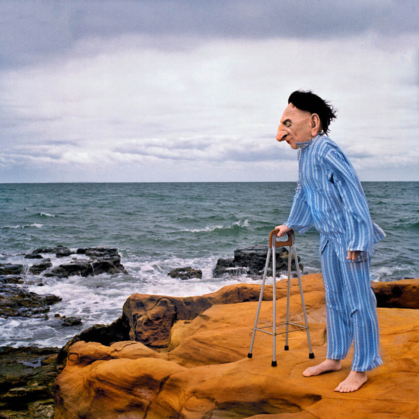
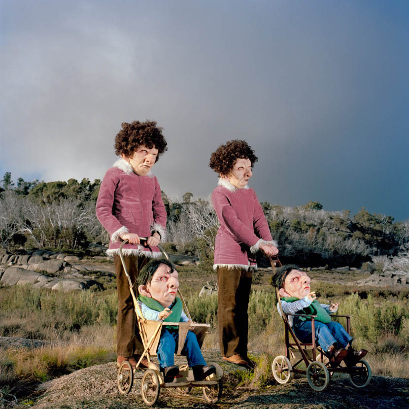
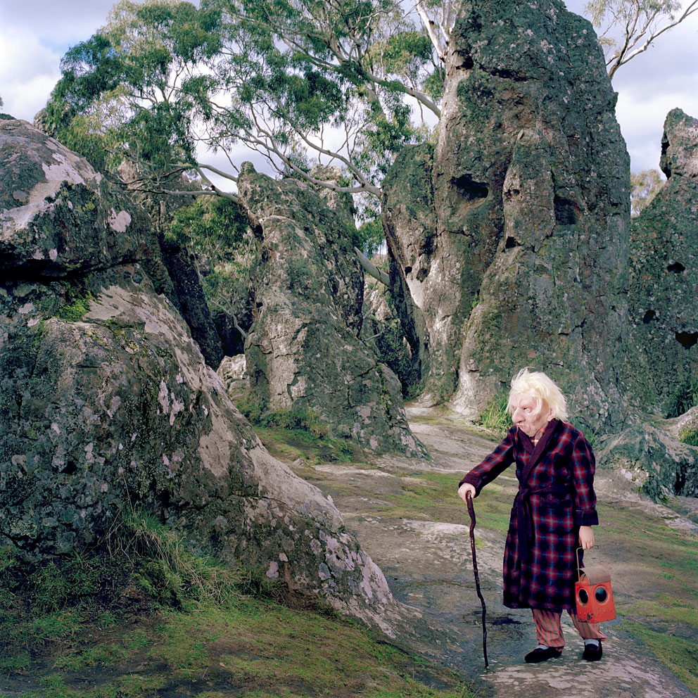
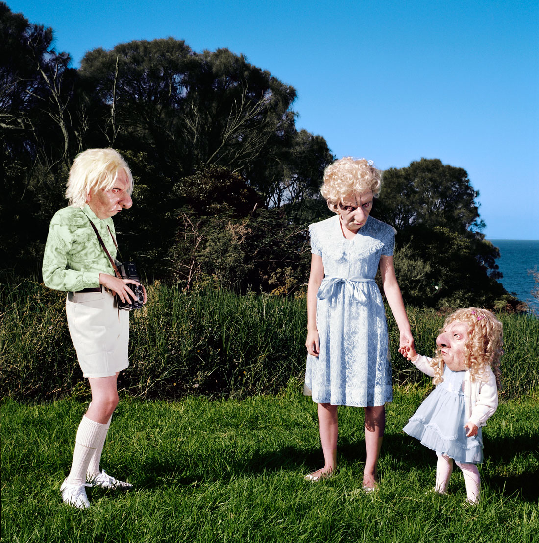


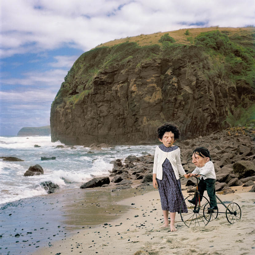

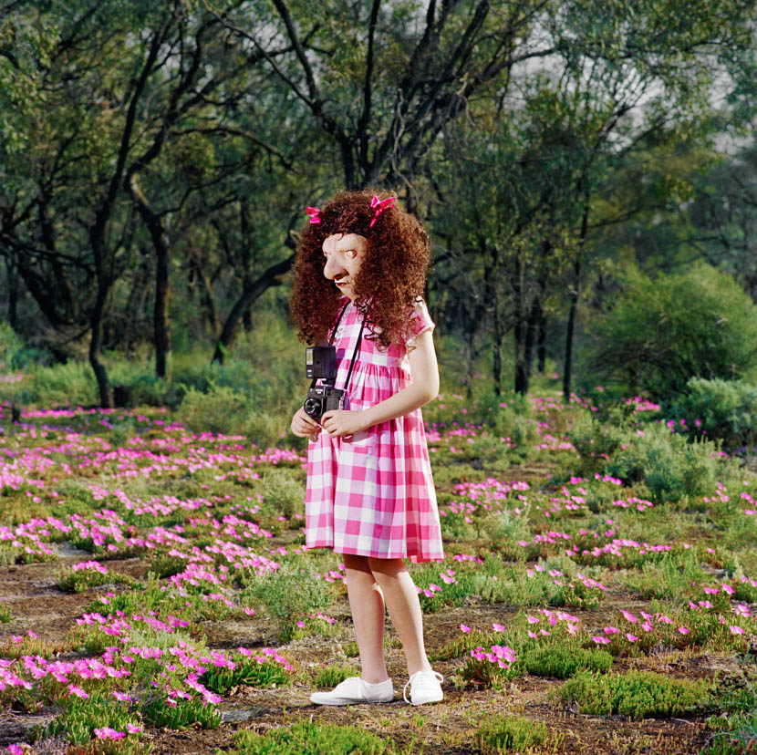


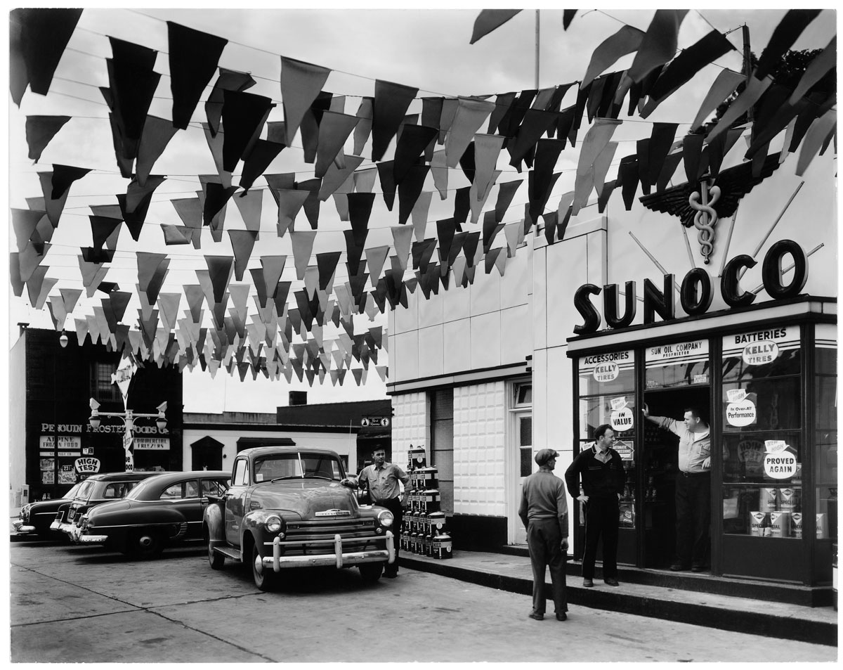
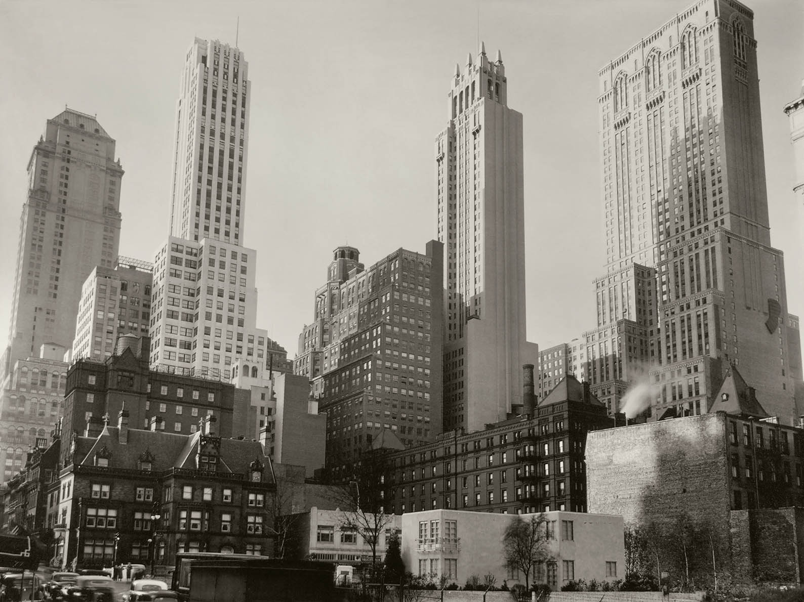


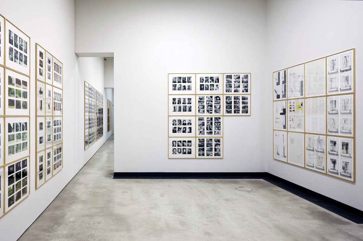

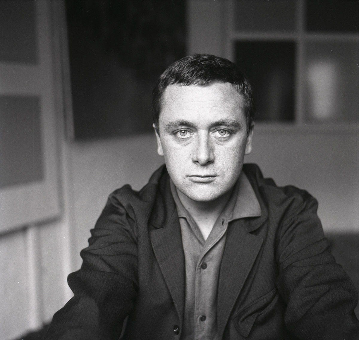

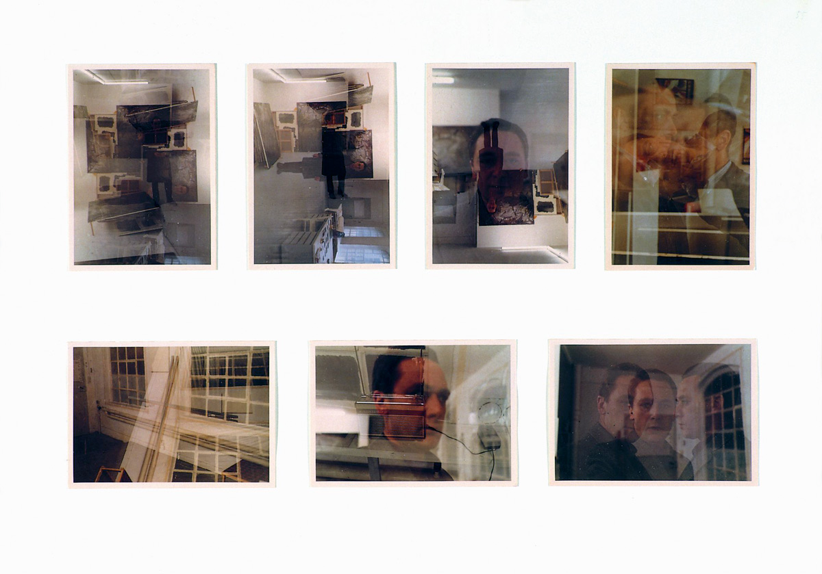
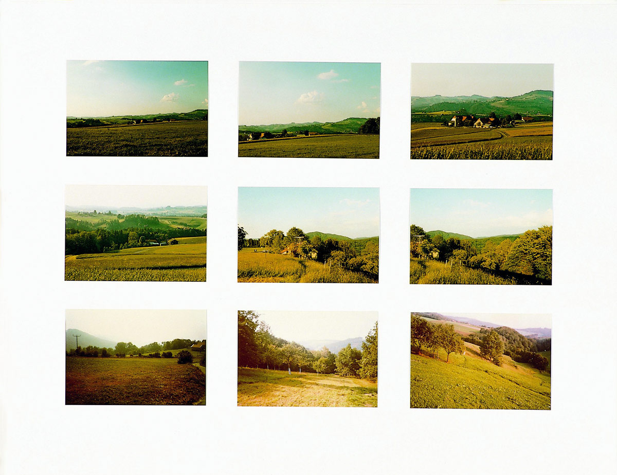

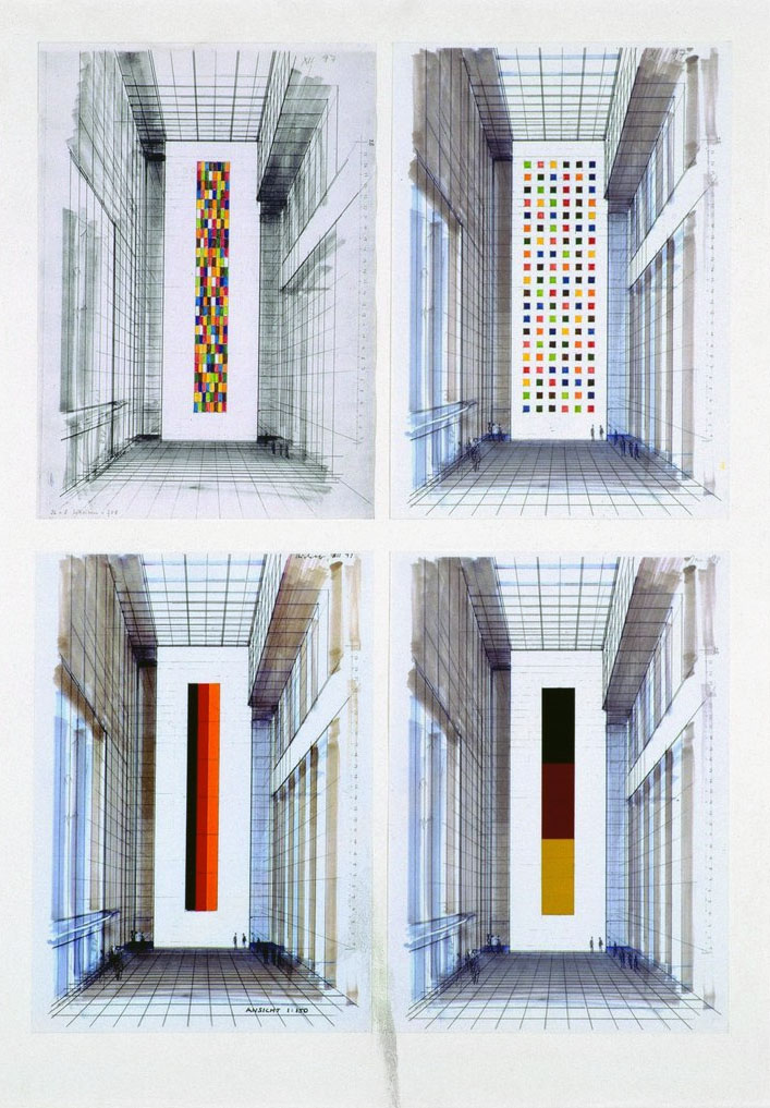


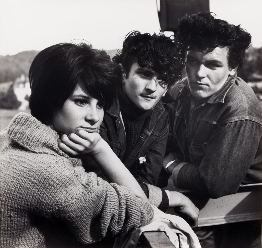
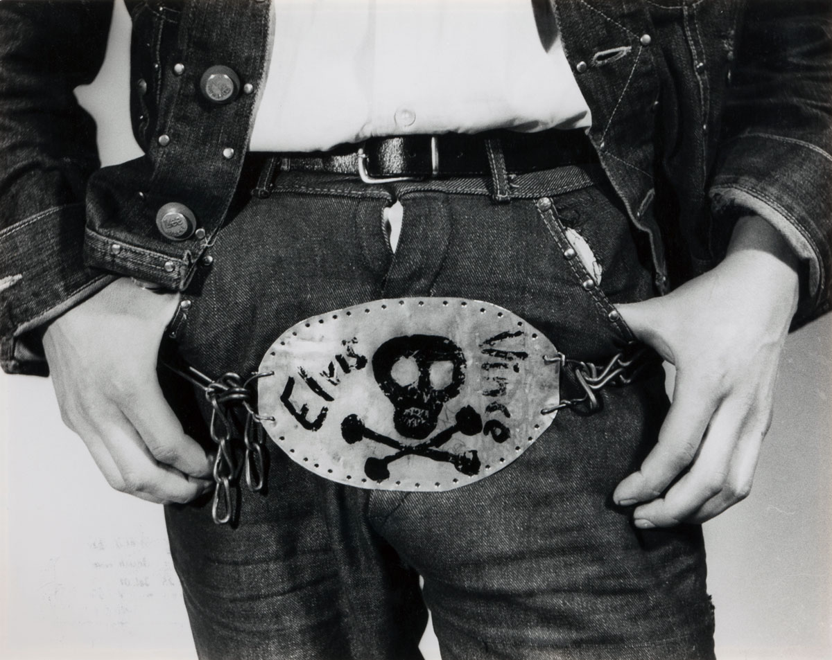
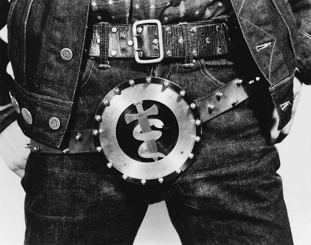
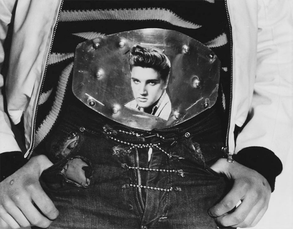
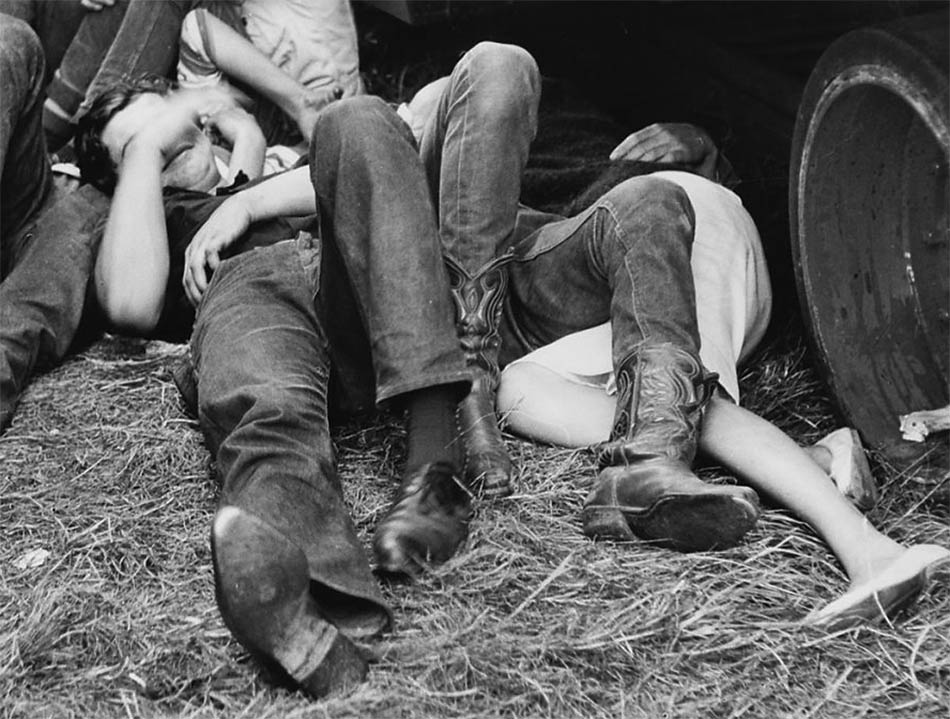
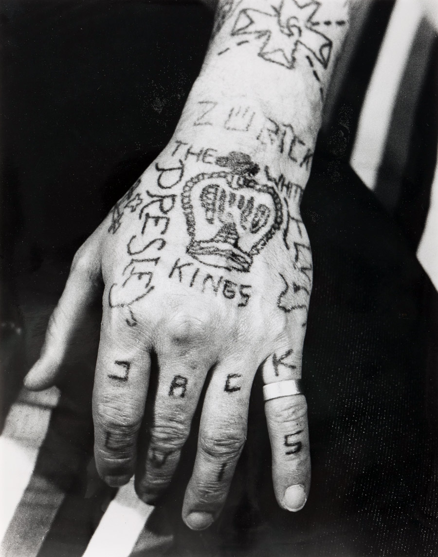

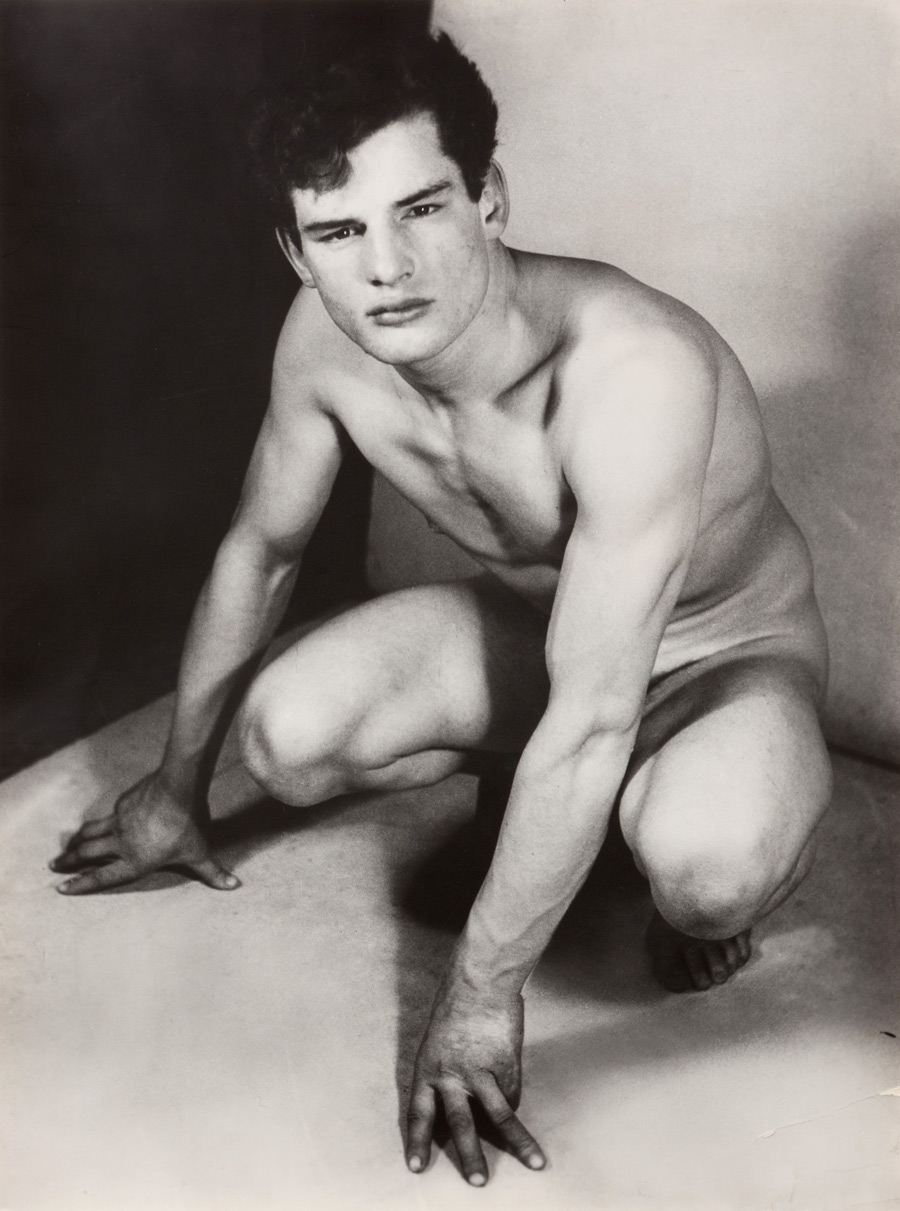

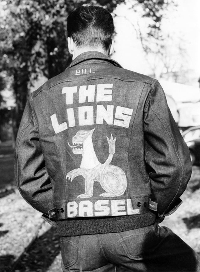

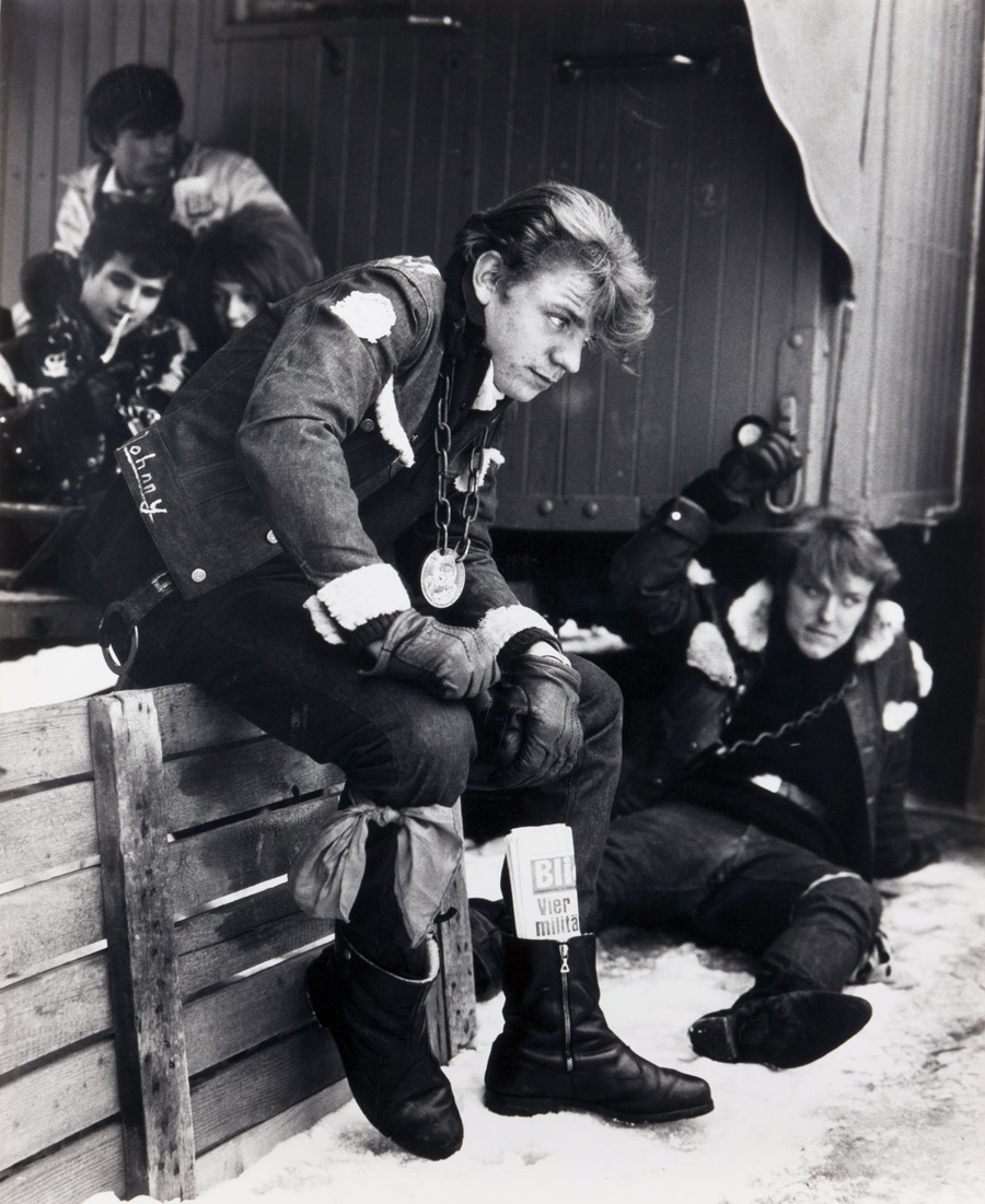
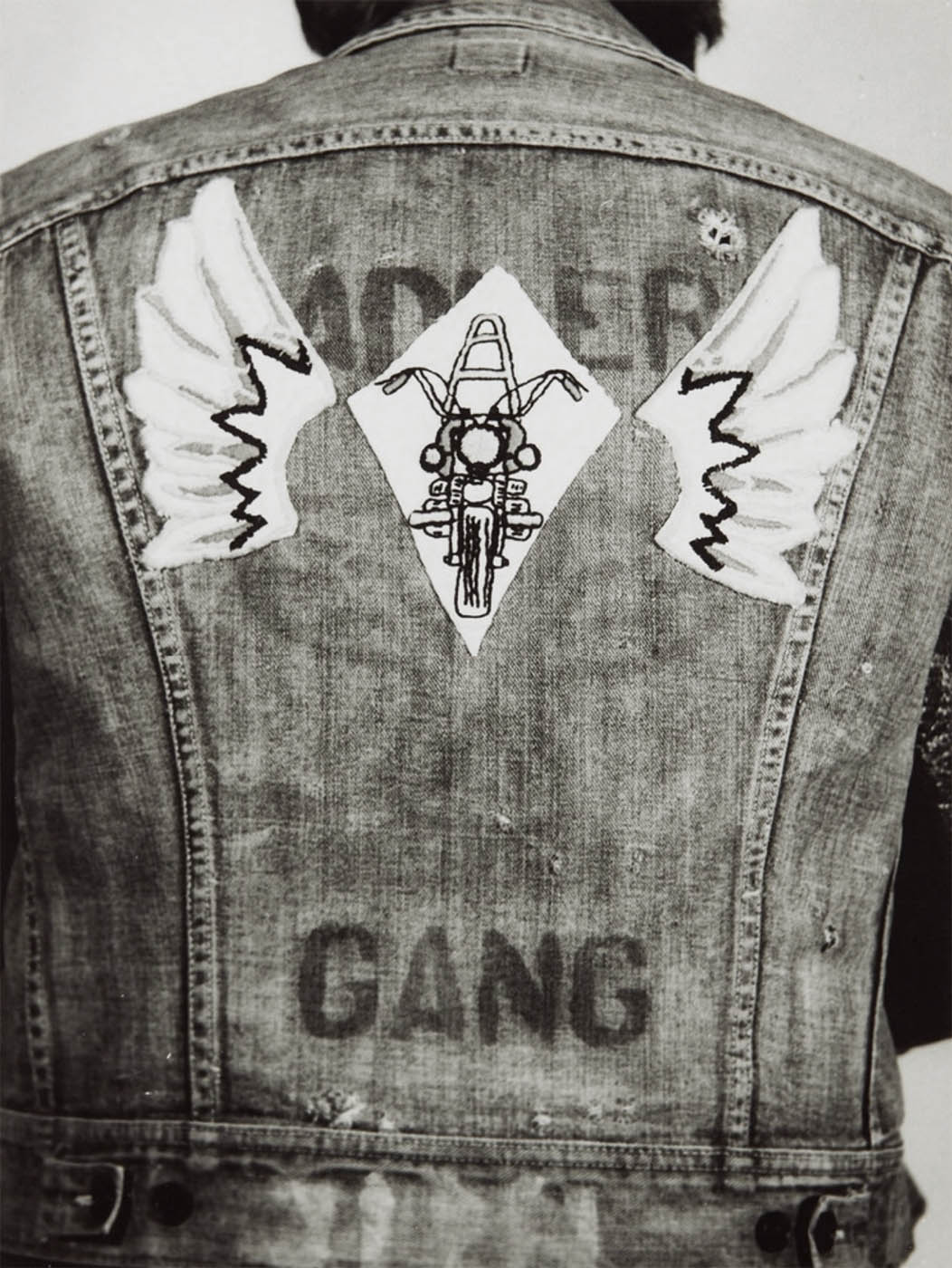
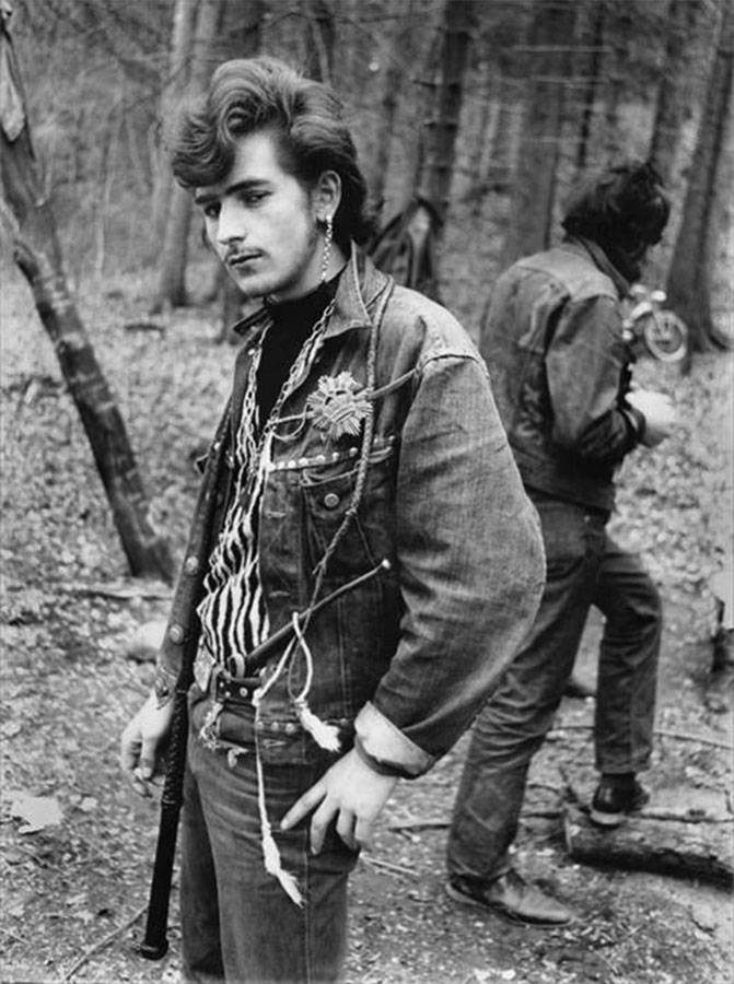
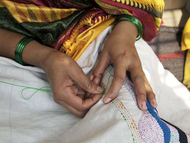
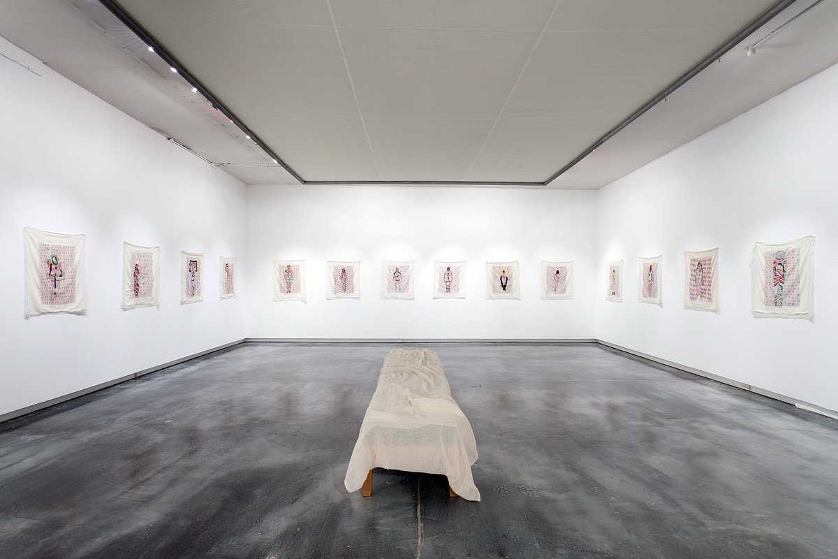
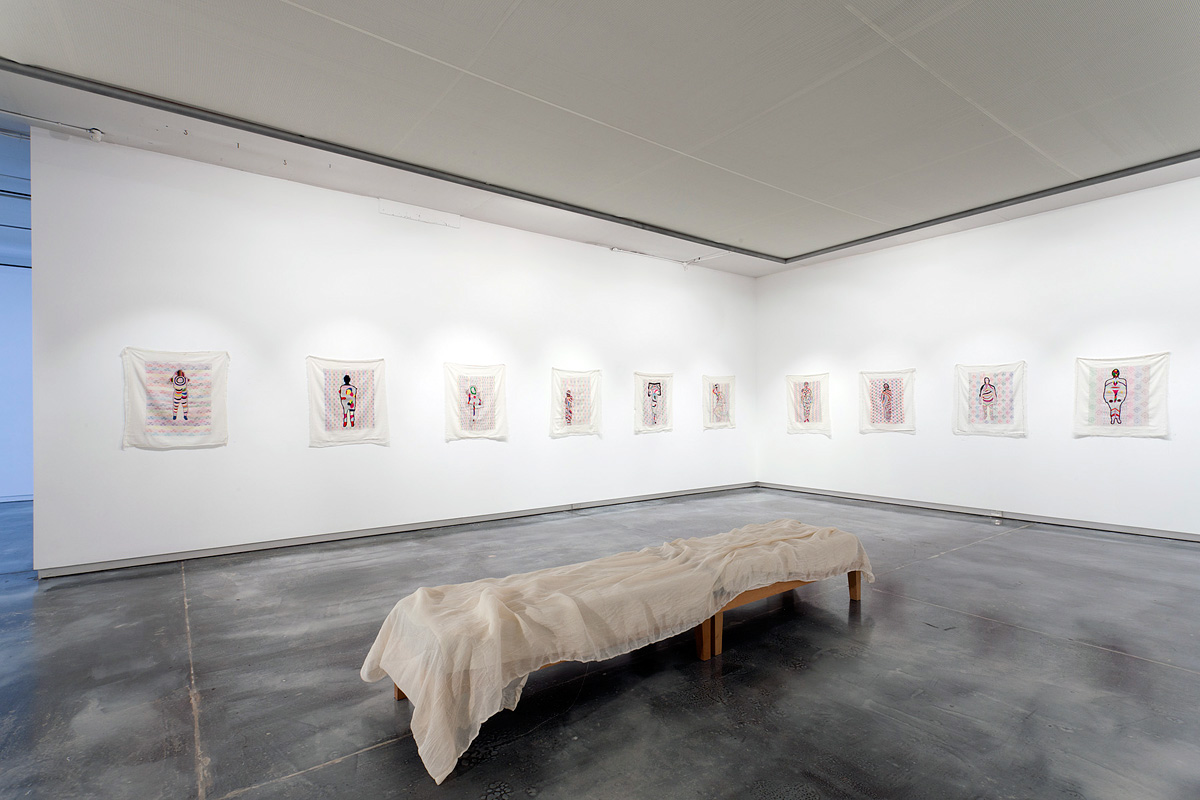
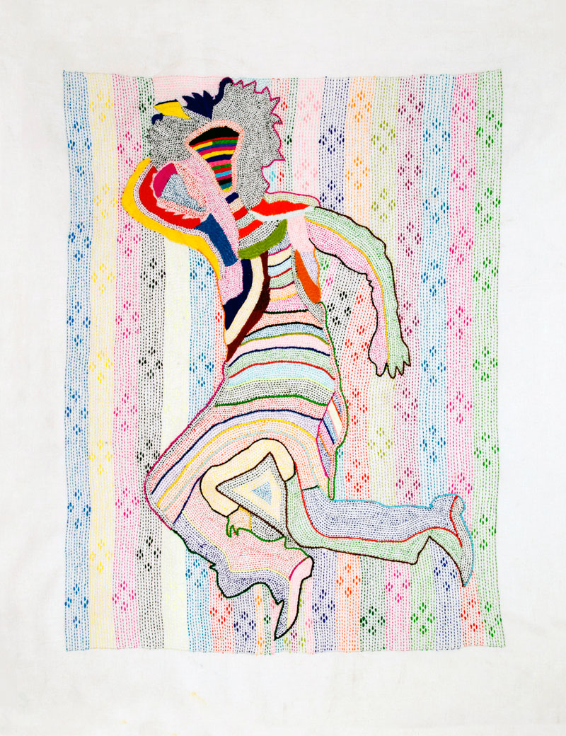
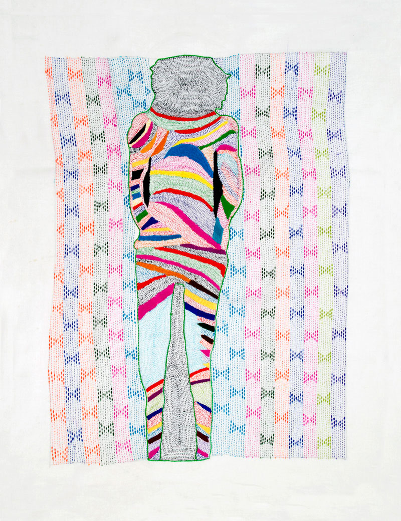
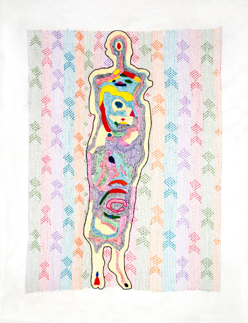
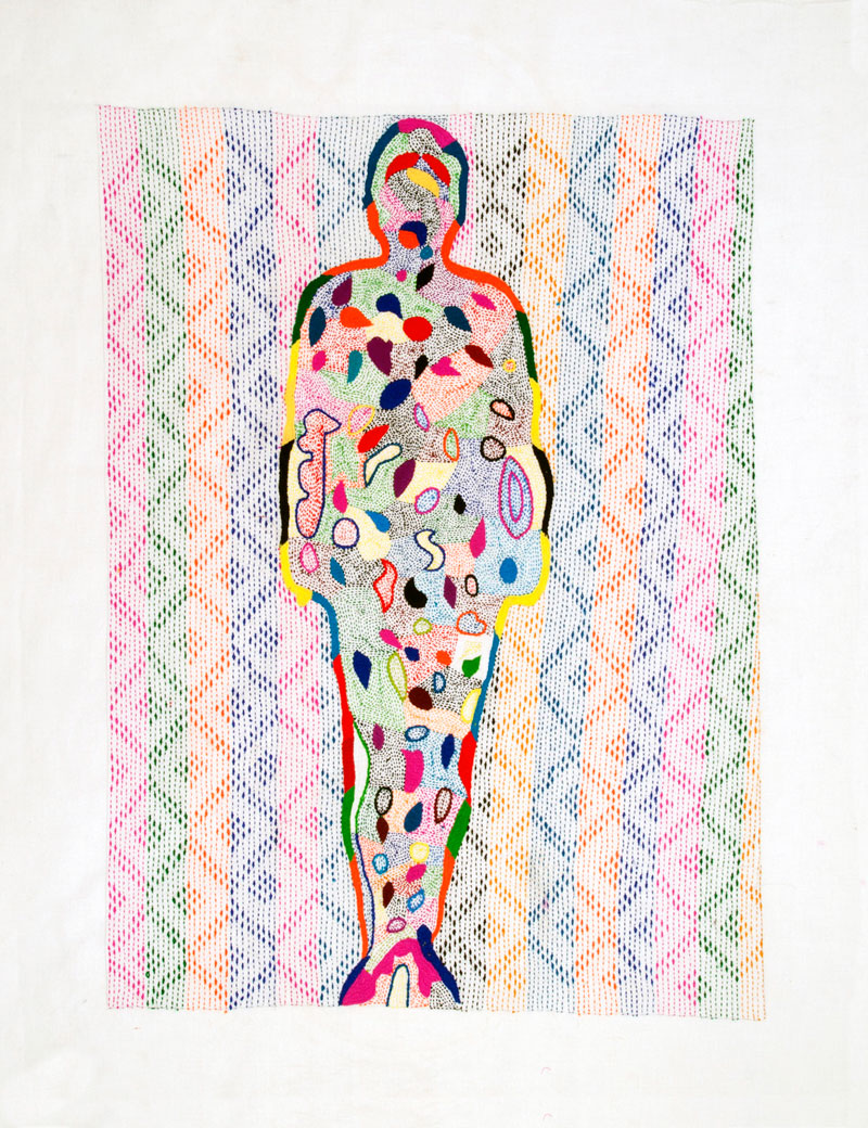
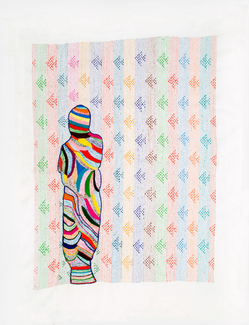
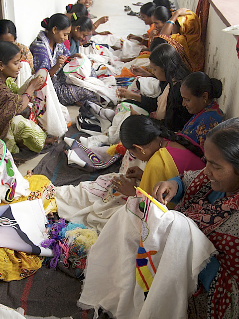
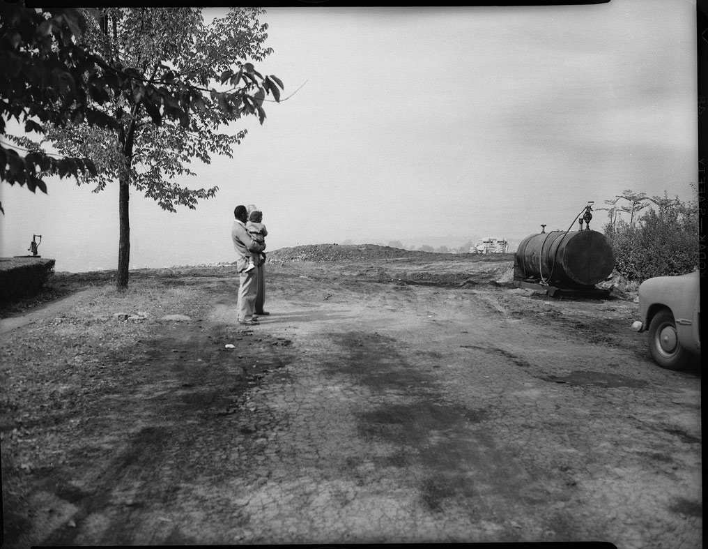
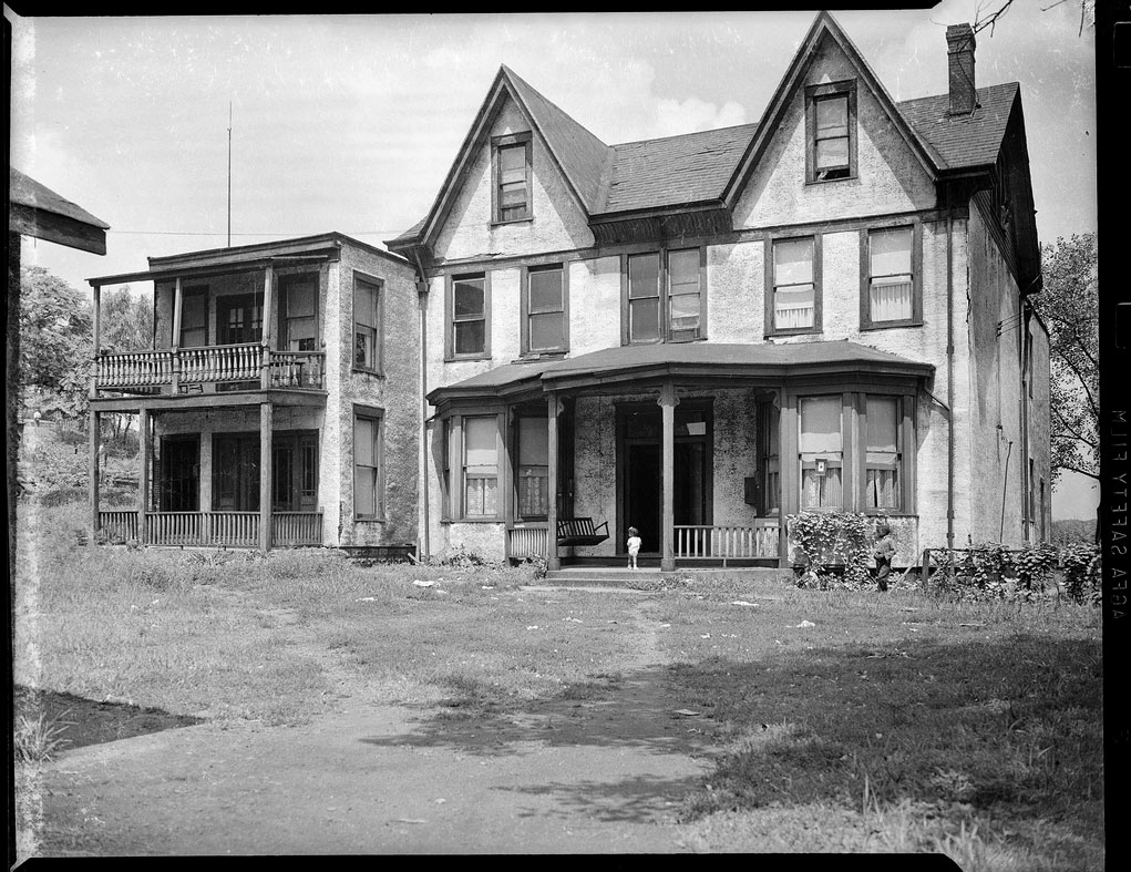

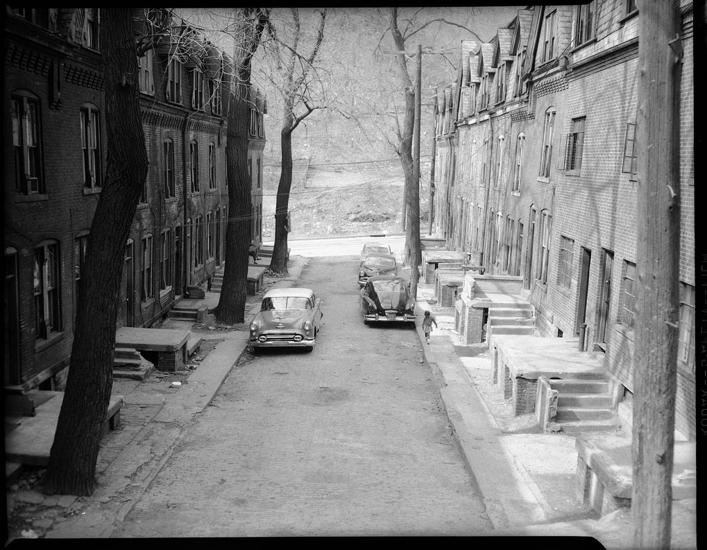
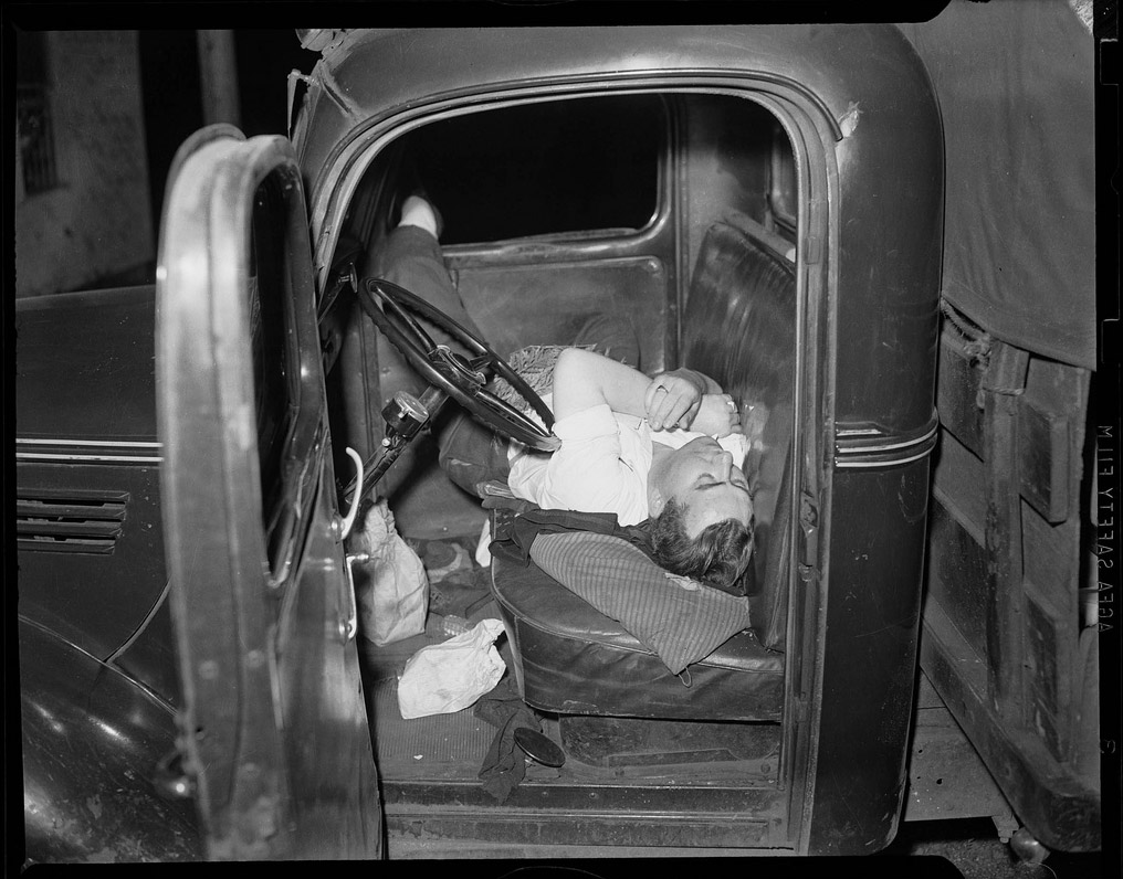
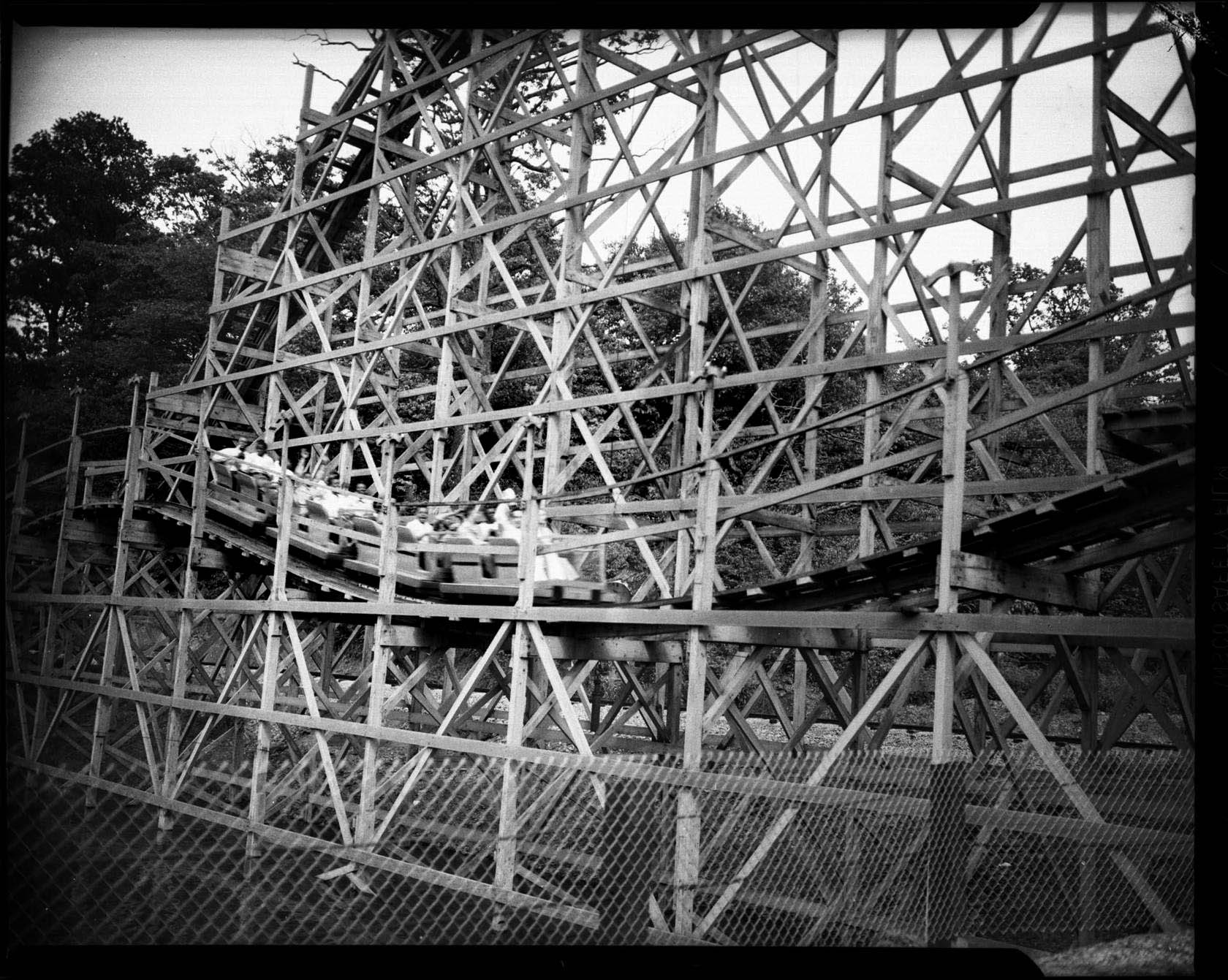
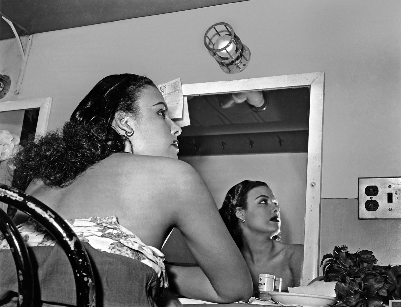
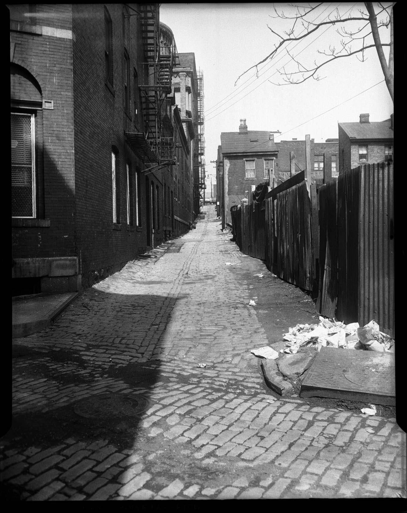
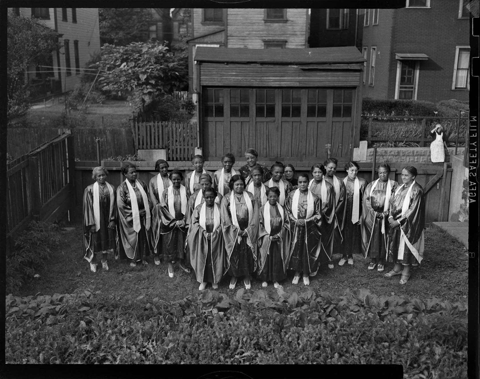
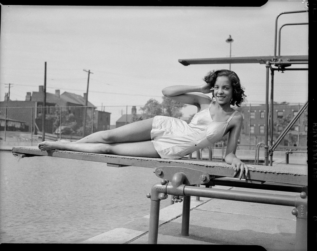
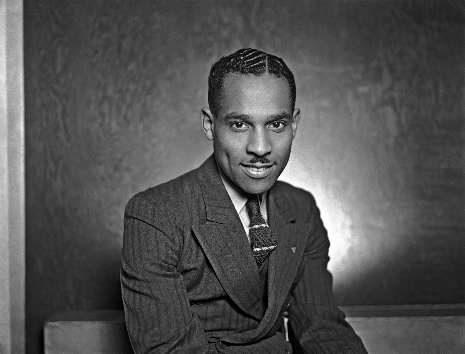
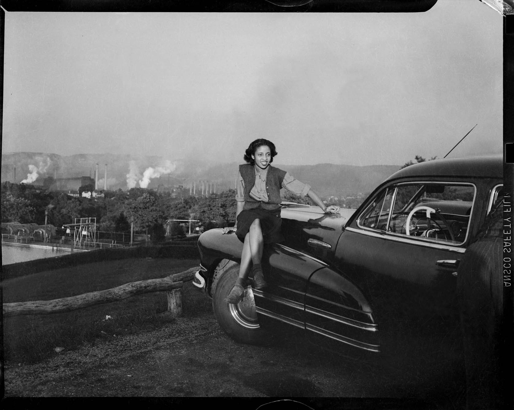
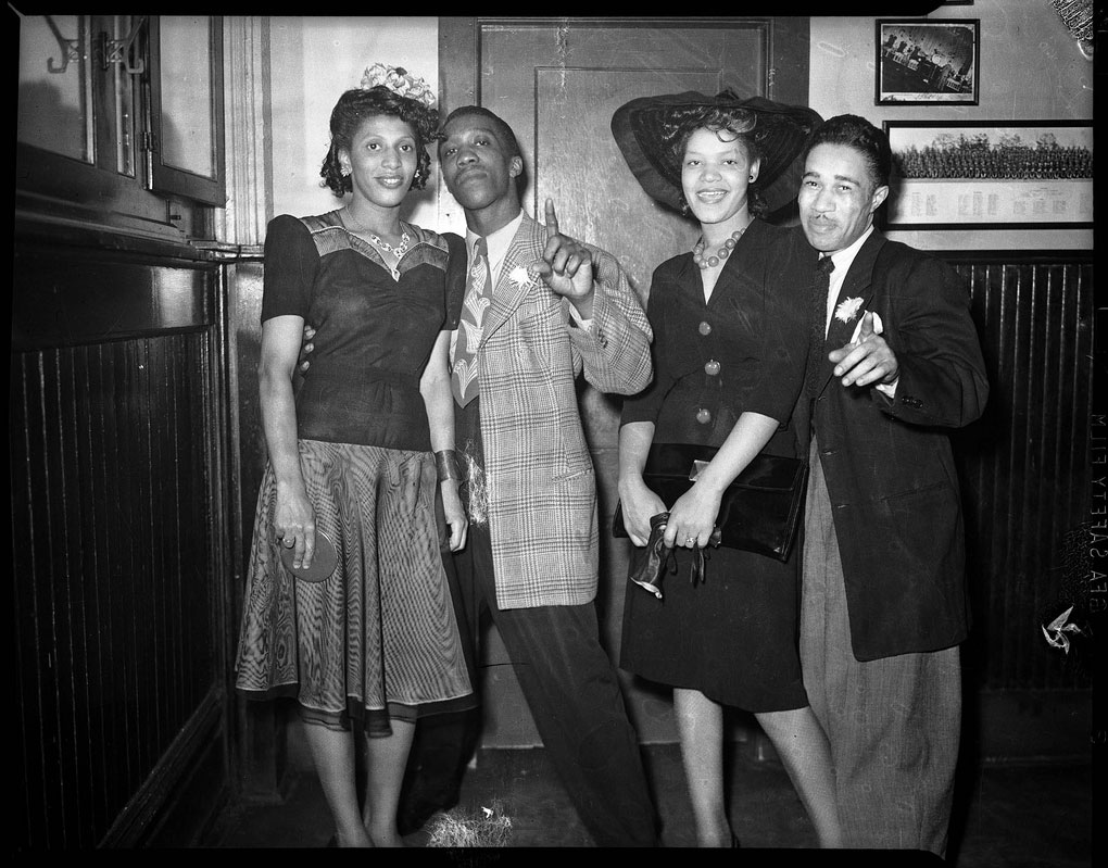
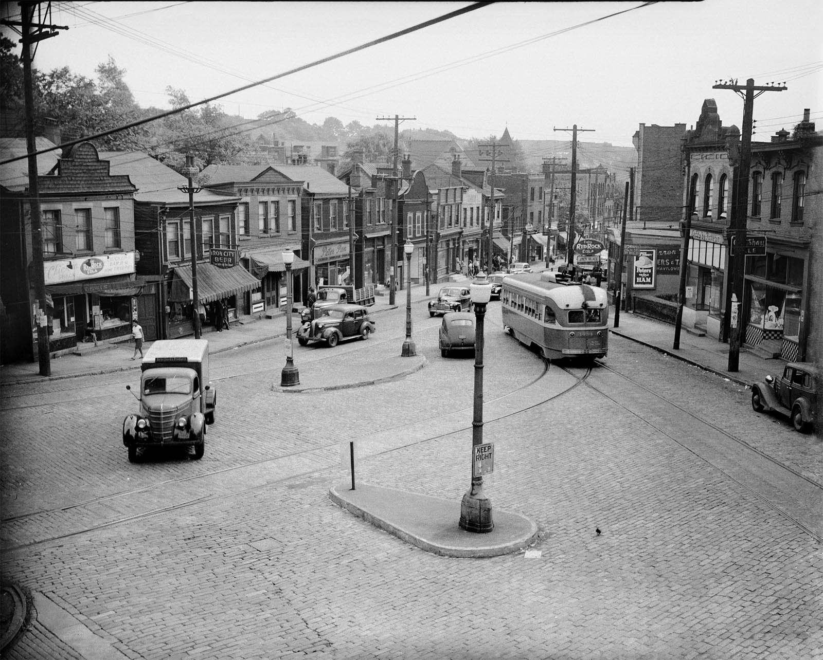
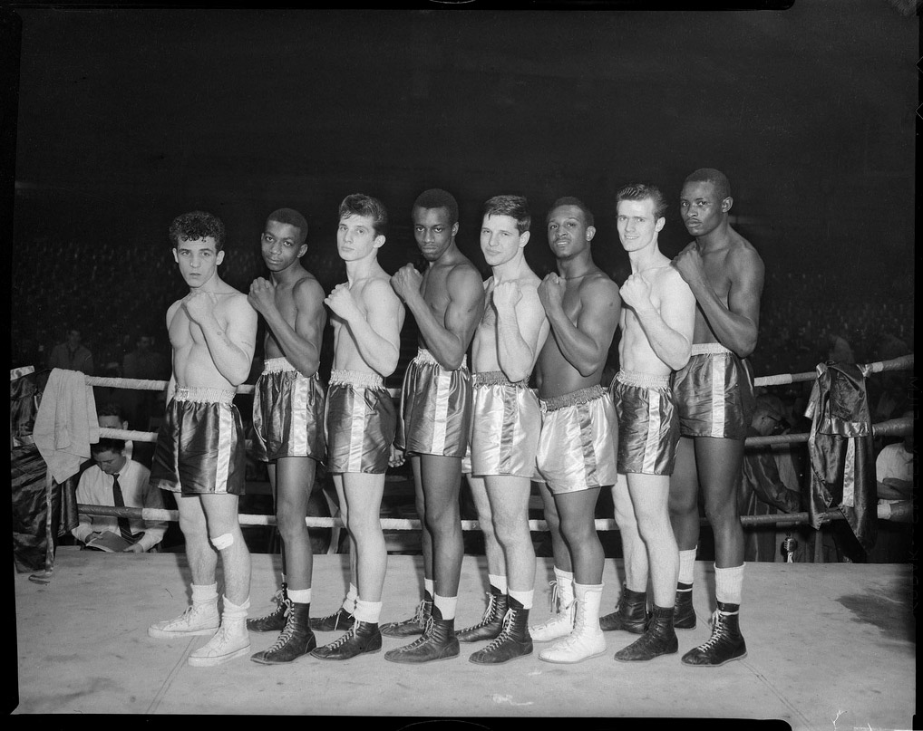
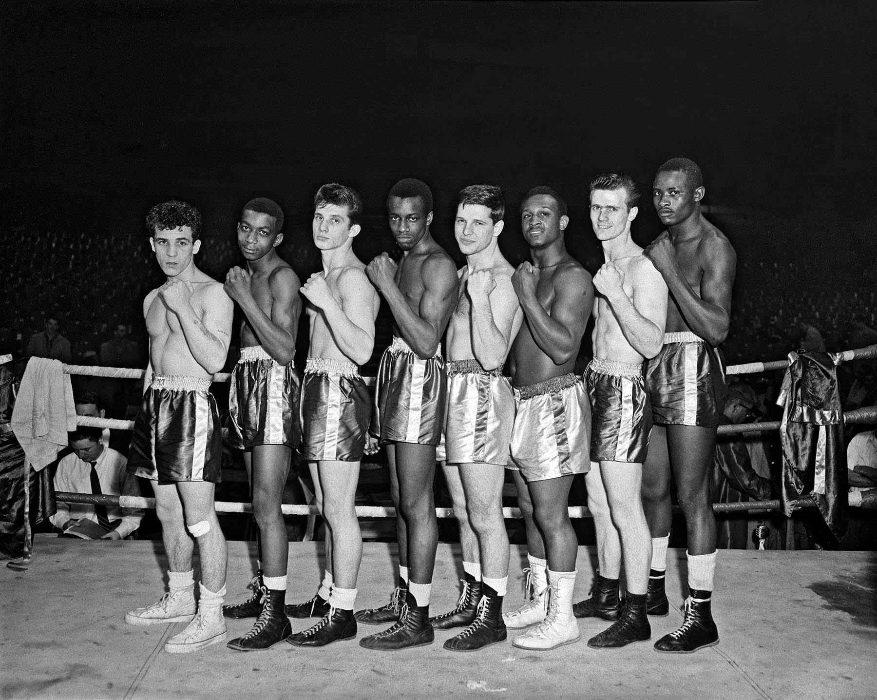
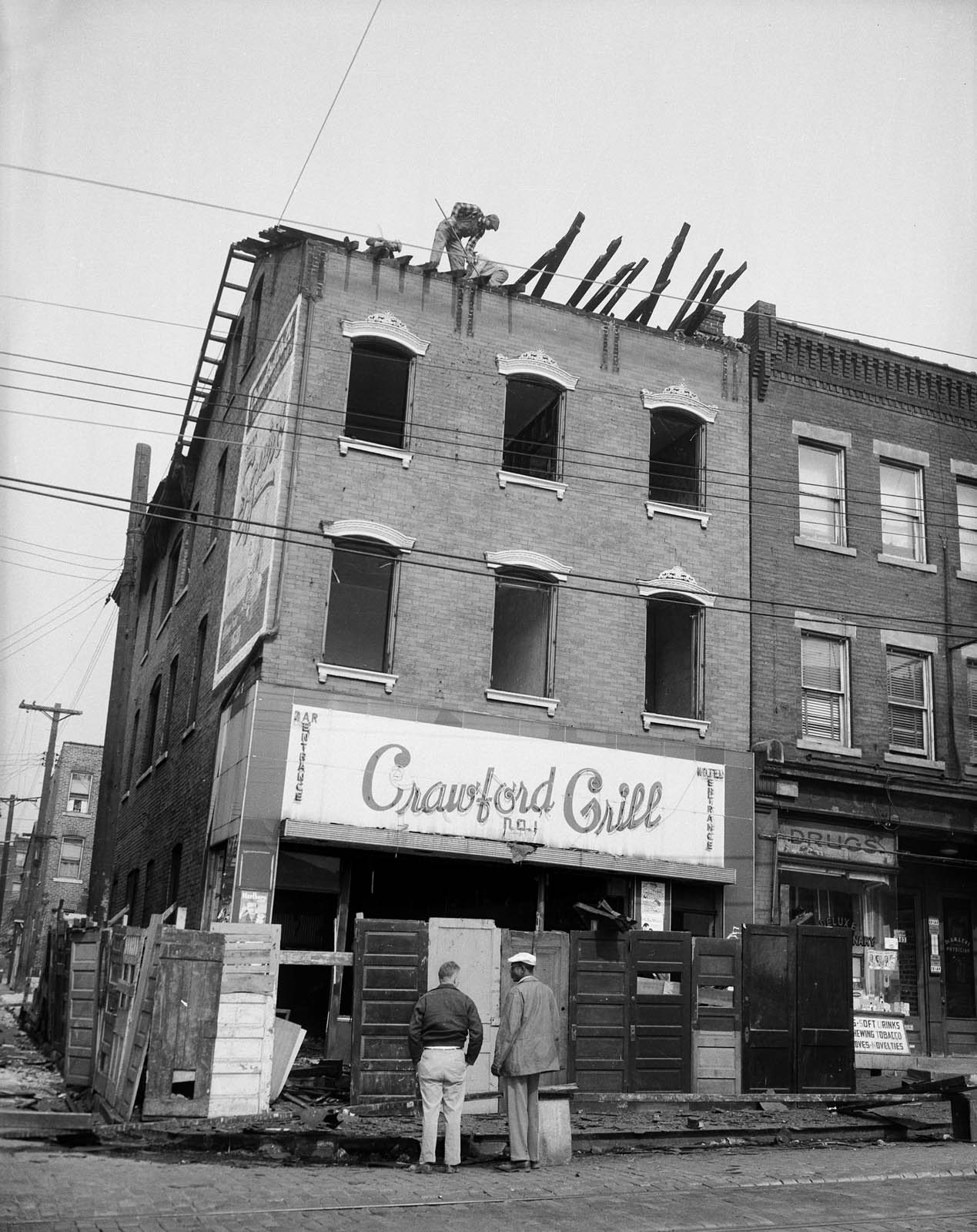
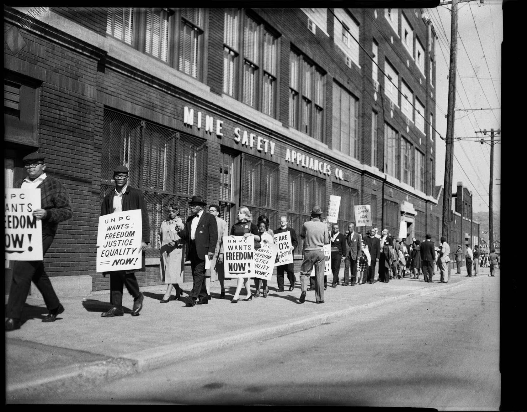
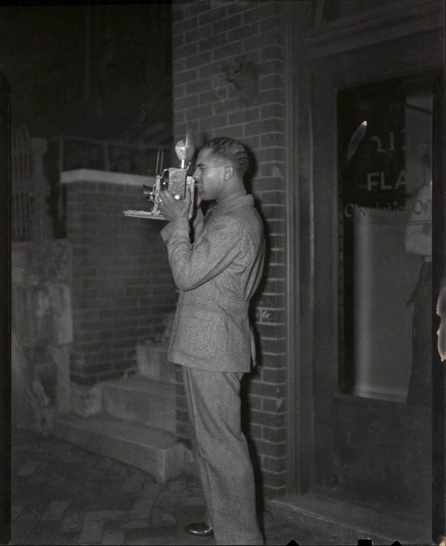
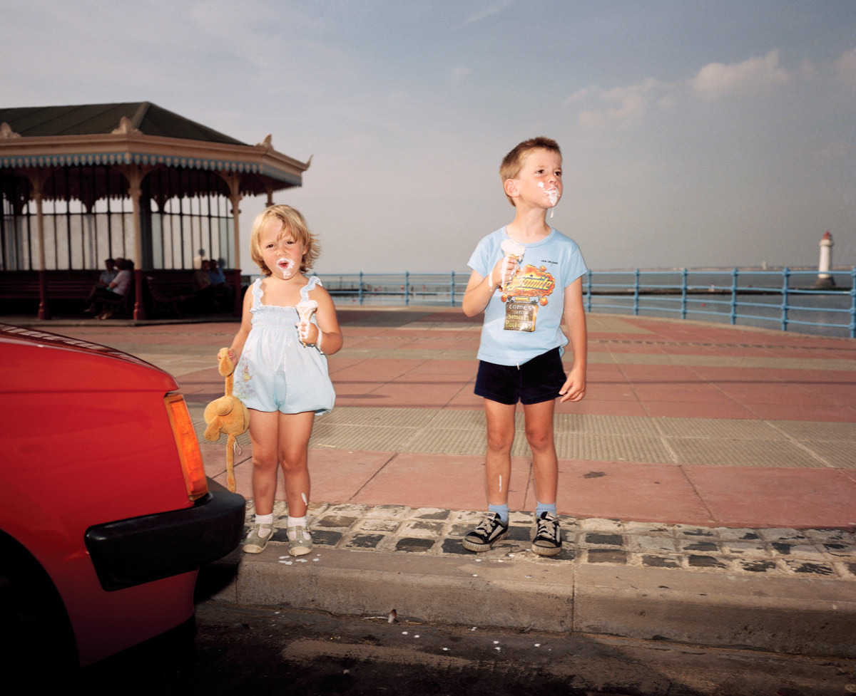
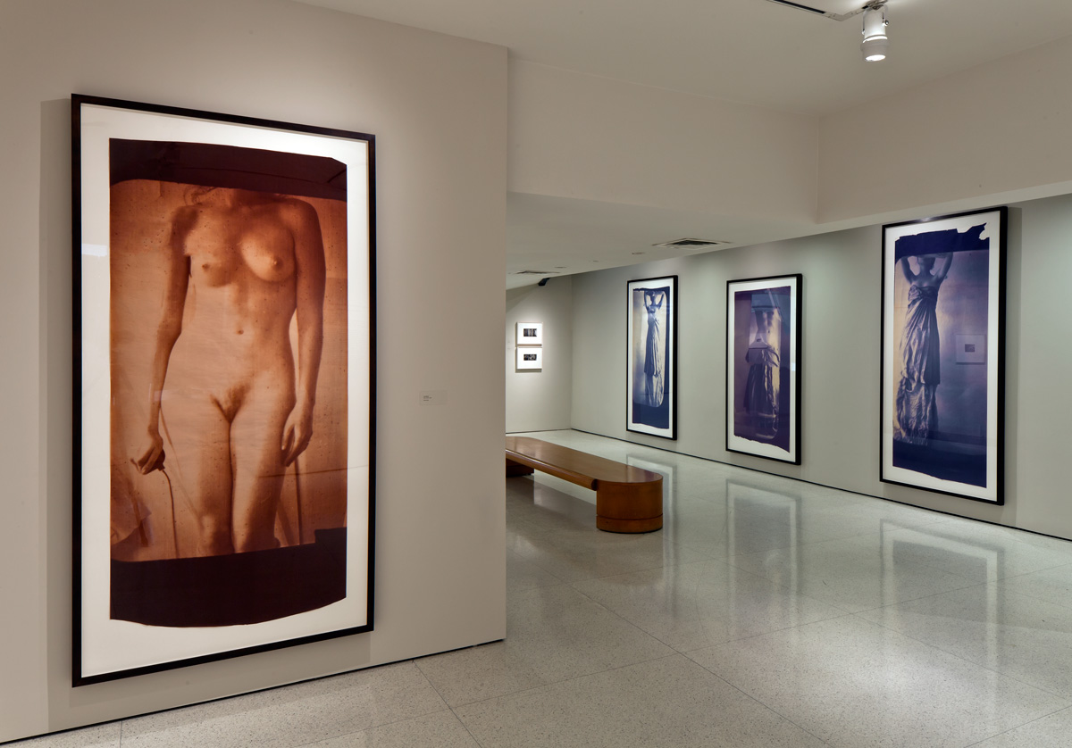
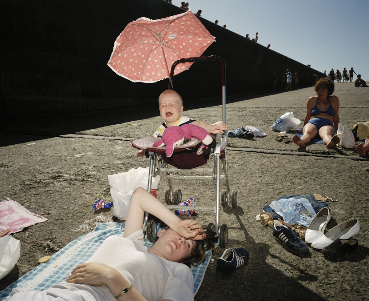
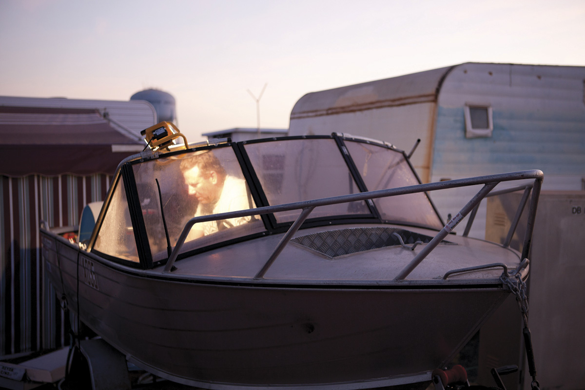
 Art Blart _ art and cultural memory archive
You must be logged in to post a comment.