Opening: ‘Traverse’ by Kim Percy at Stockroom, Kyneton

Exhibition dates: 10th March – 8th April 2012

Curator: the artist


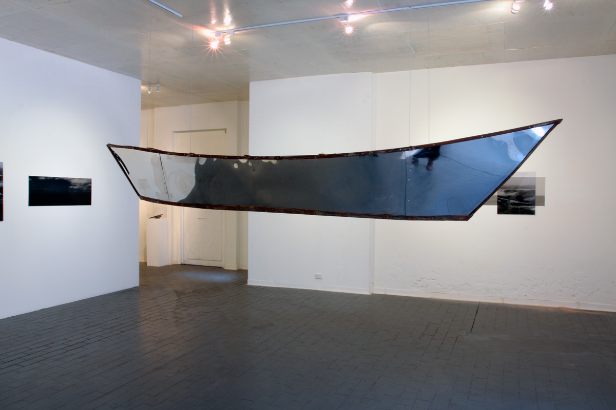
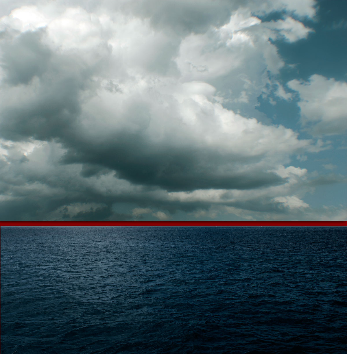
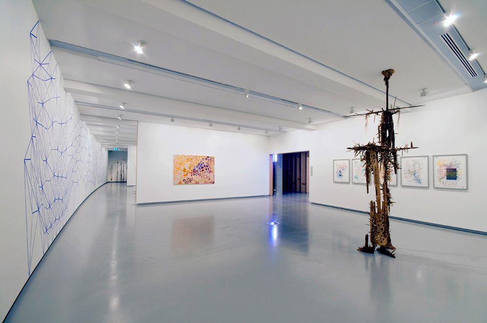
Installation of 'Traverse' by Kim Percy at Stockroom, Kyneton


Installation of Traverse by Kim Percy at Stockroom, Kyneton
Installation photograph by Marcus Bunyan
© Kim Percy and Marcus Bunyan


Many thanx to Jason, Magali and Kent for inviting me to the gallery, and Kim for asking me to open the exhibition – it was fun!

I have known Kim since the early 1990s when we both did our Bachelor of Arts in photography at RMIT University so it was wonderful to have opened her show yesterday. Reprinted below is the speech I gave at the opening with its musings on the (in)visibility of asylum seekers arriving by boat in Australia.

I hope you enjoy reading the text.

Marcus


Opening speech by Dr Marcus Bunyan, 10th March 2012

Out of Sight, Out of Mind
__________________


“What I am about to say, my musings if you like, are inspired by Kim’s wonderful installation. The work before you is the basis of my inquiry. The issues involved are difficult and not to be dealt with lightly but I hope you will follow my drift, my traverse if you like.

I would like to take you on a journey – physical, metaphorical and maybe even philosophical. I want to ask questions of the world, questions about the journey we all take as human beings. These questions are prompted by my personal response to two elements of Kim’s work – water and the journey, specifically the image of asylum seekers arriving here in Australia. Imagine being an asylum seeker making that journey.

Imagine living in an (in)between space, living in a refugee camp over there. Marc Augé coined the phrase “non-place” to refer to places of transience that do not hold enough significance to be regarded as “places.”1 These camps are such places. Put yourself in that predicament, seeking a better life, seeking to escape persecution, war (of which we as a nation are often part), prejudice and death, deliberately placing yourself and your family in a fragile boat, like a seed pod floating upon the waters, taking the dangerous journey to reach Australia. Imagine the emotional and intellectual turmoil that must surround such a decision, the decision to place your life in the hands of the ocean. Important decisions affecting the entire course of one’s life are rarely made without some form of mental distress.

Nurtured in water, some baptised in it, water is the life-blood of the world and the asylum seeker must trust to its benevolence. Marc Augé “argues that we are in transit through non-place for more and more of our time, as if between immense parentheses.”2 This is the journey that the asylum seeker takes over water, a journey through an interstitial space that has no beginning and no end caught between a set of parentheses [insert life here / or not].

Now let us move our line of sight. What about a visual parentheses?


Asylum seekers are almost invisible from Australia living over there. They are over the horizon, out of sight and out of mind. When they journey across the sea – an open ended journey passing through a liminal space, a forgotten space – they suddenly appear as if by magic washed up on the shore, unseen despite surveillance planes, ships and other forms of tracking and reconnaissance. Think, for example, of the sudden and surprising arrival of the boat SIEV-221 when it was washed onto the rocks of Christmas Island in December 2010. The invisible made visible caught in a non-place.

This (in)visibility can be evidenced in other ways. The specks of humanity waving from the deck of the Tampa, the asylum seekers being escorted from arriving boats, seen for a few brief seconds on the evening news and then disappearing from view, almost like being sucked into the depths of the sea. Here and not here; here and there. Halfway between nothingness and being: they walk between one state and another, forward and backward, backward and forward.

Displacement
Diaspora
Disruption


The spectacle of the asylum seekers is despectacularised by and for the viewer. We remove ourselves from the emotion of these people, the presence of these images. They become ordinary as if seen from far away – glimpsed every so often as though viewing the world of another. They become Other.

The movement of the ship, the movement of the sky, the movement of vision is a constant decentering through a push / pull with something else – some other order of the world. Their journey into the unknown is a journey to submit to the ordering of another: the socially constructed system of classification: “refugee,” “asylum seeker.” The axis of visibility3 that operates in relation to subject, object, and space is not interrogated as to the representations that are constructed. This is what I am interested in here. These vital, alive human beings come from one taxonomic system (of ordered death, persecution, injustice), become visible from a brief instance, and are then fed into another taxonomic system of order – that of the detention centre.

Taking the metaphor of the horizon line further, I would argue that detention centres are like an inverted Panopticon. The Panopticon “is a type of institutional building, a prison, designed by English philosopher and social theorist Jeremy Bentham in the late eighteenth century. The concept of the design is to allow an observer to observe all inmates of an institution without them being able to tell whether or not they are being watched.”4 The guard sits in a central tower and can observe and inspect all prisoners on the outer 360 degree circle, while the prisoners cannot see the guard and can only presume he is there (an omnipresent God) and hence they behave.

Let us invert this concept.

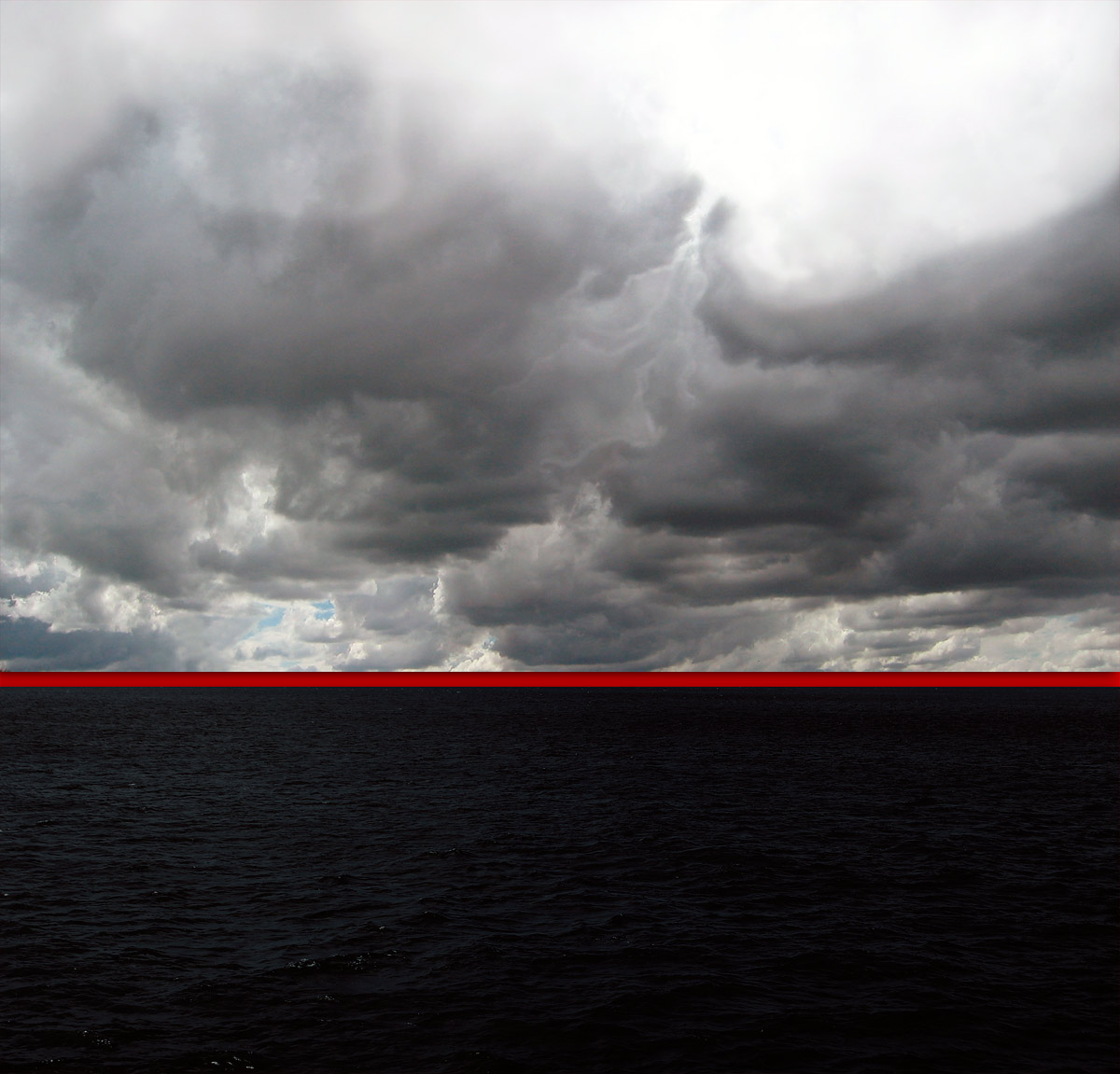
Now the asylum seekers sit in the tower looking outwards, seeing the promised land but unable to touch it and the guards (prison officers, government, the Australian people) are all around but most are blind. They look inwards but cannot see / they look outwards and most go about their daily business. The perimeter fence of the detention centre becomes the horizon line of the sea. As in Kim’s red lined horizons, over the horizon is out of sight, out of mind 
___________________________________


What Kim’s eloquent, minimal, brooding installation does is hold our attention and ask certain questions of us as human beings. If photography is a mode of visually addressing a certain order in the world – be it horror, war, peace, human tragedy, public, private – and then destabilising it, then Kim destabilises the binary sea / sky through fragmentation and isolation. She redlines our experience and asks us to inhabit the non-space, the non-place of the gallery, allowing us to hover between boat and image, between sea and sky, between seeing and feeling. Through her work she asks us to become more aware. She asks us to see things more clearly. Above all she asks us to have faith in the compassion of human beings.

The asylum seekers have faith: faith to get into a fragile boat to venture upon the sea in search of a better life. If we had more faith in ourselves then we would have less need to rely on the images of the past, a white colonial past.

I will finish with a quote from Jeff Brown.

“Sometimes we have to surrender to the not knowing. At other times, it is helpful to adventure outward and explore new possibilities. Like swashbucklers of the spirit, we bravely seek out any experience that might inform our path. When we are afraid of something, we live it fully and see what floats to the surface in the doing. We participate in our own revealing. We have faith in the shaping of what we cannot see.”5


The seekers surrender to the not knowing and have faith in the shaping of what they cannot see. These risk takers are the strong ones that are going to make a difference in a new society by the very fact of their strength and determination to survive and live in a free society, for the very fact of the risks undertaken. This exhibition informs their path as it informs our path. Be aware of the doing, be bold and forthright in the being. Enjoy.

Thank you

Dr Marcus Bunyan


Footnotes

1/ Augé, Marc (trans. John Howe). Non-Places: Introduction to an Anthropology of Supermodernity. London: Verso, 1995

2/ Ibid.,

3/ Hooper-Grenhill, Eilean. Museums and the Shaping of Knowledge. London: Routledge, 2000, p. 7

4/ Anon. “Panopticon,” on Wikipedia [Online] Cited 09/03/2012

5/ Brown, Jeff. Soulshaping. Berkeley, CA: North Atlantic Books, 2009, np quoted on Stroud, Jeff. The reluctant blogger website. [Online] Cited 09/03/2012


Installation of 'Traverse' by Kim Percy at Stockroom, Kyneton

Installation of 'Traverse' by Kim Percy at Stockroom, Kyneton


Installation of Traverse by Kim Percy at Stockroom, Kyneton
Installation photographs by Marcus Bunyan
© Kim Percy and Marcus Bunyan


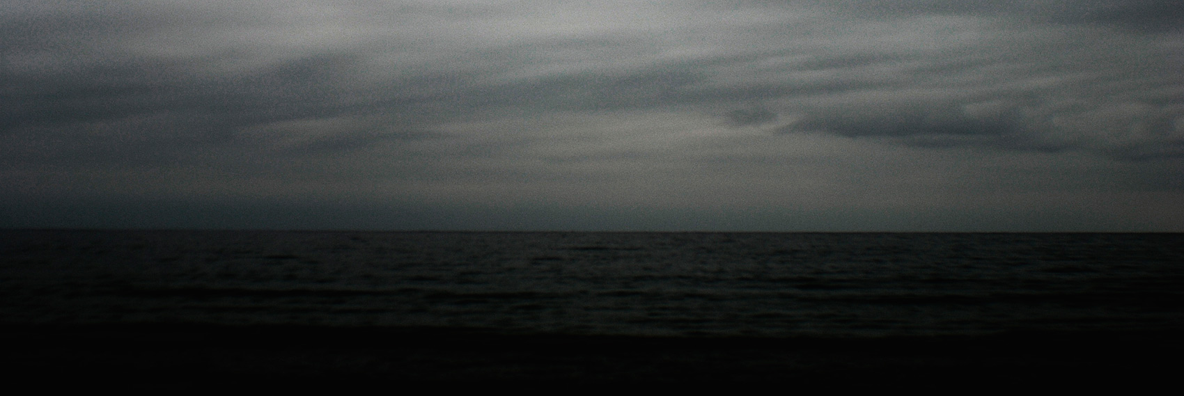
Kim Percy (Australian) 'Pale Sea' 2012


Kim Percy (Australian)
Pale Sea
2012
Digital photograph


Kim Percy (Australian) 'Where' 2012


Kim Percy (Australian)
Where
2012
Digital photograph


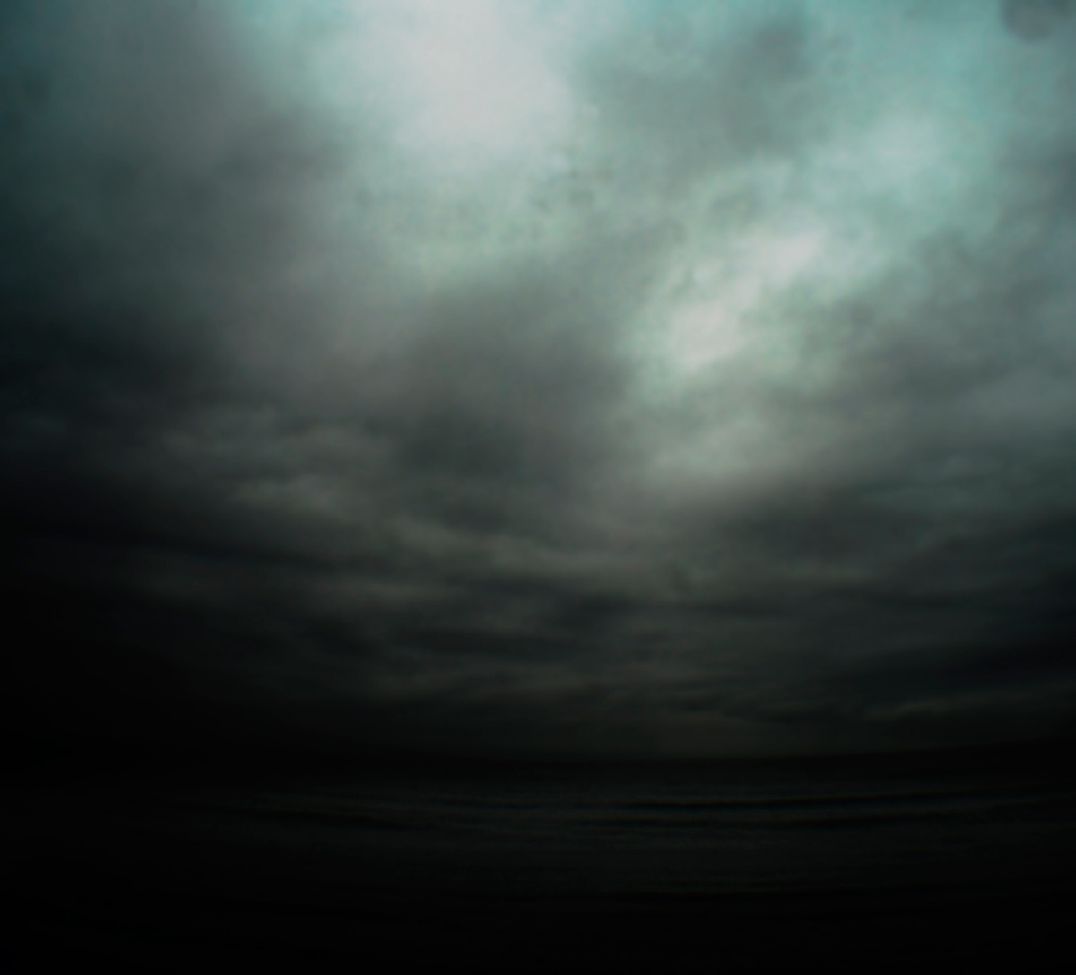
Kim Percy (Australian) 'Rough Water' 2012


Kim Percy (Australian)
Rough Water
2012
Digital photograph


Kim Percy (Australian) 'Traverse' 2012


Kim Percy (Australian)
Traverse
2012
Digital photograph


Kim Percy (Australian) 'Red Horizon No.1' 2012


Kim Percy (Australian)
Red Horizon No.1
2012
Digital photograph


Kim Percy (Australian) 'Red Horizon No.2' 2012


Kim Percy (Australian)
Red Horizon No.2
2012
Digital photograph


Stockroom
98 Piper street, Kyneton
Phone: 03 5422 3215

Opening hours:
Thursday – Saturday 10am – 5pm
Sunday 11am – 3pm
Closed Monday and Tuesday
Wednesday by appointment

Stockroom website

LIKE ART BLART ON FACEBOOK

Back to top

Text/Exhibition: “George Platt Lynes, Minor White and ‘The Temptation of Saint Anthony Is Mirrors’ ” on the exhibition ‘HIDE/SEEK: Difference and Desire in American Portraiture’ at the Brooklyn Museum, New York

Exhibition dates: 18th November, 2011 – 12th February, 2012

Curators: originally co-curated by Jonathan D. Katz and David C. Ward and organised by the National Portrait Gallery, Smithsonian Institution, its later presentation at the Brooklyn Museum was coordinated locally by Tricia Laughlin Bloom as project curator.


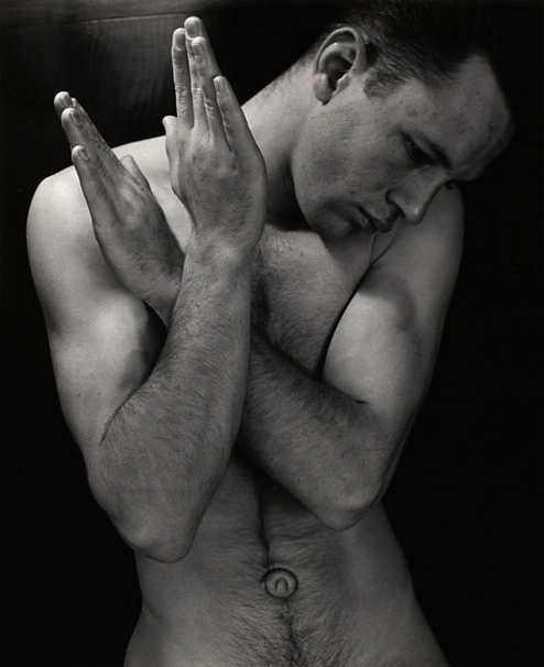
Minor White (American, 1908-1976) 'Tom Murphy (San Francisco)' 1948


Minor White (American, 1908-1976)
Tom Murphy (San Francisco)
1948
From The Temptation of St Anthony is Mirrors 1948
Gelatin silver print
4 5/8 x 3 5/8 in. (11.7 x 9.2cm)
The Minor White Archive, Princeton University Art Museum Bequest of Minor White, MWA 48-136
© Trustees of Princeton University


“The possibility of using our bodies as a possible source of very numerous pleasures is something that is very important. For instance, if you look at the traditional construction of pleasure, you see that bodily pleasure, or pleasures of the flesh, are always drinking, eating and fucking. And that seems to be the limit of the understanding of our bodies, our pleasures ….

It is very interesting to note, for instance, that for centuries people generally, as well as doctors, psychiatrists, and even liberation movements, have always spoken about desire, and never about pleasure. “We have to liberate our desire,” they say. No! We have to create new pleasure. And then maybe desire will follow.” (My bold)


Michel Foucault 1


George Platt Lynes, Minor White and The Temptation of Saint Anthony Is Mirrors

I had the great privilege of visiting The Minor White Archive at Princeton University while I was researching for my PhD. While there I studied the work cards and classic prints of the great photographer, paying particular attention to his photography of the male. What was a great surprise and delight to me were the presence of photographs of explicit sexual acts, men photographed with erections – images that have, to my knowledge, never been published. I don’t think that many people would even know that Minor White took such photographs. Although these images would have never been for public consumption it is still very unusual to find a classical photographer with such a public profile taking photographs of erect penises, especially in the 1940s!

Disturbed by having been in battle in the Second World War and seeing some of his best male friends killed, White’s early photographs of men (in their uniforms) depict the suffering and anguish that the mental and physical stress of war can cause. He was even more upset than most because he was battling his own inner sexual demons at the same time, his shame and disgust at being a homosexual and attracted to men, a difficulty compounded by his religious upbringing. In his photographs White both denied his attraction to men and expressed it. His photographs of the male body are suffused with both sexual mystery and a celebration of his sexuality despite his bouts of guilt. After the war he started to use the normal everyday bodies of his friends to form sequences of photographs, sometimes using the body as a metaphor for the landscape and vice versa. In the above photograph (Tom Murphy, left), based on a religious theme, we see a dismembered hairy body front on, the hands clutching and caressing the body, the lower hand hovering near the exposed genitalia, the upper hand cupping the breast. We see the agony and ecstasy of a homoerotic desire cloaked in a religious theme.

The image comes from the The Temptation of St Anthony is Mirrors (1948), four pages of which can be seen below. While at The Minor White Archive I looked at the only complete, undamaged book in existence. What an experience!

The book has a powerful and intense presence. It was beautifully sequenced as you would expect from Minor White and features photographs of Tom Murphy. There is a series of his hands over the back of a chair in different positions: hanging, curled, splayed, held slightly upwards, and these are paired with photographs of bare feet and turned up jeans, bare feet and rocks, and three other photographs of Tom Murphy. In an excellent paper Cruising and Transcendence in the Photographs of Minor White (Nd. Later published as an online-only feature accompanying Aperture magazine’s Spring 2015 issue, “Queer”), author Kevin Moore observes that the hand-bound volume with images paired on facing pages – “mirrors” to both one another and the artist – is a personal account as well as a meditation on the sins of the flesh.

“Temptation (which was never published or exhibited) begins with a sort of prologue, comprising a single full-length nude of Tom Murphy, White’s student and the model most commonly associated with his work. The pose is similar to those found in the beefcake pictures White was producing at this time: Murphy adopts a classical contrapposto stance and is entirely nude, his pale, wiry body positioned against a dark backdrop. A piece of driftwood at the model’s feet proposes a theme of innocence – man in his natural state. The sequence then moves to pairings of images describing man in his civilised state, featuring several loving close-ups of Murphy’s gesturing hands, a shot of his bare feet, and a single shoulder-length portrait, in which he wears a buttoned shirt and looks intently off to the side. Next, there is an interlude suggesting growing dissolution: an image of Murphy’s feet and a petrified stone is paired with a shot of Murphy in full dress slouched on a mass of rocks and staring vacantly off into the distance. The next pairing (images 9 and 10 below) accelerates the descent into temptation. Here, the pose in a second picture of Murphy’s feet suggests agitation, while a three-quarter length portrait of Murphy, crouched in the bushes and looking back over his shoulder, is as emblematic an image of cruising as White ever produced. The photographs that follow descend further into lust and self-recrimination, conveyed through photographs in which Murphy’s naked body alternates between expressions of pain and pleasure. The sequence ends with a series of beatific nudes (images 27 and 28 below), which express redemption through nonsexual treatments of the body and in the body’s juxtaposition with natural forms – a return to nature.

White may have thought at first that the sequence format would help him transcend the limits of personal biography, that he could use the breadth and fluidity of the sequence to emphasize a universal narrative while exercising control over the potentially explosive and revealing content of individual images. This proved to be overly optimistic, at least in his earliest uses of the form. White’s colleagues, for example, immediately understood Temptation for what it really was: an agonized portrayal of White’s love for his male student.”

Moore goes on to conclude that White obsfucated his sexuality, displacing gay ‘cruising’ “by a universalised mystical searching – sexual longing setting in motion a heroic search” using photography as his medium, and that his photographs became a dreamscape, perhaps even a dream(e)scape: “in which meanings are obscured, not clarified; signs are effaced, not illuminated; beauty is closeted, not set out for all to see. White was attracted to the ambiguity of the dream because it offered cover and protection but also freedom to maneuver. The dream supported the irrational, maintained a sense of mystery, and beautified frustration.”

I have to disagree with Kevin Moore.

Anyone who has seen The Temptation of Saint Anthony Is Mirrors in the flesh (so to speak) can feel the absolute presence of these images, their reality, the connection between image and viewer.

Maybe White was a Romantic but he was realistically romantic; his images are not dreamscapes, they offer multiple readings and contexts, insights into the human condition. Even though there was anguish and guilt present about his sexuality, channelled through his photography, anyone bold enough to take photographs of erections in 1940 has some ticker. It takes a clear eye and a courageous heart to do this, knowing what was at stake in this era of sexual repression. Beauty is not closeted here, unless I am looking at different images from Kevin Moore. In fact the magic of the photography of Minor White is his ability to modulate space, to modulate bodies so that they are beautiful, ambiguous and mystical whatever their context. Not everything in this world has to be in your face. Like a Glen Gould playing the Goldberg Variations revelation of beauty takes time, concentration and meditation.

Also, an overriding feeling when viewing the images was one of loneliness, sadness and anguish, for the bodies seemed to be observed and not partaken of, to be unavailable both physically and in a strange way, photographically.

For a photographer who prided himself on revealing the spirit within, through photography, these are paradoxical photographs, visually accessible and mysteriously (un)revealing, photographs of a strange and wonderful ambivalence. Two great words: obsfucation, ambivalence. Clouded with mixed feelings and emotions, not necessarily anything to do with sexuality. Not everything has to be about sexuality. It is the difference between imbibing Freud or Jung – personally I prefer the more holistic, more inclusive, more spiritual Jung.

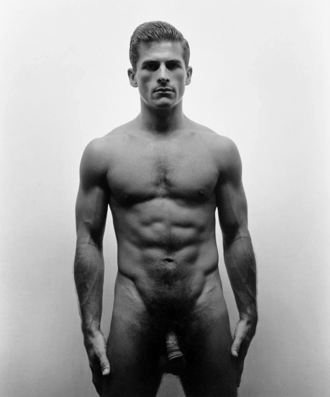
And so to the image of George Platt Lynes that I have paired with the nude of Tom Murphy (below).

Platt Lynes was another artist who struggled with is sexuality, but seemingly not to such an extent as Minor White did. GPL worked as a fashion photographer and had his own studio in New York where he photographed dancers, artists and celebrities among others. He undertook a series of mythological photographs on classical themes (which are amazing in composition and feature Surrealist motifs). Privately he photographed male nudes but was reluctant to show them in public for fear of the harm that they could do to his reputation and business with the fashion magazines. Generally his earlier male nude photographs concentrate on the idealised youthful body or ephebe.

As Lynes became more despondent with his career as a fashion photographer his private photographs of male nudes tended to take on a darker and sharper edge. After a period of residence in Hollywood he returned to New York nearly penniless. His style of photographing the male nude underwent a revision. While the photographs of his European colleagues still relied on the sun drenched bodies of young adolescent males evoking memories of classical beauty and the mythology of Ancient Greece the later nudes of Platt Lynes feature a mixture of youthful ephebes and heavier set bodies which appear to be more sexually knowing. The compositional style of dramatically lit photographs of muscular torsos of older men shot in close up (see photograph below for example) were possibly influenced by a number of things – his time in Hollywood with its images of handsome, swash-buckling movie stars with broad chests and magnificent physiques; the images of bodybuilders by physique photographers that George Platt Lynes visited; the fact that his lover George Tichenor had been killed during WWII; and the knowledge that he was penniless and had cancer. There is, I believe, a certain sadness but much inner strength in his later photographs of the male nude that harnesses the inherent sexual power embedded within their subject matter.

When undertaking research into GPL’s photographs at The Kinsey Institute as part of my PhD I noted that most of the photographs had annotations in code on the back of them giving details of age, sexual proclivities of models and what they are prepared to do and where they were found. This information gives a vital social context to GPL’s nude photographs of men and positions them within the moral and ethical framework of the era in which they were made. The strong image (below) is always quoted as an example of GPL’s more direct way of photographing the male nude in the last years of his life. The male is solid, imposing, lit from above, heavy set, powerful, massive. The eyes are almost totally in shadow. Later photos have more chiaroscuro than earlier work, more use of contrasting light (especially down lit or uplit figures) but are they more direct? Yes. The men look straight into camera.

This monumentality of body and form was matched by a new openness in the representation of sexuality. There are intimate photographs of men in what seem to be post-coital revere, in unmade beds, genitalia showing or face down showing their butts off. Some of the faces in these later photographs remain hidden, as though disclosure of identity would be detrimental for fear of persecution. The photograph above is very ‘in your face’ for the conservative time from which it emerges, remembering it was the era of witch hunts against communists and subversives (including homosexuals). Conversely, this photograph is quite restrained compared to the most striking series of GPL’s photographs that I saw at The Kinsey Institute which involves an exploration the male anal area (a photograph from the 1951 series can be found in the book titled George Platt Lynes: Photographs from The Kinsey Institute). This explicit series features other photographs of the same model – in particular one that depicts the male with his buttocks in the air pulling his arse cheeks apart. After Lynes found out he had cancer he started to send his photographs to the German homoerotic magazine Der Kries under the pseudonym Roberto Rolf, and in the last years of his life he experimented with paper negatives, which made his images of the male body even more grainy and mysterious.

I believe that Lynes understood, intimately, the different physical body types that gay men find desirable and used them in his photographs. He visited Lon of New York (a photographer of beefcake men) in his studio and purchased photographs of bodybuilders for himself, as did the German photographer George Hoyningen-Huene. It is likely that these images of bodybuilders did influence his later compositional style of images of men; it is also possible that he detected the emergence of this iconic male body type as a potent sexual symbol, one that that was becoming more visible and sexually available to gay men.

The differences between the White and GPL nudes is instructive.

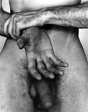
White: introspective, haunted, religious with an unrequited sense of longing – hands clutching self, inward pointing; GPL: more closely cropped, more open, one hand firmly grasping but the other hand open, receptive, presented to the viewer above the available phallic organ. It reminds me for some unknown reason, some quirk of my brain association, of the shell of Botticelli’s Birth of Venus (1486) inverted.

There is difference between the two artists – one struggling with his sexuality, being realistically romantic, the other physically doing something about it – posting his photographs to one of the first gay magazines in the world. But both were taking photographs of intimate sexual acts that could never have been published in their lifetimes – that are still are hidden from view today.

When, oh when, will someone have the courage to publish this work?

Dr Marcus Bunyan


My notes on Minor White’s photographs and notes on George Platt Lynes photographs from my Phd thesis Pressing the Flesh: Sex, Body Image and the Gay Male (2001) can be found below.


Many thankx to the Brooklyn Museum for allowing me to publish the photographs in the posting. Please click on the photographs for a larger version of the image.

1/ Gallagher, Bob and Wilson, Alexander. “Sex and the Politics of Identity: An Interview with Michel Foucault,” in Thompson, Mark. Gay Spirit: Myth and Meaning. New York: St. Martin’s Press, 1987, p.31.


Research notes on photographs from the Minor White Archive, Princeton University, New Jersey 06/08/1999

Download the Minor White research notes (85kb pdf)

Research at The Kinsey Institute , Bloomington, Indiana 16/08/1999 – 19/08/1999. George Platt Lynes photographs from the Collection at The Kinsey Institute

Download the George Platt Lynes research notes (55kb pdf)


Minor White (American, 1908-1976) 'The Temptation of Saint Anthony Is Mirrors' 1948


(top)
Minor White (American, 1908-1976)
Images 9 and 10 in the bound sequence The Temptation of Saint Anthony Is Mirrors
1948
9.3 x 11.8cm; 11.2 x 9.1cm

(bottom)
Minor White (American, 1908-1976)
Images 27 and 28 in the bound sequence The Temptation of Saint Anthony Is Mirrors
1948. 5.3 x 11.6cm; 10.6 x 8.9cm


Minor White (American, 1908-1976) 'Tom Murphy (San Francisco)' 1948
 
George Platt Lynes (American, 1907-1955) 'Untitled' Nd


(left)
Minor White 
(American, 1908-1976)
Tom Murphy (San Francisco)
1948
From The Temptation of St Anthony is Mirrors 1948
Gelatin silver print
4 5/8 x 3 5/8 in. (11.7 x 9.2 cm)

(right)
George Platt Lynes 
(American, 1907-1955)
Untitled
Nd
Gelatin silver print


George Platt Lynes (American, 1907-1955) 'Untitled (Frontal Male Nude)' 1949-1950


George Platt Lynes (American, 1907-1955)
Untitled (Frontal Male Nude)
1949-1950
Gelatin silver print


Thomas Eakins (American, 1844-1916) 'Walt Whitman' (American, 1818-1892) 1891


Thomas Eakins (American, 1844-1916)
Walt Whitman (American, 1818-1892)
1891
10.3 x 12.2cm
National Portrait Gallery, Smithsonian Institute


Charles Demuth (American, 1883-1935) 'Dancing Sailors' 1917 from the exhibition on the exhibition 'HIDE/SEEK: Difference and Desire in American Portraiture' at the Brooklyn Museum, New York, November 2011 - February 2012


Charles Demuth (American, 1883-1935)
Dancing Sailors
1917
Watercolour and pencil on paper
20.3 x 25.4cm
Cleveland Museum of Art, Ohio; Mr and Mrs William H Marlatt Fund


George Wesley Bellows (American, 1882-1925) 'Riverfront No.1' 1915 from the exhibition on the exhibition 'HIDE/SEEK: Difference and Desire in American Portraiture' at the Brooklyn Museum, New York, November 2011 - February 2012


George Wesley Bellows (American, 1882-1925)
Riverfront No.1
1915
Oil on canvas
115.3 x 160.3cm
Columbus Museum of Art, Ohio: Howald Fund Purchase


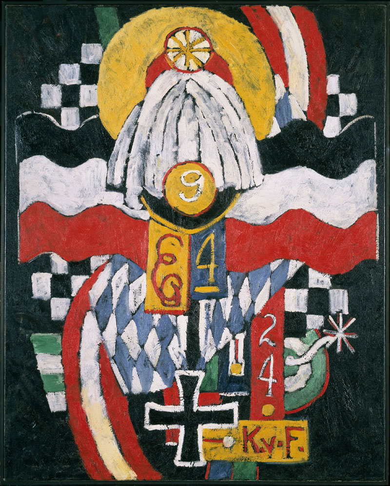
Marsden Hartley (American, 1877-1943) 'Eight Bells Folly: Memorial to Hart Crane' 1933


Marsden Hartley (American, 1877-1943)
Eight Bells Folly: Memorial to Hart Crane
1933
Oil on canvas
Gift of Ione and Hudson D. Walker
Frederick R. Weisman Art Museum, University of Minnesota


Harold Hart Crane (American, 1899-1932)

Harold Hart Crane (July 21, 1899 – April 27, 1932) was an American poet. Finding both inspiration and provocation in the poetry of T. S. Eliot, Crane wrote modernist poetry that is difficult, highly stylised, and very ambitious in its scope. In his most ambitious work, The Bridge, Crane sought to write an epic poem in the vein of The Waste Land that expressed something more sincere and optimistic than the ironic despair that Crane found in Eliot’s poetry. In the years following his suicide at the age of 32, Crane has come to be seen as one of the most influential poets of his generation…

Crane visited Mexico in 1931-32 on a Guggenheim Fellowship and his drinking continued as he suffered from bouts of alternating depression and elation … While on board the steamship SS Orizaba enroute to New York, he was beaten after making sexual advances to a male crew member, seeming to confirm his own idea that one could not be happy as a homosexual. Just before noon on April 27, 1932, Hart Crane jumped overboard into the Gulf of Mexico. Although he had been drinking heavily and left no suicide note, witnesses believed his intentions to be suicidal, as several reported that he exclaimed “Goodbye, everybody!” before throwing himself overboard. (The legend among poets is: He walked to the fantail, took off his coat quietly, and jumped.) His body was never recovered.

Text from the Wikipedia website


Peter Hujar (American, 1934-1987) 'Susan Sontag' 1975


Peter Hujar (American, 1937-1987)
Susan Sontag (American, 1933-2004)
1975
Gelatin silver print
National Portrait Gallery, Smithsonian Institute
© Estate of Peter Hujar


Keith Haring (American, 1958-1990) 'Unfinished Painting' 1989


Keith Haring (American, 1958-1990)
Unfinished Painting
1989
Acrylic on canvas
100 x 100cm
Courtesy of Katia Perlstein, Brussels, Belgium
© Keith Haring Foundation


David Wojnarowicz (American, 1954-1992) 'A Fire In My Belly' (Film In Progress) (film still), 1986-87


David Wojnarowicz (American, 1954-1992)
A Fire In My Belly (Film In Progress) (film still)
1986-1987
Super 8mm film
Black and white & color (transferred to video)
Courtesy of The Estate of David Wojnarowicz and P.P.O.W Gallery, New York and The Fales Library and Special Collection


One day before World AIDS Day, the renown painter, photographer, writer, filmmaker, performance artist and activist David Wojnarowicz, who died in 1992 at the age of 37 from AIDS-related complications, has had one of his most important works, A Fire In My Belly, pulled from The Smithsonian Institution’s National Portrait Gallery’s HIDE/SEEK exhibit because of pressure from conservative politicians and the Catholic League.”


HIDE/SEEK: Difference and Desire in American Portraiture, the first major museum exhibition to explore how gender and sexual identity have shaped the creation of American portraiture, organised by and presented at the National Portrait Gallery last fall, will be on view at the Brooklyn Museum from November 18, 2011, through February 12, 2012. With the cooperation of the National Portrait Gallery, the Brooklyn Museum has reconstituted the exhibition in concert with the Tacoma Art Museum, where it will be on view from March 17 through June 10, 2012.

HIDE/SEEK includes approximately a hundred works in a wide range of media created over the course of one hundred years that reflect a variety of sexual identities and the stories of several generations. Highlighting the influence of gay and lesbian artists, many of whom developed new visual strategies to code and disguise their subjects’ sexual identities as well as their own, HIDE/ SEEK considers such themes as the role of sexual difference in depicting modern Americans, how artists have explored the definition of sexuality and gender, how major themes in modern art – especially abstraction – have been influenced by marginalisation, and how art has reflected society’s changing attitudes.

Announcing the Brooklyn presentation, Museum Director Arnold L. Lehman states, “From the moment I first learned about this extraordinary exhibition in its planning stages, presenting it in Brooklyn has been a priority. It is an important chronicle of a neglected dimension of American art and a brilliant complement and counterpoint to ‘Youth and Beauty: Art of the American Twenties’, a touring exhibition organised by the Brooklyn Museum, also on view this fall.”

In addition to its commentary on a marginalised cultural history, HIDE/ SEEK offers an unprecedented survey of more than a century of American art. Beginning with late nineteenth-century portraits by Thomas Eakins and John Singer Sargent, it includes works from the first half of the 1900s by such masters as Romaine Brooks, George Bellows, Marsden Hartley, and Georgia O’Keeffe; the exhibition continues through the postwar period with works by Jasper Johns, Robert Rauschenberg, Agnes Martin, and Andy Warhol, and concludes with major works by late twentieth-century artists such as Keith Haring, Glenn Ligon, Nan Goldin, Felix Gonzalez-Torres, and Catherine Opie.

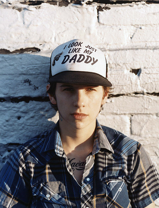
The Brooklyn presentation will feature nearly all of the works included in the National Portrait Gallery exhibition. Among them are rarely seen paintings by Charles Demuth, whose better-known industrialised landscapes are on view in the Brooklyn Museum exhibition Youth and Beauty; a poignant portrait of New Yorker writer Janet Flanner wearing two masks, taken by photographer Bernice Abbott; Andrew Wyeth’s painting of a young neighbour standing nude in a wheat field, much like Botticelli’s Venus emerging from her shell; Robert Mapplethorpe’s photograph riffing on the classic family portrait, in which a leather-clad Brian Ridley is seated on a wingback chair shackled to his whip-wielding partner, Lyle Heeter; and Cass Bird’s photographic portrait of a friend staring out from under a cap emblazoned with the words “I look Just Like My Daddy.” The exhibition will also include David Wojnarowicz’s A Fire in My Belly, an unfinished film the artist created between 1986 and 1987.

Press release from the Brooklyn Museum website


Berenice Abbott (American, 1898-1991) 'Janet Flanner' 1927


Berenice Abbott (American, 1898-1991)
Janet Flanner (American, 1892-1978)
1927
Photographic print
23 x 17.3cm
Prints and Photographs Division, Library of Congress, Washington, D.C
C Berenice Abbott / Commerce Graphics Ltd., Inc.


Thomas Eakins (American, 1844 -1916) 'Salutat' 1898


Thomas Eakins (American, 1844-1916)
Salutat
1898
Oil on canvas
127.0 x 101.6cm
Addison Gallery of American Art, Phillips Academy, Andover, Massachusetts
Gift of anonymous donor


Walker Evans (American, 1903-1975) 'Lincoln Kirstein' (American, 1907-1996) 1930


Walker Evans (American, 1903-1975)
Lincoln Kirstein (American, 1907-1996)
1930
Gelatin silver print
16.1cm x 11.4cm
The Metropolitan Msuem of Art, Ford Motor Company Collection
© Walker Evans Archive, The Metropolitan Museum of Art


Lincoln Edward Kirstein (May 4, 1907 – January 5, 1996) was an American writer, impresario, art connoisseur, philanthropist, and cultural figure in New York City, noted especially as co-founder of the New York City Ballet. He developed and sustained the company with his organising ability and fundraising for more than four decades, serving as the company’s general director from 1946 to 1989. According to the New York Times, he was “an expert in many fields,” organising art exhibits and lecture tours in the same years.

Photographer Walker Evans and writer-patron Lincoln Kirstein shared a pivotal creative partnership that shaped early American modern photography. Kirstein – co-founder of the New York City Ballet – was Evans’s early patron, funding his 1930–1931 New England architecture project, organising his first MoMA show in 1933, and writing the text for his landmark 1938 book, American Photographs.


Marsden Hartley (American, 1877-1943) 'Painting No. 47, Berlin' 1915


Marsden Hartley (American, 1877-1943)
Painting No. 47, Berlin
1915
Oil on canvas
39 7/16 x 32 in (100.1 x 81.3cm)
Hirshhorn Museum and Sculpture Garden, Smithsonian Institution, Washington, D.C.
Gift of Joseph H. Hirshhorn, 1972


George Platt Lynes (American, 1907-1955) 'Marsden Hartley' 1942


George Platt Lynes (American, 1907-1955)
Marsden Hartley
1942
Gelatin silver print
23.5 x 19.1cm
Bates College Museum of Art, Lewiston, ME, Marsden Hartley Memorial Collection
© Estate of George Platt Lynes


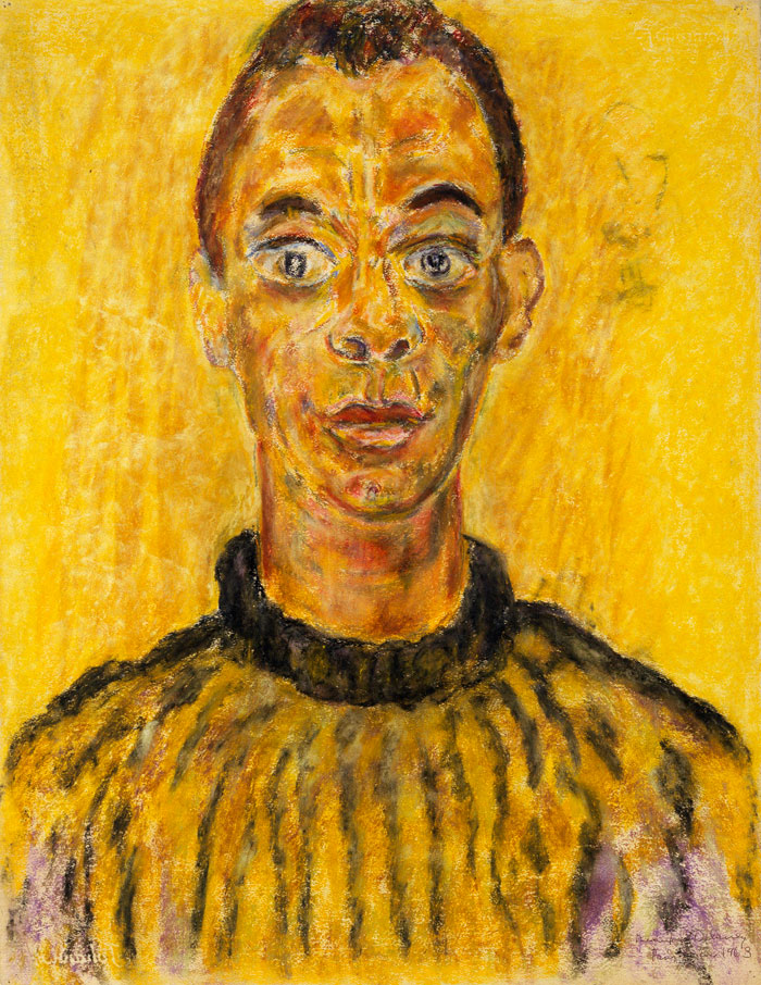
Beauford Delaney (American, 1901-1979) 'James Baldwin' 1963 from the exhibition on the exhibition 'HIDE/SEEK: Difference and Desire in American Portraiture' at the Brooklyn Museum, New York, November 2011 - February 2012


Beauford Delaney (American, 1901-1979)
James Baldwin
1963
Pastel on paper
64.8 x 49.8cm
National Portrait Gallery, Smithsonian Institution


Cass Bird (American, b. 1974) 'I Look Just Like My Daddy' 2003


Cass Bird (American, b. 1974)
I Look Just Like My Daddy
2003
C-type print
72.6 x 101.6cm
Collection of the artist, New York
© Cass Bird


Brooklyn Museum
200 Eastern Parkway
Brooklyn, NY 11238-6052
Phone: (718) 638-5000

Opening hours:
Wednesday – Sunday 11am – 6pm
Monday and Tuesday closed

Brooklyn Museum website

LIKE ART BLART ON FACEBOOK

Back to top

Exhibition: ‘Bernd and Hilla Becher: Mines and Mills – Industrial Landscapes’ at Fotomuseum Winterthur, Zurich

Exhibition dates: 26th November, 2011 – 12th February, 2012

Curator: the museum in collaboration with the artists’ estate and galleries


Bernd and Hilla Becher (German, active 1959-2007) Bernd Becher (German, 1931-2007) Hilla Becher (German, 1934-2015)
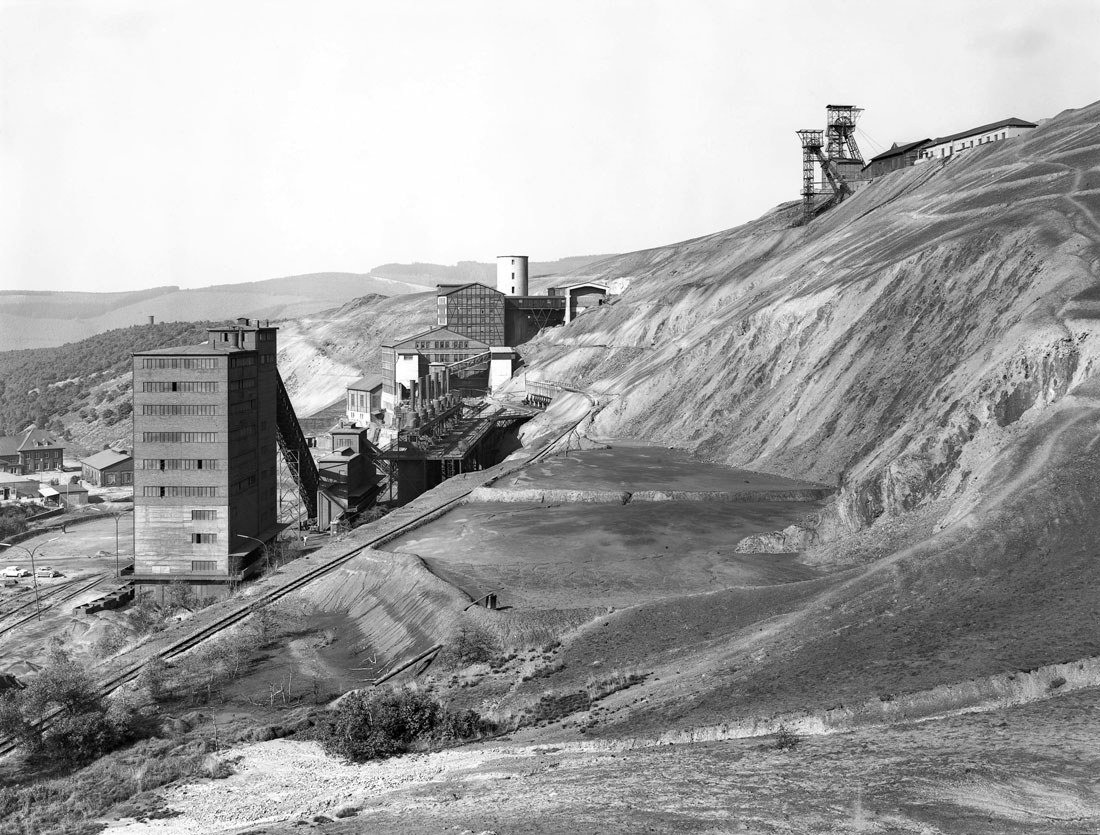
 'Grube San Fernando, Herdorf, D' 1961 from the exhibition 'Bernd and Hilla Becher: Mines and Mills - Industrial Landscapes' at Fotomuseum Winterthur, Zurich, Nov 2011 - Feb 2012


Bernd and Hilla Becher (German, active 1959-2007)
Bernd Becher (German, 1931-2007)
Hilla Becher (German, 1934-2015)
Grube San Fernando, Herdorf, D
1961
Gelatin silver print
50 x 60cm
© Bernd and Hilla Becher / Courtesy of Schirmer/Mosel


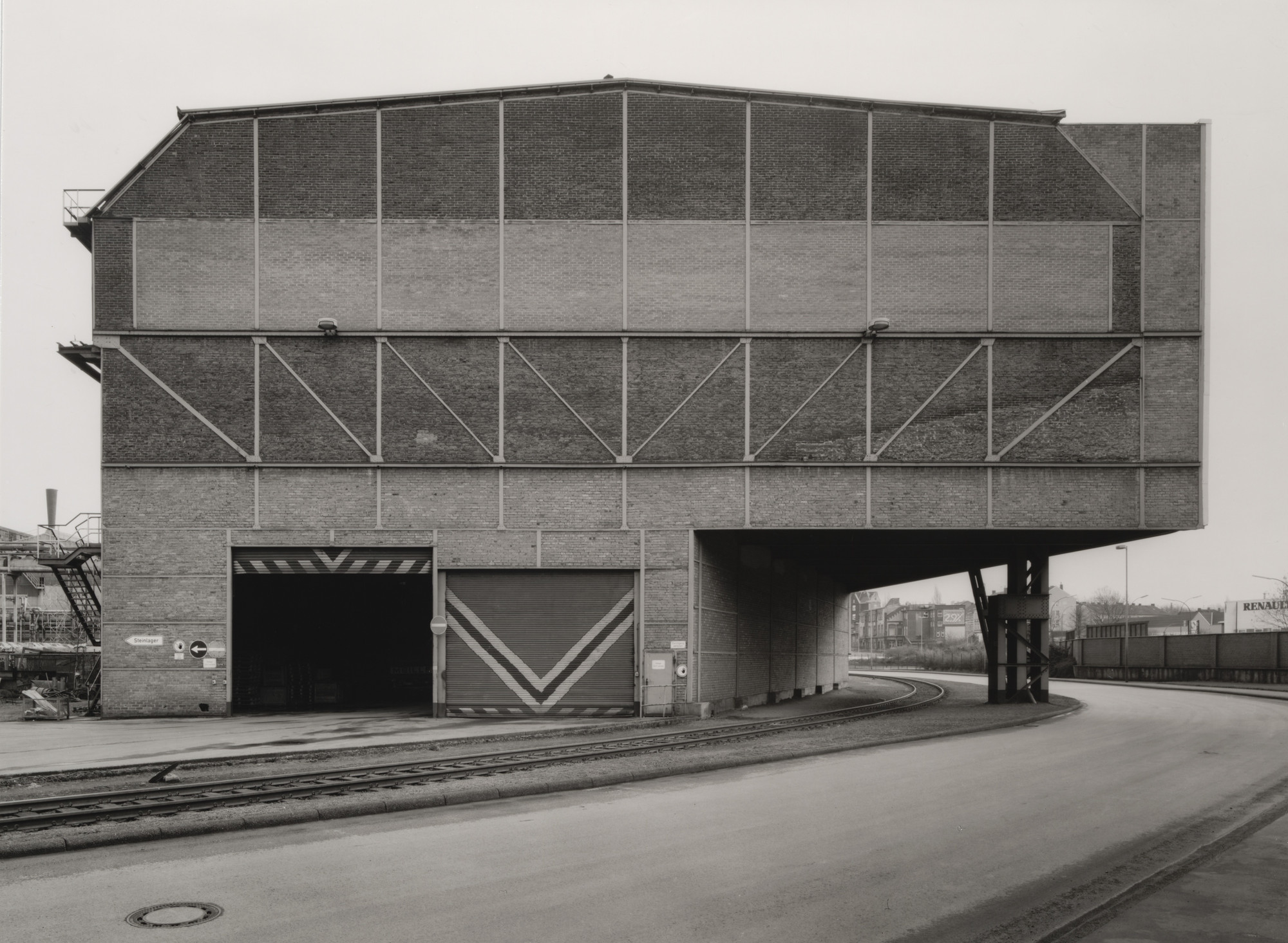
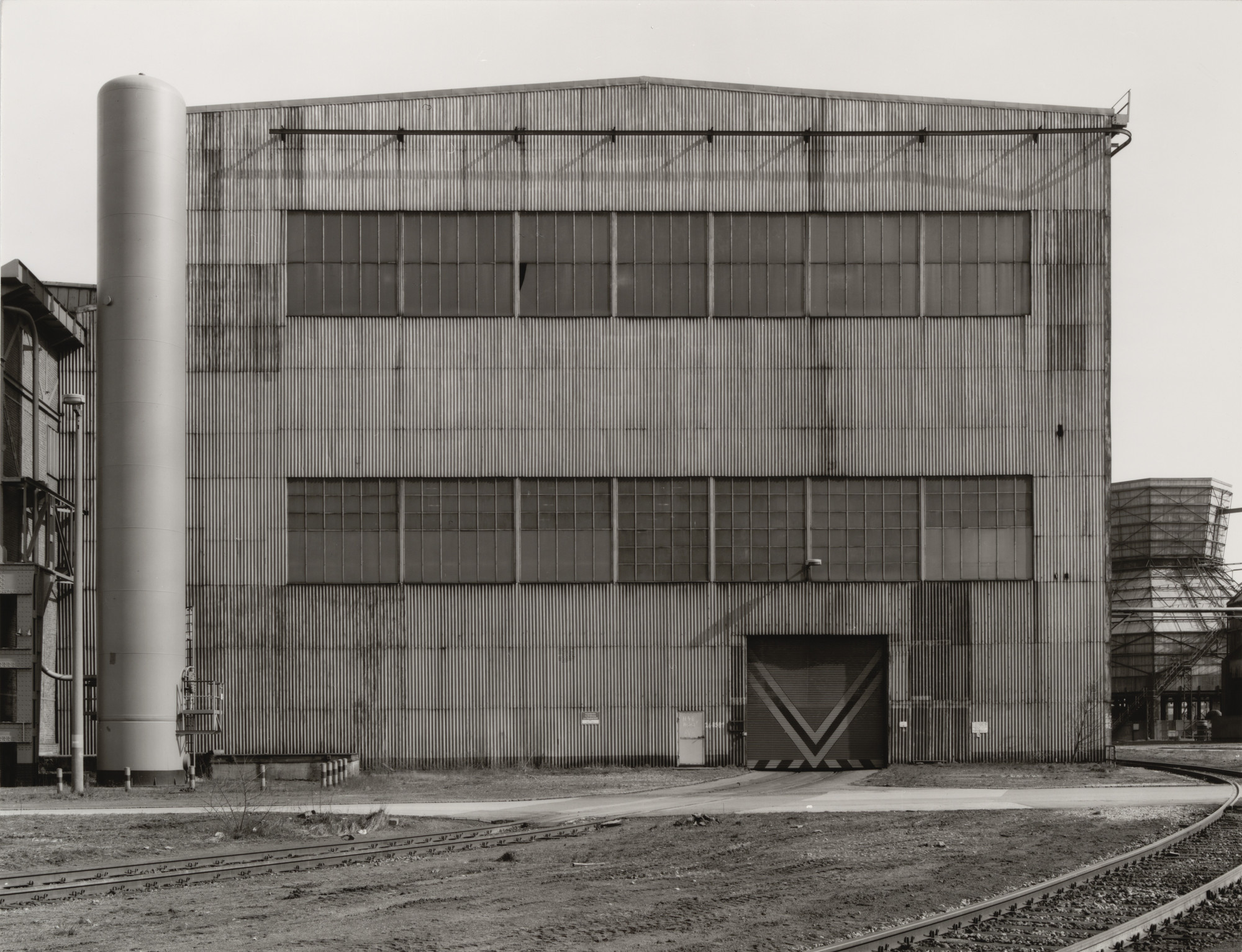
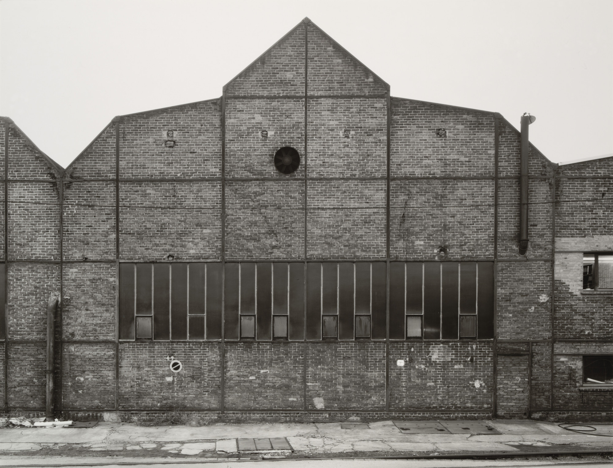
Let’s not beat around the bush. Despite protestations to the contrary (appeals to the objectivity of the image, eschewing entirely the aspects of beauty, emotion and opinion; the rigorous frontality of the individual images giving them the simplicity of diagrams, while their density of detail offers encyclopaedic richness) these are subjective images for all their objective desire. The paradox is the more a photographer strives for objectivity, the more ego drops away, the more the work becomes their own: subjective, beautiful, emotive.

Even though the Bechers’ demonstrate great photographic restraint with regard to documenting the object, the documentary gaze is always corrupted / mutated / distorted by personal interpretation: where to position the camera, what to include or exclude, how to interpret the context of place, how to crop or print the image, and how to display the image, in grids, sequences or singularly. In other words there are always multiple (con)texts to which artists conform or transgress.

What makes great photographers, such as Eugène Atget, Walker Evans, August Sander and the Bechers, is the idiosyncratic “nature” of their vision: how Atget places his large view camera – at that particular height and angle to the subject – leaves an indelible feeling that only he could have made that image, to reveal the magic of that space in a photograph. It is their personal, unique thumbprint, recognisable in an instant. So it is with the Bechers.

These are intimate images, a personal reaction to space and place, to being. They make my heart ache for their stillness and ethereal beauty. Bravo!

Dr Marcus Bunyan


Many thankx to the Fotomuseum Winterthur, Zurich for allowing me to publish the photographs in the posting. Please click on the photographs for a larger version of the image.


“The pictures were stripped of any artistic frills and reduced to an essentially topographic state, conveying substantial amounts of visual information but eschewing entirely the aspects of beauty, emotion and opinion.”


William Jenkins, Curator of the ‘New Topographics’ exhibition, 1975


“The Ruhr Valley, where Becher’s family had worked in the steel and mining industries, was their initial focus. They were fascinated by the similar shapes in which certain buildings were designed. In addition, they were intrigued by the fact that so many of these industrial buildings seemed to have been built with a great deal of attention toward design. Together, the Bechers went out with a large 8 x 10-inch view camera and photographed these buildings from a number of different angles, but always with a straightforward “objective” point of view. They shot only on overcast days, so as to avoid shadows, and early in the morning during the seasons of spring and fall. Objects included barns, water towers, oal tipples, cooling towers, grain elevators, coal bunkers, coke ovens, oil refineries, blast furnaces, gas tanks, storage silos, and warehouses. At each site the Bechers also created overall landscape views of the entire plant, which set the structures in their context and show how they relate to each other.”


Wikipedia entry for Bernd and Hilla Becher


“The German artists Bernd and Hilla Becher, who began working together in 1959 and married in 1961, are best known for their “typologies” – grids of black-and-white photographs of variant examples of a single type of industrial structure. To create these works, the artists traveled to large mines and steel mills, and systematically photographed the major structures, such as the winding towers that haul coal and iron ore to the surface and the blast furnaces that transform the ore into metal. The rigorous frontality of the individual images gives them the simplicity of diagrams, while their density of detail offers encyclopaedic richness. At each site the Bechers also created overall landscape views of the entire plant, which set the structures in their context and show how they relate to each other. The typologies emulate the clarity of an engineer’s drawing, while the landscapes evoke the experience of a particular place.”


Peter Galassi, Chief Curator of Photography, MoMA


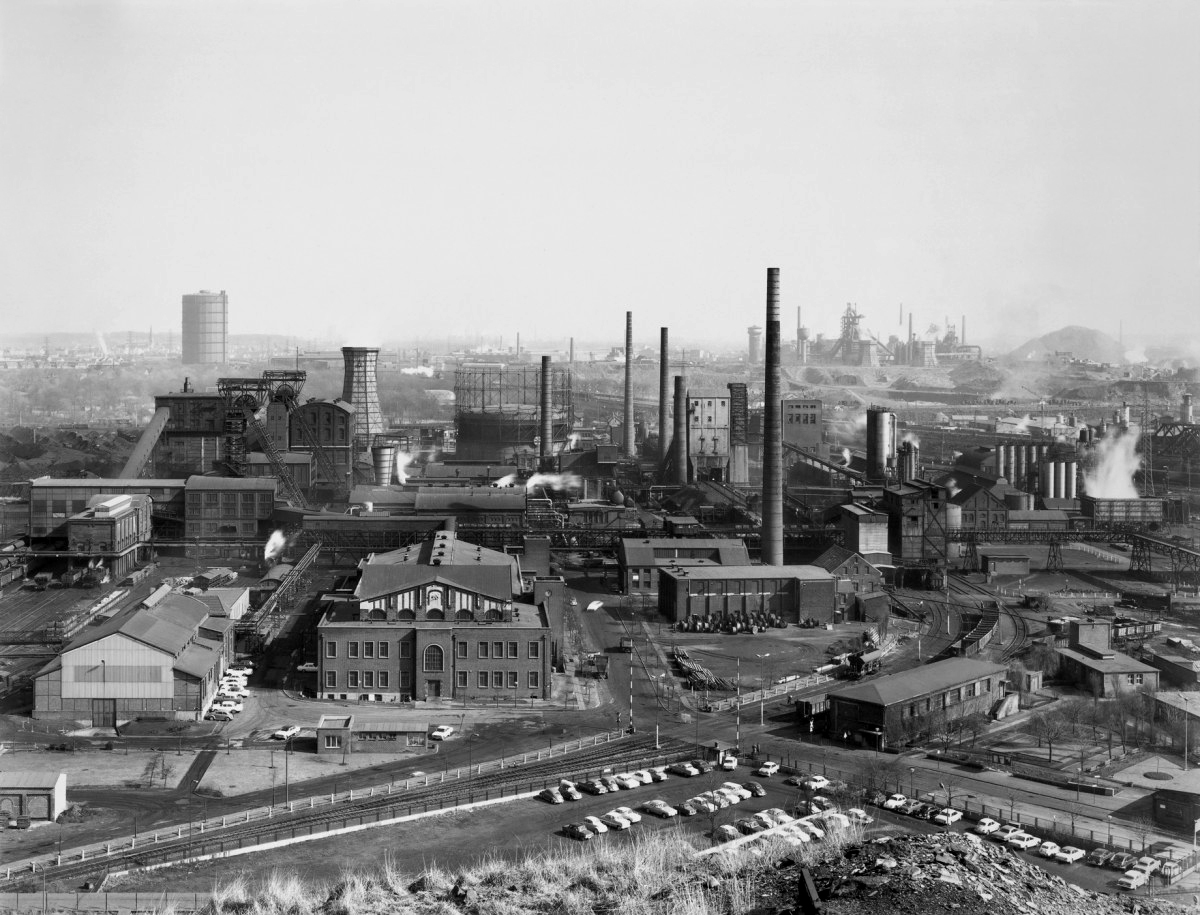
Bernd and Hilla Becher (German, active 1959-2007) Bernd Becher (German, 1931-2007) Hilla Becher (German, 1934-2015)
 'Becher 
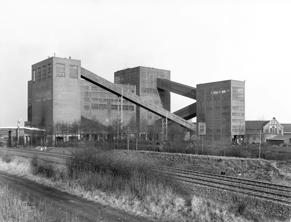
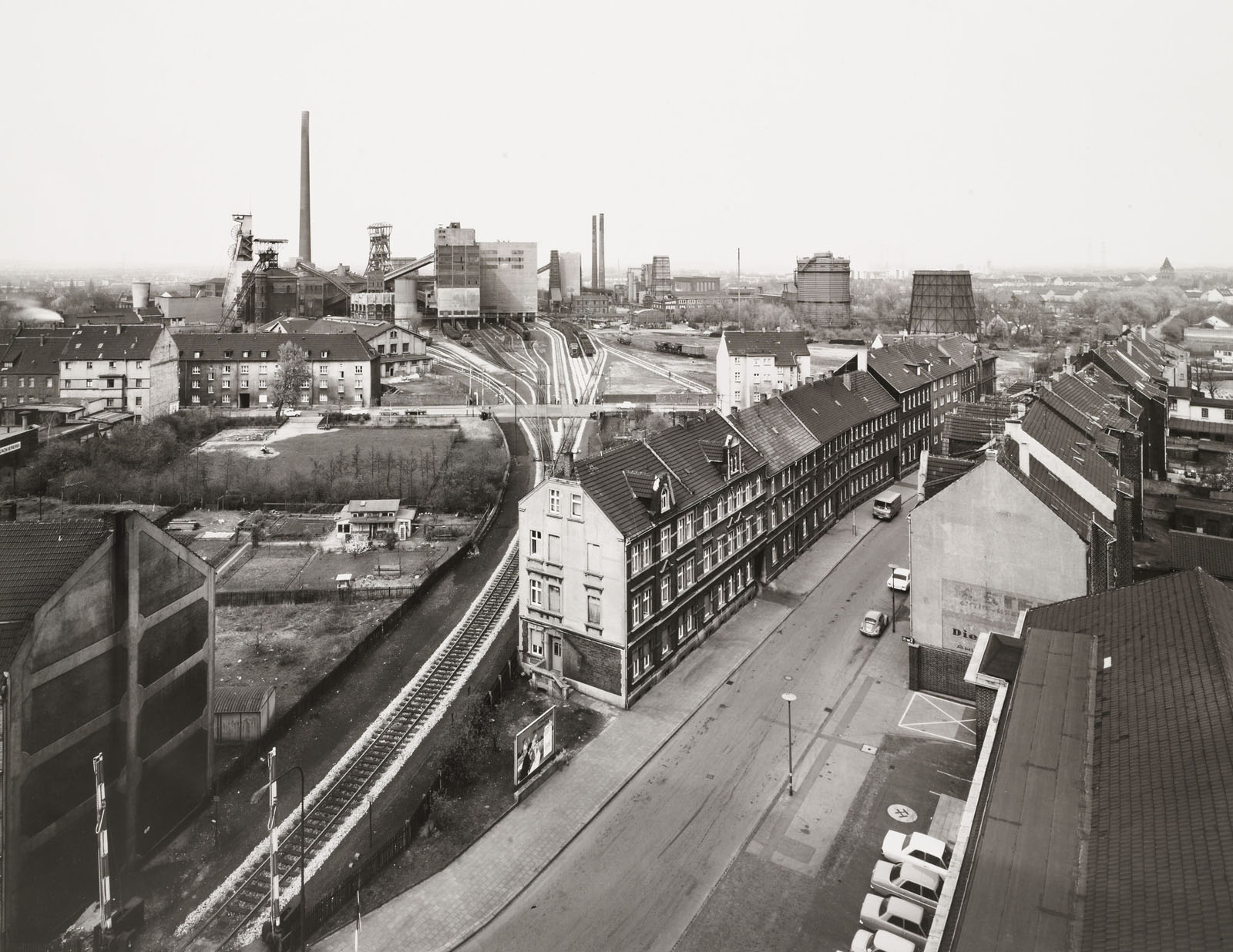
Zeche Germania, Dortmund, D' 1971
 rom the exhibition 'Bernd and Hilla Becher: Mines and Mills - Industrial Landscapes' at Fotomuseum Winterthur, Zurich, Nov 2011 - Feb 2012


Bernd and Hilla Becher (German, active 1959-2007)
Bernd Becher (German, 1931-2007)
Hilla Becher (German, 1934-2015)

Zeche Germania, Dortmund, D
1971
Gelatin silver print
50 x 60cm
© Bernd and Hilla Becher / Courtesy of Schirmer/Mosel


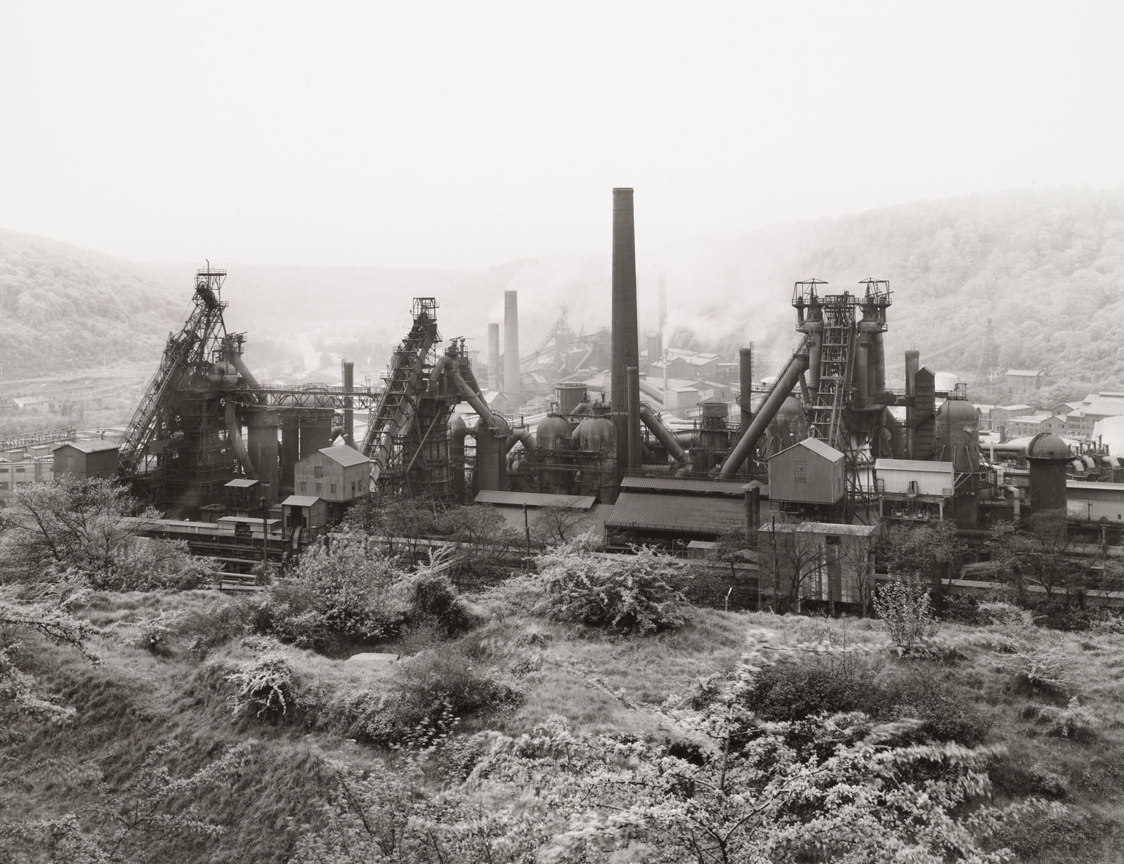
For more than forty years, the photographer couple Bernd (1931-2007) and Hilla Becher (1934-2015) worked on creating an inventory of industrial architecture. Warehouses, shaft towers, gas tanks, blast furnaces as well as half-timbered houses are among the subjects they photographed throughout Germany, England, France, Central Europe, and the USA. Calling these buildings “anonymous sculptures,” they refer to the artistic quality of the constructions, which played no role for the buildings’ largely unknown builders and users. Their photographs attempt to draw attention to these hidden sculptural qualities and to document them historically as a building tradition in decline.

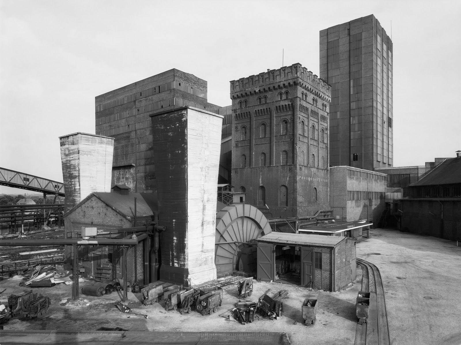
Bernd and Hilla Becher have always held particular interest for the industrial architecture in the Ruhr region. The exhibition Mines and Mills – Industrial Landscapes systematically examines this aspect of their work for the first time. Even today, names such as the Concordia and Hannibal collieries or Gutehoffnungshütte stand for the industrial history of the Ruhr region. Instead of concentrating on individual buildings, the exhibition approaches the mining facilities (where coal was produced for the smelting works) as a whole and in the context of their urban or natural surroundings. This typology, which the Bechers described as “industrial landscape,” compares the Ruhr region with similar complexes elsewhere in Europe and the USA.

As with their typological multiple and serial views of buildings, Bernd and Hilla Becher strive for a comparative perspective in their industrial landscapes. Demonstrating great photographic restraint in their approach and in the name of a “New Objectivity” dedicated solely to the object, they stand in a long tradition of proponents of the documentary gaze that includes Eugène Atget, Karl Blossfeldt, Walker Evans, Albert Renger-Patzsch and August Sander. Their influence on the history of photography extends from the establishment of the “Dusseldorf School” into the present.

“The main aim of our work is to show that the forms of our time are technical forms, although they did not develop from formal considerations. Just as medieval thought is manifested in the gothic cathedral, our era is revealed in technical buildings and apparatuses,” Bernd and Hilla Becher stated in a conversation from 2005.

The industrial landscapes can be read from historical and social perspectives, to an even greater extent than the familiar photographs of simple building typologies. Next to the monumental, industrial buildings one often sees residential constructions, gardens, and allotment gardens, which convey how intertwined the organisation of life and work was at the time and how deeply rooted people were in this city-like structure. Photographed at waist-height, the broad, open views of the horizontally composed photographs have an aesthetic that is almost atypical of the Bechers. However, the images adhere systematically to the archival thinking of the artist couple.

Press release from the Fotomuseum Winterthur, Zurich website


Bernd and Hilla Becher (German, active 1959-2007) Bernd Becher (German, 1931-2007) Hilla Becher (German, 1934-2015)
 'Gutehoffnungshütte, Oberhausen, D' 1963


Bernd and Hilla Becher (German, active 1959-2007)
Bernd Becher (German, 1931-2007)
Hilla Becher (German, 1934-2015)
Gutehoffnungshütte, Oberhausen, D
1963
Gelatin silver print
50 x 60cm
© Bernd and Hilla Becher / Courtesy of Schirmer/Mosel


Bernd and Hilla Becher (German, active 1959-2007) Bernd Becher (German, 1931-2007) Hilla Becher (German, 1934-2015)
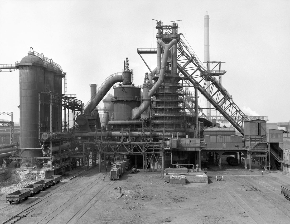
 'Charleroi-Montignies, B' 1971


Bernd and Hilla Becher (German, active 1959-2007)
Bernd Becher (German, 1931-2007)
Hilla Becher (German, 1934-2015)
Charleroi-Montignies, B
1971
Gelatin silver print
50 x 60cm
© Bernd and Hilla Becher / Courtesy of Schirmer/Mosel


Bernd and Hilla Becher (German, active 1959-2007) Bernd Becher (German, 1931-2007) Hilla Becher (German, 1934-2015)
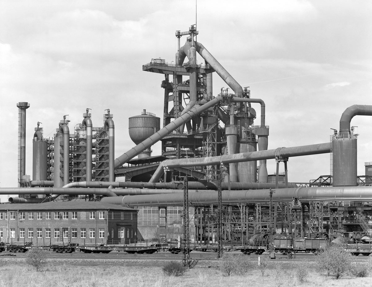
 'Duisburg-Huckingen, D' 1970


Bernd and Hilla Becher (German, active 1959-2007)
Bernd Becher (German, 1931-2007)
Hilla Becher (German, 1934-2015)
Duisburg-Huckingen, D
1970
Gelatin silver print
50 x 60cm
© Bernd and Hilla Becher / Courtesy of Schirmer/Mosel


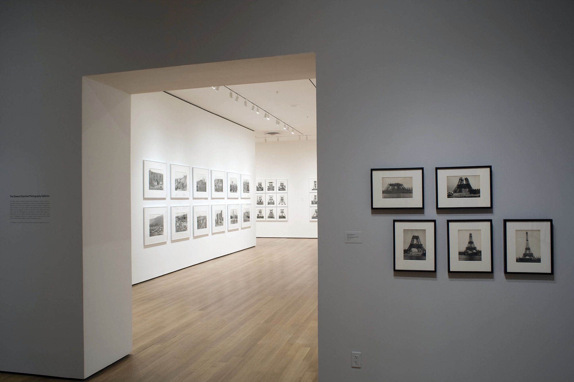
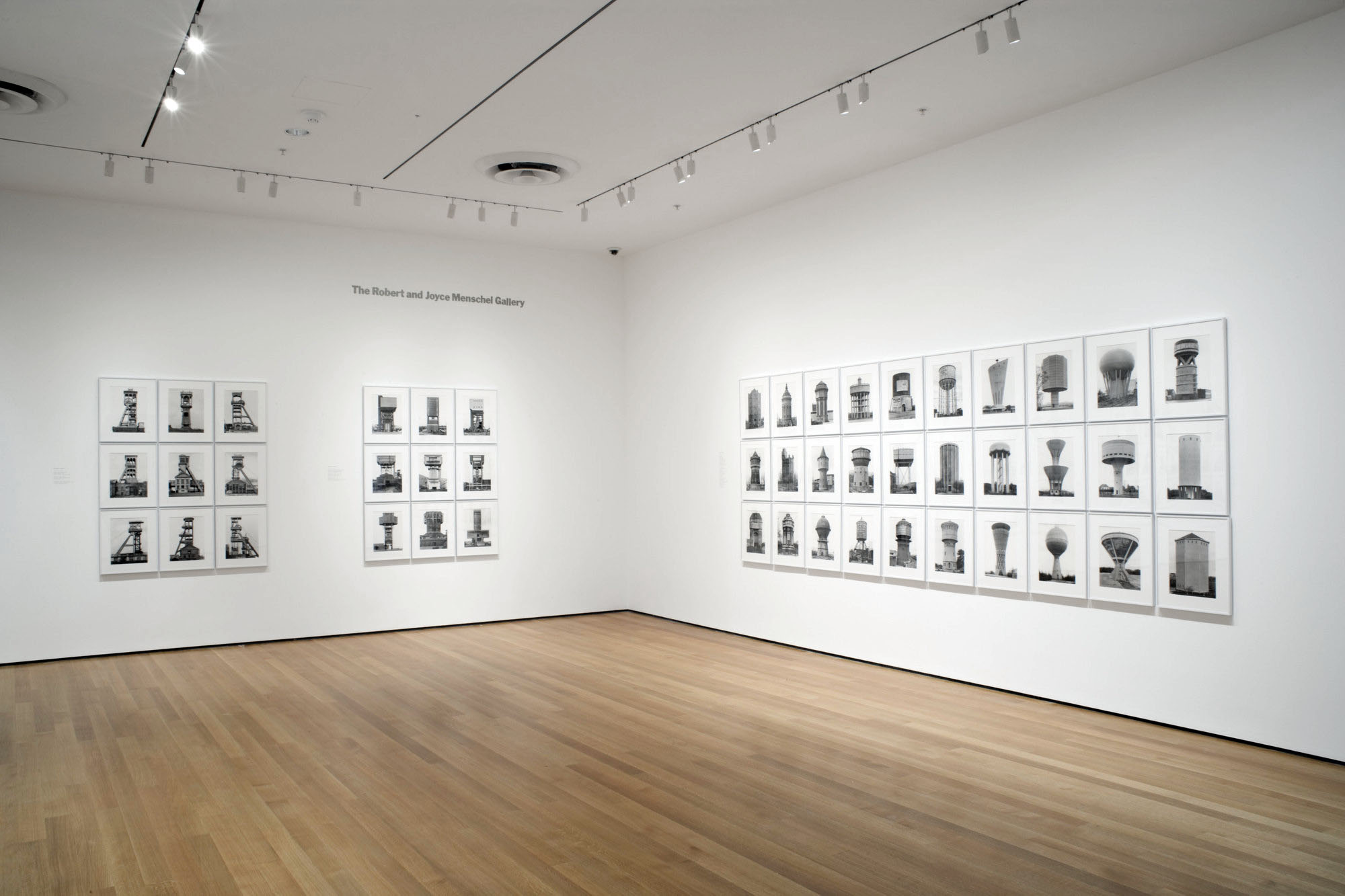
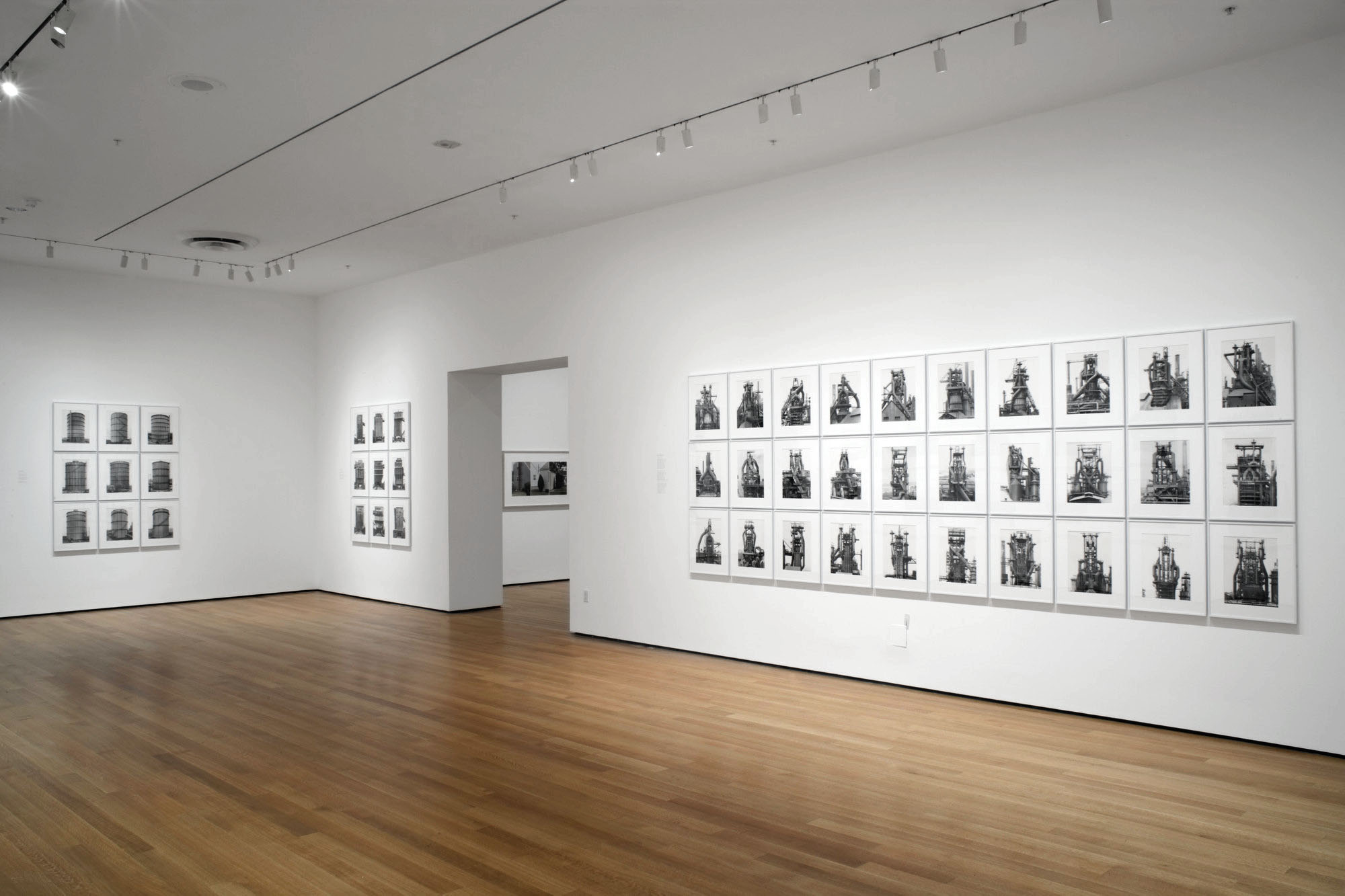
Installation view of the exhibition 'Bernd and Hilla Becher: Landscape/Typology' at the Museum of Modern Art, New York


Installation view of the exhibition Bernd and Hilla Becher: Landscape / Typology at the Museum of Modern Art, New York, May 21, 2008 – August 25, 2008 showing top row at right, Hippolyte Blancard’s Untitled (1888, below)
Photograph by John Wronn


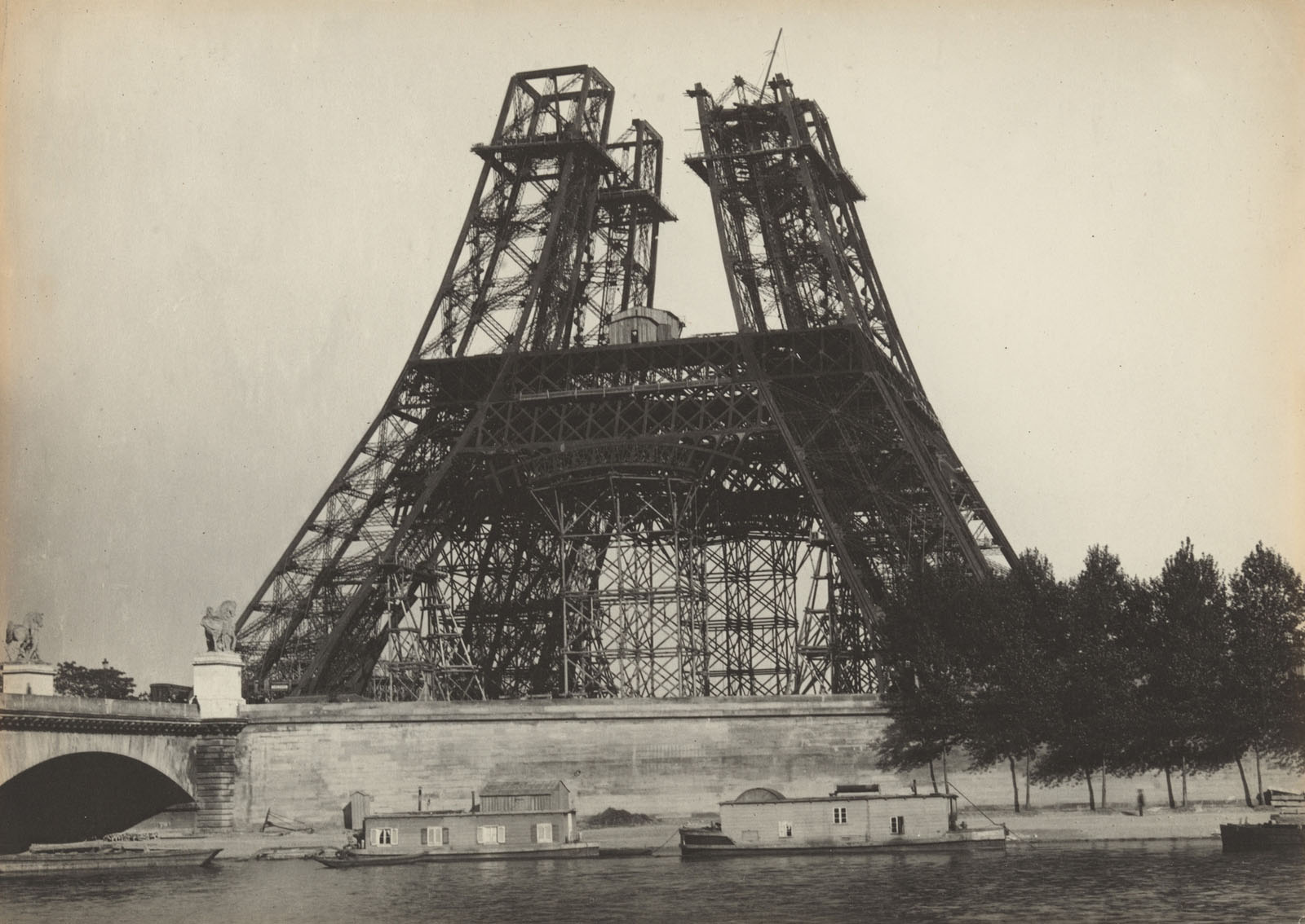
Hippolyte Blancard (French, 1843-1924) 'Untitled' April 1888


Hippolyte Blancard (French, 1843-1924)
Untitled
April 1888
Platinum print
8 13/16 × 6 1/8″ (22.4 × 15.6cm)
Museum of Modern Art, New York
Purchase


Hippolyte Blancard, a pharmacist and amateur photographer, documented Parisian architecture leading up to the 1889 Exposition Universelle, or World’s Fair, an international event held in Paris to showcase new innovations, geographic and scientific discoveries, and works of art. His series of photographs shows the construction of the Eiffel Tower, which was conceived as the entrance to the World’s Fair. Blancard’s photographs document the tower’s progression, from July 1887 to April 1889.

Text from the MoMA website


Bernd and Hilla Becher (German, active 1959-2007) Bernd Becher (German, 1931-2007) Hilla Becher (German, 1934-2015)
 'Zeche Concordia, Oberhausen, D' 1967


Bernd and Hilla Becher (German, active 1959-2007)
Bernd Becher (German, 1931-2007)
Hilla Becher (German, 1934-2015)
Zeche Concordia, Oberhausen, D
1967
Gelatin silver print
50 x 60cm
© Bernd und Hilla Becher – Courtesy of Schirmer/Mosel


Installation view of the exhibition 'Bernd and Hilla Becher: Landscape/Typology' at the Museum of Modern Art, New York


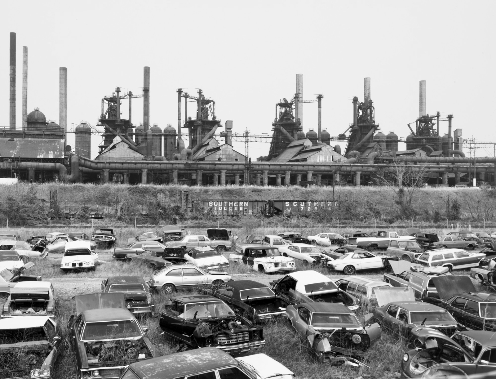
Installation view of the exhibition Bernd and Hilla Becher: Landscape / Typology at the Museum of Modern Art, New York, May 21, 2008 – August 25, 2008 showing the three images directly below – Duisburg-Bruckhausen (1999); Ensley, Alabama, USA (1982); and Knutange, Lorraine, France (1971)
Photograph by John Wronn


Bernd and Hilla Becher (German, active 1959-2007) Bernd Becher (German, 1931-2007) Hilla Becher (German, 1934-2015)
 'Duisburg-Bruckhausen' 1999


Bernd and Hilla Becher (German, active 1959-2007)
Bernd Becher (German, 1931-2007)
Hilla Becher (German, 1934-2015)
Duisburg-Bruckhausen
1999
Gelatin silver print
50 x 60cm
© Bernd und Hilla Becher – Courtesy of Schirmer/Mosel


Bernd and Hilla Becher (German, active 1959-2007) Bernd Becher (German, 1931-2007) Hilla Becher (German, 1934-2015)
 'Ensley, Alabama, USA' 1982


Bernd and Hilla Becher (German, active 1959-2007)
Bernd Becher (German, 1931-2007)
Hilla Becher (German, 1934-2015)
Ensley, Alabama, USA
1982
Gelatin silver print
50 x 60cm
© Bernd und Hilla Becher – Courtesy of Schirmer/Mosel


Bernd and Hilla Becher (German, active 1959-2007) Bernd Becher (German, 1931-2007) Hilla Becher (German, 1934-2015) 'Knutange, Lorraine, France' 1971


Bernd and Hilla Becher (German, active 1959-2007)
Bernd Becher (German, 1931-2007)
Hilla Becher (German, 1934-2015)
Knutange, Lorraine, France
1971
Gelatin silver print
17 7/8 × 23 9/16″ (45.4 × 59.9cm)
Horace W. Goldsmith Fund through Robert B. Menschel
© 2022 Estate of Bernd Becher and Hilla Becher


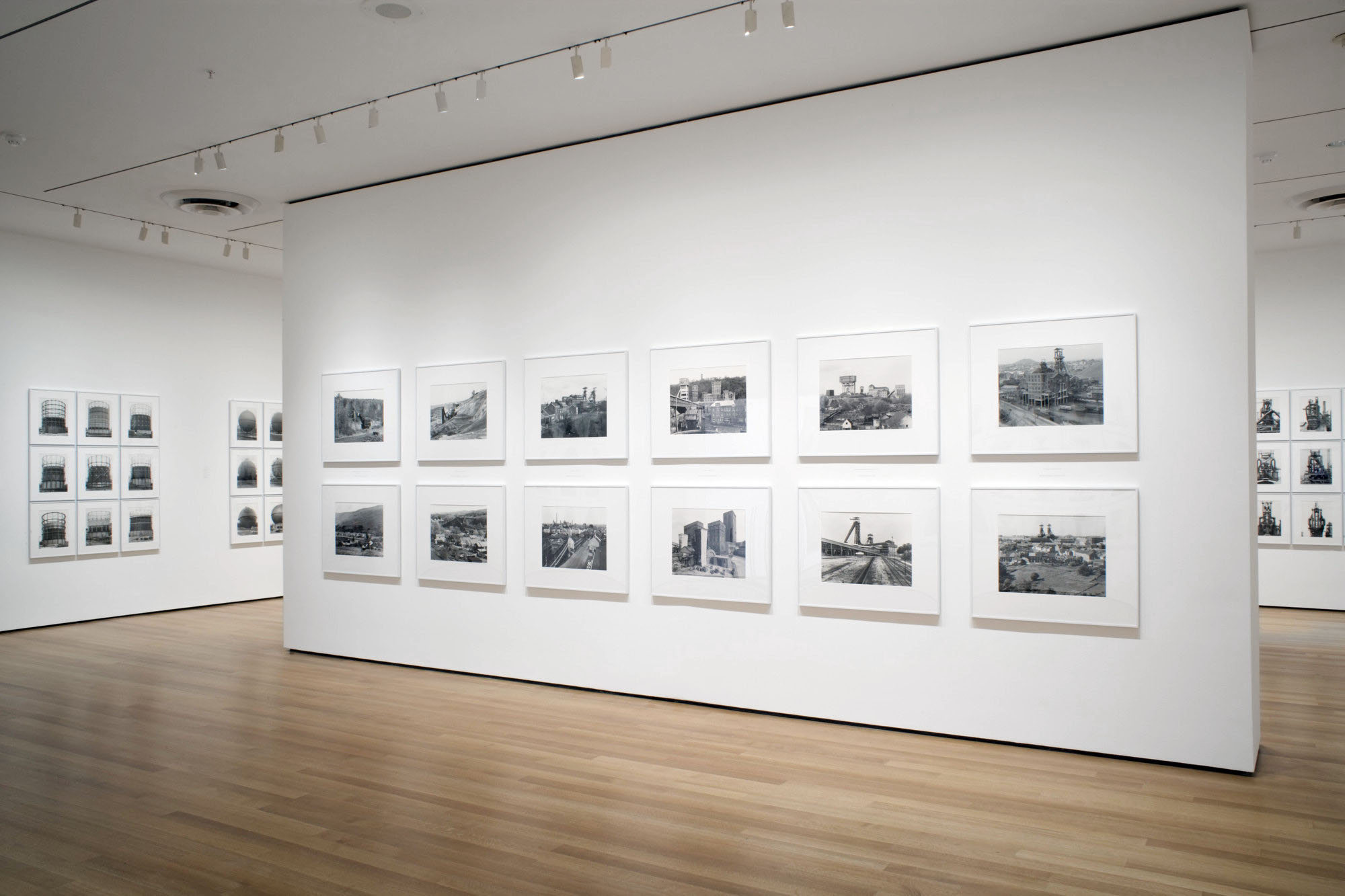
Installation view of the exhibition 'Bernd and Hilla Becher: Landscape/Typology' at the Museum of Modern Art, New York

Installation view of the exhibition 'Bernd and Hilla Becher: Landscape/Typology' at the Museum of Modern Art, New York


Installation views of the exhibition Bernd and Hilla Becher: Landscape / Typology at the Museum of Modern Art, New York, May 21, 2008 – August 25, 2008
Photographs by John Wronn


Bernd and Hilla Becher (German, active 1959-2007) Bernd Becher (German, 1931-2007) Hilla Becher (German, 1934-2015) 'Hannover Mine 1/2/5, Bochum-Hordel, Ruhr Region, Germany' 1973


Bernd and Hilla Becher (German, active 1959-2007)
Bernd Becher (German, 1931-2007)
Hilla Becher (German, 1934-2015)
Hannover Mine 1/2/5, Bochum-Hordel, Ruhr Region, Germany
1973
Gelatin silver print
50 x 60cm
© Bernd und Hilla Becher – Courtesy of Schirmer/Mosel


Bernd and Hilla Becher (German, active 1959-2007) Bernd Becher (German, 1931-2007) Hilla Becher (German, 1934-2015) 'Consolidation Mine, Gelsenkirchen, Ruhr Region, Germany' 1974


Bernd and Hilla Becher (German, active 1959-2007)
Bernd Becher (German, 1931-2007)
Hilla Becher (German, 1934-2015)
Consolidation Mine, Gelsenkirchen, Ruhr Region, Germany
1974
Gelatin silver print
18 1/4 × 23 7/16″ (46.3 × 59.5cm)
Horace W. Goldsmith Fund through Robert B. Menschel
© 2022 Estate of Bernd Becher and Hilla Becher


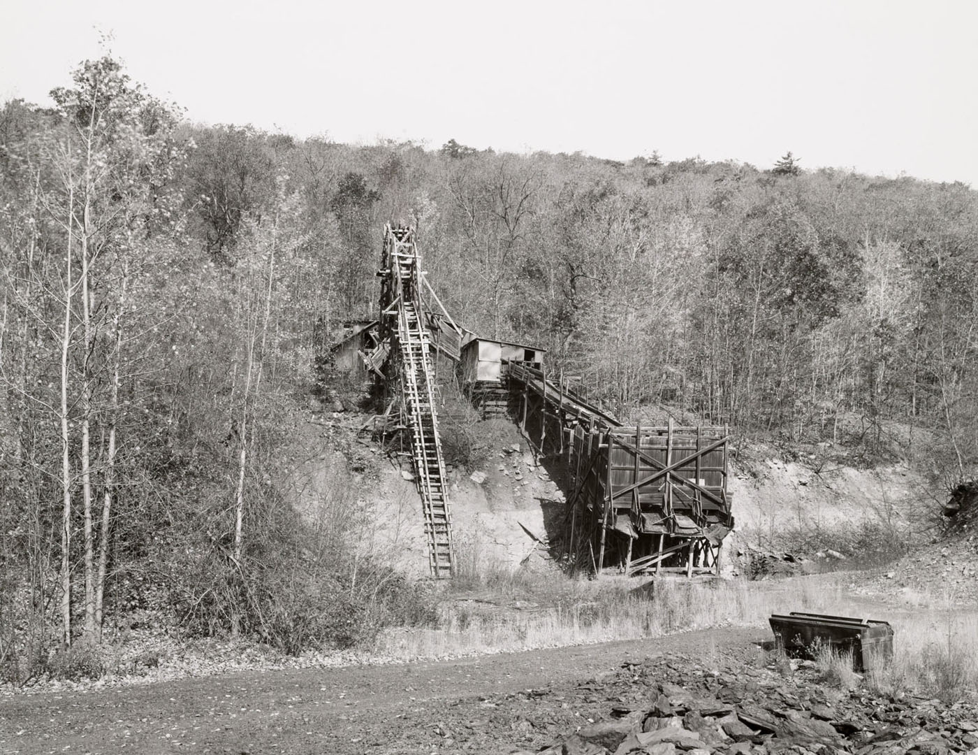
Bernd and Hilla Becher (German, active 1959-2007) Bernd Becher (German, 1931-2007) Hilla Becher (German, 1934-2015) 'Coal Mine, Bear Valley, Schuylkill County, Pennsylvania, United States' 1974


Bernd and Hilla Becher (German, active 1959-2007)
Bernd Becher (German, 1931-2007)
Hilla Becher (German, 1934-2015)
Coal Mine, Bear Valley, Schuylkill County, Pennsylvania, United States
1974
Gelatin silver print
17 5/8 × 23 1/2″ (44.7 × 59.7cm)
Horace W. Goldsmith Fund through Robert B. Menschel
© 2022 Estate of Bernd Becher and Hilla Becher


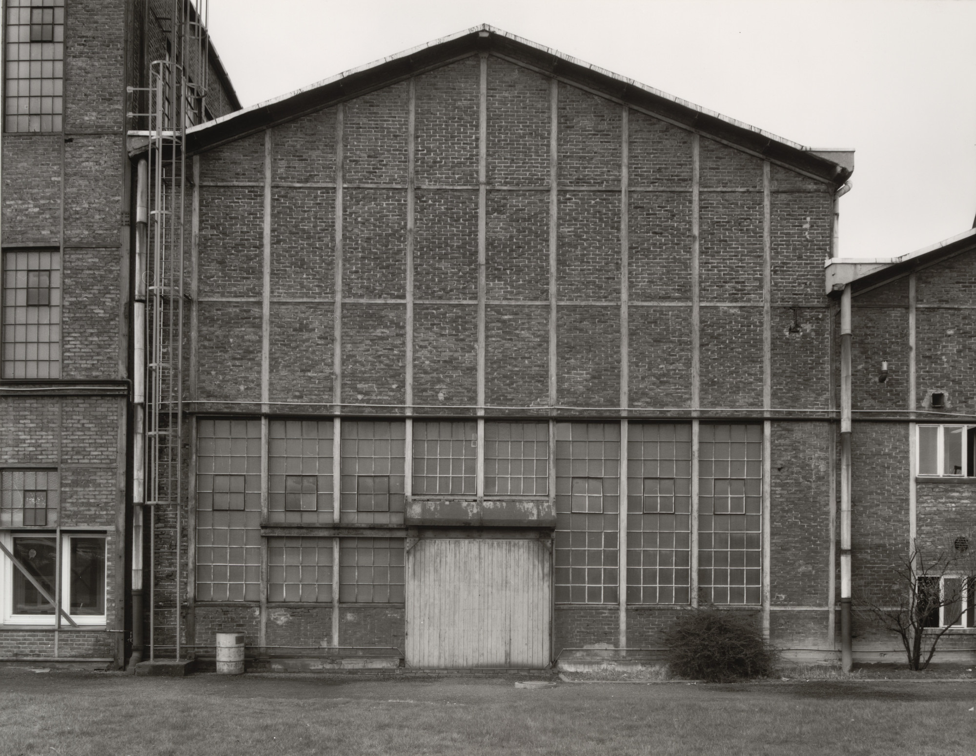
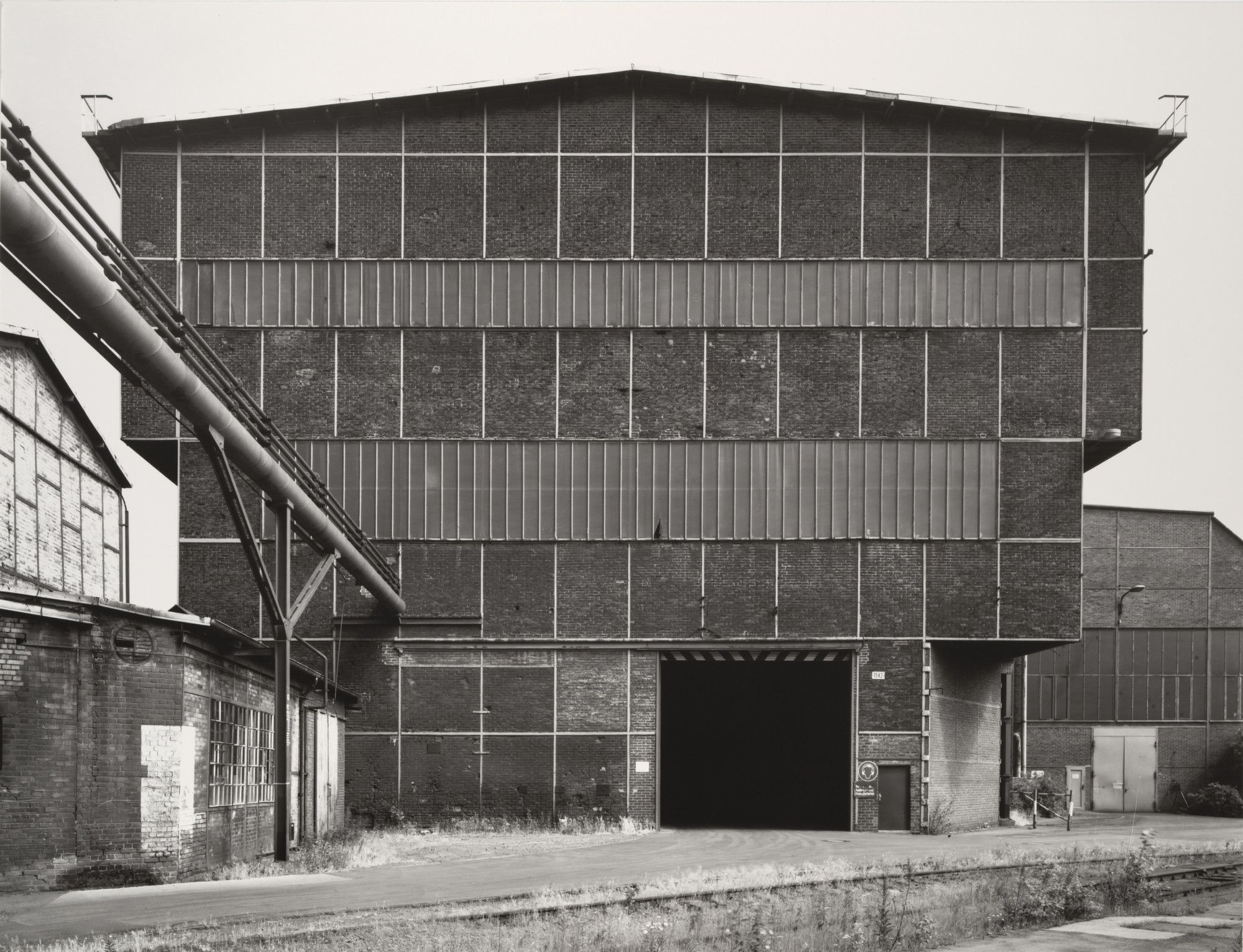
Bernd and Hilla Becher (German, active 1959-2007) Bernd Becher (German, 1931-2007) Hilla Becher (German, 1934-2015) 'Industrial Façades' 1978-1992

Bernd and Hilla Becher (German, active 1959-2007) Bernd Becher (German, 1931-2007) Hilla Becher (German, 1934-2015) 'Industrial Façades' 1978-1992

Bernd and Hilla Becher (German, active 1959-2007) Bernd Becher (German, 1931-2007) Hilla Becher (German, 1934-2015) 'Industrial Façades' 1978-1992

Bernd and Hilla Becher (German, active 1959-2007) Bernd Becher (German, 1931-2007) Hilla Becher (German, 1934-2015) 'Industrial Façades' 1978-1992

Bernd and Hilla Becher (German, active 1959-2007) Bernd Becher (German, 1931-2007) Hilla Becher (German, 1934-2015) 'Industrial Façades' 1978-1992


Bernd and Hilla Becher (German, active 1959-2007)
Bernd Becher (German, 1931-2007)
Hilla Becher (German, 1934-2015)
Industrial Façades (detail)
1978-1992
21 Gelatin silver prints
Each 12 3/16 × 15 15/16″ (31 × 40.5cm)
Acquired through the Gerald S. Elliot Bequest


Installation view of the exhibition 'Bernd and Hilla Becher: Landscape/Typology' at the Museum of Modern Art, New York


Installation view of the exhibition Bernd and Hilla Becher: Landscape / Typology at the Museum of Modern Art, New York, May 21, 2008 – August 25, 2008 showing at second left, Winding Towers (1966-1997, below)
Photograph by John Wronn


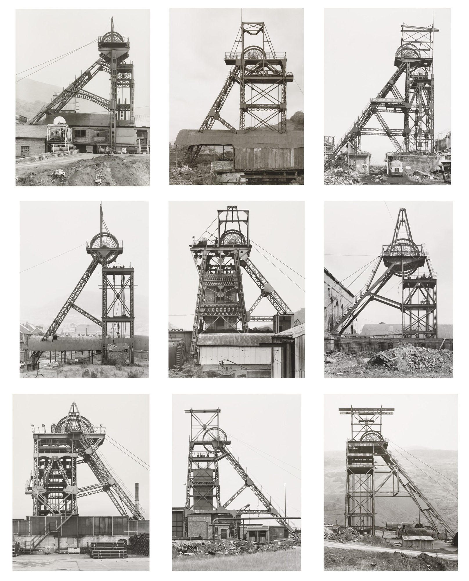
Bernd and Hilla Becher (German, active 1959-2007) Bernd Becher (German, 1931-2007) Hilla Becher (German, 1934-2015) 'Winding Towers' 1966-1997


Bernd and Hilla Becher (German, active 1959-2007)
Bernd Becher (German, 1931-2007)
Hilla Becher (German, 1934-2015)
Winding Towers
1966-1997
Nine gelatin silver prints
Dimensions
68 1/4 × 56 1/4″ (173.4 × 142.9cm)
Acquired in honour of Marie-Josée Kravis through the generosity of Robert B. Menschel
© 2022 Estate of Bernd Becher and Hilla Becher


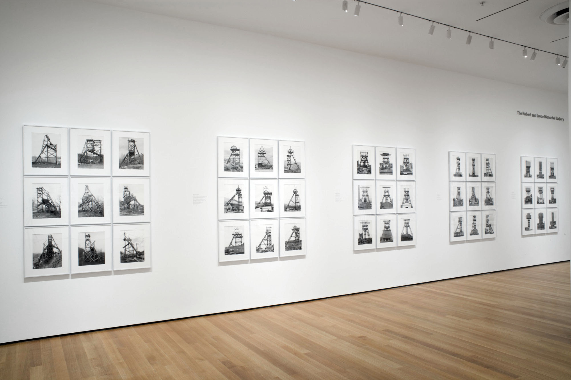
For more than forty years, the Bechers photographed winding towers, blast furnaces, silos, cooling towers, gas tanks, grain elevators, oil refineries, and the like – all examples of the European and American industrial architecture that had begun to disappear in the transition from an industrial society to an information society. Their works typically present each structure frontally against flat, evenly grey backgrounds. By using large-format cameras and finely grained black-and-white film, they ensured that the motifs they photographed were rendered with a high degree of precision and clarity.

The Bechers organised the images into groupings assembled in grids, classified by function into types. In this strict layout, each structure may easily be compared with the others. The nine separate pictures in Winding Towers together transform the specificity of the individual towers into variations on an ideal form and, conversely, preserve their individual characteristics within a typology.

Publication excerpt from MoMA Highlights: 375 Works from The Museum of Modern Art, New York (New York: The Museum of Modern Art, 2019). Used under fair use conditions for the purposes of education and research


Installation view of the exhibition 'Bernd and Hilla Becher: Landscape/Typology' at the Museum of Modern Art, New York


Installation view of the exhibition Bernd and Hilla Becher: Landscape / Typology at the Museum of Modern Art, New York, May 21, 2008 – August 25, 2008
Photograph by John Wronn


Fotomuseum Winterthur
Grüzenstrasse 44 + 45
CH-8400
Winterthur (Zürich)

Opening hours:
Tuesday to Sunday 11am – 6pm
Wednesday 11am – 8pm
Closed on Mondays

Fotomuseum Winterthur website

LIKE ART BLART ON FACEBOOK

Back to top

melbourne’s magnificent nine 2011

December 2011


Here’s my pick of the nine best exhibitions in Melbourne (with excursions to Bendigo and Hobart thrown in) that appeared on the Art Blart art and cultural archive in 2011. Enjoy!

Dr Marcus Bunyan


1/ Sidney Nolan: Drought Photographs at Australian Galleries, Melbourne, March 2011

Sidney Nolan (Australian, 1917-1992) 'Untitled (calf carcass in tree)' 1952


Sidney Nolan (Australian, 1917-1992)
Untitled (calf carcass in tree)
1952
Archival inkjet print
23.0 cm x 23.0cm


This was a superb exhibition of 61 black and white photographs by Sidney Nolan. The photographs were shot using a medium format camera and are printed in square format from the original 1952 negatives.

The work itself was a joy to behold. The photographs hung together like a symphony, rising and falling, with shape emphasising aspects of form. The images flowed from one to another. The formal composition of the mummified carcasses was exemplary, the resurrected animals (a horse, for example, propped up on a fifth leg) and emaciated corpses like contemporary sculpture. The handling of the tenuous aspects of human existence in this uniquely Australian landscape was also a joy to behold. Through an intimate understanding of how to tension the space between objects within the frame Nolan’s seemingly simple but complex photographs of the landscape are previsualised by the artist in the mind’s eye before he even puts the camera to his face.


2/ Bill Henson at Tolarno Galleries, Melbourne, March – April 2011

This was an exquisite exhibition by one of Australia’s preeminent artists. Like Glenn Gould playing a Bach fugue, Bill Henson is grand master in the performance of narrative, structure, composition, light and atmosphere. The exhibition featured thirteen large colour photographs printed on lustre paper (twelve horizontal and one vertical) – nine figurative of adolescent females, two of crowd scenes in front of Rembrandt paintings in The Hermitage, St. Petersburg (including the stunning photograph that features The return of the prodigal son c. 1662 in the background, see below) and two landscapes taken off the coast of Italy. What a journey this exhibition took you on!

Henson’s photographs have been said by many to be haunting but his images are more haunted than haunting. There is an indescribable element to them (be it the pain of personal suffering, the longing for release, the yearning for lost youth or an understanding of the deprecations of age), a mesmeric quality that is not easily forgotten. The photographs form a kind of afterimage that burns into your consciousness long after the exposure to the original image has ceased. Haunted or haunting they are unforgettable.


Bill Henson (Australian, b. 1955) 'Untitled' 2009/10


Bill Henson (Australian, b. 1955)
Untitled
2009/10
CL SH767 N17B
Archival inkjet pigment print
127 x 180cm
Edition of 5


3/ Networks (cells & silos) at Monash University Museum of Art (MUMA), Caulfield, February – April 2011

This was a vibrant and eclectic exhibition at MUMA, one of the best this year in Melbourne. The curator Geraldine Barlow gathered together some impressive, engaging works that were set off to good effect in the new gallery spaces. I spent a long and happy time wandering around the exhibition and came away visually satiated and intellectually stimulated. The exhibition explored “the connections between artistic representation of networks; patterns and structures found in nature; and the rapidly evolving field of network science, communications and human relations.”


Installation photograph of one of the galleries in the exhibition 'NETWORKS (cells & silos)' at the newly opened Monash University Museum of Art (MUMA)


Installation photograph of one of the galleries in the exhibition NETWORKS (cells & silos) at the newly opened Monash University Museum of Art (MUMA) with Nick Mangan’s Colony (2005) in the foreground


4/ Monika Tichacek, To all my relations at Karen Woodbury Gallery, Richmond, May 2011

This was a stupendous exhibition by Monika Tichacek, at Karen Woodbury Gallery. One of the highlights of the year, this was a definite must see!

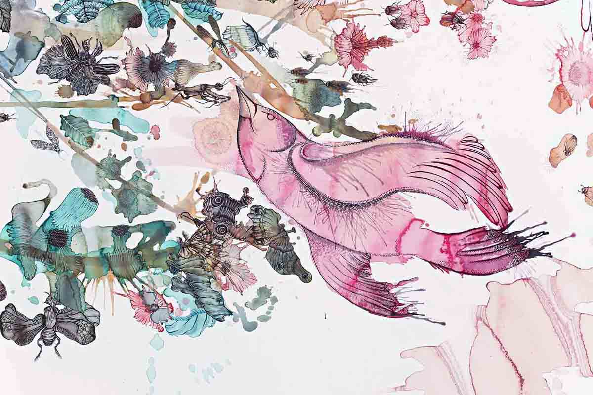
The work was glorious in it’s detail, a sensual and visual delight (make sure you click on the photographs to see the close up of the work!). The riotous, bacchanalian density of the work was balanced by a lyrical intimacy, the work exploring the life cycle and our relationship to the world in gouache, pencil & watercolour. Tichacek’s vibrant pink birds, small bugs, flowers and leaves have absolutely delicious colours. The layered and overlaid compositions show complete control by the artist: mottled, blotted, bark-like wings of butterflies meld into trees in a delicate metamorphosis; insects are blurred becoming one with the structure of flowers in a controlled effusion of life.


Monika Tichacek (Australian born Switzerland, b. 1975) 'To all my relations' 2011 (detail)


Monika Tichacek (Australian born Switzerland, b. 1975)
To all my relations (detail)
2011


5/ American Dreams: 20th century photography from George Eastman House at Bendigo Art Gallery, Victoria, April – July 2011

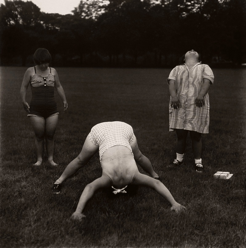
Diane Arbus (American, 1923-1971) 'Untitled (6)' 1971

Diane Arbus (American, 1923-1971)
Untitled (6)
1971
Gelatin silver print


This was a fabulous survey exhibition of the great artists of 20th century American photography, a rare chance in Australia to see such a large selection of vintage prints from some of the masters of photography. If you had a real interest in the history of photography then you hopefully saw this exhibition, showing as it is just a short hour and a half drive (or train ride) from Melbourne at Bendigo Art Gallery.


6/ Time Machine: Sue Ford at Monash Gallery of Art, Wheelers Hill, Victoria, April – June 2011

Sue Ford (Australian, 1943-2009) 'Self-portrait' 1976


Sue Ford (Australian, 1943-2009)
Self-portrait 1976
1976
From the series Self-portrait with camera (1960-2006)
Selenium toned gelatin silver print, printed 2011
24 x 18cm
Courtesy Sue Ford Archive


This beautifully hung exhibition flowed like music, interweaving up and down, the photographs framed in thin, black wood frames. It featured examples of Ford’s black and white fashion and street photography; a selection of work from the famous black and white Time series (being bought for their collection by the Art Gallery of New South Wales); a selection of Photographs of Women – modern prints from the Sue Ford archive that are wonderfully composed photographs with deep blacks that portray strong, independent, vulnerable, joyous women (see last four photographs below); and the most interesting work in the exhibition, the posthumous new series Self-portrait with camera (1960-2006) that evidence, through a 47 part investigation using colour prints from Polaroids, silver gelatin prints printed by the artist, prints made from original negatives and prints from scanned images where there was no negative available, a self-portrait of the artist in the process of ageing.

Whether looking down, looking toward or looking inward these fantastic photographs show a strong, independent women with a vital mind, an élan vital, a critical self-organisation and an understanding of the morphogenesis of things that will engage us for years to come. Essential looking.


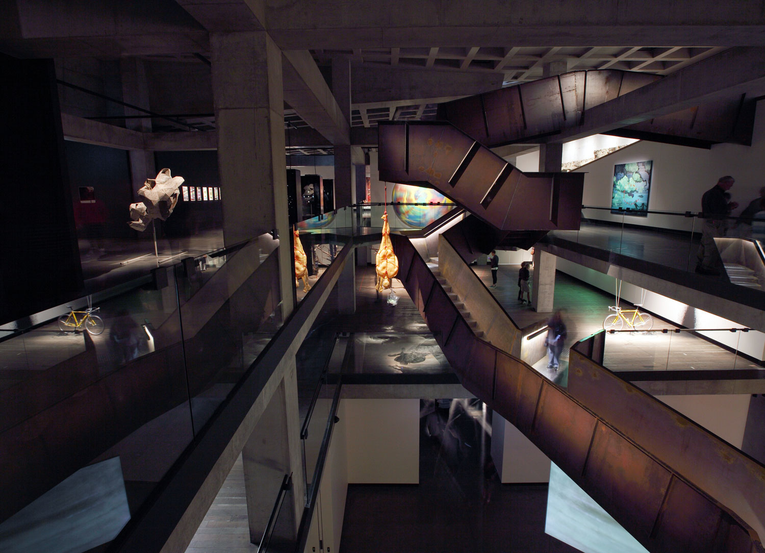
7/ The Museum of Old and New Art (MONA), Hobart, August 2011

My analogy: you are standing in the half-dark, your chest open, squeezing the beating heart with blood coursing between your fingers while the other hand is up your backside playing with your prostrate gland. I think ringmeister David Walsh would approve. My best friends analogy: a cross between a car park, night club, sex sauna and art gallery.

Weeks later I am still thinking about the wonderful immersive, sensory experience that is MONA. Peter Timms in an insightful article in Meanjin calls it a post-Google Wunderkammer, or wonder chest. It can be seen as a mirabilia – a non-historic installation designed primarily to delight, surprise and in this case shock. The body, sex, death and mortality are hot topics in the cultural arena and Walsh’s collection covers all bases. The collection and its display are variously hedonistic, voyeuristic, narcissistic, fetishistic pieces of theatre subsumed within the body of the spectacular museum architecture …

Spectatorship and their attendant erotics has MONA as a form of fetishistic cinema. It is as if what Barthes calls “the eroticism of place” were a modern equivalent of the eighteenth century genius loci, the “genius of the place.” The place is spectacular, the private collection writ large as public institution, the symbolic power of the institution masked through its edifice. The art become autonomous, cut free from its cultural associations, transnational, globalised, experienced through kinaesthetic means; the viewer meandering through the galleries, the anti-museum, as an international flaneur. Go. Experience!


Corten Stairwell & Surrounding Artworks February 2011 Museum of Old and New Art – interior


Corten Stairwell & Surrounding Artworks
February 2011
Museum of Old and New Art – interior
Photo credit: MONA/Leigh Carmichael
Image Courtesy of MONA Museum of Old and New Art


8/ John Bodin: Rite of Passage at Anita Traverso Gallery, Richmond, August – September 2011

John Bodin (Australian) 'I Was Far Away From Home' 2009


John Bodin (Australian)
I Was Far Away From Home
2009
Type C print on metallic paper
80 x 110cm


The photographs become the surface of the body, stitched together with lines, markers pointing the way – they are encounters with the things that we see before us but also the things that we carry inside of us. It is the interchange between these two things, how one modulates and informs the other. It is this engagement that holds our attention: the dappled light, ambiguity, unevenness, the winding path that floats and bobs before our eyes looking back at us, as we observe and are observed by the body of these landscapes.

One of the fundamental qualities of the photographs is that they escape our attempts to rationalise them and make them part of our understanding of the world, to quantify our existence in terms of materiality. I have an intimate feeling with regard to these sites of engagement. They are both once familiar and unfamiliar to us; they possess a sense of nowhereness. A sense of groundlessness and groundedness. A collapsing of near and far, looking down, looking along, a collapsing of the constructed world.

Like the road in these photographs there is no self just an infinite time that has no beginning and no end. The time before my birth, the time after my death. We are just in the world, just being somewhere. Life is just a temporary structure on the road from order to disorder. “The road is life,” writes Jack Kerouac in On the Road.


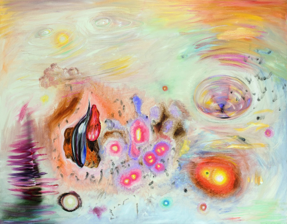
9/ Juan Davila: The Moral Meaning of Wilderness at the Monash University Museum of Art (MUMA), Caulfield, August – October 2011

Simply put, this was one of the best exhibitions I saw in Melbourne this year.

I had a spiritual experience with this work for the paintings promote in the human a state of grace. The non-material, the unconceptualisable, things which are outside all possibility of time and space are made visible. This happens very rarely but when it does you remember, eternally, the time and space of occurrence. I hope you had the same experience.


Juan Davila (Chilean, b. 1946, emigrated Australia 1974) 'Wilderness' 2010


Juan Davila (Chilean, b. 1946, emigrated Australia 1974)
Wilderness
2010
© Juan Davila, Courtesy Kalli Rolfe Contemporary Art


10/ In camera and in public at the Centre for Contemporary Photography, Melbourne, September – October 2011

Kohei Yoshiyuki (Japanese, b. 1946) 'Untitled' 1971


Kohei Yoshiyuki (Japanese, b. 1946)
Untitled
1971
From the series The Park
Gelatin Silver Print
© Kohei Yoshiyuki, Courtesy Yossi Milo Gallery, New York


Curated by Naomi Cass as part of the Melbourne Festival, this was a brilliant exhibition at the Centre for Contemporary Photography, Melbourne. The exhibition explored, “the fraught relationship between the camera and the subject: where the image is stolen, candid or where the unspoken contract between photographer and subject is broken in some way – sometimes to make art, sometimes to do something malevolent.” It examined the promiscuity of gazes in public / private space specifically looking at surveillance, voyeurism, desire, scopophilia, secret photography and self-reflexivity. It investigated the camera and its moral and physical relationship to the unsuspecting subject.


11/ The Mad Square: Modernity in German Art 1910 – 37 at The National Gallery of Victoria, Melbourne, November 2011 – March 2012

This is one of the best exhibitions this year in Melbourne bar none. Edgy and eclectic the work resonates with the viewer in these days of uncertainty: THIS should have been the Winter Masterpieces exhibition!

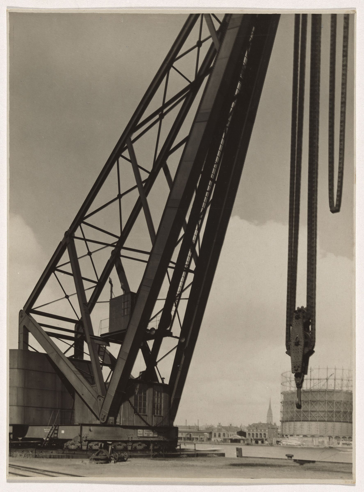
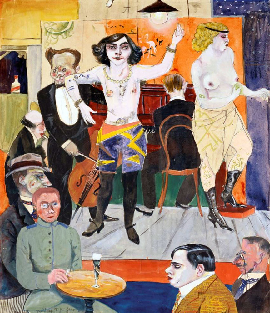
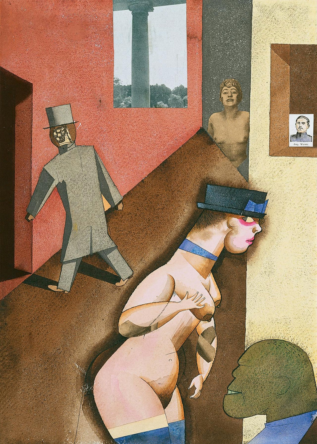
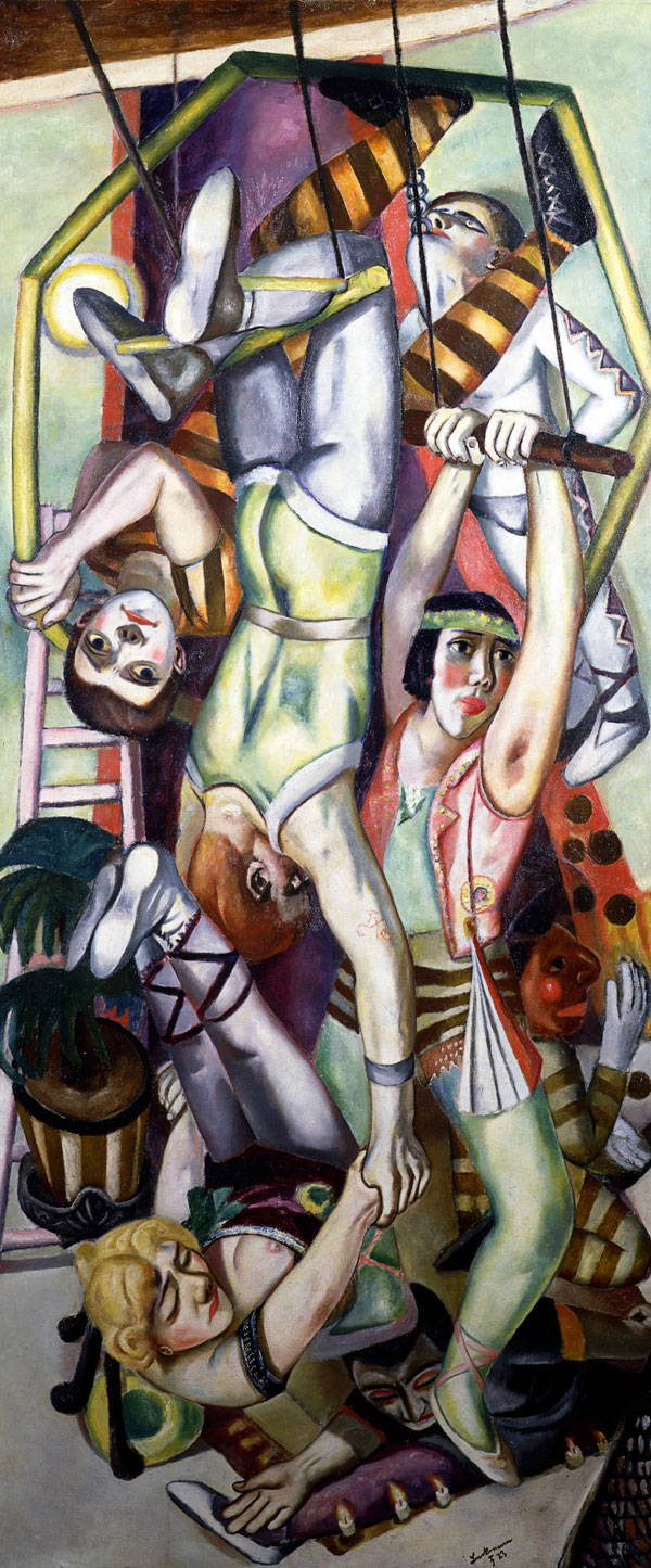
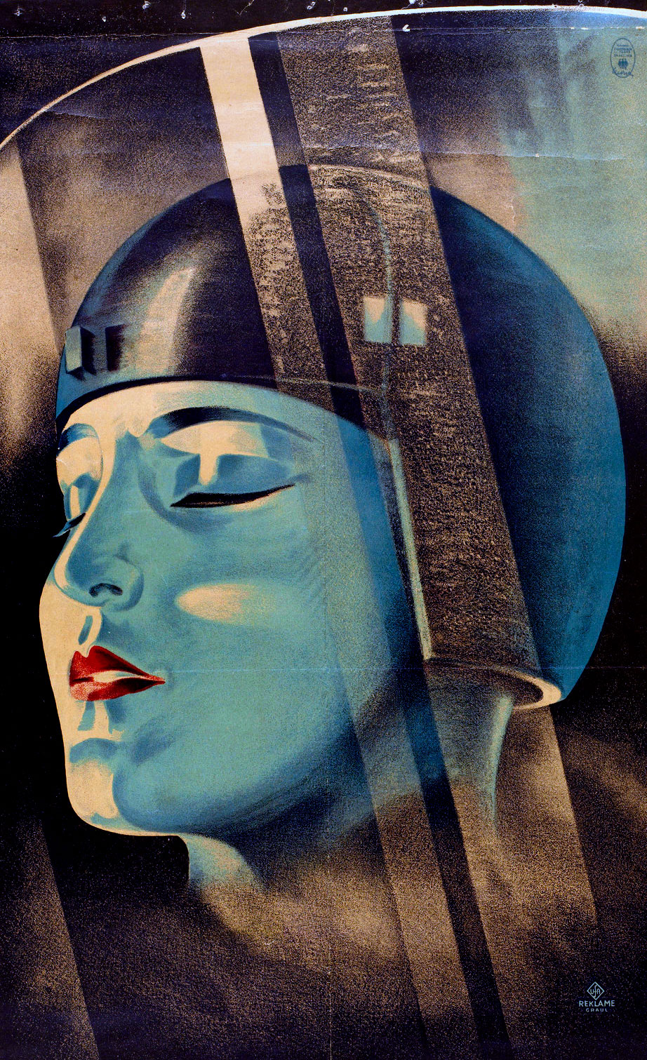
The title of the exhibition, The mad square (Der tolle Platz) is taken from Felix Nussbaum’s 1931 painting of the same name where “the ‘mad square’ is both a physical place – the city, represented in so many works in the exhibition, and a reference to the state of turbulence and tension that characterises the period.”The exhibition showcases how artists responded to modern life in Germany in the interwar years, years that were full of murder and mayhem, putsch, revolution, rampant inflation, starvation, the Great Depression and the rise of National Socialism. Portrayed is the dystopian, dark side of modernity (where people are the victims of a morally bankrupt society) as opposed to the utopian avant-garde (the prosperous, the wealthy), where new alliances emerge between art and politics, technology and the mass media. Featuring furniture, decorative arts, painting, sculpture, collage and photography in the sections World War 1 and the Revolution, Dada, Bauhaus, Constructivism and the Machine Aesthetic, Metropolis, New Objectivity and Power and Degenerate Art, it is the collages and photographs that are the strongest elements of the exhibition, particularly the photographs. What a joy they are to see.


Albert Renger-Patzsch (American born Hungary, 1895-1946) 'Harbour with crane' c. 1927


Albert Renger-Patzsch (American born Hungary, 1895-1946)
Harbour with crane
c. 1927
Gelatin silver photograph
Printed image 22.7 h x 16.8 w cm
Purchased 1983
National Gallery of Australia, Canberra


LIKE ART BLART ON FACEBOOK

Back to top

Review: ‘The mad square: Modernity in German Art 1910-37’ at The National Gallery of Victoria, Melbourne

Exhibition dates: 25th November, 2011 – 4th March, 2012

Curator: Dr. Jacqueline Strecker


Irene Bayer (American, 1898-1991) 'No title (Man on stage)' c. 1927 from the exhibition 'The mad square: Modernity in German Art 1910-37' at The National Gallery of Victoria, Melbourne, November 2011 - March 2012


Irene Bayer (American, 1898-1991)
No title (Man on stage)
c. 1927
Gelatin silver photograph
Printed image 10.6 h x 7.6 w cm
Purchased 1983
National Gallery of Australia, Canberra


This is one of the best exhibitions this year in Melbourne bar none. Edgy and eclectic the work resonates with the viewer in these days of uncertainty: THIS should have been the Winter Masterpieces exhibition!

The title of the exhibition, The mad square (Der tolle Platz) is taken from Felix Nussbaum’s 1931 painting of the same name where “the ‘mad square’ is both a physical place – the city, represented in so many works in the exhibition, and a reference to the state of turbulence and tension that characterises the period.” The exhibition showcases how artists responded to modern life in Germany in the interwar years, years that were full of murder and mayhem, putsch, revolution, rampant inflation, starvation, the Great Depression and the rise of National Socialism. Portrayed is the dystopian, dark side of modernity (where people are the victims of a morally bankrupt society) as opposed to the utopian avant-garde (the prosperous, the wealthy), where new alliances emerge between art and politics, technology and the mass media. Featuring furniture, decorative arts, painting, sculpture, collage and photography in the sections World War 1 and the Revolution, Dada, Bauhaus, Constructivism and the Machine Aesthetic, Metropolis, New Objectivity and Power and Degenerate Art, it is the collages and photographs that are the strongest elements of the exhibition, particularly the photographs. What a joy they are to see.

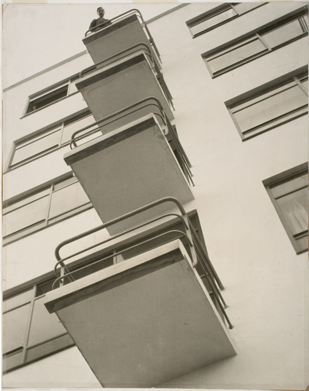
There is a small 2″ x 3″ contact print portrait of Hanna Höch by Richard Kauffmann, Penetrate yourself or: I embrace myself (1922) that is an absolute knockout. Höch is portrayed as the ‘new women’ with short bobbed hair and loose modern dress, her self-image emphasised through a double exposure that fragments her face and multiplies her hands, set against a contextless background. The ‘new women’ fragmented and broken apart (still unsure of herself?). The photograph is so small and intense it takes your breath away. Similarly, there is the small, intimate photograph No title (Man on Stage) (c. 1927) by Irene Bayer (see above) that captures performance as ‘total art’, a combination of visual arts, dance, music, architecture and costume design. In contrast is a large 16 x 20″ photograph of the Bauhaus balconies (1926) by László Moholy-Nagy (see below) where the whites are so creamy, the perspective so magnificent.

No title (Metalltanz) (c. 1928-1929) by T. Lux Feinenger, a photographer that I do not know well, is an exceptional photograph and print. Again small, this time dark and intense, the image features man as dancer performing gymnastics in front of reflective, metal sculptures. The metal becomes an active participant in the Metalltanz or ‘Dance in metal’ because of its reflective qualities. The print, from the J. Paul Getty Museum in Los Angeles is luminous. In fact all the prints from the Getty in this exhibition are of the most outstanding quality, a highlight of the exhibition for me. Another print from the Getty that features metal and performance is Untitled (Spiral Costume, from the Triadic Ballet) by T Grill c. 1926-1927 (see below) where the spiral costume becomes an extension of the body, highlighting its form. Also highlighting form, objectivity and detachment is a wonderful 3 x 5″ photograph of the New Bauhaus Building, Dessau (1926) by Lucia Moholy from the Getty collection, the first I have ever seen in the flesh by this artist. Outstanding.

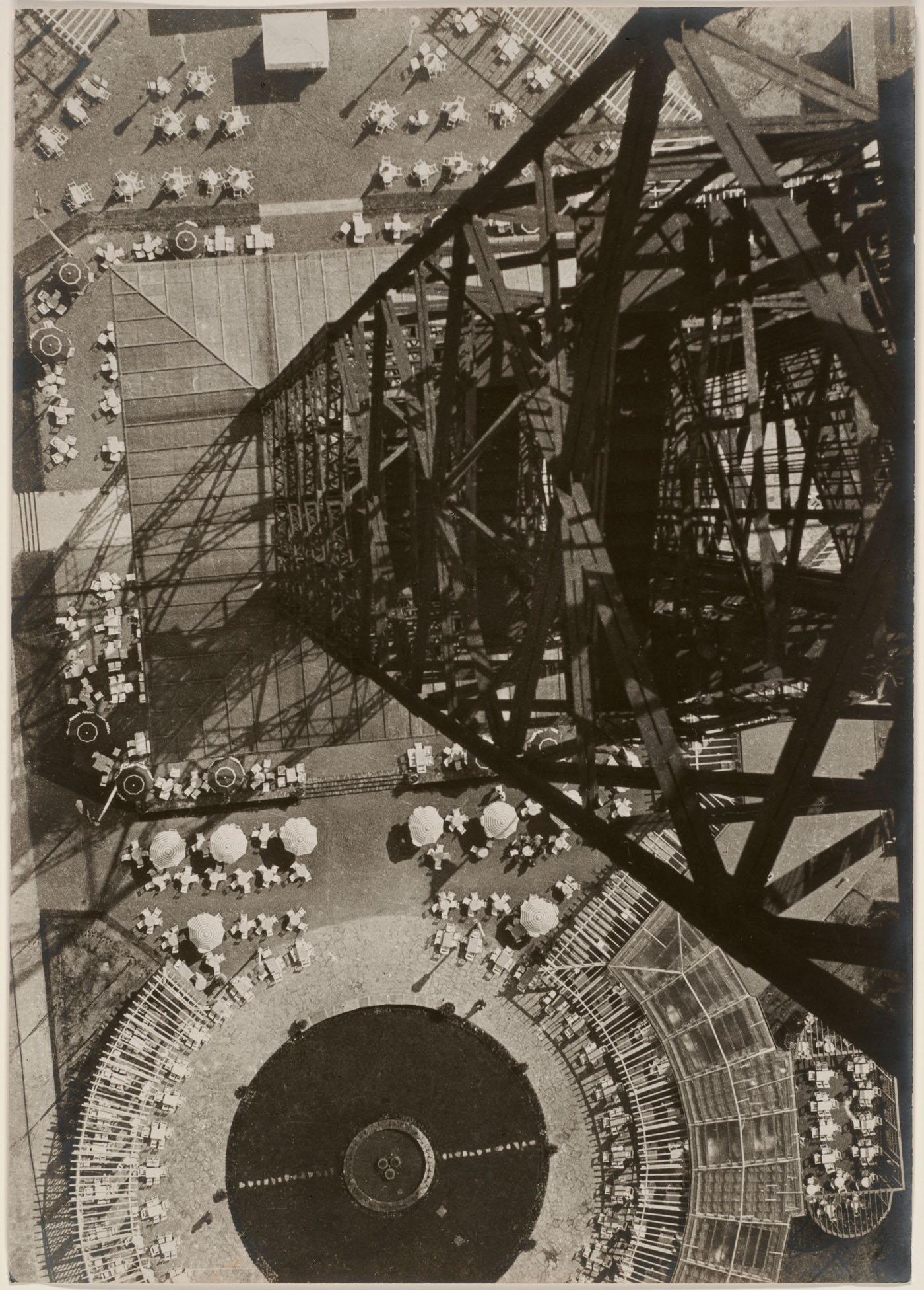
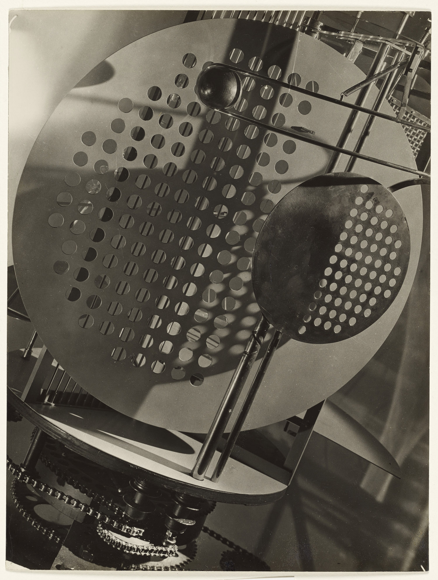
Following, we have 4 photograms by Lucia’s husband, László Moholy-Nagy which display formalist experimentation “inspired by machine aesthetic, exploring a utopian belief that Constructivism and abstract art could play a role in the process of social reform.” Complimenting these photograms is a row of six, yes six! Moholy-Nagy including Dolls (Puppen) 1926-1927 (Getty), The law of the series 1925 (Getty), Lucia at the breakfast table 1926 (Getty), Spring, Berlin 1928 (George Eastman House), Berlin Radio Tower 1928 (Art Institute of Chicago) and Light space modulator 1930 (Getty). All six photographs explore the fascinating relationship between avant-garde art and photography, between they eye and perspective, all the while declaiming what Moholy-Nagy called the “new vision”; angles, shadows and geometric patterns that defy traditional perspective “removing the space from associations with the real world creating a surreal, disjointed image.” This topographic mapping flattens perspective in the case of the Berlin radio tower allowing the viewer to see the world in a new way.

Finally two groups of photographs that are simply magnificent.

First 8 photographs in a row that focus on the order and progressive nature of the modern world, the inherent beauty of technology captured in formalist studies of geometric forms. The prints range from soft pictorialist renditions to sharp clarity. The quality of the prints is amazing. Artists include the wonderful E. O. Hoppé, Albert Renger-Patzsch (an outstandingly beautiful photograph, Harbour with cranes 1927 that is my favourite photograph in the exhibition, see below), Two Towers 1937-1938 by Werner Mantz and some early Wolfgang Sievers before he left Germany for Australia in 1938 (Blast furnace in the Ruhr, Germany 1933, see below). These early Sievers are particularly interesting, especially when we think of his later works produced in Australia. Lucky were many artists who survived in Germany or fled from Nazi persecution at the last moment, including John Heartfield who relocated to Czechoslovakia in 1933 and then fled to London in 1938 and August Sander whose life and work were severely curtailed under the Nazi regime and whose son died in prison in 1944 near the end of his ten year sentence (Wikipedia).

August Sander. Now there is a name to conjure with. The second magnificent group are 7 photographs that are taken from Sander’s seminal work People of the 20th Century. All the photographs have soft, muted tones of greys with no strong highlights and, usually, contextless backgrounds. The emphasis is on archetypes, views of people who exist on the margins of society – circus performers, bohemians, artists, the unemployed and blind people. In all the photographs there is a certain frontality (not necessarily physical) to the portraits, a self consciousness in the sitter, a wariness of the camera and of life. This self consciousness can be seen in the two photographs that are the strongest in the group – Secretary at West German radio in Cologne, 1931 and Match seller 1927 (see below).

There is magic here. Her face wears a somewhat quizzical air – questioning, unsure, vulnerable – despite the trappings of affluence and fashionability (the smoking of the cigarette, the bobbed hair). He is wary of the camera, his face and hands isolated by Sander while the rest of his body falls into shadow. His right hand is curled under, almost deformed, his shadow falling on the stone at right, the only true brightness in this beautiful image the four boxes of matches he clutches in his left hand: as Sander titles him ironically, The Businessman.

Working as I do these days with lots of found images from the 1940s-1960s that I digitally restore to life, I wonder what happened to these people during the dark days of World War 2. Did they survive the cataclysm, the drop into the abyss? I want to know, I want to reach out to these people to send them good energy. I hope that they did but their wariness in front of the camera, so intimately ‘taken’ by Sander, makes me feel the portent of things to come. How differently we see images armed with the hindsight of history!

In conclusion, this is a fantastic exhibition that will undoubtedly be in my top ten of the year for Melbourne in 2011.

Dr Marcus Bunyan


Many thankx to Michael Thorneycroft for his help and The National Gallery of Victoria for allowing me to publish the accredited photographs in the posting. Please click on the photographs for a larger version of the image.


Felix Nussbaum (German, 1904 - after September 1944) 'The mad square' (Der tolle Platz) 1931 from the exhibition 'The mad square: Modernity in German Art 1910-37' at The National Gallery of Victoria, Melbourne, November 2011 - March 2012


Felix Nussbaum (German, 1904 – after September 1944)
The mad square (Der tolle Platz)
1931
Oil on canvas
97 x 195.5cm
Berlinische Galerie
Public domain


László Moholy-Nagy (American born Hungary, 1895-1946) 'Photograph (Berlin Radio Tower)' 1928/1929


László Moholy-Nagy (American born Hungary, 1895-1946)
Berlin Radio Tower
1928
Gelatin silver print
36 × 25.5cm
Julien Levy Collection, Special Photography Acquisition Fund
© 2018 Artists Rights Society (ARS), New York / VG Bild-Kunst, Bonn


Over the winter and spring of 1927-1928, Bauhaus professor László Moholy-Nagy took a series of perhaps nine views looking down from the Berlin Radio Tower, one of the most exciting new constructions in the German capital. Moholy had already photographed the Eiffel Tower in Paris from below, looking up through the tower’s soaring girders. In Berlin, however, Moholy turned his camera around and pointed it straight down at the ground. This plunging perspective showed off the spectacular narrowness of the Radio Tower, finished in 1926, which rose vertiginously to a height of 450 feet from a base seven times smaller than that of its Parisian predecessor (which opened in 1889). Moholy attached exceptional importance to this, his boldest image: he hung it just above his name in a room devoted to his work at the Berlin showing of Film und Foto, a mammoth traveling exhibition that he had helped to prepare. Moholy also chose this view and one other to offer Julien Levy, the pioneering art dealer, when Levy visited him in Berlin in 1930. The following year the pictures went on view at the Levy Gallery in New York, in Moholy’s first solo exhibition of photographs.

Text from the Art Institute of Chicago website


László Moholy-Nagy (American born Hungary, 1895-1946) 'Photograph (Light Prop)' 1930


László Moholy-Nagy (American born Hungary, 1895-1946)
Das Lichtrequisit (The light prop)
1930
Gelatin silver print
24 x 18.1cm (9 7/16 x 7 1/8 in.)
J. Paul Getty Museum, Los Angeles
© 2014 Estate of László Moholy-Nagy / Artists Rights Society (ARS), New York


The Light-Space Modulator is the most spectacular and complete realisation of László Moholy-Nagy’s artistic philosophy. Machine parts and mechanical structures began to appear in his paintings after his emigration from Hungary, and they are also seen in the illustrations he selected for the 1922 Buch neuer Künstler (Book of new artists), which includes pictures of motorcars and bridges as well as painting and sculpture. Many contemporary artists incorporated references to machines and technology in their work, and some, like the Russian Constructivist Vladimir Tatlin, even designed plans for fantastic structures, such as the ambitious Monument to the Third International, a proposed architectural spiral of glass and steel with moving tiers and audiovisual broadcasts. (See Tatlin’s Tower.)

In the Light-Space Modulator, Moholy-Nagy was able to create an actual working mechanism. Although he censured capitalism’s inhumane use of technology, he believed it could be harnessed to benefit mankind and that the artist had an important role in accomplishing this. Moholy had made preliminary sketches for kinetic sculptures as early as 1922 and referred to the idea for a light machine in his writings, but it was not until production was financed by an electric company in Berlin in 1930 that this device was built, with the assistance of an engineer and a metalsmith. It was featured at the Werkbund exhibition in Paris the same year, along with the short film Light Display Black-White-Gray, made by Moholy-Nagy to demonstrate and celebrate his new machine.

The Light-Space Modulator is a Moholy-Nagy painting come to life: mobile perforated disks, a rotating glass spiral, and a sliding ball create the effect of photograms in motion. With its gleaming glass and metal surfaces, this piece (now in the collection of the Busch-Reisinger Museum at Harvard University) is not only a machine for creating light displays but also a sculptural object of beauty, photographed admiringly by its creator.

Katherine Ware, László Moholy-Nagy, In Focus: Photographs from the J. Paul Getty Museum (Los Angeles: J. Paul Getty Museum, 1995), 80 © 1995 The J. Paul Getty Museum. Used under fair use conditions for the purposes of education and research


Albert Renger-Patzsch (American born Hungary, 1895-1946) 'Harbour with crane' c. 1927


Albert Renger-Patzsch (American born Hungary, 1895-1946)
Harbour with crane
c. 1927
Gelatin silver photograph
Printed image 22.7 h x 16.8 w cm
Purchased 1983
National Gallery of Australia, Canberra


Wolfgang Sievers (Germany 1913 – Australia 2007)
'Blast furnace in the Ruhr, Germany' 1933


Wolfgang Sievers (Germany 1913 – Australia 2007)
Blast furnace in the Ruhr, Germany
1933
Gelatin silver photograph
27.5 h x 23 w cm
Purchased 1988
National Gallery of Australia, Canberra


The Ruhr region was at the centre of the German acceleration of industry in pre-war Germany, with rapid economic growth creating a heavy demand for coal and steel. In keeping with Modernist trends in photography, Sievers shot this blast furnace – the mechanism that transforms ore into metal – from an unusual, dynamic angle. It dominates the frame, appearing menacing and strange. Despite being imprisoned and beaten by the Gestapo, Sievers studied and taught at a progressive private art school until graduation in 1938. In that year he escaped Germany after being called up for military service, ending up in Australia.

Text © National Gallery of Australia, Canberra


August Sander (German, 1876-1964) 'Match seller' 1927


August Sander (German, 1876-1964)
Match seller
1927
From the portfolio People of the 20th century, IV Classes and Professions, 17 The Businessman


Robert Wiene, Director (German 1873-1938) Still from the 'Cabinet of Dr Caligari' 1919


Robert Wiene, Director (German 1873-1938)
Still from from the Cabinet of Dr Caligari
1919
5 min excerpt, 35mm transferred to DVD, Black and White, silent, German subtitles
Courtesy Transit Film GmbH
Production still courtesy of the British Film Institute and Transit Film GmbH


Felix H Man (German, 1893-1985) 'Luna Park' 1929


Felix H Man (German, 1893-1985)
Luna Park
1929
Gelatin silver photograph
18.1 x 24cm
National Gallery of Australia, Canberra
Purchased, 1987
© Felix H Man Estate


Hannah Höch (German, 1889-1978) 'Love' 1931


Hannah Höch (German, 1889-1978)
Love
1931
From the series Love
Photomontage
21.8 x 21cm
National Gallery of Australia, Canberra
Purchased, 1983


Hannah Höch made some of the most interesting Dada collages and photomontages, including Love, an image of two strange composite female. Höch’s technique of pasting images together from magazine clippings and advertisements was a response to the modern era of mass media, and a way of criticising the bourgeois taste for ‘high art’. In many of her works, Höch explores the identity and changing roles of women in modern society.


The Mad Square takes its name from Felix Nussbaum’s 1931 painting which depicts Berlin’s famous Pariser Platz as a mad and fantastic place. The ‘mad square’ is both a physical place – the city, represented in so many works in the exhibition, and a reference to the state of turbulence and tension that characterises the period. The ‘square’ can also be a modernist construct that saw artists moving away from figurative representations towards increasingly abstract forms.

The exhibition features works by Max Beckman, Otto Dix, George Grosz, Christian Schad, Kurt Schwitters and August Sander. This group represents Germany’s leading generation of interwar artists. Major works by lesser known artists including Karl Hubbuch, Rudolf Schlichter and Hannah Höch are also presented in the exhibition in addition to works by international artists who contributed to German modernism.

The Mad Square brings together a diverse and extensive range of art, created during one of the most important and turbulent periods in European history, offering new insights into the understanding of key German avant‐garde movements including – Expressionism, Dada, Bauhaus, Constructivism, and New Objectivity were linked by radical experimentation and innovation, made possible by an unprecedented freedom of expression.

World War 1 and the Revolution

The outbreak of war in 1914 was met with enthusiasm by many German artists and intellectuals who volunteered for service optimistically hoping that it would bring cultural renewal and rapid victory for Germany. The works in this section are by the generation of artists who experienced war first hand. Depictions of fear, anxiety and violence show the devastating effects of war – the disturbing subjects provide insight into tough economic conditions and social dysfunction experienced by many during the tumultuous early years of the Weimar Republic following the abdication of the Kaiser

Dada

The philosophical and political despair experienced by poets and artists during World War 1 fuelled the Dada movement, a protest against the bourgeois conception of art. Violent, infantile and chaotic, Dada took its name from the French word for a child’s hobbyhorse or possibly from the sound of a baby’s babble. Its activities included poetry readings and avant‐garde performances, as well as creating new forms of abstract art that subverted all existing conditions in western art. Though short‐lived, in Germany the Dada movement has profoundly influenced subsequent developments in avant-garde art and culture. The impact of the Dada movement was felt throughout Europe – and most powerfully in Germany from 1917-21.

Bauhaus

The Bauhaus (1919‐1933) is widely considered as the most important school of art and design of the 20th century, very quickly establishing a reputation as the leading and most progressive centre of the international avant‐garde. German architect Walter Gropius founded the school to do away with traditional distinctions between the fine arts and craft, and to forge an entirely new kind of creative designer skilled in both the conceptual aesthetics of art and the technical skills of handicrafts. The Bauhaus was considered to be both politically and artistically radical from its inception and was closed down by the National Socialists in 1933

Constructivism and the Machine Aesthetic

Having emerged in Russia after World War I, Constructivism developed in Germany as a set of ideas and practices that experimented with abstract or non-representational forms and in opposition to Expressionism and Dada. Constructivists developed works and theories that fused art and with technology. They shared a utopian belief in social reform, and saw abstract art as playing a central role in this process.

Metropolis

By the 1920s Berlin has become the cultural and entertainment capital of the world and mass culture played an important role in distracting a society traumatised by World War 1, the sophisticated metropolis provided a rich source of imagery for artists, it also come to represent unprecedented sexual and personal freedom. In photography modernity was emphasised by unusual views of the metropolis or through the representation of city types. The diverse group of works in this section portray the uninhibited sense of freedom and innovation experienced by artists throughout Germany during the 1920s

New Objectivity

By the mid 1920s, a new style emerged that came to be known as Neue Sachlichkeit or New Objectivity. After experiencing the atrocities of World War 1 and the harsh conditions of life in postwar Germany, many artists felt the need to return to the traditional modes of representation with portraiture becoming a major vehicle of this expression, with its emphasis on the realistic representation of the human figure

Power and Degenerate Art

After the seizure of power by the National Socialists in 1933 modern artists were forbidden from working and exhibiting in Germany, with their works confiscated from leading museums and then destroyed or sold on the international art market. Many avant‐garde artists were either forced to leave Germany or retreat into a state of ‘inner immigration’.

The Degenerate art exhibition, held in Munich in 1937, represented the culmination of the National Socialists’ assault on modernism. Hundreds of works were selected for the show which aimed to illustrate the mental deficiency and moral decay that had supposedly infiltrated modern German art. The haphazard and derogatory design of the exhibition sought to ridicule and further discredit modern art. Over two million people visited the exhibition while in contrast far fewer attended the Great German art exhibition which sought to promote what the Nazis considered as ‘healthy’ art.


Karl Grill (German active Donaueschingen, Germany 1920s) 'Untitled [Spiral Costume, from the Triadic Ballet]' c. 1926-1927


Karl Grill (German active Donaueschingen, Germany 1920s)
Untitled (Spiral Costume, from the Triadic Ballet)
c. 1926-1927
Gelatin silver print
22.5 x 16.2cm
J. Paul Getty Museum, Los Angeles


In 1922, Oskar Schlemmer premiered his “Triadic Ballet” in Germany. He named the piece “Triadic” because it was literally composed of multiples of three: three acts, colours, dancers, and shapes. Concentrating on its form and movement, Schlemmer explored the body’s spatial relationship to its architectural surroundings. Although an abstract design, the spiral costume derived from the tutus of classical ballet.

Text from the J. Paul Getty Museum website


August Sander (German, 1876-1964) 'Secretary at West German radio in Cologne' 1931, printed by August Sander in the 1950s


August Sander (German, 1876-1964)
Secretary at West German radio in Cologne
1931, printed by August Sander in the 1950s
From the portfolio People of the 20th century, III The woman, 17 The woman in intellectual and practical occupation
Gelatin silver photograph
29 x 22cm
Die Photographische Sammlung /SK Stiftung Kultur, August Sander Archiv, Cologne (DGPH1016)
© Die Photographische Sammlung /SK  Stiftung Kultur – August Sander Archiv, Cologne. Licensed by Viscopy, Sydney


Timeline

1910

~ Berlin’s population doubles to two million people

1911

~ Expressionists move from Dresden to Berlin

1912

~ Social Democratic Party (SPD) the largest party in the Reichstag

1913

~ Expressionists attain great success with their city scenes

1914

~ World War I begins
~ George Grosz, Oskar Schlemmer, Otto Dix, Ludwig Hirschfeld Mack, Ernst Ludwig Kirchner, Max Beckmann and Franz Marc enlist in the army

1915

~ Grosz declared unfit for service, Beckmann suffers a breakdown and Schlemmer wounded

1916

~ Marc dies in combat
~ Dada begins at Cabaret Voltaire in Zurich

1917

~ Lenin and Trotsky form the Soviet Republic after the Tzar is overthrown

1918

~ Richard Huelsenbeck writes a Dada manifesto in Berlin
~ Kurt Schwitters creates Merz assemblages in Hanover
~ Revolutionary uprisings in Berlin and Munich
~ Kaiser Wilhelm II abdicates and flees to Holland
~ Social Democratic Party proclaims the Weimar Republic
~ World War I ends

1919

~ Freikorps assassinates the Spartacist leaders, Karl Leibknecht and Rosa Luxemburg
~ Bauhaus established in Weimer by Walter Gropius
~ Cologne Dada group formed
~ Treaty of Versailles signed

1920

~ Berlin is the world’s third largest city after New York and London
~ Inflation begins in Germany
~ National Socialist German Workers Party (NSDAP) founded
~ Kapp Putsch fails after right‐wing forces try to gain control over government
~ First International Dada fair opens in Berlin

1921

~ Hitler made chairman of the NSDAP

1922

~ Schlemmer’s Triadic ballet premiers in Stuttgart
~ Hyperinflation continues

1923

~ Hitler sentenced to five years imprisonment for leading the Beer Hall Putsch
~ Inflation decreases and a period of financial stability begins

1924

~ Hitler writes Mein Kampf while in prison
~ Reduction of reparations under the Dawes Plan

1925

~ New Objectivity exhibition opens at the Mannheim Kunsthalle
~ The Bauhaus relocates to Dessau

1926

~ Germany joins the League of Nations

1927

~ Fritz Lang’s film Metropolis released
~ Unemployment crisis worsens
~ Nazis hold their first Nuremburg party rally

1928

~ Bertolt Brecht and Kurt Weill’s The threepenny opera premieres in Berlin
~ Hannes Meyer becomes the second director of the Bauhaus

1929

~ Street confrontations between the Nazis and communists in Berlin
~ Young Plan accepted, drastically reducing reparations
~ Stock market crashes on Wall Street, New York
~ Thomas Mann awarded the Nobel Prize for literature

1930

~ Resignation of Chancellor Hermann Müller’s cabinet ending parliamentary rule
~ Minority government formed by Heinrich Brüning, leader of the Centre Party
~ Nazis win 18% of the vote and gain 95 seats in the National elections
~ Ludwig Miles van der Rohe becomes the third director of the Bauhaus
~ John Heartfield creates photomontages for the Arbeiter‐Illustrierte Zeitung (AIZ)

1931

~ Unemployment reaches five million and a state of emergency is declared in Germany

1932

~ Nazis increase their representation in the Reichstag to 230 seats but are unable to form a majority coalition
~ Miles van der Rohe moves the Bauhaus to Berlin
~ Grosz relocates to New York as an exile

1933

~ Hindenberg names Hitler as Chancellor
~ Hitler creates a dictatorship under the Nazi regime
~ The first Degenerate art exhibition denouncing modern art is held in Dresden
~ Miles van der Rohe announces the closure of the Bauhaus
~ Nazis organise book burnings in Berlin
~ Many artists including Gropius, Kandinski and Klee flee Germany
~ Beckmann, Dix and Schlemmer lose their teaching positions

1934

~ Fifteen concentration camps exist in Germany

1935

~ The swastika becomes the flag of the Reich

1936

~ Spanish civil war begins
~ Germany violates the Treaty of Versailles
~ Olympic Games held in Garmisch‐Partenkirchen and Berlin
~ Thomas Mann deprived of his citizenship and emigrates to the United States

1937

~ German bombing raids over Guernica in Spain in support of Franco
~ The Nazi’s Degenerate art exhibition opens in Munich and attracts two million visitors
~ Beckmann, Kirchner and Schwitters leave Germany
~ Purging of ‘degenerate art’ from German museums continues 1


1/ Timeline credit: Chronology compiled by Jacqueline Strecker and Victoria Tokarowski from the following sources:

~ Catherine Heroy ‘Chronology’ in Sabine Rewald, Glitter and Doom: German portraits from the 1920s, Metropolitan Museum of Art, New York, exh cat, 2006, pp. 39‐46
~ Anton Kaes, Martin Jay and Edward Dimendberg, eds, ‘Political chronology’, The Weimar Republic sourcebook, Berkely 1994, pp. 765‐71
~ Jonathan Petropoulos and Dagmar Lott‐Reschke ‘Chronology’ in Stephanie Barron, ‘Degenerate Art’: the fate of the avant‐garde in Nazi Germany, Los Angeles County Museum of Art, exh cat, 1991, pp. 391‐401


László Moholy-Nagy (American born Hungary, 1895-1946) ‘Bauhaus Balconies’ 1926


László Moholy-Nagy (American born Hungary, 1895-1946)
Bauhaus Balconies
1926
Silver gelatin photograph


John Heartfield (German, 1891-1968) 'Adolf, the superman: swallows gold and spouts rubbish' from the 'Workers Illustrated Paper', vol 11, no 29, 17 July 1932, p. 675


John Heartfield (German, 1891-1968)
Adolf, the superman: swallows gold and spouts rubbish
1932
From the Workers Illustrated Paper, vol 11, no 29, 17 July 1932, p. 675
Photolithograph
38 x 27cm
John Heartfield Archiv, Akademie der Künste zu Berlin
Photo: Akademie der Künste, Berlin, Kunstsammlung, Heartfield 2261/ Roman März
© The Heartfield Community of Heirs /VG Bild-Kunst, Bonn. Licensed by Viscopy, Sydney


John Heartfield’s photomontages expose hidden agendas in German politics and economics of the 1920s and 30s. This image was published six months before the National Socialist Party came to power, and shows Hitler with a spine made of coins and his stomach filled with gold. The caption says that he ‘swallows gold’, alluding to generous funding by right-wing industrialists, and ‘spouts rubbish’.


Ernst Ludwig Kirchner (German, 1880-1938) 'Woman in hat' 1911


Ernst Ludwig Kirchner (German, 1880-1938)
Woman in hat
1911
Oil on canvas
Art Gallery of Western Australia, Perth


George Grosz (German, 1893-1959) 'Suicide' (Selbstmörder) 1916


George Grosz (German, 1893-1959)
Suicide (Selbstmörder)
1916
Oil on canvas
100 × 77.5cm
Tate Modern
Public domain


Rudolf Schlichter (German, 1890-1955) 'Tingle tangel' 1919-1920


Rudolf Schlichter (German, 1890-1955)
Tingle tangel
1919-1920
Oil on canvas


George Grosz (German, 1890-1945) 'Tatlinesque Diagram' 1920


George Grosz (German, 1890-1945)
Tatlinesque Diagram
1920
Watercolour, collage and ink on paper
41 x 29.2cm
Museo Nacional Thyssen-Bornemisza, Madrid


Otto Dix (German, 1891-1969) 'Dr Paul Ferdinand Schmidt' 1921


Otto Dix (German, 1891-1969)
Dr Paul Ferdinand Schmidt
1921
Oil on canvas
63 x 82cm
Staatsgalerie, Stuttgart, Germany


El Lissitzky (Russian, 1890-1941) 'New Man (Neuer)' 1923


El Lissitzky (Russian, 1890-1941)
New Man (Neuer)
1923
Color lithograph on wove paper
12 × 12 1/2 in. (30.5 × 31.8cm)


Max Beckmann (German, 1884-1950) 'The trapeze' 1923


Max Beckmann (German, 1884-1950)
The trapeze
1923
Oil on canvas
196.5 x 84cm
Toledo Museum of Art
Purchased with funds from the Libbey Endowment, Gift of Edward Drummond Libbey
Photo: Photography Incorporated, Toledo


Werner Graul (German, 1905-1984) 'Metropolis'
1926


Werner Graul (German, 1905-1984)
UFA (Universum-Film-Aktiengesellschaft) (publisher)
Metropolis
1926
Lithographic poster


Christian Schad (German, 1894-1982)
'Self-Portrait with Model' (Selbstbildnis mit Modell) 1927


Christian Schad (German, 1894-1982)
Self-Portrait with Model (Selbstbildnis mit Modell)
1927
Oil on wood
29 15/16 x 24 3/16 in. (76 x 61.5cm)
Private collection, courtesy of Tate
© 2015 Christian Schad Stiftung Aschaffenburg/Artists Rights Society (ARS), New York/VG Bild-Kunst, Bonn


Heinrich Hoerle (German, 1895-1936) 'Three invalids' c. 1930


Heinrich Hoerle (German, 1895-1936)
Three invalids
c. 1930
Oil on canvas


NGV International
180 St Kilda Road

Opening hours:
Daily 10am – 5pm

National Gallery of Victoria website

LIKE ART BLART ON FACEBOOK

Back to top

Review: ‘Lionel Bawden: Pattern spill’ at Karen Woodbury Gallery, Richmond

Exhibition dates: 23rd November – 17th December, 2011

Curator: the artist


Lionel Bawden (Australian, b. 1974) 'Double Vision' 2011 from the exhibition 'Lionel Bawden: Pattern spill' at Karen Woodbury Gallery, Richmond, November - December, 2011


Lionel Bawden (Australian, b. 1974)
Double Vision
2011
Coloured Staedtler pencils, epoxy, incralac on perspex shelf
Form: 23 x 26 x 7cm
Shelf: 7.5 x 30 x 30cm


In the self contained world of commercial “art to go” galleries, this exhibition is the apotheosis of that form. The work is astonishingly beautiful, refined and self contained. Drawing on references to Islamic art, Brancusi (Endless Column), stalactites, wafting sea sponges and the changeable camouflage patterns of sea creatures, the sculptures are perfect in visualisation, creation, contemplation and containment.

Sitting on coloured perspex shelves the patterns spills of coloured Staedtler pencils explore “themes of flux, transformation and repetition as preconditions to our experience of the physical world.” The titles of the work hint at such an exploration: Double VisionTrance-muterSecretionLosing Containment, Pattern Spill.

How I wish, long, crave to own one and I am not alone: on the opening night nearly all the sculptures were already sold! Obviously people recognise the uniqueness and beauty of this work.

And yet …


Part of               me

longs
for    a
      broken
pencil,
a
snapped           t/wig,
something
                                           out of place
that puts
pattern to
shame.


For only in mutation is pattern given relevance (and this is what the irregularity of ‘spill’ is supposed to be about). The flow of the Pattern Spill sculptures are the only ones that get close to this mutation and that in a pretty, ordered way.

“What happens in the case of mutation? Consider the example of the genetic code. Mutation normally occurs when some random event (for example, a burst of radiation or a coding error) disrupts an existing pattern and something else is put in its place instead. Although mutation disrupts pattern, it also presupposes a morphological standard against which it can be measured and understood as mutation … Mutation is critical because it names the bifurcation point at which the interplay between pattern and randomness causes the system to evolve in a new direction…

The randomness to which mutation testifies is implicit in the very idea of pattern, for only against the background of nonpattern can pattern emerge. Randomness is the contrasting term that allows pattern to be understood as such.”1

Instead of pattern “something else is put in its place instead.”

I don’t get that here. Yes, these are beautiful, contemplative sculptures but one wonders how they will go on revealing themselves over months and years. I yearn for the prick of their imperfection.

Dr Marcus Bunyan


1/ Hayles, Katherine. How We Became Posthuman: Virtual Bodies in Cybernetics, Literature, and Informatics. Chicago: University of Chicago Press, 1999, pp.30-33.


Many thankx to Karen Woodbury Gallery for allowing me to publish the photographs in the posting. Please click on the photographs for a larger version of the image.


Lionel Bawden (Australian, b. 1974) 'Trance-muter' 2011 from the exhibition 'Lionel Bawden: Pattern spill' at Karen Woodbury Gallery, Richmond, November - December, 2011


Lionel Bawden (Australian, b. 1974)
Trance-muter
2011
Coloured Staedtler pencils, epoxy, incralac on perspex shelf
Form: 32 x 26 x 7.5cm
Shelf: 7.5 x 30 x 30cm


Lionel Bawden (Australian, b. 1974) 'Secretion' 2011


Lionel Bawden (Australian, b. 1974)
Secretion
2011
Coloured Staedtler pencils, epoxy, incralac on perspex shelf
Form: 31 x 25 x 17cm
Shelf: 7.5 x 45 x 30cm


Lionel Bawden (Australian, b. 1974) 'Flipside' 2011


Lionel Bawden (Australian, b. 1974)
Flipside
2011
Coloured Staedtler pencils, epoxy and incralac on perspex shelf
28 x 33 x 13cm
Image courtesy Karen Woodbury Gallery and the artist


Lionel Bawden (Australian, b. 1974) 'Crossing the mirror' 2011


Lionel Bawden (Australian, b. 1974)
Crossing the mirror
2011
Coloured Staedtler pencils, epoxy and incralac on perspex shelf
29.8 x 24.7 x 16.5cm
Image courtesy Karen Woodbury Gallery and the artist


Lionel Bawden (Australian, b. 1974) 'Losing Containment' 2011


Lionel Bawden (Australian, b. 1974)
Losing Containment
2011
Coloured Staedtler pencils, epoxy, incralac on perspex shelf
Form 1: 31.5 x 24 x 12cm
Form 2: 33.5 x 33 x 26cm
Shelf: 15 x 120 x 30cm


Lionel Bawden (Australian, b. 1974) 'The caverns of temporal suspension (between two sites)' 2011


Lionel Bawden (Australian, b. 1974)
The caverns of temporal suspension (between two sites)
2011
White Staedtler pencils, epoxy and incralac
45.5 x 63.5 x 8.0cm
Image courtesy Karen Woodbury Gallery and the artist


Lionel Bawden’s exhibition Pattern Spill will comprise of a range of small-scale objects created from vibrantly coloured pencils that are fused and sculpted together. By working with hexagonal coloured pencils as a sculptural material, Bawden is able to reconfigure and carve a range of amorphous shapes that convey movement and process. Bawden explores themes of flux, transformation and repetition as preconditions to our experience of the physical world.

This new body of work deals with ideas of control and collapse, surface and interior and organic patterns and energies through static three-dimensional objects. Bawden’s sculptures explore larger ideas beyond the work and relate to societal and natural systems, cycles and structures. Through his work, Bawden communicates macro ideas through micro detail. The works in Pattern spill become vessels for contemplation.

Alongside the sculptures there will also be a range of small meticulous drawings of vast hexagonal cells included in the exhibition. These drawings will act as companions to the sculptures, assisting to convey Bawden’s oblique explorations and meditations of the human condition.

Text from the Karen Woodbury Gallery website


Lionel Bawden (Australian, b. 1974) 'Pattern spill' 2014


Lionel Bawden (Australian, b. 1974)
Pattern spill
2014
Coloured Staedtler pencils, epoxy and incralac on perspex shelf
34 x 27 x 29cm
Image courtesy Karen Woodbury Gallery and the artist


Lionel Bawden (Australian, b. 1974) 'Pattern Spill' 2011


Lionel Bawden (Australian, b. 1974)
Pattern Spill
2011
Coloured Staedtler pencils, epoxy, incralac on perspex shelf
Form: 30 x 23.5 x 33cm
Shelf: 15 x 30 x 30cm


Lionel Bawden (Australian, b. 1974) 'Patttern Spill III' 2011


Lionel Bawden (Australian, b. 1974)
Patttern Spill III
2011
Coloured Staedtler pencils, epoxy, incralac on perspex shelf
Form: 31 x 23 x 34cm
Shelf: 15 x 30 x 30cm


Lionel Bawden (Australian, b. 1974) 'Secretion III' 2011


Lionel Bawden (Australian, b. 1974)
Secretion III
2011
Coloured Staedtler pencils, epoxy, incralac on perspex shelf
Form: 35 x 26.5 x 15cm
Shelf: 15 x 30 x 30cm


Lionel Bawden (Australian, b. 1974) 'Elevation' 2011


Lionel Bawden (Australian, b. 1974)
Elevation
2011
Coloured Staedtler pencils, epoxy, incralac on perspex shelf
Form: 42.5 x 15 x 7cm
Shelf: 7.5 x 30 x 30cm


Karen Woodbury Gallery

This gallery has now closed.

LIKE ART BLART ON FACEBOOK

Essay: ‘Now you see it, now you don’t: the history and conservation of The Keith Haring Mural, Johnston Street, Collingwood, Melbourne,’ by Dr Marcus Bunyan

November 2011


Keith Haring (American, 1958-1990) 'Barking Dogs and Spaceships and Angels and Coyotes' both 1982 'Subway drawings'


Keith Haring (American, 1958-1990)
Barking Dogs and Spaceships and Angels and Coyotes
both 1982
Subway drawings
Chalk on subway posters laid on canvas


In response to the polemic article “Brushed aside: artistic landmark must return to 1980s glory” by Hannah Mathews in The Age newspaper on November 17th, 2011 I feel compelled to offer a more balanced appraisal of the problems regarding the conservation and preservation of the Keith Haring Mural painted on a wall of the former Collingwood Technical School in Collingwood, Melbourne.

I was not going to publish this essay but now the time is right!

As I note in the essay Haring’s attitude to repainting seems to be at best ambiguous. As several people advocate, I support building a wall perpendicular to the original and painting a facsimile on the new wall. As the original is one of few remaining outdoor murals in the artists hand, I believe it is important to conserve what we have left of the original and painting a simulacra would satisfy those that want a “fresh” copy.

This essay is based on my own question, namely an investigation into the deterioration of a public work of art; the stabilisation of an ephemeral work; the role of the conservator in preserving the work; and the broader cultural perspectives involved when treating the work: reflections on the community from which it originates and notions of ownership and authorship. It was completed as part of my Master of Art Curatorship being undertaken at The University of Melbourne.

Please remember that this essay was written last year in September 2010, before the report from Arts Victoria and was then recently updated. Many thankx to Dr Ted Gott and to Andrew Thorn for their knowledge and help during the research for this essay.

Dr Marcus Bunyan


PS. Apologies that there are no image credits in the essay. If anyone knows the photographers please let me know and I will post but I hope they do not mind me using the photographs (in the interests of art, research and conservation).


Abstract

This essay will examine the history and conservation of The Keith Haring Mural painted on a wall of the former Collingwood Technical School in Collingwood, Melbourne. The essay will attempt to identify the issues involved with current attempts to conserve the mural, including issues of authorship, custodianship vs ownership, stabilisation of the mural and the debate between repainting and conserving. This essay is based on my own question, namely an investigation into the deterioration of a public work of art; the stabilisation of an ephemeral work; the role of the conservator in preserving the work; and the broader cultural perspectives involved when treating the work: reflections on the community from which it originates and notions of ownership and authorship.

Keywords

Keith Haring, Collingwood Technical School, Collingwood, Melbourne, painting, mural, public art, urban art, graffiti, Ted Gott, Andrew Thorn, THREAD, gay art group, homosexuality, HIV/AIDS, New York, National Gallery of Victoria, Australian Centre for Contemporary Art, Arts Victoria.

Word count: 5,056


Keith Haring Water Wall Mural at The National Gallery of Victoria


Keith Haring Water Wall Mural at The National Gallery of Victoria, later destroyed


Introduction

In the early 1980s, New York artist and social activist Keith Haring (4th May, 1958 – 16th February, 1990) was on the brink of fame. He appeared at the Whitney Biennial and Sao Paulo Biennale in 1983 and made friendships with Andy Warhol and Jean-Michel Basquiat.1 Haring was also gay; he died of HIV/AIDS at a young age. His folk art/graffiti style of bold figures and pagan inspired designs outlined in black and other colours investigated concepts of birth, life, death, power, money, technology and the relationship of human beings to the planet on which they live. Haring never feared confronting his viewer with difficult socio-political problems. Embedded in the street culture of the day, Haring was one of the first artists to be heavily influenced by disco dancing and rap music, his ghetto blaster blaring out as he painted his trademark murals. Today his work can be seen to represent the quintessential essence of the 1980s: through its use of colour; the vibrancy of the gyrating bodies; and the topicality of the issues the work addressed. His imagery “has become a widely recognised visual language of the 20th century”2 and his work represents a culture in which “notions of graffiti, advertising and design became increasingly blurred.”3

Early expressions of his creativity that are precursors to his mature style were the chalk drawings on black paper that Haring undertook in the subway stations of New York, using vacant advertising spaces. These drawings were made using quickness and stealth for fear of being caught and were ephemeral; either being destroyed when the next advert was pasted in place or, when his fame became greater, souvenired by acolytes.

“Riding the subway from his uptown apartment to the clubs, Haring noticed black paper hanging next to advertisements in the cars, awaiting the next ad. He used this opportunity to draw in chalk on the black paper with all sorts of childlike imagery: barking dogs, babies, unisex figures, spaceships, TV sets, etc. The outline style of imagery could be appreciated individually as cartoon cels or together to form a narrative. The subway drawings magnify Haring’s cartoons into a new Pop Art that at once was urban narrative, science fiction and hieroglyphics. These subway drawings initiated his first one man shows.”4


As Ted Gott has commented, “… Haring was seen as revolutionary, around 1981, for the manner in which he mastered the freedom and fluidity of the graffiti artists’ calligraphic defacement of public property, and catapulted it over into a mainstream artistic form. By presenting the visual language of one social class in the medium [paint on canvas] and milieus [commercial art galleries] of another elite class, Haring broke the rules then prescribed by the art world…”5

Into this context of rising fame came John Buckley, inaugural Director of Melbourne’s new Centre for Contemporary Art (CCA, later called the Australian Centre for Contemporary Art, or ACCA).6  Buckley met Haring in 1982 on a research visit to New York and invited him to Australia. After organising various grants to fund the trip, Haring arrived for a three-week visit. He was in Australia from 18th February to 8th March 1984 and completed three major projects (The Water Wall mural at The National Gallery of Victoria, the mural painted in the forecourt of The Art Gallery of New South Wales and the mural painted on the side of the former Collingwood Technical School).7 During this period he also completed other smaller works (such as a piece for the Hardware Club in Melbourne and the Glamorgan preparatory school, part of Geelong Grammar School), as well as thirteen large exhibition-quality ink drawings and four acrylic paintings.8 The latter were eventually used in the exhibition Keith Haring at ACCA’s new premises in Melbourne between 10th October – 17th November, 1985,9 and then returned to the artist by John Buckley. Some confusion exists in this matter as Haring states in his biography that his Australian experience wasn’t that hot and that he felt ripped off because the paintings he left in Australia were never returned to him, that there had never been any exhibition of his work and that the work had never been paid for.10

Since ACCA had not secured a physical home at the time of the arrival of Haring (later to be in the Botanical Gardens), Buckley arranged for Haring to paint a large mural on the inside of the water wall at The National Gallery of Victoria between 21st – 22nd February 1984. Haring then travelled to Sydney and painted the AGNSW mural between 28th February – 1st March 1984 before returning to Melbourne and painting the mural at The Collingwood Technical School in one day on Tuesday 6th March 1984.11 While the first two murals were intentionally impermanent (the Water Wall was supposed to last 3 months but was destroyed by vandalism just 2 weeks after its creation,12 Haring mistakenly believing that it was attacked as a protest against the mistaken belief that he had appropriated Aboriginal motifs in its composition13 and the AGNSW mural was painted over after one month to make way for the Biennale exhibition of 1984),14 the community based project in Collingwood would become Haring’s only large, permanent evidence of his visit to Australia:

“In his interview given at the Collingwood Technical School immediately upon completion of the project on 6 March 1984, Keith Haring said about the Collingwood mural: “I had fun. I mean, it’s the most fun I’ve had since I’ve been here. It’s more fun working here than it is inside a museum. [and] It’s the only permanent thing that I did while I was in Australia.””15

“The base tint of yellow was painted onto the wall with rollers by Collingwood Technical School staff on Monday 5 March 1984,”16 the day before Haring’s ‘performance’ when he painted the mural in just two main colours, red and green, in front of a large audience; the performance was photographed and videotaped giving us unique footage of the artist at work.17 The mural features a multi-layered frieze of dancing figures in the lower half of the mural and his fear of technology in the upper half, a “hybrid man/computer monster, his vision of a future de-humanising evolution, which was ridden by two human figures …”18

In all three murals the work was undertaken freehand with no use of preparatory drawings or grids using ladders and a cherry-picker to raise and lower the artist into position – all to the blare of his ghetto blaster. For Haring there was no turning back: “Whatever marks I make are immediately recorded and immediately on view. There are no “mistakes” because nothing can be erased.”19
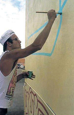
 

Keith Haring painting The Keith Haring Mural, Johnston Street, Collingwood, Melbourne, 1984


Keith Haring painting The Keith Haring Mural, Johnston Street, Collingwood, Melbourne, 1984


The painting of The Keith Haring Mural, Johnston Street, Collingwood, Melbourne, 1984


The painting of The Keith Haring Mural, Johnston Street, Collingwood, Melbourne, 1984


Significance of the Mural

According to the Statement of Significance on the Heritage Council of Victoria database, “The Mural has historical and social significance as the work of a major artist. Keith Haring is considered one of the most significant artists of his generation. As a role model for gay artists and Aids activism his influence was international.

The Keith Haring Mural is of social significance as a landmark piece of public art in Melbourne. Its prominent inner city location is indicative of the changing physical and social landscape of a former working class suburb.

The Mural is also of social significance for its influence on young artists for its inner city setting and use of popular culture themes and imagery.”20

Emily Sharpe states that the mural may also be the last surviving extant [outdoor] mural in the world painted entirely by his hand,21 although this information is contradicted by The Haring Foundation in a quotation later in the essay (see the section ‘To restore or conserve?’ below, Footnote 49).
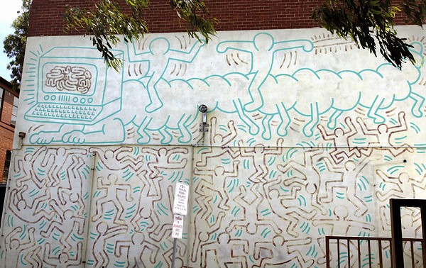
 

Keith Haring mural on the side of the former Collingwood Technical School in 2010 (painted 1984)


Keith Haring mural on the side of the former Collingwood Technical School in 2010 (painted 1984)


Issues in Conservation

During the period 1994-1995 a recently formed gay art group in Melbourne called THREAD (of which I was a part, the acronym of which is now lost to my memory) became concerned about the deterioration of the Keith Haring mural on the side of the Collingwood Technical School in Johnston Street, Collingwood. The group tried to engage the city of Yarra (the inner Melbourne municipality where the mural is located) and other organisations (The National Trust) about the possibility of repainting the mural due to the importance of the mural and its painting by an internationally renowned gay artist. Basically, as conservator Andrew Thorn succinctly puts it, “to repaint the mural on the basis of identity giving ownership.”22

While the intentions of the group were entirely honourable in such a proposal, on reflection and with the passing of the years, being older and wiser, I realise the error of our ways. While acknowledging that the group probably did want to take ownership of the mural on the basis of sexual identity at the time I think the group was just motivated by a desire to get something to happen and we did at least succeed in starting a dialogue between those that had an interest in conserving the mural. One of the problems was that none of us had conservation experience and, as Tom Dixon noted in a phone call to him about the mural,23  the representation of the group was never consistent as it was always a different person that you were talking to.

The profile of the mural was also raised through newspaper articles: “A series of newspaper articles drew attention to the vexed issues around its historic significance and increasing deterioration; these articles formed an important research component of the subsequent classification report” (The book in which this article is quoted incorrectly states that students helped Haring paint the mural – see p. 146).24 These concerns eventually led to the stabilisation of the mural by conservator Andrew Thorn in 1996 and its listing by the National Trust of Australia (Victoria) (NTAV) in 1997. During the treatment of the mural in 1996 Thorn undertook various conservation treatments, namely cleaning of the paint surface (including removal of stains), paint consolidation (fine cracking and detachments within the red paint and reattachment of the yellow paint), reattachments of lower render due to rising damp, consolidation and protection of the paint film with a protective coating system and reintegration of small areas of loss. A proposal for future maintenance was envisaged that included regular inspections, maintenance and care,25 but unfortunately it would seem that this maintenance has not been undertaken. In a recent report (2007) on the condition of the mural Thorn notes that, “incipient deterioration can be avoided, but if regular maintenance is not continued, the painting will be lost.”26 Thorn also notes that the resin gloss layer applied in 1996 to prevent AO (anti-oxidant) and UV (ultraviolet) deterioration “shows clear signs of degradation,” and should have been reapplied at 5 yearly intervals to maintain effectiveness.27 The report also notes that the yellow ground has become paler since 1996, the eroded reds need consolidation, the rising moisture is having a greater effect on the surface than previously and the green brushstrokes are beginning to show signs of loss.28
 

The missing door of the Keith Haring mural on the side of the former Collingwood Technical School in 2010 detail (painted 1984)
 

The missing door of the Keith Haring mural on the side of the former Collingwood Technical School in 2010 detail (painted 1984)


Keith Haring mural on the side of the former Collingwood Technical School in 2010 detail (painted 1984)


Keith Haring mural on the side of the former Collingwood Technical School in 2010 detail (painted 1984)


Ownership or custodianship

I support the concept of custodianship (or shared ownership) of a work of art rather than ownership per se. I believe that many people have a stake in the cultural value of a work of art and that custodianship, being a caretaker of the work, engages with the idea that the work belongs to everyone and that everyone should have access to enjoy it. Of course being gay offers a close affinity to the work of Keith Haring but, as Andrew Thorn notes, “that does not impart greater ownership of common property or of visual arts and imagery. It does give some ownership but not the right to snatch ownership from others.”29

In a separate email he continues, “At the same time it is necessary in giving ownership to wrest it from those that have claims and this process requires substantial diplomacy. It moves ownership from exclusive to shared. Ownership and identity are good and necessary things and if a work or an artist provides inspiration and support that is not to be denigrated and must be respected … Claiming of ownership is not an aggressive act but part of belonging and identity … It is necessary to engage in a community spirit to ensure a highly significant work and its maker are treated with the respect they deserve.”30

While the earlier attempts by the THREAD group could be seen as an attempt to obtain cultural ownership I acknowledge that this position is untenable. It must be a difficult task – the diplomacy of negotiating with all vested interests. But as Thorn rightly notes this comes down to the modern democratic process, the freedom to elect decision makers – not make the decisions themselves but delegate the responsibility to elected others. We must possess the ability to respect anybody’s relationship and enjoyment of the mural as much as we should respect Thorn’s professional judgment as an internationally renowned conservator to ensure this work is protected in the best possible way so that future generations can enjoy the work.
 

Keith Haring mural on the side of the former Collingwood Technical School in 2010 detail (painted 1984)

Keith Haring mural on the side of the former Collingwood Technical School in 2010 detail (painted 1984)


Keith Haring mural on the side of the former Collingwood Technical School in 2010 detail (painted 1984)


The conservator and the cultural landscape

The conservation of artefacts is an integral part of the cultural landscape. The nature of the cultural landscape is a fluid environment: a palimpsest where the authorship of the original work of art is a textual site, where “change (and decay), alteration, editing, revision and restoration represent the true life of objects.”31

“”The document is the textual site where the agents of textuality meet: author, copyist, editor, typesetter and reader.” In art and architecture there would be, besides artist and architect, builders, conservators, curators, preservationists, historians, viewers and users.”32 Embedded within the work are the memory and history of the object, within culture. Conservator Andrew Thorn observes, “It is a societal need to preserve the past and keep it for the future. Far more pragmatic issues dominate the profession [that of conservation] and unlike some contemporary art practice it does not need the props of modernist theory in any form to exist.”33

I beg to differ. Conservation exists only within culture. It is embedded within it and linked to the history and memory of the object. The nature of the cultural landscape and our heritage is a constitutive process: “an approach to heritage which understands it not as an object which is the static locus of some internal value, but as a process.”34 And that process invokes the social, cultural, economic and political contexts that include the act of interpretation and the concept of representation.

Laurajane Smith argues that, “heritage is heritage because it is subjected to the management and preservation/ conservation process, not because it simply ‘is’. The process does not just ‘find’ sites and places to manage and protect. It is itself a constitutive cultural process that identifies those things and places that can be given meaning and value as ‘heritage’, reflecting contemporary and cultural social values, debates and aspirations.”35 Gibson and Pendlebury unpack this statement further:

“In the first and most obvious sense, it follows from this position that there is nothing self-apparent or given about regimes of value and significance, rather these frameworks are specific to our particular social, cultural, economic and political contexts. Drawing on the anthropologist Marcel Mauss’s famous proscription on the cultural and historical specificity of contemporary personhood, objects, building and places are ‘formulated’ as heritage ‘only for us, amongst us’.”36

The value of an object cannot exist without reference to its historicity, its relationship to everything and everyone around us and conservation needs these frameworks of theory to have existence. As Foucault notes, “The space in which we live, which draws us out of ourselves, in which the erosion of our lives, our time and our history occurs, the space that claws and gnaws at us, is also, in itself, a heterogeneous space. In other words, we do not live in a kind of void, inside of which we could place individuals and things. We do not live inside a void that could be colored with diverse shades of light, we live inside a set of relations that delineates sites which are irreducible to one another and absolutely not superimposable on one another.”37

Complementary to Foucault’s notion of a set of relations that delineates sites and heterotopic spaces is how Janet Wolff positions these sites, these texts, within a sociology of cultural production:

“… the meaning which audiences ‘read’ in texts and other cultural products is partly constructed by those audiences. Cultural codes, including language itself, are complex and dense systems of meaning, permeated by innumerable sets of connotations and significations. This means that they can be read in different ways, with different emphases, and also in a more or less critical or detached frame of mind. In short, any reading of any cultural product is an act of interpretation … the way in which we ‘translate’ or interpret particular works is always determined by our own perspective and our own position in ideology. This means that the sociology of art cannot simply discuss ‘the meaning’ of a novel or painting, without reference to the question of who reads or sees it, and how. In this sense, a sociology of cultural production must be supplemented with, and integrated into, a sociology of cultural reception.”38


I understand that the conservator is not an editor (and here I am not abrogating the right of conservators to conserve, far from it). What I am proposing, however, is that an acknowledgment of the many voices that constitute the life and memory of an object, including the post-structuralist theory that analyses these histories and interpretations, be included in the negotiations with all parties and stakeholders. This perspective also acknowledges the changing contexts of interpretation of the Keith Haring Mural as it becomes ever more precious as one of the few outdoor murals left in the world painted in the author’s hand.


Keith Haring mural on the side of the former Collingwood Technical School in 2010 (painted 1984)


Keith Haring mural on the side of the former Collingwood Technical School in 2010 (painted 1984)


To restore or conserve?

“The painting can be preserved and not fade or deteriorate further if the recommendations of my 1996 and 2010 reports are adhered to. If you think this is not true you need to provide the evidence … it is assumed you respect my professional judgement in ensuring this work is protected in the best possible way so that all people can enjoy the masterpiece painted by Keith Haring as far into the future as possible. Over painting the mural ends the work of Keith Haring on that day.”39


The vexatious issue of restoring or conserving the Keith Haring mural has been an ongoing source of debate since the early attempts by the THREAD group to have the work “restored” (i.e. over painted) in the mid-1990s. Haring’s attitude to repainting seems to be at best ambiguous. The statement of significance of the mural when listed by The National Trust of Australia (Victoria) in 1997 notes that,

“Crucial to the fate of the mural and, given its exposure to the elements, is whether the artist himself would have accepted the deterioration of the mural or have condoned some form of restoration. Haring’s own feelings appear to have been ambivalent in the matter. In favour of restoring the mural i.e., repainting – is the fact that the simplistic three colour design devoid of subtle harmonies would not present serious problems in restoring it to its original condition. Opinion appears to be divided regarding the moral considerations in the matter and even the Estate of Keith Haring is unclear in this matter.”40


John Buckley “recalls a conversation with Haring who, with a characteristic lack of preciousness, said that the mural could, when needed, just be repainted by any good signwriter”41 but Andrew Thorn disputes this interpretation noting that “Keith talked about the continuity of his work. What Buckley stated contradicts the attitude presented by Haring throughout his biography. Another point to consider here is that Keith died within 6 years of completing the painting and I am certain beyond doubt that the condition of the painting even after 6 years would have been more or less pristine. There is no indication throughout the last two years of his life that Keith had any concern for his made works and that his declining health and the pain associated with that allowed him little time to consider anything other than his current work and failing health. If Buckley provides evidence of a friendship that Keith denies in his biography I for one would re-assess the intention of the artist.”42

This brings up the thorny issue of the ephemerality of street art. “Art academic Chris McAuliffe expressed his view regarding the impermanence of this work, arguing that ‘… as graffiti, it should be left to fade … If you subject it to conservation procedures then you transpose graffiti into a realm that it was opposed to. You make it art’.43 Personally I believe that all street art, whether officially sanctioned (like the Keith Haring mural) or not, is art. Distinction can only be made between street art / graffiti (not necessarily officially sanctioned: think the early chalk drawings of Haring or the street art of Banksy) and vandalism or tagging. Perhaps ephemerality is inherently built into street art, that documentation is enough to substantiate the life of the work, but that does not mean we have to sit by and let work be defaced or fade away without attempts at conservation.

According to Donna Wheeler there is an “unbreachable divide” between the two camps of Haring devotees. “Those on the conservatorial side see the mural as a cultural artefact, one that contains the artist’s rare and authentic touch evidenced in each singular brushstroke; they advocate a commitment to preservation, or stabilisation, with the caveat that even with their best efforts, the mural will continue to fade and eventually cease to exist. The Haring Foundation, and many others, including several curators and Haring’s original Australian contact, John Buckley, are hoping to restore, or more accurately, repaint the work, claiming that this would most closely follow Haring’s wishes. Yes, the original paint and brushstrokes would be forever lost, but Haring’s intent, creative vision and integral design will live on, in all its jellybean vibrancy.”44

I disagree with the stance taken by those that wish to repaint the mural. The hand of the author would be lost and the mural would simply become a simulacra of the original, a sign value that is an illusion of reality, a repainting purporting to “look like” the original but actually nothing like it.45 Support for this stance are the photographs of the original Crack is Wack (1986) mural painted by Keith Haring and the over painted mural photographs shown by Andrew Thorn at the public forum into the future of the mural in April 2010.46 In this presentation Thorn, “illustrated the losses inherent with repainting and also showed that the most iconic Haring mural ‘Crack is Wack’, is not the painting that Haring is photographed in front of the day he completed it.”47

Thorn states, “I support making a new copy of the painting, I just believe it should not devalue the original. Repainting over the original destroys the original work by Keith Haring. What you have is a copy and an irretrievable original, that is to say you have destroyed the work of Keith Haring. This is against the law administered by Heritage Victoria and devalues the work monetarily. This may seem an odd point to raise but becomes more significant when one considers the copyright act in relation to artists and their rights. The law there clearly states that any action that devalues a work or diminishes the artist’s reputation is a violation of the copyright act. The Haring Foundation need to be aware of this international law and particularly in the context of the Crack is Wack no longer being the work of Keith Haring and thereby diminishing his reputation by deception.”

In reply the Haring Foundation note that, “the ONLY Haring mural that was completely repainted was the Crack is Wack mural in NYC, due to it’s absolutely dreadful condition. It, too, is a landmark and highly valued by its community, and while no longer the original, it most definitely remains a Keith Haring mural. There are several outdoor murals that are untouched: Tuttomondo in Pisa (cleaned only); Necker Hospital in Paris; murals in Amsterdam and Phoenix, AZ. Numerous outdoor murals were only cleaned and lightly repaired and there are over a dozen indoor murals in public institutions that are untouched …

The Haring Foundation does not always recommend a complete repainting, that would be silly. But the awful condition of the Collingwood mural is similar to that of Crack is Wack and therefore the Foundation does highly recommend that it be repainted. Further to Crack is Wack, when Keith originally painted it, he had no permission, and so was required by the city to paint it out, completely covering over his first version. Shortly thereafter, he was granted permission by the city, and the second version he painted was different from the first version. Keith’s first version is often reproduced in books and catalogs and this has led to the utterly incorrect assumption that the Haring Foundation actually destroyed his first version and replaced it with something completely different over it. Not true.”49

While it is correct that Haring returned on the following day and painted a second version, not a copy of the first, conservator Andrew Thorn states that, “Since his death in 1990, the west painting has been repainted with imagery not resembling either of the two original Haring works … and this has in turn been reapplied more or less faithfully in 2007. This last painting, the one currently visible, is the fourth in the series and bears no resemblance to either of the two original works … The current painting appears not to be the work of Keith Haring, but continues to be considered his signature outdoor work … Haring may have painted the third image, but there is no record of this … The third and seemingly anonymous rendition continues the overall message but with new iconography, and appears not to be the work of Keith Haring.”50

Thorn supports the painting of a facsimile, a replica of the original, as does artist and academic Dr Megan Evans: “I think the best option is to preserve it [the original] and then do a replica nearby which is done in honour of the Haring work. I think this would be more interesting conceptually also as to have a repainted work is like covering up the mark of the past and to make a facsimile is to recreate it in a contemporary context.”51 I agree with the concept of making a facsimile positioned close to the original. Perhaps this could be completed on a new wall that is perpendicular to the original wall that the mural is painted on. Of course the pertinent question would be the permissions needed to erect such a wall, the cost of its construction, the cost of painting the new mural and its upkeep.
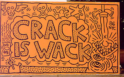
 

Keith Haring (American, 1958-1990) 'Crack is Wack' as completed by Haring in 1986


Keith Haring (American, 1958-1990)
Crack is Wack
as completed by Haring in 1986 (1st version, now overpainted)


Anonymous. 'Crack is Wack' 1986


Current Crack is Wack
painted after 1990


Now you see it, now you don’t

This brings me to my final point: now you see it, now you don’t. While I must take at face value the assertion by Andrew Thorn that the mural can be preserved and not fade or deteriorate further if the recommendations of his 1996 and 2010 reports are adhered to, and while I respect his professional judgment in that statement, unfortunately past experience (i.e. the lack of maintenance of the mural between 1996, the year of the last stabilisation, and now) tells me that the mural will continue to deteriorate and fade unless a specific and regular maintenance plan is financially funded and put in place. Donna Wheeler observes that the mural “is but a shadow of its former self”52 and I agree with this assertion. I was shocked to see the mural when visiting it recently compared to how I remember it in 1996 (ah, memory!). Though still an original Haring, it is pale and wane, almost an imitation of itself (and that is an irony in itself), and it made me sad to see the mural in this condition, as I remember how vibrant it was back in the early 1990s.

“According to ACCA curator Hannah Mathews, when the mural was last stabilised in 1996, it was estimated that a tiny sum of A$200 ($178) was needed annually to maintain the work. A combination of factors including pollution and time has left the mural in its current degraded state. Some estimate that it could cost around A$25,000 ($22,000) to stabilise, with an additional A$1,000 ($900) a year for maintenance. Although the issue of whether to repaint the mural is up for debate, all parties agree that the work needs stabilisation as soon as possible to prevent further surface lifting and cracking of the paint … Yarra mayor Jane Garrett said … “Following the forum [Yarra Talking Art forum: “The Keith Haring Mural: yesterday, today, tomorrow” on 29th April 2010 held in Collingwood], [the] Council [is setting up] a working group, which will seek to include representatives from Skills Victoria, Heritage Victoria, the arts community and other stakeholders, to discuss the mural’s future and come to a consensus on the most appropriate way to preserve it.”53

All parties need to agree and as quickly as possible. While Haring was quite happy to send his work out into the world for the enjoyment of all it would be a disservice to his memory and his status as an internationally renowned artist to have the only Haring mural in Australia deteriorate further. Time is of the essence. As Mark Holsworth on his Melbourne Art & Culture Critic blog insightfully opines, “Street art is not the property of the street artists – it belongs to everyone. Even if the artist intends for the art to be ephemeral there is no reason for their wishes to be carried out; the person giving the gift does not get to determine how the gift is used.”54

In the final analysis everyone needs to come to consensus about the future of the Keith Haring Mural for without proper conservation and maintenance it will truly be a case of now you see it, no you don’t.

Dr Marcus Bunyan

Word count: 5,056


Endnotes

1/ Keith Haring on Wikipedia [Online] Cited 25/09/2010
2/ Ibid.,
3/ Gott, Ted. “Fragile Memories: Keith Haring and the Water Window Mural at the National Gallery of Victoria,” in Art Bulletin of Victoria Vol. 43. Melbourne: National Gallery of Victoria, p. 8
4/ “Keith Haring New York,” on the Woodward Gallery website [Online] Cited 25/09/2010. No longer available online
5/ Gott, Ted. Op cit., pp. 7-8
6/ Gott, Ted. Op cit., p. 8
7/ Gott, Ted. Keith Haring’s Collingwood Mural. Draft of a paper given at a Keith Haring Public Forum, Collingwood, 29th April 2010 by Ted Gott, Senior Curator, International Art, National Gallery of Victoria
8/ Gott, Ted and Sullivan, Lisa. “Keith Haring in Australia.” in Art and Australia, Vol. 39, No.4, June-July-Aug 2002: (560)-567. ISSN: 0004-301X. Cited 09/10/2010
9/ Buckley, John. “Keith Haring” exhibition catalogue. Melbourne: Australian Centre for Contemporary Art (ACCA), 1985
10/ Gott, Ted and Sullivan, Lisa. Op. cit., p. 564. See also Footnote 15 and Gruen, John. Keith Haring: The Authorized Biography. New York: Prentice-Hall, 1991, p. 113
11/ Gott, Ted and Sullivan, Lisa. Op. cit.,
12/ Gott, Ted and Sullivan, Lisa. Op. cit., p. 562. See also Footnote 10 and Footnote 15. “Vandals,” Herald, Saturday 10th March 1984, p. 1; “Vandals smash gallery pane,” The Age, Monday 12th March , 1984, p. 19
13/ Gott, Ted and Sullivan, Lisa. Op. cit., Footnote 15 and Gruen, John. Keith Haring: The Authorized Biography. New York: Prentice-Hall, 1991, p. 113
14/ Gott, Ted and Sullivan, Lisa. Op. cit., p. 564
15/ Gott, Ted. Keith Haring’s Collingwood Mural. Op cit.,
16/ Gott, Ted. Keith Haring’s Collingwood Mural. Op cit.,
17/ Gott, Ted. Keith Haring’s Collingwood Mural. Op cit.,
18/ Gott, Ted and Sullivan, Lisa. Op. cit., p. 566. See also Gott, Ted. Keith Haring’s Collingwood Mural. Op cit.,
“Uniquely, we have a surviving record of Keith Haring’s own interpretation of the Collingwood mural, revealed during an interview conducted with the artist shortly after the painting’s completion on Tuesday 6 March 1984. There Keith Haring noted how: “What’s going on in the bottom is about – I mean, all these people are doing different things, right? Some of them are like dancing, like rap dancing, or acrobatics.  Some of them are almost like they are fighting. But the way they are all together means that they can’t – I mean, if one of them comes out, the whole thing falls down. So they sort of depend on all of them to make it work. So it’s sort of like society or whatever, where the world only works when lots of individuals do their part, right?
The thing at the top is, I guess, the impending doom or impending possibility of technological … the confrontation between technology and the human element, which is still holding up the technology, and based on the technology. But it sort of takes a semi-circle in evolution, where people evolved up to a certain point, and now they’ve evolved so far that they’ve invented a computer or a machine to evolve further. And the computer is maybe evolving more than people were. So it’s about that sort of confrontation, I guess.””
19/ Gott, Ted and Sullivan, Lisa. Op. cit., p. 562. See also Footnote 8 and Haring, Keith. “Keith Haring,” in Flash Art, No. 116, March 1984, p. 22
20/ Anonymous. “Keith Haring Mural: Statement of Significance,” on Heritage Council of Victoria database [Online] Cited 04/10/2010
21/ Sharpe, Emily. “Saving Keith Haring Down Under: Melbourne work is last surviving wall painting by the late artist’s own hand,” on The Art Newspaper website. Published online 08/06/2010. Cited 06/08/2010. No longer available online
22/ Thorn, Andrew. Email to the author. 24/08/2010.
23/ Dixon, Tom. Member of the Public Art Committee of the National Trust of Australia (Victoria) (NTAV). Telephone conversation with the author 26/08/2010. The Public Art Committee considers murals, mosaics, and sculptures; and such works can be found in parks and reserves, public streets, squares and buildings; and publicly accessible parts of privately owned buildings.
24/ Masterson, Andrew. “Off the wall art,” in The Age. Melbourne: Summer Age supplement. December 27th, 1994, p. 4-5 quoted in Gibson, Lisanne and Pendlebury, John R. “Values not Shared: The Street Art of Melbourne’s City Laneways,” chapter in Valuing historic environments. Farnham: Ashgate Publishing Limited, 2009, p. 146
25/ Thorn, Andrew. “Conservation Treatment Report.” The Keith Haring Mural Johnston Street, Collingwood. Final Report prepared for Northern Institute, 1997.
26/ Thorn, Andrew. “Review of Condition and Treatment.” The Keith Haring Mural Johnston Street, Collingwood. Prepared for City of Yarra, 2007, p. 1
27/ Ibid., p. 2
28/ Ibid., p. 3-5
29/ Thorn, Andrew. Email to the author. 23/08/2010.
30/ Thorn, Andrew. Email to the author. 24/08/2010.
31/ McCaughy, Patrick. Review of “Securing the Past: Conservation in Art, Architecture and Literature” by Paul Eggert in The Australian, December 02, 2009. [Online] Cited 12/06/2010. No longer available online
32/ Ibid.,
33/ Thorn, Andrew. Email to the author. 23/08/2010.
34/ Gibson, Lisanne and Pendlebury, John R. Valuing historic environments. Farnham: Ashgate Publishing Limited, 2009, p. 72
35/ Smith, Laurajane. Uses of Heritage. Oxford: Routledge, 2006, p. 3 (italics in original) quoted in Gibson, Lisanne and Pendlebury, John R. Valuing historic environments. Farnham: Ashgate Publishing Limited, 2009, p. 72
36/ Mauss, Marcel. “A category of the human mind: The notion of person; the notion of self,” in Carrithers, M., Collins, S. and Lukes, S. (eds.,). The Category of the Person: Anthropology, Philosophy, History. Cambridge: Cambridge University Press, 1985, p. 22, cited in Gibson, Lisanne and Pendlebury, John R. Valuing historic environments. Farnham: Ashgate Publishing Limited, 2009, p. 72
37/ Foucault, Michel. Of Other Spaces (1967), “Heterotopias.” Diacritics 16 (Spring 1986), pp. 22-27
38/ Wolff, Janet. The Social Production of Art. Basingstoke: Macmillan, 1993, p. 97
39/ Thorn, Andrew. Email to the author. 23/08/2010.
40/ National Trust of Australia (Victoria). Classification Report for ‘Keith Haring Mural’, Johnston Street, Collingwood, File number 6675. Extract from Statement of Significance, 4th August 1997 quoted in Gibson, Lisanne and Pendlebury, John R. “Values not Shared: The Street Art of Melbourne’s City Laneways,” in Valuing historic environments. Farnham: Ashgate Publishing Limited, 2009, p. 146
41/ Wheeler, Donna. “When Keith Came To Town,” on Holiday Goddess, Female-Friendly Travel website. [Online] Cited 06/08/2010. No longer available online
42/ Thorn, Andrew. Email to the author. 23/08/2010.
43/ McAuliffe, Chris quoted in Masterson, Andrew “Off the wall art,” in The Age. Melbourne: Summer Age supplement. December 27th, 1994, p. 4-5 quoted in Gibson, Lisanne and Pendlebury, John R. Valuing historic environments. Farnham: Ashgate Publishing Limited, 2009, p. 72
44/ Op. cit.,
45/ See Tseëlon, E. The Masque of Femininity: The Representation of Women in Everyday Life. London: Sage, 1995, p. 128
46/ Yarra Talking Arts forum. “The Keith Haring mural: yesterday, today, tomorrow.” Thursday 29th April, 2010
47/ Thorn, Andrew. Email to the author. 23/08/2010.
48/ Ibid.,
49/ Gruen, Julia. “Save the Keith Haring Mural” web page on Facebook [Online] Cited 21/11/2011. No longer available online
50/ Thorn, Andrew. “Another Red Haring,” keynote paper presented at the International Council of Museums Conservation Committee  (ICOMCC) triennial Conference, Lisbon, October 2011
51/ Evans, Megan. Email to the author. 08/09/2010.
52/ Wheeler, Donna Op cit.,
53/ Sharpe, Emily Op cit.,
54/ Holsworth, Mark. “Another Banksy Gone,” on Melbourne Art & Culture Critic blog. [Online] Cited 06/10/2010.


LIKE ART BLART ON FACEBOOK

Back to top

Vale Dr John Cato (1926-2011)

February 2011


It is with much sadness that I note the death of respected Australian photographer and teacher Dr John Cato (1926-2011). Son of Australian photographer Jack Cato, who wrote one of the first histories of Australian photography (The Story of the Camera in Australia (1955)), John was apprentice to his father before setting up a commercial studio with Athol Shmith that ran from 1950-1971. Dr Cato then joined Shmith at the fledgling Prahran College of Advanced Education photography course in 1974, becoming head of the course when Shmith retired in 1979, a position he held until John retired in 1991.

I was fortunate enough to get to know John and his vivacious wife Dawn. I worked with him and co-curatored his retrospective with William Heimerman, ‘…and his forms were without number’ at The Photographers’ Gallery, South Yarra, in 2002. My catalogue essay from this exhibition is reproduced below.

John was always generous with his time and advice. His photographs are sensitive, lyrical renditions of the Australian landscape. He had a wonderful ear for the land and for the word, a musical lyricism that was unusual in Australian photographers of the early 1970s. He understood how a person from European background could have connection to this land, this Australia, without being afraid to express this sense of belonging; he also imaged an Aboriginal philosophy (that all spirits have a physical presence and everything physical has a spiritual presence) tapping into one of the major themes of his personal work: the mirror held up to reveal an’other’ world – the language of ambiguity and ambivalence (the dichotomy of opposites e.g. black / white, masculine / feminine) speaking through the photographic print.

His contribution to the art of photography in Australia is outstanding. What are the precedents for a visual essay in Australian photography before John Cato? I ask the reader to consider this question.

It would be fantastic if the National Gallery of Victoria could organise a large exhibition and publication of his work, gathering photographs from collections across the land, much like the successful retrospective of the work of John Davis held in 2010. Cato’s work needs a greater appreciation throughout Australia because of it’s seminal nature, containing as it does the seeds of later development for Australian photographers. His educational contribution to the development of photography as an art form within Australia should also be acknowledged in separate essays for his influence was immense. His life, his teaching and his work deserves nothing less.

Dr Marcus Bunyan


‘… and his forms were without number’

John Cato: A Retrospective of the Photographic Work 1971-1991

This writing on the photographic work of Dr John Cato from 1971-1991 is the catalogue essay to a retrospective of his work held at The Photographers’ Gallery in Prahran, Melbourne in 2002. Dr Cato forged his voice as a photographic artist in the early 1970s when photography was just starting to be taken seriously as an art form in Australia. He was a pioneer in the field, and became an educator in art photography. He is respected as one of Australia’s preeminent photographers of the last century.


With the arrival of ‘The New Photography’1 from Europe in the early 1930’s, the formalist style of Modernism was increasingly adopted by photographers who sought to express through photography the new spirit of the age. In the formal construction of the images, the abstract geometry, the unusual camera angles and the use of strong lighting, the representation ‘of the thing in itself’2 was of prime importance. Subject matter often emphasised the monumentality of the factory, machine or body/landscape. The connection of the photographer with the object photographed was usually one of sensitivity and awareness to an external relationship that resulted in a formalist beauty.

Following the upheaval and devastation of the Second World War, photography in Australia was influenced by the ‘Documentary’ style. This “came to be understood as involved chiefly with creating aesthetic experiences … associated with investigation of the social and political environment.”3 This new movement of social realism, “… a human record intimately bound with a moment of perception,”4 was not dissimilar to Henri Cartier-Bresson’s ‘decisive moment’ (images a la sauvette) where existence and essence are in balance.5

The culmination of the ‘Documentary’ style of photography was The Family of Man exhibition curated by Edward Steichen that toured Australia in 1959.6 This exhibition, seen many times by John Cato,7 had a theme of optimism in the unity and dignity of man. The structure of the images in ‘Documentary’ photography echoed those of the earlier ‘New Photography’.

Max Dupain “stressed the objective, impersonal and scientific character of the camera; the photographer could reveal truth by his prerogative of selection.”8 This may have been an objective truth, an external vocalising of a vision that concerned itself more with exterior influences rather than an internal meditation upon the subject matter.


John Cato (Australian, 1926-2011) 'Untitled' from the series 'Essay I, Landscapes in a Figure' 1971-1979


John Cato (Australian, 1926-2011)
Untitled from the series Essay I, Landscapes in a Figure
1971-1979
Silver gelatin photograph


In 1971, John Cato’s personal photographic work was exhibited for the first time as part of the group show Frontiers at the National Gallery of Victoria, Melbourne.9 Earth Song emerged into an environment of social upheaval inflamed by Australian involvement in the Vietnam War. It provided a group of enthusiastic people who were beginning to be interested in photography as art, an opportunity to see the world, and photography, through a different lens. The 52 colour photographic prints in Earth Song, were shown in a sequence that used melodic line and symphonic form as its metaphoric basis, standing both as individual photographs and as part of a total concept.10

In the intensity of the holistic vision, in the connection to the subconscious, the images elucidate the photographers’ search for a perception of the world. This involved an attainment of a receptive state that allowed the cracks, creases and angles inherent in the blank slate of creation to become meaningful. The sequence contained images that can be seen as ‘acts of revelation’,11confirmed and expanded by supporting photographs, and they unearthed a new vocabulary for the discussion of spiritual and political issues by the viewer. They may be seen as a metaphor for life.

The use of sequence, internal meditation and ‘revelation’, although not revolutionary in world terms,12 were perhaps unique in the history of Australian photography at that time. During the production of Earth Song, John Cato was still running a commercial studio in partnership with the photographer Athol Shmith and much of his early personal work was undertaken during holidays and spare time away from the studio. Eventually he abandoned being a commercial photographer in favour of a new career as an educator, but found this left him with even less time to pursue his personal work.13

Earth Song (1970-1971) was followed by the black and white sequences:


 Tree – A Journey18 images1971-1973 
 Petroglyphs14 images1971-1973 
 Seawind14 images1971-1975 
 Proteus18 images1974-1977 
 Waterway16 images1974-1979 


Together they form the extensive series Essay I, Landscapes in a Figure, parts of which are held in the permanent photography collection of the National Gallery of Victoria.14


John Cato (Australian, 1926-2011) 'Untitled' from the series 'Essay I, Landscapes in a Figure' 1971-1979


John Cato (Australian, 1926-2011)
Untitled from the series Essay I, Landscapes in a Figure
1971-1979
Silver gelatin photograph


The inspiration for Essay I and later personal work came from many sources. An indebtedness to his father, the photographer Jack Cato, is gratefully acknowledged. Cato also acknowledges the influence of literature: William Shakespeare (especially the Sonnets, and As You Like It), William Blake, Walt Whitman (Leaves of Grass), Lewis Carroll (Through the Looking Glass), the Bible; and of music (symphonic form), the mythology of the Dreamtime and Aboriginal rock paintings.15 Each body of work in Essay I was based on an expression of nature, the elements and the Creation. They can be seen as Equivalents16 of his most profound life experiences, his life philosophy illuminated in physical form.

John Cato was able to develop the vocabulary of his own inner landscape while leaving the interpretation of this landscape open to the imagination of the viewer. Seeing himself as a photographer rather than an artist, he used the camera as a tool to mediate between what he saw in his mind’s eye, the subjects he photographed and the surface of the photographic negative.17 Photographing ‘in attention’, much as recommended by the teacher and philosopher Krishnamurti,18 he hoped for a circular connection between the photographer and the subject photographed. He then looked for verification of this connection in the negative and, eventually, in the final print.
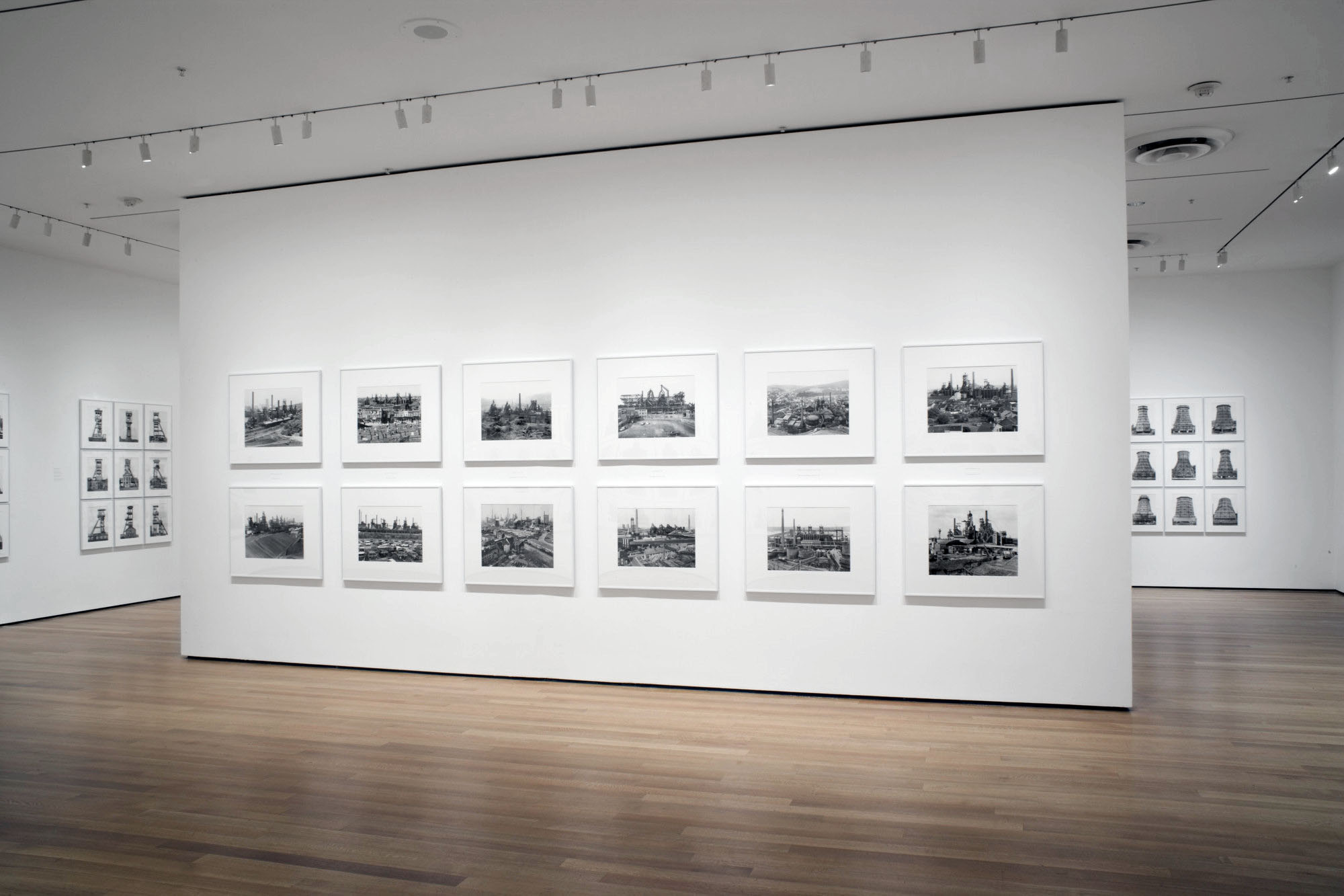
Essay II, Figures in a Landscape, had already been started before the completion of Essay I and it consists of three black and white sequences:


 Alcheringa11 images1978-1981 
 Broken Spears11 images1978-1983 
 Mantracks22 images in pairs1978-1983 


The photographs in Essay II seem to express “the sublimation of Aboriginal culture by Europeans”19 and, as such, are of a more political nature. Although this is not obvious in the photographs of Alcheringa, the images in this sequence celebrating the duality of reality and reflection, substance and shadow, it is more insistent in the symbology of Broken Spears and Mantracks. Using the metaphor of the fence post (white man / black man in Broken Spears) and contrasting Aboriginal and European ‘sacred’ sites (in pairs of images in Mantracks), John Cato comments on the destruction of a culture and spirit that had existed for thousands of years living in harmony with the land.

In his imaging of an Aboriginal philosophy (that all spirits have a physical presence and everything physical has a spiritual presence) he again tapped one of the major themes of his personal work: the mirror held up to reveal an’other’ world. Cato saw that even as they are part of the whole, the duality of positive / negative, black / white, masculine / feminine are always in conflict.20 In the exploration of the conceptual richness buried within the dichotomy of opposites, Cato sought to enunciate the language of ambiguity and ambivalence,21 speaking through the photographic print.

The theme of duality was further expanded in his last main body of work, Double Concerto: An Essay in Fiction:


 Double Concerto (Pat Noone)30 images1984-1990 
 Double Concerto (Chris Noone)19 images1985-1991 


Double Concerto may be seen as a critique of the power of witness and John Cato created two ‘other’ personas, Pat Noone and Chris Noone, to visualise alternative conditions within himself. The Essay explored the idea that if you send two people to the same location they will take photographs that are completely different from each other, that tell a distinct story about the location and their self:

“For the truth of the matter is that people have mixed feelings and confused opinions and are subject to contradictory expectations and outcomes, in every sphere of experience.”22

This slightly schizophrenic confusion between the two witnesses is further highlighted by Pat Noone using single black and white images in sequence. Chris Noone, on the other hand, uses multiple colour images joined together to form panoramic landscapes that feature two opposing horizons. The use of colour imagery in Double Concerto, with its link to the colour work of Earth Song, can be seen to mark the closing of the circle in terms of John Cato’s personal work. In Another Way of Telling, John Berger states that …

“Photography, unlike drawing, does not possess a language. The photographic image is produced instantaneously by the reflection of light; its figuration is not impregnated by experience or consciousness.”23


But in the personal work of John Cato it is a reflection of the psyche, not of light, that allows a consciousness to be present in the figuration of the photographic prints. The personal work is an expression of his self, his experience, his story and t(his) language, is our language, if we allow our imagination to speak.

Dr Marcus Bunyan 2002


Footnotes

1/ Newton, Gael. Shades of Light: Photography and Australia 1839-1988. Sydney: Australian National Gallery, William Collins, 1988, p. 109

2/ Newton, Gael. Max Dupain. Sydney: David Ell Press,1980, p. 34

3/ Ibid., p. 32

4/ Greenough, Sarah (et al). On the Art of Fixing a Shadow: 150 Years of Photography. Boston: National Gallery of Art, Bullfinch Press, 1989, p. 256

5/ Ibid., p. 256

6/ Newton, Gael. Shades of Light: Photography and Australia 1839-1988. Sydney: Australian National Gallery, William Collins, 1988, p. 131

7/ Ibid., p. 131

8/ Newton, Gael. Max Dupain. Sydney: David Ell Press, 1980, p. 32

9/ Only the second exhibition by Australian photographers at the National Gallery of Victoria, Melbourne

10/ Shmith, Athol. Light Vision No.1. Melbourne: Jean-Marc Le Pechoux (editor and publisher), Sept 1977, p. 21

11/ Berger, John and Mohr, Jean. Another Way of Telling. New York: Pantheon Books, 1982, p. 118

12/ Hall, James Baker. Minor White: Rites and Passages. New York: Aperture, 1978

13/ Conversation with the photographer 29/01/1997, Melbourne, Victoria

14/ Newton, Gael. Shades of Light: Photography and Australia 1839-1988. Sydney: Australian National Gallery, William Collins, 1988, p. 135, Footnote 7; p. 149

15/ Conversation with the photographer 22/01/1997, Melbourne, Victoria

16/ Norman, Dorothy. Alfred Stieglitz. New York: Aperture, 1976, p. 5

17/ Ibid.,

18/ Krishnamurti. Beginnings of Learning. London: Penguin, 1975, p. 131

19/ Strong, Geoff. Review. The Age. Melbourne, 28/04/1982

20/ Conversation with the photographer 22/01/1997, Melbourne, Victoria

21/ The principal definition for ambiguity in Websters Third New International Dictionary is: “admitting of two or more meanings … referring to two or more things at the same time.”
That for ambivalence is “contradictory and oscillating subjective states.”
Quoted in Davis, Fred. Fashion, Culture and Identity. Chicago: University of Chicago Press, 1992, p. 21.

22/ Levine, Donald. The Flight From Ambiguity. Chicago: University of Chicago Press, 1985

23/ Berger, John and Mohr, Jean. Another Way of Telling. New York: Pantheon Books, 1982, p. 95


LIKE ART BLART ON FACEBOOK

Back to top