Many thankx to the Amon Carter Museum of American Art for allowing me to publish the photographs in the posting. Please click on the photographs for a larger version of the image.
Jack Delano (American, 1914-1997) Chopping cotton on rented land near White Plains, Greene County, Georgia, 1941 1941 Inkjet print, 2013 Courtesy the Library of Congress
On October 5, the Amon Carter Museum of American Art opens Color! American Photography Transformed,a compelling examination of how colour has changed the very nature of photography, transforming it into today’s dominant artistic medium. Color! includes more than 70 exceptional photographs by as many photographers and is on view through January 5, 2014.
“Color is so integral to photography today that it is difficult to remember how new it is or realise how much it has changed the medium,” says John Rohrbach, senior curator of photographs.
The exhibition covers the full history of photography, from 1839, when Frenchman Louis-Jacques-Mandé Daguerre (1787-1851) introduced his daguerreotype process, to the present. From the start, disappointed that photographs could only be made in black and white, photographers and scientists alike sought with great energy to achieve colour. Color! begins with a rare direct-colour photograph made in 1851 by Levi L. Hill (1816-1865), but explains how Hill could neither capture a full range of colour nor replicate his achievement. It then shows finely rendered hand-coloured photographs to share how photographers initially compensated for the lack of colour.
When producing colour photographs became commercially feasible in 1907 in the form of the glass-plate Autochrome, leading artists like Alfred Stieglitz (1864-1946) were initially overjoyed, according to Rohrbach. Color! offers exquisite examples of their work even as it explains their ultimate rejection of the process because it was too difficult to display and especially because they felt it mirrored human sight too closely to be truly creative.
“Although many commercial photographers embraced colour photography over succeeding decades, artists continued to puzzle over the medium,” Rohrbach explains. Color! reveals that many artists from Richard Avedon (1923-2004) to Henry Holmes Smith (1909-1986) tried their hand at making colour photographs through the middle decades of the 20th century, and it shows the wide range of approaches they took to colour. It also shares the background debates among artists and photography critics over how to employ colour and even whether colour photographs could have the emotional force of their black-and-white counterparts.
Only in 1976, when curator John Szarkowski at the Museum of Modern Art in New York heralded the young Memphis photographer William Eggleston’s (b. 1939) snapshot-like colour photographs as the solution to artful colour, did fine art colour photography gain full acceptance.
“Eggleston revealed how colour can simultaneously describe objects and stand apart from those objects as pure hue,” Rohrbach says. “In so doing, he successfully challenged the longstanding conception of photography as a medium that found its calling on close description.”
Color! illustrates through landmark works by Jan Groover (1943-2012), Joel Meyerowitz (b. 1938) and others the blossoming of artists’ use of colour photography that followed in the wake of Szarkowski’s celebration of Eggleston. It also reveals artists’ gradual absorption of the notion that colour could be used flexibly to critique cultural mores and to shape stories. In this new colour world, recording the look of things was important, but it was less important than conveying a message about life. In this important shift, led by artists as diverse as Andres Serrano (b. 1950) and Laurie Simmons (b. 1949), the exhibition explains, photography aligned itself far more closely with painting.
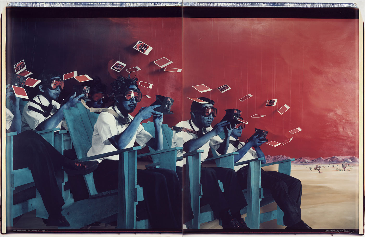
Color! shows how the rise of digital technologies furthered this transformation, as photographers such as Gregory Crewdson (b. 1962), Richard Misrach (b. 1949) and Alex Prager (b. 1979) have explicitly embraced the hues, scale, and even subjects of painting and cinema.
“Photography still gains its power and wide popularity today from its ability to closely reflect the world,” explains Rohrbach, “but Color! reveals how contemporary artists have been using reality not as an end unto itself, but as a jumping off point for exploring the emotional and cultural power of colour, even blurring of line between record and fiction to make their points. These practices, founded on colour, have transformed photography into the dominant art form of today even as they have opened new questions about the very nature of the medium.”
The exhibition will include an interactive photography timeline enabling visitors to contribute to the visual dialogue by sharing their own colour images. The photographs will be displayed along the timeline and on digital screens in the museum during the exhibition to illustrate how quantity, format and colour quality have evolved over time.
“By telling the full story of colour photography’s evolution, the exhibition innovatively uncovers the fundamental change that colour has brought to how photographers think about their medium,” says Andrew J. Walker, museum director. “The story is fascinating and the works are equally captivating. Photography fans and art enthusiasts in general will revel in the opportunity to see works by this country’s great photographers.
Press release from the Amon Carter Museum of American Art website
Exhibition dates: 3rd August – 30th September, 2012
Co-curators: MGA Curator Stephen Zagala and MGA Curatorial Assistant Stella Loftus-Hills
Artists: Andrew Browne, John Cato, Jo Daniell, John Delacour, Peter Elliston, Joyce Evans, Chantel Faust, Susan Fereday, Anthony Figallo, George Gittoes, John Gollings, Graeme Hare, Melinda Harper, Paul Knight, Peter Lambropoulos, Bruno Leti, Anne MacDonald, David Moore, Grant Mudford, Harry Nankin, Ewa Narkiewicz, John Nixon, Rose Nolan, Jozef Stanislaw Ostoja-Kotkowski, Robert Owen, Wes Placek, Susan Purdy, Scott Redford, Jacky Redgate, Wolfgang Sievers, David Stephenson, Mark Strizic and Rick Wood.
There are some excellent works in this interestingly themed exhibition at the Monash Gallery of Art. Unfortunately the exhibition, the theme and the work are let down by two curatorial decisions. Before I address those issues I will give my insight into some of the work presented:
~ A wonderful print of Sisters of Charity, Washington DC by David Moore (1956) where the starched cornettes of the sisters reminded me of paper doves. The kicker or punctum in this image is the hand of one of the sisters pointing skywards/godwards
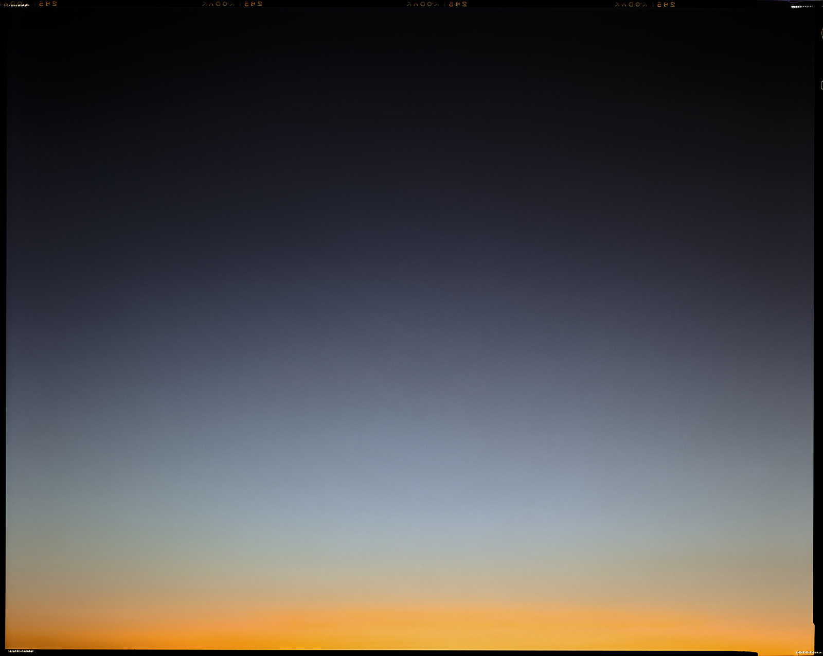
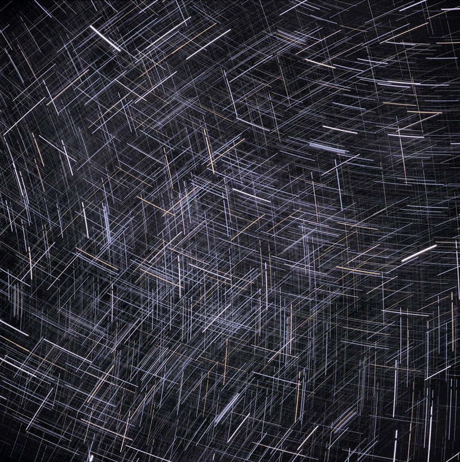
~ A wonderful David Stephenson Star Drawing. I always like photographs from this series. Taken in Central Australia using as many as 72 multiple exposures, Stephenson used a set of rules for each exposure – deciding on the length and amount of exposure and how far he would rotate the camera between each exposure before embarking on the creation of each image. The construction of the image was pre-determined but because of the movement of the earth and stars over a couple of hours, the result always incorporated an element of chance. Stephenson draws with light that is millions of years old, the source of which may not exist by the time the light falls on Stephenson’s photographic plate (the star might be dead)
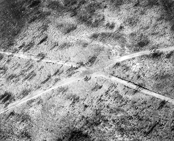
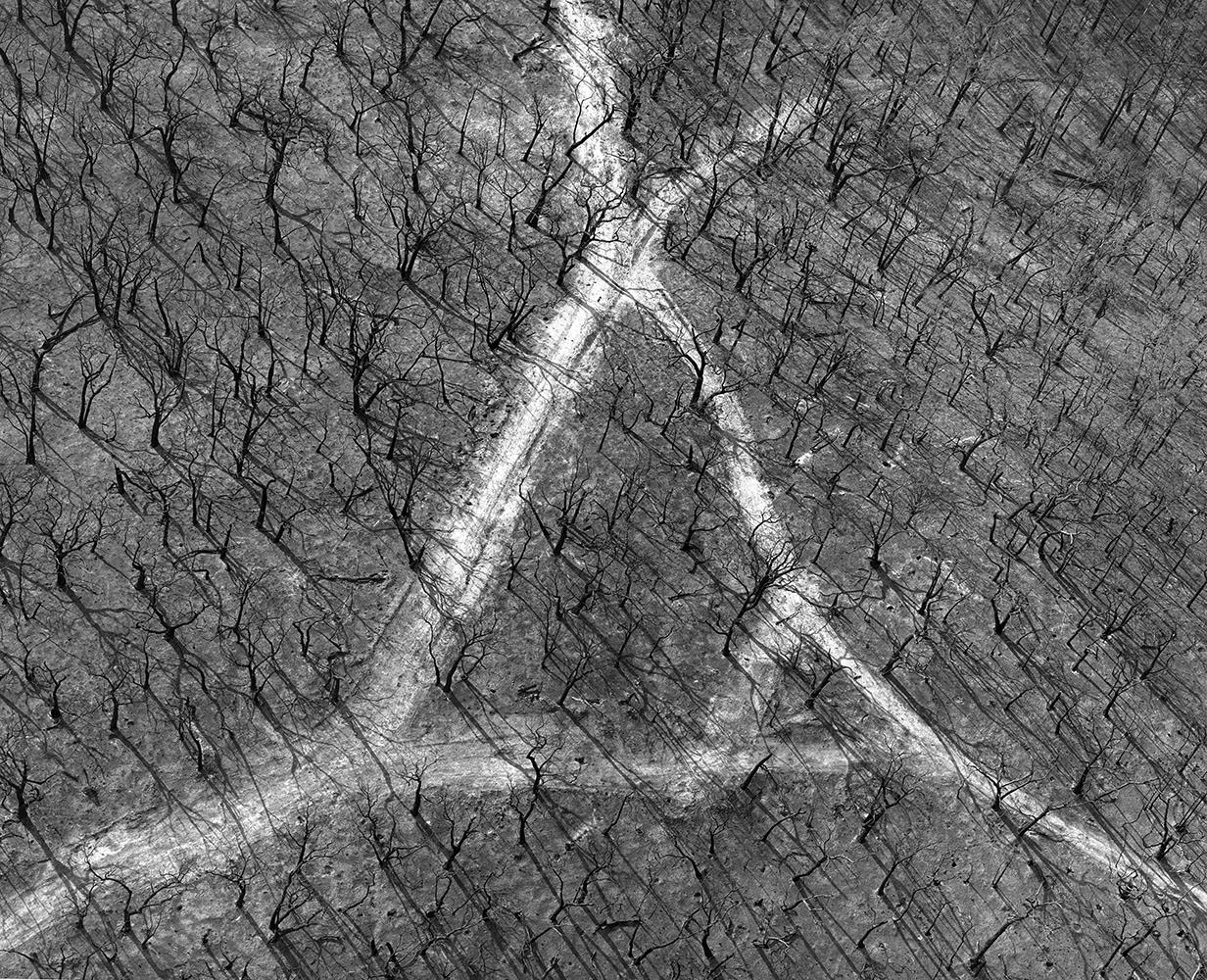
~ John Gollings Untitled from the Bushfire series. Beautiful, luminous black and white silver gelatin prints of tracks in bushfire affected areas. These aerial photographs make the surface of the earth seem like the surface of the skin complete with hairs and wrinkles. In process they reference the New Topographics exhibition of 1975, where the mapping of the landscape is etched into the surface of the photographic print, where the pictorial plane records the environment like the marks on an etching plate. “The pictures were stripped of any artistic frills and reduced to an essentially topographic state, conveying substantial amounts of visual information but eschewing entirely the aspects of beauty, emotion and opinion.”
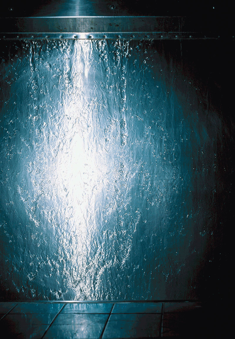
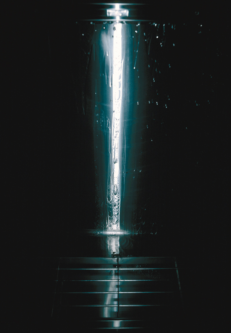
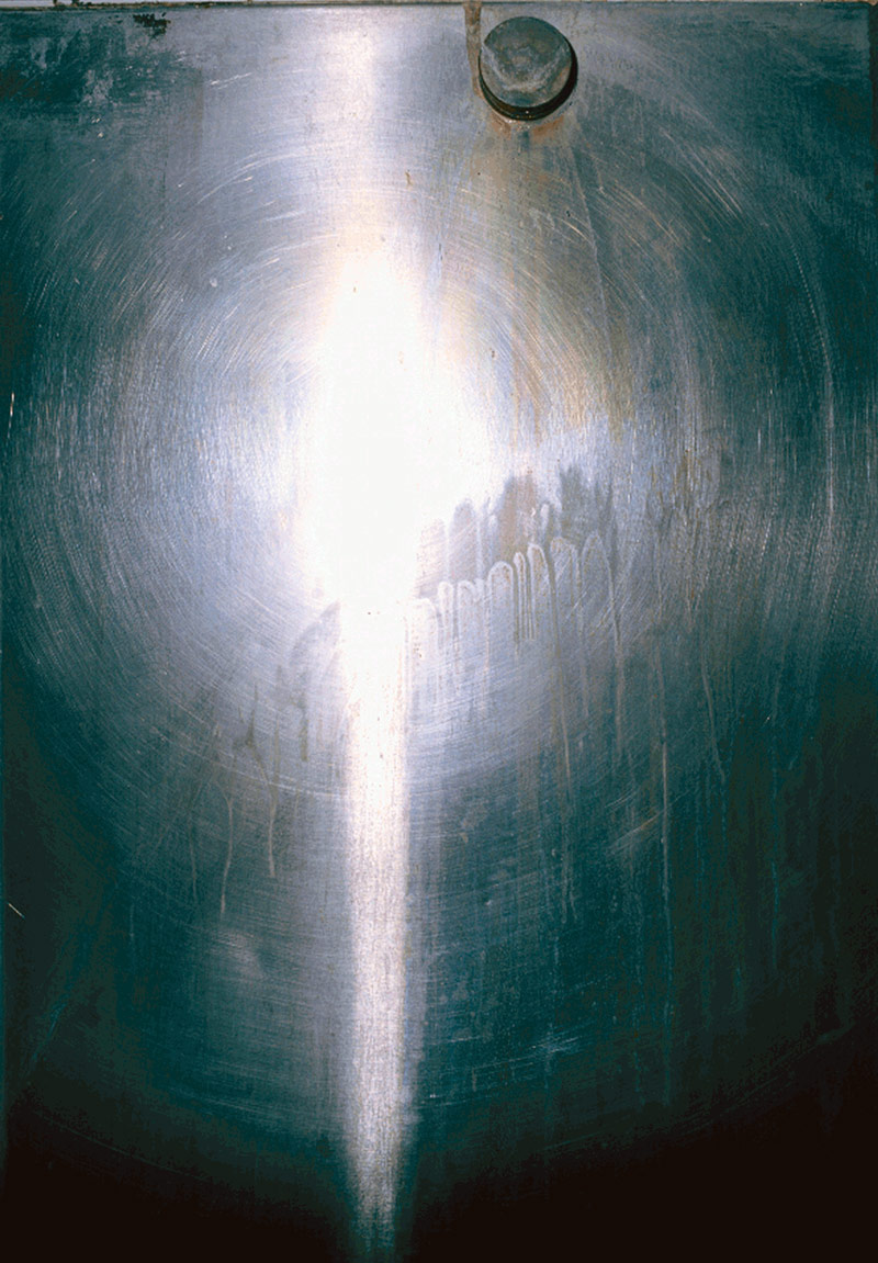
~ The beautiful Scott Redford Urinal photographs where the subject becomes secondary to the abstract visual elements as the flash bounces off the metal surfaces. Tight camera angles and a limited colour palette cause an almost transcendent composition. The swirls and markings and the sword-like quality of the central image (see below) remind me of Excalibur rising from the lake, dripping water.
~ Four photographs by John Cato, one each from Petroglyph 1971-79, Waterway 1971-79, Proteus 1971-79 and Tree – a journey 1971-79. These were incredibly beautiful and moving photographs, abstractions of the natural world. You need to be reminded what an amazing artist John was, one of the very best Australian photographers, his poetic photographs are cosmological in their musicology and composition
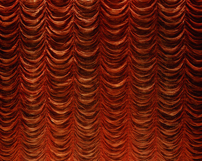
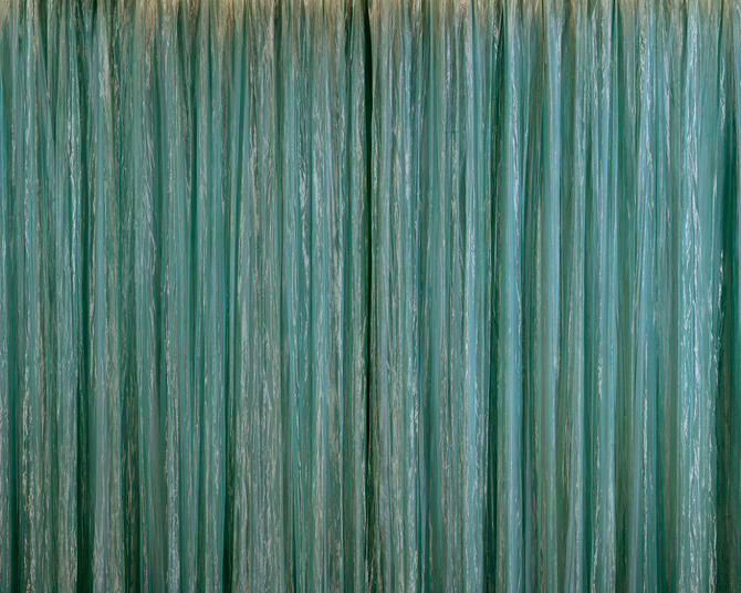
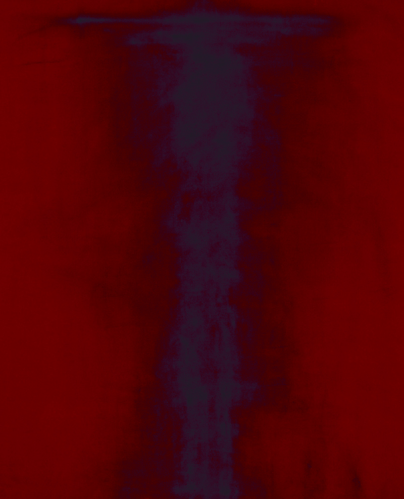
~ Two photographs from Paul Knight’s outstanding Cinema curtain series (below). For me there was a textural, sensory experience here, an intimacy with the subject matter that forced me to focus on the surface of the photograph, the flat plane of the photographic print, itself a highly abstract form. Amazing
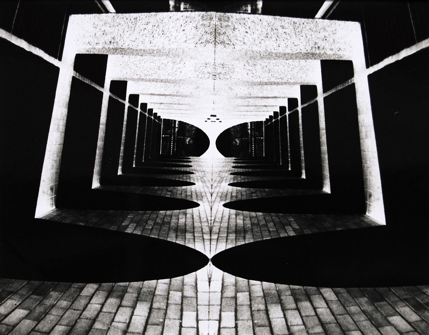
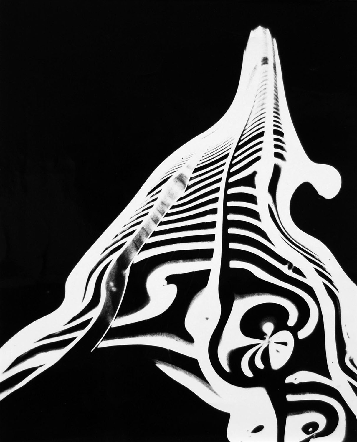
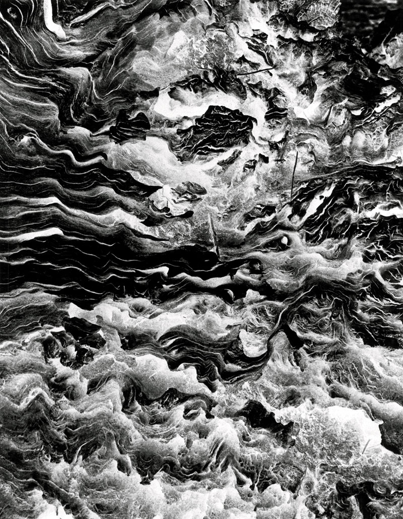
~ My particular favourite in the exhibition were the unknown to me works of the artist Jozef Stanislaw Ostoja-Kotkowski (see the two images below). These photographs were the most delightful surprise of the exhibition – landscapes of the mind that had great feeling and focus, felt movement, space, flow of light and energy. This was wonderfully nuanced work that I wanted to see more of
Some excellent work then that was let down by two curatorial decisions.
The first was the amount of work in the exhibition by each artist – a couple of prints here, another three small prints there – that really never gave the viewer chance to fully engage with the outcomes that the artist was trying to achieve nor explore the process that the artist was using. I know this was a group exhibition trying to highlight work from the collection but a more useful contribution would have been less artist’s in the exhibition with greater work from each, allowing for a more focused exhibition.
Far more serious, however, was the lack of any text that placed the work in a socio-cultural context. At the beginning of the exhibition there was 5 short paragraphs on a wall as you enter the space with mundane insights such as:
~ Photographic language engages the senses and imagination and challenges the way we “look” at the world
~ Through the use of cropping and obscure angle the familiar is made unfamiliar
~ Colour, shape and form (geometric patterns) are important
~ Some artists’ eliminate the camera altogether through photograms, scanner, collage
~ Use of multiple exposures, distortion, mirroring
~ By drilling down into the substances and processes of photography we can reflect on the very nature of photography itself
~ Exploring geometry and patterns found in nature and the built environment or alluding to more intangible themes such as time, mortality and spirituality
I have précised the five paragraphs but that’s all you get!
The only other information comes from brief wall texts accompanying each artist and these sound bites really don’t give any social and cultural context to the artist, the time they lived in or the social themes that would have influenced the work.
For example, who would know from this exhibition that the artist John Cato was one of the first photographers in Australia to create visual tone poems using images of the Australian landscape, one of the first to work in sequences of images and who would go on to be a teacher of great repute, helping other emerging photographic artists at a critical time in the development of Australian art photography. Nobody.
Also, I wanted to know more about the “substances” and “processes” of photography in regard to photographic abstraction. There was no serious theoretical enquiry, no educational component offered to the viewer here.
While money might be tight there is really no excuse for this lack of creditable, researched, insightful information. You don’t need a catalogue, all you need is a photo-stated 4-6 page essay to be given to visitors (if they desire to have one, if they want the information). It doesn’t take money it takes will to inform and educate the viewer about this important aspect of Australian photographic history. For a subject so engaging this was most disappointing.
In this particular case the curators really did drop the abstract ball.
Dr Marcus Bunyan
Many thankx to the Monash Gallery of Art for allowing me to publish the photographs in the posting. Please click on the photographs for a larger version of the image.
While John Gollings is best known for his work as an architectural photographer, he has produced a number of works that hone in on the Australian landscape. This aerial photograph looks down onto a landscape that has been scorched by bushfire. Viewed from above, without any horizon line to give a sense of scale or orientation to the terrain, this charred topography takes on the appearance of hairy, stubbled skin. Gollings uses this ambiguity to great effect, making the dirt tracks look like wounds that have scarred the surface of the earth, and the effects of smoke and ash look like bruises. In this respect, the use of aerial photography has allowed the images to be read as abstract ciphers of ecological trauma.
In a career spanning over 40 years, David Stephenson has consistently used photography to transcend visible reality, photographing built and natural environments to explore abstract, intangible themes such as time, mortality and spirituality. Stephenson made these Star drawings in Central Australia, overlaying as many as 72 different exposures to make one work. For each photograph he used a list of predetermined rules. For instance, he would decide on the length and number of exposures and how far he would rotate his camera between each exposure before embarking on the creation of each image. The images, each of which took a couple of hours to produce, were in this sense pre-planned; however, the amount of variables involved such as the movement of the earth and the stars during each shoot, meant the result always incorporated an element of chance. Interested in the idea that photography is essentially drawing with light, Stephenson’s series of experimental abstract patterns is not so much about documenting the night sky as it is about conceptually exploring the nature of light, time and photography itself.
The function of the stage curtain in the cinema was to help suspend the illusion of reality in the moving image of the film. The idea being that the plain white screen behind the curtain was never seen without the moving image on it. So the illusion always existed behind the curtain and was simply masked-off from us by it. This is partly why the image was alway projected onto the curtain for a moment before it was opened, to ensure that we never saw the dead white screen. These works use this function of the cinema stage curtain as a way of engaging with the meta-reality offered by the flat-plane of a photographic print. Utilising the lure of aesthetics and pattern to bring the viewer onto the folded membrane of the curtain and onto the essentially flat plane of the print. Both give way to a potential of volume.
Text from the Paul Knight website [Online] Cited 21/09/2012. No longer available online
Originally trained as a painter, Jozef Stanislaw Ostoja-Kotkowski was interested in the advancement of art materials and techniques. He worked across a variety of media, including painting, sculpture, photography, electronic sound and light projections. He was also interested in combining different art forms and experimented with blending photography with music and sound.
Ostoja-Kotkowski played a key role in the development of experimental photography as well as electronic art in Australia. While his subjects were taken from the real world, they were photographically distorted and abstracted so that many became unrecognisable. He used this technique to create the series Inscape 871, examples of which are exhibited here. Inscape refers to an inner landscape, or images of the mind, while 871 refers to the month and year the works were completed. This series was included in the National Gallery of Victoria’s exhibition Frontiers (1971), which featured five Australian experimental photographers.
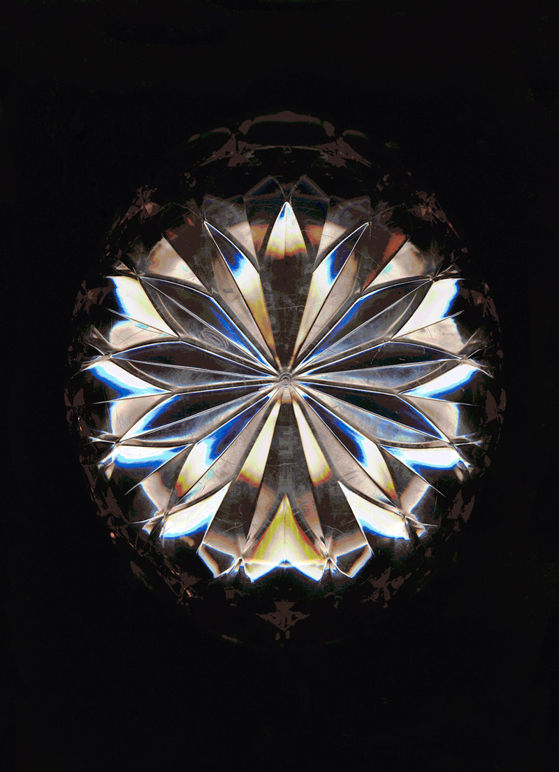
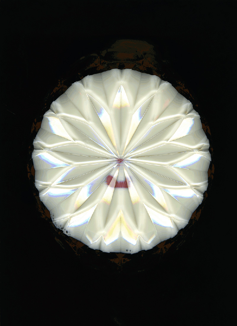
Like much of Chantal Faust’s photographic work, her series Milk was produced using a digital flatbed scanner, a method that allowed her to generate photographs without the use of a camera. The series documents milk being drunk from a bowl and can be linked to the tradition of 1960s and 1970s ‘process art’. During the late 20th century, photography was often employed by artists who wanted to document performance-based art actions and activities. Faust’s ‘action’ of slurping milk from a bowl is a playful extension of this tradition.
Drawing on MGA’s collection of Australian photographs, Photographic abstractions highlights the work of 33 Australian artists who use photography to achieve abstract effects. Ranging from modernist geometric abstraction and the psychedelic experiments and conceptual projects of the 1970s, through to recent explorations of pixelated pictorial space, this exhibition surveys a rich history of abstract Australian art photography. Photography is traditionally recognised for its ability to depict, record and document the world. However, this exhibition sets out to challenge these assumptions. As co-curator of the exhibition and MGA Curator Stephen Zagala states, “The artists in this exhibition are less concerned with documenting the world and more interested in engaging the senses, exciting the imagination and making the ordinary appear extraordinary.”
Some artists have eliminated the camera altogether, preferring the effects that can be achieved with photograms and digital scans. Other artists have experimented with multiple exposures, mirrored images, irregular lenses and the printing of the usually discarded stubs of negatives. Co-curator and MGA Curatorial Assistant Stella Loftus-Hills says, “Photography has always been tied to abstraction. Some of the first photographs ever produced were abstract and subsequent photographers have sought out abstract compositions in their work.”
One highlight of the exhibition is a selection of works by the iconic Australian photographer David Moore, who experimented with abstract photography alongside his more well-known figurative work. In Moore’s Blue collage (1983) the process of cutting bands of colour from existing photographs to create a new composition celebrates the artist’s imagination above and beyond the camera’s ability to capture content.
Artists include Andrew Browne, John Cato, Jo Daniell, John Delacour, Peter Elliston, Joyce Evans, Chantel Faust, Susan Fereday, Anthony Figallo, George Gittoes, John Gollings, Graeme Hare, Melinda Harper, Paul Knight, Peter Lambropoulos, Bruno Leti, Anne MacDonald, David Moore, Grant Mudford, Harry Nankin, Ewa Narkiewicz, John Nixon, Rose Nolan, Jozef Stanislaw Ostoja-Kotkowski, Robert Owen, Wes Placek, Susan Purdy, Scott Redford, Jacky Redgate, Wolfgang Sievers, David Stephenson, Mark Strizic and Rick Wood.
Redford’s photographs of urinals… dialogue with art historical motifs that precede discourses of minimal art and postmodern understandings of the abject. In representing the site of male urination, they evoke the oxidation paintings of Andy Warhol, who directed young men to piss onto canvases prepared with copper oxide, resulting in compelling abstract imagery… All of that is in Redford’s photographs and at the same time they are completely empty and quiet and contemplative… They are pure sensory experience like rainfall, even transcendent in their purity. They are concerned with beauty, but they are beyond debates about beauty. They are indifferent and in this they are transcendent.
Chapman, Christopher. “Scott Redford’s urinals,” in Redford, Scott et.al. Bricks are Heavy (exhibition catalogue). Brisbane: Institute of Modern Art, pp. 6-7.
Monash Gallery of Art 860 Ferntree Gully Road, Wheelers Hill Victoria 3150 Australia Phone: +61 3 8544 0500
Curators: Andrew Perchuk (deputy director) and Rani Singh (senior research associate), with Glenn Phillips (principal project specialist and consulting curator) and Catherine Taft (curatorial associate)
List of artists represented: Peter Alexander, John Altoon, Chuck Arnoldi, John Baldessari, Larry Bell, Billy Al Bengston, Karl Benjamin, Ed Bereal, Tony Berlant, Wallace Berman, Marjorie Cameron, Cameron, Vija Celmins, Judy Chicago, Mary Corse, Ronald Davis, Richard Diebenkorn, Laddie John Dill, Melvin Edwards, Frederick Eversley, Lorser Feitelson, Llyn Foulkes, Sam Francis, Joe Goode, Robert Graham, Frederick Hammersley, George Herms, David Hockney, Stephan von Huene, Craig Kauffman, Edward Kienholz, Helen Lundeberg, John Mason, Allan McCollum, John McLaughlin, Ron Miyashiro, Ed Moses, Lee Mullican, Bruce Nauman, Helen Pashgian, Ken Price, Noah Purifoy, Ed Ruscha, Betye Saar, Henry Takemoto, DeWain Valentine, Gordon Wagner, Norman Zammitt.
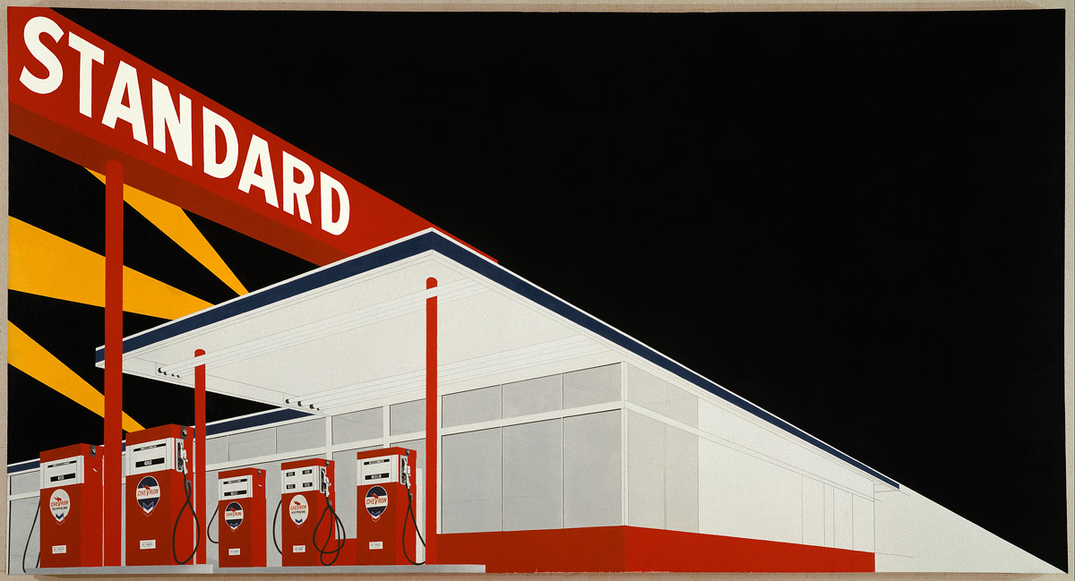
Ed Ruscha (American, b. 1937) Standard Station, Amarillo, Texas 1963 Oil on Canvas Hood Museum of Art, Dartmouth College, Hanover, New Hampshire Gift of James Meeker, Class of 1958, in memory of Lee English, Class of 1958, scholar, poet, athlete and friend to all
What a bumper posting – so much to enjoy and something for everyone!
Dr Marcus Bunyan
Many thankx to Martin-Gropuis-Bau for allowing me to publish the artwork in the posting. Please click on the photographs for a larger version of the image.
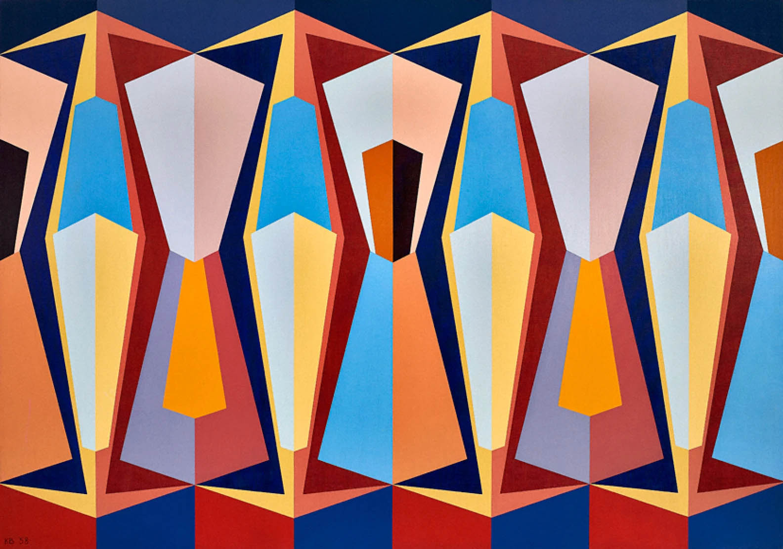
Karl Benjamin (American, 1925-2012) Stage II 1959 Oil on canvas 50 x 70 inches; 127 x 177.8cm
Karl Stanley Benjamin (December 29, 1925 – July 26, 2012) was an American painter of vibrant geometric abstractions, who rose to fame in 1959 as one of four Los Angeles-based Abstract Classicists and subsequently produced a critically acclaimed body of work that explores a vast array of colour relationships. Working quietly at his home in Claremont, California, he developed a rich vocabulary of colours and hard-edge shapes in masterful compositions of tightly balanced repose or high-spirited energy. At once intuitive and systematic, the artist was, in the words of critic Christopher Knight, “a colorist of great wit and inventiveness.”
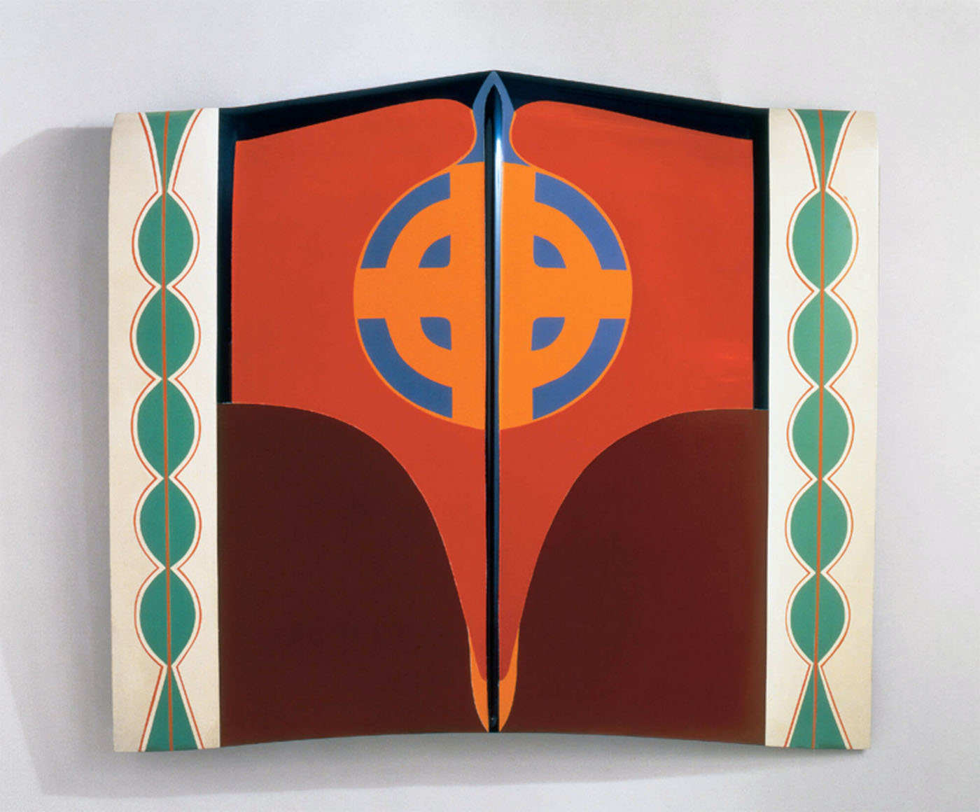
Judy Chicago (American, b. 1939) Car Hood 1964 Sprayed acrylic and lacquer on car hood 109 x 125 x 11cm
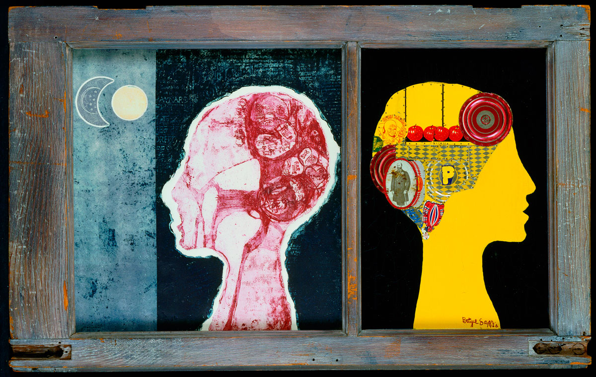
Betye Saar (African-American, b. 1926) The Phrenologer’s Window 1966 Assemblage of two panel wood frame with print and collage Private Collection; courtesy of Michael Rosenfeld Gallery, LLC, New York, NY
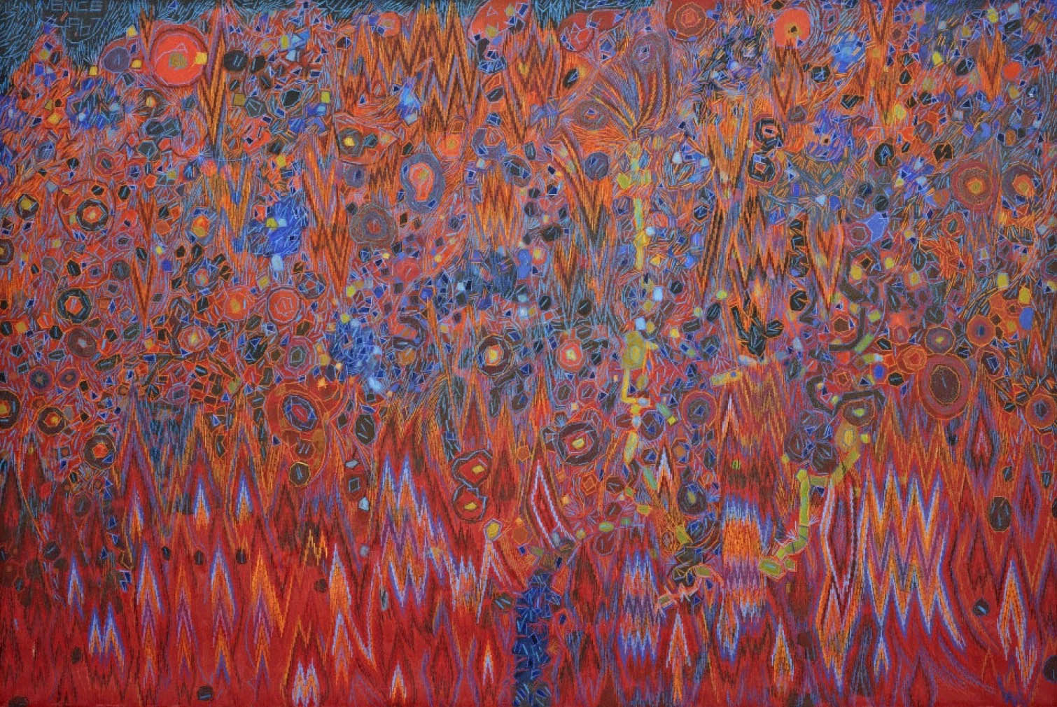
Lee Mullican (American, 1919-1998) Untitled (Venice) 1967 Oil on canvas
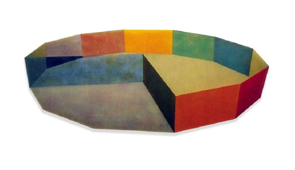
Ronald Davis (American, b. 1937) Vector 1968 Polyester Resin and Fiberglass 60 1/2 x 132 inches (shaped) Tate Gallery, London
Ronald “Ron” Davis (born 1937) is an American painter whose work is associated with geometric abstraction, abstract illusionism, lyrical abstraction, hard-edge painting, shaped canvas painting, color field painting, and 3D computer graphics. He is a veteran of nearly seventy solo exhibitions and hundreds of group exhibitions.
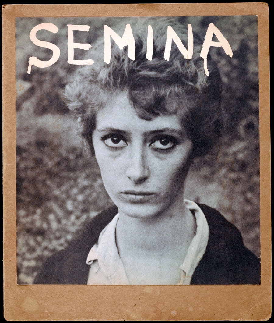
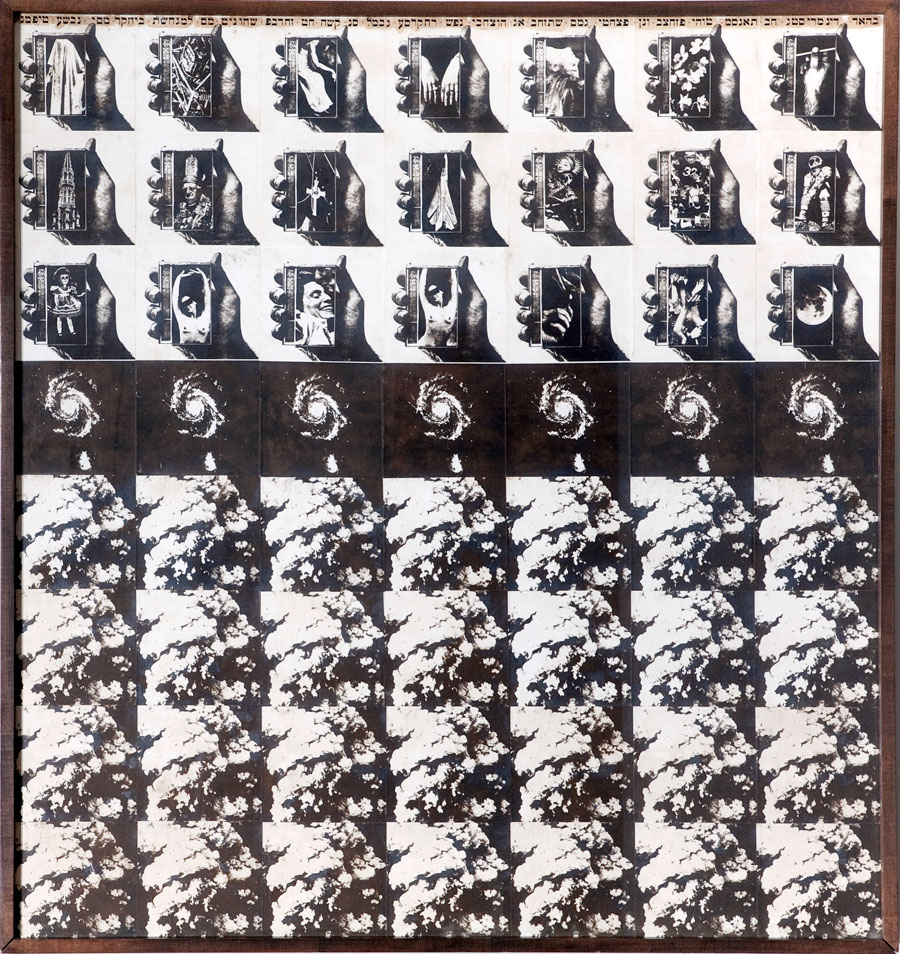
Wallace Berman (American, 1926-1976) Semina Cover with Wife (Photograph of Shirley Berman) 1959 Halftone reproduction on cardstock Getty Research Institute, Los Angeles, CA
The exhibition project Pacific Standard Time – Art in Los Angeles, 1950-1980 traces the development of the Los Angeles art scene during the post-war period, when the city on the Pacific hosted an impressively varied and versatile art scene, thus proving that it was more than Hollywood and a sprawling metropolis in the land of sunshine and palm trees. Pacific Standard Time features such internationally esteemed artists as John Baldessari, David Hockney, Edward Kienholz or Ed Ruscha as well as protagonists that are yet to be discovered like the abstract painters Helen Lundeberg and Karl Benjamin, the ceramicists Ken Price and John Mason, and sculptors such as De Wain Valentine.
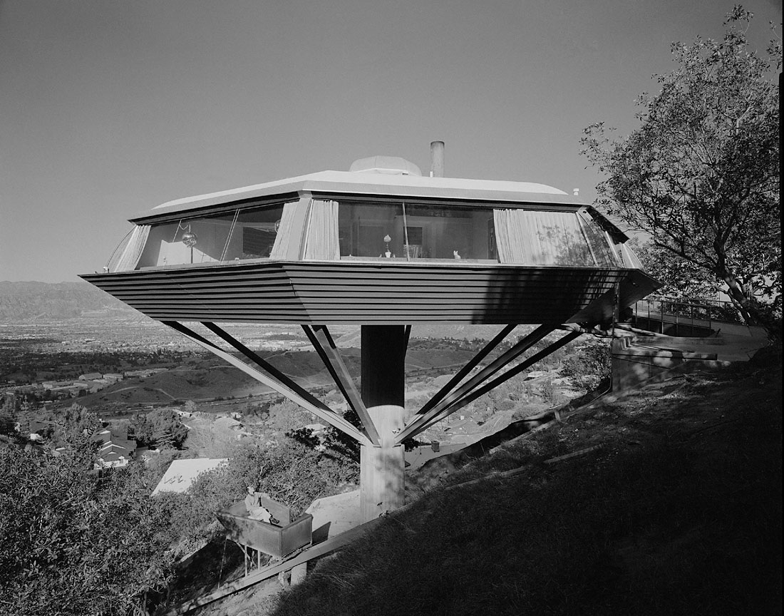
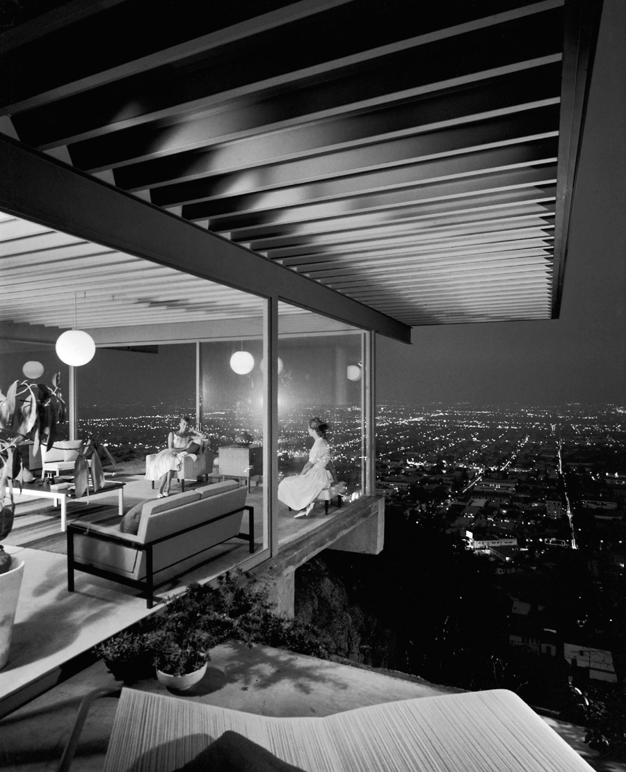
The mega show – over 60 institutions and galleries in Los Angeles were involved – is taking the two main core exhibitions of the Getty Museum and the Getty Research Institute to Europe. The sole European venue is the Martin-Gropius-Bau in Berlin. The section of the exhibition that was to be seen in Los Angeles’ Getty Museum under the title of Crosscurrents in L.A. – Painting and Sculpture, 1950-1970, presents painting and sculpture. In the second part that was to be seen in Los Angeles under the title of Greetings from L.A. – Artists and Publics, 1950-1980, posters, artists’ catalogues, postcards, invitation cards and other memorabilia are shown which offer a deeper insight into the networks of the Los Angeles art scene at that time. For Berlin the show has been supplemented to include photographs by Julius Shulman, whose architectural shots defined the image of the Californian lifestyle in the 1950s. His incomparable sensibility and intuitive feel for composition and the ‘critical moment’ established him as a master of his craft.
Part One: Crosscurrents
The first part of the Berlin show brings together more than 70 works by over 50 artists and traces the rise of the Southern Californian art scene between 1945 and 1980. The list of names reads like a Who’s Who of today’s internationally esteemed artists, as people like John Baldessari, David Hockney, Edward Kienholz, Bruce Nauman or Ed Ruscha began their careers here.
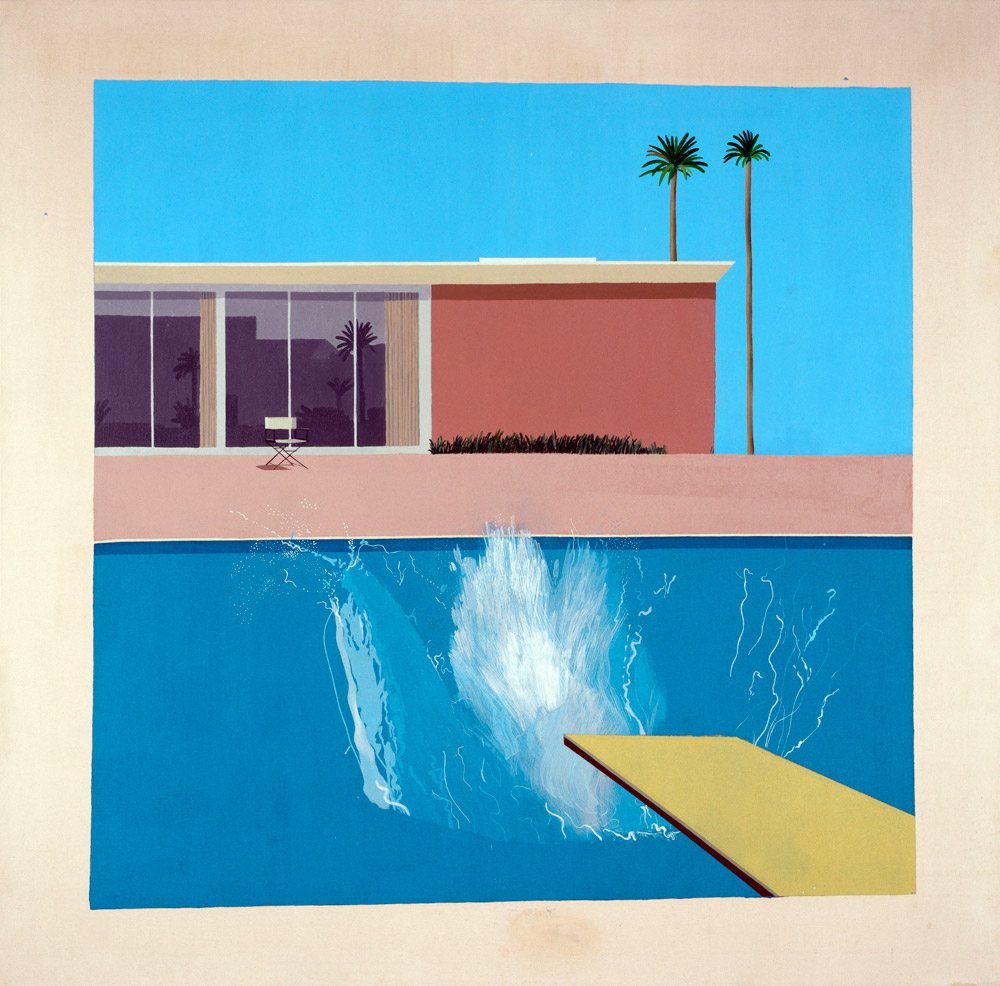
The entrée into Pacific Standard Time begins with British artist David Hockney’s iconic painting A Bigger Splash from the year 1967. It is one of the key pictures of the exhibition and stands for the hedonistic life under palm trees with permanent sunshine and never-ending parties.
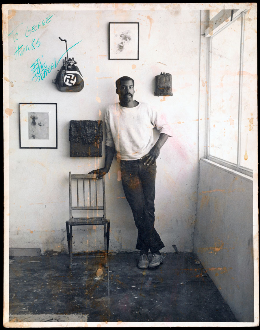
The exhibition is structured both chronologically and thematically, comprising six sections that reflect the entire spectrum of the art trends that sprang up simultaneously in Los Angeles. Abstract works – ceramic sculptures and paintings of bleak clarity – are to be seen in the first section. The second section shows assemblage sculptures and collages by artists like George Herms, Wallace Berman and Ed Bereal, who paved the way for this artistic approach in the 1950s, and their successors, including many African-American artists. The third section documents the rise of Los Angeles to become an important art centre, while the fourth shows paintings by internationally recognised Los Angeles artists as Richard Diebenkorn, David Hockney and Ed Ruscha. It becomes clear that Southern California was one of the leading centres for large-format pop art and abstract painting in the 1960s. The fifth section examines how, at a time when painting was growing in significance on the Atlantic Coast of the USA, artists on the West Coast were beginning to extend their notions of traditional painting and sculpture, with perceptual phenomena and the material processes of artistic production coming to the fore. Here we find works that have arisen out of a collision between art and technology, such as a sculpture by De Wain Valentine, who uses industrial materials like polyester casting resin, or a canvas by Mary Corse, into which the smallest, high-grade reflecting glass microspheres have been worked. We are also introduced to a group of artists whose works show traces of their creation, such as those of Joe Goode, Allan McCollum, Ed Moses and Peter Alexander.
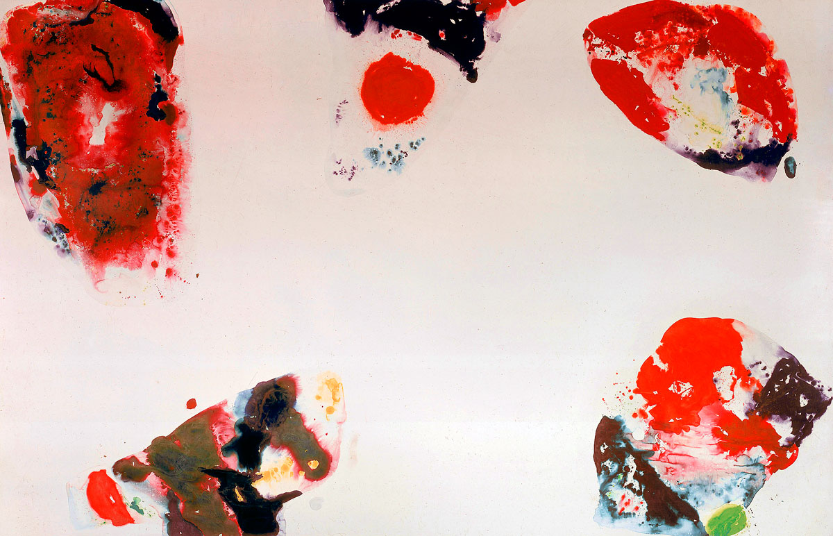
Berlin is supplementing the Getty exhibition by devoting a special room to the early international perception of art in Los Angeles. It will feature the works Berlin Red by Sam Francis, a 8 x 12 metre painting that was commissioned by Berlin’s Neue Nationalgalerie in 1969, and Volksempfängers (People’s Wireless) by Edward Kienholz. As a DAAD scholar Kienholz often lived in Berlin from 1973 on.
Another distinctive feature of the exhibition are the various room installations, including Stuck Red and Stuck Blue by James Turrell and Four Corner Piece by Bruce Nauman. In 1966 Turrell began working on his Light Room installations. In the work displayed in the Martin-Gropius-Bau that he designed in 1970, he uses light to dissolve the borders of spatial structures and transform them. In his Four Corner Piece from 1971 Bruce Nauman creates a particular spatial experience through the interplay of physical information vs. visual information.
Part Two: Greetings from L. A.
In the second part of the exhibition, elaborated by the Getty Research Institute, the Martin-Gropius-Bau shows over 200 objects – photographs, artists’ catalogues, books, posters, postcards, invitations, letters and artworks, of which many are on public view for the first time. We are given a sense of how Californian artists, through the involvement of a wide audience, brought art into contact with the general public. We also see how intensely the international networks linking groups of artists functioned.
Greetings from L.A. begins with Making the Scene and describes the gallery scene in Los Angeles from the 1950s to the 1970s. We are introduced to art dealers and collectors of the kind who congregated at La Cienega Boulevard – Rolf Nelson, Riko Mizuno and Betty Asher. On this gallery-lined boulevard, which crosses the Sunset Boulevard immortalised by Ed Ruscha, the reputation of Los Angeles as a city of modern and contemporary art was made.
Public Disturbances, the second section of the show, is devoted to three important exhibitions which drew fierce criticism and even led to arrests. Wallace Berman’s 1957 exhibition in the Ferus Gallery was closed down by the police. Violent controversies were triggered by the War Babies exhibition (1961) in the Huysman Gallery. There were also strong differences of opinion between the Los Angeles County Museum of Art (LACMA) and the Los Angeles County Board of Supervisors over the inclusion of Kienholz’s installation Back Seat Dodge ’38 (1964) in his grand retrospective of 1966.
The Private Assembly section of the exhibition focuses on the works created by Wallace Berman, George Herms, Charles Brittin and their circle in the 1950s and 1960s. The intimacy of these objects is explained not only by the unmistakable traces of artistic authorship they bear, but also by the fact that they were only accessible to a select, non-public audience. Mainly active outside the commercial gallery scene, this group of assemblage artists concentrated their energies on private artworks, which they handed over personally or sent by mail as a token of friendship.
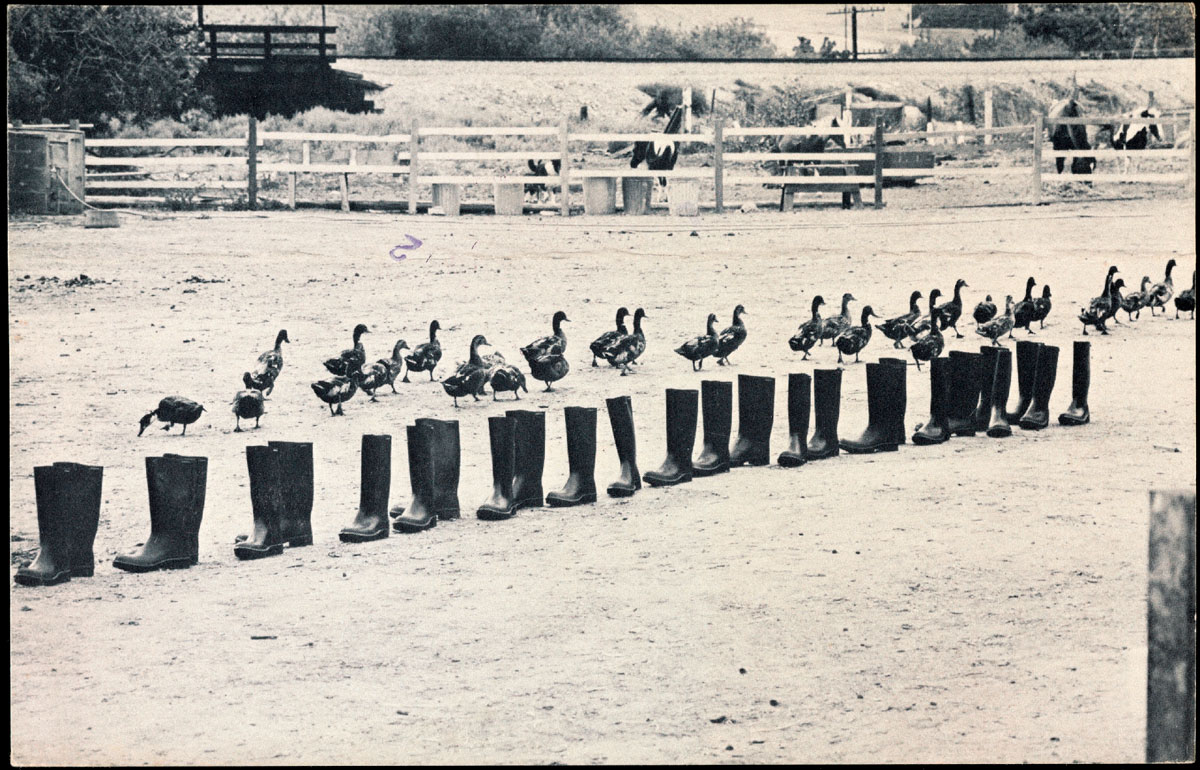
The fourth section, Mass Media, introduces artists who selected the mass media as a model for their own art. Ed Ruscha, Allen Ruppersberg and Chris Burden occupied themselves with popular culture and mass production as alternative means of production and distribution. They used impersonal forms, such as those of objects or advertising materials commercially produced and sold as consumer goods. By avoiding conventional exhibition rooms, these artists reached a new public. They often exhibited anonymously, thus making the identity of artist and work secondary.
Art School as Audience, the fifth section of the exhibition, sheds light on the important role of art schools in the development of contemporary art forms. They served as the static pole, because in them artists constituted the audience of other fellow artists. The California Institute of the Arts, commonly known as CalArts, and its predecessor, the Chouinard Art Institute, were key venues for important groups of artists, as can be seen from the works of such students as Ed Ruscha and Joe Goode, and such teachers as John Baldessari, Miriam Schapiro and Judy Chicago. Other important forums were the new art faculties that came into existence at the universities and other higher education facilities in Los Angeles County. At the campuses of Irvine or San Diego in particular there was a stimulating audience for the experiments of such artists as Martha Rosler, Barbara Smith and Eleanor Antin.
The last section, The Art of Protest, examines how social and political developments mobilised artists to display their works in the street. In the 1960s Los Angeles became the scene of the first protests led by artists against the Vietnam War. This gave rise in 1966 to the construction of a Peace Tower at the corner of La Cienega and Sunset Boulevards. In the following decade it was feminism that moved many artists to become social activists, as can be seen from the work of Suzanne Lacy and Leslie Labowitz-Starus In Mourning and in Rage 1977, a highly esteemed protest performed on the steps of City Hall.
Greetings from L.A. offers a new look at art in Southern California by showing how the artists of this region changed the conventional relations between art and public and developed alternatives for a public role of art and its place in society.
The exhibition affords glimpses into some recently acquired archives, like those of Betty Asher, Hal Glicksman, George Herms, Wolfgang Stoerchle, High Performance magazine, the galleries of Rolf Nelson, Mizuno and Jan Baum as well as of the papers of Charles Brittin and Edmund Teske. These are supplemented by material from archives not normally associated with Southern California, such as the papers of the critics Irving Sandler, Barbara Rose and Lawrence Alloway of New York; of Marcia Tucker, the founder and curator of New York’s New Museum of Contemporary Art; and of the Kasmin Gallery, London.
Part Three: Julius Shulman
The last part of the Berlin exhibition shows over 50 photographs by Julius Shulman – the most important American photographer of architecture in the post-war period. For more than thirty years he photographed Modernist houses – built by Richard Neutra, Frank Lloyd Wright, or Frank Gehry – thus making many of them into architectural icons. The exhibition shows some of his key works.












You must be logged in to post a comment.