West Bengali woman embroidering the Disappearances
I have always loved the work of Nicola Loder ever since I saw her solo exhibition Child 1-175: A Nostalgia for the Present at Stop 22 Gallery in St Kilda in 1996. This exhibition is no exception. Loder is the consummate professional, her work is as imaginative and intriguing as ever and there has been a consistent thematic development of ideas within her work over a long period of time. These ideas relate to the nature of seeing and being seen, the mapping of identity and the process of its (dis)appearance.
This latest iteration of her ongoing series Tourist (described in detail, below, in the erudite essay by Stuart Koop) again involves de/reconstructions of identity through slippages, elisions, deletions, disappearances and transformations. In Tourist #5: Disappearing Project 1-41 the shroud-like effigies that result from Loder’s project, a reference reinforced by the muslin cloth lying over the bench in the gallery space (see the installation photographs below), are a repeated re-presentation of a lost or missing identity: the disappearance of the person in their own minds; photography’s “capture” of the original person; Loder’s deletion of this identity (I was there) to be substituted by Photoshop’s geometric algorithms; the West Bengali women’s reinterpretation of this disappearance; and the reappearance of a new energy in the colourful, embroidered reinterpretations. I have very much a feeling of a spiritual energy in this last embodiment – think of the link between death and the spirit (as in the Shroud of Turin).
The images have multiple narratives and are already textualised but Loder disrupts this marking, the continual reiteration of norms by weaving a lack of fixity into her objects. In her reconceptualisations of space and matter Loder redefines the significations of the body in the fold of inscription, through a process of materialisation. But this materialisation, like the image seared into the fabric of the Shroud of Turin, still somehow eludes us. This is what makes this work so tantalising…
This interweaving of texts culminates in the body inscribed on another plane existing in, as Loder herself describes it, a “de-constructed non-space somewhere between image, imagination, identity, language and being,” which, as Stuart Koop observes, “is… not a removal or deletion but a reconfiguration beyond verisimilitude, beyond our appearance to others and ourselves.” This is the navigation through a virtual space that Sherry Turkle posits in the quotation below, where the self is decentred and identity is fluid and multiple.
Loder’s exquisitely sensuous description of disappearance allows us to see the phenomenal word afresh. I look forward with a sense of anticipation to the next voyage of discovery the artist will take me on.
Dr Marcus Bunyan
Many thankx to Nicola Loder, Stuart Koop and Helen Gorie Galerie for allowing me to publish the text and photographs in the posting. Please click on the photographs for a larger version of the image.
Fredric Jameson wrote that in the postmodern world, the subject is not alienated but fragmented. He explained that the notion of alienation presumes a centralized, unitary self who could become lost to himself or herself. But if, as a postmodernist sees it, the self is decentred and multiple, the concept of alienation breaks down. All that is left is an anxiety of identity… In simulation, identity can be fluid and multiple, a signifier no longer points to a thing that is signified, and understanding is less likely to proceed through analysis than by navigation through virtual space.
Sherry Turkle. Life on The Screen: Identity in the Age of the Internet. New York: Simon and Schuster, 1995, p. 49.
Tourist #5: Disappearing Project 1-41 by Nicola Loder, installation photograph at Helen Gorie Galerie Photos: Marcus Bunyan
Photographer Nicola Loder explores the way in which people see.
The purpose of photography is largely to make things visible. Inspired in part by her experiences teaching blind children photography, Loder reverses photography’s function using it instead to capture objects and experiences that aren’t visible. She embraces Photoshop but counters its typical role of improving clarity and focus, rather using it to collapse images into layers of pattern and colour.
Tourist #5: disappearing project 1-40 is a multi-faceted project that teases out notions of seeing and being seen and the role of creator as truth teller. Loder sent out a flyer inviting people who had disappeared to send her a full-length image of themselves with a written description of what happened when they disappeared. The stories and images she received range from out of body near death experiences to the mundane act of sleeping, each shedding light on what people identify as disappearing. Loder then manipulated the submitted images into highly colourful digital patterns, resonant of her earlier photographic work. She took the reworked images to India where they were embroidered onto muslin by local women in West Bengal. The result is beautiful hand-embroidered works that reflect the women’s personal interpretations of the images and incorporate their rich history, cultural patterns and iconography.
“The obliterated, atomised, reconfigured portraits ‘rematerialise’ as tapestries executed by women from a small rural village, at the margins of Indian society, who – but for NGOs dedicated to overcome disadvantage, in this case Street Survivors empowering rural women through skills development – are largely invisible to their communities, to politicians, as well as their castes.
Of course, Loder has paid these women, a means of recognising and honouring their work, a means of bringing them into view, at the margins of economy, welfare and community. Indeed, she has taken their portraits and documented them at work, and it’s a startling contrast. Our middle-class stories, anxieties and interests ending up in the careful hands of these women in colourful saris, sitting and working together, our (largely) passing concerns darned into the muslin cloth in their laps, our own saturated photographic hues indistinguishable from the bright chaos of folded cloth and pleated skirts, with their nimble fingers tracing our desires and cares in bright lurid threads.” (Stuart Koops, 2012)
For Loder India is a central tenet of the project given its multiple associations with disappearing, from the focus on meditation to the burning of bodies at the Ghats in Varanasi, the final act of disappearing. On a personal level Loder lived in Calcutta as a child and views her experience of leaving India as another act of disappearing: both her Indian Ayah (Moti) and India physically disappeared from her life. Involving the women from her Ayah’s village is Loder’s reflection on and tribute to those experiences of disappearing.
Press release from Helen Gorie Galerie website
Nicola Loder (Australian, b. 1964) Tourist #5: Disappearing Project 1-41 (no 11) 2012 Polyester thread, muslin 86 x 69cm
Nicola Loder (Australian, b. 1964) Tourist #5: Disappearing Project 1-41 (no 16) 2012 Polyester thread, muslin 86 x 69cm
Catalogue Essay by Stuart Koops
Nicola Loder has facilitated childrens’ photography projects before, on several occasions working with marginalised groups, including kids from low socio-economic and non-English speaking schools and kids from the Royal Victorian Institute for the Blind. Indeed she chose these groups with purpose, to consider the role of photography in highlighting certain communities most often occluded on the basis of an incapacity – making the invisible visible, making those who cannot see visible to us, giving those without the means of expression a language we can understand – in many ways, reversing the polarity of familiar concepts, disrupting our conventional understanding.
In teaching blind kids especially, Nicola told me she felt like she was disappearing. Not surprising, I guess, when you try to describe the camera, the lens, optics, focus, framing, composition. When your identity or your role as a photographer dissipates along with the explanatory power of these foundation terms and concepts. And practical demonstrations must at first seem frustratingly pointless.
That profound experience seems to have led Loder to use photography in reverse, as the means to decompose images; to utilise Photoshop’s algorithms, not to augment or highlight certain attributes in her portraits she ultimately took of these kids, but return images to an undifferentiated field of static, the digital correlate to the original photochemical chaos, the entropy of raw silver halides, which the ‘irrefutable sun’ miraculously sorts into resemblance. In short, to unphotograph the kids somehow, commensurate with their disability and her own disappearance in the workshops.
But it’s not just Loder who has had the experience of disappearing. It’s a profound sensation shared by many and for different reasons, and Loder has collected different accounts of the experience which illustrate the further registers in which one may ‘disappear’; from spiritual attainment in transcending physical reality to out of body transcendental near-death experiences, from relief at escaping a difficult situation, to feelings of terror as a child abandoned, or worse, abducted, from the social isolation and alienation of teenagers and adults, to a freedom or liberation from social constraint and physical containment, wanting to leave behind an unhappy circumstance or just wanting to be magically, wonderfully invisible.
Practically speaking, there’s considerable interest in – and information on – how to disappear, especially in America. In 2008 artist Seth Price published How to Disappear from America, excerpted text from found sectarian tracts, paranoid rants and helpful DIY tips to assist anyone wishing to get off the grid without a trace (burn your credit cards, dump your car, hide your tracks, grow your own, etc) including great suggestions about where to go (motorcycle hangouts, punk rocks groups, new age dance studios, soup kitchens, churches, and homeless shelters).
But Loder’s more interested in the personal, individual experience of disappearing. She asked for photo-portraits to accompany people’s descriptions of disappearing, from which she has seemingly excised each subject, using Photoshop as she did before with the blind kids, leaving a whorl of digital effect in the vacant space within their outline, set in high relief against a lounge-room, or a yard, or other family members. Yet on closer inspection this is perhaps a matter of transformation, since ‘disappearing’ may be very different from ‘deletion’.
In Photoshop we are each just so much chroma, luma and shape. A touch of the magic wand and we are separated from the rest of our lives, ‘lassooed’, a godly power to designate liberated from special-effects cinema by the Knoll brothers in 1988 and given to every geek with a Mac II. Since when it’s just too easy to be deleted; two clicks and we’re in the trash.
But in Loder’s work our data is recast, colour intensified, details blurred, outlines softened, curves modified, screens overlaid and so it seems Photoshop’s myriad algorithms – set against their intended technical imperative to optimise appearances – might provide a metaphor for our disappearing, which is indeed not a removal or deletion but a reconfiguration beyond verisimilitude, beyond our appearance to others and ourselves. And while we might lose visual coherence as an image, we are inscribed upon another plane altogether, one at odds with photographic realism, and which Loder describes as a “de-constructed non-space somewhere between image, imagination, identity, language and being.” Like the shimmering dissipation of Kirk on the teleporter’s deck in Star Trek, these subjects are transported to another realm, different orders of reality merging into a new volatile blend. Perhaps it’s a higher plane too where all souls mingle and coalesce as either zeros or ones, a digital afterlife in which everything is equivalent and a new digital equanimity prevails.
Stuart Koops 2012
Nicola Loder (Australian, b. 1964) Tourist #5: Disappearing Project 1-41 (no 8) 2012 Polyester thread, muslin 86 x 69cm
Nicola Loder (Australian, b. 1964) Tourist #5: Disappearing Project 1-41 (no 17) 2012 Polyester thread, muslin 86 x 69cm
Nicola Loder (Australian, b. 1964) Tourist #5: Disappearing Project 1-41 (no 18) 2012 Polyester thread, muslin 86 x 69cm
West Bengali women embroidering the Disappearances
What an astonishing photographer this man was. These photographs are a revelation. African American artist Charles “Teenie” Harris, captured “the essence of daily African-American life in the 20th century. For more than 40 years, Harris – as lead photographer of the influential Pittsburgh Courier newspaper – took almost 80,000 pictures of people from all walks: presidents, housewives, sports stars, babies, civil rights leaders and even cross-dressing drag queens.”
While Harris is most famous for depicting an innovative and thriving black urban community – daily life in Pittsburgh’s Hill District – it is the less figurative, more abstract urban landscape work that I am interested in here. Hence I have put four outstanding photographs that I picked out from the Archive at the top of the posting.
Earlier photographs of the city from the 1940s, such as Large two story home with attic, porch, double entryway, and yard, with young child on steps alone, next to smaller two story home with porches on both stories (c. 1940-45, below) have a touch of Walker Evans about them. Note how in this photograph the eve of the large two story home roof touches the top of the negative (allowing an exit for the eye at the top of the image), beautifully balanced on the left-hand side by the intrusion of the roof of another out of frame building and its shadow cast on the ground. The spatial separation between this roof and the porch of the smaller two story home is critical, as is the punctum of the child standing on the stoop. There are beautiful spaces in this photograph, as the eye plays across its surface, taking in form and detail, light and shade, eventually escaping down the right hand side of the building to the sky beyond.
It is only when we get to the 1950s that Harris really seems to hit his straps in these photographs of the urban landscape. Personally, I can’t remember any other photographs like them. By this time he has developed his own signature, his own voice. And what a voice it is!
In the three remaining photographs at the top of the posting there is a conciseness to his vision of the world, a spatial spareness, even sparseness that is very eloquent. In Construction site with bulldozer (c. 1954, below), possibly a photograph of the site of Belmar Gardens, Pittsburgh’s first black-owned housing cooperative, the landscape is shot from below up a slight incline, bookended with raised bank at left and car at right framing the image plane and holding it together. But it is the space around the central figures as they look off into the distance that is so magical – the blackened, textural ground playing off the cloudless sky with single tree at left. That space in the foreground, between the bottom of the image and the figures is tensioned so well with the distance between the figures and the top edge of the negative: Harris has an intimate understanding of what he wants to achieve in this image – spatially and narratively. The hope of the future.
The same can be said for Three story brick row houses with mansard roofs (c. 1958, below). Again, there is a spareness to his rendition of space and a complexity to his imaging of tone. It is almost like there is a dividing line between night and day, between the city in snow and the city in darkness, the ying yang of existence. Observe the light car is in darkness and the dark car in light; the dark trees, the light telegraph post; the space between the cars which no car could ever fit through; and the smallness of the child walking down the street. Incredible. Again, there is a openness to Harris’ rendition of space in Young men playing sandlot baseball with steel mill in background (c. 1955, below). Let your eyes soak in the open sky; the verticals of dark chimneys, left and light chimneys, right; the building at left perched atop the embankment; the composition of the figures across the middle of the image, reminiscent of a piece of music; the open space of the baseball sandlot at the bottom of the photograph with faint white line delineation and figure at right holding up the edge of the image. This is a master at work.
In this mature style, Harris has no need to fill space with an urban mass or congeries. These are spaces that matter, spaces of matter but these spaces are not empty, negative spaces, but active, fluid spaces, the space of possibilities. He understands what he wants to say so well, he is so confident of his previsualisation of the urban spaces of the city they become uniquely his own – open, engaging, optimistic. This is his voice, his gift, his legacy to the world – for me, not so much the portraits of Afro-American culture, but the spaces of the city as a metaphor for change within that culture.
His reading of the landscape is his unique field of vision: in the stillness of these photographs time no longer passes, for the author and for the viewer. His images transcend place and, as such, like Atget before him, he deserves to be recognised as an artist who captured a changing world.
Further research on this aspect of his art would seem more than appropriate.
Dr Marcus Bunyan
I am most grateful to Tey Stiteler for allowing me to pick the photographs I wanted for this posting. This help was crucial as I wanted to talk about the less figurative work in the Teenie Harris Archive.
Many thankx to the Carnegie Museum of Art and the Teenie Harris Archive for allowing me to publish the photographs and book pdf in the posting. Please click on the photographs for a larger version of the image.
Carnegie Museum of Art presents a groundbreaking retrospective of African American photographer Charles “Teenie” Harris (1908-1998), featuring nearly a thousand of Harris’s most beautiful, appealing, and historically significant images. Harris’s photographs – made in his studio and for the Pittsburgh Courier, the leading Black newspaper of the time – chronicle a vibrant Black urban community during the Jim Crow and Civil Rights eras. He captured the poetry of everyday common experience, as well as the extraordinary people who shaped the 20th century: entertainer Lena Horne, baseball star Jackie Robinson, and leaders such as John F. Kennedy and Martin Luther King, Jr. Carnegie Museum of Art was entrusted with the archive of nearly 80,000 Teenie Harris negatives in 2001. Drawing on 10 years of research into archive, Teenie Harris, Photographer: An American Story features immersive life-size projections combined with a newly commissioned jazz soundtrack. A large-scale chronology and a web-based interactive introduce visitors to the rich visual resources of the archive and offer access to firsthand accounts by Harris’s contemporaries. The final section of the exhibition is dedicated to an in-depth evaluation of Harris as an artist.
Teenie Harris, Photographer: An American Story, the first major retrospective exhibition of the work and legacy of African American artist Charles “Teenie” Harris, will be on view at Carnegie Museum of Art from October 29, 2011, to April 7, 2012.
The groundbreaking exhibition will celebrate the artist/photographer whose work is considered one of the most complete portraits anywhere of 20th-century African American experience. Large-scale, themed photographic projections of nearly 1,000 of Teenie Harris’s greatest images accompanied by an original jazz soundtrack will generate an immersive experience in the exhibition’s opening gallery. Subsequent galleries will present a chronological display of these photographs at a conventional scale, and give visitor access to the more than 73,000 catalogued and digitised images in the museum’s Teenie Harris Archive. The exhibition will offer an examination of Harris’s working process and artistry, and audio commentary on the man and his work by the people who knew him. In addition, the photographs and many of these materials will be accessible on Carnegie Museum of Art’s website.
“Since 2001, our museum has been the repository of the Teenie Harris Archive. This exhibition marks the culmination of a long effort to preserve and document an extensive collection of historically and artistically important images,” says Lynn Zelevansky, The Henry J. Heinz II Director of Carnegie Museum of Art. “We are honoured to present this retrospective of a photographer whose body of work gives so much to us.”
During his 40-year career as freelance and staff photographer for the Pittsburgh Courier, one of the nation’s most influential black newspapers, Teenie Harris (1908-1998) produced more than 80,000 images of Pittsburgh’s African American community. The photographs, taken from the 1930s to the 1970s, capture a period of momentous change for black Americans. His subjects ranged from the everyday lives of ordinary people to visits by powerful and glamorous national figures to Pittsburgh, the nation’s industrial centre. From birthday celebrations to civil rights boycotts, the distinctive vision of Harris’s photographs folds into the larger narrative of American history, art, and culture.
Charles “Teenie” Harris
Teenie Harris grew up in Pittsburgh’s Hill District, a neighbourhood once called “the crossroads of the world.” A serious photographer from the age of 18, he started his professional photographic career in 1937 when he opened a studio and began to take on freelance assignments. In 1941, Harris was appointed staff photographer for the Pittsburgh Courier, the nation’s preeminent black newsweekly. His images were disseminated nationally through the Courier, and played a key role in how African Americans visualised themselves.
Like the Scurlock Studio in Washington, DC, James Van Der Zee in New York, and P. H. Polk in Alabama, Harris depicted an innovative and thriving black urban community, in spite of the segregationist policies and attitudes of mid-century America. His images captured daily life in the Hill – weddings, funerals, family portraits, parades, church events, street scenes, graduations – as well as of the great men and women who visited the neighbourhood, including Martin Luther King Jr., Paul Robeson, John F. Kennedy, Eleanor Roosevelt, Lena Horne, and Muhammad Ali. Some of the country’s finest jazz musicians – Louis Armstrong, Dizzy Gillespie, Ahmad Jamal, Sarah Vaughan, and Duke Ellington – were photographed by Harris alongside bartenders, waitresses, and dancing crowds.
The longevity of Harris’s career offers an outlook on historic shifts that took place in the lives of African Americans everywhere. In the era of segregated baseball, for example, Harris photographed two legendary Negro League baseball teams, the Pittsburgh Crawfords (which Harris cofounded in the mid-1920s) and Homestead Grays. Later, when baseball’s color barrier was broken, he photographed African American major league baseball players like Jackie Robinson and Roberto Clemente along with their teammates. The pride and optimism evident in Harris’s photos of the Double V campaign from the World War II era (victory abroad, victory for racial equality at home), turned to growing moods of frustration and anger evident in images of militant protests in the late 1950s and 1960s. These photographs provide important insights to issues that are still pertinent today.
“Teenie Harris had great empathy with his subjects and a talent for storytelling,” says Lippincott. “His images transcend place. Powerful and personal, they connect today’s viewers with a proud past and a vibrant artistic and cultural heritage. We hope that through this retrospective and traveling exhibition, Harris will be established in the canons of art, history, and photography.”
About the Exhibition
Nearly 1,000 of Harris’s most striking and iconic photographs will be digitally projected as life-sized images in the opening gallery. The images, organised into seven sections – “Crossroads,” “Gatherings,” “Urban Landscapes,” “Style,” “At Home,” “The Rise and Fall of the Crawford Grill,” and “Words and Signs” – will be synchronised with an original jazz score produced by MCG Jazz, one of the nation’s top organisations dedicated to the preservation, presentation, and promotion of jazz music. A second gallery will feature a chronological installation of small prints of the projected images that will include a referencing system for in-depth exploration of each photograph through a bank of computers and books also located in the gallery. In addition, the computers will provide access to the interactive website that has been created for the show.
At the entrance to the third gallery, a mini exhibition of 12 fine-art-quality 16 x 20″ prints selected by 12 experts will be accompanied by their personal analyses of the meaning, significance, and beauty of the chosen images. This gallery will also feature a large-scale map showing the places Harris lived, worked, and photographed and a multimedia presentation called “Artist at Work” that demonstrates Harris’s technical skill and artistic vision, and shows how newspapers and publishers cropped and edited his work in order to tell a particular story. “Artist at Work” marries audio recordings of the stories and memories of Teenie Harris, as told by his family, friends, colleagues, and models, with a montage of projected images relating to their tales.
In addition to an exhibition-specific website, the museum is collaborating with the University of Pittsburgh Press on an illustrated book offering new and unpublished scholarship about Harris, his work, and his times that will impact the fields of American and African American art, culture, and history.
About the Teenie Harris Archive
In 2001, Carnegie Museum of Art acquired the Teenie Harris archive from the Harris family and began a multiyear project to preserve, catalogue, digitise, and make the images available on the museum’s website for public view. Few of Harris’s negatives were titled and dated; since the acquisition of the archive, the museum has invited the public to help in the identification of the people, places, and activities in the photographs through a series of museum-based displays of his work, outreach presentations, meetings with oral historians, and online response forms that accompany the continually growing display of images on the museum’s website.
The Teenie Harris Archive Project is supported by the National Endowment for the Humanities, which designated the archive a “We the People” project in the spring of 2007. “We the People” is an initiative to encourage and strengthen the teaching, study, and understanding of American history and culture. Initial support for the Teenie Harris Archive Project was provided by the Heinz Endowments.
Press release from the Carnegie Museum of Art website
Charles “Teenie” Harris had a photographic mission: going beyond the obvious or sensational to capture the essence of daily African-American life in the 20th century. For more than 40 years, Harris – as lead photographer of the influential Pittsburgh Courier newspaper – took almost 80,000 pictures of people from all walks: presidents, housewives, sports stars, babies, civil rights leaders and even cross-dressing drag queens. Now, a new exhibit and online catalog is showing the depth of Harris’ work, an archive showing a major artistic achievement that influenced people around the country.
“His shots of everyday people are amazing. People seem to kind of jump off the page,” said Stanley Nelson, an Emmy Award-winning documentary filmmaker and MacArthur genius grant winner who has made a number of acclaimed films on African-American artists, business people, and workers. “They don’t have the sense of somebody kind of looking in and spying on the community. For me his pictures are very unique,” Nelson said.
Harris was a gifted basketball player as a young man, and helped start a Negro League baseball team, too. His brother was Pittsburgh’s biggest bookie, and that gave him access to people throughout the city. But he found his mission at the Pittsburgh Courier, which was distributed all over the country via a network of Pullman train porters. Through the paper Harris had endless opportunities to chronicle daily life and to meet the rich, famous, and powerful. Harris photographed Richard Nixon, Jackie Robinson, Martin Luther King Jr., John F. Kennedy and many musical greats, such as Nat King Cole and Duke Ellington. “That was the black national paper of record at the time,” said Laurence Glasco, a professor of history at the University of Pittsburgh.
Many people stopped by the Courier offices because of its clout with African-Americans, Glasco said. Yet Harris neither pandered to nor looked down on celebrities, he added. “He really didn’t have a cult of celebrity. He wouldn’t cross a street to shake a celebrity’s hand. He was interested in them, but he really saw them as just people. And that really comes out in his photographs,” Glasco said. A young Muhammad Ali, for example, is shown picking up his mother and holding her in his arms. “He had an equal opportunity lens,” recalled Teenie’s son, Charles Harris. “He just liked people.”
The partnership with the Courier was a perfect match, since its reporters and editors were also pushing for equal rights. And true to Pittsburgh traditions, Teenie Harris was a hard worker, on call virtually 24-hours a day. “No matter what time it was, they could call. A lot of times he didn’t sleep,” his son said.
Louise Lippincott, the Carnegie Museum of Art Curator, worked closely with Harris in the last years of his life. “He had a very strong personal desire to complete a positive view of African-Americans and counter the negative stereotypes in the white press. On the other hand, there’s nothing sugarcoated,” said Lippincott. Glasco adds that Harris took pictures of very poor people without exaggerating their situation. “You can look at them and say, ‘These are real people; they happen to be very poor.’ They’re more than those clothes they’re wearing. They were first and foremost a person.” One picture shows a little girl with a big smile sitting on the floor of a newsstand, reading a comic book with a small dog on her lap. A key piece of history that Harris and the Courier covered heavily was African-Americans who served in World War II and returned home demanding that they be accorded rights equal to white soldiers, sailors, and airmen.
“The drive for civil rights really began in World War II,” Lippincott said, far earlier than many imagine. Yet the photographs are more than just a rich trove of mid-century American history. They emerge as art because Harris became a master of composition and for decades took each picture with a large-format camera that had to be hand-loaded with a single piece of film for each shot. “I remember being just shocked and amazed at what an incredible photographer he was. He just had this incredible eye,” said Nelson, who noted that Harris earned the nickname “One Shot” for his ability to deliver an assignment with one photograph.
Many of the pictures show a successful – and happy – black middle class. One young woman is depicted posing on the hood of a 1950s car, with steel mills in the background, while another simply kneels while playing with two small dogs. And even before the civil rights movement, there are many pictures showing black and white children and adults together. Glasco notes that even some controversial pictures seem to defy current expectations of what the past was like. In one, a man in a car has a cross-dressing male companion on each side.
“They’re happy, they’re proud, they’re smiling. It’s a joyful thing,” Glasco said of the men openly dressing as women. At an annual parade in Pittsburgh’s Hill district, one car was often filled with cross-dressers who waved at crowds, he added. Glasco once saw a Harris picture of cross-dressers next to contemporary pictures with the same subject, and was struck by the anger and hostility of the people in the new pictures, and the openness of the people in the older ones.
The Carnegie Museum of Art purchased Harris’ entire collection in 2001, through the Heinz Family Fund. The exhibit at the museum includes almost 1000 photographs, slide shows, and a jazz soundtrack commissioned especially for the show, which is up until next April. It’s also scheduled to travel to Chicago, Birmingham, Alabama, and Atlanta in the future. People who can’t get to one of those museums can view almost 60,000 Harris images that have been scanned and put online along with audio interviews of people who knew him.”
Kevin Begos. “Pa. exhibit showcases legendary black photographer,” Associated Press on the Boston.com website November 27, 2011 [Online] Cited 21/03/2012. Used under fair use conditions for the purposes of education and research
“And so it goes. The dirt under the fingernails of the child eating a doughnut, the lurid colours of the popsicle and jacket of the kid with dribble on his face…” Dr Marcus Bunyan
Exhibition dates: 6th March – 31st March, 2012
Curator: the artist
Martin Parr (British, 1952-2025) New Brighton, England From the series Last Resort 1983-1985 Pigment print Edition of 5 102 x 127cm Image courtesy of the artist and Niagara Galleries, Melbourne
This is a fine exhibition of the work of celebrated English photographer Martin Parr at Niagara Galleries, Richmond, albeit with one proviso.
The mainly large colour prints are handsomely displayed in plain white frames within the gallery space and are taken from his well known series: Last Resort, Luxury, New British and British Food. Parr’s work is at its best when he concentrates on the volume of space within the image plane and the details that emerge from such a concentrated visualisation – whether it be the tension points within the image, assemblage of colour, incongruity of dress, messiness of childhood or philistine nature of luxury.
The best photographs have a wonderful frisson about them, a genuine love of and resonance with the things he is imaging. This frisson can be seen in all of the photographs in this posting but most notably in :
~ The incursion of the surreal red colour to left in England. New Brighton (above) and Parr’s masterful use of vertical and horizontal lines within the image. Note the verticality: of the child’s toy, the two children themselves, the pillars of the pavilion and the lighthouse holding the whole image together at right. If this lighthouse were not there the eye would fall out of the image. As it is it is contained, forcing the viewer to look closely at the absurdity of the melting ice cream and the splashes that have fallen on the ground.
~ The complexity of the photograph England. New Brighton (below) where the eye does not know what to rest upon, constantly jumping from object to object. Do you look at the women on the ground, the shoes to right, the piece of fabric to left, the screaming baby, the sunlit pink umbrella, the women in blue bikini up the ramp, the long elongated shadowed wall with peek-a-boo heads leading to the outlined figures at the vanishing point of image – the top of the ramp. The understanding of light (with the use of flash) and the construction of the image is superlative. Wow!
~ The incongruity evidenced in the photograph England, Ascot. 2003: the over tight pink sateen dress with unfortunate stain (which the eye is irrevocably drawn to), applique bow linked through to hideous flower embossed handbag which then contrasts with the seated women behind in hat and purple floral dress. In the large print in the gallery the background is more out of focus than in the small reproduction here, allowing the viewer’s eye an avenue of escape via the grass and deck chair beyond.
~ The delicious, choreographed mise-en-scène of Australia, The Melbourne Cup. 2008 – the suits, ties and glasses, the teezed hair, the alcohol – where none of the participants is looking at the camera, where only the ladies hand clutches at the back of the man’s shoulder. They look down, they look left, they look right, they look away, they never engage with each other or the viewer. The critical space in this assemblage is the distance between the man and the woman’s noses, that vitally small space of separation that is a synonym for the interactions occurring in the rest of the image. The blindness of Lux’ry, its crassness, its stain.
And so it goes. The dirt under the fingernails of the child eating a doughnut, the lurid colours of the popsicle and jacket of the kid with dribble on his face, all fantastic. There are moments of stasis, for example in the contemplative photograph Australia. South Hedland. Blackrock Tourist Park. 2011 (below) taken from Parr’s new series Australia, where Parr has photographed Australian life in three Western Australian port cities, Fremantle, Broome and Port Hedland. See the video at the bottom of the posting and listen to Parr talk about his work.
This is all fine and dandy, dressed up in polka dots and a lurid bow tie, but when the photographs become too reductive, as in the large photograph in the exhibition England. Dorset. West Bay. 1997 (see first column, fourth down) there is really not enough to hang your hat on. This feeling of over simplification, as though the photographer has said to himself “here’s something I have seen that you haven’t recognised, and I think it is important for you to recognise it” – the perceived essentialness of the object – can become a bit strained. I know that these type of images are part of the series about British or Scottish food or about objects from a specific place but do they really have this grand an importance in the scheme of things? This feeling is reinforced in the exhibition, and this is my proviso to show, when the images such as Scotland. Glasgow. Fairy cakes. 1999, England. Blackpool. 1995 (bread and butter on a plate on red check cloth) are presented at A4 size surrounded by heavy white frames. These photographs have to be large to have any chance of working at all and at the small size they fall flat.
The size of a photograph raises interesting questions about the display of contemporary photography. The giant light boxes of Jeff Wall, the huge group portraits of Thomas Struth, the huge portraits of Thomas Ruff, the huge environments of Candida Hofer and the huge panoramas of Andreas Gursky (to name but a few) are all points in case. Would they work at a smaller size? No. They rely on scale and detail, visual impact for their effect: the same with Martin Parr. What is really ‘In Focus’ is the visualisation of the artist, his ability to envisage the final print at this large size. The A4 prints in this exhibition simply do not work at that size, for these photographs.
Think of Ansel Adams’ famous Monolith, The Face of Half Dome, Yosemite National Park, Calif., (circa 1926). Originally printed as a contact 8″ x 10″ from the negative, Adams gradually increased the size of this image till it became a huge print as tall as a man in his later life. The image works at multiple sizes, it spoke to him (and the viewer) at all these sizes: the small contact is intense and gem-like, the larger imitating the monolithic structure of the Face itself. I feel that some large contemporary photographs are quite vacuous at this large size, that there is no reason for them to be at this size. In other words it is not appropriate for the image. Conversely it would seem that artists previsualise for this size in the end print, which is fine, but that the print cannot exist, cannot breathe in the world at a smaller size. Is this a problem? Does this matter? I believe it does, especially when a photograph is displayed at a size that simply doesn’t work. I was always taught to print a photograph at an appropriate size for the image, whatever size(s) that may be (and there can be multiples), as long as it has resonance for that particular image.
As evidenced in this exhibition, if the photograph cannot “work” at the size that it is to be exhibited then it should not be displayed at all – it is a diminution not just of the artists vision but of the resonance of the photograph, in this case going from large to small. In an upcoming posting about the retrospective of the work of American photographer Fransceca Woodman, there is an installation photograph of the exhibition at The Guggenheim, New York (see above). Her vintage prints (seen in the background) – small, intense visions – have been printed at a huge scale (with her permission) and they simply do not work at this floor to ceiling height. They have lost all of their intimacy, which is one of the strengths of her photography. Again, I believe it is a diminution of the artists vision and the integrity of the photograph, this time from small to large. Artists are not always right. The same can be said of the retrospective of Cartier-Bresson that I saw at the National Galleries of Scotland in Edinburgh in 2005. One room out of four had very small, intense vintage prints in brown hues and the other three galleries had large 20″ x 24″ grainy prints with strong contrast that really ruined any response I had to the work as evidenced by the vintage prints. They were almost reproductions, a simulacra of the real thing. I had a feeling that they weren’t even by the artist himself. The same could be said here.
To conclude I would say this is a fine exhibition of large photographs by Martin Parr that would have been even more focused without the small A4 prints. They are joyous paeans to the quirky, incongruous worlds in which we live and circulate. They evidence life itself in all its orthogonal absurdity. I love ’em!
Dr Marcus Bunyan
Many thankx to the artist and Niagara Galleries for allowing me to publish the photographs in the posting. Please click on the photographs for a larger version of the image.
Francesca Woodman installation photograph at The Guggenheim Museum, New York. Note the small, vintage prints on the far wall.
Martin Parr (British, 1952-2025) New Brighton, England From the series The Last Resort 1983-1985 Pigment print Edition of 5 102 x 127cm Image courtesy of the artist and Niagara Galleries, Melbourne
Martin Parr (British, 1952-2025) Blackrock Tourist Park, South Hedland, Australia, 2011 From the series Australia 2011 Pigment print Edition of 5 101.6 x 152.4cm Image courtesy of the artist and Niagara Galleries, Melbourne
Martin Parr (British, 1952-2025) Ascot, England, 2003 From the series Luxury 1995-2009 Traditional C-type print Edition of 5 101.6 x 152.4cm Image courtesy of the artist and Niagara Galleries, Melbourne
Martin Parr (British, 1952-2025) The Melbourne Cup, Australia, 2008 From the series Luxury 1995-2009 Pigment print Edition of 5 101.6 x 152.4cm Image courtesy of the artist and Niagara Galleries, Melbourne
Martin Parr (British, 1952-2025) Ramsgate, England, 1996 From the series New British 1994-1996 Traditional C-type print Edition of 5 105.5 x 157.5cm Image courtesy of the artist and Niagara Galleries, Melbourne
Martin Parr (British, 1952-2025) Car boot sale, Bristol, England, 1995 From the series British Food 1994-1995 Traditional C-type print Edition of 33 18 x 25.5cm Image courtesy of the artist and Niagara Galleries, Melbourne
No Worries: Martin Parr – FotoFreo 2012
Magnum photographer Martin Parr was asked by FotoFreo Festival Director Bob Hewitt to photograph three Western Australian port cities, Fremantle, Broome and Port Hedland. Photographer David Dare Parker was assigned to document the project, the work titled No Worries.
“Every observation on contemporary politics, war and beauty regimes is concisely conceptualised and executed with panache and humour.” Dr Marcus Bunyan
Exhibition dates: 6th March – 24th March, 2012
Curator: the artist
Robyn Hosking (Australian, b. 1948) Dodgem Discourse 2011 Mixed media
Although not the first to promote the concept, Anita Traverso Gallery must be congratulated for exhibiting nine unrepresented emerging and mid-career artists in the AT_SALON exhibition program. This inaugural exhibition features hand-picked artists practicing over a variety of media including ceramics, textiles, drawing, painting and photography allowing them to exhibit in a professional gallery environment which bridges the gap between artist-run spaces and full gallery representation.
Out of the nine artists it was the hilarious work of Robyn Hosking that was the standout for me. While guffaw inducing one couldn’t help but be entranced by these waggish, chimerical creations and wonder at their technical brilliance. Every detail, every nuance is meticulously observed and the sculptures are beautifully made (mostly using glazed ceramics). Every observation on contemporary politics, war and beauty regimes is concisely conceptualised and executed with panache and humour. For example, in the work Dodgem Discourse (2011) Senator Bob Brown, leader of the Australian Greens, is the only diver figure not to be in his dodgem car while everyone else is bashing into each other, having got out to push his car because the solar power has failed. What you cannot see in the photograph is that the lights atop the dodgem poles flash on and off on every other car except his! While Julia Gillard’s car is emblazoned with the number 1 on its side, another gem is that the number plates say “Question Time” referring to question time in Parliament, but also a double entendre as the viewer questions the supposed wisdom of our elected officials.
HMAS Ineptitude (2011) assiduously comments on the white elephant that is the North South pipeline while the slowly revolving HMAS Obfuscation (2011) – how I love that word: the hiding of intended meaning in communication, making communication confusing, wilfully ambiguous – spins the SPIN, spelt out on the wing-like form at the top of the sculpture, on the machinations of our politicians who are mounted on rearing ceramic kangaroos with the large, gold lettered word PARLIAMENT on the base. Profound, amusing and beautifully made.
My favourite has to be The Wing Walker (2011) as an irate Julia Gillard tries to get rid of Kevin Rudd once and for all, even poking him with a stick to push him off the edge of the biplane. Balanced on a slowly revolving turntable with the world at its centre, this political merry-go round is panacea for the soul for people sick of politicians. This is brilliant political satire. The planes are all ends up and even when Julia thinks she has got rid of Kevin there he is, hanging on for dear life from the undercarriage of one of the planes. Priceless…
Reminding me of the fantasy creatures of Tom Moore, these whimsical manifestations deal with serious, life changing and challenging issues with purpose, feeling and a wicked sense of humour. I really enjoyed this art (and joy is the correct word) because it takes real world issues, melds fantasy and pointed observation and reflects it back, as the artist observes, in a funfair’s distorted mirror.
Magic!
Dr Marcus Bunyan
Many thankx to Anita for allowing me to publish the photographs in the posting. Please click on the photographs for a larger version of the image.
Robyn Hosking (Australian, b. 1948) Dodgem Discourse (detail) 2011 Mixed media
Robyn Hosking (Australian, b. 1948) The Wing Walker 2011 Mixed media
Robyn Hosking (Australian, b. 1948) The Wing Walker (detail) 2011 Mixed media
Robyn Hosking Artist Statement
My work launches a humorous, freewheeling attack on our desensitisation to the white noise and emptiness surrounding us. Looking like a hybrid between art, machine and toy, my sculptures maintain a circus-like sense of amusement and curiosity for the viewer, all the while sending up societal norms and politics.
I like to celebrate the lavishly eccentric design of past eras and the sense of possibility it embodied. As hackneyed as it sounds, a Brave New World is upon us, stranger perhaps than our imaginations can conceive of. While my work casts a disparaging eye at the use of technology for inane and selfish reasons – from Botox to weaponry – it retains a playful, humorous edge. I am not interested in producing depressingly macabre images. Every work becomes a caricature or parody, as though the world is being viewed in a funfair’s distorted mirror.
Robyn Hosking (Australian, b. 1948) HMAS Ineptitude 2011 Mixed media
Robyn Hosking (Australian, b. 1948) HMAS Ineptitude (detail) 2011 Mixed media
Robyn Hosking (Australian, b. 1948) HMAS Obfuscation 2011 Mixed media
Robyn Hosking (Australian, b. 1948) HMAS Obfuscation (detail) 2011 Mixed media
Many thanx to Jason, Magali and Kent for inviting me to the gallery, and Kim for asking me to open the exhibition – it was fun!
I have known Kim since the early 1990s when we both did our Bachelor of Arts in photography at RMIT University so it was wonderful to have opened her show yesterday. Reprinted below is the speech I gave at the opening with its musings on the (in)visibility of asylum seekers arriving by boat in Australia.
I hope you enjoy reading the text.
Marcus
Opening speech by Dr Marcus Bunyan, 10th March 2012
Out of Sight, Out of Mind __________________
“What I am about to say, my musings if you like, are inspired by Kim’s wonderful installation. The work before you is the basis of my inquiry. The issues involved are difficult and not to be dealt with lightly but I hope you will follow my drift, my traverse if you like.
I would like to take you on a journey – physical, metaphorical and maybe even philosophical. I want to ask questions of the world, questions about the journey we all take as human beings. These questions are prompted by my personal response to two elements of Kim’s work – water and the journey, specifically the image of asylum seekers arriving here in Australia. Imagine being an asylum seeker making that journey.
Imagine living in an (in)between space, living in a refugee camp over there. Marc Augé coined the phrase “non-place” to refer to places of transience that do not hold enough significance to be regarded as “places.”1 These camps are such places. Put yourself in that predicament, seeking a better life, seeking to escape persecution, war (of which we as a nation are often part), prejudice and death, deliberately placing yourself and your family in a fragile boat, like a seed pod floating upon the waters, taking the dangerous journey to reach Australia. Imagine the emotional and intellectual turmoil that must surround such a decision, the decision to place your life in the hands of the ocean. Important decisions affecting the entire course of one’s life are rarely made without some form of mental distress.
Nurtured in water, some baptised in it, water is the life-blood of the world and the asylum seeker must trust to its benevolence. Marc Augé “argues that we are in transit through non-place for more and more of our time, as if between immense parentheses.”2 This is the journey that the asylum seeker takes over water, a journey through an interstitial space that has no beginning and no end caught between a set of parentheses [insert life here / or not].
Now let us move our line of sight. What about a visual parentheses?
Asylum seekers are almost invisible from Australia living over there. They are over the horizon, out of sight and out of mind. When they journey across the sea – an open ended journey passing through a liminal space, a forgotten space – they suddenly appear as if by magic washed up on the shore, unseen despite surveillance planes, ships and other forms of tracking and reconnaissance. Think, for example, of the sudden and surprising arrival of the boat SIEV-221 when it was washed onto the rocks of Christmas Island in December 2010. The invisible made visible caught in a non-place.
This (in)visibility can be evidenced in other ways. The specks of humanity waving from the deck of the Tampa, the asylum seekers being escorted from arriving boats, seen for a few brief seconds on the evening news and then disappearing from view, almost like being sucked into the depths of the sea. Here and not here; here and there. Halfway between nothingness and being: they walk between one state and another, forward and backward, backward and forward.
Displacement Diaspora Disruption
The spectacle of the asylum seekers is despectacularised by and for the viewer. We remove ourselves from the emotion of these people, the presence of these images. They become ordinary as if seen from far away – glimpsed every so often as though viewing the world of another. They become Other.
The movement of the ship, the movement of the sky, the movement of vision is a constant decentering through a push / pull with something else – some other order of the world. Their journey into the unknown is a journey to submit to the ordering of another: the socially constructed system of classification: “refugee,” “asylum seeker.” The axis of visibility3 that operates in relation to subject, object, and space is not interrogated as to the representations that are constructed. This is what I am interested in here. These vital, alive human beings come from one taxonomic system (of ordered death, persecution, injustice), become visible from a brief instance, and are then fed into another taxonomic system of order – that of the detention centre.
Taking the metaphor of the horizon line further, I would argue that detention centres are like an inverted Panopticon. The Panopticon “is a type of institutional building, a prison, designed by English philosopher and social theorist Jeremy Bentham in the late eighteenth century. The concept of the design is to allow an observer to observe all inmates of an institution without them being able to tell whether or not they are being watched.”4 The guard sits in a central tower and can observe and inspect all prisoners on the outer 360 degree circle, while the prisoners cannot see the guard and can only presume he is there (an omnipresent God) and hence they behave.
Let us invert this concept.
Now the asylum seekers sit in the tower looking outwards, seeing the promised land but unable to touch it and the guards (prison officers, government, the Australian people) are all around but most are blind. They look inwards but cannot see / they look outwards and most go about their daily business. The perimeter fence of the detention centre becomes the horizon line of the sea. As in Kim’s red lined horizons, over the horizon is out of sight, out of mind ___________________________________
What Kim’s eloquent, minimal, brooding installation does is hold our attention and ask certain questions of us as human beings. If photography is a mode of visually addressing a certain order in the world – be it horror, war, peace, human tragedy, public, private – and then destabilising it, then Kim destabilises the binary sea / sky through fragmentation and isolation. She redlines our experience and asks us to inhabit the non-space, the non-place of the gallery, allowing us to hover between boat and image, between sea and sky, between seeing and feeling. Through her work she asks us to become more aware. She asks us to see things more clearly. Above all she asks us to have faith in the compassion of human beings.
The asylum seekers have faith: faith to get into a fragile boat to venture upon the sea in search of a better life. If we had more faith in ourselves then we would have less need to rely on the images of the past, a white colonial past.
I will finish with a quote from Jeff Brown.
“Sometimes we have to surrender to the not knowing. At other times, it is helpful to adventure outward and explore new possibilities. Like swashbucklers of the spirit, we bravely seek out any experience that might inform our path. When we are afraid of something, we live it fully and see what floats to the surface in the doing. We participate in our own revealing. We have faith in the shaping of what we cannot see.”5
The seekers surrender to the not knowing and have faith in the shaping of what they cannot see. These risk takers are the strong ones that are going to make a difference in a new society by the very fact of their strength and determination to survive and live in a free society, for the very fact of the risks undertaken. This exhibition informs their path as it informs our path. Be aware of the doing, be bold and forthright in the being. Enjoy.
Thank you
Dr Marcus Bunyan
Footnotes
1/ Augé, Marc (trans. John Howe). Non-Places: Introduction to an Anthropology of Supermodernity. London: Verso, 1995
2/ Ibid.,
3/ Hooper-Grenhill, Eilean. Museums and the Shaping of Knowledge. London: Routledge, 2000, p. 7
4/ Anon. “Panopticon,” on Wikipedia [Online] Cited 09/03/2012
5/ Brown, Jeff. Soulshaping. Berkeley, CA: North Atlantic Books, 2009, np quoted on Stroud, Jeff. The reluctant blogger website. [Online] Cited 09/03/2012
Curators: originally co-curated by Jonathan D. Katz and David C. Ward and organised by the National Portrait Gallery, Smithsonian Institution, its later presentation at the Brooklyn Museum was coordinated locally by Tricia Laughlin Bloom as project curator.
“The possibility of using our bodies as a possible source of very numerous pleasures is something that is very important. For instance, if you look at the traditional construction of pleasure, you see that bodily pleasure, or pleasures of the flesh, are always drinking, eating and fucking. And that seems to be the limit of the understanding of our bodies, our pleasures ….
It is very interesting to note, for instance, that for centuries people generally, as well as doctors, psychiatrists, and even liberation movements, have always spoken about desire, and never about pleasure. “We have to liberate our desire,” they say. No! We have to create new pleasure. And then maybe desire will follow.” (My bold)
Michel Foucault 1
George Platt Lynes, Minor White and The Temptation of Saint Anthony Is Mirrors
I had the great privilege of visiting The Minor White Archive at Princeton University while I was researching for my PhD. While there I studied the work cards and classic prints of the great photographer, paying particular attention to his photography of the male. What was a great surprise and delight to me were the presence of photographs of explicit sexual acts, men photographed with erections – images that have, to my knowledge, never been published. I don’t think that many people would even know that Minor White took such photographs. Although these images would have never been for public consumption it is still very unusual to find a classical photographer with such a public profile taking photographs of erect penises, especially in the 1940s!
Disturbed by having been in battle in the Second World War and seeing some of his best male friends killed, White’s early photographs of men (in their uniforms) depict the suffering and anguish that the mental and physical stress of war can cause. He was even more upset than most because he was battling his own inner sexual demons at the same time, his shame and disgust at being a homosexual and attracted to men, a difficulty compounded by his religious upbringing. In his photographs White both denied his attraction to men and expressed it. His photographs of the male body are suffused with both sexual mystery and a celebration of his sexuality despite his bouts of guilt. After the war he started to use the normal everyday bodies of his friends to form sequences of photographs, sometimes using the body as a metaphor for the landscape and vice versa. In the above photograph (Tom Murphy, left), based on a religious theme, we see a dismembered hairy body front on, the hands clutching and caressing the body, the lower hand hovering near the exposed genitalia, the upper hand cupping the breast. We see the agony and ecstasy of a homoerotic desire cloaked in a religious theme.
The image comes from the The Temptation of St Anthony is Mirrors (1948), four pages of which can be seen below. While at The Minor White Archive I looked at the only complete, undamaged book in existence. What an experience!
The book has a powerful and intense presence. It was beautifully sequenced as you would expect from Minor White and features photographs of Tom Murphy. There is a series of his hands over the back of a chair in different positions: hanging, curled, splayed, held slightly upwards, and these are paired with photographs of bare feet and turned up jeans, bare feet and rocks, and three other photographs of Tom Murphy. In an excellent paper Cruising and Transcendence in the Photographs of Minor White (Nd. Later published as an online-only feature accompanying Aperture magazine’s Spring 2015 issue, “Queer”), author Kevin Moore observes that the hand-bound volume with images paired on facing pages – “mirrors” to both one another and the artist – is a personal account as well as a meditation on the sins of the flesh.
“Temptation (which was never published or exhibited) begins with a sort of prologue, comprising a single full-length nude of Tom Murphy, White’s student and the model most commonly associated with his work. The pose is similar to those found in the beefcake pictures White was producing at this time: Murphy adopts a classical contrapposto stance and is entirely nude, his pale, wiry body positioned against a dark backdrop. A piece of driftwood at the model’s feet proposes a theme of innocence – man in his natural state. The sequence then moves to pairings of images describing man in his civilised state, featuring several loving close-ups of Murphy’s gesturing hands, a shot of his bare feet, and a single shoulder-length portrait, in which he wears a buttoned shirt and looks intently off to the side. Next, there is an interlude suggesting growing dissolution: an image of Murphy’s feet and a petrified stone is paired with a shot of Murphy in full dress slouched on a mass of rocks and staring vacantly off into the distance. The next pairing (images 9 and 10 below) accelerates the descent into temptation. Here, the pose in a second picture of Murphy’s feet suggests agitation, while a three-quarter length portrait of Murphy, crouched in the bushes and looking back over his shoulder, is as emblematic an image of cruising as White ever produced. The photographs that follow descend further into lust and self-recrimination, conveyed through photographs in which Murphy’s naked body alternates between expressions of pain and pleasure. The sequence ends with a series of beatific nudes (images 27 and 28 below), which express redemption through nonsexual treatments of the body and in the body’s juxtaposition with natural forms – a return to nature.
White may have thought at first that the sequence format would help him transcend the limits of personal biography, that he could use the breadth and fluidity of the sequence to emphasize a universal narrative while exercising control over the potentially explosive and revealing content of individual images. This proved to be overly optimistic, at least in his earliest uses of the form. White’s colleagues, for example, immediately understood Temptation for what it really was: an agonized portrayal of White’s love for his male student.”
Moore goes on to conclude that White obsfucated his sexuality, displacing gay ‘cruising’ “by a universalised mystical searching – sexual longing setting in motion a heroic search” using photography as his medium, and that his photographs became a dreamscape, perhaps even a dream(e)scape: “in which meanings are obscured, not clarified; signs are effaced, not illuminated; beauty is closeted, not set out for all to see. White was attracted to the ambiguity of the dream because it offered cover and protection but also freedom to maneuver. The dream supported the irrational, maintained a sense of mystery, and beautified frustration.”
I have to disagree with Kevin Moore.
Anyone who has seen The Temptation of Saint Anthony Is Mirrors in the flesh (so to speak) can feel the absolute presence of these images, their reality, the connection between image and viewer.
Maybe White was a Romantic but he was realistically romantic; his images are not dreamscapes, they offer multiple readings and contexts, insights into the human condition. Even though there was anguish and guilt present about his sexuality, channelled through his photography, anyone bold enough to take photographs of erections in 1940 has some ticker. It takes a clear eye and a courageous heart to do this, knowing what was at stake in this era of sexual repression. Beauty is not closeted here, unless I am looking at different images from Kevin Moore. In fact the magic of the photography of Minor White is his ability to modulate space, to modulate bodies so that they are beautiful, ambiguous and mystical whatever their context. Not everything in this world has to be in your face. Like a Glen Gould playing the Goldberg Variations revelation of beauty takes time, concentration and meditation.
Also, an overriding feeling when viewing the images was one of loneliness, sadness and anguish, for the bodies seemed to be observed and not partaken of, to be unavailable both physically and in a strange way, photographically.
For a photographer who prided himself on revealing the spirit within, through photography, these are paradoxical photographs, visually accessible and mysteriously (un)revealing, photographs of a strange and wonderful ambivalence. Two great words: obsfucation, ambivalence. Clouded with mixed feelings and emotions, not necessarily anything to do with sexuality. Not everything has to be about sexuality. It is the difference between imbibing Freud or Jung – personally I prefer the more holistic, more inclusive, more spiritual Jung.
And so to the image of George Platt Lynes that I have paired with the nude of Tom Murphy (below).
Platt Lynes was another artist who struggled with is sexuality, but seemingly not to such an extent as Minor White did. GPL worked as a fashion photographer and had his own studio in New York where he photographed dancers, artists and celebrities among others. He undertook a series of mythological photographs on classical themes (which are amazing in composition and feature Surrealist motifs). Privately he photographed male nudes but was reluctant to show them in public for fear of the harm that they could do to his reputation and business with the fashion magazines. Generally his earlier male nude photographs concentrate on the idealised youthful body or ephebe.
As Lynes became more despondent with his career as a fashion photographer his private photographs of male nudes tended to take on a darker and sharper edge. After a period of residence in Hollywood he returned to New York nearly penniless. His style of photographing the male nude underwent a revision. While the photographs of his European colleagues still relied on the sun drenched bodies of young adolescent males evoking memories of classical beauty and the mythology of Ancient Greece the later nudes of Platt Lynes feature a mixture of youthful ephebes and heavier set bodies which appear to be more sexually knowing. The compositional style of dramatically lit photographs of muscular torsos of older men shot in close up (see photograph below for example) were possibly influenced by a number of things – his time in Hollywood with its images of handsome, swash-buckling movie stars with broad chests and magnificent physiques; the images of bodybuilders by physique photographers that George Platt Lynes visited; the fact that his lover George Tichenor had been killed during WWII; and the knowledge that he was penniless and had cancer. There is, I believe, a certain sadness but much inner strength in his later photographs of the male nude that harnesses the inherent sexual power embedded within their subject matter.
When undertaking research into GPL’s photographs at The Kinsey Institute as part of my PhD I noted that most of the photographs had annotations in code on the back of them giving details of age, sexual proclivities of models and what they are prepared to do and where they were found. This information gives a vital social context to GPL’s nude photographs of men and positions them within the moral and ethical framework of the era in which they were made. The strong image (below) is always quoted as an example of GPL’s more direct way of photographing the male nude in the last years of his life. The male is solid, imposing, lit from above, heavy set, powerful, massive. The eyes are almost totally in shadow. Later photos have more chiaroscuro than earlier work, more use of contrasting light (especially down lit or uplit figures) but are they more direct? Yes. The men look straight into camera.
This monumentality of body and form was matched by a new openness in the representation of sexuality. There are intimate photographs of men in what seem to be post-coital revere, in unmade beds, genitalia showing or face down showing their butts off. Some of the faces in these later photographs remain hidden, as though disclosure of identity would be detrimental for fear of persecution. The photograph above is very ‘in your face’ for the conservative time from which it emerges, remembering it was the era of witch hunts against communists and subversives (including homosexuals). Conversely, this photograph is quite restrained compared to the most striking series of GPL’s photographs that I saw at The Kinsey Institute which involves an exploration the male anal area (a photograph from the 1951 series can be found in the book titled George Platt Lynes: Photographs from The Kinsey Institute). This explicit series features other photographs of the same model – in particular one that depicts the male with his buttocks in the air pulling his arse cheeks apart. After Lynes found out he had cancer he started to send his photographs to the German homoerotic magazine Der Kries under the pseudonym Roberto Rolf, and in the last years of his life he experimented with paper negatives, which made his images of the male body even more grainy and mysterious.
I believe that Lynes understood, intimately, the different physical body types that gay men find desirable and used them in his photographs. He visited Lon of New York (a photographer of beefcake men) in his studio and purchased photographs of bodybuilders for himself, as did the German photographer George Hoyningen-Huene. It is likely that these images of bodybuilders did influence his later compositional style of images of men; it is also possible that he detected the emergence of this iconic male body type as a potent sexual symbol, one that that was becoming more visible and sexually available to gay men.
The differences between the White and GPL nudes is instructive.
White: introspective, haunted, religious with an unrequited sense of longing – hands clutching self, inward pointing; GPL: more closely cropped, more open, one hand firmly grasping but the other hand open, receptive, presented to the viewer above the available phallic organ. It reminds me for some unknown reason, some quirk of my brain association, of the shell of Botticelli’s Birth of Venus (1486) inverted.
There is difference between the two artists – one struggling with his sexuality, being realistically romantic, the other physically doing something about it – posting his photographs to one of the first gay magazines in the world. But both were taking photographs of intimate sexual acts that could never have been published in their lifetimes – that are still are hidden from view today.
When, oh when, will someone have the courage to publish this work?
Dr Marcus Bunyan
My notes on Minor White’s photographs and notes on George Platt Lynes photographs from my Phd thesis Pressing the Flesh: Sex, Body Image and the Gay Male (2001) can be found below.
Many thankx to the Brooklyn Museum for allowing me to publish the photographs in the posting. Please click on the photographs for a larger version of the image.
1/ Gallagher, Bob and Wilson, Alexander. “Sex and the Politics of Identity: An Interview with Michel Foucault,” in Thompson, Mark. Gay Spirit: Myth and Meaning. New York: St. Martin’s Press, 1987, p.31.
Research notes on photographs from the Minor White Archive, Princeton University, New Jersey 06/08/1999
Research at The Kinsey Institute , Bloomington, Indiana 16/08/1999 – 19/08/1999. George Platt Lynes photographs from the Collection at The Kinsey Institute
(top) Minor White (American, 1908-1976) Images 9 and 10 in the bound sequence The Temptation of Saint Anthony Is Mirrors 1948 9.3 x 11.8cm; 11.2 x 9.1cm
(bottom) Minor White (American, 1908-1976) Images 27 and 28 in the bound sequence The Temptation of Saint Anthony Is Mirrors 1948. 5.3 x 11.6cm; 10.6 x 8.9cm
(left) Minor White (American, 1908-1976) Tom Murphy (San Francisco) 1948 From The Temptation of St Anthony is Mirrors 1948 Gelatin silver print 4 5/8 x 3 5/8 in. (11.7 x 9.2 cm)
George Platt Lynes (American, 1907-1955) Untitled (Frontal Male Nude) 1949-1950 Gelatin silver print
Thomas Eakins (American, 1844-1916) Walt Whitman (American, 1818-1892) 1891 10.3 x 12.2cm National Portrait Gallery, Smithsonian Institute
Charles Demuth (American, 1883-1935) Dancing Sailors 1917 Watercolour and pencil on paper 20.3 x 25.4cm Cleveland Museum of Art, Ohio; Mr and Mrs William H Marlatt Fund
George Wesley Bellows (American, 1882-1925) Riverfront No.1 1915 Oil on canvas 115.3 x 160.3cm Columbus Museum of Art, Ohio: Howald Fund Purchase
Marsden Hartley (American, 1877-1943) Eight Bells Folly: Memorial to Hart Crane 1933 Oil on canvas Gift of Ione and Hudson D. Walker Frederick R. Weisman Art Museum, University of Minnesota
Harold Hart Crane (American, 1899-1932)
Harold Hart Crane (July 21, 1899 – April 27, 1932) was an American poet. Finding both inspiration and provocation in the poetry of T. S. Eliot, Crane wrote modernist poetry that is difficult, highly stylised, and very ambitious in its scope. In his most ambitious work, The Bridge, Crane sought to write an epic poem in the vein of The Waste Land that expressed something more sincere and optimistic than the ironic despair that Crane found in Eliot’s poetry. In the years following his suicide at the age of 32, Crane has come to be seen as one of the most influential poets of his generation…
Crane visited Mexico in 1931-32 on a Guggenheim Fellowship and his drinking continued as he suffered from bouts of alternating depression and elation … While on board the steamship SS Orizaba enroute to New York, he was beaten after making sexual advances to a male crew member, seeming to confirm his own idea that one could not be happy as a homosexual. Just before noon on April 27, 1932, Hart Crane jumped overboard into the Gulf of Mexico. Although he had been drinking heavily and left no suicide note, witnesses believed his intentions to be suicidal, as several reported that he exclaimed “Goodbye, everybody!” before throwing himself overboard. (The legend among poets is: He walked to the fantail, took off his coat quietly, and jumped.) His body was never recovered.
David Wojnarowicz (American, 1954-1992) A Fire In My Belly (Film In Progress) (film still) 1986-1987 Super 8mm film Black and white & color (transferred to video) Courtesy of The Estate of David Wojnarowicz and P.P.O.W Gallery, New York and The Fales Library and Special Collection
One day before World AIDS Day, the renown painter, photographer, writer, filmmaker, performance artist and activist David Wojnarowicz, who died in 1992 at the age of 37 from AIDS-related complications, has had one of his most important works, A Fire In My Belly, pulled from The Smithsonian Institution’s National Portrait Gallery’s HIDE/SEEK exhibit because of pressure from conservative politicians and the Catholic League.”
HIDE/SEEK: Difference and Desire in American Portraiture, the first major museum exhibition to explore how gender and sexual identity have shaped the creation of American portraiture, organised by and presented at the National Portrait Gallery last fall, will be on view at the Brooklyn Museum from November 18, 2011, through February 12, 2012. With the cooperation of the National Portrait Gallery, the Brooklyn Museum has reconstituted the exhibition in concert with the Tacoma Art Museum, where it will be on view from March 17 through June 10, 2012.
HIDE/SEEK includes approximately a hundred works in a wide range of media created over the course of one hundred years that reflect a variety of sexual identities and the stories of several generations. Highlighting the influence of gay and lesbian artists, many of whom developed new visual strategies to code and disguise their subjects’ sexual identities as well as their own, HIDE/ SEEK considers such themes as the role of sexual difference in depicting modern Americans, how artists have explored the definition of sexuality and gender, how major themes in modern art – especially abstraction – have been influenced by marginalisation, and how art has reflected society’s changing attitudes.
Announcing the Brooklyn presentation, Museum Director Arnold L. Lehman states, “From the moment I first learned about this extraordinary exhibition in its planning stages, presenting it in Brooklyn has been a priority. It is an important chronicle of a neglected dimension of American art and a brilliant complement and counterpoint to ‘Youth and Beauty: Art of the American Twenties’, a touring exhibition organised by the Brooklyn Museum, also on view this fall.”
In addition to its commentary on a marginalised cultural history, HIDE/ SEEK offers an unprecedented survey of more than a century of American art. Beginning with late nineteenth-century portraits by Thomas Eakins and John Singer Sargent, it includes works from the first half of the 1900s by such masters as Romaine Brooks, George Bellows, Marsden Hartley, and Georgia O’Keeffe; the exhibition continues through the postwar period with works by Jasper Johns, Robert Rauschenberg, Agnes Martin, and Andy Warhol, and concludes with major works by late twentieth-century artists such as Keith Haring, Glenn Ligon, Nan Goldin, Felix Gonzalez-Torres, and Catherine Opie.
The Brooklyn presentation will feature nearly all of the works included in the National Portrait Gallery exhibition. Among them are rarely seen paintings by Charles Demuth, whose better-known industrialised landscapes are on view in the Brooklyn Museum exhibition Youth and Beauty; a poignant portrait of New Yorker writer Janet Flanner wearing two masks, taken by photographer Bernice Abbott; Andrew Wyeth’s painting of a young neighbour standing nude in a wheat field, much like Botticelli’s Venus emerging from her shell; Robert Mapplethorpe’s photograph riffing on the classic family portrait, in which a leather-clad Brian Ridley is seated on a wingback chair shackled to his whip-wielding partner, Lyle Heeter; and Cass Bird’s photographic portrait of a friend staring out from under a cap emblazoned with the words “I look Just Like My Daddy.” The exhibition will also include David Wojnarowicz’s A Fire in My Belly, an unfinished film the artist created between 1986 and 1987.
Press release from the Brooklyn Museum website
Berenice Abbott (American, 1898-1991) Janet Flanner (American, 1892-1978) 1927 Photographic print 23 x 17.3cm Prints and Photographs Division, Library of Congress, Washington, D.C C Berenice Abbott / Commerce Graphics Ltd., Inc.
Thomas Eakins (American, 1844-1916) Salutat 1898 Oil on canvas 127.0 x 101.6cm Addison Gallery of American Art, Phillips Academy, Andover, Massachusetts Gift of anonymous donor
Lincoln Edward Kirstein (May 4, 1907 – January 5, 1996) was an American writer, impresario, art connoisseur, philanthropist, and cultural figure in New York City, noted especially as co-founder of the New York City Ballet. He developed and sustained the company with his organising ability and fundraising for more than four decades, serving as the company’s general director from 1946 to 1989. According to the New York Times, he was “an expert in many fields,” organising art exhibits and lecture tours in the same years.
Photographer Walker Evans and writer-patron Lincoln Kirstein shared a pivotal creative partnership that shaped early American modern photography. Kirstein – co-founder of the New York City Ballet – was Evans’s early patron, funding his 1930–1931 New England architecture project, organising his first MoMA show in 1933, and writing the text for his landmark 1938 book, American Photographs.
Marsden Hartley (American, 1877-1943) Painting No. 47, Berlin 1915 Oil on canvas 39 7/16 x 32 in (100.1 x 81.3cm) Hirshhorn Museum and Sculpture Garden, Smithsonian Institution, Washington, D.C. Gift of Joseph H. Hirshhorn, 1972
Marcus Bunyan (Australian, b. 1958) Self-portrait in Punk Jacket 1991-1992 Silver gelatin print
I am scanning my negatives made during the years 1991-1997 to preserve them in the form of an online archive as a process of active memory, so that the images are not lost forever. These photographs were images of my life and imagination at the time of their making, the ideas I was thinking about and the people and things that surrounded me.
Photographs are available from this series for purchase. As a guide, a vintage 8″ x 10″ silver gelatin print costs $700 plus tracked and insured shipping. For more information please see my Store web page.
Marcus Bunyan (Australian, b. 1958) Marcus Sucking His Thumb 1991-1992 Silver gelatin print
Marcus Bunyan (Australian, b. 1958) Marcus in his Punk Jacket, Punt Road, South Yarra 1991-1992 Silver gelatin print
Marcus Bunyan (Australian, b. 1958) Marcus as The Fool (posing for the sculptor Fredrick White) 1991-1992 Silver gelatin print
Marcus Bunyan (Australian, b. 1958) Nude, in the Flat, Rear of Derelict House, 455, Punt Road, South Yarra 1992 Silver gelatin print
Marcus Bunyan (Australian, b. 1958) Self-portrait, nude with the mural ‘Two boys on a car’ 1992 Silver gelatin print
Marcus Bunyan (Australian, b. 1958) Nude on Floor (with Clifford Last) 1992 Silver gelatin print
Marcus Bunyan (Australian, b. 1958) Nude on Couch, Punt Road, South Yarra 1992 Silver gelatin print
Marcus Bunyan (Australian, b. 1958) Nude on Couch, Punt Road, South Yarra 1992 Silver gelatin print
Here’s my pick of the nine best exhibitions in Melbourne (with excursions to Bendigo and Hobart thrown in) that appeared on the Art Blart art and cultural archive in 2011. Enjoy!
Sidney Nolan (Australian, 1917-1992) Untitled (calf carcass in tree) 1952 Archival inkjet print 23.0 cm x 23.0cm
This was a superb exhibition of 61 black and white photographs by Sidney Nolan. The photographs were shot using a medium format camera and are printed in square format from the original 1952 negatives.
The work itself was a joy to behold. The photographs hung together like a symphony, rising and falling, with shape emphasising aspects of form. The images flowed from one to another. The formal composition of the mummified carcasses was exemplary, the resurrected animals (a horse, for example, propped up on a fifth leg) and emaciated corpses like contemporary sculpture. The handling of the tenuous aspects of human existence in this uniquely Australian landscape was also a joy to behold. Through an intimate understanding of how to tension the space between objects within the frame Nolan’s seemingly simple but complex photographs of the landscape are previsualised by the artist in the mind’s eye before he even puts the camera to his face.
2/ Bill Henson at Tolarno Galleries, Melbourne, March – April 2011
This was an exquisite exhibition by one of Australia’s preeminent artists. Like Glenn Gould playing a Bach fugue, Bill Henson is grand master in the performance of narrative, structure, composition, light and atmosphere. The exhibition featured thirteen large colour photographs printed on lustre paper (twelve horizontal and one vertical) – nine figurative of adolescent females, two of crowd scenes in front of Rembrandt paintings in The Hermitage, St. Petersburg (including the stunning photograph that features The return of the prodigal son c. 1662 in the background, see below) and two landscapes taken off the coast of Italy. What a journey this exhibition took you on!
Henson’s photographs have been said by many to be haunting but his images are more haunted than haunting. There is an indescribable element to them (be it the pain of personal suffering, the longing for release, the yearning for lost youth or an understanding of the deprecations of age), a mesmeric quality that is not easily forgotten. The photographs form a kind of afterimage that burns into your consciousness long after the exposure to the original image has ceased. Haunted or haunting they are unforgettable.
Bill Henson (Australian, b. 1955) Untitled 2009/10 CL SH767 N17B Archival inkjet pigment print 127 x 180cm Edition of 5
3/ Networks (cells & silos) at Monash University Museum of Art (MUMA), Caulfield, February – April 2011
This was a vibrant and eclectic exhibition at MUMA, one of the best this year in Melbourne. The curator Geraldine Barlow gathered together some impressive, engaging works that were set off to good effect in the new gallery spaces. I spent a long and happy time wandering around the exhibition and came away visually satiated and intellectually stimulated. The exhibition explored “the connections between artistic representation of networks; patterns and structures found in nature; and the rapidly evolving field of network science, communications and human relations.”
Installation photograph of one of the galleries in the exhibition NETWORKS (cells & silos) at the newly opened Monash University Museum of Art (MUMA) with Nick Mangan’s Colony (2005) in the foreground
This was a stupendous exhibition by Monika Tichacek, at Karen Woodbury Gallery. One of the highlights of the year, this was a definite must see!
The work was glorious in it’s detail, a sensual and visual delight (make sure you click on the photographs to see the close up of the work!). The riotous, bacchanalian density of the work was balanced by a lyrical intimacy, the work exploring the life cycle and our relationship to the world in gouache, pencil & watercolour. Tichacek’s vibrant pink birds, small bugs, flowers and leaves have absolutely delicious colours. The layered and overlaid compositions show complete control by the artist: mottled, blotted, bark-like wings of butterflies meld into trees in a delicate metamorphosis; insects are blurred becoming one with the structure of flowers in a controlled effusion of life.
Monika Tichacek (Australian born Switzerland, b. 1975) To all my relations (detail) 2011
This was a fabulous survey exhibition of the great artists of 20th century American photography, a rare chance in Australia to see such a large selection of vintage prints from some of the masters of photography. If you had a real interest in the history of photography then you hopefully saw this exhibition, showing as it is just a short hour and a half drive (or train ride) from Melbourne at Bendigo Art Gallery.
6/ Time Machine: Sue Ford at Monash Gallery of Art, Wheelers Hill, Victoria, April – June 2011
Sue Ford (Australian, 1943-2009) Self-portrait 1976 1976 From the series Self-portrait with camera (1960-2006) Selenium toned gelatin silver print, printed 2011 24 x 18cm Courtesy Sue Ford Archive
This beautifully hung exhibition flowed like music, interweaving up and down, the photographs framed in thin, black wood frames. It featured examples of Ford’s black and white fashion and street photography; a selection of work from the famous black and white Time series (being bought for their collection by the Art Gallery of New South Wales); a selection of Photographs of Women – modern prints from the Sue Ford archive that are wonderfully composed photographs with deep blacks that portray strong, independent, vulnerable, joyous women (see last four photographs below); and the most interesting work in the exhibition, the posthumous new series Self-portrait with camera (1960-2006) that evidence, through a 47 part investigation using colour prints from Polaroids, silver gelatin prints printed by the artist, prints made from original negatives and prints from scanned images where there was no negative available, a self-portrait of the artist in the process of ageing.
Whether looking down, looking toward or looking inward these fantastic photographs show a strong, independent women with a vital mind, an élan vital, a critical self-organisation and an understanding of the morphogenesis of things that will engage us for years to come. Essential looking.
My analogy: you are standing in the half-dark, your chest open, squeezing the beating heart with blood coursing between your fingers while the other hand is up your backside playing with your prostrate gland. I think ringmeister David Walsh would approve. My best friends analogy: a cross between a car park, night club, sex sauna and art gallery.
Weeks later I am still thinking about the wonderful immersive, sensory experience that is MONA. Peter Timms in an insightful article in Meanjin calls it a post-Google Wunderkammer, or wonder chest. It can be seen as a mirabilia – a non-historic installation designed primarily to delight, surprise and in this case shock. The body, sex, death and mortality are hot topics in the cultural arena and Walsh’s collection covers all bases. The collection and its display are variously hedonistic, voyeuristic, narcissistic, fetishistic pieces of theatre subsumed within the body of the spectacular museum architecture …
Spectatorship and their attendant erotics has MONA as a form of fetishistic cinema. It is as if what Barthes calls “the eroticism of place” were a modern equivalent of the eighteenth century genius loci, the “genius of the place.” The place is spectacular, the private collection writ large as public institution, the symbolic power of the institution masked through its edifice. The art become autonomous, cut free from its cultural associations, transnational, globalised, experienced through kinaesthetic means; the viewer meandering through the galleries, the anti-museum, as an international flaneur. Go. Experience!
Corten Stairwell & Surrounding Artworks February 2011 Museum of Old and New Art – interior Photo credit: MONA/Leigh Carmichael Image Courtesy of MONA Museum of Old and New Art
John Bodin (Australian) I Was Far Away From Home 2009 Type C print on metallic paper 80 x 110cm
The photographs become the surface of the body, stitched together with lines, markers pointing the way – they are encounters with the things that we see before us but also the things that we carry inside of us. It is the interchange between these two things, how one modulates and informs the other. It is this engagement that holds our attention: the dappled light, ambiguity, unevenness, the winding path that floats and bobs before our eyes looking back at us, as we observe and are observed by the body of these landscapes.
One of the fundamental qualities of the photographs is that they escape our attempts to rationalise them and make them part of our understanding of the world, to quantify our existence in terms of materiality. I have an intimate feeling with regard to these sites of engagement. They are both once familiar and unfamiliar to us; they possess a sense of nowhereness. A sense of groundlessness and groundedness. A collapsing of near and far, looking down, looking along, a collapsing of the constructed world.
Like the road in these photographs there is no self just an infinite time that has no beginning and no end. The time before my birth, the time after my death. We are just in the world, just being somewhere. Life is just a temporary structure on the road from order to disorder. “The road is life,” writes Jack Kerouac in On the Road.
Simply put, this was one of the best exhibitions I saw in Melbourne this year.
I had a spiritual experience with this work for the paintings promote in the human a state of grace. The non-material, the unconceptualisable, things which are outside all possibility of time and space are made visible. This happens very rarely but when it does you remember, eternally, the time and space of occurrence. I hope you had the same experience.
Curated by Naomi Cass as part of the Melbourne Festival, this was a brilliant exhibition at the Centre for Contemporary Photography, Melbourne. The exhibition explored, “the fraught relationship between the camera and the subject: where the image is stolen, candid or where the unspoken contract between photographer and subject is broken in some way – sometimes to make art, sometimes to do something malevolent.” It examined the promiscuity of gazes in public / private space specifically looking at surveillance, voyeurism, desire, scopophilia, secret photography and self-reflexivity. It investigated the camera and its moral and physical relationship to the unsuspecting subject.
This is one of the best exhibitions this year in Melbourne bar none. Edgy and eclectic the work resonates with the viewer in these days of uncertainty: THIS should have been the Winter Masterpieces exhibition!
The title of the exhibition, The mad square (Der tolle Platz) is taken from Felix Nussbaum’s 1931 painting of the same name where “the ‘mad square’ is both a physical place – the city, represented in so many works in the exhibition, and a reference to the state of turbulence and tension that characterises the period.”The exhibition showcases how artists responded to modern life in Germany in the interwar years, years that were full of murder and mayhem, putsch, revolution, rampant inflation, starvation, the Great Depression and the rise of National Socialism. Portrayed is the dystopian, dark side of modernity (where people are the victims of a morally bankrupt society) as opposed to the utopian avant-garde (the prosperous, the wealthy), where new alliances emerge between art and politics, technology and the mass media. Featuring furniture, decorative arts, painting, sculpture, collage and photography in the sections World War 1 and the Revolution, Dada, Bauhaus, Constructivism and the Machine Aesthetic, Metropolis, New Objectivity and Power and Degenerate Art, it is the collages and photographs that are the strongest elements of the exhibition, particularly the photographs. What a joy they are to see.
Albert Renger-Patzsch (American born Hungary, 1895-1946) Harbour with crane c. 1927 Gelatin silver photograph Printed image 22.7 h x 16.8 w cm Purchased 1983 National Gallery of Australia, Canberra
More planes, this time a series of work titled Vertical (2011). The series is now online on my website.
These are original black and white aircraft recognition slides from the Second World War, turned vertically, with the natural colour embedded in the slides enhanced through Photoshop.
Inspiration for the series came from the tragic crash of “The Galloping Ghost”, a highly modified North American P-51D Mustang racing aircraft, which crashed vertically into spectators while competing at the Reno Air Races in 2011.
There are 22 images in the series formed as a sequence. Below is a selection of images from the series. I hope you like the work!
Dr Marcus Bunyan
Please click on the photographs for a larger version of the image.
Photographs are available from this series for purchase. As a guide, a digital colour 16″ x 20″ costs $1000 plus tracked and insured shipping. For more information please see my Store web page.
Marcus Bunyan (Australian, b. 1958) Untitled 2011 From the series Vertical Digital prints
Barking Dogs and Spaceships and Angels and Coyotes
both 1982
Subway drawings
Chalk on subway posters laid on canvas
In response to the polemic article “Brushed aside: artistic landmark must return to 1980s glory” by Hannah Mathews in The Age newspaper on November 17th, 2011 I feel compelled to offer a more balanced appraisal of the problems regarding the conservation and preservation of the Keith Haring Mural painted on a wall of the former Collingwood Technical School in Collingwood, Melbourne.
I was not going to publish this essay but now the time is right!
As I note in the essay Haring’s attitude to repainting seems to be at best ambiguous. As several people advocate, I support building a wall perpendicular to the original and painting a facsimile on the new wall. As the original is one of few remaining outdoor murals in the artists hand, I believe it is important to conserve what we have left of the original and painting a simulacra would satisfy those that want a “fresh” copy.
This essay is based on my own question, namely an investigation into the deterioration of a public work of art; the stabilisation of an ephemeral work; the role of the conservator in preserving the work; and the broader cultural perspectives involved when treating the work: reflections on the community from which it originates and notions of ownership and authorship. It was completed as part of my Master of Art Curatorship being undertaken at The University of Melbourne.
Please remember that this essay was written last year in September 2010, before the report from Arts Victoria and was then recently updated. Many thankx to Dr Ted Gott and to Andrew Thorn for their knowledge and help during the research for this essay.
Dr Marcus Bunyan
PS. Apologies that there are no image credits in the essay. If anyone knows the photographers please let me know and I will post but I hope they do not mind me using the photographs (in the interests of art, research and conservation).
Abstract
This essay will examine the history and conservation of The Keith Haring Mural painted on a wall of the former Collingwood Technical School in Collingwood, Melbourne. The essay will attempt to identify the issues involved with current attempts to conserve the mural, including issues of authorship, custodianship vs ownership, stabilisation of the mural and the debate between repainting and conserving. This essay is based on my own question, namely an investigation into the deterioration of a public work of art; the stabilisation of an ephemeral work; the role of the conservator in preserving the work; and the broader cultural perspectives involved when treating the work: reflections on the community from which it originates and notions of ownership and authorship.
Keywords
Keith Haring, Collingwood Technical School, Collingwood, Melbourne, painting, mural, public art, urban art, graffiti, Ted Gott, Andrew Thorn, THREAD, gay art group, homosexuality, HIV/AIDS, New York, National Gallery of Victoria, Australian Centre for Contemporary Art, Arts Victoria.
Word count: 5,056
Keith Haring Water Wall Mural at The National Gallery of Victoria, later destroyed
Introduction
In the early 1980s, New York artist and social activist Keith Haring (4th May, 1958 – 16th February, 1990) was on the brink of fame. He appeared at the Whitney Biennial and Sao Paulo Biennale in 1983 and made friendships with Andy Warhol and Jean-Michel Basquiat.1 Haring was also gay; he died of HIV/AIDS at a young age. His folk art/graffiti style of bold figures and pagan inspired designs outlined in black and other colours investigated concepts of birth, life, death, power, money, technology and the relationship of human beings to the planet on which they live. Haring never feared confronting his viewer with difficult socio-political problems. Embedded in the street culture of the day, Haring was one of the first artists to be heavily influenced by disco dancing and rap music, his ghetto blaster blaring out as he painted his trademark murals. Today his work can be seen to represent the quintessential essence of the 1980s: through its use of colour; the vibrancy of the gyrating bodies; and the topicality of the issues the work addressed. His imagery “has become a widely recognised visual language of the 20th century”2 and his work represents a culture in which “notions of graffiti, advertising and design became increasingly blurred.”3
Early expressions of his creativity that are precursors to his mature style were the chalk drawings on black paper that Haring undertook in the subway stations of New York, using vacant advertising spaces. These drawings were made using quickness and stealth for fear of being caught and were ephemeral; either being destroyed when the next advert was pasted in place or, when his fame became greater, souvenired by acolytes.
“Riding the subway from his uptown apartment to the clubs, Haring noticed black paper hanging next to advertisements in the cars, awaiting the next ad. He used this opportunity to draw in chalk on the black paper with all sorts of childlike imagery: barking dogs, babies, unisex figures, spaceships, TV sets, etc. The outline style of imagery could be appreciated individually as cartoon cels or together to form a narrative. The subway drawings magnify Haring’s cartoons into a new Pop Art that at once was urban narrative, science fiction and hieroglyphics. These subway drawings initiated his first one man shows.”4
As Ted Gott has commented, “… Haring was seen as revolutionary, around 1981, for the manner in which he mastered the freedom and fluidity of the graffiti artists’ calligraphic defacement of public property, and catapulted it over into a mainstream artistic form. By presenting the visual language of one social class in the medium [paint on canvas] and milieus [commercial art galleries] of another elite class, Haring broke the rules then prescribed by the art world…”5
Into this context of rising fame came John Buckley, inaugural Director of Melbourne’s new Centre for Contemporary Art (CCA, later called the Australian Centre for Contemporary Art, or ACCA).6 Buckley met Haring in 1982 on a research visit to New York and invited him to Australia. After organising various grants to fund the trip, Haring arrived for a three-week visit. He was in Australia from 18th February to 8th March 1984 and completed three major projects (The Water Wall mural at The National Gallery of Victoria, the mural painted in the forecourt of The Art Gallery of New South Wales and the mural painted on the side of the former Collingwood Technical School).7 During this period he also completed other smaller works (such as a piece for the Hardware Club in Melbourne and the Glamorgan preparatory school, part of Geelong Grammar School), as well as thirteen large exhibition-quality ink drawings and four acrylic paintings.8 The latter were eventually used in the exhibition Keith Haring at ACCA’s new premises in Melbourne between 10th October – 17th November, 1985,9 and then returned to the artist by John Buckley. Some confusion exists in this matter as Haring states in his biography that his Australian experience wasn’t that hot and that he felt ripped off because the paintings he left in Australia were never returned to him, that there had never been any exhibition of his work and that the work had never been paid for.10
Since ACCA had not secured a physical home at the time of the arrival of Haring (later to be in the Botanical Gardens), Buckley arranged for Haring to paint a large mural on the inside of the water wall at The National Gallery of Victoria between 21st – 22nd February 1984. Haring then travelled to Sydney and painted the AGNSW mural between 28th February – 1st March 1984 before returning to Melbourne and painting the mural at The Collingwood Technical School in one day on Tuesday 6th March 1984.11 While the first two murals were intentionally impermanent (the Water Wall was supposed to last 3 months but was destroyed by vandalism just 2 weeks after its creation,12 Haring mistakenly believing that it was attacked as a protest against the mistaken belief that he had appropriated Aboriginal motifs in its composition13 and the AGNSW mural was painted over after one month to make way for the Biennale exhibition of 1984),14 the community based project in Collingwood would become Haring’s only large, permanent evidence of his visit to Australia:
“In his interview given at the Collingwood Technical School immediately upon completion of the project on 6 March 1984, Keith Haring said about the Collingwood mural: “I had fun. I mean, it’s the most fun I’ve had since I’ve been here. It’s more fun working here than it is inside a museum. [and] It’s the only permanent thing that I did while I was in Australia.””15
“The base tint of yellow was painted onto the wall with rollers by Collingwood Technical School staff on Monday 5 March 1984,”16 the day before Haring’s ‘performance’ when he painted the mural in just two main colours, red and green, in front of a large audience; the performance was photographed and videotaped giving us unique footage of the artist at work.17 The mural features a multi-layered frieze of dancing figures in the lower half of the mural and his fear of technology in the upper half, a “hybrid man/computer monster, his vision of a future de-humanising evolution, which was ridden by two human figures …”18
In all three murals the work was undertaken freehand with no use of preparatory drawings or grids using ladders and a cherry-picker to raise and lower the artist into position – all to the blare of his ghetto blaster. For Haring there was no turning back: “Whatever marks I make are immediately recorded and immediately on view. There are no “mistakes” because nothing can be erased.”19
Keith Haring painting The Keith Haring Mural, Johnston Street, Collingwood, Melbourne, 1984
The painting of The Keith Haring Mural, Johnston Street, Collingwood, Melbourne, 1984
Significance of the Mural
According to the Statement of Significance on the Heritage Council of Victoria database, “The Mural has historical and social significance as the work of a major artist. Keith Haring is considered one of the most significant artists of his generation. As a role model for gay artists and Aids activism his influence was international.
The Keith Haring Mural is of social significance as a landmark piece of public art in Melbourne. Its prominent inner city location is indicative of the changing physical and social landscape of a former working class suburb.
The Mural is also of social significance for its influence on young artists for its inner city setting and use of popular culture themes and imagery.”20
Emily Sharpe states that the mural may also be the last surviving extant [outdoor] mural in the world painted entirely by his hand,21 although this information is contradicted by The Haring Foundation in a quotation later in the essay (see the section ‘To restore or conserve?’ below, Footnote 49).
Keith Haring mural on the side of the former Collingwood Technical School in 2010 (painted 1984)
Issues in Conservation
During the period 1994-1995 a recently formed gay art group in Melbourne called THREAD (of which I was a part, the acronym of which is now lost to my memory) became concerned about the deterioration of the Keith Haring mural on the side of the Collingwood Technical School in Johnston Street, Collingwood. The group tried to engage the city of Yarra (the inner Melbourne municipality where the mural is located) and other organisations (The National Trust) about the possibility of repainting the mural due to the importance of the mural and its painting by an internationally renowned gay artist. Basically, as conservator Andrew Thorn succinctly puts it, “to repaint the mural on the basis of identity giving ownership.”22
While the intentions of the group were entirely honourable in such a proposal, on reflection and with the passing of the years, being older and wiser, I realise the error of our ways. While acknowledging that the group probably did want to take ownership of the mural on the basis of sexual identity at the time I think the group was just motivated by a desire to get something to happen and we did at least succeed in starting a dialogue between those that had an interest in conserving the mural. One of the problems was that none of us had conservation experience and, as Tom Dixon noted in a phone call to him about the mural,23 the representation of the group was never consistent as it was always a different person that you were talking to.
The profile of the mural was also raised through newspaper articles: “A series of newspaper articles drew attention to the vexed issues around its historic significance and increasing deterioration; these articles formed an important research component of the subsequent classification report” (The book in which this article is quoted incorrectly states that students helped Haring paint the mural – see p. 146).24 These concerns eventually led to the stabilisation of the mural by conservator Andrew Thorn in 1996 and its listing by the National Trust of Australia (Victoria) (NTAV) in 1997. During the treatment of the mural in 1996 Thorn undertook various conservation treatments, namely cleaning of the paint surface (including removal of stains), paint consolidation (fine cracking and detachments within the red paint and reattachment of the yellow paint), reattachments of lower render due to rising damp, consolidation and protection of the paint film with a protective coating system and reintegration of small areas of loss. A proposal for future maintenance was envisaged that included regular inspections, maintenance and care,25 but unfortunately it would seem that this maintenance has not been undertaken. In a recent report (2007) on the condition of the mural Thorn notes that, “incipient deterioration can be avoided, but if regular maintenance is not continued, the painting will be lost.”26 Thorn also notes that the resin gloss layer applied in 1996 to prevent AO (anti-oxidant) and UV (ultraviolet) deterioration “shows clear signs of degradation,” and should have been reapplied at 5 yearly intervals to maintain effectiveness.27 The report also notes that the yellow ground has become paler since 1996, the eroded reds need consolidation, the rising moisture is having a greater effect on the surface than previously and the green brushstrokes are beginning to show signs of loss.28
The missing door of the Keith Haring mural on the side of the former Collingwood Technical School in 2010 detail (painted 1984)
Keith Haring mural on the side of the former Collingwood Technical School in 2010 detail (painted 1984)
Ownership or custodianship
I support the concept of custodianship (or shared ownership) of a work of art rather than ownership per se. I believe that many people have a stake in the cultural value of a work of art and that custodianship, being a caretaker of the work, engages with the idea that the work belongs to everyone and that everyone should have access to enjoy it. Of course being gay offers a close affinity to the work of Keith Haring but, as Andrew Thorn notes, “that does not impart greater ownership of common property or of visual arts and imagery. It does give some ownership but not the right to snatch ownership from others.”29
In a separate email he continues, “At the same time it is necessary in giving ownership to wrest it from those that have claims and this process requires substantial diplomacy. It moves ownership from exclusive to shared. Ownership and identity are good and necessary things and if a work or an artist provides inspiration and support that is not to be denigrated and must be respected … Claiming of ownership is not an aggressive act but part of belonging and identity … It is necessary to engage in a community spirit to ensure a highly significant work and its maker are treated with the respect they deserve.”30
While the earlier attempts by the THREAD group could be seen as an attempt to obtain cultural ownership I acknowledge that this position is untenable. It must be a difficult task – the diplomacy of negotiating with all vested interests. But as Thorn rightly notes this comes down to the modern democratic process, the freedom to elect decision makers – not make the decisions themselves but delegate the responsibility to elected others. We must possess the ability to respect anybody’s relationship and enjoyment of the mural as much as we should respect Thorn’s professional judgment as an internationally renowned conservator to ensure this work is protected in the best possible way so that future generations can enjoy the work.
Keith Haring mural on the side of the former Collingwood Technical School in 2010 detail (painted 1984)
The conservator and the cultural landscape
The conservation of artefacts is an integral part of the cultural landscape. The nature of the cultural landscape is a fluid environment: a palimpsest where the authorship of the original work of art is a textual site, where “change (and decay), alteration, editing, revision and restoration represent the true life of objects.”31
“”The document is the textual site where the agents of textuality meet: author, copyist, editor, typesetter and reader.” In art and architecture there would be, besides artist and architect, builders, conservators, curators, preservationists, historians, viewers and users.”32 Embedded within the work are the memory and history of the object, within culture. Conservator Andrew Thorn observes, “It is a societal need to preserve the past and keep it for the future. Far more pragmatic issues dominate the profession [that of conservation] and unlike some contemporary art practice it does not need the props of modernist theory in any form to exist.”33
I beg to differ. Conservation exists only within culture. It is embedded within it and linked to the history and memory of the object. The nature of the cultural landscape and our heritage is a constitutive process: “an approach to heritage which understands it not as an object which is the static locus of some internal value, but as a process.”34 And that process invokes the social, cultural, economic and political contexts that include the act of interpretation and the concept of representation.
Laurajane Smith argues that, “heritage is heritage because it is subjected to the management and preservation/ conservation process, not because it simply ‘is’. The process does not just ‘find’ sites and places to manage and protect. It is itself a constitutive cultural process that identifies those things and places that can be given meaning and value as ‘heritage’, reflecting contemporary and cultural social values, debates and aspirations.”35 Gibson and Pendlebury unpack this statement further:
“In the first and most obvious sense, it follows from this position that there is nothing self-apparent or given about regimes of value and significance, rather these frameworks are specific to our particular social, cultural, economic and political contexts. Drawing on the anthropologist Marcel Mauss’s famous proscription on the cultural and historical specificity of contemporary personhood, objects, building and places are ‘formulated’ as heritage ‘only for us, amongst us’.”36
The value of an object cannot exist without reference to its historicity, its relationship to everything and everyone around us and conservation needs these frameworks of theory to have existence. As Foucault notes, “The space in which we live, which draws us out of ourselves, in which the erosion of our lives, our time and our history occurs, the space that claws and gnaws at us, is also, in itself, a heterogeneous space. In other words, we do not live in a kind of void, inside of which we could place individuals and things. We do not live inside a void that could be colored with diverse shades of light, we live inside a set of relations that delineates sites which are irreducible to one another and absolutely not superimposable on one another.”37
Complementary to Foucault’s notion of a set of relations that delineates sites and heterotopic spaces is how Janet Wolff positions these sites, these texts, within a sociology of cultural production:
“… the meaning which audiences ‘read’ in texts and other cultural products is partly constructed by those audiences. Cultural codes, including language itself, are complex and dense systems of meaning, permeated by innumerable sets of connotations and significations. This means that they can be read in different ways, with different emphases, and also in a more or less critical or detached frame of mind. In short, any reading of any cultural product is an act of interpretation … the way in which we ‘translate’ or interpret particular works is always determined by our own perspective and our own position in ideology. This means that the sociology of art cannot simply discuss ‘the meaning’ of a novel or painting, without reference to the question of who reads or sees it, and how. In this sense, a sociology of cultural production must be supplemented with, and integrated into, a sociology of cultural reception.”38
I understand that the conservator is not an editor (and here I am not abrogating the right of conservators to conserve, far from it). What I am proposing, however, is that an acknowledgment of the many voices that constitute the life and memory of an object, including the post-structuralist theory that analyses these histories and interpretations, be included in the negotiations with all parties and stakeholders. This perspective also acknowledges the changing contexts of interpretation of the Keith Haring Mural as it becomes ever more precious as one of the few outdoor murals left in the world painted in the author’s hand.
Keith Haring mural on the side of the former Collingwood Technical School in 2010 (painted 1984)
To restore or conserve?
“The painting can be preserved and not fade or deteriorate further if the recommendations of my 1996 and 2010 reports are adhered to. If you think this is not true you need to provide the evidence … it is assumed you respect my professional judgement in ensuring this work is protected in the best possible way so that all people can enjoy the masterpiece painted by Keith Haring as far into the future as possible. Over painting the mural ends the work of Keith Haring on that day.”39
The vexatious issue of restoring or conserving the Keith Haring mural has been an ongoing source of debate since the early attempts by the THREAD group to have the work “restored” (i.e. over painted) in the mid-1990s. Haring’s attitude to repainting seems to be at best ambiguous. The statement of significance of the mural when listed by The National Trust of Australia (Victoria) in 1997 notes that,
“Crucial to the fate of the mural and, given its exposure to the elements, is whether the artist himself would have accepted the deterioration of the mural or have condoned some form of restoration. Haring’s own feelings appear to have been ambivalent in the matter. In favour of restoring the mural i.e., repainting – is the fact that the simplistic three colour design devoid of subtle harmonies would not present serious problems in restoring it to its original condition. Opinion appears to be divided regarding the moral considerations in the matter and even the Estate of Keith Haring is unclear in this matter.”40
John Buckley “recalls a conversation with Haring who, with a characteristic lack of preciousness, said that the mural could, when needed, just be repainted by any good signwriter”41 but Andrew Thorn disputes this interpretation noting that “Keith talked about the continuity of his work. What Buckley stated contradicts the attitude presented by Haring throughout his biography. Another point to consider here is that Keith died within 6 years of completing the painting and I am certain beyond doubt that the condition of the painting even after 6 years would have been more or less pristine. There is no indication throughout the last two years of his life that Keith had any concern for his made works and that his declining health and the pain associated with that allowed him little time to consider anything other than his current work and failing health. If Buckley provides evidence of a friendship that Keith denies in his biography I for one would re-assess the intention of the artist.”42
This brings up the thorny issue of the ephemerality of street art. “Art academic Chris McAuliffe expressed his view regarding the impermanence of this work, arguing that ‘… as graffiti, it should be left to fade … If you subject it to conservation procedures then you transpose graffiti into a realm that it was opposed to. You make it art’.“43 Personally I believe that all street art, whether officially sanctioned (like the Keith Haring mural) or not, is art. Distinction can only be made between street art / graffiti (not necessarily officially sanctioned: think the early chalk drawings of Haring or the street art of Banksy) and vandalism or tagging. Perhaps ephemerality is inherently built into street art, that documentation is enough to substantiate the life of the work, but that does not mean we have to sit by and let work be defaced or fade away without attempts at conservation.
According to Donna Wheeler there is an “unbreachable divide” between the two camps of Haring devotees. “Those on the conservatorial side see the mural as a cultural artefact, one that contains the artist’s rare and authentic touch evidenced in each singular brushstroke; they advocate a commitment to preservation, or stabilisation, with the caveat that even with their best efforts, the mural will continue to fade and eventually cease to exist. The Haring Foundation, and many others, including several curators and Haring’s original Australian contact, John Buckley, are hoping to restore, or more accurately, repaint the work, claiming that this would most closely follow Haring’s wishes. Yes, the original paint and brushstrokes would be forever lost, but Haring’s intent, creative vision and integral design will live on, in all its jellybean vibrancy.”44
I disagree with the stance taken by those that wish to repaint the mural. The hand of the author would be lost and the mural would simply become a simulacra of the original, a sign value that is an illusion of reality, a repainting purporting to “look like” the original but actually nothing like it.45 Support for this stance are the photographs of the original Crack is Wack (1986) mural painted by Keith Haring and the over painted mural photographs shown by Andrew Thorn at the public forum into the future of the mural in April 2010.46 In this presentation Thorn, “illustrated the losses inherent with repainting and also showed that the most iconic Haring mural ‘Crack is Wack’, is not the painting that Haring is photographed in front of the day he completed it.”47
Thorn states, “I support making a new copy of the painting, I just believe it should not devalue the original. Repainting over the original destroys the original work by Keith Haring. What you have is a copy and an irretrievable original, that is to say you have destroyed the work of Keith Haring. This is against the law administered by Heritage Victoria and devalues the work monetarily. This may seem an odd point to raise but becomes more significant when one considers the copyright act in relation to artists and their rights. The law there clearly states that any action that devalues a work or diminishes the artist’s reputation is a violation of the copyright act. The Haring Foundation need to be aware of this international law and particularly in the context of the Crack is Wack no longer being the work of Keith Haring and thereby diminishing his reputation by deception.”
In reply the Haring Foundation note that, “the ONLY Haring mural that was completely repainted was the Crack is Wack mural in NYC, due to it’s absolutely dreadful condition. It, too, is a landmark and highly valued by its community, and while no longer the original, it most definitely remains a Keith Haring mural. There are several outdoor murals that are untouched: Tuttomondo in Pisa (cleaned only); Necker Hospital in Paris; murals in Amsterdam and Phoenix, AZ. Numerous outdoor murals were only cleaned and lightly repaired and there are over a dozen indoor murals in public institutions that are untouched …
The Haring Foundation does not always recommend a complete repainting, that would be silly. But the awful condition of the Collingwood mural is similar to that of Crack is Wack and therefore the Foundation does highly recommend that it be repainted. Further to Crack is Wack, when Keith originally painted it, he had no permission, and so was required by the city to paint it out, completely covering over his first version. Shortly thereafter, he was granted permission by the city, and the second version he painted was different from the first version. Keith’s first version is often reproduced in books and catalogs and this has led to the utterly incorrect assumption that the Haring Foundation actually destroyed his first version and replaced it with something completely different over it. Not true.”49
While it is correct that Haring returned on the following day and painted a second version, not a copy of the first, conservator Andrew Thorn states that, “Since his death in 1990, the west painting has been repainted with imagery not resembling either of the two original Haring works … and this has in turn been reapplied more or less faithfully in 2007. This last painting, the one currently visible, is the fourth in the series and bears no resemblance to either of the two original works … The current painting appears not to be the work of Keith Haring, but continues to be considered his signature outdoor work … Haring may have painted the third image, but there is no record of this … The third and seemingly anonymous rendition continues the overall message but with new iconography, and appears not to be the work of Keith Haring.”50
Thorn supports the painting of a facsimile, a replica of the original, as does artist and academic Dr Megan Evans: “I think the best option is to preserve it [the original] and then do a replica nearby which is done in honour of the Haring work. I think this would be more interesting conceptually also as to have a repainted work is like covering up the mark of the past and to make a facsimile is to recreate it in a contemporary context.”51 I agree with the concept of making a facsimile positioned close to the original. Perhaps this could be completed on a new wall that is perpendicular to the original wall that the mural is painted on. Of course the pertinent question would be the permissions needed to erect such a wall, the cost of its construction, the cost of painting the new mural and its upkeep.
Keith Haring (American, 1958-1990) Crack is Wack as completed by Haring in 1986 (1st version, now overpainted)
Current Crack is Wack painted after 1990
Now you see it, now you don’t
This brings me to my final point: now you see it, now you don’t. While I must take at face value the assertion by Andrew Thorn that the mural can be preserved and not fade or deteriorate further if the recommendations of his 1996 and 2010 reports are adhered to, and while I respect his professional judgment in that statement, unfortunately past experience (i.e. the lack of maintenance of the mural between 1996, the year of the last stabilisation, and now) tells me that the mural will continue to deteriorate and fade unless a specific and regular maintenance plan is financially funded and put in place. Donna Wheeler observes that the mural “is but a shadow of its former self”52 and I agree with this assertion. I was shocked to see the mural when visiting it recently compared to how I remember it in 1996 (ah, memory!). Though still an original Haring, it is pale and wane, almost an imitation of itself (and that is an irony in itself), and it made me sad to see the mural in this condition, as I remember how vibrant it was back in the early 1990s.
“According to ACCA curator Hannah Mathews, when the mural was last stabilised in 1996, it was estimated that a tiny sum of A$200 ($178) was needed annually to maintain the work. A combination of factors including pollution and time has left the mural in its current degraded state. Some estimate that it could cost around A$25,000 ($22,000) to stabilise, with an additional A$1,000 ($900) a year for maintenance. Although the issue of whether to repaint the mural is up for debate, all parties agree that the work needs stabilisation as soon as possible to prevent further surface lifting and cracking of the paint … Yarra mayor Jane Garrett said … “Following the forum [Yarra Talking Art forum: “The Keith Haring Mural: yesterday, today, tomorrow” on 29th April 2010 held in Collingwood], [the] Council [is setting up] a working group, which will seek to include representatives from Skills Victoria, Heritage Victoria, the arts community and other stakeholders, to discuss the mural’s future and come to a consensus on the most appropriate way to preserve it.”53
All parties need to agree and as quickly as possible. While Haring was quite happy to send his work out into the world for the enjoyment of all it would be a disservice to his memory and his status as an internationally renowned artist to have the only Haring mural in Australia deteriorate further. Time is of the essence. As Mark Holsworth on his Melbourne Art & Culture Critic blog insightfully opines, “Street art is not the property of the street artists – it belongs to everyone. Even if the artist intends for the art to be ephemeral there is no reason for their wishes to be carried out; the person giving the gift does not get to determine how the gift is used.”54
In the final analysis everyone needs to come to consensus about the future of the Keith Haring Mural for without proper conservation and maintenance it will truly be a case of now you see it, no you don’t.
Dr Marcus Bunyan
Word count: 5,056
Endnotes
1/ Keith Haring on Wikipedia [Online] Cited 25/09/2010 2/ Ibid., 3/ Gott, Ted. “Fragile Memories: Keith Haring and the Water Window Mural at the National Gallery of Victoria,” in Art Bulletin of Victoria Vol. 43. Melbourne: National Gallery of Victoria, p. 8 4/ “Keith Haring New York,” on the Woodward Gallery website [Online] Cited 25/09/2010. No longer available online 5/ Gott, Ted. Op cit., pp. 7-8 6/ Gott, Ted. Op cit., p. 8 7/ Gott, Ted. Keith Haring’s Collingwood Mural. Draft of a paper given at a Keith Haring Public Forum, Collingwood, 29th April 2010 by Ted Gott, Senior Curator, International Art, National Gallery of Victoria 8/ Gott, Ted and Sullivan, Lisa. “Keith Haring in Australia.” in Art and Australia, Vol. 39, No.4, June-July-Aug 2002: (560)-567. ISSN: 0004-301X. Cited 09/10/2010 9/ Buckley, John. “Keith Haring” exhibition catalogue. Melbourne: Australian Centre for Contemporary Art (ACCA), 1985 10/ Gott, Ted and Sullivan, Lisa. Op. cit., p. 564. See also Footnote 15 and Gruen, John. Keith Haring: The Authorized Biography. New York: Prentice-Hall, 1991, p. 113 11/ Gott, Ted and Sullivan, Lisa. Op. cit., 12/ Gott, Ted and Sullivan, Lisa. Op. cit., p. 562. See also Footnote 10 and Footnote 15. “Vandals,” Herald, Saturday 10th March 1984, p. 1; “Vandals smash gallery pane,” The Age, Monday 12th March , 1984, p. 19 13/ Gott, Ted and Sullivan, Lisa. Op. cit., Footnote 15 and Gruen, John. Keith Haring: The Authorized Biography. New York: Prentice-Hall, 1991, p. 113 14/ Gott, Ted and Sullivan, Lisa. Op. cit., p. 564 15/ Gott, Ted. Keith Haring’s Collingwood Mural. Op cit., 16/ Gott, Ted. Keith Haring’s Collingwood Mural. Op cit., 17/ Gott, Ted. Keith Haring’s Collingwood Mural. Op cit., 18/ Gott, Ted and Sullivan, Lisa. Op. cit., p. 566. See also Gott, Ted. Keith Haring’s Collingwood Mural. Op cit., “Uniquely, we have a surviving record of Keith Haring’s own interpretation of the Collingwood mural, revealed during an interview conducted with the artist shortly after the painting’s completion on Tuesday 6 March 1984. There Keith Haring noted how: “What’s going on in the bottom is about – I mean, all these people are doing different things, right? Some of them are like dancing, like rap dancing, or acrobatics. Some of them are almost like they are fighting. But the way they are all together means that they can’t – I mean, if one of them comes out, the whole thing falls down. So they sort of depend on all of them to make it work. So it’s sort of like society or whatever, where the world only works when lots of individuals do their part, right? The thing at the top is, I guess, the impending doom or impending possibility of technological … the confrontation between technology and the human element, which is still holding up the technology, and based on the technology. But it sort of takes a semi-circle in evolution, where people evolved up to a certain point, and now they’ve evolved so far that they’ve invented a computer or a machine to evolve further. And the computer is maybe evolving more than people were. So it’s about that sort of confrontation, I guess.”” 19/ Gott, Ted and Sullivan, Lisa. Op. cit., p. 562. See also Footnote 8 and Haring, Keith. “Keith Haring,” in Flash Art, No. 116, March 1984, p. 22 20/ Anonymous. “Keith Haring Mural: Statement of Significance,” on Heritage Council of Victoria database [Online] Cited 04/10/2010 21/ Sharpe, Emily. “Saving Keith Haring Down Under: Melbourne work is last surviving wall painting by the late artist’s own hand,” on The Art Newspaper website. Published online 08/06/2010. Cited 06/08/2010. No longer available online 22/ Thorn, Andrew. Email to the author. 24/08/2010. 23/ Dixon, Tom. Member of the Public Art Committee of the National Trust of Australia (Victoria) (NTAV). Telephone conversation with the author 26/08/2010. The Public Art Committee considers murals, mosaics, and sculptures; and such works can be found in parks and reserves, public streets, squares and buildings; and publicly accessible parts of privately owned buildings. 24/ Masterson, Andrew. “Off the wall art,” in The Age. Melbourne: Summer Age supplement. December 27th, 1994, p. 4-5 quoted in Gibson, Lisanne and Pendlebury, John R. “Values not Shared: The Street Art of Melbourne’s City Laneways,” chapter in Valuing historic environments. Farnham: Ashgate Publishing Limited, 2009, p. 146 25/ Thorn, Andrew. “Conservation Treatment Report.” The Keith Haring Mural Johnston Street, Collingwood. Final Report prepared for Northern Institute, 1997. 26/ Thorn, Andrew. “Review of Condition and Treatment.” The Keith Haring Mural Johnston Street, Collingwood. Prepared for City of Yarra, 2007, p. 1 27/ Ibid., p. 2 28/ Ibid., p. 3-5 29/ Thorn, Andrew. Email to the author. 23/08/2010. 30/ Thorn, Andrew. Email to the author. 24/08/2010. 31/ McCaughy, Patrick. Review of “Securing the Past: Conservation in Art, Architecture and Literature” by Paul Eggert in The Australian, December 02, 2009. [Online] Cited 12/06/2010. No longer available online 32/ Ibid., 33/ Thorn, Andrew. Email to the author. 23/08/2010. 34/ Gibson, Lisanne and Pendlebury, John R. Valuing historic environments. Farnham: Ashgate Publishing Limited, 2009, p. 72 35/ Smith, Laurajane. Uses of Heritage. Oxford: Routledge, 2006, p. 3 (italics in original) quoted in Gibson, Lisanne and Pendlebury, John R. Valuing historic environments. Farnham: Ashgate Publishing Limited, 2009, p. 72 36/ Mauss, Marcel. “A category of the human mind: The notion of person; the notion of self,” in Carrithers, M., Collins, S. and Lukes, S. (eds.,). The Category of the Person: Anthropology, Philosophy, History. Cambridge: Cambridge University Press, 1985, p. 22, cited in Gibson, Lisanne and Pendlebury, John R. Valuing historic environments. Farnham: Ashgate Publishing Limited, 2009, p. 72 37/ Foucault, Michel. Of Other Spaces (1967), “Heterotopias.” Diacritics 16 (Spring 1986), pp. 22-27 38/ Wolff, Janet. The Social Production of Art. Basingstoke: Macmillan, 1993, p. 97 39/ Thorn, Andrew. Email to the author. 23/08/2010. 40/ National Trust of Australia (Victoria). Classification Report for ‘Keith Haring Mural’, Johnston Street, Collingwood, File number 6675. Extract from Statement of Significance, 4th August 1997 quoted in Gibson, Lisanne and Pendlebury, John R. “Values not Shared: The Street Art of Melbourne’s City Laneways,” in Valuing historic environments. Farnham: Ashgate Publishing Limited, 2009, p. 146 41/ Wheeler, Donna. “When Keith Came To Town,” on Holiday Goddess, Female-Friendly Travel website. [Online] Cited 06/08/2010. No longer available online 42/ Thorn, Andrew. Email to the author. 23/08/2010. 43/ McAuliffe, Chris quoted in Masterson, Andrew “Off the wall art,” in The Age. Melbourne: Summer Age supplement. December 27th, 1994, p. 4-5 quoted in Gibson, Lisanne and Pendlebury, John R. Valuing historic environments. Farnham: Ashgate Publishing Limited, 2009, p. 72 44/ Op. cit., 45/ See Tseëlon, E. The Masque of Femininity: The Representation of Women in Everyday Life. London: Sage, 1995, p. 128 46/ Yarra Talking Arts forum. “The Keith Haring mural: yesterday, today, tomorrow.” Thursday 29th April, 2010 47/ Thorn, Andrew. Email to the author. 23/08/2010. 48/ Ibid., 49/ Gruen, Julia. “Save the Keith Haring Mural” web page on Facebook [Online] Cited 21/11/2011. No longer available online 50/ Thorn, Andrew. “Another Red Haring,” keynote paper presented at the International Council of Museums Conservation Committee (ICOMCC) triennial Conference, Lisbon, October 2011 51/ Evans, Megan. Email to the author. 08/09/2010. 52/ Wheeler, Donna Op cit., 53/ Sharpe, Emily Op cit., 54/ Holsworth, Mark. “Another Banksy Gone,” on Melbourne Art & Culture Critic blog. [Online] Cited 06/10/2010.
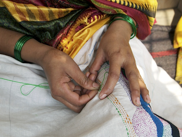
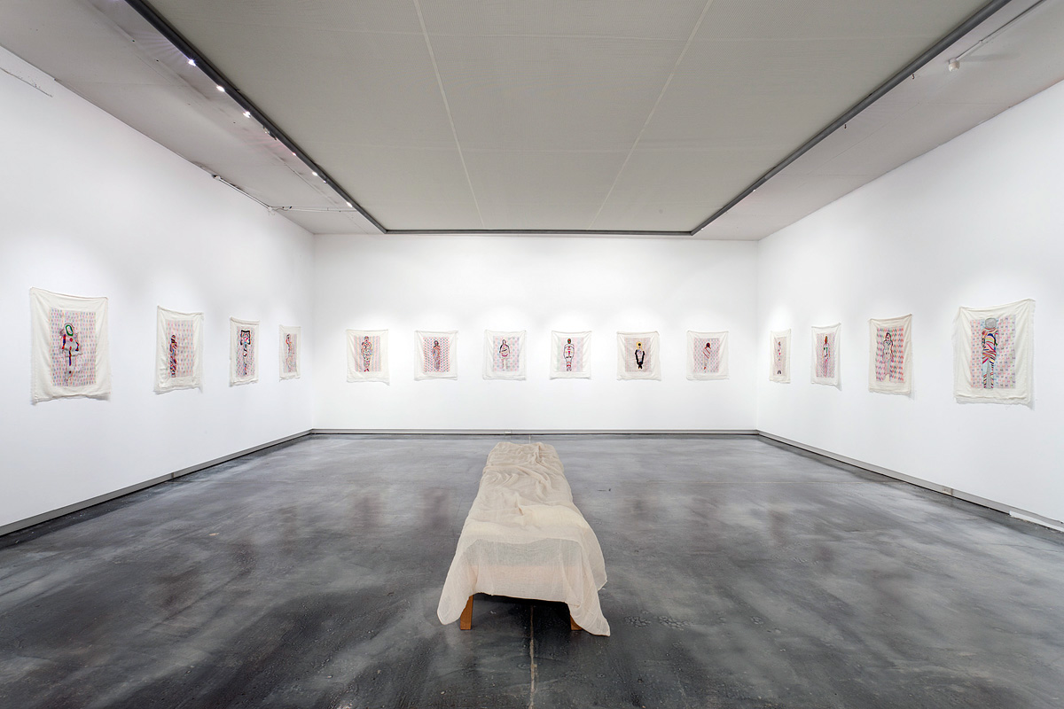
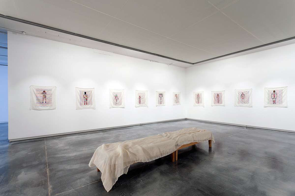
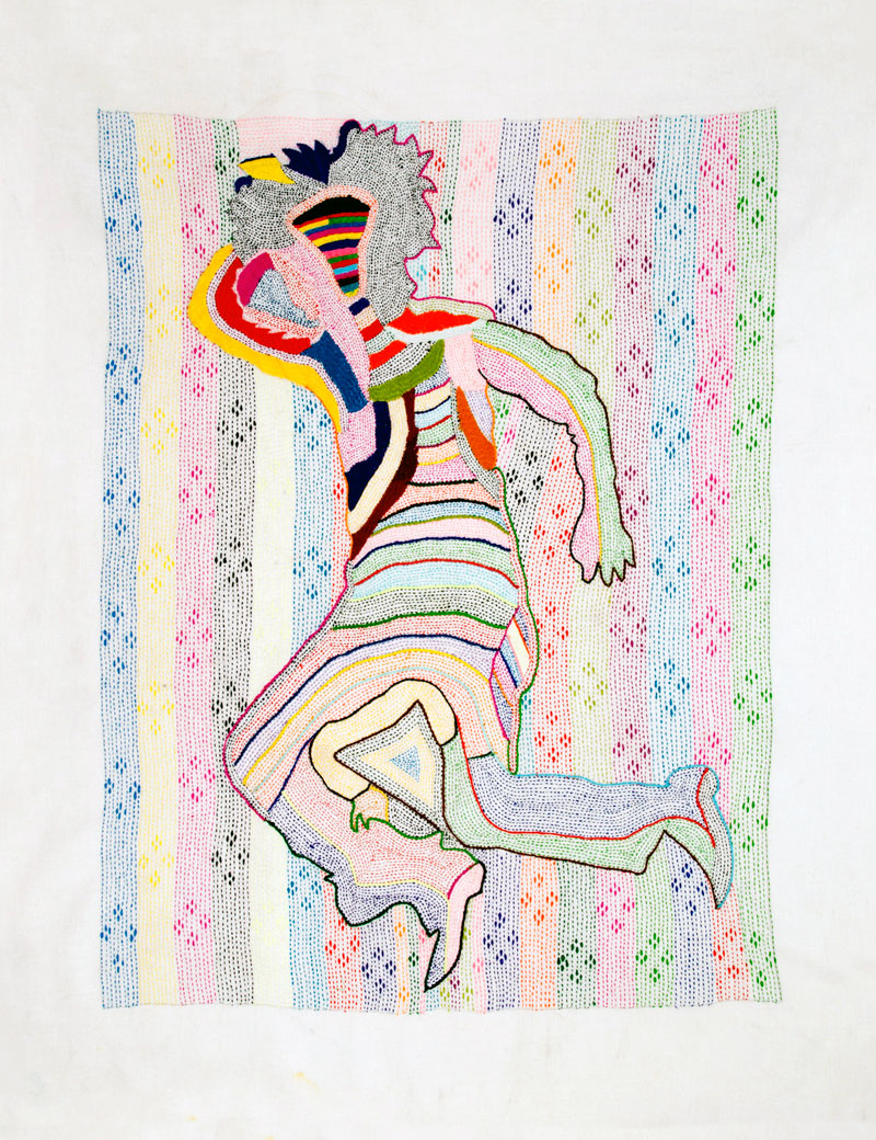
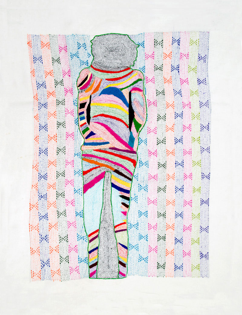
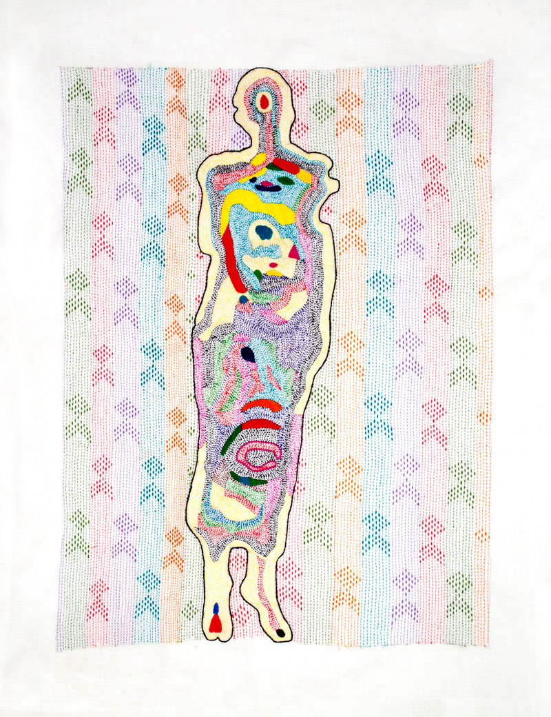
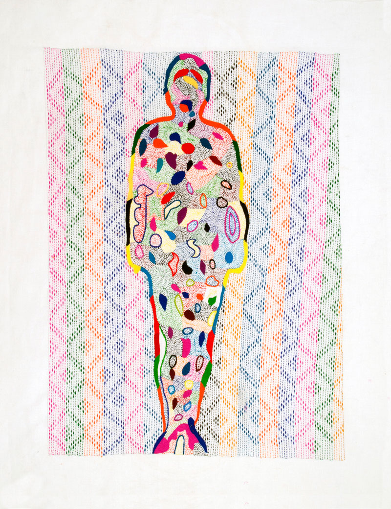
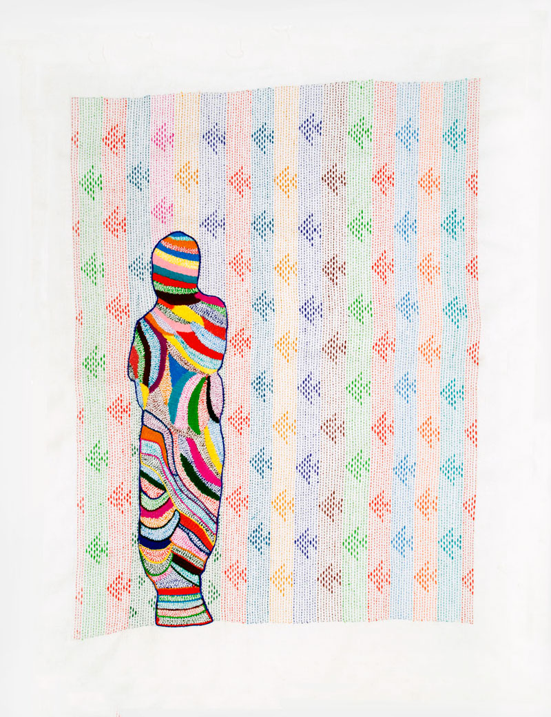
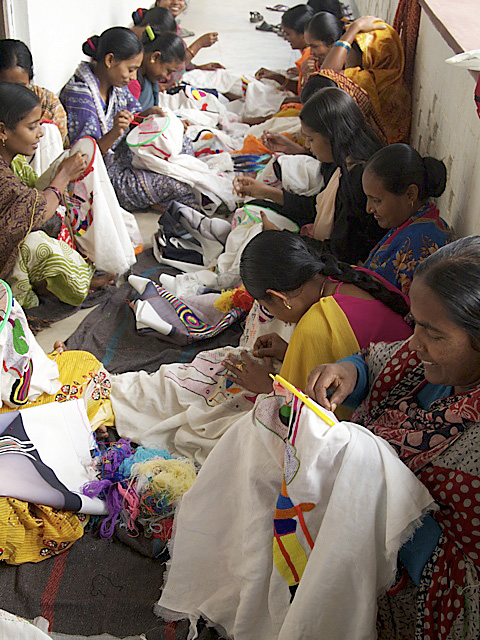
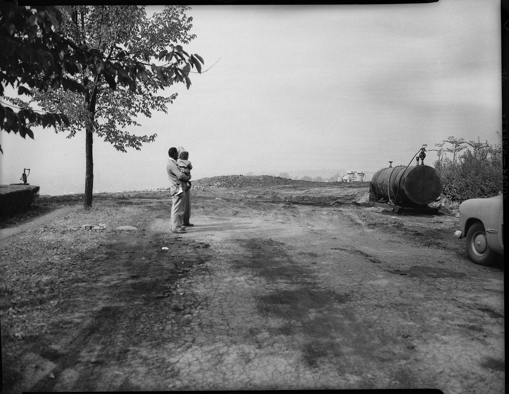
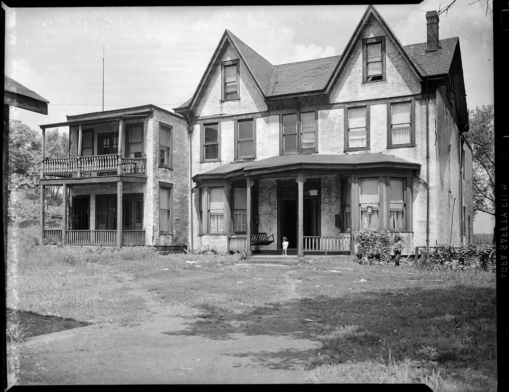
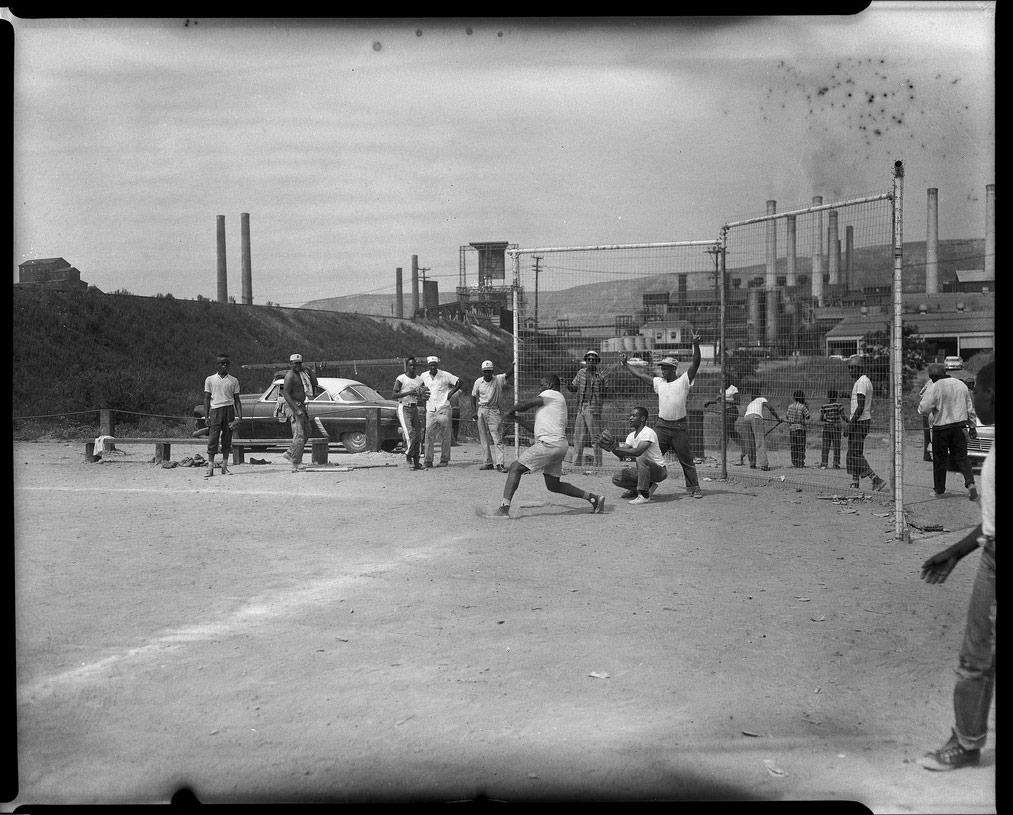
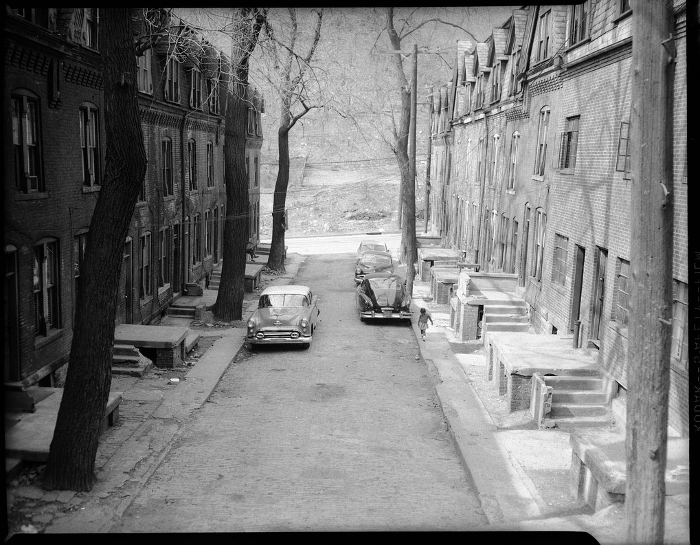
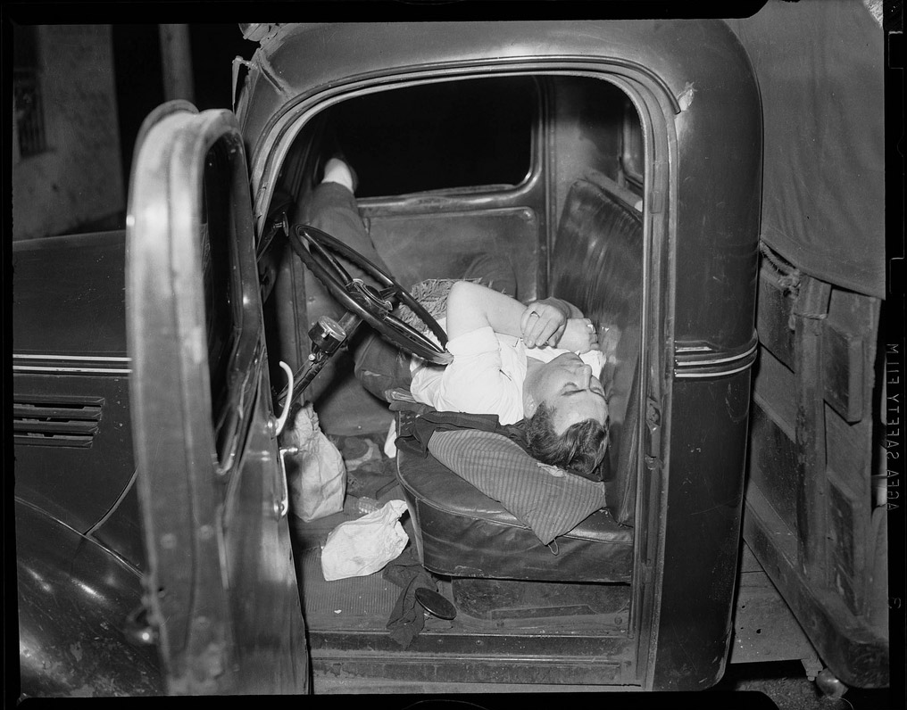
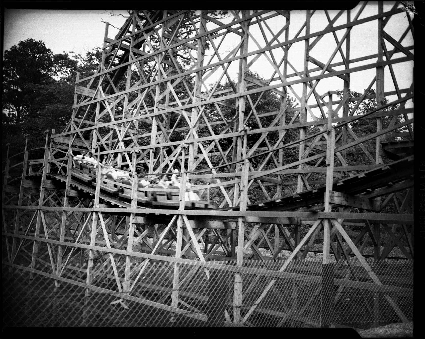
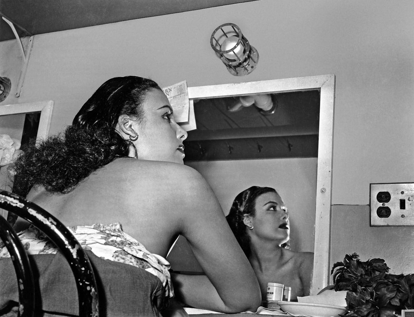
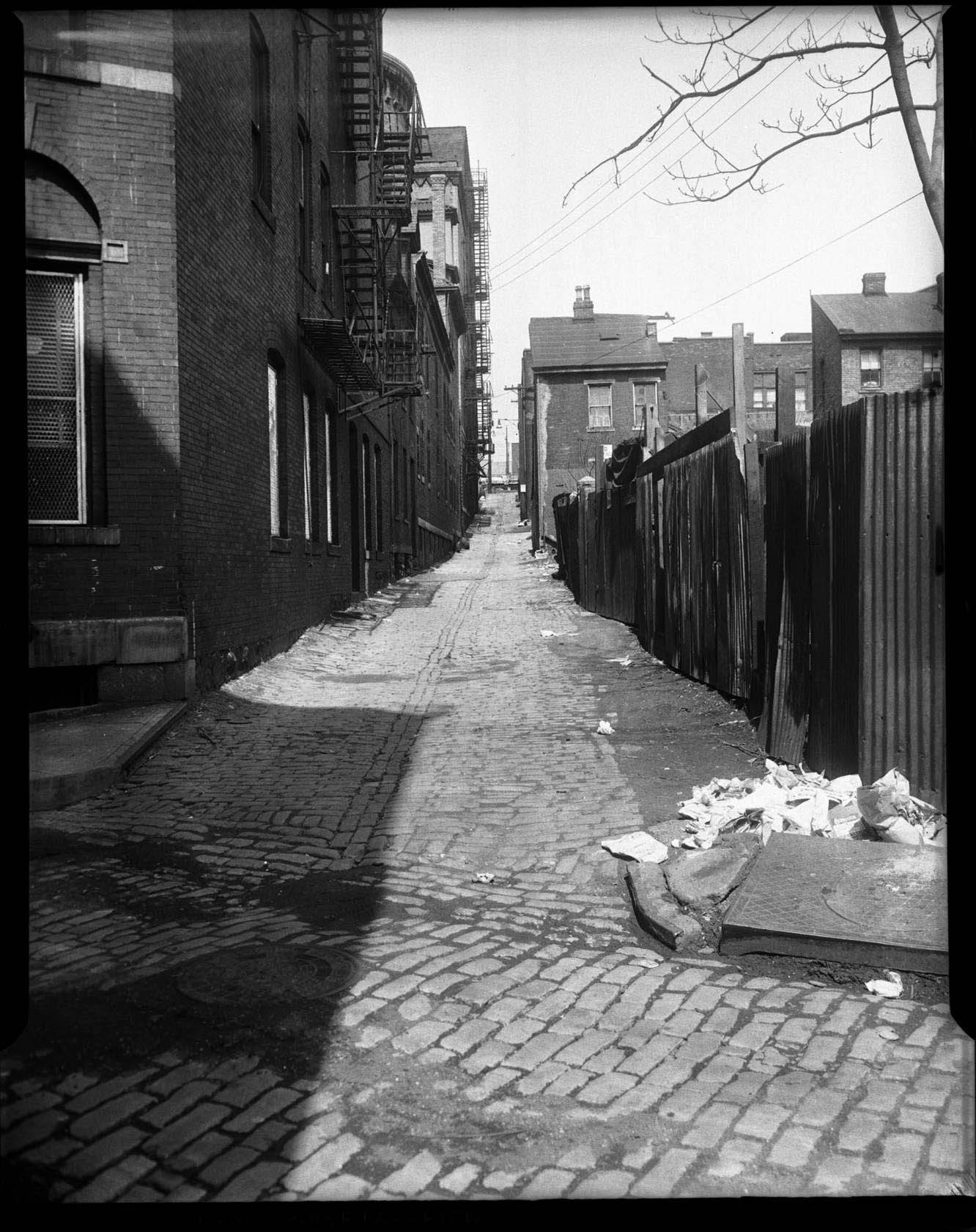
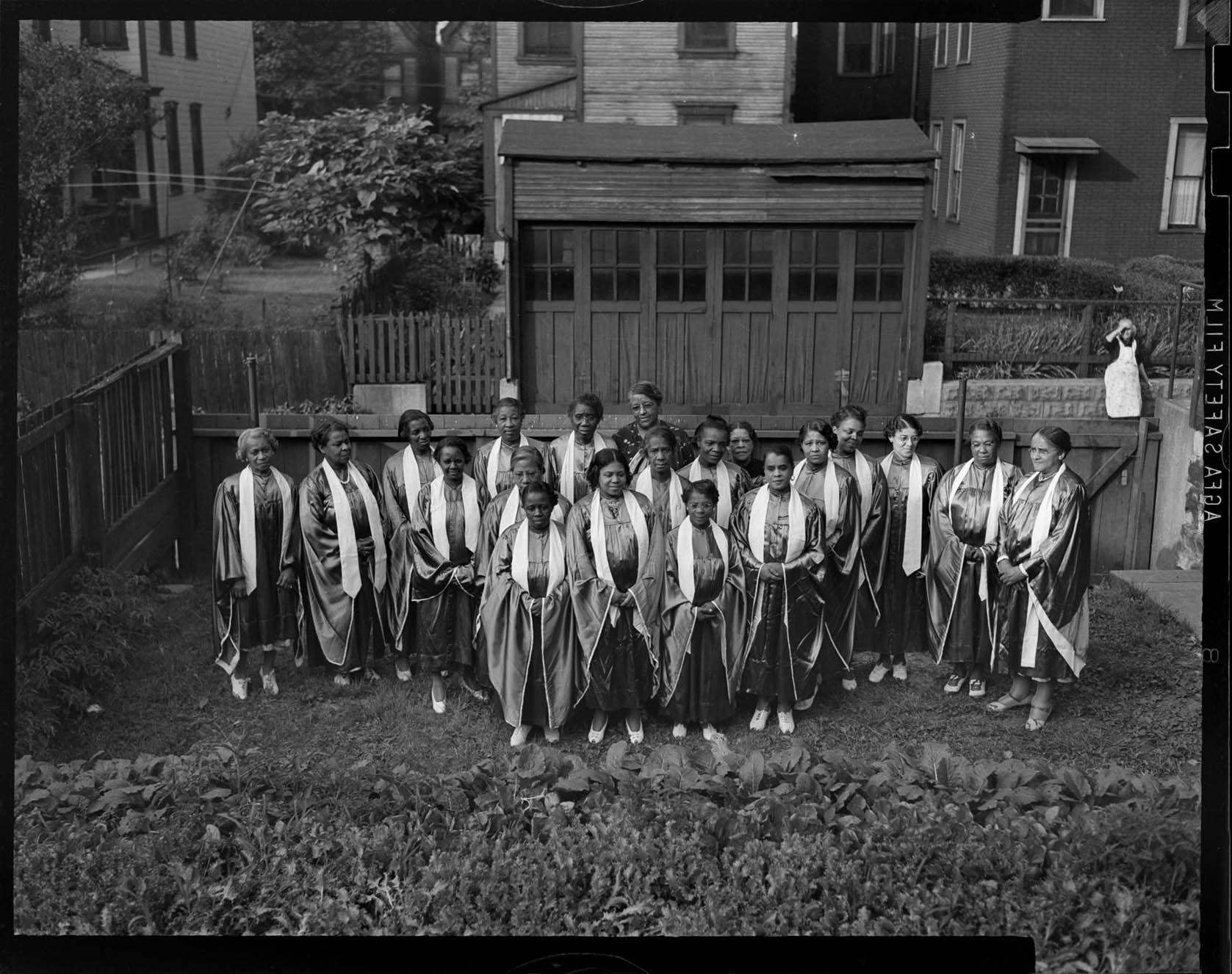
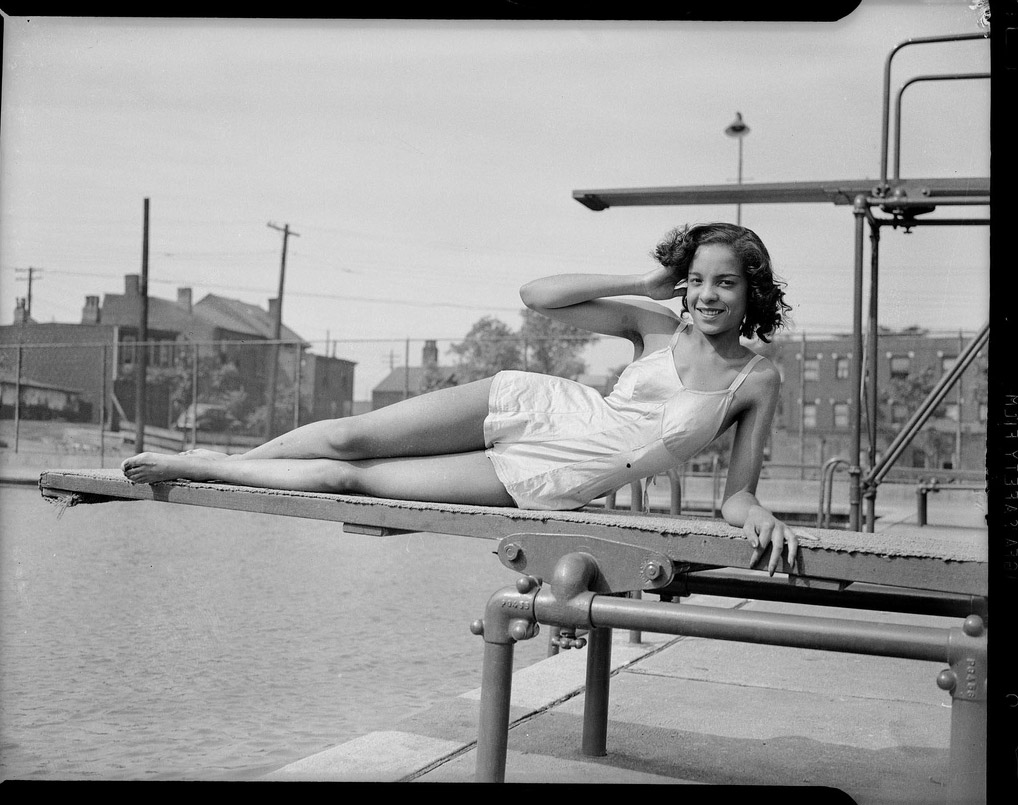
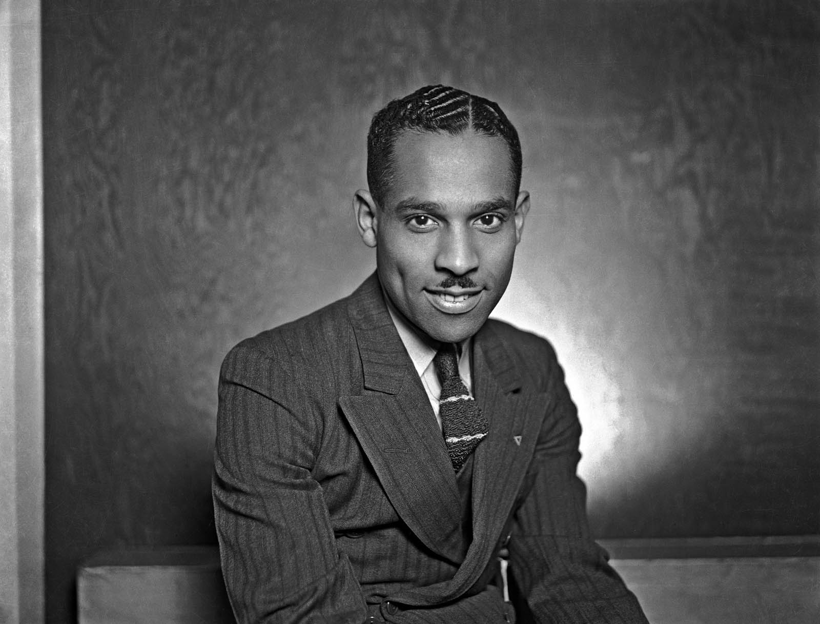
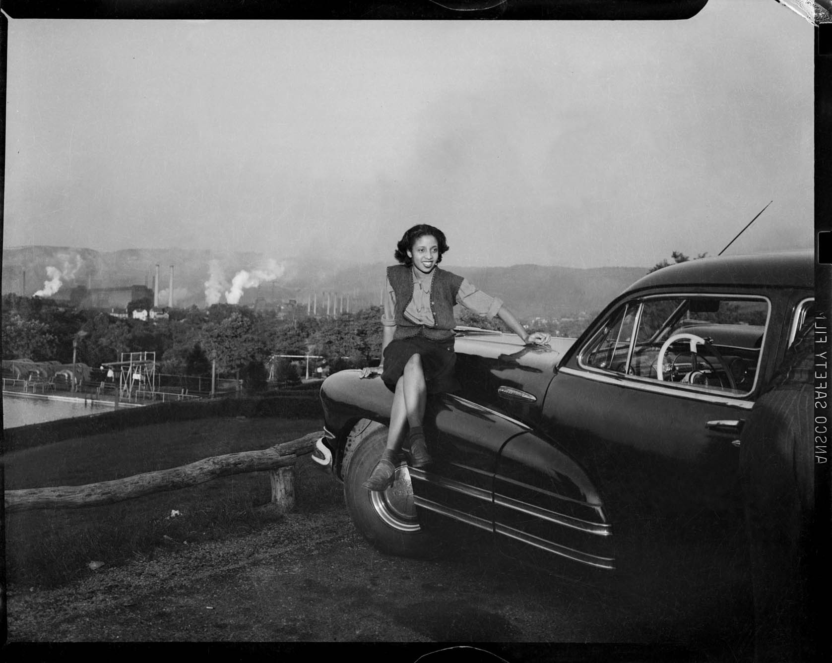
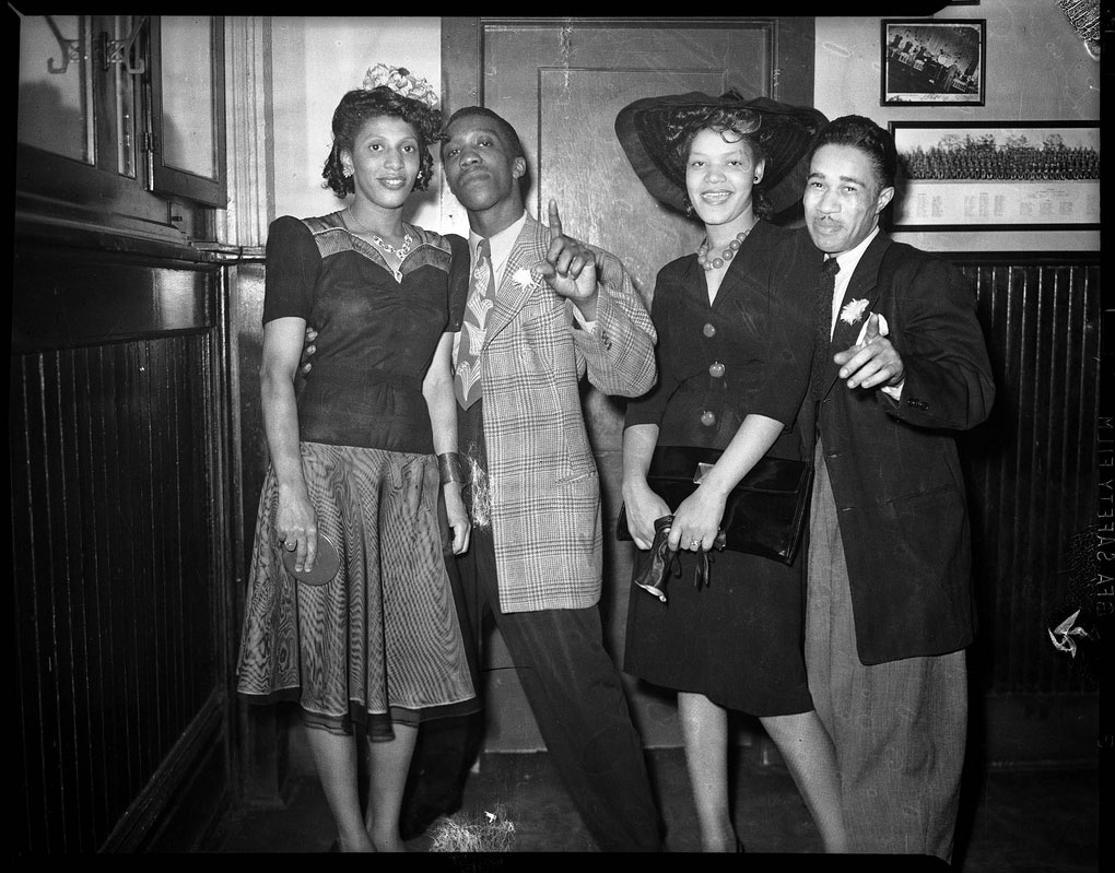
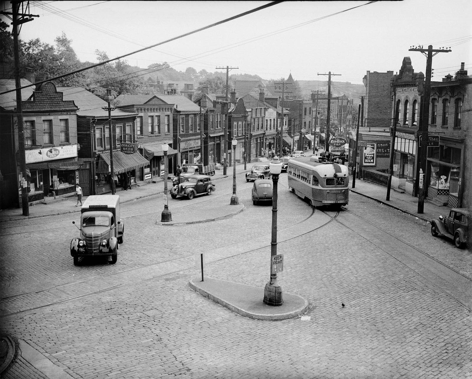
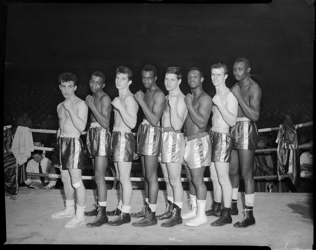
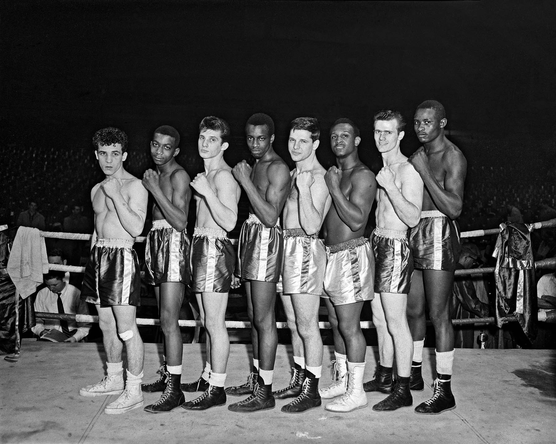
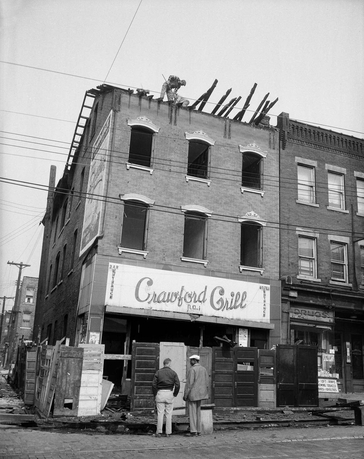
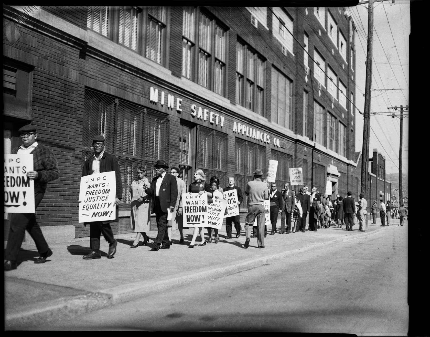
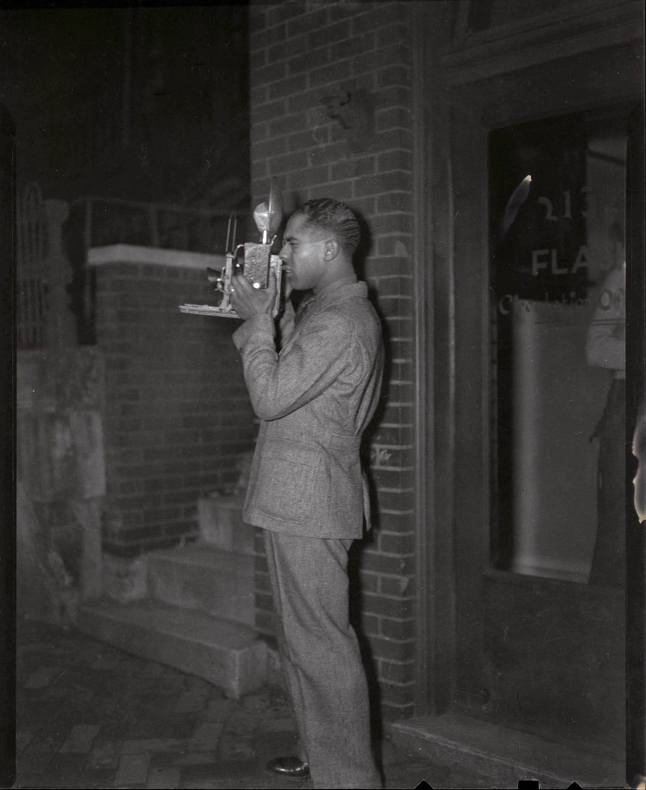
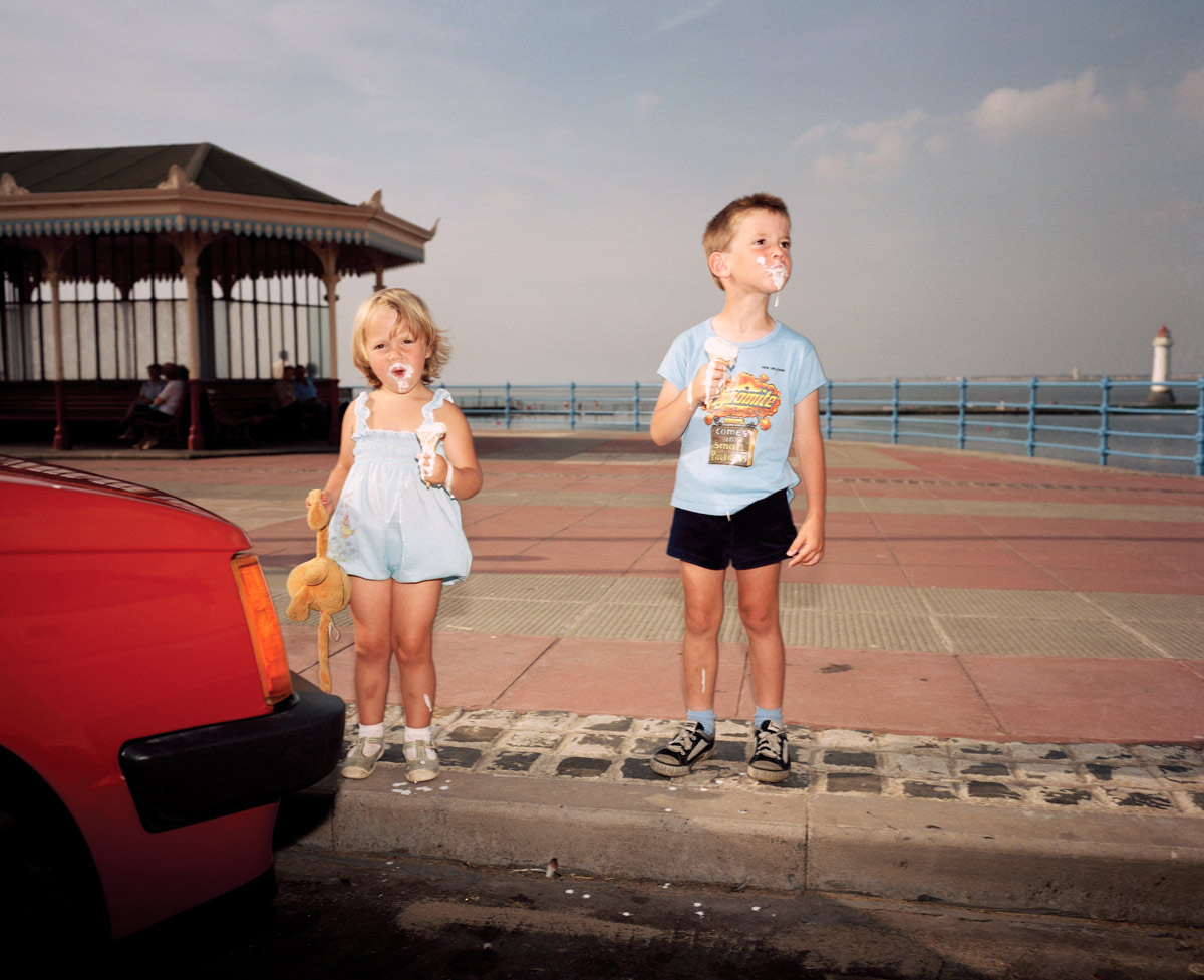
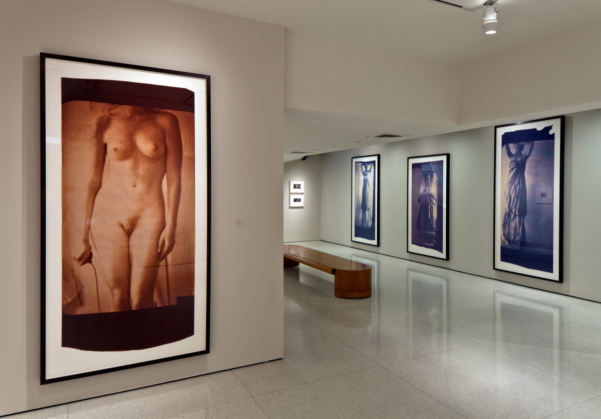
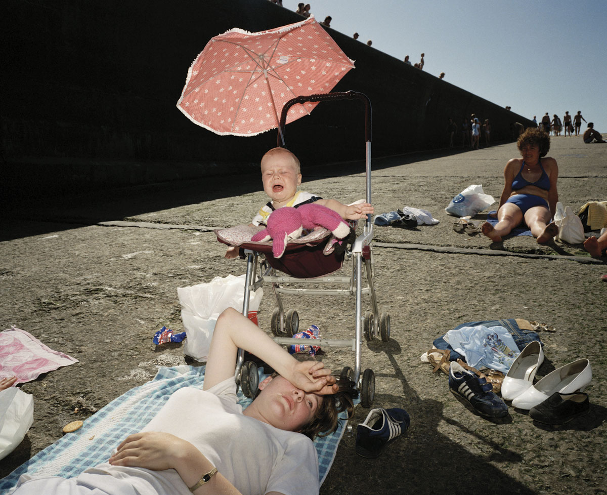
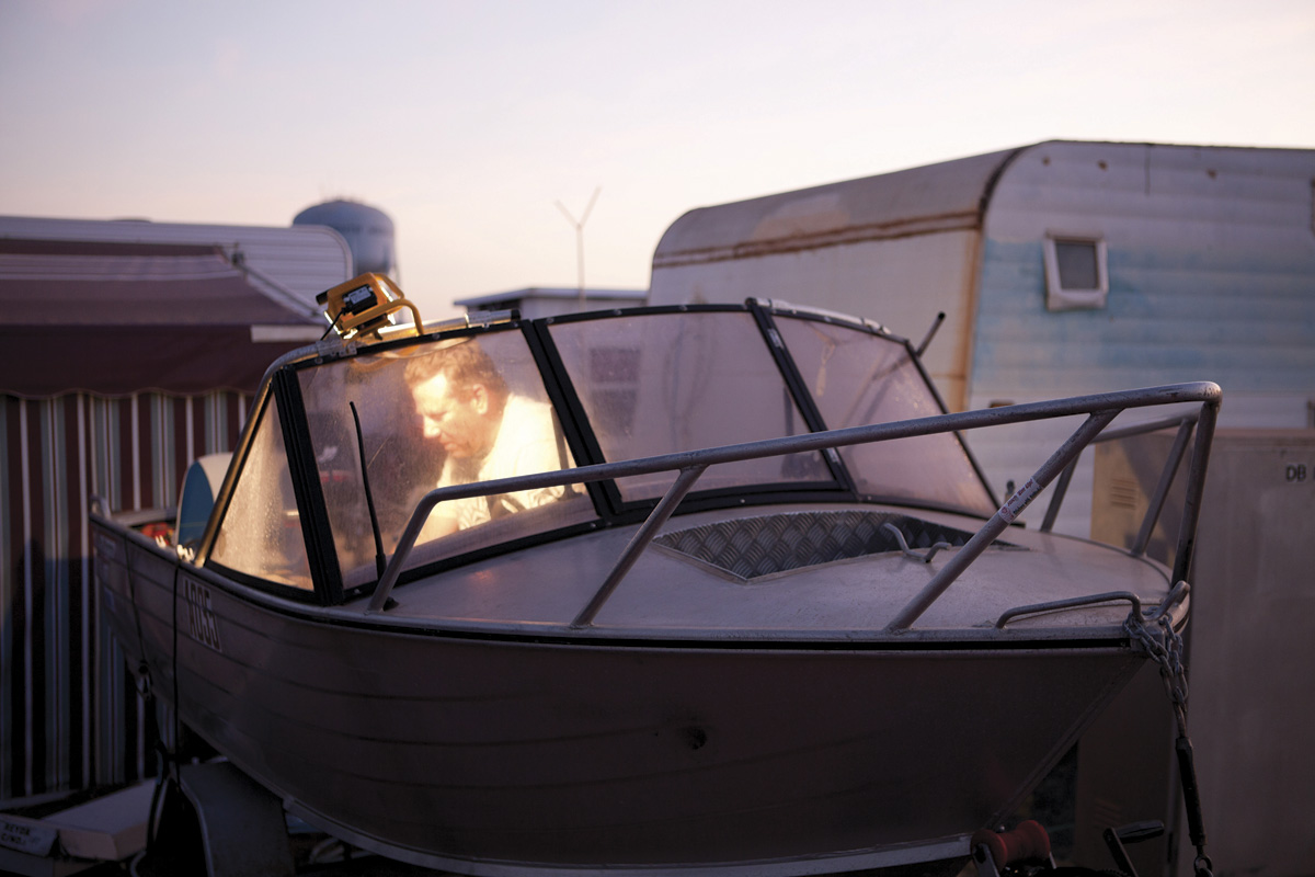
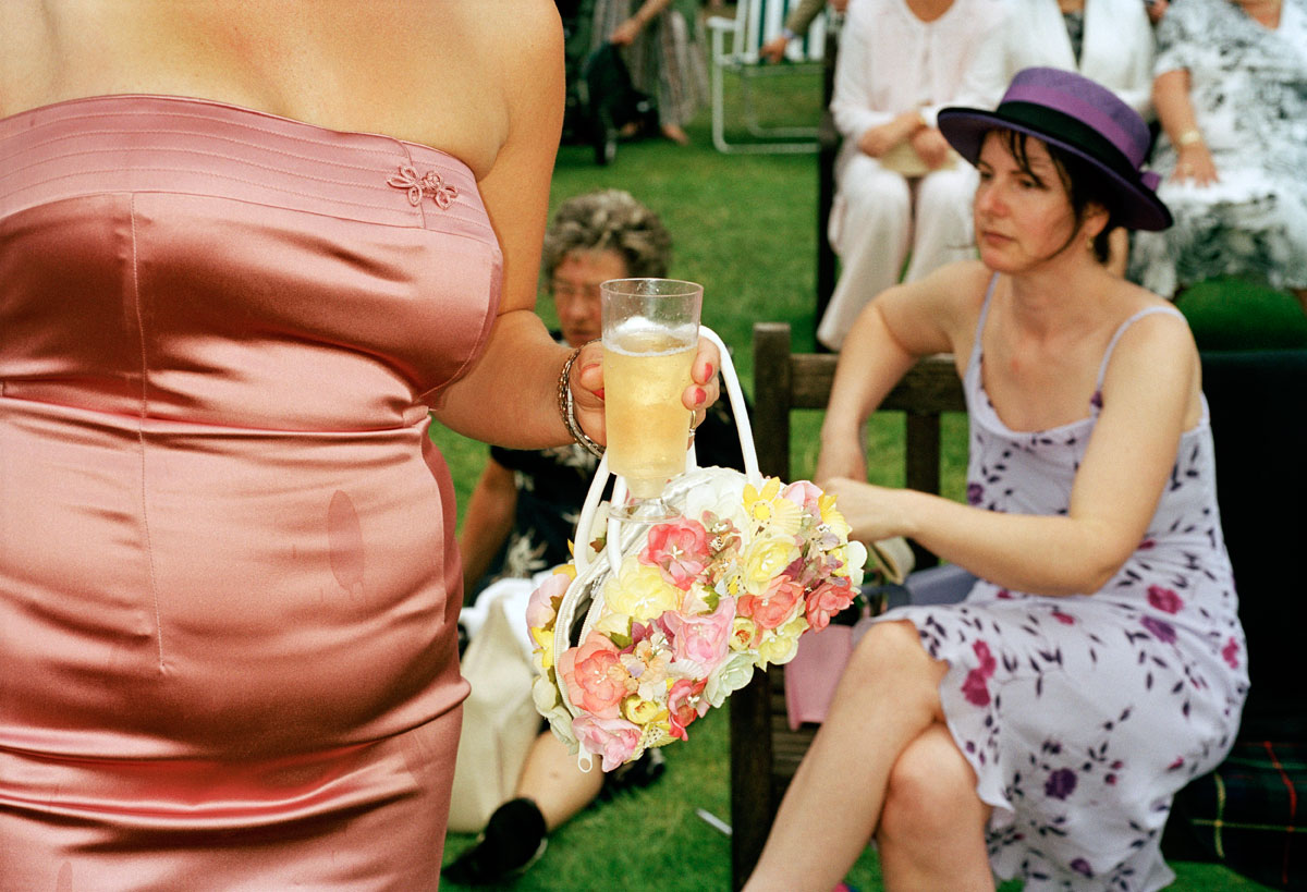
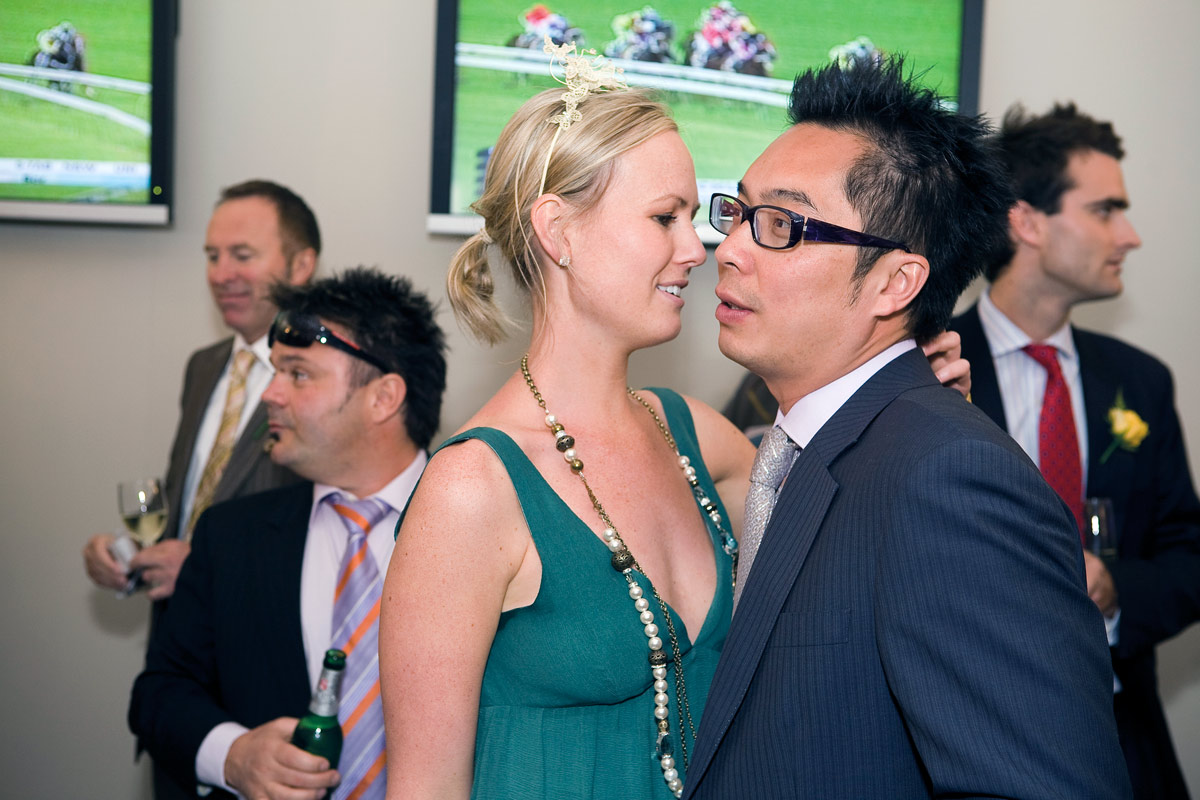
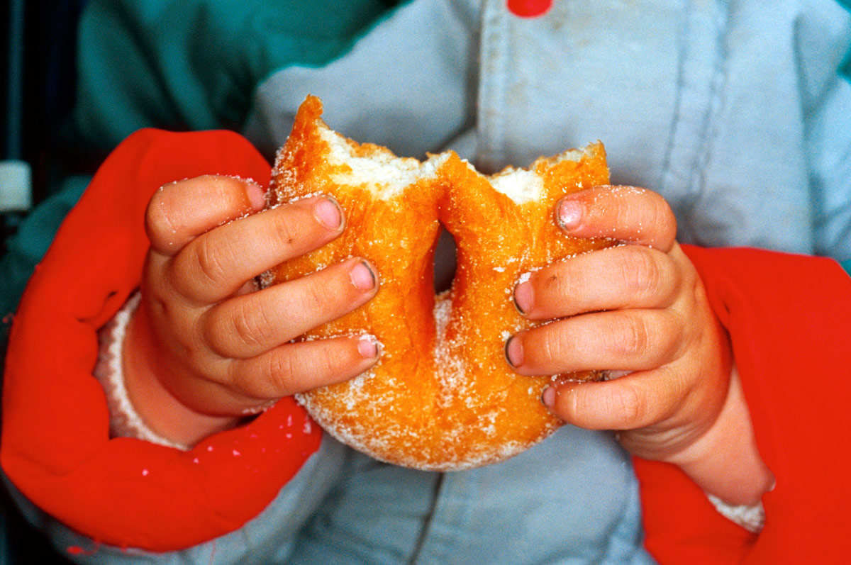
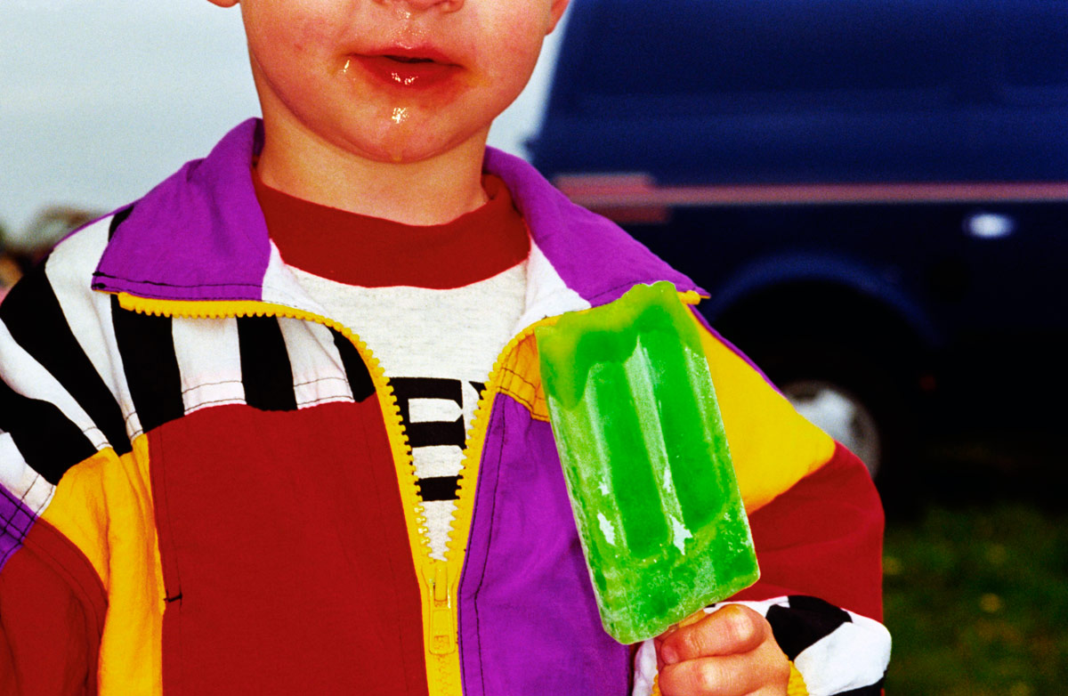
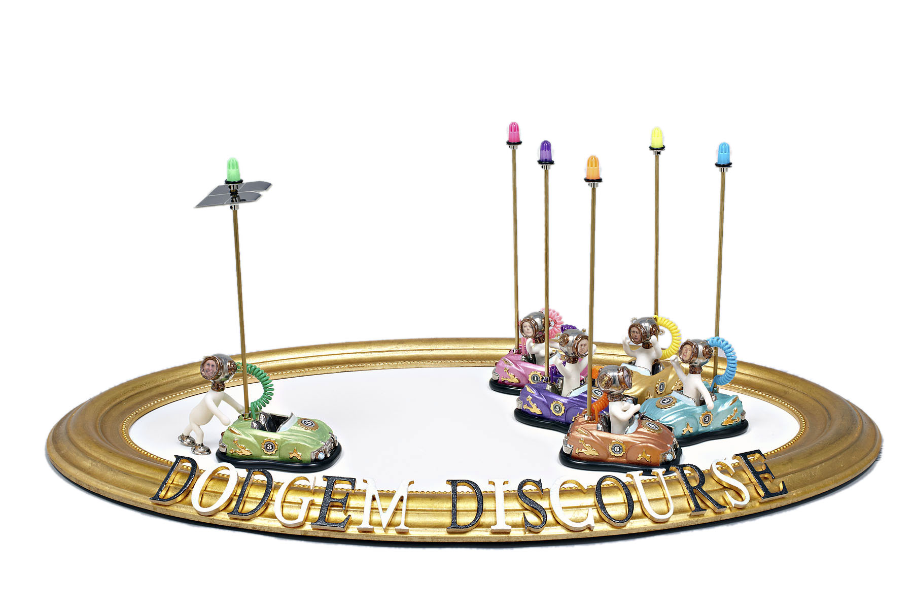
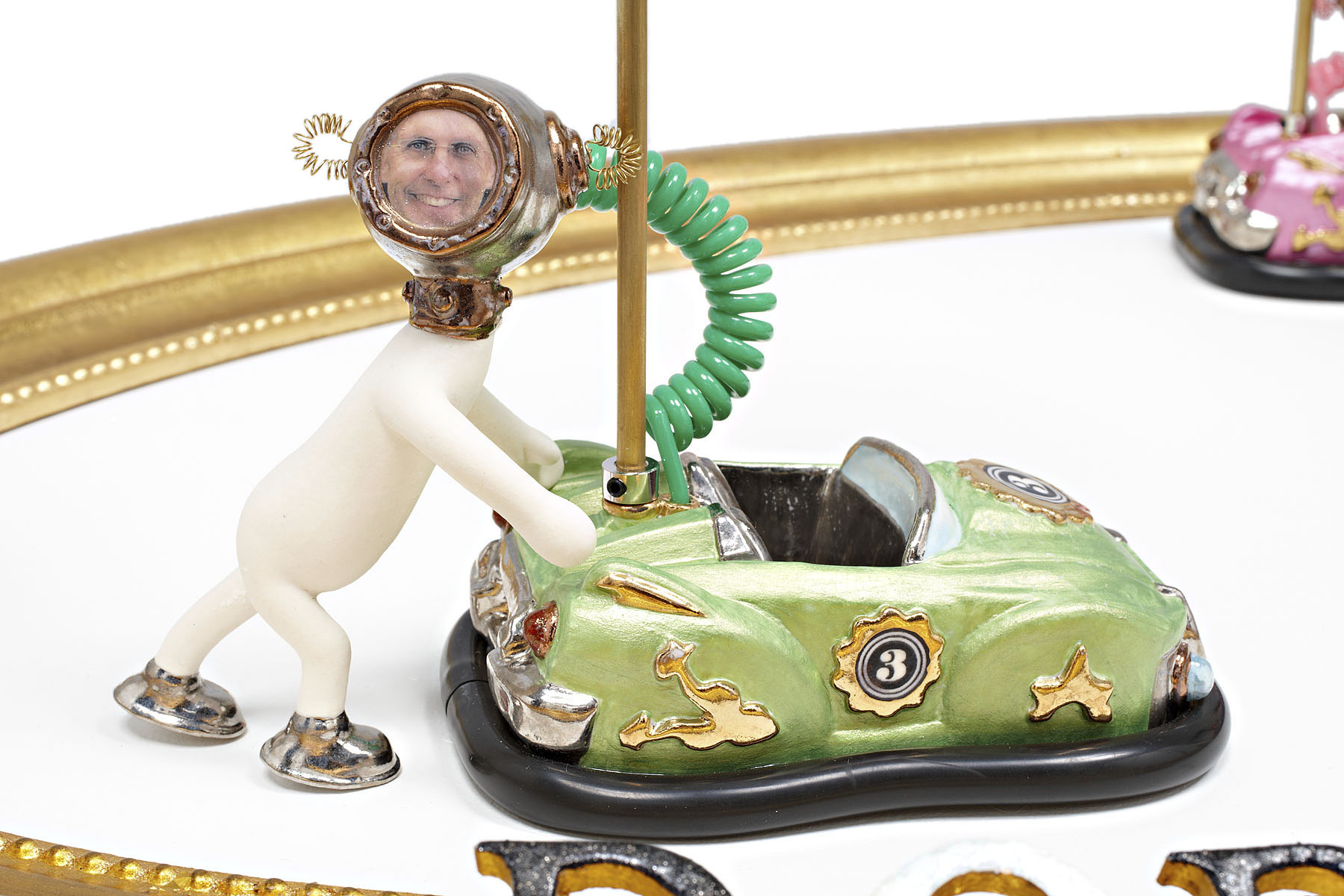
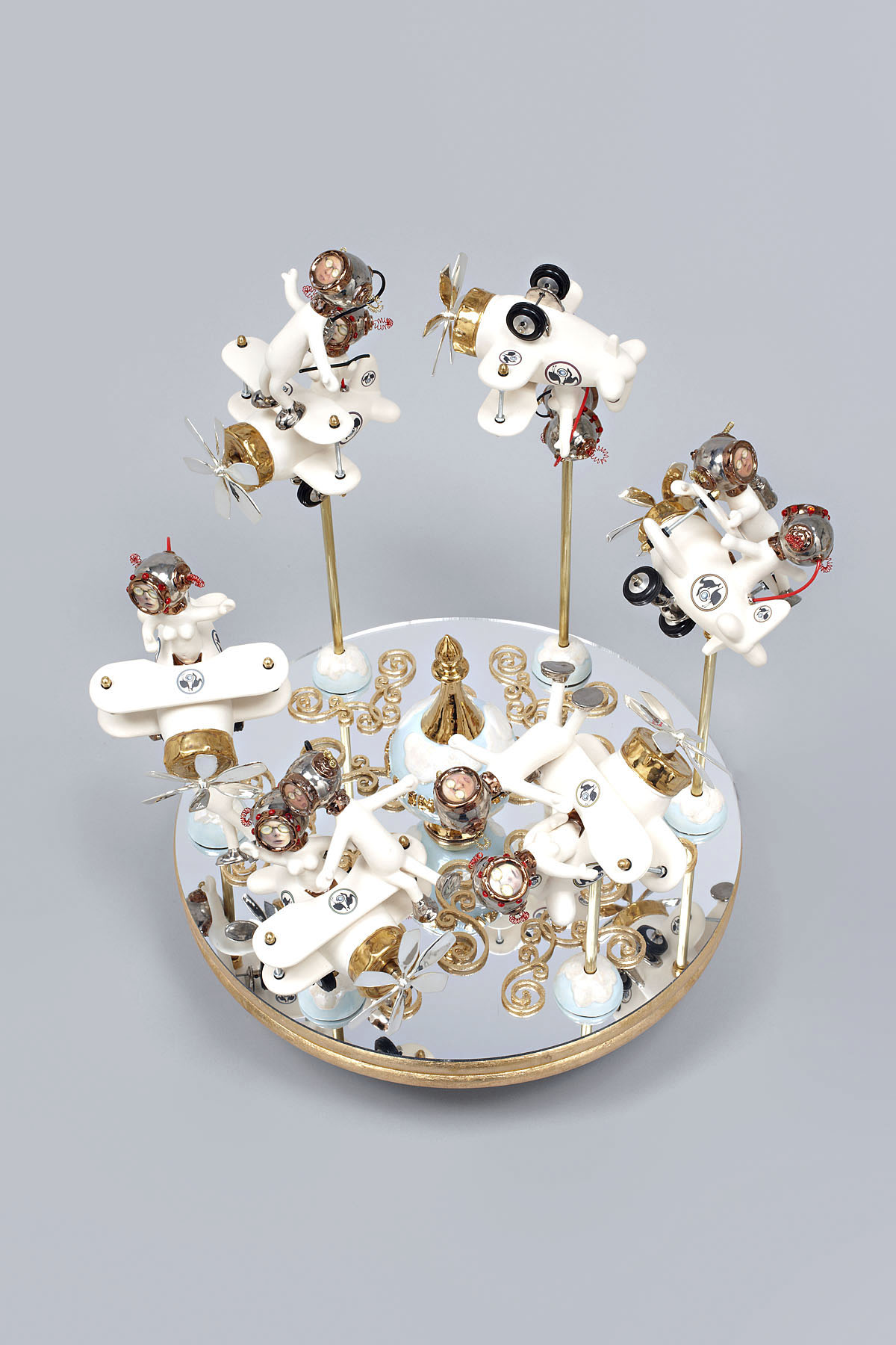
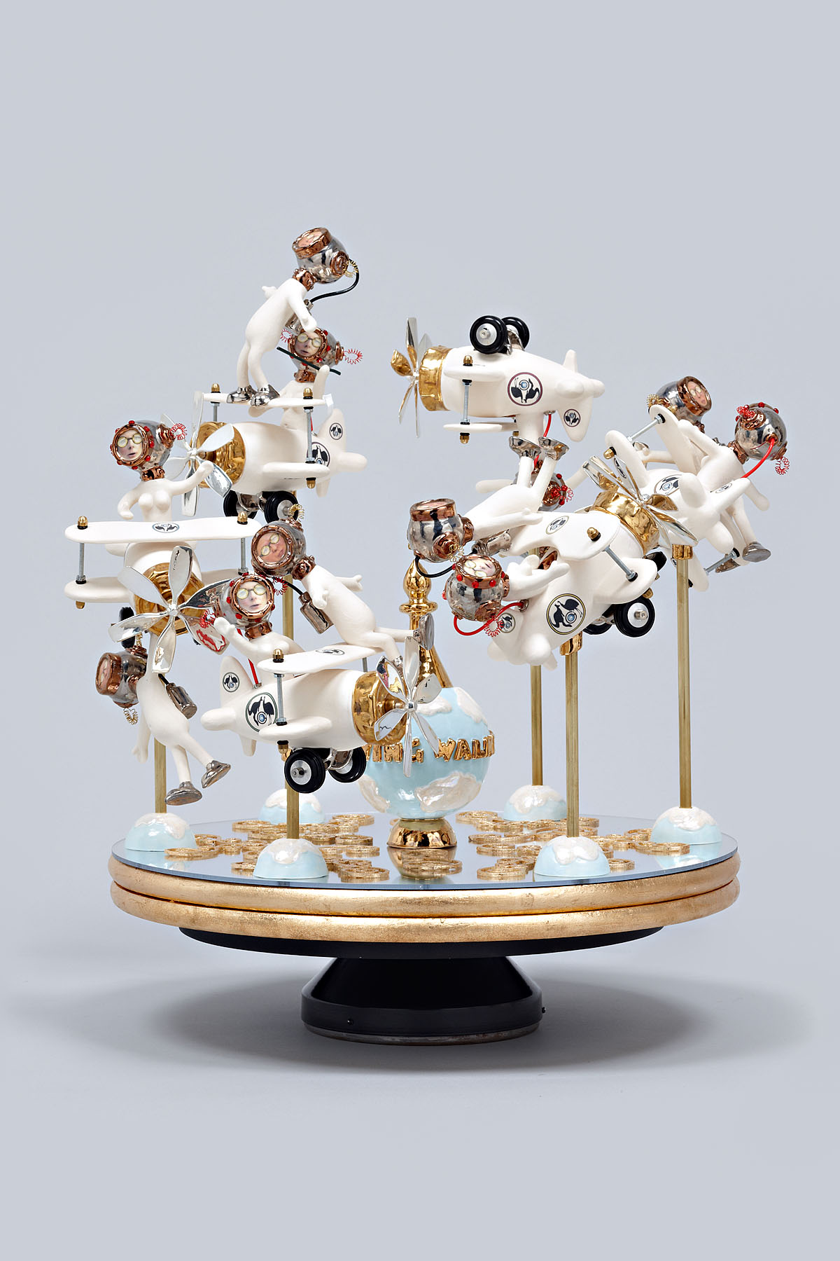
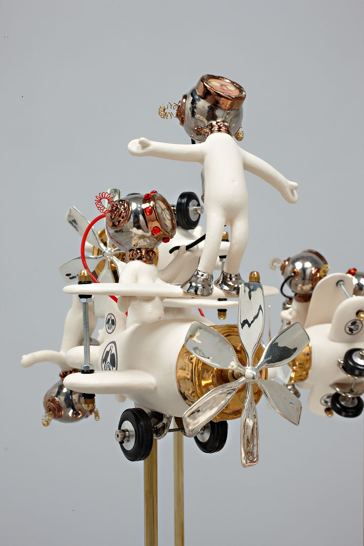
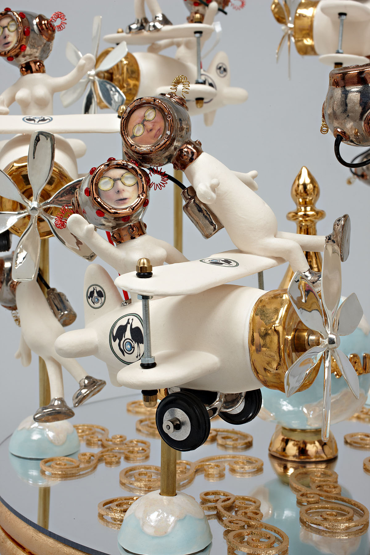
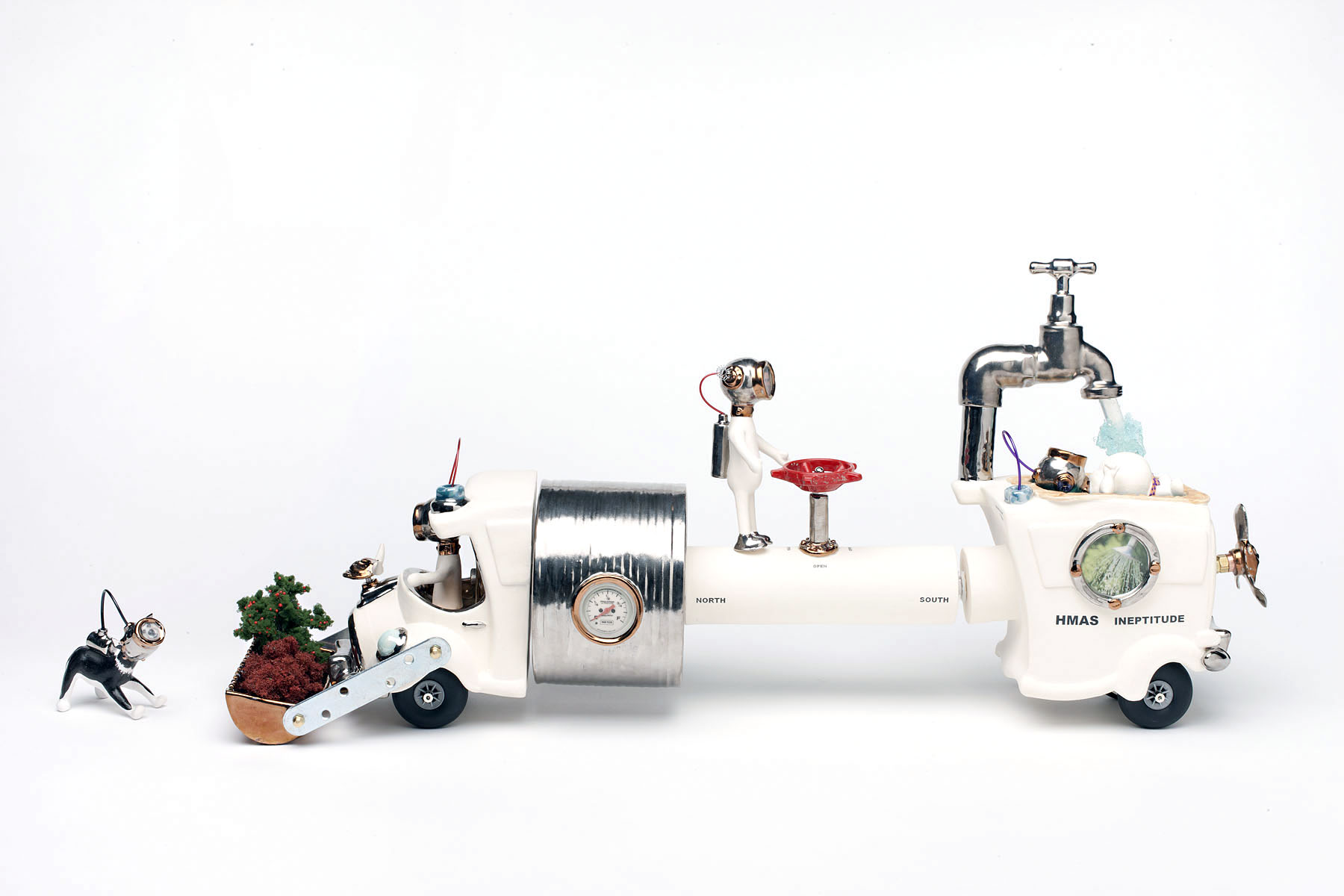
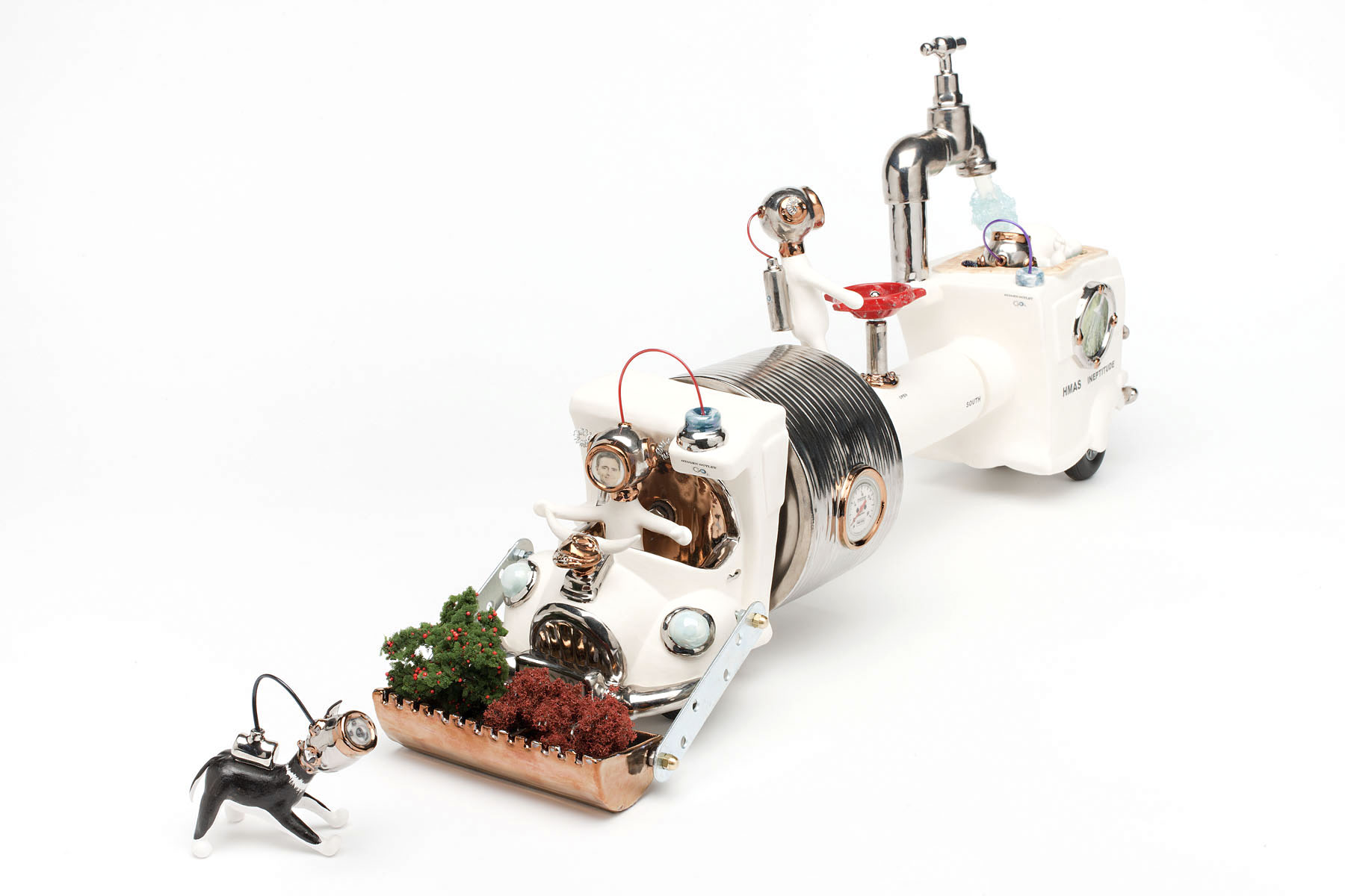
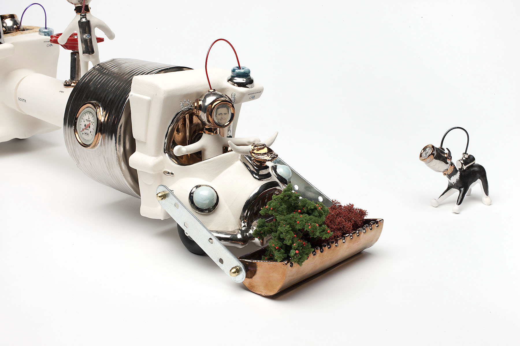
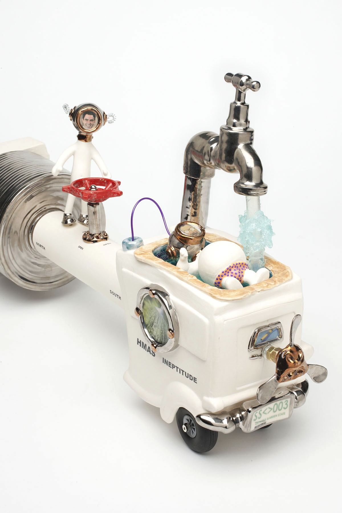
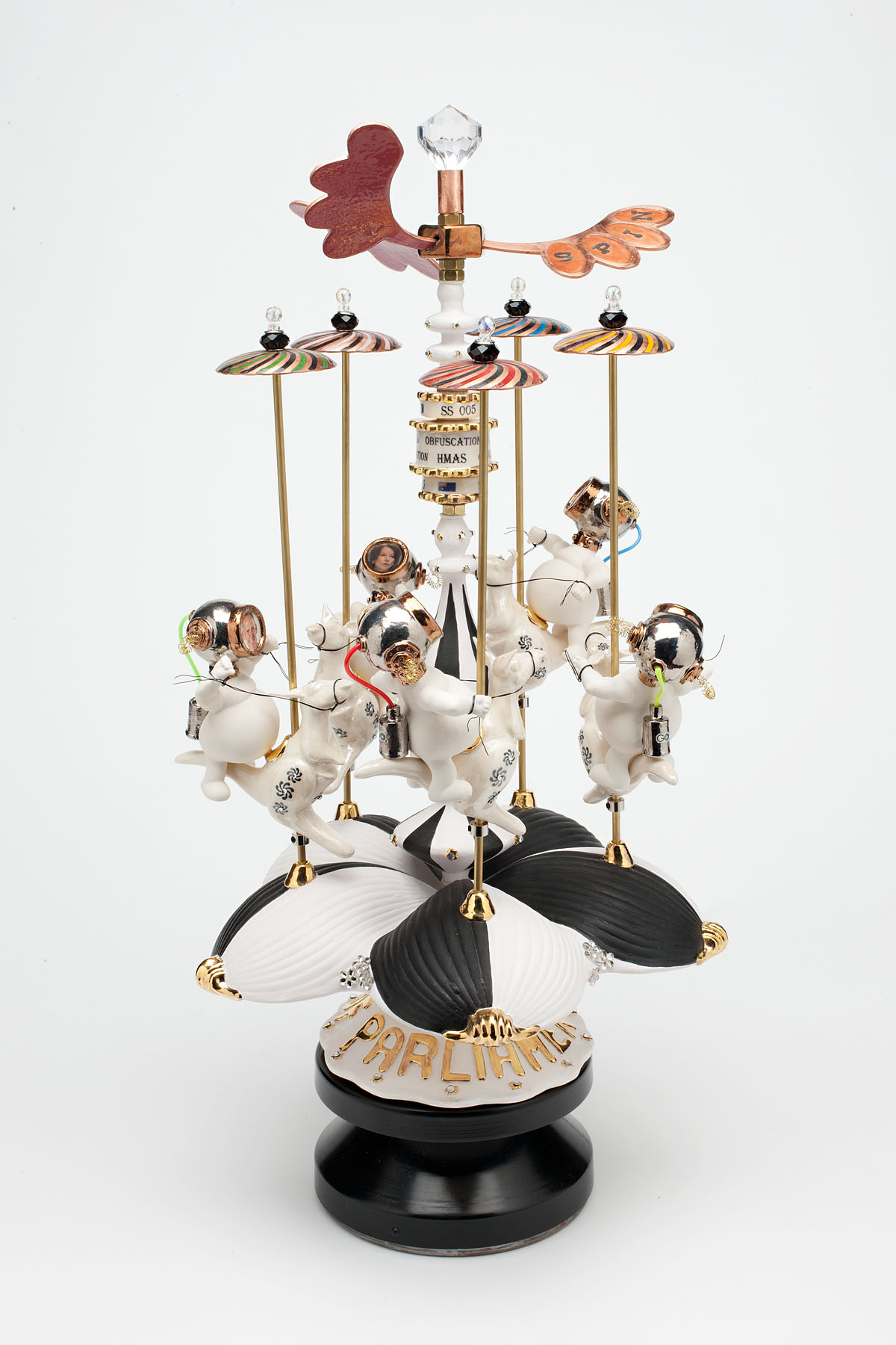
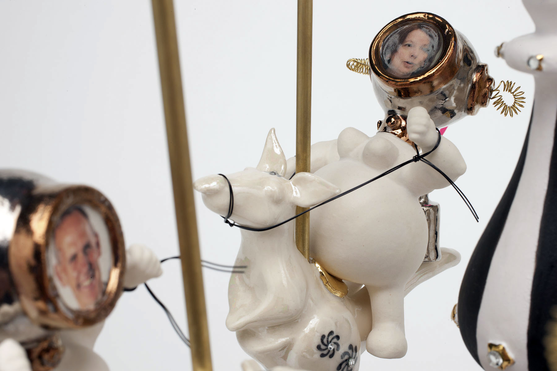
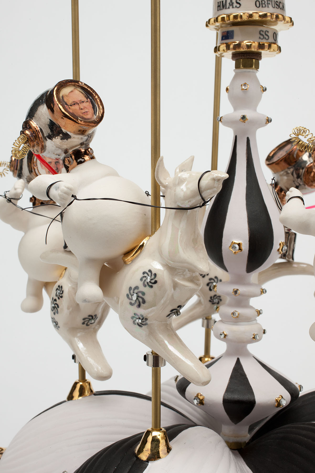
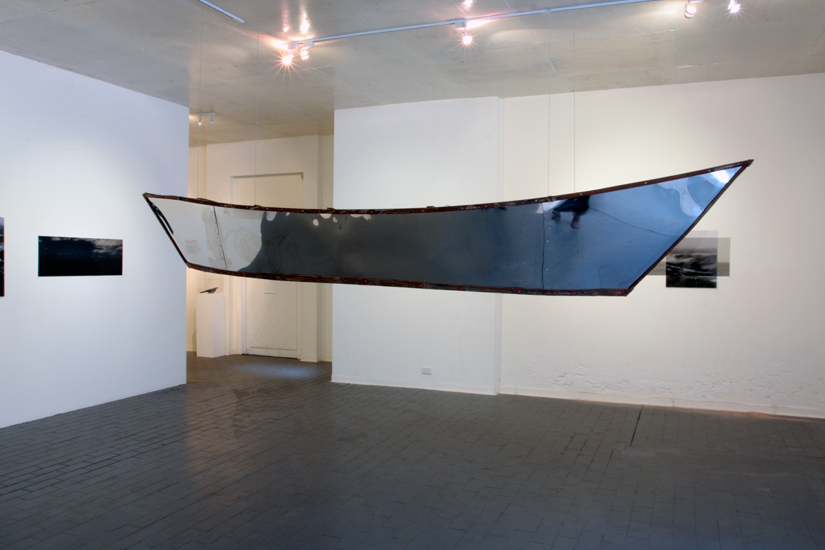



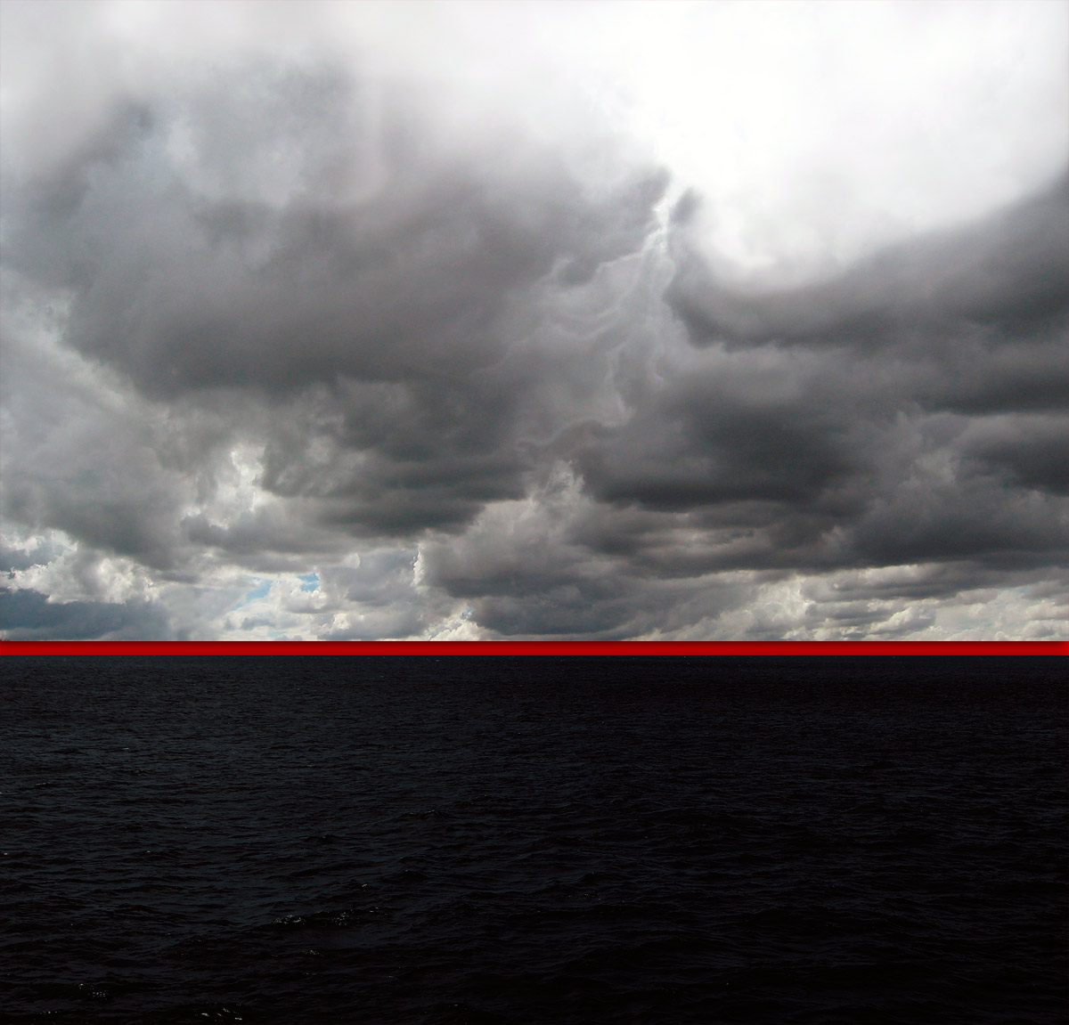
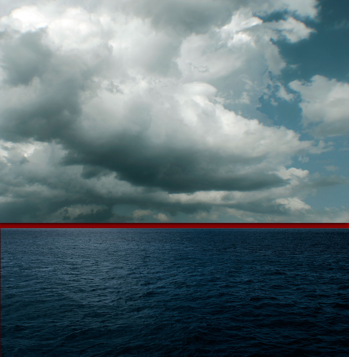
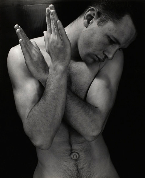

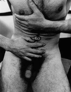
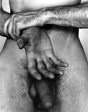
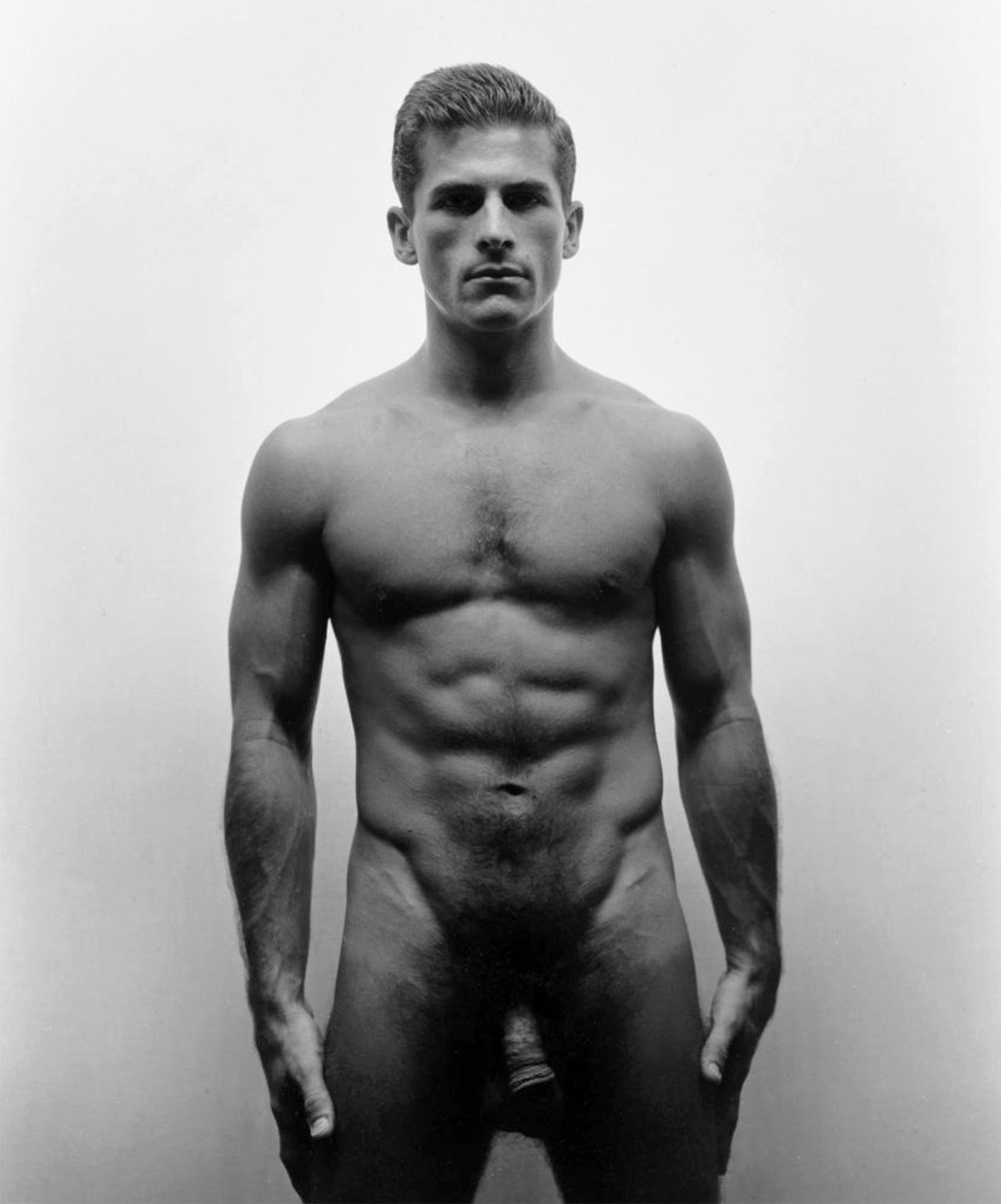


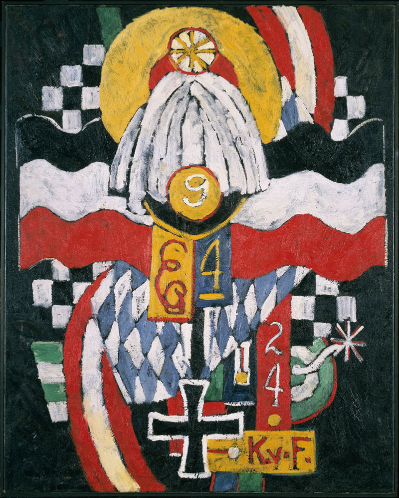

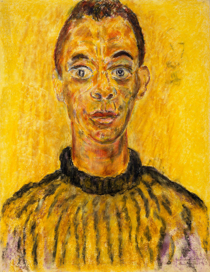
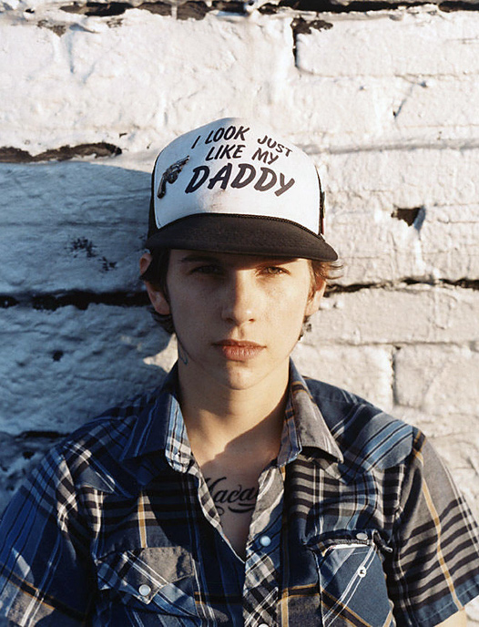


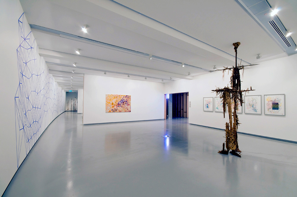
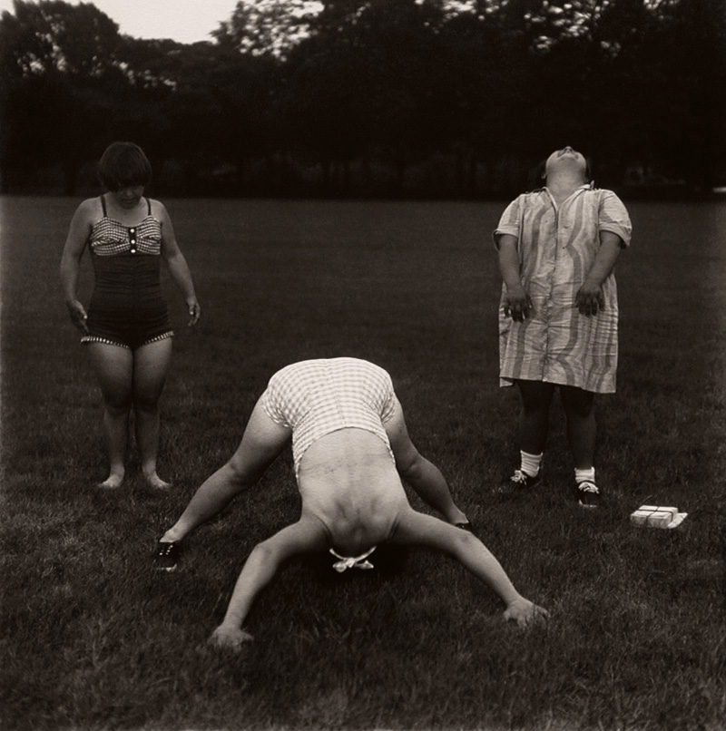



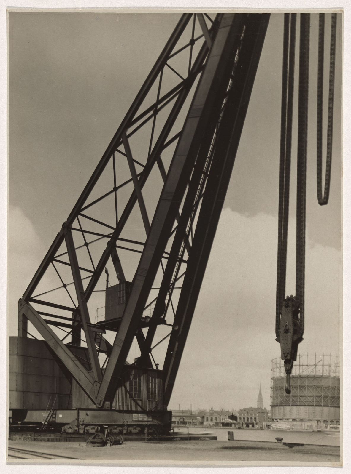


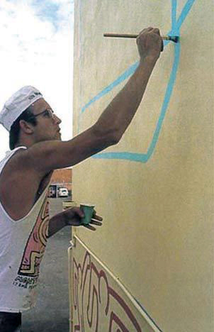

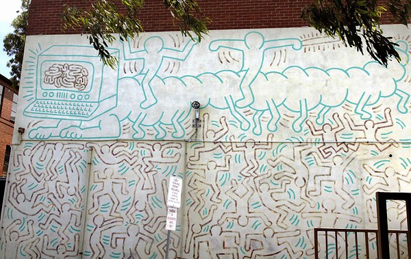
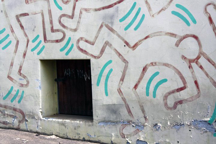
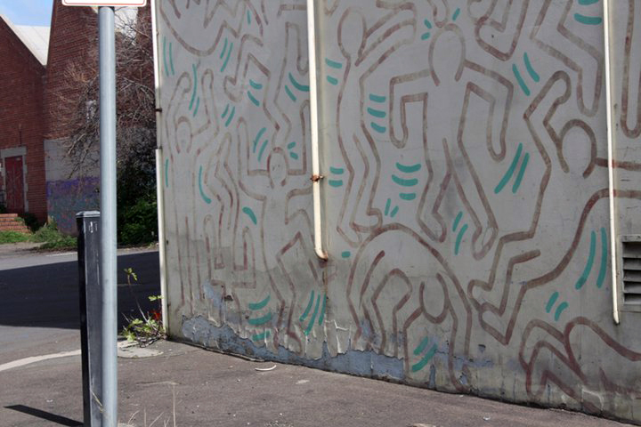
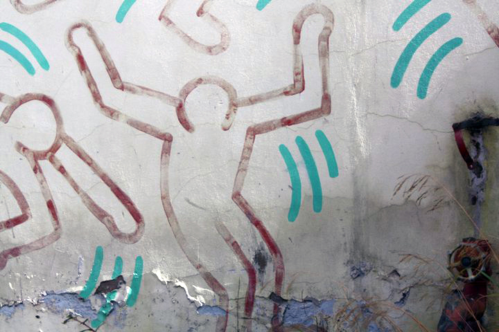


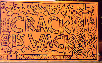


You must be logged in to post a comment.