Posts Tagged ‘advertising

17
Mar
23

Text: “In Press” chapter from Marcus Bunyan’s PhD research ‘Pressing the Flesh: Sex, Body Image and the Gay Male’, RMIT University, Melbourne, 2001

March 2023


Diane Arbus (American, 1923-1971) 'Seated man in a bra and stockings, N.Y.C., 1967' 1967


Diane Arbus (American, 1923-1971)
Seated man in a bra and stockings, N.Y.C.
1967
Gelatin silver print


Since the demise of my old website, my PhD research Pressing the Flesh: Sex, Body Image and the Gay Male (RMIT University, Melbourne, 2001) has no longer been available online.

I have now republished the third of twelve chapters, “In Press”, so that it is available to read. More chapters will be added as I get time. I hope the text is of some interest. Other chapters include Historical Pressings (examines the history of photographic images of the male body) and Bench Press (investigates the development of gym culture, its ‘masculinity’, ‘lifestyle’, and the images used to represent it).

Dr Marcus Bunyan March 2023


“In Press” chapter from Marcus Bunyan’s PhD research Pressing the Flesh: Sex, Body Image and the Gay Male RMIT University, Melbourne, 2001

Through plain language English (not academic speak) the text of this chapter investigates the photographic representation of the muscular male body in the (sometimes gay) media and gay male pornography. In the title of the chapter I use the word ‘press’ to infer a link to the media.


Keywords

photography, muscular male body, muscular male body in the media, appearance, lifestyle, narcissism, advertising, media, appearance, consumer capitalism, visible bodies, gay male, gay male pornography


Sections

  • Consuming the Appearance
  • Consumer Capitalism and Narcissism
  • Visible Bodies
  • Gay Male Pornography
  • Alternatives to American gay male pornography
  • Alternative bodies


Word count: 6,884


In Press


“Not only do the media shape our vision of the contemporary world, determining what most people can and cannot see and hear, but the very images of our own body, our own selves, our own personal self worth (or lack of it) is mediated by the omnipresent images of mass culture…”

.
Douglas Kellner1


From the fervent explosion that saw the birth of the gay liberation movement in the late 1960s and early 1970s there emerged a period of amazing freedom and growth for many gay people. Sexualities that were previously hidden behind a veil of secrecy were now being expressed and fought for out on the streets. Sex, especially the desire of gay men for casual sex, was now out in the open. A new body image emerged from this revolution, one that was neither male nor female, but androgynous. This new androgynous body image can be seen as a reflection of societal changes that were happening during the swinging Sixties, the era of “free love.” You could swing, i.e., move both ways sexually. The joining together of male and female, gay men and lesbians was a very positive force in the formation and acceptance of new identities.

But the honeymoon was soon over.

The idealism of the early gay liberation movement did not last long. Gay men, long persecuted for their camp and feminine ways sought images to combat the long held stereotype of the limp-wristed pansy who had abdicated his male power to others through his effeminacy. Manliness came out of the closet of the physique magazines to express the longed for power of patriarchy that gay men sought. There was an enormous surge in the production of homoerotic imagery and gay men responded by imitating heterosexual masculinity in an ironic way; the ‘clone’ image was born: boots, tight fitting jeans, check shirts, short hair and usually a moustache to top off the image. Anybody could go out and purchase such an outfit. It did not discriminate along class or social boundary lines and the ‘look’ was relatively ageless. This clone image extended to other identities that included the leather man, the sailor, the construction worker & the cowboy. But the image was still ‘butch’; skinny or fat guys really need not apply.

The pop group ‘The Village People’ are a perfect example of the camp irony that infused the gay scene at this time. Their song “Macho Man” echoes the desire for gay men to be seen as butch: “I wanna be a macho, macho man – I wanna be, a macho man,” they sing parading around in their tight fitting and revealing outfits. By making their stereotypical cloned images of the cowboy, construction worker, cop, etc., … incredibly camp they undermined the credibility of traditional masculinity. But soon this camp ironic comment was devoured by the dichotomy of existing sex and gender differences. As Dennis Altman has said,

“In the early days of the movement, both women and men saw the process of gay liberation as intimately related to the blurring of sexual and gender boundaries, a move toward androgyny … Our biggest failure was an inability to foresee the extent to which the opposite would happen and a new gay culture / identity would emerge that would build on existing male / female differences.”2

.
The body and its visibility became increasingly important as a site of construction that was and is crucial to a persons identity and self-esteem. Appearance is critical to this construction.

I suggest that in contemporary gay culture the muscular body of the gay male has stopped being a ‘camp’ ironic comment on ‘normal’ masculinity and instead the body and photographic images of it have become a marketable asset, a commodity3 in a selling and surveillance exercise. Men advertise for sex by displaying their muscular body for admiration and desire by others and observe themselves and others reactions to it. Identity is now mediated by acceptance of their image and by ‘measuring up’ to a perceived image ideal. Media started to make use of this new availability of the male body as an objectified image of desire as it opened up new markets to companies. It encouraged men to undertake face lifts, tummy tucks, pectoral implants and hair removal, to purchase underwear, toiletries, clothes and all manner of goods so that they too could approach the archetypal ‘ideal’ of the masculine male.


David Lloyd. Cover of Naked Men of San Diego calendar 1998


David Lloyd
Untitled
Nd
Cover of Naked Men of San Diego calendar
Santa Monica: The Phenomenon Factory, 1998


Today images of the smooth, muscular, white male body are everywhere in advertising, encouraging us to purchase more, to help us get closer to the ideal. As David Kellner has said in the quotation at the beginning of the chapter, the images of mass culture have become omnipresent. Naked men now adorn calendars containing full frontal nudity of smooth muscular white bodies all sporting the latest in designer erections! You can have your man any time of the day, any time of the year, when you get poked in the eye with this calendar.

The muscular Billy Doll, complete with huge anatomically correct penis, (read ‘scientifically’ or how big a gay man’s penis should be) is the contemporary idealisation of earlier stereotypical gay fantasy images, a kind of male Barbie doll on steroids for gay men. I believe that in today’s incarnation of the gay male body the camp ironic comment present in the fantasy images of an earlier generation has disappeared.
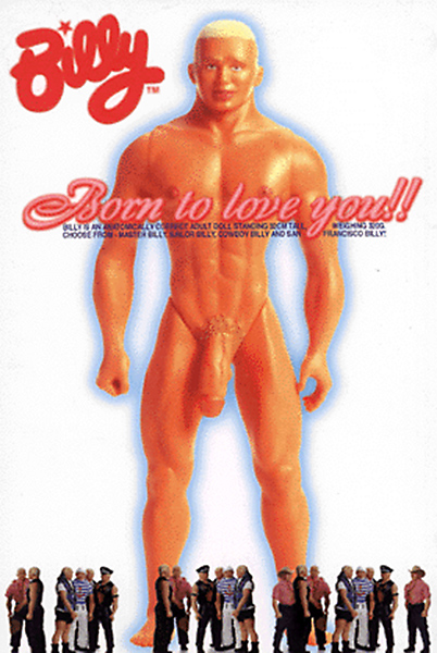
 

Behavior Saviour. 'Untitled' 'Billy postcard' 1998


Behavior Saviour
Untitled
‘Billy postcard’
1998


“Born to love you!! Billy is an anatomically correct adult doll standing 32 cm tall, weighing 320g. Choose from – Master Billy, Sailor Billy, Cowboy Billy and San Francisco Billy! Billy, the world’s first out and proud gay doll, comes beautifully packaged in a high quality presentation case with photographic backdrop.”
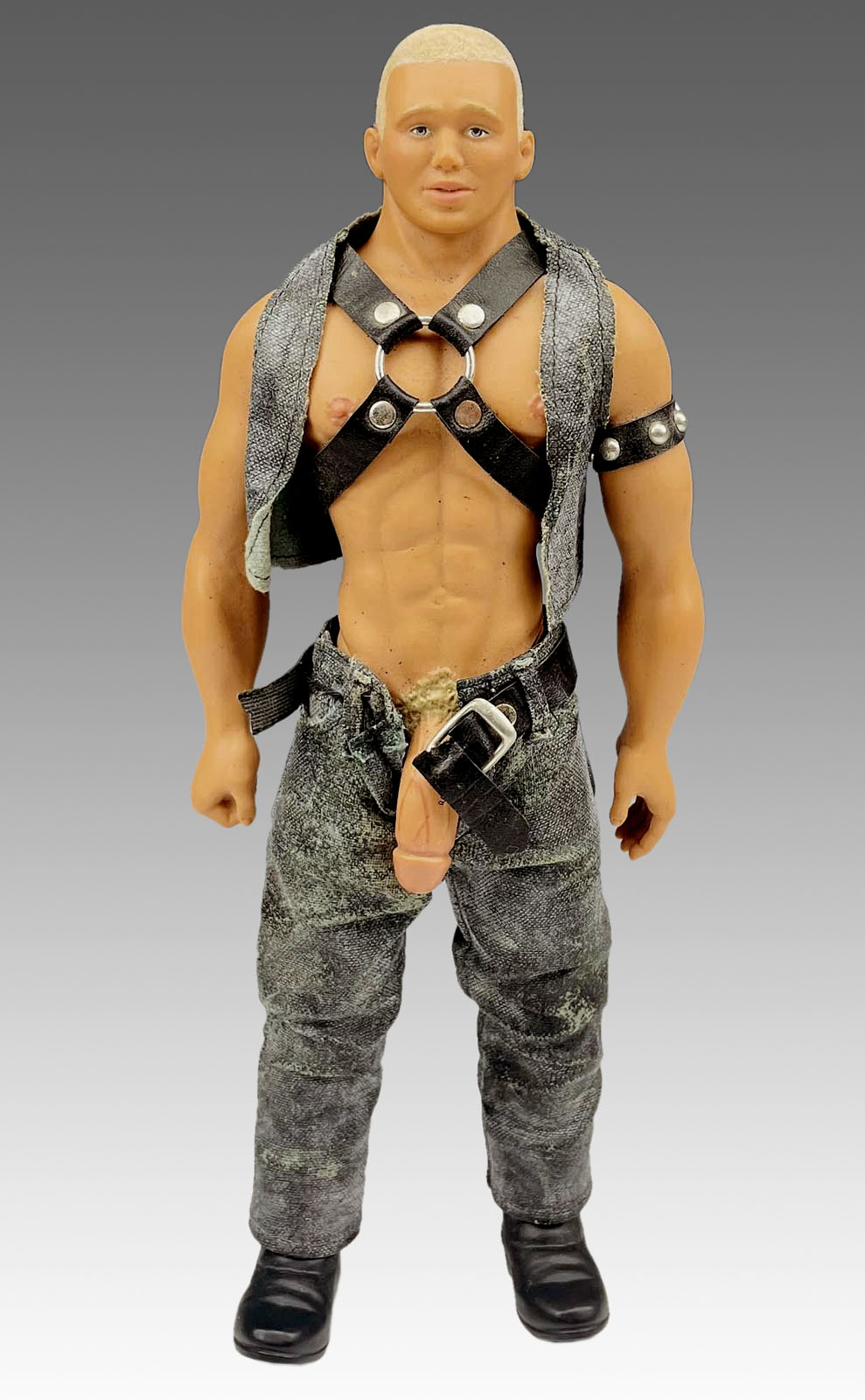
 

'Billy Doll' c. 1997


Billy Doll
c. 1997


It has been replaced by a desiring consumerism, in this case the desire for a muscular form complete with jaw dropping penis, the envy of every gay man. And after all, consumerism is a form of self-obsession. Makes you feel a little insecure, eh? Billy doesn’t have an inch of fat or any body hair, is perfectly proportioned (particularly his huge endowment) and is made of plastic. No fear of infection here! Women have been fighting this kind of body stereotyping with the Barbie Doll for years and now the gay male has his own equivalent.

Oh but Billy – he’s born to love you!!


Consuming the Appearance

Sex sells. The appearance and image of hard bodies sells. They are consumed by individuals and societies eager to attain what they offer; individuality, success, popularity and ‘lifestyle’. But these images are not individual, they are ‘the same’, to be consumed by every-body. Below are three examples of the current genre of male body photography; all bodies are of the same homogenised type. Only the photographers are different, but they might as well have been the same.


Various photographers of the male body in Blue Magazine


Michael Childers
Untitled
Nd
Blue Magazine
Sydney: Studio Magazines, February 1999, p. 68

Jason Lee
Untitled
Nd
Blue Magazine
Sydney: Studio Magazines, April 1997, p. 108

Rob Lang
Untitled
Nd
Blue Magazine
Sydney: Studio Magazines, February 1999, p. 93


Apparently, “Jason Lee’s brooding male nudes plumb the shadowy depths of Mystery, Sensuality and Despair … Figures possess an aura of subdued eroticism … Faces and identities are almost inconsequential, the subject reduced to a study of line and texture.”4 He says that he doesn’t want to use clichés that tend to occur when photographing women and to establish an identity and style all of his own. Michael Childers images are supposedly, “Dynamic, sensual and glamorous,”5 while Rob Lang’s desert studies of the male nude, “Document his search for the man within … and [are] essentially about unearthing an emotional bond.”6

These “types” of photographer (ie. ones who take generic photographs of the muscular male body) and many more like them feature heavily in Blue Magazine, a glossy publication aimed at the gay ‘lifestyle’ demographic. Of course most photographers would like to think that their work contains a deep revealing: mystery, sensuality, emotional bonds, etc., … but speaking as a photographer myself, I believe that this type of body photography (with its self-absorption and narcissism), isolates the body from communication with others. The bodies are complete(d) within their own sensual gratification. The construction of these images is formulaic, the body forming a masturbatory landscape endlessly repeated by different photographers in slightly different poses that appeal to a gay erotic consumerism. There is no individual identity present in photographer or subject contrary to what Jason Lee would like to think.

Identities of the models and photographers are inconsequential. These images are used by advertisers, fashion photographers, media and “artists” alike to sell product and fall into clichés that have developed in the photography of the male body over the last 60 years.


Anonymous photographer. 'Untitled' Nd Yves Saint Laurent advertisement 'Blue Magazine'


Anonymous photographer
Untitled
Nd
Yves Saint Laurent advertisement
Blue Magazine
Sydney: Studio Magazines, February 1999, p. 9
1999


I suggest that these images are no longer just a fashion, but that they are here to stay. I believe that the problems associated with the idealisation of these male images (for example steroid abuse, low self-esteem, body dysmorphia), can be compared to the eating disorders that women have succumbed to in their attempts to attain the waif like super-model look of many contemporary women fashion models.

Some social commentators have argued that the multiplicity of images available to the public (in consumer culture) open up new identities and new areas of becoming, deconstructing the hierarchy of what is seen as valuable in body image types. Central to this hierarchy is the ability of dominant groups (such as supermodels or muscular mesomorphs) to prove that their lifestyle7 and body type are desirable, are superior and worthy of emulation. Chris Schilling has observed that,

“The rapid internationalization and circulation of consumer and ‘lifestyle’ goods threatens the readability of those signs used by the dominant to signify their elite physical capital. These issues raise doubts about the continuing management and control by the dominant class of those fields in which physical capital is recognized and valorized. If fields become saturated with increasing body images and social practices which are presented as constituting valuable forms of physical capital, then their structure may change. Unless dominant sections of society are able to classify these styles into existing hierarchies, and have these classifications recognized as valid, then the logic of differences in which taste in cultural and consumer goods and lifestyle activities are held to be oppositionally structured is threatened. In contemporary consumer society, then, we may be witnessing processes which will make it extremely difficult for any one group to impose as hegemonic, as worthy of respect and deference across society, a single classificatory scheme of ‘valuable bodies’.”8

.
I disagree with this argument.

It is still all too easy for the dominant group within a subculture or society to impose and identify a ‘valuable’ body. This can be seen in any of the above images and the way they are used by all types of artists, media & advertisers to attract ‘value’ status. The body of the muscular mesomorph attracts a projected desire that media and advertisers rely on. It is still very difficult to put forward alternate body images that can be seen as fantasies, both desirable & ‘valuable’. Since most males would like to have a muscular mesomorphic body shape this body type does have social status. Covers of gay magazines such as Outrage (below) sell far more copies when they have an attractive, muscular smooth young man on the front of them.


Anonymous photographer. 'Untitled' Nd in Blue Magazine 1999


Anonymous photographer
Untitled
Nd
2(x)ist underwear advertisement
in Blue Magazine. Sydney: Studio Magazines, February 1999, p.15


Darren Tieste. 'Geoff' Nd in Outrage Magazine 1999


Darren Tieste
Geoff
Nd
Outrage Magazine cover, “Making Porn” play and underwear feature
in Outrage Magazine No. 189. Melbourne: Bluestone Press, February 1999. Front cover / p. 63


Here Outrage kills three birds with one stone. Firstly, they have their attractive semi-naked cover model to help sell the mag. Secondly, there is an article on the play in which the model / actor is acting (different photographs). This promotes both the play and fills the magazine. Thirdly, the image is repeated inside the magazine with other models / actors in designer underwear as part of a photographic feature. Nice one Outrage!

This and other contemporary images of muscular male bodies are unlike the clone image of an earlier generation because the ‘look’ is now ageist, elitist and requires great sacrifices in order to come close to possessing the ‘ideal’. Great value is put on appearance, youth, beauty, and lifestyle to the possible detriment of everything else.


Consumer Capitalism and Narcissism

Consumer capitalism encourages the consumption of items that promote a socially valued model. This encourages narcissism9 in the individual as each seeks to tailor their appearance through the consumption of such items. The individual reflexively watches how they ‘measure up’ to the model of a socially valued self and modulates what they consume so that they can be seen as popular, attractive & possessing a good ‘lifestyle’. Anthony Giddens notes,

“Consumption addresses the alienated qualities of modern social life and claims to be their solution: it promises the very things the narcissist desires – attractiveness, beauty and personal popularity – through the consumption of the ‘right’ kinds of goods and services. Hence all of us, in modern social conditions, live as though surrounded by mirrors; in these we search for the appearance of an unblemished, socially valued self.”10

.
I suggest that looking at the self in a mirror may not be the same as seeking the truth of the Self in reality; after all, a mirror image is only a reflected surface, seen in reverse. This reflection, this appearance, dominates your social ‘value’ in contemporary society. Appearances are marketable, and the more unblemished a product you have the better. Across the many spectrums of life it is a buyers and sellers market, whether it is the body, the underwear or the aftershave. They have what you want; you might have what they want. What price a sale? Maybe it’s all an illusion with mirrors?

(Please see the Eye-Pressure chapter for more information on the gaze).


Anonymous photographer. 'Fresh, Pure, Cool – It's milk' Nd in Large Magazine 1997


Anonymous photographer
Fresh, Pure, Cool – It’s milk
Nd
Style Council milk advertisement
in Large Magazine Issue No.8. Melbourne: Large Publications Pty Ltd., 21st March 1997, back cover


Anonymous photographer. 'Fresh, Pure, Cool – It's milk' Nd in Large Magazine 1997


Anonymous photographer
Fresh, Pure, Cool – It’s milk
Nd
Style Council milk advertisement
in Large Magazine Issue No.8. Melbourne: Large Publications Pty Ltd., 21st March 1997, pp. 1-2


The surface of such an identity construction hides the cost of its production. Seemingly, no effort is required to possess such a socially valuable body and ‘lifestyle’. Advertising promotes these socially valued bodies and lifestyles; this can be seen in the imagery and advertising message of the two milk advertisements. In the above advert the (phallic) glass of milk is linked to the smooth muscular body of the man holding it, who is the only person dressed in white. The milk and the man who is about to drink it are both, by association, fresh, pure, cool. The surrounding crowd is not staring at the milk, they are staring at, and desiring, him. On the left well-heeled matrons eye him with open desire and behind a group of (gay) men, all of a similar smooth, muscular body-type stare with open mouths and obviously lust after his sculptured torso. This tableaux reinforces the message that such a body is fresh, pure and cool, and is seen as a ‘valuable’ status symbol by society. It’s possible that by drinking milk you too can acquire such a possession!.

In the second advert a women and two men are again surrounded by ‘others’, people that could be regarded as freaks, with most of them having strange hair, over the top make-up and wearing dark clothes. They are not ‘normal’. When the advertising agency was casting for this campaign in Melbourne I went along – they wanted the weirdest looking people they could find. In contrast the male model at right reveals his smooth sculptured torso to the desiring gaze of an admiring viewer, much as in the first advertisement above.

This is the desirable body and the desirable ‘lifestyle’ to which we should all aspire!


Visible Bodies


“Visible bodies are caught in webs of communication irrespective of individual intentions and these systems can exert a considerable influence on the behaviour of those involved.”

.
Tom Burns11


Media advertising makes use of these webs of communication to reinforce it’s system of consumer control. Sometimes advertisers do not openly deploy these lines of communication. In the example below Sheridan sheets has, perhaps subconsciously perhaps deliberately, targeted the gay ‘lifestyle’ demographic without making it too obvious. In the first photograph a beautiful, smooth, tanned young man lies in bed happily smiling at the camera …


Anonymous photographer. ''Sheer Poetry' by Sheridan' Nd in Sheridan Australia brochure 1998


Anonymous photographer
‘Sheer Poetry’ by Sheridan
Nd
in Sheridan Australia brochure. Mordialloc: DDI Adworks, 1998, pp. 17-20


On turning the page we find that this image is followed by a double page spread of towels in assorted colours. On the next page we find another gorgeous smooth, tanned young man reclining in bed smiling at the camera. Funny isn’t it that the sheets on both beds are identical, that one boy is photographed from one side of the bed and the other boy from the opposite side. They couldn’t be in the same bed could they, heaven forbid!

Instead of showing the boys in bed together which would not appeal to the wider heterosexual male or female purchaser, the designer of the brochure has cleverly suggested the possibility of homosexuality through the use of visible bodies in a disguised web of communication. The symbolic representation of such photographs (with their implicit language of sexual contact) can be recognised by gay men without the overt nature of homosexuality being thrust in the face of the general public. It took me some time to realise what the designers had done. I wonder how many gay men have consciously realised this association? I think most would only perceive and understand this message projection, this web of communication on a subconscious level. Still this subconscious recognition only serves to reinforce societal values of what is seen as worthy of esteem, what is desirable in a lifestyle, through visible bodies, possessions and in this case, sheets. It is the insidious nature of media advertising that it evens out the bumps of difference, that is, it standardises and shapes levels of diversity, style and taste into what is socially acceptable and desirable.

The advertising media that targets consumers are not the only one’s guilty of promoting a limiting desirability of ‘ideals’ through photographic imagery, the representation of valuable male bodies. Equally to blame are some well known health organisations, both gay and straight, that use ‘the same’ stereotypical muscular mesomorphic bodies to illustrate their health campaigns.


Stephen Paul. 'Are Men from Mars?' c. 1998


Stephen Paul
Are Men from Mars?
c. 1998
‘Momentum’ Postcard
Bristow and Prentice Response Advertising
Melbourne: Victorian AIDS Council/Gay Mens Health Centre Inc. c. 1998


Stephen Paul. 'Loves me, Loves me not' c. 1998


Stephen Paul
Loves me, Loves me not
c. 1998
‘Momentum’ Postcard
Bristow and Prentice Response Advertising
Melbourne: Victorian AIDS Council/Gay Mens Health Centre Inc. c. 1998


Anonymous photographer. 'Now I'm immune!' Nd


Anonymous photographer
Now I’m immune!
Nd
‘Get Vaccinated’ Postcard
Australian College of Sexual Health Physicians 1997


To be fair, there is an awareness amongst quite a few people at The Victorian AIDS Council / Gay Mens Health Centre in Melbourne, Australia, of the need for the imaging of a broader cross section of body-types in health promotions. Still, this does not stop the images on postcards such as the two above (designed by an advertising company), appearing with regular monotony. The back of “Are Men from Mars?” asks you to discover for your yourself what makes men tick by joining one of the many VAC courses. From the card image it would seem that what makes men tick is a muscular well defined body, clenched hands (symbol of phallic masculinity)12 and beer!

Once introduced to the VAC young gay men may attend the ‘Young and Gay’, ‘Boyant’ or ’18 and under’ courses. In an interview with Jim Sotiropolous13 I asked him about the courses, media advertising and body image commodification:


MAB: OK, so one example I heard about as that you looked at people’s underwear to see whether they were wearing Calvin Klein.

JS: The only thing I can relate that too is that in the first week we use autograph sheets as an icebreaker. A sheet has 6 questions on it and one of these questions is who owns a pair of CK underwear.

MAB: Why is that there? This is interesting to me because of the commodification of the body and consumer culture – if you can’t have the body you can buy the underwear!

JS: Because people talk about it. It is something that we know will get people saying “Well, yeah I do.” So they will sign it. Its no use asking very vague questions and you won’t get a response, so you have to ask very specific questions because we just know they will respond. They know about it. I think it is stronger than a gay focused strategy. You can’t miss the billboards and the advertising.

MAB: So they have been attracted by those images of men and gone out and bought this underwear pre-knowing about the gay community and what’s expected of a gay image?

JS: Yes – the images are very erotic in the CK ads. I was in New York recently and there is a billboard that stretches 2 blocks with the range of CK underwear, its amazing!

MAB: Is this self-reflective narcissism good for how people feel about their own bodies?

JS: No – I think that there a lot of people who know they will never achieve that ideal but I’m not sure …

MAB: … whether that’s a bad thing

JS: Up to a point, yeah.

MAB: I’m not positing it as a totally bad thing.”


I suggest that the very presence of this kind of question (whether it elicits a response or not), still smacks of a certain elitism and the promotion of a particular ‘lifestyle’ as desirable. Calvin Klein models are, after all, the epitome of the clean cut, well groomed, tanned, successful visible male body promoted by an advertising web of communication. This is how bodies unintentionally get caught up in webs of communication which affects the behaviour of all bodies, in this case through the proposition of such a question. This enmeshment causes problems not only for the gay male but also for the heterosexual male; increased levels of body dissatisfaction, eating disorders and steroid abuse have been noted by researchers.14 This may be due in part to the desirability and valued social status of muscular mesomorphic body images such as those used in the Calvin Klein advertisements.

I believe that the search for self-identity through consumption is, in the end, a self defeating exercise. It is like looking into a thousand mirrors at an image of infinite regress never able to find the original image, that essence of inner Self that is ours only in the most insightful of moments. WE are the ones that create the images in the media, the mirror images of how we would like to be. As Lakoff and Scherr have said,

“Who, in the first place, are these faceless hordes? Who is ‘society’ but you and me? And the ‘media’ are not active, it is well known, but reactive; what they discern that their viewers / hearers / readers want, they provide. If we, the viewing public, are not stimulated to buy by the blandishments dangled before us, the media will be instantly responsive – there will be a whole new set of blandishments dangled faster than the eye can blink. So if the same tired messages, the same recycled pictures, pass across our weary retinas year after year, we cannot in all honesty blame the media.”15

.
We can only blame ourselves.


Gay Male Pornography


“If one were to write the ultimate cliched Australian coming out story, it would be about a boy born in a hick town who has the lithe body of a ballet dancer. Engaged to be married, he instead becomes a flight steward. The scales of heterosexuality drop from his eyes and he moves to Sydney to reinvent himself via the Yellow Brick Road of pumping at the City Gym, over-tanning at Tamarama, pulling beers at the Albury, and joining that bare-chested Roman garrison who shoulder their way across dance party floors. There is only one thing for him left to do: preserve the dream forever by becoming an American (which means the world) video sex icon.”

.
Peter Jordaan16


Following on from the previous text we might be able to say that we have only ourselves to blame if the media reinforce images of traditional ‘virile’ masculinity in a consumer society. It is we who have created these erotic male fantasy images, images that express our desires, not the media. But it is also true that capitalism and consumerism rely on the sale of product and constantly enlarge and amplify product appeal by advertising, thrusting these fantasy images into our faces until they become an overpowering omnipotent archetype. The male body in the contemporary gay porn industry is a prime example of such an archetype, the (re)enforcement of masculine power in the desirable image of the muscular mesomorphic body. How did this (re)enforcement of masculine power in the body image of gay porn stars come about?


Anonymous photographers. 'Solo Man' Nd


Anonymous photographers
Solo Man
Nd
Super 8mm pornography films advertisement in Super Star Studs No. 2. New York: No publisher, Nd (early 1970s) Back cover
Courtesy: Marcus Bunyan


During my research at The One Institute in Los Angeles I investigated the type of body images that appeared in the transitional phase from physique magazines of the mid-late 1960s into the early gay pornography magazines of 1969-1970 in America which occurred after the Supreme Court ruling on obscenity. I wanted to find whether there had been a crossover, a continuation of the muscular mesomorphic body image that was a favourite of the physique photographers into the early pornography magazines. From the evidence of the images in the magazines I would have to say that there was a limited crossover of the bigger muscular bodies but most bodies that appeared in the early gay porn mags were of the youthful, smooth, muscular ephebe-type body image.

As can be seen from the images (above) most of the men featured in the early gay pornography magazines and films have bodies that appear to be quite ‘natural’ in their form. Models are mostly young, smooth, quite solid with toned physiques, not as ‘built’ as in the earlier physique magazines but still well put together. Examining the magazines at the One Institute I found that the bodies of older muscular/hairy men were not well represented. Perhaps this was due to the unavailability of the bigger and older bodybuilders to participate in such activity? In the male bodies of the c. early-1970s Super 8 mm pornography films (above) we can observe the desirable image of the smooth youthful ephebe (males between boy and man) being presented for our erotic pleasure.

We can also observe in the bodies of Mark Hammer, Mike Powers and Bob Noll the presence of a bigger more muscular body. These bodies are an early indication of the later development that was to take place in the body images of men in gay pornography – a shift to older more ‘masculine’ bodies, probably as a reaction to the stereotype of the effeminate limp-wristed pansy and also the fear of being seen as a pederast, that is a person who has sex with underage boys.

In the late 1970s another revolution started to take place; towards the end of the decade porn films became more widely available on videocassette. This made porn much more accessible to the gay consumer and allowed the expansion of the gay pornography industry. Instead of having to buy Super 8 movies and use home projectors that took an age to set up gay men could now have their ‘hit’ of pornography in a quick, convenient package.


Anonymous photographer. 'Perfect Room Service' c. 1976


Anonymous photographer
Perfect Room Service
c. 1976
Homo Action
14 Color-Climax Corporation
Copenhagen: Peter Theander, 1976
Courtesy: Marcus Bunyan


Not all male bodies (especially those that appeared in the early European pornography films and magazines), conformed to the ‘ideal’ of the hairless muscular ephebe, as can be seen in this magazine ‘still’ photograph taken from a Danish Super 8 mm gay pornography film. Curiously the magazine is printed in Australia.


Early gay male pornographic films have a distinctly ‘underground’ flavour but some managed to capture the frenzied passion that drives such erotic encounters where the people really want to have sex with each other. In the early 1980s the amateurism of the early films was replaced by the professionalism (and money making power) of such directors as Steve Scott, Matt Sterling, John Travis and William Higgins who still managed to capture this sexual frenzy. Gone are the really youthful body types of the earlier magazines and films – smooth, white, older muscular bodies now dominate.

William Higgins is one of my favourite directors for his unique shooting style. He makes use of oblique angles, incredible distorted close-ups of blood engorged penises (Sailor in the Wild, 1983), slow motion repeats of cum shots from many angles, and jump cuts from one carnal scene to another without a break (Class Reunion, 1982). This surreal celluloid confusion adds to the mystery and excitement of the scenes and the participants really seem to enjoy their sex; they wince as the cock goes up their arse and there is a certain ‘reality’ about the whole sex thing.

Even in these early 1980s films the star has numerous sexual partners and fucks his way through the whole video having multiple ejaculations within the space of a few minutes running time. At the drop of a hat muscular men drop their pants and their loads all over the place and some of the scenes are really horny!

As with any pornography though, you have to trawl through heaps of dross before you find the gems that get you going. Multiple orgasms by the stars of pornographic videos help reinforce compulsive sexual behaviour17 that is learnt by gay men to be a societal performance ‘norm’.18 Withdrawing before cumming enabled the director to capture the ‘money shot’ (ejaculation) for the viewer; gay male sex on video became not a passionate intimate union between two men but a performance, a display of shooting skills (both physical and pictorial) which presents the body to best advantage. Later in his career William Higgins also pioneered the shaved bum which epitomises the pumped up, perfectly groomed young white male available for plumbing lessons.


Anonymous photographer. 'Cover image from The Devil and Danny Webster pornography video' 1997


Anonymous photographer
Untitled
Nd
Cover image from The Devil and Danny Webster pornography video
Champions Video of Australia catalogue Issue 31. Canberra: No publisher, 1997, p. 12


“Unable to compete with the ‘sun-bronzed gym gods’, Danny spends his nights alone watching old movies – hoping for a miracle … “


Anonymous photographer. 'Take it All! They Ate the Whole Thing!' Nd


Anonymous photographer
Untitled
Nd
in Take it All! They Ate the Whole Thing! Vol. 1 No. 1. American: No place or publisher, Nd
Courtesy: Marcus Bunyan


Rare image of thin bodies in gay male pornography.


Gay men wanted to be seen as virile ‘real’ men in reaction to the stereotype of the effeminate pansy. This emphasis on the possession and display of a muscular body became even more prevalent in pornography with the onset of the HIV / AIDS crisis in the mid-1980s.

Driven by the fear of disease and the anxiety, insecurity and dis-ease of being thin and being seen as possibly infected gay men started going to the gym and ‘pumping’ up in ever increasing numbers. A big, healthy, muscular body couldn’t possibly be infected with the virus! Body hair was out as it was a sign of experience and maturity and therefore of disease according to Michelangelo Signorile.19

Healthiness was in. Gay men with thin bodies (such as those above) or bodies like that of Danny Webster (above), hoped for a miracle otherwise they would be left on the shelf, never having any sex! Either that or they went to the gym and capitulated to the emerging stereotype. There was apparently no hope if you didn’t ‘fit’ the ideal. But this is not the real world, this is a fantasy! Many gay men gave in to this fantasy becoming ‘simulations’, carbon copies if you like, of their porn star heroes. Lots take illegal steroids to get close to their ‘ideal’.

Other gay men have carried on as they have always done; living their lives as positively as they can; incorporating their sexuality as part of their identity; coping with feelings of inadequacy that such bodily facades can generate. Perhaps if these bodies were seen as ‘unnatural’ gay men would get over some of their attraction towards them. Perhaps if they accepted them as an artifice, a deception; that the material (steroid abuse20 and possible HIV virus contraction to name two) and psychological (high / low self-esteem leading to depression and anxiety) cost of their production is hidden behind the rose coloured lens of the camera or the surface of the body, then their erotic power would be lessened. I suggest that gay men DO realise that these images are fantasies but still strive to attain the fantasy in themselves and in the bodies of their partners.


Anonymous photographer. Image from 'The Big Thrill' pornography video Nd


Anonymous photographer
Untitled
Nd
Image from The Big Thrill pornography video Nd
Cover of Champions Video of Australia catalogue Issue 46, 1998


“… when a dozen handsome young college guys arrive at the Kingsley Institute, the first thing they do is have a big pillow-fight, get incredibly horny, take their clothes off and have an all-in jerk off. After that, things get increasingly out of hand. All the young men are exceedingly cute and built like young gods, so they can link up in any combination they care to and make a very handsome couple. And they do care to. The viewer soon loses track of who’s doing what with who, or indeed of who is who, but it doesn’t really matter. These boys fit together like parts of a well-lubricated machine. They appear to have been selected for something more than their writing skills, then waxed and polished till they glow.” (My italics)

.
Rod Pounder21


In the above quotation we can see how the bodies in contemporary male pornography have become interchangeable, replaceable one with another. The image above is also a good example of the phenomenon of the homogenised body stamped out of the same mould. I believe that in contemporary gay male erotica it is not so much the sex that matters but the display of the body for admiration. There is a certain stiffness (pardon the pun) of performance now. The frenzied passion of sex has gone replaced by the surface, the positioning of the body for the benefit of the camera. It’s all to a formula. Big pricks have become even more important and stars have their dicks cast in rubber so the viewer at home can purchase and enjoy the satisfaction of taking their heroes prick (or a ‘simulation’ of it) up his own arse whilst watching the video at the same time.

Gay pornography depicts gay sex as ‘manly’ because gay men want to see themselves that way even though one man is fucking another man, supposedly queering ‘normal’ heterosexual masculinity. I believe this is not gay men ironically challenging traditional masculinity but the confirmation it’s power over them. As noted earlier, the body becomes a phallus – hard as granite and as tough as steel – signifying and embodying a mythological power. These bodies are built ‘tough’ despite the fact that you could probably drive a semi-trailer up their rear end and they probably wouldn’t feel a thing! Now, in contemporary male pornography, the range of body types is much narrower. Of course there are still specialist videos catering to the leather subculture, shaving fetishists, young men fantasies (mainly videos from Germany), wrestling, hairy men, toys, black men, etc., … but these form a small specialist minority group of the video market. In the main the videos that fill the Champions catalogue, for example, feature models that are constructed of smooth, prime white beef.


John Travis. Cover image from 'Billy 2000: Billy Goes to Hollywood' pornography video 1999


John Travis
Untitled
Nd
Cover image from Billy 2000: Billy Goes to Hollywood pornography video
Studio 2000, 1999


Recently I watched a video called Billy 2000: Billy Goes to Hollywood, directed by John Travis. The video features 4 couples and one solo performance. The story, as far as it goes, is that gay men go into a shop and sees the Billy doll (discussed earlier) and starts fantasising about meeting a man who looks exactly like the doll, including having his large ‘anatomically correct penis’. Low and behold we fade out into dream sex scenes between different men and different versions of the doll which has now come to life, wearing exactly the same clothes as the doll does. What follows are, I think, four of the most boring gay sex scenes I have ever seen. There is no passion in the sex and all four couples copy exactly (deliberately?) the same positions by rote: man sucks dolls dick, man sits on dolls dick, man gets fucked from behind by dolls dick, doll ejaculates all over mans back. This is formulaic sex. As we can see in the above image the muscular male body is now simulating the ‘ideal’ embodied in a doll! Great marketing ploy to link the sale of the doll and the video together…

As Peter Jordaan has observed,

“There is a desperate need for more gay romance. A video like 1992’s Matt Sterling effort ‘Scorcher’ stands out simply because one of the couples in it actually look with pleasure into each other’s eyes while they are fucking … dick-tugging videos which also tug at the heart remain rare delights indeed.”22

.
I most certainly agree.


Alternatives to American gay male pornography

As an alternative to American videos three names stand out in the pantheon of porn directors. The first is Kristen Bjorn was has made a reputation for himself and his videos by photographing men from all over the world in apparently natural, spontaneous sexual situations. His videos feature large casts of men from different ethnic backgrounds but all his actors are power- fully built, masculine men. The second is Jean-Paul Cadinot. His videos, usually set in reform schools, school dormitories, scout troops and army barracks feature young ephebes having their way with each other with a lusty abandon not usually present in American videos. Lastly there is George Duroy, pioneer of EuroAmerican videos such as Accidental Lovers (1993) and Sauna Paradiso (1994) that have been shot (using American money) in Eastern Europe after the fall of the Iron Curtain using East European men.

His videos include a combination of athletic, young performers who are all smooth; from the slim and toned ephebe to the more muscular built lad. And well built they are. The images below are a good examples of both body types. The boys, for they are not men in the American sense of the porn video word, really do seem to enjoy having sex and ‘making it’ with each other in a loving and intimate way. Which is great!


George Duroy. 'Untitled' from 'Sauna Paradiso' pornography video 1994


George Duroy
Untitled
Nd
Image from Sauna Paradiso pornography video
Falcon International Collection 1994
in Douglas, Jerry (ed.,). Manshots: The Firsthand Video Guide Vol. 7 No. 2. Teaneck, N.J.: FirstHand Ltd., December, 1994, p. 46.


Milan Demko, Victor Gravek, Pavol Zurek and Thomas Novak compare stiff dicks


Anonymous photographer. ‘Untitled’ image from ‘Lucky Lukas’ pornography video 1999


Anonymous photographer
Untitled
Nd
Image from Lucky Lukas pornography video
Blue Diamond Video Services advertisement in ‘Meetmarket’ section in Outrage Magazine No. 189. Melbourne: Bluestone Press, February 1999, p. 1


Dean Durber, in an article for Blue Magazine called “New Wood” observes,

“Even if the innocence of much cuter and younger faces is forced off the shelves, the recent interest in intimacy and tenderness cannot be ignored. We might yet see older men on screen who actually appear to enjoy what they do. Especially if there’s money to be made and pleasure to be had.”

.
Why forced off the shelves? Apparently because of concerns over pederasty (love of young boys) and the perceived age of the ephebes involved. But here’s the rub – it’s all in the name of money in the end. It’s all about selling product even if you do have a good time. The fantasy scenarios are just that – idealised fantasies. They are set up to sell product and use body image to do so. These EuroAmerican videos just use the fresh new faces and bodies of muscular young men to appeal to a different market demographic.

Let me comment on just one more thing that happens in a lot of porn videos. I have noticed that it is usually the bigger guy (either dick or body size) that fucks the smaller guy therefore marking him as the man – no matter who is making the video. Commenting, unwittingly, on this disparity in body size Stan Ward in his review of Sauna Paradiso says that when the boys in the above photograph have a fourway, “Soon enough the boys are separated from the men. Novak and Demko continue the oral action while Gravec gives Zurek a royal screw up the arse … For the money shots, the boys and men come together …”23

Does that mean that if you have a smaller body that you are not a man? Does it mean that to be a gay man you have to partake in anal sex? It would seem that a big cock or its substitute, a big body, will always classify you as a man and not a boy and to participate in anal sex will make you a man not a boy. But whether its boys or men, gay pornography is there for one major reason – to make money within a media driven, image conscious consumer society.


Alternative bodies

There are, however, one group of photographs that have appeared in some porn mags that do not represent the ideal of the perfect muscular mesomorph or the smooth, young ephebe. These are photographs that accompany the messages of ordinary gay men wanting to meet other men for sex and companionship. These are the images of themselves they want to show to the general public. How they perceive themselves. How they are posed reveals small contexts of identity, even though their actual identity is hidden because of the masking of the face (No. 3 is ingenious in this regard; it uses the flash of the camera in the mirror to obliterate the facial features). The backgrounds and attire (when present) can tell a lot about a person.


Anonymous photographer. ‘’Untitled Nd in 'Get In Touch section in various issues of ‘Gay’ 1984-185


(left to right)

Anonymous photographer
Untitled
Nd
in ‘Get In Touch’ section in Gay No. 104. Enmore: No publisher, 1984, p. 48.
Courtesy: Marcus Bunyan

Anonymous photographer
Untitled
Nd
in ‘Get In Touch’ section in Gay No.100. Enmore: No publisher, 1984, p. 46.
Courtesy: Marcus Bunyan

Anonymous photographer
Untitled
Nd
in ‘Get In Touch’ section in Gay No.121. Enmore: No publisher, 1985, p. 48.
Courtesy: Marcus Bunyan

Anonymous photographer
Untitled
Nd
in ‘Get In Touch’ section in Gay No. 101. Enmore: No publisher, 1984, p. 47.
Courtesy: Marcus Bunyan

Anonymous photographer
Untitled
Nd
in ‘Get In Touch’ section in Gay No. 118. Enmore: No publisher, 1985, p. 47.
Courtesy: Marcus Bunyan


Numbers 1 and 3 remind me of the photographs of Diane Arbus, shot in that person’s lounge room and bedroom respectively (see the photograph at the beginning of the chapter and below). In the background of No.3 we can see an ironing board, a wooden bed head and the bed itself. In the foreground we can see a full cup of tea or coffee sitting on the dressing table to which the mirror is attached.

No.’s 2, 4, and 5 feature men who are obviously into leather, cock rings, boots and whips; a poster of a man stares over the shoulder of the figure in No. 2 adding to the menacing air – I’m watching you! Note in all the images the bodies are of an everyday, ‘natural’ type. Types that we can see down the beach or at the sauna that are not toned and tanned but older, plumper, taller or skinnier, and for this reason they have an attractiveness which is solely their own.

These bodies have been lived in, they have earnt every wrinkle and crease, have survived their life experiences and are still sexually valuable in their own individuality and difference. These bodies are not fantasy material in the ‘normal’ understanding of what a contemporary male fantasy body should look like. This is because in the buyers and sellers market of contemporary gay society big, buff, and beautiful is the perfect dish of the last two decades and will continue to be so as long as gay men continue to desire this ‘ideal’.

Dr Marcus Bunyan
2001


Bodies are unstable … and how frightening, that can be, and how those two emotions comprise desire.”

Jesse Dorris. “Jimmy DeSana’s Transgressive Vision of Life and Desire,” on the Aperture website December 14, 2022 [Online] Cited 19/12/2022


Diane Arbus (American, 1923-1971) 'A naked man being a woman, N.Y.C.' 1968


Diane Arbus (American, 1923-1971)
A naked man being a woman, N.Y.C.
1968
Gelatin silver print


Footnotes

1/ Kellner, D. “Critical Theory, Commodities and the Consumer Society,” in Theory, Culture and Society 1, 3: 1983, p. 66, quoted in Evans, David. Sexual Citizenship: The Material Construction of Sexualities. London: Routledge, 1993, p. 48.

2/ Altman, Denis. The Homosexualisation of America. Boston: Beacon Press, 1982, p. 211, quoted in Chapkis, Wendy. Beauty Secrets: Women and the Politics of Appearance. Boston: South End Press, 1986, p. 136.

3/ This is not a new concept and the lament that the gay body is used as a commodity and marketable sexual tool and not exclusively joined in affection and love has been around since well before Stonewall within the gay community. Of course sex and love are NOT mutually exclusive but some people seem to think that they are:
“Not too many years ago it was unheard of to dress in a “gay” manner or to act in any way which might lead others to suspect that you were a homosexual. Now, almost overnight, we have “gay” bars “gay” dance clubs, “gay” books, even business firms openly soliciting the business of homosexuals.
While this is good in the sense that it gives the homosexual a right to live like the rest of humanity, it has led to problems which were heard of in the past. Perhaps a slave needs his chains let loose slowly if he worn them for many years. Perhaps the “gay” world was not ready for this freedom or maybe it came to quickly. However, the homosexual now finds himself in a position where his “public image” is not that it should be. The blame for this lies mainly with those who flaunt their homosexuality in the faces of the general public.
A homosexual, as defined by most medical authorities, is one who seeks love and sexual satisfaction from his or her own sex. The majority of today’s homosexuals (or so it seems to the general public) could best be described as persons who look for as much sexual satisfaction from as many of their own sex as they can, without giving their love to any of them. This has come about because of the so-called “emancipation” mentioned previously. A homosexual can gratify his passions so easily now that the finer things in life seem to be cast aside …
Inside the “gay” bars, the tourist or outsider can walk in, and with no effort, behold the spectacle of people openly trying to make a one-night stand with each other. Outside the bar, the same tourist or outsider can hear those who failed in their mission inside the bar bargaining with someone on the street for the use of his body for the night … This is the image today’s homosexual is giving to the general public …
Why not get back to caring for one another? Hurt each other if you have to – you can start over again and learn from your mistake. Stop chalking up your conquests as if sex were a commodity.
Why not see how long you can stay with one person? Put love back into homosexual life.
Stop poking fun at the person who seeks love and friendship instead of one-night stands.
Let the love that is locked away and going to waste inside yourself be let loose and given to someone who will return it with interest. Don’t be afraid of your emotions. Get back to making the “gay” life what it should be – two people living together who need love of their own kind.”
Lady Beesborough. “The Public is Watching,” in The Greyhuff Review. 1st Edition. Minneapolis, Minn: Directory Services Inc., 1965, pp. 24-25. Sourced at The Kinsey Institute, University of Indiana, USA.
Even at this date (1965, which is pre-Stonewall), some people obviously saw gay male sex (and inherently the gay male body) as being a promiscuous commodity, which is quite amazing because nothing much has changed today. It is still a sellers market and gay men still go for it! The advice not to be afraid of your emotions is a good one – but that will naturally open gay men up to experiences, including many sexual interactions and not just love! As I comment elsewhere in the Re-Pressentation chapter, gay men are paradoxically both seeking sexual release and intimate connection whilst at the same time being afraid of that connection and revealing themselves to others.

4/ Swift, Michael. “Darkside,” in Blue Magazine. Sydney: Studio Magazines, April 1997, p. 106.

5/ Parry, Tracey. “Access All Areas,” in Blue Magazine. Sydney: Studio Magazines, February 1999, p. 66.

6/ Massengill, Reed. “Sand Man,” in Blue Magazine. Sydney: Studio Magazines, February 1999, p. 90.

7/ “Lifestyle refers to a relatively integrated set of practices chosen by an individual in order to give material form to a particular narrative of self-identity. The more tradition loses its ability to provide people with a secure and stable sense of self, the more individuals have to negotiate lifestyle choices, and attach importance to these choices.”
Schilling, Chris. The Body and Social Theory. London: Sage Publications, 1993, pp. 181-183. See also Giddens, A. Modernity and Self-Identity. Cambridge: Polity Press, 1991, p. 2, 5, pp. 80-81.

8/ Schilling, Chris. The Body and Social Theory. London: Sage Publications, 1993, p. 143. See also Featherstone, Mike. “Perspectives on Consumer Culture,” in Sociology 24(1). 1990, pp. 5-22.

9/ Below are four quotations about the definition and effects of narcissism.
“Notwithstanding his occasional illusions of omnipotence, the narcissist depends on others to validate his self-esteem. He cannot live without an admiring audience. His apparent freedom from family ties and institutional constraints [especially gay men] does not free him to stand alone or to glory in his individuality. On the contrary, it contributes to his insecurity, which he can overcome only by seeing his “grandiose self” reflected in the attentions of others, or by attaching himself to those who radiate celebrity, power and charisma. For the narcissist the world is a mirror…” (My italics)
Lasch, Christopher. The Culture of Narcissism. New York: W.W. Norton and Company, 1978, p. 10.
“Central to the narcissistic personality is an orientation to the body as youthful, enduring and constitutive of the self. The narcissistic body is open to new experiences, but only as long as they can be easily appropriated and consumed to reinforce its own sense of self as sacred and immortal.” (My italics)
Schilling, Chris. The Body and Social Theory. London: Sage Publications, 1993, p. 194.
“Narcissism presumes a constant search for self-identity, but this is a search that remains frustrated, because the restless pursuit of ‘who I am’ is an expression of narcissistic absorption rather than a realisable quest … Narcissism treats the body as an object of sensual gratification, rather than relating sensuality to communication with others.”
Giddens, Anthony. Modernity and Self-Identity: Self and Society in the Late Modern Age. California: Stanford University Press, 1991, p. 170.
“According to what I said about the nature of love, the main condition for the achievement of love is the overcoming of one’s narcissism. The narcissistic orientation is one which one experiences as real only that which exists within oneself, while the phenomena in the outside world have no reality in themselves, but are experienced only from the viewpoint of their being useful or dangerous to one. The opposite pole to narcissism is objectivity; it is the faculty to see people and things as they are, objectively, and to be able to separate this objective picture from a picture which is formed by one’s desires and fears.”
Fromm, Erich. The Art of Loving. London: Allen and Unwin, 1957, p. 118.

10/ Giddens, Anthony. Modernity and Self-Identity: Self and Society in the Late Modern Age. California: Stanford University Press, 1991, p. 172.

11/ Burns, Tom. Erving Goffman. London: Routledge, 1992, p. 38, quoted in Schilling, Chris. The Body and Social Theory. London: Sage Publications, 1993, p. 85.

12/ “The penis can never live up to the mystique implied by the phallus. Hence the excessive, even hysterical quality of so much male imagery. The clenched fists, the bulging muscles, the hardened jaws, the proliferation of phallic symbols – they are all straining after what can hardly ever be achieved, the embodiment of the phallic physique.” (My italics)
Dyer, R. Only Entertainment. London: Routledge, 1992, p. 116, quoted in Stratton, Jon. The Desirable Body. Manchester: Manchester University Press, 1996, p. 195.

13/ Interview with Jim Sotiropolous, Melbourne. 23/09/1997. Co-ordinator of 3 different programmes at The Victorian AIDS Council / Gay Mens Health Centre, Melbourne, Victoria.

14/ For a discussion of these issues please see Mishkind, Marc, Rodin, Linda, Silberstein, Lisa and Striegel-Moore, Ruth. “The Embodiment of Masculinity: Cultural, Psychological and Behavioural Dimensions,” in Kimmel, M. (ed.,). Changing Men: New Directions in Research on Men and Masculinity. Newbury Park, CA: Sage Publications, 1987, pp. 37-47. An extract from this paper can be found in Appendix A of the Bench Press chapter.

15/ Lakoff, Robin and Scherr, Raquel. Face Value: The Politics of Beauty. Boston: Routledge and Kegan Paul, 1984, pp. 292-293.

16/ Jordaan, Peter. “The Naked VCR,” in Outrage Magazine No. 131. Melbourne: Bluestone Media, 1994, p. 45.

17/ “Some people are so horny and desperate to have a connection that they will do anything to have sex, especially with someone who they find attractive. Sometimes sexually they even step over the line of physical attraction … and this can indicate compulsive sexual behaviour. I’M SO HORNY I JUST HAVE TO HAVE SEX!”
Interview with Greg Adkins. Melbourne. 02/10/1997. Outreach Beats Education Officer at The Victorian AIDS Council / Gay Mens Health Centre, Melbourne, Victoria.

18/ “We find it more important to preserve and foster the myth of sexuality as mechanical process than we do to develop any kind of detailed or sensitive phenomenology of sexual experience (ie., establishing how in fact people experience their sexual needs and feelings). I suspect that a vast proportion of people live in secret unhappiness about their sexuality because they are unable to meet what are in truth entirely mythical ‘norms’ of ‘performance’.”
Smail, David. Illusion and Reality: The Meaning of Anxiety. London: J.M. Dent & Sons, 1984, p. 113.

19/ Signorile, Michelangelo. Life Outside: The Signorile Report on Gay Men: Sex, Drugs, Muscles, and the Passages of Life. New York: HarperCollins Publishers, 1997, p. 68.

20/ “Big Ears has heard of at least two cases of ‘roid rage in Sydney this week as the countdown to Mardi Gras and bodily perfection reaches its climax. One Big Ears associate minding his own business in a well known Oxford St. venue this week was set upon by an incredible hulk wielding a broken bottle after he tried to help up the hulk’s substance affected, brick shit-house of a friend who had toppled over and landed on top of him, all but crushing him to death. Meanwhile, in an inner Sydney gym, another Big Ears associate witnessed a similar savage and unprovoked attack this week. Enraged that someone was using a machine he wanted to use, brick shit-house #3 dragged off the poor girl in question, threw her against the wall and all but choked her until gym staff managed to pull him off. Hello? Mardi Gras is supposed to be a party not a battle to the death. Gone, it seems, are the days when all you needed to get yourself through an all night party were a jazzy pair of shorts and a bubbly personality…”
Big Ears. Melbourne Star Observer. Melbourne: Bluestone Media, 26th February, 1999, p. 15.

21/ Rod Pounder. “Video Review: One Hot Summer,” in Brother Sister Magazine. Melbourne, 9th May, 1997, p. 29.

22/ Jordaan, Peter. “The Naked VCR,” in Outrage Magazine No. 131. Melbourne: Bluestone Media, 1994, p. 50.

23/ Ward, Stan. “‘Sauna Paradiso’ review,” in Douglas, Jerry (ed.,). Manshots: The Firsthand Video Guide Vol. 7 No. 2. Teaneck, N.J.: FirstHand Ltd., December 1994, p. 46.


LIKE ART BLART ON FACEBOOK

Back to top

04
Mar
18

Exhibition: ‘Richard Prince: Untitled (cowboy)’ at the Los Angeles County Museum of Art (LACMA)

Exhibition dates: 3rd December 2017 – 25th March 2018


Richard Prince. 'Untitled (cowboy)' 2015


Richard Prince (American, b. 1949)
Untitled (cowboy)
2015
Dye coupler print
59 3/4 × 90 in.
Los Angeles County Museum of Art, anonymous gift
© 2017 Richard Prince, photo courtesy of the artist


Appropriation as a form of self aggrandizement.

Discuss.

Marcus

.
Many thankx to the Los Angeles County Museum of Art for allowing me to publish the photographs in the posting. Please click on the photographs for a larger version of the image.


Richard Prince. 'Untitled (cowboy)' 2016


Richard Prince (American, b. 1949)
Untitled (cowboy)
2016
Dye coupler print
59 1/2 × 89 3/4 in.
Los Angeles County Museum of Art, anonymous gift
© 2017 Richard Prince, photo courtesy of the artist


Richard Prince. 'Untitled (cowboy)' 2016


Richard Prince (American, b. 1949)
Untitled (cowboy)
2016
Dye coupler print
59 1/2 × 89 3/4 in.
Los Angeles County Museum of Art, anonymous gift
© 2017 Richard Prince, photo courtesy of the artist


Richard Prince. 'Untitled (cowboy)' 2016


Richard Prince (American, b. 1949)
Untitled (cowboy)
2016
Dye coupler print
59 1/2 × 89 3/4 in.
Los Angeles County Museum of Art, anonymous gift
© 2017 Richard Prince, photo courtesy of the artist


Richard Prince. 'Untitled (cowboy)' 2016


Richard Prince (American, b. 1949)
Untitled (cowboy)
2016
Dye coupler print
59 1/2 × 89 3/4 in.
Los Angeles County Museum of Art, anonymous gift
© 2017 Richard Prince, photo courtesy of the artist


Richard Prince. 'Untitled (cowboy)' 2016


Richard Prince (American, b. 1949)
Untitled (cowboy)
2016
Dye coupler print
59 1/2 × 89 3/4 in.
Los Angeles County Museum of Art, anonymous gift
© 2017 Richard Prince, photo courtesy of the artist


Richard Prince: Untitled (cowboy) presents two photographic series from the 2010s that are being publicly exhibited for the first time at LACMA. Continuing the artist’s career-long engagement with the motif of the cowboy, Untitled (cowboy), recently acquired by LACMA, and Untitled (original cowboy) achieve the grandeur of 19th-century history painting while also deconstructing the iconography of the American West. Once again challenging the conventional meanings and limits of the photographic medium, Prince reignites debates he sparked some 40 years ago.

In the mid-1970s, Prince was an aspiring painter working in Time Inc.’s tear sheet department, clipping texts for magazine writers. After he removed the articles, he was left with advertisements: glossy pictures of commodities, models, and other objects of desire. Between 1980 and 1992, Prince paid particular attention to the motif of the cowboy, as depicted in a series of advertisements for Marlboro cigarettes. Prince began to rephotograph the advertisements, cropping and enlarging them to make limited-edition prints as artworks of his own. Prince’s re-photography had an explosive effect on the art world, provoking lawsuits and setting auction records. With this controversial practice, he redefined what it means to “take” a photograph.

For his 2015-16 Untitled (cowboy) photographs, Prince revisited copies of TIME from the 1980s and 1990s using contemporary technology. In contrast to this studio-based manipulation, for the 2013 series Untitled (original cowboy) Prince went to Utah, seeking out quintessential viewpoints established by legions of photographers – tourists and artists alike – who preceded him. Extending his interrogation of this particular American protagonist into the era of Instagram, Prince demonstrates that the stakes around originality, appropriation, and truth in advertising are as high as ever.

Press release from LACMA


Richard Prince. 'Untitled (cowboy)' 2016


Richard Prince (American, b. 1949)
Untitled (cowboy)
2016
Dye coupler print
59 1/2 × 89 3/4 in.
Los Angeles County Museum of Art, anonymous gift
© 2017 Richard Prince, photo courtesy of the artist


Richard Prince. 'Untitled (cowboy)' 2016


Richard Prince (American, b. 1949)
Untitled (cowboy)
2016
Dye coupler print
59 1/2 × 89 3/4 in.
Los Angeles County Museum of Art, anonymous gift
© 2017 Richard Prince, photo courtesy of the artist


Richard Prince. 'Untitled (cowboy)' 2016


Richard Prince (American, b. 1949)
Untitled (cowboy)
2016
Dye coupler print
59 1/2 × 89 3/4 in.
Los Angeles County Museum of Art, anonymous gift
© 2017 Richard Prince, photo courtesy of the artist


Richard Prince. 'Untitled (cowboy)' 2016


Richard Prince (American, b. 1949)
Untitled (cowboy)
2016
Dye coupler print
59 3/4 × 55 1/4 in.
Los Angeles County Museum of Art, anonymous gift
© 2017 Richard Prince, photo courtesy of the artist


Richard Prince. 'Untitled (cowboy)' 2016


Richard Prince (American, b. 1949)
Untitled (cowboy)
2016
Dye coupler print
82 × 60 in.
Los Angeles County Museum of Art, anonymous gift
© 2017 Richard Prince, photo courtesy of the artist


Richard Prince. 'Untitled (cowboy)' 2016


Richard Prince (American, b. 1949)
Untitled (cowboy)
2016
Dye coupler print
79 1/2 × 60 in.
Los Angeles County Museum of Art, anonymous gift
© 2017 Richard Prince, photo courtesy of the artist


Los Angeles County Museum of Art (LACMA)
5905 Wilshire Boulevard (at Fairfax Avenue)
Los Angeles, CA, 90036
Phone: 323 857 6000

Opening hours:
Monday, Tuesday, Thursday: 11am – 5 pm
Friday: 11am – 8pm
Saturday, Sunday: 10am – 7pm
Closed Wednesday

LACMA website

LIKE ART BLART ON FACEBOOK

Back to top

30
Jun
13

Exhibition: ‘Petrina Hicks: Selected Photographs, 2013’ at Helen Gory Galerie, Prahran, Melbourne

Exhibition dates: 12th June – 6th July 2013


Petrina Hicks. 'Venus' 2013


Petrina Hicks (Australian, b. 1972)
Venus
2013
Pigment print, Edition of 8
100 x 100cm


“They’re thoughtful pictures that arouse curiosity rather than desire.”

.
Robert Nelson


A stunning, eloquent and conceptually complex exhibition buy Petrina Hicks at Helen Gory Galerie. It seems churlish to repeat writing about the themes and mythologies exhibited in the work after they have been so excellently delineated in the catalogue essay by Dan Rule. Everything that you need to know about the work is in that concise piece of writing.

I am just going to add that the photograph Venus (2013, above) is one of the most beautiful photographs that I have seen “in the flesh” (so to speak) for a long time. Hicks control over the ‘presence’ of the image, her control over the presence within the image is immaculate. To observe how she modulates the colour shift from blush of pink within the conch shell, to colour of skin, to colour of background is an absolute joy to behold. The pastel colours of skin and background only serve to illuminate the richness of the pink within the shell as a form of immaculate conception (an openness of the mind and of the body). I don’t really care who is looking at this photograph (not another sexualised male gaze!) the form is just beauty itself. I totally fell in love with this work.

Forget the neo-feminist readings, one string of text came to mind: The high fidelity of a fetishistic fecundity.

Marcus

.
Many thankx to Helen Gory Galeries for allowing me to publish the photographs in the posting. Please click on the photographs for a larger version of the image.


Petrina Hicks. 'The Birth of Venus' 2013


Petrina Hicks (Australian, b. 1972)
The Birth of Venus
2013
Pigment print, Edition of 8
100 x 133cm


Petrina Hicks. 'Birdfingers' 2013


Petrina Hicks (Australian, b. 1972)
Birdfingers
2013
Pigment print, Edition of 8
100 x 100cm


Beauty and Artifice

Catalogue Essay by Dan Rule

“There’s a particular acuteness to the various strands, cues and counterpoints informing Petrina Hicks’ by now extensive body of work. Her highly keyed brand of hyperrealism is at once incisive in tenor and rich in historical, referential and allegorical depth.

An obvious vantage has long been that of the advertised image. Hicks’ subjects, palette and props are enveloped in a slickened and stunningly sickening sheen that is all too familiar. Augmented, buffed and polished, her works are traces of the highly aestheticised and fetishistic images that proliferate throughout the popular visual language. The skin, hair, clothing, surface and light assume an all but unsettling patina. The index is set askew amid the insidious markers of style and desire.

But Hicks’ highly constructed images aren’t mere transgressions of what has become a gleaming vernacular form. Every encroachment into the frame, every flat, luridly coloured backdrop has an implication and a consequence. In previous works, she has broached creation mythologies; she has recast religious subplots and in gloss and saccharine. Her 2011 series Hippy and the Snake – which comprised a painstakingly realised 25-minute video work alongside a collection of large-scale photographs – might have been read as a flirtation with Eve’s dalliance with the serpent in a re-imagined Garden of Eden.

Sex, birth and death also lurk amid Hicks’ latest series of images, presented as the central strand of her Selected Photographs exhibition. Set against a muted, neutral backdrop, these large-format photographs broach both the portrait and the still life, teasing out a taxonomy of sensuous allegories and sinister omens. In the somewhat aptly titled Bird Fingers, a young girl intently studies her fingertips, each of which is adorned with a tiny bird’s skull, as if a finger puppet or a jewel. That the girl’s expression is neither one of fear nor admiration – but rather, a measured intrigue – gives this work a fascinating twist. Her reaction to death is unlearned; she studies and surveys and pieces together the evidence. Another work, The Hand That Feeds, sees another young protagonist calmly offering her palm to a crow – an avian so often cast with the pall of death.

Venus, meanwhile, sees a woman hold a glossy, pink conch shell – fleshy and open – before her face as if a beacon. The accompanying Birth of Venus is a still life comprising a conflation of symbologies and references. An overfilled champagne glass perches beside the aforementioned shell, a string of pearls draped across and within its span. It delves deep into both art and socio-feminist history. While the pearl has long invoked purity and femininity throughout mythology, the conch engenders that of fertility. But these works also echo with a more contemporary resonance – one perhaps found in second-wave feminism. While the champagne might be read as an allusion to upward mobility and financial independence, the string pearls almost resemble birth control pills (perhaps an allegory for the emancipation of the female reproductive organs?). In New Age, a jagged crystal takes the place of pubic hair, resting hard and sharp against the softness and fragility of the flesh. This symbol for healing only works to amplify the vulnerability of the body. That Hicks’ engages with such themes in 2013 points to the folly of complacency. The notion that we can sleep in the wake of  feminism is bogus, null and void.

Indeed, Hicks’ retrieval and reinterpretation of mythologies and social precedents suggests that history repeats. While her images of children suggest minds unsullied by the scourge of learned prejudices and social mores, Venus and her like describe the continuum of the sexualised male gaze. That Hicks’ co-opts a visual language so often used to hock products and desires serves as the ultimate repost. Human complexity can continue to exist, even amid the cycle and the cynicism of the commercial artifice.


Installation view of 'Petrina Hicks: Selected Photographs, 2013' at Helen Gory Galerie

Installation view of 'Petrina Hicks: Selected Photographs, 2013' at Helen Gory Galerie

Installation view of 'Petrina Hicks: Selected Photographs, 2013' at Helen Gory Galerie


Installation views of Petrina Hicks: Selected Photographs, 2013 at Helen Gory Galerie


Petrina Hicks. 'Enigma' 2013


Petrina Hicks (Australian, b. 1972)
Enigma
2013
Pigment print, Edition of 8
100 x 100cm


Petrina Hicks. 'The Hand That Feeds' 2013


Petrina Hicks (Australian, b. 1972)
The Hand That Feeds
2013
Pigment print, Edition of 8
100 x 220cm


Petrina Hicks. 'The Beauty of History' 2010


Petrina Hicks (Australian, b. 1972)
The Beauty of History
2010
Pigment print, Edition of 8
85 x 85cm


Petrina Hicks. 'New Age' 2013


Petrina Hicks (Australian, b. 1972)
New Age
2013
Pigment print, Edition of 8
100 x 220cm


Helen Gory Galerie

This gallery has now closed.

LIKE ART BLART ON FACEBOOK

Back to top

02
May
13

Exhibition: ‘Laure Albin Guillot: The Question of Classicism’ at Jeu de Paume, Paris

Exhibition dates: 26th February – 12th May 2013


Laure Albin Guillot. 'Estampe pour F. Marquis chocolatier-confiseur, Paris [Print for F. Marquis chocolate maker, Paris]' sans date (without date)


Laure Albin Guillot (French, 1879-1962)
Estampe pour F. Marquis chocolatier-confiseur, Paris (Print for F. Marquis chocolate maker, Paris)
Sans date (without date)
Collection particulière, Paris


The ravishing sensuality of the nudes make all the hours spent assembling this archive worthwhile!

Marcus

.
Many thankx to Jue de Paume for allowing me to publish the photographs in the posting. Please click on the photographs for a larger version of the image.

*PLEASE NOTE THIS POSTING CONTAINS ART PHOTOGRAPHS OF MALE AND FEMALE NUDITY – IF YOU DO NOT LIKE PLEASE DO NOT LOOK, FAIR WARNING HAS BEEN GIVEN*


Laure Albin Guillot. 'Étude publicitaire' sans date (without date)


Laure Albin Guillot (French, 1879-1962)
Étude publicitaire (Advertising study)
Sans date (without date)
Collection Musée Nicéphore Niépce, Ville de Chalon-sur-Saône


Laure Albin Guillot. 'Les tierces alternées, illustration pour les Préludes de Claude Debussy [The third alternative, illustration for Claude Debussy Preludes]' 1948


Laure Albin Guillot (French, 1879-1962)
Les tierces alternées, illustration pour les Préludes de Claude Debussy (The third alternative, illustration for Claude Debussy Preludes)
1948
© Laure Albin Guillot / Roger-Viollet


Laure Albin Guillot. 'Publicité pour la pommade-vaccin Salantale' 1942


Laure Albin Guillot (French, 1879-1962)
Publicité pour la pommade-vaccin Salantale (Advertisement for Salantale ointment vaccine)
1942
Bibliothèque nationale de France


Laure Albin Guillot. 'Micrographie' 1929


Laure Albin Guillot (French, 1879-1962)
Micrographie
1929
Collection particulière, Paris
© Laure Albin Guillot / Roger-Viollet


Laure Albin Guillot. 'Micrographie, bourgeon de Frêne (coupe)' 1930


Laure Albin Guillot (French, 1879-1962)
Micrographie, bourgeon de Frêne (coupe)
1930
Collection Société française de photographie
© Laure Albin Guillot / Roger-Viollet


Laure Albin Guillot. 'Micrographie' 1929


Laure Albin Guillot (French, 1879-1962)
Micrographie
1929
Collections Roger-Viollet / Parisienne de Photographie
© Laure Albin Guillot / Roger-Viollet


Laure Albin Guillot (Paris, 1879-1962), a “resounding name that should become famous”, one could read just after World War II. Indeed, the French photographic scene in the middle of the century was particularly marked by the signature and aura of this artist, who during her lifetime was certainly the most exhibited and recognised, not only for her talent and virtuosity but also for her professional engagement.

Organised in four parts, the exhibition, Laure Albin Guillot: The Question of Classicism allows one to discover her art of portraiture and the nude, her active role in the advertising world, her printed work and, at last, a significant gathering of her “micrographies décoratives”, stupefying photographs of microscopic preparations that made her renown in 1931. The exhibition presented at the Jeu de Paume gathers a significant collection of 200 original prints and books by Laure Albin Guillot, as well as magazines and documents of the period from public and private collections, such as the Parisienne de Photographie, the Musée National d’Art Moderne, the Bibliothèque Nationale de France, the Musée Nicéphore Niépce (Chalon-sur-Saône) and the Musée Français de la Photographie (Bièvres).

A large number of the original prints and documents on show come from the collections of the Agence Roger-Viollet, which acquired Laure Albin Guillot’s studio stock in 1964. This archive, which now belongs to the City of Paris, recently became accessible after a long inventory process. Made up of 52,000 negatives and 20,000 prints, this source has made it possible to question the oeuvre and the place that the photographer really occupies in history. The photographer’s work could appear as a counter-current to the French artistic scene of the 1920s to 40s, whose modernity and avant-garde production attract our attention and appeal to current tastes. It is however this photography, incarnating classicism and a certain “French style” that was widely celebrated at the time.

If Laure Albin Guillot’s photography was undeniably in vogue between the wars, her personality remains an enigma. Paradoxically, very little research has been carried out into the work and career of this artist. Her first works were seen in the salons and publications of the early 1920s, but it was essentially during the 1930s and 40s that Laure Albin Guillot, artist, professional and institutional figure, dominated the photographic arena. As an independent photographer, she practised several genres, including portraiture, the nude, landscape, still life and, to a lesser degree, documentary photography. Technically unrivalled, she raised the practice to a certain elitism. A photographer of her epoch, she used the new means of distribution of the image to provide illustrations and advertising images for the press and publishing industry.

She was notably one of the first in France to consider the decorative use of photography through her formal research into the infinitely tiny. With photomicrography, which she renamed “micrographie”, Laure Albin Guillot thus offered new creative perspectives in the combination of art and science. Finally, as member of the Société des artistes décorateurs, the Société Française de Photographie, director of photographic archives for the Direction générale des Beaux-Arts (forerunner of the Ministry of Culture) and first curator of the Cinémathèque nationale, president of the Union Féminine des Carrières Libérales, she emerges as one of the most active personalities and most aware of the photographic and cultural stakes of the period.

Press release from the Jeu de Paume website


Laure Albin Guillot. 'Illustration pour 'Le Narcisse' de Paul Valéry' 1936


Laure Albin Guillot (French, 1879-1962)
Illustration pour ‘Le Narcisse’ de Paul Valéry
1936
Collection particulière, Paris
© Laure Albin Guillot / Roger-Viollet


Laure Albin Guillot. 'Lucienne Boyer' 1935


Laure Albin Guillot (French, 1879-1962)
Lucienne Boyer
1935
Collections Roger-Viollet / Parisienne de Photographie
© Laure Albin Guillot / Roger-Viollet


Laure Albin Guillot. 'Autoportrait' 1935


Laure Albin Guillot (French, 1879-1962)
Autoportrait
1935
Collection Musée Nicéphore Niépce, Ville de Chalon-sur-Saône
© Laure Albin Guillot / Roger-Viollet


Laure Albin Guillot. 'Jean Cocteau' 1939


Laure Albin Guillot (French, 1879-1962)
Jean Cocteau
1939
© Laure Albin Guillot / Roger-Viollet


Laure Albin Guillot. 'Hubert de Givenchy' 1948


Laure Albin Guillot (French, 1879-1962)
Hubert de Givenchy
1948
© Laure Albin Guillot / Roger-Viollet


Laure Albin Guillot. 'Étude de nu' 1930s


Laure Albin Guillot (French, 1879-1962)
Étude de nu
1930s
© Laure Albin Guillot / Roger-Viollet


Laure Albin Guillot. 'Étude de nu' 1939


Laure Albin Guillot (French, 1879-1962)
Étude de nu
1939
© Laure Albin Guillot / Roger-Viollet


Laure Albin Guillot. 'Étude de nu' 1939


Laure Albin Guillot (French, 1879-1962)
Étude de nu
1939
Bibliothèque nationale de France.
© Laure Albin Guillot / Roger-Viollet


Laure Albin Guillot. 'Nudite de Jeune Femme [Nude of a Young Woman]' c. 1950


Laure Albin Guillot (French, 1879-1962)
Nudite de Jeune Femme (Nude of a Young Woman)
c. 1950
© Laure Albin Guillot / Roger-Viollet


Laure Albin Guillot. 'Étude de nu' 1935


Laure Albin Guillot (French, 1879-1962)
Étude de nu
1935
Collections Roger-Viollet / Parisienne de Photographie
© Laure Albin Guillot / Roger-Viollet


Laure Albin Guillot. 'Sans titre [women with crossed legs on a plinth]' 1937


Laure Albin Guillot (French, 1879-1962)
Sans titre [women with crossed legs on a plinth]
1937
Collection musée Nicéphore Niépce, Ville de Chalon-sur-Saône


Jeu de Paume
1, Place de la Concorde
75008 Paris
métro Concorde
Phone: 01 47 03 12 50

Opening hours:
Tuesday: 11am – 9pm
From Wednesday to Sunday: 11am – 7pm
Closed Monday

Jeu de Paume website

LIKE ART BLART ON FACEBOOK

Back to top

30
Oct
12

Video: ‘Cottees: There’s a lot to celebrate’ (2012) by GPYR-Melbourne / insidious racism?

October 2012


insidious
adj.
Proceeding in a gradual, subtle way, but with harmful effects


There is a lot to celebrate living in Australia, the lucky country, especially if you are a white kid growing up in the perfect world of Cottees advertising. I have been viewing these TV commercials since 1986 and have yet to see an Indian, Asian, Aboriginal or child from a Muslim family in any of them. As far as I can see it is only white children of middle class suburban families that can “seize the day” in Cottee’s vision of contemporary Australia.

I ask my readers, do they think that these adverts promulgate a form of insidious racism? Are these adverts a form of racism by exclusion, rather than one by outright declamation?
Is this exclusion a form of societal system of oppression?

I leave the answer for you to decide.

Perhaps they should have said, “No matter how many white kids end up in your backyard, there’s always enough Cottee’s to go around…”


“We’re all responsible for naming, and saying no to, racism. We must call it when we see it… Race hate, racism, careless words – can harm entire populations. They can change the way that we live together… Racism can only be resisted, and eradicated, through solidarity, and cooperation. There are no exceptions. History has no bystanders – only participants.”

.
Graeme Innes AM, Race Discrimination Commissioner at the Australian Human Rights Commission, August 2011


VIDEO NO LONGER AVAILABLE


Cottees There’s a lot to celebrate (2012)

“This Sunday will see the launch of a new campaign for Cottee’s cordial. Created by George Patterson Y&R Melbourne, the commercial aims to take the brand back to its roots by celebrating the simple goodness of childhood – and the fact that no matter how many kids end up in your back yard at the end of the day, there’s always enough Cottee’s to go around.

Says Troy McKinna, advertising manager at Cottee’s: “We’re hoping the generation of Australians who grew up with classic ‘My dad picks the fruit’‚ ad will share this new Cottee’s classic with the next one.””

CLIENT:
Advertising Manger: Troy McKinna
Brand Manager: Karen Elsbury


Cottee’s Cordial – Australian TV Commercial (1998)


Cottee’s cordial ad from mid 90’s


Cottees Cordial Australian Commercial 1980s


Cottees Country Blend Cordial (Nd)


LIKE ART BLART ON FACEBOOK

Back to top

14
May
12

Exhibition: ‘Andy Warhol: Polaroids / MATRIX 240’ at Berkeley Art Museum and Pacific Film Archive, University of California

Exhibition dates: 27th January – 20th May 2012


Andy Warhol. 'Untitled' Pages 8 and 9 of The Andy Warhol Photographic Legacy Program, Vol. III


Andy Warhol (American, 1928-1987)
Untitled
Pages 8 and 9 of The Andy Warhol Photographic Legacy Program, Vol. III
of The Andy Warhol Foundation for the Visual Arts Twenty-Year Report, 1987–2007


ONE PERSON has found one of the images below offensive; so just for them please note that his posting has a PENIS and A-RRRRRR-SE rating. For all others, enjoy another spectacular Andy posting!

Marcus

.
Many thankx to BAM/PFA for allowing me to publish the photographs in the posting. Please click on the photographs for a larger version of the image (especially the two images directly below). View the complete The Andy Warhol Photographic Legacy Program Vol. III as a pdf (3.7Mb pdf)


“I’ve never met a person I couldn’t call a beauty.”

.
Andy Warhol


Andy Warhol. 'Untitled' Pages 38 and 39 of The Andy Warhol Photographic Legacy Program, Vol. III


Andy Warhol (American, 1928-1987)
Untitled
Pages 38 and 39 of The Andy Warhol Photographic Legacy Program, Vol. III
of The Andy Warhol Foundation for the Visual Arts Twenty-Year Report, 1987–2007


The University of California, Berkeley Art Museum and Pacific Film Archive presents Andy Warhol: Polaroids / MATRIX 240. The exhibition features a selection of Warhol’s Polaroid portraits drawn from an extraordinary gift of The Andy Warhol Foundation for the Visual Arts to the museum. From 1970 to 1987, Warhol, armed with his Polaroid Big Shot camera, captured a wide range of individuals – the royalty, rock stars, executives, artists, patrons of the arts, and athletes who epitomised seventies and eighties high society, but also as many unknown subjects. From January 27 through May 20, 2012, BAM/PFA will feature a group of approximately forty of these photographs, including portraits of Caroline, Princess of Monaco; Diane von Furstenberg; and O.J. Simpson.

Famous for his contributions to Pop Art, Warhol used photography as a central part of his art-making process. Before turning to fine art, Warhol worked in advertising and commercial art, experiences that informed his approach to portraiture. In 1962, he debuted his first silkscreen paintings of celebrities, serialising pictures he pulled from magazines and press photos. In addition to using found images, Warhol eventually incorporated his own photography into his practice. In 1969 he launched inter/View magazine, which featured his photos of celebrities. By the 1970s and 1980s, portrait commissions were a major source of his income, and many of his Polaroids would serve as the basis for these works.

While each of the images in Andy Warhol: Polaroids is unique, the consistency of composition, poses, and plain white backdrop equalises the superstars and lesser-known subjects. To Warhol, they were all beautiful people. But even within this uniform staging, we see the artist finding numerous ways to create memorable, varied, and iconic compositions. Though these photos may be small in size, together the Warhol Polaroids provide a glimpse into the artistic process of one of the twentieth century’s most important artists.

From 1970 to 1987 Andy Warhol took scores of Polaroid and black-and-white photographs, the vast majority of which were never seen by the public. These images often served as the basis for his commissioned portraits, silk-screen paintings, drawings, and prints. In 2007, to commemorate its twentieth anniversary, the Andy Warhol Foundation for the Visual Arts launched the Andy Warhol Photographic Legacy Program. Designed to give a broad public greater access to Warhol’s photographs, the program donated over 28,500 of Warhol’s original Polaroids and gelatin silver prints to more than 180 college and university museums and galleries across the country. Each institution received a curated selection of over one hundred Polaroids and fifty black-and-white prints.

The number of images he took at each session varied as greatly as the figures he photographed. Repetition, a recurring motif in Warhol’s paintings, plays both a conceptual and practical role in his photography. By making several Polaroids, he had more material from which to work. By shooting at length, more about the sitter was exposed. Seen all together, the Polaroids destabilise the iconic status that a Warhol image assumes when displayed singly. On its own, a Polaroid image is fully identified with the artwork that ultimately grew out of it; the face depicted becomes a kind of signifier for larger cultural concepts of beauty, power, and worth.

Text adapted from “Andy Warhol’s Photographic Legacy,” in The Andy Warhol Photographic Legacy Program, Vol. III of The Andy Warhol Foundation for the Visual Arts Twenty-Year Report, 1987-2007 (New York: The Andy Warhol Foundation for the Visual Arts, Inc, 2007), 4-5.

View the complete Vol. III as a pdf (3.7Mb pdf)

Text and press release from the BAM/PFA website


Andy Warhol. 'Billy Squier' 1982


Andy Warhol (American, 1928-1987)
Billy Squier
1982
Polacolor 2
4 1/4 x 3 3/8 in
Gift of the The Andy Warhol Center for the Visual Arts
© The Andy Warhol Center for the Visual Arts


Andy Warhol. 'Daryl Lillie' 11/1978


Andy Warhol (American, 1928-1987)
Daryl Lillie
11/1978
Polacolor 2
4 14 x 3 3/8 in
© The Andy Warhol Center for the Visual Arts


Andy Warhol. 'Heather Watts' after June 1986


Andy Warhol (American, 1928-1987)
Heather Watts
after June 1986
Polacolor ER
4 1/4 x 3 3/8 in
© The Andy Warhol Center for the Visual Arts


From 1970 to 1987 Andy Warhol took thousands of Polaroid pictures, the vast majority of which were never seen by the public. These images often served as the basis for his commissioned portraits, silkscreen paintings, drawings, and prints. Warhol captured a wide range of individuals with his Polaroid Big Shot camera. The royalty, rock stars, industrialists, artists, patrons of the arts, and athletes who epitomised 1970s and 1980s high society, as well as unknown sitters, are represented with a sense of dignity and verve. Warhol was interested in a new definition of “Society” that emerged in this period. In the introduction to the 1979 publication Andy Warhol’s Exposures, the artist wrote:

“Now it doesn’t matter if you came over on the Mayflower, so long as you can get into Studio 54. Anyone rich, powerful, beautiful, or famous can get into Society. If you’re a few of those things you can really get to the top.”1

Warhol’s images not only documented, but participated in, the creation of this new social world, satisfying both the need of his subjects to be seen and the desire of the viewer to gain access to this milieu through the act of looking. Warhol worked in advertising and commercial art before turning to fine art, experiences that informed his approach to portraiture. In 1962, he debuted his first silk-screen paintings of celebrities, serialising pictures appropriated from magazines or press photos of the time. In addition to employing found images, Warhol eventually incorporated photography into his practice and, in 1969, started a magazine (originally called inter/VIEW) that often featured his own photographs of celebrities. By the 1970s and 1980s, portrait commissions became a main source of his income.

Warhol’s Polaroids are strikingly intimate, an effect achieved in part by his personal relationship with the sitters and in part by formal aspects of the images. The artist often provided a luncheon in advance of the photo session, establishing a bond with his subject and a tone for the shoot. In the resulting Polaroids, the sitter is in direct eye contact with Warhol and the camera. The strong sense of immediacy created by the sitter’s open gaze is enhanced by the tight compositions in which the subject, pressed up close to the picture plane, is isolated from any context. A feeling of vulnerability appears in some of the portraits (as suggested by the bared shoulders of Unidentified woman (blond with bangs), for example), indicating a willingness to be exposed as well as the seductive nature of the artist and the photo shoot itself. The closeness forged between photographer and sitter and captured by the camera offers an illusion of sharing these private moments and of entering into Warhol’s circle of beautiful people and their glamorous lives.

While each image is unique, the consistency of composition, poses, and plain white backdrop equalises the celebrities and the unknown subjects of Warhol’s Polaroids. After all, to Warhol, they were all beautiful people. Polaroids of individuals who are not immediately recognisable pique our curiosity. Who is the enigmatic Frau Buch? Like many of Warhol’s subjects, she is photographed with a prop. The small dog that she hugs may not identify her, but it suggests a dimension of her personality. In other Polaroids, Warhol used props as identifying elements like the attributes in Renaissance portraiture – major-league baseball pitcher Tom Seaver is shown with his mitt and NFL legend O.J. Simpson clutches a football. The teddy bear in the arms of the subject of Unidentified girl (blue t-shirt with teddy bear) represents an aspect childhood that everyone can relate to, although the girl is actually a scion of the new high society: Jade, the daughter of Mick and Bianca Jagger.

Warhol’s Polaroids were designed to be source material for his canvases. He would direct the sitter in a series of poses, which gave the artist ample material from which to create the subsequent silkscreen portraits. Subjects such as fashion designer Diane Von Furstenberg and patron of the arts Daryl Lillie are photographed wearing thick white makeup, black eyeliner, and bright red lipstick that evoke the stage or a high-fashion photo shoot; however, the makeup also served to flatten the images for a smooth effect in the screen-print transfer. The Polaroid Big Shot’s strong flash overexposes many images and increases the contrast, an effect Warhol deployed in the subsequent silkscreens; the flash also seems to catch each sitter – celebrities and unknowns alike – in the sudden glare of a paparazzo’s camera.

Warhol’s Polaroids borrow from paparazzi and high-fashion photography and at the same time elevate an inexpensive, everyday medium to the realm of high art. Warhol embossed his name in capital letters in the lower right-hand border of most of the Polaroids, marking them as a painter would sign a canvas. For Warhol, coming from the world of advertising, this was also a kind of branding. He wrote of Jade Jagger: “She never calls me Andy always Andywarhol, as if it were one word – or a brand name, which I wish it were.”2 Warhol’s portraits confuse the boundaries of advertising and art, high and low, celebrity portraiture and the depiction of everyday people, and even photography and painting. His subjects are perpetually illuminated by the afterimage of a flashbulb, their faces immortalised by Warhol’s style

Fabian Leyva-Barragan, Curatorial Intern
Stephanie Cannizzo, Assistant Curator


  1. Warhol, Andy and Colacello, Bob . Andy Warhol’s Exposures (New York: Andy Warhol Books / Grosset & Dunlop, Inc., 1979), p. 19
  2. Ibid., pp. 28-29


Andy Warhol. 'Pia Zadora' 1983


Andy Warhol (American, 1928-1987)
Pia Zadora
1983
Polacolor ER
4 1/4 x 3 3/8 in
Gift of the The Andy Warhol Center for the Visual Arts
© The Andy Warhol Center for the Visual Arts


Andy Warhol. 'Tom Seaver' 1977


Andy Warhol (American, 1928-1987)
Tom Seaver
1977
Polacolor Type 108
4 14 x 3 3/8 in
Gift of the The Andy Warhol Center for the Visual Arts
© The Andy Warhol Center for the Visual Arts


Andy Warhol. 'R.C. Gorman' 1979


Andy Warhol (American, 1928-1987)
R.C. Gorman
1979
Polacolor Type 108
4 1/4 x 3 3/8 in
© The Andy Warhol Center for the Visual Arts


Berkeley Art Museum and Pacific Film Archive

BAMPFA is located at 2155 Center Street
between Oxford Street and Shattuck Avenue, in downtown Berkeley
Phone: (510) 642-0808

Opening hours:
Wednesday – Sunday, 11am – 7pm
Closed Mondays and Tuesdays

Berkeley Art Museum and Pacific Film Archive website

LIKE ART BLART ON FACEBOOK

Back to top

18
Nov
11

Essay: ‘Now you see it, now you don’t: the history and conservation of The Keith Haring Mural, Johnston Street, Collingwood, Melbourne,’ by Dr Marcus Bunyan

November 2011


Keith Haring (American, 1958-1990)
Barking Dogs and Spaceships and Angels and Coyotes
both 1982
Subway drawings
Chalk on subway posters laid on canvas


In response to the polemic article “Brushed aside: artistic landmark must return to 1980s glory” by Hannah Mathews in The Age newspaper on November 17th, 2011 I feel compelled to offer a more balanced appraisal of the problems regarding the conservation and preservation of the Keith Haring Mural painted on a wall of the former Collingwood Technical School in Collingwood, Melbourne.

I was not going to publish this essay but now the time is right!

As I note in the essay Haring’s attitude to repainting seems to be at best ambiguous. As several people advocate, I support building a wall perpendicular to the original and painting a facsimile on the new wall. As the original is one of few remaining outdoor murals in the artists hand, I believe it is important to conserve what we have left of the original and painting a simulacra would satisfy those that want a “fresh” copy.

This essay is based on my own question, namely an investigation into the deterioration of a public work of art; the stabilisation of an ephemeral work; the role of the conservator in preserving the work; and the broader cultural perspectives involved when treating the work: reflections on the community from which it originates and notions of ownership and authorship. It was completed as part of my Master of Art Curatorship being undertaken at The University of Melbourne.

Please remember that this essay was written last year in September 2010, before the report from Arts Victoria and was then recently updated. Many thankx to Dr Ted Gott and to Andrew Thorn for their knowledge and help during the research for this essay.

Dr Marcus Bunyan

.
PS. Apologies that there are no image credits in the essay. If anyone knows the photographers please let me know and I will post but I hope they do not mind me using the photographs (in the interests of art, research and conservation).


Abstract

This essay will examine the history and conservation of The Keith Haring Mural painted on a wall of the former Collingwood Technical School in Collingwood, Melbourne. The essay will attempt to identify the issues involved with current attempts to conserve the mural, including issues of authorship, custodianship vs ownership, stabilisation of the mural and the debate between repainting and conserving. This essay is based on my own question, namely an investigation into the deterioration of a public work of art; the stabilisation of an ephemeral work; the role of the conservator in preserving the work; and the broader cultural perspectives involved when treating the work: reflections on the community from which it originates and notions of ownership and authorship.


Keywords

Keith Haring, Collingwood Technical School, Collingwood, Melbourne, painting, mural, public art, urban art, graffiti, Ted Gott, Andrew Thorn, THREAD, gay art group, homosexuality, HIV/AIDS, New York, National Gallery of Victoria, Australian Centre for Contemporary Art, Arts Victoria.

Word count: 5,056


Keith Haring Water Wall Mural at The National Gallery of Victoria


Keith Haring Water Wall Mural at The National Gallery of Victoria, later destroyed


Introduction

In the early 1980s, New York artist and social activist Keith Haring (4th May, 1958 – 16th February, 1990) was on the brink of fame. He appeared at the Whitney Biennial and Sao Paulo Biennale in 1983 and made friendships with Andy Warhol and Jean-Michel Basquiat.1 Haring was also gay; he died of HIV/AIDS at a young age. His folk art/graffiti style of bold figures and pagan inspired designs outlined in black and other colours investigated concepts of birth, life, death, power, money, technology and the relationship of human beings to the planet on which they live. Haring never feared confronting his viewer with difficult socio-political problems. Embedded in the street culture of the day, Haring was one of the first artists to be heavily influenced by disco dancing and rap music, his ghetto blaster blaring out as he painted his trademark murals. Today his work can be seen to represent the quintessential essence of the 1980s: through its use of colour; the vibrancy of the gyrating bodies; and the topicality of the issues the work addressed. His imagery “has become a widely recognised visual language of the 20th century”2 and his work represents a culture in which “notions of graffiti, advertising and design became increasingly blurred.”3

Early expressions of his creativity that are precursors to his mature style were the chalk drawings on black paper that Haring undertook in the subway stations of New York, using vacant advertising spaces. These drawings were made using quickness and stealth for fear of being caught and were ephemeral; either being destroyed when the next advert was pasted in place or, when his fame became greater, souvenired by acolytes.

“Riding the subway from his uptown apartment to the clubs, Haring noticed black paper hanging next to advertisements in the cars, awaiting the next ad. He used this opportunity to draw in chalk on the black paper with all sorts of childlike imagery: barking dogs, babies, unisex figures, spaceships, TV sets, etc. The outline style of imagery could be appreciated individually as cartoon cels or together to form a narrative. The subway drawings magnify Haring’s cartoons into a new Pop Art that at once was urban narrative, science fiction and hieroglyphics. These subway drawings initiated his first one man shows.”4

.
As Ted Gott has commented, “… Haring was seen as revolutionary, around 1981, for the manner in which he mastered the freedom and fluidity of the graffiti artists’ calligraphic defacement of public property, and catapulted it over into a mainstream artistic form. By presenting the visual language of one social class in the medium [paint on canvas] and milieus [commercial art galleries] of another elite class, Haring broke the rules then prescribed by the art world…”5

Into this context of rising fame came John Buckley, inaugural Director of Melbourne’s new Centre for Contemporary Art (CCA, later called the Australian Centre for Contemporary Art, or ACCA).6  Buckley met Haring in 1982 on a research visit to New York and invited him to Australia. After organising various grants to fund the trip, Haring arrived for a three-week visit. He was in Australia from 18th February to 8th March 1984 and completed three major projects (The Water Wall mural at The National Gallery of Victoria, the mural painted in the forecourt of The Art Gallery of New South Wales and the mural painted on the side of the former Collingwood Technical School).7 During this period he also completed other smaller works (such as a piece for the Hardware Club in Melbourne and the Glamorgan preparatory school, part of Geelong Grammar School), as well as thirteen large exhibition-quality ink drawings and four acrylic paintings.8 The latter were eventually used in the exhibition Keith Haring at ACCA’s new premises in Melbourne between 10th October – 17th November, 1985,9 and then returned to the artist by John Buckley. Some confusion exists in this matter as Haring states in his biography that his Australian experience wasn’t that hot and that he felt ripped off because the paintings he left in Australia were never returned to him, that there had never been any exhibition of his work and that the work had never been paid for.10

Since ACCA had not secured a physical home at the time of the arrival of Haring (later to be in the Botanical Gardens), Buckley arranged for Haring to paint a large mural on the inside of the water wall at The National Gallery of Victoria between 21st – 22nd February 1984. Haring then travelled to Sydney and painted the AGNSW mural between 28th February – 1st March 1984 before returning to Melbourne and painting the mural at The Collingwood Technical School in one day on Tuesday 6th March 1984.11 While the first two murals were intentionally impermanent (the Water Wall was supposed to last 3 months but was destroyed by vandalism just 2 weeks after its creation,12 Haring mistakenly believing that it was attacked as a protest against the mistaken belief that he had appropriated Aboriginal motifs in its composition13 and the AGNSW mural was painted over after one month to make way for the Biennale exhibition of 1984),14 the community based project in Collingwood would become Haring’s only large, permanent evidence of his visit to Australia:

“In his interview given at the Collingwood Technical School immediately upon completion of the project on 6 March 1984, Keith Haring said about the Collingwood mural: “I had fun. I mean, it’s the most fun I’ve had since I’ve been here. It’s more fun working here than it is inside a museum. [and] It’s the only permanent thing that I did while I was in Australia.””15

“The base tint of yellow was painted onto the wall with rollers by Collingwood Technical School staff on Monday 5 March 1984,”16 the day before Haring’s ‘performance’ when he painted the mural in just two main colours, red and green, in front of a large audience; the performance was photographed and videotaped giving us unique footage of the artist at work.17 The mural features a multi-layered frieze of dancing figures in the lower half of the mural and his fear of technology in the upper half, a “hybrid man/computer monster, his vision of a future de-humanising evolution, which was ridden by two human figures …”18

In all three murals the work was undertaken freehand with no use of preparatory drawings or grids using ladders and a cherry-picker to raise and lower the artist into position – all to the blare of his ghetto blaster. For Haring there was no turning back: “Whatever marks I make are immediately recorded and immediately on view. There are no “mistakes” because nothing can be erased.”19


Keith Haring painting The Keith Haring Mural, Johnston Street, Collingwood, Melbourne, 1984


Keith Haring painting The Keith Haring Mural, Johnston Street, Collingwood, Melbourne, 1984


The painting of The Keith Haring Mural, Johnston Street, Collingwood, Melbourne, 1984


The painting of The Keith Haring Mural, Johnston Street, Collingwood, Melbourne, 1984


Significance of the Mural

According to the Statement of Significance on the Heritage Council of Victoria database, “The Mural has historical and social significance as the work of a major artist. Keith Haring is considered one of the most significant artists of his generation. As a role model for gay artists and Aids activism his influence was international.

The Keith Haring Mural is of social significance as a landmark piece of public art in Melbourne. Its prominent inner city location is indicative of the changing physical and social landscape of a former working class suburb.

The Mural is also of social significance for its influence on young artists for its inner city setting and use of popular culture themes and imagery.”20

Emily Sharpe states that the mural may also be the last surviving extant [outdoor] mural in the world painted entirely by his hand,21 although this information is contradicted by The Haring Foundation in a quotation later in the essay (see the section ‘To restore or conserve?’ below, Footnote 49).


Keith Haring mural on the side of the former Collingwood Technical School in 2010 (painted 1984)


Keith Haring mural on the side of the former Collingwood Technical School in 2010 (painted 1984)


Issues in Conservation

During the period 1994-1995 a recently formed gay art group in Melbourne called THREAD (of which I was a part, the acronym of which is now lost to my memory) became concerned about the deterioration of the Keith Haring mural on the side of the Collingwood Technical School in Johnston Street, Collingwood. The group tried to engage the city of Yarra (the inner Melbourne municipality where the mural is located) and other organisations (The National Trust) about the possibility of repainting the mural due to the importance of the mural and its painting by an internationally renowned gay artist. Basically, as conservator Andrew Thorn succinctly puts it, “to repaint the mural on the basis of identity giving ownership.”22

While the intentions of the group were entirely honourable in such a proposal, on reflection and with the passing of the years, being older and wiser, I realise the error of our ways. While acknowledging that the group probably did want to take ownership of the mural on the basis of sexual identity at the time I think the group was just motivated by a desire to get something to happen and we did at least succeed in starting a dialogue between those that had an interest in conserving the mural. One of the problems was that none of us had conservation experience and, as Tom Dixon noted in a phone call to him about the mural,23  the representation of the group was never consistent as it was always a different person that you were talking to.

The profile of the mural was also raised through newspaper articles: “A series of newspaper articles drew attention to the vexed issues around its historic significance and increasing deterioration; these articles formed an important research component of the subsequent classification report” (The book in which this article is quoted incorrectly states that students helped Haring paint the mural – see p. 146).24 These concerns eventually led to the stabilisation of the mural by conservator Andrew Thorn in 1996 and its listing by the National Trust of Australia (Victoria) (NTAV) in 1997. During the treatment of the mural in 1996 Thorn undertook various conservation treatments, namely cleaning of the paint surface (including removal of stains), paint consolidation (fine cracking and detachments within the red paint and reattachment of the yellow paint), reattachments of lower render due to rising damp, consolidation and protection of the paint film with a protective coating system and reintegration of small areas of loss. A proposal for future maintenance was envisaged that included regular inspections, maintenance and care,25 but unfortunately it would seem that this maintenance has not been undertaken. In a recent report (2007) on the condition of the mural Thorn notes that, “incipient deterioration can be avoided, but if regular maintenance is not continued, the painting will be lost.”26 Thorn also notes that the resin gloss layer applied in 1996 to prevent AO (anti-oxidant) and UV (ultraviolet) deterioration “shows clear signs of degradation,” and should have been reapplied at 5 yearly intervals to maintain effectiveness.27 The report also notes that the yellow ground has become paler since 1996, the eroded reds need consolidation, the rising moisture is having a greater effect on the surface than previously and the green brushstrokes are beginning to show signs of loss.28


The missing door of the Keith Haring mural on the side of the former Collingwood Technical School in 2010 detail (painted 1984)


The missing door of the Keith Haring mural on the side of the former Collingwood Technical School in 2010 detail (painted 1984)


Keith Haring mural on the side of the former Collingwood Technical School in 2010 detail (painted 1984)


Keith Haring mural on the side of the former Collingwood Technical School in 2010 detail (painted 1984)


Ownership or custodianship

I support the concept of custodianship (or shared ownership) of a work of art rather than ownership per se. I believe that many people have a stake in the cultural value of a work of art and that custodianship, being a caretaker of the work, engages with the idea that the work belongs to everyone and that everyone should have access to enjoy it. Of course being gay offers a close affinity to the work of Keith Haring but, as Andrew Thorn notes, “that does not impart greater ownership of common property or of visual arts and imagery. It does give some ownership but not the right to snatch ownership from others.”29

In a separate email he continues, “At the same time it is necessary in giving ownership to wrest it from those that have claims and this process requires substantial diplomacy. It moves ownership from exclusive to shared. Ownership and identity are good and necessary things and if a work or an artist provides inspiration and support that is not to be denigrated and must be respected … Claiming of ownership is not an aggressive act but part of belonging and identity … It is necessary to engage in a community spirit to ensure a highly significant work and its maker are treated with the respect they deserve.”30

While the earlier attempts by the THREAD group could be seen as an attempt to obtain cultural ownership I acknowledge that this position is untenable. It must be a difficult task – the diplomacy of negotiating with all vested interests. But as Thorn rightly notes this comes down to the modern democratic process, the freedom to elect decision makers – not make the decisions themselves but delegate the responsibility to elected others. We must possess the ability to respect anybody’s relationship and enjoyment of the mural as much as we should respect Thorn’s professional judgment as an internationally renowned conservator to ensure this work is protected in the best possible way so that future generations can enjoy the work.


Keith Haring mural on the side of the former Collingwood Technical School in 2010 detail (painted 1984)

Keith Haring mural on the side of the former Collingwood Technical School in 2010 detail (painted 1984)


Keith Haring mural on the side of the former Collingwood Technical School in 2010 detail (painted 1984)


The conservator and the cultural landscape

The conservation of artefacts is an integral part of the cultural landscape. The nature of the cultural landscape is a fluid environment: a palimpsest where the authorship of the original work of art is a textual site, where “change (and decay), alteration, editing, revision and restoration represent the true life of objects.”31

“”The document is the textual site where the agents of textuality meet: author, copyist, editor, typesetter and reader.” In art and architecture there would be, besides artist and architect, builders, conservators, curators, preservationists, historians, viewers and users.”32 Embedded within the work are the memory and history of the object, within culture. Conservator Andrew Thorn observes, “It is a societal need to preserve the past and keep it for the future. Far more pragmatic issues dominate the profession [that of conservation] and unlike some contemporary art practice it does not need the props of modernist theory in any form to exist.”33

I beg to differ. Conservation exists only within culture. It is embedded within it and linked to the history and memory of the object. The nature of the cultural landscape and our heritage is a constitutive process: “an approach to heritage which understands it not as an object which is the static locus of some internal value, but as a process.”34 And that process invokes the social, cultural, economic and political contexts that include the act of interpretation and the concept of representation.

Laurajane Smith argues that, “heritage is heritage because it is subjected to the management and preservation/ conservation process, not because it simply ‘is’. The process does not just ‘find’ sites and places to manage and protect. It is itself a constitutive cultural process that identifies those things and places that can be given meaning and value as ‘heritage’, reflecting contemporary and cultural social values, debates and aspirations.”35 Gibson and Pendlebury unpack this statement further:

“In the first and most obvious sense, it follows from this position that there is nothing self-apparent or given about regimes of value and significance, rather these frameworks are specific to our particular social, cultural, economic and political contexts. Drawing on the anthropologist Marcel Mauss’s famous proscription on the cultural and historical specificity of contemporary personhood, objects, building and places are ‘formulated’ as heritage ‘only for us, amongst us’.”36

The value of an object cannot exist without reference to its historicity, its relationship to everything and everyone around us and conservation needs these frameworks of theory to have existence. As Foucault notes, “The space in which we live, which draws us out of ourselves, in which the erosion of our lives, our time and our history occurs, the space that claws and gnaws at us, is also, in itself, a heterogeneous space. In other words, we do not live in a kind of void, inside of which we could place individuals and things. We do not live inside a void that could be colored with diverse shades of light, we live inside a set of relations that delineates sites which are irreducible to one another and absolutely not superimposable on one another.”37

Complementary to Foucault’s notion of a set of relations that delineates sites and heterotopic spaces is how Janet Wolff positions these sites, these texts, within a sociology of cultural production:

“… the meaning which audiences ‘read’ in texts and other cultural products is partly constructed by those audiences. Cultural codes, including language itself, are complex and dense systems of meaning, permeated by innumerable sets of connotations and significations. This means that they can be read in different ways, with different emphases, and also in a more or less critical or detached frame of mind. In short, any reading of any cultural product is an act of interpretation … the way in which we ‘translate’ or interpret particular works is always determined by our own perspective and our own position in ideology. This means that the sociology of art cannot simply discuss ‘the meaning’ of a novel or painting, without reference to the question of who reads or sees it, and how. In this sense, a sociology of cultural production must be supplemented with, and integrated into, a sociology of cultural reception.”38

.
I understand that the conservator is not an editor (and here I am not abrogating the right of conservators to conserve, far from it). What I am proposing, however, is that an acknowledgment of the many voices that constitute the life and memory of an object, including the post-structuralist theory that analyses these histories and interpretations, be included in the negotiations with all parties and stakeholders. This perspective also acknowledges the changing contexts of interpretation of the Keith Haring Mural as it becomes ever more precious as one of the few outdoor murals left in the world painted in the author’s hand.


Keith Haring mural on the side of the former Collingwood Technical School in 2010 (painted 1984)


Keith Haring mural on the side of the former Collingwood Technical School in 2010 (painted 1984)


To restore or conserve?

“The painting can be preserved and not fade or deteriorate further if the recommendations of my 1996 and 2010 reports are adhered to. If you think this is not true you need to provide the evidence … it is assumed you respect my professional judgement in ensuring this work is protected in the best possible way so that all people can enjoy the masterpiece painted by Keith Haring as far into the future as possible. Over painting the mural ends the work of Keith Haring on that day.”39

.
The vexatious issue of restoring or conserving the Keith Haring mural has been an ongoing source of debate since the early attempts by the THREAD group to have the work “restored” (i.e. over painted) in the mid-1990s. Haring’s attitude to repainting seems to be at best ambiguous. The statement of significance of the mural when listed by The National Trust of Australia (Victoria) in 1997 notes that,

“Crucial to the fate of the mural and, given its exposure to the elements, is whether the artist himself would have accepted the deterioration of the mural or have condoned some form of restoration. Haring’s own feelings appear to have been ambivalent in the matter. In favour of restoring the mural i.e., repainting – is the fact that the simplistic three colour design devoid of subtle harmonies would not present serious problems in restoring it to its original condition. Opinion appears to be divided regarding the moral considerations in the matter and even the Estate of Keith Haring is unclear in this matter.”40

.
John Buckley “recalls a conversation with Haring who, with a characteristic lack of preciousness, said that the mural could, when needed, just be repainted by any good signwriter”41 but Andrew Thorn disputes this interpretation noting that “Keith talked about the continuity of his work. What Buckley stated contradicts the attitude presented by Haring throughout his biography. Another point to consider here is that Keith died within 6 years of completing the painting and I am certain beyond doubt that the condition of the painting even after 6 years would have been more or less pristine. There is no indication throughout the last two years of his life that Keith had any concern for his made works and that his declining health and the pain associated with that allowed him little time to consider anything other than his current work and failing health. If Buckley provides evidence of a friendship that Keith denies in his biography I for one would re-assess the intention of the artist.”42

This brings up the thorny issue of the ephemerality of street art. “Art academic Chris McAuliffe expressed his view regarding the impermanence of this work, arguing that ‘… as graffiti, it should be left to fade … If you subject it to conservation procedures then you transpose graffiti into a realm that it was opposed to. You make it art’.43 Personally I believe that all street art, whether officially sanctioned (like the Keith Haring mural) or not, is art. Distinction can only be made between street art / graffiti (not necessarily officially sanctioned: think the early chalk drawings of Haring or the street art of Banksy) and vandalism or tagging. Perhaps ephemerality is inherently built into street art, that documentation is enough to substantiate the life of the work, but that does not mean we have to sit by and let work be defaced or fade away without attempts at conservation.

According to Donna Wheeler there is an “unbreachable divide” between the two camps of Haring devotees. “Those on the conservatorial side see the mural as a cultural artefact, one that contains the artist’s rare and authentic touch evidenced in each singular brushstroke; they advocate a commitment to preservation, or stabilisation, with the caveat that even with their best efforts, the mural will continue to fade and eventually cease to exist. The Haring Foundation, and many others, including several curators and Haring’s original Australian contact, John Buckley, are hoping to restore, or more accurately, repaint the work, claiming that this would most closely follow Haring’s wishes. Yes, the original paint and brushstrokes would be forever lost, but Haring’s intent, creative vision and integral design will live on, in all its jellybean vibrancy.”44

I disagree with the stance taken by those that wish to repaint the mural. The hand of the author would be lost and the mural would simply become a simulacra of the original, a sign value that is an illusion of reality, a repainting purporting to “look like” the original but actually nothing like it.45 Support for this stance are the photographs of the original Crack is Wack (1986) mural painted by Keith Haring and the over painted mural photographs shown by Andrew Thorn at the public forum into the future of the mural in April 2010.46 In this presentation Thorn, “illustrated the losses inherent with repainting and also showed that the most iconic Haring mural ‘Crack is Wack’, is not the painting that Haring is photographed in front of the day he completed it.”47

Thorn states, “I support making a new copy of the painting, I just believe it should not devalue the original. Repainting over the original destroys the original work by Keith Haring. What you have is a copy and an irretrievable original, that is to say you have destroyed the work of Keith Haring. This is against the law administered by Heritage Victoria and devalues the work monetarily. This may seem an odd point to raise but becomes more significant when one considers the copyright act in relation to artists and their rights. The law there clearly states that any action that devalues a work or diminishes the artist’s reputation is a violation of the copyright act. The Haring Foundation need to be aware of this international law and particularly in the context of the Crack is Wack no longer being the work of Keith Haring and thereby diminishing his reputation by deception.”

In reply the Haring Foundation note that, “the ONLY Haring mural that was completely repainted was the Crack is Wack mural in NYC, due to it’s absolutely dreadful condition. It, too, is a landmark and highly valued by its community, and while no longer the original, it most definitely remains a Keith Haring mural. There are several outdoor murals that are untouched: Tuttomondo in Pisa (cleaned only); Necker Hospital in Paris; murals in Amsterdam and Phoenix, AZ. Numerous outdoor murals were only cleaned and lightly repaired and there are over a dozen indoor murals in public institutions that are untouched …

The Haring Foundation does not always recommend a complete repainting, that would be silly. But the awful condition of the Collingwood mural is similar to that of Crack is Wack and therefore the Foundation does highly recommend that it be repainted. Further to Crack is Wack, when Keith originally painted it, he had no permission, and so was required by the city to paint it out, completely covering over his first version. Shortly thereafter, he was granted permission by the city, and the second version he painted was different from the first version. Keith’s first version is often reproduced in books and catalogs and this has led to the utterly incorrect assumption that the Haring Foundation actually destroyed his first version and replaced it with something completely different over it. Not true.”49

While it is correct that Haring returned on the following day and painted a second version, not a copy of the first, conservator Andrew Thorn states that, “Since his death in 1990, the west painting has been repainted with imagery not resembling either of the two original Haring works … and this has in turn been reapplied more or less faithfully in 2007. This last painting, the one currently visible, is the fourth in the series and bears no resemblance to either of the two original works … The current painting appears not to be the work of Keith Haring, but continues to be considered his signature outdoor work … Haring may have painted the third image, but there is no record of this … The third and seemingly anonymous rendition continues the overall message but with new iconography, and appears not to be the work of Keith Haring.”50

Thorn supports the painting of a facsimile, a replica of the original, as does artist and academic Dr Megan Evans: “I think the best option is to preserve it [the original] and then do a replica nearby which is done in honour of the Haring work. I think this would be more interesting conceptually also as to have a repainted work is like covering up the mark of the past and to make a facsimile is to recreate it in a contemporary context.”51 I agree with the concept of making a facsimile positioned close to the original. Perhaps this could be completed on a new wall that is perpendicular to the original wall that the mural is painted on. Of course the pertinent question would be the permissions needed to erect such a wall, the cost of its construction, the cost of painting the new mural and its upkeep.


Keith Haring (American, 1958-1990) 'Crack is Wack' as completed by Haring in 1986


Keith Haring (American, 1958-1990)
Crack is Wack
as completed by Haring in 1986 (1st version, now overpainted)


Anonymous. 'Crack is Wack' 1986


Current Crack is Wack
painted after 1990


Now you see it, now you don’t

This brings me to my final point: now you see it, now you don’t. While I must take at face value the assertion by Andrew Thorn that the mural can be preserved and not fade or deteriorate further if the recommendations of his 1996 and 2010 reports are adhered to, and while I respect his professional judgment in that statement, unfortunately past experience (i.e. the lack of maintenance of the mural between 1996, the year of the last stabilisation, and now) tells me that the mural will continue to deteriorate and fade unless a specific and regular maintenance plan is financially funded and put in place. Donna Wheeler observes that the mural “is but a shadow of its former self”52 and I agree with this assertion. I was shocked to see the mural when visiting it recently compared to how I remember it in 1996 (ah, memory!). Though still an original Haring, it is pale and wane, almost an imitation of itself (and that is an irony in itself), and it made me sad to see the mural in this condition, as I remember how vibrant it was back in the early 1990s.

“According to ACCA curator Hannah Mathews, when the mural was last stabilised in 1996, it was estimated that a tiny sum of A$200 ($178) was needed annually to maintain the work. A combination of factors including pollution and time has left the mural in its current degraded state. Some estimate that it could cost around A$25,000 ($22,000) to stabilise, with an additional A$1,000 ($900) a year for maintenance. Although the issue of whether to repaint the mural is up for debate, all parties agree that the work needs stabilisation as soon as possible to prevent further surface lifting and cracking of the paint … Yarra mayor Jane Garrett said … “Following the forum [Yarra Talking Art forum: “The Keith Haring Mural: yesterday, today, tomorrow” on 29th April 2010 held in Collingwood], [the] Council [is setting up] a working group, which will seek to include representatives from Skills Victoria, Heritage Victoria, the arts community and other stakeholders, to discuss the mural’s future and come to a consensus on the most appropriate way to preserve it.”53

All parties need to agree and as quickly as possible. While Haring was quite happy to send his work out into the world for the enjoyment of all it would be a disservice to his memory and his status as an internationally renowned artist to have the only Haring mural in Australia deteriorate further. Time is of the essence. As Mark Holsworth on his Melbourne Art & Culture Critic blog insightfully opines, “Street art is not the property of the street artists – it belongs to everyone. Even if the artist intends for the art to be ephemeral there is no reason for their wishes to be carried out; the person giving the gift does not get to determine how the gift is used.”54

In the final analysis everyone needs to come to consensus about the future of the Keith Haring Mural for without proper conservation and maintenance it will truly be a case of now you see it, no you don’t.

Dr Marcus Bunyan

Word count: 5,056


Endnotes

  1. Keith Haring on Wikipedia [Online] Cited 25/09/2010
  2. Ibid.,
  3. Gott, Ted. “Fragile Memories: Keith Haring and the Water Window Mural at the National Gallery of Victoria,” in Art Bulletin of Victoria Vol. 43. Melbourne: National Gallery of Victoria, p. 8
  4. “Keith Haring New York,” on the Woodward Gallery website [Online] Cited 25/09/2010. No longer available online
  5. Gott, Ted. Op cit., pp. 7-8
  6. Gott, Ted. Op cit., p. 8
  7. Gott, Ted. Keith Haring’s Collingwood Mural. Draft of a paper given at a Keith Haring Public Forum, Collingwood, 29th April 2010 by Ted Gott, Senior Curator, International Art, National Gallery of Victoria
  8. Gott, Ted and Sullivan, Lisa. “Keith Haring in Australia.” in Art and Australia, Vol. 39, No.4, June-July-Aug 2002: (560)-567. ISSN: 0004-301X. Cited 09/10/2010
  9. Buckley, John. “Keith Haring” exhibition catalogue. Melbourne: Australian Centre for Contemporary Art (ACCA), 1985
  10. Gott, Ted and Sullivan, Lisa. Op. cit., p. 564. See also Footnote 15 and Gruen, John. Keith Haring: The Authorized Biography. New York: Prentice-Hall, 1991, p. 113
  11. Gott, Ted and Sullivan, Lisa. Op. cit.,
  12. Gott, Ted and Sullivan, Lisa. Op. cit., p. 562. See also Footnote 10 and Footnote 15. “Vandals,” Herald, Saturday 10th March 1984, p.1; “Vandals smash gallery pane,” The Age, Monday 12th March , 1984, p. 19
  13. Gott, Ted and Sullivan, Lisa. Op. cit., Footnote 15 and Gruen, John. Keith Haring: The Authorized Biography. New York: Prentice-Hall, 1991, p. 113
  14. Gott, Ted and Sullivan, Lisa. Op. cit., p. 564
  15. Gott, Ted. Keith Haring’s Collingwood Mural. Op cit.,
  16. Gott, Ted. Keith Haring’s Collingwood Mural. Op cit.,
  17. Gott, Ted. Keith Haring’s Collingwood Mural. Op cit.,
  18. Gott, Ted and Sullivan, Lisa. Op. cit., p. 566. See also Gott, Ted. Keith Haring’s Collingwood Mural. Op cit.,
    “Uniquely, we have a surviving record of Keith Haring’s own interpretation of the Collingwood mural, revealed during an interview conducted with the artist shortly after the painting’s completion on Tuesday 6 March 1984. There Keith Haring noted how: “What’s going on in the bottom is about – I mean, all these people are doing different things, right? Some of them are like dancing, like rap dancing, or acrobatics.  Some of them are almost like they are fighting. But the way they are all together means that they can’t – I mean, if one of them comes out, the whole thing falls down. So they sort of depend on all of them to make it work. So it’s sort of like society or whatever, where the world only works when lots of individuals do their part, right?

    The thing at the top is, I guess, the impending doom or impending possibility of technological … the confrontation between technology and the human element, which is still holding up the technology, and based on the technology. But it sort of takes a semi-circle in evolution, where people evolved up to a certain point, and now they’ve evolved so far that they’ve invented a computer or a machine to evolve further. And the computer is maybe evolving more than people were. So it’s about that sort of confrontation, I guess.””

  19. Gott, Ted and Sullivan, Lisa. Op. cit., p. 562. See also Footnote 8 and Haring, Keith. “Keith Haring,” in Flash Art, No. 116, March 1984, p. 22
  20. Anon. “Keith Haring Mural: Statement of Significance,” on Heritage Council of Victoria database [Online] Cited 04/10/2010
  21. Sharpe, Emily. “Saving Keith Haring Down Under: Melbourne work is last surviving wall painting by the late artist’s own hand,” on The Art Newspaper website. Published online 08/06/2010. Cited 06/08/2010. No longer available online
  22. Thorn, Andrew. Email to the author. 24/08/2010.
  23. Dixon, Tom. Member of the Public Art Committee of the National Trust of Australia (Victoria) (NTAV). Telephone conversation with the author 26/08/2010. The Public Art Committee considers murals, mosaics, and sculptures; and such works can be found in parks and reserves, public streets, squares and buildings; and publicly accessible parts of privately owned buildings.
  24. Masterson, Andrew “Off the wall art,” in The Age. Melbourne: Summer Age supplement. December 27th, 1994, p. 4-5 quoted in Gibson, Lisanne and Pendlebury, John R. “Values not Shared: The Street Art of Melbourne’s City Laneways,” chapter in Valuing historic environments. Farnham: Ashgate Publishing Limited, 2009, p. 146
  25. Thorn, Andrew. “Conservation Treatment Report.” The Keith Haring Mural Johnston Street, Collingwood. Final Report prepared for Northern Institute, 1997.
  26. Thorn, Andrew. “Review of Condition and Treatment.” The Keith Haring Mural Johnston Street, Collingwood. Prepared for City of Yarra, 2007, p. 1
  27. Ibid., p. 2
  28. Ibid., p. 3-5
  29. Thorn, Andrew. Email to the author. 23/08/2010.
  30. Thorn, Andrew. Email to the author. 24/08/2010.
  31. McCaughy, Patrick. Review of “Securing the Past: Conservation in Art, Architecture and Literature” by Paul Eggert in The Australian, December 02, 2009. [Online] Cited 12/06/2010. No longer available online
  32. Ibid.,
  33. Thorn, Andrew. Email to the author. 23/08/2010.
  34. Gibson, Lisanne and Pendlebury, John R. Valuing historic environments. Farnham: Ashgate Publishing Limited, 2009, p. 72
  35. Smith, Laurajane. Uses of Heritage. Oxford: Routledge, 2006, p. 3 (italics in original) quoted in Gibson, Lisanne and Pendlebury, John R. Valuing historic environments. Farnham: Ashgate Publishing Limited, 2009, p. 72
  36. Mauss, Marcel. “A category of the human mind: The notion of person; the notion of self,” in Carrithers, M., Collins, S. and Lukes, S. (eds.,). The Category of the Person: Anthropology, Philosophy, History. Cambridge: Cambridge University Press, 1985, p. 22, cited in Gibson, Lisanne and Pendlebury, John R. Valuing historic environments. Farnham: Ashgate Publishing Limited, 2009, p. 72
  37. Foucault, Michel. Of Other Spaces (1967), “Heterotopias.” Diacritics 16 (Spring 1986), pp. 22-27
  38. Wolff, Janet. The Social Production of Art. Basingstoke: Macmillan, 1993, p. 97
  39. Thorn, Andrew. Email to the author. 23/08/2010.
  40. National Trust of Australia (Victoria). Classification Report for ‘Keith Haring Mural’, Johnston Street, Collingwood, File number 6675. Extract from Statement of Significance, 4th August 1997 quoted in Gibson, Lisanne and Pendlebury, John R. “Values not Shared: The Street Art of Melbourne’s City Laneways,” in Valuing historic environments. Farnham: Ashgate Publishing Limited, 2009, p. 146
  41. Wheeler, Donna. “When Keith Came To Town,” on Holiday Goddess, Female-Friendly Travel website. [Online] Cited 06/08/2010. No longer available online
  42. Thorn, Andrew. Email to the author. 23/08/2010.
  43. McAuliffe, Chris quoted in Masterson, Andrew “Off the wall art,” in The Age. Melbourne: Summer Age supplement. December 27th, 1994, p. 4-5 quoted in Gibson, Lisanne and Pendlebury, John R. Valuing historic environments. Farnham: Ashgate Publishing Limited, 2009, p. 72
  44. Op. cit.,
  45. See Tseëlon, E. The Masque of Femininity: The Representation of Women in Everyday Life. London: Sage, 1995, p. 128
  46. Yarra Talking Arts forum. “The Keith Haring mural: yesterday, today, tomorrow.” Thursday 29th April, 2010.
  47. Thorn, Andrew. Email to the author. 23/08/2010.
  48. Ibid.,
  49. Gruen, Julia. “Save the Keith Haring Mural” web page on Facebook [Online] Cited 21/11/2011. No longer available online
  50. Thorn, Andrew. “Another Red Haring,” keynote paper presented at the International Council of Museums Conservation Committee  (ICOMCC) triennial Conference, Lisbon, October 2011
  51. Evans, Megan. Email to the author. 08/09/2010.
  52. Wheeler, Donna Op cit.,
  53. Sharpe, Emily Op cit.,
  54. Holsworth, Mark. “Another Banksy Gone,” on Melbourne Art & Culture Critic blog. [Online] Cited 06/10/2010.


LIKE ART BLART ON FACEBOOK

Back to top

18
May
11

Exhibition: ‘Kurt Kranz: Programming of Beauty’ at the Bauhaus Dessau, Berlin

Exhibition marking the 100th birthday of Kurt Kranz
19th November 2010 – 29th May 2011


Kurt Kranz. 'Perspective' 1931


Kurt Kranz (German, 1910-1997)
Perspective
1931
Ingrid Kranz / Stiftung Bauhaus Dessau
Foto: Lars Lohrisch / Abdruck mit Genehmigung der Kunsthalle


One of the great pleasures of publishing this archive is that I get to research the life of an artist whose work I never knew before. Kurt Kranz is one such artist.

Marcus

.
Many thankx to the the Bauhaus Dessau for allowing me to publish the photographs in the posting. Please click on the photograph for a larger version of the image.


Kurt Kranz. 'Vereinsamung' Dessau 1930


Kurt Kranz (German, 1910-1997)
Vereinsamung (Isolation)
Dessau
1930
Ingrid Kranz / Stiftung Bauhaus Dessau
Leihgeber: Kunsthalle Bremen


Installation photograph of 'Programming of Beauty' by Kurt Kranz at the Bauhaus Dessau


Installation photograph of Programming of Beauty by Kurt Kranz at the Bauhaus Dessau


Kurt Kranz. 'Versinkende' (Sinking one) 1931


Kurt Kranz (German, 1910-1997)
Versinkende (Sinking one)
1931
Ingrid Kranz / Stiftung Bauhaus Dessau


Kurt Kranz. 'Persischer Garten' (Persian garden) 1970


Kurt Kranz (German, 1910-1997)
Persischer Garten (Persian garden)
1970
Ingrid Kranz / Stiftung Bauhaus Dessau
Foto: Uwe Jacobshagen


The Bauhaus Dessau dedicates a comprehensive exhibition to the painter, graphic designer and photographer Kurt Kranz to mark his 100th birthday. In 1930, the then twenty-year-old lithographer came from Bielefeld to study at the Bauhaus Dessau, where he soon established himself as a pioneer of serial and generative methods. With his avant-garde work, Kranz’s methods anticipated those of later generations.

Inspired by a lecture by László Moholy-Nagy, Kurt Kranz came to the Bauhaus Dessau in April 1930. In Walter Peterhans’s photography class, Kranz began to experiment with photographic techniques and created some of the most striking abstract picture series to emerge from the Bauhaus. Alienated and abstracted faces and hands appear repeatedly in his dynamic picture series. These show Kranz’s early affinity for film as, page for page, the abstract forms interact with one another. Kranz drafted his first concepts for abstract films at the Bauhaus, although he was first able to realise these decades later in 1972.

The exhibition to mark the artist’s 100th birthday shows works from Kranz’s Bauhaus years and his later work as an advertising graphic designer, and focuses on a selection of his large picture cycles. Strikingly diverse leporellos dating from the 1960s onwards take centre stage, as do the so-called “Matrix-und Schiebebilder”

Text from the Bauhaus Dessau website


Kurt Kranz. 'Selbstporträt en face (objektives Foto)' (Self-portrait with face (objective photo)) 1931


Kurt Kranz (German, 1910-1997)
Selbstporträt en face (objektives Foto) (Self-portrait with face (objective photo))
1931
Ingrid Kranz / Stiftung Bauhaus Dessau


Kurt Kranz (German, 1910-1997) 'Rasterfoto' (Raster photograph) 1932


Kurt Kranz (German, 1910-1997)
Rasterfoto (Raster photograph)
1932
Ingrid Kranz / Stiftung Bauhaus Dessau


Kurt Kranz. 'Schwarz : Weiß' (Black: White) 1928-29


Kurt Kranz (German, 1910-1997)
Schwarz: Weiß (Black: White)
1928-1929
Ingrid Kranz / Stiftung Bauhaus Dessau
Privatbesitz


Kurt Kranz. 'Schwarz : Weiß' (Black: White) 1928-29


Kurt Kranz (German, 1910-1997)
Schwarz: Weiß (Black: White)
1928-1929
Ingrid Kranz / Stiftung Bauhaus Dessau
Privatbesitz


Kurt Kranz. 'Schwarz : Weiß' (Black: White) 1928-29


Kurt Kranz (German, 1910-1997)
Schwarz: Weiß (Black: White)
1928-1929
Ingrid Kranz / Stiftung Bauhaus Dessau
Privatbesitz


Kurt Kranz. 'Schrift Entwurf aus Satzmaterial' (Writing draft from sentence material) Dessau 1931


Kurt Kranz (German, 1910-1997)
Schrift Entwurf aus Satzmaterial (Writing draft from sentence material)
Dessau
1931
Ingrid Kranz / Stiftung Bauhaus Dessau


Kurt Kranz. Aus der Serie "Sieben Schritte zum symmetrischen Oval"' (From the series "Seven steps to the symmetrical Oval") 1982


Kurt Kranz (German, 1910-1997)
Aus der Serie “Sieben Schritte zum symmetrischen Oval” (From the series “Seven steps to the symmetrical Oval”)
1982
Ingrid Kranz / Stiftung Bauhaus Dessau
Foto: Uwe Jacobshagen


Kurt Kranz. 'Augenreihe' (Eye rows) 1931


Kurt Kranz (German, 1910-1997)
Augenreihe (Eye rows)
1931 (montiert 1981) (1931 (1981 install))
Ingrid Kranz / Stiftung Bauhaus Dessau
Leihgeber: Kunsthalle Bremen


Kurt Kranz. 'Mund-Reihen' (Mouth rows) 1931


Kurt Kranz (German, 1910-1997)
Mund-Reihen (Mouth rows)
1931
Ingrid Kranz / Stiftung Bauhaus Dessau
Leihgeber: Kunsthalle Bremen
Foto: Ingrid Kranz, Wedel


Bauhaus Dessau
Gropiusalle 38, Dessau, Germany

Opening hours:
Tue – Sun 10am – 6pm

Bauhaus Dessau website

LIKE ART BLART ON FACEBOOK

Back to top

18
Jan
10

Exhibition: ‘Paste Up’ by Barbara Kruger at Sprüth Magers London

Exhibition dates: 21st November 2009 – 23rd January 2010


Many thankx to Sprüth Magers London for allowing me to publish the photographs in the posting. Please click on the photographs for a larger version of the image.


Barbara Kruger. 'Untitled (Money can buy you love)' 1983


Barbara Kruger (American, b. 1945)
Untitled (Money can buy you love)
1983
Collage
19.5 x 17.5cm
Courtesy of the artist and Sprüth Magers London Berlin


Barbara Kruger (American, b. 1945) 'Untitled (Your misery loves company)' 1985


Barbara Kruger (American, b. 1945)
Untitled (Your misery loves company)
1985
Collage
18 x 17.3cm
Courtesy of the artist and Sprüth Magers London Berlin


Barbara Kruger (American, b. 1945) 'Untitled (Our prices are insane!)' 1987


Barbara Kruger (American, b. 1945)
Untitled (Our prices are insane!)
1987
Collage
Courtesy of the artist and Sprüth Magers London Berlin


Barbara Kruger (American, b. 1945) 'Untitled (We will no longer be seen and not heard)' 1985


Barbara Kruger (American, b. 1945)
Untitled (We will no longer be seen and not heard)
1985
17.8 x 18.5cm
Courtesy of the artist and Sprüth Magers London Berlin


Sprüth Magers London is delighted to present a survey of early work by acclaimed American artist Barbara Kruger. Using contrasting layers of text and image, Kruger’s work has for almost three decades probed the nature of a media-saturated society in late capitalism, and the significance of highly evolved cultures of consumerism and mass politics to the experience and making of social identities. In addition to offering acute, indeed often piquant cultural insights, Kruger’s work also presents a serious conceptual exploration into the relationship between language and image, and their dynamics as collaborators and antagonists in the bearing of meaning. The artist’s unique blend of conceptual sophistication and wry social commentary has made Kruger one of the most respected and admired artists of her generation, and this timely reappraisal of her early practice reveals the ingenuity and precision of her craft.

The early monochrome pre-digital works assembled in the exhibition, known professionally as ‘paste ups’, reveal the influence of the artist’s experience as a magazine editorial designer during her early career. These small scale works, the largest of which is 11 x 13 inches, are composed of altered found images, and texts either culled from the media or invented by the artist. A negative of each work was then produced and used to make enlarged versions of these initial ‘paste ups’. The influence of Kruger’s magazine publishing training extends far beyond technique however. The linguistic and typographic conventions of consumer culture, and an understanding of the inherent potential of a single image, are appropriated and subverted by Kruger, as the artist explores the power of the soundbite and the slogan, and the method and impact of ‘direct address’ on the consumer/viewer.

Although Kruger’s practice is embedded in the visual and political culture of mass media and advertising, the work moves beyond simple appropriation and the ironic meditation on consumerism which animated earlier movements such as Pop art. The emblazoned slogans are often slightly yet meaningfully adjusted clichés of common parlance and the commercial world, and are overlaid on contrasting images which range from the grotesque to the banal. The juxtaposition of pictorial and linguistic modes of communication on the same plane thereby begs conceptual questions of human understanding, and the means by which messages are transmitted and distorted, recognised and received.

Barbara Kruger was born in Newark, New Jersey in 1945. She currently lives in both Los Angeles, California and New York and teaches at the University of California, Los Angeles. She has been the subject of many one-person exhibitions, including a comprehensive retrospective at the Museum of Contemporary Art in Los Angeles in 1999, which travelled to The Whitney Museum of American Art, New York in 2000. More recently, she has exhibited large-scale installations at the Moderna Museet in Stockholm, Tramway in Glasgow, Scotland, the Australian Centre for Contemporary Art in Melbourne, Australia, and at BCAM at the Los Angeles County Museum of Art, among others. She was honoured with the “Golden Lion” award for Lifetime Achievement at the Venice Biennale in 2005.

Press release from the Sprüth Magers London website [Online] Cited 25/05/2019 no longer available online


Barbara Kruger (American, b. 1945)
Untitled (We won’t be our own best enemy)
1986
Collage
18 x 22cm
Courtesy of the artist and Sprüth Magers London Berlin


Barbara Kruger (American, b. 1945) 'Untitled (Surveillance is their busywork)' 1988


Barbara Kruger (American, b. 1945)
Untitled (Surveillance is their busywork)
1988
Collage
11.1 x 22cm
Courtesy of the artist and Sprüth Magers London Berlin


Barbara Kruger (American, b. 1945) 'Untitled (You are a very special person)' 1995


Barbara Kruger (American, b. 1945)
Untitled (You are a very special person)
1995
Collage (colour)
13.6 x 19.1cm
Courtesy of the artist and Sprüth Magers London Berlin


Barbara Kruger (American, b. 1945) 'Don't be a jerk' 1984


Barbara Kruger (American, b. 1945)
Don’t be a jerk
1984
Screenprint on vinyl
250 x 388.5cm
Courtesy of the artist and Sprüth Magers London Berlin


Sprüth Magers London
7A Grafton Street,
London, W1S 4EJ
Phone: +44 (0)20 7408 1613

Opening hours:
Tuesday – Saturday 10am – 6pm

Sprüth Magers website

LIKE ART BLART ON FACEBOOK

Back to top

12
Jul
09

Review: ‘Double Infinitives’ by Marco Fusinato at Anna Schwartz Gallery, Melbourne

Exhibition dates: 25th June – 25th July 2009


Marco Fusinato. 'Double Infinitive 3' 2009


Marco Fusinato (Australian, b. 1964)
Double Infinitive 3
2009


Marco Fusinato. 'Double infinitive I' 2009


Marco Fusinato (Australian, b. 1964)
Double infinitive 1
2009


Double Infinitives by Marco Fusinato at Anna Schwartz Gallery, Melbourne is an excellent exhibition of large UV ink on aluminium images sourced by Fusinato from the print media.

The images are made up of a dot pattern familiar to those who have examined photographs in the print media closely. Larger and smaller clusters of dots form the light and shade of the image. As you move closer to the works they dissolve into blocks of dots and become and optical illusion like Op Art from the 1960s. Fusinato contrasts this dot structure with the inclusion of flat panels of black ink to the left and right hand side of the images. The section lines that run through the images (for they are not one single image but made up of panels) also adds to the optical nature of the work as the lines cut the conflagrations, literally stitching the seams/scenes together.

Each image contains an individual holding a rock enclosed in the milieu and detritus of a riot; the figures are grounded in the earth and surrounded by fire but in their obscurity, in the veiling of their eyes, the figures seem present but absent at one and the same time. They become ghosts of the fire.

Fire consumes the bodies. The almost cut out presence of the figures, their hands clutching, throwing, saluting become mute. Here the experience of the sound, colour and movement of an actual riot is silenced in the flatness and smoothness of the images. The images possess the intensity of a newspaper reality ‘blown up’ to a huge scale by Fusinato (see the installation photograph below to get an idea of the effect). The punctum of the riot, that prick of consciousness that Barthes so liked, is translated into a silenced studium of the aluminium surface; an aural history (the sound) / oral history (the telling of the story) trapped in the structure of silence.

There is a double jeopardy – the dissolution of the image into dots and the disintegration of the body into fire. In one of the images the upraised arm and hand of one of the rioters holds a rock with what appears to be a figure on it, surrounded by fire. To me the arm turned into one of the burning Twin Towers with smoke and fire pouring from it (see the first photograph in the installation photograph below).

My only concern about the images were the black panels, perhaps too obvious a tool for the purpose the artist intended. Maybe the needed some small texture, like a moire pattern to reference the contours of a map and continue the topographical and optical theme. Perhaps they just needed to be smaller or occasionally placed as thin strips down the actual image itself but these are small quibbles. Overall this is an fantastic exhibition that I enjoyed immensely. The images are literally ripped from the matrix of time and space and become the dot dot dot of the addendum. What Fusinato does so excellently is to make us pause and stare, to recognise the flatness of these figures and the quietness of violence that surrounds us.

Music – Noise  – Silence
Flatness – Advertising – Earth – Fire
Rock – Space – Memory

Dr Marcus Bunyan

.
Many thankx to Anna Schwartz Gallery for allowing me to publish the photographs in the posting. Please click on the photographs for a larger version of the image.


Marco Fusinato. 'Double Infinitive 4' 2009


Marco Fusinato (Australian, b. 1964)
Double Infinitive 4
2009


A selection of images from the print media of the decisive moment in a riot in which a protagonist brandishes a rock against a backdrop of fire. Each image is from a different part of the world, from the early twenty-first century, and is blown up to history-painting scale using the latest commercial print technologies.

Text by Marco Fusinato on his website


Installation of Marco Fusinato 'Double Infinitives' exhibition at Anna Schwartz Gallery, Melbourne


Installation of Marco Fusinato Double Infinitives exhibition at Anna Schwartz Gallery, Melbourne


DOUBLE INFINITIVES

“Unheard music is better than heard.”

Greek proverb of late antiquity


“That music be heard is not essential – what it sounds like may not be what it is.”

Charles Ives, Essays Before a Sonata


“The proposition of Jacques Attali’s Noise is different. He says that while noise is a deadly weapon, silence is death.”

David Rattray, “How I Became One of the Invisible,” Semiotext(e), 1992.


The explosive communal act of rioting is most commonly delivered to an audience suspended in the stillness and silence of a photographic image. Noise is not removed in this process, it is almost amplified: the sound and action that deliver this singularly captured moment into existence are infinite, as all things remain while they are imagined, before they are anchored down by express articulation.

Photographic representation can easily be accused of subverting the truth of events, not because what is seen in the image has not transpired, but because static images leave so much space around them for multiple narratives to be constructed. The still image is totally contingent on the consciousness that confronts it. By contrast, the near-totality of videos can give too much away …

Sourced by Fusinato from print media published in the last few years, these images of rioting all contain an individual clutching a rock, bathed in the refractory glow of a nearby fire. The image has become prototypical, so much so that it lacks the sensation of spontaneity requisite to produce a riot. (Apropos to this predictability, Fusinato would check global newspapers after every forum or conference of global financial authorities, often finding the image he was looking for).

Double Infinitives is a succinct allegory for the reluctance to compromise comfort overpowering radical impulses. Conversations suggest this is a conflict frequently experienced by artists. Deprived of a volatile political reality, we experience radicalism through images that act as small ruptures, reminders that the world we live in might be more severely charged than our individual experiences allow. Fusinato’s works flatten these images of volatility onto a smooth slate: they are similar and radiate with the vexed beauty of sameness. A riot is a mad and brutal spectacle, a theatre that is often documented as if it were a play. Hugely expanded in scale and rendered in the suffused gloss of advertising, the real possibility of violence that these works infer deepens the layers of the fiction rather than comprising an indicator of human concern. Those things with which we come into such gentle contact that their thorns barely prick …

Liv Barrett
June 2009

Text from the Anna Schwartz Gallery website [Online] Cited 10/07/2009 no longer available online


Marco Fusinato. 'Double Iinfinitive 2' 2009


Marco Fusinato (Australian, b. 1964)
Double Iinfinitive 2
2009


Marco Fusinato. 'Double Iinfinitive 2' (detail) 2009


Marco Fusinato (Australian, b. 1964)
Double Iinfinitive 2 (detail)
2009


Marco Fusinato. 'Double Iinfinitive 5' 2009


Marco Fusinato (Australian, b. 1964)
Double Iinfinitive 5
2009


Anna Schwartz Gallery
185 Flinders Lane
Melbourne, Victoria 3000

Opening hours:
Tuesday – Friday 12 – 5pm
Saturday 1 – 5pm

Anna Schwartz Gallery website

LIKE ART BLART ON FACEBOOK

Back to top


Dr Marcus Bunyan

Dr Marcus Bunyan is an Australian artist and writer. His art work explores the boundaries of identity and place. He writes Art Blart, an art and cultural memory archive, which posts mainly photography exhibitions from around the world. He holds a Doctor of Philosophy from RMIT University, Melbourne, a Master of Arts (Fine Art Photography) from RMIT University, and a Master of Art Curatorship from the University of Melbourne.

Enter your email address to subscribe to this blog and receive notifications of new posts by email. If you would like to unsubscribe from the email list please email me at bunyanth@netspace.net.au and I will remove you asap. Thank you.

Join 2,935 other subscribers

Marcus Bunyan black and white archive: ‘Orphans and small groups’ 1994-96 Part 2

Follow Art_Blart on Twitter
Art Blart on Pinterest

Blog Stats

  • 12,924,350 hits

Recent Posts

Lastest tweets

March 2023
M T W T F S S
 12345
6789101112
13141516171819
20212223242526
2728293031  

Archives

Categories

If you would like to unsubscribe from the email list please email me at bunyanth@netspace.net.au and I will remove you asap. Thank you.

Join 2,935 other subscribers