Exhibition dates: 29th August, 2019 – 15th September, 2019 posted November, 2020
Kunstbibliothek
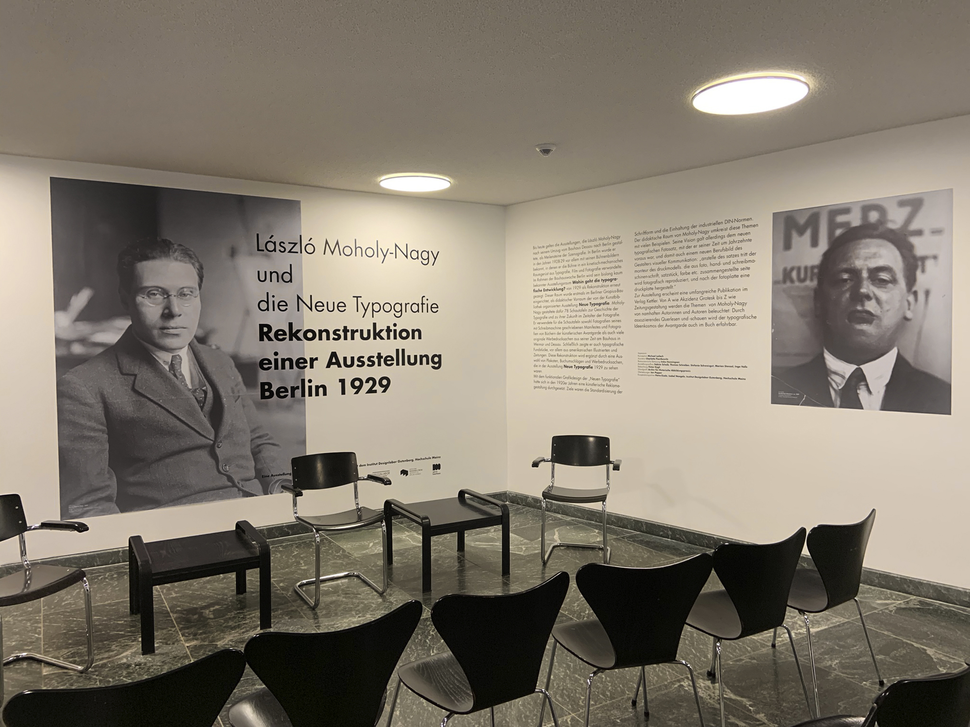
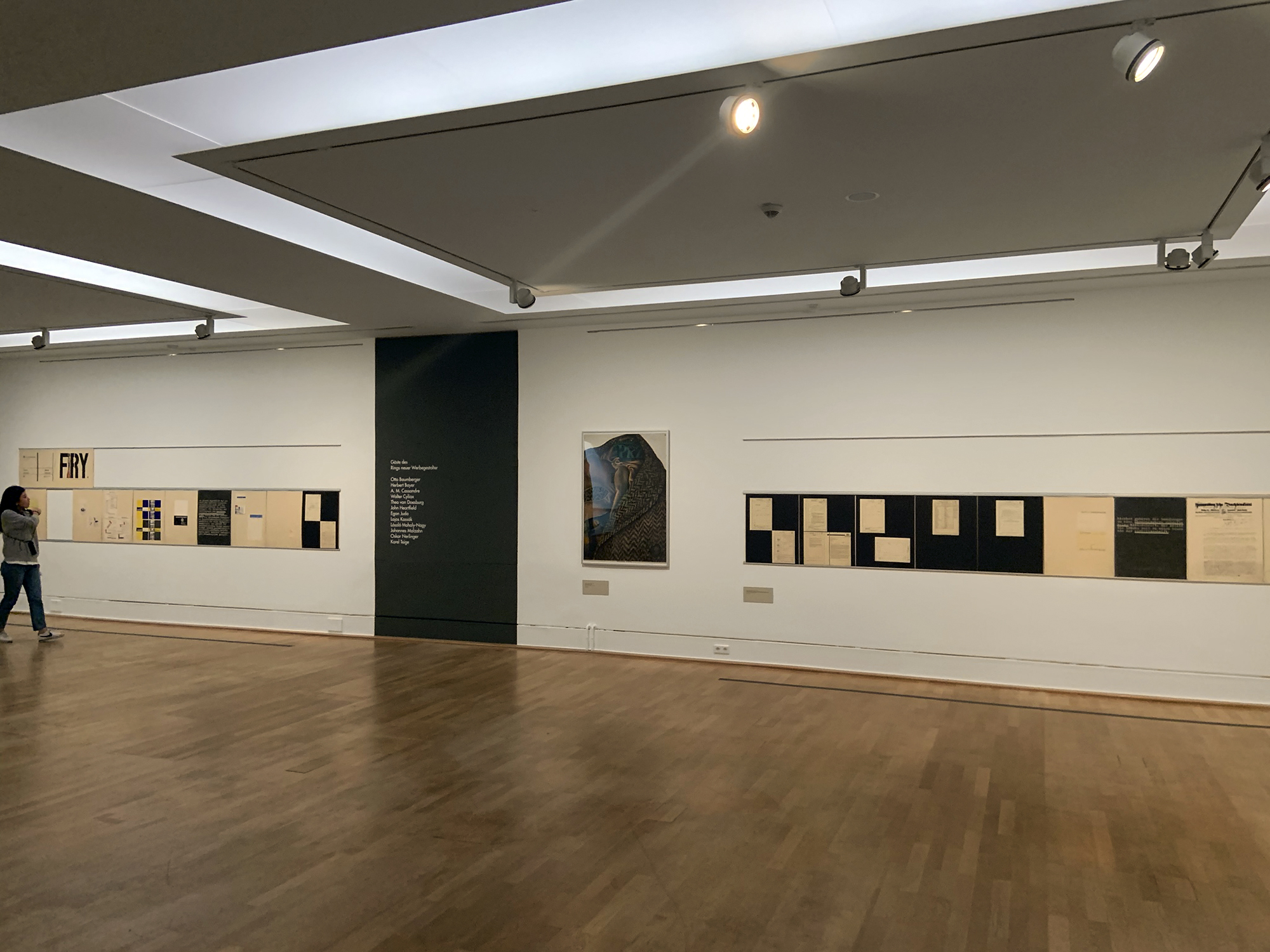
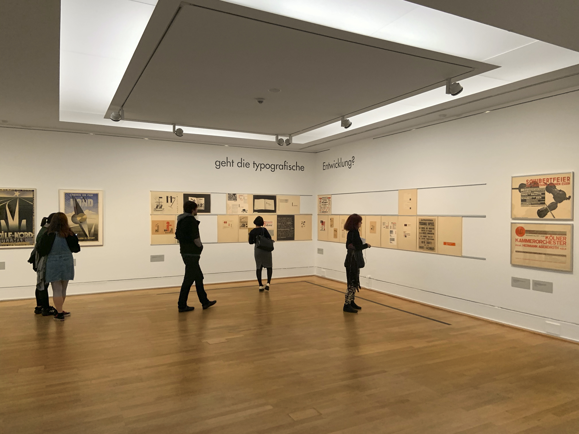
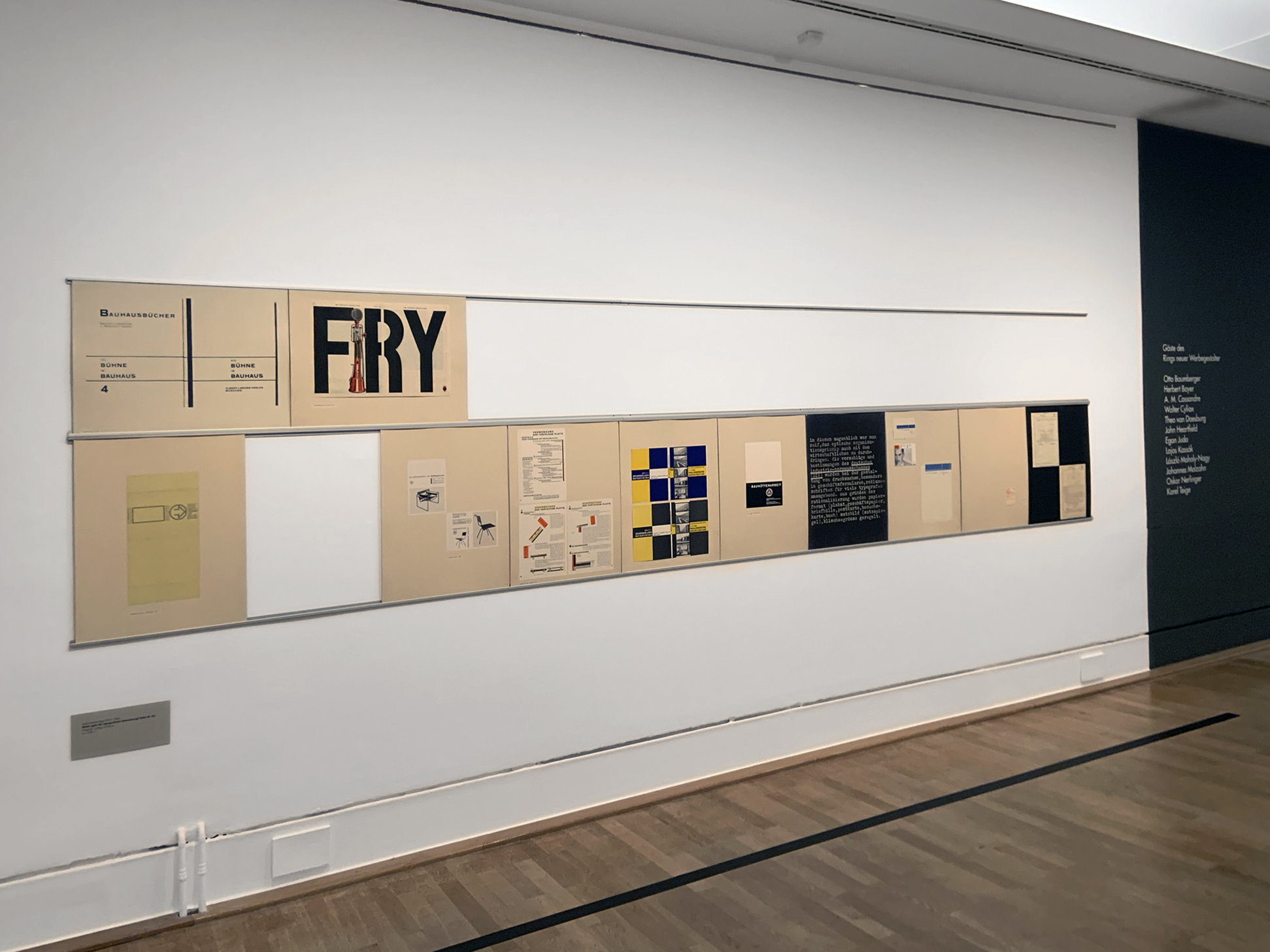
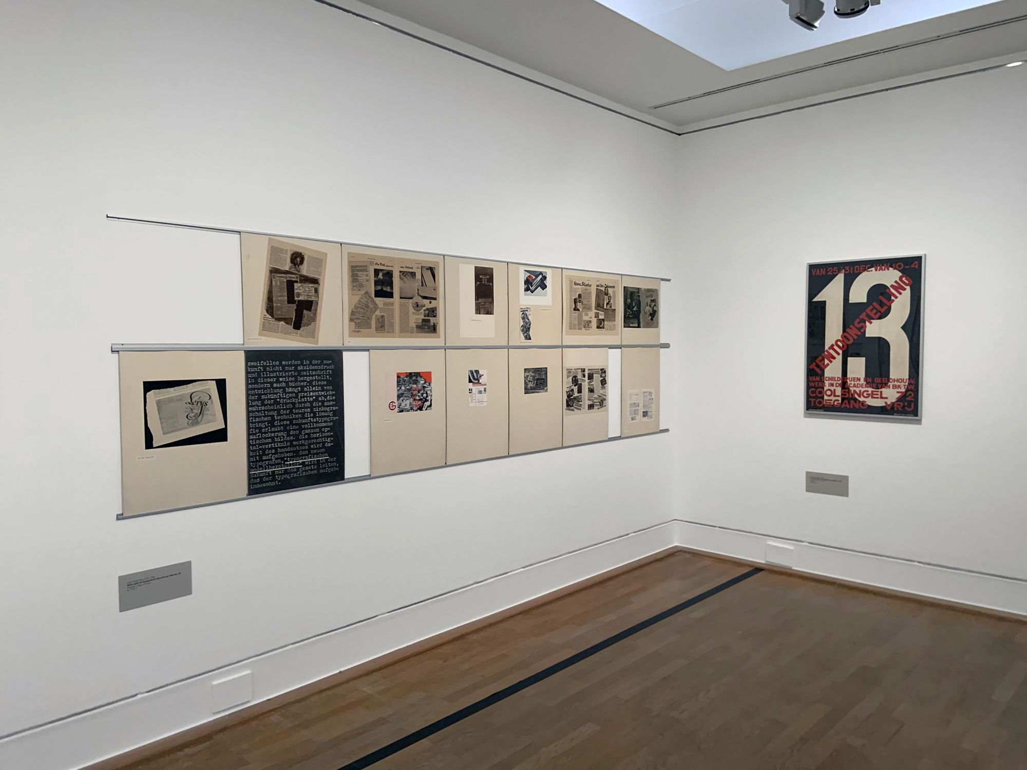
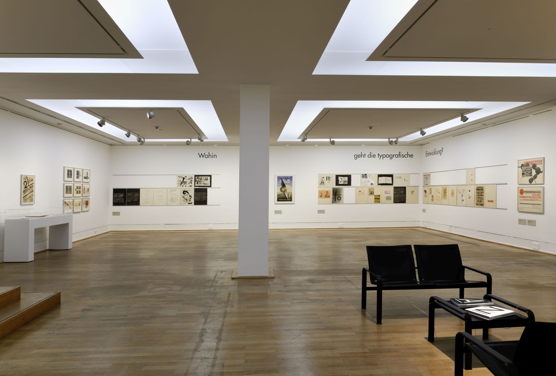
Installation view of the exhibition László Moholy-Nagy and New Typography: A Reconstruction of a Berlin Exhibition from 1929 at the Staatliche Museen zu Berlin
Photo: Marcus Bunyan
A small, tight, focused exhibition which was stimulating for anyone interested in graphic design, photography, and typography – Neue Typografie.
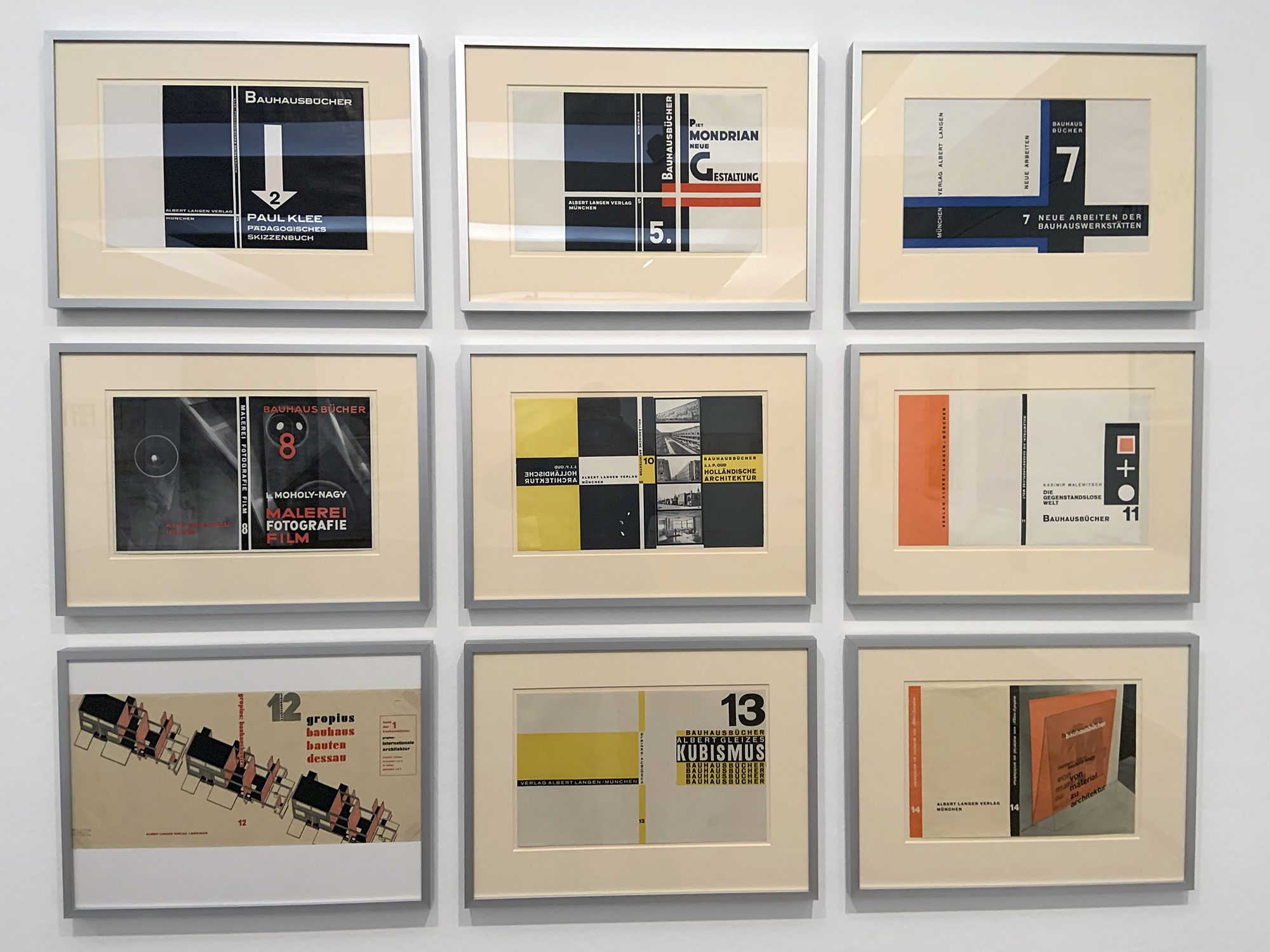
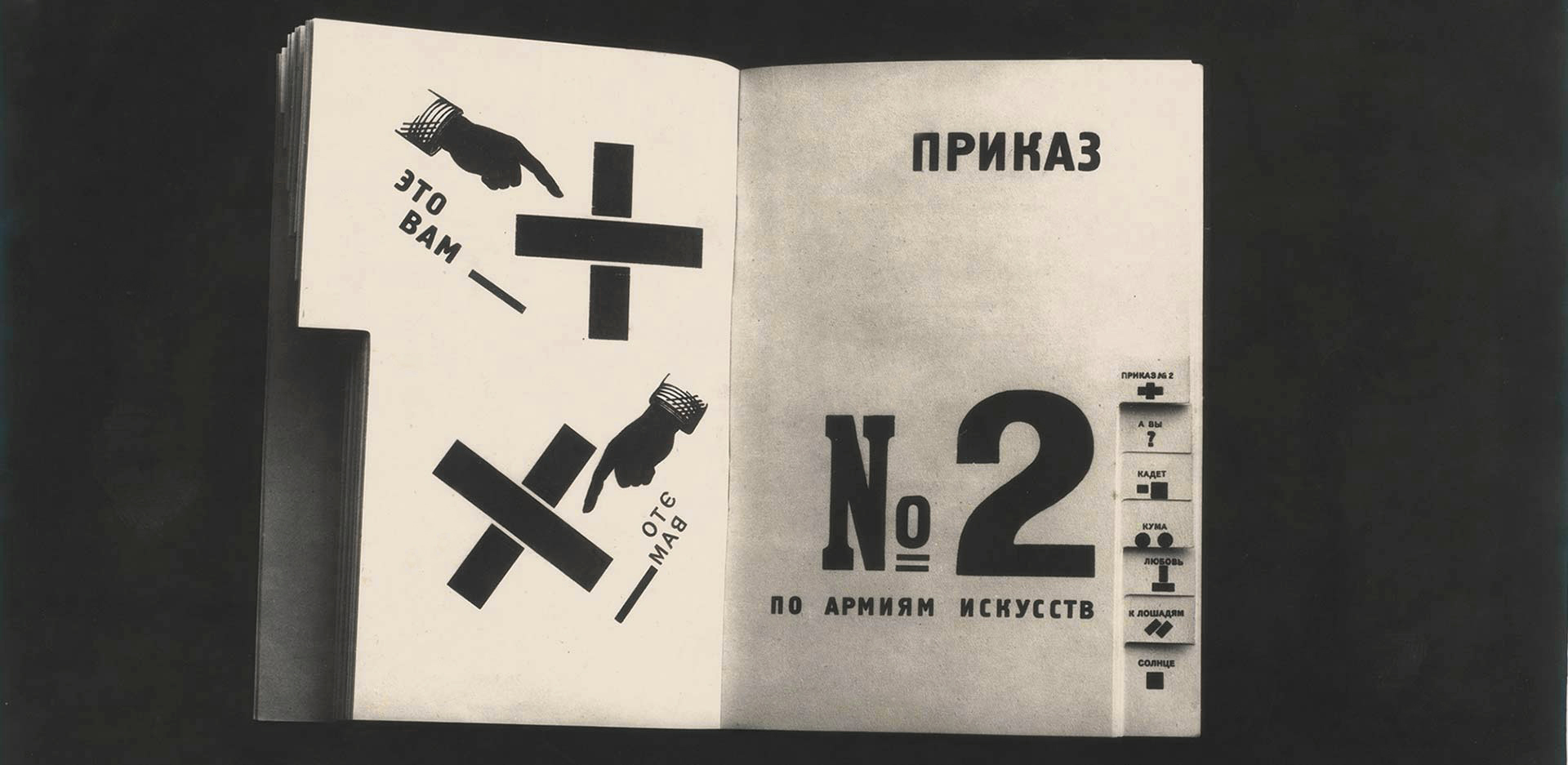
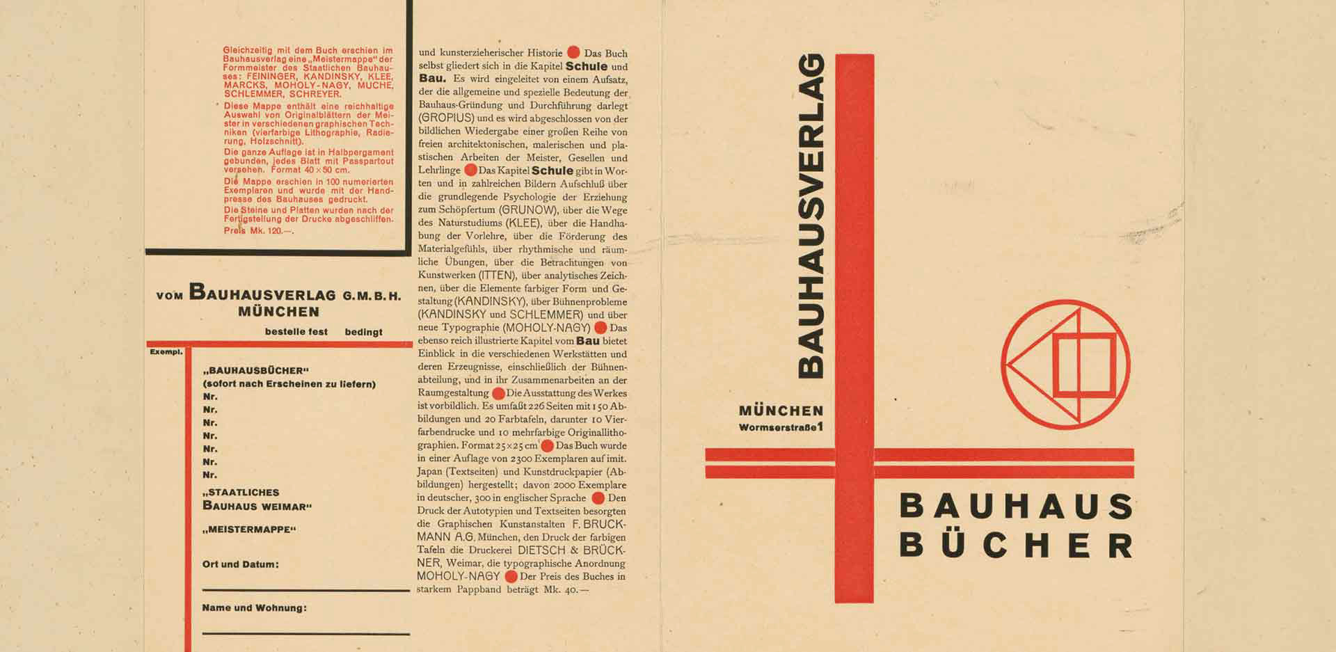
Highlights included Covers for the Bauhaus books, 1925-1930, travel posters by A. M. Cassandre, plates from Moholy-Nagy’s 1929 Wohin geht die typographische Entwicklung? (Where is typography headed?) and a poster for the 1929 exhibition film und foto.
The inventiveness and creativity with colour, collage and the use of negative and positive space was peerless, elemental.
Dr Marcus Bunyan
All iPhone photographs © Marcus Bunyan. Many thankx for all other photographs to the Staatliche Museen zu Berlin. Please click on the photographs for a larger version of the image.
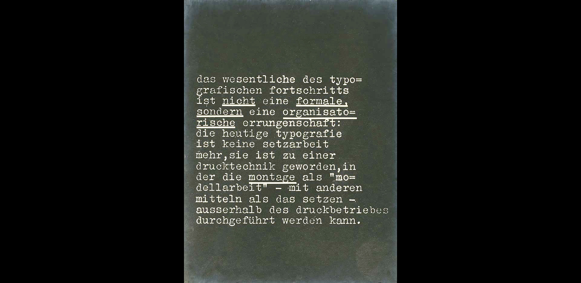
Wohin geht die typographische Entwicklung?
Where is typography headed?
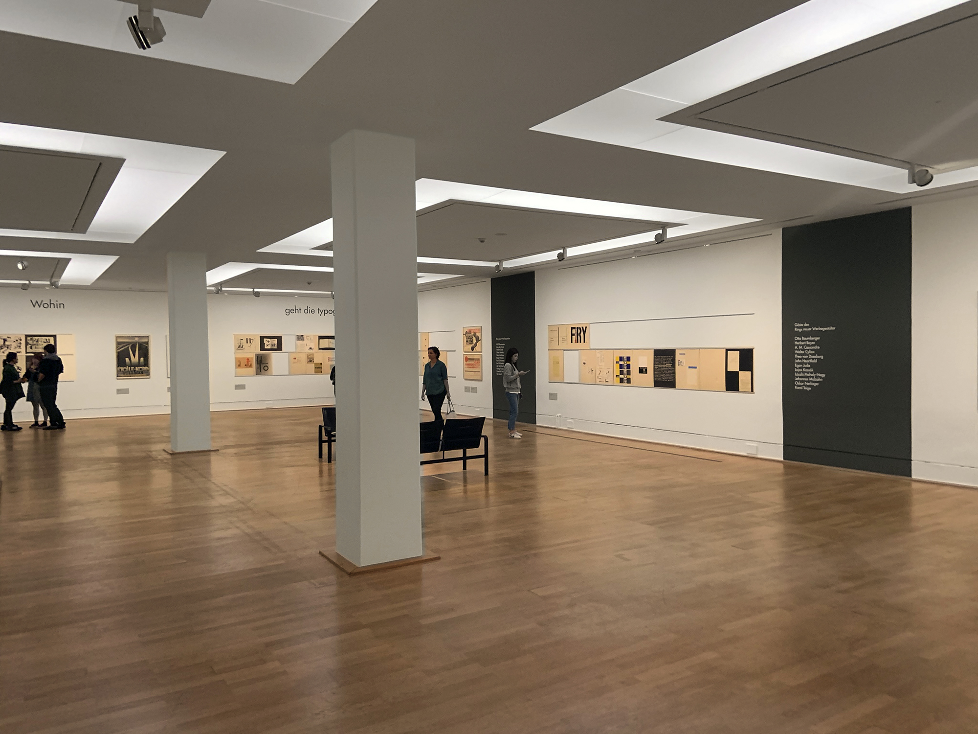
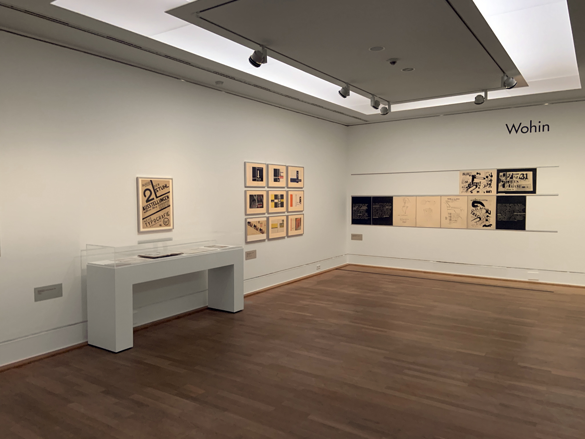
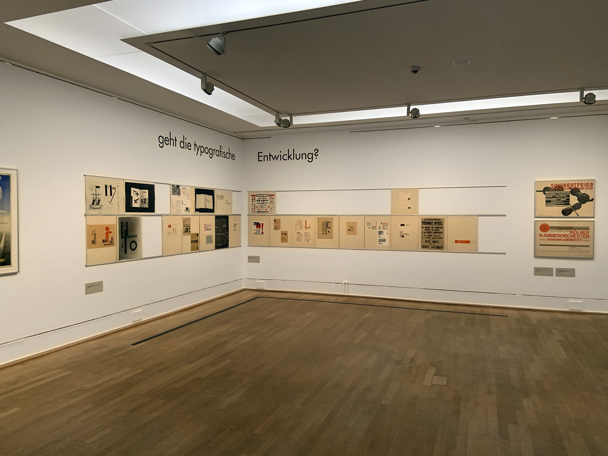
Installation views of the exhibition László Moholy-Nagy and New Typography: A Reconstruction of a Berlin Exhibition from 1929 at the Staatliche Museen zu Berlin
Photos: Marcus Bunyan
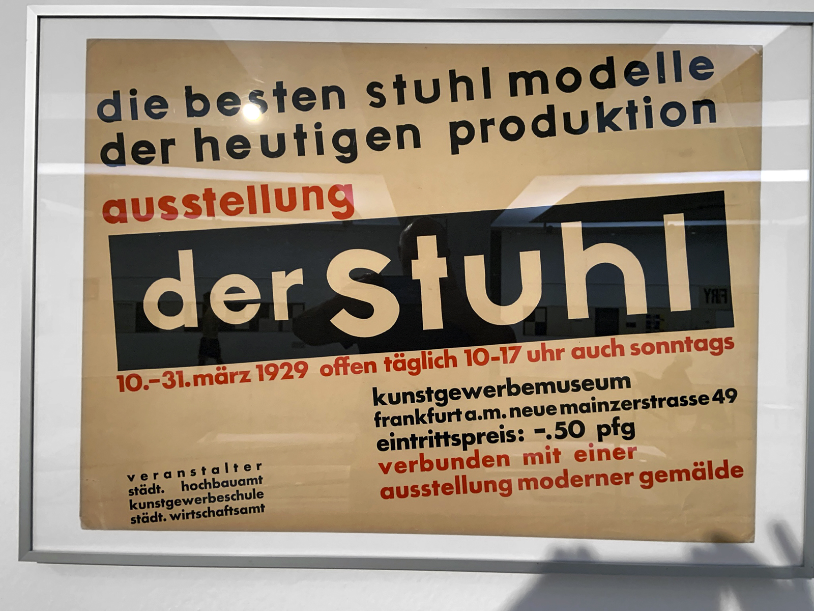
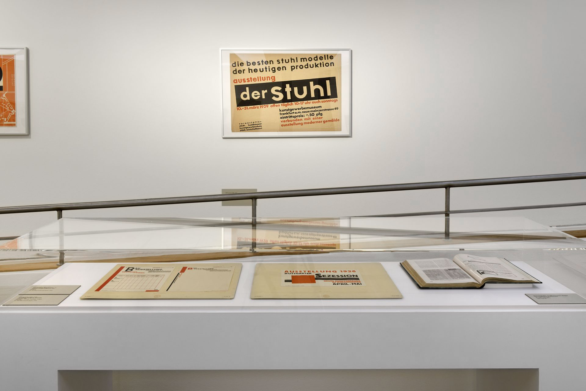
die besten stuhl modelle der heutigen produktion
The best models of today’s production
ausstellung
exhibition
der Stuhl (installation view)
1929
Poster
kunstgewerbemuseum
Arts and Crafts Museum
Kunstbibliothek der Staatlichen Museen zu Berlin
Photo: Marcus Bunyan
Installation view of the exhibition László Moholy-Nagy and New Typography: A Reconstruction of a Berlin Exhibition from 1929 at the Staatliche Museen zu Berlin
Photo: Staatliche Museen zu Berlin
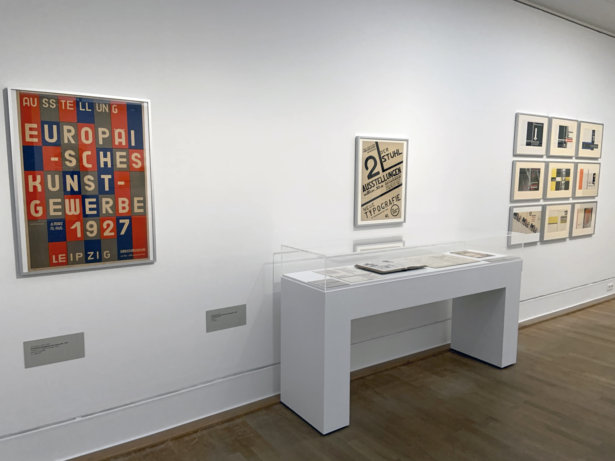
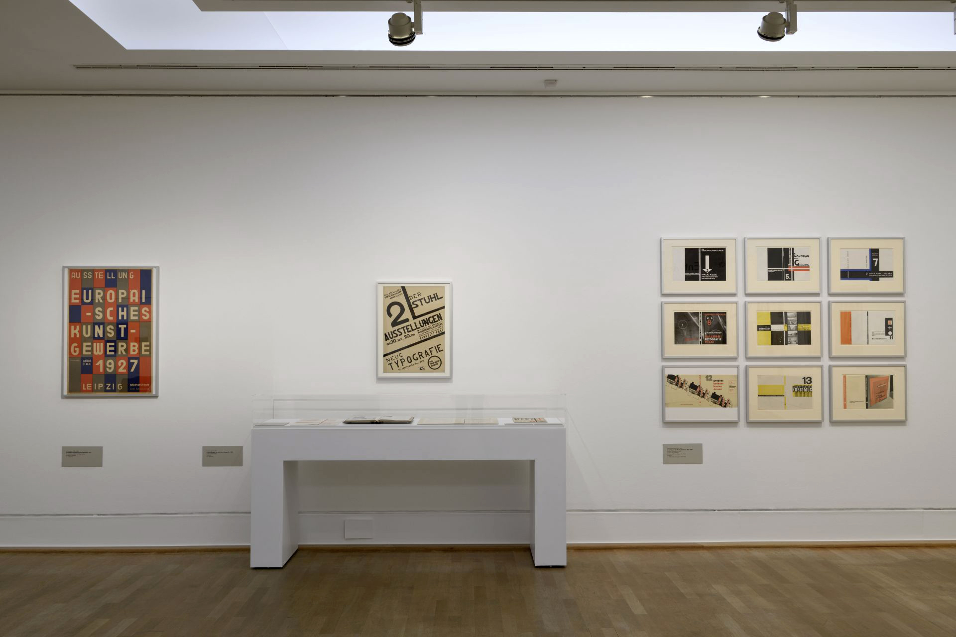
Installation view of the exhibition László Moholy-Nagy and New Typography: A Reconstruction of a Berlin Exhibition from 1929 at the Staatliche Museen zu Berlin showing at left, Ausstellung Europäisches Kunstgewerbe (Exhibition of European applied arts) 1927; in the centre, Der Stuhl. Neue Typografie (New typography) 1929; and at right, Umschläge zu den Bauhausbüchern, 1925-1930 (Covers for the Bauhaus books, 1925-1930) 1925-1930
Photo: Marcus Bunyan
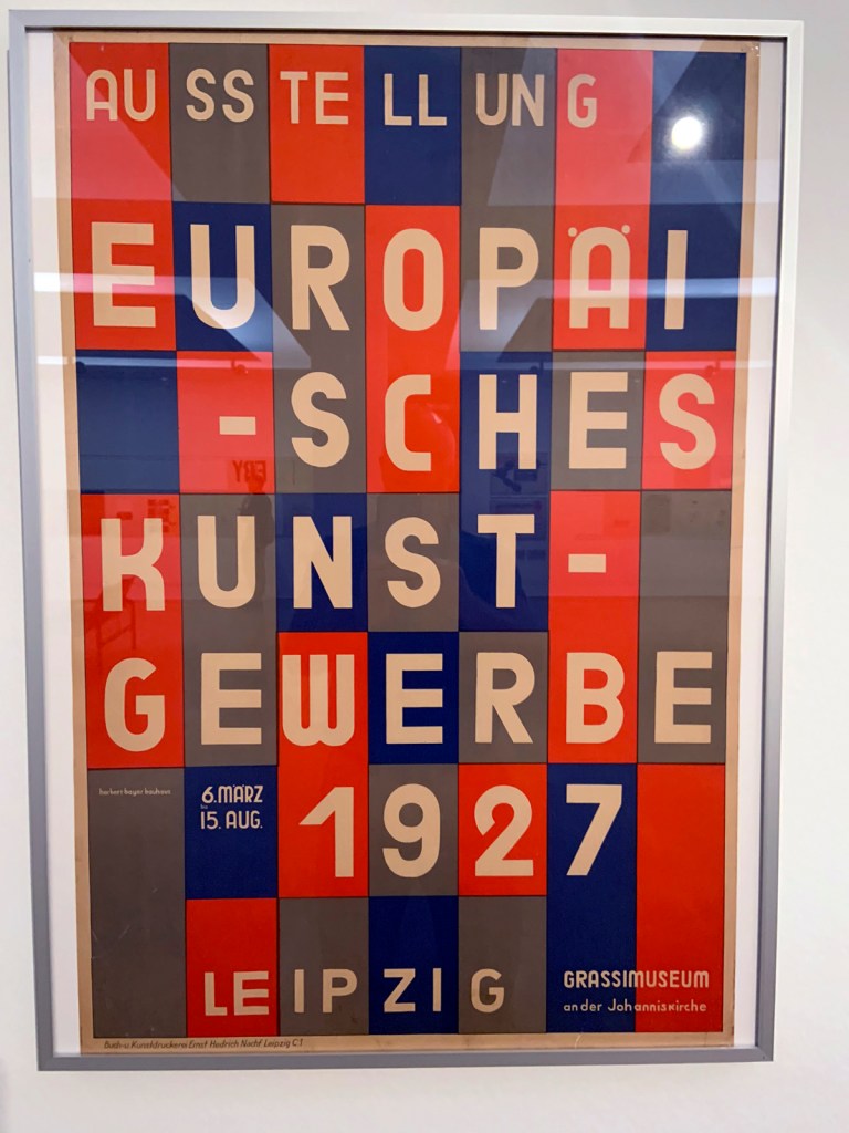
Herbert Bayer (1900-1985)
Ausstellung Europäisches Kunstgewerbe (Exhibition of European applied arts) (installation view)
1927
Poster
Druckerei Ernst Hedrich Nachfolger, Leipzig Buchdruck
Ernst Hedrich printer, Leipzig Letterpress
Lithograph
Kunstbibliothek der Staatlichen Museen zu Berlin
Photo: Marcus Bunyan
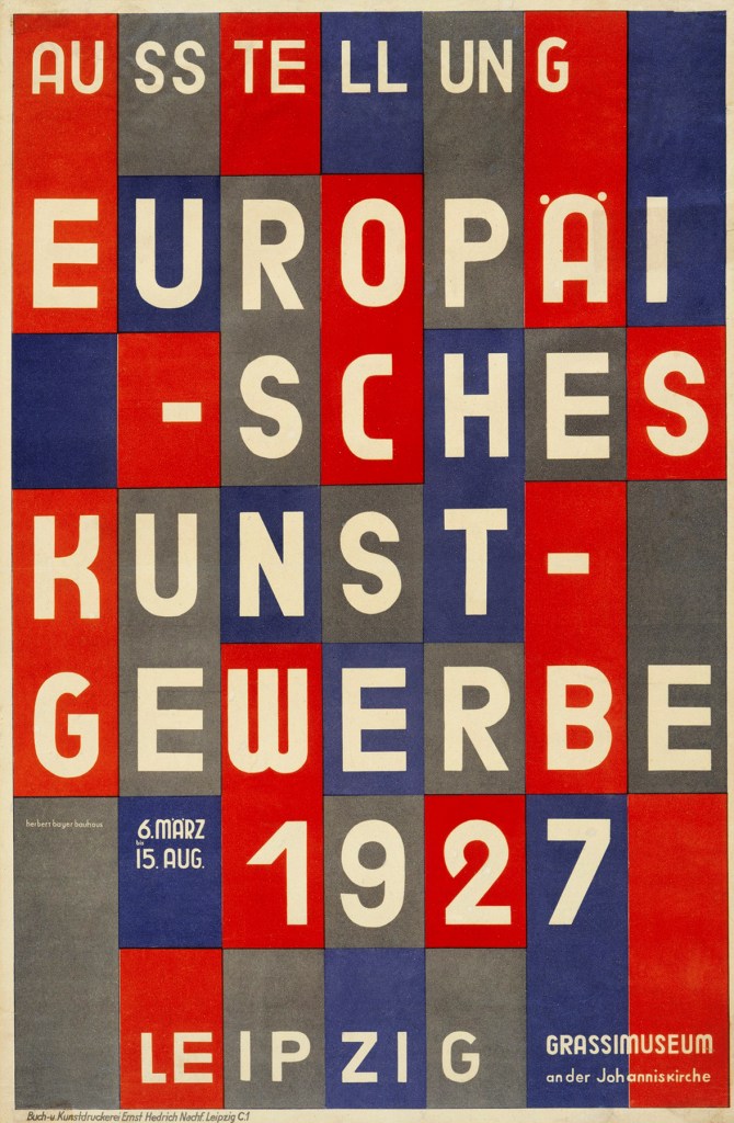
Herbert Bayer (1900-1985)
Ausstellung Europäisches Kunstgewerbe (Exhibition of European applied arts)
1927
Poster
Druckerei Ernst Hedrich Nachfolger, Leipzig Buchdruck
Ernst Hedrich printer, Leipzig Letterpress
Lithograph
35 1/4 x 23 3/4″ (89.5 x 60.3cm)
Kunstbibliothek der Staatlichen Museen zu Berlin
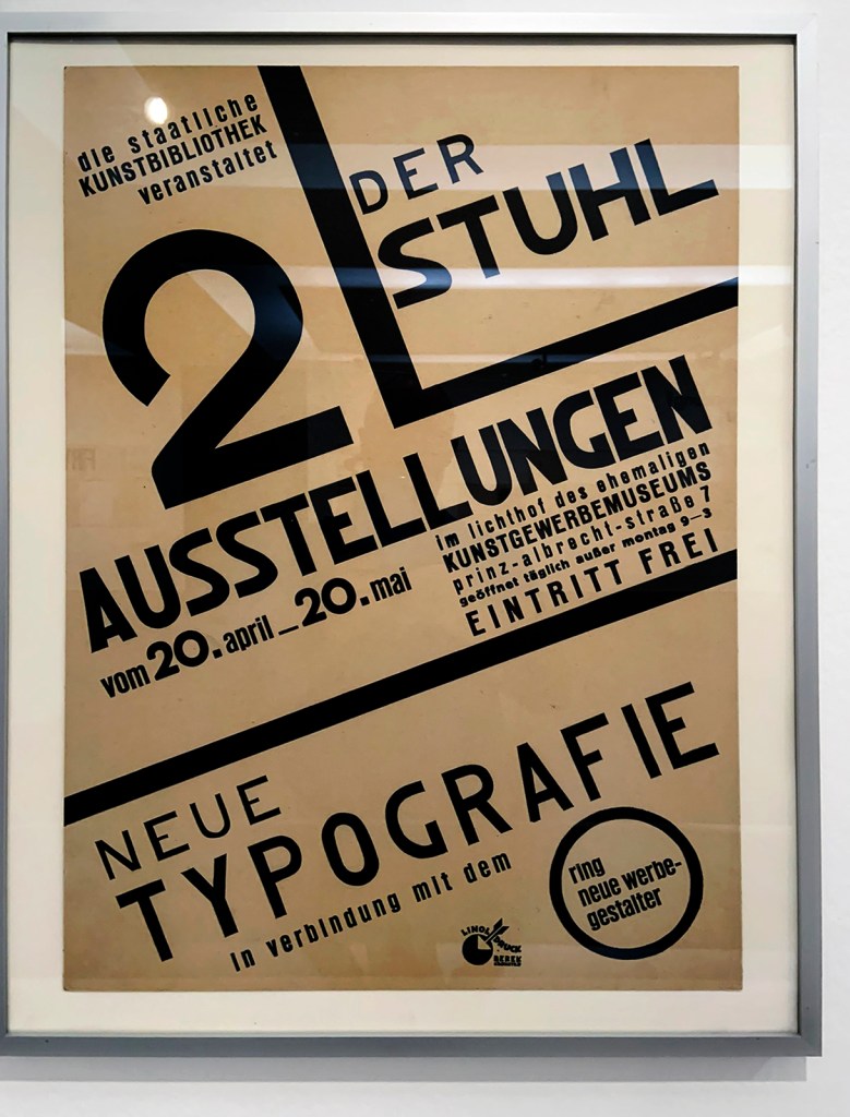
László Moholy-Nagy (Hungarian, 1895-1946)
Der Stuhl. Neue Typografie (New typography) (installation view)
1929
Poster
Entwerfer Berek-Druck (Nachweiszeit: 1928-1940), Drucker
Designer Berek-Druck (record time: 1928-1940), printer
Printed in Berlin
Printing ink (black) & paper
Linocut
61.0 x 43.5cm
Kunstbibliothek der Staatlichen Museen zu Berlin
Photo: Marcus Bunyan
László Moholy-Nagy (Hungarian, 1895-1946)
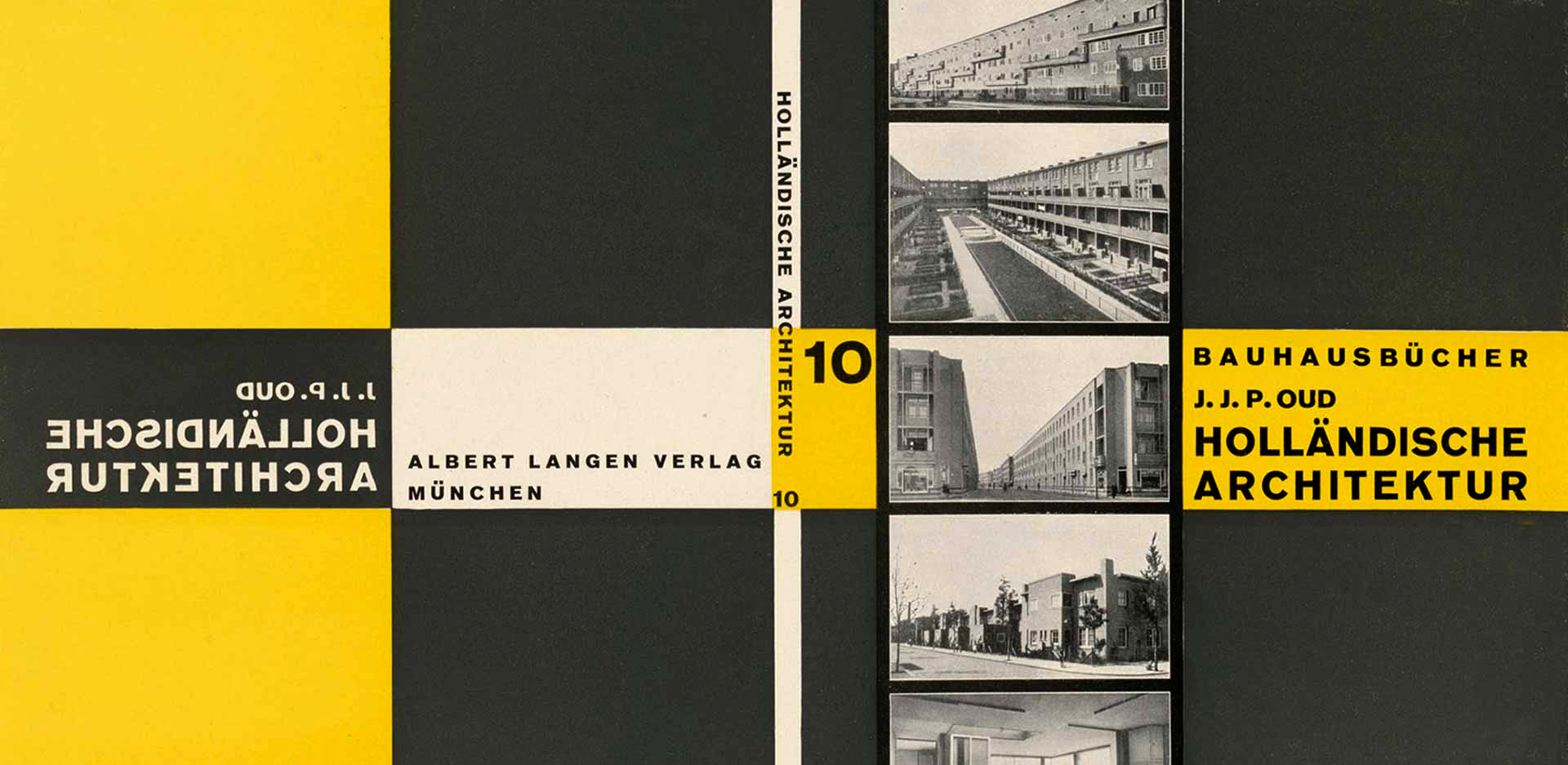
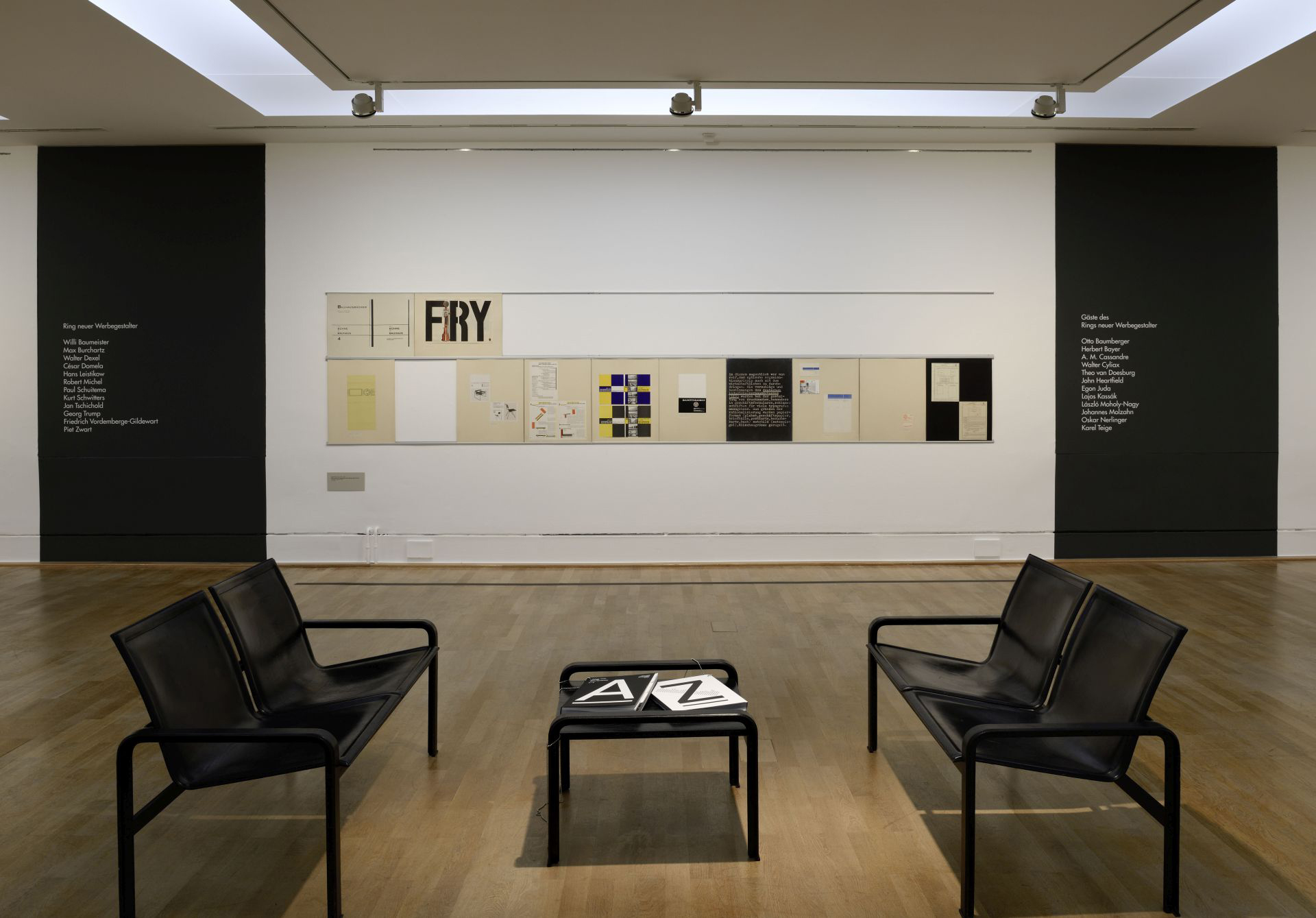
Umschläge zu den Bauhausbüchern, 1925-1930 (Covers for the Bauhaus books, 1925-1930) (installation view)
1925-1930
Book covers
Druckerei Hesse & Becker, Leipzig
Hesse & Becker printing company, Leipzig
Druckerei Ohlenroth, Erfurt Klischees von Dr. von Löbbeke u. Co., Erfurt Buchdruck
Ohlenroth printing company, Erfurt Letterpress
Kunstbibliothek der Staatlichen Museen zu Berlin
Photo: Marcus Bunyan
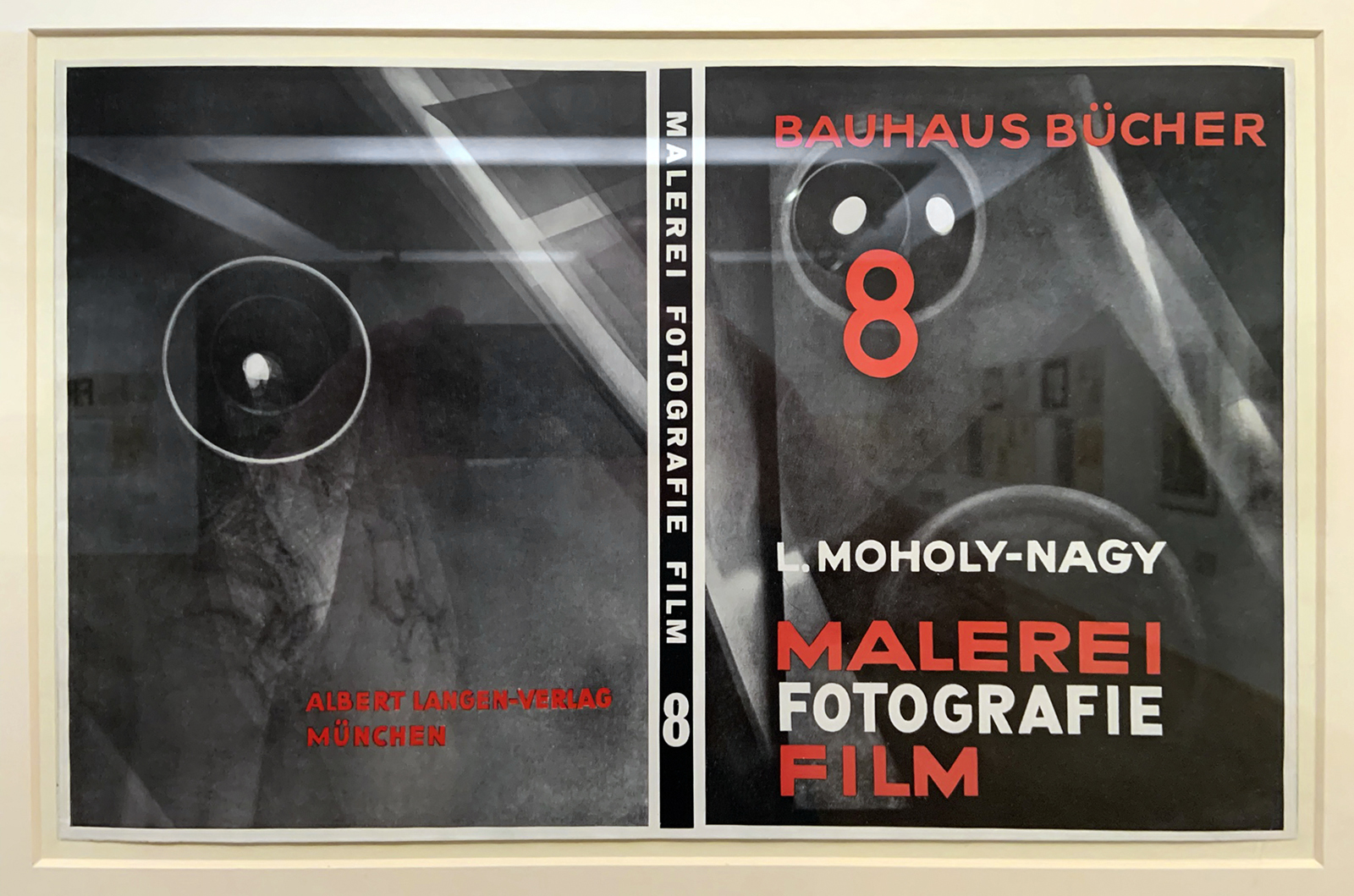
László Moholy-Nagy (Hungarian, 1895-1946)
Bauhausbücher 8, L. Moholy-Nagy: Malerei, Fotografie, Film
1925
Albert Langen Verlag Herstellung, Entwerfer, Mitarbeit, Verleger
Albert Langen Verlag, Manufacture, designer, collaboration, publisher
Offset printing on paper and letterpress
Art Library / Collection of graphic design
Kunstbibliothek der Staatlichen Museen zu Berlin
Photo: Marcus Bunyan
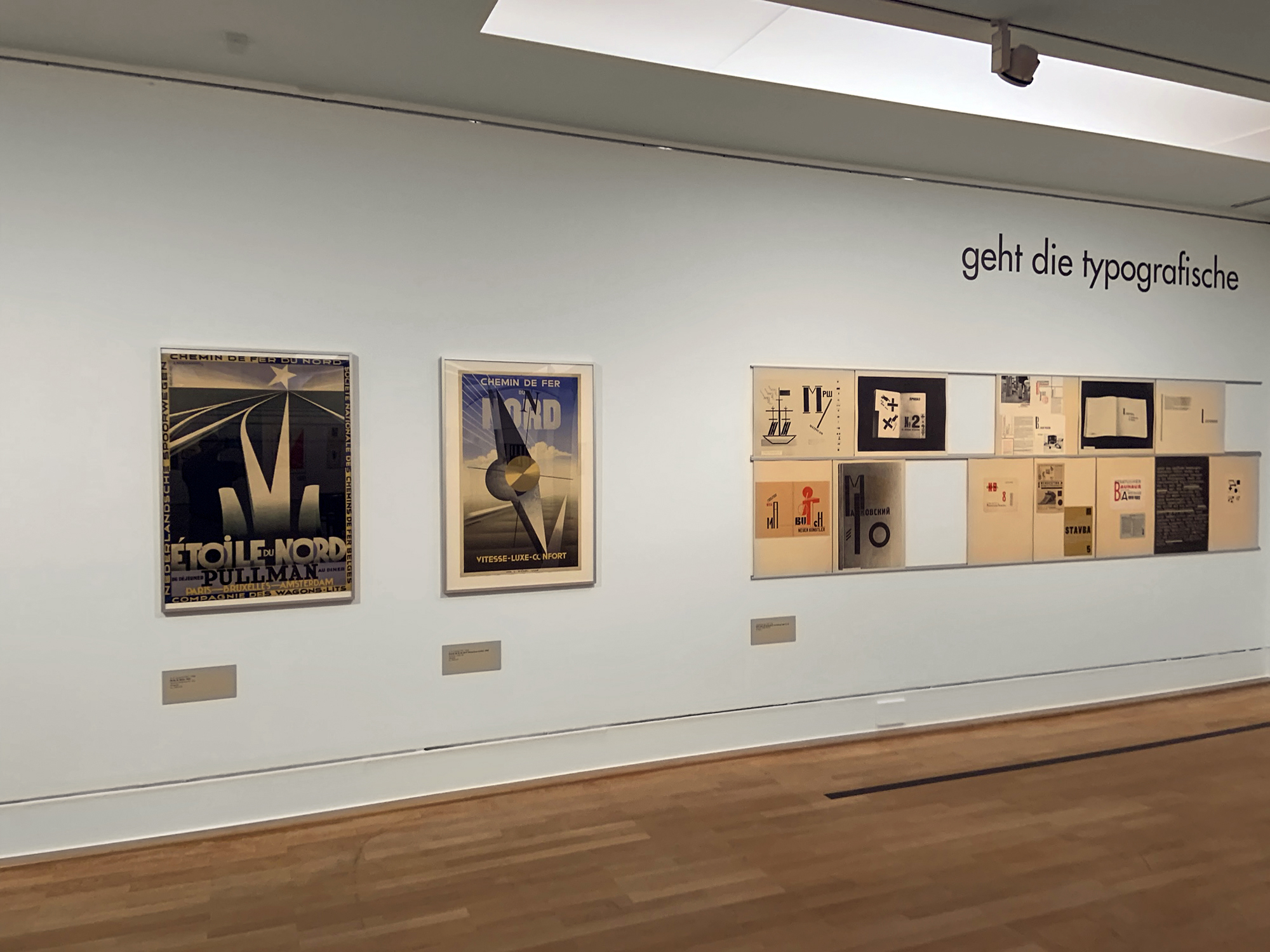
Installation view of the exhibition László Moholy-Nagy and New Typography: A Reconstruction of a Berlin Exhibition from 1929 at the Staatliche Museen zu Berlin showing at left, Etoile du Nord 1927 (below); and at second left, Chemin de Fer du Nord. Vitesse-Luxe-Confort 1929 (below)
Photo: Marcus Bunyan
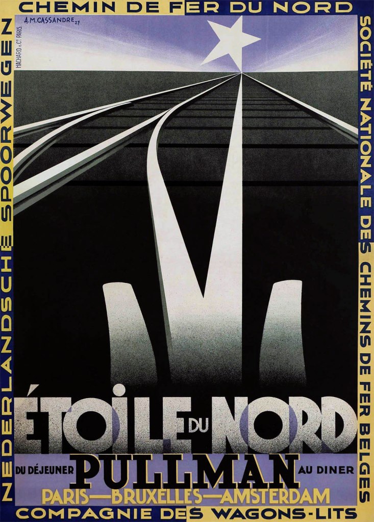
A. M. Cassandre (French, 1901-1968)
Etoile du Nord (North Star)
1927
Poster
Druckerei Hachard et Cie., Paris
Hachard et Cie. Printing house, Paris
Lithograph
A. M. Cassandre (French, 1901-1968)
Cassandre, pseudonym of Adolphe Jean-Marie Mouron (24 January 1901 – 17 June 1968) was a French painter, commercial poster artist, and typeface designer.
He was born Adolphe Jean-Marie Mouron in Kharkiv, Ukraine, to French parents. As a young man, Cassandre moved to Paris, where he studied at the École des Beaux-Arts and at the Académie Julian. The popularity of posters as advertising afforded him an opportunity to work for a Parisian printing house. Inspired by cubism as well as surrealism, he earned a reputation with works such as Bûcheron (Woodcutter), a poster created for a cabinetmaker that won first prize at the 1925 Exposition Internationale des Arts Décoratifs et Industriels Modernes.
Cassandre became successful enough that with the help of partners he was able to set up his own advertising agency called Alliance Graphique, serving a wide variety of clients during the 1930s. He is perhaps best known for his posters advertising travel, for clients such as the Compagnie Internationale des Wagons-Lits. He was a pioneer on airbrush arts.
His creations for the Dubonnet wine company were among the first posters designed in a manner that allowed them to be seen by occupants in moving vehicles. His posters are memorable for their innovative graphic solutions and their frequent denotations to such painters as Max Ernst and Pablo Picasso. In addition, he taught graphic design at the École des Arts Décoratifs and then at the École d’Art Graphique.
With typography an important part of poster design, the company created several new typeface styles. Cassandre developed Bifur in 1929, the sans serif Acier Noir in 1935, and in 1937 an all-purpose font called Peignot. In 1936, his works were exhibited at the Museum of Modern Art in New York City which led to commissions from Harper’s Bazaar to do cover designs.
Text from the Wikipedia website
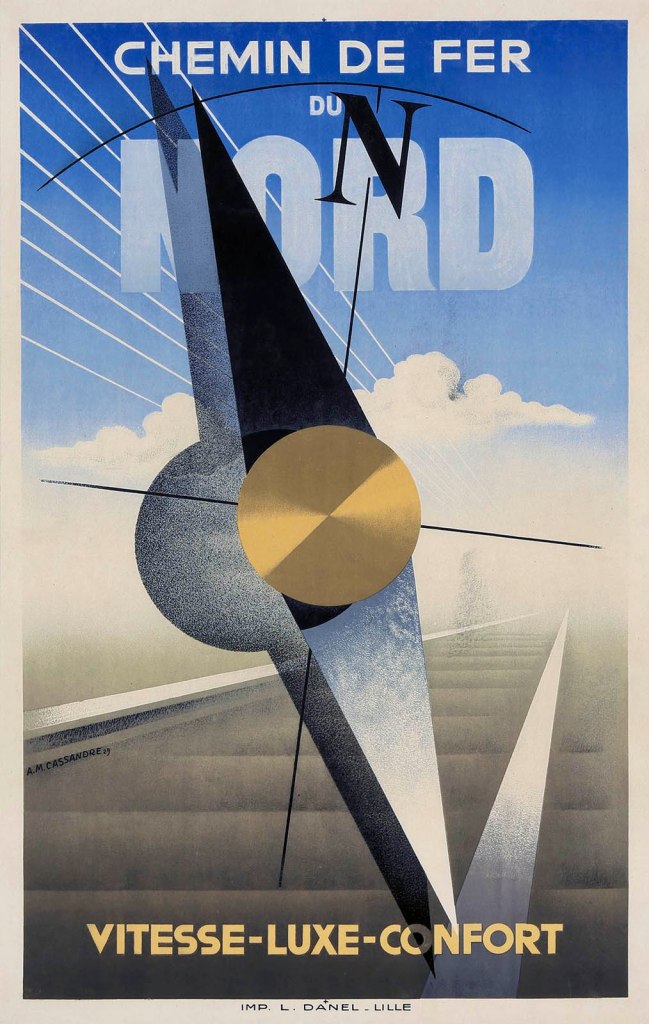
A. M. Cassandre (French, 1901-1968)
Chemin de Fer du Nord. Vitesse-Luxe-Comfort (Northern Railway. Speed-Luxury-Comfort)
1929
Poster
Druckerei L. Danel, Lille
L. Danel printing house, Lille
Lithograph
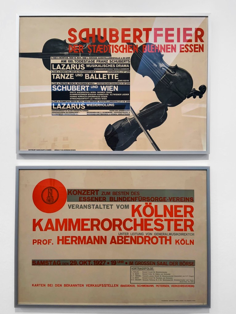
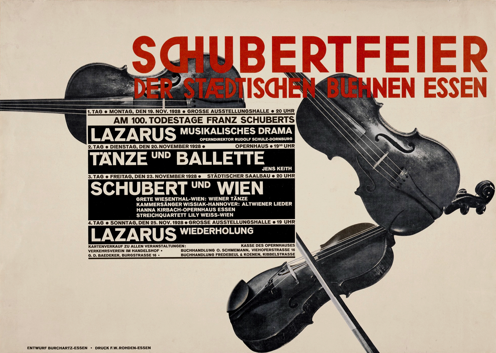
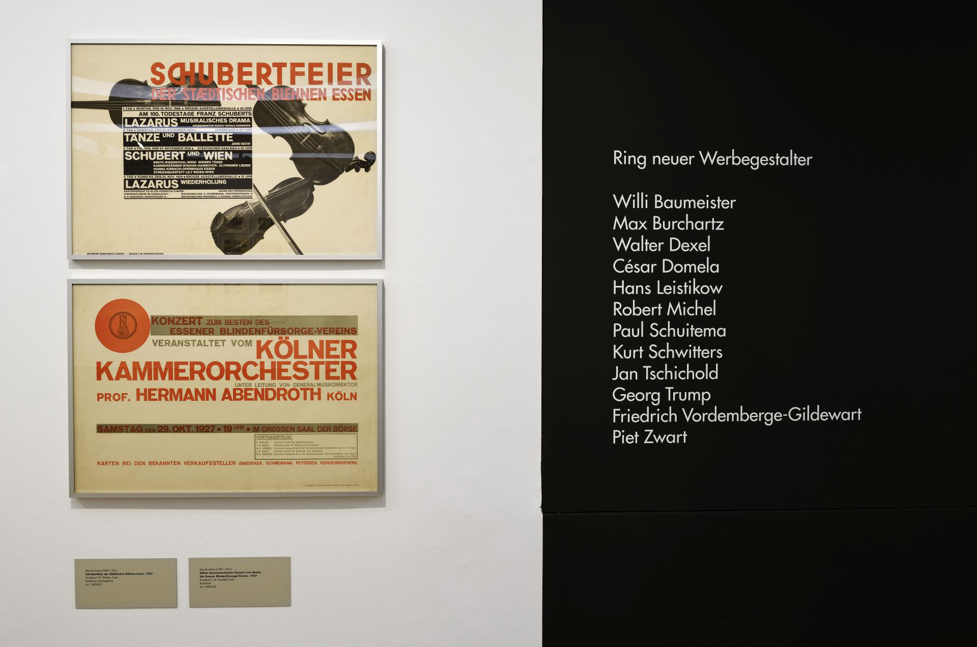
Max Burchartz (1887-1961)
Schubertfeier der Städtischen Bühnen Essen (Schubert celebration of the municipal theatres of Essen) (installation view)
1927
Poster
Druckerei F.W. Rohden Essen Buchdruck
F.W. Rohden Essen printing house
Letterpress
Max Burchartz (1887-1961)
Kölner Kammerorchester. Konzert aum Besten des Essener Blindenfürsorge-Vereins (Cologne Chamber Orchestra. Concert for the benefit of the Essen Blind Welfare Association) (installation view)
1927
Poster
Druckerei C.W. Haafeld, Essen Buchdruck
C.W. Haafeld, Essen printing house
Letterpress
Photo: Marcus Bunyan
Max Burchartz (1887-1961)
Schubertfeier der Städtischen Bühnen Essen (Schubert celebration of the municipal theatres of Essen)
1927
Poster
Druckerei F.W. Rohden Essen Buchdruck
F.W. Rohden Essen printing house
Letterpress
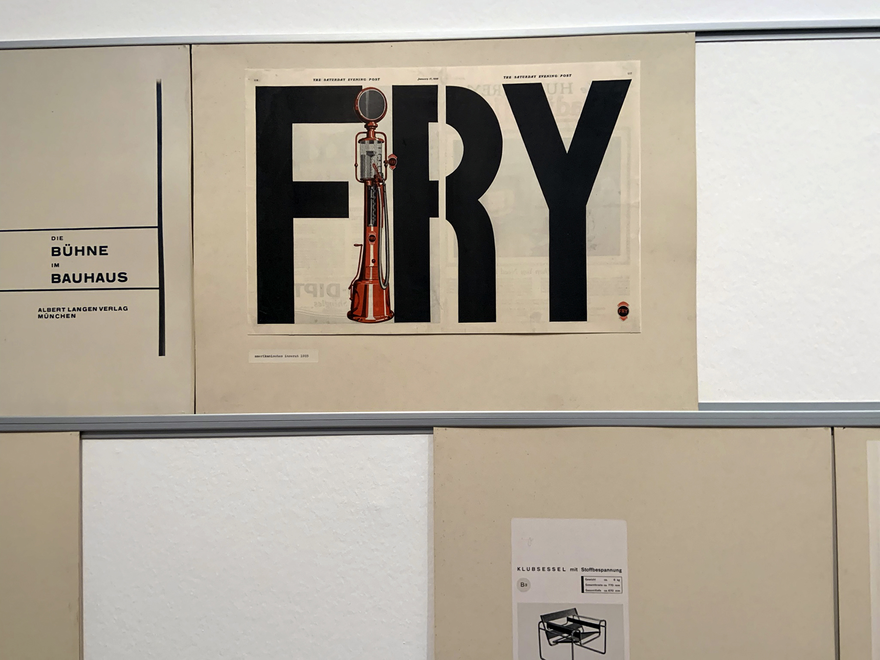
Installation view of the exhibition László Moholy-Nagy and New Typography: A Reconstruction of a Berlin Exhibition from 1929 at the Staatliche Museen zu Berlin showing American advertisement 1925 from The Saturday Evening Post
Photos: Marcus Bunyan
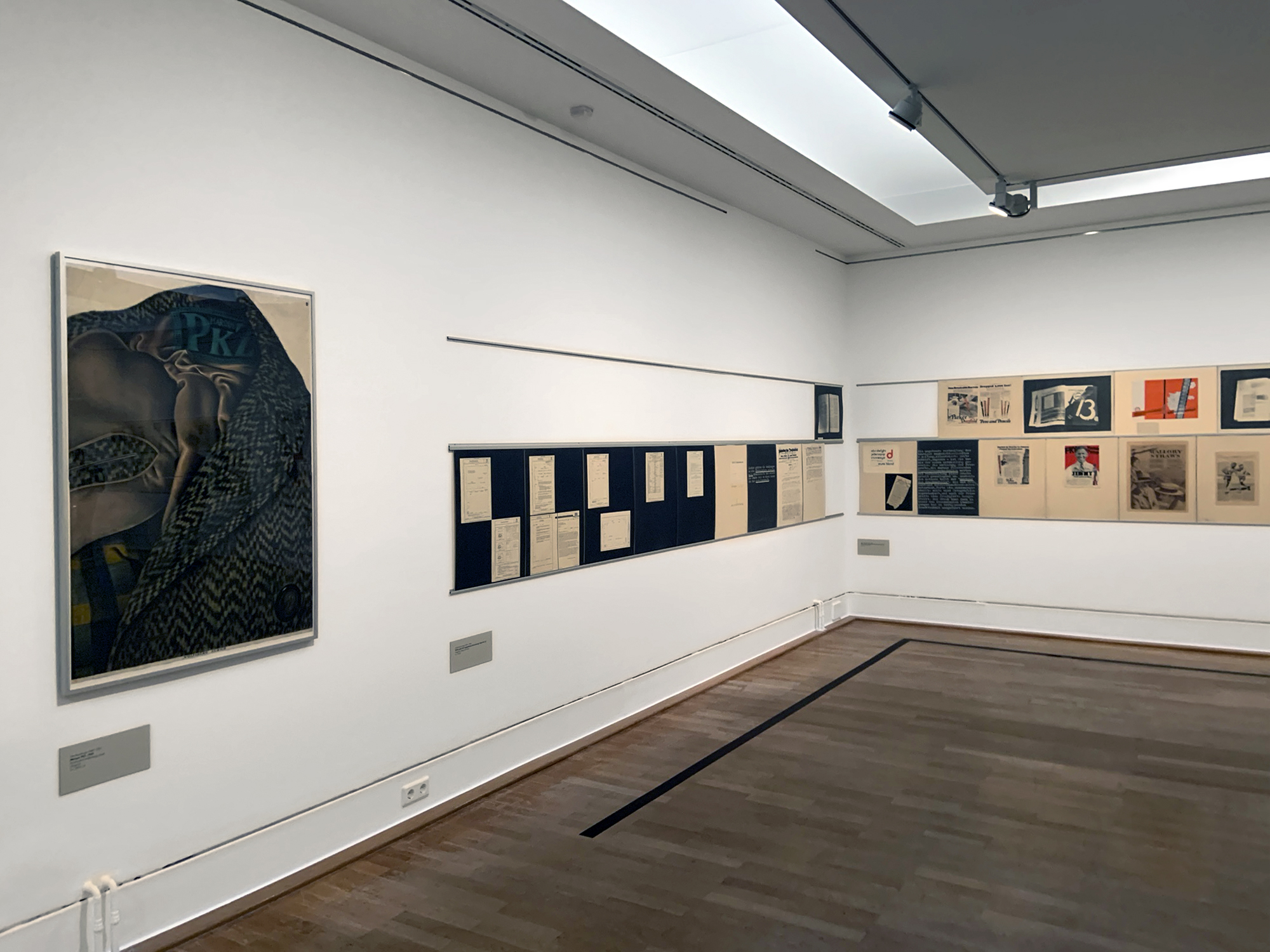
Installation view of the exhibition László Moholy-Nagy and New Typography: A Reconstruction of a Berlin Exhibition from 1929 at the Staatliche Museen zu Berlin showing at left, Otto Baumberger’s Marque PKZ (1923, below)
Photo: Marcus Bunyan
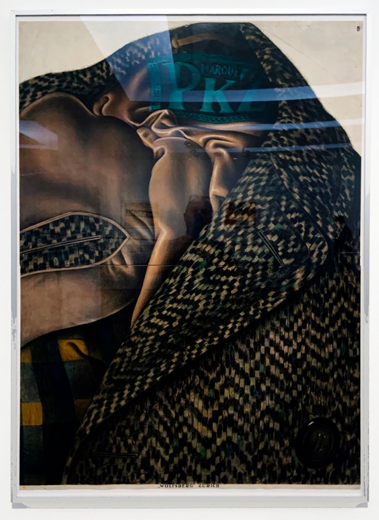
Otto Baumberger (1889-1961)
Marque PKZ (installation view)
1923
Steindruckerei Wolfensberg, Zürich
Wolfensberg lithography, Zurich
Lithograph
Photo: Marcus Bunyan

Otto Baumberger (1889-1961)
Marque PKZ
1923
Steindruckerei Wolfensberg, Zürich
Wolfensberg lithography, Zurich
Lithograph
Otto Baumberger (21 May 1889 Altstetten, Zurich – 26 December 1961 Weiningen), was a noted Swiss painter and poster artist. Baumberger produced some 200 posters of great quality and style. His realistic rendering of a herringbone tweed coat became a classic of Swiss poster, an example of a Sachplakat (object poster).
Installation view of the exhibition László Moholy-Nagy and New Typography: A Reconstruction of a Berlin Exhibition from 1929 at the Staatliche Museen zu Berlin
Photo: Marcus Bunyan
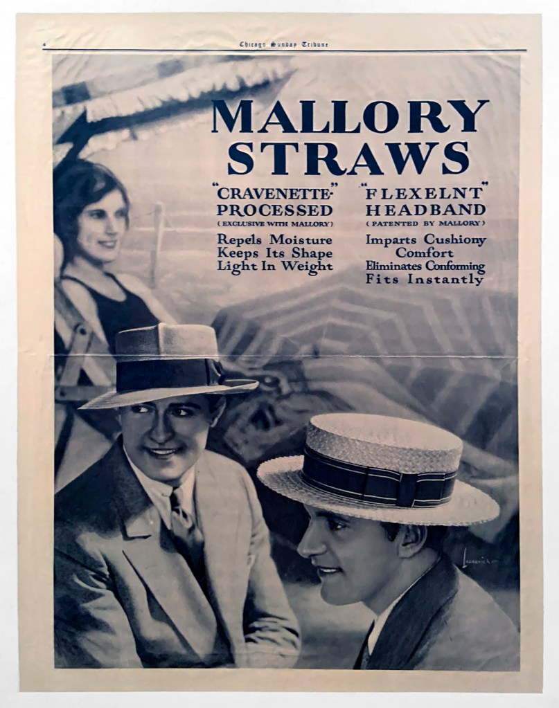
American advertisement
Mallory Straws (installation view)
1926
Chicago Sunday Tribune
Photo: Marcus Bunyan
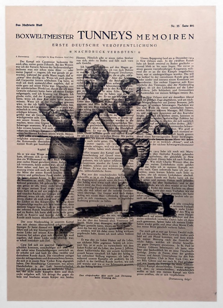
Das Illustrierte Blatt (The Illustrated Sheet) Nr. 35, Page 895
“Boxweltmeister Tunneys Memoiren” (Boxing World Champion Tunney’s Memoir)
1927
First German publication
in
László Moholy-Nagy (Hungarian, 1895-1946)
Wohin geht die typographische Entwicklung? Tafel 55 (installation view)
Where is typography headed? Chart 55
1929
Collage
© Kunstbibliothek, Staatliche Museen zu Berlin, Herbert Bayer, VG Bild-Kunst, Bonn 2019
Photo: Marcus Bunyan
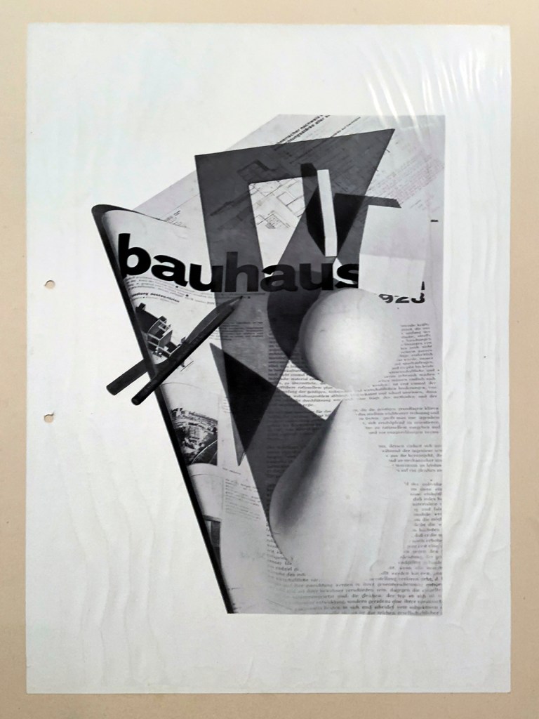
Herbert Bayer 1928
in
László Moholy-Nagy (Hungarian, 1895-1946)
Wohin geht die typographische Entwicklung?, Tafel 58 (installation view)
Where is typography headed? Chart 58
1929
Collage
© Kunstbibliothek, Staatliche Museen zu Berlin, Herbert Bayer, VG Bild-Kunst, Bonn 2019
Photo: Marcus Bunyan

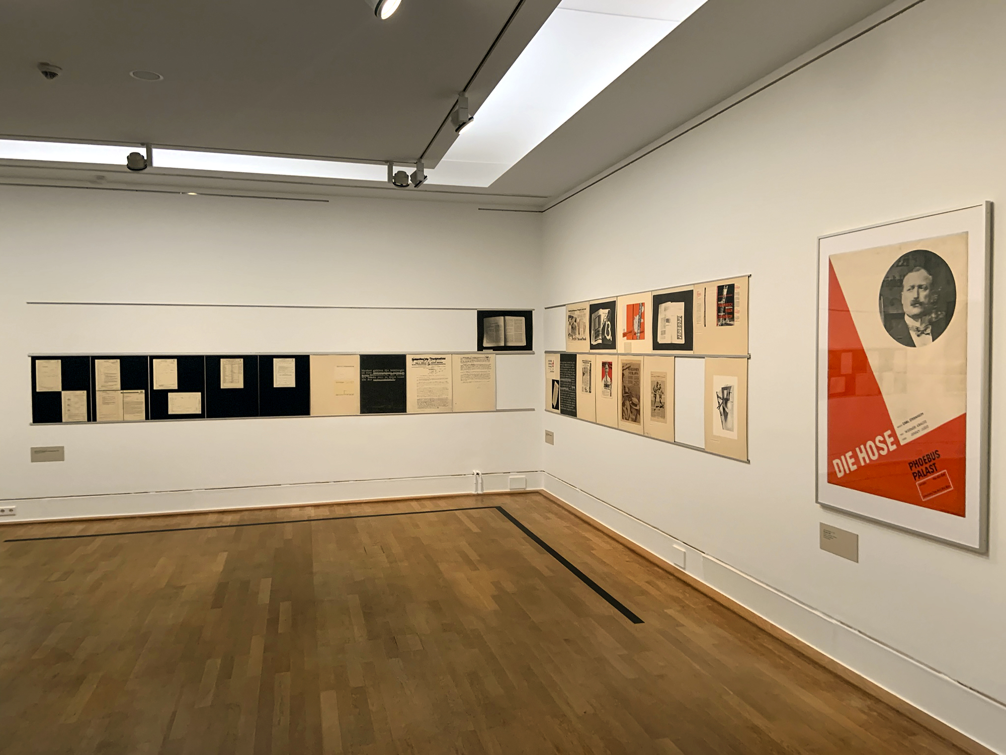
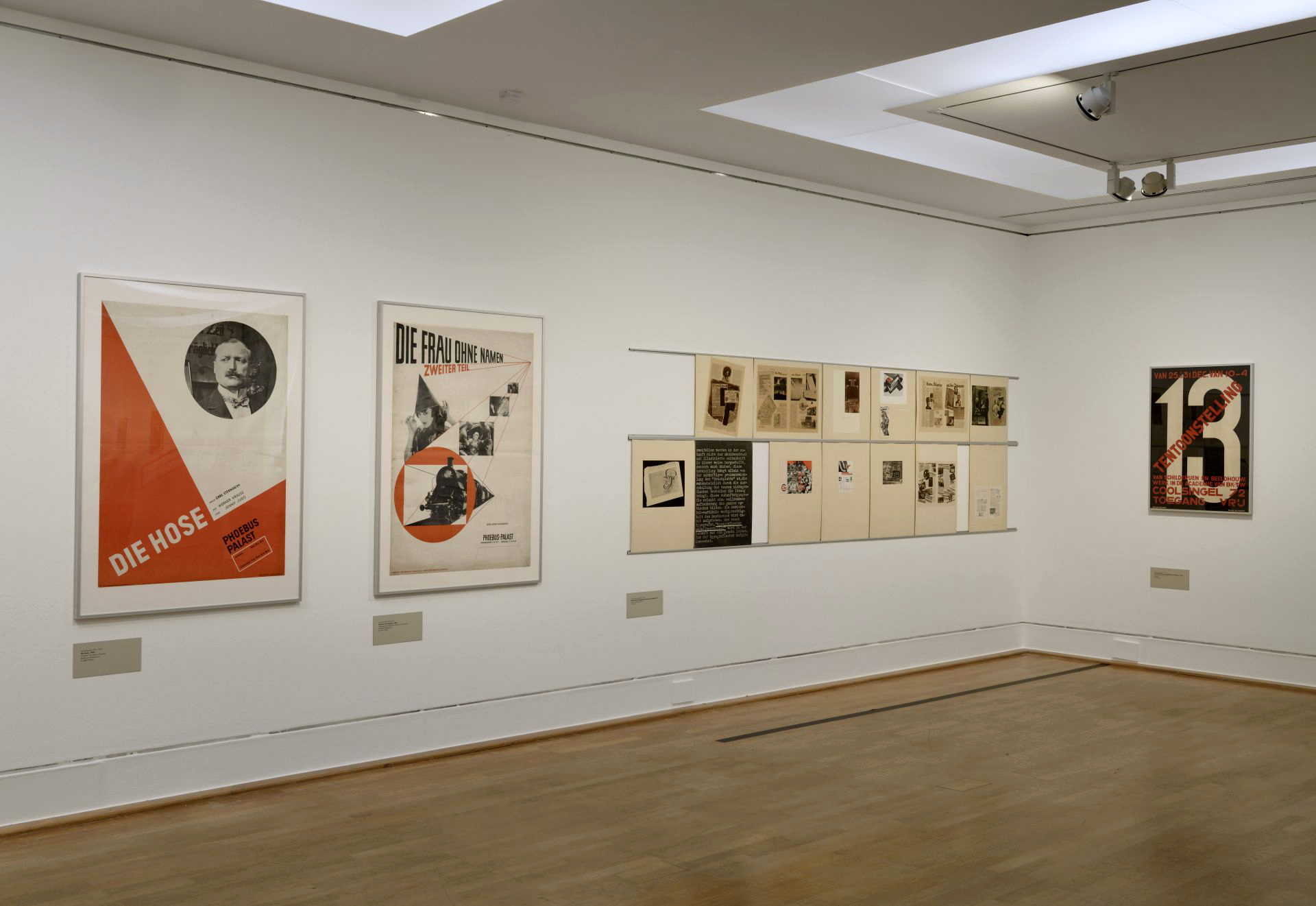
Jan Tschichold (1902-1974)
Die Hose (The pants) (installation view)
1927
F. Bruckmann printing house, Munich
Letterpress
Photo: Marcus Bunyan
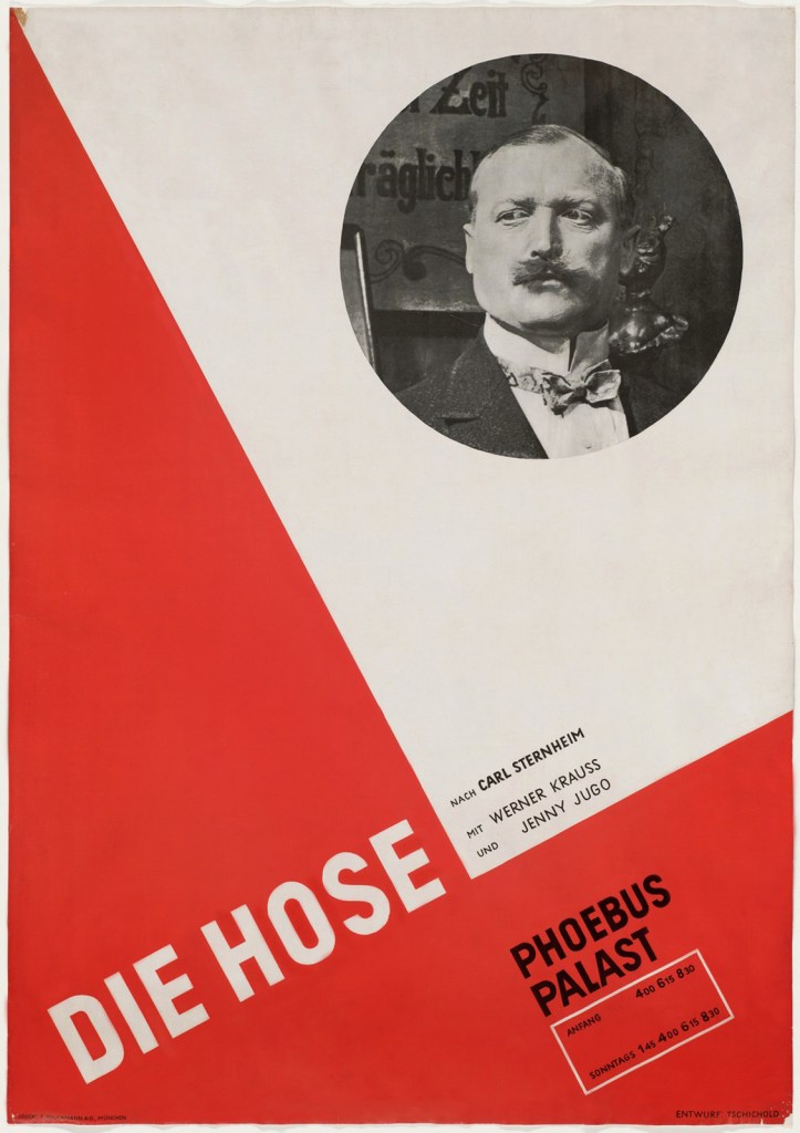
Jan Tschichold (1902-1974)
Die Hose (The pants)
1927
F. Bruckmann printing house, Munich
Letterpress

Jan Tschichold (German, 1902-1974)
Die Frau ohne Namen (The woman without a name) (installation view)
1927
Lithographische Anstalt Gebr. Obpacher AG, Munich
Lithographic Institute Gebr. Obpacher AG, Munich
Letterpress
Photo: Marcus Bunyan
Jan Tschichold (German, 1902-1974)
Jan Tschichold (born Johannes Tzschichhold, also known as Iwan Tschichold, or Ivan Tschichold; 2 April 1902 – 11 August 1974) was a calligrapher, typographer and book designer. He played a significant role in the development of graphic design in the 20th century – first, by developing and promoting principles of typographic modernism, and subsequently (and ironically) idealising conservative typographic structures. His direction of the visual identity of Penguin Books in the decade following World War II served as a model for the burgeoning design practice of planning corporate identity programs. He also designed the much-admired typeface Sabon. …
This artisan background and calligraphic training set him apart from almost all other noted typographers of the time, since they had inevitably trained in architecture or the fine arts. It also may help explain why he never worked with handmade papers and custom fonts as many typographers did, preferring instead to use stock fonts on a careful choice from commercial paper stocks.
Although, up to this moment, he had only worked with historical and traditional typography, he radically changed his approach after his first visit to the Bauhaus exhibition at Weimar. After being introduced to important artists such as László Moholy-Nagy, El Lissitzky, Kurt Schwitters and others who were carrying out radical experiments to break the rigid schemes of conventional typography. He became sympathetic to this attempt to find new ways of expression and to reach a much more experimental way of working, but at the same time, felt it was important to find a simple and practical approach.
He became one of the most important representatives of the “new typography” and in a famous special issue of ‘typographic communications’ in 1925 with the title of “Elemental Typography”, he put together the new approaches in the form of a thesis.
After the election of Hitler in Germany, all designers had to register with the Ministry of Culture, and all teaching posts were threatened for anyone who was sympathetic to communism. Soon after Tschichold had taken up a teaching post in Munich at the behest of Paul Renner, they both were denounced as “cultural Bolshevists”. Ten days after the Nazis surged to power in March 1933, Tschichold and his wife were arrested. During the arrest, Soviet posters were found in his flat, casting him under suspicion of collaboration with communists. All copies of Tschichold’s books were seized by the Gestapo “for the protection of the German people”. After six weeks a policeman somehow found him tickets for Switzerland, and he and his family managed to escape Nazi Germany in August 1933.
Text from the Wikipedia website
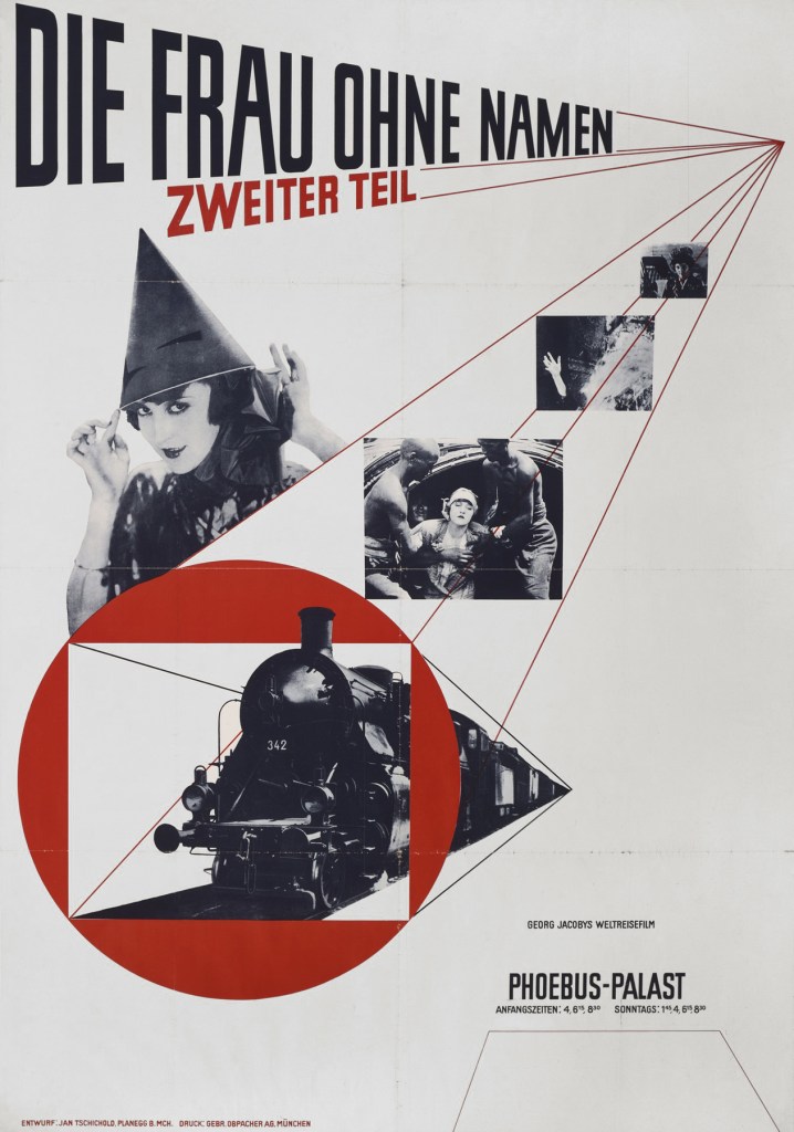
Jan Tschichold (1902-1974)
Die Frau ohne Namen (The woman without a name)
1927
Lithographische Anstalt Gebr. Obpacher AG, Munich
Lithographic Institute Gebr. Obpacher AG, Munich
Letterpress
As part of the bauhauswoche berlin 2019 (Bauhaus week Berlin 2019) the Kunstbibliothek is showing an historical exhibition room by the Bauhaus artist László Moholy-Nagy.
This pioneering exhibition room, entitled Wohin geht die typographische Entwicklung? (Where is typography headed?), was first shown in May 1929 in the Martin-Gropius-Bau as part of the exhibition Neue Typographie (“New Typography”), organised by the Staatliche Kunstbibliothek. Moholy-Nagy had been invited to design a room presenting the future of typography. He came up with 78 wall charts with photos, texts and pictures, all of which have been preserved. The exhibition room can therefore be shown again, complemented by additional posters, letterheads, and other specimens of New Typography from the Kunstbibliothek collection.
Moreover, well-known posters and advertisements from the Kunstbibliothek collection in the style known as New Typography augment the Moholy-Nagy exhibition. The selection includes works by Willi Baumeister, A. M. Cassandre, Walter Dexel, Johannes Molzahn, Kurt Schwitters and Jan Tschichold. The functional graphic design of New Typography, a style of advertising designed by artists that gained wide acceptance in the 1920s, broke with a long design tradition in the printing trade. Its aim was to create a contemporary design: first by propagating a standardisation of fonts and the industrial DIN norms, and second, by promoting ideals of readability, clarity and directness in keeping with the principles of Constructivist Art.
The exhibition focuses on this large-scale presentation with which artist Moholy-Nagy summed up years of his own teaching work at the Bauhaus and the ideas and visions of New Typography, ranging from Jan Tschichold and Willi Baumeister to Herbert Bayer. The exhibition programme includes evening discussions evaluating Moholy-Nagy’s ideas from a contemporary standpoint. An important part of the programme will be the launch of a new publication on Moholy-Nagy’s historical exhibition, edited in collaboration with Gutenberg Design Lab at Mainz University of Applied Sciences.
Text from the Staatliche Museen zu Berlin website
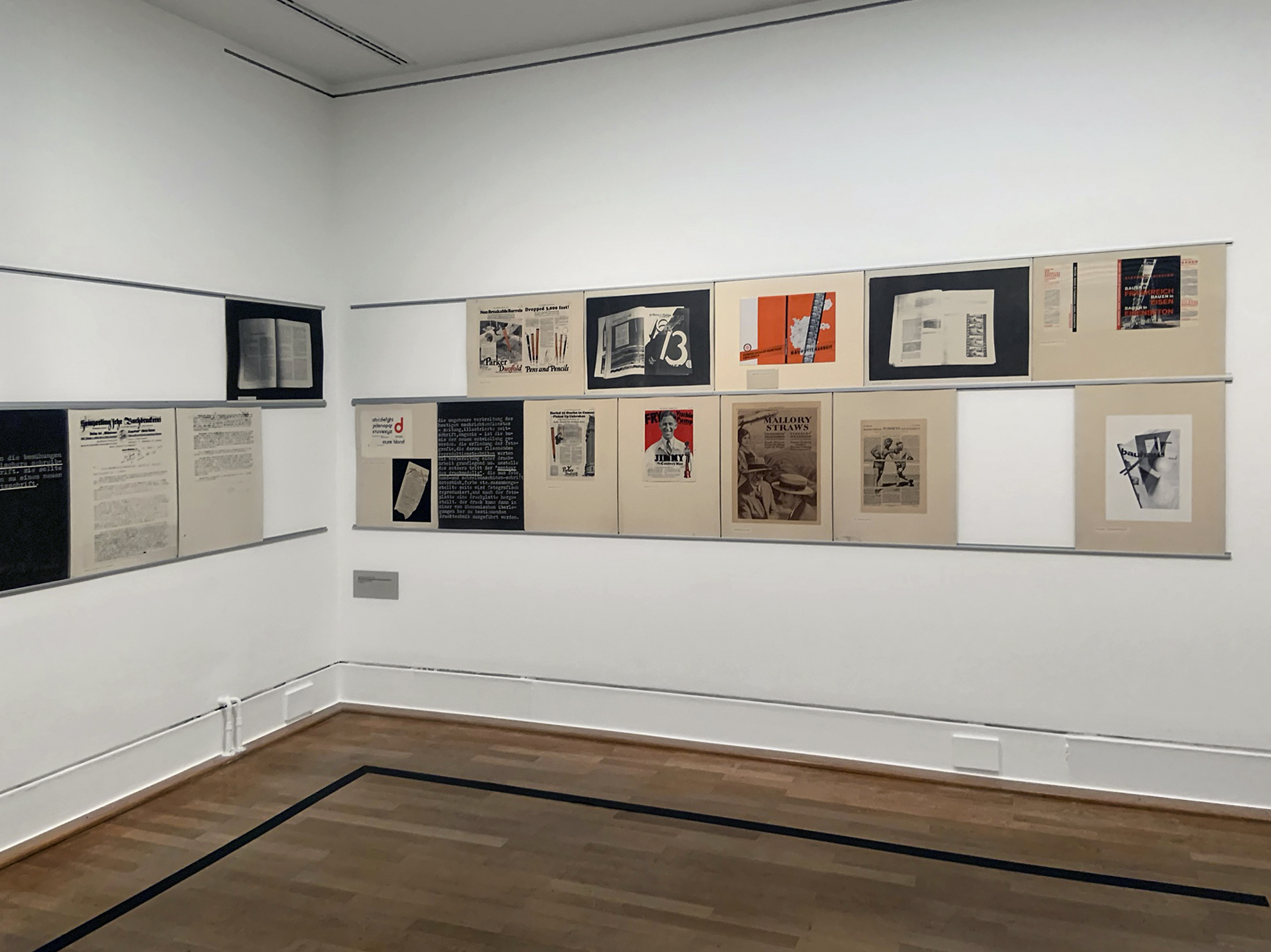
Installation view of the exhibition László Moholy-Nagy and New Typography: A Reconstruction of a Berlin Exhibition from 1929 at the Staatliche Museen zu Berlin showing at right, Paul Schuitema’s 13 Tentoonstelling van Schilderijen en Beeldhouw 1927
Photo: Marcus Bunyan
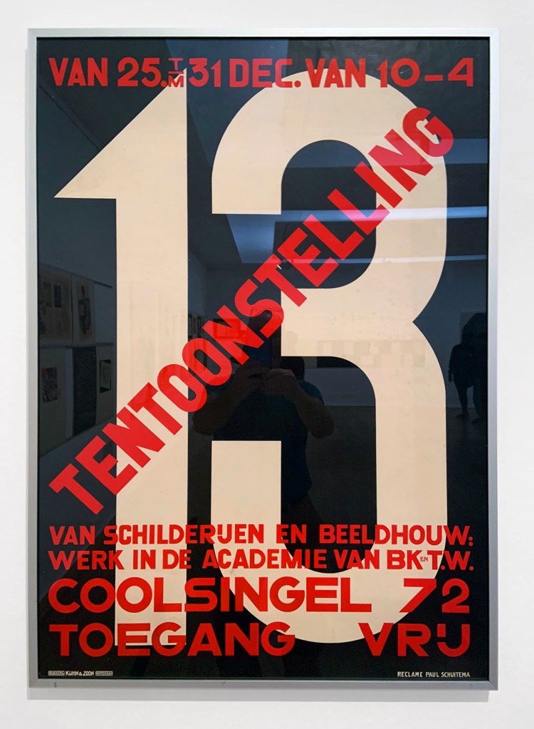
Paul Schuitema (1897-1973)
13 Tentoonstelling van Schilderijen en Beeldhouw (13 Exhibition of Paintings and Sculptures) (installation view)
1927
Kühn & Zoon printing house, Rotterdam
Lithograph
Photo: Marcus Bunyan
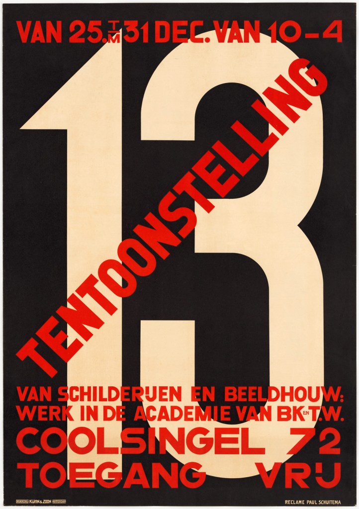
Paul Schuitema (Dutch, 1897-1973)
13 Tentoonstelling van Schilderijen en Beeldhouw (13 Exhibition of Paintings and Sculptures)
1927
Kühn & Zoon printing house, Rotterdam
Lithograph
Paul Schuitema (Dutch, 1897-1973)
Geert Paul Hendrikus Schuitema (February 27, 1897 in Groningen – October 25, 1973 in Wassenaar) was a Dutch graphic artist. He also designed furniture and expositions and worked as photographer, film director, painter and teacher for publicity design at the Royal Academy of Art in The Hague.
Industrial design
Schuitema studied at the Academie voor Beeldende Kunsten in Rotterdam. In the 1920s, he began to work on graphic design, applying the principles of De Stijl and constructivism to commercial advertising. Along with Gerard Kiljan and his famous colleague Piet Zwart, he followed ideas pioneered in the Soviet Union by El Lissitzky and Rodchenko, in Poland by Henryk Berlewi and in Germany by Kurt Schwitters.
During his employment at the NV Maatschappij Van Berkel Patent scale company in Rotterdam, Schuitema gained recognition for his original designs of stationery and publicity material, often using only the colours black, red and white and bold sans serif fonts. From 1926 on, he started working with photomontages, becoming one of the pioneers of this technique in the field of industrial design.
Even though he was a convinced socialist and often designed leftist publications directed at industrial workers, Schuitema also worked for major companies, such as Philips.
Text from the Wikipedia website
László Moholy-Nagy (Hungarian, 1895-1946)
Wohin geht die typographische Entwicklung?, Tafel 1
Where is typography headed? Chart 1
1929
Photograph on card
© Staatliche Museen zu Berlin, Kunstbibliothek
László Moholy-Nagy (Hungarian, 1895-1946)
Wohin geht die typographische Entwicklung?, Tafel 12
Where is typography headed? Chart 12
1929
Photograph on card
© Staatliche Museen zu Berlin, Kunstbibliothek
László Moholy-Nagy (Hungarian, 1895-1946)
Wohin geht die typographische Entwicklung?, Tafel 22
Where is typography headed? Chart 22
1929
Photograph on card
© Staatliche Museen zu Berlin, Kunstbibliothek
László Moholy-Nagy (Hungarian, 1895-1946)
Wohin geht die typographische Entwicklung?, Tafel 34
Where is typography headed? Chart 34
1929
Photograph on card
© Staatliche Museen zu Berlin, Kunstbibliothek
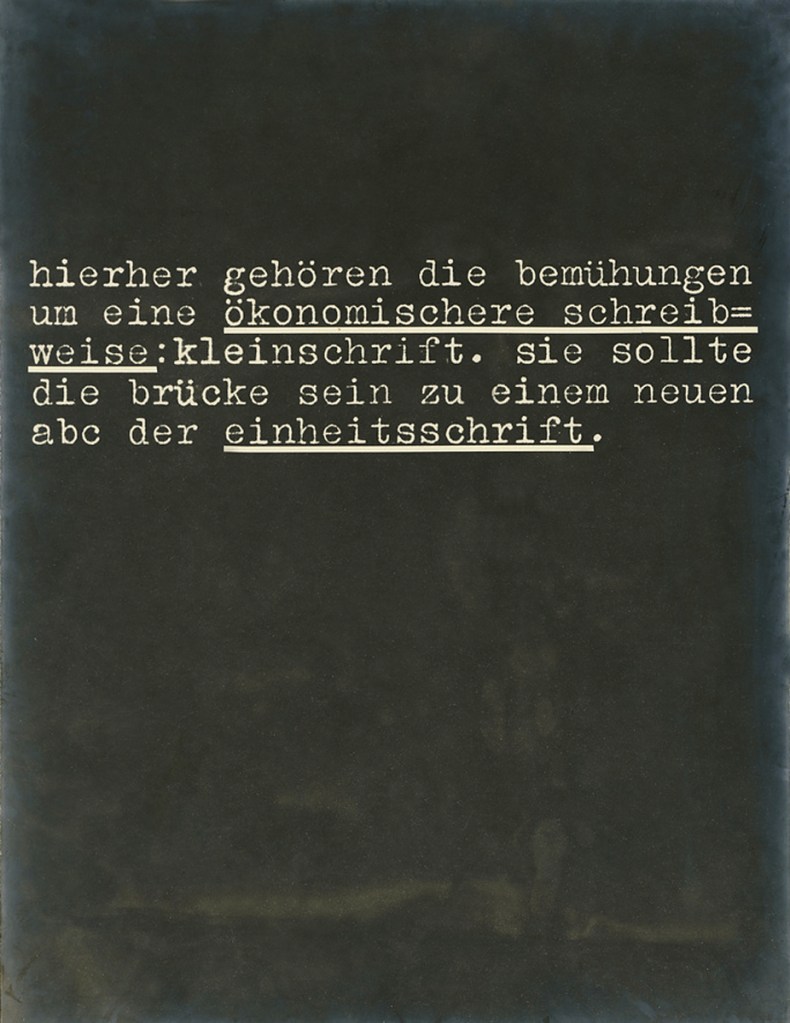
László Moholy-Nagy (Hungarian, 1895-1946)
Wohin geht die typographische Entwicklung?, Tafel 44
Where is typography headed? Chart 44
1929
Photograph on card
© Staatliche Museen zu Berlin, Kunstbibliothek
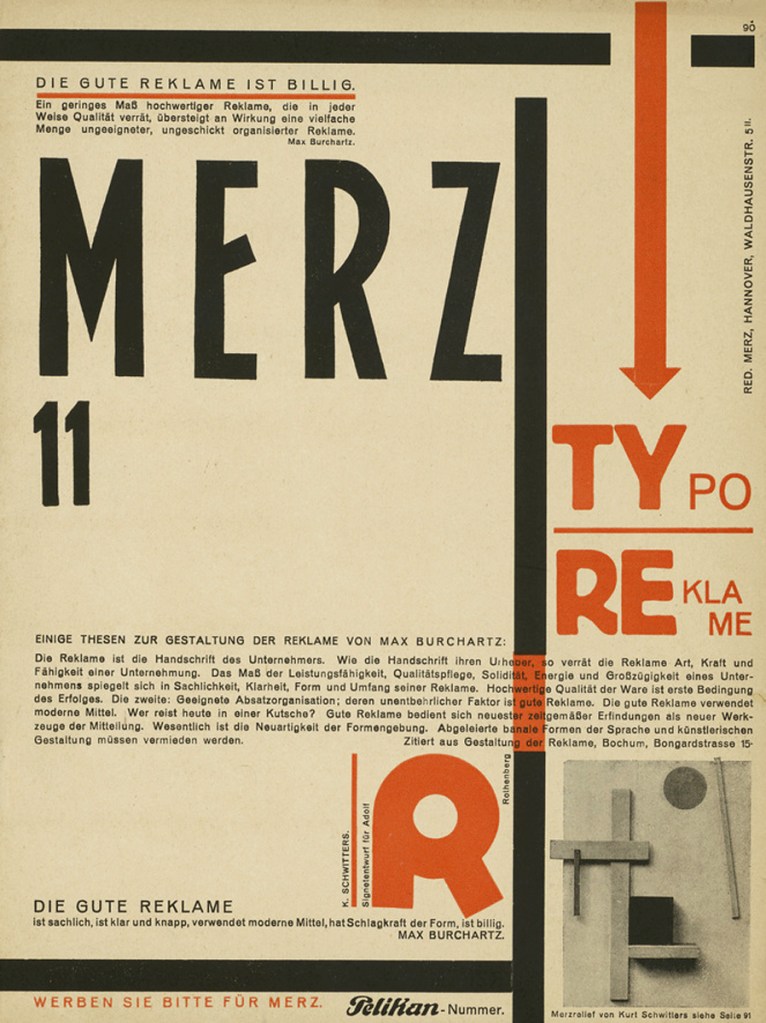
Kurt Schwitters (German, 1887-1948)
Merz 11 Pelikan Nummer, Zeitschrift (Merz 11 Pelikan number, magazine)
1924
© Kunstbibliothek, Staatliche Museen zu Berlin
Kurt Schwitters (German, 1887-1948)
Kurt Hermann Eduard Karl Julius Schwitters (20 June 1887 – 8 January 1948) was a German artist who was born in Hanover, Germany. Schwitters worked in several genres and media, including dadaism, constructivism, surrealism, poetry, sound, painting, sculpture, graphic design, typography, and what came to be known as installation art. He is most famous for his collages, called Merz Pictures.
Internationalism, 1922-1937
Merz (periodical)
As the political climate in Germany became more liberal and stable, Schwitters’ work became less influenced by Cubism and Expressionism. He started to organise and participate in lecture tours with other members of the international avant-garde, such as Hans Arp, Raoul Hausmann and Tristan Tzara, touring Czechoslovakia, the Netherlands, and Germany with provocative evening recitals and lectures.
Schwitters published a periodical, also called Merz, between 1923 and 1932, in which each issue was devoted to a central theme. Merz 5 1923, for instance, was a portfolio of prints by Hans Arp, Merz 8/9, 1924, was edited and typeset by El Lissitsky, Merz 14/15, 1925, was a typographical children’s story entitled The Scarecrow by Schwitters, Kätte Steinitz and Theo van Doesburg. The last edition, Merz 24, 1932, was a complete transcription of the final draft of the Ursonate, with typography by Jan Tschichold.
His work in this period became increasingly Modernist in spirit, with far less overtly political context and a cleaner style, in keeping with contemporary work by Hans Arp and Piet Mondrian. His friendship around this time with El Lissitzky proved particularly influential, and Merz pictures in this period show the direct influence of Constructivism.
Thanks to Schwitters’ lifelong patron and friend Katherine Dreier, his work was exhibited regularly in the US from 1920 onwards. In the late 1920s he became a well-known typographer; his best-known work was the catalogue for the Dammerstocksiedlung in Karlsruhe. After the demise of Der Sturm Gallery in 1924 he ran an advertising agency called Merzwerbe, which held the accounts for Pelikan inks and Bahlsen biscuits, amongst others, and became the official typographer for Hanover town council between 1929 and 1934. Many of these designs, as well as test prints and proof sheets, were to crop up in contemporary Merz pictures. In a manner similar to the typographic experimentation by Herbert Bayer at the Bauhaus, and Jan Tschichold’s Die neue Typographie, Schwitters experimented with the creation of a new more phonetic alphabet in 1927. Some of his types were cast and used in his work. In the late 1920s Schwitters joined the Deutscher Werkbund (German Work Federation).
Exile, 1937-1948
Norway
As the political situation in Germany under the Nazis continued to deteriorate throughout the 1930s, Schwitters’ work began to be included in the Entartete Kunst (Degenerate Art) touring exhibition organised by the Nazi party from 1933. He lost his contract with Hanover City Council in 1934 and examples of his work in German museums were confiscated and publicly ridiculed in 1935. By the time his close friends Christof and Luise Spengemann and their son Walter were arrested by the Gestapo in August 1936 the situation had clearly become perilous.
On 2 January 1937 Schwitters, wanted for an “interview” with the Gestapo, fled to Norway to join his son Ernst, who had already left Germany on 26 December 1936. His wife Helma decided to remain in Hanover, to manage their four properties. In the same year, his Merz pictures were included in the Entartete Kunst exhibition titled in Munich, making his return impossible.
Text from the Wikipedia website
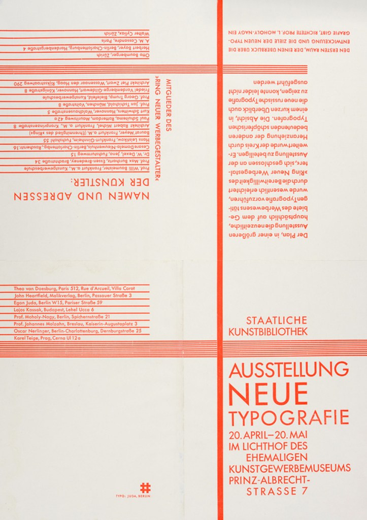
Egon Juda (German, b. 1895)
Einladung zur Ausstellung “Neue Typographie” (Invitation to the exhibition “New Typography”)
Berlin 1929
© Kunstbibliothek, Staatliche Museen zu Berlin
Installation views of the exhibition László Moholy-Nagy and New Typography: A Reconstruction of a Berlin Exhibition from 1929 at the Staatliche Museen zu Berlin showing at right,
Photos: Staatliche Museen zu Berlin
László Moholy-Nagy (Hungarian, 1895-1946)
Prospekttitelblatt (Prospectus title page) (installation view)
1928
film und foto
1929
in
László Moholy-Nagy (Hungarian, 1895-1946)
Wohin geht die typographische Entwicklung?
Where is typography headed?
1929
Photograph on card
© Staatliche Museen zu Berlin, Kunstbibliothek
Photo: Marcus Bunyan
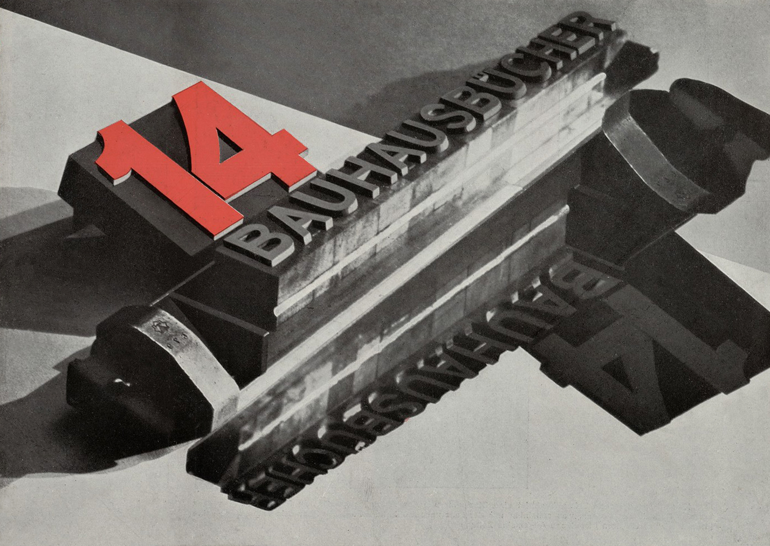
László Moholy-Nagy (Hungarian, 1895-1946)
14 Bauhausbücher
1928
Letterpress
5 7/8 x 8 1/4″ (14.9 x 21cm)
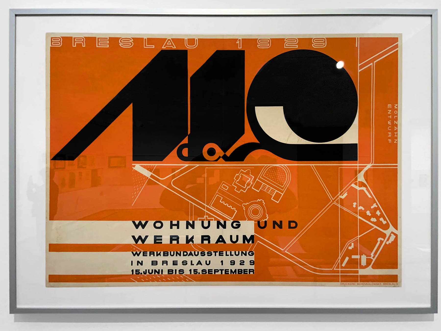
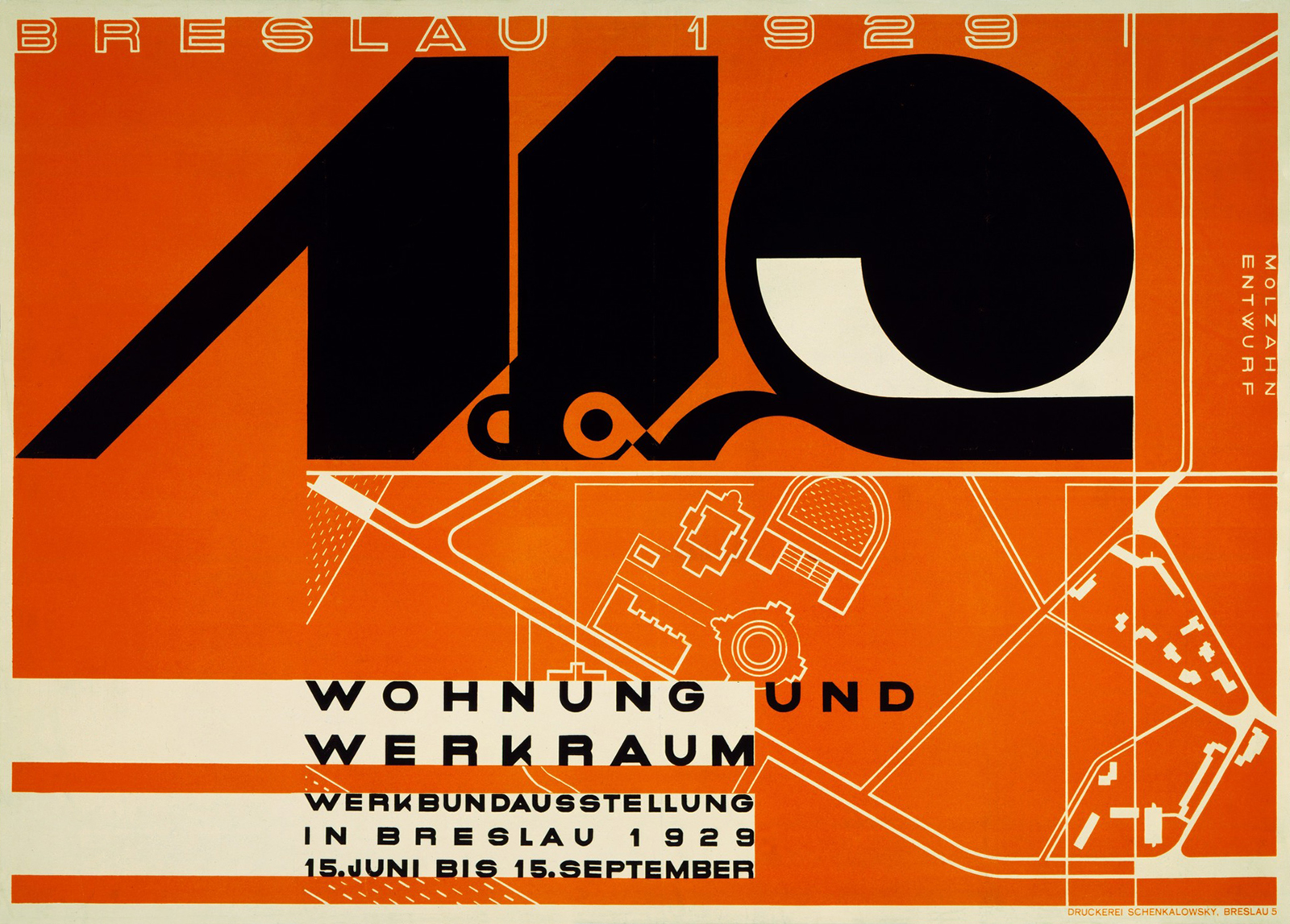
Johannes Molzahn (German, 1892-1965)
Wohung und Werkraum, Werkbundausstellung in Breslau (Apartment and workshop, Werkbund exhibition in Breslau) (installation view)
1929
Schenkalowsky, Breslau (Wroclaw) printing house
Lithograph
Photo: Marcus Bunyan
Johannes Molzahn (German, 1892-1965)
Johannes Ernst Ludwig Molzahn was born 21 May 1892 in Duisburg. He learned drawing and photography, but later concentrated on painting. 1908-1914 he stayed in Switzerland. Molzahn became acquainted with Herwarth Walden, Walter Gropius, Theo van Doesburg and El Lissitzky. He was a member of the Arbeitsrat für Kunst. After World War I he worked as a graphic designer and through intervention of Bruno Taut became a graphics teacher in Magdeburg. He was forbidden to work by the Nazis in 1933 and fired.Eight of his works were shown in the exhibition of entartete Kunst in 1937.
He emigrated to the United States in 1938 and returned to Germany 1959, settling in Munich. He died there 31 December 1965.
Text from the Wikipedia website
Johannes Molzahn (German, 1892-1965)
Wohung und Werkraum, Werkbundausstellung in Breslau (Apartment and workshop, Werkbund exhibition in Breslau)
1929
Schenkalowsky, Breslau (Wroclaw) printing house
Lithograph
1929 (installation view)
Photo: Marcus Bunyan
Kunstbibliothek
Matthäikirchplatz
10785 Berlin
Opening hours:
Sunday 10.00 – 18.00
Monday closed
Tuesday 10.00 – 18.00
Wednesday 10.00 – 18.00
Thursday 10.00 – 18.00
Friday 10.00 – 18.00
Saturday 10.00 – 18.00



![Walker Evans (American, 1903-1975) '[Subway Passengers, New York City]' 1938 Walker Evans (American, 1903-1975) '[Subway Passengers, New York City]' 1938](https://artblart.com/wp-content/uploads/2016/07/walker-evans-subway-passengers-new-york-city-web.jpg)
![Walker Evans (American, 1903-1975) 'Untitled [Street scene]' 1950s Walker Evans (American, 1903-1975) 'Untitled [Street scene]' 1950s](https://artblart.com/wp-content/uploads/2018/01/walker-evans-untitled-web.jpg)





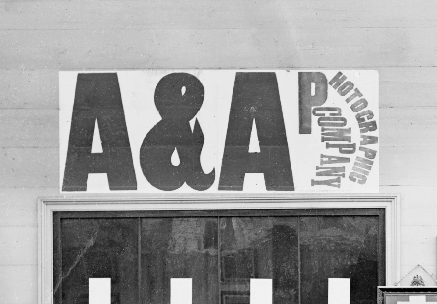
![American & Australasian Photographic Company. '[Merlin's photographic cart ?] and Mitchell's London Hotel, Railway Place, Sandridge [Port Melbourne]' 1870-1875 American & Australasian Photographic Company. '[Merlin's photographic cart ?] and Mitchell's London Hotel, Railway Place, Sandridge [Port Melbourne]' 1870-1875](https://artblart.com/wp-content/uploads/2013/04/american-australasian-photographic-company-merlins-photographic-cart-and-mitchells-london-hotel-railway-place-sandridge-port-melbourne-1870-1875-web.jpg)
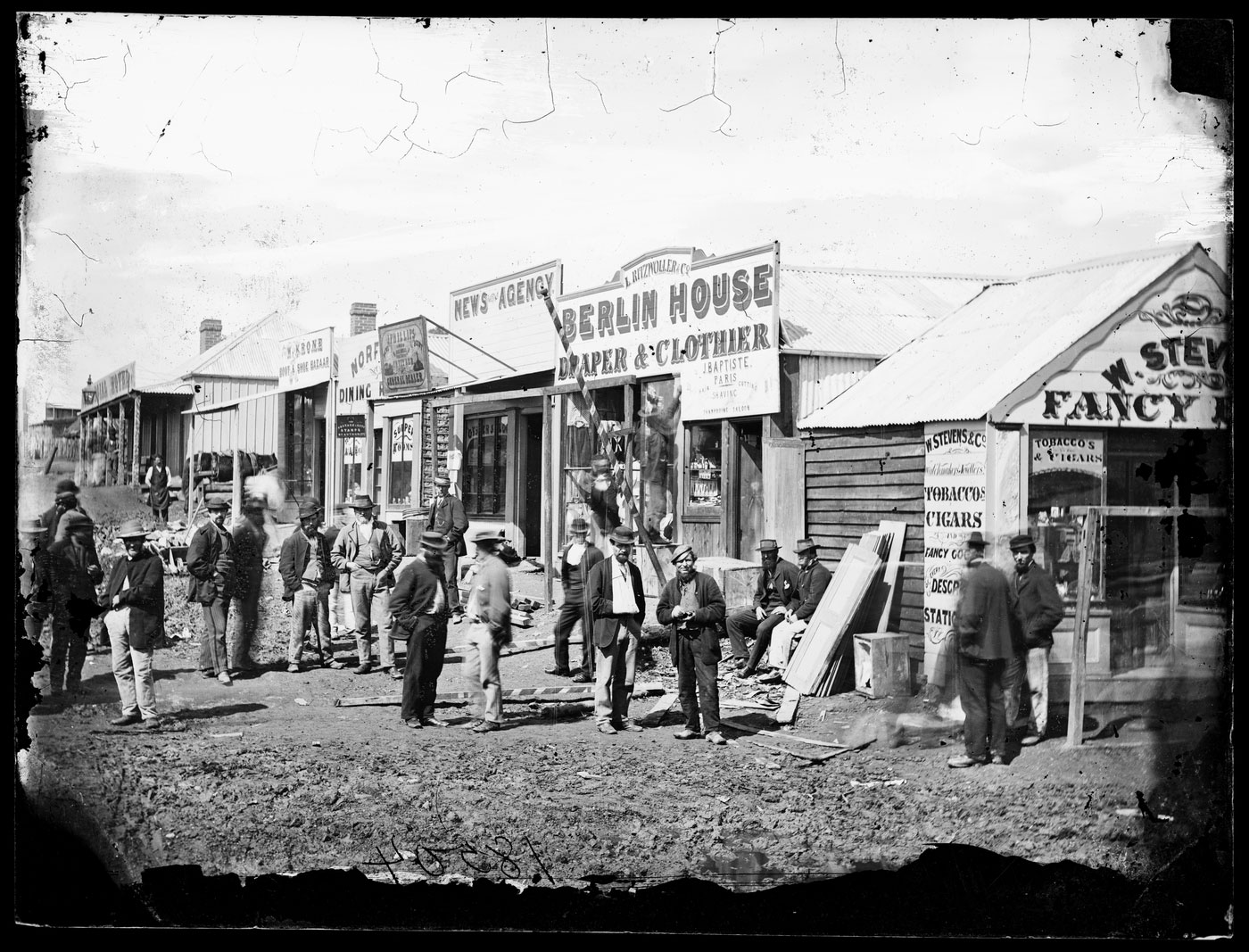

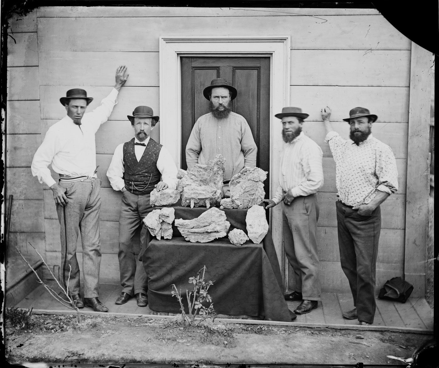
![American & Australasian Photographic Company. 'A domestic miner [Hill End]' 1872 American & Australasian Photographic Company. 'A domestic miner [Hill End]' 1872](https://artblart.com/wp-content/uploads/2013/04/american-australasian-photographic-company-couple-and-child-in-the-front-formal-garden-of-their-slab-hut-cottage-hill-end-1870-1875-web.jpg)
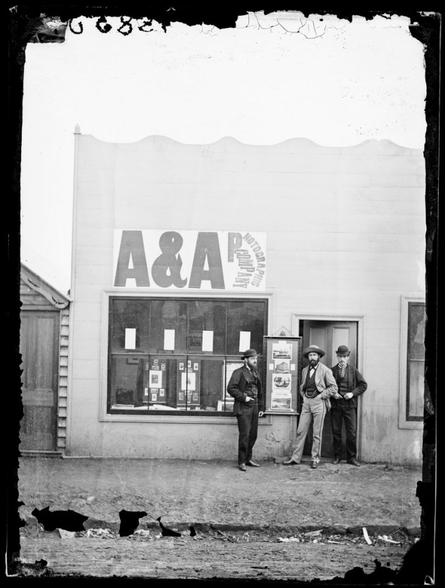
![Gibbs, Shallard & Co., Colour Printers [188-?] 'Holtermann's Life Preserving Drops' 1872 Gibbs, Shallard & Co., Colour Printers [188-?] 'Holtermann's Life Preserving Drops' 1872](https://artblart.com/wp-content/uploads/2013/04/holtermans-life-preserving-drops-1872-web.jpg?w=650)
![American & Australasian Photographic Company. '[French warship 'Atalante', Fitzroy Dock, Sydney, 1873]' Aug 1873 American & Australasian Photographic Company. '[French warship 'Atalante', Fitzroy Dock, Sydney, 1873]' Aug 1873](https://artblart.com/wp-content/uploads/2013/04/american-australasian-photographic-company-french-warship-atalante-fitzroy-dock-sydney-1873-1873-web.jpg)
![American & Australasian Photographic Company. '[French warship 'Atalante' at Fitzroy Dock, Sydney, 1873 / attributed to the American & Australasian Photographic Company]' 1873 American & Australasian Photographic Company. '[French warship 'Atalante' at Fitzroy Dock, Sydney, 1873 / attributed to the American & Australasian Photographic Company]' 1873](https://artblart.com/wp-content/uploads/2013/04/french-warship-atalante-at-fitzroy-dock-web.jpg)






You must be logged in to post a comment.