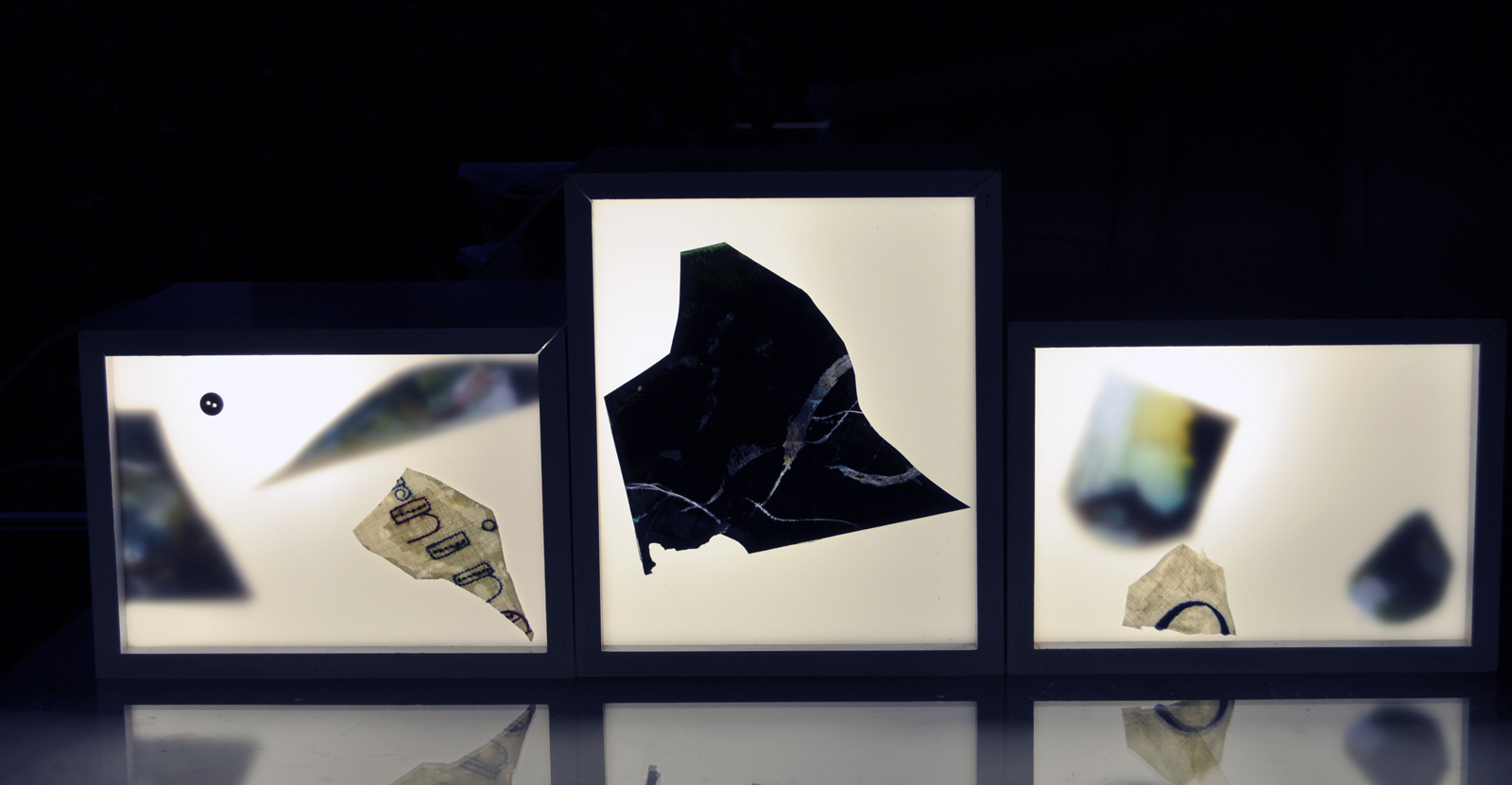
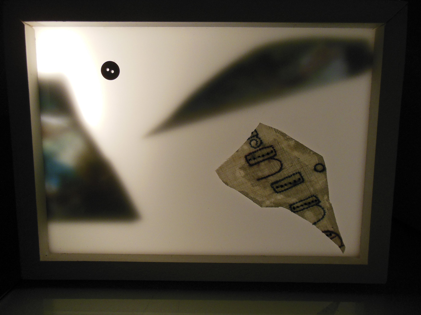
The Tam Projects (Tess Hamilton, Adriana Bernado, Melissa Acker) Colour box (installation view) 2013 Lightbox, A3 print on cotton rag + film slides on acrylic 15 x 14 x 33cm
Although I could not get to the second part of the exhibition at Abbotsford Convent, what I saw of this exhibition of light-based art and design by Australian and international artists at Anita Traverso Gallery in Richmond was fascinating. I love interesting concepts and works constructed with light / space / images and this show is certainly exuberant and inventive.
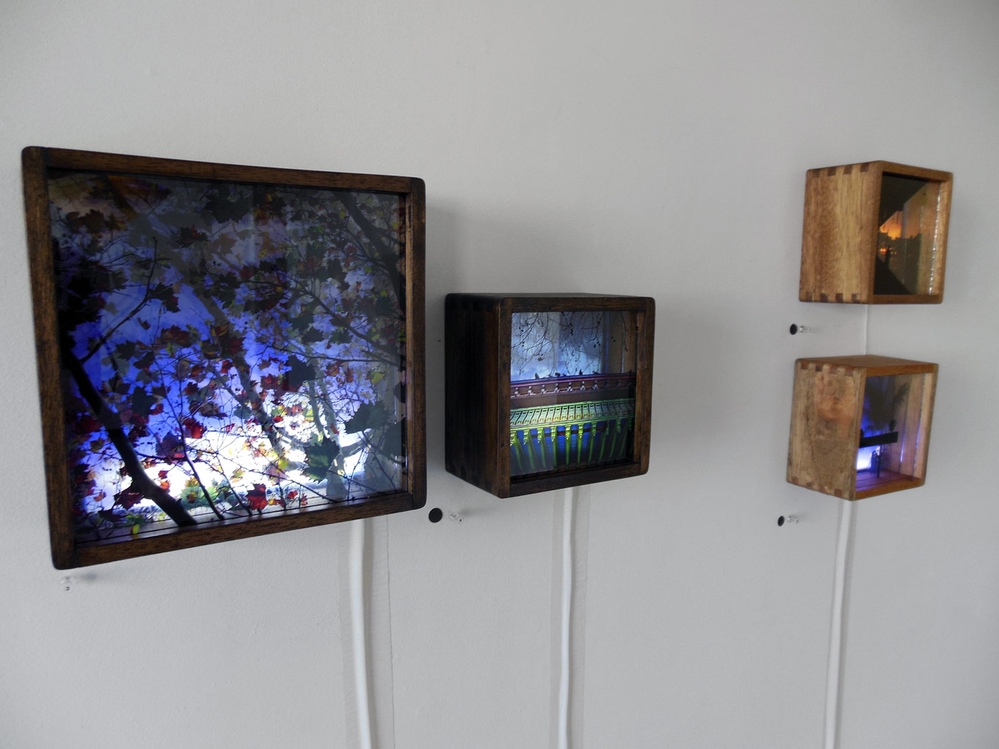
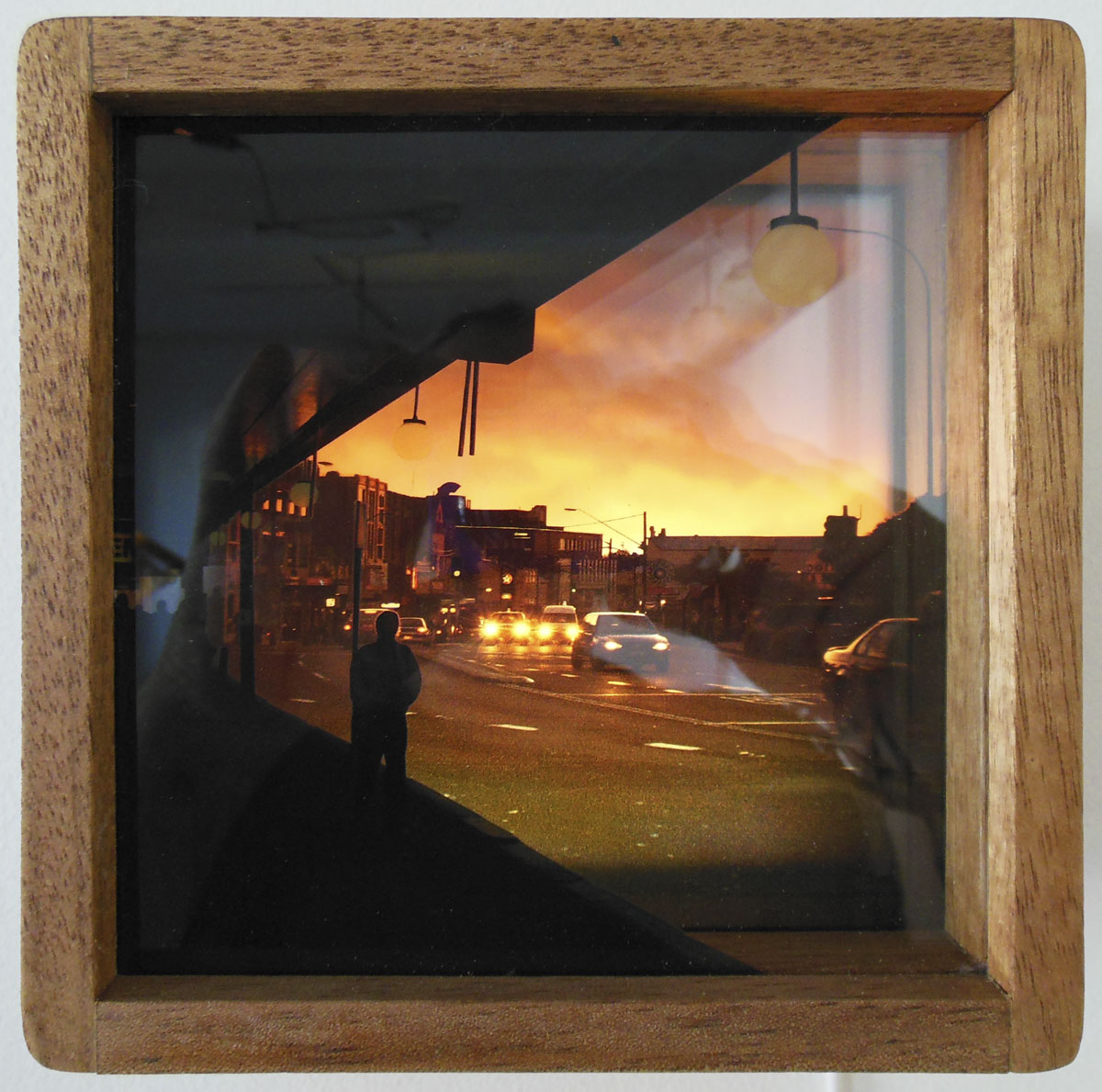
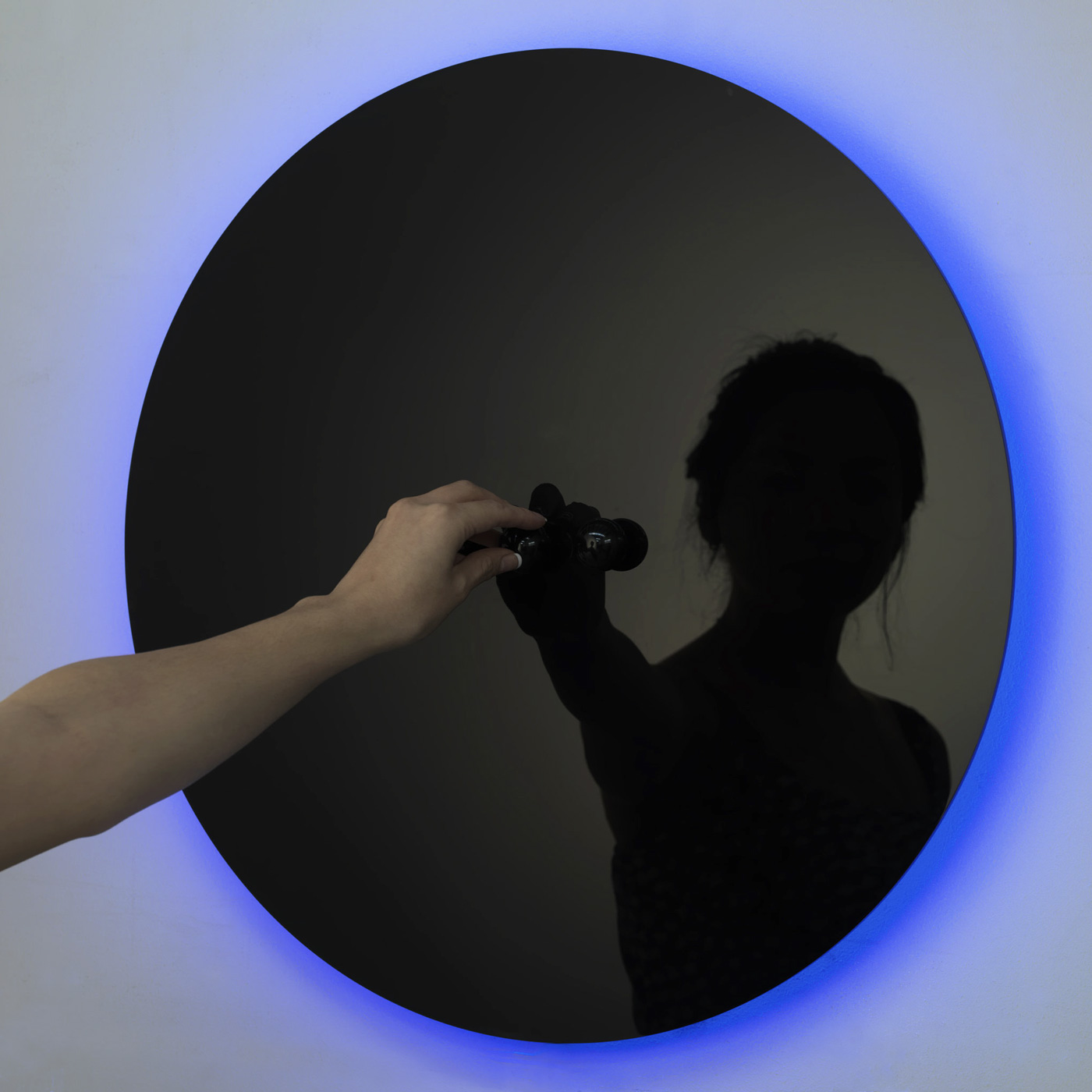
Of particular interest were three artists who use multiple images and objects in boxes to form three-dimensional sculptures, the images inside resembling the spatiality of early stereographs (for- mid- and background). In the work by The Tam Projects the perspex slide at the front of the box with the topographic dots can be removed and replaced with another screen of dots, thus altering the mapping of the image. Catherine Johnstone’s work Grief Keeps Watch 7, 8 + 9 (2012, below) uses collections of bits and pieces, remnants, traces which enable the artist to hold onto the memory of her father who has passed away. Perran Costi’s beautifully made wooden boxes hold Sydney-based scenes in 3D printed on glass and were ravishing in their collective density. Ilan El’s ORA (2011, below) features three black knobs that control the Red, Green and Blue spectrum (RGB), enabling the viewer to create an endless rainbow of colours to match their shifting moods.
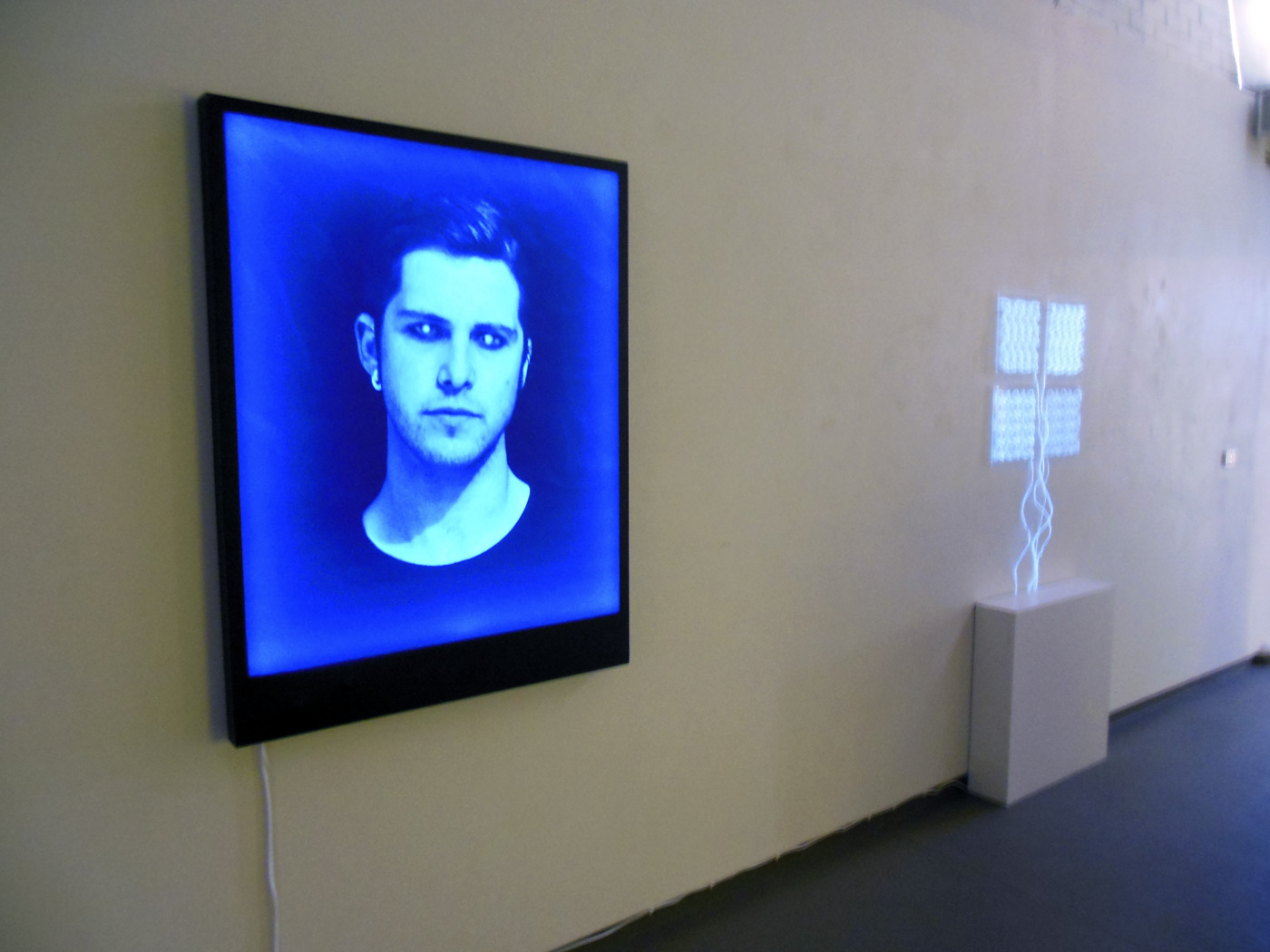
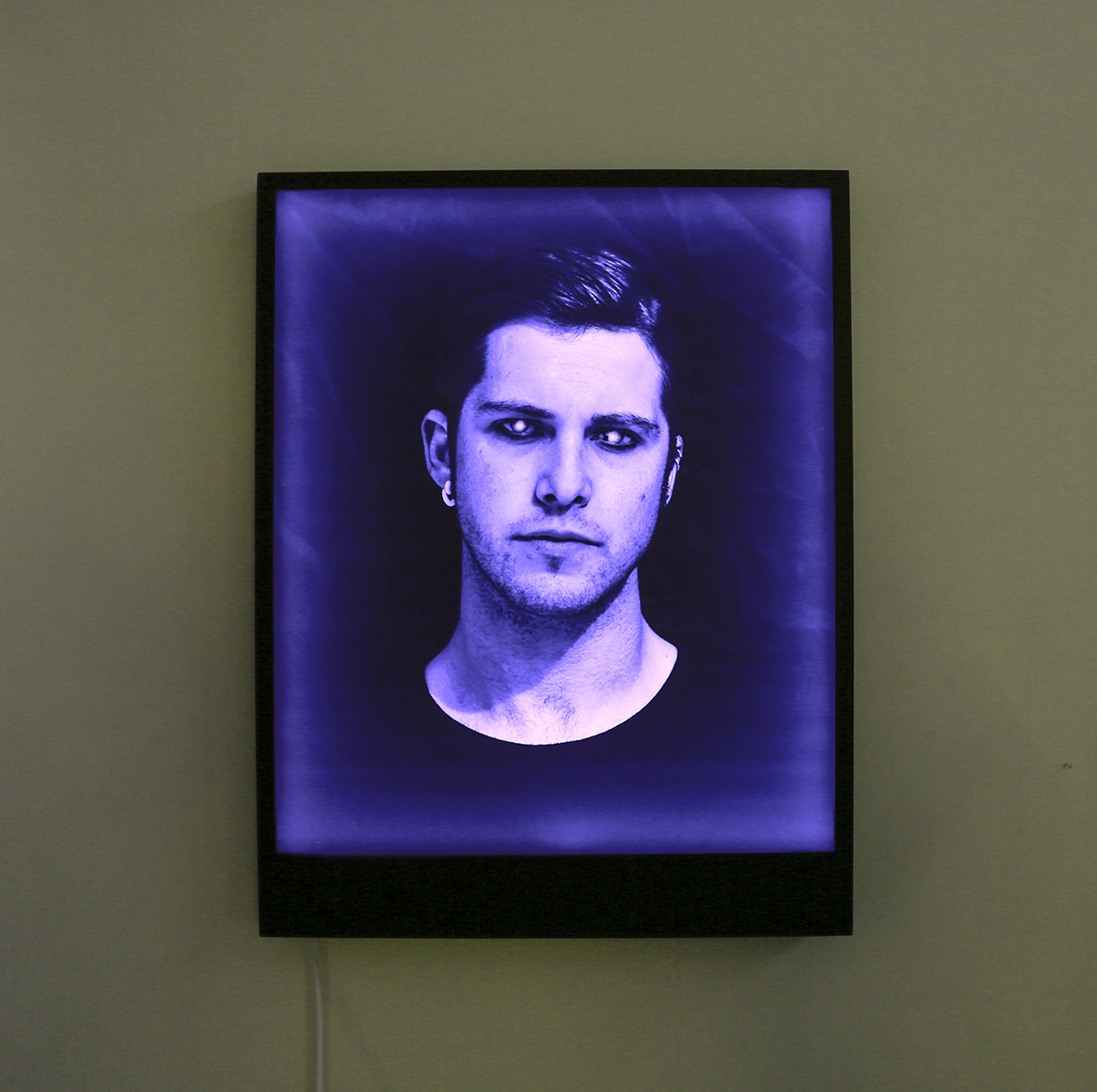
My favourite piece in the exhibition was George Angelovski’s light box LUKAS (2012, below), a portrait which cycles through various colours using remote controlled RGB LEDs which lends the portrait different characters such as threatening or placid, depending on the colour of the moment. This feeling of un/ease is increased because the eyes of LUKAS are white as in a supernova (probably red eye from a flash which has printed white in the black and white image), and in the right eye there is a black spot, an inclusion, a dark star that further disturbs the handsome features of the man. I really loved this beautiful, cerebral work.
Both curators (James Tapscott and Sam Mitchell-Fin) and artists are to be congratulated for this New Light Art + Design initiative. It’s a great idea to have a festival that exhibits a such a wide variety of works across both light art and design in Australia. Let’s hope it is even more successful next year.
Dr Marcus Bunyan
Many thankx to Anita Traverso Gallery for allowing me to publish the photographs in the posting. Please click on the photographs for a larger version of the image.
Catherine Johnstone (Australian) Grief Keeps Watch 7, 8 + 9 (installation view) 2012 Pigment on x-ray + found objects on acrylic, light boxes 25.5 x 23 x 17cm
Catherine Johnstone (Australian) Grief Keeps Watch 8 (installation view detail) 2012 Pigment on x-ray + found objects on acrylic, light boxes 25.5 x 23 x 17cm
Perran Costi (Australian) Autumn (nearest), Bird House, Sunset on King Street and Oasis (installation view) 2012 Glass, hardwood + light Dimensions variable
Perran Costi (Australian) Sunset on King Street (installation view) 2012 Glass, hardwood + light 16 x 16 x 8.7cm
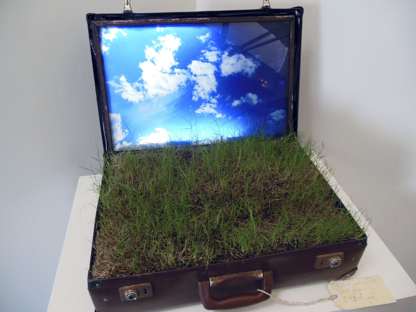
Perran Costi (Australian) Landgrab (installation view) 2012 Suitcase, glass, soil, acrylic + light 57 x 50 x 34cm
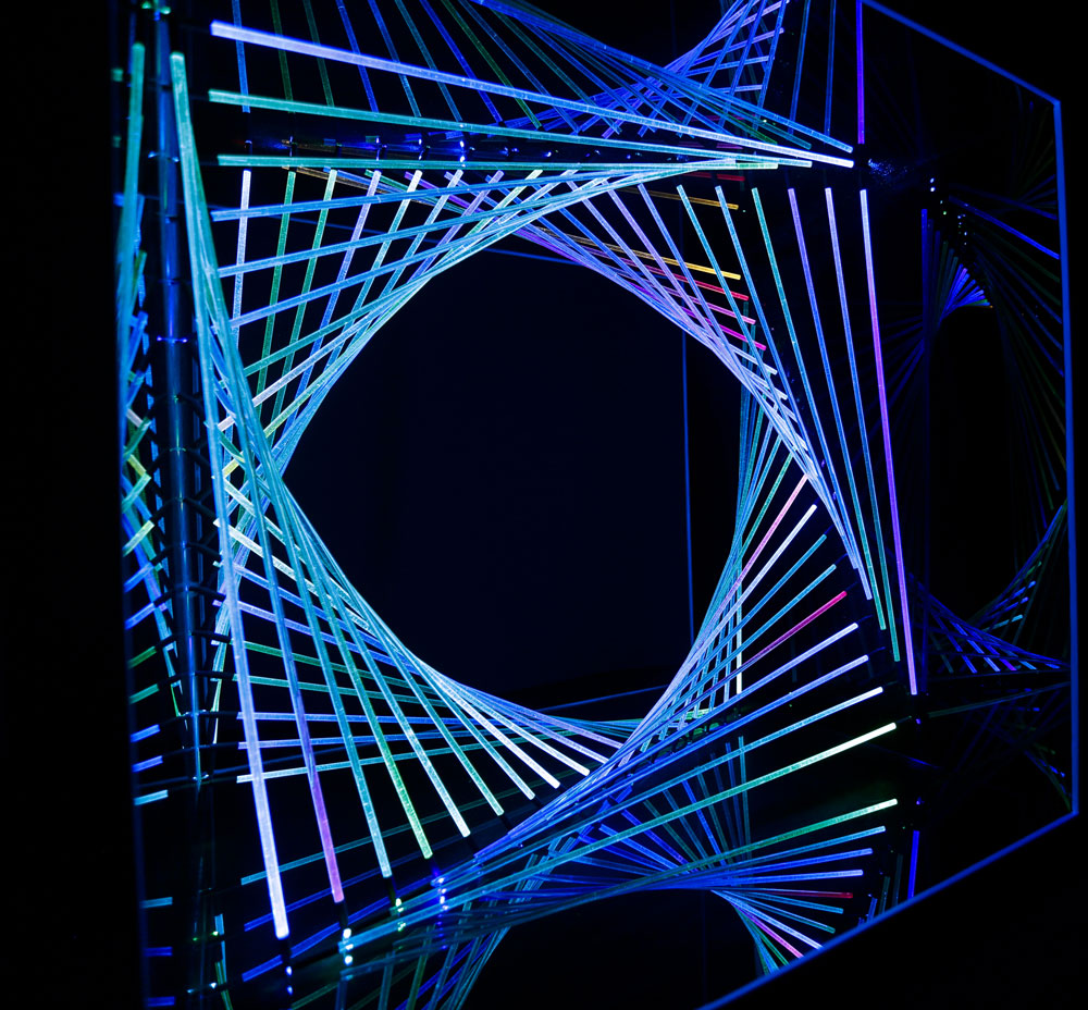
Kent Gration (Australian) Leviathan 1 + 2 (installation view) 2013 Carbonised + natural bamboo, LED lighting 50 x 50 x 125cm each
Globelight ’13 is an exhibition of light-based art and design by Australian and international artists. Curated by James Tapscott and Sam Mitchell-Fin, this is the inaugural event of what is to become an annual festival-style event that aims to grow into a significant part of Victoria’s cultural calendar. An exciting cross-section of Australian and international artists and designers will occupy both spaces at Anita Traverso Gallery and the grounds of the Abbotsford Convent with light-based sculpture, installation, design objects and video art throughout the month of August.
The Festival aims to become an important inclusion on the local and international cultural calendar being the only festival of its kind that exhibits a such a wide variety of works across both light art and design in Australia. The festival has already attracted the attention of the lighting community and related industries, thus confirming the need for such an event that supports the growing number of artists and innovative designers working in this medium.”
Text from the Anita Traverso Gallery and Globelight website
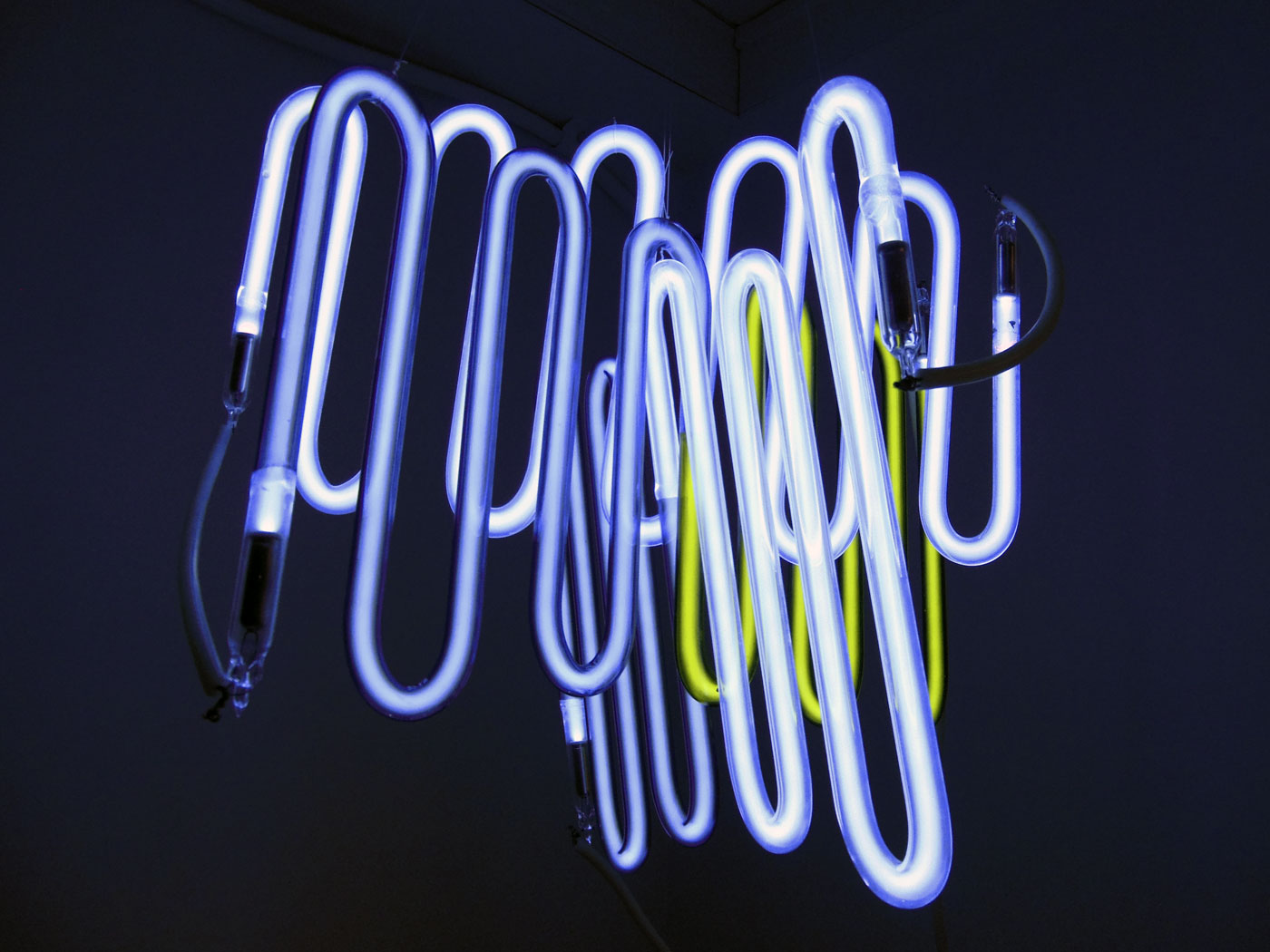
Sam Mitchell-Fin (Australian) Open infinity (blue) (installation view) 2013 Neon Size variable
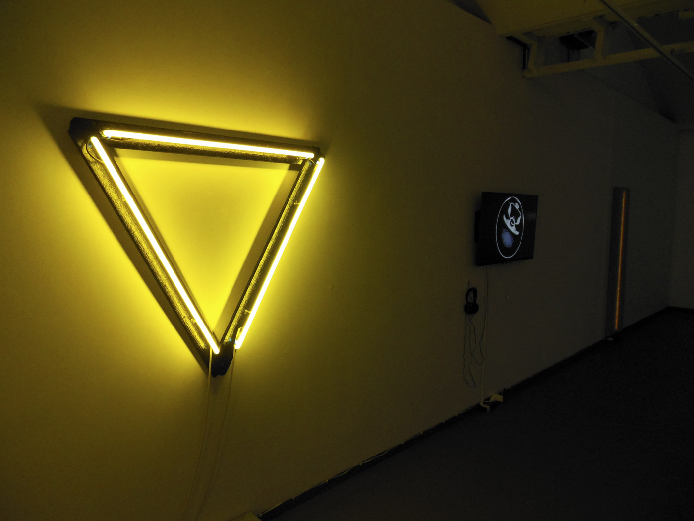
Sam Mitchell-Fin (Australian) I Wish I could tell you, but I can’t find the words (installation view) 2013 Neon + timber Size variable
Ilan El (Australian born Israel, b. 1971) ORA (installation view) 2011 Zenolite front face, RGB LEDs + powder coated mild steel body 4 x 60cm (diameter)
James Tapscott (Australian, b. 1980) Primaries and Secondaries (installation view) 2013 RGB LEDs, perspex, wood 65 x 65 x 65cm
George Angelovski (Australian, b. 1974) LUKAS (installation view) 2012 Remote controlled RGB LEDs + mixed media 100 x 130cm
Laura Lay (Australian) The Established Child Series (installation view) 2013 Acrylic panels with EL wire threads, 4 inverters + plug in adapters 4 x 30 x 30cm
George Angelovski (Australian, b. 1974) LUKAS (installation view) 2012 Remote controlled RGB LEDs + mixed media 100 x 130cm
Many thankx to the Museum for Photography for allowing me to publish the photographs in the posting. Please click on the photographs for a larger version of the image.
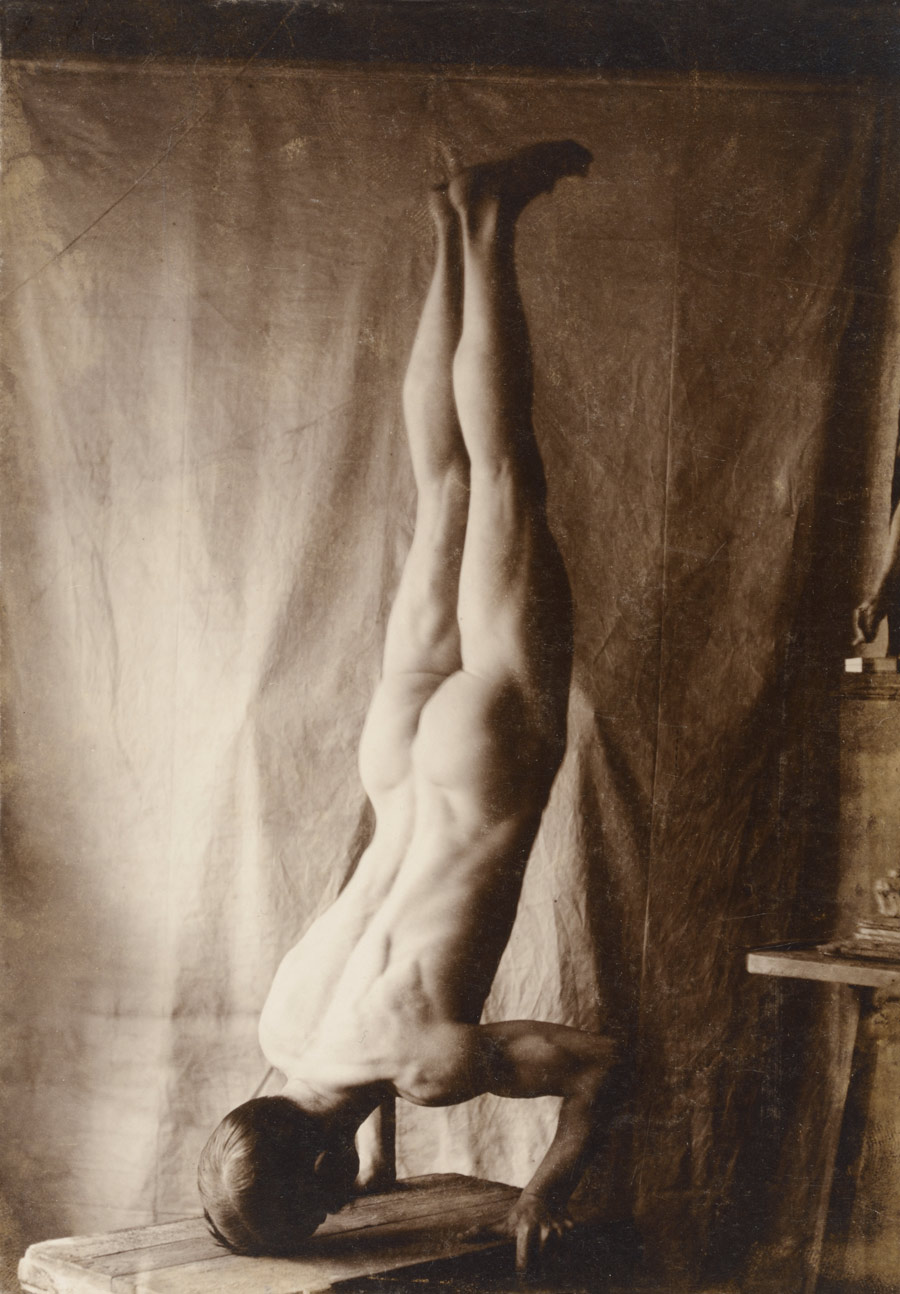
PLEASE NOTE: THIS POSTING CONTAINS ART PHOTOGRAPHS OF MALE AND FEMALE NUDITY – IF YOU DO NOT LIKE PLEASE DO NOT LOOK, FAIR WARNING HAS BEEN GIVEN
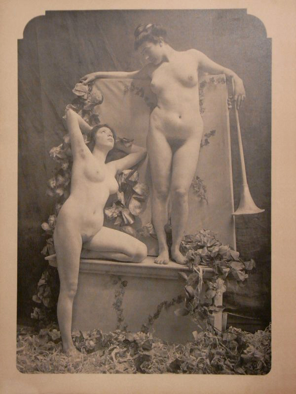
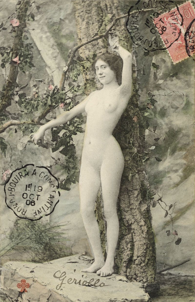
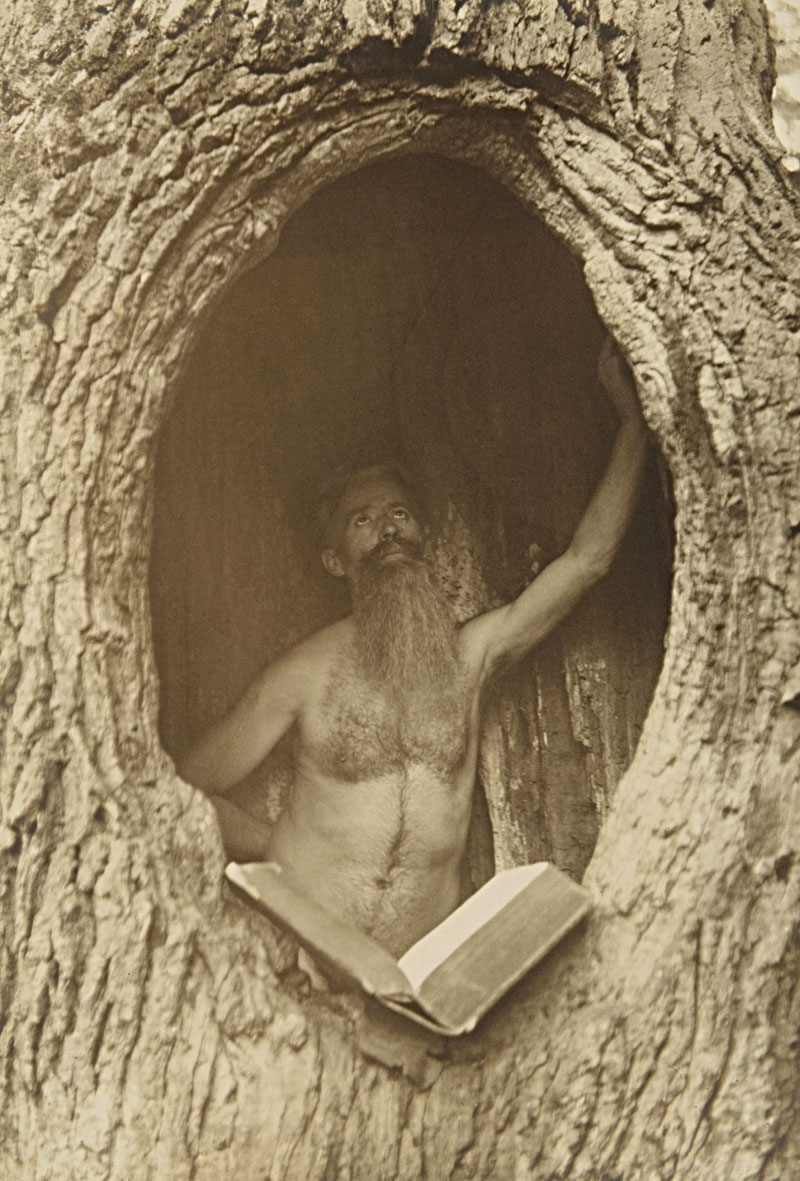
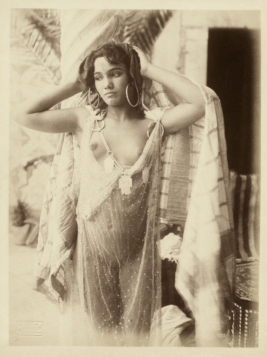
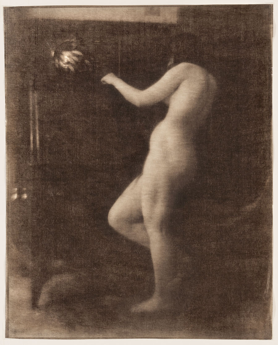
At the dawn of the last century, photographs of nudes could be found everywhere. The exhibition The Naked Truth and More Besides presents the astonishing diversity of photographic depictions of the disrobed human body that existed around this time. It was an age in which the foundations were laid for the development in the public domain of an extremely varied type of image, which, more than any other continues to inform the world in which we live today.
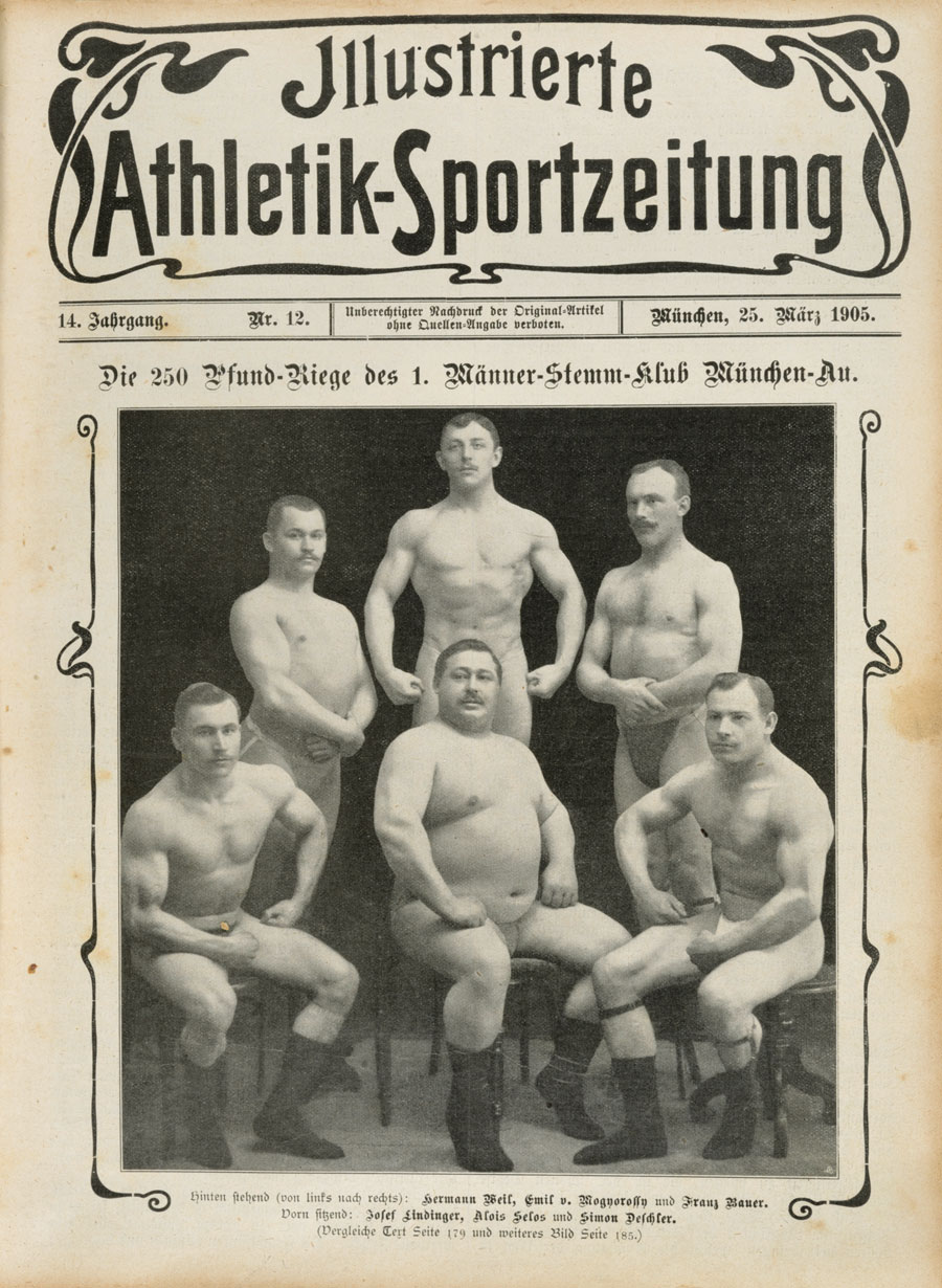
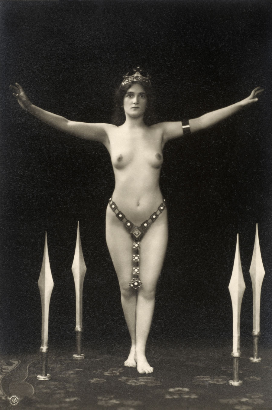
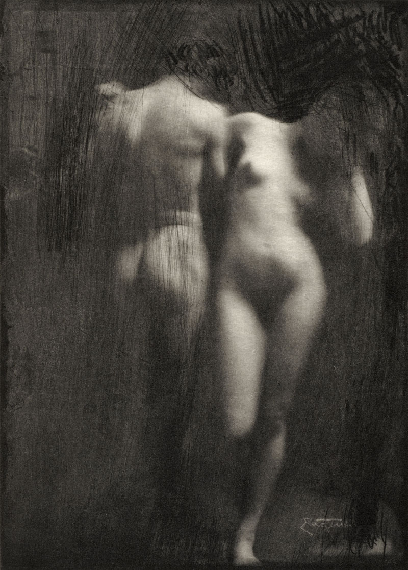
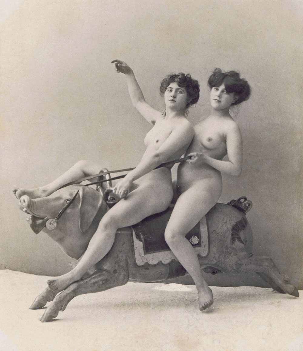
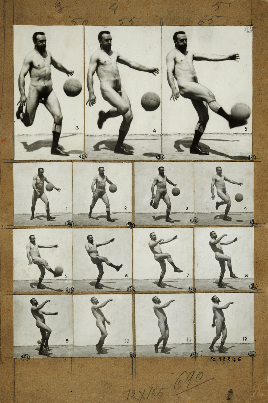
Most striking of all, the photographic nude appeared as a reproducible medium – on postcards, cigarette cards, posters, in magazines and in advertising, as inspiration for artists and an incentive for sportsmen, as instructional material, and as collector’s items. From the vast array of material, it is possible to identify several distinct groups that fall under such headings as: the mass produced, visual pleasures (arcadias, eroticism, and pornography), the body in the eye of science (ethnography, motion study photography, medicine), the cult of the body (reform movements – especially in German-speaking countries – naturism, and staged nudes from the world of sport and variety shows), and, of course, the nude in the artistic context (art academies and the Pictorialist tradition of fine-art prints). The most important characteristic of the image of naked people during this time is the inseparability of nude photographic production and reproduction. The trade or exchange in nude photographs was widespread across the whole of Europe. This is reflected in the exhibition, which not only features many treasures and rare finds from the Kunstbibliothek’s own Collection of Photography, but also includes important loans from several European institutions, ranging from the Bibliothèque nationale de France to the Police Museum of Lower Saxony.
The exhibition
A Commodity Market – The Machinery of the Nude
Since the invention of photography, the unclothed human body has been positioned – sitting, standing and reclining – in front of the camera. Large numbers of nude images, avidly pursued by censors, were in circulation as of the middle of the 19th century. By around 1900 nude photography had broken into the public sphere. Starting in 1880, photographs had become easier to produce and reproduce. They began to flood the market in various printed forms: alongside stereoviews, cartes de visite and single prints, nudes could now be found on postcards, trading cards, autograph cards, posters and in magazines, books and films. Nude photographs were promoted, ordered, sold and sent. They were published for a large audience under the guise of artistic or academic activity, and people’s viewing habits, their gaze on the naked body – their own or someone else’s – began to change. In this process it became clear that photography played a significant role in the marketing of the naked body, but also in people’s self-understanding. Today’s arbitrary use of scantily-clad models to advertise goods is but one phenomenon that continues what was emerging with the visual material of the turn of the 20th century.
“For Artistic Purposes Only” – Model Studies and Photographic Academies
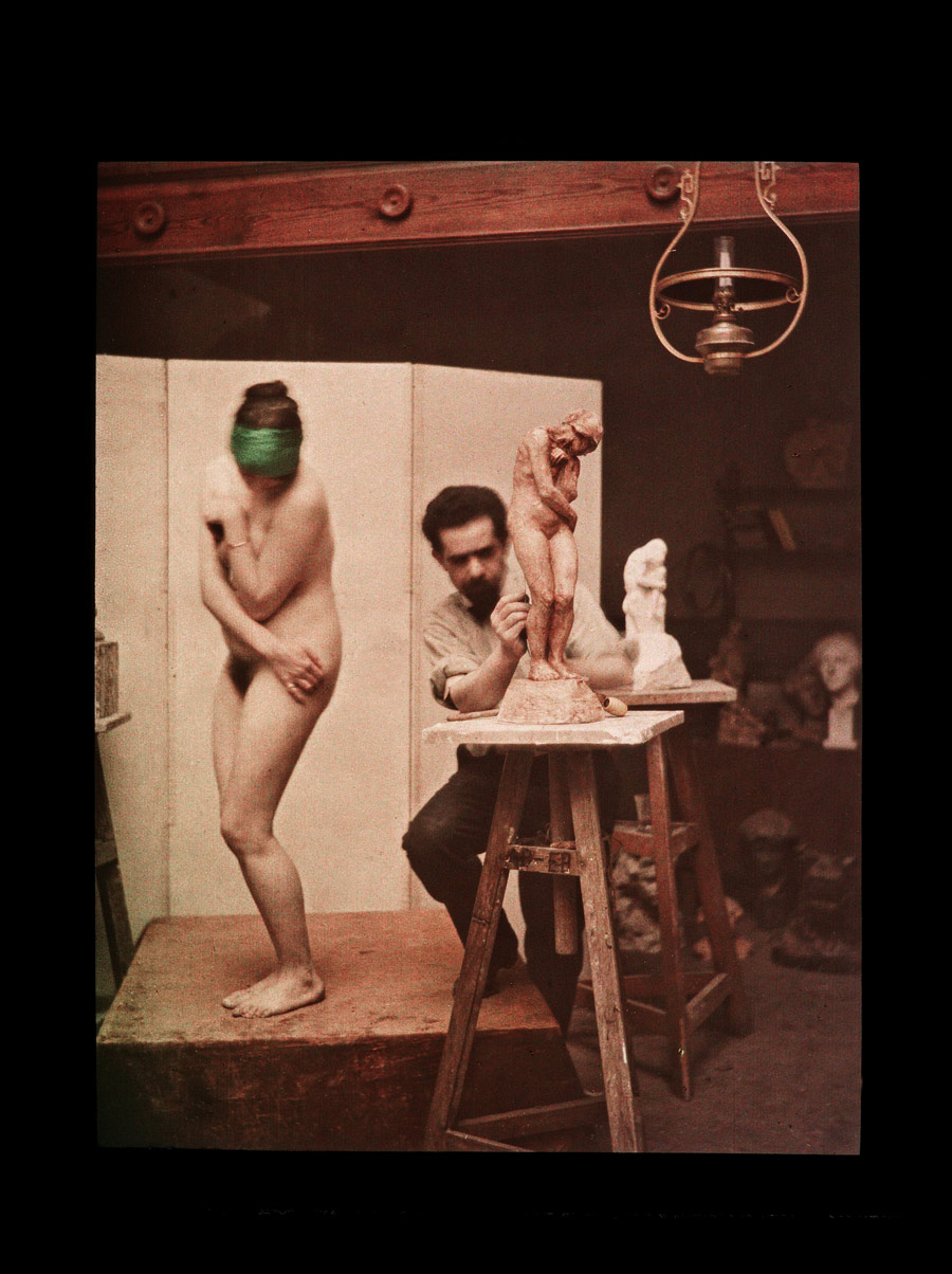
Nude pictures were reaching the public as “photographs after nature.” In the process, the artistic content or the intended use of the photographs was always emphasised. If we were to judge by the quantity of materials said to be produced solely for artists, then the largest professional group around 1900 would have been composed of them. “For artistic purposes only” was the password to uncensored production of nude photography. For many artists, photographic depictions actually did replace calling in live models. Art academies created a reference collection with nude studies. In many cases, works of painting or sculpture can be directly traced back to a particular photograph. Taken in classrooms that tended toward sobriety, most of the poses were borrowed from the art-historical cannon. Countless Venus and Apollo figures, cherubs, Atlases, Horatii, Graces and boys in the classical style populate the portfolios of the period. A practice of child nudes developed in the slipstream of the photographic academies. Ostensibly, these were created to show the angelic innocence of children of all ages. Photographers also documented classes in studios and at academies. Thus we see photographs of entire student groups with their nude model, and there are also fine examples of the triad of artist, model and work.
(Visual) Yearnings – Ideals from Arcadia
The unclothed body was first and foremost an object of erotic associations, and they were rendered by photography in more or less subtle ways. While a large audience enjoyed the Arcadian idylls of Sicily without coming into a conflict with the law, there was likely an even larger public buying the goods “under the table” or only “per order,” potentially becoming guilty of immorality. Under Wilhelm II, male friendships were cherished as pillars of the system. Homosexuality, by contrast, was the subject of heated debate, its reception mixed. With this in mind, the vast array of potentially homoerotic photographs that were produced is revealing.
Wilhelm von Gloeden counts among the best-known practitioners of a kind of nude photography that gave voice to longings for an idyll that was generally Mediterranean or classical in nature. His photographs enjoyed tremendous commercial success around 1900. Numerous fellow photographers, most of them anonymous, began to photograph young and old satyrs, Ephebes, Apollos and shepherd boys and girls, staging the journey to Arcadia for the camera. Their images were published in such places as the first homoerotic magazine Der Eigene alongside poems, prose and essays. At the same time, these nude photographs were added to ethnographic collections (for example as Sicilian folklore), were discussed in the medical context and were used by (body) reformers to communicate an ideal.
Vividly Immoral – Censored and Pornographic Photography
Since the invention of photography, photographs have been produced that are erotic or pornographic in nature. Crude or more sophisticated fashions, fantasies, means of distribution and censorship changed depending on the period. Around 1900, censorship in Germany generally went hand in hand with the so-called Lex Heinze, a newly added paragraph that forbade public exhibition of material classified as immoral. When enforced, the censorship effort resulted in the impounding by police of thousands of images from individual distribution businesses and studios. But in the face of the new, ever-growing production of nude photographs, the aim of gaining the upper hand over the flood of images was destined to fail.
Material from private collections is rare today but it would have been found in a large number of ordinary households. Aficionados put together albums in which they showed their predilections using a combination of photographs, drawings or caricatures, and sometimes writing. Even the police kept an exemplary inventory of nude photography which they collected in albums. In Germany there remains only the album from the Police Museum of Lower Saxony, whose large format, elaborately stamped leather binding, and careful arrangement of the diverse material make it clear just how significant nude photography was to the guardians of the law, too.
“The photographic plate is the retina of scholars” – The Nude Body in Science
A great number of scientific fields made use of photography in their systematic mapping out of the visible world. The naked body was measured, compared and assessed. Norms were defined and aberrations shown. The new, photographically mediated consciousness of physical constitutions made itself felt in the way people saw themselves and their contemporaries. But the seeming objectivity of the medium also abetted discriminatory views. The photography of movement played a particular role in the photographic experiments that sought to describe and unravel the human body in all its aspects. Special devices were used to record the consecutive positions of motor activities. In addition to movement in everyday life and in sports, photographers also documented freely invented movement and movement resulting from disease. Eadweard Muybridge and Ottomar Anschütz together with Albert Londe count among the best-known representatives of the photographic anatomy study and the systematic recording of movement.
Using special equipment, photographers provided physicians with illustrations of diseases and physical ailments. Image material was gathered on a regular basis and used in medical research and teaching. The often highly suggestive visual language of the time is also reflected in scientific publications. Many of the diagnostic findings and display formats from around 1900 seem outdated today.
When photography became more compatible with travelling, ethnographers brought back to Europe a large number of photographs of the sometimes unclothed inhabitants of colonies they were visiting and exploring. And as the ethnographic nude became more pervasive, posing for the camera became more common. Postures and props were modelled on recognised artworks as well as ideas about foreign cultures that were prevalent in Europe. Photographic comparisons were designed to emphasise particular characteristics of ethnic groups or body types: here, technical tricks, such as using different lighting, backgrounds and poses, came into play. This kind of image material fuelled chauvinist and racist delusions, which became widely published.
“Naked People – a Cheerful Future” – Nude Photography and the Cult of the Body around 1900
At the turn of the century, questions about the body were quickly gaining in importance. Were corsets desirable? The photographs of corset marks on naked female bodies argue against them. What good was exercise? Photographs of trained naked bodies documented the benefits. What did a normal person look like, and what did the ideal body look like? With nude photography printed in numerous magazines and books, people began to develop an eye for these matters. With more and more images becoming available, people became more discerning when it came to their body versus foreign bodies. The body could be compared and evaluated. Ideals spread through powerful imagery and gained an increasing influence on individual body culture.
During the reform movement people, especially those in the German Empire, were drawn to the open air. They enjoyed so-called light baths, whose benefits were discussed at length and proven with photographs. An emerging nudism used photography to demonstrate a deliberately relaxed association with one another. Scantily clad or unclothed, stars soon had their pictures taken onstage, becoming famous when their images were used in advertising and turned into items of mass distribution. Their postcards and cartes de visite were precursors of the pin-up. Several of these images bring to mind hippies of the 1960s and ’70s. Yet, among the nudists of the turn of the century were also publishers such as Richard Ungewitter, whose racist theories, based in folk identity, lent decidedly ideological undertones to the nude images they used in their argumentation.
Passions of Art Photography – Pictorialist Nudes
Beginning in the 1890s many photographers sought to elevate their craft to the status of art with the aid of particular printing techniques and strategies of image creation. Nude photography, certainly a pleasurable pastime for such ambitious art photographers as the so-called Pictorialists, produced a wide variety of motifs. In the prestigious magazine Camera Work, Alfred Stieglitz published a vast number of such images, including works by Robert Demachy, Constant Puyo, Heinrich Kühn, Annie Brigman and Edward Steichen. Among the Pictorialist nudes are expressive mise-en-scenes, some of them self-portraits of the photographers, whose subject matter was by turns poetic and symbolic. Besides this work, there certainly are images that are conventionally pleasant or academic and that stand out from the common material mostly due to their high print quality. Their pictorial techniques serve an atmosphere of everything from playful coquetry to dramatic religiousness. As the clearly preferred pose of wrestlers was that of a poet or thinker, Auguste Rodin’s sculpture The Thinker can be seen as bringing together the aesthetics of sculpture, Pictorialism and athlete photography.
Press release from the Museum of Photography website
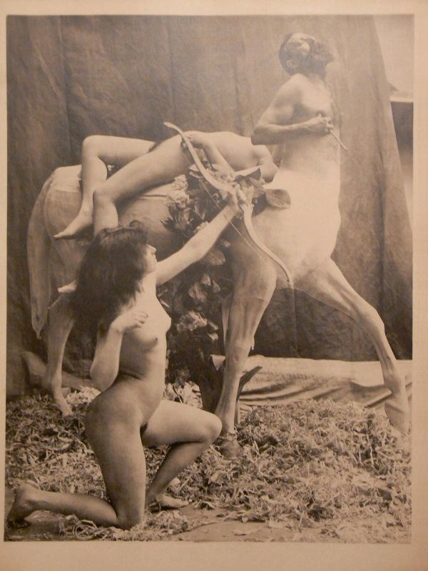
Emile Bayard (French, 1837-1891) Untitled From The Aesthetic Nude No. 34 1903
Emile Bayard (French, 1837-1891) Untitled From The Aesthetic Nude No. 34 1903
How many artfully-draped centaurs, bacchantes, and nymphs does it take to make a dirty magazine? Only one early 20th-century periodical has the answer: The Aesthetic Nude (Le Nu Esthétique)… Illustrated entirely with unclothed models enacting quasi-mythological imagery, the covers alone range from a rapturous Leda and the Swan to a centaur’s semi-consensual abduction of a nymph (above). Inside each issue appear even more views of studio models in increasingly far-fetched poses, all of which were ostensibly meant to supplant the live model in studio practice. It’s not clear that anyone ever copied these compositions in paint, but the effort that went into cutting out the photos in lively shapes, and the publication’s run of several years (c. 1902-06), suggests a market existed for it!
These ‘aesthetic nudes’ beg the question of what constituted nudity, as opposed to nakedness in the late 19th and early 20th century. Was it simply the academic and mythological guise that made these images acceptable, even collectible?
Text from the ARTicle, Art Institute of Chicago blog [Online] Cited 08/08/2013
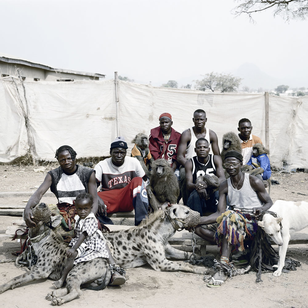
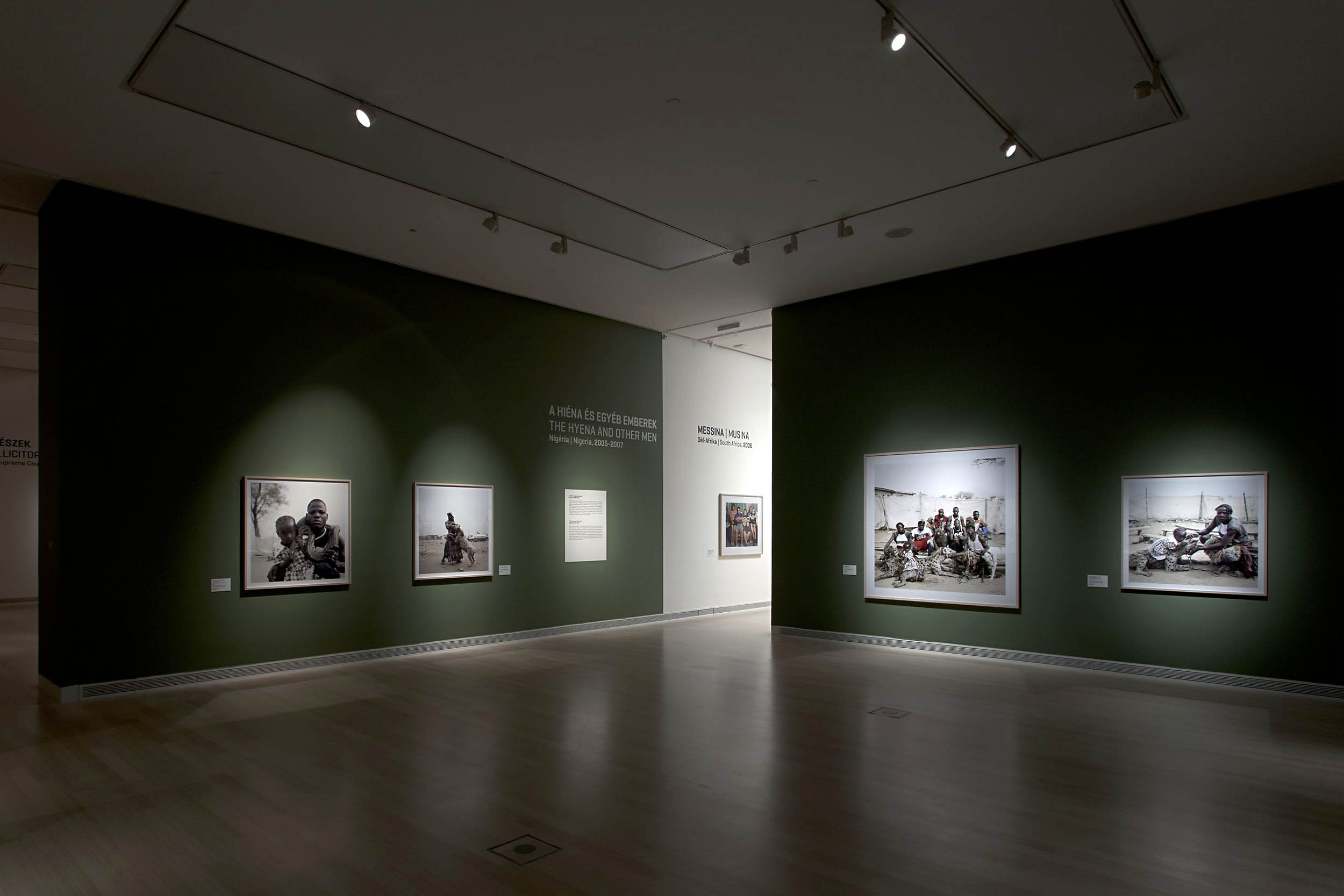
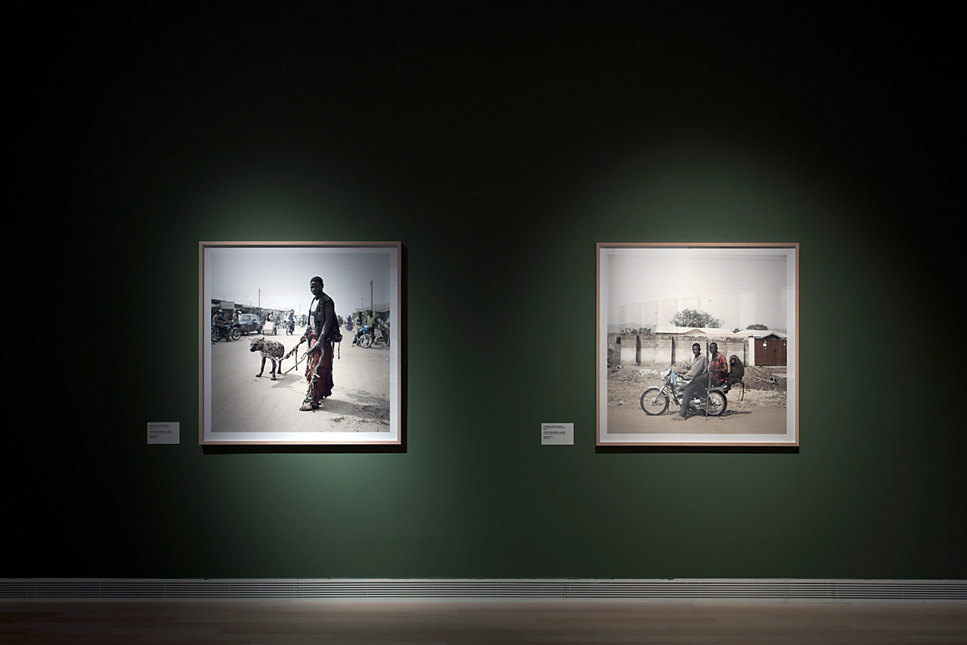
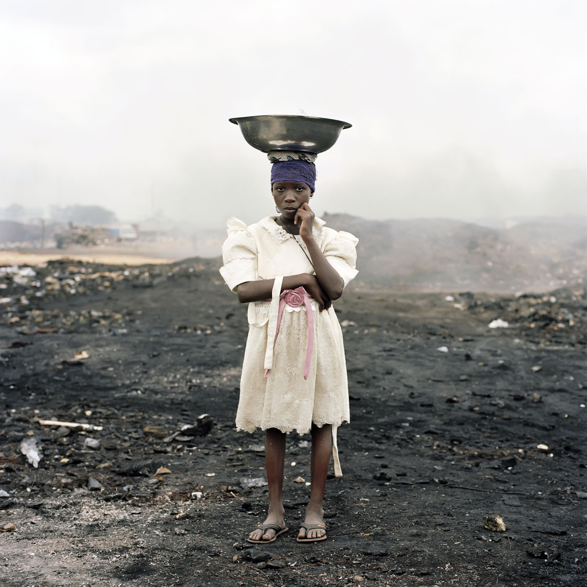
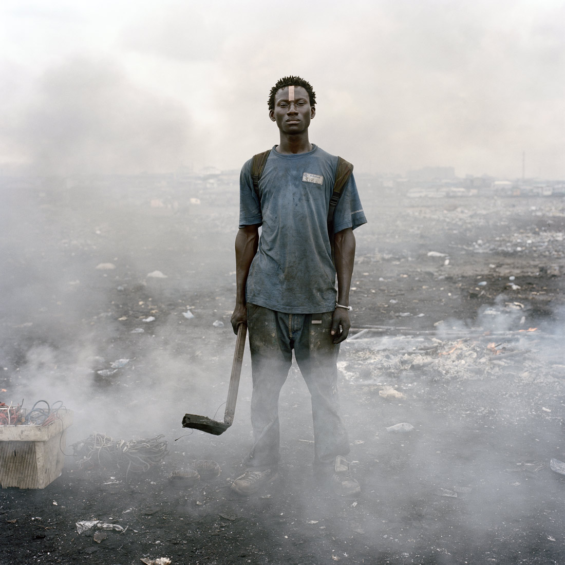
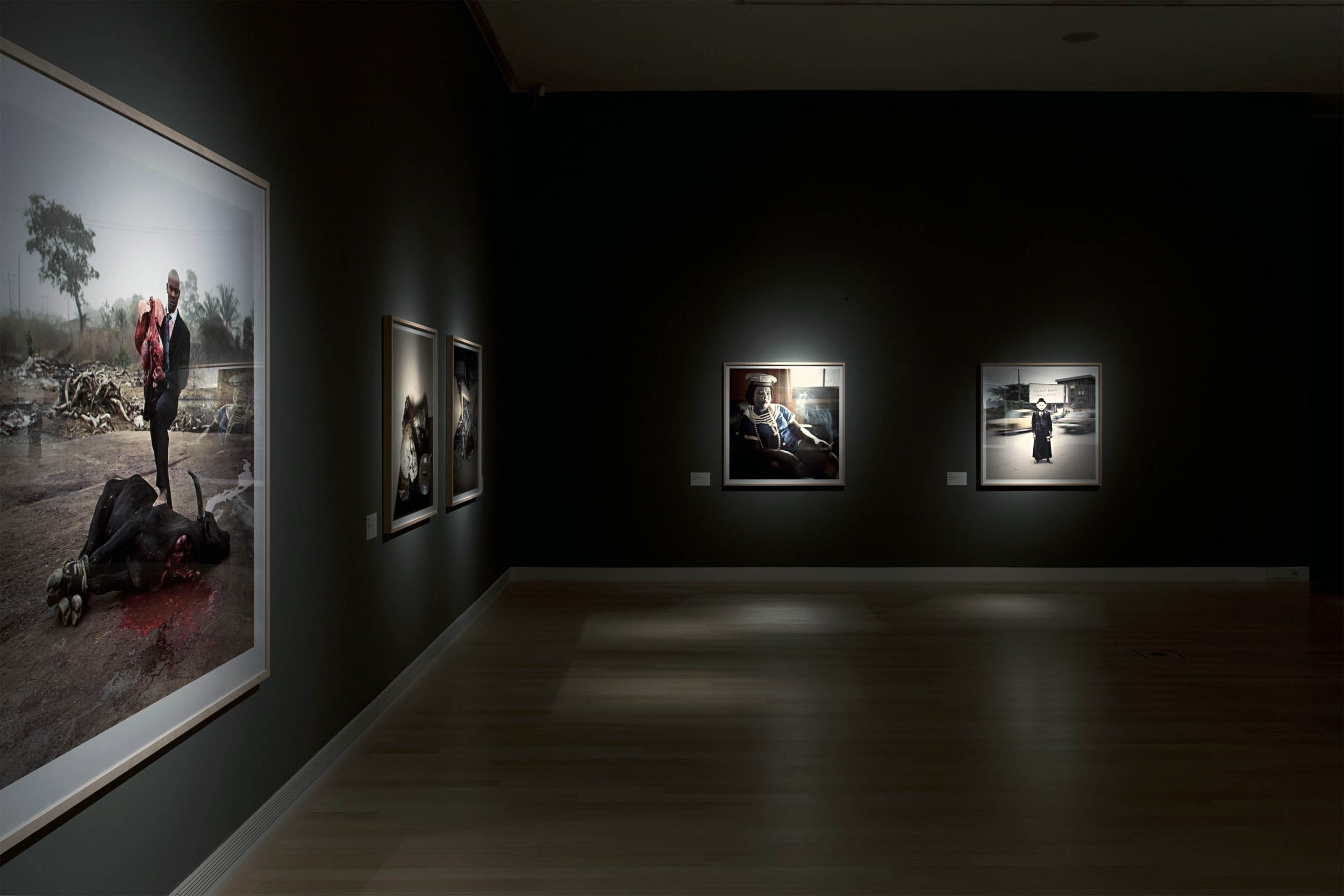
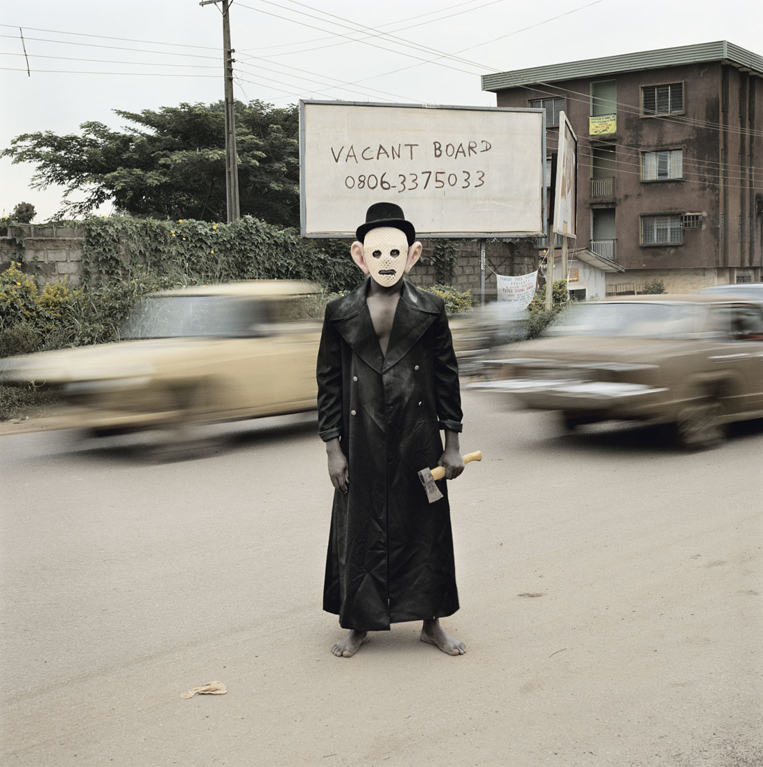
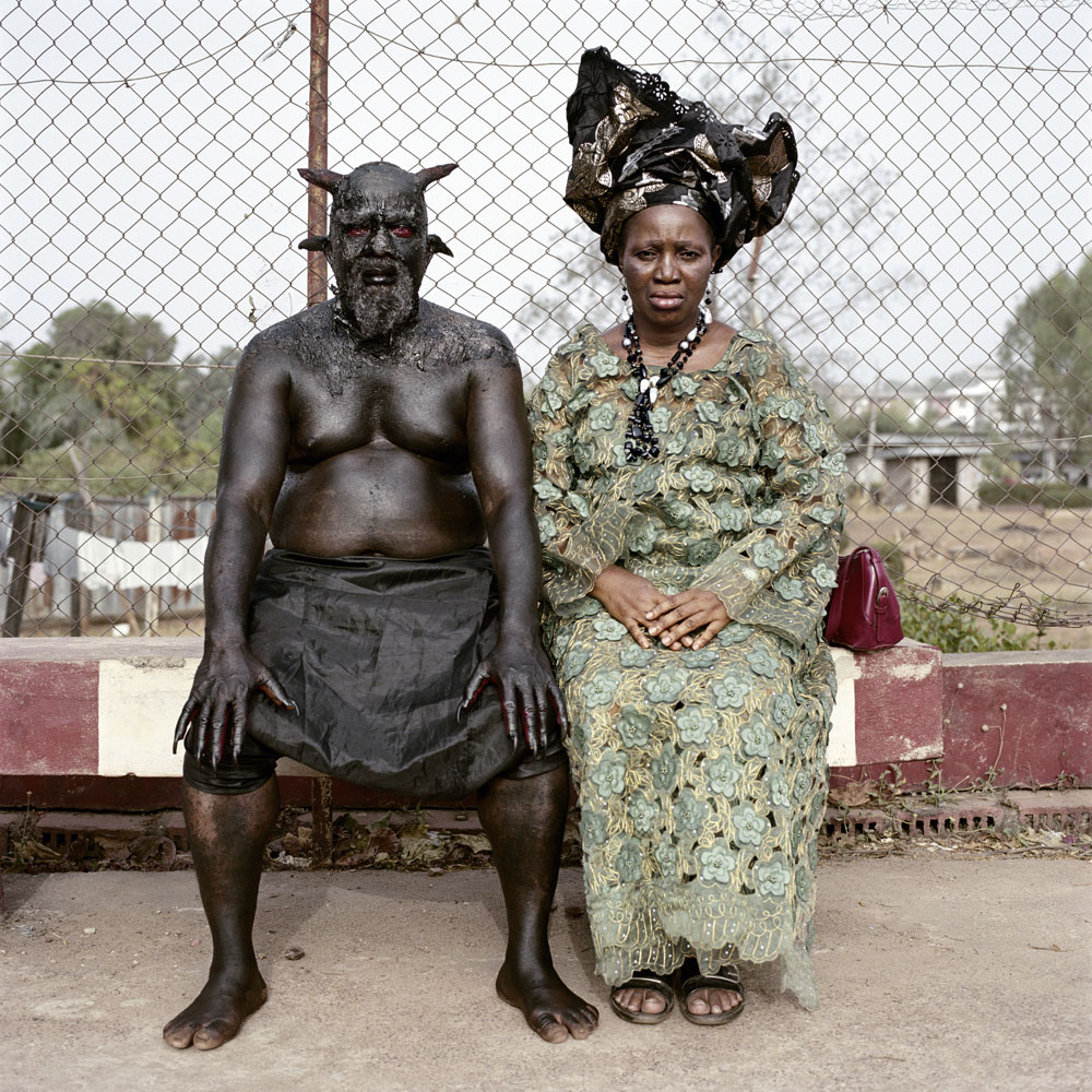
I have not seen enough of the other series of Pieter Hugo to make an informed decision, but work from the The Hyena & Other Men (2005-2007) and Permanent Error (2009-2010) series, the most often reproduced, is certainly strong. Whether I am fully convinced by his singular frontality is another matter…
Dr Marcus Bunyan
Many thankx to the Ludwig Museum of Contemporary Art for allowing me to publish the photographs in the posting. Please click on the photographs for a larger version of the image.
The hyena men are itinerants: they never spend more than two days anywhere. I found them in a shanty town near Abuja, the capital. Despite the language barrier we got to know each other pretty quickly. Outside of Lagos and Port Harcourt, I didn’t see a single white person in Nigeria. So I probably seemed as odd to them as a guy walking a hyena in the street seemed to me.
We smoked some weed to break the ice. It turned out they weren’t debt collectors – they were more like town criers, traditional storytellers who performed in the streets and sold potions after their shows. It reminded me of stories I’d read about eastern European circus troupes in the 1930s – except instead of bears, these guys had hyenas, baboons and pythons.
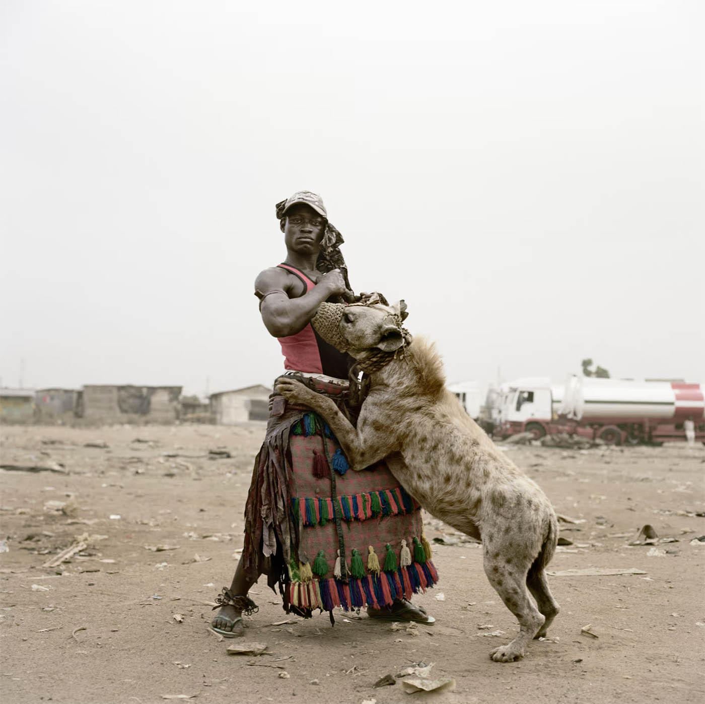
Seeing them perform was unforgettable. It was a huge spectacle. They would beat drums to draw in the crowds, then take the muzzles off the hyenas. Next they’d put their arms and even their heads between the animals’ jaws. The aim was to convince the audience they had special powers, and that the audience could acquire them too, if they bought their potions.
At first I tried photographing the street shows, but there was just too much going on. Then I realised that the relationship between man and beast was more interesting than all the fireworks of the performance. There was something very strange going on between the guys and the hyenas, bordering on sadomasochism. These animals had been taken out of the wild as pups. They couldn’t return. They were entirely dependent on these guys for food. And these men were dependent on the animals for their livelihoods. They needed each other, but it wasn’t an easy symbiosis. …
I love how confrontational this shot is. At no point did I tell him how to pose. It’s all him. He flexed his bicep, stared straight at me, while his hyena jumped all over him. Then in the background, there’s this kind of Mad Max landscape strewn with broken-down trucks, though you can hardly see them because of the light. It was Harmattan season, a time between November and March when the sands of the Sahara blow over western Africa creating this murky, diffused lighting, which I love. It’s a simple shot with an incredible economy. I wish I could take more like it.
Interview by Edward Siddons. “Pieter Hugo’s best photograph: the hyena men of Nigeria,” on the Guardian website Thursday 19 Jul 2018 [Online] Cited 09/07/2024. Used under fair use conditions for the purposes of education and research
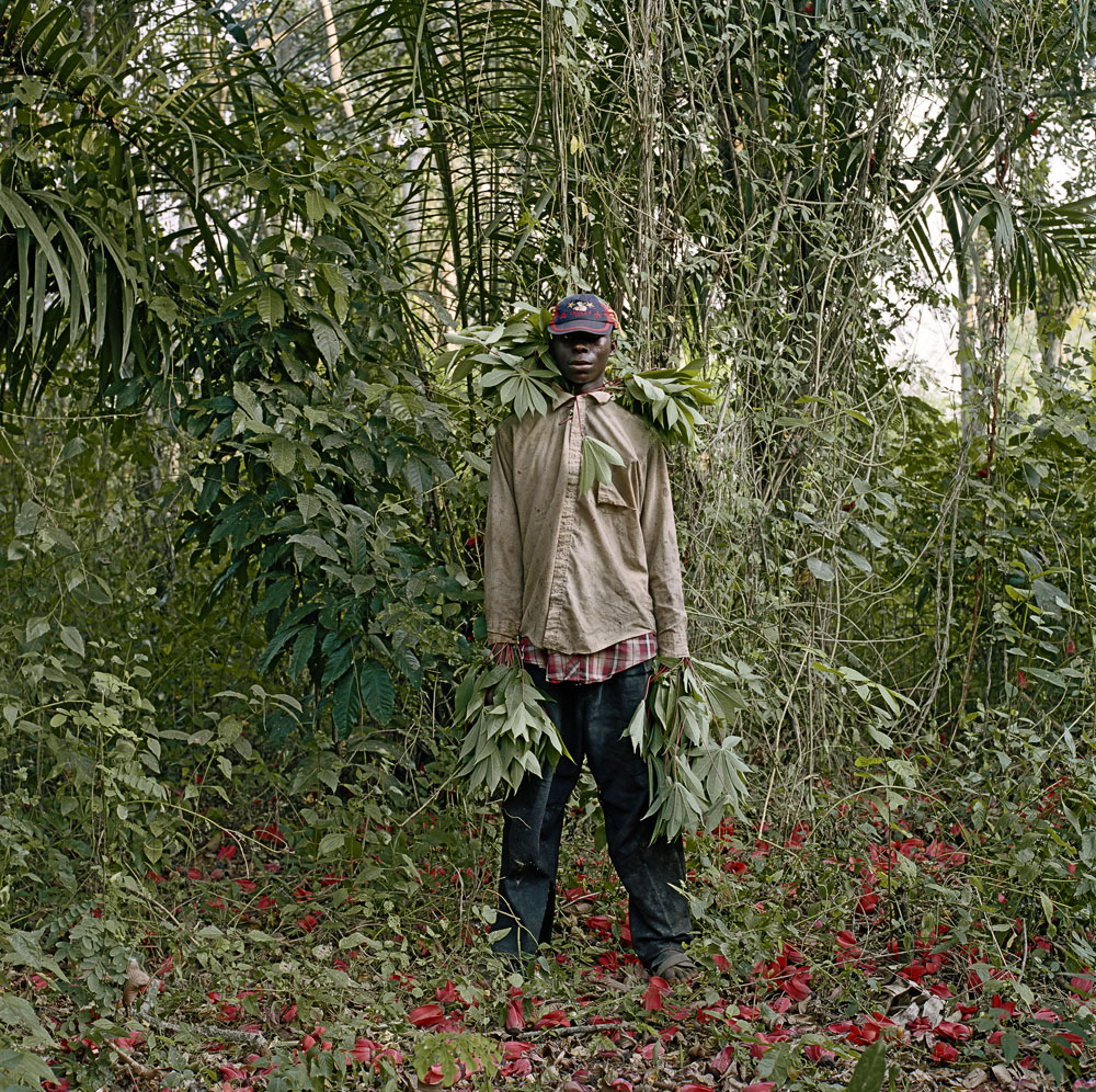
Pieter Hugo’s (b. Johannesburg, 1976) career is quite young, yet his photography is already so comprehensive that we can rightly speak of a consistent oeuvre. Since 2003 Hugo has photographed people and themes exclusively in sub-Saharan Africa. Daily life in post-colonial Africa, the complex conditions after the end of apartheid in his own land and the impact of global trade and commerce are themes that circulate throughout his intriguing series.
Pieter Hugo spends long periods of time photographing his extensive series in order to capture intimate and often bizarre moments. His use of a large-format camera requires patience and trust between photographer and subject, which is visible in straightforward expressions and candid interactions. There is a moment of calm and even timelessness in these works that allows the viewer to engage more fully with the subject matter.
The political diversity of a continent that is rapidly transforming – some note that Africa will be a global economic power of the future – is portrayed by Pieter Hugo with the clarity of familiar painting genres such as landscape, portraiture, group portraiture and still life. The subjects of his photography: the elderly, the poor, the blind, street artists, soap actors, close family and friends – form a social tableau that is at once personalised while also presenting a more universal image of Africa at the beginning of the twenty first century.
The initial motivation for the series The Hyena & Other Men (2005-2007) comes from a cell phone camera image Pieter Hugo discovered on the internet. The image concerns a group of performers who travel throughout Nigeria with tamed hyenas and other wild animals and collect money from their choreographed public performances. Hugo embarked on two separate trips to document this remarkable nomadic group up close. Hugo presents the complex relationship between animal and owner, capturing moments of calm and tenderness amidst situations full of drama and spectacle.
The Agbogbloshie market on the outskirts of Accra (Ghana) is the thematic of the Permanent Error series (2009-2010), which is mainly a dumping site for the technological waste of the western world. Here computers and other electronic equipment are collected and burned by inhabitants, often children, to extract precious raw materials. These machines formerly representing prosperity and progress are here transformed into only noxious and life threatening vapours. The charred ground, grey sky and scattered groups of foragers and cattle seem isolated from the world, but are in fact one of the last links in a chain of global commerce. Despite the harsh surroundings, the subjects stand tall, identified by full name and framed in the style of classical portraiture.
Nollywood (2008-2009) is the third largest film industry in the world, releasing between 500 and 1,000 movies each year. It produces movies on its own terms, telling stories that appeal to and reflect the lives of its public: it is a rare instance of self-representation on such a scale in Africa. The continent has a rich tradition of story-telling that has been expressed abundantly through oral and written fiction, but has never been conveyed through the popular media before. Stars are local actors; plots confront the public with familiar situations of romance, comedy, witchcraft, bribery, prostitution. The narrative is overdramatic, deprived of happy endings, tragic. The aesthetic is loud, violent, excessive; nothing is said, everything is shouted.
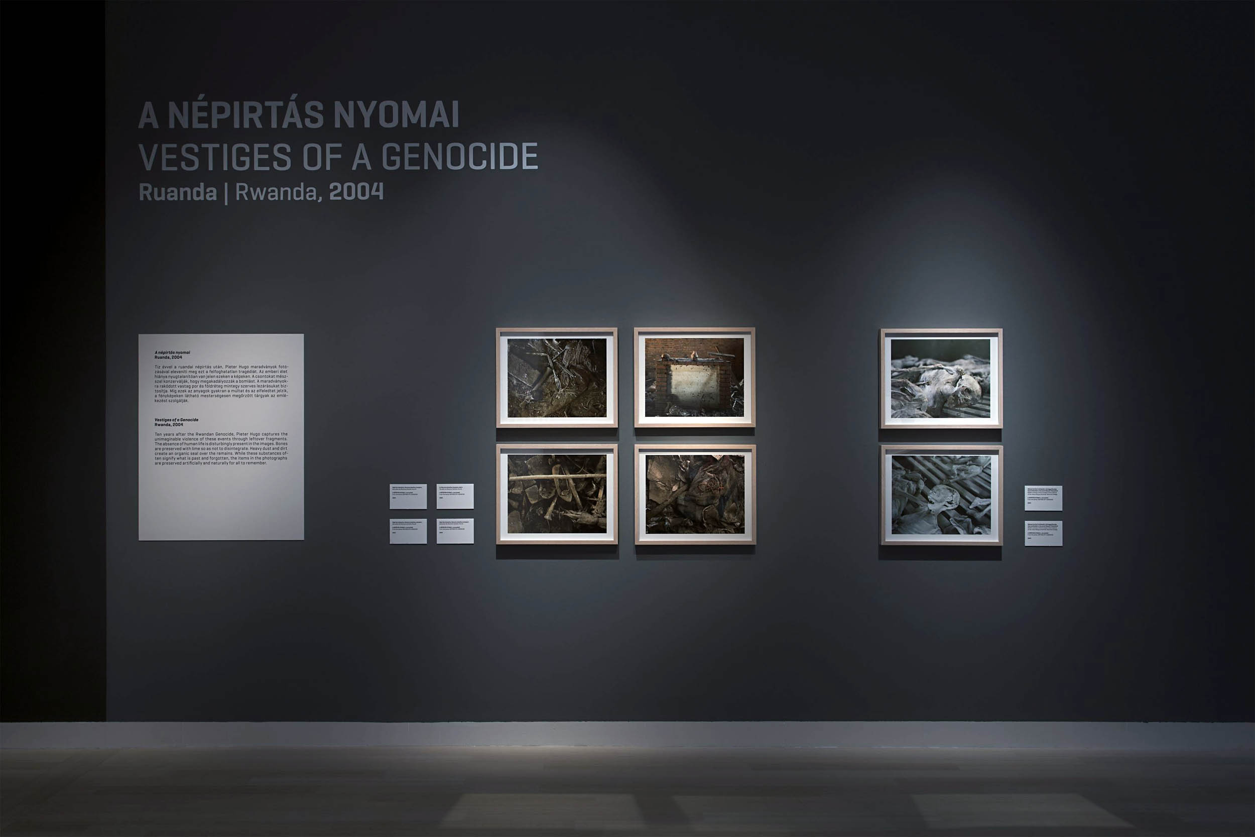
At a morgue in the township of Khayelitsha in Cape Town, Pieter Hugo turns his camera to individuals who have died of AIDS related illnesses. In The Bereaved (2005) as with many of his other series, Hugo gives first and last names of his subjects. Such a personal statement challenges the anonymity of AIDS statistics in South Africa. Ten years after the Rwandan Genocide, Pieter Hugo captures the unimaginable violence of these events through leftover fragments (Vestiges of a Genocide, 2004). The absence of human life is disturbingly present in the images. Bones are preserved with lime so as not to disintegrate. Heavy dust and dirt create an organic seal over the remains. While these substances often signify what is past and forgotten, the items in the photographs are preserved artificially and naturally for all to remember.
The series entitled Messina / Musina (2006) deals with the inhabitants of a small town on the border of Zimbabwe in South Africa’s Limpopo Province. The title reflects the correction of an earlier colonial misspelling of the town’s name (Messina), as well as the transition taking place at this geographical and social periphery.
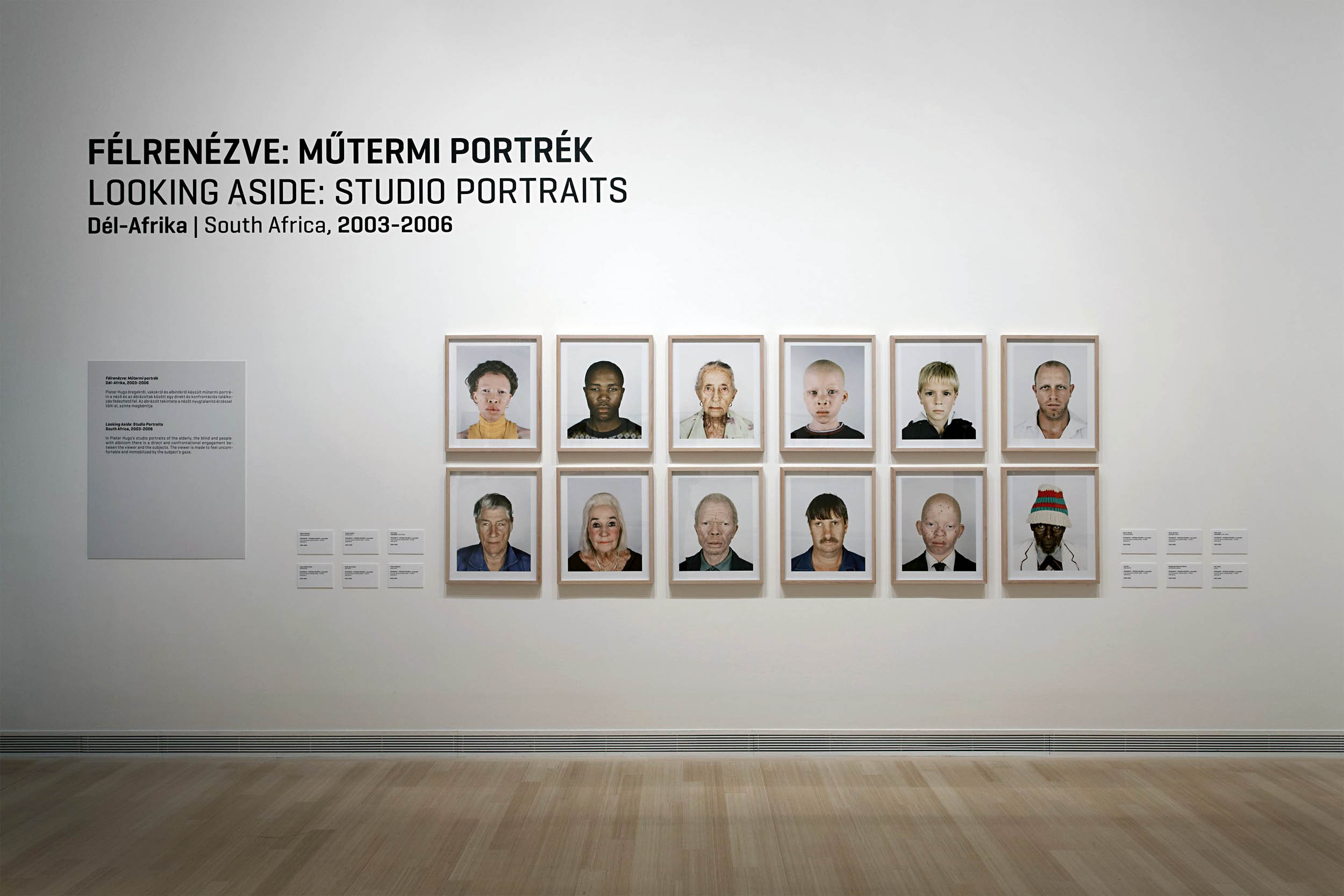
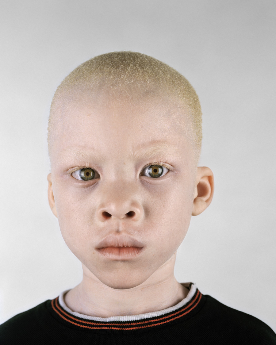
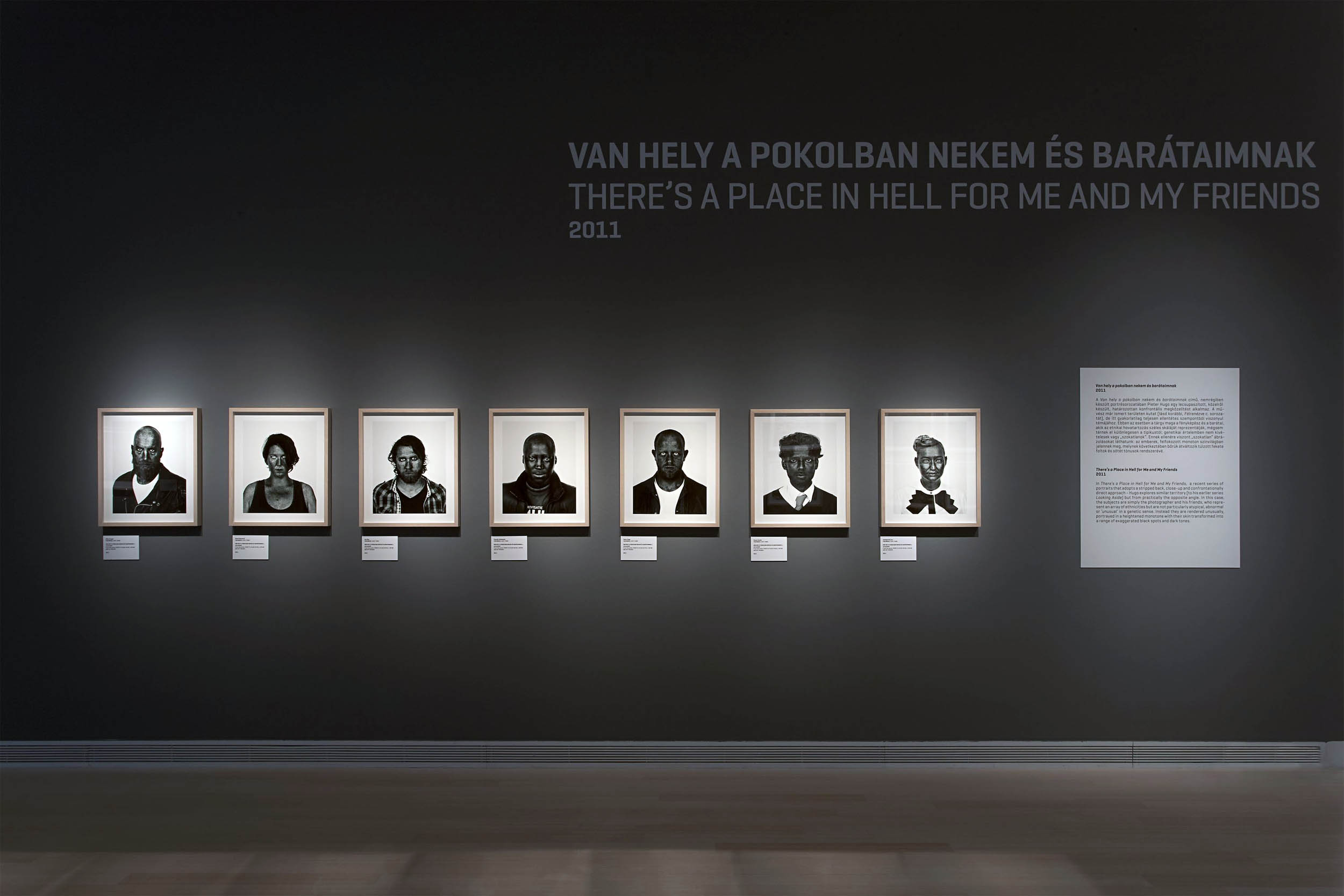
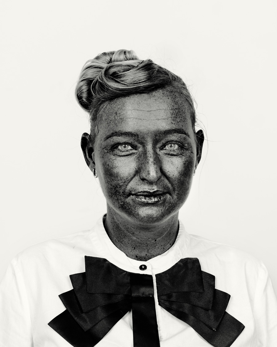
In Pieter Hugo’s studio portraits of the elderly, the blind and people with albinism – Looking Aside, 2003-2006 – there is a direct and confrontational engagement between the viewer and the subjects. The viewer is made to feel uncomfortable and immobilised by the subject’s gaze. In There’s a Place in Hell for Me and My Friends (2011) – a recent series of portraits realised in the same spirit and adopting a stripped back, close-up and confrontationally direct approach – Hugo explores similar territory [to his earlier series Looking Aside] but from practically the opposite angle. In this case, the subjects are simply the photographer and his friends, who represent an array of ethnicities but are not particularly atypical, abnormal or ‘unusual’ in a genetic sense. Instead they are rendered unusually, portrayed in a heightened monotone with their skin transformed into a range of exaggerated black spots and dark tones.
With Kin (2011), his most autobiographical series to date, Pieter Hugo reflects on his own family and deep ambivalence towards the notion of home. Personal moments such as the pregnancy of his wife, the birth of their child and an operation of his mother are interspersed with national icons: open landscapes, anthropological museums and references to historical places and figures in South Africa. The recent and historical, private and public, rich and poor, ugly and beautiful interact closely in this series and represent the social complexities of post-apartheid South Africa.
Press release from the Ludwig Museum of Contemporary Art website
Ten years after the Rwandan Genocide, Pieter Hugo captures the unimaginable violence of these evens through leftover fragments. The absence of human life is disturbingly person in the images. Bones are preserved with lime so as not to disintegrate. Heavy dust and dirt create an organic seal over the remains. While these substances often signify what is past and forgotten, the items in the photographs are preserved artificially and naturally for all to remember.
In Pieter Hugo’s studio portraits of the elderly, the blind and people with albinism there is a direct and confrontational engagement between the viewer and the subjects. The viewer is made to feel uncomfortable and immobilised by the subject’s gaze.
In There’s a Place in Hell for Me and My Friends, a recent series of portraits that adopts a stripped back, close-up confrontationally direct approach – Hugo explores similar territory (to his earlier series Looking Aside, above) but from practically the opposite angle. In this case the subjects are simply the photographer and his friends, who represent an array of ethnicities but are not particularly atypical, abnormal or ‘unusual’ in a genetic sense. Instead they are rendered unusually, portrayed in a heightened monotone with their skin transformed into a range of exaggerated black spots and dark tones.
Andrew Follows (Australian, d. 2019) Density invitation 2013
density n.
the degree of optical opacity of a medium or material, as of a photographic negative; thickness of consistency; complexity of structure or content.
I welcome all friends to the opening of the first exhibition I have curated since the completion of my Master of Art Curatorship at the University of Melbourne.
You are cordially invited to the opening of Density, a solo exhibition of photographs by Andrew Follows on Saturday 31st August 3.30 – 5pm at The Anita Traverso Gallery, 7 Albert Street Richmond, Victoria.
The works premiered in this exhibition are the culmination of a mentorship between Dr Marcus Bunyan and Andrew Follows, supported by Arts Access Victoria as part of the Boost Pathways Program.
“Curated by Dr Marcus Bunyan, the concept of Density was envisaged as a point of departure to explore the manifold variations and subsequent ruminations on the term as it relates to Follows’ perspective. As a technical descriptive, density explains the degree of optical opacity within a photographic negative. Portions of film that have been exposed to greater amounts of light yield a greater deposit of reduced silver. This is referred to as having a higher density than areas of shadow. Density also denotes a thickness of consistency and many of Follows’ works exhibit a complexity of compositional structure and content that elucidates the nature of Follows’ perception.”
Anna Briers. “The Mind’s Eye: Density in the Work of Andrew Follows.” Catalogue essay 2013
Curator: Dr Marcus Bunyan Guest Speaker: 4pm Dr Jondi Keane, Senior Lecturer Deakin University Artists Floor Talk: 3pm Saturday 7 September Preview from Tuesday 27 August Exhibition until Saturday 21 September Gallery Hours Wed-Sat 11-5 + by appointment
The Opening will be Auslan Interpreted and the exhibition will be Audio Described.
Please click on the images below for a larger version.
Andrew Follows (Australian, d. 2019) Density invitation 2013
Andrew Follows (Australian, d. 2019) Density catalogue cover 2013
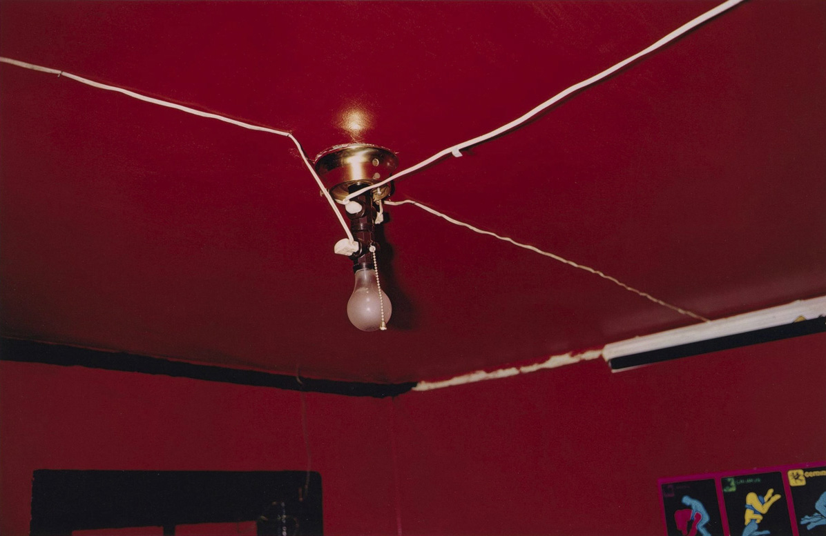
Eggleston photographs the obvious with such candour and vigour that simple things become something more: almost interior statements of his mind evidenced in the physicality of the photograph. He may be at war with the obvious, but these are complex thoughts told in simple, eloquent ways. They are only obvious if you know how to look for them.
The peaches thrown on the roof, the rusted speculum of ‘Wonder Bread’, the turned up shoes; the use of foreshortening, the low positioning of the camera (looking up or across at ground level), the formalism of colour, the light.
Eggleston understands the essence of each scene he photographs perfectly. The child’s eye-level view of the tricycle emphasising its gigantism will always be a favourite, as will the abstract expressionist colour field of Untitled (Greenwood, Mississippi) (1980, below). As with any virtuoso artist, Eggleston controls the tonality and mood of compositions beautifully: a case in point is Untitled (Memphis) (c. 1972, below) which will always remind me of a piece of Mozart piano music. It took me a while when I was growing up to like Mozart (as a concert pianist I loved the romantics such as Chopin and Debussy), but when you finally understand all the nuances contained in his music, when you finally grow to love him, you are just so full of admiration for his achievement.
Dr Marcus Bunyan
Many thankx to The Metropolitan Museum of Art for allowing me to publish the photographs in the posting. Please click on the photographs for a larger version of the image.
The American photographer William Eggleston (born 1939) emerged in the early 1960s as a pioneer of modern colour photography. Now, 50 years later, he is arguably its greatest exemplar. At War with the Obvious: Photographs by William Eggleston at The Metropolitan Museum of Art presents the work of this idiosyncratic artist, whose influences are drawn from disparate if surprisingly complementary sources – from Walker Evans and Henri Cartier-Bresson in photography to Bach and late Baroque music. Many of Eggleston’s most recognised photographs are lush studies of the social and physical landscape found in the Mississippi delta region that is his home. From this base, the artist explores the awesome and, at times, the raw visual poetics of the American vernacular.
The exhibition celebrates the fall 2012 acquisition of 36 dye transfer prints by Eggleston that dramatically expanded the Metropolitan Museum’s collection of this major American artist’s work. It added the entire suite of Eggleston’s remarkable first portfolio of colour photographs, 14 Pictures (1974), 15 superb prints from his landmark book, William Eggleston’s Guide (1976), and seven other key photographs that span his career.
Eggleston wrote that he was “at war with the obvious,” a statement well-represented in works such as Untitled [Peaches!] (1970) – a roadside snapshot of rocks and half-eaten fruit thrown atop a sunlit corrugated tin roof capped with a sign announcing “PEACHES!” The exhibition features a number of the artist’s signature images, including Untitled [Greenwood, Mississippi] (1980), a study that takes full advantage of the chromatic intensity of the dye-transfer colour process that, until Eggleston appropriated it in the 1960s, had been used primarily by commercial photographers for advertising product photography; and Untitled [Memphis] (1970), an iconic study of a child’s tricycle seen from below. It was the cover image of the artist’s seminal book William Eggleston’s Guide, which accompanied his landmark show at the Museum of Modern Art in 1976.
As much as Eggleston was influenced by various sources, he, too, has proved influential. His inventive photographs of commonplace subjects now endure as touchstones for generations of artists, musicians, and filmmakers from Nan Goldin to David Byrne, the Coen brothers, and David Lynch.
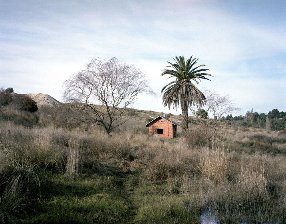
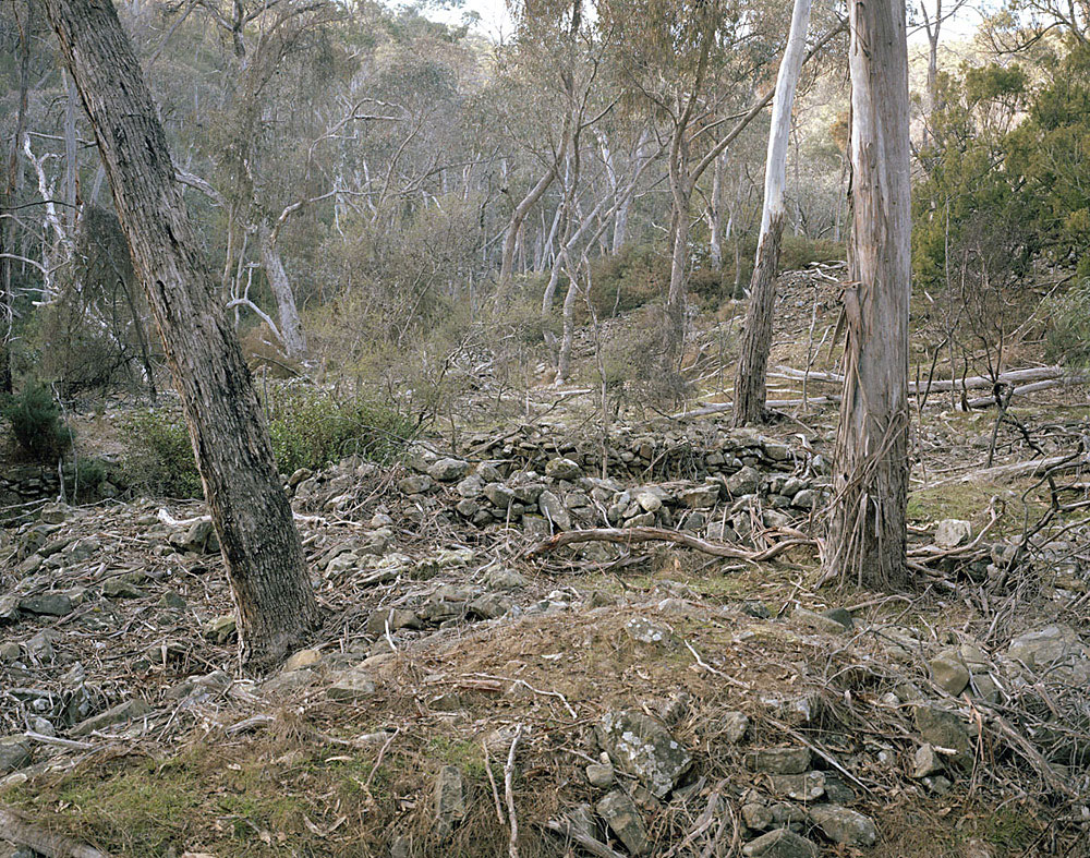
Jessie Boylan (Australian, b. 1986) Clunes (Cottage) 2013 From the series Fourteen Ounces Hahnemuhle Photo Rag 80cm x 60cm Edition 10 +2AP
“… the work itself – which describes various traces of industry and built history amid the expanses of rural and outback Australia – is of a much subtler cadence. These works are more a collection of scattered traces and silent armatures that sit within the vastness of the Australian landscape… While Koenning’s spacious works picture the rusted tractors and empty gain silos of dried-out farming communities and desert towns, Boylan’s images of Victorian forests and mining country have a more claustrophobic feel. In each case. the stories and traces prove elusive and assumed. It is a powerful allegory for Australia… As far as I know whispers of tacit, embedded history – of small echoes amid a vast land.”
Dan Rule “In the Galleries,” in The Saturday Age, July 13, 2013, p. 7.
There are some interesting visual elements to this exhibition by Katrin Koenning and Jessie Boylan at The Colour Factory Gallery but ultimately these elements do not add up to a satisfying whole.
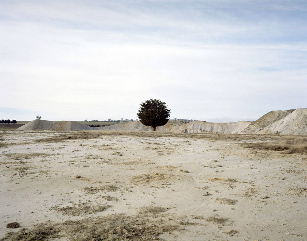
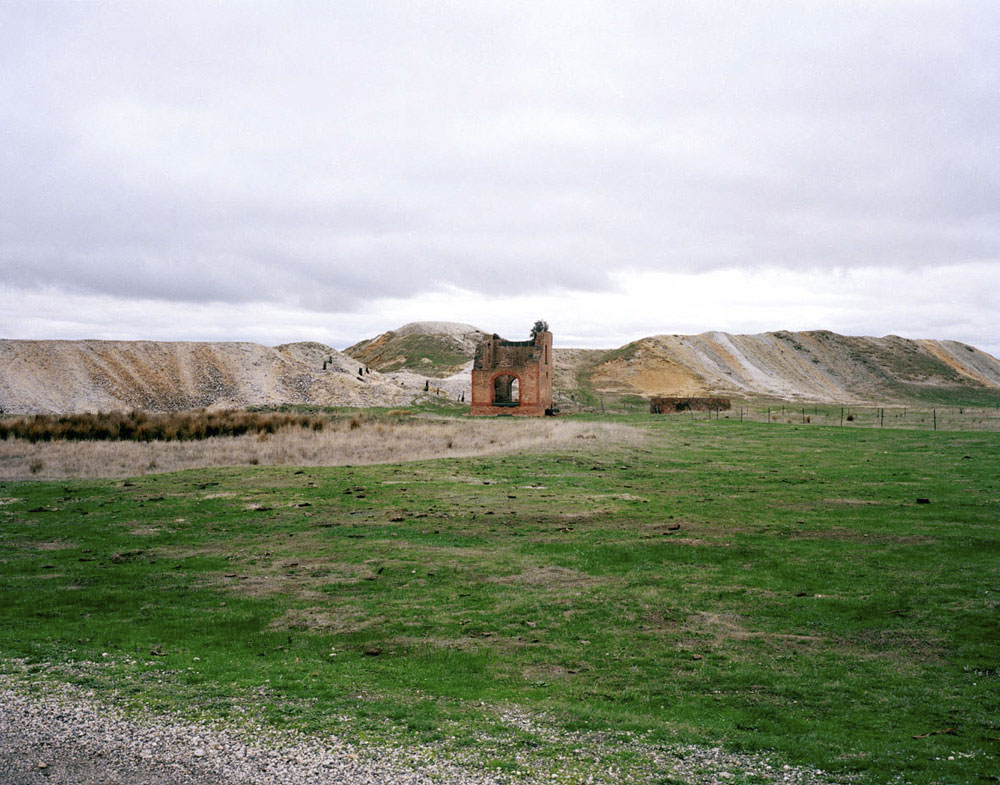
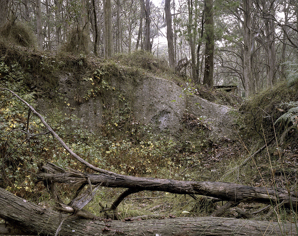
Boylan’s images are well seen and the artist makes the environment within the pictorial plane seem much bigger than the space the photograph occupies, almost cinematic in their scope. However, the artist relies too heavily on the single tree or structure to hold the centre of the image, whilst placing the horizon line all to regularly half way up the image (see the 1, 2, 3, 4, and yes 5 images below). Even in the dense bush scenes there is a horizon line in the middle of the image, mentally blocking the viewer from any imaginative engagement with the landscape.
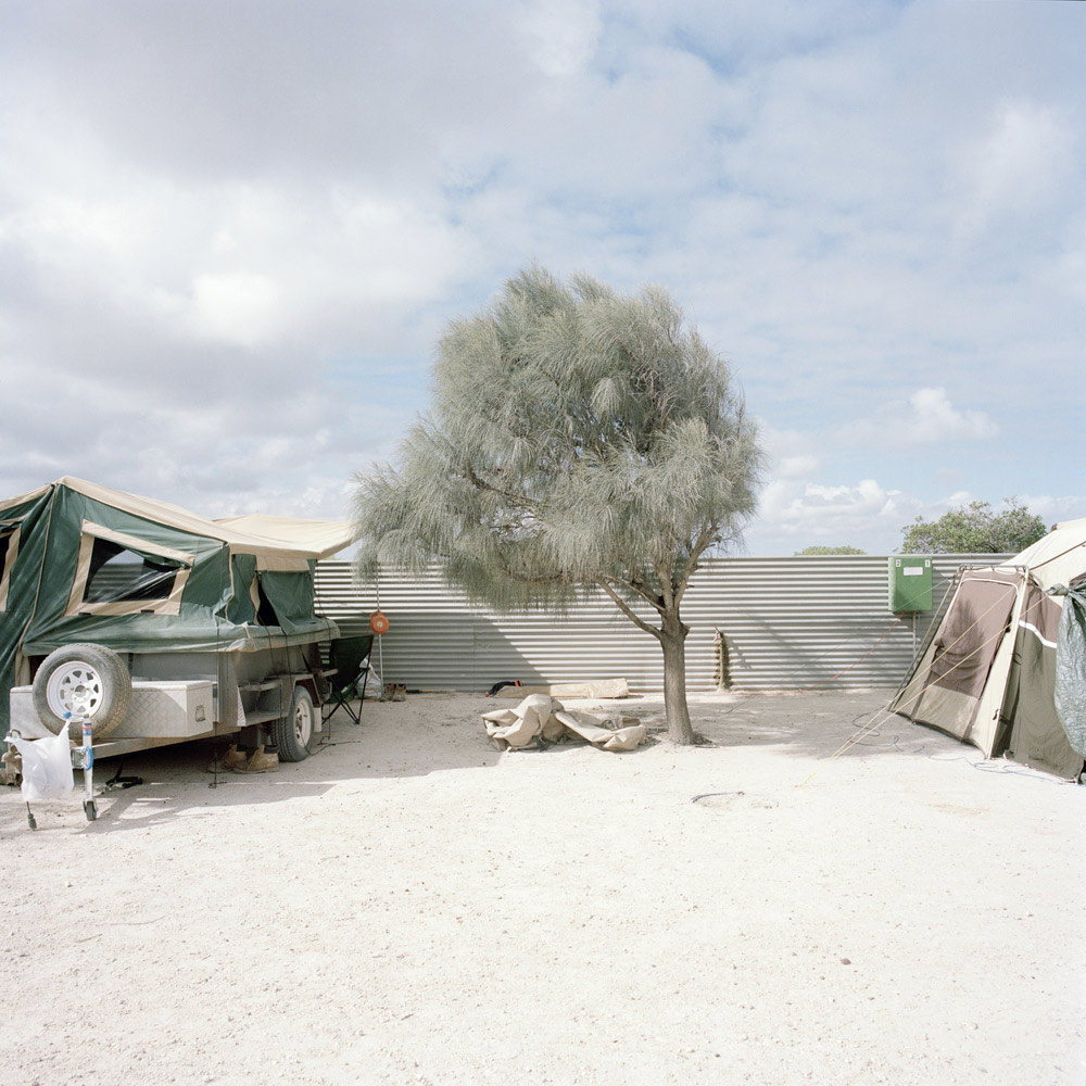
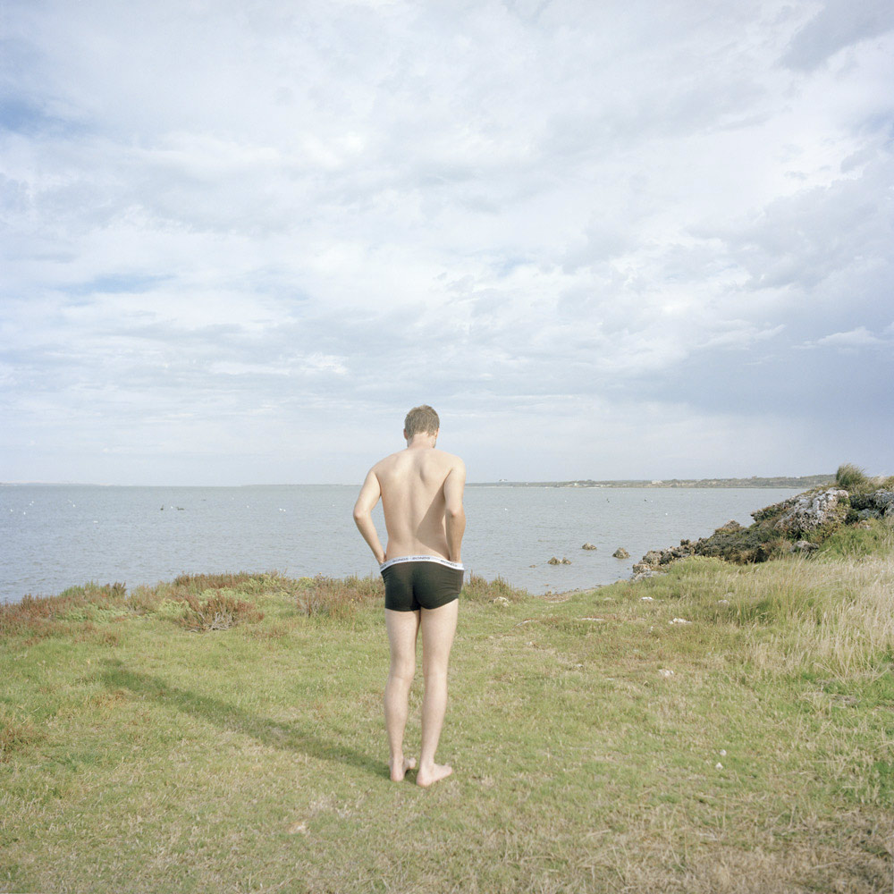
Koenning’s photographs evidence the bleached sunlight of rural Australia with visual elegance, but the artist is much cleverer when she is handling a number of elements within the picture plane (for example, see her series Transit), instead of being out of her environment and then simplifying the pictorial structure. I have seen so many of this type of photograph. They picture the traces of settlement as the detritus of an ailing economy – of a failed negotiation with the land – through a “Tom Roberts” moment. Surely there is more life, more to life in rural Australia than single trees (is there a theme emerging here?), desolate spaces and people in the mid-foreground with their back to the painter / photographer, staring off into the distance. They might have a presence but there are no possible futures intimated here.
But what really puts the nail in the coffin of this exhibition is the quality of the digital printing.
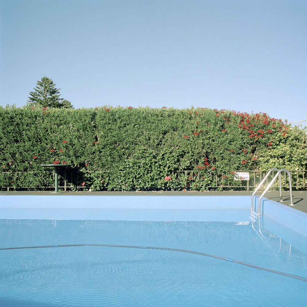
Boylan’s photographs are over saturated in the flesh while Koenning’s photographs are so pale and wane, even in the reproductions, that the print does not HOLD the image. It is one thing to capture the harsh light of rural Australia but when you are printing this light, you must have a STRUCTURE, some base upon which that light can sit in the print. These photographs fail in this regard. It says something when you look at the DL invite to the exhibition and there is the picture of the swimming pool radiant in blue, and then you look at that same photograph in the exhibition which is a pale imitation of the invite. I just wonder what happened in the printing process?
When artist’s used to print their own work in the darkroom they only had themselves to blame for poor printing. Today, photographers are reliant on their relationship with the printer at the digital photo lab, unless they are able to afford thousands of dollars to set up a printing space themselves. To find a good printer and build up a relationship with that person, a person who understands what the artist is trying to achieve in the look and feel of a body of work, takes time and patience. Unfortunately, that chemistry and magic has not happened in this exhibition.
And by the way, none of the photographs in this exhibition were printed at The Colour Factory, just to make that quite clear!
For me, these photographs are not allegories, pictures that can be interpreted to reveal a hidden meaning for what little meaning they have is far to obvious. They are taciturn photographs, reticent, silent of more interesting truths – images that have little new to say which makes me want to look at them less.
Dr Marcus Bunyan
Many thankx to The Colour Factory Gallery for allowing me to publish the photographs in the posting. Please click on the photographs for a larger version of the image.
Jessie Boylan (Australian, b. 1986) Clunes (Tree) 2013 From the series Fourteen Ounces Hahnemuhle Photo Rag 80cm x 60cm Edition 10 +2AP
Jessie Boylan (Australian, b. 1986) Hepburns Clunes Rd 2013 From the series Fourteen Ounces Hahnemuhle Photo Rag 80cm x 60cm Edition 10 +2AP
Jessie Boylan (Australian, b. 1986) Mistletoe Mine #2 2013 From the series Fourteen Ounces Hahnemuhle Photo Rag 80cm x 60cm Edition 10 +2AP
Jessie Boylan (Australian, b. 1986) Amelia Mine #1 2013 From the series Fourteen Ounces Hahnemuhle Photo Rag 80cm x 60cm Edition 10 +2AP
As far as I know…
“Places don’t just have histories – they also have a presence and possible futures” ~ Daniel Palmer
There are limits to what we can know about a place. Its history and memory, somewhat elusive, are always something slightly out of reach. Influenced by individual experience and expectation, understanding and connection to place will always be personal, and what we bring to a place determines how we see it.
Drawing from two different bodies of work, As far as I know is a story of people and place in regional and rural Australia, tracing remnants left behind by the industrial boom. Almost frozen, these traces of past hover in the land, seemingly waiting to be reused and reworked. As far as I know explores passages of time in manufactured, remembered and imaginary Australian landscapes. Contesting the division between the realm of memory and experience, the images study dynamics of landscape, and what this landscape means to us.
Press release from The Colour Factory Gallery website
Katrin Koenning (Australian born Germany, b. 1978) Camp Detail #1, Fowlers Bay 2013 From the series Loraine and the Illusion of Illoura Pigment print 80cm x 80cm Edition 5 +2AP
Katrin Koenning (Australian born Germany, b. 1978) Campsite, Coorong National Park 2013 From the series Loraine and the Illusion of Illoura Pigment print 80cm x 80cm Edition 5 +2AP
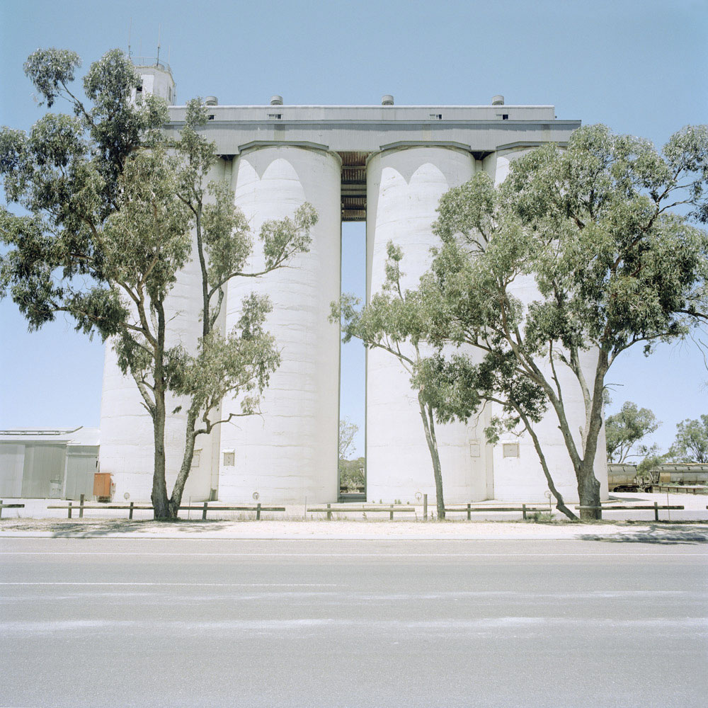
Katrin Koenning (Australian born Germany, b. 1978) Grain Silo, Loch 2013 From the series Loraine and the Illusion of Illoura Pigment print 80cm x 80cm Edition 5 +2AP
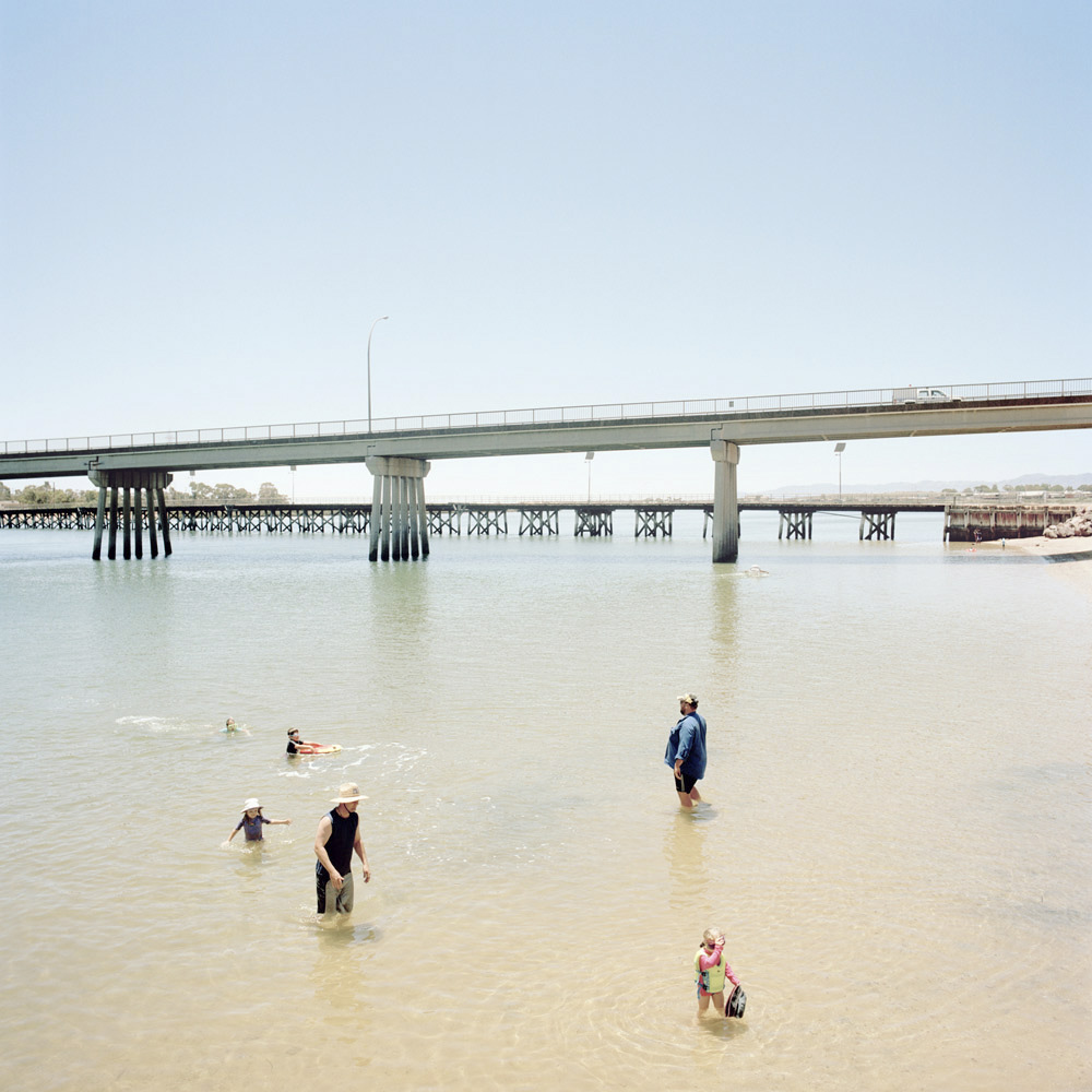
Katrin Koenning (Australian born Germany, b. 1978) 15 Port Augusta Bathers 2013 From the series Loraine and the Illusion of Illoura Pigment print 80cm x 80cm Edition 5 +2AP
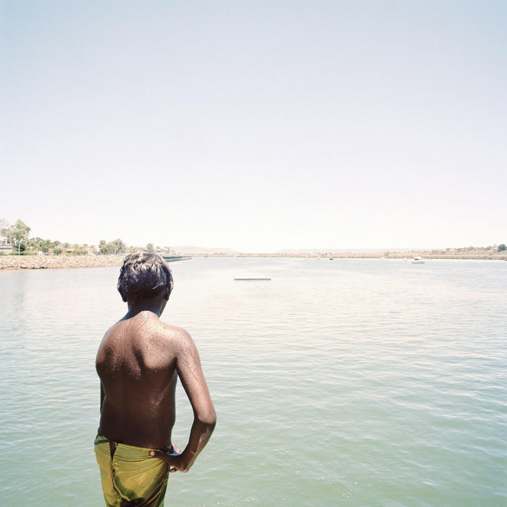
Katrin Koenning (Australian born Germany, b. 1978) Boy #2, Port Augusta Jetty 2013 From the series Loraine and the Illusion of Illoura Pigment print 80cm x 80cm Edition 5 +2AP
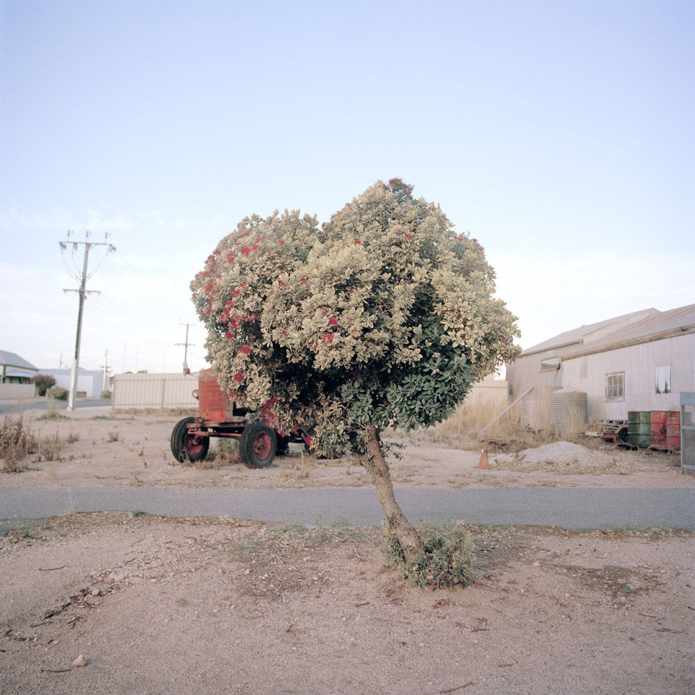
Katrin Koenning (Australian born Germany, b. 1978) Port Victoria Main Street 2013 From the series Loraine and the Illusion of Illoura Pigment print 80cm x 80cm Edition 5 +2AP
Katrin Koenning (Australian born Germany, b. 1978) Pool #2, Whyalla Foreshore Motel 2013 From the series Loraine and the Illusion of Illoura Pigment print 80cm x 80cm Edition 5 +2AP
Anne Ferran (Australian, b. 1949) Agitated thrush 2013 From Box of Birds series Pigment print 72 x 48cm Editions of 5 + 2AP
tar·ant·ism [tar-uhn-tiz-uhm] noun a mania characterised by an uncontrollable impulse to dance, especially as prevalent in southern Italy from the 15th to the 17th century, popularly attributed to the bite of the tarantula.
I have never been a great fan of Anne Ferran’s exhumations. Her digging into the ground of history and restoring, reviving (after neglect or a period of forgetting) traces of life and bringing them into light (through photography) – bringing them back to light – has resulted in images that are paradoxically pretty, lifeless. For example, photographs of patches of grass in Lost to Worlds (2008) are given great import as contemporary evidence of the site of a female convict prison, near the small village of Ross, Tasmania as Ferran, “continues to play with the invisibility of this specific history, using large-scale photographs to show what little remains today, and to collectively reflect on the difficulty of grasping a ruined and fragmented past.”
And… so… what else?
These photographs really mean very little, another example of an artist picking at the scab of history to what end, what purpose, other than to dig up deleted histories that are past their use by date. Move on, move on, nothing to see here!
And there is literally nothing to see, except patches of grass that are given import by the contextualisation of the artist, the “look at this, I think it is important because I have seen it, because I have researched it, because I am an artist, because I am aware” – when the interrogation actually means very little. It is like the prevalence of contemporary photographs of empty, abandoned spaces – abandoned petrol stations, hospitals, insane asylums – that are supposed to impart great poetry and narrative to the spaces. Ruin porn as Dan Rule termed it recently.
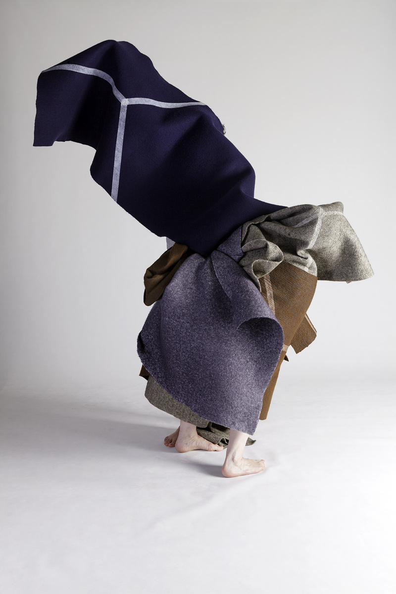
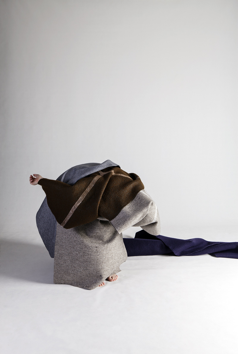
Thankfully, these latest photographs are of a different taxonomic order. They are vital, alive, full of swirling tarantism that beautifully expresses the trapped energy that Ferran saw in a 1940s photographic archive of 38 unidentified women who were patients of a Sydney psychiatric hospital. In their formalist abstraction the artist has perfectly captured the unquiet spirit of the women and – here is the crux of the matter for me – these photographs allow me to go further into the subject, they take me to a different place and don’t just leave me on the surface of the image / history.
They speak to me, they n/trance in multiple ways like little of Ferran’s work has done before for I feel this work, this hidden narrative, in the artist’s performative shaping of reality. Suddenly these women, trapped in a space (of the photograph, of the archive) and place (of the hospital), can spread their wings and anonymously, metaphorically, shake their feathers (their spirit) with declamatory enthusiasm.
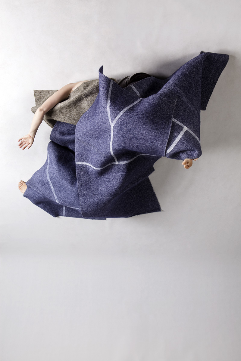
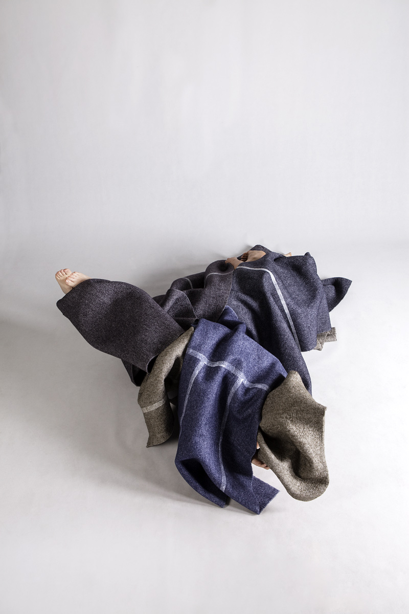
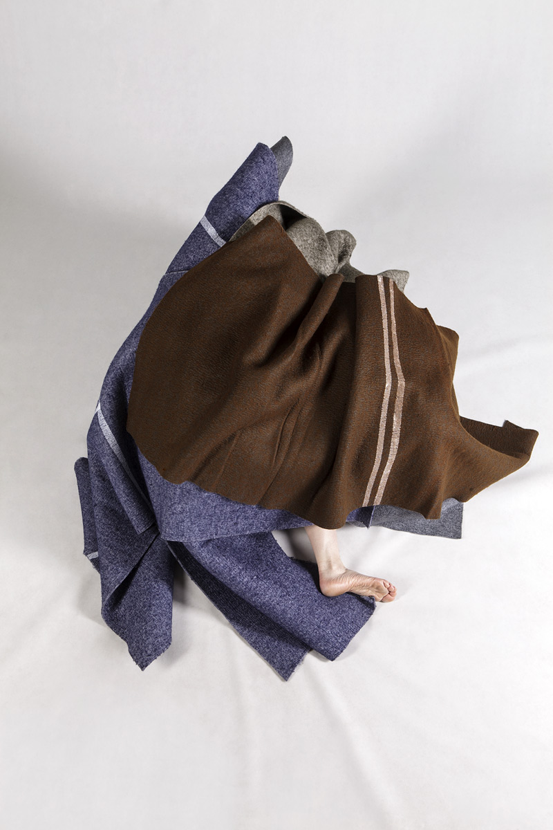
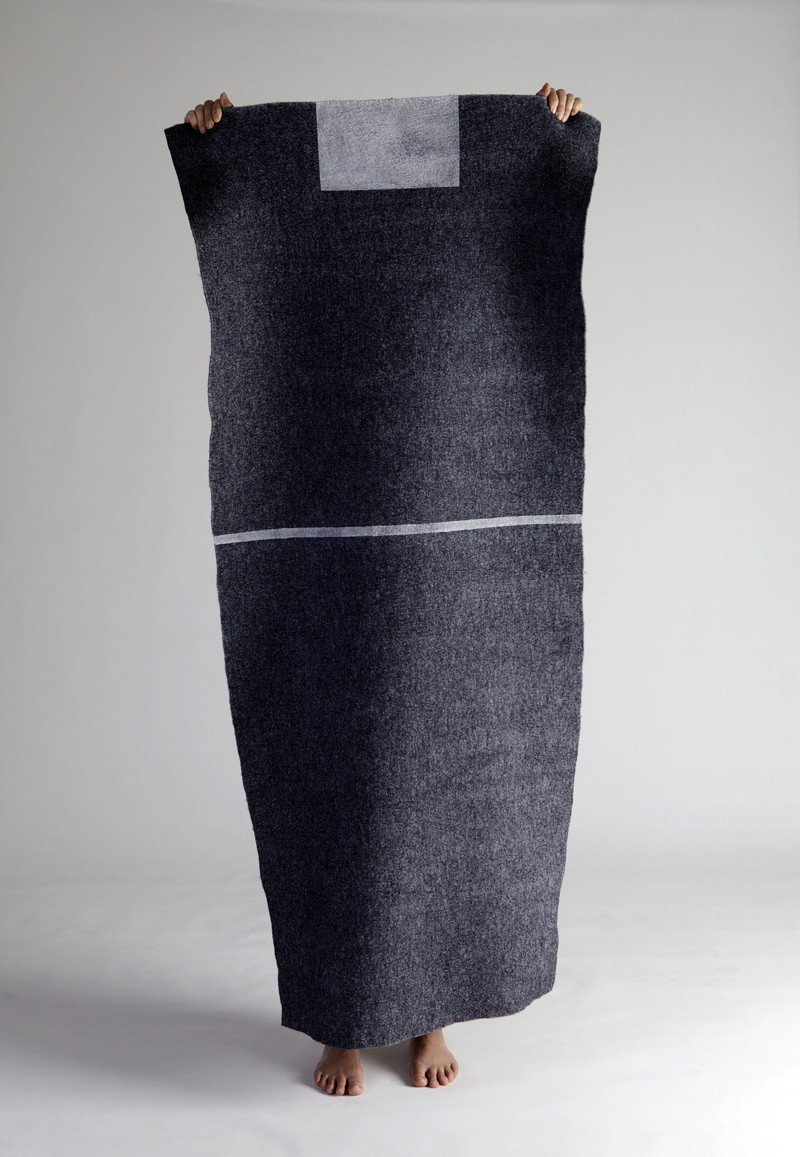
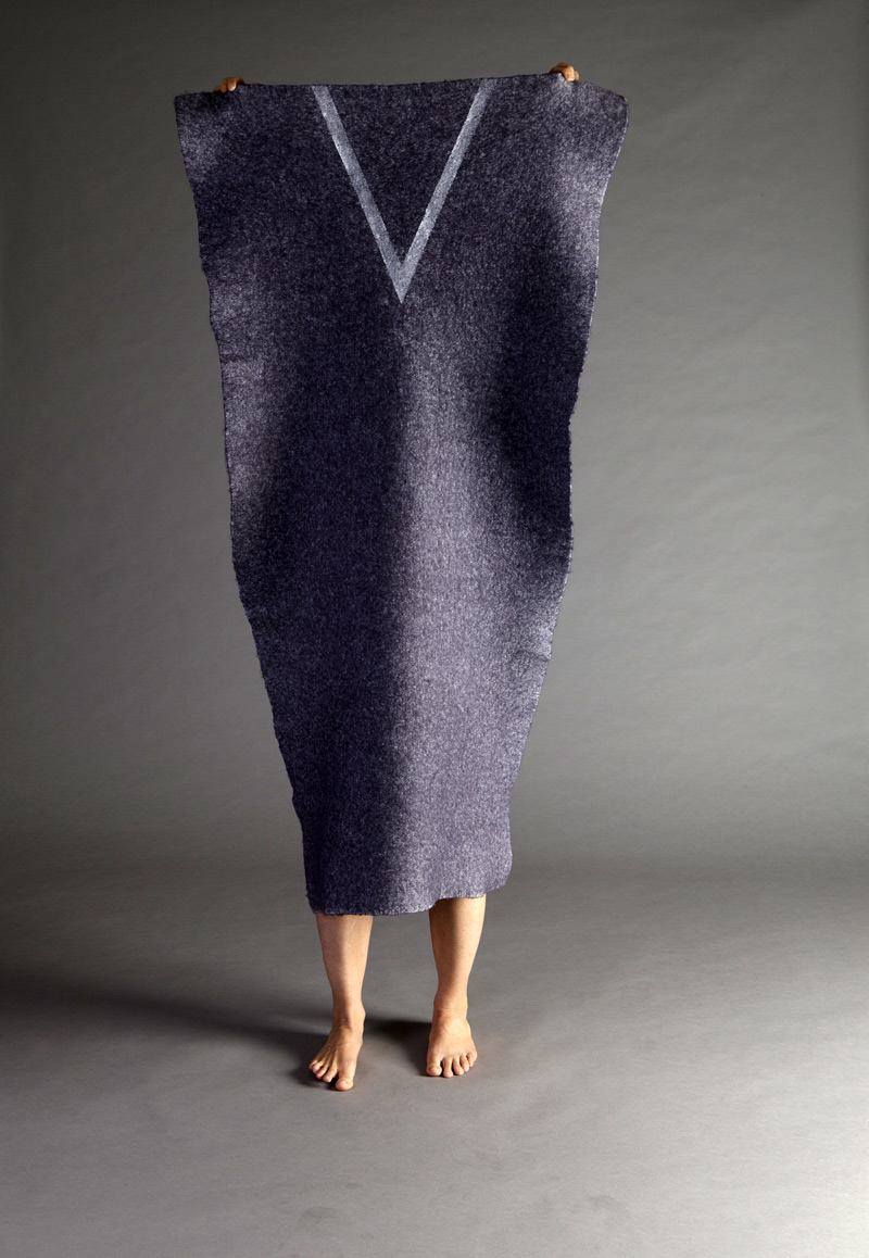
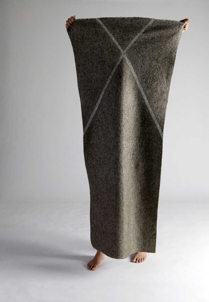
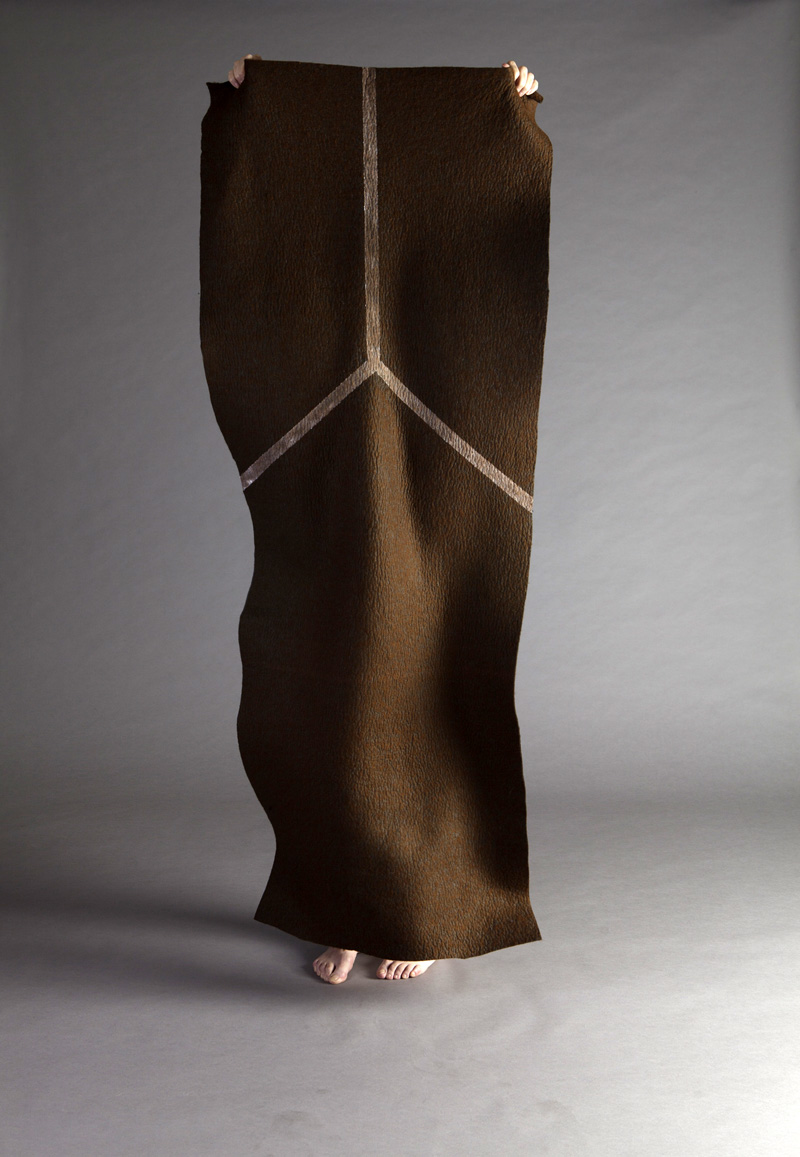
As an artist friend of mine Julie Clarke observed, “I was captured by the amount of folds in the fabric Ferran has used. Her emphasis on ‘felt’ as felt emotion and the feeling associated with those almost absent bodies is intriguing.” And how that felt emotion relates to the work of Joseph Beuys and his use of felt as insulation, warmth and a kind of comfort, here represented in institutional form (I am reminded by the markings on the felt of the arrows of prison garments).
As the text for the exhibition states, “This new series marks a significant shift in approach, as Ferran harnesses photography and performance in an endeavour to manifest the archive’s continuing power in the present. Ferran’s performers conceal their identities behind lengths and swathes of painted felt, in some cases creating strange and outlandish figures in a disorder of material, bodies and space.”
It is a welcome shift in approach. Ferran’s mental, material dis/order produces significantly more memorable images than what has “passed” before, imaging as they do a conflation of past, present and future rather than relying on the death of the historical archive evidenced in the deathly photograph.
Dr Marcus Bunyan
Many thankx to Stills Gallery for allowing me to publish the photographs in the posting. Please click on the photographs for a larger version of the image.
Anne Ferran (Australian, b. 1949) Clamorous shrike 2013 From Box of Birds series Pigment print 72 x 48cm Editions of 5 + 2AP
Anne Ferran (Australian, b. 1949) Conspicuous kite 2013 From Box of Birds series Pigment print 72 x 48cm Editions of 5 + 2AP
Anne Ferran (Australian, b. 1949) Night whistler 2013 From Box of Birds series Pigment print 72 x 48cm Editions of 5 + 2AP
Anne Ferran (Australian, b. 1949) Pale-headed flycatcher 2013 From Box of Birds series Pigment print 72 x 48cm Editions of 5 + 2AP
Anne Ferran (Australian, b. 1949) Slender-throated warbler 2013 From Box of Birds series Pigment print 72 x 48cm Editions of 5 + 2AP
Anne Ferran (Australian, b. 1949) Stonebird 2013 From Box of Birds series Pigment print 72 x 48cm Editions of 5 + 2AP
Anne Ferran (Australian, b. 1949) Tricoloured sylph 2013 From Box of Birds series Pigment print 72 x 48cm Editions of 5 + 2AP
Anne Ferran (Australian, b. 1949) Feathered Emissary 2013 From Box of Birds series Pigment print 60 x 80cm Editions of 5 + 2AP
Over the past 20 years Anne Ferran has worked with the residues of Australia and New Zealand’s colonial histories, probing them for gaps and silences. She has been especially drawn to the lives of anonymous women and children, seeking to shed light on their presence, and absence, in museum collections, photographic archives and historic sites. It is characteristic of Ferran’s images that the subject is not what is seen but rather what haunts it, something only partially visible. Intellectually and emotionally engaging, her photographs have explored episodes of incarceration in prisons, asylums, hospitals and nurseries, giving voice to the spectres of the lost and unseen.
Box of Birds returns to the subject matter of her previous works INSULA and 1-38: 1940s photographs of 38 unidentified women who were patients of a Sydney psychiatric hospital. In a significant shift of approach, rather than exhuming traces of the past, Ferran harnesses photography and performance in an endeavour to manifest its continuing power in the present.
Ferran’s process alternated between the considered and the uncontrollable. Female performers were instructed to hold pieces of felt up to her camera, the 38 lengths of dyed and painted fabric recalling the crumpled clothes worn by the women in the original photographic archive. Other images were wholly improvised, the performers creating strange and outlandish figures out of a disorder of material, bodies and space.
In a deliberate departure from the 1940s archive, Ferran’s performers conceal their identities behind lengths and swathes of fabric, raising ethical questions about photography’s role in recognition, representation and expression.
All the work in Box of Birds aims to elicit the energy Ferran saw trapped in those 1940s photographs, their unquiet spirit.
Press release from the Stills Gallery website
Anne Ferran (Australian, b. 1949) Chorus No.1 2013 From Box of Birdsseries 38 Pigment prints 60 x 42cm each Editions of 5 + 2AP
Anne Ferran (Australian, b. 1949) Chorus No.2 2013 From Box of Birds series 38 Pigment prints 60 x 42cm each Editions of 5 + 2AP
Anne Ferran (Australian, b. 1949) Chorus No.3 2013 From Box of Birds series 38 Pigment prints 60 x 42cm each Editions of 5 + 2AP
Anne Ferran (Australian, b. 1949) Chorus No.4 2013 From Box of Birds series 38 Pigment prints 60 x 42cm each Editions of 5 + 2AP
Anne Ferran (Australian, b. 1949) Chorus No.5 2013 From Box of Birds series 38 Pigment prints 60 x 42cm each Editions of 5 + 2AP
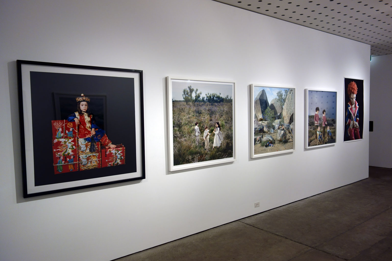
Papapetrou curator: Professor Anne Marsh in consultation with the artist
Polixeni Papapetrou (Australian, 1960-2018) Drag queen wearing cut out dress 1993 Gelatin silver photograph 28.5 x 28.5cm Courtesy the artist and Nellie Castan Gallery, Melbourne and Stills Gallery, Sydney
Two solid if not overly memorable exhibitions are presented at the Centre for Contemporary Photography.
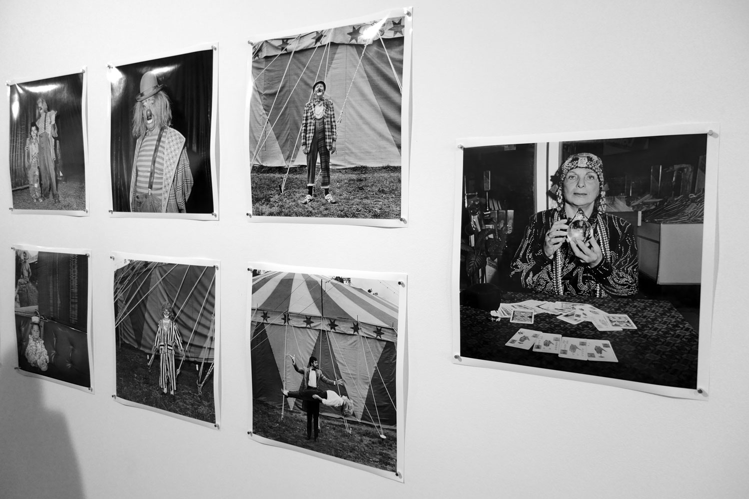
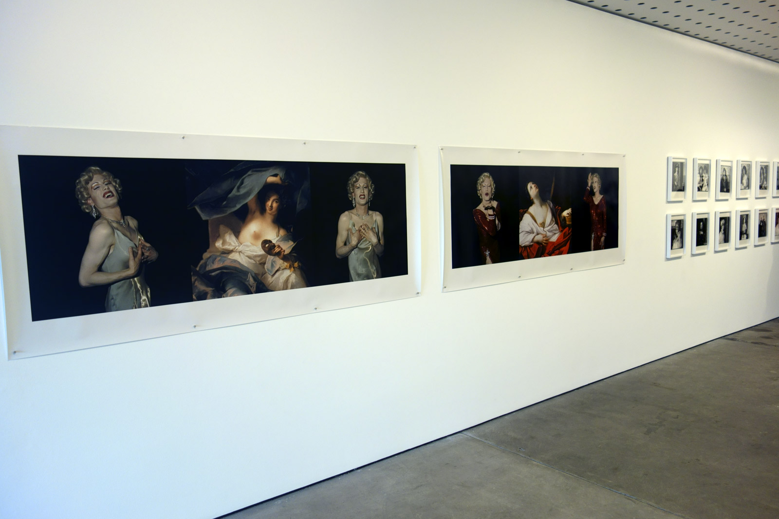
Polixeni Papapetrou A Performative Paradox is a bit of a dog’s breakfast. While it is wonderful to see early work by this artist – work that features Marilyn and Elvis impersonators, circus people, body builders and drag queens – too many bodies of work are crammed into too small a space with too few images. Some of the later series are represented by just one image giving a hotch potch feel to the whole exhibition ensemble. Perhaps it would have been better to concentrate solely on the early black-and-white images and colour images, work that is rarely seen and informs the staged work that followed. Having said that the black-and-white photographs are a joy to behold, documenting as they do performative identities. The photographs have an intangible presence. There are strong elements of the frontality of Diane Arbus in the photographs of circus performers and drag queens, coupled with a intrinsic understanding of light and texture. The photographs of drag queens are the highlight of both exhibitions and Drag queen wearing cut out dress (1993, below) reminded me of an early black-and-white photograph by Fiona Hall (Leura, New South Wales, 1974) in its use of patterned wallpaper. Let us hope there is a large retrospective of Polixeni’s work (at NGV or Heide for example) in the future, one that can do justice to the depth and complexity of her vision as an artist.
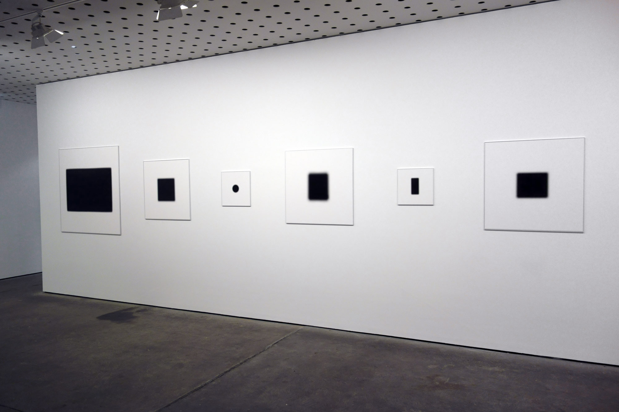
Daniel von Sturmer After Images is an interesting conceptual experiment, one that investigates the splitting of the image (shadow) from its referent (object). “The images propose a kind of transference; the object itself may be insignificant but its subjective meaning carries weight, and its shadow leaves a space the viewer fills with their own reading.” In their black-and-white fuzziness the work looks impressive when viewed in the gallery space (see installation views below) but upon close inspection the individual photographs fail to hold the viewers attention. Personally, I found it difficult to impart any great meaning to any of these works and the investigation certainly does not produce memorable images, ones that will stay with the viewer months and years later. For me the exhibition became an exercise in guessing what shadows were which objects, a game that grew quickly tiresome. The work then became an exercise in the importance of captioning an image, as I constantly looked around the room trying to match the titles of the works with the images themselves. As abstract images they imparted little metaphysical poetry as ghost images (an afterimage or ghost image is an optical illusion that refers to an image continuing to appear in one’s vision after the exposure to the original image has ceased). As images that investigate the link between text, object, shadow and language they started to become what the artist sought to enunciate: shadow objects bound to the realm of signification in some amorphous play, shadows that have the potential to become ‘Other’.
PS. As an analogy you could see these images as the equivalent of Jung’s human “shadow aspect” where, according to Jung, the shadow, in being instinctive and irrational, is prone to projection (as these shadows are projected by their objects). The shadow represents the entirety of the unconscious, ie. everything of which a person is not fully conscious, and is the seat of creativity. “Everyone carries a shadow,” Jung wrote, “and the less it is embodied in the individual’s conscious life, the blacker and denser it is.” (Jung, C.G. (1938). “Psychology and Religion.” In CW 11: Psychology and Religion: West and East. p. 131).
Hence the potential halo/cination of these images.
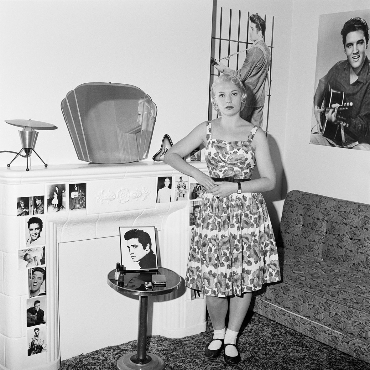
Polixeni Papapetrou (Australian, 1960-2018) Suzie, Elvis fan at home, Melbourne 1989 Selenium toned gelatin silver photograph 40.7 x 40.7cm Courtesy the artist and Nellie Castan Gallery, Melbourne and Stills Gallery, Sydney
Polixeni Papapetrou (Australian, 1960-2018) Indian Brave 2002 Pigment ink print 85 x 85cm Courtesy the artist and Nellie Castan Gallery, Melbourne and Stills Gallery, Sydney
Polixeni Papapetrou (Australian, 1960-2018) Three young men paying homage to Elvis on the 13th anniversary of Elvis’ death, Elvis Memorial Melbourne 1990 Selenium toned gelatin silver photograph 40.7 x 40.7cm Courtesy the artist and Nellie Castan Gallery, Melbourne and Stills Gallery, Sydney
This exhibition focuses on the performative in the work of Polixeni Papapetrou, from her early documentary work through to her directorial work with her children since 2002, regarded internationally as some of the most powerful and provocative works in the field of perfomative photography. Papapetrou’s enduring interest is in how the ‘other’ is represented and how the ‘other’ performs in reinforcing our own identity.
Polixeni Papapetrou is one of Australia’s leading contemporary photomedia artists. She has been exploring relationships between history, contemporary culture, landscape, identity and childhood through her photographic practice since the mid-eighties. In this exhibition, selected by Professor Anne Marsh in consultation with the artist, a particular thread has been selected across Papapetrou’s practice – that of the performative – from her early documentary work through to her directorial work with her children from 2002 to the present.
Her images are informed by her own experience as ‘other’, growing up as a Greek immigrant in a white, Anglo-Saxon, male-dominated culture in Australia in the 1960s and 1970s. Marilyn Monroe impersonators, Elvis Presley fans, body builders, circus performers and drag queens have all taken their turn in front of Papapetrou’s camera. All of these people are, one way or another, performing identities.
In 2002 Papapetrou turned her focus to the experience of childhood, using her children as the performers in her pictures. There is a challenging confusion between fantasy, mythology, archetype, animism and theatricality present in these works, ranging from the playful to the transgressive, wrangling with the question of identity and stressing the embodied nature of experience.
Text from the CCP website
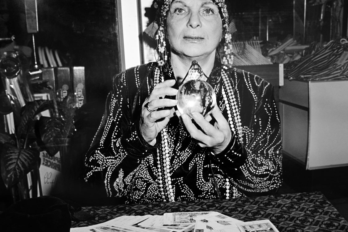
Polixeni Papapetrou (Australian, 1960-2018) Fortune teller (detail) 1989 From the series Ashton Circus, Silvers Circus 1989-1990
Polixeni Papapetrou (Australian, 1960-2018) Levitation, Silvers Circus (detail) 1989 From the series Ashton Circus, Silvers Circus 1989-1990
Polixeni Papapetrou (Australian, 1960-2018) Ashton Circus, Silvers Circus series (installation view) 1989-1990 Photo: Marcus Bunyan
Installation views of Polixeni Papapetrou A Performative Paradox at the Centre for Contemporary Photography (CCP) Photos: Marcus Bunyan
Daniel von Sturmer (New Zealand, b. 1972) Production Still for After Images Courtesy the artist and Anna Schwartz Gallery, Melbourne and Sydney
In After Images the shadows of a set of subjectively ‘important artefacts’ (a business card, a phone, a letter…) are presented alongside generic objects from the studio, for example: a bin, some tape, a ruler… Presented at 1:1 scale, the images propose a kind of transference; the object itself may be insignificant but its subjective meaning carries weight, and its shadow leaves a space the viewer fills with their own reading.
Photographed using a specially constructed ‘set’ to enable the separation of an object from its shadow, the resulting image stands alone, separated from its object yet inextricably bound to the realm of signification from which it has been cast.
Text from the CCP website
Installation views of Daniel von Sturmer After Images at the Centre for Contemporary Photography (CCP) Photos: Marcus Bunyan
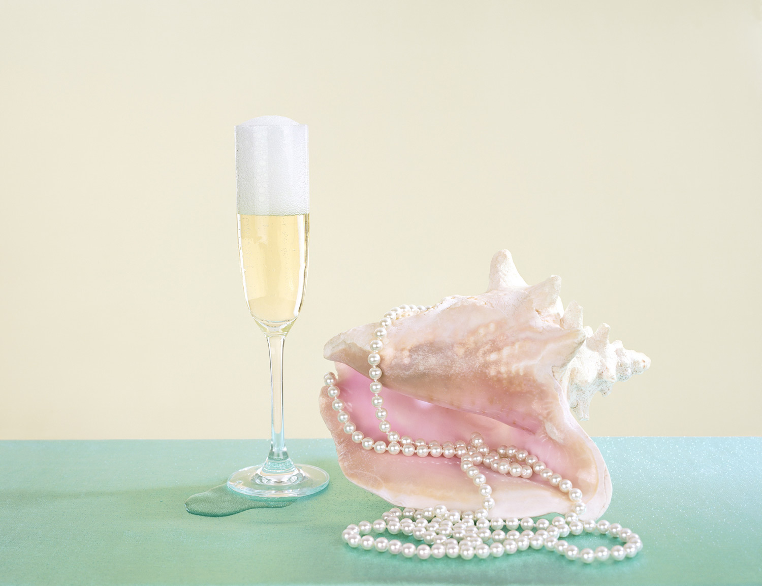
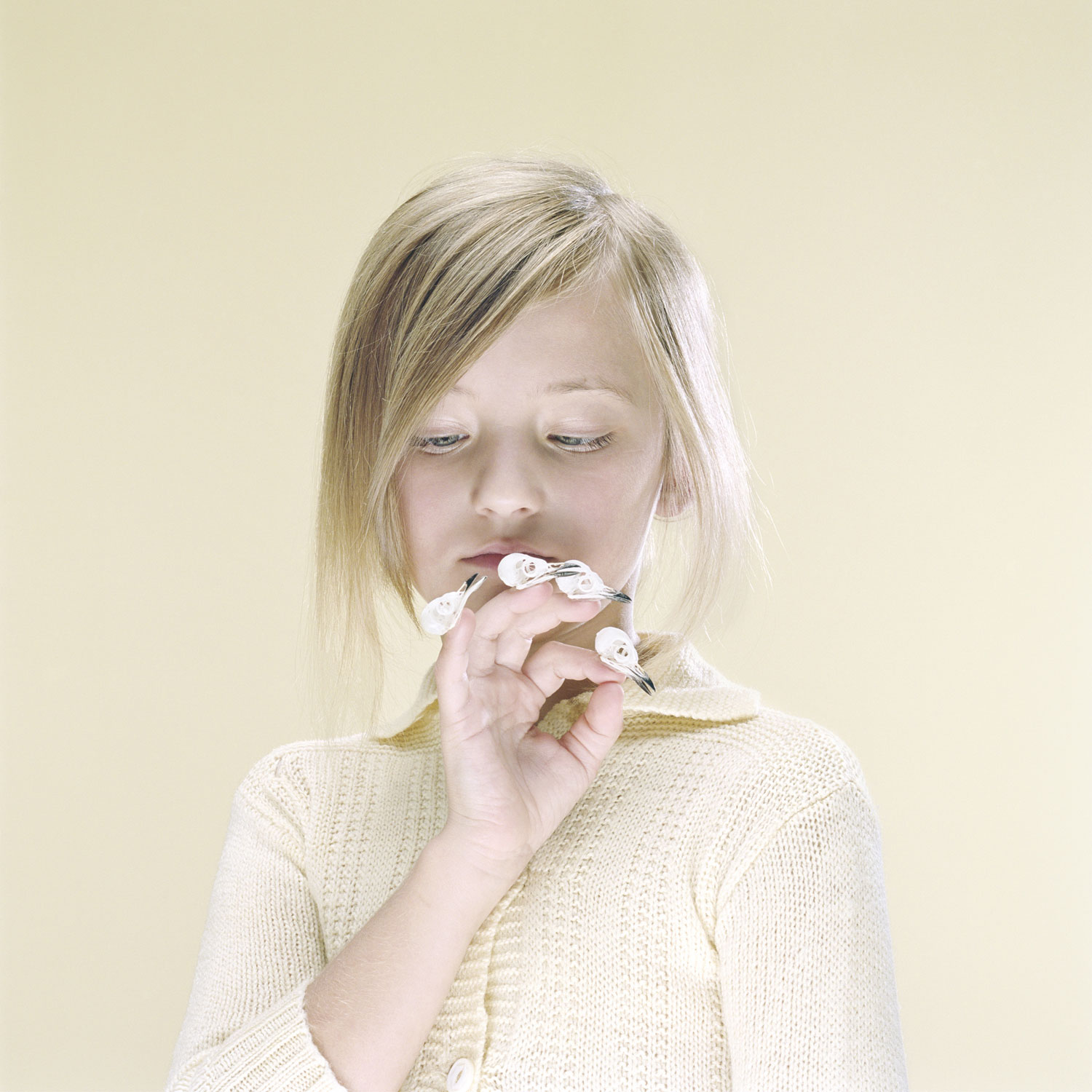
Petrina Hicks (Australian, b. 1972) Venus 2013 Pigment print, Edition of 8 100 x 100cm
“They’re thoughtful pictures that arouse curiosity rather than desire.”
Robert Nelson
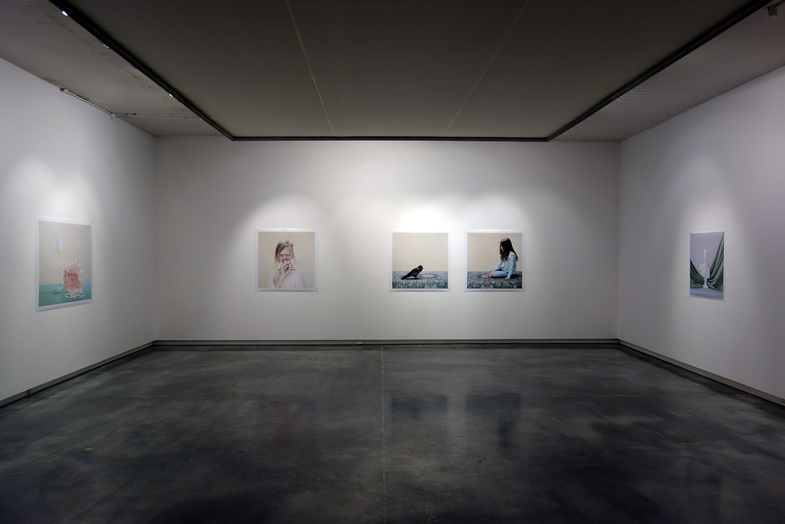
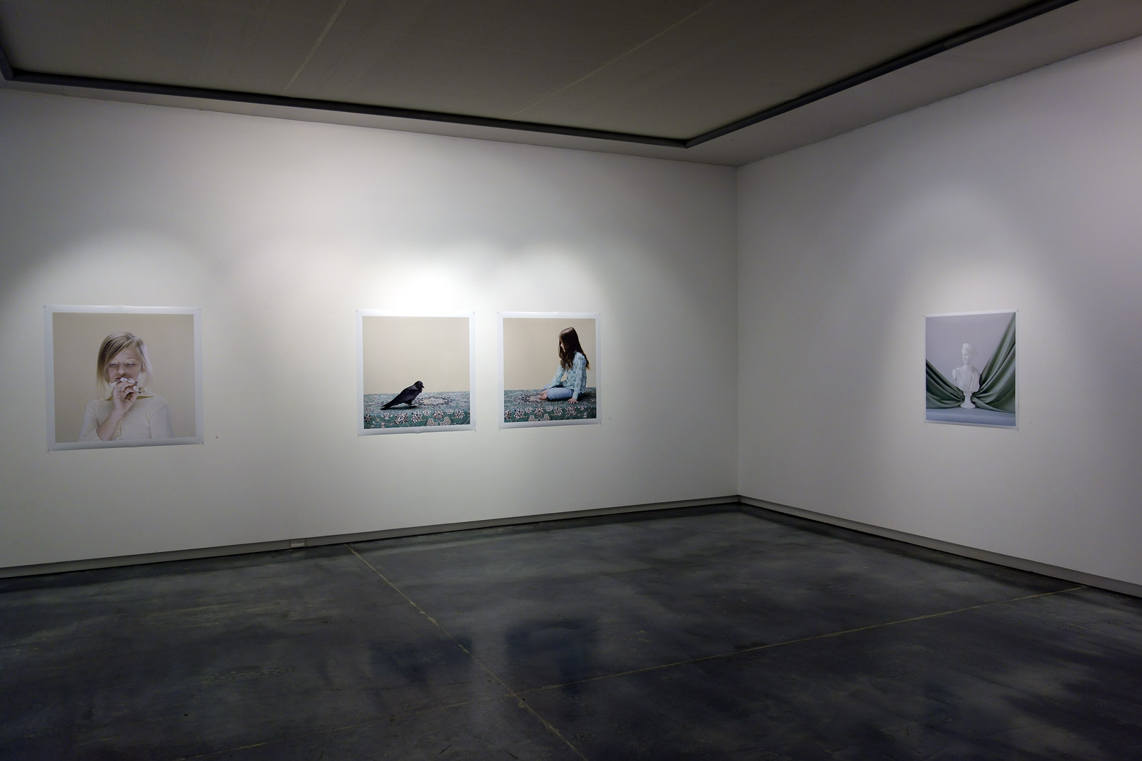
A stunning, eloquent and conceptually complex exhibition buy Petrina Hicks at Helen Gory Galerie. It seems churlish to repeat writing about the themes and mythologies exhibited in the work after they have been so excellently delineated in the catalogue essay by Dan Rule. Everything that you need to know about the work is in that concise piece of writing.
I am just going to add that the photograph Venus (2013, above) is one of the most beautiful photographs that I have seen “in the flesh” (so to speak) for a long time. Hicks control over the ‘presence’ of the image, her control over the presence within the image is immaculate. To observe how she modulates the colour shift from blush of pink within the conch shell, to colour of skin, to colour of background is an absolute joy to behold. The pastel colours of skin and background only serve to illuminate the richness of the pink within the shell as a form of immaculate conception (an openness of the mind and of the body). I don’t really care who is looking at this photograph (not another sexualised male gaze!) the form is just beauty itself. I totally fell in love with this work.
Forget the neo-feminist readings, one string of text came to mind: The high fidelity of a fetishistic fecundity.
Dr Marcus Bunyan
Many thankx to Helen Gory Galeries for allowing me to publish the photographs in the posting. Please click on the photographs for a larger version of the image.
Petrina Hicks (Australian, b. 1972) The Birth of Venus 2013 Pigment print, Edition of 8 100 x 133cm
Petrina Hicks (Australian, b. 1972) Birdfingers 2013 Pigment print, Edition of 8 100 x 100cm
Beauty and Artifice
Catalogue Essay by Dan Rule
“There’s a particular acuteness to the various strands, cues and counterpoints informing Petrina Hicks’ by now extensive body of work. Her highly keyed brand of hyperrealism is at once incisive in tenor and rich in historical, referential and allegorical depth.
An obvious vantage has long been that of the advertised image. Hicks’ subjects, palette and props are enveloped in a slickened and stunningly sickening sheen that is all too familiar. Augmented, buffed and polished, her works are traces of the highly aestheticised and fetishistic images that proliferate throughout the popular visual language. The skin, hair, clothing, surface and light assume an all but unsettling patina. The index is set askew amid the insidious markers of style and desire.
But Hicks’ highly constructed images aren’t mere transgressions of what has become a gleaming vernacular form. Every encroachment into the frame, every flat, luridly coloured backdrop has an implication and a consequence. In previous works, she has broached creation mythologies; she has recast religious subplots and in gloss and saccharine. Her 2011 series Hippy and the Snake – which comprised a painstakingly realised 25-minute video work alongside a collection of large-scale photographs – might have been read as a flirtation with Eve’s dalliance with the serpent in a re-imagined Garden of Eden.
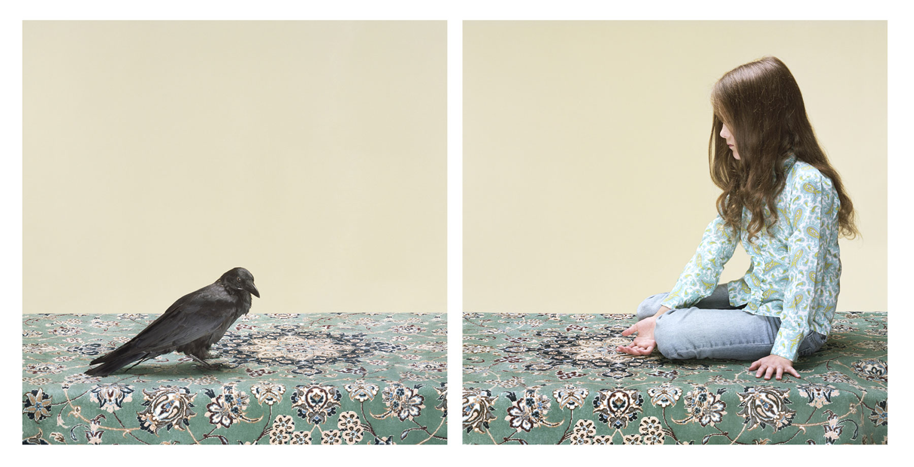
Sex, birth and death also lurk amid Hicks’ latest series of images, presented as the central strand of her Selected Photographs exhibition. Set against a muted, neutral backdrop, these large-format photographs broach both the portrait and the still life, teasing out a taxonomy of sensuous allegories and sinister omens. In the somewhat aptly titled Bird Fingers, a young girl intently studies her fingertips, each of which is adorned with a tiny bird’s skull, as if a finger puppet or a jewel. That the girl’s expression is neither one of fear nor admiration – but rather, a measured intrigue – gives this work a fascinating twist. Her reaction to death is unlearned; she studies and surveys and pieces together the evidence. Another work, The Hand That Feeds, sees another young protagonist calmly offering her palm to a crow – an avian so often cast with the pall of death.
Venus, meanwhile, sees a woman hold a glossy, pink conch shell – fleshy and open – before her face as if a beacon. The accompanying Birth of Venus is a still life comprising a conflation of symbologies and references. An overfilled champagne glass perches beside the aforementioned shell, a string of pearls draped across and within its span. It delves deep into both art and socio-feminist history. While the pearl has long invoked purity and femininity throughout mythology, the conch engenders that of fertility. But these works also echo with a more contemporary resonance – one perhaps found in second-wave feminism. While the champagne might be read as an allusion to upward mobility and financial independence, the string pearls almost resemble birth control pills (perhaps an allegory for the emancipation of the female reproductive organs?). In New Age, a jagged crystal takes the place of pubic hair, resting hard and sharp against the softness and fragility of the flesh. This symbol for healing only works to amplify the vulnerability of the body. That Hicks’ engages with such themes in 2013 points to the folly of complacency. The notion that we can sleep in the wake of feminism is bogus, null and void.
Indeed, Hicks’ retrieval and reinterpretation of mythologies and social precedents suggests that history repeats. While her images of children suggest minds unsullied by the scourge of learned prejudices and social mores, Venus and her like describe the continuum of the sexualised male gaze. That Hicks’ co-opts a visual language so often used to hock products and desires serves as the ultimate repost. Human complexity can continue to exist, even amid the cycle and the cynicism of the commercial artifice.
Installation views of Petrina Hicks: Selected Photographs, 2013 at Helen Gory Galerie Photos: Marcus Bunyan
Petrina Hicks (Australian, b. 1972) Enigma 2013 Pigment print, Edition of 8 100 x 100cm
Petrina Hicks (Australian, b. 1972) The Hand That Feeds 2013 Pigment print, Edition of 8 100 x 220cm
Petrina Hicks (Australian, b. 1972) The Beauty of History 2010 Pigment print, Edition of 8 85 x 85cm
Petrina Hicks (Australian, b. 1972) New Age 2013 Pigment print, Edition of 8 100 x 220cm
Curator: Dr. Troy Ruffels alongside accompanying catalogue text written by arts writer and curator Marguerite Brown
Troy Ruffels (Australian, b. 1972) Cicada 2013 Archival solvent based inkjet print on composite aluminium 120 cm x 240cm Edition of 3
This scratching away at reality. Abstractness of becoming.
Tension. Music. Light. Undertow.
1/ A current below the surface of the sea moving in the opposite direction to the surface current.
2/ An implicit quality, emotion, or influence underlying the surface aspects of something and leaving a particular impression.
Imagined, chthonian (of or relating to the underworld, from Greek khthonios, of the earth) landscape.
(Dis)possession of the land, as though the land is rebelling against subjective gaze of the viewer.
Prosaic titles (Bracken, Cinder, Rift) with a poetic zest (remains of the day).
Spaces of isolation / human marking (thumbprints on work) / absence / presence.
Manifestations of the mind.
The landscape as Other.
Dr Marcus Bunyan
Many thankx to James Makin Gallery for allowing me to publish the photographs in the posting. Please click on the photographs for a larger version of the image.
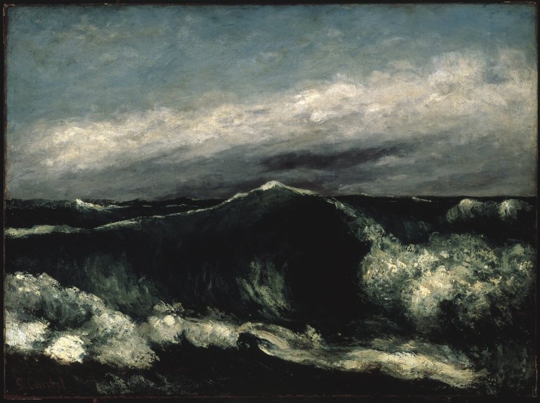
Gustave Courbet (French, 1819-1877) The Wave c. 1869
Troy Ruffels (Australian, b. 1972) Sea #3 (remains of the day) 2013 Archival solvent based inkjet print on composite aluminium 107 cm x 107cm Edition of 12
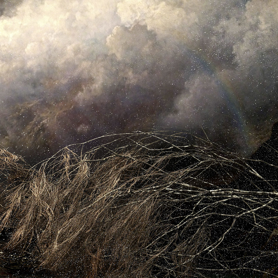
Troy Ruffels (Australian, b. 1972) Bracken 2013 Archival solvent based inkjet print on composite aluminium 107 cm x 107cm Edition of 12
Troy Ruffels (Australian, b. 1972) Cinder 2013 Archival solvent based inkjet print on composite aluminium 107 cm x 107cm Edition of 12
Troy Ruffels (Australian, b. 1972) Sea #4 (Second Winter) 2013 Archival solvent based inkjet print on composite aluminium 107 cm x 107cm Edition of 12
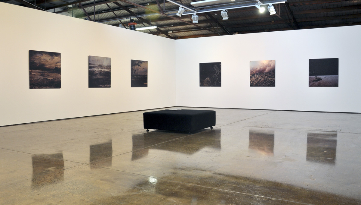
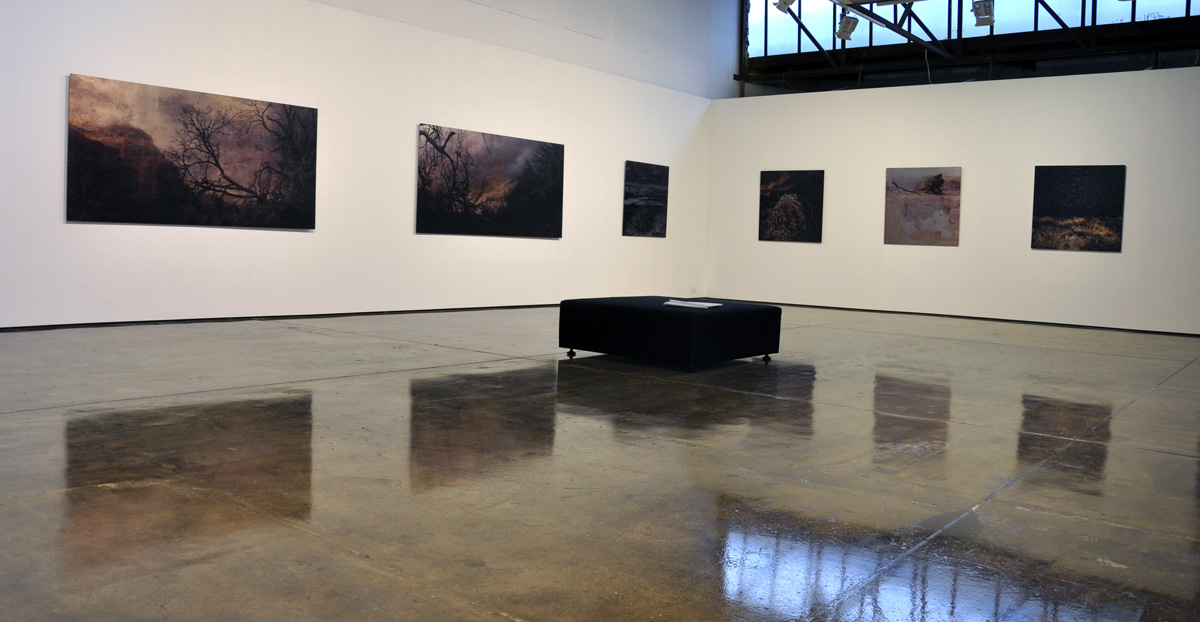
This exhibition sees photo media artist Troy Ruffels employ innovative techniques to create his evocative imagery, which is heavily informed by the natural world. Ruffels has developed a unique process of drawing from multiple photographic source images to create each final work, which is subsequently printed using solvent based inks onto composite aluminium sheets, as opposed to standard archival papers. By utilising the reflective qualities of the aluminium Ruffels illuminates his intriguing landscape imagery with shifting light effects.
“Photo-media artist Troy Ruffels extends the boundaries of traditional photography towards a realm of limitless creative possibilities. Observing and recording sites within the Tasmanian wilderness and beyond, Ruffels draws from multiple source images to arrive at his final works. In doing so the artist weaves a highly personal and emotive response to various locations within the natural world that have remained lodged in his imagination. His process allows for a range of atmospheres and moods to be evoked, from a dreamlike softness, to a densely weighted gravity.
Overall the works in Cinder reflect a highly personal response to place, as in the process of revealing nature’s secrets the artist reveals a part of himself. Ruffels displays his impressive technical and creative prowess in transfiguring and reassembling the elements, blending fact with fiction to tell the understory of the night.” (Marguerite Brown, Cat. Essay JMG Journal, 2013)
Press release from the James Makin Gallery website
Installation views of Troy Ruffels: Cinder at James Makin Gallery Photos: Marcus Bunyan
Troy Ruffels (Australian, b. 1972) Etude No.9 2013 Archival solvent based inkjet print on composite aluminium 107 cm x 107cm Edition of 12
Troy Ruffels (Australian, b. 1972) Rift 2013 Archival solvent based inkjet print on composite aluminium 107 cm x 107cm Edition of 12
Troy Ruffels (Australian, b. 1972) Understory 2013 Archival solvent based inkjet print on composite aluminium 107 cm x 107cm Edition of 12
Troy Ruffels (Australian, b. 1972) Sea #1 (Arc) 2013 Archival solvent based inkjet print on composite aluminium 107 cm x 107cm Edition of 12

![The Tam Projects (Tess Hamilton, Adriana Bernado, Melissa Acker) 'Colour box' 2013 (installation view) from the exhibition 'Globelight '13 [New Light Art + Design]' at Anita Traverso Gallery, Richmond, Melbourne, July - August, 2013](https://artblart.com/wp-content/uploads/2013/08/spots-web.jpg "The Tam Projects (Tess Hamilton, Adriana Bernado, Melissa Acker) 'Colour box' 2013 (installation view) from the exhibition 'Globelight '13 [New Light Art + Design]' at Anita Traverso Gallery, Richmond, Melbourne, July - August, 2013")
![Kent Gration (Australian) 'Leviathan 1 + 2' 2013 (installation view) from the exhibition 'Globelight '13 [New Light Art + Design]' at Anita Traverso Gallery, Richmond, Melbourne, July - August, 2013](https://artblart.com/wp-content/uploads/2013/08/hangers-a-web.jpg "Kent Gration (Australian) 'Leviathan 1 + 2' 2013 (installation view) from the exhibition 'Globelight '13 [New Light Art + Design]' at Anita Traverso Gallery, Richmond, Melbourne, July - August, 2013")






























You must be logged in to post a comment.