Marcus Bunyan (Australian, b. 1958) Untitled 2019-2020 From the series A day in the Tiergarten Digital photograph
A day in the Tiergarten
I hope people like this series.
In late 2019, I took a photographic research trip through Europe by train, visiting nine countries and seeing many exhibitions and photographs by master photographers (Güler, Capa, Lartigue, Katz, Frank, Sudek, Sander, Brassaï, Abbott, Kertesz). I also took over 8,000 photographs on three digital cameras. This series, this stream of consciousness – the images shown in the exact order that I took them, no sequencing – reflects my state of mind during the trip. It was a kind of an ascetic experience for me, embedded as I was in the spaces and architectures of the cities and landscapes of Europe, hardly talking to anyone for the duration of the journey.
A day in the Tiergarten reflects this focus and clear seeing. Using camera and tripod the series, like a piece of music, moves from classical into surreal (the reflections of trees and water displacing the image plane), back to classical and on through Abstract Expressionism, ending in a peaceful coda of 4, 3, 2.
The series is an engagement with spirit – of wandering through a space of intimate desire and love. Love of trees, of being alone, of engaging with the self and nature. It was a magical day.
Please view the images on a larger screen. The whole series can be see with larger images on the A day in the Tiergarten web page or you can enlarge the images below by clicking on them.
Photographs are available from this series for purchase. As a guide, a digital colour 16″ x 20″ costs $1000 plus tracked and insured shipping. For more information please see my Store web page.
Marcus Bunyan (Australian, b. 1958) A Day in the Tiergarten 2019-2020 Digital photographs
The augur of passion, the fire of movement, the colour of the embrace!
She used to ask herself, “does it work?”, as every artist should… not seeking affirmation from others but just being focused in her own mind on what she wanted to say, on that inner experience.
She was the equal of men, surpassing most. Krasner is finally getting the accolades she so richly deserves.
Dr Marcus Bunyan
Many thankx to the Barbican Art Gallery for allowing me to publish the art work in the posting. Please click on the photographs for a larger version of the image. The black and white photographs have been digitally cleaned by myself.
The cold winter on Long Island, where Krasner and Pollock were now living, forced her to work downstairs by the stove, where she made two brilliantly coloured mosaic tables using wagon wheels she found in the barn.
After Pollock’s funeral, Krasner almost immediately began work on a series of violently erotic landscapes in shades of grey, black and pink. ‘Painting is not separate from life,’ she said, when asked how she had managed to paint in the midst of grief. ‘It is one. It is like asking – do I want to live? My answer is yes – and I paint.’
“I like a canvas to breathe and be alive. Be alive is the point.”
“Painting is a revelation, an act of love… as a painter I can’t experience it any other way.”
“I was a woman, Jewish, a widow, a damn good painter, thank you, and a little too independent…”
“Aesthetically I am very much Lee Krasner. I am undergoing emotional, psychological, and artistic changes but I hold Lee Krasner right through.”
“Painting is not separate from life. It is one. It is like asking – do I want to live? My answer is yes – and I paint.”
“I couldn’t run out and do a one-woman job on the sexist aspects of the art world, continue my painting, and stay in the role I was in as Mrs Pollock… What I considered important was that I was able to work and other things would have to take their turn.”
“Jackson always treated me as an artist… he always acknowledged, was aware of what I was doing… I was a painter before I knew him, and he knew that, and when we were together, I couldn’t have stayed with him one day if he didn’t treat me as a painter.”
“[The Surrealists] treated their women like French poodles, and it sort of rubbed off on the Abstract Expressionists. The exceptions were Bradley Walker Tomlin, Franz Kline, and Jackson Pollock. That might be the end of my listing. The other big boys just didn’t treat me at all. I wasn’t there for them as an artist.”
“I go on the assumption that the artist is a highly sensitive, intellectual and aware human being… It’s a total experience which has to do with the sensitivity of being a painter. The painter’s form of expressing [them]self is through painting.”
Lee Krasner
“… their blossoming was remarkable. In fact “blossoming” is hardly the word, for it suggests a soft, floral, ethereal event, adjectives one would not pick for the tough paintings, often full of barely controlled anger, that she was to produce after 1960… Is there a less “feminine” woman artist of her generation? Probably not.”
Polar Stampede 1960, one of a series of paintings she made at night during bouts of insomnia and which her friend, the poet Richard Howard, called her ‘Night Journeys’
Lee Krasner (American, 1908-1984) The Guardian 1960 Oil and house paint on canvas 53 1/8 × 58 1/8 in. (134.9 × 147.6cm) Whitney Museum of American Art Purchase, with funds from the Uris Brothers Foundation, Inc.
Palingenesis noun Biology: the exact reproduction of ancestral characteristics in ontogenesis (the development of an individual organism or anatomical or behavioural feature from the earliest stage to maturity).
When Krasner showed 12 new paintings at the Marlborough Gallery in New York the critic Robert Hughes described this pink as rapping ‘hotly on the eyeball at 50 paces’.
Barbican Art Gallery is pleased to stage the first retrospective in Europe for over 50 years of American artist Lee Krasner (1908-1984). One of the pioneers of Abstract Expressionism, Krasner made work reflecting the feeling of possibility and experiment in New York in the post-war period. Lee Krasner: Living Colour features nearly 100 works – many on show in the UK for the first time – from across her 50-year career, and tells the story of a formidable artist whose importance has often been eclipsed by her marriage to Jackson Pollock.
The exhibition celebrates Krasner’s spirit for invention – including striking early self-portraits; a body of energetic charcoal life drawings; original photographs of her proposed department store window displays, designed during the war effort; and her acclaimed ‘Little Image’ paintings from the 1940s with their tightly controlled geometries. It also features collages comprised of torn-up earlier work and a selection of her most impressive large-scale abstract paintings. This work is accompanied by rare photography and film from the period, in an elegant exhibition design by David Chipperfield Architects.
Jane Alison, Head of Visual Arts, Barbican, said: ‘We are thrilled to be staging Lee Krasner: Living Colour. Despite featuring in museum collections around the world and being one of the few women to have had a solo show at New York’s Museum of Modern Art, in 1984, Krasner has not received the recognition that she deserves in Europe, making this an exciting opportunity for visitors here to experience the sheer impact of her work’.
Krasner was determined to find new ways to capture inner experience. As the playwright Edward Albee commented at her memorial at the Metropolitan Museum of Art, in both her life and her work, ‘… she looked you straight in the eye, and you dared not flinch’. Born in Brooklyn in 1908 in a family recently emigrated from Russia, she chose to attend Washington Irving High School (which at the time was the only school in New York to offer an art course for girls) before going on to study at the National Academy of Design. She was inspired by the opening of MoMA in 1929; joined the Hans Hofmann School of Fine Arts, where she made lifelong friends including renowned designer Ray Eames; was a member of the American Abstract Artists; and became a friend to many leading artists of the day including Willem de Kooning and Franz Kline.
In 1945, Krasner married Jackson Pollock and they moved to Springs, Long Island, borrowing $2000 from collector and dealer Peggy Guggenheim to buy a run-down clapboard farmhouse. Krasner worked in the living room and then an upstairs bedroom – intimate make-shift studio spaces, which are mirrored in the Barbican Art Gallery’s upstairs rooms – while Pollock worked in a converted barn outside. After Pollock’s early death in a car crash in 1956, Krasner made the courageous decision to claim his studio as her own, which allowed her to work for the first time on large, un-stretched canvas tacked to the wall. The result would be the remarkable ‘Umber’ and ‘Primary’ series paintings, in which her exploration of scale, biomorphic form and colour collided into some of her most celebrated work. Examples on show include The Guardian, 1960; Happy Lady, 1963; Icarus, 1964; and Siren, 1966.
Lee Krasner: Living Colour draws from more than 50 international collections: from museums, including the Metropolitan Museum of Art, Los Angeles County Museum of Art, San Francisco Museum of Modern Art, the National Gallery of Washington, the Whitney Museum of American Art, Hirshhorn Museum and Sculpture Garden, Philadelphia Museum of Art, the Jewish Museum and the Museum of Fine Arts Houston, as well as from a large number of private collections. Many works are being exhibited in Europe for the first time, such as the monumental Combat (1965), which is over 4 metres long, and has travelled from the National Gallery of Victoria in Australia.
The exhibition is curated and organised by Barbican Centre, London, in collaboration with Schirn Kunsthalle Frankfurt, Zentrum Paul Klee, Bern and Guggenheim Museum Bilbao.
Press release from the Barbican Art Gallery website [Online] Cited 14 June 2019
Unknown Photographer Lee Krasner and her younger sister, Ruth c. 1915-1916
“I was brought up to be independent. I made no economic demands on my parents so in turn they let me be… I was not pressured by them, I was free to study art. It was the best thing that could have happened.”
Fred Prater Lee Krasner at the WPA Pier, New York City, where she was working on a WPA commission c. 1940 Gelatin silver print Lee Krasner Papers, c. 1905-1984 Archives of American Art, Smithsonian Institution
Lee Krasner photo booth images 1940s-1950s?
With Jackson Pollock in Springs, London Island, 1949 Photo: Wilfred Zogbaum
“She would ask me to the studio. One didn’t just go there. One waited for an invitation. But she didn’t talk about her painting. The most distinct thing for her was the question: does it work? That was the big way that she thought. She wasn’t insecure about it. She wasn’t asking my opinion. She was asking herself.
“She had a very strong conviction about herself as a painter. She saw her own worth. She saw herself as equal to the men. She didn’t have the attention Pollock had, but she’d grown inured to that. Lee knew all about brands: she was Mrs Pollock, and sometimes she took advantage of it. But she also had great feeling for him as a painter. He wasn’t an easy person, but she never disparaged him, and he never disparaged her, either. The most powerful attraction between them was their intellectual acknowledgement of each other.”
Halley Erskine Lee Krasner standing on a ladder in front of ‘The Gate’ (1959) before it was completed, Springs, July or August 1959 1959 Gelatin silver print
Hans Namuth (German, 1915-1990) Lee Krasner in her studio in the barn, Springs 1962 Gelatin silver print Lee Krasner Papers, Archives of American Art, Smithsonian Institution, Washington, D.C.
La llum negra. Tradicions secretes en l’art des dels anys cinquanta
Exhibition dates: 16th May – 21st October, 2018
Curator: Enrique Juncosa
Artists: Carlos Amorales / Kenneth Anger / Antony Balch / Jordan Belson / Wallace Berman / Forrest Bess / Joseph Beuys / William S. Burroughs / Marjorie Cameron / Francesco Clemente / Bruce Conner / Aleister Crowley / René Daumal / Gino de Dominicis / Louise Despont / Nicolás Echevarría / Robert Frank / João Maria Gusmão + Pedro Paiva / Brion Gysin / Jonathan Hammer / Frieda Harris / Derek Jarman / Jess / Alejandro Jodorowsky / Joan Jonas / Carl Gustav Jung / Matías Krahn / Wolfgang Laib / LeonKa / Goshka Macuga / Agnes Martin / Chris Martin / Henri Michaux / Grant Morrison / Tania Mouraud / Barnett Newman / Joan Ponç / Genesis P-Orridge / Sun Ra / Harry Smith / Rudolf Steiner / Philip Taaffe / Antoni Tàpies / Fred Tomaselli / Suzanne Treister / Vaccaro – Brookner / Ulla von Brandenburg / Terry Winters / Zush
Leon Ka – La llum negra – Mural
The mural at the entrance of the exhibition Black Light created by the artist Leon Ka, represents some of the symbols of ocultism, magic, and the mysticism of spirituality.
I love these eclectic exhibitions on unusual topics. Having studied a little Georges Gurdjieff, Carl Jung, Robert Johnson, Joseph Campbell and Carlos Castaneda to name just a few, I immersed myself in their spiritual, psychedelic and counterculture world. I had scarification done on my arm in 1992 which was one of the most spiritual rights of passage I have ever experienced in my life (see photograph below).
To be different, to explore that difference in art, is to violate the taboo of control – of adherence to the norm – that emotion which controls how we think, feel, act and create. As Georges Bataille observes,
“”The taboo is there in order to be violated.” This proposition is not the wager it looks like at first but an accurate statement of an inevitable connection between conflicting emotions. When a negative emotion has the upper hand we must obey the taboo. When a positive emotion is in the ascendant we violate it. Such a violation will not deny or suppress the contrary emotion, but justify it and arouse it.”1
An “understanding of the text (writing, art, music, etc.) as ‘social space’,” say Barthes, “activates a broad intertextuality and a productive plurality of meanings and signifying/interpretive gestures that escape the reduction of knowledge to fixed, monological re-presentations, or presences.” What he is saying here is that there is no singular unity… for unity is variable and relative. Further, according to Kurt Thumlert (citing Lentricchia, 1998), “a transgressive textuality can also become a mode of agential resistance capable of fragmenting and releasing the subject, and thereby producing a zone of invisibility where knowledge/power is no longer able ‘find its target’.”2
In other words, transgression of the taboo allows the artist (in this case) to release himself from the logic of control and where power cannot get its hooks into him. In order to do this during the production of art, the artist must understand that representations are presentations which entail,
“the use of the codes and conventions of the available cultural forms of presentation. Such forms restrict and shape what can be said by and/or about any aspect of reality in a given place in a given society at a given time, but if that seems like a limitation on saying, it is also what makes saying possible at all. Cultural forms set the wider terms of limitation and possibility for the (re)presentation of particularities and we have to understand how the latter are caught in the former in order to understand why such-and-such gets (re)presented in the way it does. Without understanding the way images function in terms of, say, narrative, genre or spectacle, we don’t really understand why they turn out the way they do.”3
The exhibition Black Light investigates how artists subvert these codes and conventions of representation and violate their taboo through emotions (whether positive or negative) present in the creative process. This transgressive spirit allows far seeing artists to become the seers of their day, playing with the dis/order of time, space and cultural (re)presentation. As a form of alchemy, all art partakes of this investigation into the past, present and future of life, our discontinuous existence as creatures who live and die, and the world that surrounds us, both physically and spiritually.
Dr Marcus Bunyan
1/ Bataille, Georges. Death and Sensuality: A Study of Eroticism and the Taboo. New York: Walker and Company, 1962, pp. 64-65.
2/ Thumlert, Kurt. Intervisuality, Visual Culture, and Education. [Online] Cited 10/08/2006 No longer available.
3/ Dyer, Richard. The Matter of Images: Essays on Representations. London: Routledge, 1993, pp. 2-3.
Many thankx to the Centre de Cultura Contemporania de Barcelona for allowing me to publish the photographs in the posting. Please click on the photographs for a larger version of the image.
Black Light. Discover the occult side of contemporary art
The occult, spirituality, psychedelia and esotericism come to the CCCB with the exhibition Black Light. An unusual look at the art of the past 50 years that has been strongly influenced by secret traditions.
Joan Jonas (American, b. 1936) Reanimation (extract)
Henri Michaux (French born Belgium, 1899-1984)
Henri Michaux (French born Belgium, 1899-1984) was a highly idiosyncratic Belgian-born poet, writer, and painter who wrote in French. He later took French citizenship. Michaux is best known for his esoteric books written in a highly accessible style. His body of work includes poetry, travelogues, and art criticism. Michaux travelled widely, tried his hand at several careers, and experimented with psychedelic drugs, especially LSD and mescaline, which resulted in two of his most intriguing works, Miserable Miracle and The Major Ordeals of the Mind and the Countless Minor Ones.
Kenneth Anger (born Kenneth Wilbur Anglemyer; February 3, 1927) is an American underground experimental filmmaker, actor and author. Working exclusively in short films, he has produced almost forty works since 1937, nine of which have been grouped together as the “Magick Lantern Cycle”. His films variously merge surrealism with homoeroticism and the occult, and have been described as containing “elements of erotica, documentary, psychodrama, and spectacle”. Anger himself has been described as “one of America’s first openly gay filmmakers, and certainly the first whose work addressed homosexuality in an undisguised, self-implicating manner”, and his “role in rendering gay culture visible within American cinema, commercial or otherwise, is impossible to overestimate”, with several being released prior to the legalisation of homosexuality in the United States. He has also focused upon occult themes in many of his films, being fascinated by the English gnostic mage and poet Aleister Crowley, and is an adherent of Thelema, the religion Crowley founded.
Leon Ka (Spanish, b. 1980) Creatio: Lux, Crux 2015 Door of the cultural association Magia Roja, Barcelona
Black light is about the influence that various secret traditions have had on contemporary art from the nineteen-fifties to the present day. It presents some 350 works by such artists as Antoni Tàpies, Agnes Martin, Henri Michaux, Joseph Beuys, Ulla von Brandenburg, William S. Burroughs, Joan Jonas, Jordan Belson, Goshka Macuga, Kenneth Anger, Rudolf Steiner, Alejandro Jodorowsky, Francesco Clemente and Zush.
Black light brings together, in more or less chronological order, paintings, drawings, audiovisuals, sculptures, photographs, installations, books, music, engravings and documents by artists largely from North America, where secret traditions have historically enjoyed greater acceptance. There are works by creators who are considered fundamental to the history of art, such as Antoni Tàpies, Barnett Newman and Agnes Martin, alongside less-known figures of the counterculture of the sixties and seventies. The show also presents young artists to reflect the renewed interest in these traditions.
The work of all of them goes to show the relevance and continuity of these habitually overlooked trends, in many cases regarding art as a possible means to a higher cognitive level, as an instrument of connection with a more profound reality, or as a form of knowledge in itself. These ideas are contrary, for example, to a purely formalistic understanding of abstraction. Specifically, the exhibition also explores the influence of esoteric ideas on areas of popular culture, such as comics, jazz, cinema and alternative rock.
Marjorie Cameron Parsons Kimmel (American, 1922-1995), who professionally used the mononym Cameron, was an American artist, poet, actress, and occultist. A follower of Thelema, the new religious movement established by the English occultist Aleister Crowley, she was married to rocket pioneer and fellow Thelemite Jack Parsons.
Wolfgang Laib (born 25 March 1950 in Metzingen) is a German artist, predominantly known as a sculptor. He lives and works in a small village in southern Germany, maintaining studios in New York and South India.
His work has been exhibited worldwide in many of the most important galleries and museums. He represented Germany in the 1982 Venice Biennale and was included with his works in the Documenta 7 in 1982 and then in the Documenta 8 in 1987. In 2015 he received the Praemium Imperiale for sculpture in Tokyo, Japan.
He became worldknown for his “Milkstones”, a pure geometry of white marble made complete with milk, as well as his vibrant installations of pollen. In 2013 The Museum of Modern Art in New York City presented his largest pollen piece – 7 m x 8 m – in the central atrium of the museum.
Brion Gysin (19 January 1916-13 July 1986) was a painter, writer, sound poet, and performance artist born in Taplow, Buckinghamshire.
He is best known for his discovery of the cut-up technique, used by his friend, the novelist William S. Burroughs. With the engineer Ian Sommerville he invented the Dreamachine, a flicker device designed as an art object to be viewed with the eyes closed. It was in painting and drawing, however, that Gysin devoted his greatest efforts, creating calligraphic works inspired by the cursive Japanese “grass” script and Arabic script. Burroughs later stated that “Brion Gysin was the only man I ever respected.” …
The Dreamachine (or Dream Machine) is a stroboscopic flicker device that produces visual stimuli. Artist Brion Gysin and William S. Burroughs’ “systems adviser” Ian Sommerville created the Dreamachine after reading William Grey Walter’ book, The Living Brain.
In its original form, a Dreamachine is made from a cylinder with slits cut in the sides. The cylinder is placed on a record turntable and rotated at 78 or 45 revolutions per minute. A light bulb is suspended in the centre of the cylinder and the rotation speed allows the light to come out from the holes at a constant frequency of between 8 and 13 pulses per second. This frequency range corresponds to alpha waves, electrical oscillations normally present in the human brain while relaxing. In 1996, the Los Angeles Times deemed the Dreamachine “the most interesting object” in Burroughs’ major visual retrospective Ports of Entry at LACMA. The Dreamachine is the subject of the National Film Board of Canada 2008 feature documentary film FLicKeR by Nik Sheehan.
A Dreamachine is “viewed” with the eyes closed: the pulsating light stimulates the optic nerve and thus alters the brain’s electrical oscillations. Users experience increasingly bright, complex patterns of colour behind their closed eyelids (a similar effect may be experienced when travelling as a passenger in a car or bus; close your eyes as the vehicle passes through flickering shadows cast by roadside trees, or under a close-set line of streetlights or tunnel striplights). The patterns become shapes and symbols, swirling around, until the user feels surrounded by colours. It is claimed that by using a Dreamachine one may enter a hypnagogic state. This experience may sometimes be quite intense, but to escape from it, one needs only to open one’s eyes. The Dreamachine may be dangerous for persons with photosensitive epilepsy or other nervous disorders. It is thought that one out of 10,000 adults will experience a seizure while viewing the device; about twice as many children will have a similar ill effect.
An approach without prejudice to art and esoteric beliefs
Esoteric traditions can be traced back to the very origins of civilisation, having served at different times to structure philosophical, linguistic, scientific or spiritual ideas. Despite their importance for the development of twentieth-century art, they tend to be ignored or disparaged these days due to the dominance of rationalistic thinking and the difficulty of talking about these subjects in clear, direct language.
In recent years, however, many artists have taken a renewed interest in subjects such as alchemy, secret societies, theosophy and anthroposophy, the esoteric strands in major religions, oriental philosophies, magic, psychedelia and drug-use, universal symbols and myths, the Fourth Way formulated by the Armenian mystic Georges Gurdjieff, etc., generating an interest in these fields that had not existed since the counterculture of the sixties and seventies.
According to the writer Enrique Juncosa, curator of this exhibition, this interest “may be due to the fact that we are, once again, living in a restless and unsatisfied world, worried about new colonial wars, fundamentalist terrorism, serious ecological crisis and nationalist populism, just as in the sixties and seventies people feared an imminent and devastating nuclear catastrophe. Furthermore, much of today’s mainstream art is actually rather boring due to its complete lack of mystery and negation of any kind of poetisation or interpretation of our experience of it.”
For the essayist Gary Lachman, author of the text “Occultism in Art. A Brief Introduction for the Uninitiated” in the exhibition catalogue, “in recent years, the art world seems to have become aware of the importance of occultism […]. Admitting the influence of Hermeticism on the Renaissance, or of theosophy on early abstract art, to mention just two examples, helps to re-situate occult forces as an undeniable part of human experience and rescue them from the marginal position to which they had been exiled for a few centuries.”
Terry Winters (born 1949, Brooklyn, NY) is an American painter, draughtsman, and printmaker whose nuanced approach to the process of painting has addressed evolving concepts of spatiality and expanded the concerns of abstract art. His attention to the process of painting and investigations into systems and spatial fields explores both non-narrative abstraction and the physicality of modernism. In Winters’ work, abstract processes give way to forms with real word agency that recall mathematical concepts and cybernetics, as well as natural and scientific worlds.
Fred Tomaselli (born in Santa Monica, California, in 1956) is an American artist. He is best known for his highly detailed paintings on wood panels, combining an array of unorthodox materials suspended in a thick layer of clear, epoxy resin.
Tomaselli’s paintings include medicinal herbs, prescription pills and hallucinogenic plants alongside images cut from books and magazines: flowers, birds, butterflies, arms, legs and noses, which are combined into dazzling patterns that spread over the surface of the painting like a beautiful virus or growth. He uses an explosion of colour and combines it with a basis in art history. His style usually involves collage, painting, and/or glazing. He seals the collages in resin after gluing them down and going over them with different varnishes.
“I want people to get lost in the work. I want to seduce people into it and I want people to escape inside the world of the work. In that way the work is pre-Modernist. I throw all of my obsessions and loves into the work, and I try not to be too embarrassed about any of it. I love nature, I love gardening, I love watching birds, and all of that gets into the work. I just try to be true to who I am and make the work I want to see. I don’t have a radical agenda.”
Tomaselli sees his paintings and their compendium of data as windows into a surreal, hallucinatory universe. “It is my ultimate aim”, he says, “to seduce and transport the viewer in to space of these pictures while simultaneously revealing the mechanics of that seduction.” Tomaselli has also incorporated allegorical figures into his work – in Untitled (Expulsion) (2000), for example, he borrows the Adam and Eve figures from Masaccio’s Expulsion from the Garden of Eden (1426-27), and in Field Guides (2003) he creates his own version of the grim reaper. His figures are described anatomically so that their organs and veins are exposed in the manner of a scientific drawing. He writes that his “inquiry into utopia/dystopia – framed by artifice but motivated by the desire for the real – has turned out to be the primary subject of my work”.
In the fifties, US filmmakers Harry Smith and Jordan Belson made animated films that were precursors of the psychedelia and counterculture of the following two decades. Also at this time, painters associated with abstract expressionism in the US (such as Barnett Newman, Ad Reinhardt and Agnes Martin) and European Informalists, such as the Catalans associated with Dau al Set (including Antoni Tàpies and Joan Ponç), became interested in the writings of Swiss psychologist Carl Gustav Jung, oriental philosophies, the great myths and primitive shamanic rites. The cult US filmmaker Kenneth Anger made films that are still considered radical, influenced by the ideas of the well-known English occultist Aleister Crowley, who was also influential in the world of rock. And Forrest Bess, a self-taught, isolated artist, an unusual figure in the American art of the last century, painted symbolic, visionary images of the universal collective subconscious.
In the sixties and seventies, the emergence of counterculture and the hippy movement was accompanied by an upsurge in interest in esoteric matters and alternative spirituality. US writer William S. Burroughs and French artist and writer Brion Gysin, both interested in occultism and mysticism, developed the cut-up method to write texts using collage, actions which, like the origin of art itself, they considered magic. The American musician Sun Ra, one of the jazz world’s most idiosyncratic figures (he claims he was born on Saturn), set up the secret society Thmei Research in Chicago, and was interested in the writings of Armenian philosopher and master mystic Georges Gurdjieff, and the Ukrainian Madame Blavatsky, creator of the esoteric current known as theosophy. Sun Ra’s compositions, with a big band that performed in strange colourful clothing, were highly radical, embracing improvisation and chaos. In Europe, the German artist Joseph Beuys was inspired by the writings and activities of Austrian philosopher Rudolf Steiner, the founder of anthroposophy, as a model to explain his ideas. Beuys called for a return to spirituality and defended art as a vehicle for healing and social change. The French artist Tania Mouraud, interested in introspection and philosophy, with a strong analytical vein, creates installations that are spaces for meditation, and the Catalan artist Zush, in Ibiza, discovers psychedelia and draws fantastic beings connected by vibrant energies.
The eighties and nineties saw the consolidation of a large number of artists who saw artistic practice as something that can facilitate a higher cognitive level. Several American abstract painters, like Terry Winters, Philip Taaffe and Fred Tomaselli, became interested in spiritual themes. Winters, for example, who took scientific images as his inspiration, based a large series of paintings on knot theory, a mathematical concept that might be seen as an emblem of the hermetic. Taaffe, meanwhile, used ornamental forms from different cultures, combining them in complex configurations of an ecstatic nature, and Tomaselli produced compositions using all kinds of drugs in a reference to psychedelia. In Europe, the German sculptor Wolfgang Laib, interested in Zen Buddhism and Taoism, creates sculptures and installations with symbolic images, like stairs and boats, suggesting ascension, travel and inner transformation, while the Italian Gino de Dominicis, who claimed to believe in extra-terrestrials and was obsessed by Sumerian culture and mythology, creates invisible sculptures. The paintings by Italian Francesco Clemente, a representative of the Transavanguardia movement, feature images of an apparently hermetic nature, creating a singular narrative of spiritual symbolism. The Chilean-French artist Alejandro Jodorowsky explores esoteric ideas in his extraordinary films of great visual imagination and also creates highly celebrated comics. In the nineties, several alternative rock bands such as Psychic TV (led by the English musician, poet and artist Genesis P-Orridge) were also interested in occultism and magic.
The origin of the title “Black Light”
The title “Black light” refers to a concept of Sufism, the esoteric branch of Islam that teaches a path of connection with divinity leading via inner vision and mystic experience. Sufism, which regards reality as light in differing degrees of intensity, speaks of a whole system of inner visions of colours that mark the spiritual progress of initiates until they become “men and women of light”. The intention is to achieve a state of supra-consciousness that is announced symbolically by this black light.
Press release from the Centre de Cultura Contemporania de Barcelona website
Genesis Breyer P-Orridge (born Neil Andrew Megson; 22 February 1950) was an English singer-songwriter, musician, poet, performance artist, and occultist. After rising to notability as the founder of the COUM Transmissions artistic collective and then fronting the industrial band Throbbing Gristle, P-Orridge was a founding member of Thee Temple ov Psychick Youth occult group, and fronted the experimental band Psychic TV. P-Orridge identifies as third gender.
Born in Manchester, P-Orridge developed an early interest in art, occultism, and the avant-garde while at Solihull School. After dropping out of studies at the University of Hull, he moved into a counter-cultural commune in London and adopted Genesis P-Orridge as a nom-de-guerre. On returning to Hull, P-Orridge founded COUM Transmissions with Cosey Fanni Tutti, and in 1973 he relocated to London. COUM’s confrontational performance work, dealing with such subjects as sex work, pornography, serial killers, and occultism, represented a concerted attempt to challenge societal norms and attracted the attention of the national press. COUM’s 1976 Prostitution show at London’s Institute of Contemporary Arts was particularly vilified by tabloids, gaining them the moniker of the “wreckers of civilization.” P-Orridge’s band, Throbbing Gristle, grew out of COUM, and were active from 1975 to 1981 as pioneers in the industrial music genre. In 1981, P-Orridge co-founded Psychic TV, an experimental band that from 1988 onward came under the increasing influence of acid house.
In 1981, P-Orridge co-founded Thee Temple ov Psychick Youth, an informal occult order influenced by chaos magic and experimental music. P-Orridge was often seen as the group’s leader, but rejected that position, and left the group in 1991. Amid the Satanic ritual abuse hysteria, a 1992 Channel 4 documentary accused P-Orridge of sexually abusing children, resulting in a police investigation. P-Orridge was subsequently cleared and Channel 4 retracted their allegation. P-Orridge left the United Kingdom as a result of the incident and settled in New York City. There, P-Orridge married Jacqueline Mary Breyer, later known as Lady Jaye, in 1995, and together they embarked on the Pandrogeny Project, an attempt to unite as a “pandrogyne”, or single entity, through the use of surgical body modification to physically resemble one another. P-Orridge continued with this project of body modification after Lady Jaye’s 2007 death. Although involved in reunions of both Throbbing Gristle and Psychic TV in the 2000s, P-Orridge retired from music to focus on other artistic mediums in 2009. P-Orridge is credited on over 200 releases.
A controversial figure with an anti-establishment stance, P-Orridge has been heavily criticised by the British press and politicians. P-Orridge has been cited as an icon within the avant-garde art scene, accrued a cult following, and been given the moniker of the “Godperson of Industrial Music”.
Harry Smith (American, 1923-1991) Untitled, October 19, 1951 1951 Ink, watercolour, and tempera on paper 86.36 x 69.85cm Collection Raymond Foye, New York
Agnes Bernice Martin (March 22, 1912 – December 16, 2004), born in Canada, was an American abstract painter. Her work has been defined as an “essay in discretion on inward-ness and silence”. Although she is often considered or referred to as a minimalist, Martin considered herself an abstract expressionist. She was awarded a National Medal of Arts from the National Endowment for the Arts in 1998. …
Martin praised Mark Rothko for having “reached zero so that nothing could stand in the way of truth”. Following his example Martin also pared down to the most reductive elements to encourage a perception of perfection and to emphasise transcendent reality. Her signature style was defined by an emphasis upon line, grids, and fields of extremely subtle colour. Particularly in her breakthrough years of the early 1960s, she created 6 × 6 foot square canvases that were covered in dense, minute and softly delineated graphite grids. In the 1966 exhibition Systemic Painting at the Solomon R. Guggenheim Museum, Martin’s grids were therefore celebrated as examples of Minimalist art and were hung among works by artists including Sol LeWitt, Robert Ryman, and Donald Judd. While minimalist in form, however, these paintings were quite different in spirit from those of her other minimalist counterparts, retaining small flaws and unmistakable traces of the artist’s hand; she shied away from intellectualism, favouring the personal and spiritual. Her paintings, statements, and influential writings often reflected an interest in Eastern philosophy, especially Taoist. Because of her work’s added spiritual dimension, which became more and more dominant after 1967, she preferred to be classified as an abstract expressionist.
Martin worked only in black, white, and brown before moving to New Mexico. The last painting before she abandoned her career, and left New York in 1967, Trumpet, marked a departure in that the single rectangle evolved into an overall grid of rectangles. In this painting the rectangles were drawn in pencil over uneven washes of gray translucent paint. In 1973, she returned to art making, and produced a portfolio of 30 serigraphs, On a Clear Day. During her time in Taos, she introduced light pastel washes to her grids, colours that shimmered in the changing light. Later, Martin reduced the scale of her signature 72 × 72 square paintings to 60 × 60 inches and shifted her work to use bands of ethereal colour. Another departure was a modification, if not a refinement, of the grid structure, which Martin has used since the late 1950s. In Untitled No. 4 (1994), for example, one viewed the gentle striations of pencil line and primary colour washes of diluted acrylic paint blended with gesso. The lines, which encompassed this painting, were not measured by a ruler, but rather intuitively marked by the artist. In the 1990s, symmetry would often give way to varying widths of horizontal bands.
Matías Krahn (b. Santiago de Chile, 1972) Catalan painter born in Chile who lives and works in Barcelona.
His colourful works are a reflection of the world that surrounds him, of a concrete circumstance and environment, but also of the most intimate and subjective. Interested in the balance between the exterior and the interior, it orders the space and the figures it contains. His work, influenced by surrealism, is the mirror of the psyche and the unconscious that expresses itself in infinite forms and tonalities.
Francesco Clemente (born 23 March 1952) is an Italian contemporary artist. He has lived at various times in Italy, in India, and in New York City. Some of his work is influenced by the traditional art and culture of India. He has worked in various artistic media including drawing, fresco, graphics, mosaic, oils and sculpture. He was among the principal figures in the Italian Transavanguardia movement of the 1980s, which was characterised by a rejection of Formalism and conceptual art and a return to figurative art and Symbolism.
Black Light – Secret traditions in art since the 1950s: occultism, magic, esotericism and mysticism
This exhibition analyses the influence that different secret traditions have had on art since the 1950s and today. These are traditions that can be traced back to the very origins of civilisation and that have served at various times to structure philosophical, linguistic, scientific and spiritual ideas.
Despite the importance that these ideas had for the development of 20th century art – being fundamental in the work of key figures of modernity such as Piet Mondrian, Vasili Kandinski, Arnold Schönberg, William Butler Yeats and Fernando Pessoa – it is a tradition that has often been ignored in our time because of the dominant influence of rationalist orthodox thoughts, which are often ignored in our times.
Today, however, many contemporary artists re-explore these themes and are interested in issues as diverse as alchemy, secret societies, theosophy and anthroposophy; the esoteric currents of the great religions; oriental philosophies and magic; psychedelia and the ingestion of drugs; universal symbols and myths; the so-called fourth way of the Armenian mystic Georges Gurdjieff, etc., and, in so doing, generate a renewed interest in these issues that did not exist since the years of counterculture in the 1970s. Authors such as Mircea Eliade, historian of religions and novelist; Carl Gustav Jung, psychologist; Henry Corbin, specialist in Sufism, the esoteric current of Islam; Gershom Scholem, specialist in Kabbalah, the esoteric current of Judaism; and Rudolf Steiner, the founding philosopher of anthroposophy, have now found numerous new readers.
The exhibition will present, more or less chronologically, paintings, drawings, films, sculptures, photographs, installations, books, music and documents by artists as varied as Harry Smith, Jordan Belson, Barnett Newman, Agnes Martin, Ad Reinhardt, Antoni Tàpies, Joan Ponç, Henri Michaux, René Daumal, Forrest Bess, Kenneth Anger, Alejandro Jodor. The work of all of them demonstrates the relevance and continuity of these usually ignored traditions, and in many cases understands art as a possible way to reach a higher cognitive level or as a form of knowledge in itself.
The exhibition will be accompanied by a catalogue with texts by specialists such as Cristina Ricupero, Gary Lachman, Erik Davies and Enrique Juncosa. The proposal will also investigate and reveal occult traditions and their current context in the cultural production of our country.
Text from the Centre de Cultura Contemporania de Barcelona website
Irrationality from rationality
Vincenç Villatoro, director of the CCCB, has justified the presence of this exhibition in a centre that defends rational culture, alluding to the fact that much of the artistic production can not be understood without its connection to non-rationalistic traditions: mystical, esoteric, hermetic … and points out that although in the second half of the twentieth century the hegemonic thought was the scientist, there was a sensitive part of society that came to other traditions, especially to give meaning to its life. Villatoro warns the visitor that the exhibition La llum negra is not an encyclopedia on hidden traditions, but neither is it intended to be a defence, nor a refutation. But the exhibition points out that for many creators, art is a way to access a deeper reality, which is difficult to access in other ways. Thus, secret tradition and art are complemented.
Forrest Bess (October 5, 1911-November 10, 1977) was an American painter and eccentric visionary. He was discovered and promoted by the art dealer Betty Parsons. Throughout his career, Bess admired the work of Albert Pinkham Ryder and Arthur Dove, but the best of his paintings stand alone as truly original works of art. …
He worked as a commercial fisherman, but painted in his spare time. He experienced visions or dreams, which he set down in his paintings. It was during this time he began to exhibit his works, earning one-person shows at museums in San Antonio and Houston. During his most creative period, 1949 through 1967, Betty Parsons arranged six solo exhibitions at her New York City gallery.
Bess was never comfortable for very long around other people, although he hosted frequent visitors to his home and studio at Chinquapin: artists, reporters, and some patrons made the trip to the spit of land on which Bess’s shack stood. He did forge lasting relationships with a few friends and neighbours, and maintained years-long friendships and correspondence with Meyer Schapiro and with Betty Parsons. But ultimately Bess preferred solitude, and his prolific activities as an artist, highlighted by limited notoriety and success, alternated with longs spells of loneliness, depression, and an ever-increasing obsession with his own anatomical manifesto.
In the 1950s, he also began a lifelong correspondence with art professor and author Meyer Schapiro and sexologist John Money. In these and other letters (which were donated to the Smithsonian Archives of American Art), Bess makes it clear that his paintings were only part of a grander theory, based on alchemy, the philosophy of Carl Jung, and the rituals of Australian aborigines, which proposed that becoming a hermaphrodite was the key to immortality. He was never able to win any converts to his theories or validation from the many doctors and psychologists with whom he corresponded. In his own home town of Bay City, he was considered something of a small-town eccentric.
Rudolf Steiner (Austrian, 1861-1925) Untitled (Blackboard drawing from a lecture held by Rudolf Steiner on 20. 03. 1920) 1920 Chalk on paper 87 x 124cm Rudolf Steiner Archiv, Dornach
Rudolf Steiner (Austrian, 1861-1925)
Rudolf Joseph Lorenz Steiner (27 (or 25) February 1861-30 March 1925) was an Austrian philosopher, social reformer, architect and esotericist. Steiner gained initial recognition at the end of the nineteenth century as a literary critic and published philosophical works including The Philosophy of Freedom. At the beginning of the twentieth century he founded an esoteric spiritual movement, anthroposophy, with roots in German idealist philosophy and theosophy; other influences include Goethean science and Rosicrucianism.
In the first, more philosophically oriented phase of this movement, Steiner attempted to find a synthesis between science and spirituality. His philosophical work of these years, which he termed “spiritual science”, sought to apply the clarity of thinking characteristic of Western philosophy to spiritual questions, differentiating this approach from what he considered to be vaguer approaches to mysticism. In a second phase, beginning around 1907, he began working collaboratively in a variety of artistic media, including drama, the movement arts (developing a new artistic form, eurythmy) and architecture, culminating in the building of the Goetheanum, a cultural centre to house all the arts. In the third phase of his work, beginning after World War I, Steiner worked to establish various practical endeavours, including Waldorf education, biodynamic agriculture, and anthroposophical medicine.
Steiner advocated a form of ethical individualism, to which he later brought a more explicitly spiritual approach. He based his epistemology on Johann Wolfgang Goethe’s world view, in which “Thinking… is no more and no less an organ of perception than the eye or ear. Just as the eye perceives colours and the ear sounds, so thinking perceives ideas.” A consistent thread that runs from his earliest philosophical phase through his later spiritual orientation is the goal of demonstrating that there are no essential limits to human knowledge.
The blackboard drawings are the instructions of a new design language that the artist wants to develop. Steiner believes in the development of a supersensible consciousness, a big change for the future of humanity. He gives many lectures in which he details his research on the concept of transmission and its influence on the social. Whether true or not, artists such as Piet Mondrian, Wassily Kandinsky and others are interested in the complex graphics of Steiner and his research. Mondrian will even write: “Art is a way of development of mankind.”
Anonymous text from the Culture Box website translated from French [Online] Cited 17/10/2018. No longer available online
Adaptive images from the exhibition Black Light: Secret traditions in art since the 1950s at the Centre de Cultura Contemporania de Barcelona
Centre de Cultura Contemporania de Barcelona Montalegre, 5 – 08001 Barcelona Phone: 93 306 41 00
This posting is for my friend Ian Lobb who is a great Twombly fan.
Of the installation photograph of the series Nine Discourses on Commodus (1963, below) he observes:
“Quite an amazing installation… who would have thought #6 being placed there. The text(?) which replaces the position of the “main” elements in #4, #5 sets the position of #6 – what a choice! And it all had to be on one wall apparently – it looks tight, yet it is a success.”
The exhibition text states, “Roland Barthes famously wrote of Twombly: ‘His work is based not upon concept (the trace) but rather upon an activity (tracing)’. In Twombly’s graphic art, the trace is the record of a gesture. Barthes again: ‘line is action become visible’. Like Olson, Twombly connects heart to line via the body.”
It would take years to understand the intricacies of Twombly’s work, but the main archetypes that we can all interpret are there: themes such as love, war, death and night.
This is a visceral art of smudges, smears, and inscriptions. It is art that tells a story, an art that emotes? evokes deep inward feelings while challenging the intellect.
Dr Marcus Bunyan
Many thankx to the Centre Pompidou for allowing me to publish the artwork in the posting. Please click on the art work for a larger version of the image.
“To explore Twombly’s work with the eyes and the lips is therefore to continuously dash the expectations inspired by ‘what it looks like’.”
Roland Barthes in Yvon Lambert, ed., Cy Twombly: Catalogue raisonné des oeuvres sur papier (Multhipla Edizioni, Milan, 1979) Éditions du Seuil, 1995
“My line is childlike but not childish. It is very difficult to fake… to get that quality you need to project yourself into the child’s line. It has to be felt.”
Cy Twombly
“Each line now is the actual experience with its own innate history. It does not illustrate – it is the sensation of its own realisation. The imagery is one of the private or separate indulgences rather than an abstract totality of visual perception.”
The Centre Pompidou is presenting a major retrospective of the work of American artist Cy Twombly. A key event of the fall 2016, this exceptionally vast exhibition will only be shown in Paris, and will feature remarkable loans from private and public collections from all over the world.
Organised around three major cycles – Nine Discourses on Commodus (1963), Fifty Days at Iliam (1978) and Coronation of Sesostris (2000) – this retrospective covers the artist’s entire career in a chronological circuit of some 140 paintings, sculptures, drawings and photographs, providing a clear picture of an extraordinarily rich body of work which is both intellectual and sensual. The selection includes many of Twombly’s iconic works, several of them never previously exhibited in France.
Born in 1928 in Lexington, Virginia, Cy Twombly died in 2011 at the age of 83 in Rome, where he spent a large part of his life. Unanimously acclaimed as one of the greatest painters of the second half of the 20th century, Twombly, who began dividing his life between Italy and America in the late Fifties, merged the legacy of American abstract expressionism with the origins of Mediterranean culture. From his first works in the early Fifties (marked by the so-called primitive arts, graffiti and writing) to his last paintings with their exuberant colour schemes, by way of the highly carnal compositions of the early Sixties and his response to minimalist and conceptual art during the Seventies, this retrospective emphasises the importance of cycles and series for Twombly, in which he reinvented great history painting. The exhibition is also the occasion to highlight the artist’s close relationship with Paris. The Centre Pompidou had devoted a first substantial retrospective to him as early as 1988.
Press release from the Centre Pompidou
“The exhibition is deployed around three Cycles: Nine Discourses on Commodus, 1963, Fifty Days at Iliam, 1978, and Coronation of Sesostris, 2000. Each of them reinterprets an antique tradition by addressing themes such as love, war, death and night. Next to these exceptional series are exhibited magnificent works in which the artist confronts abstraction and figuration while exploring psychoanalysis, primitivism, writing and painting. The works incorporate names of gods, lyric heroes of Homer and Virgil and confirms his fascination for Classical authors, cosmogony, Greece, Rome and Egypt. Mysterious, obscene, crude, this exhibition confirms that Twombly was one the most original and unexpected of artists of the twentieth century.”
“Resisting the term ‘graffiti’ (‘naughty or aggressive’ protest) that is often applied to his work, Twombly says that, ‘it’s more lyrical … in the totality of the painting, feeling and content are more complicated, or more elaborate than say just graffiti.’ Barthes suggests that Twombly’s impossible calligraphy invokes ‘what one might call writing’s field of allusions’ – a cultural field as well as feeling and content; a long way from a fine hand. His writing is also epigraphic, in the double sense of alluding to the object or surface on which it is written, and requiring to be deciphered like an ancient inscription. Twombly’s illegible scrawls and polyglot, non-standardised capitals, his interweaving of phrases from high modernist European poets and names from the Graeco-Roman tradition, evoke the longue durée of a commemorative culture that reaches back to Egypt and beyond: cult as well as culture.”
Mary Jacobus. “Time-Lines: Rilke and Twombly on the Nile,” in Tate Papers no. 10 [Online] Cited 09/12/2021. No longer available online
The 1950s saw Twombly evidence a precocious maturity. After leaving Black Mountain College – the experimental liberal arts college in North Carolina where he encountered the crème de la crème of the US avant-garde – the 24-year-old painter from Lexington, Virginia, set off on a trip to Europe and North Africa in the company of Robert Rauschenberg. On returning to New York in late spring 1953, he produced his first major works, the sounds of their titles recalling villages and archaeological sites of Morocco. These were followed by white canvases covered in script – Twombly disliked the term “graffiti” employed by many of the critics – and its suggestion of triviality. The masterpiece of the decade is undoubtedly the series of white paintings done at Lexington in 1959, which Leo Castelli however refused to show. The austerity of their pictorial language makes outstanding works, economy of means being pushed to an extreme in the combination of white house paint and pencil.
ROOM 2
In the summer of 1957, Cy Twombly returned to Italy to visit his friend Betty Stokes, who was married to Venetian aristocrat Alvise Di Robilant and had just given birth to their first child. The Robilants were then living at Grottaferrata, where Twombly took several photographs of Betty. During his stay, he also made a series of eight wax crayons drawings, which he presented to her. One of these has since been separated from the group, leaving only seven, outstanding in their vigorous hand and lively colour.
Roland Barthes famously wrote of Twombly: ‘His work is based not upon concept (the trace) but rather upon an activity (tracing)’. In Twombly’s graphic art, the trace is the record of a gesture. Barthes again: ‘line is action become visible’. Like Olson, Twombly connects heart to line via the body.
After Twombly’s marriage to Italian aristocrat Luisa Tatiana Franchetti, celebrated in New York on 20 April 1959, the couple settled in Rome, living in a palazzo on the Via di Monserrato, in a quarter known for its intellectual life. Twombly had just given up using his fluid and viscous house paint for oil paint in tubes with precisely the opposite properties. Between 1960 and 1962 he produced some of his most sexual paintings, Empire of Flora being an evocative example. Partial glimpses of body parts, male and female, are scattered over canvases that seem to preserve the sensual memory of hot Roman nights.
ROOM 5
In late 1963, when John F. Kennedy was assassinated in Dallas, Cy Twombly devoted a cycle of nine paintings to the Roman emperor Commodus (161-192), son of Marcus Aurelius and remembered as a cruel and bloodthirsty ruler. In these he conveys the climate of violence that prevailed during his reign, marked by executions and terror. Shown at Leo Castelli’s in New York in the spring of 1964, the paintings were roundly condemned by the critics. Won to the newly emergent Minimalism, the New York public was unable to grasp Twombly’s painterly gifts and his ability to render on canvas the complex psychological phases informing the life and death of the emperor. At the close of the exhibition, Twombly recovered the paintings, which would be sold to an Italian industrialist before being acquired in 2007 by the Guggenheim Museum, Bilbao.
ROOM6
Having painted a series under the sign of Eros in the very early part of the decade, in 1962 Twombly turned to Thanatos, death, a theme that finds paroxysmal expression in his first two meditations on the Trojan War, Achilles Mourning the Death of Patroclus and Vengeance of Achilles. In these two paintings, brought together for this exhibition, Twombly gives form to Achilles’ sorrow and fury on the death of his friend. The Ilium triptych, for its part, was broken up at an unknown date, the first panel joining the Eli and Edythe Broad collection in Los Angeles. In the early 2000s, Twombly painted a new version of that panel to recreate the triptych, then owned by collector François Pinault.
Walter Benjamin’s 1917 essay, ‘Painting, or Signs and Marks’, argues that, ‘The graphic line is defined by its contrast to area’ as opposed to the mark (‘Mal’) and painting (‘Malerei’): ‘the realm of the mark is a medium.’ His distinction between line and mark, drawing and painting, is especially hard to maintain in relation to Cy Twombly: the scribbled pencilling, the smudges and smears, are the marks of an affective body used as a writing instrument. Where Benjamin speaks proleptically to Twombly is in the decisive role he gives to writing, inscription, and naming, along with the spatial marks on monuments and gravestones. ‘[T]he linguistic word’, he writes, ‘lodges in the medium of the language of painting.’ With its collage of quotations, inscriptions, and names, Twombly’s entire oeuvre could be read as a retrospective commentary on this early Benjamin essay.
Walter Benjamin: Selected Writings, Vol.1, 1913–1926, ed. Marcus Bullock and Michael W. Jennings, Cambridge, MA: Harvard University Press, 1996, pp. 84-85 quoted in Mary Jacobus. “Time-Lines: Rilke and Twombly on the Nile,” in Tate Papers no. 10 [Online] Cited 09/12/2021
Reacting to the Minimalism and Conceptualism that emerged in the United States in the 1960s, in 1966 Twombly, then living in Rome, embarked on a new series of remarkably austere paintings, with backgrounds of grey or black inscribed with simple forms or script-like loops in white wax crayon. He showed these at the Galleria Notizie, Turin, in early 1967. In the autumn, Leo Castelli in New York exhibited a second series, painted in January in a Canal Street loft made available to the painter by curator and collector David Whitney. Among the works shown was Untitled (New York City) (1967, cat. No. 75), which Twombly would later exchange with Andy Warhol for one of his Tuna Fish Disasters.
ROOM 11
Twombly’s sculptures might be described as “assemblages” or “hybridisations”, in that they consist of disparate elements. These combinations of found materials (pieces of wood, electrical plugs, cardboard boxes, scraps of metal, dried or artificial flowers) are unified by a thin coat of plaster. The white in which they are roughly painted catches the light, bringing out subtle nuances in the surface and giving them a spectral appearance. As Twombly explained in an interview with art critic David Sylvester, “White paint is my marble”. Sometimes later cast in bronze, these sculptures suggest myths, symbolic objects, archaeological finds, as in Winter’s Passage Luxor (Porto Ercole) (1985). “Cy Twombly’s sculpture,” wrote Edmund de Waal, “seems more archaic than archaizing, as if the impulse behind its creation were ancient itself.”
ROOM 12
In 1975, Cy Twombly bought a 16th-century house at Bassano in Teverina, north of Rome, and after basic renovations he established his summer studio there. Inspired by Homer’s Iliad, read in Alexander Pope’s 18th-century English translation, he embarked in 1977 on the major cycle “Fifty Days at Iliam,” whose ten paintings were completed over two successive summers. In the word “Ilium”, one of the ancient names for Troy, Twombly replaced the U with an A, preferring the sound. For him, the letter A evoked Achilles, the Greek hero to whom he had devoted two paintings in 1962. After being shown in 1978 at the Lone Star Foundation (now Dia Art Foundation) in New York, the work remained boxed up for 10 years, to be seen again only upon its purchase in 1989 by the Philadelphia Museum of Art, where it is on permanent exhibition in a room devoted to Cy Twombly. This exhibition marks the first time it has been shown in Europe.
“Coronation of Sesostris” is one of the major painting cycles that punctuate Cy Twombly’s career, differing from the purely abstract series in their incorporation of narrative elements. Inspired by the example of the god Râ, whose sun-boat traverses the heavens from dawn to dusk to the end of night, Twombly opens the series with luminous canvasses dominated by sunny yellow and red to close it in black and white with an evocation of Eros from a poem of Sappho’s: “Eros weaver of Myth / Eros, sweet and bitter / Eros, bringer of pain.” Twombly combines fragmentary references to Sesostris I, to ancient Greek poets Sappho and Alcman, and to the contemporary poet Patricia Waters. Begun at Twombly’s house in Bassano, this cycle was completed after the canvases were shipped to Lexington. Sally Mann’s photographs show canvases of different sizes tacked to the walls of the little studio, showing that they were stretched only when finished.
ROOM 17
For the Bacchus series, painted at Twombly’s Gaeta studio in early 2005, in the midst of the Iraq War, the artist remembered again Homer’s Iliad and returned to the very characteristic writing he had explored in the “Black Paintings” of the late 1960s. Here, however, he replaced the white wax crayon with red paint evocative of both blood and wine, allowed to run freely across the vast beige canvases. The first series consisted of eight monumental paintings that were shown in late 2005 at the Gagosian Gallery on Madison Avenue in New York. Between 2006 and 2008, Twombly produced another series on the theme of Bacchus, some of these paintings being even larger in format. The two works here are from the first series.
Twombly took up photography at Black Mountain College in North Carolina and never afterwards gave it up. Studying under American photographer Hazel-Frieda Larsen, in 1951 he produced a series of still lifes with bottles and other glass vessels that recall the memory of the work of the Italian painter Giorgio Morandi. In Morocco in 1953, on his first trans-Atlantic travels, he attentively studied the chairs and draped tablecloths of a Tetouan restaurant. But it was only later, on discovering the square format of the Polaroid, that he discovered his own photographic identity. Reflecting his taste for the blurred, for colours sometimes pastel and sometimes stridently saturated, the dry-printed enlargements evoke a world of contemplation. The photographs evoke the places he lived and his interest in sculpture, flowers and plants. When a friend brought him citrons, Buddha’s hands and other citrus fruits, he captured their sculptural and sensual aspect in a series of Polaroids. Distant from the photographic conventions of the time, Twombly’s images are “succinct and discreet poems.”
Cy Twombly’s remark that ‘lines have a great effect on painting’ resonates not only with his graphic practice but with his relation to poetry. The importance of the modern German poet Rainer Maria Rilke to Twombly includes the figure of the Orphic poet and their shared interest in the ancient River Nile. Twombly’s Egyptian series, Coronation of Sesostris, 2000, represents a late flowering of his remarkable graphic inventiveness…
Twombly’s ten-part Coronation of Sesostris, 2000, is the culminating synthesis of his ship ideographs and whirling expeditionary chariots: a blazing, triumphal departure that burns itself out on the far side of the Nile. Begun in Gaeta and completed in Virginia, it combines deceptive simplicity with painterly sophistication and poetic adaptation. Twombly calls this multi-media series (drawn, written, painted) one of his favourite sets and ‘very personal’. It incorporates a poem of 1996 by the Southern poet Patricia Waters, not a translation this time, although its title (‘Now is the Drinking’) translates Nunc est bibendum. With a few strokes and deletions, Twombly ‘interprets’ the poem to create his own reticent version:
When they leave, Do you think they hesitate, Turn and make a farewell sign, Some gesture of regret?
When they leave, the music is loudest, the sun high,
and you, dizzy with wine befuddled with well-being, sink into your body as though it were real, as if yours to keep.
You neither see their going, nor hear their silence.
Either side of this ambiguous celebration of bodily oblivion, Twombly’s sequence tracks the energetic course of the Pharaonic conquerer, Sesostris II.
Mary Jacobus. “Time-Lines: Rilke and Twombly on the Nile,” in Tate Papers no. 10 [Online] Cited 09/12/2021. No longer available online
Rich and complex, the work of Cy Twombly, who passed away in 2011, spans a period of some sixty years without ever losing any of its force, even in the very last years of the artist’s life. One of the most productive in recent history, Twombly’s career links the culture of post-war America, dominated artistically by Abstract Expressionism, and the Classical Mediterranean culture that he discovered as a young man and made his own. The artist would remain very close to the world of his birth, that of the Southern United States, better known in Europe for its literature, with William Faulkner, Carson McCullers, Flannery O’Connor, Truman Capote and more.
From his childhood and youth in Lexington, Virginia, where he grew up under the attentive eye of his African-American nanny, Lula Bell Watts, he retained the characteristic and sometimes difficult-to-understand accent of the South. The boy’s family environment seems to have stimulated his intellectual curiosity, cultivated his sensibility and encouraged an interest in painting. When in 1952, at the age of 24, he applied for a grant to travel to Europe, he said he wanted “to study the prehistoric cave drawings of Lascaux.” He also planned to view French, Italian and Dutch museums, Gothic and Baroque architecture, and Roman ruins. He also declared himself to be “drawn to the primitive, the ritual and fetishistic elements, to the symmetrical visual order.” Once he had his grant, he invited the artist Robert Rauschenberg, whom he met in New York two years earlier, to accompany him. They took a ship for Naples on 20 August 1952. The rich and original culture that he acquired would nourish his work. His readings were also voyages – Goethe, Homer, Horace, Herodotus, Keats, Mallarmé, Ovid, Rilke, Sappho, Virgil – on which he would draw for his creation. He found inspiration too in less well-known authors, among them Lesley Blanch, Robert Burton, George Gissing and 13th-century Persian poet and mystic Jalāl ad-Dīn Muhammad Rūmī. This uncommonly refined sensibility found an expressive outlet in his painting.
Yet while Twombly was indeed a highly cultivated and well-read painter, this was only one aspect of his complex personality. The sophistication of his work is accompanied by a constant attention to vernacular realities, visible to varying degrees but always present. Endowed with a rare wit and humour, Twombly could be deliciously irreverent and even dirty-minded when he wanted. In front of his painting Apollo (1963), he remarked laconically to Paul Winkler, who used to be director of the Menil Collection in Houston: “Rachel and I used to love to go dancing at the Apollo Theater in Harlem”. And in a whole series of drawings from 1981-1982, he wrote the phrase “Private Ejaculations”, in the knowledge that in the 17th century it referred to short, intense prayer at regular intervals.
We know today, too, that photography played an important role in Twombly’s work and life. A private, even secretive man, he nonetheless regularly allowed himself to be photographed. Some of the most famous pictures of the artist were taken by Horst P. Horst for Vogue magazine, illustrating an article by Valentine Lawford entitled “Roman Classic Surprise” published in the November 1966 issue. Taken in Twombly’s apartment in the Via Monserrato in Rome, the photographs reveal a dandy living in palatial accommodations. This appearance in Vogue did little to improve his relationship with the United States, at a low ebb since the controversy of the Nine Discourses on Commodus shown at Leo Castelli’s in New York. It was considered too smart and sophisticated: too distant, in brief, from the American idea of an American artist.
Twelve years later, in 1978, Heiner Bastian published the first monograph on Twombly’s painting, for which the artist took care to present himself differently. The cover picture shows him dressed in jeans and pull-over, boots on his feet, sitting on the ground beneath a tree, with sheep close by – an image intended to communicate an idea of an artist close to the earth, living a healthy and simple life. Twombly indeed was probably both, dandy and Roman shepherd.
Sally Mann, a friend from Lexington, often photographed Twombly and his studio toward the end of his life. Thanks to her we have photos that document the development of the Coronation of Sesostris series, which he finished in the city of his birth. Among the most beautiful of the images are those of the studio, empty of work, with just traces of paint on the walls. From some of these ghostly images of a whole phase of Twombly’s work, of his place of work and creation, Mann assembled an album, recently published as Remembered Light.
The Centre Pompidou is staging the first comprehensive retrospective of Cy Twombly’s work in Europe. Unprecedented in scope, bringing together works from public and private collections the whole world over, the exhibition will be shown only in Paris. Organised around three great series – Nine Discourses on Commodus (1963), Fifty Days at Iliam (1978) and Coronation of Sesostris (2000) – it offers a chronological survey of the whole of the artist’s career, the 140 paintings, drawings and photographs affording an insight into the complexity of his work as a whole, simultaneously scholarly and sensual. Among the works shown are some of his best-known ones, many never exhibited in France before. Polyphonic in conception, the accompanying catalogue proposes a multiplicity of approaches, with essays on different aspects and periods of Twombly’s career. It also includes reflections and personal impressions by other artists, and accounts of the formation of the two great collections of Twombly’s work – the Brandhorsts’ and Yvon Lambert’s – as well as recollections by his son Alessandro Twombly. The catalogue closes on a lively and joyful portrait of Twombly from the pen of Nicola Del Roscio. Through this varied testimony, readers will discover not only the artist, but also the man, seemingly returned to life before our eyes.”
Jonas Storsve in Code Couleur, no. 26, September – December 2016, pp. 18-23.
Frank Stella was an American artist best known for his use of geometric patterns and shapes in creating both paintings and sculptures. Arguably one of the most influential living American artists, Stella’s works utilise the formal properties of shape, colour, and composition to explore non-literary narratives… “Abstraction didn’t have to be limited to a kind of rectilinear geometry or even a simple curve geometry. It could have a geometry that had a narrative impact. In other words, you could tell a story with the shapes,” he explained. “It wouldn’t be a literal story, but the shapes and the interaction of the shapes and colours would give you a narrative sense. You could have a sense of an abstract piece flowing along and being part of an action or activity.”
Text from the Artnet website
Think about the big 4 colours: Red Green Blue Yellow – and then there are the browns, the purples, magenta, cyan etc etc… Then have a look at the Gerhard Richter (Abstract Painting (613-3), 1986 below) in that light. A great colourist – but very reliant on the big four. Now compare him to Helen Frankenthaler (Belfry, 1979 below) – with this artist it’s a sort of a green, a sort of a red. And she used that palette in her watercolours as well.
They are both certainly aware of the presence of something else. I don’t know if Helen Frankenthaler would say that, and Gerhard Richter certainlywouldn’t, but there is an energy that is not human in the work of both of these artists. My benchmark in photography has always been the first Paul Caponigro exhibition which was called “In the presence of …” : hardly the vibrancy or thezeitgeist of Frankenthaler and Richter, but he had it right in front of his camera.
Dr Marcus Bunyan
Many thankx to the Princeton University Art Museum for allowing me to publish the art work in the posting. Please click on the art work for a larger version of the image.
Study for Homage to the Square reveals a great deal about the series that has done more than any other to establish Josef Albers’s reputation in the United States. More than one thousand Homages to the Square exist, some paintings, others prints. Launched in 1950, the series forecasts many of the key concerns of the 1960s, including seriality and repetition. In its predilection for regular shapes and methodical compositions, as well as spatial and chromatic illusionism, Homage to the Square also lays the foundation for that decade’s romance with geometric abstraction. Importantly, Homages to the Square are rooted in interwar Constructivism. Albers spent more than ten years at the Bauhaus, from 1920 to 1933, experimenting with glass, typography, furniture design, photography, printmaking, and painting. There he was weaned on the insights of artists like Piet Mondrian and fellow teachers Laslo Moholy-Nagy and Walter Gropius. Albers also played an important role in transmitting European modernism to a younger generation of American artists, first at Black Mountain College, where he taught between 1933 and 1949, and then at Yale, where he was an instructor from 1950 to 1958.1
Each work in the Homage to the Square series conforms to one of four formats, all based on nested squares. What distinguishes one format from another is the mathematical ratio governing the intervals between the squares.2 Within this standardised program, however, Albers extracts incredible variety. The squares are rendered in a range of hues that vary in their degree of brightness and saturation, creating “optical reversals” that cause some squares to project and others to recede. Albers once described the Homage to the Square series as a stage on which colour might “act.”3 While individual works experiment with different “colour climates,” the cycle in its entirety explores the “relational” character of colour.4 Colour, Albers believed, is one of the most mutable, contingent, even deceptive phenomena in the world: any one colour is invariably affected by the colours around it, altering its identity and manipulating perception in the process.5 What we see is never what we see in the Homage to the Square cycle. The paint handling in Study is much looser than in other works from the series, whose smooth, fastidious surfaces are free of what Albers called “hand-writing,” by which he meant texture, impasto, and visual incident.6 However, the very informality of this smaller piece underscores an often overlooked feature of the series as a whole: the gentle, imprecise edges separating one square from another. In finessing the boundaries between shapes, Albers also finessed the boundaries between colours, investing his works with maximum visual intensity.
Kelly Baum
1/ Richard Anuszkiewicz studied with Albers at Yale between 1953 and 1955. 2/ See Werner Spies, Josef Albers (New York: Abrams, 1970), pp. 48-50. 3/ See Sewell Sillman, Josef Albers: Paintings, Prints, Projects (New York: Clarke and Way / Associates in Fine Arts, 1956), p. 36. 4/ See Spies, Josef Albers, 44. In 1963, Albers published the important Interaction of Color. 5/ In this respect, Albers sought to exploit the “discrepancy” between “physical fact” and “psychic effect.” See Hal Foster, “The Bauhaus Idea in America,” in Albers and Moholy-Nagy: From the Bauhaus to the New World, ed. Achim Borchardt-Hume (New Haven, CT: Yale University Press, 2006), p. 99. 6/ Kynaston L. McShine, Josef Albers: Homage to the Square (New York: Museum of Modern Art, 1964), n.p. In the same publication, Albers describes his painting technique, which involved applying paint directly from the tube with a palette knife in one thin, even coat to create a “homogenous” “paint film.”
Woman II and Untitled (Woman) attest to de Kooning’s pursuit of fluidity and irresolution. Over the course of the 1960s, he altered his materials so as to facilitate his protracted editing process and increase the speed, vitality, and fluency of his brushwork – smooth supports reduced drag while safflower oil and kerosene slowed the drying time of his paints. As de Kooning said in 1960, “I was never interested … [in] how to make a good,” as in a perfect, finished “painting.” “I didn’t want to pin it down at all.”
An intriguing paradox lies at the heart of Helen Frankenthaler’s work. In 1952 the artist started to create paintings that were gestural in appearance but not in fact. Thanks to a novel technique called staining, in which paint is poured onto canvas, Frankenthaler made marks that mimicked the sweeping strokes of Abstract Expressionism but indexed neither her hand nor her distinctive personality. Insofar as she minimised the role of will, choice, and subjectivity, Frankenthaler heralded a paradigm shift in postwar painting, breaking with Abstract Expressionism and planting a wedge between gesture and hand, art and artist. Frankenthaler’s technique, which evolved over time to include implements as unconventional as rags, mops, basters, sponges, squeegees, and windshield wipers,1 also has bearing on the equally paradoxical space of her paintings. In one respect, Frankenthaler strove to acknowledge, through the very act of painting, the feature that distinguishes painting from every other medium – flatness.2 This she did by thinning her paint and applying it to unprimed canvas, allowing the paint to penetrate the fabric. What results is not only a flat surface that reiterates the flat support on which it resides but also an image that is identified exactly with its ground. At the same time,
Frankenthaler’s work generates undoubtedly atmospheric effects. As the artist said in 1971, “Pictures are flat and part of the nuance and often the beauty or the drama that makes a work, or gives it life … is that it presents such an ambiguous situation of an undeniably flat surface, but on it and within it an intense play and drama of space, movements, light, illusion, [and] different perspectives.”3 Belfry and February’s Turn, both from the midpoint of Frankenthaler’s career, rely on just such an ambiguous sensation of space and depth. In their case, however, this ambiguity is exacerbated by the intrusion of marks that contradict the illusion of “aerated” flatness.4 Take the anomalous, almost gratuitous brushstroke in the centre right of Belfry, for instance, or the beige clump and the area of black impasto in February’s Turn, all of which lie obstinately on the surface of otherwise dyed canvases.
These marks very clearly qualify as painterly touches. As such, they introduce a degree of materiality to Frankenthaler’s mostly disembodied paintings and recall traditional Abstract Expressionism. Belfry and February’s Turn likewise exemplify a theme that concerned Frankenthaler from the very beginning of her career: landscape. Although abstract, these paintings evoke, through format, palette, and composition, the environments in which the artist lived and traveled, including the waterfront property she bought in Connecticut in 1978 and the arid, sunburned deserts of Arizona, which she visited in 1976 and 1977.
Kelly Baum
1/ Susan Cross, “The Emergence of a Painter,” (New York: Guggenheim Museum, 1998), p. 41. 2/ See, for instance, Clement Greenberg’s, “Modernist Painting [1960-65],” in Art in Theory, 1900-1990: An Anthology of Changing Ideas, ed. Charles Harrison and Paul Wood (Oxford, UK: Blackwell, 1993), pp. 754-60. 3/ Cindy Nemser, “Interview with Helen Frankenthaler,” Arts Magazine 46 (November 1971), p. 54. 4/ John Elderfield, Frankenthaler (New York: Abrams, 1989), 66, 255. See also E. A. Carmean, “On Five Paintings by Helen Frankenthaler,” Art International 22, No. 4 (1978): pp. 28-32; and Karen Wilkin, Frankenthaler: The Darker Palette (Savannah, GA: Savannah College of Art and Design), 1998.
Paul Caponigro (American, 1932-2024) Monument Valley, Utah 1970 From Portfolio II Gelatin silver print
Paul Caponigro (American, 1932-2024) Rock Wall, Connecticut 1959 Gelatin silver print
Few artists have tackled the subject of painting with more self-consciousness, with greater sensitivity to the history, dilemmas, and possibilities of the medium, than Gerhard Richter. For the last five decades, Richter has explored the very nature of painting with and in paint, making his an especially reflexive enterprise. In many ways, contradiction defines his prolific body of work, as does diversity, whether of mode, style, technique, or content. A student of two very different art academies, one in Dresden and the other in Düsseldorf, where he trained with Joseph Beuys, Richter was weaned on Eastern European Social Realism as well as Western Pop and Fluxus. His earliest mature canvases, from the early 1960s, consist of blurry renditions of mostly ready-made photographs representing subjects both banal and chilling, from automobiles and Nazi officials to military aircraft and aerial cityscapes. By 1966, Richter had begun to experiment with abstraction. To this day, he still alternates between objective and nonobjective painting.
The groundwork for pieces like Abstract Painting (613-3) was laid in the early 1970s, when Richter began a series of nonrepresentational paintings based on photographic enlargements of brushstrokes.1 Because they depict, in a highly illusionistic manner, reproductions of otherwise abstract marks, such paintings confuse the handmade and the technological, the original and the copy. Richter continued to duplicate brushstrokes until 1980, when he started to make actual abstract paintings, albeit in unconventional ways.2 Abstract Painting (613-3) exemplifies the technique for which Richter is recognised today, one in which editing, subtraction, and cancellation play crucial roles.3 Here as elsewhere, the artist fleshed out a preliminary composition with ordinary brushes. As it was drying, he covered the hard edge of a squeegee with paint and dragged it across the surface of the canvas, an action that blended some layers but removed others, thereby revealing what was previously concealed.4 The resulting works are tapestries of abrasions and palimpsests, heterogeneous fields of visual incident. Discontinuity is particularly evident in Abstract Painting (613-3), due to variations in the directionality of paint, the combination of cool and warm hues, and the presence of a vertical seam near the middle of the canvas. To the extent that it cedes some control to chance and introduces the spectre of mechanicity, Richter’s process “muffles singular signs of personal expression”5 and trades existential drama for moderation, unlike the gestural, virtuosic canvases his paintings superficially resemble. As with many of his abstractions after 1980, Abstract Painting (613-3)‘s palette is bright and sumptuous in appearance but not necessarily in tone.6 For Richter, colour does not signify “happiness,” he once said, but instead a “tense” or “artificial” “cheeriness” associated with “gritted teeth.”7
Kelly Baum
1/ See Robert Storr, Gerhard Richter: Forty Years of Painting (New York: Museum of Modern Art, 2002), 53, pp. 68-69. 2/ These new abstractions coincided with a revival of Expressionism, called Neo-Expressionism, in the United States and Europe, a tradition from which Richter felt alienated and to which his works stand in pointed contrast. See “MoMA Interview with Robert Storr, 2002,” in Gerhard Richter: Writings, 1961-2007, ed. Dietmar Elger and Hans Ulrich Obrist (New York: D.A.P., 2009), p. 428. 3/ See ibid., pp. 71–74. 4/ Richter’s squeegees are essentially long pieces of rectangular plastic, often as wide as his canvases, to which handles are attached. While abrading a surface with the squeegee, Richter will sometimes use a brush or a knife to further blend and scrape. See Gerhard Richter Painting, directed by Corinna Belz (Berlin: Zero One Film, 2011), dvd. 5/ Hal Foster, “Semblance According to Gerhard Richter,” Raritan 22 (Winter 2003): 160. See also Benjamin H. D. Buchloh, Gerhard Richter: Abstract Paintings 2009 (Cologne: Walther Kônig, 2009), 89, 95. Richter does not always agree with this reading of his work. See “Interview with Benjamin H. D. Buchloh, 1986,” in Gerhard Richter: Writings, p. 180. 6/ The stringent quality of this and other abstractions by Richter is due as much to his predilection for bright, sharply contrasting colours as it is to his avoidance of earth tones. 7/ See “Interview with Benjamin H. D. Buchloh, 2004,” p. 489.
The paintings in Rothko to Richter narrate a history of postwar art whose greatest points of tension and most important moments of breakthrough revolve around facture, from the Latin facere, meaning “to make.”3 Together they demonstrate a fundamental fact: when painting’s prerogatives change, so too do its procedures. Focusing on select works from the Haskell Collection, this essay explores the nature of marks and mark-making in abstract painting after World War II. In the case of the artists seen here, mark-making was an activity of incredible consequence. The success or failure of any one painting might rest on something as elementary as the choice between oil paint and acrylic paint or a brush and a palette knife. It might depend on the difference between staining and smearing, between choppy strokes and fluid swipes, or between painting dry-on-dry and wet-on-wet.
With this in mind, my essay examines how and what marks signify within a single artist’s work as well as in postwar painting as a whole. How do shifts in the way marks are made signal broader shifts in artistic practice? What are the different, often competing logics of mark-making at any given moment? How do marks reflect or, alternately, disavow the impact of mass media, technology, and photomechanical reproduction in the mid- to late twentieth century? Such an investigation is premised on a particular understanding of the word “mark.” First and foremost, “mark” is a product as well as a process – more specifically, it is an end that cannot be separated from its means. Marks are also structural – as well as vocal – components of any given painting. Not only do they reveal a great deal about a painting’s meaning, they also shape that meaning, give it form and substance, for the viewer. For the purposes of this essay, then, I consider the mechanics of mark-making to be socially, physically, symbolically, and historically important.
Marks are the constituent feature, the backbone, of painting. A painting may be comprised of hundreds, if not thousands, of marks. In most cases, these marks are made in paint, on a support, by the hands of an artist. Even when those hands wield an implement – a brush or palette knife, for example – a physical connection still obtains between artist and mark.4 (What are implements like these, after all, but prostheses that extend the hand’s reach and capability?) Many of the artists in Rothko to Richter exploit this very character of the mark. In their paintings, a direct, transparent relationship exists between mark and method, a one-to-one correspondence between every stroke of paint and every movement of the artist’s hand. Here mark and method are tautological: the former records the latter. However, not every artist in Rothko to Richter subscribes to this approach. Several developed techniques designed to depersonalise the act of mark-making, to literally divorce the mark from the artist’s hand. Some even went so far as to erase the traces their tools left behind, effacing marks as soon as they were created. Instead of flaunting the process by which their paintings were produced, these artists dissimulated.
Dominating the Haskell Collection are Abstract Expressionist painters and their counterparts in Europe, including Appel, de Kooning, Goldberg, Kline, Riopelle, Rothko, and Tworkov.5 To varying degrees, these artists prized immediacy, virtuosity, and expression. Autographic gestures play a key role in their paintings.6 Such marks constitute a kind of painterly handwriting that indexes the artist’s distinct will, personality, and psychological state – his or her very self.
Etymologically, “gesture” derives from the Medieval Latin gestura, meaning “to carry.” In its original form, gesture denoted bearing – that is, the manner in which human beings deport themselves physically. It was also affiliated with rhetoric: in the past, gesture delineated a set of “bodily movements, attitudes, expression of countenance” intended to “giv[e] effect to oratory.”7 Gesture was a supplement to speech, a kind of accent or embellishment, in other words. All such connotations are relevant to the Expressionist canvases in the Haskell Collection: for artists like Goldberg and Kline, gestures were overtures, forms of communication that served to address viewers directly and invite them to participate in a subjective exchange. Gesturing involved gesticulating in the sense we understand that word today. In Appel’s Dans la Tempête (1960) or de Kooning’s Woman II (1961), for instance, the artist’s hand, wrist, and arm – sometimes his entire body – are marshalled so as to externalise otherwise private impulses, instincts, and passions. The affective power of such gestures was in direct proportion to their muscularity, fluidity, and dynamism, traits enthusiastically embraced by American and European Expressionists, who equated intensity of spirit with intensity of brushwork.
As art historian Meyer Schapiro astutely argued in 1957, the new emphasis on gesture among abstract painters of the postwar generation precipitated concomitant changes in technique. “The consciousness of the personal and spontaneous” in painting, Schapiro wrote, “stimulates the artist to invent devices of handling, processing, surfacing, which confer to the utmost degree the aspect of the freely made. Hence the great importance of the mark, the stroke, the brush, the drip, the quality of the substance of paint itself, and the surface of the canvas as a texture and field of operation.”8 This holds true of Appel’s Dans la Tempête (1960), de Kooning’s Untitled (Woman) (1965), Goldberg’s The Keep (1958), and Kline’s Untitled (1960), among other works, whose richly impastoed surfaces and bold, impetuous brushwork register not only heightened emotion but also the presence of the artist.
If Schapiro championed these paintings as enthusiastically as he did, it was because they represented, in his view, the “last hand-made personal objects within our culture.”9 Insofar as Rothko’s and de Kooning’s canvases preserved increasingly obsolete methods of fabrication, privileging manual over industrial forms of production, they “affirmed the individual in opposition to the contrary qualities of the ordinary experience of working and doing.”10 For Schapiro, the importance of painters like Goldberg and Tworkov lay precisely in their efforts to humanise art at a moment when the subject was under assault from the dehumanising forces of science, technology, and mass media. In his view, Abstract Expressionism represented the last bastion of freedom and individuality in an increasingly homogenous, mechanised world, a bulwark against the intrusion of standardisation into every walk of life.
However, by the late 1950s, when Schapiro made this claim, a sea change was already well under way in the world of art. Even then, a younger generation of artists, represented by Rauschenberg and Stella, was beginning to embrace at the level of technique the very shifts in society and subjectivity that Schapiro and the Abstract Expressionists decried. As the 1950s gave way to the 1960s, increasing numbers of artists would cease to identify either physically or emotionally with their canvases. Simultaneously, they began to align painting with fabrication, deriving insight from the fields of design and engineering. Gradually, the taste for “the machine-made, the impersonal, and reproducible,” likewise “an air of coolness and mechanical control,” would infiltrate art, heralding a break with Abstract Expressionism.11
3/ Sometimes reduced to “texture,” facture designates the way a work of art has been made and the manner in which its material components have been manipulated. 4/ As much as possible, I have tried to avoid falling into the all-too-common trap of fetishising the painted mark. Although much can be learned about a painting by deciphering the marks that comprise it, the mark is often conflated with something more problematic, the artist’s touch, a supposed symbol of singularity and authenticity that is inextricably related to the work’s exchange value and its status as a commodity on the market. 5/ For more information on Expressionism in Europe, see Serge Guilbaut, “Disdain for the Stain: Abstract Expressionism and Tachisme,” in Abstract Expressionism: The International Context, ed. Joan Marter (New Brunswick, NJ: Rutgers University Press, 2007). 6/ As Michael Leja argues, this was a historically, culturally, and ideologically specific self that invested great importance in “irrationality” and reflected new knowledge about the human mind, psyche, and condition. See his Reframing Abstract Expressionism: Subjectivity and Painting in the 1940s (New Haven, CT: Yale University Press, 1993), pp. 2-9, pp. 36-41. See also Ann Eden Gibson, Abstract Expressionism: Other Politics (New Haven, CT: Yale University Press, 1997). 7/ Oxford English Dictionary Online, s.v. “Gesture,” http://www.oed.com/search?searchType=dictionary&q=gesture&_searchBtn=Search. 8/ Meyer Schapiro, “Recent Abstract Painting (1957),” in Modern Art: 19th and 20th Centuries (New York: George Braziller, 1978), p. 218. 9/ Ibid., p. 217. 10/ Ibid., p. 218. 11/ Ibid., p. 219. As Schapiro notes, if science and engineering were “distasteful” to the Abstract Expressionists, it was due largely to the role they played in World War II and the Holocaust.
Hans Hofmann is generally associated with the New York School, but he actually belongs to an earlier generation of artists based in Europe. Indeed, Hofmann witnessed firsthand the invention of abstraction while living in Paris from 1904 to 1914. Between 1933 and 1958, he would impart the lessons of Henri Matisse and Pablo Picasso as well as those of Wassily Kandinsky and Piet Mondrian to the students who attended his art schools in New York and Provincetown, Massachusetts.1 Later in life, after the works in the Haskell Collection were made, Hofmann helped broker the transition from Abstract Expressionism to Minimalism, a movement that shared his more recent predilection for restraint, objectivity, and pictorial problem-solving.2
Hofmann was never wedded to any one approach to painting. Indeed, “diversity” was in many respects his signature style. Before the late 1940s, he produced paintings of abstracted interiors, still lifes, landscapes, and figure studies, all of which bear the imprint of Cubism and Fauvism. By 1950, however, his paintings were reliably abstract: no, or almost no, recognisable content remained. Characterised by radiant luminosity, brilliant colour contrasts, and tactile surfaces, Composition #3 and Midday were created just a few years before the artist closed his two schools, a moment that coincided with his critical recognition as a painter. Colour serves a structural role in both paintings, generating form and defining space. In Composition #3, paint is added and subtracted, sometimes ferociously, with implements ranging from fingertips and spatulas to thick brushes and sharp paintbrush handles, all of which register clearly on the canvas. Clement Greenberg could have been describing this work when he wrote, “Klee and Soutine were perhaps the first to address the picture surface consciously as a responsive rather than inert object, and painting itself as an affair of prodding and pushing, scoring and marking, rather than of simply inscribing or covering. Hofmann has taken this approach further, and made it do even more.”3 For its part, Midday exemplifies Hofmann’s distinctive brand of “grandiose Pointillism,” a manner adopted around 1954.4 Covered in a dense crust of paint, the work is made of staccato brush marks that extend from edge to edge, resulting in an atomised, decomposed surface whose impasto projects into space.5 Midday‘s resemblance to a mosaic is more than coincidental: in 1950 and 1956, Hofmann received commissions to create monumental mosaics for public spaces.
Kelly Baum
1/ On the ways in which Hofmann divests the tradition of abstraction embodied by Mondrian and Kandinsky of its social and utopian aspirations, see Sam Hunter, “Introduction,” in Hans Hofmann, ed. James Yohe (New York: Rizzoli, 2002), pp. 15-16. 2/ Like many of his contemporaries in Europe and the United States, Hofmann often linked the creation of art to spirituality, on the one hand, and to the artist’s personal temperament, on the other. However, these priorities were far less pronounced in his work than in that of artists such as Mondrian and Rothko. Hofmann’s concern was more for the mechanics – the grammar – of art. Ibid., p. 16, 20. 3/ “Hans Hofmann [1958],” in Art and Culture: Critical Essays (Boston: Beacon Press, 1961), p. 195. 4/ Hunter, “Introduction,” p. 29. 5/ On the art historical importance of Hoffmann’s “fat” surfaces, which contribute to the perception of his pictures as “objects,” see Clement Greenberg, Hofmann (Paris: G. Fall, 1961), p. 32, 34.
IN THE WAKE OF ABSTRACT EXPRESSIONISM by Hal Foster
This selection from the Haskell Collection focuses on Abstract Expressionism and its aftermath and, as such, provides an occasion to reflect on the fate of these two terms, abstraction and expression, in the advanced painting of this period. I want to do so briefly here, one term at a time.
In Western painting at least since Rembrandt, we look for expression, first and foremost, in brushwork, especially brushwork that exceeds the task of representation, brushwork that appears as gesture. Gesture in excess of representation tends to be read as the mark of the artist, not only of his distinctive touch but of that touch at a particular moment. We thus take gesture to be singular, original, authentic, in a word, individual – an indication, perhaps, of the very subjectivity of the artist at that instant in time. Now, what happens to this set of associations when we jump two hundred and fifty years, from Rembrandt to Van Gogh (to stay on a Dutch axis), and then move fifty years further, from Van Gogh to Willem de Kooning (who is represented in the Haskell Collection by two oil studies for his great Woman paintings)? In what ways do these associations, these conventions (for that is what they are), come under pressure?
Pitched in this way, the question is too general; so consider the works in the Haskell Collection produced by 1960 or so by Karel Appel, Michael Goldberg, Hans Hofmann, Franz Kline, Jean-Paul Riopelle, and Jack Tworkov. Can we agree that, in each case, the artist appears to believe in his gesture as defined above, that is, as a bearer of a uniquely subjective touch? All of these pieces, even when not large, conceive the picture as an “arena” for “action” (per the famous account of Abstract Expressionism given by the critic Harold Rosenberg in 1952).1 At the same time, this action is always qualified by calculation: note, for example, how Hofmann minds the edges of his canvases; and this gesture is sometimes wilful: note, for instance, how Goldberg seems a little forced in his painterly attack.
Once reiterated, a gesture, whether within one painting or from one painting to another, becomes a performance (not simply an action) as well as a sign (not simply an expression), and in this way it becomes divided from the very presence that it appeared to register in the first place. Jackson Pollock struggled with this conundrum – it was one factor that led to his partial return to figuration as early as 1951 – and we can sense this struggle in some of the works in the Haskell Collection, too (I see it in the Riopelle, among others). This problem of the reiteration of gesture is compounded by the greater difficulty of the repetition of style, that is, the repetition of the set of conventions that is Expressionism. For if de Kooning, Pollock, and friends worked in the wake of German Expressionism, so their followers laboured in the aftermath of Abstract Expressionism; thus they were belated Expressionists, in effect, twice over. As gesture came under existential pressure and Expressionism under art historical pressure, they could not help but see that the former might not be as singular, nor the latter as original, as they had once thought.2
Note what occurs after 1960, in part in response to this predicament, in the Color Field painting of Helen Frankenthaler, Paul Jenkins, and Morris Louis: gesture becomes muted, and the paint is loosened from the brush. Letting paint flow is what Frankenthaler learned from the drip paintings of Pollock, and what Louis and others learned from Frankenthaler (they exploited the new fluidity of acrylics here). And yet, however liberated, this paint speaks less of the expressive presence of the painter than of the material conditions of the painting – the fact that acrylic paint runs, mixes, responds to gravity, and stains the canvas (if it is not gessoed) in such a way that its weave becomes apparent and its flatness is foregrounded. “Flatness and the delimitation of flatness”: according to the critic Clement Greenberg, these are, respectively, the essential attribute of painting in general and the distinctive capability of abstract painting in particular.3 In this respect, see how Louis, in the 1962 painting in the Haskell Collection, lets his long bands of paint develop in a way that declares not only the vertical hang of the painting but also its flat surface; here the physical characteristics of paint, colour, and canvas are the sole subjects. Indeed, the painting seems to be produced as though by gravity alone, as though it were almost automatic; in comparison with Abstract Expressionism, the expressivity of the artist is here suppressed.
Such is the lesson that Frank Stella took from Louis in paintings like Double Scramble (1978) – a late example of work initiated in the mid-1960s. The critic Michael Fried termed such compositions “deductive structures” because they seemed to derive strictly from the rectangle of the support and the width of the stretcher, that is, they were deduced from the given structure of the painting alone.4 Here we are even further from the expressivity of Abstract Expressionism than we were with Louis: the composition seems to draw itself. Expressivity appears to return in the abstractions of Gerhard Richter, who is also represented in the Haskell Collection, yet the victory is a Pyrrhic one: like his canvases, his gestures are so numerous and so reiterative that they seem to cancel one another out and so to nullify as much as to register any expressive self.
Like expression, abstraction also comes under pressure during the period surveyed by the Haskell Collection. Although presented in transcendental terms by pioneers of abstract painting such as Wassily Kandinsky in the 1910s, it was largely drained of this metaphysics by the 1960s, to the point where Stella could describe his work in the most positivist of terms: “What you see is what you see.”5 At the same time, abstraction was still endowed with great consequence for art history in general. In 1936, when the curator Alfred H. Barr Jr. presented his famous diagram of “Cubism and Abstract Art” for his show of that title at the new Museum of Modern Art in New York, abstraction served as the through-line of twentieth-century art, one that Greenberg made not only coherent but also ineluctable through his narrative of the progressive self-refinement of “modernist painting.” This story provided continuity as well as goal to twentieth-century art: “I cannot insist enough,” Greenberg wrote in “Modernist Painting” (1961), “that Modernism has never meant, and does not mean now, anything like a break with the past.”6
However, this story soon hit a large bump in the road. As abstract painting focused evermore on its own materiality, its status as an object became impossible to avoid; clearly the next step, it seemed to some avant-gardists, was to dispense with paintings altogether and to produce objects instead. Greenberg already glimpsed this heretical possibility with Stella, and this is why he never included Stella in his canon. Even if Fried still regarded Stella as the exemplar of “modernist painting,” for others, such as his close friend Carl Andre, Stella was on the other side, their side, the side of the Minimalist object as defined by the artist-critic Donald Judd. At this point, then, a “deductive structure” by Stella could be read – was read – as pure painting by some and as specific object by others.
This ambiguous status of abstract painting – as both transcendental force and mere thing, as both full and null – was already glimpsed in its first years. For example, for Kazimir Malevich, the monochrome, in its ideality, pointed to a world beyond this one; for his compatriot Aleksandr Rodchenko, however, the monochrome, in its materiality, underscored that this world was the only one we have. (At times these poles switched their charge: for some artists, transcendental abstraction suggested an emptying out of painting, a sort of Zen nullity of its own, while for others, mundane abstraction suggested a thingly presence, a fullness of its own, but the ambiguous status remained constant.) The paradox of abstraction as both full and null returns in the period surveyed by the Haskell Collection: the canvases by Robert Motherwell, Mark Rothko, and others clearly hold to the metaphysical power of abstract painting, whereas the paintings by Richter, Stella, and others manifestly do not.
Abstract painting was challenged by more than its own objecthood; it also faced an external threat, one that was even more grave. This problem runs back to its early days too, for abstraction emerged, circa 1912-1913, along with two other avant-garde inventions, the collage and the readymade, which brought the mass-media image and the mass-produced object into the frame of high art. For many artists and critics, abstract painting was all the more important for the stout resistance it offered to these troublesome incursions (this is certainly what Greenberg believed), yet it could not fend off such mediation forever, and in the 1950s and 1960s it mostly gave up.7 De Kooning, for example, used bits of collage in his Woman series, and Robert Rauschenberg, who is also represented in the Haskell Collection, added massive amounts of mediated images to his paintings.8 By the time of Richter, such mediation is fully folded into painting: almost from the start of his career, he has moved back and forth between abstract paintings and figurative ones based on photographs (both appropriated and his own); moreover, as suggested above, his abstract paintings appear mediated in their own ways. And this always-already mediated condition is the very point of departure of the spectacular paintings by Jack Goldstein in the Haskell Collection: however abstract they appear, they are worked up entirely from appropriated images. At this point the categories of abstraction and expression are transformed beyond recognition.9
1/ Harold Rosenberg, “The American Action Painters,” Art News 51 (December 1952). 2/ As represented in the Haskell Collection, some artists, such as Sam Francis and Joan Mitchell, carried on as if these problems didn’t matter much. 3/ Clement Greenberg, “After Abstract Expressionism,” Art International 25 (October 1962), p. 30. 4/ Michael Fried, Three American Painters: Kenneth Noland, Jules Olitski, Frank Stella (Cambridge, MA: Fogg Art Museum, 1965). 5/ Frank Stella, quoted in Bruce Glaser, “Questions to Stella and Judd,” Art News 65 (September 1966), p. 59. 6/ Clement Greenberg, “Modernist Painting,” Arts Yearbook 4 (1961), p. 108. 7/ It is not clear how opposed abstraction was to these other forms in the first place. For example, a monochrome or a grid painting is already a kind of readymade, and as soon as paint comes from an industrial tube, it is a sort of readymade too. 8/ De Kooning was rarely fully abstract; Greenberg comments on his “homeless representation” in “After Abstract Expressionism,” p. 25. 9/ These complications continue in the current work of Wade Guyton, Amy Sillman, Christopher Wool, and many others; indeed, they are largely what sustain advanced painting in the present.
“We live always in a tremendous chaos,” Karel Appel stated to an interviewer in 1986, “and who can make the chaos positive anymore? Only the artist.”1 Registering, but also redeeming, social, political, and psychic conflict was an ethical imperative for Appel, who came of age as an artist in the 1940s. Appel witnessed firsthand the brutalisation of human beings by war, prejudice, deprivation, and occupation, and he sought to visualise these experiences through art. His canvases are ravaged, quite literally, by brushes, palette knives, and fingers. Choked by thick layers of impasto, their surfaces are as agitated as the animals and figures the paintings depict. Form, colour, content, and technique all serve as corollaries to the period of profound turmoil in which Appel worked. Importantly, the artist’s approach to historical trauma was dialectical. The devastation of pre- and postwar Europe, he believed, was a tabula rasa making possible the rebirth of both art and human beings.2
Appel was a founding member of Cobra (1948-1951), a group of Expressionist painters from Amsterdam, Brussels, and Copenhagen. Appel shared with other Cobra artists an appreciation for the art of the untutored, including children and the mentally ill, whose supposed alienation from Western, classical tradition granted them privileged access to the wellsprings of creativity: fantasy, passion, and instinct.3 Believing that society had been betrayed by logic and science, Appel turned to the irrational for inspiration. His predilection for the primal aligned him with Jean Dubuffet and Art Brut, an association formalised by his appearance in French critic Michel Tapié’s 1952 exhibition Un Art autre.Dans la Tempête was painted in 1960, three years after Appel relocated temporarily to New York, where he socialised with Abstract Expressionists such as Willem de Kooning and Franz Kline. Upon arriving in Manhattan, Appel was struck not only by the spontaneous, improvisatory spirit of jazz but also by the city’s “unfinished quality.”4 He subsequently sought to translate this contingency into paintings like Dans la Tempête. Trapped in a state of arrested development, this work also demonstrates Appel’s longstanding fascination with the “creaturely,” that is, with the reduction of humans to the condition of animals.5 Here as elsewhere, the artist elides the one and the other, manufacturing from their cross-pollination a grotesque bestiary of mutants whose anatomical deformations evoke distress. Much as Appel blends pigment by painting wet-on-wet, so too does he blur the boundaries between things and the grounds they inhabit: permeability trumps both spatial and physical integrity, as seen in Dans la Tempête, where a yellow zoomorphic shape at the left and a barely legible demi-human at the right thrash amongst swirls of paint.6
Kelly Baum
1/ Sam Hunter, “Karel Appel in the Spirit of Our Time,” Arts Magazine 62 (January 1988), p. 60. 2/ Hal Foster, “Creaturely, Cobra,” October 141 (Summer 2013), p. 7. 3/ See Karel Appel, Psychopathological Notebook: Drawings and Gouaches, 1948-1950 (Bern: Gachnang and Springer, 1999). 4/ Hunter, “Karel Appel,” p. 62. 5/ Foster, “Creaturely, Cobra,” pp. 6-8. 6/ Appel described his work from 1955 to 1960 as “nightscapes” that merge “paysage” and “visage.” Helena Kontova and Giancarlo Politi, “Karel Appel,” Flash Art, no. 134 (May 1987), p. 53.
Modularity, seriality, and repetition – three of his main concerns here – ground us firmly in modernity, in the realm of synthetics and industrial production. Importantly, the title of the series, Mires, has both televisual and physiological connotations: it is French for “test pattern” (a signal used to calibrate television sets), but it also means “sight” as well as “aim,” as in “the sense of focusing sight on a point in an unlimited continuum.” Instead of the visionary, then, the Mires address vision itself. As the artist once wrote, the Mires “represent the spectacles that are offered to our eyes,” by which he meant the myriad optical enticements that bombard viewers in the form of signs, displays, and advertisements. Following from this, we might say that Dubuffet sought in works like Mire G119 to fashion an artistic equivalent for the “mobile,” “dynamic,” “impulsive,” and wholly mediated character of vision in the late twentieth century.
Although his paintings seem to share a great deal with those of Morris Louis and Helen Frankenthaler, Paul Jenkins never counted himself a member of the Color Field school – or indeed, of any school at all. Jenkins moved to New York in 1948, during the heyday of Abstract Expressionism, but relocated to Paris just five years later, joining an artistic community that included Joan Mitchell, Jean-Paul Riopelle, Michel Tapiés, and Wols. Throughout the 1950s and 1960s, Jenkins absorbed a dizzying array of writing on matters ranging from art and magic to psychoanalysis and Zen Buddhism.1 From this heady brew, he developed a distinctly mystical art that sought to make the invisible visible. The role of the artist, Jenkins believed, was to serve as a conduit, or “medium,” through which memories, emotions, and experiences passed directly onto canvas.2
In 1959-1960, Jenkins’s work took a dramatic turn: after visiting a small port on the northeast coast of Spain, near the Cap de Creus, he began to prioritise fluidity as both a style and a concept, a decision that led him to experiment with water-based acrylic. Method played a crucial role in creating the effect of flux that Jenkins sought. In Phenomena Spanish Cape paint is poured directly onto the canvas from a can or watering pot, allowing for continuous, uninterrupted shapes to emerge.3 The downward flow of paint was hastened by gravity but controlled by the artist, who tilted the support right and left, up and down, to encourage the medium in one direction or another. Jenkins used water to mute or lighten tones and ivory knives, which left no discernible trace on the canvas, to spread the paint as it pooled.4 The result is a paradox: a painting born of the artist but from which all evidence of his hand – his labor – has been effaced. Phenomena Spanish Cape suggests expansion, radiation, and suspension. Evoking eddies, clouds, and tides, the sheets of colour seem to swell and drift like the natural events whose appearances they distill.5 We might also recognise in the work’s composition – with its veils of colour that project out from a dominant red mass into areas of white-primed canvas – an aerial view of a peninsula, perhaps the Spanish cape referenced in the title. In all of Jenkins’s paintings after 1960, the title of the work is prefaced by the word “phenomena,” meaning an event of spiritual and subjective import, a snapshot of “ever-changing reality” objectified on canvas.6
Kelly Baum
1/ For more on Jenkins’s spiritual and intellectual background, see Albert Elsen, Paul Jenkins (New York: Harry N. Abrams, 1973), pp. 20-21, p. 35, 46, 67. 2/ Ibid., p. 19. 3/ Ibid., p. 56. Jenkins first experimented with pouring paint in 1953-54. 4/ For more on the artist’s technique and materials, which he honed, quite literally, to a science, see ibid., pp. 65-76. 5/ On the role of nature in his work, see Jean Cassou, Jenkins (New York: Harry N. Abrams, 1963), pp. 13-14. 6/ Ibid., p. 6.
Princeton University Art Museum McCormick Hall, Princeton, NJ Phone: (609) 258-3788
The Museum is located on the Princeton University campus, a short walk from Nassau Street in downtown Princeton. Once on campus, simply follow the lamppost Museum banners.
Exhibition dates: 7th February – 7th September, 2014
Curators: Joel Dinerstein and Frank H. Goodyear III
Bruce Davidson (American, b. 1933) Untitled from the Brooklyn Gang series 1959 Gelatin silver print
Danny Lyon (American, b. 1942) Crossing the Ohio River, Louisville, 1966 1966 Silver gelatin print
This exhibition does not reflect our opinion of who’s cool. Each cool figure was considered with the following historical rubric in mind and possesses at least three elements of this singular American self-concept:
1/ an original artistic vision carried off with a signature style 2/ cultural rebellion or transgression for a given generation 3/ iconic power, or instant visual recognition 4/ a recognised cultural legacy
Every individual here created an original persona without precedent in American culture. These photographs capture the complex relationship between the real-life person, the image embraced by fans and the media, and the person’s artistic work.
What does it mean when a generation claims a certain figure as cool? What qualities does this person embody at that historical moment? American Cool explores these questions through photography, history, and popular culture. In this exhibition, cool is rendered visible, as shot by some of the finest art photographers of the past century.
Anonymous text from the ‘American Cool’ National Portrait Gallery website [Online] Cited 13/06/2021. No longer available online
When less – less famous, less obvious – is more
I don’t know about you, but the photographs chosen to represent American “cool” in this exhibition – 39 of which are shown in the posting out of a total of 108, but the rest are mainly of the same ilk – seem to me to be a singularly strange bunch of images to choose for such a concept. Personally, I find very few of them are “cool”, that is a mixture of a social charge of rebellious self-expression, charisma, edge and mystery with a certain self-made sense of style.
The only images that I find definitely “cool” among this bunch are, firstly Bob Dylan, closely followed by Jackson Pollock (notice the skull lurking behind him) and Susan Sontag. There is no proposition of cool in these three photographs, the people in them just are. The rest of the photographs, and there really are some atrociously plain and boring portraits among this lot (including a poor portrait of James Dean), really don’t speak to me of cool, don’t speak to me of anything much at all. How you could ever think that the portrait of Willie Nelson, 1989 (printed 2009, below) is cool is beyond me… and what is it with the reprints of the photographs, not originals but modern prints made years later? Perhaps the National Portrait Gallery needed to look beyond their own collection for a more rounded representation of American cool.
The two photographs I have included above are my top picks of American cool, and neither are in the exhibition. These iconic American images don’t feature famous people, they are not “posed” for the camera, and yet there is that ineffable something that makes the people in them absolutely, totally cool. THIS IS AMERICAN COOL: their own style, their own rebelliousness and mystery without possibly realising it = a naturalness that comes from doing their own thing, making their own way. Perhaps that is the point that this exhibition misses: you don’t have to be famous to be “cool”. A portrait is not just a mug shot. And an original persona does not have to come with fame attached.
This exhibition just doesn’t cut the mustard. The whole shebang needed a bloody good rethink, from the concept (does a generation have to “claim” someone is cool? Is it necessary or desirable to portray American Cool through media images? Do they have to be famous or instantly recognisable people to be “cool”) to the choice of images which could better illustrate the theme.
Surely the qualities that person embodies changes from moment to moment, from photographer to photographer, from context to context (just look at the portraits of a haggard James Dean). To attempt to illustrate three elements in a single photograph – good luck with that one!
Dr Marcus Bunyan
PS I have added the videos to add a bit of spice to the proceedings… in them you can, occasionally, feel the charisma of the person.
Many thankx to the Smithsonian National Portrait Gallery for allowing me to publish the photographs in the posting. Please click on the photographs for a larger version of the image.
Bob Willoughby (American, 1927-2009) Billie Holiday 1951, printed 1991 Gelatin silver print 25.2 x 35.3cm (19 15/16 x 13 15/16″) National Portrait Gallery, Smithsonian Institution
Rare live footage of one of the first anti-racism songs.
Elvis Presley Jailhouse Rock 1957 colour Colourised version of the song from the film
Herman Leonard (American, 1923-2010) Frank Sinatra c. 1956 Gelatin silver print 16.5 x 24.1cm (6 1/2 x 9 1/2″) Institute of Jazz Studies at Rutgers University
Marcia Resnick (American, b. 1950) David Byrne 1981 Gelatin silver print 21.8 x 32.5cm (8 9/16 x 12 13/16″) National Portrait Gallery, Smithsonian Institution
Julian Wasser (American, b. 1938) Joan Didion 1970 Gelatin silver print 24.3 x 34cm (9 9/16 x 13 3/8″) National Portrait Gallery, Smithsonian Institution
Joan Didion (1934-2021) is an American author best known for her novels and her literary journalism. Her novels and essays explore the disintegration of American morals and cultural chaos, where the overriding theme is individual and social fragmentation.
Roy Schatt (American, 1909-2002) James Dean 1954 Gelatin silver print 34.7 x 42.2cm (13 11/16 x 16 5/8″) National Portrait Gallery, Smithsonian Institution
William Claxton (American, 1927-2008) Steve McQueen 1962 Gelatin silver print 40 x 58.7cm (15 3/4 x 23 1/8″) Fahey Klein Gallery
Martin Schoeller (American, b. 1968) Tony Hawk 1999 (printed 2010) Archival pigment print 58.5 x 58.6cm (23 1/16 x 23 1/16″) National Portrait Gallery, Smithsonian Institution
What do we mean when we say someone is cool? Cool carries a social charge of rebellious self-expression, charisma, edge and mystery.
Cool is an original American sensibility and remains a global obsession. In the early 1940s, legendary jazz saxophonist Lester Young brought this central African American concept into the modern vernacular. Cool became a password in bohemian life connoting a balanced state of mind, a dynamic mode of performance, and a certain stylish stoicism. A cool person has a situation under control, and with a signature style. Cool has been embodied in jazz musicians such as Miles Davis and Billie Holiday, in actors such as Robert Mitchum, Faye Dunaway, and Johnny Depp, and in singers such as Elvis Presley, Patti Smith, and Jay-Z. American Cool is a photography and cultural studies exhibition featuring portraits of such iconic figures, each of whom has contributed an original artistic vision to American culture symbolic of a particular historical moment. They emerged from a variety of fields: art, music, film, sports, comedy, literature, and political activism. American Cool is the zeitgeist taking embodied form.
American Cool is captured by a roll call of fine-art photographers from Henri Cartier-Bresson to Annie Leibovitz, from Richard Avedon to Herman Leonard to Diane Arbus. This exhibition is accompanied by an illustrated catalogue with essays by Joel Dinerstein, the James H. Clark Endowed Chair in American Civilization and Director of the New Orleans Center for the Gulf South at Tulane University, and Frank H. Goodyear III, co-director of the Bowdoin College Museum of Art and former curator of photographs at the National Portrait Gallery.
Unidentified Artist Jack Nicholson in “One Flew Over the Cuckoo’s Nest” 1975 Gelatin silver print 17.3 x 25.1cm (6 13/16 x 9 7/8″) The Kobal Collection
John Cohen (American, 1932-2019) Jack Kerouac 1959 Gelatin silver print Image: 15.9 x 24.1cm (6 1/4 x 9 1/2″) Sheet: 20.2 x 25.4cm (7 15/16 x 10″) National Portrait Gallery, Smithsonian Institution
William Paul Gottlieb (American, 1917-2006) Thelonious Monk at Minton’s Playhouse, New York City 1947 Gelatin silver print Sheet: 25.4 x 20.3cm (10 x 8″) Estate of William Gottlieb
Thelonious Monk Quartet – Round Midnight Thelonious Monk(p) Charlie Rouse(ts) Larry Gales(b) Ben Riley(ds) Recorded in Norway 1966 dvd “LIVE in ’66”
Peter Hujar (American, 1934-1987) Susan Sontag 1975 Gelatin silver print 37.1 x 37.6cm (14 5/8 x 14 13/16″) National Portrait Gallery, Smithsonian Institution
Michael O’Brien (American, b. 1950) Willie Nelson 1989 (printed 2009) Chromogenic print 38.1 x 38.1cm (15 x 15″) National Portrait Gallery, Smithsonian Institution
Introduction
What do we mean when we say someone is cool? To be cool means to exude the aura of something new and uncontainable. Cool is the opposite of innocence or virtue. Someone cool has a charismatic edge and a dark side. Cool is an earned form of individuality. Each generation has certain individuals who bring innovation and style to a field of endeavour while projecting a certain charismatic self-possession. They are the figures selected for this exhibition: the successful rebels of American culture.
The legendary jazz saxophonist Lester Young created the modern usage of “cool” in the 1940s. At first it meant being relaxed in one’s environment against oppressive social forces, but within a generation it became a password for stylish self-control. This exhibition does not reflect our opinion of who’s cool. Each cool figure was considered with the following historical rubric in mind and possesses at least three elements of this singular American self-concept:
1/ an original artistic vision carried off with a signature style 2/ cultural rebellion or transgression for a given generation 3/ iconic power, or instant visual recognition 4/ a recognised cultural legacy
Every individual here created an original persona without precedent in American culture. These photographs capture the complex relationship between the real-life person, the image embraced by fans and the media, and the person’s artistic work.
What does it mean when a generation claims a certain figure as cool? What qualities does this person embody at that historical moment? American Cool explores these questions through photography, history, and popular culture. In this exhibition, cool is rendered visible, as shot by some of the finest art photographers of the past century.
The Roots of Cool: Before 1940
The stage was set for the emergence of cool as a cultural phenomenon in the early 1940s by a series of sweeping transformations in the first decades of the twentieth century. The figures in this first section were not called cool in their day but were leading exemplars of new energies that were changing the social contours of American life. A fresh rebelliousness was revealed in the new film capital of Hollywood, in modernist literature and art, in emerging youth entertainments, and in a new music called jazz. The advent of technologies such as radio, film, and the automobile and the increasing diversity in America’s booming cities accelerated the pace of change. Though Prohibition in the 1920s sought to regulate American morality by ending the consumption of alcohol, this period saw the expression of a new independence among young people and others historically on the margins of public life. In particular, both African Americans and women sought and began to attain freedoms long denied. Cool has long denoted a person’s sense of calm and composure. Charismatic individuals such as those featured here contributed greatly to the changing mores in American society before World War II. Cool would ultimately serve as the term that would describe this new rebel.
The Birth of Cool: 1940-1959
Being cool was a response to the rapid changes of modernity: it was about maintaining a state of equipoise within swirling, dynamic social forces. The legendary jazz saxophonist Lester Young disseminated the word and concept of cool into jazz culture in the early 1940s, and it quickly crossed over as a rebel masculine sensibility. When Young said, “I’m cool,” he meant, first, that he was relaxed in the environment and, second, that he was keeping it together under social and economic pressure as well as the absurdity of life in a racist society. This mask of cool emerged as a form of American stoicism and was manifested in jazz, film noir, Beat literature, and abstract expressionism. In jazz, a generation of younger musicians rejected big-band swing entertainment to create bebop, a fast, angular, virtuosic style that moved jazz out of dance halls and into nightclubs. In Hollywood, film noir represented postwar anxiety through crime dramas shot through with working-class existentialism and the fear of women’s sexual and economic power. Among Beat writers and abstract painters, cool referred to a combination of wildness and intensity in men unconcerned with social conformity. Starting from jazz, cool was a rebel sensibility suggesting that an individual’s importance could be registered only through self-expression and the creation of a signature style. By 1960 cool was the protean password of a surging underground aesthetic.
Cool and the Counterculture: 1960-1979
In the 1960s and 1970s, to be cool was to be antiauthoritarian and open to new ideas from young cultural leaders in rock and roll, journalism, film, and African American culture. Cool was a badge of opposition to “the System,” by turns a reference to the police, the government, the military-industrial complex, or traditional morality. Using drugs such as marijuana or even LSD was an indicator of risk taking and expanding one’s consciousness; not experimenting with drugs suggested a fear of opening one’s mind or perspective, of being “uptight” or “square.” The same was true of sexual exploration, social protest, and ethnic politics. The aesthetic of stylised understatement still held power, yet cool itself morphed under the era’s social upheavals. The counterculture valued being authentic and emotionally naked: being cool meant a person was “out-front” with others and comfortable in his or her own skin. For African Americans, what had once been suppressed under the mask of cool transformed into defiant civic engagement in music, sports, and politics. “Cool” meant to communicate a set of emotions without losing control, and rock and roll was the art form (and forum) best suited for this shift, especially for women. Patti Smith, Bonnie Raitt, Deborah Harry, and Chrissie Hynde all carved out new iconic stances, styles, and voices for independent women who were sexy on their own terms. Cool became the supreme compliment for creative public figures who broke new cultural ground and maintained their personal integrity over time.
The Legacies of Cool: 1980-Present
In 1980s America, the selling of rebellion as style became ingrained in cool. From highbrow fashion to mass-culture video games, product designers, advertisers, and consumers embraced the cool aesthetic. For many during this era, selling out was no longer a curse, as youth culture increasingly embraced the pursuit of wealth. And though some might proclaim that cool was dead, the concept stayed alive and grew in many quarters. From hip-hop to Seattle grunge, from skateboarding to the Internet, from street graffiti to MTV, cool became central to many of these new cultural forms. While its popularisation tended to whiten this phenomenon, African American culture remained central to its growth. By the 1980s cool also had an easily recognisable history, and many figures from its past – like heroes from a bygone era – continued to resonate widely. Indeed, new icons of cool often built careers that owed much to these earlier exemplars. Throughout the twentieth century, cool was America’s chief cultural export. With the rapid growth of global communication and markets, it plays an even larger role both in the world’s understanding of America and in Americans’ own sense of national identity. The figures in this final section are representative of the legacies of cool as a distinct form of American expression.
Press release from the Smithsonian National Portrait Gallery website
Martin Munkacsi (Hungarian, 1896-1963) Fred Astaire 1936 Gelatin silver print 24.1 x 19cm (9 1/2 x 7 1/2″) National Portrait Gallery, Smithsonian Institution
Swing Time – Rogers and Astaire
In this Swing Time clip, Lucky, Astaire, saves Penny’s, Rogers, job by showing how much she has taught him.
Philippe Halsman (American, 1906-1979) Audrey Hepburn 1955 Gelatin silver print Image/Sheet: 34.9 x 27cm (13 3/4 x 10 5/8″) National Portrait Gallery, Smithsonian Institution
Dmitri Kasterine (British, b. 1932) Jean-Michel Basquait 1986 Gelatin silver print 38.3 x 37.7cm (15 1/16 x 14 13/16″) National Portrait Gallery, Smithsonian Institution
Cass Bird (American, b. 1974) Benicio Del Toro 2008 (printed 2012) Inkjet print 45.3 x 35.3cm (17 13/16 x 13 7/8″) National Portrait Gallery, Smithsonian Institution
Carl Van Vechten (American, 1880-1964) Bessie Smith 1936 Gelatin silver print Image/Sheet: 25.2 x 18.6cm (9 15/16 x 7 5/16″) National Portrait Gallery, Smithsonian Institution
Bessie Smith (April 15, 1894 – September 26, 1937) was an African-American blues singer widely renowned during the Jazz Age. Nicknamed the “Empress of the Blues”, she was the most popular female blues singer of the 1930s. Inducted into the Rock and Roll Hall of Fame in 1989, she is often regarded as one of the greatest singers of her era and was a major influence on fellow blues singers, as well as jazz vocalists.
Born in Chattanooga, Tennessee, Smith was young when her parents died, and she and her six siblings survived by performing on street corners. She began touring and performed in a group that included Ma Rainey, and then went out on her own. Her successful recording career with Columbia Records began in 1923, but her performing career was cut short by a car crash that killed her at the age of 43.
ST. LOUIS BLUES. Blues Legend Bessie Smith’s only film appearance. Uncut 1929
This is not only a landmark because it contains Bessie Smith’s only known film appearance but also for being one of the very first talkies ever made. This is the complete film co-starring Jimmy Mordecai as her gigolo boyfriend.
Robert Mapplethorpe (American, 1946-1989) Deborah Harry 1978 Gelatin silver print Image: 34.9 x 34.9cm (13 3/4 x 13 3/4″) Robert Mapplethorpe Foundation
Philippe Halsman (American born Latvia, 1906-1979) Humphrey Bogart 1944 Gelatin silver print Image: 11.3 x 8.6cm (4 7/16 x 3 3/8″) Mat: 45.7 x 35.6cm (18 x 14″) National Portrait Gallery, Smithsonian Institution
Samuel Hollyer (British, 1826-1919) Leaves of Grass, 1st Edition Copy after: Gabriel Harrison 1855 Book (closed): 28.9 x 20.6 x 1cm (11 3/8 x 8 1/8 x 3/8″) Private Collection
Unidentified Artist Frederick Douglas 1856 Quarter-plate ambrotype Image: 10.6 x 8.6cm (4 3/16 x 3 3/8″) Case (open): 11.9 x 19.1 x 1.3cm (4 11/16 x 7 1/2 x 1/2″) National Portrait Gallery, Smithsonian Institution
Linda McCartney (American, 1941-1998) Jimi Hendrix 1967 (printed later) Platinum print 51.3 x 35.3 cm (20 3/16 x 13 7/8″) National Portrait Gallery, Smithsonian Institution
The Jimi Hendrix Experience – Voodoo Child (Slight Return) (Live In Maui, 1970)
An incredible live performance of Voodoo Child (Slight Return) by Jimmy and his band in Maui, 1970.
William Paul Gottlieb (American, 1917-2006) Duke Ellington c. 1946 (printed 1991) Gelatin silver print 34.1 x 26.7 cm (13 7/16 x 10 1/2″) National Portrait Gallery, Smithsonian Institution
Duke Ellington & His Orchestra live in Tivoli Garden 1969
Fantastic performance footage of one of Jazz’s greatest stars – Duke Ellington.
Duke Ellington may have turned 70 in 1969, but he was never short of energy, creativity and innovations. At the time of this Nov. 2, 1969 concert in Copenhagen, Ellington had been leading his orchestra for 44 years, but he still never really looked back in time or sought to recreate the past. Even when he performed older favorites, they were rearranged and full of surprises, and Duke’s own piano playing was modern, percussive and unpredictable. Twelve soloists are heard from during this 83-minute set including such veterans as trumpeters Cootie Williams and Cat Anderson, trombonist Lawrence Brown, altoist Harry Carney and Paul Gonsalves on tenor. Along with exciting versions of “C Jam Blues,” “Rockin’ In Rhythm” and “Take The ‘A’ Train,” the highlights include a three-song Johnny Hodges medley, a haunting “La Plus Belle Africaine,” and a tenor battle among Gonsalves, Harold Ashby and Norris Turney on “Diminuendo And Crescendo In Blue.” Filmed in colour and with close-ups that give listeners the experience of being onstage with the Duke Ellington Orchestra.
Mark Seliger (American, b. 1959) Kurt Cobain 1993 (printed 2013) Platinum Palladium print 46.7 × 35.5cm (18 3/8 × 14″) National Portrait Gallery, Smithsonian Institution
Nirvana – Smells Like Teen Spirit (Official Music Video)
Philippe Halsman (American, 1906-1979) Marlon Brando 1950 (printed later) Gelatin silver print 34.4 x 26.8cm (13 9/16 x 10 9/16″) National Portrait Gallery, Smithsonian Institution
Charles H. “Chuck” Stewart (American, 1927-2017) Muddy Waters c. 1960 Gelatin silver print 25.4 x 18.4cm (10 x 7 1/4″) Institute of Jazz Studies at Rutgers University
Muddy Waters – Got My Mojo Workin’
Alfred Eisenstaedt (American, 1898-1995) Lauren Bacall 1949 (printed 2013) Pigmented ink jet print 40.3 x 27.9cm (15 7/8 x 11″)
Aram Avakian (American, 1926-1987) Miles Davis 1955 (printed 2012) Modern print made from original negative 34.6 × 24.1cm (13 5/8 × 9 1/2″)
Miles Davis – So What (Official Video)
Unidentified Artist Bix Beiderbecke c. 1920 Gelatin silver print 19.1 x 11.4cm (7 1/2 x 4 1/2″) Institute of Jazz Studies at Rutgers University
At the Jazz Band Ball – Bix Beiderbecke and His Gang, 1927
Royal Garden Blues – Bix Beiderbecke 1927
Leon Bismark “Bix” Beiderbecke (March 10, 1903 – August 6, 1931) was an American jazz cornetist, jazz pianist, and composer.
With Louis Armstrong and Muggsy Spanier, Beiderbecke was one of the most influential jazz soloists of the 1920s. His turns on “Singin’ the Blues” and “I’m Coming, Virginia” (both 1927), in particular, demonstrated an unusual purity of tone and a gift for improvisation. With these two recordings, especially, he helped to invent the jazz ballad style and hinted at what, in the 1950s, would become cool jazz. “In a Mist” (1927), one of a handful of his piano compositions and one of only two he recorded, mixed classical (Impressionist) influences with jazz syncopation.
Leon Bismark “Bix” Beiderbecke (March 10, 1903 – August 6, 1931) was an American jazz cornetist, jazz pianist, and composer. A native of Davenport, Iowa.
Bix Beiderbecke was one of the great jazz musicians of the 1920’s; he was also a child of the Jazz Age who drank himself to an early grave with illegal Prohibition liquor. His hard drinking and beautiful tone on the cornet made him a legend among musicians during his life. The legend of Bix grew even larger after he died. Bix never learned to read music very well, but he had an amazing ear even as a child. His parents disapproved of his playing music and sent him to a military school outside of Chicago in 1921. He was soon expelled for skipping class and became a full-time musician. In 1923 Beiderbecke joined the Wolverine Orchestra and recorded with them the following year. Bix was influenced a great deal by the Original Dixieland Jass Band, but soon surpassed their playing. In late 1924 Bix left the Wolverines to join Jean Goldkette’s Orchestra, but his inability to read music eventually resulted in him losing the job. In 1926 he spent some time with Frankie Trumbauer’s Orchestra where he recorded his solo piano masterpiece “In a Mist”. He also recorded some of his best work with Trumbauer and guitarist, Eddie Lang, under the name of Tram, Bix, and Eddie.
Bix was able to bone up on his sight-reading enough to re-join Jean Goldkette’s Orchestra briefly, before signing up as a soloist with Paul Whiteman’s Orchestra. Whiteman’s Orchestra was the most popular band of the 1920’s and Bix enjoyed the prestige and money of playing with such a successful outfit, but it didn’t stop his drinking. In 1929 Bix’s drinking began to catch up with him. He suffered from delirium tremens and he had a nervous breakdown while playing with the Paul Whiteman Orchestra, and was eventually sent back to his parents in Davenport, Iowa to recover. It should be noted that Paul Whiteman was very good to Bix during his struggles. He kept Bix on full pay long after his breakdown, and promised him that his chair was always open in the Whiteman Orchestra, but, Bix was never the same again, and never rejoined the band.
He returned to New York in 1930 and made a few more records with his friend Hoagy Carmichael and under the name of Bix Beiderbecke and his Orchestra. But mainly, he holed himself up in a rooming house in Queens, New York where he drank a lot and worked on his beautiful solo piano pieces “Candlelight”, “Flashes”, and “In The Dark” (played here by Ralph Sutton; Bix never recorded them). He died at age 28 in 1931 during an alcoholic seizure. The official cause of death was lobar pneumonia and edema of the brain.
Arnold A. Newman (American, 1918-2006) Jackson Pollock 1949 Gelatin silver print 46 x 36.7cm (18 1/8 x 14 7/16″) National Portrait Gallery, Smithsonian Institution
Lynn Goldsmith (American, b. 1948) Patti Smith 1976 (printed 2012) Digital inkjet print Image: 46.9 x 30cm (18 7/16 x 11 13/16″) National Portrait Gallery, Smithsonian Institution
Philippe Halsman (American, 1906-1979) Clint Eastwood 1971 Gelatin silver print 34.3 x 27.3cm (13 1/2 x 10 3/4″) National Portrait Gallery, Smithsonian Institution
From the Hard to Handle concert film. Bob Dylan, backed by Tom Petty and the Heartbreakers during their Australian tour in 1986.
Eli Reed (American, b. 1946) Tupac Shakur 1992 (printed 2013) Digitally exposed chromogenic print 34.6 x 27.3cm (13 5/8 x 10 3/4″) National Portrait Gallery, Smithsonian Institution
William Paul Gottlieb (American, 1917-2006) Gene Krupa at 400 Restaurant, New York City June 1946 Gelatin silver print Sheet: 35.6 x 27.9cm (14 x 11″) Estate of William Gottlieb
Eugene Bertram “Gene” Krupa (January 15, 1909 – October 16, 1973) was an American jazz and big band drummer, actor and composer, known for his highly energetic and flamboyant style. In the 1930s, Krupa became the first endorser of Slingerland drums. At Krupa’s urging, Slingerland developed tom-toms with tuneable top and bottom heads, which immediately became important elements of virtually every drummer’s setup. Krupa developed and popularized many of the cymbal techniques that became standards. His collaboration with Armand Zildjian of the Avedis Zildjian Company developed the modern hi-hat cymbals and standardised the names and uses of the ride cymbal, the crash cymbal, the splash cymbal, the pang cymbal and the swish cymbal. One of his bass drums, a Slingerland inscribed with Benny Goodman’s and Krupa’s initials, is preserved at the Smithsonian museum in Washington, D.C. In 1978, Krupa became the first drummer inducted into the Modern Drummer Hall of Fame.
Gene Krupa – Having A Good Time
Gene Krupa – Big Noise From Winnetka
Smithsonian National Portrait Gallery 8th and F Sts NW Washington, DC 20001
Some familiar images that were also seen in the posting Wols’ Photography: Images Regained are complimented by 5 new ones. The two portraits of the artist Max Ernst are eerie (is that a suitable word for a portrait that is strong and unsettling?) and perceptive, Wols responsive to the status of his sitter as a pioneer of the Dada movement and Surrealism.
Dr Marcus Bunyan
Many thankx to the Martin-Gropius-Bau for allowing me to publish the photographs in the posting. Please click on the photographs for a larger version of the image.
The term Art Informel was originated by the French critic Michel Tapié and popularised in his 1952 book Un Art autre (Another art). A Parisian counterpart of Abstract Expressionism, Art Informel emphasised intuition and spontaneity over the Cubist tradition that had dominated School of Paris painting. The resulting abstractions took a variety of forms. For instance, Pierre Soulages’s black-on-black paintings composed of slashing strokes of velvety paint suggest the nocturnal mood of Europe immediately after the war.
Germaine Émilie Krebs (1903-1993), known as Alix Barton and later as “Madame Grès”, relaunched her design house under the name Grès in Paris in 1942. Prior to this, she worked as “Alix” or “Alix Grès” during the 1930s. Formally trained as a sculptress, she produced haute couture designs for an array of fashionable women, including the Duchess of Windsor, Marlene Dietrich, Greta Garbo, Jacqueline Kennedy, and Dolores del Río. Her signature was cut-outs on gowns that made exposed skin part of the design, yet still had a classical, sophisticated feel. She was renowned for being the last of the haute couture houses to establish a ready-to-wear line, which she called a “prostitution”.
The name Grès was a partial anagram of her husband’s first name and alias. He was Serge Czerefkov, a Russian painter, who left her soon after the house’s creation. Grès enjoyed years of critical successes but, after Grès herself sold the business in the 1980s to Yagi Tsucho, a Japanese company, it faltered. In 2012, the last Grès store in Paris was closed.
Wolfgang Schulze, known as Wols, was born in Berlin in 1913. As a painter and graphic artist he is considered to have been an important trailblazer of Art Informel. For the first time the Martin-Gropius-Bau in Berlin is presenting the largely unknown photographic oeuvre of Wols. These works foreshadow his development in the direction of non-representational art.
Wols grew up in Dresden, where he had an early encounter with photography as a profession through his attendance at a course in the studio of the Dresden photographer Genja Jonas. In 1932, after a brief sojourn in the milieu of the Berlin Bauhaus – then in the process of breaking up – the young Wols set off for Paris to realise his artistic ambitions.
Soon he was involved with the local Surrealists and made the acquaintance of other personalities in the theatrical, literary and art scenes. In this period Wols was mainly active as a photographer. In 1937 his works were exhibited for the first time in the prestigious Parisian Galérie de la Pléiade, which established his reputation as a photographer. It was at this time that he adopted the pseudonym Wols. One of his commissions was to document the Pavillon de l’Elégance at the 1937 World Exhibition in Paris.
At the same time he produced striking multiple black-and-white portraits of personalities such as Max Ernst, Nicole Boubant or Roger Blin. Over the years Wols’ imagery became increasingly radical. The representational motifs gradually acquired a more abstract dimension and forced the viewer to see the objects represented in a new light. In particular, an extraordinary set of photograms confirms his interest in replacing representational motifs with non-representational ones. Transferred to painting, this trend would later make him a pioneer of Art Informel.
Immediately after the outbreak of the Second World War Wols spent over a year in various internment camps in the south of France. In this period he turned more to watercolours, most of which were lost while he was fleeing from the Nazis.
Living in straitened circumstances Wols fought a losing battle with alcoholism and poor health. In 1951, as a result of his weakened physical condition, he died of food poisoning in Paris at the early age of 38. After his death, Wols’ work was displayed at the first three documenta exhibitions in Kassel (1955, 1959, 1964) and, in 1958, at the Venice Biennale. On 27 May 2014 he would have been 101.
The show covers all of his photographic work, including multiple portraits of famous artists, actors and writers, photographs of the “Pavillon de l’Élégance”, numerous still lifes, and many hitherto unknown motifs. The exhibition has been curated by the Kupferstich-Kabinett, Staatliche Kunstsammlungen Dresden, where this unique collection will be kept and systematically catalogued.
Wols permanently settled in Paris in 1933, producing his first paintings but also working as a photographer. His photographic work of this period showed the clear influence of Surrealism. In 1936, he received official permission to live in Paris with the help of Fernand Léger; as an army deserter, Schulze had to report to the Paris police on a monthly basis. In 1937, the year in which he adopted his pseudonym WOLS, his photographs began to appear in fashion magazines such as Harper’s Bazaar, Vogue, Femina as well as Revue de l’art. Many of these photographs anticipate the displays at the Exposition Internationale du Surréalisme held in Paris in the following year, in which much use was made of mannequins.
At the outbreak of World War II Wols, as a German citizen, was interned for 14 months in the notorious Les Milles camp – together with some 3500 other artists and intellectuals. He was not released until late 1940. After his release Wols moved for two years to Cassis, near Marseille, where he struggled to earn a living. The occupation of Southern France by the Germans in 1942 forced him to flee to Dieulefit, near Montélimar, where he met the writer Henri-Pierre Roché, one of his earliest collectors. He spent most of the war trying to emigrate to the United States, an unsuccessful and costly enterprise that may have driven him to alcoholism.
After the war Wols returned to Paris where he met Jean-Paul Sartre, Tristan Tzara and Jean Paulhan. He started to paint in oils in 1946 at the suggestion of the dealer René Drouin, who showed 40 of his paintings at his gallery in 1947. The same year Wols began to work on a number of illustrations for books by Paulhan, Sartre, Franz Kafka and Antonin Artaud. He fell ill but lacked the money to go to hospital, and throughout 1948 he worked largely in bed on these illustrations. In 1949 he took part in the exhibition Huit oeuvres nouvelles at the Galerie Drouin, along with Jean Dubuffet, Roberto Matta, Henri Michaux and other artists with whom he had a stylistic affinity.
Undergoing treatment for alcoholism, he moved to the country at Champigny-sur-Marne in June 1951. His early death later that year from food poisoning helped foster the legendary reputation that grew up around him soon afterwards. His paintings helped pioneer Art informel and Tachism, which dominated European art during and after the 1950s as a European counterpart to American Abstract Expressionism. Influenced by the writings of the philosopher Lao Tzu throughout his life, Wols also wrote poems and aphorisms that expressed his aesthetic and philosophical ideas.”
“Seeing is a neglected enterprise,” Mr. Leiter often said.
“I am not immersed in self-admiration,” he said. “When I am listening to Vivaldi or Japanese music or making spaghetti at 3 in the morning and realise that I don’t have the proper sauce for it, fame is of no use.”
“He broke all the rules when it came to composing a photograph,” said Mr. Leiter’s assistant, Margit Erb, who confirmed his death, at his home. “He put things into the abstract, he paid attention to colour, he threw foregrounds out of focus, which made the photographs feel very voyeuristic. He applied a painterly mentality that the photography world had not seen.”
His art was enough.
Dr Marcus Bunyan
Saul Leiter (American, 1923-2013) Taxi 1956
“”In order to build a career and to be successful, one has to be determined,” Mr. Leiter said in an interview for a monograph published in Germany in 2008. “One has to be ambitious. I much prefer to drink coffee, listen to music and to paint when I feel like it.” …
Unplanned and unstaged, Mr. Leiter’s photographs are slices fleetingly glimpsed by a walker in the city. People are often in soft focus, shown only in part or absent altogether, though their presence is keenly implied. Sensitive to the city’s found geometry, he shot by design around the edges of things: vistas are often seen through rain, snow or misted windows.
“A window covered with raindrops interests me more than a photograph of a famous person,” Mr. Leiter says in [the film] “In No Great Hurry.””
Exhibition:‘Saul Leiter’ at Kunst Haus Wien, Vienna, January – May 2013 Exhibition:‘Saul Leiter Retrospective’ at The House of Photography at Deichtorhallen Hamburg, February – April 2012 Exhibition:‘Saul Leiter: New York Reflections’ at the Jewish Historical Museum, Amsterdam, October 2011 – March 2012
“Johsel photographs the world not to reveal a specific place but a particular state of mind.” Dr Marcus Bunyan
June 2013
Published by Cosgrove Editions, Johsel Namkung • A Retrospective is a collection of one hundred exquisite images selected from a remarkable career in photography spanning six decades.
Johsel Namkung (Korean American, 1919-2013) Big Meadow, Washington Pass, Washington September, 2000 2000
“I like to give my viewers questions, not answers. Let them find beauty in the most mundane things, like roadside wildflowers and tumbled weeds.”
Johsel Namkung
“When we can find the abstract in nature we find the deepest art.”
Mark Tobey
“Photographs give us information; it seems that they give us information that is very packaged and they give us the information that we are already prepared to recognise obviously. It’s as if the words don’t have the weight they should have, so that one of the statements being made by any photograph is: “This really exists.” The photograph is a kind of job for the imagination to do something that we should have been able to do if we were not so disturbed by so many different kinds of information that are not really absorbed. Photographs have this authority of being testimony, but almost as if you have some direct contact with the thing, or as if the photograph is a piece of the thing; even though it’s an image, it really is the thing.”
Susan Sontag. Excerpt from a speech, Wellesley College photographic symposium, April 21, 1975
This is a superlative book by Cosgrove Editions that celebrates the sixty-year life in photography of the now 94-year-old Johsel Namkung. Rather than a retrospective I see this book as testimony to Johsel Namkung’s vision as an artist and the photographs, as Susan Sontag observes above, as testaments that allow the viewer to have some direct contact with the things that Johsel photographed, to see and feel with him the places that he visited and the things that he saw.
Some of the photographs in this book take your breath away. Taken with a large format camera Johsel’s compositions are heavily influenced by music and are almost fugue-like in their structure. They vibrate and sing like few other landscape photographs that I have ever seen. There is the absence of a horizon, so that his photographs seem to agree with the picture-plane rather than with the world at large.1 Rather, Johsel lets his images flow and in that flow he creates patterning that distinctly creates layers of landscape. The juxtaposing of lines on the landscape is reinforced in the sequencing of the book, where binary opposites are paired on facing pages: feminine / masculine, yang / ying, macro / micro. For example Rainy Pass, Washington July, 1989 is printed opposite Picture Lake, Mount Baker, Washington July 1979 (feminine / masculine); Steptoe Butte, Washington January, 1989 is printed opposite Oak Creek, Washington March, 1991 (yang / ying); and the vast Denali National Park, Alaska September, 1987 is printed opposite the almost Japanese-like delicacy of Arrigetch, Alaska September, 1980 (macro / micro). Although there are links to Abstract Expressionist painters such as Jackson Pollock and Mark Toby and photographers Ansel Adams, Minor White and Eliot Porter this work is wholly Johsel’s in its compositional structure – the position that the photographer puts himself in, both physically and mentally, to obtain these most beautiful of images.
Johsel has a love of small triangular shapes within the pictorial frame. They act like small punctum or pizzicato in musical terms and these given details are intended as such by the photographer. The little punctum in Johsel’s individual works become an accumulation of small punctum that resonate throughout the whole testimony of his work – through the placement of rocks and twigs, the use of triangles and layers whose presence Johsel so loves within the photograph. In this sense (that the photograph is written by the photographer), these are photographs of the mind as much as they are of the landscape. Working in the manner of Minor White (photographing in meditation, creating a pathway from the self to the object, from the object through the camera and back to the self, forming a circle), harmonising all elements (visual, physical, elemental, spiritual), Johsel exposes himself as much as the landscape he is photographing. This is his spirit in relation to the land, to the cosmos, even. Like Monet’s paintings of water lilies these photographs are a “small dreaming” of his spirit with a section of the land not necessarily, as in Aboriginal art, a dreaming and connection to the whole land.
As Minor White observes of the “recognition” of such dreaming when working with the view camera,
“First, there is a store of images, experience, ego problems, ideals, fears, which the man brings to his seeing at the start. Second, during the activity of seeing they are matched against the images in the visual world, like matching colours. This is done with some conscious effort and a great deal of unconscious participation. At the moment of matching or “recognition” there is a feeling of important at least, and sometimes a merciless impact. This in turn is secured by exposure – like a sudden gust of wind drops a ripe apple. So we can say “recognition” is the trigger of exposure. In view camera work the lapse between recognition and exposure may be relatively long. There is time for analysis and criticism of image and idea, and exposure sums up the entire experience.”2
Like the sudden gust of wind drops the ripe apple.
Oh the joy Johsel must have found when he recognised such invocations, by being aware of his surroundings and his relationship to the earth. I know from my own experience that when you find such a place and recognise it for what it is, it is then an entirely different matter to capture it on film for the camera imparts its own perspective. It is almost as if Johsel and the camera are one, and that the camera itself has disappeared into the landscape (I like the way that you can nearly see his camera but it is actually hidden in the photograph at the bottom of the posting). I get the feeling that Johsel is quite consciously working within an adopted aesthetic – sort of like a tea ceremony – and just making things purposefully and having faith that it is some sort “of way” of doing things. At no point is there any sense of difficulty here – it has all been removed. Yet there was so much physical effort: climbing, walking, waiting, patience, no trace of it. What a heroic act this is!
Johsel approaches a metaphysics of the Real, creating authentic visualisations of the world – an idealised, abstracted Real tending towards a (mental) s(t)imulation. In other words, he photographs the world not to reveal a specific place but a particular state of mind. Is the link to indexicality broken? No, but there is no ultimate truth or origin here, for his is an art of transformation (theatricality) through structure (modernism) which is the essence of aesthetic arts.
“This strategy rejects the search for an origin or ultimate Truth and instead interprets reality as composed, contingent and intersubjective; reality is, therefore, theatrical… Theatricality is made of this endless play and of these continuous displacements of the position of desire, in other words, of the position of the subject in process with an imaginary constructive space.”3
In Johsel’s photographs desire is displaced, ego is removed and his photographs become images of the mind as much as they are of the landscape. This is Johsel at play recognising, becoming these imaginary, constructive spaces. He is in the zone, he becomes the zone, even. Finally we can say: his photographs and his life are transformational; his imagination is the representation of possibility; his work is testimony to that representation.
Dr Marcus Bunyan
1/ Adapted from Robert Nelson commenting on the painting of Monet. “Impressionist’s ode to beauty trips into light fantastic,” The Age newspaper, Wednesday May 22nd 2013, p. 42
2/ White, Minor. “Exploratory Camera,” 1949 in Bunnell, Peter C. (ed.,). Aperture Magazine Anthology – The Minor White Years 1952-1976. Aperture, 2013, p. 64
3/ Féral, Josette. “Performance and Theatricality: The Subject Demystified,” in Modern Drama 25 (March) 1982, p. 177
Many thankx to Johsel Namkung, Dick Busher and Cosgrove Editions for allowing me to publish the text and photographs in the posting. Dick Busher allowed me to pick the photographs that I wanted to illustrate this posting and for that I am most grateful. Please click on the photographs for a larger version of the image.
The book has recently taken top honours in two different award competitions among independent publishers for photography books: The Independent Book Publishers Association’s Benny Awards, and the Independent Publishers IPPY Awards.
Johsel Namkung (Korean American, 1919-2013) Cougar Lake, Oregon June 1991 1991
Johsel Namkung (Korean American, 1919-2013) Picture Lake, Mount Baker, Washington July 1979 1979
In his photography Johsel brings attention and importance to elements of nature that most people pass by on their way to the grand vistas. One of my favourite locations in Washington is the Palouse as seen from Steptoe Butte; Johsel’s interpretations of the undulating wheat fields just greening with new growth are sensuous and impressionistic. One feels the slope of the earth, the texture of the tilled fields rather than seeing it. The sophisticated simplicity of his vision is highlighted in a simple composition of a dark pond surface, afloat with delicate grasses; the fine lines flowing this way and that give a sense of constant movement, yet it is a still photograph. In a twig reaching out of the snow, the subtle reflection on a pond in late afternoon light, delicate frozen ripples of ice clinging to river rock, the geometric chaos of tree branches covered in snow, the rich patina of weather-beaten stone, Johsel celebrates the minute in a grand way; it becomes the symbol for the greater whole. Textures, rhythm of line and movement become the foremost elements in his work. Some of Johsel’s images are quiet and abstract, singing a single note, while others are full-out symphonies in a celebration of the rhythms. In particular I find his Korean landscapes extraordinary. In winter the alpine hillsides bare their architecture; ridge after ridge, speckled with leafless birch and pyramidal conifers, they overlap in a crescendo of natural beauty.
Art Wolfe, Introduction to Johsel Namkung • A Retrospective
Photography as a medium is still relatively young. Introduced publicly in 1839, its definition has remained complicated in discourse and practice, oscillating between practical application – whether scientific illustration, family record, or aid to commerce – and aesthetic or expressive concerns. Debates that arose shortly after its invention, contesting whether photography could be an artistic medium, remained heated a century later and beyond, resolving only after Photoshop and other types of photographic manipulation became commonplace. Questions about the role of the photographer, the relative merits of colour versus black-and-white, truth to the original shot versus darkroom manipulation, investigations about canon, hierarchy, and genre have continued to multiply, as have the social organisations – art schools, technical assistance and supplies, professional and amateur societies, regular shows and publications – that foster photographic work. Becoming a photographer in the middle of the twentieth century, Johsel Namkung emerged at the intersection of all these social and conceptual shifts. Taking advantage of this opening, he made several unconventional choices: deciding to work in colour although it was black and white that signified art photography until the 1970s or later; working abstractly, but hewing to the dictates of straight photography: available light, no darkroom manipulation, print the full negative.
From the acquisition of his first camera, Namkung developed high standards for his photographic practice, recalling to interviewer Alan Lau, “I always had a confidence in myself… I had a sort of a vision toward my photographic future. I knew I was going to be something.”1 Trained first as a musician, from the beginning Namkung defined photography in abstract terms, approaching his motifs in terms of rhythms, tonal relationships, pattern, and texture. Individual works reveal specific affinities. The calligraphic grasses in Lizzard Lake, Stampede Pass, WA, August 1976 suggests Harry Callahan’s images of reeds, which are associated with Abstract Expressionist photography. The lichen-covered stone in Blue Mountain, Olympic National Park, WA, September 1976 resembles Jackson Pollock or the famed White Paintings of Namkung’s friend Mark Tobey. The screen of regular tree trunks in Sherman Pass, WA, August 1993, recalls the hatched lines representing driving rain in modern Japanese printmaking. Like limpid watercolor strokes, the rolling hills of the Palouse – distinct in each version of Steptoe Butte, of 1976, 1977, and 1983 – allude to Morris Louis’s colour field paintings.
Namkung’s preface here recounts how successive unusual jobs supplied him with professional training as a photographer. Seattle in the postwar boom years also provided a rich and supportive context for his art. Skilled artists from the ranks of first- and second-generation immigrants, from Japan, China, Korea, and the Philippines, gathered in the International District but worked and showed farther afield. Art photography had a popular following and many innovative practitioners; Pictorialism – promoted by annual exhibitions like those organised by the Seattle Camera Club – encouraged aesthetic and technical exploration with cameras. The so-called Northwest Mystics represented only one of several artistic communities exploring abstraction, some emphasising its expressive potential, others seeking formal invention. Creativity was equally celebrated beyond fine art. Rarefied technical challenges were tackled and mastered at The Boeing Company as well as the scientific laboratories of the University of Washington. The richness of this cultural ecology fostered the unique development of Namkung’s career. In return, his thoughtful production has nourished local and international audiences for over four decades.
Elizabeth Brown, Former Chief Curator, Henry Art Gallery, Introduction to Johsel Namkung • A Retrospective
1/ Alan Chong Lau interview of Johsel Namkung conducted in Seattle, Washington, on October 5, 1989, for the Archives of American Art Northwest Asian American Project.
Johsel Namkung (Korean American, 1919-2013) Shi Shi Beach Buoy, Olympic National Park, Washington August, 1981 1981
Johsel Namkung (Korean American, 1919-2013) Bissell, Washington December, 1981 1981
Johsel Namkung (Korean American, 1919-2013) Alaska Lichens, Date Unknown Nd
Johsel Namkung (Korean American, 1919-2013) Blue Mountain, Olympic National Park, Washington September, 1976 1976
Johsel Namkung (Korean American, 1919-2013) Weston Beach, Point Lobos, California May, 1988 1988
Johsel Namkung (Korean American, 1919-2013) Frenchman Coulee, Washington May, 2002 2002
Johsel Namkung (Korean American, 1919-2013) Kalaloch Beach, Olympic National Park, Washington October, 1984 1984
Joshel Namkung on Hurricane Ridge, photographed by his friend Ken Levine
Cosgrove Editions is an independent publisher of books on photography. We also provide production and printing assistance for artists who self publish their work. Many of our projects have won some of the highest international awards for printing quality.
“I like it when one is not certain of what one sees. We don’t know why the photographer has taken such a picture. If we look and look, we begin to see and are still left with the pleasure of uncertainty.”
“It is not where it is or what it is that matters, but how you see it.”
“After the age of 75 you should not be photographed. You should be painted by Rembrandt or Hals, but not by Caravaggio.”
Saul Leiter
How brave was the photographer occluding most of the colour image in darkness, something that had never been done before, rarely seen since. Look at the last three photographs in this posting to understand what I mean.
Considering that Saul Leiter’s colour photography predates William Eggleston and Stephen Shore by a couple of decades, it can truly be said that he is one of the early masters of colour photography. As the curator Ingo Taubhorn comments, “The older aesthetic views on the hegemony of black-and-white photography and the historical dating of the first artistic use of colour photography to the early 1970s need to be critically reviewed. Saul Leiter’s oeuvre essentially rewrites the history of photography.”
Well said.
Dr Marcus Bunyan
Many thankx to the Kunst Haus Wein for allowing me to publish the photographs in the posting. Please click on the photographs for a larger version of the image.
KUNST HAUS WIEN is devoting a major retrospective to the oeuvre of the 89-year-old photographer and painter Saul Leiter. The exhibition, which was developed in cooperation with House of Photography / Deichtorhallen Hamburg, presents the wide range of this versatile artist’s works, including early black-and-white and colour photographs, fashion images, painted photographs of nudes, paintings and a number of his sketchbooks. One section of the exhibition is devoted to Saul Leiter’s most recent photographs, which he continues to take on the streets of New York’s East Village.
It is only in the last few years that Saul Leiter has received due recognition for his role as one of the pioneers of colour photography. As early as 1946, and thus well before the representatives of the so-called “new colour” photography in the 1970s, such as William Eggleston and Stephen Shore, he was one of the first to use colour photography for artistic shots, despite its being frowned upon by other artists of the day. “The older aesthetic views on the hegemony of black-and-white photography and the historical dating of the first artistic use of colour photography to the early 1970s need to be critically reviewed. Saul Leiter’s oeuvre essentially rewrites the history of photography,” comments curator Ingo Taubhorn.
Saul Leiter has always considered himself both a painter and a photographer. In his painting and in his photographs he clearly tends towards abstraction and two-dimensionality. One often finds large deep-black areas, produced by shadows, taking up as much as three quarters of his photographs. Passers-by are not presented as individuals, but as blurred clouds of colour, filtered through misty panes of glass or wedged in between walls of buildings and traffic signs. The boundaries between the abstract and the representational in his paintings and photographs are virtually fluid. Saul Leiter’s street photography – a genre in which his work is matchless – is, in essence, painting metamorphosed into photography.
In Leiter’s works, the genres of street photography, portraiture, still life, fashion photography and architectural photography coalesce. He finds his motifs, such as shop windows, passers-by, cars, signs and – time and again – umbrellas, in the direct vicinity of his apartment in New York, where he has now lived for almost 60 years. The indeterminateness of detail, the blurring of movement and reduced depth of field, the use of shadows or deliberate avoidance of the necessary light, as well as the alienation caused by photographing through windows or as reflections, all combine to create the muted colour vocabulary of a semi-real, semiabstract urban space. These are the works of an as yet almost undiscovered modern master of colour photography.
About Saul Leiter
Saul Leiter discovered his passion for art at an early age and started painting as a teenager at the end of the 1940s. His family did not support him in his artistic endeavours; his father, a renowned Talmudic rabbi and scholar, had always hoped his son Saul would one day follow him in the family tradition and become a rabbi. Leiter was self-taught, but by no means uneducated. He read and learned a great deal about art, so that his knowledge and understanding constantly grew. In this way, he made sure that his own ideas and artistic works were duly related to the historical context.
In 1946, shortly after he had moved to New York, Leiter became acquainted with Richard Poussette-Dart, who introduced him to photography, a medium that appealed to Leiter very much and that he quickly made his own. Leiter soon resolved to use photography not only as a means of making art but as a way of earning a living. He started taking fashion photographs, and thanks to his good eye, his playful sense of humour, and his pronounced sense of elegance, swiftly emerged as an extraordinary fashion photographer. In the 1950s, Life magazine published photo spreads of Saul Leiter’s first black-and-white series. He took part in exhibitions, for example “Always the Young Strangers” (1953) curated by Edward Steichen at the Museum of Modern Art. From 1958 to 1967, Leiter worked for Harper’s Bazaar. Altogether he spent some 20 years photographing for various classic magazines as well as more recent ones: after Esquire and Harper’s he also worked for Show, Elle, British Vogue, Queen and Nova.
Although his photographic oeuvre has dominated his image as an artist, Saul Leiter sees himself first and foremost as a painter. He began his artistic career as a painter, and while working as a photographer he never stopped painting and drawing. Leiter’s passion for art began when he was just a child, even though his ambitions received no support from his family. As a teenager he spent many hours in libraries studying art books. He found inspiration in the paintings of such artists as Vermeer, Bonnard, Vuillard and Picasso, as well as in Japanese graphic art. Leiter, who was self-taught, painted his first pictures in 1940. Most of them were lyrical, abstract compositions that reflected his admiration for the new American avant-garde. His ardent feeling for colour is recognisable even in these early paintings, as is his lifelong predilection for painting small format pastels and watercolours on paper.
After moving to New York in 1946, he sometimes presented his works together with abstract expressionist painters such as Willem de Kooning and Philip Guston. His studio was located on 10th Street in the East Village, which at that time was a neighbourhood very popular with avant-garde artists. Leiter shared these artists’ interest in abstraction and the use of colour, gesture and the element of chance, but he chose a radically different format for his works. Whereas many of his contemporaries, such as Jasper Johns or Franz Kline, painted wall-sized paintings that physically filled the beholder’s entire field of vision, Leiter worked in an intimate, small format. His works were also exhibited at the Tanager Gallery, one of the most important artist-run cooperatives in the East Village at that time. After switching the main focus of his work to photography in the late 1940s, however, Leiter stopped exhibiting his paintings.
Figurative Painting
Saul Leiter’s abstract painting frequently unites qualities of intimacy and familiarity with a sense of space reminiscent of an open landscape. Occasionally he also makes figurative sketches. Often these give mere intimations of a face or a body, perhaps a pointed nose, eyes and a mouth. Some of his male figures wear hats, similar to those worn by the religious Jews that peopled Leiter’s world in his youth. Most of these works focus on a single figure; only occasionally do we see a couple, or several figures grouped together. The quality of the line and the subtle suggestion of figures or heads in these paintings are reminiscent of paintings by Édouard Vuillard and Pierre Bonnard, in which facial features are hinted at through lines and fine shadings of colour rather than being defined by careful modelling.
Street Photography
When, in 1947, Saul Leiter attended an exhibition of works by the French photographer Henri Cartier-Bresson, he became convinced of the creative potential of this medium. He bought himself a 35mm Leica camera at a bargain and began, without any previous training, to take photographs on the streets of New York. At first he used only black-and-white film, but in 1948 he also started using colour film. His black-and-white photographs exhibit some elements of documentary photography but are nevertheless far removed from a photojournalistic style. Rather, they are subjective observations, often concentrating on a single individual in the big city. Leiter’s complex, multilayered works evoke feelings of alienation, melancholy and tension. Leiter underscores this impression by experimenting with strong contrasts, light and shadow, and asymmetrical compositions containing large areas in which the images are blurred.
Thematically and stylistically, there are great similarities between Leiter’s works and the works of other representatives of New York street photography of the same era, for example Ted Croner, Leon Levinstein, Louis Faurer and later Robert Frank and William Klein, today generally known as the New York School. Their radical new, subjective photography had a psychological component that revealed an unusual sensitivity to social turbulences and the uncertainty felt by many Americans during the years following the Second World War.
Colour Photography
Until well into the 1970s, colour photography was used almost exclusively for advertising and fashion magazines. Many photographers considered the vivid colours unsuitable for artistic expression. Moreover, they were unable to develop their colour film themselves, which made it a very expensive undertaking. It was not until 1976 that the Museum of Modern Art in New York gave its first exhibition devoted to colour photography, when it presented “Photographs by William Eggleston”.
Saul Leiter was one of the few photographers who did not reject colour photography. As a painter, he took a particular interest in street photography as a genre in which to experiment with colour film. As early as 1948, at the beginning of his career, he bought his first roles of 35mm Kodachrome colour slide film, which had been on the market since 1936. In order to save money, he often used film that had passed its sell-by date. Leiter particularly liked the resulting pictures with their delicate, muted colours.
The innumerable early colour photographs that Leiter took between 1948 and 1960 are of a unique painterly and narrative quality. They stand in contrast to the works of other photographers, in which colour is often the defining element of the composition. This circumstance, coupled with Leiter’s tendency towards abstraction, links Leiter’s photography with his painting. But in contrast to his painting (and his black-and-white photographs), his colour photographs are highly structured. It is the incomparable beauty of these works that has brought Leiter recognition as one of the masters of 20th-century photography.
Fashion Photography
In the late 1950s, Saul Leiter worked successfully in the fields of fashion photography and advertising. From the very first, his style was unmistakeable. His images were multilayered and complex, characterised by soft, impressionistic qualities and cubist changes of perspective. He was given his first commercial assignment in 1958 by Henry Wolf, at that time the new Art Director of Harper’s Bazaar, with whom Leiter became friends. Harper’s Bazaar was one of the leading American fashion magazines, presenting trail-blazing fashion series by photographers such as Richard Avedon or Lillian Bassman.
Subsequently, Leiter was given more and more prestigious assignments, and over the years began to spend almost all his time doing commercial work. Apart from Harper’s Bazaar, his fashion and advertising photos appeared in Elle and Show, in British Vogue and Queen and also in Nova. The amazing thing is that during this period, Leiter managed to retain his own narrative, stylised aesthetic, whereas other fashion photographers favoured a rather brittle, graphic style. In the 1970s, partly due to his own dwindling interest in commercial photography, Leiter received fewer and fewer assignments. In 1981 he gave up his studio on Fifth Avenue and in the following years led a quiet life far from the public eye.
“I spent a great deal of my life being ignored. I was always very happy that way. Being ignored is a great privilege. That is how I think I learnt to see what others do not see and to react to situations differently. I simply looked at the world, not really prepared for anything.”
Saul Leiter
Art critic Roberta Smith wrote in 2005: “Mr. Leiter was a photographer less of people than of perception itself. His painter’s instincts served him well in his emphasis on surface, spatial ambiguity and a lush, carefully calibrated palette. But the abstract allure of his work doesn’t rely on soft focus, a persistent, often irritating photographic ploy, or the stark isolation of details, in the manner of Aaron Siskind or early Harry Callahan. Instead, Mr. Leiter captured the passing illusions of everyday life with a precision that might almost seem scientific, if it weren’t so poetically resonant and visually layered.”
Text from the Lens Culture website [Online] Cited 15/05/2013 no longer available online

 'Untitled' 2019-2020")
 'Untitled' 2019-2020")
 'Untitled' 2019-2020")
 'Untitled' 2019-2020")
 'Untitled' 2019-2020")
 'Untitled' 2019-2020")
 'Untitled' 2019-2020")
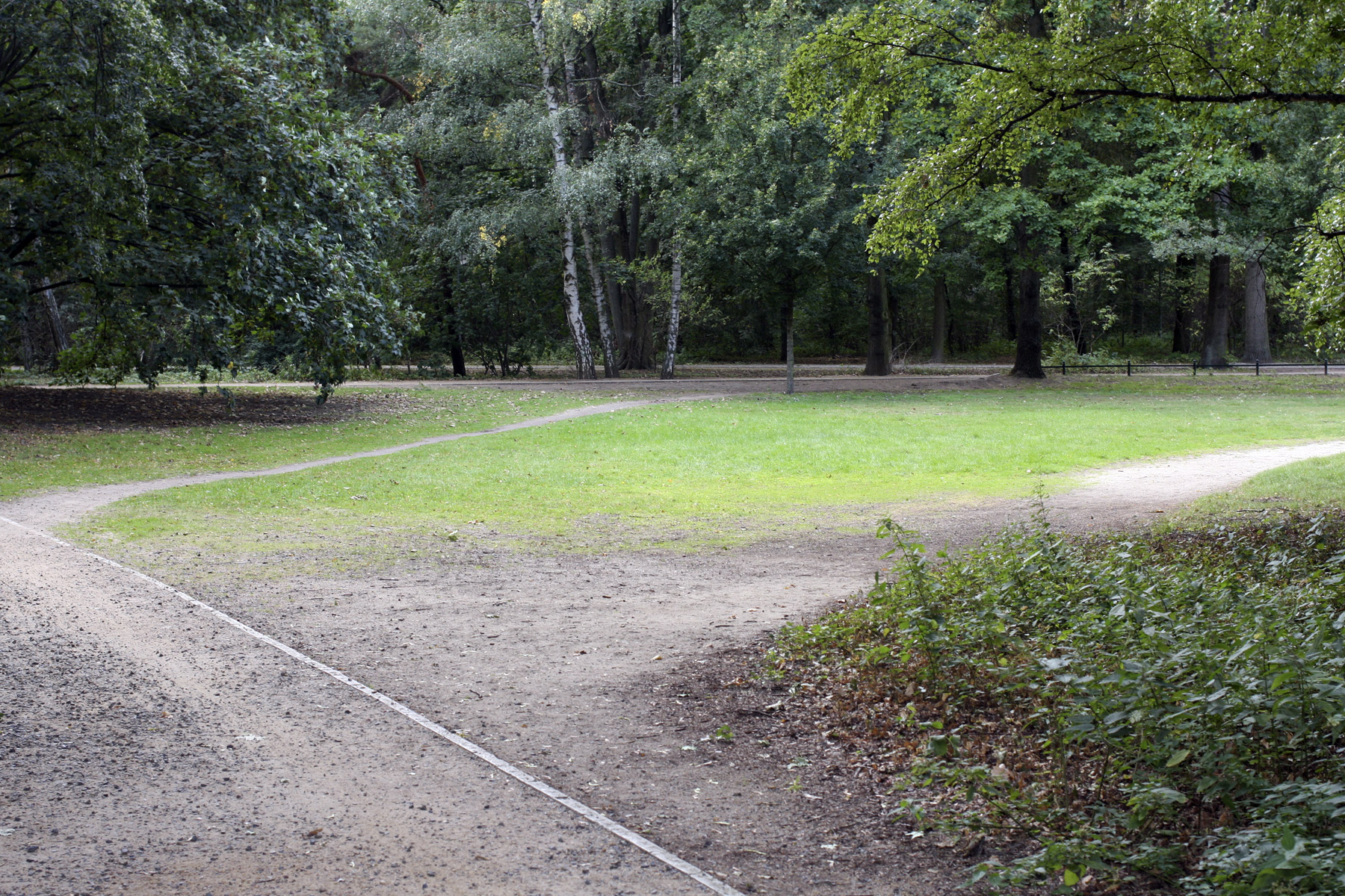
 'Untitled' 2019-2020")
 'Untitled' 2019-2020")
 'Untitled' 2019-2020")
 'Untitled' 2019-2020")
 'Untitled' 2019-2020")
 'Untitled' 2019-2020")
 'Untitled' 2019-2020")
 'Untitled' 2019-2020")
 'Untitled' 2019-2020")
 'Untitled' 2019-2020")
 'Untitled' 2019-2020")
 'Untitled' 2019-2020")
 'Untitled' 2019-2020")
 'Untitled' 2019-2020")
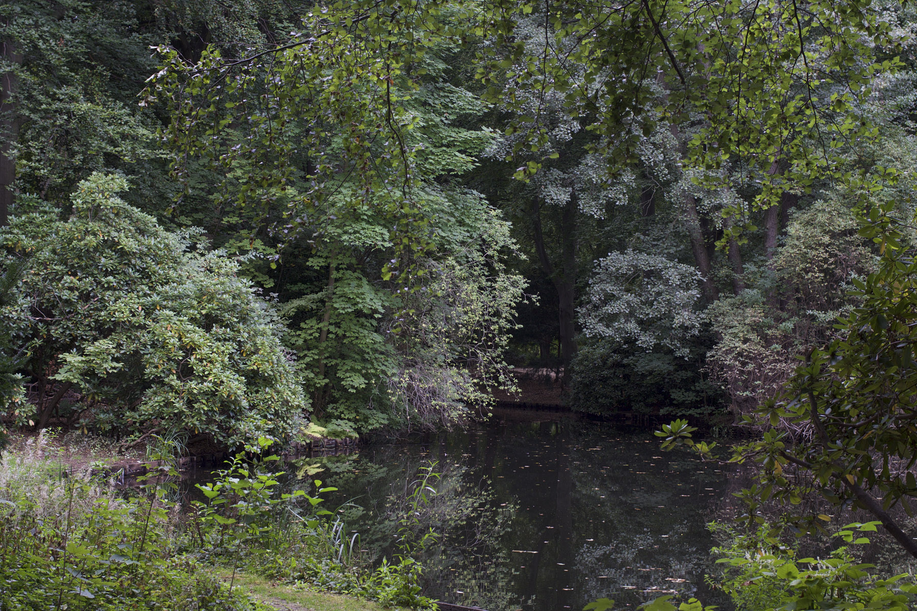
 'Untitled' 2019-2020")
 'Untitled' 2019-2020")
 'Untitled' 2019-2020")
 'Untitled' 2019-2020")
 'Untitled' 2019-2020")
 'Untitled' 2019-2020")
 'Untitled' 2019-2020")
 'Untitled' 2019-2020")
 'Untitled' 2019-2020")
 'Untitled' 2019-2020")
 'Untitled' 2019-2020")
 'Untitled' 2019-2020")
 'Untitled' 2019-2020")
 'Untitled' 2019-2020")
 'Untitled' 2019-2020")
 'Untitled' 2019-2020")
 'Untitled' 2019-2020")
 'Untitled' 2019-2020")
 'Untitled' 2019-2020")
 'Untitled' 2019-2020")
 'Untitled' 2019-2020")
 'Untitled' 2019-2020")
 'Untitled' 2019-2020")
 'Untitled' 2019-2020")
 'Untitled' 2019-2020")
 'Untitled' 2019-2020")
 'Untitled' 2019-2020")
 'Untitled' 2019-2020")
 'Untitled' 2019-2020")
 'Untitled' 2019-2020")
 'Untitled' 2019-2020")
 'Untitled' 2019-2020")
 'Untitled' 2019-2020")
 'Untitled' 2019-2020")
 'Untitled' 2019-2020")
 'Untitled' 2019-2020")
 'Untitled' 2019-2020")
 'Untitled' 2019-2020")
 'Untitled' 2019-2020")
 'Untitled' 2019-2020")
 'Untitled' 2019-2020")
 'Untitled' 2019-2020")
 'Untitled' 2019-2020")
 'Untitled' 2019-2020")
 'Untitled' 2019-2020")
 'Untitled' 2019-2020")
 'Untitled' 2019-2020")
 'Untitled' 2019-2020")
 'Untitled' 2019-2020")
 'Untitled' 2019-2020")
 'Untitled' 2019-2020")
 'Untitled' 2019-2020")
 'Untitled' 2019-2020")
 'Untitled' 2019-2020")
 'Untitled' 2019-2020")
 'Untitled' 2019-2020")
 'Untitled' 2019-2020")
 'Untitled' 2019-2020")
 'Untitled' 2019-2020")
 'Untitled' 2019-2020")
 'Untitled' 2019-2020")
 'Untitled' 2019-2020")
 'Untitled' 2019-2020")
 'Untitled' 2019-2020")
 'Untitled' 2019-2020")


 'Untitled' 1946 from the exhibition 'Lee Krasner: Living Colour' at the Barbican Art Gallery, London, May - Sept, 2019")
 'Abstract No. 2' 1947 from the exhibition 'Lee Krasner: Living Colour' at the Barbican Art Gallery, London, May - Sept, 2019")
 'Mosaic Table' 1947")


 'Blue Level' 1955")
 'Desert Moon' 1955")
 'Bald Eagle' 1955")


 'Prophecy' 1956")
 'Embrace' 1956")


 'Polar Stampede' 1960")
 'The Guardian' 1960")

 'Through Blue' 1963")


 'Another Storm' 1963")
 'Icarus' 1964")


 'Siren' 1966")
 'Untitled' 1969")


 'Palingenesis' 1971")

 'Imperative' 1976")


 'Lee Krasner in her New York studio' 1939")


 before it was completed, Springs, July or August 1959' 1959")
 'Lee Krasner in her studio in the barn, Springs' 1962")
 'Lee Krasner, Springs, NY' 1972")
 'Marcus (after scarification)' 1992")
 'Untitled' 1946 from the exhibition 'Black Light: Secret traditions in art since the 1950s' at Centre de Cultura Contemporania de Barcelona, May - Oct, 2018")
 'Book covers' 1987 from the exhibition 'Black Light: Secret traditions in art since the 1950s' at Centre de Cultura Contemporania de Barcelona, May - Oct, 2018")
 'Creatio: Lux, Crux' 2015 from the exhibition 'Black Light: Secret traditions in art since the 1950s' at Centre de Cultura Contemporania de Barcelona, May - Oct, 2018")
 'Untitled' 1983")
 'West Angel' Nd")
 'Snow-Peak beyond Foothills, Libra I8 September-October' 1934")

 'Passageway' 2013")
 'Dreamachine' 1960-1976")
 'Bubble Diagram' 2005")
![Fred Tomaselli (American, b. 1956) 'Untitled [Datura Leaves]' 1999](https://artblart.com/wp-content/uploads/2018/10/tomaselli-untitled-datura-leaves-1999-web.jpg "Fred Tomaselli (American, b. 1956) 'Untitled [Datura Leaves]' 1999")
 'Rose Triangle' 2008")
 'If You Don't See It Ask For It' 2016")
 'Burns Forever Thee Light' 1986")
 'Untitled, October 19, 1951' 1951")
 'Untitled, No. 7' 1997")
 'Panamor' 2016")
 'Tarot cards: the High Priestess' 2009-2011")
 'Homage to Ryder' 1951")
 'Untitled (Blackboard drawing from a lecture held by Rudolf Steiner on 20. 03. 1920)'")


 'Untitled (Lexington)' 1951 from the exhibition 'Cy Twombly' at the Centre Pompidou, Paris, Nov 2016 - April 2017")
 'Volublis' 1953 from the exhibition 'Cy Twombly' at the Centre Pompidou, Paris, Nov 2016 - April 2017")
 'Still Life, Black Mountain College I' 1951")
 'Still Life, Black Mountain College II' 1951")
 'Still Life, Black Mountain College III' 1951")
 'Untitled (Grottaferrata) III' 1957")
 'Untitled (Grottaferrata) IV' 1957")
 'Untitled (Grottaferrata) V' 1957")
 'Untitled (Grottaferrata) VI' 1957")
 'Untitled (Grottaferrata) VII' 1957 from the exhibition 'Cy Twombly' at the Centre Pompidou, Paris, Nov 2016 - April 2017")
 'Sperlonga Collage' 1959")
 'School of Athens' 1961")
 'Achilles Mourning the Death of Patroclus' 1962")
 'The Vengeance of Achilles' 1962")
 View of the series 'Nine Discourses on Commodus' 1963")
 'Alessandro Twombly' 1965")
 'Night Watch' 1966")
 'Pan' 1975")
 'Apollo' 1975")
 'Venus' 1975")
 'Fifty Days at Iliam Shield of Achilles (Part 1)' 1978")
 'Fifty Days at Iliam Shades of Achilles, Patroclus and Hector (Part VI)' 1978")
 'Untitled (Formia)' 1981")
 'Untitled (Lexington)' 2004")
 'Untitled (Bassano in Teverina)' 1985")
 'Wilder Shores of Love' 1985")
 'Summer Madness' 1990")
 'Quattro Stagioni: Primavera' 1993-1995")
 'Lemons (VI)' (Gaète) (detail) 1998")
 'Coronation of Sesostris (Part III)' 2000")
 'Coronation of Sesostris (Part V)' 2000")
 'Coronation of Sesostris (Part VI)' 2000")
 'Blooming' 2001-2008")
 'Untitled, (A Gathering of Time)' 2003")
 'Untitled (Bacchus)' 2005")
 'Sans titre' (Gaète) 2007")
 'Camino Real (V)' 2010")
 'Double Scramble' 1978 from the exhibition 'Rothko to Richter: Mark Making in Abstract Painting from the Collection of Preston H. Haskell', Class of 1960 at the Princeton University Art Museum, May - October, 2014")
 'Study for Homage to the Square' 1964 from the exhibition 'Rothko to Richter: Mark Making in Abstract Painting from the Collection of Preston H. Haskell', Class of 1960 at the Princeton University Art Museum, May - October, 2014")
 'Untitled (red)' 1972")
 'Untitled (Woman)' 1965")
 'Untitled (Woman)' 1965 (detail)")
 'February's Turn' 1979")
 'Belfry' 1979")
 'Monument Valley, Utah' 1970")
 'Rock Wall, Connecticut' 1959")
 'Abstract Painting (613-3) 1986")
 'Abstract Painting (613-3)' 1986 (detail)")
 'Untitled' 1960")
 'Composition #3' 1952")
 'Midday' 1956")
 'Midday' 1956 (detail)")
 'Dans la Tempête' 1960")
 'Dans la Tempête' 1960 (detail)")
 'Bond' 1960")
 'Bond' 1960 (detail)")
 'Mire G119' 1983")
 'Untitled (Ocean Park)' 1983")
 'Phenomena Spanish Cape' 1975")
 'Untitled' 1968")
 'Untitled' 1968 (detail)")
 'Untitled' 1959 from the exhibition 'American Cool' at the Smithsonian National Portrait Gallery, Washington, DC, February - September, 2014")
 'Crossing the Ohio River, Louisville, 1966' 1966 from the exhibition 'American Cool' at the Smithsonian National Portrait Gallery, Washington, DC, February - September, 2014")
 'Billie Holiday' 1951 (printed 1991)")
 'Elvis Presley' 1956")
 'Frank Sinatra' c. 1956")
 'David Byrne' 1981")
 'Joan Didion' 1970")
 'James Dean' 1954")
 'Steve McQueen' 1962")
 'Tony Hawk' 1999 (printed 2010)")

 'Jack Kerouac' 1959")
 'Paul Newman' 1959 (printed 2013)")
 'Thelonious Monk at Minton's Playhouse, New York City' 1947")
 'Susan Sontag' 1975")
 'Willie Nelson' 1989 (printed 2009)")
 'Fred Astaire' 1936")
 'Audrey Hepburn' 1955")
 'Jean-Michel Basquait' 1986")
 'Benicio Del Toro' 2008 (printed 2012)")
 'Bessie Smith' 1936")
 'Deborah Harry' 1978")
 'Humphrey Bogart' 1944")
 'Leaves of Grass, 1st Edition' Copy after: Gabriel Harrison 1855")

 'Jimi Hendrix' 1967 (printed later)")
 'Duke Ellington' c. 1946 (printed 1991)")
 'Kurt Cobain' 1993 (printed 2013)")
 'Marlon Brando' 1950 (printed later)")
 'Muddy Waters' c. 1960")
 'Lauren Bacall' 1949 (printed 2013)")
 'Madonna' 1983 (printed 2013)")
 'Miles Davis' 1955 (printed 2012)")

 'Lou Reed' 1966")
 'Jackson Pollock' 1949")
 'Patti Smith' 1976 (printed 2012)")
 'Clint Eastwood' 1971")
 'Bob Dylan, Singer, New York City, February 10, 1965' 1965")
 'Tupac Shakur' 1992 (printed 2013)")
 'Gene Krupa at 400 Restaurant, New York City' June 1946")
![Wols (German, 1913-1951) 'Untitled [Still life - dining table]' 1937 from the exhibition 'Wols Photographer. The Guarded Look' at Martin-Gropius-Bau, Berlin, March - June, 2014](https://artblart.com/wp-content/uploads/2014/05/wols_09_esstisch-web.jpg "Wols (German, 1913-1951) 'Untitled [Still life - dining table]' 1937 from the exhibition 'Wols Photographer. The Guarded Look' at Martin-Gropius-Bau, Berlin, March - June, 2014")
 'Nicole Bouban' Autumn 1932 - October 1933 / January 1935 to 1937 from the exhibition 'Wols Photographer. The Guarded Look' at Martin-Gropius-Bau, Berlin, March - June, 2014")
![Wols (German, 1913-1951) 'Untitled [Pavilion de l'Elegance - Creating a home with Alix (Germaine Krebs)]' 1937](https://artblart.com/wp-content/uploads/2014/05/wols_05_pavillon_de_l_elegance_2-web.jpg "Wols (German, 1913-1951) 'Untitled [Pavilion de l'Elegance - Creating a home with Alix (Germaine Krebs)]' 1937")
![Wols (German, 1913-1951) 'Untitled [Swiss Pavilion - Wire Figure]' 1937](https://artblart.com/wp-content/uploads/2014/05/wols_04_pavillon_drahtfigurine-web.jpg "Wols (German, 1913-1951) 'Untitled [Swiss Pavilion - Wire Figure]' 1937")
 'Max Ernst' Fall 1932 - October / January 1935 to 1936")
 'Max Ernst' Fall 1932 - October / January 1935 to 1936")
![Wols (German, 1913-1951) 'Untitled [Paris - Flea Market]' Autumn 1932 - October 1933 / January 1935 to 1936](https://artblart.com/wp-content/uploads/2014/05/wols_08_flohmarkt-web.jpg "Wols (German, 1913-1951) 'Untitled [Paris - Flea Market]' Autumn 1932 - October 1933 / January 1935 to 1936")
![Wols (German, 1913-1951) 'Untitled [Paris - Palisade]' Fall 1932 - October 1933 / January 1935 - August 1939](https://artblart.com/wp-content/uploads/2014/05/wols_07_paris_palisade.jpg "Wols (German, 1913-1951) 'Untitled [Paris - Palisade]' Fall 1932 - October 1933 / January 1935 - August 1939")
![Wols (German, 1913-1951) 'Untitled [Paris - Eiffel Tower]' 1937](https://artblart.com/wp-content/uploads/2014/05/wols_03_eiffelturm-web.jpg "Wols (German, 1913-1951) 'Untitled [Paris - Eiffel Tower]' 1937")
![Wols (German, 1913-1951) 'Untitled [Still Life - Grapefruit]' 1938 - August 1939](https://artblart.com/wp-content/uploads/2014/05/wols_06_pampelmuse-web.jpg "Wols (German, 1913-1951) 'Untitled [Still Life - Grapefruit]' 1938 - August 1939")
 'Self Portrait with Hat' 1937-1938")
 'Foot on El' 1954")
 'Taxi' 1956")
 'Big Meadow, Washington Pass, Washington September, 2000' 2000 'Johsel Namkung: A Retrospective' published by Cosgrove Editions, 2013")
 'Cougar Lake, Oregon June 1991' 1991 'Johsel Namkung: A Retrospective' published by Cosgrove Editions, 2013")
 'Rainy Pass, Washington July, 1989' 1989")
 'Picture Lake, Mount Baker, Washington July 1979' 1979")
 'Steptoe Butte, Washington January, 1989' 1989")
 'Oak Creek, Washington March, 1991' 1991")
 'Steptoe Butte, Washington October, 1977' 1977")
 'Steptoe Butte, Washington October, 1983' 1983")
 'Denali National Park, Alaska September, 1987' 1987")
 'Arrigetch, Alaska September, 1980' 1980")
 'Shi Shi Beach Buoy, Olympic National Park, Washington August, 1981' 1981")
 'Bissell, Washington December, 1981' 1981")
 'Alaska Lichens, Date Unknown' Nd")
 'Blue Mountain, Olympic National Park, Washington September, 1976' 1976")
 'Weston Beach, Point Lobos, California May, 1988' 1988")
 'Frenchman Coulee, Washington May, 2002' 2002")
 'Kalaloch Beach, Olympic National Park, Washington October, 1984' 1984")

 'From the El' c. 1955 from the exhibition Saul Leiter' at Kunst Haus Wien, Vienna, January - May, 2013")
 'Nude' 1970s")
 'Taxi' c. 1957 from the exhibition Saul Leiter' at Kunst Haus Wien, Vienna, January - May, 2013")
 'New York' 1950s")
 'Sign Painter' 1954")
 'Graffiti Heads' 1950")
 'Shirt' 1948")
 'Harlem' 1960")
 'Hat' 1956")
 'Street Scene' 1957")
 'Carol Brown, 'Harper's Bazaar'' c. 1958")
 'Soames Bantry, 'Nova'' 1960")
 'Walking' 1956")
 'Reflection' 1958")
 'Shopping' c. 1953")
 'Kutztown' 1948")
 'Pizza, Patterson' 1952")

You must be logged in to post a comment.