Posts Tagged ‘Piet Mondrian

22
May
22

Exhibition: ‘André Kertész: Postcards from Paris’ at the High Museum of Art, Atlanta

Exhibition dates: 18th February – 29th May, 2022

Curator: Elizabeth Siegel, curator of photography and media at the Art Institute of Chicago


André Kertész (Hungarian, 1894-1985) 'Grands Boulevards' 1926


André Kertész (Hungarian, 1894-1985)
Grands Boulevards
1926
Gelatin silver print on carte postale paper, 1926-1935
Image: 3 1/16 × 45/16″ (7.8 × 10.9cm)
Sheet: 3 5/16 × 5 1/16″ (8.4 × 12.9cm)
The Museum of Modern Art, New York. Thomas Walther Collection. Gift of Thomas Walther


The next two postings focus on the creation and distribution of carte postale – in this posting fine art photographs taken by an artist experimenting with photography at the beginning of his career, intimate images cropped and printed for carte postale (postcard) photographic paper and distributed in very limited numbers to friends and family; and in the next posting social documentary photographs taken by mainly anonymous artists, printed in larger numbers by publishers for public consumption.

Arriving in Paris in 1925 Kertész used to his camera to document his feelings towards his new city, a city that was to become his spiritual home no matter where he lived. I have the same feeling towards Paris. One day I will live there, wander the streets and continue to take photographs of this beloved city. “Kertész used his camera to document his explorations of Paris in his first days there. During long walks, he photographed activity along the Seine, overlooked scenes behind buildings, and the tents at local fairgrounds. With few expectations to satisfy beyond his own ambition, the artist was free to explore and record, refining his eye as he composed his images in the camera and as he reviewed and printed them as cartes postales.”

In this posting there are only four external scenes of Paris including two crisp Modernist photographs of the same homeless man with street posters; an enigmatic image of the Eiffel Tower; and the highlight for me, an atmospheric high angle view of a fairground. Other highlights in the posting include Kertész’s vibrant, expressive Satiric Dancer (1927, below); his modern, simple and unpretentious Fork (1928, below) and Mondrian’s Pipe and Glasses (1926, below) so clearly and crisply observed; and the most famous of all his photographs, the serene and beautiful Chez Mondrian (1926, below) in which Kertész said “Everything was there before me.” It only required his awareness and recognition of the scene to tell the story. My particular favourite is Kertész’s seeming homage to Eugène Atget, Latin Quarter (Étienne Beöthy’s Cousin) (1927, below) … an Atget interior and perspicacious portrait combined.

The key is to see things clearly and intelligently in order to express the story you want to tell with feeling and empathy. As Kertész tells it, to have enough technique to then forget about it. “I believe you should be a perfect technician in order to express yourself as you wish and then you can forget about the technique.” He insightfully observes, “You have beautiful calligraphy, but it’s up to you what you write with it.”

It’s about the story you tell and not (just) about technique and an empty beauty (as with much contemporary photography).

Dr Marcus Bunyan

.
Many thankx to the High Museum of Art for allowing me to publish the photographs in the posting. Please click on the photographs for a larger version of the image.


In 1925, photographer André Kertész (American, born Hungary, 1894-1985) arrived in Paris with little more than a camera and meager savings. Over the next three years, the young artist carved out a photographic practice that allowed him to move among the realms of amateur and professional, photojournalist and avant-garde artist, diarist and documentarian. By the end of 1928, he had achieved widespread recognition, emerging as a major figure in modern art photography alongside such figures as Man Ray and Berenice Abbott. During this three-year period, he chose to print most of his photographs on carte postale, or postcard paper. Although this choice may have initially been born of economy and convenience, he turned the popular format toward artistic ends, rigorously composing new images in the darkroom and making a new kind of photographic object.

Postcards from Paris is the first exhibition to bring together Kertész’s rare carte postale prints. These now-iconic works offer new insight into his early, experimental years and reveal the importance of Paris as a vibrant meeting ground for international artists, who drew inspiration from each other to create new, modern ways of seeing and representing the world.


Kertész was an expert printer and a precise technician, even as he strove for spontaneity and naturalism in his imagery and, with the exception of cropping, was apparently averse to manipulations such as experimental darkroom techniques and photomontage.8 He was opinionated on the subject of how his photographs should be made: in 1923, still struggling for recognition, he refused to reprint in bromoil an image he had submitted to a competition, which cost him the silver medal. He later said of the episode, “I have always known that photography can only be photography.”9 In a letter from 1926 Jenö complimented his work, calling it technically impeccable, but Kertész also believed that technical perfection by itself “overshines the boot,” explaining, “You have beautiful calligraphy, but it’s up to you what you write with it.”10 In an interview near the end of his life Kertész said, “Technique is only the minimum in photography. It’s what one must start with. I believe you should be a perfect technician in order to express yourself as you wish and then you can forget about the technique.”11

.
Nancy Reinhold. “Exhibition in a Pocket: The Cartes Postales of André Kertész,” in Mitra Abbaspour, Lee Ann Daffner, and Maria Morris Hambourg (eds.,). Object: Photo. Modern Photographs: The Thomas Walther Collection 1909-1949. An Online Project of The Museum of Modern Art. New York: The Museum of Modern Art, 2014.


André Kertész (Hungarian, 1894-1985) 'Self-Portrait' July 1927


André Kertész (Hungarian, 1894-1985)
Self-Portrait
July 1927
Gelatin silver print on carte postale paper
Estate of André Kertész, courtesy of Stephen Bulger Gallery, Toronto


Kertész sent this print to his brother Jenő with the inscription, “To my younger brother, Bandi.” (“Bandi” was André’s family nickname.) Although the photographer frequently mailed his carte postale prints to family and friends, he sent them in envelopes rather than affixing a stamp to the back and posting them directly in the manner the manufacturers intended. Moreover, rather than signing them on the back, as one would a postcard, he almost always signed them on the front, like a finished work of art. The paper’s utilitarian format nonetheless may have inspired him to circulate his pictures through the mail and use them to communicate with his family.


A Portrait of the Artist

With this self-portrait, André Kertész declared himself a cosmopolitan artist. He appears surrounded by objects that refer to both his birthplace of Hungary and his new home in Paris.

Kertész printed this image on postcard paper and sent it home to his family. Rather than writing on the back of the card and adding postage, he mailed it safely in an envelope as proof that he was surviving and even thriving in his new city and still resolved to become a photographer.


From Immigrant to Insider

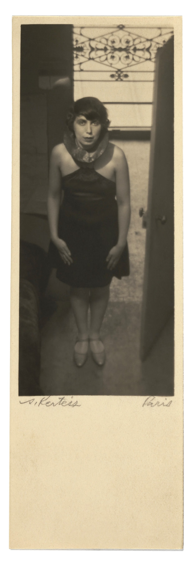
Kertész arrived in Paris in fall 1925 with little other than his cameras and some savings. His first years were filled with experimentation as he learned from a community of other expatriate artists. Kertész hung a portrait of his mother on the door to his small apartment [see below]. Made at a professional studio in Budapest, it was printed on carte postale paper, the same kind he used to make his self-portrait and most of his work in Paris.


A Memento of Home

Kertész arranged himself at a table covered by a cloth from Hungary embroidered by his mother with the initials K.A., for Kertész Andor, his name before he adopted the French “André.”

Kertész’s apartment also featured a life mask, a plaster cast of his own face, which he kept as he moved from Hungary to Paris and later to New York. It appears as an alter ego – a strategy of doubling that he used often in his photographs.

Kertész presented himself as cultured and educated, with an overflowing bookshelf behind him and an open book before him on the table. Although he spoke three languages, Kertész later said, “My English is bad. My French is bad. Photography is my only language.”

Hanging prominently above the artist’s head is his take on an iconic Parisian landmark, the Eiffel Tower [see below]. One of the earliest photographs he made in Paris, this image – enlarged for the wall – symbolises his new home.


Romer Erzs Studio (Hungarian) Budapest. 'Kertesz's Mother' Before 1925


Romer Erzs Studio (Hungarian) Budapest
Kertesz’s Mother
Before 1925


André Kertész (Hungarian, 1894-1985) 'Eiffel Tower' 1925


André Kertész (Hungarian, 1894-1985)
Eiffel Tower
1925
Gelatin silver print on carte postale paper
Family Holdings of Nicholas and Susan Pritzker


Among Kertész’s earliest Parisian photographs is this view of the Eiffel Tower [see on the wall behind the artist in his Self-Portrait 1927, above]. Taken from a window in the apartment of a Hungarian architect, the moody image is less a typical tourist snapshot than a specific vision of the landmark captured from the perspective of a local. In a self-portrait, an enlarged version of this work can be seen hanging prominently on the wall of the photographer’s apartment – a decorating choice emblematic, perhaps, of his immersion in his adopted city. Kertész used his camera to document his explorations of Paris in his first days there. During long walks, he photographed activity along the Seine, overlooked scenes behind buildings, and the tents at local fairgrounds. With few expectations to satisfy beyond his own ambition, the artist was free to explore and record, refining his eye as he composed his images in the camera and as he reviewed and printed them as cartes postales. He maintained decades after he left the city, “Paris became my home and it still is. Paris accepted me as an artist just as it accepted any artist, painter, or sculptor. I was understood there.”


André Kertész (Hungarian, 1894-1985) 'József Csáky' 1926


André Kertész (Hungarian, 1894-1985)
József Csáky
1926
Gelatin silver print on carte postale paper
Image: 10.9 × 7.2cm
Card: 12.9 × 7.5cm


Joseph Csaky (also written Josef Csàky, Csáky József, József Csáky and Joseph Alexandre Czaky) (18 March 1888 – 1 May 1971) was a Hungarian avant-garde artist, sculptor, and graphic artist, best known for his early participation in the Cubist movement as a sculptor. Csaky was one of the first sculptors in Paris to apply the principles of pictorial Cubism to his art. A pioneer of modern sculpture, Csaky is among the most important sculptors of the early 20th century. He was an active member of the Section d’Or group between 1911 and 1914, and closely associated with Crystal Cubism, Purism, De Stijl, Abstract art, and Art Deco throughout the 1920s and 1930s.

Csaky fought alongside French soldiers during World War I and in 1922 became a naturalised French citizen. He was a founding member of l’Union des Artistes modernes (UAM) in 1929. During World War II, Csaky joined forces with the French underground movement (la Résistance) in Valençay. In the late 1920s, he collaborated with some other artists in designing furniture and other decorative pieces, including elements of the Studio House of the fashion designer Jacques Doucet.

After 1928, Csaky moved away from Cubism into a more figurative or representational style for nearly thirty years. He exhibited internationally across Europe, but some of his pioneering artistic innovation was forgotten. His work today is primarily held by French and Hungarian institutions, as well as museums, galleries and private collections both in France and abroad. …


Legacy

Joseph Csaky contributed substantially to the development of modern sculpture, both as a pioneer in applying Cubism to sculpture, and as a leading figure in nonrepresentational art of the 1920s.

After fighting alongside the French underground movement against the Nazis during World War II, Csaky faced many difficulties: health issues, family problems and a lack of work-related commissions. Unlike many of his friends, whose names became widely known, Csaky was appreciated by fewer people (but they notably included art collectors, art historians and museum curators).

“Today, however,” writes Edith Balas, “in a postmodernist atmosphere, those aspects of his art that made Csáky unacceptable to the more advanced modernists are readily accepted as valid and interesting. The time has come to give Csáky his rightful place in the ranks of the avant-garde, based on an analysis of his artistic innovations and accomplishments.”

Text and more information on the artist can be found on his Wikipedia entry


André Kertész (Hungarian, 1894-1985) 'Pierre Mac Orlan' 1927


André Kertész (Hungarian, 1894-1985)
Pierre Mac Orlan
1927
Gelatin silver print on carte postale paper
Unmarked recto; inscribed verso, on paper, along left edge, sideways, in graphite: “6” [one arrow extending from the left and the right side, running along the left edge]”; verso, upper centre, sideways, in graphite: “Pierre McOxlan / 1927.”; verso, lower centre, sideways, in graphite: “142”; printed verso, along right edge, sideways, in black ink: “CARTE POSTALE / Correspondance Adresse”
Image: 10.8 × 7.8cm
Card: 11.1 × 18.1cm


Pierre Mac Orlan, sometimes written MacOrlan (born Pierre Dumarchey, February 26, 1882 – June 27, 1970), was a French novelist and songwriter. His novel Quai des Brumes was the source for Marcel Carné’s 1938 film of the same name, starring Jean Gabin. He was also a prolific writer of chansons, many of which were recorded and popularized by French singers such as Juliette Gréco, Monique Morelli, Catherine Sauvage, and Germaine Montero.

Text from the Wikipedia website


In 1925, photographer André Kertész (American, born Hungary, 1894-1985) arrived in Paris with little more than a camera and meager savings. Over the next three years, the young artist carved out a photographic practice that allowed him to move among the realms of amateur and professional, photojournalist and avant-garde artist, diarist and documentarian. This spring, the High Museum of Art will present “André Kertész: Postcards from Paris” (Feb. 18-May 29, 2022), the first exhibition to focus exclusively on his rare cartes postales, precise prints on inexpensive yet lush postcard paper.

Organised by the Art Institute of Chicago, “Postcards from Paris” brings together more than 100 of these prints from collections across Europe and North America and offers insight into Kertész’s early experimental years, during which he produced some of his now-iconic images and charted a new path for modern photography. The exhibition will also reveal the importance of Paris as a vibrant meeting ground for international artists, who drew inspiration from each other to create fresh ways of seeing and representing the world.

“We are delighted for the opportunity to share these rare prints by one of the most intriguing and groundbreaking photographers of the 20th century,” said Rand Suffolk, the High’s Nancy and Holcombe T. Green, Jr., director.

“Kertész was one of the most consequential photographers of the 20th century, and this exhibition focuses on his most innovative and prolific period,” said Gregory Harris, the High’s Donald and Marilyn Keough Family curator of photography. “He was a pioneer who mastered intimate portraiture, dynamic street photography and precise interior studies, moving effortlessly between his personal and commercial work. These distinctive carte postale prints are some of the finest examples of his iconic early photographs.”

Kertész moved to Paris due to the limited opportunities in his native Hungary, and by the end of 1928, he was contributing regularly to magazines and exhibiting his work internationally alongside well-known artists such as Man Ray and Berenice Abbott. The three years between his arrival in Paris and his emergence as a major figure in modern art photography marked a period of dedicated experimentation and exploration for Kertész. During that time, he produced most of his prints on carte postale paper, turning this popular format toward artistic ends, rigorously composing images in the darkroom and making a new kind of photographic object. “Postcards from Paris” pays careful attention to the works as both images and objects, emphasising their experimental composition and daringly cropped formats.

The exhibition includes vintage prints of images that would come to define Kertész’s career, including “Chez Mondrian” (1926), an exquisitely composed scene of Piet Mondrian’s studio emphasising the painter’s restrained geometry; “Satiric Dancer” (1927), uniting photography with dance and sculpture by fellow Hungarians in Paris; and “Fork” (1928), declaring that photography could transform even the humblest of objects into art.

“Postcards from Paris” is curated by Elizabeth Siegel, curator of photography and media at the Art Institute of Chicago. The exhibition will be presented in the Lucinda Weil Bunnen Photography Galleries on the Lower Level of the High’s Wieland Pavilion.


Exhibition Catalogue

The exhibition catalogue unites all of André Kertész’s known carte postale prints, including portraits, views of Paris, careful studio scenes and exquisitely simple still lifes. Essays shed new light on the artist’s most acclaimed images; themes of materiality, exile and communication; his illustrious and bohemian social circle; and the changing identity of art photography. The book’s design reflects the spirit of 1920s Paris while underscoring the modernity of the catalogue’s more than 250 illustrated works. It was selected as Photography Catalogue of the Year for Aperture’s 2021 PhotoBook Awards Shortlist.

“André Kertész: Postcards from Paris” is organised by the Art Institute of Chicago.

Press release from the High Museum of Art


André Kertész (Hungarian, 1894-1985) 'Quartet' 1926


André Kertész (Hungarian, 1894-1985)
Quartet
1926
Gelatin silver print on carte postale paper
The Art Institute of Chicago, gift of Nicholas and Susan Pritzker


Kertész often radically revised the images he captured with the camera. He produced all of his cartes postales as contact prints by placing the negative in contact with the postcard paper during exposure instead of using an enlarger. He made this photograph of Feri Roth’s string quartet by masking the negative (blocking out certain sections with tape) before printing to highlight just a small section of a publicity picture the group had commissioned. By cropping out the players’ heads to concentrate on their angled bows and the lines of the music stand, Kertész abstracted the idea of a quartet to hands, instruments, and a white rectangle of sheet music. He left a dramatic ratio of the postcard paper blank to emphasise the image’s unusual placement at the top of the support. He then trimmed the card to custom proportions, as he did with nearly all his cartes postales, underlining the interplay between image and paper as an indispensable component of the artwork. Kertész saw these bold interventions as a way to distinguish his art from his budding commercial career: the whole image was for them, he later said in an interview; the cropped print was for him.


A Close Look at André Kertész’s Quartet

André Kertész’s image of the Feri Roth string quartet is tiny, but it packs a wallop.

Four musicians gather to play, with four sets of hands holding their bows at different angles. Kertész (American, born Hungary, 1894-1985) zooms in to concentrate on the lines of the bows and the music stand, resulting in a dynamic composition that abstracts the idea of a quartet to hands, instruments, and a white rectangle of sheet music.

Printed on intimately scaled carte postale (postcard) paper, this print could have been held in the hand, sent home to his family in Hungary, or passed along to a widening circle of international artist friends at the café tables Kertész frequented in 1920s Paris. In its subject and in its form, Quartet represents a key moment in the photographer’s career as he carved out a new, modern photographic practice in his adopted city.

The photograph began as a commission for his friend Feri Roth, a Hungarian musician whose renowned string quartet toured in Europe throughout the 1920s and was in need of publicity photographs. Kertész stood on a chair or stool to get an elevated position (a favourite technique) and made a wide picture that showed the complete scene.

The camera Kertész typically used produced negatives about the same size as the carte postale paper, which allowed for easy contact printing – meaning he placed the negative in direct contact with the postcard paper during exposure instead of using an enlarger. For this image, however, Kertész employed a larger camera, which allowed him to make some dramatic changes in the darkroom as he made his contact print: he cropped out all of the players’ heads and tilted the image slightly to orient it around the geometrical forms of the music stand. The photographer saw these interventions in the negative as a way to distinguish his art from his budding commercial career – the whole image was for them, he later said in an interview; the cropped print was for him.

Kertész’s approach in this print was typical of his work in his early years in Paris. He often made creative revisions in the darkroom, where he could produce a more refined composition by cropping out selected portions of the image. As was his habit with nearly all his carte postale prints, he precisely trimmed the card to custom proportions and carefully signed it on the front. Here, however, Kertész took an even more dramatic step in the print: he left most of the expanse of the postcard paper as empty white space, further emphasising the image’s cropping and its unusual placement at the top of the card. All of these actions elevated these humble materials of mass culture and underlined the interplay between image and paper as an indispensable component of the artwork.

Kertész also adapted this method of making a new composition out of an older one to his camera technique. Take, for example, his portrait of his friend Paul Arma (Imre Weisshaus), a Hungarian composer and pianist. Kertész first made a more traditional seated portrait showing the upper half of the musician’s body, his hands against the chair back holding his distinctive glasses. In another picture from the same sitting, he zoomed in on that gesture in an abstracted portrayal. Here, selected elements stand in for the whole subject, distilling Arma’s persona down to his instrument-playing hands and his particular vision.

Beyond demonstrating Kertész’s experimental approach, Quartet also tracks his expanding network, as he began connecting first to Hungarian – and soon to international – artists, musicians, dancers, and writers. He had built a community of creatives in his native Budapest, and in Paris he linked up with a group of Hungarian expatriates that included painter Lajos Tihanyi, sculptors Joseph (József) Csáky and Étienne (István) Beöthy, experimental puppeteer Géza Blattner, and dancer Magda Förstner, among others – all of whom he made carte postale portaits of. As his French improved and his circle widened, Kertész got to know and came to photograph French writer Pierre Mac Orlan, the poets Tristan Tzara (French-Romanian) and Paul Dermée (Belgian), Swedish painter Gundvor Berg, Spanish ceramicist Josep Llorens Artigas, Russian painter and gallery owner Evsa Model, and especially the Dutch painter Piet Mondrian, whose spare painting and studio left a deep impression on the photographer.

Quartet is one of over one hundred rare carte postale prints brought together for the first time in the exhibition André Kertész: Postcards from Paris. This exhibition takes a focused look at a three-year period in the artist’s career – his first years in Paris – when he explored new compositions and techniques and printed most of his work in the intimate carte postale format. As a reminder of Kertész’s daring experimentalism in photography, the importance of understanding his works as objects as much as images, and proof of his widening network and expansive artistic influences, this small photograph has a big impact.

~ Elizabeth Siegel, curator, Photography and Media

Elizabeth Siegel, “A Close Look at André Kertész’s Quartet,” on the Art Institute of Chicago website October 26, 2021 [Online] Cited 17/03/2022


André Kertész (Hungarian, 1894-1985) 'Paul Arma' 1928


André Kertész (Hungarian, 1894-1985)
Paul Arma
1928
Gelatin silver print on carte postale paper
Image: 7.9 × 7.9cm
Card: 13.5 × 8.1cm


Paul Arma (Hungarian: Arma Pál, aka Amrusz Pál; né Weisshaus Imre; 22 November 1905, in Budapest – 28 November 1987, in Paris) was a Hungarian-French pianist, composer, and ethnomusicologist.

Arma studied under Béla Bartók from 1920 to 1924 at the Franz Liszt Academy of Music, after which time he toured Europe and America giving concerts and piano recitals. Béla Bartók influenced Arma in his love for folksong and collection. He left Hungary in 1930, eventually settling in Paris in 1933, where he became the piano soloist with Radio Paris. His music is generally characterised by modernist tendencies, although his varied output includes folk song arrangements, film music, popular and patriotic songs, in addition to solo, chamber, orchestral and electronic music.

Text from the Wikipedia website


Paul Arma is a crucial figure in the history of French Resistance music, both because of the songs he composed and because of his tireless efforts to preserve the enormous body of music created during the war. Arma saw the songs of the Resistance not simply as sources of hope and acts of wartime courage, but also as important artifacts to be saved as symbols of France’s national spirit. Born in 1905 as Imre Weisshaus, the Hungarian pianist, conductor, and composer Paul Arma studied with Bartok at the Academy of Franz-Liszt in Budapest. He worked as a conductor of orchestras and choirs in Berlin and Lepizig until 1933, before being arrested by the SS in Leipzig for spying against the Germans and for his connections with the intellectual and artistic avant-garde. Though deemed not enough of a threat to be imprisoned, Arma was subject to a mock execution by the SS prior to being released. He subsequently fled to Paris, where he worked until 1939 as a pianist for Radio-Paris and wrote songs supporting the Republican Spanish for the International Brigades such as ‘Madrid’ and ‘No pasaran’ (Do not pass). After the arrival of the Nazis, Arma composed ‘Les chants du silence’ (Songs of silence) on texts of Vercors, Eluard, Romain Rolland and Paul Claudel among others, writing: ‘During a period when, in France, freedom had to take place in prescribed silence … I sang silence in order to blackmail life.’ During the war, Arma secretly collected over 1,800 French songs, transcribing the melodies together with his wife. After the war, he sent out an appeal on radio and in national newspapers in France, Spain, Hungary, Italy, the Ukraine, Armenia and Bulgaria, seeking additional songs for his collection. The response was enormous: listeners sent in over 1,300 songs. From October to December 1945, Arma broadcast a number of these songs on the radio as part of a series entitled La Résistance qui chante (Resistance singing). …

From 1954-1984 Arma conducted research into electromagnetic music, as well as making 81 sculptures out of wood and metal on the theme of music, called Musiques sculptées (sculpted music). In the 1980s he became a French national, was awarded the S.A.C.E.M. Enesco prize, and was made a Knight of the National Order of the Legion of Honour, an Officer of the National Order of Arts and Letters, and an Officer of the National Order of Merit. He died in 1987 and his wife donated his music collection to the Musée Régionale de la Résistance et de la Déportation de Thionville (Regional Museum of the Resistance and Deportation at Thionville).

Daisy Fancourt. “Paul Arma,” on the Music and the Holocaust website Nd [Online] Cited 11/04/2021


André Kertész (Hungarian, 1894-1985) 'Paul Arma's Hands, Paris' 1928


André Kertész (Hungarian, 1894-1985)
Paul Arma’s Hands, Paris
1928
Gelatin silver print on carte postale paper
Image: 24 × 18 cm
Mount: 36.8 × 27.3cm
Art Institute of Chicago
Julien Levy Collection, Special Photography Acquisition Fund


André Kertész (Hungarian, 1894-1985) 'Lajos Tihanyi' 1926


André Kertész (Hungarian, 1894-1985)
Lajos Tihanyi
1926
Gelatin silver print on carte postale paper
Image: 10.9 × 7.9cm
Card: 11.2 × 8.1cm


Lajos Tihanyi (29 October 1885 – 11 June 1938) was a Hungarian painter and lithographer who achieved international renown working outside his country, primarily in Paris, France. After emigrating in 1919, he never returned to Hungary, even on a visit.

Born in Budapest, as a young man, Tihanyi was part of the “Neoimpressionists” or “Neos”, and later the influential avant-garde group of painters called The Eight (A Nyolcak), founded in 1909 in Hungary. They were experimenting with styles of Post-Impressionism and rejected the naturalism of the Nagybánya artists’ colony. Their work is considered highly influential in establishing modernism in Hungary to 1918, when the First World War and revolution overtook the country.

After the fall of the Hungarian Democratic Republic in 1919, Tihanyi left and lived briefly in Vienna. He moved on to Berlin for a few years, where he connected with many Hungarian émigré writers and artists, such as Gyorgy Bölöni and the future Brassaï. By 1924 Tihanyi and numerous other artists moved to Paris, where he stayed for the remainder of his life.

In Paris, Tihanyi gradually shifted to more abstract styles in his work. His paintings and lithographs are held by the Hungarian National Gallery, Musée d’Art Moderne de la Ville de Paris, and the Brooklyn Museum of Art in New York City, among other institutions, and by private collectors. With the centenary of The Eight’s first exhibition, Tihanyi has been featured in five exhibitions since 2004, including ones held in 2010 and 2012 in Hungary and Austria, and another in 2012 devoted to a solo retrospective of his work.

Text and more information on the artist can be found on his Wikipedia entry


André Kertész (Hungarian, 1894-1985) 'Satiric Dancer' 1927


André Kertész (Hungarian, 1894-1985)
Satiric Dancer
1927
Gelatin silver print on carte postale paper
Family Holdings of Nicholas and Susan Pritzker


“Do something with the spirit of the studio corner,” Kertész told his subject before he took this picture. He captured Hungarian dancer Magda Förstner in sculptor Etienne Beöthy’s studio, her contorted pose playfully mimicking the angular form of the work next to the sofa, Beöthy’s Direct Action. “She just made a movement. I took only two photographs. No need to shoot a hundred rolls like people do today. People in motion are wonderful to photograph. It means catching the right moment – the moment when something changes into something else.” Although Satiric Dancer, as it eventually came to be known, was not published or exhibited much during Kertész’s Paris years, it later became one of the artist’s most recognised images. Linking dance, sculpture, and photography, it evokes the ethos of sexual freedom and experimental self-expression that some women embraced in the 1920s as they shed patriarchal constraints, an ethos in which Kertész was steeped during his early years in Paris. It also reflects Förstner’s creative ends: she upends the traditional relationship between male artist and female model, such that Beöthy’s sculpture serves as inspiration for her own artistry.


Etienne Beöthy (Hungarian, 1897-1961)

István (Etienne) Beöthy (1897 – 27 November 1961) was a Hungarian sculptor and architect who mainly lived and worked in France.

After the First World War, in which he served, Beöthy began to study architecture in Budapest. There he was in contact with the avant-garde poet and painter Lajos Kassák, who familiarized him with the tenets of constructivism and suprematism. His earliest work as an architectural draftsman, from 1919, displayed constructivist tendencies. In that same year he would write the manifesto “Section d’Or” (The Golden Section), which did not appear in Paris until 1939.

From 1920 to 1924, Beöthy studied under János Vaszary at the Hungarian University of Fine Arts. He travelled on a grant to Vienna, from where he undertook other travels to western Europe, until in 1925 he settled in Paris. Beöthy found a place in the Parisian art scene and took part in the exhibit of the Salon des Indépendants. In 1927 he married Anna Steiner, and in 1928 he had his first one-man show in the Galerie Sacre-Printemps.

In 1931, Beöthy co-founded the group Abstraction-Creation with sculptor Georges Vantongerloo and painter Auguste Herbin, and was its vice-president for a time. From 1931 to 1939, he had an exclusive contract with Leonce Rosenberg’s Galerie de l’Effort Moderne, and in 1938 he organised an exhibit in Budapest, which was the first exposure of his nonfigurative art to the public in Hungary. Like Herbin, he later explored parallels to other forms of self-expression, particularly music. His sculptures after this point develop along the lines of harmonies, which interact with each other like musical notes.

During World War II Beöthy designed fliers for the French Resistance. In 1946, he became a founding member of the Salon des Réalités Nouvelles, and the Galerie Maeght in Paris showed a retrospective of his work. In 1951, he became a founding member of another group, “Espace”, and founded the journal “Formes et Vie”, with Fernand Léger and Le Corbusier. For a short time between 1952 and 1953, he gave lectures on colour and proportion to architecture classes at the École des Beaux-Arts, and in his subsequent years he worked together with architects and was otherwise part of the planning for the expansion of Le Havre.

Beöthy died in Paris on 27 November 1961.

Text from the Wikipedia website


André Kertész (Hungarian, 1894-1985) 'Magda Förstner' 1926


André Kertész (Hungarian, 1894-1985)
Magda Förstner (Standing in the doorway of Etienne Béothy’s studio)
1926
Gelatin silver print on carte postale paper, c. 1929
Image: 3 9/16 × 1 1/2″ (9.1 × 3.8cm)
Sheet: 5 1/8 × 1 11/16″ (13 × 4.3cm)
Mount: 14 1/2 × 10 11/16″ (36.8 × 27.2 cm)
The Museum of Modern Art, New York. Thomas Walther Collection. Gift of Thomas Walther


In the year he met Piet Mondrian (1872-1944), André Kertész became acquainted with an aspiring [Hungarian] actress and cabaret singer named Magda Förstner (dates unknown). She was also his model for the celebrated Satiric Dancer.

Text from the Getty Museum website


André Kertész (Hungarian, 1894-1985) 'Latin Quarter (Étienne Beöthy's Cousin)' 1927


André Kertész (Hungarian, 1894-1985)
Latin Quarter (Étienne Beöthy’s Cousin)
1927
Gelatin silver print on carte postale paper
Image: 3  7/8 × 3 1/16″ (9.8 × 7.8 cm)
Sheet: 4 15/16 × 3 3/16″ (12.6 × 8.1 cm)
The Museum of Modern Art, New York. Thomas Walther Collection. Grace M. Mayer Fund


André Kertész (Hungarian, 1894-1985) 'Fork' 1928


André Kertész (Hungarian, 1894-1985)
Fork
1928
Gelatin silver print on carte postale paper
National Gallery of Canada, Ottawa, purchased 1978


On the edge of a dinner plate, Kertész posed an ordinary fork. Its shadow traces a faithful double across the tabletop and bends into slanted stripes along the plate’s lip. Clean and modern, simple and unpretentious, this photograph asserted that art could be made with the humblest objects so long as they were carefully observed. Fork, as it came to be known, was an instant icon, featured in numerous international exhibitions and publications almost immediately after its making. One review of an exhibition in which it appeared read, “Among the still lives, one must above all admire a fork by André Kertész – yes, simply a fork – which is almost moving in its purity and its tones. It is perhaps the only image that gave me the impression of a true work of art.” Fork may have been the last image Kertész printed in the carte postale format. In 1928 he acquired a smaller, lightweight 35mm Leica camera, which gave him increased mobility and spontaneity but produced negatives too small for contact printing. He began photographing regularly for Parisian magazines, allowing them to crop and sequence works according to their own preferences. And his work was included in more international exhibitions, for which larger prints were more desirable. Nevertheless, he must have appreciated seeing Fork at carte postale scale, since he printed it at this size on different papers around the same time.


André Kertész (Hungarian, 1894-1985) 'Legs' 1925


André Kertész (Hungarian, 1894-1985)
Legs
1925
Gelatin silver print on carte postale paper
Family Holdings of Nicholas and Susan Pritzker


On the back of this print, which he mailed home to Hungary, Kertész wrote, “Interesting coincidence. They claim it as being surrealistic, if it suits people better.” He recognised that the erotically suggestive image of overturned mannequin legs in a sculptor’s studio would have appealed to artists like photographer Man Ray, with whom he was becoming associated in exhibitions and criticism. But Kertész never embraced a fantastical approach to his work, maintaining firmly, “I am not a Surrealist. I am absolutely a realist.”


André Kertész (Hungarian, 1894-1985) 'Gundvor Berg in Her Studio' 1926


André Kertész (Hungarian, 1894-1985)
Gundvor Berg in Her Studio
1926
Gelatin silver print on carte postale paper
Image: 10.9 × 7.2cm
Card: 13.6 × 7.6cm


Andre Kertész: Postcards from Paris; Edited by Elizabeth Siegel; With essays by Sarah Kennel, Sylvie Penichon, and Elizabeth Siegel. Distributed for the Art Institute of Chicago


André Kertész (Hungarian, 1894-1985) 'Jean Sliwinsky, Herwarth Walden, and Friends at Au Sacre du Printemps, Paris' 1927


André Kertész (Hungarian, 1894-1985)
Jean Sliwinsky, Herwarth Walden, and Friends at Au Sacre du Printemps, Paris
1927
Gelatin silver print on carte postale paper
The J. Paul Getty Museum


At the Exhibition

Kertész took this photograph at his first major exhibition, held only a year and a half after he arrived in Paris. The 30 photographs showcased the fruits of an extraordinarily productive period. The works on the wall in the background of this photograph focused on still lifes and scenes of Paris.

This group of Kertész friends includes the gallery’s owner, Jan Sliwinsky [seated centre in the photograph]. Sliwinsky, who was a composer and pianist, was instrumental in connecting expatriate artists, musicians, and writers.

Included in the exhibition was a print of Chez Mondrian [bottom row second from right in the above photo; and below], which later became one of Kertész’s most well known images. Made in painter Piet Mondrian’s meticulously arranged studio, it is a study in contrasts: rectangles against curves, smooth surfaces against rough, and light against shadow.

Kertész made more carte postale prints of this image than of any other from the period, evidence, perhaps, of how much he esteemed it at the time of its making.

The works on view reflect Kertész’s engagement with the Parisian avant-garde and his widening circle of international artist friends.


André Kertész (Hungarian, 1894-1985) 'Chez Mondrian' 1926


André Kertész (Hungarian, 1894-1985)
Chez Mondrian
1926
Gelatin silver print on carte postale paper
10.8 × 7.9 cm (image/paper); 37.2 × 27.4 cm (mount)
The Art Institute of Chicago, Julien Levy Collection, gift of Jean and Julien Levy


Kertész’s encounter with Dutch painter Piet Mondrian marked a turning point in the photographer’s early Paris years. The geometry and balance of Mondrian’s painting – which extended to his rigorously controlled studio space – had a lasting effect on Kertész’s work. He captured the painter and his living space several times, culminating in this image showing the door of Mondrian’s studio opening onto a common stairway. Kertész later recalled the moment he took the picture: “I could see how the inside and the outside contrasted and yet balanced each other, aided by the natural light and shadows… Everything was there before me.” Kertész made at least eight prints of Chez Mondrian in the carte postale format, more than of any other image, an indication of how much the artist appreciated it at the time of its making. The photograph eventually became one of his most famous and enduring works. Kertész trimmed and mounted the version here in the style he favoured for exhibition.


André Kertész (Hungarian, 1894-1985) 'Sculptures' 1927


André Kertész (Hungarian, 1894-1985)
Sculptures
1927
Gelatin silver print on carte postale paper
Museum of Fine Arts, Boston, gift of Patricia Corkin Kennedy and John Kennedy in honour of Jane Corkin


This photograph captures a tabletop sculpture by the German handcraft artist Hilda Daus. It can be seen third from left in the middle row of the Au Sacre du Printemps photograph.


André Kertész (Hungarian, 1894-1985) 'Hilda Daus' 1927


André Kertész (Hungarian, 1894-1985)
Hilda Daus
1927
Gelatin silver print on carte postale paper
Jane Corkin, Toronto


Hilda Daus was a German handcraft artist; Kertész also made a carte postale print of her delicate tabletop sculptures. He included the image here in his first exhibition in Paris, in 1927 at the gallery Au Sacre du Printemps, where Daus also exhibited.


André Kertész (Hungarian, 1894-1985) 'Paul Dermée' 1927


André Kertész (Hungarian, 1894-1985)
Paul Dermée
1927
Gelatin silver print on carte postale paper
The Art Institute of Chicago, gift of Nicholas and Susan Pritzker


Belgian poet Paul Dermée was one of the founders of L’Esprit Nouveau, an avant-garde art journal that had ceased publication some years before but which he helped revive for one more issue in 1927. The issue, which debuted one month after Kertész’s exhibition at the gallery Au Sacre du Printemps, placed his photographs among works by an international group of artists active in Paris and elsewhere in Europe. Dermée also penned a poem in honour of the exhibition, which was featured on the invitation.


André Kertész (Hungarian, 1894-1985) 'Wall of Posters' 1926


André Kertész (Hungarian, 1894-1985)
Wall of Posters
1926
Gelatin silver print on carte postale paper
The Museum of Fine Arts, Houston, museum purchase funded by the Caroline Wiess Law Accessions Endowment Fund, The Manfred Heiting Collection


The exhibition also included Kertész’s scenes of Paris streets, made in a diaristic fashion on exploratory walks through his new city. This photograph [fifth from the left on the bottom row of the Au Sacre du Printemps photograph] demonstrates the artist’s new interest in the geometry of typography as well as his sympathy for the city’s clochards, or vagrants.


André Kertész (Hungarian, 1894-1985) 'Fairground, Quai de l'Hôtel de Ville' 1926


André Kertész (Hungarian, 1894-1985)
Fairground, Quai de l’Hôtel de Ville
1926
Gelatin silver print on carte postale paper
Private collection, courtesy of Corkin Gallery, Toronto


Fairgrounds were particularly appealing to the photographer. Visitors could also have carte postale prints made of themselves playing games or posed in whimsical scenes. In this image [see third from left on the bottom row of the Au Sacre du Printemps photograph], Kertész capitalised on an elevated view, something he often explored in his portraits of artists in their studios.

Kertész’s exhibition shared the space with the abstract paintings of Ida Thal, another Hungarian artist. As the photographer absorbed formal lessons from avant-garde painters, sculptors, and designers, his work became more carefully composed.

Kertész’s exhibition drew praise from critics. The Chicago Tribune, reviewing the show, called him “one of the few talented photographers who recognise that their medium possesses the necessary qualifications for being an independent art.”

Unless otherwise noted, all works are by André Kertész (American, born Hungary, 1894-1985) and are gelatin silver prints on carte postale paper.


André Kertész (Hungarian, 1894-1985) 'Mondrian's Pipe and Glasses' 1926


André Kertész (Hungarian, 1894-1985)
Mondrian’s Pipe and Glasses
1926
Gelatin silver print on carte postale paper
Family Holdings of Nicholas and Susan Pritzker


With this photograph [second from left in the bottom row of the Au Sacre du Printemps photograph], Kertész perfected his technique of making a portrait in the absence of the sitter, evoking the Dutch painter Piet Mondrian with only his glasses, pipe, and ashtray. Whereas his images of Mondrian’s studio emphasised the straight lines and right angles of the space, here Kertész highlighted circular elements that allude to human shapes amid a rectilinear environment.


André Kertész (Hungarian, 1894-1985) 'Mondrian's Studio' 1926


André Kertész (Hungarian, 1894-1985)
Mondrian’s Studio
1926
Gelatin silver print on carte postale paper
4 3/16 × 2 5/8″ (10.7 × 6.6cm)
Thomas Walther Collection. Grace M. Mayer Fund
© 2022 Estate of André Kertész


André Kertész (Hungarian, 1894-1985) 'Mondrian' 1926


André Kertész (Hungarian, 1894-1985)
Mondrian
1926
Gelatin silver print on carte postale paper
4 5/16 × 3 1/8″ (10.9 × 7.9cm)
Thomas Walther Collection. Gift of Thomas Walther
© 2022 Estate of André Kertész


André Kertész (Hungarian, 1894-1985) 'Géza Blattner' 1925


André Kertész (Hungarian, 1894-1985)
Géza Blattner
1925
Gelatin silver print on carte postale paper
3 1/16 × 3 1/4″ (7.7 × 8.2cm)
Thomas Walther Collection. Gift of Thomas Walther
© 2022 Estate of André Kertész


Géza Blattner (Hungarian, 1893-1967)

Hungarian puppeteer, painter/stage designer and director who worked mostly in France. Géza Blattner studied painting in Munich (Germany) with the Hungarian painter Simon Hollósy. He became involved with puppetry during World War I by collaborating on productions of the Budapest City Theatre. To the great dismay of his parents he then dedicated himself fully to puppetry and completed his training with Richard Teschner in Vienna and Paul Brann in Munich.

In Budapest, in 1919, he held his first “secessionist” puppet show for adults entitled Wajang játékok (Wayang Plays), (see Wayang) using flat figures animated by strings to present works by famous Hungarian authors such as Dezső Kosztolányi and Béla Balázs. Between 1919 and 1925, he attempted to recreate fairground shows with Antal Németh (1903-1967), who later became a famous Hungarian theatre personality and an influential advocate of puppetry. Blattner also experimented with new lever-operated puppets (also called keyboard puppets) which he later improved upon after he immigrated to France in 1925.

Géza Blattner settled in Paris where he established the Arc-en-ciel (Rainbow) Puppet Theatre. Artists from all over gathered around him: Constantin Detre, Sándor Toth, Marie Vassilieff … Others joined them later: Paul Jeanne, Frédéric O’Brady, Sigismund Walleshausen. The first important public show was in Paris at the 2nd UNIMA Congress in 1929. Up until 1934, Blattner performed experimental, “grotesque” or aesthetic pantomime productions with his puppets, and then later added classic mysteries and a variety of dramatic works.

Géza Blattner was one of the first to break with the traditional style of dialogue and naturalism to create a visual theatre that introduced new values in puppetry performance. He exerted a strong influence in Europe, especially in France and Hungary.

Géza Balogh. “Géza Blattner,” on the World Encyclopaedia of Puppetry Arts website (translated Anne Nguyen) 2013 [Online] Cited 11/04/2022


André Kertész (Hungarian, 1894-1985) 'Magda, Mme Beöthy, M. Beöthy, and Unknown Guest, Paris' 1926-1929


André Kertész (Hungarian, 1894-1985)
Magda, Mme Beöthy, M. Beöthy, and Unknown Guest, Paris
1926-1929
Gelatin silver print on carte postale paper
Image: 3 1/8 × 3 7/8″ (7.9 × 9.8cm)
Sheet: 3 5/16 × 5 3/16″ (8.4 × 13.2cm)
© 2022 Estate of André Kertész


The postcards are beautifully executed and finished works. Mondrian’s Studio (1926; MoMA 1722.2001) is one of several prints made from a single negative, as Kertész refined this now-famous image by cropping it. Most of the prints, such as Magda, Mme Beöthy, M. Beöthy, and Unknown Guest, Paris (1926-1929, above), have been expertly retouched or etched with a sharp tool in order to remove technical flaws in the image, such the dust spots that inevitably occur during printing (fig. 13). Kertész also retouched his negatives to reduce what might be considered flaws in the appearance of his subjects, such as, in Mondrian (fig. 15), the lines around the artist’s mouth (fig. 16). Other prints show slightly more invasive interventions, where various design elements have been reinforced with an unidentified medium that has been so skilfully applied with a brush that it is difficult to see even under magnification (fig. 14). Such subtle alterations have been used by photographers since the invention of the medium.

Nancy Reinhold. “Exhibition in a Pocket: The Cartes Postales of André Kertész,” in Mitra Abbaspour, Lee Ann Daffner, and Maria Morris Hambourg (eds.,). Object: Photo. Modern Photographs: The Thomas Walther Collection 1909-1949. An Online Project of The Museum of Modern Art. New York: The Museum of Modern Art, 2014.


'André Kertész – Postcards from Paris' book cover


André Kertész – Postcards from Paris book cover


The High Museum of Art
1280 Peachtree St NE
Atlanta, GA
30309

Opening hours:
Tuesday – Saturday 10am – 5pm
Sunday 12 – 5pm
Monday closed

The High Museum of Art website

LIKE ART BLART ON FACEBOOK

Back to top

20
Apr
19

Exhibition: ‘Hilma af Klint: Paintings for the Future’ at the Solomon R. Guggenheim Museum, New York

Exhibition dates: 12th October 2018 – 23rd April 2019

Curators: Curated by Tracey Bashkoff, Director of Collections and Senior Curator, with the assistance of David Horowitz, Curatorial Assistant, and organised with the cooperation of the Hilma af Klint Foundation, Stockholm.


The exhibition Hilma af Klint: Paintings for the Future has attracted more than 600,000 visitors since its opening, making it the most-visited show in the history of the Solomon R. Guggenheim Museum. The survey of Hilma af Klint’s work is the first major solo exhibition in the United States devoted to the Swedish artist.

“For me, the 2018-19 art season will always belong to the Swedish painter Hilma af Klint (1862-1944). I say this simply as a measure of the psychic and historical shift caused by the Guggenheim Museum’s extraordinary full-dress retrospective of her nearly 40-year career.” ~ Roberta Smith, The New York Times


Installation viInstallation view of the exhibition 'Hilma af Klint: Paintings for the Future', Solomon R. Guggenheim Museum, New York, October 12, 2018 - April 23, 2019


Installation view of the exhibition Hilma af Klint: Paintings for the Future, Solomon R. Guggenheim Museum, New York, October 12, 2018 – April 23, 2019
Photo: David Heald


What can one say…

Magical, mystical, enchanted; chakra, mandala, golden ratio; music, spirit, energy.

Af Klint imagined displaying these works in a spiral temple, but the building never came to fruition. Now they are displayed in the spiral of the Solomon R. Guggenheim Museum, New York. I think she would have been very pleased.

She stipulated that her paintings not be shown for 20 years following her death, convinced the world was not ready for them. She was probably correct in that assumption. But now, now we are ravished by her creativity and prescience.

If she only knew how much she is now loved and adored. An enigmatic star that burns so very bright in the cosmos.

For Joyce Evans

Dr Marcus Bunyan

.
Many thankx to the Solomon R. Guggenheim Museum for allowing me to publish the photographs in the posting. Please click on the photographs for a larger version of the image.


Hilma af Klint (Swedish, 1862-1944) 'Group X, No. 1, Altarpiece' (Grupp X, nr 1, Altarbild) 1915 (detail)


Hilma af Klint (Swedish, 1862-1944)
Group X, No. 1, Altarpiece (Grupp X, nr 1, Altarbild) (detail)
1915
From Altarpieces (Altarbilder)
Oil and metal leaf on canvas
237.5 x 179.5cm
© The Hilma af Klint Foundation, Stockholm
Photo: Albin Dahlström, the Moderna Museet, Stockholm


Hilma af Klint (Swedish, 1862-1944) 'Group X, No. 1, Altarpiece' (Grupp X, nr 1, Altarbild) 1915


Hilma af Klint (Swedish, 1862-1944)
Group X, No. 1, Altarpiece (Grupp X, nr 1, Altarbild)
1915
From Altarpieces (Altarbilder)
Oil and metal leaf on canvas
237.5 x 179.5cm
© The Hilma af Klint Foundation, Stockholm
Photo: Albin Dahlström, the Moderna Museet, Stockholm


Installation view of the exhibition 'Hilma af Klint: Paintings for the Future', Solomon R. Guggenheim Museum, New York, October 12, 2018 - April 23, 2019

Installation view of the exhibition 'Hilma af Klint: Paintings for the Future', Solomon R. Guggenheim Museum, New York, October 12, 2018 - April 23, 2019

Installation view of the exhibition 'Hilma af Klint: Paintings for the Future', Solomon R. Guggenheim Museum, New York, October 12, 2018 - April 23, 2019

Installation view of the exhibition 'Hilma af Klint: Paintings for the Future', Solomon R. Guggenheim Museum, New York, October 12, 2018 - April 23, 2019


Installation views of the exhibition Hilma af Klint: Paintings for the Future, Solomon R. Guggenheim Museum, New York, October 12, 2018 – April 23, 2019
Photos: David Heald


Hilma af Klint (Swedish, 1862-1944) 'The Ten Largest, No. 7., Adulthood, Group IV' [The age of men] 1907


Hilma af Klint (Swedish, 1862-1944)
The Ten Largest, No. 7., Adulthood, Group IV [The age of men]
1907
Tempera on paper mounted on canvas
315 x 235cm
© The Hilma af Klint Foundation, Stockholm
Photo: Albin Dahlström/Moderna Museet


From October 12, 2018, to April 23, 2019, the Solomon R. Guggenheim Museum presents the first major solo exhibition in the United States of the Swedish artist Hilma af Klint (1862-1944). When af Klint began creating radically abstract paintings in 1906, they were like little that had been seen before: bold, colourful, and untethered from recognisable references to the physical world. It was several years before Vasily Kandinsky, Kazimir Malevich, Piet Mondrian, and others would take similar strides to free their own artwork of representational content. Yet af Klint rarely exhibited her remarkably forward-looking paintings and, convinced the world was not ready for them, stipulated that they not be shown for 20 years following her death. Ultimately, her work was not exhibited until 1986, and it is only over the past three decades that her paintings and works on paper have received serious attention.

Hilma af Klint: Paintings for the Future offers an opportunity to experience af Klint’s artistic achievements in the Guggenheim’s rotunda more than a century after she began her daring work. Curated by Tracey Bashkoff, Director of Collections and Senior Curator, with the assistance of David Horowitz, Curatorial Assistant, and organised with the cooperation of the Hilma af Klint Foundation, Stockholm, the exhibition features more than 170 of af Klint’s artworks and focus on the artist’s breakthrough years, 1906-20. It is during this period that she began to produce nonobjective and stunningly imaginative paintings, creating a singular body of work that invites a reevaluation of modernism and its development.

Hilma af Klint was born in Stockholm in 1862 and went on to study painting at the city’s Royal Academy of Fine Arts, graduating with honours in 1887. She soon established herself as a respected painter in Stockholm, exhibiting deftly rendered figurative paintings and serving briefly as secretary of the Society for Swedish Women Artists. During these years, she also became deeply engaged with spiritualism, Rosicrucianism, and Theosophy. These forms of spirituality, which were also of keen interest to other artists, including Kandinsky, František Kupka, Malevich, and Mondrian, were widely popular across Europe and the United States, as people sought to reconcile long-held religious beliefs with scientific advances and a new awareness of the global plurality of religions.

Af Klint developed her new approach to art making together with her spiritual practice, outside of Stockholm’s male-dominated art world. She had begun to regularly hold séances with four other women by 1896. During a meeting in 1906, one of the spirits that the group often channeled asked af Klint to create a cycle of paintings. Af Klint immediately accepted. She worked on the project between 1906 and 1915, completing 193 paintings and works on paper collectively called The Paintings for the Temple. These works, which included her first forays into non-objectivity, were a radical break from the more staid paintings she produced as part of her public practice. Stylistically, they are strikingly diverse, utilising biomorphic and geometric forms, expansive and intimate scales, and maximalist and reductivist approaches to composition and colour. She imagined installing them in a spiral temple, but the building never came to fruition. Af Klint described the final group of The Paintings for the Temple, called the Altarpieces, as “the summary of the series so far.” Recent research suggests this group of paintings was exhibited in 1928 at the World Conference of Spiritual Science and Its Practical Applications in London – the only known public display of The Paintings for the Temple during the artist’s lifetime. After she completed The Paintings for the Temple, af Klint continued to test the limits of her new abstract vocabulary. In these years, she experimented with form, theme, and seriality, creating some of her most incisive works.


Exhibition catalogue

Hilma af Klint: Paintings for the Future is accompanied by an illustrated catalogue representing her groundbreaking painting series while expanding recent scholarship to present the fullest picture yet of her life and art. Edited by Tracey Bashkoff, the volume includes contributions by Tessel M. Bauduin, Daniel Birnbaum, Briony Fer, Vivien Greene, Ylva Hillström, David Max Horowitz, Andrea Kollnitz, Helen Molesworth, and Julia Voss. Essays explore the social, intellectual, and artistic context of af Klint’s 1906 break with figuration and her subsequent development, placing her in the context of Swedish modernism and folk art traditions, contemporary scientific discoveries, and spiritualist and occult movements. A roundtable discussion among contemporary artists, scholars, and curators considers af Klint’s sources and relevance to art in the 21st century. The volume also delves into her unrealised plans for a spiral-shaped temple in which to display her art – a wish that finds a fortuitous answer in the Guggenheim Museum’s rotunda, the site of the exhibition.

Press release from the Solomon R. Guggenheim Museum website [Online] Cited 11/03/2019


Hilma af Klint (Swedish, 1862-1944) 'Untitled' 1920


Hilma af Klint (Swedish, 1862-1944)
Untitled
1920
From On the Viewing of Flowers and Trees (Vid betraktande av blommor och träd)
Watercolor on paper
17.9 x 25cm
© The Hilma af Klint Foundation, Stockholm
Photo: Albin Dahlström, the Moderna Museet, Stockholm


Hilma af Klint (Swedish, 1862-1944) 'No. 1' (Nr 1) 1917 (detail)


Hilma af Klint (Swedish, 1862-1944)
No. 1 (Nr 1) (detail)
1917
From The Atom Series (Serie Atom)
Watercolor on paper
27 x 25cm
© The Hilma af Klint Foundation, Stockholm
Photo: Albin Dahlström, the Moderna Museet, Stockholm


Hilma af Klint (Swedish, 1862-1944) 'No. 1' (Nr 1) 1917


Hilma af Klint (Swedish, 1862-1944)
No. 1 (Nr 1)
1917
From The Atom Series (Serie Atom)
Watercolor on paper
27 x 25cm
© The Hilma af Klint Foundation, Stockholm
Photo: Albin Dahlström, the Moderna Museet, Stockholm


Hilma af Klint (Swedish, 1862-1944) 'Group IX/SUW, The Swan, No. 17' (Grupp IX/SUW, Svanen, nr 17) 1915


Hilma af Klint (Swedish, 1862-1944)
Group IX/SUW, The Swan, No. 17 (Grupp IX/SUW, Svanen, nr 17)
1915
From The SUW/UW Series (Serie SUW/UW)
Oil on canvas
150.5 x 151cm
©  The Hilma af Klint Foundation, Stockholm
Photo: Albin Dahlström, the Moderna Museet, Stockholm


Hilma af Klint (Swedish, 1862-1944) 'Group IX/SUW, The Swan, No. 17' (Grupp IX/SUW, Svanen, nr 17) 1915 (detail)


Hilma af Klint (Swedish, 1862-1944)
Group IX/SUW, The Swan, No. 17 (Grupp IX/SUW, Svanen, nr 17) (detail)
1915
From The SUW/UW Series (Serie SUW/UW)
Oil on canvas
150.5 x 151cm
© The Hilma af Klint Foundation, Stockholm
Photo: Albin Dahlström, the Moderna Museet, Stockholm


Hilma af Klint (Swedish, 1862-1944) 'No. 2a, The Current Standpoint of the Mahatmas' (Nr 2a, Mahatmernas nuvarande ståndpunkt)1920


Hilma af Klint (Swedish, 1862-1944)
No. 2a, The Current Standpoint of the Mahatmas (Nr 2a, Mahatmernas nuvarande ståndpunkt)
1920
From Series II (Serie II)
Oil on canvas, 36.5 x 27cm
© The Hilma af Klint Foundation, Stockholm
Photo: Albin Dahlström, the Moderna Museet, Stockholm


Hilma af Klint (Swedish, 1862-1944) 'Group I, Primordial Chaos, No. 16' (Grupp 1, Urkaos, nr 16) 1906-1907


Hilma af Klint (Swedish, 1862-1944)
Group I, Primordial Chaos, No. 16 (Grupp 1, Urkaos, nr 16)
1906-1907
From The WU/Rose Series (Serie WU/Rosen)
Oil on canvas
53 x 37cm
© The Hilma af Klint Foundation, Stockholm
Photo: Albin Dahlström, the Moderna Museet, Stockholm


Hilma af Klint (Swedish, 1862-1944) 'Group V, The Seven-Pointed Star, No. 1n' (Grupp V, Sjustjärnan, nr 1) 1908


Hilma af Klint (Swedish, 1862-1944)
Group V, The Seven-Pointed Star, No. 1n (Grupp V, Sjustjärnan, nr 1)
1908
From The WUS/Seven-Pointed Star Series (Serie WUS/Sjustjärnan)
Tempera, gouache and graphite on paper mounted on canvas
62.5 x 76cm
© The Hilma af Klint Foundation, Stockholm
Photo: Albin Dahlström, the Moderna Museet, Stockholm


Hilma af Klint (Swedish, 1862-1944) 'Tree of Knowledge, No. 5' (Kunskapens träd, nr 5) 1915 (detail)


Hilma af Klint (Swedish, 1862-1944)
Tree of Knowledge, No. 5 (Kunskapens träd, nr 5) (detail)
1915
From The W Series (Serie W)
Watercolor, gouache, graphite and metallic paint on paper
18 1/16 x 11 5/8 inches (45.8 x 29.5cm)
© The Hilma af Klint Foundation, Stockholm
Photo: Albin Dahlström, the Moderna Museet, Stockholm


Hilma af Klint (Swedish, 1862-1944) 'Tree of Knowledge, No. 5' (Kunskapens träd, nr 5) 1915


Hilma af Klint (Swedish, 1862-1944)
Tree of Knowledge, No. 5 (Kunskapens träd, nr 5)
1915
From The W Series (Serie W)
Watercolor, gouache, graphite and metallic paint on paper
18 1/16 x 11 5/8 inches (45.8 x 29.5cm)
© The Hilma af Klint Foundation, Stockholm
Photo: Albin Dahlström, the Moderna Museet, Stockholm


Hilma af Klint (Swedish, 1862-1944) 'Tree of Knowledge, No. 5' (Kunskapens träd, nr 5) 1915 (detail)


Hilma af Klint (Swedish, 1862-1944)
Tree of Knowledge, No. 5 (Kunskapens träd, nr 5) (detail)
1915
From The W Series (Serie W)
Watercolor, gouache, graphite and metallic paint on paper
18 1/16 x 11 5/8 inches (45.8 x 29.5cm)
© The Hilma af Klint Foundation, Stockholm
Photo: Albin Dahlström, the Moderna Museet, Stockholm


Solomon R. Guggenheim Museum
1071 5th Avenue (at 89th Street)
New York

Opening hours:
Open daily 11am – 6pm
Saturdays until 8pm

Solomon R. Guggenheim Museum website

LIKE ART BLART ON FACEBOOK

Back to top

26
Sep
14

Exhibition: ‘Rothko to Richter: Mark Making in Abstract Painting from the Collection of Preston H. Haskell’, Class of 1960 at the Princeton University Art Museum

Exhibition dates: 24th May – 5th October 2014


Frank Stella. 'Double Scramble' 1978


Frank Stella (American, b. 1936)
Double Scramble
1978
Oil on canvas
174.9 x 350.5cm
Collection of Preston H. Haskell, Class of 1960
© 2014 The Franz Kline Estate / Artists Rights Society (ARS), New York / photo Douglas J. Eng


Think about the big 4 colours:  Red Green Blue Yellow – and then there are the browns, the purples, magenta, cyan etc etc… Then have a look at the Gerhard Richter (Abstract Painting (613-3), 1986 below) in that light. A great colourist – but very reliant on the big four. Now compare him to Helen Frankenthaler (Belfry, 1979 below) – with this artist it’s a sort of a green, a sort of a red. And she used that palette in her watercolours as well.

They are both certainly aware of the presence of something else. I don’t know if Helen Frankenthaler would say that, and Gerhard Richter certainly wouldn’t, but there is an energy that is not human in the work of both of these artists. My benchmark in photography has always been the first Paul Caponigro exhibition which was called “In the presence of …” : hardly the vibrancy or the zeitgeist of R and F, but he had it right in front of his camera.

Dr Marcus Bunyan

.
Many thankx to the Princeton University Art Museum for allowing me to publish the art work in the posting. Please click on the art work for a larger version of the image.


Josef Albers. 'Study for Homage to the Square' 1964


Josef Albers (German, 1888-1976)
Study for Homage 
to the Square
1964
Oil on paper
30.8 x 33.3cm
Collection of Preston H. Haskell, Class of 1960
© 2014 The Franz Kline Estate / Artists Rights Society (ARS), New York / photo Douglas J. Eng


Study for Homage to the Square reveals a great deal about the series that has done more than any other to establish Josef Albers’s reputation in the United States. More than one thousand Homages to the Square exist, some paintings, others prints. Launched in 1950, the series forecasts many of the key concerns of the 1960s, including seriality and repetition. In its predilection for regular shapes and methodical compositions, as well as spatial and chromatic illusionism, Homage to the Square also lays the foundation for that decade’s romance with geometric abstraction. Importantly, Homages to the Square are rooted in interwar Constructivism. Albers spent more than ten years at the Bauhaus, from 1920 to 1933, experimenting with glass, typography, furniture design, photography, printmaking, and painting. There he was weaned on the insights of artists like Piet Mondrian and fellow teachers Laslo Moholy-Nagy and Walter Gropius. Albers also played an important role in transmitting European modernism to a younger generation of American artists, first at Black Mountain College, where he taught between 1933 and 1949, and then at Yale, where he was an instructor from 1950 to 1958.1

Each work in the Homage to the Square series conforms to one of four formats, all based on nested squares. What distinguishes one format from another is the mathematical ratio governing the intervals between the squares.2 Within this standardised program, however, Albers extracts incredible variety. The squares are rendered in a range of hues that vary in their degree of brightness and saturation, creating “optical reversals” that cause some squares to project and others to recede. Albers once described the Homage to the Square series as a stage on which colour might “act.”3 While individual works experiment with different “colour climates,” the cycle in its entirety explores the “relational” character of colour.4 Colour, Albers believed, is one of the most mutable, contingent, even deceptive phenomena in the world: any one colour is invariably affected by the colours around it, altering its identity and manipulating perception in the process.5 What we see is never what we see in the Homage to the Square cycle. The paint handling in Study is much looser than in other works from the series, whose smooth, fastidious surfaces are free of what Albers called “hand-writing,” by which he meant texture, impasto, and visual incident.6 However, the very informality of this smaller piece underscores an often overlooked feature of the series as a whole: the gentle, imprecise edges separating one square from another. In finessing the boundaries between shapes, Albers also finessed the boundaries between colours, investing his works with maximum visual intensity.

Kelly Baum


  1. Richard Anuszkiewicz studied with Albers at Yale between 1953 and 1955.
  2. See Werner Spies, Josef Albers (New York: Abrams, 1970), pp. 48-50.
  3. See Sewell Sillman, Josef Albers: Paintings, Prints, Projects (New York: Clarke and Way / Associates in Fine Arts, 1956), p. 36.
  4. See Spies, Josef Albers, 44. In 1963, Albers published the important Interaction of Color.
  5. In this respect, Albers sought to exploit the “discrepancy” between “physical fact” and “psychic effect.” See Hal Foster, “The Bauhaus Idea in America,” in Albers and Moholy-Nagy: From the Bauhaus to the New World, ed. Achim Borchardt-Hume (New Haven, CT: Yale University Press, 2006), p. 99.
  6. Kynaston L. McShine, Josef Albers: Homage to the Square (New York: Museum of Modern Art, 1964), n.p. In the same publication, Albers describes his painting technique, which involved applying paint directly from the tube with a palette knife in one thin, even coat to create a “homogenous” “paint film.”


Robert Motherwell. 'Untitled (red)' 1972


Robert Motherwell (American, 1915-1991)
Untitled (red)
1972
Acrylic on canvas
182.6 x 137.3cm
Collection of Preston H. Haskell, Class of 1960
© 2014 The Franz Kline Estate / Artists Rights Society (ARS), New York / photo Douglas J. Eng


Willem de Kooning. 'Untitled (Woman)' 1965


Willem de Kooning (Dutch-American, 1904-1997)
Untitled (Woman)
1965
Oil on paper
73.7 x 58.4cm
Collection of Preston H. Haskell, Class of 1960
© 2014 The Willem de Kooning Foundation / Artists Rights Society (ARS), New York / photo Douglas J. Eng


Willem de Kooning. 'Untitled (Woman)' (detail) 1965


Willem de Kooning (Dutch-American, 1904-1997)
Untitled (Woman) 
(detail)
1965
Oil on paper
73.7 x 58.4cm
Collection of Preston H. Haskell, Class of 1960
© 2014 The Willem de Kooning Foundation / Artists Rights Society (ARS), New York / photo Douglas J. Eng


Woman II and Untitled (Woman) attest to de Kooning’s pursuit of fluidity and irresolution. Over the course of the 1960s, he altered his materials so as to facilitate his protracted editing process and increase the speed, vitality, and fluency of his brushwork – smooth supports reduced drag while safflower oil and kerosene slowed the drying time of his paints. As de Kooning said in 1960, “I was never interested … [in] how to make a good,” as in a perfect, finished “painting.” “I didn’t want to pin it down at all.”


Helen Frankenthaler. 'February's Turn' 1979


Helen Frankenthaler (American, 1928-2011)
February’s Turn
1979
Oil on canvas
Collection of Preston H. Haskell, Class of 1960
© 2014 Helen Frankenthaler Foundation, Inc. / Artists Rights Society (ARS), New York / photo Douglas J. Eng


Helen Frankenthaler. 'Belfry' 1979


Helen Frankenthaler (American, 1928-2011)
Belfry
1979
Acrylic on canvas
208.4 x 219.7cm
Collection of Preston H. Haskell Class of 1960
© 2014 The Franz Kline Estate / Artists Rights Society (ARS), New York / photo Douglas J. Eng


An intriguing paradox lies at the heart of Helen Frankenthaler’s work. In 1952 the artist started to create paintings that were gestural in appearance but not in fact. Thanks to a novel technique called staining, in which paint is poured onto canvas, Frankenthaler made marks that mimicked the sweeping strokes of Abstract Expressionism but indexed neither her hand nor her distinctive personality. Insofar as she minimised the role of will, choice, and subjectivity, Frankenthaler heralded a paradigm shift in postwar painting, breaking with Abstract Expressionism and planting a wedge between gesture and hand, art and artist. Frankenthaler’s technique, which evolved over time to include implements as unconventional as rags, mops, basters, sponges, squeegees, and windshield wipers,1 also has bearing on the equally paradoxical space of her paintings. In one respect, Frankenthaler strove to acknowledge, through the very act of painting, the feature that distinguishes painting from every other medium – flatness.2 This she did by thinning her paint and applying it to unprimed canvas, allowing the paint to penetrate the fabric. What results is not only a flat surface that reiterates the flat support on which it resides but also an image that is identified exactly with its ground. At the same time,

Frankenthaler’s work generates undoubtedly atmospheric effects. As the artist said in 1971, “Pictures are flat and part of the nuance and often the beauty or the drama that makes a work, or gives it life … is that it presents such an ambiguous situation of an undeniably flat surface, but on it and within it an intense play and drama of space, movements, light, illusion, [and] different perspectives.”3 Belfry and February’s Turn, both from the midpoint of Frankenthaler’s career, rely on just such an ambiguous sensation of space and depth. In their case, however, this ambiguity is exacerbated by the intrusion of marks that contradict the illusion of “aerated” flatness.4 Take the anomalous, almost gratuitous brushstroke in the centre right of Belfry, for instance, or the beige clump and the area of black impasto in February’s Turn, all of which lie obstinately on the surface of otherwise dyed canvases.

These marks very clearly qualify as painterly touches. As such, they introduce a degree of materiality to Frankenthaler’s mostly disembodied paintings and recall traditional Abstract Expressionism. Belfry and February’s Turn likewise exemplify a theme that concerned Frankenthaler from the very beginning of her career: landscape. Although abstract, these paintings evoke, through format, palette, and composition, the environments in which the artist lived and traveled, including the waterfront property she bought in Connecticut in 1978 and the arid, sunburned deserts of Arizona, which she visited in 1976 and 1977.

Kelly Baum


  1. Susan Cross, “The Emergence of a Painter,” After Mountains and Sea: Frankenthaler 1956-1959 (New York: Guggenheim Museum, 1998), p. 41.
  2. See, for instance, Clement Greenberg’s, “Modernist Painting [1960-65],” in Art in Theory, 1900-1990: An Anthology of Changing Ideas, ed. Charles Harrison and Paul Wood (Oxford, UK: Blackwell, 1993), pp. 754-60.
  3. Cindy Nemser, “Interview with Helen Frankenthaler,” Arts Magazine 46 (November 1971), p. 54.
  4. John Elderfield, Frankenthaler (New York: Abrams, 1989), 66, 255. See also E. A. Carmean, “On Five Paintings by Helen Frankenthaler,” Art International 22, No. 4 (1978): pp. 28-32; and Karen Wilkin, Frankenthaler: The Darker Palette (Savannah, GA: Savannah College of Art and Design), 1998.


Paul Caponigro. 'Monument Valley, Utah' 1970


Paul Caponigro (American, b. 1932)
Monument Valley, Utah
1970
From Portfolio II
Gelatin silver print


Paul Caponigro. 'Rock Wall, Connecticut' 1959


Paul Caponigro (American, b. 1932)
Rock Wall, Connecticut
1959
Gelatin silver print


Gerhard Richter. 'Abstract Painting (613-3) 1986


Gerhard Richter (German, b. 1932)
Abstract Painting (613-3)
1986
Oil on canvas
260.7 x 203cm
Collection of Preston H. Haskell, Class of 1960
© 2014 The Franz Kline Estate / Artists Rights Society (ARS), New York / photo Douglas J. Eng


Few artists have tackled the subject of painting with more self-consciousness, with greater sensitivity to the history, dilemmas, and possibilities of the medium, than Gerhard Richter. For the last five decades, Richter has explored the very nature of painting with and in paint, making his an especially reflexive enterprise. In many ways, contradiction defines his prolific body of work, as does diversity, whether of mode, style, technique, or content. A student of two very different art academies, one in Dresden and the other in Düsseldorf, where he trained with Joseph Beuys, Richter was weaned on Eastern European Social Realism as well as Western Pop and Fluxus. His earliest mature canvases, from the early 1960s, consist of blurry renditions of mostly ready-made photographs representing subjects both banal and chilling, from automobiles and Nazi officials to military aircraft and aerial cityscapes. By 1966, Richter had begun to experiment with abstraction. To this day, he still alternates between objective and nonobjective painting.

The groundwork for pieces like Abstract Painting (613-3) was laid in the early 1970s, when Richter began a series of nonrepresentational paintings based on photographic enlargements of brushstrokes.1 Because they depict, in a highly illusionistic manner, reproductions of otherwise abstract marks, such paintings confuse the handmade and the technological, the original and the copy. Richter continued to duplicate brushstrokes until 1980, when he started to make actual abstract paintings, albeit in unconventional ways.2 Abstract Painting (613-3) exemplifies the technique for which Richter is recognised today, one in which editing, subtraction, and cancellation play crucial roles.3 Here as elsewhere, the artist fleshed out a preliminary composition with ordinary brushes. As it was drying, he covered the hard edge of a squeegee with paint and dragged it across the surface of the canvas, an action that blended some layers but removed others, thereby revealing what was previously concealed.4 The resulting works are tapestries of abrasions and palimpsests, heterogeneous fields of visual incident. Discontinuity is particularly evident in Abstract Painting (613-3), due to variations in the directionality of paint, the combination of cool and warm hues, and the presence of a vertical seam near the middle of the canvas. To the extent that it cedes some control to chance and introduces the spectre of mechanicity, Richter’s process “muffles singular signs of personal expression”5 and trades existential drama for moderation, unlike the gestural, virtuosic canvases his paintings superficially resemble. As with many of his abstractions after 1980, Abstract Painting (613-3)’s palette is bright and sumptuous in appearance but not necessarily in tone.6 For Richter, colour does not signify “happiness,” he once said, but instead a “tense” or “artificial” “cheeriness” associated with “gritted teeth.”7

Kelly Baum


  1. See Robert Storr, Gerhard Richter: Forty Years of Painting (New York: Museum of Modern Art, 2002), 53, pp. 68-69.
  2. These new abstractions coincided with a revival of Expressionism, called Neo-Expressionism, in the United States and Europe, a tradition from which Richter felt alienated and to which his works stand in pointed contrast. See “MoMA Interview with Robert Storr, 2002,” in Gerhard Richter: Writings, 1961-2007, ed. Dietmar Elger and Hans Ulrich Obrist (New York: D.A.P., 2009), p. 428.
  3. See ibid., pp. 71–74.
  4. Richter’s squeegees are essentially long pieces of rectangular plastic, often as wide as his canvases, to which handles are attached. While abrading a surface with the squeegee, Richter will sometimes use a brush or a knife to further blend and scrape. See Gerhard Richter Painting, directed by Corinna Belz (Berlin: Zero One Film, 2011), dvd.
  5. Hal Foster, “Semblance According to Gerhard Richter,” Raritan 22 (Winter 2003): 160. See also Benjamin H. D. Buchloh, Gerhard Richter: Abstract Paintings 2009 (Cologne: Walther Kônig, 2009), 89, 95. Richter does not always agree with this reading of his work. See “Interview with Benjamin H. D. Buchloh, 1986,” in Gerhard Richter: Writings, p. 180.
  6. The stringent quality of this and other abstractions by Richter is due as much to his predilection for bright, sharply contrasting colours as it is to his avoidance of earth tones.
  7. See “Interview with Benjamin H. D. Buchloh, 2004,” p. 489.


Gerhard Richter. 'Abstract Painting (613-3)' 1986 (detail)


Gerhard Richter (German, b. 1932)
Abstract Painting (613-3) (detail)
1986
Oil on canvas
260.7 x 203cm
Collection of Preston H. Haskell, Class of 1960
© 2014 The Franz Kline Estate / Artists Rights Society (ARS), New York / photo Douglas J. Eng


Extract from MARK, MAKER, METHOD by Kelly Baum

The paintings in Rothko to Richter narrate a history of postwar art whose greatest points of tension and most important moments of breakthrough revolve around facture, from the Latin facere, meaning “to make.”3 Together they demonstrate a fundamental fact: when painting’s prerogatives change, so too do its procedures. Focusing on select works from the Haskell Collection, this essay explores the nature of marks and mark-making in abstract painting after World War II. In the case of the artists seen here, mark-making was an activity of incredible consequence. The success or failure of any one painting might rest on something as elementary as the choice between oil paint and acrylic paint or a brush and a palette knife. It might depend on the difference between staining and smearing, between choppy strokes and fluid swipes, or between painting dry-on-dry and wet-on-wet.

With this in mind, my essay examines how and what marks signify within a single artist’s work as well as in postwar painting as a whole. How do shifts in the way marks are made signal broader shifts in artistic practice? What are the different, often competing logics of mark-making at any given moment? How do marks reflect or, alternately, disavow the impact of mass media, technology, and photomechanical reproduction in the mid- to late twentieth century? Such an investigation is premised on a particular understanding of the word “mark.” First and foremost, “mark” is a product as well as a process – more specifically, it is an end that cannot be separated from its means. Marks are also structural – as well as vocal – components of any given painting. Not only do they reveal a great deal about a painting’s meaning, they also shape that meaning, give it form and substance, for the viewer. For the purposes of this essay, then, I consider the mechanics of mark-making to be socially, physically, symbolically, and historically important.

Marks are the constituent feature, the backbone, of painting. A painting may be comprised of hundreds, if not thousands, of marks. In most cases, these marks are made in paint, on a support, by the hands of an artist. Even when those hands wield an implement – a brush or palette knife, for example – a physical connection still obtains between artist and mark.4 (What are implements like these, after all, but prostheses that extend the hand’s reach and capability?) Many of the artists in Rothko to Richter exploit this very character of the mark. In their paintings, a direct, transparent relationship exists between mark and method, a one-to-one correspondence between every stroke of paint and every movement of the artist’s hand. Here mark and method are tautological: the former records the latter. However, not every artist in Rothko to Richter subscribes to this approach. Several developed techniques designed to depersonalise the act of mark-making, to literally divorce the mark from the artist’s hand. Some even went so far as to erase the traces their tools left behind, effacing marks as soon as they were created. Instead of flaunting the process by which their paintings were produced, these artists dissimulated.

Dominating the Haskell Collection are Abstract Expressionist painters and their counterparts in Europe, including Appel, de Kooning, Goldberg, Kline, Riopelle, Rothko, and Tworkov.5 To varying degrees, these artists prized immediacy, virtuosity, and expression. Autographic gestures play a key role in their paintings.6 Such marks constitute a kind of painterly handwriting that indexes the artist’s distinct will, personality, and psychological state – his or her very self.

Etymologically, “gesture” derives from the Medieval Latin gestura, meaning “to carry.” In its original form, gesture denoted bearing – that is, the manner in which human beings deport themselves physically. It was also affiliated with rhetoric: in the past, gesture delineated a set of “bodily movements, attitudes, expression of countenance” intended to “giv[e] effect to oratory.”7 Gesture was a supplement to speech, a kind of accent or embellishment, in other words. All such connotations are relevant to the Expressionist canvases in the Haskell Collection: for artists like Goldberg and Kline, gestures were overtures, forms of communication that served to address viewers directly and invite them to participate in a subjective exchange. Gesturing involved gesticulating in the sense we understand that word today. In Appel’s Dans la Tempête (1960) or de Kooning’s Woman II (1961), for instance, the artist’s hand, wrist, and arm – sometimes his entire body – are marshalled so as to externalise otherwise private impulses, instincts, and passions. The affective power of such gestures was in direct proportion to their muscularity, fluidity, and dynamism, traits enthusiastically embraced by American and European Expressionists, who equated intensity of spirit with intensity of brushwork.

As art historian Meyer Schapiro astutely argued in 1957, the new emphasis on gesture among abstract painters of the postwar generation precipitated concomitant changes in technique. “The consciousness of the personal and spontaneous” in painting, Schapiro wrote, “stimulates the artist to invent devices of handling, processing, surfacing, which confer to the utmost degree the aspect of the freely made. Hence the great importance of the mark, the stroke, the brush, the drip, the quality of the substance of paint itself, and the surface of the canvas as a texture and field of operation.”8 This holds true of Appel’s Dans la Tempête (1960), de Kooning’s Untitled (Woman) (1965), Goldberg’s The Keep (1958), and Kline’s Untitled (1960), among other works, whose richly impastoed surfaces and bold, impetuous brushwork register not only heightened emotion but also the presence of the artist.

If Schapiro championed these paintings as enthusiastically as he did, it was because they represented, in his view, the “last hand-made personal objects within our culture.”9 Insofar as Rothko’s and de Kooning’s canvases preserved increasingly obsolete methods of fabrication, privileging manual over industrial forms of production, they “affirmed the individual in opposition to the contrary qualities of the ordinary experience of working and doing.”10 For Schapiro, the importance of painters like Goldberg and Tworkov lay precisely in their efforts to humanise art at a moment when the subject was under assault from the dehumanising forces of science, technology, and mass media. In his view, Abstract Expressionism represented the last bastion of freedom and individuality in an increasingly homogenous, mechanised world, a bulwark against the intrusion of standardisation into every walk of life.

However, by the late 1950s, when Schapiro made this claim, a sea change was already well under way in the world of art. Even then, a younger generation of artists, represented by Rauschenberg and Stella, was beginning to embrace at the level of technique the very shifts in society and subjectivity that Schapiro and the Abstract Expressionists decried. As the 1950s gave way to the 1960s, increasing numbers of artists would cease to identify either physically or emotionally with their canvases. Simultaneously, they began to align painting with fabrication, deriving insight from the fields of design and engineering. Gradually, the taste for “the machine-made, the impersonal, and reproducible,” likewise “an air of coolness and mechanical control,” would infiltrate art, heralding a break with Abstract Expressionism.11


  • 3 Sometimes reduced to “texture,” facture designates the way a work of art has been made and the manner in which its material components have been manipulated.
  • 4 As much as possible, I have tried to avoid falling into the all-too-common trap of fetishising the painted mark. Although much can be learned about a painting by deciphering the marks that comprise it, the mark is often conflated with something more problematic, the artist’s touch, a supposed symbol of singularity and authenticity that is inextricably related to the work’s exchange value and its status as a commodity on the market.
  • 5 For more information on Expressionism in Europe, see Serge Guilbaut, “Disdain for the Stain: Abstract Expressionism and Tachisme,” in Abstract Expressionism: The International Context, ed. Joan Marter (New Brunswick, NJ: Rutgers University Press, 2007).
  • 6 As Michael Leja argues, this was a historically, culturally, and ideologically specific self that invested great importance in “irrationality” and reflected new knowledge about the human mind, psyche, and condition. See his Reframing Abstract Expressionism: Subjectivity and Painting in the 1940s (New Haven, CT: Yale University Press, 1993), pp. 2-9, pp. 36-41. See also Ann Eden Gibson, Abstract Expressionism: Other Politics (New Haven, CT: Yale University Press, 1997).
  • 7 Oxford English Dictionary Online, s.v. “Gesture,” http://www.oed.com/search?searchType=dictionary&q=gesture&_searchBtn=Search.
  • 8 Meyer Schapiro, “Recent Abstract Painting (1957),” in Modern Art: 19th and 20th Centuries (New York: George Braziller, 1978), p. 218.
  • 9 Ibid., p. 217.
  • 10 Ibid., p. 218.
  • 11 Ibid., p. 219. As Schapiro notes, if science and engineering were “distasteful” to the Abstract Expressionists, it was due largely to the role they played in World War II and the Holocaust.


Franz Kline. 'Untitled' 1960


Franz Kline (American, 1910-1962)
Untitled
1960
Brush and oil on canvas
47 x 45.1cm
Collection of Preston H. Haskell, Class of 1960
© 2014 The Franz Kline Estate / Artists Rights Society (ARS), New York / photo Douglas J. Eng


Hans Hofmann. 'Composition #3' 1952


Hans Hofmann (American born Germany, 1880-1966)
Composition #3
1952
Oil on canvas
76.8 x 61.3cm
Collection of Preston H. Haskell, Class of 1960
© 2014 Estate of Hans Hofmann / Artists Rights Society (ARS), New York / photo Douglas J. Eng


Hans Hofmann. 'Midday' 1956


Hans Hofmann (American born Germany, 1880-1966)
Midday
1956
Oil on canvas
46.4 x 35.9cm
Collection of Preston H. Haskell, Class of 1960
© 2014 Estate of Hans Hofmann / Artists Rights Society (ARS), New York / photo Douglas J. Eng


Hans Hofmann is generally associated with the New York School, but he actually belongs to an earlier generation of artists based in Europe. Indeed, Hofmann witnessed firsthand the invention of abstraction while living in Paris from 1904 to 1914. Between 1933 and 1958, he would impart the lessons of Henri Matisse and Pablo Picasso as well as those of Wassily Kandinsky and Piet Mondrian to the students who attended his art schools in New York and Provincetown, Massachusetts.1 Later in life, after the works in the Haskell Collection were made, Hofmann helped broker the transition from Abstract Expressionism to Minimalism, a movement that shared his more recent predilection for restraint, objectivity, and pictorial problem-solving.2

Hofmann was never wedded to any one approach to painting. Indeed, “diversity” was in many respects his signature style. Before the late 1940s, he produced paintings of abstracted interiors, still lifes, landscapes, and figure studies, all of which bear the imprint of Cubism and Fauvism. By 1950, however, his paintings were reliably abstract: no, or almost no, recognisable content remained. Characterised by radiant luminosity, brilliant colour contrasts, and tactile surfaces, Composition #3 and Midday were created just a few years before the artist closed his two schools, a moment that coincided with his critical recognition as a painter. Colour serves a structural role in both paintings, generating form and defining space. In Composition #3, paint is added and subtracted, sometimes ferociously, with implements ranging from fingertips and spatulas to thick brushes and sharp paintbrush handles, all of which register clearly on the canvas. Clement Greenberg could have been describing this work when he wrote, “Klee and Soutine were perhaps the first to address the picture surface consciously as a responsive rather than inert object, and painting itself as an affair of prodding and pushing, scoring and marking, rather than of simply inscribing or covering. Hofmann has taken this approach further, and made it do even more.”3 For its part, Midday exemplifies Hofmann’s distinctive brand of “grandiose Pointillism,” a manner adopted around 1954.4 Covered in a dense crust of paint, the work is made of staccato brush marks that extend from edge to edge, resulting in an atomised, decomposed surface whose impasto projects into space.5 Midday’s resemblance to a mosaic is more than coincidental: in 1950 and 1956, Hofmann received commissions to create monumental mosaics for public spaces.

Kelly Baum


  1. On the ways in which Hofmann divests the tradition of abstraction embodied by Mondrian and Kandinsky of its social and utopian aspirations, see Sam Hunter, “Introduction,” in Hans Hofmann, ed. James Yohe (New York: Rizzoli, 2002), pp. 15-16.
  2. Like many of his contemporaries in Europe and the United States, Hofmann often linked the creation of art to spirituality, on the one hand, and to the artist’s personal temperament, on the other. However, these priorities were far less pronounced in his work than in that of artists such as Mondrian and Rothko. Hofmann’s concern was more for the mechanics – the grammar – of art. Ibid., p. 16, 20.
  3. “Hans Hofmann [1958],” in Art and Culture: Critical Essays (Boston: Beacon Press, 1961), p. 195.
  4. Hunter, “Introduction,” p. 29.
  5. On the art historical importance of Hoffmann’s “fat” surfaces, which contribute to the perception of his pictures as “objects,” see Clement Greenberg, Hofmann (Paris: G. Fall, 1961), p. 32, 34.


Hans Hofmann. 'Midday' 1956 (detail)


Hans Hofmann (American born Germany, 1880-1966)
Midday (detail)
1956
Oil on canvas
46.4 x 35.9cm
Collection of Preston H. Haskell, Class of 1960
© 2014 Estate of Hans Hofmann / Artists Rights Society (ARS), New York / photo Douglas J. Eng


IN THE WAKE OF ABSTRACT EXPRESSIONISM by Hal Foster

This selection from the Haskell Collection focuses on Abstract Expressionism and its aftermath and, as such, provides an occasion to reflect on the fate of these two terms, abstraction and expression, in the advanced painting of this period. I want to do so briefly here, one term at a time.

In Western painting at least since Rembrandt, we look for expression, first and foremost, in brushwork, especially brushwork that exceeds the task of representation, brushwork that appears as gesture. Gesture in excess of representation tends to be read as the mark of the artist, not only of his distinctive touch but of that touch at a particular moment. We thus take gesture to be singular, original, authentic, in a word, individual – an indication, perhaps, of the very subjectivity of the artist at that instant in time. Now, what happens to this set of associations when we jump two hundred and fifty years, from Rembrandt to Van Gogh (to stay on a Dutch axis), and then move fifty years further, from Van Gogh to Willem de Kooning (who is represented in the Haskell Collection by two oil studies for his great Woman paintings)? In what ways do these associations, these conventions (for that is what they are), come under pressure?

Pitched in this way, the question is too general; so consider the works in the Haskell Collection produced by 1960 or so by Karel Appel, Michael Goldberg, Hans Hofmann, Franz Kline, Jean-Paul Riopelle, and Jack Tworkov. Can we agree that, in each case, the artist appears to believe in his gesture as defined above, that is, as a bearer of a uniquely subjective touch? All of these pieces, even when not large, conceive the picture as an “arena” for “action” (per the famous account of Abstract Expressionism given by the critic Harold Rosenberg in 1952).1 At the same time, this action is always qualified by calculation: note, for example, how Hofmann minds the edges of his canvases; and this gesture is sometimes wilful: note, for instance, how Goldberg seems a little forced in his painterly attack.

Once reiterated, a gesture, whether within one painting or from one painting to another, becomes a performance (not simply an action) as well as a sign (not simply an expression), and in this way it becomes divided from the very presence that it appeared to register in the first place. Jackson Pollock struggled with this conundrum – it was one factor that led to his partial return to figuration as early as 1951 – and we can sense this struggle in some of the works in the Haskell Collection, too (I see it in the Riopelle, among others). This problem of the reiteration of gesture is compounded by the greater difficulty of the repetition of style, that is, the repetition of the set of conventions that is Expressionism. For if de Kooning, Pollock, and friends worked in the wake of German Expressionism, so their followers laboured in the aftermath of Abstract Expressionism; thus they were belated Expressionists, in effect, twice over. As gesture came under existential pressure and Expressionism under art historical pressure, they could not help but see that the former might not be as singular, nor the latter as original, as they had once thought.2

Note what occurs after 1960, in part in response to this predicament, in the Color Field painting of Helen Frankenthaler, Paul Jenkins, and Morris Louis: gesture becomes muted, and the paint is loosened from the brush. Letting paint flow is what Frankenthaler learned from the drip paintings of Pollock, and what Louis and others learned from Frankenthaler (they exploited the new fluidity of acrylics here). And yet, however liberated, this paint speaks less of the expressive presence of the painter than of the material conditions of the painting – the fact that acrylic paint runs, mixes, responds to gravity, and stains the canvas (if it is not gessoed) in such a way that its weave becomes apparent and its flatness is foregrounded. “Flatness and the delimitation of flatness”: according to the critic Clement Greenberg, these are, respectively, the essential attribute of painting in general and the distinctive capability of abstract painting in particular.3 In this respect, see how Louis, in the 1962 painting in the Haskell Collection, lets his long bands of paint develop in a way that declares not only the vertical hang of the painting but also its flat surface; here the physical characteristics of paint, colour, and canvas are the sole subjects. Indeed, the painting seems to be produced as though by gravity alone, as though it were almost automatic; in comparison with Abstract Expressionism, the expressivity of the artist is here suppressed.

Such is the lesson that Frank Stella took from Louis in paintings like Double Scramble (1978) – a late example of work initiated in the mid-1960s. The critic Michael Fried termed such compositions “deductive structures” because they seemed to derive strictly from the rectangle of the support and the width of the stretcher, that is, they were deduced from the given structure of the painting alone.4 Here we are even further from the expressivity of Abstract Expressionism than we were with Louis: the composition seems to draw itself. Expressivity appears to return in the abstractions of Gerhard Richter, who is also represented in the Haskell Collection, yet the victory is a Pyrrhic one: like his  canvases, his gestures are so numerous and so reiterative that they seem to cancel one another out and so to nullify as much as to register any expressive self.

Like expression, abstraction also comes under pressure during the period surveyed by the Haskell Collection. Although presented in transcendental terms by pioneers of abstract painting such as Wassily Kandinsky in the 1910s, it was largely drained of this metaphysics by the 1960s, to the point where Stella could describe his work in the most positivist of terms: “What you see is what you see.”5 At the same time, abstraction was still endowed with great consequence for art history in general. In 1936, when the curator Alfred H. Barr Jr. presented his famous diagram of “Cubism and Abstract Art” for his show of that title at the new Museum of Modern Art in New York, abstraction served as the through-line of twentieth-century art, one that Greenberg made not only coherent but also ineluctable through his narrative of the progressive self-refinement of “modernist painting.” This story provided continuity as well as goal to twentieth-century art: “I cannot insist enough,” Greenberg wrote in “Modernist Painting” (1961), “that Modernism has never meant, and does not mean now, anything like a break with the past.”6

However, this story soon hit a large bump in the road. As abstract painting focused evermore on its own materiality, its status as an object became impossible to avoid; clearly the next step, it seemed to some avant-gardists, was to dispense with paintings altogether and to produce objects instead. Greenberg already glimpsed this heretical possibility with Stella, and this is why he never included Stella in his canon. Even if Fried still regarded Stella as the exemplar of “modernist painting,” for others, such as his close friend Carl Andre, Stella was on the other side, their side, the side of the Minimalist object as defined by the artist-critic Donald Judd. At this point, then, a “deductive structure” by Stella could be read – was read – as pure painting by some and as specific object by others.

This ambiguous status of abstract painting – as both transcendental force and mere thing, as both full and null – was already glimpsed in its first years. For example, for Kazimir Malevich, the monochrome, in its ideality, pointed to a world beyond this one; for his compatriot Aleksandr Rodchenko, however, the monochrome, in its materiality, underscored that this world was the only one we have. (At times these poles switched their charge: for some artists, transcendental abstraction suggested an emptying out of painting, a sort of Zen nullity of its own, while for others, mundane abstraction suggested a thingly presence, a fullness of its own, but the ambiguous status remained constant.) The paradox of abstraction as both full and null returns in the period surveyed by the Haskell Collection: the canvases by Robert Motherwell, Mark Rothko, and others clearly hold to the metaphysical power of abstract painting, whereas the paintings by Richter, Stella, and others manifestly do not.

Abstract painting was challenged by more than its own objecthood; it also faced an external threat, one that was even more grave. This problem runs back to its early days too, for abstraction emerged, circa 1912-1913, along with two other avant-garde inventions, the collage and the readymade, which brought the mass-media image and the mass-produced object into the frame of high art. For many artists and critics, abstract painting was all the more important for the stout resistance it offered to these troublesome incursions (this is certainly what Greenberg believed), yet it could not fend off such mediation forever, and in the 1950s and 1960s it mostly gave up.7 De Kooning, for example, used bits of collage in his Woman series, and Robert Rauschenberg, who is also represented in the Haskell Collection, added massive amounts of mediated images to his paintings.8 By the time of Richter, such mediation is fully folded into painting: almost from the start of his career, he has moved back and forth between abstract paintings and figurative ones based on photographs (both appropriated and his own); moreover, as suggested above, his abstract paintings appear mediated in their own ways. And this always-already mediated condition is the very point of departure of the spectacular paintings by Jack Goldstein in the Haskell Collection: however abstract they appear, they are worked up entirely from appropriated images. At this point the categories of abstraction and expression are transformed beyond recognition.9


  1. Harold Rosenberg, “The American Action Painters,” Art News 51 (December 1952).
  2. As represented in the Haskell Collection, some artists, such as Sam Francis and Joan Mitchell, carried on as if these problems didn’t matter much.
  3. Clement Greenberg, “After Abstract Expressionism,” Art International 25 (October 1962), p. 30.
  4. Michael Fried, Three American Painters: Kenneth Noland, Jules Olitski, Frank Stella (Cambridge, MA: Fogg Art Museum, 1965).
  5. Frank Stella, quoted in Bruce Glaser, “Questions to Stella and Judd,” Art News 65 (September 1966), p. 59.
  6. Clement Greenberg, “Modernist Painting,” Arts Yearbook 4 (1961), p. 108.
  7. It is not clear how opposed abstraction was to these other forms in the first place. For example, a monochrome or a grid painting is already a kind of readymade, and as soon as paint comes from an industrial tube, it is a sort of readymade too.
  8. De Kooning was rarely fully abstract; Greenberg comments on his “homeless representation” in “After Abstract Expressionism,” p. 25.
  9. These complications continue in the current work of Wade Guyton, Amy Sillman, Christopher Wool, and many others; indeed, they are largely what sustain advanced painting in the present.


Karel Appel. 'Dans la Tempête' 1960


Karel Appel (Dutch, 1921-2006)
Dans la Tempête
1960
Oil on canvas
88.9 x 115.9cm
Collection of Preston H. Haskell, Class of 1960
© 2014 Estate of Hans Hofmann / Artists Rights Society (ARS), New York / photo Douglas J. Eng


Karel Appel. 'Dans la Tempête' (detail) 1960


Karel Appel (Dutch, 1921-2006)
Dans la Tempête (detail)
1960
Oil on canvas
88.9 x 115.9 cm
Collection of Preston H. Haskell, Class of 1960
© 2014 Estate of Hans Hofmann / Artists Rights Society (ARS), New York / photo Douglas J. Eng


“We live always in a tremendous chaos,” Karel Appel stated to an interviewer in 1986, “and who can make the chaos positive anymore? Only the artist.”1 Registering, but also redeeming, social, political, and psychic conflict was an ethical imperative for Appel, who came of age as an artist in the 1940s. Appel witnessed firsthand the brutalisation of human beings by war, prejudice, deprivation, and occupation, and he sought to visualise these experiences through art. His canvases are ravaged, quite literally, by brushes, palette knives, and fingers. Choked by thick layers of impasto, their surfaces are as agitated as the animals and figures the paintings depict. Form, colour, content, and technique all serve as corollaries to the period of profound turmoil in which Appel worked. Importantly, the artist’s approach to historical trauma was dialectical. The devastation of pre- and postwar Europe, he believed, was a tabula rasa making possible the rebirth of both art and human beings.2

Appel was a founding member of Cobra (1948-1951), a group of Expressionist painters from Amsterdam, Brussels, and Copenhagen. Appel shared with other Cobra artists an appreciation for the art of the untutored, including children and the mentally ill, whose supposed alienation from Western, classical tradition granted them privileged access to the wellsprings of creativity: fantasy, passion, and instinct.3 Believing that society had been betrayed by logic and science, Appel turned to the irrational for inspiration. His predilection for the primal aligned him with Jean Dubuffet and Art Brut, an association formalised by his appearance in French critic Michel Tapié’s 1952 exhibition Un Art autreDans la Tempête was painted in 1960, three years after Appel relocated temporarily to New York, where he socialised with Abstract Expressionists such as Willem de Kooning and Franz Kline. Upon arriving in Manhattan, Appel was struck not only by the spontaneous, improvisatory spirit of jazz but also by the city’s “unfinished quality.”4 He subsequently sought to translate this contingency into paintings like Dans la Tempête. Trapped in a state of arrested development, this work also demonstrates Appel’s longstanding fascination with the “creaturely,” that is, with the reduction of humans to the condition of animals.5 Here as elsewhere, the artist elides the one and the other, manufacturing from their cross-pollination a grotesque bestiary of mutants whose anatomical deformations evoke distress. Much as Appel blends pigment by painting wet-on-wet, so too does he blur the boundaries between things and the grounds they inhabit: permeability trumps both spatial and physical integrity, as seen in Dans la Tempête, where a yellow zoomorphic shape at the left and a barely legible demi-human at the right thrash amongst swirls of paint.6

Kelly Baum


  1. Sam Hunter, “Karel Appel in the Spirit of Our Time,” Arts Magazine 62 (January 1988), p. 60.
  2. Hal Foster, “Creaturely, Cobra,” October 141 (Summer 2013), p. 7.
  3. See Karel Appel, Psychopathological Notebook: Drawings and Gouaches, 1948-1950 (Bern: Gachnang and Springer, 1999).
  4. Hunter, “Karel Appel,” p. 62.
  5. Foster, “Creaturely, Cobra,” pp. 6-8.
  6. Appel described his work from 1955 to 1960 as “nightscapes” that merge “paysage” and “visage.” Helena Kontova and Giancarlo Politi, “Karel Appel,” Flash Art, no. 134 (May 1987), p. 53.


Jack Tworkov. 'Bond' 1960


Jack Tworkov (American, 1900-1982)
Bond
1960
Oil on canvas
154.9 x 91.4cm
Collection of Preston H. Haskell, Class of 1960
© 2014 Estate of Hans Hofmann / Artists Rights Society (ARS), New York / photo Douglas J. Eng


Jack Tworkov. 'Bond' 1960 (detail)


Jack Tworkov (American, 1900-1982)
Bond
(detail)
1960
Oil on canvas
154.9 x 91.4cm
Collection of Preston H. Haskell, Class of 1960
© 2014 Estate of Hans Hofmann / Artists Rights Society (ARS), New York / photo Douglas J. Eng


Jean Dubuffet. 'Mire G119' 1983


Jean Dubuffet (French, 1901-1985)
Mire G119
1983
Acrylic on paper
135.7 x 99.5cm
Collection of Preston H. Haskell, Class of 1960
© 2014 Estate of Hans Hofmann / Artists Rights Society (ARS), New York / photo Douglas J. Eng


Modularity, seriality, and repetition – three of his main concerns here – ground us firmly in modernity, in the realm of synthetics and industrial production. Importantly, the title of the series, Mires, has both televisual and physiological connotations: it is French for “test pattern” (a signal used to calibrate television sets), but it also means “sight” as well as “aim,” as in “the sense of focusing sight on a point in an unlimited continuum.” Instead of the visionary, then, the Mires address vision itself. As the artist once wrote, the Mires “represent the spectacles that are offered to our eyes,” by which he meant the myriad optical enticements that bombard viewers in the form of signs, displays, and advertisements. Following from this, we might say that Dubuffet sought in works like Mire G119 to fashion an artistic equivalent for the “mobile,” “dynamic,” “impulsive,” and wholly mediated character of vision in the late twentieth century.

Kelly Baum


Richard Diebenkorn. 'Untitled (Ocean Park)' 1983


Richard Diebenkorn (American, 1922-1993)
Untitled (Ocean Park)
1983
Acrylic, gouache, crayon, and pasted paper on paper
96.2 x 63.5cm
Collection of Preston H. Haskell, Class of 1960
© 2014 Estate of Hans Hofmann / Artists Rights Society (ARS), New York / photo Douglas J. Eng


Paul Jenkins. 'Phenomena Spanish Cape' 1975


Paul Jenkins (American, 1923-2012)
Phenomena Spanish Cape
1975
Acrylic on canvas
86.7 x 86.7cm
Collection of Preston H. Haskell, Class of 1960
© 2014 Estate of Hans Hofmann / Artists Rights Society (ARS), New York / photo Douglas J. Eng


Although his paintings seem to share a great deal with those of Morris Louis and Helen Frankenthaler, Paul Jenkins never counted himself a member of the Color Field school – or indeed, of any school at all. Jenkins moved to New York in 1948, during the heyday of Abstract Expressionism, but relocated to Paris just five years later, joining an artistic community that included Joan Mitchell, Jean-Paul Riopelle, Michel Tapiés, and Wols. Throughout the 1950s and 1960s, Jenkins absorbed a dizzying array of writing on matters ranging from art and magic to psychoanalysis and Zen Buddhism.1 From this heady brew, he developed a distinctly mystical art that sought to make the invisible visible. The role of the artist, Jenkins believed, was to serve as a conduit, or “medium,” through which memories, emotions, and experiences passed directly onto canvas.2

In 1959-60, Jenkins’s work took a dramatic turn: after visiting a small port on the northeast coast of Spain, near the Cap de Creus, he began to prioritise fluidity as both a style and a concept, a decision that led him to experiment with water-based acrylic. Method played a crucial role in creating the effect of flux that Jenkins sought. In Phenomena Spanish Cape paint is poured directly onto the canvas from a can or watering pot, allowing for continuous, uninterrupted shapes to emerge.3 The downward flow of paint was hastened by gravity but controlled by the artist, who tilted the support right and left, up and down, to encourage the medium in one direction or another. Jenkins used water to mute or lighten tones and ivory knives, which left no discernible trace on the canvas, to spread the paint as it pooled.4 The result is a paradox: a painting born of the artist but from which all evidence of his hand – his labor – has been effaced. Phenomena Spanish Cape suggests expansion, radiation, and suspension. Evoking eddies, clouds, and tides, the sheets of colour seem to swell and drift like the natural events whose appearances they distill.5 We might also recognise in the work’s composition – with its veils of colour that project out from a dominant red mass into areas of white-primed canvas – an aerial view of a peninsula, perhaps the Spanish cape referenced in the title. In all of Jenkins’s paintings after 1960, the title of the work is prefaced by the word “phenomena,” meaning an event of spiritual and subjective import, a snapshot of “ever-changing reality” objectified on canvas.6

Kelly Baum


  1. For more on Jenkins’s spiritual and intellectual background, see Albert Elsen, Paul Jenkins (New York: Harry N. Abrams, 1973), pp. 20-21, p. 35, 46, 67.
  2. Ibid., p. 19.
  3. Ibid., p. 56. Jenkins first experimented with pouring paint in 1953-54.
  4. For more on the artist’s technique and materials, which he honed, quite literally, to a science, see ibid., pp. 65-76.
  5. On the role of nature in his work, see Jean Cassou, Jenkins (New York: Harry N. Abrams, 1963), pp. 13-14.
  6. Ibid., p. 6.


Mark Rothko. 'Untitled' 1968


Mark Rothko (American, 1903-1970)
Untitled
1968
Oil on paper laid down on canvas
Collection of Preston H. Haskell, Class of 1960
© 1998 Kate Rothko Prizel & Christopher Rothko / Artists Rights Society (ARS), New York / photo Douglas J. Eng


Mark Rothko. 'Untitled' 1968 (detail)


Mark Rothko (American, 1903-1970)
Untitled (detail)
1968
Oil on paper laid down on canvas
Collection of Preston H. Haskell, Class of 1960
© 1998 Kate Rothko Prizel & Christopher Rothko / Artists Rights Society (ARS), New York / photo Douglas J. Eng


Princeton University Art Museum
McCormick Hall, Princeton, NJ ‎
Phone: (609) 258-3788

The Museum is located on the Princeton University campus, a short walk from Nassau Street in downtown Princeton. Once on campus, simply follow the lamppost Museum banners.

Opening hours:
The main Museum building is closed for construction of our new Museum, designed by architect Sir David Adjaye and anticipated to open in late 2024.

Princeton University Art Museum website

LIKE ART BLART ON FACEBOOK

Back to top

22
May
13

Exhibition: ‘Hilma af Klint – A Pioneer of Abstraction’ at Moderna Museet, Stockholm

Exhibition dates: 16th February – 26th May 2013


Hilma af Klint. 'Untitled' Nd


Hilma af Klint (Swedish, 1862-1944)
Untitled
Nd


I don’t often say this about an artist but OMG, I am in love!

Five years before Wassily Kandinsky (he of the book Concerning the Spiritual In Art 1910), before Piet Mondrian and Kazimir Malevich, the images of Carl Jung (The Red Book) and Rudolf Steiner (Blackboard Drawings 1919-1924) – who dismissed her ideas as wrong – was this revolutionary artist and abstractionist, Hilma af Klint, possibly the first purely abstract painter to produced non-objective works in the early 1900’s. While her more conventional painting became the source of her financial income her ‘life’s work’ remained a quite separate practice and hidden from view. She worked in isolation with little knowledge of the Avant-garde movement in Europe and requested that her complex and articulate paintings not be shown until 20 years after her death.

“Through her work with the group “the Five” af Klint created experimental automatic drawing as early as 1896, leading her towards an inventive geometric visual language capable of conceptualising invisible forces both of the inner and outer worlds. Quite apart from their diagrammatic purpose the paintings have a freshness and a modern aesthetic of tentative line and hastily captured image: a segmented circle, a helix bisected and divided into a spectrum of lightly painted colours. She continued prolifically to add to the body of work amounting to over 1000 pieces until 1941. She requested that it should not be shown until 20 years after the end of her life. In 1970 her paintings were offered as a gift to Moderna Museet in Stockholm, which declined the donation.” (Text from Wikipedia)

Ironic then is it not, that this first major exhibition of Hilma af Klint’s life’s work is at Moderna Museet in Stockholm. How times and attitudes change. And yes, I have ordered the catalogue…

Dr Marcus Bunyan

.
Many thankx to Moderna Museet for allowing me to publish the artwork in the posting. Please click on the photographs for a larger version of the image.


Photographer unknown. 'Portrait of Hilma af Klint' Nd


Photographer unknown
Portrait of Hilma af Klint
Nd


“Negotiating around the masculine domain of art making by working through automatism and spiritual séances, Hilma af Klint appears to allow herself more freedom and reverence by working directly through ‘High Masters’ in their masculine form; through instructed spiritualist experience. Influenced heavily by the infamous Madame Blavatsky, the co-founder of The Theosophical Society and writer of ‘The Secret Doctrine’, af Klint’s ‘High Masters’ guided her hand in an attempt to gain spiritual knowledge of the self and of the universe…

Her occult diaries containing symbols of crosses, mystical vowels, dead sea scrolls, astral and metaphysical planes, mystical initials, strange vowels cross over to the larger works, continuing to make the viewer work hard at understanding what message is being sent. It is then that you notice the rest of the space with painting after painting hung mainly in series, working their way with fluidity around the many walls contained within the exhibiting space. Cubicles of watercolours denoting The Tree of Life, Studies of world religions, paintings for the temple, they are all there. It is clear that af Klint was prolific in her secretive world but it is hard to imagine how she managed to keep all these vast works hidden from view.

It is clear that Klint has some understanding of scientific breakthroughs in her time however her occult physics, chemistry and mathematical understanding appears ahead of its time. Her provocative nature appears to ask questions of sexuality, suggests male and female equality and is probably through this enquiry, still seen as revolutionary. In light of this, af Klint experienced continuous dismissal of her working practices and ideas linked to the scientific and mathematical study of spiritual knowledge. Her friends describe her work as ‘inappropriate’ and her contemporary Rudolph Steiner, founder of The Anthroposophical Society dismissed her ideas as wrong when asked by personal invitation to view them, claiming that she couldn’t have contact with spirits in that way although he doesn’t appear to state clearly for what reason.”

Open College for the Arts tutor Hayley Lock on the We Are OCA website [Online] Cited 20/05/2013


Hilma af Klint – A Pioneer of Abstraction | Introduction

In the spring of 2013, the Moderna Museet is showing Hilma af Klint (1862-1944) in a large format with many works that have never been shown before. This retrospective exhibition presents Hilma af Klint as one of the greatest Swedish artists.

Hilma af Klint was a pioneer in abstract art, as early as 1906 she left a representational painting behind. Between 1906 and 1915, nearly 200 abstract paintings of partly monumental formats were added. Similar to Wassily Kandinsky, Piet Mondrian and Kazimir Malevich, who until now have been regarded as the foreground figures of abstraction, Hilma af Klint was interested in spiritual currents of her time such as spiritualism, theosophy and later anthroposophy. Hilma af Klint’s art is about the consciousness of a spiritual dimension, something that was marginalized in an increasingly materialistically oriented world.

Moderna Museet’s retrospective exhibition presents Hilma af Klint’s most important abstract works as well as paintings and works on paper that have never been shown before.


Installation views of Hilma af Klint – A Pioneer of Abstraction, 2013

Installation views of Hilma af Klint – A Pioneer of Abstraction, 2013

Installation views of Hilma af Klint – A Pioneer of Abstraction, 2013


Installation views of Hilma af Klint – A Pioneer of Abstraction, 2013
© Photo: Åsa Lundén/ Moderna Museet


In Spring 2013 Moderna Museet is dedicating a major exhibition to Hilma af Klint (1862-1944), featuring many works that have never before been shown in public. This retrospective exhibition of a Swedish pioneer of abstract art is Moderna Museet’s tribute to Hilma af Klint as one of the greatest Swedish artists. A woman artist whose work is still far too unknown to a wider public, Hilma af Klint eschewed representational painting as early as 1906. Between 1906 and 1915, she produced nearly 200 abstract paintings, some of which are in monumental formats.

Like Vassily Kandinsky, Piet Mondrian and Kazimir Malevich, who have previously been regarded as the main protagonists of abstract art, Hilma af Klint was influenced by contemporary spiritual movements, such as spiritism, theosophy and, later, anthroposophy. Hilma af Klint’s oeuvre builds on the awareness of a spiritual dimension of consciousness, an aspect that was being marginalised in an increasingly materialistic world. When she painted, she believed that a higher consciousness was speaking through her. In her astonishing works she combines geometric shapes and symbols with ornamentation. Her multifaceted imagery strives to give insights into the different dimensions of existence, where microcosm and macrocosm reflect one another.

Hilma af Klint’s groundbreaking images were created in the early years of the 20th century – before the dawn of abstract art in Russia and Europe. Her works are not concerned with abstraction of colour and shapes for its own sake, but are an attempt to portray that which is not visible. Kandinsky, Malevich and Mondrian also explored a spiritual dimension. Kandinsky moved away from Expressionism and gradually left visible reality behind. He had a great interest in the occult and published On the Spiritual in Art in 1911. Malevich arrived via Cubism and Futurism at his suprematist, abstract and exceedingly spiritual images. Mondrian successively turned his back on figurative portrayals of that which the eye can see, reducing his compositions to a play of vertical and horizontal lines, and to the primary colours red, yellow and blue, with white and black. As a theosophist, he was striving for a purely spiritual expression of the eternal ideas beyond the visible world. Spiritual searching was thus an essential element to many of the modernists who moved towards an abstract imagery. Unlike Hilma af Klint, Kandinsky, Malevich and Mondrian did not claim to be acting as mediums in their creative process. This was an experience, however, that she had in common with artists such as the artists František Kupka (1871-1957), Emma Kunz (1892-1963) and the writer Victor Hugo (1802-1885).

Hilma af Klint left more than 1,000 paintings, watercolours and sketches. Although she exhibited her early, representational works, she refused to show her abstract paintings during her lifetime. In her will, she stipulated that these groundbreaking works must not be shown publicly until 20 years after her death. She was convinced that only then would the world be fully and completely ready to understand their significance.

Moderna Museet’s retrospective exhibition presents Hilma af Klint’s most important abstract works, as well as paintings and works on paper that have never before been presented publicly, enhancing our understanding of her oeuvre. Her extensive diaries and notebooks have been included in the research for this exhibition, which comprises some 200 paintings and works on paper and will tour internationally in 2013-2015.


About the artist

Hilma af Klint (1862-1944) was a pioneer of art that turned away from visible reality. By 1906, she had developed an abstract imagery. This was several years before Wassily Kandinsky (1866-1944), Piet Mondrian (1872-1944) and Kazimir Malevich (1878-1935), who are still regarded as the pioneers of abstract 20th-century art. Hilma af Klint assumed that there was a spiritual dimension to life and aimed at visualising contexts beyond what the eye can see. When painting, she believed that she was in contact with a higher consciousness that spoke and conveyed messages through her. Like many of her contemporaries, she was influenced by spiritual movements, especially spiritualism, theosophy and later anthroposophy. Through her paintings, she sought to understand and communicate the various dimensions of human existence.

In her will, Hilma af Klint wrote that her abstract works must not be made accessible to the public until at least twenty years after her death. She was convinced that their full meaning could not be understood until then. One hundred years ago, Hilma af Klint painted pictures for the future.


A Woman Artist at the Turn of the Century

Hilma af Klint began her art studies at Tekniska Skolan in Stockholm and also had lessons in portrait painting. Between 1882 and 1887, she was a student at the Royal Academy of the Fine Arts. After graduating and until 1908, she had a studio at Kungsträdgården in central Stockholm. She painted and exhibited portraits and landscapes in a naturalist style. In the late 1870s, Hilma af Klint attended séances, where a medium contacted the dead. There was a great fascination for invisible phenomena at the time. This can be seen in relation to scientific discoveries, such as x-rays that could reveal internal human organs, and electromagnetic waves that led to the development of radio and telephony.

In 1896, Hilma af Klint and four other women formed the group “De Fem” [The Five]. They made contact with “high masters” from another dimension, and made meticulous notes on their séances. This led to a definite change in Hilma af Klint’s art. She began practising automatic writing, which involves writing without consciously guiding the movement of the pen on the paper. She developed a form of automatic drawing, predating the surrealists by decades. Gradually, she eschewed her naturalist imagery, in an effort to free herself from her academic training. She embarked on an inward journey, into a world that is hidden from most people.

Press release from the Moderna Museet website


Hilma af Klint (Swedish, 1862-1944) 'From A Work on Flowers, Mosses and Lichen, July 2 1919' 1919


Hilma af Klint (Swedish, 1862-1944)
From A Work on Flowers, Mosses and Lichen, July 2 1919
1919
© Stiftelsen Hilma af Klints Verk
Photo: Moderna Museet, Albin Dahlström


Hilma af Klint. 'Evolution, No. 7, Group VI, The WUS/Seven-Pointed Star Series' 1908


Hilma af Klint (Swedish, 1862-1944)
Evolution, No. 7, Group VI, The WUS/Seven-Pointed Star Series
1908
© Stiftelsen Hilma af Klints Verk
Photo: Albin Dahlström/Moderna Museet


Hilma af Klint. 'The Swan, No. 17, Group IX/SUW, The SUW/UW Series' 1915


Hilma af Klint (Swedish, 1862-1944)
The Swan, No. 17, Group IX/SUW, The SUW/UW Series
1915
© Courtesy Stiftelsen Hilma af Klints Verk
Photo: Albin Dahlström/Moderna Museet


Hilma af Klint. 'The Swan, No. 1, Group IX/SUW, The SUW/UW Series' 1915


Hilma af Klint (Swedish, 1862-1944)
The Swan, No. 1, Group IX/SUW, The SUW/UW Series
1915
© Stiftelsen Hilma af Klints Verk
Photo: Moderna Museet, Albin Dahlström


Hilma af Klint. 'The Swan' 1914


Hilma af Klint (Swedish, 1862-1944)
The Swan
1914


Symbols

Hilma af Klint’s imagery is full of symbols, letters and words. Symbols are like doors into another dimension. For Hilma af Klint, her entire work was about conveying the messages she received, and to shed light on the great existential issues.

It would be pointless to translate the symbols and letters in Hilma af Klint’s works into definite, unambiguous terms. They must always be seen in relation to the entire context. In her notebook Symboler, Bokstäver och Ord tillhörande Hilma af Klints målningar [Notes on Letters and Words pertaining to Works by Hilma af Klint] she attempts to clarify the complex meanings of the various signs. Here are a few general explanations:

The snail or spiral represents development or evolution. The eyelet and the hook,blue and yellow, and the lily and the rose represent femininity and masculinity respectively. W stands for matter, while U stands for spirit. The almond shape arising when two circles overlap is called the vesica piscis and is an ancient symbol for the development towards unity and completion. The swan represents the ethereal in many mythologies and religions and stands for completion in the alchemical tradition. In Christianity, the dove represents the holy spirit and love.


Terminology

Esoteric and occult denote “the science of the hidden dimensions”. Western esotericism is a mixture of Neoplatonism, Hermeticism, Jewish kabbalah and the three occult “sciences” of astrology, magic and alchemy.

Spiritualism shares the conviction that it is possible to make contact with the spirits of the deceased. Modern spiritism was spread thanks to the Fox sisters in the USA in 1848.

Theosophy is a general doctrine incorporating inspiration from various religions and spiritism. The religions are regarded as different expressions of one fundamental truth. Theosophy teaches that the origin of everything, divinity, is inherent in every being. The Theosophical Society was founded in New York in 1875 by Helena Blavatsky and others. There is also an older form of theosophy that is significantly different to the newer version.

Anthroposophy is a life philosophy that originated in theosophy. Rudolf Steiner, who was the leader of the German branch of the Theosophical Society, left theosophy in 1913 to set up the anthroposophical movement. The two philosophies have a great deal in common, but anthroposophy in general has a stronger Christian element.

According to legend, the Rosicrucians were an esoteric society in Germany who engaged in alchemy in the early 17th century. Today, there are many secret orders that claim to uphold the Rosicrucian traditions.


Hilma af Klint. 'Tree of Knowledge' 1913


Hilma af Klint (Swedish, 1862-1944)
Tree of Knowledge
1913


Hilma af Klint. 'Primordial Chaos, No. 16, Group I, The WU/Rose Series' 1906-1907


Hilma af Klint (Swedish, 1862-1944)
Primordial Chaos, No. 16, Group I, The WU/Rose Series
1906-1907
© Courtesy Stiftelsen Hilma af Klints Verk
Photo: Albin Dahlström/Moderna Museet


Hilma af klint. 'The Large Figure Paintings, No. 5, Group III, The Key to All Works to Date, The WU/Rose Series' 1907


Hilma af Klint (Swedish, 1862-1944)
The Large Figure Paintings, No. 5, Group III, The Key to All Works to Date, The WU/Rose Series
1907
© Stiftelsen Hilma af Klints Verk
Photo: Moderna Museet, Albin Dahlström


Hilma af Klint. 'The Ten Largest, No. 3, Youth, Group IV' 1907


Hilma af Klint (Swedish, 1862-1944)
The Ten Largest, No. 3, Youth, Group IV
1907
© Courtesy Stiftelsen Hilma af Klints Verk
Photo: Albin Dahlström/Moderna Museet


Hilma af Klint. 'The Ten Largest, No. 1' 1907


Hilma af Klint (Swedish, 1862-1944)
The Ten Largest, No. 1
1907


Hilma af Klint. 'The Dove, No. 3, Group IX/ UW, The SUW/UW Series' 1915


Hilma af Klint (Swedish, 1862-1944)
The Dove, No. 3, Group IX/ UW, The SUW/UW Series
1915
© Stiftelsen Hilma af Klints Verk
Photo: Moderna Museet, Albin Dahlström


Hilma af Klint. 'Altarpiece, No. 1, Group X, Altarpiece Series' 1915


Hilma af Klint (Swedish, 1862-1944)
Altarpiece, No. 1, Group X, Altarpiece Series
1915
© Stiftelsen Hilma af Klints Verk
Photo: Albin Dahlström/Moderna Museet


Moderna Museet, Stockholm

Moderna Museet is ten minutes away from Kungsträdgården, and twenty minutes from T-Centralen or Gamla Stan. Walk past Grand Hotel and Nationalmuseum on Blasieholmen, opposite the Royal Palace. After crossing the bridge to Skeppsholmen, continue up the hill. The entrance to Moderna Museet and Arkitekturmuseet is on the left-hand side.

Opening hours:
Tuesday – Sunday 10 – 18
Monday closed

Moderna Museet website

LIKE ART BLART ON FACEBOOK

Back to top

04
May
13

Exhibition: ‘Arnold Newman: Masterclass’ at the Harry Ransom Center, The University of Texas at Austin

Exhibition dates: 12th February – 12th May 2013


Many thankx to the Harry Ransom Center for allowing me to publish the photographs in the posting. Please click on the photographs for a larger version of the image.


Arnold Newman Masterclass


Installation view of the exhibition 'Arnold Newman: Masterclass' at the Harry Ransom Center, The University of Texas at Austin

Installation view of the exhibition 'Arnold Newman: Masterclass' at the Harry Ransom Center, The University of Texas at Austin


Installation views of Arnold Newman: Masterclass at the Harry Ransom Center, The University of Texas at Austin
Photos by Pete Smith
Images courtesy of Harry Ransom Center


Arnold Newman. 'Dr. Edwin H. Land with group of Polaroid Employees, Polaroid warehouse in Needham, Mass.,' 1977


Arnold Newman (American, 1918-2006)
Dr. Edwin H. Land with group of Polaroid Employees, Polaroid warehouse in Needham, Mass.,
1977
Gelatin silver print
© 1977 Arnold Newman / Getty Images


Arnold Newman. 'Truman Capote, writer, New York' 1977


Arnold Newman (American, 1918-2006)
Truman Capote, writer, New York
1977
Gelatin silver print
© Arnold Newman / Getty Images


“The thing is, with Penn or Avedon, they control totally the situation in the studio, and I’m always taking a chance, wherever I go.”

.
“What’s the truth in a portrait? Who do you believe? Sometimes you cannot determine this in just one picture… The only way to determine whether you believe it or not is to look at my other pictures.”

.
“Form, feeling … structure and detail … technique and sensibility: it must all come together.”

.
Arnold Newman


Arnold Newman: Masterclass, the first posthumous retrospective of Arnold Newman (1918-2006), explores the career of one of the finest portrait photographers of the 20th century. The Harry Ransom Center, which holds the Arnold Newman archive, hosts the exhibition’s first U.S. showing February 12 – May 12, 2013.

The show, curated by FEP’s William Ewing, highlights 200 framed vintage prints covering Newman’s career, selected from the Arnold and Augusta Newman Foundation and the collections of major American museums and private collectors. Twenty-eight photographs from the Ransom Center’s Newman archive are featured in the exhibition.

“This retrospective is a real occasion for a reappraisal,” said Todd Brandow, founding director of FEP. “Newman was a great teacher, and he loved sharing his knowledge. It was these ‘lessons’ that led us to the concept of ‘Masterclass,’ the idea that, even posthumously, Newman could go on teaching all of us – whether connoisseurs or neophytes – a great deal.”

A bold modernist with a superb sense of compositional geometry, Newman, called the father of ‘environmental portraiture,’ is known for a crisp, spare style that placed his subjects in the context of their work environments. The exhibition includes work prints, prints with crop marks, rough prints with printing instructions and variants that reveal Newman’s process and attention to detail. “For me the professional studio is a sterile world,” said Newman in a 1991 interview. “I need to get out: Be with people where they’re at home. I can’t photograph ‘the soul,’ but I can show and tell you something fundamental about them.”

“Newman was never comfortable with the environmental term, and the backgrounds of Newman’s portraits would never be secondary aspects of his compositions,” said Ewing. “He had a masterful command of both sitter and setting.”

His subjects included world leaders, authors, artists, musicians and scientists – Pablo Picasso in his studio; Igor Stravinsky sitting at the piano; Truman Capote lounging on his sofa; and Otto Frank, father of Anne Frank, in the attic where his family hid from the Nazis for more than two years.

The exhibition takes stock of the entire range of Newman’s photographic art, showing many fine prints for the first time. The exhibition also includes Newman’s lesser-known and rarely exhibited still lifes, architectural studies, cityscapes and earliest portraits. While at the Ransom Center, the exhibition will be supplemented with holdings from the Center’s Newman archive, which contains all of Newman’s negatives, slides and colour transparencies, all of his original contact sheets and more than 2,000 prints, including examples of colour and collage work. The collection also includes Newman’s original sittings books, correspondence and business files, early sketchbooks and photographic albums.

Press release from the Harry Ransom Center website


Arnold Newman. 'Violin shop : patterns on table, Philadelphia, Pennsylvania' 1941


Arnold Newman (American, 1918-2006)
Violin shop: patterns on table, Philadelphia, Pennsylvania
1941
Gelatin silver print
© 1941 Arnold Newman / Getty Images


Arnold Newman. 'Igor Stravinsky' 1945


Arnold Newman (American, 1918-2006)
Igor Stravinsky
1945
Contact sheet of four negatives with Newman’s marks and cropping lines
Image courtesy of Harry Ransom Center


Cropping was also a practice Newman valued highly. His edges were determined with minute precision. Trained as a painter, Newman never had doubts about the virtues of cropping. His famed Stravinsky portrait would not have a fraction of its power without the stringent crop. As for printing, Newman was equally meticulous. He trusted few assistants, and those he did trust found that he would not accept a final print unless it was flawless in execution. (Wall text)

“Oh, people set up these nonsensical rules and regulations. You can’t crop, you can’t dodge your print, etc, etc., … But the great photographers that these people admire all did that!” (Wall text)


Arnold Newman. 'Twyla Tharp, dancer and filmmaker, New York' 1987


Arnold Newman (American, 1918-2006)
Twyla Tharp, dancer and filmmaker, New York
1987
Gelatin silver print
© Arnold Newman / Getty Images


Sensibilities

Many of Newman’s photographs show confident people, posing proudly before their accomplishments, directly engaging the viewer. But many betray a certain réticence – fragility, a hint of vulnerability, or doubt. Newman was aware that a successful artist’s career was not all roses – thorns were encountered along the path. He also regarded the act of portraiture was necessarily collaborative, or transactional; each side had their own kind of power – the sitter could resist the control of the photographer, the photographer could expose the sitter in an unflattering light. A successful portrait had to negotiate this psychological uncertainty. Sometimes Newman wanted to show supreme confidence as the mark of the man; at other times he wanted to show chinks in the armour.

“You show a certain kind of empathy with the subject – I don’t want to use the word ‘sympathy’, but you sort of let them know you’re on their side.” (Wall text)


Arnold Newman. 'Larry Rivers, painter, South Hampton, New York' 1975


Arnold Newman (American, 1918-2006)
Larry Rivers, painter, South Hampton, New York
1975
Gelatin silver print
© 1975 Arnold Newman / Getty Images


During the second half of the 20th Century, there was no portrait photographer as productive, creative and successful as Arnold Newman. For almost seven decades Newman applied himself to his art and craft, never for a moment losing his zest for experimentation. His work was published in the most influential magazines of the day, and he was much interviewed, much quoted, and much respected. Several major solo exhibitions paid homage to his achievements during his lifetime, and his work can be found in many of the world’s most prestigious photography collections. No historical overview of portraiture would be complete without one or two Newman masterpieces, nor could any general history of the medium safely leave out his superb Stravinsky, Mondrian or Graham.

Surprisingly, many of Newman’s superb portraits have never been shown or published. This, his first posthumous retrospective, features a wide variety of such photographs. Moreover, it includes cityscapes, documentary photographs and still lifes that have rarely if even been exhibited. Even people already familiar with Newman’s work will find scores of unexpected images, rivalling the work the ‘icons’ they admire. Newman was never happy with the label, often applied, of ‘father of environmental portraiture’. He argued that his portraits were much more than simple records showing artists posing in their studios; there was a symbolic aspect too, and an emotional / psychological element, both fundamental to his approach. He asked critics to ignore all labels, and judge his portraits simply as they would any photographs.

Newman was also a great teacher, and he loved to share his knowledge and skills with aspiring photographers. As with all great artists, the pictures he made seem effortless, natural, but in fact they were the result of careful prior planning. Newman applied the same rigour to selecting the best of his ‘takes’, cropping them precisely, and then printing them with supreme skill. Highly self-critical, he admitted: “I was always my own worst art director.”

With Masterclass, we have endeavoured to give viewers some insights into Newman’s approach. Work prints, prints with crop marks, rough prints with printing instructions, and variants reveal Newman’s great attention to detail and careful consideration of every aspect of the photographic art.

William A. Ewing
Curator


Arnold Newman. 'Salvador Dalí, painter, New York' 1951


Arnold Newman (American, 1918-2006)
Salvador Dalí, painter, New York
1951
Gelatin silver print
© Arnold Newman / Getty Images


Signatures

One of Newman’s favourite strategies was to place the sitters in front of his or her own work. They seem to be saying: ‘Here is my work. This is what I do’. Architects pose beside buildings and models, a test pilot beside his jet, a photographer in front of his prints, a furniture designer in his chair, scientists in front of their equations… At first glance, the pictures appear natural, giving the impression that Newman had surprised his subjects at work, but in fact the set-ups were meticulous.

In the hands of a lesser talent, such a technique could have developed into a routine uniformity, but Newman’s curiosity and genuine interest in his subjects’ work guaranteed a freshness to his portraiture, year after year. To maintain freshness, Newman advised aspiring portrait photographers to do what he did: read up about the subject beforehand, know what he or she has achieved. You will then quickly spot which elements in the environment will be useful.


Arnold Newman. 'Notes on Artist's' [sic] series c. 1942


Arnold Newman (American, 1918-2006)
Notes on Artist’s [sic] series
c. 1942
Image courtesy of Harry Ransom Center


Newman writes about his encounters with artists in New York City, describing his first meeting with Alfred Stieglitz.


Arnold Newman. 'Alfred Stieglitz in his An American Place Gallery, 1944' 1944


Arnold Newman (American, 1918-2006)
Alfred Stieglitz in his An American Place Gallery, 1944
1944
Contact print
Image courtesy of Harry Ransom Center


Lumens

Newman preferred natural light, with ‘all its delightful, infinite varieties, indoors and out’. However, he felt that restricting oneself only to natural light had become a religion for many photographers, and artificial light was a taboo. Newman was pragmatic: if there wasn’t enough light to take the picture, he argued, it should be augmented; if it wasn’t the ‘right’ kind of light for the interpretation he desired, artificial lighting should be added. It was never a question of either/or. Newman often used spots and reflectors, but felt that strobes should be used only when absolutely necessary. Lighting effects in a Newman portrait are often subtle and sometimes dramatic. But they are always appropriate, and never excessive. (Wall text)


Arnold Newman. 'Pablo Picasso, painter, sculptor and printmaker, Vallauris, France' 1954


Arnold Newman (American, 1918-2006)
Pablo Picasso, painter, sculptor and printmaker, Vallauris, France
1954
Gelatin silver print
© Arnold Newman / Getty Images


Choices

Newman might take 10, 20, 30 and in special cases even more than 50 individual photographs of a sitter, making minor adjustments each time. Sometimes the differences between the frames would be minuscule, though highly significant. We see this in two frames of Picasso: in Frame 54 (note that this one was used in several publications in error), we see that the artist seems distracted – his eyes are not focused, while his mouth is pinched, and his hand is placed awkwardly. In Frame 57, all these deficiencies have been corrected. (Wall text)


Arnold Newman. 'Piet Mondrian, painter, New York' 1942


Arnold Newman (American, 1918-2006)
Piet Mondrian, painter, New York
1942
Gelatin silver print
© Arnold Newman / Getty Images


Habitats

Newman never liked to work in a studio, preferring to see where and how his subjects worked and lived. Dance studios, home libraries, classrooms, offices, living rooms, gardens, the street, and even, on occasion, a vast urban panorama were settings he employed. Particularly close to painters in spirit, he was stimulated by the raw materials, the paintings or sculptures in progress, and even the general clutter he found in their studios. He liked the challenge of having to make quick decisions based on what he saw around him, and argued that this spontaneous approach was much harder – and riskier – than working in his own studio, where everything was familiar and tested. By focusing on a sitter’s habitat, Newman felt that he was providing more than a striking likeness – he was revealing personality and character not through physiognomy (the principle of classic portraiture) but through the things artists gathered around them.

“For me the professional studio is a sterile world. I need to get out; be with people where they’re at home. I can’t photograph ‘the soul’ but I can show tell you something fundamental about them.” (Wall text)


Arnold Newman. 'Alexander Calder, sculptor, New York' 1943


Arnold Newman (American, 1918-2006)
Alexander Calder, sculptor, New York
1943
Gelatin silver print
© Arnold Newman / Getty Images


Arnold Newman. 'Palm Beach, Florida' 1986


Arnold Newman (American, 1918-2006)
Palm Beach, Florida
1986
Gelatin silver print
© 1986 Arnold Newman / Getty Images


Geometries

From his earliest days with the camera, Newman loved the geometry of space – with or without people. He never tired of photographing architecture that appealed to him. The linear and the curvilinear; contrasting blocks of black and white; ovals, triangles rectangles, strong diagonals… it was never just a question of making a pleasing background – like a kind of geometrically-patterned wallpaper – but rather the creation of a harmonious, dynamic whole in which the sitter was an integral part. It was Newman’s consummate skill that prevented the sitter from being merely an adjunct to the design.

“Successful portraiture is like a three-legged stool. Kick out one leg and the whole thing collapses. In other words, visual ideas combined with technological control combined with personal interpretation equals photography. Each must hold it’s own.” (Wall text)


The Harry Ransom Center
21st and Guadalupe Streets
Austin, Texas 78712
Phone: 512-471-8944

Exhibition galleries opening hours:
Tuesday – Friday 10am – 5pm
Saturday and Sunday Noon – 5pm
Closed Mondays

Library Reading/Viewing Rooms opening hours:
Monday – Saturday 9am – 5pm
Closed Sundays

Harry Ransom Center website

LIKE ART BLART ON FACEBOOK

Back to top

13
Feb
11

Exhibition: ‘Acquisitions of Twentieth-Century Photography’ at the Rijksmuseum, Amsterdam

Exhibition dates: 7th December 2010 – 14th February 2011


Many thankx to the Rijksmuseum for allowing me to publish the photographs in the posting. Please click on the photographs for a larger version of the image.


Lewis Hine. 'Don't Smoke, Visits Saloons' 1910


Lewis Hine (American, 1874-1940)
Don’t Smoke, Visits Saloons
1910

Lewis Hine. May 1910. Wilmington, Delaware. “James Lequlla, newsboy, age 12. Selling newspapers 3 years. Average earnings 50 cents per week. Selling newspapers own choice. Earnings not needed at home. Don’t smoke. Visits saloons. Works 7 hours per day.”


Gordon Parks. 'Bessie Fontenelle and Little Richard in bed, Harlem New York' 1968


Gordon Parks (American, 1912-2006)
Bessie Fontenelle and Little Richard in bed, Harlem New York
1968
Gelatin silver print


Helen Levitt. 'Squatting girl/spider girl, New York City' 1980


Helen Levitt (American, 1913-2009)
Squatting girl/spider girl, New York City
1980


From 7 December, the Rijksmuseum will display a selection of 20th-century photographic works acquired in recent years with the support of Baker & McKenzie. The sponsorship from the renowned law firm has already allowed the museum to purchase more than thirty photographs, including works by László Moholy-Nagy, Bill Brandt, Robert Capa and Helen Levitt, as well as photography books by Man Ray and others. When it reopens in 2013, the Rijksmuseum will be the only museum in the Netherlands able to provide an overview of the history of photography in the Netherlands and abroad.

The most recent acquisition sponsored by Baker & McKenzie and the independent art fund Vereniging Rembrandt is a monumental photograph by Bauhaus photographer László Moholy-Nagy (1895-1946). The photograph from 1929 is a key work that marks the transition into modernity. From atop a high bridge, the Pont Transbordeur in Marseille, Moholy-Nagy pointed his camera straight down, where an almost abstract pattern of metal beams contrasted with the sailing boat passing under the bridge. Metal, bridges, machines, aeroplanes and cars formed the icons of a new era for Moholy-Nagy’s generation of artists. They were faced with advancing technology, an enormous increase in scale and mechanisation, and a faster pace of life.

The other photographs to be displayed represent a range of movements in the history of photography. Two photographs by Emil Otto Hoppé (1878-1972) will be displayed. They are both studies of form focusing first and foremost on composition, just as in the Moholy-Nagy work. It was in around 1920 that Hoppé photographed the play of light on cobblestones in New York, and the building of a metal construction in Philadelphia.

The documentary aspects of photography will also be highlighted, with magnificent portraits of a black mother and her child in a report about Harlem in the late 1960s (by Gordon Parks), and a portrait of two men in the southern ‘Cotton States’ of America during the Great Depression of the 1930s (by Peter Sekaer). As early as 1909, Lewis Hine used photography as a weapon in the struggle against injustice. Commissioned by the National Child Labour Committee he documented the child labour industry, in this case a small boy standing on the street selling newspapers.

During the 1930s, Bill Brandt published a (now famous) book on life in London at the time, from which came the photograph Sky lightens over the suburbs, which is both a study of form and documentary in nature. It shows a forest of glistening roofs, depicted in a melancholy yet realistic manner.

In 1942, Piet Mondrian was photographed in his studio by Arnold Newman, a session from which the Rijksmuseum has acquired a range of photographs. There are few portraits of Mondrian in Dutch collections, making this series particularly special.

A work by Helen Levitt is one of the few colour photographs included in the exhibition. Until the 1980s, colour photography was simply ‘not done’ and Levitt was one of the first to experiment with the method. The photograph of a girl searching for something underneath a green car is a marvellous example of composition in colour.

Press release from the Rijksmuseum website


Arnold Newman. 'Piet Mondrian, New York' 1942


Arnold Newman (American, 1918-2006)
Piet Mondrian, New York
1942
Gelatin silver print


Emil Otto Hoppé. 'Steel construction, Philadelphia' 1926


Emil Otto Hoppé (German-born British, 1979-1942)
Steel construction, Philadelphia
1926
Gelatin silver print


László Moholy-Nagy. 'View from Pont Transbordeur, Marseille' 1929


László Moholy-Nagy (Hungary, 1895-1946)
View from Pont Transbordeur, Marseille
1929
Gelatin silver print


Rijksmuseum, Amsterdam
Jan Luijkenstraat 1, Amsterdam

Opening hours:
Every day from 9.00 to 17.00

Rijksmuseum website

LIKE ART BLART ON FACEBOOK

Back to top


Dr Marcus Bunyan

Dr Marcus Bunyan is an Australian artist and writer. His art work explores the boundaries of identity and place. He writes Art Blart, an art and cultural memory archive, which posts mainly photography exhibitions from around the world. He holds a Doctor of Philosophy from RMIT University, Melbourne, a Master of Arts (Fine Art Photography) from RMIT University, and a Master of Art Curatorship from the University of Melbourne.

Enter your email address to subscribe to this blog and receive notifications of new posts by email. If you would like to unsubscribe from the email list please email me at bunyanth@netspace.net.au and I will remove you asap. Thank you.

Join 2,963 other subscribers

Marcus Bunyan black and white archive: ‘Orphans and small groups’ 1994-96 Part 2

Follow Art_Blart on Twitter
Art Blart on Pinterest

Blog Stats

  • 13,173,819 hits
June 2023
M T W T F S S
 1234
567891011
12131415161718
19202122232425
2627282930  

Archives

Categories

If you would like to unsubscribe from the email list please email me at bunyanth@netspace.net.au and I will remove you asap. Thank you.

Join 2,963 other subscribers