
Exhibition dates: 28th November, 2025 – 3rd May, 2026
Curator: Maggie Finch, Curator of Photography at the NGV
 'Nellie Stewart' c. 1913-1916")
Mina Moore (New Zealand, 1882-1957)
Nellie Stewart
c. 1913-1916
Gelatin silver photograph
18.6 x 12.7cm (image)
National Gallery of Victoria, Melbourne
Gift of the Latrobe Collection, State Library of Victoria, 1992
Sisters May and Mina Moore operated their photography studio from 1913 in the newly completed Auditorium Building at 167 Collins Street, Melbourne. This building also housed a concert hall, where recitals, operas and music performances were presented. The location was particularly advantageous for the photographers as it provided a steady stream of performers and productions in need of promotional portraits.
Wall text from the exhibition
Nellie Stewart, born Eleanor Stewart Towzey (1858-1931) was an Australian actress and singer, known as “Our Nell” and “Sweet Nell”. Born into a theatrical family, Stewart began acting as a child. As a young woman, she built a career playing in operetta and Gilbert and Sullivan operas.
It’s great to have a record of this extensive photography exhibition at the National Gallery of Victoria, Melbourne
In this first part of the exhibition, Part 1 of a huge two-part posting on Art Blart (posting proceeds as in a walk through of the exhibition), highlights for me included:
~ Two photographs by the under appreciated Bahaus artist and self taught photographer Gertrud Arndt (German, 1903-2000) whose portraits of friends, still-lifes, and performative self-portrait images are rarely seen
~ Six small, intense, jewel-like photographs by Bauhaus student Yamawaki Michiko (Japan, 1910-2000, worked in Germany 1930-1932) of “new women” and street corners in Ginza, Japan which were a revelation for their beauty, pictorial composition, tonality, spatiality and physical presence of the image
~ The groundbreaking portfolio Métal by Germaine Krull (European, 1897-1985) which was magnificently laid out so that you could “appreciate its unique design as an object” and the “vitality of the photography”, allowing the viewer to begin to understand the complex relationships between images one to another and the flow of the whole folio. A joy to behold!
More comment to follow in Part 2 of the posting.
Dr Marcus Bunyan
Many thankx to the NGV for allowing me to publish the media images in the posting. All installation photographs © Marcus Bunyan. Please click on the photographs for a larger version of the image. View Part 2 of the posting.

; at second left, May Moore's 'Janina Korolewicz-Wayda' (c. 1910-1920); at at third right, Mina Moore's 'Nellie Stewart' (c. 1913-1916)")
Entrance to the exhibition Women Photographers 1900-1975: A Legacy of Light at NGV International, Melbourne, November 2025 – May 2026 showing at left, Mina and May Moore’s Murial Starr (c. 1913-1916, below); at second left, May Moore’s Janina Korolewicz-Wayda (c. 1910-1920); at at third right, Mina Moore’s Nellie Stewart (c. 1913-1916, above)
Photos: Marcus Bunyan
Women Photographers 1900-1975: A Legacy of Light celebrates the wide-ranging photographic practices of more than eighty women artists working between 1900 and 1975. Featuring prints, postcards, photobooks and magazines, the exhibition explores the role of photographers as image-makers, and the ways in which women artists create an image of themselves, of others, of the times – from images of the women’s suffrage movement at the turn of the twentieth century, through to the women’s liberation movement and beyond. From Melbourne to Tokyo, Paris to Buenos Aires, the exhibition showcases the works of trailblazing artists such as Berenice Abbott, Lola Álvarez Bravo, Claude Cahun and Marcel Moore, Imogen Cunningham, Mikki Ferrill, Sue Ford, Christine Godden, Ponch Hawkes, Annemarie Heinrich, Ruth Hollick, Florence Henri, Kati Horna, Germaine Krull, Tina Modotti, Lucia Moholy, Toyoko Tokiwa, Yamazawa Eiko and many more.
The exhibition reflects a recent collecting focus on celebrating the contributions of women artists of the early twentieth century in the NGV Photography Collection. Featuring portraiture, photojournalism, landscape photography, photomontage, experimental avant-garde imagery and more, Women Photographers 1900-1975: A Legacy of Light presents the diverse work of women photographers against the backdrop of significant social, political and cultural events.
Text from the National Gallery of Victoria
")
Installation view of the exhibition Women Photographers 1900-1975: A Legacy of Light at NGV International, Melbourne, November 2025 – May 2026 showing May and Mina Moore’s Murial Starr (c. 1913-1916, below)
Photo: Marcus Bunyan
 'Murial Starr' c. 1913-1916")
May and Mina Moore (New Zealand, 1881-1931 and 1882-1957)
Murial Starr
c. 1913-1916
Gelatin silver photograph
19.6 x 12.5cm (image)
National Gallery of Victoria, Melbourne
Gift of the Latrobe Collection, State Library of Victoria, 1992
Sisters May and Mina Moore established their Wellington studio-portraiture business in around 1907. May, originally trained as a painter, learned to operate the camera while Mina, a schoolteacher, gained skills in printing. Expanding their business to Australia, May established a Sydney studio in 1911 while, two years later, Mina set up a Melbourne studio, which was later taken over by photographer Ruth Hollick. The pair became known for their studio portraits of actors, artists and musicians. Using only natural light, they created dramatic images marked by a striking chiaroscuro effect (a technique involving strong contrasts of light and shade) on the faces of their subjects.
Wall text from the exhibition
Muriel Starr (1888-1950) was a Canadian stage actress. She was particularly popular in Australia in the 1910s and 1920s. She appeared in one film, Within the Law (1916), an adaptation of her stage success. She was also known for the plays East of Suez, Birds of Paradise and Madame X.
' (c. 1914)")
' (c. 1914)")
Installation views of the exhibition Women Photographers 1900-1975: A Legacy of Light at NGV International, Melbourne, November 2025 – May 2026 showing May and Mina Moore’s No title (Woman) (c. 1914)
Photos: Marcus Bunyan


Installation views of the exhibition Women Photographers 1900-1975: A Legacy of Light at NGV International, Melbourne, November 2025 – May 2026
Photos: Marcus Bunyan
 'The Seymour Album' (c. 1907-1911)")
 'The Seymour Album' (c. 1907-1911)")
Installation view of the exhibition Women Photographers 1900-1975: A Legacy of Light at NGV International, Melbourne, November 2025 – May 2026 showing Isabel Seymour (England, 1882-1963) The Seymour Album (c. 1907-1911). Recent acquisition
Photos: Marcus Bunyan
The suffragette Isabel Seymour was employed by the Women’s Social and Political Union (WSPU) in London in 1906. Fluent in English and German, she facilitated international speaking tours for the organisation. Assembled by Seymour for the WSPU, this personal scrapbook includes photographs, postcards, advertisements and newspaper articles detailing suffragette activities. The album provides a historical snapshot of the activities and people involved in the suffragette movement, through one of its key organisations.
Vitrine text from the exhibition
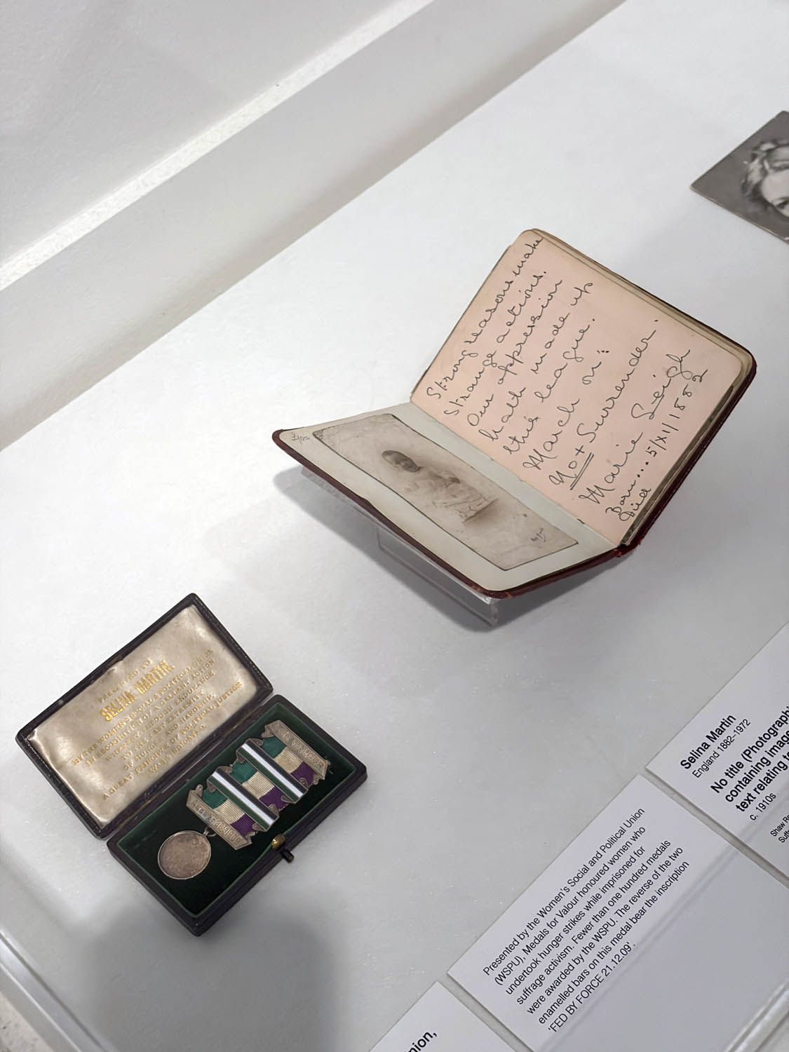
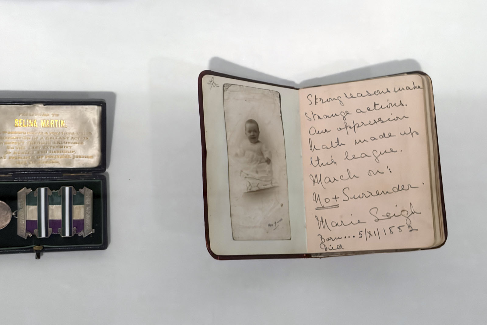
 Toye & Co. (manufacturer) 'Medal for Valour, awarded to Selina Martin, with original box' (1909); Selina Martin (England, 1882-1972) 'No title (Photographic album containing images and handwritten text relating to Selina Martin)' (c. 1910); Lizzie Casual Smith (England, 1870-1956) 'Miss Christabel Pankhurst' (c. 1900s)")
Installation view of the exhibition Women Photographers 1900-1975: A Legacy of Light at NGV International, Melbourne, November 2025 – May 2026 showing from left to right, Woman’s Social and Political Union (distributor) Toye & Co. (manufacturer) Medal for Valour, awarded to Selina Martin, with original box (1909); Selina Martin (England, 1882-1972) No title (Photographic album containing images and handwritten text relating to Selina Martin) (c. 1910); Lizzie Casual Smith (England, 1870-1956) Miss Christabel Pankhurst (c. 1900s)
Photo: Marcus Bunyan
Installation view of the exhibition Women Photographers 1900-1975: A Legacy of Light at NGV International, Melbourne, November 2025 – May 2026 showing at left, Woman’s Social and Political Union (distributor) Toye & Co. (manufacturer) Medal for Valour, awarded to Selina Martin, with original box (1909) and at right, Selina Martin (England, 1882-1972) No title (Photographic album containing images and handwritten text relating to Selina Martin) (c. 1910)
Photos: Marcus Bunyan
New acquisition
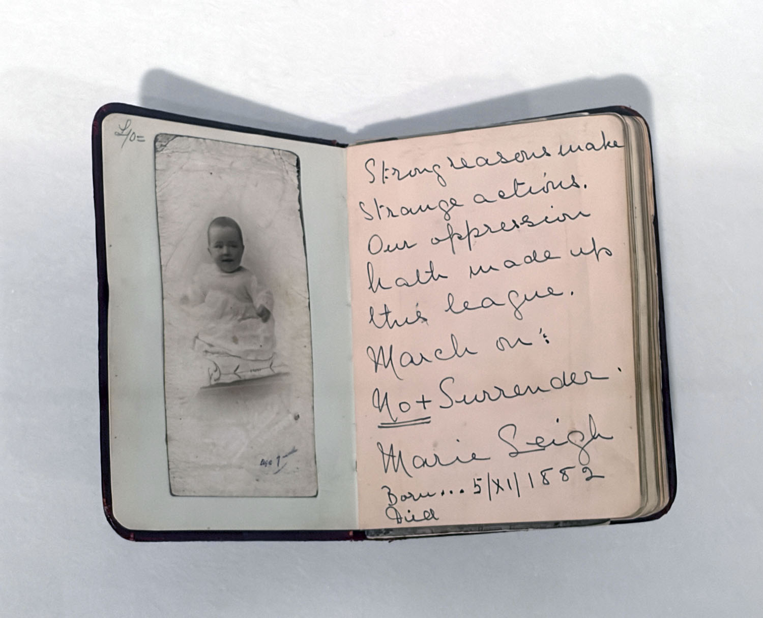
The suffragette Selina Martin joined the Women’s Social and Political Union (WSPU) in 1908. She was imprisoned on several occasions due to her activism and was awarded a Hunger Strike Medal for valour by the WSPU. This album is Martin’s personal compilation of photographs, postcards and writings, many of which relate to the suffragette cause. It includes writing from notable acquaintances such as political activist and suffragette Mary Leigh, and human rights activist and feminist Ethel Snowden.
Vitrine text from the exhibition
Selina Martin (English, 1882-1972) was a member of the suffragette movement in the early 20th century. She was arrested several times. Her Hunger Strike Medal given ‘for Valour’ by the Women’s Social and Political Union (WSPU) was sold at auction in Nottingham in 2019.
; at third right, Ruth Hollick 'No title (Young woman in hunting costume, model Lucy Crosbie Morrison)' (c. 1920); at second right, Ruth Hollick 'Thought' (1921); and at right, Madame d'Ora 'Untitled' (1931)")
; at third right, Ruth Hollick 'No title (Young woman in hunting costume, model Lucy Crosbie Morrison)' (c. 1920); at second right, Ruth Hollick 'Thought' (1921); and at right, Madame d'Ora 'Untitled' (1931)")
Installation views of the exhibition Women Photographers 1900-1975: A Legacy of Light at NGV International, Melbourne, November 2025 – May 2026 showing at left, Gertrude Kasebier The gargoyle (c. 1900, below); at third right, Ruth Hollick No title (Young woman in hunting costume, model Lucy Crosbie Morrison) (c. 1920, below); at second right, Ruth Hollick Thought (1921, below); and at right, Madame d’Ora Untitled (1931, below)
Photos: Marcus Bunyan
Image-Makers: Women in Photography
By the start of the twentieth century, photography was becoming increasingly accessible to the public in many cities around the world. Previously, the medium was practised by an affluent minority of amateur artists and commercial studios. However, the production of lower-cost cameras gradually opened up photography to the broader public, particularly the expanding middle class. At the same time, women began to participate in photography as both creators and consumers. For many women, photography offered a means of income, a way to document daily life, and a powerful tool for communication and activism.
In England, suffragettes actively used photography to create and share images that were integral to their campaign for women’s right to vote. The suffragettes constructed their images in photographic studios and in the streets, merging style and fashionable dress with politics and self-assuredness. These photographs became crucial in shaping the public image of the suffrage movement.
In Australia, May and Mina Moore ran a successful photographic business. Known for their dramatically lit portraits of stage performers, they responded to the appetite for stylised portraiture as popularised by the suffragettes. At a time of shifting gender roles, May Moore also advocated publicly for women to work in photography.
")
")
Installation views of the exhibition Women Photographers 1900-1975: A Legacy of Light at NGV International, Melbourne, November 2025 – May 2026 showing Gertrude Kasebier The gargoyle (c. 1900, below)
Photos: Marcus Bunyan
 'Gargoyle' 1901")
Gertrude Kasebier (American, 1852-1934)
The gargoyle
c. 1900
Platinum photograph
20.6 x 13.5 cm (image and sheet)
National Gallery of Victoria, Melbourne
Purchased through The Art Foundation of Victoria with the assistance of the Herald & Weekly Times Limited, Fellow, 1979
In the early twentieth century, leading Pictorialist photographer Gertrude Käsebier played a key role in establishing photography as a form of fine art. As a member of the Photo-Secession group alongside Alfred Stieglitz, Käsebier was dedicated to Pictorialism, a style that emphasised artistic expression over documentary accuracy. This photograph, taken in Paris, highlights the painterly, emotional qualities inherent in Pictorialism. Käsebier has created an evocative image using composition and light to transform the scene. After leaving the Photo-Secession group in 1912, Käsebier became a founder and active member of the Pictorial Photographers of America.
Wall text from the exhibition
' (c. 1920); at second left, Ruth Hollick 'Thought' (1921); and at right, Madame d'Ora 'Untitled' (1931)")
' (c. 1920); at second left, Ruth Hollick 'Thought' (1921); and at right, Madame d'Ora 'Untitled' (1931)")
Installation view of the exhibition Women Photographers 1900-1975: A Legacy of Light at NGV International, Melbourne, November 2025 – May 2026 showing at left, Ruth Hollick No title (Young woman in hunting costume, model Lucy Crosbie Morrison) (c. 1920, below); at second left, Ruth Hollick Thought (1921, below); and at right, Madame d’Ora Untitled (1931, below)
Photos: Marcus Bunyan
 'No title (Young woman in hunting costume, model Lucy Crosbie Morrison)' c. 1920")
Ruth Hollick (Australian, 1883-1977)
No title (Young woman in hunting costume, model Lucy Crosbie Morrison)
c. 1920
Gelatin silver photograph
20.0 x 14.6cm (image)
National Gallery of Victoria, Melbourne
Presented through The Art Foundation of Victoria by Mrs Lucy Crosbie Morrison, Member, 1993
Public domain
Ruth Hollick attended the National Gallery of Victoria Art School from 1902 to 1906 and began to photograph commercially around 1908. In 1918, along with her life and professional partner, fellow photographer Dorothy Izard, she took over the studio of May and Mina Moore at 167 Collins Street, Melbourne. Eventually Hollick expanded her studio into the newly completed Chartres House building next door at 165 Collins Street. From 1920 her photographs were regularly included in magazines as well as Australian and British Pictorialist exhibitions and salons. Hollick closed her city studio in the early 1930s but continued working from her home in the Melbourne suburb of Moonee Ponds into the 1960s.
Wall text from the exhibition
 'Thought' 1921")
Ruth Hollick (Australian, 1883-1977)
Thought
1921
Gelatin silver photograph
37.4 x 25.3cm (image)
National Gallery of Victoria, Melbourne
Presented through The Art Foundation of Victoria by Mrs Lucy Crosbie Morrison, Member, 1993
Public domain
This sensitive portrait depicts the artist’s niece Lucy Crosbie Morrison. The pose of the subject, combined with the title, reveals the photographer’s careful direction and artistic ambition. The subject’s outfit, adorned with appliqué gum leaves and a gumnut belt, references native Australian plants. The work aligns with the style of Pictorialism, a popular international photographic trend at the time. Thought was recognised at the 1921 Colonial Exhibition in London, highlighting both its local significance and broader artistic appeal.
Wall text from the exhibition
 (Austrian, 1881–1963) 'Untitled' 1931 (installation view)")
Dora Kallmus (Madame d’Ora) (Austrian, 1881–1963)
Untitled (installation view)
1931
Gelatin silver photograph
22.4 x 16.4cm (image and sheet)
National Gallery of Victoria, Melbourne
Gift of Krystyna Campbell-Pretty AM and Family through the Australian Government’s Cultural Gifts Program, 2023
Photo: Marcus Bunyan
Dora Kallmus, known professionally as Madame d’Ora, photographed high-profile figures associated with art, fashion and politics, including Josephine Baker and Coco Chanel. In 1907 Madame d’Ora opened her first studio in Vienna, Atelier d’Ora, one of the first photography studios in Vienna to be operated by a woman. She later moved to Paris, where her career flourished well into the 1930s – Atelier d’Ora was renowned for its glamorous, softly focused portraits – until she was forced to close her studio due to Nazi occupation.
Wall text from the exhibition
Dora Kallmus (1881-1963), better known as Madame d’Ora, was an unusual woman for her time with a spectacular career as one of the leading photographic portraitists of the early twentieth century. This exhibition, the largest museum retrospective on the Austrian photographer to date in the United States, presents the different periods of her life, from her early upbringing as the daughter of Jewish intellectuals in Vienna, to her days as a premier society photographer, through her survival during the Holocaust. Forging a path in a field that was dominated by men, d’Ora enjoyed an illustrious 50-year career, from 1907 until 1957. The show includes more than 100 examples of her work, which is distinguished for its extreme elegance, and utter depth and darkness.
Born into a privileged background and coming of age amidst the creative and intellectual atmosphere of fin-de-siècle Vienna, Kallmus was extremely well cultured. At age 23 while on a trip to the Côte d’Azur, she purchased her first camera, a Kodak box camera. She was the first woman photographer in Vienna to open her own studio and in May 1906, she was listed in the commercial register as a photographer for the first time. Self-styled simply as d’Ora, she initially took portraits of friends and members from her social circle. In the autumn of 1909, an exhibition of her work received a lively response from the press. Critics both praised the artistic style of her portraits and emphasized the prominent individuals who streamed in to view the show.
Over the course of her lifetime, d’Ora turned her lens on many artists, including Josephine Baker, Colette, Gustav Klimt, Tamara de Lempicka, and Pablo Picasso, among others. Alongside these commissions, she also photographed members of the Habsburg family and Viennese aristocracy, the Rothschild family, and other prominent cultural figures and politicians. D’Ora had close ties to avant-garde artistic circles and captured members of the Expressionist dance movement with her lens, including Anita Berber and Sebastian Droste. Fashion and glamor subjects were another important mainstay of her business. She regularly photographed Wiener Werkstätte fashion models and the designer Emilie Flöge of the Schwestern Flöge salon wearing artistic reform dresses. When d’Ora moved to Paris in 1925, she shifted her focus to fashion, covering the couture scene and leading lights of the period until 1940. She befriended key figures, such as the French milliner Madame Agnès and the Spanish designer Cristóbal Balenciaga, as well as the top fashion magazine editors of the day. She also helped create and sustain glamorous images for a variety of celebrities, including Cecil Beaton, Maurice Chevalier, and Colette.
When the Nazis seized control of Paris in 1940, she was forced to close her studio and flee. She spent the war years in a semi-underground existence living in Ardèche in the southeast of France. Her sister Anna Kallmus, along with other family and friends, died in the Chełmno concentration camp. After World War II, d’Ora returned to Paris, profoundly affected by personal losses. While she lacked an elegant studio in Paris, d’Ora’s lasting connections to wealthy clients remained and many of them returned to her. While she accepted portrait commissions, mostly for financial stability, she also pushed into new, sometimes darker directions. Around 1948, she embarked on an astonishing series of photographs in displaced persons or refugee camps, which was commissioned by the United Nations. From around 1949 to 1958, d’Ora worked on a project, which she called “my big final work.” She visited numerous slaughterhouses in Paris, and amid the pools of blood and deathly screams, she stood in an elegant suit and a hat photographing the butchered animals hundreds of times.
Anonymous. “Madame d’Ora,” on the Neue Galerie website Nd [Online] Cited 30/03/2026. Used under fair use conditions for the purposes of education and research
; at second right, Trude Fleischmann 'The actress Sibylle Binder, Vienna' (c. 1926); and at right, Trude Fleischmann 'View of Michaelerplatz, Vienna' (1929)")
Installation view of the exhibition Women Photographers 1900-1975: A Legacy of Light at NGV International, Melbourne, November 2025 – May 2026 showing at left, Madame D’Ora The Dolly Sisters (c. 1928, below); at second right, Trude Fleischmann The actress Sibylle Binder, Vienna (c. 1926, below); and at right, Trude Fleischmann View of Michaelerplatz, Vienna (1929, below)
Photo: Marcus Bunyan
 (Austrian, 1881–1963) 'The Dolly sisters' c. 1928 (installation view)")
 (Austrian, 1881–1963) 'The Dolly sisters' c. 1928 (installation view)")
Dora Kallmus (Madame d’Ora) (Austrian, 1881–1963)
The Dolly sisters (installation views)
c. 1928
Gelatin silver photograph
18.0 x 21.1cm
National Gallery of Victoria, Melbourne
Bowness Family Fund for Photography, 2022
Photos: Marcus Bunyan
Around 1928 Madame d’Ora photographed the Dolly Sisters, who were celebrated for their glamorous performances in the 1920s. Jenny and Rosie Dolly, Hungarian-American identical twins, were vaudeville and cabaret dancers adored in Britain, the United States and across Europe for their beauty and erotically charged performances. In d’Ora’s photograph they embody the ideal of the modern woman, with bobbed hair and short skirts, dressed in glittering couture costumes and adorned with pearls.
Wall text from the exhibition
 'The actress Sibylle Binder, Vienna' c. 1926 (installation view)")
Trude Fleischmann (American born Austria, 1895-1990)
The actress Sibylle Binder, Vienna
c. 1926
Gelatin silver photograph
21.9 x 16.2cm (image)
22.9 x 17.1cm (sheet)
National Gallery of Victoria, Melbourne
Bowness Family Fund for Photography, 2022
Photo: Marcus Bunyan
 'The actress Sibylle Binder, Vienna' c. 1926")
Trude Fleischmann (American born Austria, 1895-1990)
The actress Sibylle Binder, Vienna
c. 1926
Gelatin silver photograph
21.9 x 16.2cm (image)
22.9 x 17.1cm (sheet)
National Gallery of Victoria, Melbourne
Bowness Family Fund for Photography, 2022
Public domain
Trude Fleischmann studied photography in Paris and, after graduating from the Viennese visual arts college die Graphische, apprenticed in the studio of photographer Madame d’Ora. In 1920 Fleischmann opened her own studio, specialising in female nudes, celebrity and socialite portraits, and glamorous photographs of actors. In 1938 she fled Austria, eventually settling in New York, where she re-established her studio and continued to focus on portraits of high-profile figures. This portrait depicts the Viennese actress Sibylle Binder, who performed throughout Germany and Austria in the 1920s. Binder is photographed in glamorous dress and with the classic short, androgynous hairstyle of the New Woman.
Wall text from the exhibition
Sybille Binder (Austrian, 1895-1962)
Sybille Binder (5 January 1895 – 30 June 1962) was an Austrian actress of Jewish descent whose career of over 40 years was based variously in her home country, Germany and Britain, where she found success in films during the 1940s.
Career
Binder began her stage career in Berlin in 1915, then in 1918 moved to Munich, where she enjoyed success in classical drama. Between 1916 and 1918 she also appeared in a handful of silent films. In 1922, she returned to Berlin and received acclaim for her performance in Frank Wedekind’s Earth Spirit. Over the next few years she performed regularly in Germany and Austria then, in the mid-1930s as war approached and conditions in Germany became difficult, she made the decision to move to England.
Between 1942 and 1950 Binder featured in 13 British films, including several of superior quality. Her first screen appearance in Britain came auspiciously in the highly acclaimed supernatural drama Thunder Rock, playing opposite dramatic heavyweights including Michael Redgrave, James Mason and Frederick Valk. Other notable films in which Binder appeared were war drama Candlelight in Algeria (1944), hugely popular period melodrama Blanche Fury, espionage thriller Against the Wind and amnesia-themed romance Portrait from Life (all 1948).
Binder returned to Germany in 1950, settling in Düsseldorf, where she successfully picked up her stage career but did not attempt to break into the German film industry. She died on 30 June 1962, aged 67.
Text from the Wikipedia website
 'View of Michaelerplatz, Vienna' (Blick zum Michaelerplatz Wien) 1929 (installation view)")
Trude Fleischmann (American born Austria, 1895-1990)
View of Michaelerplatz, Vienna (Blick zum Michaelerplatz Wien)
1929
Gelatin silver photograph
18.4 x 16.6cm (image)
19.0 x 17.3cm (sheet)
National Gallery of Victoria, Melbourne
Bowness Family Fund for Photography, 2024
Photo: Marcus Bunyan

 (1930); at third right, Lotte Jacobi 'Head of a dancer' (1929); at second right, Gertrud Arndt 'Mask self-portrait No. 11' (1930); and at right, Gertrud Arndt 'Wera Waldek' (1930)")
Installation view of the exhibition Women Photographers 1900-1975: A Legacy of Light at NGV International, Melbourne, November 2025 – May 2026 showing in the bottom image at third left, Kitty Hoffmann Posing dance group (Tanzgruppe Trude Goodwin) (1930, below); at third right, Lotte Jacobi Head of a dancer (1929, below); at second right, Gertrud Arndt Mask self-portrait No. 11 (1930, below); and at right, Gertrud Arndt Wera Waldek (1930, below)
Photos: Marcus Bunyan
New Women, New Visions
Photography studios flourished in the early twentieth century. In Vienna, Austria, numerous prominent women photographers ran successful businesses, including Madame d’Ora and later Trude Fleischmann and Kitty Hoffmann. While Madame d’Ora’s glamorous portraits retained the soft focus characteristic of turn-of-the-century photography, the women in Fleischmann’s and Hoffmann’s images of the 1920s and 1930s matched the mood of the modern city. With their chic dress and bobbed haircuts, they represented the famed ‘New Woman’, or Neue Frau, an archetype that came to symbolise female empowerment and the shift away from traditional gender roles.
Opening in 1919 in Weimar, Germany, the Bauhaus art school experienced an influx of women students due to changes in the country’s constitution that guaranteed women the right to vote and study. Photography, while not officially taught at the Bauhaus for some years, flourished: it was seen to be an essential means of expression appropriate for the modern age. Lucia Moholy and her husband, Bauhaus professor László Moholy-Nagy, promoted the idea of ‘New Vision’ at the school. The camera was seen as the ultimate mirror of the everyday, while the camera-less images they produced allowed for great experimentation and abstraction.
 'Posing dance group' (Tanzgruppe Trude Goodwin) 1930 (installation view)")
Kitty Hoffmann (Austrian, 1900-1968)
Posing dance group (Tanzgruppe Trude Goodwin) (installation view)
1930
Gelatin silver photograph
15.9 x 19.8cm (image)
16.8 x 20.7cm (sheet)
National Gallery of Victoria, Melbourne
Bowness Family Fund for Photography, 2024
Photo: Marcus Bunyan
 'Posing dance group' (Tanzgruppe Trude Goodwin) 1930")
Kitty Hoffmann (Austrian, 1900-1968)
Posing dance group (Tanzgruppe Trude Goodwin)
1930
Gelatin silver photograph
15.9 x 19.8cm (image) 16.8 x 20.7cm (sheet)
National Gallery of Victoria, Melbourne
Bowness Family Fund for Photography, 2024
Kitty Hoffmann worked and studied at Vienna’s die Graphische visual arts college from 1922 to 1924. Three years later, upon completing her studies, she opened a photographic studio in the city, specialising in fashion and society portraiture. Hoffmann’s photographs were regularly published in popular lifestyle and theatre magazines of the time, including Die Dame von Heute (The Lady of Today) and Die Bühne (The Stage). This photograph depicts dancers from the Trude Goodwin dance group. The dancers form a graphic shape that echoes the oval stage-set behind them, encapsulating the Ausdruckstanz, or ‘expressive dance’ movement, which reached peak popularity in Vienna during the 1920s.
Wall text from the exhibition
 'Head of a dancer' 1929, printed c. 1970")
Lotte Jacobi (German-American, 1896-1990)
Head of a dancer
1929, printed c. 1970
Gelatin silver photograph
26.4 x 33.2cm (image)
27.7 x 35.3cm (sheet)
National Gallery of Victoria, Melbourne
Bowness Family Fund for Photography, 2021
Public domain
Lotte Jacobi’s father and grandfather were also photographers, and her great-grandfather studied with Louis Daguerre, inventor of the daguerreotype. This modernist portrait features Russian dancer Niuta Norskaya. The dancer’s pale, oval-shaped face is encompassed by her wide-brimmed black hat, resulting in a striking study of modern beauty.
Wall text from the exhibition
 'Mask self-portrait no. 11' (Maskenselbstbildnis Nr. 11) 1930 (installation view)")
 'Mask self-portrait no. 11' (Maskenselbstbildnis Nr. 11) 1930 (installation view)")
Gertrud Arndt (German, 1903-2000)
Mask self-portrait no. 11 (Maskenselbstbildnis Nr. 11) (installation views)
1930
Gelatin silver photograph
22.9 x 14.7cm (image and sheet)
National Gallery of Victoria, Melbourne
Bowness Family Fund for Photography, 2024
Photos: Marcus Bunyan
Gertrud Arndt (born Gertrud Hantschk in Upper Silicia) set out to become an architect, beginning a three-year apprenticeship in 1919 at the architecture firm of Karl Meinhardt in Erfurt, where her family lived at the time. While there, she began teaching herself photography by taking pictures of buildings in town. She also attended courses in typography, drawing, and art history at the Kunstgewerbeschule (School of design). Encouraged by Meinhardt, a friend of Walter Gropius, Arndt was awarded a scholarship to continue her studies at the Bauhaus in Weimar. Enrolled from 1923 to 1927, Arndt took the Vorkurs (foundation course) from László Moholy-Nagy, who was a chief proponent of the value of experimentation with photography. After her Vorkurs, Georg Muche, leader of the weaving workshop, persuaded her to join his course, which then became the formal focus of her studies. Upon graduation, in March 1927, she married fellow Bauhaus graduate and architect Alfred Arndt. The couple moved to Probstzella in Eastern Germany, where Arndt photographed buildings for her husband’s architecture firm.
In 1929, Hannes Meyer invited Alfred Arndt to teach at the Bauhaus, where Arndt focused her energy on photography, entering her period of greatest activity, featuring portraits of friends, still-lifes, and a series of performative self-portraits, as well as At the Masters’ Houses, which shows the influence of her studies with Moholy-Nagy as well as her keen eye for architecture. After the Bauhaus closed, in 1932, the couple left Dessau and moved back to Probstzella. Three years after the end of World War II the family moved to Darmstadt; Arndt almost completely stopped making photographs.
Mitra Abbaspour, Associate Curator, Department of Photography “Gertrud Arndt,” on the MoMA website 2014 [Online] Cited 31/03/2026. Used under fair use conditions for the purposes of education and research
 'Wera Waldek' 1930, printed 1984 (installation view)")
Gertrud Arndt (German, 1903-2000)
Wera Waldek
1930, printed 1984
From the Bauhaus portfolio I (1919-1933) 1984
Gelatin silver photograph
(19.0 x 22.5cm) irreg. (image)
27.0 x 35.3cm (sheet)
National Gallery of Victoria, Melbourne
Gift of Galerie Kicken Berlin in memory of Rudolf Kicken (1947-2014), 2024
Photo: Marcus Bunyan
Originally wanting to study architecture, Gertrud Arndt enrolled at the Bauhaus school in 1923-1924, ultimately specialising in weaving. A self-taught photographer, she informally developed her skills while apprenticing at an architect’s office in Erfurt prior to her studies, later photographing buildings for her husband’s architecture firm. Printing this picture in its negative state, rather than turning it into a positive image, Arndt creates a striking dreamlike effect. The portrait depicts fellow Bauhaus architecture student Wera Waldek, who made designs for children’s play furniture and housing interiors. The image forms part of the Bauhaus Portfolio I 1919-1933, published by Rudolf Kicken Galerie in 1984.
Wall text from the exhibition
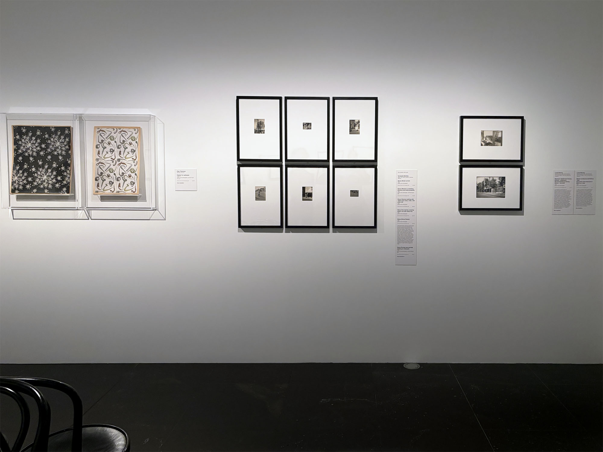
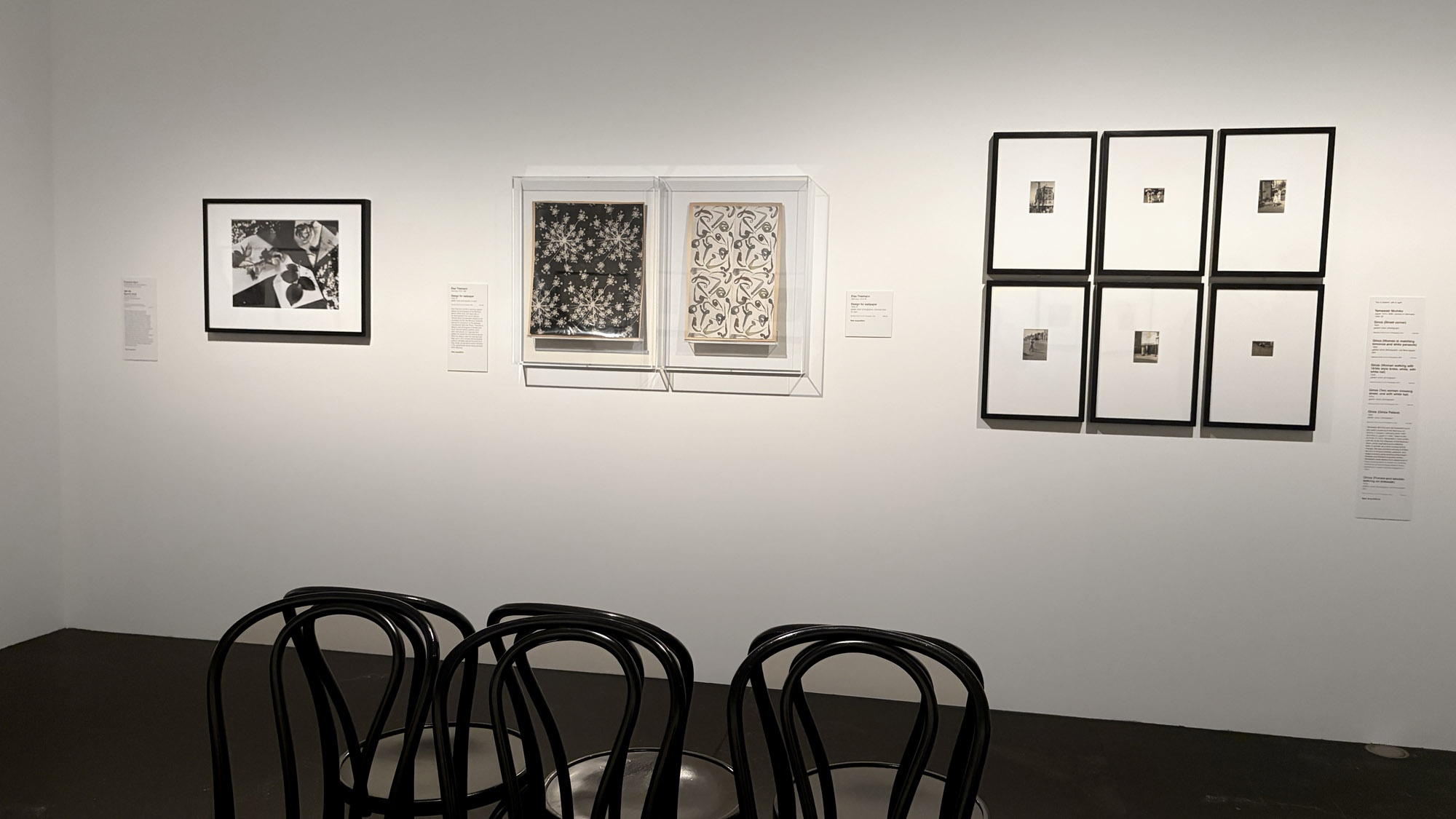
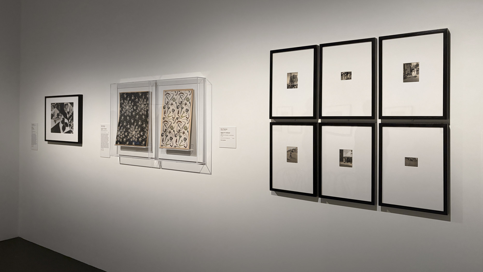
 (1931 printed 1975, below); Elsa Thiemann (German, 1910-1981) 'Design for wallpaper' (1930-1931); 1930s photographs by Yamawaki Michiko (Japan, 1910-2000, worked in Germany 1930-1932); and two 1920s photographs by Lucia Moholy of the Bauhaus, Dessau")
Installation view of the exhibition Women Photographers 1900-1975: A Legacy of Light at NGV International, Melbourne, November 2025 – May 2026 showing from left to right in the bottom image, Florence Henri Still life (Nature morte) (1931 printed 1975, below); Elsa Thiemann (German, 1910-1981) Design for wallpaper (1930-1931); 1930s photographs by Yamawaki Michiko (Japan, 1910-2000, worked in Germany 1930-1932) see below; and two 1920s photographs by Lucia Moholy of the Bauhaus, Dessau, see below
Photos: Marcus Bunyan
Elsa Thiemann trained in painting, graphic design and photography at the Bauhaus school. While there, she responded to an advertisement from school director Hannes Meyer for wallpaper designs to be considered for the new Bauhaus collection, planned for production by the wallpaper manufacturer Gebrüder Rasch. Thiemann’s designs used photograms of flowers and hand-coloured swirling patterns, which were meticulously cut, organised and pasted into repetitious symmetrical layouts. While her designs were not manufactured, likely due to their contrast with the brighter patterns ultimately selected for production, they remain as standalone works indicative of the experimental design being practised at the Bauhaus.
New acquisition. Wall text from the exhibition
 'Still life' (Nature morte) 1931, printed 1975")
Florence Henri (European, 1893-1982)
Still life (Nature morte)
1931, printed 1975
Gelatin silver photograph
35.9 x 47.9cm (image and sheet)
ed. 6/9
National Gallery of Victoria, Melbourne
Gift of Krystyna Campbell-Pretty AM and Family through the Australian Government’s Cultural Gifts Program, 2022
© Florence Henri / Licensed by the Copyright Agency, Australia
After studying music and painting, Florence Henri was introduced to photography in 1927 while attending the Bauhaus school. There, she met László Moholy-Nagy and Lucia Moholy, whose influence (especially Moholy’s) led Henri to focus solely on photography. In 1929 she established a studio in Paris, where she became renowned for her avant-garde and experimental practice. In addition to portraits of women, her work often features still-life compositions that combine everyday objects like envelopes and sheets of paper with natural elements such as flowers and leaves. Henri also frequently used mirrors as a means of fragmenting the pictorial space.
Wall text from the exhibition. New acquisition
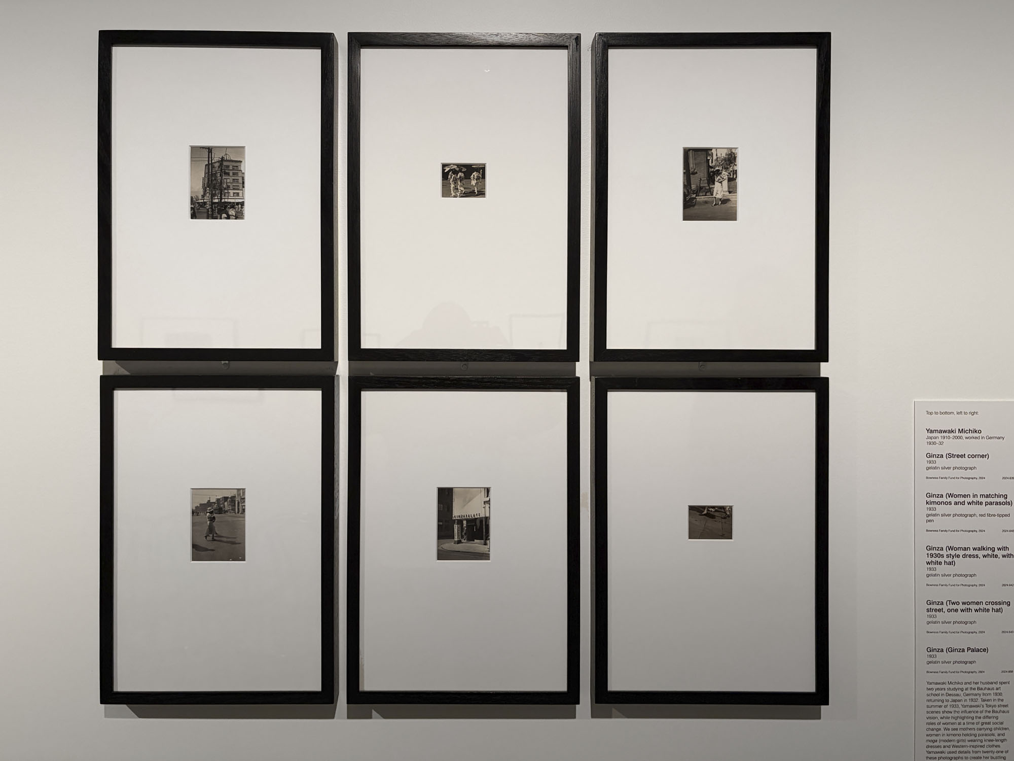
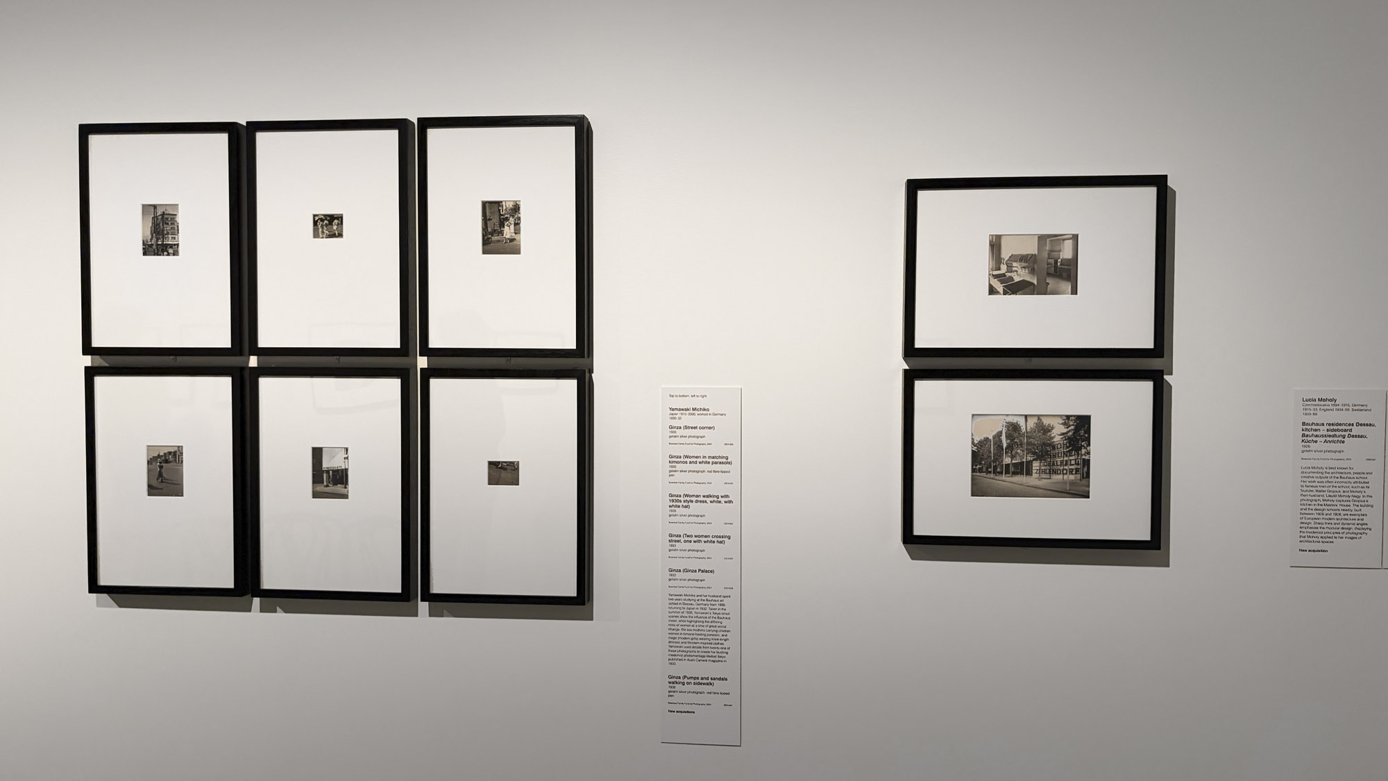
Installation view of the exhibition Women Photographers 1900-1975: A Legacy of Light at NGV International, Melbourne, November 2025 – May 2026 showing photographs by Yamawaki Michiko, top to bottom, left to right: Ginza (Street corner) (1932, below); Ginza (Women in matching kimonos and white parasols) (1932); Ginza (Woman walking with 1930s style dress, white, with white hat) (1932, below); Ginza (Two women crossing street, one with white hat) (1932, below); Ginza (Ginza Palace) (1932, below); Ginza (Pumps and sandals walking on sidewalk) (1932). New acquisitions
Photo: Marcus Bunyan
Yamawaki Michiko and her husband spent two years studying at the Bauhaus art school in Dessau, Germany from 1930, returning to Japan in 1932. Taken in the summer of 1933, Yamawaki’s Tokyo street scenes show the influence of the Bauhaus vision, while highlighting the differing roles of women at a time of great social change. We see mothers carrying children, women in kimono holding parasols, and moga (modern girls) wearing knee-length dresses and Western-inspired clothes. Yamawaki used details from twenty-one of these photographs to create her bustling modernist photomontage Melted Tokyo, published in Asahi Camera magazine in 1933.
Wall text from the exhibition
 'Ginza (Street corner)' 1932 (installation view)")
Yamawaki Michiko (Japan, 1910-2000, worked in Germany 1930-1932)
Ginza (Street corner) (installation view)
1932
Gelatin silver photograph
11.0 x 8.2 cm (image and sheet)
National Gallery of Victoria, Melbourne
Bowness Family Fund for Photography, 2024
Photo: Marcus Bunyan
 'Ginza (Woman walking with 1930s style dress, white, with white hat)' 1932 (installation view)")
Yamawaki Michiko (Japan, 1910-2000, worked in Germany 1930-1932)
Ginza (Woman walking with 1930s style dress, white, with white hat) (installation view)
1932
Gelatin silver photograph
11.2 x 8.3cm (image)
12.6 x 10.0cm (sheet)
National Gallery of Victoria, Melbourne
Bowness Family Fund for Photography, 2024
Photo: Marcus Bunyan
 'Ginza (Two women crossing street, one with white hat)' 1932 (installation view)")
Yamawaki Michiko (Japan, 1910-2000, worked in Germany 1930-1932)
Ginza (Two women crossing street, one with white hat) (installation view)
1932
Gelatin silver photograph
11.2 x 8.2cm (image)
12.6 x 10.0cm (sheet)
National Gallery of Victoria, Melbourne
Bowness Family Fund for Photography, 2024
Photo: Marcus Bunyan
 'Ginza (Ginza Palace)' (installation view)")
Yamawaki Michiko (Japan, 1910-2000, worked in Germany 1930-1932)
Ginza (Ginza Palace) (installation view)
1932
Gelatin silver photograph
11.2 x 8.3cm (image)
12.5 x 10.0cm (sheet)
National Gallery of Victoria, Melbourne
Bowness Family Fund for Photography, 2024
Photo: Marcus Bunyan
; and at bottom, 'Berlin Architecture Exhibition' (1928)")
Installation view of the exhibition Women Photographers 1900-1975: A Legacy of Light at NGV International, Melbourne, November 2025 – May 2026 showing at top, Lucia Moholy Bauhaus residences Dessau, kitchen – sideboard (1926, below); and at bottom, Lucia Moholy Berlin Architecture Exhibition (1928, below)
Photo: Marcus Bunyan
 'Bauhaus residences Dessau, kitchen – sideboard' (Bauhaussiedlung Dessau, küche – anrichte) 1926 (installation view)")
Lucia Moholy (British born Czech, 1894-1989)
Bauhaus residences Dessau, kitchen – sideboard (Bauhaussiedlung Dessau, küche – anrichte)
1926
Gelatin silver photograph
11.9 x 16.8cm (image)
13.0 x 17.9cm (sheet)
National Gallery of Victoria, Melbourne
Bowness Family Fund for Photography, 2024
Photo: Marcus Bunyan
Lucia Moholy is best known for documenting the architecture, people and creative outputs of the Bauhaus school. Her work was often incorrectly attributed to famous men of the school, such as its founder, Walter Gropius, and Moholy’s then husband, László Moholy-Nagy. In this photograph, Moholy captures Gropius’s kitchen in the Masters’ House. The building and the design schools nearby, built between 1925 and 1926, are exemplars of European modern architecture and design. Sharp lines and dynamic angles emphasise the modular design, displaying the modernist principles of photography that Moholy applied to her images of architectural spaces.
Wall text from the exhibition
 'Bauhaus residences Dessau, kitchen – sideboard' (Bauhaussiedlung Dessau, küche – anrichte) 1926")
Lucia Moholy (British born Czech, 1894-1989)
Bauhaus residences Dessau, kitchen – sideboard (Bauhaussiedlung Dessau, küche – anrichte)
1926
Gelatin silver photograph
11.9 x 16.8cm (image) 13.0 x 17.9cm (sheet)
National Gallery of Victoria, Melbourne
Bowness Family Fund for Photography, 2023
© 2023 Lucia Moholy Estate/Artists Rights Society (ARS), New York/VG Bild-Kunst, Bonn
“I suggest that Walter Gropius was most likely not interested in the ‘design’ of kitchens. These function rooms he would have not visited often nor did he cook. Gropius had a maid while in the Bauhaus as well as in later life. The kitchen at the Bauhaus was functional according to the times and the needs as seen by the employers of the maids who worked in them. Whereas the Frankfurt Kitchens were a result of attention to design as well as function and efficiency. …
Lucia had not enjoyed small town Dessau and intense campus life at the Bauhaus. She worked in Berlin but at in 1933 Moholy had to flee in fear of arrest for her communist association, leaving all her possessions behind including her negatives.
After time on Prague and Paris, Lucia Moholy settled In England in 1934 where she worked as a portrait photographer and teacher. …
After seeing her images as uncredited illustrations in the catalogue of a 1938 exhibition on the Bauhaus at the Museum of Modern Art, New York and many later publications, Lucia Moholy became aware that her negatives had survived. She found they had come into the possession of Walter Gropius who took them to his new teaching post America in 1937. He could easily have found Lucia post war. For years Lucia Moholy asked Gropius to give the plates back but he would not until her lawyers were able to force the return about half the original number in 1957. She complained that Gropius enjoyed the use and income from the photographs while she lived in want.”
Gael Newton AM. “Lucia Moholy: The Kitchen,” on the Photo-web website, March 2026 [Online] Cited 02/04/2026. Used under fair use conditions for the purposes of education and research
The question remains: what happened to the remaining negatives not returned by Walter Gropius to Lucia Moholy in the 1957 settlement? According to Moholy’s own card catalogue, which she used to keep track of her works, 330 negatives remained missing from her collection by the time of her death in 1989. Lost, damaged or stolen … the reputation of Gropius is forever sullied by his unseemly, grasping, patriarchal actions. MB
 'Berlin Architecture Exhibition' (Exposition d'Architecture à Berlin en 1928) 1928 (installation view)")
Lucia Moholy (British born Czech, 1894-1989)
Berlin Architecture Exhibition (Exposition d’Architecture à Berlin en 1928)
1928
Gelatin silver photograph
16.3 x 22.4cm (image)
16.9 x 22.9 cm (sheet)
National Gallery of Victoria, Melbourne
Bowness Family Fund for Photography, 2024
Photo: Marcus Bunyan
In 1928 Lucia Moholy and László Moholy-Nagy left Dessau for a new life in Berlin. This image documents an innovative housing exhibition showcasing modern living. The display, designed by architect Walter Gropius, founder of the Bauhaus school, featured new housing concepts in Zehlendorf, a Berlin neighbourhood. The graphic lettering on the building translates to ‘Live in a green environment, ideal case: Zehlendorf’. Moholy-Nagy designed the interiors, and Moholy’s images, with their signature focus on starkly contrasting vertical and horizontal lines, highlight their modernist design principles.
Wall text from the exhibition
Like many women of her time, Lucia Moholy often found herself in the shadow cast by her more conspicuous male peers – one of whom happened to be her husband, the photographer László Moholy-Nagy. After marrying in 1921, the couple moved to Weimar, Germany, so that he could begin a professorship at the Bauhaus, the influential German school of architecture, design, and applied arts. While László taught, Lucia undertook photography training, serving as an apprentice in Otto Eckner’s Bauhaus photography studio. By 1926 she had mastered a wide range of techniques, installed a darkroom in their home, and begun collaborating with her husband on experimental forms of cameraless photography.
As part of her photographic practice, Lucia began documenting the people and architectural spaces of the Bauhaus. Many of her images focus on the women who either supported or participated in the school’s activities. Edith Tschichold (1926), for instance, depicts the wife of German typographer and frequent Bauhaus collaborator Jan Tschichold. Meanwhile, Florence Henri (1927) portrays the notable Surrealist artist at the outset of her career, when she came to the Bauhaus in 1927 as a visiting photography student. Both portraits are tightly cropped around the women’s faces, revealing expressions of wistfulness or self-assurance that pull viewers into a shared emotional space.
One of Lucia’s more iconic portraits is an untitled photograph of her husband, who, sporting a machinist’s coveralls over his shirt and tie, humorously attempts to block the camera lens with his hand. The candid shot hints at the playful nature of the couple’s working relationship; once circulated, it also helped to shape László’s persona as an artist-constructor. Despite happy appearances, their relationship began to deteriorate as László declined to credit Lucia for many of their collaborations, including the celebrated 1925 book Malerei, Photografie, Film (Painting, Photography, Film).
This was not the only – or even the most significant – erasure of Lucia’s career. Forced to flee Germany in 1933 due to the rise of the Nazi Party, she made the difficult decision to leave behind her collection of 560 glass-plate negatives, which she described as “my only tangible asset.”
Following World War II, in the midst of a revival of interest in the Bauhaus, she tried desperately to locate them with no success. It wasn’t until 1954 that Walter Gropius, founder and former head of the Bauhaus, acknowledged that the negatives were in his possession, that he had been reproducing them, and that he had no intention of returning them to her. Lucia Moholy’s precise visual records of the school’s architecture – such as Bauhaus Workshop Building from Below. Oblique View (1926) – had been circulated without attribution for years in order to promote Bauhaus aesthetics. In fact, 49 of her prints appeared uncredited in the catalogue accompanying MoMA’s exhibition Bauhaus, 1919–1928, which was mounted in 1938 with Gropius’s input.
As part of her legal efforts to reclaim the negatives, Lucia wrote, “Everybody, except myself, have used, and admit to having used my photographs […] and often also without mentioning my name. Everyone – except myself – have derived advantages from using my photographs, either directly, or indirectly, in a number of ways, be it in cash or prestige, or both.”
Her claim was ultimately successful, leading to the return of 230 extant negatives in 1957. However, the acknowledgement of her influence – both as a collaborator in László Moholy-Nagy’s photographic experiments, and as an agent in the construction of Bauhaus visual identity – remains an ongoing project.
Dana Ostrander, Curatorial Assistant, Department of Photography “Lucia Moholy,” on the MoMA website 2020 [Online] Cited 31/03/2026
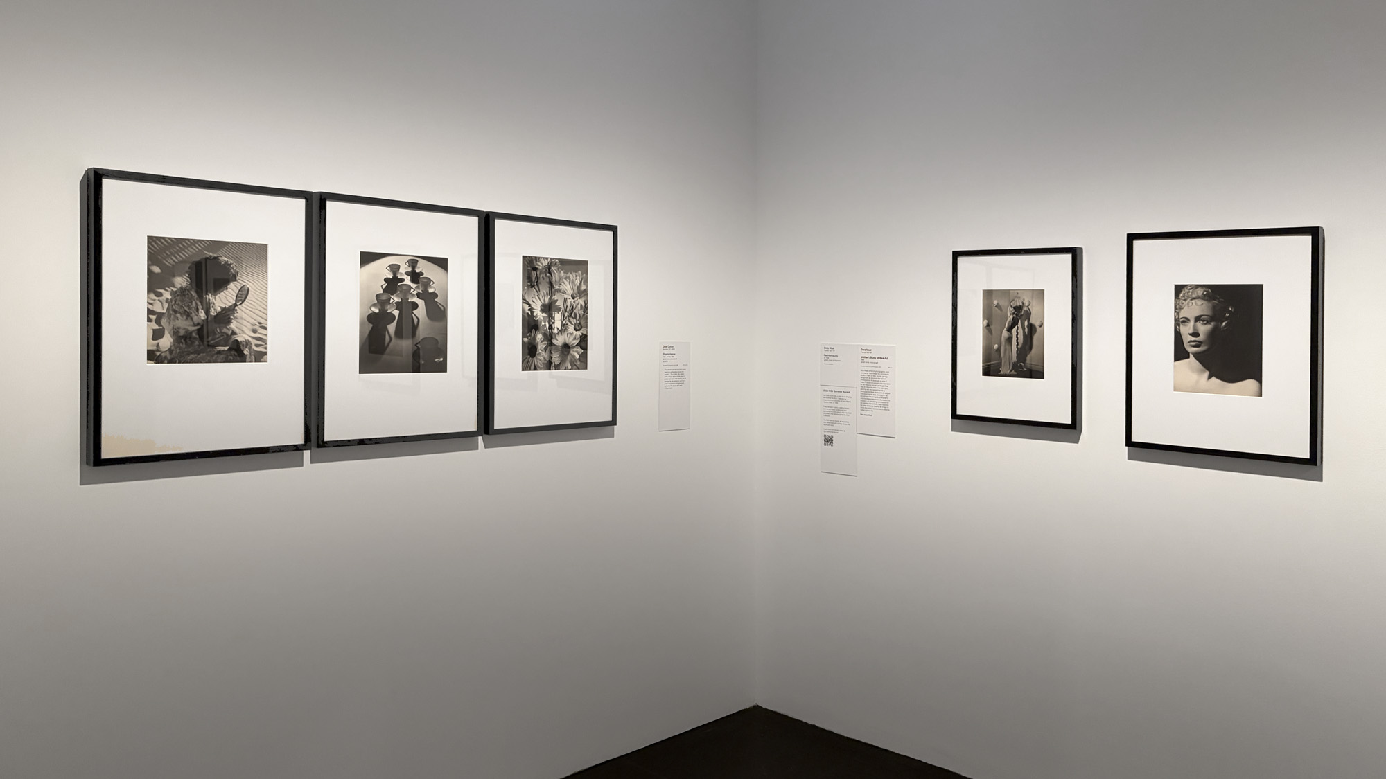
Installation view of the exhibition Women Photographers 1900-1975: A Legacy of Light at NGV International, Melbourne, November 2025 – May 2026 showing from left to right, Olive Cotton Girl with mirror (1938, below); Teacup ballet (1935 printed 1992, below); Shasta daisies (1937 printed 1992, below); at second right, Dora Maar Fashion study (c. 1936, below); and at right, Untitled (Study of Beauty (1936, below)
Photo: Marcus Bunyan
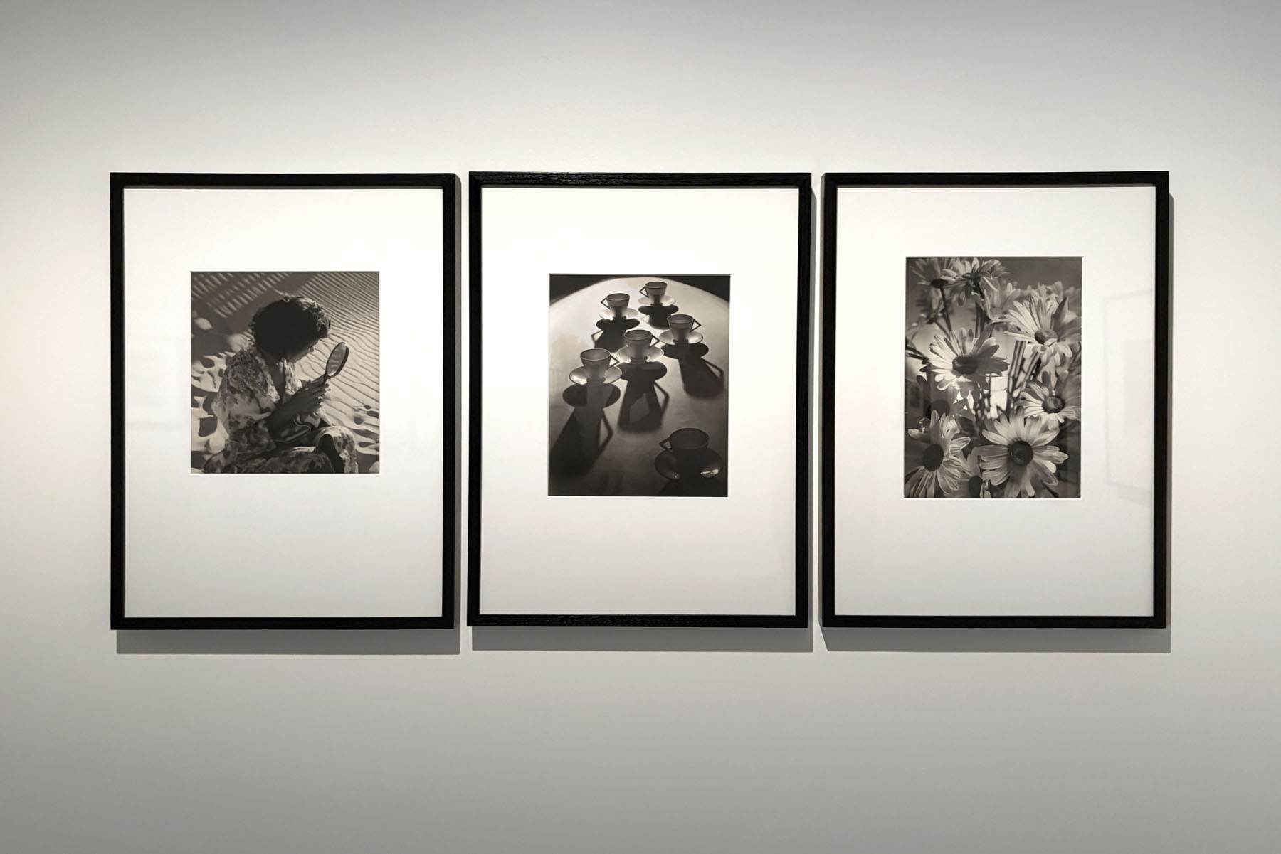
Installation view of the exhibition Women Photographers 1900-1975: A Legacy of Light at NGV International, Melbourne, November 2025 – May 2026 showing from left to right, Olive Cotton’s Girl with mirror (1938, below); Teacup ballet (1935 printed 1992, below); Shasta daisies (1937 printed 1992, below)
Photo: Marcus Bunyan
 'Girl with mirror' 1938 (installation view)")
Olive Cotton (Australian, 1911-2003)
Girl with mirror (installation view)
1938
Gelatin silver photograph
31.8 x 29.9cm (image)
National Gallery of Victoria, Melbourne
Purchased from Admission Funds, 1992
Photo: Marcus Bunyan
Olive Cotton created this image while assisting her colleague and then partner Max Dupain on location at beaches around Sydney. According to Cotton, when Dupain was shooting fashion photographs, she had the freedom to create her own images while the model was ‘waiting her turn to be photographed by Max’. Dupain’s camera tripod cast ‘long slanting lines of shadow’ against the sand. While its creation was incidental, this photograph demonstrates Cotton’s eye for composition and her mastery of light and shade, emphasising the graphic elements of the scene.
Wall text from the exhibition
 'Girl with mirror' 1938")
Olive Cotton (Australian, 1911-2003)
Girl with mirror
1938
Gelatin silver photograph
31.8 x 29.9cm (image)
National Gallery of Victoria, Melbourne
Purchased from Admission Funds, 1992
© The estate of Olive Cotton
 'Teacup ballet' 1935, printed 1992 (installation view)")
Olive Cotton (Australian, 1911-2003)
Teacup ballet (installation view)
1935, printed 1992
Gelatin silver photograph
36.0 x 29.2cm (image)
National Gallery of Victoria, Melbourne
Purchased from Admission Funds, 1992
Photo: Marcus Bunyan
Upon purchasing a set of inexpensive cups and saucers to replace the mugs in photographer Max Dupain’s Sydney studio, where she was a studio assistant, Olive Cotton recognised the potential for a dynamic composition. Later describing the handles of the cups as ‘arms akimbo’, Cotton, in her efforts ‘to express a dance theme’, used a spotlight to accentuate shadows, resulting in a ‘ballet-like composition’. Through her deft use of lighting and arrangement of objects, the teacups appear transformed, as if they are ballerinas performing onstage. The image was immediately successful both in Australia and abroad, being included in the London Salon of Photography from September 1935.
Wall text from the exhibition
 Teacup ballet 1935, printed 1992")
Olive Cotton (Australian, 1911-2003)
Teacup ballet
1935, printed 1992
Gelatin silver photograph
36.0 x 29.2cm (image)
ed. 21/50
National Gallery of Victoria, Melbourne
Purchased from Admission Funds, 1992
© The estate of Olive Cotton
 'Shasta daisies' 1937, printed 1992 (installation view)")
Olive Cotton (Australia 1911-2003)
Shasta daisies
1937, printed 1992
Gelatin silver photograph
38.2 x 28.1cm (image)
National Gallery of Victoria, Melbourne
Purchased from Admission Funds, 1992
Photo: Marcus Bunyan
‘The camera can do more than merely record an unchanging picture of a subject … The lighting, the relation of the various objects to the shape of picture and many other factors can be changed by the individual, and this is where discernment and personality come into the picture as it were.’
~ Olive Cotton
 'Shasta daisies' 1937")
Olive Cotton (Australian, 1911-2003)
Shasta daisies
1937, printed 1992
Gelatin silver photograph
38.2 x 28.1cm (image)
ed. 8/25
National Gallery of Victoria, Melbourne
Purchased from Admission Funds, 1992
© The estate of Olive Cotton
 'Fashion study' c. 1936 (installation view)")
Dora Maar (French, 1907-1997)
Fashion study (installation view)
c. 1936
Gelatin silver photograph
Proposed acquisition
 'Untitled (Study of beauty)' 1936 (installation view)")
Dora Maar (French 1907-1997)
Untitled (Study of beauty) (installation view)
1936
Gelatin silver photograph
33.0 x 24.1cm
Bowness Family Fund for Photography, 2021
 'Untitled (Study of Beauty)' 1936")
Dora Maar (French 1907-1997)
Untitled (Study of beauty)
1936
Gelatin silver photograph
33.0 x 24.1cm
Bowness Family Fund for Photography, 2021
© Dora Maar / Licensed by Copyright Agency, Australia
Dora Maar, a French photographer, poet and painter, established her commercial studio in Paris in 1932, quickly gaining recognition as a portrait and fashion photographer. While known as one of Pablo Picasso’s muses and the inspiration for his Weeping woman paintings, Maar was an influential artist in her own right, painting well into her eighties. As a photographer, Maar developed an elegant and experimental style, drawing on her knowledge of avant-garde photography and the ideas underpinning Surrealism. In this work, an advertising commission for the haircare brand Dolfar, Maar explores the ideal of beauty, creating an image in which the subject appears like a classical statue come to life.

Installation view of the exhibition Women Photographers 1900-1975: A Legacy of Light at NGV International, Melbourne, November 2025 – May 2026
Photo: Marcus Bunyan
Featuring some of the most iconic images from the twentieth century by the likes of Diane Arbus, Dora Maar, Lee Miller, Dorothea Lange, Olive Cotton and many more, Women Photographers 1900-1975: A Legacy of Light celebrates the images, lives and stories of more than 70 influential artists working between 1900 to 1975. Opening 28 November 2025 at NGV International, the exhibition features more than 300 rare and innovative photographs, prints, postcards, photobooks and magazines from the NGV Collection – with 170+ recently acquired and 130+ on display for the very first time.
Featuring portraiture, photojournalism, landscape photography, fashion photography, experimental avant-garde imagery and more, Women Photographers 1900-1975: A Legacy of Light explores the work of the artists against the backdrop of significant social, political and cultural events – from Melbourne to Tokyo, Paris to Buenos Aires. From historic images of the suffrage movement at the turn of the twentieth century, through to the women’s liberation movement and beyond, the exhibition reveals how these artists have used key photographic styles to capture, reflect and challenge the world around them. This exhibition highlights the rich networks of exchange of information, ideas and support between many of these women across the world.
The exhibition showcases the work of prominent and leading figures of photography, as well as drawing attention to lesser-known artists. Featured artists include Berenice Abbott, Lola Álvarez Bravo, Claude Cahun and Marcel Moore, Imogen Cunningham, Mikki Ferrill, Sue Ford, Christine Godden, Ponch Hawkes, Annemarie Heinrich, Ruth Hollick, Florence Henri, Kati Horna, Germaine Krull, Tina Modotti, Lucia Moholy, Tokiwa Toyoko, Francesca Woodman, Yamazawa Eiko, among many others.
The exhibition reflects a recent strategic collecting focus on celebrating the contributions of women artists of the early twentieth century in the NGV Photography collection. Many of the new works on display – including by artists previously unrepresented in the NGV Collection – have been acquired with the generous support of the Bowness Family Foundation, who have been involved with the NGV for almost 25 years and who also generously contributed to the publication. There have also been significant works joining the NGV Collection with the generous support of Krystyna Campbell-Pretty AM and Family, as well as Professor Wang Gungwu, and Joy Anderson.
Highlight works include an outstanding selection of photographs by Dora Maar, including fashion photographs, social documentary images and portraiture. Dora Maar was a sophisticated artist and image-maker and deeply connected within the avant-garde community. In 1935-36, she created these studio images of Pablo Picasso, with whom she was romantically involved. In these portraits, on display in the exhibition, Maar turns the gaze of her camera onto Picasso, offering the viewer a candid insight into their private domestic lives.
A further highlight is Dorothea Lange’s instantly recognisable work, Migrant Mother, Nipomo, California, 1936, commissioned as part of a campaign by the US government Farm Security Administration to bring recognition to the impacts of the Great Depression on working class families. Lange created several photographs of the woman, Florence Owens Thompson, and her children. This image, focussed on Thompson’s seemingly anxious face, became a poignant symbol of the times.
In the 1930s German-born Ilse Bing became known as the ‘Queen of Leica’ for her use of the small, hand-held camera which allowed her the flexibility to shoot from dizzying angles, create contrasts of light, shade and shadows, and dynamic perspectives. The exhibition will feature Bing’s iconic modernist image, Self-portrait 1931, showing the artist’s reflection, of herself and her camera, accompanied by her side profile in another angled mirror demonstrating the significance of the camera in her image-making.
Inner-city Melbourne of the 1970s is brought to life in the photographs of Ponch Hawkes, offering audiences a first-hand glimpse into the changing social dynamics and sense of activism of the period. Photographs on display include her documentation of life in communal houses, of urban graffiti calling for childcare and social housing, of celebrations for Gay Pride Week, and documentation of the Women’s Theatre Group, performing outdoors beneath a Women’s Liberation banner.
Also on display is Olive Cotton’s iconic Teacup ballet, 1935, a wonderful study of light, shadows and forms. Cotton had purchased an inexpensive set of cups and saucers to replace the mugs in the Sydney studio of photographer Max Dupain, where she was studio assistant. Realising their potential for a dynamic arrangement, she photographed the teacups with elongated shadows, creating a striking composition of shadow play that Cotton described as “ballet-like”.
American artist Lee Miller moved to Paris in 1929, where she became Man Ray’s photographic student, then colleague, model and lover – all the while creating her own extraordinary photographs. On display in the exhibition is Miller’s portrait of Man Ray, taken in 1931 in Miller’s Paris apartment depicting her subject framed tightly, his gaze diverted.
Lucy Schwob and Suzanne Malherbe, better known by their adopted alliterative pseudonyms Claude Cahun and Marcel Moore, were an artist duo who radically questioned the constraints of gender in their artwork and lives. The pair are represented in this exhibition with the artist’s book Aveux non Avenus, 1930. In this highly experimental book, featuring ‘essay-poems’ and collaborative photomontages, which feature self-portraits of Cahun with a shaved head and androgynous appearance and dress, Cahun and Moore raise powerful questions about identity, sexuality and self-expression.
Las Lavanderas (The Washerwomen) c. 1940, also on display, is one of several photographs created by Mexican artist Lolo Álvarez Bravo of women washing their clothes at a waterfront. The sun casts long shadows from a nearby structure, transforming the scene of everyday labour into one of dynamic angles and forms. Bravo is known for her passionate documentation of the peoples and cultures of Mexico, through such dynamic and vivid compositions.
Parliamentary Secretary for Creative Industries, Katie Hall, said: “This exhibition will celebrate the work of women photographers who documented the world around them from vastly different places and perspectives. The NGV continues to present exhibitions that show us life through different lenses and introduce us to creative trailblazers from around the world.”
Tony Ellwood AM, Director, NGV, said: “Like all collecting institutions globally, the NGV has been actively looking at historically underrepresented areas of our collection, including gender. Though this is a long and ongoing process, this exhibition offers an opportunity to celebrate and share the more than 300 works by women photographers, many of which we’ve collected since 2020. We hope this exhibition gives audiences the chance to discover the work of lesser-known photographers or deepen their appreciation of familiar ones.”
Professor Simon Tormey, Dean, Faculty of Arts and Education, Deakin, said: “This important exhibition foregrounds the often-overlooked contributions of women to the evolution of photography across the twentieth century. At Deakin, where we teach and research across Creative Arts and Photography, we are proud to support initiatives that celebrate artistic innovation and also challenge historical silences. This collaboration with the NGV exemplifies our commitment to the transformative power of the arts.”
The exhibition will be accompanied by a beautifully illustrated publication exploring the images, lives and stories of women photographers from the pivotal period of 1900-1975. The publication will feature new essays from NGV Curators and international contributors including leading American art historian, critic and curator Abigail Solomon-Godeau; Emeritus Professor at the ANU School of Art & Design Helen Ennis; World Press Photo lead curator Amanda Maddox; photographer and writer Carla Williams, and Tokyo Photographic Art Museum curator Yamada Yuri. Women Photographers 1900–1975 will be co-published with Hatje Cantz in Berlin.
This exhibition coincides with the fifty-year anniversary of the first International Women’s Year in 1975, as declared by the United Nations.
Press release from the National Gallery of Victoria
")
Installation view of the exhibition Women Photographers 1900-1975: A Legacy of Light at NGV International, Melbourne, November 2025 – May 2026 showing at left, Ilse Bing Salut de Schiaparelli (1934, below)
Photo: Marcus Bunyan
 Salut de Schiaparelli 1934 (installation view)")
Ilse Bing (German, 1899-1998)
Salut de Schiaparelli (installation view)
1934
Gelatin silver photograph
49.5 x 39.7cm (image and sheet)
National Gallery of Victoria, Melbourne
Bowness Family Fund for Photography, 2022
Photo: Marcus Bunyan
 'Salut de Schiaparelli' 1934")
Ilse Bing (German, 1899-1998)
Salut de Schiaparelli
1934
Gelatin silver photograph
49.5 x 39.7cm (image and sheet)
National Gallery of Victoria, Melbourne
Bowness Family Fund for Photography, 2022
Upon moving from Frankfurt to Paris in 1930, Ilse Bing established a studio known for producing innovative portraits and fashion photography. This photograph was commissioned by fashion designer Elsa Schiaparelli for a new
perfume called Salut. Bing placed a scattered bouquet of lilies in the composition to represent the perfume’s scent. The image’s dreamlike quality is enhanced by Bing’s experimental use of the solarisation technique, which reverses the tones in a photograph.
Wall text from the exhibition
At Play: The Studio, Light and Shadows
In the 1920s, amid the aftermath of the First World War, many European avant-garde artists experimented with photography to actively ‘see’ the world anew. So-called New Photography emerged during this period, with images characterised by the play of light and shadow, extreme vantage points and the use of sharp focus. These techniques aimed to disorient the viewer – familiar scenes were made to feel unfamiliar.
Artists embracing these styles predominantly worked in studios, creating experimental images that explored the principles of New Photography. Some images were made purely as artistic exercises, while others demonstrate the use of experimental techniques for commercial purposes. In the 1920s and 1930s, there was a great demand for modern photography in advertising, newspapers, catalogues and picture magazines. With the wide dissemination of these media, the influence of New Photography travelled far beyond Europe, and can be seen in works by Olive Cotton in Sydney, Lola Álvarez Bravo in Mexico City and Annemarie Heinrich in Buenos Aires.
; at second right, Annemarie Heinrich (Argentinian born Germany, 1912-2005) 'Eva's apple' (La manzana de Eva) 1953; and at right, ringl+pit (German, active 1930-1933, Ellen Auerbach and Grete Stern) 'Komol' (1931, printed 1984)")
Installation view of the exhibition Women Photographers 1900-1975: A Legacy of Light at NGV International, Melbourne, November 2025 – May 2026 showing at second left, Ilse Bing Salut de Schiaparelli (1934, above); at second right, Annemarie Heinrich (Argentinian born Germany, 1912-2005) Eva’s apple (La manzana de Eva) 1953; and at right, ringl+pit (German, active 1930-1933, Ellen Auerbach and Grete Stern) Komol (1931 printed 1984, below)
Photo: Marcus Bunyan
 Ellen Auerbach (American born Germany, 1906-2004) 'Komol' 1931, printed 1984 (installation view)")
ringl+pit, Berlin
Grete Stern (Argentine born Germany, 1904-1999)
Ellen Auerbach (American born Germany, 1906-2004)
Komol
1931, printed 1984
Gelatin silver photograph
34.4 x 23.3cm (image)
35.2 x 24.0cm (sheet)
National Gallery of Victoria, Melbourne
Bowness Family Fund for Photography, 2022
Photo: Marcus Bunyan
Named after the childhood nicknames of Grete Stern (Ringl) and Ellen Auerbach (Pit), photography studio ringl+pit was sought after for its highly innovative and experimental work. The studio’s work broke free from feminine ideals and expectations. Komol, an unconventional advertisement for hair dye, is a tongue-in-cheek reference to the shallow nature of commercialised femininity. ringl+pit’s playful productions speak to the safety of the artists’ shared space, described by art historian Elizabeth Otto as ‘a haven of humour and honesty for the photographers in contrast to the outside world that does not understand them’.
Wall text from the exhibition
; Ruth Bernhard 'Two Leaves' (1952); and at right, Imogen Cunningham 'Agave design I' (1920s, printed 1979)")
Installation view of the exhibition Women Photographers 1900-1975: A Legacy of Light at NGV International, Melbourne, November 2025 – May 2026 showing at left in the bottom image, Grace Lock The fly (c. 1960s); Ruth Bernhard Two Leaves (1952); and at right, Imogen Cunningham Agave design I (1920s, printed 1979)
Photos: Marcus Bunyan
 'Agave Design I' 1920s, printed 1979")
Imogen Cunningham (American, 1883-1976)
Agave Design I
1920s, printed 1979
Gelatin silver photograph
32.6 x 25.6cm (image and sheet)
49.6 x 39.8cm (support)
National Gallery of Victoria, Melbourne
Purchased, 1979
Image from the Art Blart archive
Following the birth of her three sons, Imogen Cunningham had to close her portrait studio in Seattle. However, she found a way to continue taking pictures at home. According to Cunningham, she would spend the afternoons while her children napped photographing her plants, ‘because I couldn’t get out anywhere, and I had a garden’. In this close-up image of an agave, Cunningham focuses on the plant’s sharp lines and the play of light. The image is recognised as one of the most iconic abstracted avant-garde images of the early twentieth century. Soon after its creation, the image was included in the 1929 contemporary exhibition Film und Foto in Stuttgart, Germany.
Wall text from the exhibition
 with at second right, 'Tribute to Salvador Toscano' (1949, printed 1960s) New acquisition; and at right, 'The washerwomen' (Las Lavanderas) (c. 1950, below) New acquisition")
Installation view of the exhibition Women Photographers 1900-1975: A Legacy of Light at NGV International, Melbourne, November 2025 – May 2026 showing two photographs by Lola Álvarez Bravo (Mexican, 1903-1993) with at second right, Tribute to Salvador Toscano (1949 printed 1960s, below) New acquisition; and at right, The washerwomen (Las Lavanderas) (c. 1950, below) New acquisition
Photo: Marcus Bunyan
 New acquisition; and at right, Lola Álvarez Bravo 'The washerwomen' (Las Lavanderas) (c. 1950, below) New acquisition")
Installation view of the exhibition Women Photographers 1900-1975: A Legacy of Light at NGV International, Melbourne, November 2025 – May 2026 showing at left, Lola Álvarez Bravo Tribute to Salvador Toscano (1949, printed 1960s) New acquisition; and at right, Lola Álvarez Bravo The washerwomen (Las Lavanderas) (c. 1950, below) New acquisition
Photo: Marcus Bunyan
New acquisitions
 'The washerwomen (Las Lavanderas) c. 1950 (installation view)")
Lola Álvarez Bravo (Mexican, 1903-1993)
The washerwomen (Las Lavanderas)
c. 1950
Gelatin silver photograph on cardboard
18.9 × 22.3cm (image and sheet)
National Gallery of Victoria, Melbourne
Bowness Family Fund for Photography, 2024
Photo: Marcus Bunyan
New acquisition
Throughout her career, Lola Álvarez Bravo took several photographs of women washing their clothes at the waterfront. In this image, a large shadow from a nearby structure is cast over a group of women, children and dogs. The shadow appears to symbolise Mexico’s industrial growth and post-revolution transformation. Álvarez Bravo implemented modernist photography techniques such as high contrasts and extreme viewpoints to transform scenes of everyday labour into graphic compositions of dynamic angles and forms.
Wall text from the exhibition
 'The washerwomen' (Las Lavanderas) c. 1950")
Lola Álvarez Bravo (Mexican, 1903-1993)
The washerwomen (Las Lavanderas)
c. 1950
Gelatin silver photograph on cardboard
18.9 x 22.3cm (image and sheet)
National Gallery of Victoria, Melbourne
Bowness Family Fund for Photography, 2024
© Center for Creative Photography, The University of Arizona Foundation
New acquisition

Installation view of the exhibition Women Photographers 1900-1975: A Legacy of Light at NGV International, Melbourne, November 2025 – May 2026 showing in the bottom image at left, Barbara Morgan (United States, 1900-1992) Hearst over the people (c. 1938-1939, below) New acquisition; at second left, Barbara Morgan City shell (1938, printed 1972); at second right, Margaret Bourke-White Campbell’s Soup No. 6 (1935, below) New acquisition; and at right, Margaret Bourke-White Beach accident, Coney Island (1952, below)
Photos: Marcus Bunyan
 'Hearst over the people' c. 1938-1939 (installation view)")
Barbara Morgan (American, 1900-1992)
Hearst over the people (installation view)
c. 1938-1939
Gelatin silver photograph
26.3 x 32.4cm (image)
26.8 x 33.0cm (sheet)
National Gallery of Victoria, Melbourne
Bowness Family Fund for Photography, 2023
Photo: Marcus Bunyan
New acquisition
After moving to New York in 1930 with her photojournalist husband, Barbara Morgan turned to photography after a decade devoted to painting and printmaking. While her children were sleeping, she would experiment with avant-garde photographic techniques. In this photomontage, the artist set out to ‘visually distort the consummate distorter’: media mogul William Randolph Hearst, notorious for his sensationalist news empire. Hearst’s grinning face is stretched into a sinister omniscient octopus, its tentacles writhing into crowds of workers on the street. First published in the influential left-wing magazine New Masses, this is a compelling depiction of psychological infiltration. It also, perhaps, proposes Hearst as an effigy of authority for agitators to protest.
Wall text from the exhibition
Installation view of the exhibition Women Photographers 1900-1975: A Legacy of Light at NGV International, Melbourne, November 2025 – May 2026 showing at left, Berenice Abbott New York at Night (1932); at second left, Berenice Abbott Old Post Office, Broadway and Park Row, Manhattan, May 25 (1938, below); and at right, Berenice Abbott Park Avenue and Thirty-Ninth Street, Manhattan, October 8 (1936)
Photos: Marcus Bunyan
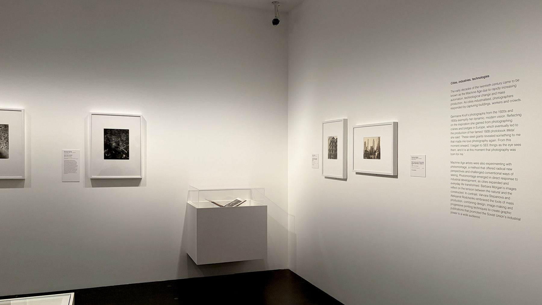
Cities, Industries, Technologies
The early decades of the twentieth century came to be known as the Machine Age due to rapidly increasing automation, technological change and mass production. As cities industrialised, photographers responded by capturing buildings, workers and crowds.
Germaine Krull’s photographs from the 1920s and 1930s exemplify her dynamic, modern vision. Reflecting on the inspiration she gained from photographing cranes and bridges in Europe, which eventually led to the production of her famed 1928 photobook Métal, she said: “These steel giants revealed something to me that made me love photography again. From this moment onward, I began to SEE things as the eye sees them, and it is at this moment that photography was born for me.”
Machine Age artists were also experimenting with photomontage, a method that offered radical new perspectives and challenged conventional ways of seeing. Photomontage emerged in direct response to industrial development, as cities expanded and everyday life transformed. Barbara Morgan’s images reflect on the tension between the natural and the constructed. In contrast, Varvara Stepanova and Aleksandr Rodchenko embraced the tools of mass production, combining design, image-making and progressive printing techniques to create graphic publications that promoted the Soviet Union’s industrial power to a wide audience.
 'Old Post Office, Broadway and Park Row, Manhattan, May 25' 1938 (installation view)")
Berenice Abbott (American, 1898-1991)
Old Post Office, Broadway and Park Row, Manhattan, May 25 (installation view0
1938
Gelatin silver photograph
23.9 x 19.3cm (image)
25.3 x 20.3cm (sheet)
National Gallery of Victoria, Melbourne
Bowness Family Fund for Photography, 2021
Photo: Marcus Bunyan
New acquisition
 'Old Post Office, Broadway and Park Row, Manhattan, May 25' 1938")
Berenice Abbott (American, 1898-1991)
Old Post Office, Broadway and Park Row, Manhattan, May 25
1938
Gelatin silver photograph
23.9 x 19.3cm (image)
25.3 x 20.3cm (sheet)
National Gallery of Victoria, Melbourne
Bowness Family Fund for Photography, 2021
New acquisition
 'Park Avenue and Thirty-ninth Street, Manhattan, October 8' 1936")
 'Park Avenue and 39th Street, New York' 1936")
Berenice Abbott (American, 1898-1991)
Park Avenue and Thirty-ninth Street, Manhattan, October 8
1936
Gelatin silver photograph
19.3 x 24.3cm (image) (irreg)
20.2 x 25.2cm (sheet)
National Gallery of Victoria, Melbourne
Bowness Family Fund for Photography, 2021
; Margaret Bourke-White 'Beach accident, Coney Island' (1952); and at right, Berenice Abbott 'New York at night' (1932 printed c. 1975)")
Installation view of the exhibition Women Photographers 1900-1975: A Legacy of Light at NGV International, Melbourne, November 2025 – May 2026 showing at left, Margaret Bourke-White Campbell’s Soup No. 6 (1935, below); Margaret Bourke-White Beach accident, Coney Island (1952, below); and at right, Berenice Abbott New York at night (1932 printed c. 1975, below)
Photo: Marcus Bunyan
 'Campbell's Soup #6' 1935 (installation view)")
Margaret Bourke-White (American, 1904-1971)
Campbell’s Soup #6 (installation view)
1935
Gelatin silver print
17.3 × 24.1cm (image and sheet)
National Gallery of Victoria, Melbourne
Bowness Family Fund for Photography, 2024
© Public Domain
Photo: Marcus Bunyan
New acquisition
 'Campbell's Soup #6' 1935")
Margaret Bourke-White (American, 1904-1971)
Campbell’s Soup #6
1935
Gelatin silver print
17.3 × 24.1cm (image and sheet)
National Gallery of Victoria, Melbourne
Bowness Family Fund for Photography, 2024
Public Domain
New acquisition
Margaret Bourke-White became widely known for her documentation of workers and scenes of modern industry. Her photography was used on the cover of the first issue of Fortune magazine in 1930, and on the first photographically illustrated cover of Life in 1936. Bourke-White often documented aspects of the Machine Age, contrasting machines and human labourers. Taken in a factory owned by Campbell’s, a major American canned-food company established in 1869, this photograph captures part of the canning process. Bourke-White’s framing, which does not show the worker’s face, amplifies the dominance of the machine. The image first featured as a commission for a local food magazine alongside the caption ‘tangled and tricky, spaghetti defeats the mechanic’.
Wall text from the exhibition
 'Beach accident, Coney Island' 1952")
Margaret Bourke-White (American, 1904-1971)
Beach accident, Coney Island
1952
Gelatin silver photograph
35.2 x 27.9cm (image and sheet)
National Gallery of Victoria, Melbourne
Purchased, 1973
Public domain
 'New York at night' 1932, printed c. 1975 (installation view)")
Berenice Abbott (American, 1898-1991)
New York at night
1932, printed c. 1975
Gelatin silver photograph
34.1 x 26.1cm (image and sheet)
49.8 x 40.0cm (support)
National Gallery of Victoria, Melbourne
Gift of an anonymous donor in memory of Rosa Zerfas (1896-1983), 1985
Photo: Marcus Bunyan
This photograph of the illuminated buildings of New York is the result of a fifteen-minute exposure taken from high up in the Empire State Building. The idea of documenting a changing metropolis recalls the project of pioneering French photographer Eugène Atget, who recorded Paris as it transitioned from the nineteenth into the twentieth century. Berenice Abbott had befriended Atget through fellow American émigré artist Man Ray, for whom she worked as a darkroom assistant after moving to Paris in 1921. Atget’s influence on Abbott was profound: on her return to New York in 1929 she focused on documenting the city’s civic spaces and architecture.
Wall text from the exhibition
 'New York at Night' 1932")
Berenice Abbott (American, 1898-1991)
New York at Night
1932
Gelatin silver print
12 7/8 x 10 9/16″ (32.7 x 26.9cm)
Photograph from the Art Blart archive
 'Changing New York' 1939 (installation view)")
Berenice Abbott (American, 1898-1991)
Changing New York
1939
Artist’s book: half-tone and letterpress text, blue cloth cover, photographic dust jacket
1st edition
Purchased NGV Foundation 2022
Photo: Marcus Bunyan
New acquisition
In her funding proposal for the photobook Changing New York, Berenice Abbott described her desire to capture the ‘spirit’ of the city, driven by the realisation that ‘the tempo of the metropolis is not of eternity, or even time, but of the vanishing instant’. The images in the photobook are accompanied by texts written by Abbott’s partner, art critic Elizabeth McCausland. However, recent research has revealed that Abbott and McCausland’s original intentions for the book were significantly different to what was ultimately published, included alternate texts and a more innovative interplay between words and images.
Vitrine text from the exhibition
 'Fort Peck Dam, Montana' Front cover, 'Life' magazine, first issue, November 1936 (left); Margaret Bourke-White (American, 1904-1971) 'Fort Peck Dam, Montana' Front cover, 'Life' magazine, first issue, November 1936, 'Salesman's edition' (second left); Margaret Bourke-White (American, 1904-1971) 'Fort Peck Dam, Montana' reproduced on front cover, Life magazine, tenth anniversary issue, 25 November 1946 (right)")
Margaret Bourke-White (American, 1904-1971)
Fort Peck Dam, Montana
Front cover, Life magazine, first issue, November 1936
Published by Time Inc.
Magazine: offset lithographs and printed text
Shaw research Library, Gift of Patrick Pound, 2025
Margaret Bourke-White (American, 1904-1971)
Fort Peck Dam, Montana
Front cover, Life magazine, first issue, November 1936, ‘Salesman’s edition’
Published by Time Inc.
Magazine: offset lithographs and printed text
Shaw research Library, Gift of Patrick Pound, 2025
Margaret Bourke-White (American, 1904-1971)
Fort Peck Dam, Montana
Reproduced on front cover, Life magazine, tenth anniversary issue, 25 November 1946
Published by Time Inc.
Magazine: offset lithographs and printed text
Shaw research Library, Gift of Patrick Pound, 2025
Photo: Marcus Bunyan
New acquisitions
When the American publication Life was purchased by Henry Luce in 1936, it was transformed into a photographic news magazine. Its aim was to let its readers ‘see’ the world. Photojournalist Margaret Bourke-White had preciously worked with Luce at Fortune magazine, and a year later he sent Bourke-White to the Soviet Union as the first official foreign photographer allowed to create images of Soviet industry. Later, she was the first accredited woman photographer assigned to photograph the effects of the Second World War.
In 1936 Life magazine gave Margaret Bourke-White the brief of seeking out something ‘grand’ and aspirational at the chain of dams being built at the Columbia River basin. The dams were being built to stimulate the economy as the United States grappled with the devastating effects of the Great Depression. The resulting photograph was selected for the first cover of the relaunched Life magazine. An image of modern industry, the composition emphasises the graphic forms and patterns created by the bases of the elevated spillway. The pillars seem to repeat endlessly, overshadowing two workers dwarfed by the enormous construction. Bourke-White’s image is considered an iconic representation of the Machine Age.
Vitrine text from the exhibition
 'Fort Peck Dam, Montana' Front cover, 'Life' magazine, first issue, November 1936 (left); Margaret Bourke-White (American, 1904-1971) 'Fort Peck Dam, Montana' Front cover, 'Life' magazine, first issue, November 1936, 'Salesman's edition' (second left)")
 'Fort Peck Dam, Montana' Front cover, 'Life' magazine, first issue, November 1936 (left); Margaret Bourke-White (American, 1904-1971) 'Fort Peck Dam, Montana' Front cover, 'Life' magazine, first issue, November 1936, 'Salesman's edition' (second left)")
Margaret Bourke-White (American, 1904-1971)
Fort Peck Dam, Montana
Front cover, Life magazine, first issue, November 1936
Published by Time Inc.
Magazine: offset lithographs and printed text
Shaw research Library, Gift of Patrick Pound, 2025
Margaret Bourke-White (American, 1904-1971)
Fort Peck Dam, Montana
Front cover, Life magazine, first issue, November 1936, ‘Salesman’s edition’
Published by Time Inc.
Magazine: offset lithographs and printed text
Shaw research Library, Gift of Patrick Pound, 2025
Photos: Marcus Bunyan
New acquisitions
 'Fort Peck Dam, Montana' Front cover, 'Life' magazine, first issue, November 1936")
Margaret Bourke-White (American, 1904-1971)
Fort Peck Dam, Montana
Front cover, Life magazine, first issue, November 1936
Published by Time Inc.
Magazine: offset lithographs and printed text
Shaw research Library, Gift of Patrick Pound, 2025
 'Hammer in bloom' 1940s New acquisition; at second left, Germaine Krull 'The Eiffel Tower' (c. 1928); at third left, Germaine Krull 'At the Galeries Lafayette' c. 1930 New acquisition; at centre, Bea Maddock 'Square' (1972); at third right, Ilse Bing 'Champs de Mars' (1931, printed 1994) New acquisition; at second right, Heather George 'The last wall of Melbourne's Old Eastern Markets comes down for the Southern Cross' (c. 1966, printed 1978); and at right, Olive Cotton 'Radio telescope, Parkes' (1964)")
Installation view of the exhibition Women Photographers 1900-1975: A Legacy of Light at NGV International, Melbourne, November 2025 – May 2026 showing at left, Laure Albin Guillot (French, 1879-1962) Hammer in bloom 1940s New acquisition; at second left, Germaine Krull The Eiffel Tower (c. 1928, below); at third left, Germaine Krull At the Galeries Lafayette c. 1930 New acquisition; at centre, Bea Maddock Square (1972, below); at third right, Ilse Bing Champs de Mars (1931 printed 1994, below) New acquisition; at second right, Heather George The last wall of Melbourne’s Old Eastern Markets comes down for the Southern Cross (c. 1966 printed 1978, below); and at right, Olive Cotton Radio telescope, Parkes (1964)
Photo: Marcus Bunyan
 'The Eiffel Tower' c. 1928 (installation view)")
Germaine Krull (Dutch born Germany, 1897-1985)
The Eiffel Tower (installation view)
c. 1928
Gelatin silver photograph
17.0 x 24.3cm (image and sheet)
National Gallery of Victoria, Melbourne
Bowness Family Fund for Photography, 2022
Photo: Marcus Bunyan
New acquisition
 'The Eiffel Tower' c. 1928")
Germaine Krull (Dutch born Germany, 1897-1985)
The Eiffel Tower
c. 1928
Gelatin silver photograph
17.0 x 24.3cm (image and sheet)
National Gallery of Victoria, Melbourne
Bowness Family Fund for Photography, 2022
New acquisition
Germaine Krull photographed industrial forms, political upheaval and modern life. Trained in Munich, she opened a portrait studio in 1919, relocating to Paris in 1926. Three years later, Krull’s photographs were included in the renowned 1929 exhibition Film und Foto in Stuttgart, Germany, the first international exhibition of modernist photography. During the 1920s the Eiffel Tower became a symbol of modernity for many artists, including Krull. In this image, she reimagines the visual language of the man-made structure, highlighting both
the beauty and functionality of the famous landmark. Krull led a peripatetic life across four continents, focusing on photojournalism in South-East Asia after the Second World War and later living among Tibetan monks.
Wall text from the exhibition
 'Square' 1972 (installation view)")
 'Square' 1972 (installation view)")
Bea Maddock (Australian, 1934-2016)
Square
1972
Photo-etching and etching
46.2 × 36.7cm (image) 49.0 × 39.4cm (plate) 76.0 × 56.8cm (sheet)
National Gallery of Victoria, Melbourne
Purchased, 1973
Photos: Marcus Bunyan
 'Square' 1972")
Bea Maddock (Australian, 1934-2016)
Square
1972
Photo-etching and etching
46.2 × 36.7cm (image) 49.0 × 39.4cm (plate) 76.0 × 56.8cm (sheet)
National Gallery of Victoria, Melbourne
Purchased, 1973
© Courtesy of the artist
In the 1970s, Australian artist Bea Maddock embraced the photo-etching process, which incorporates pen and ink. She regularly used found images as the basis for these works. In Square, Maddock overlaid an image of people in a crowd, taken from ‘a book on movement of people in cities’, with a grid structure. As she said, “The actual grid comes from the windows in the National Gallery School, Victorian College of the Arts … the windows had little grills on them … and so they got drawn in because that’s how I saw the world – through those windows.”
Wall text from the exhibition
 'Champs de Mars' 1931, printed 1994 (installation view)")
Ilse Bing (German, 1899-1998)
Champs de Mars (installation view)
1931, printed 1994
Gelatin silver photograph
21.9 x 33.1cm (image) 27.6 x 35.3cm (sheet)
National Gallery of Victoria, Melbourne
Bowness Family Fund for Photography, 2022
Photo: Marcus Bunyan
 'Champs de Mars' 1931, printed 1994")
Ilse Bing (German, 1899-1998)
Champs de Mars
1931, printed 1994
Gelatin silver photograph
21.9 x 33.1cm (image) 27.6 x 35.3cm (sheet)
National Gallery of Victoria, Melbourne
Bowness Family Fund for Photography, 2022
Taken atop the Eiffel Tower, this image sees Ilse Bing turn her lightweight 35 mm Leica camera downwards, photographing the people and bustling city below. The distance created by this dizzying viewpoint reduces the scene to a pattern of shapes and forms. Images such as these were characteristic of a ‘new way of seeing’ that was adopted by avant-garde photographers during the interwar period.
Wall text from the exhibition
 'The last wall of Melbourne's Old Eastern Markets comes down for the Southern Cross' c. 1966, printed 1978")
Heather George (Australian, 1907-1983)
The last wall of Melbourne’s Old Eastern Markets comes down for the Southern Cross
c. 1966, printed 1978
From the Melbourne, old buildings and new projects series (c. 1966)
Gelatin silver photograph
24.0 × 29.1cm (image)
National Gallery of Victoria, Melbourne
Purchased, 1980
Public domain
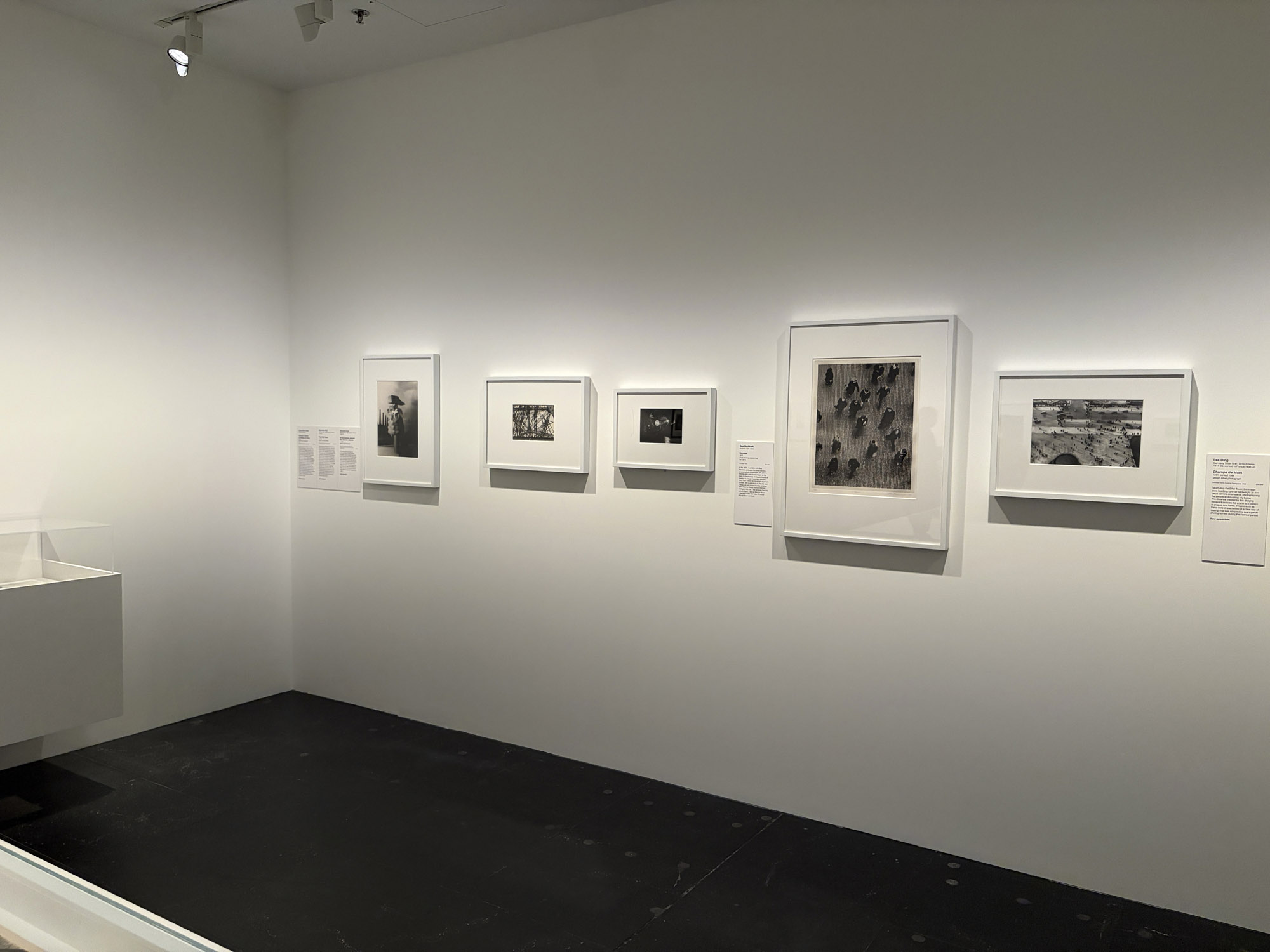
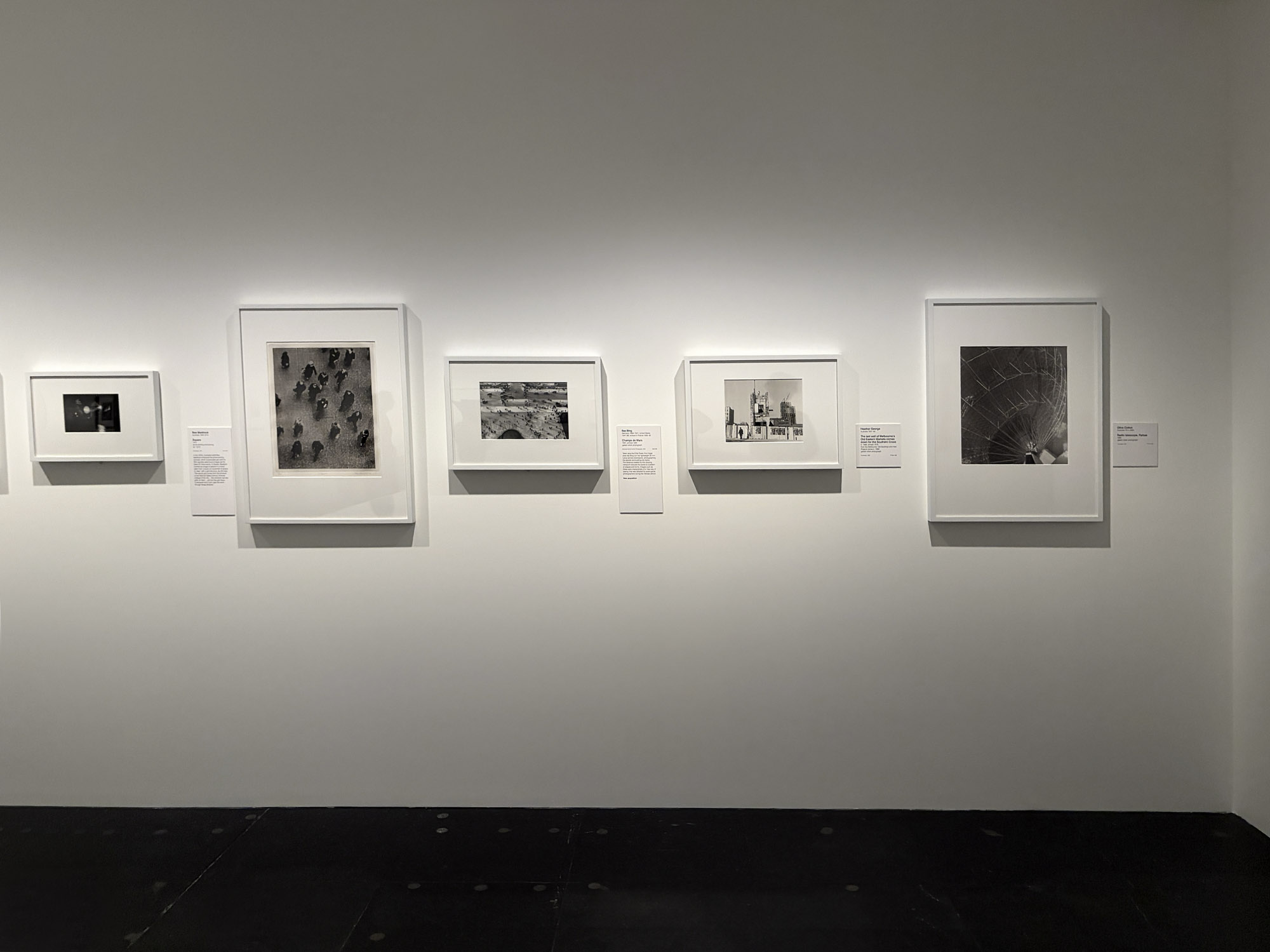
Installation view of the exhibition Women Photographers 1900-1975: A Legacy of Light at NGV International, Melbourne, November 2025 – May 2026 showing in the bottom image at left, Germaine Krull At the Galeries Lafayette c. 1930 New acquisition; at second left, Bea Maddock Square (1972, above); at third left, Ilse Bing Champs de Mars (1931 printed 1994, above) New acquisition; at second right, Heather George The last wall of Melbourne’s Old Eastern Markets comes down for the Southern Cross (c. 1966 printed 1978, above); and at right, Olive Cotton Radio telescope, Parkes (1964)
Photos: Marcus Bunyan
 and Varvara Stepanova (Russian, 1894-1958) 'USSR in construction, no.12 (Parachute issue)' 1935 (installation view)")
 and Varvara Stepanova (Russian, 1894-1958) 'USSR in construction, no.12 (Parachute issue)' 1935 (installation view)")
Aleksandr Rodchenko (Russian, 1891-1956) and Varvara Stepanova (Russian, 1894-1958)
USSR in construction, no.12 (Parachute issue) (installation views)
1935
Illustrated journal: colour rotogravure, 22 pages with fold-out inserts, lithographic cover
42.3 x 60.3 x 1.2cm (open)
42.3 x 30.3 x 0.4cm (closed)
National Gallery of Victoria, Melbourne
Purchased, NGV Supporters of Prints and Drawings, 2019
Photos: Marcus Bunyan
Varvara Stepanova and her husband, fellow artist and designer Aleksandr Rodchenko, were founder-members of the First Working Group of Constructivists. This is a French-language edition of USSR in Construction, a journal that aimed to reflect, through photography, the modernisation of the Soviet Union and to promote its industrial power. The journal employed cutting-edge artistic and printing developments, and this issue was designed by Stepanova and Rodchenko using original ideas around photomontage and page design. Dedicated to the ‘brave Soviet paratroopers’, the so-called ‘Parachute’ issue draws upon the circular form of the opened parachute.
Wall text from the exhibition


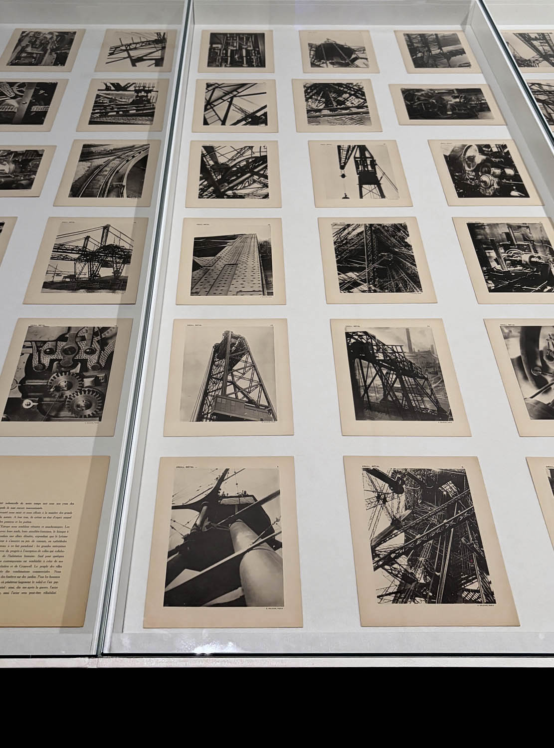


Installation view of the exhibition Women Photographers 1900-1975: A Legacy of Light at NGV International, Melbourne, November 2025 – May 2026 showing collotypes from Germaine Krull’s portfolio Métal 1928
Photos: Marcus Bunyan
One of the most significant modernist photobooks of the 1920s, Germaine Krull’s Métal portfolio comprises sixty-four images printed on individual sheets, a title page and a three-page preface by the French writer and journalist Florent Fels. Krull photographed iron structures such as cranes and transport bridges in Amsterdam, Rotterdam, Marseille and Saint-Malo, as well as the Eiffel Tower in Paris. Krull showcases the beauty and innovation of the structures, conveying the sense of awe that accompanied the rapid industrialisation of the time. The presentation of the photographs – loose, to be arranged however the viewer chooses – is also radical, allowing for endless interpretations.
Wall text from the exhibition
 'Métal' 1928")
 Cover design by M. Tchimoukow. 'MÉTAL' cover 1928")
 Image from the portfolio 'MÉTAL' 1928")
 Image from the portfolio 'MÉTAL' 1928")
 Image from the portfolio 'MÉTAL' 1928")
 Image from the portfolio 'MÉTAL' 1928")
 Image from the portfolio 'MÉTAL' 1928")
 Image from the portfolio 'MÉTAL' 1928")
 Image from the portfolio 'MÉTAL' 1928")
 Image from the portfolio 'MÉTAL' 1928")
 Image from the portfolio 'MÉTAL' 1928")
 Image from the portfolio 'MÉTAL' 1928")
Germaine Krull (European, 1897-1985)
Métal
1928
64 black and white collotype plates, letterpress on paper, black cloth-backed paper-covered board portfolio with ribbons
30.5 x 23.5 x 2.5cm (overall)
National Gallery of Victoria, Melbourne
Bowness Family Fund for Photography, 2023
Photographs from the Art Blart posting Germaine Krull Métal 1928, December 2018. Used under fair use conditions for the purposes of education and research
Germaine Krull’s 1928 publication Métal is often described as one of the most significant photobooks of the twentieth century. Interestingly, Métal is not a book in a conventional sense, of sequential pages bound together with a narrative to guide the structure. Rather, when looking through this new acquisition to the NGV Collection you can immediately appreciate its unique design as an object. This dynamic format which, along with the vitality of the photography, has continued to inspire graphic designers, book publishers and artists since its publication almost a century ago.
Métal consists of a folded board cover, with ribbons attached, that acts as a folder for the pages within. The cover, designed by artist Lou Tchimoukow, reproduces one of Krull’s photographs of a detail of machinery on Paris’s Eiffel Tower. This image is overlaid with bold, vertically arranged letters spelling out ‘KRULL’ in a staggered pattern that mimics the lines of the structure beneath. Within the folder are sixty-four unbound plates. Each plate reproduces a photograph by Germaine Krull of industrial forms (and on one occasion, two images to a page) printed as collotypes, as well as the words ‘Krull, Métal’ at the top left, the plate number at the top right, and the publisher’s information ‘A. Calavas, Paris’ at the base. There is also an insert of eight pages (two sheets folded) that includes texts by journalist Florent Fels, and words from Krull herself. …
For Métal, Krull brought together a selection of recent photographs which, as she wrote in the introductory text, were from sites that included the Eiffel Tower, as well as the cranes and transport bridges of Amsterdam, Rotterdam, Marseille and Saint-Malo. Apart from the Eiffel Tower, they are emblematic of new industries and engineering emerging in these European cities in the decade after the end of the First World War and could, at first glance, be read as a tribute to modernity as seen through this rapid industrial development.
The presentation of the photographs, however, disrupts the opportunity for any clear narrative, or interpretation. While they are numbered, Krull’s images are printed without any captions (a radical technique in a photobook for the period). The audience is encouraged to actively engage: they are able to construct their own sequences and visual associations. And the composition of the images is highly varied – some close up and cropped, showing the cogs, bolts and mechanics; some reveal dizzying angles and perspectives; some show clear lines, some are abstracted; the majority are taken outside, some are within a factory; some are printed on the vertical, some on the horizontal; some are the result of multiple exposures, as if to emphasise a sense of movement or energy.
Art historian Professor Kim Sichel writes that Krull constructs an ‘activist narrative’ in Métal: ‘Through narrative techniques that are part taxonomy, part lyrical poem, part vertiginous montage, part Industrial-Age adulation, and by making the whole volume uncomfortable and strange to read, she brings her machine parts to life as they oscillate uneasily throughout the album’.2
The photographs in Métal can be linked to contemporary art movements circulating within Europe, such as the visual language of the ‘New Vision’ styles of photography emerging out of the Bauhaus in Germany, or the clean lines of the ‘New Objectivity’ as demonstrated by photographers, such as Albert Renger-Patzsch. Krull’s photographic vision, however, remains dynamic and unique – it does not follow one clear aesthetic or technical path. Métal is an innovative publication: it is open-ended and allows for endless interpretations.
2/ Kim Sichel, “Montage: Germaine Krull’s Métal,” in Sichel, Kim, Making Strange: The Modernist Photobook in France, Yale University Press, Connecticut, 2020, pp. 33–4.
Maggie Finch. “Germaine Krull Métal portfolio 1928,” on the NGV website 22 Oct 25 [Online] Cited 24/12/2025. This article first appeared in the January–February 2024 edition of NGV Magazine. Used under fair use conditions for the purposes of education and research
NGV International
180 St Kilda Rd, Melbourne
Opening hours:
Open daily, 10am – 5pm
 'Roof of the Atelier-House, Bauhaus Dessau' 1926 from the exhibition 'Lucia Moholy – Exposures' at Fotostiftung Schweiz, Winterthur, Feb - June, 2025")
 'Workshop wing, design by Walter Gropius, Bauhaus Dessau' around 1926 from the exhibition 'Lucia Moholy – Exposures' at Fotostiftung Schweiz, Winterthur, Feb - June, 2025")
 'Gropius House in Dessau' 1925")
 'Workshop wing from south-west, Bauhaus Dessau' 1926")
 'Bauhaus Dessau: Workshop building from the southwest' c. 1926")
 'Workshop wing of the Bauhaus Building in Dessau' c. 1926")
 'Dining room Moholy-Nagy, Meistersiedlung Bauhaus Dessau' 1926")
 'Metal workshop, design by Marianne Brandt, Bauhaus Dessau' 1924 from the exhibition 'Lucia Moholy – Exposures' at Fotostiftung Schweiz, Winterthur, Feb - June, 2025")
 'Edith Tschichold, Bauhaus Dessau' 1926")
 'László Moholy-Nagy, Bauhaus Dessau' 1926")
 'Walter Gropius, Bauhaus Dessau' 1926")
 'Ingeborg Lebert' 1927")
 'Lou Scheper' 1927")
 'Florence Henri, Bauhaus Dessau' 1927")
 'Gypsy, Jugoslavia' 1930-1931")
 'Ruth Fry' 1936")
 'Emma, Countess of Oxford and Asquith, London' 1937")
 'Lucia Moholy in her studio in Zollikon' 1972")
 'Lucia Moholy in her studio in Zollikon' 1972")
 'F in Field' 1920 from the exhibition 'Moholy-Nagy: Future Present' at the Los Angeles County Museum of Art (LACMA), Feb - June, 2017")
 'Title unknown' 1920/1921 from the exhibition 'Moholy-Nagy: Future Present' at the Los Angeles County Museum of Art (LACMA), Feb - June, 2017")
 'Photogram' 1941")
 '19' 1921")
 'Red Cross and White Balls' 1921")
 'Construction' 1922")
 'Q' 1922/23")
 'Photogram' 1925/28, printed 1929")
 'Photograph (Self-Portrait with Hand)' 1925/1929, printed 1940/1949")
 'Photogram' 1925/1926")
 'Photogram' 1926")
 'Cover and design for Malerei Photographie Film (Painting Photography Film)' 1925")
 'Once a Chicken, Always a Chicken' 1925")
 'AL 3' 1926")
 'Photograph (Berlin Radio Tower)' 1928/1929")
 'Photograph (Light Prop)' 1930")
 'Photograph (Light Prop)' c. 1930")

 'Room of the Present' 1930, constructed 2009")
 'Construction AL6 (Konstruktion AL6)' 1933-1934")
 'CH BEATA I' 1939")
 'Photograph (Light Modulator in Motion)' 1943")
 'Photograph (Light Modulator in Repose)' 1943")
 'Vertical Black, Red, Blue' 1945")
 'Space Modulator CH for R1' 1942")
")
 'B-10 Space Modulator' 1942")
' constructed in 2009 from plans and other documentation dated 1930")
' constructed in 2009 from plans and other documentation dated 1930")
' constructed in 2009 from plans and other documentation dated 1930")
' (1924)")
 'A II' 1924 from the exhibition 'Moholy-Nagy: Future Present' at the Solomon R. Guggenheim Museum, New York, May - Sept, 2025")


 'Dual Form with Chromium Rods' 1946 (installation view)")
 'Dual Form with Chromium Rods' 1946 from the exhibition 'Moholy-Nagy: Future Present' at the Solomon R. Guggenheim Museum, New York, May - Sept, 2025")
 'Nickel Sculpture with Spiral' 1921 (installation photograph)")
 'A 19' 1927 from the exhibition 'Moholy-Nagy: Future Present' at the Solomon R. Guggenheim Museum, New York, May - Sept, 2025")
 'Photogram' 1941")
 'Space Modulator' 1939-1945")
 'Papmac' 1943")
 'CH BEATA I' 1939")
 'Construction AL6 (Konstruktion AL6)' 1933-1934")
 'Photogram' 1926")
 'Cover and design for Vision in Motion' (Paul Theobald, 1947)")
 'Double Scramble' 1978 from the exhibition 'Rothko to Richter: Mark Making in Abstract Painting from the Collection of Preston H. Haskell', Class of 1960 at the Princeton University Art Museum, May - October, 2014")
 'Study for Homage to the Square' 1964 from the exhibition 'Rothko to Richter: Mark Making in Abstract Painting from the Collection of Preston H. Haskell', Class of 1960 at the Princeton University Art Museum, May - October, 2014")
 'Untitled (red)' 1972")
 'Untitled (Woman)' 1965")
 'Untitled (Woman)' 1965 (detail)")
 'February's Turn' 1979")
 'Belfry' 1979")
 'Monument Valley, Utah' 1970")
 'Rock Wall, Connecticut' 1959")
 'Abstract Painting (613-3) 1986")
 'Abstract Painting (613-3)' 1986 (detail)")
 'Untitled' 1960")
 'Composition #3' 1952")
 'Midday' 1956")
 'Midday' 1956 (detail)")
 'Dans la Tempête' 1960")
 'Dans la Tempête' 1960 (detail)")
 'Bond' 1960")
 'Bond' 1960 (detail)")
 'Mire G119' 1983")
 'Untitled (Ocean Park)' 1983")
 'Phenomena Spanish Cape' 1975")
 'Untitled' 1968")
 'Untitled' 1968 (detail)")
 'The New – The Coming, Detroit, Streetcars' 1924")
 'View from the roof' Detroit, 1924")
 'Detroit' 1924")
 'Detroit, A New Street' 1924")
")
")
 'Le Corbusier at CIAM Conference' c. 1954-1964")
 'Buckminster Fuller, Lonberg-Holm and other' Bayside, New York Nd")
 'Photograph of the Dymaxion Car' Bridgeport, Connecticut, July 21, 1933")
 'Diego Rivera and Frida Kahlo' Bridgeport, Connecticut, July 21, 1933")
 'Radio Broadcasting Station' Photograph of Model Detroit, 1925")
 'Radio Broadcasting Station' Photograph of Model Detroit, 1925")
 'Photograph of Chicago's new skyline North of Randolph Street All new since 1926 except Wrigley and Tribune buildings' May 1929")
![Lyonel Feininger (American, 1871-1956) 'Untitled [Street Scene, Double Exposure, Halle]' 1929-1930](https://artblart.com/wp-content/uploads/2012/02/street-scene-double-exposure-halle-1929-1930.jpg "Lyonel Feininger (American, 1871-1956) 'Untitled [Street Scene, Double Exposure, Halle]' 1929-1930")
![Lucia Moholy (British born Czechoslovakia, 1894-1989) 'Untitled [Southern View of Newly Completed Bauhaus, Dessau]' 1926](https://artblart.com/wp-content/uploads/2012/03/lucia-moholy-southern-view-of-newly-completed-bauhaus.jpg "Lucia Moholy (British born Czechoslovakia, 1894-1989) 'Untitled [Southern View of Newly Completed Bauhaus, Dessau]' 1926")
![Lyonel Feininger (American, 1871-1956) 'Untitled [Train Station, Dessau]' 1928-1929](https://artblart.com/wp-content/uploads/2012/02/gm_326238ex1.jpg "Lyonel Feininger (American, 1871-1956) 'Untitled [Train Station, Dessau]' 1928-1929")
")
 'Metalltanz' 1929")
![Lyonel Feininger (American, 1871-1956) 'Untitled [Night View of Trees and Street Lamp, Burgkühnauer Allee, Dessau]' 1928](https://artblart.com/wp-content/uploads/2012/02/night-view-of-trees-and-streetlamp-burgkc3bchnauer-allee-dessau-1928.jpg "Lyonel Feininger (American, 1871-1956) 'Untitled [Night View of Trees and Street Lamp, Burgkühnauer Allee, Dessau]' 1928")
 'Stockholm (Shell sign at night)' 1935")
 'Drunk with Beauty' 1932")
 'Bauhaus' March 22, 1929")
 'Untitled (Georg Hartmann and Werner Siedhoff with Other Students)' 1929")
 'Untitled (Bauhaus Band)' About 1928")
 'Untitled (Composition with Nine Glasses and a Decanter)' 1929-1933")
 'Bauhaus' March 26, 1929")
 '\"Moholy’s Studio Window\" around 10 p.m.' 1928")
 'On the Lookout, Deep an der Rega' 1932")
![Irene Bayer-Hecht (American, 1898-1991) 'Untitled [Students on the Shore of the Elbe River, near Dessau]' 1925](https://artblart.com/wp-content/uploads/2012/03/irene-bayer-bauhacc88usler-am-strand-der-elbe-bei-dessau-web.jpg "Irene Bayer-Hecht (American, 1898-1991) 'Untitled [Students on the Shore of the Elbe River, near Dessau]' 1925")
 'Chairs at Margate' 1935")
 'K VII' 1922")
 'Composition A XI' 1923")
 'Eton. Eleves watching cricket from the pavilion on Agar's Plough' c. 1930")
 'Untitled' 1939")
 'Untitled' 1940-44")
 'The Benevolent Gentleman' 1924")
 'Jealousy' 1924-1927")
 'La Canebière Street, Marseilles - View Through the Balcony Grille' 1928")
 'Costume Design for Tales of Hoffmann' 1929")
 'Portrait of Ellen Frank' c. 1929")


 'Composition - Assemblage - Photogram' 1926")
 'Photogramm No. II' 1929")
 'Lago Maggiore, Ascona, Switzerland' c. 1930")
 and Paul Hartland. 'Carnival: Composition with two masks' c. 1934")
 'LIS' 1922 from the exhibition 'László Moholy-Nagy
Retrospective' at Schirn Kunsthalle, Frankfurt, October 2009 - February 2010")
 'K XVII' 1923 from the exhibition 'László Moholy-Nagy
Retrospective' at Schirn Kunsthalle, Frankfurt, October 2009 - February 2010")
 'COMPOSITION A XXI' 1925")
 'Bauhaus Balconies' 1926 'Bauhaus Balconies' 1926 from the exhibition 'László Moholy-Nagy
Retrospective' at Schirn Kunsthalle, Frankfurt, October 2009 - February 2010")
 and second right 'K XVII' (1923)")
")
 with at centre, 'Light-Space Modulator' 1930 (replica)")
 'Fotogram with Eiffel Tower and Peg Top' c. 1928")
")
 'Photogramm No.II' Enlargement before 1929")
 'Marseille, Port View' 1929")
 'SPACE CH 4' 1938")
 'CH XIV' 1939")
 'CH SPACE 6' 1941")
 'Dual forms with Chromium Rods' 1946")
 'Untitled' 1936-1946")
 'Untitled' 1937-1946")
 'Untitled' 1939")
 'Untitled/Night-Time Traffic (Pink and Red Traffic Stream with White Sparks)' 1937-1946")

You must be logged in to post a comment.