Curators: Daniel Birnbaum, Lena Essling, Gunnar B. Kvaran, and Hanne Beate Ueland in collaboration with the artist
Cindy Sherman (American, b. 1954) Untitled #92 1981 Chromogenic colour print 61 x 121.9cm The National Museum of Art, Architecture and Design, Oslo
Like a mouthful of cinders.
Dr Marcus Bunyan
Many thankx to the Astrup Fearnley Museet for allowing me to publish the photographs in the posting. Please click on the photographs for a larger version of the image.
Cindy Sherman (American, b. 1954) Untitled #167 1985 Chromogenic colour print 150 x 225cm Astrup Fearnley Collection
Cindy Sherman (American, b. 1954) Untitled Film Still #32 1979 Gelatin silver print 69.5 x 87.2cm Astrup Fearnley Collection
Cindy Sherman (American, b. 1954) Untitled #150 1985 Chromogenic colour print 121 x 163.8cm Collection of Cynthia and Abe Steinberger
Cindy Sherman (American, b. 1954) Untitled Film Still #56 1980 Gelatin silver print 15.5 x 22.8cm Moderna Museet Donation from The American Friends of the Moderna Museet, Inc., 2010
Cindy Sherman (born 1954) is one of the leading and most influential artists of our time. She belongs to a generation of postmodern artists who redefined the photograph and its place in an ever more visually oriented culture. Taking female roles in photographic representations as her starting point, Sherman creates recognisable pictures that mirror the human condition in its many nuances. Sherman’s pictures became key works in a time of turbulence for the very concept of art, and continue to challenge concepts of representation, identity and portrait.
Cindy Sherman’s allegorical pictures reflect our own conception of the world and open up for new interpretations of familiar phenomena. She uses herself as a model and equally portrays film stars and pin-up girls, as well as abnormal monsters from fantasy worlds. Sherman’s assertive use of masks, wigs and prosthetics has a disturbing effect, which is further reinforced in pictures where the human presence is gradually reduced in favour of posed dolls or traces of waste and decay.
The exhibition Cindy Sherman – Untitled Horrors has been composed to emphasise the disturbing, grotesque and disquieting sides of Sherman’s pictures. These are aspects that are visible in her exploration of well-established photographic genres such as film stills, fashion photography or classic portraits, as well as in series with titles such as Fairy Tales, Disasters, Sex Pictures, Civil War and Horror & Surrealist. This exhibition seeks to highlight these key aspects in her artistry and to examine their relevance through a dedicated selection of works from the beginning of her career in the mid-1970s up to the present day.
In conjunction with the exhibition, a richly illustrated catalogue is being published in cooperation with art publishers Hatje Cantz Verlag. The idea behind the catalogue is to explore and examine the more disquieting sides of Sherman’s art by inviting contributions from authors who have touched on similar themes in their own works. Contributors are well-known artists, dramatists and authors including Lars Norén, Miranda July, Sibylle Berg, Sjón, Sara Stridsberg, Karl Ove Knausgård and Kathy Acker.
Press release from the Astrup Fearnley Museet website
Cindy Sherman (American, b. 1954) Untitled #402 2000 Chromogenic colour print 88 x 60cm Astrup Fearnley Samlingen / Collection
Cindy Sherman (American, b. 1954) Untitled #132 1984 Chromogenic colour print 176.3 x 119.2cm Kunsthaus Zürich
Cindy Sherman (American, b. 1954) Untitled #199-A 1989 Chromogenic colour print 63.3 x 45.7cm Astrup Fearnley Collection
Cindy Sherman (American, b. 1954) Untitled #152 1985 Chromogenic colour print 184.2 x 125.4cm Astrup Fearnley Samlingen/ Collection
Cindy Sherman (American, b. 1954) Untitled #470 2008 Chromogenic colour print 216.5 x 147.5cm Acquired with founding from The American Friends of the Moderna Museet Inc.,
Exhibition dates: 23rd June – 22nd September, 2013
Curator: Siri Engberg
Daniel Douke (American, b. 1943) Ace
1979
Acrylic on masonite
8 x 8 x 12 1/4 in.
Courtesy Minnesota Museum of American Art, Saint Paul
Life (like).
“For the French theorist Jean Baudrillard, this consciousness of construction finds its most powerful expression in the concept of hyperreality. To appreciate Baudrillard’s view, recall the treatment of literary deconstruction… Deconstruction theorists propose that words gain their meaning through their reference to other words; literary works gain their significance by the way they are related to other writings. Thus language does not derive its character from reality, but from other language. Now consider the media – newspapers, television, the movies, radio. For Baudrillard, media portrayals of the world are not driven by the way the world “is,” but by the steadily emerging histories of portrayal itself. As these histories unfold, each new lamination is influenced by the preceding, accounts are layered upon accounts, and reality is transformed into hyperreality. For example, Baudrillard asks, what is the reality of the “Holocaust”? One cannot deny that certain events took place, but as time goes on these events become subject to myriad re-presentations. Diaries become subject to redefinition by television and movies; biographies influence the writing of historical novels; narrated history is transformed into plays, and each “telling” lays the experiential groundwork for subsequent retellings. Realities accumulate, accentuate, interpenetrate, and ultimately create the world of hyperreality – itself in continuous evolution into the future. We feel we possess an intimate acquaintance of the events in themselves; they are sharply etched in our consciousness. For Baudrillard, however, this consciousness moves increasingly toward hyperreality.
And thus the culture opens to the possibility of selves as artifacts of hyperreality. As political events, health and illness, and world history slip from the realm of the concrete into the domain of representation, so a commitment to obdurate selves becomes increasingly difficult to maintain. What, after all, is the reality of our motives, intentions, thoughts, attitudes, and the like? …
As we find, the current texts of the self are built upon those of preceding eras, and they in turn upon more distant forms of discourse. In the end we have no way of “getting down to the self as it is.” And thus we edge toward the more unsettling question: On what grounds can we assume that beneath the layers of accumulated understandings there is, in fact, an obdurate “self” to be located? The object of understanding has been absorbed into the world of representations.”
Gergen, Kenneth. The Saturated Self: Dilemmas of Identity in Contemporary Life. New York: Harper Collins, 1991, pp. 121-122.
Many thankx to The Blanton Museum of Art for allowing me to publish the artwork in this posting. Please click on the photographs for a larger version of the art.
Vija Celmins (Latvian American, b. 1938) Eraser 1967 Acrylic on balsa wood 6 5/8 x 20 x 3 1/8 in. Collection Orange County Museum of Art, Newport Beach, CA Gift of Avco Financial Services, Newport Beach
Maurizio Cattelan (Italian, b. 1960) Untitled 2001 Stainless steel, composition wood, electric motor, electric light, electric bell, computer 23 1/2 x 33 5/8 x 18 5/8 in. Courtesy the artist and Marian Goodman Gallery, New York
Keith Edmier (American, b. 1967) Bremen Towne 2008 Installation dimensions variable Courtesy of the artist and Friedrich Petzel Gallery
Bremen Towne was an idea I’d been thinking about prior to [my 2008] show at Bard College. It had been floating in my head for a number of years based on the sales brochure of my parents’ home I had obtained around 1999 off of eBay. It was just one of these things I had around… I didn’t really have the idea of constructing this house back then… As it turned out, the interior dimensions of my parents’ home from the original blueprints fit directly into one of the galleries at the museum. At that point I started considering it more as an art object, or as a sculpture more than an installation… The main visual references were family photographs, mostly taken during critical events or holidays or birthday parties. My process involved going through the photo album – everything. They were all pictures of people posing, so I started looking at the spaces [in the background]… I ended up buying the whole decade of both Sears and JCPenney catalogues up until that time, the early ’70s. Through that I was able to identify some products based on visual descriptions or in the family photographs… I initially went to a place that has all kinds of wallpapers and floorings from other periods, used a lot for movies and things like that. I heard they had thousands of wallpapers. It turned out I couldn’t find the exact wallpaper that was in the house. I guess at that point I started thinking it was more interesting for me to remake it, and to remake it more or less new. I wanted to represent the time element, the moment before the day of the family moving into the new house. It wasn’t supposed to look lived in.
I think I was initially interested in doing that to have some kind of separation from taking a real object that was loaded with personal history or some sentimental thing. It was a way of moving from a subjective to an objective position… [I was interested] in just thinking about the whole interior of the house itself as a cast, or this negative space. I thought about how the house is essentially the space that shapes us, that shapes oneself… I think that my reason to make it, or to make almost anything, went beyond just the visual aspects of it, or the idea of re-creating an illusion of the thing. I’ve always been more interested in a certain level of representation or pictorial literalness… I like words or descriptions like “actual” or “actual scale.” I like the idea of “what is real?”
The exhibition Lifelike, on view at the Blanton Museum of Art at The University of Texas at Austin June 23 to September 22, 2013, invites a close examination of artworks based on commonplace objects and situations, which are startlingly realistic, but often made of unusual materials in unexpected sizes.
Organised by the Walker Art Center in Minneapolis, this international, multigenerational group exhibition features 75 works from the 1960s to the present by leading figures in contemporary art, such as Andy Warhol, Gerhard Richter, James Casebere, Vija Celmins, Keith Edmier, Robert Gober, Ron Mueck, Mungo Thomson, and Ai Weiwei, and illuminates artists’ enduring fascination with realism.
Avoiding the flashiness embraced by 1960s Pop Artists and the slick urban scenes introduced at that time by the Photorealists, the contemporary artists in Lifelike investigate often overlooked items and moments as subject matter: a paper bag, an eraser, an apple core, a waiting roo, an afternoon nap. Favouring a handmade, labour intensive practice rather than technological enhancements, the works in the exhibition – including painting, sculpture, photography, drawing and video – transform the seemingly ordinary into something beguiling, loaded with narrative and metaphor.
The exhibition explores the many ways artists have pursued realism through a range of media. Some artists featured, such as Vija Celmins, Chuck Close, and Peter Rostovsky, paint from photographs, creating works that exhibit an astonishing degree of likeness and detail. Others work in sculpture often fashioning objects from materials that belie the pedestrian nature of the subject – Ai Weiwei’s jar of hundreds of sunflower seeds, hand painted on to cast porcelain, or Tom Friedman’s bee, made out of clay, plastic, and paint. In photography, artists including James Casebere and Isaac Layman play with the hyperreal, through fabricated scenes or clever layering of images. In video, artists including Thomas Demand and Jeon Joonho create moving images that at first seem familiar, but deceive us through sly use of animation.
Conspicuously absent in most of the works in Lifelike is a reliance on technological intervention. Instead, in seemingly inverse proportion to the ease of producing goods for the marketplace, many artists are slowing and complicating their own working methods, remaking banal things into objects of fixation and desire: Catherine Murphy’s details of textured fabric on the seat of a chair, or Ron Mueck’s strikingly “real” sculpture – down to the last hair and pore – of human subjects. Frequently these artists work from photographs, but just as often, their inspiration is the observed world, and the notion that a tangible, perhaps ephemeral object or moment can somehow be brought back to life æ reinterpreted through the artist’s hand as re-made readymades.
To address the nuances of this subject, the exhibition presents several key conceptual sections:
Common Objects gathers a group of late 1960s and early 1970s works that borrowed strategies from Pop, but rejected that movement’s brand-name emphasis in favour of conceptual, more process-oriented approaches to subject matter.
Another section presents the notion of The Uncanny, which features work by a generation of artists in the 1980s and 1990s who inflected realism with a psychologically-laden, surreal sensibility, such as Robert Gober’s child-sized chair and flower-covered box of tissues, resting mysteriously atop a floor drain; or Charles Ray’s disarming photograph of himself as a mannequin.
A third section entitled Realism into Abstraction presents a range of works by artists such as Peter Rostovsky, Catherine Murphy and Tauba Auerbach, in which lushly painted surfaces such as velvet curtains, the seat of a chair, and other ordinary items are cropped in such a way that they resemble abstract paintings, their original sources difficult to discern.
Handmade Sleight of Hand, the fourth section, presents work by artists who make objects that are indistinguishable from their real-life counterparts, but made with the traditional techniques of painting, sculpture, or drawing. Highlights include Jud Nelson’s trash bag carved from Carrara marble and Susan Collis’s checkered plastic shopping bag painstakingly rendered in ballpoint pen on paper.
A fifth section, Special Effects: The Real as Spectacle, presents artists making work that engages an instant response – be it astonishment, fear, confusion, or delight – through their surprising size or unusual installation.
Press release from The Blanton Museum of Art website
Peter Rostovsky (Russian, b. 1970) Curtain 2010 Oil on linen 72 x 48 in. Courtesy of the artist
What does it mean in Warholian fashion to “want to be a machine,” to long for a kind of inhumanity that has to be constantly performed and repeated? Is this not a radical disavowal of an all too human vulnerability? Can we not read in the mechanical appeals of photorealism a kind of excessive sentimentality, a naïve expressionism that uses the camera and the photograph as a shield against trauma?
And likewise in expressionism’s hyperbolic restatement of its humanity, is there not a silent concession to its opposite, a founding anxiety about inauthenticity, a mortal dread regarding the total triumph of simulation and technology?
However, it is important to stress that these are unfulfilled desires. No photorealist painting completely fools the viewer into the fact that it is machine-made; it entertains the fantasy, much like electronic music. And each autonomous artwork is only a temporary escape, a utopian space, “an orchid in the land of technology,” to borrow a phrase that Walter Benjamin applied to the illusion of reality in film.
What these two positions in fact represent are two negative theologies that stand as sentinels, forever pointing to and away from a traumatically unresolved subject position – a position of the never sufficiently technological, and the never completely human. They are both Romantic positions and should be read as such: as positions of longing and disavowal, not of identity.
Why would this be important to emphasise? Because it answers the familiar question asked to every painter painting photographs. It’s not about the ends, it’s about the means. It’s about the performance of painting that re-states the position, not the photo-like product that it yields. In other words, it’s about trying and failing to be a machine. Therein resides the futility and poetic nature of the practice. The failure marks the fragility and evanescence of the subject negatively, knowing that the alternative is to misname, to misrepresent, to conjure the opposite. This poetic is more latent, and seldom acknowledged in art that aspires toward indifference and inhumanity, but I hope that I have shown that every tin man has a heart, just like every photorealist hides an abstract painter.
Ron Mueck (Australian, b. 1958) Untitled (Seated Woman) 1999 Silicone, acrylic, polyurethane foam and fabric 25 1/4 x 17 x 16 1/2 in. Collection of the Modern Art Museum of Fort Worth
A slight switch in gears for the next two postings. Conceptual, sculptural, minimal, monochromatic, corporeal, haptically varied surfaces that are absolutely fascinating…
Dr Marcus Bunyan
Many thankx to the Städel Museum for allowing me to publish the artwork in the posting. Please click on the photographs for a larger version of the art.
Ennio Vicario (Italian, 1935-2023) Manzoni in his studio in Via Fiori Oscuri 1958 Gelatin silver print
Ennio Vicario (Italian, 1935-2023) Manzoni in his studio in Via Fiori Oscuri 1958 Gelatin silver print
Despite his short career, Piero Manzoni (Italian, 1933‒1963), who died an early death at the age of twenty-nine, is regarded as one of the most momentous representatives of Italian art after 1945. Manzoni would have celebrated his eightieth birthday on July 13, 2013. The Städel will pay tribute to this key figure of the European post-war avant-garde with a comprehensive survey to mark the occasion exactly fifty years after the artist’s death. Piero Manzoni. When Bodies Became Art will be the first Manzoni retrospective ever to be staged in the German-speaking world. The exhibition, on display from June 26 to September 22, 2013, will highlight the radical character of the artist’s multifaceted position: Manzoni not only submitted Duchamp’s concept of the ready-made to a far-reaching revision, but also thought central discourses of Modernism like monochromy through to the end and opened painting into the fields of the everyday world and commodity aesthetics. With works like Merda d’artista – (allegedly) 30 grams of artist’s shit in a strictly limited edition – or Socle du monde (Base of the World, 1961) – a pedestal elevating the world to an artwork – Manzoni created two icons within the more recent history of art. More than one hundred works from all phases of Manzoni’s productive career will offer complex insights into a still persuasive and influential oeuvre between Art Informel and the emergence of a new concept of art, Modernism and neo-avant-garde, art and the everyday world. Manzoni’s still unbroken influence on contemporary art production will be illustrated in the exhibition by works of the artists Erwin Wurm (b. 1954), Leni Hoffmann (b. 1962), and Bernard Bazile (b. 1952), which – offering an essayistic introduction to the show ‒explore central dimensions of Manzoni’s oeuvre regarding their relevance to the present.
“Though Piero Manzoni had a pivotal position in the cross-European ZERO network and, as a breathtaking innovator of the concept of art, strikes us hardly less avantgarde today, he is far less known than many of his ZERO colleagues in these parts. Fifty years after his sudden death, we want to change this situation with the first presentation of Manzoni’s work in a museum outside Italy for more than two decades,” says Max Hollein, Director of the Städel Museum.
“The exhibition is not only aimed at shedding light on the wide variety of Manzoni’s work produced within only a few years, but also at examining his enormous impact on the paradigm change in the art of the 1960s. Manzoni actually paved the way for today’s art, exercising an influence on Body Art and Performance Art, as well as on Conceptual Art and Land Art,” explains Dr. Martin Engler, Head of the Städel’s Contemporary Art Collection and curator of the show.
Piero Manzoni was born the son of Valeria Meroni and Egisto Manzoni, Count of Chiosca and Poggiolo, in Soncino, Lombardy, on July 13, 1933. He began to study law in 1951 and philosophy in 1955, when he also presented his first solo exhibition in Soncino. This was about the time he got to know artists of the CoBrA group, of the “Spatialist” movement around Lucio Fontana, and finally the “Arte Nucleare” group he joined in 1957. It was in Rotterdam where he presented his first solo show abroad in 1958. One year after, Manzoni founded the Azimut Gallery in Milan together with Enrico Castellani. The dato Gallery was the first to exhibit his work in Frankfurt in 1961. At the age of twenty-nine, Piero Manzoni died from a heart attack in his studio in Milan.
Piero Manzoni. When Bodies Became Art opens on the ground floor of the Städel’s Exhibition Building with early works by the artist, which oscillate between informal grounds and strongly abstracted figurativeness. Mirroring the agent provocateur and avant-gardist’s mediating role within the international ZERO network, his early oeuvre is displayed next to selected works by such contemporaries as Lucio Fontana, Alberto Burri, or Yves Klein, as well as by ZERO artists like Günther Uecker or Heinz Mack. Thus, the presentation conveys an idea of both Manzoni’s intricate network of relationships and the interaction and exchange with his closely affiliated colleagues in Düsseldorf, Amsterdam, Frankfurt am Main, Paris, or Copenhagen right from the beginning.
In the adjoining, completely open exhibition space, forty-three works of Manzoni’s central Achromes series provide the basis of the presentation ‒or rather interlock the artist’s different strands of production: a band running along all four outside walls unfolds a seamless chronology of this epochal group of works, which spans the entire exhibition. Between 1957 and his death in 1963, Manzoni produced about six-hundred of these paintings without colour, whose different forms of appearance made them a background of reference for his whole oeuvre. Thanks to the open exhibition architecture the Achromes enclose the artist’s performative, body-related workgroups presented in the centre of the hall with the help of a freestanding architectural display.
Manzoni did without any direct artistic gesture when creating his “colourless” works. His “white” painting, defined by the absence of colour – white or “achrome” meaning in the colour of the material for him – takes a special position in the context of the international ZERO movement and its turn toward monochromy: Manzoni saw his Achromes as paintings in spite of their ultimate reduction on the one hand, yet extended them by everyday elements like rolls or Styrofoam by body and space on the other. Employing materials such as plaster of Paris, kaolin, or synthetic fibres, he relied on means with sculptural qualities which initiated a transition process from the picture into a third, corporeal dimension. The velvety, satiny, shining and haptically varied surfaces show the conceptual severity that characterises the description of this aesthetic concept to be a lie.
After his reduction of colour, Manzoni also radically reduced its counterpart, the line, to the core of its essence. Starting in 1959, Manzoni produced more than one hundred and thirty conceptual works he categorised as Linee (Lines). This group confronts us with the idea of the isolated line as a reduced artistic gesture: the uniform horizontal lines drawn on long strips of paper were rolled up in cardboard tubes and thus hidden from the eye. The works are presented in their tubes positioned upright like figurines. The highlight of this series is definitely the line Manzoni drew at a newspaper’s printers in Herning, Denmark, in 1960: it was more than seven kilometres long and stored in a zinc cylinder.
Manzoni’s endeavours as an artist centred on the issue of the body, an issue consistently derived from the corporeality of his Achromes and Linee. From the late 1950s on, he also dedicated himself to two further series: Corpi d’aria (Bodies of Air) and Fiato d’artista (Artist’s Breath) ‒ works vacillating between object and biology, between body and concept. The exhibited balloons, formerly filled with their owners’ or Manzoni’s breath, related to a body discourse that anticipated the 1970s and was also reflected in other works by the artist like in the performance Consumazione dell’arte (Consumption of Art, 1960), in which he marked hard-boiled eggs with his thumbprint and offered them to the audience to eat. The thumbprint is to be read as Manzoni’s most reduced physical trace which becomes a sign of his identity as individual, body, and artist.
The provocative impact of Manzoni’s probably best known group of works, Merda d’artista (Artist’s Shit, 1961), is still unbroken even five decades after the artist’s death: thirty grams of artist’s shit in strictly limited compact cans, which were allegedly sold on the art market for the price of gold. This series may be understood as a logical continuation of Manzoni’s earlier art consumption performances: the artist’s body becomes the biological medium for the production of art, and Duchamp’s ready-made finds itself grounded in human biology. The exhibition comprises eleven cans of this series combining high and low, the spiritual and the abstract with the concrete and the physical and thus radically extends the traditional concept of art.
The resulting discourse of the body finds its culmination in the artist’s Sculture viventi (Living Sculptures, 1961) displayed in the show. Declaring bodies to be art by means of a pedestal, these works by Manzoni appropriate man as a living work of art: whoever steps onto the pedestal is elevated to a living sculpture and object of art for the time being. Going beyond the concept of the ready-made, Manzoni made the body the material of his art. His approach involved the viewer and opened the door for the Actionist Art of the 1960s and 1970s. The work Socle du monde (Base of the World, 1961), which is also among the Städel’s exhibits, focuses on the whole world at once: a plinth presumably placed upside down elevates the world, including man, to a work of art in an all-embracing manner.
The presentation of three contemporary positions – Erwin Wurm (b. 1954), Leni Hoffmann (b. 1962), and Bernard Bazile (b. 1952) – provides an essayistic introduction to the show in the foyer of the Exhibition Building, a foreword exploring central dimensions of Manzoni’s oeuvre regarding their relevance to the present. The Austrian artist Erwin Wurm will present the visitor as a living sculpture in one of his One Minute Sculptures he conceived especially for the show at the Städel. Leni Hoffmann’s re-edition of the longest line from Manzoni’s series Linee follows up the present reception of the artist’s work by realising a well-nigh endless line on the rotary press of a daily newspaper. The French artist Bernhard Bazile will show two of his works. In his film project Die Besitzer (The Owners) he interviews forty-nine collectors whose holdings comprise a sample of Manzoni’s Merda d’artista and, talking about the motives for their acquisition, reflect on the artist’s oeuvre far beyond the actual subject of the conversation. The show also comprises the Merda d’artista sample Bazile opened in 1989 and since then presents as his own work under the title Boîte ouverte de Piero Manzoni.
The exhibition Piero Manzoni. When Bodies Became Art highlights the achievements of an artist who, in a radically innovative way, succeeded in condensing issues of late Modernism into a differentiated oeuvre that would prove to be a landmark for contemporary art. Today, Manzoni’s works mark a key position that has given birth to a conceptual discourse of the body and become the yardstick for a new, extended understanding of art which still clearly informs today’s debates.
Some of these cars are just ravishing (my favourite is the Hispano-Suiza H6B Dubonnet “Xenia” Coupe, 1938) and the elegant photographs, including some wonderfully framed detail shots, highlight the sensuousness of these objects of desire.
Notice the almost negligible rear view windows in most of the cars.
What happened to this kind of style detail in today’s cars?
Dr Marcus Bunyan
Many thankx to The Frist Center for the Visual Arts for allowing me to publish the photographs in the posting. Please click on the photographs for a larger version of the image.
Ettore Bugatti lived on a baronial estate in Alsace-Lorraine in eastern France. His father Carlo created elegant, Art Deco style furniture. His younger brother Rembrandt was an accomplished sculptor of animals. Although he was trained as an apprentice engineer, Ettore possessed the dreamy soul of an artist. From 1911 to 1939, he built hand-crafted automobiles of sporting competence, which, thanks to the styling talents of Ettore’s young son Jean, were also hauntingly beautiful.
Working with factory designer Joseph Walter, Jean Bugatti initially designed an Art Deco Superprofile coupe with rakish, valance-free fenders, a steeply canted windscreen, a roof with a perfect radius, and dramatic sweep panels. This has been called by Paul Kestler, author of Bugatti: Evolution of Style, “one of the landmarks in coach building history, made at the moment when classic lines were yielding to something more aerodynamic.” Only a few Superprofile coupes were built. One original survives in the Louwman Collection, Netherlands.
Inspired by the earlier Superprofile design, Walter and Bugatti’s Semi-profile coupes like the one in this exhibition had a more practical and equally attractive notchback rear treatment and twin exposed spare wheels. The chassis of this Bugatti Type 46 was made in 1929 and bodied in 1934 in Czechoslovakia by coach builder Oldřich Ulik. Originally a two-door sedan, it was re-bodied by Barry Price, with period-perfect coachwork in the exact style of Jean Bugatti’s Semi-profile coupe. The interior is elephant hide leather. In Bugatti circles, a magnificent re-creation like this one is welcomed, when it is done so beautifully.
valance-free fenders: this type of motor vehicle wheel covering did not make use of the then popular valance, a piece of metal added to the side of the fender that prevented splashing along the body
Errett Lobban Cord rose to national prominence after rescuing the Auburn Automobile Company of Auburn, Indiana, in 1928. Seeing an opportunity for a uniquely engineered luxury automotive brand, Cord encouraged Fred and August Duesenberg to build what he envisioned as America’s finest motorcar.
Noted race car constructor Harry A. Miller and his associates were retained by Cord to engineer a radical front-drive chassis. The innovative and luxurious L-29 Cord, unfortunately introduced just as the New York Stock Market crashed, combined its engine, transaxle, and clutch into one co-located assembly, eliminating a conventional driveshaft. This permitted a 10-inch lower chassis and necessitated a lengthy hood that appeared even longer because the designer, Al Leamy, surrounded the radiator with an integrated sheet-metal assembly, finished to match the car’s colour.
The lowslung Cord’s bodylines were exquisite. Features include an Art Deco styled transaxle cover, an elegant streamlined grille that evoked the styling of Harry Miller’s racing cars, sweeping clamshell fenders, sleek body side reveals which accentuated the car’s length, and a low roofline. These are embellished by myriad Art Deco styled details ranging from accented fender trim, tapered headlamp shapes, etched door-handle detailing and tiny, but exquisite instrument panel dials.
The L-29 Cord’s art moderne styling and engineering prowess attracted buyers of taste and style who were not afraid to try something different. Owners included the era’s most prominent and controversial architect, Frank Lloyd Wright, who bought a new L-29 Convertible Phaeton in 1929 and drove it for many years. This stunning cabriolet, was purchased in the 1950s by the Frank Lloyd Wright Foundation, Wright’s legal caretaker until his death in 1959. Wright had many of his cars painted in a bright hue called Taliesin orange. The finish of this Cord is a close approximation.
With its 1,200-cc, 40-brake horsepower, in-line four-cylinder engine, the 1930 Henderson Model KJ Streamline could exceed 100 mph. In an era when streamlining was used sparingly in motorcycle design, American Orley Ray Courtney’s enclosed bodywork was virtually unknown on production two-wheelers (except for a few racing machines), making the KJ an unusual and beautiful example of Art Deco design.
Courtney believed that the motorcycle industry failed to provide weather protection and luxury for its riders. His radically streamlined KJ body shell was unlike anything ever done on two wheels. The sleek vehicle had a curved, vertical-bar grille, reminiscent of the Chrysler Airflow, and the rear resembled an Auburn boat-tail speedster. The panels were hand-formed of steel with a power hammer.
Stunningly beautiful but impractical and hard to ride, the Streamline’s complex curved body was heavy and was difficult to make. In 1941, Courtney filed for a patent for a second motorcycle design with fully enclosed fenders. Perhaps he was influenced by the fact that the Indian Motocycle Company had introduced its partially skirted fenders in 1940, and that motorcyclists were becoming more accepting of this trend.*
* In 1923, Indian Motorcycle Company became Indian Motocycle Company and retained that name until the company closed in 1953.
Edsel B. Ford, President of Ford Motor Company of Dearborn, Michigan, asked his styling chief, Eugene T. “Bob” Gregorie, to build a “continental” roadster that could have limited production potential. Gregorie sketched alternatives and then built a 1/25th scale model that he tested in a small wind tunnel. Because of its 1934 Ford (also known as Model 40) origins, the roadster became known as the Model 40 Special Speedster.
Assisted by Ford Aircraft personnel, Gregorie’s team fabricated a taper-tailed aluminium body, mounted over a custom welded tubular structural framework. This car resembles the 1935 Miller-Ford Indianapolis 500 two-man race cars, but it was designed and built prior to their construction. This car’s long, low proportions were unlike anything Ford Motor Company had ever built. The Speedster weighs about 2,100 pounds. Its engine is now a 100-brake horsepower Mercury flathead V-8.
This Model 40 was one of Edsel Ford’s personal vehicles. After his death in 1943, the Speedster passed through several owners. Bill Warner, founder of Florida’s Amelia Island Concours d’Elegance, read an article that mentioned that the Model 40 Special Speedster was owned by a fellow Floridian. Warner tracked the Speedster down, bought it, and later sold it to Texas mega-collector John O’Quinn. After O’Quinn died in 2009, Edsel Ford II arranged for the speedster’s purchase. In August 2010, this car was restored by RM Restorations, Blenheim, Ontario, Canada.
Sensuous Steel: Art Deco Automobiles is an exhibition of Art Deco automobiles from some of the most renowned car collections in the United States. Inspired by the Frist Center’s historic Art Deco building, this exhibition features spectacular automobiles and motorcycles from the 1930s and ’40s that exemplify the classic elegance, luxurious materials, and iconography of motion that characterises vehicles influenced by the Art Deco style.
Fascination with automobiles transcends age, gender, and environment. While today automotive manufacturers often strive for economy and efficiency, there was a time when elegance reigned. Influenced by the Art Deco movement that began in Paris in the early 1920s and propelled to prominence with the success of the International Exposition of Modern Decorative and Industrial Arts in 1925, automakers embraced the sleek new streamlined forms and aircraft-inspired materials, creating memorable automobiles that still thrill all who see them. The exhibition features 18 automobiles and two motorcycles from some of the most important collectors and collections in the United States.
While today automotive manufacturers often strive for economy and efficiency, there was a time when elegance reigned. Like the Frist Center’s historic building, the automobiles included in Sensuous Steel display the classic grace and modern luxury of Art Deco design. An eclectic, machine-inspired decorative style that thrived between the two World Wars, Art Deco combined craft motifs with industrial materials and lavish embellishments. The movement began in Paris in the early 1920s and was propelled to prominence in with the success of the International Exhibition of Modern Decorative and Industrial Arts in 1925. Automakers embraced the sleek iconography of motion and aircraft-inspired materials connotative of Art Deco, creating memorable automobiles that still thrill all who see them.
“Sensuous Steel is the first major museum auto exhibition devoted entirely to Art Deco automobiles, and there could be no more fitting a venue than the Frist Center’s landmark historic Art Deco building, which was completed in 1934,” notes Frist Center Executive Director Dr. Susan H. Edwards. “Art Deco styling influenced everything from architecture to sleek passenger trains and luxury liners, furniture, appliances, jewellery, objets d’art, signage, fashionable clothing and, of course, automobiles. The works in this exhibition convey the breadth, diversity, and stunning artistry of cars designed in the Art Deco style.”
“Rapidly changing and ever-evolving, the automobile became the perfect metal canvas upon which industrial designers expressed the vital spirit of the interwar period,” explains Guest Curator Ken Gross. “To give the illusion of dramatic movement and forward thrust, cars of the 1930s and ’40s merged gentle curves with angular edges. These automobiles were made from the finest materials and sported beautifully crafted ornamentation, geometric grillwork, and the elegant miniature statuary of hood ornaments. The classic cars of the Art Deco age remain today as among the most visually exciting, iconic and refined designs of the twentieth century.”
Press release from The Frist Center for the Visual Arts website
Pioneer French aeronautical expert Gabriel Voisin was an eccentric visionary whose aircraft greatly benefited his country during World War I. He later became an automobile manufacturer, achieving, in the words of designer Robert Cumberford, “sometimes… amazing results.”
Voisin’s chief designer, André “Noël-Noël” Telmont, who was trained as an architect, based the style of this Type C27 Aérosport after the earlier Voisin Aérodyne’s radical new look. Telmont was inspired by aviation and architecture, whereas other French coach builders such as Joseph Figoni turned to the female form and imitated its soft curves. Gabriel Voisin unveiled the Aérosport at the 1935 Madrid Auto Salon. With the Aérosport, Telmont presented wonderfully balanced Art Deco coachwork that featured new, modern, and aerodynamic themes. The Aérosport’s profile outlined the cross-section of an imaginary wing. The semi-circular roof line traced the contours of a cockpit, and the larger surfaces simulated a fuselage.
A lack of funds meant the factory was unable to fully develop this model. Telmont sold the car to Moïse Kisling, a leading European artist. After a front-end crash, the coupe was kept in a disassembled state at the Saliot garage near Paris for years. With the information provided by period photos of the Type C27, this renovated body was built in France to match the original in every detail. The car has its original chassis, a correct Voisin engine and transmission parts, and accessories from one of the two original Type C27s.
With its dignified advertising, elegant styling, and respectable dealers, Buffalo, New York-based Pierce-Arrow rivalled Packard for prestige. The staunchly conservative Pierce-Arrow clung to six-cylinders long after Packard and Cadillac introduced V-8s. Facing tough competition, sales slumped and Pierce merged with Studebaker in 1926.
In 1932, Phillip O. Wright designed a streamlined fastback coupe on the Pierce-Arrow V-12 chassis. He moved to Studebaker headquarters in South Bend, Indiana, where his rakish design evolved into a sporty sedan with a low roofline, envelope front and skirted rear fenders, and faired-in headlamp nacelles. With its 175-brake horsepower V-12, a Silver Arrow could top 115 mph. In a sea of boxy sedans, the sleek Pierce-Arrow show car was the height of modernity. Five hand-built Silver Arrows toured 1933 auto shows, where they caused a sensation. At the Chicago Century of Progress, the Silver Arrow upstaged Cadillac’s Aero-Dynamic coupe, Duesenberg’s “Twenty Grand,” and Packard’s “Car of the Dome,” with its audacious, aircraft-like shape.
Priced at a then-expensive $10,000, the Silver Arrow was one of thirty-eight different 1933 Pierce-Arrow models. Sales slipped to just 2,152 units in total. After succumbing in mid-1938, Pierce-Arrow is best remembered for its magnificent Silver Arrow. This is one of three survivors.
faired-in headlamp nacelles: a fairing, primarily found on aircraft, is a streamlined structure used to create a more aerodynamic outline; a nacelle refers to any streamlined housing or enclosure; in this instance, the forward facing headlamps are enclosed within a housing and placed with a fairing that does not extend beyond the curvilinear profile of the overall design
This stunning Delahaye was one of French coach builders Joseph Figoni and Ovidio Falaschi’s first aerodynamic coupe designs. With its dramatic enclosed fenders and hand-crafted aluminium body, it was built on one of the fifty short chassis designed by the Delahaye Company for sporty two-seater models. It was equipped with a four-speed competition-style manual transmission, appropriate to a sporty coupe intended for rally competition. The dashboard included a Jaeger rally clock, and the trunk had only enough room to carry a spare tire. The engine was a highly reliable 4-litre Delahaye six with three downdraft Solex carburettors.
The coupe’s striking design emphasised flowing lines with teardrop-shaped chrome accents on the hood and the front and rear fenders. The door handles and headlights were flush with the body. The dashboard was made of rich, golden wood, a Figoni & Falaschi signature. A sliding metal sunroof and a windshield that opened outward at the bottom afforded ventilation.
A French racing driver named Albert Perrot commissioned this coupe. The Comtesse de la Saint Amour de Chanaz displayed it at a concours d’elegance in Cannes. It was successfully hidden from the Germans during World War II. After the war, it reportedly belonged to actress Dolores del Rio, a well-known owner of exotic cars who lived in Mexico City and Los Angeles.
After several more owners, Don Williams, of the Blackhawk Collection, purchased the coupe in the late 1990s. Some time earlier, the Delahaye’s original engine had broken down; it was replaced with a postwar model, and the old engine was retained. In 2004, the Delahaye became the property of Mr. James Patterson, who re-installed the original engine and had the car beautifully restored.
American aeronautical designer William Bushnell Stout modelled this sturdy Ford Tri-Motor after his own 3-AT aircraft. The futuristic Scarab (named for the Egyptian symbol based on a beetle) has a smooth and startling shape, with a tubular frame covered with aluminium panels surrounding a rear-mounted Ford flathead V-8. The Scarab’s passenger compartment is positioned within the car’s wheelbase. Access to the interior is through a central door on the right side, and there is a narrow front door on the left for the driver. This unusual configuration anticipated the first minivan.
The “turtle-shell” styling celebrated the Art Deco influence, beginning with decorative “moustaches” below the split windshield. It continues to be evident in the headlamps covered with thin grilles, and culminates in fan-shaped vertical fluting, framing the elegant cooling grilles. The Scarab’s design was even more radically different than other cars of the era like the ill-fated Chrysler Airflow. At $5,000, it was very expensive, and the Depression-wracked buying public did not recognise its many advantages.
Stout’s investors, like William K. Wrigley, the chewing gum magnate, and Willard Dow of Dow Chemical, purchased Scarabs, as did tire company owner Harvey Firestone and Robert Stranahan of Champion Spark Plug. At least six cars were built; some sources say nine. Scarab number five was shipped to France for the editor of Le Temps, a Paris newspaper. In the early 1950s, this Scarab was offered for sale on a Parisian used car lot and returned to America.
Parisian coach builders Joseph Figoni and Ovidio Falaschi produced this very special Delahaye 135MS Roadster for the 1937 Paris Auto Salon. Instead of conventional pontoon fenders that protruded from the car’s body, Figoni incorporated them into the body, heightening the impression of a singular, flowing form. Using Art Deco ornamentation, he punctuated the car’s hood with scalloped chrome trim that accentuated the curves of the fenders. Its all-aluminium body is built on a short 2.70-meter competition chassis. The dark red leather interior and matching carpets were provided by Hermès, a French company begun in the eighteenth century and known for its fine carriage building.
This low, sleek car appears to be moving when it is standing still. The avant-garde design caused a sensation at the Paris Auto Salon, and its completion provided Figoni & Falaschi with the opportunity to file four new patents: for the aerodynamic design that stabilised the front fenders; for the disappearing front windshield; for the special lightweight competition tubular seats; and for the disappearing convertible top. The original design also featured a central light mounted in the front grille. The door handles were mounted flush to the body surface, augmenting the roadster’s modern, clean look. In early 1938, this roadster returned to the Figoni & Falaschi shop, where the central headlight was removed, and front and rear bumpers were installed to protect the car from daily driving hazards.
André Dubonnet was France’s aperitif baron as well as an amateur racing driver and inventor. Dubonnet worked with engineer Antoine-Marie Chedru to develop and patent an independent front-suspension system in 1927 that was used by General Motors and Alfa Romeo. Following the 1932 Paris Auto Salon, Dubonnet acquired a French built Hispano-Suiza chassis, which he used to create a rolling showcase for his ideas. This car was designed by Jean Andreau, known for avant-garde streamlined aircraft and automotive creations, and hand-built in the coach building shop of Jacques Saoutchik.
The body resembled an airplane fuselage. Curved glass was used, including a panoramic windscreen (not seen again until General Motors cars of the 1950s), and Plexiglas side windows that opened upward in gullwing fashion. The side doors, suspended on large hinges, opened rearward in “suicide” fashion. A tapered fastback was crowned with a triangular rear window. The car featured Dubonnet’s hyperflex independent front suspension system.
The original Hispano-Suiza chassis sat high off the ground, and the “Xenia” – named for Dubonnet’s deceased wife, Xenia Johnson – was built atop the frame, so while its overall appearance is sleek and elegant, it is a comparatively tall and heavy car. Dramatically different from its contemporaries, the “Xenia” appears far more modern than almost any other 1930s-era automotive design.
The sporting Talbot-Lago T-150-C chassis inspired the design of many open roadsters and closed cars, most notably a series of curvaceous custom coupes. Sensational in their heyday, the French-produced Talbot-Lagos remain highly valued today. Streamlined, sleek, and light enough to race competitively, they were called Goutte d’Eau (drop of water), and, in English, they quickly became known as the Teardrop Talbots. Famed Parisian coach builders Joseph Figoni and Ovidio Falaschi patented the car’s distinctive aerodynamic shape.
Figoni & Falaschi built twelve “New York-style” Talbot-Lago coupes between 1937 and 1939, so-called because the first was introduced at the 1937 New York Auto Show at the Grand Central Palace. Five more cars, built in a notchback Teardrop style, were named “Jeancart” after a wealthy French patron. It took Figoni & Falaschi craftsmen 2,100 hours to complete a body. No two Teardrop coupes were exactly alike.
Talbot’s president, Antony Lago, offered a top-of-the-line SS (Super Sport) version with independent front suspension. The competition engine, a 4-litre six cylinder topped with a hemi head, could be fitted with three carburettors for 170-brake horsepower. Some cars were equipped with an innovative Wilson pre-selector gearbox, with a fingertip actuated lever that permitted instant shifts without the driver having to take his hand off the steering wheel. In 1938, a racing model T-150C-SS Coupe finished third at the 24 Hours of Le Mans.
This car was the first “New York-style” Teardrop coupe. Its first owner was Freddie McEvoy, an Australian member of the 1936 British Olympic bobsled team. A prominent player on the Hollywood scene, McEvoy’s ready access to celebrities made him an ideal concessionaire for luxurious automobiles.
hemi head: an internal combustion engine that is designed with hemispherically shaped chambers that optimised combustion and permitted larger valves for more efficiency
pre-selector gearbox: a type of manual gearbox or transmission that allows a driver to use levers to “pre-select” the next gear to be used, and with a separate foot pedal control, engage the gear in one single operation
One of the most advanced designs of the pre-World War II era came from Czechoslovakia. Czech-based Koprivnicka vozovka evolved into Nesseldorfer Waggonfabrik and was renamed Tatra in 1927 after the country’s prominent mountain range. Tatra vehicles became known for innovative engineering and high quality. The engineer largely responsible was Hans Ledwinka, who had worked under automotive and aircraft pioneer Edmund Rumpler. Ledwinka was an early proponent of air-cooled engines, a rigid backbone chassis, and independent suspension.
The Tatra was a perfect platform for the new emphasis on streamlining being pioneered by aircraft and Zeppelin designer Paul Jaray. A short front end flowed to a curved roofline that gracefully sloped into a long fastback tail. When integrated fenders and a full undertray were added, wind resistance was dramatically reduced. A prominent rear dorsal fin ensured high-speed stability.
Tatra was arguably the first production car to take advantage of effective streamlining. The T97 used a horizontally opposed, rear-mounted, four cylinder engine with a rigid backbone chassis, four-wheel independent suspension and hydraulic drum brakes. Four were built in 1937, followed by 237 in 1938, and 269 in 1939. Top speed was 80.78 mph, which was truly remarkable for a 40-hp car at the time.
According to automobile designer Raffi Minasian, “The Tatra T97 was one of the most interesting and well-developed engineering and design intersections of the Deco period.” It may have lacked the usual flamboyance of the traditional French coach builders of the period, but it manifested the expression of Art Deco design as a merger of science and industry where form was dictated by function.
The Great Depression was slow to impact France, due to that country’s high tariffs and restricted trade, but by the early 1930s, sales of luxury automobiles dwindled. Ettore Bugatti and his brilliant son Jean understood that a special model was imperative to help their company survive. The resulting new Type 57’s styling was at once contemporary and affordable, with custom coachwork available for the very wealthy.
For racing, a normally-aspirated, 3.3-litre straight 8-powered Type 57, on an ultra-low “S” chassis, was fitted with streamlined open coachwork. The factory successes included averaging 135.45 mph for one hour, 123.8 mph for 2,000 miles, and 124.6 mph for 4,000 kilometres. An avid horseman, “Le Patron,” as Bugatti was known, was convinced automobile competition improved the breed, as it did with thoroughbred racing.
The greatest coach builders of France: Gangloff, Saoutchik, Letourneur & Marchand, and Vanvooren, as well as Britain’s Corsica, and Graber of Switzerland, all built custom coachwork on the Type 57 chassis. This special Type 57C was the property of Mohammed Reza Pahlavi, Prince of Persia and future Shah of Iran.
When Pahlavi married Egypt’s Princess Fawzia, many nations sent extravagant wedding presents. A gift from France, this cabriolet’s drophead coachwork – a study in sweeping lines and fluid Art Deco ornamentation – was constructed by coach builder Vanvooren of Paris, in the style of Figoni & Falaschi. The windscreen can be lowered into the cowl for an even racier appearance.
La Belle Voiture Francaise: The Beautiful French Car. Coined by the French public to describe the automobiles created by Louis Delage, these words became the slogan for one of France’s oldest and most renowned automobile companies. Coach builders favoured the Delage chassis to showcase their designs, winning numerous concours d’legance.
The Delage D8-120S, a new model for 1938, offered a lowered chassis, (“S” stood for Surbaisse) and the 3.5-litre straight 8’s output was increased. The bare chassis could be purchased for 105,000 French francs. The custom coachwork is estimated to have cost an additional 45,000 French francs, making the D8-120S one of France’s most expensive luxury cars. This car was commissioned for the 1939 Paris Auto Salon by the French government, which was promoting French cars in Europe and the United States. Jacques Saoutchik, one of France’s premier coach builders, created its coachwork, which includes patented sliding parallel doors that opened outward with a pantograph mechanism, then slid rearward, permitting easy access.
The completed cabriolet was hidden away by the workshop prior to the German invasion of France. After World War II, the D8-120S was used by the Provisional Government of the French Republic for official duties. It was sold in 1949 and the buyer installed faired-in headlights and a postwar Delage grille. The D8-120S passed through several more owners before it was restored to its original condition, with the exception of its modern faired-in headlights.
Detroit-based carmaker Chrysler touted the Thunderbolt and its companion, the Newport Phaeton, as cars of the future. With its aerodynamic body shell, hidden headlights, enclosed wheels, and a retractable one-piece metal hardtop, the sensational Thunderbolt conveyed the message that tomorrow’s Chryslers would leave more prosaic rivals in the dust.
Following the design of Chief Designer Ralph Roberts, both the Thunderbolt and the Phaeton models were built by LeBaron, an American coach building company. Associate designer Alex Tremulis suggested these cars be promoted as “new milestones in Airflow design,” hinting that without the 1934 Airflows, Chrysler styling might not have evolved so far. The Thunderbolt’s full-width hood, which flowed uninterrupted from the base of the windshield to the slender front bumper, and its broad decklid, were made of steel, as was the folding top, a feature designed and patented by Roberts not previously seen on an American car. Fluted, anodised aluminium lower body side trim ran continuously from front to rear. Removable fender skirts covered the wheels, which were inset in front, so they could turn.
Priced at $8,250, eight Thunderbolts were planned, but only five were built, of which four survive. World War II’s interruption meant that while a few features found their way onto production Chryslers, these unique cars were not replicated when hostilities ceased.
Curator: traveling project curated by the Werkbundarchiv – Museum der Dinge in Berlin
Mosque alarm clock in shape Nd Devotionalienkitsch, fishing Seng Collection Werkbundarchiv – Museum der Dinge, Berlin, acquired 2009 Photo: Armin Herrmann
I just love the categories that this museum has classified these objects into:
~ Devotional kitsch
~ Construction and artists dummies jokes
~ Whimsical material
~ Relief transpositions
~ Material surrogates
~ Inappropriate jewellery designs (for a rug depicting planes flying into the World Trade Centre towers!)
~ Inconveniences
~ Relief transpositions
~ Hunter kitsch
~ Jewellery and ornamental waste
~ Hooray kitsch
~ Construction dummy or far-fetched fantasy design
~ Tourist souvenir kitsch
~ Racist design
~ Bad or rotten material
There is a whole series of exhibitions that could be mounted, like stuffed animals, on any number of these categories. I particularly like “Material surrogates” which has endless possibilities and paradoxical connotations, as though, surrogates always have to be material and cannot be immaterial, of the spirit.
Dr Marcus Bunyan
Many thankx for the Museum für Kunst und Gewerbe Hamburg for allowing me to publish the art work in the posting. Please click on the images for a larger version of the art.
Abdominal ashtray 2009 Construction and artists dummies jokes Collection Werkbundarchiv – Museum der Dinge, Berlin Photo: Armin Herrmann
Ashtray horse’s hoof Nd Origin unknown Whimsical material Collection Werkbundarchiv – Museum der Dinge, Berlin Photo: Armin Herrmann
Ottmar Hoerl (German, b. 1950) The Big Piece of Hare 2003 Relief transpositions Motive after a watercolour by Albrecht Dürer Collection Werkbundarchiv – Museum der Dinge, Berlin Photo: Armin Herrmann
Celluloid hair clips, mimic the natural material horn 1920 Germany Material surrogates Collection Werkbundarchiv – Museum der Dinge, Berlin Photo: Armin Herrmann
Installation views of the exhibition Evil Things. An Encyclopaedia of Bad Taste at Museum für Kunst und Gewerbe Hamburg, May – October, 2013 Photos: Michaela Hille
What is taste? Who decides what is good or bad, beautiful or ugly? Corporations spend billions trying to find out which product will catch the spirit of the times. Scientists devote themselves to researching which regions of the brain are responsible for forming taste. And what do we do? We argue about taste, although, as is well known, there is no accounting for taste. The Museum für Kunst und Gewerbe Hamburg (MKG) is throwing itself into the argument about “good” and “bad” taste by showing the exhibition Evil Things: an Encylopaedia of Bad Taste developed by the Werkbundarchiv – Museum der Dinge, Berlin, which juxtaposes historical and contemporary approaches. On top of this, we invite visitors to take an active part in the debate on taste by setting up an exchange where they can swap items. The idea of the exhibition Evil Things was based on the pamphlet “Good and Bad Taste in the Arts and Crafts” published by the art historian Gustav E. Pazaurek in 1912. In it, he sets up a complex catalogue of criteria which also underlies his “Department of Lapses in Taste” in the Landesmuseum in Stuttgart. Pazaurek was a member of the Deutscher Werkbund, founded in 1907, which set off the debate on “good form” in design which still shows no sign of abating even today. The exhibition Evil Things presents some 60 objects from Pazaurek’s former “Chamber of Horrors” and confronts these with items of contemporary design. This provides an opportunity to review Pazaurek’s systematic canon and decide if it is still valid today. At the same time it postulates new categories which might be able to classify things as “good” or “bad” from the perspective of today’s world. In parallel to this, the MKG is showing a project by the Muthesius-Kunsthochschule Kiel entitled Name That Thing. Students focussed here on kitsch and produced projections, installations, objects, photography and texts on the theme, whereby they also had the Museum as an authority for forming taste squarely in their sights.”
Press release from the Museum für Kunst und Gewerbe Hamburg website
Bocksbeutel bottle, covered with patriotic motifs and coins c. 1915 Probably Austrian Materialpimpeleien Pazaurek Collection, Landesmuseum Württemberg, Stuttgart, Photo: Hendrik Zwietasch, Landesmuseum fillies
Hand-knotted rug with motif for 9/11 Nd Inappropriate jewellery designs Afghanistan Donated by Achille Mauri, Milan Collection Werkbundarchiv – Museum der Dinge, Berlin Photo: Armin Herrmann
Mobile Phone Holder 2009 Agora Gift House AB, Sweden Inappropriate jewellery motifs Collection Werkbundarchiv – Museum der Dinge, Berlin Photo: Armin Herrmann
Philippe Starck (French, b. 1949) Juicy Salif lemon squeezer 1990 Designed by Philippe Starck in 1990, Alessi, Italy Inconveniences Collection Werkbundarchiv – Museum der Dinge, Berlin Photo: Armin Herrmann
Evil Things. An Encyclopaedia of Bad Taste
In 1909, Gustav E. Pazaurek opened a “Department of Lapses in Taste” in the Landesmuseum in Stuttgart with the goal of educating people in “good taste”. The exhibits on show there were without exception examples of art and craftwork intended to induce repugnance and to expose the “bad taste” of the objects. Pazaurek developed a comprehensive canon to classify things in his pamphlet “Good and Bad Taste in the Arts and Crafts”. In this, he invented drastic terminology such as “decorative brutality”, “violation of the material” or “functional lies”. But what is “evil” about an object? For Pazaurek, it lies first and foremost in its external appearance, materiality and construction. In his opinion, things have a strong influence on human beings, and are capable of altering the essence of their being. Pazaurek follows the notions of the Deutscher Werkbund here, according to which an appropriate domestic environment should aim not only at improving living standards, but also “improving” people and educating them to be responsible and thoughtful members of the community. The idea of educating people to have taste at the beginning of the 20th century, which also had proponents in the Bauhaus and in the Reform Movement, set itself up in opposition to the ostentatious pomposity and rabid inflation of decorative excrescences of the Wilhelminian period, which were perceived as being dishonest and superficial. Pazaurek’s “Bible of Taste” can also be seen in this context as an “anti-product catalogue”. The guidelines of the Deutscher Werkbund, to which architects, designers and academics subscribed, continued to exert an influence until well into the 1960s. The application of the historical criteria to contemporary products provides a wealth of material for discussion. On the one hand, it would probably be argued that such canons make no sense today while on the other, if we were asked to formulate criteria, we would consider quite different ones to be relevant – for instance, sustainability, fair trade, wildlife conservation etc.
Press release from the Museum für Kunst und Gewerbe Hamburg website
Mineral water bottle in the form of Madonna Nd Devotionalienkitsch, “lichen” Collection Werkbundarchiv – Museum der Dinge, Berlin Photo: Armin Herrmann
Madonna figure “Fatima” Nd Devotionalienkitsch, Portugal collection Werkbundarchiv – Museum der Dinge, Berlin Photo: Armin Herrmann
“The Scream” as a key chain, according to Edvard Munch’s “The Scream” 1991 Relief transpositions Robert Fishbone, On The Wall Productions, Inc. USA, 1991 Collection Werkbundarchiv – Museum der Dinge, Berlin Photo: Armin Herrmann
Historicist clock Second half of the 19th Century Hunter kitsch Collection Werkbundarchiv – Museum der Dinge, Berlin Photo: Armin Herrmann
Moeko Ishida Studded with Stones cell phone 2009 Deco Loco Jewellery and ornamental waste Collection Werkbundarchiv – Museum der Dinge, Berlin Photo: Armin Herrmann
Obama children’s sneakers 2008 Draft, Keds, USA 2009 Hooray kitsch Collection Werkbundarchiv – Museum der Dinge, Berlin Photo: Armin Herrmann
USB stick in the shape of a finger 2009 China Construction dummy or far-fetched fantasy design Collection Werkbundarchiv – Museum der Dinge, Berlin Photo: Armin Herrmann
Salt and pepper shakers in the shape of a woman 2009 Construction dummy or far-fetched fantasy design Collection Werkbundarchiv – Museum der Dinge, Berlin
Souvenir from Dessau in the form of acting as a salt shaker with view of the Dessau city hall first quarter 20th Century Tourist souvenir kitsch Pazaurek Collection, Landesmuseum Württemberg, Stuttgart
Jewellery packaging Conguitos 1998 Conguitos – LACASA. SA, Zaragoza, Spain, 1998 Racist design Collection Werkbundarchiv – Museum der Dinge, Berlin Photo: Armin Herrmann
Withdrawn from the market Teletubbies character that contains toxic plasticisers 1998 Hasbro, Inc., 1998 Bad or rotten material Collection Werkbundarchiv – Museum der Dinge, Berlin Photo: Armin Herrmann
Philippe Starck (French, b. 1949) Floor lamp Guns – Lounge Gun 2005 Inappropriate jewellery designs Flos, Italy, 2009 Collection Werkbundarchiv – Museum der Dinge, Berlin Photo: Armin Herrmann
It is disappointing when you invite friends from Melbourne and interstate to an opening and one of them turns to you and says, “Well, what was all the fuss about?” The trick is to go with no expectation and you will never be disappointed and may even be pleasantly surprised. Unfortunately, not in this case.
Despite all the years, not to mention money, that have gone into the Crewdson-esque production of this small body of work, what emerges in my mind at least are three interesting and beautiful images (a ying / yang black circle / white circle and a red painted house) and not much else. The three images are outstanding in their psychological excoriation of suburban belonging. Through use of colour and form the images interrogate a sense of home, place, identity and ‘fitting in’ that suburbia promotes, though under the surface there bubbles away the heart of the malcontent (the film American Beauty is a perfect example of this paradigm). In their Zen-like intensity these are incisive, insightful images.
And that’s it. The rest of the exhibition is stocking-filled with a couple more images that don’t really work, a series of stills of a house being set on fire from a film of the same thing. The photos and film of the house being set on fire mean nothing, take me nowhere.* In a word this exhibition is ‘THIN’ to say the least.
While the NGV is to be congratulated for promoting contemporary art, including street art, there has to be at least some basis of depth to an artist’s work, not just the fact that they are”now a noted contemporary artist with a developing international standing.” This is not enough. When you really look at this work it is obvious it needs more matter, more substance.
Like a house of cards its foundation is built on shifting sands, foundations that need time to develop and solidify, thoughts that needed greater time to be delineated and teased out. There is no rush with this kind of investigation and that’s what it feels like here – an interesting idea, painted over, over produced and not fully developed to the point where it becomes unmissable, unmistakable.
Dr Marcus Bunyan
* Look no further than Gregory Crewdson’s Untitled (House Fire)from the series Beneath the Roses (2004), for the use of a burning building to create an interesting narrative about hope and despair in suburbia.
The remarkable work of New York-based Australian artist Ian Strange will take centre stage at NGV Studio from 27 July. Suburban is the culmination of Strange travelling for two and a half years through neighbourhoods in the US. Working on a massive scale across key cities, Strange painted directly on to the surfaces and facades of suburban homes, and in some cases burnt them to the ground, to create a moving statement around Western ideas of home.
These unique interventions staged across the cities of Ohio, Detroit, Alabama, New Jersey, New York and New Hampshire were documented with a film crew and volunteers and will be shared at NGV Studio as part of Strange’s multifaceted photographic, film and installation work.
Cinematic in both tone and scale, Suburban investigates the iconography surrounding the family home and its place in the current economic climate. Through the work, Strange articulates his own conflicted relationship with suburbia he experienced growing up in the Australian suburbs, juxtaposed with living in New York City and the United States. Strange’s exploration of suburban experience articulates a distinctively Australian sensibility to a global audience.
David Hurlston, Curator of Australian Art, NGV, said that Strange was fast becoming recognised, both locally and internationally, for his distinctive practice and, in particular, for this new and unique body of work.
“We are excited to be able to present this ground-breaking exhibition of work by Ian Strange. From his early work as a street artist in Australia he is now a noted contemporary artist with a developing international standing. Strange is one of the most exciting young artists to have emerged from the street art genre in recent times,” Mr Hurlston said.
Suburban considers the status of the family home in the United States and Australia through nine large-scale photographic works and a dramatic multi-channel, surround sound video installation. Carefully selected fragments of the original houses will also be on display in the exhibition as both sculptural objects and social artefacts. Exhibiting artist Ian Strange said that Suburban was a culmination of more than two years’ work.
“This project has been all consuming for the past two and a half years of my life. I wanted to create a body of work that reacted to the icon of the suburban home and to the suburbs as a whole. The suburbs have played an important role in shaping who I am as a person and an artist. The suburbs have always been home, but I have always found suburbia isolating. Suburban is my reaction to that,” Mr Strange said.
Strange’s early artistic career evolved as a teenager growing up in the suburbs of Perth. Here he took on the name Kid-Zoom and from the late 1990s played an active role in Australia’s street art movement. After relocating to New York in 2010 under the mentorship of Ron English, he participated in the now legendary underground exhibition The Underbelly Project, before his first solo exhibition and pop-up show in the Meatpacking district, This City Will Eat Me Alive, which generated critical acclaim and attention from the art world. Now an internationally recognised artist living between the United States and Australia, Strange has more recently been exploring the notion of home and identity and exhibited in the inaugural Outpost Street Art Festival on Sydney Harbour’s Cockatoo Island with his work Home, a full-scale replication of his childhood house installed in the Turbine Hall.
Press release from the National Gallery of Victoria
On location in Detroit, July 2012 Photo: Jedda Andrews
Graffiti crosses the picket line
Dan Rule
Indeed, the works that populate the exhibition hardly fit the stylised representational or textual archetypes that have come to typify graffiti and street art. In this series, average suburban homes are immersed in monochrome-painted gestures and motifs or, in one case, flames. But while they bear a resemblance to impulse vandalism, their effect is allegorical rather than literal. In one work, a home in a Detroit street bears a bold, blood-red “X”, which could be read as a metaphor for the wave of loan foreclosures and socio-economic turmoil that has supplanted the city’s suburban dream. Another residence is coated in black paint but for an unpainted circular vacuum, a window into the psychological and emotional underpinnings behind the ideal of the weatherboard home on the spacious block.
And that’s precisely the level on which Strange sees the work operating. “There are some very strong political implications for this work … and I definitely acknowledge that,” he says. “But I was really careful not to make works that were just about these broken-down suburbs and this ‘ruin porn’ thing. I know that in Detroit they’re really sensitive about that kind of thing, and we were really aware of keeping this project focused on the idea of being a reaction to the icon of the house in the suburbs, rather than a reaction to some of those socio-economic factors.”
Dan Rule. “Graffiti crosses the picket line,” on The Age website July 20, 2013 [Online] Cited 05/09/2013. Used under fair use conditions for the purposes of education and research
Curator: Dr Julie Decker, Chief Curator at the Anchorage Museum
Da-ka-xeen Mehner (Tlingit/N’ishga – American) Finding My Song Weapons 2012
Another interesting exhibition that this archive likes promoting, this time about mixed-race identity.
Dr Marcus Bunyan
Many thankx to The Craft & Folk Art Museum for allowing me to publish the art work in the posting. Please click on the images for a larger version of the art.
Da-ka-xeen Mehner (Tlingit/N’ishga – American) Finding My Song Weapons (detail) 2012
Da-ka-xeen Mehner (Tlingit/N’ishga – American) Finding My Song 2012
Da-ka-xeen Mehner (Tlingit/N’ishga – American) Finding My Song 2012
Da-ka-xeen Mehner (Tlingit/N’ishga – American) Finding My Song 2012 Projections on rawhide Courtesy of the Anchorage Museum
Da-ka-xeen Mehner (Tlingit/N’ishga – American) Finding My Song 2012 Projections on rawhide Courtesy of the Anchorage Museum
Da-ka-xeen Mehner (Tlingit/N’ishga – American) Finding My Song 2012 Projections on rawhide Courtesy of the Anchorage Museum
Nicholas Galanin (Tlingit/Aleut – American, b. 1979) There is No “I” in Indian Nd Digital photograph
Nicholas Galanin (Tlingit/Aleut – American, b. 1979) White Carver Nd Performance and installation
Nicholas Galanin (Tlingit/Aleut – American, b. 1979) Indian Land 2012 Digital photograph Courtesy of the artist
Nicholas Galanin (Tlingit/Aleut – American, b. 1979) Things Are Looking Native, Native’s Looking Whiter 2012 Digital photograph Courtesy of the artist
The Craft & Folk Art Museum (CAFAM) in collaboration with the Anchorage Museum presents This Is Not A Silent Movie: Four Contemporary Alaska Native Artists, an exhibition centred around four acclaimed Alaska Native artists whose groundbreaking contemporary works question institutional methods of identifying Native heritage, examine their own mixed-race identities, and challenge perceptions and stereotypes about indigenous peoples. It will be on view from Sunday, May 26 through Sunday, September 8, 2013.
Through the language of contemporary visual art, Sonya Kelliher-Combs, Susie Silook, Da-ka-xeen Mehner, and Nicholas Galanin seek new and distinct ways to speak of tradition and mediate the serious and sometimes ironic conditions of art, identity, and history in the late 20th and early 21st century. Though each artist’s work is rooted in a lifelong immersion in their respective Alaska Native craft traditions, their multi-media installations dissolve the boundaries between contemporary and traditional arts.
Sonya Kelliher-Combs (Iñupiaq/Athabascan) utilises media such as polyurethane, Beluga intestine, and walrus stomach into her paintings, sculptures, and labor-intensive installations. These works often simulate skin, which is a point of investigation into her struggle for self-definition and identity. Nicholas Galanin’s (Tlingit/Aleut) video and photography installations object to the cultural appropriation and categorisation of indigenous peoples by popular culture. In Things are Looking Native, Native’s Looking Whiter, Galanin creates a split image that is a composite of one of photographer Edward Curtis’ Native American models with actress Carrie Fisher as Princess Leia in Star Wars. The image references the cross-pollination of the traditional butterfly whorl hairstyle that was worn by unmarried Hopi girls and the popular culture image. In 2013, Galanin received a major award from United States Artists.
Carver Susie Silook (Yupik/Iñupiaq) is a writer and sculptor. The ancestral ivory dolls of Saint Lawrence, traditionally carved by men, are the basis of her work. Silook also departs from tradition by depicting women in her carvings rather than the animals most commonly rendered by men. Her walrus tusk carvings add a distinctly feminist perspective to an otherwise male-dominated art form as they address the widespread incidence of sexual abuse and violence perpetrated against Native women. Silook received a United States Artists Fellowship in 2007. Da-ka-xeen Mehner’s installation Finding My Song (Tlingit/N’ishga) draws upon his family’s stories to take a personal look at the retention and reclamation of language. The installation is inspired partially by his grandmother, whose mouth was washed out with soap whenever she spoke her Tlingit language in school in order to “encourage” her to speak English. Mehner’s work examines his own multicultural heritage – and the social expectations and definitions that accompany each aspect of it.
The title This is Not A Silent Movie comes from a quote by Native American writer and filmmaker Sherman Alexie, who works to move audiences away from narrow and stereotypical views of Native people – a view that Native people had very little influence in shaping. The exhibition has been curated by Julie Decker, Ph.D., Chief Curator at the Anchorage Museum.
Press release from The Craft & Folk Art Museum website
Susie Silook (Yupik/Iñupiaq – American, b. 1960) Keeping My Heart 2008 Courtesy of Anchorage Museum Collection
Power: it will corrupt you, but if you don’t want it, it will be used against you.
PS. Some, if not all, of these people seem like marionettes!
Dr Marcus Bunyan
Many thankx to The Musée de l’Elysée for allowing me to publish the photographs in the posting. Please click on the photographs for a larger version of the image.
New York, 2003: spectacular security frenzy around the President of the Swiss Confederation Pascal Couchepin – a striking image to the eye of the photographer who was present at the scene. Christian Lutz thus invited himself in the suitcases of the ministerial delegation and documented its various official activities during three years. The first volume of what will become a trilogy on the issue of power is published in 2007: Protokoll. Tropical Gift, dealing with the oil and gas trading in Nigeria, is released in 2010. After portraying the rigorously codified and staged political sphere, the photographer’s cutting eye unveils the malodorous traps of a deadly economic power, with troubling visual poetry. In his viewfinder, reality unnoticeably shifts into a heady thriller. The first two parts of his trilogy have been exhibited worldwide, establishing Christian Lutz as an eminent photographer.
The fate of his yet unreleased third series, In Jesus’ Name, is quite different. Christian Lutz spent a year within a Zurich-based evangelical community. Celebrations and rock concerts, summer camps and blood donation rallies, he photographed all the events he was invited to attend. However, a Zurich Court of Justice banned the book immediately upon its release in November 2012 as 21 people appearing in the volume filed complaints to protect their image; complaints that were carefully orchestrated by the Church’s managers. With these provisional measures, the Court nonetheless ruled against the freedoms of expression and information.
The exhibition Trilogy is a three-fold investigation. Tropical Gift will be shown as a projection accompanied by the original score by Franz Treichler of the Young Gods. As for the latest series, In Jesus’ Name, it carries the marks of a new power, with which it is now inseparable: the judiciary. Troubling and destabilising, this fourth power questions democracy and artistic freedom. But as it pushes art into a corner, it seems to compel it to reconnect itself with its political dimension, to test established systems, by triggering debate.
Censorship of the book In Jesus’ Name
The photography book In Jesus’ Name, Christian Lutz’s third part of the series on the issue of power, was launched during Paris Photo on 17 November 2012, before disappearing from the bookstore shelves a couple of days later. The legal proceedings that followed this project raise issues about the artistic freedom as well as the freedom of expression.
The photographical project In Jesus’ Name
The Zurich-based evangelical community ICF (International Christian Fellowship) is one of the most important free churches in Switzerland. Its success and rapid expansion are a matter of public interest. Created according to the American model of mega-churches, it was initiated in Zurich at the end of the 90s, and has now spread throughout Roman Switzerland thanks to a solid establishment in Lausanne and Geneva. It manages a considerable budget and is characterised by the use of sophisticated and performing marketing and communication methods.
Christian Lutz met the pastor and founder of the Evangelical movement ICF, Leo Bigger, in May 2011. He then introduced him to the other church managers to whom the photographer also presented his project, his former books, his approach and the stakes involved in his Trilogy. He was subsequently granted express consent from the managers who welcomed him in the community.
The photographer nonetheless systematically kept on requesting specific authorisations to the organisers for each ICF’s activity which he wished to photograph. He joined several trips and summer camps organised by the church, and took part in all sorts of events: celebrations, baptisms, ladies lounge, blood donation, theatre show, workshop on the addiction to pornography, etc. He met members of the church, exchanged constantly with them, and freely discussed his reportage.
As for each of his series, Christian Lutz entirely immersed himself, photographing faces and individuals up close while fully respecting a rigorous deontology. He was given an ICF photo-reporter badge, and affiliates or organisers of activities regularly ordered images from him. He photographed openly, each one being aware of the project and accepting to be part of it.
Interview of Christian Lutz by Sam Stourdzé, Director of the Musée de l’Elysée
SYS:Protokoll, the first series in the project, started in 2003 when you started photographing the apparatus of federal politics. Ten years later, how would you assess your itinerary?
CL: Actually, I am the kind of person who prefers to look forward rather than backward. And I’ve come to realise that my work on the issue of power is not quite yet finished. It was initiated in 2003 by coincidence, without any real initial intention; I didn’t tell myself “well, how about working on the notion of power”! It is only with time, as my work asserted itself, that I realised why I was doing it and why I wanted to carry on. Power operates everywhere, in the private sphere, in human relations, between nations, among peoples; it is at the heart of countless processes in society. This is an issue that obsesses me and which is in fact an excuse to talk about our world and the interactions between individuals and systems. I thought I would come to terms with it through this trilogy, but I still have some way to go, as the issue of power opens up new fields of exploration.
SYS: All three components of the Trilogy – political, economic, and religious powers, are exhibited for the first time at the Musée de l’Elysée. What tensions or reflections do you intend to create by juxtaposing the series?
CL: My assumption is that power is always staged, as if power needed some form of theatricality to exist: protocol, representational codes, uniforms and role play, decorum, the forms of power that I have observed in the three series presented today all express themselves through external signs. But they are so obvious that they allow for breaches and give a glimpse of details, urging you to take a closer look, to reach beyond appearances. In all three series, there is this permanent tension between what is being observed and the grey areas, the hidden, the unspoken.
SYS: Several images in the series In Jesus’ Name have been censored. How do you intend to show the void of censorship?
CL: From my point of view, censorship did not create a void, it created a surplus. In other words, I consistently refuse to explain my images or to caption them, in order to avoid imposing a unique interpretation and a manipulation of the imagination. Captions freeze the poetical and suggestive space carried within a photograph; which does not mean that photographs can be made to say anything and everything, especially when we’re talking about a series or a book, as in this case. But an image must breathe, and leave some space to the beholder.
Yet, in order to achieve the ban on the book, the lawyer of the plaintiffs wrote out his own interpretation of my images. In doing so, he kills them in a way. So I had two options: either to let go and admit the defeat, or give a new impetus to the series In Jesus’ Name by foiling the situation, exploiting the new power that is being imposed on me, that is, the power of the judiciary.
SYS: You discovered the judiciary power through your appearance in court. Could this constitute a fourth component to your project?
CL: Yes, but I would not say that it would be a fourth component. It would rather be an outlet project, stemming from a situation I didn’t chose. This sequel will link together the three previous series and will probably shed a different light on them. It is likely to be a narrative rather than a photographic project. To tell the truth, I still don’t really precisely know; the legal proceedings are pending and I still have some difficulties figuring out what I could do with this. But what is certain is that as an artist, I cannot let things happen without finding an artistic outcome to this restriction on the freedom of speech.
Exhibition dates: 27th August – 21st September 2013
Curator: Marcus Bunyan
Andrew Follows (Australian, d. 2019) Elevation, Doreen 2013 Digital photograph on archival cotton rag 130 cm x 86.5cm
A wonderful exhibition by vision impaired photographer Andrew Follows at Anita Traverso Gallery, Richmond. It has been a real pleasure to mentor Andrew over the past year and to see the fruits of our labour is incredibly satisfying. The images are strong, elemental, atmospheric, immersive. Due to the nature of Andrew’s tunnel vision there are hardly any traditional vanishing points within the images, instead the ‘plane of existence’ envelops you and draws you in.
Well done to everyone involved with the project. I would particularly like to thank Fiona Cook from Arts Access Victoria for keeping the project on track; the amazing Darren from CPL Digital for his most excellent efforts to print the almost impossible print; Jondi Keane from Deakin University for opening the exhibition; Anna Briers for writing a wonderful catalogue essay; and Anita Traverso for believing in Andrew and giving him an exhibition when many wouldn’t. Many thankx and respect to all.
Dr Marcus Bunyan
The photographs below appear in the order they are in the exhibition. Please click on the photographs for a larger version of the image.
Densityn.
The degree of optical opacity of a medium or material, as of a photographic negative;
Thickness of consistency;
Complexity of structure or content.
Andrew Follows (Australian, d. 2019) Number 31, Eltham 2013 Digital photograph on archival cotton rag 130 cm x 86.5cm
Andrew Follows (Australian, d. 2019) Green, Montsalvat 2013 Digital photograph on archival cotton rag 130 cm x 86.5cm
Andrew Follows (Australian, d. 2019) Shadowlife 2013 Digital photograph on archival cotton rag 130 cm x 86.5cm
Andrew Follows (Australian, d. 2019) Garland, South Melbourne 2013 Digital photograph on archival cotton rag 40 cm x 27cm
Andrew Follows (Australian, d. 2019) Indigo, Edenvale 2013 Digital photograph on archival cotton rag 130 cm x 86.5 cm
The Mind’s Eye: Density in the Work of Andrew Follows
Anna Briers
Seeing has never been about the simple act of looking. It can be defined by the parameters of our past experience and cognitive stock, factors which enable, inhibit and shape our perceptive abilities. Ultimately, our ways of seeing are affected by our learnt cultural assumptions about the universe.1
Cultural theorist James Elkins has said, ‘blindness is not the opposite of vision, but it’s constant companion, and even the foundation of seeing itself.’2 In his seminal text The Object Stares Back, Elkins illustrates that we are blind to the limits of our own vision and that this unknowingness about our visual fallibilities is crucial to ordinary seeing.This blindness relates to a hierarchy of vision, defined not only by our psychological limitations but our physiological ones as well – the selection process that we employ to filter the vast proliferating output of information that we are inundated with on a daily basis. Without which, we would probably experience a kind of cerebral meltdown.
If vision is dependent on a certain amount of blindness, then by extension the notion that a photographic image can accurately document the truth is a misconception. The camera is not simply a black box that can correctly capture a quotation of reality, a machine of ‘logic and light’,3 for the act of taking a photograph is reliant on the careful selection and framing of a particular object or subject. The result of this point of view is the depiction of a subjective reality at the exclusion of everything else which is made invisible: eliminated by the perimeters of the frame.
In this context, it is interesting to consider the work of legally blind photographer Andrew Follows. Follows has a degenerative condition called Retinitis Pigmentosa (RP) that has rendered one eye completely blind with ever diminishing tunnel vision in the other. Follows can perceive three meters ahead, albeit through an obscuring haze. The clarity of his vision is dependent on lighting and various environmental factors; objects are often more perceptible at night. Whilst form and structure are apparent, he cannot see the intricate tonal details of a stained glass window. He cannot know that the colour of your scarf is royal blue. All this changes however, when Follows observes light flooding through the lens of a camera.
Through the small rectangular viewing panel on the reverse of a digital camera, Follows’ world is revealed. He is able to discern architectural detail and the vibrancy of nature; he is able to know that his favourite shade in the vast tonal spectrum is royal blue. In a realisation of Marshall McLuhan’s notion of the camera as a prosthetic extension,4 Follows’ camera extends his sight, and through it he is able to capture his unique vision, for a moment or for a millennia, a physical expression of the imaginings of his mind’s eye.
Curated by Dr Marcus Bunyan, the concept of Density was envisaged as a point of departure to explore the manifold variations and subsequent ruminations on the term as it relates to Follows’ perspective. As a technical descriptive, density explains the degree of optical opacity within a photographic negative. Portions of film that have been exposed to greater amounts of light yield a greater deposit of reduced silver. This is referred to as having a higher density than areas of shadow.5
Density also denotes a thickness of consistency and many of Follows’ works exhibit a complexity of compositional structure and content that elucidates the nature of Follows’ perception. ‘Even in the physicality of my vision, these photographs have a certain feeling that reflects my relationship to the world and how I visualise it.’6 A thematic constant that binds this series together is the shallow depth of field that is combined with a sense of the frame or the foreground being the view. Follows’ images, and therefore our view into his world is a restricted one. As the viewer we must frequently gaze through a kind of haze or obstruction in order to participate.
A pivotal example of this is Elevation, Doreen, 2013, where the composition is segmented by the skeletal structure of the wooden and steel supports of a building. Intersecting diagonals and verticals delineate and contain space across the picture plane, framing the mid-ground and background within its architecture. It is not the vista that is of interest to Follows.
This image cannot escape the requisite art historic parallels with movements such as the Russian Constructivists or De Stijl with its ‘Mondrian-esque’ all over composition. However the image speaks of interiority, its emphasis is on the foreground and by drawing our attention to the mechanics of how the view is framed we are made conscious of the act of seeing. There is a layering or doubling that occurs here: Follows makes us aware of the limitations of our own vision, through the act of looking – by revealing his unique vision, as a result of partial blindness.
Similarly, Void, Eltham, 2013, leaves us grasping for some semblance of illumination and visual clarity within a desolate and dimly lit car park. While our eye is guided across the picture plane by white lines and columns that recede into space, our view is ultimately obstructed by a concrete barrier covered in territorial markings and thus, we are reminded of the limitations of our own vision as we are left to gaze into the dense abyss.
A thematic constant in Follows’ images such as No. 31 Eltham, 2013, is that they resist a singular point of perspective as evidenced by early Renaissance painters where everything was centred on the eye of the beholder; the visible world arranged for the spectator as the universe was once thought to be arranged for God.7 By contrast, many photos evidence a planar sense of spatiality. Often lacking in a noticeable vanishing point, his images have an immersive potential and we are drawn into the various densities within Follows’ shallow depth of field. This is exemplified by the rich textures of Scarp face, Beechworth, 2013, and the lush grassland depicted in Green, Montsalvat, 2013.
Many of the photographs in Density instill a quiet contemplative mood that is partially evoked by a muted tonal palette. Yet within this visionary series the viewer can also bear witness to the reoccurrence of otherworldly imagery, as well as transient and transformational spaces. This sense is further enhanced by the fact that Follows’ photographs are often shot at times when the light is fleeting, on the interstice of night and day. This is exemplified by Green on Blue, 2013, where Follows captures a train in motion, conveying a temporality and flux that eloquently describes a state of transience: of being between spaces, neither here nor there.
With Judges Chair, Beechworth, 2013, Follows conveys the courtroom where infamous Australian Bushranger Ned Kelly was committed to stand trial for murder, prior to his eventual hanging in 1880. The image pervades an institutional formality that is intensified by a classically balanced composition, combined with ominous historical undertones. Yet the space depicted is interrupted by the glimmer of an ethereal light that bolts across the far wall, puncturing the image. Alternative possibilities become illuminated and a sense of otherworldliness becomes palpable.
Hillock No’s 1-3, Windsor, conveys the everyday subject matter of a BMX bike park. Photographed at night utilising the urban ambience of streetlights, the mounds of earth are lit by unearthly glow. Under the gaze of Andrew Follows, the site is infused with an eerie quality. No longer a metropolitan playground, it resembles the desertous territories of an alien landscape, perhaps on some other planetary body or far distant moon.
As Elkins said, blindness is not the opposite of sight, but it’s constant companion. It is therefore, not sight that is required to take a great photograph – it is vision. By using the camera as a prosthetic extension through which he is able to perceive and frame the universe, Follows’ photographs expound the limitations and fallibilities of our own ways of seeing. Moreover, he is able to reveal to us the uniqueness of his subjective view – forged from the rich imaginings of his mind’s eye.
Anna Briers independent writer and curator, Melbourne 2013
Endnotes
1/ Berger, John. Ways of seeing: based on the BBC television series. London: British Broadcasting Corporation; Harmondsworth: Penguin, 1972, p. 11.
2/ Elkins, James. The object stares back: on the nature of seeing. New York: Simon & Schuster, 1996.
3/ Elkins, James. What photography is. New York: Routledge, 2011
4/ McLuhan, Marshall. Understanding media: the extensions of man. London: Routledge, 2001. p. 210.
5/ Adams, Ansel. The negative: exposure and development. Hastings-on-Hudson, N. Y.: Morgan & Morgan, 1968.
6/ Quote drawn from artist’s statement.
7/ Berger, Op. cit., p. 16.
Andrew Follows (Australian, d. 2019) Green on blue 2013 Digital photograph on archival cotton rag 157.3 cm x 86.5cm
Andrew Follows (Australian, d. 2019) Scarp face, Beechworth 2013 Digital photograph on archival cotton rag 30 cm x 30cm
Andrew Follows (Australian, d. 2019) Judge’s Chair, Beechworth 2013 Digital photograph on archival cotton rag 90 cm x 60cm
Andrew Follows (Australian, d. 2019) Void, Eltham 2013 Digital photograph on archival cotton rag 90 cm x 60cm
Andrew Follows (Australian, d. 2019) Hillock No.1, Windsor
2013
Digital photograph on archival cotton rag
130 cm x 86.5cm
Andrew Follows (Australian, d. 2019) Hillock No.2, Windsor 2013 Digital photograph on archival cotton rag 130 cm x 86.5cm
Andrew Follows (Australian, d. 2019) Hillock No.3, Windsor 2013 Digital photograph on archival cotton rag 130 cm x 86.5cm
Andrew Follows (Australian, d. 2019) Torso, Eltham 2013 Digital photograph on archival cotton rag 14 cm x 20cm
Identity, memory, gender, representation, the body, the subject, felt, text, images, video, gesture, reenactment, concept and performance, all woven together seamlessly like a good wig made of human hair…
Dr Marcus Bunyan
Many thankx to Jeu de Paume for allowing me to publish the photographs in the posting. Please click on the photographs for a larger version of the image.
Lorna Simpson surprised her audiences in 1994 when she began to print her photographs on felt, inspired by its materiality after seeing an exhibition of the sculpture of Joseph Beuys in Paris “where the piano and walls were covered for a beautiful installation.” Simpson questioned whether the medium might be appropriate in a far different way for her work given the perspective afforded her by the passage of time. With the felt pieces, Simpson turned away from photography’s traditional paper support, magnified the already larger-than-life-size of the images within her large photo-text pieces to extremely large-scale multi-part works, and, most critically, absented the figure, in particular, the black woman in a white shift facing away from the camera for which she had received critical acclaim.
Ever-present, nevertheless, were her thematic concerns. The first felts offered surrogates for the body in a taxonomy of her own photographs of Wigs, with voicings “in and around gender,” and expanded upon the investigation of the role of coiffure in the construction of identity in Simpson’s photo-texts (such as Stereo Styles, Gallery 1). In the mid-1990s, such felts were succeeded by a series of photographs of interior and exterior scenes that were accompanied by long text passages printed on separate small felts. In these works the figure was replaced, as Okwui Enwezor wrote, “by the rumour of the body.”
For each multi-part photo-booth piece, Simpson sets in bronze frames these small inexpensive shots as well as her drawings of selected details of the photographs. Self-styled and performed, these photographs were used for a variety of purposes by their now anonymous sitters, ranging from sober, formal ID photos to glamorous, often theatrically playful mementos. Encompassing photo booth shots of different sizes from the 1920s to the 1970s (a few in colour), Simpson’s constellations of many images for each work offer a collective portrait of self-portraiture (Gather, 2009) and continue her ongoing explorations of identity and memory, explicitly phrased in the title of one of them: Please remind me of who I am (2009).
Waterbearer shows a woman from the back, pouring water from an elegant silvery metallic pitcher in one hand and from an inexpensive plastic jug in the other, echoing art historical renderings of women at wells or in the domestic settings of Dutch still-life paintings. As if balancing the scales of justice, this figure also symbolically offers disjunctions of means and class. In the accompanying text, Simpson explicitly addresses memory and the agency of speakers: “She saw him disappear by the river, they asked her to tell what happened, only to discount her memory.”
For her first European retrospective, the Jeu de Paume presents thirty years of Lorna Simpson’s work. For this Afro-American artist, born in Brooklyn, New York, in 1960, the synthesis between image and text is profound and intimate. If one were to consider Lorna Simpson as a writer, the textual element of her works could have an autonomous life as prose poems, very short stories or fragments of scripts. And yet, her texts are inseparable from her images; there is a dynamic between the two that is both fragile and energising, which links them unfailingly. Lorna Simpson became known in the 1980s and 90s for her photographs and films that shook up the conventions of gender, identity, culture and memory.
Throughout her work, the artist tackles the complicated representation of the black body, using different media, while her texts add a significance that always remains open to the spectator’s imagination. In her recent work, Lorna Simpson has integrated archive images, which she reinvents by positioning herself in them as subject. As the artist underlines: “The theme I turn to most often is memory. But beyond this subject, the underlying thread is my relationship to text and ideas about representation.” (Lorna Simpson)
This retrospective reveals the continuity in her conceptual and performative research. In her works linking photography and text, as well as in her video installations, she integrates – while continually shaking them up – the genres of fixed and moving images, using them to ask questions about identity, history, reality and fiction. She introduces complexity through her use of photography and film, in her exploitation of found objects, in the processes she develops to take on the challenges she sets herself and to spectators.
The exhibition gathers her large format photo-texts of the mid 1980s, which brought her to the attention of the critics (Gestures / Reenactments, Waterbearer, Stereo Styles), her work in screenprints on felt panels since the 1990s (Wigs, The Car, The Staircase, Day Time, Day Time (gold), Chandelier), a group of drawings (Gold Headed, 2013), and also her “Photo Booths,” ensembles of found photos and drawings (Gather, Please remind me of who I am…). The exhibition is also an opportunity to discover her video installations: multivalent narratives that question the way in which experience is created and perceived more or less falsely (Cloudscape, 2004, Momentum, 2010), among them, Playing Chess, a new video installation made especially for the occasion.
About the exhibition
Joan Simon
In her critically acclaimed body of work spanning more than thirty years, Lorna Simpson questions identity and memory, gender and history, fact and fiction, playing eye and ear in tandem if not in synchrony to prompt consideration of how meaning is constructed. That she has often described herself as an observer and a listener informs an understanding of both her approach and her subjects. In her earliest black-and-white documentary street photographs (1978-1980), Simpson isolated gestures that bespoke an intimacy between those framed in her viewfinder, recording what was less a decisive moment than one of coming into relation. Some of these photographs seem to capture crossed glances, pauses in an ongoing conversation. Others are glimpses of occasions, transitional events identifiable by a white confirmation or wedding dress, which convey a sense of palpable silence in exchanges between people just out of earshot.
When Simpson began to stage her own photographs in 1985 and to write accompanying texts, she came in closer. She allowed us to see a carefully framed black body, abstracted in gesture and in white clothing, yet also permitted us to read seemingly overheard comments that redirected and recomplicated the view. While her images captured gestures, her narratives imbued these images frozen in a never-changing present with memory, a past. The title of her first photo-text work, made in 1985, and of the exhibition of that year in which it was first exhibited was Gestures / Reenactments, and one can argue that all Simpson’s work is built on the juxtaposition of gestures and reenactments, creating meaning in the resonant gap between the two. It is a gap that invites the viewer / reader to enter, all the while requiring an active reckoning with some inalienable truths: seeing is not necessarily believing, and what we might see is altered not only by our individual experiences and assumptions but also, critically, by what we might hear.
The exhibition
Whether for still or moving picture productions, Lorna Simpson (b. 1960) uses her camera as catalyst to question identity and gender, genres and history, race and class, fact and fiction, memory and meanings. Assumptions of photographic “truth” are challenged and qualified – indeed redirected – by the images she creates that are inseparable from the texts she writes to accompany them, by the soundings she chooses for videos, or by her pairings of vintage photographs with newly made renderings. The Jeu de Paume presents lorna Simpson’s first large-scale exhibition in Europe beginning with her earliest photo-text pieces of the 1980s through her newest video installation, Chess, 2013, which makes its debut in Paris.
Works in the exhibition show the artist drawing on traditional photo techniques such as gelatin silver prints in an intimate synthesis with speakerly texts (Gallery 1). They also show Simpson’s creation of new combines, among them serigraphs on felt with writings and images invoking film noir (Gallery 2), a video installation of three projections based on historic photographs and her own prior still photos (Gallery 3), constellations of recuperated photo-booth photos with her drawings isolating details from them as well as vintage photographs together with those re-staged by the artist (Gallery 4), and a video focusing on performance as well as time itself and its reversal (Gallery 5).
The exhibition’s parcours [route] reveals turning points in Simpson’s oeuvre as well as thematic continuities. The earliest pieces in the show are Simpson’s performative proto-cinematic photo-texts, beginning with the 1985 Gestures/ Reeactments, a title literally evocative of the work’s visual / verbal aspect while also paradigmatically descriptive of what would be her conceptual practice for the next three decades. Simpson herself makes a rare appearance in her work in two related pieces in the show: the 2009 epic still photo work 1957-2009 (Gallery 4), for which the artist re-enacted scenes from vintage photos, and Chess, 2013, (Gallery 3), which features re-enactments of some of the same photos.
Gallery 1 introduces the artist’s signature, indeed iconic early images of the 1980s – a black figure in white clothing, face turned away from the camera or cropped out of the frame – accompanied by precisely crafted, allusive texts that recomplicate what is seen by what is heard in these voicings. The intention to deny a view of a face, as Simpson says, “was related to the idea that the one thing that people gravitate to in photography is the face and reading the expression and what that says about the person pictured, an emotional state, who they are, what they look like, deciphering and measuring. Who is being pictured, what is actually the subject? Photographing from the back was a way to get viewers’ attention as well as to consciously withdraw what they might expect to see.”
The performative photo-text works in Gallery 1 are Gestures / Reenactments, 1985 (created as part of her thesis project for her MFA at the University of California, San Diego), Waterbearer and Twenty Questions (A Sampler) (the first works that Simpson made when she moved to New York in 1986), as well as Five Day Forecast, 1988, and Stereo Styles, 1988. Beginning with Waterbearer, all of these except Gestures / Reenactments (which features a black male) show a black female in a white shift played by artist Alva Rogers, who was often mistaken for Simpson herself.
Gallery 2 marks important changes the artist made during the ’90s, most notably Simpson’s surprising shift to printing her photographs on felt and absenting the human figure. At first she used surrogates for the body, seen in the many and various wigs she photographed and which she accompanied with texts that continued to address ideas of identity and gender (Wigs, 1994-2006). She used photographs taken during her travels for the next series of felt works, which were interior and exterior scenes (The Car, 1995, The Rock, 1995, The Staircase, 1998) that in both imagery and texts invoked film noir. These works led almost inevitably to the start of Simpson’s film and video work in 1997. (Her earliest photo-texts will be recognised by the viewer as proto-cinematic with their multiple frames and conversational voices.)
This gallery also reveals how Simpson continues to use her felt medium and returns to her own archive of images as well as found objects. Three related works, though no longer using text, nevertheless “comment” on each other: a video of a performance (Momentum, 2010) inspired by an early 1970s performance at Lincoln Center generated felt works based on vintage photographs of this famous New York theatre – Chandelier, 2011, Daytime, 2011, and Daytime (gold), 2011 – as well as the Gold Headed (2013) drawings, based on the dancers costumed head to foot in gold. Drawings are perhaps the least known medium in Simpson’s practice, and while they reveal the fluid gestures of her hand, visitors will recognise in these gold heads turned from the viewer an echo of the position of the figures in Gallery 1.
Gallery 3 is devoted to Simpson’s newest video, Chess, 2013, which is based on historic photos as well as her own earlier photographic piece, 1957-2009 (Gallery 4), in which she restaged found vintage photographs. Chess and 1957-2009 mark the rare instances in which Simpson has herself appeared in her work.
Gallery 4 presents reenactments that use quotidian photographic genres to explore constructions of identity and that offer a collective portrait of photographic portraiture over time. All of the works in this gallery are based on found photographs Simpson purchased on eBay and each depicts anonymous subjects performing for the camera. 1957-2009 is based on photographs in a vintage album; Gather and Please remind me of who I am are constellations of bronze-framed found photo-booth images (from the 1920s to the 1970s) accompanied by Simpson’s similarly framed drawings of details from the photographs.
Gallery 5 offers Simpson’s video installation Cloudscape, 2004, which focuses on performance itself and the soundings of a body, that of artist Terry Adkins whistling a hymn. Embodying memory (and the distortions of it) as she did in her earliest photo-works but playing also with the particularities of video, Simpson loops the video to play forward and backward. In this process a new melody is created even as the stationary figure appears same but different.
“Gestures” and “reenactments” could both be described as the underlying methods of Simpson’s practice for the decades to follow. Whether working with photographs she herself staged, found photographs, or archival film footage, her images captured gestures (as in her earliest documentary photographs of 1978-1980) while her series of multiple images, accompanied by texts, proposed simultaneous (if not synchronous) reenactments. This method also applied to works in which she replicated found images, whether turning images from her films into drawings, or using herself to re-play roles depicted by anonymous figures she had discovered in vintage photographs, either for staged still photographs (as in 1957-2009, 2009), or for moving pictures (as in the video Chess, 2013).
Chess, 2013, Simpson’s video installation made expressly for this exhibition, draws on images from 1957-2009, her still photograph ensemble of 2009 (on view in Gallery 4). For both, in a departure from her earlier videos and prior staged photographs, Simpson herself performs. In 1957-2009, by reenacting scenes from found vintage prints with which they are shown, Simpson is “mirroring both the male and the female character, in dress, pose, expression, and setting. When I would mention the idea of working with mirrors [for the Chess video] people would often mention the famous portraits of Picasso and Picabia taken at a photo studio in New York by an anonymous photographer who placed the subject at a table in front of two mirrored panels at seventy-degree angles. The result is a five-way portrait that includes views that are not symmetrical and that offer slightly different angles: a surrealist trope of trick photography.”
Though the artist first rejected the idea of working with the mirror device used in these historic portraits, which she had seen many times, she decided to take it on fully and reconstruct it in her studio for this new video project after art historian and sociologist Sarah Thornton sent her “a beautiful image of an unknown man of African descent in a white straw hat, which had been in an exhibition at MoMA [catalogue page 61]. It was a five-way portrait probably taken by the same photographer who had taken the portraits of Picasso and Picabia. I could no longer resist or dismiss this idea. I felt that it was demanding my attention.”
Shot in Simpson’s studio over the weekend of December 8, 2012, Chessis comprised of three video projections. For two of them Simpson again plays both female and male chess-players, and with the help of makeup and hair assistants, she now allows her characters to age. The third projection shows pianist Jason Moran performing his improvised score for this project, which was inspired by discussions between artist and composer about “mirroring in music,” especially “in the work of musician Cecil Taylor, who employs mirroring in his compositions.”
While collecting photo booth images on eBay, Simpson found the first of the vintage photographs – a woman in a tight sweater-dress leaning on a car – that would generate 1957-2009(2009). The artist subsequently bought the entire album and in 2009 restaged these photographs of an anonymous black woman and sometimes a man performing for their camera between June and August 1957 in Los Angeles, which they may have done in the hope of gaining movie work in Hollywood or as an independent project of self-invention. For 1957-2009, Simpson reenacted both female and male roles, and the 299 images are comprised of both the 1957 originals and Simpson’s 2009 remakes. Simpson again reenacted a selection of these vignettes for her video installation Chess, 2013.
Lorna Simpson’s video installation Cloudscape (2004) isolates one man, Simpson’s friend, the artist and musician Terry Adkins, in a dark room, spotlighted as he whistles a hymn and is enveloped in fog. Focusing on the ephemerality of performance, the artist employs a technique afforded by her medium to play with time as well. Simpson runs the video forward and then also backward in a continuous loop, creating new visual and oral / aural permutations of gesture and reenactment. In the reversal of the time sequence, the image remains somewhat familiar while the tune turns into something else, a different melody.
As Simpson explored new mediums, such as film and video starting in 1997 or found photographs in the late 1990s, she continued to work in parallel with her felt serigraphs. In this gallery are three related sets of works that, unlike her earlier photo-text pieces, are all based on a personal memory: performing as a youngster, age 12, in gold costume, wig, and body paint in a ballet recital at New York’s Lincoln Center. Simpson re-staged such a performance for her video Momentum (2010).
Jeu de Paume 1, Place de la Concorde 75008 Paris métro Concorde Phone: 01 47 03 12 50



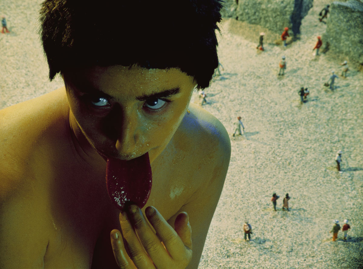
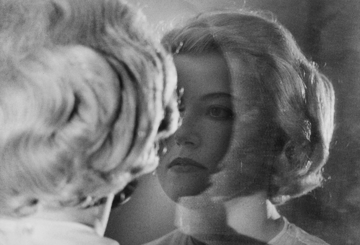

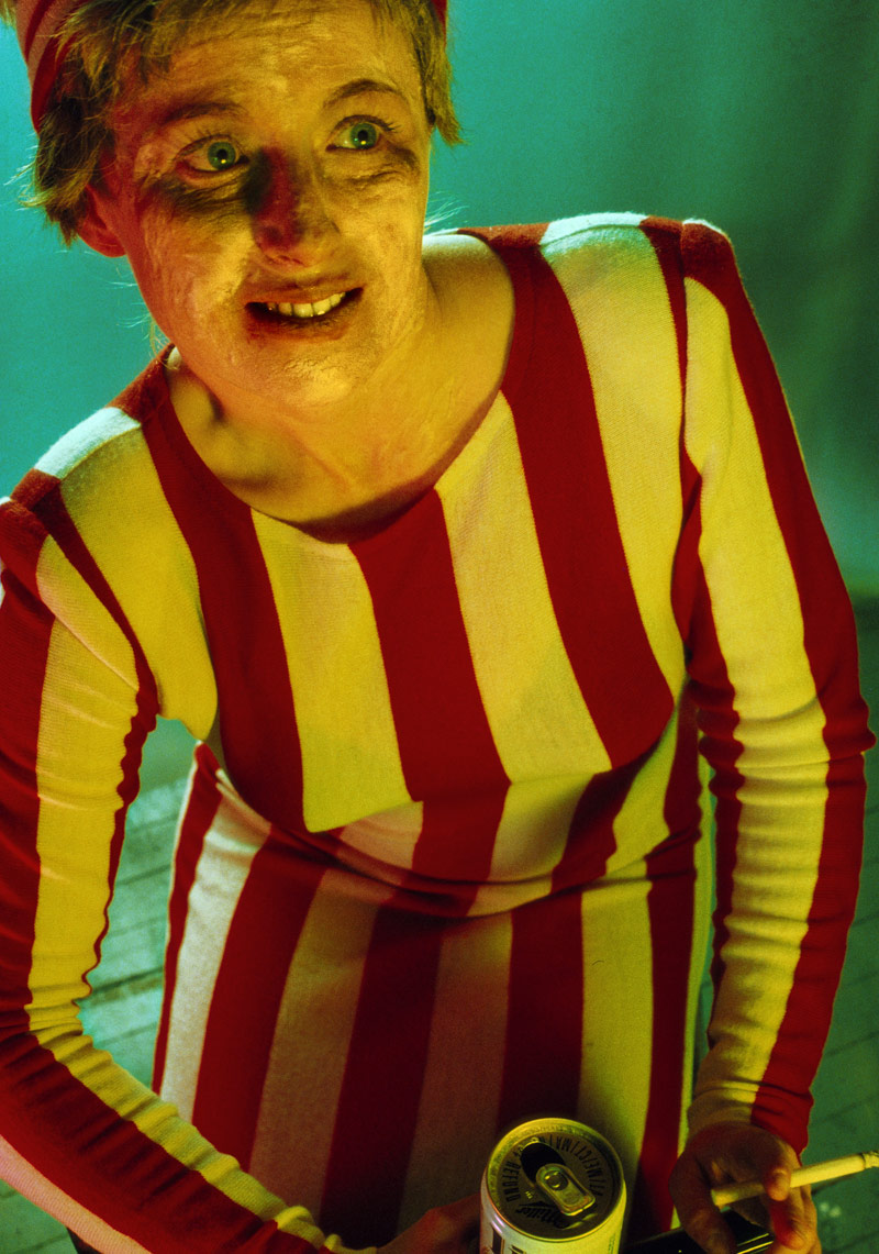


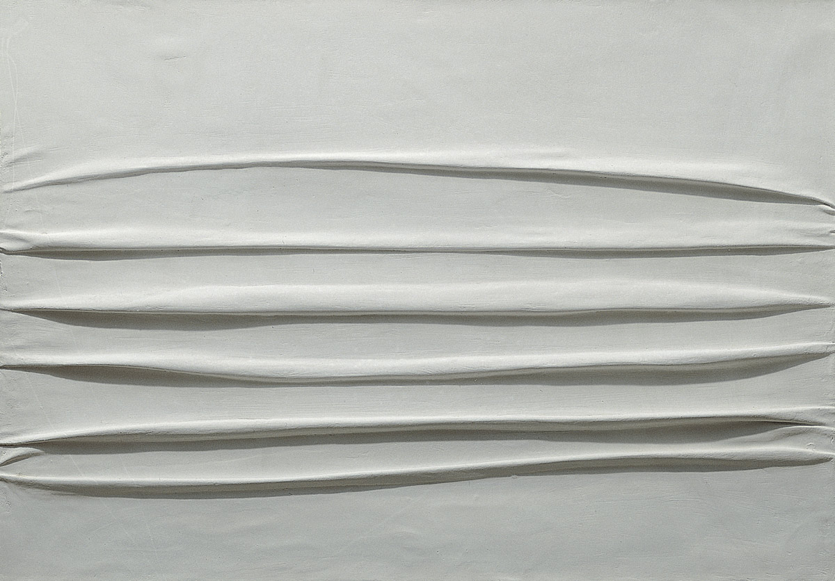

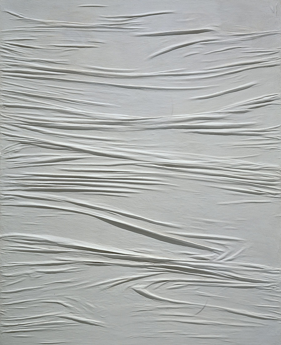


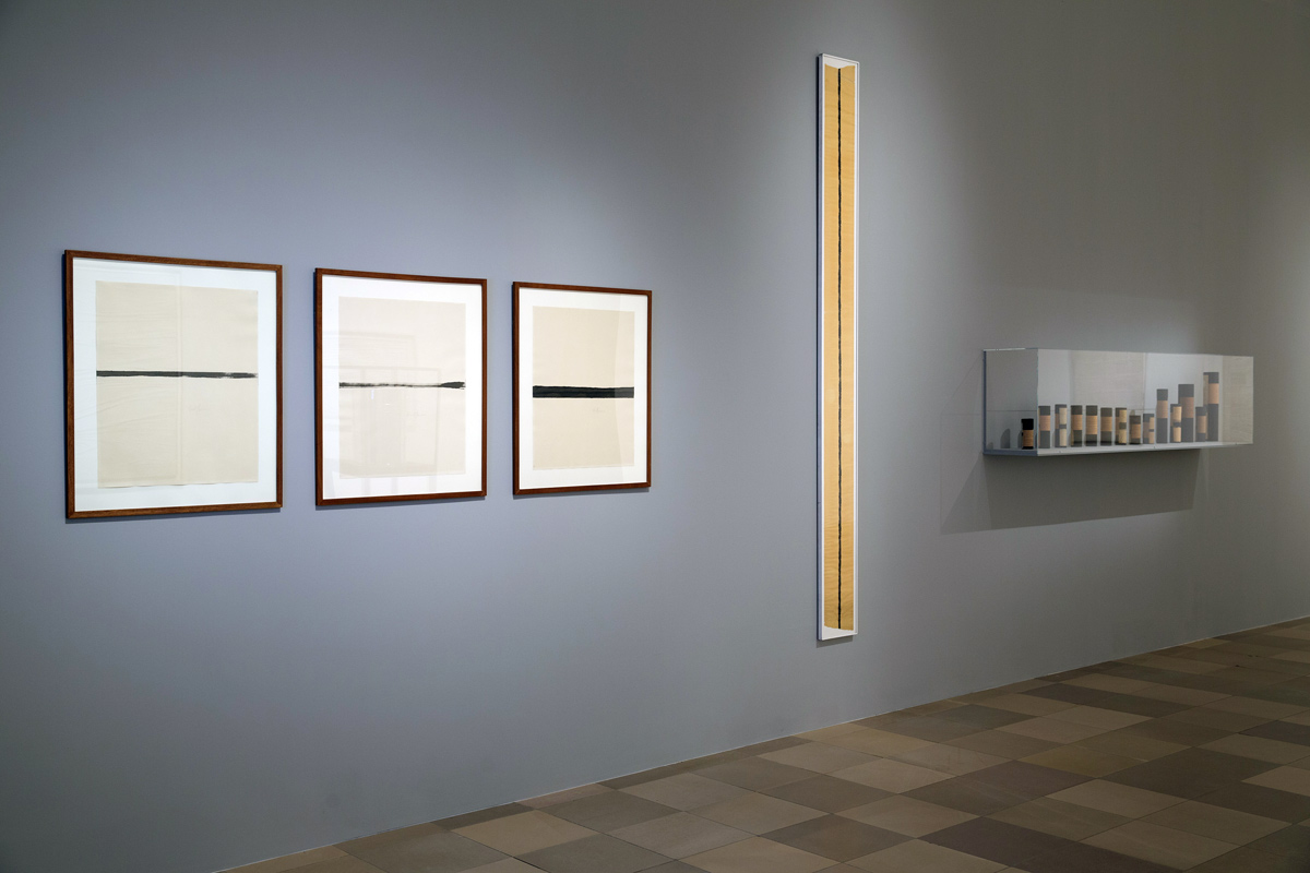


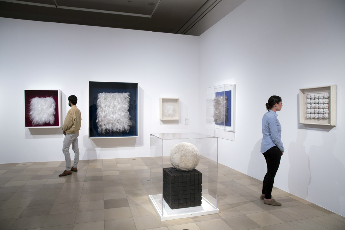


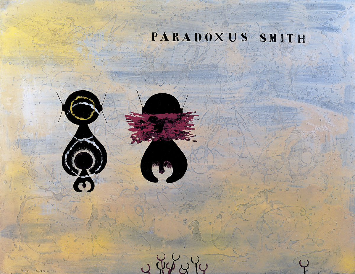


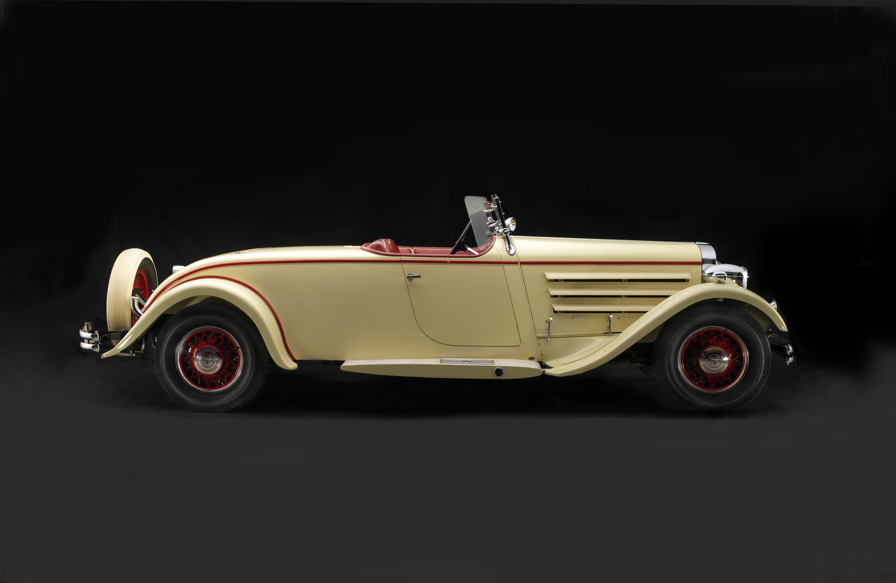

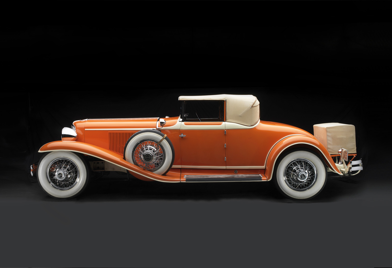


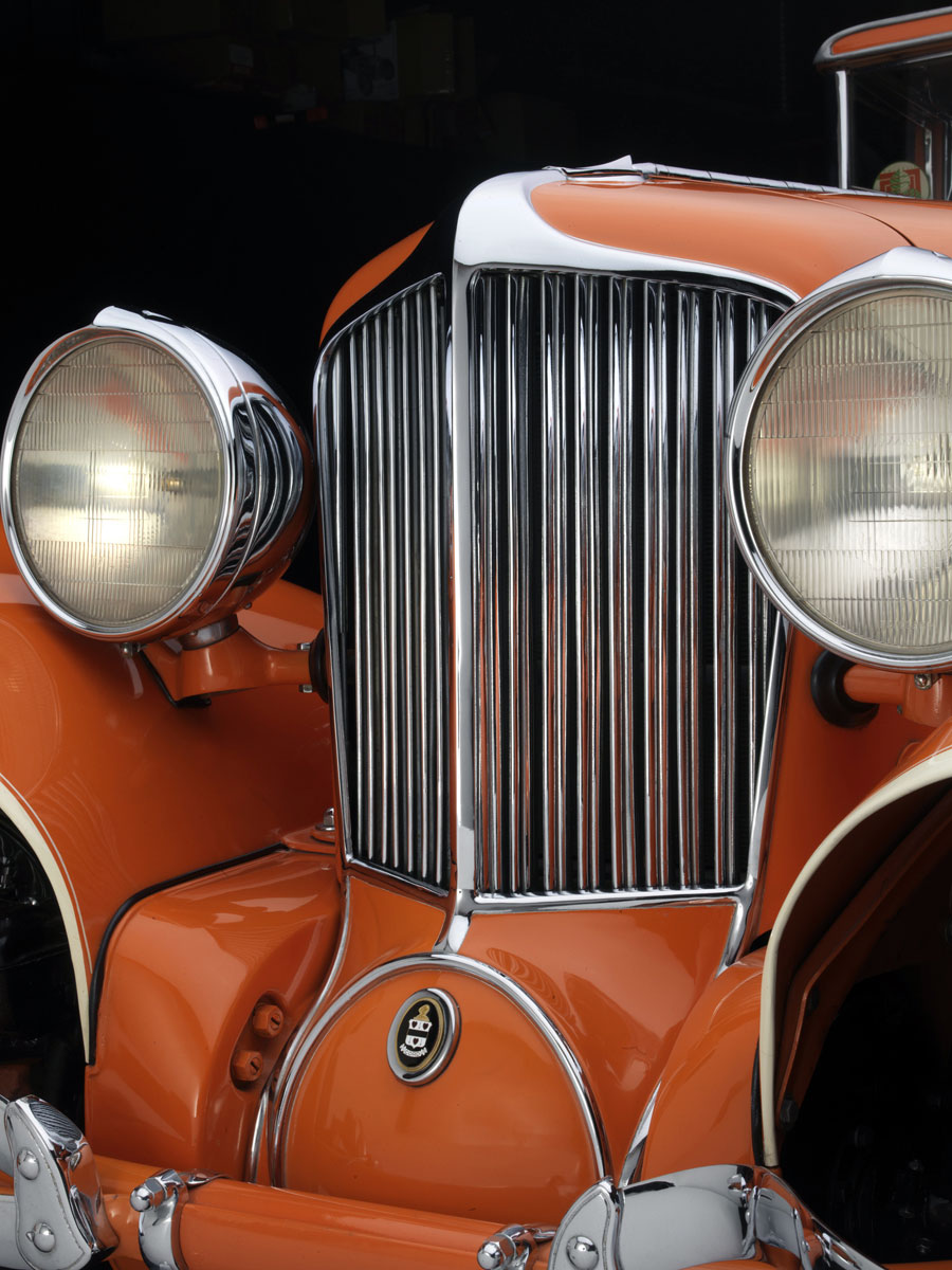
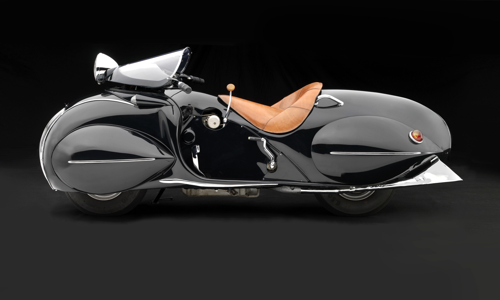
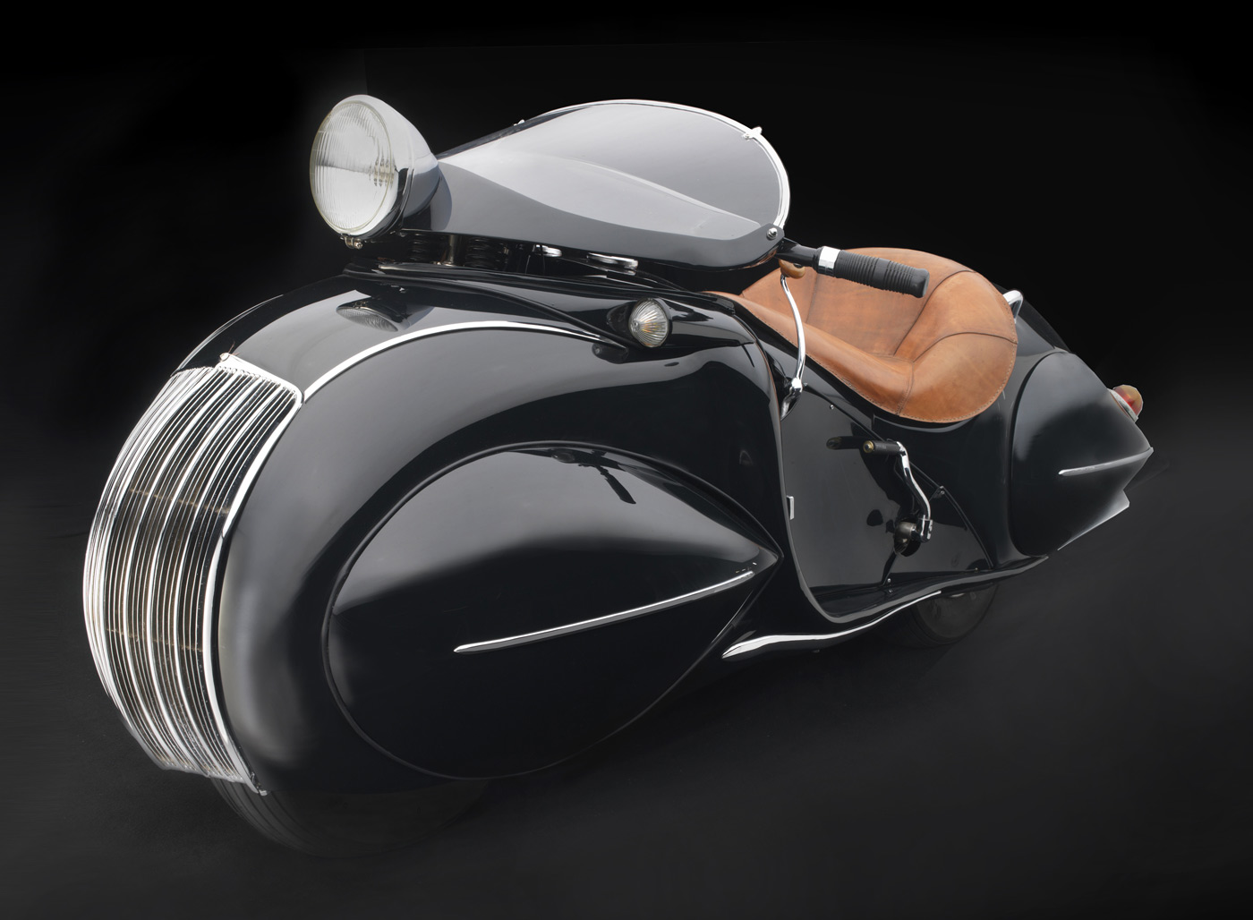
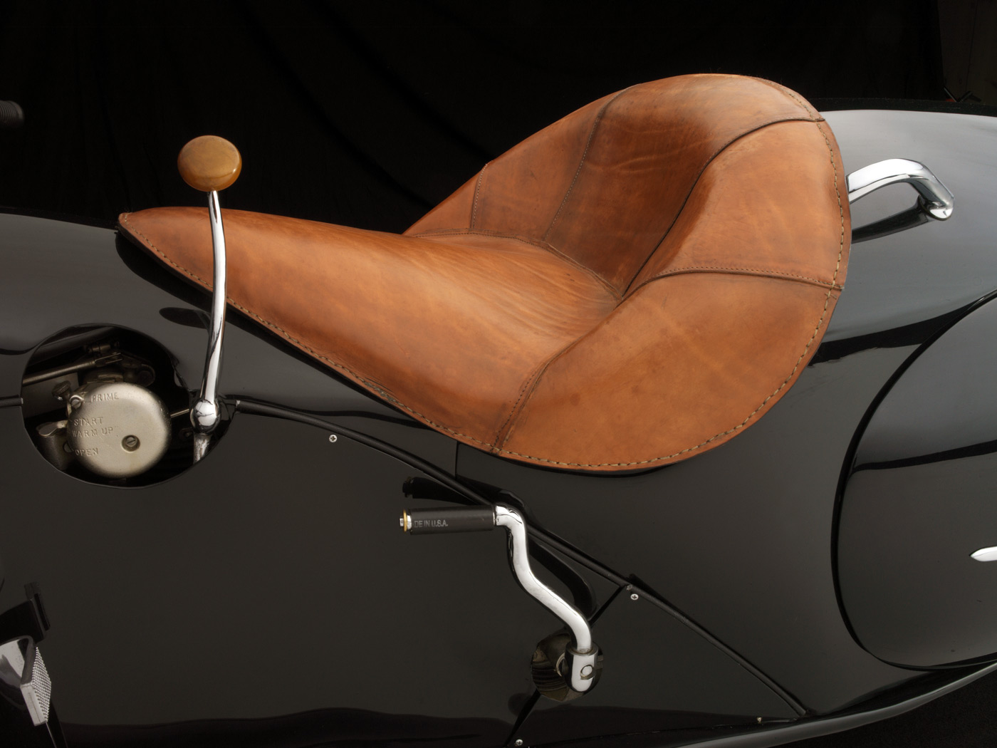
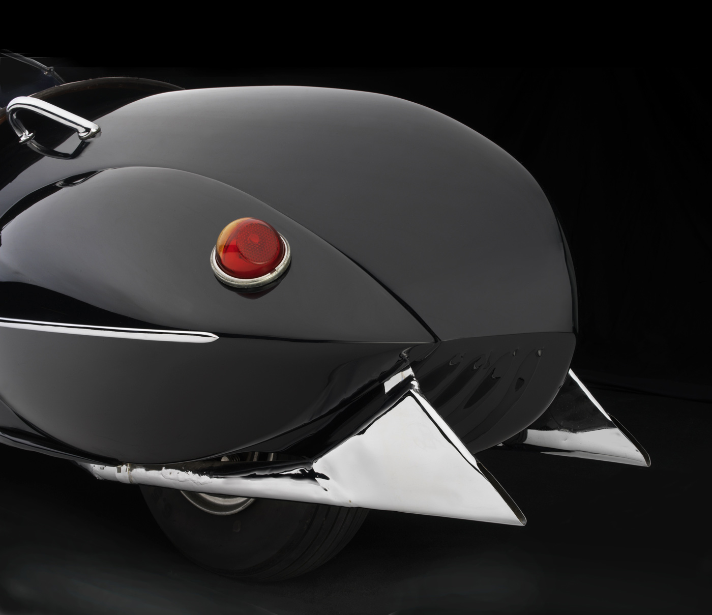

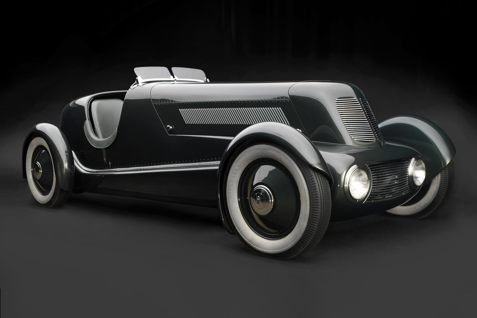
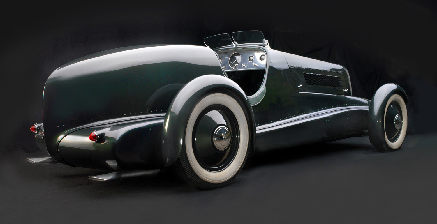


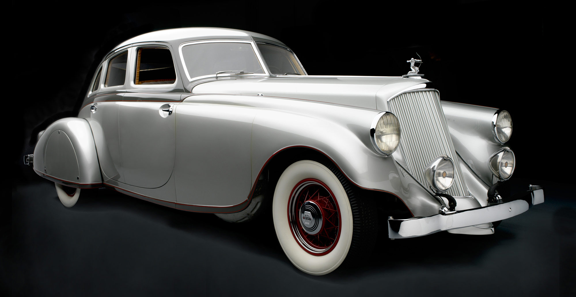
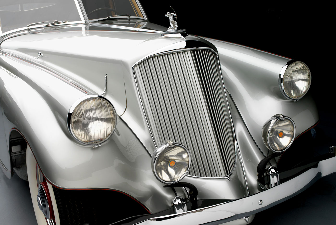


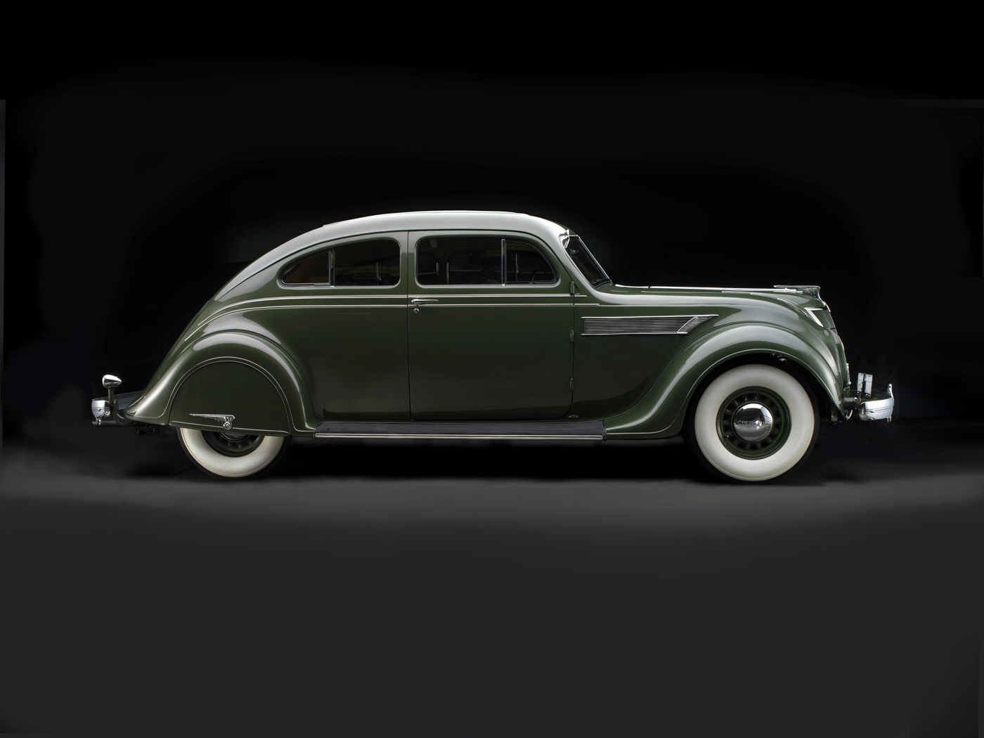


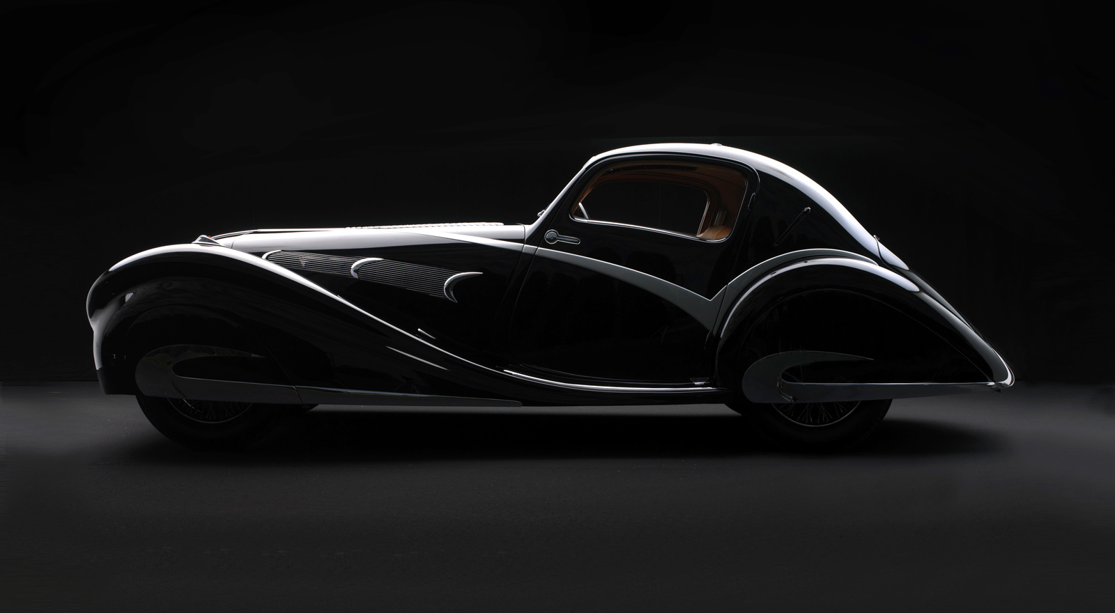


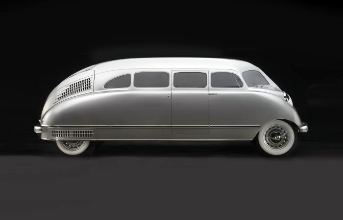
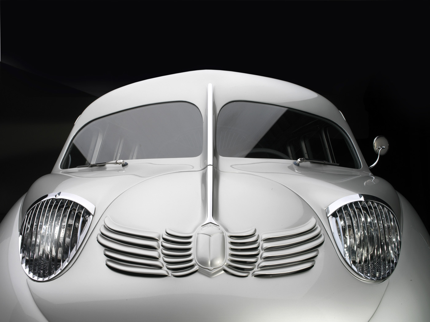


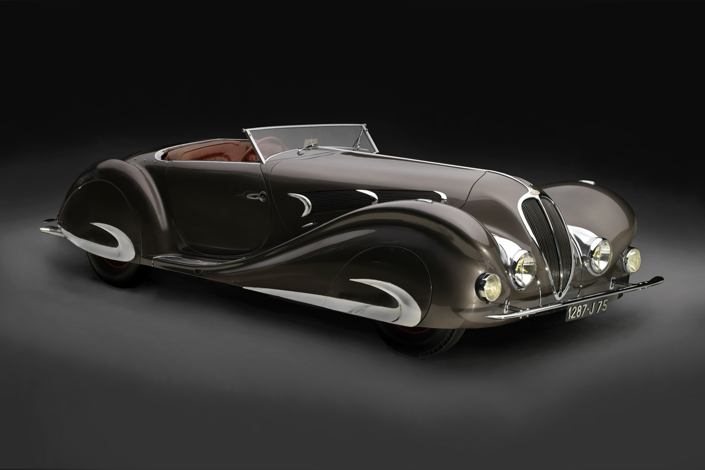

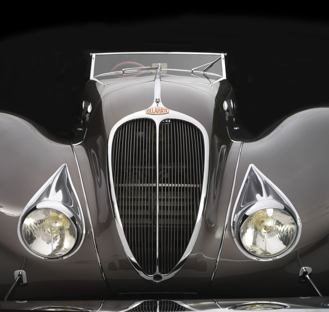
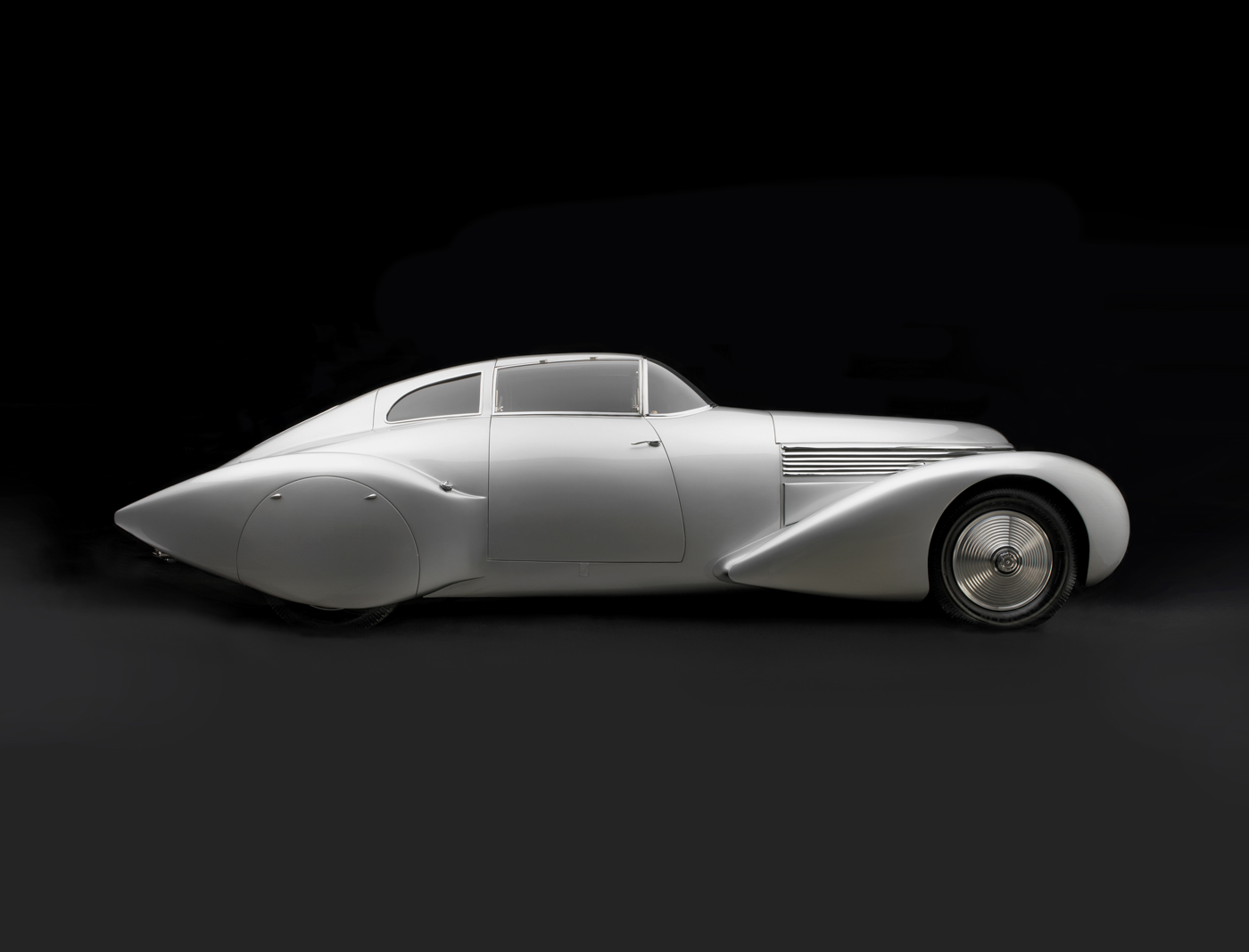

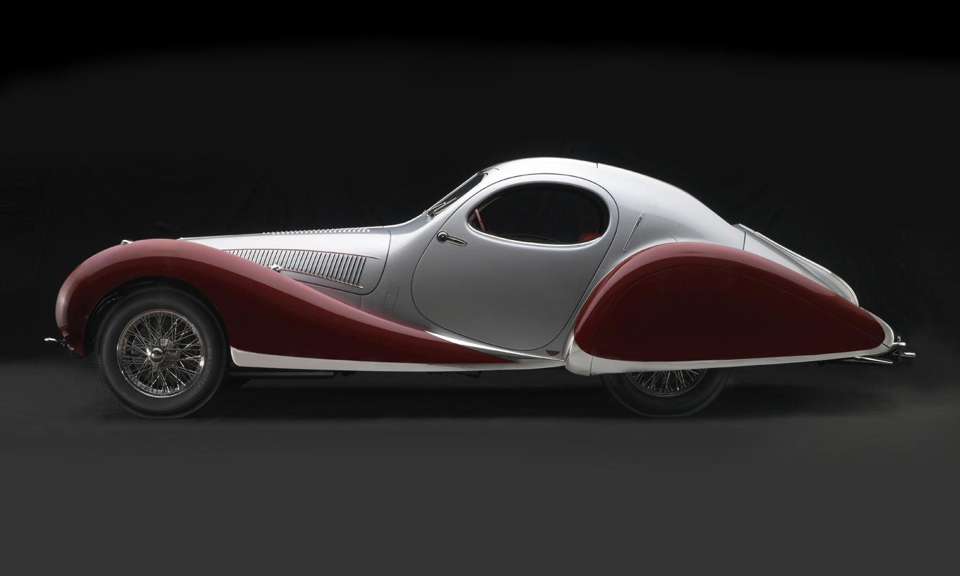

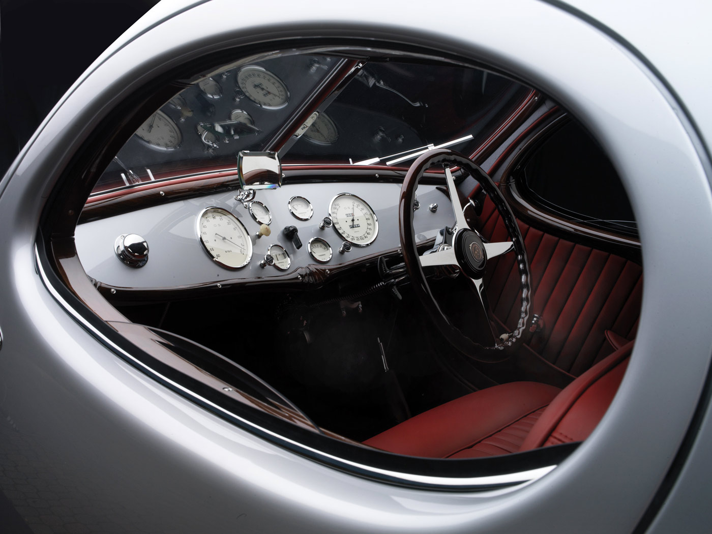
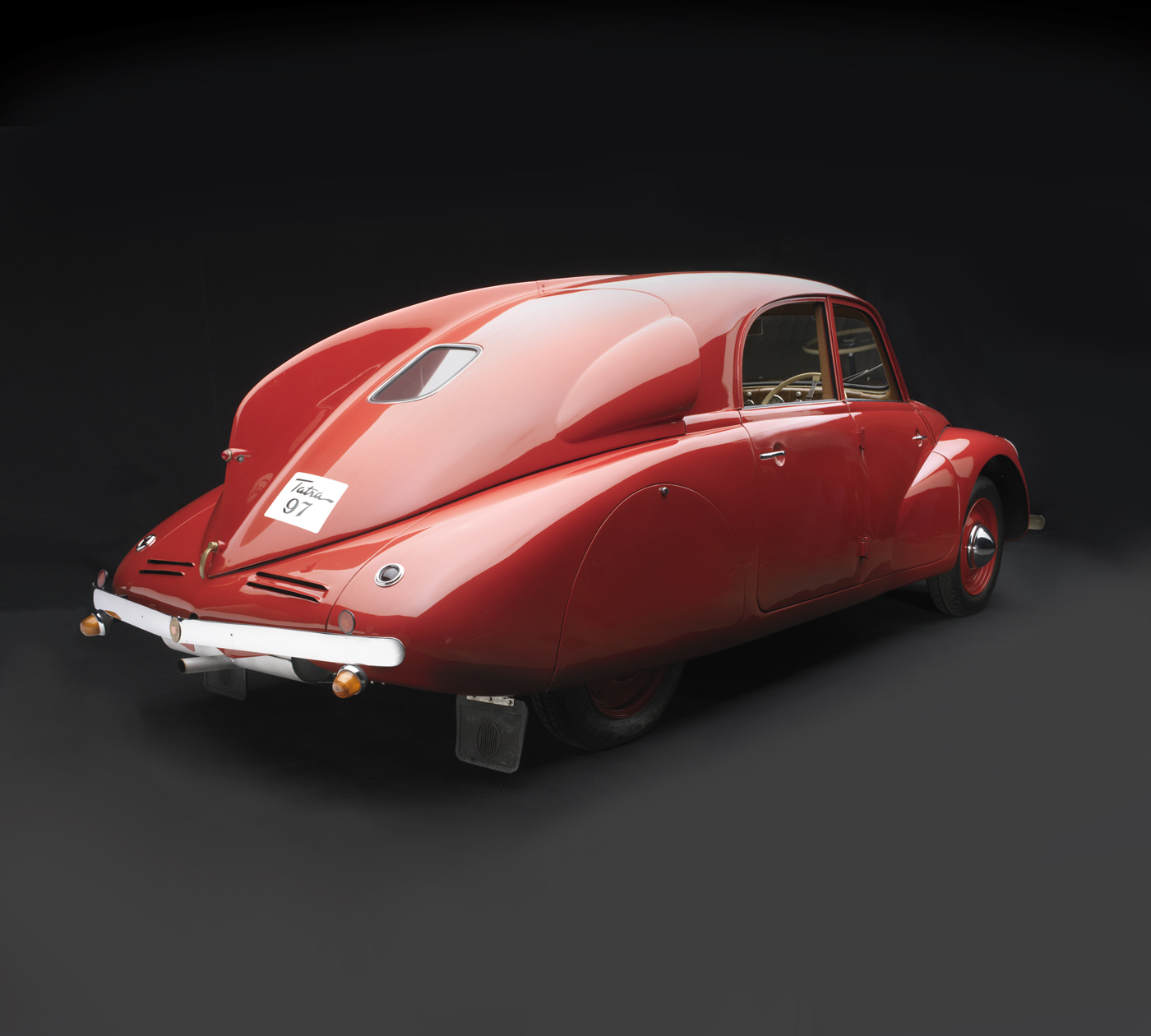


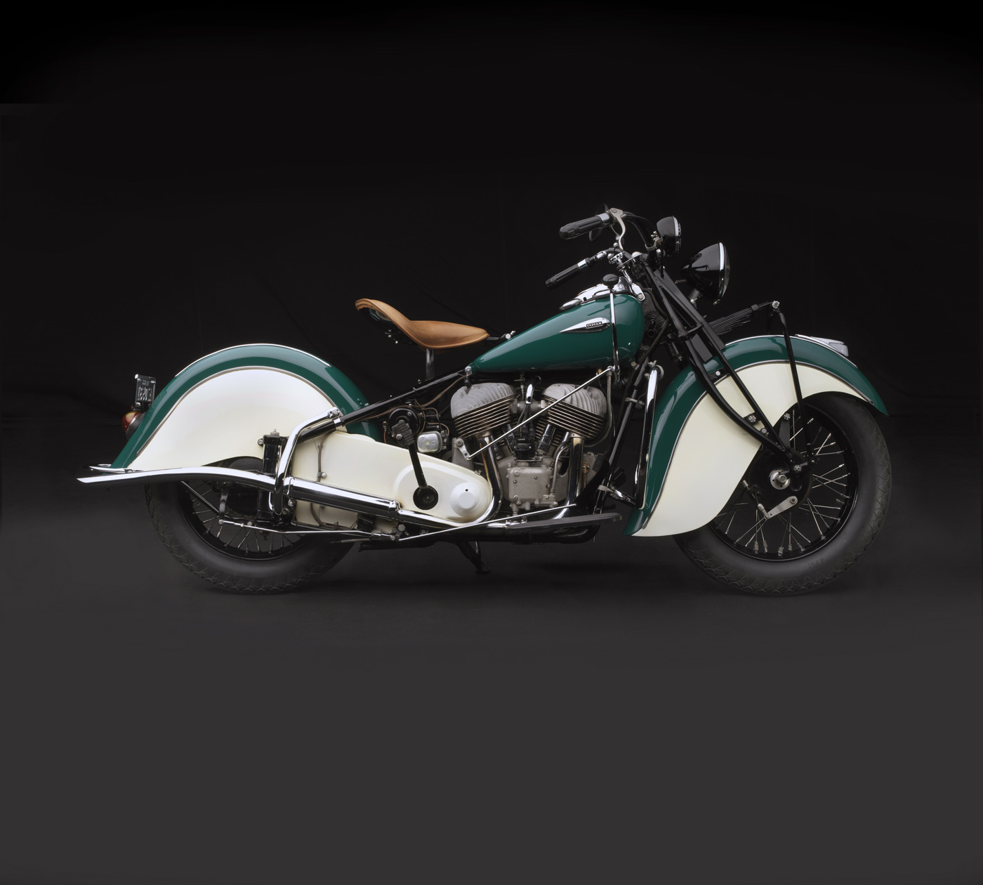

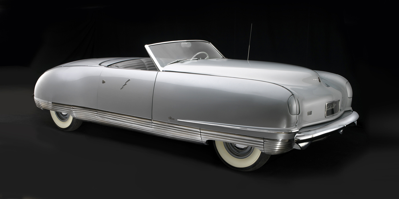
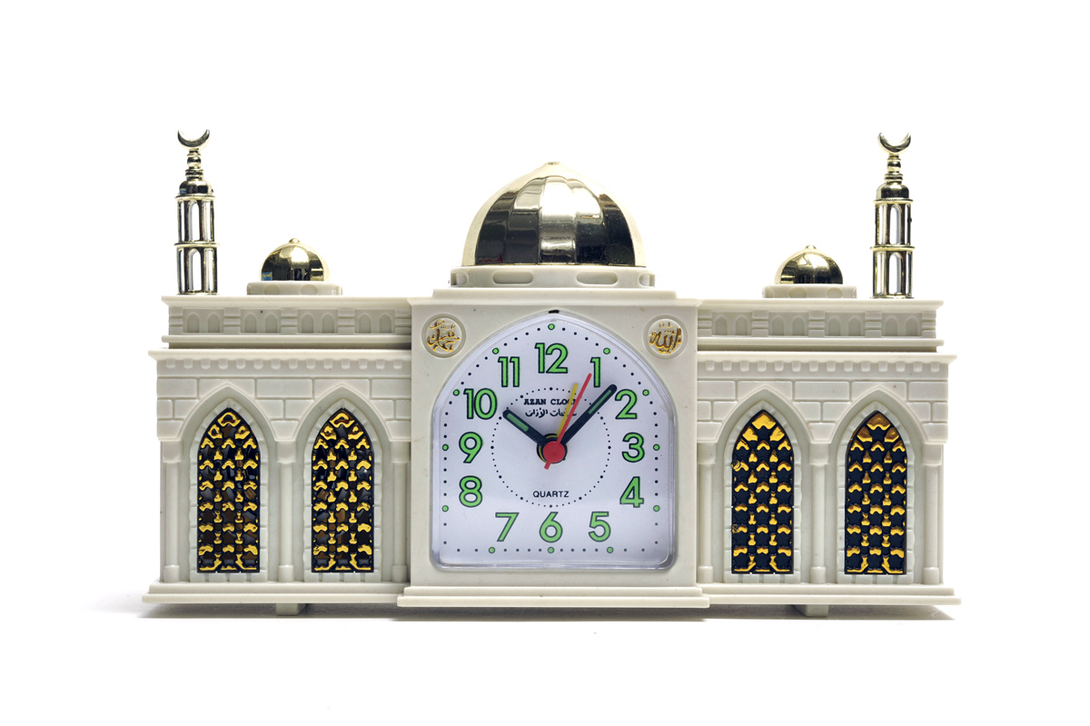
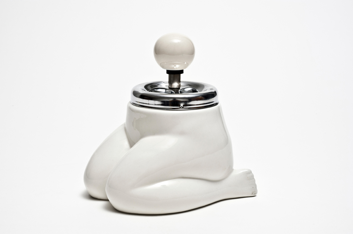
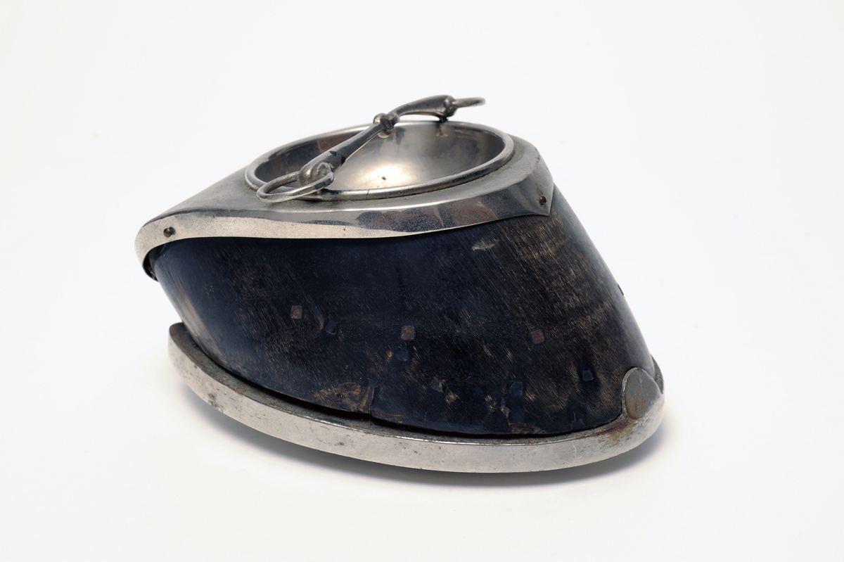
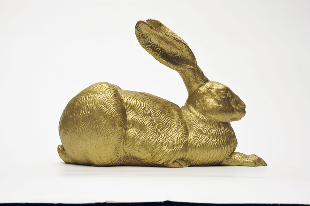
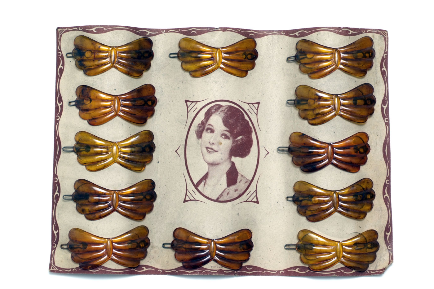
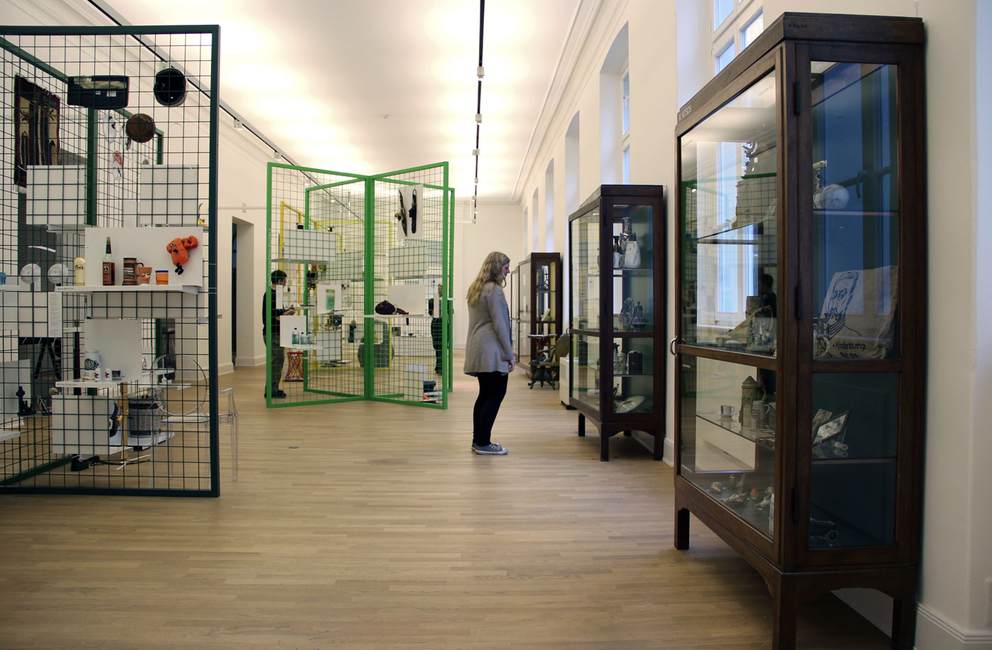
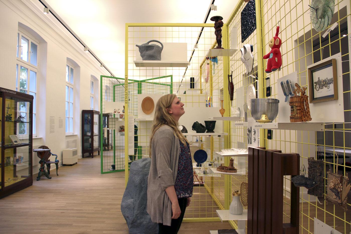
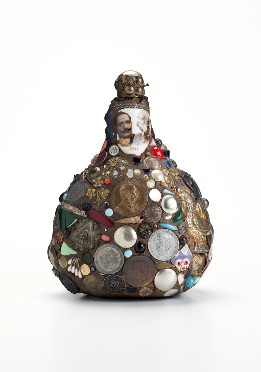
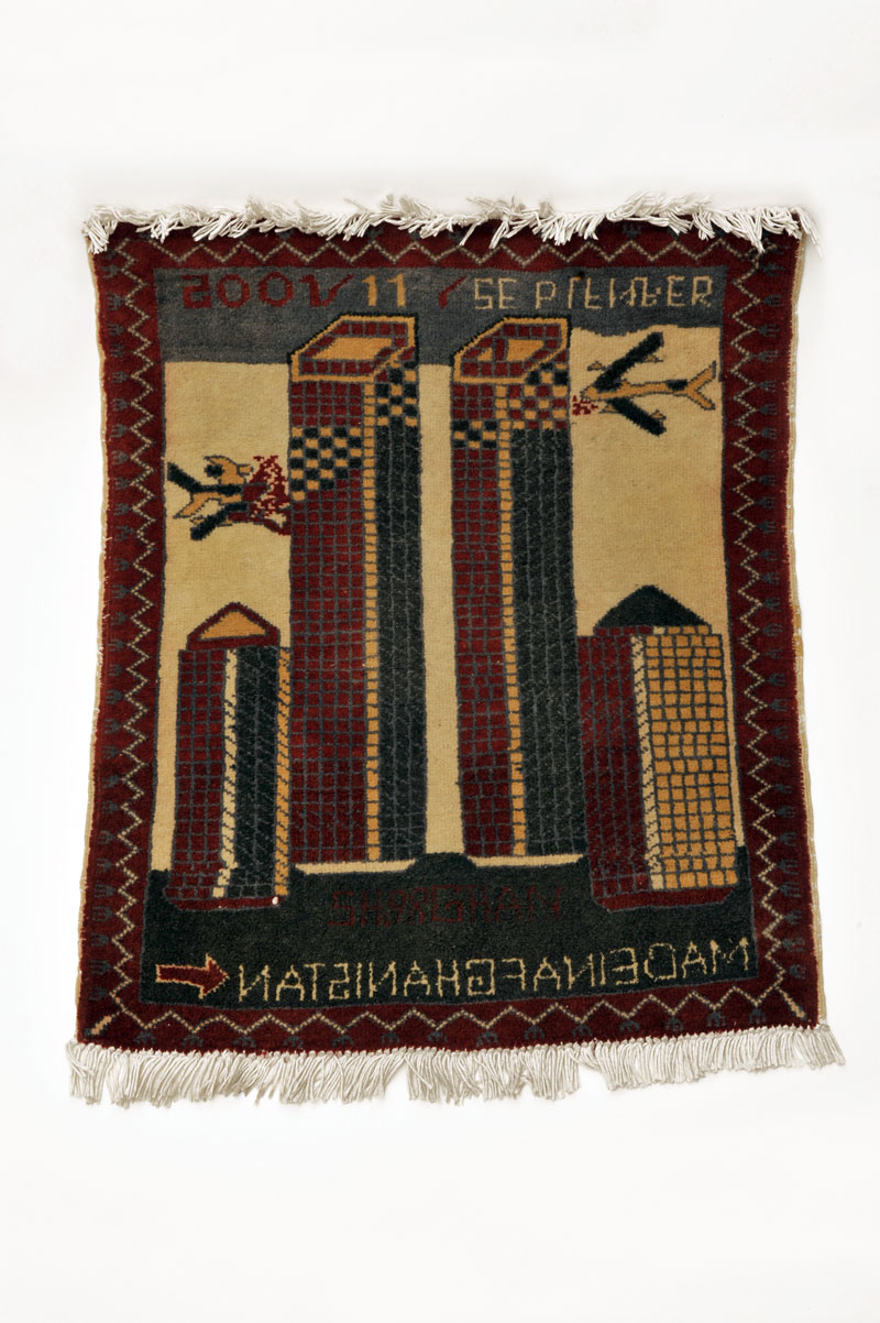
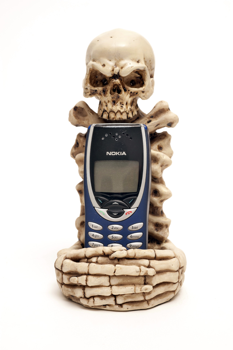
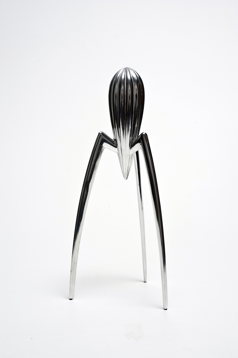
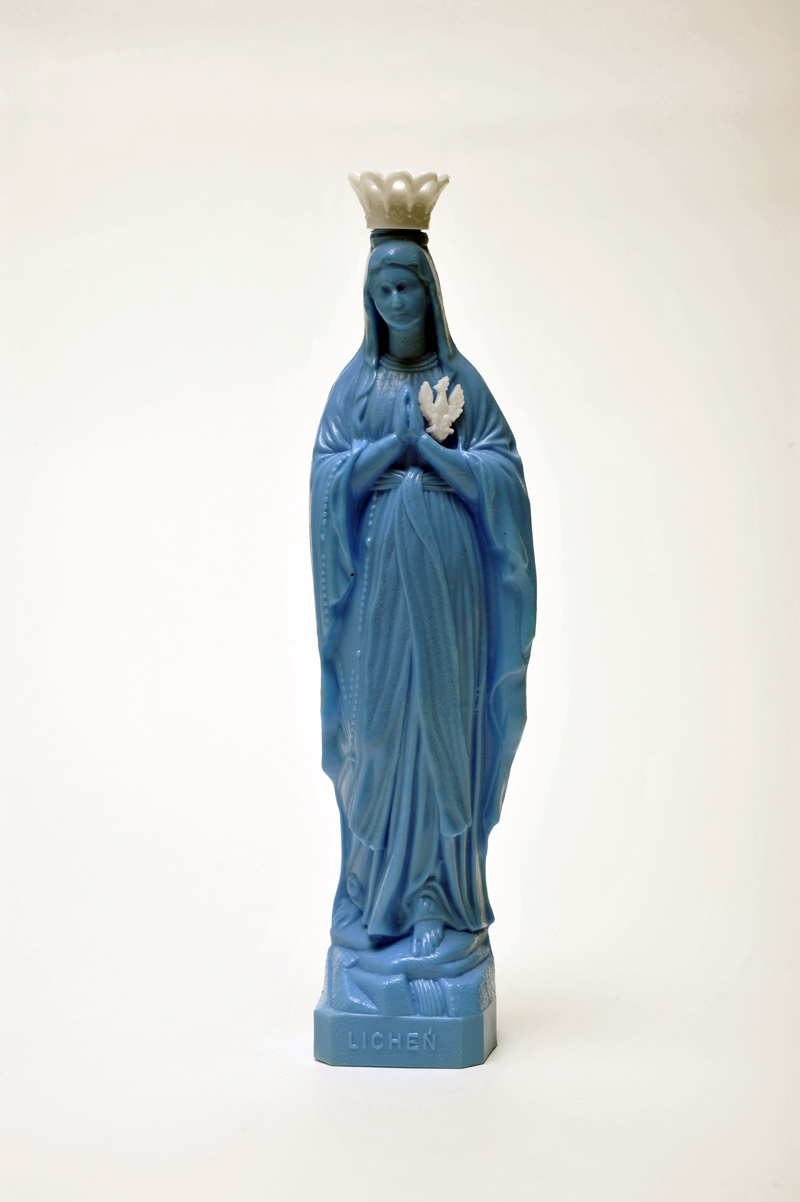
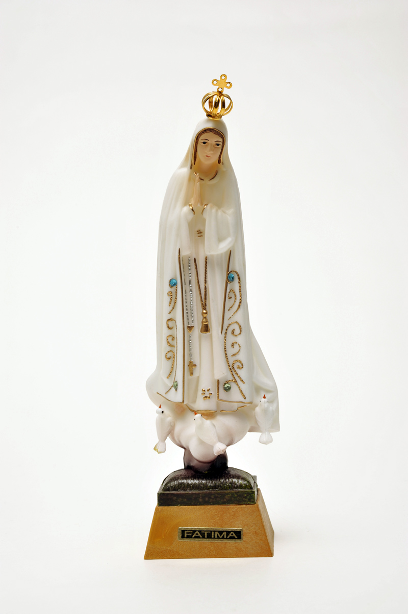
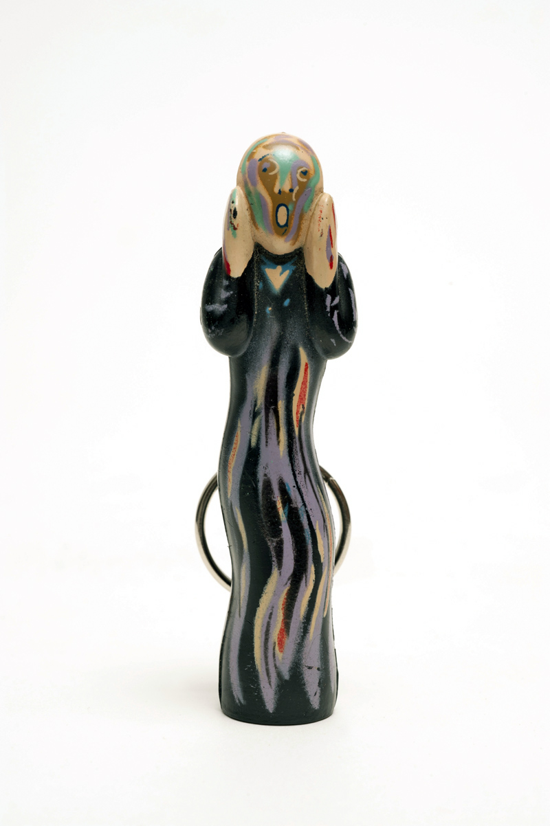
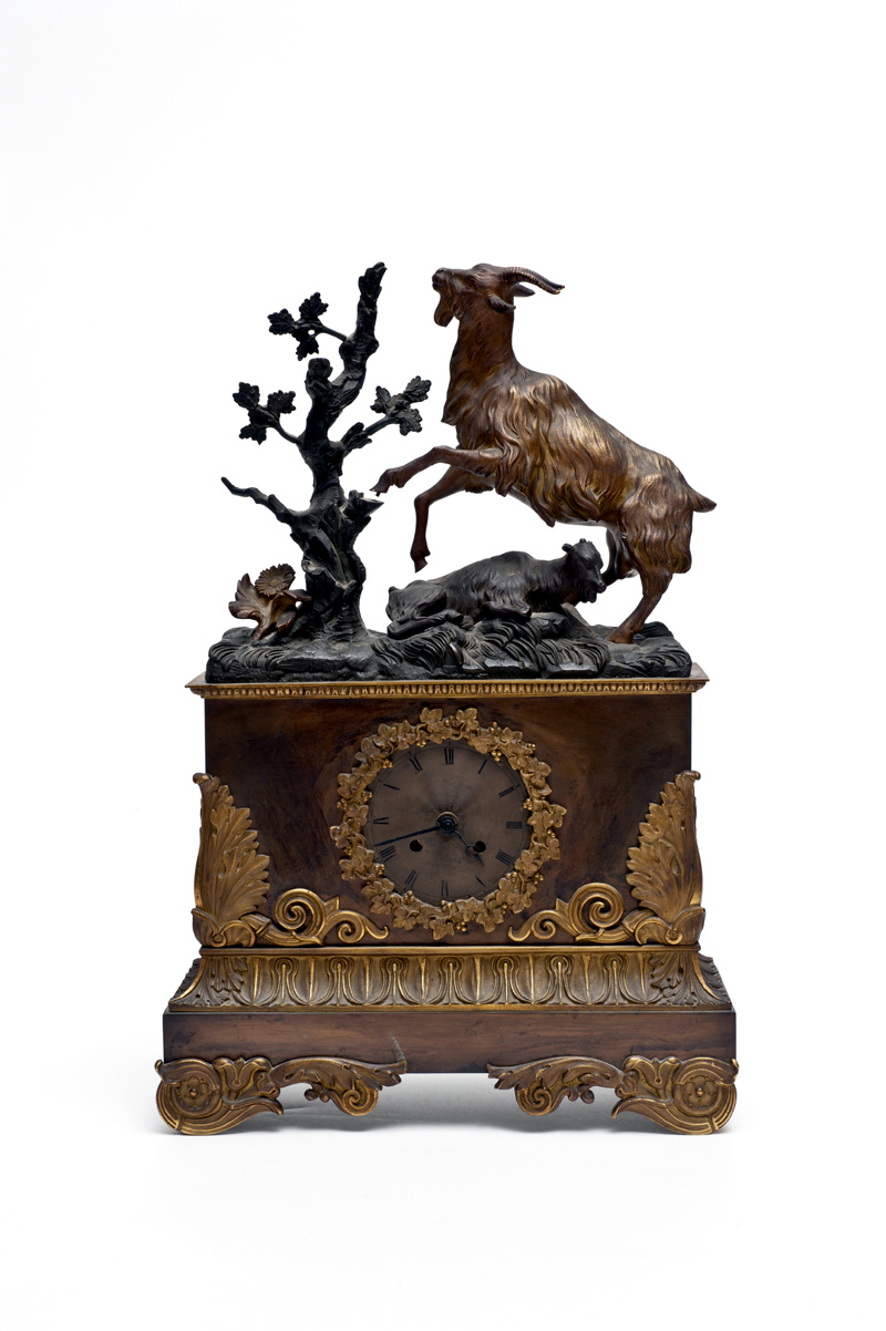
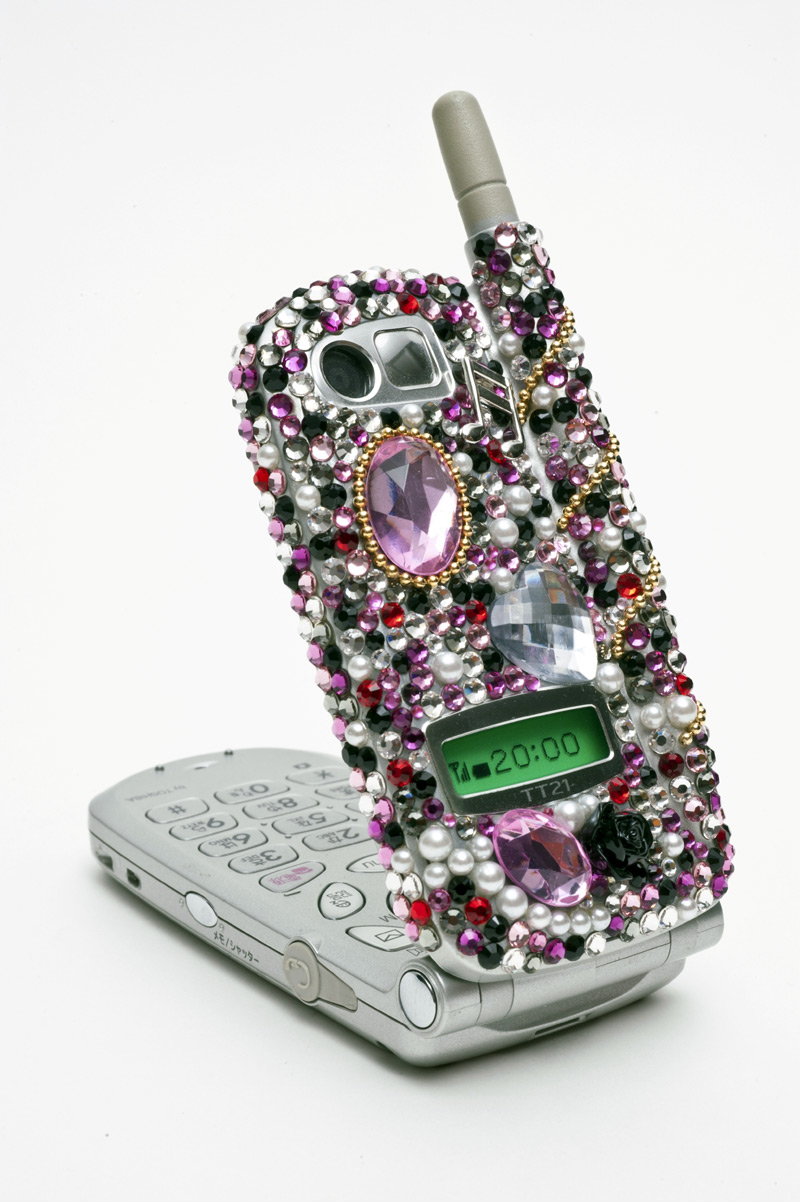
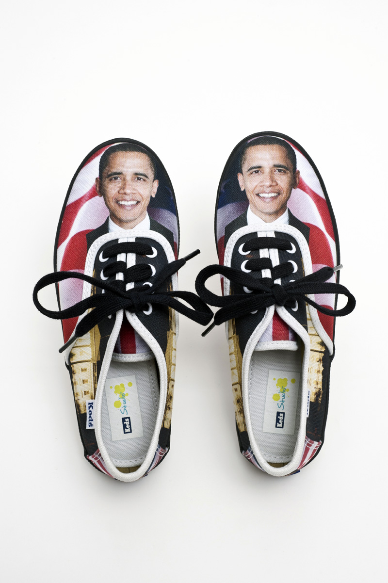
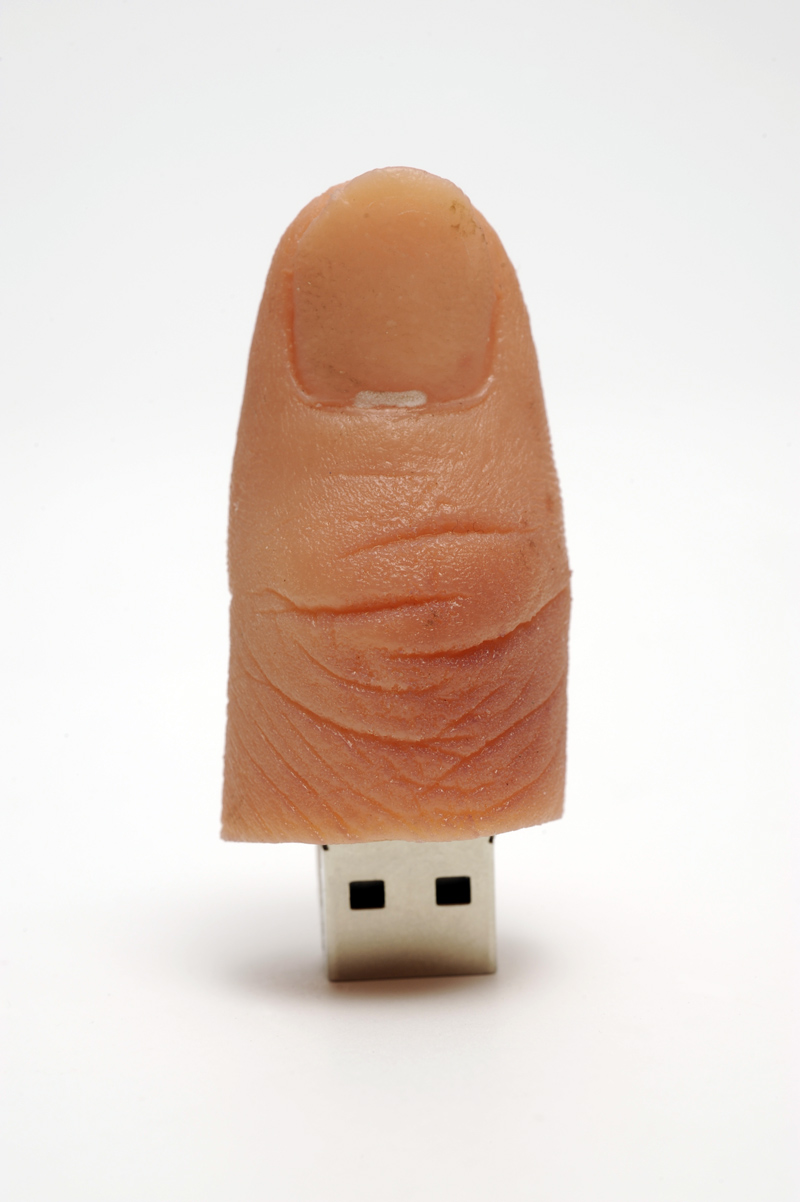
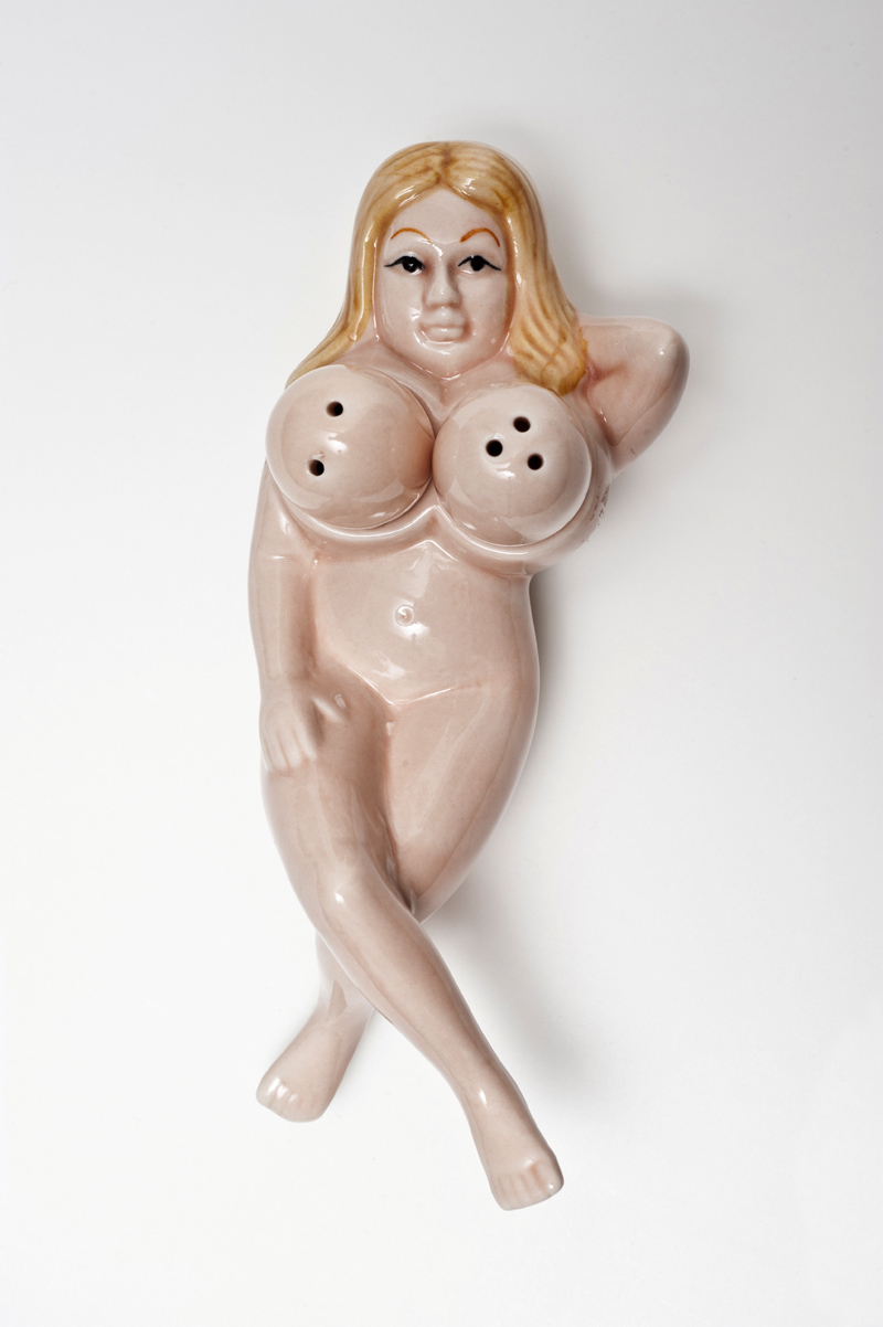
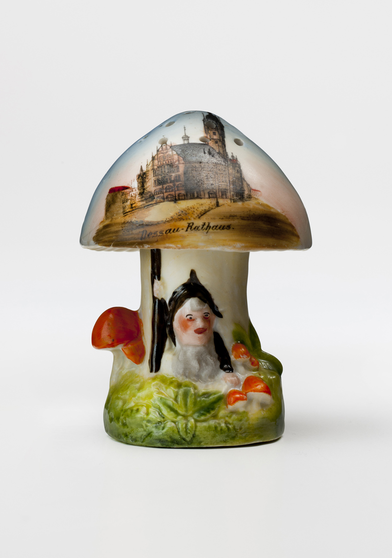
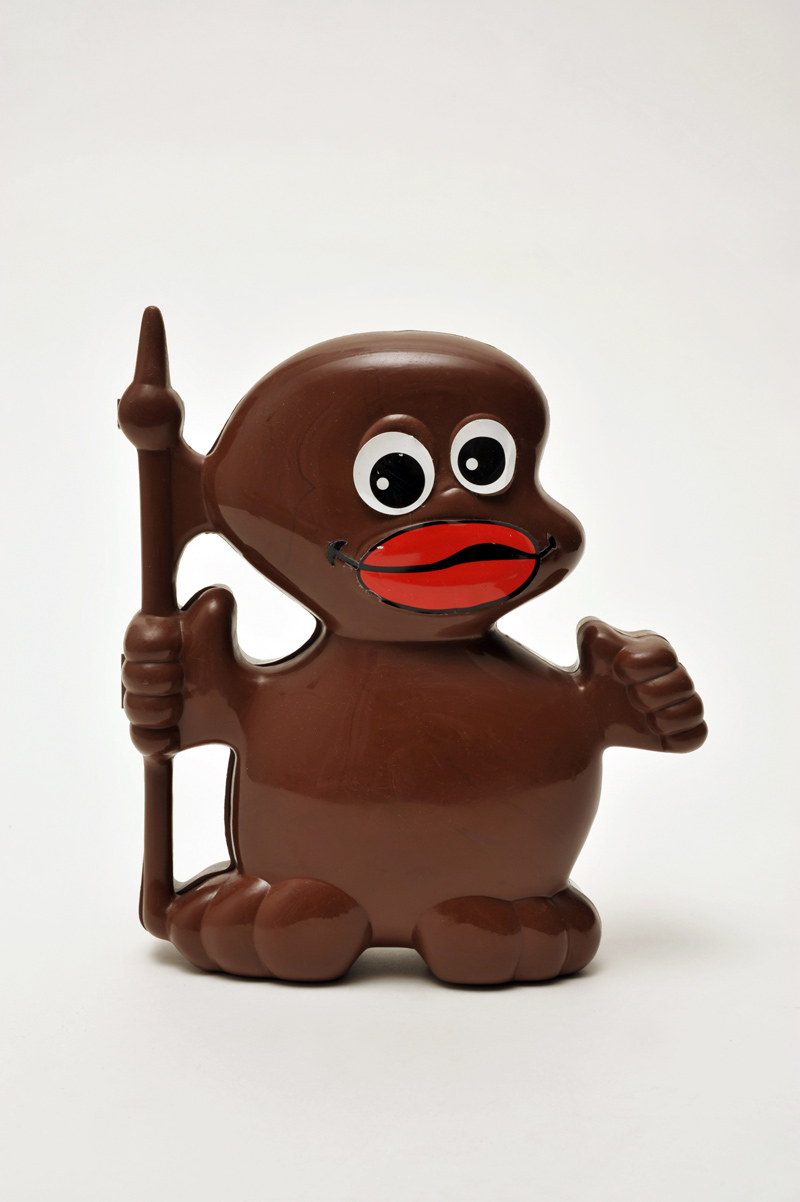
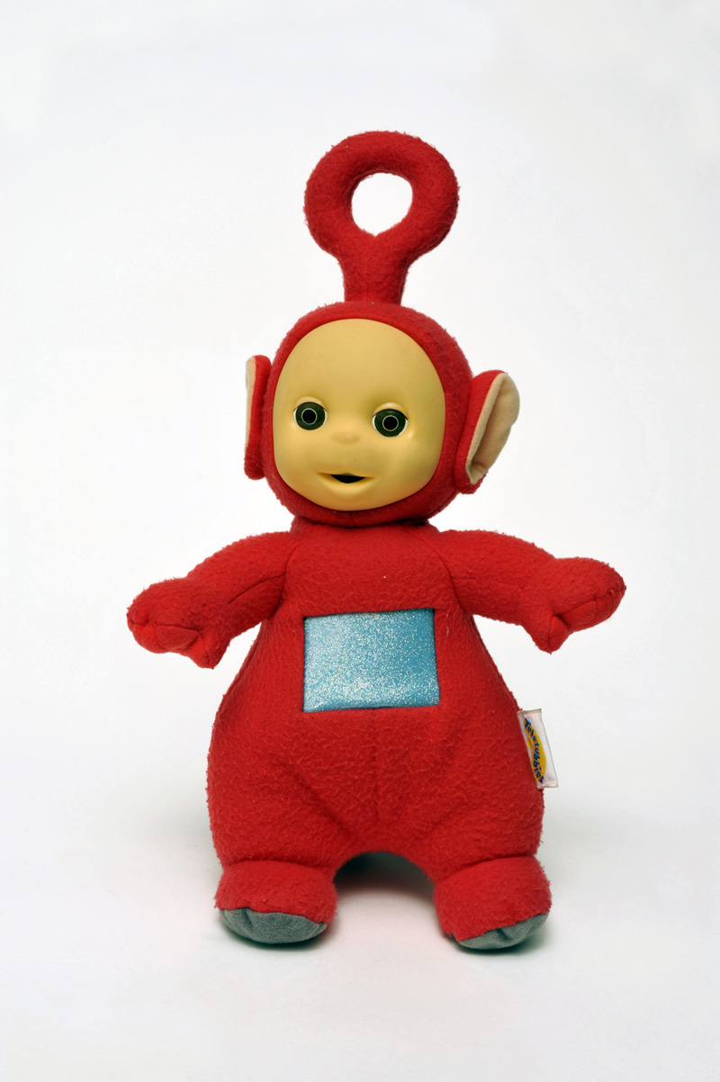
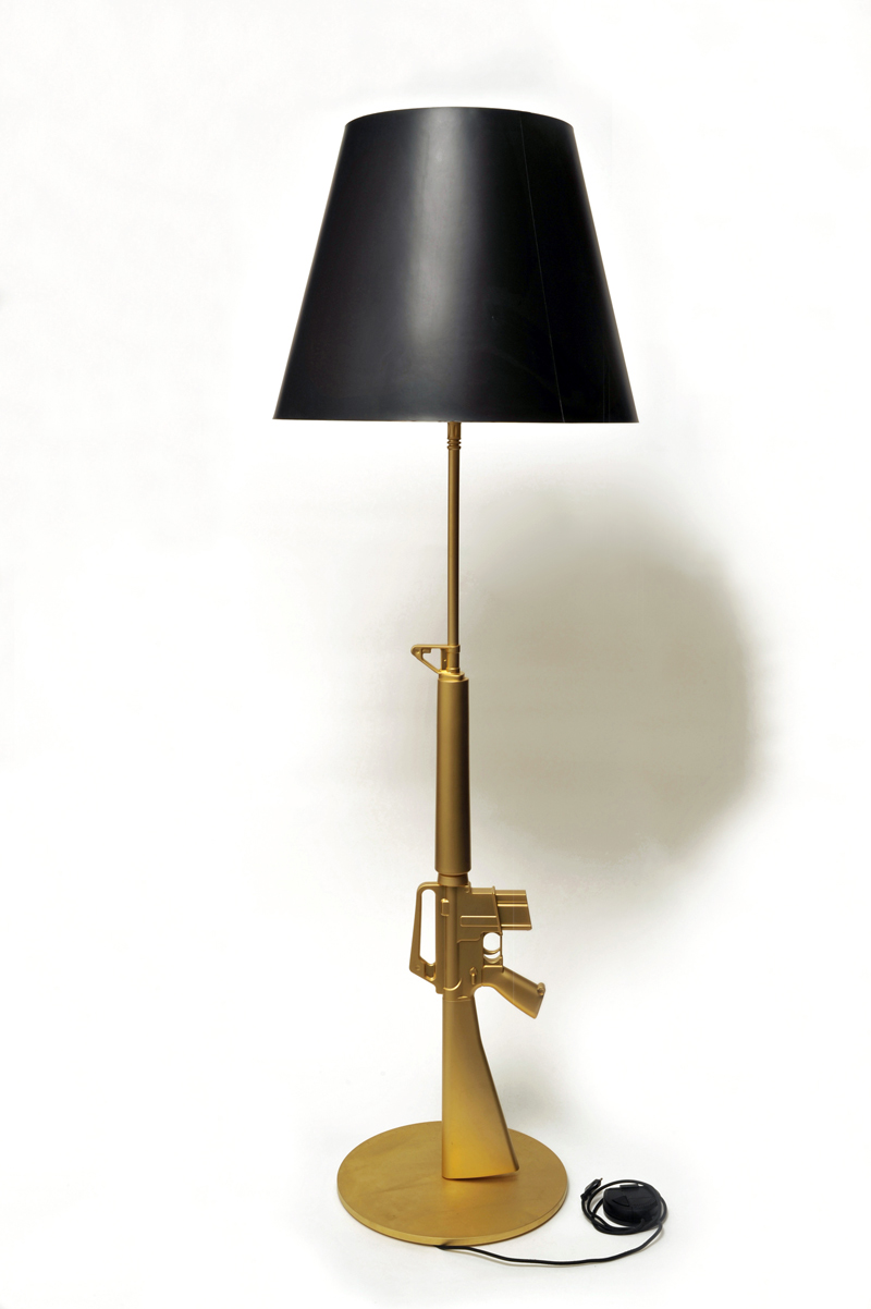
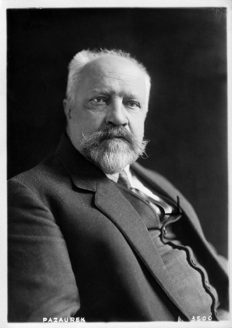
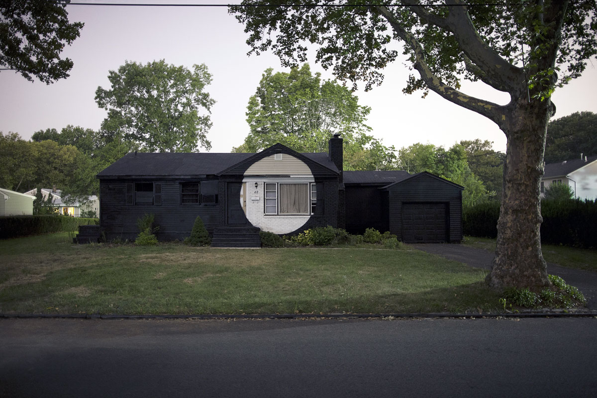


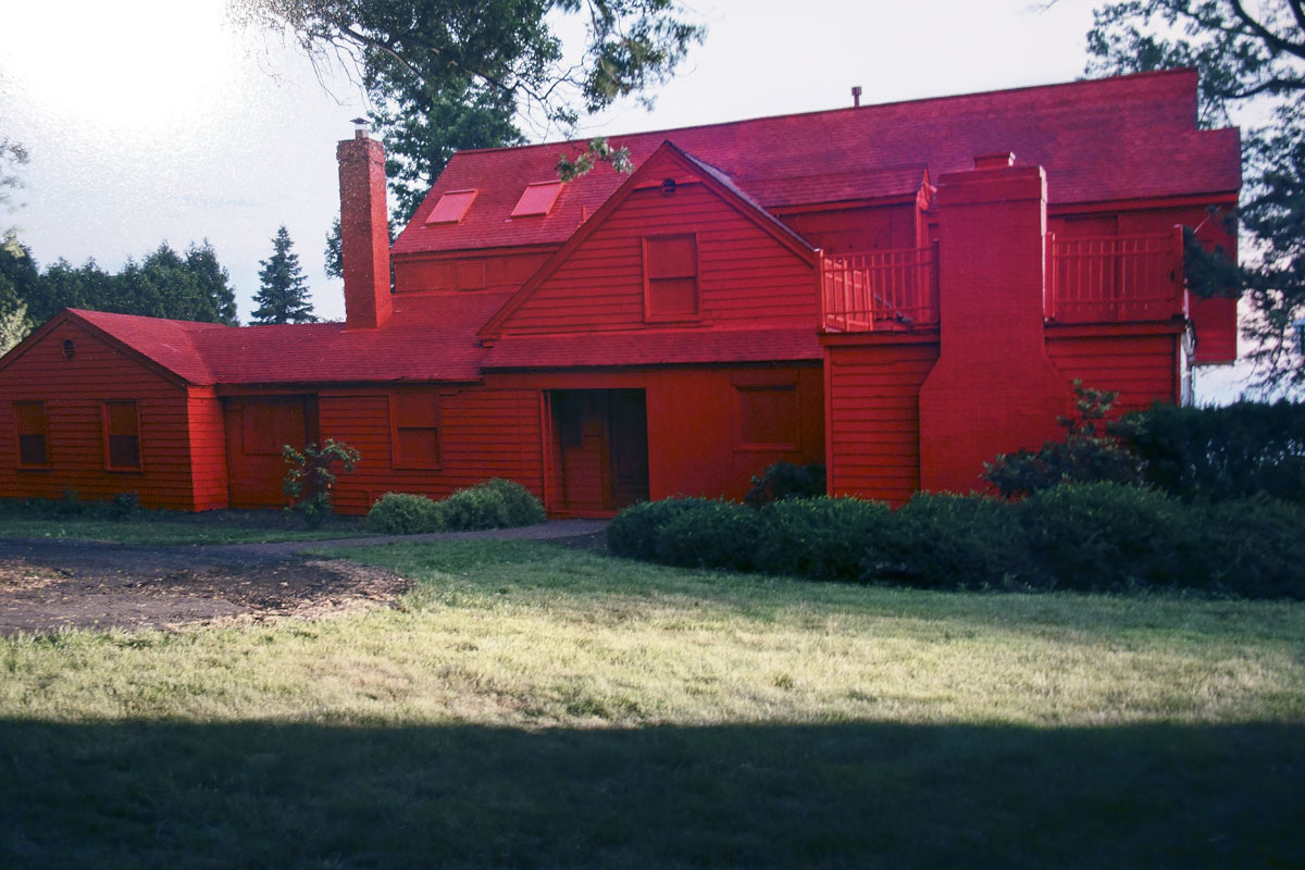
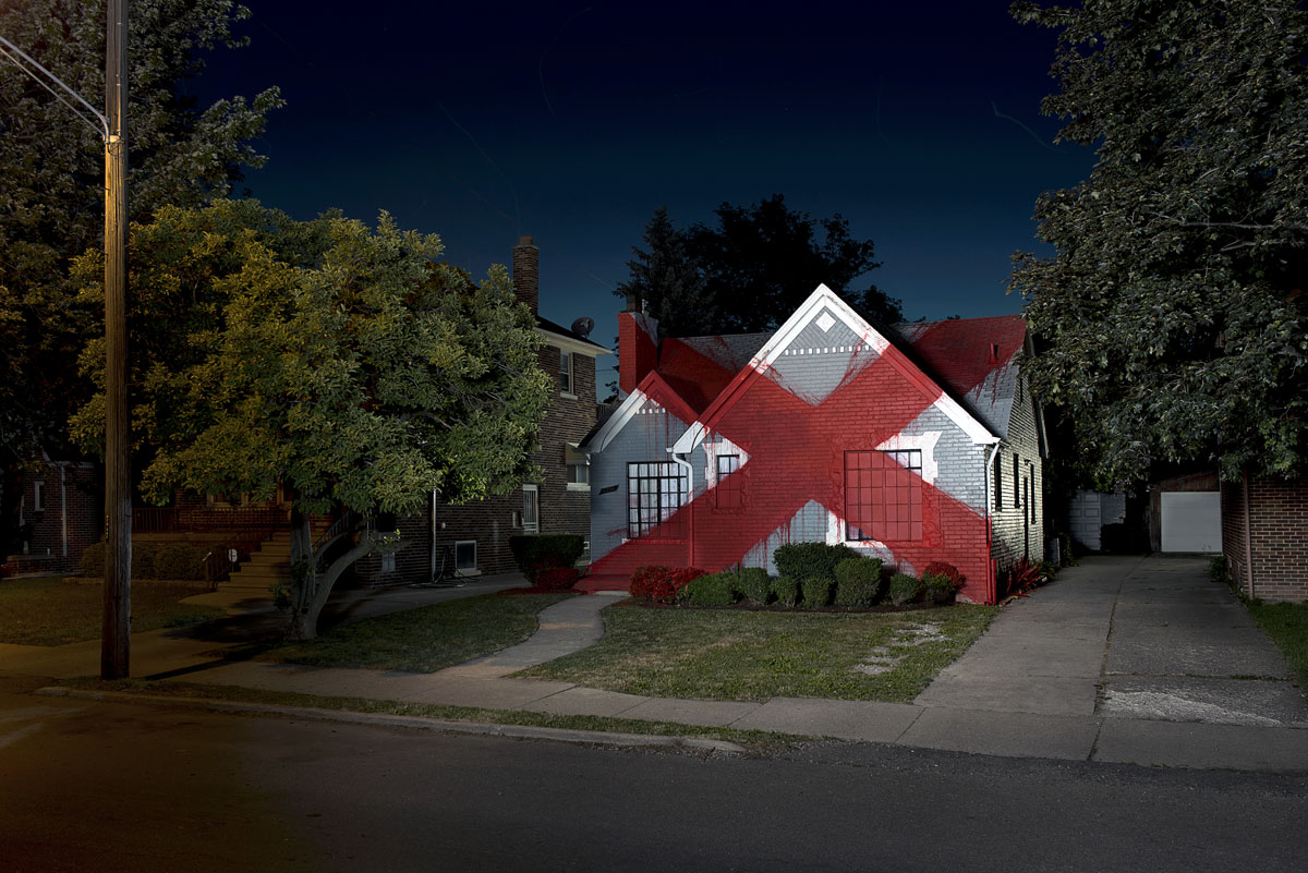

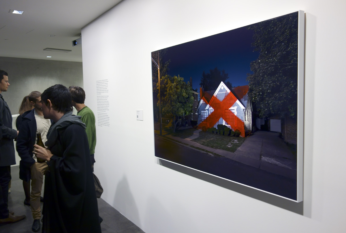
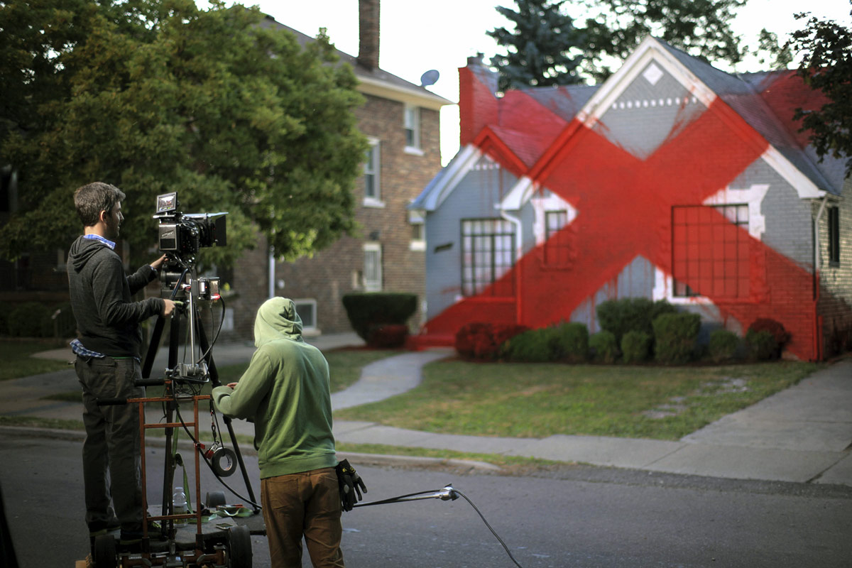
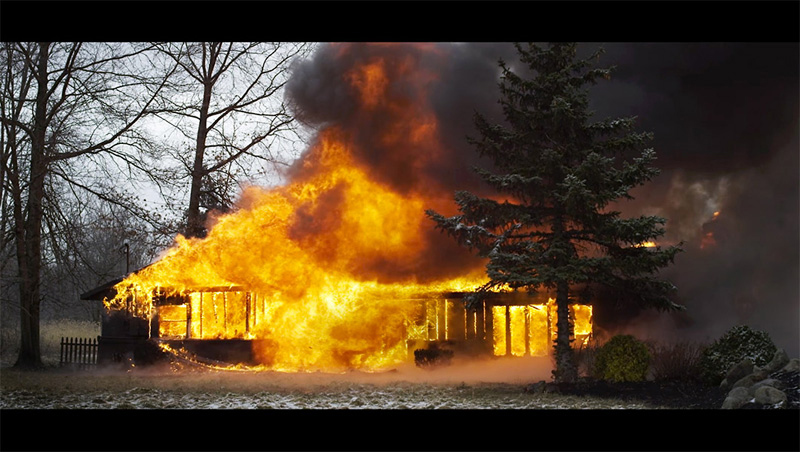


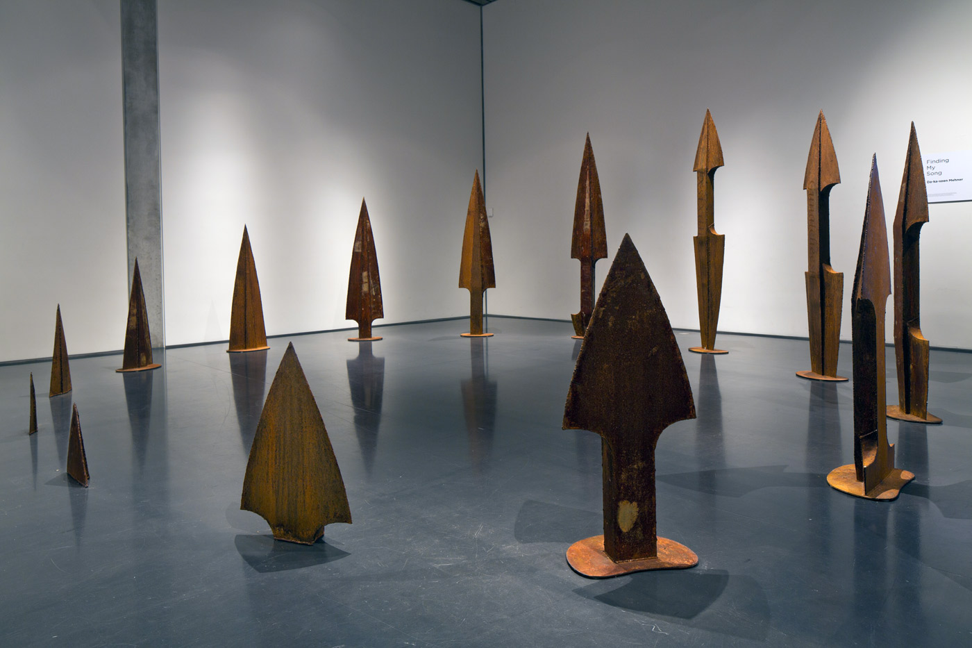
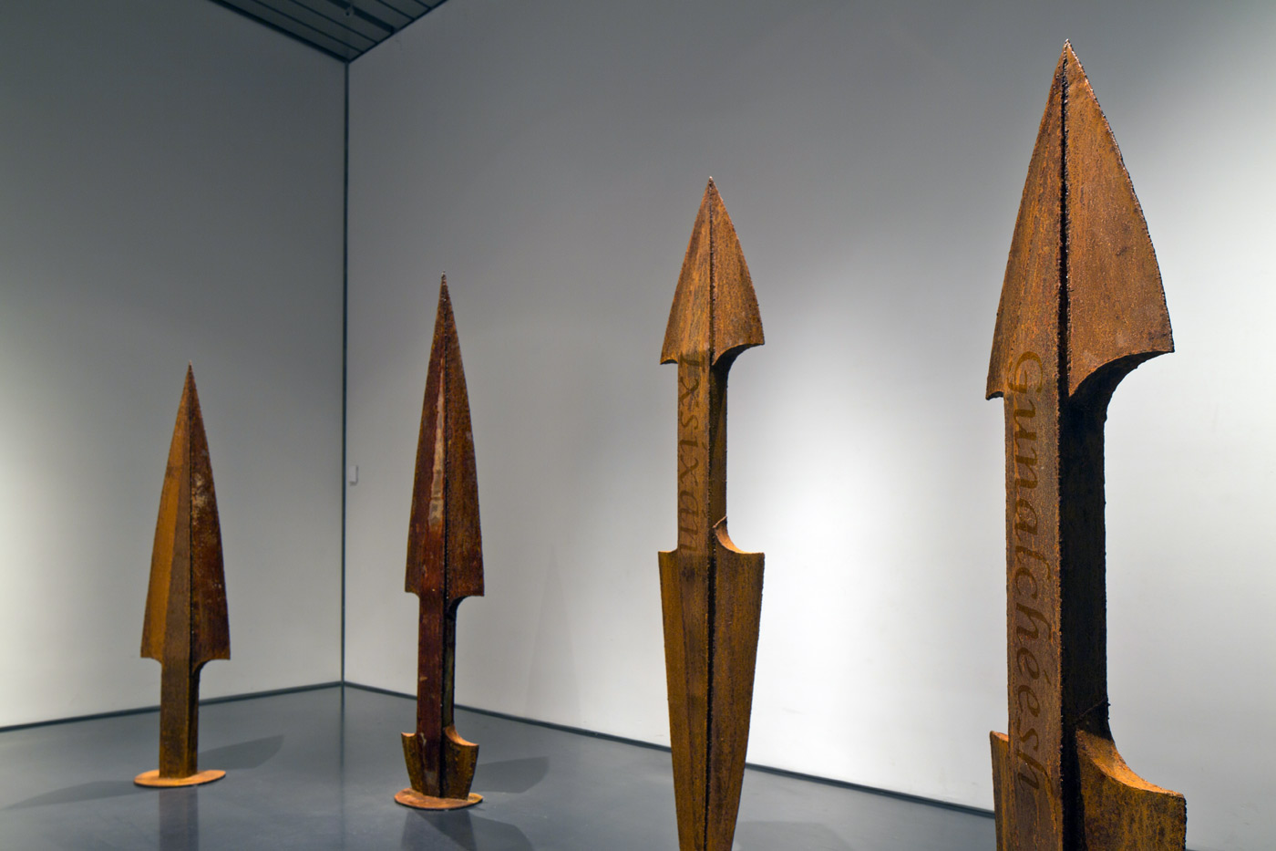
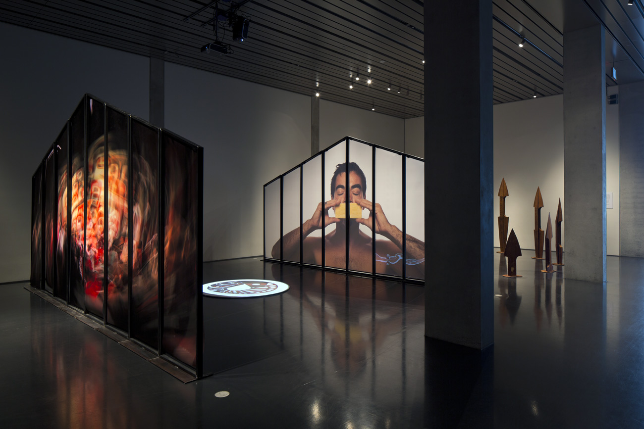
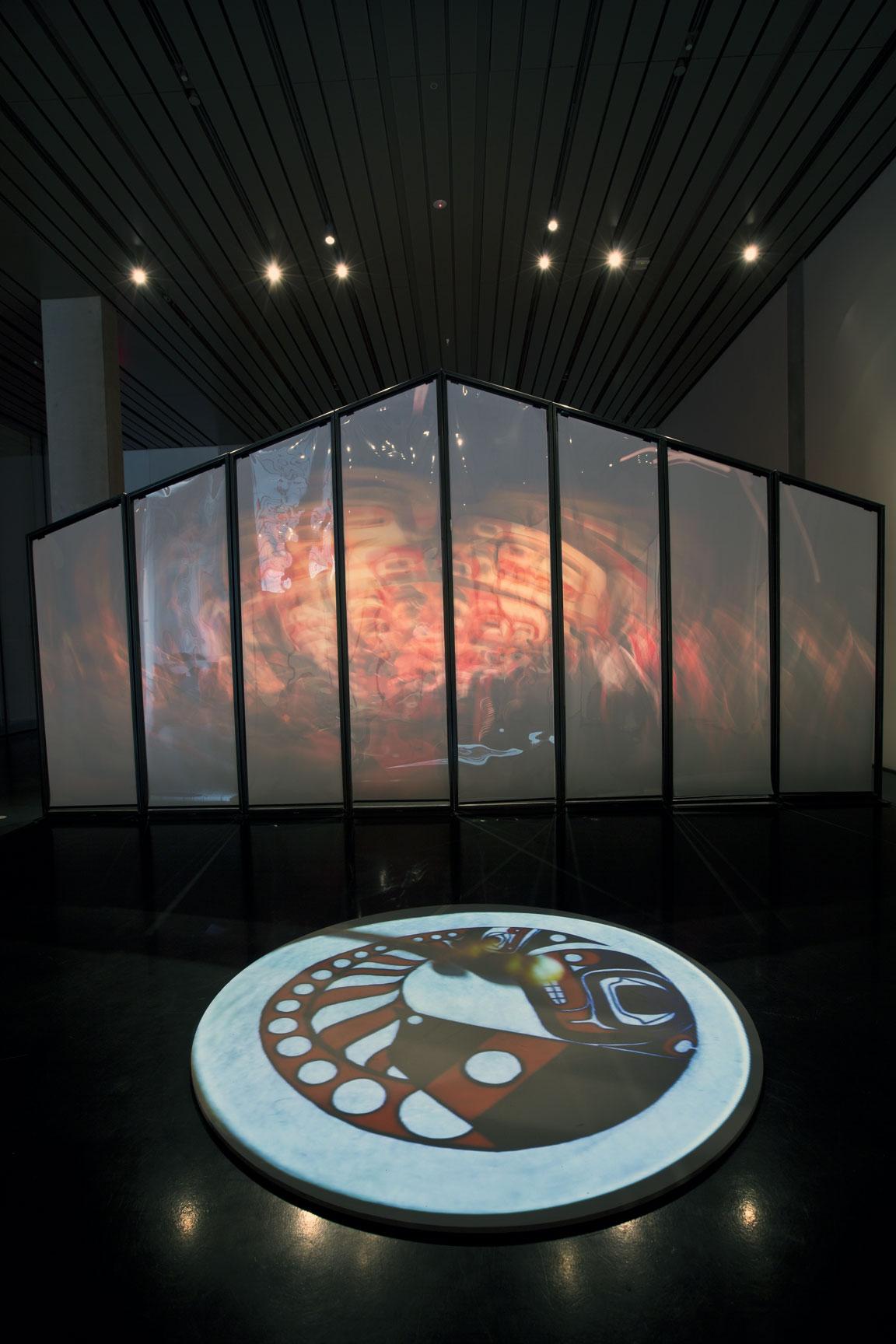
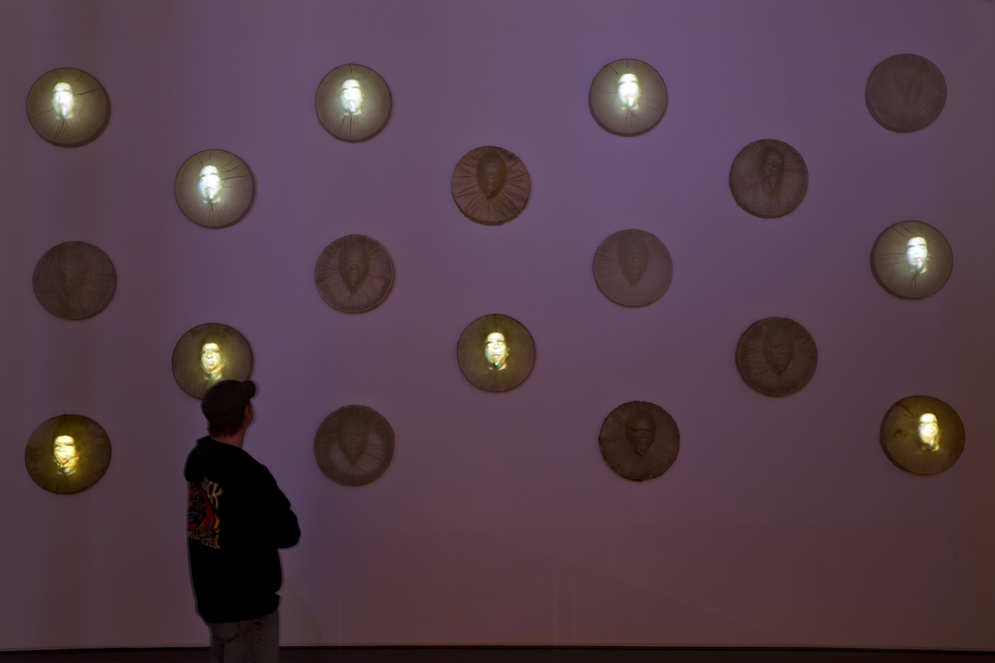
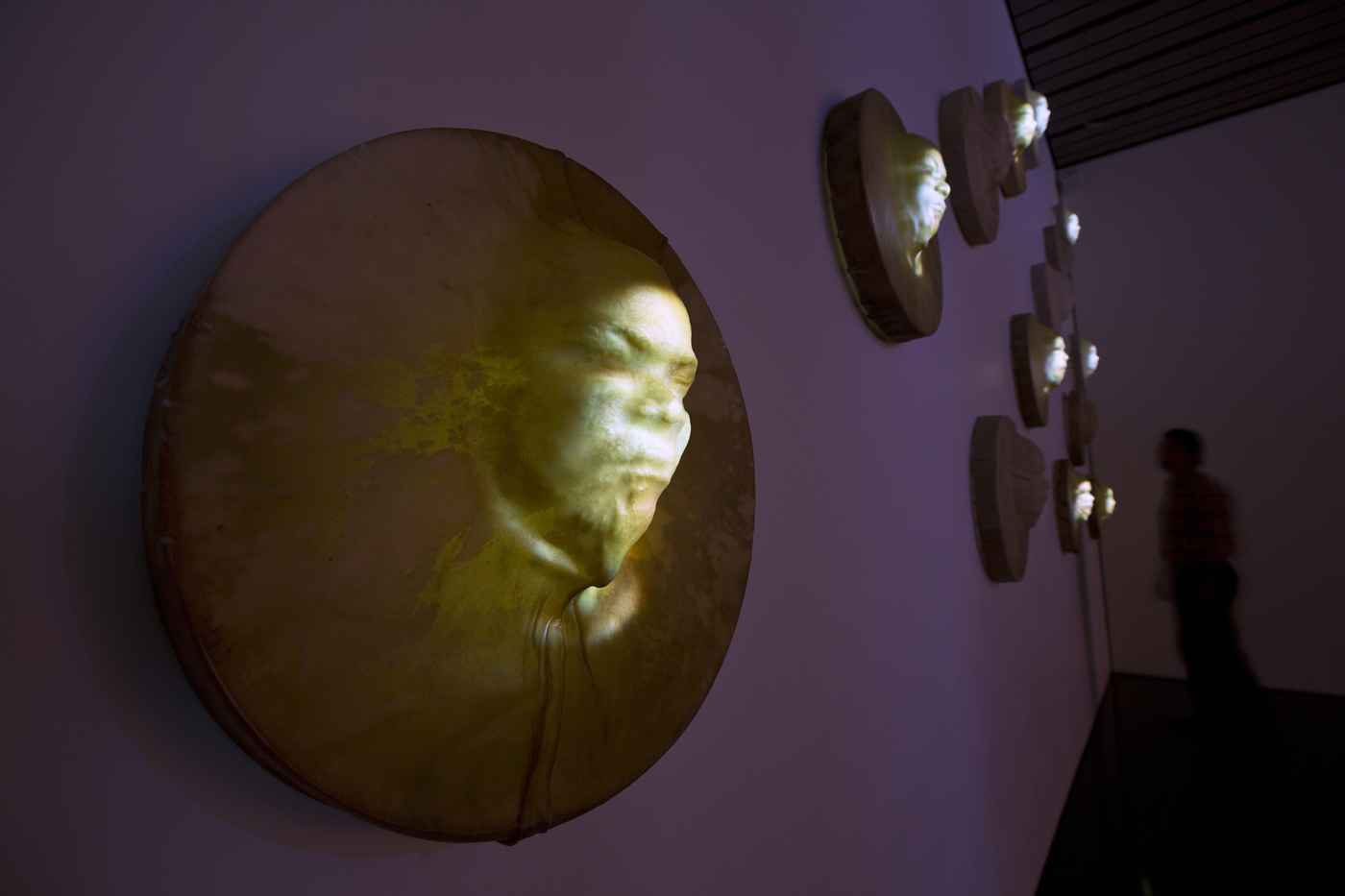
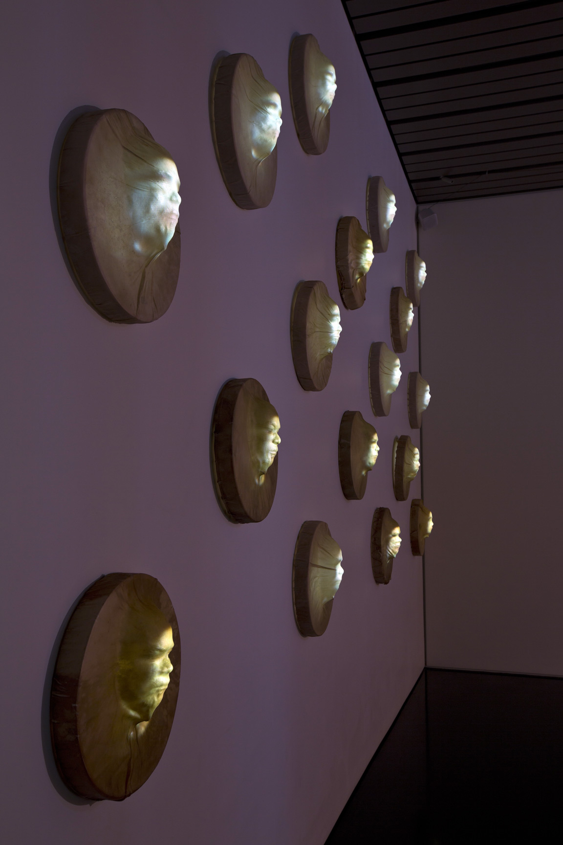
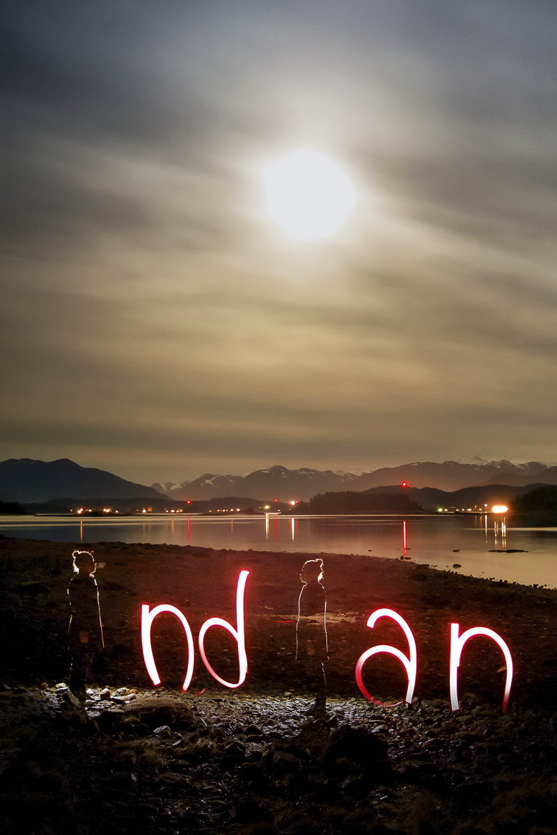
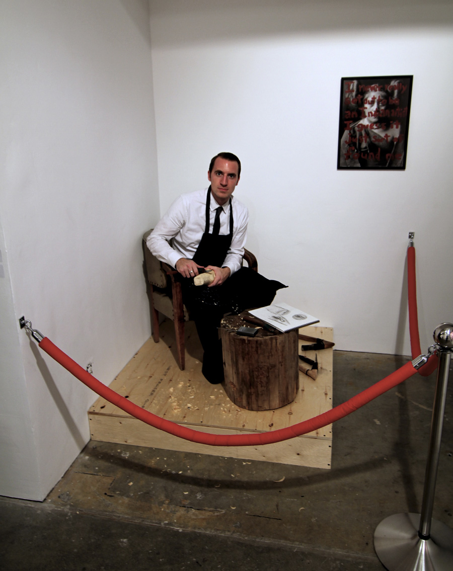

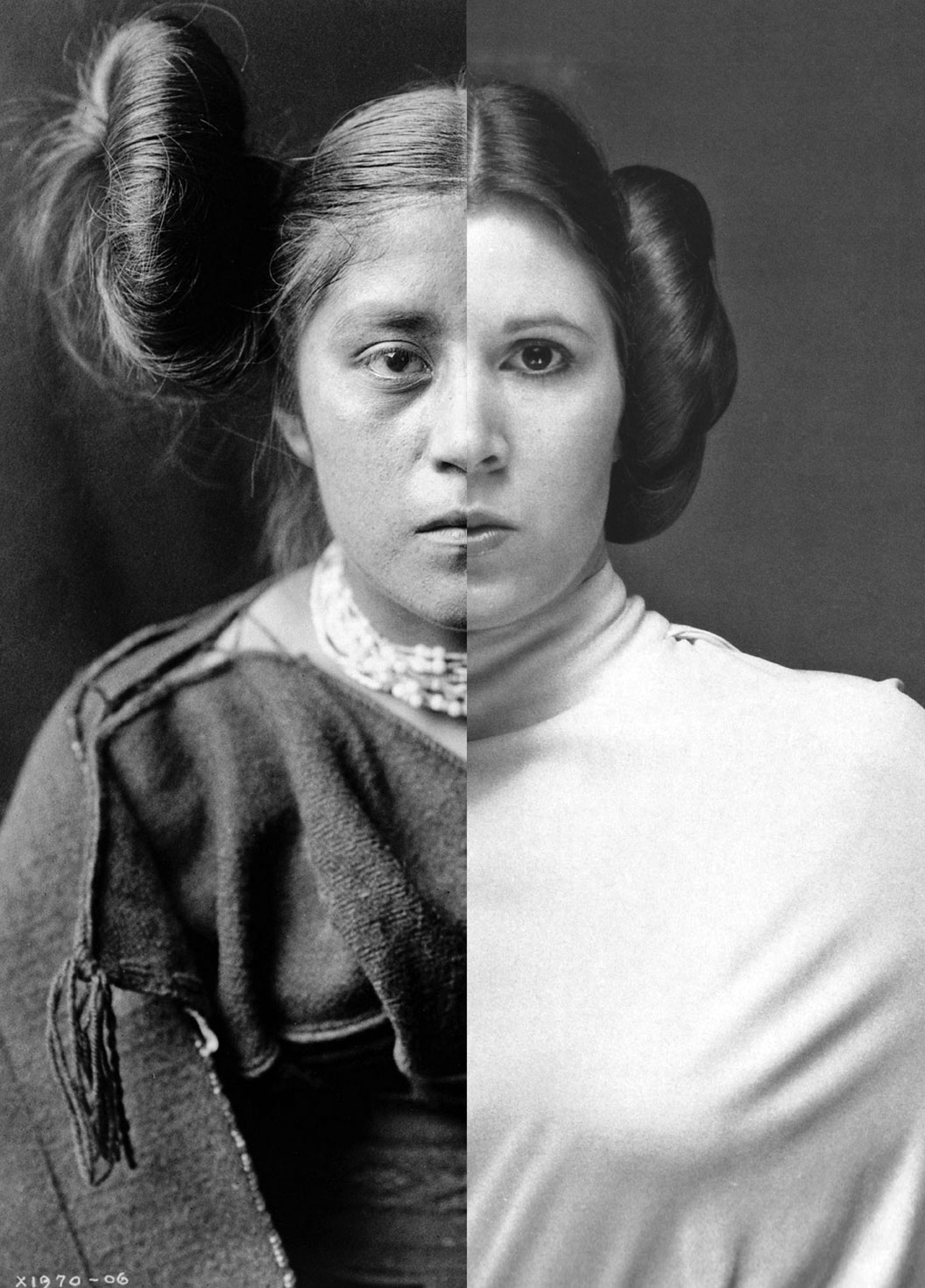
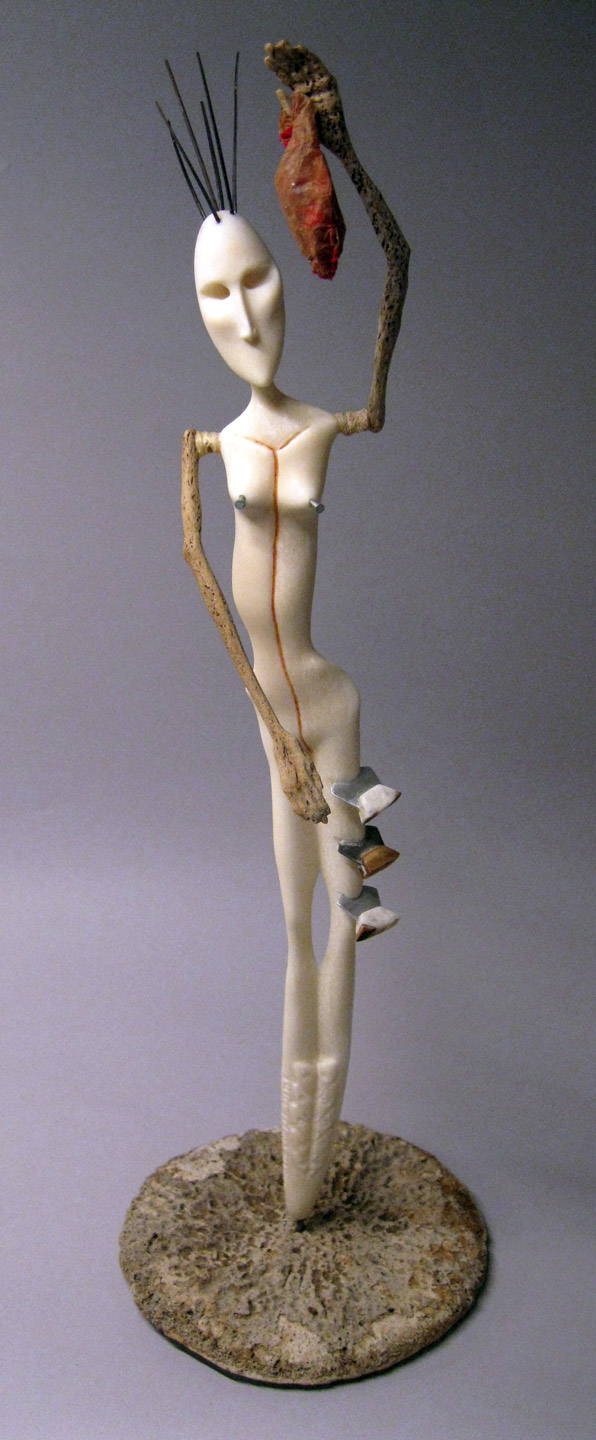
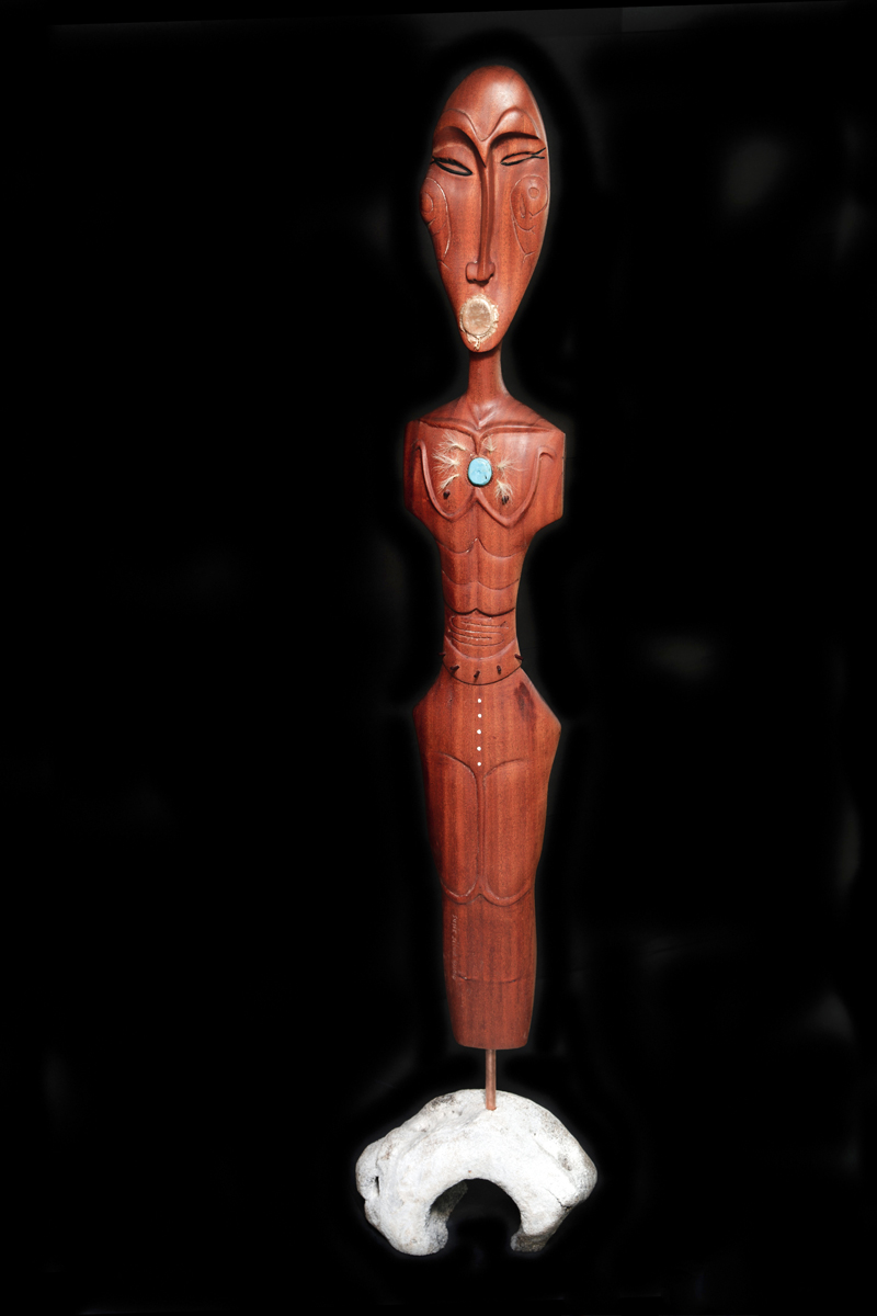
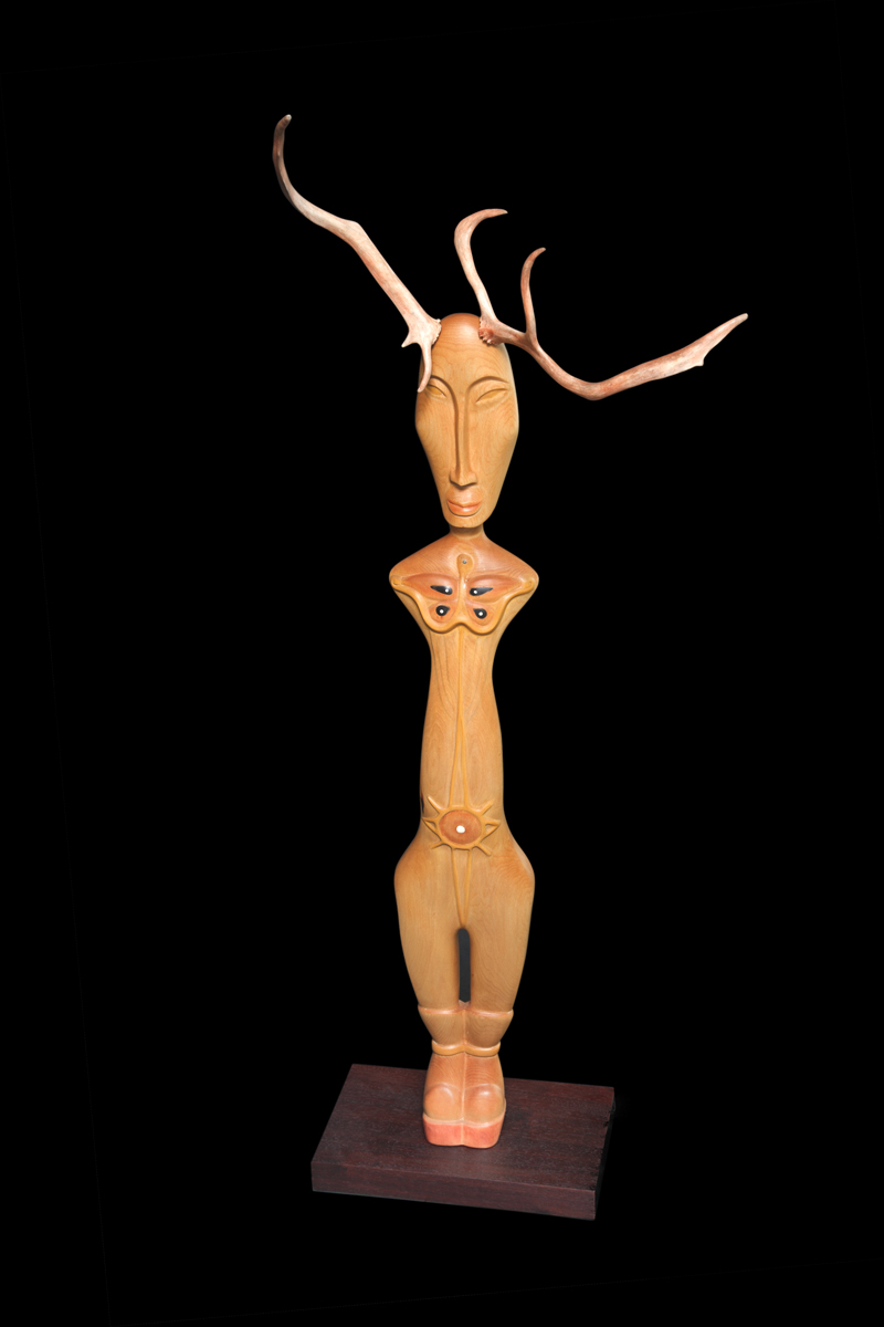
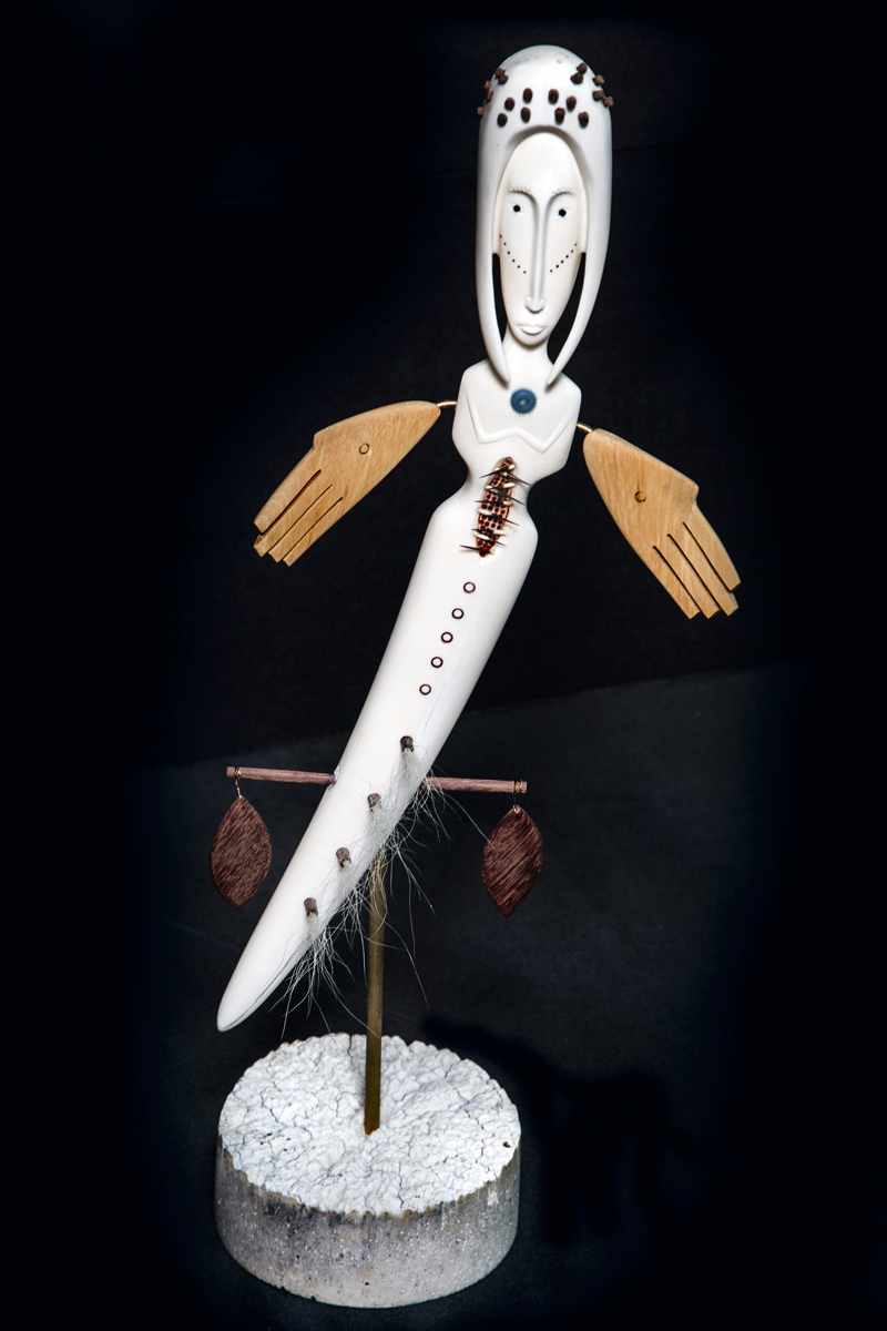
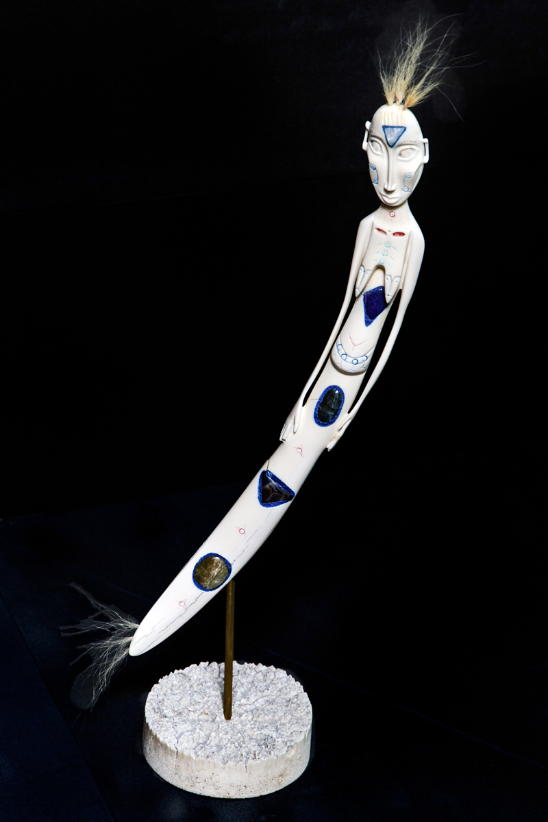
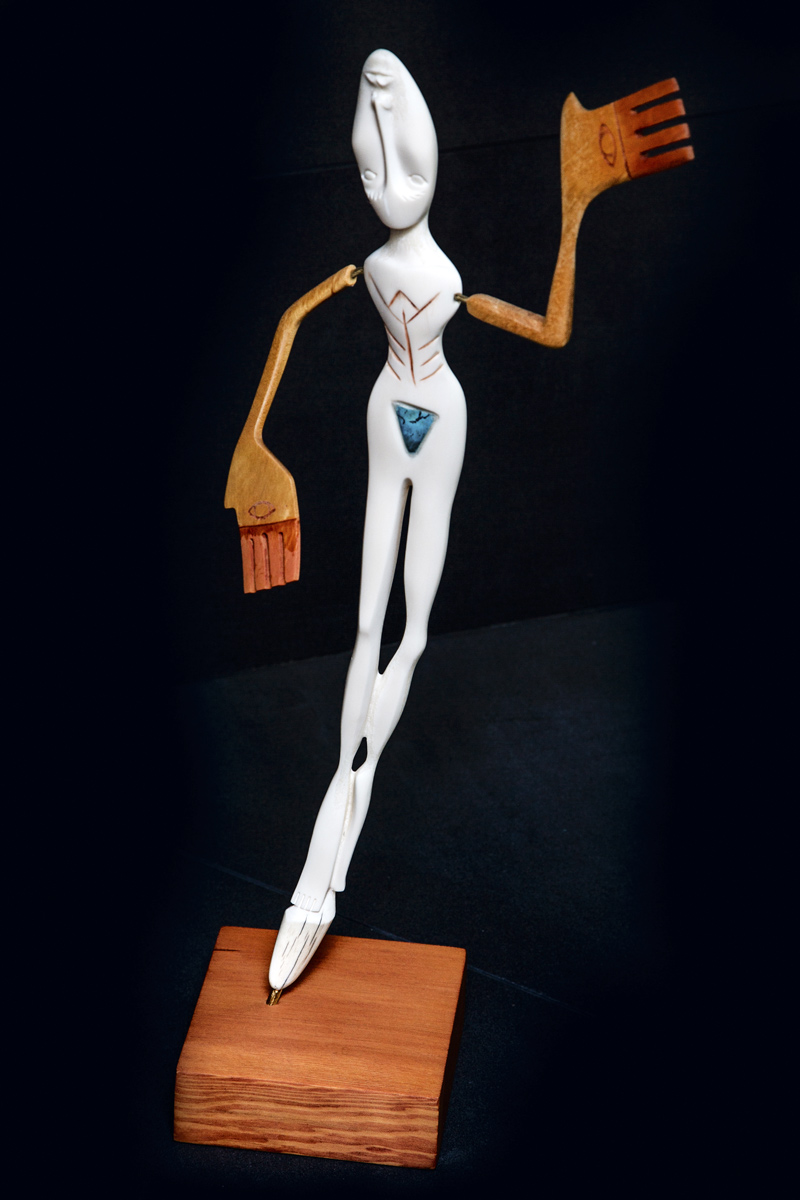


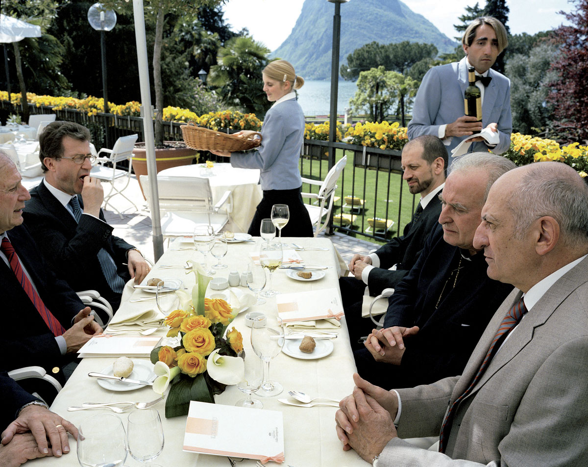
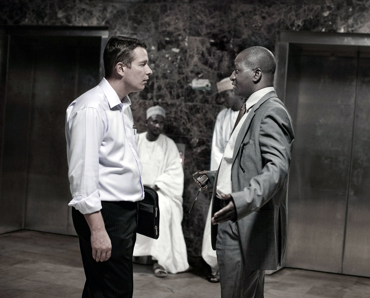


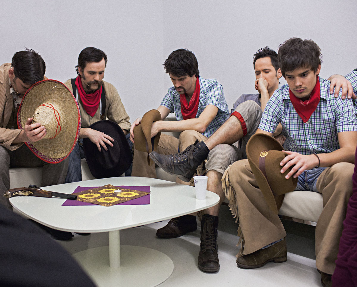
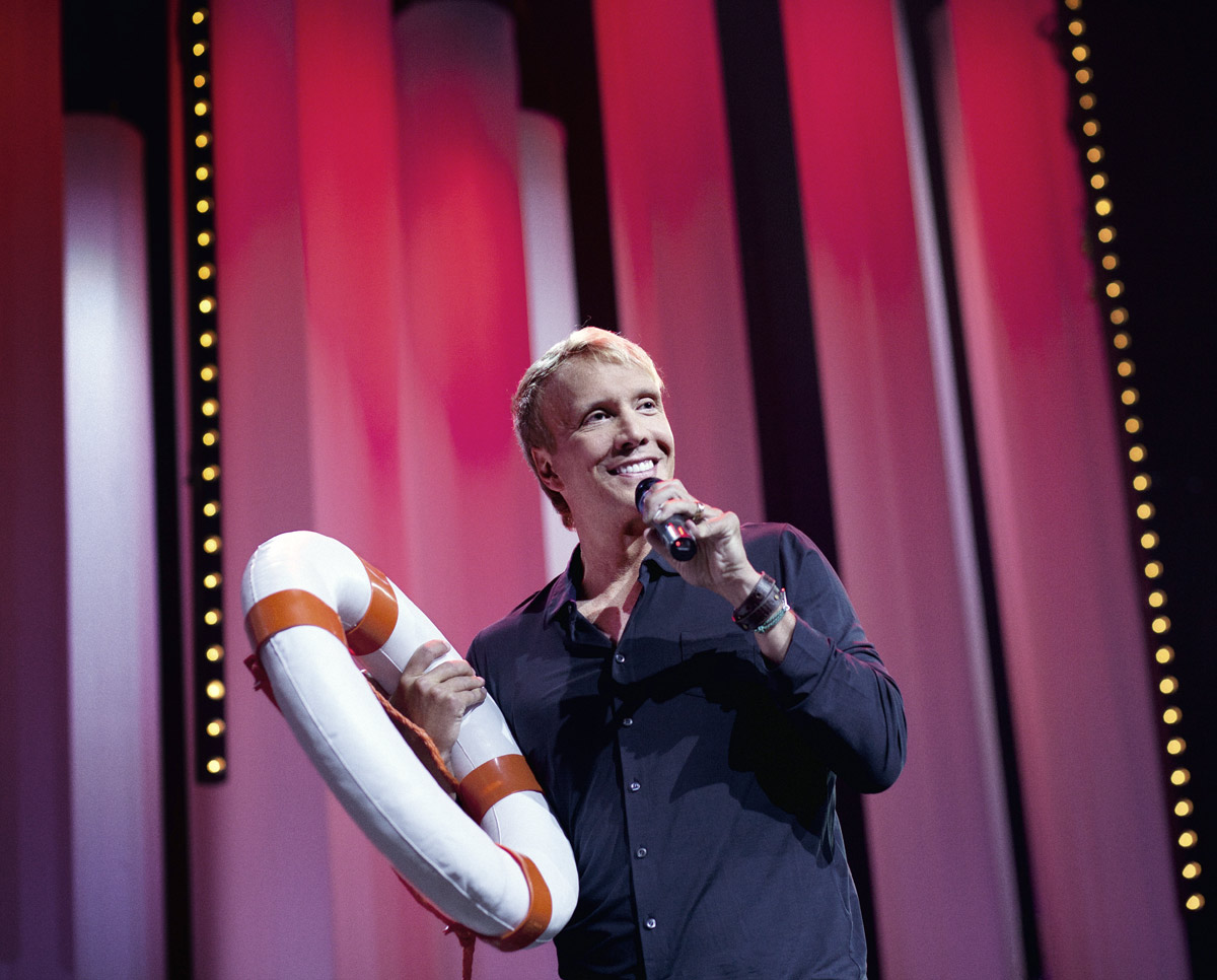
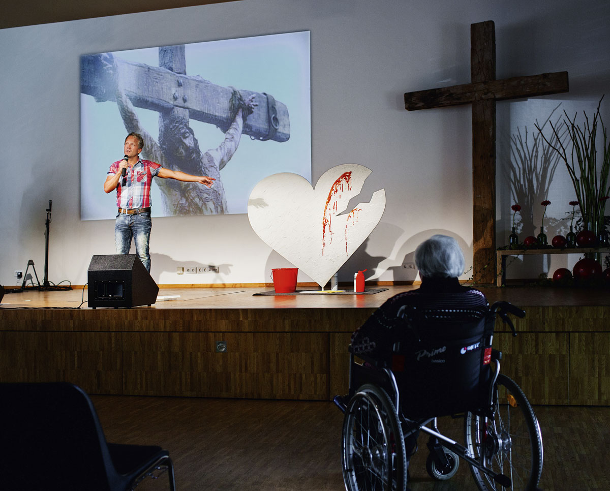

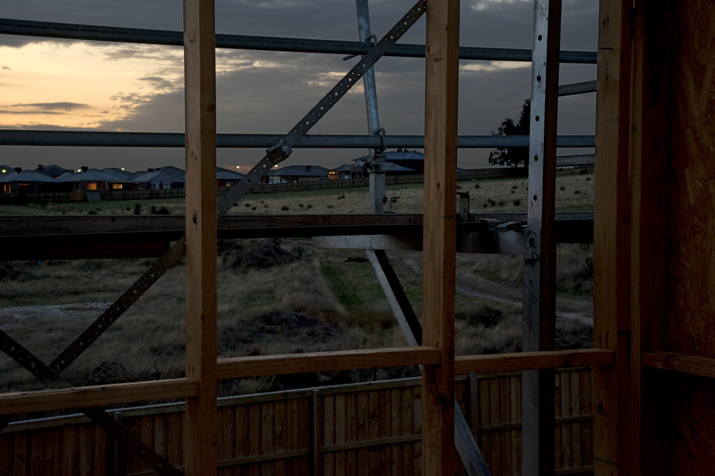



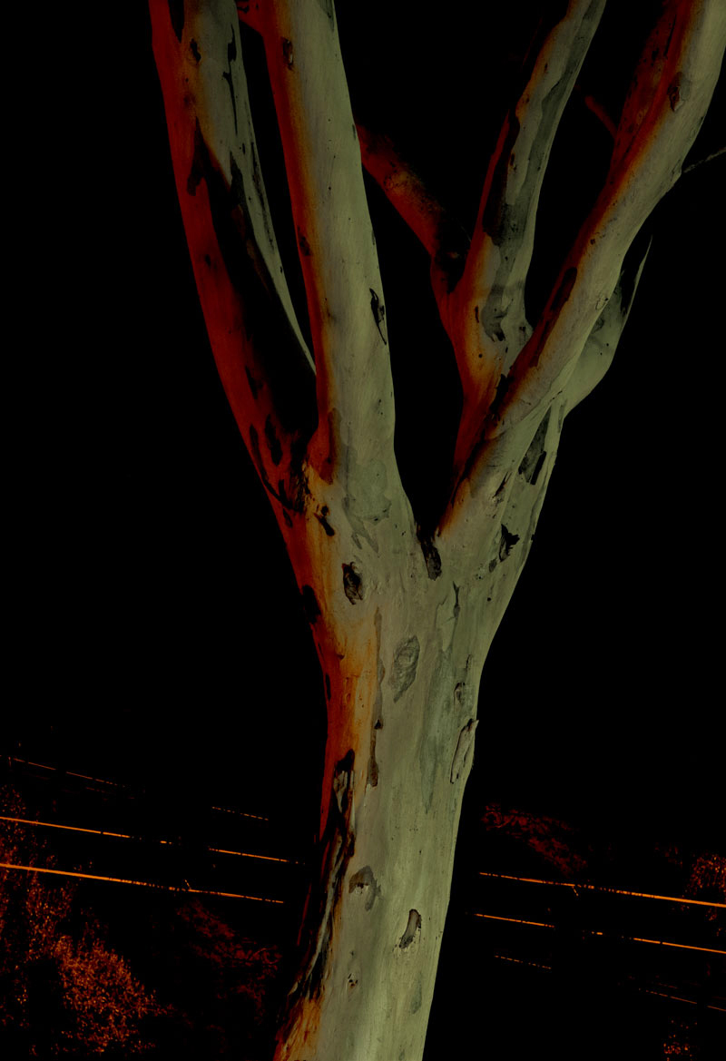

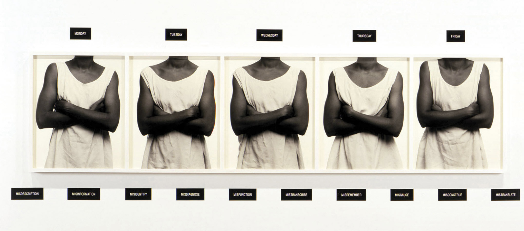
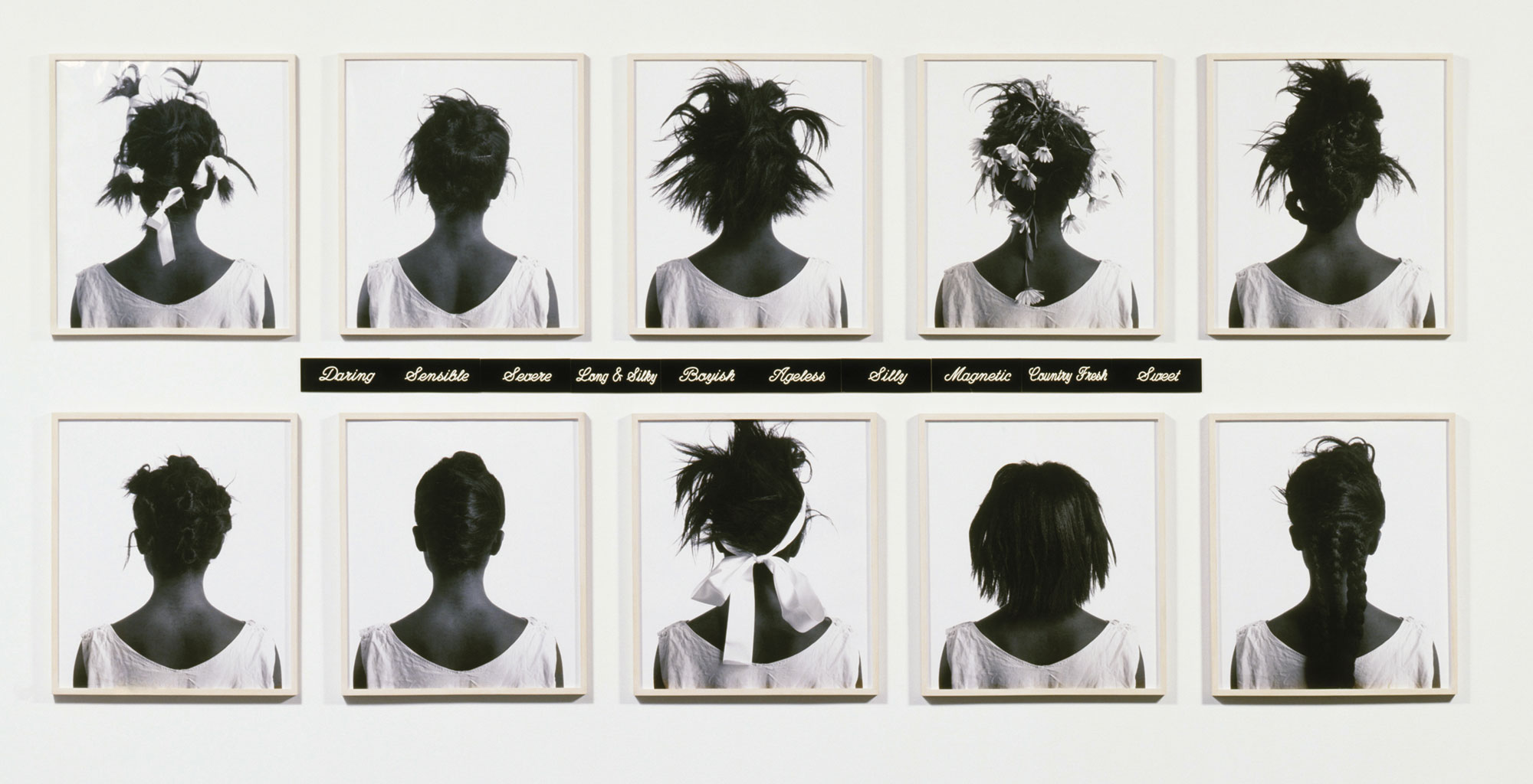
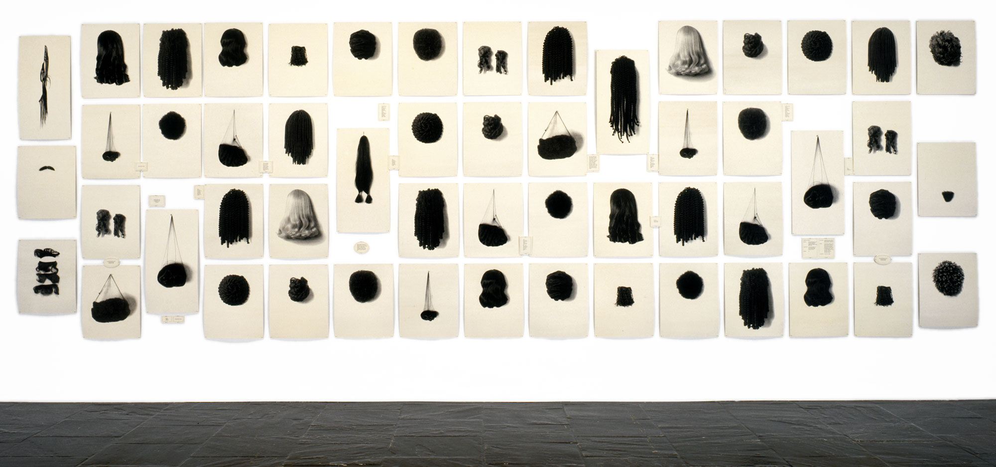

![Lorna Simpson (American, b. 1960) 'Waterbearer [Porteuse d'eau]' 1986](https://artblart.com/wp-content/uploads/2013/08/lornasimpson_004-web.jpg "Lorna Simpson (American, b. 1960) 'Waterbearer [Porteuse d'eau]' 1986")
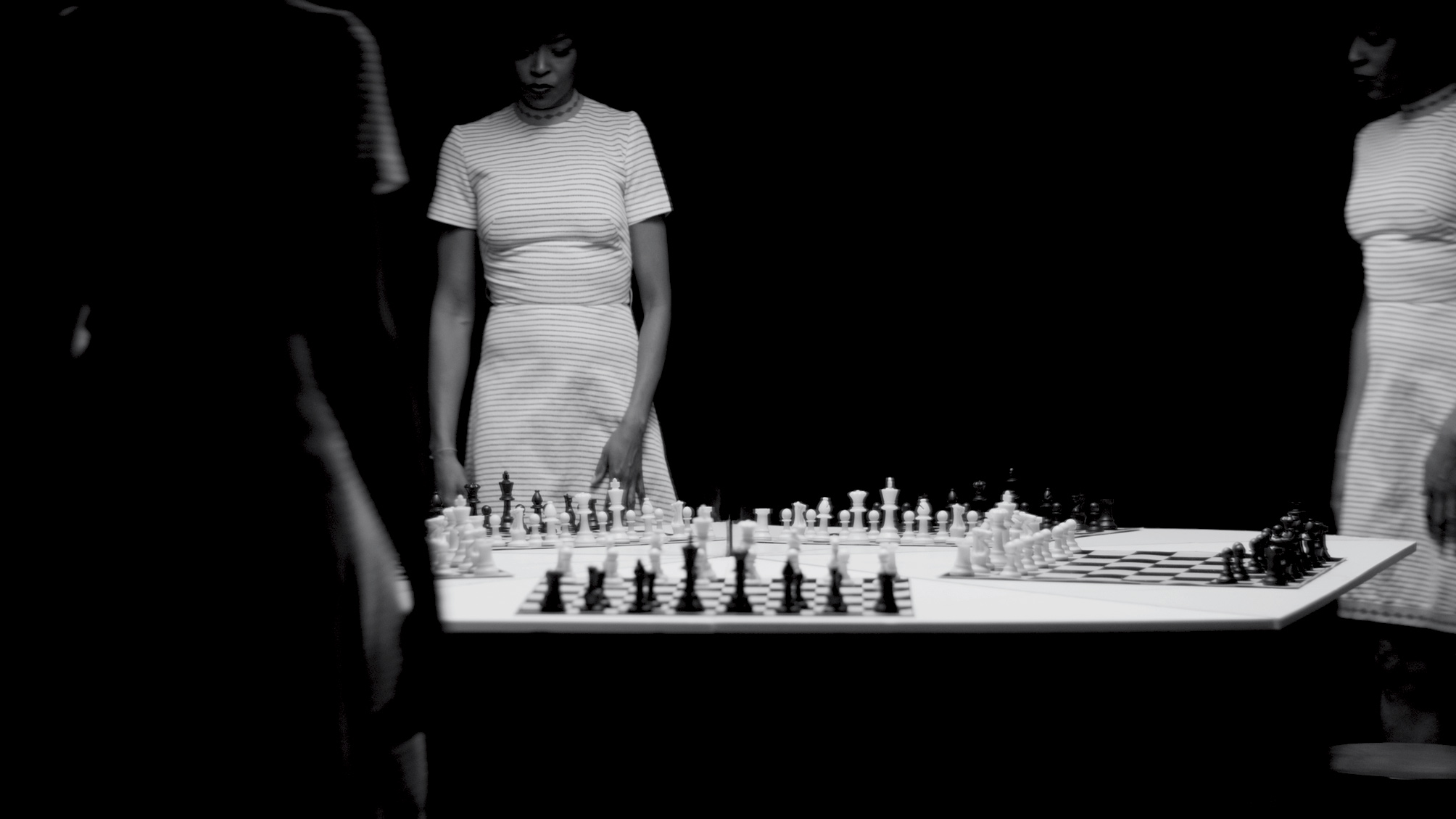
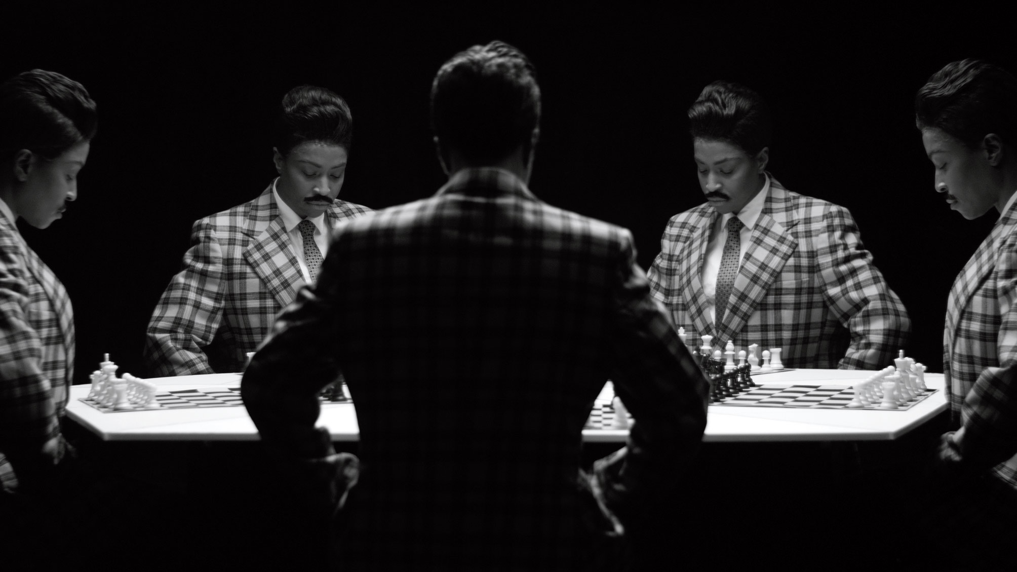
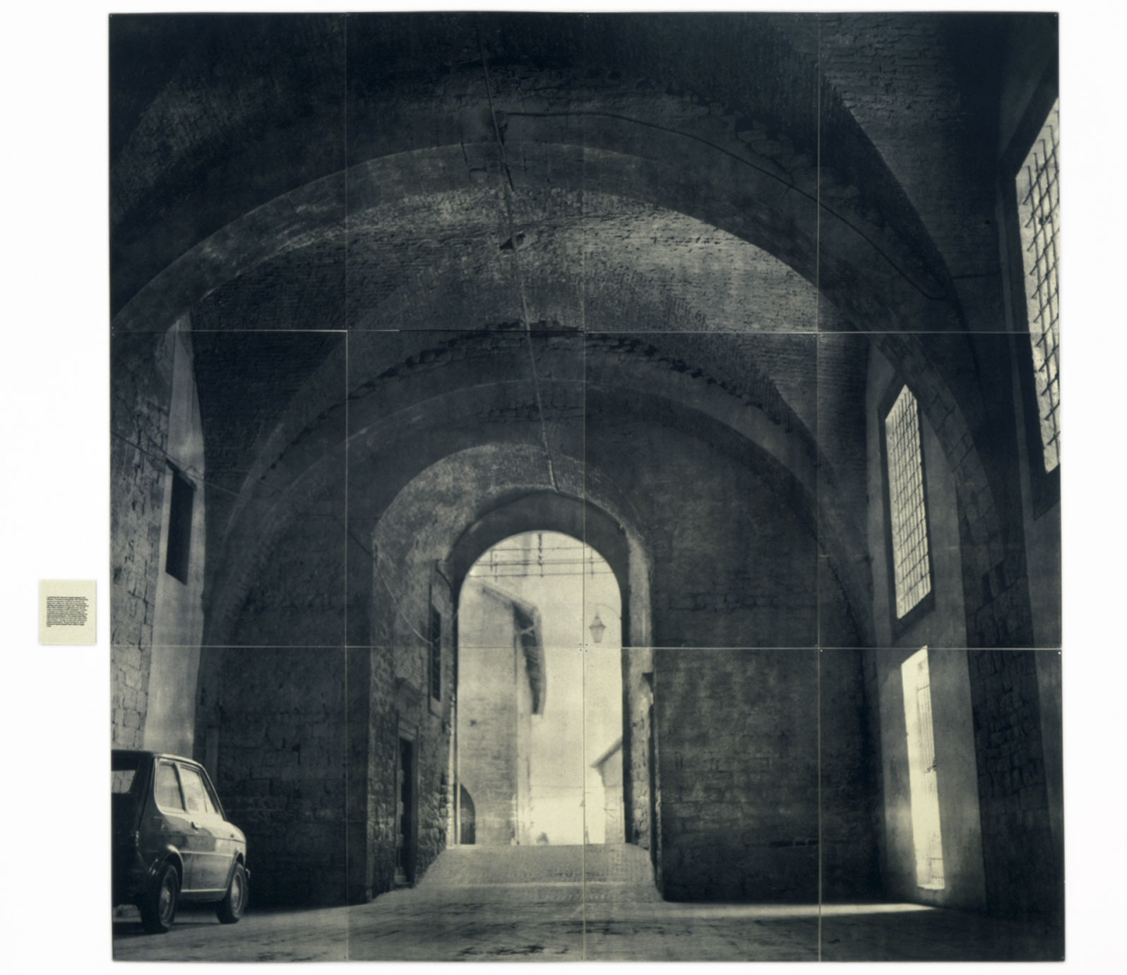
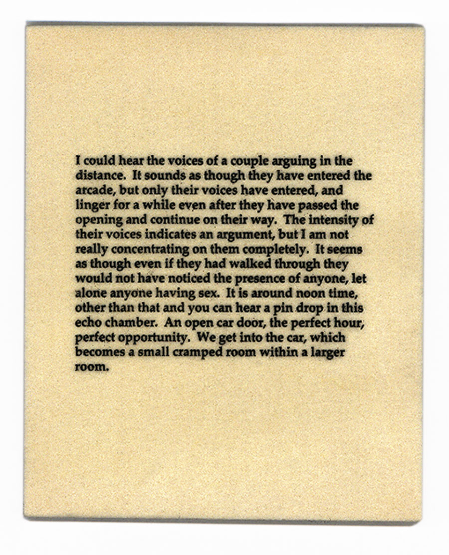
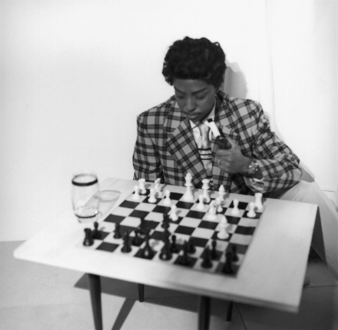

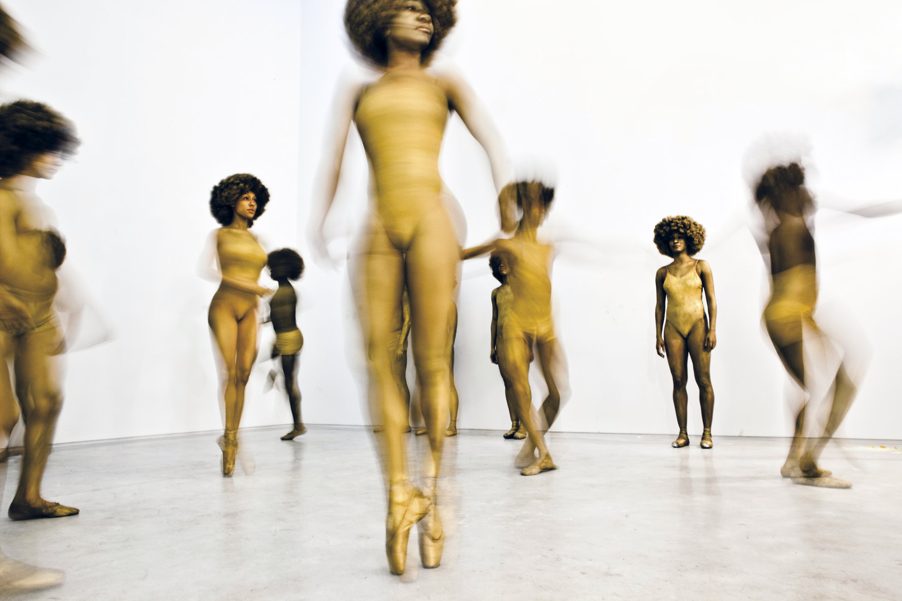


You must be logged in to post a comment.