Traveller Homes, a film about Dave Fawcett made by Tom Hunter and Robin Christian in France in 2013.
“Sadly a large part of this activity has become transformed into a nostalgic archive for a lifestyle that has largely disappeared from the highways & byways of England.” (Dave Fawcett, 2013)
Dave Fawcett’s archive of converted buses and trucks is a unique photographic record which formed the basis for his Traveller Homes website. His topographic studies record a segment of English social history, which still struggles to survive.
Since graduating from Leicester University in 1984 ‘Traveller’ Dave Fawcett has embraced the bender lifestyle. His first ‘mobile home’ was an ex-British Telecom Bedford TK. In 1992 he bought a 1966 Albion Chieftain furniture lorry and drove it on a one-way trip to Europe. He survives as a fruit picker during the summer months and still lives on his bus.
A selection from Dave Fawcett’s ‘Traveller Homes’ series is showing in Life on the Road, a Photography and the Archive Research Centre (PARC) project, made in partnership with London College of Communication as part of Green Week, 2014.
The exhibition features photography by Tom Hunter and Dave Fawcett and films by Andrew Gaston, at London College of Communication from 6 – 26 February 2014.
Growing up in the 1960s we used to get taken to Butlins holiday camps (Billy Butlin founded the company, a chain of large holiday camps in the United Kingdom, to provide affordable holidays for ordinary British families). It was a great treat to be away from the farm, to be by the sea, even if the beach was made of stones. Looking back on it now you realise how seedy it was, how working class… but as a kid it was oh, so much fun!
Tony Ray-Jones photographed these environments (mainly the British at play by the sea) and their opposites – afternoon tea taken at Glyndebourne opera festival for example (Glyndebourne, 1967, below) – drawing on the tradition of great British social documentary photography by artists such as Bill Brandt. TRJ even pays homage to Brandt in one of his photographs, Dickens Festival, Broadstairs, c. 1967 (below) which echoes Brandt’s famous photograph Parlourmaid and Under-parlourmaid Ready to Serve Dinner, 1933 by changing “point of view” from up close, personal, oppressive and interior to distance, isolation, leisure/work and exterior.
Through his photographs Ray-Jones adds his own style and humour, using “a new conception of photography as a means of expression, over and above its accepted role as a recorder.” He does it all as an intimate expression of his own personality, his maverick, outsider, non-conformist self. I feel – and that is the key word with his art – that he had a real empathy with his subject matter. There is a twinkle in his eye that becomes embedded in his photographs. There is an honesty, integrity and respect for the people he is photographing, coupled with a wicked sense of humour and the most amazing photographic eye. What an eye he had!
To be able to sum up a scene in a split second, to previsualise (think), intuitively compose, frame and shoot in that twinkle of an eye, and to balance the images as he does is truly the most incredible gift, the quintessential British “decisive moment”. Look at the structural analysis of Location unknown, possibly Worthing (1967-1968, below) that I have presented in a slide show. This will give you a good idea of the visual complexity of Ray-Jones’ images… and yet he makes the sum of all components seem grounded (in this case by the man’s feet) and effortless. Devon Caranicas has observed that TRJ possessed a quick wit and adeptness for reducing a complex narrative into a single frame, the photographed subjects transformed into social actors of supreme stereotypes. The first part is insightful, but social actors of supreme stereotypes? I think not, because these people are not acting, this is their life, their humanity, their time out from the hum-drum of everyday working class life. They do not pose for TRJ, it’s just how they are. Look at the musicality of the first five images in the posting – how the line rises and falls, moves towards you and away from you. Only a great artist can do that, instinctively.
I cannot express to you enough the utmost admiration I have for this man’s art. In my opinion he is one of greatest British photographers that has ever lived (Julia Margaret Cameron, William Henry Fox Talbot, Roger Fenton, Francis Bedford, Frederick H. Evans, Cecil Beaton, Peter Henry Emerson and Herbert Ponting would be but a few others that spring to mind). He photographed British customs and values at a time of change and pictured a real affection for the lives of ordinary working class people. Being one of the them, he will always hold a special place in my heart.
Dr Marcus Bunyan
Many thankx to Media Space at Science Museum for allowing me to publish the photographs in the posting. Please click on the photographs for a larger version of the image.
“Although the entirety of the images from Only in England were shot throughout the politically and socially turbulent late 60’s and early 70’s both artists shy away from depicting the culture clashes that so often visually defined this period. Instead, they each opted to turn their lens onto the quintessential country side, and in doing so, pay homage to a traditional type of English life that was becoming a sort of sub-culture in itself – a way of living that was not yet touched by the encroaching globalisation, or “americanisation,” of the UK.”
Anonymous text on the ART WEDNESDAY website September 26th, 2013 [Online] Cited 05/03/2014. No longer available online
“Ray-Jones printed his black and white pictures small, in a dark register of tonally very dense prints. The National Media Museum has lots of these, and perhaps to devote the cavernous new space only to such small pictures would have been a mistake. Even backed up with a mass of supporting material, including the fascinating pages from Ray-Jones’ diaries, the prints would struggle to fill the space. So only the first section is devoted to about 50 beautiful little Ray-Jones vintage prints. Two whole sections have been added to the exhibition to flesh it out…
[Parr] has unfortunately chosen to print them [Ray-Jones prints] in a way quite alien to anything Ray-Jones ever made: they are printed in Parr’s own way, as larger, paler, more diffuse things in mid-tones that Ray-Jones would never have countenanced. They are printed, inevitably, by digital process…
Sadly, these Ray-Jones by Parr prints add up to an appropriation of the former by the latter: they are Martin Parr pictures taken from Tony-Ray Jones negatives, and it would have been better not to have shown them so. They are fine images, but they should have been seen in some other way: on digital screens, perhaps, or as modern post-cards. Anything to make quite explicit the clear break with Ray-Jones’ own prints. That the images they contain are very fine is not in doubt. But I take leave to question whether they “present a new way of thinking through creative use of the collections”. They are well labelled and for specialists there will be no difficulty in knowing that they are not by Ray-Jones. But for the public I am not so sure. Suddenly two-thirds of the show are in this larger, modern, digitally printed form, either by Parr himself or by Ray-Jones-through-Parr. It looks as if that is the dominant group…”
Extract from Francis Hodgson. “Two Exhibitions of Tony Ray-Jones – Two Ways of Giving Context to Photographs,” on the Photomonitor website, September 2013 Cited 05/03/2014. No longer available online. Used under fair use conditions for the purposes of education and research
Tony Ray Jones ‘Possibly Worthing’ picture analysis – horizontal linesTony Ray Jones ‘Possibly Worthing’ picture analysis – curved linesTony Ray Jones ‘Possibly Worthing’ picture analysis – ascending triangle with verticalsTony Ray Jones ‘Possibly Worthing’ picture analysis – scooter structureTony Ray Jones ‘Possibly Worthing’ picture analysis – car bonnet triangleTony Ray Jones ‘Possibly Worthing’ picture analysis – locus of imageTony Ray Jones ‘Possibly Worthing’ picture analysis – how it all comes together…
Tony Ray-JonesLocation unknown, possibly Worthing (1967-68) picture analysis by Dr Marcus Bunyan. Please click on the images to see the sequence
Fascinated by the eccentricities of English social customs, Tony Ray-Jones spent the latter half of the 1960s travelling across England, photographing what he saw as a disappearing way of life. Humorous yet melancholy, these works had a profound influence on photographer Martin Parr, who has now made a new selection including over 50 previously unseen works from the National Media Museum’s Ray-Jones archive. Shown alongside The Non-Conformists, Parr’s rarely seen work from the 1970s, this selection forms a major new exhibition which demonstrates the close relationships between the work of these two important photographers.
The first ever major London exhibition of work by British Photographer, Tony Ray-Jones (1941-1972) will open at Media Space on 21 September 2013. The exhibition will feature over 100 works drawn from the Tony Ray-Jones archive at the National Media Museum alongside 50 rarely seen early black and white photographs, The Non-Conformists, by Martin Parr (1952).
Between 1966 and 1969 Tony Ray-Jones created a body of photographic work documenting English customs and identity. Humorous yet melancholy, these photographs were a departure from anything else being produced at the time. They quickly attracted the attention of the Institute of Contemporary Arts (ICA), London where they were exhibited in 1969. Tragically, in 1972, Ray-Jones died from Leukaemia aged just 30. However, his short but prolific career had a lasting influence on the development of British photography from the 1970s through to the present.
In 1970, Martin Parr, a photography student at Manchester Polytechnic, had been introduced to Ray-Jones. Inspired by him, Parr produced The Non-Conformists, shot in black and white in Hebden Bridge and the surrounding Calder Valley. This project started within two years of Ray-Jones death and demonstrates his legacy and influence.
The exhibition will draw from the Tony Ray-Jones archive, held by the National Media Museum. Around 50 vintage prints will be on display alongside an equal number of photographs which have never previously been printed. Martin Parr has been invited to select these new works from the 2700 contact sheets and negatives in the archive. Shown alongside these are Parr’s early black and white work, unfamiliar to many, which has only ever previously been exhibited in Hebden Bridge itself and at Camerawork Gallery, London in 1981.
Tony Ray-Jones was born in Somerset in 1941. He studied graphic design at the London School of Printing before leaving the UK in 1961 to study on a scholarship at Yale University in Connecticut, US. He followed this with a year long stay in New York during which he attended classes by the influential art director Alexey Brodovitch, and became friends with photographers Joel Meyerowitz and Garry Winogrand. In 1966 he returned to find a Britain still divided by class and tradition. A Day Off – An English Journal, a collection of photographs he took between 1967-1970 was published posthumously in 1974 and in 2004 the National Media Museum held a major exhibition, A Gentle Madness: The Photographs of Tony Ray-Jones.
Martin Parr was born in Epsom, Surry in 1952. He graduated from Manchester Polytechnic in 1974 and moved to Hebden Bridge in West Yorkshire, where he established the ‘Albert Street Workshop’, a hub for artistic activity in the town. Fascinated by the variety of non-conformist chapels and the communities he encountered in the town he produced The Non-Conformists. In 1984 Parr began to work in colour and his breakthrough publication The Last Resort was published in 1986. A Magnum photographer, Parr is now an internationally renowned photographer, filmmaker, collector and curator, best-known for his highly saturated colour photographs critiquing modern life.
Only in England: Photographs by Tony Ray-Jones and Martin Parr will run at Media Space, Science Museum from 21 September 2013 – 16 March 2014. The exhibition will then be on display at the National Media Museum from 22 March – 29 June 2014. The exhibition is curated by Greg Hobson, curator of Photographs at the National Media Museum, and Martin Parr has been invited to select works from the Tony Ray-Jones archives.
Greg Hobson, curator of Photographs at the National Media Museum says, “The combination of Martin Parr and Tony Ray-Jones’ work will allow the viewer to trace an important trajectory through the history of British photography, and present new ways of thinking about photographic histories through creative use of our collections.” Martin Parr says, “Tony Ray-Jones’ pictures were about England. They had that contrast, that seedy eccentricity, but they showed it in a very subtle way. They have an ambiguity, a visual anarchy. They showed me what was possible.”
The Tony Ray-Jones archivecomprises of approximately 700 photographic prints, 1700 negative sheets, 2700 contact sheets, 600 boxes of Ektachrome / Kodachrome transparencies. It also includes ephemera such as notebooks, diary pages, and a maquette of England by the Sea made by Tony Ray-Jones.
Media Space is a collaboration between the Science Museum (London) and the National Media Museum (Bradford). Media Space will showcase the National Photography Collection of the National Media Museum through a series of exhibitions. Alongside this, photographers, artists and the creative industries will respond to the wider collections of the Science Museum Group to explore visual media, technology and science.
Monash University Museum of Art (MUMA) is generating an enviable reputation for holding vibrant, intellectually stimulating group exhibitions on specific ideas, concepts and topics. This exhibition is no exception. It is one of the best exhibitions I have seen in Melbourne this year. Accompanied by a strong catalogue with three excellent essays by Thierry de Duve, Dr Rex Butler and Patrice Sharkey, this is a must see exhibition for any Melbourne art aficionado before it closes. My favourite pieces were Jeff Koons’ tactile Balloon dog (Red) (1995, below) and the coupling, copulating lights of Lou Hubbard’s Stretch (2007, below).
I am not going to critique the exhibition pieces per se but offer some thoughts about the nature of the readymade below.
“This transition is a flash, a boundary where this becomes that, not then, not that – falling in love, jumping of a bridge. Alive : dead; presence : absence; purpose : play; mastery : exhaustion; logos : silence; worldly : transcendent. Not this, not that. It is an impossible presence, present – a moment of unalienated production that we know exists but we cannot define it, place it. How can we know love? We can speak of it in a before and after sense but it is always a past moment that we recognise.“
Dr Marcus Bunyan. Made Ready: A Philosophy of Moments. December 2013
Made ready: A Philosophy of Moments
Dr Marcus Bunyan
December 2013
The readymade is everywhere in the world (for the readymade can be made of anything); the readymade is nowhere in the world. This is the paradox of the readymade: it does not exist in the world as art until after the artist has named it. In this sense it can be argued that there is no such thing as a readymade. It only comes into being through the will and intention of the artist. The readymade may live unnamed in the world for years but it does not exist in the world as art until the artist has intentionally named it (or made it). As Marcel Duchamp observes,
“It’s not the visual aspect of the readymade that matters, it’s simply that fact that it exists… Visuality is no longer the question: the readymade is no longer visible, so to speak. It is completely grey matter. It is no longer retinal.”1
The readymade is (initially) a concept of the brain and not of the eye. It is a commodity made by man living in the world made ready for identification as art ‘already made’ by the recognition of the artist of its exchange value – the object as transitory metonym which “stands in” for another place of being through a change of name or purpose. It is the intention of the artist to impose an (alternate) order on the object, an order in which the readymade questions aesthetic criteria and categories such as taste, authorship and intentionality. As Dr Rex Butler notes, “The work is not simply intended – which is an obvious fact about any work of art – but about an intention that has come to replace, while entirely reproducing, that which is the very embodiment of the contingent and unpredictable.”2
According to Thierry de Duve, the choosing of the object is accompanied by three other acts: naming the object, signing it and devising some original presentation for it.3 There are the so called unassisted readymades (such as Duchamp’s Bottle dryer, 1914 reconstructed 1964 below) and there are also plain, aided, sick, unhappy, reciprocal and semi-readymades.4 In reality no readymade is unassisted as all are called into being by the mind of the artist. But the concept of the readymade “heralds the realisation that art can be made from anything whatsoever.”5 If this is the case then the readymade “makes of all aesthetic judgements something unconvincing, derivative, second-hand,”6 perhaps even deliberately “invoking” criticism before the artwork is even constructed. If the inherent structural and aesthetic function of all things is predetermined, as though fulfilling some underlying design, it is the artists intentionality in naming the object as art – a model of explanation “that abducts from external products to internal processes, from what is visible to what must be inferred”7 – that deliberately places and fixes these objects in a new moment in space and time.
Through appropriation, readymades “make their claim to the dignity of an art object through some unexpected presentation that decontextualises them and pulls them away from their daily use.”8 Through appropriation, artists laud everyday objects as art for all to see.9 Through appropriation, art institutes emphasise the power of the art institution, the readymade made taxidermied, stuffed object, placed on a stand, an everyday object lauded as art for all to see. In this scenario, the desire of manufacturing that wants consumer objects to be seen as useful, valuable is inverted as readymades become institutional objects of desire just out of reach of the audience (10,000 dollar coins just lying around on the floor!). The death of the object as an object and its reanimation “to the dignity of an art object” is completed “simply by its presence in the museum.”10 As Elizabeth Wilson states, “The only defence against transgressive desire is to turn either oneself or the object of desire to stone.”11 In this case it is the museum officials that turn the object of desire into stone (by lionising them as readymades). In actuality, these objects that artists imagine explore the dichotomy between presence and absence and the nature of transgressive desire.
Essentially, the concept of the readymade is both elastic (like the band that holds together the brick and book cover in Claire Fontaine’s witty La société du spectacle brickbat 2006, below) and fixed (like the brick itself), the readymade being both a performative act (ritualised play) and citational practice by which discourse produces the effects it names.12 Further, a link can be made to Bachelard’s theory of space and imagination which describes literary space as reflexive, resonant and moulded by consciousness.13 In their playfulness the spatial dynamics of readymades challenge and illuminate the human, sensory possibility. They examine how the reality of contemporary life is disguised and concealed from view, and how human beings are alienated from the very objects that they produce. For the French philosopher and sociologist Henri Lefebvre, “(The) critique of everyday life is … at once a rejection of the inauthentic and the alienated, and an unearthing of the human which still lies buried therein.”14
“One avenue for this unearthing is what Lefebvre describes as moments of presence – fleeting, sensate instants in which the “totality of possibilities contained in daily existence” were revealed. While destined to pass in an instant, it is through such moments that we are able to catch glimpses of the relation between the everyday and the social totality.”15 This philosophy or theory of moments was developed in opposition to Bergson’s understanding of time as a linear duration (duree) of separate instances and for Lefebvre, these “moments are “experiences of detachment from the everyday flow of time” which puncture the banality of everyday life…”16
“All the activities that constitute everyday life must then be rethought in terms of a dialectic of presence and absence and each moment is simultaneously an opportunity for alienation and disalienation.”17
The readymade, then, explores the politically radical potential that lies within the everyday through play and the intentionality of the artist. Through representation, readymades mediate between absence and presence; through poësis they begin to inhabit another time and space.
“In the poetic act, presence is the given. Lefebvre intends ‘poetic’ to cover unalienated production – the Greek poësis – as he explained in The Production of Space (1974)… Presence and poësis stand outside social relations of production. Flashes of inspiration, moments when one feels ‘all together’ and ‘in touch’, are not determined by economic relations, and cannot be prevented, even in a prison camp.”18
Readymades are a reaction against the linear production of industry, which is both functional and hierarchical. They are a reaction against the banality and repetition of the everyday – of the hegemony of capitalist production and the social relations of everyday life. In a culture of use and use by, the readymade “inscribes the work of art within a network of signs and pre-existing material.”19 Theses assemblages enable us to ask the question, what makes aesthetic judgement possible. They offer an alternative form of resistance to the imposition of linear repetition, through a form of mental and visual play. The moment of the representation encloses a transition (something transitory, something which ‘traverses’)20 – through a plethora of creative, emotive and imaginative practices – from something stable to un/stable.
This transition is a flash, a boundary where this becomes that, not then, not that – falling in love, jumping of a bridge. Alive : dead; presence : absence; purpose : play; mastery : exhaustion; logos : silence; worldly : transcendent. Not this, not that. It is an impossible presence, present – a moment of unalienated production that we know exists but we cannot define it, place it. How can we know love? We can speak of it in a before and after sense but it is always a past moment that we recognise.
It is the same with the readymade. The inscriptions on the early readymades (such as the bottle dryer and urinal) detailing authorship, dates, times, places can be seen as an attempt to ‘fix’ an individual artwork in the flow of time, to distinguish it from its unacknowledged neighbour – like “fixing” a photograph. It is telling that when the bottle rack was lost and remade in the 1960s the text that was originally on the lower metal ring was lost with the object itself.21 The text sought to fix these transitory moments of absence : presence.
Søren Kierkegaard calls this transition a “leap,” where a human being chooses an ethical life-view, one that resides in the actual and not in an ironic-aesthetic attitude.
“It is important to see that choice, as the characteristic of the ethical lifeview, forms a radical break with the ironic spiral of the aesthetic attitude. Kierkegaard sometimes calls the ethical choice a “leap,” a term that expresses the fundamental uncertainty of each commitment to actuality: contrary to aesthetic fantasy, which is “safely” self-contained, the outcome of the individual’s ethical choice is dependent on actuality and therefore not fully under the individual’s control. This is a decisive difference between aesthetic irony (including meta-irony) and the ethical leap: instead of merely rejecting all actuality, the latter takes responsibility for a certain actuality and tries to reshape it.”22
And tries to reshape it. Thus we can say that readymades are human beings taking responsibility for their actuality by choosing to name an object as art, creating objects that challenge aesthetic value judgements and an ironic-aesthetic lifeview through their very presence, by their very selfness. Remembering (ah memory!), that it is always a past moment that we recognise. The familiar is not necessarily the known – it has to be named.
Dr Marcus Bunyan
Endnotes
1/ Duchamp, Marcel. “Talking about Readymades,” Interview by Phillipe Collin, June 21, 1967, quoted in Girst, Thomas. “Duchamp for Everyone,” in The Indefinite Duchamp. Germany: Hatje Cantz, 2013, p. 55 quoted in Day, Charlotte. “Introduction,” in Reinventing the Wheel: The Readymade Century. Melbourne: Monash University Museum of Art (MUMA), 2013, p. 85
2/ Butler, Rex. “Two Snapshots of the Readymade Today,” in Reinventing the Wheel: The Readymade Century. Melbourne: Monash University Museum of Art (MUMA), 2013, p. 98
3/ Duve, Thierry de. “Readymade,” in Reinventing the Wheel: The Readymade Century. Melbourne: Monash University Museum of Art (MUMA), 2013, p. 92
9/ “Still, appropriationism, which defines the end-of-art condition, is pretty much the defining principle of our moment, putting, as it does, everything and every combination of things at the service of art, even including bad drawing and bad painting, since these, being designated, tell us only what kind of point the artist who appropriates them intends, not what kind of artist she or he is.” Danto op. cit.,
10/ Duchamp, Marcel. Definition of the readymade in the Dictionnaire abrégé du Surréalisme quoted in Duve, op. cit. p. 92
11/ Wilson, Elizabeth. “The Invisible Flaneur,” in Watson, Sophie and Gibson, Katherine (eds.,). Postmodern Cities and Spaces. Cambridge, Mass: Blackwell, 1995, p. 75
12/ Butler, Judith. Bodies That Matter. New York: Routledge, 1993, p. 1-2
13/ See Bachelard, Gaston. The Poetics of Space. Boston: Beacon Press, 1958 (1994)
14/ Trebitsch, M. “Preface,” in Lefebvre, Henri. Critique of everyday life Vol. I. London: Verso, 1991, pp.ix-xxviii quoted in Butler, Chris. Law and the Social Production of Space. August 2003, p.60 [Online] Cited 01/12/2013. No longer available online
15/ Harvey, D. “Afterword,” in Lefebvre, Henri. The production of space. Blackwell, Oxford, 1991, see note 1, at p. 429 quoted in Butler, Chris. Ibid., p. 60
16/ Shields, Rob. Lefebvre, love and struggle: spatial dialectics. London: Routledge, 1999, see note 4, at p. 61 quoted in Butler, Chris. Ibid., p. 61
17/ Shields, Rob. Lefebvre, love and struggle: spatial dialectics. London: Routledge, 1999, see note 4, at p. 70 quoted in Butler, Chris. Ibid., p. 61
18/ Shields, Rob. Lefebvre, love and struggle: spatial dialectics. London: Routledge, 1999, p. 99 [Online] Cited 01/12/2013. Google Books website.
19/ Sharkey, Patrice. “When Everything is already a Readymade,” in Reinventing the Wheel: The Readymade Century. Melbourne: Monash University Museum of Art (MUMA), 2013, p. 107
20/ Lefebvre, Henri. The production of space. Blackwell, Oxford, 1991, p. 213 quoted in Shields, Rob op. cit., p. 99
21/ Duve, op. cit. p. 91
22/ Dulk, Allard Den. “Beyond Endless “Aesthetic” Irony: A Comparison of the Irony Critique of Søren Kierkegaard and David Foster Wallace’s Infinite Jest,” in Studies in the Novel Vol. 44, No. 3. University of North Texas: Fall 2012, pp. 325-345
Marcel Duchamp (French-American, 1887-1968) Bottle dryer (installation view) 1914 reconstructed 1964 Galvanised iron bottle dryer 65 x 44 x 43cm (overall); base: 37.5cm (diam.) National Gallery of Australia, Canberra
Martin Creed (British, b. 1968) Work no. 88 A sheet of A4 paper crumpled into a ball (installation view) 1995 A4 paper, ed. 625/Unlimited Approx. 2 in / 5.1cm diameter Courtesy of the artist and Hauser & Wirth, London
Arguably the most influential artistic development of the twentieth century, the readymade was set in motion one hundred years ago when Marcel Duchamp mounted an upturned bicycle wheel on a stool. Duchamp’s conversion of unadorned, everyday objects into fine art completely inverted how artistic practice was considered. Suddenly, art was capable of being everywhere and in everything. It was a revolutionary moment in modern art and the ripples from this epochal shift still resonate today.
Reinventing the Wheel: the Readymade Century pays tribute to Duchamp’s innovation, including two key examples of his work: Bicycle wheel 1913 and Bottle dryer 1914. Other important historical works that MUMA has borrowed for the exhibition reveal the readymade’s presence in Minimalism and Conceptual art as well as its echoes in Pop art. The exhibition traces some of the ways the readymade has been reinterpreted by subsequent artists in acts of homage to Duchamp or further expanding the possibilities the readymade has unfurled.
Among the various trajectories of the readymade, Reinventing the Wheel traces its elaborations in neo-dada practices, with a particular focus on everyday and vernacular contexts; the mysterious and libidinous potential of sculptural objects; institutional critique and nominal modes of artistic value. These discursive contexts also provide a foundation to explore more recent tendencies related to unmonumental and social sculpture, post-Fordism and other concerns, particularly among contemporary Australian artists. Bringing together works by over forty artists – from Duchamp and Man Ray to Andy Warhol and Martin Creed, along with some of Australia’s leading practitioners – this is a one-of-a-kind salute to an idea that continues to define the very nature of contemporary art.
“This is the most ambitious exhibition that MUMA has yet presented, including works that establish the historical moment of the readymade in Europe and its reception in the USA and in Australia. Most exciting is the opportunity for living artists to see their work as part of this ongoing history,” said Charlotte Day, Director of MUMA.
The earliest sense of brickbat, first recorded in 1563, was “a piece of brick.” Such pieces of brick have not infrequently been thrown at others in the hope of injuring them; hence, the figurative brickbats (first recorded in 1929) that critics hurl at performances they dislike. The appearance of bat as the second part of this compound is explained by the fact that the word bat, “war club, cudgel,” developed in Middle English the sense “chunk, clod, wad,” and in the 16th century came to be used specifically for a piece of brick that was unbroken on one end.
1/ A piece of brick or similar material, esp one used as a weapon 2/ Blunt criticism the critic threw several brickbats at the singer
Monash University Museum of Art (MUMA) Ground Floor, Building F. Monash University Caulfield campus 900 Dandenong Road Caulfield East, VIC 3145 Phone: 61 3 9905 4217
Exhibition dates: 11th September – 11th October 2013
Curator: Unknown
Tony Ray-Jones (British, 1941-1972) Lady’s Day c. 1967 Vintage Gelatin Silver Print 12 x 20cm (5 x 8 inches)
What a loss to the world when this photographer died aged just thirty. His eye was magnificent. He seems to have instinctively known how to capture the quintessential British at work, rest and play in all that societies class-ridden glory – the fag hanging out of the mouth in Lady’s Day (c. 1967) combining beautifully with the aura of the patterned dresses; the isolation of the figures and their stop-frame movement in Day at the Races (c. 1967), a wonderfully balanced composition caught in the moment; and the orchestral ensemble that is the cast of Bacup, Lancashire, 1968 (1968), each figure playing its part in the overall tension of the picture plane: the brothers at right in matching duffle coats, the boy walking forward down the incline with head thrown sideways balanced at rear by another boy with hands in pockets tossing his head into the wind. Magical.
Just to see this image, to visualise it and have the camera ready to capture its “nature”, its undeniable presence for that one split second, then to develop and find this image on a proof sheet, what joy this would have been for the artist. Equally illustrious is the feeling of Bournemouth, 1969 (1969) with the nuanced use of shadow and light, the occlusion of the figure behind the screen with the turn of the head, and the placement of the two white tea cups at right. Ray-Jones wasn’t afraid to place figures in the foreground of his compositions either as can be seen in Brighton Beach, 1967 (1967) to great effect, framing the mise en scène behind.
These photographs take me way back to my childhood in the 1960s in England, going to Butlin’s Clacton-on-Sea and Bournemouth for our family holidays. Even the name says it all: Clacton “on sea” as though they have to remind people visiting that they are actually at the sea. The photographs perfectly capture the mood of the country in this utilitarian era where holidays at a seaside resort were often dour affairs, punctuated by stony beaches, bad weather and regulated activities. The freedom of the 1970s had yet to arrive and us kids went whether we liked it or not: Mablethorpe, 1967 (1967) perfectly epitomises such an environment, with the long days of pleasure / torture stretching off into the distance much as the sea wall in Ray-Jones’ photo.
Dr Marcus Bunyan
Many thankx to James Hyman for allowing me to publish these magnificent photographs. Please click on the photographs for a larger version of the image.
Tony Ray-Jones (British, 1941-1972) Day at the Races c. 1967 Vintage Gelatin Silver Print 13 x 20cm (5 x 8 inches)
Tony Ray-Jones (British, 1941-1972) A Day at Richmond Park c. 1967 Vintage Gelatin Silver Print 17.5 x 25.6cm (7 x 10 inches)
Tony Ray-Jones (British, 1941-1972) Chatham May Queen, 1968 1968 Vintage Gelatin Silver Print 17.5 x 26.2cm (7 x 10 inches)
Tony Ray-Jones (British, 1941-1972) Bacup, Lancashire, 1968 1968 Vintage Gelatin Silver Print 17.5 x 26.5cm (7 x 10 inches)
James Hyman is delighted to stage an exhibition of rare, vintage photographs by Tony Ray-Jones to coincide with the opening exhibition of the Science Museum Media Space, Only in England, Photographs by Tony Ray-Jones and Martin Parr, in September 2013.
Tony Ray-Jones had a short life. He died in 1972 aged just thirty. But the pictures that he left behind are some of the most powerful British photographs of the twentieth century. His work of the late 1960s and early 1970s documents English culture and identity and brilliantly captures this period in English public life. Inspired by what he learnt in America in the mid-1960s, from photographers such as Lee Friedlander and Joel Meyerowitz, Ray-Jones was keen to make ‘new’ photographs of English life, which did not read simply as documentary, but also as art objects. As he explained in Creative Camera in 1968: “the spirit and the mentality of the English, their habits, and the way they do things, partly through tradition and the nature of their environment and mentality.”
The acclaim that Ray-Jones received after his death, especially from other photographers, testifies to the respect of his elders and his contemporaries. Bill Brandt praised the “very pronounced style all of his own” and lamented that “his death, at such a young age, is a terrible loss to British photography.” Jacques Henri-Lartigue praised Tony Ray-Jones as a “fantaisiste”: “young, free and whimsical with, in addition, a very sound technique and a vision of fire that was full of humour, truth and a sense of poetry” and Paul Strand praised his “remarkable formal organisation” and declared: “I found the photographs of Tony Ray-Jones very outstanding. In them I find that rather rare concurrence when an artist clearly attaining mastery of his medium, also develops a remarkable way of looking at the life around him, with warmth and understanding.”
These tributes are to be found in the most important book of Tony Ray-Jones work, A Day Off. An English Journal, published in 1974. They are included in a beautiful essay in which Ainslie Ellis, one of the photographer’s earliest champions, addresses not only the photographs but also Ray-Jones’s photographic process. Ellis stresses that what mattered to Ray-Jones was not just taking the picture, but also the creative process of deciding which pictures on a contact strip to print, and then making a master-print, from which all subsequent prints would be matched. We are, therefore, delighted that this exhibition should include many of the pictures reproduced in this celebrated book and that it present exclusively vintage prints, which, in a number of identifiable cases, are the actual photographs that Tony Ray-Jones exhibited in his lifetime.
Often playful and sometimes despondent, what Ray-Jones produced was unlike anything which came before, and was the catalyst for a generation of New British Photographers.
Press release from the James Hyman website
Tony Ray-Jones (British, 1941-1972) Bournemouth, 1969 1969 Vintage Gelatin Silver Print 16 x 25cm (6 x 10 inches)
Tony Ray-Jones (British, 1941-1972) Brighton Beach, 1967 1967 Vintage Gelatin Silver Print 17.5 x 26.5cm (7 x 10 inches)
Tony Ray-Jones (British, 1941-1972) Mablethorpe, 1967 1967 Vintage Gelatin Silver Print 14 x 21cm (6 x 8 inches)
Tony Ray-Jones (British, 1941-1972) Waxworks, Eastbourne, 1968 1968 Vintage Gelatin Silver Print 14 x 21cm (6 x 8 inches)
Tony Ray-Jones (British, 1941-1972) Durham Miners’ Gala 1969 Vintage Gelatin Silver Print 14 x 22.5cm (6 x 9 inches)
Tony Ray-Jones (British, 1941-1972) Sunday Best c. 1967 Vintage Gelatin Silver Print 30.5 x 20cm (12 x 8 inches)
Tony Ray-Jones (British, 1941-1972) Blackpool, 1968 1968 Vintage Gelatin Silver Print 21 x 14.5cm (8.25 x 5.70 ins)
James Hyman Gallery 16 Savile Row London W1S 3PL Phone: 020 7494 3857
Curator: Mia Fineman, Assistant Curator in the Department of Photographs at The Metropolitan Museum of Art
Unknown photographer (American) He Lost His Head Nd
Further images from this impressive exhibition devoted to the art of photographic manipulation before the advent of digital imagery from its second stop, at The National Gallery of Art, Washington.
Many thankx to the National Gallery of Art for allowing me to publish the photographs in the posting. Please click on the photographs for a larger version of the image.
Henry Peach Robinson (English, 1830-1901) Fading Away 1858 Albumen silver print from glass negatives
“I am far from saying that a photograph must be an actual, literal, and absolute fact … but it must represent truth. Truth and fact are not only two words, but, in art at least, they represent two things. A fact is anything done or that exists – a reality. Truth is conformity to fact or reality – absence of falsehood. So that truth in art may exist without an absolute observance of facts.”
~ Henry Peach Robinson
Henry Peach Robinson (British, 1830-1901) She Never Told Her Love 1857 Albumen silver print from glass negative 18 x 23.2cm (7 1/16 x 9 1/8in.) Gilman Collection, Purchase, Jennifer and Joseph Duke Gift, 2005
Consumed by the passion of unrequited love, a young woman lies suspended in the dark space of her unrealised dreams in Henry Peach Robinson’s illustration of the Shakespearean verse “She never told her love, / But let concealment, like a worm i’ the bud, / Feed on her damask cheek” (Twelfth Night II, iv, 111-13). Although this picture was exhibited by Robinson as a discrete work, it also served as a study for the central figure in his most famous photograph, Fading Away, of 1858.
Purportedly showing a young consumptive surrounded by family in her final moments, Fading Away was hotly debated for years. On the one hand, Robinson was criticised for the presumed indelicacy of having invaded the death chamber at the most private of moments. On the other, those who recognised the scene as having been staged and who understood that Robinson had created the picture through combination printing (a technique that utilised several negatives to create a single printed image) accused him of dishonestly using a medium whose chief virtue was its truthfulness.
Text from the Metropolitan Museum of Art website
Wm. Notman & Son, Montreal, Eugène L’Africain, William Notman Red Cap Snow Shoe Club, Halifax, Nova Scotia c. 1888 Collage of albumen prints with applied media 71.1 x 83.8cm (28 x 33 in.) McCord Museum, Montreal
Notman established his first photography studio in Montreal in 1856 and relentlessly expanded his operations over the next two decades. At its peak, his company had twenty-four branches throughout Canada and New England, making it the most successful photographic enterprise in North America at the time. Notman specialised in composite portraits of large groups, including sporting clubs, trade associations, family gatherings, clergymen, and college graduates, some featuring more than four hundred figures. Each figure in a group was photographed separately in the studio then printed at the proper scale and pasted onto a painted background, as in this portrait of a Nova Scotia snowshoe club. The entire collage was then re-photographed. The final, relatively seamless tableau could then be printed and sold in a variety of sizes and formats.
Using a painstaking technique of multiple printing, Steichen achieved prints of such painterly seductiveness they have never been equaled. This view of a pond in the woods at Mamaroneck, New York is subtly coloured as Whistler’s Nocturnes, and like them, is a tone poem of twilight, in-distinction, and suggestiveness. Commenting on such pictures in 1910, Charles Caffin wrote in Camera Work: “It is in the penumbra, between the clear visibility of things and their total extinction into darkness, when the concreteness of appearances becomes merged in half-realised, half-baffled vision, that spirit seems to disengage itself from matter to envelop it with a mystery of soul-suggestion.”
The National Gallery of Art presents the first major exhibition devoted to the art of photographic manipulation before the advent of digital imagery. Faking It: Manipulated Photography before Photoshop will be on view in the West Building’s Ground Floor galleries from February 17 through May 5, 2013, following its debut at the Metropolitan Museum of Art (from October 11, 2012, through January 27, 2013). In June it travels to the Museum of Fine Arts, Houston.
“Following in its tradition of exhibiting and collecting the finest examples of photography, the Gallery is pleased to present some 200 photographs from the 1840s through the 1980s demonstrating the medium’s complicated relationship to truth in representation,” said Earl A. Powell III, director, National Gallery of Art. “We are grateful to the many lenders, both public and private, who have generously shared works from their collections – especially the Metropolitan Museum of Art, the largest lender and the organiser of this fascinating exhibition.”
The Exhibition
This is the first major exhibition devoted to the history of manipulated photography before the digital age. While the widespread use of Adobe® Photoshop® software has brought about an increased awareness of the degree to which photographs can be doctored, photographers – including such major artists as Gustave Le Gray, Edward Steichen, Weegee, and Richard Avedon – have been fabricating, modifying, and otherwise manipulating camera images since the medium was first invented. This exhibition demonstrates that today’s digitally manipulated images are part of a continuum that extends back to photography’s first decades. Through visually captivating pictures created in the service of art, politics, news, entertainment, and commerce, Faking It not only traces the medium’s complex and changing relationship to visual truth, but also significantly revises our understanding of photographic history.
Organised thematically, the exhibition begins with some of the earliest instances of photographic manipulation – those attempting to compensate for the new medium’s technical limitations. In the 19th century, many photographers hand tinted portraits to make them appear more vivid and lifelike. Others composed large group portraits by photographing individuals separately in the studio and creating a collage by pasting them onto painted backgrounds depicting outdoor scenes. As the art and craft of photography grew increasingly sophisticated, photographers devised a staggering array of techniques with which to manipulate their images, including combination printing, photomontage, overpainting, ink and airbrush retouching, sandwiched negatives, multiple exposures, and other darkroom magic.
The exhibition presents a superb selection of manually altered photographs created under the mantle of art, including 19th-century genre scenes composed of multiple negatives, stunning Pictorialist landscapes from the turn of the 19th century, and the pre-digital dreamscapes of surrealist photographers in the 1920s and 1930s. A section of doctored images made for political or ideological ends includes faked composite photographs of the 1871 Paris Commune massacres, anti-Nazi photomontages by John Heartfield, and falsified images from Stalin-era Soviet Russia. The show also explores popular uses of photographic manipulation such as spirit photography, tall-tale and fantasy postcards, advertising and fashion spreads, and doctored news images.
The final section features the work of contemporary artists – including Duane Michals, Jerry Uelsmann, and Yves Klein – who have reclaimed earlier techniques of image manipulation to creatively question photography’s presumed objectivity. By tracing the history of photographic manipulation from the 1840s to the present, Faking It vividly demonstrates that photography is – and always has been – a medium of fabricated truths and artful lies.
Press release from the National Gallery of Art website
Albert Sands Southworth (American, 1811-1894) and Josiah Johnson Hawes (American, 1808-1901) Seated man with Brattle Street Church seen through window 1850s Daguerreotype 21.6 x 16.5cm (8 1/2 x 6 1/2 in.) The Isenburg Collection at AMC Toronto
George Washington Wilson (Scottish, 1823-1893) Aberdeen Portraits No. 1 1857 Albumen silver print from glass negative
Watkins, the consummate photographer of the American West, combined a virtuoso mastery of the difficult wet plate negative process with a rigorous sense of pictorial structure. For large-format landscape work such as Watkins produced along the Columbia River in Oregon, the physical demands were great. Since there was as yet no practical means of enlarging, Watkins’s glass negatives had to be as large as he wished the prints to be, and his camera large enough to accommodate them. Furthermore, the glass negatives had to be coated, exposed, and developed while the collodion remained tacky, requiring the photographer to transport a traveling darkroom as he explored the rugged virgin terrain of the American West. The crystalline clarity of Watkins’s remarkable “mammoth” prints is unmatched in the work of any of his contemporaries and is approached by few artists working today. Here the clouds have been printed in (compare to the work below)
Carleton E. Watkins (American, 1829-1916) Cape Horn, Columbia River, Oregon 1867 Albumen silver print from glass negative 52.1 x 39cm (20 1/2 x 15 3/8 in.)
J.C. Higgins and Son (American) Man in bottle c. 1888 Albumen print 13.5 x 10cm (5 5/16 x 3 15/16 in.) Lent by The Metropolitan Museum of Art, Purchase, Susan and Thomas Dunn Gift, 2011
Unknown Photographer (German) Ein kräftiger Zusammenstoss (A Powerfull Collision) 1914 Gelatin silver print 8.7 x 13.7cm (3 7/16 x 5 3/8 in.) Lent by The Metropolitan Museum of Art, Twentieth-Century Photography Fund, 2010
Dora Maar (French, 1907-1997) Le simulateur 1936 Gelatin silver print 29.2 x 22.9cm (11 1/2 x 9 in.) Collection of The Sack Photographic Trust for the San Francisco Museum of Modern Art
Maar’s haunting photomontages of the mid-1930s evoke a mood of oneiric ambiguity. Here, the world is turned literally upside-down: a boy bends sharply backward, echoing the curve of the vaulted ceiling on which he stands. On the print, Maar scratched out the figure’s eyes, exploiting Surrealism’s strong association of blindness with inner sight.
Bill Brandt (English born Germany, 1904-1983 London (Multiple Exposure Nude) 1956 Gelatin silver print with applied media
Famous for his gritty tabloid crime photographs, Weegee devoted the last twenty years of his life to what he called his “creative work.” He experimented prolifically with distorting lenses and comparable darkroom techniques, producing photo caricatures of politicians and Hollywood celebrities, novel variations on the man-in-the-bottle motif, and uncanny doublings and reflections, such as this striking image, which he described as “Times Square under 10 feet of water on a sunny afternoon.”
Jerry Norman Uelsmann (June 11, 1934 – April 4, 2022) was an American photographer.
As an emerging artist in the 1960s, Jerry Uelsmann received international recognition for surreal, enigmatic photographs (photomontages) made with his unique method of composite printing and his dedication to revealing the deepest emotions of the human condition. Over the next six decades, his contributions to contemporary photography were firmly established with important exhibitions, prestigious awards and numerous publications. Among his awards were a Guggenheim Fellowship, National Endowment, Royal Photographic Society Fellowship, and Lucie Award.
Uelsmann described his creative process as a journey of discovery in the darkroom (visual research laboratory). Going against the established practice of previsualization (Ansel Adams, Edward Weston and others), he coined a new term, post-visualization. He decided the contents of the final print after rather than before pressing the shutter button. Uelsmann constructed his dreams like a visual poet with results that often seemed emotionally more real than the factual world. By the 1980s he became one of the most collected photographers in America. His work influenced generations of both analog and digital photographers. Although he admired digital photography, he remained completely dedicated to the alchemy of film photography in the black and white darkroom.
In the late 1980s Grove, an artist who supports herself as a professional photo retoucher, began seamlessly altering images of famous works of art, using bleach, dyes, and airbrush to remove the female figure from each image and leaving the rest of the scene intact. Her cunning excisions mimic the process by which art historians, echoing the culture at large, have erased the achievements of actual women while enshrining Woman as a blank screen upon which the ideas and desires of both artist and viewer are projected. If photographs are presumed to represent the truth, Grove’s pictures remind us to ask: Whose truth?
National Gallery of Art National Mall between 3rd and 7th Streets Constitution Avenue NW, Washington
Curators: Anne Wilkes Tucker, the Gus and Lyndall Wortham Curator of Photography; Will Michels, collections photographer and exhibition co-curator; Natalie Zelt, curatorial assistant
Roger Fenton (British, 1819-1869) The Valley of the Shadow of Death 1855
This is the biggest posting on one exhibition that I have ever undertaken on Art Blart!
As befits the gravity of the subject matter this posting is so humongous that I have had to split it into 4 separate postings. This is how to research and stage a contemporary photography exhibition that fully explores its theme (NGV please note!). The curators reviewed more than one million photographs in 17 countries, locating pictures in archives, military libraries, museums, private collections, historical societies and news agencies; in the personal files of photographers and service personnel; and at two annual photojournalism festivals producing an exhibition that features 26 sections (an inspired and thoughtful selection) that includes nearly 500 objects that illuminate all aspects of WAR/PHOTOGRAPHY.
I have spent hours researching and finding photographs on the Internet to support the posting. It has been a great learning experience and my admiration for photographers of all types has increased. I have discovered the photographs and stories of new image makers that I did not know and some hidden treasures along the way. I hope you enjoy this monster posting on a subject matter that should be consigned to the history books of human evolution.
**Please be aware that there are graphic photographs in all of these postings.**Part 2, Part 3, Part 4
Dr Marcus Bunyan
Many thankx to the Museum of Fine Arts, Houston for allowing me to publish some of the photographs in the posting. Please click on the photographs for a larger version of the image.
On November 11, 2012, the Museum of Fine Arts, Houston, debuts an unprecedented exhibition exploring the experience of war through the eyes of photographers. WAR / PHOTOGRAPHY: Images of Armed Conflict and Its Aftermath features nearly 500 objects, including photographs, books, magazines, albums and photographic equipment. The photographs were made by more than 280 photographers, from 28 nations, who have covered conflict on six continents over 165 years, from the Mexican-American War of 1846 through present-day conflicts. The exhibition takes a critical look at the relationship between war and photography, exploring what types of photographs are, and are not, made, and by whom and for whom. Rather than a chronological survey of wartime photographs or a survey of “greatest hits,” the exhibition presents types of photographs repeatedly made during the many phases of war – regardless of the size or cause of the conflict, the photographers’ or subjects’ culture or the era in which the pictures were recorded. The images in the exhibition are organised according to the progression of war: from the acts that instigate armed conflict, to “the fight,” to victory and defeat, and images that memorialise a war, its combatants and its victims. Both iconic images and previously unknown images are on view, taken by military photographers, commercial photographers (portrait and photojournalist), amateurs and artists.
“‘WAR/PHOTOGRAPHY’ promises to be another pioneering exhibition, following other landmark MFAH photography exhibitions such as ‘Czech Modernism: 1900-1945’ (1989) and ‘The History of Japanese Photography’ (2003),” said Gary Tinterow, MFAH director. “Anne Tucker, along with her co-curators, Natalie Zelt and Will Michels, has spent a decade preparing this unprecedented exploration of the complex and profound relationship between war and photography.” “Photographs serve the public as a collective memory of the experience of war, yet most presentations that deal with the material are organised chronologically,” commented Tucker. “We believe ‘WAR / PHOTOGRAPHY’ is unique in its scope, exploring conflict and its consequences across the globe and over time, analysing this complex and unrelenting phenomenon.”
The earliest work in the exhibition is from 1847, taken from the first photographed conflict: the Mexican-American War. Other early examples include photographs from the Crimean War, such as Roger Fenton’s iconic The Valley of the Shadow of Death (1855) and Felice Beato’s photograph of the devastated interior of Fort Taku in China during the Second Opium War (1860). Among the most recent images is a 2008 photograph of the Battle Company of the 173rd Airborne Brigade in the remote Korengal Valley of Eastern Afghanistan by Tim Hetherington, who was killed in April 2011 while covering the civil war in Libya. Also represented with two photographs in the exhibition is Chris Hondros, who was killed with Hetherington. While the exhibition is organised according to the phases of war, portraits of servicemen, military and political leaders and civilians are a consistent presence throughout, including Yousuf Karsh’s classic 1941 image of Winston Churchill, and the Marlboro Marine (2004), taken by embedded Los Angeles Times photographer Luis Sinco of soldier James Blake Miller after an assault in Fallujah, Iraq. Sinco’s image was published worldwide on the cover of 150 publications and became a 2005 Pulitzer Prize finalist.
The exhibition was initiated in 2002, when the MFAH acquired what is purported to be the first print made from Joe Rosenthal’s negative of Old Glory Goes Up on Mount Suribachi, Iwo Jima (1945). From this initial acquisition, the curators decided to organise an exhibition that would focus on war photography as a genre. During the evolution of the project, the museum acquired more than a third of the prints in the exhibition. The curators reviewed more than one million photographs in 17 countries, locating pictures in archives, military libraries, museums, private collections, historical societies and news agencies; in the personal files of photographers and service personnel; and at two annual photojournalism festivals: World Press Photo (Amsterdam) and Visa pour l’Image (Perpignan, France). The curators based their appraisals on the clarity of the photographers’ observation and capacity to make memorable and striking pictures that have lasting relevance. The pictures were recorded by some of the most celebrated conflict photographers, as well as by many who remain anonymous. Almost every photographic process is included, ranging from daguerreotypes to inkjet prints, digital captures and cell-phone shots.
Press release from the Museum of Fine Arts, Houston
WAR/PHOTOGRAPHY: Images of Armed Conflict and Its Aftermath is organised into 26 sections, which unfold in the sequence that typifies the stages of war, from the advent of conflict through the fight, aftermath and remembrance. Each section showcases images appropriate to that category while cutting across cultures, time and place. Outside of this chronological approach are focused galleries for “Media Coverage and Dissemination” (with an emphasis on technology); “Iwo Jima” (a case study); and “Photographic Essays” (excerpts from two landmark photojournalism essays, by Larry Burrows and Todd Heisler).
Media Coverage and Dissemination
1. Media Coverage and Dissemination provides an overview of how technology has profoundly affected the ways that pictures from the front reach the public: from Roger Fenton and his horse-drawn photography van (commissioned by the British government to document the Crimean War), to Joe Rosenthal’s 1940s Anniversary Speed Graphic (4 x 5) camera, to pictures taken with the Hipstamatic app of an iPhone by photojournalist Michael Christopher Brown in Egypt during the protests and clashes of the Arab Spring. (22 images / objects)
Roger Fenton (British, 1819-1869) The artist’s van [Marcus Sparling, full-length portrait, seated on Roger Fenton’s photographic van] 1855 Salted paper print 17.5 x 16.5cm Library of Congress, Prints & Photographs Division
Manufactured by Graflex, active 1912-1973 Anniversary Speed Graphic (4 x 5), “Scott S. Wigle camera” (First American-made D-Day picture) c. 1940 Camera Collection of George Eastman House (Gift of Graflex, Inc.)
An Advent of War
2. The photographs in An Advent of War depict the catalytic events of war. These moments of instigation are rarely captured, as photographers are not always present at the initial attack or provocation. Photographs that Robert Clark took on the morning of September 11, 2001, and the aerial view of torpedoes approaching Battleship Row during the Pearl Harbor attack, taken by an unknown Japanese airman on December 7, 1941, both convey with clarity the concept of war’s advent. (11 images).
Unknown photographer (Japanese) War in Hawaiian Water. Japanese Torpedoes Attack Battleship Row, Pearl Harbor December 7, 1941 Gelatin silver print The Museum of Fine Arts, Houston, gift of Will Michels
Recruitment & Embarkation
3. Recruitment & Embarkation shows mobilisation: the movement toward the front. Mikhail Trakhman captures a Russian mother kissing her son goodbye in Kolkhoz farmer M. Nikolaïeva bids her son Ivan goodbye before he joins the partisans (1942), while a 1916 photograph by Josiah Barnes, known as the “Embarkation Photographer,” shows an archetypal moment: young Australian soldiers waving goodbye from a ship as they depart their home country to fight in World War I. (7 images)
Josiah Barnes (Australian, 1858-1921) Embarkation of HMAT Ajana, Melbourne July 8, 1916 Gelatin silver print (printed 2012) On loan from the Australian War Memorial
Known as “the embarkation photographer”, the Kew, Melbourne photographer Josiah Barnes took an interest in photographing Australian troopships as they departed for war from Melbourne. He had two sons, “Norm and Victor, who left for war in 1916 (both returned to Australia after their service),” which may have fuelled his interest.
Mikhail Trakhman (Russian, 1918-1976) Kolkhoz farmer M. Nikolaïeva bids her son Ivan goodbye before he joins the partisans 1942 Gelatin silver print
A kolkhoz was a form of collective farm in the Soviet Union which, alongside sovkhoz (state farm), formed the main components of the socialised farm sector which emerged after the October Revolution of 1917 as an antithesis to feudalism, aristocratic landlords, serfdom and individual farming.
Mikhail Trakhman
Mikhail Trakhman was born in Moscow in 1918. After graduating from school, he began working at the newsreel studio and at the same time studying for courses in the field of assistant operator. From 1938 he became the photo reporter of the Uchitelskaya Gazeta, and in 1939 he was drafted into the army and participated in the Soviet-Finnish war. During the Great Patriotic War, Mikhail Trakhman worked as a press photographer for the Soviet Information Bureau. His main instrument was the famous “Leica” camera, but often military weapons fell into his hands. He shot in besieged Leningrad, in Pskov and in Belarus, participated in the liberation of Poland and Hungary. The most famous are his photographs from the partisan series taken in the rear of the German troops. In his diaries, he wrote: “I take a lot of things, although I know that 80% of the shot will go to the basket, but I need to shoot it, since such things happen once in a lifetime.” Thanks to these photos, he entered the history of war reporting. Mikhail Trakhman was awarded the Order of the Red Star and the medal “For the Defense of Leningrad” and “Partisan Medal”, which he especially valued.
Anonymous. “Mikhail Trakhman,” on the Lumiere Brothers Gallery website [Online] Cited 06/09/2020. Used under fair use conditions for the purposes of education and research
Training
4. Training explores photographs of soldiers in boot camp or more-advanced phases of instruction and exercise. World War II Royal Navy officers gather around a desk to study different types of aircraft in a photograph by Sir Cecil Beaton. Also included is the iconic Vietnam-era photograph of a U.S. Marine drill sergeant reprimanding a recruit in South Carolina, from Thomas Hoepker’s series US Marine Corps boot camp, 1970. In one photograph, shot by a Japanese soldier and published in 1938 by Look magazine, Japanese soldiers use living Chinese prisoners in bayonet practice. (13 images)
5. Daily Routine features moments of boredom, routine and playfulness. A member of the U.S. Army Signal Corps wears a gas mask as he peels onions. A 1942 photograph by Sir Cecil Beaton catches the off-guard expression of a Royal Navy man at a sewing machine, mending a signal flag. (13 images)
Anonymous photographer Soldiers trying out their gas masks in every possible way. Putting the respirator to good use while peeling onions. 40th Division, Camp Kearny, San Diego, California 1918 National Archives and Records Administration
HMS Alcatara was an RML passenger liner of 22,209 tons and 19 knots launched in 1926, and taken up by the Royal Navy for conversion to an armed merchant cruiser to counter the threat posed by German surface raiders against shipping. When Jim Hingston joined her as an ordinary seaman at Freetown she was still largely in merchant dress, with wood panelling throughout. Much to the regret of her crew this was removed during their stay at Simonstown – the wisdom of that was apparent to them only too soon.
There were some 53 such ships in all, poorly armed, in Alcantara‘s case with eight 6 inch and two 3 inch guns, the former having a range of some 14,200 yards (13,000 metres). Such armament could not be much more than defensive, the intention being that the AMCs should radio the position of the German ship and not only give merchant shipping a chance to escape but delay the commerce raider long enough to allow regular RN warships to get to the scene.
Alcantara‘s opponent, the Thor, was laid down in 1938 as a freighter of 9,200 tons displacement and a speed of 18 knots, but commissioned as a commerce raider on 14 March 1940. Though she had only 6 150 mm guns they had a much greater range, at 20,000 yards, than Alcantara and other British AMCs. She also carried a scout floatplane. During the engagement with Alcantara on 28 July 1940 the Thor inflicted significant damage but the Alcantara successfully closed, and after being hit the Thor withdrew in order to avoid the risk of being crippled or being forced to abort her mission. In later encounters with AMCs the Thor severely damaged the Carnarvon Castle and sank Voltaire.
HMS Alcantara later had her 6 in armament upgraded and was equipped with a seaplane, but as the threat of surface raiders receded she was converted to her more natural role of troopship in 1943.
Reconnaissance, Resistance and Sabotage
6. Images of Reconnaissance, Resistance and Sabotage are scarce by nature, as they reveal spies in the act and could be used against those depicted or their families. A U.S. soldier on night watch sits atop a mountain in Afghanistan, wrapped in a blanket and peering into night-vision equipment, in a photograph by Adam Ferguson. A photograph by T. E. Lawrence (known as Lawrence of Arabia) documents the bombing of the Hejaz Railway during the Arab Revolt. Cas Oorthuys’ photograph Under German Occupation (Dutch Worker’s Front), Amsterdam (c. 1940-1945), taken with a camera hidden in his jacket, shows the back of a fellow countryman who is helping to conceal the photographer, with German troops in the distance. Also included is Arkady Shaikhet’s 1942 photograph Partisan Girl depicting Olga Mekheda, who was renowned for her ability to get through German roadblocks – even while pregnant. (10 images)
T.E. Lawrence (British, 1888-1935) Untitled [A Tulip bomb explodes on the railway Hejaz Railway, near Deraa, Hejaz, Ottoman Empire] 1918 Collection of the MFA Houston
Cas Oorthuys (Dutch, 1908-1975) Under German Occupation (Dutch Worker’s Front), Amsterdam c. 1940-1945 Gelatin silver print 13 7/8 × 11 5/8 in. (35.2 × 29.5cm) Museum of Fine Arts, Houston Museum purchase funded by Anne Wilkes Tucker in honor of the 50th wedding anniversary of Max and Isabell Smith Herzstein
Adam Ferguson (Australian, b. 1978) September 4, Tangi valley, Wardak province, Afghanistan, a soldier of the U.S. Army 10th Mountain Division was attentively monitoring a highway September 4, 2009
“To me, this picture epitomises the abstract idea of the ‘enemy’ that exists within the U.S. led war in Afghanistan: a young infantryman watches a road with a long-range acquisition sight surveying for insurgents planting Improvised Explosive Devices. U.S. Army Infantrymen rarely knowingly come face to face with their enemy, combat is fleeting and fought like cat and mouse, and the most decisive blows are determined by intelligence gathering, and then delivered through technology that maintains a safe distance, just like a video game.”
7. Patrol & Troop Movement conveys the mass movements of peoples and personnel by land, sea and air, from the movement of troops and supplies to patrols by all five divisions of military service: Army, Navy, Marine Corps, Coast Guard and Air Force. Combat patrols are detachments of forces sent into hostile terrain for a range of missions, and they – as well as the photographers accompanying them – face considerable danger. João Silva’s three sequenced frames show, through his eyes, the tilted earth just after he was felled by an IED while on patrol in Afghanistan in 2010; he lost both legs in the incident. A tranquil, 1917 image by Australian James Frank Hurley depicts silhouetted soldiers walking in a line, their reflections captured in a body of water. A 1943 photograph by American Warrant Photographer Jess W. January USCGR shows members of the U.S. Coast Guard observing a depth-charge explosion hitting a German submarine that stalked their convoy. (14 images)
Frank Hurley (Australian, 1885-1962) Supporting troops of the 1st Australian Division walking on a duckboard track 1917
Warrant Photographer Jess W. January USCGR, American USCG Cutter Spencer destroys Nazi sub April 17, 1943 Gelatin silver print The Museum of Fine Arts, Houston
The Wait
8. The Wait depicts a common situation of wartime. Susan Meiselas captures a tense moment during a 1978 street fight in Nicaragua, when muchachos with Molotov cocktails line up in an alleyway, ready to initiate an attack on the National Guard. Robert Capa shows two female French ambulance drivers in Italy during World War II, leaning against their vehicle, knitting, as they wait to be called. (8 images)
9. The Fight is one of the most extensive sections in the exhibition. Dmitri Baltermants shot Attack – Eastern Front WWII (cover image of the exhibition catalogue) in 1941 from the trench, as men charged over him. Sky Over Sevastopol (1944), by Evgeny Khaldey, is an aerial photograph of planes on their way to a bombing raid of the strategically important naval point. Joe Rosenthal’s Over the Top – American Troops Move onto the Beach at Iwo Jima (1945) pictures infantrymen emerging from the protection of their landing craft into enemy fire. Staged photographs, presented as authentic documents, tend to proliferate during wartime, and several examples are included here. In 1942 the Public Relations Department of the War issued an assignment to photographers to create “representative” images of combat in North Africa for more dynamic images; official British photographer Len Chetwyn staged an Australian officer leading the charging line in the battle of El Alamein, using smoke in the background from the cookhouse to create a lively image. (21 images)
Len Chetwyn (English, 1909-1980) Australians approached the strong point, ready to rush in from different sides November 3, 1942 Silver gelatin photograph
Dmitri Baltermants (Russian, 1912-1990) Attack – Eastern Front WWII 1941 Silver gelatin photograph
The Wait and Rescue
10. The Wait and Rescue bookend The Fight. Among the photographs in Rescue are Ambush of the 173rd AB, South Vietnam (1965), by Tim Page, showing soldiers immediately combing through a battleground to assist the wounded; American Lt. Wayne Miller’s image of a wounded gunner being lifted from the turret of a torpedo bomber; and Life magazine photographer W. Eugene Smith’s 1944 photograph of an American soldier rescuing a dying Japanese infant. Smith wrote about that moment, stating “hands trained for killing gently… extricated the infant” to be transported to medical care. (8 images)
Lt. Wayne Miller (American, 1918-2013) Crewmen lifting Kenneth Bratton out of turret of TBF on the USS SARATOGA after raid on Rabaul November 1943 Silver gelatin photograph
More information: Kenneth C. Bratton – Mississippi (WWII vet). He was born in Pontotoc, MS, December 17, 1918. He passed away April 15, 1982. Lt. Bratton won a purple heart for his bravery during the attack on Rabaul November 11, 1943.
Wayne Forest Miller (September 19, 1918 – May 22, 2013) was an American photographer known for his series of photographs The Way of Life of the Northern Negro. Active as a photographer from 1942 until 1975, he was a contributor to Magnum Photos beginning in 1958. …
War photographer
Miller then served as a lieutenant in the U.S. Navy where he was assigned to Edward Steichen’s World War II Naval Aviation Photographic Unit. He was among the first Western photographers to document the destruction at Hiroshima.
The Grumman TBF Avenger (designated TBM for aircraft manufactured by General Motors) is an American World War II-era torpedo bomber developed initially for the United States Navy and Marine Corps, and eventually used by several air and naval aviation services around the world.
The Avenger entered U.S. service in 1942, and first saw action during the Battle of Midway. Despite the loss of five of the six Avengers on its combat debut, it survived in service to become the most effective and widely-used torpedo bomber of World War II, sharing credit for sinking the super-battleships Yamato and Musashi (the only ships of that type sunk exclusively by American aircraft while under way) and being credited for sinking 30 submarines. Greatly modified after the war, it remained in use until the 1960s.
11. Aftermath, with four subsections, features photographs taken after the battle has ended. “Death” on the battlefield is one of the earliest types of war images: Felice Beato photographed the dead in the interior of Fort Taku in the Second Opium War (1860). George Strock’s Dead GIs on Buna Beach, New Guinea (1943), which ran in Life magazine with personal details about the casualties, was the first published photograph from any conflict of American dead in World War II. In 1966, Associated Press photographer Henri Huet documented an American paratrooper, who was killed in action, being raised to an evacuation helicopter. Incinerated Iraqi, Gulf War, Iraq, taken by Kenneth Jarecke, was published in Europe, but the American Associated Press editors withheld it in the United States. “Shell Shock and Exhaustion” shows impenetrable exhaustion after battle. In Don McCullin’s Shell-shocked soldier awaiting transportation away from the front line, Hué, Vietnam (1968), the man looks forward with the “thousand-yard stare.” Robert Attebury photographed Marines so exhausted after a 2005 battle in Iraq that lasted 17 hours that they fell asleep where they had been standing, amid the rubble of a destroyed building. “Grief and Battlefield Burial” were taken at the site of the conflict, including David Turnley’s 1991 picture of a weeping soldier who has just learned that the remains in a nearby body bag are those of a close friend. “Destruction of Property” shows collateral damage from war. Christophe Agou, for instance, photographed the smouldering steel remains of the twin towers of the World Trade Center in 2001. (39 images)
David Turnley (American, b. 1955) American Soldier Grieving for Comrade Iraq, 1991
Ken Kozakiewicz (left) breaks down in an evacuation helicopter after hearing that his friend, the driver of his Bradley Fighting Vehicle, was killed in a “friendly fire” incident that he himself survived. Michael Tsangarakis (centre) suffers severe burns from ammunition rounds that blew up inside the vehicle during the incident. All of the soldiers were exposed to depleted uranium as a result of the explosion. They and the body of the dead man are on their way to a MASH (Mobile Army Surgical Hospital).
Prisoners of War (Civilian and Military)/Interrogation
12. Prisoners of War (Civilian and Military)/Interrogation is a frequently photographed subject because such pictures can be made outside an area of conflict. Moreover, the people in control often documented their prisoners as a show of power. The photographs in this section include the official recording of a prisoner of war before his execution by the Khmer Rouge, taken by Nhem Ein. (14 images)
13. Iwo Jima is a case study within the exhibition that presents the complete thematic narrative in photographs from a specific battle. Included in this section is the inspiration for the exhibition: Joe Rosenthal’s iconic, Pulitzer Prize-winning Old Glory Goes Up on Mount Suribachi, Iwo Jima, a photograph he took as an Associated Press photographer in World War II showing U.S. Marines and one Navy medic raising the American flag on the remote Pacific island. (25 images)
“Today, in the West, we have come to regard diamond, pearl, emerald, sapphire, and ruby as the most precious of materials. That has not always been the case. Other substances have commanded equal attention, from feathers, claws, and mica appliqués to coral and rock crystal, serving a protective role, guarding their wearer from dangerous circumstances or malevolent forces. Other substances, especially those that are rare and available to a select few, are signifiers of wealth and power.”
Museum of Fine Arts, Boston
Continuing my love affair with exquisite jewellery. What splendour! I love them all…
Marcus
Many, many thankx to the Museum of Fine Arts, Boston for allowing me to publish the reproduction of the jewellery in the posting. Please click on the photographs for a larger version of the art works.
As the saying goes, “diamonds are a girl’s best friend” – at least in modern times – but as the exhibition Jewels, Gem, and Treasures: Ancient to Modern illustrates, ornaments made of ivory, shell, and rock crystal were prized in antiquity, while jewellery made of diamonds, emeralds, sapphires, rubies, and pearls became fashionable in later years. On view July 19, 2011, through November 25, 2012, this exhibition at the Museum of Fine Arts, Boston (MFA), highlights some 75 objects representing the rich variety of jewels, gems, and treasures that have been valued over the course of four millennia.
Drawn from the MFA’s collection and select loans, these range from a 24th-century BC Nubian conch shell amulet, to Mary Todd Lincoln’s 19th-century diamond and gold suite, to a 20th-century platinum, diamond, ruby, and sapphire Flag brooch honouring the sacrifices of the Doughboys in World War I. Jewels, Gems, and Treasures is the inaugural exhibition in the MFA’s new Rita J. and Stanley H. Kaplan Family Foundation Gallery, which debuts on July 19. The gallery – one of only a few at US museums solely dedicated to jewellery – will feature works from the Museum’s outstanding collection of approximately 11,000 ornaments. It is named in recognition of the generosity of the Rita J. and Stanley H. Kaplan Family Foundation.
“The opening of the Museum’s first jewellery gallery provides an ongoing opportunity for the MFA’s collection to shine,” said Malcolm Rogers, Ann and Graham Gund Director of the MFA. “In this inaugural exhibition, visitors will see a wide range of gems that will both inform and dazzle in a beautiful new space that will allow the MFA to showcase its stellar assemblage of jewellery, which ranges from ancient to modern.”
Jewels, Gems, and Treasures sheds light on how various cultures throughout history have defined the concept of “treasure,” showcasing an exquisite array of necklaces, rings, bracelets, pendants, and brooches, as well as mineral specimens. In addition, the exhibition explains the significance of jewellery, which can be functional (pins, clasps, buckles, combs, and barrettes); protective (talismans endowed with healing or magical properties); and ornamental, making the wearer feel beautiful, loved, and remembered. Beyond functionality and adornment, jewellery can also establish one’s status and role in society. Rare gems and precious metals, made into fabulous designs by renowned craftsmen, have often served as symbols of wealth and power. This is especially evident in a section of the show where jewellery worn by celebrities is on view, including fashion designer Coco Chanel’s enamelled cuff bracelets accented with jewelled Maltese crosses (Verdura, New York, first half of 20th century) and socialite Betsey Cushing Whitney’s gold and diamond “American Indian” Tiara (Verdura, New York, about 1955), which she wore to her presentation to Queen Elizabeth II in 1956 as the wife of the US Ambassador to the Court of St. James.
The significance of precious materials in jewellery in the 20th century is explored in the exhibition, where several modern adornments from the MFA’s Daphne Farago Collection examine jewellery’s traditional roles in society. Among them are a 1985 brooch of iron, pyrite, and diamond rough by Falko Marx and a 1993 ring by Dutch jeweller Liesbeth Fit entitled Diamonds Are a Girl’s Best Friend. (The Daphne Farago Collection comprises 650 pieces of contemporary craft jewellery made by leading American and European artists from about 1940 to the present.)
Jewels, Gems, and Treasures begins with a look at jewellery made of organic materials – substances readily available and easy to work with, such as ivory, shell, wood, and coral. These range from a pair of ivory cuff bracelets from Early Kerma culture in modern Sudan (2400-2050 BC) to more sophisticated creations made possible through the advancement of tools. Examples include a gold, silver, carnelian and glass Egyptian Pectoral (1783-1550 BC) and a Nubian gold and rock crystal Hathor-headed crystal pendant (743-712 BC) recovered from the burial of a queen of King Piye, the great Kushite ruler who conquered Egypt in the eighth century BC. In addition to having magical properties that protected the wearer against malevolent forces, adornments such as these were often buried with their owners as their amuletic capabilities were needed during the arduous journey to the afterlife. On the other side of the globe, Mayans wore ear flares – conduits of spiritual energy – made of sacred green jadeite that represented key elements of human life. Various cultures throughout the ages at one point believed that amber could cure maladies, coral could safeguard children, an animal’s tooth or claw could invest the wearer with strength and ferocity, and gold and silver invoked the cosmic power of the sun and moon. In Medieval and Renaissance Europe, many hard stones were believed to have magical properties (some were even ground and consumed), and pendant reliquaries containing a holy person’s cremated ashes or bone fragments were often donned, along with rosaries (Rosary, South German, mid-17th century), as sacred adornments. Even today, zodiac ornaments and good luck charms are sometimes worn as tokens, recalling their earlier mystical importance.
Throughout much of history, jewellery’s role as a symbol of one’s elevated status has inspired the wealthy to seek out stones that sparkle, gold that gleams, and designs that reflect the greatest artistry money can buy. To illustrate this, Jewels, Gems, and Treasures features some of the most opulent works from the Museum’s jewellery collection, including an 1856 diamond wedding necklace and earrings suite given by arms merchant Samuel Colt to his wife (the 41.73-carat suite, purchased for $8,000, is now valued at $190,000) and Mary Todd Lincoln’s gold, enamel, and diamond brooch with matching earrings, which she acquired around 1864, shortly after the death of the Lincolns’ beloved son, Willy, and then sold in 1867 to pay mounting debts. Also on view is a Kashmir sapphire and diamond brooch (around 1900); a gold and diamond necklace made by August Holmström for Peter Carl Fabergé, the famous Russian jeweller to the czars; and cereal heiress Marjorie Merriweather Post’s lavish platinum brooch from the 1920s, featuring a spectacular 60-carat carved Mughal emerald surrounded by diamonds, which she purchased in anticipation of her presentation at the British court in 1929.
Also on view in the exhibition are superb adornments made by leading French Art Nouveau jewellers, which were fashioned for a wealthy and artistic clientele in the late 19th to early 20th centuries. The Art Nouveau movement, which originated in Europe, embraced an aesthetic that was avant-garde, sensuous, and symbolic – one that looked to the natural world, the Impressionists, and the arts of Japan for inspiration. In response to the “tyranny of the diamond” – the all white platinum and diamond jewellery previously in vogue – these elaborate, one-of-a kind pieces often featured coloured gems and unusual materials, such as horn, enamel, irregularly shaped pearls, steel, and glass. Examples in the show include René Lalique’s fanciful gold, silver, steel, and diamond Hair ornament with antennae (about 1900), and Paul Lienard’s gold and mabe pearl Seaweed brooch (about 1908). The Arts and Crafts movement, which emerged in Britain during the 1870s as a reaction to the mechanisation and poor working conditions of the Industrial Revolution, is represented by Marsh-bird brooch (1901-1902) by Charles Robert Ashbee, who sought to create a delicate stained-glass effect with this piece. The refined techniques of the Art Deco movement are evident in Japanesque brooch (about 1925), incorporating platinum, gold, enamel, diamonds, rubies, and onyx. The movement arose after World War I and continued through the 1930s. It was influenced by avant-garde ideology, as was the Art Nouveau and Arts and Crafts movements, but instead chose to express its aesthetic through geometric shapes, linear stylisation, and a return to platinum and diamonds.
Jewels, Gems, and Treasures also highlights a variety of interesting and unique pieces, such as a Suite of hummingbird jewelry (brooch and earrings, about 1870), made out of gold, ruby, and taxidermied hummingbirds; an ebony, ivory, silver lapis lazuli, and amber casket designed to showcase the amber cameos and intaglios collected by Arnold Buffum (about 1880-1885); an Indian silver and tiger claw necklace (19th century); and a gold, silver, agate, diamond, and ruby animal sculpture, The Balletta Bulldog (about 1910) made by the workshop of Peter Carl Fabergé Fabergé. In addition, the exhibition features jewellery as seen in William McGregor Paxton’s painting, The New Necklace (1910).
Press release from the Museum of Fine Arts, Boston website
This hair ornament with its whimsical character is a unique piece by Lalique. It features the unusual exclusive use of diamonds which were sparingly used by the Art Nouveau jewellers who preferred less precious stones and enamel to provide colour and opalescence. From the gold wire headband emerge two antenna composed of hollow silver cubes in which are set graduated brilliants each secured by four prongs. A steel wire runs through the cubes to form the curved shape of each antenna. Except for the scroll terminals of the antennae, each cube is individually mounted and stacked without being attached to each other so that they tremble when the wearer moves, accentuating the sparkle of the diamonds.
The brooch is part of a suite with matching earrings. Each element is quatrefoil in shape and has a central diamond with a diamond surround. Eight smaller diamonds form a second tier of stones. The stones are all mine-cut and are probably original to the suite. The colour range is J-K with VS-VS1 clarity. there are some losses to the tracery enamel. The suite was featured in Frank Lesley’s Illustrated Newspaper (Oct. 26, 1867). It was part of a large group of Mrs. Lincoln’s clothes, jewellery, and furnishings that were offered for sale through Brady & Company of New York City. Apparently, Mrs. Lincoln fell into dire financial circumstances after the assassination of her husband, Abraham Lincoln. The sale price was listed as $350.00.
The brooch was originally a hair ornament that was converted to a brooch (silver pin stem and “C” hook added). Conversion probably occurred shortly after the ornament was made. The hair comb was fabricated by A. Gebhardt and enamelist William Mark, both members of the Guild of Handicraft.
John Paul Cooper, a leading figure in the British Arts and Crafts movement, was an architect, designer, and metalsmith. Born into an affluent Leicester family, Cooper prepared for a career as a writer but was discouraged from pursuing this endeavour by his industrialist father. Instead, he apprenticed to London architect John D. Sedding, a strong proponent of the ideas of John Ruskin and Henry Wilson, an architect with interests in craft, especially metalwork and jewellery. Afterwards, Cooper joined the “Birmingham Group” and served as head of the Metalwork Department of the Birmingham Municipal Art School (1901-1906). He exhibited regularly at the Arts and Crafts Society exhibitions and completed several important public commissions, including two crosses and a pair of altar vases for Birmingham Cathedral. Additionally, his work often appeared in article published in Studio and Art Journal.
Cooper’s interest in jewellery design and fabrication began shortly after his association with Wilson. Like Wilson, he eventually employed others to fabricate his jewellery designs although he sometimes did the chasing and repoussé work himself. The jewellery was crafted primarily in 15 kt gold, utilising semi-precious cabochons (domed, unfaceted stones) and mother-of-pearl. Unlike many Arts and Crafts jewellery designers, Cooper often worked his designs from a selection of stones, rather than creating a design and then finding suitable gems. He once commented that stones should “… play on one another as two notes of music…”
In addition to jewellery, Cooper’s workshop designed and fabricated ecclesiastical objects and various decorative arts, including hollowware and frames. Many of the objects incorporate unusual materials, such as coconut shell, ostrich-egg shell, and narwhal tusk. At the beginning of his career, he often used gesso and plaster modelling to decorate surfaces and, at the end of the 1890s, he began making wooden boxes which he covered with shagreen, a decorative veneer made from the skin of certain sharks and rays.
This brooch is a major work by Cooper. Created during a period when the artist relied less on chased representational imagery and more on stones, the ornament conveys a sense of refined opulence. Inspired by medieval and Celtic design, the brooch is both airy and graceful. The goldwork is decorated with finely chased leaves and tendrils and the bezel-set stones include ruby, pearl, moonstone, amethyst, and chrysoprase. It took 273 hours to produce the brooch and Lorenzo Colarosi, Cooper’s chief craftsman, was the primary fabricator. It’s possible that Cooper did the chasework. The drawing for the brooch, which is dated 3 December 1908, can be found in Stockbook I, p. 81 in the Cooper Family Archives. Cooper entitled the piece Big double gold brooch.
The brooch was purchased by Marjorie Merriweather Post (1887-1973) and is documented by two portraits; one by Frank O. Salisbury (Palm Beach Bath and Tennis Club) and the other by Douglas Chador (Hillwood Museum). Both date to 1952. The central stone in the brooch is a mid-17th century carved emerald that was purchased by Marcus and Co.’s agent in Bombay in the 1920s. Oscar Heyman & Bros. made many of the jewels marketed by Marcus & Co. during the 1920s.
Many thankx to the Whitechapel Gallery for allowing me to publish the photographs in the posting. Please click on the photographs for a larger version of the image.
The films and photographs of British artist Gillian Wearing (b. Birmingham, 1963) explore our public personas and private lives. This Turner Prize winner’s remarkable works draw on fly-on-the-wall documentaries, reality TV and the techniques of theatre, to explore how we present ourselves to the world.
Wearing’s portraits and mini-dramas reveal a paradox, given the chance to dress up, put on a mask or act out a role, the liberation of anonymity allows us to be more truly ourselves.
The exhibition begins with the artist herself, dancing in a shopping mall, blissfully unaware of her bemused audience. The idea of performance continues with works including Wearing’s 1997 masterpiece, 10–16. Adults lip synch the voices and act out the physical tics of seven children in a captivating film which moves from the breathless excitement of a ten year old to the existential angst of an adolescent.
Other highlights include Wearing’s iconic 1992 series, Signs that say what you want them to say, and not Signs that say what someone else wants you to say where strangers are offered paper and pen to communicate their message. In the upper galleries we enter the inner world of subjectivity. An advert – Confess All On Video. Don’t Worry, You Will Be In Disguise. Intrigued? Call Gillian… (1994) attracted a series of disturbing disclosures. Wearing jettisons her own identity to adopt the guise of family members or artists such as Diane Arbus or Andy Warhol, so revealing her own background and influence.
This comprehensive survey, which also premieres new films and sculptures, shows how Wearing is both political – often focusing on the dispossessed or the traumatised – and poetic, finding the extraordinary in us all.
Curator Daniel Hermann introduces the Gillian Wearing exhibition at the Whitechapel Gallery from 28 March – 17 June 2012.
Installation view of the exhibition Gillian Wearing at Whitechapel Gallery, London showing work from her series Signs that say what you want them to say and not Signs that say what someone else wants you to say
The Whitechapel Gallery presents the first major international survey of Turner Prize-winning British artist Gillian Wearing’s photographs and films which explore the public and private lives of ordinary people. Fascinated by how people present themselves in front of the camera in fly-on-the-wall documentaries and reality TV, Gillian Wearing explores ideas of personal identity through often masking her subjects and using theatre’s staging techniques.
This major exhibition surveys Wearing’s work from the early photographs Signs that Say What You Want Them to Say and Not Signs that Say What Someone Else Wants You to Say (1992-3) to her latest video Bully (2010) and also includes several new photographs made specially for the Whitechapel Gallery exhibition.
Visitors to the exhibition enter a film set-style installation showcasing photographs and films in ‘front and back stage’ areas. Highlights include a striking photograph of the artist posing as her younger self, Self-Portrait at 17 Years Old (2003), Dancing in Peckham (1994), a film which blurs the boundaries between public space and private expression as Wearing dances in the middle of a shopping mall, and the UK premiere of recent film Bully (2010). New photographic works shown for the first time include two portraits of Wearing as artists August Sander and Claude Cahun as part of her ongoing series of iconic photographers, as well as still lives of flowers, looking back to the rich symbolism of the great age of 17th century Dutch painting.
A gallery is dedicated to Wearing’s well-known photographs giving people the chance to write what they were thinking at that moment, titled Signs that Say What You Want Them to Say and Not Signs that Say What Someone Else Wants You to Say (1992-3). The series includes a city worker holding a sign saying, ‘I’m Desperate’, a policeman holding ‘Help!’ and another person’s sign ‘Will Britain ever get through this recession’.
The exhibition also includes a series of private viewing booths for three confessional videos shown together for the first time and in which Gillian Wearing asked people to describe intensely personal experiences. These include Trauma (2000) where sitters describe childhood traumas while wearing a mask. As well as the powerful videos Secrets and Lies (2000) and Confess All On Video. Don’t Worry, You Will Be In Disguise. Intrigued? Call Gillian… (1994). Alongside these works the video 2 into 1 (1997) sees a mother lip synching the voices of her twin sons and vice versa as they describe their relationship.
Press release from Whitechapel Gallery website
Gillian Wearing: Self Made, 2010 Trailer
Gillian Wearing’s debut feature film introduces a cast of untrained actors to a Method acting teacher. Drawing upon their own experiences, each participant creates and stars in their own mini-film.
List of artists represented: Peter Alexander, John Altoon, Chuck Arnoldi, John Baldessari, Larry Bell, Billy Al Bengston, Karl Benjamin, Ed Bereal, Tony Berlant, Wallace Berman, Marjorie Cameron, Cameron, Vija Celmins, Judy Chicago, Mary Corse, Ronald Davis, Richard Diebenkorn, Laddie John Dill, Melvin Edwards, Frederick Eversley, Lorser Feitelson, Llyn Foulkes, Sam Francis, Joe Goode, Robert Graham, Frederick Hammersley, George Herms, David Hockney, Stephan von Huene, Craig Kauffman, Edward Kienholz, Helen Lundeberg, John Mason, Allan McCollum, John McLaughlin, Ron Miyashiro, Ed Moses, Lee Mullican, Bruce Nauman, Helen Pashgian, Ken Price, Noah Purifoy, Ed Ruscha, Betye Saar, Henry Takemoto, DeWain Valentine, Gordon Wagner, Norman Zammitt.
Ed Ruscha (American, b. 1937) Standard Station, Amarillo, Texas 1963 Oil on Canvas
Hood Museum of Art, Dartmouth College, Hanover, New Hampshire
Gift of James Meeker, Class of 1958, in memory of Lee English, Class of 1958, scholar, poet, athlete and friend to all
What a bumper posting – so much to enjoy and something for everyone!
Marcus
Many thankx to Martin-Gropuis-Bau for allowing me to publish the artwork in the posting. Please click on the photographs for a larger version of the image.
Karl Benjamin (American, 1925-2012) Stage II
1959
Oil on canvas
50 x 70 inches; 127 x 177.8cm
Karl Stanley Benjamin (December 29, 1925 – July 26, 2012[1]) was an American painter of vibrant geometric abstractions, who rose to fame in 1959 as one of four Los Angeles–based Abstract Classicists and subsequently produced a critically acclaimed body of work that explores a vast array of color relationships. Working quietly at his home in Claremont, California, he developed a rich vocabulary of colors and hard-edge shapes in masterful compositions of tightly balanced repose or high-spirited energy. At once intuitive and systematic, the artist was, in the words of critic Christopher Knight, “a colorist of great wit and inventiveness.”
Judy Chicago (American, b. 1939) Car Hood
1964
Sprayed acrylic and lacquer on car hood
109 x 125 x 11cm
Betye Saar (African-American, b. 1926) The Phrenologer’s Window
1966 Assemblage of two panel wood frame with print and collage
Private Collection; courtesy of Michael Rosenfeld Gallery, LLC, New York, NY
Lee Mullican (American, 1919-1998) Untitled (Venice)
1967
Oil on canvas
Ronald Davis (American, b. 1937) Vector
1968
Polyester Resin and Fiberglass
60 1/2 x 132 inches (shaped)
Tate Gallery, London
Ronald “Ron” Davis (born 1937) is an American painter whose work is associated with geometric abstraction, abstract illusionism, lyrical abstraction, hard-edge painting, shaped canvas painting, color field painting, and 3D computer graphics. He is a veteran of nearly seventy solo exhibitions and hundreds of group exhibitions.
Wallace Berman (American, 1926-1976) Semina Cover with Wife (Photograph of Shirley Berman)
1959 Halftone reproduction on cardstock
Getty Research Institute, Los Angeles, CA
The exhibition project Pacific Standard Time – Art in Los Angeles, 1950-1980 traces the development of the Los Angeles art scene during the post-war period, when the city on the Pacific hosted an impressively varied and versatile art scene, thus proving that it was more than Hollywood and a sprawling metropolis in the land of sunshine and palm trees. Pacific Standard Time features such internationally esteemed artists as John Baldessari, David Hockney, Edward Kienholz or Ed Ruscha as well as protagonists that are yet to be discovered like the abstract painters Helen Lundeberg and Karl Benjamin, the ceramicists Ken Price and John Mason, and sculptors such as De Wain Valentine.
The mega show – over 60 institutions and galleries in Los Angeles were involved – is taking the two main core exhibitions of the Getty Museum and the Getty Research Institute to Europe. The sole European venue is the Martin-Gropius-Bau in Berlin. The section of the exhibition that was to be seen in Los Angeles’ Getty Museum under the title of Crosscurrents in L.A. – Painting and Sculpture, 1950-1970, presents painting and sculpture. In the second part that was to be seen in Los Angeles under the title of Greetings from L.A. – Artists and Publics, 1950-1980, posters, artists’ catalogues, postcards, invitation cards and other memorabilia are shown which offer a deeper insight into the networks of the Los Angeles art scene at that time. For Berlin the show has been supplemented to include photographs by Julius Shulman, whose architectural shots defined the image of the Californian lifestyle in the 1950s. His incomparable sensibility and intuitive feel for composition and the ‘critical moment’ established him as a master of his craft.
Part One: Crosscurrents
The first part of the Berlin show brings together more than 70 works by over 50 artists and traces the rise of the Southern Californian art scene between 1945 and 1980. The list of names reads like a Who’s Who of today’s internationally esteemed artists, as people like John Baldessari, David Hockney, Edward Kienholz, Bruce Nauman or Ed Ruscha began their careers here.
The entrée into Pacific Standard Time begins with British artist David Hockney’s iconic painting A Bigger Splash from the year 1967. It is one of the key pictures of the exhibition and stands for the hedonistic life under palm trees with permanent sunshine and never-ending parties.
The exhibition is structured both chronologically and thematically, comprising six sections that reflect the entire spectrum of the art trends that sprang up simultaneously in Los Angeles. Abstract works – ceramic sculptures and paintings of bleak clarity – are to be seen in the first section. The second section shows assemblage sculptures and collages by artists like George Herms, Wallace Berman and Ed Bereal, who paved the way for this artistic approach in the 1950s, and their successors, including many African-American artists. The third section documents the rise of Los Angeles to become an important art centre, while the fourth shows paintings by internationally recognised Los Angeles artists as Richard Diebenkorn, David Hockney and Ed Ruscha. It becomes clear that Southern California was one of the leading centres for large-format pop art and abstract painting in the 1960s. The fifth section examines how, at a time when painting was growing in significance on the Atlantic Coast of the USA, artists on the West Coast were beginning to extend their notions of traditional painting and sculpture, with perceptual phenomena and the material processes of artistic production coming to the fore. Here we find works that have arisen out of a collision between art and technology, such as a sculpture by De Wain Valentine, who uses industrial materials like polyester casting resin, or a canvas by Mary Corse, into which the smallest, high-grade reflecting glass microspheres have been worked. We are also introduced to a group of artists whose works show traces of their creation, such as those of Joe Goode, Allan McCollum, Ed Moses and Peter Alexander.
Berlin is supplementing the Getty exhibition by devoting a special room to the early international perception of art in Los Angeles. It will feature the works Berlin Red by Sam Francis, a 8 x 12 metre painting that was commissioned by Berlin’s Neue Nationalgalerie in 1969, and Volksempfängers (People’s Wireless) by Edward Kienholz. As a DAAD scholar Kienholz often lived in Berlin from 1973 on.
Another distinctive feature of the exhibition are the various room installations, including Stuck Red and Stuck Blue by James Turrell and Four Corner Piece by Bruce Nauman. In 1966 Turrell began working on his Light Room installations. In the work displayed in the Martin-Gropius-Bau that he designed in 1970, he uses light to dissolve the borders of spatial structures and transform them. In his Four Corner Piece from 1971 Bruce Nauman creates a particular spatial experience through the interplay of physical information vs. visual information.
Part Two: Greetings from L. A.
In the second part of the exhibition, elaborated by the Getty Research Institute, the Martin-Gropius-Bau shows over 200 objects – photographs, artists’ catalogues, books, posters, postcards, invitations, letters and artworks, of which many are on public view for the first time. We are given a sense of how Californian artists, through the involvement of a wide audience, brought art into contact with the general public. We also see how intensely the international networks linking groups of artists functioned.
Greetings from L.A. begins with Making the Scene and describes the gallery scene in Los Angeles from the 1950s to the 1970s. We are introduced to art dealers and collectors of the kind who congregated at La Cienega Boulevard – Rolf Nelson, Riko Mizuno and Betty Asher. On this gallery-lined boulevard, which crosses the Sunset Boulevard immortalised by Ed Ruscha, the reputation of Los Angeles as a city of modern and contemporary art was made.
Public Disturbances, the second section of the show, is devoted to three important exhibitions which drew fierce criticism and even led to arrests. Wallace Berman’s 1957 exhibition in the Ferus Gallery was closed down by the police. Violent controversies were triggered by the War Babies exhibition (1961) in the Huysman Gallery. There were also strong differences of opinion between the Los Angeles County Museum of Art (LACMA) and the Los Angeles County Board of Supervisors over the inclusion of Kienholz’s installation Back Seat Dodge ’38 (1964) in his grand retrospective of 1966.
The Private Assembly section of the exhibition focuses on the works created by Wallace Berman, George Herms, Charles Brittin and their circle in the 1950s and 1960s. The intimacy of these objects is explained not only by the unmistakable traces of artistic authorship they bear, but also by the fact that they were only accessible to a select, non-public audience. Mainly active outside the commercial gallery scene, this group of assemblage artists concentrated their energies on private artworks, which they handed over personally or sent by mail as a token of friendship.
The fourth section, Mass Media, introduces artists who selected the mass media as a model for their own art. Ed Ruscha, Allen Ruppersberg and Chris Burden occupied themselves with popular culture and mass production as alternative means of production and distribution. They used impersonal forms, such as those of objects or advertising materials commercially produced and sold as consumer goods. By avoiding conventional exhibition rooms, these artists reached a new public. They often exhibited anonymously, thus making the identity of artist and work secondary.
Art School as Audience, the fifth section of the exhibition, sheds light on the important role of art schools in the development of contemporary art forms. They served as the static pole, because in them artists constituted the audience of other fellow artists. The California Institute of the Arts, commonly known as CalArts, and its predecessor, the Chouinard Art Institute, were key venues for important groups of artists, as can be seen from the works of such students as Ed Ruscha and Joe Goode, and such teachers as John Baldessari, Miriam Schapiro and Judy Chicago. Other important forums were the new art faculties that came into existence at the universities and other higher education facilities in Los Angeles County. At the campuses of Irvine or San Diego in particular there was a stimulating audience for the experiments of such artists as Martha Rosler, Barbara Smith and Eleanor Antin.
The last section, The Art of Protest, examines how social and political developments mobilised artists to display their works in the street. In the 1960s Los Angeles became the scene of the first protests led by artists against the Vietnam War. This gave rise in 1966 to the construction of a Peace Tower at the corner of La Cienega and Sunset Boulevards. In the following decade it was feminism that moved many artists to become social activists, as can be seen from the work of Suzanne Lacy and Leslie Labowitz-Starus In Mourning and in Rage 1977, a highly esteemed protest performed on the steps of City Hall.
Greetings from L.A. offers a new look at art in Southern California by showing how the artists of this region changed the conventional relations between art and public and developed alternatives for a public role of art and its place in society.
The exhibition affords glimpses into some recently acquired archives, like those of Betty Asher, Hal Glicksman, George Herms, Wolfgang Stoerchle, High Performance magazine, the galleries of Rolf Nelson, Mizuno and Jan Baum as well as of the papers of Charles Brittin and Edmund Teske. These are supplemented by material from archives not normally associated with Southern California, such as the papers of the critics Irving Sandler, Barbara Rose and Lawrence Alloway of New York; of Marcia Tucker, the founder and curator of New York’s New Museum of Contemporary Art; and of the Kasmin Gallery, London.
Part Three: Julius Shulman
The last part of the Berlin exhibition shows over 50 photographs by Julius Shulman – the most important American photographer of architecture in the post-war period. For more than thirty years he photographed Modernist houses – built by Richard Neutra, Frank Lloyd Wright, or Frank Gehry – thus making many of them into architectural icons. The exhibition shows some of his key works.
Martin Parr (British, 1952-2025) New Brighton, England From the series Last Resort 1983-1985 Pigment print Edition of 5 102 x 127cm Image courtesy of the artist and Niagara Galleries, Melbourne
This is a fine exhibition of the work of celebrated English photographer Martin Parr at Niagara Galleries, Richmond, albeit with one proviso. The mainly large colour prints are handsomely displayed in plain white frames within the gallery space and are taken from his well known series: Last Resort, Luxury, New British and British Food. Parr’s work is at its best when he concentrates on the volume of space within the image plane and the details that emerge from such a concentrated visualisation – whether it be the tension points within the image, assemblage of colour, incongruity of dress, messiness of childhood or philistine nature of luxury.
The best photographs have a wonderful frisson about them, a genuine love of and resonance with the things he is imaging. This frisson can be seen in all of the photographs in this posting but most notably in :
~ The incursion of the surreal red colour to left in England. New Brighton (above) and Parr’s masterful use of vertical and horizontal lines within the image. Note the verticality: of the child’s toy, the two children themselves, the pillars of the pavilion and the lighthouse holding the whole image together at right. If this lighthouse were not there the eye would fall out of the image. As it is it is contained, forcing the viewer to look closely at the absurdity of the melting ice cream and the splashes that have fallen on the ground.
~ The complexity of the photograph England. New Brighton (below) where the eye does not know what to rest upon, constantly jumping from object to object. Do you look at the women on the ground, the shoes to right, the piece of fabric to left, the screaming baby, the sunlit pink umbrella, the women in blue bikini up the ramp, the long elongated shadowed wall with peek-a-boo heads leading to the outlined figures at the vanishing point of image – the top of the ramp. The understanding of light (with the use of flash) and the construction of the image is superlative. Wow!
~ The incongruity evidenced in the photograph England, Ascot. 2003: the over tight pink sateen dress with unfortunate stain (which the eye is irrevocably drawn to), applique bow linked through to hideous flower embossed handbag which then contrasts with the seated women behind in hat and purple floral dress. In the large print in the gallery the background is more out of focus than in the small reproduction here, allowing the viewer’s eye an avenue of escape via the grass and deck chair beyond.
~ The delicious, choreographed mise-en-scène of Australia, The Melbourne Cup. 2008 – the suits, ties and glasses, the teezed hair, the alcohol – where none of the participants is looking at the camera, where only the ladies hand clutches at the back of the man’s shoulder. They look down, they look left, they look right, they look away, they never engage with each other or the viewer. The critical space in this assemblage is the distance between the man and the woman’s noses, that vitally small space of separation that is a synonym for the interactions occurring in the rest of the image. The blindness of Lux’ry, its crassness, its stain.
And so it goes. The dirt under the fingernails of the child eating a doughnut, the lurid colours of the popsicle and jacket of the kid with dribble on his face, all fantastic. There are moments of stasis, for example in the contemplative photograph Australia. South Hedland. Blackrock Tourist Park. 2011 (below) taken from Parr’s new series Australia, where Parr has photographed Australian life in three Western Australian port cities, Fremantle, Broome and Port Hedland. See the video at the bottom of the posting and listen to Parr talk about his work.
This is all fine and dandy, dressed up in polka dots and a lurid bow tie, but when the photographs become too reductive, as in the large photograph in the exhibition England. Dorset. West Bay. 1997 (see first column, fourth down) there is really not enough to hang your hat on. This feeling of over simplification, as though the photographer has said to himself “here’s something I have seen that you haven’t recognised, and I think it is important for you to recognise it” – the perceived essentialness of the object – can become a bit strained. I know that these type of images are part of the series about British or Scottish food or about objects from a specific place but do they really have this grand an importance in the scheme of things? This feeling is reinforced in the exhibition, and this is my proviso to show, when the images such as Scotland. Glasgow. Fairy cakes. 1999, England. Blackpool. 1995 (bread and butter on a plate on red check cloth) are presented at A4 size surrounded by heavy white frames. These photographs have to be large to have any chance of working at all and at the small size they fall flat.
The size of a photograph raises interesting questions about the display of contemporary photography. The giant light boxes of Jeff Wall, the huge group portraits of Thomas Struth, the huge portraits of Thomas Ruff, the huge environments of Candida Hofer and the huge panoramas of Andreas Gursky (to name but a few) are all points in case. Would they work at a smaller size? No. They rely on scale and detail, visual impact for their effect: the same with Martin Parr. What is really ‘In Focus’ is the visualisation of the artist, his ability to envisage the final print at this large size. The A4 prints in this exhibition simply do not work at that size, for these photographs.
Think of Ansel Adams’ famous Monolith, The Face of Half Dome, Yosemite National Park, Calif., (circa 1926). Originally printed as a contact 8″ x 10″ from the negative, Adams gradually increased the size of this image till it became a huge print as tall as a man in his later life. The image works at multiple sizes, it spoke to him (and the viewer) at all these sizes: the small contact is intense and gem-like, the larger imitating the monolithic structure of the Face itself. I feel that some large contemporary photographs are quite vacuous at this large size, that there is no reason for them to be at this size. In other words it is not appropriate for the image. Conversely it would seem that artists previsualise for this size in the end print, which is fine, but that the print cannot exist, cannot breathe in the world at a smaller size. Is this a problem? Does this matter? I believe it does, especially when a photograph is displayed at a size that simply doesn’t work. I was always taught to print a photograph at an appropriate size for the image, whatever size(s) that may be (and there can be multiples), as long as it has resonance for that particular image.
As evidenced in this exhibition, if the photograph cannot “work” at the size that it is to be exhibited then it should not be displayed at all – it is a diminution not just of the artists vision but of the resonance of the photograph, in this case going from large to small. In an upcoming posting about the retrospective of the work of American photographer Fransceca Woodman, there is an installation photograph of the exhibition at The Guggenheim, New York (see above). Her vintage prints (seen in the background) – small, intense visions – have been printed at a huge scale (with her permission) and they simply do not work at this floor to ceiling height. They have lost all of their intimacy, which is one of the strengths of her photography. Again, I believe it is a diminution of the artists vision and the integrity of the photograph, this time from small to large. Artists are not always right. The same can be said of the retrospective of Cartier-Bresson that I saw at the National Galleries of Scotland in Edinburgh in 2005. One room out of four had very small, intense vintage prints in brown hues and the other three galleries had large 20″ x 24″ grainy prints with strong contrast that really ruined any response I had to the work as evidenced by the vintage prints. They were almost reproductions, a simulacra of the real thing. I had a feeling that they weren’t even by the artist himself. The same could be said here.
To conclude I would say this is a fine exhibition of large photographs by Martin Parr that would have been even more focused without the small A4 prints. They are joyous paeans to the quirky, incongruous worlds in which we live and circulate. They evidence life itself in all its orthogonal absurdity. I love ’em!
Dr Marcus Bunyan
Many thankx to the artist and Niagara Galleries for allowing me to publish the photographs in the posting. Please click on the photographs for a larger version of the image.
Francesca Woodman installation photograph at The Guggenheim Museum, New York. Note the small, vintage prints on the far wall.
Martin Parr (British, 1952-2025) New Brighton, England From the series The Last Resort 1983-1985 Pigment print Edition of 5 102 x 127cm Image courtesy of the artist and Niagara Galleries, Melbourne
Martin Parr (British, 1952-2025) Blackrock Tourist Park, South Hedland, Australia, 2011 From the series Australia 2011 Pigment print Edition of 5 101.6 x 152.4cm Image courtesy of the artist and Niagara Galleries, Melbourne
Martin Parr (British, 1952-2025) Ascot, England, 2003 From the series Luxury 1995-2009 Traditional C-type print Edition of 5 101.6 x 152.4cm Image courtesy of the artist and Niagara Galleries, Melbourne
Martin Parr (British, 1952-2025) The Melbourne Cup, Australia, 2008 From the series Luxury 1995-2009 Pigment print Edition of 5 101.6 x 152.4cm Image courtesy of the artist and Niagara Galleries, Melbourne
Martin Parr (British, 1952-2025) Ramsgate, England, 1996 From the series New British 1994-1996 Traditional C-type print Edition of 5 105.5 x 157.5cm Image courtesy of the artist and Niagara Galleries, Melbourne
Martin Parr (British, 1952-2025) Car boot sale, Bristol, England, 1995 From the series British Food 1994-1995 Traditional C-type print Edition of 33 18 x 25.5cm Image courtesy of the artist and Niagara Galleries, Melbourne
No Worries: Martin Parr – FotoFreo 2012
Magnum photographer Martin Parr was asked by FotoFreo Festival Director Bob Hewitt to photograph three Western Australian port cities, Fremantle, Broome and Port Hedland. Photographer David Dare Parker was assigned to document the project, the work titled No Worries.

 'Beachy Head Tripper Boat, 1967' 1967 from the exhibition 'Only in England: Photographs by Tony Ray-Jones and Martin Parr' at Media Space at Science Museum, London, September 2013 - March 2014")
 'Beauty contestants, Southport, Merseyside, 1967' 1967 from the exhibition 'Only in England: Photographs by Tony Ray-Jones and Martin Parr' at Media Space at Science Museum, London, September 2013 - March 2014")
 'Brighton Beach, West Sussex, 1966' 1966")
 'Eastbourne Carnival, 1967' 1967")
 'Blackpool, 1968' 1968")
 'Location unknown, possibly Worthing' 1967-1968")
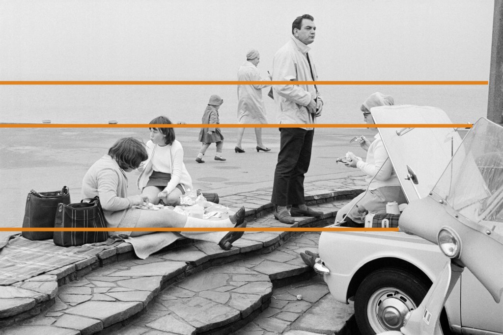
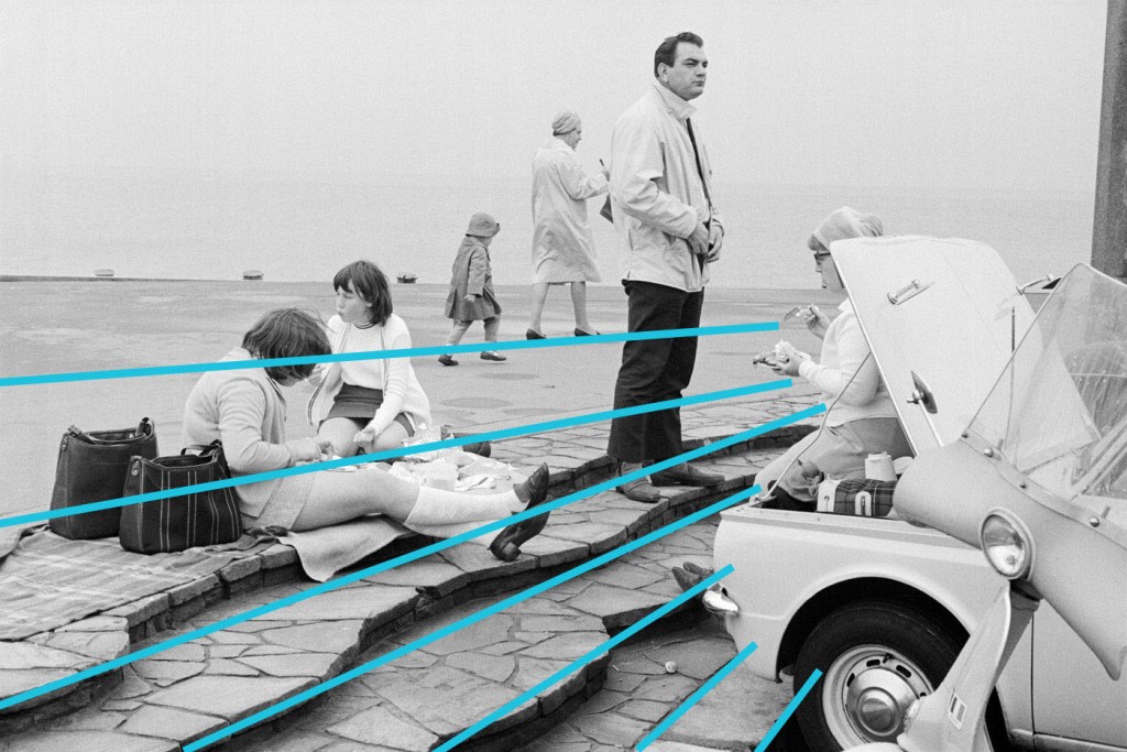
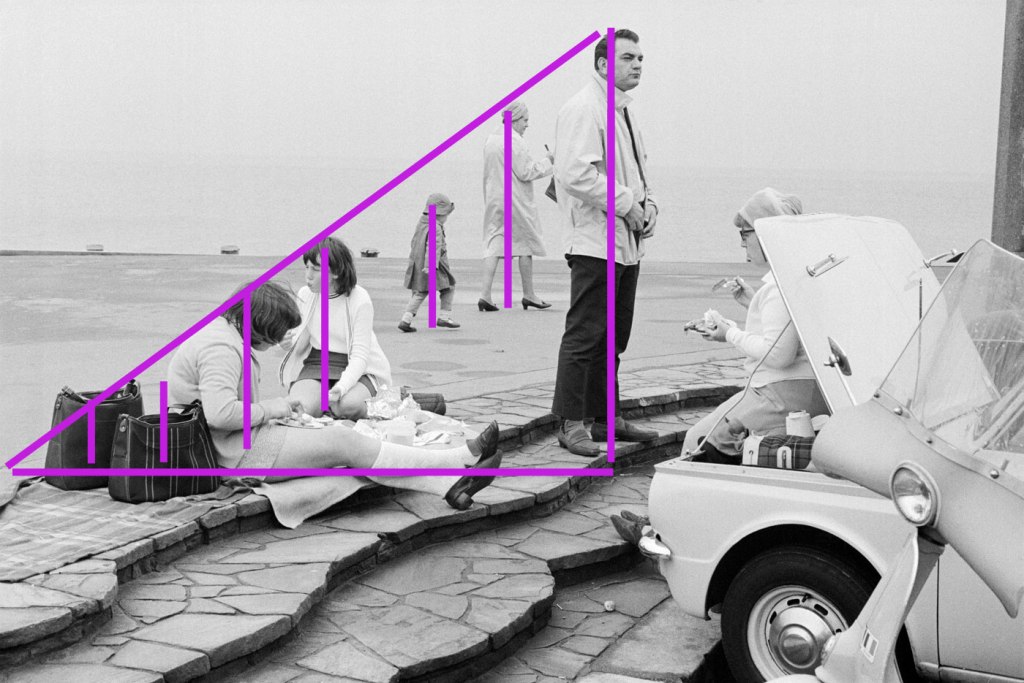
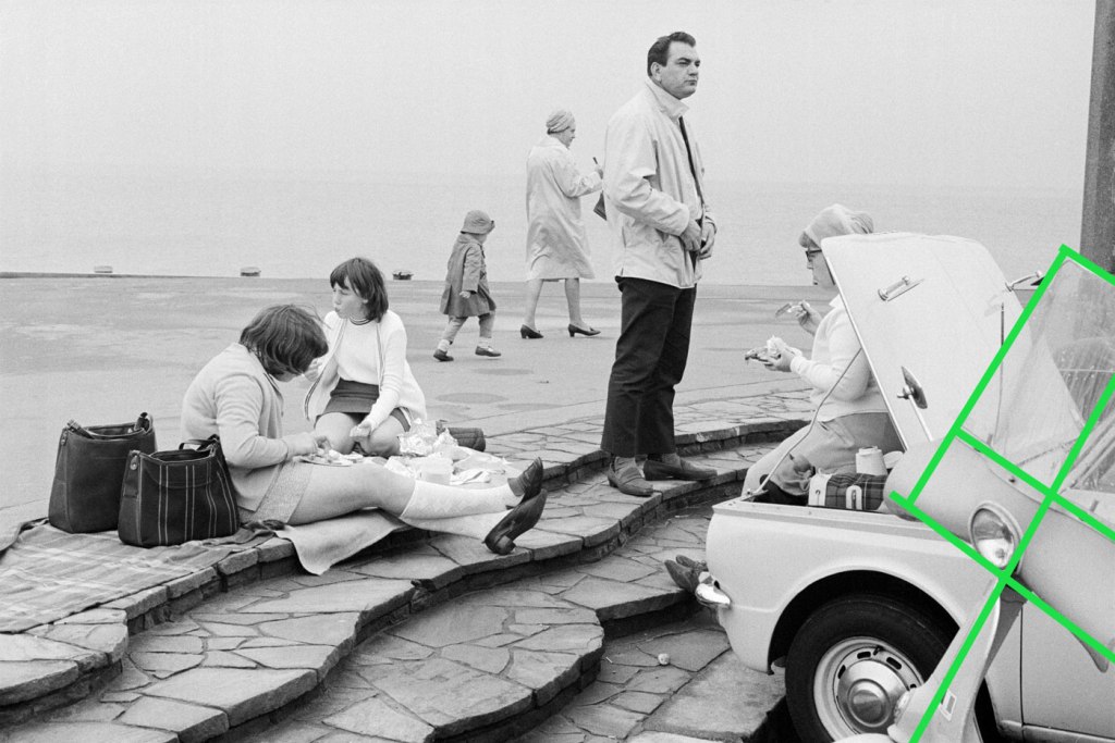
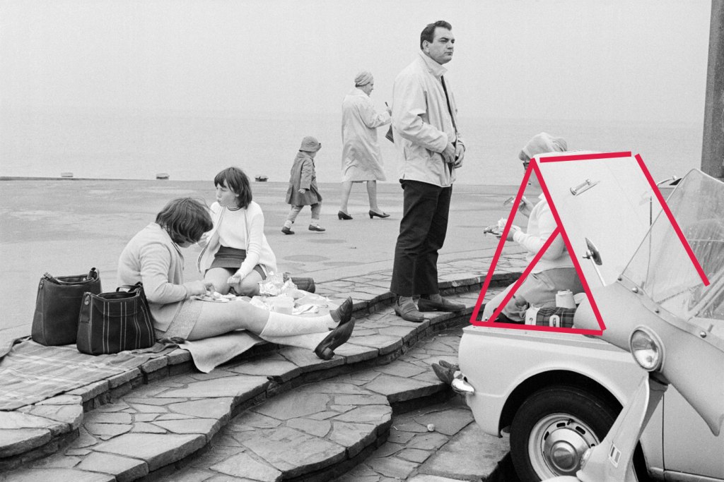
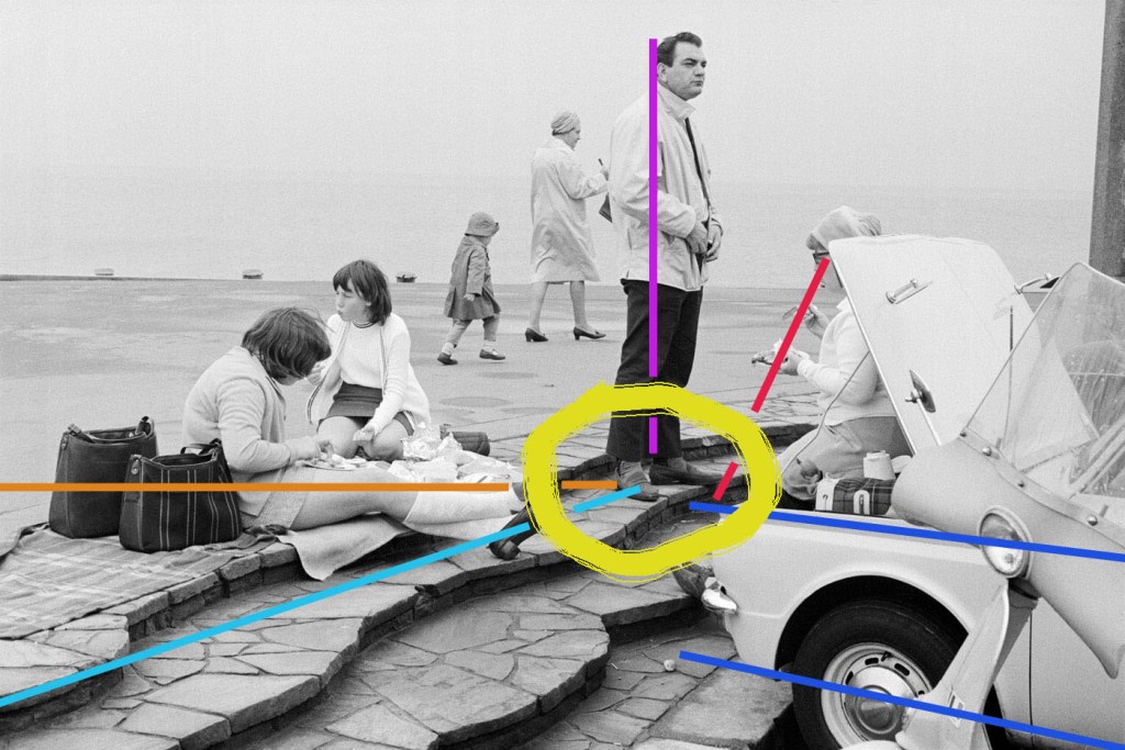
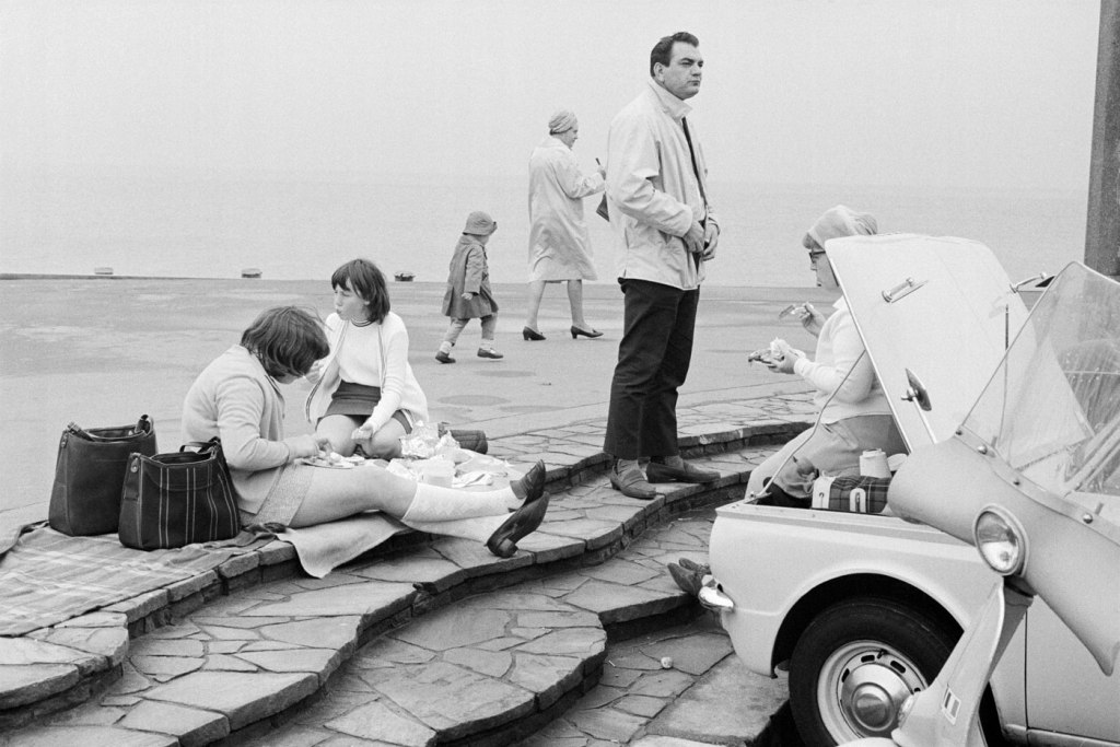
 'Bacup coconut dancers, 1968' 1968")
 'Bournemouth, 1969' 1969 from the exhibition 'Only in England: Photographs by Tony Ray-Jones and Martin Parr' at Media Space at Science Museum, London, September 2013 - March 2014")
 'Location unknown, possible Morecambe, 1967-68' 1967-1968")
 'Mablethorpe, 1967' 1967")
 'Ramsgate, 1967' 1967")
 'Mankinholes Methodist Chapel, Todmorden' 1975")
 'Cruft's Dog Show, London, 1966' 1966")
 'Dickens Festival, Broadstairs, c. 1967' c. 1967")
 'Dickens Festival, Broadstairs, c. 1967' c. 1967")
 'Wormwood Scrubs Fair, London, 1967' 1967")
 'Untitled' 1960s")
 'Trooping the Colour, London, 1967' 1967")
 'Untitled' 1960s")
 'Glyndebourne, 1967' 1967")
 'Elderly woman eating pie seated in a pier shelter next to a stuffed bear, 1969' 1969")
 'Blackpool, 1968' 1968")
 'Tom Greenwood cleaning' 1976")
 'Bicycle wheel' 1913 reconstructed 1964 (installation view detail with Dr Marcus Bunyan) from the exhibition 'Reinventing the Wheel: the Readymade Century' at the Monash University Museum of Art (MUMA), Melbourne, October - December, 2013")
 'Cadeau (Gift)' 1921 reconstructed 1970 (installation view) from the exhibition 'Reinventing the Wheel: the Readymade Century' at the Monash University Museum of Art (MUMA), Melbourne, October - December, 2013")
")
 'Battle of the plate' 1958 (installation view)")
 'Untitled (graters, Victorian iron banks)' 1990 (installation view)")
 'Untitled (graters, Victorian iron banks)' 1990 (installation view detail)")
 'Untitled (graters, Victorian iron banks)' 1990 (installation view detail)")
 'Spyrogyra' 1992 (installation view)")
 'Spyrogyra' 1992 (installation view)")
 'Spyrogyra' 1992 (installation view detail)")
 'One and three tables' 1965 (installation view)")
 'Untitled (The Warriors)' 1998 (installation view)")
 'Smile! Bauhaus babushka sundae boogie woogie (model for a prog rock SCULPTURE PARK)' 1999-2007/2013 (installation view detail)")
 'Balloon dog (Red)' 1995 designed (installation view)")
 'Stretch' 2007 (installation view)")
 'IN MY MIND I KNOW WHAT I THINK BUT THAT’S ONLY BASED ON MY EXPERIENCE' 2009 (installation view)")
 'IN MY MIND I KNOW WHAT I THINK BUT THAT’S ONLY BASED ON MY EXPERIENCE' 2009 (installation view)")
 'Mayor' 2013 (installation view)")
 'La société du spectacle brickbat' 2006 (installation view)")
 'Lady's Day' c. 1967")
 'Day at the Races' c. 1967")
 'A Day at Richmond Park' c. 1967")
 'Chatham May Queen, 1968' 1968")
 'Bacup, Lancashire, 1968' 1968")
 'Bournemouth, 1969' 1969")
 'Brighton Beach, 1967' 1967")
 'Mablethorpe, 1967' 1967")
 'Waxworks, Eastbourne, 1968' 1968")
 'Durham Miners' Gala' 1969")
 'Sunday Best' c. 1967")
 'Blackpool, 1968' 1968")
. 'He Lost His Head' Nd from the exhibition 'Faking It: Manipulated Photography Before Photoshop' at The National Gallery of Art, Washington, February - May, 2013")
 'Fading Away' 1858 from the exhibition 'Faking It: Manipulated Photography Before Photoshop' at The National Gallery of Art, Washington, February - May, 2013")
 'She Never Told Her Love' 1857")


'The Pond – Moonrise' 1904")
 'Max Ernst' 1946")
 and Josiah Johnson Hawes (American, 1808-1901) 'Seated man with Brattle Street Church seen through window' 1850s")

![Unknown photographer (American) '[Decapitated Man with Head on a Platter]' c. 1865](https://artblart.com/wp-content/uploads/2013/02/unknown-american-decapitated-man-with-head-on-a-platter-c-1865.jpg "Unknown photographer (American) '[Decapitated Man with Head on a Platter]' c. 1865")
 'Susan M. Davis' 1865")
 'Cape Horn, Columbia River, Oregon' 1867")
 'Cape Horn, Columbia River, Oregon' 1867")
 'Man in bottle' c. 1888")
 'Ein kräftiger Zusammenstoss (A Powerfull Collision)' 1914")
 'The Simulator' 1936")
 'London (Multiple Exposure Nude)' 1956")
 'Times Square, New York' 1952-1959")
 'Untitled' 1976")
 'The Other Series (After Kertész)' 1989-90")
 'The Valley of the Shadow of Death' 1855")
 'Winston Churchill' 1941")
![Roger Fenton (English, 1819-1869) 'The artist's van [Marcus Sparling, full-length portrait, seated on Roger Fenton's photographic van]' 1855](https://artblart.com/wp-content/uploads/2012/12/roger_fentons_waggon2.jpg "Roger Fenton (English, 1819-1869) 'The artist's van [Marcus Sparling, full-length portrait, seated on Roger Fenton's photographic van]' 1855")
, \"Scott S. Wigle camera\" (First American-made D-Day picture)' c. 1940")
 'War in Hawaiian Water. Japanese Torpedoes Attack Battleship Row, Pearl Harbor' December 7, 1941")
 'Embarkation of HMAT Ajana, Melbourne' July 8, 1916")
 'Kolkhoz farmer M. Nikolaïeva bids her son Ivan goodbye before he joins the partisans' 1942")
 'A US Marine drill sergeant delivers a severe reprimand to a recruit, Parris Island, South Carolina' 1970")

 'A Royal Navy sailor on board HMS Alcantara uses a portable sewing machine to repair a signal flag during a voyage to Sierra Leone' March 1942")
![T.E. Lawrence. 'Untitled [A Tulip bomb explodes on the railway Hejaz Railway, near Deraa, Hejaz, Ottoman Empire]' 1918](https://artblart.com/wp-content/uploads/2026/06/lawrence-a-tulip-bomb-explodes-on-the-railway-hejaz-railway.jpg)
 'Under German Occupation (Dutch Worker's Front), Amsterdam' c. 1940-1945")
 'September 4, Tangi valley, Wardak province, Afghanistan, a soldier of the U.S. Army 10th Mountain Division was attentively monitoring a highway' September 4, 2009")
 'Partisan Girl' 1942")
 'Soldiers of Charlie Company, 1st Battalion, 66th Armored Regiment, 4th Infantry Division react to photographer Joao Silva stepping on a mine in the Arghandab district of Kandahar Province, Afghanistan, on Oct. 23, 2010'")
 'Supporting troops of the 1st Australian Division walking on a duckboard track' 1917")

 'Drivers from the French ambulance corps near the front, waiting to be called' Italy, 1944")
 'Muchachos Await Counter Attack by The National Guard, Matagalpa, Nicaragua' 1978")
 'Australians approached the strong point, ready to rush in from different sides' November 3, 1942")
 'Over the Top – American Troops Move onto the Beach at Iwo Jima' 1945")
 'Over the Top - American Troops Move onto the Beach at Iwo Jima' February 19, 1945")
 'Attack – Eastern Front WWII' 1941")

 'Dying Infant Found by American Soldiers in Saipan' June 1944")
 'The body of an American paratrooper killed in action in the jungle near the Cambodian border is raised up to an evacuation helicopter, Vietnam' 1966")
 'Gulf War: Incinerated Iraqi soldier in personnel carrier' Nasiriyah, Iraq, March 1991")
 'Angle of North Taku Fort at which the French entered' August 21-22, 1860")
 'Shell-shocked US soldier awaiting transportation away from the front line' Hue, Vietnam, 1968")
 'American Soldier Grieving for Comrade' Iraq, 1991")
 'Untitled (prisoner #389 of the Khmer Rouge; man)' 1975-79")
 'Old Glory Goes Up on Mount Suribachi, Iwo Jima' February 23, 1945")


 'Seaweed brooch' French, about 1908")
 'Hair ornament with antennae' c. 1900")
 'Japanesque brooch' French, about 1925")
 American, about 1860")
 'Marsh-bird brooch' 1901-1902")

 'English Arts and Crafts brooch' 1908")


 'Dancing in Peckham' 1994")
 'Self Portrait at 17 Years Old' 2003")

 'HELP' 1992-1993")
 'I'M DESPERATE' 1992-1993")
 'WILL BRITAIN GET THROUGH THIS RECESSION?' 1992-1993")
 'Bully' 2010")
")
 '2 into 1' 1997")
 'Trauma' 2000")
 'Me as Cahun Holding a Mask of My Face' 2012")

 'Me as Sander' 2012")
 'Standard Station, Amarillo, Texas' 1963")
 'Stage II' 1959")
 'Car Hood' 1964")
 'The Phrenologer's Window' 1966")
 'Untitled (Venice)' 1967")
 'Vector' 1968")
 '100 BOOTS Move On' 1971-1973")
 'Berlin Red' 1969-1970")
 'Semina Cover with Wife (Photograph of Shirley Berman)' 1959")
 'Malin Residence, \"Chemosphere”' 1960")
 'Case Study House #22' 1960")
 'Peace Tower' 1966")
 'Cloud Box (Large)' 1966")
 'Ed Bereal in His Studio' c. 1961")
 'A Bigger Splash' 1967")
 'Untitled (Verifax Collage)' 1969")
 'New Brighton, England' from the series 'The Last Resort' 1983-1985")

 'New Brighton, England' from the series 'The Last Resort' 1983-1985")
 'Blackrock Tourist Park, South Hedland, Australia, 2011' from the series 'Australia' 2011")
 'Ascot, England, 2003' from the series 'Luxury' 1995-2009")
 'The Melbourne Cup, Australia, 2008' from the series 'Luxury' 1995-2009")
 'Ramsgate, England, 1996' from the series 'New British' 1994-1996")
 'Car boot sale, Bristol, England, 1995' from the series 'British Food' 1994-1995")

You must be logged in to post a comment.