Here’s my pick of the nine best exhibitions in Melbourne (with excursions to Bendigo and Hobart thrown in) that appeared on the Art Blart art and cultural archive in 2011. Enjoy!
Sidney Nolan (Australian, 1917-1992) Untitled (calf carcass in tree) 1952 Archival inkjet print 23.0 cm x 23.0cm
This was a superb exhibition of 61 black and white photographs by Sidney Nolan. The photographs were shot using a medium format camera and are printed in square format from the original 1952 negatives.
The work itself was a joy to behold. The photographs hung together like a symphony, rising and falling, with shape emphasising aspects of form. The images flowed from one to another. The formal composition of the mummified carcasses was exemplary, the resurrected animals (a horse, for example, propped up on a fifth leg) and emaciated corpses like contemporary sculpture. The handling of the tenuous aspects of human existence in this uniquely Australian landscape was also a joy to behold. Through an intimate understanding of how to tension the space between objects within the frame Nolan’s seemingly simple but complex photographs of the landscape are previsualised by the artist in the mind’s eye before he even puts the camera to his face.
2/ Bill Henson at Tolarno Galleries, Melbourne, March – April 2011
This was an exquisite exhibition by one of Australia’s preeminent artists. Like Glenn Gould playing a Bach fugue, Bill Henson is grand master in the performance of narrative, structure, composition, light and atmosphere. The exhibition featured thirteen large colour photographs printed on lustre paper (twelve horizontal and one vertical) – nine figurative of adolescent females, two of crowd scenes in front of Rembrandt paintings in The Hermitage, St. Petersburg (including the stunning photograph that features The return of the prodigal son c. 1662 in the background, see below) and two landscapes taken off the coast of Italy. What a journey this exhibition took you on!
Henson’s photographs have been said by many to be haunting but his images are more haunted than haunting. There is an indescribable element to them (be it the pain of personal suffering, the longing for release, the yearning for lost youth or an understanding of the deprecations of age), a mesmeric quality that is not easily forgotten. The photographs form a kind of afterimage that burns into your consciousness long after the exposure to the original image has ceased. Haunted or haunting they are unforgettable.
Bill Henson (Australian, b. 1955) Untitled 2009/10 CL SH767 N17B Archival inkjet pigment print 127 x 180cm Edition of 5
3/ Networks (cells & silos) at Monash University Museum of Art (MUMA), Caulfield, February – April 2011
This was a vibrant and eclectic exhibition at MUMA, one of the best this year in Melbourne. The curator Geraldine Barlow gathered together some impressive, engaging works that were set off to good effect in the new gallery spaces. I spent a long and happy time wandering around the exhibition and came away visually satiated and intellectually stimulated. The exhibition explored “the connections between artistic representation of networks; patterns and structures found in nature; and the rapidly evolving field of network science, communications and human relations.”
Installation photograph of one of the galleries in the exhibition NETWORKS (cells & silos) at the newly opened Monash University Museum of Art (MUMA) with Nick Mangan’s Colony (2005) in the foreground
This was a stupendous exhibition by Monika Tichacek, at Karen Woodbury Gallery. One of the highlights of the year, this was a definite must see!
The work was glorious in it’s detail, a sensual and visual delight (make sure you click on the photographs to see the close up of the work!). The riotous, bacchanalian density of the work was balanced by a lyrical intimacy, the work exploring the life cycle and our relationship to the world in gouache, pencil & watercolour. Tichacek’s vibrant pink birds, small bugs, flowers and leaves have absolutely delicious colours. The layered and overlaid compositions show complete control by the artist: mottled, blotted, bark-like wings of butterflies meld into trees in a delicate metamorphosis; insects are blurred becoming one with the structure of flowers in a controlled effusion of life.
Monika Tichacek (Australian born Switzerland, b. 1975) To all my relations (detail) 2011
This was a fabulous survey exhibition of the great artists of 20th century American photography, a rare chance in Australia to see such a large selection of vintage prints from some of the masters of photography. If you had a real interest in the history of photography then you hopefully saw this exhibition, showing as it is just a short hour and a half drive (or train ride) from Melbourne at Bendigo Art Gallery.
6/ Time Machine: Sue Ford at Monash Gallery of Art, Wheelers Hill, Victoria, April – June 2011
Sue Ford (Australian, 1943-2009) Self-portrait 1976 1976 From the series Self-portrait with camera (1960-2006) Selenium toned gelatin silver print, printed 2011 24 x 18cm Courtesy Sue Ford Archive
This beautifully hung exhibition flowed like music, interweaving up and down, the photographs framed in thin, black wood frames. It featured examples of Ford’s black and white fashion and street photography; a selection of work from the famous black and white Time series (being bought for their collection by the Art Gallery of New South Wales); a selection of Photographs of Women – modern prints from the Sue Ford archive that are wonderfully composed photographs with deep blacks that portray strong, independent, vulnerable, joyous women (see last four photographs below); and the most interesting work in the exhibition, the posthumous new series Self-portrait with camera (1960-2006) that evidence, through a 47 part investigation using colour prints from Polaroids, silver gelatin prints printed by the artist, prints made from original negatives and prints from scanned images where there was no negative available, a self-portrait of the artist in the process of ageing.
Whether looking down, looking toward or looking inward these fantastic photographs show a strong, independent women with a vital mind, an élan vital, a critical self-organisation and an understanding of the morphogenesis of things that will engage us for years to come. Essential looking.
My analogy: you are standing in the half-dark, your chest open, squeezing the beating heart with blood coursing between your fingers while the other hand is up your backside playing with your prostrate gland. I think ringmeister David Walsh would approve. My best friends analogy: a cross between a car park, night club, sex sauna and art gallery.
Weeks later I am still thinking about the wonderful immersive, sensory experience that is MONA. Peter Timms in an insightful article in Meanjin calls it a post-Google Wunderkammer, or wonder chest. It can be seen as a mirabilia – a non-historic installation designed primarily to delight, surprise and in this case shock. The body, sex, death and mortality are hot topics in the cultural arena and Walsh’s collection covers all bases. The collection and its display are variously hedonistic, voyeuristic, narcissistic, fetishistic pieces of theatre subsumed within the body of the spectacular museum architecture …
Spectatorship and their attendant erotics has MONA as a form of fetishistic cinema. It is as if what Barthes calls “the eroticism of place” were a modern equivalent of the eighteenth century genius loci, the “genius of the place.” The place is spectacular, the private collection writ large as public institution, the symbolic power of the institution masked through its edifice. The art become autonomous, cut free from its cultural associations, transnational, globalised, experienced through kinaesthetic means; the viewer meandering through the galleries, the anti-museum, as an international flaneur. Go. Experience!
Corten Stairwell & Surrounding Artworks February 2011 Museum of Old and New Art – interior Photo credit: MONA/Leigh Carmichael Image Courtesy of MONA Museum of Old and New Art
John Bodin (Australian) I Was Far Away From Home 2009 Type C print on metallic paper 80 x 110cm
The photographs become the surface of the body, stitched together with lines, markers pointing the way – they are encounters with the things that we see before us but also the things that we carry inside of us. It is the interchange between these two things, how one modulates and informs the other. It is this engagement that holds our attention: the dappled light, ambiguity, unevenness, the winding path that floats and bobs before our eyes looking back at us, as we observe and are observed by the body of these landscapes.
One of the fundamental qualities of the photographs is that they escape our attempts to rationalise them and make them part of our understanding of the world, to quantify our existence in terms of materiality. I have an intimate feeling with regard to these sites of engagement. They are both once familiar and unfamiliar to us; they possess a sense of nowhereness. A sense of groundlessness and groundedness. A collapsing of near and far, looking down, looking along, a collapsing of the constructed world.
Like the road in these photographs there is no self just an infinite time that has no beginning and no end. The time before my birth, the time after my death. We are just in the world, just being somewhere. Life is just a temporary structure on the road from order to disorder. “The road is life,” writes Jack Kerouac in On the Road.
Simply put, this was one of the best exhibitions I saw in Melbourne this year.
I had a spiritual experience with this work for the paintings promote in the human a state of grace. The non-material, the unconceptualisable, things which are outside all possibility of time and space are made visible. This happens very rarely but when it does you remember, eternally, the time and space of occurrence. I hope you had the same experience.
Curated by Naomi Cass as part of the Melbourne Festival, this was a brilliant exhibition at the Centre for Contemporary Photography, Melbourne. The exhibition explored, “the fraught relationship between the camera and the subject: where the image is stolen, candid or where the unspoken contract between photographer and subject is broken in some way – sometimes to make art, sometimes to do something malevolent.” It examined the promiscuity of gazes in public / private space specifically looking at surveillance, voyeurism, desire, scopophilia, secret photography and self-reflexivity. It investigated the camera and its moral and physical relationship to the unsuspecting subject.
This is one of the best exhibitions this year in Melbourne bar none. Edgy and eclectic the work resonates with the viewer in these days of uncertainty: THIS should have been the Winter Masterpieces exhibition!
The title of the exhibition, The mad square (Der tolle Platz) is taken from Felix Nussbaum’s 1931 painting of the same name where “the ‘mad square’ is both a physical place – the city, represented in so many works in the exhibition, and a reference to the state of turbulence and tension that characterises the period.”The exhibition showcases how artists responded to modern life in Germany in the interwar years, years that were full of murder and mayhem, putsch, revolution, rampant inflation, starvation, the Great Depression and the rise of National Socialism. Portrayed is the dystopian, dark side of modernity (where people are the victims of a morally bankrupt society) as opposed to the utopian avant-garde (the prosperous, the wealthy), where new alliances emerge between art and politics, technology and the mass media. Featuring furniture, decorative arts, painting, sculpture, collage and photography in the sections World War 1 and the Revolution, Dada, Bauhaus, Constructivism and the Machine Aesthetic, Metropolis, New Objectivity and Power and Degenerate Art, it is the collages and photographs that are the strongest elements of the exhibition, particularly the photographs. What a joy they are to see.
Albert Renger-Patzsch (American born Hungary, 1895-1946) Harbour with crane c. 1927 Gelatin silver photograph Printed image 22.7 h x 16.8 w cm Purchased 1983 National Gallery of Australia, Canberra
What a great piece of writing by Peter Roebuck (below). Such insight into the human condition, so eloquently expounded.
Wise words about life. His wisdom will be greatly missed.
Dr Marcus Bunyan
“We are, indeed, shadows passing across the mouth of a cave.”
“If perspective insists that our daily lives are not important, then it is a fool”
Marcus Bunyan (Australian, b. 1958) Woody’s room, 226 Punt Road, Prahran
1993
Silver gelatin print
NOTHING is sadder than the extinguishing of a young life. Besides the loss itself, and the pain that follows, the premature ending of a life serves as a shock, reminds of the fragility and foolishness of our existences. When Princess Di died, her country temporarily became a better place. When David Hookes departed, the sorrow reached beyond his immediate circle and into the masses.
Not that it lasts. Still we complain about traffic wardens and shampoo bottles that will not open, and the weather, and the neighbours and taxes and noise and the rest of it. An then a child dies, or a friend is suddenly removed, or a familiar face vanishes, whereupon regret comes over us for the life unled.
Do not suppose your author is any wiser in these regards than anyone else. Everything works in theory and then a drill starts in a nearby house, or a traffic jam is encountered, or a queue, whereupon reason flies out the window. Rage resumes till someone is lost, a depressed youngster or an acquaintance amid a screeching of brakes, whereupon calm returns, for then the truth must be faced. We are, indeed, shadows passing across the mouth of a cave.
It is absurd that we take ourselves and our lives seriously when it all hangs by a thread. Yet it is likewise foolish to waste gifts, for they carry with them a certain responsibility. Without intensity, much less can be achieved. A man cannot spend his entire life with a gaga grin upon his face. Blood, sweat and tears are part of the human expression, part of our growth, and there is no need to regret their place in our lives. Mozart and Tendulkar have provided myriad delights because they dared to pursue their talents.
Often it is the striving that provided satisfaction and then follows the laughter and the strength. If perspective insists that our daily lives are not important, then it is a fool. Nevertheless, much can be missed along the way and it can take an untimely passing to remind us that we are, in so many ways, behaving like fools.
Edited extract of a piece penned by Peter Roebuck after the death of cricketer David Hookes in January 2004
Author and journalist Peter Roebuck fell to his death from a balcony in South Africa in November 2011
Irene Bayer (American, 1898-1991) No title (Man on stage) c. 1927 Gelatin silver photograph Printed image 10.6 h x 7.6 w cm Purchased 1983 National Gallery of Australia, Canberra
This is one of the best exhibitions this year in Melbourne bar none. Edgy and eclectic the work resonates with the viewer in these days of uncertainty: THIS should have been the Winter Masterpieces exhibition!
The title of the exhibition, The mad square (Der tolle Platz) is taken from Felix Nussbaum’s 1931 painting of the same name where “the ‘mad square’ is both a physical place – the city, represented in so many works in the exhibition, and a reference to the state of turbulence and tension that characterises the period.” The exhibition showcases how artists responded to modern life in Germany in the interwar years, years that were full of murder and mayhem, putsch, revolution, rampant inflation, starvation, the Great Depression and the rise of National Socialism. Portrayed is the dystopian, dark side of modernity (where people are the victims of a morally bankrupt society) as opposed to the utopian avant-garde (the prosperous, the wealthy), where new alliances emerge between art and politics, technology and the mass media. Featuring furniture, decorative arts, painting, sculpture, collage and photography in the sections World War 1 and the Revolution, Dada, Bauhaus, Constructivism and the Machine Aesthetic, Metropolis, New Objectivity and Power and Degenerate Art, it is the collages and photographs that are the strongest elements of the exhibition, particularly the photographs. What a joy they are to see.
There is a small 2″ x 3″ contact print portrait of Hanna Höch by Richard Kauffmann, Penetrate yourself or: I embrace myself (1922) that is an absolute knockout. Höch is portrayed as the ‘new women’ with short bobbed hair and loose modern dress, her self-image emphasised through a double exposure that fragments her face and multiplies her hands, set against a contextless background. The ‘new women’ fragmented and broken apart (still unsure of herself?). The photograph is so small and intense it takes your breath away. Similarly, there is the small, intimate photograph No title (Man on Stage) (c. 1927) by Irene Bayer (see above) that captures performance as ‘total art’, a combination of visual arts, dance, music, architecture and costume design. In contrast is a large 16 x 20″ photograph of the Bauhaus balconies (1926) by László Moholy-Nagy (see below) where the whites are so creamy, the perspective so magnificent.
No title (Metalltanz) (c. 1928-1929) by T. Lux Feinenger, a photographer that I do not know well, is an exceptional photograph and print. Again small, this time dark and intense, the image features man as dancer performing gymnastics in front of reflective, metal sculptures. The metal becomes an active participant in the Metalltanz or ‘Dance in metal’ because of its reflective qualities. The print, from the J. Paul Getty Museum in Los Angeles is luminous. In fact all the prints from the Getty in this exhibition are of the most outstanding quality, a highlight of the exhibition for me. Another print from the Getty that features metal and performance is Untitled(Spiral Costume, from the Triadic Ballet) by T Grill c. 1926-1927 (see below) where the spiral costume becomes an extension of the body, highlighting its form. Also highlighting form, objectivity and detachment is a wonderful 3 x 5″ photograph of the New Bauhaus Building, Dessau (1926) by Lucia Moholy from the Getty collection, the first I have ever seen in the flesh by this artist. Outstanding.
Following, we have 4 photograms by Lucia’s husband, László Moholy-Nagy which display formalist experimentation “inspired by machine aesthetic, exploring a utopian belief that Constructivism and abstract art could play a role in the process of social reform.” Complimenting these photograms is a row of six, yes six! Moholy-Nagy including Dolls (Puppen)1926-1927 (Getty), The law of the series 1925 (Getty), Lucia at the breakfast table 1926 (Getty), Spring, Berlin 1928 (George Eastman House), Berlin Radio Tower1928 (Art Institute of Chicago) and Light space modulator1930 (Getty). All six photographs explore the fascinating relationship between avant-garde art and photography, between they eye and perspective, all the while declaiming what Moholy-Nagy called the “new vision”; angles, shadows and geometric patterns that defy traditional perspective “removing the space from associations with the real world creating a surreal, disjointed image.” This topographic mapping flattens perspective in the case of the Berlin radio tower allowing the viewer to see the world in a new way.
Finally two groups of photographs that are simply magnificent.
First 8 photographs in a row that focus on the order and progressive nature of the modern world, the inherent beauty of technology captured in formalist studies of geometric forms. The prints range from soft pictorialist renditions to sharp clarity. The quality of the prints is amazing. Artists include the wonderful E. O. Hoppé, Albert Renger-Patzsch (an outstandingly beautiful photograph, Harbour with cranes 1927 that is my favourite photograph in the exhibition, see below), Two Towers 1937-1938 by Werner Mantz and some early Wolfgang Sievers before he left Germany for Australia in 1938 (Blast furnace in the Ruhr, Germany 1933, see below). These early Sievers are particularly interesting, especially when we think of his later works produced in Australia. Lucky were many artists who survived in Germany or fled from Nazi persecution at the last moment, including John Heartfield who relocated to Czechoslovakia in 1933 and then fled to London in 1938 and August Sander whose life and work were severely curtailed under the Nazi regime and whose son died in prison in 1944 near the end of his ten year sentence (Wikipedia).
August Sander. Now there is a name to conjure with. The second magnificent group are 7 photographs that are taken from Sander’s seminal work People of the 20th Century. All the photographs have soft, muted tones of greys with no strong highlights and, usually, contextless backgrounds. The emphasis is on archetypes, views of people who exist on the margins of society – circus performers, bohemians, artists, the unemployed and blind people. In all the photographs there is a certain frontality (not necessarily physical) to the portraits, a self consciousness in the sitter, a wariness of the camera and of life. This self consciousness can be seen in the two photographs that are the strongest in the group – Secretary at West German radio in Cologne, 1931 and Match seller 1927 (see below).
There is magic here. Her face wears a somewhat quizzical air – questioning, unsure, vulnerable – despite the trappings of affluence and fashionability (the smoking of the cigarette, the bobbed hair). He is wary of the camera, his face and hands isolated by Sander while the rest of his body falls into shadow. His right hand is curled under, almost deformed, his shadow falling on the stone at right, the only true brightness in this beautiful image the four boxes of matches he clutches in his left hand: as Sander titles him ironically, The Businessman.
Working as I do these days with lots of found images from the 1940s-1960s that I digitally restore to life, I wonder what happened to these people during the dark days of World War 2. Did they survive the cataclysm, the drop into the abyss? I want to know, I want to reach out to these people to send them good energy. I hope that they did but their wariness in front of the camera, so intimately ‘taken’ by Sander, makes me feel the portent of things to come. How differently we see images armed with the hindsight of history!
In conclusion, this is a fantastic exhibition that will undoubtedly be in my top ten of the year for Melbourne in 2011.
Dr Marcus Bunyan
Many thankx to Michael Thorneycroft for his help and The National Gallery of Victoria for allowing me to publish the accredited photographs in the posting. Please click on the photographs for a larger version of the image.
Felix Nussbaum (German, 1904 – after September 1944) The mad square (Der tolle Platz) 1931 Oil on canvas 97 x 195.5cm Berlinische Galerie Public domain
Over the winter and spring of 1927-1928, Bauhaus professor László Moholy-Nagy took a series of perhaps nine views looking down from the Berlin Radio Tower, one of the most exciting new constructions in the German capital. Moholy had already photographed the Eiffel Tower in Paris from below, looking up through the tower’s soaring girders. In Berlin, however, Moholy turned his camera around and pointed it straight down at the ground. This plunging perspective showed off the spectacular narrowness of the Radio Tower, finished in 1926, which rose vertiginously to a height of 450 feet from a base seven times smaller than that of its Parisian predecessor (which opened in 1889). Moholy attached exceptional importance to this, his boldest image: he hung it just above his name in a room devoted to his work at the Berlin showing of Film und Foto, a mammoth traveling exhibition that he had helped to prepare. Moholy also chose this view and one other to offer Julien Levy, the pioneering art dealer, when Levy visited him in Berlin in 1930. The following year the pictures went on view at the Levy Gallery in New York, in Moholy’s first solo exhibition of photographs.
The Light-Space Modulator is the most spectacular and complete realisation of László Moholy-Nagy’s artistic philosophy. Machine parts and mechanical structures began to appear in his paintings after his emigration from Hungary, and they are also seen in the illustrations he selected for the 1922 Buch neuer Künstler (Book of new artists), which includes pictures of motorcars and bridges as well as painting and sculpture. Many contemporary artists incorporated references to machines and technology in their work, and some, like the Russian Constructivist Vladimir Tatlin, even designed plans for fantastic structures, such as the ambitious Monument to the Third International, a proposed architectural spiral of glass and steel with moving tiers and audiovisual broadcasts. (See Tatlin’s Tower.)
In the Light-Space Modulator, Moholy-Nagy was able to create an actual working mechanism. Although he censured capitalism’s inhumane use of technology, he believed it could be harnessed to benefit mankind and that the artist had an important role in accomplishing this. Moholy had made preliminary sketches for kinetic sculptures as early as 1922 and referred to the idea for a light machine in his writings, but it was not until production was financed by an electric company in Berlin in 1930 that this device was built, with the assistance of an engineer and a metalsmith. It was featured at the Werkbund exhibition in Paris the same year, along with the short film Light Display Black-White-Gray, made by Moholy-Nagy to demonstrate and celebrate his new machine.
The Light-Space Modulator is a Moholy-Nagy painting come to life: mobile perforated disks, a rotating glass spiral, and a sliding ball create the effect of photograms in motion. With its gleaming glass and metal surfaces, this piece (now in the collection of the Busch-Reisinger Museum at Harvard University) is not only a machine for creating light displays but also a sculptural object of beauty, photographed admiringly by its creator.
Albert Renger-Patzsch (American born Hungary, 1895-1946) Harbour with crane c. 1927 Gelatin silver photograph Printed image 22.7 h x 16.8 w cm Purchased 1983 National Gallery of Australia, Canberra
Wolfgang Sievers (Germany 1913 – Australia 2007) Blast furnace in the Ruhr, Germany 1933 Gelatin silver photograph 27.5 h x 23 w cm Purchased 1988 National Gallery of Australia, Canberra
The Ruhr region was at the centre of the German acceleration of industry in pre-war Germany, with rapid economic growth creating a heavy demand for coal and steel. In keeping with Modernist trends in photography, Sievers shot this blast furnace – the mechanism that transforms ore into metal – from an unusual, dynamic angle. It dominates the frame, appearing menacing and strange. Despite being imprisoned and beaten by the Gestapo, Sievers studied and taught at a progressive private art school until graduation in 1938. In that year he escaped Germany after being called up for military service, ending up in Australia.
August Sander (German, 1876-1964) Match seller 1927 From the portfolio People of the 20th century, IV Classes and Professions, 17 The Businessman
Robert Wiene, Director (German 1873-1938) Still from from the Cabinet of Dr Caligari 1919 5 min excerpt, 35mm transferred to DVD, Black and White, silent, German subtitles Courtesy Transit Film GmbH Production still courtesy of the British Film Institute and Transit Film GmbH
Hannah Höch (German, 1889-1978) Love 1931 From the series Love Photomontage 21.8 x 21cm National Gallery of Australia, Canberra Purchased, 1983
Hannah Höch made some of the most interesting Dada collages and photomontages, including Love, an image of two strange composite female. Höch’s technique of pasting images together from magazine clippings and advertisements was a response to the modern era of mass media, and a way of criticising the bourgeois taste for ‘high art’. In many of her works, Höch explores the identity and changing roles of women in modern society.
The Mad Square takes its name from Felix Nussbaum’s 1931 painting which depicts Berlin’s famous Pariser Platz as a mad and fantastic place. The ‘mad square’ is both a physical place – the city, represented in so many works in the exhibition, and a reference to the state of turbulence and tension that characterises the period. The ‘square’ can also be a modernist construct that saw artists moving away from figurative representations towards increasingly abstract forms.
The exhibition features works by Max Beckman, Otto Dix, George Grosz, Christian Schad, Kurt Schwitters and August Sander. This group represents Germany’s leading generation of interwar artists. Major works by lesser known artists including Karl Hubbuch, Rudolf Schlichter and Hannah Höch are also presented in the exhibition in addition to works by international artists who contributed to German modernism.
The Mad Square brings together a diverse and extensive range of art, created during one of the most important and turbulent periods in European history, offering new insights into the understanding of key German avant‐garde movements including – Expressionism, Dada, Bauhaus, Constructivism, and New Objectivity were linked by radical experimentation and innovation, made possible by an unprecedented freedom of expression.
World War 1 and the Revolution
The outbreak of war in 1914 was met with enthusiasm by many German artists and intellectuals who volunteered for service optimistically hoping that it would bring cultural renewal and rapid victory for Germany. The works in this section are by the generation of artists who experienced war first hand. Depictions of fear, anxiety and violence show the devastating effects of war – the disturbing subjects provide insight into tough economic conditions and social dysfunction experienced by many during the tumultuous early years of the Weimar Republic following the abdication of the Kaiser
Dada
The philosophical and political despair experienced by poets and artists during World War 1 fuelled the Dada movement, a protest against the bourgeois conception of art. Violent, infantile and chaotic, Dada took its name from the French word for a child’s hobbyhorse or possibly from the sound of a baby’s babble. Its activities included poetry readings and avant‐garde performances, as well as creating new forms of abstract art that subverted all existing conditions in western art. Though short‐lived, in Germany the Dada movement has profoundly influenced subsequent developments in avant-garde art and culture. The impact of the Dada movement was felt throughout Europe – and most powerfully in Germany from 1917-21.
Bauhaus
The Bauhaus (1919‐1933) is widely considered as the most important school of art and design of the 20th century, very quickly establishing a reputation as the leading and most progressive centre of the international avant‐garde. German architect Walter Gropius founded the school to do away with traditional distinctions between the fine arts and craft, and to forge an entirely new kind of creative designer skilled in both the conceptual aesthetics of art and the technical skills of handicrafts. The Bauhaus was considered to be both politically and artistically radical from its inception and was closed down by the National Socialists in 1933
Constructivism and the Machine Aesthetic
Having emerged in Russia after World War I, Constructivism developed in Germany as a set of ideas and practices that experimented with abstract or non-representational forms and in opposition to Expressionism and Dada. Constructivists developed works and theories that fused art and with technology. They shared a utopian belief in social reform, and saw abstract art as playing a central role in this process.
Metropolis
By the 1920s Berlin has become the cultural and entertainment capital of the world and mass culture played an important role in distracting a society traumatised by World War 1, the sophisticated metropolis provided a rich source of imagery for artists, it also come to represent unprecedented sexual and personal freedom. In photography modernity was emphasised by unusual views of the metropolis or through the representation of city types. The diverse group of works in this section portray the uninhibited sense of freedom and innovation experienced by artists throughout Germany during the 1920s
New Objectivity
By the mid 1920s, a new style emerged that came to be known as Neue Sachlichkeit or New Objectivity. After experiencing the atrocities of World War 1 and the harsh conditions of life in postwar Germany, many artists felt the need to return to the traditional modes of representation with portraiture becoming a major vehicle of this expression, with its emphasis on the realistic representation of the human figure
Power and Degenerate Art
After the seizure of power by the National Socialists in 1933 modern artists were forbidden from working and exhibiting in Germany, with their works confiscated from leading museums and then destroyed or sold on the international art market. Many avant‐garde artists were either forced to leave Germany or retreat into a state of ‘inner immigration’.
The Degenerate art exhibition, held in Munich in 1937, represented the culmination of the National Socialists’ assault on modernism. Hundreds of works were selected for the show which aimed to illustrate the mental deficiency and moral decay that had supposedly infiltrated modern German art. The haphazard and derogatory design of the exhibition sought to ridicule and further discredit modern art. Over two million people visited the exhibition while in contrast far fewer attended the Great German art exhibition which sought to promote what the Nazis considered as ‘healthy’ art.
Karl Grill (German active Donaueschingen, Germany 1920s) Untitled (Spiral Costume, from the Triadic Ballet) c. 1926-1927 Gelatin silver print 22.5 x 16.2cm J. Paul Getty Museum, Los Angeles
In 1922, Oskar Schlemmer premiered his “Triadic Ballet” in Germany. He named the piece “Triadic” because it was literally composed of multiples of three: three acts, colours, dancers, and shapes. Concentrating on its form and movement, Schlemmer explored the body’s spatial relationship to its architectural surroundings. Although an abstract design, the spiral costume derived from the tutus of classical ballet.
~ Berlin’s population doubles to two million people
1911
~ Expressionists move from Dresden to Berlin
1912
~ Social Democratic Party (SPD) the largest party in the Reichstag
1913
~ Expressionists attain great success with their city scenes
1914
~ World War I begins ~ George Grosz, Oskar Schlemmer, Otto Dix, Ludwig Hirschfeld Mack, Ernst Ludwig Kirchner, Max Beckmann and Franz Marc enlist in the army
1915
~ Grosz declared unfit for service, Beckmann suffers a breakdown and Schlemmer wounded
1916
~ Marc dies in combat ~ Dada begins at Cabaret Voltaire in Zurich
1917
~ Lenin and Trotsky form the Soviet Republic after the Tzar is overthrown
1918
~ Richard Huelsenbeck writes a Dada manifesto in Berlin ~ Kurt Schwitters creates Merz assemblages in Hanover ~ Revolutionary uprisings in Berlin and Munich ~ Kaiser Wilhelm II abdicates and flees to Holland ~ Social Democratic Party proclaims the Weimar Republic ~ World War I ends
1919
~ Freikorps assassinates the Spartacist leaders, Karl Leibknecht and Rosa Luxemburg ~ Bauhaus established in Weimer by Walter Gropius ~ Cologne Dada group formed ~ Treaty of Versailles signed
1920
~ Berlin is the world’s third largest city after New York and London ~ Inflation begins in Germany ~ National Socialist German Workers Party (NSDAP) founded ~ Kapp Putsch fails after right‐wing forces try to gain control over government ~ First International Dada fair opens in Berlin
1921
~ Hitler made chairman of the NSDAP
1922
~ Schlemmer’s Triadic ballet premiers in Stuttgart ~ Hyperinflation continues
1923
~ Hitler sentenced to five years imprisonment for leading the Beer Hall Putsch ~ Inflation decreases and a period of financial stability begins
1924
~ Hitler writes Mein Kampf while in prison ~ Reduction of reparations under the Dawes Plan
1925
~ New Objectivity exhibition opens at the Mannheim Kunsthalle ~ The Bauhaus relocates to Dessau
1926
~ Germany joins the League of Nations
1927
~ Fritz Lang’s film Metropolis released ~ Unemployment crisis worsens ~ Nazis hold their first Nuremburg party rally
1928
~ Bertolt Brecht and Kurt Weill’s The threepenny opera premieres in Berlin ~ Hannes Meyer becomes the second director of the Bauhaus
1929
~ Street confrontations between the Nazis and communists in Berlin ~ Young Plan accepted, drastically reducing reparations ~ Stock market crashes on Wall Street, New York ~ Thomas Mann awarded the Nobel Prize for literature
1930
~ Resignation of Chancellor Hermann Müller’s cabinet ending parliamentary rule ~ Minority government formed by Heinrich Brüning, leader of the Centre Party ~ Nazis win 18% of the vote and gain 95 seats in the National elections ~ Ludwig Miles van der Rohe becomes the third director of the Bauhaus ~ John Heartfield creates photomontages for the Arbeiter‐Illustrierte Zeitung (AIZ)
1931
~ Unemployment reaches five million and a state of emergency is declared in Germany
1932
~ Nazis increase their representation in the Reichstag to 230 seats but are unable to form a majority coalition ~ Miles van der Rohe moves the Bauhaus to Berlin ~ Grosz relocates to New York as an exile
1933
~ Hindenberg names Hitler as Chancellor ~ Hitler creates a dictatorship under the Nazi regime ~ The first Degenerate art exhibition denouncing modern art is held in Dresden ~ Miles van der Rohe announces the closure of the Bauhaus ~ Nazis organise book burnings in Berlin ~ Many artists including Gropius, Kandinski and Klee flee Germany ~ Beckmann, Dix and Schlemmer lose their teaching positions
1934
~ Fifteen concentration camps exist in Germany
1935
~ The swastika becomes the flag of the Reich
1936
~ Spanish civil war begins ~ Germany violates the Treaty of Versailles ~ Olympic Games held in Garmisch‐Partenkirchen and Berlin ~ Thomas Mann deprived of his citizenship and emigrates to the United States
1937
~ German bombing raids over Guernica in Spain in support of Franco ~ The Nazi’s Degenerate art exhibition opens in Munich and attracts two million visitors ~ Beckmann, Kirchner and Schwitters leave Germany ~ Purging of ‘degenerate art’ from German museums continues 1
1/ Timeline credit: Chronology compiled by Jacqueline Strecker and Victoria Tokarowski from the following sources:
~ Catherine Heroy ‘Chronology’ in Sabine Rewald, Glitter and Doom: German portraits from the 1920s, Metropolitan Museum of Art, New York, exh cat, 2006, pp. 39‐46 ~ Anton Kaes, Martin Jay and Edward Dimendberg, eds, ‘Political chronology’, The Weimar Republic sourcebook, Berkely 1994, pp. 765‐71 ~ Jonathan Petropoulos and Dagmar Lott‐Reschke ‘Chronology’ in Stephanie Barron, ‘Degenerate Art’: the fate of the avant‐garde in Nazi Germany, Los Angeles County Museum of Art, exh cat, 1991, pp. 391‐401
László Moholy-Nagy (American born Hungary, 1895-1946) Bauhaus Balconies 1926 Silver gelatin photograph
John Heartfield’s photomontages expose hidden agendas in German politics and economics of the 1920s and 30s. This image was published six months before the National Socialist Party came to power, and shows Hitler with a spine made of coins and his stomach filled with gold. The caption says that he ‘swallows gold’, alluding to generous funding by right-wing industrialists, and ‘spouts rubbish’.
Ernst Ludwig Kirchner (German, 1880-1938) Woman in hat 1911 Oil on canvas Art Gallery of Western Australia, Perth
George Grosz (German, 1893-1959) Suicide (Selbstmörder) 1916 Oil on canvas 100 × 77.5cm Tate Modern Public domain
Rudolf Schlichter (German, 1890-1955) Tingle tangel 1919-1920 Oil on canvas
George Grosz (German, 1890-1945) Tatlinesque Diagram 1920 Watercolour, collage and ink on paper 41 x 29.2cm Museo Nacional Thyssen-Bornemisza, Madrid
Otto Dix (German, 1891-1969) Dr Paul Ferdinand Schmidt 1921 Oil on canvas 63 x 82cm Staatsgalerie, Stuttgart, Germany
El Lissitzky (Russian, 1890-1941) New Man (Neuer) 1923 Color lithograph on wove paper 12 × 12 1/2 in. (30.5 × 31.8cm)
Max Beckmann (German, 1884-1950) The trapeze 1923 Oil on canvas 196.5 x 84cm Toledo Museum of Art Purchased with funds from the Libbey Endowment, Gift of Edward Drummond Libbey Photo: Photography Incorporated, Toledo
Kaho Yu (Hong Kong) Untitled from the series Infinitesimal Residual Vibration of An Unknown Sound 2009-2011
I like these photographs. There is a stillness to them that is intoxicating.
The wonderful quotation by Charles Babbage (the air as a form of perpetual palimpsest) coupled with Yu’s insight that he sought to capture – through long time exposure – those infinitesimal residual movements of voice and sound trapped in the diffused movements of all the particles in the atmosphere, compliment the work.
These are intelligent, emotive, quiet photographs.
Kaho Yu (Hong Kong) Untitled From the series Infinitesimal Residual Vibration of An Unknown Sound 2009-2011
Kaho Yu (Hong Kong) Untitled From the series Infinitesimal Residual Vibration of An Unknown Sound 2009-2011
Kaho Yu (Hong Kong) Untitled Fom the series Infinitesimal Residual Vibration of An Unknown Sound 2009-2011
“The air is one vast library, on whose pages are for ever written all that man has ever said or woman whispered. There, in their mutable but unerring characters, mixed with the earliest, as well as the latest sighs of mortality, stand for ever recorded, vows unredeemed, promises unfulfilled, perpetuating in the unified movements of each particle, the testimony of man’s changeful will.”
Charles Babbage, 1837
The photographs in this series were taken during a period when I was feeling existentially bored. Instead of distracting myself with activities and accumulating new sensations, I decided to “look” at boredom, to study, and perhaps to understand it. The most natural strategy was to observe the immediate environments where my daily activities take place – train stations, cubicles, copy machines room, etc. I carried a medium format camera on a tripod and spent the odd hours wandering alone through those familiar spaces.
My “study” did not lead me to any revelation or answer. Instead, I found myself spending a lot of time waiting in a long silence, between the opening and the closing of the camera shutter.
Charles Babbage, a scientist in 1837, postulated that every voice and sound, once imparted on the air particles, does not dissipate but remains in the diffused movements of all the particles in the atmosphere. Thus, there might one day come a person equipped with the right mathematical knowledge of these motions who will be able to capture the infinitesimal vibrations and to trace back to their ultimate source.
Taking a long exposure, letting the light slowly accumulate an image on the celluloid surface, to me, is not unlike a sound seeker searching in the air particles, for the tiny residual movements that have been conveyed through the history of mankind, from the beginning of time.
Kaho Yu artist statement
Kaho Yu (Hong Kong) Untitled From the series Infinitesimal Residual Vibration of An Unknown Sound 2009-2011
Kaho Yu (Hong Kong) Untitled From the series Infinitesimal Residual Vibration of An Unknown Sound 2009-2011
Kaho Yu (Hong Kong) Untitled From the series Infinitesimal Residual Vibration of An Unknown Sound 2009-2011
Kaho Yu (Hong Kong) Untitled From the series Infinitesimal Residual Vibration of An Unknown Sound 2009-2011
Curator: Anne Lyden, Associate Curator in the Department of Photographs at the J. Paul Getty Museum
Many thankx to Melissa Abraham for her help and to the J. Paul Getty Museum for allowing me to publish the photographs in the posting. Please click on the photographs for a larger version of the image.
Col. Henry Stuart Wortley (British, 1832-1890) The Day is Done, and the Darkness Falls from the Wings of Night., About 1862 Albumen silver print 29.5 x 35.2cm (11 5/8 x 13 7/8 in.) The J. Paul Getty Museum, Los Angeles
With its immensity, immateriality, and variability, the sky has been an enduring subject in art history, fascinating and challenging generations of artists. As soon as the medium of photography was introduced in 1839, photographers attempted to represent the sky and its natural phenomena.
Atmospheric light and its constant mutability have always been hard to capture, but by the 1850s the greater light sensitivity of collodion negatives (compared to the daguerreotype and calotype processes) allowed the spectacles of the sky to be more easily transposed to photography.
With further technical improvements such as the development of instantaneous processes in the 1880s and the advent of Kodachrome colour film around 1935, photographers have continued to explore this theme in diverse and imaginative ways.
Text from the J. Paul Getty Museum website
Gustave Le Gray (French, 1820-1884) Cloudy Sky – Mediterranean Sea 1857 Albumen silver print 12 1/4 x 16 7/16 in. The J. Paul Getty Museum, Los Angeles
Clouds
The collodion process (in which a syrupy, light-sensitive mixture was applied to glass-plate negatives) was advantageous for its short exposure time and sharpness, but its sensitivity to blue light could also pose a challenge. By the time the camera captured detail in the foreground, the sky was often overexposed and thus printed as blank space.
To create his sweeping seascape, Cloudy Sky – Mediterranean Sea, Gustave Le Gray combined two slightly overlapping negatives: one for the sky and one for the sea.
Text from the J. Paul Getty Museum website
Carleton Watkins (American, 1829-1916) [Solar Eclipse] January 1, 1889 Albumen silver print 16.5 x 21.6cm (6 1/2 x 8 1/2 in.) The J. Paul Getty Museum, Los Angeles
Standing atop Mount Santa Lucia in northern California at approximately 3.50 p.m. on January 1, 1889, Carleton Watkins was able to make only one exposure during the instant of complete eclipse. Accompanied by professors from the newly created University of California and the United States Naval Observatory, Watkins waited slightly more than an hour for the moon to begin its movement and assume its temporary position directly in front of the sun. The radiating sun, its brilliance hidden by the black moon, lies suspended over a sea of clouds whose rippling waves dominate the sky. Only the inclusion of the treetops in the foreground serves to ground the image in a familiar reality.
Text from the J. Paul Getty Museum website
The J. Paul Getty Museum presents In Focus: The Sky, a thematically-installed exhibition of permanent collection photographs, on view at the Getty Center from July 26 – December 4, 2011.
“The sky has fascinated and challenged photographers since the invention of the medium,” said Anne Lyden, associate curator, Department of Photographs, the J. Paul Getty Museum, and curator of the exhibition. “This exhibition showcases a wide range of approaches to capturing the many moods and effects of the sky – things we usually take for granted.”
The selection of 22 artworks provides visitors with an opportunity to explore the Getty Museum’s world-renowned photographs collection through the pictorial subject of the sky, with the works loosely organised under four different themes: urban skies, clouds, dark skies, and colourful skies.
The exhibition features photographs by artists such as: Ansel Adams, John Divola, André Kertész, Joel Meyerowitz, Alfred Stieglitz, and Carleton Watkins, among others. The Getty’s collection includes exemplary objects that demonstrate both technological and aesthetic innovations in photography. Among the different processes highlighted are daguerreotypes, albumen silver prints, palladium prints, platinum prints, and more contemporary inkjet prints.
One of the most well-known works in the exhibition is Ansel Adams’ Moonrise, Hernandez, New Mexico, (negative made November 1, 1941; printed December 16, 1948). Traveling by car through New Mexico, Adams was inspired by light from the setting sun illuminating crosses in the graveyard at the side of the road. By carefully considering the composition, visualising the printed image before creating the photograph, understanding the required exposure needed in response to the available light, and exerting a certain degree of control in the printing process so that detail and shadows were retained, Adams succeeded in capturing the fleeting moment when the sun was setting and the bright moon appeared in the darkening sky.
The summer sky of Cape Cod features in Meyerowitz’s photograph Fence, Truro, negative 1976; printed 1992. Having recently acquired a large view camera, Meyerowitz spent two summers recording the structures and light of the coastal area that ultimately resulted in the 1978 book, Cape Light. Noting the shifting shadows as they played across the picket fence, his use of colour aptly describes the very subject of light itself.
Included in the exhibition is a selection from John Divola’s Zuma Beach series. In the fall of 1977, after discovering an abandoned lifeguard headquarters at Zuma Beach, California, Divola began visiting the site mornings and evenings to photograph. Bringing paints, using flash, and depending on the Pacific Ocean and the ever-changing sky for a dramatic backdrop, he created spontaneous scenes in this seaside theatre.
Also on view is a small group of three photographs by Alfred Stieglitz. From 1922 to 1934, Stieglitz photographed clouds and created a series of abstract configurations which reflected the fluctuation of his subjective state. By simply titling each piece Equivalent, he invited an open reading of the images and their content.
In Focus: The Sky is the ninth installation of the ongoing In Focus series of exhibitions, thematic presentations of photographs from the Getty’s permanent collection.
Press release from the J. Paul Getty Museum website
The first image with artistic intention that Edward Weston made in Mexico was of a cloud. Stopped in the port of Mazatlan on his way to Mexico City in 1923, Weston, for the first time in his career, was moved to photograph the sky, a theme that would occupy him intermittently throughout his entire sojourn in Mexico. Working with his Graflex, which allowed for greater flexibility than his tripod-mounted eight-by-ten-inch camera, he shot clouds spontaneously and maintained a personal collection of prints that he referred to as his “cloud series.” He noted in his daybook, “Next to the recording of a fugitive expression, or revealing the pathology of some human being, is there anything more elusive to capture than cloud forms! And the Mexican clouds are so swift and ephemeral, one can hardly allow the thought, ‘Is this worth doing?’ or, ‘ls this placed well?’ – for an instant of delay and what was, is not!”
The economy of form achieved in this 1926 image through the isolation of a single strip of stratus clouds oriented diagonally within the frame was not new to Weston’s aesthetic; his 1924 picture of Tina Modotti (1896-1942) nude on the roof of their home (see 86.XM.710.8) employs a remarkably similar composition. If Mexico provided Weston the inspiration to explore and expand the range of his oeuvre, adding clouds, still lifes, and landscapes to his repertoire of portraits and nudes, it simultaneously served as the place where his visual approach to the world was honed. His time in Mexico came to an end the same year he made this picture, but many of the principles he developed there would last him throughout his career.
“If [photography] is to be utterly honest and direct, it should be related to the pulse of the times – the pulse of today.” ~ Berenice Abbott
Nowhere is Berenice Abbott’s statement better demonstrated than in this photograph of the pulsating vibrancy of New York City, alive at night with thousands of glittering lights. The flashes of illumination perforate the frame, reflecting the dynamism of the world’s fastest-changing city. Abbott set about documenting New York when she returned there in 1929 after nine years spent in Europe. Abbott made this photograph from a high vantage point in the Empire State Building on Fifth Avenue looking north.
Soon after arriving in New York in October 1936, André Kertész spent time searching the city streets for fresh material, just as he had done in Paris for a decade. One afternoon he observed a solitary white cloud in a vast blue sky, dwarfed by the monolithic presence of the Rockefeller Center. Kertész later recounted that he was “very touched when he saw the cloud, as it “didn’t know which way to go” (Bela Ugrin, Dialogues with Kertész, ” 1978-1985, the Getty Research Institute) – a sentiment he strongly identified with as a new immigrant.
From the lyrical to the abstract, photography has often been an apt medium with which to capture the fleeting nature of skies.
Text from the J. Paul Getty Museum website
The impenetrable façade of Rockefeller Center in New York dominates the frame of this photograph, filling the lower and right sides of the image with its cold, hard, modern lines. The other third of the composition belongs to the sky, in which a lone puff of white cloud hangs isolated like a cotton ball, holding sway against the force of the skyscraper. The brilliant white form is “lost” in this scene that is otherwise devoid of natural, spirited shapes. The cloud possesses an innate impermanence; it will be gone with the next gust of wind, blown along on its path to some other expanse of sky. Andre Kertész’s juxtaposition of the whimsical cloud and unforgiving architecture seems to emphasise his own sense of isolation; the photograph was made soon after he had emigrated from Europe.
Arguably Ansel Adams’s most famous image, this photograph is titled Moonrise rather than Sunset, even though the moon technically does not rise in the sky. As a scholar noted: The factuality and, moreover, the meaning of the setting sun were rejected by him in favour of the expressive symbolism of the rising moon; of the shining luminescence ablaze with greatness in its primal mystery, dramatically isolated in the infinity of darkness.
Instead of making an unmanipulated print from the negative, Adams selectively printed the sky black and the foreground dark in order to achieve a particular illumination and spiritual transcendence. The photographer’s skill and vision transformed the tiny town of Hernandez, dotted with glowing white cemetery and church crosses, into a spectral landscape.
An ardent conservationist, Garnett became concerned about land use and air pollution in the early 1940s. He made this photograph in an attempt to raise public awareness. Over the years Garnett came to believe that he was more likely to inspire positive change by pointing out nature’s enduring beauty than by showing the ugliness caused by poor choices.
Dorothea Lange suffered health problems in the late 1940s, but she wanted to travel again and be part of the current documentary effort. Since the federal government was no longer funding such projects, this meant working for the thriving picture magazines. Lange proposed to Life that she and Ansel Adams do a project in Utah. They would travel with her son Daniel, who would write text for the article, and her husband, who had a continuing interest in the survival of utopian communities. Their purpose was to record the landscape, built environment and inhabitants of three towns in southwestern Utah settled in the mid-nineteenth century by Mormons. The grandchildren of some of these pioneers were Lange’s subjects during her visit to Gunlock, Toquerville, and St. George in 1953.
In the fall of 1977, after discovering an abandoned lifeguard headquarters at Zuma Beach, California, John Divola began visiting the site to photograph. Painting the walls, incorporating props, using flash, and depending on the Pacific Ocean and the sky for a dramatic backdrop, he created a series of makeshift scenes.
Discussing his work in 1980, Divola said, “These photographs are the product of my involvement with an evolving situation. The house evolving in a primarily linear way toward its ultimate disintegration, the ocean and light evolving and changing in a cyclical and regenerative manner.”
Location: Aviation Museum and Library 1 – Front Wall Cases
Lockheed Aircraft Co., Burbank, California American Overseas Airlines Lockheed L-049 Constellation c. 1946 Scale 1:44 Metal, paint Collection of Anthony J. Lawler
One of my favourite postings in a long while. As an inveterate collector how I would love to have these in my collection. What beautiful aircraft; what graceful models; what simple, gorgeous photographs by photographer Chad Michael Anderson. The Lockheed Constellation has to be one of the most delicious aircraft ever made. But the model I would take is the gorgeous Air France Breguet 763 Provence, because of it’s aerodynamic beauty and angle of flight.
Dr Marcus Bunyan
Many thankx to John Hill, Assistant Director, Aviation for his help and to SFO Museum for allowing me to publish the text and the photographs. Attribution for the photographs is to the SFO Museum (actual photographer unknown). Please click on the photographs for a larger version of the image.
Lockheed Aircraft Co., Burbank, California American Overseas Airlines Lockheed L-049 Constellation c. 1946 Scale 1:44 Metal, paint Collection of Anthony J. Lawler
In 1945, in an effort to gain transatlantic routes to Europe, American Airlines purchased American Export Airlines (founded in 1937 as a subsidiary of the shipping company American Export Lines) and renamed it American Overseas Airlines (AOA). The airline then began purchasing suitable aircraft for its new subsidiary. The best choice for the lengthy route to Europe was the Lockheed Model 047 Constellation, one the longest-range and fastest airliners produced at the time. Like other airliner manufacturers, Lockheed had its own in-house model factory that constructed highly-accurately scaled models for its customers. It produced this 1:44 scale model for AOA in polished sheet aluminium and painted in the airline’s earliest livery scheme.
Text from the SFO Museum website
Maarten Matthys Verkuyl (Dutch) KLM (Koninklijke Luchtvaart Maatschappij) Royal Dutch Airlines Douglas DC-6 c. 1950 Scale 1:48 Metal, paint Collection of Anthony J. Lawler
KLM (Koninklijke Luchtvaart Maatschappij) Royal Dutch Airlines commenced service in 1920. After ceasing operations during World War II, the airline rapidly emerged to become a leading European and international carrier during the postwar era. KLM received its first deliveries of the Douglas DC-6, both freighter and passenger versions, in 1948. The DC-6 was the first American-produced airliner to be introduced after the war. The model represents the DC-6 Princess Juliana (Koningin Juliana), which was the second aircraft Douglas delivered of the passenger version. The Dutch model maker Maarten Matthys Verkuyl fabricated the model from sheet zinc for a KLM pilot around 1950. It is one of only two produced by Verkuyl of the type using this material during this period.
Text from the SFO Museum website
Shawcraft Models, Uxbridge, England BEA Airspeed AS.57 Ambassador 1950s Scale 1:48 Wood, metal, paint Collection of Anthony J. Lawler
In 1946, BEA (British European Airways) was formed as the British flag carrier for domestic and Continental Europe flights. By 1947, a number of independent airlines, including Scottish Airways, had merged with the company. In 1948, BEA placed an order for twenty of the Ambassador, a Douglas DC-3 replacement that had been under development by Airspeed of Great Britain since the latter years of World War II. This high-wing, tripletail, two-engine, mid-range aircraft was introduced in 1952 and operated by the airline until 1958. Shawcraft of Great Britain crafted the model of wood during the same decade, which accurately represents the Ambassador RMA Elizabethan, the flagship of the fleet. BEA’s comfortable Ambassador service, which was named “Elizabethan Class,” became highly popular among commuters between Britain and the Continent.
Text from the SFO Museum website
Peter V. Nelson, Reading, England Ethiopian Air Lines Convair 240 model aircraft Early 1950s Scale 1:48 Metal, paint Collection of Anthony J. Lawler
Ethiopian Air Lines was founded in 1946 and began operating out of Addis Ababa Airport in 1947, with administrative, managerial, and flight crew support from TWA (Transcontinental & Western Airlines). In 1950, the airline acquired three Convair 240s in order to expand its routes and offer international service to Europe and Asia. These aircraft were produced by Convair of San Diego, California and developed to replace the Douglas DC-3. The sand-casted metal model represents the first aircraft to be delivered, ET-T-20, and was crafted by Peter V. Nelson in Great Britain during the same period. It was accurately painted in Ethiopian Air Lines’ vibrant early livery with the national colours of red, yellow, and green, and the Lion of Judah, the symbol of Ethiopia’s former ruler Haile Selassie – whose family traces their origins to King Solomon. Selassie played a major role in establishing the national airline, which was considered vital to the modernisation of Ethiopia after World War II.
Text from the SFO Museum website
Walkers Westway Models, London, England Capital Airlines Vickers Viscount model aircraft 1950s Scale 1:48 Metal, paint Collection of Anthony J. Lawler
Capital Airlines originated out of a merger between Pennsylvania and Central Airlines to form Pennsylvania Central Airlines or PCA in 1936. In 1941, the airline moved its headquarters to the newly built Washington National Airport, and in 1948, changed its name to Capital Airlines. In 1955, in an effort to attract more passengers by offering technologically advanced aircraft, it became the first U.S. carrier to inaugurate turboprop-powered airliner service with the introduction of the British produced Vickers Viscount. The aircraft was originally introduced by BEA (British European Airways) in 1950, which made it the first of its kind to go into service, and moreover, it was years ahead of the introduction of other turboprop airliners. Capital purchased sixty of the aircraft and realised an increased market share nearly everywhere the Viscount flew. This sand-cast metal model was produced in the 1950s by Walkers Westway in London, England, and accurately painted in Capital’s iconic 1950s red, white, and blue livery with eagle logo.
Text from the SFO Museum website
La Maquette d’Etude et d’Exposition à Aubervilliers, France Air France Breguet 763 Provence 1950s Scale 1:50 Wood, plastic, metal, paint Collection of Anthony J. Lawler
Created in 1933 through a merger of several French aviation concerns, Air France became one of the largest airlines in Europe by the late 1930s, with routes throughout Europe and to French colonies in North Africa and Asia. During World War II, the carrier moved its base of operation to Morocco, and by 1946, became nationalized by the French government and opened its first terminal in central Paris. During the latter years of the war, the French aircraft manufacturer Breguet began designing a large capacity, mid-range airliner that would ultimately become the double deck (Deux Ponts in French), twin-tail, four-engine 763 Provence. Air France ordered twelve of the aircraft, which entered service in 1953 and were operated on routes to Algiers and Southern Europe for carrying both passengers and freight. Crafted from wood by the French model maker La Maquette d’Etude et d’Exposition à Aubervilliers, the model represents the first aircraft delivered to Air France, F-BASN.
Text from the SFO Museum website
Immediately following the end of World War II in 1945, airlines and passengers benefited from a surplus of inexpensive, advanced propeller-driven transport aircraft, or “propliners.” Over the next fifteen years, commercial aviation expanded rapidly as airlines persistently requested improved propliner designs to lower costs, attract new customers, and gain advantages over competitors. In meeting these demands the manufacturers of North America and Europe developed increasingly superior aircraft. These included the jet-powered turboprop airliners that flew successively faster, higher, and farther.
Making scale models of these airliners was an important part of the design, manufacturing, and marketing process during this period. Crafted by in-house model shops or independent model makers, they represented the new designs in miniature for convenient three-dimensional analysis. Accurately painted livery schemes on the models helped the airlines to imagine the new airliner operating within their fleet. Carriers also commissioned the making of models to promote their improved services in airline offices and travel agencies. During the late 1940s and early 1950s, they were usually made of sheet or cast metal and complemented with metal bases often formed into unique streamline shapes. By the late 1950s, models began to be produced from plastic, which was easier to mold into intricate shapes and reflected the proliferation of new synthetic resins.
These models represent the age of postwar propliners, which lasted until the 1960s when faster, more fuel-efficient and propeller-less turbojet airliners began to supersede them. They are from the collection of Anthony J. Lawler, an aviation industry professional and avid airplane model collector since first seeing the De Havilland Comet – the world’s first jetliner – fly over his boyhood home in Rhodesia. Mr. Lawler has spent decades assembling one of the finest collections of scale airliner display models, most of which were acquired while working as a senior sales representative for Airbus North America during the 1980s and 1990s. His collection spans a century of commercial aviation design innovation.
Text from the SFO Museum website
Raise-Up Models, Rotterdam, Netherlands REAL (Redes Estaduais Aéreas Limitadas) Transportes Aéreos Lockheed 1049H Super Constellation 1950s Metal, paint Collection of Anthony J. Lawler
In 1945, Vicente Mammana Netto and Linneu Gomes formed REAL (Redes Estaduais Aéreas Limitadas) Transportes Aéreos, as a small regional Brazilian airline. By the mid-1950s, the airline had grown substantially by acquiring numerous other Brazilian airlines and expanding its routes through South America. In 1958, in order to compete with its rival Varig, REAL acquired three long-range Lockheed 1049H Super Constellations. The next year, the airline inaugurated international service between Rio de Janeiro and Los Angeles with stops in Manaus-Ponta Pelada, Bogotá, and Mexico City. By 1960, REAL had expanded its Constellation service to include trans-pacific flights to Tokyo. Ultimately, however, the international service proved too costly for the airline, and in 1961, amid financial difficulties, it was acquired by Varig. Raise-Up Models of the Netherlands produced the cast-metal model of the REAL Super Constellation. It was painted in the airline’s eye-catching green livery of the late 1950s, with the slogan “Voe Pela REAL,” meaning, “Fly on REAL” in Portuguese.
Text from the SFO Museum website
Peter V. Nelson, Reading, England Trek Airways Lockheed 1649 Starliner Early 1960s
Scale 1:62
Metal, paint
Collection of Anthony J. Lawler
Founded in 1953, Trek Airways was a South African airline based out of Johannesburg with service to Northern Europe. Initially, Trek was equipped with Vickers Vikings, which required overnight stops on routes to Europe. By the early 1960s, the airline began acquiring long-range Lockheed 1649 Starliners from carriers like TWA (Trans World Airlines) and Lufthansa, which had begun to replace these models with jetliners such as the Boeing 707 and Douglas DC-8. The Starliner provided fast, smooth, and comfortable service, along with the range and speed necessary for limited stops on routes to Düsseldorf, Vienna, and Luxembourg. British model maker Peter V. Nielson crafted the Starliner model for the airline in the early 1960s. At the time of acquisition, the heavy, all-metal model was used as a doorstop for the airline’s storeroom.
Text from the SFO Museum website
Westway Models, London, England BOAC Bristol Britannia 300 Late 1950s Scale 1:72 Metal, plastic, wood, paint Collection of Anthony J. Lawler
In 1957, Britain’s long-haul international flag carrier BOAC (British Overseas Airways Corporation) introduced the Bristol Aircraft Company’s turboprop Britannia on its routes to South Africa and New York. Two years later, the airline inaugurated the first regular round-the-world Britannia service via San Francisco, Hong Kong, and Tokyo. The large capacity, long-range, jet-prop-powered airliner, nicknamed the “Whispering Giant,” was significantly quieter than piston-engine airliners of the period and provided smooth, fast service with comfortable accommodations. Due to many delays in its development, the airliner was introduced later than anticipated and only operated into the early 1960s, before it was replaced by faster jetliners with similar range and capacity, such as the Boeing 707. The all-metal model was crafted in England by Westway, a prominent builder of airliner models for the British aerospace industry during the 1950s.
Text from the SFO Museum website
Raise-Up Models, Rotterdam, the Netherlands Western Airlines Lockheed L-188 Electra model aircraft Late 1950s Scale 1:40 Metal, paint Collection of Anthony J. Lawler
Western Air Express was founded in 1925, and after several mergers and name changes, became Western Air Lines in 1941. During the postwar era, Western quickly grew as a regional airline serving routes from Minneapolis, Minnesota, to the West Coast. In 1959, the airline began receiving delivery of the Lockheed L-188 Electra, a new, revolutionary turboprop airliner developed and produced by Lockheed Aircraft of Burbank, California. With medium range, a cruise speed of nearly four hundred miles per hour, and a capacity for approximately one hundred passengers, the Electra was ideal for Western’s regional needs and, initially, was instrumental in attracting a larger customer base. This large-scale model was fabricated of metal by Raise-Up Models of Rotterdam, Holland, and was painted to represent one of the first aircraft received from Lockheed in Western’s late 1950s red-and-white livery with the Native American logo.
Text from the SFO Museum website
U.S.S.R. Aeroflot Tupolev Tu-114 Rossiya Early 1960s Scale 1:100 Metal, paint, plastic Collection of Anthony J. Lawler
SFO Museum San Francisco International Airport P.O. Box 8097 San Francisco, CA 94128 USA Phone: 650.821.6700
This man is legend. He created some of the most memorable and moving photographs in the history of the medium. Once seen, for example his seminal photograph Tomoko Uemura in Her Bath (1972, below), they are never forgotten. Look at the photographs, really look deeply at them. The compositions are flawless, peerless. Smith’s use of chiaroscuro makes his images sing and flow, like a Bach fugue. In spite of everything, “in spite of all the wars and all I had gone through that day, I wanted to sing a sonnet to life and to the courage to go on living it.”
Through that courage he left us a body of work that will live forever as masterpieces of the art of photography. Applause.
Dr Marcus Bunyan
Many thankx to the Martin-Gropius-Bau for allowing me to publish the photographs in the posting. Please click on the photographs for a larger version of the image.
One of the most well-known photojournalists in the 20th century, Eugene Smith, with his wife at that time Aileen, took this photograph of Tomoko Uemura bathed by her mother, Ryoko. Tomoko was severally disabled, as a result of mercury poisoning, through her mother who ate fish caught in the nearby bay, contaminated by industrial wastewater from a chemical factory. The Smiths lived in a small fishng village in Southern Japan for four years, and documented the human victims and the natural environments destroyed by industrial pollution.
This photograph was carefully posed and lit by the photographers to create a composition similar to that of Michelangelo’s Pietà, a sculpture in which Mary holds the dead body of her son Jesus. The Smiths created the photograph as a tool to raise the public’s awareness of mercury poisoning and to help the victims’ fight against the polluting corporation and ultimately the Japanese government.
W. Eugene Smith, who was born in 1918 in Wichita, Kansas, and died in 1978 in Tucson, Arizona, first made a name for himself as a politically and socially committed photojournalist in the USA in the 1940s. Many of his photographic reports appeared in Life, the leading picture magazine that had been launched in New York in 1936. Smith saw in photography more than just an illustration to a text and had often asked editors for a greater say in the composition of a photo-essay. His painstakingly researched and emotionally moving features set new standards of photojournalism in the 1940s and 1950s.
Smith had begun to take photographs as a fifteen-year-old, having been inspired by his mother, a keen amateur photographer. In 1936, following the suicide of his father as a result of the Great Crash, Smith initially enrolled at the University of Notre Dame, Indiana. But he dreamed of becoming a photographer and moved to New York, where he attended the New York Institute of Photography. He embarked on his professional career in 1937 as a photo reporter for Newsweek.
A year later he began to work as a freelance for the Black Star Agency, and his pictures appeared in Harper’s Bazaar, Collier’s, Time and Life. With Life he was to have a close association that went on for years.
When the USA found itself at war at the end of 1941 Smith initially took propaganda shots for the magazine Parade to support the American troops. Then, as a correspondent for Flying magazine, he took part in reconnaissance flights, taking photos from the air. In 1944 he was back on the staff of Life – this time as a war correspondent – documenting the battle of Saipan and the American landings on the islands of Iwo Jima and Okinawa. In the course of the fighting the style of his photos changed. Instead of being gung ho they tended to focus on the terrible sufferings of the civilian population and were shot in a way that involved the viewer emotionally. On 22 May 1945 Smith himself was seriously injured, forcing him to submit to a series of operations that went on until 1947.
His new lease of life was symbolised by the first photograph he took after his wound. A Walk to Paradise Garden depicts his two youngest children walking towards a sun-bathed clearing. “While I followed my children into the undergrowth and the group of taller trees – how they were delighted at every little discovery! – and observed them, I suddenly realized that at this moment, in spite of everything, in spite of all the wars and all I had gone through that day, I wanted to sing a sonnet to life and to the courage to go on living it.” (1954)
After his recovery he went back to work for Life again. Documentary features showing the dedicated work of ordinary people were particularly popular with readers. In The Country Doctor (1948) he accompanied a young country doctor from the Denver area on his rounds for several weeks. His report Nurse Midwife (1951) on the black midwife Maud Callen was produced against a background of racial discrimination and the brazen activities of the Ku Klux Klan in the Deep South. In developing the prints Smith adjusted the lighting so as to enhance the emotional atmosphere – during a birth, for example – and so arouse sympathy for the selfless efforts of the midwife. His social commitment, however, did not always meet with approval, as in the case of the unpublished report (1950) on the re-election campaign of Clement Attlee, the candidate of the British Labour Party.
Life intended the report to strengthen indirectly the position of the Conservatives by presenting the results of Attlee’s nationalisation policies in a critical light. Smith’s coverage, however, aroused sympathy for Attlee’s programme and the candidate himself. Smith had more success with his Spanish Village feature (1951). He wanted to convey an impression of living conditions under a fascist regime. After obtaining the necessary shooting permission, he spent two months studying the Spanish countryside before finally selecting a remote village in the Estremadura as his subject. Not a few of the photographs, with their chiaroscuro and clearly structured composition, are reminiscent of classical paintings and convey by means of this stylistic device a sense of the hardships but also the beauty of life there.
Smith’s feature on the work of Albert Schweitzer in Lambaréné was to be his last for Life whose refusal to give him a say in the selection and layout of pictures had become unacceptable, and he left the periodical after the appearance of his photo essay Albert Schweitzer – Man of Mercy in November 1955.
A career alternative offered itself in the shape of membership of Magnum, the photographers’ agency founded in 1947. Stefan Lorant commissioned Smith to do an extensive feature on the city of Pittsburgh and its iron foundries, which occupied him for the next few years and nearly exhausted his financial and personal resources. Instead of the 100 prints agreed with Lorant, there arose 13,000 shots out of which he wanted to compose an essay which would be entirely in line with his convictions. In 1958 88 photographs were published in Popular Photography’s Annual Guide, although the essay never appeared in its entirety.
In 1957 Smith, who was known for his excessive devotion to his work, had left his family and moved to 821 Sixth Avenue in New York. The house was visited and used for rehearsals by many well-known jazz musicians, and Smith, who was a passionate music lover, photographed and documented this creative milieu over the next few years, while also keeping an audio record on 1,740 tapes, which were only discovered among his posthumous effects in 1998. At the same time he photographed street scenes from his window while also working on the construction of a psychiatric clinic in Haiti.
In 1961 a commission from the Cosmos PR Agency to photograph the company Hitachi Ltd. took Smith to Japan for a year. This was followed in 1963 by a book which contrasted modern Japan with its deeply rooted traditions. A decade later he again turned to the forced modernisation of Japan and its grave consequences with a shocking series about the Minamata epidemic which had been triggered by the environmental pollution caused by the chemical concern Chisso, which had discharged mercurial waste into the sea near the town of Minamata. The Committee for the Defence of the Victims hired Smith to document the human and ecological dimensions of the catastrophe, and the photographer, who threw himself heart and soul into the project, moved with his second wife, Aileen Mioko Smith, to Minamata. In the course of his researches he was beaten up by company security guards and severely injured. The pictures he took, which appeared in Life and his book Minamata: A Warning to the World largely contributed to publicising the scandal.
By the early 1970s Smith’s photographic work was attracting the attention of museums. His photo A Walk to Paradise Garden had already been selected by Edward Steichen as a symbolic climax to the exhibition The Family of Man (1955), but it was not until 1971 that the first retrospective Let Truth Be the Prejudice was held in the Jewish Museum in New York. In 1977 Smith, by this time seriously ill, moved to Tucson, Arizona, to take up a teaching post at the university there in what was to be the last year of his life.
Exhibition dates: 17th November – 27th November, 2011
Curator: the artist
David Ashley Kerr (Australian, b. 1986) I hear the River 2009 Lightjet photographic print 80 x 140cm
Congratulations to David-Ashley Kerr on his first solo exhibition: the photographs and concept are very interesting.
Dr Marcus Bunyan
Many thankx to David for allowing me to publish the photographs in the posting. Please click on the photographs to see a larger version of the image.
David Ashley Kerr (Australian, b. 1986) I hear the Sea 2010 Lightjet photographic print 80 x 140cm
David Ashley Kerr (Australian, b. 1986) I hear the Wind 2010 Lightjet photographic print 80 x 140cm
Although rückenfigur is popularly associated with the German romantic painter Caspar David Friedrich, its appearances in art very much pre-date his time. Early forms of it were attributed to Giotto but it became a more substantial style in the 15th century, creeping into the works of painters such as Jan van Eyck and later with Allaert van Everdingen and Jan Luiken.
Often these uses were simply to direct the viewer to behold the landscape in the scene. Friedrich’s approach transfigured this into a different concept, sometimes referred to as “the halted traveller”, where the lonely wanderer has appeared to have been “stopped” by the view of the landscape. This implies to us as a viewer that there is perhaps more to the landscape than we see, but those thoughts may remain unknown to us… privately contained in the mind of the rückenfigur in the scene.
It appears to me that in looking at rückenfigur art, there are two distinct thematic conveyances. The first is the aforementioned “halted traveller” lost in the contemplation of the landscape. In gazing upon the landscape, the rückenfigur is quite separate from the scene being viewed. Although s/he is anonymous and without identity, there is still a distinct identity from that of the landscape.
The second appears, to me at least, to be quite the opposite. Another form of rückenfigur seems to be where the figure(s) are distantly placed deep within the landscape itself. You’ve still got “back figures” in contemplation, but the composition makes them part of the landscape rather than separate. While we still identify with them as a viewer, the identity of the figures are very much subsumed into the grandeur of the landscape, maybe even biblically so.
David Ashley Kerr (Australian, b. 1986) I hear Them 2010 Lightjet photographic print 80 x 140cm
David Ashley Kerr (Australian, b. 1986) Territory 2010 Lightjet photographic print 80 x 140cm
David Ashley Kerr is a Melbourne based visual artist working with large-format photography. This is his first Australian solo show, a selection of landscape studies completed since 2009 that began as a photographic investigation of the Rückenfigur, or back figure. This visual device is commonly associated with German Romantic painter Caspar David Friedrich. It involves depicting a human figure that does not engage the viewer, introspectively contemplating the natural world or landscape before them.
David Ashley Kerr’s photographic practice is a visual inquiry into the relationship between cultural identity and physical environment, site, or place. He currently investigates the use of a staged lone figure in contemporary landscape photography, attempting a symbolic representation of belonging to ‘place’ in a national context, in relation to both indigenous and non-indigenous Australian ownership and connection to land.
David Ashley Kerr completed a Bachelor of Contemporary Art at Deakin University (2009) and a Master of Fine Art at RMIT University (2010). He is currently undertaking a PhD at Monash University on an Australian Postgraduate Award Scholarship, his research inquiring into place theory through photography, investigating the visual relationship between Australian cultural identity and physical environment.
Text from the Dear Patti Smith website
David Ashley Kerr (Australian, b. 1986) Ore 2010 Lightjet photographic print 80 x 140cm
David Ashley Kerr (Australian, b. 1986) Trash 2010 Lightjet photographic print 80 x 140cm
David Ashley Kerr (Australian, b. 1986) Game 2009 Lightjet photographic print 80 x 140cm
Barking Dogs and Spaceships and Angels and Coyotes
both 1982
Subway drawings
Chalk on subway posters laid on canvas
In response to the polemic article “Brushed aside: artistic landmark must return to 1980s glory” by Hannah Mathews in The Age newspaper on November 17th, 2011 I feel compelled to offer a more balanced appraisal of the problems regarding the conservation and preservation of the Keith Haring Mural painted on a wall of the former Collingwood Technical School in Collingwood, Melbourne.
I was not going to publish this essay but now the time is right!
As I note in the essay Haring’s attitude to repainting seems to be at best ambiguous. As several people advocate, I support building a wall perpendicular to the original and painting a facsimile on the new wall. As the original is one of few remaining outdoor murals in the artists hand, I believe it is important to conserve what we have left of the original and painting a simulacra would satisfy those that want a “fresh” copy.
This essay is based on my own question, namely an investigation into the deterioration of a public work of art; the stabilisation of an ephemeral work; the role of the conservator in preserving the work; and the broader cultural perspectives involved when treating the work: reflections on the community from which it originates and notions of ownership and authorship. It was completed as part of my Master of Art Curatorship being undertaken at The University of Melbourne.
Please remember that this essay was written last year in September 2010, before the report from Arts Victoria and was then recently updated. Many thankx to Dr Ted Gott and to Andrew Thorn for their knowledge and help during the research for this essay.
Dr Marcus Bunyan
PS. Apologies that there are no image credits in the essay. If anyone knows the photographers please let me know and I will post but I hope they do not mind me using the photographs (in the interests of art, research and conservation).
Abstract
This essay will examine the history and conservation of The Keith Haring Mural painted on a wall of the former Collingwood Technical School in Collingwood, Melbourne. The essay will attempt to identify the issues involved with current attempts to conserve the mural, including issues of authorship, custodianship vs ownership, stabilisation of the mural and the debate between repainting and conserving. This essay is based on my own question, namely an investigation into the deterioration of a public work of art; the stabilisation of an ephemeral work; the role of the conservator in preserving the work; and the broader cultural perspectives involved when treating the work: reflections on the community from which it originates and notions of ownership and authorship.
Keywords
Keith Haring, Collingwood Technical School, Collingwood, Melbourne, painting, mural, public art, urban art, graffiti, Ted Gott, Andrew Thorn, THREAD, gay art group, homosexuality, HIV/AIDS, New York, National Gallery of Victoria, Australian Centre for Contemporary Art, Arts Victoria.
Word count: 5,056
Keith Haring Water Wall Mural at The National Gallery of Victoria, later destroyed
Introduction
In the early 1980s, New York artist and social activist Keith Haring (4th May, 1958 – 16th February, 1990) was on the brink of fame. He appeared at the Whitney Biennial and Sao Paulo Biennale in 1983 and made friendships with Andy Warhol and Jean-Michel Basquiat.1 Haring was also gay; he died of HIV/AIDS at a young age. His folk art/graffiti style of bold figures and pagan inspired designs outlined in black and other colours investigated concepts of birth, life, death, power, money, technology and the relationship of human beings to the planet on which they live. Haring never feared confronting his viewer with difficult socio-political problems. Embedded in the street culture of the day, Haring was one of the first artists to be heavily influenced by disco dancing and rap music, his ghetto blaster blaring out as he painted his trademark murals. Today his work can be seen to represent the quintessential essence of the 1980s: through its use of colour; the vibrancy of the gyrating bodies; and the topicality of the issues the work addressed. His imagery “has become a widely recognised visual language of the 20th century”2 and his work represents a culture in which “notions of graffiti, advertising and design became increasingly blurred.”3
Early expressions of his creativity that are precursors to his mature style were the chalk drawings on black paper that Haring undertook in the subway stations of New York, using vacant advertising spaces. These drawings were made using quickness and stealth for fear of being caught and were ephemeral; either being destroyed when the next advert was pasted in place or, when his fame became greater, souvenired by acolytes.
“Riding the subway from his uptown apartment to the clubs, Haring noticed black paper hanging next to advertisements in the cars, awaiting the next ad. He used this opportunity to draw in chalk on the black paper with all sorts of childlike imagery: barking dogs, babies, unisex figures, spaceships, TV sets, etc. The outline style of imagery could be appreciated individually as cartoon cels or together to form a narrative. The subway drawings magnify Haring’s cartoons into a new Pop Art that at once was urban narrative, science fiction and hieroglyphics. These subway drawings initiated his first one man shows.”4
As Ted Gott has commented, “… Haring was seen as revolutionary, around 1981, for the manner in which he mastered the freedom and fluidity of the graffiti artists’ calligraphic defacement of public property, and catapulted it over into a mainstream artistic form. By presenting the visual language of one social class in the medium [paint on canvas] and milieus [commercial art galleries] of another elite class, Haring broke the rules then prescribed by the art world…”5
Into this context of rising fame came John Buckley, inaugural Director of Melbourne’s new Centre for Contemporary Art (CCA, later called the Australian Centre for Contemporary Art, or ACCA).6 Buckley met Haring in 1982 on a research visit to New York and invited him to Australia. After organising various grants to fund the trip, Haring arrived for a three-week visit. He was in Australia from 18th February to 8th March 1984 and completed three major projects (The Water Wall mural at The National Gallery of Victoria, the mural painted in the forecourt of The Art Gallery of New South Wales and the mural painted on the side of the former Collingwood Technical School).7 During this period he also completed other smaller works (such as a piece for the Hardware Club in Melbourne and the Glamorgan preparatory school, part of Geelong Grammar School), as well as thirteen large exhibition-quality ink drawings and four acrylic paintings.8 The latter were eventually used in the exhibition Keith Haring at ACCA’s new premises in Melbourne between 10th October – 17th November, 1985,9 and then returned to the artist by John Buckley. Some confusion exists in this matter as Haring states in his biography that his Australian experience wasn’t that hot and that he felt ripped off because the paintings he left in Australia were never returned to him, that there had never been any exhibition of his work and that the work had never been paid for.10
Since ACCA had not secured a physical home at the time of the arrival of Haring (later to be in the Botanical Gardens), Buckley arranged for Haring to paint a large mural on the inside of the water wall at The National Gallery of Victoria between 21st – 22nd February 1984. Haring then travelled to Sydney and painted the AGNSW mural between 28th February – 1st March 1984 before returning to Melbourne and painting the mural at The Collingwood Technical School in one day on Tuesday 6th March 1984.11 While the first two murals were intentionally impermanent (the Water Wall was supposed to last 3 months but was destroyed by vandalism just 2 weeks after its creation,12 Haring mistakenly believing that it was attacked as a protest against the mistaken belief that he had appropriated Aboriginal motifs in its composition13 and the AGNSW mural was painted over after one month to make way for the Biennale exhibition of 1984),14 the community based project in Collingwood would become Haring’s only large, permanent evidence of his visit to Australia:
“In his interview given at the Collingwood Technical School immediately upon completion of the project on 6 March 1984, Keith Haring said about the Collingwood mural: “I had fun. I mean, it’s the most fun I’ve had since I’ve been here. It’s more fun working here than it is inside a museum. [and] It’s the only permanent thing that I did while I was in Australia.””15
“The base tint of yellow was painted onto the wall with rollers by Collingwood Technical School staff on Monday 5 March 1984,”16 the day before Haring’s ‘performance’ when he painted the mural in just two main colours, red and green, in front of a large audience; the performance was photographed and videotaped giving us unique footage of the artist at work.17 The mural features a multi-layered frieze of dancing figures in the lower half of the mural and his fear of technology in the upper half, a “hybrid man/computer monster, his vision of a future de-humanising evolution, which was ridden by two human figures …”18
In all three murals the work was undertaken freehand with no use of preparatory drawings or grids using ladders and a cherry-picker to raise and lower the artist into position – all to the blare of his ghetto blaster. For Haring there was no turning back: “Whatever marks I make are immediately recorded and immediately on view. There are no “mistakes” because nothing can be erased.”19
Keith Haring painting The Keith Haring Mural, Johnston Street, Collingwood, Melbourne, 1984
The painting of The Keith Haring Mural, Johnston Street, Collingwood, Melbourne, 1984
Significance of the Mural
According to the Statement of Significance on the Heritage Council of Victoria database, “The Mural has historical and social significance as the work of a major artist. Keith Haring is considered one of the most significant artists of his generation. As a role model for gay artists and Aids activism his influence was international.
The Keith Haring Mural is of social significance as a landmark piece of public art in Melbourne. Its prominent inner city location is indicative of the changing physical and social landscape of a former working class suburb.
The Mural is also of social significance for its influence on young artists for its inner city setting and use of popular culture themes and imagery.”20
Emily Sharpe states that the mural may also be the last surviving extant [outdoor] mural in the world painted entirely by his hand,21 although this information is contradicted by The Haring Foundation in a quotation later in the essay (see the section ‘To restore or conserve?’ below, Footnote 49).
Keith Haring mural on the side of the former Collingwood Technical School in 2010 (painted 1984)
Issues in Conservation
During the period 1994-1995 a recently formed gay art group in Melbourne called THREAD (of which I was a part, the acronym of which is now lost to my memory) became concerned about the deterioration of the Keith Haring mural on the side of the Collingwood Technical School in Johnston Street, Collingwood. The group tried to engage the city of Yarra (the inner Melbourne municipality where the mural is located) and other organisations (The National Trust) about the possibility of repainting the mural due to the importance of the mural and its painting by an internationally renowned gay artist. Basically, as conservator Andrew Thorn succinctly puts it, “to repaint the mural on the basis of identity giving ownership.”22
While the intentions of the group were entirely honourable in such a proposal, on reflection and with the passing of the years, being older and wiser, I realise the error of our ways. While acknowledging that the group probably did want to take ownership of the mural on the basis of sexual identity at the time I think the group was just motivated by a desire to get something to happen and we did at least succeed in starting a dialogue between those that had an interest in conserving the mural. One of the problems was that none of us had conservation experience and, as Tom Dixon noted in a phone call to him about the mural,23 the representation of the group was never consistent as it was always a different person that you were talking to.
The profile of the mural was also raised through newspaper articles: “A series of newspaper articles drew attention to the vexed issues around its historic significance and increasing deterioration; these articles formed an important research component of the subsequent classification report” (The book in which this article is quoted incorrectly states that students helped Haring paint the mural – see p. 146).24 These concerns eventually led to the stabilisation of the mural by conservator Andrew Thorn in 1996 and its listing by the National Trust of Australia (Victoria) (NTAV) in 1997. During the treatment of the mural in 1996 Thorn undertook various conservation treatments, namely cleaning of the paint surface (including removal of stains), paint consolidation (fine cracking and detachments within the red paint and reattachment of the yellow paint), reattachments of lower render due to rising damp, consolidation and protection of the paint film with a protective coating system and reintegration of small areas of loss. A proposal for future maintenance was envisaged that included regular inspections, maintenance and care,25 but unfortunately it would seem that this maintenance has not been undertaken. In a recent report (2007) on the condition of the mural Thorn notes that, “incipient deterioration can be avoided, but if regular maintenance is not continued, the painting will be lost.”26 Thorn also notes that the resin gloss layer applied in 1996 to prevent AO (anti-oxidant) and UV (ultraviolet) deterioration “shows clear signs of degradation,” and should have been reapplied at 5 yearly intervals to maintain effectiveness.27 The report also notes that the yellow ground has become paler since 1996, the eroded reds need consolidation, the rising moisture is having a greater effect on the surface than previously and the green brushstrokes are beginning to show signs of loss.28
The missing door of the Keith Haring mural on the side of the former Collingwood Technical School in 2010 detail (painted 1984)
Keith Haring mural on the side of the former Collingwood Technical School in 2010 detail (painted 1984)
Ownership or custodianship
I support the concept of custodianship (or shared ownership) of a work of art rather than ownership per se. I believe that many people have a stake in the cultural value of a work of art and that custodianship, being a caretaker of the work, engages with the idea that the work belongs to everyone and that everyone should have access to enjoy it. Of course being gay offers a close affinity to the work of Keith Haring but, as Andrew Thorn notes, “that does not impart greater ownership of common property or of visual arts and imagery. It does give some ownership but not the right to snatch ownership from others.”29
In a separate email he continues, “At the same time it is necessary in giving ownership to wrest it from those that have claims and this process requires substantial diplomacy. It moves ownership from exclusive to shared. Ownership and identity are good and necessary things and if a work or an artist provides inspiration and support that is not to be denigrated and must be respected … Claiming of ownership is not an aggressive act but part of belonging and identity … It is necessary to engage in a community spirit to ensure a highly significant work and its maker are treated with the respect they deserve.”30
While the earlier attempts by the THREAD group could be seen as an attempt to obtain cultural ownership I acknowledge that this position is untenable. It must be a difficult task – the diplomacy of negotiating with all vested interests. But as Thorn rightly notes this comes down to the modern democratic process, the freedom to elect decision makers – not make the decisions themselves but delegate the responsibility to elected others. We must possess the ability to respect anybody’s relationship and enjoyment of the mural as much as we should respect Thorn’s professional judgment as an internationally renowned conservator to ensure this work is protected in the best possible way so that future generations can enjoy the work.
Keith Haring mural on the side of the former Collingwood Technical School in 2010 detail (painted 1984)
The conservator and the cultural landscape
The conservation of artefacts is an integral part of the cultural landscape. The nature of the cultural landscape is a fluid environment: a palimpsest where the authorship of the original work of art is a textual site, where “change (and decay), alteration, editing, revision and restoration represent the true life of objects.”31
“”The document is the textual site where the agents of textuality meet: author, copyist, editor, typesetter and reader.” In art and architecture there would be, besides artist and architect, builders, conservators, curators, preservationists, historians, viewers and users.”32 Embedded within the work are the memory and history of the object, within culture. Conservator Andrew Thorn observes, “It is a societal need to preserve the past and keep it for the future. Far more pragmatic issues dominate the profession [that of conservation] and unlike some contemporary art practice it does not need the props of modernist theory in any form to exist.”33
I beg to differ. Conservation exists only within culture. It is embedded within it and linked to the history and memory of the object. The nature of the cultural landscape and our heritage is a constitutive process: “an approach to heritage which understands it not as an object which is the static locus of some internal value, but as a process.”34 And that process invokes the social, cultural, economic and political contexts that include the act of interpretation and the concept of representation.
Laurajane Smith argues that, “heritage is heritage because it is subjected to the management and preservation/ conservation process, not because it simply ‘is’. The process does not just ‘find’ sites and places to manage and protect. It is itself a constitutive cultural process that identifies those things and places that can be given meaning and value as ‘heritage’, reflecting contemporary and cultural social values, debates and aspirations.”35 Gibson and Pendlebury unpack this statement further:
“In the first and most obvious sense, it follows from this position that there is nothing self-apparent or given about regimes of value and significance, rather these frameworks are specific to our particular social, cultural, economic and political contexts. Drawing on the anthropologist Marcel Mauss’s famous proscription on the cultural and historical specificity of contemporary personhood, objects, building and places are ‘formulated’ as heritage ‘only for us, amongst us’.”36
The value of an object cannot exist without reference to its historicity, its relationship to everything and everyone around us and conservation needs these frameworks of theory to have existence. As Foucault notes, “The space in which we live, which draws us out of ourselves, in which the erosion of our lives, our time and our history occurs, the space that claws and gnaws at us, is also, in itself, a heterogeneous space. In other words, we do not live in a kind of void, inside of which we could place individuals and things. We do not live inside a void that could be colored with diverse shades of light, we live inside a set of relations that delineates sites which are irreducible to one another and absolutely not superimposable on one another.”37
Complementary to Foucault’s notion of a set of relations that delineates sites and heterotopic spaces is how Janet Wolff positions these sites, these texts, within a sociology of cultural production:
“… the meaning which audiences ‘read’ in texts and other cultural products is partly constructed by those audiences. Cultural codes, including language itself, are complex and dense systems of meaning, permeated by innumerable sets of connotations and significations. This means that they can be read in different ways, with different emphases, and also in a more or less critical or detached frame of mind. In short, any reading of any cultural product is an act of interpretation … the way in which we ‘translate’ or interpret particular works is always determined by our own perspective and our own position in ideology. This means that the sociology of art cannot simply discuss ‘the meaning’ of a novel or painting, without reference to the question of who reads or sees it, and how. In this sense, a sociology of cultural production must be supplemented with, and integrated into, a sociology of cultural reception.”38
I understand that the conservator is not an editor (and here I am not abrogating the right of conservators to conserve, far from it). What I am proposing, however, is that an acknowledgment of the many voices that constitute the life and memory of an object, including the post-structuralist theory that analyses these histories and interpretations, be included in the negotiations with all parties and stakeholders. This perspective also acknowledges the changing contexts of interpretation of the Keith Haring Mural as it becomes ever more precious as one of the few outdoor murals left in the world painted in the author’s hand.
Keith Haring mural on the side of the former Collingwood Technical School in 2010 (painted 1984)
To restore or conserve?
“The painting can be preserved and not fade or deteriorate further if the recommendations of my 1996 and 2010 reports are adhered to. If you think this is not true you need to provide the evidence … it is assumed you respect my professional judgement in ensuring this work is protected in the best possible way so that all people can enjoy the masterpiece painted by Keith Haring as far into the future as possible. Over painting the mural ends the work of Keith Haring on that day.”39
The vexatious issue of restoring or conserving the Keith Haring mural has been an ongoing source of debate since the early attempts by the THREAD group to have the work “restored” (i.e. over painted) in the mid-1990s. Haring’s attitude to repainting seems to be at best ambiguous. The statement of significance of the mural when listed by The National Trust of Australia (Victoria) in 1997 notes that,
“Crucial to the fate of the mural and, given its exposure to the elements, is whether the artist himself would have accepted the deterioration of the mural or have condoned some form of restoration. Haring’s own feelings appear to have been ambivalent in the matter. In favour of restoring the mural i.e., repainting – is the fact that the simplistic three colour design devoid of subtle harmonies would not present serious problems in restoring it to its original condition. Opinion appears to be divided regarding the moral considerations in the matter and even the Estate of Keith Haring is unclear in this matter.”40
John Buckley “recalls a conversation with Haring who, with a characteristic lack of preciousness, said that the mural could, when needed, just be repainted by any good signwriter”41 but Andrew Thorn disputes this interpretation noting that “Keith talked about the continuity of his work. What Buckley stated contradicts the attitude presented by Haring throughout his biography. Another point to consider here is that Keith died within 6 years of completing the painting and I am certain beyond doubt that the condition of the painting even after 6 years would have been more or less pristine. There is no indication throughout the last two years of his life that Keith had any concern for his made works and that his declining health and the pain associated with that allowed him little time to consider anything other than his current work and failing health. If Buckley provides evidence of a friendship that Keith denies in his biography I for one would re-assess the intention of the artist.”42
This brings up the thorny issue of the ephemerality of street art. “Art academic Chris McAuliffe expressed his view regarding the impermanence of this work, arguing that ‘… as graffiti, it should be left to fade … If you subject it to conservation procedures then you transpose graffiti into a realm that it was opposed to. You make it art’.“43 Personally I believe that all street art, whether officially sanctioned (like the Keith Haring mural) or not, is art. Distinction can only be made between street art / graffiti (not necessarily officially sanctioned: think the early chalk drawings of Haring or the street art of Banksy) and vandalism or tagging. Perhaps ephemerality is inherently built into street art, that documentation is enough to substantiate the life of the work, but that does not mean we have to sit by and let work be defaced or fade away without attempts at conservation.
According to Donna Wheeler there is an “unbreachable divide” between the two camps of Haring devotees. “Those on the conservatorial side see the mural as a cultural artefact, one that contains the artist’s rare and authentic touch evidenced in each singular brushstroke; they advocate a commitment to preservation, or stabilisation, with the caveat that even with their best efforts, the mural will continue to fade and eventually cease to exist. The Haring Foundation, and many others, including several curators and Haring’s original Australian contact, John Buckley, are hoping to restore, or more accurately, repaint the work, claiming that this would most closely follow Haring’s wishes. Yes, the original paint and brushstrokes would be forever lost, but Haring’s intent, creative vision and integral design will live on, in all its jellybean vibrancy.”44
I disagree with the stance taken by those that wish to repaint the mural. The hand of the author would be lost and the mural would simply become a simulacra of the original, a sign value that is an illusion of reality, a repainting purporting to “look like” the original but actually nothing like it.45 Support for this stance are the photographs of the original Crack is Wack (1986) mural painted by Keith Haring and the over painted mural photographs shown by Andrew Thorn at the public forum into the future of the mural in April 2010.46 In this presentation Thorn, “illustrated the losses inherent with repainting and also showed that the most iconic Haring mural ‘Crack is Wack’, is not the painting that Haring is photographed in front of the day he completed it.”47
Thorn states, “I support making a new copy of the painting, I just believe it should not devalue the original. Repainting over the original destroys the original work by Keith Haring. What you have is a copy and an irretrievable original, that is to say you have destroyed the work of Keith Haring. This is against the law administered by Heritage Victoria and devalues the work monetarily. This may seem an odd point to raise but becomes more significant when one considers the copyright act in relation to artists and their rights. The law there clearly states that any action that devalues a work or diminishes the artist’s reputation is a violation of the copyright act. The Haring Foundation need to be aware of this international law and particularly in the context of the Crack is Wack no longer being the work of Keith Haring and thereby diminishing his reputation by deception.”
In reply the Haring Foundation note that, “the ONLY Haring mural that was completely repainted was the Crack is Wack mural in NYC, due to it’s absolutely dreadful condition. It, too, is a landmark and highly valued by its community, and while no longer the original, it most definitely remains a Keith Haring mural. There are several outdoor murals that are untouched: Tuttomondo in Pisa (cleaned only); Necker Hospital in Paris; murals in Amsterdam and Phoenix, AZ. Numerous outdoor murals were only cleaned and lightly repaired and there are over a dozen indoor murals in public institutions that are untouched …
The Haring Foundation does not always recommend a complete repainting, that would be silly. But the awful condition of the Collingwood mural is similar to that of Crack is Wack and therefore the Foundation does highly recommend that it be repainted. Further to Crack is Wack, when Keith originally painted it, he had no permission, and so was required by the city to paint it out, completely covering over his first version. Shortly thereafter, he was granted permission by the city, and the second version he painted was different from the first version. Keith’s first version is often reproduced in books and catalogs and this has led to the utterly incorrect assumption that the Haring Foundation actually destroyed his first version and replaced it with something completely different over it. Not true.”49
While it is correct that Haring returned on the following day and painted a second version, not a copy of the first, conservator Andrew Thorn states that, “Since his death in 1990, the west painting has been repainted with imagery not resembling either of the two original Haring works … and this has in turn been reapplied more or less faithfully in 2007. This last painting, the one currently visible, is the fourth in the series and bears no resemblance to either of the two original works … The current painting appears not to be the work of Keith Haring, but continues to be considered his signature outdoor work … Haring may have painted the third image, but there is no record of this … The third and seemingly anonymous rendition continues the overall message but with new iconography, and appears not to be the work of Keith Haring.”50
Thorn supports the painting of a facsimile, a replica of the original, as does artist and academic Dr Megan Evans: “I think the best option is to preserve it [the original] and then do a replica nearby which is done in honour of the Haring work. I think this would be more interesting conceptually also as to have a repainted work is like covering up the mark of the past and to make a facsimile is to recreate it in a contemporary context.”51 I agree with the concept of making a facsimile positioned close to the original. Perhaps this could be completed on a new wall that is perpendicular to the original wall that the mural is painted on. Of course the pertinent question would be the permissions needed to erect such a wall, the cost of its construction, the cost of painting the new mural and its upkeep.
Keith Haring (American, 1958-1990) Crack is Wack as completed by Haring in 1986 (1st version, now overpainted)
Current Crack is Wack painted after 1990
Now you see it, now you don’t
This brings me to my final point: now you see it, now you don’t. While I must take at face value the assertion by Andrew Thorn that the mural can be preserved and not fade or deteriorate further if the recommendations of his 1996 and 2010 reports are adhered to, and while I respect his professional judgment in that statement, unfortunately past experience (i.e. the lack of maintenance of the mural between 1996, the year of the last stabilisation, and now) tells me that the mural will continue to deteriorate and fade unless a specific and regular maintenance plan is financially funded and put in place. Donna Wheeler observes that the mural “is but a shadow of its former self”52 and I agree with this assertion. I was shocked to see the mural when visiting it recently compared to how I remember it in 1996 (ah, memory!). Though still an original Haring, it is pale and wane, almost an imitation of itself (and that is an irony in itself), and it made me sad to see the mural in this condition, as I remember how vibrant it was back in the early 1990s.
“According to ACCA curator Hannah Mathews, when the mural was last stabilised in 1996, it was estimated that a tiny sum of A$200 ($178) was needed annually to maintain the work. A combination of factors including pollution and time has left the mural in its current degraded state. Some estimate that it could cost around A$25,000 ($22,000) to stabilise, with an additional A$1,000 ($900) a year for maintenance. Although the issue of whether to repaint the mural is up for debate, all parties agree that the work needs stabilisation as soon as possible to prevent further surface lifting and cracking of the paint … Yarra mayor Jane Garrett said … “Following the forum [Yarra Talking Art forum: “The Keith Haring Mural: yesterday, today, tomorrow” on 29th April 2010 held in Collingwood], [the] Council [is setting up] a working group, which will seek to include representatives from Skills Victoria, Heritage Victoria, the arts community and other stakeholders, to discuss the mural’s future and come to a consensus on the most appropriate way to preserve it.”53
All parties need to agree and as quickly as possible. While Haring was quite happy to send his work out into the world for the enjoyment of all it would be a disservice to his memory and his status as an internationally renowned artist to have the only Haring mural in Australia deteriorate further. Time is of the essence. As Mark Holsworth on his Melbourne Art & Culture Critic blog insightfully opines, “Street art is not the property of the street artists – it belongs to everyone. Even if the artist intends for the art to be ephemeral there is no reason for their wishes to be carried out; the person giving the gift does not get to determine how the gift is used.”54
In the final analysis everyone needs to come to consensus about the future of the Keith Haring Mural for without proper conservation and maintenance it will truly be a case of now you see it, no you don’t.
Dr Marcus Bunyan
Word count: 5,056
Endnotes
1/ Keith Haring on Wikipedia [Online] Cited 25/09/2010 2/ Ibid., 3/ Gott, Ted. “Fragile Memories: Keith Haring and the Water Window Mural at the National Gallery of Victoria,” in Art Bulletin of Victoria Vol. 43. Melbourne: National Gallery of Victoria, p. 8 4/ “Keith Haring New York,” on the Woodward Gallery website [Online] Cited 25/09/2010. No longer available online 5/ Gott, Ted. Op cit., pp. 7-8 6/ Gott, Ted. Op cit., p. 8 7/ Gott, Ted. Keith Haring’s Collingwood Mural. Draft of a paper given at a Keith Haring Public Forum, Collingwood, 29th April 2010 by Ted Gott, Senior Curator, International Art, National Gallery of Victoria 8/ Gott, Ted and Sullivan, Lisa. “Keith Haring in Australia.” in Art and Australia, Vol. 39, No.4, June-July-Aug 2002: (560)-567. ISSN: 0004-301X. Cited 09/10/2010 9/ Buckley, John. “Keith Haring” exhibition catalogue. Melbourne: Australian Centre for Contemporary Art (ACCA), 1985 10/ Gott, Ted and Sullivan, Lisa. Op. cit., p. 564. See also Footnote 15 and Gruen, John. Keith Haring: The Authorized Biography. New York: Prentice-Hall, 1991, p. 113 11/ Gott, Ted and Sullivan, Lisa. Op. cit., 12/ Gott, Ted and Sullivan, Lisa. Op. cit., p. 562. See also Footnote 10 and Footnote 15. “Vandals,” Herald, Saturday 10th March 1984, p. 1; “Vandals smash gallery pane,” The Age, Monday 12th March , 1984, p. 19 13/ Gott, Ted and Sullivan, Lisa. Op. cit., Footnote 15 and Gruen, John. Keith Haring: The Authorized Biography. New York: Prentice-Hall, 1991, p. 113 14/ Gott, Ted and Sullivan, Lisa. Op. cit., p. 564 15/ Gott, Ted. Keith Haring’s Collingwood Mural. Op cit., 16/ Gott, Ted. Keith Haring’s Collingwood Mural. Op cit., 17/ Gott, Ted. Keith Haring’s Collingwood Mural. Op cit., 18/ Gott, Ted and Sullivan, Lisa. Op. cit., p. 566. See also Gott, Ted. Keith Haring’s Collingwood Mural. Op cit., “Uniquely, we have a surviving record of Keith Haring’s own interpretation of the Collingwood mural, revealed during an interview conducted with the artist shortly after the painting’s completion on Tuesday 6 March 1984. There Keith Haring noted how: “What’s going on in the bottom is about – I mean, all these people are doing different things, right? Some of them are like dancing, like rap dancing, or acrobatics. Some of them are almost like they are fighting. But the way they are all together means that they can’t – I mean, if one of them comes out, the whole thing falls down. So they sort of depend on all of them to make it work. So it’s sort of like society or whatever, where the world only works when lots of individuals do their part, right? The thing at the top is, I guess, the impending doom or impending possibility of technological … the confrontation between technology and the human element, which is still holding up the technology, and based on the technology. But it sort of takes a semi-circle in evolution, where people evolved up to a certain point, and now they’ve evolved so far that they’ve invented a computer or a machine to evolve further. And the computer is maybe evolving more than people were. So it’s about that sort of confrontation, I guess.”” 19/ Gott, Ted and Sullivan, Lisa. Op. cit., p. 562. See also Footnote 8 and Haring, Keith. “Keith Haring,” in Flash Art, No. 116, March 1984, p. 22 20/ Anonymous. “Keith Haring Mural: Statement of Significance,” on Heritage Council of Victoria database [Online] Cited 04/10/2010 21/ Sharpe, Emily. “Saving Keith Haring Down Under: Melbourne work is last surviving wall painting by the late artist’s own hand,” on The Art Newspaper website. Published online 08/06/2010. Cited 06/08/2010. No longer available online 22/ Thorn, Andrew. Email to the author. 24/08/2010. 23/ Dixon, Tom. Member of the Public Art Committee of the National Trust of Australia (Victoria) (NTAV). Telephone conversation with the author 26/08/2010. The Public Art Committee considers murals, mosaics, and sculptures; and such works can be found in parks and reserves, public streets, squares and buildings; and publicly accessible parts of privately owned buildings. 24/ Masterson, Andrew. “Off the wall art,” in The Age. Melbourne: Summer Age supplement. December 27th, 1994, p. 4-5 quoted in Gibson, Lisanne and Pendlebury, John R. “Values not Shared: The Street Art of Melbourne’s City Laneways,” chapter in Valuing historic environments. Farnham: Ashgate Publishing Limited, 2009, p. 146 25/ Thorn, Andrew. “Conservation Treatment Report.” The Keith Haring Mural Johnston Street, Collingwood. Final Report prepared for Northern Institute, 1997. 26/ Thorn, Andrew. “Review of Condition and Treatment.” The Keith Haring Mural Johnston Street, Collingwood. Prepared for City of Yarra, 2007, p. 1 27/ Ibid., p. 2 28/ Ibid., p. 3-5 29/ Thorn, Andrew. Email to the author. 23/08/2010. 30/ Thorn, Andrew. Email to the author. 24/08/2010. 31/ McCaughy, Patrick. Review of “Securing the Past: Conservation in Art, Architecture and Literature” by Paul Eggert in The Australian, December 02, 2009. [Online] Cited 12/06/2010. No longer available online 32/ Ibid., 33/ Thorn, Andrew. Email to the author. 23/08/2010. 34/ Gibson, Lisanne and Pendlebury, John R. Valuing historic environments. Farnham: Ashgate Publishing Limited, 2009, p. 72 35/ Smith, Laurajane. Uses of Heritage. Oxford: Routledge, 2006, p. 3 (italics in original) quoted in Gibson, Lisanne and Pendlebury, John R. Valuing historic environments. Farnham: Ashgate Publishing Limited, 2009, p. 72 36/ Mauss, Marcel. “A category of the human mind: The notion of person; the notion of self,” in Carrithers, M., Collins, S. and Lukes, S. (eds.,). The Category of the Person: Anthropology, Philosophy, History. Cambridge: Cambridge University Press, 1985, p. 22, cited in Gibson, Lisanne and Pendlebury, John R. Valuing historic environments. Farnham: Ashgate Publishing Limited, 2009, p. 72 37/ Foucault, Michel. Of Other Spaces (1967), “Heterotopias.” Diacritics 16 (Spring 1986), pp. 22-27 38/ Wolff, Janet. The Social Production of Art. Basingstoke: Macmillan, 1993, p. 97 39/ Thorn, Andrew. Email to the author. 23/08/2010. 40/ National Trust of Australia (Victoria). Classification Report for ‘Keith Haring Mural’, Johnston Street, Collingwood, File number 6675. Extract from Statement of Significance, 4th August 1997 quoted in Gibson, Lisanne and Pendlebury, John R. “Values not Shared: The Street Art of Melbourne’s City Laneways,” in Valuing historic environments. Farnham: Ashgate Publishing Limited, 2009, p. 146 41/ Wheeler, Donna. “When Keith Came To Town,” on Holiday Goddess, Female-Friendly Travel website. [Online] Cited 06/08/2010. No longer available online 42/ Thorn, Andrew. Email to the author. 23/08/2010. 43/ McAuliffe, Chris quoted in Masterson, Andrew “Off the wall art,” in The Age. Melbourne: Summer Age supplement. December 27th, 1994, p. 4-5 quoted in Gibson, Lisanne and Pendlebury, John R. Valuing historic environments. Farnham: Ashgate Publishing Limited, 2009, p. 72 44/ Op. cit., 45/ See Tseëlon, E. The Masque of Femininity: The Representation of Women in Everyday Life. London: Sage, 1995, p. 128 46/ Yarra Talking Arts forum. “The Keith Haring mural: yesterday, today, tomorrow.” Thursday 29th April, 2010 47/ Thorn, Andrew. Email to the author. 23/08/2010. 48/ Ibid., 49/ Gruen, Julia. “Save the Keith Haring Mural” web page on Facebook [Online] Cited 21/11/2011. No longer available online 50/ Thorn, Andrew. “Another Red Haring,” keynote paper presented at the International Council of Museums Conservation Committee (ICOMCC) triennial Conference, Lisbon, October 2011 51/ Evans, Megan. Email to the author. 08/09/2010. 52/ Wheeler, Donna Op cit., 53/ Sharpe, Emily Op cit., 54/ Holsworth, Mark. “Another Banksy Gone,” on Melbourne Art & Culture Critic blog. [Online] Cited 06/10/2010.
“Through a process of materialisation, using the technique of assemblage, Ou weaves a lack of fixity into her photographs. She creates a tapestry in the surfaces of her images, a play of pattern / randomness that redefines the significations of the body in the fold of inscription.” Dr Marcus Bunyan
Exhibition dates: 25th October – 19th November, 2011
Curator: the artist and gallery director
Selina Ou (Australian born Malaysia, b. 1977) Tim, Hair Stylist, Lower East Side, New York
2011
C-type print
100 x 100cm
A strong, nuanced body of work by Selina Au at Sophie Gannon Gallery in Richmond. In the flesh these large colour photographs have a wonderful, polyvocal presence. The solo portraits are stronger in terms of composition and intertextuality than the double portraits.
Derived from the Latin intertexto, meaning to intermingle while weaving, intertextuality is a term first introduced by French semiotician Julia Kristeva in the late sixties.1 Intertextuality “is always an iteration which is also a re-iteration, a re-writing which foregrounds the trace of the various texts it both knowingly and unknowingly places and dis-places.”2 Intertexuality is how a text is constituted. It fragments singular readings. The reader’s own previous readings, experiences and position within the cultural formation influences these re-inscriptions.
Reminding me of a contemporary redefinition of the work of Diane Arbus, Ou’s reconceptualisations of space “produce a plurality of meanings and signifying / interpretive gestures that escape the reduction of knowledge to fixed, monological re-presentations, or presences.”3 Through a process of materialisation, using the technique of assemblage, Ou weaves a lack of fixity into her photographs. She creates a tapestry in the surfaces of her images, a play of pattern / randomness that redefines the significations of the body in the fold of inscription.
Take the first three portraits in this posting, for example.
The photograph Tim, Hair Stylist, Lower East Side, New York weaves space, time and memory within the pictorial frame. The physical space between the portrait on the wall at rear, Tim and the clock at right is crucial to a reading of this photograph, as is the disjuncture between the appearance of the man in the framed photograph (in jacket and tie) and the casual attire of Tim. Just as important is the memorialisation of both men within the same space (where both presumably work/ed), the collapsing of past and present into a fluid space that is neither here nor there (the past of the man in the framed photograph, the moment of passing of Tim when the photograph was ‘taken’ and the present of the photograph being looked at). There is no fixed, monological representation here: the reading of this photograph hovers between past and present, between memory and reality and haunts the body of the subject, Tim.
Similarly, Raquel, Waitress and Fashion Designer, Nolita, New York and Jerome, Retail Assistant and Fashion Designer, Soho, New York offer radical re-iterations of space, this time with less temporal associations. In Raquel, two red chevrons at top left and right frame the face of the subject, playing off the colour-changing hair of the waitress/fashion designer, the title of the photograph an ironic comment on the intertextual nature of contemporary life: a waitress (low paid, menial labourer) and a fashion designer (famous, highly visible entrepreneur). The nonchalantly limp-wristed, ringed hand and over large glasses, coupled with the bedraggled threads of the black shorts – echoing the tousled nature of the subjects hair – also belies the statement “fashion designer.” The word Cervesas (beer) offers a dichotomy with the coloured bottles of flavoured water that surround the lower half of the subject while the reflection in the window behind Raquel provides a metaphorical vista into this distorted world view.
In Jerome, the same problem in a person’s relationship with self and others is evident: the context of Jerome as both a retail assistant (low paid, menial labourer) and a fashion designer (famous, highly visible entrepreneur). The narcissistic, self-importance of Jerome is beautifully portrayed by Ou as she balances the context of his body in space – his polka-dot shirt reflecting the dotted neon of the shops name, his logo emblazoned necklace doing the same, while the reflections in the shop window again hint at outside forces (the car and consumerism) and other worlds. The defiant, could not give a shit gaze of the subject into the camera lens hints at years of subjugation and unrequited ambition for this is not his shop, these are not his clothes despite the label “fashion designer.” He is just a retail assistant, the subject of his own con(text).
The strength of these photographs is that they blur the outlines of the fixed image dispersing an image of totality, “into an unbounded, illimitable tissue of connections and associations, paraphrases and fragments, texts and con-texts.”4 In this sense the solo portraits are much more successful than the rest of the work as Ou magically weaves the tapestry of life into her compositions, ready for the reader to bring their own experiences to these re-inscriptions.
In a word these photographs are, literally, breath-taking.
Dr Marcus Bunyan
Many thankx to Sophie Gannon Gallery for allowing me to publish the photographs in the posting. Please click on the photographs for a larger version of the image.
Endnotes
1/ Keep, Christopher, McLaughlin, Tim and Parmar, Robin. “Intertextuality,” on The Electronic Labyrinth website [Online] Cited 13/11/2011. No longer available online
2/ Ibid.,
3/ Thumlert, Kurt. Intervisuality, Visual Culture, and Education. [Online] Cited 10/08/2006. No longer available online
4/ Keep Op cit.,
Selina Ou (Australian born Malaysia, b. 1977) Raquel, Waitress and Fashion Designer, Nolita, New York 2011 C-type print 100 x 100cm
Selina Ou (Australian born Malaysia, b. 1977) Jerome, Retail Assistant and Fashion Designer, Soho, New York 2011 C-type print 100 x 100cm
Selina Ou (Australian born Malaysia, b. 1977) Darren, Model and Carlito, Artist, Soho, New York 2011 C-type print 100 x 100cm
Selina Ou (Australian born Malaysia, b. 1977) Carolyn and Jane, Lolitas, Brooklyn Botanical Garden, New York 2011 C-type print 100 x 100cm
Selina Ou (Australian born Malaysia, b. 1977) Issa and Lamine, Taxi Mechanics, Upper West Side, New York 2011 C-type print 100 x 100cm
Selina Ou (Australian born Malaysia, b. 1977) Clementine, Liz and Billy Bob, Mercer-Houston Dog Run, Greenwich Village, New York 2011 C-type print 100 x 100cm
Selina Ou (Australian born Malaysia, b. 1977) Derek, Student, Chrystie st, New York 2011 Chromogenic photograph 100 x 100cm
Sophie Gannon Gallery 2, Albert Street Richmond, Melbourne



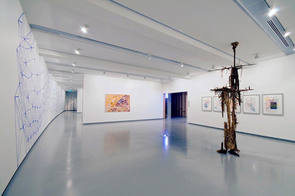
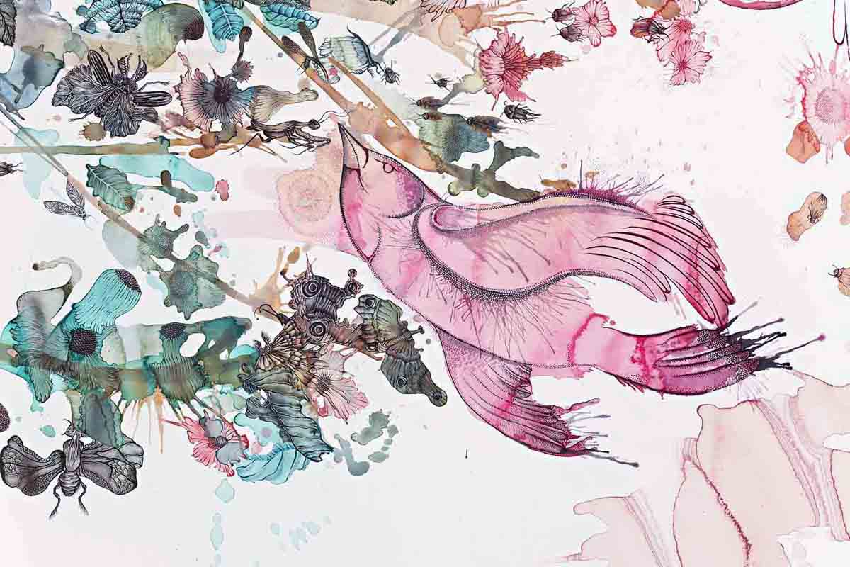
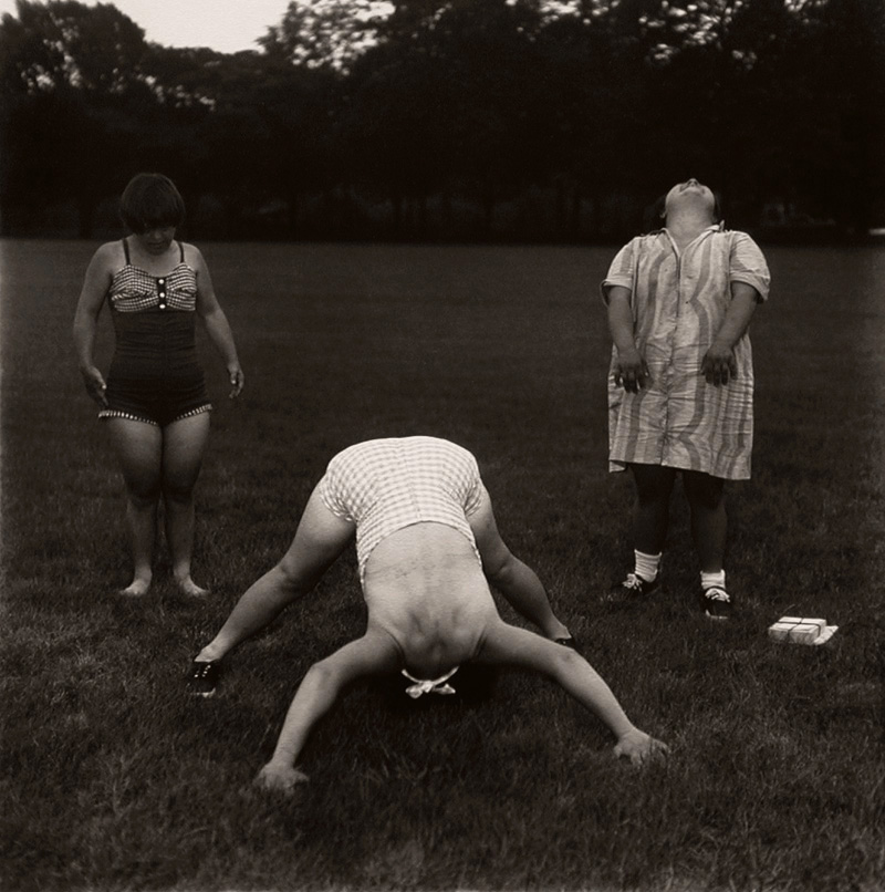

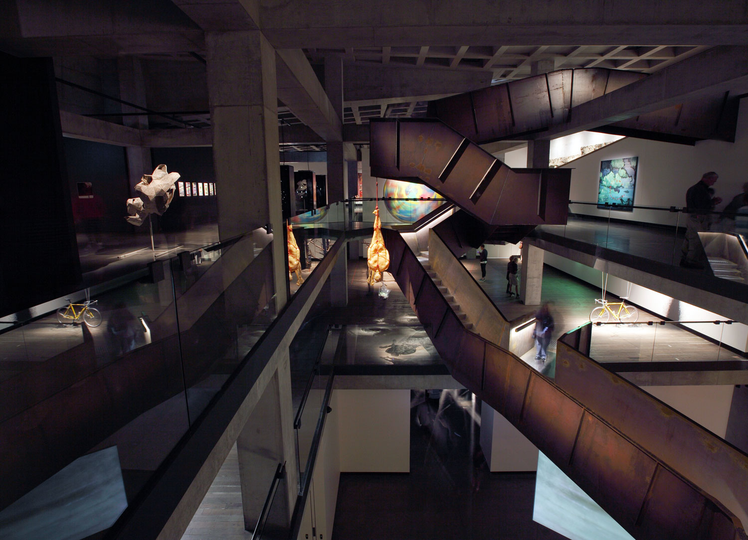

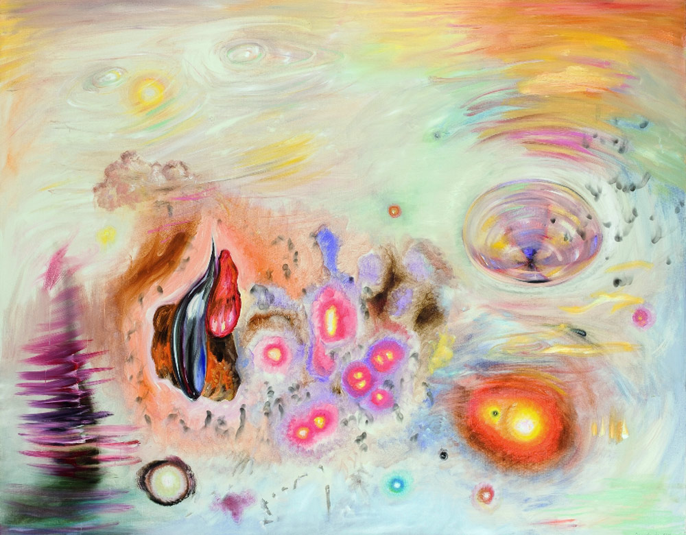

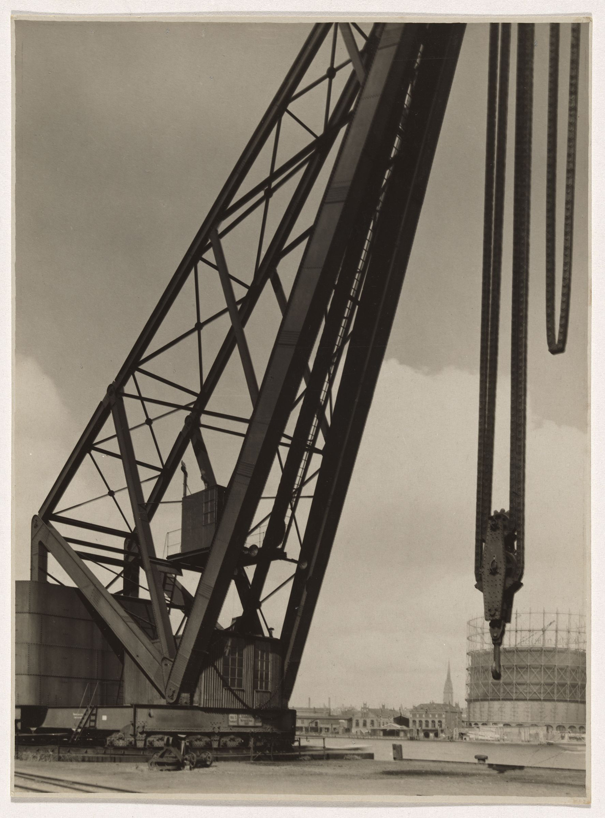
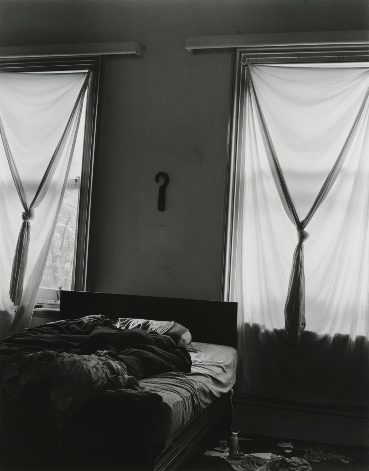


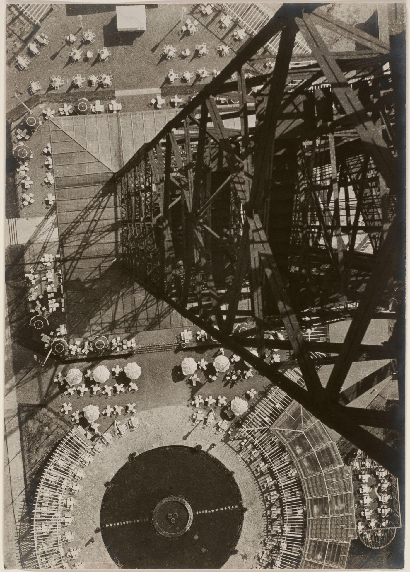
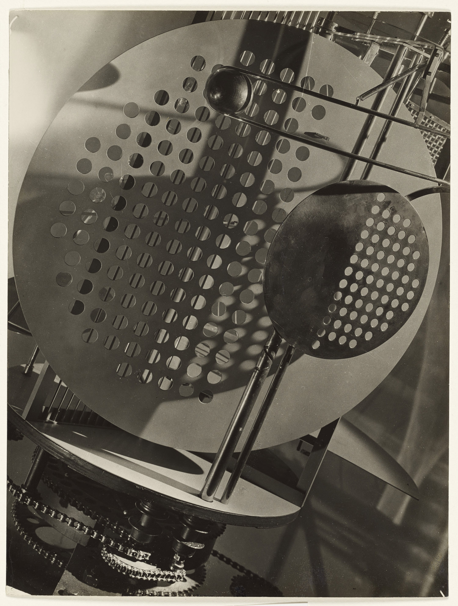

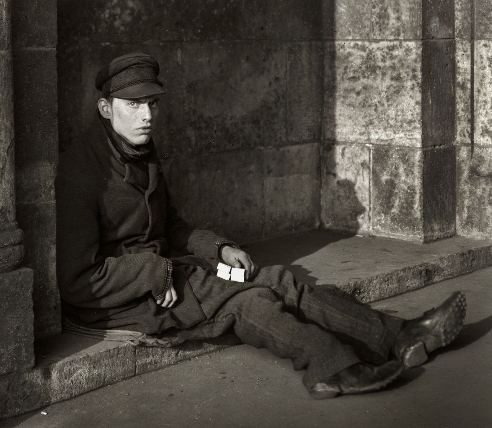


![Karl Grill (German active Donaueschingen, Germany 1920s) 'Untitled [Spiral Costume, from the Triadic Ballet]' c. 1926-1927](https://artblart.com/wp-content/uploads/2011/12/grill-spiral-costume-from-the-triadic-ballet.jpg "Karl Grill (German active Donaueschingen, Germany 1920s) 'Untitled [Spiral Costume, from the Triadic Ballet]' c. 1926-1927")
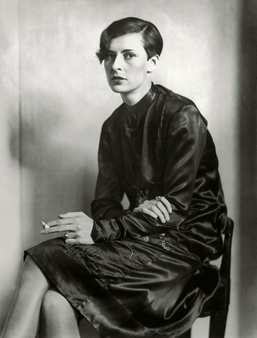
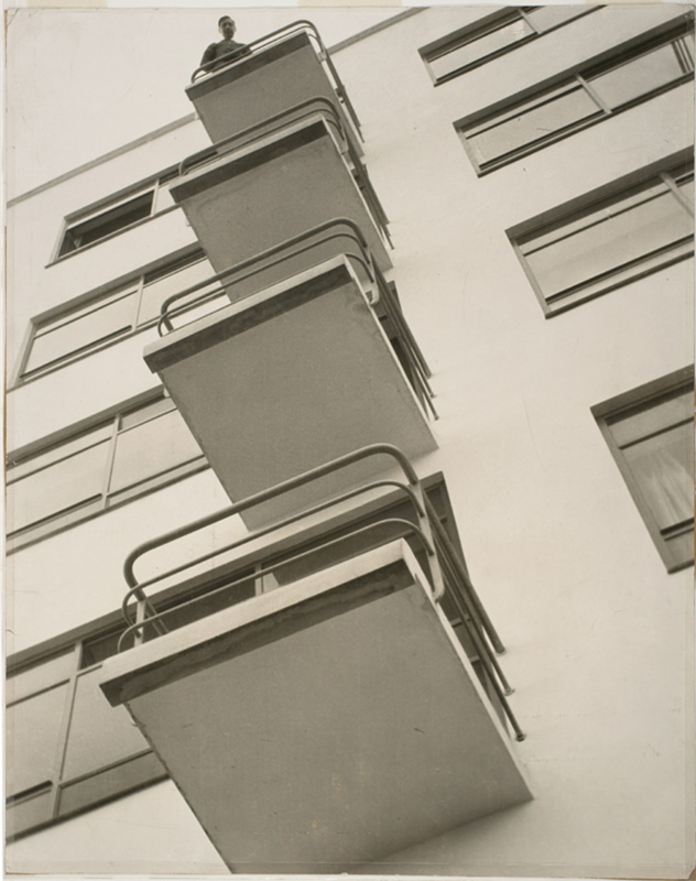
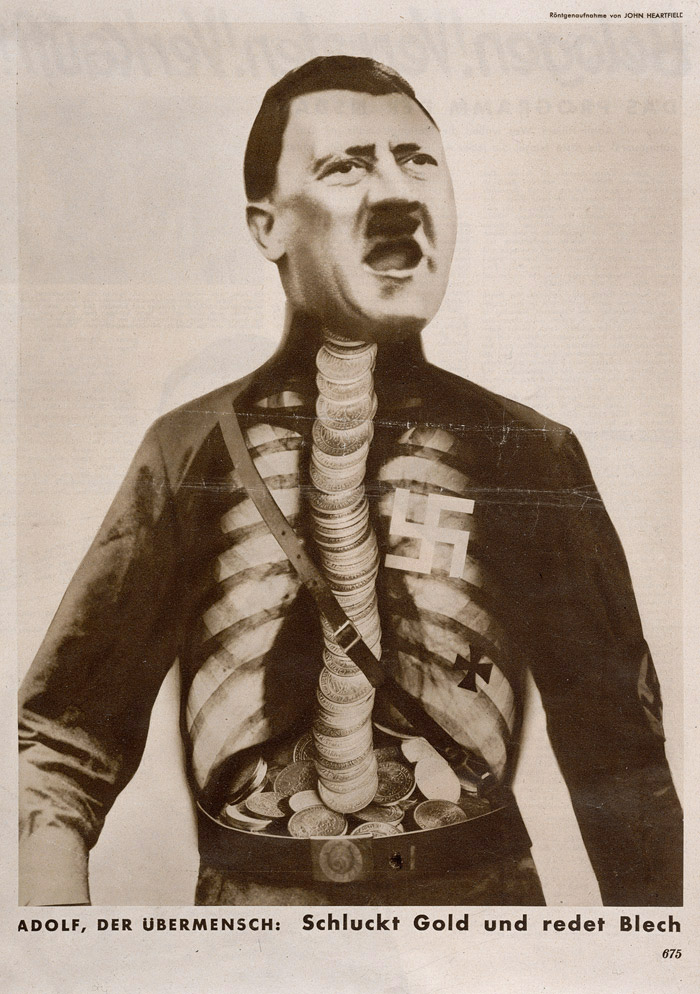
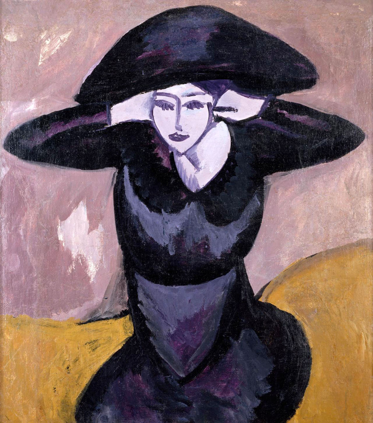
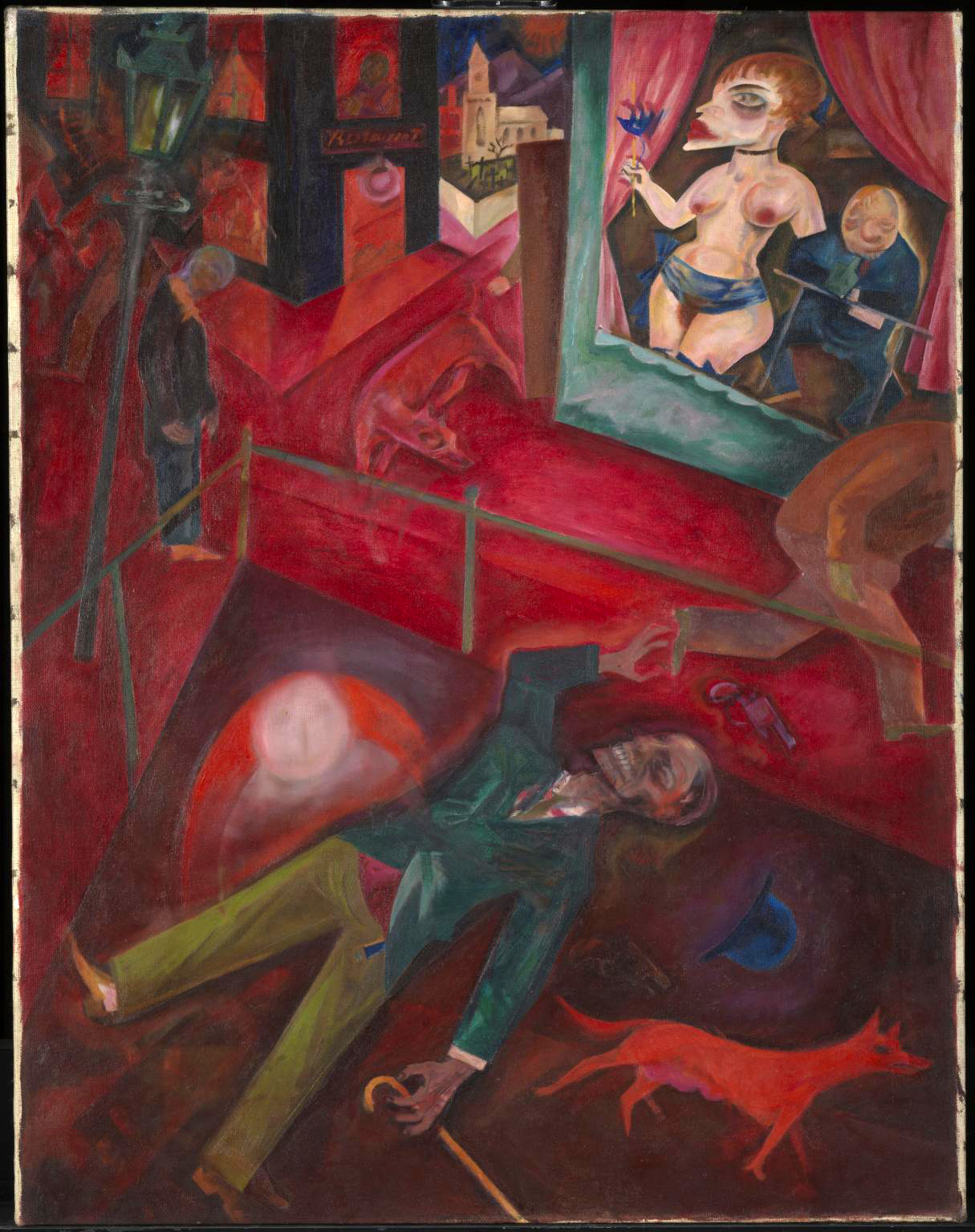
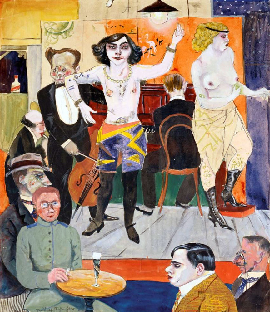
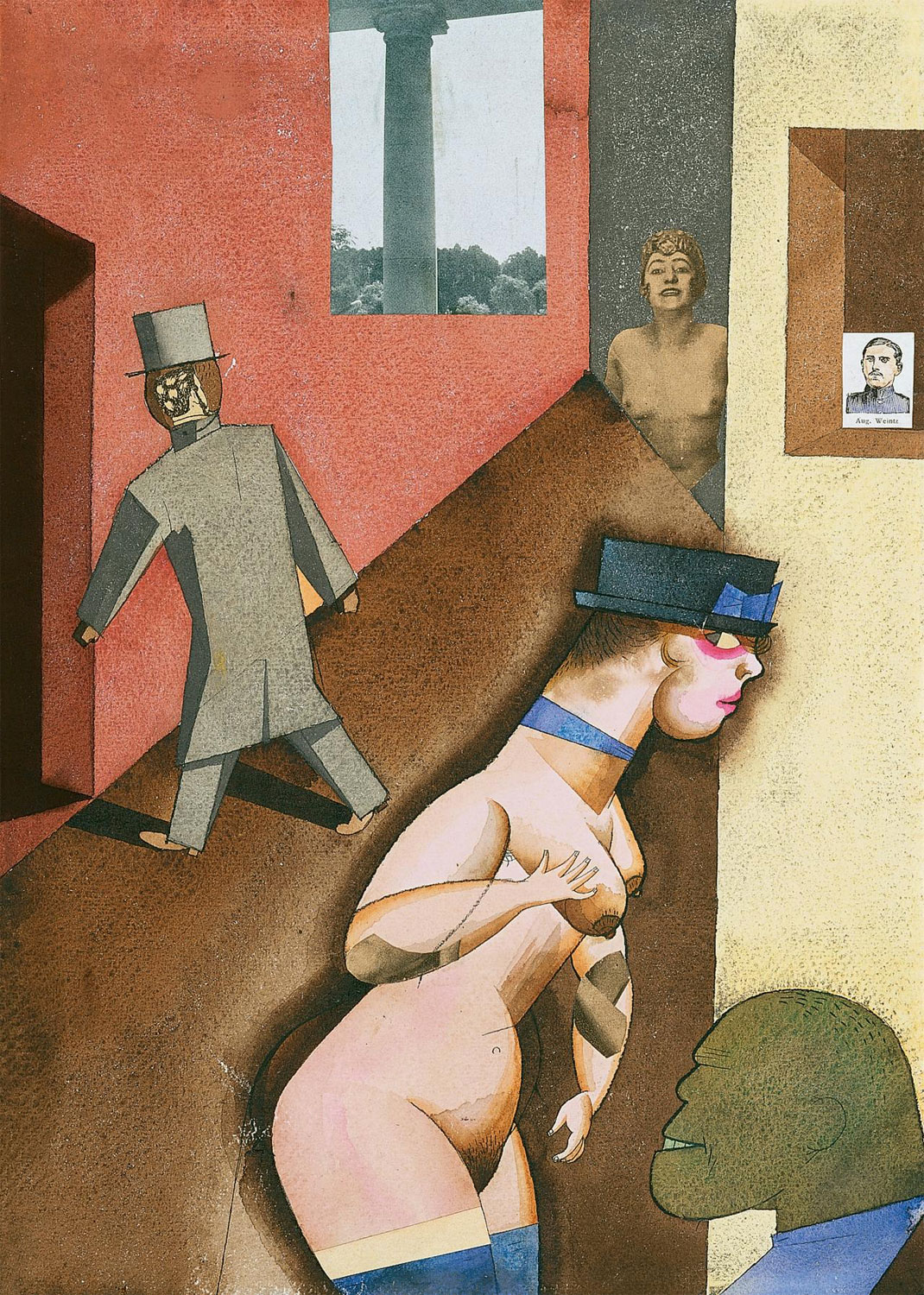


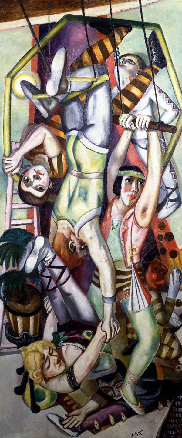
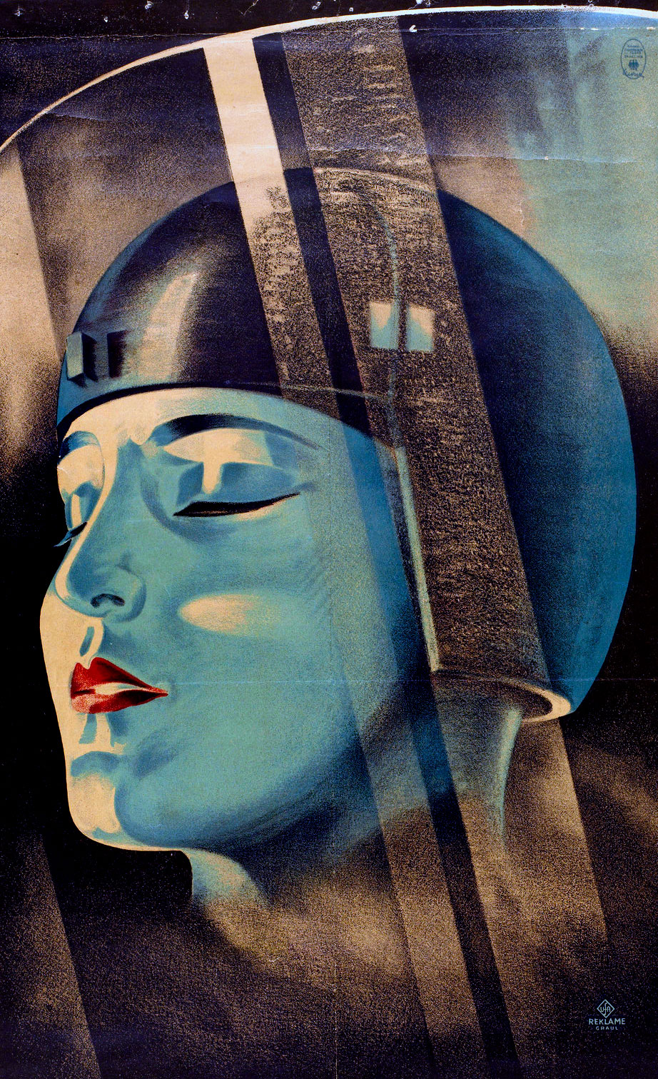
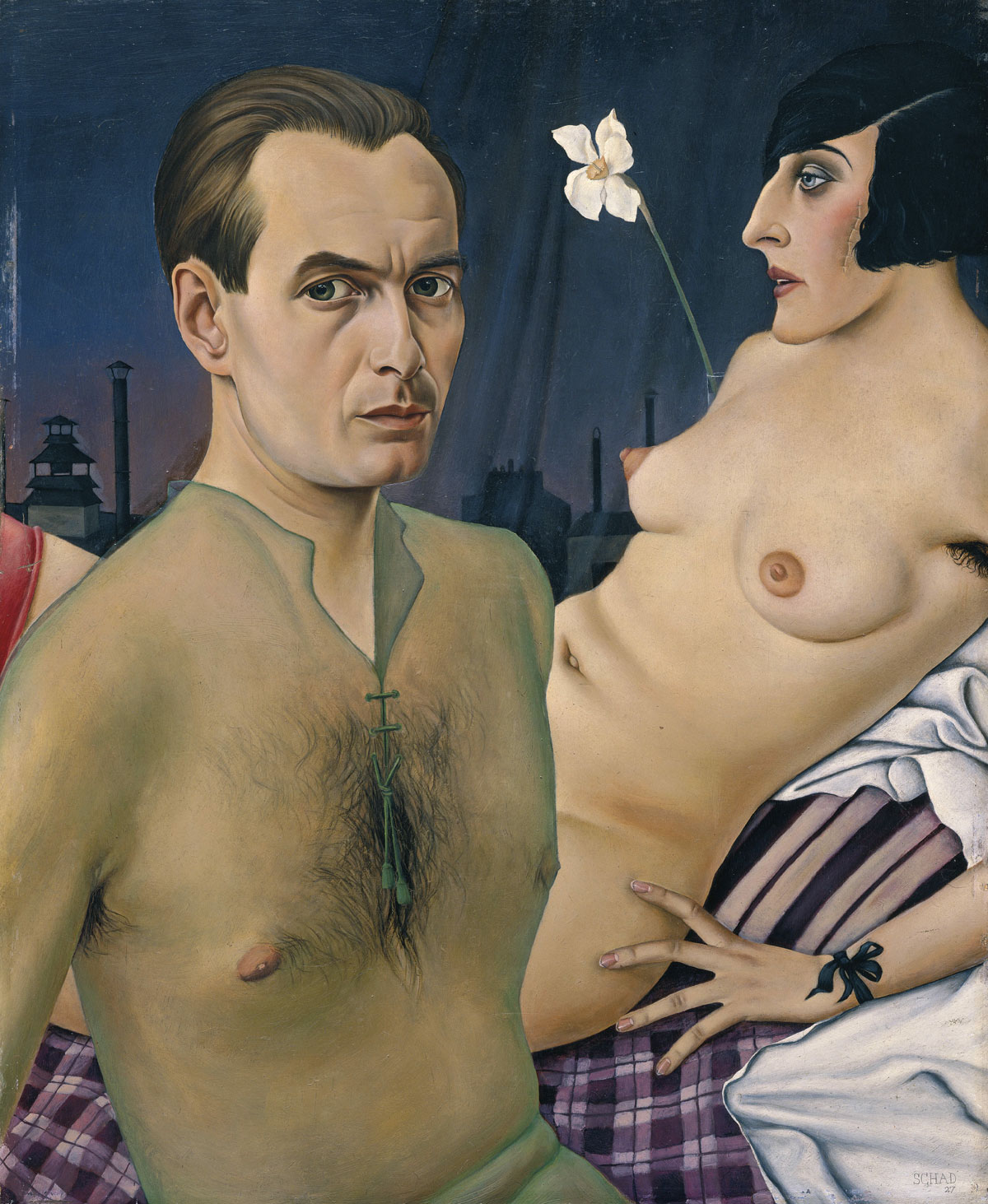
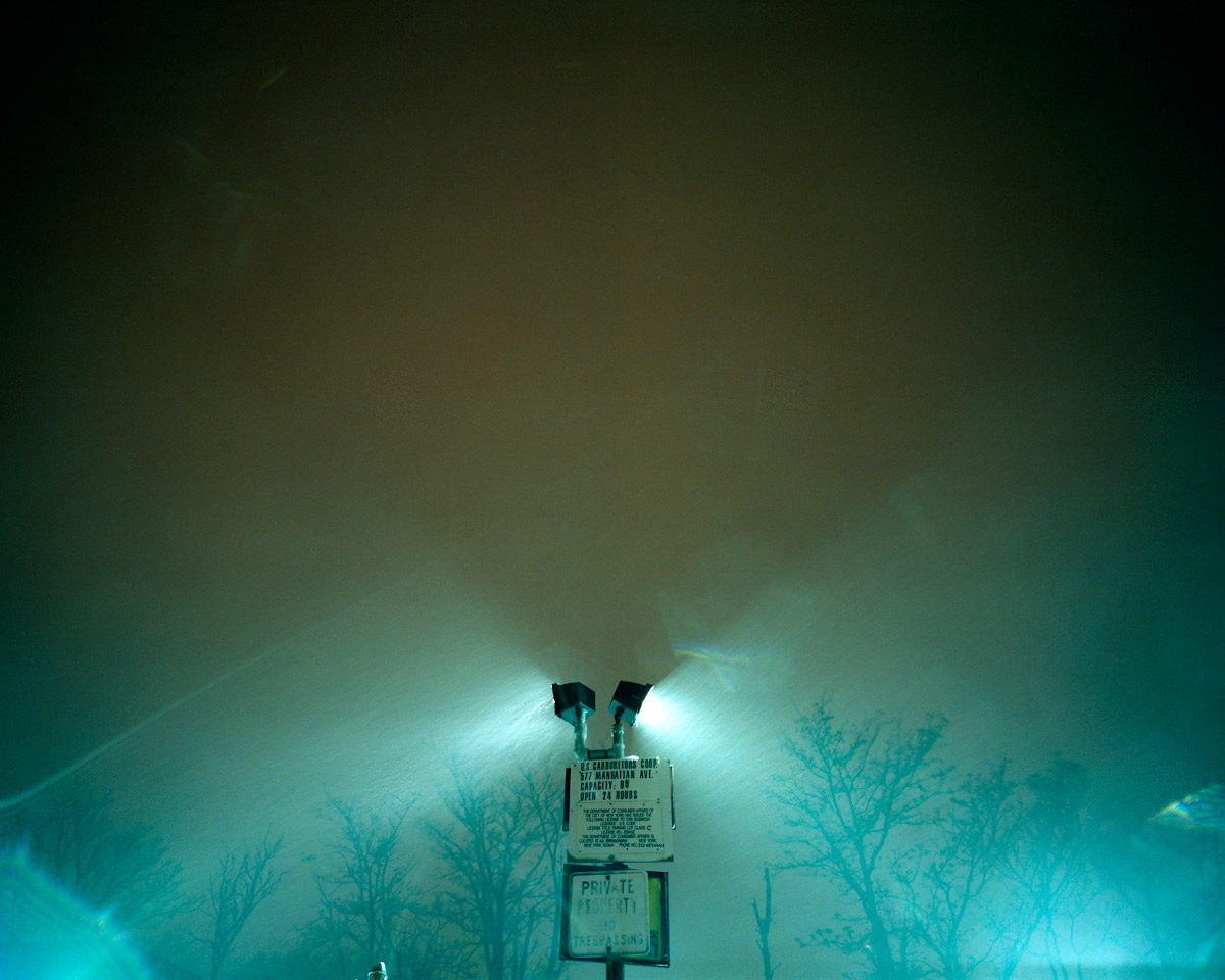

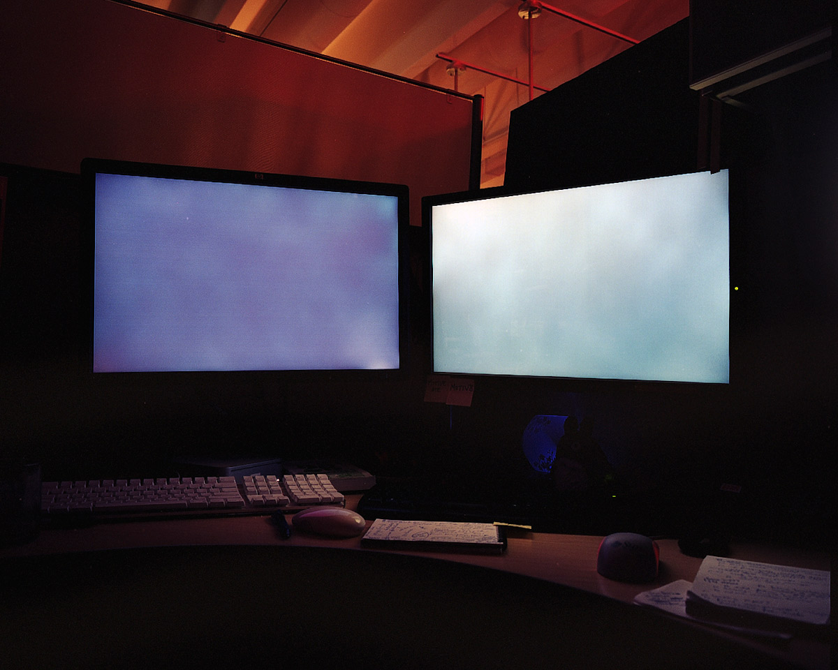
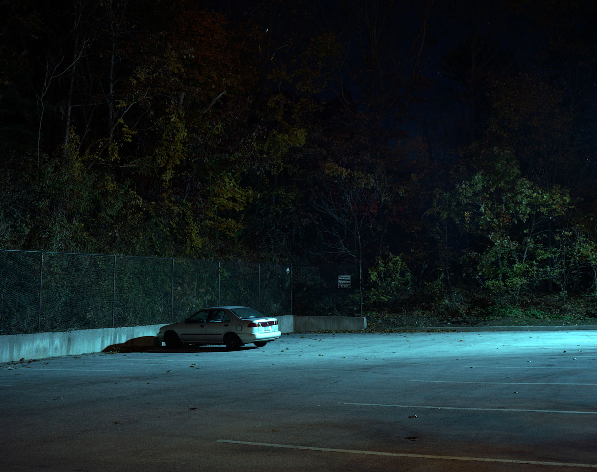
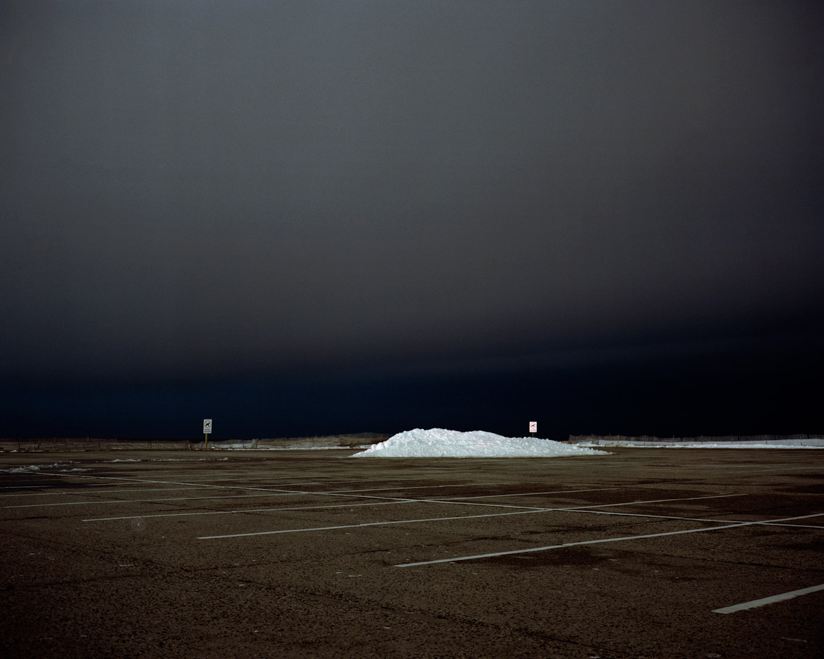
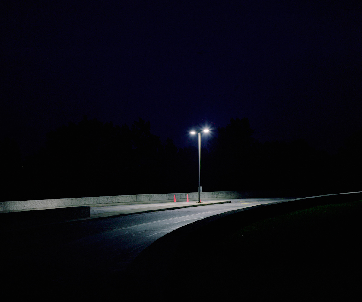
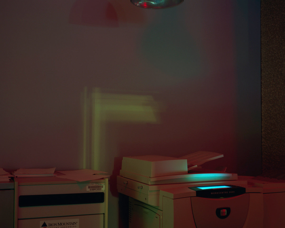
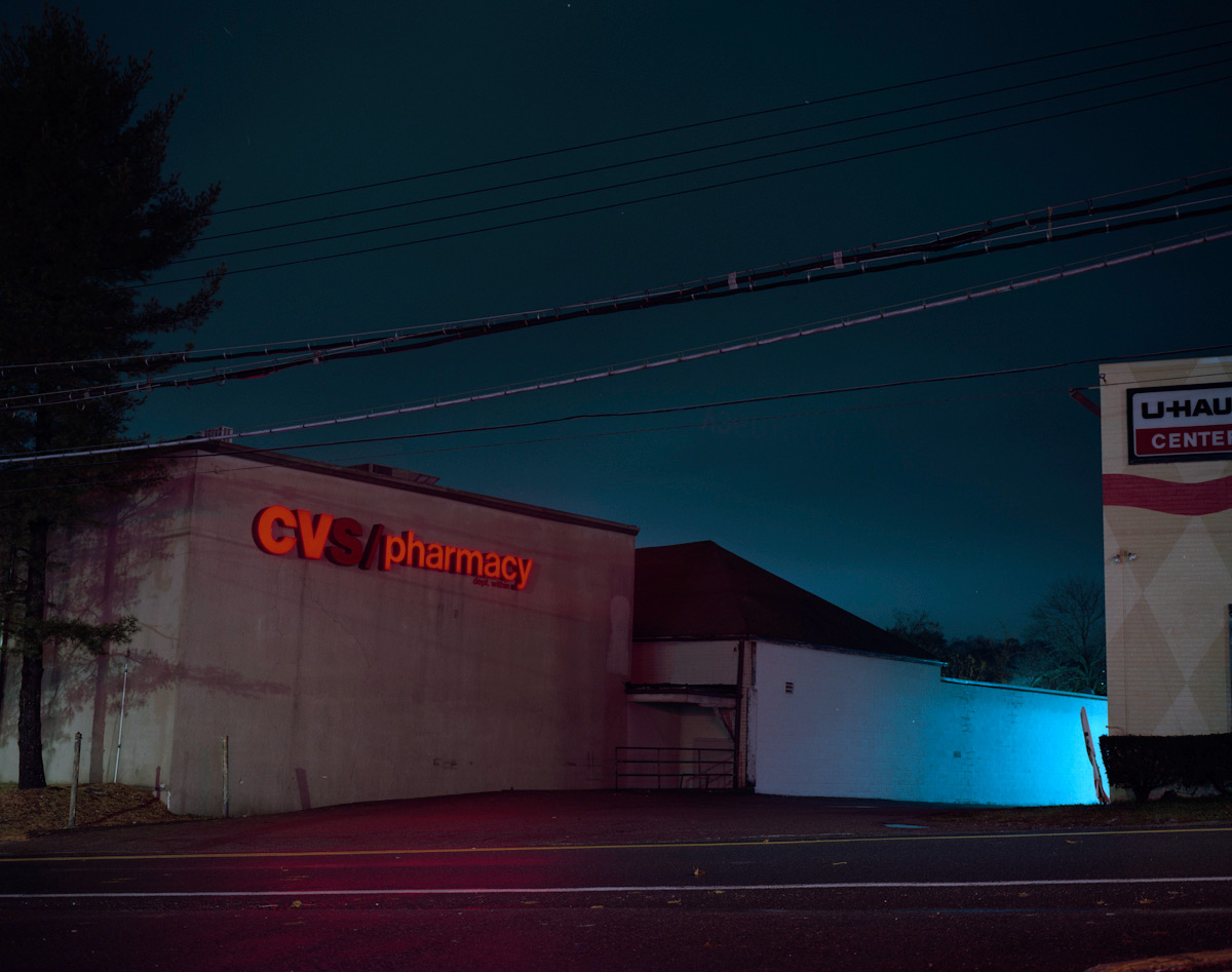


![Carleton Watkins (American, 1829-1916) '[Solar Eclipse]' January 1, 1889](https://artblart.com/wp-content/uploads/2011/11/carleton-watkins-solar-eclipse.jpg "Carleton Watkins (American, 1829-1916) '[Solar Eclipse]' January 1, 1889")


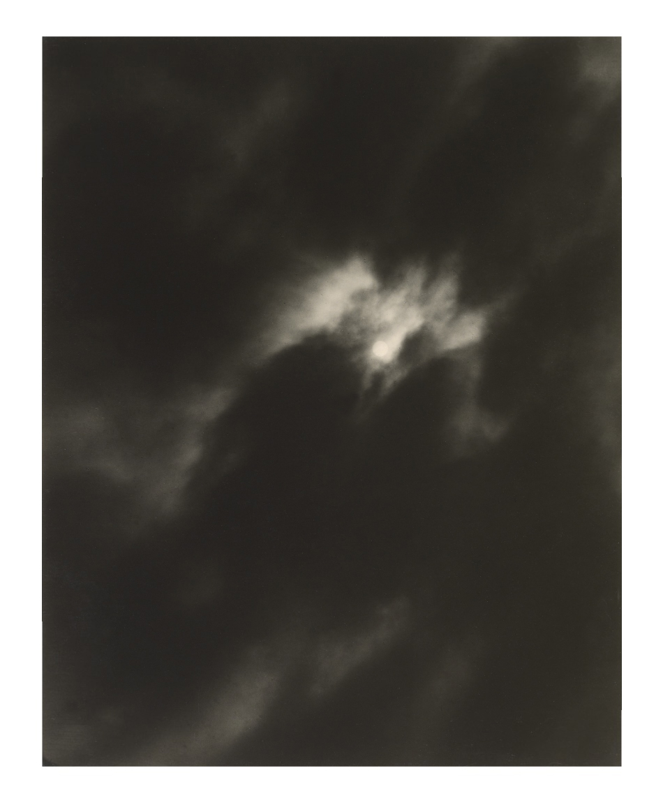


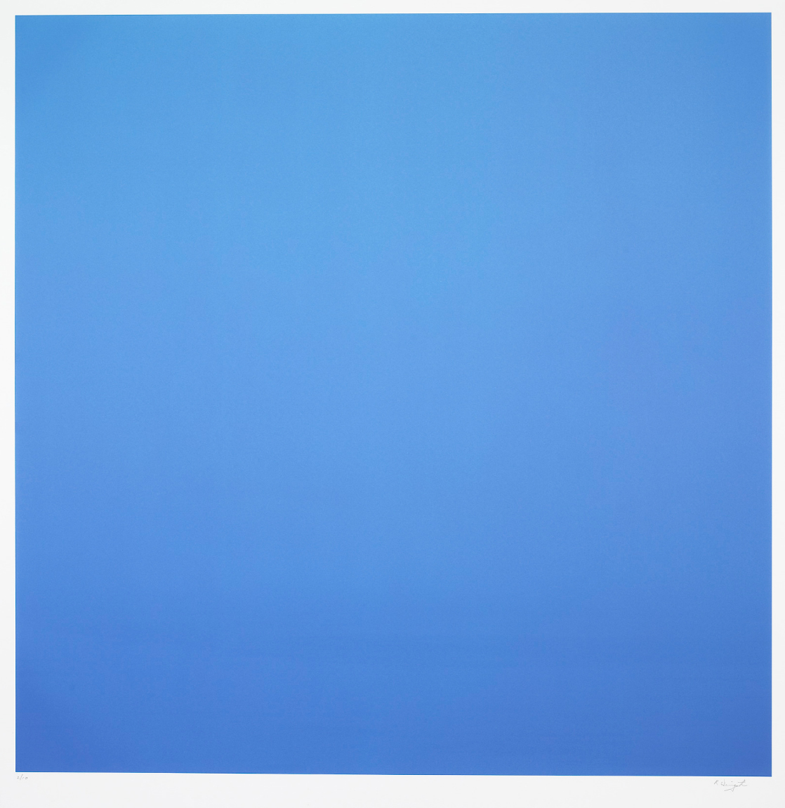
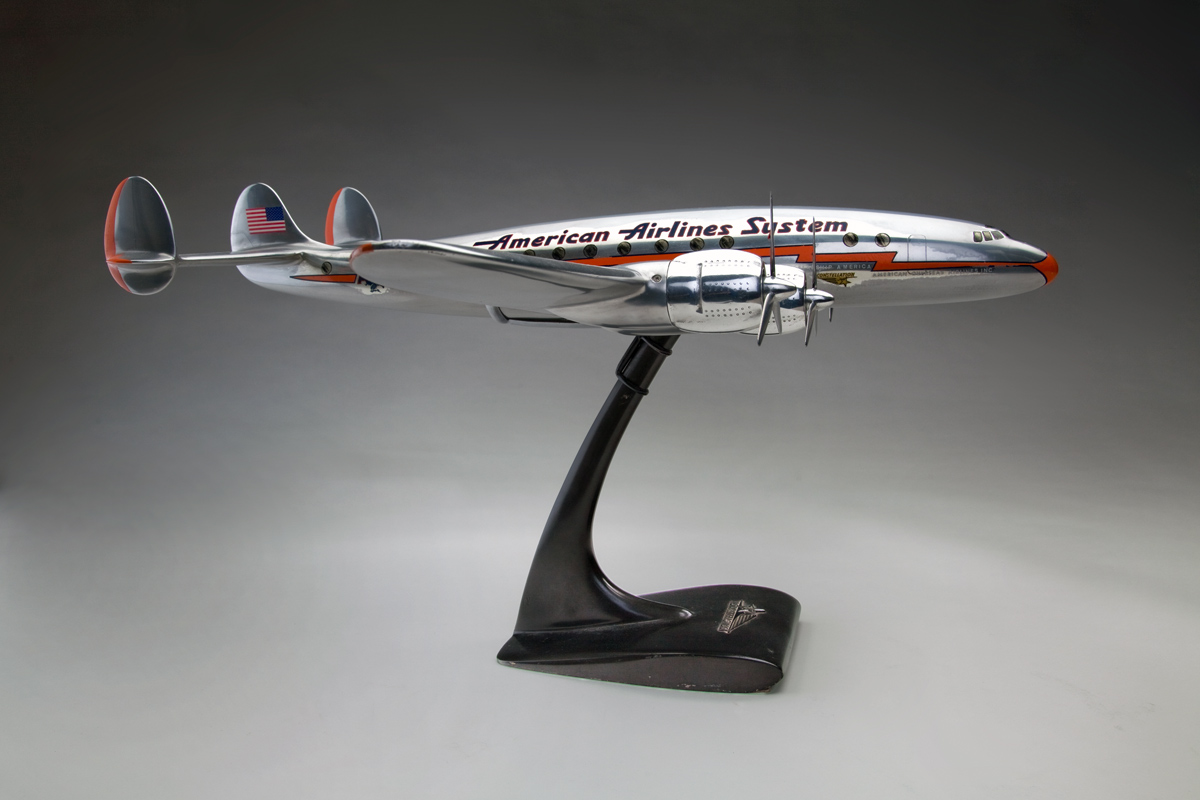

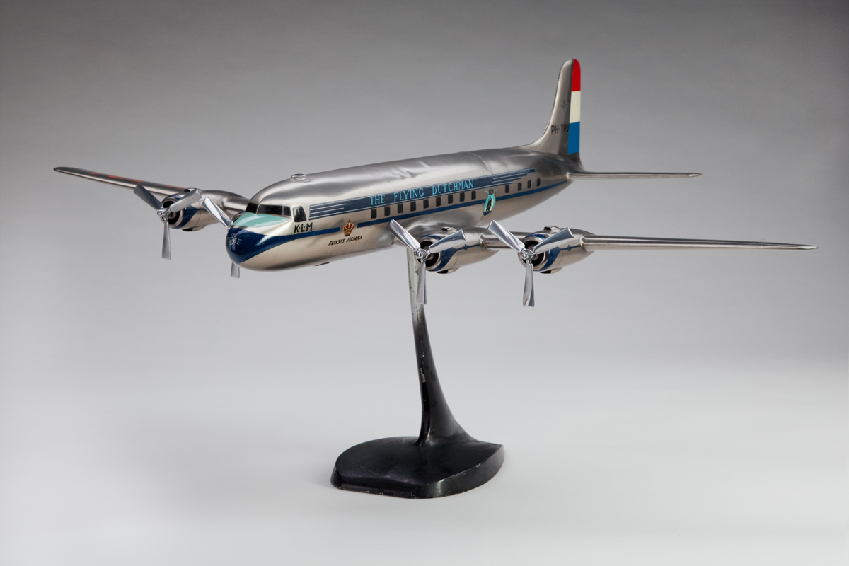
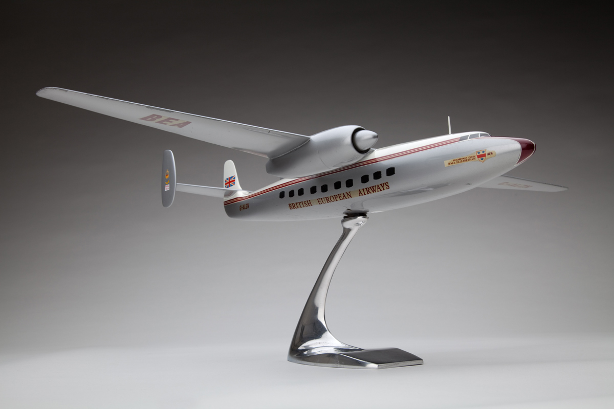


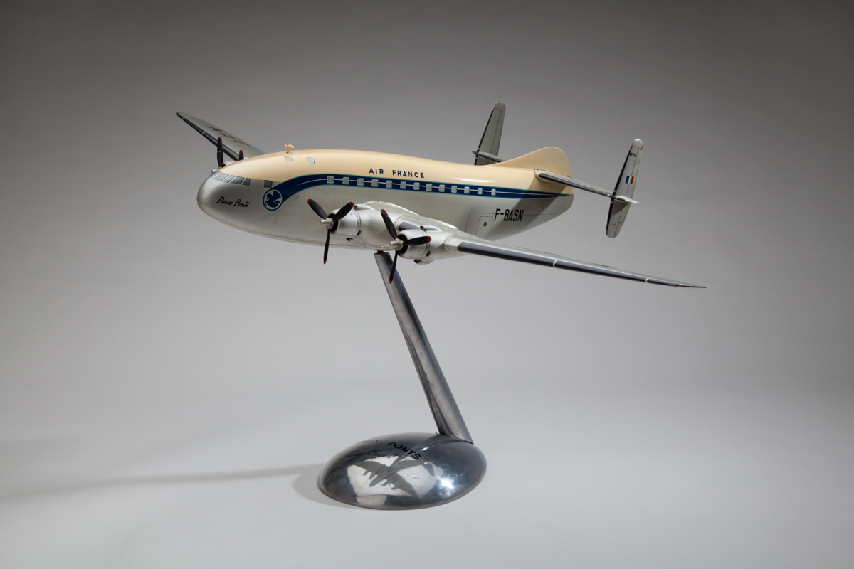
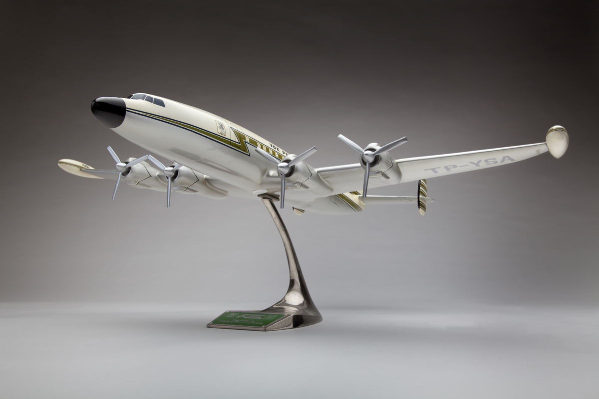
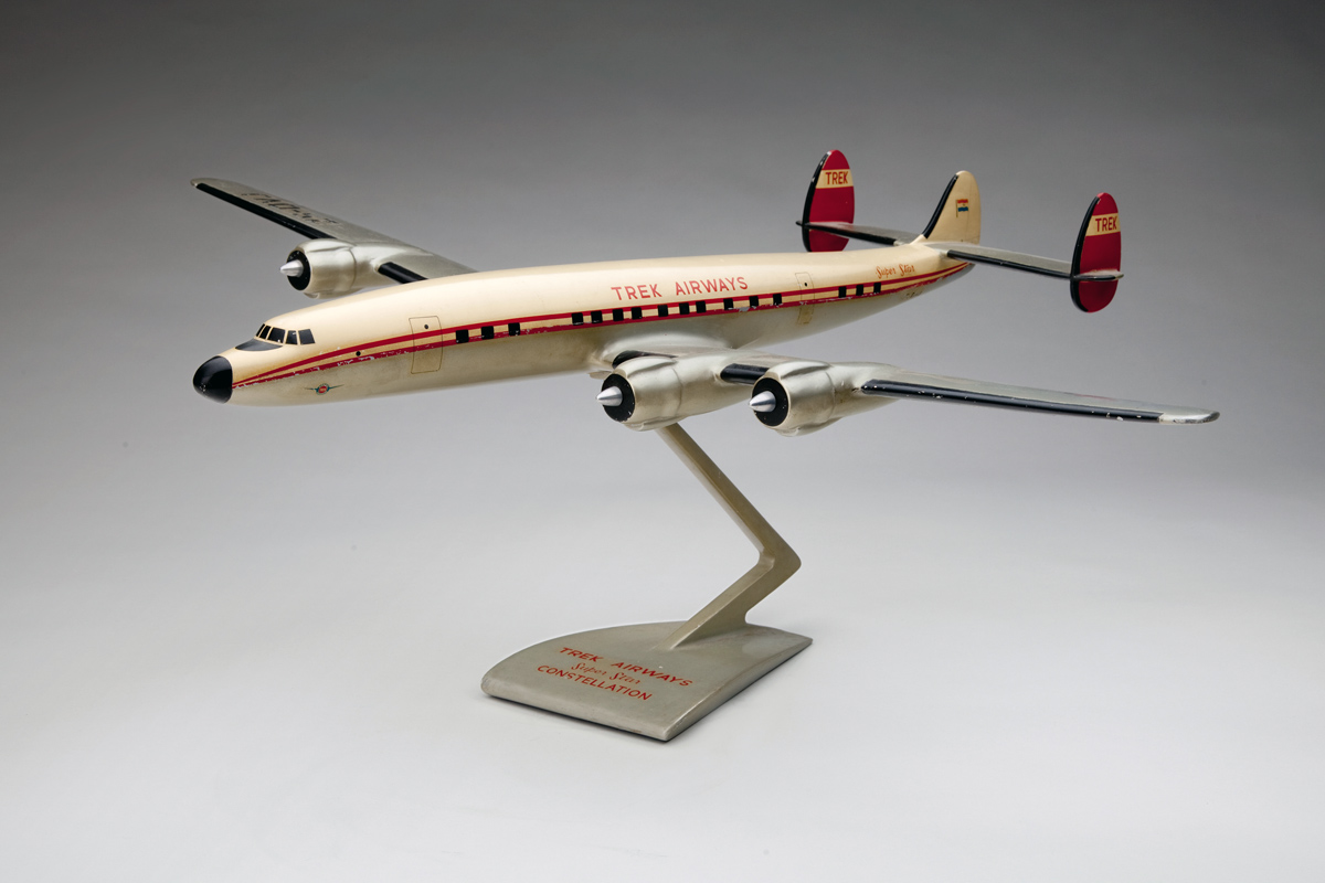
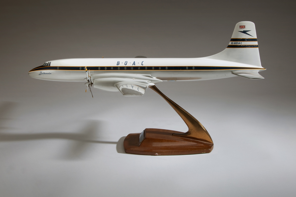

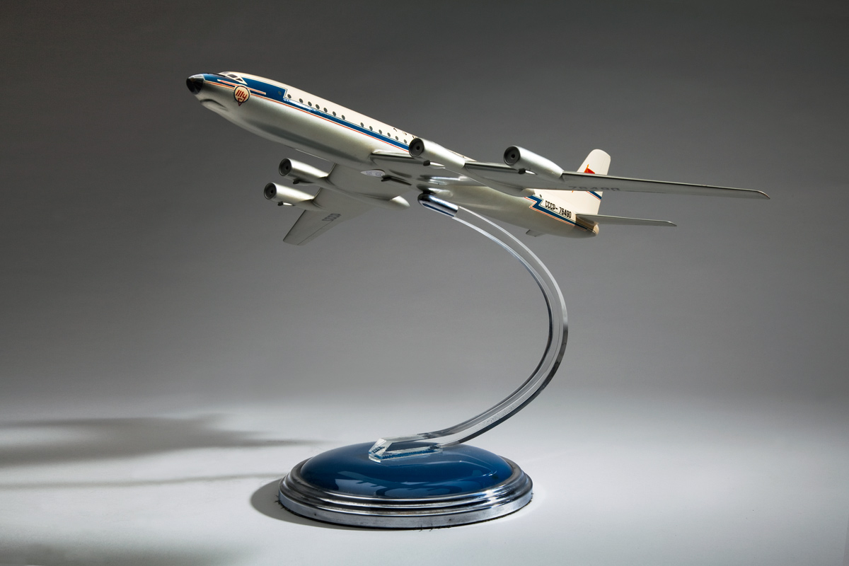


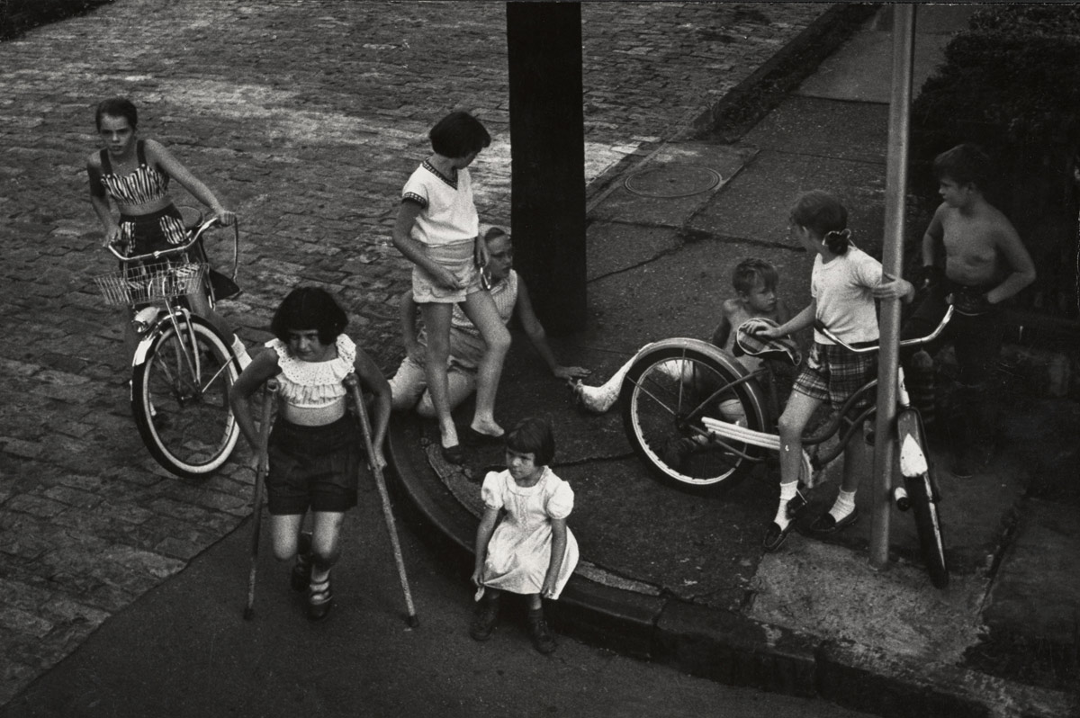
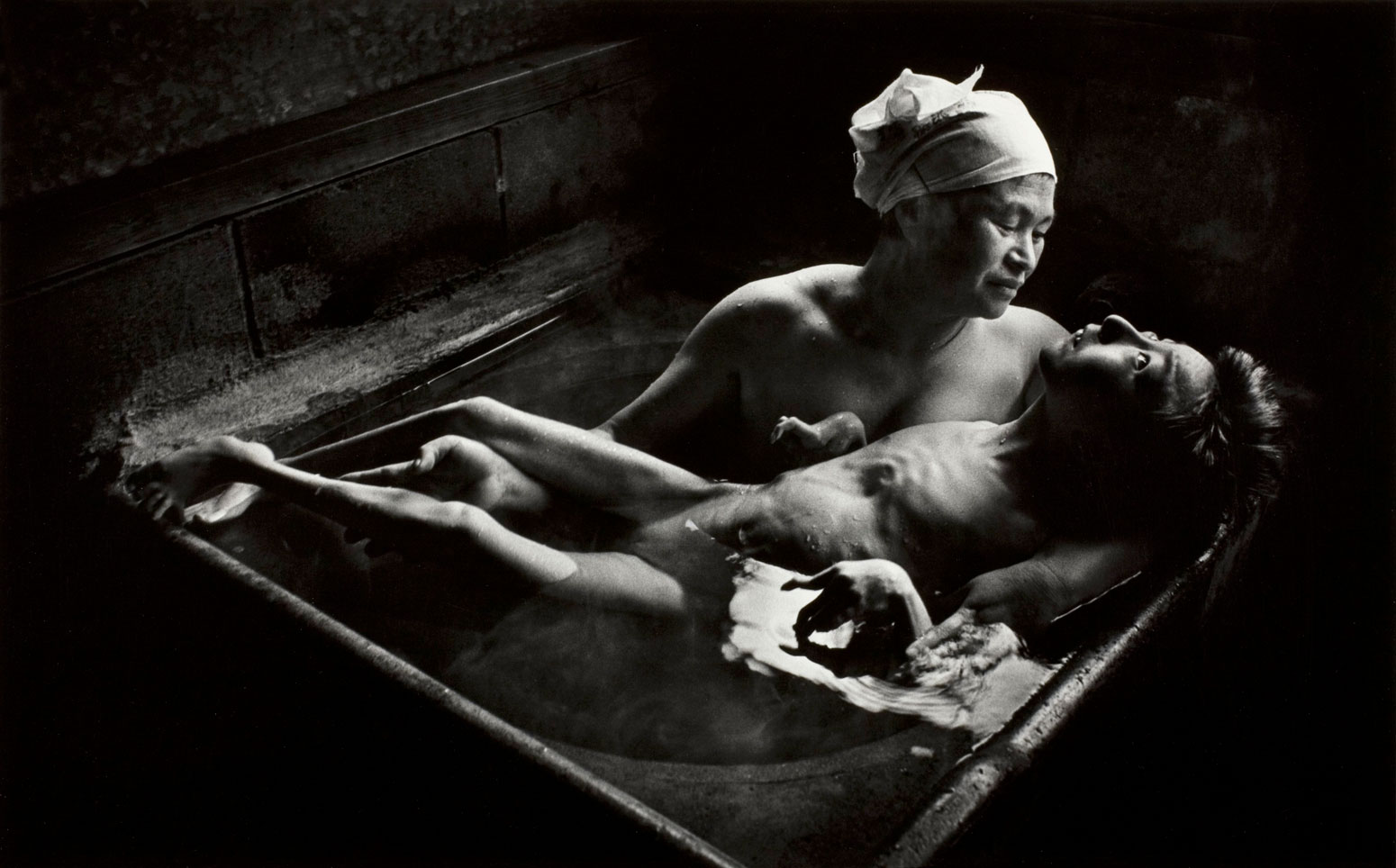
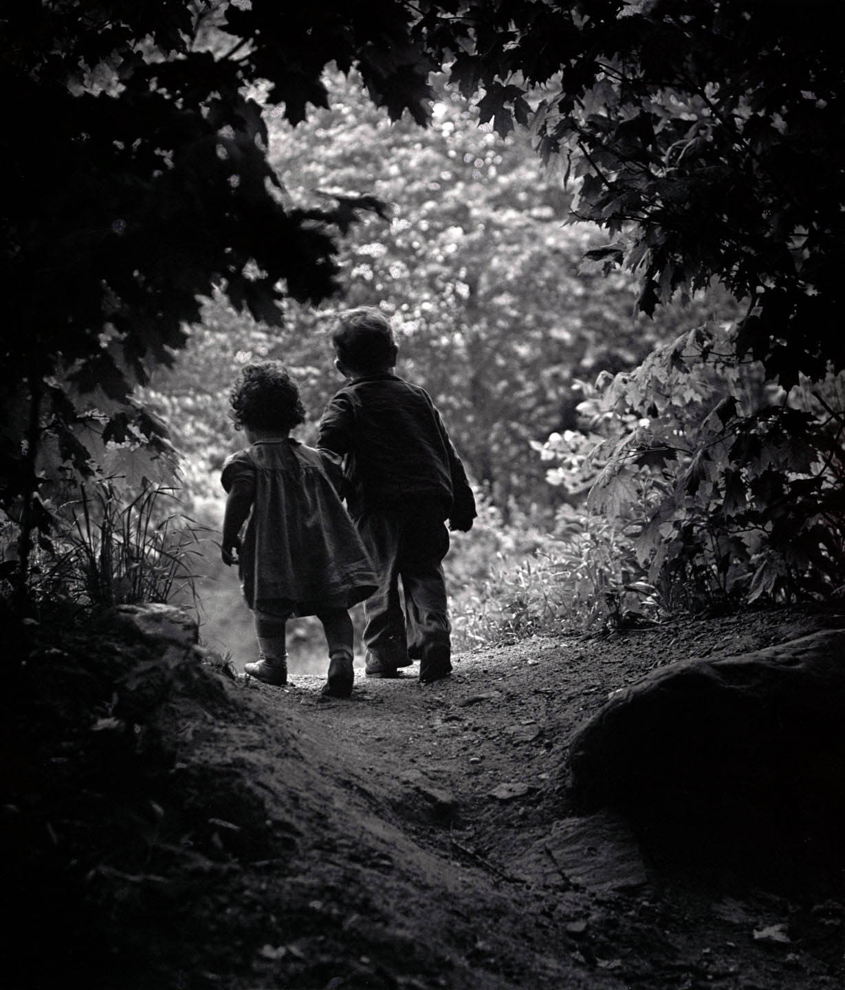

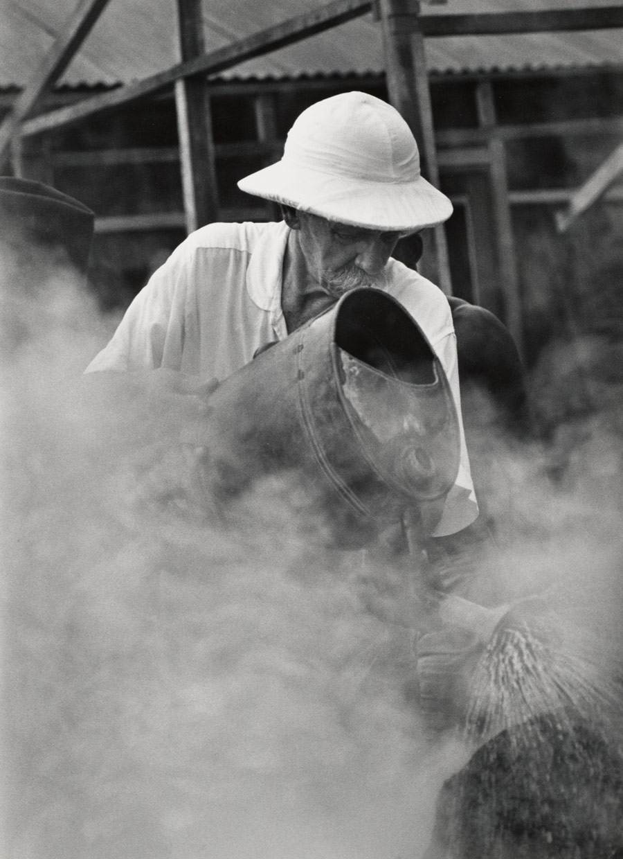

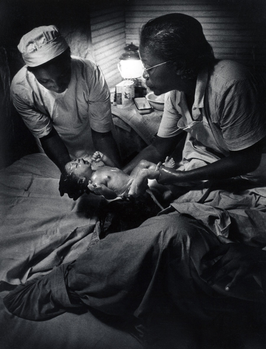

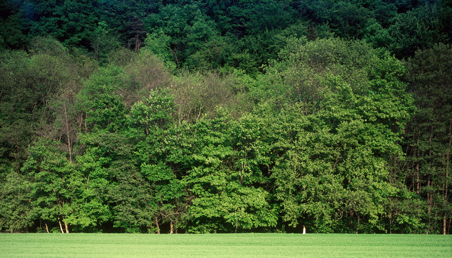
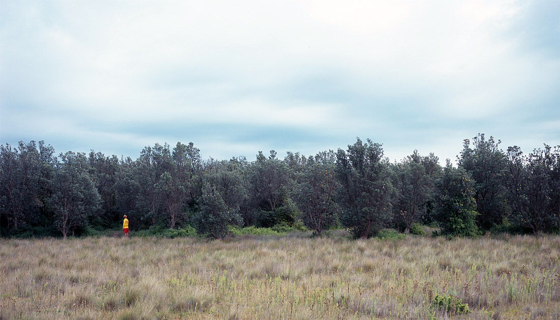
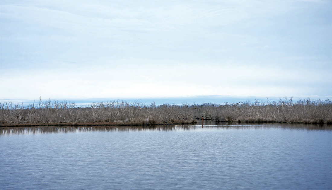
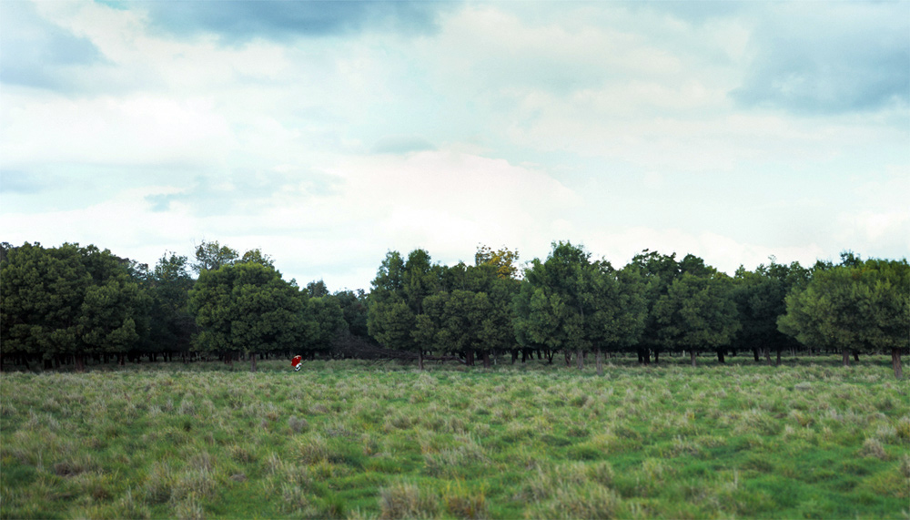
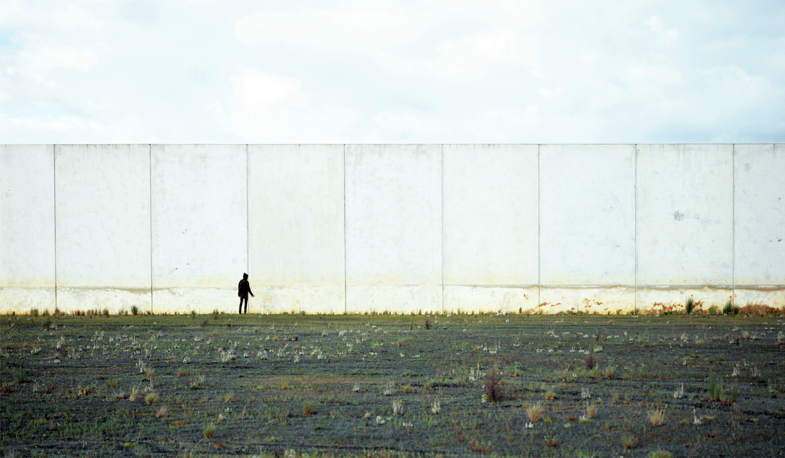











You must be logged in to post a comment.