Charles Sheeler is a cracking good photographer who’s work has not got the recognition that it deserves – in comparison to, say, Stieglitz, Strand, Steichen or Weston. When you think of those top echelon artists from the early twentieth century, his name is never mentioned. And it should be.
Sheeler’s Side of White Barn, Bucks County, Pennsylvania (1915, above) predates one of the most famous early modernist photographs, Strand’s White Fence, Port Kent, New York (1916, above) by a year, yet is hardly known. While Strand’s image possesses low depth of field, strong lighting and a focus on the fence as physical, geometric, sculptural object within the picture frame, Sheeler’s photograph is much more subtle but no less effective in its modernist vocation. The pictorial space is flattened into geometric shapes, the bottom of the photograph grounded by a cracked wall, hay, chickens and a fence, the top of the image foreclosed by the tiled roof of the barn and its attendant shadow (showing that the sun was high in the sky when this image was taken). Within the boundaries of the rectangle are subtle graduations of tone, colour and form, almost like an modernist etching with light, so beautifully does the artist both understand what he is seeing and how to render it through the physicality of the print. Unlike Strand’s “knock you over the head with the white picket fence”, Sheeler’s subtle paean to the modern world requires contemplation on the nature of light, photography and the fine art print. This is a masterpiece in the history of photographic art.
I am similarly convinced by Sheeler’s Ford Plant – Criss–Crossed Conveyors (1927, below), in my opinion one of the top ten photographs of all time.
I cannot fault this image. The light falling on the subject is incredible (notice the shadow from the beam mid-upper left, telling us the time of day the photograph was taken), the tonality superb, the framing of the subject admirable – all elements tensioned perfectly within the pictorial plane. The bottom of the photograph is grounded by stacked tyres and the structure ascends to the heavens from there… not just in one element, but in five! The main criss-cross of the conveyors is placed off centre supported by an iron tower, which allows the eye to roam freely across the image. The placement also allows for another elevator to ascend behind the main two, while a set of steps climbs higher and higher eventually exiting the picture stage left. Behind the criss-crossed conveyors the depth of space that must exist in reality is proposed by two tanks, further reinforced by 8 chimney stacks, and yet this photograph evidences no such depth of field. While everything is reduced to flattened shapes in this machine age, modernist, objectified world – and while no human being is presented for scale – the human hand is all over this image: in the construction of such technology, in the presence of the human scale stairs, in the ascension to the sky of the organ pipes of the industrial cathedral, in the comprehending eye of the photographer, and in the presence, the aura, of this magnificent print. While this image may seem the antithesis of humanist photography in one sense, conversely it reaffirms the very act of humanity in another. Or perhaps I’m just an old romantic.
Dr Marcus Bunyan
Many thankx to the Museum of Fine Arts Boston for allowing me to publish the photographs in the posting. Please click on the photographs for a larger version of the image.
This exhibition celebrates the MFA’s unparalleled holdings of works by Charles Sheeler (1883-1965), presenting 40 photographs from three significant series created during the heyday of his career as a founder of American modernism.
After enjoying success as a painter, Sheeler initially took up photography as a way to make a living. His experiments with the medium included the 1916-1917 series of photographs capturing various elements of an 18th-century house he rented in Doylestown, Pennsylvania. The sequence of stark, geometric compositions was among the most abstract and avant-garde work being made in the US at the time – created in response to the Cubist art of Picasso and Braque that Sheeler had previously encountered in Europe.
In 1920, Sheeler collaborated with fellow photographer Paul Strand on the short film Manhatta, presenting dramatic views of lower Manhattan. Abstract stills from the 35mm film, which was shot from steep angles, are presented alongside larger prints of Sheeler’s cinematic images of New York City, produced shortly after Manhatta – which he used as source material for his paintings. The film Manhatta is on view in the gallery.
Charles Sheeler from Doylestown to Detroit culminates with the 1927 photographs of the Ford Motor Company plant in River Rouge, Michigan, commissioned to celebrate the introduction of Ford’s Model A. The cathedral-like scenes convey an optimism for American industry, and are now considered icons of Machine Age photography. All of the photographs in the exhibition are drawn from the Museum’s Lane Collection – one of the finest private holdings of 20th-century American art in the world, including Sheeler’s entire photographic estate – given to the MFA in 2012.
In 1920 Paul Strand and artist Charles Sheeler collaborated on Manhatta, a short silent film that presents a day in the life of lower Manhattan. Inspired by Walt Whitman’s book “Leaves of Grass,” the film includes multiple segments that express the character of New York. The sequences display a similar approach to the still photography of both artists. Attracted by the cityscape and its visual design, Strand and Sheeler favoured extreme camera angles to capture New York’s dynamic qualities. Although influenced by Romanticism in its view of the urban environment, Manhatta is considered the first American avant-garde film.
Aubrey Beardsley and “The Yellow Book,” Art Nouveau and the Vienna Secession, Josef Albers, Dada, Surrealism, William Blake (a favourite of mine), photography, typography and graphic design. You couldn’t ask for more… except for those psychedelic colours!
As a friend of mine observed of the Grateful Dead, Oxford Circle (1966) poster – look where the tickets were sold: psychedelic shops, book stores, record shops and coffee houses. He actually saw the Grateful Dead play live while he was in America, and he said it was quite a trip. As Mark Feeney keenly observes, this art was “liberation in two dimensions.”
He is correct, for these posters and record covers reflect the cultural era from which they emerge – the official beginnings of Gay Liberation, Feminism, student revolt, protests against war and racism, civil rights, drugs, free love and peace. They are powerful and eloquent works of art that summon the noisy spirit of the age, a riotous poltergeist hell bent on change.
And all these years later, they still look as fresh and as relevant (perhaps even more so in this conservative world), as they day they were created. Just fab!
Dr Marcus Bunyan
PS. It always amazes me the cultural contexts in which photography can be put to use.
Many thankx to the Museum of Fine Arts, Boston for allowing me to publish the photographs in the posting. Please click on the photographs for a larger version of the image.
“What’s fascinating is how the graphic designs manage to have a kind of coherence despite being such a jumble. Certain principles recur: curves, yes, angles, no; a pugilistic employment of colour (psychedelia really did look … psychedelic); legibility as afterthought. So do certain influences: Aubrey Beardsley and “The Yellow Book,” Art Nouveau and the Vienna Secession, Dada, Surrealism (among the album covers on display is, yes, the Jefferson Airplane’s “Surrealistic Pillow”). The presiding spirit is William Blake: “The road of excess leads to the palace of wisdom.” The last thing the Haight cared about was history, but history’s hand lay all over it.
The look of these designs is assaultive, overly busy, restrained only by the confines of poster size or album cover. That look still feels exhilarating: liberation in two dimensions. It must have felt close to Martian back then. NASA wanted to put a man on the moon. Why stop there? Gravity was just another law to flout. One of the 32 Herb Greene photographs in “The Summer of Love” shows Airplane lead singer Grace Slick looking at the camera and flipping the bird. Maybe that image, even more than Blakean excess, is the presiding spirit.”
Mark Feeney. “The MFA celebrates San Francisco’s Summer of Love,” on the Boston Globe website July 6th 2017 [Online] Cited 02/01/2022. No longer available online
Victor Moscoso (born Galicia in 1936) is a Spanish-American artist best known for producing psychedelic rock posters, advertisements, and underground comix in San Francisco during the 1960s and 1970s.
Moscoso was the first of the rock poster artists of the 1960s era with formal academic training and experience. After studying art at Cooper Union in New York City and at Yale University, he moved to San Francisco in 1959. There, he attended the San Francisco Art Institute, where he eventually became an instructor. Moscoso’s use of vibrating colours was influenced by painter Josef Albers, one of his teachers at Yale. He was the first of the rock poster artists to use photographic collage in many of his posters.
Professional success came in the form of the psychedelic rock and roll poster art created for San Francisco’s dance halls and clubs. Moscoso’s posters for the Family Dog dance-concerts at the Avalon Ballroom and his Neon Rose posters for the Matrix resulted in international attention during the 1967 Summer of Love.
Stanley Miller (Mouse) (American, b. 1940) and Alton Kelley (American, 1940-2008) Moby Grape, Sparrow, The Charlatans (Avalon Ballroom, 13-14 January 1967) 1967 Poster, offset lithograph Collection of Patrick Murphy Courtesy, Museum of Fine Arts, Boston
Bonnie MacLean, also known as Bonnie MacLean Grahamis an American artist known for her classic rock posters. In the 1960s and 1970s she created posters and other art for the promotion of rock and roll concerts managed by Bill Graham, using the iconic psychedelic art style of the day. MacLean went on to continue her art as a painter focusing mostly of nudes, still lifes and landscapes.
Fillmore posters
Artist Wes Wilson was the main poster artist for the Fillmore Auditorium when he and Bill Graham had a “falling out” and Wilson quit. MacLean had been painting noticeboards at the auditorium in the psychedelic style, and took up the creation of the posters after Wilson left, creating about thirty posters, most in 1967. MacLean’s posters are included in many museum collections including at the Brooklyn Museum, the Fine Arts Museums of San Francisco collection and at the DeYoung museum. A few examples of her posters are in the San Francisco Museum of Modern Art collection.
Stanley George Miller (born October 10, 1940), better known as Mouse and Stanley Mouse, is an American artist, notable for his 1960s psychedelic rock concert poster designs for the Grateful Dead and Journey albums cover art as well as many others.
Psychedelic posters
In 1965, Mouse travelled to San Francisco, California with a group of art school friends. Settling initially in Oakland, Mouse met Alton Kelley. Kelley, a self-taught artist, had recently arrived from Virginia City, Nevada, where he had joined a group of hippies who called themselves the Red Dog Saloon gang. Upon arrival in San Francisco Kelley and other veterans of the gang renamed themselves The Family Dog, and began producing rock music dances. In 1966, when Chet Helms assumed leadership of the group and began promoting the dances at the Avalon Ballroom, Mouse and Kelley began working together to produce posters for the events. Later the pair also produced posters for promoter Bill Graham and for other events in the psychedelic community.
In 1967, Mouse collaborated with artists Kelley, Rick Griffin, Victor Moscoso and Wes Wilson to create the Berkeley Bonaparte Distribution Agency. Mouse and Kelley also worked together as lead artists at Mouse Studios and The Monster Company – producing album cover art for the bands Journey and Grateful Dead. The Monster Company also developed a profitable line of T-shirts, utilising the four colour process for silk screening.
The psychedelic posters Mouse and Kelley produced were heavily influenced by Art Nouveau graphics, particularly the works of Alphonse Mucha and Edmund Joseph Sullivan. Material associated with psychedelics, such as Zig-Zag rolling papers, were also referenced. Producing posters advertising for such musical groups as Big Brother and the Holding Company, Quicksilver Messenger Service, and Grateful Dead led to meeting the musicians and making contacts that were later to prove fruitful.
Alton Kelley (June 17, 1940 in Houlton, Maine – June 1, 2008 in Petaluma, California) was an American artist best known for his psychedelic art, in particular his designs for 1960s rock concerts and albums. Along with artists Rick Griffin, Stanley Mouse, Victor Moscoso and Wes Wilson, Kelley founded the Berkeley Bonaparte distribution agency in order to produce and sell psychedelic poster art.
Along with fellow artist Stanley Mouse, Kelley is credited with creating the wings and beetles on all Journey album covers as well as the skull and roses image for the Grateful Dead. Kelley’s artwork on the 1971 self-titled live album, Grateful Dead, incorporated a black and white illustration of a skeleton by Edmund Sullivan, which originally appeared in a 19th-century edition of the Rubáiyát of Omar Khayyám.
In celebration of the Summer of Love’s 50th anniversary, this exhibition explodes with a profusion of more than 120 posters, album covers and photographs from the transformative years around 1967. That summer, fuelled by sensational stories in the national media, San Francisco’s Haight-Ashbury neighbourhood became a mecca for thousands seeking an alternative to the constrictions of postwar American society. A new graphic vocabulary emerged in posters commissioned to advertise weekly rock concerts at the Fillmore Auditorium and the Avalon Ballroom, with bands such as Jefferson Airplane, the Grateful Dead, and the Janis Joplin-led Big Brother & The Holding Company.
A group of more than 50 concert posters highlights experiments with psychedelic graphic design and meandering typography – often verging on the illegible. These include works by Wes Wilson, who took inspiration from earlier art movements such as the Vienna Secession, and Victor Moscoso, whose studies of colour theory with Josef Albers at Yale University translated into striking use of bright, saturated colours in his own designs. A grid of 25 album covers traces the influence of the famously amorphous lettering in the Beatles’ 1965 album Rubber Soul on countless covers and posters from later in the decade.
At the heart of the exhibition is a group of 32 photographs by Herb Greene, a pioneering member of the Haight-Ashbury counterculture and now a resident of Massachusetts. Many of his iconic images document the city’s burgeoning music scene, while a selection from a newly published portfolio offers a glimpse at everyday life in the Haight during the fabled summer of 1967.
Text from the Museum of Fine Arts website
Herb Greene (American, 1942-2025) Ohio to San Fransico: Haight Street 1967 (Plate 17) 1967, printed 2013 Photograph, gelatin silver print Private collection Courtesy, Museum of Fine Arts, Boston
Herb Greene (American, 1942-2025) Ohio to San Fransico: Haight Street 1967 (Plate 20) 1967, printed 2013 Photograph, gelatin silver print Private collection Courtesy, Museum of Fine Arts, Boston
Herb Greene (American, 1942-2025) Ohio to San Fransico: Haight Street 1967 (Plate 30) 1967, printed 2013 Photograph, gelatin silver print Private collection Courtesy, Museum of Fine Arts, Boston
Herb “Herbie” Greene (born April 3, 1942 – March 3, 2025) was an American photographer best known for his portraits of The Grateful Dead, the iconic psychedelic rock band led by Jerry Garcia. Over 50 years, Greene’s photographs traced the band’s evolution from its roots in San Francisco’s psychedelic underground to global stardom.
His portraits of other rock and roll luminaries – including Janis Joplin, Grace Slick, Led Zeppelin, Rod Stewart, Jeff Beck, The Pointer Sisters, Carlos Santana, Sly Stone, and more – have been regularly featured in Rolling Stone magazine and several books documenting the music of the 1960s counterculture.
Known as “Herbie” by his friends, Greene won high praise for his ability to capture intimate portraits of the most revered figures in rock. That access was largely due to his relationships with the bands he photographed. Although he refers to himself as “just the guy with the long hair and the camera,” Greene lived in San Francisco during the 1960s rock revolution and was friends with renowned musicians, promoters, and artists.
1960s San Francisco
In 1961, Greene took photography classes at City College of San Francisco and later enrolled at San Francisco State University, where he majored in anthropology and communications. After moving into an apartment near the famed Haight-Ashbury district, he met Jerry Garcia at a bluegrass café called the Fox and Hound. The two became friends and Greene booked his first gig, a portrait session with Garcia’s band, The Warlocks. (The band would eventually change its name to The Grateful Dead).
As Greene’s reputation grew, some of the decade’s most iconic performers came to him for portraits and album covers. He photographed Big Brother and the Holding Company and its lead singer, Janis Joplin. He shot the cover for the Jefferson Airplane’s second album, Surrealistic Pillow, and captured rare portrait sessions with Rod Stewart, Jeff Beck, Led Zeppelin, Jethro Tull, Procol Harem and others. His portfolio landed him a job as a fashion photographer with Joseph Magnin and Co, a prominent San Francisco department store. Greene began to split his time between San Francisco and a new studio in Los Angeles. As the 1960s came to a close, his work with The Grateful Dead and other iconic rockers continued.
Greene and The Grateful Dead
Greene first met Jerry Garcia in 1963 at The Fox and Hound, a bluegrass café on North Beach in San Francisco. Both were just 21 years old, and Garcia had not yet formed The Warlocks, the band that would eventually become The Grateful Dead. He was playing as part of the Sleepy Hollow Hog Stompers, a folk trio. After one of the Garcia’s sets, Greene introduced himself. It was the start of a lifelong friendship. The pair remained friends until Garcia’s death in August 1995.
While many photographers have captured The Grateful Dead on film, Greene is widely regarded as the group’s unofficial photographer. Over 50 years, he shot just 10 sit-down sessions with the band, but his images’ intimacy offer a rare glimpse into the band’s evolution from a fledgling group to international stars.
Photography style and equipment
Despite ample opportunities, Greene did not photograph musicians on stage. Instead, he shot portraits of his subjects in his studios, backstage, and in his home. His pieces include both one-on-one and group shots, and he is renowned for his ability to capture intimate expressions from revered musical figures.
Green’s portraits were shot in both colour and black-and-white, and the bulk of his work was captured on Kodak Tri-X 120-roll film, using D76 developer. His go-to cameras were a Hasselblad and Mamiya RB67.
Alfred Roller (2 October 1864 – 21 June 1935) was an Austrian painter, graphic designer, and set designer.
Roller was born in Brünn (Brno), Moravia. He at first studied painting at the Academy of Fine Arts in Vienna under Christian Griepenkerl and Eduard Peithner von Lichtenfels, but eventually became disenchanted with the Academy’s traditionalism. In 1897 he co-founded the Viennese Secession with Koloman Moser, Joseph Maria Olbrich, Josef Hoffmann, Gustav Klimt, and other artists who rejected the prevalent academic style of art. He became a professor of drawing at the University of Applied Arts Vienna (Kunstgewerbeschule) in 1899, and president of the Secession in 1902.
In his early career Roller was very active as a graphic designer and draughtsman. He designed numerous covers and vignettes for the pages the Secessionist periodical Ver Sacrum, as well as the posters for the fourth, fourteenth, and sixteenth Secession exhibitions. He also designed the layout of the exhibitions themselves.
In 1902 Roller was introduced to the composer Gustav Mahler by Carl Moll. Roller expressed an interest in stage design and showed Mahler several sketches he had made for Wagner’s Tristan und Isolde. Mahler was impressed and decided to employ Roller to design the sets for a new production of the piece. The production, which premiered in February 1903, was a great critical success. Roller continued to design sets for Mahler’s productions. Eventually Roller left the Secession and his teaching post at the Kunstgewerbeschule to be appointed chief stage designer to the Vienna State Opera, a position he held until 1909. He died in Vienna in 1935.
I have written critically and glowingly of Crewdson’s work in the past (see my review of his exhibition at the Centre for Contemporary Photography, Melbourne 2012). With the exhibition Gregory Crewdson: Cathedral of the Pines the same elements are extant: life in the back woods of America, the tableaux beautifully staged and presented in large photographic prints throughout the three floors of the expansive spaces of the Photographers’ Gallery, London. And yet there is something particularly “icky”, if I can use that word, about this new body of work. What made me feel this way?
Firstly, I was uncomfortable with the number of naked or half-naked females (compared to men) in the photographs, all looking vulnerable, melancholic and isolated in small, rural town America. If this is how Crewdson sees women in the microcosms he creates – vulnerable women “pictured” in forest and cabin settings – this incessant observation is objectionable to me. These are not powerful, strong, independent women, far from it. These are stateless women who peer endlessly out of windows, or sit on the end of beds looking downcast. It is almost degrading to females that these woman are so passive and objectified. Reinforcing the theme of isolation and desperation is the word “HELP!” painted on the bridge above a naked woman standing on a roadway; reinforcing the feeling of voyeurism is a woman’s bra hanging in a toilet being observed by a man on a pair of skis.
Secondly, compared to the earlier series, the spaces in these new photographs seem to be completely dead. The photographs look handsome enough but they have a very different feel from the previous work. While externally referencing a sense of space and uncertainty present in B grade movies, European and American 19th century landscape paintings (where the human figure is dwarfed by the supposed sublime), and the paintings of Edward Hopper – the spaces in these new works feel closed, locked down and a bit scary. Nothing is real (and never has been) in Crewdson’s work but this time everything seems to be over directed. As my friend Elizabeth Gertsakis observed, “The environmental context is chilling. The palette is extremely cold, there is no warmth at all. The viewer is not welcome, because there is nothing to be welcome to… even for curiosity’s sake. No one is real here – everything is silent.” Or dead. Or lifeless.
The whole series seems apathetic. That is, apathy with extreme effort. While Crewdson observes that the darkness lifted, leading to a reconnection with his artistic process and a period of renewal and intense creativity, this work is clearly at the end of something. As Elizabeth comments, “An invisible wall has come down here… and there is absolutely no entry. This body of work is so much more pervy because it is so obvious and wooden. The camera here is well and truly in the mortuary and the photographer is the undertaker as well as the man who makes dead faces look ‘human’.” But he doesn’t make them human, and there’s the rub. Which all begs the question: where is this work going?
While Crewdson continues to move down a referential and associative path, the work fails to progress conceptually even as the work ultimately stagnates, both visually and emotionally. These wooden mise en scène are based on a very tired conceptual methodology, that of the narrative of the B grade movie which, if you have the money, time and willingness to invest in, can seem sufficiently sophisticated. Of course, buyers want to keep buying a signatory technique or idea that is easily recognisable and this adds to the cachet of the art… but as a critic you have to ask where the work is going, if an artist keeps repeating the same thing over and over and over again in slightly different contexts.
Imagine if Degas had kept painting ballet dancers using the same lighting, the same perspective, the same colour palette, the same psychological investigation painting after painting… what we would be saying about the resulting work? Sure, there is great technical proficiency contained in Crewdson’s work, but is he pushing the work anywhere more interesting?
And the simple answer to that question is, no he isn’t.
No wonder he has been having a tough time reconnecting with his artistic process.
“It was deep in the forests of Becket, Massachusetts that I finally felt darkness lift, experienced a reconnection with my artistic process, and moved into a period of renewal and intense creativity.”
This is the first UK exhibition of Cathedral of the Pines, a new body of work by acclaimed American artist Gregory Crewdson, and it is also the first time The Photographers’ Gallery has devoted all three of its gallery spaces to one artist.
With this series, produced between 2013 and 2014, Crewdson departs from his interest in uncanny suburban subjects and explores human relations within more natural environments. In images that recall nineteenth-century American and European paintings, Crewdson photographs figures posing within the small rural town of Becket, Massachusetts, and its vast surrounding forests, including the actual trail from which the series takes its title. Interior scenes charged with ambiguous narratives probe tensions between human connection and separation, intimacy and isolation.
Crewdson describes this project as ‘his most personal’, venturing to retrieve in the remote setting of the forest, a reminiscence of his childhood. The images in Cathedral of the Pines, located in the dystopian landscape of the anxious American imagination, create atmospheric scenes, many featuring local residents, and for the first time in Crewdson’s work, friends and family. In Woman at Sink, a woman pauses from her domestic chores, lost in thought. In Pickup Truck, Crewdson shows a nude couple in the flatbed of a truck in a dense forest – the woman seated, the man turned away in repose. Crewdson situates his disconsolate subjects in familiar settings, yet their cryptic actions – standing still in the snow, or nude on a riverbank – hint at invisible challenges. Precisely what these challenges are, and what fate awaits these anonymous figures, are left to the viewer’s imagination.
Crewdson’s careful crafting of visual suspense conjures forebears such as Diane Arbus, Alfred Hitchcock, and Edward Hopper, as well as the influence of Hollywood cinema and directors such as David Lynch. In Cathedral of the Pines, Crewdson’s persistent psychological leitmotifs evolve into intimate figurative dramas. Visually alluring and often deeply disquieting, these tableaux are the result of an intricate production process: For more than twenty years, Crewdson has used the streets and interiors of small-town America as settings for photographic incarnations of the uncanny.
Maintaining his trademark elaborate production processes, Crewdson works with a large crew to produce meticulously staged images with an obsessive attention to detail. Situated between Hollywood cinema and nineteenth-century American and European Romantic landscape painting, these scenes are charged with ambiguous narratives, which prove tensions between human connection and separation, intimacy and isolation.
Text from The Photographers’ Gallery website and wall text
Room 2
Gregory Crewdson. The VW Bus 2013
Gregory Crewdson. Pregnant Woman on Porch 2013
Gregory Crewdson. Father and Son 2013
Gregory Crewdson. The Ice Hut 2014
Gregory Crewdson. Sisters 2014
Gregory Crewdson. Sisters 2014 (detail)
Gregory Crewdson. The Disturbance 2014 (detail below)
Exhibition dates: 20th April – 24th September, 2017
Artists: Robert Adams • Eve Arnold • Bernard Asset • Éric Aupol • Theo Baart Et Cary Markerink • Sue Barr • Valérie Belin • Martin Bogren • Nicolas Bouvier • David Bradford • Brassaï • Alain Bublex • Edward Burtynsky • Andrew Bush • Ronni Campana • Gilles Caron • Alejandro Cartagena • Kurt Caviezel • Philippe Chancel • Larry Clark • Langdon Clay • Stéphane Couturier • Bruce Davidson • Jean Depara • Raymond Depardon • John Divola • Robert Doisneau • William Eggleston • Elliott Erwitt • Walker Evans • Barry Feinstein • Pierre De Fenoÿl • Alain Fleischer • Robert Frank • Lee Friedlander • Bernhard Fuchs • Paolo Gasparini • Óscar Fernando Gómez • Jeff Guess • Andreas Gursky • Fernando Gutiérrez • Jacqueline Hassink • Anthony Hernandez • Yasuhiro Ishimoto • Peter Keetman • Seydou Keïta • Germaine Krull • Seiji Kurata • Justine Kurland • Jacques Henri Lartigue • O. Winston Link • Peter Lippmann • Marcos López • Alex Maclean • Ella Maillart • Man Ray • Mary Ellen Mark • Arwed Messmer • Ray K. Metzker • Sylvie Meunier Et Patrick Tourneboeuf • Joel Meyerowitz • Kay Michalak et Sven Völker • Óscar Monzón • Basile Mookherjee • Daido Moriyama • Patrick Nagatani • Arnold Odermatt • Catherine Opie • Trent Parke • Martin Parr • Mateo Pérez • Jean Pigozzi • Bernard Plossu • Matthew Porter • Edward Quinn • Bill Rauhauser • Rosângela Rennó • Luciano Rigolini • Miguel Rio Branco • Ed Ruscha • Sory Sanlé • Hans-christian Schink • Antoine Schnek • Stephen Shore • Malick Sidibé • Guido Sigriste • Raghubir Singh • Melle Smets Et Joost Van Onna • Jules Spinatsch • Dennis Stock • Hiroshi Sugimoto • Juergen Teller • Tendance Floue • Thierry Vernet • Weegee • Henry Wessel • Alain Willaume
I missed this exhibition when I was in Paris recently. A great pity, I would have liked to have seen it. Some rare photographs that I have never laid eyes on before. I especially love Ray K. Metzker’sWashington, DC. The photography in both Paris and London was disappointing during my month overseas. Other than a large exhibition of Gregory Crewdson’s photographs at the Photographers’ Gallery London, there was not much of interest on offer.
Dr Marcus Bunyan
PS. So many more horizontal photographs than vertical, the automobile obviously lending itself to this orientation. I love this observation: “Photography, a tool of immobility, benefited from the automobile, a mobility tool.” And this from Jean Baudrillard: “Riding is a form spectacular amnesia. Everything to discover, everything to be erased.”
Many thankx to Fondation Cartier pour l’art contemporain for allowing me to publish the photographs in the posting. Please click on the photographs for a larger version of the image.
“Photographing is a profession. Craftsmanship. A job that one learns, that one makes more or less well, like all trades. The photographer is a witness. The witness of his time. The true photographer is the witness of every day, they are the reporter. “
Germaine Krull
“I think that cars today are almost the exact equivalent of the great Gothic cathedrals; I mean the supreme creation of an era, conceived with passion by unknown artists, and consumed in image if not in usage by a whole population which appropriates them as a purely magical object.”
Roland Barthes, Mythologies, Le Seuil, Paris, 1970, p. 150
Thirty years after the exhibition Hommage à Ferrari, the Fondation Cartier pour l’art contemporain will once again focus its attention on the world of cars with the exhibition Autophoto, dedicated to photography’s relationship to the automobile. Since its invention, the automobile has reshaped our landscape, extended our geographic horizons, and radically altered our conception of space and time. The car has also influenced the approach and practice of photographers, providing them not only with a new subject but also a new way of exploring the world and a new means of expression. Based on an idea by Xavier Barral and Philippe Séclier, Autophoto will present over 500 works from the beginning of the 20th century to the present. It will invite us to discover the many facets of automotive culture – aesthetic, social, environmental, and industrial – through the eyes of photographers from around the world. The exhibition will bring together over 90 photographers including both famous and lesser-known figures such as Jacques Henri Lartigue, William Eggleston, Justine Kurland and Jacqueline Hassink, who have shown a fascination for the automobile as a subject or have used it as a tool to take their pictures.
Visite de l’exposition – Autophoto – 2017
Thirty years after the Hommage à Ferrari exhibition which put the spotlight on these legendary cars, the Fondation Cartier pour l’art contemporain presents, on a proposal by Xavier Barral and Philippe Séclier, the Autophoto exhibition devoted to the relationship between photography and the automobile. Since its creation, the automobile has shaped the landscape, allowed the discovery of new horizons and upset our conception of time and space.
Studio portraits China c. 1950 Collected by Thomas Sauvin Colourised gelatin silver print 7.5 x 11.5cm Collection Beijing Silvermine/Thomas Sauvin, Paris Photo all rights reserved
“A panorama framed by the rectangle of the windshield. A long ribbon of asphalt, a line of flight that stretches towards the horizon. For more than a century, we can capture this image and travel the world by car, this photographic “box”. Automotive and photography, two tools to model the landscape, two mechanics of the traction and attraction, have emerged at the end of the nineteenth century, through new rhythms and new rites, the society of modern times. If the photograph allows multiple views and list them, to memorise the movement and leave a trace, the automobile makes it possible to move in space. Photography, a tool of immobility, benefited from the automobile, a mobility tool. And if the automobile like photography is constantly evolving, these two inventions have parallel paths in order to better, to master space-time. “Riding is a form spectacular amnesia. Everything to discover, everything to be erased,”1 writes Jean Baudrillard.”
From the foreword by commissioners of the exhibition Xavier Barral and Philippe Séclier
1/ Jean Baudrillard, Amérique, Grasset, Paris, 1986, p. 15
In the early 20th century, the automobile and its impact on the landscape had already become a subject of predilection for many photographers, influencing both the form and content of their work. The exhibition will begin by focusing on early photographers like Jacques Henri Lartigue, Germaine Krull, and Brassaï, who used the automobile to varying degrees in their work. They registered the thrill of speed, the chaos of Parisian traffic or the city’s dramatic car-illuminated nocturnal landscape to represent a society in transition at the birth of the modern age. Other photographers of the time were attracted by the promise of freedom and mobility offered by the automobile. Anticipating the modern road trip, Swiss writers and photographers Ella Maillart and Nicolas Bouvier, travelled throughout Asia in the 1930s and 1950s respectively, using their cars and cameras to record their adventures along the way.
Auto Portraits
The exhibition will also present a series of “auto portraits”* made by a variety of photographers from the mi-twentieth century to the present. Yashuhiro Ishimoto and Langdon Clay’s photographs, for example, are portraits in profile of cars parked on sparsely inhabited city streets, that immerse the viewer in a different eras and atmospheres. Ishimoto’s black and white photographs, taken in Chicago in the 1950s, emphasise their polished, curved silhouettes in a distanced and serial manner, while Langdon Clay’s colour pictures taken in New York in the 1970s, show their decaying and dented chassis in an eerie nocturnal light. Other works in this section, such as the found photographs of Sylvie Meunier and Patrick Tourneboeuf’s American Dream series, or the flamboyant portraits of African photographers Seydou Keïta and Sory Sanlé, focus on the role of the automobile as a emblem of social mobility showing proud owners posing with their cars.
*A play on words in French: auto portrait meaning self-portrait.
The Car as a Medium: New Perspectives on the Landscape
Many photographers have exploited the technical and aesthetic possibilities offered by the automobile, using it like a camera to capture the surrounding landscape through car windows or the reflections in rear-view mirrors.
Cars have determined the framing and composition as well as the serial nature of the photographs of Joel Meyerowitz, Daido Moriyama, John Divola and David Bradford who have all worked from moving cars. From behind their windshields, these photographers capture an amusing store sign, a white car behind a wire fence, a dog running along a dusty road, a highway stretching out into the horizon. Other photographers, including Sue Barr, Robert Adams, Ed Ruscha, and Alex MacLean scrutinise our car-altered environment. Their landscape is no longer one of magnificent mountains, wondrous waterfalls or awe-inspiring canyons, but of a world transformed by the automobile with its suburban housing complexes, parking lots, and highway infrastructure.
Our Car Culture: Industry, History and New Ways of Life
Many photographers have explored other aspects of our car culture, from the car industry and its impact on the environment to its role in history and society. Both Robert Doisneau and Robert Frank registered life in the factory, from the machines and productions lines to the activities of the workers lives, the first at the Renault plant in the 1930s and the second at Ford River Rouge in the 1950s. Their photographs, unique in their attention to individual assembly line workers, contrast with the work of contemporary photographer Stéphane Couturier whose deliberately distanced, impersonal pictures taken at a Toyota factory reflect the increasingly dehumanised nature of contemporary industry. Working in Ghana, far from the automated factory photographed by Stéphane Couturier, Dutch artist Melle Smets, and sociologist Joost Van Onna, put industrial waste from the car industry to good use. Collaborating with local craftsman in a region called Suame Magazine, where cars are disassembled and their parts traded, they created a car specifically for the African market called Turtle 1, using parts from different brands that happened to be available. Their installation, which includes photographs, drawings, and videos, documents the entire fabrication process of this car.
Photographers such as Philippe Chancel, Éric Aupol and Edward Burtynsky are concerned with the car industry’s damage to the environment. Philippe Chancel’s work focuses on the city of Flint and its dismantled General Motors factory, while Éric Aupol’s and Ed Burtynsky’s photographs reveal the sculptural yet apocalyptic beauty of industrial waste sites.
Other photographers reveal how the car plays an important role in historical events, in society and in daily life. Arwed Messmer’s Reenactement series brings together photographs from the archives of the Stasi showing how people used cars in unusual ways to escape from East Germany, and Fernando Gutiérrez work, Secuelas, explores the role of the Ford Falcon, a symbol of Argentina’s military dictatorship, in the collective imaginary of the Argentinean people. Jacqueline Hassink’s immersive projection Car Girls investigates the role and status of women who work in car shows around the world. Martin Parr’s series From A to B chronicles the thoughts dreams and anxieties of British motorists. Still other series by photographers such as Rosângela Rennó, Óscar Monzón, Kurt Caviezel and Bruce Davidson show how the car has become an extension of the home, used for weddings and picnics, living and sleeping, arguments and making love.
The Fondation Cartier has also invited artist Alain Bublex to create for the exhibition a series of 10 model cars that cast a fresh eye on the history of automobile design. His installation combines photographs, drawings and models to explore how the car design has evolved over time incorporating new techniques, forms, and practices.
Despite energy crises, ecology movements, and industrial mismanagement, the car remains essential to our daily lives. At a time when we are questioning the role and the future of the automobile in our society, the Autophoto exhibition reexamines, with nostalgia, humour, and a critical eye, this 20th century symbol of freedom and independence.
The Catalogue
Bringing together over 600 images, the catalogue of the Autophoto exhibition reveals how photography, a tool privileging immobility, benefited from the automobile, a tool privileging mobility. The catalogue features iconic images by both historic and contemporary photographers who have captured the automobile, and transformed this popular accessible object through their passionate and creative vision. Quotes by the artists, and a chronology of automobile design, as well as interviews and texts by specialists provide a deeper understanding of this vast topic through a variety of aesthetic, sociological, and historical perspectives.
Nils Strindberg (Swedish, 1872-1897) Örnen efter landningen. Ur serien Ingenjör Andrées luftfärd, 14/7 1897 14/7 1897. The Eagle Balloon after landing From the series The Flight of the Eagle 1897/1930 Gelatin silver print
While there are some outstanding photographs in this posting, the selection seems rather ad hoc. It is always good to see the work of Julia Margaret Cameron and other illuminati of late 19 century photography, but the highlight in this posting are the ethereal and tragic photographs from the Eagle polar expedition.
We can only be grateful that so many negatives have survived, a testament to both the photographer, the developer and the coldness of the ice, leaving us with such transcendent images of human endurance.
Dr Marcus Bunyan
Many thankx to Moderna Museet for allowing me to publish the photographs in the posting. Please click on the photographs for a larger version of the image.
Nils Strindberg (Swedish, 1872-1897) 14/7 1897. After the crash From the series The Flight of the Eagle 1897/1930 Gelatin silver print Some rights reserved by Tekniska museet
Nils Strindberg (Swedish, 1872-1897) Setting up-camp, raising the Swedish flag From the series The Flight of the Eagle 1897/1930 Gelatin silver print Some rights reserved by Tekniska museet
Nils Strindberg (Swedish, 1872-1897) Moving a boat through the icy waters From the series The Flight of the Eagle 1897/1930 Gelatin silver print Some rights reserved by Tekniska museet
Nils Strindberg (Swedish, 1872-1897)
In July 1897, Salomon August Andrée (1854-1897) embarked on his voyage to the North Pole in the balloon Örnen [The Eagle], accompanied by the engineer Knut Frænkel (1870-1897) and the photographer Nils Strindberg. A few days later, the balloon crashed on the ice, and they were forced to continue their journey on foot. The conditions were severe, and the expedition ended in disaster. After a few months, in October, they made up camp on Kvitøya on Svalbard. This is where their bodies were found thirty years later, along with Strindberg’s camera.
The expedition and the events surrounding it, were widely publicised both at the time of the expedition, and later when they were found. Per Olof Sundman’s book The Flight of the Eagle (1967) was turned into a film by Jan Troell in 1982. Although these photographs were taken as scientific observations, and to document the work of the members of the expedition, they now appear as some of the most remarkable and beautiful photographs in polar history.
John Hertzberg (1871-1935) was a photographer and docent at the KTH Royal Institute of Technology. He was commissioned to develop the exposed films, and managed successfully to process ninety-three of Strindberg’s photographs. He made copies of the negatives, which were used to produce the prints on paper that are now at institutions including Moderna Museet, the National Museum of Science and Technology in Stockholm and Grenna Museum – Polarcenter in Gränna.
The original negatives ended up at the Royal Swedish Academy of Sciences in Stockholm. Hertzberg re-touched some of the pictures, and these are primarily the ones that have been published and embody the public perception of the expedition. Moderna Museet has both sets, and the re-touched photographs are shown above the un-retouched versions in this exhibition.
Nils Strindberg (Swedish, 1872-1897) At camp From the series The Flight of the Eagle 1897/1930 Gelatin silver print Some rights reserved by Tekniska museet
Nils Strindberg (Swedish, 1872-1897) Camp on White Island From the series The Flight of the Eagle 1897/1930 Gelatin silver print Some rights reserved by Tekniska museet
William Henry Fox Talbot (English, 1800-1877) Four Shelves of Books 1844 Salted Paper Print
William Henry Fox Talbot (English, 1800-1877)
The Scientist William Henry Fox Talbot in Britain experimented with various silver salt solutions on paper. In the mid-1830s, he succeeded in producing a negative image on photosensitive paper in a camera and had thus ingeniously invented the negative.
In 1844-1846, he published what could be regarded as the first photographically illustrated magazine, The Pencil of Nature, in which he described the technique and how photography could be used in practice. He himself claimed that its most important use was to produce evidence, but he also had artistic ambitions for his photographic images. It was Talbot who eventually launched the term “photography” (writing with light) for his invention. Many different words and metaphors were used to describe this new medium, but photography was soon established as its proper name.
Oscar Gustave Rejlander (British born Sweden, 1813-1875) Lesson 1860 Albumen silver print
Carl Jacob Malmberg (Swedish, 1824-1895) The copper quay and the polishing works at Fiskars bruk, Finland 1872 Albumen silver print
Fiskars (Swedish, Finnish: Fiskari) is a village in the town of Raseborg (Raasepori) in western Uusimaa, Finland. The village is the site of the former Fiskars Bruk, which was founded in 1646 and gave rise to the company Fiskars.
The exhibition Written in Light – The First Photographers explores Moderna Museet’s collection of photography from the second half of the 19th century. It includes the Museum’s unique collection of daguerreotypes and works by a few of the world’s most famous photographers: Julia Margaret Cameron, Oscar Gustave Rejlander, and Carleton E. Watkins.
Since its invention, photography has developed, changed, and been used for many different aims and purposes. With the breakthrough of digital images, and their omnipresence in social media, photography is once again in a period of change. This gives all the more reason to look back and consider the impact of its legacy on contemporary photography. This exhibition highlights the Museum’s collection of daguerreotypes, but also gives examples of other early photographic techniques.
Thanks to two significant acquisitions in the mid-1960s, the Helmut Gernsheim Duplicate Collection, and the Helmer Bäckström Photographic Collection, some of the most internationally famous photographers in history are represented at Moderna Museet.
Before and Behind the Lens
Written in Light and Film Inside an Image are part of the photographic project Before and Behind the Lens, which consists of a series of exhibitions, discussions and guided tours. Before and Behind the Lens examines the role of photographic images in art and the transformation of the medium since the early experiments with new technology in the 19th century, to today’s explorations of the potential of the optical lens. Moderna Museet has one of Europe’s finest collections of photography, ranging from pioneers such as Julia Margaret Cameron to many of the most influential contemporary artists who visualise the world for us with the camera lens.
Press release from Moderna Museet
Robert Adamson and David Octavius Hill Misses Grierson c. 1845 Salted paper print, calotype
Robert Adamson (Scottish, 1821-1848) and David Octavius Hill (Scottish, 1802-1870)
The first prominent calotype practitioners were active in Scotland, which was exempt from Talbot’s patent restrictions. David Octavius Hill was a portrait painter, and Robert Adamson an engineer. In 1843, they began collaborating as photographers, after Hill had been assigned to portray a group of clergymen and laymen who had left the Church of Scotland and founded the Free Church of Scotland. Hill wanted to use photographs to create individual portraits of the several hundred participants in this assembly.
It took them more than a year to produce a calotype of each member, and the painting took another 20 years for Hill to complete. They continued working together for four years, until Adamson’s premature death, producing nearly 3,000 photographs of architecture, landscapes, but especially portraits, which they always signed together. They also documented working women and men in the fishing village of Newhaven near Edinburgh in a natural and personal style that was unusual for that period.
Salted Paper Print, Calotype
Silver in common salt on/in paper 1839 – c. 1870
A paper is first soaked in a saline solution and then brushed on one side with silver nitrate, forming light-sensitive silver chloride. After allowing the paper to dry in the dark, it is exposed in sunlight for hours, in contact with a negative, until the image appears (printing-out). Excess silver chloride is then subjected to fixation in a strong saline solution or in sodium thiosulphate and is rinsed away in water. Subsequent gold toning (after 1849) lent the picture a richer tonal range and greater permanence. After 1850 they were often waxed and/or sometimes coated with a layer of albumen. Salted paper prints have a matte finish, and the paper fibres of the support are clearly visible in magnification. When fixed in salt, the image tone is reddish brown; in sodium sulphate it is a yellowish orange. Permanence is relatively low, and when faded or discoloured the prints turn to a yellowish brown. This technique was the first used to reproduce an image on paper from a negative. Although the term calotype is sometimes used, a calotype is actually a salted paper negative.
Johan Wilhelm Bergström (Swedish, 1812-1881) Self-Portrait c 1850 Daguerreotype
In 1844 Bergström became a photographer, an occupation he would hold for about ten years. As a daguerreotypist he became diligently engaged, and took pictures of the great people of the day. He also took a series of topographic images, which today are of great value. During a visit to Uppsala in 1845, he captured what is today the oldest known photographic image of the city, as well as a stereoscope image.
Daguerreotype
Amalgam on silver-coated copper 1839 – c. 1865
A copper plate is coated with a thin layer of silver, buffed and treated with iodine vapour in a closed container, transforming the silver to light-sensitive silver iodide. After being exposed in the camera for 10-30 minutes, the image is developed in heated mercury vapour. Silver and mercury form a white amalgam and the image is a reverse, low contrast positive. The picture was initially fixed in a saline bath, later in a bath of sodium sulphite. A subsequent toning in gold solution strengthened the sharpness and stability of the image. To protect the image against chemical and physical damage, the plate was tightly sealed with mats and glass and often enclosed in a case. Daguerreotypes are detailed, neutral in tone, sometimes hand-tinted, and are easily distinguishable by their alternately negative and positive impressions, depending on the angle of the light in which they are viewed.
Marcus Selmer (Danish worked Norway, 1819-1900) Bride from Birkeland 1855 Daguerreotype, hand coloured
Marcus Selmer (Danish worked Norway, 1819-1900) Bride from Birkeland (detail) 1855 Daguerreotype, hand coloured
It is not immediately clear what drew Marcus Selmer (1819-1900), a Danish portrait photographer, to spend most of his life working in Norway. He trained as a pharmacist in his native Denmark, and was working in a chemist owned by his uncle when he discovered daguerreotype photography. He experimented with this new technology in his spare time and began sending his pictures in to local exhibitions. In 1852, Selmer travelled to Norway, to visit some of his uncle’s family in the city of Bergen. He never returned.
He soon found work as a photographer in Bergen and, within a year, was able to establish his own studio. This became the first permanent photographic studio in Bergen, as few photographers who visited would stay all year round. Photographers often visited Bergen in the summer, hoping to capture the fjords and mountains that surround the area, but, as they needed good light for their work, the dark and cold weather had driven most of them away by the time winter rolled around. Selmer ingeniously built his studio almost entirely out of glass, allowing enough light into the space, which enabled him to continue working throughout the year.
Selmer’s work quickly became well-known throughout Norway. He sold many books of his photographs, and sold individual images to the press and the burgeoning tourist industry, before eventually being appointed the royal photographer in 1880. Although his career was varied, Selmer is primarily remembered today for his portraits of local people in national folk costume… These photographs depict the customs, traditions and culture of the Norwegian people, and reflect Selmer’s interest in his adopted home.
Carl Jacob Malmberg (Swedish, 1824-1895) Maria Catharina Malmberg with Children c. 1860 Ambrotype
Ambrotype
Silver in collodion on glass 1854 – c. 1880
A glass plate, coated with silver halogens in collodion, is sensitised with silver nitrate and then exposed wet in the camera. After being developed in iron sulphate – occasionally with the addition of silver nitrate – and fixed in potassium cyanide and washed, the plate is allowed to dry. The picture is then lacquered or protected with a sheet of glass, and the back is coated with black lacquer, textile, or cardboard so that the picture – actually a thin negative – is seen as a positive. It is a direct positive which is often tastefully displayed with mats and under glass in cases. Ambrotypes have a neutral tone, but are sometimes hand-tinted. The surface is characterised by a typical “doubleness”, as high-keys can be seen in the negative on the glass surface and low-keys against the dark background lining.
Oscar Gustave Rejlander (British born Sweden, 1813-1875) No title (Shoeless boy playing whistle) c. 1860 Albumen silver print
Oscar Gustave Rejlander (British born Sweden, 1813-1875)
One of few internationally famous Swedish photographers is Oscar Gustave Rejlander, but little is known of his early life in Sweden. He settled in Britain around 1840, where he worked as a photographer until he died. He had probably studied art and was interested in art history. His works show distinct influences from Italian renaissance, Spanish baroque, Dutch 17th-century painting and the British Pre-Raphaelites.
In his studio, he would build and photograph a kind of “tableaux vivants”, or staged scenes. Perhaps the most famous of Rejlander’s works is The Two Ways of Life from 1857, a negative montage consisting of some 30 exposures combined into a composition. Rejlander’s oeuvre also includes a series of pictures of poor children and families. Towards the end of his life, Rejlander met Charles Darwin and was commissioned to illustrate his acclaimed book The Expressions of the Emotions in Man and Animals (1872).
Oscar Gustave Rejlander (British born Sweden, 1813-1875) The Two Ways of Life 1857 Albumen silver print
In 1857 Rejlander made his best-known allegorical work, The Two Ways of Life. This was a seamlessly montaged combination print made of thirty-two images in about six weeks. First exhibited at the Manchester Art Treasures Exhibition of 1857, the work shows two youths being offered guidance by a patriarch. Each youth looks toward a section of a stage-like tableaux vivant – one youth is shown the virtuous pleasures and the other the sinful pleasures. (Wikipedia)
Carleton E. Watkins (American, 1829-1916) Down the Valley, Yosemite 1861 Albumen silver print
Carleton E. Watkins (American, 1829-1916) Tutueamela, El Capitan, 3000ft, Yosemite 1861 Albumen silver print
Carleton E. Watkins (American, 1829-1916)
Voyages of discovery, nature and landscapes were popular motifs for the early photographers. The growing tourism increased demand for pictures from exotic places, making this a source of income for publishers of photographic literature. The American West was one such region, and some of the photographers who began working there also documented the American Civil War. One of the most prominent of these was Carleton E. Watkins, who had travelled and photographed the Yosemite Valley on several occasions in the first half of the 1860s.
In his large-format photographs, so-called mammoth prints, he captured the massive mountain formations, dramatic waterfalls and gigantic trees. His heavy equipment was carried by some ten mules, and it is almost a miracle, considering the difficult conditions, that so many of his photographs survived.
A definite advancement in the process of creating negatives was made by the Brit Frederick Scott Archers (1813-1857), who discovered how to use glass sheets for the negative instead of paper. Collodion was used to bind the necessary silver salt to the glass, but it could only be exposed while wet, hence the term wet plate process. The glass negatives gave sharp details, and a large number of paper prints could be made from one negative.
Julia Margaret Cameron (British, 1815-1879) The Mother of Salome 1870 Albumen silver print
Julia Margaret Cameron (British, 1815-1879) The Angel at the Tomb 1870 Albumen silver print
Julia Margaret Cameron (British born India, 1815-1879)
In Victorian Britain, a small group of photographers were the very first to attempt to create and formulate art photography. Julia Margaret Cameron, who belonged to this group, left behind a fantastic collection of intimate portraits of her family and large circle of friends. She was an amateur photographer who was active mainly in the 1860s and 1870s.
Her staged pictures, inspired by myths, biblical stories and English literature, have a characteristically expressive soft focus. Cameron’s photographs are reminiscent of the Pre-Raphaelites and renaissance painting. The Moderna Museet collection of Julia Margaret Cameron includes portraits of Charles Darwin, Henry Taylor and Alfred Tennyson, along with staged tableaux of The Angel at the Grave and the melodramatic Maud from one of Tennyson’s most famous poems. Cameron’s last major photographic project in the UK, before she and her family moved to Ceylon, present Sri Lanka, was to illustrate Tennyson’s work Idylls of the King (1874-75).
Julia Margaret Cameron (British, 1815-1879) Maud “There has Fallen a splendid Tear From the Passion Flower at the Gate” 1875 Illustration to Tennyson’s Idylls of the King and Other Poems. Sitter is Mary Ann Hillier Albumen silver print
Albumen Silver Print
Silver in albumen on paper 1850 – c. 1900
A paper is brushed with a solution of albumen (egg white) and table salt and is allowed to dry. It is then bathed in silver nitrate and again allowed to dry, this time in darkness. Albumen, salt and silver form an emulsion containing light-sensitive silver salts which are exposed in daylight in direct contact with a negative until the desired image appears (printing-out). Residual light-sensitive silver salts are then removed through fixation, and the picture is washed in water. After 1855, most albumen silver photographs were gold-toned, followed by additional fixation and rinsing. Commercially produced albumen silver paper became available in 1863. Albumen silver prints have a thin paper support and are therefore normally mounted. The surface is usually glossy, and the tone may vary from yellow / red / brown to a violet blue, depending on exposure time and toning. Prints commonly change in tone to yellow / yellow-green in high-keys due to deterioration of the albumen. In magnification characteristic cracks can be seen.
Rosalie Sjöman (Swedish, 1833-1919) Alma Sjöman c. 1875 Albumen silver print, hand coloured
Rosalie Sjöman (Swedish, 1833-1919)
Rosalie Sjöman was one of many prominent women photographers. She opened a studio in 1864 on Drott-ninggatan 42 in Stockholm, after being widowed with three small children. The photographer Carl Jacob Malmberg had had his studio at this address previously, and there are some indications that Sjöman may have been working for him. Her business prospered, and towards the end of the 1870s Rosalie Sjöman had five female employees, and she seems to have chosen to hire women only. R. Sjöman & Comp. later opened studios on Regeringsgatan 6, and in Kalmar, Halmstad and Vaxholm.
Her oeuvre includes numerous carte-de-visite portraits and larger so-called cabinet cards, with a mixture of classic portraits, various staged scenes, people wear-ing local folk costumes, and mosaics. The expertly hand-tinted photographs are especially eye-catching; several of them portray her daughter Alma Sjöman.
In the 1860s, photography progressed from being an exclusive novelty into a more widespread and popular medium. The popular carte-de-visite were introduced in France in the mid-1850s, but became extremely fashionable when Emperor Napoleon III had his portrait made in the new format (6 x 9 cm). This trend spread rapidly, and portrait studios opened in large cities and smaller towns. This cartomania lasted for a decade, and the market stabilised around the mid-1870s, when the photographic medium entered a calmer phase.
Carl Jacob Malmberg (Swedish, 1824-1895) No title From the series Gymnastics c. 1875 Albumen silver print
Carl Jacob Malmberg (Swedish, 1824-1895)
The collection Carl Jacob Malmberg left behind includes most photographic techniques and image types. He is also an example of a photographer’s career development after the first innovative period in the 1840s and up to the 1890s. Malmberg was born in Finland and first studied to be a goldsmith in St Petersburg, where he also learned photography.
He moved to Stockholm, where he opened a studio in 1859 on Drottninggatan 42, and later on Norrtullsgatan 2, and finally on Regeringsgatan 6. Around this period, when cartes-de-visite portraits came into fashion, Malmberg’s practice really took off. On a visit to Finland in 1872, he took a series of photographs at Fiskars iron mill, documenting all the workshops and buildings. A slightly odd portfolio in Malmberg’s collection consists of more than 100 pictures of gymnasts. He had been commissioned by Hjalmar Ling at the Gymnastiska Centralinstitutet in Stockholm to take these pictures to illustrate the book Förkortad Öfversikt af allmän Rörelselära (Short Summary of General Exercise Physiology, 1880).
David Octavius Hill and Robert Adamson William Etty 1844/c. 1880 Carbon Print Reproduction photo: Prallan Allsten/Moderna Museet
Carbon Print
Charcoal (and colour) pigments and potassium bichromate in gelatin on paper 1864 – c. 1930
An emulsion with pigment and potassium dichromate in gelatin on thin paper is exposed in contact with a negative in daylight. The gelatin is hardened in relation to the amount of light during the exposure. The soaked paper is then turned over and pressed against a new support, coated with insoluble gelatin. The original support comes off in a bath of warm water or may be pulled off, and leaves an image with hardened pigmented gelatin. Any unexposed gelatin can then be washed off. The picture is finally subjected to an alum bath to remove the residual light-sensitive dichromate and to further harden the remaining gelatin. The result is a reversed image. It can be corrected by first reversing the negative or by transferring the image to a new support (Autotype).
Bühler and Höchheimer: A direct process on fabricated papers which were sensitised in alcohol, exposed in contact with a negative and developed in water. Carbon prints have a clear relief character with raised and glossy low-key areas. The tone is usually deep brown or black, but may vary with the choice of pigment. In magnification the emulsion gives a “ragged” impression, especially in high-keys.
Carl Curman (Swedish, 1833-1913) Waldemarsudde 1888 1888 Cyanotype
Carl Curman (Swedish, 1833-1913)
The physician Carl Curman had many interests, and studied both medicine and art as a young man. Eventually, he became a famous balneologist, and initiated the plan for public baths in Stockholm and eventually also the Sturebadet swimming baths.
He built a photographic studio at the Karolinska Institute in the early 1860s, and was a pioneer of medical photography, before being appointed a professor of plastic anatomy at the Royal Academy of Fine Arts in 1869. His lectures have been documented, in pictures showing students gathered around Curman for dissections. These photographic studies of the human anatomy were also used in the emerging field of eugenics – a troubling part of Western history.
Curman was never a professional photographer, but is one of the many practitioners who have made their mark on the history of photography. His more private projects include pictures from Lysekil, where he worked as a balneologist, from Stockholm where he lived, and from various travels abroad, together with his wife Calla Curman, co-founder of the women’s society Nya Idun.
Moderna Museet, Stockholm
Moderna Museet is ten minutes away from Kungsträdgården, and twenty minutes from T-Centralen or Gamla Stan. Walk past Grand Hotel and Nationalmuseum on Blasieholmen, opposite the Royal Palace. After crossing the bridge to Skeppsholmen, continue up the hill. The entrance to Moderna Museet and Arkitekturmuseet is on the left-hand side.
“I think this whole conversation can be compressed into one thing. It’s that life is joyous and wonderful and it’s meant for us to grow as individuals, as citizens, as human beings and spirits. The terrible thing is that we have a choice and usually the negative choice is the easy way. That’s what we regret because we know we’ve harmed and we’re not meant to harm. We’re meant to heal and grow and share and if I had a knife at my neck or a gun to my head I’d say the same thing.”
Joel-Peter Witkin
Magical momenti mori
This will be short and sweet because I am on holiday in Europe.
It was a privilege to visit William Mora Galleries to see the first ever exhibition in Australia of the work of the renowned American photographer Joel-Peter Witkin. To be able to spend time with these photographic constructions in such a tranquil space truly was a blessing.
While it is possible to read all sorts of influences into the work – running from Diane Arbus (masks) through Surrealism, collage and homages to still-life “Vanitas” style paintings from the 1600s, the ‘Storyville’ prostitue photos of E.J. Bellocq, carte-de-visite and the conversant arched form of the window cut-outs of Victorian photo albums, mythological themes, ars moriendi (“The Art of Dying”), post-mortem photography, et al – what makes Witkin’s photographs so unique is that they could only, ever, be the work of this artist. When you look at these beautiful photographs they bear his unmistakable signature.
Witkin is able to construct in a performative space placed before the lens, engaging narratives which often have an allusive mystery embedded in them. I for one do not pretend to understand all that is going on within the images in terms of their symbolism – but this is not necessary. What I can feel is the profound love and affection that the artist has towards his subjects and his craft. Witkin is not afraid: of life, of death, of ambiguities of sexuality, identity and disability, that confront each and every one of us throughout life. He is not afraid to make bold moves in his art, scratching into the surface of the negative, bleaching into the print, collaging over the top of the base print, never afraid of high key moments in the mise-en-scène, all to create the affect that he wants in order to tell the story. He directs his imagination through the presence and physicality of the final print.
Witkin’s allegories, his mediations on the universality of death as memento mori, or meme/n/to (a meme is an element of a culture or system of behaviour passed from one individual to another, as in the multiple rituals of death) mori, remind people of the fragility of their lives and how vain are the glories of earthly life. His imaginative renditions posit this: no matter one’s station in life, the Dance of Death unites us all.
A sudden blow: the great wings beating still Above the staggering girl, her thighs caressed By the dark webs, her nape caught in his bill, He holds her helpless breast upon his breast.
How can those terrified vague fingers push The feathered glory from her loosening thighs? And how can body, laid in that white rush, But feel the strange heart beating where it lies?
A shudder in the loins engenders there The broken wall, the burning roof and tower And Agamemnon dead. Being so caught up, So mastered by the brute blood of the air, Did she put on his knowledge with his power Before the indifferent beak could let her drop?
“Trump is a child living in a narcissistic hollow man – with the power to destroy the world…
Trump is not qualified to be President. His election to that office represents the ignorance of the American electorate and the corruption of our political representatives. Ours is not an intellectual culture in which thought and reason are unselfishly presented. It is a “Pop Culture” of materialistic escapism which has elected an autocratic, draft dodging, corrupt business man, who has made this country the laughing stock of the world.
The Great Masturbator And The Country He Rode In On took several months to create. The Trump model was willing to pose nude. In his right hand is the nuclear button. On his extended left arm is written: “The Only Conquest Left Is Ivanka.” On his right arm, he is wearing the symbol of Communism, the secret agenda Russia is promoting today under Putin. And for reasons yet unknown, all of us look forward to know why Trump is Putin’s marionette.
I made this photograph because I am involved in mankind. As a citizen of this formally great country, and as an artist, I made this photograph to help defeat the Republican party in the 2018 elections for its cowardice in putting their party ahead of their country. Where are our elected leaders, the Lincoln’s, the Kennedy’s of today? Where are our citizen’s hero’s, the César Chávez’s, the Martin Luther King’s, the Rosa Parks of today?
What ever happened to morality, courage and integrity?”
Orpheus is a legendary musician, poet, and prophet in ancient Greek religion and myth. The major stories about him are centred on his ability to charm all living things and even stones with his music, his attempt to retrieve his wife, Eurydice, from the underworld, and his death at the hands of those who could not hear his divine music. As an archetype of the inspired singer, Orpheus is one of the most significant figures in the reception of classical mythology in Western culture, portrayed or alluded to in countless forms of art and popular culture including poetry, film, opera, music, and painting.
“It happened on a Sunday when my mother was escorting my twin brother and me down the steps of the tenement where we lived. We were going to church. While walking down the hallway to the entrance of the building, we heard an incredible crash mixed with screaming and cries for help. The accident involved three cars, all with families in them. Somehow, in the confusion, I was no longer holding my mother’s hand. At the place where I stood at the curb, I could see something rolling from one of the overturned cars. It stopped at the curb where I stood. It was the head of a little girl. I bent down to touch the face, to speak to it – but before I could touch it someone carried me away.”
Joel-Peter Witkin
Ars Moriendi
The Ars moriendi (“The Art of Dying”) are two related Latin texts dating from about 1415 and 1450 which offer advice on the protocols and procedures of a good death, explaining how to “die well” according to Christian precepts of the late Middle Ages. It was written within the historical context of the effects of the macabre horrors of the Black Death 60 years earlier and consequent social upheavals of the 15th century. It was very popular, translated into most West European languages, and was the first in a western literary tradition of guides to death and dying. There was originally a “long version” and a later “short version” containing eleven woodcut pictures as instructive images which could be easily explained and memorised. …
Ars moriendi consists of six chapters:
1/ The first chapter explains that dying has a good side, and serves to console the dying man that death is not something to be afraid of
2/ The second chapter outlines the five temptations that beset a dying man, and how to avoid them. These are lack of faith, despair, impatience, spiritual pride and avarice
3/ The third chapter lists the seven questions to ask a dying man, along with consolation available to him through the redemptive powers of Christ’s love
4/ The fourth chapter expresses the need to imitate Christ’s life
5/ The fifth chapter addresses the friends and family, outlining the general rules of behaviour at the deathbed
6/ The sixth chapter includes appropriate prayers to be said for a dying man
…
Allegorically the images depicted the contest between angels and demons over the fate of the dying man. In his dying agony his soul emerges from his mouth to be received by one of a band of angels. Common themes portrayed by illustrators include skeletons, the Last Judgement, corpses, and the forces of good and evil battling over souls.
I was born and grew up with this sexual controversy enduring ridicule and insults and humiliations. My family took advantage of me for being joto. And I’m not to blame for being born so tired of so much reproach I left my house to study and fight against everything. I made my life and I’m happy. I hope you catch me sometime and to Saint Sebastian I thank that I left with the good of this operation that changed my life. Bogota 2008
The symbolism of food and drink [in European painting 1400-1800] has roots in classical literature. Fruits, nuts, herbs, and grain are discussed in treatises on farming and natural history, and appear widely in mythology as attributes of gods and goddesses – grapes for Bacchus, god of wine; a sheaf of corn or wheat for Ceres, the grain goddess – and in metaphors for virtue and vice. Early religious writings such as the Bible and the Apocrypha, and Christian texts of the Middle Ages and Renaissance are also rich in this imagery, often borrowing from pagan symbolism and occasionally supplanting it. The pomegranate, for example, is depicted in mythological paintings as an attribute of Venus and a symbol of desire, fertility – because of its many seeds – and marriage, but appears as frequently in sacred images of the Virgin and Child. There are several legends of the pomegranate’s creation, contributing to its symbolic potency; according to one, it grew out of blood streaming from the wounded genitals of the lustful Acdestis. The pomegranate is perhaps best known, however, for its fateful role in the myth of Proserpina. Ovid tells in the Metamorphoses of Proserpina’s abduction by Pluto, ruler of the Underworld. Proserpina’s mother, Ceres, secured her release from Hades, but, before leaving Proserpina, ate the seeds from a pomegranate and, because she had consumed food in the Underworld, was compelled to spend part of every year there. Proserpina’s cyclical descent to Hades and rise to Earth was believed to bring about the changing of seasons, and the pomegranate was thus seen as a symbol of resurrection and immortality.
“Evans’ art of an alternate order, his vision of a terrain of becoming is so particular, so different it has entered the lexicon of America culture.’ Dr Marcus Bunyan
I’ve never liked the term ‘”vernacular” photography’ because, for me, every time someone presses the shutter of the camera they have a purpose: to capture a scene, however accidental or incidental. That context may lie outside recognised networks of production and legitimation but it does not lie outside performance and ritual. As Catherine Lumby observes, what the promiscuous flow of the contemporary image culture opens up, “is an expanded and abstracted terrain of becoming… whereby images exceed, incorporate or reverse the values that are presumed to reside within them in a patriarchal social order.”1 Pace Evans.
His art of an alternate order, his vision of a terrain of becoming is so particular, so different it has entered the lexicon of America culture.
Dr Marcus Bunyan
1/ Lumby, Catharine. “Nothing Personal: Sex, Gender and Identity in The Media Age,” in Matthews, Jill (ed.,). Sex in Public: Australian Sexual Cultures. St. Leonards: Allen and Unwin, 1997, pp. 14-15.
Walker Evans: “The passionate quest to identify the fundamental features of American vernacular culture… the term “vernacular” designates those popular or informal forms of expression used by ordinary people for everyday purposes – essentially meaning all that falls outside art, outside the recognised networks of production and legitimation, and which in the US thus serves to define a specifically American culture. It is all the little details of the everyday environment that make for “Americanness”: wooden roadside shacks, the way a shopkeeper lays out his wares in the window, the silhouette of the Ford Model T, the pseudo-cursive typography of Coca-Cola signs. It is a crucial notion for the understanding of American culture.”
Text from press release
Many thankx to the Centre Pompidou for allowing me to publish the artwork in the posting. Please click on the art work for a larger version of the image.
Walker Evans (1903-1975) was one of the most important of twentieth-century American photographers. His photographs of the Depression years of the 1930s, his assignments for Fortune magazine in the 1940s and 1950s, and his “documentary style” influenced generations of photographers and artists. His attention to everyday details and the commonplace urban scene did much to define the visual image of 20th-century American culture. Some of his photographs have become iconic.
Conceived as a retrospective of Evans’s work as a whole, the Centre Pompidou exhibition presents three hundred vintage prints in a novel and revelatory thematic organisation. It highlights the photographer’s recurrent concern with roadside buildings, window displays, signs, typography and faces, offering an opportunity to grasp what no doubt lies at the heart of Walker Evans’ work: the passionate quest to identify the fundamental features of American vernacular culture. In an interview of 1971, he explained the attraction as follows: “You don’t want your work to spring from art; you want it to commence from life, and that’s in the street now. I’m no longer comfortable in a museum. I don’t want to go to them, don’t want to be ‘taught’ anything, don’t want to see ‘accomplished’ art. I’m interested in what’s called vernacular. For example, finished, I mean educated, architecture doesn’t interest me, but I love to find American vernacular”.
In the English-speaking countries, and in America more notably, the term “vernacular” designates those popular or informal forms of expression used by ordinary people for everyday purposes – essentially meaning all that falls outside art, outside the recognised networks of production and legitimation, and which in the US thus serves to define a specifically American culture. It is all the little details of the everyday environment that make for “Americanness”: wooden roadside shacks, the way a shopkeeper lays out his wares in the window, the silhouette of the Ford Model T, the pseudo-cursive typography of Coca-Cola signs. It is a crucial notion for the understanding of American culture. It is to be found in the literature as early as the 19th century, but it is only in the late 1920s that it is first deployed in a systematic study of architecture. Its importance in American art would be theorised in the 1940s, by John Atlee Kouwenhoven, a professor of English with a particular interest in American studies who was close to Walker Evans himself.
After an introductory section that looks at Evans’s modernist beginnings, the exhibition introduces the subjects that would fascinate him throughout his career: the typography of signs, the composition of window displays, the frontages of little roadside businesses, and so on. It then goes on to show how Evans himself adopted the methods or visual forms of vernacular photography in becoming, for the time of an assignment, an architectural photographer, a catalogue photographer, an ambulant portrait photographer, while all the time explicitly maintaining the standpoint of an artist.
This exhibition is the first major museum retrospective of Evans’s work in France. Unprecedented in its ambition, it retraces the whole of his career, from his earliest photographs in the 1920s to the Polaroids of the 1970s, through more than 300 vintage prints drawn from the most important American institutions (among them the Metropolitan Museum and the Museum of Modern Art, New York, the J. Paul Getty Museum, Los Angeles, the Art Institute of Chicago, and the National Gallery of Art, Washington D.C.) and also more than a dozen private collections. It also features a hundred or so other exhibits drawn from the post cards, enamel signs, print images and other graphic ephemera that Evans collected his whole life long.
“You don’t want your work to spring from art; you want it to commence from life, and that’s in the street now. I’m no longer comfortable in a museum. I don’t want to go to them, don’t want to be ‘taught’ anything, don’t want to see ‘accomplished’ art. I’m interested in what’s called vernacular.”
Walker Evans, interviewed by Leslie Katz (1971)
Through more than 400 photographs and documents, this retrospective of the work of Walker Evans (1903-1975) explores the American photographer’s fascination with his country’s vernacular culture. Evans was one of the most important of twentieth-century American photographers. His photographs of the Depression years of the 1930s, his “documentary style” and his interest in American popular culture influenced generations of photographers and artists. Bringing together the best examples of his work, drawn from the most important private and public collections, the exhibition also accords a large place to the artefacts that Evans himself collected throughout his life, to offer a fresh approach to the work of one of the most significant figures in the history of photography.
Study of his images – from the very first photographs of the 1920s to the Polaroids of his last years – reveals a fascination with the utilitarian, the domestic and the local. This interest in popular forms and practices emerged very early, when he started to collect postcards as a teenager. More than ten thousand items he had gathered by the time of his death are now held by the Metropolitan Museum, New York. Other everyday objects from his personal collection – enamel signs, handbills and adverts – are exhibited here.
Walker Evans’s attraction to the vernacular finds expression, above all, in his choice of subjects: Victorian architecture, roadside buildings, shopfronts, cinema posters, placards, signs, etc. His pictures also feature the faces and bodies of ordinary people, whether victims of the Depression or anonymous passers-by. Something else “typically American” was the underside of progress. During the 1930s in particular, the American landscape was strewn with ruin and waste. Evans kept an eye on them ever after. Industrial waste, building debris, automobile carcases, wooden houses in ruins, Louisiana mansions fallen in the world, antiques, garbage, faded interiors, bare patches in exterior render: these were the other face of America. Just as much as the towering skyscraper or the gleaming motor car, all this was an element of the modern. This concern with decline and obsolescence gave the photographer a critical edge and reveals a profound fascination with the mechanisms of overproduction and consumption characteristic of the age.
Evans didn’t just collect the forms of the vernacular, he also borrowed its methods. In many of his images, he adopts the codes of applied photography: the shots in series, the frontality, the apparent objectivity. Waiting, camera in hand on the corner of the street or in the subway, he accumulated portraits of city-dwellers by the dozen, releasing his shutter with the mechanical regularity of a photo booth. Working like a post-card photographer or architectural photographer, Evans built up, in surprisingly systematic fashion, a catalogue of churches, doors, monuments and small-town main streets. Sculptures, wrought-iron chairs, household tools: all seem to have been selected for their unique qualities as objects. The repetitivity, the apparent objectivity and the absence of emphasis in these images are typical of commercial photographs produced to order. In 1935, the Museum of Modern Art, New York, asked Evans to photograph the six hundred sculptures of the exhibition of “African Negro Art”. The method he adopted was that of the catalogue photographer, rigorously avoiding dramatic effects by eliminating shadow; tightly framed and set against a neutral background, the pieces find a new elegance. The photographer would often have recourse to this regime in the years that followed, notably for a portfolio entitled “Beauties of the Common Tool”, published in Fortune magazine in July 1955. This adoption of the forms and procedures of non-artistic photography even as Evans laid claim to art prefigures – some decades in advance! – the practices of the conceptual artists of the 1960s.
Clément Chéroux Julie Jones in Code Couleur, No. 28, May – August 2017, pp. 14-17
Curators: Jeff Rosenheim, Curator in Charge, Photographs, The Metropolitan Museum of Art and Maria Morris Hambourg, Independent Curator and Former Curator in Charge, Photographs, The Metropolitan Museum of Art
Irving Penn. The high priest of high modernist photography.
I know a lot of people adore his photography but I am not an acolyte quietly accepting his elevation to sainthood in the high temple of art museums.
I find Penn’s aesthetic aesthetic, his performing photography if you like, unappealing. To me his work is more about the photographer than it is about the subject. His photographs, in whatever style – portraiture, nude, still life – seem cold and lifeless. Like a dead fish. There is little pleasure to be gained from looking at his photographs or the people in them. I find little celebration of photography in his work, as in, this is what the camera does at its best, a dialogue between photographer and subject.
Penn was a commercial photographer who had aspirations of being an artist. As Mark L. Power observes, “One of the characteristics of the Penn style was the expressive silhouette or outline around the figure, a sculptural delineation of form, at once beautiful and austere, whether his subject was a still life, a fashion model or a portrait.” My god did he love silhouette and shadow, usually played off against a plain backdrop.
There is that key word, play. There is no sense of spontaneity in his photographs, no sense of fun, no sense of an understanding of the aura of the subject.
I think of the portraits of August Sander or Richard Avedon’s series In the American West (the latter using a plain backdrop), both with their depth of vision and feeling for the people they were photographing … and then I look at the Cuzco portraits of Penn. I get nothing back about the lives of these people in Penn’s photographs. I think of the distorted nudes of Bill Brandt with their sensuality and sublime angles … and then I look at the nudes of Penn. They just don’t stack up, they feel clumsy, trite. I look at his colour still life, and I imagine the colour work of Paul Outerbridge, the absolute intensity of feeling that I can recall from Outerbridge’s still life in my mind’s eye. No such feeling exists in Penn’s still life.
If you watch the video of Penn at work in Morocco in 1971 (below), everything is controlled to within an inch of its life. A tilt of the head here, a raise of the chin there. This is a commercial studio photographer at work. As I said earlier, the work is not a celebration of photography but about the control of the photographer through the pose of the subject. Jammed into a wedge of scenery the sitters perform for his camera – Schiaparelli, Capote, Charles James et al – flaccid characters, almost caricatures in their positioning. Other than variants such as the intense eye of Pablo Picasso, or the blindness of Ingmar Bergman, I don’t believe that Penn was ever, will ever be, a great portraitist. He has no feeling for his sitters.
Of course, there is “the relationship of content to form – a relationship that underpins all art” at which Penn excels, but he is no Atget, Evans or Eggleston, where we are constantly surprised at where the photographer places the camera, how they place the frame, how they “form the starting point of the image’s visual structure,” how we wonder at the results, how we day dream the narrative. As Victor Burgin observes, “… what the world ‘is’ depends extensively upon how it is described: in a culture where the expression ‘old bag’ is in circulation to describe an ageing woman that is precisely what she is in perpetual danger of ‘being’.”
In Penn’s work the photograph and its representation is never in any danger of “becoming”, it already is. Penn’s “old bag” never changes. By repeating the same trope over and over – the formalist aesthetic, the silhouette, the plain back drop, the controlled pose – his work never evolves, never moves with an illusive quality to a place that the viewer does not feel they already know. The world of murky imperfection, uncertainty and ephemeral juxtapositions to which our mortal senses have access is replaced by a world of perfection and light in which everything has its predestined place.
Perhaps I just long for the fundamental contradictions of life in art, antinomies, options for now and the future.
Many thankx to the Metropolitan Museum of Art for allowing me to publish the photographs in the posting. Please click on the photographs for a larger version of the image.
Irving Penn on Location in Morocco, 1971
This 8mm film footage, shot by Lisa Fonssagrives-Penn in 1971, shows Irving Penn at work in his portable studio on location in Morocco. Presented in conjunction with the exhibition “Irving Penn: Centennial,” on view at The Met Fifth Avenue from April 24 through July 30, 2017.
Irving Penn Centennial
A preview of the exhibition Irving Penn Centennial April 24 – July 30, 2017 at The Met, featuring Jeff Rosenheim, Curator in Charge, Photographs, The Metropolitan Museum of Art and Maria Morris Hambourg, Independent Curator and Former Curator in Charge, Photographs, The Metropolitan Museum of Art.
“As a way of beginning, one might compare the art of photography to the act of pointing. All of us, even the best-mannered of us, occasionally point, and it must be true that some of us point to more interesting facts, events, circumstances, and configurations than others. It is not difficult to imagine a person – a mute Virgil of the corporeal world – who might elevate the act of pointing to a creative plane, a person who would lead us through the fields and streets and indicate a sequence of phenomena and aspects that would be beautiful, humorous, morally instructive, cleverly ordered, mysterious, or astonishing, once brought to our attention, but that had been unseen before, or seen dumbly, without comprehension. This talented practitioner of the new discipline (the discipline a cross between theater and criticism) would perform with a special grace, sense of timing, narrative sweep, and wit, thus endowing the act not merely with intelligence, but with that quality of formal rigor that identifies a work of art, so that we would be uncertain, when remembering the adventure of the tour, how much of our pleasure and sense of enlargement had come from the things pointed to and how much from a pattern created by the pointer.”
John Szarkowski. “Atget, Pointing”
“The word classic is often used about Penn’s work; it entails a certain gravitas characterised by rigour almost to the point of aloofness, an awareness of beauty throughout many genres, a graphic elegance of line and contour that is uniquely his, and a relationship of his work to artists of the past, usually painters rather than photographers. Although it could be said his photography was an advertisement for a haut monde world, his work was sometimes a subtle and somewhat sly subversion of the values of that lifestyle.”
Mark L. Power. “Irving Penn: Beyond Beauty,” at the Smithsonian Museum of American Art, Washington, DC.
The most comprehensive retrospective to date of the work of the great American photographer Irving Penn (1917-2009), this exhibition will mark the centennial of the artist’s birth. Over the course of his nearly 70-year career, Penn mastered a pared-down aesthetic of studio photography that is distinguished for its meticulous attention to composition, nuance, and detail.
The exhibition follows the 2015 announcement of the landmark promised gift from The Irving Penn Foundation to The Met of more than 150 photographs by Penn, representing every period of the artist’s dynamic career with the camera. The gift will form the core of the exhibition, which will feature more than 200 photographs by Penn, including iconic fashion studies of Lisa Fonssagrives-Penn, the artist’s wife; exquisite still lifes; Quechua children in Cuzco, Peru; portraits of urban labourers; female nudes; tribesmen in New Guinea; and colour flower studies. The artist’s beloved portraits of cultural figures from Truman Capote, Picasso, and Colette to Ingmar Bergman and Issey Miyake will also be featured. Rounding out the exhibition will be photographs by Penn that entered The Met collection prior to the promised gift.
In Cuzco, Penn photographed both residents and visitors who came to the city from nearby villages with goods to sell or barter at the Christmastime fiestas. Many arrived at the studio to sit for their annual family portraits. Penn later recalled that they “found me instead of him [the local photographer] waiting for them, and instead of paying me for the pictures it was I who paid them for posing.”
In general, daughters from nice families were not encouraged to be in-house models. “Being a studio model was viewed as preferable,” said Régine Debrise, who posed for the photographers Irving Penn and Henry Clarke before becoming an editor at French Vogue, “because the hours were contained and the conditions were better. Being in-house meant sharing the cabine, often a cramped room, with 10 other girls, and it lacked any kind of privacy.”
Anonymous. “Cabine fever: inside Dior’s fitting room,” on The Telegraph website [Online] Cited 14/07/2017. No longer available online
Lisa Fonssagrives (May 17, 1911 – February 4, 1992), born Lisa Birgitta Bernstone was a Swedish fashion model widely credited as the first supermodel.
Before Fonssagrives came to the United States in 1939, she was already a top model. Her image appeared on the cover of many magazines during the 1930s, 1940s and 1950s, including Town & Country, Life, Time, Vogue, and the original Vanity Fair. She was reported as “the highest paid, highest praised, high fashion model in the business”. Fonssagrives once described herself as a “good clothes hanger”.
She worked with fashion photographers including George Hoyningen-Huene, Man Ray, Horst, Erwin Blumenfeld, George Platt Lynes, Richard Avedon, and Edgar de Evia. She married Parisian photographer Fernand Fonssagrives in 1935; they divorced and she later married another photographer, Irving Penn, in 1950. She went on to become a sculptor in the 1960s and was represented by the Marlborough Gallery in Manhattan.
Jeanne LaFaurie was a Paris couturiere working from 1925 until 1958. The house was known for dependable, if not spectacular, clothing and fine draping. Courreges worked there as a draftsman in 1947. Michel Goma became the house designer 1950-1958, when he bought the house and renamed it. It closed in 1963.
pastperfectvintage.com. “La Faurie, Jeanne,” on the Vintage Fashion Guild website Jul 17, 2010 [Online] Cited 21/12/2021
Rochas is a fashion, beauty, and perfume house founded in 1925 by French designer Marcel Rochas (born 1902, died 1955) the first designer of 2/3-length coats and skirts with pockets. “His designs could be seen as the polar opposite of Chanel’s simplicity. Dresses were proper gowns and came with the optimum amount of frills, with lace, wide shoulders and nipped-in waists.”
Annemarie Margot “Sunny” Harnett (1924 – May 1987) was an American model in the 1950s and actress. She can be found in fashion magazines throughout that era – including frequently on the cover of Vogue – and was often a model of choice by photographer Edgar de Evia. Harper’s Bazaar ranks her as one of the 26 greatest models of all time.
When Penn arrived at Picasso’s house in the south of France, the artist pretended not to be home. But after Penn’s assistant climbed over the locked gate, Picasso granted the photographer ten minutes. Covering his sweat-shirt with a Spanish cape, Picasso tried to playfully deflect him. Variants of this image show how Penn patiently worked the pose, allowing the artist his costume play while progressively boring in to isolate the riveting gaze of his left eye.
Naomi Ruth Sims (March 30, 1948 – August 1, 2009) was an American model, businesswoman and author. She was the first African-American model to appear on the cover of Ladies’ Home Journal, and is widely credited as being the first African-American supermodel. …
She became one of the first successful black models while still in her teens, and achieved worldwide recognition from the late 1960s into the early 1970s, appearing on the covers of prestigious fashion and popular magazines. The New York Times wrote that (her) “appearance as the first black model on the cover of Ladies’ Home Journal in November 1968 was a consummate moment of the Black is Beautiful movement”. She also appeared on the cover of the October 17, 1969 issue of Life magazine. This made her the first African-American model on the cover of the magazine. The images from the 1967 New York Times fashion magazine cover and the 1969 Life magazine cover were exhibited at the Metropolitan Museum of Art in an exhibition entitled The Model as Muse.
Emanuel (Maffeolit) Ungaro (1933-2019) was a French fashion designer, who founded the fashion house called the House of Emanuel Ungaro in 1965. At the age of 22, he moved to Paris. Three years later he began designing for the House of Cristobal Balenciaga for three years before quitting to work for Courrèges. Four years later, in 1965 with the assistance of Swiss artist Sonja Knapp and Elena Bruna Fassio, Emanuel Ungaro opened his own fashion house in Paris.
Vittoria Marisa Schiaparelli Berenson (born February 15, 1947) is an American actress and model. A fashion model who came to prominence in the 1960s – “I once was one of the highest paid models in the world”, she told The New York Times – Berenson appeared on the cover of the July 1970 issue of Vogue as well as the cover of Time on December 15, 1975. She appeared in numerous fashion layouts in Vogue in the early 1970s and her sister Berry was a photographer for the magazine as well. She was known as “The Queen of the Scene” for her frequent appearances at nightclubs and other social venues in her youth, and Yves Saint Laurent dubbed her “the girl of the Seventies”.
Eventually, she was cast in several prominent film roles, including Gustav von Aschenbach’s wife in Luchino Visconti’s 1971 film Death in Venice, the Jewish department store heiress Natalia Landauer in the 1972 film Cabaret, for which she received acclaim (including two Golden Globe nominations, a BAFTA nomination and an award from the National Board of Review), and the tragic beauty Lady Lyndon in the Stanley Kubrick film Barry Lyndon (1975).
Issey Miyake (born 22 April 1938) is a Japanese fashion designer. He is known for his technology-driven clothing designs, exhibitions and fragrances…
In the late 1980s, he began to experiment with new methods of pleating that would allow both flexibility of movement for the wearer as well as ease of care and production. In which the garments are cut and sewn first, then sandwiched between layers of paper and fed into a heat press, where they are pleated. The fabric’s ‘memory’ holds the pleats and when the garments are liberated from their paper cocoon, they are ready-to wear. He did the costume for Ballett Frankfurt with pleats in a piece named “the Loss of Small Detail” choreographed by William Forsythe and also work on ballet “Garden in the setting”.
Curators: Jeff Rosenheim, Curator in Charge, Photographs, The Metropolitan Museum of Art and Maria Morris Hambourg, Independent Curator and Former Curator in Charge, Photographs, The Metropolitan Museum of Art
Part 1 of this bumper posting, with some biographical information on the lesser known sitters.
Many thankx to the Metropolitan Museum of Art for allowing me to publish the photographs in the posting. Please click on the photographs for a larger version of the image.
The most comprehensive retrospective to date of the work of the great American photographer Irving Penn (1917-2009), this exhibition will mark the centennial of the artist’s birth. Over the course of his nearly 70-year career, Penn mastered a pared-down aesthetic of studio photography that is distinguished for its meticulous attention to composition, nuance, and detail.
The exhibition follows the 2015 announcement of the landmark promised gift from The Irving Penn Foundation to The Met of more than 150 photographs by Penn, representing every period of the artist’s dynamic career with the camera. The gift will form the core of the exhibition, which will feature more than 200 photographs by Penn, including iconic fashion studies of Lisa Fonssagrives-Penn, the artist’s wife; exquisite still lifes; Quechua children in Cuzco, Peru; portraits of urban labourers; female nudes; tribesmen in New Guinea; and colour flower studies. The artist’s beloved portraits of cultural figures from Truman Capote, Picasso, and Colette to Ingmar Bergman and Issey Miyake will also be featured. Rounding out the exhibition will be photographs by Penn that entered The Met collection prior to the promised gift.
Charles Wilson Brega James (18 July 1906 – 23 September 1978) was a British-born fashion designer known as “America’s First Couturier”. He is widely considered to have been a master of cutting and is known for his highly structured aesthetic. …
James looked upon his dresses as works of art, as did many of his customers. Year after year, he reworked original designs, ignoring the sacrosanct schedule of seasons. The components of the precisely constructed designs were interchangeable, so that James had a never-ending fund of ideas on which to draw. He is most famous for his sculpted ball gowns made of lavish fabrics and to exacting tailoring standards, but is also remembered for his capes and coats, often trimmed with fur and embroidery, and his spiral zipped dresses. He is also famed for a unique, one of a kind white satin quilted jacket made in 1938 and now in the Victoria and Albert Museum, described as the starting point for “anoraks, space man and even fur jackets”.
Tanaquil Le Clercq (October 2, 1929 – December 31, 2000) was a principal dancer with the New York City Ballet. Her dancing career ended abruptly when she was stricken with polio in Copenhagen during the company’s European tour in 1956. Eventually regaining most of the use of her arms and torso, she remained paralysed from the waist down for the rest of her life. …
When she was fifteen years old, George Balanchine asked her to perform with him in a dance he choreographed for a polio charity benefit. In an eerie portent of things to come, he played a character named Polio, and Le Clercq was his victim who became paralysed and fell to the floor. Then, children tossed dimes at her character, prompting her to get up and dance again.
Corrado Cagli (Ancona, 1910 – Rome, 1976) was an Italian painter of Jewish heritage, who lived in the United States during World War II. …
He enlisted in the U.S. Army and was involved in the 1944 Normandy landings, and fought in Belgium and Germany. He was with the forces that liberated the Buchenwald concentration camp, and made a series of dramatic drawings on that subject. In 1948, Cagli returned to Rome to take up permanent residence there. From that time forward, he experimented in various abstract and non-figurative techniques (neo-metaphysical, neo-cubist, informal). He was awarded the Guggenheim prize (1946) and the Marzotto prize (1954).
Vittorio Rieti (January 28, 1898 – February 19, 1994) was a Jewish-Italian composer. Born in Alexandria, Egypt, Rieti moved to Milan to study economics. He subsequently studied in Rome under Respighi and Casella, and lived there until 1940. … He emigrated to the United States in 1940, becoming a naturalised American citizen on the 1st of June 1944. He taught at the Peabody Conservatory of Music in Baltimore (1948-49), Chicago Musical College (1950-54), Queens College, New York (1958-60), and New York College of Music (1960-64).
George Balanchine (January 22 [O.S. January 9] 1904 – April 30, 1983) was a choreographer. Styled as the father of American ballet, he co-founded the New York City Ballet and remained its Artistic Director for more than 35 years.
Balanchine took the standards and technique from his time at the Imperial Ballet School and fused it with other schools of movement that he had adopted during his tenure on Broadway and in Hollywood, creating his signature “neoclassical style”. He was a choreographer known for his musicality; he expressed music with dance and worked extensively with leading composers of his time like Igor Stravinsky. Balanchine was invited to America in 1933 by a young arts patron named Lincoln Kirstein, and together they founded the School of American Ballet. Along with Kirstein, Balanchine also co-founded the New York City Ballet (NYCB).
The Metropolitan Museum of Art will present a major retrospective of the photographs of Irving Penn to mark the centennial of the artist’s birth. Over the course of his nearly 70-year career, Irving Penn (1917-2009) mastered a pared-down aesthetic of studio photography that is distinguished for its meticulous attention to composition, nuance, detail, and printmaking. Irving Penn: Centennial, opening April 24, 2017, will be the most comprehensive exhibition of the great American photographer’s work to date and will include both masterpieces and hitherto unknown prints from all his major series.
Long celebrated for more than six decades of influential work at Vogue magazine, Penn was first and foremost a fashion photographer. His early photographs of couture are masterpieces that established a new standard for photographic renderings of style at mid-century, and he continued to record the cycles of fashions year after year in exquisite images characterised by striking shapes and formal brilliance. His rigorous modern compositions, minimal backgrounds, and diffused lighting were innovative and immensely influential. Yet Penn’s photographs of fashion are merely the most salient of his specialties. He was a peerless portraitist, whose perceptions extended beyond the human face and figure to take in more complete codes of demeanour, adornment, and artefact. He was also blessed with an acute graphic intelligence and a sculptor’s sensitivity to volumes in light, talents that served his superb nude studies and life-long explorations of still life.
Penn dealt with so many subjects throughout his long career that he is conventionally seen either with a single lens – as the portraitist, fashion photographer, or still life virtuoso – or as the master of all trades, the jeweller of journalists who could fine-tool anything. The exhibition at The Met will chart a different course, mapping the overall geography of the work and the relative importance of the subjects and campaigns the artist explored most creatively. Its organisation largely follows the pattern of his development so that the structure of the work, its internal coherence, and the tenor of the times of the artist’s experience all become evident.
The exhibition will most thoroughly explore the following series: street signs, including examples of early work in New York, the American South, and Mexico; fashion and style, with many classic photographs of Lisa Fonssagrives-Penn, the former dancer who became the first supermodel as well as the artist’s wife; portraits of indigenous people in Cuzco, Peru; the Small Trades portraits of urban labourers; portraits of beloved cultural figures from Truman Capote, Joe Louis, Picasso, and Colette to Alvin Ailey, Ingmar Bergman, and Joan Didion; the infamous cigarette still lifes; portraits of the fabulously dressed citizens of Dahomey (Benin), New Guinea, and Morocco; the late “Morandi” still lifes; voluptuous nudes; and glorious colour studies of flowers. These subjects chart the artist’s path through the demands of the cultural journal, the changes in fashion itself and in editorial approach, the fortunes of the picture press in the age of television, the requirements of an artistic inner voice in a commercial world, the moral condition of the American conscience during the Vietnam War era, the growth of photography as a fine art in the 1970s and 1980s, and personal intimations of mortality. All these strands of meaning are embedded in the images – a web of deep and complex ideas belied by the seeming forthrightness of what is represented.
Penn generally worked in a studio or in a traveling tent that served the same purpose, and favoured a simple background of white or light grey tones. His preferred backdrop was made from an old theatre curtain found in Paris that had been softly painted with diffused grey clouds. This backdrop followed Penn from studio to studio; a companion of over 60 years, it will be displayed in one of the Museum’s galleries among celebrated portraits it helped create. Other highlights of the exhibition include newly unearthed footage of the photographer at work in his tent in Morocco; issues of Vogue magazine illustrating the original use of the photographs and, in some cases, to demonstrate the difference between those brilliantly coloured, journalistic presentations and Penn’s later reconsidered reuse of the imagery; and several of Penn’s drawings shown near similar still life photographs.
Exhibition credits
Irving Penn: Centennial is co-curated by Maria Morris Hambourg, independent curator and the founding curator of The Met’s Department of Photographs, and Jeff L. Rosenheim, Joyce Frank Menschel Curator in Charge of the Department of Photographs at The Met.
Bridget Bate Tichenor (born Bridget Pamela Arkwright Bate on November 22, 1917 – died on October 20, 1990), also known as Bridget Tichenor or B.B.T., was a Mexican surrealist painter of fantastic art in the school of magic realism and a fashion editor. Born in Paris and of British descent, she later embraced Mexico as her home. …
Bate Tichenor’s painting technique was based upon 16th-century Italian tempera formulas that artist Paul Cadmus taught her in New York in 1945, where she would prepare an eggshell-finished gesso ground on masonite board and apply (instead of tempera) multiple transparent oil glazes defined through chiaroscuro with sometimes one hair of a #00 sable brush. Bate Tichenor considered her work to be of a spiritual nature, reflecting ancient occult religions, magic, alchemy, and Mesoamerican mythology in her Italian Renaissance style of painting.
The cultures of Mesoamerica and her international background would influence the style and themes of Bate Tichenor’s work as a magic realist painter in Mexico. She was among a group of surrealist and magic realist female artists who came to live in Mexico in the late 1940s and early 1950s.
Jean Patchett (February 16, 1926 – January 22, 2002) was a leading fashion model of the late 1940s, 1950s and early 1960s. She was among the best known models of that era, which included Dovima, Dorian Leigh, Suzy Parker, Evelyn Tripp and Lisa Fonssagrives. Patchett was the subject of two of Vogue Magazine’s most famous covers, both shot in 1950 by Erwin Blumenfeld and Irving Penn. She was famous for being one of the first high-fashion models to appear remote; previously, models had appeared warm and friendly. Irving Penn described her as “a young American goddess in Paris couture”.
Mary Jane Russell (10 July 1926 – 2003) was a successful New York-based American photographic fashion model between 1948 and 1961. She often worked with Louise Dahl-Wolfe and Irving Penn, and appeared on many covers for Vogue and Harper’s Bazaar during the course of her modelling career. …
Russell was … a favourite model of Irving Penn, who remembered her qualities of concentration and tenderness. Two of Penn’s better known images of her were Girl Drinking, published in Vogue in 1949, and the 1951 photograph Girl with Tobacco on Tongue. As Russell did not smoke, the process of taking the latter photograph made her physically sick.
Curators: guest curator Wanda M. Corn, Robert and Ruth Halperin Professor Emerita in Art History, Stanford University, and coordinated by Lisa Small, Curator of European Painting and Sculpture, Brooklyn Museum
Hilda Belcher (American, 1881-1963) The Checkered Dress (Young Georgia O’Keeffe) 1907 Oil on canvas
I love this woman. Such style, class and talent.
Fabulous art, clothes and photographs. An icon in every sense of the word.
Dr Marcus Bunyan
Many thankx to the Brooklyn Museum for allowing me to publish the photographs in the posting. Please click on the photographs for a larger version of the image.
Georgia O’Keeffe (American, 1887-1986) Blue #2 1916 Watercolour on paper 15 7/8 x 11 in. (40.3 x 27.8cm) Brooklyn Museum; Bequest of Mary T. Cockcroft, by exchange Photo: Sarah DeSantis, Brooklyn Museum
“Even in photographs in which O’Keeffe gazes directly at the camera, she telegraphs an elegant aloofness – not a coldness, exactly, but a demand to be seen from a distance, like the vast Southwestern landscapes that she made her own. Looking into her face repeated on gallery walls, I was reminded of the way a horizon invites one’s eye to the farthest possible point. Our gaze shifts; the horizon stays the same.”
Georgia O’Keeffe: Living Modern takes a new look at how the renowned modernist artist proclaimed her progressive, independent lifestyle through a self-crafted public persona – including her clothing and the way she posed for the camera. The exhibition expands our understanding of O’Keeffe by focusing on her wardrobe, shown for the first time alongside key paintings and photographs. It confirms and explores her determination to be in charge of how the world understood her identity and artistic values.
In addition to selected paintings and items of clothing, the exhibition presents photographs of O’Keeffe and her homes by Alfred Stieglitz, Ansel Adams, Annie Leibovitz, Philippe Halsman, Yousuf Karsh, Cecil Beaton, Andy Warhol, Bruce Weber, and others. It also includes works that entered the Brooklyn collection following O’Keeffe’s first-ever museum exhibition – held at the Brooklyn Museum in 1927.
The exhibition is organised in sections that run from her early years, when O’Keeffe crafted a signature style of dress that dispensed with ornamentation; to her years in New York, in the 1920s and 1930s, when a black-and-white palette dominated much of her art and dress; and to her later years in New Mexico, where her art and clothing changed in response to the surrounding colours of the Southwestern landscape. The final section explores the enormous role photography played in the artist’s reinvention of herself in the Southwest, when a younger generation of photographers visited her, solidifying her status as a pioneer of modernism and as a contemporary style icon.
Georgia O’Keeffe: Living Modern is organised by guest curator Wanda M. Corn, Robert and Ruth Halperin Professor Emerita in Art History, Stanford University, and coordinated by Lisa Small, Curator of European Painting and Sculpture, Brooklyn Museum.
Text from the Brooklyn Museum website
Installation views of the exhibition Georgia O’Keeffe: Living Modern at the Brooklyn Museum, New York with Alfred Stieglitz’s Georgia O’Keeffe at 291 (1917) at left, and Gaston Lachaise’s sculpture Georgia O’Keeffe (1925-1927, below) at centre
Gaston Lachaise (American born France, 1882-1935) Georgia O’Keeffe 1925-27 Alabaster H. 22 3/4 x W. 7 3/4 x D. 12 1/4 in. (57.8 x 19.7 x 31.1cm); including 5 3/4 in. high base Weight 70lb (31.8kg) Alfred Stieglitz Collection, 1949 The Metropolitan Museum of Art
Georgia O’Keeffe: Living Modern installation view with her painting Clam and Mussel (1926, below) at second left
Installation views of the exhibition Georgia O’Keeffe: Living Modern at the Brooklyn Museum, New York with in the bottom image, O’Keeffe’s painting Manhattan (1932, below) at left, and Brooklyn Bridge (1949, below) at right
Georgia O’Keeffe (American, 1887-1986) Manhattan 1932 Oil on canvas 84 3/8 x 48 1/4 in. (214.3 x 122.6cm) Smithsonian American Art Museum, Washington, D.C.; Gift of The Georgia O’Keeffe Foundation Photo: Smithsonian American Art Museum, Washington, D.C./Art Resource, NY
Georgia O’Keeffe (American, 1887-1986) Brooklyn Bridge 1949 Oil on Masonite 48 x 35 7/8 in. (121.8 x 91.1cm) Brooklyn Museum; Bequest of Mary Childs Draper Photo: Brooklyn Museum
Installation view of the exhibition Georgia O’Keeffe: Living Modern at the Brooklyn Museum, New York with her painting Rams Head, White Hollyhock – Hills (Rams Head and White Hollyhock, New Mexico) (1935) at right
Installation view of the exhibition Georgia O’Keeffe: Living Modern at the Brooklyn Museum, New York with her painting In the Patio IX (1950, below) at left; and an Emilio Pucci dress second right
Installation view of the exhibition Georgia O’Keeffe: Living Modern at the Brooklyn Museum, New York with her painting The Mountain, New Mexico (1931) at left
Installation view of the exhibition Georgia O’Keeffe: Living Modern at the Brooklyn Museum, New York with in the bottom image, Georgia O’Keeffe by Irving Penn (1948) second left, and Georgia O’Keeffe by Laura Gilpin (1953, below) at right
Georgia O’Keeffe (American, 1887-1986) Black Pansy & Forget-Me-Nots (Pansy) 1926 Oil on canvas 27 1/8 x 12 1/4 in. (68.9 x 31.1cm) Brooklyn Museum; Gift of Mrs. Alfred S. Rossin Photo: Christine Gant, Brooklyn Museum
Georgia O’Keeffe: Living Modern offers a new look at the iconic American artist’s powerful ownership of her identity as an artist and a woman. This major exhibition examines the modernist persona that Georgia O’Keeffe crafted for herself through her art, her dress, and her progressive, independent lifestyle. It will mark the first time O’Keeffe’s understated yet remarkable wardrobe will be presented in dialogue with key paintings, photographs, jewellery, accessories, and ephemera. Opening on March 3, Georgia O’Keeffe: Living Modern represents a homecoming of sorts, as the artist had her first solo museum exhibition at the Brooklyn Museum, in 1927.
On view through July 23, 2017, Georgia O’Keeffe: Living Modern is part of A Year of Yes: Reimagining Feminism at the Brooklyn Museum, a yearlong project celebrating a decade of feminist thinking at the Brooklyn Museum.
In addition to a number of O’Keeffe’s key paintings and never-before-exhibited selections from her wardrobe, the exhibition will also feature portraits of her by such luminary photographers as Alfred Stieglitz, Ansel Adams, Philippe Halsman, Yousuf Karsh, Todd Webb, Cecil Beaton, Bruce Weber, Annie Leibovitz, and others. These images, along with the garments and artworks on view, testify to the ways that O’Keeffe learned to use photographic sittings as a way to construct her persona, framing her status as a pioneer of modernism and as a style icon.
“Fifteen years ago I learned that when Georgia O’Keeffe died and left her two homes to her estate, her closets were filled with her belongings. The O’Keeffe Museum in Santa Fe now owns the homes and their contents, but no one had yet studied the sixty years of dresses, coats, suits, casual wear, and accessories she left behind. I took on that task. The Georgia O’Keeffe who emerged from my research and is presented in this exhibition was an artist not only in her studio but also in her homemaking and self-fashioning,” says guest curator, Wanda M. Corn, Robert and Ruth Halperin Professor Emerita in Art History, Stanford University.
“This exhibition reveals O’Keeffe’s commitment to core principles associated with modernism – minimalism, seriality, simplification – not only in her art, but also in her distinctive style of dress,” says Lisa Small, Curator of European Painting and Sculpture, Brooklyn Museum, who serves as the exhibition’s in-house coordinator.
Georgia O’Keeffe: Living Modern opens with an introduction that demonstrates how O’Keeffe began to craft her signature clothing style as a high school student, dispensing with the bows and frills worn by young women at the time. The exhibition continues in four parts. The first is devoted to New York in the 1920s and ’30s, when she lived with Alfred Stieglitz and made many of her own clothes. It also examines Stieglitz’s multiyear, serial portrait project, which ultimately helped her to become one of the most photographed American artists in history and contributed to her understanding of photography’s power to shape her public image.
Her years in New Mexico comprise the second section, in which the desert landscape – surrounded by colour in the yellows, pinks, and reds of rocks and cliffs, and the blue sky – influenced her painting and dress palette. A small third section explores the influence and importance of Asian aesthetics in her personal style. The final section displays images made after Stieglitz’s era by photographers who came to visit her in the Southwest.
Georgia O’Keeffe (American, 1887-1986) The Mountain, New Mexico 1931 Oil on canvas 30 1/16 × 36 1/8 in. (76.4 × 91.8cm) Whitney Museum of American Art, New York
Georgia O’Keeffe (American, 1887-1986) Rams Head, White Hollyhock – Hills (Rams Head and White Hollyhock, New Mexico) 1935 Oil on canvas 30 x 36 in. (76.2 x 91.4cm) Brooklyn Museum; Bequest of Edith and Milton Lowenthal Photo: Brooklyn Museum

 'Side of White Barn, Bucks County, Pennsylvania' 1915 from the exhibition Exhibition: 'Charles Sheeler from Doylestown to Detroit' at Museum of Fine Arts, Boston, July - November, 2017")
 'White Fence, Port Kent, New York' 1916 (negative); 1945 (print)")
 'Doylestown House - The Stove' about 1917 from the exhibition Exhibition: 'Charles Sheeler from Doylestown to Detroit' at Museum of Fine Arts, Boston, July - November, 2017")
 'Doylestown House - Stairs from Below' Negative date: about 1916-1917")
 'Doylestown House - Stairwell' Negative date: about 1916-1917")
 'Buggy, Doylestown, Pennsylvania' Negative date: 1917")
 'Manhatta - Ferry Docking' Negative date: 1920")
 'Manhatta - Rooftops' Negative date: 1920")
 'Manhatta - Through a Balustrade' Negative date: 1920")
 'New York, Buildings in Shadows and Smoke' Negative date: 1920")
 'Ford Plant - Criss-Crossed Conveyors' 1927")
 'Ford Plant - Ladle Hooks, Open Hearth Building' Negative date: 1927")
 'Ford Plant - Stamping Press' Negative date: 1927")
 'Muddy Waters, Buffalo Springfield, Richie Havens (Fillmore Auditorium, 1-6 August 1967)' 1967 from the exhibition 'The Summer of Love: Photography and Graphic Design' at the Museum of Fine Arts, Boston, July - Oct, 2017")
 'The Chambers Brothers (The Matrix, 28 March-6 April 1967)' 1967 from the exhibition 'The Summer of Love: Photography and Graphic Design' at the Museum of Fine Arts, Boston, July - Oct, 2017")
 (American, born in 1940) and Alton Kelley (American, 1940-2008) 'Moby Grape, Sparrow, The Charlatans (Avalon Ballroom, 13-14 January 1967)' 1967")
 'The Yardbirds, The Doors, James Cotton Blues Band, Richie Havens (Fillmore Auditorium, 25-30 July 1967)' 1967")
 (American, b. 1940) and Alton Kelley (American, 1940-2008) 'Grateful Dead, Oxford Circle (Avalon Ballroom, 16-17 September 1966)' 1966")
 'Jefferson Airplane' 1966")
 'Jefferson Airplane, Surrealistic Pillow' 1967")
 Photograph by Herb Greene (American, 1942-2025) 'Jefferson Airplane, Junior Wells Chicago Blues Band, Tim Rose (Fillmore Auditorium, 16-18 December 1966)' 1966")
 'Ohio to San Fransico: Haight Street 1967 (Plate 17)' 1967, printed 2013")
 'Ohio to San Fransico: Haight Street 1967 (Plate 20)' 1967, printed 2013")
 'Ohio to San Fransico: Haight Street 1967 (Plate 30)' 1967, printed 2013")
 'Dead on Haight' From the portfolio 'Brief Encounters with the Dead' 1966, printed 2006")
 Photographs by Herb Greene (American, 1942-2025) 'Jefferson Airplane, Grateful Dead (Fillmore Auditorium, 12-13 August 1966)' 1966")
 'Ver Sacrum Calendar: August' 1902")
 'The Haircut' 2014 from the exhibition 'Gregory Crewdson: Cathedral of the Pines' at The Photographers' Gallery, London, June - October, 2017")


")
")
 'The Basement' 2014 from the exhibition 'Gregory Crewdson: Cathedral of the Pines' at The Photographers' Gallery, London, June - October, 2017")


")


")
 'The Disturbance' 2014 from the exhibition 'Gregory Crewdson: Cathedral of the Pines' at The Photographers' Gallery, London, June - October, 2017")


 'Une Delage au Grand Prix de l’Automobile Club de France, circuit de Dieppe' June 26, 1912 from the exhibition 'Autophoto' at Fondation Cartier pour l'art contemporain, Paris, April - Sept, 2017")
 'OJ Simpson no. 5' Miami 2000 from the exhibition 'Autophoto' at Fondation Cartier pour l'art contemporain, Paris, April - Sept, 2017")


 'Untitled' 1952–1955 from the exhibition 'Autophoto' at Fondation Cartier pour l'art contemporain, Paris, April - Sept, 2017")
 'Entre Prilep et Istanbul, Turquie' 1953")
 'Hot Shot Eastbound' 1956")
 'Washington, DC' 1964")
 'Sur la route d'Acapulco, Mexique' 1966")
 'Chiapas, Mexique' 1966")
 'Pennsylvania' 1968")
 'Los Alamos' series 1965-1968")
 'Los Alamos' series c. 1974")
 'Detroit Auto Show' series c. 1975")
 'Zizka Cleaners car, Buick Electra' 1976")
 'Upstate New York' 1977")
 'Passager d'Alain Prost (Alain Prost au volant d’une Renault RE30B, tests F1 sur le circuit Dijon-Prenois)' 1982")
 'Coaster Ride Stealth' 1994")
 'Woman Waiting to Proceed South at Sunset and Highland Boulevards, Los Angeles, at Approximately 11:59 a.m. One Day in February 1997' 1997")
 'Cerimônia do Adeus' series,1997-2003")
 'Untitled' 2002")
 'MELT, Toyota No 8' 2005")
 'Windows' series, 2009")
 'Windows' series, 2009")
 'Windows' series, 2009")
 'Windows' series, 2009")
 'Windows' series, 2009")
 '#5069' 2012")
 'Citroën Traction 7' 2012")
 '280 Coup' 2012")

 'Tribute to Giorgio de Chirico' 2017")
 'Hintere Kotflügel' 1953")
 '7133 Kester, Van Nuys' 1967")
 'Taximan avec voiture' 1970")
 'Montana' 2008")
 'California' 2008")
 'The Carpoolers' series 2011–2012")
 'Badly Repaired Cars' series 2016")
 '14/7 1897. The Eagle Balloon after landing' 1897/1930 from the exhibition 'Written in Light – The First Photographers' at Moderna Museet, Stockholm, April - Sept, 2017")
 '14/7 1897. After the crash' 1897/1930 from the exhibition 'Written in Light – The First Photographers' at Moderna Museet, Stockholm, April - Sept, 2017")
 'Setting up-camp, raising the Swedish flag' 1897/1930")
 'Moving a boat through the icy waters' 1897/1930")
 'At camp' 1897/1930")
 'Camp on White Island' 1897/1930")
 'Four Shelves of Books' 1844")
 'Lesson' 1860")
 'The copper quay and the polishing works at Fiskars bruk, Finland' 1872")

 'Self-Portrait' c 1850")
 'Bride from Birkeland' 1855")
 'Bride from Birkeland' 1855 (detail)")
 'Maria Catharina Malmberg with Children' c. 1860")
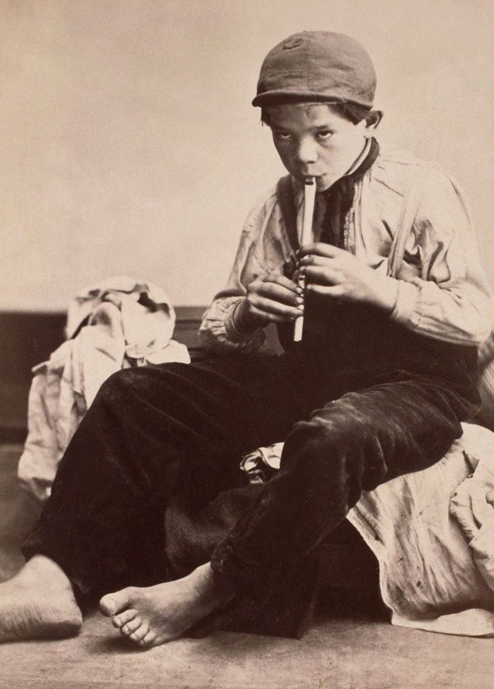
 'The Two Ways of Life' 1857")
 'Down the Valley, Yosemite' 1861")
 'Tutueamela, El Capitan, 3000ft, Yosemite' 1861")
 'The Mother of Salome' 1870")
 'The Angel at the Tomb' 1870")
 'Maud \"There has Fallen a splendid Tear From the Passion Flower at the Gate\"' 1875")
 'Alma Sjöman' c. 1875")
 'No title' From the series 'Gymnastics' c. 1875")

 'Waldemarsudde 1888' 1888")
 'Arms Broken By A Window, New Mexico' 1980 from the exhibition 'Joel-Peter Witkin – Photographs 1980-2016' at William Mora Galleries, Melbourne, August 2017")
 'The Great Masturbator And The Country He Rode In On, New Mexico' 2017 from the exhibition 'Joel-Peter Witkin – Photographs 1980-2016' at William Mora Galleries, Melbourne, August 2017")
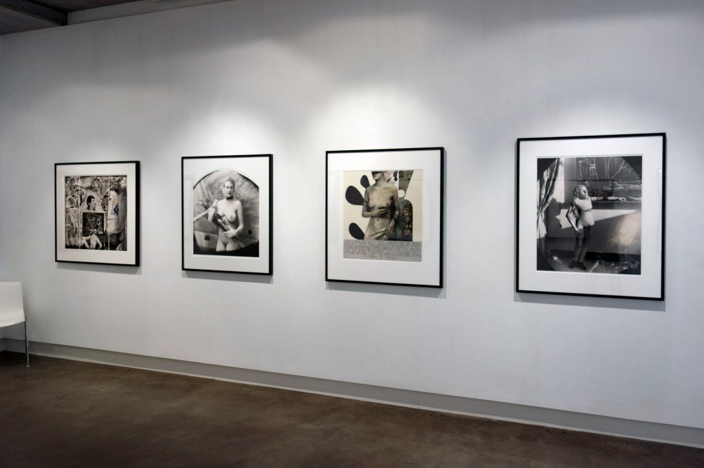
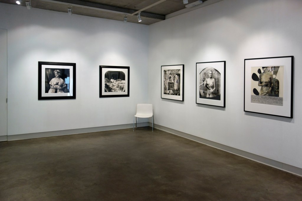

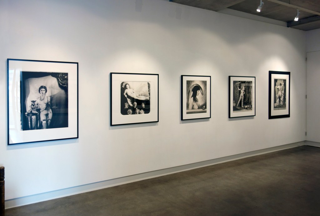
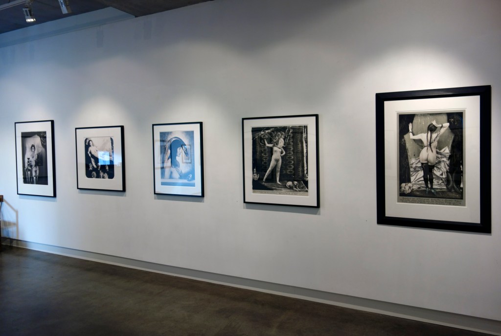


 'Man With Dog, Mexico' 1990")
 'Self Portrait Reminiscent As A Self Portrait As A Vanity' 1995")
 'Beauty Had Three Nipples' 1998")
 'Monsieur Baguette As Orpheo' 2004")
 'Mother Of The Future' 2004")
 'Ars Moriendi' 2007")
 'Bad Student' 2007")
 'Myself As A Dead Clown' 2007")
 'La Giovanissima' 2007")
 'The Scale, Bogota' 2008")
")
 'The Paris Triad : Venus in Chains, Paris' 2010")
 'The Green Princess, Paris' 2011")
 'A History Of The White World' 2011")
 'Presenter Of The End Of Time Award' 2013")
 'Imperfect Thirst' 2016")
 'Stamped Tin Relic' 1929 from the exhibition 'Walker Evans' at the Centre Pompidou, Paris, April - August, 2017")
 'Coney Island Beach' c. 1929 from the exhibition 'Walker Evans' at the Centre Pompidou, Paris, April - August, 2017")
 'Truck and Sign' 1928-1930")
 'New York City Street Corner' 1929")
 'Self-Portrait in Automated Photobooth' 1930")
 'Self-Portrait in Automated Photobooth' 1930 (detail)")
 'Self-Portrait in Automated Photobooth' 1930 (detail)")
 'Westchester, New York, farmhouse' 1931")
 'Main Street, Saratoga Springs, New York' 1931")
 'License Photo Studio, New York' 1934")
 'Penny Picture Display, Savannah' 1936")
 'Joe's Auto Graveyard' 1936")
 'Houses and Billboards in Atlanta' 1936")
 'Shoeshine Stand Detail in Southern Town' 1936")
 'Negroes' Church, South Carolina' March 1936")
 'Alabama Tenant Farmer Floyd Bourroughs' 1936")
 'Allie Mae Burroughs, Wife of a Cotton Sharecropper, Hale Country, Alabama' 1936")
 'Subway Portrait' January 1941")
 'Resort Photographer at Work' 1941")
 'Anna Maria, Florida' October 1958")
 'Untitled, Detroit' 1946")
 'Tin Snips by J. Wiss and Sons Co., $1.85' 1955")

 'Young Quechuan Man, Cuzco' December 1948, printed 1949 from the exhibition 'Irving Penn: Centennial' at the Metropolitan Museum of Art, New York Part 2, April - July, 2017")
 'Cuzco Children' December 1948, printed 1968 from the exhibition 'Irving Penn: Centennial' at the Metropolitan Museum of Art, New York Part 2, April - July, 2017")
 'Two Men in White Masks, Cuzco' December 1948, printed 1984")
 'Cuzco Father and Son with Eggs' December 1948, printed January 1982")
 'Nude No. 18' 1949-1950, printed 1949-1950")
 'Nude No. 42' 1949-1950, printed 1949-1950")
 'Nude No. 57' 1949-1950, printed 1949-1950")
 'Nude No. 72' 1949-1950, printed 1949-1950")
 'Nude No. 130' 1949-1950, printed 1949-1950")
 'Kerchief Glove (Dior), Paris' 1950, printed 1984")
 'Balenciaga Sleeve (Régine Debrise), Paris' 1950")
 'Balenciaga Mantle Coat (Lisa Fonssagrives-Penn), Paris' 1950, printed 1988")
 'Woman with Roses (Lisa Fonssagrives-Penn in Lafaurie Dress), Paris' 1950, printed 1968")
 'Rochas Mermaid Dress (Lisa Fonssagrives-Penn), Paris' 1950")
 'Large Sleeve (Sunny Harnett), New York' 1951, printed 1984")
![Irving Penn (American, Plainfield, New Jersey 1917-2009 New York) 'Marchand de Concombres [Cucumber Seller]' 1950, printed 1976](https://artblart.com/wp-content/uploads/2017/07/penn-marchand-de-concombres-web1.jpg "Irving Penn (American, Plainfield, New Jersey 1917-2009 New York) 'Marchand de Concombres [Cucumber Seller]' 1950, printed 1976")
 'Marchande de Ballons, Paris' 1950, printed 1976")
 'Window Washer' 1950, printed 1967")
 'Fishmonger, London' 1950, printed 1976")
 'Pablo Picasso at La Californie, Cannes' 1957, printed February 1985")
 'Ingmar Bergman, Stockholm, 1964' 1964, printed 1992")
 'Single Oriental Poppy, New York' 1968, printed 1989")
 'Naomi Sims in Scarf, New York, c. 1969' c. 1969, printed 1985")
 'Ungaro Bride Body Sculpture (Marisa Berenson), Paris, 1969' 1969, printed 1985")
 'Three Asaro Mud Men, New Guinea, 1970' 1970, printed 1976")
 'Three Dahomey Girls, One Reclining, 1967' 1967, printed 1980")
 'Tribesman with Nose Disc, New Guinea, 1970' 1970, printed 2002")
 'Cigarette No. 52, New York' 1972, printed April 1974")
 'Cigarette No. 85, New York' 1972, printed Fall 1975")
 'Cigarette No. 98, New York' 1972, printed June 1974")
 'Deli Package, New York' 1975, printed March 1976")
 'Two Miyake Warriors, New York, 1998' June 3, 1998, printed January-February, 1999")
 'Union Bar Window, American South' 1941, printed c. 1941-1942 from the exhibition 'Irving Penn: Centennial' at the Metropolitan Museum of Art, New York, April - July, 2017")
 'O'Sullivan's Heels, New York' c. 1939 from the exhibition 'Irving Penn: Centennial' at the Metropolitan Museum of Art, New York, April - July, 2017")
 'Pulquería Decoration, Mexico' 1942")
 'Le Corbusier, New York' 1947")
 'Elsa Schiaparelli, New York' March 29, 1948, printed c. 1948")
 'Charles James, New York' February 28, 1948, printed June 2002")
![Irving Penn (American, Plainfield, New Jersey 1917-2009 New York) 'Ballet Society, New York [Tanaquil Le Clercq with Corrado Cagli, Vittorio Rieti, and George Balanchine]' March 5, 1948, printed November 1976](https://artblart.com/wp-content/uploads/2017/05/penn-ballet-society-web.jpg "Irving Penn (American, Plainfield, New Jersey 1917-2009 New York) 'Ballet Society, New York [Tanaquil Le Clercq with Corrado Cagli, Vittorio Rieti, and George Balanchine]' March 5, 1948, printed November 1976")
 'Truman Capote, New York' March 5, 1948")
 'Glove and Shoe, New York' July 7, 1947")
 The 'Tarot Reader (Bridget Tichenor and Jean Patchett), New York' 1949, printed 1984")
 'The Twelve Most Photographed Models, New York' 1947")
 'Girl Drinking (Mary Jane Russell), New York' 1949, printed December 1977")
 'Marlene Dietrich, New York' November 3, 1948, printed April 2000")
 'Theatre Accident, New York' 1947, printed 1984")
 'Still Life with Watermelon, New York' 1947, printed 1985")
 'Salad Ingredients, New York' 1947, printed 1984")
 'After-Dinner Games, New York' 1947, printed 1985")
 'The Checkered Dress (Young Georgia O'Keeffe)' 1907 from the exhibition 'Georgia O'Keeffe: Living Modern' at the Brooklyn Museum, New York, March - July, 2017")
 'Georgia O'Keeffe at 291' 1917 from the exhibition 'Georgia O'Keeffe: Living Modern' at the Brooklyn Museum, New York, March - July, 2017")
 'Blue #2' 1916")
 'Georgia O'Keeffe' 1918")
 'Georgia O'Keeffe' c. 1920-1922")
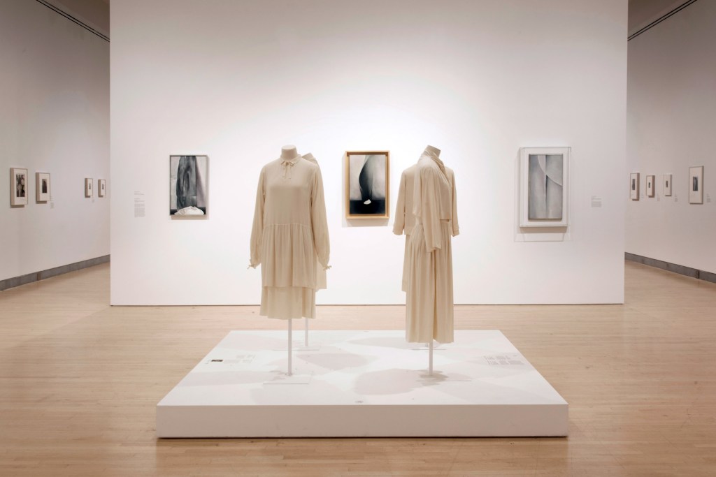
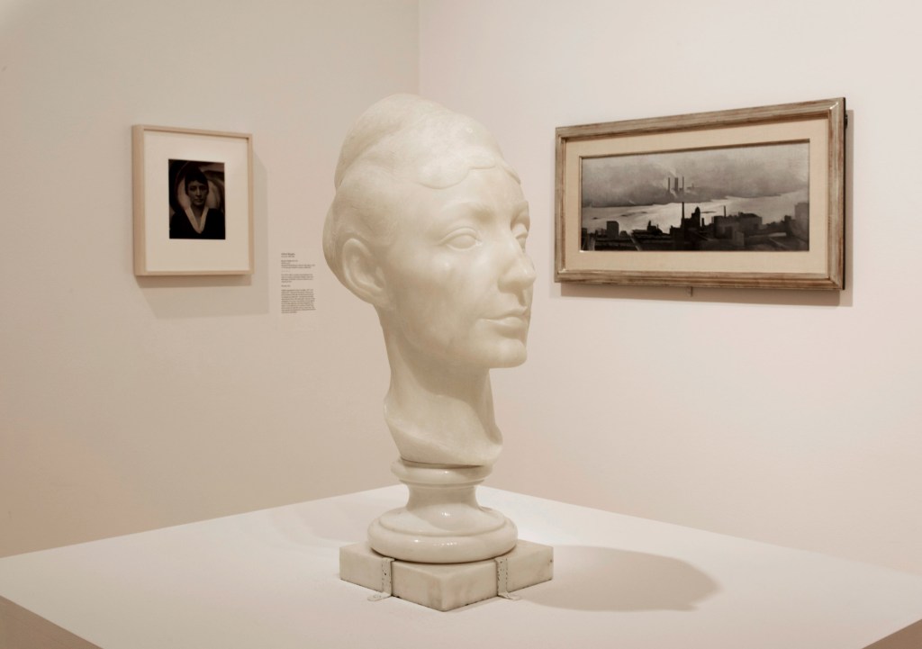
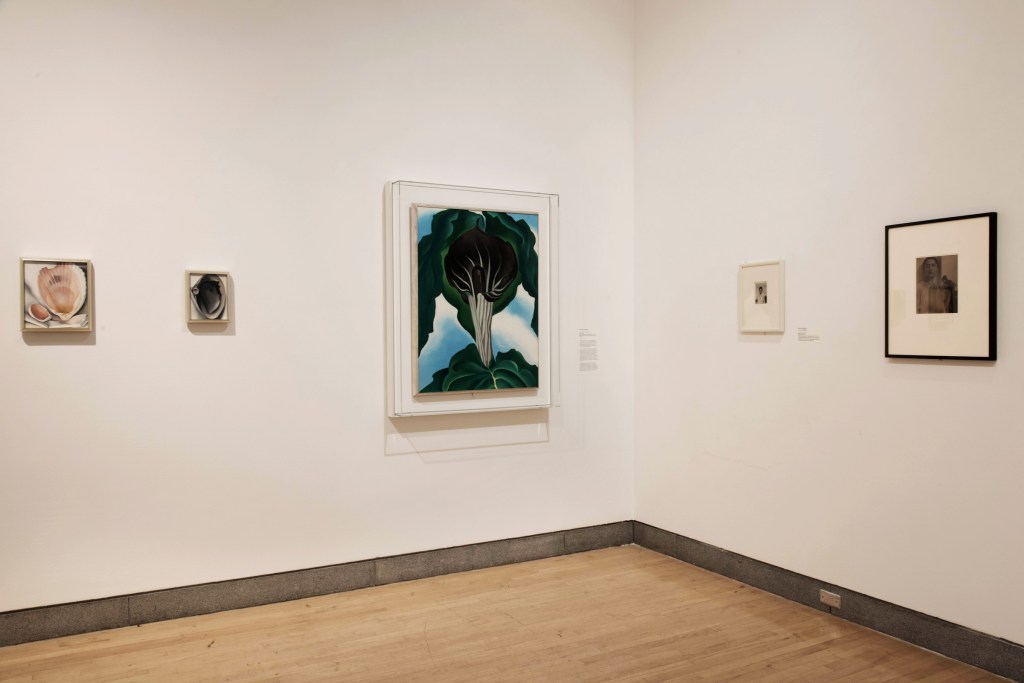
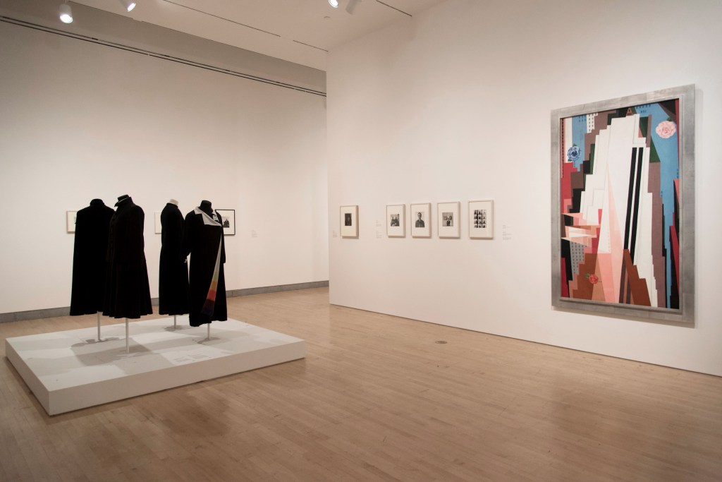
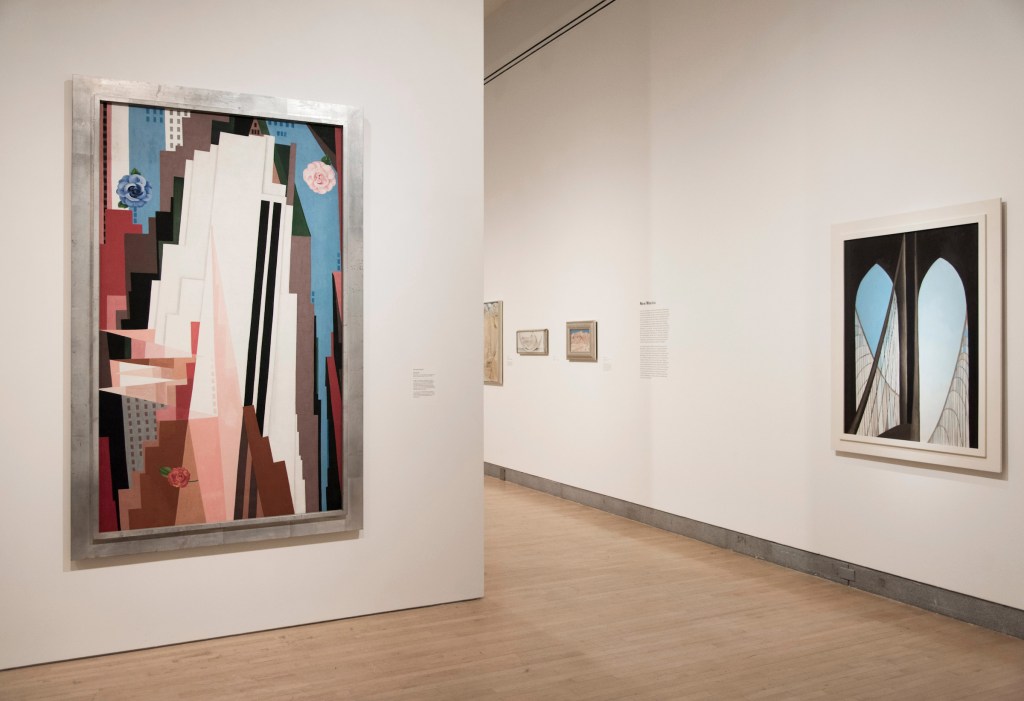
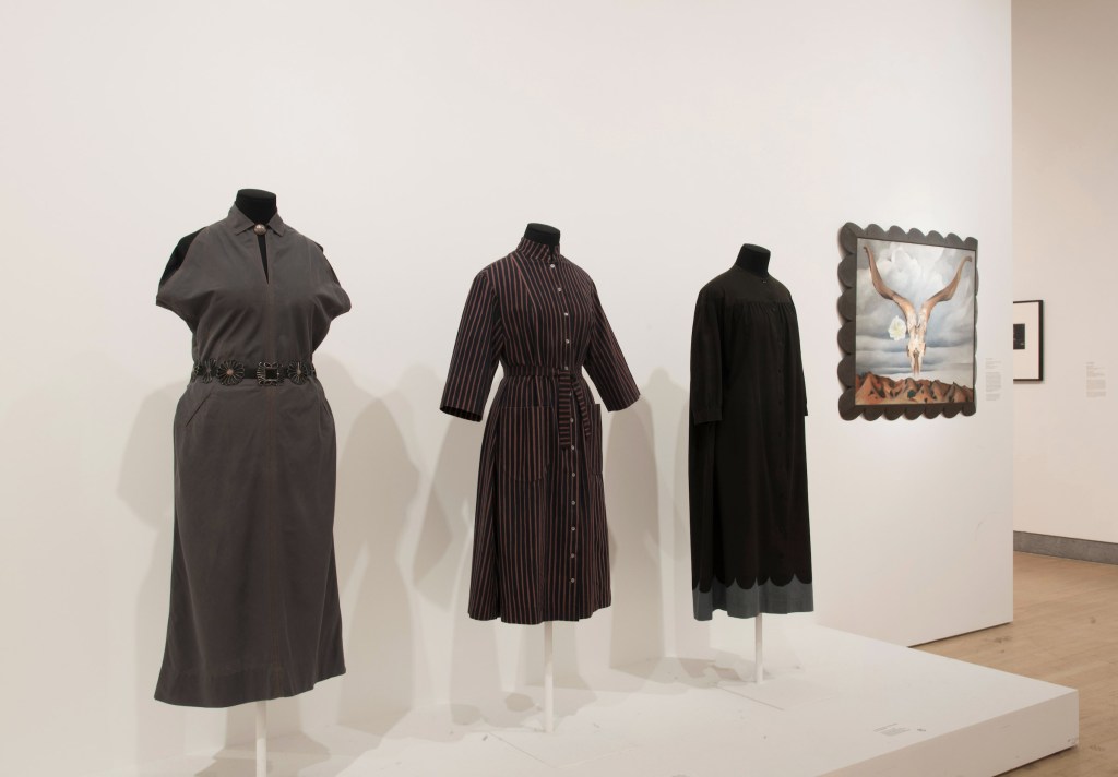
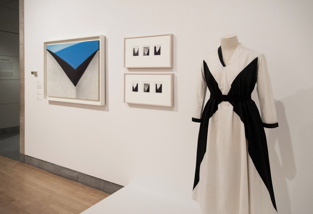
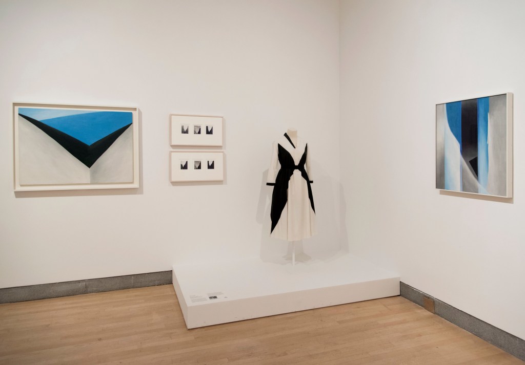
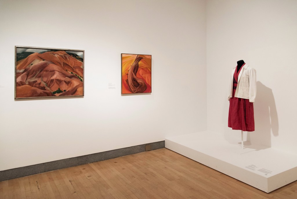
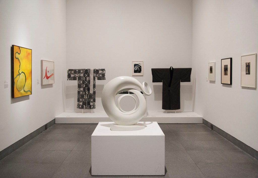
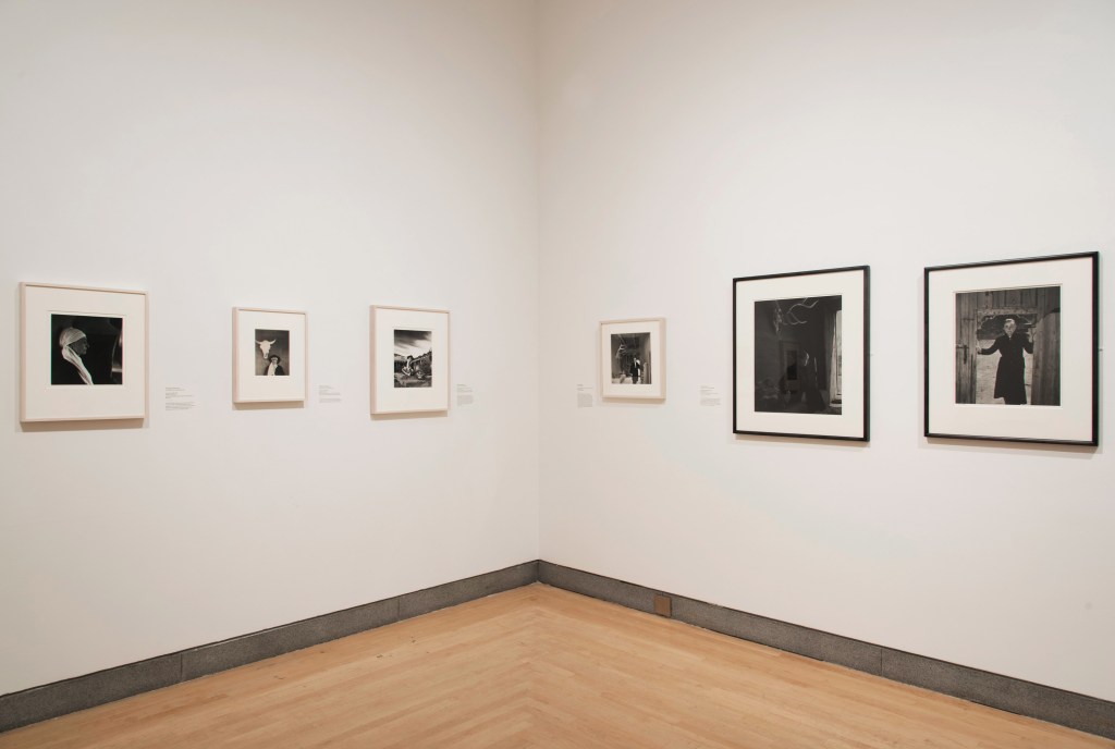
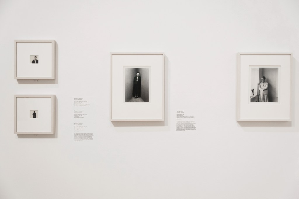

 at left, and Gaston Lachaise's sculpture 'Georgia O'Keeffe' (1925-1927) at centre")
 'Georgia O’Keeffe' 1925-1927")
 second left")
 'Clam and Mussel' 1926")
 right")
 left, and 'Brooklyn' Bridge (1949) right")
 'Manhattan' 1932")
 'Brooklyn Bridge' 1949")
' (1935) at right")

 at left; and an Emilio Pucci dress second right")
 'In the Patio IX' 1950")
 at left")


 second left, and 'Georgia O'Keeffe' by Laura Gilpin (1953) at right")
 'Georgia O'Keeffe' 1953")
 'Georgia O'Keeffe' 1922")
 'Pool in the Woods, Lake George' 1922")
 'Black Pansy & Forget-Me-Nots (Pansy)' 1926")
 'Georgia O'Keeffe, Prospect Mountain, Lake George' 1927")
' c. 1926")
 'Line and Curve' 1927")
 'Georgia O'Keeffe' 1929")
 'Georgia O'Keeffe and Orville Cox' 1937")


 'The Mountain, New Mexico' 1931")
 'Rams Head, White Hollyhock - Hills' (Rams Head and White Hollyhock, New Mexico) 1935")
 'Georgia O'Keeffe at Yosemite' 1938")
 'Patio with Cloud' 1956")
 'Georgia O'Keeffe on Ghost Ranch Portal, New Mexico' c. 1960s")
' c. 1960s-1970s")
 'Georgia O'Keeffe, Abiquiu, N.M.' 1984")
' 1983")
 'Georgia O'Keeffe, Carmel Highlands, California' 1981")


You must be logged in to post a comment.