Ah symmetry, that vague sense of harmonious and beautiful proportion and balance, that patterned self-similarity that, through Hofer’s large format photographs, reflects the vainglorious human edifices of Northern Italy, superbly beautiful in their empty pride. Customarily devoid of human presence, Hofer’s photographs are technically and aesthetically superb. One has to examine the photographs with respect to their relationship to the passage of time, utilising spatial awareness to try to understand why things exist in specific locations within human culture.
“Both in ancient and modern times, the ability of a large structure to impress or even intimidate its viewers has often been a major part of its purpose, and the use of symmetry is an inescapable aspect of how to accomplish such goals.” (Wikipedia) Symmetries are informative of the world around us, and peer relationships are based on symmetry sending the message “we are all the same.” So Hofer’s symmetrical photographs possess opposing messages: we are all the same but some of us are more important (read powerful) than others.
Hofer’s highly symmetrical rooms are unavoidably also rooms in which anything out of place or potentially threatening can be identified easily and quickly, which has implications for safety, security, and familiarity. In this case it is the absence of human presence. To me this is the critical reading of Hofer’s photographs: they comment on the foibles of the human race, a race nearing the destruction of its only place of habitation, reaching the tipping point on the path to annihilation, yet indulging itself in a continuing race of construction and consumption. There will come a point when these edifices are crumbling and in ruins, as an Ebola-like virus races airborne around the world, destroying 90 percent of the population of the earth within months. The Earth will self balance and all we will be left with will be the memory of an empty symmetry.
Symmetry, then, can be a source of comfort not only as an indicator of biological health, but also of a safe and well-understood living environment. The paradox of Hofer’s environments is that in these colourful, exuberant, profuse environments nothing is alive, the interiors meaningless in an empty, vacuous world.
The human race will soon have left the building.
Dr Marcus Bunyan
Many thankx to Ben Brown Fine Arts for allowing me to publish the photographs in the posting. Please click on the photographs for a larger version of the image.
German photographer Candida Höfer makes a significant return to Ben Brown Fine Arts in London on 12 February with a major solo show, unveiling thirteen new and previously unseen photographs which catalogue the architectural treasures of Northern Italy.
Mantova, Vicenza, Sabbioneta, Venice and Carpi provide the glorious setting for this new series shot over the past two years, a continuation of Höfer’s previous work in Central and Southern Italy. The interiors of palaces, opera houses, libraries and theatres, which Höfer captures with incredible skill, are part of her meticulous documentation of public spaces – places of culture, knowledge, communication and exchange with a rich history and clear functionality. Having rarely visited the Northern region, Höfer was particularly touched by the naturalness and ease with which the local people there accepted this extraordinary architecture as a part of their daily lives.
Höfer’s portraits of interiors, customarily devoid of human presence, emphasise the solemn magnificence of the Palazzo Ducale, Teatro La Fenice and Biblioteca Teresiana, amongst others. By featuring spaces that celebrate mankind’s greatness, yet where people are nowhere to be found, Höfer’s images possess an unexpected poignancy which has become the hallmark of her work. Höfer produces these large-format photographs without digital enhancement or alteration, using long exposure and working solely with the existing light source. The effect is a rare combination of intimacy and scale, in which intricate architectural detail is captured without sacrificing the sense of space and civilised order.
Höfer, a member of the Düsseldorf School (Kunstakademie Düsseldorf), was a noted pupil of the Bechers, who were heavily influenced by the 1920s German art tradition of Neue Sachlichkeit and pioneered a type of detached objectivity. The Bechers’ black and white photographs of industrial landscapes and architecture embodied a clinical, documentary style, which Höfer has retained in her work through the same neutral and methodical process. Yet Höfer’s large-scale colour prints differ in their more sympathetic approach to the building’s culture and history.”
Exhibition dates: 13th November, 2012 – 7th April, 2013
From the Art Fund Collection of Middle Eastern Photography at the V&A and the British Museum
Curator: Marta Weiss, Curator of Photographs at the V&A
Newsha Tavakolian (Iranian, b. 1981) From the series Mothers of Martyrs 2006 Digital C-print Art Fund Collection of Middle Eastern Photography at the V&A and the British Museum
A massive posting on a fascinating subject. I know little about this area of (sometimes postcolonial) photography. The images are really strong, powerful and laden with symbology – the signifier (photograph) and signified (meaning of the photograph) evidencing signs that interrogate “the creative responses to the social challenges and political upheavals that have shaped the Middle East over the past 20 years.” The three concepts Recording, Reframing and Resisting are critical to understanding the practices of these artists as they investigate the historicity, sacrifice, repression and persecution of their peoples.
Dr Marcus Bunyan
Many thankx to the Victoria and Albert Museum for allowing me to publish the photographs in the posting. Please click on the photographs for a larger version of the image.
Nermine Hammam (Egyptian, b. 1967) The Break 2011 From the series Upekkha Archival inkjet print The Art Fund Collection of Middle Eastern Photography at the V&A and the British Museum
Light from the Middle East: New Photography is the first major museum exhibition of contemporary photography from and about the Middle East. It features more than 90 works by some of the most exciting artists from the region, spanning North Africa to Central Asia. The exhibition is part of a collaboration between the British Museum and the V&A, which has over the last three years seen the development of a major collection of Middle Eastern photography thanks to substantial funding from the Art Fund. The collection of 95 works has been built in response to a surge of interest in the visual arts in the region and is beginning to remedy the under-representation of Middle Eastern photography in UK collections. Light from the Middle East includes 87 of the works from this shared collection.
The photographs on display show the creative responses to the social challenges and political upheavals that have shaped the Middle East over the past 20 years and include work made following the recent revolution in Egypt. The photographs present multiple viewpoints of a region where collisions between personal, social, religious and political life can be emotive and complex. The exhibition showcases the work of 30 artists from 13 different countries including internationally established practitioners such as Abbas (Iran), Youssef Nabil (Egypt) and Walid Raad (Lebanon) as well as emerging talents such as Taysir Batniji (Palestine), Shadi Ghadirian (Iran) and Abdulnasser Gharem (Saudi Arabia). The work covers a wide range of techniques and subject matter, from photojournalism to staged and digitally manipulated imagery.
Marta Weiss, curator of the exhibition said: “In the past few years contemporary photographic practice from and about the Middle East has been some of the most exciting, innovative and varied art anywhere in the world. The exhibition celebrates the creative and sophisticated ways that contemporary artists use photography to respond to the complexities of the Middle East.”
The exhibition is structured around three key themes; Recording, Reframing and Resisting. Each explores a range of strategies Middle Eastern artists have used to engage with the medium of photography.
The opening section shows how photography can be used as a powerful tool for recording people, places and events. From Newsha Tavakolian’s series Mothers of Martyrs (2006) featuring elderly mothers holding framed pictures of their sons who were killed in the Iran-Iraq war during the 1980s, to Jananne Al-Ani’s disorienting aerial views of the desert in her video Shadow Sites II (2011), this section demonstrates various ways in which the camera has been used to document and record. The work in the second section explores an interest in reframing and reworking preexisting photographs. Shadi Ghadirian’s series Qajar (1998) recreates 19th-century Iranian studio portraits, updating them with contemporary props such as sunglasses and Pepsi cans, while Taysir Batniji applies the modernist style of the German photographers Bernd and Hilla Becher to his series of photographs of Israeli watchtowers in the West Bank.
The final section looks at practitioners who resist the authority of the photograph, questioning the medium’s ability to record factual information. Whether manipulating or digitally altering images, or physically attacking the print surface by scratching and burning, these artists demonstrate a desire to undermine the legibility and reliability of the photograph. In the intimate and poetic series Le Retour Imaginaire (2002), Afghan artist Atiq Rahimi rejects new technology, opting instead to photograph war-ravished Kabul with a primitive box camera. The recent series Uphekka by Nermine Hammam reworks photographs of Egyptian soldiers taken during the protests in Tahrir Square, Cairo in 2011 and transports them to multicoloured fantasy settings that are far removed from the struggles of the Arab Spring.
Press release from the V&A website
Recording
Photography is a seemingly accurate means of recording people, places and events. A photograph can serve a commemorative purpose or document a historic moment. It can reveal something not otherwise visible, such as a place or event the viewer would not have access to, or a particular vantage point available only to the photographer. It can also create a lasting image of a fleeting performance, or of a scene staged only for the camera.
But how reliable is a photograph? Despite the apparent authority of photographic images, they can trick or disorient. They can be ambiguous and difficult to decipher. Their meaning can shift according to context, cropping or captioning. What are the limitations of photography?
The photographers in this section use a range of approaches to exploit and explore the camera’s capacity to record.
Abbas (Iranian, 1944-2018) Rioters burn a portrait of the Shah as a sign of protest against his regime. Tehran, December 1978 1978-1979 From the series Iran Diary Gelatin silver print Art Fund Collection of Middle Eastern Photography at the V&A and the British Museum Abbas@Magnum Photos, courtesy Magnum Gallery
Issa Touma (Syrian, b. 1962) From the series Sufis: The day of al-Ziyara 1995-2005 Gelatin silver print Art Fund Collection of Middle Eastern Photography at the V&A and the British Museum
Issa Touma is a prominent figure in the Syrian art scene. Self-taught, he began his career as a photographer in the early 1990s. In 1996 he founded Le Pont Organisation and Gallery, an independent art organisation to promote freedom of expression and stimulate the local art scene through international events.
His series on the day of al-Ziyara documents an annual procession of Sufi pilgrims in northern Syria. Sufism is a mystical path within Islam. Touma photographed the event over the course of ten years, gradually gaining the trust of his subjects. The resulting images convey his sense of immersion in the festival and capture the fervour of the worshippers.
Jananne Al-Ani (Born Kirkuk, Iraq, 1966. Lives London, UK) Still from ‘Shadow Sites II’ 2011 Single channel digital video. Duration 8 mins 38 secs Photography by Adrian Warren Courtesy the Artist and Rose Issa Projects, London
Al-Ani works with photography, film and video, producing bodies of work that explore the power of testimony and interrogate the documentary tradition, often characterised by an interweaving of intimate recollections of loss and trauma with more formal, official accounts of historic events.
This is a still from a video composed of a series of aerial views, which show that the desert is inhabited and not the unoccupied wilderness it is sometimes believed to be. The title draws on a phenomenon familiar to archaeologists: when the sun is at its lowest, shadows make visible the remains of otherwise undetectable settlements. Al-Ani’s images are presented without explanation and the scale of the landscapes is difficult to interpret. They are deliberately ambiguous and point to the limitations of photography.
Shadow Sites II by Jananne Al-Ani
Extracts from Jananne al Ani’s film Shadow sites II 2011
Waheeda Malullah (Bahrain, b. 1978) From the series Light 2006 Inkjet print on rag paper Art Fund Collection of Middle Eastern Photography at the V&A and the British Museum
Waheeda Malullah uses playfulness and humour to explore social rules, and in particular the roles women play in Islamic society. In the series Light she records a performance staged expressly for the camera. By lying down next to tombs in Bahrain she exaggerates the Shi’i Muslim custom of seeking blessing by touching the tombs of revered people. These stylised compositions are also studies of form, light and shadow.
Ahmed Mater (Saudi Arabian, b. 1979) Magnetism II 2012 Photogravure Acquired thanks to Mr Abdulaziz al-Turki
Ahmed Mater is a Saudi artist and qualified GP. Working in photography, calligraphy, painting, installation and video, Mater reflects his experiences as a doctor and the ways this has challenged his traditional background and beliefs, and explores wider issues about Islamic culture in an era of globalisation. In the series Magnetism, what at first appear to be pilgrims circling the Ka’ba, the sacred building at the heart of the sanctuary at Mecca, are in fact iron filings spiralling around a cube-shaped magnet. Mater refers to the spiritual force that Muslim believers feel during Hajj, the pilgrimage to Mecca. By creating photographs that recall well-known images on a dramatically different scale, Mater also questions the reliability of photography.
Newsha Tavakolian (Iranian, b. 1981) From the series Mothers of Martyrs 2006 Digital C-print Art Fund Collection of Middle Eastern Photography at the V&A and the British Museum
Newsha Tavakolian started her career at the age of 16, as a junior photographer for the Iranian women’s daily Zan-e Rooz. She also worked with other reformist newspapers and by the early 1990s had established herself as one of Tehran’s few female photojournalists, working internationally and particularly focussing on women’s issues. She is a founder member of the EVE international collective of women photojournalists, established in 2006 and of Rawiya, a collective of women photographers from the Middle East, founded in 2011. Her series Mothers of Martyrs shows elderly Iranian women holding framed photographs of their sons who died decades earlier in the Iran-Iraq war (1980-1988). The double portraits attest to photography’s emotive power.
Abbas Kowsari (Iranian, b. 1970) Halabche 2003 Digital C-print Art Fund Collection of Middle Eastern Photography at the V&A and the British Museum
Abbas Kowsari began his career as a photojournalist for the Tehran Times in 1994 and is currently Senior Picture Editor for Shargh, a popular reformist title. This photograph made in nothern Iraq presents a portrait within a portrait. The figure of a peshmerga (a Kurdish combatant) is tightly framed to exclude his face. Instead, the face of rock musician Bryan Adams, on the soldier’s T-shirt, fills a central portion of the composition. The faded black-and-white image is surrounded by saturated colours and brightly gleaming metal. The contrast reinforces the incongruity between warfare in Iraq and western pop culture.
Abdulnasser Gharem (Saudi Arabian, b. 1973) The Path (Siraat) 2009 Inkjet print on aluminium Art Fund Collection of Middle Eastern Photography at the V&A and the British Museum
Abdulnasser Gharem works across a variety of media to explore local Saudi issues. Amongst his best-known works are ‘stamp paintings’, made from industrial paint on rubber stamps, a technique devised to negotiate and comment on censorship. He combines service in the Saudi armed forces (he is currently Lieutenant Colonel) with his activities as an artist.
The subject of this photograph is a bridge in southern Saudi Arabia that was severely damaged in the early 1980s when villagers attempted to take shelter on it during a flash flood. Instead of providing a safe high ground above the floodwaters the bridge collapsed, resulting in the loss of many lives. Gharem spray-painted the word siraat repeatedly on the bridge. The word means path, and in the Qur’an it refers to ‘the path to God’.
Tal Shochat (Israeli, b. 1974) Pomegranate (Rimon) 2010 C-print Art Fund Collection of Middle Eastern Photography at the V&A and the British Museum
In her photographs Shochat stages both figures and objects to create symbolically-laden images that often question the boundary between nature and artifice. Here she applies the conventions of studio portraiture to photographing trees. The first stage in her meticulous process is to identify the perfect specimen of a particular type of tree. When the fruit is at the height of maturity, she cleans the dust off the branches, leaves and fruit. Finally, Shochat photographs the tree, artificially lit and isolated against a black cloth background. The photographs present a view of nature that would never actually exist in a natural environment. The work highlights the tensions in photography between reality and artifice.
Yto Barrada (French, b. 1971) Bricks (Briques) 2003/2011 C-print Art Fund Collection of Middle Eastern Photography at the V&A and the British Museum
Yto Barrada grew up in Paris and Tangier and studied in Paris and New York. Since 2006 she has directed the Cinématèque de Tanger, a cultural centre home to an archive of Maghrebi and Arabic film and video. Barrada’s hometown of Tangier is the subject of much of her work. In this view, recently constructed buildings in various states of completion are scattered across the hillsides. The pile of bricks in the foreground seems to parallel the haphazard nature of the surrounding building projects. The untidy man-made heap echoes the form of the natural hills in the background.
Mehraneh Atashi (Iranian, b. 1980) Bodiless I 2004 From the series Zourkhaneh Project (House of Strength) Digital C-print Art Fund Collection of Middle Eastern Photography at the V&A and the British Museum
Mehraneh Atashi explores the relationship between photography and power in her ongoing investigation into the possibilities of self-portraiture. Her photographic series reveal lesser-known aspects of Iranian life.
This photograph shows the inside of a zurkhana, a traditional Iranian wrestling gym, in Tehran. The artist has explained that ‘tradition forbids the breath of women’ in the zurkhana. Atashi includes herself in the scene through a reflection in a mirror. This picture within a picture emphasises her incongruous presence in a place from which women are normally excluded.
Reframing
The artists in this section appropriate or imitate images from the past in order to make statements about the present. Their sources range from studio portraiture to fashion photography, from Old Master paintings to Modernist photographs. Using a variety of techniques, they update and interrogate, knowingly combining past and present, East and West, fact and fiction. Whether emulating or critiquing, these artists reframe existing images to new ends.
Raeda Saadeh (Palestinian, b. 1977) Who will make me real? 2003 Digital C-print Art Fund Collection of Middle Eastern Photography at the V&A and the British Museum
In her photographs, videos and performances, Raeda Saadeh assumes various roles to explore issues of displacement, gender and identity, with particular reference to the Israeli-Palestinian conflict. Here the artist lies in a pose that recalls 19th-century European paintings of reclining nudes. These often featured non-European women and ‘Orientalist’ costumes and scenery. Saadeh is encased in Palestinian newspapers, which conceal her body from neck to ankle while revealing its contours. The covering is both flimsy and apparently immobilising, resembling a papier-mâché body cast. Any sensuality implied by her pose is disrupted by the harsh realities reported in the newspaper.
Jalali was a photographer and teacher who played a leading role in collecting and preserving historical photographs in Iran. He was an influential teacher, mentored many of the younger generation of Iranian photographers, and was instrumental in setting up Tehran’s first Museum of Photography (also known as Akskhaneh Shahr).
In this montage he layered Qajar-period (1786-1925) portraits and an enlarged detail of an old photographic studio sign that had been crossed out with red paint. Jalali speculated that this defacement occurred during the Islamic revolution (1978-1979), perhaps as an attack on a studio where unveiled women had been photographed.
Shadi Ghadirian (Iranian, b. 1974) From the series Qajar 1998 Gelatin silver print Art Fund Collection of Middle Eastern Photography at the V&A and the British Museum
Shadi Ghadirian was among the first students to graduate in photography from the Azad University, Tehran. Her work addresses concerns of Iranian women of her generation, exploring ideas such as censorship, religion and modernity, often with a wry humour.
The series Qajar is based on a style of photograph made during Iran’s Qajar period (1786-1925). In those portraits, sitters posed with props representing their aspirations. Here, the sitters wear costumes that approximate Qajar fashion, but the objects they pose with are jarringly modern and western – a mountain bike, a stereo or a can of Pepsi. The contrast makes a comment on the tensions between tradition and modernity that women in Iran face today.
Youssef Nabil (Egyptian, b. 1972) The Yemeni Sailors of South Shields (detail) 2006 Hand-coloured gelatin silver print Art Fund Collection of Middle Eastern Photography at the V&A and the British Museum
Youssef Nabil’s photographs and films evoke the glamour and melodrama of the golden age of Egyptian cinema in the 1940s and 50s, known as Hollywood on the Nile. This is one of a dozen portraits made as part of a project to document the last surviving Yemeni men to settle as ship-workers in South Shields, in the north of England. The area is home to one of the oldest Muslim communities in the UK. Nabil hand-coloured the black-and-white photographs in the manner of mid 20th-century Egyptian studio portraiture.
Hassan Hajjaj (Moroccan, b. 1961) Saida in Green 2000 Digital C-print and tyre frame Art Fund Collection of Middle Eastern Photography at the V&A and the British Museum
Hajjaj is inspired by fashion photography, while also mocking its methods. He creates playful juxtapositions between global brand names and local motifs such as veils and babouches (traditional Moroccan slippers). The result is an exuberant collision of the stereotypical symbols of western consumerism and Middle Eastern tradition. The frames, which Hajjaj constructs from recycled materials, transform the photographs into three-dimensional, sculptural objects.
Resisting
The artists in this section question the idea that a photograph can tell the truth. Some digitally alter images. Some scratch negatives and prints, or even burn them. Other artists reject clarity and detail in favour of processes that rely on chance. The results are murky, atmospheric images that require effort to interpret. These manipulations demonstrate the fragility of the photograph, whether at the hands of artists or censors. They also lay bare the power of photographic imagery to influence and control through propaganda or surveillance. These works resist photography’s claim to accuracy and authority.
Atiq Rahimi (Afghanistan, b. 1962) On the threshold of time (Au seuil du temps) 2002 From the series The Imaginary Return (Le retour imaginaire) Gelatin silver print Art Fund Collection of Middle Eastern Photography at the V&A and the British Museum
Atiq Rahimi is a writer, film director and photographer who fled Afghanistan after the Soviet invasion in 1984, seeking political refuge in France, where he is now based. He returned to Afghanistan in 2002, after the fall of the Taliban. Confronted by the ruins of Kabul, he decided not to photograph the city with his digital camera. Instead he chose a primitive box camera normally used to take identity portraits in the streets of Kabul. The unpredictable process resulted in dreamlike photographs. They convey the nostalgia and brutal feelings of loss that Rahimi experienced when revisiting the war-wounded city.
Jowhara AlSaud (Saudi Arabian, b. 1978) Airmail 2008 From the series Out of Line C-print Art Fund Collection of Middle Eastern Photography at the V&A and the British Museum
Jowhara AlSaud’s photographs explore the language of censorship and the malleability of photography. AlSaud scratches the outlines of figures from her personal photographs into photographic negatives, which she then prints. By reducing the figures to line drawings she renders them anonymous. The embracing figures hint at farewells and longing. The envelopes suggest thwarted attempts at communication. AlSaud’s hybrid technique of drawing and photography critiques the censorship of visual communication in Saudi Arabia.
Şükran Moral (Turkish, b. 1962) Despair 2003 Digital C-print Art Fund Collection of Middle Eastern Photography at the V&A and the British Museum
Şükran Moral works in photography, sculpture, video and performance, creating bold and often controversial works that critique society and its institutions. Violence against women is a major theme. She has also made work about other groups who lack societal power, including the mentally ill, children, immigrants and prostitutes.
In this image, brightly-coloured birds, what Moral calls ‘digital nightingales’, perch on a group of migrant workers huddled in a boat. According to the artist, in Turkish literature nightingales are a symbol of hope, love and separation. The men and boys are shown in black-and-white, at the mercy of their situation. The birds, however, are free to fly away.
Nermine Hammam (Egyptian, b. 1967) Armed Innocence II 2011 From the series Upekkha Archival inkjet print Art Fund Collection of Middle Eastern Photography at the V&A and the British Museum
Influenced by a background in film and graphic design, Nermine Hammam works in series, making prints that combine elements of painting and photography, often digitally manipulating and layering images to represent subjects in states of abandonment or altered consciousness. When the army was called in to respond to the protests in Cairo’s Tahrir Square in January 2011, Hammam was struck by the vulnerability of the soldiers. They seemed to want to be anywhere but there. In the Uppekkha series she transports these soldiers into vibrant fantasy settings. Reminiscent of postcards, the series likens the events of Tahrir Square to a tourist attraction that drew the world’s attention, but was not fully understood.
Joana Hadjithomas (Lebanon, b. 1969) and Khalil Joreige (Lebanon, b. 1969) Wonder Beirut #13, Modern Beirut, International Centre of Water-skiing 1997-2006 From the series Wonder Beirut: The Story of a Pyromaniac Photographer C-print mounted on aluminium with face mounting Art Fund Collection of Middle Eastern Photography at the V&A and the British Museum Courtesy of the artists and CRG Gallery, New York and In Situ / Fabienne Leclerc, Paris
Joana Hadjithomas and Khalil Joreige collaborate as filmmakers and artists, producing cinematic and visual art work that intertwine. In the series Wonder Beirut they use photography to blur fact and fiction. The artists noticed that tourist postcards of pre-civil war Beirut were still for sale after the war ended in 1990. They invented a fictional photographer named Abdallah Farrah who, in 1968, was commissioned by the tourist board to make postcard views of Beirut’s attractions. When the civil war broke out in 1975, he began to burn his negatives to reflect the surrounding destruction. The artists present these works as prints from the fictional photographer’s damaged negatives.
John Jurayj (American, b. 1968) Untitled (Large Embassy with Red Mirror #1) 2007 Inkjet print on watercolour paper, with burn holes and mirrored Plexiglas Art Fund Collection of Middle Eastern Photography at the V&A and the British Museum
Using a variety of media, including painting, print-making, sculpture and video, John Jurayj explores the impact of the Lebanese civil war (1975-1990), as both a world conflict and an identity trauma. He often re-works photographs of Lebanon from family albums, press archives and online databases. Here he translates the brutality of war into an attack on the photograph itself. He enlarges to near abstraction a news photograph of the bombed US embassy in Beirut in 1984. The image is further disrupted by the holes burnt into the paper. The holes are then filled in with red, mirrored Plexiglas.
Victoria and Albert Museum Cromwell Road London SW7 2RL Phone: +44 (0)20 7942 2000
Exhibition dates: 22nd December, 2012 – 7th April, 2013
Curator: Peter Barberie, The Brodsky Curator of Photographs at the Philadelphia Museum of Art
Many thankx to the Philadelphia Museum of Art for allowing me to publish the photographs in the posting. Please click on the photographs for a larger version of the image.
William Henry Fox Talbot (British, 1800-1877) Group of Persons Selling Fruit and Flowers 1845 Salted paper print from a paper negative 6 11/16 x 8 1/4 inches (17 x 21cm) Philadelphia Museum of Art, Purchased with the Robert A. Hauslohner Fund, 1967
Felice Beato (English born Italy, 1825-1913) Confucius, Canton, April 1860 April 1860 Albumen silver print 10 x 12 inches (25.4 x 30.5cm) Philadelphia Museum of Art, Purchased with funds contributed by Dr. Chaoying Fang, Harvey S. Shipley Miller and J. Randall Plummer, and with the Alice Newton Osborn Fund, 1978
Dorothy Norman (American, 1905-1997) Harbor II, (Osterville), Cape Cod 1930s Gelatin silver print Sheet: 2 7/8 x 3 7/8 inches (7.3 x 9.8cm) Philadelphia Museum of Art, From the Collection of Dorothy Norman, 1980
Edward Weston (American, 1886-1958) Dunes, Oceano 1936 Gelatin silver print Philadelphia Museum of Art
Louise Lawler (American, b. 1947) Living Room Corner Arranged by Mr. and Mrs. Burton Tremaine, Sr., 1984 Dye destruction print Sheet: 18 1/4 x 23 3/4 inches (46.4 x 60.3cm) Philadelphia Museum of Art, Gift of Henry S. McNeil, Jr., 1988
Richard Misrach (American, b. 1949) Pink Lightning, Salton Sea 1985 Chromogenic print 18 5/16 x 23 1/16 inches (46.5 x 58.6cm) Philadelphia Museum of Art, Gift of the Friends of the Philadelphia Museum of Art, 1986
Joachim Koester (Danish active United States, b. 1962) Room of Nightmares #1 2005 Chromogenic print 18 7/8 x 23 7/8 inches (47.9 x 60.6cm) Philadelphia Museum of Art, Gift of Lynne and Harold Honickman
This exhibition presents a survey of photographs from the permanent collection and includes an important group of works by Dorothy Norman and her mentor Alfred Stieglitz, one of the greatest figures in twentieth-century American art. There are also early masterworks by Gustave Le Gray, whose images of light and motion inspired the Impressionists; Edward Weston; Julia Margaret Cameron; and Charles Aubry. These striking images are complemented by an array of modern and contemporary works that trace the medium’s history as a visual art form, including recent acquisitions by artists such as Florence Henri, Roy DeCarava, and Hiroh Kikai, many on view for the first time in Philadelphia.
The mainly black-and-white photographs reflect the strengths of the Museum’s photography collection, ranging from the 1840s to 2005. Nineteenth-century photographs include works by William Henry Fox Talbot, an early inventor of photography; a group of views from Felice Beato’s 1860 album China; and Rue des Prêtres Saint‑Étienne, de la rue Descartes by Charles Marville, who documented the narrow quarters of nineteenth-century Paris.
Post-World War II American and Japanese photography is seen through a number of works by Robert Frank including Jehovah’s Witness, Los Angeles (1955), Diane Arbus’s Untitled (6) (1970-71), and Masahisa Fukase’s Untitled(1976). The exhibition continues with contemporary photography by a broad range of international artists, including Joachim Koester’s Room of Nightmares #1 (2005) and Gerhard Richter’s Guildenstern (Rhombus II) (1998), a cunning investigation of the shared terrain between painting and photography.
The works by Norman and Stieglitz were made during the years of their creative exchange, from 1929 until Stieglitz’s death in 1946. These include a number of portraits, such as Norman’s cropped close-up Alfred Stieglitz IX, New York (1933); cityscapes and landscapes, as seen in Stieglitz’s New York from the Shelton (1935), showing the interplay of light and shadow on the skyscrapers of a changing New York skyline; and Norman’s Harbor II, Osterville, Cape Cod (1930s), a study in line and composition. These images are complemented by photographs made by their contemporaries, including Man Ray’s surrealist Marquise Casati (1922) and Florence Henri’s Portrait (c. 1930).
Press release from the Philadelphia Museum of Art website
Charles Marville (French, 1816-1879) Rue des Prêtres Saint-Étienne, de la rue Descartes c. 1865 Albumen silver print Image and sheet: 12 13/16 x 10 3/8 inches (32.5 x 26.4cm) Philadelphia Museum of Art, Purchased with the Lola Downin Peck Fund, 2009
Dorothy Norman (American, 1905-1997) Alfred Stieglitz IX, New York 1933 Gelatin silver print Sheet: 2 5/8 x 2 11/16 inches (6.7 x 6.8cm) Philadelphia Museum of Art, From the Collection of Dorothy Norman, 1968
Varvara Stepanova (Russian, 1894-1958) Red Army Men 1930 Photomontage for Abroad magazine
A bumper posting on a fascinating subject. The portrait of Tolstoy is incredible; more poignant are the photographs pre-World War I (the last days of the Tsarist dynasty), and pre-World War 2 (Portrait of Yury Rypalov, below). People stare into the camera with no idea of the maelstrom about to descend…
Dr Marcus Bunyan
Many thankx to Foam for allowing me to publish the text and photographs in the posting. Please click on the photographs for a larger version of the image.
Boris Mikhailov (Ukranian, b. 1938) Untitled 1971-1985 From the series Luriki
The exhibition Primrose – Russian Colour Photography takes place as part of Netherlands-Russia 2013. The title refers to the primrose flower, used metaphorically here to represent the many colours in which it appears during early spring. Primrose – Russian Colour Photography presents a retrospective of the various attempts in Russia to produce coloured photographic images. This process began in the early 1850s, almost simultaneously with the discovery of the new medium itself. The colouring technique, based on the traditional methods of craftsmen who added colour into a certain contour design, has determined a whole independent trend in the history of photography in Russia, from ‘postcard’ landscapes and portraits to Soviet propaganda and reportage photography.
The use of colour in Russia stems from the early 1850s and practically coincides with the invention of the medium itself. The term colour photography is slightly disingenuous, since at first it referred to a toning technique in which black and white photographs were painted by hand. Traditionally this technique was used by specialised tradesmen who added colour to the photographs according to certain methods and within the contours of the image. This technique became so popular that it started a trend in and of itself and to a large extent determined the appearance and aesthetics of colour photography in Russia. Initially used especially for portraits, Pictorialist landscapes and nudes, it later also found favour with avant-garde artists. Interestingly enough these aesthetics also formed the starting point for Soviet propaganda and for portraits, political leaders and reportage.
Primrose – Russian Colour Photography can be viewed as a journey through various techniques and genres, meanings and messages, mass practices and individual experiments. The exhibition contains works by renowned photographers and artists such as Sergey Produkin-Gorsky, Ivan Shagin, Dmitry Baltermants and Robert Diament. But is also shows unique photos of Alexander Rodchenko and Varvara Stephanova, and recent works from the famous Luriki series by Boris Mikhailov, in which he mocked the visual culture of the Soviet propaganda.
Press release from the Foam website [Online] Cited 24/03/2020. No longer available online
Installation photographs of the exhibition Primrose – Russian Colour Photography at Foam, Amsterdam showing in the bottom image at second left, Dmitry Baltermants’s Men’s talk (1950, above); and at second right, Dmitry Baltermants’s Rain (1960s, above)
Installation photographs of the exhibition Primrose – Russian Colour Photography at Foam, Amsterdam showing at left, Elena Mrozovskaya’s Portrait of girl in Little Russia costume. Saint Petersburg (1900s, below)
Primrose
This exhibition with the metaphorical title Primrose demonstrates the appearance and development of colour in Russian photography from the 1860s to 1970s, and at the same time reveals the history of Russia in photography. With examples of works from classics of Russian photography such as P. Pavlov, K. Bergamasko, A. Eikhenvald, A. Rodchenko, V. Mikoshi, G. Petrusov, D. Baltermants and B. Mikhailov, as well as unknown photographers, we can see how life in Russia changed in the course of a century as it endured historical and socio-political catastrophes, also the diverse roles that photography played during this period.
Colour became widespread in Russian photography at approximately the same time as in Europe – in the 1860s. This was dependent on the manual tinting of photographic prints with watercolour and oil paints, either by the photographers themselves or by artists working with them. Above all this applies to solo or family portraits commissioned as a keepsake. The photographic studios of Nechayev, Ushakov & Eriks and Eikhenvald produced thousands of tinted portraits that became an important part of the domestic interior.
People were eager to see their own image in colour, and moreover in a picturesque form. The colouring of early photographic shots could also hide imperfections in the prints, including those introduced on albumenised paper. With time this paper turned yellow. To conceal this, the paper was tinted green, pink and other colours and coloured with watercolours, gouache, oils, or later aniline dyes. Sometimes the photograph was partially redrawn during the process of tinting, and foliate embellishments or different items of interior decoration appeared in the background.
By the end of the 19th century, by the 1880s and 1890s, colour photography was extended to architectural, landscape and industrial subject matter. For instance, the photographic studio of the Trinity and St. Sergius Monastery (photographic studios attached to Russian monasteries became a very common phenomenon) produced numerous coloured architectural images of Orthodox churches.
In the late 19th and early 20th centuries Russia was on the one hand undergoing active europeanisation, as reflected in the style of architectural structures, interiors, costume and way of life, but meanwhile there was also a search for national identity, and new interest in the national particularities of inhabitants in the Russian Empire. Entire series of tinted photographs appeared, depicting people in national costumes – Russian, Tatar, Caucasian, Ukrainian, and so on.
With the industrial boom of the late 19th and early 20th centuries people began to decorate their walls not only with tinted landscapes, but also photographs of industrial structures (eg Dmitri Yezuchevsky’s photograph Building the Bridge). In the early 20th century, in the 1910s, coloured photographs of Russian military officers, an important social class before the outbreak of the First World War, were particularly popular.
The photographic documentation of life in the Russian Empire in the early 20th century acquired the status of a State objective, largely because Tsar Nicholas II and his family were enthusiastic amateur photographers. In May 1909 Emperor Nicholas II gave an audience to the photographer Sergei Prokudin-Gorsky. In 1902 Prokudin-Gorsky had first announced a technique for creating colour photographs, and in 1903 he published a brochure entitled ‘Isochromatic Photography with Manual Cameras’. Prokudin-Gorsky used black-and-white plates sensitised according to his own formulae, and a camera of his own construction. Three rapid shots were taken successively through light filters coloured blue, green and red (the photographer managed to reduce the exposure time to an absolute minimum). From this triple negative a triple positive was prepared. A projector with three lenses in front of three frames on the photographic plate was used to view the shots. Each frame was projected through a colour filter of the same colour as that through which it had been photographed. A full-colour image appeared on the screen as the three images combined. Prokudin-Gorsky succeeded in making polygraphic reproductions of his shots, printed in the form of photo cards, and also as inserts for illustrated magazines.
Delighted with this invention, Emperor Nicholas II asked the photographer to take colour photographs of every aspect of life in the various regions that then constituted the Russian Empire. For this the photographer was issued with a specially equipped railway car. The government provided him with a small manned steamship able to traverse the shallows for his work on waterways, and a motorboat for the River Chusova. A Ford automobile was dispatched to Yekaterinburg for his shots of the Urals and the Ural mountain range. Prokudin-Gorsky was presented with official imperial documents that gave him access to all parts of the Empire, and government officials were ordered to assist Prokudin-Gorsky on his travels.
Meanwhile autochrome pictures by the Lumière brothers, with whom Prokudin-Gorsky worked after emigrating from Soviet Russia, became very popular in early 20th-century Russia. Autochromes, colour transparencies on a glass backing, were first produced on an industrial scale in 1907. Granules of potato starch tinted red, yellow and blue were applied to a glass plate. The granules worked as colour filters. Addition of a second layer of granules provided orange, violet and green hues. After that a light-sensitive emulsion was applied. The plate was exposed and developed. Autochromes could be viewed against the light, or projected with the aid of special apparatus, which at that time was manufactured by the Lumière brothers’ own company (diascopes, chromodiascopes, mirrored stereoscopes, etc.). The Lumière brothers’ autochromes were used, for example, by Pyotr Vedenisov, a prosperous nobleman and graduate of the Moscow Conservatoire, who settled in Yalta, in the Crimea, in the late 1880s. As was the case with the Lumière brothers’ autochromes, Vedenisov’s favoured subject matter was the photographer’s own family life. However, what was at first sight very private and personal photography later provided an excellent description of the typical lifestyle enjoyed by educated Russian noblemen in the early 20th century.
The onset of the First World War in 1914 and October Revolution in 1917 annihilated the Russia whose memory is preserved in the tinted photographs and autochromes of the second half of the 19th to early 20th centuries.
Vladimir Lenin and the new Soviet government actively supported photography in the early post-revolutionary years, seeing it as an important propaganda weapon for a country where 70% of the population were unable to read or write. At first there was emphasis on photo reportage, but very soon it became clear real change in a country where hunger and devastation ruled after the Revolution and Civil War was as insubstantial as the utopian dreams of ardent revolutionaries. From the mid-1920s photomontage was widespread in the Soviet Union, enthusiastically encouraged by the Bolsheviks. Photomontage allowed for a combination of documentary veracity and the new Soviet myths. In the 1920s it was practised by such highly talented modernists as A. Rodchenko, G. Klutsis, El Lissitzky, V. Stepanova and others. Photomontage embraced colour and became an ideological ‘visual weapon’.
From the mid-1920s A. Rodchenko regenerated the forgotten technique of hand colouring his own photographs. His use of tinting profited from his experience with photomontage (Mosselprom House Advertising Wall, Dynamo Running Stadium, etc.), and he also applied it to develop experiments with positive-negative printing (scenes from the film Albidum) and for very personal and even intimate portraits of his muse Regina Lemberg – Girl with Watering Can. In 1937, at the height of Stalin’s repression, A. Rodchenko began photographing classical ballet and opera, using the arsenal of his aesthetic opponents, the Russian Pictorialists, who by that time were subject to even harsher repression in the Soviet Union than modernist photographers. For Alexander Rodchenko soft focus, classical subject matter and toning typical of pictorial photography were a mediated way of expressing his internal escapism and tragic disillusionment with the Soviet utopia.
In 1932 general rules for socialist realism were published in the USSR, as the only creative method for all forms of art, including photographic. Soviet art had to reflect Soviet myths about the happiest people in the happiest country, not real life and real people. On this Procrustean bed it was hard not only for modernism with its constructivist aesthetics, but even Pictorialism, to fit into the aesthetics of Socialist realism.
Pictorialism was one of the most important tendencies of early 20th-century Russian photography, and Russian Pictorialist photographers were awarded gold and silver medals at international exhibitions. Pictorial photography differed not only by the method of shooting and complex printing techniques intended to bring photography closer to painting, but also by the selection of traditional themes. Romantic landscapes and architectural ruins or nude studies were from the point of view of socialist realism dangerous remnants from the past. Some of the Pictorialist photographers ended up in Stalin’s prison camps, and were forbidden from practising their profession or settling in the capital or other large cities. Those who remained at liberty – for example, Vasily Ulitin, a participant in major international photo exhibitions and recipient of medals and diplomas in Paris, London, Berlin, Los Angeles, Toronto, Tokyo and Rome – tried with difficulty to adapt to the new reality and attempted to depict revolutionary subjects (Flames of Paris, Red Army Soldier), thereby gaining indulgence and the right to work from the Bolsheviks.
Almost simultaneously, in 1936 the German company Agfa and American company Kodak introduced colour film. Broad distribution and introduction to the amateur photography market were delayed by the outbreak of the Second World War. In the USSR colour photography only appeared at the end of the war. Production of Soviet-made colour film in the USSR was facilitated by German trophy equipment in 1946. From that year onwards Ivan Shagin and several other photographers began to relay their colour news chronicle to the country.
Before 1946 colour photographs of Soviet Russia were made only in isolated cases, on German or American film. Until the mid-1970s, in the USSR negative film for printing colour photographs was a luxury only available to a few official photographers who worked for major Soviet publications. It was used by such classics of Soviet photography as V. Mikosha, G. Petrusov, D. Baltermants, V. Tarasevich, and others. All of them were in one way or another obliged to follow the canons of socialist realism and practise staged reportage. In those days even still life studies of fruit bore an ideological message, being photographed for cookery books in which the Soviet people could see produce that remained absent in a hungry postwar country, where the ration-card system of food distribution was still functioning (Ivan Shagin, Lemons and Fruit, 1949).
From the late 1950s, in the Khrushchev Thaw after the debunking of Stalin’s cult of personality, the canons of socialist realism softened and permitted a certain freedom in aesthetics, allowing photography to move closer to reality (Dmitri Baltermants’ series Arbat Square). In the postwar period, during the 1950s to 1960s life gradually improved and coloured souvenir photo portraits again appeared on the mass market. They were usually produced by unknown and ‘unofficial’ photographers, since private photo studios that had carried out such commissions since the mid-19th century were now forbidden, and the State exercised a total monopoly on photography by the 1930s. Boris Mikhailov copied and enlarged such kitsch colour photographs as souvenirs to supplement his income at his photo laboratory in Kharkov in the early 1970s. He began collecting them. They form the basis for a new aesthetics he developed in the Lyrics series from the early 1980s. By tinting these naïve photographs he revealed and deconstructed the nature of Soviet myths.
Colour transparency film appeared on the Soviet mass market in the 1960s and 1970s. As opposed to colour negative film that requires a complicated and expensive development process for subsequent printing, colour slide film could be developed even in domestic surroundings. Above all it was widely used by amateurs, who created transparencies that could be viewed at home with a slide projector. An unofficial art form emerging in the USSR at this time developed the aesthetics and means for a new artistic conceptualisation of reality, quite different from the socialist realism that still prevailed, although somewhat modified. Photography took a significant role in this unofficial art. It was in the late 1960s and early 1970s that Boris Mikhailov began photographing his series Suzi Et Cetera on colour slide film.
More than half a century of Soviet power after the 1917 Revolution radically altered Russia. The surrounding reality has fallen into decline, and people brought up on Soviet slogans never thought to pay attention. But this was the only reality offered by our perception, and Boris Mikhailov tries to develop its colour, humanise it with his attention and give it the right of existence. Photography textbooks of that period were made up of one-third technical formulae and two-thirds description of what to photograph, and how. The photographer was certainly not required or even allowed to take nude studies. Corporeality and sexuality are inherent signs of an independent individual, of selfhood. The Soviet system specifically tried to level out any sense of selfhood, smothering it and challenging such ideas with the collective community and the impersonal ‘we’ of the Soviet nation. In photographing Suzi Et CeteraBoris Mikhailov disrupts the norms and reveals characters, his own and that of his subjects. It was impossible to show these shots in public, but slides could be projected at home, in the workshops of his artist friends or the small, often semi-underground clubs of the scientific and technical intelligentsia, who began to revive during Khrushchev’s Thaw after the Stalinist repression. Boris Mikhailov’s slide projections are now analogous to the apartment exhibitions of unofficial art. By means of colour he displayed the dismal standardisation and squalor of surrounding life, and his slide performances helped to unite people whose consciousness and life in those years began to escape from the dogmatic network of Soviet ideology, which permitted only one colour – red.
Curator Olga Sviblova Director, Multimedia Art Museum, Moscow
Boris Mikhailov (Ukranian, b. 1938) Untitled 1971-1985 From the series Luriki
Vladislav Mikosha (Russian, 1909-2004) Portrait of Yury Rypalov 1938-1939
The scenes in Vedenisov’s autochromes take place in Yalta or in the Simbirsk Government, where the Kozakov family, the photographer’s relations, resided. Piotr Vedenisov chooses his models among the members of this single large family. Vedenisov’s photos are mostly staged portraits. Other subjects include everyday life and travelling, feasts, pets, interiors and landscapes. Vedenisov’s autochromes are shot over a relatively short period of time, roughly from 1909 to 1914.
About the photographer
Piotr Ivanovich Vedenisov (1866-1937) was a Russian nobleman living in Yalta, who graduated at the Moscow Conservatorium in 1888. Beside his ultimate passion for music, he was enthusiastic about the history of Crimea and photography. In the early 20th century, Vedenisov masters a technical innovation: he could make colour autochromes on glass. It was a technique of creating works in colour, based on three stages of consecutive shooting through colour filters. It was further developed by the Lumière brothers who succeeded in placing all the filters on a single plate.
Text from the Foam website Nd [Online] Cited 19/09/2022
Mike Reid (Australian) Santa Monica, Los Angeles, USA Nd
“Any discovery changing the nature, or the destination of an object or phenomenon constitutes a Surrealist achievement. Already the automats are multiplying and dreaming… realism prunes trees, Surrealism prunes life.”
J-A. Boiffard, Paul Ellard and Roger Vitrac, in La Revolution Surréaliste, December 1924, p. 2, quoted in Arturo Schwarz, Man Ray: the rigour of imagination, Thames & Hudson, London, 1977, p. 161.
This is a strong exhibition of documentary photography by Mike Reid at the Colour Factory Gallery. Interesting idea; well seen formal photographs; good use of colour (brown, blue, silver, red and green shrouds); nice sized prints appropriate to the subject matter; and an excellent self published book to accompany the exhibition. This is just what it is – a solid exhibition of documentary photography.
Unfortunately the artist cannot leave it there. In his almost unintelligible artist statement (below), he tries to lever the concept of resurrection onto the work, meandering from Horus and Osiris through The Shroud of Turin, to Jewish Tachrichim (burial shrouds) and onto the commerce of Billabong and the politics of the burqa linking, very tenuously, the covering of Islamic women with the idea of these cars being “old bombs.”
Here I take issue with Reid’s conceptualisation of the word “shroud” vis a vis his photographs of covered cars. One of the definitions of shroud is “A cloth used to wrap a body for burial” but the more pertinent use of the word in relation to this work is “To shut off from sight; something that conceals, protects, or screens” from the Middle English schrud, garment. These are not abandoned, lifeless vehicles awaiting resurrection but loved vehicles that have been protected from the elements by their owners, wrapped and cocooned jewels that are in a state of hibernation. If they were unwanted they would have been abandoned by their owners to the elements, not protected beneath a concealing garment in a state of metamorphosis. The shrouding of the car acts like a Surrealist canvas, hinting at the structure underneath (the Cadillac, the Volkswagen, the Morris Minor) but allowing the viewer to discover the changing nature of the object.
All that was needed to accompany the exhibition and the book was something like the quotation at the top of the posting. Leave the rest up to the strength of the work and the viewer. They have the intelligence and imagination to work out what is going on without all the proselytising that only reveals the artist’s ultimate disconnection from the source. In other words, less is more. Nothing more, nothing less.
Dr Marcus Bunyan
Many thankx to the Colour Factory Gallery for allowing me to publish the photographs in the posting. Please click on the photographs for a larger version of the image.
Mike Reid (Australian) Toorak, Victoria Nd
Mike Reid (Australian) South Fremantle, Western Australia Nd
Mike Reid (Australian) Richmond, Victoria Nd
Shrouds, by Mike Reed is a collection of photographs of covered cars. His love of gleaning was inherited from his ‘rag and bone’ father who amassed a metal detritus found on the bicycle route home from the factory where he worked. This assortment was stockpiled in his father’s rusted sheds, which appeared like an ‘Aladdin’s cave’ to a youthful Mike.
“The car was draped with a plastic sheet in the back blocks of Surfers Paradise whilst seeking to photograph decay in the landscape… You start with one and then see another then… over time, the medley plays into a collection… patterns precipitate or idiosyncrasies evolve from within…This is the joy of “seeing”.”
“Within my category of covered cars I began to view these still loved but lifeless vehicles, as if a resurrection was about to take place… for the heavenly roads of restoration or hell.”
Mike equates the car covers to the burial garments adorning the dead in preparation for resurrection. Mike cites the ‘wrapping’ of objects found in the work of artists’ Christo, Jean Claude, Man Ray and Magritte as inspiration. This incredible accumulation of images spans over two decades and 6 countries. A small selection has been chosen for this exhibition and a larger range appears in his book to be launched at the opening of Shrouds.
Press release from the Colour Factory Gallery website
Mike Reid (Australian) Richmond, Victoria Nd
Mike Reid (Australian) Macleod, Victoria Nd
Shrouds
The resurrection of the dead is a fundamental and central doctrine of Judaism, Christianity, and Islam. Many religious critics have alleged that even Christ’s resurrection was borrowed from the accounts of Osiris, God of the underworld, and the best-known deity in all of ancient Egyptian history. As a life-death-rebirth deity, Horus, the Sun God, and Osiris became a reflection of the annual cycle of crop harvesting as well as reflecting people’s desires for a successful afterlife. The Masons, Illuminati, Priory De Sion, clandestine government groups, and others believed that on December 22, 2012, Osiris would be resurrected. Nothing happened on that world shattering day but Spam and candle sales most certainly went through the roof. Thus in preparation to meet thy maker, a shroud, burial sheet or winding-cloth, usually cotton or linen but with no pockets, is wrapped around a body after it has been ceremonially washed and readied for burial.
Certainly the most controversial and famous burial garment is the Shroud of Turin. It is now stored in the Cathedral of St. John the Baptist in Turin, Northern Italy after the crusaders stole it and bought it first to France around 1204.
Many believe this 4.3 by 1.1m linen cloth of a rare herringbone weave covered the beaten and crucified body of Jesus of Nazareth when He was laid in a tomb prior to His resurrection. Is it really the cloth that wrapped His bloodstained body, or is it simply a medieval hoax? This has lead to intense scrutiny by forensic experts, scientists, chemists, immunologists, pathologists, believers, historians, and writers regarding the where, when, and how the bloodstain image on the shroud was created. C-14 Carbon dating carried out in 1988, dated the cloth between 1260 and 1390.
In Jewish religious traditions the Tachrichim (burial shrouds) are traditional simple white burial garments, containing no pockets, usually made from 100% pure linen.A shroud or sometimes a prayer shawl for a man, in which Jews are dressed by the Chevra Kadisha for burial after undergoing a taharah (purification ceremony). Burying the departed in a garment is considered a testimony of faith in the resurrection of the body (commentary of Shach). This is a fundamental principle of faith, one of the thirteen principles, which the Rambam enumerates as being essential to Jewish belief. More to the point today we have an insurrection, while not yet violent against the wearing of another kind of covering… the niqab or the burqa. European governments are escalating the introduction of laws on the basis that the face covering, along with ski masks and bikies helmets, encourages female subjugation, lack of communication, non-safety, isolation, female abuse, oppression of freedom and non-conformity to the western culture. In fact the Koran only dictates to modesty in dress. May I say it that Billabong could improve sales with the launch of a ‘Tri-Kini’ on the beaches next summer.
Meanwhile… “The 2012 ban in France is officially the second country in Europe, after Belgium, to introduce a full ban on a garment which immigration minister Eric Besson has called a “walking coffin.””1 Indeed Australian Liberal Cory Bernadi said, “The burqa is no longer simply the symbol of female repression and Islamic culture, it is now emerging as a disguise of bandits and n’er do wells.”2 More so now the government and police authorities in the Netherlands, a usually very tolerant nation, have become anxious regarding security worries that a terrorist could use one for concealment. Well my shrouded cars could be the same, as most do conceal “old bombs.”
The inspiration for my rag tag assortment evolved from the artistes Christo and Jeanne-Claude who have wrapped, covered whole buildings, bridges and landscapes. Other favourites of mine, Man Ray and Rene Magritte have objects and humans covered as well, specifically Magrittes’ Las Amants 1 & II (The Lovers)3 1928. A plastic explanation is that “love is blind” and that the mantles are symbolic to the idea that a devoted lover would identify his soul mate in any form, immortal love. Another interpretation of Magrittes’ shrouds is that the paintings symbolise his mothers’ death. Magritte, when only 14, discovered her lifeless body which was naked apart from her nightdress that had swathed up around her face.
I started recording these morphological images over 20 years ago. The first was draped with a plastic sheet in a paddock in the back blocks of Surfers Paradise while meandering aimlessly, seeking decay in the landscape.
With my wandering and collecting shots I realised I have inherited the trait from my father. In his latter years my father became a rag and bone man in order to supplement the low family income. A bicycle route from his employment at Laminex factory to home lay through the local hard rubbish dump. Copper wire, lead, iron, even an aerial practice bomb, military helmets, a stockless revolver and rifle, rusted tools… festooned from his bike and festooned from his gladstone bag. Two rusting sheds contained somewhat the ever-growing metal waste for selling or keeping… an Aladdins’ cave to a young boy, everyday re-discovering lifes’ discards care of the Dendy Street tip.
Within my category of covered cars I began to view these still loved but lifeless vehicles, as if a resurrection was about to take place… for the heavenly roads of restoration or hell… (a scrap yard)
Mike Reed, 2013
1/ The Telegraph, April 11 , 2011, “Peter Allen In Paris”
2/ Cory Bernadi, SMH, May 6, 2011
3/ “Las Amants” 1 is in the NGA collection, Canberra, NGA
Mike Reid (Australian) Brunswick East, Victoria Nd
Mike Reid (Australian) Fairfield, Victoria Nd
Man Ray (American, 1890-1976) L’Enigme d’Isidore Ducasse 1920, remade 1972 Sewing machine, wool and string 355 x 605 x 335 mm
Mike Reid (Australian) Athens, Greece Nd
Colour Factory Gallery 409-429 Gore Street Fitzroy, Victoria 3056 Phone: +61 3 9419 8756
A friend sent these to me and I thought you might enjoy them. He supplied nothing of the vehicle type, country, year, photographer, etc… so I have undertaken some judicious research and surmised the rest. Somehow today’s cars just don’t have the joie de vivre of these earlier contraptions. Enjoy the inventiveness of man and his love of the vehicular device!
Information on any of the photographs would be appreciated.
Dr Marcus Bunyan
Please click on the photographs for a larger version of the image.
English amphibious car – by the look of the number plate, 1910s-1920s
English half-track car c. 1910s-1920s? Around the First World War from the look of the uniforms
English, probably at a Butlins holiday camp or some such, 1940s-1950s by the look of the cars
French, 1960s?
Amphibious Riley
1931
For a private Africa expedition (London to Capetown) Riley needed a trick to cross the rivers on his journey. The inflatable pontoons did the job but the holding rack was so close to the wheels that steering was impossible when the pontoons where in place. The brand name of the car is Riley to, if you are wondering where Riley got the money for his expedition.
Text from the Amphiclopedia website [Online] Cited 12/03/2013. No longer available online
Miniature lorry, English c. 1920s-1930s?
Ian Cameron Ay-Ell
1964
16th January, 1964: “On the day after the official opening of the Tay Salmon Rod Fishing Season, Duncan McGregor catches an 8lb salmon from Ian Cameron’s amphibious car ‘Ay-Ell’.”
American delivery van 1910s-1920s?
Motorised half-track ferry, French?
English tricycle ambulance, c. 1940
Those mad Englishmen – boat car 1950s?
Motorouta Swiss engineer Mr. Gerdes astride/inside his one-wheel motorcycle
1931
OMG, I’m in love, I want one now!
Across Europe on a Monowheel!
The 1920s, however, also saw the introduction of a few more ‘sensible’ motorised monowheels, which were really aimed as useable one-wheeled motorcycles. One of these was the mid-1920s Italian Motorouta that was actually produced in limited numbers. According to an advertisement of the time this machine had a 175 cc engine coupled to a 3-speed gearbox. It must have worked reasonably well, since a Swiss engineer by the name of Gerdes set of with a Motorouta machine for a rather grand trip from Switzerland to Spain in 1931. We know that he made it to Arles in the south of France, but whether he ever reached Spain is unclear.
Text from the Dark Roasted Blend: Monowheels website [Online] Cited 24/10/2020
English open-air tram – class-ridden scene with the old workers houses, gas container behind, c. 1930s-1940s?
American/Canadian snow sled, 1910s-1920s?
Oh wow, love this!
English 1930s?
English tricar, two photographs similar vehicles, 1920s-1930s? Love the circular door… another three-wheeler!
I now know that this tricar was built by a Mr A. Graham of Kingston, Surrey in 1929.
Bond Minicar 3-Wheeler
In production 1948-1965
English
Bond Minicar poster 1953
At the end of the war cars were at a premium so engineer Lawrie Bond came up with a budget three-wheeler Britain could afford. The Bond Minicar was poverty motoring in the extreme: no roof, no doors, brakes only at the rear and precious little suspension. The 1-cylinder two-stroke 122cc motorcycle engine started life with just 5bhp but gave 40mph and a claimed 104mpg. Minicars gradually became more refined and powerful until production ended in 1966. The final Mark G had a roof, doors and hydraulic brakes (Wikipedia).
There is a minicar club in England and they hold rallies for all types of minicar, including my first ever car, the Bond Bug (see below). The Bond Bug had a 700cc Reliant engine sitting between the two seats, was made of fibreglass, and had fabric windows offering now protection to side impact at all. The car was so low, and you entered and exited by raising the roof of the car that was supported by a pneumatic strut. I had so much fun in that car, blew the engine on Bodmin Moor in Cornwall one trip away. Stuck for 3 days before friends drove down from London with a Transit van, took the doors off the back of that, heaved the Bug up into the back, and drove back to London!
Bond Bug 1970-1974 English
The Bond Bug is a small British two-seat, three-wheeled sports car built from 1970 to 1974. It is a wedge-shaped microcar, with a lift-up canopy and side screens instead of conventional doors. The engine is the front-mounted 700 cc (later uprated to 750 cc) Reliant light-alloy four-cylinder unit which protruded into the passenger cabin. In contrast to the image of three-wheeled Reliants as being slow, the Bond Bug was capable of some 78 mph (126 km/h), comparable to the Mini (72 mph) and the least powerful version of the Lotus Seven (80 mph). The car was, however, not cheap. At £629, it cost more than a basic 850 cc Mini which was at the time £620. Although it had a fairly short production run (1970-1974), it has a dedicated following today
The James Samson Handyvan
1933-1939
In production 1929-1939
English
The James Handyvan first puttered onto the chaotic roads of Britain in 1929, and survived in production until 1939. Obviously motorcycle-based, the Handyvan offered an economical light goods vehicle for the small-business owner. Early Handyvans were powered by an engine of just 247cc and offered a payload capacity of 5cwt. In 1933 the engine was replaced with a larger V-Twin unit, as can be seen on this page, and the payload capacity was increased to 8cwt or 12cwt, depending on the model chosen. The later James vans were known as the “Samson Handyvan”.
Anonymous. “The James Handyvan, 1929-1939,” on the Old Classic Car website [Online] Cited 18/10/2020
.
I have no idea (Italian?), but boy are they groovy!
Oh my, how beautiful!
English moped (because of the number plate!), 1930s?
Georges Monneret (French, 1908-1983) Amphibious Vespa 1952
A Vespa travelling across the English Channel to London? Yes – 1952
“The Vespa also has a racing career behind it. In Europe back in the Fifties, it took part, often successfully, in regular motor cycle races (speed and off-road), as well as unusual sporting ventures. In 1952 the Frenchman Georges Monneret built an “amphibious Vespa” for the Paris-London race and successfully crossed the Channel on it.”
Text from the Vespa Official website [Online] Cited 12/03/2013. No longer available online
Mostly known as “Jojo la Moto”, Georges Monneret is considered as one of the great stars in the history of French motorcycle racing. During his career which spanned over three decades, between the early 1930s and the mid-1950s, he obtained a total of 499 victoires, breaking almost 200 World speed records. …
His most famous performance was his Paris-London Race, on 08 October 1952, riding a Piaggio Vespa scooter, without getting off his vehicle, powered by a 125 cm3 Vespa Douglas engine, to cross the English Channel from Calais to Dover. His “Amphibious Vespa” was fitted with two long aluminium pontoons, a wooden platform for the bike, a steering system that used the front wheel to steer the rudder and two rollers beneath the rear wheel to power the three bladed propeller via a three speed gearbox. The propeller could also be raised and lowered for beach landings. The Vespa also had a larger fuel tank installed. Despite inclement weather, “Jojo” Monneret reached the Dover beach safely on his second attempt, escorted by a trawler. And achieved his record by winning the race in almost 15 hours, from Paris to London.
Anonymous. “Georges Monneret,” on the Motorsport Memorial website Nd [Online] Cited 23/07/2024
R.A. Lister & Company / Lister Blackstone Lister Autotruck c. 1930s-1940s? English, next to LNER railway train
The London and North Eastern Railway (LNER) was the second-largest of the “Big Four” railway companies created by the Railways Act 1921 in Britain. It existed from 1 January 1923 until nationalisation on 1 January 1948, when it was divided into the new British Railways’ Eastern Region, North Eastern Region and partially the Scottish Region
Dr John Archibald Purves (English, 1870-1952) Dynosphere 1932 English
Two photographs of the same amazing contraption… fantastic!
“Another fascinating chapter in monowheel history was written by a chap called Dr John Archibald Purves from England, who seriously believed that one huge wheel encompassing five passengers was far more efficient than a car with four (smaller) wheels. In 1932, Purves designed the remarkable Dynosphere.
This monowheel differed from other designs in various ways. For one, it was wide enough to stand up by itself, without the need of continuous and rather tricky balancing. The outside of the wheel was part of the surface of a sphere, so that it did not touch the ground over its entire width and could be tilted sideways for steering. The outside consisted of a metal framework, so that the driver could look through the openings in the wheel frame.
Purves built a few different prototypes that were either petrol-driven or electrically powered. These machines were tested on the beach at Brean Sands and at Brooklands racing track. A short surviving film clip of the latter shows the difficulty in making a smooth ride – even at fairly constant speed – without the occupants gerbilling back and forth inside the wheel. It has even said to have knocked someone over during this test-run because of the inadequate steering system. The project was soon abandoned after that. The last known news from the project was a finished model of a five-seating Dynosphere with an enclosed glassed-in cabin, complete with bumpers and headlights.”
Text from the Dark Roasted Blend: Monowheels website [Online] Cited 24/10/2020
American rail three-wheeler, 1900s-1910s?
English cars with gas bags used for fuel during the early days of the Second World War, c. 1940
Gas bag vehicles
What can be seen on the roof is the fuel tank of the vehicle – a balloon filled with uncompressed gas. Gas bag vehicles were built during World War One and (especially) World War Two in France, the Netherlands, Germany and England as an improvised solution to the shortage of gasoline. Apart from automobiles, buses and trucks were also equipped with the technology. The vehicles consumed ‘town gas’ or ‘street gas’, a by-product of the process of turning coal into cokes (which are used to make iron). The fuel used for gas bag vehicles during the World Wars was generally not compressed and had a much lower energy density than LPG or CNG. To replace one litre of gasoline, two to three cubic metres of gas was needed.
Private automobiles were equipped with a wooden framework which was fastened to the roof and the reinforced bumpers of the vehicle. It was hard to overlook a gas bag vehicle passing along. Witnesses to the vehicle passing by could easily see how much fuel was left: the gas bag was fully inflated at the start of a trip, and it deflated with every mile that was driven. The gas storage bags were made of silk or other fabrics, soaked in rubber (Zodiac was one of the manufacturers). These bags were (and are) much cheaper and easier to build than metal tanks. They could also be repaired in a similar way to bicycle tyres. The bag was anchored to the roof using rings and straps. Some gas bag vehicles could operate alternatively on gas or gasoline. Switching between the two options could be controlled from inside the vehicle.
Kris De Decker. “Gas Bag Vehicles,” on the Low-tech magazine website [Online] Cited 18/10/2020
“Demand’s recordings, re-orderings of a constructed reality are fabrications of the highest calibre, amazing to witness at first hand…” Dr Marcus Bunyan
Sitting here in my non-air-conditioned flat trying to survive Melbourne’s autumn heatwave is no fun; my mind has turned to mush. So instead of trying to write an in depth review of this exhibition I shall just make some salient comments, for fear my sweat would literally buckle Demand’s meticulously constructed paper models before he could photograph them.
Demand is firstly a sculptor, constructing studio-sized models of photographs that reference “source material in the archive that already has some fateful resonance,” (Robert Nelson, The Age, 12th December 2012) such as the control room of the Fukushima nuclear reactor, the Geneva hotel bath tub where the German politician Uwe Barschel found a brutal death – personally my mind went to David E. Scherman’s photograph of Lee Miller in Hitler’s bathtub (see below); scenes of nature such as Clearing (2003, below) or Grotto (2006, below) that are hyperreal simulacra of natural phenomena; and modular environments and objects, such as Copyshop (1999), Space Simulator (2003) and Bullion (2003, all below) that strip away the relational intimacy between man and environment by the removal of all labelling and tactility of surface. Demand then photographs his denuded “models” before destroying them, the photograph then becoming the soul evidence of their intrinsic existence (much like the documentary evidence of photographs of Land Art). Demand’s visualisation of the environment is triple coded (photograph, model, photograph), a hybrid tri-articulation that produces new identities that release energies of multiplicity, irony and destabilisation.
Robert Nelson observes in The Age that Demand’s world is paper thin and because the eye detects the forgery, “the famous icon of unthinkable fortune [Bullion] – which might have played a part in some famous heist or the security of a national economy – is also a lie, a tinsel falsehood of no substance… All of Demand’s pictures have an empty or hollow character, which defies the earnest weight of their associations.” Dan Rule insightfully notes that, “By removing the image’s reference or index, only to so painstakingly recast it, he [Demand] begs us to look and look again. These resolutely “unreal” images demand that we consider reality with much greater care.” (Dan Rule, The Age, 19th January 2013). Christopher Allen in The Weekend Australian (2nd March, 2013) states that Demand’s huge final prints, hidden under a layer of Perspex, “adds another level of truth and illusion that preoccupies Demand as it must any serious photographer today. In this case, the photographs can claim to be, for what this is worth, absolutely and literally true in their recording of their subject; it is only the subject itself that is entirely illusory and fabricated.”
Interesting comments all. Demand’s recasting of the relationship between image and referent (image and the object being photographed) is critical to his practice, but I am unsure that all photographers have to be preoccupied with the relationship between truth and illusion as Allen states. As my recent review of the exhibition Confounding: Contemporary Photography noted not all photographs have to confound the relationship between truth and illusion in order to be art. “Collectively, it is the ideas contained within the images in this exhibition that unsettle the relationship between the photograph and the world in the mind of the viewer, not their confounding.” As in the Jeff Wall Photographs exhibition, there is not much emotion in any of these images and perhaps this is an outcome of the long pre-photographic production process.
Demand’s recordings, re-orderings of a constructed reality are fabrications of the highest calibre, amazing to witness at first hand (is that really a model, how does he do that with paper and lighting?!), and yet one is left with a feeling that the work needed something more to go beyond this illusion, some layering that takes the viewer beyond the surface of the image, beyond the understanding of image / model / reality. I look at the photographs, I understand the skill, the imbrication of the process – I think that is the word I want, meaning the covering with a design in which one element covers a part of another – the looking again at a fabricated (our!) reality but the photographs still leave me a little cold of heart, of empty and hollow character. Perhaps that is the point, however it doesn’t make me want to look at the photographs over weeks, months and years and let them reveal themselves to me. Like the paper on which they are printed they are a little paper thin.
Dr Marcus Bunyan
Many thankx to the National Gallery of Victoria for allowing me to publish the photographs in the posting. Please click on the photographs for a larger version of the image.
Thomas Demand is regarded as one of the world’s leading contemporary artists whose work in photography and, most recently stop-animation films, is at the forefront of contemporary art. Demand initially worked as a sculptor who used photography to document his ephemeral creations. From 1993 his creative practice changed and, from then on, he made sculptures for the sole purpose of photographing them. Demand begins with an image, often taken from media sources and frequently dealing with traumatic or politically important events, and creates a life-size replica of the image using paper and cardboard. The effect of these uncanny reconstructions is to destabilise our understanding of the sites which we ‘know’ so well through reproduction. This exhibition features a selection of photographs and 35mm films as chosen by the artist.
Organised with The Museum of Contemporary Art, Tokyo
Public housing also shows the influence, in part, of Demand’s early photographic training. A member of the so-called Düsseldorf School (along with Thomas Ruff, Thomas Struth, Candida Hofer and Andreas Gursky), Demand was taught photography by Bernd and Hilla Becher. The Bechers had an austere approach, creating a vast archive of formally composed images of industrial structures. The rigour of this training is apparent in the objective approach Demand brings to his subjects. However, as Public housing demonstrates, from this starting point he creates work with a strange, disarming beauty in a style that is distinctly the artist’s own.
The origin for Public housing is the back of a Singapore $10 banknote which Demand recreates with great fidelity and in the characteristic pink tones of the original. The artist has expressed a fascination for currency that depicts modern architecture and has collected examples from many countries But, the meaning of his resulting image is somewhat ambiguous. It can be read either as a work that critiques modern housing estates with their often soulless and depressingly formulaic architecture or, in contrast, as an expression of national pride. It appears that the latter meaning was intended by the artist, who has written that Public housing ‘shows that the capital of finance in Asia also has a heart for the underprivileged’ (email to author).
Isobel Crombie, Senior Curator, Photography, National Gallery of Victoria (in 2011).
Isobel Crombie. “Thomas Demand Public housing,” 2011, published on the NGV website 2013 [Online] Cited 23/07/2024. Used under fair use conditions for the purposes of education and research
One of the world’s most influential contemporary artists, Thomas Demand, will be the subject of a new exhibition announced by the National Gallery of Victoria. The exhibition will be the first major Australian survey of the artist’s work and will comprise large scale photographs and films never before shown in Australia.
NGV Director, Tony Ellwood said the addition of Thomas Demand to the NGV’s exhibition schedule is part of an exciting and ambitious summer program.
“When the opportunity came up to hold an exhibition of Thomas Demand’s work this summer, it was just too good to miss. Thomas Demand will be part of a great summer program at the NGV and has been timed to coincide with the Jeff Wall Photographs exhibition being held at NGV Australia.” …
Works in the exhibition will span the artist’s career from 1997 to 2012. Recent works presented in the exhibition include Control Room (2011, above), which depicts the Fukushima Daiichi nuclear power plant and Tribute (2011, below), a work based on images taken at the site of tragic mass panic at Europe’s biggest rave party.
Susan van Wyk, NGV Curator of Photography said Thomas Demand is widely regarded as one of the world’s leading contemporary artists.
“Thomas has a unique style in which he creates paper models of objects and scenes, often taken from media sources like flickr or newspaper reports. These intricate life size models are then photographed.
“The results are disquieting images that subvert our understanding of reality and fiction and draws attention to how we engage with the media and modern technologies,” said Ms Van Wyk.
Press release from the National Gallery of Victoria
Thomas Demand (German, b. 1964) Grotte / Grotto (detail) 2006 C-Print / Perspex Photograph: Marcus Bunyan
When you look at the work of Thomas Demand, at some point you realise that what you are looking at cannot be real. As this becomes apparent you understand that you are looking at a paper simulation of the world.
Demand’s early studies, in the 1980s and early 90s, were in sculpture and he built his constructions out of paper and cardboard. At this time, photography was simply the tool the artist used to document his sculptural work. Around 1993, however, an important shift occurred in Demand’s practice. His meticulously constructed objects were no longer the final works. The photographs that had previously served as an efficient means of recording his ephemeral sculptures instead became Demand’s prime interest. From this point on his models existed, not to be seen as three-dimensional sculptures but, to be photographed in two-dimensions.
The act of building his sculptural subjects is a bit like the architectural process and involves drawings, plans, engineering, even quantity surveying. A finished work may contain hundreds of thousands of hand-cut and assembled paper elements. Another of the more extraordinary things about his constructions is their scale. Demand extrapolates and estimates dimensions of the elements in his source images and then reconstructs them at life-size. The environs Demand builds have an amazing fidelity.
In the process of making his photographs, Demand literally inhabits the structures he builds, walking in and around them. He does so not only to find the right position to photograph from, but also to establish a relationship with a place. Demand describes this act as unsettling, saying, ‘When I walk around them I feel a strange sense of destabilisation. You transpose yourself to a time and place in which you could never be’. The scale of his models enables him to physically relate to them as if to the original object or scene – a model bath is big enough to sit in and a forest clearing is large enough to enter and walk through. Demand’s working process therefore enables him to have physical encounters with things, places and times that exist elsewhere or in the past.
Susan van Wyk. “The Constructed Worlds of Thomas Demand,” on the NGV website 15 February 2013 [Online] Cited 23/07/2024. No longer available online. Used under fair use conditions for the purposes of education and research
Marcus Bunyan, artist and curator of Art Blart, examines one of his favourite photographs – Alexander Gardner’s photograph of one of the plotters to assassinate Abraham Lincoln, Lewis Paine, who was captured by the camera months before his execution in April 1865 – and asks what makes this a great photograph.
The video is a little underwhelming but it was done for free for the CCP.
It doesn’t show the 12 images that I used to illustrate the talk and you can see me pressing the buttons on the computer to present them. Unfortunately, this ruins the structure of the speech.
However, you can see the photographs that I used by Alexander Gardner below.
Many thankx to the Director of the CCP, Naomi Cass, for asking me to speak at the event. Other presenters: Serena Bentley, Helen Frajman, Natalie King, Tin & Ed, Tom Mosby and John Warwicker.
Alexander Gardner (American born Scotland, 1821-1882) Lewis Paine 26th April 1865 Albumen silver print from a Collodion glass plate negative
Alexander Gardner (American, 1821-1882) Three photographs of Lewis Paine 26th April, 1865 Albumen silver prints from a Collodion glass plate negative
Alexander Gardner (American born Scotland, 1821-1882) Lewis Paine (detail) 26th April 1865 Albumen silver print from a Collodion glass plate negative
Alexander Gardner (American born Scotland, 1821-1882) Lewis Paine (detail) 26th April 1865 Albumen silver print from a Collodion glass plate negative
Alexander Gardner (American born Scotland, 1821-1882) Lewis Paine (detail) 26th April 1865 Albumen silver print from a Collodion glass plate negative
Noel Cordle Hot Dead Guys: Lewis Powell Posted on September 5th, 2010 Mere Musings blog [Online] Cited 01/12/2012. No longer available online
Descriptions of Lewis from “The Life, Crime and Capture”
Alexander Gardner (American born Scotland, 1821-1882) Lewis Paine (detail) 26th April 1865 Albumen silver print from a Collodion glass plate negative
Roland Barthes (French, 1915-1980) Camera Lucida (La Chambre claire) 1980
Alexander Gardner (American born Scotland, 1821-1882) Lewis Paine (detail) 26th April 1865 Albumen silver print from a Collodion glass plate negative
Alexander Gardner (American born Scotland, 1821-1882) Lewis Paine (detail) 26th April 1865 Albumen silver print from a Collodion glass plate negative
“My work is a reconstruction and reconstruction is a philosophical activity. If I can create a drama that has philosophical meaning, that’s fine, or sometimes, it is not from meaning but a reconstruction of a feeling. It is best to capture in a photograph a feeling, an emotion, a look, a memory, a perception or a relationship.”
Jeff Wall
Stressed at the seams
The excruciating “conversation” between Jeff Wall and Thomas Demand in The Great Hall at the National Gallery of Victoria on November 28th 2012 seemed to run on interminably, yielding a couple of tiny gems but also a lot of leaden debate. I had higher hopes of the solo exhibition by Jeff Wall at NGV Australia. In some ways I was not disappointed, in other ways Wall’s calculating fields of existence certainly didn’t move my soul with any great conviction.
Initially, I was impressed perhaps even a little overwhelmed by the spacious hang, the placement of the mainly large, light box illuminated photographs and non light box photographs dotted amongst the galleries emphasising the inter-relationship between the images. The work in the exhibition includes large set-piece constructions, outdoor photographs of found environments, small, intimate conceptual works full of angles and colour and more recent ink jet print work. These “installations that happen to have photos in them” (Wall’s description) reflect the gigantism prevalent in much contemporary photography. In these large mise-en-scène you cannot fail to be impressed by the control the artist displays in the formal nature of their construction, the still-life tableaux representing the artist’s intention in a rather cold and remote way. As can be seen from the structural analysis of Polishing (1988) by Dr James McArdle and Ian Lobb below, Wall is very clever in how he structures his shape-shifting photographs, how he seduces the eye into believing that everything is plausible within the formalist pictorial plane. But as McArdle observes,
“[His] formalism remains empty of connection to the subject, Wall denying any narrative representation… His distancing of the subject, his leaning on typecast (such as in the chicken plucking image) can be summed up in his method: staging, directing, controlling that sucks the real life out of the imagery and re-inflates it with bombast.”1
From his early, prissy double self-portrait to his laughing at, not with, the menial labourers in Dressing poultry (2007, below), the set-piece work does seem full of bombast (possessing a pompous and grandiloquent language; an obsolete material used for padding), but perhaps bombast is related to that standard postmodern language, irony.It certainly is a language where Wall denies any inherent narrative, where there is a “dis-identification of the figures in the pictures which becomes part of the aesthetic of the picture.”2 Wall says he is just depicting the figures, that they just become an effect of depiction (or representation, in other words). In this way Wall conditions our awareness of [this particular] space due only in part to their scale (McArdle). This grandiloquence, coupled with the luminance of the light box which creates the luminescence of the image, dazzles the eye but on closer inspection is a perhaps a psychological hall of mirrors. The shattering of this constructed illusion can be seen in the “seaminess” of the photographs. The media image of A view from an apartment (2004-2005, below) gives it away: all trace of the join that is present in most of Wall’s large transparencies has been removed, when compared to my detail photograph of the image in the actual exhibition. The join gives lie, line, to the truth that here are photographs that we can believe in. The illusion becomes stressed at the seams but again, perhaps this join is just a trope that Wall has developed to compliment his visual language. Certainly, there is no reason why such large transparencies could not be printed in one piece and at a million dollars a pop he could surely talk to the manufacturer.
Scholars have noted that the phrase ‘Emperor’s new clothes’ has become a standard metaphor for anything that smacks of pretentiousness, pomposity, social hypocrisy, or hollow ostentatiousness and this is the case here. These photographs are like the Emperor’s new clothes, so caught up are we in the brilliance of their display we fail to notice that there is not much going on in terms of the actual “life” of the image (other than subsuming the life of up to 70 digital images to make one still, cold image). Wall’s photographs as performance, his theatre of disruption where the artist seeks to upset the veneer of the ordinary to blur the boundaries between what is probable or improbable, are undone by their existential isolation. I felt little empathy for any of the people in Wall’s tableaux vivants or for their imagined, non-narrative realities as Wall would have it. Perhaps I wasn’t meant to or, to be kinder, perhaps this is the strategy.
There was one exception: Untangling (1994, below) which is a cracker of an image. All the psychological and existential meaning comes pouring out here: an underground cave (Jung’s cave archetype, symbol of the unconscious), the male sitters profound mood of introspection, the skein of tangled rope which may represent the source of the Gordian Knot, used as a metaphor for an intractable problem (disentangling an “impossible” knot) – although I prefer the analogy of the Ouroboros, the snake devouring its own tail which often represents self-reflexivity or cyclicality, especially in the sense of something constantly re-creating itself, the eternal return, which emphasises the relationship between a person’s mind and their experience of reality, how the psyche shapes the environment in which they act, and the untangling of consciousness.
While his work was cutting edge in the late 1980s-1990s, containing something in the work that brought him to notice, today it evidences a cultural and visual aesthetic that already seems completely outdated (the Pet Shop Boys on a bad hair day). Through staring at a constructed atemporal reality – like a man dreaming, caught in a no-time – Wall has created a form of look but don’t touch voyeurism, a slightly bombastic narcissism based on the photographers’ own power.
But perhaps this is the point.
Perhaps the qualities that I have criticised in the artist’s work are the very qualities the he is pursuing. Wall might want a don’t touch voyeurism for example – possibly deny it even exists or give it another name – so that the work interrogates some aspect of alienation without ever naming it. This can be seen in his construction of the photograph Polishing where he represents a mundane act in a cheap hotel room, raising the performance up to the altar of high art while hiding its anomalous philosophical and physical distortions.
I think Wall is a clever person wanting to be contradictory and clever.
To some people the qualities evidenced in Wall’s photographs can be seen to be quite admirable: today we shouldn’t (always) have to seek resolution or meaning. But when Wall says in the quote at the top of this posting that his work is a “reconstruction of a feeling” then I wonder where this feeling has gone, or whether it existed in the first place, for reconstruction is a very strange word to use with regard to feelings.
While the artist can control the uniqueness of a particular image seen from the point of view of production, intention and encounter3 what he cannot control is the interpretation of his images by the viewer. With this in mind (very apt) this is what I don’t get from these images: they lack for me is the quality of being lyrical, an artist’s expression of emotion in an imaginative and beautiful way.
The stress seams present in his photographs, be they physical (the actual print) or psychological (photographs like Doorpusher or A view from an apartment) don’t allow me emotional access to the work. Aiming for an investigation into the existential nature of being and the philosophical reconstruction of a feeling, Wall ends upstressed at the seams (even un/seamed, un/scene, un/seen) and leaves me spatially and emotionally unmoved.
2/ Wall, Jeff and Crombie, Isobel. “Jeff Wall Photographs: Knife Throw,” video on the NGV website Cited 03/03/2013. No longer available online
3/ Howarth, Sophie. “Introduction,” in Singular Images: essays on Remarkable Photographs. New York: Aperture, 2006, p. 7
Many thankx to the National Gallery of Victoria for allowing me to publish the photographs in the posting. Please click on the photographs for a larger version of the image.
Jeff Wall (Canadian, b. 1946) A view from an apartment (detail) 2004-2005 Photo: Marcus Bunyan
Many thankx to Dr James McArdle for the initial gridded image from the posting “Perspective blow up,” on his Camera/Eye blog (January 21st, 2013) where he argues that the skewing is all done with tilting and shifting of an 8 x 10 image view camera and the analysis by Ian Lobb in which he argues that the skewing is partially done through the architecture (the set), the camera and some Photoshop tweeking.
Structural analysis of Jeff Wall’s Polishing (1998)
“There is a perceptual discomfort in viewing this image on the wall that is not apparent in the desk-top experience of it. I’m referring to a weird skewing of the perspective of the room. Wall has tilted the monorail of his 8×10 camera down toward the corner of the room, making the left hand wall of the bathroom lean uncomfortably, more than does the patched join of the wall panels to the right. He has then shifted the lens left, thus positioning the one vertical (right behind the figure) to the right of centre. The bathroom door, draped with a towel, looks as if it is hanging off its hinges, at variance with the top of the entrance door which remains horizontal. Conventionally, an architectural photographer would square everything and Wall does that in Doorpusher which though shot from an extremely oblique angle employs a radical drop-front to correct the verticals.”
Dr James McArdle
“”Firstly, the floor is not straight in the image. You can see how in my edit, I have rotated the image a little to make the floor straight: (you can see how much by the break in the picture rail see red arrow). JW being tricky and skilled. Now the amount of lean in wall could almost be achieved just by a camera pointing down. No weird camera movements – this is almost familiar. But the door leans more than the wall! Next, note the degree of convergence in blue lines compared to green lines. Therefore the blue angle is emphasised – somehow. Note different hang of towel in magenta compared to blue – therefore edited ~ somehow!
The grid is good because as an initial observation it shows how much distortion we are viewing. But it makes it difficult to see that the floor is not level. When the floor is straightened the lean on the left wall is not as much as it seemed. Wait! Things do splay out when the camera is pointed down – so maybe there is no Photoshop in this at all? But there is – the angles have been emphasised a bit (I believe digitally) and there are puns in the angle of the towel (sloping at a different angle) and the buttons on the couch (not sloping out at all).
Lets play with this a bit more. So just tilt the camera to slope the floor and emphasise the lean by using the tilt to straighten the verticals on one side– and now make this a bit stronger in Photoshop. And by judicious use of the furniture placement the slope of the floor can be partly hidden. I can imagine Jeff Wall saying to a crowd that there is no Photoshop in this – it’s just camera placement (including a tilt in the whole camera) and without duplicating the scene I can’t be sure – but I think he has stressed in Photoshop some things that are already there. Digital enhancement.
Finally we can say that the formal qualities of this image are a play upon what has been initially offered by the camera. Initially: The walls are sloping! So is it just optics, or camera angle or Photoshop? It’s all three but not as much Photoshop as initially thought. The floor is not straight, the camera angle has been changed and there has been some digital emphasis.”
Ian Lobb (author of The Well Tempered View Camera)
“Photographed in the rowdy Cape Town nightclub The Catacombs in the 1960s, Monk’s photographs of the racially mixed clientele portray them in extraordinary intimacy in all their states of joy and sadness.” Dr Marcus Bunyan
It is the work of Billy Monk that is most impressive in this posting. Photographed in the rowdy Cape Town nightclub The Catacombs in the 1960s, Monk’s photographs of the racially mixed clientele portray them in extraordinary intimacy in all their states of joy and sadness. While his protagonists take centre stage within his photographs there is a wonderful spatial openness to Monk’s 35mm flash images photographed with a slightly wide angle 35mm lens. Monk does not fill the pictorial frame; he allows his images to breathe. Witness (and that is what he did) the moment of stasis before kiss of The Catacombs, 30 September 1967 (below), the intensity of the man’s passionate embrace, gaze, the sublime distance between bottle at right and bottle top, the image replete with blank, contextless wall behind. There is passion and hilarity here coupled with a feeling of infinite sadness – the squashed faces of The Catacombs, 31 July 1967, the convivial happiness of the couple in The Catacombs, 5 February 1968 (he with his stained trouser leg)counterbalanced by the desolate looking man behind them and the mute expression on the trapped go-go dancers face in The Balalaika, December 1969 as the man reaches his hand through the bars towards her.
Observe the masterpiece that is The Catacombs, 21 November 1967 (below). The cheap Formica bench top and empty Coca-Cola bottle with straw, a half smoked cigarette pointing out of the photograph at bottom right. If the cigarette wasn’t there the image would fall away in that corner: it HAS to be there, and Monk’s eye knew it. The women, standing, singing? holding two bottles of liquor in her out thrust arms, her eyes and hair mimicking the patterns of the painted Medusa behind her. And the young man dressed in jacket and time, one arm outstretched and resting on the bench, the other resting curled up next to his mouth and cheek. It’s his look that gets you – she, declamatory; he, lost in melancholic reverie, with the troubles of the world on his shoulders totally oblivious to her performance. The emotional distance between the two, as the distance between his resting hand and the empty Coke bottle, is enormous, insurmountable. Such a profound and troubling image of a society in hedonistic denial. His look is the look of loneliness, anguish and despair.
These photographs that are the eye of Billy Monk, these slivers of possibility, should not be regarded as a “what if he had lived” sliver, but the silver possibility of what he did see when he was alive. They are a celebration of his informed eye and a recognition of his undoubted talent. I am moved by their pathos and humanity.
Dr Marcus Bunyan
Many thankx to the San Francisco Museum of Modern Art for allowing me to publish the text and photographs in the posting. Please click on the photographs for a larger version of the image.
“We were insiders, all three of us: Ernest Cole, Billy Monk, and me. We each photographed from the inside what we most intimately knew.
Cole was born Ernest Levi Tsoloane Kole in 1940, to a working-class Black family in a Black township outside the city of Pretoria. Growing into that society he came to know, with a depth of understanding that only belonging could bring, both its richness and the hardship and humiliation imposed by apartheid. As a boy he photographed people in the township for a shilling a time. By the age of eighteen he had begun to work as a photojournalist, and within a few years he was deeply committed to his essay on what it meant to be Black under apartheid. At age twenty-six, to escape the Security Police and to publish his seminal book, House of Bondage, he went into bitter and destructive exile. Cancer killed him in 1990. Apartheid destroyed him.
Billy Monk’s photographs have the frank and warm intimacy that comes to someone who was completely trusted by his subjects. They are of a tiny splinter of another way of being: a place in apartheid South Africa of neither Black nor White but of somewhere not quite in between. Not quite, because while Blacks would not have gained participatory entrance to the Catacombs nightclub, people “of colour” did, and mixed there freely with Whites. It was a question of bending the law – within limits. Here you were judged not by your conformity with the pathological rigidities of Calvinism gone mad, but by your immersion in the conviviality of brandy and Coke. We will never know what might have become of the eye of Billy Monk, for in 1982 he died at age forty-five in a brawl while on his way to the first exhibition of his work. He has left us what the photographer Paul Graham might describe as a sliver of possibility.
My series In Boksburg tells of what it meant to be White in a middle-class South African community during the years of apartheid. It was a place of quiet respectability such as might be found in innumerable towns around the world. Except that Blacks were not of it. They were the largest component of its population; they served it, traded with it, received charity from it, and were ruled, rewarded, and punished by its precepts. Some, on occasion, were its privileged guests. But all who went there did so by permit or invitation, never by right. White and Black: locked into a system of manic control and profound immorality. Simply to draw breath was to be complicit. Heroism or emigration seemed to offer the only escape.
From December 1, 2012, through March 5, 2013, the San Francisco Museum of Modern Art (SFMOMA) presents South Africa in Apartheid and After: David Goldblatt, Ernest Cole, Billy Monk, featuring work by three photographers that illuminates a rich and diverse photographic tradition as well as a vital, difficult, and contested period in the history of South Africa. The exhibition continues the museum’s longstanding commitment to documentary photography, showcasing the greatest breadth of each artist’s work ever shown in San Francisco, and in the U.S. for Cole and Monk. Organised by Sandra S. Phillips, SFMOMA’s senior curator of photography, South Africa in Apartheid and After brings together more than 120 photographs.
“South Africa is proving to be a very fertile and active area for contemporary photography, to which David Goldblatt’s contributions and longstanding concerns have contributed significantly,” notes Phillips. “With this show we hope to show some of this rich and varied activity.”
The internationally recognised artist David Goldblatt (1930-2018) has created an immense and powerful body of work depicting his native South Africa for a half century. The exhibition features photographs from Goldblatt’s early project In Boksburg (1982), which portrays a suburban white community near Johannesburg shaped by what the artist calls “white dreams and white proprieties.” Losing its distinctiveness in the accelerated growth of development, Boksburg could almost be mistaken for American suburbia in Goldblatt’s pictures, made in 1979 and 1980. In them, the quaintness of small-town life in South Africa is startlingly set against the increasing entrenchment of racial inequality in the country under apartheid.
Offering multiple perspectives on South Africa during this period, the work of Ernest Cole and Billy Monk are presented in the exhibition at Goldblatt’s suggestion. Adding an important dimension to Goldblatt’s Boksburg project is the work of Cole (1940-1990), a black South African photographer who documented the other side of the racial divide until he was forced to leave his country in 1966. The following year, his project was published in the United States as the book, House of Bondage, and immediately banned in South Africa; this major critique of apartheid has hardly been seen in his own country. In 2006, Goldblatt received the Hasselblad Award and became aware of Cole’s original, uncropped prints. Goldblatt was instrumental in helping bring Cole’s work to international prominence, assisting in organising a retrospective tour of the work, and championing an accompanying book project, Ernest Cole Photographer (2010). Selected works from the publication are included in the SFMOMA exhibition, featuring pictures that are eloquent, tragic, and deeply humane without a trace of sensationalism. Billy Monk (1937-1982) was a gregarious self-taught photographer who worked as a bouncer in the rowdy Cape Town nightclub The Catacombs in the 1960s. His work, recovered and reprinted posthumously by South African photographer Jac de Villiers, exists as a raw and beautiful record of the port city’s racially mixed population. These three groups of pictures are complemented by a selection of Goldblatt’s post-apartheid photographs, including large colour triptychs of beautiful and sober yet hopeful records of an imperfect, still evolving democracy.
The work of all three photographers are also featured in the exhibition Rise and Fall of Apartheid: Photography and the Bureaucracy of Everyday Life at the International Center of Photography, New York (September 14, 2012 – January 6, 2013), and Goldblatt and Cole are included in Everything Was Moving: Photography from the 60s and 70s at Barbican Art Gallery, London (September 13, 2012 – January 13, 2013).
David Goldblatt
Born in Randfontein, South Africa, Goldblatt first started photographing his native country in 1948, the same year the National Party came to power and instituted the policy of apartheid. Since then, he has devoted himself to documenting the South African people, landscape, and cities. Goldblatt photographed exclusively in black and white until the late 1990s. Following the end of apartheid and South Africa’s democratic elections in 1994, he looked for new expressive possibilities for his work and turned to colour and digital photography. This transition only took place after developments in scanning and printing technology allowed Goldblatt to achieve the same sense of depth in his colour work as in his black and white photographs.
In 1989 Goldblatt founded the Market Photography Workshop in Johannesburg with “the object of teaching visual literacy and photographic skills to young people, with particular emphasis on those disadvantaged by apartheid,” he has said. In 1998 he was the first South African to be given a solo exhibition at the Museum of Modern Art (MoMA), New York. That year, the retrospective David Goldblatt, Fifty-one Years began its international tour, traveling to New York, Barcelona, Rotterdam, Lisbon, Oxford, Brussels, Munich, and Johannesburg. He was also one of the few South African artists to exhibit at Documenta 11 (2002) and Documenta 12 (2007) in Kassel, Germany. In addition to numerous other solo and group exhibitions, Goldblatt was featured recently in solo shows at the New Museum (2009), the Jewish Museum (2010) in New York – which also traveled to the South African Jewish Museum – and the Victoria and Albert Museum (2011).
Ernest Cole
Cole left school at 16 as the Bantu education for black South Africans during apartheid prepared them only for menial jobs. Essentially self taught, Cole worked early on as a layout and darkroom assistant for Drum Magazine, a publication loosely inspired by Life magazine and directed toward the native African population. Cole was relatively mobile due to his racial reclassification as “coloured,” the designation for mixed race, that likely stemmed from his ability to speak Afrikaans, the language of Afrikaners. However, Cole was closely surveilled and had to photograph covertly, so he always worked at the risk of being arrested and jailed. He believed passionately in his mission to tell the world in photographs what it was like and what it meant to be black under apartheid, and identified intimately with his own people in photographs. With imaginative daring, courage, and compassion, he portrayed the full range of experience of black people as they negotiated their lives through apartheid.
In 1966, Cole decided to leave South Africa with a dream of making a book; House of Bondage was eventually published in the U.S. in 1967. The book, and Cole himself, were immediately banned in South Africa, and Cole passed away after more than 23 years of painful exile, never returning to his home country and leaving no known negatives and few prints of his monumental work. Tio fotografer, an association of Swedish photographers with whom Cole worked from 1970 to 1975 while living in Stockholm, received a collection of his prints, and these were later donated to the Hasselblad Foundation in Sweden.When David Goldblatt received the Hasselblad award in 2006, he viewed the works and then collaborated with the foundation to bring Cole’s work to light. Many of the prints were shown publicly for the first time in the traveling 2010 retrospective Ernest Cole Photographer, which offered new insights to the complex interaction between Cole’s unflinching revelations of apartheid at work and the power, yet subtlety and even elegance, of his photographic perspective. Ernest Cole Photographer has only been seen in South Africa and Sweden. Approximately one-third of Cole’s photographs on view in the SFMOMA exhibition have never been shown before.
Billy Monk
Using a Pentax camera with 35mm lens, Monk photographed the nightclub revellers of The Catacombs and sold the prints to his subjects. His close friendships with many of the people in the pictures allowed him to photograph them with extraordinary intimacy in all their states of joy and sadness. His pictures of nightlife seem carefree and far away from the scars and segregation of apartheid that fractured this society in the daylight.
In 1969, Monk stopped taking photographs at the club. A decade later his contact sheets and negatives were discovered in a studio by photographer Jac de Villiers, who recognised the significance of his work and arranged the first exhibition of Monk’s work in 1982 at the Market Gallery in Johannesburg. Monk could not attend the opening, and two weeks later, en route to seeing the exhibition, he was tragically shot dead in a fight. From 2010 to 2011, De Villiers revisited Monk’s contact sheets and curated an exhibition at the Stevenson Gallery in Cape Town, including works that had never been shown before, accompanied by a publication.


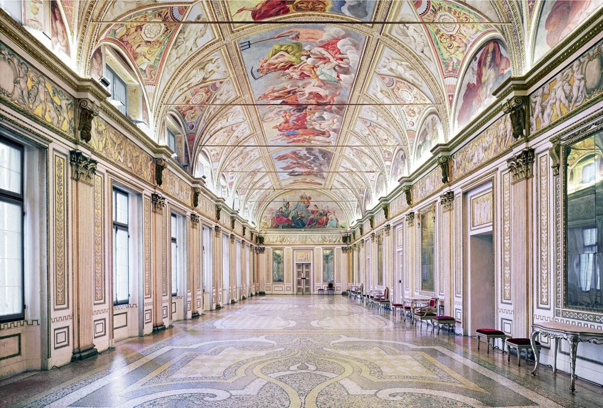
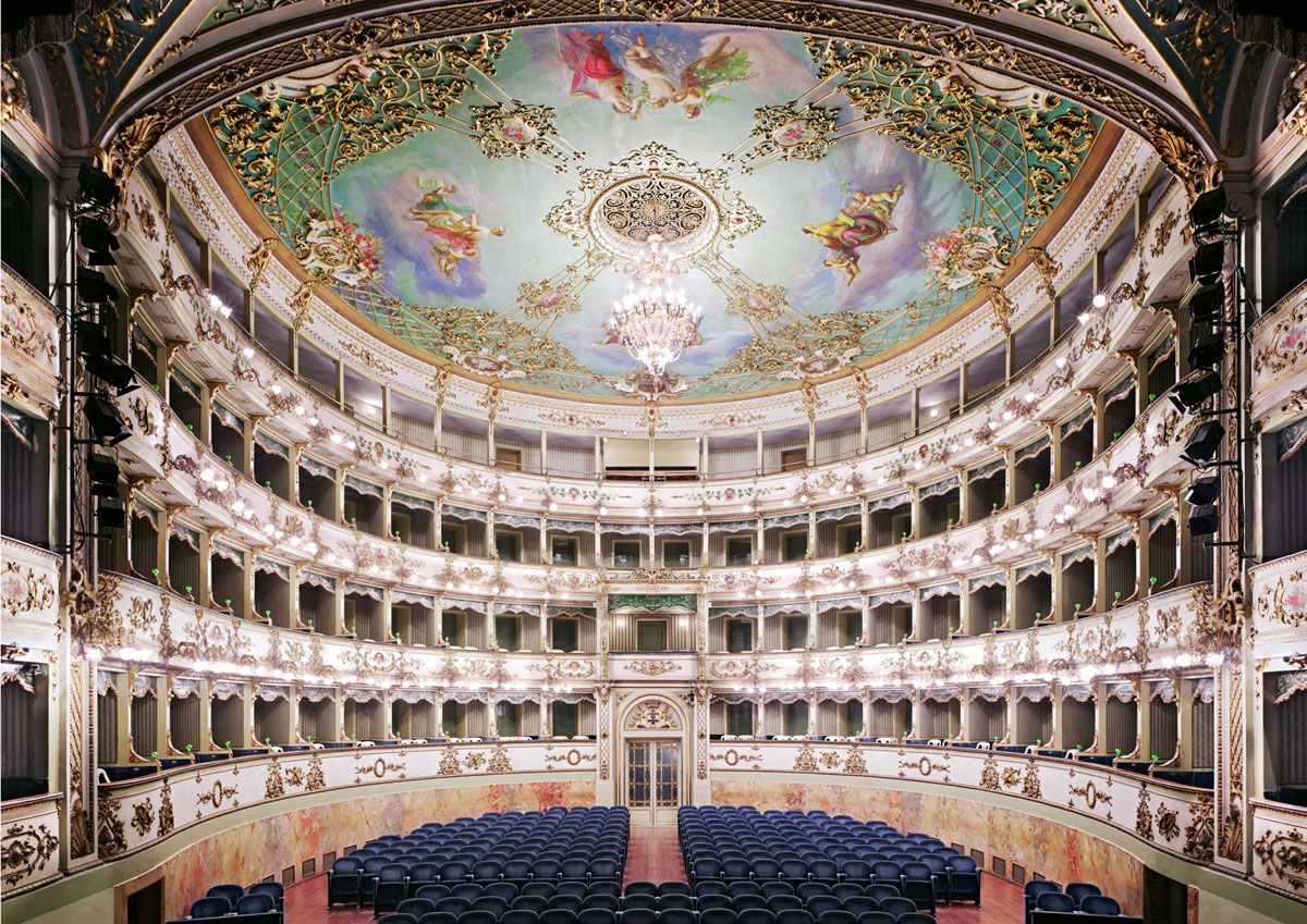
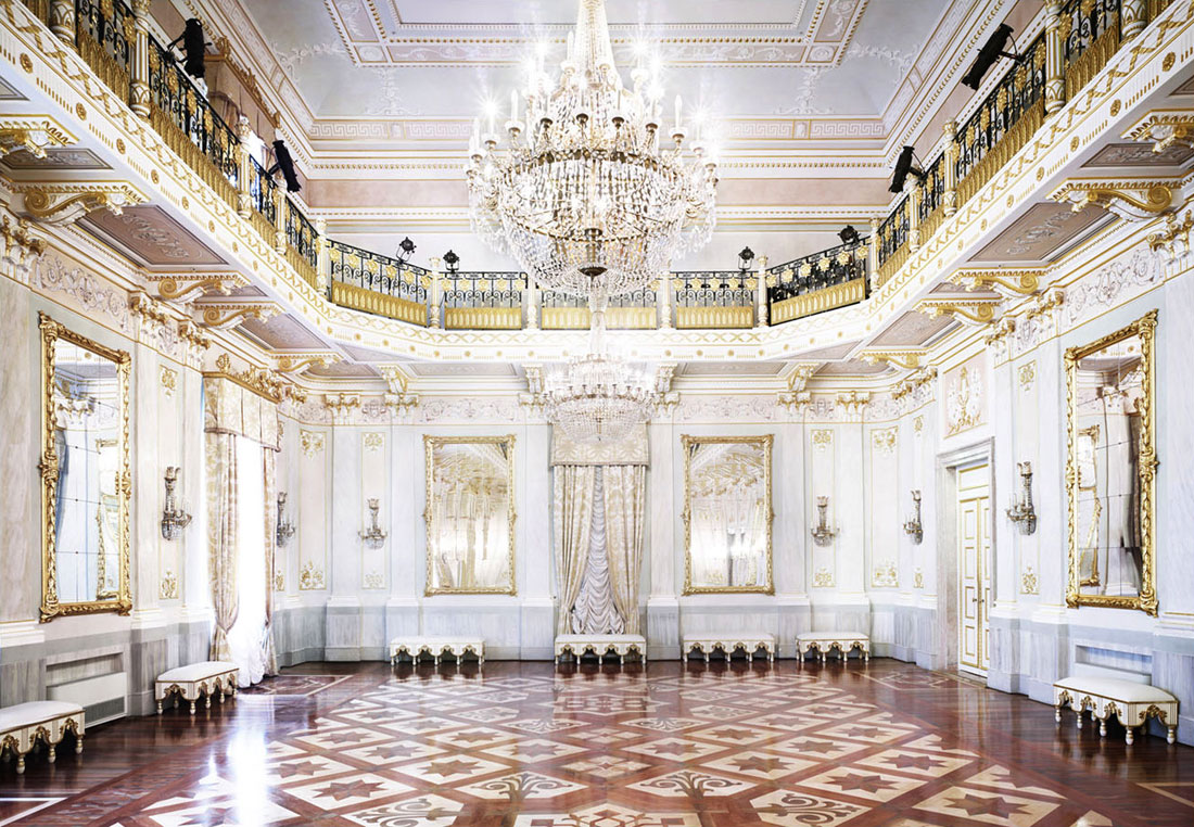

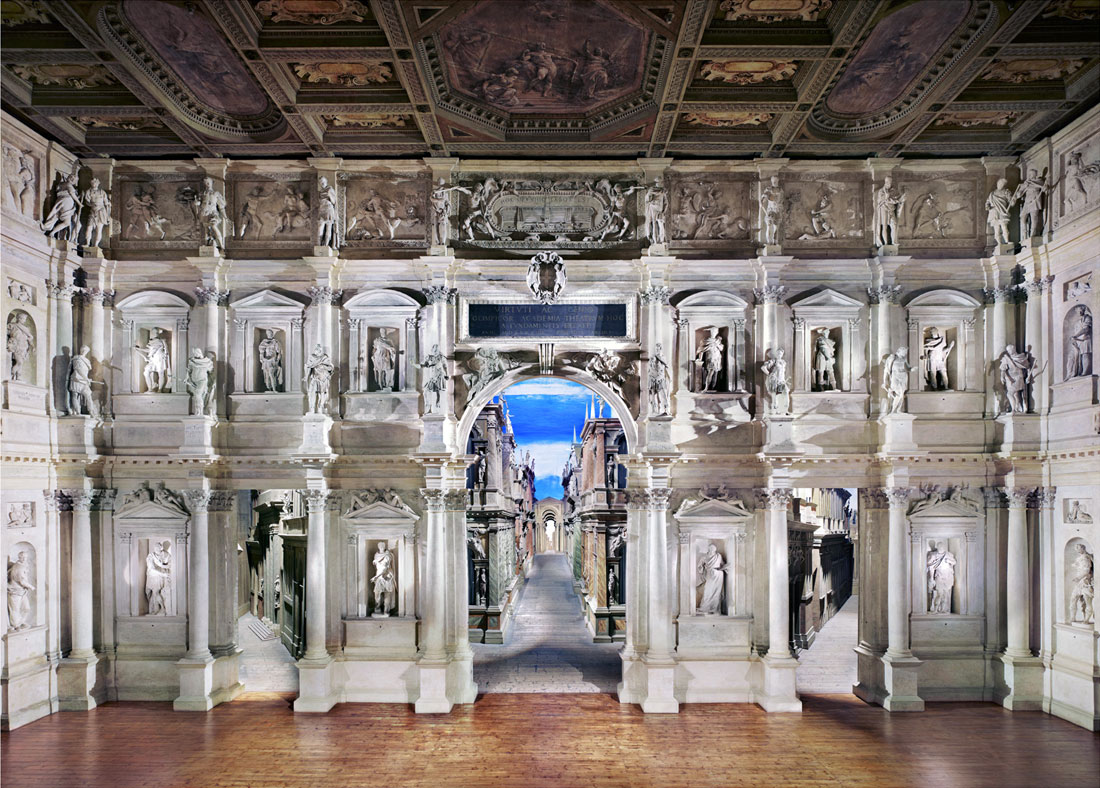


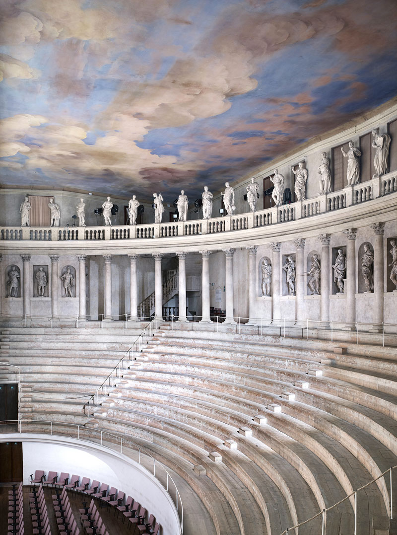


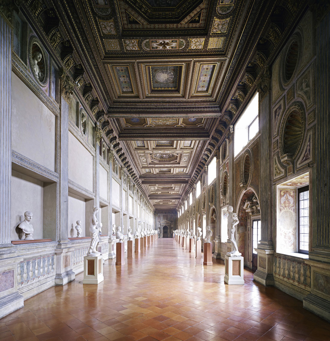


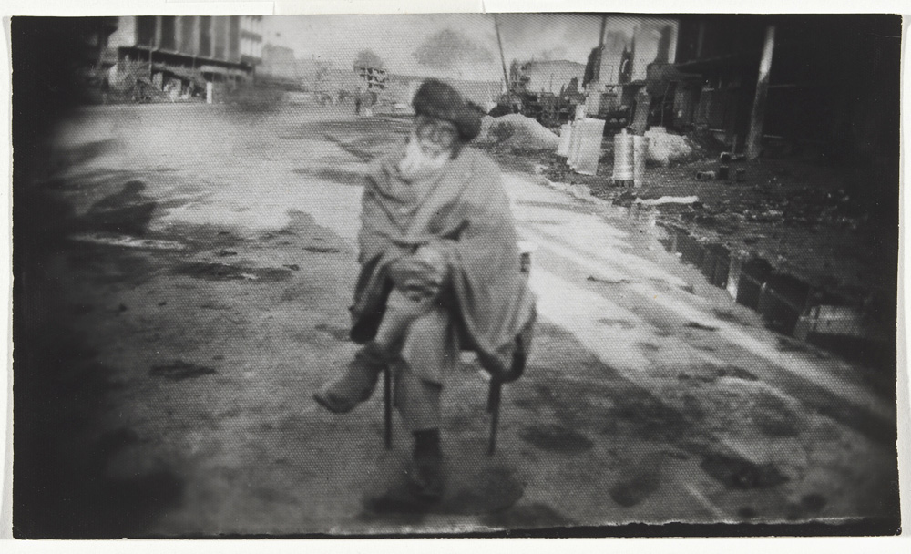


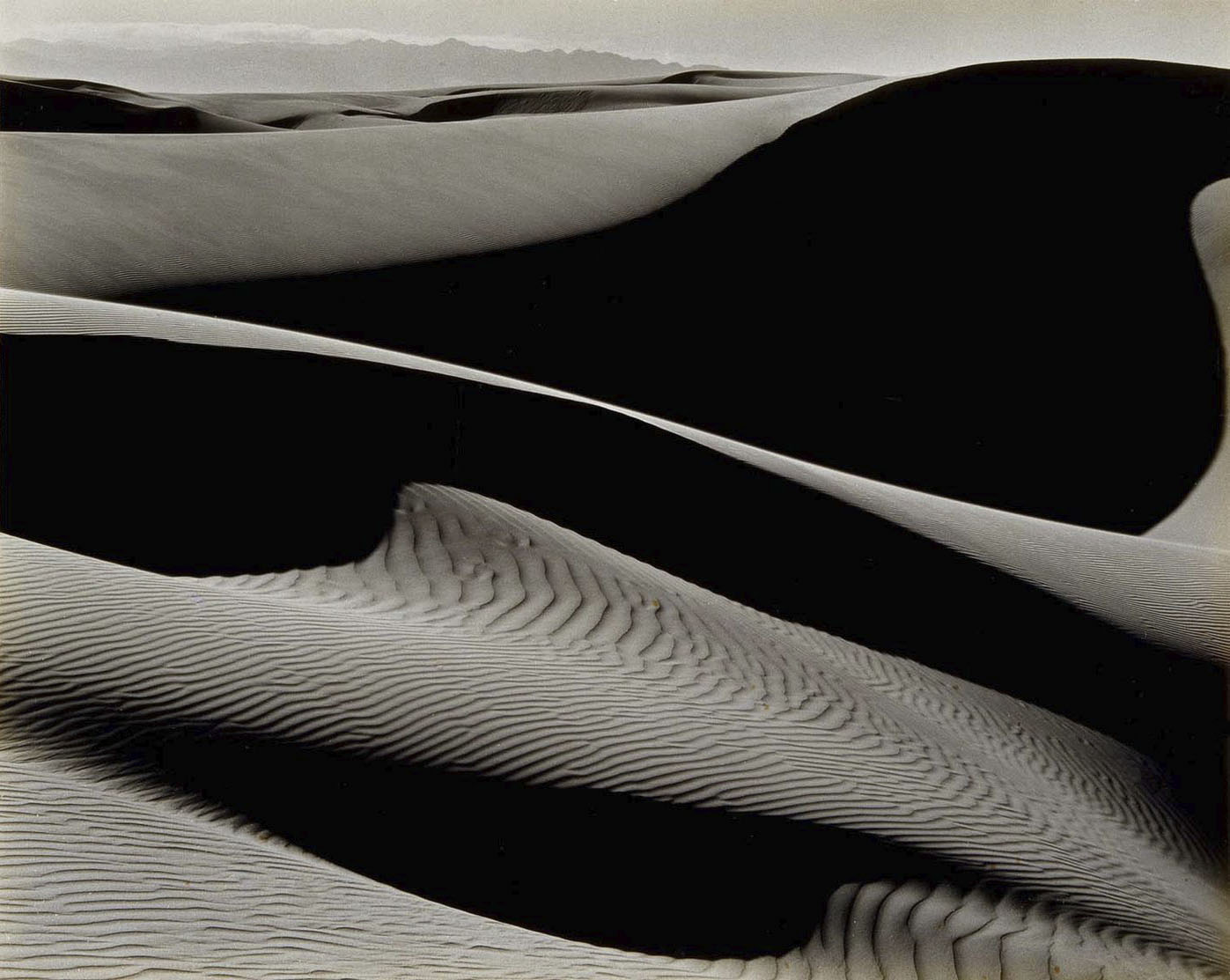


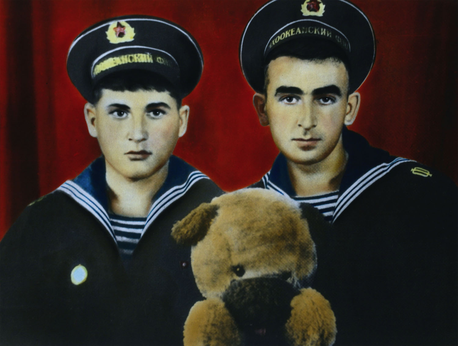
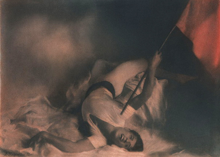


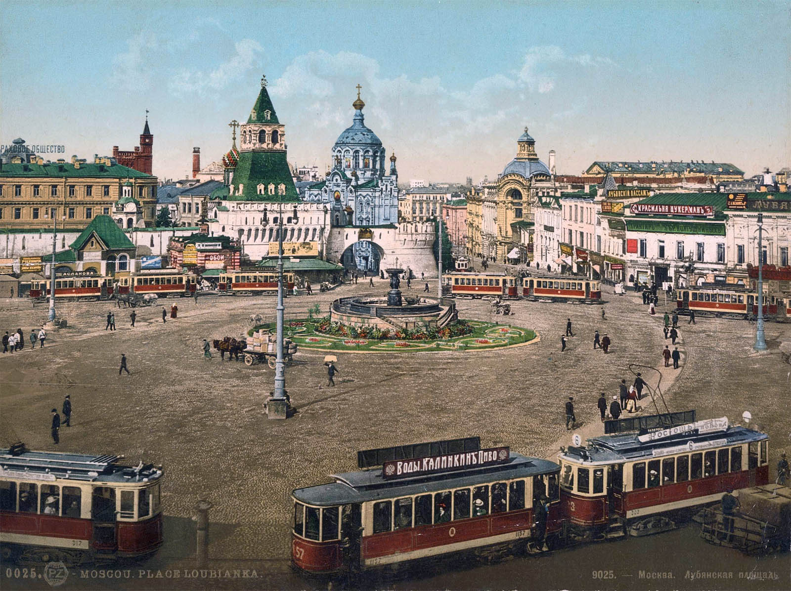
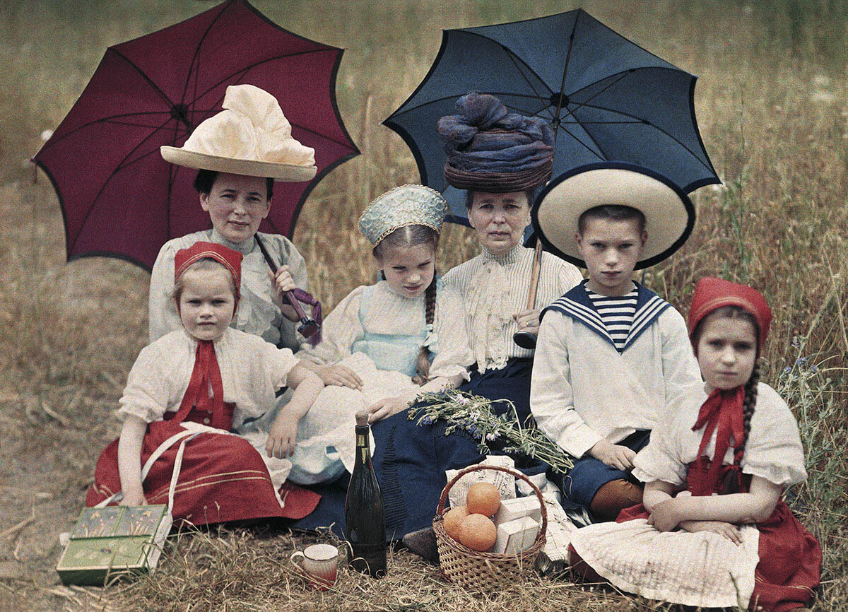




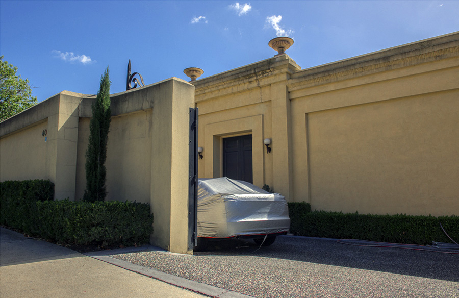

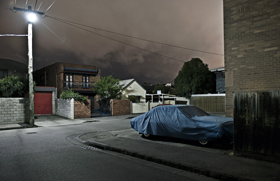
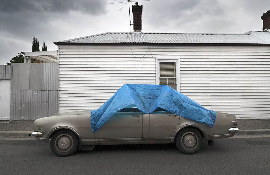

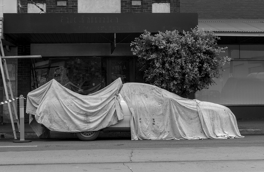
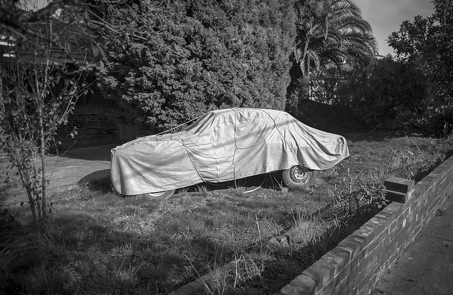

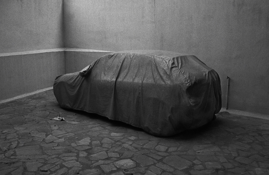
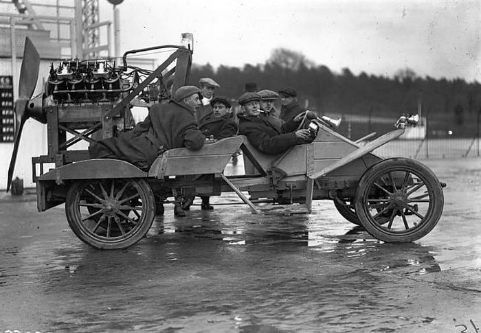
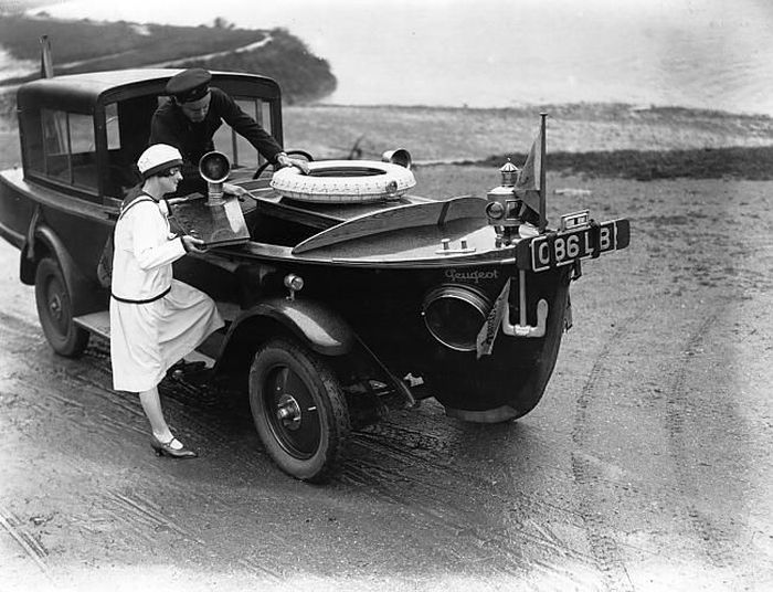
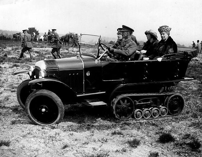
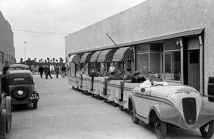
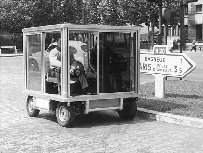
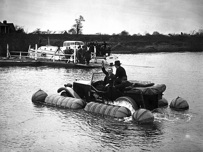
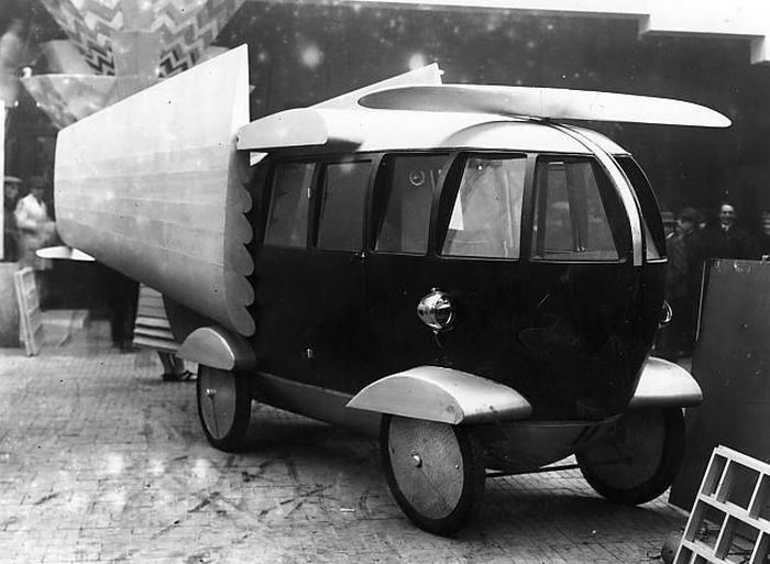
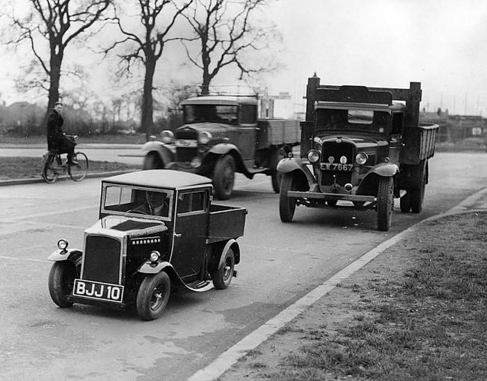
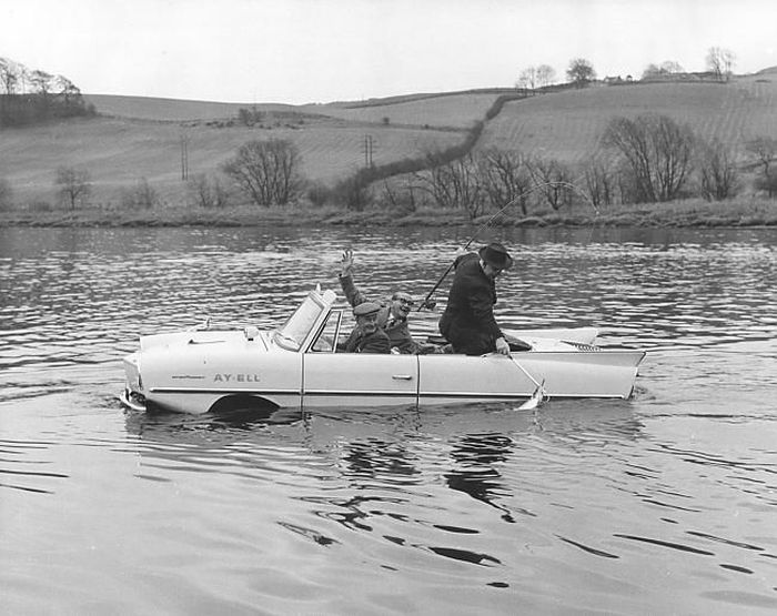
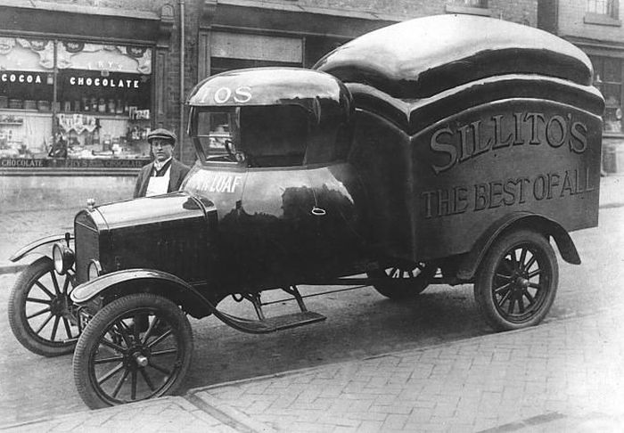
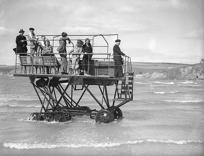
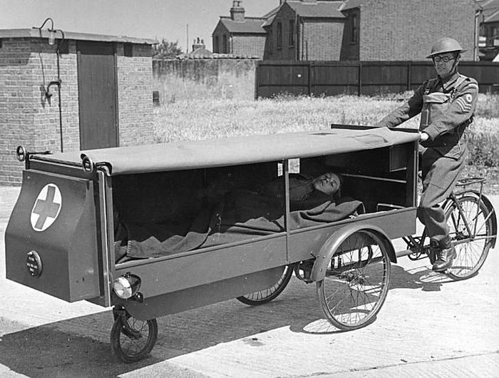
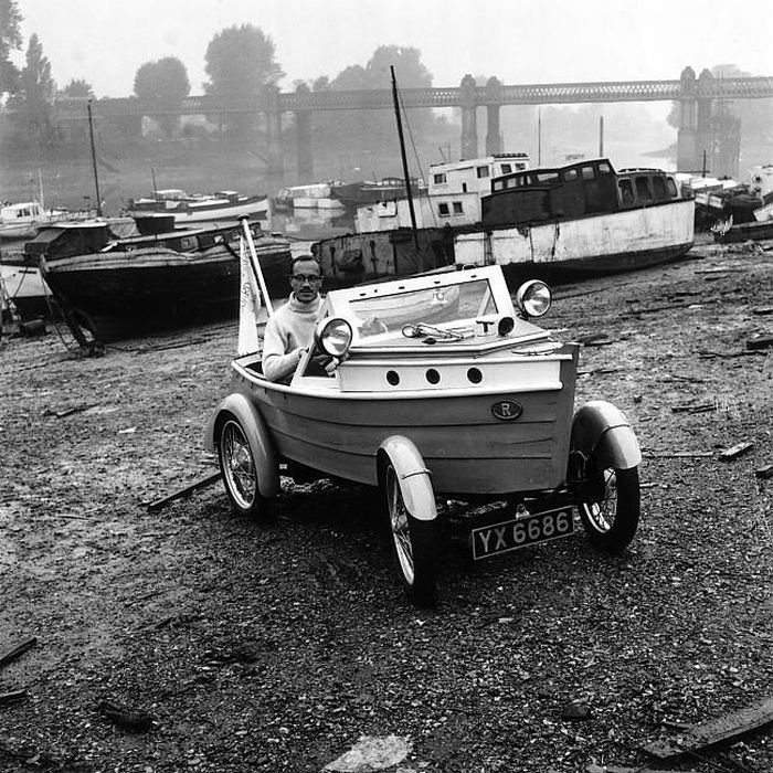
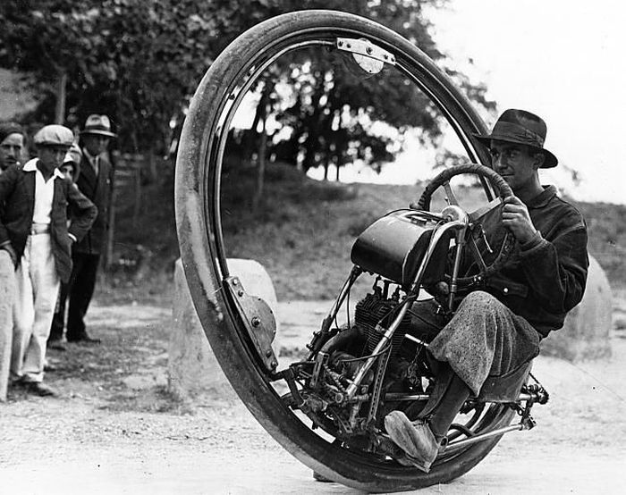
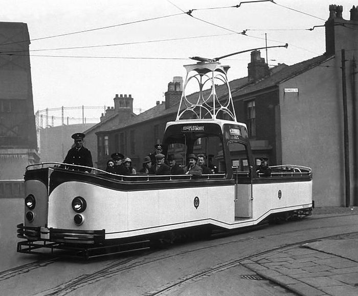
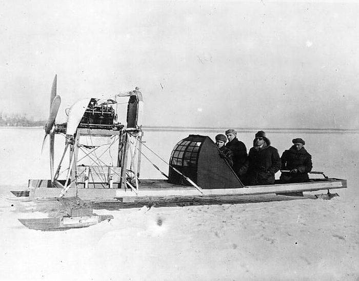
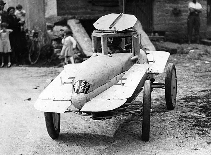
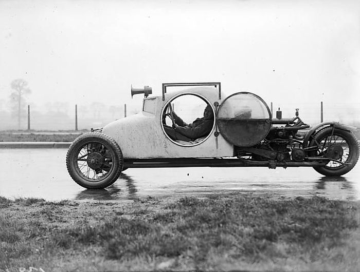
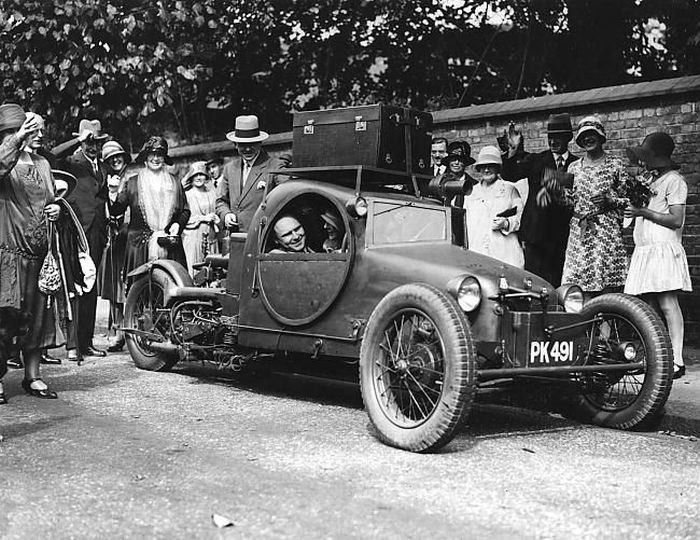
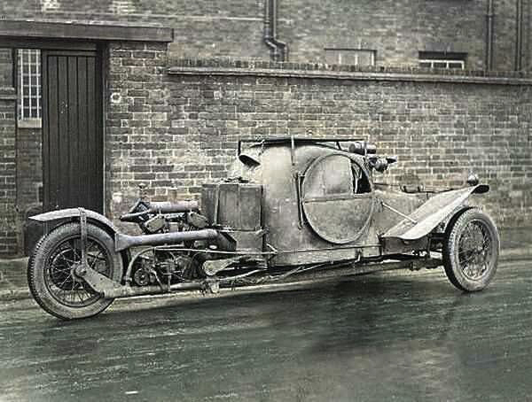
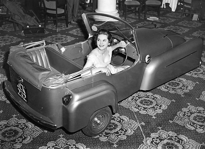

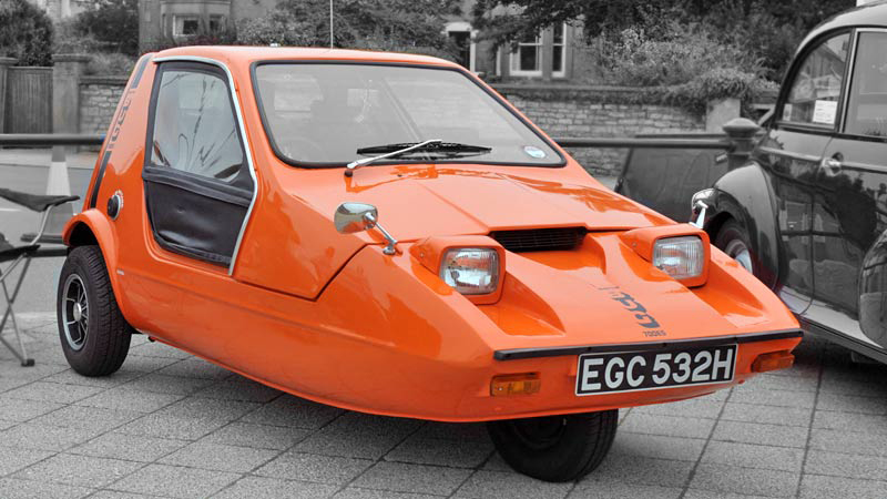
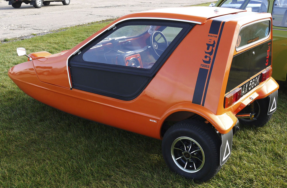
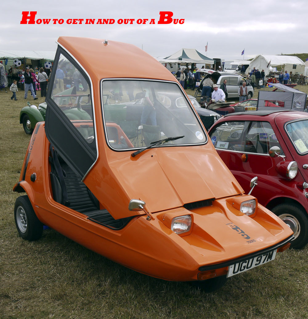
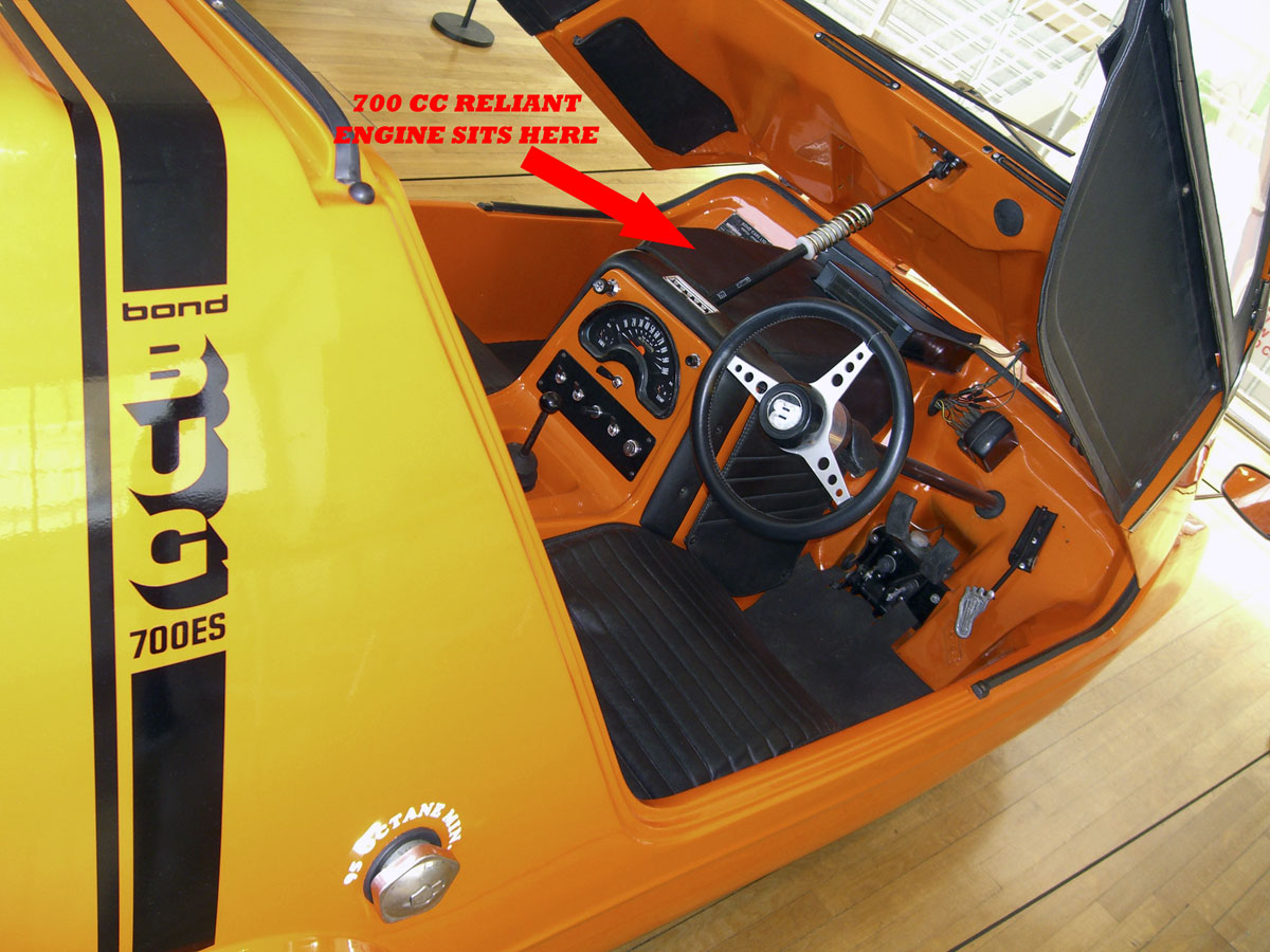
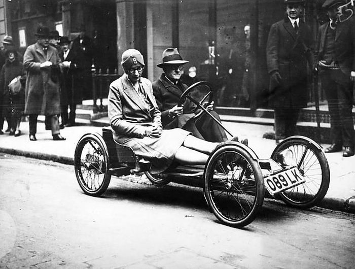
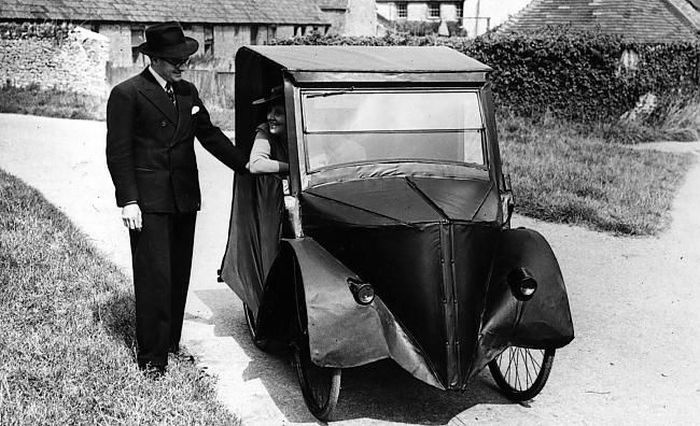
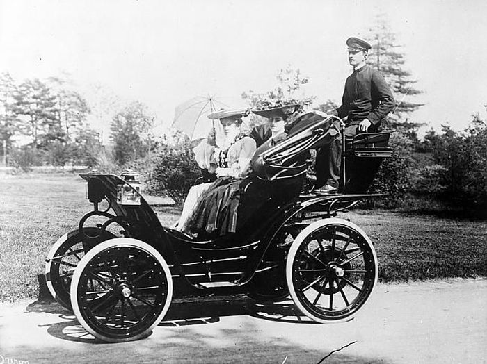
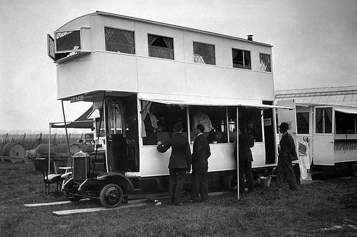
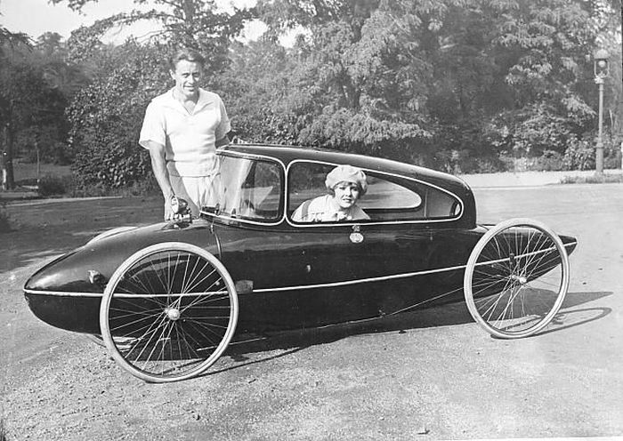
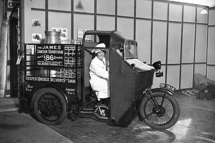
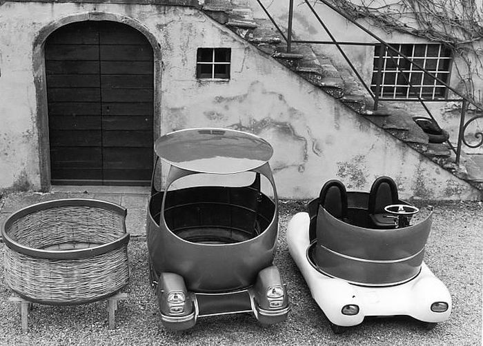
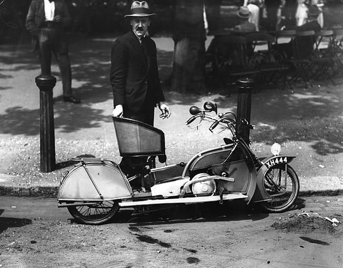
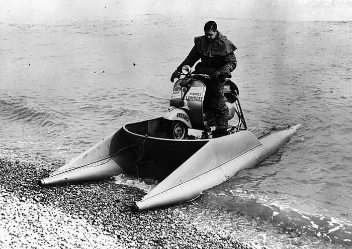
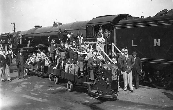
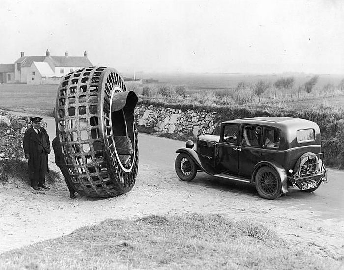
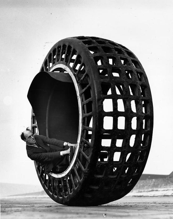
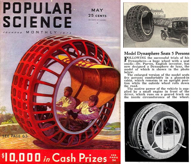
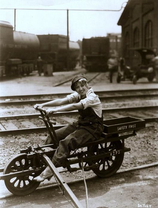


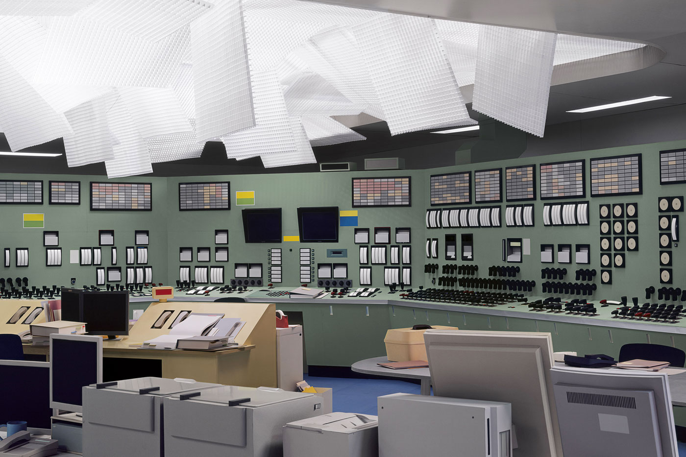





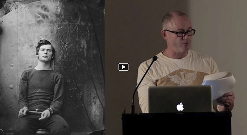


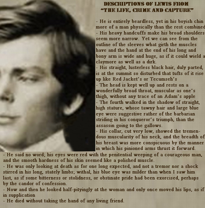
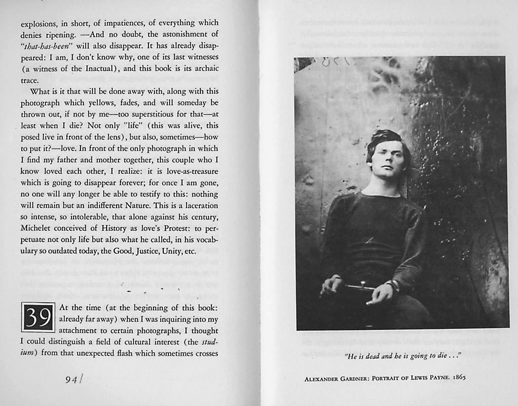


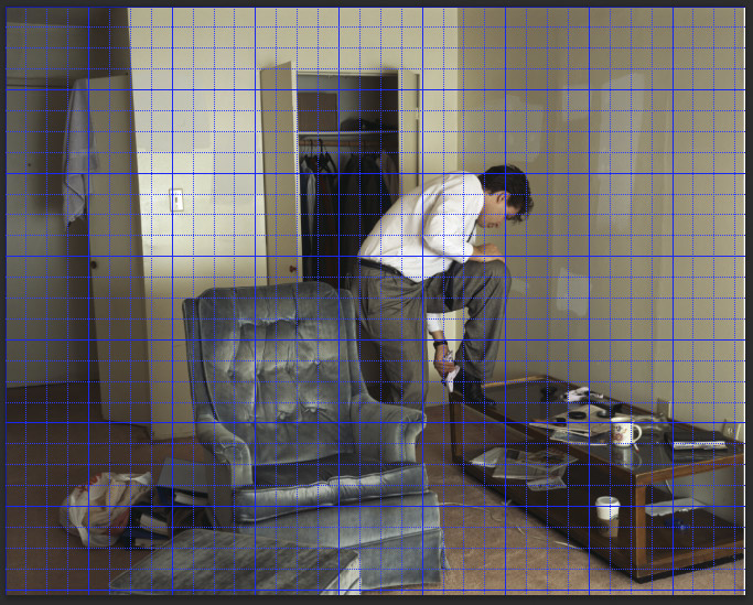
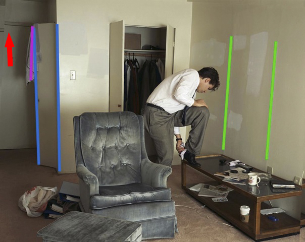






![Ernest Cole (South African, 1940-1990) 'Untitled [White Washroom]' 1960-1966](https://artblart.com/wp-content/uploads/2013/01/19_cole_untitledwhitewashroom-web.jpg "Ernest Cole (South African, 1940-1990) 'Untitled [White Washroom]' 1960-1966")


You must be logged in to post a comment.