Exhibition dates: 15th April – 4th September, 2016
Curator: Keith F. Davis, Senior Curator, Photography at The Nelson-Atkins Museum of Art
Unknown maker (American) Group at pond c. 1910s Gelatin silver print 3 × 4 inches The Nelson-Atkins Museum of Art, Kansas City, Missouri Gift of Peter J. Cohen
Dis/membering the snapshot
To say that I dislike the term “snapshot” is an understatement. The term snap/shot implies a lack of consideration in the physical act of taking the photograph. In a snap it was shot – like a snap of the fingers or a bolt out of the blue. But if we think about the photographs in this posting … and we then think about the photographs of Henri Lartigue, or Robert Frank and his travels across 1950s America, I would argue that the only difference between Lartigue, Frank and the former “Unknown makers” is that they were embarked upon a photographic project, and, latterly, were decreed artists.
I believe, and I have always believed, that the taking of photographs is a matter of intention on the part of the photographer.
If you look at these photographs from Unknown makers was it their intention to take this photograph, did they think about what they were doing before they pressed the shutter. And the answer is unequivocally, yes they did. Their aim, their purpose, was that they had the intention to take the photograph they did, they determined of their own free will how to frame these photos and at what split second to press the shutter so as to suit their aim, their thought about what they wanted to capture in the image. This is not a “snap” shot in contemporary parlance, but a considered action and intention.
To say, as Keith F. Davis, Senior Curator, Photography does in the press release, that “Snapshots represent a collective visual unconsciousness of 20th-century American culture,” could not be farther from the truth. They may represent a form of collective subconscious, where these images hover in collective memories and dreams waiting to be visualised, but a collective visual unconsciousness? I don’t think so.
Vernacular photography is about a conscious decision to take a photograph and, at its most poignant, it is about a collective movement that emerges from the subconscious of people all the way around the world – in order (a taxonomic state) to document the world around them.
The joy of the women on the bed, the man and women in the cornfield, the couple in love with the Christmas tree, the man riding the bucking horse bareback, even the close-up of child’s mouth – all of the photographs were taken with an inquiring mind, with an intention to look and see, to feel the memory of that event, that time and space – not as a snap/shot but as an expression of (everlasting) life.
“To see a world in a grain of sand and heaven in a wild flower Hold infinity in the palms of your hand and eternity in an hour.“
William Blake
Dr Marcus Bunyan
Many thankx to the The Nelson-Atkins Museum of Art for allowing me to publish the photographs in the posting. Please click on the photographs for a larger version of the image.
Unknown maker (American) Man and woman in corn c. 1930s Gelatin silver print 3 × 4 1/8 inches The Nelson-Atkins Museum of Art, Kansas City, Missouri Gift of Peter J. Cohen
Unknown maker (American) Couple with Christmas tree c. 1940s Gelatin silver print 3 × 3 inches The Nelson-Atkins Museum of Art, Kansas City, Missouri Gift of Peter J. Cohen
Unknown maker (American) Woman with drink on bed 1950s Gelatin silver print 3 1/8 x 4 inches Gift of Peter J. Cohen
Unknown maker (American) Close-up of child’s mouth 1956 Gelatin silver print 3 × 3 inches The Nelson-Atkins Museum of Art, Kansas City, Missouri Gift of Peter J. Cohen
Unknown maker (American) Superman with dumbbell 1972 Ektacolor print 3 1/8 × 3 1/8 inches The Nelson-Atkins Museum of Art, Kansas City, Missouri Gift of Peter J. Cohen
When photography was introduced in 1839, the making of even a single picture was difficult and painstaking. The medium was transformed in the 1880s with the introduction of easier processes and the simple Kodak camera. Amateur photography was born: images became casual and spontaneous, and they were called “snapshots.”
Amateur snapshots are highlighted in An Anonymous Art: American Snapshots from the Peter J. Cohen Gift, which opens at The Nelson-Atkins Museum of Art in Kansas City April 15. The Chicago-born Cohen, an investment manager who now lives in New York, bought his first snapshots at a flea market in 1991. Within 20 years he had amassed more than 50,000 of them, and has given away as many as 12,000 snapshots. Cohen gifted the Nelson-Atkins with 350 photos.
“This incredible exhibition of amateur snapshots depicts broadly shared aspects of everyday life,” said Julián Zugazagoitia, Menefee D. and Mary Louise Blackwell CEO and Director of the Nelson-Atkins. “It highlights the deep cultural importance of photography, a visual tradition that flourishes today in images that are made and shared in a variety of ways.”
There are snapshots of pets, baseball games, Christmas trees, amateur plays, vacation fun – and even subjects snapping themselves in mirrors, which could be considered the original selfies.
“The large themes of this exhibition have tremendous continuity,” said Keith F. Davis, Senior Curator, Photography. “Snapshots represent a collective visual unconsciousness of 20th-century American culture – a connection to basic human concerns that is both direct and mysterious.”
Each of the 238 snapshots in An Anonymous Art was hand-selected by Davis himself from an extensive survey of the Cohen collection. The exhibition suggests the medium’s profound social importance as well as its quirky and surprising nature. It features groupings of works illustrating key visual traits and cultural motifs, ranging from accidental multiple exposures to comic and play-acting images. An Anonymous Art runs through Sept 4.
Press release from The Nelson-Atkins Museum of Art
Unknown maker (American) Flying bi-plane c. 1920s Gelatin silver print 5 3/8 × 3 3/16 inches The Nelson-Atkins Museum of Art, Kansas City, Missouri Gift of Peter J. Cohen
Unknown maker (American) Whoa! 1928 Gelatin silver print 3 3/16 × 2 1/8 inches The Nelson-Atkins Museum of Art, Kansas City, Missouri Gift of Peter J. Cohen
“Especially poignant are the images captioned “Me,” depicting both adults and children. We may imagine a grown woman writing “me” at the bottom of her childhood photograph as a reminder that she was once a small, vulnerable girl. In Camera Lucida: Reflections on Photography, French theoretician Roland Barthes writes, “In front of the photograph of my mother as a child, I tell myself: she is going to die: I shudder … over a catastrophe which has already occurred. Whether or not the subject is already dead, every photograph is this catastrophe.”
And yet, despite Barthes’ melancholy, or our own sadness over images of loved ones who have died, each photograph exclaims and reclaims existence – that we have been here. The snapshot embodies an emotion that existed at the time as an agreement between the photographer and the photographed, and that experience bridges time’s distance. And while that may sound simplistic, it is part of the deeper social meaning of the photographic image as a souvenir of experience – a small, visual (auto)biography.
Barthes goes on to discuss his mother’s photograph, writing, “… [the] photograph was indeed essential, it achieved for me, utopically, the impossible science of the unique being.” The image of his mother as a child evinced for Barthes his mother’s true nature – kindness. Similarly, these anonymous photos perhaps reveal the essence of the subjects depicted … daredevil brothers, goofy friends and sisters, sedate parents, and so on.”
Unknown maker (American) Allen and Gladys c. 1930s Gelatin silver print 3 1/8 × 2 1/8 inches The Nelson-Atkins Museum of Art, Kansas City, Missouri Gift of Peter J. Cohen
Unknown maker (American) Dog being held by neck c. 1940 Gelatin silver print 3 1/2 × 2 1/2 inches The Nelson-Atkins Museum of Art, Kansas City, Missouri Gift of Peter J. Cohen
Unknown maker (American) Doris 1949 Gelatin silver print 3 1/8 × 2 1/8 inches The Nelson-Atkins Museum of Art, Kansas City, Missouri Gift of Peter J. Cohen
Unknown maker (American) Boy with bat c. 1950s Gelatin silver print 3 × 3 1/16 inches The Nelson-Atkins Museum of Art, Kansas City, Missouri Gift of Peter J. Cohen
The Nelson-Atkins Museum of Art 4525 Oak Street Kansas City, MO 64111
I have found a hidden gem in Roberto Donetta. He has become one of my favourite photographers, this seed salesman from Bleniotal, who died in obscurity and poverty in 1932.
His photographs are like no other that I have seen. There is a directness to his photographs that is deceptively disarming, and humour as well. His theatre is the the theatre of life: the archaic life of his compatriots in the Blenio Valley. If you look at his work on the Roberto Donetta Archive website the landscapes and ambiguous object photographs are interesting, but it is in the genre of portrait photography that he really excels. This was his passion, photographing people.
Somehow, it seems as if the person being photographed has forgotten that the camera was there, as though it has disappeared from view. As the press release observes, “the people did not dissimulate [to disguise or conceal under a false appearance], indeed it’s almost as if they forgot that someone with a camera was watching, so self-engrossed do they look, serious, at one with themselves.” At one with themselves but also at one with being photographed, which is very unusual. There is little affectation here.
The details of the photographs are fascinating. The placement of the figures in Female Workers in Front of the Chocolate Factory Cima Norma for example, where the left two sitting figures have their legs crossed in the opposite direction while both rest their face in their hands, a central figure, and then two figures interlocked as in an infinity symbol looking at each other. The ‘line’ of the photograph changes from one height to another. We observe that Donetta stages his photographs with infinite care, even when there is a blank wall behind the sitter. In Family Portrait, Bleniotal there is a gorgeous touch, as the mother holds the arm of the boy on the left hand side and gently rests two fingers on his other hand. Donetta’s photographs are full of these familial and human observations.
In Group of musicians in front of a building all the men have cigarettes hanging from their mouths, even as they stare directly, unflinchingly into the camera lens. In Humoristic scene, Bleniotal the man holding the tongs can hardly suppress laughing as the theatrical photograph is being taken. Kittens or toys are held in hands while protective arms wrap around shoulders. Here are the precursors to the work of Diane Arbus, in their honesty and straight forwardness: in its modernity Children with Toys, Bleniotal even reminds me a little of Arbus’ Identical Twins, Roselle, New Jersey, 1967. And then there is the use of temporary backdrops, to imitate the upmarket studios of larger towns: “Donetta did imitate the decorative aesthetic of the late 19th century professional studios: he transformed interior or outdoor spaces into improvised studios by, for example, hanging up fabrics or carpets as backdrops and placing objects like chairs or tables with vases of flowers in the foreground. His portraits are carefully composed and arranged, look uncontrived, calm and archaic.”
Despite their deceptively simple nature, there is a mysterious quality to Donetta’s photographs which is enhanced through the use of these portable backdrops. The fabric backdrop and sheet to the left in A wedding couple staged in front of a cloth obscures a rock wall; the idyllic scene behind the boy in Portrait of a Boy, Bleniotal hides an earthy, rudimentary stone wall (and note the figure at the top of the image, holding the backdrop up); in Family Portrait, Bleniotal the hastily hung sheet has been decorated with leaves and branches; and in Untitled [Portrait of a women] a plain concrete wall acts as the backdrop even as a) the women looks out of the image not towards the camera; b) the eye can escape down the left hand side of the image and c) there is a ghost-like figure at the very right hand side of the image standing in what I presume is a doorway. The frontality of his photographs is also very powerful: in Untitled [Portrait of a man] the man looks like he is wearing his Sunday best jacket replete with bow tie. His legs are spread on the chair, the jacket looks to big for him, is stiff and unforgiving, his workers hands rest in his lap and he stares quizzically out of the image: calm, accepting, himself. In Portrait of Cesarina Andreazzi Lazzari, Bleniotal we (again) notice the textures in the image – the stipple, the concrete, the rocks – and then Cesarina’s stubby, dark hands clutching a bunch of flowers and a book, reminiscent of the dirt under the finger nails and dark features of the peasant boys that appear in the work of Baron Wilhelm von Gloeden.
Above all these are honest, direct and engaging photographs. You can think of Lewis Hine, Jacob Riis, Eugène Atget, Walker Evans, Dorothea Lange and all the FSA photographers, Diane Arbus and others, and yet they don’t come close to the modern/archaic aesthetic of this man. These photographs are a pilgrimage into a past that has long disappeared. But these faces, these people and their lives, still resonate long after they have passed. I was so moved by these photographs I was in tears the other night when I was constructing this posting, studying the intimate details of these images. That means a lot to me.
Dr Marcus Bunyan
PS. I usually don’t publish photographs without title and date but in this instance, to gather together as many Donetta images as possible, I have published them when I have found good quality images on the internet. I believe that in this instance it is very worth while.
Many thankx to Fotostiftung Schweiz for allowing me to publish some of the photographs in the posting. Please click on the photographs for a larger version of the image.
Roberto Donetta (1865-1932) from Ticino is one of Swiss photography’s great outsiders. He managed to survive as a travelling photographer and seed salesman, and upon his death left almost 5,000 glass plates which were preserved merely by chance. These capture the archaic life of his compatriots in the Blenio Valley, which at the time was totally isolated, and the gradual advent of modern times in a precise and sensitive way. Over a period of 30 years and in an era of great change, Donetta became a unique chronicler. At the same time, he saw himself as an artist who – self-taught – experimented freely and knew how to master his medium. His pictures are penetrating and humorous, cheerful and deadly serious – be they of children, families, wedding couples, professional people, the harsh everyday-life of women and men, or of the photographer himself. The Blenio Valley as a microcosm: with Donetta the mountain valley becomes the stage for a great Theater of the World. The exhibition will display about 120 works from the Donetta Archive, many of them on show to the public for the first time ever.
Roberto Donetta was born in Biasca on 6 June 1865. It is not known where he spent his youth. Towards the late 1870s his family most probably moved to Castro in the Blenio Valley, as his father had got a job there as a military functionary. An official register entry on the occasion of his marriage to Teodolinda Tinetti indicates that Roberto Donetta certainly lived in the valley as of 1886. He is registered there as “contadino”, a farmer, which he most likely never was. In 1892 he opened a small grocery shop in Corzoneso, but he had it for only six months. In 1894 he went to London to work as a waiter, returning just 15 months later, sick and exhausted. He then became a hawker and travelled into the most remote corners of the whole valley selling vegetable and flower seeds. As of 1900 he lived in the “Casa Rotonda” in Casserio, part of the Corzoneso municipality. He and Teodolinda meantime had seven children, one of whom died at the age of one. It was around that time that Donetta began to be involved with photography. Apparently Dionigi Sorgesa, a sculptor from Corzoneso, introduced him to the profession and also rented him a camera. Now Donetta was not only a seed merchant but also the valley’s photographer.
A Constant traveller
After turbulent quarrels about the use of their sparse income, he and his family separated in 1912: his wife and children left him in the direction of Bellinzona in search of more lucrative work. Only the youngest son, Saul, remained with his father. On 6 June 1913, his 48th birthday, some of Donetta’s belongings were seized and, for a couple of months, he had no camera, which was a great worry to him: “Not to be able to work for a period of nine months – that severed my connection with my art and made me totally destitute.” Donetta spent the years after the First World War in great solitude, constantly on the road throughout the valley. From 1927 onwards, some of his photographs were published in one of Switzerland’s first illustrated journals, L’Illustré, issued by Ringier.
On the morning of 6 September 1932, Roberto Donetta was found dead in his home. All his photographic equipment was confiscated and auctioned so as to pay off his debts to the municipality. The glass plates, however, were all left untouched. In the mid-1980s Mariarosa Bozzini rediscovered them in Corzoneso.
Between tradition and modernity
Donetta’s personality was full of contradictions. On the one hand, he expressed considerable interest in all the phenomena associated with the advent of modern achievements, such as photography. On the other hand, he was decidedly conservative when it came to the cohesion of the family or his close links with nature. The latter prevented him from leaving the valley to look for more secure work in town. He lamented the constant changes associated with road building and new railway lines, which he did not see as a blessing for the valley. In his capacity as a photographer he succumbed to the fascination of the modern, yet at the same time he expressed a deep respect for long-standing traditions and rituals.
Roberto Donetta’s passion was undoubtedly for portrait photography. The self-taught photographer not only exhibited an astonishing technical mastery in portraying people, but was also able to give free rein to his creativity – despite the fact that this particular field of photography was strongly influenced by the conventions and expectations of his clients. His numerous portraits of children are remarkable. With children he was well able to live out his delight in composing, his talent in staging small scenes. He took the young people seriously, and they in turn were his accomplices, becoming involved in his idiosyncratic ideas.
The chronicler and his style
Throughout his life Donetta accompanied life in the valley, taking commissioned photographs of the inhabitants and the representatives of the different professions, as well as of various events: a visit by a bishop, the arrival of a carousel, a flood, a fire, the construction of a railway line or a bell tower. He was also present at life’s rituals, the transitions from one age group to another, from one social group to the next, or else the prominent fixed points in the year’s cycle, be they secular or ecclesiastical: festivals, weddings, funerals, processions, outdoor church services, these were inconceivable without “il fotografo”. Donetta made photography an important part of those rituals, and over the course of time the photographer was as much a part of the valley as the parson was of the church. This is surely the source of the quality of his photographs: the people did not dissimulate, indeed it’s almost as if they forgot that someone with a camera was watching, so self-engrossed do they look, serious, at one with themselves.
The improvised studio
As Donetta did not have a studio of his own, he travelled the whole valley to take his portraits and produced only small modest prints in postcard format (ie. 7 x 11 cm), which he occasionally stamped with his initials. Often the only ornamentation was an oval vignetting or rounded edges. He regularly delivered the commissioned photographs late because, in order to save chemicals, he only developed his films infrequently. After his rounds as a seed merchant, he then struggled with his business correspondence late into the evening. His works differ greatly from the elegant, classic, gold-edged cards that people could have done those days in the city studios without long waiting periods.
Yet in his own way Donetta did imitate the decorative aesthetic of the late 19th century professional studios: he transformed interior or outdoor spaces into improvised studios by, for example, hanging up fabrics or carpets as backdrops and placing objects like chairs or tables with vases of flowers in the foreground. His portraits are carefully composed and arranged, look uncontrived, calm and archaic. Because of the long exposure times, he was concerned to eliminate chance and spontaneity as far as possible.
In addition to this, he also experimented, or simply took photographs for himself: still life, stormy scenes, cloud formations, strangely shaped cliff or tree outlines. These photographs impress us by their modernity and originality and testify to an inquisitive man with an interest in aesthetic issues.
Curator: Tatyana Franck, Director, Musée de l’Elysée, assisted by Lydia Dorner and Emilie Delcambre
Artists: Takashi Arai / Israel Ariño / Anna Atkins / Patrick Bailly-Maître-Grand Pierre Cordier / Bernd and Hilla Becher / Martin Becka / Binh Danh /Jayne Hinds Bidaut John Dugdale / Jean-Gabriel Eynard / Joan Fontcuberta / Dennis Gabor / Loris Gréaud / JR Idris Khan / Laure Ledoux / Gustave Le Gray / Gabriel Lippmann / Vera Lutter / Christian Marclay / Mathew Brady / Vik Muniz / Oscar Muñoz / Eadweard Muybridge / France Scully Osterman and Mark Osterman Andreas / Andreas Müller-Pohle / Florio Puenter Benjamin Recordon / Dino Simonett / Jerry Spagnoli / Joni Sternbach / James Turrell Martial Verdier / Paul Vionnet / Pierre Wetzel / Victoria Will / Nancy Wilson-Pajic
Gabriel Lippmann (colour photography) and Dennis Gabor (holograms). Eadweard Muybridge (movement) and Pierre Cordier (chemigrams). Daguerreotypes, calotypes, negatives on dry waxed paper, tintypes, ambrotypes, cyanotypes. Heliogravure, ferrotype, collage and carbon printing. 3D digitisations that “light up” the image from every angle.
What’s old is new again. Then and now, here and there. The memory of future past.
Dr Marcus Bunyan
Many thankx to the Musée de l’Elysée for allowing me to publish the photographs in the posting. Please click on the photographs for a larger version of the image.
Oscar Muñoz’s work combines photography, engraving, drawing, installation, video and sculpture, defying all attempts at categorisation. Using non-conventional techniques, his work is a reflection on social concerns and addresses the themes of memory and forgetting, appearance and disappearance, loss and the insecurity of human life. In his work El Coleccionista, the artist uses a triple video projection to show a figure that is sorting, organising and grouping what appears to be personal archives. Oscar Muñoz evokes here the ability of images to be part of multiple narratives, from one image to another, from one context to another. These images propose multiple narrations that overlap and intermingle between the past and present, memory and time.
For Ante la Imagen, Muñoz uses the portrait of the chemist Robert Cornelius (1809-1893), known for having reduced the exposure time of the photographic process of the daguerreotype and for producing one of the first self-portraits, to demonstrate the effectiveness of his method. Muñoz reproduces this portrait by engraving it on a reflecting metallic surface, like a daguerreotype. With each manipulation, the viewer sees the portrait of Cornelius superimposed on his own. The work is composed and decomposed and questions the interior multiplicity of one and the same image. Muñoz replaces this frozen image by a constantly-changing one, vulnerable to deterioration under the effect of air, like life itself.
Professor of physics at the Sorbonne, a member of the French Academy of Sciences and author of many scientific works, the international renown of Gabriel Lippmann Is mainly due to his invention of colour photography using the interferential method. He was awarded the Nobel Prize in physics in 1908.
In 1891, he presented his invention, which would revolutionise photography, to the public. Lippmann developed the “wave theory of light”, which held that light bodies vibrate (like sound) and that light is propagated by waves of different speeds. The variations in wavelengths lead to changes in colour. To prove the validity of his theory, Lippmann worked for five years to find a method that would fix these interferences. To do so, he developed a device that made it possible to place a special photographic plate (made of layers proportional to the wavelengths) in contact with a mercury mirror, a very complicated process. The sensitive layer of an average wavelength, green, for example, has 4,000 bright points per millimetre in its thickness, separated by dark intervals. The Musée de l’Elysée has the largest collection of Lippmann prisms in the world.
Engineer and physicist, Dennis Gabor is known for having invented the hologram in 1947, for which he was awarded the Holweck prize in 1970, and then the Nobel Prize in physics in 1971. Fascinated by Abbé’s theory of the microscope and Gabriel Lippmann’s method of colour photography, he studied electron optics, which led him to propose the concept of holography that he referred to as “wavefront reconstruction” at the time. The initial project consisted of an electron microscope capable of visualising atom networks and the atoms themselves, but that was not put into practice until 20 years later, whereas the hologram as a photographic process would have to wait for the invention of the laser in the 1960s, the light source necessary for the hologram. Subsequently, Emmett Leith and Juris Upatnieks in the United States and Yuri Denisyuk in Russia contributed to the improvement of Gabor’s invention and presented three-dimensional holograms. Since then, holograms are widely know to the general public through advertising, the production of packaging materials and jewellery items.
The life-size version of the portrait of Gabor can be seen at the offices of the McDonnell Douglas Corporation in the United States, one of the first companies to have attempted to market the holograph. The reduced-size copy presented here was made several years later by Spindler & Hoyer, a German optical company.
A well-known filmmaker and multimedia artist, Christian Marclay made his mark on the contemporary art scene by combining the visual arts, film and musical culture. In 2007, he began a project that explores the interactions between sound and vision, as well as the manipulation and the conservation of different forms of recordings. He initiated a series together with the Graphicstudio, University of South Florida involving the use of two archaic recording systems – the cyanotype photography process and the audiotape.
He adopted and adapted the subject of the audiotape, which has become just about obsolete as a result of technological developments, and placed it at the center of his visual abstraction to capture the old soundtracks of hundreds of cassette tapes unfurled like so many streamers, using the cyanotype process. “We assume, because we’re able to capture sounds or images, that they will exist forever – when, in fact, obsolescence makes you feel the limit of those assumptions.” By combining these two mediums, the artist brilliantly explores the resonances between the past and present.
JR has “the largest art gallery in the world”. Thanks to the technique of photo collage, he freely exhibits his work on walls worldwide, thus attracting the attention of those who rarely or never go to museums. His work is a mixture of art and action and deals with commitment, freedom, identity and limits. After finding a camera in the Paris Metro in 2001, he travelled throughout Europe to meet other people whose mode of artistic expression involved the use of the walls and façades that give form to our cities. After observing the people he met and listening to their message, JR pasted their portraits up in streets and basements and on the roof tops of Paris.
JR thus creates “pervasive art” that he puts up on buildings in the Paris suburbs, on walls in the Middle East, on broken bridges in Africa and in the favelas of Brazil. These artistic actions make no distinction between the actors and the spectators. JR’s approach presented here is a mixture of the reinterpretation and recontextualisation of the icons of the history of photography taken from the collections of the Musée de l’Elysée of Lausanne, which he applies to the façades of buildings in the city of Vevey. He thus crops and enlarges the photos of Robert Capa, Man Ray, Gilles Caron and Helen Levitt so that the city becomes a gigantic open-air museum.
“Landscape is what defines me. When I am somewhere new or unfamiliar, I am constantly in dialogue with the past, present and my future self. When I am thinking about landscape, I am thinking about those who have stood on this land before me. Whoever they are, hopefully history recorded their makings on the land for me to study and contemplate.”
Born in Viet Nam, Binh Danh addresses themes of collective and personal memories, history, heritage and mortality. Known for printing his works on unconventional supports such as leaves or grass, he experiments with the photographic process of the daguerreotype in his most recent creations in order to document the history of the city of San Francisco.
Reminiscent of the work of photographic pioneers such as Eadweard Muybridge (1830-1904), Charles Marville (1813-1879) and Eugène Atget (1857-1927), Binh Danh explores the complexities of a constantly evolving city, from the first major expansion in recent years of Silicon Valley. He places San Francisco, cliché of the culture of technology and success, in another time space in order to incite the viewer to reflect on the rapid pace of changes in a city. By choosing the daguerreotype, the artist works on the reflecting surface of the process to incorporate the spectator into his work and to thus transform it into a shared experience.
With the exhibition The Memory of the Future. Photographic Dialogues between Past, Present and Future, the Musée de l’Elysée encourages contemporary artists to take a close look at photography as a medium, innovates as it reveals a 3D digitisation technology developed by a spin-off from Lausanne’s Swiss Federal Institute of Technology (EPFL), and displays its unique visual heritage.
The Memory of the Future. Photographic Dialogues between Past, Present and Future is the first exhibition that Director Tatyana Franck has curated at the Musée de l’Elysée. It opens up a dialogue between the work of the pioneers of photographic techniques (the past), those of contemporary artists that breathe new life into these skills (the present), and avant-garde technologies that update these early processes (the future). Works from the museum’s collections, contemporary artists and new technologies come face to face and join forces to give a brand new vision of the history of photography. The Memory of the Future aims to configure the present by reconfiguring the past in order to prefigure the future.
Techniques over time
First of all, early photographic processes such as ambrotypes, daguerreotypes, ferrotypes, cyanotypes, etc. are displayed next to works by contemporary artists who breathe life into them. The technical innovations of the past are fertile ground for contemporary art and design. The exhibition includes a waxed paper negative by Gustave Le Gray in dialogue with those by Martin Becka, while cyanotypes by Anna Atkins and Paul Vionnet converse with those by Christian Marclay, Nancy Wilson-Pajic and John Dugdale. Jean-Gabriel Eynard’s daguerreotypes from the museum’s collections are exhibited next to portraits by Takashi Arai and Patrick Bailly-Maître-Grand and landscapes by Binh Danh and Jerry Spagnoli. And as for contemporary ferrotypes, The Memory of the Future shows the work of Joni Sternbach and Jayne Hinds Bidaut as well as portraits taken by Victoria Will at the Sundance Independent Film Festival in 2014.
Works of two scientists who won a Nobel Prize and invented a photographic technique also have pride of place – a self portrait by Gabriel Lippmann (Nobel Prize in Physics in 1908) who invented color photography using the interferential method and a portrait of Dennis Gabor (Nobel Prize in Physics in 1971), the inventor of the holographic process, a photographic technique in relief – echoing a holographic picture by James Turrell, a contemporary artist primarily concerned with light. Lastly, and as a point of convergence for all these photographic processes to fix an image on to a support, the camera obscura is presented through the works of Florio Puenter, Dino Simonett and Vera Lutter. Loris Gréaud – an artist invited to present an original installation capturing the spirit of the Musée de l’Elysée by recording its shadows and light – also explores this technique.
Homage and metamorphosis
The exhibition also presents the “mise en abyme” of iconic pictures from the history of photography reinterpreted by contemporary artists whose works examine the very notion of time or memory.
The earliest photograph in history – by Nicéphore Niépce and dating back to 1826 – is thus transformed by Joan Fontcuberta (Googlegramme Niépce, 2005) using PhotoMosaïque freeware connected online to the Google search engine, and by Andreas Müller-Pohle (Digital Scores VI). The first photographic self portrait in history – by Robert Cornelius in 1839 – is reproduced on a series of mirrors by Oscar Muñoz in 2009 to examine the paradox of the aging of the photographic support, which is, however, supposed to record an image for eternity. While Pierre Cordier pays homage to Eadweard Muybridge’s photographic breaking down of movement, Idris Khan (who took part in the reGeneration exhibition in 2005) pays homage to the iconic photographs of Bernd and Hilla Becher.
Innovating to preserve and showcase
Having launched a campaign in 2014 to digitise its photography books – 1500 books have been scanned so far – the Musée de l’Elysée is continuing to explore techniques to dematerialise its visual heritage for conservation and promotion purposes. Launched in 2015 thanks to the Engagement Migros development fund, an ambitious three dimensional digitisation project puts the Musée de l’Elysée at the forefront of museum innovation.
A venue for exhibitions, conservation and now an experimentation, as part of the exhibition La Mémoire du futur the Musée de l’Elysée is proposing for the first time a space dedicated to the presentation of digitised virtual objects from its collections. This innovative project aims to introduce new collaborative and interactive experiences using the Museum’s collections to a wide range of audiences – whether they be photography enthusiasts, curators or researchers.
Thanks to the Engagement Migros development fund, Innovation partner of the Musée de l’Elysée, the public is invited to experimentally test the first 3D digitisations carried out in partnership with the start-up Artmyn, created at EPFL’s Audiovisual Communications Laboratory (LCAV) led by Martin Vetterli. It will thus be possible to look at the works in 3D with unprecedented precision, but above all, to make the different textures of which they are composed appear on screen by lighting up the digital replicas from any angle.
This new technology comes in the form of a scanner made up of a dome on which are fixed several small lamps of precisely-adjusted intensity that switch on and off in turn depending on each picture scanned. “We are returning to an ancient theory of vision that imagined the eye’s projection towards the world, allowing the spectator once again to become an actor in the photographic experience,” explains Martin Vetterli in the exhibition catalogue.
Preliminary work was carried out with the Collections Department to select the processes that would most benefit from this scanning technology – heliogravure, ambrotype, ferrotype, collage and carbon printing. The first results will be presented in the exhibition. A tactile device supplemented by a video tour of the work presents a collage by René Burri from the René Burri Foundation housed at the Musée de l’Elysée. Rendered in real time and very high resolution, the images that have been cut out and superimposed by the artist can be freely explored so that the visitor can appreciate the visual richness of the work. Visitor experience appraisal is an integral part of the project to optimise presentation techniques and create a digital experimentation area in the museum.
The active participation of visitors to the Museum is an essential step for this first test phase: the interactions and different perceptions of the benefits of the prototype presented will be taken into account for the purpose of developing teaching and learning tools that will subsequently be used to refine and expand the user’s experience and to develop a digital, educational discovery space within the exhibition areas.
Paul Vionnet, a local photographic pioneer, is at the origin of the Iconographic Collection of the Canton of Vaud. This collection, devoted to the history of the Vaud, is at the very foundation of the creation of the Musée de l’Elysée in 1985 as a museum dedicated to the image. During his childhood, Paul Vionnet spent his vacations at his grandparents’ home in Aubonne and was a frequent visitor of Adrien Constant Delessert (1806-1876), a neighbour and renowned Vaud photographer. During his stays there in 1845, Delessert taught him photographic techniques and the calotype.
Fascinated by the sciences, nature and his canton, Paul Vionnet took it upon himself to collect the greatest number of iconographic documents possible concerning the history, landscapes and monuments of the region for the purpose of enriching the collection of the Historical Monuments Service in Lausanne. The documents that he was not able to acquire himself were reproduced using photography. Following in his father’s footsteps, he was ordained pastor in 1856, and assigned to Granges de Sainte-Croix, near Aubonne, and then to Pampigny in 1858. He nevertheless continued to take photographs, having since adopted the wet collodion technique, documenting landscapes and monuments during his free time.
He retired in 1896 and founded the Collection historiographique vaudoise that would house his documents. In 1903, Paul Vionnet bequeathed his private collection to the canton of Vaud, forming the fifth section of the Musée Cantonal des Antiquités. He was named assistant curator, and several years later, the municipality commissioned him to take the photographs for Lausanne à travers les âges.
A British photographer considered to be the first woman to create a photograph, Anna Atkins is also known to have published the first books on botany illustrated with cyanotypes. Passionately interested in science and art, she became a member of the Botanical Society of London in 1839 and realised that the photographic process could be used to obtain precise and detailed botanical images and to provide information at all levels of a society increasingly eager for knowledge.
Anna Atkins drew her inspiration from the inventor of photography, William Henry Fox Talbot (1800-1877), and from a close family friend, John Herschel (1792-1871), a scientist known for the invention and the improvement of the cyanotype. She subsequently developed the process on her own that would allow her to obtain authentic and inexpensive photographic reproductions and that would make her part of the great tradition of her teachers. In 1843, she published her work, British Algae: Cyanotype Impressions, the first volume of which preceded the famous work of Talbot, The Pencil of Nature, by several months. In 1853, she applied the same process to ferns and published Cyanotypes of British and Foreign Ferns,a page of which is presented here.
This exhibition is an odyssey into the history of photography where different eras are juxtaposed and where artists and their methods dialogue with each other. Through a selection of historic photographic processes and the works of contemporary artists, the spectator is encouraged to observe the influence of the past on today’s artistic creations. The exhibition The Memory of the Future proposes a three-pronged vision: that of the past with the works of the pioneers of photographic techniques, that of the present with contemporary works that revive this know-how, and that of the future with technologies that give a new perspective on the works of the past.
Through century-old processes such as daguerreotypes, calotypes, negatives on dry waxed paper, tintypes, ambrotypes, cyanotypes and including holograms, The Memory of the Future celebrates the founding fathers of photographic techniques by establishing a dialogue between them and contemporary artists. From Gabriel Lippmann to James Turrell, including Robert Cornelius and Oscar Muñoz, this exhibition brings together for the first time some one hundred works whose common thread is their ability to withstand time. The Memory of the Future also proposes a selection of works from the Musée de l’Elysée’s collections that have never before been presented to the public.
After having launched a campaign to digitise its photography books in 2014 – 1,500 books have been digitised as of this time – the Musée de l’Elysée continues to explore techniques to dematerialise its visual heritage in order to preserve and enhance it. Consistent with its ambition to not only preserve works of value but to prospect for new ones, the Musée de l’Elysée has undertaken a 3D digitisation project of its works using a prototype developed by the EPFL (Ecole Polytechnique Fédérale de Lausanne). This technology of the future is presented in this exhibition in the form of a touch screen monitor.
Press release from the Musée de l’Elysée, Lausanne
John Dugdale’s interest in photography goes back to his childhood when he received his first camera at the age of 12 and dreamed of becoming one of the major photographers of the 20th century. After a brilliant career as a fashion photographer, the year 1993 marked the turning point in the life of the artist who lost his sight following a stroke and CMV retinitis. Dugdale nevertheless refused to give up photography and began to take an interest in 19th century photographic techniques, using his family and friends as assistants. He discovered the large format and decided to use the cyanotype process, considering it to be the most direct and the easiest to use.
In his blue works, he portrays his everyday life by reversing the roles. Dugdale poses with a simplistic spirituality that could appear to be in contradiction with the 21st century. Generally posing in the nude, he considers that “life is transient. Once you leave this world, you fly into the universe without clothes. I want people to learn you cannot protect yourself by hiding behind clothes.”
Thanks to its low toxicity, the use of this process allows him to be involved in the printing of his photographs. His sensitivity to historic techniques emphasises the poetry of his work and the transitory nature of time and place. In the hopes of sharing his experience and his healing, Dugdale creates a new body of art by “showing the beauty of life and how one should act around illness.
When the photographer Jerry Spagnoli discovered a daguerreotype at a flea market, he described it as the most perfect photograph he had ever seen, a discovery that would influence the rest of his work. After familiarising himself with the process in his studio in San Francisco, the artist experimented with it using equipment from the 19th century and studying the effects obtained in order to understand the technical aspects as well as the visual and expressive potential.
By studying the body and the roots of photographic imagination in his series Anatomical Studies, the portrait, objects and contemporary street scenes, events and non-events in his series The Last Great Daguerreian Survey of the Twentieth Century, Spagnoli attempts to highlight the qualities of the daguerreotype – uniqueness, richness of detail – through the four series presented here, in order to allow a contemporary public to rediscover its virtues. It is also a way for him to approach the optical essence of photography. “With other processes the material substrate of the image can be intrusive, but when you look at a daguerreotype, there is a transparency to the depiction as if you were looking through the lens itself.”
Vik Muniz (Brazilian, b. 1961) The Steerage (After Alfred Stieglitz) 2000 from the Pictures of Chocolate series
When the photographer Jerry Spagnoli discovered a daguerreotype at a flea market, he described it as the most perfect photograph he had ever seen, a discovery that would influence the rest of his work. After familiarising himself with the process in his studio in San Francisco, the artist experimented with it using equipment from the 19th century and studying the effects obtained in order to understand the technical aspects as well as the visual and expressive potential.
By studying the body and the roots of photographic imagination in his series Anatomical Studies, the portrait, objects and contemporary street scenes, events and non-events in his series The Last Great Daguerreian Survey of the Twentieth Century, Spagnoli attempts to highlight the qualities of the daguerreotype – uniqueness, richness of detail – through the four series presented here, in order to allow a contemporary public to rediscover its virtues. It is also a way for him to approach the optical essence of photography. “With other processes the material substrate of the image can be intrusive, but when you look at a daguerreotype, there is a transparency to the depiction as if you were looking through the lens itself.”
Pierre Cordier is a Belgian artist known as the father of the chemigram and for its development as a means of artistic expression. In 1956, writing a dedication with nail polish on photographic paper to a young German woman, Pierre Cordier discovered what he later called the chemigram. This technique “combines the physics of painting (varnish, oil, wax) and the chemistry of photography (photosensitive emulsion, developer and fixer), without the use of a camera or enlarger, and in full light.”
He worked for 30 years as a lecturer on the history of photography at the École Nationale des Arts Visuels in Brussels. When he gave up photography in 1968 to devote himself exclusively to the chemigram, he wanted to pay tribute to the great photography pioneers – Muybridge in 1972 and Marey in 1975. The Homage to Muybridge presented here was inspired by Allan Porter, chief editor of the Swiss revue Camera, one of the most prominent revues in the history of photography. In the issue of Camera of October 1972, we can read: “Cordier used Muybridge’s famous sequence, The Horse in Motion, which he transformed in three different ways: 1. Still subject and mobile camera. 2. Mobile subject and still camera. 3. Subject and camera, both mobile. He then combined the three sequences into one and treated it according to the photochemigram process.”
Andreas Muller-Pohle (German, b. 1951) Digital scores V (after Nicephore Niepce) 2001 Inkjet print Image: 10 7/8 in x 11 in Mat: 16 1/8 in x 20 1/8 in Paper: 12 1/8 in x 12 1/8 in
Andreas Müller-Pohle is one of the key figures involved in the ontological as well as the representational nature of photography. Since the 1990s, he has reflected on the radical changes in the essence of technical images. His first artistic project focused on questions of photographic perception and on the recycled photograph.
In the mid-1990s, Müller-Pohle began to explore the use of digital, genetic and political codes. He is one of the first artists to have broken down and translated the analog and the digital codes of images. In his series Digital Scores (after Nicéphore Niépce), he takes us back to the origin of analog photography by translating the photograph of Niépce, View from the Window at Le Gras (taken from a window of his house in 1826), into alphanumeric code. The complete binary transcription of this photograph is then distributed over eight panels.
After studying photography, Martin Becka worked as a print developer for the Sepia Agency before becoming an independent news photographer. As of the beginning of the 1980s, he began doing research on the history of photography and the pre-industrial photographic processes that he incorporated into his personal creative work. By using traditional processes to photograph ultramodern cities like Dubai and business districts such as La Défense in Paris, the artist proposes a sort of “archeology of the present”, making the spectator reflect on the period in which he lives, the future, and the multiplication of images at a time when their reproducibility is unlimited. He sees photography as a means to “bend time in every possible direction.”
In his installation Le Parc (the André Citroën Public Park in Paris), Becka establishes a dialogue between the past and the present by paying homage to the photographic work of Alfred-Nicolas Normand (1822-1909) and the dry waxed paper negative process developed in 1851 by Gustave Le Gray (1820-1884). By choosing this century-old technique that requires an approach to work that is radically different from those currently in vogue, he is able to obtain negatives with a density adapted to a presentation by transparency and to create and control movement and unique atmospheres. Becka thus encourages the spectator to reflect on the notion of the photographic object.
Bernd and Hilla Becher (German, 1931-2007/1934-2015) Gas Tank: Essen-Karnap D 1973 Gelatin silver print
Bernd and Hilla Becher (German, 1931-2007/1934-2015) Gasbehälter bei Wuppertal (Gas tank near Wuppertal) 1966 Gelatin silver print
Born during the period of industrial archeology, the Bechers’ work consists, in the words of Pierre Restany, “of an optical pilgrimage at the roots of the industrial world”. The couple proposes a way do see industrial architecture by taking an approach based on inventory methodology. Their work is a reflection on the creation of heritage and raises the question of the heritage value of industrial objects, which is inseparable from their artistic value.
With a focus on archiving and industrial memory, Bernd and Hilla Becher’s approach consists of establishing a detailed inventory and keeping track of industrial structures by photographing sites threatened by obsolescence and often abandoned. The series Gas Tanks includes nine photographs from the period between 1965 and 1973, taken according to the extremely stringent protocol that is characteristic of their work (frontal view, centring of the subject, mid-height, absence of light, etc.). The composition of each portrait is standardised and identical, with emphasis on the frontal aspect and the monumentality of industrial constructions classified according to their functionality and form.
Taking advantage of the extremely reproducible nature of the photograph, the Bechers reveal the massive diffusion and production of images that contribute to erasing our memories of their origins and their authors. In doing so, they observe a civilisation on the decline and highlight the production of an era, vestiges of the human imagination and life.
Idris Khan (British, b. 1978) Every … Bernd and Hilla Becher Spherical Type Gasholder One panel triptych, 2003 Lambda Digital C print mounted on aluminium 20 1/2 x 26 1/2 inches
Idris Khan (British, b. 1978) Every … Bernd and Hilla Becher Prison Type Gasholder 2004 Lambda Digital C print mounted on aluminium 80 × 65 inches
“I try to capture the essence of the building – something that’s been permanently imprinted in someone’s mind, like a memory.”
Idris Khan is fascinated by the photographic medium. Fuelled by images and influential theoretical essays on the history of photography, he re-appropriates the works that had an impact on him and subjects them to a series of transformations in order to see them from a different perspective. His work is a reflection on the passage of time, the accumulation of experiences and, as such, the decrease of unique moments. In his series Homage…, he presents rephotographed works, enlarged and superimposed in multiple layers. He uses digital tools to play with the opacity of the layers so as to strengthen the mystery of the original objects whose layering reveals new details. The work Homage to Bernd Becher shown here reproduces and compiles the photographs that correspond to the Bechers’ typology in order to celebrate the vestiges of these vanished industrial infrastructures.
Fascinated by the ability of the photographic medium to capture the soul as well as the body image, Idris Khan, in his series Rising Series… After Eadweard Muybridge “Human and Animal Locomotion”, pays homage to Muybridge’s early scientific experiments using the camera to sequentially record human and animal movement. Beyond the tribute paid to photography that is defined here as a compilation of knowledge, Idris Khan positions himself with respect to a medium laden with history and with a bright future ahead of it.
Kristen Stewart poses for a tintype (wet collodion) portrait at The Collective and Gibson Lounge, during the 2014 Sundance Film Festival in Park City, Utah. (Photo by Victoria Will/Invision/AP)
Victoria Will began her career as a staff photographer for the New York Post.Specialized at the time in portraits and fashion, her photographs were disseminated worldwide by the magazines W, the New York Times and Vogue. When she was invited for the fourth time to the Sundance Film Festival, an American independent film festival, she decided to try something new and to replace her digital reflex camera with the century-old tintype process to make portraits of movie stars. Following her success, she renewed the experience in the following years and gradually improved this complex technique.
Overcoming the difficulties of the process, its sensitivity to time and the danger of the chemical products involved, the photographer successively made portraits in 7 to 8 minutes of actors such as Vincent Cassel, Robert Redford, Jennifer Connelly, Spike Lee and Ethan Hawke. “What I love about the process is how raw it is,” says Victoria. “We live in an age of glossy magazines and overly retouched skin. But there is no lying with tintypes. You can’t get rid of a few wrinkles like in Photoshop.”
Both the photographer and her public “appreciate the honesty of these photographs. Development leaves a lot of room for the unexpected: we discover a face that we thought was familiar while being the contrary of digital portraits. The stages in the darkroom contribute to the idea of creating something unique and refreshing.”
The Musée de l’Elysée 18, avenue de l’Elysée CH - 1014 Lausanne Phone: + 41 21 316 99 11
Opening hours: Tuesday – Sunday, 11am – 6pm Closed Monday, except for bank holidays
To be frank, this handsomely installed exhibition of the work of Australian fashion photographer Henry Talbot is a bit of a let down. The images look terribly dated, and while historically they have some significance in terms of the time and context from which they emerged – the movement towards en plein air photography, taking the model from the studio to the street – most of the photographs are not very good. The prints are either commercial vintage prints with all their faults (dust, scratches, poor printing, over exposure, lack of burning in etc.) evidencing a lack of care and attention to detail, or modern inkjet reproductions from original negatives and even then some of the printing is poor: for example, the hair of the model in Fashion illustration for Blunden Wool, models Joan Crellin and Bruce Anderson (1961, below) is completely blown out with no detail retained in the highlights. Some of the angles in his images (the positioning of the figure) are just off, the cropping of the negatives (the space above and below the figure) often does not work and framing of the prints is also less than exemplary. But we must remember Talbot was a commercial photographer from the 1960s and that’s just what these photographs are: commercial fashion photographs that fulfil a client brief.
Talbot was no experimenter. Too often his images are really basic, a basic visualisation, and he has a fixed idea for a shot and goes with that idea and variations of it, even when it is evident that the photograph is not working. Any photographer worth their salt would recognise such a situation and be flexible enough to change it up but with Talbot this does not happen. Positioning his model centrally, he usually uses low depth of field so that everything falls out of focus behind. In this sense he still seems to possess a studio mindset. While professing his love of free-moving fashion, his photographs seem stilted and conformist, even as they are taken out of doors. His proof sheets are evidence of a “team” oriented focus in order to fulfil a client brief, but in these very proof sheets we see uneven exposures and severe cropping into the frame to get the final image. And while he was more romantic than the hard edged Helmut Newton, his photographs only ever project a surface and rarely show any true emotion. Without doubt his best two photographs are Fashion illustration for Fibremakers, model Maggi Eckardt (1966, below) taken at the Altona Petrochemical Company. The photographs are a symphony of form, movement and light. They possess a “feeling” a lot of his other photographs simply cannot, and do not, contain.
There is no catalogue to the exhibition so this posting will have to serve historically to document the exhibition and Talbot’s work. Thus, there is an in depth interview included with Australian curator, artist and photography collector Joyce Evans who ran Church Street Photographic Centre in Melbourne from 1976 and who showed Talbot’s work in her gallery. It is all very well that I have an opinion on the work but what I write needs to be an informed opinion, and the interview with Joyce provides valuable background with regard to the people, the era and the context from which these photographs emerged. One thing noted in the conversation is that Talbot photographed strong, independent women like Janice Wakeley and Maggie Taberer… something that is not mentioned at all in the wall text and press release that accompanies the exhibition. I would have thought it vital that a curator would have linked the presence of these independent women in fashion photography to the work of art photographers such as Australian artist Carol Jerrems who published her seminal book A Book About Australian Women in 1975.
Another insight into the times is provided by a friend Ian Lobb who knew Talbot:
“People said he was good, and he charged enough, but he just thought he was having fun, fun with a certain quality. I don’t think he had any grand ideas about his talent, but he was quite prepared to sell a print or sell his time if someone wanted to pay. Henry knew the fun he was having wasn’t going to last beyond his life. And now, it is weird and very country town that his work should be regurgitated. His work looks poor because people are making him into something he wasn’t.
There is a seminal incident that can help with the context of the Henry Talbot, Athol Shmith and Helmut Newton generation. Athol Shmith was giving a print critique at Prahran, and someone had left a glass of fixer on the shelf of the room. Athol finished his critique and drank it. Rushed to hospital of course. But think of that from all its angles. The world in which these photographers worked and the stories from those times reveal a world that was flying by the seat of its pants – just.”
Talbot is a solid photographer, no more. While the exhibition gives some sense of depth to the quality of work that was coming out of Melbourne at that time, perhaps it would have been best to let sleeping dogs lie.
In conversation with Australian curator, artist and photography collector Joyce Evans about the Australian photographer Henry Talbot
17/07/2016
MB: Just before we started this conversation you said to me Joyce that Talbot was a gentle man. Can you explain what you meant by that please?
JE: I use the word gentle in comparison to his one-time partner Helmut Newton, who I found to be an aggressive man.
MB: So they were in partnership together before Newton left for Europe
JE: Yes
MB: So Talbot was intelligent, he knew his field and understood the history of the genre that he was working in, he could speak well, and was well liked both by clients, models and the society in which he worked.
JE: Well, he was not a superficial person. When he spoke he researched things properly, he had the depth of knowledge which came from a sort of European intellect. This intellect was broadly read, and he was also a person that listened.
MB: And he was also a good teacher as well…
JE: In his commercial work, Henry photographed his women (as far as I could see), with the idea of having a client, and he was displaying clothes on the women, which was part of the old tradition. In an environment where, if you wanted to make a living, that’s what you had to do. If he had been, however, in a place like New York – which was avant-garde as compared to Melbourne, which was not avant-garde – he may well have gone the same way as Helmut Newton. The very big difference, though, is in the personality of the two men.
Helmut Newton went out and he was an aggressive man. He had charm, but it was an aggressive charm, it wasn’t a gentle charm. He had intelligence and he knew how to handle his women so that he got aggression out of his women, that’s what he wanted.
MB: Whereas Talbot was doing it for a job?
JE: Talbot A was doing it for a job and B, he had a gentle nature. He was not an aggressive man and actually if you look at those photographs you can see that he liked the women that he photographed and he lived in an environment where fashion was still, fairly soft, in many ways. You can see in things like the swimwear industry and the sports industry there was quite a lot of Australian independence, but he, combined with Athol Shmith in Melbourne, took his models out into the street, they interacted with the environment, and he did not depend on the studio.
MB: When I look at his photographs they are quite modernist, they are quite clean, but his vision seems to me to be quite limited… in the sense that he uses a central female figure (sometimes two central figures), low depth of field, out of focus background. And then you look at the proof sheets and you can see that he is not an experimenter. From shot to shot there is a slight change in angle of a hand or the tilt of a head but he really doesn’t push the boundaries of what he is trying to say with the image. He has his set idea (for the shot, for the location) and then he does slight variants in the proof sheet towards that idea. Very rarely do you get a feeling, a sense of atmosphere in his images – of the outdoors in the sense of the outdoors enveloping the model. The models seem to be isolated within their environment…
JE: But who does what is asked of him, at that time? You can compare him to Avedon or Athol Shmith, but you cannot compare him to today. You cannot ask someone to work outside of his own time. You can ask him to lead in his own time and the leading that occurred at that time, by both Shmith and Talbot, was that they took models out into the city and the environment and away from the studio. This was something that Avedon did and these two photographers did also. The big argument is, did Talbot do it effectively? Who chose his proofs? Which ones got published?
MB: But also, a quite organised and restricted view of the world, even though he was pushing the boundaries by taking fashion photography outdoors, he still seems to be in a studio mindset when he was outside.
JE: What you did in those days, is that you would do the shoot, you would come in with your proof sheets, and the art director would go over it with the red crayon with the team – it tended often to be team work. So he’s working to a brief …. and you are the instrument of the team. The art director sets everything up and you do the shoot. Now, when you get a name like Talbot had, you could start to begin to influence what the art director was doing. Now, how much and when and at what time and what effect – I really don’t know.
MB: Did he photograph strong women? You mentioned Maggie Taberer and Janice Wakeley.
JE: Maggie Taberer and Janice Wakeley – both educated women, well read women – Talbot would have chosen his own models and they were two of his favourites. Or been offered models, depending on the control of the art director and what they desired.
MB: Today, all we can do is try and understand the history of these photographs, and the time and context from which they emerged. From today’s standpoint they look rather dated and stilted.
JE: You have to see them from a decade earlier, looking at fashion photography in Australia from the 1930s and 1940s to see what was happening. The 1930s fashion stuff was very very largely in the studio. Very little of it was en plein air.
MB: But that doesn’t negate his aesthetic choices to shoot with so low a depth of field that the context of the outdoors becomes more or less irrelevant. Yes, you have the images of the oil refinery behind with the movement of the women, in my opinion some of his best photographs, that are more romantic in feel… and these tend to work better than other more prosaic shots.
JE: He was more of a romantic than Newton was. Newton was very hard edged and he managed to get that extra particular something out of his women…
MB: Even in his Melbourne images?
JE: Well, we don’t know Newton’s Melbourne images, because he has denied them all.
MB: Yes exactly, that’s the thing.
JE: Thinking about Talbot, he was part of a movement. He wasn’t the leader of it or the only one, but he was part of the early evolution of the movement.
MB: Does that mean his photographs stand up to scrutiny today?
JE: I have this feeling that when you only look at the top of the cake, you don’t know what the cake is all about. I don’t know whether I would put him as the fairy on top of the cake or one of the really nice pieces of icing. I think that Athol Shmith is a stronger photographer.
MB: What about the Australian photographer Bruno Benini? I find him incredibly strong in terms of his style, his lighting.
JE: My understanding of Bruno is that he is a decade younger that Talbot…
MB: So 1950s?
JE: Yes I think so
MB: So he has a more classical influence…
JE: It’s not that, he’s like John Eaton is to Pictorialism, he’s a very good photographer – but he’s not a groundbreaker, he’s not of the beginning of Pictorialism. I think Benini is a very good fashion photographer and I think he is working on other people’s shoulders. I think Athol Shmith is stronger and if I had a choice about having to show one, but I like the fact that we have shown Talbot, because it gives some sense of depth to the quality of work that was coming out of Melbourne. Places like Sportscraft were exceptionally good at encouraging talent, both in design and in photography.
MB: All I can do is understand the history and the context and what was going on at the time and then, as I was thinking the other day, all I can write is what I see.
JE: Compare this… Athol Shmith had Bambi. Bambi was the most exquisite women you would ever find in your whole life. I remember her when I was a teenager, me and my girlfriend were both sitting in a room and she was there, both in our late teens / early 20s, and I remember saying to my friend that I feel as though I have ten feet – and I am so clumsy when I look at her. She is so beautiful. Now Janice Wakeley was also a stunning looking women as was Maggie Taberer. But the number one model with Athol was Bambi and then there were really other top people that he had. And he, I think, had a much broader base to work with – not only his models, but his clientele was broader. Talbot was predominantly clothing as compared to Shmith who did a whole stack of things other than fashion. His love of music, he did a lot of musicians, he did some amazing portraiture. Shmith did H.G. Wells etc…
MB: His breadth was greater than Talbot. My concern with Talbot is 1/ the dating of the images, and 2/ his aesthetic choices when taking those photographs which may be a team decision but, the fact that he didn’t experiment that much. When looking at his proof sheets there are only slight changes to the positioning of the model…
JE: He’s got an idea and he goes for it.
MB: And that just really shows a lack of flexibility in his vision.
JE: No, I don’t think so I just think that it shows that he knows what he wants and that’s it.
MB: I think that is where we differ.
JE: He is very professional. How many shots of a person do you make at a time?
MB: I work on a ratio of 10 to 1, so if you take 10 shots you will get one, possibly two excellent shots. Talbot must have been thinking I need one good shot and he kept shooting and shooting, even though some of his exposures are poor, even though he radically crops the full frame image to get the final shot. It shows he was not as confident as you think about getting the shot, because he is hedging his bets with his in camera framing, relying on cropping later.
JE: He knows he wants her getting this feeling, and he goes bang, bang, bang, head turned slightly, arm down slightly and that’s it… and he knew what he wanted at the beginning and then he just saw the variations to fine tune it. And that’s what every photographer tends to do.
MB: And that’s where I really think there is a problem with his photography. Most of his images don’t really work – and yet he never recognised that fact at the time, when he was taking or setting up the shot, that it was not working. Any good photographer worth his salt, worth his previsualisation of the shot, must know how to adapt and be flexible enough to change on the run. He didn’t recognise that they weren’t working and change the idea. That’s the problem I have with him. It shows a fixed mindset in terms of not being able to see through the viewfinder when a shot is not working.
JE: That’s another story…
MB: Let’s leave it there. Thank you Joyce so very much for your thoughts.
“Well man, this is 1966 and in this game you have to be open to, and live, contemporary influences to a certain degree. The younger generation is very strong in fashion – very much in command. They’re spending a great deal of money in the garment industry, so fashion is geared to the young. There is, of course, in this “with it” idea itself, certain conformity to non-conformity, to a non-conformity standard. But, as a photographer, you must accept this idea as far as you can and that probably reflects to some extent in your own behaviour and dress.”
Henry Talbot, 1966
“I always tried to show models in a free-moving fashion. I avoided stiff poses and I tried to keep up with what the great fashion photographers overseas were doing”
Henry Talbot (Germany 1920 – Australia 1999, Australia from 1940) No title (Fashion illustration for Blunden Wool, models Joan Crellin and Bruce Anderson) (installation view) 1961, printed 2016 Photographed on location at the National Gallery of Victoria Inkjet print Henry Talbot Fashion Photography Archive
Henry Talbot (Germany 1920 – Australia 1999, Australia from 1940) No title (Fashion illustration for Blunden Wool, models Joan Crellin and Bruce Anderson) (installation view) 1961, printed 2016 Photographed on location at the National Gallery of Victoria Inkjet print Henry Talbot Fashion Photography Archive
Henry Talbot (Germany 1920 – Australia 1999, Australia from 1940) No title (Fashion illustration for Blunden Wool, models Joan Crellin and Bruce Anderson) (installation view) 1961, printed 2016 Photographed on location at the National Gallery of Victoria Inkjet print Henry Talbot Fashion Photography Archive
Henry Talbot (Germany 1920 – Australia 1999, Australia from 1940) No title (Fashion illustration for Watersun ski wear) (installation view) 1970, printed 2016 Inkjet print Henry Talbot Fashion Photography Archive
Henry Talbot (Germany 1920 – Australia 1999, Australia from 1940) No title (Fashion illustration for Watersun ski wear) (installation view) 1970, printed 2016 Inkjet print Henry Talbot Fashion Photography Archive
Henry Talbot (Germany 1920 – Australia 1999, Australia from 1940) No title (Fashion illustration for Watersun ski wear) (installation view) 1970, printed 2016 Inkjet print Henry Talbot Fashion Photography Archive
“There is little an Australian fashion photographer can do that has not been done overseas, and often better. But one thing they do not have is our Australian environment. I use it a great deal because the idea makes it possible to come up with something uniquely different.”
Henry Talbot 1966
“The striking and youthful fashion of 1960s Melbourne is the starring subject of more than eighty photographs by fashion photographer Henry Talbot, many of which have never been exhibited before. Showcasing the shifting face of fashion from a time that has captured popular imagination, many of the images have never been seen since their original publication 50 years ago and offer an insight into the styles and attitudes of the 1960s. The photographs on display have been carefully selected from an extraordinary archive of 35,000 negatives that Talbot gifted to the NGV in the 1980s.
“Henry Talbot’s photography captures the exuberance and changing times of a generation. His modern photographs depict an emerging youth culture and offer an insider’s look into a thriving cultural scene during the 1960s,” said Tony Ellwood, Director, NGV.
A European émigré artist from Germany, Talbot brought an invigorating internationalism to Australian photography and partnered with Helmut Newton. Their Flinders Lane studio was very successful enterprise and secured major clients including the Australian Wool Board and Sportscraft. It was during the 1960s that Talbot established his place as a dynamic force in Australian fashion photography and his work was regularly published in Australian Vogue.
The exhibition includes some of Talbot’s beautiful fashion spreads from 1960s Australian Vogue, providing a visual history that chronicles the magazine’s first decade in Australia. The photographs will be presented alongside a display of early edition Australian Vogue magazines, including those in which Talbot’s photographs originally appeared, offering an insight into the aspirational fashion and lifestyle choices of Australians living in this era. Talbot’s photography also highlights the public’s affinity with uniquely Australian brands, such as Qantas and Holden. Fast cars and air travel were aspirational luxury experiences in the 1960s and, as a result, airports, planes and brand new cars were the glamorous setting for many of Talbot’s photographs, demonstrating his astute understanding of current trends and consumer culture.
From an outback sheep station, to lamp-lit streets of Melbourne, Australian cityscapes and landscapes also provided the backdrop to some of Talbot’s most arresting photographs. Shot on location around Melbourne, these photographs showcase Talbot’s adventurous style and ability to transform 1960s Melbourne into scenes that looked like Paris, London, New York – a testament to his ‘international eye’. A photographer with an astute vision, Talbot also ingeniously transformed Altona Petrochemical Company into an intergalactic, futuristic setting that captured the public’s fascination with space travel during the ‘space race’ of the 1960s. This exciting suite of images demonstrates the ways in which space travel permeated popular culture, including space-age fashion trends.
The exhibition will open during the NGV’s landmark 200 Years of Australian Fashion exhibition and together, these two exhibitions will offer a comprehensive and fresh new look at Australian fashion in the 1960s.”
Press release from the National Gallery of Victoria
Henry Talbot (Australian born Germany, 1920-1999)
Henry Talbot was born in Germany in 1920. As a young man he studied graphic design and photography in Berlin and Birmingham. After leaving Germany in 1939, he arrived in Australia in 1940. Following a period of internment, Talbot then served in the Australian army. In the postwar years he left Australia, travelling to South America and Europe, before returning to Melbourne in 1950. At the time Melbourne was the most important centre of fashion in Australia because of the abundance of textile and garment manufacturing in Flinders Lane; boutiques in the Paris End of Collins Street, and major department stores around the city.
Talbot worked in some of the leading Melbourne photographic studios and quickly established a reputation as a major fashion photographer in Melbourne. In 1956 he was invited to go into partnership with Helmut Newton. Newton was already renowned for his innovate fashion images and this partnership offered Talbot recognition for his talent in this field. In 1973 Talbot closed his studio, and ten years later presented the NGV with what is now known as the Henry Talbot Fashion Photography Archive. Works in this exhibition at taken from this remarkable collection, comprising 35,000 black-and-white negatives, photographs and contact prints.
Wall text
Installation view of the National Gallery of Victoria’s Henry Talbot: 1960s Fashion Photographer exhibition at NGV Australia at Federation Square with at left, No title (Fashion illustration, model Janice Wakely) (1961, below) (installation view) Photo: Brooke Holm
Working with the right model was as important to the success of Talbot’s images as choosing the right location. Like most photographers he had his favourite models, and often worked with Janice Wakely, Maggie Tabberer, Helen Homewood, Maggi Eckardt and Margot McKendry.
Talbot’s philosophy was simple, as he explained it in 1995: “I’ve always held that if you can establish a definite emotional rapport with a model you’re halfway toward producing good photographs. My own favourite method of fashion working is to explain roughly what I am after then leave the model more or less free to interpret the garment she’s to show. A good model will absorb and become part of what she is wearing almost completely. Whilst shooting away I may suggest minor changes, the model senses what I’m after, and then really good shots happen.”
‘Forsaking city airs for cool country breezes, she previews the three day event at Oaklands Hunt Club which will finish the Melbourne Cup season, wearing a three-quarter oat of palest blue pearl lamb.’
Descriptive caption, 1966
Installation view of the National Gallery of Victoria’s Henry Talbot: 1960s Fashion Photographer exhibition at NGV Australia at Federation Square
The locations used by Talbot were an important aspect of his image making; they played a significant role in the implicit narratives he constructed in his fashion photography. Talbot’s work, like most fashion photographs, presents an aspirational ideal. In his case a picture of the modern woman – at an opening night; arriving at the airport; on the streets of London; visiting an art gallery; or in a beatnik coffee bar – who looks effortlessly up to date and glamorous because she has bought the perfect garment.
Despite Talbot’s assertion that using Australian settings gave his work an edge, some of his most successful photographs artfully disguise the familiar streets of Melbourne. The streets of the city are transformed in Talbot’s photographs to look like Fifth Avenue, New York or Hyde Park in London.
The 1960s was a period of social turbulence, when youth-led movements changed the world. In Australia it was a time of prosperity: employment rates were high and, for many, the opportunities seemed boundless. The fashions of the day, including mini skirts and hipster pants, reflected the “youthquake” that was shaking up the status quo. Photography studios made the transition to the 1960s by creating images with a fresh, contemporary edge, and increasingly worked on location rather than in the studio.
Henry Talbot began to work in fashion photography in the 1950s, but it was in the 1960s that he established himself as a leading force in Melbourne’s fashion industry. He worked for designers and manufacturers, department stores and boutiques, as well as on the job for the Australian Wool Bureau, taking photographs that showed Australian fashion to the world.
‘The magic carpet revisited: Classweave takes to the air. Classweave deny weaving the magic carpet, but [the] chic three disagree, find Classweave fabrics magic. Feel like flying,and choose Qantas.’
Advertising copy, Australian Vogue, 1963
Installation view of the National Gallery of Victoria’s Henry Talbot: 1960s Fashion Photographer exhibition at NGV Australia at Federation Square Photo: Brooke Holm
‘They’re going places, the Pelaco Pair – and riding the crest all the way. They live their life with a style and carefree assurance that many envy. They know and demand the best this modern world has to offer, a personal formula for success that shows in everything they do. You can see it in the clothes they wear (he doesn’t own a shirt that isn’t Pelaco; she collects Lady Pelaco, secretly feels they were created especially for her). You can see it in the cars they drive – always, a trim, taut, terrific Falcon.’
Advertising copy, Vogue Australia, April/May 1963
Murray Rose (Australian, 1939-2012)
Iain Murray Rose, AM (6 January 1939 – 15 April 2012) was an Australian swimmer, actor, sports commentator and marketing executive. He was a six-time Olympic medalist (four gold, one silver, one bronze), and at one time held the world records in the 400-metre, 800-metre, and 1500-metre freestyle (long course). He made his Olympic debut at the 1956 Summer Olympics as a 17-year-old and won three Olympic medals, all gold. Four years later, as a 21-year-old, he won three Olympic medals (one gold, one silver, one bronze) at the 1960 Summer Olympics.
At the age of 17, Rose participated in the 1956 Summer Olympics in Melbourne. He won the 400-metre and 1500-metre freestyle races and was a member of the winning team in the 4×200-metre freestyle relay. Winning three gold medals in his home country immediately made him a national hero. He was the youngest Olympian to be awarded three gold medals in one Olympic Games. Afterwards, Rose moved to the United States to accept an athletic scholarship at the University of Southern California where he received a Bachelor of Arts degree in Business/Communications.
He continued competing while at USC, and graduated in 1962. At the 1960 Summer Olympics in Rome, Italy, Rose again won an Olympic gold medal in the 400m freestyle, as well as a silver in the 1500m freestyle and a bronze in the 4 x 200m freestyle relay, bringing his haul to six Olympic medals. In addition to his Olympic medals, he won four gold medals at the 1962 Commonwealth Games in Perth, Australia. He eventually set 15 world records, including the world record in the 800-metre freestyle in 1962, which was not broken until Semyon Belits-Geiman set a new record in 1966. Rose continued to compete as a masters swimmer. During the 1960s, he also pursued an acting career, starring in two Hollywood films and making guest appearances on television shows.
In addition, Rose worked as an Australian sports commentator for the Nine Network, plus each of the major US networks, participating in seven consecutive Olympic Games.
Installation views of the National Gallery of Victoria’s Henry Talbot: 1960s Fashion Photographer exhibition at NGV Australia at Federation Square Photos: Brooke Holm
Maggie Tabberer AM (also known as Maggie T; born 11 December 1936 – died 6 December 2024) is a dual Gold Logie-winning Australian fashion, publishing and media / television personality. Maggie’s first modelling job was a one-off assignment at the age of 14, after a photographer spotted her at her sister’s wedding. She attended a modelling school in her early twenties, and at the age of 23 was discovered by photographer Helmut Newton, who mentored her and launched a highly successful modelling career. While living in Melbourne in 1960, she won ‘Model of the Year’, and moved to Sydney to take advantage of the modelling opportunities there, but she chose to end her modelling career at the age of 25 after she began to lose her slim figure.
Tabberer stayed well connected to the fashion industry, however. In 1967 she started a public relations company, Maggie Tabberer & Associates, which took on many fashion-related clients and assignments. In 1981, she launched a plus-size clothing label called Maggie T. A portrait of her by Australian artist Paul Newton was a finalist in the 1999 Archibald Prize.
Publishing work
Tabberer began working in publishing when she wrote a fashion column, “Maggie Says”, for Sydney’s Daily Mirror newspaper in 1963. She remained with the paper for sixteen years, until billionaire Kerry Packer asked her to become fashion editor of Australian Women’s Weekly magazine in 1981, and she soon became the public face of the magazine, frequently appearing on its cover and television advertising. Tabberer stayed with Women’s Weekly for fifteen years until 1996.
Television work
Tabberer began appearing on television in 1964, as the “beauty” on panel talk show Beauty and the Beast (the “beast” being the show’s host: Eric Baume until 1965, and then Stuart Wagstaff). Tabberer’s appearances on Beauty and the Beast made her a household name, and she began hosting her own daily chat show, Maggie, for which she won two consecutive Gold Logies, in 1970 and 1971. She was the first person to win back-to-back awards, although Graham Kennedy had already won three non-consecutive Gold Logies by 1970.
Since 2005, she has hosted her own television interview show, Maggie… At Home With on Australian pay TV channel Bio. (formerly The Biography Channel). On her show she “visits the homes of various Australian celebrities and elites to discuss their lives, careers, tragedies, and triumphs.”
“Fibres for fashions future. Its theme was fibres for the present and the future … pictures taken by Melbourne photographer Henry Talbot – a man who is as sophisticated as James Bond and always a jump ahead of ‘now’. The visiting ‘Venusians’ in Mr Talbot’s photographs (Maggi Eckardt and Jackie Holme) are gyrating at the Altona Petrochemical Company in Victoria.”
Maggi had been brought up on Sydney’s northern beaches and went to a ladies’ college in Manly. She had the proud, sultry looks of a flamenco dancer. Her distinctive appearance limited her potential in Australian modelling but she was heaven-sent for elegant Parisian designers such as Balenciaga and Givenchy and was transformed through the worshipping lens of American photographer Richard Avedon into an international icon. After seven years overseas, Maggi returned to Sydney in 1972 to be embraced as a TV personality and high-profile fashion adviser to David Jones.
Text from Gerald Stone. “The six wives of Singo,” on The Sydney Morning Herald website July 27, 2002 [Online] Cited 09/10/2021
During the 1960s Maggi Eckhardt was one of the world’s most sought after models. Her modelling career began in 1958 when she was selected to model for celebrated British designer Norman Hartnell. He offered her a job in his London salon and she never looked back. The brunette beauty rapidly shot to international fame modelling top designer brands including Dior and Balenciaga. She posed for a string of famous photographers such as Richard Avedon and Helmut Newton and graced the covers of Australian and French Vogue.
Text from “Australia’s 25 top models named” on the News.com.au website [Online] Cited 17/08/2016. No longer available online
Henry Talbot (Germany 1920 – Australia 1999, Australia from 1940) No title (Fashion illustration for Blunden Wool, models Joan Crellin and Bruce Anderson) (installation view) 1961, printed 2016 Photographed on location at the National Gallery of Victoria Inkjet print Henry Talbot Fashion Photography Archive
Henry Talbot (Germany 1920 – Australia 1999, Australia from 1940) No title (Fashion illustration for Blunden Wool, models Joan Crellin and Bruce Anderson) (installation view) 1961, printed 2016 Photographed on location at the National Gallery of Victoria Inkjet print Henry Talbot Fashion Photography Archive
Henry Talbot (Germany 1920 – Australia 1999, Australia from 1940) No title (Fashion illustration for Blunden Wool, models Joan Crellin and Bruce Anderson) (installation view) 1961, printed 2016 Photographed on location at the National Gallery of Victoria Inkjet print Henry Talbot Fashion Photography Archive
‘Discovering the hidden charms of New Guinea in the obvious attributes of Swiss cotton… she wears a cropped top and lean slack in sunny yellow, embroidered in diamond panels of white.’ Descriptive caption, 1966
‘Town and country, sport and travel are words enough to place this American style coat in the all-purpose group, and its colour is the outstanding feature – honey bamboo saddle stitched with white. Loose and casual it has fly-away cuffs on sleeves, hip, and breast pockets, and a tailored revere collar. By Stella Ricks.’ Descriptive caption, 1960s
Janice Wakely, fashion model and photographer, graduated from Sydney’s Mannequin Academy in 1952 and began her modelling career in Melbourne two years later. Dismissed as ‘too thin’ by various Australian agencies after working on a Department of Trade-sponsored fashion tour to New Zealand in 1956, she decamped for London. Within ten days, Wakely snared a shoot with Marie Claire in Paris and St Tropez; soon, she was dubbed ‘The Girl of the Moment’ with ‘The Look of 1958’.
The Australian Women’s Weekly reported that, in the competitive English market, her “fragile but tough and oh, so carefully casual” look had set her apart – for the time being – from “the thousands from Commonwealth countries who invade Britain each year to see something of the world before they settle down to marriage and the building of a home and family.”
Returning to Australia in 1958, Wakely commandeered the camera herself, proceeding to capture photographers such as Helmut Newton, Athol Shmith and Henry Talbot while they worked with models on location. During this time, Wakely maintained a strong presence in front of the camera. Photographed by Terence Donovan in London in 1960, in 1961 and 1962, she starred in the All-Australian Fashion Parades, was featured on the cover of The Women’s Weekly, was Model of the Year and wore the Gown of the Year.
Then, in 1963, she stepped down from the catwalk, establishing the Penthouse modelling agency and photographic studio in Flinders Lane, Melbourne with co-model Helen Homewood. After an overseas tour in 1965, Wakely returned to Melbourne and set up a studio with fashion photographer Bruno Benini, who, according to People magazine, had “given many other girls a helping hand up the ladder to success”.
Wakely commented in 1968 that “the Australian sense of fashion is appalling”.
Extract from “Treasure Trove: Janice Wakely, fashion icon,” on the ABC Canberra website 11 October, 2012 [Online] Cited 30/07/2016. No longer available online
The Ian Potter Centre: NGV Australia Federation Square Corner of Russell and Flinders Streets, Melbourne
Installation view of the exhibition Emanations: The Art of the Cameraless Photograph at the Govett-Brewster Art Gallery with at left, Christian Marclay and at right, Hiroshi Sugimoto
Part 2 of a posting on the wonderful exhibition Emanations: The Art of the Cameraless Photograph at the Govett-Brewster Art Gallery / Len Lye Centre, New Plymouth, New Zealand. See Part 1 of the posting.
While there is no doubt as to the quality and breadth of the work on display, nor how it has been curated or installed in these beautiful contemporary spaces, I question elements of the conceptual rationale that ground the exhibition. Curator Geoffrey Batchen correctly notes that “artists are coming back to the most basic and elemental chemistry of photography, hands on, making unique images where there is a direct relationship between the thing being imaged and then image itself” as a response to the dematerialisation of the image that occurs in a digital environment and the proliferation of reproductions of digital images, but his assertion in a Radio New Zealand interview that the cameraless photograph has a direct relationship to the world, unmediated – through the unique touch of the object on the photographic paper – is an observation that seems a little disingenuous.
Batchen observes, “it’s as if nature represents itself, completely unmediated and directly. In some ways … [this] is far more realist, far more true to the original object than any camera picture could be.” Note how he qualifies his assertion and position by the statement “in some ways”.
The reality of the situation is that every photograph is mediated to one degree or another, whether through the use of the camera, the choice of developer, photographic paper, size, perspective and so forth. The physicality of the actual print and the context of capture and display are also mediated, in each instance and on every occasion. Every photograph is mediated through the choices of the photographer, even more so in the production of cameraless photographs (what to choose to photograph, where to position the object, what to draw with the light) because the artist has the ultimate control on what is being pictured (unlike the reality of the world). To say that cameraless photographs have a more direct and unmediated relationship to the world than analogue and digital photographs could not be further from the truth – it is just that the taxonomic system of ordering “reality” is of a different order.
Batchen further states in the Radio new Zealand interview that “in these photographs the object is still there, that’s the strange thing about cameraless photographs. There is a sense of presentness to this kind of photograph. … Cameraless photographs seem to exist in a kind of eternal present, and in that sense they complicate our understanding both of photography but also to the world that is being represented here.”
This is a contentious observation that argues for some special state of being that exists within the cameraless photograph which I believe does not exist. I argue that EVERY photograph possesses the POSSIBILITY of a sense of presentness of the object being photographed (whether it be landscape, portrait, street, abstract, etc…). It just depends whether the photographer is attuned to what is present before their eyes, whether they are attuned to the mediation of the camera and whether the print reveals what has been captured in the negative. Minor White’s “revelation of spirit”.
A “hands on” process does not guarantee a more meaningful form of photographic authenticity, or cameraless photographs possess some inherent authentic reality (the appeal to the aura of the object, Benjamin), any more than analogue or digitally reproduced photographs do. They are all representations of a mediated reality in one form or another. Some photographs will simply not capture that “presence” no matter how hard you try, be they cameraless or not.
Further, every photograph exists in an eternal present, bringing past time to present and, in the process of existence, transcending time. In this regard, to claim special status for cameraless photographs is a particularly incongruous and elliptical argument, an argument which posits an obfuscation of the theoretical history of photography.
Dr Marcus Bunyan
PS. I particularly love Len Lye’s work for its visual dexterity and robustness.
Many thankx to the Govett-Brewster Art Gallery for allowing me to publish the photographs in the posting. Please click on the photographs for a larger version of the image. All images are photographed by Bryan James.
“You assume that the image caught by the camera is “the” image, but of course a camera is ultimately a device – about from the Renaissance on – in which perspective is organised within a box using a lens, based on a principle that light travels in straight lines. So what you get when you use a camera is a mediated image, an image constructed according to certain conventions developed during the Renaissance and beyond in which the world is developed … according to the rules of perspective, and we’ve learnt to accept those rules as, as reality itself. But … when you put an object directly onto a piece of paper without any mediation [of a machine], it’s as if nature represents itself, completely unmediated and directly. In some ways … [this] is far more realist, far more true to the original object than any camera picture could be.”
Geoffrey Batchen
Geoffrey Batchen: Cameraless Photography
From Standing Room Only, 2:25 pm on 17 April 2016 Radio New Zealand
Today, if you have a smartphone, you have a camera with you wherever you go. But how were the first ever photos taken? Professor of Art History at Victoria University and world-renowned historian Geoffrey Batchen is the curator of ‘Emanations: The Art of the Cameraless Photograph’ exhibition at the Govett-Brewster Art Gallery and Len Lye Centre in New Plymouth.
Installation view of Christian Marclay’s Large Cassette Grid No. 6, 2009 (left) and Allover (Rush, Barbra Streisand, Tina Turner, and Others), 2008 (right)
Christian Marclay (American, b. 1955) Large Cassette Grid No. 6 2009 Cyanotype photograph
Christian Marclay (American, b. 1955) Allover (Rush, Barbra Streisand, Tina Turner, and Others) 2008 Cyanotype photograph
Using hundreds of cassette tapes bought in thrift stores, Christian Marclay has scattered the entangled strands of the tapes across large sheets of specially prepared blueprint paper, deliberately adopting the “action painter” techniques of Jackson Pollock and similar artists. He then exposed them, sometimes multiple times, under a high-powered ultraviolet lamp. In other cases, the cassettes themselves were stacked in translucent grids to make a minimalist composition.
Installation view of the exhibition Emanations: The Art of the Cameraless Photograph at the Govett-Brewster Art Gallery with at left, Christian Marclay and at right, Hiroshi Sugimoto
Walead Beshty (American, b. 1976) Two Sided Picture (RY), January 11, 2007, Valencia, California, Fujicolor Crystal Archive, 2007 Chromogenic photograph
In the series from which this work comes American photographic artist Walead Beshty cut and folded sheets of photographic paper into three-dimensional forms and then exposed each side to a specific colour of light, facilitating the production of multi-faceted prints with the potential to exhibit every possible colour combination. The trace of this process remains visible, with the original folds transformed into a network of contours on the surface of the print.
Hiroshi Sugimoto’s photographs of static electricity were inspired by his unsuccessful efforts to banish such discharges from the surface of his negatives during the printing process. Sugimoto decided instead to try and harness such discharges for the purposes of image making. Utilising a Van der Graaf generator, he directed as many as 40,000 volts onto metal plates on which rested unexposed film. He soon changed tactics when he discovered that immersing the film in saline water during the discharge gave much better results.
Installation views of the exhibition Emanations: The Art of the Cameraless Photograph at the Govett-Brewster Art Gallery with at left, Andreas Müller-Pohle Digital Scores (after Nicéphore Niépce) 1995, and to the right in the second and third images, Susan Purdy
In 1995 the German artist Andreas Müller-Pohle took the digital code generated by a scan of the supposed “first photograph,” Nicéphore Niépce’s 1827 heliograph View from the window at Le Gras, and spread it across eight panels as a messy swarm of numbers and computer notations. Each of Müller-Pohle’s separations represents an eighth of a full byte of memory, a computer’s divided remembrance of the first photograph. The Scores are therefore less about Niépce’s photograph than about their own means of production (as the title suggests, they bear the same abstracted relation to an image as sheet music has to sound). We see here, not a photograph, but the new numerical rhetoric of digital imaging.
Installation view of Ian Burn (Australian, 1939-1993) Xerox book # 1, 1968 from the exhibition Emanations: The Art of the Cameraless Photograph at the Govett-Brewster Art Gallery
In the 1960s a number of artists sought to distil artwork from the new imaging technologies becoming commonly available. Ian Burn, an Australian artist then living in New York, made a series of Xerox Books in 1968 in which he churned out 100 copies of a blank sheet of white paper on a Xerox 660 photocopying machine, copying each copy in turn until the final sheet was filled with the speckled visual noise left by the machine’s own imperfect operations.
Installation view of the exhibition Emanations: The Art of the Cameraless Photograph at the Govett-Brewster Art Gallery
Installation views of the exhibition Emanations: The Art of the Cameraless Photograph at the Govett-Brewster Art Gallery with in foreground display case, Herbert Dobbie’s illustrated cyanotype books New Zealand Ferns (148 Varieties) 1880, 1882, 1892 and background, the cyanotypes of Anna Atkins
Herbert Dobbie, a railway station master and amateur botanist who emigrated to New Zealand from England in 1875, made cyanotype contact prints of specimens of all 148 known species of fern in his new country in 1880 and sold them in album form. Dobbie was responding to a fashion for collecting and displaying ferns among his local audience, a fashion driven in part by a nostalgia for a pre-modern style of life and in part by a developing nationalism. The end result is a group of images that hover somewhere between science and art, between popular aesthetic enjoyment and commercial profit.
Anna Atkins (English, 1799-1871) Untitled (from the disassembled album Cyanotypes of British and Foreign Flowering Plants and Ferns) c. 1854 Cyanotype photographs
The English photographer Anna Atkins issued albums of cyanotype prints of seaweed and algae from 1843, and these are often regarded as the earliest photographic books.
In the 1850s, Atkins collaborated with her friend Anne Dixon to produce at least three presentation albums of cyanotype contact prints, including Cyanotypes of British and Foreign Ferns (1853) and Cyanotypes of British and Foreign Flowering Plants and Ferns (1854). These albums included examples from places like Jamaica, New Zealand and Australia – a reminder that, for an English observer, all these places were but an extension of home, a part of the British Empire. These cyanotypes look as if they were made yesterday, offering a trace from the past that nevertheless always remains contemporary.
William Henry Fox Talbot (British, 1800-1877) Floral patterned lace c. 1845 Salted paper print 23.0 x 18.8 cm (irregular)
During the 1850s, William Henry Fox Talbot focused his energies on the invention of a way of producing photographic engravings on metal plates, so that permanent ink on paper imprints could be taken from them. In April 1858, having found a way to introduce an aquatint ground to the process, he filed a patent for a system which he called photoglyphic engraving.
Talbot described his invention in terms of an ability to make accurate photographic impressions without a camera: “The objects most easily and successfully engraved are those which can be placed in contact with the metallic plate, – such as the leaf of fern, the light feathery flowers of a grass, a piece of lace, etc. In such cases the engraving is precisely like the object; so that it would almost seem to any one, before the process was explained to him, as if the shadow of the object had itself corroded the metal, – so true is the engraving to the object.”
This photograph was made using the calotype process, patented in 1841 by its inventor, the English gentleman William Henry Fox Talbot. The increased exposure speeds allowed by the process made it easier to print positive photographs from a negative image, so that multiple versions of that image could be produced. In this case, a positive photograph has been made from a contact print of a piece of lace.
Installation views of the exhibition Emanations: The Art of the Cameraless Photograph at the Govett-Brewster Art Gallery featuring Len Lye’s cameraless photographic portraits
Len Lye (New Zealand, 1901-1980) Georgia O’Keeffe 1947 Courtesy of the Len Lye Foundation Collection Govett-Brewster Art Gallery/Len Lye Centre
Len Lye (New Zealand, 1901-1980) Le Corbusier 1947 Courtesy of the Len Lye Foundation Collection and Archive Govett-Brewster Art Gallery/Len Lye Centre
Lye’s subjects included notable artists such as Joan Miró, Hans Richter, and Georgia O’Keeffe (who brought some deer antlers to the shoot), the architect Le Corbusier, the jazz musician Baby Dodds, the scientist Nina Bull, and the writer W. H. Auden. But they also included a baby and a young woman who remain unnamed; Lye’s new partner, Ann Hindle; and Albert Bishop, a plumber who had come by to do some repairs. (Referencing the history of “silhouette” art)
Len Lye (New Zealand, 1901-1980) Marks and Spencer in a Japanese Garden (Pond People) 1930 Courtesy of the Len Lye Foundation Collection and Archive Govett-Brewster Art Gallery/Len Lye Centre
Len Lye’s earliest cameraless photographs were made around 1930 as he settled into the London art scene and before he emerged as a leading figure in experimental cinema. His practice was eclectic during this period. He exhibited paintings, batiks, photographs and sculpture as part of the Seven and Five Society, Britain’s leading avant-garde group. During a visit to Mallorca with his friends Robert Graves and Laura Riding, Lye made a number of photograms with plasticine and cellophane shapes arranged over the photographic paper. Two of these, Self-Planting at Night (Night Tree) and Watershed, were exhibited in the 1936 International Surrealist Exhibition in London.
Installation view of the exhibition Emanations: The Art of the Cameraless Photograph at the Govett-Brewster Art Gallery featuring James Cant’s Six Signed Artist’s Prints 1948
James Cant (Australian, 1911-1982) The struggle for life 1948 Cliché verre print (cyanotype blueprint from one hand-drawn glass plate) 35 x 29.6cm sheet
A number of Australian artists, some working in Melbourne and some in London, issued prints in the 1940s and early 50s using architectural blueprint (or cyanotype) paper, perhaps because, during the deprivations that attended the aftermath of World War Two, it was a cheap and available material for this purpose. James Cant, an artist interested in both Surrealism and Australian Aboriginal art, brought the two together in his designs for a portfolio of Six Signed Artist’s Prints that he issued in a print run of 150 in 1948. Each image was painted on a sheet of glass and then this glass was contact printed onto the blueprint paper to create a photograph.
In August 1834, while resident in Geneva, William Henry Fox Talbot had a friend make some drawings on sheets of varnished glass exposed to smoke, using an engraver’s needle to scratch through this darkened surface. The procedure came to be known as cliché verre.
The German artist Kilian Breier began making abstract photographs in the 1950s, some by folding his photographic paper and others by allowing rivulets of developer to flow across and stain it. A 1991 exhibition catalogue, Kilian Breier: Fotografik 1953-1990, gave the artist an opportunity to make a provocative gesture in line with his dedication to the self-generated image; he included in it a loose unfixed piece of signed photographic paper that continues to develop every time it is exposed to light. It therefore inhabits the book that protects it like a ghost, unable to be seen but nonetheless always present.
The Australian modernist photographer Max Dupain was a great admirer of the work of Man Ray. In 1935 Dupain reviewed a book of the American’s photographs for The Home magazine in Sydney, declaring that “He is alone. A pioneer of the 20th century who has crystallised a new experience in light and chemistry.” With this book as his inspiration, Dupain himself made a number of experimental cameraless photographs in the later 1930s.
Běla Kolářová (Czechoslovakia, 1923-2010) Pecky broskve (z cyklu Stopy) Peach Stones (From Traces series) 1961 Gelatin silver photograph from an artificial negative
Taking up photography in 1956 during the Cold War, the Czech artist Běla Kolářová wrote about the need to photograph things normally beneath the notice of photography, the negligible detritus of everyday life. Her initial experiments along these lines involved the making of prints from what she called “artificial negatives.” Collecting all sorts of discarded items (onion peels, peach pits), she either placed her scraps directly on celluloid or embedded them in a layer of paraffin, projecting the resulting image onto bromide paper using an enlarger. Kolářová also began to produce photographic images by placing her light-sensitive paper on a record turntable, rotating it at varying speeds, and allowing the light to produce a series of overlapping and wavy concentric circles.
Installation view of György Kepes (Hungarian, 1906-2001) Black, great and white light composition, 1949 Black and white calligraphy, 1951 Fluid patterns, 1938 (Calligraphic light), 1948 Optical transformation, 1938 Hieroglyphic body, 1942 (Magnetic pattern), 1938 Gelatin silver photographs (printed c. 1977)
The Hungarian-born artist György Kepes moved to the United States in the late 1930s, where he published a series of interdisciplinary books concerned with the “language of vision.” Informed by his study of psychological theory, Kepes particularly favoured the cameraless photograph as offering a kind of universal language, stressing the need for images that combined “transparency and interpenetration… the order of our time is to knead together the scientific and technical knowledge required, into an integrated whole on the biological and social plane.” Even when they appear to be abstractions, Kepes’s own photograms were intended as an expression of the interdependence of natural and manmade structures and as an advocacy for the interrelationship of art, science, and technology.
Installation view of the work of Herbert Matter (left), Chargesheimer (centre), and Roger Catherineau (right)
Herbert Matter (American born Switzerland, 1907-1984) Untitled c. 1939-1943 Gelatin silver photograph
Born in Switzerland, Herbert Matter studied with Fernand Léger in Paris before working there and in Switzerland as a graphic designer, incorporating photographic images into his many posters. In 1935 he moved to the United States, involving himself in the design and art world he found there, with a special interest in the work of abstract painters. He produced a number of experimental photographs in this period, deliberately designed to break with what he called “the chains of documentation.” These included a calligraphic image made in 1944 by tracing brush strokes on a wet emulsion plate charged by an electrical current and a series of sinuous, painterly photographs, perhaps made by pouring chemicals on sheets of glass already marked with a resist and then printing from them.
In 1961, the German artist Karl-Heinz Hargesheimer, who went by the single name of Chargesheimer, published a limited-edition book titled Lichtgrafik [Light Graphic]. He described the ten unique prints gathered in it as photochemische Malereien or “photo-chemical paintings,” inducing their strange combinations of gestural calligraphic marks and organic-looking surface using only developer and fixer on gelatin silver photographic paper.
Roger Catherineau (French, 1925-1962) Photogramme 1957 Gelatin silver photograph
Starting in the 1950s, French artist Roger Catherineau drew on his interest in sculpture and dance to produce sinuous, layered photograms that look more like graphics than paintings. Their ambiguous depths were made even more elusive by the addition of coloured inks to their surfaces.
Installation view of the exhibition Emanations: The Art of the Cameraless Photograph at the Govett-Brewster Art Gallery with at left, Marco Breuer and at right, Lynn Cazabon
Installation view of Danica Chappell (Australian, b. 1972) Slippery Image #1, 2014-2015 Slippery Image #2, 2014-2015 Daguerreotype
The work of Australian artist Danica Chappell brings together the formal experiments of early modernist avant-garde groups, such as the Russian Constructivists and the German Bauhaus, with some of photography’s earliest techniques, resulting in geometrically patterned daguerreotypes and tintypes. These patterns of light and shadow animate the surface of Chappell’s metallic photographs, while also recording her work in the darkroom, her negotiation of radiation, object, body and time.
Installation view of Lynn Cazabon (American, b. 1964) Diluvian 2010-2013 40 unique silver gelatin solar photographs
Diluvian, by American artist Lynn Cazabon, comprises a grid of unique contact prints, with their imagery and the means of its production both being directly generated by the work’s subject matter. Embedded in a simulated waste dump, covered with discarded cell phones and computer parts as well as organic material, expired sheets of gelatin silver paper were sprayed with baking soda, vinegar and water, sandwiched under a heavy sheet of glass, and left in direct sunlight for up to six hours, four prints at a time. The chemical reactions that ensued left visual traces – initially vividly coloured and then gradually fading when fixed – of our society’s flood of toxic consumer items, produced by the decomposing after-effects of those very items.
Installation view of Marco Breuer (German, b. 1966) Untitled (C-1378), 2013 Untitled (C-1598), 2014 Chromogenic paper, embossed/burned/scraped
Marco Breuer (German, b. 1966) Untitled (C-1526), 2014 Chromogenic paper, burned/scraped
Marco Breuer (German, b. 1966) Untitled (C-1338), 2013 Chromogenic paper, burned
By folding, scoring, burning, scouring, abrading, and/or striking his pieces of photographic paper, German-born, US-based artist Marco Breuer coaxes a wide range of colours, markings and textures from his chosen material. Both touched and tactile, Breuer’s photographs have become surrogate bodies, demonstrating the same fragility and relationship to violence as any other organism. And like any other body, they also bear the marks of time, not of a single instant from the past, like most photographs, but rather of a duration of actions that have left accumulated scars.
Installation views of the exhibition Emanations: The Art of the Cameraless Photograph at the Govett-Brewster Art Gallery with at centre, the work of Anne Noble
Anne Noble (New Zealand, b. 1954) Bruissement: Bee Wing Photograms #10 2015 Pigment print on Canson baryta paper 320 x 110cm Courtesy of the artist, Wellington
In recent times, the New Zealand artist Anne Noble has made a number of works that address the calamitous collapse of the global honeybee population. In these two cameraless photographs, cascading vertically down the wall like Chinese scroll paintings, we get to see the imprint of thousands of detached bee wings, their determined hum stilled by disease, human interference and a toxic ecology. The haunting beauty of these delicate traceries and strange shadows is also a warning. A beekeeper herself, Noble looks at bees as a living system under stress but also as a model for our own society; as she says, “what is happening to the bees we are likely doing to ourselves.”
Installation views of Alison Rossiter (American, b. 1953) Agfa Cykora, expired January 1942, processed 2013 Eastman Kodak Velox, expired March 1919a, processed 2014 Eastman Kodak Medalist E2, expired September 1956, processed 2010 Eastman Kodak Velox, expired March 1919b, processed 2014 Eastman Kodak PMC No.11, expired September 1937, processed 2013 Defender Argo, exact expiration date unknown, c. 1910, processed 2013 Velox T4, expiry date October 1, 1940, processed 2008 Unique gelatin silver photographs
Since 2007, American photographic artist Alison Rossiter has been buying old expired packets of unexposed film at auction or on the internet, some of them dating from as early as 1900. She then develops these sheets in her darkroom with no further exposure to light, never quite sure what the resulting object-image will look like. The one inscribed Velox T4, expiry date October 1, 1940, for example, was developed in 2008, and displays a Mark Rothko-like grid of pale impressions on a dark ground. These are the chemical traces left behind by the wrapping paper that once protected it from light. We’re looking, then, at an exposure – to chemicals as well as to leaked light – of approximately seventy years.
Installation view of Matt Higgins (Australia) Untitled 134-5, 2014 Untitled 254-5, 2014 Untitled 287-5, 2014 Untitled 292-5, 2014 Unique chemigram on gelatin silver photographic paper
Australian artist Matt Higgins makes what are called ‘chemigrams,’ created by the interplay of various manual and chemical processes on a single sheet of photographic paper or film. Higgins also uses resists to help create his patterned surfaces, from soft organic substances such as apple syrup to industrial compounds such as epoxy enamel. He thereby returns photography to its historical roots: the desire to coax images from a chemical reaction to light.
Installation views of the exhibition Emanations: The Art of the Cameraless Photograph at the Govett-Brewster Art Gallery
Govett-Brewster Art Gallery/Len Lye Centre Queen St, New Plymouth, New Zealand Phone: +64 6 759 6060 Email:info@govettbrewster.com
HAND-COLOURED NEW ZEALAND: THE PHOTOGRAPHS OF WHITES AVIATION by Peter Alsop cover
A beautiful book by my New Zealand friend Peter Alsop about that countries hand coloured scenic photos. Whites Aviation changed the way New Zealanders viewed their country. Take a look inside this book.
Dr Marcus Bunyan
“A magical cocktail of aviation and photography … painted with cotton wool.”
“Nothing can change the authenticity and aesthetic of a hand-made craft.”
“This beautiful book follows Marcus King: Painting New Zealand for the World in providing another significant step towards understanding New Zealand’s art and design. However, for me, reading this book has been a transformational experience. In my youth, a Whites Aviation photograph, whether in a living room or office, represented the absence of other art in everyday Kiwi lives. Having read this book, I’ve come to realise that Whites’ hand-coloured photos were instead a harbinger; a forerunner, an object of contemporary art in thousands of New Zealand homes.”
Douglas Lloyd Jenkins, Art & Design Historian
Book blurb
Every single photo coloured by hand? Using cotton wool? Yes, such was the era of hand-coloured photography – a painting and photograph in one – the way you got a high-quality colour photo before colour photography became mainstream.
Some of New Zealand’s best hand-coloured photos were produced by Whites Aviation from 1945. For over 40 years, the glorious scenic vistas were a sensation, adorning offices and lounges around the land; patriotic statements within New Zealand’s emerging visual arts. Now, despite massive changes in society and photography, the stunning scenes and subtle tones still enchant, as coveted collectibles; decorations on screen; and as respected pieces of photographic art.
But, until now, this inspirational story has not been told; nor the full stories of Leo White (company founder); Clyde Stewart (chief photographer and head of colouring); and the mission-critical ‘colouring girls’. New Zealand’s first published collection of hand-coloured photography is also now enshrined, ready to enchant for decades more. Nothing, it seems, can change the appeal of an alluring hand-made craft.
The Colourist
Lovely 3 min doco on hand-coloured photography and Whites Aviation. Every photo coloured by hand.
HAND-COLOURED NEW ZEALAND: THE PHOTOGRAPHS OF WHITES AVIATION by Peter Alsop pages 31, 41 and 50.
Installation view of the exhibition Emanations: The Art of the Cameraless Photograph at the Govett-Brewster Art Gallery
This is how best a contemporary art exhibition can show the work to advantage. Just gorgeous!
The well curated, comprehensive content is complemented by a beautifully paced hang nestled within stunning contemporary art spaces. Labels are not just plonked on the wall, but are discretely displayed on horizontal shelves next to the work – accessible but so as not to interrupt the flow of the work. Coloured walls add to the ambience of the installation and act as an adjunct to the colours of the art. Beautiful modernist contemporary display cabinets keep the spaces fresh and vibrant.
Many thankx to the Govett-Brewster Art Gallery for allowing me to publish the photographs in the posting. Please click on the photographs for a larger version of the image. All images are photographed by Bryan James.
“Exploring the art of cameraless photography, encompassing historical, modern and contemporary works. Emanations: The Art of the Cameraless Photograph is the first comprehensive survey of cameraless photography held anywhere in the world, presenting more than 200 examples, from 1839 – when photography’s invention was announced – through to contemporary artists. We present the most complete study of cameraless photography to date, focusing on the cameraless mode from the 1830s through to today and offering a global perspective on this way of working.
The theme of the exhibition is inspired by artist Len Lye’s cameraless photographs from 1930 and 1947, and it’s the first time all 52 of Lye’s photograms have been seen together. Emanations is an opportunity to put Lye’s photographic work in a suitably global context, surrounded by his predecessors, contemporaries and successors. Emanations includes many masterpieces of photographic art and showcases the talents of some of the world’s leading contemporary photographic artists.
The exhibition has work by photographic pioneers William Henry Fox Talbot and Anna Atkins, important modernist photographers Man Ray and László Moholy-Nagy, and many of today’s most significant photographic artists including Walead Beshty, Marco Breuer, Liz Deschenes, Joan Fontcuberta, Christian Marclay, Thomas Ruff, and Hiroshi Sugimoto. Emanations also includes work by both senior and emerging Australian and New Zealand artists, from Anne Noble and Anne Ferran to Andrew Beck and Justine Varga.
The exhibition presents artwork by more than 50 artists hailing from New Zealand, Australia, Japan, Poland, Czechoslovakia, Hungary, France, Germany, Italy, England, Canada and the United States. Almost every photographic process is included in the exhibition – photogenic drawings, calotypes, daguerreotypes, and tintypes, as well as gelatin silver, chromogenic and ink-jet photographic prints, photocopies, verifax and thermal prints.
The exhibition is accompanied by a major book by the same name and on the same theme, co-published by the Govett-Brewster Art Gallery and DelMonico Books/Prestel, based in New York and Munich. The book contains 184 full-page colour plates and a 25,000 word essay by Geoffrey Batchen. The Govett-Brewster is also publishing another book reproducing all the cameraless photographs by Len Lye, along with an essay by Wystan Curnow.
Emanations is curated by Geoffrey Batchen, Professor of Art History at Victoria University of Wellington, and a world-renowned historian and curator of photography.”
Text from the Govett-Brewster Art Gallery website
Installation views of Andrew Beck (New Zealand, b. 1987) Double Screen 2016 Glass, acrylic paint, gelatin silver photographs
In the 1930s, László Moholy-Nagy made art that combined a cameraless photograph, plexiglass and paint. New Zealand artist Andrew Beck works in a similar way to produce sculptural installations that complicate our expectations of the relationship between light and shadow, the natural and the artificial, images and objects, art and reality. He forces us to look very closely at what we are seeing, and even to critically reflect on the act of seeing itself.
Installation view of the exhibition Emanations: The Art of the Cameraless Photograph at the Govett-Brewster Art Gallery with at left, Anne Ferran and at right, Joyce Campbell
Installation view of Joyce Campbell (New Zealand, b. 1971) LA Bloom 2002 Cibachrome photographs Courtesy of the artist, Auckland
In 2002 the New Zealand photographer Joyce Campbell decided to conduct a microbial survey of Los Angeles, a city in which she lives for part of each year. She swabbed the surfaces of plants and soil from twenty-seven locations chosen out of her Thomas Guide to the city. She then transferred each sample onto a sterilised plexiglass plate of agar and allowed it to grow as a living culture. The Cibachrome positive colour contact prints she subsequently made from these plates resemble abstract paintings and yet also offer a critical mapping of the relative fertility of this particular urban landscape, revealing its dependence on the politics of water distribution.
Although raised in Italy, Aldo Tambellini was working in New York in 1969 when he manipulated the cathode ray tube of a TV set into the shape of a spiral (for this artist, a universal sign of energy) and exposed sheets of light-sensitive paper by laying them over its screen. The calligraphic inscriptions that resulted made his paper look as if it had been scorched from the inside out. These ‘videograms,’ as Tambellini called them, highlight the chaos and chance operations that lurk just beneath the surface of technology’s apparent rationality.
Installation views of Shaun Waugh (New Zealand, b. 1982) ΔE2000 1.1 2014 24 Agfa boxes with mounted solid colour inkjet photographs
This work by New Zealand artist Shaun Waugh began with the purchase of empty boxes that once held Agfa photographic paper. Waugh then took readings of all four sides of the inside lip of each box lid using a spectrophotometer, employing this data and Photoshop to generate a solid orange-red inkjet print. The box lid is used to frame a two-dimensional version of itself, bringing analogue and digital printing into an uncomfortably close proximity to create a memorial to a kind of photography that is now defunct. Hung salon style, like so many small paintings, Waugh’s work manages to turn the photograph inside out, and thus into something other than itself.
Wall text from the exhibition Emanations: The Art of the Cameraless Photograph at the Govett-Brewster Art Gallery
Installation view of the exhibition Emanations: The Art of the Cameraless Photograph at the Govett-Brewster Art Gallery with at left, Anne Ferran and at right, Adam Fuss
In 1998 Australian artist Anne Ferran was offered an artist-in-resident’s position at an historic homestead not far from Sydney that had been occupied by successive generations of the same family since 1813. Ferran spent six months systematically making contact prints using the dresses, bodices, skirts, petticoats, and collars still contained in the house. Hovering in a surrounding darkness, softly radiating an inner light, the ghostly traces of these translucent garments now act as residual filaments for a century of absorbed sunshine. Many of them have been patched over the years and their signs of wear and repair are made clear. This allows us to witness a history of the use of each piece of clothing, seeing inside them to those small and skilful acts of home economy – the labour of women – usually kept hidden from a public gaze.
Anne Ferran (Australian, b. 1949) Untitled (baby’s bonnet) 1998 Unique gelatin silver photograph
Installation view of the exhibition Emanations: The Art of the Cameraless Photograph at the Govett-Brewster Art Gallery with at left, Adam Fuss and at right, Lisa Clunie
Installation view of Adam Fuss (UK/Australia/US) Caduceus 2010 (left) and Untitled 1991 (right)
Born in England, raised in Australia, and resident in New York, Adam Fuss has produced a diverse range of large cameraless photographs since the 1980s, asking his light-sensitive paper to respond to the physical presence of such phenomena as light, water, a slithering snake, flocks of birds, and sunflowers.
Adam Fuss (British, b. 1961) Untitled 1991 Type C photograph
Lisa Clunie (New Zealand) Fold I 2014 Silver gelatin photograph
The work of New Zealand artist Lisa Clunie looks back to the work of pioneer modernist László Moholy-Nagy in order to manifest the idea that our lives are shaped by a continual play of forces. Like Moholy, she wets her photographic paper and then tightly folds it, before moving the paper back and forth under her enlarger, selectively exposing these folds to the ‘force’ of light. The resulting work reminds us that a photograph has weight, surface, texture, tension and edges.
Installation view of the exhibition Emanations: The Art of the Cameraless Photograph at the Govett-Brewster Art Gallery with at right, the work of Robert L. Buelteman
Installation view of Robert L. Buelteman (American, b. 1954) Cannabis sativa (left) 2002 Digital chromogenic development photograph
Robert L. Buelteman (American, b. 1954) Eucalyptus polyanthemos (right) 2002 Digital chromogenic development photograph
The San-Franciscan artist Robert Buelteman takes his leaves and other botanical specimens and slices them into paper-thin sections, before charging them, in a complicated and dangerous process, with a pulse of 40,000 volts of electricity. This leaves behind a colorised trace on his photographic paper, a photogram in which these plants appear to be aflame, as if emitting an energy all their own. Hovering between life and death, this is a nature that seems to be on the cusp of its transmutation into something else entirely.
Installation view of the exhibition Emanations: The Art of the Cameraless Photograph at the Govett-Brewster Art Gallery with at centre, Robert Owen and at right, Joan Fontcuberta
Robert Owen (Australian, b. 1937) Endings (Rothko died today) – Kodachrome 64, No. 21, 26/02/1970 2009 Pigment ink-jet print
The photographic work of Australian artist Robert Owen is part of a broader tendency on the part of contemporary artists to reflect in morbid terms on aspects of photography’s past. Owen has been collecting film stubs since 1968. Although better known as a painter and sculptor, he recently decided to print these end strips of film as a series of large colour photographs, paying homage to this residue of the Kodak era in a chronological sequence of readymade chromatic fields. This one was collected on the day that the American abstract painter Mark Rothko killed himself.
Adam Fuss (British, b. 1961) Untitled (from the series My Ghost) 2001 Unique gelatin silver photograph
In his series, titled My Ghost, Adam Fuss put together a body of contact photographs of such things as plumes of smoke, patterns of light, a butterfly, a swan and a baptism dress. As his title suggests, Fuss’s work aims to evoke rather than describe; for all their evident tactility, these photographs are meant as metaphors, as prayers, perhaps even as poems.
Installation view of Adam Fuss (British, b. 1961) Untitled 1989 Cibachrome photograph
Adam Fuss (British, b. 1961) Untitled 1989 Cibachrome photograph
Installation views of Joan Fontcuberta (Spanish, b. 1955) MN 62: OPHIUCUS (NGC 6266), AR 17 h. 01,2 min. / D -30º 07′ (left) LAMBDA CORONAE AUSTRALIS (Mags 5,1/9,7 Sepn 29,2″ AP 214º), AR 18 h 43,8 min. / D -38º 19′ (right) both 1993 From the Constellations series Cibachrome photographs
Photographs from the Constellations series by Spanish artist Joan Fontcuberta come filled with fields of sparkling blackness, their speckled surfaces redolent of infinite space and twinkling stars. Their titles imply we are looking upwards towards the heavens. But this artist’s prints actually record dust, crushed insects and other debris deposited on the windscreen of his car, a trace of the evidence of his own rapid passage through terrestrial space and time. The artist applied sheets of 8-by-10-inch film directly onto the glass windscreen and shone a light through, creating photograms which were then made into glossy Cibachrome prints.
Installation views and detail of Paul Hartigan (New Zealand, b. 1939) Colourwords 1980-1981 Colour photocopy
Consistently defined by a subversive edge and a darkly witty humour, the work of New Zealand artist Paul Hartigan is often subtly permeated by astute social and political perceptions. Shortly after they were introduced into New Zealand in 1980, Hartigan explored the creative possibilities of a colour photocopying machine, making a series of images in which words and found objects ironically refer to each other in an endless loop. With the objects arranged to spell out their own colour, each picture offers an oscillation of word and meaning, flatness and dimension, art and detritus.
Installation view of Gavin Hipkins (left) and Lucinda Eva-May (right) as part of the exhibition Emanations: The Art of the Cameraless Photograph at the Govett-Brewster Art Gallery
Installation view of Gavin Hipkins (New Zealand, b. 1968) The Coil 1998 Silver gelatin photographs
Inspired by the kinetic films of Len Lye, in the 1990s Gavin Hipkins made a series of cameraless photographs that play with sequence and implied movement. The 32 images that make up The Coil were made by resting polystyrene rings on sheets of photographic paper and then exposing them to light.
Installation view of Lucinda Eva-May (Australia) Unity in light #6, 2012 (left) Unity in light #9, 2012 (right) C-type prints
Australian artist Lucinda Kennedy has sought to capture a phenomenological representation of the feelings and sensations of sexual intercourse through the direct imprint on sheets of photographic paper of this most primal of human interactions. Turned into a single blurred organism by the extended duration of the exposure, the artist and her partner become an abstraction, thereby aptly conjuring an experience that has always been beyond the capacity of mere description.
Installation view of the exhibition Emanations: The Art of the Cameraless Photograph at the Govett-Brewster Art Gallery with at left, Thomas Ruff, and at right, Justine Varga
Installation views of Thomas Ruff (Germany, b. 1958) r.phg.07_II 2013 Chromogenic print
Thomas Ruff (Germany, b. 1958) r.phg.07_II 2013 Chromogenic print
German artist Thomas Ruff uses his computers to construct virtual objects with simulated surfaces and to calculate the lights and shadows they might cast in different compositions. He then prints the results, in colour and at very large scale. Combining variations of spheres, curves, zig-zags and sharp edges, all set within richly coloured surrounds, Ruff’s images are both untethered abstractions and historical ciphers. Although referred to by the artist as photograms, the final prints are perhaps better conceived as being about the photogram, studiously replaying an analogue process in digital terms so as to make a spectacle of its logic.
Installation view of the exhibition Emanations: The Art of the Cameraless Photograph at the Govett-Brewster Art Gallery with at left, Shimpei Takeda and at right, Justine Varga
Justine Varga (Australian, b. 1984) Desklamp 2011-2012 Chromogenic photograph
Australian artist Justine Varga creates photographic works from an intimate and often prolonged exchange between a strip of film and the world that comes to be inscribed on it. Desklamp involved the year-long exposure of a large format negative placed on top of the artist’s desk lamp. Exit was derived from a similar piece of film that was scarred and weathered during a three-month exposure on her windowsill during a residency in London. Both were then turned into luscious colour photographs in the darkroom via various printing procedures.
Govett-Brewster Art Gallery/Len Lye Centre Queen St, New Plymouth, New Zealand Phone: +64 6 759 6060 Email:info@govettbrewster.com
Apollonian and Dionysian ideals are two sides of the same coin.
Dr Marcus Bunyan
Many thankx to the Los Angeles County Museum of Art for allowing me to publish the photographs in the posting. Please click on the photographs for a larger version of the image.
An extract from one of my earliest piece’s of research and writing (1996)
“In the work of the American photographer Robert Mapplethorpe, we can see the formalised classical aesthetic of beauty combined with content which many people are repelled by (pornography, sexuality, violence, power) creating work which is both Apollonian and Dionysian.14 Peoples’ disgust at the content of some of Mapplethorpe’s images is an Apollonian response, an aesthetic judgement, a backing away from a connection to ‘nature’, meaning ‘that which is born’. Mapplethorpe said, “I’ve done everything I show in my photographs,”15 revealing a connection to an inner self, regardless of whether he intended to shock. Those seeking suppression of Mapplethorpe’s photographs, mainly conservative elements of society, cite the denigration of moral values as the main reason for their attacks. However Mapplethorpe’s S&M photographs sought to re-present the identity of a small subculture of the gay community that exists within the general community and by naming this subculture he sought to document and validate its existence. The photograph can and does lie but here was the ‘truth’ of these Dionysian experiences, which conservative bigots could not deny – that they exist.
In the NEA/Cincinnati Contemporary Arts Center controversy surrounding Mapplethorpe16 his work was defended on aesthetic grounds, not on the grounds of homoerotic content, of freedom of expression or artistic freedom. The classical Apollonian form of his images was emphasised. As one juror put it, “Going in, I would never have said the pictures have artistic value. Learning as we did about art, I and everyone else thought they did have some value. We are learning about something ugly and harsh in society.”17 Ugly and harsh. To some people in the world S&M scenes are perfectly natural and beautiful and can lead to the most transcendent experience that a human being can ever have in their life. Who is to decide for the individual his or her freedom to choose?
This Apollonian fear of the Dionysian ‘Other’, the emotional chaotic self, was found to involve fear of that which is potentially the ‘same as’ – two sides of the same coin. This fear of ‘the same’, or of the proximity of the same, or of the threat of the same, can lead to violence, homophobia, racism and bigotry. Mapping out sexual identities’ toleration of difference, which is ‘the same as’, recognises that there are many different ways of being, and many truths in the world.”
14/ Danto, Arthur C. Mapplethorpe – Playing With The Edge. Essay. London: Jonathon Cape, 1992, p. 331
15/ Interview with Robert Mapplethorpe quoted in Cooper, Emmanuel. The Sexual Perspective. London: Routledge, 1986, p. 286
16/ Ellenzweig, p. 205, Footnote 1
17/ Cembalest, Robin. “The Obscenity Trial: How They Voted To Acquit,” in Art News December 1990 89 (10), p. 141 quoted in Ellenzweig, Allan. The Homoerotic Photograph. New York: Columbia University, 1992, p. 208
The Los Angeles County Museum of Art (LACMA) presents Robert Mapplethorpe: The Perfect Medium, a major retrospective examining the work and career of one of the most influential visual artists of the 20th century. Robert Mapplethorpe: The Perfect Medium is co-organised by LACMA and the J. Paul Getty Museum. In a historic collaboration, the two institutions will trace the artist’s working methods and materials, presenting the improvisational, experimental aspects of his practice alongside the refined perfection of his prints. The works on display provide new context for understanding the key genres that Mapplethorpe pursued: portraiture, the nude, and still life. His personal connections to sitters, his ability to manage a successful studio, and his ambition to elevate photography to the status of contemporary art will be demonstrated through rarely seen correspondence, books, and other ephemera, including those from the artist’s archive held by the Getty Research Institute.
LACMA’s presentation (March 20 – July 31, 2016) focuses on Mapplethorpe’s working methods, sources, and creative processes – the experimental and performative aspects of his work – while the J. Paul Getty Museum (March 15 – July 31, 2016) highlights the artist’s disciplined studio practice, figure studies, and legacy. Between the two museums, more than 300 works by Mapplethorpe will be on view, making this one of the largest-ever presentations of his work. The objects on view in Robert Mapplethorpe: The Perfect Medium are drawn almost entirely from the landmark joint acquisition of art and archival materials made in 2011 by the J. Paul Getty Trust and LACMA from The Robert Mapplethorpe Foundation.
“4 years ago LACMA and the Getty came together to jointly acquire the art and archives of Robert Mapplethorpe,” said Michael Govan, LACMA CEO and Wallis Annenberg Director. “It has been an exciting collaboration ever since, as our researchers, conservators, and curators have all spent time with this trove of Mapplethorpe’s art. Now, we are glad to present this large-scale joint exhibition to Los Angeles and the world.”
“Through this historic collaboration, the LACMA and J. Paul Getty Museum exhibitions offer a new perspective on this influential artist,” said Britt Salvesen, curator and head of the Wallis Annenberg Photography department. “Robert Mapplethorpe: The Perfect Medium reveals the rich resources of the Mapplethorpe archive, which provides a broader context for the iconic images that brought him fame. Mapplethorpe’s refined style challenged viewers to consider his portraits, flowers, and sexually explicit images as equal expressions of a personal vision. His drive to capture the perfect moment is the core of his art.”
Following its Los Angeles debut, Robert Mapplethorpe: The Perfect Medium will travel internationally beginning with the Montreal Museum of Fine Arts in Canada (September 10, 2016 – January 15, 2017), the Art Gallery of New South Wales, Sydney, Australia, (October 28, 2017 – February 4, 2018), and another international venue. This will be the first major traveling retrospective in North America since the landmark exhibition The Perfect Moment, organized in 1988 by the Institute of Contemporary Art in Philadelphia.
The exhibition is accompanied by a fully illustrated book, Robert Mapplethorpe: The Photographs, co-published by LACMA and the J. Paul Getty Museum. A comprehensive guide to the artist’s work and career, this publication will feature an introduction by co-curators Britt Salvesen and Paul Martineau, five scholarly essays, an illustrated chronology, and a selected exhibition history and bibliography.
Exhibition organisation
The LACMA presentation is organised in five thematic sections. The first gallery establishes Mapplethorpe in the milieu of 1970s and 1980s urban gay culture, depicting himself and his models openly declaring their sexuality through clothing, body adornment, and gesture. The second gallery highlights the work Mapplethorpe created in the late 1960s and early 1970s before he took up photography in earnest. As a student of graphic design at the Pratt Institute, he demonstrated an early facility for draftsmanship and a penchant for geometric composition. He designed jewellery and temporary assemblages using items of clothing. Inspired by Andy Warhol, Jasper Johns, and Robert Rauschenberg, he also experimented with collages and constructions, often incorporating Catholic iconography and appropriated imagery from homosexual periodicals.
Mapplethorpe borrowed a Polaroid camera from a friend in 1970 and, over the course of the next year, honed his vision as a photographer. These early unique images, installed in the third gallery, reveal his observational acuity and his ability to be in the moment. Mapplethorpe was one of his own best subjects, as his many self-portraits attest, and he was open about being a participant in the scenarios he depicted. The fourth gallery focuses on Mapplethorpe’s engagement with the leather and bondage community, his appropriation of pornographic source material, and his exploration of the African American male nude. Additionally, this gallery features ephemera relating to Mapplethorpe’s first breakout exhibitions in New York, including a joint exhibition at The Kitchen and Holly Solomon Gallery in 1977. The fifth gallery presents work from the mid-1980s, when Mapplethorpe was running a successful studio and producing many commissioned portraits. Among his favourite subjects were the artists, musicians, and other performers he first encountered in the downtown art scene in the ’70s. He commented that photography was “the perfect medium for the 70s and 80s, when everything was fast. If I were to make something that took two weeks to do, I’d lose my enthusiasm. It would become an act of labor and the love would be gone.”
Exhibition highlights
Self-portrait (1980)
Mapplethorpe’s turn to photography in the early 1970s coincided with his embrace of New York’s leather subculture, and, throughout the decade, he explored the potential of both forms of expression simultaneously. His 1980 self-portrait as a surly, smoking leatherman captures the hyper masculine posturing that was concomitant with the choice of leather as a fashion statement and as a sexual fetish. Staring defiantly into the camera, Mapplethorpe declares his participation in the leather community. At the same time, the photograph expresses the playful and performative aspects of his studio practice. An element of dress-up and theater is evident in much of his portraiture. This self-portrait shows the artist posing in the role of an archetypal tough-guy – a greaser complete with popped collar, a lit cigarette dangling from his lip, and hair styled into a pompadour.
Patti Smith (1978)
Mapplethorpe was studying art at the Pratt Institute, in Brooklyn, when he met Patti Smith in spring 1967. Mapplethorpe and Smith spent the next decade in close proximity, inspiring one another’s artistic aspirations. Mapplethorpe chose photography as his medium in the early 1970s, whereas Smith gravitated toward poetry and music, and the two collaborated in a number of portrait sessions. Here, Smith poses in the act of cutting her hair, a gesture of defiance. As she explained in a 1975 interview, she didn’t “want to walk around New York looking like a folk-singer. I like rock ‘n’ roll. So I got hundreds of pictures of Keith Richards, and I hung them up and then just took scissors and chopped away until I had a real Rolling Stones haircut.” Mapplethorpe captured Smith’s androgynous style, composing the photograph to emphasise contrasts of black and white in Smith’s features and wardrobe, in the background, and even in the cat.
Lisa Lyon (1982)
Mapplethorpe met Lisa Lyon at a party in 1979, and he would go on to produce nearly 200 photographs of her over the next several years. The first woman to win the International Federation of Body Builders female competition, Lyon had an androgynous, muscular physique that appealed to Mapplethorpe’s interest in the sculptural body. “I’d never seen anybody that looked like that before,” he said. “Once she took her clothes off it was like seeing something from another planet.” The pinnacle of their collaboration came with the release of the book Lady (1983), a series of portraits of Lyon. In this portrait, Mapplethorpe captures Lyon in her work-out attire, a nod to her role as an early advocate for fitness and weight training, which came to be a defining feature of early and mid-1980s American culture.
Complementary exhibition
The LACMA exhibition will also be accompanied by the installation Physical: Sex and the Body in the 1980s, which will feature roughly 30 works from the museum’s permanent collection. Placing Mapplethorpe’s work in dialogue with his contemporaries, the installation examines the cultural and artistic upheavals of a pivotal decade in the history of American art and society. Featured artists include Bruce Weber, Kiki Smith, Sarah Charlesworth, Laura Aguilar, and Marina Abramovic, among others. Physical: Sex and the Body is curated by Ryan Linkof, assistant curator of the Wallis Annenberg Photography department.
Press release from the Los Angeles County Museum of Art
Keso Dekker, Dutch-born visual artist (b. 1946), has designed sets and costumes for over 500 theatre productions, with some 70 directors and choreographers across Europe and the United States. Initially a painter, designer of private and public spaces and museum exhibitions, he also taught, published and wrote for television and organised exhibitions – always on the subjects of design, fashion, dance and the visual arts, plus their histories.
Kathy Acker (1947-1997) was an American experimental novelist, poet, playwright, essayist, critic, performance artist, and postmodernist writer, known for her idiosyncratic and transgressive writing that dealt with complex themes such as childhood trauma, sexuality, language, identity, and rebellion.
The Perfect Moment, The Perfect Medium and … Mapplethorpe, that seminal exhibition for Australia that I saw at the Museum of Contemporary Art (MCA) in Sydney in 1995.
The technical brilliance, ravishing platinum prints (even though he never printed them himself), formalism, beauty, sensuality and, dare I say it – morality of his work fair bowled me over. His was an eye with a innate sensibility: “a quick sense of the right and wrong, in all human actions. And other objects considered in every view of morality and taste.”
I have never forgotten that exhibition, yet until recently there was hardly a sentence online about Mapplethorpe at the MCA. Now, thankfully, there are a some installation photographs and four paragraphs of text up on the MCA website.
The lack of information about this exhibition was one of the driving forces behind the setting up of Art Blart. Museums spend inordinate amounts of money putting on these exhibitions and after they are finished and the art work packed up, the catalogue shelved in a bookcase, that’s it. I wanted this website to be a form of cultural memory where I could record the exhibition objects, installation photos and my thoughts about them so that they could live on, online.
I had great fun sequencing these images from the Getty (part of a double exhibition with the Los Angeles County Museum of Art (LACMA) second posting to follow): self-portraits in chronological order; portraits of the body as flesh and stone spliced by sculptural grapes; Lily and Lisa Lyon’s leg; the cross-over between tulips and white curtain; the sinuousness of Poppy and fabric of Lisa Lyon’s gown; Hermes / Moody / Sherman; and the blindness of all three men – the perfect Ken Moody, the darker (in both psychological and bodily sense) Ajitto, and the roughest, Jim, Sausalito.
I doubt that Mapplethorpe would have ever have sequenced them thus, but I hope it gives insight and a different perspective into his work.
Dr Marcus Bunyan
Many thankx to the J. Paul Getty Museum for allowing me to publish the photographs in the posting. Please click on the photographs for a larger version of the image.
“I don’t understand the way my pictures are. It’s all about the relationship I have with the subject that’s unique to me. Taking a picture and sexuality are parallels. They’re both unknowns. And that’s what excites me most.”
Since his death in 1989, Robert Mapplethorpe (American, 1946-1989) has become recognised as one of the most significant artists of the late 20th century. He is best known for his perfectly composed photographs that explore gender, race, and sexuality, which became hallmarks of the period and exerted a powerful influence on his contemporaries. The J. Paul Getty Museum will present one half of Robert Mapplethorpe: The Perfect Medium, a major retrospective exhibition of Mapplethorpe’s work, on view March 15-July 31, 2016 at the Getty Center. The Los Angeles County Museum of Art (LACMA) will host the other half of the exhibition March 20-July 31, 2016. The two exhibitions are drawn from the landmark joint acquisition and gift of art and archival materials made in 2011 by the J. Paul Getty Trust and LACMA from the Robert Mapplethorpe Foundation.
“The historic acquisition of Mapplethorpe’s art and archival materials in 2011 has enabled our institutions’ curators and other scholars to study and assess Mapplethorpe’s achievement in greater depth than ever before,” says Timothy Potts, director of the J. Paul Getty Museum. “The rich photographic holdings in the Getty Museum and LACMA, together with the artist’s archive housed at the Getty Research Institute, make Los Angeles an essential destination for anyone with a serious interest in the late 20th-century photography scene in New York. These exhibitions will provide the most comprehensive and intimate survey of Mapplethorpe’s work ever seen.”
The Getty’s exhibition features the full range of Mapplethorpe’s photographs from his portraits, self-portraits, and figure studies to his floral still lifes. It includes some of Mapplethorpe’s best-known images alongside work that has been seldom exhibited. Key themes include Mapplethorpe’s studio practice, the controversy provoked by the inclusion of his sexually explicit pictures in the 1988-90 retrospective exhibition The Perfect Moment, and the legacy he left behind after his death from AIDS-related complications in 1989.
The exhibition begins with a survey of some of Mapplethorpe’s most familiar portraits, including those of his long-time benefactor and lover Samuel J. Wagstaff Jr., poet-musician Patti Smith, and fashion designer Carolina Herrera, among others. It also includes a number of intimate self-portraits, images of artists, and a rarely exhibited series of portraits of the eleven dealers who dominated the downtown New York City art scene during the late 1970s.
Mapplethorpe searched for well-proportioned models and underscored their powerful physical presence through obsessive attention to detail, the precision of their statuesque poses, and sophisticated lighting. This interest becomes evident in examples of the sculptural bodies he enlisted as subjects through the years. In particular, Mapplethorpe was attracted to the colour of black skin (he liked to refer to it as “bronze”), and the exhibition includes a number of photographs of African-American models such as Ajitto and Thomas, whom he frequently used to evoke classical themes.
Mapplethorpe’s Ken and Lydia and Tyler (1985) suggests the ancient trope of the Three Graces through three models of different racial backgrounds, while select photographs of model Lydia Cheng were further idealised through the application of a shimmering bronze powder on her skin.
One of Mapplethorpe’s frequent subjects was Lisa Lyon, a bodybuilding champion who considered herself a performance artist or sculptor whose body was her medium. After meeting Lyon at a party in 1979, Mapplethorpe and his new model embarked on a six-year collaboration that resulted in 184 editioned portraits. A selection of these images in the exhibition shows her dressed, undressed, and in various guises, ranging from ingénue to dominatrix. In his art Mapplethorpe was a perfectionist who preferred to make photographs in the highly controlled environment of his New York City studio loft. His style was predominately directorial – during a shoot he used short verbal commands and gestures to communicate the poses he wanted his models to strike. Afterwards, he would spend hours reviewing his contact sheets and hired master printer Tom Baril to make finely crafted gelatin silver prints.
“Mapplethorpe was more sophisticated than most people realise,” says Paul Martineau, associate curator of photographs at the J. Paul Getty Museum and curator of the exhibition. “He was an artist who understood the value of his own intuition and eye, who taught himself the history of photography, how to network, how to run a studio, and how to keep the public interested in him.”
The exhibition includes a selection of Mapplethorpe’s floral still lifes, which further demonstrate his skill in the studio. In these photographs he imbued orchids, calla lilies, poppies, and irises with an erotic charge through carefully orchestrated compositions and meticulous lighting. The Getty’s installation also features Mapplethorpe’s X Portfolio, which depicts the gay s&m community of which he was not just an observer, but a participant. It comprises 13 photographs of sex acts that Mapplethorpe staged for the camera with particular attention to the harmonious arrangement of forms. The careful selection, sizing, sequencing, and packaging of these prints in a luxurious portfolio case wrapped in black silk help to blur the line between fine art and pornography.
The exhibition directly addresses Robert Mapplethorpe: The Perfect Moment, a retrospective exhibition that opened in 1988 at the Institute of Contemporary Art at the University of Pennsylvania in Philadelphia before beginning an eight-venue tour. After the exhibition caught the attention of conservative politicians, it was canceled at the Corcoran Gallery of Art in Washington, D.C., two weeks before its scheduled opening. When it was later shown at the Contemporary Arts Center in Cincinnati, director Dennis Barrie was arrested and charged with pandering obscenity – a charge of which he was acquitted. The exhibition also traveled to the Washington Project for the Arts (WPA), where it had record-breaking attendance. The Getty exhibition documents the media uproar surrounding The Perfect Moment through items that include a 1989 cover of ArtForum International featuring a protest that took place outside the Corcoran, exhibition catalogues that include images that were considered “obscene,” by some and Mapplethorpe’s photograph of an American flag.
“When planning this exhibition, I wanted the focus to be on Mapplethorpe’s work and not on the sensationalism that accompanied The Perfect Moment. I’ve included it in a small way because that exhibition not only represents a highpoint in Mapplethorpe’s career, but the controversy it engendered puts his sex pictures in a historical context,” says Paul Martineau. “I’m afraid that the first thing that comes to people’s minds when they think of Mapplethorpe is that controversy. There is so much more to discover about Mapplethorpe and his work than that. He continues to have an enormous impact on the photographic scene.”
The exhibition also emphasises the care that Mapplethorpe took to craft his legacy. After being diagnosed with AIDS in 1986, Mapplethorpe continued to work more ardently than ever. In 1988 he established the Robert Mapplethorpe Foundation to steward his own work into the future, provide support for photography at the institutional level, and help fund AIDS research. A 1988 self-portrait on view shows Mapplethorpe’s face revealing signs of illness, his hand gripping a skull-topped cane, a symbol of his impending death. The simple composition and brutal honesty combine to make this photograph one of his most visually and psychologically powerful images.
The two complementary presentations at the Getty and LACMA highlight different aspects of the artist’s complex personality. LACMA’s exhibition underscores the artist’s relationship to New York’s underground, as well as his experimentation with a variety of media. Following its Los Angeles debut, the exhibition will go on an international tour, traveling to the Montreal Museum of Fine Arts in Montreal, Canada (8/29/16 – 1/22/17), the Art Gallery of New South Wales in Sydney, Australia (10/28/17 – 2/4/18), and another international venue. The Getty and LACMA will be the exhibition’s sole U.S. venues, and the exhibitions will be combined and toured as one for the international locations. The LACMA exhibition is curated by Britt Salvesen, Department Head and Curator, Wallis Annenberg Photography Department and the Department of Prints and Drawings at LACMA.
Two books will be published in conjunction with the Mapplethorpe exhibition: Robert Mapplethorpe: The Photographs by Paul Martineau and Britt Salvesen with an essay by Eugenia Parry and an introduction by Weston Naef, and Robert Mapplethorpe: The Archive by Frances Terpak and Michelle Brunnick, with essays by Patti Smith and Jonathan Weinberg.
Robert Mapplethorpe (American, 1946-1989) Patrice, N.Y.C. 1977 from The X Portfolio Selenium toned gelatin silver print mounted on black board 19.5 x 19.5cm (7 11/16 x 7 11/16 in.) Jointly acquired by the J. Paul Getty Trust and the Los Angeles County Museum of Art; partial gift of The Robert Mapplethorpe Foundation; partial purchase with funds provided by the J. Paul Getty Trust and the David Geffen Foundation Robert Mapplethorpe Foundation
The J. Paul Getty Museum 1200 Getty Center Drive Los Angeles, California 90049
Curators: Jeff L. Rosenheim (Curator in Charge of the Department of Photographs), with Doug Eklund (Curator and a key organiser) and Mia Fineman (Associate Curator), with Beth Saunders (Curatorial Assistant)
Unknown photographer (American) [Jeff Briggs, Robert Sims, Otis Hall, and Peter Pamphlet; Full-Length Mugshot from the Chicago Police Department] 1936 Gelatin silver prints Image: 5 15/16 × 9 1/8 in. (15.1 × 23.1cm) Sheet: 6 1/8 × 9 5/16 in. (15.6 × 23.6cm) Twentieth-Century Photography Fund, 2014
One wrong does not a life make
A very large posting on a fascinating subject, for an exhibition that examines “the numerous ways that photography has influenced that favourite human activity, speculating about crimes and the people who commit them.” As the press release notes, “Since the earliest days of the medium, photographs have been used for criminal investigation and evidence gathering, to record crime scenes, to identify suspects and abet their capture, and to report events to the public. This exhibition explores the multifaceted intersections between photography and crime…”
And all this history displayed in just two gallery spaces!
What the press release fails to note is that it is often the people in power (the police, judiciary, and even the photographer) who name and shame those whose likenesses are captured by the camera. In other words, the people in these photographs are already labelled – deviant, lifter, wife poisoner, forger, sneak thief; cracksman, pickpocket, burglar, highwayman; murderer, counterfeiter, abortionist – before their photograph is ever taken. They have already been dressed for the part.
This verdict is further reinforced when images, such as those by Weggee, appear in newspapers and, using Walker Evans phrase, the “Ladies and gentlemen of the jury” confirm what has been fed to them. As noted in the text in the posting about the photographs of Samuel G. Szabó, “Would the serious young man in the overcoat and silk top hat appear roguish without the caption “John McNauth alias Keely alias little hucks / Pick Pocket” below his portrait?” I think not (which is what the viewer does when confronted with the veracity of the photograph and the text supplied by those in a position of power)…
What strikes me about the “mugshot” photographs of Samuel G. Szabó and Alphonse Bertillon is the ordinariness of the people he captured – tailor, printer, accountant, photographer, seamstress – and how they have forever been labelled “anarchists”. Nothing is known of the rest of their lives and a search on the internet reveals nothing about them, except those people indelibly printed onto the fabric of history: Ravachol, murderer and anarchist who was bent on improving the conditions of the poor (no name or age under his photograph); and Félix Fénéon – head and eyes directed away from the camera whereas most others stare straight into the camera (upon direction) – all haughty superiority, as though the process of being photographed as an “anarchist” was beneath the witty critique (no name or age under his photograph as well). Only by this is it recorded that they are morally suspicious and this is done at the behest of the authorities. Whatever else they did in their life counts as if for nothing.
What also strikes me about the “en situ” photographs of the habitats of the murdered victims and the places where they were found, is again the mundanity of the interiors and places of execution. In the photographs that document the Assassination of Monsieur V. Lecomte, 74 Rue des Martyrs, 1902 we note the ephemera of human existence – the photographs standing on three-tiered wooden shelves, the open box on the table, the body on the floor – photographed from both directions, once with the camera pointing towards the windows, the other from 180 degrees, with the camera pointing into the room. And then we notice the mantlepiece photographed from another direction, with the open box on the table. And the bound and gagged man on the floor is still on the floor out of frame. And then another place of murder, that of the ending of a life, marked out in Bertillon’s photograph “Place where the corpse was found” by two pieces of wood laying on the ground and two pieces of wood propped at 45 degrees against the wall. As though this is all that is left of the existence of Mademoiselle Mercier along a street (Rue de l’Yvette) that still exists in Paris to this day … a photograph of pieces of wood and an empty space. Pace HEAD by Weggee.
It’s all about the stories, or the lack of them, that these photographs tell/sell. Weggee’s photographs of a sixteen-year old child killer, Frank Pape, are brutal in their exposure of this adolescent man. The way the horizontal negative has been cropped over and over again, to gain best effect, best value for the tabloid dollar, gives an idea of the pejorative pronunciation of guilt upon this individual before trial. What happened to Frank Pape? I’ve been digging, trying to find out… but nothing. Did he live, was he executed? What led him to that point and what happened to the rest of his life? This is the great unknown after the click of the shutter, the key in the lock, the silence of history. Here I am not advocating for the celebrity of the criminal, as in Richard Avedon’s photographs of the murderer Dick Hickock, but an acknowledgement that one wrong does not a life make.
But then again, for the victim, in shootings like that of Sen. Robert F. Kennedy – the pain of the photograph and the look in his eyes says it all. Here he is a victim, twice over (the victim of the assassin and the camera), and is to remain a victim for eternity, as long as people look at this photograph. This is such a sad and painful photograph. I remember the day it happened. I was ten years old at the time, and it’s one of those events that you will always remember the rest of you life, where you were, who you were with – like the moon landings or 9/11. I was in a car outside a small shop and the news came on the radio. Robert F. Kennedy had been shot – first aural, then visual on the black and white tv that night, then textual in the newspapers and then visual again with this photograph. The pain of the loss of those heady days of hope lessen not.
Today we live in a police state where surveillance and recognition are everything, where those in power seek to control and regulate ever more the freedom of the people, and the people are lost to anonymity and time.
Dr Marcus Bunyan
Word count: 1,046
Many thankx to the Metropolitan Museum of Art for allowing me to publish the photographs in the posting. Please click on the photographs for a larger version of the image.
“Crime Stories: Photography and Foul Play,” an exhibit currently on display at the Metropolitan Museum of Art, proposes to examine the numerous ways that photography has influenced that favorite human activity, speculating about crimes and the people who commit them. This would be an ambitious undertaking for a ten-room show; this one is limited to only two. The result is something of a hodgepodge, hemmed in by a vague set of constraints. The bulk of the photos were taken in the United States between the mid-nineteenth and mid-twentieth centuries, none after the seventies, and all are in black and white, as if to emphasize their historical remove from our own filtered times. But the aesthetic and ethical questions the exhibit raises – about the American attraction to criminal glamour, and our queasy, not always critical fascination with looking at violence – are the right ones to ask during the current vogue for “true crime,” that funny phrase we use for stories told in public about terrible things others suffer privately.
Since the earliest days of the medium, photographs have been used for criminal investigation and evidence gathering, to record crime scenes, to identify suspects and abet their capture, and to report events to the public. This exhibition explores the multifaceted intersections between photography and crime, from 19th-century “rogues’ galleries” to work by contemporary artists inspired by criminal transgression. The installation will feature some 70 works, drawn entirely from The Met collection, ranging from the 1850s to the present.
Among the highlights of the installation is Alexander Gardner’s documentation of the events following the assassination of President Lincoln, as well as rare forensic photographs by Alphonse Bertillon, the French criminologist who created the system of criminal identification that gave rise to the modern mug shot. Also on display is a vivid selection of vintage news photographs related to cases both obscure and notorious, such as a study of John Dillinger’s feet in a Chicago morgue in 1934; Jack Ruby shooting Lee Harvey Oswald in 1963; and Patty Hearst captured by bank surveillance cameras in 1974. In addition to exploring photography’s evidentiary uses, the exhibition will feature work by artists who have drawn inspiration from the criminal underworld, including Richard Avedon, Larry Clark, Walker Evans, John Gutmann, Andy Warhol, and Weegee.
This press photo of John Dillinger, the celebrity gangster from Chicago shot down at age 31, morbidly embodies the twentieth-century’s obsession with fame and hunger for physical contact with media personae. As the Depression era’s most successful bank robber, Dillinger had become a folk hero for his brash, cocky manner and disregard for authority. This unflinching view of Dillinger laid out on a slab in the Chicago morgue not only bares the facts but ironically recalls Mantegna’s The Lamentation Over the Dead Christ (c. 1490).
John Dillinger & “Baby Face” Nelson Hunted by FBI
Unknown photographer (American) [Jeff Briggs, Robert Sims, Otis Hall, and Peter Pamphlet; Full-Length Mugshot from the Chicago Police Department] 1936 Gelatin silver prints Image: 5 15/16 × 9 1/8 in. (15.1 × 23.1cm) Sheet: 6 1/8 × 9 5/16 in. (15.6 × 23.6cm) Twentieth-Century Photography Fund, 2014
The Chicago Police Department likely made these discarded file photographs when arrested suspects entered the precinct for booking. Each is accompanied by a typewritten caption recording the subjects’ names, vital statistics, and, in some cases, the crimes for which they were arrested (carrying concealed weapons, assault and robbery at gunpoint). With their subjects lined up theatrically against a dark velvet curtain, the images vividly evoke an era and milieu familiar to fans of film noir and hard-boiled detective fiction of the 1930s and 1940s.
A similar defiant dignity is evident in two booking photographs taken by the Chicago Police Department, part of a series made between 1936 and 1946. In the first, four black men in suits line up in front of what seems to be a theatre curtain. In the second, they strike the same pose, now in longer coats and with hats, as if auditioning for different parts in the same play. One of the men smiles affably, a flash of personality in a process meant to cloak it. The others look out evenly, returning the camera’s gaze and reminding whoever is behind the shutter that they, too, have the power to see.
“Ladies and gentlemen of the jury,” Evans called his unwitting subjects. In this example, a smirking, vaguely menacing young man is engrossed in his copy of the Daily News. PAL TELLS HOW GUNGIRL KILLS, reads the headline. An obese woman, obviously not an acquaintance, sits miserably beside him.
During the winter months between 1938 and 1941, Evans strapped a camera to his midsection, cloaked it with his overcoat, and snaked a cable release down his suit sleeve to photograph New York City subway passengers unawares. In his book of these unposed portraits, Many Are Called (1966), the artist referred to his quarry as “the ladies and gentlemen of the jury.” What he was after stylistically, though, was more in keeping with the criminal mug shot: frontal and without emotional inflection. In this photograph, the tabloid headline “PAL TELLS HOW GUNGIRL KILLED” across the newspaper nods to Evans’s interest in vernacular source material.
Inspired by the incisive realism of Honoré Daumier’s Third-Class Carriage, Walker Evans sought to avoid the vanity, sentimentality, and artifice of conventional studio portraiture. The subway series, he later said, was “my idea of what a portrait ought to be: anonymous and documentary and a straightforward picture of mankind.”
Walker Evans’ candid photos of 1930s subway passengers are early conceptual art | Art, Explained
“I think it is one of the first conceptual art projects that I’m aware of.”
Art, Explained invites 100 curators from across the Museum to talk about 100 works of art that changed the way they see the world.
In April 1960 Avedon traveled to Garden City, Kansas, to photograph the individuals connected with the savage murder of the four-member Clutter family in their remote farmhouse. He came at the request of his friend Truman Capote, who was there gathering material for his groundbreaking true-crime novel In Cold Blood (1966). Working with a handheld Rolleiflex camera, Avedon made this striking photograph of one of the killers, Richard “Dick” Hickcock, while he was in jail awaiting trial. The mug shot-like portrait captures Hickock’s sullen, lopsided face with mesmerising clarity, as if searching for physiognomic clues to his criminal pathology.
“One of the show’s most striking pictures is a Richard Avedon portrait of Dick Hickock, one of the two murderers immortalized in Truman Capote’s true-crime touchstone “In Cold Blood.” Hickock and Perry Smith, both ex-convicts out on parole, had set out to rob the home of Herbert Clutter, a farmer in Holcomb, Kansas; when they didn’t find the safe they’d been looking for, they killed Clutter, his wife, and his two children. Looking at Hickock’s mug shot, Capote writes, the wife of the case’s investigator is reminded “of a bobcat she’d once seen caught in a trap, and of how, though she’d wanted to release it, the cat’s eyes, radiant with pain and hatred, had drained her of pity and filled her with terror.” Here, Hickock gets the soft-focus celebrity treatment, the line between notoriety and fame as blurred as ever. Hickock, according to Capote, had always been self-conscious about his long, lopsided face. His nose juts out at a Picasso angle, and while his right eye meets Avedon’s lens straight on, his smaller left one seems to look inward. The result is a double portrait, part persona, part awkward, vulnerable self, both haunted by Capote’s own verbal portrait of Hickock’s victims, the Clutter family, at their funeral: “The head of each was completely encased in cotton, a swollen cocoon twice the size of an ordinary blown-up balloon, and the cotton, because it had been sprayed with a glossy substance, twinkled like Christmas-tree snow.”
“Richard Avedon is represented by his 1960 portrait of Dick Hickock, the Kansas murderer who was one of the subjects of Truman Capote’s In Cold Blood. In his typical style, Avedon presents a large-scale investigation of Hickock’s face: the black greased pompadour combed just so, the slightly fleshy nose, the disturbingly engaging eyes, all of it ever so slightly skewed by the impression of Hickock’s inscrutable lopsided grievance. (Hickock had suffered a brain injury in an automobile accident when he was nineteen.) As with Gardner’s 1865 portrait of Lewis Powell (who was also executed by hanging for his crime), you sense how seriously Hickock takes being photographed, his wish to give something of himself, to influence, if not control, the emanations of his image and how he is being portrayed.”
Michael Greenberg. “Caught in the Act,” on The New York Review of Books website, April 7, 2016 [Online] Cited 22/06/2016
Robert H. Jackson (American, born 1934) FATAL BULLET HITS OSWALD. Jack Ruby fires bullet point blank into the body of Lee Harvey Oswald at Dallas Police Station. Oswald grimaces in agony November 24, 1963 Gelatin silver print Image: 16.8 x 19.5 cm (6 5/8 x 7 11/16 in.) Sheet: 20.5 x 20.1 cm (8 1/16 x 7 15/16 in.) Twentieth-Century Photography Fund, 2011
Before today’s fast-paced twenty-four hour news cycle, an eager American public followed the development of criminal investigations through the grey tones of press photographs. News outlets used a wire service to send images via in-house or portable transmitters, converting black-and-white tones into electrical pulses that were instantaneously received and printed using the same technology. Mundane courtroom proceedings, such as arraignments and evidence display, became newsworthy through the immediacy of reportage. Every small detail was devoured by a public impatient for news about notorious bank robbers and murderers – some of whom, like John Dillinger, were elevated to the status of folk heroes. In other instances, such as the assassinations of Robert F. Kennedy and Lee Harvey Oswald, newspapers and television brought the drama and intensity of firsthand observation into people’s homes.
Boris Yaro (American, 1938-2020) LOS ANGELES. KENNEDY MOMENTS AFTER SHOOTING. Sen. Robert F. Kennedy Lies Gravely Wounded on the floor at the Ambassador Hotel in Los Angeles shortly after midnight today, moments after he was shot during a celebration of his victory in yesterday’s California primary election June 5, 1968 Gelatin silver print 17.2 x 21.1cm (6 3/4 x 8 5/16 in.) Twentieth-Century Photography Fund, 2010
June 5, 1968: “Presidential candidate Robert F. Kennedy lies on the floor at the Ambassador Hotel in Los Angeles moments after he was shot in the head. He had just finished his victory speech upon winning the California primary. Times photographer Boris Yaro was standing 3 feet from Kennedy when the shooting began. “The gunman started firing at point-blank range. Sen. Kennedy didn’t have a chance,” Yaro recounted in a June 6, 1968, story for The Times. The Democratic senator, 42, was alive for more than 24 hours and was declared dead on the morning of June 6. The shooter was later identified as Sirhan B. Sirhan, who was found guilty of Kennedy’s assassination on April 17, 1969. His motives remain a mystery and controversy to this day.”
1964 Pulitzer Prize, Photography, Robert Jackson, Dallas Times Herald November 22, 1963
Andy Warhol (American, Pittsburgh, Pennsylvania 1928 – 1987 New York) Electric Chair 1971 Printer: Silkprint Kettner, Zurich Publisher: Bruno Bischofberger Portfolio of ten screenprints 35 1/2 x 48 inches (90.2 x 121.9cm) Gift of Robert Meltzer, 1972
Assassination of Monsieur V. Lecomte, 74 Rue des Martyrs, 1902 (and detail)
Assassination of Monsieur V. Lecomte, 74 Rue des Martyrs, 1902 (and detail)
Assassination of Monsieur V. Lecomte, 74 Rue des Martyrs, 1902 (and detail)
Assassination of Monsieur V. Lecomte, 74 Rue des Martyrs, 1902 (and detail)
Murder of Madame Veuve Bol, Projection on a Vertical Plane (and detail)
1st November 1902. Assassination of Mademoiselle Mercier, Rue de l’Yvette á Bouvry la Reine. Photograph of the corpse.
Place where the corpse was found (and detail)
House of the victim (and detail)
Attributed to Alphonse Bertillon (French, 1853-1914) [Album of Paris Crime Scenes] 1901-1908 Gelatin silver prints Overall: 24.3 x 31cm (9 9/16 x 12 3/16in.) Page: 23 x 29cm (9 1/16 x 11 7/16 in.) Gilman Collection, Purchase, The Howard Gilman Foundation Gift, 2001
Alphonse Bertillon, the chief of criminal identification for the Paris police department, developed the mug shot format and other photographic procedures used by police to register criminals. Although the images in this extraordinary album of forensic photographs were made by or under the direction of Bertillon, it was probably assembled by a private investigator or secretary who worked at the Paris prefecture. Photographs of the pale bodies of murder victims are assembled with views of the rooms where the murders took place, close-ups of objects that served as clues, and mug shots of criminals and suspects. Made as part of an archive rather than as art, these postmortem portraits, recorded in the deadpan style of a police report, nonetheless retain an unsettling potency.
Samuel G. Szabó (Hungarian, active America c. 1854-1861) Rogues, a Study of Characters c. 1860 Salted paper prints from glass negatives From 8.8 x 6.6cm (3 7/16 x 2 5/8 in.) to 11.5 x 8.8cm (4 1/2 x 3 7/16 in.) Gilman Collection, Purchase, Ann Tenenbaum and Thomas H. Lee Gift, 2005 The Metropolitan Museum of Art
Lifter, wife poisoner, forger, sneak thief; cracksman, pickpocket, burglar, highwayman; murderer, counterfeiter, abortionist – each found a place in this gallery of rogues. Photography was first put to service for the identification and apprehension of criminals in the late 1850s. In New York, for example, 450 photographs of known criminals could be viewed by the public in a real rogues’ gallery at police headquarters, the portraits arranged by category, such as “Leading pickpockets, who work one, two, or three together, and are mostly English.”
Little is known of Samuel G. Szabó, his methods or his intentions. He appears to have left his native Hungary in the early or mid-1850s by necessity, but the reason for his exile remains a mystery.
In the United States Szabó moved frequently. Between May 1857 and his return to Europe in July 1861 he traveled to New Orleans, Cincinnati, Chicago, Saint Louis, Philadelphia, and New York, settling for a brief period in Baltimore, where he was listed in the city directory as a daguerreotypist. His whereabouts when he made this album are unknown. One may speculate that Szabó made these portraits while working for, or with the cooperation of, the police, and some of the 218 prints in the album appear to be copy prints made from other photographic portraits.
But this is more than a collection of mug shots; it is a study of characters by a “photogr[aphic] artist,” as Szabó signed the title page of this album. Just as Mathew Brady believed that portraits of America’s great men and women held clues to the nobility of their character and could serve as moral and political exemplars to those who contemplated them, others attempted to discern in photographs such as Szabó’s physical characteristics of the criminal psyche. Yet, as in Hugh Diamond’s portraits of the insane (no. 30), the reading of individual portraits is not always self-evident. Would the serious young man in the overcoat and silk top hat appear roguish without the caption “John McNauth alias Keely alias little hucks / Pick Pocket” below his portrait?
Eyebrows, eyelids, globes, orbits, wrinkles
Alphonse Bertillon (French, 1853-1914) Tableau synoptic des traits physionomiques: pour servir a l’étude du “portrait parlé” (and details) c. 1909 Gelatin silver print 39.4 x 29.5cm (15 1/2 x 11 5/8 in.) The Metropolitan Museum of Art, New York Twentieth-Century Photography Fund, 2009
Nineteenth-century police headquarters were host to disorganised “rogues’ galleries” swollen with photographic portraits of criminals, which turned even the simplest of searches into a Sisyphean labor. As a response, police clerk Alphonse Bertillon introduced a rigorous system of classification, or signalment, to help organise archives, a process that included not only quantitative anthropometric measurements of the head, body, and extremities but also qualitative descriptions of the face. Photography’s potential for exactitude made it a crucial tool for Bertillon’s system, and his portrait parlé – the basis for today’s mugshot – posited a powerful analogy between a photographic likeness and the ink fingerprint.
Akin to a cheat-sheet for police clerks, this composite photograph illustrates how the mugshot could yield a series of classifications, dividing the male criminal’s face into discrete units of information. Such points of identification include the precise differentiation between left ear and right, the angle of inclination of the chin, and the pattern of the folds on the brow. Although intended merely as a filing aide, this image of the human face in all its striations of repetition and difference renders surveillance as a terrifying manifestation of the modern sublime.
“Bertillon’s other major legacy in the field of forensics was his invention of the mug shot. In the mid-nineteenth century, criminal photography focussed on identifying types of offenders; the exhibit’s earliest images are from an album of “rogues,” taken around 1860 in the United States by the photographer Samuel G. Szabó, who sought to distinguish the physiognomy of a counterfeiter from that of a “sneak thief,” a burglar, and a pickpocket. (Whatever revealing differences Szabó may have discerned, his subjects all look mad as hell to be stuck in his perp pictures.) Bertillon countered this hypothetical typology with empirical method, taking “anthropometric” measurements – determining the length of a convict’s middle finger, for example – as well as making elaborate verbal descriptions of a subject’s physical aspect, covering everything from his wrinkles to his eyelids, and two standardised photographs of his face, one from the front, one in profile.”
Alphonse Bertillon (French, 1853-1914) Véret. 0ctave-Jean. 19 ans, né à Paris XXe. Photographe. Anarchiste. 2/3/94 1894 Albumen silver print from glass negative 10.5 x 7 x 0.5cm (4 1/8 x 2 3/4 x 3/16 in.) Gilman Collection, Museum Purchase, 2005
Alphonse Bertillon (French, 1853-1914) Beaulieu. Henri, Félix, Camille. 23 ans, né le 30/11/70 à Paris Ve. Comptable. Anarchiste. 23/5/94 1894 Albumen silver print from glass negative 10.5 x 7 x 0.5cm (4 1/8 x 2 3/4 x 3/16 in.) Gilman Collection, Museum Purchase, 2005
Alphonse Bertillon (French, 1853-1914) Soubrier. Annette (femme Chericotti). 28 ans, né Paris Ille. Coutiére. Anarchiste. 25/3/94 1894 Albumen silver print from glass negative 10.5 x 7 x 0.5cm (4 1/8 x 2 3/4 x 3/16 in.) Gilman Collection, Museum Purchase, 2005
Alphonse Bertillon (French, 1853-1914) Schulé. Armand. 21 ans, né le 28/2/73 Choisy-le-Roi. Comptable. Anarchiste. 2/7/94 1894 Albumen silver print from glass negative 10.5 x 7 x 0.5cm (4 1/8 x 2 3/4 x 3/16 in.) Gilman Collection, Museum Purchase, 2005
Alphonse Bertillon (French, 1853-1914) Roobin. Joseph. 40 ans, né Bourgneuf (Loire-Inférieure). Terrassier. Anarchiste. 2/3/94 1894 Albumen silver print from glass negative 10.5 x 7 x 0.5cm (4 1/8 x 2 3/4 x 3/16 in.) Gilman Collection, Museum Purchase, 2005
Alphonse Bertillon (French, 1853-1914) Robillard. Guillaume, Joseph. 24 ans, né le 17/11/68 Vaucresson. Fondeur en cuivre. Anarchiste. 2/7/94 1894 Albumen silver print from glass negative 10.5 x 7 x 0.5cm (4 1/8 x 2 3/4 x 3/16 in.) Gilman Collection, Museum Purchase, 2005
Alphonse Bertillon (French, 1853-1914) Ravachol. François Claudius Kœnigstein. 33 ans, né St-Chamond (Loire). Condamné le 27/4/92 1892 Albumen silver print from glass negative 10.5 x 7 x 0.5 cm (4 1/8 x 2 3/4 x 3/16 in.) Gilman Collection, Museum Purchase, 2005
Condemned 27/04/1892
François Claudius Koenigstein, known as Ravachol (1859-1892), was a French anarchist. He was born on 14 October 1859, at Saint-Chamond, Loire and died guillotined on 11 July 1892, at Montbrison.
François Koenigstein was born in Saint-Chamond, Loire as the eldest child of a Dutch father (Jean Adam Koenigstein) and a French mother (Marie Ravachol). As an adult, he adopted his mother’s maiden name as his surname, following years of struggle after his father abandoned the family when François was only 8 years old. From that time on he had to support his mother, sister, and brother; he also looked after his nephew. He eventually found work as a dyer’s assistant, a job which he later lost. He was very poor throughout his life. For additional income he played accordion at society balls on Sundays at Saint-Étienne.
Ravachol became politically active. He joined the anarchists as well as groups organising to improve working conditions. Labor unrest resulted in fierce reprisals by police. On 1 May 1891, at Fourmies, a workers demonstration took place for the eight-hour day; confrontations with the police followed. The Police opened fire on the crowd, resulting in nine deaths amongst the demonstrators. The same day, at Clichy, serious incidents erupted in a procession in which anarchists were taking part. Three men were arrested and taken to the commissariat of police. There they were interrogated (and brutalised with beatings, resulting in injuries). A trial (the Clichy Affair (fr)) ensued, in which two of the three anarchists were sentenced to prison terms (despite their abuse in jail.
In addition to these events, authorities kept up repression of the communards, which had continued from the time of the insurrection of the Paris Commune of 1871. Ravachol was aroused to take action in 1892 against members of the judiciary. He placed bombs in the living quarters of the Advocate General, Léon Bulot (executive of the Public Ministry), and Edmond Benoît, the councillor who had presided over the Assises Court during the Clichy Affair.
An informant told of his actions, and Ravachol was arrested on 30 March 1892 for his bombings at the Restaurant Véry. The day before the trial, anarchists bombed the restaurant where the informant worked. Ravachol was tried at the Assises Court of Seine on 26 April. He was convicted and condemned to prison for life. On 23 June, Ravachol was condemned to death in a second trial at the Assises Court of Loire for three murders. His participation in two of them is disputed (he confessed only to the murder of the hermit of Montbrison, claiming it was due to his own poverty). On 11 July 1892, Ravachol was publicly guillotined.
Cover page of “Le Petit Journal” illustrating the arrest of French anarchist and assassin Ravachol (1859-1892) Bibliothèque nationale de France
Alphonse Bertillon (French, 1853-1914) Rampin. Pierre. 3/7/94 1894 Albumen silver print from glass negative 10.5 x 7 x 0.5cm (4 1/8 x 2 3/4 x 3/16 in.) Gilman Collection, Museum Purchase, 2005
Alphonse Bertillon (French, 1853-1914) Peticolin. Henri. 23 ans, né le 8/6/71 Goersdorf (Bas-Rhin). Vernisseur. Anarchiste. 2/7/94 1894 Albumen silver print from glass negative 10.5 x 7 x 0.5cm (4 1/8 x 2 3/4 x 3/16 in.) Gilman Collection, Museum Purchase, 2005
Varnisher. Anarchist.
Alphonse Bertillon (French, 1853-1914) Olguéni Gustave. 24 ans, né à Sala (Suède) le 24-5-69. Artiste-peintre. Anarchiste. 14-3-94 1894 Albumen silver print from glass negative 10.5 x 7 x 0.5cm (4 1/8 x 2 3/4 x 3/16 in.) Gilman Collection, Museum Purchase, 2005
Olguéni Gustave. 24 years old, born in Sala (Sweden) on 24-5-69. Painter. Anarchist. 14-3-94
Alphonse Bertillon (French, 1853-1914) Adnet. Clotilde. 19 ans, née en décembre 74 à Argentant (Orne). Brodeuse. Anarchiste. Fichée le 7/1/94 1894 Albumen silver print from glass negative 10.5 x 7 x 0.5cm (4 1/8 x 2 3/4 x 3/16 in.) Gilman Collection, Museum Purchase, 2005
Embroiderer. Anarchist.
Alphonse Bertillon (French, 1853-1914) Nic. Celestin. 20 ans, né Conflans-St-Honorine (Seine & Oise). Emballeur. 26/2/94 1894 Albumen silver print from glass negative 10.5 x 7 x 0.5cm (4 1/8 x 2 3/4 x 3/16 in.) Gilman Collection, Museum Purchase, 2005
Alphonse Bertillon (French, 1853-1914) Mocquet. Georges, Gustave. 17 ans, né le 17/5/76 Paris IXe. Tapissier. Anarchiste. 6/1/94 1894 Albumen silver print from glass negative 10.5 x 7 x 0.5cm (4 1/8 x 2 3/4 x 3/16 in.) Gilman Collection, Museum Purchase, 2005
Alphonse Bertillon (French, 1853-1914) Feneon. Felix. Clerk of the Galerie Berheim Jeune 1894-1895 Albumen silver print from glass negative 10.5 x 7 x 0.5cm (4 1/8 x 2 3/4 x 3/16 in.) Gilman Collection, Museum Purchase, 2005
Félix Fénéon (22 June 1861, Turin, Italy – 29 February 1944, Châtenay-Malabry) was a Parisian anarchist and art critic during the late 19th century. He coined the term “Neo-Impressionism” in 1886 to identify a group of artists led by Georges Seurat, and ardently promoted them.
Felix Fénéon was a prominent literary stylist, art critic, and anarchist born in Turin, Italy in 1861.He was later raised in Burgundy, presumably because his father was a travelling salesman. After placing first in the competitive exams for jobs, Fénéon moved to Paris to work for the War Office where he achieved the rank of chief clerk.During his time in the war office he edited many works, including those of Rimbaud and Lautréamont, as well as helped to advance the fledgling pointillist movement under Georges Seurat.He was also a regular at Mallarmé’s salons on Tuesday evenings as well as active in anarchist circles.
Fénéon, ironically, worked 13 years at the War Office while remaining heavily active in supporting anarchist circles and movements.In March 1892 French police talked about Fénéon as an ‘active Anarchist’, and they had him shadowed.In 1894 Fénéon was arrested on suspicion of conspiracy because of an anarchist bombing of the Foyot restaurant, a popular haunt of politicians.He was also suspected of connection with the assassination of the French President, Sadi Carnot, by an Italian anarchist.He and twenty-nine others were arrested under charges of conspiracy in what became known as the “Trial of Thirty”. Fénéon was acquitted with many of the original thirty.However, the trial was a high point in publicity for Fénéon, normally behind the scenes, as he championed his wit to the amusement of the jury. Of the courtroom scene, Julian Barnes writes, “When the presiding judge put it to him that he had been spotted talking to a known anarchist behind a gas lamp, he replied coolly: Can you tell me, Monsieur le Président, which side of a gas lamp is its behind?”
After the trial, Fénéon became even more elusive. In 1890, the Neo-Impressionist Paul Signac asked to produce a portrait of the lauded critic. Fénéon refused several times before agreeing, on the condition that Signac produced a full face effigy. Signac naturally refused, painting instead a famous profile of Fénéon with his characteristic goatee, a picture that largely became a symbol of the movement, spawning many variations. Fénéon, though displeased, hung the picture on his wall until Signac’s death 45 years later. Aside from Novels in Three Lines that first appeared as clippings in the Parisian Le Matins in 1906 and later as a collection, only because his mistress Camille Pateel had collected them in an album, Fénéon published only a 43-page monograph in Les Impressionists (1886). When asked to produce Les Nouvelles en Trois Lignes as a collection, Fénéon famously replied with an angry “I aspire only to silence”.As Luc Sante points out, Fénéon, one might say, is invisibly famous, having affected so much without being recognisable to many.
Alphonse Bertillon (French, 1853-1914) Dupuis. Augustin. 53 ans, né le 24/6/41 Dourdan (Seine & Oise). Charron, forgeron. Anarchiste. 3/7/94 1894 Albumen silver print from glass negative 10.5 x 7 x 0.5cm (4 1/8 x 2 3/4 x 3/16 in.) Gilman Collection, Museum Purchase, 2005
Wheelwright, blacksmith. Anarchist.
Alphonse Bertillon (French, 1853-1914) Charrié. Cyprien. 26 ans, né le 7/10/67 Paris XVIlle. Imprimeur. Anarchiste 2/7/94 1894 Albumen silver print from glass negative 10.5 x 7 x 0.5cm (4 1/8 x 2 3/4 x 3/16 in.) Gilman Collection, Museum Purchase, 2005
Alphonse Bertillon (French, 1853-1914) Bellemans. Eugène (ou Michel). 23 ans, né à Gand (Belgique). Tailleur d’habits. Anarchiste. 9/3/94 1894 Albumen silver print from glass negative 10.5 x 7 x 0.5cm (4 1/8 x 2 3/4 x 3/16 in.) Gilman Collection, Museum Purchase, 2005
Born into a distinguished family of scientists and statisticians, Bertillon began his career as a clerk in the Identification Bureau of the Paris Prefecture of Police in 1879. Tasked with maintaining reliable police records of offenders, he developed the first modern system of criminal identification. The system, which became known as Bertillonage, had three components: anthropometric measurement, precise verbal description of the prisoner’s physical characteristics, and standardised photographs of the face.
In the early 1890s Paris was subject to a wave of bombings and assassination attempts carried out by anarchist proponents of “propaganda of the deed.” One of Bertillon’s greatest successes came in March 1892, when his system of criminal identification led to the arrest of an anarchist bomber and career criminal who went by the name Ravachol. The publicity surrounding the case earned Bertillon the Legion of Honor and encouraged police departments around the world to adopt his anthropometric system.
Unknown photographer (American) [Broadside for the Capture of John Wilkes Booth, John Surratt, and David Herold] Artist: Alexander Gardner (American, Glasgow, Scotland 1821 – 1882 Washington, D.C.) Photography Studio: Silsbee, Case & Company (American, active Boston) Photography Studio: Unknown April 20, 1865 Ink on paper with three albumen silver prints from glass negatives Sheet: 60.5 x 31.3cm (23 13/16 x 12 5/16 in.) Each photograph: 8.6 x 5.4cm (3 3/8 x 2 1/8 in.) Gilman Collection, Purchase, The Horace W. Goldsmith Foundation Gift, through Joyce and Robert Menschel, 2005
On the night of April 14, 1865, just five days after Lee’s surrender to Grant at Appomattox, John Wilkes Booth shot Lincoln at the Ford Theatre in Washington, D.C. Within twenty-four hours, Secret Service director Colonel Lafayette Baker had already acquired photographs of Booth and two of his accomplices. Booth’s photograph was secured by a standard police search of the actor’s room at the National Hotel; a photograph of John Surratt, a suspect in the plot to kill Secretary of State William Seward, was obtained from his mother, Mary (soon to be indicted as a fellow conspirator), and David Herold’s photograph was found in a search of his mother’s carte-de-visite album. The three photographs were taken to Alexander Gardner’s studio for immediate reproduction. This bill was issued on April 20, the first such broadside in America illustrated with photographs tipped onto the sheet.
The descriptions of the alleged conspirators combined with their photographic portraits proved invaluable to the militia. Six days after the poster was released Booth and Herold were recognised by a division of the 16th New York Cavalry. The commanding officer, Lieutenant Edward Doherty, demanded their unconditional surrender when he cornered the two men in a barn near Port Royal, Virginia. Herold complied; Booth refused. Two Secret Service detectives accompanying the cavalry, then set fire to the barn. Booth was shot as he attempted to escape; he died three hours later. After a military trial Herold was hanged on July 7 at the Old Arsenal Prison in Washington, D.C.
Surratt escaped to England via Canada, eventually settling in Rome. Two years later a former schoolmate from Maryland recognised Surratt, then a member of the Papal Guard, and he was returned to Washington to stand trial. In September 1868 the charges against him were nol-prossed after the trial ended in a hung jury. Surratt retired to Maryland, worked as a clerk, and lived until 1916.
Alexander Gardner (American, Glasgow, Scotland 1821 – 1882 Washington, D.C.) Lewis Powell [alias Lewis Payne] April 27, 1865 Albumen silver print from glass negative 22.4 × 17.4cm (8 13/16 × 6 7/8 in.) Gilman Collection, Purchase, The Horace W. Goldsmith Foundation Gift, through Joyce and Robert Menschel, 2005
Alexander Gardner’s 1865 portrait of Lewis Powell, a conspirator with John Wilkes Booth. At roughly the same time that John Wilkes Booth shot President Lincoln, Lewis Paine attempted unsuccessfully to murder Secretary of State William Seward. The son of a Baptist minister from Alabama, Paine (alias Wood, alias Hall, alias Powell) was one of at least five conspirators who planned with Booth the simultaneous assassinations of Lincoln, Vice President Andrew Johnson, and Seward. A tall, powerful man, Paine broke into the secretary’s house, struck his son Frederick with the butt of his jammed pistol, brutally stabbed the bedridden politician, and then escaped after stabbing Seward’s other son, Augustus.
Four days later, Paine was caught in a sophisticated police dragnet and arrested at the H Street boarding house of fellow conspirator Mary Surratt. Detained aboard two iron-clad monitors docked together on the Potomac, Paine and seven other presumed conspirators were photographed by Alexander Gardner on April 27. Gardner made full-length, profile, and full-face portraits of each of the men, presaging the pictorial formula later adopted by law-enforcement photographers. Of the ten known photographs of Paine, six show him against a canvas awning on the monitor’s deck, the others against the dented gun turret. In this portrait, Paine, towering more than a head above the deck officer, appears menacingly free of handcuffs. He was twenty years old.
Alexander Gardner (American, Glasgow, Scotland 1821 – 1882 Washington, D.C.) Execution of the Conspirators July 7, 1865 Albumen silver print from glass negative 16.8 x 24.2cm (6 5/8 x 9 1/2 in.) Gilman Collection, Purchase, The Horace W. Goldsmith Foundation Gift, through Joyce and Robert Menschel, 2005
Alexander Gardner’s intimate involvement in the events following President Lincoln’s assassination would have challenged even the most experienced twentieth-century photojournalist. In just short of four months, Gardner documented in hundreds of portraits and views one of the most complex national news stories in American history. The U.S. Secret Service provided Gardner unlimited access to individuals and places unavailable to any other photographer. Free to retain all but one of his negatives-a portrait of Booth’s corpse-Gardner attempted to sell carte-de-visite and large-format prints of the whole picture story. America, still wounded from the four-year war, was less than interested.
The photographs of the execution of Mary Surratt, Lewis Paine, David Herold, and George Atzerodt on July 7, 1865, were, however, highly sought after by early collectors of Civil War ephemera beginning in the 1880s. This photograph shows the final preparations on the scaffolding in the yard of the Old Arsenal Prison. The day was extremely hot and a parasol shades Mary Surratt, seated at the far left of the stage. (She would become the first woman in America to be hanged.) Two soldiers stationed beneath the stage grasp the narrow beams that hold up the gallows trapdoors. The soldier on the left would later admit he had just vomited, from heat and tension. Only one noose is visible, slightly to the left of Surratt; the other three nooses moved during the exposure and are registered by the camera only as faint blurs. Members of the clergy crowd the stage and provide final counsel to the conspirators. A private audience of invited guests stands at the lower left. Minutes after Gardner’s exposure, the conspirators were tied and blindfolded and the order was given to knock out the support beams.
Unknown photographer (American) Policeman Posing with Four “Collared” Thugs c. 1875 Tintype Image: 4 5/8 × 3 9/16 in. (11.7 × 9cm), visible Plate: 5 7/16 × 4 1/16 in. (13.8 × 10.3cm), approx. Gift of Stanley B. Burns, MD and The Burns Archive, in honour of Elizabeth A. Burns, 2016
This rare narrative tintype of a policeman posing with four criminals handcuffed to one another may be viewed as an occupational portrait of sorts. The officer’s police cap and gleaming badge indicate his profession, while his pose and central placement emphasise his authority.
Unknown photographer (American) [Five Members of the Wild Bunch] c. 1892 Tintype Image: 8.4 x 6.2cm (3 5/16 x 2 7/16 in.) Gilman Collection, Gift of The Howard Gilman Foundation, 2005
The Wild Bunch was the largest and most notorious band of outlaws in the American West. Led by two gunmen better known by their aliases, Butch Cassidy (Robert LeRoy Parker) and Kid Curry (Harvey Logan), the Wild Bunch was an informal trust of thieves and rustlers that preyed upon stagecoaches, small banks, and especially railroads from the late 1880s to the first decade of the twentieth century.
This crudely constructed tintype portrait of five members of the gang dressed in bowler hats and city clothes shows, clockwise, from the top left, Kid Curry, Bill McCarty, Bill (Tod) Carver, Ben Kilpatrick, and Tom O’Day. Without their six shooters and cowboy hats the outlaws appear quite civilised and could easily be mistaken for the sheriffs and Pinkerton agents who pursued them in a “Wild West” already much tamed by the probable date of this photograph. Gone was the open range – instead, homesteads and farms dotted the landscape and barbed-wire fences frustrated the cattleman’s drive to market. Gone too was the anonymity associated with distance, as the camera and the telegraph conspired to identify criminals. Bank and train robbery were still lucrative, but the outlaw’s chances for escape gradually shifted in favour of the sheriff’s chances for arrest and conviction.
By 1903 the Wild Bunch had disbanded. A few members of the gang followed Butch Cassidy to South America, while the majority remained in the West, trying to avoid capture. McCarty was shot dead in 1893, in a street in Delta, Colorado, after a bank robbery; Carver died in prison; Kilpatrick was killed during a train robbery in 1912; Tom O’Day was captured by a Casper, Wyoming, sheriff in 1903; and Kid Curry died either by his own hand in Parachute, Colorado, in 1904, or, as legend has it, lived until he was killed by a wild mule in South America in 1909. The photograph comes from the collection of Camillus S. Fly, a pioneer photographer in Tombstone, Arizona, in the 1880s and sheriff of Cochise County in the 1890s.
In spite of the universal ban on cameras in American death chambers, news editors have long recognised the public’s hunger for eyewitness images of high-profile executions. In January 1928 Tom Howard made tabloid history when he photographed, using a miniature camera strapped to his ankle, the electrocution of the convicted murderer Ruth Snyder at Sing Sing prison in Ossining, New York. The sensational picture ran under banner headlines on the front page of the New York Daily News two days in a row.
“In 1925, Snyder, a housewife from Queens Village, Queens, New York City, began an affair with Henry Judd Gray, a married corset salesman. She then began to plan the murder of her husband, enlisting the help of her new lover, though he appeared to be very reluctant. Her distaste for her husband apparently began when he insisted on hanging a picture of his late fiancée, Jessie Guishard, on the wall of their first home, and named his boat after her. Guishard, whom Albert described to Ruth as “the finest woman I have ever met”, had been dead for 10 years.
Ruth Snyder first persuaded her husband to purchase insurance, with the assistance of an insurance agent (who was subsequently fired and sent to prison for forgery) “signed” a $48,000 life insurance policy that paid extra (“double indemnity”) if an unexpected act of violence killed the victim. According to Henry Judd Gray, Ruth had made at least seven attempts to kill her husband, all of which he survived. On March 20, 1927, the couple garrotted Albert Snyder and stuffed his nose full of chloroform-soaked rags, then staged his death as part of a burglary.Detectives at the scene noted that the burglar left little evidence of breaking into the house; moreover, that the behaviour of Mrs. Snyder was inconsistent with her story of a terrorised wife witnessing her husband being killed.
Then the police found the property Ruth claimed had been stolen. It was still in the house, but hidden. A breakthrough came when a detective found a paper with the letters “J.G.” on it (it was a memento Albert Snyder had kept from former love Jessie Guishard), and asked Ruth about it. A flustered Ruth’s mind immediately turned to her lover, whose initials were also “J.G.,” and she asked the detective what Gray had to do with this. It was the first time Gray had been mentioned, and the police were instantly suspicious. Gray was found upstate, in Syracuse. He claimed he had been there all night, but eventually it turned out a friend of his had created an alibi, setting up Gray’s room at a hotel. Gray proved far more forthcoming than Ruth about his actions. He was caught and returned to Jamaica, Queens and charged along with Ruth Snyder.Dorothy Parker told Oscar Levant that Gray tried to escape the police by taking a taxi from Long Island to Manhattan, New York, which Levant noted was “quite a long trip.” According to Parker, in order “not to attract attention, he gave the driver a ten-cent tip.” …
Snyder became the first woman executed in Sing Sing since 1899. She went to the electric chair only moments before her former lover. Her execution (by “State Electrician” Robert G. Elliott) was caught on film, by a photograph of her as the electricity was running through her body, with the aid of a miniature plate camera custom-strapped to the ankle of Tom Howard, a Chicago Tribune photographer working in cooperation with the Tribune-owned New York Daily News. Howard’s camera was owned for a while by inventor Miller Reese Hutchison,then later became part of the collections of the Smithsonian’s National Museum of American History.”
Unknown photographer (French) Publisher: Le Petit Parisien (French, active 1876–1944) Marius Bourotte 1929 Gelatin silver print with applied colour 11.6 x 16.2cm (4 9/16 x 6 3/8 in.) Purchase, The Horace W. Goldsmith Foundation Gift, through Joyce and Robert Menschel, 1996
These photographs of thieves and assassins were heavily retouched with ink and gouache to facilitate their reproduction in illustrated newspapers and magazines. Although they were not conceived as typological studies, the cropping and retouching deliberately intensified their sinister aspect, producing caricatures of criminality that satisfied the sensationalism of the picture press.
Unknown photographer (American) [Automobile Murder Scene] c. 1935 Gelatin silver print 24.3 x 20.1cm (9 9/16 x 7 15/16 in.) Twentieth-Century Photography Fund, 2008
This picture is a master class in the aesthetics of the crime photograph. As the writer Luc Sante has noted, photography stops time, while crime photography shows the stopped time of an individual life cut short. The anonymous cameraman (whose shadow can be seen in the image) may have worked for the police but was more likely a newspaper photographer. His editors must have considered this an absolute bull’s-eye combination of titillation, voyeurism, and fig-leaf moralising that lets readers have their cake and eat it too. Most importantly, the stopped time of the crime photograph imparts a heightened significance to all the details within the frame, which could either be clues or random accident.
It is hard to decide which of the several mysteries contained in this macabre photograph is the most bizarre: the murder to which the title alludes, the headless bodies standing flat-footedly around a bodyless head, the “scriptboy” who enters at upper left, how the police photographer can be both rooted to the spot and levitating above it, why he wears his hat as he works, or where Weegee is standing.
Trained as a painter, Gutmann fled Germany for America in 1933. In need of money, the artist began photographing across the country as a foreign correspondent for the tremendously popular picture magazines of his homeland, which had an insatiable appetite for all things American. What began as an assignment in exile – travelling from New York, Chicago, and Detroit to New Orleans and San Francisco – became a remarkable lifelong career in a new medium and country.
One of the earliest and most inventive practitioners of street photography, Gutmann was one of the great poets and chroniclers of a particularly American kind of city life – the endless supply of characters and spontaneous dramas set against a backdrop of skyscrapers, signs, and graffiti.
Weegee Tells How
Arthur Fellig, better known as Weegee, was a New York city freelance news photographer from the 1930s to the 1950s. Here he talks about his career and gives advice to those wanting to become news photographers.
Working as a freelance press photographer in New York City during the mid-1930s and 1940s, Weegee achieved notoriety through sensational photographs of a crime-ridden metropolis. Although his nickname derived from an earlier job as a “squeegee boy” drying photographic prints in a professional darkroom, through brazen self-styling he designated himself a human Ouija board, who always seemed to know where the next big scoop would be. In fact, he lived across the street from police headquarters and used a department-issued radio. Here, Weegee distills the genre of the crime scene photograph into a minimalist trace: the camera’s flashbulb illuminates a hastily drawn chalk outline bearing the stark label “HEAD.”
PHOTOGRAPH NOT IN EXHIBITION. Taken prior to the famous image by Weggee below.
The first of these 8 by 10s (above), although not without its pleasures (the sad ambivalence registered on Pape’s face; the awkward delicacy with which he toys with his cap; the encroaching elbow at right announcing the crowdedness of the photographic field here), is utterly banal. It is “photojournalism” as generally understood, an ostensibly uncomplicated document relating the newsworthy event, its composition dictated only by the informational concern of Pape’s bittersweet apprehension in the wake of the false accusation of the victim’s older brother.
Weegee (Arthur Fellig) (American born Ukraine (Austria), Złoczów (Zolochiv) 1899 – 1968 New York) Frank Pape, Arrested for Homicide 1944 Gelatin silver print 33.6 x 26.4cm (13 1/4 x 10 3/8 in.) Anonymous Gift, 2005
“For Weegee… a photographic print was usually nothing more than a by-product. Weegee’s prints served as the matrices from which halftone and gravure printing plates were made (by others) for reproduction in magazines, books, and newspapers. Weegee intended these mass-produced multiples, and not the photographic prints themselves, to be the final forms of his imagery… He did not expect or intend his work to be experienced in the form of photographic prints.”
A. D. Coleman, “Weegee as Printmaker: An Anomaly in the Marketplace,” in Tarnished Silver: After the Photo Boom. New York: Midmarch, 1996, p. 28. (Emphasis added.) quoted in Jason E. Hill.
The subject of this photograph, a sixteen-year-old boy, confessed to tying up and strangling four-year-old William Drach in the Bronx on October 29, 1944, allegedly mimicking what he had seen in a movie. Here, Weegee adapts the traditional tropes of portraiture, in which the sitter’s hands and facial features are of the utmost importance, to present a caged criminal still armed with his weapons. Exploiting the cramped quarters of the police van, Weegee frames the boy’s placid face within the crisscross of the chain-linked fence. The boy’s hands – the presumed tools of his crime – are eerily dismembered from his body.
“On November 9, 1944, the American photographer Weegee made three exposures of Frank Pape, moments after the sixteen year old was arraigned on homicide charges for the accidental strangling death of a four-year-old neighbor and as he was escorted into a police wagon outside the Manhattan Police Headquarters, on Centre Market Place, en route to the 161st Street courthouse in the Bronx.1 Of these, the third expo- sure, which pictures the young Pape through the luminously articulated mesh of that police wagon’s grated rear window and is the basis for Frank Pape, Arrested for Homicide, November 10, 1944 in the Thomas Walther Collection, now stands among the photographer’s best-known and most widely collected and reproduced works.”
1/ On October 29, 1944, four-year-old Billy Drach was found by his father and eight-year-old brother, Bobby, bound and gagged in the basement of the apartment building where the family lived. Initially Bobby confessed that he had tied Billy up while playing “commando,” and the police ruled the death accidental. The Drach family, however, pressed for further investigation, which ultimately led to the confession of Pape, who lived nearby. Pape said that he had wanted to mimic a scene from a movie he had just seen, had found Billy drawing with chalk on the street, and had asked him, “Want to play tie-up?” As the tabloid story that accompanied the publication of Weegee’s photograph recounts (see fig. 9), Pape claimed he panicked when Billy began to struggle, and he left the younger boy bound with rope in the basement, with a handkerchief in his mouth and a burlap sack over his head. See “Neighbor Boy Admits Tying Bobby Drach,” PM, November 10, 1944, p. 15.
This print, made by Sid Kaplan in 1983, shows the entire view of Weegee’s original negative for the third exposure he took of Frank Pape in November 1944. Coloured frames indicate the cropping of prints, now in various collections, derived from the negative: Sid Kaplan’s portfolio of Weegee’s prints, International Center of Photography, New York (red); Frank Pape, Arrested for Homicide, J. Paul Getty Museum, Los Angeles (blue); Sixteen-Year-Old Boy Who Strangled a Four-Year-Old Child to Death, Museum of Fine Arts, Boston (dark green); Frank Pape, Arrested for Homicide, November 10, 1944, National Gallery of Art, Washington, D.C. (brown); Frank Pape, Arrested for Homicide, November 10, 1944, The Museum of Modern Art, New York (orange); Frank Pape, Arrested for Strangling Boy to Death, New York, International Center of Photography (yellow); the image as it was first published in PM (white); the image as it appeared in Weegee’s 1945 book, Naked City (light green).
William Klein (American, 1928-2022) Gun 1, New York 1954, printed 1986 Gelatin silver print 45.4 x 33.3cm (17 7/8 x 13 1/8 in.) Gift of the artist, in honor of his mother, Mrs. Helen Klein, 1987
Upon his return home in the late 1940s after eight years abroad in the army, Klein found his native New York City familiar but strange. Commissioned by Vogue to create a photographic book about the city, Klein recorded its vibrancy and grittiness, producing an uncompromising portrait that the magazine ultimately rejected. He subsequently took his photographs to Paris and published them under the title Life is Good & Good for You in New York. For this photograph, Klein asked two boys on Upper Broadway to pose. One pointed a gun at the camera, his face erupting with rage, mimicking the stereotypical poses of criminals in our image-saturated society.
United Press International (American) Person in Photograph: Patricia Hearst (American, b. 1954) SAN FRANCISCO. Fugitive newspaper heiress Patricia Hearst and three other members of the Symbionese Liberation Army (SLA) were reported captured in the Mission District here 9/18, bringing to an end one of the most bizarre criminal cases in U.S. History. In this photo released by the FBI 4/15/74, a girl resembling Miss Hearst is shown with a weapon in hand during a robbery of the Hibernia Bank 1974 Gelatin silver print 22.4 x 17.5cm (8 13/16 x 6 7/8 in.) Gift of Alan L. Paris, 2011
The newspaper heiress Patricia Hearst in a 1974 shot from a bank surveillance camera.
The kidnapping of newspaper heiress Patty Hearst by the Symbionese Liberation Army (SLA) was one of the most sensational news stories of the twentieth century. As part of its mission to dismantle the U.S. government and its capitalist values, the SLA abducted Hearst, an act that catapulted the terrorist group onto an international stage. A few months later, the SLA released tapes of Hearst declaring that she had joined their crusade, and within weeks she was photographed participating in a San Francisco bank robbery. The bank’s surveillance camera captured the photographs, vividly demonstrating the power of the medium to render a dramatic image of an event, even without a person behind the lens.
A child of Eisenhower’s strait laced and conformist 1950s America, Clark saw the camera as a way to “turn back the years” and photograph a younger crowd doing the kinds of things he either did or wanted to have done when he himself was a teenager – shooting drugs, shacking up with prostitutes, and committing all manner of crimes. Because of the nature of who and what he was photographing, almost all of Clark’s work from this period would become memorial in nature. This double portrait makes manifest the dangerous allure that is often attached to portrayals of criminality.
United Press International (American) [Bank Robber Aiming at Security Camera, Cleveland, Ohio] March 8, 1975 Gelatin silver print Image: 6 7/8 × 4 13/16 in. (17.4 × 12.2cm) Sheet: 7 1/2 × 5 7/8 in. (19.1 × 15cm) Twentieth-Century Photography Fund, 2015
This startling photograph captures a robber firing his pistol at a bank camera to prevent it from recording his identity. Although he and his accomplices absconded with $11,600 in the heist, the gunman was too slow for the ever-watchful eye of the security camera, which caught his face right before the shot rang out, enabling authorities to identify their suspect.
The Metropolitan Museum of Art 1000 Fifth Avenue at 82nd Street New York, New York 10028-0198 Phone: 212-535-7710
Opening hours: Sunday – Tuesday and Thursday: 10am – 5pm Friday and Saturday: 10am – 9pm Closed Wednesday

. 'Group at pond' c. 1910s from the exhibition 'An Anonymous Art: American Snapshots from the Peter J. Cohen Gift' at The Nelson-Atkins Museum of Art, Kansas City, April - September, 2016")
. 'Man and woman in corn' c. 1930s from the exhibition 'An Anonymous Art: American Snapshots from the Peter J. Cohen Gift' at The Nelson-Atkins Museum of Art, Kansas City, April - September, 2016")
. 'Couple with Christmas tree' c 1940s")
. 'Woman with drink on bed' 1950s")
. 'Close-up of child's mouth' 1956")
. 'Superman with dumbbell' 1972")
. Flying bi-plane' c. 1920s")
. 'Whoa!' 1928")
 'Allen and Gladys' c. 1930s")
 'Dog being held by neck' c. 1940")
 'Doris' 1949")
 'Boy with bat' c. 1950s")
 'Female Workers in Front of the Chocolate Factory Cima Norma, Dangio-Torre' Nd from the exhibition 'Roberto Donetta Photographer and Seed Salesman from Bleniotal' at Fotostiftung Schweiz, Winterthur, Zurich, May - Sept, 2016")
 'Untitled' Nd from the exhibition 'Roberto Donetta Photographer and Seed Salesman from Bleniotal' at Fotostiftung Schweiz, Winterthur, Zurich, May - Sept, 2016")
 'Untitled' Nd from the exhibition 'Roberto Donetta Photographer and Seed Salesman from Bleniotal' at Fotostiftung Schweiz, Winterthur, Zurich, May - Sept, 2016")
 'Untitled' Nd")
 'Family Portrait, Bleniotal' Nd")
 'In Sonntagsgewand: men in the Torre village come together for bowling' Nd")
![Roberto Donetta (Swiss, 1865-1932) 'Untitled [Basket maker], Bleniotal' Nd](https://artblart.com/wp-content/uploads/2016/08/donetta-l-web.jpg "Roberto Donetta (Swiss, 1865-1932) 'Untitled [Basket maker], Bleniotal' Nd")
 'Family Portrait, Bleniotal' Nd")
![Roberto Donetta (Swiss, 1865-1932) 'Untitled [Group Portrait], Bleniotal' Nd](https://artblart.com/wp-content/uploads/2016/08/donetta-j-web.jpg "Roberto Donetta (Swiss, 1865-1932) 'Untitled [Group Portrait], Bleniotal' Nd")
 'Group of musicians in front of a building, Bleniotal' 1900-1932")
![Roberto Donetta (Swiss, 1865-1932) 'Untitled [Group of men], Bleniotal' Nd](https://artblart.com/wp-content/uploads/2016/08/donetta-i-web.jpg "Roberto Donetta (Swiss, 1865-1932) 'Untitled [Group of men], Bleniotal' Nd")
 'Three girls in the break from work in the fields under a tree' 1900-1932")
 'Untitled' Nd")
 'Untitled' Nd")
 'Humoristic scene, Bleniotal' Nd")
 'Humoristic scene, Bleniotal' Nd (detail)")
 'Four Children in Leafs, Bleniotal' Nd")
 'Four Children in Leafs, Bleniotal' Nd (detail)")
 'For the photographer, he briefly interrupts his work: A chef in Bleniotal' Nd")

![Roberto Donetta (Swiss, 1865-1932) 'Untitled [Boy and girl]' Nd](https://artblart.com/wp-content/uploads/2016/08/donetta-r-web.jpg "Roberto Donetta (Swiss, 1865-1932) 'Untitled [Boy and girl]' Nd")

 'Children with Toys, Bleniotal' Nd")
 'Roberto and Linda Donetta with Their Children Brigida and Saulle' 1905-1910")
 'Roberto and Linda Donetta with Their Children Brigida and Saulle' 1905-1910 (detail)")

 'A wedding couple staged in front of a cloth' Nd")
 'Portrait of a Boy, Bleniotal' Nd")
 'Killing of a pig, Bleniotal' 1900-1932")
 'Family Portrait, Bleniotal' Nd")
![Roberto Donetta (Swiss, 1865-1932) 'Untitled [Portrait of a women]' Nd](https://artblart.com/wp-content/uploads/2016/08/donetta-p-web.jpg "Roberto Donetta (Swiss, 1865-1932) 'Untitled [Portrait of a women]' Nd")
![Roberto Donetta (Swiss, 1865-1932) 'Untitled [Portrait of a man]' Nd](https://artblart.com/wp-content/uploads/2016/08/donetta-o-web.jpg "Roberto Donetta (Swiss, 1865-1932) 'Untitled [Portrait of a man]' Nd")
 'Portrait of Cesarina Andreazzi Lazzari, Bleniotal' Nd")
 'Portrait of Cesarina Andreazzi Lazzari, Bleniotal' Nd (detail)")
 'Self-portrait of Roberto Donetta with hat and a photo album in hand, in front of a wall, Bleniotal' 1900-1932")
 'Charles et Mathilde Horngascher-Odier' 1845 from the exhibition 'The Memory of the Future. Photographic Dialogues between Past, Present and Future' at the Musée de l'Elysée, Lausanne, May - August, 2016")
 'Ante la Imagen' 2009 from the exhibition 'The Memory of the Future. Photographic Dialogues between Past, Present and Future' at the Musée de l'Elysée, Lausanne, May - August, 2016")
 'Selfportrait' c. 1892")

 'Animal Locomotion, Plate 597' 1887")
 'Memento (Survival of the Fittest)' 2008")

 'Sphinxes' (by Arthur Putnam, 1912) 2014")
 'La cure d'Etoy' 1870")
 'Lausanne, le pont Chauderon en construction' 190")
 'Adiantum tenerum (Jamaica)' c. 1852")


 'Mourning Tulips' 1999")
 'Glass 10/9/12' 2012")
 'The Steerage (After Alfred Stieglitz)' 2000")
 'Photo-Chimigramme 17/6/76 I \"Hommage à Muybridge 1972\"' 1976")
 'Digital scores V (after Nicephore Niepce)' 2001")
 'Le Parc' 2002")
 'Gas Tank: Essen-Karnap D' 1973")
 'Gasbehälter bei Wuppertal (Gas tank near Wuppertal)' 1966")
 'Every ... Bernd and Hilla Becher Spherical Type Gasholder' One panel triptych, 2003")
 'Every ... Bernd and Hilla Becher Prison Type Gasholder' 2004")
 'Kristen Stewart' 2014")
 'No title (Fashion illustration for Lisal of Melbourne)' 1971, printed 2016 (installation view)")


 'Collection of proof sheets 1958-1972'")
 'Collection of proof sheets 1958-1972'")
 'Collection of proof sheets 1958-1972'")
 'Collection of proof sheets 1958-1972' (installation view)")
 'No title (Fashion illustration for Blunden Wool, models Joan Crellin and Bruce Anderson)' 1961, printed 2016 (installation view)")
 'No title (Fashion illustration for Watersun ski wear)' 1970, printed 2016 (installation view)")
 'No title (Fashion illustration for the Australian Wool Board) (installation photo)' 1968, printed 2016 (installation view)")
' (1961) (installation view)")
 'No title (Fashion illustration, model Janice Wakely)' 1961 from the exhibition 'Henry Talbot: 1960s Fashion Photographer' at The Ian Potter Centre: NGV Australia, Melbourne, May - August, 2016")
 'No title (Fashion illustration for Sportscraft on location Yarra River near Princes Bridge)' 1961 from the exhibition 'Henry Talbot: 1960s Fashion Photographer' at The Ian Potter Centre: NGV Australia, Melbourne, May - August, 2016")
 'No title (Fashion illustration model wearing long feather dress)' 1961-1966")
 'No title (Fashion illustration model wearing a three-quarter length coat)' 1961-1966")
' 1963 (installation view)")
 'No title (Fashion illustration)' 1963, printed 2016")
 'No title (Fashion illustration)' 1963, printed 2016")
 'No title (Fashion illustration)' 1963, printed 2016")
 'No title (Fashion illustration for Classweave Fabric, models Uschi Huber, Ellen Neudal and Heather Ceembruger)' 1963, printed 2016")

 'No title (Fashion illustration for Pelaco shirts and Ford Falcon, models Margot McKendry and Murray Rose)' 1963, printed 2016")


 'No title (Fashion illustration, model Maggie Tabberer)' (1960s), printed 2016")
 'No title (Fashion illustration for Fibremakers, model Maggi Eckardt)' 1966, printed 2016")
 'No title (Fashion illustration for Fibremakers, model Maggi Eckardt)' 1966, printed 2016")
 'No title (Fashion illustration for Fibremakers, model Maggi Eckardt)' 1966, printed 2016")
 'No title (Fashion illustration for Sportscraft)' 1967, printed 2016 (installation view)")
 'Swimwear model' 1968 (installation view)")
 'No title (Fashion illustration for Blunden Wool, models Joan Crellin and Bruce Anderson)' 1961, printed 2016 (installation view)")
 'No title (Fashion illustration, model wearing cotton capri pants and cropped sleeveless top on location in Papua New Guinea)' 1961-1966")
 'No title (Fashion illustration model wearing cropped pants and jacket, Papua New Guinea)' 1961-1966")
 'No title (Fashion illustration for Stella Ricks, model wearing coat and hat)' 1960s")
 'No title (Fashion illustration model wearing plaid kilt style skirt, Spring Street, Melbourne)' 1956-1960")
 'No title (Fashion illustration model wearing hip length fur jacket, photographed at the National Gallery of Victoria)' 1960s")
 'No title (Fashion illustration, model Maggie Tabberer wearing ocelot coat)' 1961-1966")
 'No title (Fashion illustration, model Janice Wakely standing in front of wool bale)' 1961-1966")
 'No title (Fashion illustration for Sportscraft, Treasury Gardens, Melbourne)' 1960-1961")
 'No title (Fashion illustration, model Maggie Tabberer)' 1960")
 'No title (Fashion illustration for Sportscaft, model Janice Wakely)' 1956-1961")

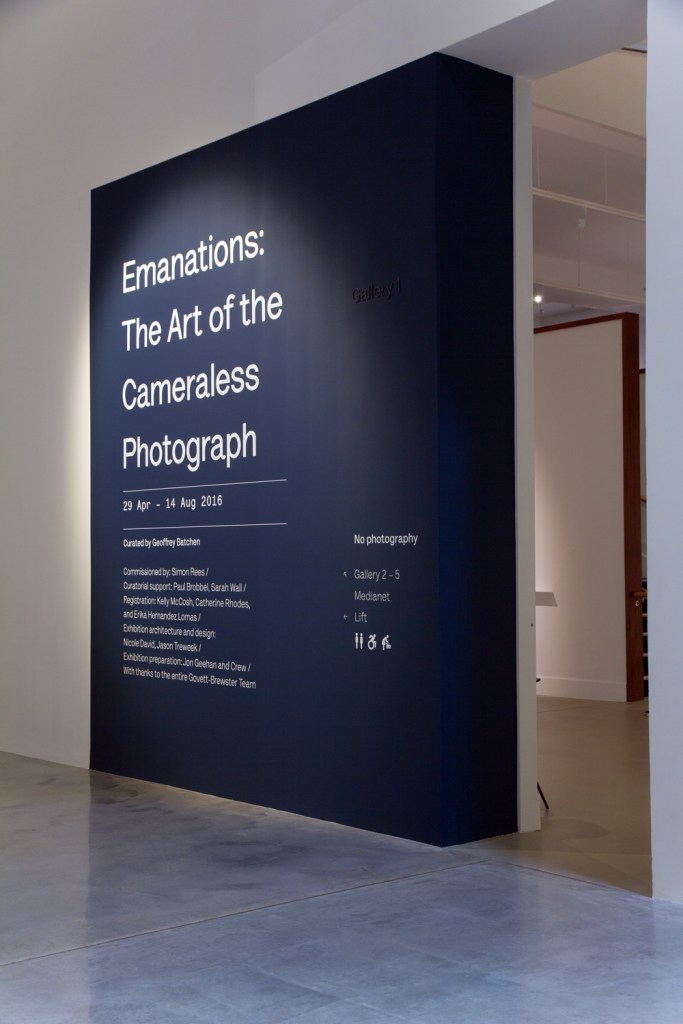
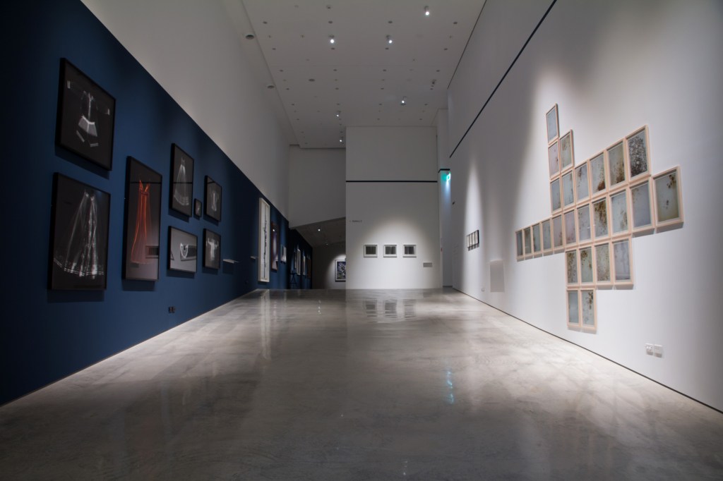
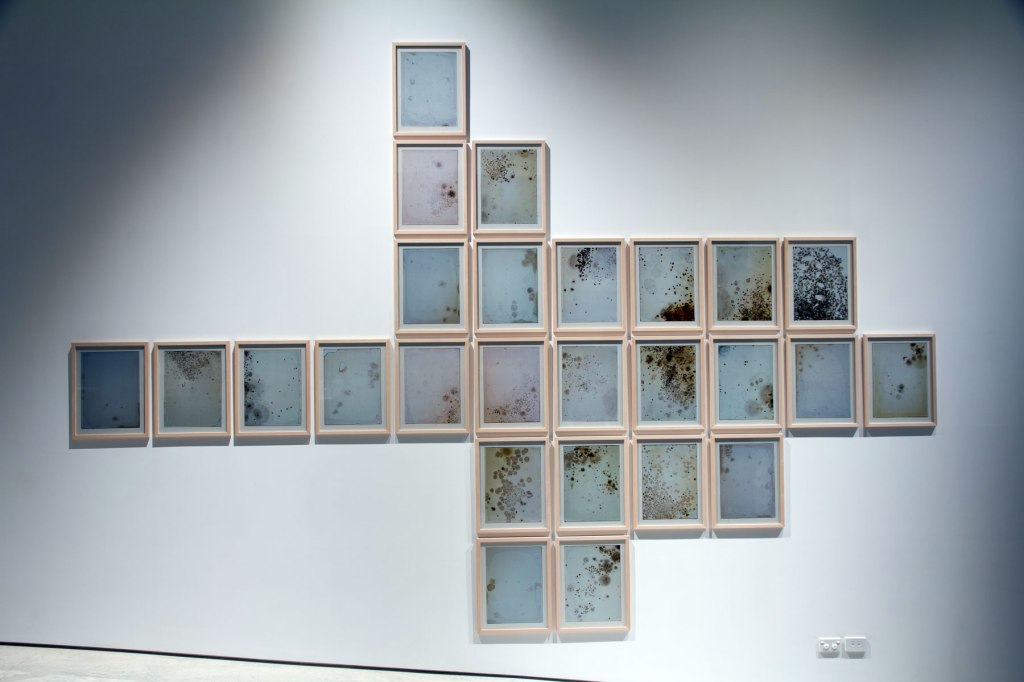
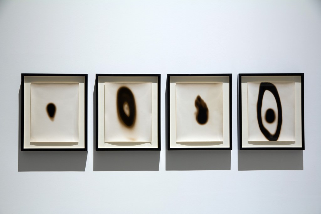
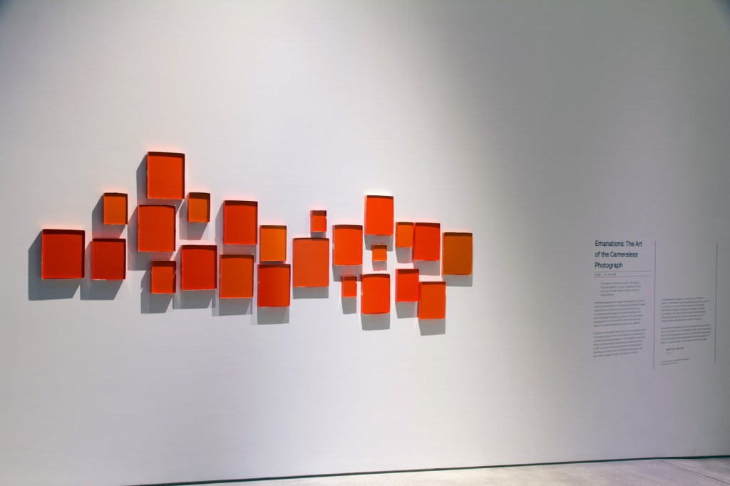
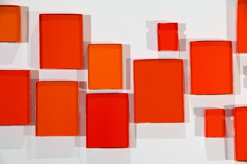
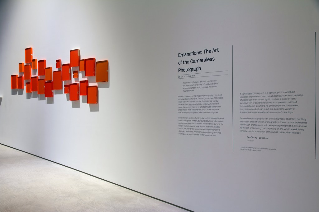
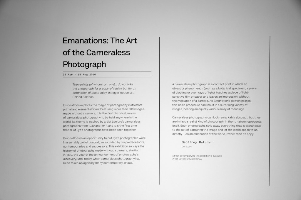
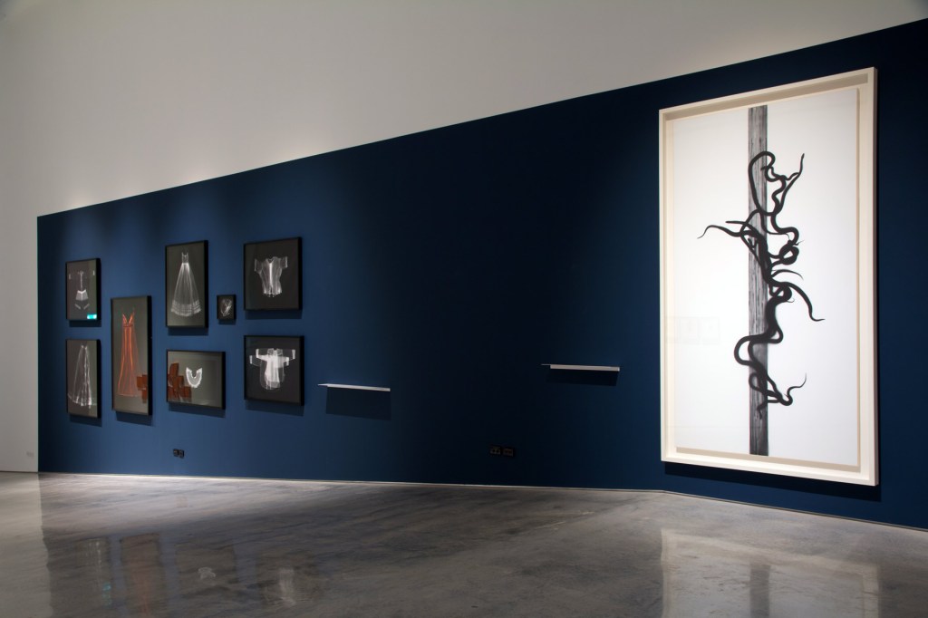
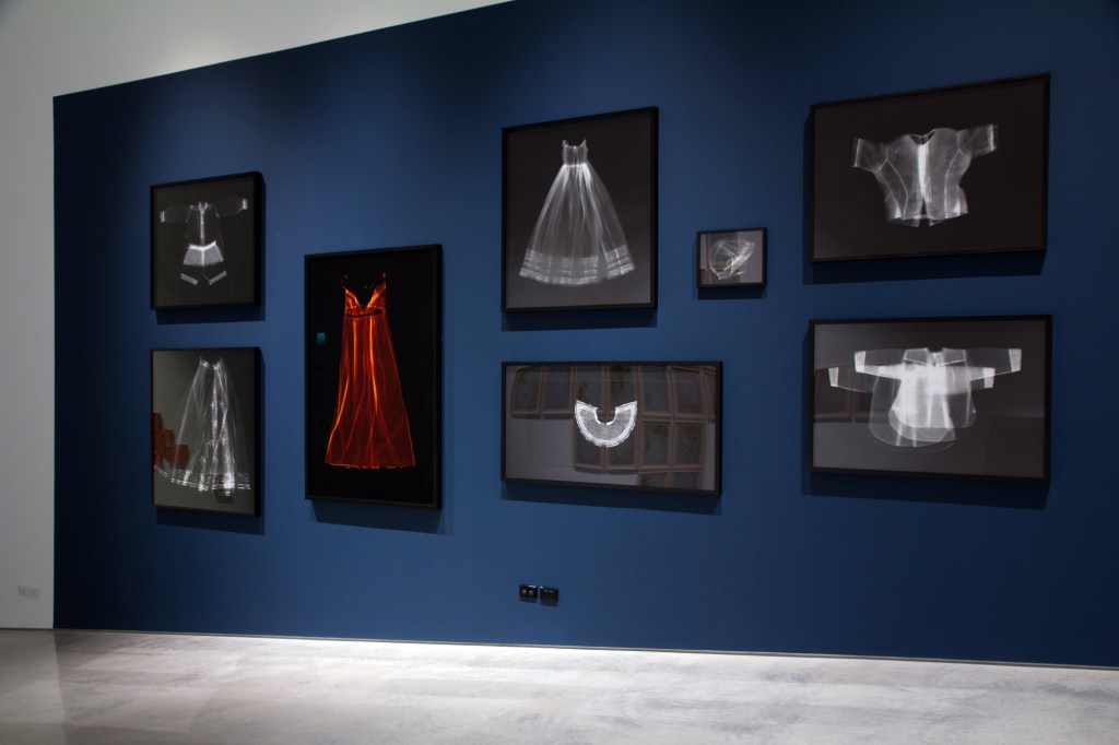
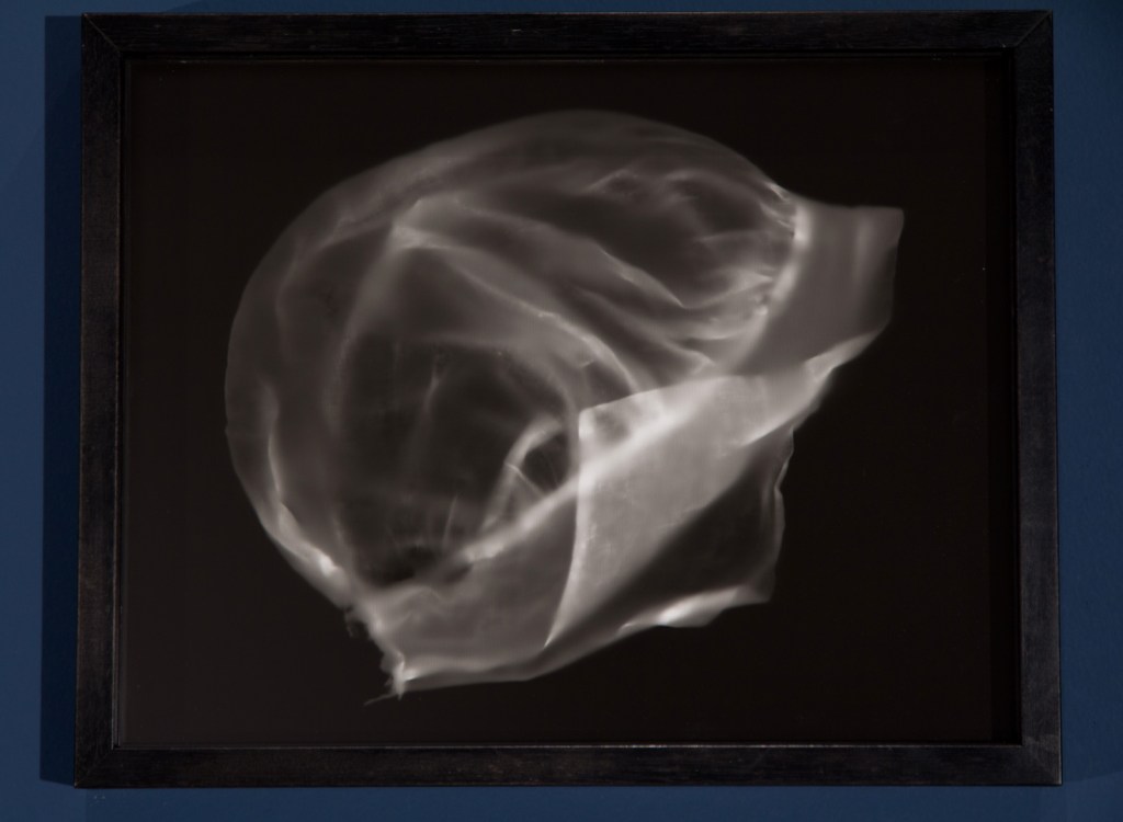
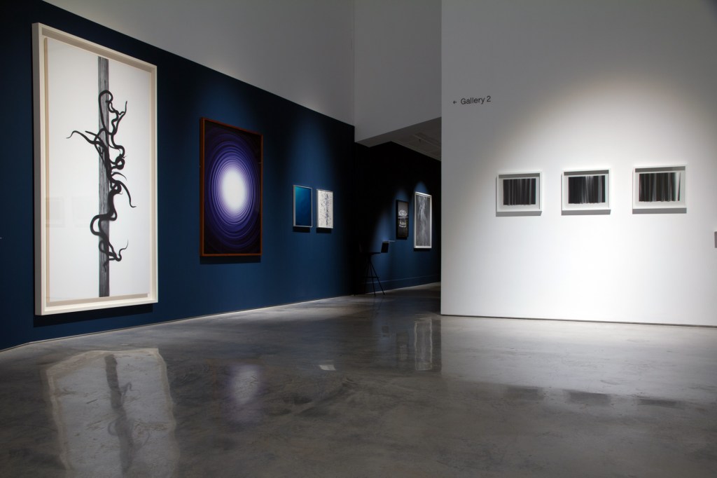
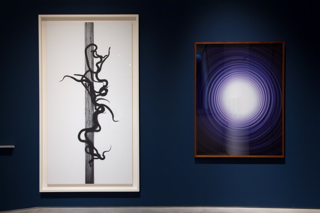
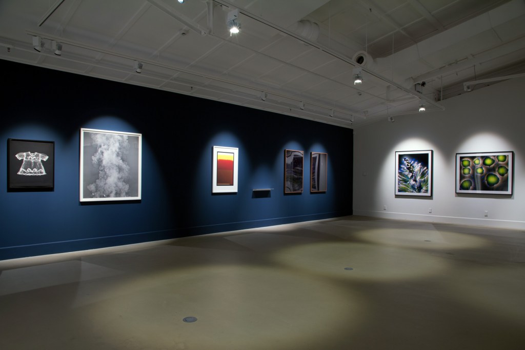
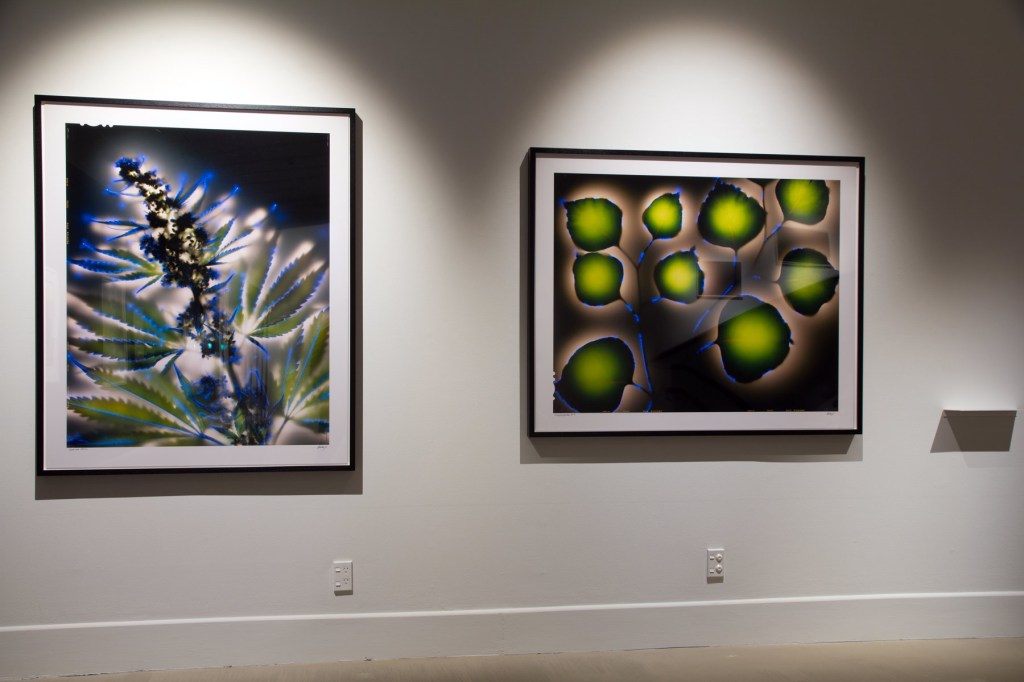

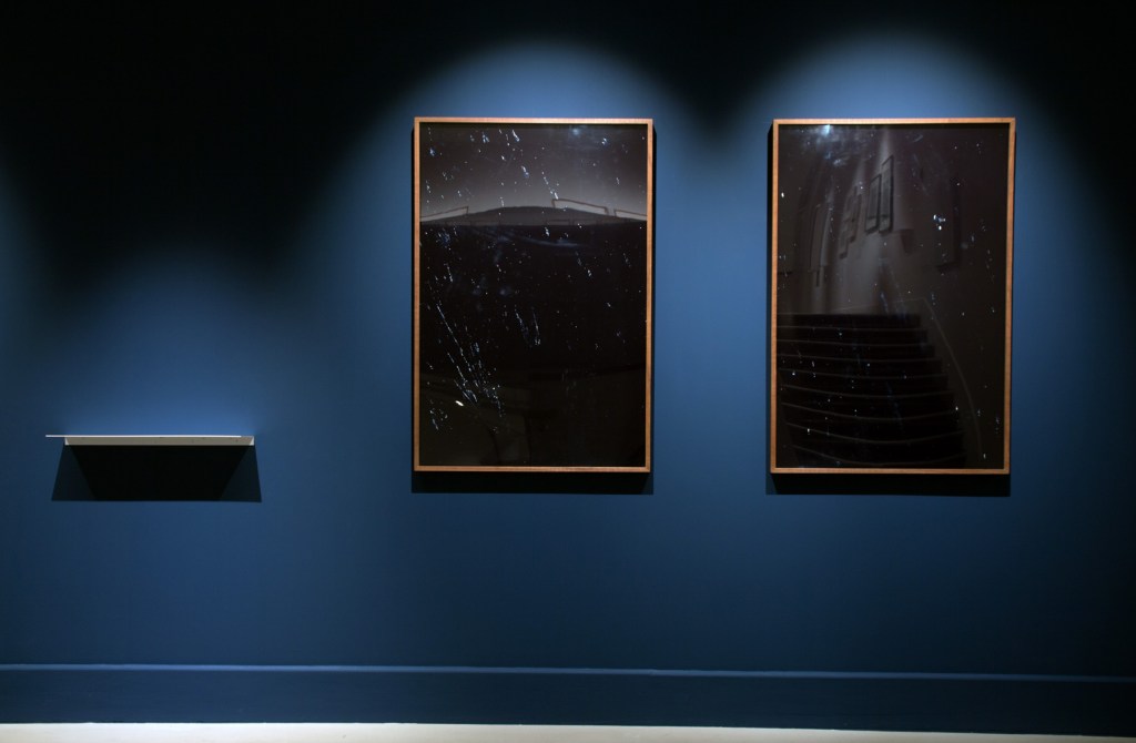
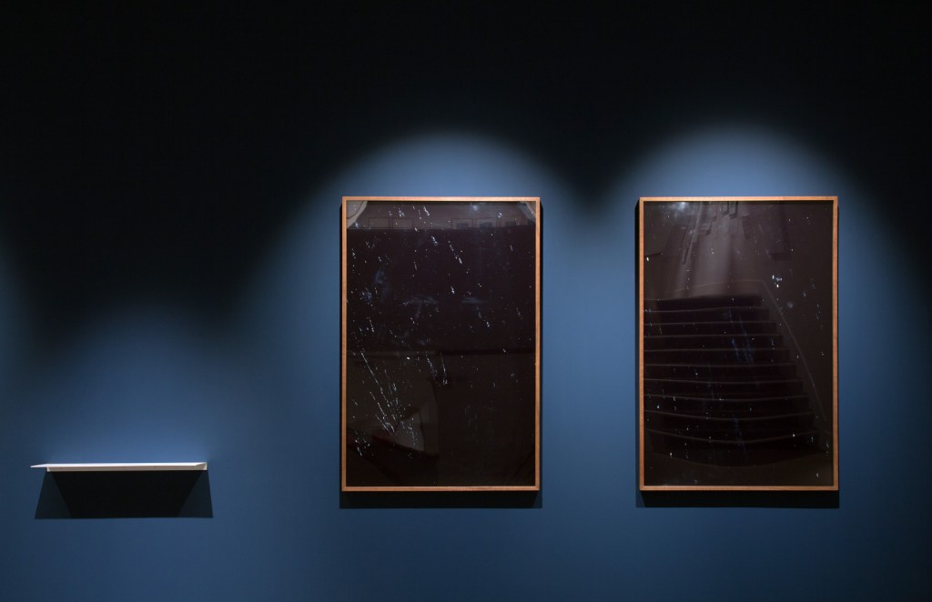
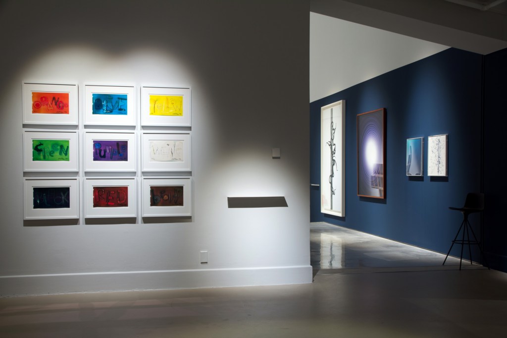
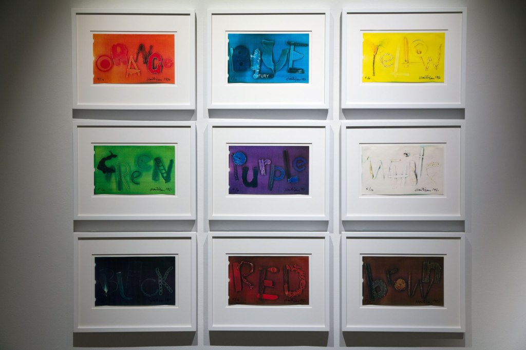

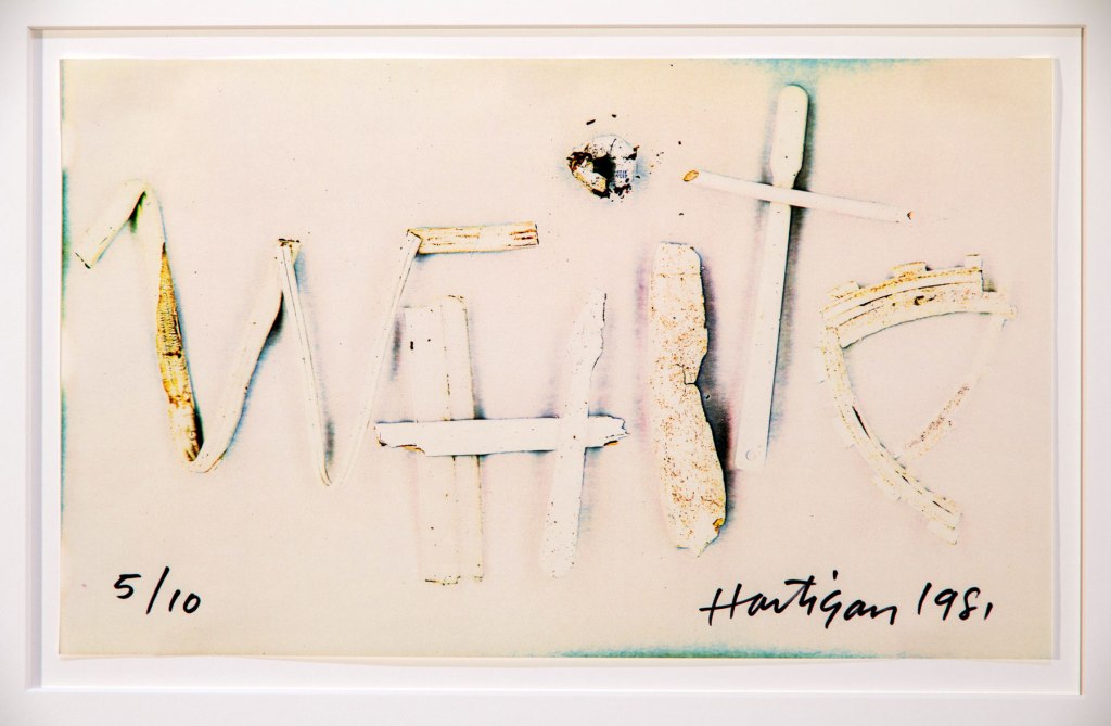
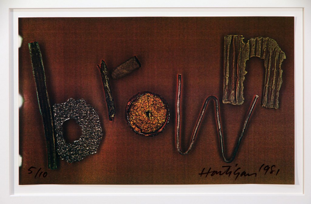
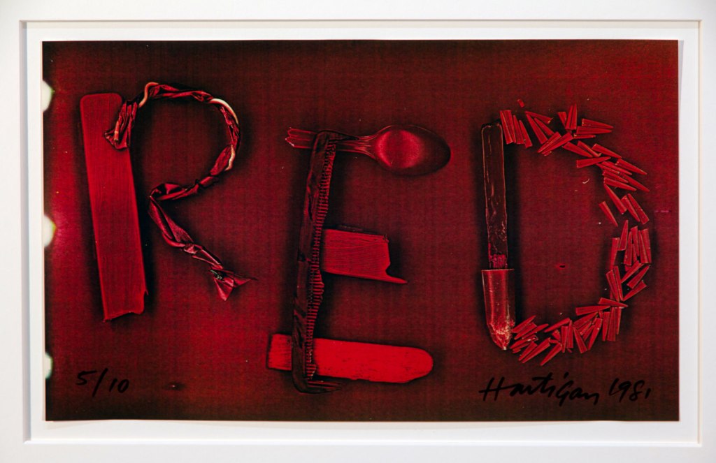
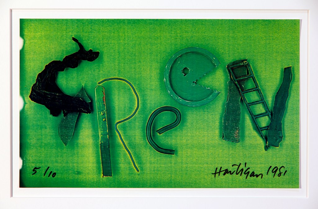
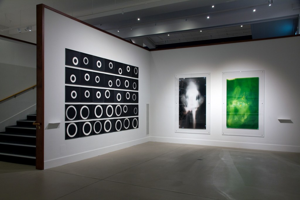
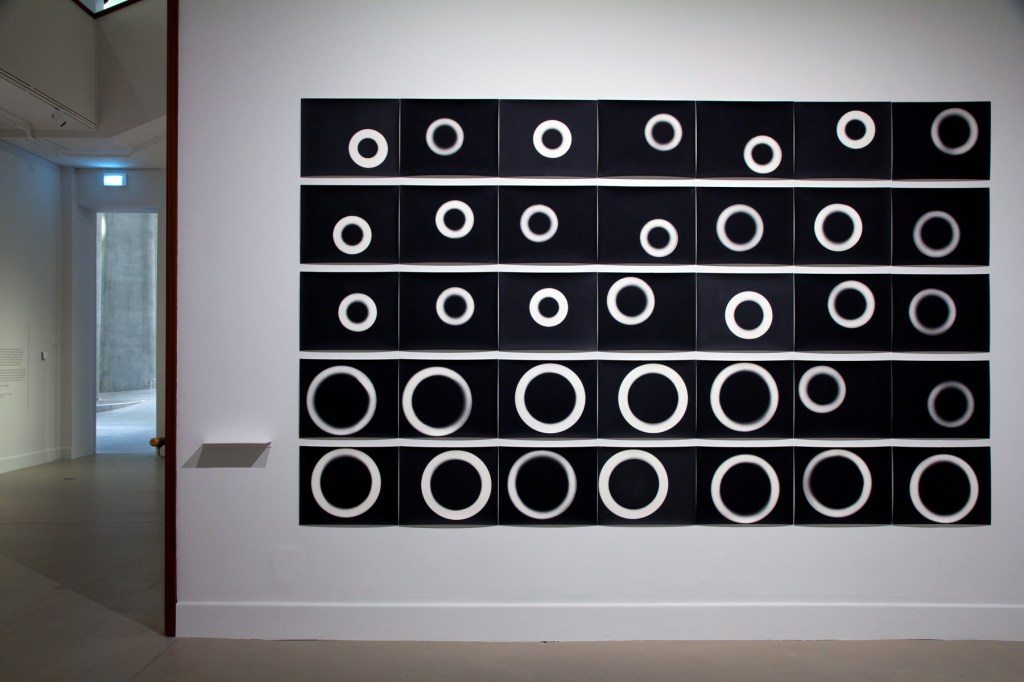
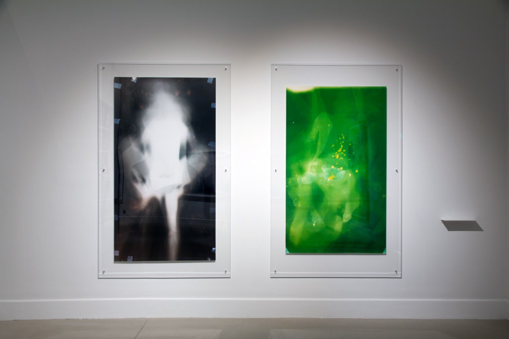
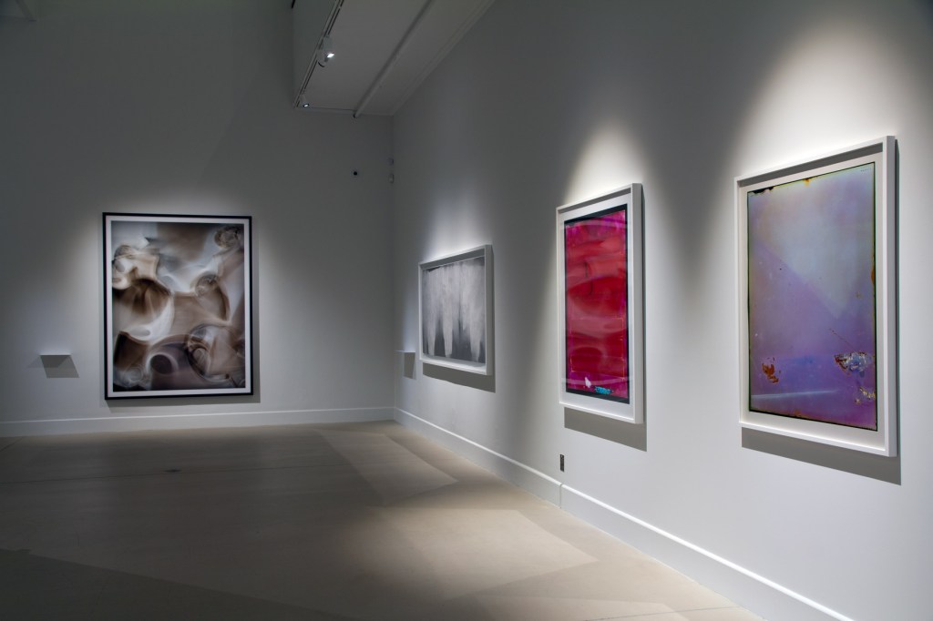
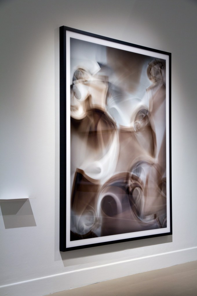
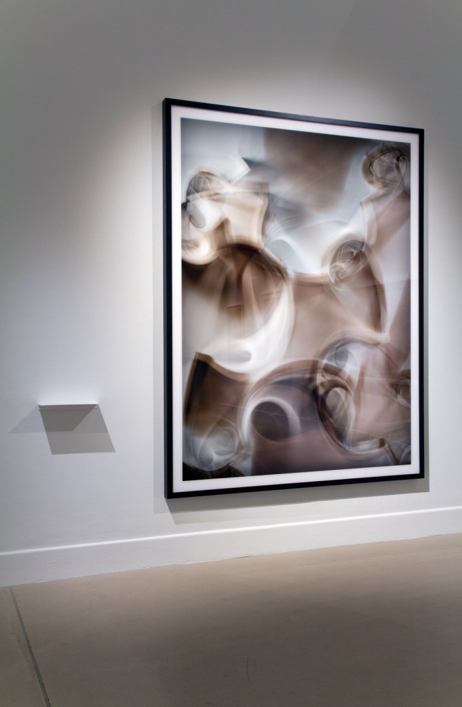
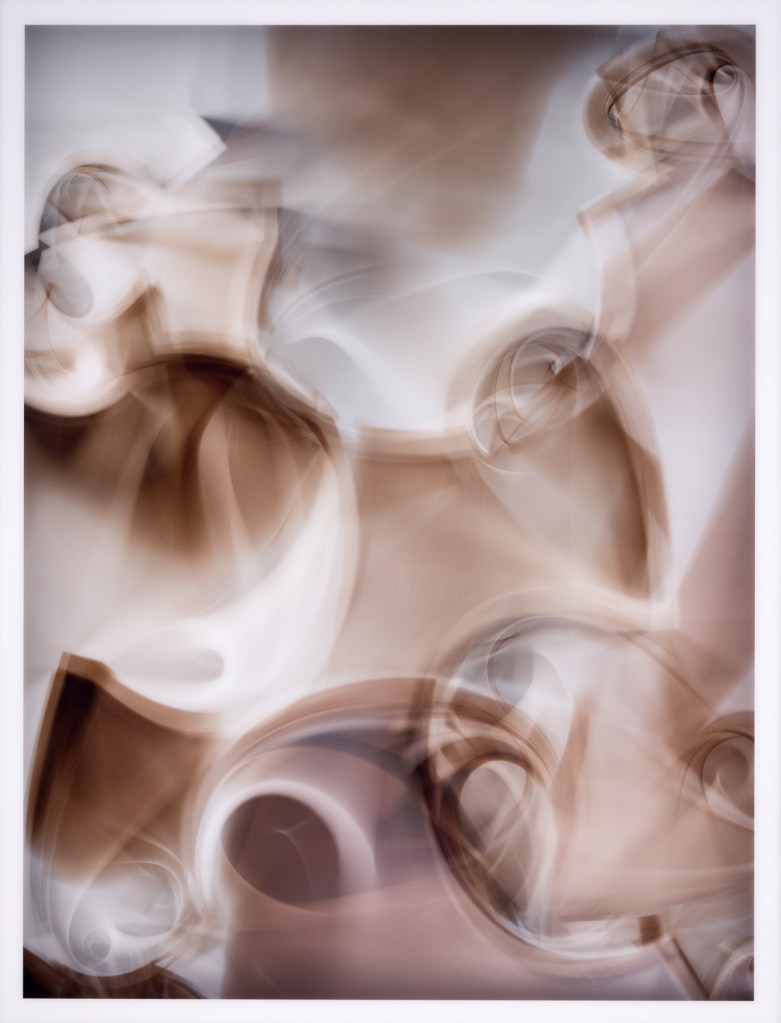
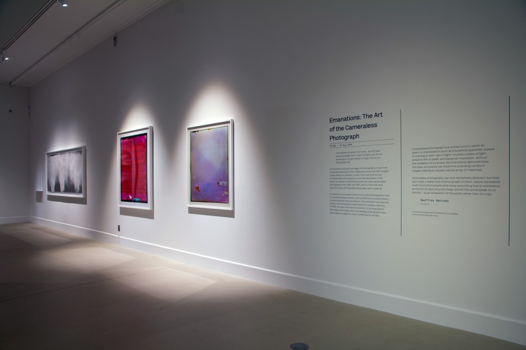
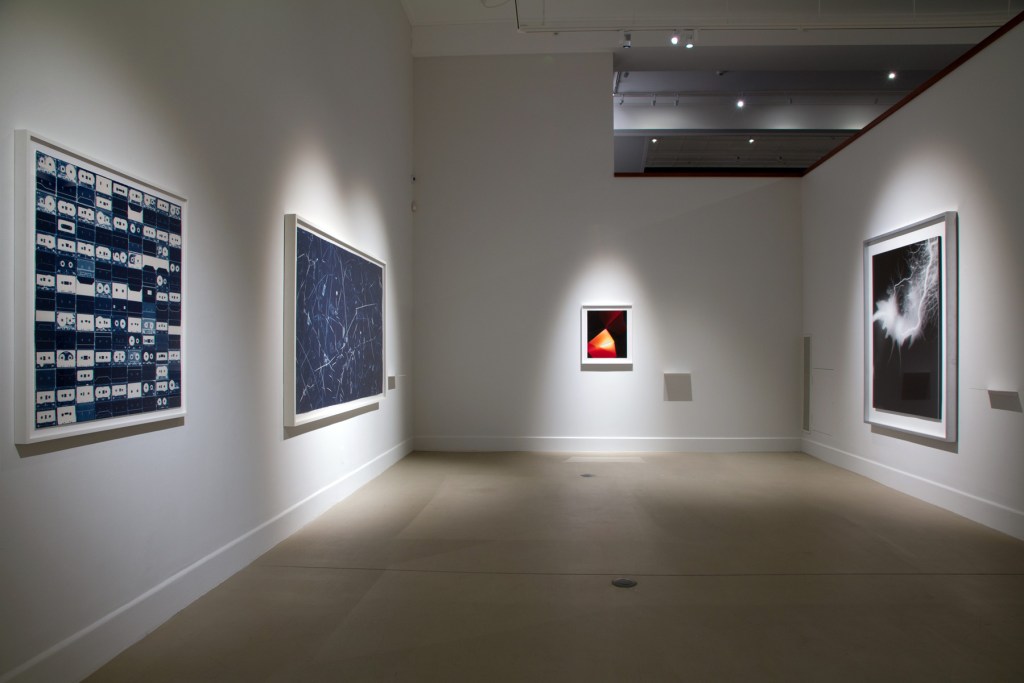
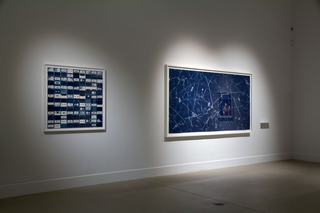


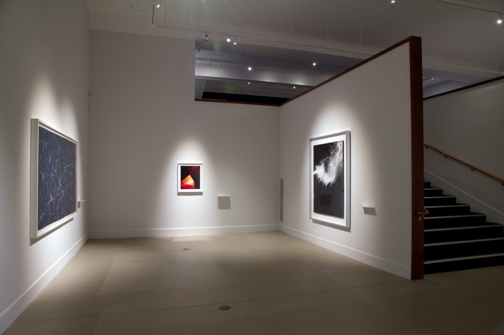
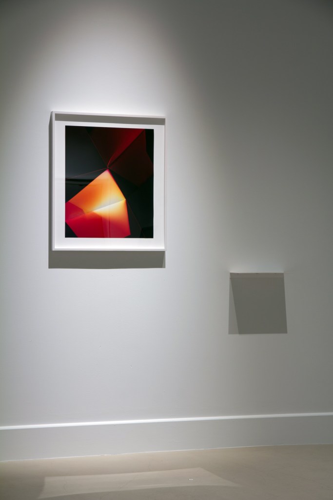
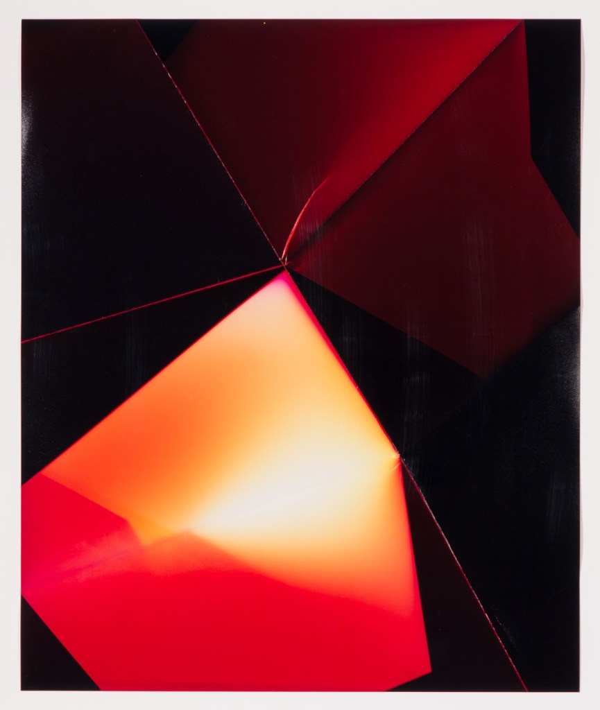
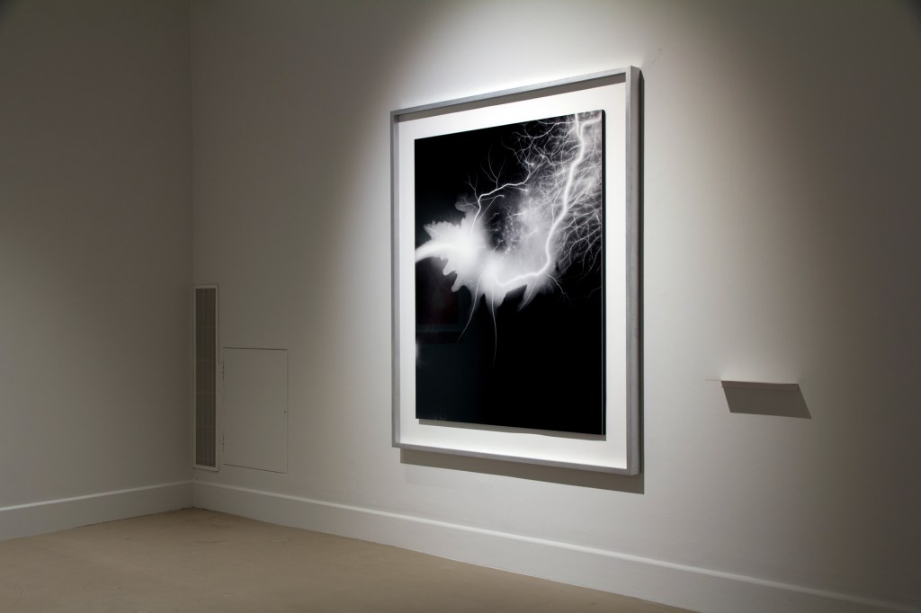
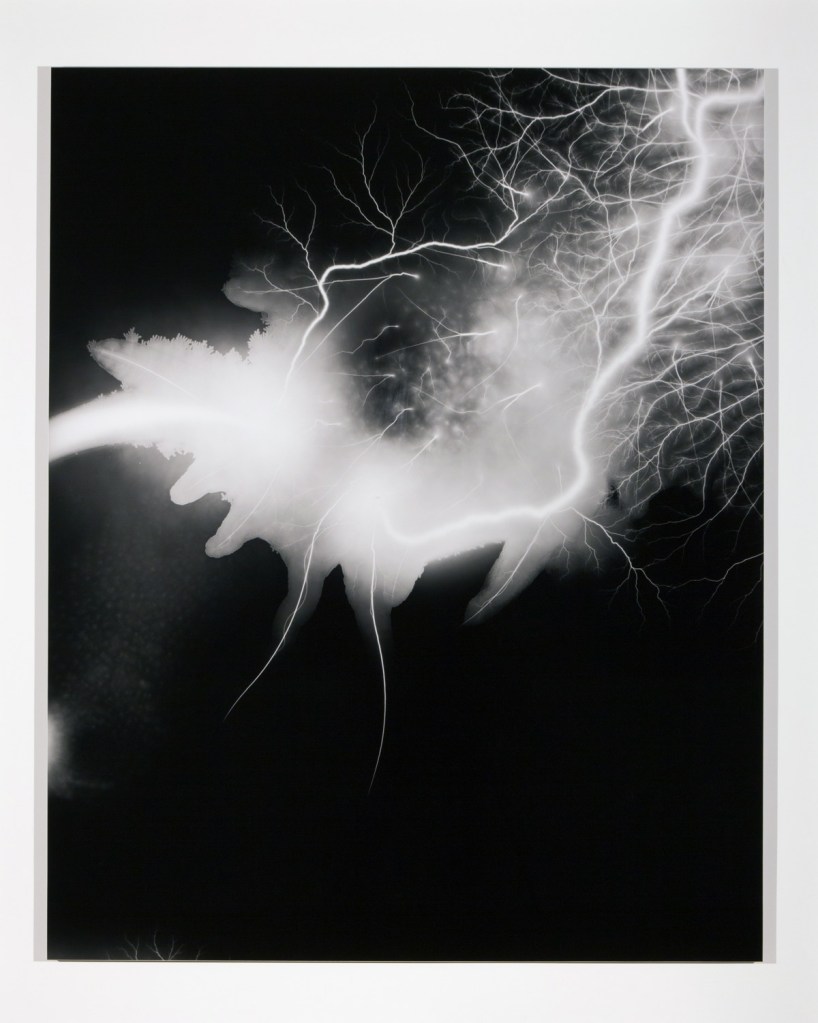
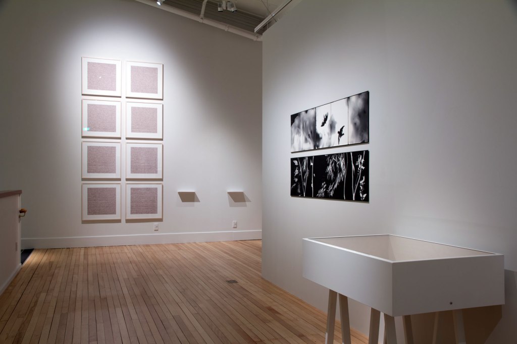
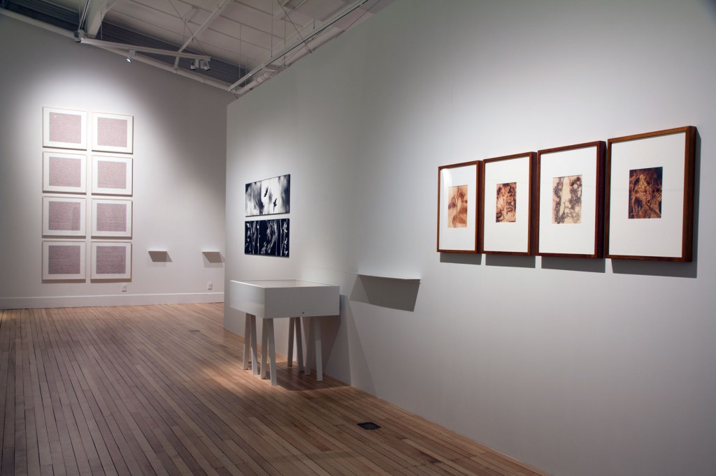
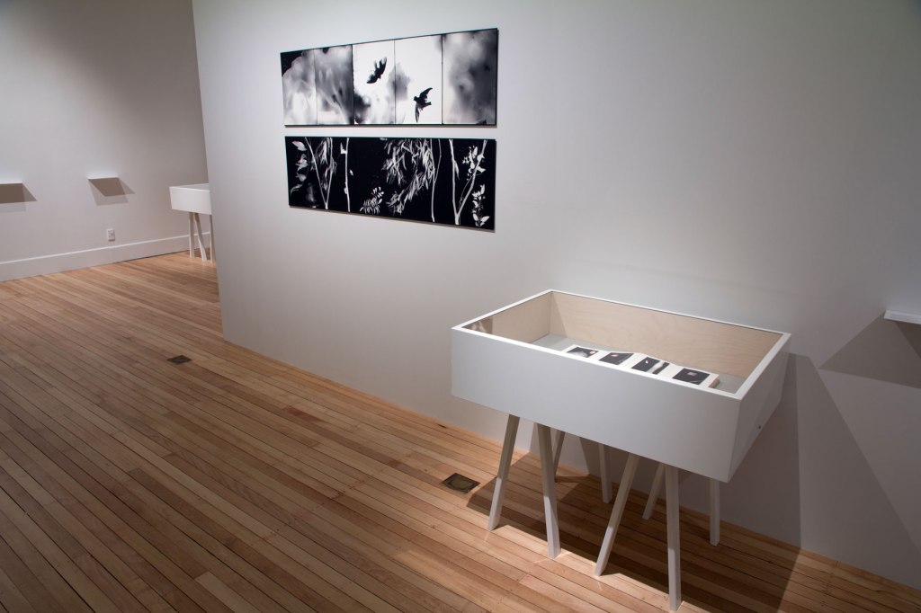
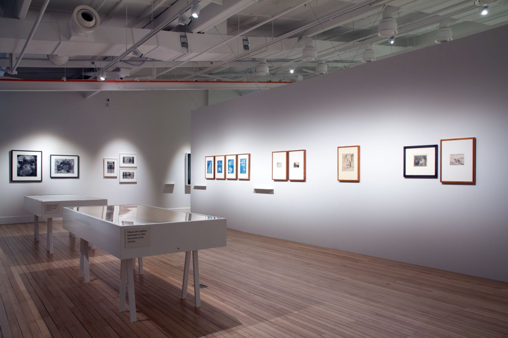
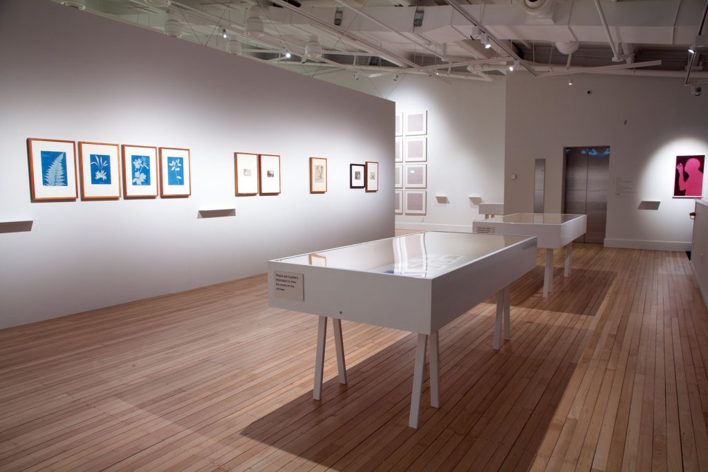

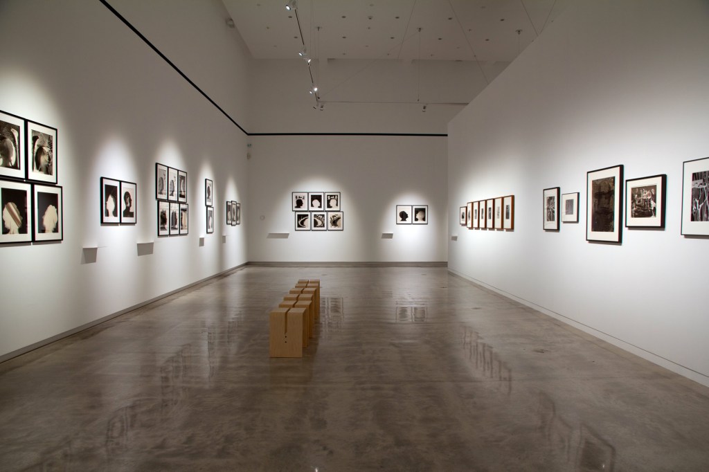
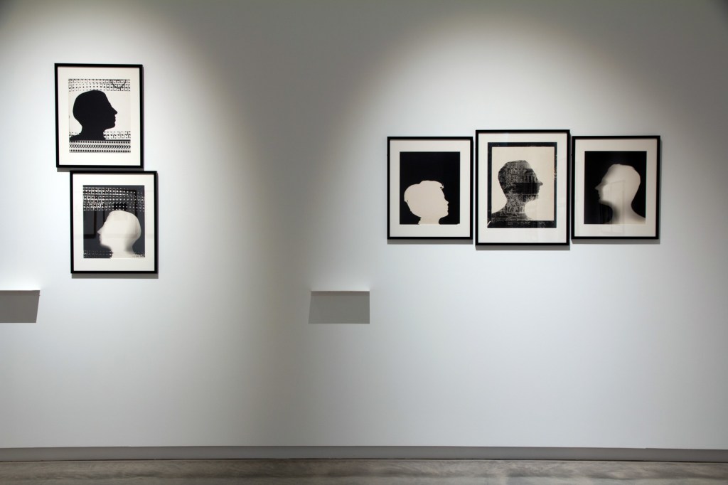
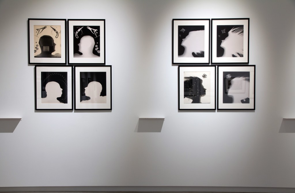
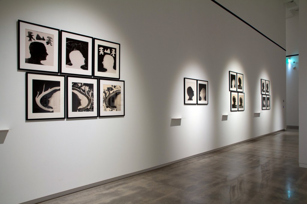
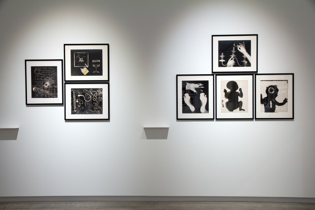


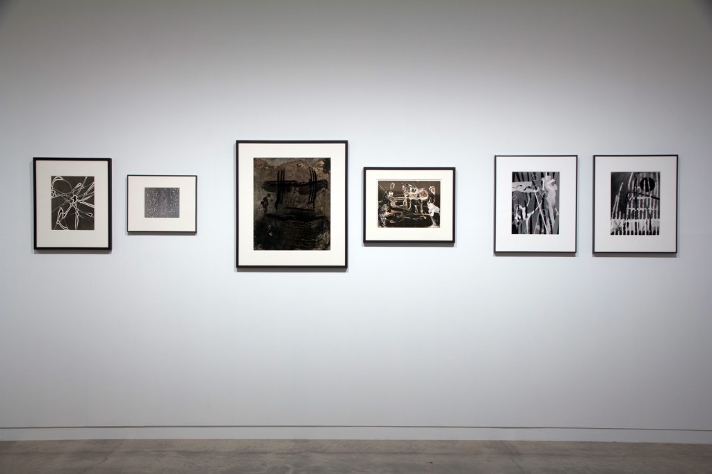
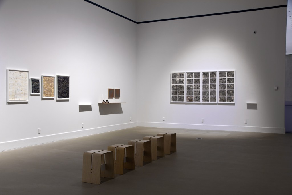
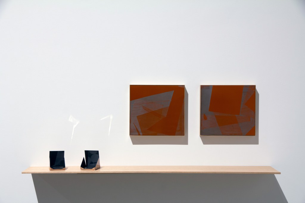
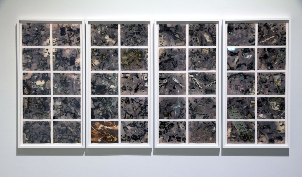

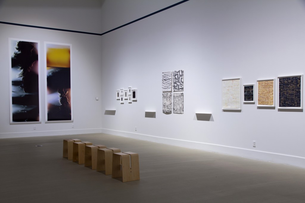
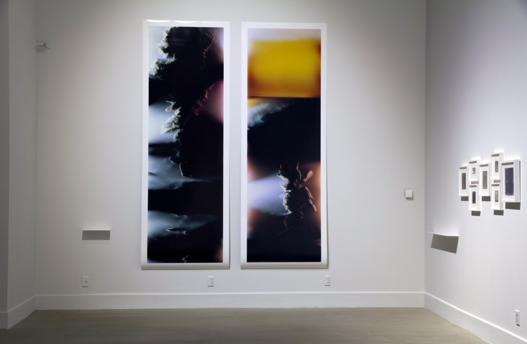
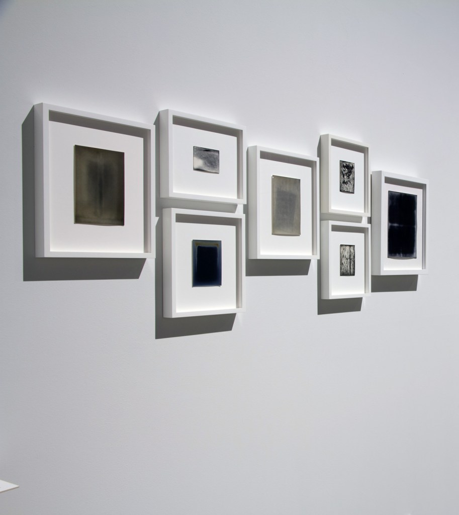
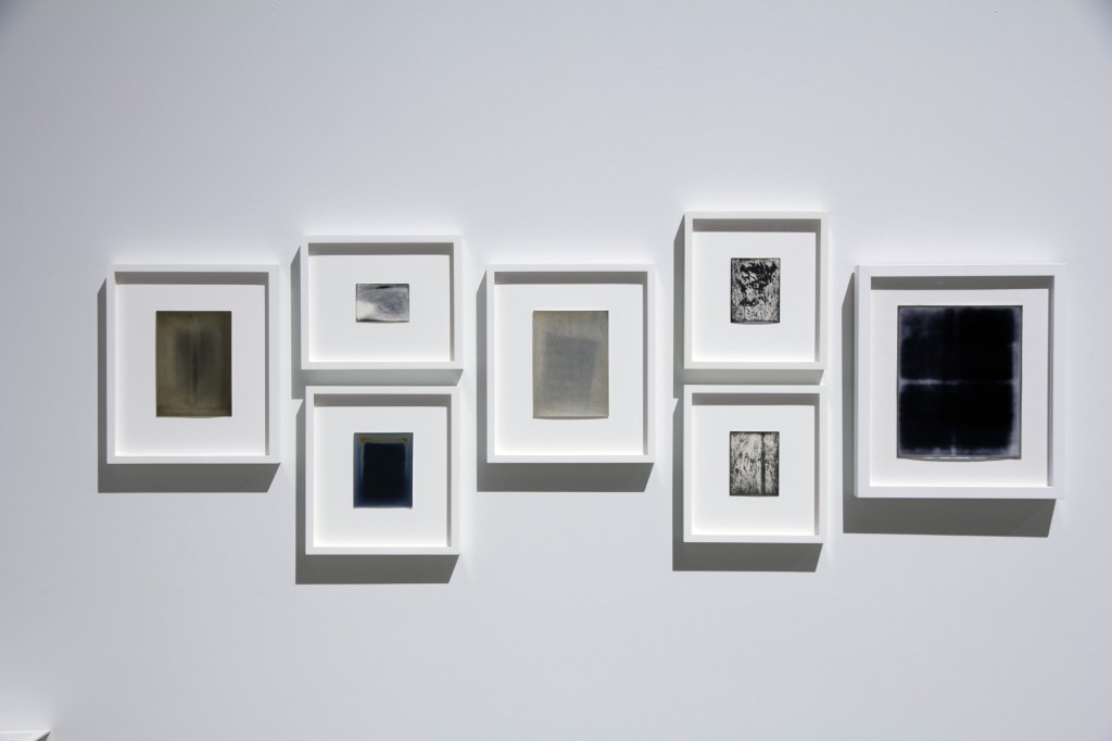
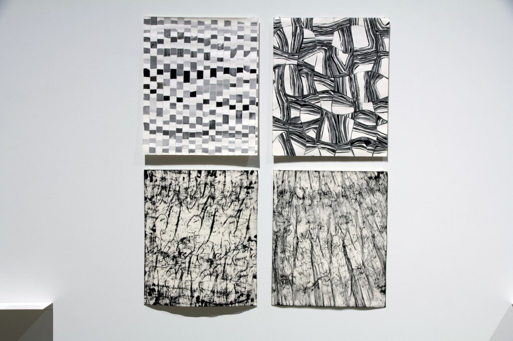
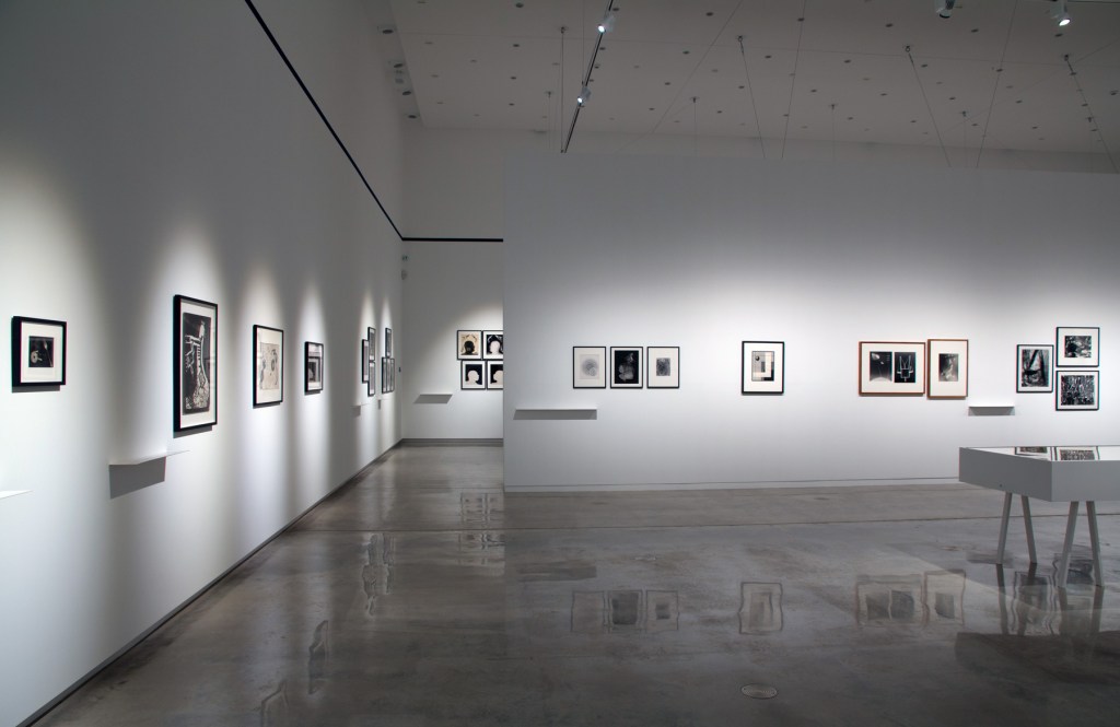

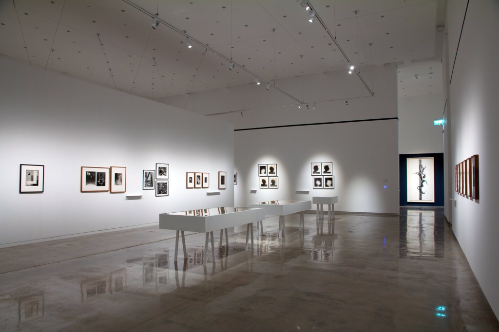
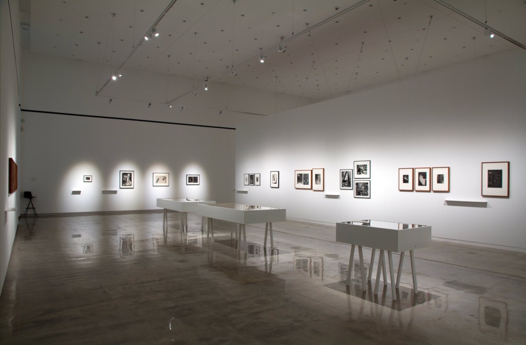
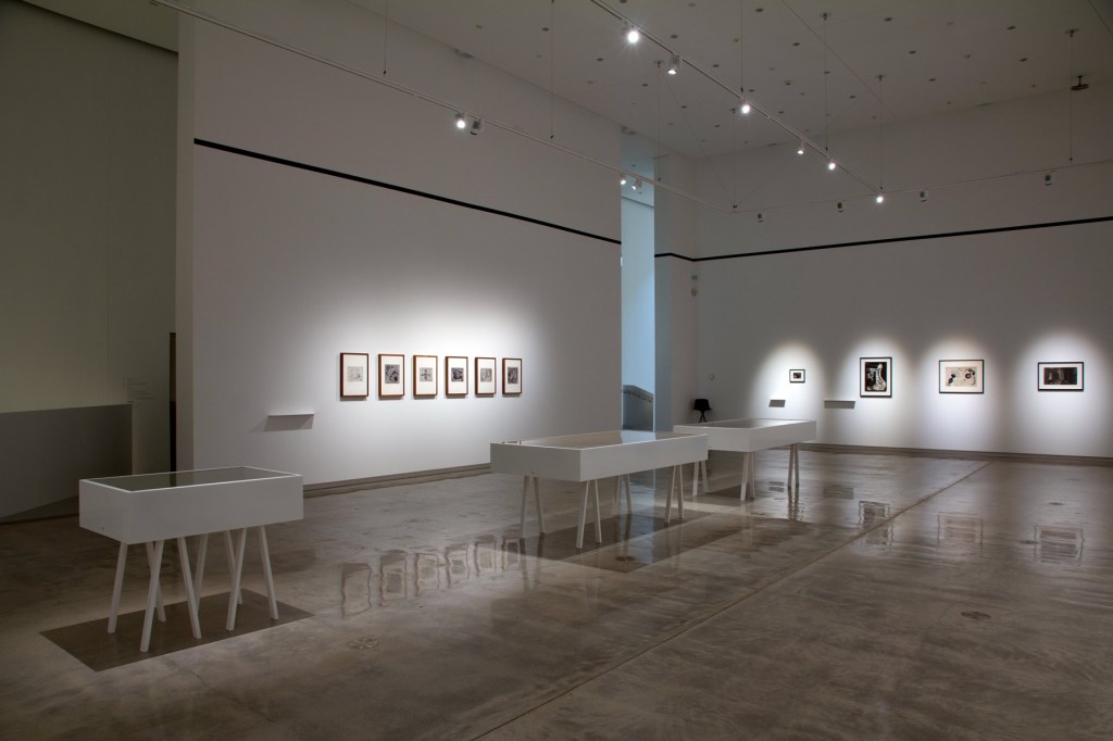
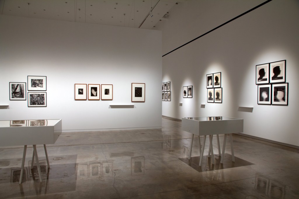
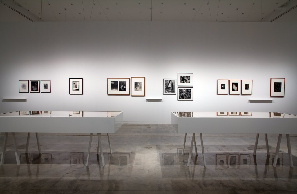
 and 'Allover (Rush, Barbra Streisand, Tina Turner, and Others)', 2008 (right)")
 'Large Cassette Grid No. 6' 2009 from the exhibition 'Emanations: The Art of the Cameraless Photograph' at the Govett-Brewster Art Gallery/Len Lye Centre, New Plymouth, New Zealand, April - August, 2016")
 'Allover (Rush, Barbra Streisand, Tina Turner, and Others)' 2008")

 'Two Sided Picture (RY), January 11, 2007, Valencia, California, Fujicolor Crystal Archive, 2007' from the exhibition 'Emanations: The Art of the Cameraless Photograph' at the Govett-Brewster Art Gallery/Len Lye Centre, New Plymouth, New Zealand, April - August, 2016")
 'Lightning Fields 168' 2009 (installation view)")
 'Lightning Fields 168' 2009")


 'Xerox book # 1', 1968 from the exhibition 'Emanations: The Art of the Cameraless Photograph' at the Govett-Brewster Art Gallery")


' 1880, 1882, 1892 and background, the cyanotypes of Anna Atkins")
 'Untitled' (from the disassembled album 'Cyanotypes of British and Foreign Flowering Plants and Ferns') c. 1854")
 'Lace' c. 1845")


 'Georgia O'Keeffe' 1947")
 'Le Corbusier' 1947")
 'Marks and Spencer in a Japanese Garden (Pond People)' 1930")

 'The struggle for life' 1948")
 'Kilian Breier: Fotografik 1953-1990' 1991 (cover)")
![Max Dupain (Australian, 1911-1992) 'Untitled rayograph [with water]' 1936](https://artblart.com/wp-content/uploads/2016/07/dupain-rayograph-water.jpg "Max Dupain (Australian, 1911-1992) 'Untitled rayograph [with water]' 1936")
 'Pecky broskve' (z 'cyklu' Stopy) 'Peach Stones' (From 'Traces' series) 1961")
 'Black, great and white light composition', 1949; 'Black and white calligraphy', 1951; 'Fluid patterns', 1938; '(Calligraphic light)', 1948; 'Optical transformation', 1938; 'Hieroglyphic body', 1942; '(Magnetic pattern)', 1938")
, Chargesheimer (centre), and Roger Catherineau (right)")
 'Untitled' c. 1939-1943")
 'Scenarium' 1961")
 'Photogramme' 1957")

 'Slippery Image #1' 2014-2015 'Slippery Image #2' 2014-2015 and 'Traversing Edges & Corners (Orange #9)' 2014 'Traversing Edges & Corners (Orange #10)' 2014 tintype")
 'Diluvian' 2010-2013")
 Untitled (C-1378), 2013; Untitled (C-1598), 2014; Untitled (C-1526), 2014; Untitled (C-1338), 2013")


 'Bruissement: Bee Wing Photograms #10' 2015")
 Agfa Cykora, expired January 1942, processed 2013; Eastman Kodak Velox, expired March 1919a, processed 2014; Eastman Kodak Medalist E2, expired September 1956, processed 2010; Eastman Kodak Velox, expired March 1919b, processed 2014; Eastman Kodak PMC No.11, expired September 1937, processed 2013; Defender Argo, exact expiration date unknown, c. 1910, processed 2013; Velox T4, expiry date October 1, 1940, processed 2008")
 Agfa Cykora, expired January 1942, processed 2013; Eastman Kodak Velox, expired March 1919a, processed 2014; Eastman Kodak Medalist E2, expired September 1956, processed 2010; Eastman Kodak Velox, expired March 1919b, processed 2014; Eastman Kodak PMC No.11, expired September 1937, processed 2013; Defender Argo, exact expiration date unknown, c. 1910, processed 2013; Velox T4, expiry date October 1, 1940, processed 2008")
 Untitled 134-5, 2014; Untitled 254-5, 2014; Untitled 287-5, 2014; Untitled 292-5, 2014")


 'Videograms' 1969")
 'ΔE2000 1.1' 2014 part of the exhibition of the exhibition 'Emanations: The Art of the Cameraless Photograph' at the Govett-Brewster Art Gallery")
 'ΔE2000 1.1' 2014 part of the exhibition of the exhibition 'Emanations: The Art of the Cameraless Photograph' at the Govett-Brewster Art Gallery")
 'ΔE2000 1.1' 2014 part of the exhibition of the exhibition 'Emanations: The Art of the Cameraless Photograph' at the Govett-Brewster Art Gallery")


 Untitled, 1998; Untitled, 1998; Untitled, 1998; Untitled (baby's petticoat), 1998; Untitled (collar), 1998; Untitled (baby's bonnet), 1998; Untitled (sailor suit), 1998; Untitled (shirts), 1998")
 'Untitled (baby's bonnet)' 1998")

 ‘Caduceus’ 2010 (left) and ‘Untitled’ 1991 (right)")
 'Untitled' 1991 from the exhibition 'Emanations: The Art of the Cameraless Photograph' at the Govett-Brewster Art Gallery/Len Lye Centre, New Plymouth, New Zealand, April - August, 2016")
 ‘Fold I’ 2014 from the exhibition 'Emanations: The Art of the Cameraless Photograph' at the Govett-Brewster Art Gallery/Len Lye Centre, New Plymouth, New Zealand, April - August, 2016")

 ‘Cannabis sativa’ 2002 (left) and ‘Eucalyptus polyanthemos’ 2000 (right)")

 ‘Endings (Rothko died today) – Kodachrome 64, No. 21, 26/02/1970’ 2009")
 'Untitled' (from the series 'My Ghost') 2001")
 both 'Untitled' 1989")
. ‘MN 62: OPHIUCUS (NGC 6266), AR 17 h. 01,2 min. / D -30º 07’’ (left) and ‘LAMBDA CORONAE AUSTRALIS (Mags 5,1/9,7 Sepn 29,2\" AP 214º), AR 18 h 43,8 min. / D -38º 19’’ (right) both 1993")
 ‘MN 62: OPHIUCUS (NGC 6266), AR 17 h. 01,2 min. / D -30º 07’’ (left) and ‘LAMBDA CORONAE AUSTRALIS (Mags 5,1/9,7 Sepn 29,2\" AP 214º), AR 18 h 43,8 min. / D -38º 19’’ (right) both 1993")
 'Colourwords' 1980-1981 as part of the exhibition 'Emanations: The Art of the Cameraless Photograph' at the Govett-Brewster Art Gallery")
 'Colourwords' 1980-1981 as part of the exhibition 'Emanations: The Art of the Cameraless Photograph' at the Govett-Brewster Art Gallery")
 'Colourwords' 1980-1981 as part of the exhibition 'Emanations: The Art of the Cameraless Photograph' at the Govett-Brewster Art Gallery")
 'Colourwords' 1980-1981 as part of the exhibition 'Emanations: The Art of the Cameraless Photograph' at the Govett-Brewster Art Gallery")
 'Colourwords' 1980-1981 as part of the exhibition 'Emanations: The Art of the Cameraless Photograph' at the Govett-Brewster Art Gallery")
 'Colourwords' 1980-1981 as part of the exhibition 'Emanations: The Art of the Cameraless Photograph' at the Govett-Brewster Art Gallery")
 'Colourwords' 1980-1981 as part of the exhibition 'Emanations: The Art of the Cameraless Photograph' at the Govett-Brewster Art Gallery")
 ‘The Coil’ 1998 (left) and Lucinda Eva-May as part of the exhibition 'Emanations: The Art of the Cameraless Photograph' at the Govett-Brewster Art Gallery")
 ‘The Coil’ 1998")
 'Unity in light #6' 2012 (left) 'Unity in light #9' 2012 (right)")

 'r.phg.07_II' 2013")
 'r.phg.07_II' 2013")
 'r.phg.07_II' 2013")


 'Exit (Red State)' 2014-15")
 'Desklamp' 2011-12")
 'Self-portrait' c. 1970 from the exhibition 'Robert Mapplethorpe: The Perfect Medium' at the Los Angeles County Museum of Art (LACMA), March - July, 2016")
 'Leatherman #1' 1970 from the exhibition 'Robert Mapplethorpe: The Perfect Medium' at the Los Angeles County Museum of Art (LACMA), March - July, 2016")
 'Candy Darling' 1972")
 'Untitled (Nancy Nortia/Dugan)' c. 1974")
 'Nick' 1977")
 'Self-portrait' 1980")
 'Parrot Tulips' 1988")
 'Joe, N.Y.C.' 1978")
 'Patti Smith' 1978")
 'Keso Dekker' 1979")
 'Tim Scott' 1980")
 'Phillip Prioleau' 1980")
 'Lisa Lyon' 1982")
 'Brian Ridley and Lyle Heeter' 1979")
 'Kathy Acker' 1983")
 'Ken Moody' 1985")
 'Larry and Bobby Kissing' 1979")
 'Melody Danielson' 1987")
 'Poppy' 1988")
 'Lucinda's Hand' 1985")
 'Two Men Dancing' 1984")
 'Self-portrait of Robert Mapplethorpe with trip cable in hand' 1974 from the exhibition 'Robert Mapplethorpe: The Perfect Medium' at the J. Paul Getty Museum, Los Angeles, March - July, 2016")
 'Self-Portrait' 1975 from the exhibition 'Robert Mapplethorpe: The Perfect Medium' at the J. Paul Getty Museum, Los Angeles, March - July, 2016")
 'Self-Portrait' 1980")
 'Self-Portrait' 1985")
 'Self-Portrait' 1988")
 'Sam Wagstaff' 1977")
 'Andy Warhol' 1983")
 'Wrestler' 1988")
 'Derrick Cross' 1983")
 'Grapes' 1985")
 'Lydia Cheng' 1987")
 'Melody (Shoe)' 1987")
 'Orchid' 1987")
 'Calla Lily' 1988")
 'Lisa Lyon' 1981")
 'Tulips' 1988")
 'Phillip Prioleau' 1982")
 'Tulips' 1978")
 'Flower Arrangement' 1986")
 'Flower With Knife' 1985")
 'Poppy' 1988")
 'Lisa Lyon' 1982")
 'Lisa Lyon' 1982")
 'Calla Lily' 1986")
 'Thomas' 1987")
 'Ken and Lydia and Tyler' 1985")
 'Ken Moody and Robert Sherman' 1984")
 'Hermes' 1988")
 'Ken Moody' 1983")
 'Ajitto' 1981")
 'Jim, Sausalito' 1977")
 'Patrice, N.Y.C.' 1977")
![Unknown photographer (American) '[Jeff Briggs, Robert Sims, Otis Hall, and Peter Pamphlet; Full-Length Mugshot from the Chicago Police Department]' 1936 from the exhibition 'Crime Stories: Photography and Foul Play' at the Metropolitan Museum of Art, New York, March - July, 2016](https://artblart.com/wp-content/uploads/2016/07/mug-shot1-web.jpg "Unknown photographer (American) '[Jeff Briggs, Robert Sims, Otis Hall, and Peter Pamphlet; Full-Length Mugshot from the Chicago Police Department]' 1936 from the exhibition 'Crime Stories: Photography and Foul Play' at the Metropolitan Museum of Art, New York, March - July, 2016")
![Unknown photographer (American) '[John Dillinger's Feet, Chicago Morgue]' 1934 from the exhibition 'Crime Stories: Photography and Foul Play' at the Metropolitan Museum of Art, New York, March - July, 2016](https://artblart.com/wp-content/uploads/2016/07/john-dillingers-body-web.jpg "Unknown photographer (American) '[John Dillinger's Feet, Chicago Morgue]' 1934 from the exhibition 'Crime Stories: Photography and Foul Play' at the Metropolitan Museum of Art, New York, March - July, 2016")
![Unknown photographer (American) '[Jeff Briggs, Robert Sims, Otis Hall, and Peter Pamphlet; Full-Length Mugshot from the Chicago Police Department]' 1936](https://artblart.com/wp-content/uploads/2016/07/mug-shot2-web.jpg "Unknown photographer (American) '[Jeff Briggs, Robert Sims, Otis Hall, and Peter Pamphlet; Full-Length Mugshot from the Chicago Police Department]' 1936")
![Walker Evans (American, St. Louis, Missouri 1903–1975 New Haven, Connecticut) '[Subway Passengers, New York City]' 1938](https://artblart.com/wp-content/uploads/2016/07/walker-evans-subway-passengers-new-york-city-web.jpg "Walker Evans (American, St. Louis, Missouri 1903–1975 New Haven, Connecticut) '[Subway Passengers, New York City]' 1938")
 (American born Ukraine (Austria), Złoczów (Zolochiv) 1899 - 1968 New York) 'A Bunch of Cops' 1940s")
 'Dick Hickock, Murderer, Garden City, Kansas' April 1960")
 'Dick Hickock, Murderer, Garden City, Kansas' April 1960")
 'FATAL BULLET HITS OSWALD. Jack Ruby fires bullet point blank into the body of Lee Harvey Oswald at Dallas Police Station. Oswald grimaces in agony' November 24, 1963")

 'Electric Chair' 1971")
![Alphonse Bertillon (French, 1853-1914) '[Album of Paris Crime Scenes]' 1901-1908](https://artblart.com/wp-content/uploads/2016/07/bertillon-a-web.jpg "Alphonse Bertillon (French, 1853-1914) '[Album of Paris Crime Scenes]' 1901-1908")
![Alphonse Bertillon (French, 1853-1914) '[Album of Paris Crime Scenes]' 1901-1908 (detail)](https://artblart.com/wp-content/uploads/2016/07/bertillon-a-detail.jpg "Alphonse Bertillon (French, 1853-1914) '[Album of Paris Crime Scenes]' 1901-1908 (detail)")
![Alphonse Bertillon (French, 1853-1914) '[Album of Paris Crime Scenes]' 1901-1908](https://artblart.com/wp-content/uploads/2016/07/bertillon-b-web.jpg "Alphonse Bertillon (French, 1853-1914) '[Album of Paris Crime Scenes]' 1901-1908")
![Alphonse Bertillon (French, 1853-1914) '[Album of Paris Crime Scenes]' 1901-1908 (detail)](https://artblart.com/wp-content/uploads/2016/07/bertillon-b-detail.jpg "Alphonse Bertillon (French, 1853-1914) '[Album of Paris Crime Scenes]' 1901-1908 (detail)")
![Alphonse Bertillon (French, 1853-1914) '[Album of Paris Crime Scenes]' 1901-1908](https://artblart.com/wp-content/uploads/2016/07/bertillon-c-web.jpg "Alphonse Bertillon (French, 1853-1914) '[Album of Paris Crime Scenes]' 1901-1908")
![Alphonse Bertillon (French, 1853-1914) '[Album of Paris Crime Scenes]' 1901-1908 (detail)](https://artblart.com/wp-content/uploads/2016/07/bertillon-c-detail.jpg "Alphonse Bertillon (French, 1853-1914) '[Album of Paris Crime Scenes]' 1901-1908 (detail)")
![Alphonse Bertillon (French, 1853-1914) '[Album of Paris Crime Scenes]' 1901-1908](https://artblart.com/wp-content/uploads/2016/07/bertillon-d-web.jpg "Alphonse Bertillon (French, 1853-1914) '[Album of Paris Crime Scenes]' 1901-1908")
![Alphonse Bertillon (French, 1853-1914) '[Album of Paris Crime Scenes]' 1901-1908 (detail)](https://artblart.com/wp-content/uploads/2016/07/bertillon-d-detail.jpg "Alphonse Bertillon (French, 1853-1914) '[Album of Paris Crime Scenes]' 1901-1908 (detail)")
![Alphonse Bertillon (French, 1853-1914) '[Album of Paris Crime Scenes]' 1901-1908](https://artblart.com/wp-content/uploads/2016/07/bertillon-h-web.jpg "Alphonse Bertillon (French, 1853-1914) '[Album of Paris Crime Scenes]' 1901-1908")
![Alphonse Bertillon (French, 1853-1914) '[Album of Paris Crime Scenes]' 1901-1908 (detail)](https://artblart.com/wp-content/uploads/2016/07/bertillon-h-detail.jpg "Alphonse Bertillon (French, 1853-1914) '[Album of Paris Crime Scenes]' 1901-1908 (detail)")
![Alphonse Bertillon (French, 1853-1914) '[Album of Paris Crime Scenes]' 1901-1908](https://artblart.com/wp-content/uploads/2016/07/bertillon-e-web.jpg "Alphonse Bertillon (French, 1853-1914) '[Album of Paris Crime Scenes]' 1901-1908")
![Alphonse Bertillon (French, 1853-1914) '[Album of Paris Crime Scenes]' 1901-1908 (detail)](https://artblart.com/wp-content/uploads/2016/07/bertillon-e-detail.jpg "Alphonse Bertillon (French, 1853-1914) '[Album of Paris Crime Scenes]' 1901-1908 (detail)")
![Alphonse Bertillon (French, 1853-1914) '[Album of Paris Crime Scenes]' 1901-1908](https://artblart.com/wp-content/uploads/2016/07/bertillon-f-web.jpg "Alphonse Bertillon (French, 1853-1914) '[Album of Paris Crime Scenes]' 1901-1908")
![Alphonse Bertillon (French, 1853-1914) '[Album of Paris Crime Scenes]' 1901-1908 (detail)](https://artblart.com/wp-content/uploads/2016/07/bertillon-f-detail.jpg "Alphonse Bertillon (French, 1853-1914) '[Album of Paris Crime Scenes]' 1901-1908 (detail)")
![Alphonse Bertillon (French, 1853-1914) '[Album of Paris Crime Scenes]' 1901-1908](https://artblart.com/wp-content/uploads/2016/07/bertillon-g-web.jpg "Alphonse Bertillon (French, 1853-1914) '[Album of Paris Crime Scenes]' 1901-1908")
![Alphonse Bertillon (French, 1853-1914) '[Album of Paris Crime Scenes]' 1901-1908 (detail)](https://artblart.com/wp-content/uploads/2016/07/bertillon-g-detail.jpg "Alphonse Bertillon (French, 1853-1914) '[Album of Paris Crime Scenes]' 1901-1908 (detail)")
 'Rogues, a Study of Characters' c. 1860")
 'Rogues, a Study of Characters' c. 1860")
 'Rogues, a Study of Characters' c. 1860")
 'Rogues, a Study of Characters' c. 1860")
 'Rogues, a Study of Characters' c. 1860")
 Tableau synoptic des traits physionomiques: pour servir a l'étude du \"portrait parlé\" c. 1909")
 Tableau synoptic des traits physionomiques: pour servir a l'étude du \"portrait parlé\" c. 1909 (detail)")
 Tableau synoptic des traits physionomiques: pour servir a l'étude du \"portrait parlé\" c. 1909 (detail)")
 Tableau synoptic des traits physionomiques: pour servir a l'étude du \"portrait parlé\" c. 1909 (detail)")
 'Véret. 0ctave-Jean. 19 ans, né à Paris XXe. Photographe. Anarchiste. 2/3/94.' 1894")
 'Beaulieu. Henri, Félix, Camille. 23 ans, né le 30/11/70 à Paris Ve. Comptable. Anarchiste. 23/5/94.' 1894")
 'Soubrier. Annette (femme Chericotti). 28 ans, né Paris Ille. Coutiére. Anarchiste. 25/3/94' 1894")
 'Schulé. Armand. 21 ans, né le 28/2/73 Choisy-le-Roi. Comptable. Anarchiste. 2/7/94' 1894")
 'Roobin. Joseph. 40 ans, né Bourgneuf (Loire-Inférieure). Terrassier. Anarchiste. 2/3/94' 1894")
 'Robillard. Guillaume, Joseph. 24 ans, né le 17/11/68 Vaucresson. Fondeur en cuivre. Anarchiste. 2/7/94' 1894")
 'Ravachol. François Claudius Kœnigstein. 33 ans, né St-Chamond (Loire). Condamné le 27/4/92' 1892")

 'Rampin. Pierre. 3/7/94' 1894")
 'Peticolin. Henri. 23 ans, n le 8/6/71 Goersdorf (Bas-Rhin). Vernisseur. Anarchiste. 2/7/94' 1894")
 'Peticolin. Henri. 23 ans, né le 8/6/71 Goersdorf (Bas-Rhin). Vernisseur. Anarchiste. 2/7/94' 1894 (verso)")
 'Olguéni Gustave. 24 ans, né à Sala (Suède) le 24-5-69. Artiste-peintre. Anarchiste. 14-3-94' 1894")
 'Adnet. Clotilde. 19 ans, née en décembre 74 à Argentant (Orne). Brodeuse. Anarchiste. Fichée le 7/1/94' 1894")
 'Nic. Celestin. 20 ans, né Conflans-St-Honorine (Seine & Oise). Emballeur. 26/2/94' 1894")
 'Mocquet. Georges, Gustave. 17 ans, né le 17/5/76 Paris IXe. Tapissier. Anarchiste. 6/1/94' 1894")
 'Feneon. Felix. Clerk of the Galerie Berheim Jeune' 1894-1895")
 'Dupuis. Augustin. 53 ans, né le 24/6/41 Dourdan (Seine & Oise). Charron, forgeron. Anarchiste. 3/7/94' 1894")
 'Charrié. Cyprien. 26 ans, né le 7/10/67 Paris XVIlle. Imprimeur. Anarchiste 2/7/94' 1894")
 'Bellemans. Eugène (ou Michel). 23 ans, né à Gand (Belgique). Tailleur d'habits. Anarchiste. 9/3/94' 1894")
![Unknown photographer (American) '[Broadside for the Capture of John Wilkes Booth, John Surratt, and David Herold]' 1865](https://artblart.com/wp-content/uploads/2014/04/dp274835-murder-web.jpg "Unknown photographer (American) '[Broadside for the Capture of John Wilkes Booth, John Surratt, and David Herold]' 1865")
![Alexander Gardner (American, Glasgow, Scotland 1821 - 1882 Washington, D.C.) 'Lewis Powell [alias Lewis Payne]' April 27, 1865](https://artblart.com/wp-content/uploads/2016/07/lewis-powell-web.jpg "Alexander Gardner (American, Glasgow, Scotland 1821 - 1882 Washington, D.C.) 'Lewis Powell [alias Lewis Payne]' April 27, 186")
 'Execution of the Conspirators' July 7, 1865")
. 'Policeman Posing with Four \"Collared\" Thugs' c. 1875")
![Unknown photographer (American). '[Five Members of the Wild Bunch]' c. 1892](https://artblart.com/wp-content/uploads/2016/07/the-wild-bunch-web.jpg "Unknown photographer (American). '[Five Members of the Wild Bunch]' c. 1892")
![Tom Howard (American, 1894-1961) '[Electrocution of Ruth Snyder, Sing Sing Prison, Ossining, New York]' 1928](https://artblart.com/wp-content/uploads/2016/07/electrocution-of-ruth-snyder-web.jpg "Tom Howard (American, 1894-1961) '[Electrocution of Ruth Snyder, Sing Sing Prison, Ossining, New York]' 1928")
 Publisher: Le Petit Parisien (French, active 1876-1944) 'Marius Bourotte' 1929")
![Unknown photographer (American) '[Automobile Murder Scene]' c. 1935](https://artblart.com/wp-content/uploads/2016/07/automobile-murder-scene-circa-1935-web.jpg "Unknown photographer (American) '[Automobile Murder Scene]' c. 1935")
, Złoczów (Zolochiv) 1899 - 1968 New York) 'Human Head Cake Box Murder' c. 1940")
, Breslau 1905 - 1998 San Francisco) \"X Marks the Spot Where Ralph Will Die\" 1938")
![Weegee (American, born Ukraine (Austria), Złoczów (Zolochiv) 1899 - 1968 New York) '[Outline of a Murder Victim]' 1942](https://artblart.com/wp-content/uploads/2016/07/weegee-outline-web.jpg "Weegee (American, born Ukraine (Austria), Złoczów (Zolochiv) 1899 - 1968 New York) '[Outline of a Murder Victim]' 1942")
 'Man Escorting Frank Pape, Arrested for Strangling Boy to Death, New York. November 10, 1944' 1944")
, Złoczów (Zolochiv) 1899 - 1968 New York) 'Frank Pape, Arrested for Homicide' 1944")
 'Frank Pape, Arrested for Strangling Boy to Death, New York' 1944")
 'Frank Pape, Arrested for Strangling Boy to Death, New York' 1944 indicating cropping variants")
. 'Gun 1, New York' 1955")
 Person in Photograph: Patricia Hearst (American, born 1954) 'SAN FRANCISCO. Fugitive newspaper heiress Patricia Hearst and three other members of the Symbionese Liberation Army (SLA) were reported captured in the Mission District here 9/18, bringing to an end one of the most bizarre criminal cases in U.S. History. In this photo released by the FBI 4/15/74, a girl resembling Miss Hearst is shown with a weapon in hand during a robbery of the Hibernia Bank' 1974")
 'Armed Robbers, Oklahoma City' 1975, printed 1981")
![United Press International (American) '[Bank Robber Aiming at Security Camera, Cleveland, Ohio]' March 8, 1975](https://artblart.com/wp-content/uploads/2016/07/cleveland-1975-web1.jpg "United Press International (American) '[Bank Robber Aiming at Security Camera, Cleveland, Ohio]' March 8, 1975")

You must be logged in to post a comment.