Curators: Organised by Barry Bergdoll (Acting Chief Curator of Architecture and Design, MoMA) and Carole Ann Fabian (Director, Avery Architectural and Fine Arts Library), with Janet Parks (Curator of Drawings & Archives, Avery) and Phoebe Springstubb (Curatorial Assistant, MoMA)
Frank Lloyd Wright (American, 1867-1959) Grouped Towers, Chicago Project 1930 Perspective Pencil on tracing paper 19 x 28 1/4″ (48.3 x 71.8cm) The Frank Lloyd Wright Foundation Archives (The Museum of Modern Art | Avery Architectural & Fine Arts Library, Columbia University, New York)
A change of pace now… some exquisite drawings in this posting about the work of Frank Lloyd Wright. It’s a pity they can’t build a skyscraper such as the beautiful Mile High in Melbourne, instead of all the non-descript towers that are going up all over the place. At least we would then have a masterpiece on our hands.
Dr Marcus Bunyan
Many thankx to MoMA for allowing me to publish the art work and photographs in the posting. Please click on the photographs for a larger version of the image.
Frank Lloyd Wright (American, 1867-1959) Grouped Towers, Chicago Project 1930 Plan of the five towers and shared pedestal Pencil on tracing paper 13 3/4 x 35 3/8″ (34.9 x 89.9cm) The Frank Lloyd Wright Foundation Archives (The Museum of Modern Art | Avery Architectural & Fine Arts Library, Columbia University, New York)
Frank Lloyd Wright (American, 1867-1959) Broadacre City Project 1934-1935 Study for a plan of a highway interchange Pencil and coloured pencil on tracing paper 22 x 35″ (55.9 x 88.9cm) The Frank Lloyd Wright Foundation Archives (The Museum of Modern Art | Avery Architectural & Fine Arts Library, Columbia University, New York)
Frank Lloyd Wright and the City: Density vs. Dispersal celebrates the recent joint acquisition of Frank Lloyd Wright’s extensive archive by MoMA and Columbia University’s Avery Architectural and Fine Arts Library. Through an initial selection of drawings, films, and large-scale architectural models, the exhibition examines the tension in Wright’s thinking about the growing American city in the 1920s and 1930s, when he worked simultaneously on radical new forms for the skyscraper and on a comprehensive plan for the urbanisation of the American landscape titled “Broadacre City.” Visitors encounter the spectacular 12-foot-by-12-foot model of this plan, which merges one of the earliest schemes for a highway flyover with an expansive, agrarian domain.
Promoted and updated throughout Wright’s life, the model toured the country for several years in the 1930s, beginning with a display at Rockefeller Center. This dispersed vision is paired with Wright’s innovative structural experiments for building the vertical city. Projects, from the early San Francisco Call Building (1912), to Manhattan’s St. Mark’s-in-the-Bouwerie Towers (1927-1931), to a polemical mile-high skyscraper, engage questions of urban density and seek to bring light and landscape to the tall building. Highlighting Wright’s complex relationship to the city, the material reveals Wright as a compelling theorist of both its horizontal and vertical aspects. His work, in this way, is not only of historic importance but of remarkable relevance to current debates on urban concentration.
Text from the MoMA website
Frank Lloyd Wright and his assistant Eugene Masselink installing the exhibition Frank Lloyd Wright: American Architect at The Museum of Modern Art, November 13, 1940 – January 5, 1941. Photographic Archive. The Museum of Modern Art Archives, New York Photo: Soichi Sunami
Frank Lloyd Wright (American, 1867-1959) Broadacre City Project 1934-1935 Model under construction in Chandler, Arizona, 1935 Gelatin silver print on paper 4 1/4 x 6 5/8″ (10.8 x 16.8cm) The Frank Lloyd Wright Foundation Archives (The Museum of Modern Art | Avery Architectural & Fine Arts Library, Columbia University, New York) Photo: Roy E. Peterson
Frank Lloyd Wright (American, 1867-1959) Broadacre City Project 1934-1935 Taliesin fellows working on the model. Chandler, Arizona, 1935 Gelatin silver print on paper 9 9/16 x 7″ (24.3 x 17.8cm) The Frank Lloyd Wright Foundation Archives (The Museum of Modern Art | Avery Architectural & Fine Arts Library, Columbia University, New York)
Frank Lloyd Wright (American, 1867-1959) Broadacre City Project 1934-1935 Model in four sections Painted wood, cardboard, and paper 152 x 152″ (386.1 x 386.1cm) The Frank Lloyd Wright Foundation Archives (The Museum of Modern Art | Avery Architectural & Fine Arts Library, Columbia University, New York)
Frank Lloyd Wright (American, 1867-1959) H. C. Price Company Tower, Bartlesville, Oklahoma 1952-1956 Apprentices working on the model in the Taliesin drafting room. Spring Green, Wisconsin, c. 1952 Gelatin silver print on paper 7 3/4 x 9 1/2″ (19.7 x 24.1cm) The Frank Lloyd Wright Foundation Archives (The Museum of Modern Art | Avery Architectural & Fine Arts Library, Columbia University, New York)
The Museum of Modern Art presents Frank Lloyd Wright and the City: Density vs. Dispersal, which celebrates the recent joint acquisition of Frank Lloyd Wright’s extensive archive by MoMA and Columbia University’s Avery Architectural and Fine Arts Library, on view from February 1 to June 1, 2014. Frank Lloyd Wright (1867- 1959) – perhaps the most influential American architect of the 20th century – was deeply ambivalent about cities. For decades, Wright was seen as the prophet of America’s post–World War II suburban sprawl, yet the dispersed cities that he envisaged were also carefully planned – quite distinct from the disorganised landscapes that often developed instead. Paradoxically, Wright was also a lifelong prophet of the race for height that has played out around the world. Through an initial selection of drawings, films, and large-scale architectural models, the exhibition examines the tension in Wright’s thinking about the growing American city from the 1920s to the 1950s, when he worked simultaneously on radical new forms for the skyscraper and on a comprehensive plan for the urbanisation of the American landscape titled “Broadacre City.” The exhibition is organised by Barry Bergdoll, Acting Chief Curator of Architecture and Design, MoMA, and Carole Ann Fabian, Director, Avery Architectural and Fine Arts Library, with Janet Parks, Curator of Drawings & Archives, Avery Architectural and Fine Arts Library, and Phoebe Springstubb, Curatorial Assistant, Department of Architecture and Design, MoMA.
On view is Wright’s 1934-35 manifesto project, for what he called “Broadacre City,” which embodied his quest for a city of private houses set in nature and spread across the countryside. He believed that advances in technology had rendered obsolete the dense cities created by industry and immigration in the late 19th and early 20th centuries. Distributed along a rectilinear grid, these one-acre homesteads were to be combined with small-scale manufacturing, community centers, and local farming, and interspersed with parklands to form a carpet-like pattern of urbanisation. Visitors encounter the spectacular 12-foot-by-12-foot model of this plan, which merges one of the earliest schemes for a highway flyover with an expansive, agrarian domain. Promoted and updated throughout Wright’s life, the model toured the country for several years in the 1930s, beginning with a display at New York City’s Rockefeller Center. It is juxtaposed with the monumental models and drawings produced of his skyscraper visions: the six-foot tall model of his 1913 San Francisco Call Building; the model of his only built residential tower, the Price Tower, in Bartlesville, Oklahoma of 1952-56; and the eight-foot drawings of the Mile High tower project.
This dispersed vision is paired with Wright’s innovative structural experiments for building the vertical city, which engaged questions of urban density and sought to bring light and landscape settings to tall buildings. His ambitions grew from a 24-story design for the offices of the San Francisco Call newspaper (1913) to the 548-story, mile-high tower he envisioned in Chicago (1956) – a building large enough to house the entire population of Broadacre City. Wright’s proposal for the San Francisco Call Building celebrates verticality: repeated piers emphasise the height, drawing the eye up to a startlingly cantilevered cornice pierced with slots that frame the sky and allow daylight to wash the facades for dramatic effect. His design for the National Life Insurance Company Building (1924-1925) features a tower clad entirely in glass, setting aside the load-bearing frame of the Call Building to experiment with the curtain wall and other new building technologies. The project reveals Wright as a key participant in international debates on the possibility of cladding a tall building with a transparent glass facade, rather than cladding it in ornamental masonry for decorative effect.
An unregulated building boom in the 1920s in New York and Chicago resulted in an unprecedented urban density that Wright described as “congestion.” In response, he devised the Skyscraper Regulation – a set of design rules governing the lateral and vertical growth of American cities. By regulating the location and height of tall buildings, Wright sought to optimise light and views and to minimise the effects of closely spaced tall buildings that were turning urban streets into shadowy canyons. Wright’s Skyscraper Regulation was his last attempt to address the inherited city. He would turn instead to devising a set of regulations for an entirely new and dispersed urban fabric (Broadacre City), in which the unit of the city block was exchanged for the farmed acre.
In 1927, Wright’s design for the financially troubled Church of St. Mark’s-in-the-Bowery dramatically transformed the building by having the floors project outward from a single central core plunged deep into the ground. The concrete floors tapered toward the periphery, which he compared to the structural concept of the “taproot” of a tree. This “taproot” structure was finally tested in built form in the S.C. Johnson & Son Research Laboratory Tower (1943-1950) in Racine, Wisconsin. In 1956, Wright unveiled a 26-foot-tall rendering of a gleaming, vertiginously tapered skyscraper – which he said would house 100,000 employees of the state of Illinois. The mile-high tower adopts the “taproot” structure he had articulated 30 years before, in which a skyscraper’s vertical ascent is stabilised by a foundation plunged deep into the ground. Both a polemic and a rationalised proposal for the future of tall buildings, the Mile High marks the definitive return of Wright’s tower to the city. The Mile High embodies Wright’s paradoxical attitude toward the American city: meant to condense the experience of urban life and work within a single telescoping form, freeing the ground for the realisation of Broadacre, holding in tension two idealized images of the city – its extraordinary vertical reach and its extreme horizontal extension.
Press release from the MoMA website
Frank Lloyd Wright (American, 1867-1959) National Life Insurance Company Building, Chicago Project 1924-1925 Axonometric view Coloured pencil on tracing paper 40 x 24″ (101.6 x 61cm) The Frank Lloyd Wright Foundation Archives (The Museum of Modern Art | Avery Architectural & Fine Arts Library, Columbia University, New York)
Frank Lloyd Wright (American, 1867-1959) S.C. Johnson & Son Inc. Research Laboratory Tower, Racine, Wisconsin 1943-1950 Section Pencil, coloured pencil, and ink on tracing paper 35 1/8 x 20″ (89.2 x 50.8cm) The Frank Lloyd Wright Foundation Archives (The Museum of Modern Art | Avery Architectural & Fine Arts Library, Columbia University, New York)
Frank Lloyd Wright (American, 1867-1959) St. Mark’s-in-the-Bouwerie Towers, New York Project 1927-1931 Aerial perspective Pencil and coloured pencil on tracing paper 23 3/4 x 15″ (60.3 x 38.1cm) The Museum of Modern Art, New York. Jeffrey P. Klein Purchase Fund, Barbara Pine Purchase Fund, and Frederieke Taylor Purchase Fund
Frank Lloyd Wright (American, 1867-1959) St. Mark’s-in-the-Bouwerie Tower, New York Project 1927-1931 Perspective, 1928 Pencil and coloured pencil on tracing paper 28 1/4 x 10 1/8″ (71.8 x 25.7cm) The Frank Lloyd Wright Foundation Archives (The Museum of Modern Art | Avery Architectural & Fine Arts Library, Columbia University, New York)
Frank Lloyd Wright (American, 1867-1959) St. Mark’s-in-the-Bouwerie Tower, New York Project 1927-1931 Section and perspective cutaway of a duplex apartment with balcony and living-room floor plans, 1929 Ink, pencil, and coloured pencil on linen window shade 47 x 35″ (119.4 x 88.9cm) The Frank Lloyd Wright Foundation Archives (The Museum of Modern Art | Avery Architectural & Fine Arts Library, Columbia University, New York)
Frank Lloyd Wright (American, 1867-1959) The San Francisco Call Building Project 1913 Preliminary perspective Pencil, coloured pencil, and cut-and-pasted tracing paper on paper 47 3/4 x 23 7/8″ (121.3 x 60.6cm) The Frank Lloyd Wright Foundation Archives (The Museum of Modern Art | Avery Architectural & Fine Arts Library, Columbia University, New York)
Frank Lloyd Wright (American, 1867-1959) The Mile High Illinois, Chicago Project 1956 Perspective with Wright’s Golden Beacon Apartment Building project (1956-1957) Pencil, coloured pencil, ink, and gold ink on tracing paper 105 x 30″ (266.7 x 76.2cm) The Frank Lloyd Wright Foundation Archives (The Museum of Modern Art | Avery Architectural & Fine Arts Library, Columbia University, New York)
The Museum of Modern Art 11 West 53 Street New York, NY 10019 Phone: (212) 708-9400
Opening hours: 10.30 am – 5.30 pm Open seven days a week
Traveller Homes, a film about Dave Fawcett made by Tom Hunter and Robin Christian in France in 2013.
“Sadly a large part of this activity has become transformed into a nostalgic archive for a lifestyle that has largely disappeared from the highways & byways of England.” (Dave Fawcett, 2013)
Dave Fawcett’s archive of converted buses and trucks is a unique photographic record which formed the basis for his Traveller Homes website. His topographic studies record a segment of English social history, which still struggles to survive.
Since graduating from Leicester University in 1984 ‘Traveller’ Dave Fawcett has embraced the bender lifestyle. His first ‘mobile home’ was an ex-British Telecom Bedford TK. In 1992 he bought a 1966 Albion Chieftain furniture lorry and drove it on a one-way trip to Europe. He survives as a fruit picker during the summer months and still lives on his bus.
A selection from Dave Fawcett’s ‘Traveller Homes’ series is showing in Life on the Road, a Photography and the Archive Research Centre (PARC) project, made in partnership with London College of Communication as part of Green Week, 2014.
The exhibition features photography by Tom Hunter and Dave Fawcett and films by Andrew Gaston, at London College of Communication from 6 – 26 February 2014.
The premise, spelt out in the intelligent and articulate catalogue essay by Laura Skerlj (below), is the holistic connection between an Aboriginal stone circle of the Western Victorian Volcanic Plains used for astronomy > the moles on the artists back as lexias or nodal points of energy > and the energy of celestial bodies in the cosmic sky, arranged by humans into pictures.
Evans precariously suspends pieces of rock (taken from near the site of the Aboriginal stone circle) in the air on the end of long poles in the position of the moles on her back – and then maps out the energy lines between them, connecting them with translucent Sellotape on the gallery wall. These lines become a trans/figured form of ley line, those lines of energy that exist within the earth that link spiritual places together. The lines could also be linked to reflexology, chakras, the positioning of stones on the body in reiki healing and Kundalini: a form of feminine shakti or “corporeal energy”, an unconscious, instinctive or libidinal force.
As the press release notes, “Standing Stone encompasses both the geographic and the corporeal time scales in order to examine the latent histories of these materials – that traverse the mineral to organic, the human and geologic, the infinite to the micro. At once personal and universal, Standing Stone opens up compelling new dialogues about the body and materiality.”
The work traverses both time and space, macro and micro. It undermines dichotomies and makes liminal connections which allows the viewer to embrace a quality of ambiguity or disorientation. Ultimately this lets them see the world and the cosmos from different, multiple perspectives via new associations and energies.
There are a couple of missed steps. The colour pink (associated with the flesh of the body) on the poles did not really work for me. It was too didactic. Better some translucent perspex rods that would have continued the theme of the Sellotape and would have made the rocks seem to float in the air more, made the balancing more ambiguous. Both the press release (“the raw materials of photography, such as unprocessed photographic paper exposed to ambient light”) and the catalogue essay (“Flesh-pink geometric shapes, made from unprocessed (and still-processing) photographic paper, provide platforms for rock-relics: two materials accumulating time at vastly different rates”) make reference to elements that were not in the exhibition. Flesh pink geometric shapes were to be placed under rocks on the ground and this would have made the flesh pink rods seem more logical and tied the exhibition together… but they were not necessary. While the installation of such a work is always going to be a fluid process, and the pared down version is ultimately a lot better, it is unfortunate that the catalogue had been printed and the press release not amended to reflect the changes. Such is energy and life.
The other element that envisioned a jarring note was the image of the bruise on the thigh of the artist (which I initially thought was an elbow). A beautifully ambiguous image in its own right I can see why Catherine included it in the exhibition (as it links specifically to the energy of the moles on her back), but it brought to my mind issues of domestic violence, control and power, and I don’t know whether these additional thoughts needed to be placed in the mind of the viewer. I loved the image, I liked some of its energies but others, not so much.
Having said all that, this is a fascinating, intelligent, thoughtful and beautiful installation. Like the artist herself, it has great energy and presence. I really enjoyed spending time with both.
Dr Marcus Bunyan
Many thankx to Catherine Evans for allowing me to publish the photographs in the posting and to Laura Skerlj for allowing me to publish the catalogue essay. Please click on the photographs for a larger version of the image. All artworks courtesy of the artist, installation documentation by Matthew Stanton, 2014
Standing Stone is an exhibition of photographs and sculpture that transposes the marks on our own bodies into a large-scale map using basalt boulders, sticky tape and the raw materials of photography, such as unprocessed photographic paper exposed to ambient light.
In this exhibition the artist will create a large-scale constellation where precariously suspended volcanic rocks collected from the Western Victorian Volcanic Plains mark the positions of moles on the artist’s own back. With reference to the Indigenous stone arrangement, Wurdi Youang,* that is situated on these plains, Standing Stone encompasses both the geographic and the corporeal time scales in order to examine the latent histories of these materials – that traverse the mineral to organic, the human and geologic, the infinite to the micro. At once personal and universal, Standing Stone opens up compelling new dialogues about the body and materiality.
This exhibition is the outcome of a mentorship with artist Susan Jacobs, supported by the Victorian College of the Arts and Arts Victoria through its Graduate Mentorship program. Accompanying the exhibition will be an essay by Laura Skerlj.
About the artist
Catherine Evans is a Melbourne-based artist who incorporates photography, video and sculpture to explore the latent history of materials. Often working with volcanic rocks and the raw materials of photography, she juxtaposes and isolates them against images of the body, testing the limits of scale and gravity.
Since completing first class Honours at the Victorian College of the Arts in 2011, Catherine has participated in many group and solo exhibitions. She is a current recipient of the inaugural VCA Graduate Mentorship (2013-2014) and was selected as a finalist in the Substation Contemporary Art Prize (2013 and 2011). Grants include an Australia Council ArtStart grant (2012) and a National Gallery of Victoria Trustee Award (2010).
Press release from Blindside
This exhibition and research took place on the lands of both the Wurundjeri and Wathaurong people who have been the traditional custodians of these lands for thousands of years, and whose sovereignty was never ceded. This exhibition is supported by the Victorian College of the Arts and Arts Victoria through its Graduate Mentorship program.
*The Wurdi Youang stone arrangement in Victoria was built by the Wathaurung people before European settlement, but all records of its use have now disappeared. This egg-shaped ring of stones, about 50m in diameter, has its major axis almost exactly East-West. In a paper published in May 2013 in Rock Art Research, Ray Norris and his colleagues confirm a suggestion (originally made by John Morieson) that some outlying stones seem to indicate the setting positions of the Sun at the equinoxes and solstices, and have shown that these same astronomically significant directions are built into the shape of the main ring. They also show, using a Monte Carlo statistical test, that this is unlikely to have occurred by chance, but instead the builders of this stone ring intentionally aligned it on the setting Sun on these astronomically significant dates.
We have long looked skyward, consumed by a desire to arrange celestial bodies into pictures. Sometimes these formations are difficult to see amid the city’s night-haze of light and pollution. Yet, on a drive out of town, these cosmic arrangements come into view. Constellations describe a visual relationship between groups of stars, which, over time, become culturally recognisable. To make a constellation, a dreamer must draw a line from one bright body to the next: the stars implicated in this formation need not be close to one another in reality, but merely form a visual engagement when viewed from an Earthly vantage point. For millennia, ancient cultures have made these connections, constructing apparitions in the ether that recall existential stories. However, these cosmic sketches have also served as insightful gauges of time.
In the volcanic plains of Western Victoria – the third largest of its kind in the world – lies a geological constellation. It is an Indigenous ‘map’ made of ancient stones, named by the Wathaurong people as Wurdi Youang. This egg-shaped arrangement is relatively humble in size, and up until recently was thought to be an initiation site. However, Wurdi Youang is now being considered a geological record of equinoxes and solstices, with each stone set at a considered angle, marking the movements of the sun over time.1 For artist Catherine Evans, this cosmic calendar held within it a latent agency that was both intimate and expansive. Through its very construction, the Indigenous peoples of the area had used a prehistoric material to articulate a schema that connected themselves, and their activities, with the unreachable workings of the universe: “I find the contrast in time scales at this site fascinating – that on the one hand we have an ancient time scale of the land (geologic), and on the other the human time scale, which in comparison is only a blip.”2
In Evans’ current exhibition, Standing Stone, the artist has used rocks from the plains nearby Wurdi Youang to recreate a constellation of markings found on her own body. The layout for these marks was initially realised on an inverted black and white photograph Evans took of her back: in this image, her usually pale skin appears darker than its illuminated blemishes. Using a biro and ruler, moles and freckles were connected with diagrammatic lines, just as planets, stars and dark nebula are drawn to one another in astronomical illustrations. In the exhibition, this exact configuration of blemishes is re-presented using volcanic rocks in a sculptural installation. Across the walls and floor, each point is connected with a gleaming line of transparent cello-tape.
Here, two seemingly opposing containers of time – the body and the universe – are depicted as insulated, yet reflexive, systems. Just as skin imperfections are reminders of age, trauma, exposure and adaptation, the individual rocks at Wurdi Youang are conscious notations of the sun’s movements in the sky. Each rock or blemish represents a passed event that, in conjunction, forms the schema for a cosmos. Although more commonly understood as the extraterrestrial zone outside the Earth’s atmosphere (and therefore, outside of ourselves), the etymology of ‘cosmos’ is derived from the less-boastful ‘ornament’: a sphere seen as ultimately expansive is reined into a handheld trinket. This oscillation becomes an underlying consideration in Evans’ new work, as temporality swings between what is known, even embodied, and what is all encompassing.
In understanding these holistic systems, we can draw on biosemiotician Jakob von Uexküll’s concept of ‘umwelt’. Umwelt describes the ‘phenomenal world’ or ‘self world’ of an animal, as shaped by a series of functions necessary for survival. These sets of functions are programmed to suit each specific organism, creating a harmonious motion, or pattern, for existence. In consequence, all animals, from the simplest to the most complex, are fitted into their unique worlds with equal completeness: “A simple world corresponds to a simple animal, a well-articulated world to a complex one.”3 From this theory, both the humble body and the celestial sphere could be seen to exist within an umwelt, or environment, tuned to its innate processes.
In Evans’ work, it is the configuration of a constellation that represents these sets of motions as markers on a temporal scale. For example, the blemishes found on our bodies, or the rocks moved by Indigenous people at Wurdi Youang thousands of years ago, exist in perfect accord with each organism, or system’s, relative lifespan. That could be a sunspot the artist developed one summer, 17 years into her life, or the fusion of gases that combined to form a star 13 billion years ago in the Milky Way’s galactic halo. As Uexküll explains, the animal or subject creates time through its own set of harmonious processes, no matter how simple or complex: “Instead of saying… that without time, there can be no living subject, we shall now have to say that without a living subject, there can be no time.”4
The visualisation of these essential movements is euphonious. Feminist and cultural theorist Elizabeth Grosz articulated Uexküll’s umwelt as nature set to counterpoint.5 In her interpretation, the environment works in a similar way to a musical melody, following a set of instructions that can be syncopated with another. She recalls one of Uexküll’s most examined specimens, the tick, describing the way in which it “lives in a simplified world, a harmonic world of its own rhythms and melody.”6 This melody, according to Grosz, is composed of the animal’s umwelt, as the conjunction of its three most vital processes: moving up a twig following the warmth of the sun; smelling the butyric acid expelled from the sweat of an animal; dropping onto the animal to suck its blood. In turn, the tick becomes what she describes as “a connective, an instrument.”7
This musicality is innate within Evans’ new work. Here, rocks intonate the room, propped at varied heights like notes on musical score, while reflective tape connects the specimens to one another in directional locomotion. Flesh-pink geometric shapes, made from unprocessed (and still-processing) photographic paper, provide platforms for rock-relics: two materials accumulating time at vastly different rates. Just as the vision of celestial space seen at night expands our image of the natural world, the constellation found on the artist’s back is magnified out into the gallery as an assemblage that connects ancient time with personal time. It is within this singular temporal frame that the intimate (that nebula-birthmark on your wrist) is a reflection of the processes that, even now, evade us (tangible stars imagined into dream shapes).
Consequently, Standing Stone envisions landscape as a phenomenological site, where the body and the universe share the same harmonic processes. As British archaeologist Chris Tilley explains, to perceive landscape as phenomenological resists any precise topographical boundary: as we have seen, landscape in its holistic form – as a cosmos – can transcend terrestrial limitations. Instead, he perceives landscape as “embodied sets of relationships between places, a structure of human feeling, emotion, dwelling, movement and practical activity.”8 In this way, Evans presents a landscape that is both intimate and expansive. Just as the celestial exterior looks down upon us, it shifts into us, reflecting back the documents we make. These documents are many, printed on our bodies and arranged in sophisticated groupings in the environment. The constellation, therefore, flips and folds, not just across a horizontal plane, but vertically, between what is cast in the night sky and its earthen recollection.”
Laura Skerlj is a Melbourne-based artist and writer
Australian vernacular photography. Such a large subject. Such a small exhibition.
With only 27 photographs from various artists (18 of which are shown in this posting), this exhibition can only ever be seen as the runt of the litter. I would have thought such a large area of photographic investigation needed a more expansive exposition than is offered here. There are no photobook, photo booth, Aboriginal, anonymous, authorless, family, gay or marginalised cultural photographs / snapshots. There are no light leaks, blur, fingers obstructing lenses, double exposures – all examples of serendipity and happenstance which could enter into an aesthetic arena.
Vernacular photography1 can be defined as the “creation of photographs, usually by amateur or unknown photographers both professional and amateur, who take everyday life and common things as subjects… Examples of vernacular photographs include travel and vacation photos, family snapshots, photos of friends, class portraits, identification photographs, and photo-booth images. Vernacular photographs are types of accidental art, in that they often are unintentionally artistic.”2 ‘Found photography’ is the recovery of a lost, unclaimed, or discarded vernacular photograph or snapshot.
While all of the photographs in the exhibition are unique images, some are definitely not vernacular in their construction – they are planned and staged photographs, what I would call planned happenstance (after John Krumboltz’s theory of career development). A perfect example of this are the photographs by Sue Ford (Sue Pike, 1963, printed 1988, below), Anne Zahalka (The girls #2, Cronulla beach, 2007, below) and Fiona Hall (Bondi Beach, Sydney, Australia, October 1975, below) which have an air of ceremonial seriousness that belies their classification as part of this exhibition. My favourites are the fantastic images by Glen Sloggett – witty, colourful, humorous with the photographer “acutely aware of the photographer and photograph’s role in pointedly constructing a narrative around Australian identity and history” – they are nevertheless self-deprecating enough that this does not impact on their innate “found” quality, as though the artist had just wandered along and captured the shot.
The route that the AGNSW has taken is similar to that of MoMA. Residing in the collection and shot by artists, these “vernacular” photographs are placed in a high art context. Their status as amateur or “authorless” photographs is undermined. This exhibit does not present vernacular photographs as just that. As the article on the One Street blog notes, what is being exhibited is as much about what has been collected by the AGNSW, its methodical and historicising classification, as it is about vernacular photographic form: chance, mistake and miscalculation. It is about creating a cliché from which to describe an ideal Australian identity, be it the beach, larrikinism, or the ANZAC / sporting “warrior”, and not about a true emotional resonance in the image that is created by, or come upon by, chance.
Dr Marcus Bunyan
Many thankx to the Art Gallery of New South Wales for allowing me to publish the photographs in the posting. Please click on the photographs for a larger version of the image.
1/ “What is vernacular photography? Too broad to be understood as a genre per se, it can encompass anonymous snapshots, industrial photography, scientific photography, “authorless” photography, advertising, smut, as well as work that might be perceived as “other” than any of this random list. It could be understood as an oppositional photography – outside technical or artistic histories, yet, especially with the snapshot, it could also be entirely conventionalised, a manifestation of visual banalities, or an image so enigmatic that its meaning or genesis is entirely obscured. It is mistakes & failures as much as it may not be, & how we understand the images may or may not be separate from their initial intents. Is this a category we are making up?
The idea of the vernacular in photography is also an indication of photography as a medium informing the everyday, prevalent, “naturalised.””
One Way Street. “Vernacular photography,” on One Way Street blog 20th October 2007 [Online] Cited 11/05/2014
2/ Szarkowski, John. “INTERVIEW: “Eyes Wide Open: Interview with John Szarkowski” (2006)” by Mark Durden, Art in America, May, 2006, cited in “Vernacular photography,” on the Wikipedia website [Online] Cited 11/05/2014. No longer available online. Used under fair use conditions for the purposes of education and research
Words and Photos: Geoffrey Batchen’s Writing About Vernacular Photography
“At first, I was simply interested in bringing attention to a diverse range of photographic objects and practices that had not been much written about. But I soon recognised that these objects represented a significant challenge to the predominant history of photography. This history, dominated by the values and tropes of art history, was not well-equipped to talk about photographs that were openly commercial, hybrid and mundane. Ie: the history of photography ignores most types of photography. My interest, therefore, has become more methodological and theoretical, in an effort to establish new ways to think of photography that could address the medium as a whole. I suggest that any substantial inclusion of vernacular photographs into a general history of photography will require a total transformation of the character of that history…
I suggest that any inclusion of vernacular photography in the larger story, will require a complete transformation of the character of that story; it will require a new kind of history altogether. My writings may have encouraged this idea, but I am just one of many scholars who have been pursuing this goal. Indeed, I would say that this idea is now the norm. The next step is to look beyond this and engage other parts of the history of photography that have been similarly neglected. For example, there are many researchers at the moment that are examining the photographs produced outside Europe and the United States, such as China, Indonesia, and Africa…
Snapshots are complicated objects. They are unique to each maker and almost always completely generic. They happily adopt the visual economy that mediates most photographic practices: same but different. You might say that every snapshot is an authentic copy of a prescribed set of middle-class values and familiar pictorial clichés. That does not make them any less fascinating, especially for people who treasure them. But it does make them difficult to write about…
It is certainly possible to recognise the existence of regional practices of photography. I wrote, for example, about the making of fotoescultura in Mexico, and about a specific form of ambrotype in Japan. No doubt one could claim to see some regional aspects of snapshots made in the United States that distinguish them from ones made in Australia or, say, Indonesia. But the more challenging task is to talk about those things that can’t be seen. For example, snapshots made in Australia and China may look exactly the same to my eye, but it stands to reason that they don’t mean the same thing (after all, access to the camera for personal photos is a fairly recent phenomenon in China). We must learn how to write these kind of differences.”
Interview by LG. “Words and Photos: Geoffrey Batchen’s Writing About Vernacular Photography,” on the LesPHOTOGRAPHES.com website Nd (translated from the French) [Online] Cited 04/05/2014. No longer available online. Used under fair use conditions for the purposes of education and research
After relocating from USA to Australia in 1973, Ed Douglas spent a few years living in the country prior to taking on a teaching position at Sydney College for the Arts in 1976. The series City-spaces was commenced in Sydney and then developed further when Douglas moved to Adelaide in 1977. Having been schooled in the formal traditions of American documentary photography, Douglas’s images appear like notations of an urban explorer attempting to locate himself in a new country. Seemingly fragmentary, they look at the specificities of the mundane and the ordinary. Close acquaintances such as photographers Ingeborg Tyssen and John F. Williams appear in City spaces #29 and City spaces #28, indicating the personal nature of the series.
Intimately scaled and tonally rich, the black and white images exalt the formal beauty which can be found in the random textures of daily existence. They are also permeated with gentle humour and a sense of quiet drama that unfolds in the strangely misplaced confluences of objects, figures and spaces. Douglas’s interest in the formal and emotional qualities of topography was emblematic of new approaches in documentary photography of the time. His 1983 series of colour photographs depicting the gypsum mine on Kangaroo Island (collection of AGNSW) developed this trajectory further by fusing the aesthetics of abstraction and objective documentation.
Gerrit Fokkema’s photographs of everyday Sydney and Canberra in the early 1980s are examples of Australian photography becoming more self-aware. These decisive snapshots of suburban life reveal an irony and conjure Fokkema’s own history growing up in Queanbeyan. Though captured in seemingly banal settings, the images intrigue, pointing to issues beyond what is represented in the frame. The housewife watering the road and a young tattooed man in front of a car are both depicted alone within a sprawling suburban landscape, suggesting the isolation and boredom in the Australian dream of home ownership. The sense of strangeness in these images is consciously sought by Fokkema, aided by his embrace of the glaring and unforgiving ‘natural’ Australian light.
Gerrit Fokkema’s Woman hosing, Canberra is an affectionate and gently ironic portrait of suburban life in Canberra. Fokkema was familiar with his subject matter, raised as he was in the nearby township of Queanbeyan. After studying photography at Canberra Technical College 1974-77 he became the staff photographer for the Canberra Times in 1975. He held his first exhibition in the same year at the Australian Centre for Photography, Sydney. His career as a photo-journalist lead him to work with the Sydney Morning Herald in 1980 and participation with several international Day in the life of…. projects between 1986 and 1989.
Fokkema uses the ‘decisive moment’ of photo-journalism to reveal the incidental quirks of ordinary life in this image. The bland uniformity of the streetscape, with its identical archways and mundanely shuttered doors, is punctuated by the absurd proposition of a woman watering the street rather than the adjacent grass. Her presence is the only sign of life in an otherwise inanimate scene, and her actions suggest a kind of strangeness that lies within the normality of suburbia. Many of Fokkema’s images play with such chance incidences and odd juxtapositions, revealing his interest in surrealism and the notion of automatism. Indeed, the repeated archways and the lone figure inhabiting otherwise empty urban space of Woman hosing, Canberra recall the proto-typical surrealist painting, Mystery and melancholy of a street 1914, by Giorgio de Chirico. Fokkema’s image is, however, very much a product of Australia – of its bright ‘available’ light and of the dream of home-ownership. Fokkema has continued to document the Australian way of life. In 1986 he left newspapers to freelance as a commercial photographer and published Wilcannia, portrait of an Australian town. He has since exhibited works based on tender observations of his family members and of family life.
The work of Gerrit Fokkema exhibits a particular sensitivity to the uneasiness of people in Australian landscapes, both urban and rural. Fokkema was born in New Guinea in 1954, but raised in Canberra and worked as a press photographer before freelancing from 1986. Although his photographs demonstrate an interest in the formal qualities of landscape, the sense of rhythm his compositions generate also evoke the monotony of Australian space – sweeping terracotta roofs and long straight paths. This monotony is only interrupted by the presence of the human figure, usually isolated, alone and awkwardly out of place. In Blacktown Man 1983, the flat image of the man appears dramatically superimposed on the land and sky of the suburban street. By reminding us of our sometimes uncomfortable relationship with the spaces we inhabit, Fokkema’s work rejects any attempt to romanticise Australian life.
Australian vernacular photography traces developments in photographic practice from the postwar period through to the present day, with images ranging from documentary or ‘straight’ photography (where the subjects are usually unaware of the camera), through to those that look self-reflexively at the constructed nature of the medium.
The increasing role of photography in the latter part of the 20th century attests to the rising need Australians felt to apprehend the nation, personal identity and society through images. Many of these photographs offer frank perspectives on Australian culture without the romanticising tendencies of earlier photographers. Photographing the everyday became a way of understanding how Australia saw (and sees) itself, with recurrent themes such as beach culture, suburbia, race relations, protest and the role of women among the central concerns of image-makers then and now.
By the 1960s Australian photographers were comparing their work with international peers, thanks to photographic publications and the watershed 1959 tour of The family of man exhibition organised by the Museum of Modern Art, New York. Institutional support for photography didn’t come until the 1970s; however those committed to the medium forged on, intent on capturing their visions of Australia photographically. The family of man exhibition toured Australia in 1959 and was enormously influential, with its themes of birth, love and death common to all humanity. However, possibilities for Australian photographers to be noticed were rare until the 1970s due to the lack of institutional support. Nonetheless, photographers from David Moore and Robert McFarlane to the young Sue Ford forged on, trying to find their own vision of Australian life and how it could be represented photographically. This exhibition looks at some of the photographers from then as well as those working more recently – such as Anne Zahalka, Trent Parke and Glenn Sloggett – to consider their various approaches to the depiction of modern Australian life.
In the Australian Photography Annual of 1947, photographer and director of the Art Gallery of NSW Hal Missingham wrote: “In a country supposedly occupied by people indulging in a vigorous outdoor life, where are the [photographic] records of beach and sport… where are the photographs of the four millions of people who live and work in our cities? What are they like – what do they do – what do they wear, and think?”
“I don’t regard photography as an art form, although I know it can be for others… To me the camera is simply an unrivalled reporter’s tool. It is an aid to getting the story “properly true,”” Jeff Carter said in 2006. Working mainly as a photojournalist, Carter wanted to make images that depicted social reality. He aimed to show the ‘unknown’, those people who are rarely seen. His approach resulted in frank, arguably even unflattering, images of Australian life, such as this of a beach-goer in the 1960s, heralding the changing social mores of the time.
Sydney photographer, lecturer and historian John F. Williams has a long and personal interest in the ramifications of the Allies’ commitment to and sacrifice in the First World War which he later explored in his 1985 series From the flatlands. Williams became an amateur street photographer, inspired by Henri Cartier-Bresson and the photojournalist W. Eugene Smith. He read The family of man catalogue and saw the exhibition in 1959 but he rejected its “saccharine humanism and deliberate ahistoricism” choosing instead to socially document the raw character of Australia.1
When interviewed in 1994 Williams said: “After the [First World War] you had a range of societies which were pretty much exhausted, and they tended to turn inwards. In a society like Australia which had a poorly formed image of itself, where there was no intellectual underpinning, the image of the soldier replaced everything else as a national identity.”2
Sydney expresses the ‘Anzac spirit’ born in the battlefields of Gallipoli, the Somme and Flanders, a character study of an independent, introspective soldier. With an air of grit, determinedly smoking and wearing his badge, ribbons and rosemary as remembrance, Sydney stands apart from the crowd, not marching with his regiment. Williams embraced the ‘element of chance’ or the ‘decisive moment’ as he documented the soldier in a public place observing the procession. Taken from a low angle and very close up the man is unaware of the photographer at the moment the shot was taken, apparently lost in his own memories. The old soldier represents a generation now lost to history but portraits such as these continue to reinforce the myth of national identity.
1/ Jolly, M. “Faith sustained,” in Art Monthly, September 1989, pp. 18-19
2/ “John Williams – photographer and historian: profile,” in Sirius, winter, Macquarie University, Sydney, 1994, p. 5
Photographer and former Art Gallery of NSW director, Hal Missingham wrote in the 1947 Australian Photography annual: “In a country supposedly occupied by people indulging in a vigorous outdoor life, where are the [photographic] records of beach and sport…? Where are the photographs of the four millions of people who live and work in our cities? What are they like – What do they do – What do they wear, and think?” This image points to Missingham’s own attempts to answer that question. An interesting counterpoint to the images taken at Cronulla around 40 years later, here Missingham shows a group of young women standing behind a fence watching as young men train to be lifesavers.
Hal Missingham often holidayed at his beach house at Garie in the Royal National Park south of Sydney, not far from Cronulla. In 1970 he published Close focus a book of photographic details of rocks, pools, sand and driftwood. As a beachcomber and observer of beach culture Missingham delighted in his immediate environment. Surf carnival, Cronulla is a quintessential Australian scene, one that frames an important aspect of national identity and culture. As passive observers, the 1960s was a time when many girls were still ‘minding the towels’ for the boys who surfed or competed in carnivals. Barricaded from the beach and its male activity the young women in bikinis are oblivious to the photographer who has foregrounded their relaxed tanned bodies behind the wire as they in turn observe and discuss the surf lifesavers in formation at the water’s edge. Although a beach is accessible for the majority of Australians and is now an accepted egalitarian space where women bodysurf, ride surfboards and compete along with beachgoers from diverse ethnic backgrounds, Surf carnival, Cronulla suggests a specific demography.
Australian vernacular photography considers how photographers have used their cameras to depict Australian life, and how ideas of the nation have been constructed through photographic images.
Sixteen Australian photographers are represented by some 27 photographs taken from the 1960s to the 2000s. The photographs range from the more conventionally photo-documentary through to later works by photographers positioned more consciously in an art context. A selection of photography books of the period are also on display.
Artists include: Jeff Carter, Ed Douglas, Peter Elliston, Gerrit Fokkema, Sue Ford, Fiona Hall, Robert McFarlane, Hal Missingham, David Moore, Trent Parke, Roger Scott, Glenn Sloggett, Ingeborg Tyssen, John F Williams, William Yang and Anne Zahalka. Each of these artists in their own way interweave personal, documentary and fictional aspects through their images.
The works in Australian vernacular photography expose the sense of humour or larrikinism often seen as typical to Australia through showing aspects of beach and urban culture that hadn’t been imaged so bluntly before the 1960s. The characters that emerge range from leathery sunbathers, beer-drinking blokes and hippies, to beach babes, student protesters and suburban housewives, shedding light on the sense of liberation and self-recognition that arose during this period.
As photography struggled to gain recognition as an art form in the mid 20th century, the influence of exhibitions such as the Museum of Modern Art, New York’s Family of Man, which toured Australia in 1959, was vital in allowing Australian photographers to compare their work to that of their international peers.
Throughout the 1960s and ’70s, photographers such as Jeff Carter, Sue Ford, David Moore, Roger Scott and John F Williams worked in a photo-documentary mode that was less about staging a shot or creating formal harmony within the frame than about capturing a moment of lived reality. To this end, such photographs involved minimal intervention from the photographer, both before and after the shutter release. Subjects were often unaware of being photographed and extensive darkroom manipulation was frowned upon, the rawness of prints was supposed to signal authenticity.
This approach resulted in images that seemed to offer a frank perspective on Australian culture, without the romanticising tendencies of earlier photography, which had sought to construct ideals rather than document what was actually there. As artists began to realise what they could do with the camera, so too did the images evolve. By the 1980s and ’90s photographers were making images that showed the subject’s awareness of being photographed, as with Gerrit Fokkema, or presented a harsh, even aggressive perspective on the depicted situations by removing people altogether, as with Peter Elliston. This signalled the increasingly self-conscious role of photographers themselves in the equation, suggesting the influence of post-modern theories of subjectivity and their effect on the images produced.
By the time we reach the 2000s, artists such as William Yang, Anne Zahalka and Trent Parke are acutely aware of the photographer and photograph’s role in pointedly constructing a narrative around Australian identity and history. The exhibition maps out this history and offers unexpected insight into the construction of a particularly Australian vernacular within photographic practice.
Sue Ford’s photograph of her friend Sue Pike blow-drying her hair in the kitchen captures the young woman preparing for a night out. Ford often photographed those close to her as well as continually making self-portraits throughout her career. The photograph is domestic and intimate, showing a common aspect of life for young women in the 1960s. It suggests the procedure of preening necessary to go out and find ‘marriage and children’, while the alcohol and cigarette indicates the emerging movement for women’s liberation.
“My earliest “studio portraits” … were of my friends from school … These photo sessions were approached with a ceremonial seriousness, My friends usually brought different clothes with them and during the sessions we would change clothes and hairstyles.” Sue Ford 1987 1
Sue Ford took the majority of her photographs at this time with the camera set on a 1/60th of a second at f/11, a ‘recipe’ she wrote which had more chance of success. Poetic, fragmentary text relating to Ford’s 1961 photo-essay in “A sixtieth of a second: portraits of women 1961-1981” identify the young women’s recipe for flirtatious endeavour – ‘gossamer hairspray’, ‘peroxide’, ‘plucked eyebrows’, ‘big hair rollers to achieve “La Bouffant”‘, ‘Saturday nite’ and ‘Jive’. Sue Pike exemplifies the era of girls preparing for a night out with the boys in their ‘FJ Holdens and Hot Rods’. Staged in the kitchen, probably on a Saturday afternoon, Sue Pike, in a padded brunch coat with hair in rollers plugged into a portable hair dryer, will be a part of the action, the gossip and camaraderie. A further portrait taken in the same year shows Sue Pike metamorphosed as a beautiful bride, carefully coifed ash blonde hair under a white net veil, eyes momentarily shut, traditionally decorated with pearls and posy. Ford suggests in her prose and portraits that there are choices to be made – ‘marriage and children’ or mini-skirts and the Pill, as her old school friends go in different directions.
1/ Ford. S. “A sixtieth of a second: portraits of women 1961-1981,” Experimental Art Foundation, Adelaide, 1987, p. 4
As part of a generation of Australian women artists who came to the fore in the early 1980s, Anne Zahalka’s practice has always been concerned with questioning dominant myths and cultural constructs. The broad sweep of Zahalka’s oeuvre has often been underpinned by a common strategy: the world in her images appears as theatre where place, gender and national identity are questioned.
Many of Zahalka’s more recent works are located outside the studio though the natural environment can be seen to be equally constructed. In The girls #2, Cronulla beach, the photographer has returned to the seaside, which was the setting for one of her most iconic series, Bondi: playground of the Pacific 1989. The girls was made as a response to the Cronulla riots and after an introduction to Aheda Zanetti, the designer of the burqini. Zahalka “also knew of a documentary film being made following the recruiting of Lebanese men and women into the lifesaving club. It seemed like there was change adrift on the beachfront.”1 The permutations and post-modern anxiety about what constitutes Australian identity seen in the Bondi… series, have spilled out into the real world. But the image of these young Muslim women lifeguards seems to celebrate the potential to transgress accepted value systems.
Anne Zahalka said in 1995: “I am primarily concerned with… representations to do with place, identity and culture. Through the appropriation and reworking of familiar icons and styles I seek to question (and understand) their influence, meaning and value.” Twelve years later, Zahalka continues this line of inquiry with the series Scenes from the Shire. In this image, three Muslim girls wearing Burqinis (swimwear made for Muslim women conceived by Lebanese-Australian designer Aheda Zanetti) are standing cross-armed on Cronulla beach, a lifesaving raft is in the background. Zahalka made this work in response to the Cronulla riots of 2005. The image juxtaposes Muslim tradition with the Australian icon of the lifesaver, suggesting cultural overlap and changing national identity.
1/ A. Zahalka et al, “Hall of mirrors: Anne Zahalka portraits 1987-2007,” Australian centre of photography, Sydney 2007, p. 43
William Yang was born in North Queensland, a third generation Chinese-Australian. He is known both as a photographer and for his monologues with slides which he has presented around the world to great acclaim. One of these, Sadness 1992, was adapted for the screen by Tony Ayres and won AWGIEs amongst other awards. A major retrospective of Yang’s work, Diaries, was held at the State Library of NSW in 1998. Through April 24 – June 1, 2003 Yang presented all his monologues at Belvoir St Theatre, Sydney.
Yang has documented various subcultures over the last 30 years and this is reflected in his photographs as well as his monologues. A remarkable storyteller with a unique style, his current work is a synthesis of his ongoing concerns. While these concerns spring very much from his experiences growing up with a Chinese background in far north Queensland, through to his exploration of the gay community in Sydney, the work transcends the personal and becomes a meditation on the subtleties of the ordinary and everyday.
This series of images reflects Yang’s current life of travel and contact with his far flung friends and extended family. Though the subject, at its most superficial, is food, where, when and who is there at the time is of equal importance. Consequently each photograph in the series presents a web of connections and is underpinned with similar intentions to Yang’s other work, regardless of the subject.
“I don’t think I have a great technical attitude but I am interested in people,” William Yang said in 1998. Yang is known for his candid photographs of friends and situations he encounters. The images are usually accompanied by a story about his life, sometimes handwritten on the print itself, sometimes spoken aloud in performative contexts. He uses narrative as a way of locating his images in a particular moment in his personal history as well as social history at large. Yang explores themes around Australian and gay identity in a way that is frank and sometimes confronting. In this work, from a series about food, a chunk of kangaroo meat sits casually atop a laminate bench; other Australian icons such as Wonder White and Weet-Bix are also visible. The work allows for a multiplicity of signs to coexist: the slaughtered Australian mascot, the drab generic kitchen, the processed ‘white’ bread, with the Chinese-Australian photographer observing it all.
Based in Melbourne, Glen Sloggett has exhibited extensively across Australia, including a touring exhibition with the Australian Centre for Photography, New Australiana 2001. Internationally, his work was included in the 11th Asian Art Biennale in Bangladesh, 2004 and the 9th Mois de la Photo ‘Image and Imagination’ in Montreal 2005.
Sloggett’s work depicts scenes from Australian suburbia with a startling mix of warmth and melancholy. Devoid of people, his photographs reflect the isolation and abandonment that afflicts the fringes of Australian urban centres. His images don’t flinch from the ugly, kitsch, and bleak. Sloggett says, “No matter where I go, I always find places and environments that are in the process of falling down. These are the images of Australia that resonate most strongly for me as an artist. I want to capture the last signs of optimism before inevitable disrepair.” (Glen Sloggett, quoted in A. Foster. Cheaper and deeper, ex. Bro. ACP 2005) His images of disrepair are infused with black humour and at the same time, affection for Australian suburbia.
From dumpy derelict flats to pavements graffitied with the words ‘mum killers’, Sloggett’s photographs capture an atmosphere of neglect. One classic image depicts a pink hearse, with the slogan Budget burials cheaper & deeper!! stencilled in vinyl on the side window. Another image shows an industrial barrel, on which is scrawled the evocative word ‘Empty’. In a third image, a dog rests on the pavement outside ‘Kong’s 1 hour dry cleaning’ – the bold red and yellow lettering on its window in stark contrast to the cracked paint of the exterior wall, and half-clean sheet that forms a makeshift curtain. These images have a profundity that is at once touching and surprising; as Alasdair Foster has commented, “In a world of rabid materialism and shallow sentiment, Sloggett’s photographs show us that life really is much cheaper and deeper.”
These five works by Glenn Sloggett serve as forms of photographic black humour. Devoid of people and always in colour, his photographs often take mundane elements from the world and make us notice their tragicomedy. This group is rooted in a play with text, where the tension between what is written and what we see is paramount. Sloggett makes comment on Australian life and culture, showing how the fringes of towns and the paraphernalia of the everyday give insight into the Australian psyche.
Matthew Brandt b. 1982, Los Angeles; lives and works in Los Angeles. Marco Breuer b. 1966, Landshut, Germany; lives and works in New York State. Liz Deschenes b. 1966, Boston; lives and works in New York City. Adam Fuss b. 1961, London; lives and works in New York City. Owen Kydd b. 1975, Calgary, Canada; lives and works in Los Angeles. Floris Neusüss 1937-2020, German. Marlo Pascual 1972-2020, American. Sigmar Polke 1941-2010; Germany. Eileen Quinlan b. 1972, Boston; lives and works in New York City. Jon Rafman b. 1981, Montreal; lives and works in Montreal. Gerhard Richter b. 1932, Dresden; lives and works in Cologne. Mariah Robertson b. 1975, Indianapolis, Indiana; lives and works in Brooklyn. Alison Rossiter b. 1953, Jackson, Mississippi; lives and works in the metro New York area. Lucas Samaras 1936-2024, Macedonia, Greece; lives and works in New York City. David Benjamin Sherry b. 1981, Woodstock, New York; lives and works in Los Angeles. Travess Smalley b. 1986, Huntington, West Virginia; lives and works in New York City. Kate Steciw b. 1978, Bethlehem, Pennsylvania; lives and works in Brooklyn. Artie Vierkant b. 1986, Breinerd, Minnesota; lives and works in New York City. James Welling b. 1951, Hartford, Connecticut; lives and works in Los Angeles. Christopher Williams b. 1956, Los Angeles; lives and works in Cologne, Düsseldorf, and Amsterdam. Letha Wilson b. 1976, Honolulu; lives and works in Brooklyn.
A Vocabulary of Photography: representation and the original, the ‘I can’ of sight
What is a photograph? These days, it can be anything your imagination desires, any imag(in)ing that takes your fancy…
The images in this posting are a case in point. In a postmodern, post-photographic world where there is (allegedly) no centre and periphery, these art works are photography playing at the edges of photography. They examine “the range of creative experimentation that has occurred in photography since the 1970s,” reconsidering and reinventing, “the role of light, color, composition, materiality, and the subject in the art of photography.”
In an earlier posting I talked about A Vocabulary of Printing and the Syntax of the Image. Here we could equally posit a Vocabulary of Photography, a compendium of techniques and imaginings, noting that technology and imagination should never delimit the creativity of the photographer/artist. In other words visions, boundaries and technologies are there to be pushed!
All well and good. To solidify meaning in such a nebulous world, there is penchant for (ambiguous) numbers – titles such as 6236; Untitled (C-1189); 154 – or definitive titles that try to fix ambiguity in a specific time, place or typology (a classification according to general type) eg Image Object Friday 7 June 2013 4:33 PM, 2013 or Supplement ’13 (Mixed Typologies) #3.
However, what is produced by this experimentation, this voluminous vocabulary, seldom leads to satisfying results. When you actually look at this type of work, really look at it with a clear and aware mind (as Krishnamurti would say), a large proportion of it is blather, noise for the sake of making noise, tinkering for a terrestrial world saturated in meaningless images. No wonder I get disillusioned with the “contemporary” in photography. The art work seems to mean very little and takes me nowhere I particularly want to go.
While photographs are no longer necessarily “points of view” analogous to Littré’s rigorous definition: ‘The point of view is a collection of objects to which the eye is directed and on which it rests within a certain distance’,1 and “the image has nothing to do with signification, meaning, as implied by the existence of the world, the effort of truth, the law and the brightness of the day”2 – meaning that there is no single truth, there are only competing narratives and interpretations of a world that cannot be wholly, accurately described3 – for me there still needs to be a re(as)semblance towards some form of inherent truth in the image, ideally manifested in some form of human imagination, creativity and happiness.
The ‘I can’ of site (representation) / sight (vision) …
Dr Marcus Bunyan
1/ Virilio, Paul. The Vision Machine (trans. Julie Rose). Bloomington: Indiana University Press, 1994, p. 19
2/ Blanchot, Maurice. The Gaze of Orpheus. New York: Barrytown, 1981, p. 85
3/ Townsend, Chris. Vile Bodies: Photography and the Crisis of Looking. Munich: Prestel, 1998, p. 10
Many thankx to the International Center of Photography for allowing me to publish the photographs in the posting. Please click on the photographs for a larger version of the image.
“Vision is ordered according to a mode that may be generally called the function of images. This function is defined by a point-by-point correspondence of two unities in space. Whatever optical intermediaries may be used to establish their relation, whether their image is virtual, or real, the point-by-point correspondence is essential. That which is the mode of the image is therefore reducible to the simple schema that enables us to establish anamorphosis, that is to say, to the relation of an image, in so far as it linked to a surface, with a certain point that we shall call the ‘geometrical’ point. Anything that is determined by this method, in which the straight line plays its role of being the path of light, can be called an image.”
Lacan, Jacques. The Four Fundamental Concepts of Psycho-Analysis (trans. Alan Sheridan). London: The Hogarth Press, 1977, p. 86
“With the industrial proliferation of visual and audiovisual protheses and unrestrained use of instantaneous-transmission equipment from earliest childhood onwards, we now routinely see the encoding of increasingly elaborate mental images together with a steady decline in retention rates and recall. In other words we are looking at the rapid collapse of mnemonic [aiding memory] consolidation.
This collapse seems only natural, if one remembers a contrario that seeing, and its spatio-temporal organisation, precede gesture and speech and their co-ordination in knowing, recognising, making known (as images of our thoughts), our thoughts themselves and cognitive functions, which are never passive… (Romains, Jules. La Vision extra-rétinienne et le sens paroptique. Paris: Gallimard, 1964).
Everything I see is in principle within my reach, at least within reach of my sight, marked on the map of the ‘I can’. In this important formulation, Merleau-Ponty pinpoints precisely what will eventually find itself ruined by the banalisation of a certain teletopology. The bulk of what I see is, in fact and in principle, no longer with in my reach. And even if it lies within reach of my sight, it is no longer necessarily inscribed on the map of the ‘I can’. The logistics of perception in fact destroy what earlier modes of representation preserved of the original, ideally human happiness, the ‘I can’ of sight… “
Virilio, Paul. The Vision Machine (trans. Julie Rose). Bloomington: Indiana University Press, 1994, p. 7 (my bold)
On view at the International Center of Photography from January 31 through May 4, 2014, What Is a Photograph? explores the range of creative experimentation that has occurred in photography since the 1970s.
This major exhibition brings together 21 emerging and established artists who have reconsidered and reinvented the role of light, colour, composition, materiality, and the subject in the art of photography. In the process, they have also confronted an unexpected revolution in the medium with the rise of digital technology, which has resulted in imaginative reexaminations of the art of analog photography, the new world of digital images, and the hybrid creations of both systems as they come together.
“Artists around the globe have been experimenting with and redrawing the boundaries of traditional photography for decades,” said ICP Curator Carol Squiers, who organised the exhibit. “Although digital photography seems to have made analog obsolete, artists continue to make works that are photographic objects, using both old technologies and new, crisscrossing boundaries and blending techniques.”
Among those included in the exhibition is Lucas Samaras, who adopted the newly developed Polaroid camera in the late 1960s and early 1970s and immediately began altering its instant prints, creating fantastical nude self-portraits. Another artist who turned to photography in the 1970s was Sigmar Polke. Although better known as a painter, Polke explored nontraditional ways of photographing and printing, manipulating both his film and prints in the darkroom and often drawing and painting on his images.
More recently, Liz Deschenes has used camera-less photography in a subtle investigation of nonrepresentational forms of expression and the outmoded technologies of photography. And, James Welling has created a heterogeneous body of work that explores optics, human perception, and a range of photographic genres both abstract and representational.
Press release from the International Center of Photography website
Following further discussions my research can now take place. As you may recall the research question is, did the Charles Marville photographs that were exhibited at the Melbourne International Exhibition in 1880 influence the work of Melbourne photographers – Charles Nettleton, JW Lindt and Nicholas Caire.
The plan is that I research the photographs of Marville, Nettleton, Lindt and Caire online and then visit the Library to view the original prints. The Library have very helpfully sent me records of the visitors book to the 1880 exhibition and noted that Caire, Lindt and Nettleton exhibited photographs and won awards at the 1880-1881 exhibition.
Further, here are some more glorious images from the touring Charles Marville exhibition, this time at The Metropolitan Museum of Art, New York. The tonality of the prints is incredible, as is the subtle placement of the camera to obtain a unique perspective of the city. The almost modernist take on the lamppost as sculptural object, with the dead centre placement allowing the surrounding environment to flow around the verticality of the post, is breathtaking.
Dr Marcus Bunyan
Many thankx to The Metropolitan Museum of Art for allowing me to publish the photographs in the posting. Please click on the photographs for a larger version of the image.
Charles Marville (French, 1813-1879) Rue de Constantine (Fourth Arrondissement) 1866 Albumen silver print from glass negative 27.3 x 36.8cm (10 3/4 x 14 1/2 in.) The Horace W. Goldsmith Foundation Gift, through Joyce and Robert Menschel, 1986 The Metropolitan Museum of Art, New York
Charles Marville (French, 1813-1879) Passage Saint-Guillaume toward the rue Richilieu (First Arrondissement) 1863-1865 Albumen silver print from glass negative 31.91 x 27.62cm (12 9/16 x 10 7/8 in.) Joy of Giving Something, Inc.
Widely acknowledged as one of the most talented photographers of the 19th century, Charles Marville (French, 1813-1879) was commissioned by the city of Paris to document both the picturesque, medieval streets of old Paris and the broad boulevards and grand public structures that Baron Georges-Eugène Haussmann built in their place for Emperor Napoleon III. Charles Marville: Photographer of Paris at The Metropolitan Museum of Art presents a selection of around 100 of his photographs.
Marville achieved moderate success as an illustrator of books and magazines early in his career. It was not until 1850 that he shifted course and took up photography – a medium that had been introduced just 11 years earlier. His poetic urban views, detailed architectural studies, and picturesque landscapes quickly garnered praise. Although he made photographs throughout France, Germany, and Italy, it was his native city – especially its monuments, churches, bridges, and gardens – that provided the artist with his greatest and most enduring source of inspiration.
By the end of the 1850s, Marville had established a reputation as an accomplished and versatile photographer. From 1862, as official photographer for the city of Paris, he documented aspects of the radical modernisation program that had been launched by Emperor Napoleon III and his chief urban planner, Baron Georges-Eugène Haussmann. In this capacity, Marville photographed the city’s oldest quarters, and especially the narrow, winding streets slated for demolition. Even as he recorded the disappearance of Old Paris, Marville turned his camera on the new city that had begun to emerge. Many of his photographs celebrate its glamour and comforts, while other views of the city’s desolate outskirts attest to the unsettling social and physical changes wrought by rapid modernisation.
Haussmann not only redrew the map of Paris, he transformed the urban experience by commissioning and installing tens of thousands of pieces of street furniture, kiosks, Morris columns for posting advertisements, pissoirs, garden gates, and, above all, some twenty thousand gas lamps. By the time he stepped down as prefect in 1870, Paris was no longer a place where residents dared to go out at night only if accompanied by armed men carrying lanterns. Taken as a whole, Marville’s photographs of Paris stand as one of the earliest and most powerful explorations of urban transformation on a grand scale.
By the time of his death, Marville had fallen into relative obscurity, with much of his work stored in municipal or state archives. This exhibition, which marks the bicentennial of Marville’s birth, explores the full trajectory of the artist’s photographic career and brings to light the extraordinary beauty and historical significance of his art.
Related Installation
Concurrent with Charles Marville: Photographer of Paris, a related installation in the adjacent Howard Gilman Gallery will be on view at the Metropolitan Museum. Paris as Muse: Photography, 1840s-1930s (January 27-May 4, 2014) celebrates the first 100 years of photography in Paris and features some 40 photographs, all drawn from the Museum’s collection. The installation focuses primarily on architectural views, street scenes, and interiors. It explores the physical shape and texture of Paris and how artists have found poetic ways to record through the camera its essential qualities.
Press release from The Metropolitan Museum of Art
Charles Marville (French, 1813-1879) Arts et Métiers (Ancien Modèle) 1864 Albumen silver print from glass negative 36.6 x 24.1cm (14 7/16 x 9 1/2 in.) Purchase, Alfred Stieglitz Society Gifts, 2007 The Metropolitan Museum of Art, New York
Charles Marville (French, 1813-1879) Hôtel de la Marine 1864-1870 Albumen silver print from glass negative 36.2 x 23.5cm (14 1/4 x 9 1/4 in.) National Gallery of Art, Washington, Diana and Mallory Walker Fund
Charles Marville (French, 1813-1879) Lamppost, Entrance to the École des Beaux-Arts c. 1870 Albumen silver print from glass negative 35.6 x 25.4cm (14 x 10 in.) Collection W. Bruce and Delaney H. Lundberg
Charles Marville (French, 1813-1879) Spire of Notre Dame, Viollet-le-Duc, Architect 1859-1860 Albumen silver print from glass negative 49.5 x 36.5cm (19 1/2 x 14 3/8 in.) The AIA/AAF Collection, Prints and Photographs Division, Library of Congress, Washington D.C.
Charles Marville (French, 1813-1879) Rue Estienne from the rue Boucher (First Arrondissement) 1862-1865 Albumen silver print from glass negative 34.3 x 27.1cm (13 1/2 x 10 11/16 in.) Gilman Collection, Purchase, Mr. and Mrs. Henry R. Kravis Gift, 2005 The Metropolitan Museum of Art, New York
Charles Marville (French, 1813-1879) Rue de la Bûcherie from the cul de sac Saint-Ambroise (Fifth Arrondissement) 1866-1868 Albumen silver print from glass negative 32 x 27.1cm (12 5/8 x 10 11/16 in.) National Gallery of Art, Washington, Horace W. Goldsmith Foundation through Robert and Joyce Menschel
Charles Marville (French, 1813-1879) Cour Saint-Guillaume (Ninth Arrondissement) 1866-1867 Albumen silver print from glass negative 34.2 x 27.2cm (13 7/16 x 10 11/16 in.) Gilman Collection, Purchase, Alfred Stieglitz Society Gifts, 2005 The Metropolitan Museum of Art, New York
Charles Marville (French, 1813-1879) Man Reclining beneath a Chestnut Tree c. 1853 Salted paper print from paper negative 20.9 x 16.2cm (8 1/4 x 6 3/8 in.) Harris Brisbane Dick Fund, 1946 The Metropolitan Museum of Art, New York
The Metropolitan Museum of Art 1000 Fifth Avenue at 82nd Street New York, New York 10028-0198 Phone: 212-535-7710
Opening hours: Sunday – Tuesday and Thursday: 10am – 5pm Friday and Saturday: 10am – 9pm Closed Wednesday
Rosemary Laing (Australian, 1959-2024) The Paper, Monday 2013 C Type photograph 110 x 214cm Courtesy the artist and Tolarno Galleries, Melbourne
I always look forward to new work by the incomparable Rosemary Laing with great anticipation. I have never been disappointed. This magnificent group of five images is no exception, one of the photographic highlights so far this year in Melbourne.
These large, Type-C analogue landscape format photographs feature decomposing newspapers literally (being words) carpeting the forest floor. These site-specific interventions feature no digital manipulation and, as the erudite catalogue essay by George Alexander observes below, investigate the replacement of our daily newspaper by online information bytes, “the graphic graphic newsprint breaking down like typographic stew,” the “transmigration of matter from one form to another,” “a meditation on time,” recycling, deforestation, information overload. These concepts build on earlier fragments from work by the artist (such as groundspeed, 2001) into something transformational, transnational and, even, otherworldly.
These entropic panoramas, which hang mysteriously between words and worlds, are indeed meditations on time and space. As Annette Hughes states,
“Laing’s pictorial space, like that of cinema, is generally art-directed, constructed, rehearsed, performed and shot in physical time and space, and though it could easily be Photoshopped these days, that’s not the point. The art object is only the end product of the making of these images. Being able to see the many human hours devoted to their execution is also a way of building duration back into the photograph.”1
Here’s my tuppence worth on Laing’s new work.
This suite of photographs has a panoramic immersiveness. The viewer feels as though time has stood still when looking at these photographs, where the newspapers are analogous to snow upon the ground, imparting something of a dream-like existence to the images. There is a talismanic quality to the images, like a standing stone circle that is believed to have magic powers and cause good things to happen. And they are full of symbols, such as arrows, to mark the way (see The Paper, Wednesday, earlier, 2013, below).
These are not unquiet images, suspended midway between fantasy and reality, but (un)quiet images – a subtle but pivotal difference. They possess the quietness of the forest but also the isolation and loneliness. They are based on a harmonic instability, like a minor chord at the beginning of a Beethoven symphony, which is then eventually resolved in the major. These images are the journey of that resolution. The words, the flesh of the textural body, has been pulped: that immersive instability of the fecund body laying down in the soil of mother earth.
The viewer is disorientated. We have no idea where we are, the paper (the word and world) creating for the body this foggy, dream-like atmosphere. As in all of Laing’s work, there is an inquiring instability here, one that seeks the resolution of stability through the love of the human body and of our existence. I stand still before them.
Dr Marcus Bunyan
1/ Hughes, Annette. “ABIGAIL SOLOMON-GODEAU Rosemary Laing,” Review on The Newtown Review of Books website 3th July 2012 [Online] Cited 27th April 2014. No longer available online
Many thankx to Tolarno Galleries for allowing me to publish the photographs in the posting. Please click on the photographs for a larger version of the image.
Rosemary Laing (Australian, 1959-2024) The Paper, Tuesday 2013 C Type photograph 110 x 209cm Courtesy the artist and Tolarno Galleries, Melbourne
Rosemary Laing (Australian, 1959-2024) The Paper, Wednesday, earlier 2013 C Type photograph 110 x 203cm Courtesy the artist and Tolarno Galleries, Melbourne
Rosemary Laing
The Paper
A forest is carpeted with truckloads of newspapers. A cacophony of printed voices layers the soil horizon of the ground. The former surface litter of loose and partly decayed organic matter is overlaid with pulped tree product. The 21st century cultural carpet of current events and mercenary babble is already time-lined by weathering, which is fast-tracking the decomposition of the worded pages. The graphic of newsprint is breaking down like typographic stew, falling apart like old lacework, dissolving like paint – it’s losing its imprint as fallen branches and leaves scatter over it. It seems to expect that over time it will disappear beneath what comes after, what fresh coats some future century will lay over it.
For this undertaking, Rosemary Laing located her activity among the woodlands of Bundanon, a casuarina forest peppered with eucalyptus and Burrawang. Located in the Shoalhaven of southern New South Wales, the site was originally the land of the Wodi Wodi people of the Yuin nation. Layered with subsequent occupations since the early 19th century, in 1993 the properties were gifted by Arthur and Yvonne Boyd and became the Bundanon Trust – a place for artists of all disciplines to work and a place for all people to draw inspiration.
Two unique opportunities here were made possible by the Trust to Rosemary Laing. The opportunity to develop and consider her actions unhindered by a time frame; together with access to the Bundanon collection of the influential gnarled ceramics that Arthur’s father Merric Boyd (1888-1959) made with their blue and green underglazes and swaying lines of treescapes on clay.
As it happened, while making this work, the place was inundated with floodwaters. Natural disaster has often enclosed her work, as in swanfires (2002-2004), with its incinerated sheds and buildings, following bushfires in the Sussex Inlet area – also part of the Shoalhaven. Destruction sculpts and re-sculpts the world, and Laing joins the material cycle, the perpetual transmigration of matter from one form to another. A “terrible beauty”, as a friend remarked.
This series is called The Paper, for the daily newspaper – our long time companion and a primary fix for information of the world – that is swiftly being superseded by the new material technologies of our times. If the overwhelming flood of data and culture and spin is hitting us with some 500,000 discrete bits of information at any time, then we may be faced with inabilities to absorb that Total Noise. We probably missed the 25 bits that were important. The latest innovations of the Infosphere replay confections of overstimulation and boredom, sugar-hits of overload followed by emotional numbness.
Yet the covering of the ground that we saw in 2001 with groundspeed – not far geographically from this site – isn’t the same as here in the series The Paper. The point of loungeroom carpets in groundspeed was as an index of the latecomer’s sense of belonging. A kind of comfort zone for the non-indigenous, bridging old world and new. The carpeting this time – as she writes in her notes – “seems to be composting the present as a past about to happen; taking a once-upon- a-time not-that-long-ago standard as the ground-amendment-of- tomorrow already.” It is, among other things, a meditation on time.
Every new presentation of Laing’s work is also a running commentary on her previous corpus of work. The Paper explores themes touched upon in – Natural Disasters (1988), groundspeed (2001) with its patterned loungeroom carpets out in the ‘wild’ and in 2006, weather with its cyclone of newspaper shreds – while constantly replenishing what had remained surplus to that work. And this compost of earlier fragments, that are dismembered and scattered and gathered again, expands her material formation on this site.
From top to bottom the planet is being transfigured. Something essential is changing now and forever. The “global” has become everyone’s “local”. The human race is going through things it has never experienced before – as we are forced to join the caravan of this moment in time.
Hellish or heavenly? Promised Land or Wasteland? Take your pick. You do get the sense – with the dramatic shiny green of the ancient Burrrawang palms scattered about – of human impermanence against the bedrock temporal dimensions of the primitive Gondawan rainforest margins. As anyone who has spent time slogging through genuine bushland, and sensing the century’s long pulse of trees: we’ve fallen out of tune with the eternal present of the animal world, we’ve fallen into Time with its past and future, the chopped-up time of daily newspapers.
Find tongues in trees, books in the running brooks, sermons in stones … wrote Shakespeare (As You Like It, 2.1). The quote recalls the medieval idea of the Book of Nature that we are here to read, whose infinite pages unfold enormous landscapes: some see good, some evil, some both, some neither. Laing’s art takes root in a fissure, in that crack in the covenant between word and world, and the historical moment is right: we are in the age of the “trans-book” with the rise of the Kindle and iGoogle, and with it the end of newspapers, the demise of print and the retrenchment of journalists.
So as you enter the space, walk around the room with the suite of images – named for the days of the week – there’s an entropic feel with their grubby matte and muted beauty. Underfoot, things fall apart, the riggings of the page disintegrate into tissue, print naturalises into leaf mould, and words on paper are composted back into wood pulp and waste slurry. Accordingly, to make the images this time around, she put her dalliances with digital cameras and print-output machines aside, in favour of analogue, for all the lovely limitations and imperfections of light on cellulose triacetate, and the physical shadings of Laing’s printer in the darkroom.
The curving earth is a body, and these lacework landscapes show off the marks of ageing. The woods are a damp chamber, with a thick carpet of newspapers, and many doors open to the wind and faraway light. The images enclose you in brushwork of soft jade while the soggy colours of disintegration make time tangible.
There’s nothing said about the world here (recycling, deforestation, information overload) that you couldn’t find more reliably elsewhere. It’s rather Laing’s process of invention, through the hinterlands of her material imagination, that communicates her unexpected vision, tells her story of an imagined afterwards of along-the-way. There’s a stand of trees in these pictures still growing inside the shellacking and composting of our times.
George Alexander September 2013
Published with permission
Rosemary Laing (Australian, 1959-2024) The Paper, Wednesday 2013 C Type photograph 110 x 197.5cm Courtesy the artist and Tolarno Galleries, Melbourne
Rosemary Laing (Australian, 1959-2024) The Paper, Thursday 2013 C Type photograph 110 x 207cm Courtesy the artist and Tolarno Galleries, Melbourne
Rosemary Laing (Australian, 1959-2024) The Paper, Friday 2013 C Type photograph 110 x 196.3cm Courtesy the artist and Tolarno Galleries, Melbourne
Tolarno Galleries Level 4 104 Exhibition Street Melbourne VIC 3000 Australia Phone: 61 3 9654 6000
Eugène Atget (French, Libourne 1857-1927 Paris) Quai d’Anjou, 6h du matin 1924 Albumen silver print from glass negative 17.7 x 22.8cm (6 15/16 x 8 15/16 in.) Gilman Collection, Purchase, William Talbott Hillman Foundation Gift, 2005
If there is one city in the world in which I would really like to live, it would be Paris. I have loved her since first going there as a teenager and she has never foresaken that love: always romantic, beautiful, intriguing, Paris is my kind of city. As a flâneur there is much to observe, much to digest and assimilate through periods of reflection.
Where do you start? Steichen, Stieglitz, Fox Talbot, Marville, Brassaï, Jeanloup Sieff, Cartier-Bresson, Jacques-Mandé Daguerre, Nadar, any photographer of note but above all Atget – all acquiescent to her charms. Strange as it may seem, it is not that the photographer takes photos of Paris (as though possessing an object of desire), but that the city allows these revelations to occur as a kind of benediction, a kind of divine blessing. Am I making any sense here? Perhaps I am just too much in love, but having photographed in Pere-Lachaise Cemetery for example, there is nothing quite like the feeling I get when in the City of Light.
The photographs in this posting are magnificent. The intimacy of the Brassaï, the tonality of the Steichen; the dankness of the Marville and the informality of the Stieglitz. The first two Atget are cracking images. Note how the auteur éditeur uses the darkness of the tree trunks to divide the picture plane, better than anyone has done before or since. It is a pleasure to be able to show you Atget’s Work Room with Contact Printing Frames (c. 1910, below), an image I have never seen before in all the years I have been looking at his work. Make sure you enlarge the image to see all the details including the simplicity of the trestle table: “On the table are the wooden frames the photographer used to contact print his glass negatives; at right are several bins of negatives stacked vertically; below the table are his chemical trays; on the shelves above are stacks of paper albums – a shelf label reads escaliers et grilles (staircases and grills).”
I am particularly taken by the feather duster, the parcels wrapped in newspapers and tied with string, and intrigued by the print of a moonrise(?) over a bridge high up, tacked to the wall (see detail image below). Obviously this image meant a lot to him because it is the only one in the room and it would have taken a bit of an effort to put it up there. I wonder whose image it is, and what bridge it is of…
Dr Marcus Bunyan
Many thankx to The Metropolitan Museum of Art for allowing me to publish the photographs in the posting. Please click on the photographs for a larger version of the image.
“Oysters and a glass of wine, a corner café, the Sunday bird market on the Île de la Cité, a lover’s stolen kiss: Paris has loomed large in the imagination of artists, writers, and architects for centuries. For 175 years, it has attracted photographers from around the world who have succumbed to its spell and made it their home for part, if not all, of their lives.
Paris as Muse: Photography, 1840s-1930s (January 27 – May 4, 2014) celebrates the first 100 years of photography in Paris and features some 40 photographs, all drawn from the Museum’s collection. Known as the “City of Light” even before the birth of the medium in 1839, Paris has been muse to many of the most celebrated photographers, from Louis-Jacques-Mandé Daguerre (one of the field’s inventors) and Nadar to Charles Marville, Eugène Atget, and Henri Cartier-Bresson. The show focuses primarily on architectural views, street scenes, and interiors. It explores the physical shape and texture of Paris and how artists have found poetic ways to record its essential qualities using the camera.”
Text from The Metropolitan Museum of Art website
Eugène Atget (French, Libourne 1857-1927 Paris) Nôtre Dame 1922 Albumen silver print from glass negative 18.2 x 22.1cm (7 1/8 x 8 11/16 in.) Gilman Collection, Purchase, Joseph M. Cohen Gift, 2005
Atget likely avoided Nôtre Dame during his early career as it was already well documented by other photographers. In his old age, however, he worked more for his own pleasure and during the last five years of his life photographed the cathedral regularly. He always viewed it in an eccentric way – either in the distance, as here, or in detail.
Eugène Atget (French, Libourne 1857-1927 Paris) Untitled [Atget’s Work Room with Contact Printing Frames] c. 1910 Albumen silver print from glass negative 20.9 x 17.3cm (8 1/4 x 6 13/16 in.) Purchase, The Horace W. Goldsmith Foundation Gift, through Joyce and Robert Menschel, 1990
This straightforward study by Atget of his own work room offers a rare glimpse of the inner sanctum of an auteur éditeur, as he described his profession. On the table are the wooden frames the photographer used to contact print his glass negatives; at right are several bins of negatives stacked vertically; below the table are his chemical trays; on the shelves above are stacks of paper albums – a shelf label reads escaliers et grilles (staircases and grills). Atget used these homemade albums to organise his vast picture collection from which he sold views of old Paris to clients.
Eugène Atget (French, Libourne 1857-1927 Paris) Untitled [Atget’s Work Room with Contact Printing Frames] (detail) c. 1910 Albumen silver print from glass negative 20.9 x 17.3cm (8 1/4 x 6 13/16 in.) Purchase, The Horace W. Goldsmith Foundation Gift, through Joyce and Robert Menschel, 1990
Eugène Atget (French, Libourne 1857-1927 Paris) Marchand de Vin, Rue Boyer, Paris 1910-1911 Albumen silver print from glass negative 21.5 x 17.6cm (8 7/16 x 6 15/16 in.) Gilman Collection, Purchase, Joseph M. Cohen Gift, 2005
Eugène Atget (French, Libourne 1857-1927 Paris) Boulevard de Strasbourg, Corsets, Paris 1912 Gelatin silver print from glass negative 22.4 x 17.5cm (8 13/16 x 6 7/8 in.) The Metropolitan Museum of Art, New York, Gilman Collection Purchase, Ann Tenenbaum and Thomas H. Lee Gift, 2005
Atget found his vocation in photography in 1897, at the age of forty, after having been a merchant seaman, a minor actor, and a painter. He became obsessed with making what he termed “documents for artists” of Paris and its environs and compiling a visual compendium of the architecture, landscape, and artefacts that distinguish French culture and history. By the end of his life, Atget had amassed an archive of more than eight thousand negatives, which he organised into such categories as Parisian Interiors, Vehicles in Paris, and Petits Métiers (trades and professions).
In Atget’s inventory of Paris, shop windows figure prominently and the most arresting feature mannequin displays. In the 1920s the Surrealists recognised in Atget a kindred spirit and reproduced a number of his photographs in their journals and reviews. Antiquated mannequins such as the ones depicted here struck them as haunting, dreamlike analogues to the human form.
Marie-Charles-Isidore Choiselat (French, 1815-1858) Stanislas Ratel (French, 1824-1904) Untitled [The Pavillon de Flore and the Tuileries Gardens] 1849 Daguerreotype 15.2 x 18.7cm (6 x 7 3/8 in.) Gilman Collection, Purchase, The Horace W. Goldsmith Foundation Gift, through Joyce and Robert Menschel, 2005
Taken in September 1849 from a window of the École des Beaux-Arts, this daguerreotype exhibits the dazzling exactitude and presence that characterise these mirrors of reality. True to the daguerreotype’s potential, stationary objects are rendered with remarkable precision; under magnification one can clearly discern minute architectural details on the Pavillon de Flore, features of statuary and potted trees in the Tuileries Gardens, even the chimney pots on the buildings in the background along the rue de Rivoli.
Daguerre himself had chosen a nearly identical vantage point in 1839 for one of his earliest demonstration pieces, and it may well have been with that archetypal image in mind that Choiselat and Ratel made this large daguerreotype a decade later. Choiselat and Ratel, among the earliest practitioners to utilise and improve upon Daguerre’s process, first published their methods for enhancing the sensitivity of the daguerreotype plate in 1840 and had achieved exposure times of under two seconds by 1843. Unlike Daguerre’s long exposure, which failed to record the presence of moving figures, this image includes people (albeit slightly blurred) outside the garden gates, on the Pont Royal, and peering over the quai wall above the floating warm-bath establishment moored in the Seine. Still more striking is the dramatic rendering of the cloud-laden sky, achieved by the innovative technique of masking the upper portion of the plate partway through the exposure.
William Henry Fox Talbot (British, 1800-1877) The Boulevards at Paris May-June 1843 Salted paper print from paper negative 15.1 x 19.9cm (5 15/16 x 7 13/16 in. ) Gilman Collection, Purchase, The Horace W. Goldsmith Foundation Gift, through Joyce and Robert Menschel, 2005
Talbot traveled to Paris in May 1843 to negotiate a licensing agreement for the French rights to his patented calotype process and, with Henneman, to give first hand instruction in its use to the licensee, the Marquis of Bassano.
No doubt excited to be traveling on the continent with a photographic camera for the first time, Talbot seized upon the chance to fulfil the fantasy he had first imagined on the shores of Lake Como ten years before. Although his business arrangements ultimately yielded no gain, Talbot’s views of the elegant new boulevards of the French capital are highly successful, a lively balance to the studied pictures made at Lacock Abbey. Filled with the incidental details of urban life, architectural ornamentation, and the play of spring light, this photograph, unlike much of the earlier work, is not a demonstration piece but rather a picture of the real world. The animated roofline punctuated with chimney pots, the deep shopfront awning, the line of waiting horse and carriages, the postered kiosks, and the characteristically French shuttered windows all evoke as vivid a notion of mid-nineteenth-century Paris now as they must have when Talbot first showed the photographs to his friends and family in England.
A variant of this scene, taken from a higher floor in Talbot’s Paris hotel, appeared as plate 2 in The Pencil of Nature.
Alfred Stieglitz (American, Hoboken, New Jersey 1864 – 1946 New York) A Snapshot, Paris 1911, printed 1912 Photogravure 13.8 x 17.4cm (5 7/16 x 6 7/8 in.) Gift of J. B. Neumann, 1958
Born in Hoboken, New Jersey, Stieglitz trained to be an engineer in Germany and moved to New York in 1890. His lifelong ambition as an artist (and advocate for the arts) was to prove that photography was as capable of artistic expression as painting or sculpture. As the editor of Camera Notes, the journal of the Camera Club of New York, and then later Camera Work (1902-1917), Stieglitz espoused his belief in the aesthetic potential of the medium. He published work by photographers who shared his conviction alongside European modernists such as Auguste Rodin, Pablo Picasso, Constantin Brancusi, and Francis Picabia.
The Belgian painter, poet, designer, and art critic Seuphor moved to Paris in 1925 and entered the artistic community of such expatriate artists as Wassily Kandinsky, Piet Mondrian, and Theo van Doesburg. Little is known about his work with the camera except that this photograph was made the year Seuphor founded Cercle et Carré (Circle and Square), a group dedicated to abstraction that would include Kandinsky, Mondrian, Jean Arp, Kurt Schwitters, and Le Corbusier.
Marie-Charles-Isidore Choiselat (French, 1815-1858) Stanislas Ratel (French, 1824-1904) Défilé sur le Pont-Royal May 1, 1844 Daguerreotype Gilman Collection, Gift of The Howard Gilman Foundation, 2005
In January 1839 the Romantic painter and printmaker Louis-Jacques-Mandé Daguerre (1787-1851) showed members of the French Académie des Sciences an invention he believed would forever change visual representation: photography. Each daguerreotype (as Daguerre dubbed his invention) is an image produced on a highly polished, silver-plated sheet of copper.
Using an “accelerating liquid” of their own devising, the daguerreotypists Choiselat and Ratel were able to reduce exposure times from minutes to seconds, which allowed them to capture events as they happened. Here the mounted guards stationed along one of Paris’s most famous bridges registered clearly on the daguerreotype plate, but even with a short exposure time the moving crowds and rolling carriages became a blur of activity.
Charles Marville (French, Paris 1813 – 1879 Paris) Rue Traversine (from the Rue d’Arras) c. 1868 Albumen silver print from glass negative 34.8 x 27.5cm (13 11/16 x 10 13/16 in. ) Gift of Howard Stein, 2010
Born in Transylvania, Gyula Halász studied painting and sculpture in Hungary and moved to Paris in 1924 to work as a journalist. About 1930 he changed his name to Brassaï and took up photography. The camera became a constant companion on his nightly walks through the city’s seamier quarters, where he aimed his lens at showgirls, prostitutes, ragpickers, transvestites, and other inhabitants of the demimonde. His first and most famous book of photographs, Paris de nuit (Paris by Night), published in 1933, includes a variation of this scene of three masked women tempting men into a sideshow.
Edward J. Steichen (American born Luxembourg, Bivange 1879 – 1973 West Redding, Connecticut) Untitled [Brancusi’s Studio] c. 1920 Gelatin silver print 24.4 x 19.4cm (9 5/8 x 7 5/8 in.) Gift of Grace M. Mayer, 1992 Reprinted with permission of Joanna T. Steichen.
Steichen lived in Paris on and off from 1900 to 1924, making paintings and photographs. A cofounder with Alfred Stieglitz of the Photo-Secession, Steichen offered his former New York studio to the fledgling organisation as an exhibition space in 1905. Known first as the Little Galleries of the Photo-Secession and later simply by its address on Fifth Avenue, 291, the gallery introduced modern French art to America through the works of Rodin, Matisse, Cézanne, and, in 1914, Constantin Brancusi.
Steichen and Brancusi, who met at Rodin’s studio, became lifelong friends. This view of a corner of Brancusi’s studio on the impasse Roncin shows several identifiable works, including Cup (1917) and Endless Column (1918). The photograph’s centrepiece is the elegant polished bronze Golden Bird (1919), which soars above the other forms. Distinct from Brancusi’s studio photographs – subjective meditations on his own creations – Steichen’s view is more orchestrated, geometric, and objective. Golden Bird is centred, the light modulated, and the constellation of masses carefully balanced in the space defined by the camera. A respectful acknowledgment of the essential abstraction of the sculpture, the photograph seems decidedly modern and presages the formal studio photographs Steichen made in the service of Vanity Fair and Vogue beginning in 1923.
The Metropolitan Museum of Art 1000 Fifth Avenue at 82nd Street New York, New York 10028-0198 Phone: 212-535-7710
Artists: Jane Brown, Ponch Hawkes, Siri Hayes, Ruth Maddison, Lloyd Stubber, David Tatnall, Claudia Terstappen
Emmet Gowin printing mask for The Hint That Is a Garden: Siena, Italy 1975 (below)
A Vocabulary of Printing and the Syntax of the Image
“No matter how slow the film, Spirit always stands still long enough for the photographer It has chosen.”
“One should not only photograph things for what they are but for what else they are.”
Minor White
As an artist who originally trained in the alchemical, analogue art of photography, the magic of this process will always hold sway in my heart. No matter how many excellent digital photographs I see, there is always a longing for silver – that indescribable feeling of looking at a master printers work, an image that literally takes your breath away. I hardly ever get that in a digital print. For me, it’s the difference between the fidelity of a CD and the aura of an LP, with all its scratches and pops, hisses and, yes, atmosphere.
Minor White, that guru of enlightenment, knew how difficult it was to capture spirit in a photograph. To make a connection between photographer and object, back through a glass lens and a metal box onto a piece of plastic or glass (completing a Zen circle), then printed onto a piece of paper. There are three ways it goes: you see something (you previsualise it) and you don’t capture it in the negative; you don’t see it, and the negative surprises you; but, best of all, you see it and you capture it – the object of your attention reveals itself to you. Then all you have to do is print it – easier said than done. Much testing and assessing, dodging and burning to balance the print knowing that, as MW says, each negative is like a dragon that an image has to be wrenched from.
No longer for ears …: sound which like a deeper ear, hears us, who only seem to be hearing. Reversal of spaces.
Extract from Rainer Maria Rilke Gong 1925
When you do the analogue printing yourself (or when assessing a digital test print at a lab such as CPL Digital), the most important thing is to understand the vocabulary of printing. In both analogue and digital printing it all starts from the negative/file. If you don’t understand your negative or digital file, what hope have you of attaining a good end result? You must study the negative to understand its pushes and pulls, what needs to be held back, what other areas brought forward in the image. You have to feel the balance within the negative/file in the sensibility of the print. Darren from CPL observes that he has a lot of photographers and students come in and say, “I don’t want it to be like that,” but then they can’t explain what they do want it to be like or how they can get there. They have no vocabulary of printing or how to get the “feel” that they want from the print. I believe this is where training in the analogue darkroom can stand digital photographers in good stead.
What photographers need to understand is the syntax of an image, “the system of organization used in putting lines together to form pictures that can stand as representations of particular objects,”1 where they is a clear association between the structure of photographic prints and the linguistic structure that makes verbal communication possible. Photographers are the Keepers of Light and photography broke the boundaries of the visual field that had been delimited by etchings and prints, to allow human beings to see far beyond the physical field of view, to have photographic power over space and time which fundamentally changed the scope of human consciousness.2 Photography makes drawing unnecessary in the physical sense, but through previsualisation photography is predicated on mental drawing (with light) and through the physical form of the photograph, the print, photography has a syntactical basis – which comes from the languages of the photographer inherent in human consciousness and the chemical, optical and mechanical relationships that make photography possible. Both feeling and technology.
I believe that these two things go hand in hand and when photographers have no language, no vocabulary to describe what they want from a photographic print, then they are basically coming up against the limitations of their feelings, technologies and the machine. “Genius is constantly frustrated – and tempered – by the machine.”3 As William Crawford observes, “You simply cannot look at photographs as if they were ends without means. Each is the culmination of a process in which the photographer makes his decisions and discoveries within a technological framework.”4 “Each step in the photographic process plays a syntactical role to the degree that it affects the way the information, the sentiment, the surprises, and the frozen moments found in photographs actually meet the eye.”5 In the case of the photographic print, this means understanding the emotional linguistic vocabulary of printing through the syntax of the image.
With these thoughts in mind, the two standouts in this delightful group exhibition are Claudia Terstappen and Ponch Hawkes. Terstappen’s Brazilian rainforest photographs are as well seen and exquisitely printed as ever but this time they are slightly let down by the nearness of the frame and the colour of the moulding, both of which seen to limit the breathe of the image. Hawkes’ photographs are sublime (especially the two reproduced below), the best silver gelatin photographs that I have seen by an Australian artist in since Terstappen’s last solo exhibition In the Shadow of Change at Monash Gallery of Art. They have wonderful tonality and presence, and a quietness that really lets you contemplate the image through the beauty of the print – and a snip at only $800 each framed!
Other artists in the exhibition have singular images that are interesting (pictured below), but the major disappointment are the prints of Jane Brown. When I first saw the images of Brown’s Australian Gothic at Edmund Pearce Gallery in 2012 I said that they were, “small, darkly hewn, traditionally printed silver gelatin photographs… surrealist tinged, film noir-ish mise-en-scènes, the ones that emphasise the metaphorical darkness of the elements gathered upon the stage. Photographs such as Big Trout, The Female Factory, Adelong, New South Wales and Captain’s Flat Hotel, New South Wales really invoke a feeling of unhomely (or unheimlich), where nature is out of kilter. These images unsettle our idea of Oztraliana, our perceived sense of Self and our place in the world. They disrupt normal transmission; they transmutate the seen environment, transforming appearance, nature and form.”6 This was again the feeling that I got when I saw the series at a later exhibition at the Centre for Contemporary Photography.
Not this time. The prints shown here are much darker and have become almost ungrammatical; where the syntax of the image has broken down so that the linguistic structure of the image makes communication nearly impossible. It is not enough just to make prints darker and darker, hoping for some mystery to magically appear in the image because it won’t. This is a case of overprinting the negative, forcing the vocabulary of the image through a wish to impart something emphatic, some condition of being from the negative that has been imperfectly understood. Is this because this is Edition 2 out of 7, a different printer and a different size? I don’t know the answer to those questions, but Brown really needs to go back to the negatives and reassess the results, especially as these nearly incomprehensible prints are selling for an overinflated $2,000 each framed.
Dr Marcus Bunyan
Footnotes
1/ Crawford, William. “Photographic Syntax,” in Crawford, William. The Keepers of Light: A History and Working Guide to Early Photographic Processes. Morgan and Morgan, 1979, p. 2
Many thankx to Strange Neighbour for allowing me to publish the photographs in the posting. Please click on the photographs for a larger version of the image.
Emmet Gowin (American, b. 1941) The Hint That Is a Garden: Siena, Italy Dedicated to Frederick Sommer, 1975 Gelatin silver print 19.5 x 24.5cm (7 11/16 x 9 5/8 in.) Gift of Mrs Saul Reinfeld
William Crawford. “Photographic Syntax,” in William Crawford. The Keepers of Light: A History and Working Guide to Early Photographic Processes. Morgan and Morgan, 1979, p. 6.
Claudia Terstappen (Australian born Germany, b. 1959) Jungle I (Brazil) 1991 From the series Ghosts at the Jucurucu Silver gelatin print 46 x 68cm
David Tatnall (Australian, b. 1955) Clifton Springs Jetty 2012 From the series Coastal Pinholes Silver gelatin contact print 20 x 25cm
Ruth Maddison (Australian, b. 1945) Bellambi, NSW 1989 Hand coloured gelatin silver print 19.6 x 49cm Vintage print, unique state
Ruth Maddison (Australian, b. 1945) Self-portrait #2 2004 From the series Light touches Sun print on black and white photographic paper Vintage print, unique state
“The process of analogue photography is created through darkness and light. To celebrate the launch of the Strange Neighbour Darkroom this exhibition brings together a group of artists who pursue and extend the practice of analogue and darkroom photography. These artists work across many of the countless possibilities of the medium: 35mm, medium format and large format photography, and their diverse processes include pinhole photography, photograms, sun prints, fibre printing and hand colouring. Contemporary photographers are driving the current resurgence in analogue photography and Strange Neighbour is excited to be able to facilitate this irreplaceable art form. Darkroom practice is unique and magickal, alive and well.”
Press release from the Strange Neighbour website
Khem; a possible derivative of the word alchemy, the native name of Egypt, is thought to mean black. Some scholars maintain that Khem is derived from a root meaning wise.1
Alchemy is described as chemistry endowed with magic, and alchemists as those who work with metals and keep these operations secret.2 Apart from the obvious associations of working with metals (silver) and chemistry, there are more subtle and intimate parallels between the art and science of alchemy and darkroom practice.
It is common among darkroom practitioners to consider the process as ‘magic’. When most people encounter printing their first photograph in the darkroom, the simple sight of an image appearing on the paper in the developer tray seems ‘magical’. Even experienced darkroom practitioners never lose this special feeling. Exhibiting artist, Siri Hayes notes, “Watching images come up in developing tray is as mysterious and exciting as any magic show. Perhaps more so as there are no tricks except that the photographic product is the grandest of illusions.”
Distinct from many other forms of photography, darkroom based practice is now specialised, with few people having access to the knowledge, equipment and skills associated with the medium. Like a secret esoteric order, few share this wisdom, and even those willing to teach it may keep special recipes, techniques and discoveries to themselves or within a select dedicated group. Some of this information, although scientific, is not completely understood in rational terms of facts or calculations, but is more related to intuition and perception. It is technical and it is intuitive.
The complex rituals associated with the process allow practitioners to get into a headspace that is conducive to contemplation, bringing forth intuition, allowing space for chance and universal cause and effect. In this art and science there are so many variables with endless possibilities. Ruth Maddison‘s Sun prints are made without camera, film, enlarger or developer. She states, “the tonal range depends on variables like paper stock, length of time in sun or shade, whether the objects are wet or dry … and an unpredictable magic that happens when light sensitive paper is touched by light.”
In this unpredictable environment often mistakes lead to new ideas and create new methodologies. One of the charms of analogue processes is the discovery of beauty through error. Ponch Hawkes recalls this as disasters and wonderful happenstance. Claudia Terstappen remarks it is the number of variables in the darkroom that leaves the creative process wide open and it is often these inaccuracies caused by chemical reactions that lead to a new meaning. This is what makes analogue processes so valuable and irreplaceable. There are many effects in the analogue process that one can recreate with digital technologies, but not invent.
Imperfections caused by these variables or ‘mistakes’ may imbue the image with a ‘spirit’ and otherworldliness, as if the energy of a place or person has been captured. Black and white photography too has the ability to transcend time, memory and death. Jane Brown says, “I examine this a lot in my work – landscapes seem to have vestiges or traces of past life and memorials become otherworldly.” Claudia Terstappen‘s work, “is motivated by the stories, beliefs and histories of the people who live there. Here people spoke about the forest spirits that one should be aware of. B+W images suggest a kind of silence.” At a symbolic level, silence is part of most sacred traditions3, and it is part of darkroom practice.
Using analogue processes and working in the darkroom can be aligned to the slow movement, of valuing quality over quantity and returning to a feeling of connectedness. For the images in this exhibition David Tatnall has used an 8 x 10 inch pinhole camera and made contact prints. He expresses of this technology, “my reasons for using this slow, cumbersome and fickle means to make photographs is because I feel it conveys the interaction of the sky and water, the presence of wind and the pulse of nature. I am particularly interested in how the long exposures and lack of sharpness make these features merge into something else… (The) simplicity: no lens, shutter or batteries, no need to upgrade, no click or buzz, no flashing lights or mega pixels no viewfinder and no distortion.” For Ruth Maddision, “she says of working with hand colouring, the pleasure of it – I love working on the real object again, and away from the screen.”
Clearly there is belief and an element of trust in the medium. Lloyd Stubber‘s images in this exhibition are taken from a one-month round the world trip. On return he processed the 15 rolls of film in his laundry. Perhaps the potential fear of loss is overwhelmed by the sense of anticipation, surprise and the flood of memories that return on seeing the work at a later date, as compared to digital, which is immediate and holds none of the mystery.
Another important distinction of darkroom and analogue practice from other forms of photography is the presence of artist’s hand throughout the entire progression of creation to final outcome. In each step of the process, significant choices are made from the many possibilities, from exposing light sensitive film in the camera, developing the film, to printing and finishing the art object. The artist’s mark is therefore not only discernible but also inherently valuable. To Ponch Hawkes, being the maker is of significance. For Terstappen, The physicality of arriving at the ‘perfect’ Gelatin Silver print – with its deep tonal ranges – is something that I highly value.
Contemporary artists are driving the current resurgence in analogue photography. This is a treasured, magickal4 and irreplaceable art form. It is with great pleasure that I declare the Strange Neighbour Darkroom open, and may it provide the space and opportunity for the love of darkroom practice to be enjoyed, shared and fostered.”
Linsey Gosper, curator, darkroom lover, 2014
1/ Francis Melville. The Book of Alchemy. Quarto Publishing plc, 2002, p. 6
2/ Kurt Seligman. Magic, Supernaturalism and Religion. Pantheon Books, 1948, p. 84
3/ Ami Ronnberg (ed.,). The Book of Symbols. Taschen, 2010, p. 676
4/ Magick, in the context of Aleister Crowley’s Thelema, is a term used to differentiate the occult from stage magic and is defined as the Science and Art of causing Change to occur in conformity with Will, including both mundane acts of will as well as ritual magic
Jane Brown (Australian, b. 1967) Decommissioned Art History Library, University of Melbourne 2012-2013 Fibre-based gelatin silver print 44 x 49.5cm Edition 2 of 7
Jane Brown (Australian, b. 1967) Lathamstowe 2011- 2013 Fibre-based, gelatin silver print 46 x 44cm Edition 2 of 7
Ponch Hawkes (Australian, b. 1946) Silken Seam 2005 Silver gelatin print 34 x 34cm Courtesy of the artist and Chrysalis Gallery, Melbourne
Ponch Hawkes (Australian, b. 1946) Rouleau 2005 Silver gelatin print 34 x 34cm Courtesy of the artist and Chrysalis, Melbourne
Siri Hayes (Australian, b. 1977) Aquatic listening device 2009 Silver gelatin print 39 x 45cm Courtesy of the artist and M.33, Melbourne
Curator: Russell Lord, the Freeman Family Curator of Photographs at NOMA, served as the local curator for the exhibition’s presentation at the New Orleans Museum of Art
Alexander Gardner (American, Glasgow, Scotland 1821 – 1882 Washington, D.C.) What Do I Want, John Henry? Warrenton, Virginia November 1862 Albumen photograph from the album Incidents of the War Photography collection, Miriam and Ira D. Wallach Division of Art, Prints and Photographs The New York Public Library Astor, Lennox and Tilden Foundations
This posting continues my fascination with the American Civil War, with new photographs from the exhibition to compliment the posting I did when it was staged at the Metropolitan Museum of Art, New York, April – September 2013.
I have included fascinating close-up details: the collar of African-American Union soldier John Henry flapping in the breeze during the long time exposure (What Do I Want, John Henry? Warrenton, Virginia November 1862, below); the pale grey/blue eyes of George Patillo which have been added to the plate afterwards1 (The Pattillo Brothers (Benjamin, George, James, and John) etc… 1861-1863, below); the horrific branding of the slave Wilson Chinn who had the initials of his owner burned into his head (Emancipated Slaves Brought from Louisiana by Colonel George H. Banks, December 1863, below); and the crumpled coat of Allan Pinkerton, Chief of the Secret Service of the United States, as he poses with his president (President Abraham Lincoln et al, October 4, 1862, below).
Dr Marcus Bunyan
1/ “The daguerreotype, like all photographic processes before 1873 [including Ambrotypes], was sensitive to blue light only, so that red dresses registered black and people with blue eyes appeared to have no irises and looked quite strange.”
Davies, Alan. An Eye for Photography: The camera in Australia. Melbourne: The Miegunyah Press / State Library of New South Wales, 2002, p. 8.
Many thankx to the New Orleans Museum of Art for allowing me to publish the photographs in the posting. Please click on the photographs for a larger version of the image.
Alexander Gardner (American, Glasgow, Scotland 1821 – 1882 Washington, D.C.) What Do I Want, John Henry? Warrenton, Virginia (detail) November 1862 Albumen photograph from the album Incidents of the War Photography collection, Miriam and Ira D. Wallach Division of Art, Prints and Photographs The New York Public Library Astor, Lennox and Tilden Foundations
Russell made several photographs of the discovery by the Union army of the simple but effective method developed by the Confederates to destroy Union railroad track. Using the ties as fuel, the soldiers stacked the iron rails in X formations and burned them until they could be twisted and made unusable. Federal engineers employed similar tactics to destroy Southern railroads, and this photograph has been published, inaccurately, as “Sherman’s Neckties.” The title refers to Union General William Tecumseh Sherman, who during the Atlanta Campaign on July 18, 1864, gave the following explicit order to his corps: “Officers should be instructed that bars simply bent may be used again, but if when red hot they are twisted out of line they cannot be used again. Pile the ties into shape for a bonfire, put the rails across and when red hot in the middle, let a man at each end twist the bar so that its surface becomes spiral.”
Anonymous. “Confederate Method of Destroying Rail Roads at McCloud Mill, Virginia 1863,” on the Metropolitan Museum of Art website [Online] Cited 05/03/2021. Used under fair use conditions for the purposes of education and research
Unknown photographer Captain Charles A. and Sergeant John M. Hawkins, Company E, “Tom Cobb Infantry,” Thirty-eighth Regiment, Georgia Volunteer Infantry 1861-1862 Quarter-plate ambrotype with applied colour David Wynn Vaughan Collection Photo: Jack Melton
The vast majority of war portraits, either cased images or cartes de visite, are of individual soldiers. Group portraits in smaller formats are more rare and challenged the field photographer (as well as the studio gallerist) to conceive and execute an image that would honour the occasion and be desirable – saleable – to multiple sitters. For the patient photographer, this created interesting compositional problems and an excellent opportunity to make memorable group portraits of brothers, friends, and even members of different regiments.
In this quarter-plate ambrotype, Confederate Captain Charles Hawkins of the Thirty-eighth Regiment, Georgia Volunteer Infantry, on the left, sits for his portrait with his brother John, a sergeant in the same regiment. They address the camera and draw their fighting knives from scabbards. Charles would die on June 13, 1863, in the Shenandoah Valley during General Robert E. Lee’s second invasion of the North. John, wounded at the Battle of Gaines’s Mill in June 1862, would survive the war, fighting with his company until its surrender at Appomattox.
The four Pattillo boys of Henry County were brothers who all enlisted together in Company K of the 22nd Regiment of the GA Volunteer Infantry on August 31, 1861.
Benjamin, seated on the left holding a Confederate hand-grenade, made a 50-dollar bounty during his tenure from April 5 to June 20, 1862. He was shot in the stomach at 2nd Manassas on August 30, 1862, and died in the General Hospital in Warrenton, VA, the next day.
George, second from the left, was detailed for shoemaking at Augusta, GA in November of 1862 until the close of the war. He was the only Pattillo to make it out of the Civil War without an injury. He made 35 cents per shoe and made 106 shoes in February 29, for $37.10. The pay for a soldier was 3 dollars per day.
James, second from the right, was discharged in March of 1862 but reenlisted afterwards. He was shot in the foot in the Battle of Second Deep Bottom on August 16, 1864. The injury resulted in the amputation of his third toe. Pension records show he was at home on wounded furlough to close of the war.
John, seated on the right, was admitted to Chimborazo Hospital #2 in Richmond on May 31, 1862, because of a case of Dysentery. He returned to duty on June 14, 1862, but was wounded at the Seven Days’ battles near Richmond on June 28,1862. He was admitted to C. S. A. General Hospital at Charlottesville on November 20, 1862, and again on December 16, 1862. He returned to duty on December 17, 1862, but pension records show he was discharged on account of wounds in March of 1863.
David Wynn Vaughan. “Patillo Brothers,” on the Historynet.com website [Online] Cited 04/03/2021. Used under fair use conditions for the purposes of education and research
In December 1863, Colonel George Hanks of the 18th Infantry, Corps d’Afrique (a Union corps composed entirely of African-Americans), accompanied eight emancipated slaves from New Orleans to New York and Philadelphia expressly to visit photographic studios. A publicity campaign promoted by Major General Nathaniel Banks of the Department of the Gulf, and by the Freedman’s Relief Association of New York, its sole purpose was to raise money to educate former slaves in Louisiana, a state still partially held by the Confederacy. One group portrait, several cartes de visite of pairs of students, and numerous portraits of each student were made.
When this photograph was published as a woodcut in “Harper’s Weekly” of January 30, 1864, it was accompanied by the biographies of the eight emancipated slaves, which served successfully to fan the abolitionist cause. Two are quoted below.
AUGUSTA BROUJEY is nine years old. Her mother, who is almost white, was owned by her half-brother, named Solamon, who still retains two of her children.
WILSON CHINN is about 60 years old. He was “raised” by Isaac Howard of Woodford County, Kentucky. When 21 years old he was taken down the river and sold to Volsey B. Marmillion, a sugar planter about 45 miles above New Orleans. This man was accustomed to brand his negroes, and Wilson has on his forehead the letters “V. B. M.” Of the 210 slaves on this plantation 105 left at one time and came into the Union camp. Thirty of them had been branded like cattle with a hot iron, four of them on the forehead, and the others on the breast or arm.
In his negative, Kimball retouched the brand on Wilson Chinn’s forehead to make the initials appear more visible on the print.
Anonymous. “Emancipated Slaves Brought from Louisiana by Colonel George H. Banks December 1863,” on the Metropolitan Museum of Art website [Online] Cited 05/03/2021. Used under fair use conditions for the purposes of education and research
The slave (at back left) with those letters was Wilson Chinn, who was about 60 years old at the time. When he was 21 years old he was sold to Volsey B. Marmillion, a sugar planter about 45 miles above New Orleans. Marmillion branded his slaves, including Wilson. Those are Marmillion’s initials, horrifically burned into Wilson’s forehead in the image.
Better known for his later views commissioned by the Union Pacific Railroad, A. J. Russell, a captain in the 141st New York Infantry Volunteers, was one of the few Civil War photographers who was also a soldier. As a photographer-engineer for the U.S. Military Railroad Construction Corps, Russell’s duty was to make a historical record of both the technical accomplishments of General Herman Haupt’s engineers and the battlefields and camp sites in Virginia. This view of a slave pen in Alexandria guarded, ironically, by Union officers shows Russell at his most insightful; the pen had been converted by the Union Army into a prison for captured Confederate soldiers.
Between 1830 and 1836, at the height of the American cotton market, the District of Columbia, which at that time included Alexandria, Virginia, was considered the seat of the slave trade. The most infamous and successful firm in the capital was Franklin & Armfield, whose slave pen is shown here under a later owner’s name. Three to four hundred slaves were regularly kept on the premises in large, heavily locked cells for sale to Southern plantation owners. According to a note by Alexander Gardner, who published a similar view, “Before the war, a child three years old, would sell in Alexandria, for about fifty dollars, and an able-bodied man at from one thousand to eighteen hundred dollars. A woman would bring from five hundred to fifteen hundred dollars, according to her age and personal attractions.”
Late in the 1830s Franklin and Armfield, already millionaires from the profits they had made, sold out to George Kephart, one of their former agents. Although slavery was outlawed in the District in 1850, it flourished across the Potomac in Alexandria. In 1859, Kephart joined William Birch, J. C. Cook, and C. M. Price and conducted business under the name of Price, Birch & Co. The partnership was dissolved in 1859, but Kephart continued operating his slave pen until Union troops seized the city in the spring of 1861.
In 1861, at the outset of the Civil War, the Confederate government moved its capital from Montgomery, Alabama, to Richmond, Virginia, to be closer to the front and to protect Richmond’s ironworks and flour mills. On April 2, 1865, as the Union army advanced on Richmond, General Robert E. Lee gave the orders to evacuate the city. A massive fire broke out the following day, the result of a Confederate attempt to destroy anything that could be of use to the invading Union army. In addition to consuming twenty square blocks, including nearly every building in Richmond’s commercial district, it destroyed the massive Gallego Flour Mills, situated on the James River and seen here. Alexander Gardner, Mathew B. Brady’s former gallery manager, then his rival, made numerous photographs of the “Burnt District” as well as this dramatic panorama from two glass negatives. The charred remains have become over time an iconic image of the fall of the Confederacy and the utter devastation of war.
Anonymous. “Ruins of Gallego Flour Mills, Richmond December 1865,” on the Metropolitan Museum of Art website [Online] Cited 05/03/2021
Despite their preparations, Mathew B. Brady and his corps of field photographers did not return with a single photograph from the war’s first land battle, at Bull Run, Virginia, in July 1861. And no Southern photographers are known to have attempted to photograph the battle preparations or aftermath. Won by Confederate General Robert E. Lee, the Battle of First Manassas (as it is still known in the South) was fought along a creek near the farmhouse in this photograph. Made eight months after the battle, this landscape by Brady operative George N. Barnard shows the ruins of Judith Henry’s house.
According to contemporary reports, Mrs. Henry was an invalid octogenarian widow who, because of her infirmities, was unable to leave the site of the battle that took place surrounding her home along Bull Run Creek. By removing her to a gully nearby, her children helped her survive the first charge. But when the fighting increased in ferocity, they returned her to her residence, where she was later found dead of bullet wounds.
Anonymous. “Ruins of Mrs. Henry’s House, Battlefield of Bull Run March 1862,” on the Metropolitan Museum of Art website [Online] Cited 05/03/2021. Used under fair use conditions for the purposes of education and research
More than 200 of the finest and most poignant photographs of the American Civil War have been brought together for the landmark exhibition Photography and the American Civil War, opening January 31 at New Orleans Museum of Art. Organised by The Metropolitan Museum of Art, the exhibition will examine the evolving role of the camera during the nation’s bloodiest war. The “War between the States” was the great test of the young Republic’s commitment to its founding precepts; it was also a watershed in photographic history. The camera recorded from beginning to end the heartbreaking narrative of the epic four-year war (1861-1865) in which 750,000 lives were lost. This exhibition will explore, through photography, the full pathos of the brutal conflict that, after 150 years, still looms large in the American public’s imagination.
“This extraordinary exhibition transcends geographic divisions in its intense focus on the participants in the Civil War,” said Susan M. Taylor, Director of New Orleans Museum of Art. “It becomes an exploration of shared human traits: hope, resolution, stoicism, fear, and sadness. We are delighted to share this important statement about American history and identity with the people of New Orleans and the Gulf region.”
Exhibition overview
Photography and the American Civil War will include: intimate studio portraits of armed Union and Confederate soldiers preparing to meet their destiny; battlefield landscapes strewn with human remains; rare multi-panel panoramas of the killing fields of Gettysburg and destruction of Richmond; diagnostic medical studies of wounded soldiers who survived the war’s last bloody battles; and portraits of Abraham Lincoln as well as his assassin John Wilkes Booth. The exhibition features groundbreaking works by Mathew B. Brady, George N. Barnard, Alexander Gardner, and Timothy O’Sullivan, among many others. It also examines in-depth the important, if generally misunderstood, role played by Brady, perhaps the most famous of all wartime photographers, in conceiving the first extended photographic coverage of any war. The exhibition addresses the widely held, but inaccurate, belief that Brady produced most of the surviving Civil War images, although he actually made very few field photographs during the conflict. Instead, he commissioned and published, over his own name and imprint, negatives made by an ever-expanding team of field operators, including Gardner, O’Sullivan, and Barnard.
Approximately 1,000 photographers worked separately and in teams to produce hundreds of thousands of photographs – portraits and views – that were actively collected during the period (and over the past century and a half) by Americans of all ages and social classes. In a direct expression of the nation’s changing vision of itself, the camera documented the war and also mediated it by memorialising the events of the battlefield as well as the consequent toll on the home front.
“The massive scope of this exhibition mirrors the tremendous role that photography played in describing, defining, and documenting the Civil War,” said Russell Lord, Freeman Family Curator of Photography. “The technical, cultural and even discursive functions of photography during the Civil War are critically traced in this exhibition, as is the powerful human story, a story of the personal hopes and sacrifices and the deep and tragic losses on both sides of the conflict.
Press release from the New Orleans Museum of Art website
Two weeks after he recorded the carnage at Antietam, Alexander Gardner returned to the battlefield to photograph the visit of President Abraham Lincoln. The president made the seventy-mile journey to Maryland to pay his respects to the wounded on both sides and to confer with his field generals. Gardner made about twenty-five photographs, mostly portraits of a strained meeting between Lincoln and General George B. McClellan, commander of the Union Army of the Potomac. He also made this formal field portrait of Lincoln posed with Allan Pinkerton, his diminutive Secret Service chief (left), and General John McClernand. Founder in 1850 of the eponymous detective agency, Pinkerton proved to be a particularly poor gatherer of military intelligence in his advisory role as a spy for the army. Many believe he significantly overestimated the strength of Robert E. Lee’s forces – an error that dramatically prolonged the war by contributing to McClellan’s extreme caution at attacking the enemy.
Anonymous. “President Abraham Lincoln October 4, 1862,” on the Metropolitan Museum of Art website [Online] Cited 05/03/2021
About the time of Abraham Lincoln’s long funeral tour, April 21 to May 3, 1865, enterprising vendors produced mourning corsages featuring black silk ribbons adorned with small circular photographs of the president. The likeness is a tintype copy of a portrait from February 9, 1864, that Anthony Berger had made of President Lincoln in Mathew B. Brady’s Washington gallery. The corsage would have been worn on one’s lapel and then carefully preserved as a memento mori of the war’s final casualty.
This hand-coloured portrait provides a good look at the colours of war – at least as worn by the Union army. It comes from a set of photographs commissioned in 1866 by Montgomery Meigs, Quartermaster General of the United States Army during and after the Civil War. Known as “the army behind the army,” the Quartermaster Corps is the army’s oldest logistical branch. Then and now it is charged with clothing, transporting, and sustaining large field armies far away from their base camps. Meigs understood the historical value of permanently recording the clothing (with accurate colours) and personal accoutrements worn by soldiers and officers during the war. The portraits by Oliver H. Willard, still a relatively obscure photographer, all show the same soldier / actor wearing a wide variety of uniforms and posing with the tools and emblems of his service and rank.
Anonymous. “Ordnance, Private 1866,” on the Metropolitan Museum of Art website [Online] Cited 05/03/2021
Born Isabella Baumfree to a family of slaves in Ulster County, New York, Sojourner Truth sits for one of the war’s most iconic portraits in an anonymous photographer’s studio, likely in Detroit. The sixty-seven-year-old abolitionist, who never learned to read or write, pauses from her knitting and looks pensively at the camera. She was not only an antislavery activist and colleague of Frederick Douglass but also a memoirist and committed feminist, who shows herself engaged in the dignity of women’s work. More than most sitters, Sojourner Truth is both the actor in the picture’s drama and its author, and she used the card mount to promote and raise money for her many causes: I Sell the Shadow to Support the Substance. SOJOURNER TRUTH.
The imprint on the verso features the sitter’s statement in bright red ink as well as a Michigan 1864 copyright in her name. By owning control of her image, her “shadow,” Sojourner Truth could sell it. In so doing she became one of the era’s most progressive advocates for slaves and freedmen after Emancipation, for women’s suffrage, and for the medium of photography. At a human-rights convention, Sojourner Truth commented that she “used to be sold for other people’s benefit, but now she sold herself for her own.”
Anonymous. “Sojourner Truth, “I Sell the Shadow to Support the Substance” 1864,” on the Metropolitan Museum of Art website [Online] Cited 05/03/2021. Used under fair use conditions for the purposes of education and research
Sojourner Truth (c. 1797 – November 26, 1883) was the self-given name, from 1843 onward, of Isabella Baumfree, an African-American abolitionist and women’s rights activist. Truth was born into slavery in Swartekill, Ulster County, New York, but escaped with her infant daughter to freedom in 1826. After going to court to recover her son, she became the first black woman to win such a case against a white man. Her best-known extemporaneous speech on gender inequalities, “Ain’t I a Woman?”, was delivered in 1851 at the Ohio Women’s Rights Convention in Akron, Ohio. During the Civil War, Truth helped recruit black troops for the Union Army; after the war, she tried unsuccessfully to secure land grants from the federal government for former slaves.
On the night of April 14, 1865, just five days after Lee’s surrender to Grant at Appomattox, John Wilkes Booth shot Lincoln at the Ford Theatre in Washington, D.C. Within twenty-four hours, Secret Service director Colonel Lafayette Baker had already acquired photographs of Booth and two of his accomplices. Booth’s photograph was secured by a standard police search of the actor’s room at the National Hotel; a photograph of John Surratt, a suspect in the plot to kill Secretary of State William Seward, was obtained from his mother, Mary (soon to be indicted as a fellow conspirator), and David Herold’s photograph was found in a search of his mother’s carte-de-visite album. The three photographs were taken to Alexander Gardner’s studio for immediate reproduction. This bill was issued on April 20, the first such broadside in America illustrated with photographs tipped onto the sheet.
The descriptions of the alleged conspirators combined with their photographic portraits proved invaluable to the militia. Six days after the poster was released Booth and Herold were recognised by a division of the 16th New York Cavalry. The commanding officer, Lieutenant Edward Doherty, demanded their unconditional surrender when he cornered the two men in a barn near Port Royal, Virginia. Herold complied; Booth refused. Two Secret Service detectives accompanying the cavalry, then set fire to the barn. Booth was shot as he attempted to escape; he died three hours later. After a military trial Herold was hanged on July 7 at the Old Arsenal Prison in Washington, D.C.
Surratt escaped to England via Canada, eventually settling in Rome. Two years later a former schoolmate from Maryland recognised Surratt, then a member of the Papal Guard, and he was returned to Washington to stand trial. In September 1868 the charges against him were nol-prossed after the trial ended in a hung jury. Surratt retired to Maryland, worked as a clerk, and lived until 1916.
Anonymous. “Broadside for the Capture of John Wilkes Booth, John Surratt, and David Herold April 20, 1865,” on the Metropolitan Museum of Art website [Online] Cited 05/03/2021. Used under fair use conditions for the purposes of education and research
The New Orleans Museum of Art One Collins Diboll Circle, City Park New Orleans, LA 70124 Phone: (504) 658-4100

 'Grouped Towers, Chicago Project' 1930 from the exhibition 'Frank Lloyd Wright and the City: Density vs. Dispersal' at The Museum of Modern Art, February - June, 2014")
 'Grouped Towers, Chicago Project' 1930")
 'Broadacre City Project' 1934-1935")


 'Broadacre City Project' 1934-1935 from the exhibition 'Frank Lloyd Wright and the City: Density vs. Dispersal' at The Museum of Modern Art, February - June, 2014")
 'Broadacre City Project' 1934-1935")
 'Broadacre City Project' 1934-1935")
 'H. C. Price Company Tower, Bartlesville, Oklahoma' 1952-1956")
 'National Life Insurance Company Building, Chicago Project' 1924-1925")
 'S.C. Johnson & Son Inc. Research Laboratory Tower, Racine, Wisconsin' 1943-1950")
 'St. Mark’s-in-the-Bouwerie Towers, New York Project' 1927-1931")
 'St. Mark's-in-the-Bouwerie Tower, New York Project' 1927-1931")
 'The San Francisco Call Building Project' 1913")
 'The Mile High Illinois, Chicago Project' 1956")
 'Standing Stone' 2014")
 'Constellation II' 2014")

")
")
")
 'Bruise II' 2014")
 'The Rocks, Sydney' 1973 from the exhibition 'Australian vernacular photography' at the Art Gallery of New South Wales (AGNSW), Sydney, February - May, 2014")
 'City-spaces #28, (John Williams), Sydney' 1976 printed 2012 from the exhibition 'Australian vernacular photography' at the Art Gallery of New South Wales (AGNSW), Sydney, February - May, 2014")
 'City-spaces #40, Sydney' 1976 printed 2012")
 'Woman hosing, Canberra' 1979 from the exhibition 'Australian vernacular photography' at the Art Gallery of New South Wales (AGNSW), Sydney, February - May, 2014")
 'Blacktown man' 1983")
 'Backyard swing set, QLD' 2003")
 'The Sunbather' 1966")
 'Sydney' 1964, printed later")
 'Happening Centennial Park, Sydney' c. 1968")
 'Surf carnival, Cronulla' 1968, printed 1978")
 'Bondi Beach, Sydney, Australia, October 1975' 1975")
 'Sue Pike' 1963, printed 1988")
 'The girls #2, Cronulla beach' 2007")
 'Ruby's kitchen Enngonia' 2000, printed 2002")
 'Cheaper & deeper' 1996")
 'Hope Street' 2000")
 'Empty' 2000")
 'Kong's 1 hour dry cleaning' 1998")
 '6236' 2008 from the exhibition 'What Is a Photograph?' at the International Center of Photography, New York, January - May, 2014")
 'Grays Lake, ID 7' 2013 from the exhibition 'What Is a Photograph?' at the International Center of Photography, New York, January - May, 2014")
 'Kilborn Acme Kruxo, exact expiration date unknown, ca. 1940s, processed in 2013 (#1)' 2013")
 'The Drink' 2011")
 '18.2.08' 2008")
 'Armchair, Background, Basic, Beauty, Bed, Bedside, Bread, Breakfast, Bright, Cereal, Closeup, Cloth, Color, Contemporary, Couch, Crust, Day, Decor, Fox, Frame, Grain, Ingredient, Interior, Invitation, Irregular, Juice, Life, Living, Loaf, Luxury, Macro, Sofa, Speed, Style, Sweet, Texture' 2013")
 'Colorado Purple' 2012")
 'Untitled' 1988")
 'Untitled (C-1189)' 2012")
 'Lower Yosemite Falls, Yosemite, California' 2013")
 '154' 2010 (detail)")
 'Image Object Friday 7 June 2013 4:33 PM, 2013' 2013")
 'Supplement '13 (Mixed Typologies) #3' 2013 (detail)")
 'New Age Demanded (The heart was a place made fast)' 2013")
 'Tango' 1983")
 'Untitled' 2010")
 'Pico Boulevard (Nocturne)' 2012")
 'Top of the rue Champlain, View to the Right (Twentieth Arrondissement)' 1877-1878 from the exhibition 'Charles Marville: Photographer of Paris' at The Metropolitan Museum of Art, New York, January - May, 2014")
 'Banks of the Bièvre River at the Bottom of the rue des Gobelins (Fifth Arrondissement)' c. 1862 from the exhibition 'Charles Marville: Photographer of Paris' at The Metropolitan Museum of Art, New York, January - May, 2014")
 'Urinal, Jennings System, plateau de l'Ambigu' 1876")
 'Rue de Constantine (Fourth Arrondissement)' 1866")
 'Passage Saint-Guillaume toward the rue Richilieu (First Arrondissement)' 1863-1865")
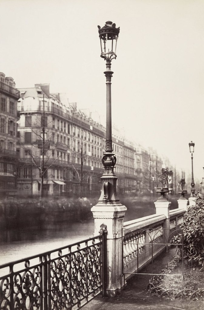
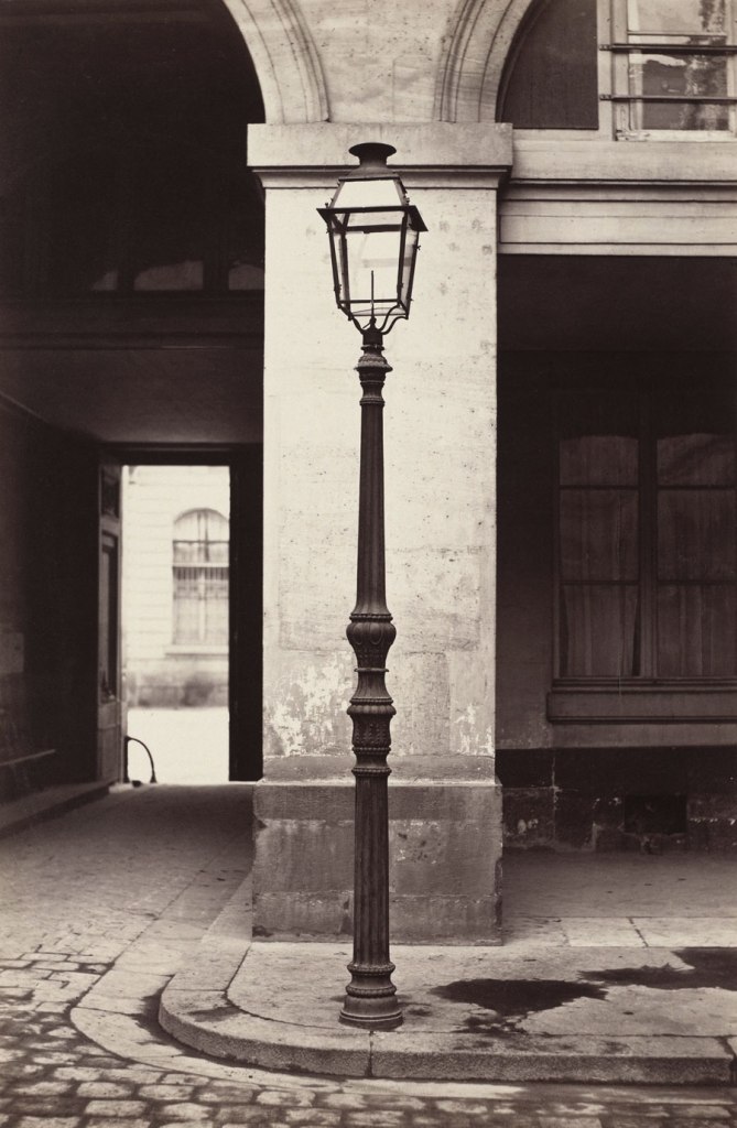
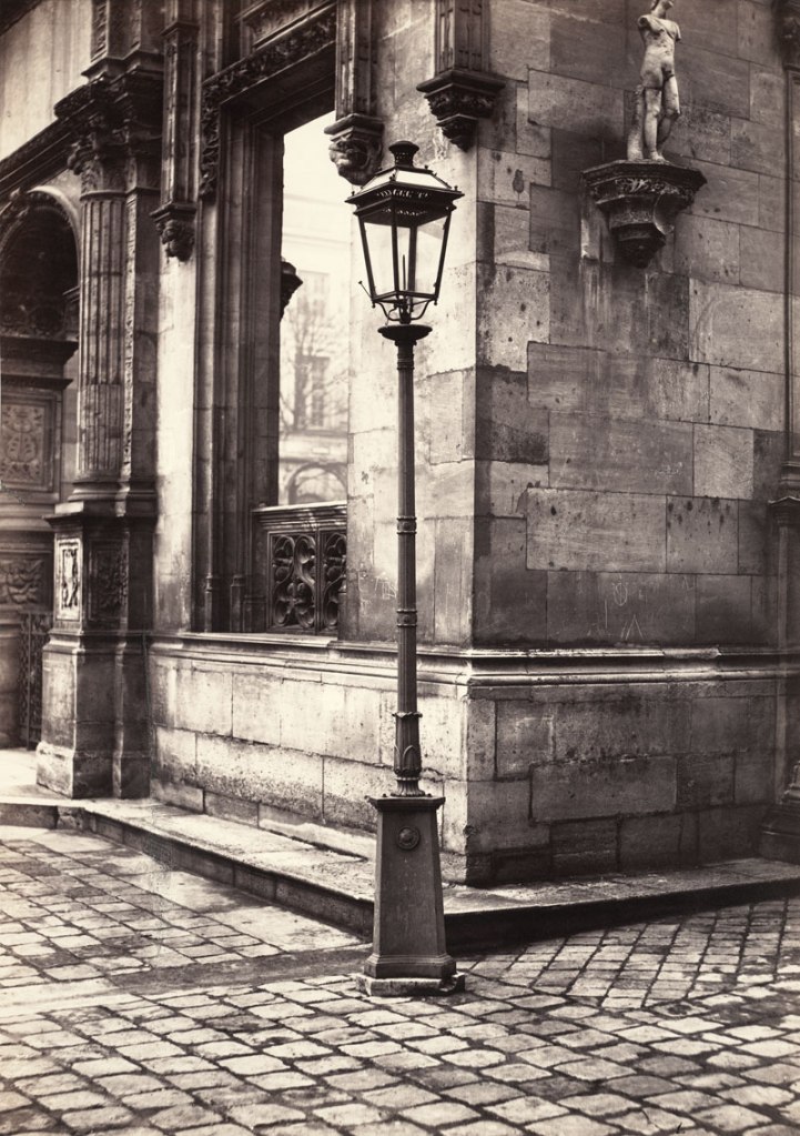
 'Arts et Métiers (Ancien Modèle)' 1864")
 'Hôtel de la Marine' 1864-1870")
 'Lamppost, Entrance to the École des Beaux-Arts' c. 1870")
 'Spire of Notre Dame, Viollet-le-Duc, Architect' 1859-1860")
 'Rue Estienne from the rue Boucher (First Arrondissement)' 1862-1865")
 'Rue de la Bûcherie from the cul de sac Saint-Ambroise (Fifth Arrondissement)' 1866-1868")
 'Cour Saint-Guillaume (Ninth Arrondissement)' 1866-1867")
 'Passage Saint-Benoît (Sixth Arrondissement)' 1864-1867")
 'Impasse de la Bouteille from the rue Montorgeuil (Second Arrondissement)' 1865-1868")
 'Man Reclining beneath a Chestnut Tree' c. 1853")
 'The Paper, Monday' 2013 from the exhibition 'The Paper' by Rosemary Laing at Tolarno Galleries, Melbourne, April - May, 2014")
 'The Paper, Tuesday' 2013 from the exhibition 'The Paper' by Rosemary Laing at Tolarno Galleries, Melbourne, April - May, 2014")
 'The Paper, Wednesday, earlier' 2013")
 'The Paper, Wednesday' 2013")
 'The Paper, Thursday' 2013")
 'The Paper, Friday' 2013")
 'Quai d'Anjou, 6h du matin' 1924 from the exhibition 'Paris as Muse: Photography, 1840s-1930s' at The Metropolitan Museum of Art, New York, January - May, 2014")
 'Nôtre Dame' 1922 from the exhibition 'Paris as Muse: Photography, 1840s-1930s' at The Metropolitan Museum of Art, New York, January - May, 2014")
![Eugène Atget (French, Libourne 1857-1927 Paris) 'Untitled [Atget's Work Room with Contact Printing Frames]' c. 1910](https://artblart.com/wp-content/uploads/2014/04/atgets-work-room-web1.jpg "Eugène Atget (French, Libourne 1857-1927 Paris) 'Untitled [Atget's Work Room with Contact Printing Frames]' c. 1910")
![Eugène Atget (French, Libourne 1857–1927 Paris) 'Untitled [Atget's Work Room with Contact Printing Frames]' c. 1910 (detail)](https://artblart.com/wp-content/uploads/2014/04/atget-workroom-detail-web.jpg "Eugène Atget (French, Libourne 1857–1927 Paris) 'Untitled [Atget's Work Room with Contact Printing Frames]' c. 1910 (detail)")
 'Marchand de Vin, Rue Boyer, Paris' 1910-1911")
 'Boulevard de Strasbourg, Corsets, Paris' 1912")
![Marie-Charles-Isidore Choiselat (French, 1815-1858) Stanislas Ratel (French, 1824-1904) 'Untitled [The Pavillon de Flore and the Tuileries Gardens]' 1849](https://artblart.com/wp-content/uploads/2014/04/the-pavillon-de-flore-web.jpg "Marie-Charles-Isidore Choiselat (French, 1815-1858) Stanislas Ratel (French, 1824-1904) 'Untitled [The Pavillon de Flore and the Tuileries Gardens]' 1849")
 'The Boulevards at Paris' May-June 1843")
 'A Snapshot, Paris' 1911, printed 1912")
 'Paris' 1929")
 Stanislas Ratel (French, 1824-1904) 'Défilé sur le Pont-Royal' May 1, 1844")
 'Rue Traversine (from the Rue d'Arras)' c. 1868")
 'Street Fair, Boulevard St. Jacques, Paris' 1931")
![Edward J. Steichen (American born Luxembourg, Bivange 1879 - 1973 West Redding, Connecticut) 'Untitled [Brancusi's Studio]' c. 1920](https://artblart.com/wp-content/uploads/2014/04/edward_steichen_brancusis_studio_1920-web.jpg "Edward J. Steichen (American born Luxembourg, Bivange 1879 - 1973 West Redding, Connecticut) 'Untitled [Brancusi's Studio]' c. 1920")

 'The Hint That Is a Garden: Siena, Italy' Dedicated to Frederick Sommer, 1975")

 'Jungle I (Brazil)' 1991 from the exhibition 'KHEM' at Strange Neighbour, Fitzroy, Melbourne, April - May, 2014")
 'Untitled' 2012 from the exhibition 'KHEM' at Strange Neighbour, Fitzroy, Melbourne, April - May, 2014")
 'Clifton Springs Jetty' 2012")
 'Bellambi, NSW' 1989")
 'Self-portrait #2' 2004")
 'Decommissioned Art History Library, University of Melbourne' 2012-2013")
 'Lathamstowe' 2011- 2013")
 'Silken Seam' 2005")
 'Rouleau' 2005")
 'Aquatic listening device' 2009")
 'What Do I Want, John Henry? Warrenton, Virginia' November 1862")
 'What Do I Want, John Henry? Warrenton, Virginia' November 1862 (detail)")
 'Confederate Method of Destroying Rail Roads at McCloud Mill, Virginia' 1863")

![Unknown photographer '[The Pattillo Brothers (Benjamin, George, James, and John), Company K, "Henry Volunteers," Twenty-second Regiment, Georgia Volunteer Infantry]' 1861-1863](https://artblart.com/wp-content/uploads/2014/04/patillo-brothers-close-up-web.jpg "Unknown photographer '[The Pattillo Brothers (Benjamin, George, James, and John), Company K, \"Henry Volunteers,\" Twenty-second Regiment, Georgia Volunteer Infantry]' 1861-1863")
![Unknown photographer '[The Pattillo Brothers (Benjamin, George, James, and John), Company K, "Henry Volunteers," Twenty-second Regiment, Georgia Volunteer Infantry]' (detail) 1861-1863](https://artblart.com/wp-content/uploads/2014/04/patillo-brothers-close-up-detail.jpg "Unknown photographer '[The Pattillo Brothers (Benjamin, George, James, and John), Company K, \"Henry Volunteers,\" Twenty-second Regiment, Georgia Volunteer Infantry]' (detail) 1861-1863")
 'Emancipated Slaves Brought from Louisiana by Colonel George H. Banks' December 1863")
 'Emancipated Slaves Brought from Louisiana by Colonel George H. Banks' December 1863 (detail)")
 'Slave Pen, Alexandria, Virginia' 1863")
 'Ruins of Gallego Flour Mills, Richmond' 1865")
 'Ruins of Mrs. Henry's House, Battlefield of Bull Run; Bull Run, Mrs. Henry's House, 21 July 1861' March 1862")
![Unknown maker. '[Civil War Portrait Lockets]' 1860s](https://artblart.com/wp-content/uploads/2014/04/dp273827-lockets-web.jpg "Unknown maker. '[Civil War Portrait Lockets]' 1860s")
![Unknown maker. '[Civil War Portrait Lockets]' (detail) 1860s (detail)](https://artblart.com/wp-content/uploads/2014/04/dp273827-lockets-detail.jpg "Unknown maker. '[Civil War Portrait Lockets]' (detail) 1860s (detail)")
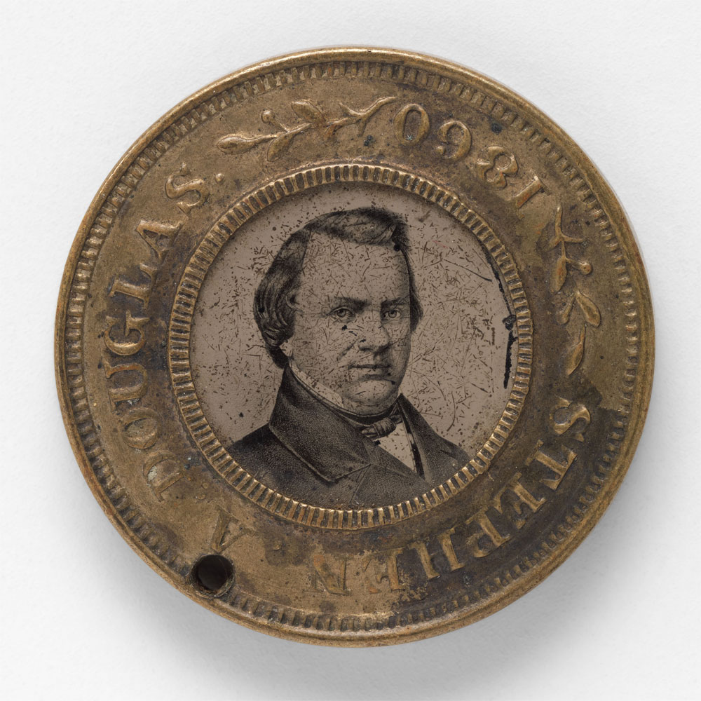
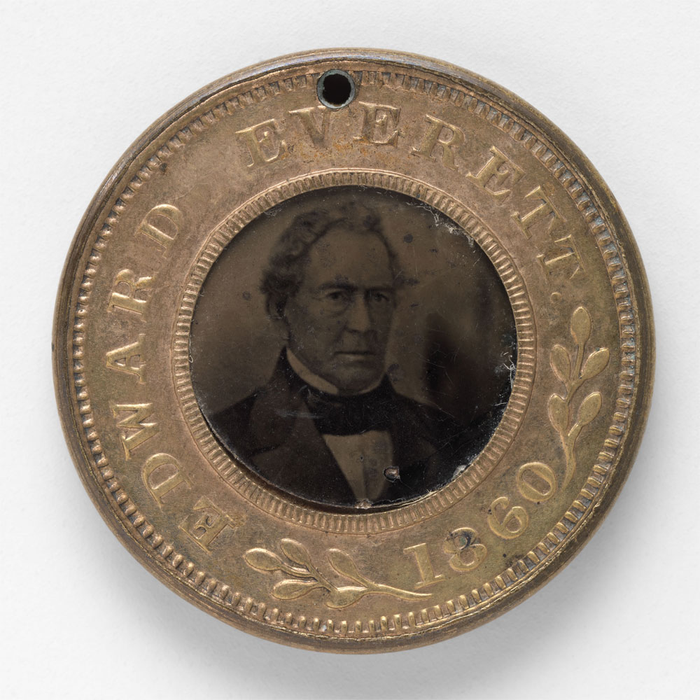
![Alexander Gardner (American, Glasgow, Scotland 1821 - 1882 Washington, D.C.) '[President Abraham Lincoln, Major General John A. McClernand (right), and E. J. Allen (Allan Pinkerton, left), Chief of the Secret Service of the United States, at Secret Service Department, Headquarters Army of the Potomac, near Antietam, Maryland]' October 4, 1862](https://artblart.com/wp-content/uploads/2014/04/dp248329-abraham-lincoln-web.jpg "Alexander Gardner (American, Glasgow, Scotland 1821 - 1882 Washington, D.C.) '[President Abraham Lincoln, Major General John A. McClernand (right), and E. J. Allen (Allan Pinkerton, left), Chief of the Secret Service of the United States, at Secret Service Department, Headquarters Army of the Potomac, near Antietam, Maryland]' October 4, 1862")
![Alexander Gardner (American, Glasgow, Scotland 1821 - 1882 Washington, D.C.) '[President Abraham Lincoln, Major General John A. McClernand (right), and E. J. Allen (Allan Pinkerton, left), Chief of the Secret Service of the United States, at Secret Service Department, Headquarters Army of the Potomac, near Antietam, Maryland]' October 4, 1862 (detail)](https://artblart.com/wp-content/uploads/2014/04/dp248329-abraham-lincoln-detail.jpg "Alexander Gardner (American, Glasgow, Scotland 1821 - 1882 Washington, D.C.) '[President Abraham Lincoln, Major General John A. McClernand (right), and E. J. Allen (Allan Pinkerton, left), Chief of the Secret Service of the United States, at Secret Service Department, Headquarters Army of the Potomac, near Antietam, Maryland]' October 4, 1862 (detail)")
![Unknown maker (American); Photography Studio: After, Brady & Co., American, active 1840s - 1880s '[Mourning Corsage with Portrait of Abraham Lincoln]' (detail) Photograph, corsage April 1865](https://artblart.com/wp-content/uploads/2014/04/lincoln-mourning.jpg "Unknown maker (American); Photography Studio: After, Brady & Co., American, active 1840s - 1880s '[Mourning Corsage with Portrait of Abraham Lincoln]' (detail) Photograph, corsage April 1865")
![Unknown maker (American); Photography Studio: After, Brady & Co., American, active 1840s–1880s '[Mourning Corsage with Portrait of Abraham Lincoln]' Photograph, corsage April 1865 (detail)](https://artblart.com/wp-content/uploads/2014/04/dp265063-lincoln-memorial-button-web.jpg "Unknown maker (American); Photography Studio: After, Brady & Co., American, active 1840s–1880s '[Mourning Corsage with Portrait of Abraham Lincoln]' Photograph, corsage April 1865 (detail)")
 'Bonaventure Cemetery, Four Miles from Savannah' 1866")
![Unknown maker '[Game Board with Portraits of President Abraham Lincoln and Union Generals]' 1862](https://artblart.com/wp-content/uploads/2014/04/dp269309-chess-board-web.jpg "Unknown maker '[Game Board with Portraits of President Abraham Lincoln and Union Generals]' 1862")
![Unknown maker '[Game Board with Portraits of President Abraham Lincoln and Union Generals]' 1862 (detail)](https://artblart.com/wp-content/uploads/2014/04/dp269309-chess-board-detail.jpg "Unknown maker '[Game Board with Portraits of President Abraham Lincoln and Union Generals]' 1862 (detail)")
 'Ordnance, Private' 1866")
![Unknown photographer (American) '[James A. Holeman, Company A, "Roxboro Grays," Twenty-fourth North Carolina Infantry Regiment, Army of Northern Virginia]' 1861-1862](https://artblart.com/wp-content/uploads/2014/04/james-holeman-closeup-web.jpg "Unknown photographer (American) '[James A. Holeman, Company A, \"Roxboro Grays,\" Twenty-fourth North Carolina Infantry Regiment, Army of Northern Virginia]' 1861-1862")
. 'Sojourner Truth, \"I Sell the Shadow to Support the Substance\"' 1864")
![Unknown maker (American; Alexander Gardner, American, Glasgow, Scotland 1821-1882 Washington, D.C.; Photography Studio: Silsbee, Case & Company, American, active Boston) '[Broadside for the Capture of John Wilkes Booth, John Surratt, and David Herold]' April 20, 1865](https://artblart.com/wp-content/uploads/2014/04/dp274835-murder-web.jpg "Unknown maker (American; Alexander Gardner, American, Glasgow, Scotland 1821-1882 Washington, D.C.; Photography Studio: Silsbee, Case & Company, American, active Boston) '[Broadside for the Capture of John Wilkes Booth, John Surratt, and David Herold]' April 20, 1865")

You must be logged in to post a comment.