Large format camera Front on, realist, sharply defined objective documentary photographs of architectural structures of the urban landscape In series
In reality:
Structures cut from the fabric of existence Isolated by the subjective eye of the photographer and the lens of the camera What to include or exclude
(In the contemporary photographs of the spaces in the posting, the shops are surrounded by trees and vegetation, they have transformed from kiosk to shuttered shop, from boutique to florist: the architecture remains but traces of previous incarnations are visible only in these photographs. Nothing is permanent except change).
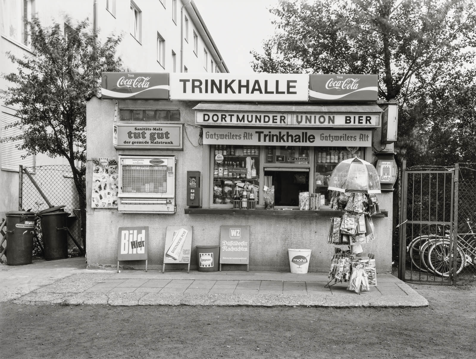
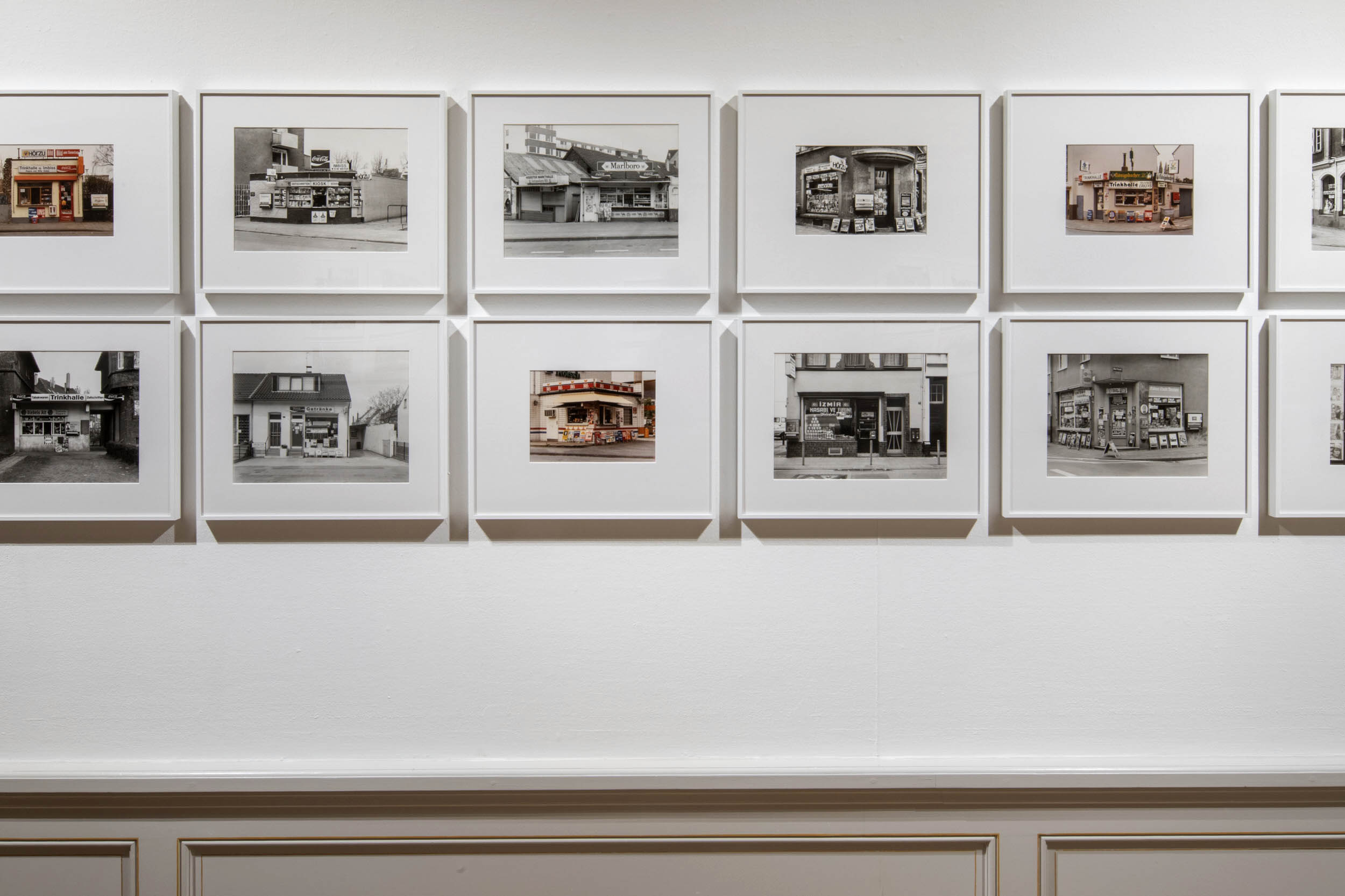
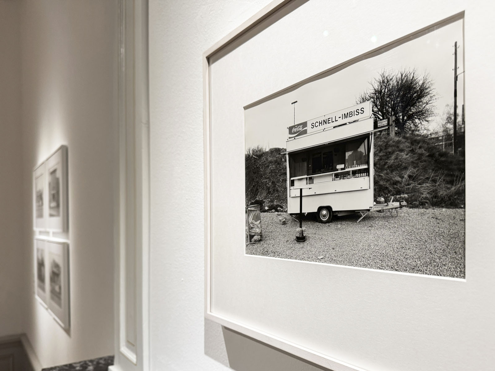
In the photographs of kiosks, corner shops and industrial gates, it is the minutiae of existence (not as mere decoration) that gives these supposedly objective photographs their subjective power. For example, “the photo Trinkhalle, Köln-Nippes – with its ice cream and newspaper advertisements and vending machines for chewing gum and cigarettes” is more than amusing and engaging – it depicts vital, archaeological evidence of the transitory nature of human existence in the pyschogeography of the urbanscape.1
In Ronkholz’ photographs of the terrain (from the Latin terra, earth/land) of the city, her exploration of urban environments emphasises interpersonal connections to places – and testify “to social, cultural, and economic change and shows how people shape the world around them.” (Press release)
This is the fluid boundary that these photographs so beautifully and incisively depict: the interface between architecture and human, between order (form/surface) and chaos (placement of insolent signs), between utopian perfection and dystopian unruliness – the one coexistent with the other.
This confluence of pattern and randomness, objective and subjective, is what gives these photographs of the everyday a lasting significance.
Dr Marcus Bunyan
1/ Guy Debord (November 1956). “Theory of the Dérive”. Les Lèvres Nues (9). Translated by Ken Knabb.
Many thankx to Huis Marseille, Amsterdam for allowing me to publish the photographs in the posting. Please click on the photographs for a larger version of the image.
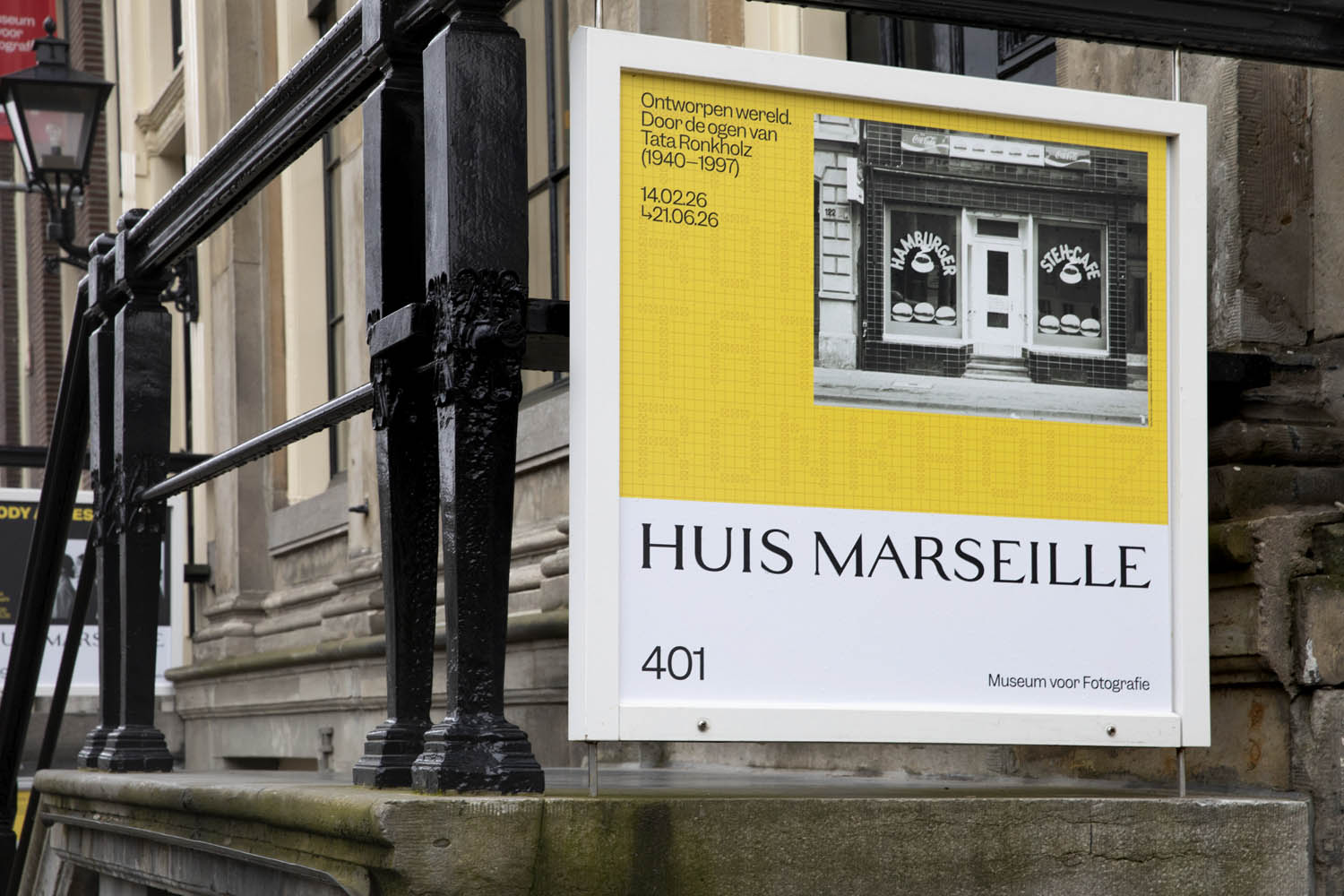
Sankt-Franziskus-Straße 104-107 Düsseldorf
Installation views of the exhibition Designed World: Through the Eyes of Tata Ronkholz (1940-1997) at Huis Marseille, Amsterdam, February – June, 2026
Installation views of the exhibition Designed World: Through the Eyes of Tata Ronkholz (1940-1997) at Huis Marseille, Amsterdam, February – June, 2026
Installation view of the exhibition Designed World: Through the Eyes of Tata Ronkholz (1940-1997) at Huis Marseille, Amsterdam, February – June, 2026 showing at left, Tata Ronkholz’s Düsseldorf Harbor (1980)
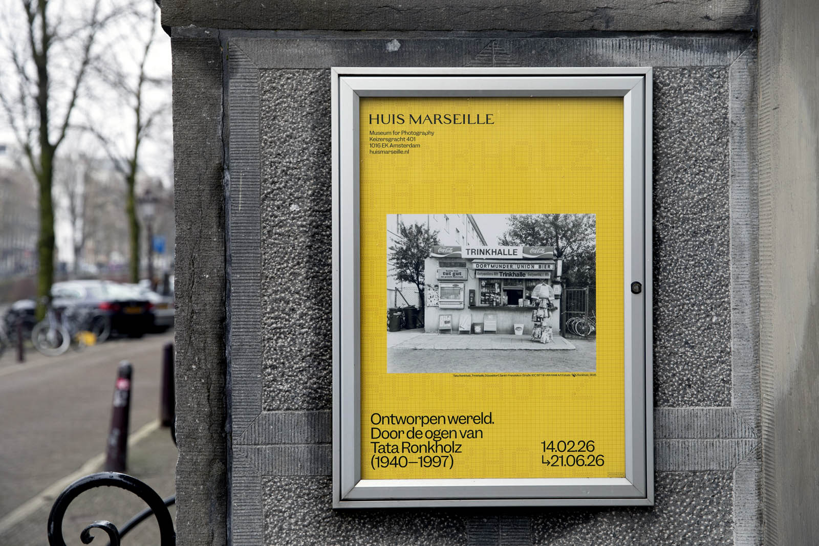
Tata Ronkholz was one of the first students in Bernd and Hilla Becher’s famous photography class at the Kunstakademie Düsseldorf. Her fellow students included Candida Höfer, Axel Hütte, Thomas Ruff and Thomas Struth, all of whom became artists of world renown. Oddly enough Tata Ronkholz’ work is only now receiving the same international acclaim. The retrospective Designed World: Through the Eyes of Tata Ronkholz (1940-1997), on show at Huis Marseille from 14 February until 21 June 2026, is the first large-scale tribute to this many-sided artist.
Objective-documentary photography
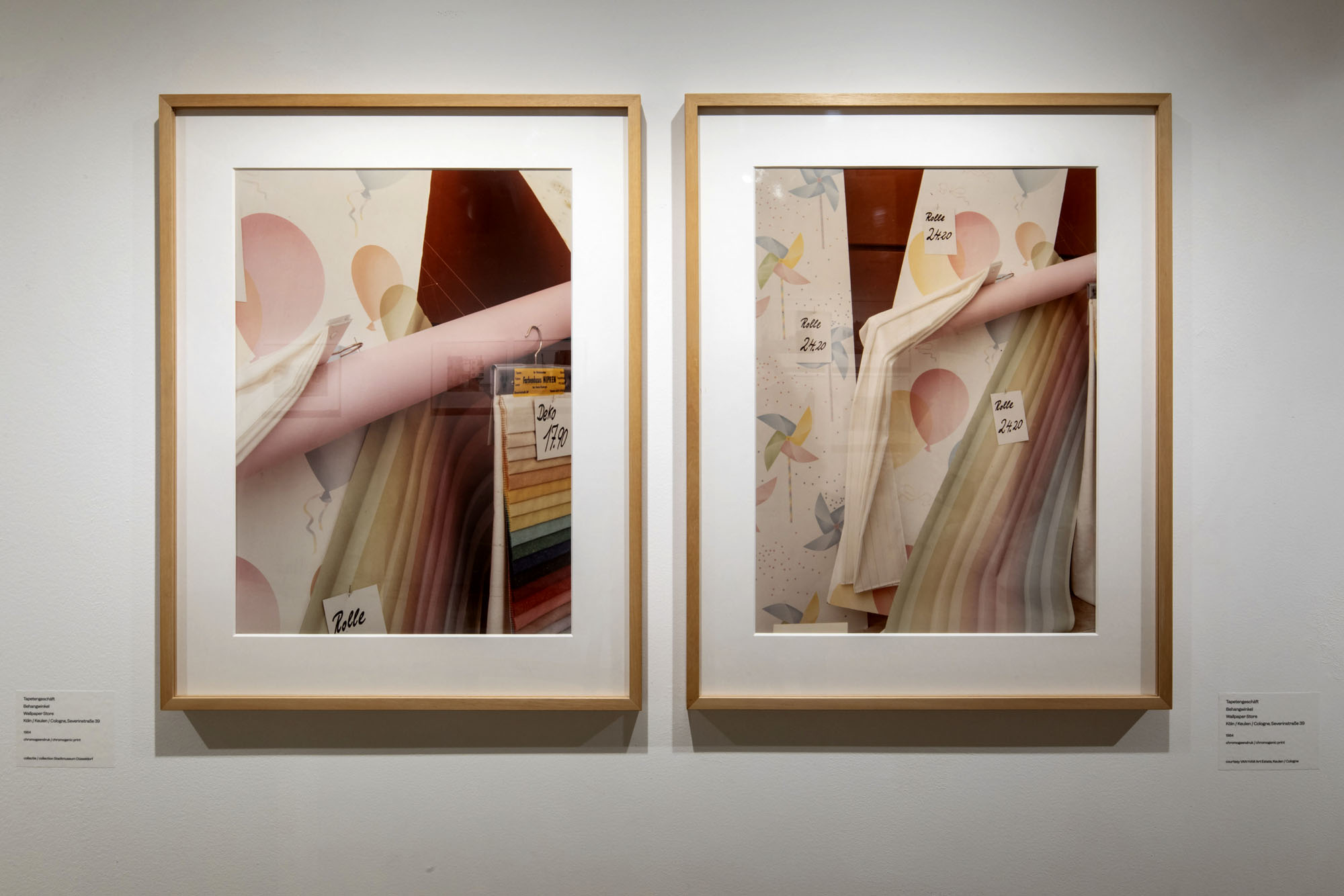
Tata Ronkholz was a photographer, product designer, and interior architect. Her photographic series lie within the tradition of objective, documentary photography, a tradition which was decisively shaped by the artist couple Bernd and Hilla Becher. Like theirs, Ronkholz’ work is characterised by clear compositions, a serial approach, and a documentary focus on architectural structures and everyday architectures. Using a large-format camera she produced sharply defined and realistic photographs in which the subject matter, rather than the individual style of the artist, takes centre stage. Her work is predominantly in black and white, although colour images also appear, demonstrating her ambition to engage with the artistic colour photography that emerged in Germany during the 1970s and ’80s, following the example set by the New Color Photography introduced by the American photographers Stephen Shore and William Eggleston.
Kiosks and corner shops
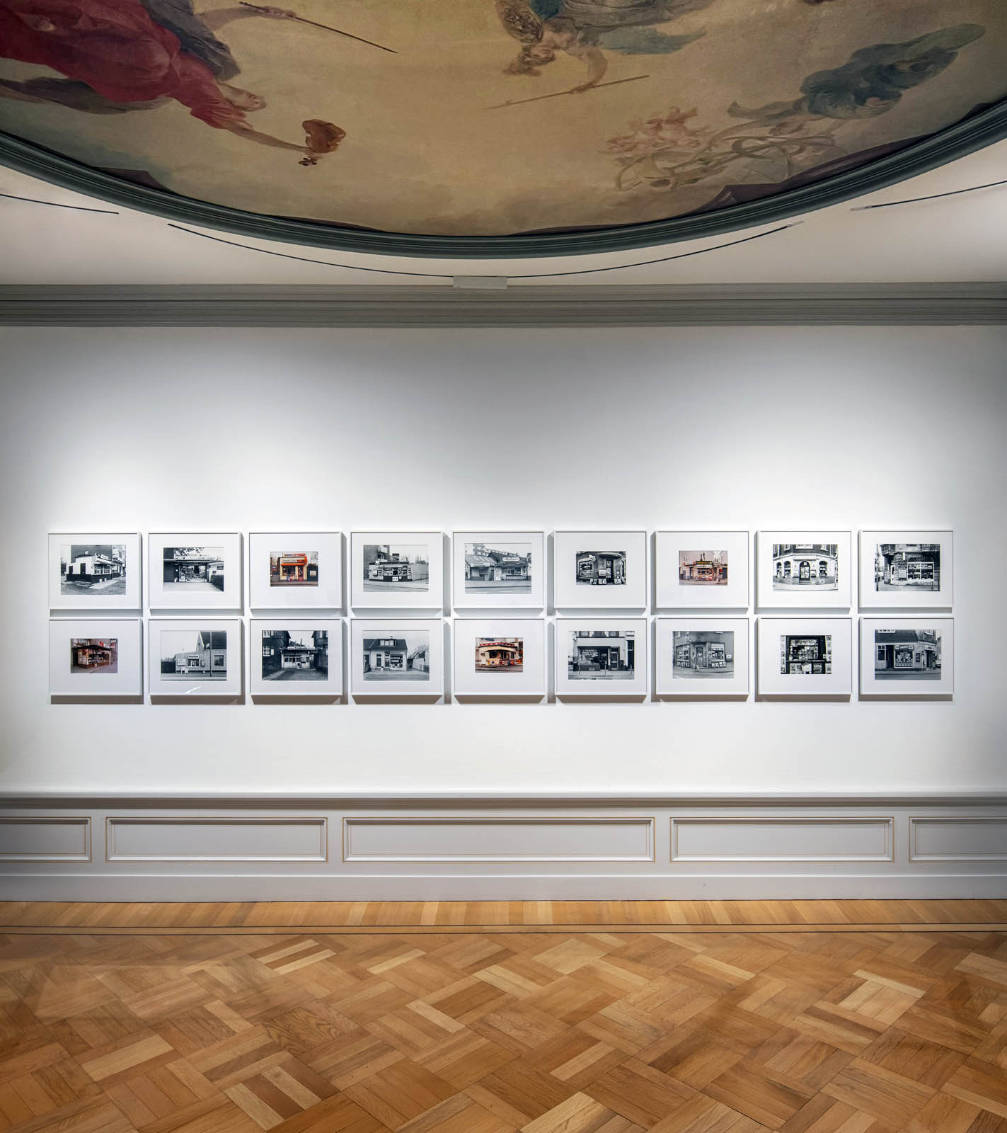
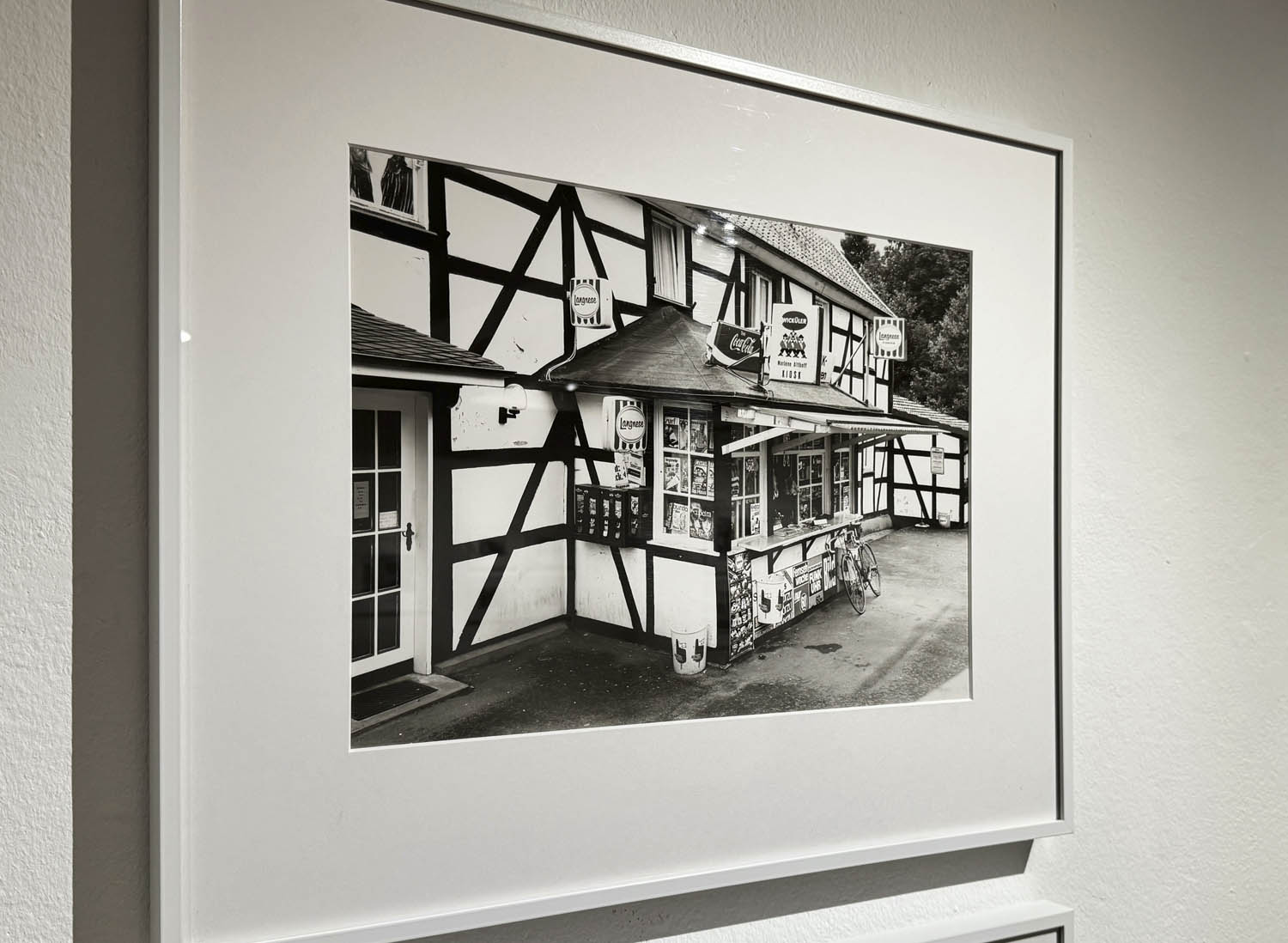
Tata Ronkholz became known for her appealing series of kiosks (Trinkhallen) and small shops that capture typical moments of urban everyday culture. These were photographed between 1977 and 1985, particularly in neighbourhoods of Cologne and Düsseldorf, in the Ruhr area, as well as in Leverkusen and Krefeld. For example, the photo Trinkhalle, Köln-Nippes – with its ice cream and newspaper advertisements and vending machines for chewing gum and cigarettes – is as amusing and engaging as Boutique, Köln-Mülheim in which, according to the store sign, alongside clothing records were also for sale. The photographs illustrate the extent to which product offerings, decoration, and advertising in public spaces has been transformed. Tata Ronkholz’ choice of subject means that her work indirectly testifies to social, cultural, and economic change and shows how people shape the world around them.
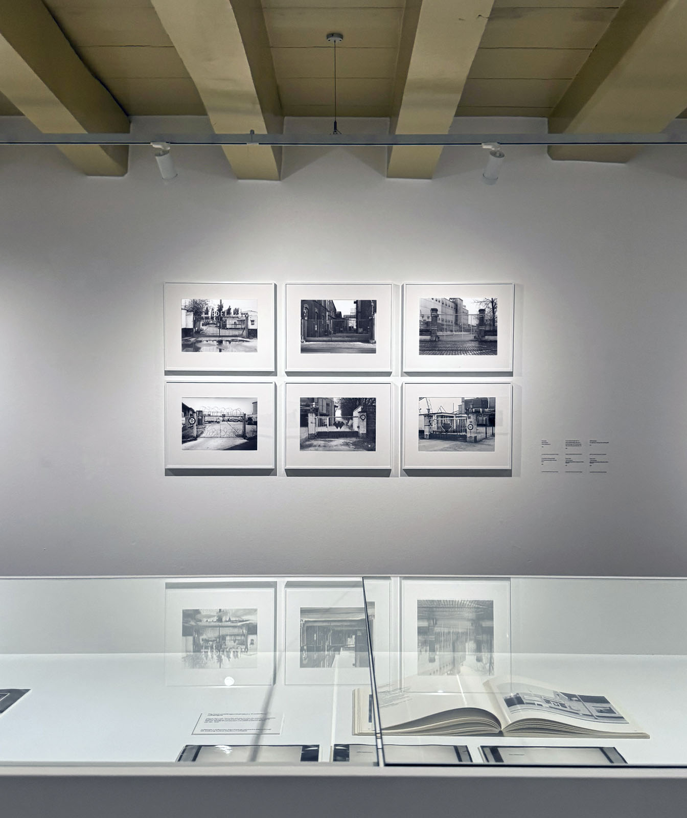
Industrial gates
Another significant series is dedicated to industrial gates, photographed between 1977 and 1985. The sober black-and-white images of these gates, with their grids and frameworks, offer glimpses into the interiors of industrial areas. In the photographs the gates function as interfaces between private and public space, between interior and exterior, and between activity and calm. Their aesthetic, reminiscent of abstract artworks, imbues the everyday with a new significance.
Collaboration with Thomas Struth
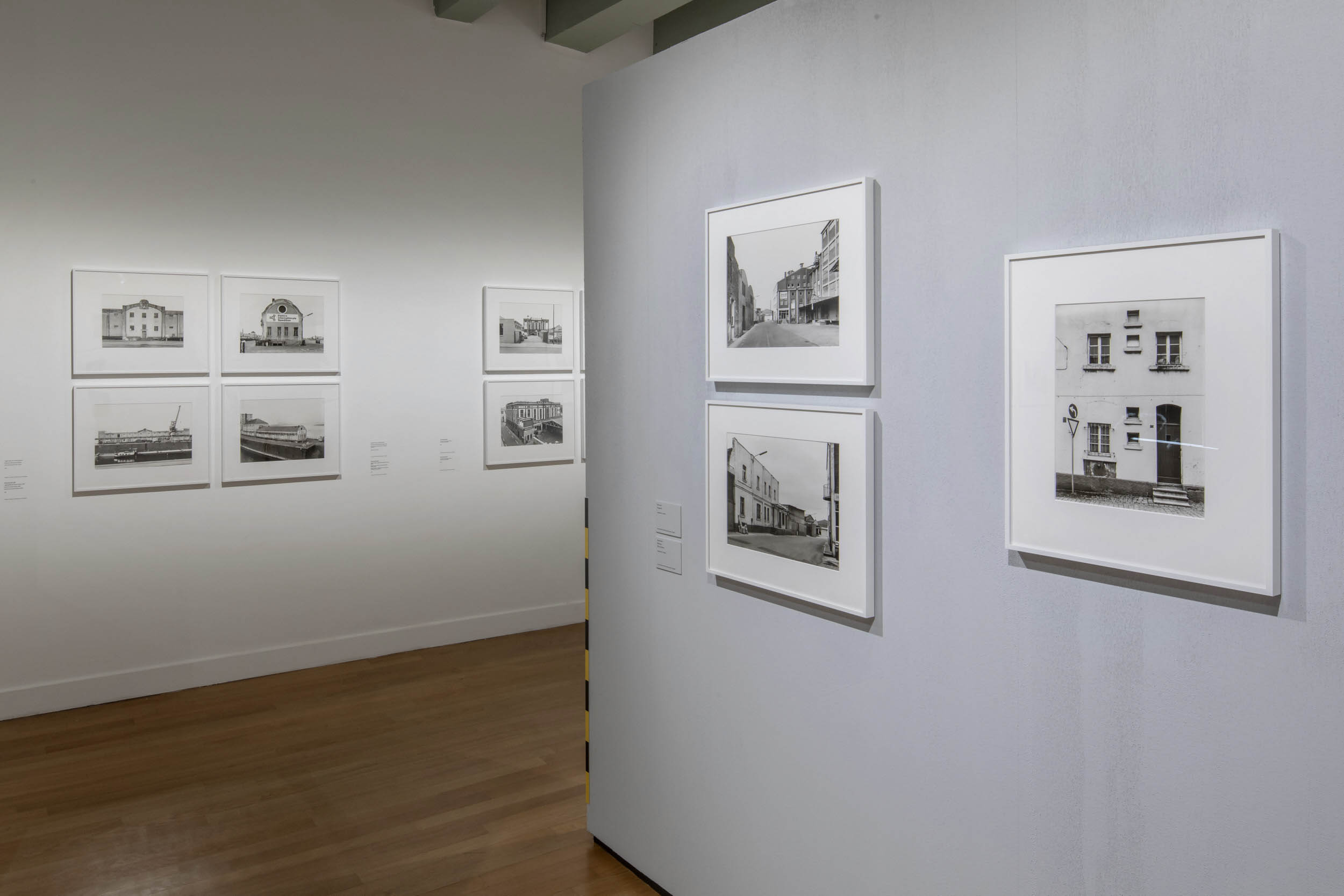
In 1979 Ronkholz, together with her fellow student Thomas Struth, began work on an impressive documentary series on Düsseldorf’s Rheinhafen. The project originated from the planned redevelopment of this historic harbour area – a site that, in its original form, was considered an industrial area of significant urban historical and architectural importance. Together they set out to document the harbour in its entirety, capturing its historic buildings, technical installations, and operational structures. In carefully composed images they recorded façades, interiors, silos, warehouses, crane structures, and harbour basins, before these elements partially disappeared or were fundamentally altered during the restructuring.
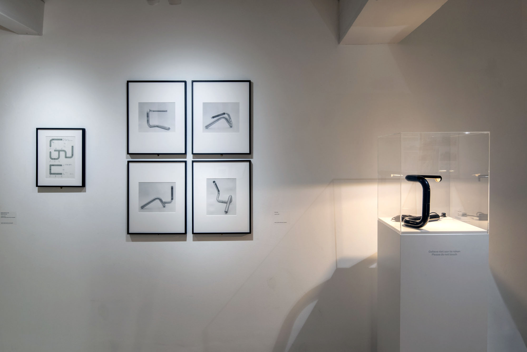
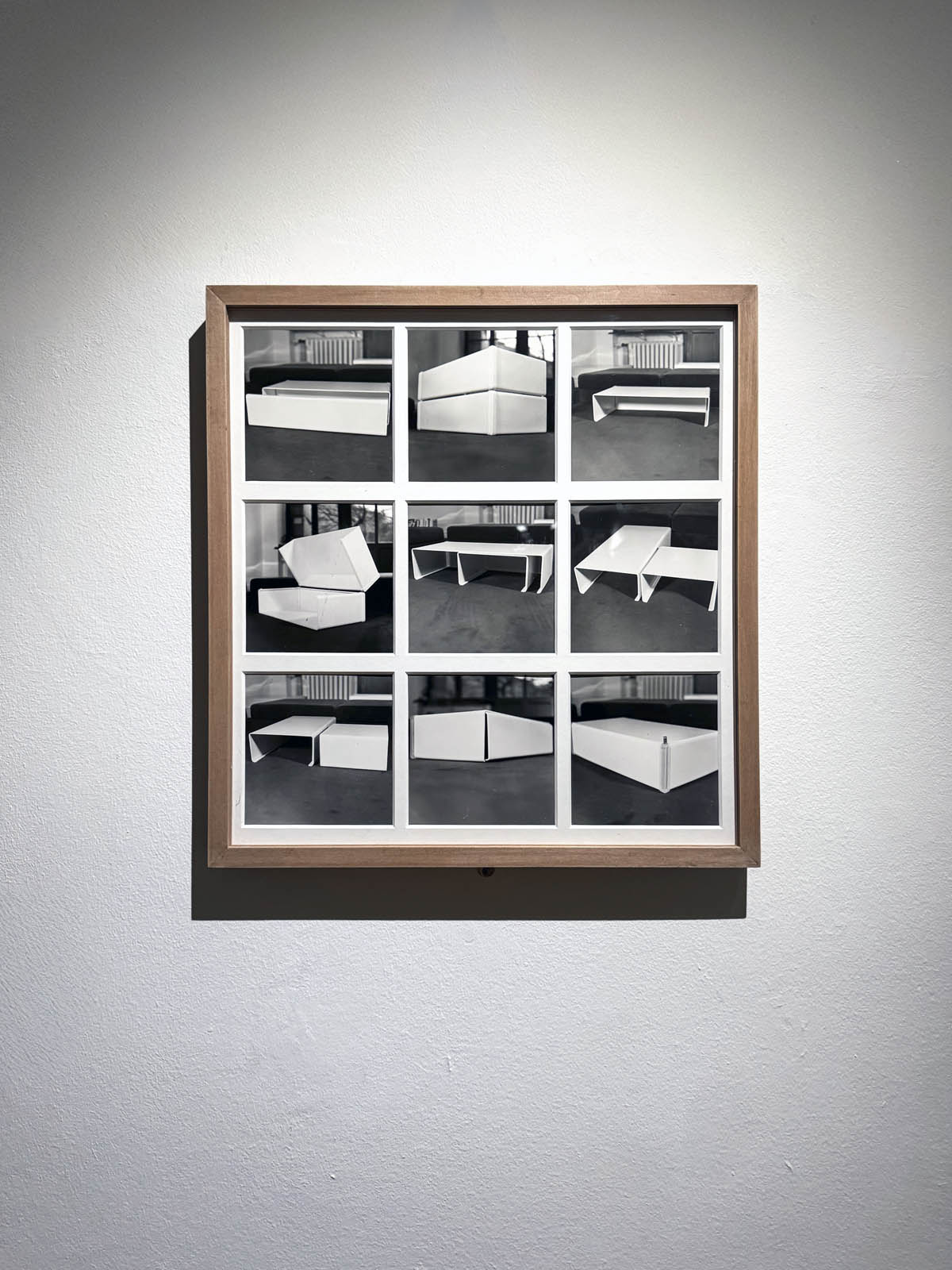
Tata Ronkholz as product designer
Between 1961 and 1965 Ronkholz studied at the Werkkunstschule Krefeld (an academy of applied art) with a focus on furniture design, and subsequently worked as a freelance designer until 1977. The exhibition also explores this aspect of Ronkholz’ oeuvre, including depictions of geometrically shaped furniture and lighting fixtures as well as designs for office and cafeteria furniture. Ronkholz’ designs are characterised by clear forms and functional elegance. Finally, the retrospective also presents early photographs of architectural forms created in 1975/76 in Italy and France, revealing her strong affinity for aspects of the ‘designed world’ across different areas of life.
Ronkholz’ estate, acquired in 2011 by VAN HAM Art Estate in Cologne, forms the basis of the exhibition alongside the holdings of Stadtmuseum Düsseldorf. Significant contributions have also been made from the in-house collections of Die Photographische Sammlung/SK Stiftung Kultur – who also curated the exhibition – and through loans from private collections.
Book
The exhibition is accompanied by a catalogue, Tata Ronkholz: Gestaltete Welt. Eine Retropektive (2025, Schirmer/Mosel Verlag GmbH), with texts in German and English. It is available from the Huis Marseille museum shop (€49.90).
“Typology remains a highly challenging and complex notion. It operates in a paradoxical regime: on the one hand, this approach can lead to a systematic recording of people and objects based on extreme objectivity; on the other hand, typology corresponds to an individual and arbitrary choice, revealing itself as a disturbing and potentially subversive act.” (Press release)
Every photo within a Becher grid contains its own difference.
Dr Marcus Bunyan
Many thankx to the Fondazione Prada for allowing me to publish the photographs in the posting. Please click on the photographs for a larger version of the image.
Let’s not beat around the bush. Despite protestations to the contrary (appeals to the objectivity of the image, eschewing entirely the aspects of beauty, emotion and opinion; the rigorous frontality of the individual images giving them the simplicity of diagrams, while their density of detail offers encyclopaedic richness) these are subjective images for all their objective desire. The paradox is the more a photographer strives for objectivity, the more ego drops away, the more the work becomes their own: subjective, beautiful, emotive.
“What happens in the case of mutation? Consider the example of the genetic code. Mutation normally occurs when some random event (for example, a burst of radiation or a coding error) disrupts an existing pattern and something else is put in its place instead. Although mutation disrupts pattern, it also presupposes a morphological standard against which it can be measured and understood as mutation. We have seen that in electronic textuality, the possibility for mutation within the text are enhanced and heightened by long coding chains. We can now understand mutation in more fundamental terms. Mutation is critical because it names the bifurcation point at which the interplay between pattern and randomness causes the system to evolve in a new direction. It reveals the productive potential of randomness that is also recognized within information theory when uncertainty is seen as both antagonistic and intrinsic to information.
We are now in a position to understand mutation as a decisive event in the psycholinguistics of information. Mutation is the catastrophe in the pattern / randomness dialectic analogous to castration in the presence / absence dialectic. It marks a rupture of pattern so extreme that the expectation of continuous replication can in longer be sustained. But as with castration, this only appears to be a disruption located at a specific moment. The randomness to which mutation testifies is implicit in the very idea of pattern, for only against the background of nonpattern can pattern emerge. Randomness is the contrasting term that allows pattern to be understood as such.”
Hayles, Katherine. How We Became Posthuman: Virtual Bodies in Cybernetics, Literature, and Informatics. Chicago: University of Chicago Press, 1999, pp. 30-33
In the series Menschen Im Fahrstuhl, 20.11.1969 (People in the elevator, 20.11.1969) shot in 1969, Heinrich Riebesehl conceptualised his interest in the photographic portrait. The portraits of the workers of the Hannoversche Presse (a daily newspaper in Hanover) – taken inside an elevator with a remotely operated small-format camera – are dated and numbered in sequential order: Riebesehl dispensed with a title or a more detailed description of the subjects portrayed. By omitting distinctive elements from the images, such as the profession or age of the subjects, he made the situation the key factor in the shots. In fact, the images are studies of the behaviors of people in that particular space, their body languages and gazes. Riebesehl knew that environment very well, because he had worked for a long time as a photojournalist, before turning to conceptual art photography.
Exhibition text from the Fondazione Prada by Cord Riechelmann
Installation view of the exhibition Typologien: Photography in 20th-century Germany at Fondazione Prada, Milan showing at left Bernd and Hiller Becher’s Hochöfen (Blast furnaces) 1970-1989; and at right, Candida Höfer’s Bibliotheque Nationale de France XXIII 1997
In the photographs of libraries in London, Paris, and New York, which at first glance appear to be technically scientific records, Candida Höfer manages to capture something that is not visible: ingenuity. The libraries’ rooms have high ceilings, and the rows of seats are neatly arranged. In their impressiveness, they reflect the architecture of the 19th-century conception of knowledge and science, typical of the dominant nations of the time because of their commercial and colonial power. The objective nature of the deserted spaces, precisely in how they seem to be neutral to the individual needs of the students, suggests something in the image that could hardly be less objective: the possibility for intellectual exchange that these spaces promise and deliver in Höfer’s photographs.
Exhibition text from the Fondazione Prada by Cord Riechelmann
In Candida Höfer’s photographs shot in zoos, the animals document a specific form of loneliness in modern times. In these images, the lines of development of two disciplines collide. Not only in the photographs, but also in reality, they function independently of each other: modern architecture and behavioural research. Modern architecture has become established in zoological gardens but has never considered the animal and its needs. Based on the knowledge gained from behavioural research, by choosing to portray iconic large mammals such as giraffes, lions, and polar bears, Höfer has represented the dilemma of a world in which entire species are threatened with extinction and in which zoos see themselves as a kind of ‘Noah’s Ark.’
Exhibition text from the Fondazione Prada by Cord Riechelmann
Installation view of the exhibition Typologien: Photography in 20th-century Germany at Fondazione Prada, Milan showing Bernd and Hilla Becher’s Wassertürme (Water towers) 1966-1986
Installation view of the exhibition Typologien: Photography in 20th-century Germany at Fondazione Prada, Milan showing the work of Thomas Struth
Installation view of the exhibition Typologien: Photography in 20th-century Germany at Fondazione Prada, Milan showing the work of Thomas Struth with at left, Musée du Louvre IV Paris, 1989
In his practice, Thomas Struth demonstrates meticulous attention to the architectural environment, as well as to people and objects. In his large-format colour series Museum Photographs (1989-1992), Struth captures anonymous individuals and crowds gazing at artworks in museums. A significant example is Louvre 4, Paris 1989, in which the artist photographs from behind a group of viewers standing in front of Théodore Géricault’s The Raft of the Medusa (1819). Often made with a large-format camera, his images reflect what Struth calls “exact vision”: the framing must not conceal anything or suggest secret content, thus resulting in an enigmatic outcome.
Exhibition text from the Fondazione Prada by Cord Riechelmann
Installation view of the exhibition Typologien: Photography in 20th-century Germany at Fondazione Prada, Milan showing Andreas Gursky’s Paris, Montparnasse 1993
Andreas Gursky’s large-format work, Paris, Montparnasse (1993) has become an iconic example of his work. It depicts the Maine-Montparnasse II block of flats, located on Rue Commandant-Mouchotte in Paris and built between 1959 and 1964 on a design by French architect Jean Dubuisson. This is one of the first images that Gursky created using digital post-production. In real life, the building does not look the way it appears in the image: using a digital editing process, Gursky transformed the façade into a game of differences and repetitions by processing the windows. In fact, by reiterating forms that are always identical, he produced a seemingly infinite number of them, with colour variations that are activated by a calculated dynamic.
Exhibition text from the Fondazione Prada by Cord Riechelmann
Installation view of the exhibition Typologien: Photography in 20th-century Germany at Fondazione Prada, Milan showing Andreas Gursky’s 99 Cent 1999
In 99 Cent (1999), Andreas Gursky photographed supermarket shelves using the same formal scheme used in Paris, Montparnasse (1993). The shelves crammed with everyday products such as detergents represent the inexhaustible flow of goods in the global system of production and distribution. Gursky’s work conveys a feeling of disorientation generated by the excessive stimuli and details typical of a shelf in a hypermarket.
Exhibition text from the Fondazione Prada by Cord Riechelmann
Andreas Gursky (German, b. 1955) 99 Cent 1999 (remastered 2009) Inkjet print
“Typologien” is an extensive study dedicated to 20th-century German photography. The exhibition, hosted within Podium, the central building of the Milan headquarters, is curated by Susanne Pfeffer, art historian and director of the MUSEUM MMK FÜR MODERNE KUNST, Frankfurt.
The project attempts to apply the principle of “typology,” which originated in 17th- and 18th-century botany to categorise and study plants, and appeared in photography in the early 1900s, affirming itself in Germany throughout the 20th century. Paradoxically, the given formal principle allows for unexpected convergences of German artists spanning different generations and the manifestation of their individual approaches.
The exhibition path will follow a typological rather than a chronological order, bringing together more than 600 photographic works by 25 established and lesser-known artists essential for recounting a century of German photography, including Bernd and Hilla Becher, Sibylle Bergemann, Karl Blossfeldt, Ursula Böhmer, Christian Borchert, Margit Emmrich, Hans-Peter Feldmann, Isa Genzken, Andreas Gursky, Candida Höfer, Lotte Jacobi, Jochen Lempert, Simone Nieweg, Sigmar Polke, Gerhard Richter, Heinrich Riebesehl, Thomas Ruff, August Sander, Ursula Schulz-Dornburg, Thomas Struth, Wolfgang Tillmans, Rosemarie Trockel, Umbo (Otto Umbehr), and Marianne Wex. A system of suspended walls will create geometric partitions in the exhibition space, forming unexpected connections between artistic practices that differ from each other, but are united by a common principle or intention of classification.
As stated by Susanne Pfeffer, “Only through juxtaposition and direct comparison is it possible to find out what is individual and what is universal, what is normative or real. Differences are evidence of the abundance of nature and the imagination of humans: the fern, the cow, the human being, the ear; the bus stop, the water tower, the stereo system, the museum. The typological comparison allows differences and similarities to emerge and the specifics to be grasped. Unknown or previously unperceived things about nature, the animal, or the object, about place and time become visible and recognisable.”
In photography, employing typologies means affirming an equivalence between images and the absence of hierarchies in terms of represented subjects, motifs, genres, and sources. Despite this, typology remains a highly challenging and complex notion. It operates in a paradoxical regime: on the one hand, this approach can lead to a systematic recording of people and objects based on extreme objectivity; on the other hand, typology corresponds to an individual and arbitrary choice, revealing itself as a disturbing and potentially subversive act.
The hypothesis that photography plays a key role not only in fixing distinctive phenomena but also in organising and classifying a plurality of visible manifestations remains a vital force in today’s artistic efforts to navigate the complexity of our social and cultural realities. With the spread of digital imagery and practices, the concept of typology continues to be questioned and re-defined by contemporary photographers and artists.
As underlined by Susanne Pfeffer, “The unique, the individual, seems to have been absorbed into a global mass, the universality of things is omnipresent. The Internet allows typologies to be created in a matter of seconds. And yet this is precisely when it seems important – to artists – to take a closer look.” As further explained by Pfeffer, “When the present seems to have abandoned the future, we need to observe the past more closely. When everything seems to be shouting at you and becoming increasingly brutal, it is important to take a quiet pause and use the silence to see and think clearly. When differences are not seen as something other, but turned into something that divides us, it is crucial to notice what we have in common. Typologies allow us to identify remarkable similarities and subtle differences.”
Text from the Fondazione Prada website
Typologien | Fondazione Prada Milano
An extensive study dedicated to 20th-century German photography. “Typologien” attempts to apply the principle of “typology,” which originated in 17th- and 18th-century botany to categorise and study plants, and appeared in photography in the early 1900s, affirming itself in Germany throughout the 20th century.
The exhibition, hosted within Podium, the central building of the Milan headquarters, is curated by Susanne Pfeffer, art historian and director of the MUSEUM MMK FÜR MODERNE KUNST, Frankfurt.
Installation view of the exhibition Typologien: Photography in 20th-century Germany at Fondazione Prada, Milan showing the work of Ursula Schulz-Dornburg
Ursula Schulz-Dornburg was visiting convents and monasteries in Armenia when she happened to come across one of these unique bus stops, partly futuristic and partly surreal. From 1997 to 2011, she portrayed numerous bus stops, often in very remote locations. In a country that was experiencing a dramatic transition, from being part of the Soviet Union to its new status as an independent republic, these bus stops look like the remnants of a utopian socialism, which in Schulz-Dornburg’s images are kept alive mainly by women and children. The photographer said she was so impressed by the dignity of those women waiting at the bus stop, who even in the most extreme poverty looked as though they were on their way to the Opera, that she asked their permission to photograph them. What emerged was a document of a quiet life that manages with dignity to deal with even the harshest adversity.
Exhibition text from the Fondazione Prada by Cord Riechelmann
Installation view of the exhibition ‘Typologien: Photography in 20th-century Germany’ at Fondazione Prada, Milan showing at left, flower photographs by Thomas Struth; and at right, Andreas Gursky’s Untitled XVIII 2015 (below)
Andreas Gursky (German, b. 1955) Untitled XVIII 2015 Inkjet print Atelier Andreas Gursky
Unlike works such as Paris, Montparnasse (1993), in the Untitled series he produced between 2015 and 2016, Andreas Gursky depicted rows of tulips without providing a title or location for the pictures. Viewed from a distance, the photographs are reminiscent of Abstract Expressionist paintings, but even looking at them at close range, the lushly blooming flowers are undiscernible. Living in Düsseldorf, close to the Dutch border, Gursky is familiar with the intensively cultivated Dutch tulip crops, where no unwanted insect or worm would possibly be allowed to spoil the bulbs. The sterility of industrial flower production, far from being harmless and healthy, is captured by Gursky in images that, in turn, are neither reassuring nor pleasant.
Exhibition text from the Fondazione Prada by Cord Riechelmann
Installation view of the exhibition Typologien: Photography in 20th-century Germany at Fondazione Prada, Milan showing the flower photographs of Thomas Struth with at left, Small Closed Sunflower, No. 18, Winterthur 1992 (below); and at third left, Single Red Lily – No. 51, Düsseldorf (Botanischer Garten) 1993 (below)
A student of the artist Gerhard Richter and later of the photographer Bernd Becher at the Art Düsseldorf Academy from 1973 to 1980, Thomas Struth habitually works in thematic cycles centered around museums, flowers, and portraits of families and passers-by. The “exact vision” – the intention underpinning Struth’s photography – can be seen in both the portraits of two cornflowers shoot in Düsseldorf and the image of a red lily in the city’s Botanical Garden. Struth notes down the name or address of the site where he took the photograph, as in the case of the flower of a hollyhock portrayed in Düsseldorf’s Nordpark. This is to evoke the poetry of the place and provide an exact account of the plants’ origin, preserving the authenticity of the shots without digitally altering them.
Exhibition text from the Fondazione Prada by Cord Riechelmann
Installation view of the exhibition Typologien: Photography in 20th-century Germany at Fondazione Prada, Milan showing the work of Hiller Becher
In terms of the objectivity of the approach, Hilla Becher’s 1965 photographic studies of an oak leaf, a cypress branch, and a ginkgo leaf are in keeping with the series on types of industrial buildings that she made with her husband Bernd Becher. Thematically, however, these studies represent a sort of return to the studies of branches and shoots made years earlier by Karl Blossfeldt. Unlike Blossfeldt’s images, the leaves, particularly the poplar leaves, are not uniformly lit. The shadowy areas cannot be clearly seen with the naked eye even on close and objective observation. One could say that nature has penetrated the technique, disappearing.
Exhibition text from the Fondazione Prada by Cord Riechelmann
Installation view of the exhibition Typologien: Photography in 20th-century Germany at Fondazione Prada, Milan showing the work of Karl Blossfeldt
Karl Blossfeldt (German, 1865-1932) Adiantum pedatum, haarfarn, junge, noch eingerollte Wedel [Maidenhair fern, young, still curled fronds] Nd Gelatin silver print Courtesy Berlin University of Arts, Archive – Karl Blossfeldt Collection in cooperation with Die Photographische Sammlung/SK Stiftung Kultur, Cologne
The young, still curling fronds of an ‘Unspecified fern’ are a kind of introduction to the themes that Karl Blossfeldt explored, and his working methods. Faced with a seemingly infinite variety of natural forms, the photographer tried to find an order by using tools borrowed from scientific botany. Blossfeldt collected plant samples tirelessly in and around Berlin, dried them, and enlarged those details not visible to the naked eye. However, the photographer was seeking something different from the aims of botanical research. This is already revealed by the title of the first volume, a publication of his photographs of plants – Urformen der Kunst (Art Forms in Plants, 1928). Right from the title, he explicitly refers to the model he used for the book’s conception: Ernst Haeckel’s Kunstformen in der Natur (Art Forms in Nature), published in 1924 and now a classic. Therefore, Blossfeldt sought archetypal formal models in nature, such as the fronds of the fern.
In his search for a primal form of nature that could then be shaped into art according to the natural model – as in the case of the curled fronds of the fern – Karl Blossfeldt applied the systematic method specific to botany with a kind of exterior mimicry. He moved from the frond of an unidentified fern, in other words, not yet classified according to an order, to a fern that could at least be identified within a botanical classification. The frond of the order Polypodiales certainly has typological similarities to all the fronds photographed by Blossfeldt, but it remains a case apart in that it cannot be classified in any of the orders in which the other ferns are classified. However, this level of identification is a relevant indication: these very diverse plants in fact number about 9000 known species, and probably many more yet to be identified. Moreover, identifying their species is often only possible for a few specialists, and is even more difficult given the variety of forms that ferns take during their development.
The curled fronds of some ferns from the Osmundaceae family, royal ferns, with their botanical classification, confirm one of the fundamental intentions of Karl Blossfeldt’s studies: only by carefully analyzing the structure of a plant can one fully understand its natural form. He developed his approach opposite to that of the Jugendstil, the artistic movement – a variation of French Art Nouveau and Italian Liberty – that stylized plant forms and conceived of them primarily as ornamental elements. Blossfeldt was not interested in criticism or rejection of the ornamental, but in a radical reconfiguration of it. This could only be achieved by thoroughly studying natural forms.
Three still-curled fronds of a specimen of bracken fern – scientific name Hypolepidaceae – on the one hand, appear denaturalised, because Karl Blossfeldt focused his lens on the detail, leaving out the natural context. But on the other hand, they reveal a scrupulous observation of the plant world. By nature, in fact, fronds develop according to a strict formal principle – no natural form is purely random – and yet they eventually differ from one another. The fronds of ferns could appear as decalcomanias, given that in Blossfeldt’s representation they take on an almost mechanical quality for the observer. The emphasis on differences in resemblance, which Blossfeldt achieved more or less consciously by repeating the leaf motif in differently shaped ferns, can be considered one of the main aesthetic innovations of his photography.
Exhibition text from the Fondazione Prada by Cord Riechelmann
Installation view of the exhibition Typologien: Photography in 20th-century Germany at Fondazione Prada, Milan showing the work of Marianne Wex with at left, Let’s Take Back Our Space: ‘Female’ and ‘Male’ Body Language as a Result of Patriarchal Structures 1977-2018 (below); and at right, Arm and Leg Positions, Lying on the Ground 1977/2018
With the photographic project Let’s Take Back our Space, which resulted in a book published in 1979 with the subtitle “‘Female’ and ‘Male’ Body Language as a Result of Patriarchal Structures,” Marianne Wex produced one of the seminal works in 1970s feminist art studies. Starting with a scrupulous observation of the body influenced by the method of structuralism, a scientific approach that studies a whole by breaking it down into elements and units, Wex took hundreds of photographs arranged in specific thematic sections devoted, for example, to specific leg and arm positions. Wex succeeded in showing how apparently natural body postures are actually the result of centuries of social and cultural structures, not a ‘natural’ or genetic predisposition. Her photographs capture movements, postures, and gestures, documenting habits of the body that have been taught and passed down for generations, shaping the behaviour of men and women according to patriarchal expectations.
Exhibition text from the Fondazione Prada by Cord Riechelmann
Marianne Wex (German, 1937-2020) Let’s Take Back Our Space: ‘Female’ and ‘Male’ Body Language as a Result of Patriarchal Structures 1977-2018 Inkjet print
Installation view of the exhibition Typologien: Photography in 20th-century Germany at Fondazione Prada, Milan showing photographs from Wolfgang Tillmans’ series Concorde 1997
In 1997, Wolfgang Tillmans photographed the Concorde, a supersonic passenger plane, in flight during landing and take-off. For him, the plane represented one of the last remaining inventions of the 1960s technological utopia. With its futuristic shape, supersonic speed, and the formidable roar it made during take-off and landing, the plane fascinated generations of technology enthusiasts. Today, the Concorde is a thing of the past and, together with the Titanic, epitomises more of a technological shock than a promise in the history of technology. These photographs reveal one of the aspects that Tillmans wants to highlight: they are symbols of “a super-modern anachronism” that ultimately left nothing behind but air pollution and environmental destruction.
Exhibition text from the Fondazione Prada by Cord Riechelmann
Wolfgang Tillmans (German, b. 1968) Concorde L449-21 1997 Inkjet print Courtesy of Galerie Buchholz
Fondazione Prada presents Typologien: Photography in 20th-century Germany, an extensive study dedicated to 20-century German photography, at its Milan venue from 3 April to 14 July 2025. The exhibition, hosted within Podium, the central building of the Milan headquarters, is curated by Susanne Pfeffer, art historian and director of the MUSEUM MMK FÜR MODERNE KUNST, Frankfurt.
The exhibition attempts to apply the principle of “typology,” which originated in 17th- and 18th-century botany to categorise and study plants, and appeared in photography in the early 1900s, affirming itself in Germany throughout the 20th century. Paradoxically, the given formal principle allows for unexpected convergences of German artists spanning different generations and the manifestation of their individual approaches.
The exhibition path follows a typological rather than a chronological order, bringing together more than 600 photographic works by 25 artists essential for recounting over a century of German photography. The exhibition features photographs by Bernd and Hilla Becher, Sibylle Bergemann, Karl Blossfeldt, Ursula Böhmer, Christian Borchert, Margit Emmrich, Hans-Peter Feldmann, Isa Genzken, Andreas Gursky, Candida Höfer, Lotte Jacobi, Jochen Lempert, Simone Nieweg, Sigmar Polke, Gerhard Richter, Heinrich Riebesehl, Thomas Ruff, August Sander, Ursula Schulz-Dornburg, Thomas Struth, Wolfgang Tillmans, Rosemarie Trockel, Umbo (Otto Umbehr), and Marianne Wex. The project forms unexpected connections between artistic practices that differ from each other but are united by a common principle or intention of classification.
As stated by Susanne Pfeffer, “Only through juxtaposition and direct comparison is it possible to find out what is individual and what is universal, what is normative or real. Differences are evidence of the abundance of nature and the imagination of humans: the fern, the cow, the human being, the ear; the bus stop, the water tower, the stereo system, the museum. The typological comparison allows differences and similarities to emerge and the specifics to be grasped. Unknown or previously unperceived things about nature, the animal, or the object, about place and time become visible and recognizable.”
In photography, employing typologies means affirming an equivalence between images and the absence of hierarchies in terms of represented subjects, motifs, genres, and sources.
Despite this, typology remains a highly challenging and complex notion. It operates in a paradoxical regime: on the one hand, this approach can lead to a systematic recording of people and objects based on extreme objectivity; on the other hand, typology corresponds to an individual and arbitrary choice, revealing itself as a disturbing and potentially subversive act.
The hypothesis that photography plays a key role not only in fixing distinctive phenomena but also in organizing and classifying a plurality of visible manifestations remains a vital force in today’s artistic efforts to navigate the complexity of our social and cultural realities. With the spread of digital imagery and practices, the concept of typology continues to be questioned and re-defined by contemporary photographers and artists.
As underlined by Susanne Pfeffer, “The unique, the individual, seems to have been absorbed into a global mass, the universality of things is omnipresent. The Internet allows typologies to be created in a matter of seconds. In this very precise moment – it seems even more important to follow the artists’ gaze and look closely.” As further explained by Pfeffer, “When the present seems to have abandoned the future, we need to look closer at the past. When everything seems to be shouting at you and becoming increasingly brutal, it is important to take a quiet pause and use the silence to see and think clearly. When differences are no longer perceived seen as something other but are transformed into elements of division, we have to recognize what we have in common. Typologies allow us to identify undeniable similarities and subtle differences.”
In the early 20th century, Karl Blossfeldt (1865-1932) was one of the first artists to transfer the classification system used in botanical studies to photography. His vast and detailed plant atlas represented a foundational moment for German Neue Sachlichkeit (New Objectivity). This artistic and photographic movement emerged in the 1920s during the Weimar Republic and promoted the importance of categories and distinctions and the remarkable ability of photography as a medium to explore the very idea of typology.
Another pioneering figure was August Sander (1876-1964), who published his photo book Antlitz der Zeit (Face of Our Time) in 1929, at the time excerpted from his landmark project Menschen des 20. Jahrhunderts (People of the 20th Century). Described by Walter Benjamin as a “training atlas” of physiognomic perception, Antlitz der Zeit was an ambitious attempt to portray the diversity and the structure of German society using class, gender, age, occupation, and social background as distinct categories of a rigid and neutral classification system.
Both Karl Blossfeldt’s and August Sander’s typologies were fundamental for Bernd Becher (1931-2007) and Hilla Becher (1934-2015) when, at the end of the fifties, they began an enormous and lifelong documentation and preservation project of industrial architecture. In 1971, they described the “industrial constructions” as “objects, not motifs”. They stated that “the information we want to provide is only created through the sequence, through the juxtaposition of similar or different objects with the same function”. Their black-and-white monuments, or “anonymous sculptures”, isolated against a monochromatic sky, centered, framed in the same format and arranged in a block, became an essential reference for American and European Post-Minimalist and Conceptual artists. They also represented a rich heritage for younger generations of German artists and photographers, such as Andreas Gursky (b. 1955), Candida Höfer (b. 1944), Simone Nieweg (b. 1962), Thomas Ruff (b. 1958) and Thomas Struth (b. 1954), who studied at the Academy in Düsseldorf in the class led by Bernd and Hilla Becher from 1976.
Hans-Peter Feldmann (1941-2023), internationally recognised for his fundamental contribution to conceptual art, traced a complementary trajectory in German photography. In his works, he documented everyday objects and historical events and combined deadpan humor with a systematic approach to accumulating, cataloguing, and rearranging elements of contemporary visual culture. In his series, he invented personal yet very political typologies and adopted a deliberate snapshot approach with a commercial aesthetic. For his work Alle Kleider einer Frau (All the Clothes of a Woman, 1975), he took 35mm-format photographs of underwear, hosiery, T-shirts, dresses, trousers, skirts, socks, and shoes, all hanging on hangers on the wall or laid on dark fabric. With his project Die Toten 1967-1993 (The Dead 1967-1993, 1996-1998), he paid homage to individuals murdered in the context of the political and terroristic movements in Post-War Germany. As pointed out by Susanne Pfeffer, “With his typologies, he emphasised the equal value of all photographs, their image sources and motifs, and underscored the de-hierarchisation inherent in every typology.”
In his apparently random collection of found, personal or pornographic images, press clippings, and historical photos of Nazi concentration camps, the Red Army Faction and German reunification, a “private album” named Atlas (1962 – present), Gerhard Richter (b. 1932) seemed to deny or challenge the very idea of typology. Instead, he took the principle of equivalence between images and their trivialization process to the limits, creating a jarring contrast and an acute awareness of a repressed collective memory.
In the seventies and eighties, in a dialectic relationship with the artistic lessons of the Bechers, Gursky, Höfer, Ruff, and Struth progressively abandoned the radicalism and black- and-white purism of their professors. They explored the colorful dominance of banality in their series of individual or family portraits, monumental and detailed city views, and spectacular documentation of cultural or tourist sites, generating a plethora of contemporary and conflicting typologies.
In the late seventies and early eighties, multimedia artist Isa Genzken (b. 1948) engaged in a direct dialogue with the photographic medium. In 1979, she created a series entitled Hi-Fi that featured advertisements of avant-garde Japanese stereo equipment, organising them in an imaginary commercial catalog. The second series entitled Ohr (Ear) (1980) depicted, in large-scale colour close-ups, the ears of random women Genzken photographed on the streets of New York City. She transferred the traditional portrait genre to physiognomic detail and ironically investigating the absolute singularity and infinite individual differentiation the photographic portrait can record.
An illustrated book, published by Fondazione Prada and designed by Zak Group, accompanies the exhibition “Typologien: Photography in 20th-century Germany”. It includes an introduction by Miuccia Prada, President and Director of Fondazione Prada, a text by the exhibition curator Susanne Pfeffer and three essays by renowned international art historians and curators Benjamin Buchloh, Tom Holert, and Renée Mussai.
Press release from Fondazione Prada
Installation view of the exhibition Typologien: Photography in 20th-century Germany at Fondazione Prada, Milan showing the work of August Sander
The series that August Sander dedicated to women is perhaps where the idea of categorising an archetype or social type shows the cracks most visibly. Whether it is an architect’s companion, an industrialist’s wife, or a high society lady, in Sander’s images the individuality of the female subject, in dress and posture, always prevails over type. And even when the subjects display characteristics that could be traced back to their class, origin, or occupation – such as the secretary who smokes – all the women depicted, from the sculptor to the photographer or the gym teacher, express ‘their own’ individuality. This is most evident when comparing the portraits of women with those of civil servants, whose gazes already show a serial uniformity associated with their positions.
Exhibition text from the Fondazione Prada by Cord Riechelmann
In 1935, Erich Sander, August Sander’s son, was sensationally put on trial and sentenced to ten years’ imprisonment for subversive activities. He served most of his sentence in Siegburg Prison, where he worked as the prison’s photographer. Determined to continue his resistance activities even in prison, he did not limit himself to taking ‘official’ photographs. He convinced his fellow prisoners to show him the scars of torture and have their portraits taken. Those photographs seemed to him to be in line with his father’s work. He had learned his trade from his father and worked with him before his imprisonment. He stayed in close contact with his parents during his ten years of imprisonment, and through them, managed to get many of those images out of the prison, leaving a valuable record of Nazi atrocities. Due to a misdiagnosis and lack of medical treatment during his imprisonment, Erich Sander died in 1944, six months before the end of his sentence.
Exhibition text from the Fondazione Prada by Cord Riechelmann
Installation view of the exhibition Typologien: Photography in 20th-century Germany at Fondazione Prada, Milan showing photographs by Thomas Struth with at left, The Richter Family 1, Cologne 2002; and at right, The Consolandi Family, Milan 1996
Thomas Struth (German, b. 1954) The Richter Family 1, Cologne (installation view) 2002 C-print Courtesy of the artist
Thomas Struth (German, b. 1954) The Richter Family 1, Cologne 2002 C-print Courtesy of the artist
Thomas Struth (German, b. 1954) The Consolandi Family, Milan (installation view) 1996 C-print Courtesy of the artist
Installation view of the exhibition Typologien: Photography in 20th-century Germany at Fondazione Prada, Milan showing Thomas Ruff portraits
Between 1977 and 1985, Thomas Ruff studied with Bernd Becher at the Art Academy in Düsseldorf, where he himself has been teaching photography since 2000. During the 1980s, he photographed people from his circle of acquaintances in a series of identically framed shots. With the subjects portrayed in a half-length pose against a neutral background, the images are striking for their unusually large size. Every detail, every pore, and every imperfection in the skin is visible in the faces of the subjects, whose names Ruff also provides. The strictness of the composition, the uniform lighting, and the impassive gaze of the people portrayed give the images an objective and neutral atmosphere. What formally appears detached and unemotional immediately raises questions about the subject portrayed: who is this person? What does he or she do in life? With this series, Ruff challenges the conventions of the traditional portrait, encouraging the viewer to question not only the identity of the subject, but also the role of the photographer and the meaning of the portrait itself.
Exhibition text from the Fondazione Prada by Cord Riechelmann
Installation view of the exhibition Typologien: Photography in 20th-century Germany at Fondazione Prada, Milan showing at left, Jochen Lempert’s The Skins of Alca Impennis 1992-2022; and at right, Thomas Ruff’s Portrait of Pia Stadtbäumer and Portrait of Simone Buch both 1988
Jochen Lempert (German, b. 1958) The Skins of Alca Impennis (detail) 1992-2022 Gelatin silver prints on Bartya paper 54 parts Courtesy of Jochen Lempert, BQ, Berlin, and ProjecteSD, Barcelona
The fifty-four profiles of the Alca impennis (the great auk), a large flightless bird that became extinct after its last sighting in 1852, are part of a project that took Jochen Lempert more than a decade to complete. Using the same methods, Lempert photographed the profiles of many of the seventy-eight specimens of the Alca impennis preserved in natural history collections. Having become increasingly rare due to hunting, the Alca impennis was increasingly coveted by collectors, so the skins of this species fetched very high prices. The presence of such a large number of stuffed specimens in collections was therefore one of the causes of this species’ extinction.
Lempert’s portraits also hint at a more significant phenomenon. Very marked individual variations can be found in the appearance of individual specimens of a species, testifying to the great degree of differentiation within the species. Therefore, the concept of species, or its depiction in a scientific classification book, provides something akin to an ‘ideal type,’ rather than a true representation of the actual variety found in real life.
Exhibition text from the Fondazione Prada by Cord Riechelmann
Installation view of the exhibition Typologien: Photography in 20th-century Germany at Fondazione Prada, Milan showing the work of Rosemarie Trockel, Elena I & II, 1993/2025, Maculata I & II, 1993/2025, Mela I & II, 1993/2025
The portraits of the dogs Mela, Elena, and Maculata grew out of Rosemarie Trockel’s interest in animals and the relationship between animals and humans, a subject she has been working with for a long time. From the drawings of monkeys, which represent a kind of monument to the profound melancholy of primates kept in captivity by humans, to A House for Pigs and People / Ein Haus føur Schweine und Menschen created with Carsten Höller for documenta X in 1997, Trockel’s exploration of the relationship between humans and animals involves various forms of expression and themes. However, in this case, the double portraits of the three dogs, photographed frontally and in profile, indicate a further correlation. If “every animal is an artist,” as Trockel has stated, these portraits seem to call these roles into question: who directs and who stages who? Does the artist portray the dogs or do the dogs direct the artist?
Exhibition text from the Fondazione Prada by Cord Riechelmann
Installation view of the exhibition Typologien: Photography in 20th-century Germany at Fondazione Prada, Milan showing at left, the work of Ursula Böhmer and her series All Ladies – Cows in Europe, 1998-2011; and at right, the work of Isa Genzken and her series Ohr, 1980
Getting a cow to stand still in a frontal pose and look towards the camera, as Ursula Böhmer managed to do with a Highlander in the Grampian Mountains, is certainly not an easy task, but one that requires patience and trust, one of the prerequisites for this project. Between 1998 and 2011, Böhmer visited 25 European countries to photograph specimens of cattle breeds in the places where their breeding history began. These breeds, many of them at risk of extinction, had to be portrayed in their own environments in order to illustrate how these environments had influenced their appearance. What emerged was a series of images of docile animals portrayed in often harsh landscapes, which at the same time document the ongoing conditioning by the environment on the forms of life also in breeding conditions.
Exhibition text from the Fondazione Prada by Cord Riechelmann
In 1980, Isa Genzken took a series of close-ups of the ears of women she encountered on the streets of New York. The typical portraiture approach used in the photographs exalts and enhances the characteristics of the represented subject, on the one hand, but at the same time, with the anonymity of the immortalized figure, creates a contrast. In the course of the evolution of the human species, the ear has lost its value in terms of expressive power. While in many animal species ears still play an important role in expressing emotions, in the human being they are stiffly positioned at the sides of the head and no longer react to emotional states along with the facial muscles. Georg Simmel, a sociologist of the senses, sees the ear as merely a passive appendage in the human appearance. For Simmel, the ear is the selfish organ par excellence, which simply takes without giving. Genzken contradicts this verdict, because the ears she photographs, with all the ornaments attached, eloquently express individual differences.
Exhibition text from the Fondazione Prada by Cord Riechelmann
In her first institutional exhibition, presented at the Museum Haus Lange in Krefeld in 1979, alongside sculptures and drawings, Isa Genzken exhibited a photography series dedicated to the latest and most expensive Hi-Fi systems. She created it by cutting out ads for turntables and amplifiers from international magazines and then photographing them. As she told photographer Wolfgang Tillmans in an interview, those advertisements showcased some of the most advanced technology of the time, highlighting cutting-edge design. Genzken also stated that a sculpture should be at least as modern as those devices. Her photography series dedicated to Hi-Fi systems can therefore be interpreted as a conceptual and aesthetic investigation of whether or not her sculptures and works could be compared to the everyday beauty of a stereo system.
Exhibition text from the Fondazione Prada by Cord Riechelmann
Sigmar Polke (German, 1941-2010) Handschuhpalme (Glove palm tree) 1966 From the series … Höhere Wesen Befehlen, 1968 (… Higher beings Command, 1968) 13 stampe offset su carta artistica / 13 offset prints on art paper MUSEUM MMK FÜR MODERNE KUNST, Frankfurt am Main
Lotte Jacobi, known for her portraits of intellectuals including Martin Buber and W.E.B du Bois, artists such as Marc Chagall, and poets including Robert Frost and Vladimir Mayakovsky, created a series of plant portraits in 1930. Apart from the individual flowers of the Orchis latifolia, the broad-leaved helleborine or orchid, and Neottia nidus avis, the bird’s nest, she photographed an orchid in its entirety. The names of the plants, which Jacobi, like Karl Blossfeldt, makes explicit in the titles of the photographs, are an integral part of the unique poetics of the subjects. With her plant portraits, Jacobi followed in the tradition of the 1920s workers’ movement’s vision of nature. In fact, Jacobi was a member of the Vereinigung der Arbeiterfotografen Deutschlands (Union of German Labor Photographers), an organisation of photographers who documented the social life and struggles of the German working class.
Exhibition text from the Fondazione Prada by Cord Riechelmann
In his photography, Thomas Struth has always been interested in the streets, squares, and houses of cities that consciously or unconsciously shape our experience, as well as that of the passers-by who walk through them. The study People on the Street, Düsseldorf 1974-78 explores the movements and figures of individuals passing in front of the camera lens. The subjects are never shot at close range. While some facial features are blurred in movement, others are clearly visible. Even if they are differentiated by their jackets, coats, or bags, all the subjects have a directional gait in common. No one is simply ‘here’: they all have an intention, which each person pursues in their own way.
Exhibition text from the Fondazione Prada by Cord Riechelmann
Umbo (Otto Umbehr) (German, 1902-1980) Untitled (Kindergarten) 1928 Gelatin silver print Berlinische Galerie – Museum of Modern Art, Photography and Architecture, Berlin Permanent loan from the Federal Republic of Germany represented by the Government Commissioner for Culture and the Media
Umbo – born Otto Umbehr – found his expressive tool in the camera in 1926. In the early 1920s he studied at the Bauhaus with the intention of becoming a painter, until Walter Gropius, the director of the Institute, expelled him from the school for improper conduct. He then found in photography the medium that allowed him to work with his distinctive play of light and shadow. Photographs such as Unheimliche Straße (Eerie Street, 1928), Am Strand (auch Strandleben) (On the beach [also beach life], 1930) and Ohne Titel (Kindergarten) (Untitled [Kindergarten], 1930) epitomize his artistic innovations. There is nothing random in these images: everything has been composed. Umbo’s photographs are the opposite of snapshots or shots that capture the emotion of a moment; they express a formal intent without overpowering reality. Therefore, with all their poetry, they retain an abstract component. What clearly surfaces in this primacy of composition is his connection to the Bauhaus philosophy, which emphasised design and structure over emotion or spontaneity.
Exhibition text from the Fondazione Prada by Cord Riechelmann
Fondazione Prada Milan Largo Isarco 2, within the Podium spaces 20139 MILAN Phone: +39 02 5666 2611
The premise, spelt out in the intelligent and articulate catalogue essay by Laura Skerlj (below), is the holistic connection between an Aboriginal stone circle of the Western Victorian Volcanic Plains used for astronomy > the moles on the artists back as lexias or nodal points of energy > and the energy of celestial bodies in the cosmic sky, arranged by humans into pictures.
Evans precariously suspends pieces of rock (taken from near the site of the Aboriginal stone circle) in the air on the end of long poles in the position of the moles on her back – and then maps out the energy lines between them, connecting them with translucent Sellotape on the gallery wall. These lines become a trans/figured form of ley line, those lines of energy that exist within the earth that link spiritual places together. The lines could also be linked to reflexology, chakras, the positioning of stones on the body in reiki healing and Kundalini: a form of feminine shakti or “corporeal energy”, an unconscious, instinctive or libidinal force.
As the press release notes, “Standing Stone encompasses both the geographic and the corporeal time scales in order to examine the latent histories of these materials – that traverse the mineral to organic, the human and geologic, the infinite to the micro. At once personal and universal, Standing Stone opens up compelling new dialogues about the body and materiality.”
The work traverses both time and space, macro and micro. It undermines dichotomies and makes liminal connections which allows the viewer to embrace a quality of ambiguity or disorientation. Ultimately this lets them see the world and the cosmos from different, multiple perspectives via new associations and energies.
There are a couple of missed steps. The colour pink (associated with the flesh of the body) on the poles did not really work for me. It was too didactic. Better some translucent perspex rods that would have continued the theme of the Sellotape and would have made the rocks seem to float in the air more, made the balancing more ambiguous. Both the press release (“the raw materials of photography, such as unprocessed photographic paper exposed to ambient light”) and the catalogue essay (“Flesh-pink geometric shapes, made from unprocessed (and still-processing) photographic paper, provide platforms for rock-relics: two materials accumulating time at vastly different rates”) make reference to elements that were not in the exhibition. Flesh pink geometric shapes were to be placed under rocks on the ground and this would have made the flesh pink rods seem more logical and tied the exhibition together… but they were not necessary. While the installation of such a work is always going to be a fluid process, and the pared down version is ultimately a lot better, it is unfortunate that the catalogue had been printed and the press release not amended to reflect the changes. Such is energy and life.
The other element that envisioned a jarring note was the image of the bruise on the thigh of the artist (which I initially thought was an elbow). A beautifully ambiguous image in its own right I can see why Catherine included it in the exhibition (as it links specifically to the energy of the moles on her back), but it brought to my mind issues of domestic violence, control and power, and I don’t know whether these additional thoughts needed to be placed in the mind of the viewer. I loved the image, I liked some of its energies but others, not so much.
Having said all that, this is a fascinating, intelligent, thoughtful and beautiful installation. Like the artist herself, it has great energy and presence. I really enjoyed spending time with both.
Dr Marcus Bunyan
Many thankx to Catherine Evans for allowing me to publish the photographs in the posting and to Laura Skerlj for allowing me to publish the catalogue essay. Please click on the photographs for a larger version of the image. All artworks courtesy of the artist, installation documentation by Matthew Stanton, 2014
Standing Stone is an exhibition of photographs and sculpture that transposes the marks on our own bodies into a large-scale map using basalt boulders, sticky tape and the raw materials of photography, such as unprocessed photographic paper exposed to ambient light.
In this exhibition the artist will create a large-scale constellation where precariously suspended volcanic rocks collected from the Western Victorian Volcanic Plains mark the positions of moles on the artist’s own back. With reference to the Indigenous stone arrangement, Wurdi Youang,* that is situated on these plains, Standing Stone encompasses both the geographic and the corporeal time scales in order to examine the latent histories of these materials – that traverse the mineral to organic, the human and geologic, the infinite to the micro. At once personal and universal, Standing Stone opens up compelling new dialogues about the body and materiality.
This exhibition is the outcome of a mentorship with artist Susan Jacobs, supported by the Victorian College of the Arts and Arts Victoria through its Graduate Mentorship program. Accompanying the exhibition will be an essay by Laura Skerlj.
About the artist
Catherine Evans is a Melbourne-based artist who incorporates photography, video and sculpture to explore the latent history of materials. Often working with volcanic rocks and the raw materials of photography, she juxtaposes and isolates them against images of the body, testing the limits of scale and gravity.
Since completing first class Honours at the Victorian College of the Arts in 2011, Catherine has participated in many group and solo exhibitions. She is a current recipient of the inaugural VCA Graduate Mentorship (2013-2014) and was selected as a finalist in the Substation Contemporary Art Prize (2013 and 2011). Grants include an Australia Council ArtStart grant (2012) and a National Gallery of Victoria Trustee Award (2010).
Press release from Blindside
This exhibition and research took place on the lands of both the Wurundjeri and Wathaurong people who have been the traditional custodians of these lands for thousands of years, and whose sovereignty was never ceded. This exhibition is supported by the Victorian College of the Arts and Arts Victoria through its Graduate Mentorship program.
*The Wurdi Youang stone arrangement in Victoria was built by the Wathaurung people before European settlement, but all records of its use have now disappeared. This egg-shaped ring of stones, about 50m in diameter, has its major axis almost exactly East-West. In a paper published in May 2013 in Rock Art Research, Ray Norris and his colleagues confirm a suggestion (originally made by John Morieson) that some outlying stones seem to indicate the setting positions of the Sun at the equinoxes and solstices, and have shown that these same astronomically significant directions are built into the shape of the main ring. They also show, using a Monte Carlo statistical test, that this is unlikely to have occurred by chance, but instead the builders of this stone ring intentionally aligned it on the setting Sun on these astronomically significant dates.
We have long looked skyward, consumed by a desire to arrange celestial bodies into pictures. Sometimes these formations are difficult to see amid the city’s night-haze of light and pollution. Yet, on a drive out of town, these cosmic arrangements come into view. Constellations describe a visual relationship between groups of stars, which, over time, become culturally recognisable. To make a constellation, a dreamer must draw a line from one bright body to the next: the stars implicated in this formation need not be close to one another in reality, but merely form a visual engagement when viewed from an Earthly vantage point. For millennia, ancient cultures have made these connections, constructing apparitions in the ether that recall existential stories. However, these cosmic sketches have also served as insightful gauges of time.
In the volcanic plains of Western Victoria – the third largest of its kind in the world – lies a geological constellation. It is an Indigenous ‘map’ made of ancient stones, named by the Wathaurong people as Wurdi Youang. This egg-shaped arrangement is relatively humble in size, and up until recently was thought to be an initiation site. However, Wurdi Youang is now being considered a geological record of equinoxes and solstices, with each stone set at a considered angle, marking the movements of the sun over time.1 For artist Catherine Evans, this cosmic calendar held within it a latent agency that was both intimate and expansive. Through its very construction, the Indigenous peoples of the area had used a prehistoric material to articulate a schema that connected themselves, and their activities, with the unreachable workings of the universe: “I find the contrast in time scales at this site fascinating – that on the one hand we have an ancient time scale of the land (geologic), and on the other the human time scale, which in comparison is only a blip.”2
In Evans’ current exhibition, Standing Stone, the artist has used rocks from the plains nearby Wurdi Youang to recreate a constellation of markings found on her own body. The layout for these marks was initially realised on an inverted black and white photograph Evans took of her back: in this image, her usually pale skin appears darker than its illuminated blemishes. Using a biro and ruler, moles and freckles were connected with diagrammatic lines, just as planets, stars and dark nebula are drawn to one another in astronomical illustrations. In the exhibition, this exact configuration of blemishes is re-presented using volcanic rocks in a sculptural installation. Across the walls and floor, each point is connected with a gleaming line of transparent cello-tape.
Here, two seemingly opposing containers of time – the body and the universe – are depicted as insulated, yet reflexive, systems. Just as skin imperfections are reminders of age, trauma, exposure and adaptation, the individual rocks at Wurdi Youang are conscious notations of the sun’s movements in the sky. Each rock or blemish represents a passed event that, in conjunction, forms the schema for a cosmos. Although more commonly understood as the extraterrestrial zone outside the Earth’s atmosphere (and therefore, outside of ourselves), the etymology of ‘cosmos’ is derived from the less-boastful ‘ornament’: a sphere seen as ultimately expansive is reined into a handheld trinket. This oscillation becomes an underlying consideration in Evans’ new work, as temporality swings between what is known, even embodied, and what is all encompassing.
In understanding these holistic systems, we can draw on biosemiotician Jakob von Uexküll’s concept of ‘umwelt’. Umwelt describes the ‘phenomenal world’ or ‘self world’ of an animal, as shaped by a series of functions necessary for survival. These sets of functions are programmed to suit each specific organism, creating a harmonious motion, or pattern, for existence. In consequence, all animals, from the simplest to the most complex, are fitted into their unique worlds with equal completeness: “A simple world corresponds to a simple animal, a well-articulated world to a complex one.”3 From this theory, both the humble body and the celestial sphere could be seen to exist within an umwelt, or environment, tuned to its innate processes.
In Evans’ work, it is the configuration of a constellation that represents these sets of motions as markers on a temporal scale. For example, the blemishes found on our bodies, or the rocks moved by Indigenous people at Wurdi Youang thousands of years ago, exist in perfect accord with each organism, or system’s, relative lifespan. That could be a sunspot the artist developed one summer, 17 years into her life, or the fusion of gases that combined to form a star 13 billion years ago in the Milky Way’s galactic halo. As Uexküll explains, the animal or subject creates time through its own set of harmonious processes, no matter how simple or complex: “Instead of saying… that without time, there can be no living subject, we shall now have to say that without a living subject, there can be no time.”4
The visualisation of these essential movements is euphonious. Feminist and cultural theorist Elizabeth Grosz articulated Uexküll’s umwelt as nature set to counterpoint.5 In her interpretation, the environment works in a similar way to a musical melody, following a set of instructions that can be syncopated with another. She recalls one of Uexküll’s most examined specimens, the tick, describing the way in which it “lives in a simplified world, a harmonic world of its own rhythms and melody.”6 This melody, according to Grosz, is composed of the animal’s umwelt, as the conjunction of its three most vital processes: moving up a twig following the warmth of the sun; smelling the butyric acid expelled from the sweat of an animal; dropping onto the animal to suck its blood. In turn, the tick becomes what she describes as “a connective, an instrument.”7
This musicality is innate within Evans’ new work. Here, rocks intonate the room, propped at varied heights like notes on musical score, while reflective tape connects the specimens to one another in directional locomotion. Flesh-pink geometric shapes, made from unprocessed (and still-processing) photographic paper, provide platforms for rock-relics: two materials accumulating time at vastly different rates. Just as the vision of celestial space seen at night expands our image of the natural world, the constellation found on the artist’s back is magnified out into the gallery as an assemblage that connects ancient time with personal time. It is within this singular temporal frame that the intimate (that nebula-birthmark on your wrist) is a reflection of the processes that, even now, evade us (tangible stars imagined into dream shapes).
Consequently, Standing Stone envisions landscape as a phenomenological site, where the body and the universe share the same harmonic processes. As British archaeologist Chris Tilley explains, to perceive landscape as phenomenological resists any precise topographical boundary: as we have seen, landscape in its holistic form – as a cosmos – can transcend terrestrial limitations. Instead, he perceives landscape as “embodied sets of relationships between places, a structure of human feeling, emotion, dwelling, movement and practical activity.”8 In this way, Evans presents a landscape that is both intimate and expansive. Just as the celestial exterior looks down upon us, it shifts into us, reflecting back the documents we make. These documents are many, printed on our bodies and arranged in sophisticated groupings in the environment. The constellation, therefore, flips and folds, not just across a horizontal plane, but vertically, between what is cast in the night sky and its earthen recollection.”
Laura Skerlj is a Melbourne-based artist and writer
Exhibition dates: 23rd November – 17th December 2011
Lionel Bawden (Australian, b. 1974) Double Vision 2011
Coloured Staedtler pencils, epoxy, incralac on perspex shelf Form: 23 x 26 x 7cm Shelf: 7.5 x 30 x 30cm
In the self contained world of commercial “art to go” galleries, this exhibition is the apotheosis of that form. The work is astonishingly beautiful, refined and self contained. Drawing on references to Islamic art, Brancusi (Endless Column), stalactites, wafting sea sponges and the changeable camouflage patterns of sea creatures, the sculptures are perfect in visualisation, creation, contemplation and containment.
Sitting on coloured perspex shelves the patterns spills of coloured Staedtler pencils explore “themes of flux, transformation and repetition as preconditions to our experience of the physical world.” The titles of the work hint at such an exploration: Double Vision, Trance-muter, Secretion, Losing Containment, Pattern Spill.
How I wish, long, crave to own one and I am not alone: on the opening night nearly all the sculptures were already sold! Obviously people recognise the uniqueness and beauty of this work.
And yet …
Part of me
longs
for a broken
pencil,
a
snapped t/wig,
something out of place
that puts
pattern to
shame.
For only in mutation is pattern given relevance (and this is what the irregularity of ‘spill’ is supposed to be about). The flow of the Pattern Spill sculptures are the only ones that get close to this mutation and that in a pretty, ordered way.
“What happens in the case of mutation? Consider the example of the genetic code. Mutation normally occurs when some random event (for example, a burst of radiation or a coding error) disrupts an existing pattern and something else is put in its place instead. Although mutation disrupts pattern, it also presupposes a morphological standard against which it can be measured and understood as mutation … Mutation is critical because it names the bifurcation point at which the interplay between pattern and randomness causes the system to evolve in a new direction…
The randomness to which mutation testifies is implicit in the very idea of pattern, for only against the background of nonpattern can pattern emerge. Randomness is the contrasting term that allows pattern to be understood as such.”1
Instead of pattern “something else is put in its place instead.” I don’t get that here. Yes, these are beautiful, contemplative sculptures but one wonders how they will go on revealing themselves over months and years. I yearn for the prick of their imperfection.
Dr Marcus Bunyan
1/ Hayles, Katherine. How We Became Posthuman: Virtual Bodies in Cybernetics, Literature, and Informatics. Chicago: University of Chicago Press, 1999, pp.30-33.
Many thankx to Karen Woodbury Gallery for allowing me to publish the photographs in the posting. Please click on the photographs for a larger version of the image.
Lionel Bawden (Australian, b. 1974) Trance-muter 2011
Coloured Staedtler pencils, epoxy, incralac on perspex shelf Form: 32 x 26 x 7.5cm Shelf: 7.5 x 30 x 30cm
Lionel Bawden (Australian, b. 1974) Secretion 2011
Coloured Staedtler pencils, epoxy, incralac on perspex shelf Form: 31 x 25 x 17cm Shelf: 7.5 x 45 x 30cm
Lionel Bawden (Australian, b. 1974) Flipside
2011
Coloured Staedtler pencils, epoxy and incralac on perspex shelf
28 x 33 x 13cm
Image courtesy Karen Woodbury Gallery and the artist
Lionel Bawden (Australian, b. 1974) Crossing the mirror
2011
Coloured Staedtler pencils, epoxy and incralac on perspex shelf
29.8 x 24.7 x 16.5cm
Image courtesy Karen Woodbury Gallery and the artist
Lionel Bawden (Australian, b. 1974) Losing Containment 2011
Coloured Staedtler pencils, epoxy, incralac on perspex shelf Form 1: 31.5 x 24 x 12cm Form 2: 33.5 x 33 x 26cm Shelf: 15 x 120 x 30cm
Lionel Bawden (Australian, b. 1974) The caverns of temporal suspension (between two sites)
2011
White Staedtler pencils, epoxy and incralac
45.5 x 63.5 x 8.0cm
Image courtesy Karen Woodbury Gallery and the artist
Lionel Bawden’s exhibition Pattern Spill will comprise of a range of small-scale objects created from vibrantly coloured pencils that are fused and sculpted together. By working with hexagonal coloured pencils as a sculptural material, Bawden is able to reconfigure and carve a range of amorphous shapes that convey movement and process. Bawden explores themes of flux, transformation and repetition as preconditions to our experience of the physical world.
This new body of work deals with ideas of control and collapse, surface and interior and organic patterns and energies through static three-dimensional objects. Bawden’s sculptures explore larger ideas beyond the work and relate to societal and natural systems, cycles and structures. Through his work, Bawden communicates macro ideas through micro detail. The works in Pattern spill become vessels for contemplation.
Alongside the sculptures there will also be a range of small meticulous drawings of vast hexagonal cells included in the exhibition. These drawings will act as companions to the sculptures, assisting to convey Bawden’s oblique explorations and meditations of the human condition.
Text from the Karen Woodbury Gallery website
Lionel Bawden (Australian, b. 1974) Pattern spill
2014
Coloured Staedtler pencils, epoxy and incralac on perspex shelf
34 x 27 x 29cm
Image courtesy Karen Woodbury Gallery and the artist
Lionel Bawden (Australian, b. 1974) Pattern Spill 2011
Coloured Staedtler pencils, epoxy, incralac on perspex shelf Form: 30 x 23.5 x 33cm Shelf: 15 x 30 x 30cm
Lionel Bawden (Australian, b. 1974) Patttern Spill III 2011
Coloured Staedtler pencils, epoxy, incralac on perspex shelf Form: 31 x 23 x 34cm Shelf: 15 x 30 x 30cm
Lionel Bawden (Australian, b. 1974) Secretion III 2011
Coloured Staedtler pencils, epoxy, incralac on perspex shelf Form: 35 x 26.5 x 15cm Shelf: 15 x 30 x 30cm
Lionel Bawden (Australian, b. 1974) Elevation 2011
Coloured Staedtler pencils, epoxy, incralac on perspex shelf Form: 42.5 x 15 x 7cm Shelf: 7.5 x 30 x 30cm


 at Huis Marseille, Amsterdam, February - June, 2026 showing at left, Tata Ronkholz's 'Düsseldorf Harbor' (1980)")
 'Wallpaper store' 1964 (installation view)")
 'Wallpaper store' 1964 (installation view)")
 'Cathedral, Santa Maria del Fiore, Florence' 1975 (installation view)")
 'Santa Maria Assunta, Dom / Cathedral, Volterra' 1975")
 'Palazzo dei Vescovi (Museo dell’Antico), Pistoia' 1975")
 'Industrial Gate' Nd (installation view)")
 'ECT. Rotterdam / Prinses Beatrixhaven, Reeweg' 1977")
 'Firma / Company Tromm, Tor Gleisanschluss / Gate railway siding, Köln-Niehl' 1983")
 'Firma / Company ROW, Hafen, Tor / Gate Nr. 0930, Wesseling-Godorf' 1984")
 'Imbissstube / Snack bar, Düsseldorf-Rath, Linienstraße 141' 1977")
 'Trinkhalle / Kiosk, Ratingen, Volkardeyer Straße 25' 1977")
 'Trinkhalle / Kiosk, Köln-Nippes, Merheimer Straße 294' 1983")

 'Insurance office, Leverkusen-Schlehbusch' 1970s-1980s")
 'Imbissstube / Snack bar, Köln-Mülheim, Berliner Straße 120' 1979")
 'Boutique, Köln-Mülheim, Berliner Straße 120' 1980")

 'Friseur / Hairdresser, Köln-Ehrenfeld, Philippstraße 30' 1980")
 'Lagerhalle mit Löwenwappen / Warehouse with lion crest' 1979")
 'Im Düsseldorfer Hafen / In Düsseldorf harbor' around 1980")
 'Im Düsseldorfer Hafen / In Düsseldorf harbor' around 1980")
 Technik und Kräne / Technology and cranes Nd")
 'Zollhafen / Customs harbor' 1979")
 'Getreidespeicher, Rhenus seitlich / Grain silo, Rhenus lateral' 1979")
 'Technik und Kräne / Technology and cranes' Nd")
 'Rheinhafen / Rhine harbor (Berger Hafen v. d. VHS / from Adult education center), Düsseldorf' 1979")
 'Tata Ronkholz' c. 1979")
![Heinrich Riebesehl (German, 1938-2010) 'Menschen Im Fahrstuhl, 20.11.1969' [People in the Elevator, 20.11.1969] 1969 from the exhibition 'Typologien: Photography in 20th-century Germany' at Fondazione Prada, Milan, April - July, 2025](https://artblart.com/wp-content/uploads/2025/06/2-typologien_heinrich-riebesehl_siae_sm.jpg "Heinrich Riebesehl (German, 1938-2010) 'Menschen Im Fahrstuhl, 20.11.1969' [People in the Elevator, 20.11.1969] 1969 from the exhibition 'Typologien: Photography in 20th-century Germany' at Fondazione Prada, Milan, April - July, 2025")
![Heinrich Riebesehl (German, 1938-2010) 'Menschen Im Fahrstuhl, 20.11.1969' [People in the Elevator, 20.11.1969] 1969](https://artblart.com/wp-content/uploads/2025/06/1-typologien_heinrich-riebesehl_siae_sm.jpg "Heinrich Riebesehl (German, 1938-2010) 'Menschen Im Fahrstuhl, 20.11.1969' [People in the Elevator, 20.11.1969] 1969")
 1970-1989; and at right, Candida Höfer's 'Bibliotheque Nationale de France XXIII' 1997")
 'Bibliotheque Nationale de France XXIII' 1997 from the exhibition 'Typologien: Photography in 20th-century Germany' at Fondazione Prada, Milan, April - July, 2025")
 'Zoologischer Garten Washington DC IV' 1992")
' 1966-1986")
 Bernd Becher (German, 1931-2007) Hilla Becher (German, 1934-2015) 'Wassertürme (Water towers)' 1966-1986 from the exhibition 'Typologien: Photography in 20th-century Germany' at Fondazione Prada, Milan, April - July, 2025")


 'Musée du Louvre IV' Paris, 1989")


 '99 Cent' 1999")

 'Transit Sites-Armenia-Erevan-Ararat' 2001")

 'Untitled XVIII' 2015")
' 1993")
 'Small Closed Sunflower, No. 18, Winterthur' 1992")
 'Single Red Lily - No. 51, Düsseldorf (Botanischer Garten)' 1993")

![Hilla Becher (German, 1934-2015) 'Eichenblatt [Oak Leaf]' 1965](https://artblart.com/wp-content/uploads/2025/06/8-typologien_hilla-becher_sm.jpg "Hilla Becher (German, 1934-2015) 'Eichenblatt [Oak Leaf]' 1965")
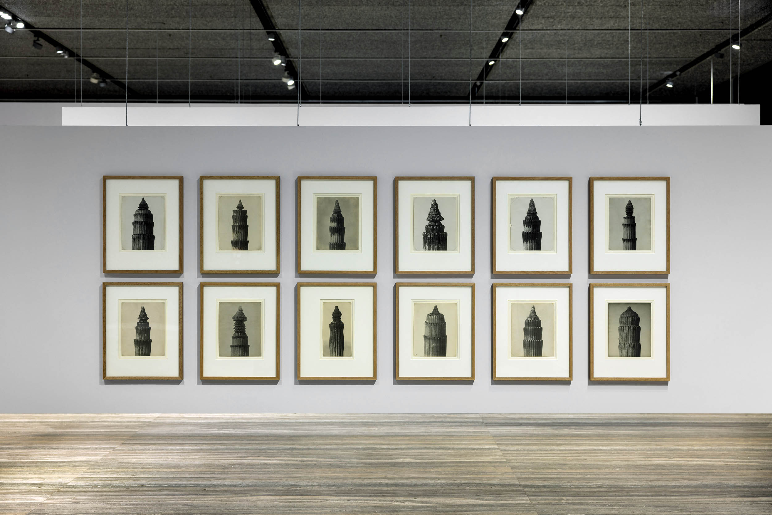
![Karl Blossfeldt (German, 1865-1932) 'Adiantum pedatum, haarfarn, junge, noch eingerollte Wedel' [Maidenhair fern, young, still curled fronds] Nd](https://artblart.com/wp-content/uploads/2025/06/5-typologien_karl-blossfeldt_sm.jpg "Karl Blossfeldt (German, 1865-1932) 'Adiantum pedatum, haarfarn, junge, noch eingerollte Wedel' [Maidenhair fern, young, still curled fronds] Nd")

 'Let's Take Back Our Space: 'Female' and 'Male' Body Language as a Result of Patriarchal Structures' 1977-2018")

 'Concorde L449-21' 1997")

![August Sander (German, 1876-1964) 'Sekretärin beim Westdeutschen Rundfunk in Köln' [Secretary at West German Radio in Cologne] 1931-1950s](https://artblart.com/wp-content/uploads/2025/06/6-typologien_august-sander_siae_sm.jpg "August Sander (German, 1876-1964) 'Sekretärin beim Westdeutschen Rundfunk in Köln' [Secretary at West German Radio in Cologne] 1931-1950s")
![Erich Sander for August Sander's studio. 'Politischer Häftling' [Political Prisoner] 1941-1944 (print date late 1940s)](https://artblart.com/wp-content/uploads/2025/06/7-typologien_august-sander_siae_sm.jpg "Erich Sander for August Sander's studio. 'Politischer Häftling' [Political Prisoner] 1941-1944 (print date late 1940s)")

 'The Richter Family 1, Cologne' 2002 (installation view)")
 'The Richter Family 1, Cologne' 2002")
 'The Consolandi Family, Milan' 1996 (installation view)")

 'Porträt (Pia Stadtbäumer)' 1988")
 'Porträt (Simone Buch)' 1988")
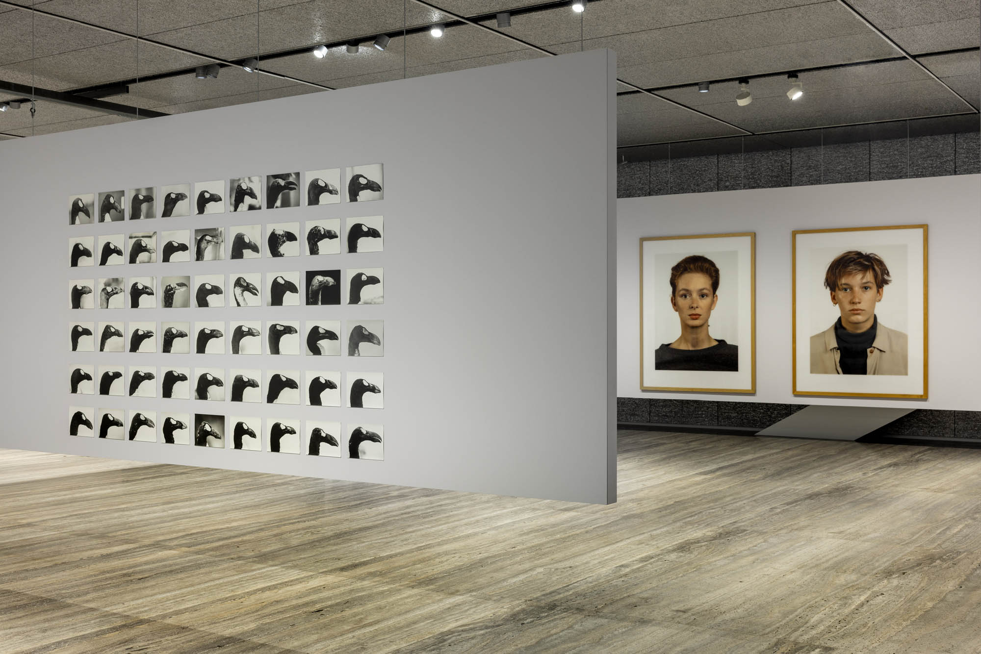
 'The Skins of Alca Impennis' 1992-2022 (detail)")


![Ursula Böhmer (German, b. 1965) 'Highland Grampians / Scotland [All Ladies – Cows in Europe]' 2011](https://artblart.com/wp-content/uploads/2025/06/21-typologien_ursula-bohmer_sm.jpg "Ursula Böhmer (German, b. 1965) 'Highland Grampians / Scotland [All Ladies – Cows in Europe]' 2011")
 'Ohr' 1980")
 'Front Operation' 1979")
 'Handschuhpalme (Glove palm tree)' 1966")
![Lotte Jacobi (American born Poland, 1896-1990) 'Folkwang-Auriga-Verlag, Orch 152. Neottia nidus avis. Vogel-Nestwurz, einzelne Blüte' [Bird's-nest orchid, single flower] c. 1930](https://artblart.com/wp-content/uploads/2025/06/4-typologien_lotte-jacobi_sm.jpg "Lotte Jacobi (American born Poland, 1896-1990) 'Folkwang-Auriga-Verlag, Orch 152. Neottia nidus avis. Vogel-Nestwurz, einzelne Blüte' [Bird's-nest orchid, single flower] c. 1930")
 'People on the Street, Düsseldorf 1974-78' 1974-1978")
 (German, 1902-1980) 'Untitled (Kindergarten)' 1928")
 'Standing Stone' 2014")
 'Constellation II' 2014")

")
")
")
 'Bruise II' 2014")

 'Trance-muter' 2011")
 'Secretion' 2011")
 'Flipside' 2011")
 'Crossing the mirror' 2011")
 'Losing Containment' 2011")
 'The caverns of temporal suspension (between two sites)' 2011")
 'Pattern spill' 2014")
 'Pattern Spill' 2011")
 'Patttern Spill III' 2011")
 'Secretion III' 2011")
 'Elevation' 2011")

You must be logged in to post a comment.