Curator: Joel Smith, Richard L. Menschel Curator of Photography at the Morgan Library & Museum
Ray Johnson (American, 1927-1995) Untitled (Eight photo booth self-portraits) Nd Gelatin silver prints on whiteboard Sheet: 8 x 9 1/2 in. (20.32 x 24.13cm) Courtesy of the Ray Johnson Estate
Ray Johnson was an American artist “known primarily as a collagist and correspondence artist, he was a seminal figure in the history of Neo-Dada and early Pop art…” He absorbed from his teachers Josef Albers, Alvin Lustig, and Robert Motherwell and “entered into Zen kinship with two teachers, John Cage and Merce Cunningham, and into romantic partnership with another, the sculptor Richard Lippold.”
And then he burnt all the early paintings in his possession and took the path less trodden. He developed his own artistic language “through the creation of slight, irregular-shaped, frame-resistant (but mailable) collages he called “moticos”.” (The name was an anagram of the word “osmotic”)
After moving from New York to Locust Valley, Long Island in 1968, Johnson continued to make art but only had two more solo exhibitions, the last one in 1991. “Johnson was forever constructing miniature sets for his own delirious theatre of the absurd: puzzles within puzzles. The sensibility is not unlike Joseph Cornell’s [whose work was a major influence], minus the romance and period nostalgia. Johnson worked in another sort of outsider vernacular – at once banal, vulgar, campy, and deeply sophisticated.”1
The curator Joel Smith refers to “the low-key but constant thrum of odd motivation” behind all of the artist’s work.
Towards the end of his life Johnson took up photography and became a master of the throwaway camera, using the machine to create intimate, staged actions “which served the artist as a form of citation: as a way to “reference,” rather than “represent,” his subjects. The hands-off nature of the medium gave Johnson a way to bring topics up yet keep his viewer (his recipient, his reader) focused on something he cared about more: the messaging process itself.”
Each person, each artist has a different reason to communicate. But what are they communicating?
In Johnson’s case I think he was expressing his inner alternate reality, a different point of view of the world communicated through a new and fantastical visual language. Inhabited by bunnies and pop stars, Johnson’s work was a collage of the unclassifiable, bizarre, wired, wonderful, pop, performance, licked, action, nothings, dreams, concept, sexual, stamped, eccentric and enigmatic moticos… osmotic and fluidly subversive observational images, staged interventions, obsessive, witty and weird constructions.
As Loring Knoblauch observes, “these pictures find new pathways of physical intervention, creating staged installations that combine Johnson’s restless collage combinations and the quirks of photographic vision into something cleverly unexpected.”2
Revelling in his insider-outsider status, Johnson was a naive draftsman / Navy draftsman (he loved a good play on words). There is a “distinctive wit – and the evident delight of discovery – that runs through these photographs.” But it is a dark witticism, as dark one of my favourite movies, Donnie Darko (full of bunnies). His is art as performance… of nothings, of everything, moving everything, setting everything in motion. We follow his in/actions whether it be documenting a flopped stranger wearing a bunny cutout, six Movie Stars in the back of a car, or his prescient undated Eight photo booth self-portraits (above) in which he acts out and obscures different personas.
In his last performance this creative man of nothing (real life) “was seen jumping from a bridge in Sag Harbor… [and] appeared to be doing a backstroke toward the open Atlantic.” He could not swim. As he said of one of his early performances, it (he) “went off into the void in some marvellous fashion…”
Many thankx to the Morgan Library & Museum for allowing me to publish the photographs in the posting. Please click on the photographs for a larger version of the image.
Johnson, however, was a prankster. Like the bunny head he adopted as his trademark – a cartoonish line drawing that appeared in much of his work, often bearing the name of a key figure in 20th-century art – he hopped lightly, merrily across this playing field. Revelling in puns and irreverence (an untitled 1973 collage known as “Jackson Pollock Fillets” includes cut-out recipes for Pollock Fillets Amandine and Barbecued Pollock Burgers), conducting his life as a nonstop performance, he revived the Dada tradition embodied by his hero Marcel Duchamp. In contrast to the grandiosity of Minimal art, land art, Pop Art and other macho midcentury movements, he offered something much humbler: collages or drawings of portable size and wry wit. … Johnson created some of the earliest works of Pop Art and was an early influence on conceptual art. …
The contents of Johnson’s pictures fall into several categories. At times, he chopped up the photos and used them to form a collage. Usually, though, and more interestingly, he found or created a collage-like pattern within the photographic frame. He made corrugated cardboard pieces that he called movie stars, and carried them to places where he could photograph them. Sometimes they incorporated images of celebrities: Marilyn Monroe, Jack Kerouac, Johns. Often they were renditions of his signature creation, a bunny with long, erect ears and a pendulous nose that, like a “Kilroy was here” graffiti drawing from World War II, feels both childlike and sexualized. He would inscribe a bunny with a name, thereby transforming it into a standardized personal portrait. And then he would drive his movie stars to a picturesque setting and shoot them with his camera.
As a body of work, these photographs by Johnson absolutely feel unfinished, in an open-ended and unwieldy way, as though he was grasping for new ways to communicate. Seen together, there is both dogged teach-yourself inventiveness and a hint of loneliness on display, with a nostalgia for stars of the past and his own younger face percolating through his iterative reworkings. At their best, these pictures find new pathways of physical intervention, creating staged installations that combine Johnson’s restless collage combinations and the quirks of photographic vision into something cleverly unexpected. At the end of his life, Johnson was actually becoming an interesting photographer, and these unearthed leavings provide tantalizing glimpses of what might have been.
Dubbed “New York’s most famous unknown artist” by the New York Times, Ray Johnson (1927-1995) was a widely connected downtown figure, Pop art innovator, and pioneer of collage and mail art. After moving from Manhattan to suburban Long Island in 1968, Johnson selectively distanced himself from the mainstream art world, holding only two exhibitions after 1978. Yet even after his last show, in 1991, he remained a prolific and unpredictable artist.
Johnson used photographs in his work for decades, but it was only with his purchase of a single-use, point-and-shoot camera in January 1992 that he embarked on his own “career as a photographer.” By the end of December 1994 he had used 137 disposable cameras. His most frequent subjects were what he called his Movie Stars: meter-high collages on cardboard, often featuring the bunny head that served as his artistic signature. They became ensemble players in the curious tableaux he staged in everyday locales near his Locust Valley home.
At his death by suicide in January 1995, Johnson left a vast archive of art in boxes stacked throughout his house, including over five thousand colour photographs, still in the envelopes from the developer’s shop. This body of work, virtually unseen until now, comprised his final major art project, the last act in a romance with photography that had begun some forty years earlier.
PLEASE SEND TO REAL LIFE: Ray Johnson Photographs
A widely connected pioneer of Pop and mail art, Ray Johnson (1927-1995) was described as “New York’s most famous unknown artist.” Best known for his multimedia collages, he stopped exhibiting in 1991, but his output did not diminish. In 1992-1994, he used 137 disposable cameras to create a large body of work that is coming to light only now. Staging his collages in settings near his home in Locust Valley, Long Island – parking lots, sidewalks, beaches, cemeteries – he made photographs that pull the world of everyday “real life” into his art. In his “new career as a photographer,” Johnson began making collages in a new, larger format that made them more effective players in his camera tableaux. The vast archive he left behind at his death included over three thousand of the late photographs. Now, his final project makes its debut alongside earlier photo-based collages and works of mail art: fruits of a romance with the camera that spans the four decades of the artist’s career.
As a student at North Carolina’s Black Mountain College from 1945 to 1948, Johnson thrived under the rigorous tutelage of his foundation-course teacher Josef Albers (1888-1976). Johnson also modelled for Archer, a fellow student who would go on to teach photography at the school. This portrait – lush, faceless, and sexually ambiguous – foreshadows the complexity of Johnson’s use of photography throughout his career. Though attracted by the camera’s peerless ability to bestow glamour, he often tried to undercut its role as a transparent conveyor of facts.
As an artist, Johnson was a master hunter-recycler, constantly revisiting and reinterpreting images from his past. On a visit to the beach at nearby Oyster Bay in 1992, he brought along a camera and a cardboard cutout of his head. Propping the board against a piece of driftwood log, he created a visual pun: the log’s central rings evoke the swirl of hair that Hazel Archer had once photographed on his (now long-bald) head.
Johnson applied one all-purpose noun, “moticos” (both singular and plural), to his short writings, his collages, and the glyph-like shapes he drew. He and his friend Norman Solomon coined the term by reshuffling the word “osmotic,” chosen out of the dictionary. On this moticos made from a flattened box, Johnson paired a photograph of a pigeon with its strange twin: a sort of photo-bird, composed of cookie cutters and a checkerboard. Johnson proposes a second unlikely duo by combining the names of the author Franz Kafka (1883-1924) and the photographer Ylla (Camilla Koffler, 1911-1955), known for her images of animals.
Moticos
In the autumn of 1955, artist Ray Johnson walked through the streets of New York City with a slip of paper, asking strangers if they could define the word he’d written on it: “motico.” People gamely racked their brains: “‘Gee, I wish to hell I knew,’ said one. A nun asked, ‘Isn’t it a kind of colour?'” Johnson recalled these encounters in a story that ran that year in the very first issue of The Village Voice, when he was 27 years old and living in Manhattan, and working primarily in painting and collage.
The word was one Johnson had invented. An anagram of osmotic (a word allegedly chosen at random from a book), “moticos” could refer to several different things. Johnson called the small collage panels he made “moticos” but he also used the word to refer to textual representations too. Johnson would paint and transform the cardboard pieces that came with his laundry into parts of his collages, transforming them into silhouettes and then glyphs, new moticos.
From the early 1950s, Johnson embraced photocollage as a way to inject Hollywood glamour into the cloistered world of avant-garde art. He was appropriating mass-media imagery years before Andy Warhol began populating monumental canvases with celebrity portraits. Here Johnson worked directly upon Dennis Stock’s iconic Life magazine photograph of James Dean walking alone through Times Square, which was published a few months before Dean died in a 1955 car crash. Whether Johnson made this work before or after Dean’s death is unknown. In the 1990s, he would again incorporate the actor’s silhouette in collages and photographs.
For a short feature in the first issue of the Village Voice (26 October 1955), a reporter walked with Johnson as he approached strangers in Grand Central Terminal and asked them whether they knew what a “moticos” was. As seen here, Johnson also literally took moticos to the streets, staging crowds of them for the camera in disused spaces in downtown Manhattan. Few early moticos have survived intact: over the next several decades, in a practice he called Chop art, Johnson continually disassembled his work and used the fragments to create new pieces.
In 1955 Johnson asked his friend Elisabeth Loewenstein (later Novick) to bring a camera along on a walk with their mutual friend Suzi Gablik (1934-2022). Novick’s photographs record the impromptu performance that ensued, in which Johnson draped moticos on Gablik’s face and body. A fellow Black Mountain College alum, Gablik would become an influential critic; in her 1969 book on Pop art, she described improvised actions such as this one as the first “informal happenings” – ephemeral events conceived as works of art – in the postwar era.
Johnson preserved the photographs Novick made that day. Nearly forty years later, in one of his earliest experiments with a “throwaway camera,” he laid out the prints in a grid on his driveway and photographed them from atop a ladder.
In the mid-1950s, Johnson simultaneously shifted from oil painting to small-scale collage and from gallery exhibitions to the mail as a way of putting his art before an individual viewer. An envelope from Johnson often contained enigmatic clippings from books and magazines, including photographic illustrations drawn from the same stockpile that fuelled his collages. These are items Johnson sent in the 1950s to Frances X. Profumo, whom he befriended when he was a student and she an employee at Black Mountain College. The many visual and textual Xs invoke both Profumo’s distinctive middle initial and the convention of signing a fond letter “with kisses” (XXX).
Ray Johnson (American, 1927-1995) Untitled (Mapplethorpe with moticos) Undated Ink on magazine page Image: 7 x 7 in. (17.78 x 17.78cm) The Ray Johnson Estate The Morgan Library & Museum. Gift of the Ray Johnson Estate, courtesy of Frances Beatty.
Over the years, Johnson inducted hundreds or thousands of recipients into what he called the New York Correspondence School by mailing them oblique yet personalised messages. These altered book and magazine pages were among the unmailed works found in his house after his death.
Johnson favoured likenesses that masked as much about him as they revealed. He repeatedly used a headshot that his friend Ara Ignatius made around 1963. It is an unnerving image, lacking the conceit of intimacy that characterises most formal portraits; instead it “stands for” Johnson, in the artless manner of a government-issued ID.
Many pieces of mail art that look like photocopies are in fact products of offset printing – a means of transferring photographs and other images to the page from reusable metal plates. The medium allowed Johnson to return to an image repeatedly, imposing variations that reflected his ever-changing purposes.
In this photocollage, two movie actors meet: Vikki Dougan (b. 1929), who became a sex symbol in the 1950s by publicly appearing in backless dresses, and the quintessentially innocent child star Shirley Temple (1928-2014). Temple’s rendering as a blacked-out, moticos-like figure may allude to her adult married name, Shirley Temple Black. Across the bottom of the image, a line from Henry Wadsworth Longfellow’s 1845 poem “The Arrow and the Song” is altered to refer to Johnson’s forerunner in collage and assemblage art, Joseph Cornell (1903-1972), who lived in Flushing, Queens.
The title of each collage in the Potato Masher series begins with a notable artist’s or celebrity’s name. The titles then take an abrupt turn away from stardom by alluding first to the famed figure’s mother, and then to her potato masher. Here, Johnson included his own likeness in the form of a headshot, made around 1963 by the photographer Ara Ignatius. His face is covered by black moticos and cut-up fragments of his earlier artworks. Johnson created his collages over a span of weeks, months, or even years, dating each element in pencil as it joined the composition.
The Morgan Library & Museum presents PLEASE SEND TO REAL LIFE: Ray Johnson Photographs, opening June 17 and running through October 2, 2022. This exhibition explores the previously unknown camera work of the widely connected downtown New York figure, Pop art innovator, and pioneer of collage and mail art. At his death on 13 January 1995, Ray Johnson (1927-1995) left behind a vast archive of art in his house, including over five thousand colour photographs made in his last three years. Small prints, neatly stored in their envelopes from the developer’s shop, the photographs remained virtually unexamined for three decades. Now they can be seen as the last act in a romance with photography that had begun in Johnson’s art some forty years earlier. After retracing the story of Johnson’s use of photography throughout his career, PLEASE SEND TO REAL LIFE offers an in-depth look at the late work the artist called “my career in photography.”
After moving from Manhattan to suburban Long Island in 1968, Johnson selectively distanced himself from the mainstream art world, holding only two exhibitions after 1978. Yet even after his last show, in 1991, he remained a prolific and unpredictable artist. With his purchase of a single-use, point-and-shoot camera in January 1992, he embarked on an entirely fresh creative enterprise. By the end of December 1994, he had used 137 disposable cameras. His most frequent subjects were what he referred to as his Movie Stars: meter-high collages on cardboard, often featuring the bunny head that served as his artistic signature. They became ensemble players in the curious tableaux he staged in everyday locales near his Locust Valley home.
As an artist, Johnson was a master hunter-recycler, constantly revisiting and reinterpreting images from his past. He appears to have first used a disposable camera for a practical purpose: documenting his enormous backlog of unused collage fragments. He performed that work in his driveway and on the back steps of his house, but soon he was carrying a pocket-size camera on daily outings to nearby beaches, parks, and cemeteries. Johnson’s photographs exhibit a collagist’s instinct for insertion, layering, and surprise: most of them are centred on objects that he placed between himself and a scene as he found it. In his photographs as in his pun-filled writing and his densely worked collages, Johnson used juxtaposition to suggest that everything finds correspondence in something else. The point-and-shoot habit gave him a way to create an image almost as quickly as he could think of it. As curator Joel Smith writes in the book that accompanies the exhibition, “Nowhere in Johnson’s art does he look more intensely engaged by the present tense, more thrilled to be immersed in real life, than in the inventions of his throwaway camera.”
“PLEASE SEND TO REAL LIFE offers a rare chance to examine photographs taken by Ray Johnson, an artist known primarily for his brilliant work in collage,” said Colin B. Bailey, Director of the Morgan Library & Museum. “The images, most of which have gone unexplored until now, are truly innovative and ahead of their time. The exhibition also celebrates a significant gift of Johnson’s work, generously made by Ray Johnson estate, courtesy of Frances Beatty.”
“These photographs show that in his last years, Ray Johnson remained irrepressibly, explosively creative,” said Smith, the Richard L. Menschel Curator of Photography at the Morgan. “It’s his last great body of work, and its very casualness is prophetic: ten years later, smart phones and social media turned daily life into a constant exchange of personal photographs and commentary. Johnson was still making collages right up to the end – but now he made them in a camera, and the ‘real life’ all around him was his medium.”
PLEASE SEND TO REAL LIFE: Ray Johnson Photographs is accompanied by a book with the same title published by Mack Books, which includes an essay by the exhibition’s curator, Joel Smith.
Here, Johnson (visible at top left) employs a booth as an affordable studio for documenting works from his Potato Masher series. Sitting in the photo booth, he simply held up one collage after another for the automatic camera. The resulting sequence of vertical photo strips combines the qualities of a crude performance document and an art gallery’s inventory sheet. David Hockney’s Mother’s Potato Masher appears, not yet finished, fourth from the left in the bottom row.
In 1976 Johnson began asking friends, art-world figures, and celebrities to sit and have their silhouettes traced onto paper. He thus built a library of nearly three hundred profile templates he could use and reuse. As a portrait form, the silhouette reduces its subject to a graphic shape, identifiable but resistant to psychological interpretation. In this example, Johnson overlapped the profiles of 1950s movie heartthrob Tab Hunter (1931-2018) and avant-garde writer William S. Burroughs (1914-1997).
In the 1990s Johnson photographed one of his stock props, a stuffed kingfisher, in combination with Burroughs’s silhouette. The beak of the bird extends the author’s prominent nose: a bill replacing the bill of a Bill.
Even when Johnson avoided direct self-portraiture, his quirky fixations were always evident. (In an essay for the exhibition catalogue, the curator Joel Smith refers to “the low-key but constant thrum of odd motivation” behind all of the artist’s work.) In one of the collages on display, William Burroughs’s profile nearly eclipses that of the nineteen-fifties movie star turned gay icon Tab Hunter, and both are all but obscured by a swarm of pebble-like fragments and bits of collage. Johnson was forever constructing miniature sets for his own delirious theatre of the absurd: puzzles within puzzles. The sensibility is not unlike Joseph Cornell’s, minus the romance and period nostalgia. Johnson worked in another sort of outsider vernacular – at once banal, vulgar, campy, and deeply sophisticated. Like John Baldessari, he favored artless lettering and crisp graphic design. The cardboard slats, especially, might be mistaken for portable Baldessaris.
Beginning in the 1950s, Johnson made artistic use of photographs of the twentieth-century cultural icon Elvis Presley (1935-1977). Johnson’s most emblematic motif, a stylised bunny face, first appeared beside the artist’s name in 1964. Bunny ears would serve both as a kind of trademark and as a way of turning anyone – Elvis, in this case – into a Ray Johnson character. The enlarged halftone dots that compose Elvis’s image confirm its status as a mass-market photographic reproduction.
Johnson appears to have first used a disposable camera for a practical purpose: documenting his backlog of unused collage fragments. But in January 1992, he told curator Clive Phillpot, “I’m pursuing my career as a photographer,” and in March he added, “I’m having fun with my throw-away camera.” Always faithful to the rapidity of his own thinking, Johnson found in the “throwaway” Fuji Quicksnap a way to give graphic form to ideas as they occurred to him.
Johnson’s first photography studios were the driveway and back steps of his house, but soon he was carrying a pocket-size camera on his daily outings to nearby beaches, parks, and cemeteries. In spring 1992, he threaded a cutout silhouette of Joseph Cornell over the cord of a payphone, then photographed it with one hand while holding the receiver with the other – acting as operator of a hotline to the collage-art pioneer.
Even in his photography, Johnson exhibits a collagist’s instinct for insertion and layering. Most of his photographs are centred on objects that he placed between himself and a scene as he found it. On occasion, though, he used the camera in a conventional way, simply collecting views of sights that drew his interest, such as a billboard advertising nothing or the word HELP on the underside of a boat. Photographs such as these are the field notes of a minutely attentive observer.
PLEASE SEND TO REAL LIFE
Joel Smith
In January 1992, a few weeks after his last lifetime exhibition closed at Moore College in Philadelphia, the artist Ray Johnson began photographing in and around his house in Locust Valley, Long Island, using what he called “my throwaway camera”: a single-use point-and-shoot, preloaded with daylight color film. Thirty-five months and 137 throwaways later, he photographed views through the storefront window of an even-more-final exhibition called Ray Johnson: Nothing. It was up during the Christmas week lull of 1994 in a gallery on the main street of Sea Cliff, a few minutes’ drive from Johnson’s house, and around the corner from that of his friend and frequent mail-art partner, Sheila Sporer. Then, one Friday a couple of weeks into 1995, a man was seen jumping from a bridge in Sag Harbor, an hour and a half’s drive east. Witnesses reported that Johnson – the body, when recovered, proved to be his – appeared to be doing a backstroke toward the open Atlantic. (He could not swim.) Johnson’s presumed suicide is often described as the final work of a career in which art and life had long been inseparable.
In his last three years Johnson made and mailed art incessantly, went out for a drive most days, and ran through about one camera a week. When he finished a twenty-four-frame roll, he would drop off the camera – he used a couple of Kodaks at first and then, consistently, Fujicolor Quicksnaps – at Living Color, a shop in Glen Cove, for developing and printing. After turning sixty-five in October 1992, he often took advantage of a senior discount and ordered duplicate prints. For some forty years his art practice had consisted mainly of collage, relief assemblages, and correspondence art. Though photographs had figured in all three channels of work, they were not photographs made by Johnson himself, but portraits of him by others, or images he cut out of books or magazines. Now, in what he called his new “career as a photographer,” Johnson incorporated a few of his own photographs in modest little collages. He also mailed his photographs to correspondents, usually in the form of photocopies. But in the season after his death, among the dozens of boxes of art and effects Johnson left packed up in every room of his house, over five thousand of the color photos were found, still filed with their negatives and receipts in Living Color envelopes. To say the photographs were found needs qualifying: their existence was recorded, but years would pass before photography registered as a central creative pursuit of his final years.
It is not surprising that this work evaded scrutiny. Physically, these are plain, consumer-grade four-by-six-inch color snapshots, indistinguishable from those anyone would take home from the processor’s – whereas Johnson’s art more often took the form of distinctly, peculiarly altered public imagery. After the rise and canonization of Pop art in the 1960s, his work of a few years earlier, notably his addition of dripping red tears to a fan-magazine photo of Elvis Presley (1956-1957), looked prescient. Johnson, like Andy Warhol and Roy Lichtenstein, took mass-market imagery for his muse – but, instead of enlarging it to grandiose scale, his instinct was to bestow the status of an artistic “original” upon ordinary, available-to-everyone printed matter itself. His collages, in that sense, define an antipode to Pop painting’s monumentalised appropriations. His prototype, you could say, was the sardonic teenager he had been not long before, scribbling mustaches onto Marilyns in magazines.
Spend time with the color photographs, and Johnson’s playful, punky persona becomes evident – not in anything he did to the pictures, but in their contents. The straight-men in these images are the streets, beachfronts, and parking lots of bucolic, smalltown northern Long Island: Locust Valley, Sea Cliff, Roslyn, Lattingtown, Glen Cove, Bayville. The scribbled mustaches are the dramatis personae Johnson introduces to those spaces. Within a few months of starting his photo-work, he began making, and photographing, collages on what were, for him, large (thirty-two-by-eight-inch) pieces of corrugated cardboard (62). (The cardboard often bears Fuji brand info; it, too, comes from the camera shop, or out of its dumpster.) In a letter to art critic David Bourdon in summer 1993, Johnson introduces ninety-three of these collages by name (Bobby Short, Greta Garbo …) and calls them his Movie Stars (or Move Stars). Indeed, despite their rectilinear format, they read as figures: paper-doll play-actors for his photo-tableaux. They have faces – most frequently Johnson’s signature pop-eyed, schlong-nosed bunny, inscribed with a name or phrase. (Many of those are rendered in mirror letters, correctly sequenced but laterally FLOPPED, as if in a misbegotten effort to address a reader on the other side of a steamy window.) As he did with his collages generally, Johnson would glue new elements onto these figures over time, dating each newly added bit in pencil. As the weeks of photo-shoots roll by, you can watch as a figure that starts as mostly naked cardboard fills up with information. I picture Johnson exiting his little grey house (he described its color as “grey with an e,” but named it The Pink House) with a freshly worked batch of Movie Stars under his arm, loading them into the back of his Volkswagen Golf, and taking them out on a drive, camera in pocket.
About a decade after these photographs were made, smart phones came into use, and everyone began having a camera on their person all the time. In 1992, making a photograph still required deciding and preparing to do so, and not simply asking oneself (or not even asking), “Why don’t I?” Buying the camera, noting how close to frame zero it was getting, dropping it off, returning to pick up the prints: making these pictures called for effort, on a par with the effort of crafting the Movie Stars. The whole enterprise reflects the low-key but constant thrum of odd motivation that drives all of Johnson’s work. The art he made was irreducibly personal, if gnomic, and he went to lengths to maintain control over how his collages, punning defacements, paradoxes, and near-nothings would make their way into the world. Johnson’s New York Correspondence School – the vast network he invented for circulating mail art – existed mainly in his head, but this, from his angle, made it no less real than the art world.
In the art-historical fairy tale of postwar New York City, young Ray Johnson must have looked, for a few years, like an avant-garde heir apparent. Born in 1927, the only child of loving working-class parents, he grew up in Detroit and, from 1945 to 1948, attended North Carolina’s Black Mountain College, crucible of every far-seeing artistic impulse of that moment. He was shy and hard-working and he devoured all he could from instructors who included Josef Albers, Alvin Lustig, and Robert Motherwell. He left BMC having entered into Zen kinship with two teachers, John Cage and Merce Cunningham, and into romantic partnership with another, the sculptor Richard Lippold. The four of them took up residence in a building in the deep reaches of downtown Manhattan. Johnson earned money working in Ad Reinhardt’s studio and at the Orientalia bookstore. He showed his Albers-sized, minutely rendered geometric paintings as a member of the American Abstract Artists group. In short, he seemed destined for middling highbrow success.
Instead, he became Ray Johnson. Between 1954 and 1956, he ditched his qualifications by burning all the early paintings still in his possession and redirecting his creative effort onto the slight, irregular-shaped, frame-resistant (but mailable) collages he called “moticos.” His move to print-media-based figural collage came at an historical moment far too late to boast a Dada-Surrealist pedigree and too early to get swept neatly up into Pop. The concerted wrongness of this switch makes it, in retrospect, quietly brilliant, and it points to the singularity that doomed Johnson’s crown-prince prospects. (Two of his successors and friends at BMC, Jasper Johns and Robert Rauschenberg, picked up those prospects and put them to good use.)
Johnson hung onto a number of photographs that documented his fateful conversion. At age sixty-four he arranged twenty of them in a grid on the drive behind his house, then scaled a ladder to re-photograph them (26). In most of these old photographs, moticos in profusion can be seen arrayed in two real-world sites, a pallet on a sidewalk and a large industrial interior. In others – which were made in the street by a friend of Ray’s, the future fashion photographer Elisabeth Novick (then Loewenstein) – you can see Johnson draping moticos all over another friend (and fellow BMC alum), Suzi Gablik. These are, in effect, performance records; Gablik even came to describe Johnson’s moticos-stagings as perhaps the first Happenings in art—a notion that arguably proceeds from their having been photographed. Interviewed in 2015, Novick emphasized how casually this came about. Not long before, she had been given her first camera, and one day, Ray simply asked her to bring it along on a walk. “Suzi just sat there,” Novick said, “and he just threw the things on top of her.” She explains: “He was a very lighthearted sort of whimsical person. […] He wasn’t intense. It was the opposite of intense. If I could look up the opposite word of intense, I would say that was him.”
The “opposite-of-intense” mode of hardly-work Johnson was auditioning that day led him to an art based on play, exchange, and movement; on remaining light-footed enough to follow any association that came to mind, be it ever so slight, silly, or hermetic. Perhaps for just that reason, Johnson’s art found its ideal helpmate in the camera, with its knack for lending graphic form to the ephemeral. In any event, the 1955 documents turn up repeatedly in his color photographs of forty years later (44, 102).
Even more prevalent in these images is the infinitely malleable bunny head (64) that Johnson described as “a sort of self-portrait.” Its partner, equally ever-present, is a headshot of Johnson made by Ara Ignatius around 1963. (Johnson kept on hand an offset plate of this image, from which he could order new printings by the hundreds whenever he needed them.) In one early-1992 photograph, nineteen headshots are laid down in a path leading to Johnson’s backdoor stairs, where he would be staging many more photographs (20). In the summer of 1993, four headshots stare in through the windshield of his car, like a posse of avid fans (126). The headshot rides shotgun with Elvis (108) and, reduced to a pair of eyes, lends consciousness to a mob of moticos on camelback (98).
Johnson’s longtime collector, advocate, and chief interpreter, William Wilson, observed that photographs served the artist as a form of citation: as a way to “reference,” rather than “represent,” his subjects. The hands-off nature of the medium gave Johnson a way to bring topics up yet keep his viewer (his recipient, his reader) focused on something he cared about more: the messaging process itself. Using another photography adjacent tool, the silhouette, Johnson could convert the people he knew into references-to-themselves. Starting in 1976, he used pencil and paper to trace the profile shadows of some 284 sitters. He filed these in two big template binders, ready for use in the studio. Most of his profile subjects were writers, artists, and actors, whose shared characteristic is their publicly traded names.
Some of the silhouettes appear in the colour photographs, as do various celebrity portraits – but many more people show up as bunny faces inscribed with their names. Johnson wrote to Bourdon that seventy-two of his Movie Stars were going to appear in a “RAY JOHNSON OUTDOOR MOVIE SHOW” (see 110, 122, and 124 for variant stagings) that would stand “45 feet in length if ever actually placed next to each other and the wind didn’t blow them down.” In the meantime, he posed individual Movie Stars in the company of obliging strangers (54) or leaned them against the occasional dog (222).
The photographs include some one-offs, such as the shadow cast by Johnson’s mailbox (2) and a tar seam in a parking lot (176). Many of the subjects, though, are ones he revisited dozens of times, such as local beaches, cemeteries, and storefronts, a bathtub he found in a field (106, 107), and himself as a shadow, encountering a manhole cover (4).
Most of the photographs work in a collage-like way: they record Johnson’s alteration of a real-world setting through the addition of some flat thing he has made or chosen, such as one of his grimly cartoony black-on-white graphic characters, hiding amid spiky succulents (18), or an ace of clubs, leaning against Piet Mondrian’s grave marker (42).
At other times he works like a conventional photographer, observing but not intervening, as when he captures the horizon across Long Island Sound (230), a faceless billboard (41), the snapped arrow of a rooftop weathervane (16), or a palm frond splayed on beach sand (92).
Still other images define a mode between these two options, as Johnson finds some noteworthy thing to photograph (dragon’s teeth icicles [6], a mortuary angel [8]), then props up beside it a sign that emblazons the view like a maker’s logo or a graffitist’s tag: “PHOTO BY RAY JOHNSON”; “RAY JOHNSON THE PARIS CORRESPONDENCE SCHOOL.”
Here are a few of the subjects that kept Johnson and his 137 cameras coming back most often:
Inside. When Johnson photographed inside his house, the daylight-exposure film in his pre-loaded cameras restricted his work area to patches of direct sunlight. In late afternoon, the window in his front door cast a scalloped picture frame, or spotlight, around whatever he photographed on the floor (132, 168). The window’s shape in turn became a player, alone or in tandem with its mirror image (45).
Telephones. Johnson was as tireless a phone-caller as he was a mailer. Once, while at home, he held the phone for a bunny labeled EAR MUFS, posing between a 1955 photo and a clutch of moticos glyphs (28). Out driving around, he staged momentary installations in payphone boxes (65, 232). He unhooked one phone’s receiver and threaded over its cord a cardboard cutout silhouette of the artist Joseph Cornell, whom he used to visit in Flushing, Queens (12). The cutout void of Cornell’s head frames the telephone’s number-pad, turning Johnson into the operator of a Cornell-box hotline: camera in one hand, receiver in the other, plugged into the head of the master collagist.
Doubles. In Johnson’s universe, doubleness – correspondence – is the norm. No surprise, then, that he should photograph twins, replicas (48, 50), and those spellbinding autocopies, twin-initialed celebrities (Marilyn Monroe, Mickey Mouse [160]). He gives dualism a distinctly photographic turn by pairing things with their reflections or shadows. When photographed, these light-borne modes of doubling assume a concrete presence: they make reality look Johnsonian. A reflection echoes its original, but the two are non-identical. The reflection – being laterally flopped, like Johnson’s mirror letters – is the original’s opposite (52, 172). As for the shadow, it is a flat, graphic version of its original (70), an incorporeal counterpart to reality (136).
Recycling. A collagist traffics in the reincarnation of materials and images. The beginnings of Johnson’s photographs look like an effort to document his vast inventory of “chop art” – his term for the densely-reworked chunks of assemblage he had been building up and cutting apart again for decades (30-33). He abandoned this cataloguing, but his photographs remain as full of junk (130, 131) as his house (228); “WHAT A DUMP.” His movie-reel memory encompassed everything from Bette Davis films to a porn video made famous in the confirmation hearings of Supreme Court nominee Clarence Thomas [150]). He created a deadpan cardboard memorial to his old associate, arch-recycler Andy Warhol, and laid it atop a raked pile of cemetery flowers (142), and, two years later, atop a scattering of donated clothes (144).
Bills. Scavenged out of those clothing drops, most likely, were the many baseball cap visors Johnson photographed. He held them up before the camera, always in C formation, with deep spaces behind them: the sky, or receding railway tracks (34, 78). He arrayed them on Stehli Beach like a school of migrating horseshoe crabs (94). He cut the bill’s crescent-moon shape out of his headshot (33). If they stand for a name, “Bill,” perhaps he is William Wilson. Or the writer William S. Burroughs, who sat for his silhouette in 1976. Johnson laid a cutout of Burroughs down on cardboard, then extended Bill’s prominent nose with the bill of a kingfisher (96).
Photographers. The photographs feature many images drawn from photography’s historical canon, making Johnson-collaborators of, among others, Walker Evans (via Sherrie Levine) (136), Dennis Stock (158), and Félix González-Torres (186). Some Movie Star bunnies are given the names of photographers, including Horst, Duane Michals (154, 170), and Lord Snowdon (snowed-in / snowed-N [236]). The crane in Bill Brandt’s famous photograph of Kew Gardens provides the top half of an awkward composite figure (159, 174). Johnson perched Michals’s book of portraits on the front bumper of his car, making a third headlight of its cyclopean eye (138). He turned Richard Avedon’s An Autobiography face-down to reveal its author photo and dressed the portraitist in a hat (163) that channels Marianne Moore, who is portrayed in that book wearing her signature tricorn (a moticos-like garment that fascinated Johnson). Late one dusk, Johnson photographed the legs of his shadow spanning a copy of Lee Friedlander’s book Like a One-Eyed Cat, laid down open to its frontispiece, one of Friedlander’s many self-portraits in shadow (80).
Please Send. Between July and December 1994, over twenty wrapped packages appear in Johnson’s photographs. They are addressed to or from his mail-art correspondents, most frequently his local friend Sheila Sporer (158, 242). (The ones Sheila opened – those not marked “DO NOT OPEN” – turned out to be stuffed with plain craft paper.) Often the packages are pictured in the midst of what look like obscure rituals. One stands in Johnson’s driveway, tethered to a helium bunny balloon, ready to begin its physically impossible ascent (206). Others he positioned inside the gallery show-window of his late December 1994 un-show, Ray Johnson: Nothing, and then photographed them from out on the sidewalk (169). (He never ventured inside.) A few days later, he posed two packages, tourist-like, at the end of a pier at sunset (214); distressingly, one of them is next seen drifting in the water below (216).
In late December 1994, Johnson photographed himself in a shop window mirror, holding up a bunny inscribed PLEASE SEND TO REAL LIFE (246). (On the collage, this bunny bears the date December 21; below it, on December 30, Johnson added ONLY YOU [244].) REAL LIFE refers, at one level, to the New York-based art magazine REALLIFE (1979-1994): since late November, Johnson had been urging Sporer to pitch its editor, Thomas Lawson, an article about their three years of collaborative correspondence art.
But the message can mean something else, too – something like: “Here, Life, take this thing I’ve made; I’m going to the other place.” For decades death had been a resolute presence in Johnson’s work, taking such forms as Nothing, pitch-black humor, and a fixation on life dates. Is death palpably present in the photographs of his last three years? It would be silly to deny that it is. And yet it would be trivial to hunt through this large, complex, often comical, always personal body of work for nothing more than a rebus suicide note. Ray Johnson never made himself that easily readable. And nowhere in his art does he look more intensely engaged by the present tense, more thrilled to be immersed in Real Life, than in the inventions of his throwaway camera.
Joel Smith. “PLEASE SEND TO REAL LIFE,” in PLEASE SEND TO REAL LIFE: Ray Johnson Photographs. Mack Books, 2022, pp. 188-195
The photographs Johnson made between January 1992 and December 1994 feature several dozen collages in a large, vertical format he had never used before. He referred to these works as Movie Stars (or Move Stars), writing that “if the wind didn’t knock them down,” he planned to cast them in a “Ray Johnson Outdoor Movie Show,” lined up like dancers in a musical revue. In the end, still photography was the nearest he came to filmmaking.
In the same way that Johnson burned his early paintings, renouncing the most reliable route to a successful art career in mid-20th-century New York, he exited the fray of Manhattan. In 1968 he moved to Locust Valley, Long Island, and after 1978 he had only two solo exhibitions – the last one in 1991. He continued to make art, though, and looked to artists like Joseph Cornell, famous for his box assemblages, who lived on Utopia Parkway in Queens. Many of Johnson’s works take Cornell’s idea of the display box filled with quirky objects and expands it to tableaus staged for the camera, using the suburban environment, the woods or the seashore as found theatrical sets. …
Johnson’s presence in many of the photos could be called self-portraiture – but the photos also feel very much like ancestors to the ubiquitous cellphone selfie. The photo “RJ with Please Send to Real Life and camera in mirror” (1994) is an obvious selfie precursor. It includes a number of conceptual twists, however: Johnson appears in a mirror, holding a disposable camera and one of his cardboard signs with an alter-ego bunny and the words “Please Send to Real Life” partially printed in reverse – a reminder of how the camera doesn’t merely document reality, but shapes and potentially distorts it. (This photo might also be a reference to his mail-art practice or the New York art magazine Real Life, published from 1979 to 1994.) …
What is art? What is real? Does the image document reality or create it? “Please Send to Real Life” raises some of these questions and shows how Johnson predicted the growing fuzziness between the realms of photography and IRL (in real life) – from snapshots to social media – suggesting that the relationship between them is porous but also ripe for creative intervention.
Overhead are some of the several dozen collages that appear in photographs Johnson made between January 1992 and December 1994. He referred to these large, vertical pieces as Movie Stars (or Move Stars), writing that “if the wind didn’t knock them down,” he planned to cast them in a “Ray Johnson Outdoor Movie Show,” lined up like dancers in a musical revue. In the end, still photography was the nearest he came to filmmaking. Were the Movie Stars made to be photographed? Or are the photographs mere documents of the Movie Stars? Perhaps the two bodies of work are best understood as complementary parts of a continuous creative cycle. Many of the Movie Stars are made on cardboard that bears photographic product information, suggesting that it was scavenged from the dumpster of the shop where Johnson bought his cameras and turned them in for developing.
The Movie Stars feature a roll call of celebrity faces and names that is, in composite, unique to Johnson’s imagination. By photographing the collages, Johnson animated his personal pantheon in the familiar settings of his daily life. Composers Erik Satie and John Cage rest in the arms of a statue of Orpheus, the prophetic music-maker of Greek myth. Artist Jasper Johns punningly marks the door of an outhouse-like wooden structure. Johnson himself rides shotgun in his Volkswagen Golf while Elvis takes the wheel. And art critic David Bourdon and rock star David Bowie (embodiments, in different ways, of Pop’s legacy) join Johnson at the grave of “Wig art.” Once Johnson even photographed the Movie Stars in their staging area at home, ready to be loaded into the car and taken out for a day’s work.
To create this picture-within-a-picture, Johnson returned to the site of a much-reproduced portrait of him that photographer Joan Harrison made in the early 1980s. In the spot where he once sat, knees raised and arms outstretched, Johnson leaned a card that features a black silhouette of his symmetrical pose. As so often occurs in his photographs, Johnson here strikes an unsettling balance between absence and presence, erasure and memorialisation.
Johnson held up the sky-blue bill of a baseball cap over a railroad crossing and photographed it. When he holds it over the ocean in another image, it resembles a crescent moon. With his “throwaway” camera he photographed arrangements of photographs and photobooks by Walker Evans, Lord Snowden, Richard Avedon, Bill Brandt, and Lee Friedlander. Friedlander-like, Johnson photographed his own shadow, interacting with the places of his solitary visits.
He photographed his own works in infinite arrangements and continuous correspondence: two bunnyheads sitting up conversationally in tall chairs. He photographed his headshot, affixed to the passenger seat of a car, next to a double photo of Elvis, in the driver’s seat. He photographed a blank billboard in a field; he photographed a pier; he photographed the ocean. He photographed a picture of himself in his shadow cast across a mailbox, a bunny head peeking out. The unearthed photographs become the last note sent.
In his writing and visual art, Johnson used juxtapositions and puns to suggest that nothing stands alone: everything finds correspondence in something else. Photography’s optical literalness gave him new ways to explore reality’s doubleness. Twins – and photocopied photographs – are nearly alike yet insistently distinct. Mirrors give back a faithful, yet laterally reversed, image of nature. The shadow of a thing echoes its original, but (like a moticos) it is flat and empty of internal detail.
A round-eyed, long-nosed bunny head functioned as Johnson’s signature and, as he said, “a kind of self-portrait.” Despite the bunny’s blank expression, context can render it comical, hapless, sinister, or obscene. Johnson altered Felix Gonzalez-Torres’s photograph of a rumpled empty bed – an iconic image of gay mourning during the AIDS crisis – by resting a lone bunny’s head on one of the two pillows. Johnson cut a face-sized hole out of one bunny, then photographed the view outside his front window through the gap. He gave the same bunny to passersby to wear and, once, laid it suggestively atop his toilet bowl. When a large old tree next door was being chainsawed apart, Johnson found in its branching form a gaunt, eyeless bunny’s face.
What did Johnson intend to do with the thousands of photographs he made between 1992 and 1994? There are few solid indications. He mailed some to correspondents, either in the form of original prints or as photocopies. He also incorporated a handful of his photographs into collages that differ markedly in scale and sensibility from the larger, contemporaneous Movie Stars. In one collage, a photograph of five Movie Stars – arranged like sequential ads beside a road – is punningly combined with a bunny head bearing the name of abstract painter Ad Reinhardt (1913-1967), a friend and employer of Johnson’s in his early New York years.
This self-portrait appears on a roll of film Johnson turned in for developing about three weeks before his suicide by drowning on 13 January 1995. The flopped lettering on the Movie Star in his hand undergoes a further reversal in the mirror. On a literal level, the words “REAL LIFE” refer to the New York-based art magazine REALLIFE (1979-1994), which Johnson hoped would soon publish an article about his years-long collaboration with a friend, Sheila Sporer. But the message unmistakably announces, too, that the artist was soon to venture beyond the reach of “real life.”
The Morgan Library & Museum 225 Madison Avenue at 36th Street, New York, NY Phone: (212) 685-0008
With gratitude, I admire the photographs of Robert Adams. I admire their perspicuous (“clear, lucid”, able to be seen through) and perspicacious (“keen, astute,” able to see through) nature.
They imbibe (“absorb, assimilate,” ideas or knowledge) in us “the wonder and fragility of the American landscape, its inherent beauty, and the inadequacy of our response to it… [they] capture the sense of peace and harmony that the beauty of nature can instill in us – “the silence of light,” as he calls it… [and they] question our silent complicity in the desecration of that beauty by consumerism, industrialisation, and lack of environmental stewardship… While these photographs lament the ravages that have been inflicted on the land, they also pay homage to what remains.”
Like so many photographers of the American landscape, Adams’ debt to the vision of Walker Evans can be seen in his early work, in images such as Movie Theater, Otis, Colorado (1965, below) and Catholic Church, Summer, Ramah, Colorado (1965, below) – but even in images such as Wheat Stubble, South of Thurman, Colorado (1965, below) we can begin to see the beginnings of Adams personal artistic signature, the quiet of “the great beyond” (both physically and spiritually).
In modernist photographs that step off from Walker Evans’ legacy, Adams quiet, still photographs require of the viewer contemplation and reflection… reflection on the isolation of tract housing seemingly dropped into the vast American landscape. In these photographs (such as the two photographs Newly Occupied Tract Houses, Colorado Springs, 1968 below) Adams’ use of near/far is exemplary, with the nearness of the new excavation, the new scarring of the earth, contrasting with the sublime majesty of the mountains beyond. Other more personal psychological scarring can be seen in the two photographs Colorado Springs (1968-1971, below) where single, isolated, anonymous human beings are occluded in silhouette or shadow, damned by the hot sun.
In other photographs houses become like fossilised dinosaur skeletons, their graves marked by ironic street names such as Darwin Pl. (Frame for a Tract House, Colorado Springs, 1969 below), or multiply across the landscape, breeding like some genetically identical sequence (Pikes Peak Park, Colorado Springs, 1969, below). Even petrol stations blare out the name “Frontier” as though to irrevocably define that here we live on the edge of nowhere. And so it goes in Adams’ work… isolated people living in a barren landscape being colonised and inhabited without much thought for the beauty or the destruction of the landscape.
From the mid-1970s onwards, Adams’ landscape photographs begin to eschew all but the smallest pointers to human habitation, but this makes these human marks on the landscape all the more intrusive because of it. For example, in the photograph of the vast landscape South of the Rocky Flats Nuclear Weapons Plant, Jefferson County, Colorado (1976, below) the only markings of human activity are the tyre marks in the foreground and the telegraph poles, road and cars at far right… and then the title hits you with a double-whammy, “Rocky Flats Nuclear Weapons Plant”, not present in the photograph but present in our consciousness (of the landscape). Even less evidence of human existence is signalled in the photograph Missouri River, Clay County, South Dakota (1977, below), but then we notice at bottom left a discarded tin can, just a discarded tin can, but this one tin can says so much about our use and abuse of our only habitable planet, earth.
In image after image, roads scar the landscape, planes fly overhead, industry and housing colonise the sublime, and human beings hug and are alienated amongst concrete jungles and car parks. New development erodes the earth leaving behind the detritus of human existence. Old growth trees are slaughtered in clearcut operations in which every tree has been cut down and removed. A dead albatross rots on an expanse of beach (The Sea Beach, Albatross, 2015 below) while in the distance the photographer picks out 4 ghosts of human beings (The Sea Beach, 2015 below).
Adams’ photographic vision is extra ordinary and I cannot fault his individual photographs. I become engrossed in them. I breathe their atmosphere. He has a resolution, both in terms of large format aesthetic, the aesthetic of beauty and of using materials, light and composition… that seems exactly right. He possesses that superlative skill of few great photographers, and by that I mean: sometimes he has true compassion** / parallel to a religious compassion, but not based on something higher / just perfect human. In some of his photographs (such as East from Flagstaff Mountain, Boulder County, Colorado 1975, below) he possesses real forgiveness, in others there is the perfection of cruel, the perfection of de/composition.
** achieved by Arbus, Atget and sometimes by Clift, Gowin.
And then, each image holds small clues vital to the overall conversation that is the accumulation of his work and it is in their collective accumulation of meaning that Adams’ photographs grow and build to shatter not just the American silence on environmental issues, but the deafening silence of the whole industrialised world. In their holistic nature, Adams’ body of work becomes punctum and because of this his work produces other “things”, things as great as anything the French literary theorist, essayist, philosopher, critic, and semiotician Roland Barthes wrote about. As in Barthes’ seminal work Camera Lucida, Adams’ work reminds us that the “photograph is evidence of ‘what has ceased to be’. Instead of making reality solid, it reminds us of the world’s ever changing nature.”1
Human beings can never leave anything as they find it, they always have to possess and change whatever they see in a form of desecration (the action of damaging or showing no respect toward something holy or very much respected). Except human beings do not respect the only place that have to live on, this earth. When will it change?
As Alain de Botton observes on the importance of the sublime places to the human psyche,
“If the world is unfair or beyond our understanding, sublime places suggest it is not surprising things should be thus. We are the playthings of the forces that laid out the oceans and chiselled the mountains. Sublime places acknowledge limitations that we might otherwise encounter with anxiety or anger in the ordinary flow of events. It is not just nature that defies us. Human life is as overwhelming, but it is the vast spaces of nature that perhaps provide us with the finest, the most respectful reminder of all that exceeds us. If we spend time with them, they may help us to accept more graciously the great unfathomable events that molest our lives and will inevitably return us to dust.”2
We loose these places at our peril and the peril of the entire human race.
Dr Marcus Bunyan
1/ Anonymous. “Roland Barthes,” on the Wikipedia website Nd [Online] Cited 23/09/2022
2/ Alain de Botton. The Art of Travel. London: Penguin, 2002, pp. 178-179.
Many thankx to the National Gallery of Art for allowing me to publish the photographs in the posting. Please click on the photographs for a larger version of the image.
“Robert Adams’s photographs often seem to demand that viewers do a double-take. Seemingly ordinary subjects like tree stumps, tract housing or the moon seen from a parking lot “require very careful looking and careful consideration,” says curator Sarah Greenough, before they reveal the photographer’s deeply personal visions of nature – and, sometimes, his despair at what humans have done with it.”
For 50 years, Robert Adams (b. 1937) has made compelling, provocative, and highly influential photographs that show us the wonder and fragility of the American landscape, its inherent beauty, and the inadequacy of our response to it. This exhibition explores the reverential way he looks at the world around him and the almost palpable silence of his work.
Many of these photographs of the American West capture the sense of peace and harmony that the beauty of nature can instill in us – “the silence of light,” as he calls it, that he sees on the prairie, in the woods, and by the ocean. Other pictures question our silent complicity in the desecration of that beauty by consumerism, industrialisation, and lack of environmental stewardship. Divided into three sections – The Gift, Our Response, and Tenancy – the exhibition features some 175 works from the artist’s most important projects and includes pictures of suburban sprawl, strip malls, highways, homes, and stores, as well as rivers, skies, the prairie, and the ocean.
While these photographs lament the ravages that have been inflicted on the land, they also pay homage to what remains.
For 50 years, Robert Adams (b. 1937) has made compelling, provocative, and highly influential photographs that show the wonder and fragility of the American landscape, its inherent beauty, and the inadequacy of our response to it. American Silence: The Photographs of Robert Adams celebrates the art of this seminal American photographer and explores the reverential way he looks at the world around him and the almost palpable silence of his work. Organised in cooperation with the artist, the exhibition is accompanied by a fully illustrated catalog. American Silence: The Photographs of Robert Adams is on view from May 29 through October 2, 2022, in the West Building of the National Gallery of Art.
Capturing the sense of peace and harmony created through what Adams calls “the silence of light” that can be seen on the prairie, in the woods, and by the ocean, American Silence features some 175 pictures from 1965 to 2015. Other images on view question our moral silence to the desecration of that beauty by consumerism, industrialisation, and lack of environmental stewardship. Divided into three sections – The Gift, Our Response, and Tenancy – the exhibition includes works from not only the artist’s most important projects but also lesser-known ones that depict suburban sprawl, strip malls, highways, homes, and stores, as well as rivers, skies, the prairie, and the ocean. While these photographs lament the ravages that have been inflicted on the land, they also pay homage to what remains.
“The photographs in this exhibition encourage us to experience the sense of silence that the beauty of nature can inspire while asking us to question our own silent complicity in the face of its desecration,” said Kaywin Feldman, director of the National Gallery of Art. “We are deeply grateful to Robert Adams and his wife, Kerstin, for their steadfast commitment to this endeavour and for their many donations to the National Gallery. I would like to extend our thanks to the Trellis Fund, Jane P. Watkins, The Shared Earth Foundation, Randi and Bob Fisher, Wes and Kate Mitchell, Nion McEvoy, Greg and Aline Gooding, and the James D. and Kathryn K. Steele Fund for Photography whose generous support has made this exhibition possible as well as to all our lenders for their willingness to share their treasured works of art with our public.”
About the exhibition
The exhibition begins with The Gift, which presents selected works that reveal the silence, beauty, peace, and spiritual harmony found in the landscape itself. Spanning three decades, this section includes photographs from Prairie (1978), Perfect Times, Perfect Places (1988), Listening to the River (1994), Pine Valley (2005), and This Day (2011). These pictures demonstrate the artist’s exceptional ability to find the sublime in the vast vistas and quiet, often overlooked, corners of the sparse and fragile American West, particularly in Colorado and Oregon, two areas of the country that Adams knows intimately. Infused with a deep understanding of the way light articulates forms, these photographs illuminate the natural world and demonstrate how Adams seeks to illustrate, in his own words, “a quiet so absolute that it allows one to begin again, to love the future.”
The largest section of the exhibition, Our Response examines how Americans have dealt with both the potential and the vulnerability of the West. Divided into six thematic subjects arranged chronologically, this section begins with “Early Hispanic and Plains Communities,” including work from some of the artist’s earliest publications: White Churches of the Plains (1970), The Architecture and Art of Early Hispanic Colorado (1974), and Prairie (1978). These pictures portray the respectful nature of older settlements in the West and acknowledge the importance of the gravel roads, farmhouses, furrowed fields, stores, and churches. They also demonstrate how early settlers attempted to achieve a unity with nature, rather than dominate over it.
“Our Imprint on the Land” and “A New West” feature works from seminal early publications by Adams: The New West: Landscapes along the Colorado Front Range (1974), denver: A Photographic Survey of the Metropolitan Area (1977), From the Missouri West (1980), and What We Bought: The New World, Scenes from the Denver Metropolitan Area, 1970-1974 (1995). “Our Imprint on the Land” includes pictures made along the Missouri River around the time of the 1976 bicentennial of the United States, a moment of national reflection on the past and assessment of the present. The photographs in “A New West” address the construction of a new kind of American environment. Dominated by cars, highways, cheaply fabricated homes, and commercial developments, these pictures emphasise the lack of community and the great isolation that grew in these new suburban communities.
“Our Lives and Our Children” depicts the area near Rocky Flats, a nuclear weapons plant northwest of Denver, where Adams photographed the simple dignity of everyday people to illustrate what would be lost in a nuclear disaster. Our Response ends with “Southern California” and “A Mythic Forest,” drawing works from two of his sharpest critiques: Los Angeles Spring (1986), depicting the destruction of the fragile landscape around Los Angeles in the early 1980s, and Turning Back: A Photographic Journal of Re-exploration (2005), illustrating the American timber industry’s exploitation of the Northwest forests.
American Silence concludes with a selection of works from one of the artist’s recent books, Tenancy: Between the River and the Sea; The Nehalem Spit, the Coast of Oregon (2017). Divided into three parts, this series of photographs was made between 2013 and 2015 along a two-mile promontory on the Oregon coast, the Nehalem Spit. The first examines the eastern edge of the spit where massive tree stumps washed up on the shore reveal the brutality of the clearcutting done farther up the Nehalem River. The second part looks at the spit itself, a sanctuary of small trees, meadows, and dunes resting near a large geologic fault, and the third depicts the ever-changing beauty and wonder of the ocean to the west, as well as the people who seek “to escape illusion and to be reconciled,” as Adams noted. Tenancy illustrates his belief that we are only temporary occupants of the land that nourishes and sustains us, and it reveals the strength of his convictions, his deep spirituality, and the eloquent power of his vision.
Exhibition Catalog
Published by the National Gallery of Art and Aperture, New York, American Silence: The Photographs of Robert Adams traces the evolution of his work, highlighting the importance of faith to his art and – through his elegant visual reckonings – how “what was” has become “what is.” It is richly illustrated, with over 200 compelling photographs that explore the profound questions of our responsibility to the land and the moral dilemmas of progress. This extensive 332-page monograph includes award-winning curator Sarah Greenough’s in-depth examination of the evolution of his art as well as personal reflections by the celebrated nonfiction author Terry Tempest Williams and writings by Adams himself, along with a timeline of the artist’s life.
Press release from the National Gallery of Art, Washington
Robert Adams is a man who walks with silences. I feel the pace of his stride in the quiet, acute considerations of his photographs of the American West. That he is drawn to sources of light in darkness, be it the moon, the shimmering light on poplar leaves, or the lonely lamp radiating on to the streets from a house in the suburbs, inspires me to pursue my own night walks in summer. In the embrace of the night, my own darkness is absorbed into an uncommon stillness that does not frighten me. I see the eye-shine of other creatures and it is a comfort to know we are not alone.
The stillness married to loneliness in Adams work is something I understand as a westerner born in the suburbs of 1955. Though we have never met, he photographed my mother on one of his walks in Colorado Springs (1968) even though she was sitting in a different living room on Moor Mont Drive in Salt Lake City, Utah. …
The silhouette of the woman I see in the window, facing the door that is closed, in a red brick house, with a putting-green lawn, where a gentle curve of concrete leads to the entrance, is the home I was raised in as a child. I write this long sentence intentionally, because those were the days of my childhood that felt languid and secure.
This was the New West that Robert Adams captured in the middle of construction. We lived inside the green square houses used in the game Monopoly. But what we always knew was that beyond the dust of development and the play money that became real, wildness awaited us – even if it was the empty lot next door or the dirt road nearby that led to the creek shaded by cottonwoods.
Cottonwoods were the guardians of our childhood. They were deemed safe by our parents. They sheltered us from the heat of summer and the claustrophobia of winter. We knew their secrets. Inside their tangled skirts of lower branches families of house wrens lived and in the upper branches, great horned owls could be heard. The cottonwoods’ massive fluted trunks were our hide-and-seek. And if we gave our siblings a hand-stirrup up, we could climb into the large embrace of the trees. Once in the cottonwood’s arms, we were camouflaged in its rustling leaves – we would simply listen. It’s where I learned to trust other species more than my own. My love of solitude was nurtured inside these cathedral groves of cottonwoods.
The cottonwoods that appear in Weld County, Colorado (1992) and reappear throughout Adams’ work are emblematic of his intimacy and understanding of the American West. Cottonwoods root themselves near water. They are the wanderer’s hope in arid country. Water is the difference between living and dying in the West. And when Adams speaks of his affection toward one particular cottonwood in a field in Colorado, photographing it over many years, only to return one day to see it cut down – he faced what remained of the beloved tree as grieving kin. The body of a man, the body of a tree, there is no separation in the shared reach of a relationship. …
Robert Adams has been led by Beauty on what could be seen as the spiritual path of the artist as he followed forms of light again and again through the depths of darkness, even his own. Never easy, but often, glorious. We are the beneficiaries of his focus. He is a trustworthy companion. I choose to walk with him. Perhaps, he learned something about tenacious love as a form of being on those solitary summer nights as he walked in moonlight with an eye toward stillness.
Terry Tempest Williams. “Terry Tempest Williams on Walking with Robert Adams,” on the National Gallery of Art website May 19, 2022 [Online] Cited 31/05/2022, excerpted from the afterword by Terry Tempest Williams in the book American Silence: The Photographs of Robert Adams. Used under fair use conditions for the purposes of education and research
These views of the American West evoke a wide range of memories, myths, and regrets associated with America’s final frontier. In the nineteenth century, that frontier began at the Missouri River. Beyond it lay a landscape of natural grandeur and purity, challenging the spirit and promising redemption. At the time the pictures were made, the hand of man had not so much disfigured as domesticated that paradise, leaving its mark of intrusion almost casually, with the assurance of absolute triumph. Adams recorded this intrusion with neither judgment nor irony; the land he shows has simply been changed, reduced, made ordinary. Yet a second look makes it apparent that the hand of man has, after all, its limitations. The simple natural facts imposed upon by civilization still exert a mysterious counterforce: they abide, in a kind of triumph of resignation. That counterforce is present in all of Adams’s images, recognizable as the same silence and stillness that once summoned pioneers into a wilderness, and now summon their descendants to remember.
~ from the book Robert Adams: From the Missouri West
9.5 x 11.5 in, Hardcover First edition, 46 b&w photographs Aperture 1980
denver and What We Bought, together with The New West, form a loose trilogy of Robert Adams’s work exploring the rapidly developing landscape of the Denver metropolitan area from 1968 through 1974. In the former two books, Adams created a comprehensive document that was resolute in its avoidance of romantic notions of the American West and dispassionately honest about man’s despoliation of the land. Both books demonstrate the artist at the height of his powers as a documentary photographer and a poetic sequencer of images.
The photographs featured in denver and What We Bought show tract housing with mountain ranges in the distance, trailer lots devoid of people, suburban streets through generic windows, shopping mall interiors, and parking lots: subjects distinctly unspectacular, familiar, and banal. Adams’s compositions are straightforward and democratic, and it is this precise turn from sentimentality that has made Adams one of the most influential figures in the history of American photography.
~ the publisher
8 x 9.25 in., Hardbound 136 pages, 117 tritone illustrations Yale University Press 2009
Listening to the River is a celebration of anonymous places where we can still find nature’s beauty. Robert Adams first visited these particular locations as a boy, when the West seemed unchanging. Now in his fifties, he returns to them with the affection of a longtime acquaintance. The book records hushed walks when irrelevancies are forgotten, when sunlight makes the fields, hills, and roads new. Adams has chosen twelve poems by William Stafford to accompany the pictures. Both photographer and poet observe a practice of quiet in the out-of-doors, and both discover there a promise.
This is an optimistic book, though not a sentimental one: a number of the photographs record views of the suburban West. “Any tree in the path of development appears to have an uncertain future,” Adams observes. Listening to the River affirms, however, that trees and other elements of nature are ultimately protected. “Part of what their beauty means,” says the photographer, “is that they are safe.”
In 1989 Adams spoke at the Philadelphia Museum of Art about his enjoyment of the landscape, citing as an example his experiences at rural crossroads on the plains: “Sometimes there doesn’t seem to be anything there at all – just two roads, four fields, and sky. Small things, however, can become important – a lark or a mailbox or sunflowers. And if I wait I may see the architecture – the roads and the fields and the sky. Were you and I to drive the prairie together, and the day turned out to be a good one, we might not say much. We might get out of the truck at a crossroads, stretch, walk a little ways, and then walk back. Maybe the lark would sing. Maybe we would stand for a while, all views to the horizon, all roads interesting. We might find there a balance of form and openness, even of community and freedom. It would be the world as we had hoped, and we would recognize it together.”
~ the publisher
10 x 13 in, Hardcover Featuring poems by William Stafford; 176 plates Aperture 1994
Marcus Bunyan (Australian, b. 1958) Women in orange London 2017 From the series The sun does not move 2017-2022 Digital colour photograph
This posting offers a selection of photographs from my new ninety-eight image sequence The sun does not move (2017-2022). To see the whole extended conversation please visit my website. The text below illuminates the rationale for the work…
Two students were arguing about a flag flapping in the wind. “It’s the wind that is really moving,” stated the first one. “No, it is the flag that is moving,” contended the second. A Zen master, who happened to be walking by, overheard the debate and interrupted them. “Neither the flag nor the wind is moving,” he said, “It is MIND that moves.”
The photographs in this sequence meditate on the idea that it is the mind of the viewer that constructs the spaces and meanings of these images. It is MIND that moves. The title of this sequence the sun does not move is attributed to Italian polymath Galileo Galilei.
The photographs are not a contemporary dissection of some archaic concept or hidden historical moment. They just are. Why do I make them? Because I feel impelled to be creative, to explore the spiritual in liminal spaces that I find across the earth. Ultimately, I make them for myself, to illuminate the journey that this soul is on.
With wonder and affection and empathy and feeling for the spaces placed before it. As clear as light is for the ‘mind’s eye’.
With thankx to the few “fellow travellers” for their advice and friendship.
Please click on the photographs for a larger version of the image.
Photographs are available from this series for purchase. As a guide, a digital colour 16″ x 20″ print costs $1,000 plus tracked and insured shipping. For more information please see the Store web page.
“To try to see more and better is not a matter of whim or curiosity or self-indulgence. To see or to perish is the very condition laid upon everything that makes up the universe, by reason of the mysterious gift of existence.”
Teilhard de Chardin, Seeing 1947
Marcus Bunyan (Australian, b. 1958) Brick pattern London 2017 From the series The sun does not move 2017-2022 Digital colour photograph
Marcus Bunyan (Australian, b. 1958) Sliver France 2017 From the series The sun does not move 2017-2022 Digital colour photograph
Marcus Bunyan (Australian, b. 1958) Bus depot South London 2017 From the series The sun does not move 2017-2022 Digital colour photograph
Marcus Bunyan (Australian, b. 1958) Gare du Nord Paris 2017 From the series The sun does not move 2017-2022 Digital colour photograph
Marcus Bunyan (Australian, b. 1958) Blue/White London 2017 From the series The sun does not move 2017-2022 Digital colour photograph
Marcus Bunyan (Australian, b. 1958) Tomb effigy V&A Museum, London 2017 From the series The sun does not move 2017-2022 Digital colour photograph
Marcus Bunyan (Australian, b. 1958) Float Paris 2017 From the series The sun does not move 2017-2022 Digital colour photograph
Marcus Bunyan (Australian, b. 1958) Scar Paris 2017 From the series The sun does not move 2017-2022 Digital colour photograph
Marcus Bunyan (Australian, b. 1958) Circle, two white lines, four pieces of white and a trail of dark oil Paris 2017 From the series The sun does not move 2017-2022 Digital colour photograph
Marcus Bunyan (Australian, b. 1958) Couple in light Paris 2017 From the series The sun does not move 2017-2022 Digital colour photograph
Marcus Bunyan (Australian, b. 1958) The crossing Paris 2017 From the series The sun does not move 2017-2022 Digital colour photograph
Marcus Bunyan (Australian, b. 1958) Equilibrium Tuileries, Paris 2017 From the series The sun does not move 2017-2022 Digital colour photograph
Marcus Bunyan (Australian, b. 1958) Leaving Paris 2017 From the series The sun does not move 2017-2022 Digital colour photograph
Marcus Bunyan (Australian, b. 1958) The sun does not move, it’s your mind that moves… France 2017 From the series The sun does not move 2017-2022 Digital colour photograph
Marcus Bunyan (Australian, b. 1958) Crystallize France 2017 From the series The sun does not move 2017-2022 Digital colour photograph
Marcus Bunyan (Australian, b. 1958) Hand in hand France 2017 From the series The sun does not move 2017-2022 Digital colour photograph
Marcus Bunyan (Australian, b. 1958) We might be otherwise – we might be all Paris 2017 From the series The sun does not move 2017-2022 Digital colour photograph
Marcus Bunyan (Australian, b. 1958) Every kind of pleasure Paris 2017 From the series The sun does not move 2017-2022 Digital colour photograph
Marcus Bunyan (Australian, b. 1958) Eiffel Tower II Paris 2017 From the series The sun does not move 2017-2022 Digital colour photograph
Marcus Bunyan (Australian, b. 1958) Profusion Paris 2017 From the series The sun does not move 2017-2022 Digital colour photograph
Marcus Bunyan (Australian, b. 1958) Ancient and modern V&A Museum, London 2017 From the series The sun does not move 2017-2022 Digital colour photograph
Marcus Bunyan (Australian, b. 1958) Two black holes V&A Museum, London 2017 From the series The sun does not move 2017-2022 Digital colour photograph
Marcus Bunyan (Australian, b. 1958) The Wheel of Time V&A Museum, London 2017 From the series The sun does not move 2017-2022 Digital colour photograph
Marcus Bunyan (Australian, b. 1958) Where is the love, beauty, and truth we seek (Shelley) France 2017 From the series The sun does not move 2017-2022 Digital colour photograph
Marcus Bunyan (Australian, b. 1958) Modernisation Montparnasse, Paris 2017 From the series The sun does not move 2017-2022 Digital colour photograph
Marcus Bunyan (Australian, b. 1958) The light whose smile kindles the universe Palace of Fontainebleau, France 2017 From the series The sun does not move 2017-2022 Digital colour photograph
Marcus Bunyan (Australian, b. 1958) The unknown thought I Paris 2017 From the series The sun does not move 2017-2022 Digital colour photograph
Curators: Mazie Harris, assistant curator, J. Paul Getty Museum, in consultation with Sarah L. Eckhardt, associate curator, Virginia Museum of Fine Arts
Even though I know the history of photography reasonably well(!) I had never heard of the Kamoinge Workshop (a collective of Black photographers formed in New York in 1963) before I started to assemble this posting. This “group of people acting together… produced powerful images, sensitively registering Black life in the mid-20th century.” Their work “reminds us of the power of both individual creativity and collective action.”
What is notable about the work of Kamoinge artists as evidenced by the vibrant, graphic photographs of high contrast and chiaroscuro presented here is the mainly abstract nature of their representation of Black life.
Through images such as Anthony Barboza’s broken liberty in Pensacola, Florida (1966) and fragmented Street Self-portrait (1970s), Adger Cowans’ distorted Three Shadows (1966), C. Daniel Dawson’s Backscape #1 (1967), Louis Draper’s Untitled (Swing and Shadow) (1967) and Boy and H, Harlem (1961), James Mannas’ desperate No Way Out, Harlem, NYC (1964) and Peeping Sea Wall Beach Boy, Georgetown, Guyana (1972), Herbert Randall’s melancholy Untitled (Hattiesburg, Mississippi, Freedom Summer) (1964), Herb Robinson’s Brother and Sister (1973) and Central Park, Kids (1961), Beuford Smith’s, hanging, Boy on Swing, Lower East Side (1970), Ming Smith’s decaying Untitled (Harlem, NY) (c. 1973) and Shawn Walker’s barricaded Harlem, 117th Street (c. 1960) … the viewer can begin to picture, begin to feel and empathise with – the life of displacement and deprivation, poverty and protest, strength and joy – that was at the centre of Black experiences. The work of the Kamoinge artists offered “an alternative to the mainstream media of the time, which often overlooked Black culture or portrayed it negatively.”
“Through careful cropping, framing, and printing techniques, Kamoinge artists defamiliarised everyday sights such as puddles and clouds, asphalt, and weathered walls. Their images encourage greater attention to commonplace subjects – the reflective glass of shop windows, worn advertisements on city streets, a dirtied pile of salt – that might otherwise be overlooked. Much of their work with shadows and reflections centers Black bodies seeking a place for themselves amid the ebb and flow of daily life.” (Exhibition text)
For me what is so important about this group of artists (or any individual or group of people that represent through art: difference, diversity and the fight for equality and liberty) is that they represent themselves and historically archive their continuing struggle against oppression – so that, as the definition of the word “liberty” states – we can all attain “the state of being free within society from oppressive restrictions imposed by authority on one’s way of life, behaviour, or political views.”
Usually the fight comes not from the top down, but from the grass roots up… from community, from culture and how these begin to influence wider social attitudes and prejudices. Fighting against any injustice, whether it be racism, sexism, ism ism ism, is a fight against ignorance and bigotry.
It is a fight against people being unaware of what is going on, what affect their actions have on others, it is a fight against misinformation and misrepresentation, and it is a fight against power residing in the hands of the few. As such, the photographs of the Kamoinge Workshop artists are a vital reflection on the process of change and acceptance, of progress (or the lack of it) and the constant need to be vigilant, to keep fighting against any force that seeks to subjugate us.
Their photographs heighten our aesthetic awareness, one of the defining qualities of being human, connecting us to our ability to reflect on and appreciate the world around us in all its mysterious spirit and joyful difference.
Dr Marcus Bunyan
Many thankx to the J. Paul Getty Museum for allowing me to publish the photographs in the posting. Please click on the photographs for a larger version of the image.
This is the first major exhibition about the Kamoinge Workshop, a collective of Black photographers formed in New York in 1963. Members of the group produced powerful images, sensitively registering Black life in the mid-20th century. The exhibition explores Kamoinge’s photographic artistry in the 1960s and 1970s, celebrating the group’s collaborative ethos, commitment to community, and centering of Black experiences.
Installation view of the exhibition Working Together: The Photographers of the Kamoinge Workshop at the J. Paul Getty Museum, Los Angeles showing at centre, the work of Louis Draper.
Anthony Barboza (American, b. 1944) Easter Sunday in Harlem 1974 Gelatin silver print 15.4 x 22.6cm The J. Paul Getty Museum, Los Angeles
Anthony Barboza (American, b. 1944) Street Self-portrait 1970s Gelatin silver print 19.9 x 15.1cm The J. Paul Getty Museum, Los Angeles
In 1963 a group of Black photographers based in New York formed the Kamoinge Workshop.
Committed to photography’s power as an art form, Kamoinge members depicted Black life as they saw and experienced it. They hoped to offer an alternative to the mainstream media of the time, which often overlooked Black culture or portrayed it negatively.
Working Together: The Photographers of the Kamoinge Workshop, on view at the Getty Museum at the Getty Center July 19 – October 9, is the first major retrospective presenting photographs from the collective during the 1960s and 1970s. Highlighting each photographer’s individual artistry as well as the Workshop’s shared concerns, this exhibition celebrates the group’s self-organising, commitment to community, and centering of Black experiences.
“The work in this exhibition highlights Black Americans behind and in front of the camera. The Museum regularly features individual artists in monographic exhibitions, but it is important also to document and celebrate the importance of collaborative groups such as the Kamoinge Workshop,” says Timothy Potts, Maria Hummer-Tuttle and Robert Tuttle Director of the J. Paul Getty Museum. “Working Together reflects Getty’s continuing efforts to diversify our collection, and thereby represent a more expansive history of photography. To that end, several of the works shown in the exhibition were recently acquired for the Museum’s collection.”
Within their first year as a group, the members of the Kamoinge Workshop (pronounced “kuh-moyn-gay” by the members of the group) made a commitment to portray the communities around them. They chose the name – which means “a group of people acting together” in the Kikuyu language of Kenya – to reflect the collective model they wished to follow as well as their interest in Black communities not just at home but also outside the United States.
The exhibition will focus on the first two decades of the collective, from the founding of the group in 1963 through the various activities of the International Black Photographers association in the early 1980s, and includes photographs by 15 of the organisation’s early members. The artists included in the exhibition are Anthony Barboza, Adger Cowans, Daniel Dawson, Louis Draper, Al Fennar, Ray Francis, Herman Howard, Jimmie Mannas, Herb Randall, Herb Robinson, Beuford Smith, Ming Smith, Shawn Walker, and Calvin Wilson. Also included are several photographs by Roy DeCarava, the first director of the Workshop.
Images in the exhibition capture the experience of urban life at mid-century, the civil rights movement, intimate portraiture, experimental abstraction, jazz musicians, and the Black experience abroad. Though the photographers included in the exhibition produced diverse bodies of work, many of their photographs are printed with dark tones that compellingly evoke the unsettling era in which they were made.
“The Kamoinge vision remains resonant today,” notes Mazie Harris, curator of the installation of Working Together in the Getty Museum’s Center for Photographs. “The photographs in this exhibition offer a glimpse into the artistry and ambition of the workshop members, reminding us of the power of both individual creativity and collective action.”
Working Together: The Photographs of the Kamoinge Workshop is organised by the Virginia Museum of Fine Arts and curated by Mazie Harris, assistant curator, J. Paul Getty Museum, in consultation with Sarah L. Eckhardt, associate curator, Virginia Museum of Fine Arts.
Fannie Lou Hamer (née Townsend; October 6, 1917 – March 14, 1977) was an American voting and women’s rights activist, community organiser, and a leader in the civil rights movement. She was the co-founder and vice-chair of the Freedom Democratic Party, which she represented at the 1964 Democratic National Convention. Hamer also organised Mississippi’s Freedom Summer along with the Student Nonviolent Coordinating Committee (SNCC). She was also a co-founder of the National Women’s Political Caucus, an organisation created to recruit, train, and support women of all races who wish to seek election to government office.
Hamer began civil rights activism in 1962, continuing until her health declined nine years later. She was known for her use of spiritual hymnals and quotes and her resilience in leading the civil rights movement for black women in Mississippi. She was extorted, threatened, harassed, shot at, and assaulted by racists, including members of the police, while trying to register for and exercise her right to vote. She later helped and encouraged thousands of African-Americans in Mississippi to become registered voters and helped hundreds of disenfranchised people in her area through her work in programs like the Freedom Farm Cooperative. She unsuccessfully ran for the U.S. Senate in 1964 and the Mississippi State Senate in 1971. In 1970, she led legal action against the government of Sunflower County, Mississippi for continued illegal segregation.
Hamer died on March 14, 1977, aged 59, in Mound Bayou, Mississippi. Her memorial service was widely attended and her eulogy was delivered by U.S. Ambassador to the United Nations Andrew Young. She was posthumously inducted into the National Women’s Hall of Fame in 1993.
Louis Draper (American, 1935-2002) Reward MLK Poster, New York 1971 Gelatin silver print 18.1 x 13.3cm The J. Paul Getty Museum, Los Angeles
Community
The Kamoinge Workshop began as a community of photographers who supported and encouraged one another. Within their first year, they also made a commitment to portray the communities around them. They introduced one of their early projects by explaining, “The Kamoinge Workshop represents black photographers whose creative objectives reflect a concern for truth about the world, about the Society, and about themselves.” Years later, member Louis Draper expanded: “Cognizant of the forces for change revolving around Kamoinge, we dedicated ourselves to speak of our lives as only we can. This was our story to tell and we set out to create the kind of images of our communities that spoke of the truth we’d witnessed, and that countered the untruths we’d all seen in mainline publications.”
Mentorship
Kamoinge members taught photography in programs across New York City, from Brooklyn and Harlem to the Bronx, equipping a younger generation with the technical and philosophical knowledge they needed to portray their communities. Louis Draper noted that they were eager for “a sense of purpose other than individual acclaim; we wanted to serve.” In the late 1960s, Draper and Daniel Dawson taught a photography course for teens every summer, and Draper led a youth mentorship program in the Bronx. The photographs in this section of the exhibition document some of their students.
Civil Rights
Although most Kamoinge members resisted being labeled civil rights photographers – a term they felt conjured images of firehoses and attack dogs – oral and written histories of the group emphasise that the collective formed in the midst of the civil rights movement. As Louis Draper described: “Many of the group had been a part of the March on Washington with Reverend King. Others had witnessed southern law brutality brought on by voting rights activity and sit-in demonstrations. Within a year’s time, these same volatile forces would propel many of us into engaged and enraged resistance.” Part of their resistance was to make images of Black Americans that were absent from the national conversation. Some members photographed leading figures and pivotal events of the civil rights movement but not necessarily to provide a journalistic record. Many created images reflected the theme of civil rights on a symbolic level instead.
“Like Jazz”
Music played an enormous role in the art of the Kamoinge Workshop. Jazz was a near-constant soundtrack for the group’s meetings, and musicians and live performances were the subjects of many of their photographs. Jazz also served as a metaphor for photography itself. Rhythm, timing, and improvisation are key elements in street photography as well as experimental abstraction. Innovative musicians such as Miles Davis and John Coltrane inspired Kamoinge artists, as did attending rehearsals and performances by figures as diverse as Mahalia Jackson and Sun Ra. These musicians moved the photographers to experiment and above all to hone their craft. Ming Smith characterised photography as “making something out of nothing,” adding, “I think that’s like jazz.”
A Global Perspective
A significant factor leading to the formation of the Kamoinge Workshop was, as Louis Draper put it, “the emerging African consciousness exploding within us.” Even before most of the members began traveling internationally, their choice of a name from the Kikuyu people of Kenya emphasised their interest in Black experiences outside the United States. Kenya, which gained independence from colonial rule in 1963, the same year Kamoinge was founded, was frequently in the press during the group’s earliest meetings. The decolonisation movement swept across the African continent from the mid-1950s through the 1960s, the same years that the US civil rights movement intensified. Many Kamoinge members traveled to African countries that had recently gained independence, and also to regions with significant diasporic communities. Some worked outside the United States on film projects or on assignments for magazines and in their off-hours made time for their own art. These travels expanded their sense of belonging to a global Black fellowship, however widely dispersed.
Shadows, Reflections, and Abstractions
Kamoinge has often been associated with street photography, but abstraction was also a crucial part of their work. By the time they joined the group, Louis Draper, Al Fennar, and Adger Cowans were already making abstract images in addition to more recognisably documentary pictures. In the late 1960s and into the early 1970s, many of the other members began to follow suit. Workshop photographers pushed themselves and the medium by experimenting with new forms and ideas. Through careful cropping, framing, and printing techniques, Kamoinge artists defamiliarised everyday sights such as puddles and clouds, asphalt, and weathered walls. Their images encourage greater attention to commonplace subjects – the reflective glass of shop windows, worn advertisements on city streets, a dirtied pile of salt – that might otherwise be overlooked. Much of their work with shadows and reflections centers Black bodies seeking a place for themselves amid the ebb and flow of daily life.
Kamoinge’s Legacy
Kamoinge Workshop members supported not just one another but also the broader community of Black photographers. In 1973 Beuford Smith founded the Black Photographers Annual, a publication that helped bring attention to artists outside the Kamoinge circle. In 1978, other members started a group called International Black Photographers, which honoured the work of photography elders and encouraged younger generations. Neither endeavour was part of the workshop’s official activities, but each grew out of the members’ ambition to serve and promote Black artists. Following their exhibitions in the mid-1970s, the Kamoinge Workshop neither organised exhibitions nor produced publications again until the mid-1990s. The group never disbanded, however, and the members remained close. They resumed formal meetings in 1992, applied for nonprofit status, and renamed themselves Kamoinge, Inc. A subsequent influx of new members energised the group as they continued the work that began in 1963.
Exhibition texts adapted from the Virginia Museum of Fine Arts publication Working Together: Louis Draper and the Kamoinge Workshop published as “Working Together: The Photographers of the Kamoinge Workshop” on the J. Paul Getty Museum website [Online] Cited 31/08/2022. Used under fair use conditions for the purposes of education and research
Herman Howard (American, 1942-1980) March on Washington 1963 Gelatin silver print 14.8 x 23.8cm (5 13/16 x 9 3/8 in.) Collection of Herb Robinson Digital image courtesy Virginia Museum of Fine Arts
Herman Howard (American, 1942-1980) New York 1960s Gelatin silver print 16 x 23.3cm (6 5/16 x 9 3/16 in.) Collection of Herb Robinson Digital image courtesy Virginia Museum of Fine Arts
Interviewed by video during the pandemic, Kamoinge artists reflect on their experience with the group and the ongoing significance of their work together.
Video includes subtitles/closed captions in English and Spanish. Footage courtesy of the artists and the Whitney Museum of American Art. Adapted by the J. Paul Getty Museum
Organised by Roxana Marcoci, The David Dechman Senior Curator of Photography, with Dana Ostrander, Curatorial Assistant, and Caitlin Ryan, Curatorial Assistant, Department of Photography, MoMA
Lotte Jacobi (American, 1896-1990) Head of the Dancer Niura Norskaya 1929 Gelatin silver print 7 1/2 x 9 3/8″ (19.1 x 23.8cm) The Museum of Modern Art, New York Gift of Helen Kornblum in honour of Roxana Marcoci
With a focus on people, this is a challenging exhibition that can only scratch the surface of the importance of the photographic work of women artists to the many investigations critical to the promotion of equality and diversity in a complex and male orientated world.
Germaine Krull is always a favourite, as is the work of neutered genius (and my hero), Claude Cahun. Susan Meiselas’s immersive work is also impressive in its “understanding of social, political and global issues and of the potentially complex ethical relationship between photographer and subject”, especially in her early work Carnival Strippers (1972-1975). I also particularly like the sensibility of the Mexican women photographers: sensitive portraits of strong women.
The most cringe worthy photograph that illustrates some of the ills associated with a male-orientated society is Ruth Orkin’s staged but spontaneous photograph, American Girl in Florence, Italy (1951, below) which was “an instant conversation starter about feminism and street harassment long… [and which is] more relevant now than ever for what it truly represents: independence, freedom and self-determination.”
“The photos ran in Cosmopolitan magazine in 1952 in a photo essay, “When You Travel Alone…”, offering tips on “money, men and morals to see you through a gay trip and a safe one.” The article encourages readers to buy ship and train tickets ahead of time. It reminds them to bring their birth certificate and check in with the State Department. The caption on the photo of Craig walking down the street reflects cultural mores of the era.
“Public admiration … shouldn’t fluster you. Ogling the ladies is a popular, harmless and flattering pastime you’ll run into in many foreign countries. The gentlemen are usually louder and more demonstrative than American men, but they mean no harm.”
It’s a far cry from what we tell women these days, but for its time the mere notion of encouraging women to travel alone was progressive. That’s what made the photos so special, Craig says. They offered a rare glimpse of two women – behind and in front of the camera – challenging the era’s gender roles and loving every minute of it.”1
Talking of challenging gender roles, I’m rather surprised there aren’t any photographs by Diane Arbus, Cindy Sherman or Francesca Woodman for example, critical women photographers who challenge our orientation towards our selves and the world. Many others could have been included as well. But that is the joy and paradox of collecting: what do you collect and what do you leave out. You have to focus on what you like and what is available.
“Rather than presenting a chronological history of women photographers or a linear account of feminist photography, the exhibition prompts new appraisals and compelling dialogues from a contemporary, intersectional feminist perspective. African-diasporic, queer, and postcolonial / Indigenous artists have brought new mindsets and questions to the canonical narratives of art history. Our Selves will reexamine a host of topics, countering racial and gender invisibility, systemic racial injustice, and colonialism, through a diversity of photographic practices, including portraiture, photojournalism, social documentary, advertising, avant-garde experimentation, and conceptual photography.” (Press release)
Many thankx to the Museum of Modern Art for allowing me to publish the photographs in the posting. Please click on the photographs for a larger version of the image.
The Museum of Modern Art announces Our Selves: Photographs by Women Artists from Helen Kornblum, an exhibition that will present 90 photographic works by female artists from the last 100 years, on view from April 16 to October 2, 2022. Drawn exclusively from the Museum’s collection, thanks to a transformative gift of photographs from Helen Kornblum in 2021, the exhibition takes as a starting point the idea that the histories of feminism and photography have been intertwined.
Installation views of the exhibition Our Selves: Photographs by Women Artists from Helen Kornblum at the Museum of Modern Art (MoMA), New York
How have women artists used photography as a tool of resistance? Our Selves: Photographs by Women Artists from Helen Kornblum reframes restrictive notions of womanhood, exploring the connections between photography, feminism, civil rights, Indigenous sovereignty, and queer liberation. “Society consumes both the good girl and the bad girl,” wrote artist Silvia Kolbowski in 1984. “But somewhere between those two polarities, space must be made for criticality.”
Spanning more than 100 years of photography, the works in this exhibition range from Frances Benjamin Johnston’s early documentary photographs of racially segregated education in turn-of-the-century United States, to a contemporary portrait by Chemehuevi artist Cara Romero that celebrates the specificity of Indigenous art forms. A tribute to the generosity of collector Helen Kornblum, Our Selves features women’s contributions to a diversity of practices, including portraiture, photojournalism, social documentary, avant-garde experimentation, advertising, and performance.
As we continue to reckon with equity and diversity, Our Selves invites viewers to meditate on the artist Carrie Mae Weems’s evocative question: “In one way or another, my work endlessly explodes the limits of tradition. I’m determined to find new models to live by. Aren’t you?”
Text from the MoMA website
Alma Lavenson (American, 1897-1989) Self-Portrait 1932 Gelatin silver print 9 x 11 7/8″ (22.9 x 30.2cm) The Museum of Modern Art, New York Gift of Helen Kornblum in honour of Roxana Marcoci
Germaine Krull (Dutch born Germany, 1897-1985) The Hands of the Actress Jenny Burnay c. 1930 Gelatin silver print 6 1/2 x 8 5/8″ (16.5 x 21.9cm) The Museum of Modern Art, New York Gift of Helen Kornblum in honour of Roxana Marcoci
Germaine Krull (Dutch born Germany, 1897-1985)
Germaine Krull was a pioneer in the fields of avant-garde photomontage, the photographic book, and photojournalism, and she embraced both commercial and artistic loyalties. Born in Wilda-Poznań, East Prussia, in 1897, Krull lived an extraordinary life lasting nine decades on four continents – she was the prototype of the edgy, sexually liberated Neue Frau (New Woman), considered an icon of modernity and a close cousin of the French garçonne and the American flapper. She had a peripatetic childhood before her family settled in Munich in 1912. She studied photography from 1916 to 1918 at Bayerische Staatslehranstalt für Lichtbildwesen (Instructional and Research Institute for Photography), and in 1919 opened her own portrait studio. Her early engagement with left-wing political activism led to her expulsion from Munich. Then, on a visit to Russia in 1921, she was incarcerated for her counterrevolutionary support of the Free French cause against Hitler. In 1926, she settled in Paris, where she became friends with artists Sonia and Robert Delaunay and intellectuals André Malraux, Jean Cocteau, Colette, and André Gide, who were also subjects of her photographic portraits.
Krull’s artistic breakthrough began in 1928, when she was hired by the nascent VU magazine, the first major French illustrated weekly. Along with photographers André Kertész and Éli Lotar, she developed a new form of reportage rooted in a freedom of expression and closeness to her subjects that resulted in intimate close-ups, all facilitated by her small-format Icarette, a portable, folding bed camera. During this period, she published the portfolio, Metal (Métal) (1928), a collection of 64 pictures of modernist iron giants, including cranes, railways, power generators, the Rotterdam transporter bridge, and the Eiffel Tower, shot in muscular close-ups and from vertiginous angles. Krull participated in the influential Film und Foto, or Fifo, exhibition (1929-1930), which was accompanied by two books, Franz Roh’s and Jan Tschichold’s Foto-Auge (Photo-Eye) and Werner Gräff’s Es kommt der neue Fotograf! (Here Comes the New Photographer!).Fifo marked the emergence of a new critical theory of photography that placed Krull at the forefront of Neues Sehen or Neue Optik (New Vision) photography, a new direction rooted in exploring fully the technical possibilities of the photographic medium through a profusion of unconventional lens-based and darkroom techniques. After the end of World War II, she traveled to Southeast Asia, and then moved to India, where, after a lifetime dedicated to recording some of the major upheavals of the twentieth century, she decided to live as a recluse among Tibetan monks.
Introduction by Roxana Marcoci, Senior Curator, Department of Photography, 2016
Ruth Orkin (American, 1921-1985) American Girl in Florence, Italy 1951 Gelatin silver print 8 1/2 x 11 15/16″ (21.6 x 30.3cm) The Museum of Modern Art, New York Gift of Helen Kornblum in honour of Roxana Marcoci
Although this photograph appears to be a street scene caught on the fly-an instance of what Henri Cartier-Bresson called the “decisive moment” – it was actually staged for the camera by Orkin and her model. “The idea for this picture had been in my mind for years, ever since I had been old enough to go through the experience myself,” Orkin later wrote. While travelling alone in Italy, she met the young woman in the photograph at a hotel in Florence and together they set out to reenact scenes from their experiences as lone travellers. “We were having a hilarious time when this corner of the Piazza della Repubblica suddenly loomed on our horizon,” the photographer recalled. “Here was the perfect setting I had been waiting for all these years… And here I was, camera in hand, with the ideal model! All those fellows were positioned perfectly, there was no distracting sun, the background was harmonious, and the intersection was not jammed with traffic, which allowed me to stand in the middle of it for a moment.” The picture, with its eloquent blend of realism and theatricality, was later published in Cosmopolitan magazine as part of the story “Don’t Be Afraid to Travel Alone.”
Text from the Metropolitan Museum of Art website
Imogen Cunningham (American, 1883-1976) Three Harps 1935 Gelatin silver print 9 5/8 x 7 1/2″ (24.4 x 19.1cm) The Museum of Modern Art, New York Gift of Helen Kornblum in honour of Roxana Marcoci
Consuelo Kanaga (American, 1894-1978) School Girl, St. Croix 1963 Gelatin silver print 12 13/16 x 8 15/16″ (32.5 x 22.7cm) The Museum of Modern Art, New York Gift of Helen Kornblum in honour of Roxana Marcoci
Gertrud Arndt (German, 1903–2000) Untitled (Masked Self-Portrait, Dessau) 1930 Gelatin silver print 9 x 5 5/8 in. (22.9 x 14.3cm) The Museum of Modern Art, New York Gift of Helen Kornblum in honour of Roxana Marcoci
Gertrud Arndt (German, 1903-2000)
Gertrud Arndt (born Gertrud Hantschk in Upper Silicia) set out to become an architect, beginning a three-year apprenticeship in 1919 at the architecture firm of Karl Meinhardt in Erfurt, where her family lived at the time. While there, she began teaching herself photography by taking pictures of buildings in town. She also attended courses in typography, drawing, and art history at the Kunstgewerbeschule (School of design). Encouraged by Meinhardt, a friend of Walter Gropius, Arndt was awarded a scholarship to continue her studies at the Bauhaus in Weimar. Enrolled from 1923 to 1927, Arndt took the Vorkurs (foundation course) from László Moholy-Nagy, who was a chief proponent of the value of experimentation with photography. After her Vorkurs, Georg Muche, leader of the weaving workshop, persuaded her to join his course, which then became the formal focus of her studies. Upon graduation, in March 1927, she married fellow Bauhaus graduate and architect Alfred Arndt. The couple moved to Probstzella in Eastern Germany, where Arndt photographed buildings for her husband’s architecture firm.
In 1929, Hannes Meyer invited Alfred Arndt to teach at the Bauhaus, where Arndt focused her energy on photography, entering her period of greatest activity, featuring portraits of friends, still-lifes, and a series of performative self-portraits, as well as At the Masters’ Houses, which shows the influence of her studies with Moholy-Nagy as well as her keen eye for architecture. After the Bauhaus closed, in 1932, the couple left Dessau and moved back to Probstzella. Three years after the end of World War II the family moved to Darmstadt; Arndt almost completely stopped making photographs.
Introduction by Mitra Abbaspour, Associate Curator, Department of Photography, 2014
Claude Cahun (Lucy Schwob) (French, 1894-1954) M.R.M (Sex) c. 1929-1930 Gelatin silver print 6 x 4 in. (15.2 x 10.2cm) The Museum of Modern Art, New York Gift of Helen Kornblum in honour of Roxana Marcoci
Juliet Jacques: I’m Juliet Jacques. I am a writer and filmmaker based in London. You’re looking at a photomontage by the French artist Claude Cahun, entitled M.R.M (Sex). It’s a photomontage of Cahun’s self-portraits.
Claude Cahun was born in 1894 in France into a family of prominent Jewish intellectuals and began making photomontages in 1912 when she was 18. The works were often exploring Cahun’s own identity in terms of gender and sexuality, but also this sense of a complex and fragmented personhood. Nonbinary pronouns, as we’d understand them now, weren’t officially in existence in the 1920s. Cahun actually wrote “Masculine? Feminine? It depends on the situation. Neuter is the only gender that always suits me.” So, I think either she or they is appropriate.
M.R.M was published as one of the illustrations in Cahun’s book Aveux non Avenus in 1930. Throughout the book you see this playing with the possibilities of gender expression that are kind of funny, sometimes melancholic, but are very emotionally complicated and do really speak to a sense of sometimes being trapped by the confines of gender and sometimes finding these very playful and beautiful ways to break out of it.
Artists and writers, we’re supposed to be dreamers, I think, and people who want to come up with a better world. And of course Cahun’s work is really suggesting different possibilities of free expression.
It’s hard to know how Cahun might have felt about being included in an exhibition of women artists. But, I think Cahun definitely deserves a place within this feminist canon, if not a strictly female one.
Transcript of audio from the MoMA website
Claude Cahun (Lucy Schwob) (French, 1894-1954) Aveux non avenus (Disavowals or Cancelled Confessions) 1930 Illustrated book with photogravures Cover (closed) approx. 8 11/16 x 6 11/16″ (22 x 17cm) The Museum of Modern Art, New York Gift of Helen Kornblum in honour of Roxana Marcoci
Juliet Jacques: My name is Juliet Jacques.
You’re looking at Claude Cahun’s book Aveux non Avenus, which has been translated variously as “denials” or “disavowals” or “cancelled confessions.”
It’s an autobiographical text that doesn’t just refuse the conventions of memoir, it also really refuses to open up to the reader in a clearly understandable way. It’s this mixture of photography and aphorisms and longer prose-poetic passages. It doesn’t have a formalised narrative. It’s rather just exploring the fragmented and somewhat chaotic nature of their own consciousness and what they are able to access.
I’ve just flipped to page 91. Cahun writes:
“Consciousness. The carver. My enthusiasms, my impulses, my little passions were irksome. … Come on, then. … By a process of elimination, what is necessary about me? … The material is badly cut. I want it to be straightened up. A clumsy snip with the scissors. Bach! Let’s even it up on the other side. … A stain? We’ll cover it up. Let’s trim it again. I no longer exist. Perfect. Now nothing can come between us.”
The affinity I felt with Cahun is because I ended up doing a lot of writing that got bracketed as confessional or sort of first-person autobiographical writing. You can get yourself into a situation where you’re constantly expected to give away details about your personal life. And what I have always found really interesting about Cahun is the refusal of that trap, even in the project of putting oneself on the page.
I was always looking for queer and trans writers, and Cahun’s work gave me this gender non-conforming take on art that I thought always should have been there.
Transcript of audio from the MoMA website
Hulleah J. Tsinhnahjinnie (Native American (Seminole-Muscogee-Navajo)) Vanna Brown, Azteca Style 1990 Photocollage 15 11/16 x 22 13/16″ (39.9 x 58cm) The Museum of Modern Art, New York Gift of Helen Kornblum in honour of Roxana Marcoci
Veronica Passalacqua: My name is Veronica Passalacqua, and I’m a curator at the C.N. Gorman Museum at the University of California Davis. My research focus is upon contemporary Native American art with a specialty in photography. This is a work called Vanna Brown, Azteca Style by the Navajo-Tuskegee artist Hulleah Tsinhnahjinnie.
It’s a hand collage that depicts Tsinhnahjinnie’s friend, dressed in her Azteca dancing regalia within the frame of a Philco television set. It was the beginning of a series of works and videos related to a project called NTV, or Native Television. She wanted to create her own vision of what she’d like to see on television.
Curator, Roxana Marcoci: The photograph makes reference to Wheel of Fortune, a televised game show where contestants guess words and phrases one letter at a time. Vanna White has been the show’s co-host for 40 years.
Veronica Passalacqua: Vanna White was always dressed in these elaborate gowns to show the letters of the enduring game show. She was there really as a symbol of the idealised beauty that television was portraying. Tsinhnahjinnie changes the name from Vanna White to Vanna Brown, addressing the beauty that she sees in her friend. What Tsinhnahjinnie wanted to focus on was this notion that you can create these beautiful images when you have a relationship with the sitter.
I’d like to read you a quote by Tsinhnahjinnie: “No longer is the camera held by an outsider looking in, the camera is held with brown hands opening familiar worlds. We document ourselves with a humanising eye, we create new visions with ease, and we can turn the camera to show how we see you.”
Transcript of audio from the MoMA website
Laura Gilpin (American, 1881-1979) Navajo Weaver 1933 Platinum print 13 1/8 x 9 3/8 in. (33.3 x 23.8cm) The Museum of Modern Art, New York Gift of Helen Kornblum in honour of Roxana Marcoci
Lola Alvarez Bravo (Mexican, 1907-1993) Frida Kahlo c. 1945 Gelatin silver print 8 3/8 x 6 1/4″ (21.3 x 15.9cm) The Museum of Modern Art, New York Gift of Helen Kornblum in honour of Roxana Marcoci
Lucia Moholy (British born Prague, 1894-1989) Frau Finsler 1926 Gelatin silver print 7 7/8 x 10″ (20 x 25.4cm) The Museum of Modern Art, New York Gift of Helen Kornblum in honour of Roxana Marcoci
Margaret Bourke-White (American, 1904-1971) Woman, Locket, Georgia 1936 Gelatin silver print 13 x 9 3/4″ (33 x 24.8cm) The Museum of Modern Art, New York Gift of Helen Kornblum in honour of Roxana Marcoci
Margrethe Mather (American, 1885-1952) Buffie Johnson, Painter 1933 Gelatin silver print 3 3/4 x 2 7/8″ (9.5 x 7.3cm) The Museum of Modern Art, New York Gift of Helen Kornblum in honour of Roxana Marcoci
Meridel Rubenstein (American, b. 1948) Fatman with Edith 1993 Palladium print 18 1/2 x 22 1/2″ (47 x 57.2cm) The Museum of Modern Art, New York Gift of Helen Kornblum in honour of Roxana Marcoci
Helen Kornblum: I’m Helen Kornblum. If there’s a theme in my collection, I’d say it’s people. My interest in people, meeting people, knowing people, learning about people.
I have felt about my photographs almost like a third child. Each one actually has its own story for me. Where I found them, who led me to them. I’ve just attached myself in different ways to each one.
One, for instance, is Fatman with Edith by Meridel Rubenstein. With this photograph she conflates war with the feminine. She has the inhumanly destructive warhead, the plutonium bomb, called Fatman, dropped on Nagasaki, juxtaposed with a portrait of a woman, Edith Warner, and a nurturing, warm cup of tea.
Curator, Roxana Marcoci: In the early 1940s Robert Oppenheimer, a physicist in charge of The Manhattan Project developed the first atomic bomb.This photograph belongs to a series that explores encounters in New Mexico between indigenous communities and the scientists who created the bomb. These two worlds collided in the home of Edith Warner, who ran a tearoom in Los Alamos.
Helen Kornblum: Oppenheimer knew Edith Warner, who lived near Santa Fe. And when he came to create the bomb at Los Alamos, he asked Edith if he could bring scientists to her home for a place away from the creation of this bomb, and he would come with them for dinner, all during the Manhattan Project.
Roxana Marcoci: By pairing two seemingly dissimilar images, Rubenstein said she hopes “to enlarge the lives of ordinary people, and strip the mythic characters of history down to their ordinariness.”
Transcript of audio from the MoMA website
Edith Warner (1893-1951), also known by the nickname “The Woman at Otowi Crossing”, was an American tea room owner in Los Alamos, New Mexico, who is best known for serving various scientists and military officers working at the Los Alamos National Laboratory during the original creation of the atomic bomb as a part of the Manhattan Project. Warner’s influence on the morale and overall attitude of the people there has been noted and written about by various journalists and historians, including several books about her life, a stage play, a photography exhibition, an opera, and a dance.
Rosemarie Trockel (German, b. 1952) Untitled 2004 Chromogenic print 20 3/4 x 19″ (52.7 x 48.3cm) The Museum of Modern Art, New York Gift of Helen Kornblum in honour of Roxana Marcoci
Tatiana Parcero (Mexican, b. 1967) Interior Cartography #35 1996 Chromogenic print and acetate 9 3/8 x 6 3/16 in. (23.8 x 15.7cm) The Museum of Modern Art, New York Gift of Helen Kornblum in honour of Roxana Marcoci
Artist, Tatiana Parcero
My name is Tatiana Parcero. I’m from Mexico and I’m a visual artist and a psychologist. The work is called Interior Cartography #35, and belongs to the series of the same name.
Cartography is a science that deals with maps. I am interested in working with the body as a territory, where I can explore different paths at a physical and also in a symbolic level.
I am the one that appears in all the photographs. When I did this specific shot, I wanted to show a moment of introspection and calm. And when you see my hands near my cheeks, I wanted to represent a way to be in touch with myself, not just in a physical way, but in a more spiritual way.
The image superimposed on the face is from the Codex Tudela of the 16th century. The codices are documents that were created by ancient civilisations, like Mayans, Aztecs, that represent the pre-Columbian cultures of Mexico, their amazing universe, and the way that they lived.
When I moved to New York from Mexico, I was feeling a little bit out of place and I wanted to recreate a sense of belonging. The work is a way to connect myself with my country and the ancient cultures that are before me.
I decided to study psychology because I wanted to help people. I wanted to be able to understand emotions and be able to translate personal experiences into images and make them more accessible. It’s important for me to give the viewer several layers so that you can really explore the image and make your own interpretations and reflections. I think art can transform you and take you to a parallel universe. That is where I feel that you can be able to heal and to cure.
Transcript of audio from the MoMA website
Lorie Novak (American, b. 1954) Self-Portraits 1987 Chromogenic print 22 1/2 x 18 9/16″ (57.2 x 47.1cm) The Museum of Modern Art, New York Gift of Helen Kornblum in honour of Roxana Marcoci
The Museum of Modern Art announces Our Selves: Photographs by Women Artists from Helen Kornblum, an exhibition that will present 90 photographic works by female artists from the last 100 years, on view from April 16 to October 2, 2022. Drawn exclusively from the Museum’s collection, thanks to a transformative gift of photographs from Helen Kornblum in 2021, the exhibition takes as a starting point the idea that the histories of feminism and photography have been intertwined. Our Selves: Photographs by Women Artists from Helen Kornblum is organised by Roxana Marcoci, The David Dechman Senior Curator, with Dana Ostrander, Curatorial Assistant, and Caitlin Ryan, Curatorial Assistant, Department of Photography, MoMA.
Rather than presenting a chronological history of women photographers or a linear account of feminist photography, the exhibition prompts new appraisals and compelling dialogues from a contemporary, intersectional feminist perspective. African-diasporic, queer, and postcolonial / Indigenous artists have brought new mindsets and questions to the canonical narratives of art history. Our Selves will reexamine a host of topics, countering racial and gender invisibility, systemic racial injustice, and colonialism, through a diversity of photographic practices, including portraiture, photojournalism, social documentary, advertising, avant-garde experimentation, and conceptual photography. Highlighting both iconic and rare or lesser-known images, the exhibition’s groupings and juxtapositions of modern and contemporary works will encourage unexpected connections in the Museum’s fifth-floor collection galleries, which are typically devoted to art from the 1880s through the 1940s.
Our Selves will open with a wall of self-portraits and portraits of female artists by such modernist photographers as Lola Álvarez Bravo, Gertrud Arndt, Lotte Jacobi, and Lucia Moholy, alongside contemporary practitioners including Tatiana Parcero, Rosemarie Trockel, and Lorie Novak. Inviting viewers to consider the structural relationship between knowledge and power, Frances Benjamin Johnston’s Penmanship Class (1899) – a depiction of racially segregated education at the turn of the 20th century in the United States – will hang near Candida Höfer’s Deutsche Bucherei Leipzig IX (1997) – a part of Höfer’s series documenting library interiors weighted by forms of social inequality and colonial supremacy. Lorna Simpson’s Details (1996), a portfolio of 21 found photographs, signals how both the camera and language can culturally inscribe the body and reinforce racial and gender stereotypes.
Works by Native artists including Cara Romero and Hulleah J. Tsinhnahjinnie, and non-Native practitioners such as Sharon Lockhart and Graciela Iturbide, explore indigeneity and its relationship to colonial history. Photographs by Flor Garduño, Ana Mendieta, Marta María Pérez Bravo, and Mariana Yampolsky attest to the overlapping histories of colonialism, ethnographic practice, and patriarchy in Latin America.
Our Selves is accompanied by a richly illustrated catalogue that features more than 100 colour and black-and-white photographs. A critical essay by curator Roxana Marcoci asks the question, “What is a Feminist Picture?” and a series of 12 focused essays by Dana Ostrander, Caitlin Ryan, and Phil Taylor address a range of themes, from dance to ecology to perception. The catalogue offers both historical context and critical interpretation, exploring the myriad ways in which different photographic practices can be viewed when looking through a feminist lens.
Press release from the MoMA website
Installation view of the exhibition Our Selves: Photographs by Women Artists from Helen Kornblum at the Museum of Modern Art (MoMA), New York.
The images below before the next installation image are left to right in the above installation image.
Graciela Iturbide (Mexican, b. 1943) Mujercita 1981 Gelatin silver print 10 1/8 x 6 3/4″ (25.7 x 17.1cm) The Museum of Modern Art, New York Gift of Helen Kornblum in honour of Roxana Marcoci
Mariana Yampolsky (Mexican, 1925-2002) Mujeres Mazahua 1989 Gelatin silver print 13 5/8 x 18 1/2″ (34.6 x 47cm) The Museum of Modern Art, New York Gift of Helen Kornblum in honour of Roxana Marcoci
Flor Garduño (Mexican, b. 1957) Reina (Queen) 1989 Gelatin silver print 12 1/4 x 8 3/4″ (31.1 x 22.2cm) The Museum of Modern Art, New York Gift of Helen Kornblum in honour of Roxana Marcoci
Barbara Morgan (American, 1900-1992) Corn Stalks Growing 1945 Gelatin silver print 12 3/16 x 9″ (31 x 22.9cm) The Museum of Modern Art, New York Gift of Helen Kornblum in honour of Roxana Marcoci
Sonya Noskowiak (American born Germany, 1900-1975) Plant Detail 1931 Gelatin silver print 9 11/16 x 7 1/2″ (24.6 x 19.1cm) The Museum of Modern Art, New York Gift of Helen Kornblum in honour of Roxana Marcoci
Imogen Cunningham (American, 1883-1976) Agave Design I 1920 Gelatin silver print 12 7/8 x 9 13/16″ (32.7 x 24.9cm) The Museum of Modern Art, New York Gift of Helen Kornblum in honour of Roxana Marcoci
Florence Henri (Swiss born United States, 1893-1982) Composition Nature Morte 1931 Gelatin silver print 3 3/8 x 4 1/2″ (8.6 x 11.4cm) The Museum of Modern Art, New York Gift of Helen Kornblum in honour of Roxana Marcoci
Alma Lavenson (American, 1897-1989) Eucalyptus Leaves 1933 Gelatin silver print 12 x 9″ (30.5 x 22.9cm) The Museum of Modern Art, New York Gift of Helen Kornblum in honour of Roxana Marcoci
Ruth Bernhard (American born Germany, 1905-2006) Angel Wings 1943 Gelatin silver print 9 5/8 x 6 1/4″ (24.4 x 15.9cm) The Museum of Modern Art, New York Gift of Helen Kornblum in honour of Roxana Marcoci
Nelly (Elli Sougioultzoglou-Seraidari) (Greek born Turkey, 1899-1998) Elizaveta “Lila” Nikolska in the Parthenon, Athens, Greece November 1930 Gelatin silver print 6 x 8 1/2″ (15.2 x 21.6cm) The Museum of Modern Art, New York Gift of Helen Kornblum in honour of Roxana Marcoci
Installation view of the exhibition Our Selves: Photographs by Women Artists from Helen Kornblum at the Museum of Modern Art (MoMA), New York
The images below before the next installation image are left to right in the above installation image.
Laurie Simmons (American, b. 1949) Three Red Petit-Fours 1990 Chromogenic print 23 x 35″ (58.4 x 88.9cm) The Museum of Modern Art, New York Gift of Helen Kornblum in honour of Roxana Marcoci
Kati Horna (Mexican, 1912-2000) Figurines c. 1933 Gelatin silver print 8 1/2 x 8″ (21.6 x 20.3cm) The Museum of Modern Art, New York Gift of Helen Kornblum in honour of Roxana Marcoci
Dora Maar (French 1907-1997) Mannequin in Window 1935 Gelatin silver print 9 1/2 x 6″ (24.1 x 15.2cm) The Museum of Modern Art, New York Gift of Helen Kornblum in honour of Roxana Marcoci
Inge Morath (Austrian, 1923-2002) Siesta of a Lottery Ticket Vendor, Plaza Mayor, Madrid 1955 Gelatin silver print 7 3/16 x 4 3/4″ (18.3 x 12.1cm) The Museum of Modern Art, New York Gift of Helen Kornblum in honour of Roxana Marcoci
Ringl + Pit (German) Grete Stern (Argentine born Germany, 1904-1999) Ellen Auerbach (German, 1906-2004) Columbus’ Egg 1930 Gelatin silver print 8 3/4 x 7 1/2″ (22.2 x 19.1cm) The Museum of Modern Art, New York Gift of Helen Kornblum in honour of Roxana Marcoci
Yva (Else Ernestine Neuländer) (German, 1900-1942) Untitled 1935 Gelatin silver print 9 1/16 x 6 11/16″ (23 x 17cm) The Museum of Modern Art, New York Gift of Helen Kornblum in honour of Roxana Marcoci
Marie Cosindas (American, 1923-2017) Masks, Boston 1966 Dye transfer print 10 x 7″ (25.4 x 17.8cm) The Museum of Modern Art, New York Gift of Helen Kornblum in honour of Roxana Marcoci
Kati Horna (Mexican, 1912-2000) Man and Candlesticks c. 1933 Gelatin silver print 8 x 7 3/4″ (20.3 x 19.7cm) The Museum of Modern Art, New York Gift of Helen Kornblum in honour of Roxana Marcoci
Barbara Probst (German, b. 1964) Exposure #78, NYC, Collister and Hubert St. 2010 Two inkjet prints (diptych) 18 3/4 x 28″ (47.6 x 71.1cm) The Museum of Modern Art, New York Gift of Helen Kornblum in honour of Roxana Marcoci
Barbara Probst (German, b. 1964)
Artist, Barbara Probst: I am Barbara Probst. I’m an artist working with photography. I’m born in Munich, in Germany, and I live in New York.
I’m interested in photography as a phenomenon that seemingly and supposedly depicts reality. But maybe it is the subjectivity of the photographer, which determines the image. And not the objectivity of the world.
I get a set of pictures from the same moment. By comparing these pictures, it becomes quite clear that the link between reality and photography is very thin and fragile because every picture from this moment gives a different take of this moment.
None of these images is more true or more false than any others. They are equally truthful. The viewpoints and angles and settings of the cameras and the framing and all these things determine the picture.
It’s not what is in front of the camera that determines the picture. It’s the photographer behind the camera that decides how reality is translated into an image.
Installation view of the exhibition Our Selves: Photographs by Women Artists from Helen Kornblum at the Museum of Modern Art (MoMA), New York
The images below before the next installation image are left to right in the above installation image.
Carrie Mae Weems (American, b. 1953) Untitled (Woman and Daughter with Makeup) 1990 Gelatin silver print 27 3/16 x 27 3/16″ (69.1 x 69.1cm) The Museum of Modern Art, New York Gift of Helen Kornblum in honour of Roxana Marcoci
“My work endlessly explodes the limits of tradition.”
~ Carrie Mae Weems
What does it mean to bear witness to history? The artist Carrie Mae Weems has asked this question for decades through photography, video, performance, installation, and social practice. For Weems, to examine the past is to imagine a different future. “In one way or another, my work endlessly explodes the limits of tradition,” she declared in an interview with her friend, the photographer Dawoud Bey. “I’m determined to find new models to live by. Aren’t you?”1
Weems was trained as both a dancer and a photographer before enrolling in the folklore studies program at the University of California, Berkeley, in the mid-1980s, where she became interested in the observation methods used in the social sciences. In the early 1990s, she began placing herself in her photographic compositions in an “attempt to create in the work the simultaneous feeling of being in it and of it.”2 She has since called this recurring figure an “alter-ego,” “muse,” and “witness to history” who can stand in for both the artist and audience. “I think it’s very important that as a Black woman she’s engaged with the world around her,” Weems has said, “she’s engaged with history, she’s engaged with looking, with being. She’s a guide into circumstances seldom seen.”3
In her 1990 Kitchen Table series – 20 gelatin silver prints and 14 texts on silkscreen panels – Weems uses her own persona to “respond to a number of issues: woman’s subjectivity, woman’s capacity to revel in her body, and the woman’s construction of herself, and her own image.”4 Weems, or rather her protagonist, inhabits the same intimate domestic interior throughout the series. Anchored around a wooden table illuminated by an overhead light, scenes such as Untitled (Man smoking) and Untitled (Woman and Daughter with Makeup) portray the protagonist alongside a rotating cast of characters (friends, children, lovers) and props (posters, books, playing cards, a birdcage). In Untitled (Woman and Daughter with Makeup), for example, the woman sits at the table with a young girl; they gaze into mirrors at their own reflections, applying lipstick in parallel gestures. The photograph shows that gender is a learned performance, at the same time tenderly centering its Black women subjects.
With projects such as From Here I Saw What Happened and I Cried (1995), the act of witnessing is suggested in the first-person title. The J. Paul Getty Museum commissioned the work in 1994, inviting the artist to respond to 19th-century photographs of African American subjects collected by the lawyer Jackie Napoleon Wilson. In 28 chromogenic photographic prints overlaid with text on glass, Weems appropriated images from a variety of sources: Wilson’s collection, museum and university archives, The National Geographic, and the work of photographers like Walker Evans, Robert Frank, and Garry Winogrand. The artist cropped and reformatted these photographs, adding blue and red tints, text, and circular mats resembling a camera lens. Through this reframing, Weems poses a question about power: Who is doing the looking, and for what reasons?
Among the rephotographed images are four daguerreotypes by photographer J. T. Zealy of enslaved men and women – two father-and-daughter pairs, named Renty, Delia, Jack, and Drana – commissioned as racial types by Swiss naturalist Louis Agassiz in 1850. Weems exposes Agassiz’s racist pseudoscience and the violence of the white Anglo-American gaze through the addition of texts that address the subjects: “You became a scientific profile,” “a negroid type,” “an anthropological debate,” “& a photographic subject.” Discussing the daguerreotypes, the artist has described the sitters as agents of resistance and refusal: “In their anthropological way, most of these photographs were meant to strip the subjects of their humanity. But if you look closely, what you see is the evidence of a contest of wills over contested territory, contested terrain – contested by the by the owner of the Black body and the photographer’s attempt to conquer it vis-à-vis the camera.”5
Caitlin Ryan, Curatorial Assistant, Department of Photography, 2021
1/ “Carrie Mae Weems by Dawoud Bey,” BOMB, July 1, 2009, https://bombmagazine.org/articles/carrie-mae-weems/ 2/ Ibid. 3/ Ibid. 4/ Weems, quoted in Carrie Mae Weems: The Kitchen Table Series (Houston: Contemporary Arts Museum Houston, 1996), 6. 5/ Weems to Deborah Willis, “In Conversation with Carrie Mae Weems,” in To Make Their Own Way in the World: The Enduring Legacy of the Zealy Daguerreotypes, eds. Ilisa Barbash, Molly Rogers, and Deborah Willis (Cambridge, MA: Peabody Museum Press; New York, NY: Aperture, 2020), 397.
Curator, Roxana Marcocci: We’re looking at a photograph from Carrie Mae Weems’s larger body of work, the Kitchen Table series.
Artist, Carrie Mae Weems: About 1990, I think, I had been really thinking a lot about what it meant to develop your own voice. And so I made this body of work.
It started as a kind of response to my sense of what needed to happen, what needed to be and these ideas about the sort of spaces of domesticity that have historically belonged to women.
Roxana Marcoci: In this image, Weems applies makeup in front of a mirror while a young girl seated in front of another mirror, puts on lipstick and looks at her own reflection. The two enact beauty in a synchronised performance, through posing, mirroring, and self-empowerment.
Carrie Mae Weems: I made them all in my own kitchen, using a single light source hanging over the kitchen table. It just swung open this door of what I could actually do in my own environment. What I’m suggesting really is that the battle around the family, the battle around monogamy, the battle around polygamy, the social dynamics that happens between men and women, that war gets carried on in that space.
The Kitchen Table series would not be simply a voice for African-American women, but more generally for women.
Cara Romero (Native American (Chemehuevi), b. 1977) Wakeah 2018 Inkjet print 52 x 44″ (132.1 x 111.8cm) The Museum of Modern Art, New York Gift of Helen Kornblum in honour of Roxana Marcoci
Artist, Cara Romero: My name is Cara Romero, and this photograph is called Wakeah.
The inspiration for the First American Girl series was a lifetime of seeing Native American people represented in a dehumanised way. My daughter was born in 2006 and I really wanted her self image to be different. But all of the dolls that depict Native American girls were inaccurate. They lacked the detail. They lacked the love. They lacked the historical accuracy. So the series began with Wakeah.
Wakeah is Wakeah Jhane Myers and she is an incredible artist in her own right. She descends from both the Kiowa and Comanche tribes of Oklahoma. We posed Wakeah in the doll box much like you would find on the store shelves, placing all of her cultural accoutrement around her. She is wearing a traditional Southern Buckskin dress. She has a change of moccasins and her fan that she uses in dance. A lot of people ask me about the suitcase, and this is an inside joke between Native people, many of us carry our regalia in a suitcase as a way to keep it safe.
It took five family members over a year to make her regalia that she wears to compete at the pow wow dance. These contemporary pieces of regalia are really here against all odds. They exist through activism, through resistance.
A lot of what I’m doing is constructing these stories about resisting these ideas of being powerless, of being gone. Instead, I’m constructing a story of power and of knowledge and of presence. I want the viewer to fall in love. I want them to see how much I love the people that I’m working with.
Transcript of audio from the MoMA website
Catherine Opie (American, b. 1961) Angela Scheirl 1993 Silver dye bleach print 19 5/16 x 15″ (49.1 x 38.1cm) The Museum of Modern Art, New York Gift of Helen Kornblum in honour of Roxana Marcoci
Louise Lawler (American, b. 1947) Sappho and Patriarch 1984 Silver dye bleach print 39 3/4 x 27 1/2″ (101 x 69.9cm) The Museum of Modern Art, New York Gift of Helen Kornblum in honour of Roxana Marcoci
Installation view of the exhibition Our Selves: Photographs by Women Artists from Helen Kornblum at the Museum of Modern Art (MoMA), New York
The images below before the next installation image are left to right in the above installation image.
Candida Höfer (German, b. 1944) Deutsche Bücherei Leipzig IX 1997 C-print The Museum of Modern Art, New York Gift of Helen Kornblum in honour of Roxana Marcoci
Sharon Lockhart (American, b. 1964) Untitled 2010 Chromogenic print 37 x 49″ (94 x 124.5cm) The Museum of Modern Art, New York Gift of Helen Kornblum in honour of Roxana Marcoci
Installation view of the exhibition Our Selves: Photographs by Women Artists from Helen Kornblum at the Museum of Modern Art (MoMA), New York
The images below are left to right in the above installation image.
Mary Ellen Mark (American, 1940-2015) Tiny, Halloween, Seattle 1983 Gelatin silver print Image: 13 5/16 x 9″ (33.8 x 22.9cm) Sheet: 14 x 11″ (35.6 x 27.9cm) The Museum of Modern Art, New York Gift of Helen Kornblum in honour of Roxana Marcoci
Dorothea Lange (American, 1895-1965) Mother and Child, San Joaquin Valley 1938 Gelatin silver print 7 x 9 1/2″ (17.8 x 24.1cm) The Museum of Modern Art, New York Gift of Helen Kornblum in honour of Roxana Marcoci
Anne Noggle (American, 1922-2005) Shirley Condit de Gonzales 1986 Gelatin silver print 18 1/8 x 13″ (46 x 33cm) The Museum of Modern Art, New York Gift of Helen Kornblum in honour of Roxana Marcoci
Nell Dorr (American, 1893-1988) Mother and Child 1940 Gelatin silver print 13 15/16 x 10 13/16″ (35.4 x 27.5cm) The Museum of Modern Art, New York Gift of Helen Kornblum in honour of Roxana Marcoci
Susan Meiselas (American, b. 1948) Carnival Strippers 1976 New York: Farrar, Straus and Giroux. The Museum of Modern Art Library, New York
Susan Meiselas (American, b. 1948) Tentful of Marks, Tunbridge, Vermont 1974, printed c. 2000 Gelatin silver print 7 11/16 x 11 3/4″ (19.5 x 29.9cm) The Museum of Modern Art, New York Gift of Helen Kornblum in honour of Roxana Marcoci
Wary of photography’s power to shape our understanding of social, political and global issues and of the potentially complex ethical relationship between photographer and subject, Susan Meiselas has developed an immersive approach through which she gets to know her subjects intimately. Carnival Strippers is among her earliest projects and the first in which she became accepted by the community she was documenting. Over the summers of 1972 to 1975, she followed an itinerant, small-town carnival, photographing the women who performed in the striptease shows. She captured not only their public performances, but also their private lives. To more fully contextualise these images, Meiselas presents them with audio recordings of interviews with the dancers, giving them voice and a measure of control over the way they are presented.
Additional text from “Seeing Through Photographs online course”, Coursera, 2016
Susan Meiselas (American, b. 1948)
Artist, Susan Meiselas: My name is Susan Meiselas. I’m a photographer based in New York.
Carnival Strippers is my first real body of work. The idea of projecting a self to attract a male gaze was completely counter to my sense of culture, what I wanted for myself. So I was fascinated by women who were choosing to do that. I just felt, magnetically, I need to know more.
The feminists of that period were perceiving the girl shows as exploitative institutions that should be closed down. I actually was positioned in the place of feeling these voices should be heard. They should self-define as to who they are and what their economic realities are.
Getting to know the women was very much one by one, obviously I’m in the public fairgrounds making this photograph so there are many other people surrounding me. There weren’t many other cameras. I mean, if we were making this picture today, it’s interesting the differences of how many people would have been with cameras, iPhones, etc. So I don’t think she’s performing for me. She’s performing for the public.
The girl show moves around from town to town. My working process was to be somewhere on a weekend, go back to Boston, which at the time was my base, and process the work and bring back the contact sheets and show whoever was there the following weekend, what the pictures were. And they left little initials saying, I like this one, I don’t like that one.
This negotiated or collaborative space with photography really still fascinates me. It’s a kind of offering, it’s a moment in which someone says, I want you to be here with us. The challenge of making that moment, creating that moment, that’s what still intrigues me, I think, and keeps me engaged with photography.
Transcript of audio from the MoMA website
Susan Meiselas (American, b. 1948) Traditional mask used in the popular insurrection, Monimbo, Nicaragua 1978 Chromogenic print 23 1/2 x 15 3/4″ (59.7 x 40cm) The Museum of Modern Art, New York Gift of Helen Kornblum in honour of Roxana Marcoci
Traditional Indian dance mask from the town of Monimbó, adopted by the rebels during the fight against Somoza to conceal identity, Nicaragua
Susan Meiselas (American, b. 1948) A Funeral Procession in Jinotepe for Assassinated Student Leaders. Demonstrators Carry a Photograph of Arlen Siu, an FSLN Guerilla Fighter Killed in the Mountains Three Years Earlier 1978 Chromogenic print 15 3/8 x 23 1/4″ (39.1 x 59.1cm) The Museum of Modern Art, New York Gift of Helen Kornblum in honour of Roxana Marcoci
“The camera…gives me both a point of connection and a point of separation.”
~ Susan Meiselas
“The camera is an excuse to be someplace you otherwise don’t belong,” said the photographer Susan Meiselas. “It gives me both a point of connection and a point of separation.” Meiselas studied anthropology before turning to teaching and photography, and her photographic work has remained firmly rooted in those early interests.
Beginning in 1972, Meiselas spent three consecutive summers documenting women who performed stripteases as part of itinerant, small-town carnivals throughout New England. She not only photographed them at work and during their down time, but she made audio recordings of interviews she conducted with the dancers (and the men who surrounded them), to add context and give her subjects a voice. Meiselas later reflected, “The feminists of that period were perceiving the girls’ shows as exploitative institutions that should be closed down, and so I actually was positioned in the place of feeling these voices should be heard, they should self-define as to who they are and what their economic realities are.”1 Meiselas travelled with the dancers from town to town, eventually becoming accepted by the community of women. This personal connection comes across in the intimacy of the scenes. Her photo book Carnival Strippers2 was published in 1976, the same year that Meiselas was invited to join the international photographic cooperative Magnum Photos.
Over the last 50 years, Meiselas has remained dedicated to getting to know her subjects, and she maintains relationships with them, sometimes returning to photograph them decades after the initial project. One place she has photographed again and again is Nicaragua, starting with the burgeoning Sandinista revolution. From June 1978 to July 1979, she documented the violent end of the regime of dictator Anastasio Somoza Debayle. In 1990 she returned to the country with her book of photographs made at that time, Nicaragua3, and used it as a tool to track down as many subjects of those photographs as she could: “Now I want to retrace my steps, to go back to the photos I took at the time of the insurrection, and search for the people in them. What brought them to cross my path at the moment they did? What’s happened to them since? What do they think now? What do they remember?”4 She gathered their testimonies and co-directed a film, Pictures from a Revolution 5, that explored the Nicaraguan people’s hardships after the revolution. She went back to Nicaragua yet again in 2004, on the 25th anniversary of Somoza’s overthrow, and worked with local communities to install murals of her photographs on the sites where they were taken.6 It is the job of a photojournalist to bear witness, but Meiselas also considers ways in which she can challenge and confront future communities with the scenes she has witnessed.
In 1997, Meiselas completed a six-year-long project about the photographic history of the Kurds, working to piece together a collective memory of people who faced extreme displacement and destruction. She gathered these memories in a book – Kurdistan: In the Shadow of History7 – an exhibition and an online archive that can still be added to today. Throughout this project Meiselas worked with both forensic and historical anthropologists who added their own specialised context; the innumerable oral accounts from the Kurdish people themselves provide a perspective often left out of history books.
Referring to her early studies in anthropology, Meiselas said, “Those very primary experiences of diversity led me to be more curious about the world, putting me into a certain mode of exploration and openness to difference at a young age.” She has long understood the importance of giving a voice to her often little-known and marginalised subjects, and through her work she draws attention to a wide variety of human rights and social justice issues. Meiselas constantly considers the challenging relationship between photographer and subject, and the relationship of images to memory and history, always looking for new cross-disciplinary and collaborative ways to evolve the medium of documentary storytelling.
Jane Pierce, Carl Jacobs Foundation Research Assistant, Department of Photography
1/ The Museum of Modern Art, New York, “Seeing Through Photographs,” YouTube video, 5:03. February 13, 2019 https://youtu.be/HHQwAkPj8Bc 2/ Susan Meiselas, Carnival Strippers (New York: Noonday Press, 1976) and a revised second edition with bonus CD (New York: Steidl, 2003). 3/ Susan Meiselas, Nicaragua (New York: Pantheon Books, 1981). 4/ Susan Meiselas, Alfred Guzzetti and Richard P. Rogers, Pictures from a Revolution, DVD (New York: Kino International Corp., 1991). 5/ Susan Meiselas, Alfred Guzzetti, and Richard P. Rogers, Pictures from a Revolution, DVD (New York: Kino International Corp., 1991). 6/ Susan Meiselas, Alfred Guzzetti, and Pedro Linger Gasiglia, Reframing History, DVD (2004). 7/ Susan Meiselas, Kurdistan: In the Shadow of History (New York: Random House, 1997).
Frances Benjamin Johnston (American, 1864-1952) Penmanship Class 1899 Platinum print 7 3/8 x 9 3/8 in. (18.7 x 23.8cm) The Museum of Modern Art, New York Gift of Helen Kornblum in honour of Roxana Marcoci
Frances Benjamin Johnston (American, 1864-1952)
After setting up her own photography studio in 1894, in Washington, D.C., Frances Benjamin Johnston was described by The Washington Times as “the only lady in the business of photography in the city.”1 Considered to be one of the first female press photographers in the United States, she took pictures of news events and architecture and made portraits of political and social leaders for over five decades. From early on, she was conscious of her role as a pioneer for women in photography, telling a reporter in 1893, “It is another pet theory with me that there are great possibilities in photography as a profitable and pleasant occupation for women, and I feel that my success helps to demonstrate this, and it is for this reason that I am glad to have other women know of my work.”2
In 1899, the principal of the Hampton Normal and Agricultural Institute in Virginia commissioned Johnston to take photographs at the school for the 1900 Exposition Universelle in Paris. The Hampton Institute was a preparatory and trade school dedicated to preparing African American and Native American students for professional careers. Johnston took more than 150 photographs and exhibited them in the Exposition Nègres d’Amerique (American Negro Exhibit) pavilion, which was meant to showcase improving race relations in America. The series won the grand prize and was lauded by both the public and the press.
Years later, writer and philanthropist Lincoln Kirstein discovered a leather-bound album of Johnston’s Hampton Institute photographs. He gave the album to The Museum of Modern Art, which reproduced 44 of its original 159 photographs in a book called The Hampton Album, published in 1966. In its preface, Kirstein acknowledged the conflict inherent in Johnston’s images, describing them as conveying the Institute’s goal of assimilating its students into Anglo-American mainstream society according to “the white Victorian ideal as criterion towards which all darker tribes and nations must perforce aspire.”3 The Hampton Institute’s most famous graduate, educator, leader, and presidential advisor Booker T. Washington, advocated for black education and accommodation of segregation policies instead of political pressure against institutionalised racism, a position criticised by anti-segregation activists such as author W. E. B. Du Bois.
Johnston’s pictures neither wholly celebrate nor condemn the Institute’s goals, but rather they reveal the complexities of the school’s value system. This is especially clear in her photographs contrasting pre- and post-Hampton ways of living, including The Old Well and The Improved Well (Three Hampton Grandchildren). In both images, black men pump water for their female family members. The old well system is represented by an aged man, a leaning fence, and a wooden pump that tilts against a desolate sky, while the new well is handled by an energetic young boy in a yard with a neat fence, a thriving tree, and two young girls dressed in starched pinafores. Johnston’s photographs have prompted the attention of artists like Carrie Mae Weems, who has incorporated the Hampton Institute photographs into her own work to explore what Weems described as “the problematic nature of assimilation, identity, and the role of education.”4
Johnston’s photographs of the Hampton Institute were only a part of her long and productive career. Having started out by taking society and political portraits, she later extensively photographed gardens and buildings, hoping to encourage the preservation of architectural structures that were quickly disappearing. Her pictures documenting the changing landscape of early-20th-century America became sources for historians and conservationists and led to her recognition by the American Institute for Architects (AIA). At a time when photography was often thought of as scientific in its straightforwardness, Johnston recognised its expressive power. As she wrote in 1897, “It is wrong to regard photography as purely mechanical. Mechanical it is, up to a certain point, but beyond that there is great scope for individual and artistic expression.”5
Introduction by Kristen Gaylord, Beaumont and Nancy Newhall Curatorial Fellow, Department of Photography, 2016
1/ “Washington Women with Brains and Business,” The Washington Times, April 21, 1895, 9. 2/ Clarence Bloomfield Moore, “Women Experts in Photography,” The Cosmopolitan XIV.5 (March 1893), 586. 3/ Lincoln Kirstein, “Introduction,” in The Hampton Album: 44 photographs by Frances B. Johnston from an album of Hampton Institute (New York: The Museum of Modern Art, 1966), 10. 4/ Quoted in Denise Ramzy and Katherine Fogg, “Interview: Carrie Mae Weems,” Carrie Mae Weems: The Hampton Project (New York: Aperture, 2000), 78. 5/ Frances Benjamin Johnston, “What a Woman Can Do with a Camera,” The Ladies’ Home Journal (September 1897): 6-7.
Installation views of the exhibition Our Selves: Photographs by Women Artists from Helen Kornblum at the Museum of Modern Art (MoMA), New York
The Museum of Modern Art 11 West 53 Street New York, NY 10019 Phone: (212) 708-9400
Opening hours: 10.30am – 5.30pm Open seven days a week
“Today, arm in arm, we still need to march to protect our freedoms and rights as human beings. And we still need photographs to document our resistance toward right wing ideology, discrimination and racism.” Dr Marcus Bunyan
Exhibition dates: 10th June – 10th September, 2022
The project and exhibition were led by Four Corners and the Swadhinata Trust, in partnership with photographer Paul Trevor, alongside contributions from local volunteers and original community activists.
1977-1978 were tumultuous years in Britain. In 1977 Queen Elizabeth II celebrated her Silver Jubilee but the disaffection and alienation of large sections of society were evidenced in the numerous riots, strikes and protests that spread across the country. There were many “youth cultural movements in the late 1970s in the UK – namely skinheads, punks, and soulboys – along with the social, political, and cultural tensions between them.” Racism and homophobia were rife in both West Indian and white British communities.
Punk ruled the airwaves and the streets, the “Yorkshire Ripper” was running amok and undertakers went on strike in London, leaving more than 800 corpses unburied. “On 7 June, Sex Pistols manager Malcolm McLaren and the record label Virgin arranged to charter a private boat and have the Sex Pistols perform while sailing down the River Thames, passing Westminster Pier and the Houses of Parliament. The event, a mockery of the Queen’s river procession planned for two days later, ended in chaos. Police launches forced the boat to dock, and constabulary surrounded the gangplanks at the pier. While the band members and their equipment were hustled down a side stairwell, McLaren, Vivienne Westwood, and many of the band’s entourage were arrested.”1
On the 13th August 1977, the Battle of Lewisham took place took place, “when 500 members of the far-right National Front (NF) attempted to march from New Cross to Lewisham in southeast London and various counter-demonstrations by approximately 4,000 people led to violent clashes between the two groups and between the anti-NF demonstrators and police.”1 On the 30th January 1978, then opposition leader Margaret Thatcher says that many Britons fear being “swamped by people with a different culture”.
And on the 4th May 24-year-old Bengali leather garments worker Altab Ali is murdered in East London in a racially motivated attack which mobilises the British Bangladeshi community to protest. These photographs pay tribute to the activists who mobilised around the rallying cry of justice that followed.
Socio-documentary photographers like Paul Trevor are vital in recording the roiling emotions and feelings of people during periods of great stress, protest and change. What is striking about his documentary photographs of the local Bengali community’s mobilisation against racist violence and institutional police racism is their power and directness – the grim determination of the people and their anger against what was and had been happening to them for a very long time comes across in the photographs with visceral force, perhaps even their anger against being photographed as well.
The looks of defiance aimed at the camera lens is an act of defiance toward racism itself – no more they are saying. Never again!
We can see it in they eyes of the elderly gentleman in shirt and tie (with the protective, open hand across his chest) and the women at right in the photograph Adler Street, London E1, 14 May 1978. The start of the march behind Altab Ali’s coffin from Whitechapel to Hyde Park, organised by the Action Committee Against Racial Attack (ACARA) (1978, above); we can observe it in the stare of the man underneath the placard at left in the photograph Hyde Park, London W2, 14 May 1978. Rally following the march behind Altab Ali’s coffin from Whitechapel, organised by the Action Committee Against Racial Attacks (ACARA) (1978, below); and we can feel it in the gaze of the man at right in the photograph Leadenhall Street, London, 14 May 1978. Thousands of Bengalis follow the coffin of Altab Ali from Whitechapel to Hyde Park, organised by the Action Committee Against Racial Attacks (ACARA) (1978, below).
We can feel the emotion, outrage, and passion in all of these photographs. We are human beings and we don’t deserve to be treated like animals…
Today, arm in arm, we still need to march to protect our freedoms and rights as human beings. And we still need photographs to document our resistance toward right wing ideology, discrimination and racism.
Which reminds me – in the recent Commonwealth Games, “In 35 out of the 56 Commonwealth nations homosexuality is considered a crime, with some countries still punishing it with the death penalty… Seven Commonwealth nations have a maximum penalty of life imprisonment for being gay.”3
Still this, in the 21st century. It’s barbaric. And none of this hiding behind the cloak of religion and religious dogma … for religion is just a salve to the conscience of the unconscionable.
Brothers, we need to protest against discrimination and racism of any form around the world.
2/ Anonymous. “Battle of Lewisham,” on the Wikipedia website Nd [Online] Cited 21/08/2022
3/ Benjamin Butterworth. “Commonwealth Games 2022: Tom Daley and protesters criticise anti-gay laws in 35 Commonwealth countries,” on the iNews website, July 28, 2022 [Online] Cited 21/08/2022
Many thankx to Four Corners for allowing me to publish the photographs in the posting. Please click on the photographs for a larger version of the image.
“I refuse to accept the view that mankind is so tragically bound to the starless midnight of racism and war that the bright daybreak of peace and brotherhood can never become a reality… I believe that unarmed truth and unconditional love will have the final word.”
Martin Luther King Jr.
“Tolerance, inter-cultural dialogue and respect for diversity are more essential than ever in a world where peoples are becoming more and more closely interconnected.”
Kofi Annan
“In a racist society, it is not enough to be non-racist. We must be anti-racist.”
Angela Davis
“Freedom is never given; it is won.”
A. Philip Randolph
On display at Four Corners: an exhibition of photographs by Paul Trevor, celebrating east London’s Bengali activists of 1978.
This exhibition reveals the dramatic events which were sparked by the racist murder of Altab Ali, a 24-year-old Bengali leather garments worker, and pays tribute to the activists who mobilised around the rallying cry of justice that followed.
Local East End photographer Paul Trevor documented how members of the local Bengali community endured racial abuse as a constant factor of everyday life, and the moment at which they mobilised against racist violence and institutional police racism. The exhibition brings together 75 of Trevor’s photographs for the first time, alongside oral history recordings by original activists.
The show marks the culmination of a major heritage project led by Four Corners and Swadhinata Trust, in partnership with Paul Trevor. With the help of volunteers and original activists, the project is creating a record of this watershed moment as told by local people. The exhibition, alongside project oral history interviews, short films and podcasts, will be available as a touring show, and will be lodged at the Bishopsgate Institute Archives.
Text from the Four Corners website
Altab Ali Day is held each year on 4 May. It commemorates the racist murder of a young Bengali man in 1978 and the transformative events that followed. East London’s Bengali community mobilised with mass demonstrations, meetings and sit-down protests. Their actions were a turning point in resistance against racism and discrimination in Britain.
Photographer Paul Trevor captured the dramatic events of that year. Guided by these photographs, Four Corners and Swadhinata Trust are working with local volunteers to record the memories of people involved at the time, creating a vital record of this watershed moment.
“On the week after that murder had taken place, maybe … six or 7,000 people, all different backgrounds, came to the park. And we walked behind his coffin in a black… van… We walked to Downing Street to protest and appeal for help. That was an extraordinary gathering of people from different backgrounds, from the mosque, from the churches, all sorts of people, different politics, Anti-Nazi League then joined us, but it was done at no notice, very just quickly from the heart. And it was yes, an important turning point I think.”
~ Dan Jones
“It was cold and wet and horrible, and a lot of people went home before we left Altab Ali Park as it is now… it was you know predominantly Bangladeshis that went, a lot of the men who’d normally be working but would have Sunday off were on it. It was quite remarkable like that… there was a great sense of solidarity in that.”
The hard facts about the resistance movement of the 1970s in East London are that different umbrella organisations at different periods of time were formed to mount the resistance movement in the 1970s in East London. It was never ever a national organisation and certainly not an individual, but the local community groups who mobilised the Bangladeshi community to mount the resistance movement. When the community was under attack by the far-right National Front (NF), we looked to the authority to protect us from the vicious racist attacks. However, the police turned a blind eye to the situation. Various local Bangladeshi organisations and the anti-racist individuals felt the necessity of forming an umbrella organisation to protect the community from racist attacks. The first such umbrella organisation was the ‘Anti Racist Committee of Asians in East London’ (ARCAEL). The ARCAEL organised a mass meeting at the Naaz cinema Hall in the middle of Brick Lane on 12th June 1976 and convinced the Bangladeshi community that we could not rely on the authorities to protect us and we had to fight back and defend ourselves. ARCAEL organised vigilante groups and confronted the NF thugs who would run their stall at the corner of Bethnal Green Road and Brick Lane every Sunday to sell their filthy propaganda literature and to recruit new members. The police took notice of these confrontations. However, this resulted in increasing numbers of arrests of the Asians. At one point the police told us that whichever group went to the spot first would be allowed to have their presence. We started mobilising ourselves early in the morning and the NF tried to be there before us. We then decided to start gathering at the corner of Brick Lane and Bethnal Green Road on Saturday evenings and kept on occupying the spot overnight.
It was the entire community under the leadership of ARCAEL engineered the resistance movement in East London in the 1970s.
After Altab Ali was brutally murdered on 4th May 1978, the Bangladeshi community vowed to stamp out racist attacks once and for all. We took to the street and we shouted slogans, “Enough is Enough” “Come What May, We Are Here to Stay.” “Here to Stay, Here to Fight” “Black and White Unite and Fight”. Immediately, after the death of Altab Ali, another umbrella organisation, “Action Committee Against Racial Attacks” (ACARA), was formed for the specific purpose of organising a national demonstration. In just 10 days preparation, ACARA successfully organised a National Demonstration to highlight the lack of police action to protect the victims of racial attacks in East London. We marched from Brick Lane to Hyde Park for a rally and then went to Downing Street to give a petition to the Prime Minister demanding a full investigation into the police handling of racist attacks in East London and more protection of immigrants. The petition was given by the chair of the ACARA, Mr Taibur Rahman who was accompanied by the General Secretary, Jamal Hasan and five other committee members, namely Shiraz Uddin, Shoeb Chowdhury, Gulam Mustafa, Akikur Rahman and Zia Uddin Lala.
One can see the news coverage with a photograph in front of 10 Downing Street in the East London Advertiser, dated 19th May 1978. This is available in the Tower Hamlets Local History Library and Archives, 277 Bancroft Rd, London E1 4DQ (near the Queen Mary University). Two days before the national demonstration, ACARA issued a press release which appeared in the East London Advertiser on 12 May 1978, “… In a joint statement, committee members Taibur Rahman, Jamal Hasan and Shiraz Uddin told the Advertiser: ‘This march condemns the death of Altab Ali. It has been called to publicise what is happening to Asians in East London so that everyone can learn of the attacks which make us daily victims…'”
From these two newspaper articles, it is obvious that it was the umbrella organisation ACARA which mobilised the community and organised the national demonstration. There were a few more umbrella organisations since 1978. Hackney and Tower Hamlets Defence Committee was another important umbrella organisation which organised a one day strike by the Asian and black workers in East London and had a sit-in protest in front of the Bethnal Green Police station demanding the release of some of our members who were arrested in the demonstration. The police had to give in to our demand and released the three of our members arrested earlier.
Jamal Hasan. “The big lie,” on the Altab Ali Foundation website May 2019 [Online] Cited 05/08/2022. Used under fair use conditions for the purposes of education and research
Exhibition reveals a dramatic struggle for justice in east London. A major exhibition of photographs by Paul Trevor documents a dramatic struggle for justice.
Following the racist murder of Altab Ali in May 1978, east London’s young Bengali community took to the streets in protest. Four Corners’ new exhibition, Brick Lane 1978: The Turning Point, brings together seventy of Paul Trevor’s images alongside accounts of pioneering activists, to produce a powerful narrative of the time.
The show marks the culmination of a major heritage project led by Four Corners and Swadhinata Trust with a dedicated group of volunteers, and who have interviewed many people involved in these momentous events. The exhibition pays tribute to a generation whose actions changed the course of civil rights in the UK.
Julie Begum, Chair of Swadhinata Trust, said, “It is important to commemorate Altab Ali Day to remember the racist violence the Bengali community faced in the East End of London, and to celebrate the community’s united defence to defeat the evils of racism.” Paul Trevor said: “They say a photo is worth a thousand words. But sometimes, as in this case, words are essential. This project is an opportunity to add the voices of those who made history to the images of that story.” Carla Mitchell, Artistic Development Director at Four Corners said: “This history is highly relevant today, with an increase of racist attacks and violence making the headlines. Thanks to National Lottery players we will be able to ensure that this powerful heritage is made publicly accessible for a wide audience of current & future generations.”
Historical background
1978 began with opposition leader Margaret Thatcher on ‘World in Action’ television programme saying that many Britons feared being “rather swamped by people with a different culture.” Her comments were seen as a direct appeal to would-be National Front voters in working class neighbourhoods. Racist violence was endemic in east London, and particularly around Brick Lane recently arrived Bengali migrants worked in the local rag trade, as had the Jews before them.
The National Front’s newspaper pitch at Brick Lane’s Sunday morning market attracted skinheads who harassed the local Bengali community. They were a target for far-right groups, who wrongly blamed them for high unemployment and bad housing. East London has always been a haven for migrants, from the French Huguenots fleeing 17th century religious persecution, to the Irish poor of the 19th century, and Jews escaping Cossack pogroms in Russia and Poland. It also has an equally long history of racist violence and resistance to it. Oswald Mosley’s British Union of Fascists tried to march east to the docks in 1936, but were stopped by Jews, Irish dockers and communists in the famous ‘Battle of Cable Street’.
Altab Ali’s murder on the night of the May 1978 local elections in which 41 National Front candidates stood, marked a turning point for the Bengali community. 7,000 people marched behind his coffin to a rally in Hyde Park, then to Downing Street where they handed in a petition demanding police protection. That year young Bengali people mobilised in a community-led, anti-racist struggle which brought about a radical social transformation both locally and far beyond.
Anti-racist protests against the electoral threat of the far right National Front party were supported by a grass-roots, multi-cultural movement – Rock against Racism – which held open-air concerts in nearby Victoria Park, headlined by The Clash, Steel Pulse and Tom Robinson. Community protest and music radicalised a generation, and helped destroy National Front support.
Local photographer Paul Trevor documented the dramatic events of the era in over 400 photographs, many of which will be on show for the first time in this exhibition. His photographs show how the local Bengali community endured racial abuse as a constant factor of everyday life, and how they united to end violence and institutional racism. Trevor was also a member of the Half Moon Photography Workshop collective, whose work focused on socially-committed photography. Some of his images were covered in their Camerawork magazine: Exhibition Poster for Brick Lane 1978 A Community Under Attack; Review of the exhibition Brick Lane 1978. A community under attack.
By the end of 1978, the National Front was forced to leave its headquarters near Brick Lane, though far-right racist attacks in east London persisted into the 1990s. To this day the name Altab Ali remains linked with the struggle against racism and for human rights in London’s East End.
Press release from Four Corners, London
Paul Trevor (English, b. 1947)
Trevor was born in London (b. 1947) and grew up on a kibbutz in Israel. He studied at the National Film & Television School, and was a founder member of Camerawork, the UK’s first radical photo magazine. In 1973, together with the photographers Chris Steele-Perkins and Nicholas Battye, he formed the Exit Photography Group. Their largest project, Survival Programmes documented life in the inner cities, both in photographs and recorded interviews over a period of six years. Works from the project were shown at the Side Gallery, Newcastle in 1982 and brought together in a book; the photographs here are drawn from this project. The works were as much about documenting the squalor of the inner cities, as they were about recording the process of poverty – inadequate housing, unemployment, overcrowding, illness and old age. The Exit archive is now housed and administered by the LSE.
“… the Bangladeshi workers who used to work in sweatshops by and large in the East End, experienced a lot of what they called Paki bashing… People would just for fun… they would beat isolated people walking on the streets.”
“And there was of course, the death of Altab Ali which caused the huge huge meeting, which of course we went to the community centre and we said we ought to call a protest and get the government to see that this stops because the police are not paying any attention… So from the Altab Ali meeting from the meeting of Anti-Racist Committee of Asians in East London, we called it ARCAEL… huge meeting in a cinema in Brick Lane. And when we called the meeting, we thought we’d get you know fifty people – thousands of people turned up, the cinema was full, and the entire Brick Lane was packed with people listening through loudspeakers outside… and the emotion poured out, the determination to do something poured out.”
The banner at left refers to Enoch Powell (British, 1912-1998), “politician, classical scholar, author, linguist, soldier, philologist, and poet. He served as a Conservative Member of Parliament (1950-1974) and was Minister of Health (1960-1963) then Ulster Unionist Party (UUP) MP (1974-1987)…
Powell attracted widespread attention for his “Rivers of Blood” speech, delivered on 20 April 1968 to the General Meeting of the West Midlands Area Conservative Political Centre. In it, Powell criticised the rates of immigration into the UK, especially from the New Commonwealth, and opposed the anti-discrimination legislation Race Relations Bill. The speech drew sharp criticism from Powell’s own party members and the press, and Conservative Party leader Edward Heath removed Powell from his position as Shadow Defence Secretary…
Polls in the 1960s and 1970s showed that Powell’s views were popular among the British population at the time.[35] A Gallup poll, for example, showed that 75% of the population were sympathetic to Powell’s views. An NOP poll showed that approximately 75% of the British population agreed with Powell’s demand for non-white immigration to be halted completely, and about 60% agreed with his call for the repatriation of non-whites already resident in Britain.
The Rivers of Blood speech has been blamed for leading to violent attacks against British Pakistanis and other British Asians, which became frequent after the speech in 1968; however, there is “little agreement on the extent to which Powell was responsible for racial attacks”. These “Paki-bashing” attacks later peaked during the 1970s and 1980s.
Powell was mentioned in early versions of the 1969 song “Get Back” by the Beatles. This early version of the song, known as the “No Pakistanis” version, parodied the anti-immigrant views of Enoch Powell.
On 5 August 1976, Eric Clapton provoked an uproar and lingering controversy when he spoke out against increasing immigration during a concert in Birmingham. Visibly intoxicated, Clapton voiced his support of the controversial speech, and announced on stage that Britain was in danger of becoming a “black colony”. Among other things, Clapton said “Keep Britain white!” which was at the time a National Front (NF) slogan.
In November 2010, the actor and comedian Sanjeev Bhaskar recalled the fear which the speech instilled in Britons of Indian origin: “At the end of the 1960s, Enoch Powell was quite a frightening figure to us. He was the one person who represented an enforced ticket out, so we always had suitcases that were ready and packed. My parents held the notion that we may have to leave.”
Whilst a section of the white population appeared to warm to Powell over the speech, the author Mike Phillips recalls that it legitimised hostility, and even violence, towards black Britons like himself.
In his book The British Dream (2013), David Goodhart claims that Powell’s speech in effect “put back by more than a generation a robust debate about the successes and failures of immigration”.
“Just when a discussion should have been starting about integration, racial justice, and distinguishing the reasonable from the racist complaints of the white people whose communities were being transformed, he polarised the argument and closed it down.”
“I thought Britain would love us. But in fact it was the opposite, they hated us. So the reason I never had my childhood teenage I was frightened. I was living in fear. We never had a place to go to apart from Brick Lane.”
“… people got beaten up in streets, people used to get mugged… after work coming home by racists. Then we came into the realisation that we… have to fight back. Then all some of the young teenager we named we set up an organisation called Bangladesh Youth Front.”
“… 1978, I was 18 or 19 at the time… Then I came to know the name of Altab Ali… We organised a demonstration to march from Whitechapel St Mary’s Churchyard to Hyde Park Corner… And that was the day gave us the strength after seeing all these people supported us. All these people was chanting. ‘Here to stay. We are here, here to stay’… and there was… slogans saying ‘black and white, unite and fight. We are black, we are white, we are united.'”
“We wanted to defend our community. We wanted to show the world that Altab Ali was a very simple and innocent garments worker who was murdered by racists for no reason. He was simply working in rag trade, and on his way from work to home he was murdered.”
“We marched from Brick Lane to Hyde Park corner, we marched to House of Commons, we marched to major roads in London protesting the murder of Altab Ali.”
“… there were a huge number of people that needs to be recognised by the community, by the next generation, by the future generations, by the history that you are involved. I think these people need some recognition.”
NGV Curators: David Hurlston, Sophie Gerhard, Beckett Rozentals, and Hannah Presley (former Curator of Indigenous Art); National Portrait Gallery Curators: Joanna Gilmour and Penelope Grist
Entrance of the exhibition WHO ARE YOU: Australian Portraiture at NGV Australia, Federation Square, Melbourne Photo: Marcus Bunyan
The black and white show
This is a challenging and stimulating exhibition at NGV Australia, Federation Square that attempts to answer the question: “who are you” when coming to terms with what it is to be an Australian.
“WHO ARE YOU: Australian Portraiture is one of the most comprehensive explorations of portraiture ever mounted in Australia and the first exhibition to bring together the collections of the National Gallery of Victoria (NGV) and the National Portrait Gallery, Canberra… [it] considers portraiture in Australia across time and media, as well as the role of the portraiture genre in the development of a sense of Australian national identity… The exhibition also questions what actually constitutes portraiture by examining the surprising and sometimes unconventional ways of representing likeness… Presented across five thematic sections, the exhibition raises challenging and provocative questions about who we are and how we view others – historically, today and into the future…
The exhibition opens by considering the connection between people and place, reflecting on the relationship between artists, sitters and the environment, as well as the personification of the natural world… A further section explores the artistic tradition of the self-portrait and portraits of artists, as well as how this convention has been subverted or challenged by contemporary artists working today… Ideas of intimacy and alienation are juxtaposed through images of family and community presented alongside those of vulnerability and isolation… The exhibition also explores portraiture’s surprising capacity to reveal the inner worlds and mindsets of both the sitter and the artist… The final section of the exhibition interrogates Australian icons, identities and how we construct them.” (Press release)
This is an ambitious agenda for several large exhibitions, let alone cram so many ideas into one exhibition. And in the end the central question “who are you” is unknowable, unanswerable in any definitive way… for it all depends on your ancestry, and from what point of view you are looking and in what context – and these conditions can change from minute to minute, day to day, and era to era. Identity is always partially fixed and fluid at one and the same time. It is always a construction, a work in progress, governed by social and cultural relations.
“Identity is formed by social processes. Once crystallized, it is maintained, modified, or even reshaped by social relations. The social processes involved in both the formation and the maintenance of identity are determined by the social structure. Conversely, the identities produced by the interplay of the organism, individual consciousness and social structure react upon the given social structure, maintaining it, modifying it, or even reshaping it.”1
Identity construction is a self-referential system where identities are produced out of social systems. They (identities) then act upon those very systems to alter them, and then those systems re-act again forming anew, an ever changing identity. “The task of identity formation is to develop a stable, coherent picture of oneself that includes an integration of one’s past and present experiences and a sense of where one is headed in the future.”2 But that identity formation, while seeking to be stable, is both multiple and contestatory. It is through those contests that a future sense of self can challenge hegemonic power differentials. As Judith Butler observes,
“Thus every insistence on identity must at some point lead to a taking stock of the constitutive exclusions that reconsolidate hegemonic power differentials, exclusions that each articulation was forced to make in order to proceed. This critical reflection will be important in order not to replicate at the level of identity politics the very exclusionary moves that initiated the turn to specific identities in the first place … It will be a matter of tracing the ways in which identification is implicated in what it excludes, and to follow the lines of that implication for the map of future community that it might yield.”3
In other words, learn from the mistakes of the past and don’t let them repeat themselves in future identities! Do not exclude others in order to reconsolidate the hegemonic status quo. But people always form identities based on the “norm” – how can you change that?
As A. David Napier states, “We rely, sometimes almost exclusively it seems, upon the construction and reconstruction of an evolutionary(?) sequence of events that simultaneously excludes outsiders and provides some basis for justifying our social rules and actions. Thus, we minimize diversity by reflecting on who we are, by achieving, that is, a self-conscious state that is not only accepted but considered desirable…”4
Critical reflection is thus so important in challenging who we are, both individually and collectively. In this sense, an exhibition like WHO ARE YOU is important in helping to reshape social relations, helping to challenge hegemonic power differentials, which in turn affects our personal identity construction by reflecting on who we are and changing our point of view, so that we become more informed, and more empathetic, towards different cultures and different people. So that we do not exclude other people and other points of view.
But all is not roses and light in this exhibition with regard to exclusion.
Whilst a lot of people acknowledge and empathise with First Nations people we can have NO IDEA of the ongoing pain and hurt centuries of invasion, disenfranchisement, genocide, massacres, Stolen Generation, lack of health care, massive incarceration, suicide rates and shorter life expectancy, land loss, cultural loss that the violence of the white Anglo gaze has inflicted on the oldest living culture on Earth. While there are moves afoot (as there have been for years) for Aboriginal constitutional recognition through a Voice to Parliament, a permanent body representing First Nations people that would advise government on Indigenous policy; and a treaty that would help secure sovereignty and self-determination, enabling First Nations people make their own decisions and control their own lives, economy and land, free from the effects of changing governments – personally I believe until there is a complete acknowledgement of the pain invasion has caused Aboriginal people by the whole of Australia, nothing will ever change.
Having said that, contemporary Australia is now the most multicultural country it as ever been. According to the Australian Bureau of Statistics 2021 Census, 27.6 per cent of the population were born overseas and the top 5 countries of birth (excluding Australia) were, in order, England, India, China, New Zealand and the Philippines.5 In Australia, 812,000 people identified as Aboriginal and/or Torres Strait Islander in the 2021 Census of Population and Housing. Aboriginal and Torres Strait Islander people represented 3.2% of the population.6
It is interesting to note that when looking through the art works in this exhibition – nearly all of which can be seen in this posting – how much of it is (historical) white art and how much of it is contemporary Aboriginal art, with a sop being made to art made by, or mentioning, other people including Chinese, Afghan, Muslim and Sudanese. Chinese people have been living in Australia for centuries, Afghan people similarly. Greek and Italian people arrived in droves in the 1950s-1960s, Vietnamese boat people in the 1970s, Sudanese, Indian and Sri Lankan people in the late 20th century. More (historical and contemporary) work from these people was needed in this exhibition because they inform the construction of modern Australian identities.
Obviously the inclusion of so much contemporary Aboriginal work is a deliberate curatorial decision, but its disproportionate representation in this exhibition makes it feel like a “catch all”. Why do the curators feel the need to include so much Indigenous work? Is that how they truly see Australian identity?
Also, does the inclusion of this art mean it is the best contemporary art that is available in Australia at the moment, or does its inclusion simply exclude other voices from different nationalities and ethnic and religious backgrounds that are just as important in the construction of contemporary Australian identities?
While there is no denying the historical significance of invasion there needs to be a balance in such representation, especially in an exhibition purporting to investigate “who are you” over a broad range of references.
As it stands the inclusion of so much Indigenous work feels like an agenda, a set point of departure, perhaps even an apologia for white guilt. As the critic John McDonald noted recently, we are living “at a time when museums and commercial galleries have gone completely gaga for such [that is, Aboriginal] work.”
Personally, I would have liked to have seen a greater range of voices expressing themselves in this exhibition.
It struck me that the inclusion of so much (historical) white art and so much contemporary Aboriginal art formed a rather limited framework in which to examine “who are you”. Rather, I would have liked a more balanced representation through art of the many voices that contribute to the formation of evolving Australian identities, which ultimately could lead to a greater insight into the construction of our own self-portrait.
That is the truly important aspect of any navel gazing exercise.
Dr Marcus Bunyan
Word count: 1,450
1/ Peter Berger and Thomas Luckmann. The Social Construction of Reality: A Treatise in the Sociology of Knowledge. Allen Lane, London, 1967, p. 194.
2/ Erickson, E. Identity: Youth in Crisis. Norton, New York, 1968
3/ Judith Butler. Bodies That Matter. Routledge, New York, 1993, pp. 118-119
4/ A. David Napier. Foreign Bodies: Performance Art, and Symbolic Anthropology. University of California press, Berkeley, 1992, p.143
5/ “Cultural diversity: Census” 2021 on the Australian Bureau of Statistics website 28/06/2022 [Online] Cited 12/08/2022
Installation view of the exhibition WHO ARE YOU: Australian Portraiture at NGV Australia, Federation Square, Melbourne showing from left to right, Polixeni Papapetrou’s Magma Man (2012, below); Karla Dickens’ Mrs Woods and ‘Ere (2013, below); and Kaylene Whiskey’s Seven Sisters Song (2021, below) Photo: Marcus Bunyan
Polixeni Papapetrou’s series The Ghillies shows the artist’s son wearing extreme camouflage costumes that are used by the defence forces to blend in with their environment. The photographs reflect on the passing of childhood, and the journey out of a maternally centred world into a wider existence. Papapetrou proposes that this is a significant moment for many young men as they seek to separate themselves from their mothers, and assume the costumes and identities of masculine stereotypes, often hiding themselves in the process. Papapetrou photographed her children fro most of her career, and explored a range of stereotypes that surround childhood. These works examine the placement of children and adolescents in a society which is determined and defined by adults.
Tjayanka Woods (c. 1935-2014) was a senior Pitjantjatjara artist, born near Kalaya Pirti (Emu Water) near Mimili and Wataru, South Australia. She was a cultural custodian, leader and held significant knowledges regarding cultural law and medicine. As an artist, Woods often referred to the Kungkarrangkalpa Tjurkurpa (Seven Sisters) within her artworks. The Kungkarrangkalpa Tjurkurpa is an epic and ancient creation story revolving around the start cluster, also known as Pleiades. In 2013, Wiradjuri artist Karla Dickens, spent several weeks with Woods and other senior Pitjantjatjara artists research the creation story. During her time in Pitjantjatjara Country, Dickens photographed Woods as the aware and intelligent cultural leader she was, with dignity and strength.
Kaylene Whiskey seamlessly combines references to daily life in Indulkana with popular culture. Painted on an old road sign, Seven Sisters Song celebrates Whiskey’s witty sense of humour and personal reflection of Kungkarangkalpa Tjukurpa, the Seven Sisters creation story. Imbued within the work themes of sisterhood and kinship bonds, Whiskey brings together two vastly different worlds. Strong female characters including Wonder Woman, Whoopi Goldberg and Dolly Parton are situated within a desert landscape and seen interacting with native plants and wildlife, including traditional Anangu activities like hunting, collecting bush tucker, and cultivating mingkulpa (a native tobacco plant).
Wall text from the exhibition
Johannes Heyer (Australian, 1872-1945) William Barak at work on the drawing ‘Ceremony’ at Coranderrk 1902 Gelatin silver photograph, sepia toned on paper 8.7 x 8.7cm National Portrait Gallery, Canberra Purchased with the assistance of the Australian Decorative and Fine Arts Society 2000
Wurundjeri artist and ngurungaeta (Head Man) William Barak was an important cultural leader, diplomat and activist. Barak lived near Coranderrk Aboriginal Station, near Healesville, from 1863 until 1903, becoming an influential spokesman for the rights of his people and an informant on Wurundjeri cultural lore. The people of Coranderrk, however, were officially forbidden from observing traditional practices, so Barak began recording them in drawings, often using ochre and charcoals to depict ceremonies and aspects of Wurundjeri culture before colonisation. His artworks are significant expressions of cultural practice, and he is regarded as an important figure int he history of Indigenous Australian art.
Wall text from the exhibition
Beruk (William Barak) (1824-1903), an elder of the Wurundjeri clan of the Woi-worung, was the most famous Aboriginal person in Victoria in the 1890s. After attending the Reverend George Langhorne’s mission school, Barak joined the Native Police in 1844 and remained there until at least 1851. From 1863 until his death he lived at the government reserve at Coranderrk, at a site near the Yarra River in Victoria. The history of the reserve is one of official interference and mismanagement, and Barak played a significant part in representing the wishes of his community to the government. In the decade of the 1880s he made many paintings and artefacts, mostly of Aboriginal ceremonial subjects.
Beruk (1824-1903), artist, activist, leader and educator, was a Wurundjeri man of the Woiwurrung people, one of the five Kulin Nations whose Country encompasses Narrm (Melbourne). It is said that Beruk was present at the signing of the so-called treaty with which John Batman reckoned he’d acquired 240,000 hectares of Wurundjeri land in 1835. In reality, the men with whom Batman negotiated, including one of Beruk’s uncles, had not transferred ownership, but merely given Batman permission to stay temporarily. Beruk was given the name William Barak (a European mispronunciation) in 1844 when he joined the Native Police. He was among the group of people from across Victoria who were the first to join the settlement at Coranderrk, near Healesville, established by the Aboriginal Protection Board in 1863 following several years of petitioning by community leaders. Beruk emerged as a leader at Coranderrk, which developed into a self-sufficient agricultural settlement. Following the passing of his cousin Simon Wonga in 1874, Beruk became Ngurungaeta (head man) of the Wurundjeri people. During the same period, when European pastoral interests started lobbying for Coranderrk to be broken up and sold off, Beruk led the campaign to prevent the settlement’s closure. It was gazetted as a ‘permanent reservation’ in 1881.
By this time, Beruk was recognised as a leader of his people and as a revered custodian of language and cultural knowledge. As the people at Coranderrk were officially forbidden from observing their traditional ceremonies, including corroborees, Beruk began recording his knowledge in drawings, utilising introduced methods and materials including paper, cardboard, and watercolour to preserve and communicate important stories and aspects of culture and spirituality. On the one hand, his drawings and the artefacts he made functioned as a commodity and were sold as souvenirs to increasing numbers of tourists. Museums in Europe began acquiring examples of his work in the late nineteenth century. On the other hand, and more significantly, Beruk’s drawings represent a profound assertion of pride in his heritage and identity, and the survival of a rich and complex culture in the face of concerted attempts to diminish it. As Wurundjeri elder and Beruk’s great-great niece Aunty Joy Wandin Murphy says: “We believe that what he wanted was for people to remember those ceremonies, so that if he painted them … then people would always know about the ceremonies on Coranderrk and of Wurundjeri people.”
This photograph of Beruk was taken by Johannes Heyer, a Presbyterian clergyman called to the parish of Yarra Glen and Healesville in 1900. The drawing that Beruk is shown working on in the photograph is now in the collection of the Art Gallery of South Australia, Adelaide.
David Moore (Australia 1927-2003) Migrants arriving in Sydney 1966 Gelatin silver print National Gallery of Victoria, Melbourne Purchased, 1961
WHO ARE YOU: Australian Portraiture is the first exhibition to comprehensively bring together the rich portrait holdings of both the National Gallery of Victoria, Melbourne, and the National Portrait Gallery, Canberra. Revealing the artistic synergies and contrasts between the two institutions’ collections, this co-curated exhibition considers portraiture in Australia across time and media.
Through the examination of diverse and sometimes unconventional ways of representing likeness, WHO ARE YOU will question what actually constitutes portraiture – historically, today and into the future. Examples of some of the more abstract notions of portraits in the exhibition include John Nixon’s Self-portrait, (1990), and Boris Cipusev’s typographic portrait of Jeff from The Wiggles, titled Jeff the wiggle, 2009-2013. Polixeni Papapetrou’s Magma man, 2013, a photograph that merges sitter and landscape until the two are almost indecipherable, and Shirley Purdie’s multi-panelled evocation of biography and Country, Ngalim-Ngalimbooroo Ngagenybe, 2018, further challenge the conventions of the genre and touch upon the intimate connection between artist, sitter and land. NGV Collection highlights include new acquisitions: Kaylene Whiskey’s Seven Sisters Song, 2021 – a playful take on portraiture by a living artist and Joy Hester’s Pauline McCarthy,1945, a rare example of Hester producing a portrait in oil.
WHO ARE YOU is the largest exhibition of Australian portraiture ever mounted by either the NGV or NPG, and is the first time the two galleries have worked collaboratively on such a large-scale project.
Text from the NGV International website
Installation view of the exhibition WHO ARE YOU: Australian Portraiture at NGV Australia, Federation Square, Melbourne showing Lloyd Rees’ Portrait of some rocks (1948, below) Photo: Marcus Bunyan
One of Australia’s leading landscape artists of the mid-twentieth century, Lloyd Rees studied at Brisbane Technical College before moving to Sydney in 1917, where he worked as a commercial illustrator. In the early 1930s he concentrated solely on drawing, particularly the rocky landscapes around Sydney, but by the late 1930s he began painting in an increasingly romantic manner. Rocks were a meaningful subject for Rees because they evoked permanency and represented the constitution of the earth. Rees humanises his subject matter by using the word ‘portrait’ in the title, which suggests the rocks have shifted from inorganic to animate objects.
Wall text from the exhibition
Installation view of the exhibition WHO ARE YOU: Australian Portraiture at NGV Australia, Federation Square, Melbourne showing at right, Marshall Claxton’s An emigrant’s thoughts of home (1859, below) Photo: Marcus Bunyan
Installation view of the exhibition WHO ARE YOU: Australian Portraiture at NGV Australia, Federation Square, Melbourne showing at right, Marshall Claxton’s An emigrant’s thoughts of home (1859, below) Photo: Marcus Bunyan
Marshall Claxton (English, 1813-1881, worked in Australia 1850-1854) An emigrant’s thoughts of home 1859 Oil on cardboard 60.7 x 47cm National Gallery of Victoria, Melbourne Presented by the National Gallery Women’s Association, 1974
Immigration underlies the European history of Australia. Between 1815 and 1840, more than 58,000 people, predominately from the British Isles, came to Australia in search of a better life. Women migrants were also assisted to curb a gender imbalance in the colonies, to work as domestic servants and to foster marriages and childbirth.
Text from the National Gallery of Victoria website
Immigration is central to the history of Australia. The wistful tilt of this young woman’s head and her thoughtful expression are powerful symbols of the intense nostalgia and fear of the unknown experienced by those in search of a new homeland. Despite its apparent simplicity and sentimentality, the painting captures the issues of poverty, deprivation and emigration that people, especially women, faced in the middle decades of the nineteenth century.
Monga Khan was a hawker, and one of the thousands of people who applied for an exemption to the White Australia Policy, a law which came into effect in 1901. Exemptions were considered for cameleers, hawkers and other traders who were considered essential workers. Drew created this poster and others in the Aussie series using photographs from the National Archives of Australia, and pasted them around Australia’s cities.
He explains: ‘When you address the public through the street you’re entering into a tradition that emphasises our fundamental freedom of expression, over the value of property. I enjoy examining our collective identities and my aim is always to emphasise the connections that bind us, rather than the fractures that divide us’.
Wall text from the exhibition
Installation view of the exhibition WHO ARE YOU: Australian Portraiture at NGV Australia, Federation Square, Melbourne showing at left, Maree Clarke’s Walert – gum barerarerungar (2020-2021, below); and at right, Uta Uta Tjangala’s Ngurrapalangu (1989, below) Photo: Marcus Bunyan
Uta Uta Tjangala (Australian / Puntupi, c. 1926-1990) Ngurrapalangu (installation view) 1989 Synthetic polymer paint on canvas National Gallery of Victoria, Melbourne Presented through the NGV Foundation by Elizabeth and Colin Laverty, Governors, 2001 Photo: Marcus Bunyan
Uta Uta Tjangala forged a new art form at Papunya during 1971-1972 with startling works such as this one. Working for the first time on a discarded scrap of composition board, artists at Papunya rendered visible and permanent ephemeral designs, formerly made only for use in closed and secret ceremonial contexts on bodies, objects or the ground. The painted designs are closely connected to the artist’s cultural identity, his understanding of Country, and of sacred men’s business, unknowable to uninitiated members of the community.
Wall text from the exhibition
Maree Clarke (Australian / Mutti Mutti/Wamba Wamba/Yorta Yorta/Boonwurrung, b. 1961) Walert – gum barerarerungar: Tipperary, Ireland Dunstable, Britain Yorta Yorta Trawlwoolway Boonwurrung, Muttu Mutti, Wamba Wamba (installation view) 2020-2021 Possum pelts National Gallery of Victoria, Melbourne Purchase, Victorian Foundation for Living Australian Artists, 2021 Photo: Marcus Bunyan
Maree Clarke is recognised as one of the most respected possum skin cloak makers and teachers in the world. This work represents the first time Clarke produced a cloak to represent her own ancestral identity. Depicted on the cloak are seven important places, which her ancestors come from: Yorta Yorta Country, Trawlwoolway Country, Boonwurrung Country, Muttu Mutti Country and Wamba Wamba Country, as well as Tiperrary in Ideland, and Dunstable in Britain. Clarke has used a rare green ochre to represent her European ancestors. Together, these seven ancestral sites of significance inform Clarke’s identity.
Wall text from the exhibition
Maree Clarke (Australian / Mutti Mutti/Wamba Wamba/Yorta Yorta/Boonwurrung, b. 1961) Walert – gum barerarerungar: Tipperary, Ireland Dunstable, Britain Yorta Yorta Trawlwoolway Boonwurrung, Muttu Mutti, Wamba Wamba (installation view detail) 2020-2021 Possum pelts National Gallery of Victoria, Melbourne Purchase, Victorian Foundation for Living Australian Artists, 2021 Photo: Marcus Bunyan
Portraiture
In its uniting of artist and sitter, the self-portrait is an intriguing facet of portraiture. The self-reflection is a format that appears to grant the viewer the assurance of revelation and intimate access to the artist’s psyche. However, what the artist intends to communicate to their audience through portraiture is highly varied, and the message each artist conveys is as individual as the artist themselves. Additionally, there is room for the viewer to question how the artist has chosen to depict their image.
Self-portraiture is a diverse genre: there are myriad ways an artist can present themselves. A typical way for the artist to portray themselves is in the role of ‘the artist’, including in the work a visual clue to their profession – for instance holding a brush or paint palette – or showing themselves at work in the studio. As part of an investigation of self, these representations can also communicate the complexities of status and gender. This selection of works explores what the artists intend to reveal or exclude about themselves through their self-representations, considering he environment in which the artists are placed, and the props and imagery they choose to include in the works.
Wall text from the exhibition
Pamela See (Australian, b. 1979) Making Chinese Shadows (sixteen silhouette portraits) (installation view) 2018 Twelve of sixteen papercut silhouette drawings National Portrait Gallery, Canberra Purchased 2019 Photo: Marcus Bunyan
Brisbane-born Pamela See (Xue Mei-Ling) studied at the Queensland College of Art from 1997 to 1999. She began papercutting during a period when she was without access to a studio, and was subsequently awarded grants that enabled her to study the technique in several centres throughout China. Her method and style resemble Foshan papercutting, which is widely practices in the home of her maternal grandparents, in Guangdong province. These papercuts are from a series investigating the lives of Chinese-Australians who flourished prior to the introduction of the White Australia policy. The works connect and juxtapose European silhouette portraiture and Chinese papercutting traditions, exploring the notion that a silhouette profile provides a means of ‘measuring’ a sitter’s character with the totemic and floral symbols evoking personal narratives, identity and professions.
Wall text from the exhibition
Pamela See (Australian, b. 1979) Making Chinese Shadows (sixteen silhouette portraits) (installation view detail) 2018 Twelve of sixteen papercut silhouette drawings National Portrait Gallery, Canberra Purchased 2019 Photo: Marcus Bunyan
Various unknown photographers (Australian) William and Martha Mary Robertson and their children (installation views) 1860s-1870s Eight cartes de visite, hand-coloured, contained in red leather presentation case National Portrait Gallery, Canberra Gift of Malcolm Robertson in memory of William Thomas Robertson 2018 Donated through the Australian Government’s Cultural Gifts Program Photos: Marcus Bunyan
Popular in nineteenth-century Australia, stereographs gave the illusion of three dimensions when placed in a handheld viewer. In this work, Liu Xiao Xian enlarges a typical example of this historical form of photographic portraiture and replaces the sitter’s face with his own on one side. Through this double-take, and the playful invitation to imagine an ‘other life’ for this sitter, this work is both a subtle self-portrait and a pointed reminder of the invisibility of the Chinese migrant experience in mainstream conceptions of Australian history and identity.
Brush in hand, there is no mistaking A. D. Colquhoun’s occupation or the studio setting. The young, glamorous model is an essential part of this carefully orchestrated self-portrayal. By also including his painting of the model on the easel, Colquhoun presents himself in the company of not one, but two women whose presence asserts his own dominant masculinity. The artist’s gaze meets the viewer, placing them as the subject of the painter’s attention, creating a complex network of visual relationships between the artist, model and viewer.
Wall text from the exhibition
Installation view of the exhibition WHO ARE YOU: Australian Portraiture at NGV Australia, Federation Square, Melbourne showing at right, Shirley Purdie’s Ngalim-Ngalimbooroo Ngagenybe (2018, below) Photo: Marcus Bunyan
Shirley Purdie (b. 1947) is a senior Gija artist at the Warmun Art Centre who has been painting for more than twenty years. Purdie has lived on her Country, Western Australia’s East Kimberley, all her life. Inspired by senior Warmun artists, including her late mother, Madigan Thomas, she began to paint sites and narratives associated with her Country in the early 1990s. A prominent leader in the Warmun community, her cultural knowledge and artistic skill allow her to pass on Gija stories and language to the younger generations.
In 2018, Purdie was selected to contribute to the National Portrait Gallery’s 20th anniversary exhibition, So Fine: Contemporary Women Artists Make Australian History. Composed of 36 paintings, Purdie’s self-portrait Ngalim-Ngalimbooroo Ngaginbe is an eloquent and stunning visualisation of personal history, identity and connection to Country. ‘It’s good to learn from old people. They keep saying when you paint you can remember that Country, just like to take a photo … When the old people die, young people can read the stories from the paintings. They can learn from the paintings and maybe they want to start painting too.’ Using richly textured ochres collected on her Country, Purdie’s work is a kaleidoscope of traditional Gija stories and Ngarranggarni passed down to her.
Shirley Purdie is senior Gija woman and a prominent leader within the Warmup Community in Western Australia’s East Kimberley. Combining her cultural knowledge with her art, Purdie creates visual depictions of Gija life and culture. Ngalim-Ngalimbooroo Ngagenybe, meaning ‘from my women’, is informed by Aboriginal ways of seeing, knowing and understanding oneself within the world. Each of the thirty-six panels shares a story about personal history, identity and Country to produce a non-representational self-portrait of the artist and her ongoing connection to women’s stories. By drawing on the significant women in her life, their relationships and histories, Purdie describes herself through these cultural connections and stories.
Wall text from the exhibition
Installation view of the exhibition WHO ARE YOU: Australian Portraiture at NGV Australia, Federation Square, Melbourne showing Sam Jink’s Divide (Self portrait) (2011, below) Photo: Marcus Bunyan
Sam Jinks developed a talent for drawing and constructing his ideas alongside his father, a Melbourne cabinetmaker. Jinks worked as an illustrator before turning to sculpture. He worked in film and television special effects before becoming a fabricator for artist Patricia Piccinini. For the last ten years he has sculpted independently, working in silicone, fibreglass, resin and hair – human, animal and synthetic.
Herbert Badham was an artist, writer and teacher who specialised in figures, urban life and beach scenes. Having studied for many years at the Julian Ashton School in the 1920s and 1930s, he produced a body of painting that typified the gentle, realist aspect of Sydney modernism of the prewar years. Head of the intermediate art department at East Sydney Tech from 1938 to 1961, he published the populist Study of Australian Art in 1949, and A Gallery of Australian Art in 1954. Badham’s work underwent a minor revival in the late 1980s, with a retrospective show held in Wollongong and Sydney, and three of his urban scenes were selected for the National Gallery’s Federation exhibition of 2001. Arguably the most interesting of several self-portraits of the artist, this painting was featured on the cover of the catalogue of the 1987 retrospective.
Janet Dawson (b. 1935) is best known for her contribution to abstract art in Australia. Following her family’s relocation from Forbes to Melbourne in the early 1940s, Dawson attended the private art school run by Harold Septimus Power. In 1951, aged sixteen, she enrolled at the National Gallery School and attended night classes with Sir William Dargie. Five years later, Dawson won a National Gallery of Victoria Travelling Scholarship and went to London, where she studied at the Slade School and the Central School. Returning to Melbourne in 1961, she held her first solo exhibition the same year and in 1963 set up an art school and workshop. Dawson was one of only three women included in the influential exhibition of Australian abstraction, The Field, at the National Gallery of Victoria in 1968. Her work is represented in all major public collections in Australia, and has been the subject of exhibitions at the NGV and the National Gallery of Australia.
Outside of her lyrical abstract work, Dawson always practised portraiture and won the Archibald Prize in 1973 with a portrait of her husband, the late writer, actor and playwright Michael Boddy. Painted during an evening class at the National Gallery School, this self portrait shows Dawson wearing an artist’s work shirt over her elegant day clothes, gazing confidently at the viewer.
Installation view of the exhibition WHO ARE YOU: Australian Portraiture at NGV Australia, Federation Square, Melbourne showing at left, Lina Bryans’ The babe is wise (1940, below); at middle, Janet Cumbrae Stewart’s Portrait of Jessie C. A. Traill (1920, below); and at right, Evelyn Chapman’s Self portrait (1911, below) Photo: Marcus Bunyan
Lina Bryans (Australian born Germany, 1909-2000) The babe is wise (installation view) 1940 Oil on cardboard National Gallery of Victoria, Melbourne Gift of Miss Jean Campbell, 1962 Photo: Marcus Bunyan
Lina Bryans was an important part of the modern movement and a member of literary and artistic circles in Melbourne during the late 1930s and 1940s. Her vibrant paintings are characterised by bold brushwork and the expressive use of colour. In 1937, Bryans began painting portraits of her friends. Her most famous work, The babe is wise, is a portrait of the writer Jean Campbell, who had recently published a novel of the same name.
Wall text from the exhibition
Lina Bryans (Australian born Germany, 1909-2000) The babe is wise 1940 Oil on cardboard National Gallery of Victoria, Melbourne Gift of Miss Jean Campbell, 1962
Chiefly known for her use of pastel, Janet Cumbrae Stewart devoted the most significant part of her career to producing sensuous studies of the female nude and portraits of women. Her portrait of fellow artist Jessie Traill shows Traill in the dress uniform of a Queen Alexandra Imperial Nurse. Nursing was one of the few options open to women wanting to serve in the First World War. Traill, who was living in France, volunteered and was stationed in Rouen in Northern France for three and a half years. Cumbrae Stewart and Traill were friends, both having grown up in Brighton, Victoria, and attended the National Gallery School alongside one another in the early 1900s.
Evelyn Chapman, artist, studied with Antonio Dattilo Rubbo in Sydney and travelled overseas to paint in Paris, where she exhibited at the Salon. A few weeks after the end of World War 1 she took up the opportunity to visit the battlefields of France with her father, who was attached to the New Zealand War Graves Commission. Thus, she became the first Australian female artist to depict the devastated battlefields, towns and churches of the western front. Chapman remained overseas with her father, an organist who played in Dieppe, Venice and elsewhere, and married a brilliant organist, George Thalben-Ball, herself. After she married, she gave up painting, but she encouraged her daughter, Pamela, to pursue art. For the rest of her life, Chapman lived in England, only returning to Australia for a visit in 1960. The Art Gallery of New South Wales has her 1911 portrait of Dattilo Rubbo and a number of her paintings of France, Belgium and England. The Australian War Memorial, too, has several of her evocative French scenes.
Installation view of the exhibition WHO ARE YOU: Australian Portraiture at NGV Australia, Federation Square, Melbourne showing at left, William Yang’s Self Portrait #2 (2007, below); and at centre in case, Alan Constable’s earthenware cameras (see below) Photo: Marcus Bunyan
William Yang shares childhood memories in this self-portrait. He recently reflected: ‘… I cal myself Australian, but I claim my Chinese heritage because that’s the way I look. Central to my art practice is my own story, which I tell in performances with projected images and music in theatres. My story is told against a backdrop of the times. This keys into my documentary-style photography. I have done a series of self-portraits of the same stories for exhibition in galleries. So my art and my life have become entwined and they both feed into each other. And I’ve come to terms with the way I look … It’s a great relief to feel comfortable in your own skin’.
Wall text from the exhibition
Installation view of the exhibition WHO ARE YOU: Australian Portraiture at NGV Australia, Federation Square, Melbourne showing at left, Alan Constable’s Green large format camera (2013, below); and at right Alan Constable’s Not titled (Black Mamiya large format camera) (2013, below) Photo: Marcus Bunyan
Alan Constable’s lifelong fascination with cameras began when he was just eight years old, as he sculpted the objects picture on cereal boxes. Legally blind, Constable’s sculptural practice sometimes extends to other optical objects, such as binoculars and video recorders. Constable’s method involves holding the camera millimetres from his eyes, as he scans and feels the object, before quickly rendering his impressions in clay. Constable has worked at Arts Project Australia since 1991 and held his first solo show in 2011. His works speak to the processes of seeing and looking, and self-reflexively capture the objects that capture the image.
Display case text from the exhibition
Christian Thompson (Australian / Bidjara, b. 1978) Authoring the explorer, James Cook 2015, printed 2016 From the Museum of Others series 2015-2016 Type C photograph on metallic paper National Gallery of Victoria, Melbourne Gift of an anonymous donor through the Australian Government’s Cultural Gifts Program, 2017
‘Today, we are still conditioned by historical tropes such as the bust-style portraits of colonial men who had roles in furthering the position of colonial Britain at the height of the imperial pursuit for claiming new frontiers, at the expense of the Indigenous custodians of countries including Australia. However, as famous as these colonial figures still are, I try to demonstrate that it is never too late to pierce, subvert and re-stage the spectres of history to gain agency from the position of the other. Through the work, I am proposing: let us scrutinise your history, your identities, your flaws.’ ~ Christian Thompson, 2017
Wall text from the exhibition
WHO ARE YOU: Australian Portraiture is one of the most comprehensive explorations of portraiture ever mounted in Australia and the first exhibition to bring together the collections of the National Gallery of Victoria (NGV) and the National Portrait Gallery, Canberra. The exhibition will be on display in Melbourne from 25 March to 21 August 2022 and Canberra from 1 October 2022 to 29 January 2023.
Revealing the rich artistic synergies and contrasts between the two institutions’ collections, this co-curated exhibition considers portraiture in Australia across time and media, as well as the role of the portraiture genre in the development of a sense of Australian national identity.
Featuring more than two-hundred works by Australian artists including Patricia Piccinini, Atong Atem, Howard Arkley, Vincent Namatjira and Tracey Moffatt, and featuring sitters including Cate Blanchett, Albert Namatjira, Queen Elizabeth II, Eddie Mabo and David Gulpilil, the exhibition explores our inner worlds and outer selves, as well as issues of sociability, intimacy, isolation, celebrity and ordinariness.
The exhibition also questions what actually constitutes portraiture by examining the surprising and sometimes unconventional ways of representing likeness, such as the abstract self-portrait by John Nixon and Boris Cipusev’s typographic portrait of Jeff from The Wiggles. Polixeni Papapetrou’s Magma Man, a photograph which merges sitter and landscape until the two are almost indecipherable, and Shirley Purdie’s multi-panelled evocation of biography and Country further challenge the conventions of the genre and touch upon the intimate connection between artist, sitter and land. Alongside these works, iconic self-portraits will also be displayed by artists including John Brack, Nora Heysen and William Yang.
Tony Ellwood AM, Director, NGV, said: “This exhibition marks the first major partnership between the NGV and the National Portrait Gallery in Canberra. By combining our respective portraiture collections and curatorial expertise in this area, we have been able to stage the largest thematic portraiture exhibition in the history of either institution. This presentation will no doubt offer audiences an unprecedented insight into the genre and its place in Australian art history.”
Karen Quinlan AM, Director, National Portrait Gallery, said: “The NPG is thrilled to work with the NGV on this extensive exploration of Australian portraiture. The exhibition comes at a time when, in the current global COVID environment, stories from home, about home, and the artists and identities who have shaped and continue to shape our nation are more compelling and important than ever. It is a privilege to be able to present our collection in conversation with the NGV’s and to explore the idea of Australian identity and its many layers and facets through the lens of portraiture.”
Presented across five thematic sections, the exhibition raises challenging and provocative questions about who we are and how we view others – historically, today and into the future. The exhibition opens by considering the connection between people and place, reflecting on the relationship between artists, sitters and the environment, as well as the personification of the natural world. Highlight works include a conceptual map depicting self and Country by Wawiriya Burton, Ngayaku Ngura (My Country) 2009, as well as the NGV’s recent acquisition Seven Sisters Song 2021 by Kaylene Whiskey, a painted road sign that is filled with personally significant, autobiographical references to pop culture.
A further section explores the artistic tradition of the self-portrait and portraits of artists, as well as how this convention has been subverted or challenged by contemporary artists working today. Works include Hari Ho’s Dadang Christanto 2005, which depicts the artist buried to the neck in sand, referencing the brutal killings of Indonesians in the failed military coup of September 1965, and Alan Constable’s Not titled (Green large format camera) 2013, personifying the act of photography with a hand modelled, ceramic camera.
Ideas of intimacy and alienation are juxtaposed through images of family and community presented alongside those of vulnerability and isolation. Works include Pat Larter’s Marty 1995, a graphic collage depicting a male sex worker, challenging the ease with which society consumes images of female nudity, and Naomi Hobson’s Warrior without a weapon 2019, a photographic series in which the artist challenges stereotypes about Indigenous men from her home community in Coen, by using flowers as a metaphor for male vulnerability.
The exhibition also explores portraiture’s surprising capacity to reveal the inner worlds and mindsets of both the sitter and the artist, as exemplified by Eric Thake’s satirical vignettes of figures in dream-like settings, and Hoda Afshar’s Remain 2018, a video exploring Australia’s controversial border protection policy and the human rights of those seeking asylum.
The final section of the exhibition interrogates Australian icons, identities and how we construct them. Works featured in this section include Michael Riley’s Maria 1986 and Polly Borland’s HM Queen Elizabeth II 2002, two works displayed side by side, drawing connections between archetypal imagery of royalty, with negative renderings of ‘otherness’ found in historical ethnographic portraiture.
WHO ARE YOU: Australian Portraiture is presented by the NGV and the National Portrait Gallery and will be on display at The Ian Potter Centre: NGV Australia at Fed Square from 25 March to 21 August 2022 and the National Portrait Gallery, Canberra from 1 October 2022 to 29 January 2023.
WHO ARE YOU: Australian Portraiture is generously supported by Major Partner, Deakin University.
Press release from the National Gallery of Victoria International
Installation view of the exhibition WHO ARE YOU: Australian Portraiture at NGV Australia, Federation Square, Melbourne showing at centre left, Bert Flugelman’s self portrait (1985, below). The legend of the artworks on the wall is below… Photo: Marcus Bunyan
Installation view of the exhibition WHO ARE YOU: Australian Portraiture at NGV Australia, Federation Square, Melbourne Photo: Marcus Bunyan
Herbert ‘Bert’ Flugelman, sculptor, painter and lecturer, came to Australia from his native Vienna in 1938, aged fifteen. In the late 1940s he trained at the National Art School; he travelled and studied overseas through the first half of the 1950s. In 1967 he won first prize at the Mildura Sculpture Triennial with a large cast-iron equestrian piece. His subsequent public commissions include the untitled copper and ceramic mosaic fountain at Bruce Hall at the Australian National University; Spheres 1977 (known locally as Bert’s Balls) for the Rundle Street Mall, Adelaide; and the Dobell Memorial 1978 for Martin Place, Sydney. Controversially, Tumbling cubes (Dice) (Untitled) 1978/1979, originally made for Cameron Offices in Belconnen ACT, was some years ago moved to a nearby park, according to the artist a ‘hopelessly inappropriate site’. Cones 1982 dominates the Sculpture Garden at the National Gallery of Australia, and the Winged figure (Lawrence Hargrave memorial) 1988 towers 6m high at Mt Keira, near Wollongong. Flugelman taught from 1973 to 1983 at the South Australian School of Art, and from 1984 to 1990 at the University of Wollongong, from which he received an honorary doctorate. There was a retrospective exhibition of his five decades’ work at the Drill Hall Gallery, Australian National University in 2009.
Lewis Morley (Hong Kong 125 – Australia 2013, England 1945-1971, Australia from 1971) Self portrait in reflection (installation view) 1973 Gelatin silver photograph National Portrait Gallery, Canberra Gift of the artist 2003 Donated through the Australian Government’s Cultural Gifts Program Photo: Marcus Bunyan
Lewis Morley OAM (1925-2013), photographer, was born in Hong Kong and went to the United Kingdom with his family at the end of World War 2. He studied commercial art in London and spent time in Paris before taking up photography in 1954, initially working for magazines like Tatler, London Life and She. In 1961, he founded Lewis Morley Studios in Peter Cook’s London club, The Establishment. Here, he built his reputation with photographs of the celebrities that defined the hip spirit of London in the 1960s, among them Cook, Dudley Moore, Charlotte Rampling, Twiggy, Vanessa Redgrave and Jean Shrimpton. In 1963, Morley took one of the world’s most famous photographic portraits – that of Christine Keeler, short-term shared mistress of a British politician and a Soviet diplomat, naked on a Scandinavian chair. By 1971, Morley’s magazine and theatre work in London was petering out, and he emigrated to Australia, where, he said, ‘bingo! there was the sixties all over again’. Shooting increasingly in colour, Morley took many photographs for Dolly, POL, Belle and other publications that now afford an evocative record of changing Australian culture through the 1970s and 1980s. Many of Morley’s portraits from this era were shown in the National Portrait Gallery’s retrospective exhibition Lewis Morley: Myself and Eye in 2003. His work was also the subject of a major exhibitions staged by the National Portrait Gallery, London, in 1989-1990; and the Art Gallery of New South Wales in 2006.
William Dargie (Australian, 1912-2003) Albert Namatjira (installation view) 1958 Oil on canvas laid on composition board National Portrait Gallery, Canberra Purchased with funds donated by Marilyn Darling AC and the assistance of Philip Bacon Galleries 2000 Photo: Marcus Bunyan
Albert Namatjira was a descendant of the Western Arrant people of the Northern Territory. Inspired by the spectacular landforms and vivid colours around his home at the Hermannsuburg Mission in the 1930s, Namatjira fused Western-influenced style of watercolour with unique expressions of traditional sites and sacred knowledge. Sir William Dargie CBE described Namatjira as having ‘tremendous inner dignity’ and within this portrait, he located Namatjira in his country in the MacDonnell Ranges. Holding one of his own landscapes, the portrait represents the intrinsic connection between the artist’s painting and identity. Namatjira was, and still is, an important presence in Australian art and a leading figure in the development of Aboriginal rights.
Wall text from the exhibition
William Dargie (Australian, 1912-2003) Albert Namatjira (installation view detail) 1958 Oil on canvas laid on composition board National Portrait Gallery, Canberra Purchased with funds donated by Marilyn Darling AC and the assistance of Philip Bacon Galleries 2000 Photo: Marcus Bunyan
Rennie Ellis (Australian, 1940-2003) Sharpies, Melbourne 1973, printed c. 1977-1978 Gelatin silver print National Gallery of Victoria, Melbourne Purchased NGV Foundation, 2006
‘Rather than capturing the subjects unawares I have encouraged them to pause, and even pose, from the camera. In this way they have an opportunity to communicate directly with me and to project whatever image they believe suits them best.’ ~ Rennie Ellis
Wall text from the exhibition
Max Dupain (Australian, 1911-1992) Hera Roberts (installation view) 1936 Gelatin silver photograph 23.6 cm x 21.4cm Gift of Rex Dupain 2003 Donated through the Australian Government’s Cultural Gifts Program Photo: Marcus Bunyan
Max Dupain (Australian, 1911-1992) Hera Roberts 1936 Gelatin silver photograph 23.6 cm x 21.4cm Gift of Rex Dupain 2003 Donated through the Australian Government’s Cultural Gifts Program
Hera Roberts (life dates unknown) was a painter, illustrator, designer, commercial artist and milliner. During the 1920s and 30s she produced many covers for the Home magazine, and arranged photo spreads for the magazine promoting fashionable interiors and furniture. She designed a complete room for the Burdekin House exhibition of 1929, including furniture, and also designed furniture for her companion Sydney Ure Smith. Roberts was regarded as an authoritative commentator on matters of style. She was the student and cousin of the artist Thea Proctor, who was also part of the network of ‘lady artists’ who were able to make their careers in interior decorating and taste arbitration. Co-owner of a millinery shop in Pitt Street called ‘June’, Roberts was also one of the finest female fencers in the Southern Hemisphere, operating out of the Sydney Swords Club.
Trevor Turbo Brown (Australian / Latje Latje, 1967-2017) Self-portrait, ‘I am the Dingo Spirit’ (installation view) 2015 Synthetic polymer paint on canvas National Gallery of Victoria, Melbourne Photo: Marcus Bunyan
Trevor Turbo Brown, or ‘Turbo’ as he was known, was born in Mildura and grew up on Latje Latje Country. In 1981, Turbo moved to Melbourne were he became a celebrity in the Koori community. He trained as a boxer at the Fitzroy Stars Gym from 1986 to 1991 and would do breakdance street performances throughout Melbourne during the 1980s and 1990s. It was here that he got his nickname. Turbo was a regular character on the streets of Brunswick before he passed away in 2017. In this self-portrait Turbo impinges himself as a dingo, wild and free in the night.
John Brack (Australian, 1920-1999) Self-portrait 1955 Oil on canvas National Gallery of Victoria, Melbourne Purchased with the assistance of the National Gallery Women’s Association, 2000
John Brack created images that explore the social rituals and realities of everyday living. Rendered in a subtle but complex colour scheme, with its subject stripped of vanity and dressed in early-morning attire, Self-portrait is a piercing study of a man engaged in the intimacy of shaving. Although images of women at their toilette have been recently depicted by both male and female Australian artists, it is unusual for men to be shown or to show themselves in this context.
Wall text from the exhibition
Installation view of the exhibition WHO ARE YOU: Australian Portraiture at NGV Australia, Federation Square, Melbourne with second from left, Michael Cook’s Tunnel No. 2 (2014, below); at third from left, Ron Mueck’s Two Women (2005, below) Photo: Marcus Bunyan
Michael Cook (Australian / Bidjara, b. 1968) Tunnel No. 2 (installation view) 2014 From the series Majority Rule Inkjet print National Gallery of Victoria, Melbourne Ybonne Pettengell Bequest, 2014 Photo: Marcus Bunyan
‘In Majority Rule I created staged scenarios that question Australian history and the dominance of those in power. The series features the same anonymous Indigenous Man, multiplied over and over in each image. Australia’s Indigenous population comprises around three or four percent of our total population. My images seek to defy this reality and ask the viewer to speculate about an Australia where Aboriginal people constitute the majority of the country’s population; they paint a picture of a societal structure reversed … The works also serve as reminders fo the lack of Indigenous representation within Parliament, the judicial system and the business world.’ ~ Michael Cook, 2017
Ron Mueck (Australian born England, b. 1958) Two women 2005 Polyester resin, fibreglass, silicone, polyurethane, aluminium, wire, steel, cotton, nylon, synthetic hair, plastic, metal National Gallery of Victoria, Melbourne Purchased, Victorian Foundation for Living Australian Artists, 2007
Ron Mueck (Australian born England, b. 1958) Two women (detail) 2005 Polyester resin, fibreglass, silicone, polyurethane, aluminium, wire, steel, cotton, nylon, synthetic hair, plastic, metal National Gallery of Victoria, Melbourne Purchased, Victorian Foundation for Living Australian Artists, 2007
Installation view of the exhibition WHO ARE YOU: Australian Portraiture at NGV Australia, Federation Square, Melbourne showing at left, Pierre Mukeba’s Impartiality (2018, below); at second right, William Frater’s Reclining nude (c. 1933, below); and at right, Pat Larter’s Marty (1995, below) Photo: Marcus Bunyan
Pierre Mukeba was a child when he fled with his family from the Democratic Republic of the Congo to Zambia, where they lived in a refugee camp before joining family in Zimbabwe. Following the Mugabe regime’s arrest order for non-nationals, the family applied for asylum through the Australian Embassy and relocated to Adelaide in 2006. In this work, Mukeba uses patterned Dutch wax print fabrics commonly perceived as being ‘African’, while in reality, they were appropriated from traditional Javanese bark by Dutch colonisers in the nineteenth century, mass produced in Europe and exported to Africa. This painting is part of a group of works by Mukeba, in which he draws on sociocultural standards of beauty and representations of his community.
Wall text rom the exhibition
William Frater (Australian born Scotland, 1890-1974, Australia from 1913) Reclining nude (installation view) c. 1933 Oil on canvas on cardboard National Gallery of Victoria, Melbourne Purchased, 1950 Photo: Marcus Bunyan
William Frater (Australian born Scotland, 1890-1974, Australia from 1913) Reclining nude (installation view detail) c. 1933 Oil on canvas on cardboard National Gallery of Victoria, Melbourne Purchased, 1950 Photo: Marcus Bunyan
William Frater (Australian born Scotland, 1890-1974) The artist’s wife 1915 Oil on canvas on plywood 47.0 x 32.9cm National Gallery of Victoria, Melbourne The Joseph Brown Collection Presented through the NGV Foundation by Dr Joseph Brown AO OBE, Honorary Life Benefactor, 2004
Pat Larter (Australian born England, 1936-1996, Australia from 1962) Marty (installation view) 1995 Coloured inks, synthetic polymer paint, plastic, glitter and self-adhesive plastic collage on canvas National Gallery of Victoria, Melbourne Purchased, 1997 Photo: Marcus Bunyan
Throughout her career, Pat Larter produced performance art, photography and multimedia images that focus on the consumption of the naked body throughout the media. Often adapting pornographic images to encourage debate on art, the body and censorship, Larter actively looked to challenge society’s ideas of the nude by producing striking, and sometimes humorous images. Marty is part of a series for which Larter visited Sydney’s brothels to photograph male sex workers. By showing the model in a full frontal, active position, Larter reflects on the double standards of how society consumes nudity in art. Images of naked women are viewed with ease, while depictions of naked men cause shock and often outrage.
Wall text from the exhibition
Installation view of the exhibition WHO ARE YOU: Australian Portraiture at NGV Australia, Federation Square, Melbourne showing at left, John Longstaff’s The young mother (1891, below); at centre Patricia Piccinini’s Nest (2006); at second right, a group of four photographs one by each of Jack Cato, Virginie Grange, Olive Cotton and Athol Shmith (see below); and at right Pierre Mukeba’s Impartiality (2018, above) Photo: Marcus Bunyan
John Longstaff (Australian, 1861-1941, France and England 1887-1895, England 1901-1920) The young mother (installation view) 1891 Oil on canvas National Gallery of Victoria, Melbourne Purchased with funds donated by the NGV Women’s Association, Alan and Mavourneen Cowen, Paula Fox, Ken and Jill Harrison and donors to the John Longstaff Appeal, 2013 Photo: Marcus Bunyan
A gifted student, John Longstaff was awarded the National Gallery School’s inaugural travelling scholarship in 1887. Longstaff and Rosa Louisa (Topsy) Crocker married two months before departing to London in September 1887. An intimate depiction of motherhood, The young mother shows Topsy tenderly waving a palm fan over the outstretched arms of her son, Ralph, who was born in 1890. Topsy appears pale and slim after a long winter spent in their one-room apartment, divided by a curtain into sleeping and eating quarters. The subject of the mother and child has its origins in the depiction of the biblical Madonna and Child, and continued to be a popular subject for nineteenth-century artists recoding their personal and secular experiences with tenderness and conviction.
Wall text rom the exhibition
John Longstaff (Australian, 1861-1941, France and England 1887-1895, England 1901-1920) The young mother (installation view detail) 1891 Oil on canvas National Gallery of Victoria, Melbourne Purchased with funds donated by the NGV Women’s Association, Alan and Mavourneen Cowen, Paula Fox, Ken and Jill Harrison and donors to the John Longstaff Appeal, 2013 Photo: Marcus Bunyan
Patricia Piccinini (Australian, b. 1965) Nest (installation view) 2006 Enamel paint on fibreglass, leather, plastic, metal, rubber, mirror, transparent synthetic polymer resin, glass (a-b) 104.2 × 197.0 × 186.4cm (variable) (installation) National Gallery of Victoria, Melbourne Purchased, Victorian Foundation for Living Australian Artists, 2006 Photo: Marcus Bunyan
Installation view of the exhibition WHO ARE YOU: Australian Portraiture at NGV Australia, Federation Square, Melbourne showing at top left, Jack Cato’s No title (Nude model) (c. 1928-1932, below); at top right, Virginie Grange’s Untitled (1990, below); at bottom left, Olive Cotton’s The photographer’s shadow (Olive Cotton and Max Dupain) (c. 1935, below); and at bottom right, Athol Shmith’s No title (Nude portrait of woman on beanbag) (1970s) Photo: Marcus Bunyan
Jack Cato (Australian, 1889-1971) No title (Nude model) c. 1928-1932 Gelatin silver photograph Image and sheet: 44.1 x 33.7cm Support: 49.1 x 37.8cm Gallery of Victoria, Melbourne Presented through the NGV Foundation by John Cato, Fellow, 2005
Olive Cotton (Australian, 1911-2003) The photographer’s shadow (Olive Cotton and Max Dupain) c. 1935 Gelatin silver print 16.6 cm x 15.2cm National Portrait Gallery, Canberra Purchased 2010
Olive Cotton (1911-2003) and Max Dupain OBE (1911-1992) were pioneering modernist photographers. Cotton’s lifelong obsession with photography began at age eleven with the gift of a Kodak Box Brownie. She was a childhood friend of Dupain’s and in 1934 she joined his fledgling photographic studio, where she made her best-known work, Teacup Ballet, in about 1935. Throughout the 1930s, Dupain established his reputation with portraiture and advertising work and gained exposure in the lifestyle magazine The Home. Between 1939 and 1941, Dupain and Cotton were married and she photographed him often; her Max After Surfing is frequently cited as one of the most sensuous Australian portrait photographs. While Dupain was on service during World War II Cotton ran his studio, one of very few professional women photographers in Australia. Cotton remarried in 1944 and moved to her husband’s property near Cowra, New South Wales. Although busy with a farm, a family, and a teaching position at the local high school, Cotton continued to take photographs and opened a studio in Cowra in 1964. In the 1950s, Dupain turned increasingly to architectural photography, collaborating with architects and recording projects such as the construction of the Sydney Opera House. Dupain continued to operate his studio on Sydney’s Lower North Shore until he died at the age of 81. Cotton was in her seventies when her work again became the subject of attention. In 1983, she was awarded a Visual Arts Board grant to reprint negatives that she had taken over a period of forty years or more. The resulting retrospective exhibition in Sydney in 1985 drew critical acclaim and has since assured her reputation.
Installation view of the exhibition WHO ARE YOU: Australian Portraiture at NGV Australia, Federation Square, Melbourne with at second left, Danila Vassielieff’s Young girl (Shirley) (1937, below) Photo: Marcus Bunyan
Ruth Hollick (Australian, 1883-1977) Janet Armstrong, Woodbury Estate, Deniliquin, New South Wales c. 1939 Gelatin silver photograph 21.6 × 28.8cm National Gallery of Victoria, Melbourne Gift of Mrs Lucy Crosbie Morrison, 1992
Danila Vassilieff (Australian born Russia, 1897-1958, Australia 1923-1929, Central and South America, Europe, England, 1929-1935, Australia from 1935) Young girl (Shirley) (installation view) 1937 Oil on canvas on composition board National Gallery of Victoria, Melbourne National Gallery Society of Victoria Century Fund, 1984 Photo: Marcus Bunyan
Danila Vassilieff (Australian born Russia, 1897-1958, Australia 1923-1929, Central and South America, Europe, England, 1929-1935, Australia from 1935) Young girl (Shirley) 1937 Oil on canvas on composition board National Gallery of Victoria, Melbourne National Gallery Society of Victoria Century Fund, 1984
The 1920s saw the advancement of modernism in Australia, due in large part to the dedication of women artists such as Grace Cossington Smith to work in modern styles. Celebrated for her iconic urban images and luminous interiors, Cossington Smith first studied with Antonio Dattilo Rubbo in Sydney, and between 912 and 1914, she toured Germany and England with her family. Following her return to Rubbo’s school, Cossington Smith starting producing work in a cutting-edge Post-Impressionistic style. For several years Cossington Smith worked as a part-time teacher at Turramurra College, a day and boarding school for boys. During this period she developed a painting technique based on the idea that vibrations emanating from colour expressed a spiritual condition as well as optical movement.
Wall text rom the exhibition
Robert Dowling (England 1827-1886, Australia 1834-1857, 1884-1886) Masters George, William and Miss Harriet Ware with the Aborigine Jamie Ware (installation view) 1856 Oil on canvas 63.7 x 76.4cm National Gallery of Victoria, Melbourne Eleanor M. Borrow Bequest, 2007 Photo: Marcus Bunyan
Robert Dowling (England 1827-1886, Australia 1834-1857, 1884-1886) Masters George, William and Miss Harriet Ware with the Aborigine Jamie Ware 1856 Oil on canvas 63.7 x 76.4cm National Gallery of Victoria, Melbourne Eleanor M. Borrow Bequest, 2007
Installation view of the exhibition WHO ARE YOU: Australian Portraiture at NGV Australia, Federation Square, Melbourne with at left, E. Phillips Fox’s Dolly, daughter of Hammond Clegg Esq. (1896, below); at second left, Nora Heysen’s Self portrait (1934, below); and at third right, Florence Fuller’s Paper Boy (1888, below) Photo: Marcus Bunyan
Florence Fuller (Australian born South Africa, 1867-1946, Australia from 1868) (Paper boy) (installation view) 1888 Oil on canvas 61.2 x 45.5cm National Gallery of Victoria, Melbourne Gift of Krystyna Campbell-Pretty AM and Family through the Australian Government’s Cultural Gifts Program, 2020 Photo: Marcus Bunyan
Paper boys were prominent part of street life in nineteenth-century Melbourne. Mostly from disadvantaged circumstances, boys as young as eight would work long hours selling newspapers on the city’s streets, many supporting single mothers or siblings, or working to survive independently. The boys were exposed to crime and exploitation, and were seen as hardened and cheeky, yet Florence Fuller’s portrait is sensitive and nuanced. Her work is often focused on those living in poverty, which provides insight into Melbourne’s social diversity. Fuller worked as a professional artist throughout her life – encouraged by her parents and her uncle, artist Robert Dowling – and exhibited at the Paris Salon and the Royal Academy, London.
Wall text rom the exhibition
Josephine Muntz Adams (Australian, 1862-1950) Italian girl’s head (installation view) 1913 Oil on canvas 51.0 x 42.9cm National Gallery of Victoria, Melbourne Felton Bequest, 1936 Photo: Marcus Bunyan
Josephine Muntz Adams (Australian, 1862-1950) Italian girl’s head 1913 Oil on canvas 51.0 × 42.9cm National Gallery of Victoria, Melbourne Felton Bequest, 1936
Installation view of the exhibition WHO ARE YOU: Australian Portraiture at NGV Australia, Federation Square, Melbourne showing the work of Simon Obarzanek from his series 80 Faces (2002, below) Photo: Marcus Bunyan
The black and white photographs from Simon Obarzanek’s 80 Faces series show frontal portraits of teenagers, captured from the shoulders up with a consistent, neutral backdrop. The sitters are all aged between fourteen and seventeen, the majority from Victoria’s state schools. When capturing their image, the artist only spends five minutes with each sitter, and discusses nothing about their life. In this body of work, Obarzanek explores the idea that the identity or appearance of an individual sitter reveals something new to the audience when viewed as part of a series.
Installation view of the exhibition WHO ARE YOU: Australian Portraiture at NGV Australia, Federation Square, Melbourne showing at left, Maria Brownrigg’s An evening at Yarra Cottage, Port Stephens (1857, below); and at second left, Samuel Metford’s MacKenzie family silhouette (1846, below) Photo: Marcus Bunyan
Maria Brownrigg (Australian born Ireland 1812-1880, South Africa date unknown – c. 1852, Australia from 1852) An evening at Yarra Cottage, Port Stephens (installation view) 1857 Watercolour and collage on paper National Portrait Gallery, Canberra Purchased, 2017 Photo: Marcus Bunyan
Maria Brownrigg (Australian born Ireland 1812-1880, South Africa date unknown – c. 1852, Australia from 1852) An evening at Yarra Cottage, Port Stephens 1857 Watercolour and collage on paper National Portrait Gallery, Canberra Purchased, 2017
Maria Caroline Brownrigg came to New South Wales in 1852, when her husband was appointed superintendent of the Australian Agricultural Company’s operations in the Hunter River district. The family lived at Stroud and subsequently at Port Stephens, where Brownrigg made this portrait of her six children. It is the only known example of Brownrigg’s work. Though ‘amateur’, it is valuable to decorative arts and social historians, for its detailed documentation of an appropriately conducted mid nineteenth-century drawing room, and for what it reveals about Victorian gender ideals and aspirations to gentility.
Wall text rom the exhibition
Samuel Metford (England 1810-1890, lived in United States 1834-1844) MacKenzie family silhouette 1846 Brush and ink, pen and ink, stencil cutout with watercolour highlights on paper 43.2 x 64.0cm National Portrait Gallery, Canberra Gift of the Estate of Nancy Wiseman
Samuel Metford was born in Glastonbury, into a Quaker family. In England he came to specialise in full-length silhouette likenesses, cut from black paper and embellished with gold and white paint. According to the standard text on British silhouettes, Metford made ‘some very fine family groups – Father and Mother surrounded by their children and pets, with hand-painted backgrounds of imposing rooms whose tall windows looked out on wide landscapes, or a seascape with a tall-funnelled steamship in a prominent position.’ Metford moved to America in about 1834, and spent some ten years there, working mostly in Connecticut but also in New York and South Carolina. He returned to England in the early 1840s, and lived there for the rest of his life, although he revisited America in 1869 and 1867. He died at Weston-Super-Mare.
Samuel Metford (1810-1896), specialised in full-length silhouette likenesses on hand-painted watercolour backgrounds, sometimes embellished with gold and white paint or featuring gentrified interiors. Born in Glastonbury, Somerset, he received tuition from French silhouette artist Augustin Edouart, before going to America and working for the next ten years in New York, Philadelphia and Boston. His return to England in the mid-1840s coincided with the downturn in demand for profile portraits occasioned by photography which, by the 1860s, had rendered art forms such as the silhouette passé. This silhouette depicts the family of Francis MacKenzie (1806-1851, seated far right) at Adlington Hall in Standish, Lancashire. Following Francis MacKenzie’s death, his widow, Maria (1810-1874, third from left) emigrated to Australia with her five children. Maria’s eldest son, John (1833-1917, seated, left, at the table), was Examiner of Coalfields in the Illawarra from 1863 and 1865, later becoming Examiner of Coalfields for NSW. Her sons Walter (1835-1886, seated, right, at the table) and Kenneth (d. 1903) are thought to have become clergymen. Her youngest daughter, Maria (1842-1917, second from left), married a doctor, Alexander Morson, in 1875. Another daughter, Caroline (1837-1922, fourth from left), remained unmarried and died at the family property near Dapto in 1922. Other sitters shown in the silhouette are Maria’s mother, Mrs Thomas Edwards (far left); and her youngest child, William, who died, aged six, in 1851. Maria MacKenzie died at Wallerawang in New South Wales in 1874. The silhouette was bequeathed to the Gallery by her great-grandaughter in 2007.
Installation view of the exhibition WHO ARE YOU: Australian Portraiture at NGV Australia, Federation Square, Melbourne showing by unknown artists – at left, Anna Josepha King (c. 1826-1832, below); and at right, Fanny Jane Marlay (c. 1841, below) Photo: Marcus Bunyan
Unknown artist (Australia) Anna Josepha King c. 1826-1832 watercolour and gouache on ivory Frame: 9.7 cm x 8.3cm Sheet: 8.5 cm x 6.5cm Image: 7.0 cm x 5.7cm National Portrait Gallery, Canberra Purchased 2018
Before the early 1840s, when photography began to take hold, portrait miniatures were a favoured means by which people might secure tangible and enduring mementos of their loved ones. Typically executed in watercolour on panels of ivory and contained in petite frames or mounted in pendants, brooches, rings, and lockets, miniatures were designed to be clutched, kissed, carried close to the heart or displayed on a bedside table. Many early Australian colonists brought British-made miniatures with them, but increasing numbers of free settlers from the 1820s onwards soon created demand for miniatures by local, readily-available artists.
Unknown artist (Australia) Fanny Jane Marlay c. 1841 watercolour on ivory Frame: 7.5 cm x 6.3cm National Portrait Gallery, Canberra Purchased 2013
Fanny Jane Marlay (1819-1848) came to Sydney with her free-settler family around 1825. In 1838, she met John Lort Stokes (1812-1885), an explorer, naval officer and surveyor appointed to HMS Beagle, which was then engaged in a surveying voyage of the Australian coast. In the course of it, Stokes charted much of what is now the coast of the Northern Territory; gave Darwin its name (after his former shipmate, Charles Darwin); and surveyed the Gulf of Carpentaria, the Arafura Sea, the Torres Strait, the Western Australian coast, and Bass Strait. He and Fanny married in Sydney in January 1841. Later the same year, Stoke succeeded to the command of the Beagle. Their daughter was born in 1842. Fanny returned with Stokes to England in 1843 and died while en route to Sydney again in 1848. Back in England from 1851, Stokes was eventually promoted to admiral. He died at his home, Scotchwell, in Pembrokeshire, in June 1885, survived by his second wife, Louisa, whom he’d married in 1856, and by his daughter from his marriage to Fanny.
Installation view of the exhibition WHO ARE YOU: Australian Portraiture at NGV Australia, Federation Square, Melbourne Photo: Marcus Bunyan
Ada Whiting (Australian, 1859-1953) The Earl of Linlithgow 1901 Watercolour on ivory 6.6 x 5.0cm National Gallery of Victoria, Melbourne Gift of Mrs Violet Whiting, 1989
Ludwig Becker (Australian born Germany, 1808-1861) Caroline Davidson (installation view) 1854 Watercolour on fictile ivory Image: 5.7 x 4.6cm National Gallery of Victoria, Melbourne Purchased, 1996 Photo: Marcus Bunyan
Unknown artist (Australia) Thomas and John Clarke, bushrangers, photographed in Braidwood gaol 1867 Albumen silver photograph laid down on a section cut from a nineteenth-century album page National Portrait Gallery, Canberra Purchased, 2019
John (c. 1846-1867) (left) and Thomas Clarke (c. 1840-1867), bushrangers, grew up near Braidwood and from a young age were schooled in nefarious activities including horse-theft. John was 17 when he first went to prison and Thomas was purported to have ridden with the infamous Ben Hall. In October 1865, Thomas escaped from gaol while awaiting trial for armed robbery; thereafter, aided by various mates, he embarked on a string of depredations around Braidwood, Araluen and further south. In April 1866, at Nerrigundah, the gang engaged in a hold-up that left a policeman dead. Thomas was outlawed in May, by which time John had joined him. Reports described them as ‘well-mounted, and armed to the teeth’. In September 1866 colonial secretary Henry Parkes sent four special constables to Braidwood ‘for the express purpose of hunting down the desperate marauders’. In January 1867, the four were murdered in an ambush at Jinden. The Clarkes were blamed immediately and the authorities offered rewards of £1000 each, alive or dead. Aided by an effective bush telegraph system, the brothers evaded capture until April 1867, when they were tracked to a hideout near Araluen, apprehended, and taken to Braidwood Gaol. There, an as yet unidentified photographer took portraits that were sold by a Goulburn bookseller for two shillings and sixpence each. The brothers were later tried in Sydney before Sir Alfred Stephen, who in sentencing them to death noted the more than 60 offences, excluding murders, of which they were suspected.
Installation view of the exhibition WHO ARE YOU: Australian Portraiture at NGV Australia, Federation Square, Melbourne showing a selction of cartes de visite: at top left, Freeman Brothers Studio, Sydney (Australia 1854-1900) Maria Windeyer (c. 1865-1868); at second left top, Batchelder & O’Neill (Australia active 1857-1863) Frances Perry (c. 1863); at second right top, Townsend Duryea (Australian born America, 1823-1888) Sarah and Ann Jacob c. 1866; at top right, Batchelder & O’Neill (Australia active 1857-1863) Lady Barkly (1863); at bottom left, James E. Bray (Australia 1832-1891) Madame Sibly, Phrenologist and Mesmerist (c. 1870); at centre bottom, Stephen Edward Nixon (England 1842 – Australia 1910) Catholic clergymen from the Diocese of Adelaide (c. 1862); and at bottom right, Archibald McDonald (Canada c. 1831 – Australia 1873, Australia from c. 1847) Chang the Chinese Giant with his wife Kin Foo and manager Edward Parlett (c. 1871) Photo: Marcus Bunyan
James E. Bray (Australia, 1832-1891) Madame Sibly, Phrenologist and Mesmerist c. 1870 albumen silver carte de visite photograph Mount: 10.1 cm x 6.2cm Image: 9.4 cm x 5.5cm National Portrait Gallery, Canberra Purchased, 2017
Marie Sibly (c. 1830-1894), mesmerist and phrenologist, performed in towns throughout Australia for nearly twenty years. Purportedly French-born, she arrived in Sydney around 1867 and worked as a clairvoyant, making her first stage appearances in 1868. By 1871 she was in Melbourne, ‘manipulating heads’ for packed houses at Weston’s Opera House on Bourke Street before embarking on a tour of Victoria. Through the 1870s she toured New South Wales and Queensland, her shows incorporating séances, phrenological readings and hypnotisms whereby audiences members were induced to fight, dance, sing or behave absurdly. A report of one performance described how she convinced two men to fetch a leg of lamb from the butcher; she then made them think they were dogs and they ate it. Her later repertoire included ‘baby exhibitions’ in which prizes were awarded to the specimens with the best mental and physical capacity. She took up land at Parkes in 1877 but continued touring regardless. By the mid-1880s she was in New South Wales again, performing with her daughter, ‘Zel the Magnetic Lady’, and advertising her range of remedies for conditions such as gout, rheumatism and neuralgia. She was known by various names throughout her career although it is unclear how many husbands she had. Having ‘retired from the platform’ she ran a store at Drake, near Tenterfield, where she died in April 1894.
James E Bray ran a business called the ‘Prince of Wales Photographic Gallery’ on George Street, Sydney, which was sold in late 1865. He then went to Victoria, and by early 1868 was reported as ‘having an extensive gallery built at his place of business, Camp Street, Beechworth’. There, he was enabled to ‘execute Every Variety of Photographic Portraiture’, including ‘Cartes de Viste, Tinted or Fully Colored in Water Colors’. He appears to have stocked portraits of international celebrities (such as the conman Arthur Orton, aka The Tichborne Claimant) in addition to taking likenesses for local citizens. Notably, he was among the photographers who documented the Kelly gang and their off-shoots: such as the 22 men of Irish descent who were banged up in Beechworth Gaol for four months without charge in 1879 on the off-chance they might be Kelly sympathisers. Another of Bray’s cartes shows constable Alexander Fitzpatrick, whose attempt to arrest Dan Kelly had initiated the gang’s formation in the first place. Marie Sibly performed in the Beechworth area on several occasions during Bray’s time there. Her reading of certain gentlemen’s heads in Eldorado in August 1871 was judged so accurate that it was assumed she’d ‘received some private information about the parties’; and at a séance in Wangaratta that year, ‘a young man, while under mesmeric influence’ had ‘rudely seized’ the wife of another chap, who struck said young man with a stick. In winter 1879 Sibly was in Beechworth, Chiltern, Corowa, Bright and other towns, variously causing offence, sensation or consternation, it seems, wherever she went – and thus becoming a ‘sure card’ for photographers.
Ah Xian (Australian born China, b. 1960) Dr John Yu (installation view) 2004 Glazed ceramic 42.0 x 42.0 depth 31.0cm Commissioned with funds provided by Marilyn Darling AC 2004 Photo: Marcus Bunyan
Ah Xian came to Australia from Beijing in 1989, having already gained some recognition and experience as an artist here. His application for permanent residency took many years to process, and he worked for a long time as a house painter. He began casting porcelain busts and painting them with traditional Chinese designs in 1997; an artist-in-residency followed, he sold a bust to Sydney’s Powerhouse Museum, and he held his first solo show in Melbourne in 2000. The following year, he won the National Gallery of Australia’s inaugural National Sculpture Prize with his life-size painted cloisonne enamel figure Human human: “Human Human : Lotus Cloisonne Figure 1 (2000-2001)”.
Dr John Yu (b. 1934), retired paediatrician and hospital administrator, was born in Nanking, China and moved to Australia with his parents when he was three years old. Educated in Sydney, from 1961 he worked at the Royal Alexandra Hospital for Children (which became the New Children’s Hospital, Westmead), becoming Head of Medicine and serving as its Chief Executive for 19 years before retiring in 1997. For many years he chaired and served on diverse bodies related to children’s health, education, medicine and the arts. From 2004 he was Chair of VisAsia, promoting appreciation of Asian visual arts and culture. He has published a number of books and many papers on paediatrics, hospital management and the decorative arts. Accepting his Australian of the Year Award in 1996, Yu said, ‘I am proud of my Chinese heritage but even prouder to be an Australian’.
In his celadon bust, Ah Xian depicts Yu life-size with his eyes closed while four colourful miniature children clamber over him. In Chinese tradition, children indicate great prosperity and happiness. As Yu noted: ‘A lot of Chinese sculptures have young children climbing all over the subject. I was really pleased because it related to and reflected on my life work as a paediatrician.’
Ah Xian celebrates a once-threatened Chinese artisanal tradition of porcelain-ming and decoration. His portraits are a statement of creative freedom and his Chinese-Australian identity, which he shares with his sitter. The mould for this bust was cast in plaster from life – ‘a funny spooky feeling’ according to the subject, who was 1996 Australian of the Year, Dr John Yu. Yu observed of his portrait, ‘people might assume that the first thing that remains me of my heritage is my facial appearance. But it’s not. It’s actually the children … A lot of Chinese sculptures have young children climbing all over the subject. I was really pleased because it related to and reflected on my life work as a paediatrician’.
Ricardo Idagi (Australian / Meriam Mir, b. 1957) False Evidence Appearing Real (installation view) 2012 Earthenware, under glaze, wood, steel, plastic and glassMeasurements 60 x 37 x 27cm National Gallery of Victoria, Melbourne Purchased, Victorian Foundation for Living Australian Artists, 2013 Photo: Marcus Bunyan
Brook Andrew (Australian, b. 1970) I Split Your Gaze 1997, printed 2005 Gelatin silver photograph National Gallery of Victoria, Melbourne Purchased with funds from the Victorian Foundation for Living Australian Artists, 2005
‘I’ve cut the image in half and then reversed it so you can’t actually look at the person straight on. And I suppose that’s what racism is about. It’s about cutting racism down the centre. It’s about cutting differences down the centre. Neither part of the portrait in I split your gaze is whole and in being simultaneously halved and doubled the viewer is forced to stare blankly through the image, rather than making eye contact with the subject. Identity becomes mutable through repetition and we observe the man without really looking at him. The work operates as a metaphor for Australia as a society divided on issues concerning race relations.’ ~ Brook Andrew, 2005
Wall text from the exhibition
Mike Parr (Australian, b. 1945) John Loane (printer) (Australian, b. 1950) 12 untitled self portraits (set 3) (installation view) 1990 Drypoint on 12 sheets of paper, unique state prints on paper National Portrait Gallery, Canberra Gift of Sara Kelly 2010. Donated through the Australian Government’s Cultural Gifts Program Photo: Marcus Bunyan
In the early 1980s Mike Parr embarked no his ‘Self Portrait Project’, exploring representation of the psychological self. An artist who works across live performance, photography, works on paper, sculpture and installation, Parr said: ‘I am constantly finding ways to perform the alienation of likeness’. In this work, Parr’s self-image simultaneously coalesces and violently disintegrates across the drypoint plates. The work’s burrs – jagged edges where the needle has ripped through the metal – record the violence of the printing process. The butts hold more ink, creating the deep black lines and a ferocious visualisation of internal turmoil and chaos.
Wall text from the exhibition
Installation view of the exhibition WHO ARE YOU: Australian Portraiture at NGV Australia, Federation Square, Melbourne showing at centre, Peter Booth’s Painting (1977, below) Photo: Marcus Bunyan
Installation view of the exhibition WHO ARE YOU: Australian Portraiture at NGV Australia, Federation Square, Melbourne showing at left, Selina Ou’s Anita ticket seller (2002m below); and at right, Peter Booth’s Painting (1977, above) Photo: Marcus Bunyan
Installation view of the exhibition WHO ARE YOU: Australian Portraiture at NGV Australia, Federation Square, Melbourne showing at second left, Petrina Hicks‘ Lauren (2003, below); at third right, Christian Waller‘s Destiny (1916, below); at second right, Charles Dennington‘s Adut Akech (2018, below); and at right, Tony Kearney‘s Gill Hicks (2016, below) Photo: Marcus Bunyan
In this series, Petrina Hicks draws on the tension between perfection and imperfection, the ideal and the real. The model, Lauren, has a look of serenity and otherworldliness – her pale skin, white hair and angelic pose are suggestive of a sculptural marble bust. However, what appears to be a picture of absolute perfection, is a skilfully manipulated image using complex studio lighting and digital technologies, techniques common to glamour and celebrity portraiture that subtly manipulate and remove physical imperfections. The result is a face that appears both fundamentally ‘real’ yet with a flawless quality, resulting in an uncanny and eerie element to the work.
Wall text from the exhibition
Christian Waller (Australian, 1894-1954) Destiny 1916 Oil on canvas National Gallery of Victoria, Melbourne Purchased with funds donated from the Estate of Ouida Marston, 2011
Destiny, personified by a female figure, blows gently into a large bowl of water in which can be seen hundreds of tiny need figures floating within fragile bubbles. An allegory of unpredictable foreign, Destiny would have had a particular relevance in the early years of the First World War, a time when Australians were becoming aware of the scale of loss of life the war would bring. Painted in 1916 soon after the artist’s marriage to Napier Waller in late 1915, and in the same years that Waller left for active service in France, Destiny may also have had more personal associations for the artist.
Adut Akech Bior (b. 1999), supermodel, was born in South Sudan and spent the first several years of her life in the UN’s Kakuma refugee camp in north-west Kenya, after her family fled from civil war. They came to Australia in 2008 and settled in Adelaide. Her break-out modelling assignment came at the age of sixteen, when she walked the runway for Yves Saint Laurent at Paris Fashion Week 2016. In 2017, she became only the second woman of colour to model bridal gowns for Chanel. The following year she featured in the Pirelli calendar, and made 33 appearances at Paris Fashion Week. She was selected by the Duchess of Sussex to feature in British Vogue’s ‘Forces for Change’ edition in 2019, which profiled her activism on humanitarian issues, the rights of asylum seekers, and racial and gender equality.
Charles Dennington’s portrait of Akech was originally taken for the December 2018 issue of Vogue Australia. Dennington discussed plans for the shoot with Akech in advance, giving him a deeper insight into the model’s personal life. This conceptual portrait is one of a group of images that present a funky and upbeat glimpse of the Sudanese-Australian model and her family at home in Adelaide.
Gill Hicks AM MBE (b. 1968) is a peace advocate, author, musician and artist. Having grown up in Adelaide, she moved to London in 1991 and worked as publishing director for architectural magazine Blueprint and as a senior curator with the Design Council. On 7 July 2005 Hicks set out for work as usual; within hours, she was the last living casualty rescued from one of three Underground trains attacked by terrorists in the ‘7/7’ London bombings. Having lost 80 per cent of her blood, she was not expected to live. Both her legs were amputated below the knee. As soon as she was able to walk on prosthetics, Hicks visited Beeston, where three of the bombers had come from, and met members of their community, who embraced her. She returned to Adelaide in 2012, where she has continued her work within the arts, launching a studio and online business, M.A.D Minds.
Tony Kearney took this photograph of Hicks in a dark basement in one of Port Adelaide’s old woolstores. Although she was in pain, Kearney notes: ‘We worked together for more than two hours, Gill uncomplaining and cheerful. Sometimes she would need to sit absolutely still for up to sixteen seconds in order to achieve the right exposure.’
James Gleeson (Australian, 1915-2008) We inhabit the corrosive littoral of habit (installation detail) 1940 Oil on canvas National Gallery of Victoria, Melbourne Anonymous gift, 1941 Photo: Marcus Bunyan
As an artist, writer and curator, James Gleeson was a key exponent of Surrealism in Australia. In 1937 he studied at Sydney Teachers’ College where he encountered the psychoanalytical theory of Sigmund Freud, and developed an interest in the art and literature of European artists associated with the Dada and Surrealist movements. He produced his first Surrealist paintings and poem-drawings soon after, in 1938. Although his style and subject matter continued to transform, Gleeson was committed to Surrealism throughout his sixty-year career and unsettling, dreamlike imagery remained a consistent thread in his work.
Wall text from the exhibition
Del Kathryn Barton (Australian, b. 1972) inside another land 13 (installation view) 2017 Synthetic polymer paint on inkjet print National Gallery of Victoria, Melbourne Purchased, Victorian Foundation for Living Australian Artists, 2018 Photo: Marcus Bunyan
In this montage, Del Kathryn Barton creates post-human imagery where the female body is both human and plant. Artists belonging to the early twentieth century art movement Dadaism used collage to access the Freudian domain of the unconscious mind, and the great Dada artist Hannah Höch was a key proponent of photomontage in her exploration of the role of women in a changing world. Similarly, Barton uses collage to critique the illusion of an orderly world, in favour of absurdity. The visual delirium induces a kind of hallucinatory experience in which new creatures seem possible. In part, Barton incorporates imagery of the flower as a widely understood symbol of female sexuality: their physical resemblance to women’s genitalia is coupled with an associate significance in their blooming, invoking the creation of new life.
Wall text from the exhibition
Del Kathryn Barton (Australian, b. 1972) inside another land 13 2017 Synthetic polymer paint on inkjet print National Gallery of Victoria, Melbourne Purchased, Victorian Foundation for Living Australian Artists, 2018
Rona Panangka Rubuntja joined the Hermannsberg Potters in 1988 and has since established herself as a prominent ceramic artist. This work celebrates legendary AFL star Nicky Winmar, who in 1993 defiantly protested racial taunts by pointing to his skin colour. Winner’s action held widespread attention across Australian media and called to action the ongoing issues of racism in Australian sport. As the artist recalls, ‘I remember when Nicky Winmar lifted his shirt to show that he was black. We will always support Nicky Winmar’.
Wall text from the exhibition
Installation view of the exhibition WHO ARE YOU: Australian Portraiture at NGV Australia, Federation Square, Melbourne showing at left, Adelaide Perry‘s Rachel Roxburgh (1939, below); at second left, Joy Hester‘s Pauline McCarthy (1945, below); at second right, Sybil Craig‘s Peggy (c. 1932, below); and at right, Constance Stokes‘ Portrait of a woman in a green dress (1930, below) Photo: Marcus Bunyan
Installation view of the exhibition WHO ARE YOU: Australian Portraiture at NGV Australia, Federation Square, Melbourne showing at left, Adelaide Perry‘s Rachel Roxburgh (1939, below); at second left, Joy Hester‘s Pauline McCarthy (1945, below) Photo: Marcus Bunyan
Adelaide Perry (Australian 1891-1973) Rachel Roxburgh 1939 Oil on canvas Frame:77 x 67cm National Portrait Gallery, Canberra Purchased 2018
Adelaide Perry held her first solo exhibition in Sydney in 1927, when she was described by Art in Australia magazine as ‘better equipped perhaps than any of the artist of her generation in this country’. The recipient, in 1920, of the National Gallery of Victoria Travelling Scholarship, Perry had studied in Paris and at the Royal Academy Schools, and became a founding member of the Contemporary Group after settling in Sydney in 1926. In 1933 she established the Adelaide Perry School of Art. Artist and conservationist Rachel Roxburgh studies there and, like Perry, exhibited with the Society of Artists, the Contemporary Group and at the Macquarie Galleries in the 1930s.
Wall text from the exhibition
Rachel Roxburgh BEM (1915-1991), artist, educator, conservationist, and heritage campaigner, was born in Sydney and studied at East Sydney Technical College and the Adelaide Perry Art School in the early 1930s. Subsequently, she exhibited with the Contemporary Group, the Society of Artists and at the Macquarie Galleries, and in 1940 organised an exhibition in aid of the Sydney Artists’ and Journalists’ Fund. During World War II she joined a Voluntary Aid Detachment and qualified as a nurse at Sydney Hospital. After the war she spent time in Europe, furthering her studies at the London Central and Hammersmith Art Schools and travelling and sketching in France, Italy, Spain and south-west England. She held her first solo exhibition after returning to Sydney in 1956 and the same year became a member of the newly-formed Potters Society with whom she also exhibited. During the same period she joined the National Trust of Australia (NSW), later becoming a member of its council (1961-1976) and executive (1961-1963). She also served on the Trust’s women’s committee and as a member of the survey committee worked to identify and classify the colonial architectural heritage of New South Wales. A school art teacher for over twenty years, Roxburgh also wrote several articles and books on colonial Australian architecture.
Joy Hester is known for her distinctive style of portraiture, charged with great emotion and dramatic feeling. Hester’s preferred techniques were drawing and brush and ink, and this portrait of Pauline McCarthy is a rare painting in oils by the artist. From 1938 until 1947 Hester was part of the circle of artists now known as the Angry Penguins and was associated with the group who gathered at the home of Sunday and John Reed. Hester was also a regular visitor to Pauline and Jack McCarthy’s Fitzroy bookshop and private lending library, Kismet. When Hester was diagnosed with Hodgkin’s disease at the age of twenty-seven, McCarthy provided her with both emotional and physical support. Hester died from the illness at forty years of age.
Constance Stokes (Australian, 1906-1991) Portrait of a woman in a green dress (installation view) 1930 Oil on canvas National Gallery of Victoria, Melbourne Bequest of Michael Niall, 2019 Photo: Marcus Bunyan
Installation view of the exhibition WHO ARE YOU: Australian Portraiture at NGV Australia, Federation Square, Melbourne showing at second left, Polly Borland’s HM Queen Elizabeth II (2002, below); at second right, Atong Atem’s Adut (2015, below); and at right, Treahna Hamm’s Barmah Forest breastplate (2005) Photo: Marcus Bunyan
‘The Studio series … has developed into an exploration of my blackness and my identity and culture through African cultural iconography, black visual languages, and diasporic traditions represented in the act of posing for a photograph. The photos are traditional, staged studio photographs similar to those found in my family albums and the photo albums of many people in the diaspora – they’re bright, colourful and depict a very precarious moment in African history between traditionalism and cultural changes brought on by colonialism … This Studio series responds to the ethnographic gaze of colonial photographs of black people and speaks to the importance of creating and owning one’s own narrative and depictions.’ ~ Atong Atem, 2019
I’m interested in people and their stories, and how someone from today is connected with the past. I like to paint people who are famous, and paint them here in my community. Painting them in the desert puts them into an unexpected place. Having just a little bit of humour can take the power out of a serious situation, whether something is happening to you right now, or it happened long ago – it lets you be in a little bit of control again, you can get a bit of cheeky revenge. A sense of humour and a paintbrush is a powerful thing.’ ~ Vincent Namatjira
Installation view of the exhibition WHO ARE YOU: Australian Portraiture at NGV Australia, Federation Square, Melbourne showing centre on the pedestal, Charles Summers’ Edmund FitzGibbon and Sarah FitzGibbon (1877); at left, Howard Arkley’s Nick Cave (1999, below); at second left, Julie Dowling’s Federation 1901-2001 series (2001, below and at second right, Julie Rrap’s Persona and shadow: Madonna (1984, below) Photo: Marcus Bunyan
Julie Dowling’s Federation series: 1901-2001 is a series of history paintings produced in response to the Centenary of Federation. The work registers Dowling’s dismay that the Australian Constitution did not included First Nations people when the country was declared a Federation. The narrative cycle of ten canvases, each symbolising a particular diva, presents a profound and multidimensional First Peoples history of the twentieth century. Like a family tree of resilience, the series portrays the faces of ten individual members of Dowling’s family, each affected by policies and events of history.
Installation view of the exhibition WHO ARE YOU: Australian Portraiture at NGV Australia, Federation Square, Melbourne showing at second left, Brenda L. Croft‘s Matilda (Ngambri) (2020, below); at third right, William Buelow Gould‘s John Eason (1838); at second right, Augustus Earle‘s Captain Richard Brooks (1826-1827); and at right, Augustus Earle‘s Mrs Richard Brooks (1826-1827) Photo: Marcus Bunyan
Ngambri woman, Dr Matilda House, is an activist who has dedicated her life to the pursuit of social justice and equity for First Nations peoples since the 1960s. Dr House is renowned for her work in establishing the Aboriginal Legal Service in Queanbeyan and her ongoing support for the Aboriginal Tent Embassy. Using a photographic technique known as a collodion wet plate process, Dr Brenda L. Croft created a powerful series honouring the spirit of Cammeraygal woman, Barangaroo (c. 1750-1791) – one of the Eora Nations earliest influential figures. This portrait of Dr House forms part of the suite, and like Barangaroo, her resilience, cultural authority and fiercely held connection to place continues to inspire many contemporary First Nations women.
Installation view of the exhibition WHO ARE YOU: Australian Portraiture at NGV Australia, Federation Square, Melbourne showing at left, William Buelow Gould‘s John Eason (1838); at centre, Augustus Earle‘s Captain Richard Brooks (1826-1827); and at right, Augustus Earle‘s Mrs Richard Brooks (1826-1827) Photo: Marcus Bunyan
Installation view of the exhibition WHO ARE YOU: Australian Portraiture at NGV Australia, Federation Square, Melbourne showing at second left background, AñA Wojak‘s Acacius (Stigmata) – Tony Carden (1991, below); at centre background, Julie Rrap‘s Persona and shadow: Madonna (1984, below); and at centre on pedestal, Charles Summers‘ Edmund FitzGibbon and Sarah FitzGibbon (1877) Photo: Marcus Bunyan
Installation view of the exhibition WHO ARE YOU: Australian Portraiture at NGV Australia, Federation Square, Melbourne showing at centre on pedestal, Charles Summers‘ Edmund FitzGibbon and Sarah FitzGibbon (1877); at centre background, AñA Wojak‘s Acacius (Stigmata) – Tony Carden (1991, below); and at right, Julie Rrap‘s Persona and shadow: Madonna (1984, below) Photo: Marcus Bunyan
AñA Wojak describes themselves as a ‘cross-disciplinary artist working in performance, painting, assemblage, installation and theatre design, with a particular interest in site-specificity, ritual and altered states’. Born in Australia, they studied in Gdansk, Poland in the period of martial law, attaining a master’s degree in fine arts in 1983. Wojak has been an Archibald finalist twice, a Portia Geach finalist several times and a Sculpture by the Sea finalist four times; they won the Blake Prize for religious art in 2004.
Anthony Carden (1961-1995), activist, studied acting in New York in the early 1980s before returning home to work in theatre, film and television in Sydney and Melbourne. After being diagnosed with AIDS, he joined ACTUP (AIDS Coalition to Unleash Power) and became a lobbyist for better standards of medical care, improved hospital facilities, and effective safe sex education. An activist against discrimination in all its forms, he was a prominent advocate for people living with HIV/AIDS. With Clover Moore, then the Member for Bligh in the New South Wales Legislative Assembly, he helped raise $1 million for the refurbishment of St Vincent’s Hospital’s Ward 17 South, Australia’s first dedicated ward for HIV/AIDS patients. He died five years after his diagnosis.
AñA Wojak met Carden at an ACTUP meeting in 1991, at which time the artist had begun working on a series exploring ideas of sainthood and martyrdom. Wojak painted Carden in the guise of Saint Acacius, an early Christian martyr, as he was ‘someone who was working for the rights of others whilst at the same time suffering himself’. Employing gold leaf and a blue paint derived from lapis lazuli, the work is intended to evoke Byzantine icons and Italian Renaissance altarpieces. The portrait was displayed in Don’t Leave Me This Way: Art in the Age of AIDS at the National Gallery of Australia in 1994-1995; at Carden’s wake; and later in Ward 17 South before being purchased by Carden’s mother, Lesley Saddington.
Julie Rrap dissects and subverts conventional visions of women in art history, so often depicted as ‘the Madonna’. This work is from a series called Persona and Shadow in which Rrap responded to her experience of seeing so few women artists represented in major contemporary art shows in Europe during the early 1980s. Rap takes outlines from work by Edvard Munch and incorporates a fractured photographic self-portrait. Her resulting vision personally and powerfully counters the dominant narrative of women in the art world.
Wall text from the exhibition
Installation view of the exhibition WHO ARE YOU: Australian Portraiture at NGV Australia, Federation Square, Melbourne showing at second left, John Citizen’s Eddie Mabo (after Mike Kelley’s ‘Booth’s Puddle’ 1985, from Plato’s Cave, Rothko’s Chapel, Lincoln’s Profile) No. 3 (1996, below); at third right, TextaQueen’s Creature from the Black Platoon starring Gary Foley 2011 (2011, below); and at right, Guido Maestri’s Geoffrey Gurrumul Yunupingu (2009, below) Photo: Marcus Bunyan
John Citizen is the artistic alter ego of Australian artist Gordon Bennett (1955-2014), painter and multi-media artist, addressed issues of identity and power in a postcolonial context. Within two years of graduating from the Queensland College of Art in 1988 he was awarded the prestigious Moët and Chandon Fellowship. He had numerous solo exhibitions and was represented in many travelling exhibitions within Australia and overseas. Of indigenous Australian and Anglo-Celtic descent, he was concerned with the use of language in delineating ethnocentric boundaries, viewing his work as ‘history painting’ in that it indicated the ways in which history is constructed after the event. Bennett is represented under both John Citizen and Gordon Bennett in many state, regional and tertiary collections.
Koiki (Eddie) Mabo (1937-1992), Torres Strait Islander man, initiated a legal case for native title against the State of Queensland in 1982. Along with his fellow Meriam people, Mabo was convinced that he owned his family’s land on Murray Island (Mer) in Torres Strait. By contrast, Queensland Crown lawyers argued that on annexation in 1879, all the land had become the property of the Crown. In 1992, the seven Justices of the High Court found 6-1 in favour of Mabo and his co-plaintiffs, overturning the accepted view that Australia had been terra nullius (empty land) before white settlement. Mabo died before the historic decision, which was to lead to the Land Title Act of 1993, and permanently to alter the way Australians think about Aboriginal land ownership.
John Citizen is the artistic alter ego of Australian artist Gordon Bennett (1955-2014). Bennett, who worked under his own name and that of John Citizen, grew up in Nambour, Queensland and only learned of his mother’s Indigenous heritage in his early teens. He went to art school as a mature student. Stating early in his career that ‘the bottom line of my work is coming to terms with my Aboriginality,’ he continued to engage with questions of cultural and personal identity, interrogating Australia’s colonial past and postcolonial present through a succession of allusive postmodern works. He won the John McCaughey Memorial Art Prize of the National Gallery of Victoria in 1997, and the NGV mounted a touring exhibition, Gordon Bennett, in 2007-2008. Bennett said that when he began to think about Eddie Mabo he ‘could not think of him as a real person … I only [knew] the Eddie Mabo of the “mainstream” news media, a very two-dimensional “copy” of the man himself.’ In making his portrait of Mabo, he used a newspaper image and headlines from newspaper articles about the Native Title furore, and combined them with an image by the American artist Mike Kelley. ‘To me the image of Eddie Mabo stood like the eye of a storm,’ Bennett said, ‘calmly asserting his rights while all around him the storm, a war of words and rhetoric, raged.’
TextaQueen (Australian, b. 1975) Creature from the Black Platoon starring Gary Foley 2011 (installation view) 2011 From the series We don’t need another hero Fibre-tipped pen on paper Frame: 119.0 x 135.0cm Sheet: 97.5 x 127.2cm National Portrait Gallery, Canberra Purchased, 2011 Photo: Marcus Bunyan
Through a series of fictional movie posters, TextaQueen explores a re-writing of colonial history by subverting roles of power. This work combines film posters to subvert the original leading white film cast, creating a mash-up of Gary Foley as a powerful Blak militia. Foley is a renowned Indigenous activist, known for his involvement in the black Power Movement in Australia, which saw the formation of the Aboriginal Legal Service and Medical Service Redfern in the 1970s to counter the problem of police harassment. Here, TextQueen poses Foley as an outlaw of his post-apocalypse, representing him as a survivor while simultaneously creating a platform for the Indigenous experiences of colonisation and racism to be acknowledged and recognised.
Wall text from the exhibition
Gary Foley (b. 1950) Indigenous activist and historian, has written extensively on Indigenous political movements and maintains the Koori History Website, an intensive history archive and education resource. Of Gumbainggir descent, at seventeen Foley moved from his native Grafton to Sydney. There, inspired by the biography of African-American human rights activist Malcolm X, he was instrumental in establishing Sydney’s Aboriginal Legal Service and Aboriginal Medical Service, and in 1972 he came to the Aboriginal Tent Embassy in Canberra. The first Indigenous Director of the Aboriginal Arts Board, he was Senior Curator for Southeastern Australia at Museum Victoria from 2001 to 2005. Since 2005 Foley has lectured and undertaken postgraduate research at the University of Melbourne.
TextaQueen’s (b. 1975) portrait of Gary Foley is from a series featuring ‘people of colour as outlaws of their post-apocalypse, drawn as if posters for fictional movies. As an artist of colour … I’ve sought out peers from various sociocultural and racial backgrounds to propose characters, costumes, and fictional surrounds to represent themselves as survivors of their Armageddon.’ Gary Foley launched the exhibition of the series in Melbourne.
Guido Maestri (Australian, b. 1974) Geoffrey Gurrumul Yunupingu (installation view) 2009 Oil on linen National Portrait Gallery, Canberra Gift of the artist 2011 Donated through the Australian Government’s Cultural Gifts Program Photo: Marcus Bunyan
Born blind, Geoffrey Gurrumul Yunupingu (1970-2017), was a talented musician with an extraordinary voice. Gurrumul was a self-taught instrumentalist, playing guitar, piano, drunks and yidaki. Growing up on the remote island of Gallwin’ku (Elcho Island), Gurrumul was taught all Yolngu culture in song, dance, art and ceremony. His gentle songs draw reference to these teachings of sacred animals, the sea and seasons, ancestors and reverence for the land. Guido Maestri’s portrait of the musician was created after the artist saw Gurrumul perform in Sydney on New Year’s Eve 2008. Using just one colour and applied by building upon layers of thin oil paint, this portrait plays homage ad respect to one of Australia’s most influential musicians.
Wall text from the exhibition
Guido Maestri (Australian, b. 1974) Geoffrey Gurrumul Yunupingu 2009 Oil on linen National Portrait Gallery, Canberra Gift of the artist 2011 Donated through the Australian Government’s Cultural Gifts Program
Ricky Maynard (Australian / Big River/Ben Lomond, b. 1953) Arthur, Wik elder 2000 From the series Returning to places that name us Gelatin silver photograph 96.1 x 121.3cm irreg. National Gallery of Victoria, Melbourne Gift of Milton and Penny Harris, 2007
Ricky Maynard (Australian / Big River/Ben Lomond, b. 1953) Wik Elder, Gladys Tybingoomba 2000 From the series Returning to places that name us Gelatin silver photograph 95.5 x 123.0cm National Gallery of Victoria, Melbourne Gift of Milton and Penny Harris, 2007
These intimate portraits of Wik Elders from the community of Aurukun, Far North Queensland, were inspired by the hard-fought battle for custodianship and recognition of the Wik people’s connection to traditional land and waterways. In this image, Maynard documents cultural leader and activist Gladys Tybingoompa, who is remembered today as a prolific figure in the Wik vs Queensland Case and a trailblazer for Indigenous land rights across Australia.
Wall text from the exhibition
Installation view of the exhibition WHO ARE YOU: Australian Portraiture at NGV Australia, Federation Square, Melbourne showing at left, Peter Corlett’s The connoisseur II (1984); at second left, Howard Arkley’s Nick Cave (1999, below) Photo: Marcus Bunyan
Anne Zahalka is best known for her photographs that address issues such as racial stereotyping, gender and difference. Using images largely drawn from art historical sources to create elaborately constructed sets, Zahalka’s work raises questions about identity, place and nationhood. The daughter of European immigrants displaced during the war, themes of belonging and national identity are intrinsic to Zahalka’s practice, allowing her to comment on the changing role migration and multiculturalism have had in Australia throughout history. The surfers challenge stereotypical representations of Australian beach-goers, presenting them against a painted backdrop of surf and sand.
One of Australia’s most acclaimed contemporary artists, Tracey Moffatt grew up in Brisbane and moved to Sydney after studying at the Queensland College of Art. She worked in photography, video and filmmaking, helped establish the Boomalli Aboriginal Artists Cooperative, and was part of the group of creatives engaged in reshaping the representation of First Nations peoples in the visual and performing arts. When Moffatt photographed him in 1985, Yolngu man David Gulpilil AM (1953-2021) had already appeared in several major film and television productions, including Walkabout (1971), Storm Boy (1976), The Last Wave (1977) and The Timeless Land (1980). This portrait of him was shown in NADOC ’86, which Wiradjuri / Kamilaroi artist Michael Riley described as the first exhibition where Aboriginal artists ‘were dictating … how they wanted to show images of their own people.’ Moffatt’s image of Gulpilil lazing at Bondi Beach might seem benignly tongue-in-cheek, but in fact makes an incisive reference to colonialism and the dispossession on which Australia’s supposedly egalitarian, laid-back lifestyle is based.
This work and Moffatt’s portrait of Nunukul and Yugambeh dancer Russell Page (1968-2002) were the first two photographs acquired by the National Portrait Gallery.
Installation view of the exhibition WHO ARE YOU: Australian Portraiture at NGV Australia, Federation Square, Melbourne showing photographs from Brenda L. Croft’s A man bout town series (2004, below) Photo: Marcus Bunyan
Brenda L. Croft (Australian / Gurindji/Mutpurra, b. 1965) A hostile landscape (installation view) 2003, printed 2004 From A man about town series 2004 84.0 x 124.8cm National Gallery of Victoria, Melbourne Purchased with funds arranged by Loti Smorgon for Contemporary Australian Photography, 2004 Photo: Marcus Bunyan
Brenda Croft stumbled upon the two photographs A hostile landscape and A man about town in 1997, while sorting the material possessions of her late father. As Croft has written, ‘I carried these images around in my mind for the next seven years, returning to them often and wondering about the city and countryscapes, the period in which they were set and the anonymous people in them’. The two photographs show Croft’s father as a solitary figure in the urban landscape. These depictions contrast with typical representations of the ‘businessman’ within society, which portray a white, middle-class man. These photographs also work to reposition prevailing imagery of Aboriginal Australians living purely in remote areas, as opposed to city environments.
Wall text from the exhibition
Brenda L. Croft (Australian / Gurindji/Mutpurra, b. 1965) A man about town 2003, printed 2004 From A man about town series 2004 84.0 x 124.8cm National Gallery of Victoria, Melbourne Purchased with funds arranged by Loti Smorgon for Contemporary Australian Photography, 2004
Edward Schafer & Co., Melbourne (retailer) Belt buckle c. 1900 15 ct gold, garnets, enamel (a-b) 6.2 x 8.3 x 1.8cm (overall) National Gallery of Victoria, Melbourne The Altmann Collection of Australian Silver Presented through The Art Foundation of Victoria by John and Jan Altmann, Founder Benefactors, 1986
“The depictions of life and death, of the i/rational, in the “objective” art of ‘Neue Sachlichkeit’ were a portent of things to come…” Dr Marcus Bunyan
Exhibition dates: 11th May – 5th September, 2022
Co-curators: Angela Lampe (curator of the New Objectivity section) and Florian Ebner (curator of the August Sander section)
Ludwig Meidner (German, 1884-1966) Selfportrait (installation view) 1913 Oil on canvas Hessisches Landesmuseum Darmstadt Photo: Aubrey Perry
A portent of things to come…
In Germany, the years 1919-1933 were an extraordinary period of turbulence, emancipation, depravation and creativity. After the humiliation of defeat at the end of the First World War, revolution swept Germany which led to the establishment of democracy through the Weimar Republic, which was born out of the struggle for a new social order and political system.
The flowering of German Expressionism (modern art labelled by Hitler Entartete Kunst or “Degenerate Art” in the 1920s) in painting and sculpture took place under the Weimar Republic of the 1920s and the country emerged as a leading centre of the avant-garde. This exhibition focuses on the art and culture of the Neue Sachlichkeit (New Objectivity), a style which was a challenge to Expressionism and which advocated a return to realism and social commentary in art. “As its name suggests, it offered a return to unsentimental reality and a focus on the objective world, as opposed to the more abstract, romantic, or idealistic tendencies of Expressionism.”1
This multidisciplinary exhibition is structured into eight thematic sections corresponding to the groups and sociocultural categories created by August Sander in his seminal work Menschen des 20. Jahrhunderts (People of the 20th century), “intended, as he stated, to be “a physiognomic image of an age,” and a catalogue of “all the characteristics of the universally human.””2 In other words, Sander focused more on “archetypes” than on individuals, using his photographs to classify groups of people, to create a taxonomic ordering of society. At the time physiognomy (the art of discovering temperament and character from outward appearance) – today classified as a pseudoscience but at the time regarded as a genuine science – used photography to classify individuals and groups, notably used by the Nazis to classify Untermensch, that is, “non-Aryan “inferior people” notably Jews, Roma, and Slavs (Poles, Serbs, Ukrainians, and Russians). The term was also applied to Mixed race and Black people. Jewish, Polish and Romani people, along with the physically and mentally disabled, as well as homosexuals and political dissidents were to be exterminated in the Holocaust.” (Wikipedia)
“[Johannes] Molzahn, [László] Moholy-Nagy and others anticipated photography’s eventual achievement of a universally accessible and highly efficient form of communication. Germany’s immediate future did not fulfil such emancipatory predictions. By the end of the Weimar Republic, it was clear that one of photography’s most significant achievements was repackaging physiognomy, the ancient practice of identifying and classifying people according to racial and ethnic type, as a modern visual language… Declarations of photography as a new universal language and its revival of physiognomic looking went hand in hand with the racialized and metaphysical pursuits of National Socialist photography. This continuity points to uncomfortable connections between Weimar modernism and the fascist ideology of totalitarian regimes. As Eric Kurlander points out … scholars acknowledge that National-Socialist-era culture developed from – rather than broke with – Weimar aesthetic traditions.”3
The Weimar Republic and its culture is full of contradictions. On the one hand you have changes in gender norms, such as the open appearance of homosexuality, the emergence of the emancipated female, the establishment of Magnus Hirschfeld’s Scientific-Humanitarian Committee and World League for Sexual Reform which carried out “the first advocacy for homosexual and transgender rights”, and the disclosed existence of people such as Lili Elbe, who was a Danish painter and transgender woman, and among the early recipients of sex reassignment surgery. At the time of Elbe’s last surgery, her case was already a sensation in newspapers of Denmark and Germany. “Artists are also interested in changes in gender norms, like August Sander, who photographs “La femme” in Menschen des 20. Jahrhunderts. With an almost sociological eye, they construct a typology of the emancipated Neue Frau (New Woman): Bubikopf (short variant of the bob cut), cigarette, wearing of a shirt or even a tie become recurring attributes in the female portraits of the time.” (Text from the exhibition)
On the other hand you have male artists whose depiction of women – and not just the emancipated female – is highly misogynistic. Women are seen as a threat to men … and in many art works from this period, women’s bodies are mutilated, decapitated and hung. These art works attest to the misogyny of many male artists,4 to the desire of men to control women, to see them as fantasies (to be disfigured or killed), or to see them as unfit for purpose.
For example, Rudolf Schlichter’s smiling / grimacing Mutilated proletarian woman (1922-1923) who is missing a hand and half her forearm whilst still holding a child (which can just be seen in an installation image below), presages against her ability to be a “good” mother; Schlichter’s Der Künstler mit zwei erhängten Frauen (The Artist with Two Hanged Women) (1924) focuses on private fantasies of sexualised murder which was a recurrent theme within this period and the public interest in the rise of suicide; Otto Dix’s group of Lustmord (Sex Murder) paintings (one of which is pictured below) “attest to the anxieties of ’emasculated’, defeated men toward newly independent women. Such depraved fantasies of control, accomplished not by gunshots but gashes, were exploited and sensationalized in the rightwing press”5; and Heinrich Maria Davringhausen’s The Dreamer (1919, below) “is an especially surreal example: a grey-faced figure sits at a table, staring out; a bloody straight razor lays by his hand, while in the corner is a woman with her throat cut; above, the ceiling phases into a beach.”6
“The post-war period saw an emancipation of women, which influenced fashion towards masculinity: short hair, shirt, tie and flat chest. you see women active in all the technical fields previously reserved for male heroes. But… these are exceptions reserved for a certain urban high society because the traditional woman remains KKK (Kirchen, Küchen, Kinders: church, kitchen, children).
It is also the time of a liberation of morals, where Jeanne Mammen draws lesbian encounters… and Christian Schad of boys lovingly entwined… But, an opposite current is born towards a biological determinism of homosexuality, artists make violent reminders of the norm and Rudolf Schlichter, Karl Hubbuch or Otto Dix, for example, multiply the representations of sexual crimes by patients: the emancipated female is seen as a threat.”7
The interwar German interregnum was a period of incredible sensitivity and brutality at one and the same time. It was a period of disease (Spanish Flu), disfigurement (homecoming soldiers after the First World War), and economic depression and inflation (especially during the Great Depression of 1929). It was a period of the rise of the machine (machine gun, tank, aeroplane, total war). It saw the rise of aerodynamics, modernist architecture, graphic design, new typography, and photography (notably through the Bauhaus) as prolific forms of visual communication in which reading would be an obsolete skill. ‘”Stop reading! Look!” will be the motto in education,’ Molzahn wrote, ‘”Stop Reading! Look!” will be the guiding principle of daily newspapers’.”8 The period also saw the development of archetypes as socio-cultural norms, of the montage of “things” and their standardisation and rationalisation as utilities to be used (and abused).9
In Europe, the interwar period was one of the most wonderful eras of creativity the world has ever seen, the one to which I would most like to return if I had the possibility of going back in time. It was a period of transgression and experimentation, in which the new possibilities and new points of view opened up to the inquiring mind. The cabaret of life was in full flow in Europe in the interwar years: revolution and street battles, poverty and perversion, living for the moment… for tomorrow might never come, evidenced by the brutality a disillusioned society had witnessed during the First World War. The advances to social freedom and female emancipation which occurred during the period were only the scab that covered a gaping wound beneath, a wounding that would be brutally exposed anew during the repression, genocide and conflagration leading up to and during the Second World War.
The depictions of life and death, of the i/rational, in the “objective” art of Neue Sachlichkeit were a portent of things to come…
Dr Marcus Bunyan
Word count: 1,235
Footnotes
1/ Anonymous text. “New Objectivity,” on the German Expressionism MoMA website Nd [Online] Cited 07/08/2022
4/ “During the years following World War I, and until the consolidation of the Nazi party in 1933, paintings and drawings of butchered, semi-nude women proliferated in the art galleries and publications of the Weimar Republic.2 This phenomenon coincided with the sensationalized serial killings of women and children by men who were known as – among other names – Lustmörders.Lustmord, a term derived from criminology and psychology, was the label assigned to this sensational genre.3 The Weimar Lustmördes clearly bother modern scholars, who are faced with the challenge that Weimar critics failed to comment on how these paintings represented the disfiguring of women. The misogyny of these works, uncommented upon in their own time, has become the central focus of much modern Lustmord scholarship, which ultimately defines this treatment of the female form as implicit attacks on the so-called New Woman, a name given to middle- and upper-class women pushing against the traditional roles and restrictions imposed upon them by society.”4
5/ Travis Diehl. “New Objectivity,” in Frieze magazine 10 March 2016 [Online] Cited 07/08/2022
6/ Ibid.,
7/ Anonymous text. “la Nouvelle Objectivité, Allemagne années 20,” on the Almanart website Nd [Online] Cited 04/08/2022 (translated from the French by Google translate)
8/ Johannes Molzahn. ‘Nicht mehr lessen! Sehen!’ Das Kunstblatt 12: 3 (1928), p. 80, quoted in Pepper Stetler, Op cit.,
9/ “Rationality is an important aspect of literary representations of Lustmord, and the suggestion of the metropolis as a rational sphere is linked to the role of the male protagonist.14 The male figure is depicted as intellectual and cultured, and even though he commits Lustmord, it is because his rational foundation has been somehow destroyed.15 The manifestation of this violence, this monstrosity that overtakes the rational male, is rooted in the feminine and consequently lashes out at women.”
Jay Michael Layne. “Uncanny Collapse: Sexual Violence and Unsettled Rhetoric in German-Language Lustmord Representations, 1900-1933” (PhD diss., University of Michigan, 2008, pp. 60-671) quoted in Stephanie Bender. “Lady Killers and Lust-Murderers: The Lustmord Paintings of Weimar Germany,” in Athanor XXIX (Vol. 29), 2011, pp. 77-83. Florida Online Journals [Online] Cited 07/08/2022
Many thankx to the Centre Pompidou for allowing me to publish some of the images in the posting. Thankx also to Aubrey Perry for the use of most of the installation photographs of the exhibition (except the five noted below)
0 – Introduction 1 – Prologue
2 – Standardisation
What is standardisation? The singularities are erased, in favour of recourse to models, standardised types, simple forms reproducible in series. Here we see paintings like those of George Grosz, with his faceless figures, schematic human beings with neutral expressions set in empty towns. This corresponds, in architecture, to the launch in Germany of major programs of housing estates, as in Frankfurt, for which the habitat is designed from standardized models. Here we see engravings made by Gernd Arntz, where people are schematized and geometricized. The silhouettes appear in a simple and subtle game of black and white: the stripes of a prisoner play with the grid, the attitudes of the workers are repeated to the rhythm of the wheels of the machine.
[Anglea Lampe, curator of the exhibition]: The attention of the artists is focused on the social belonging of the people. The sociological notion becomes important, especially with the group which was created in Cologne with the artists Gerd Arntz, Heinrich Hoerle, Franz W. Seiwert, who form the Cologne Progressives group with whom August Sander exhibits. Arntz produced the series of engravings Häuser der Zeit (12 Houses of the Time), where he represents social classes according to a set of codes. It’s a very political speech of the time. Arntz continues to develop this approach with the philosopher and economist Otto Neurath, who works in Vienna: he develops a universal visual language, called isotype. Isotype is the acronym for “international system of typographic picture education”, in other words it is the precursor of the pictogram or emoticons.
In the 1920s, there was the desire, this dream to create universal languages. These pictograms, which are associated with a colour code, make up, for example, a typology of professions, social categories or elements of daily life, for a democratization of knowledge. Economic and societal problems could be visualised and broadcast thanks to this new visual system… it really is a system of infographics before the letter.
3 – Visages de ce temps (Face of our time)
[Florian Ebner, curator of the “August Sander” section]: This two-part exhibition explores the dialogue between August Sander and the Progressive artists of Cologne. We see on the wall the portraits that Sander dedicated to artists and next to it, paintings by artists like Heinrich Hoerle, Franz Seiwert and Anton Räderscheidt. We see how much Sander is inspired by their art and it is a magical moment.
We see on a large table the exchanges between Sander and the Progressives of Cologne: the letters, but also the reproductions he made of their paintings. And at that moment, there is an opening in the picture rail which gives the perspective on the Sander corridor and we see the first group, Les Paysans (Farmers). We see these two forces that run through his work, both rooted in the land – he comes from Westerwald – and revolutionary energy. These are twelve sources of energy that make part of the productive tensions that marked his work.
“By seeing, observing and thinking, with the aid of the photo apparatus and adding a date indication, we can fix universal history and, thanks to the expressive possibilities of photography as a universal language, influence all of humanity.” ~ August Sander
[Florian Ebner]: To return to photography as a universal language, the 1920s in Germany are marked by discussions on the different types of society. It is a society that has asked many questions about itself.
“The fundamental idea of my photographic work People of the Twentieth Century, which I began in 1910 and which contains about five to six hundred photos, a selection of which was published in 1929 under the Antlitz der Zeit (Face of Our Time), is nothing but a profession of faith in photography as a universal language and the attempt to paint a physiognomic portrait of the German man, based on the optical-chemical process of the photography, therefore on the pure shaping of light.” ~ August Sander
[Florian Ebner]: I think Sander’s portraiture embodies something specific in photography: he invites people to stage themselves in front of his camera, to take a posture for several seconds. It is therefore a “self-portrait assisted”, according to photography historian Olivier Lugon, and at the same time he assigns these people a place in his theory of society.
The idea of editing society is exactly that: then in his photographic archives, he assigns models and their images a place in these seven groups and 45 portfolios. Face of our time, his book, allows people to understand in a subtle and fine way the class differences of the Weimar Republic.
4 – Montage
Photomontage appeared during the war among Dada artists. A few years later, this technique is taken up in painting, photography, cinema, literature, to be put at the service of the analysis of society. The mix of patterns or information, dissociated in reality, allows artists to offer a form of visual synthesis of the time.
5 – Les Choses (Things)
The scrutinising gaze of New Objectivity artists brings them take objects as models. Due to its supposedly objective technique, photography seems adapted to the precise rendering of things in their materiality. A dialogue is established between the two arts, painting and photography.
[Angela Lampe]: The paintings are animated by this tension between this inert plant and this bare and geometric environment which gives the false appearance of a bourgeois interior but which is completely artificial and fictitious. Architecture, geometric, abstract, these are the attributes that fascinate artists.
[Sophie Goetzmann]: No photo is objective from the moment there is a framing, a choice of motif, a choice of object photographed, we are in the order of choice. There is a whole practice of plant staging, sometimes point-based original views, close-ups, with attention to rendering detail and matter of these plants. These plants are photographed truly as objects. We are not interested in plants as living beings; they have no vividness, whether in paintings or photographs, they are very rigid, they are placed in neutral and empty environments. They are still life very dead!
6 – Persona froide (Cold persona)
The four murderous years of the war that ended in defeat cause general disappointment. Humiliation breeds a culture of shame. In the 1920s appears what the university specialist in culture German Helmut Lethen calls the “cold persona”.
[Sophie Goetzmann]: Helmut Lethen explains that guilt and shame are two different things. Guilt is having made a mistake and racking your brain, torturing yourself with this mistake to try to fix it; so the guilt, according to him, has to do with interiority.
Shame is having made a mistake but, instead of going into introspection, it’s about thinking outward, to think, “What are people going to think of me? How do I save face with others, how do I erase this shame?”. This is what he calls the culture of shame, people are dominated by a shame of ideas that they never had before the First World War, in particular because everyone had gone merrily to war. The war was a real moment of patriotism in Germany as in France, and all these people found themselves face to face with the reality of war: mutilation, dead, traumatised, bereaved families. At the end of the First World War there is a kind of shame that takes hold people compared to their ideas of four years ago.
How is it transcribed in portraits and in attitudes in general? Through a new way of being, of playing the detached person, of protecting oneself using a mask of indifference. In portraits, people don’t smile, do not display any particular expression, are detached on a neutral background. At the same time, portraits say something about people. In place to express their interiority, they show their position in the social order or their occupation. New Objectivity artists put people in boxes and represent people according to their profession, their place of work.
The portraits say something in general, which is to hide one’s feelings. In this section, there is a portrait of a woman putting on makeup. The make-up is a symbol of this new social attitude which is to put a layer of make-up on oneself so as not to reveal one’s torment, one’s feelings to others, it becomes something embarrassing to do that. Another example is the painter Otto Dix who represents the journalist Sylvia von Harden without complacency, as a typical emancipated intellectual of the Weimar Republic. She has short hair, wears a monocle, smokes and drinks a glass of alcohol. His sentimental torments are reflected in the choice of attributes: her bottom is undone, her pose is constrained, she is uncomfortable in a feminized pink universe. Its interior is exposed.
[Florian Ebner] There is a second meeting point where the two paths intersect. This is Chapter 6: The Cold Persona for the New Objectivity Exposition and group 3 of Sander dedicated to the woman. For women, he thinks about five portfolios that attempt to describe the role of women in society. The first three describe the woman passively; it is always someone else who defines the woman: The Woman and the Child, The Woman and the Man, The Family. It’s still a quite conservative design about society and the role of women. The last two portfolios, The Elegant Woman, The Intellectual Woman underline the new role and type of woman, the Neue Frau, the new woman. We can see together, the very beautiful portrait painted by Otto Dix of the journalist Sylvia von Harden and that of a German radio secretary photographed by Sander: the game of gestures, the hand, the cigarette, the clothes, they could be sisters, twins.
It is a conception of the portrait that no longer speaks of the interiority of a person but how to describe a person by external attributes, by gesture, accessories, the habitus. At this point, the dialogue between the painted portraits and the photographs of August Sander is very rich.
7 – Rationalité (Rationality)
After the war, it was the economic crisis in Germany, which experienced hyperinflation. In 1924, the Dawes Plan aimed to help Germany reconnect with the growth, thanks to the injection of American capital. It then develops in Germans a fascination for America which has invested generously. The model society of the United States is methodical, harmonious, innovative because it is governed by technology. It is in this context that rationalisation infuses culture in Germany, from how to organise interiors to popular entertainment, through graphic design.
[Angela Lampe]: The rationalisation of work developed by Taylor is imported into German companies, leading to rapid industrialisation and a mechanisation of tasks. The principle of rationalisation soon becomes a new norm that structures social and cultural life itself. For example, the graphic designer Paul Renner develops the Futura font, based on geometric shapes elementary. This new standard of rationality also applies to the development interior. Viennese architect Margarete Schütte-Lihotzky, who works in Frankfurt, designs a modern and functional kitchen.
8 – Utilité
New musical styles imported from America appear in Germany in the 1920s and became very popular. especially jazz and dance music like foxtrot. Composers Ernst Krenek, Kurt Wild or Paul Hindemith drew inspiration from it to create a new musical genre, the Zeitoper, in French: topical opera. The plots take place in the contemporary world, the sets incorporate modern machines like trains, cars, telephones. The opera then addresses a wide audience and draws its references from popular culture.
[Angela Lampe]: There is a great democratisation of this, let’s say, elitist medium, which was the opera. An important figure in the theatre of the 1920s was Bertolt Brecht. At the antipodes of the lyrical outpourings of expressionism it was he, Bertolt Brecht, with the director Erwin Piscator, who developed new forms of theatre, what is called epic theatre, episches theater. In fiction, they introduce scenic devices into their plays that allow the viewer to analyse the plot in order to participate in its awakening Politics. They work from the effects of distancing. The introduction, for example, of the narrator or the break in the unity of the action are all elements generating a distance that encourages reflection. The goal is really to make the spectator.
There are other moments, which can be called moments of neo-objectivity, so Neue Sachlichkeit, in Brecht. It is the theme of sport, he is keen on sport. Moreover, he compares the theatre to sporting events, especially boxing, which really becomes a very important reference for his pieces. There is also his dry and very sober style, which distinguishes it as a representative of this New Objectivity, especially in his poetry.
It is prose that takes precedence over poetry. It’s really another form of literature, which is with an approach, let’s say, rather sociological than poetic. Brecht shares with the New Objectivity also the concern for a democratisation of art. He was interested in the possibilities offered by mass broadcasting devices. For example, he works with recorded poems and radio plays, so broadcast on the radio which spread very quickly in German homes during that time. It’s really a novelty of the mass media, as they say today, which makes it possible to disseminate and democratise culture.
9 – Transgressions
[Sophie Goetzmann]: We have two forms of transgression which are shown in these rooms. The transgression of gender norms, first: the idea of gender norms that will shift, especially in expression, in clothes, for example, that we are going to choose, and in particular the women of that time.
So, often, the women of the upper middle class, who live in the big cities, will resort to men’s fashion, dress boyishly, wear short hair, a flat torso, ties, to modify the feminine fashion of the time. So transgression of gender norms and transgression of heterosexuality because, in the Berlin of the 1920s, there was a whole very important homosexual subculture, in particular through clubs, meeting places, restaurants, bars.
[Angela Lampe]: The painter and designer Jeanne Mammen creates watercolours featuring the daily life of lesbian meeting places, depicting the relationships between women with a certain tenderness, just like Christian Schad, who draws two young boys lovingly embraced. Otto Dix, in his portraits, depicts on the other hand its models according to a more heteronormative vision. The dancer Anita Berber, an openly bisexual star with multiple escapades, is caricatured as a personification of sin. All in red, she is presented as a figure really out of hell. She is truly the embodiment of Babylon, sinful.
[Sophie Goetzmann]: It is these two forms of transgression that are shown in the first two rooms. The last room in the section shows what is rather the opposite of a transgression, i.e. a reminder of the norm and the attitude of most male artists in the face of these transgressions, which is an attitude of anguish, which is an attitude of fear of seeing lesbian women who openly display their sexuality, to see gender norms that are blurred.
Doesn’t that open the door to a mix, too, of gender roles, a take on the power of women over men? So many of these men will multiply the images of women bruised, murdered, butchered, which also echoes the various facts of the time, where there is a whole phenomenon with serial killers that make the headlines, photographs of murders that are broadcast in the press. These are images that draw a lot of inspiration from this visual culture, almost, murder at that time. These are works that translate a certain anguish of these artists in the face of all these transgressions of the standards of gender and these transgressions of heterosexuality.
The shame felt by the men following the defeat of Germany after the First World War, is expressed through representations of violence against women because, too, women progressed on the social ladder during the First World War. Most of the time, positions that have been left vacant by men who went to the front were taken by women.
10 – Regard vers le bas (Look back)
In this last section, we are interested in artists who have been excluded, the losers from the appearance of Taylorism, who are obviously the workers who are exploited and which become an interchangeable mass and simple cogs in enormous machinery that overtakes them. But also, all the people who live in a form of marginality, whether war-disabled, or the unemployed, or people who live on the fringes of cities and who do not go to shows, operas or Zeitoper, or Brecht’s shows which are visible in city centres, but who are completely excluded from all this entertainment and who are doomed to a form of marginality in their life, in their place of living, and who are completely crushed by the capitalist economic machinery.
[Angela Lampe]: Far from the bustling boulevards and their neon signs, the painters like Hans Baluschek and Hans Grundig paint those excluded from urban entertainment, like poor families moving through these terrains, waves relegated to the fringes of cities. During these years, there was really a gap between what we call the rich and poor, between underprivileged backgrounds and bourgeois backgrounds, even industrialised capitals. This gap was widening during these years.
[Florian Ebner]: So Sander is going to dedicate portfolio 11 to this group, La grande ville, where we also see the youth of the big city, the young high school girl, the young high school student, dressed in a very chic way, but we also see the uprooted from society, we also see the invalids of the First World War, we see the left-behinds of the system capitalist.
There is a portfolio called The People Who Came to My Door, which is as a sort of mise-en-abyme of his method. That is to say, he invites people who came to ask for money (beggars, hawkers, unemployed), to have their photograph taken in the frame of their door, in front of the entrance wall. It is a true typology of these people. And there is a very beautiful sentence, a very nice idea, where he asks himself: “Can you imagine taking in all the employment offices in Germany, at the same time, a photograph. What strong image would that give of poverty?”
“Here, the photo speaks a very cultured language that can be heard by everybody; it is another language, but just as expressive, as photography would speak if cameras were installed in the 365 existing unemployment offices today on the sole territory of the German Reich and if we made them work simultaneously. If we photographed the people in these offices, then we gathered the results thus obtained and we added the date, 1931, the tragedy of this photographic language would certainly be understandable, without further comment, by all men today and in times to come.” ~ August Sander
11 – Epilogue
Text from the exhibition podcast transcription on the Centre Pompidou website translated from the French by Google translate
This exhibition on the art and culture of the Neue Sachlichkeit (New Objectivity) in Germany is the first overview presented in France of this artistic trend. Apart from painting and photography, the project brings together architecture, design, film, theatre, literature and music.
People of the 20th century, the masterwork by photographer August Sander, establishes the motif of a cross-section of a society, an “exhibition in the exhibition”, as a structural principle, the two interlinked perspectives opening up a large panorama of German art in the late 1920s.
This multidisciplinary exhibition is structured into eight thematic sections corresponding to the groups and sociocultural categories created by August Sander.
A review of German history in the context of contemporary Europe with populist movements and divergent societies in the throes of the digital revolution invites us to observe the political resonances and media analogies between yesterday’s situations and those of today.
Installation views of the exhibition Germany / 1920s / New Objectivity / August Sander at Centre Pompidou, Paris showing at right in the bottom image, works by Rudolf Schlichter: from left to right, Arbeiter mit Mütze (Worker with hat), 1926; Verstümmelte Proletarierfrau (Mutilated proletarian woman), 1922-1923; and Schwachsinnige II (Imbeciles II), 1923-1924 Photos: Centre Pompidou, Paris
Wall text from the exhibition Germany / 1920s / New Objectivity / August Sander at Centre Pompidou, Paris
Les choses / Things
The artists of the New Objectivity were particularly interested in the genre of still life and represented objects with great clarity, their gaze being both scrutinising and cutting. Because of its supposed objectivity, photography seems particularly suited to the precise rendering of things in their materiality. Inspired by this hyperrealistic fidelity, the painters appropriated the visual language of photography. Rubber cacti and fig trees were very popular in 1920s Germany, where they were sought after for their exoticism. Artists are passionate about these plants then perceived as the plant equivalent of crystalline stone: architectural, geometric, abstract. Xaver Fuhr and Alexander Kanoldt paint figs with great meticulousness, in uncluttered compositions that bring out their clear structure. Georg Scholz values the stiffness of the cactus, in resonance with the rigid pictorial style of the New Objectivity.
This reified nature is part of a broader fascination with the world of objects. Photographers and painters are also interested in glass objects, light bulbs and tableware, often depicted in plunging or unusual perspectives.
Persona froide / Cold persona
The four murderous years of the war ended in defeat engendered a form of general disillusion in Germany. According to literary historian Helmut Lethen, the humiliation inflicted by the victors gave rise to a culture of shame, characterised by widespread embarrassment about pre-war utopias. If guilt implies an introspective approach and supposes questioning oneself about one’s wrongs, shame is external and requires above all to preserve one’s image with others. In the 1920s, what Lethen called the “cold persona” appeared, a new social type that consisted of seeking to escape feelings of humiliation by displaying a mask of coldness and indifference.
This new behaviour profoundly modifies the practice of portraiture. Previously turned towards the interiority and the psychological expression of the model, it now focuses on the external signs of individuals. The artists of the New Objectivity thus represent less personalities than social types, defined by their profession. Often displayed in the very title of the work (businessman, textile merchant, doctor, etc.), it is also identifiable through attributes that allow it to be recognised.
In Menschen des 20. Jahrhunderts (People of the 20th century), August Sander devotes a group to “Socio-professional categories”, photographing less individual characters than occupations.
Like Julius Bissier, who represents himself forging his own image without emotion or affect (see below), the portraits appear cold, emptied of all feeling, in resonance with their often neutral and deserted backgrounds. The subjects appear alone and wear a detached expression, an absent, even empty gaze. Like the young girl represented by Lotte Laserstein, they seem to seek to disguise their feelings behind an impenetrable appearance.
Artists are also interested in changes in gender norms, like August Sander, who photographs “La femme” in Menschen des 20. Jahrhunderts. With an almost sociological eye, they construct a typology of the emancipated Neue Frau (New Woman): Bubikopf (short variant of the bob cut), cigarette, wearing of a shirt or even a tie become recurring attributes in the female portraits of the time.
Rationalité / Rationality
The economic crisis and spectacular post-war inflation were followed by a period of stabilisation and relative growth, favoured in particular by the Dawes Plan and the injection of American capital in 1924. A fascination for America and its model of society seen as methodical and harmonious, governed by technique, was born in Germany.
The rationalisation of work developed by Taylor is imported into German companies, leading to rapid industrialisation and the mechanisation of tasks. The aestheticisation of machines is found in the artists of the New Objectivity, who praise their beauty. Carl Grossberg’s paintings show sparkling clean industrial sites in clean, meticulously detailed compositions. The cult of technology continued with the appearance of the radio, a new domestic machine perceived by the painter Max Radler or the playwright Bertolt Brecht as a potential tool for emancipation.
The principle of rationalisation soon becomes a new norm that structures social and cultural life. The interior layout of the small-sized accommodation is studied by the architects and designers to optimise the space. Along the same lines, Marcel Breuer and Franz Schuster developed sleek, space-saving furniture that freed up as much space as possible. The architect Margarete Schütte-Lihotzky has designed a modern and functional kitchen in Frankfurt, organised as a workspace to limit the movements of the housewife. This concern to improve the daily life of women is part of a general desire for emancipation: the 1920s are those of the appearance of a financially independent Neue Frau (New Woman), who leaves her traditional role to confront to modern technology or to sports previously reserved for men.
Transgressions
In Germany, traditional gender roles were redefined after the First World War. After occupying vacant positions during the conflict, women are now established in the labor market, and obtain the right to vote in 1918. This new position leads them to adopt an androgynous appearance by appropriating the codes of masculinity: short hair, shirt, tie and flat chest, as shown in Selbstbildnis als Malerin (Self-Portrait as a Painter) (1935, below) by Kate Diehn-Bitt (1900-1978), oil on plywood.
In Berlin, in the famous Eldorado cabaret, transvestite artists push this confusion of genres even further. An important homosexual subculture develops in these clubs tolerated by the police. The painter and designer Jeanne Mammen creates watercolours that capture the daily life of lesbian meeting places, depicting the relationships between women with a certain tenderness.
The portraits of Otto Dix, on the other hand, are more imbued with the homophobic stereotypes of the time. The dancer Anita Berber, openly bisexual star with multiple escapades, is caricatured as a personification of sin. Jeweller Karl Krall appears with disproportionately scooped and wide hips, echoing physiologist Eugen Steinach’s ideas about “feminized men”.
Transgressions of heterosexuality and decompartmentalisation of genres generate anxiety in some male artists which is reflected in their works by a violent reminder of the norm. Rudolf Schlichter, Karl Hubbuch or Otto Dix multiply the representations of Lustmörder, sexual crimes showing women violently murdered by knife or hanging.
Regard vers le bas / Look down
The fascination for industry and machines clashes with the harsh reality of the daily life of the most modest populations. Driven by a desire to represent the reverse side of triumphant capitalism, certain artists of the New Objectivity turn their gaze towards those invisible things that technical progress excludes or condemns. Although pretending to a representation objective of the social world, they refuse political neutrality, most of them being committed to the Communist Party.
Karl Völker and Oskar Nerlinger create portraits of anonymous crowds of workers in the oppressive environment of industrial architecture: de-individuated, they are no more than simple cogs in the capitalist economic machine. Using a detached style, the artists represent the precarious populations living on the edge of large modern urban centres, showcases of German capitalism. Far from the bustling boulevards and their neon signs, Hans Baluschek and Hans Grundig paint those excluded from urban entertainment, poor families living in vacant lots on the outskirts of cities.
Max Radler (Polish, 1904-1971) Der Radiohörer (The Radio Listener) 1930 Oil on canvas
Wilhelm Heise (German, 1892–1965) Verblühender Frühling. Selbstbildnis als Radiobastler (Faded Spring. Self-portrait as a radio amateur) 1926 Oil on canvas
Raoul Hausmann (Austrian, 1886-1971) Mechanischer Kopf (Der Geist Unserer Zeit)The Mechanical Head (The Spirit of Our Time) 1919 Assemblage Wooden hairdresser’s puppet and various objects attached to it: telescopic beaker, a leather case, pipe stem, white cardboard bearing the number 22, a piece of a seamstress’ tape measure, a double decimeter, a watch cog, a roll of character d printing 32.5 x 21 x 20cm Pompidou Centre collection Purchase, 1974
“I wanted to unveil the spirit of our time, the spirit of everyone in its rudimentary state.”
Reducing the individual to a series of figures, this head criticises a harmful mechanisation revealed by the Great War. It also constitutes the announcement of a new, rational and impersonal man in tune with modern society. Anti-bourgeois and corrosive, does Raoul Hausmann reject the present or does he project himself into the future?
The most famous work by Hausmann, Mechanischer Kopf (Der Geist Unserer Zeit), “The Mechanical Head (The Spirit of Our Time)”, c. 1920, is the only surviving assemblage that Hausmann produced around 1919-1920. Constructed from a hairdresser’s wig-making dummy, the piece has various measuring devices attached including a ruler, a pocket watch mechanism, a typewriter, some camera segments and a crocodile wallet.
“Der Geist Unserer Zeit – Mechanischer Kopf specifically evokes the philosopher George Wilhelm Friedrich Hegel (1770-1831). For Hegel… everything is mind. Among Hegel’s disciples and critics was Karl Marx. Hausmann’s sculpture might be seen as an aggressively Marxist reversal of Hegel: this is a head whose “thoughts” are materially determined by objects literally fixed to it. However, there are deeper targets in western culture that give this modern masterpiece its force. Hausmann turns inside out the notion of the head as seat of reason, an assumption that lies behind the European fascination with the portrait. He reveals a head that is penetrated and governed by brute external forces.”
Carl Grossberg (German, 1894-1940) Jacquard-Weberei (Jacquard weaving workshop) 1934 Oil on wood
Hans Baluschek (German, 1870-1935) Sommernacht (Summer Evening) (installation view) 1929 Oil on canvas 120 x 151cm Photo: Aubrey Perry
Hans Baluschek (German, 1870-1935) Sommernacht (Summer Evening) 1929 Oil on canvas 120 x 151cm
Hans Baluschek (German, 1870-1935)
Hans Baluschek (9 May 1870 – 28 September 1935) was a German painter, graphic artist and writer.
Baluschek was a prominent representative of German Critical Realism, and as such he sought to portray the life of the common people with vivid frankness. His paintings centred on the working class of Berlin. He belonged to the Berlin Secession movement, a group of artists interested in modern developments in art. Yet during his lifetime he was most widely known for his fanciful illustrations of the popular children’s book Little Peter’s Journey to the Moon (German title: Peterchens Mondfahrt).
Hans Baluschek, after 1920, was an active member of the Social Democratic Party of Germany, which at the time still professed a Marxist view of history.
Installation view of the exhibition Germany / 1920s / New Objectivity / August Sander at Centre Pompidou, Paris showing at left, Karl Hubbuch’s Twice Hilde II and Twice Hilde (c. 1929, below); and at right, Otto Dix’s An die Schönheit (Selbstbildnis) (To the beauty (Selfportrait)) (1922, below) Photo: Centre Pompidou, Paris
Wall text from the exhibition Germany / 1920s / New Objectivity / August Sander at Centre Pompidou, Paris
Karl Hubbuch (German, 1891-1979) Zweimal Hilde II (Twice Hilde II) (installation view) c. 1929 Oil on canvas mounted on masonite Museo Nacional Thyssen-Bomemsiza, Madrid Photo: Aubrey Perry
Karl Hubbuch (German, 1891-1979) Zweimal Hilde (Twice Hilde) (installation view) c. 1929 Oil on canvas mounted on masonite Museo Nacional Thyssen-Bomemsiza, Madrid Photo: Aubrey Perry
Karl Hubbuch, who was originally from Karlsruhe, often travelled to Berlin. It was there that he met George Grosz and Rudolf Schlichter, with whom he joined the radical Novembergruppe and Rote Gruppe, and later the Neue Sachlichkeit. Despite his radical ideological stance, the critical accent of his painting was tempered by the more moderate and classical style characteristic of the Karlsruhe artists.
Twice Hilde II is a double image of Hubbuch’s wife, whom he painted on numerous occasions. Hilde Isai (1905-1971), one of his drawing from life students at the Karlsruhe academy, whom he married in 1928, was an energetic and independent woman who eventually left her husband to devote herself to her passion for photography at the Dessau Bauhaus. The composition, in the manner of a Doppelgänger, was initially designed as a quadruple portrait which the artist later cut into two after the central part was damaged by a leak. The two pieces, which were exhibited together on a few occasions, and the preparatory drawings provide a progressive sequence of Hilde’s personality. Hubbuch, who was very fond of multiple portraits, instead of attempting to capture Hilde’s personality in a single figure, breaks it down into numerous facets, from the image on the left – which shows her seated with crossed legs on a modern tube chair designed by Marcel Breuer in a serious, prim pose wearing glasses that give her an intellectual air – to the provocative, coquettish woman in her underclothes on the far right of the Munich double portrait. Like most of the members of the German New Objectivity movement, Hubbuch was attracted by everyday scenes and by rendering various objects and textures in minute detail.
Although the painting has often been dated to 1923, in the catalogue of the retrospective exhibition of the painter’s work in 1981, the first serious critical study of his oeuvre, Wolfgang Hartmann ascribed it to 1929 on the grounds of particular stylistic features and the fact that Hubbuch did not meet Hilde until 1926.
Paloma Alarcó. “Karl Hubbuch,” on the Museo Nacional Thyssen-Bomemsiza website Nd [Online] Cited 02/08/2022. Used under fair use conditions for the purposes of education and research
Karl Hubbuch (German, 1891-1979) Zweimal Hilde II (Twice Hilde II) c. 1929 Oil on canvas mounted on masonite Museo Nacional Thyssen-Bomemsiza, Madrid
Heinrich Maria Davringhausen (German, 1894-1970) The Dreamer II (installation view) 1919 Photo: Aubrey Perry
Heinrich Maria Davringhausen (German, 1894-1970)
Heinrich Maria Davringhausen (1894-1970) spent his youth in Aachen and studied sculpture at the Düsseldorf Art Academy in 1913-14, where he met Carlo Mense. Rhenish Expressionism, with its leanings towards Fauvism, Cubism and Futurism, exerted a formative influence on Davringhausen’s palette and composition.
In the years that followed, Davringhausen travelled constantly and met Georg Schrimpf at the Monte Verità artists’ colony near Ascona. Several portraits were done of him in a realistically overpainted manner which show the artist against a coloured Futurist background. The loss of an eye in his childhood ensured that Davringhausen was spared military service when the first world war broke out. Heinrich Maria Davringhausen returned to Germany, moved to Munich in 1918 and joined the group of Düsseldorf artists known as Das junge Rheinland.
Under the influence of the Cologne “progressives”, Davringhausen now painted primarily abstract pictures with colour surfaces, some of them conceived in series. Between 1924 and 1925 the artist lived in Toledo, Spain, but chose to settle in Cologne in 1928, where he founded “Gruppe 32” with Anton Räderscheidt et al.
After he married Lore Auerbach, the daughter of a Jewish industrialist, Davringhausen emigrated with his wife to Cala Ratjada on Mallorca in 1933. The outbreak of the Spanish Civil War in 1936 compelled Davringhausen to flee to Ascona via Marseilles and Paris. A year later his work was shown in the exhibition of Degenerate Art. In 1939 Davringhausen was expelled from Switzerland and moved with his family to Haut-de-Cagnes near Nice. After managing to escape from Les Milles, where he was interned in 1939-1940, Davringhausen hid with his wife in Auvergne, returning to Haut-de-Cagnes after the war.
Most of Davringhausen’s work was lost during the war due to his being outlawed by the National Socialists and being continually on the run. In the postwar years Davringhausen exhibited his work, which reveals a close affinity with “Neue Sachlichkeit”, at many galleries across the world.
By the close of the 1950s art history was beginning to take notice of the New Objectivist style. As a result, Heinrich Maria Davringhausen’s early work was shown at numerous exhibitions and was included in publications dealing with the “Neue Sachlichkeit” movement. The artist’s comprehensive body of late work is primarily geometric and abstract yet it did not win much recognition. Heinrich Maria Davringhausen died in Nice on 13 December 1970.
Kraftgenie. “Heinrich Maria Davringhausen,” on the Weimar website, Tuesday, June 8, 2010 [Online] Cited 02/08/2022. Used under fair use conditions for the purposes of education and research
Heinrich Maria Davringhausen (German, 1894-1970) The Dreamer 1919
Christian Schad (German, 1894-1982) Die Melancholische (The Melancholy) (installation view) 1931 Photo: Aubrey Perry
Christian Schad (21 August 1894 – 25 February 1982) was a German painter and photographer. He was associated with the Dada and the New Objectivity movements. Considered as a group, Schad’s portraits form an extraordinary record of life in Vienna and Berlin in the years following World War I.
The four devastating years of World War I, which ended in defeat for Germany, led to a general sense of disillusionment among the people. Abandoning the visionary, spiritual and psychological aesthetics of expressionism, the disabused artists turned to reality. In painting, this paradigm shift was reflected in the emergence of a more neutral and less expressive figurative style that tended towards greater objectivity.
The German empire was succeeded by a new political regime, the Weimar Republic, which promoted the development of a new democratic culture focused on the masses. The exaltation of the individual was replaced by an ideal of standardisation: singularities were erased in favour of models, standardised types and simple forms reproduced in series. In urban development, the unprecedented shortage of housing at the end of World War I led to the construction of large housing blocks with simple and identical forms, designed according to a principal of rationalisation. The notion of utility which was linked to the new objectivity movement, emerged in theatre, music and literature. This new concept promoted the creation of works intended for a wide audience, strongly anchored in their time and designed to be immediately understandable.
Art also expressed the social upheavals under the new German democracy. After World War I, women joined the labour market and obtained the right to vote in 1918; this very definition of traditional gender roles was a subject explored by painters and photographers. From 1924 onwards, the injection of American Capital ushered in a period of relative economic stabilisation, but many Germans remained excluded from the benefits of growth. Artists who are members of the communist party depicted labourers, the unemployed and beggars, driven by a desire to represent the underside of triumphant capitalism.
Carl Grossberg (German, 1894-1940) Self portrait 1928 Oil on panel 70.1 x 60cm
August Sander (German, 1876-1964) Hausierer (Peddler) 1930 Gelatin silver print 17.5 x 11.8cm (6.9 x 4.6 in)
August Sander (German, 1876-1964) Bailiff c. 1930 Gelatin silver print 10 3/16 x 7 3/8″ (25.8 x 18.7cm)
August Sander (German, 1876-1964) [Unemployed Man in Winter Coat, Hat in Hand] 1920 Gelatin silver print 23.0 x 14.7cm (9 1/16 x 5 13/16 in)
August Sander (German, 1876-1964) Frau eines Architekten (Dora Lüttgen) (Architect’s Wife (Dora Lüttgen)) 1926 Gelatin silver print 25.8 x 18.7cm
Otto Dix (German, 1891-1969) Rothaarige Frau (Damenporträt) (Red-haired woman (female portrait)) 1931 Photo: Aubrey Perry
Otto Dix (German, 1891-1969) Rothaarige Frau (Damenporträt) Red-haired woman (female portrait) 1931
Installation view of the exhibition Germany / 1920s / New Objectivity / August Sander at Centre Pompidou, Paris showing at centre left, Rudolf Schlichter’s Margot (1924, below); and at second right, Otto Dix’s Bildnis der Journalistin Sylvia von Harden (Portrait of the journalist Sylvia von Harden) (1926, below) Photo: Centre Pompidou, Paris
The prostitute Margot was portrayed several times by Rudolf Schlichter around 1924. Margot, portrayed in the pose of baroque portraits of rulers with a challenging look and self-confident right arm on her hips, bob haircut and cigarette, presents the type of the new woman. She buys her emancipation with the sale and – her swollen left eyelid indicates it – with the maltreatment of her body. The background shows a dreary tenement barracks, their “kingdom” is the street.
Text from the Städel Museum website
Rudolf Schlichter (German, 1890-1955)
Rudolf Schlichter (or Rudolph Schlichter) (December 6, 1890 – May 3, 1955) was a German painter and one of the most important representatives of the Neue Sachlichkeit (New Objectivity) movement.
Schlichter was born in Calw, Württemberg. After an apprenticeship as an enamel painter at a Pforzheim factory he attended the School of Arts and Crafts in Stuttgart. He subsequently studied under Hans Thoma and Wilhelm Trübner at the Academy in Karlsruhe. Called for military service in World War I, he carried out a hunger strike to secure early release, and in 1919 he moved to Berlin where he joined the Communist Party of Germany and the “November” group. He took part in a Dada fair in 1920 and also worked as an illustrator for several periodicals.
A major work from this period is his Dada Roof Studio, a watercolour showing an assortment of figures on an urban rooftop. Around a table sit a woman and two men in top hats. One of the men has a prosthetic hand and the other, also missing a hand, appears on closer scrutiny to be mannequin. Two other figures in gas masks may also be mannequins. A child holds a pail and a woman wearing high button shoes (for which Schlichter displayed a marked fetish) stands on a pedestal, gesturing inexplicably.
In 1925 Schlichter participated in the “Neue Sachlichkeit” exhibit at the Mannheim Kunsthalle. His work from this period is realistic, a good example being the Portrait of Margot (1924, above) now in the Berlin Märkisches Museum. It depicts a prostitute who often modelled for Schlichter, standing on a deserted street and holding a cigarette.
When Adolf Hitler took power, bringing to an end the Weimar period, his activities were greatly curtailed. In 1935 he returned to Stuttgart, and four years later to Munich. In 1937 his works were seized as degenerate art, and in 1939 the Nazi authorities banned him from exhibiting. His studio was destroyed by Allied bombs in 1942.
At the war’s end, Schlichter resumed exhibiting works. His works from this period were surrealistic in character. He died in Munich in 1955.
Rudolf Schlichter (German, 1890-1955) Damenkneipe (Ladies’ Bistro) c. 1925 Watercolour, India ink and pencil on paper
Otto Dix (German, 1891-1969) Bildnis der Journalistin Sylvia von Harden (Portrait of the journalist Sylvia von Harden) (installation view) 1926 Oil and tempera on wood 121 x 89cm Pompidou Centre collection Purchase, 1961 Photo: Aubrey Perry
Who is this woman who dares to appear in public alone, cigarette in hand, at a table of the Romanische Café, a haunt of the Berlin art worlds?
Sylvia von Harden was a journalist in Berlin in the 1920s. Her nonchalant stance is a statement of her emancipated intellectual role. Otto Dix undermines her arrogance with the detail of a loose stocking and her rather awkward pose. Her red-check dress contrast with the pink environment, typically Art Nouveau. The cold, satirical realism typifies the New Objectivity movement to which the painter belonged. Inspired by early 16th-century German masters (Cranach, Holbein), he embraced the tempera on wood panel technique as well as the choice to exhibit the ugliness.
Anton Räderscheidt (German, 1892-1970) Junger Mann mit gelben Handschuhen (Young man with yellow gloves) 1921 Oil on panel 27.4 x 18.6cm
Anton Räderscheidt (German, 1892-1970)
Anton Räderscheidt (October 11, 1892 – March 8, 1970) was a German painter who was a leading figure of the New Objectivity.
Räderscheidt was born in Cologne. His father was a schoolmaster who also wrote poetry. From 1910 to 1914, Räderscheidt studied at the Academy of Düsseldorf. He was severely wounded in the First World War, during which he fought at Verdun. After the war he returned to Cologne, where in 1919 he cofounded the artists’ group Stupid with other members of the local constructivist and Dada scene. The group was short-lived, as Räderscheidt was by 1920 abandoning constructivism for a magic realist style. In 1925 he participated in the Neue Sachlichkeit (“New Objectivity”) exhibition at the Mannheim Kunsthalle.
Many of the works Räderscheidt produced in the 1920s depict a stiffly posed, isolated couple that usually bear the features of Räderscheidt and his wife, the painter Marta Hegemann. The influence of metaphysical art is apparent in the way the mannequin-like figures stand detached from their environment and from each other. A pervasive theme is the incompatibility of the sexes, according to the art historian Dennis Crockett. Few of Räderscheidt’s works from this era survive, because most of them were either seized by the Nazis as degenerate art and destroyed, or were destroyed in Allied bombing raids. His work was also part of the painting event in the art competition at the 1932 Summer Olympics.
His marriage to Marta ended in 1933. In 1934-1935 he lived in Berlin. He fled to France in 1936, and settled in Paris, where his work became more colourful, curvilinear and rhythmic. He was interned by the occupation authorities in 1940, but he escaped to Switzerland. In 1949 he returned to Cologne and resumed his work, producing many paintings of horses shortly before adopting an abstract style in 1957.
Räderscheidt was to return to the themes of his earlier work in some of his paintings of the 1960s. After suffering a stroke in 1967, he had to relearn the act of painting. He produced a penetrating series of self-portraits in gouache in the final years of his life. Anton Räderscheidt died in Cologne in 1970.
Anton Räderscheidt (German, 1892-1970) Junger Mann mit gelben Handschuhen (Young man with yellow gloves) (installation view) 1921 Oil on panel 27.4 x 18.6cm Photo: Aubrey Perry
Anton Räderscheidt (German, 1892-1970) Painter with Model (Self Portrait) (installation view) 1928 Photo: Aubrey Perry
Anton Räderscheidt (German, 1892-1970) Painter with Model (Self Portrait) 1928
Installation views of the exhibition Germany / 1920s / New Objectivity / August Sander at Centre Pompidou, Paris showing Otto Dix’s Bildnis der Tänzerin Anita Berber (Portrait of the dancer Anita Berber) (1925, below) Photos: Aubrey Perry
Wall text from the exhibition Germany / 1920s / New Objectivity / August Sander at Centre Pompidou, Paris
This is Anita Berber in real life. The painted portrait was her at 26. She died three years later. “Sex, drugs, and rock & roll”
George Grosz (Georg Ehrenfried Gross) (German, 1893-1959) Porträt des Schriftstellers Max Herrmann-Neiße (Portrait of the writer Max Herrmann-Neisse) (installation view) 1925 Oil on canvas 100 x 101.50cm From the Pompidou Centre collection Photo: Aubrey Perry
Wall text from the exhibition Germany / 1920s / New Objectivity / August Sander at Centre Pompidou, Paris
August Sander (German, 1876-1964) Proletarian Intellectuals [Else Schuler, Tristan Rémy, Franz Wilhelm Seiwert, Gerd Arntz] c. 1925 Gelatin silver print From the Pompidou Centre collection
Hannah Höch (German, 1889-1978) Gläser (Glasses) (installation view) 1927 Oil on canvas 77.50 x 77.50cm From the Pompidou Centre collection Photo: Aubrey Perry
Better known for her Dadaist collages and photomontages, the Berlin artist Hannah Höch creates here a hyperrealistic still life whose composition is strongly influenced by photography of the time: overhanging point of view, tight framing, neutral space, absence of context particular. The texture of the glass objects is rendered with great precision: this transparency symbolises a new conception of painting, which must show the objects in a limpid manner, without filter. In the very foreground, in an inverted reflection, the painter has represented herself at her easel in front of a window.
Installation view of the exhibition Germany / 1920s / New Objectivity / August Sander at Centre Pompidou, Paris showing at second left, Franz Wilhelm Seiwert’s Wandbild für einen Fotografen (Mural for a Photographer) (1925, below); and at right, George Grosz’s Konstruktion (Ohne Titel) (1920, below) Photo: Aubrey Perry
Franz Wilhelm Seiwert (German, 1894-1933) Wandbild für einen Fotografen (Mural for a Photographer) (installation view) 1925 Oil on canvas 109.5 x 154.5cm Photo: Aubrey Perry
Franz Wilhelm Seiwert (German, 1894-1933) Wandbild für einen Fotografen (Mural for a Photographer) 1925 Oil on canvas 109.5 x 154.5cm
George Grosz (Georg Ehrenfried Gross) (German, 1893-1959) Konstruktion (Ohne Titel) (Construction (Untitled)) (installation view) 1920 Photo: Aubrey Perry
Franz Wilhelm Seiwert (German, 1894-1933) Freudlose Gasse (Joyless Street) (installation view) 1927 Oil on canvas 65.5 x 80cm Photo: Aubrey Perry
Franz Wilhelm Seiwert (German, 1894-1933)
Franz Wilhelm Seiwert (March 9, 1894 – July 3, 1933) was a German painter and sculptor in a constructivist style. He was also politically active as a communist making significant contributions, both graphic and theoretical to Die Aktion.
Seiwert was born in Cologne. He was seriously burned in 1901, at the age of seven, in an experimental radiological treatment. As a result, he subsequently lived with the fear that his life would be short.
He studied from 1910 to 1914 at the Cologne School of Arts and Crafts. In 1919 he met Max Ernst and took part in Dada activities. He was invited to exhibit in the large Dada exhibit in Cologne but withdrew at the last moment. In that same year he formed the Stupid group which included Heinrich Hoerle and Anton Räderscheidt. According to Ernst, “Stupid was a secession from Cologne Dada. As far as Hoerle and especially Seiwert were concerned, Dada’s activities were aesthetically too radical and socially not concrete enough”.
His first large solo exhibition was in Cologne at the Kunstverein in 1923, and by the mid-1920s he was a leader of the “Group of Progressive Artists”, who sought to reconcile constructivism with realism while expressing radical political views. In 1929 he founded the magazine “a-z”, a journal of progressive art. This became a vehicle for the exposition of Figurative Constructivism.
Seiwert was actively involved in the international discussions concerning proletarian culture during the revolutionary upsurge following the First World War. “Throw out the old false idols! In the name of the coming proletarian culture.”
Seiwert was the leading theorist of Figurative Constructivism describing its origins as “From the expressionist-cubist art-form abstract constructivism was developed, which in turn led into Figurative Constructivism”.
When Hitler came to power in 1933, Seiwert briefly fled to the mountain range Siebengebirge, but his health was badly deteriorating, and friends brought him back to Cologne, where he died on July 3, 1933.
Franz Wilhelm Seiwert (German, 1894-1933) Freudlose Gasse (Joyless Street) (installation view) 1927 Oil on canvas 65.5 x 80cm
Installation view of the exhibition Germany / 1920s / New Objectivity / August Sander at Centre Pompidou, Paris showing at left, Kate Diehn-Bitt’s Self Portrait as an Artist (1935, below); at middle, Gert Wollheim’s Untitled (Couple) (1926, below); and at right, Otto Dix’s Portrait of the Jeweller Karl Krall (1923, below) Photo: Aubrey Perry
Kate Diehn-Bitt (German, 1900-1978) Self Portrait as an Artist (installation view) 1935 Photo: Aubrey Perry
Gert Wollheim (German, 1894-1974) Untitled (Couple) (installation view) 1926 Oil on canvas Photo: Aubrey Perry
Gert Heinrich Wollheim (German, 1894-1974)
Gert Heinrich Wollheim (11 September 1894 – 22 April 1974) was a German expressionist painter later associated with the New Objectivity, who fled nazi Germany and worked in the United States after 1947.
Gert Heinrich Wollheim was born in Dresden-Loschwitz. From 1911 to 1913, he studied at the College of Fine Arts in Weimar , where his instructors included Albin Egger-Lienz and Gottlieb Forster. From 1914-1917 he was in military service in World War I, where he sustained an abdominal wound. After the war he lived in Berlin until 1919, when Wollheim, Otto Pankok (whom he had met at the academy in Weimar), Ulfert Lüken, Hermann Hundt and others created an artists’ colony in Remels, East Frisia.
At the end of 1919, Wollheim and Pankok went to Düsseldorf and became founding members of the “Young Rhineland” group, which also included Max Ernst, Otto Dix, and Ulrich Leman. Wollheim was one of the artists associated with the art dealer Johanna Ey, and in 1922 he was taken to court over a painting displayed at her gallery. In 1925, he moved to Berlin, and his work, which always emphasised the theatrical and the grotesque, began a new phase of coolly objective representation. His work was part of the art competitions at the 1928 Summer Olympics and the 1932 Summer Olympics.
After Hitler seized power in 1933 Wollheim’s works were declared degenerate art and many were destroyed. He fled to France and became active in the Resistance. He was one of the co-founders of the Union des Artistes Allemandes Libres, an organisation of exiled German artists founded in Paris in autumn 1937. In that same year, he became the companion of the dancer Tatjana Barbakoff. Meanwhile, in Munich, three of his pictures were displayed in the defamatory Nazi exhibition Entartete Kunst (Degenerate Art) in 1937.
From Paris, Wollheim fled to Saarbrücken and later to Switzerland. He was arrested in 1939 and held in a series of labour camps in France (Vierzon, Ruchard, Gurs and Septfonds) until his escape in 1942, after which he and his wife hid in the Pyrénées with the help of a peasant woman. At war’s end in 1945 he returned to France.
In 1947 he moved to New York and became an American citizen. He died in New York in 1974.
Gert Wollheim (German, 1894-1974) Untitled (Couple) 1926 Oil on canvas
Otto Dix (German, 1891-1969) Portrait of the Jeweller Karl Krall (installation view) 1923 Kunst- und Museumsverein im Von der Heydt-Museum Wuppertal Photo: Aubrey Perry
When the Nazis came to power in 1933, Dix was dismissed from his professorship teaching art at the Dresden Academy, where he had worked since 1927. The reason given was that, through his painting, he had committed a ‘violation of the moral sensibilities and subversion of the militant spirit of the German people’.
In the years following, some 260 of his works were confiscated by the Nazi Propaganda Ministry. Several of these works, including The Jeweller Karl Krall 1923, appeared in the Entartete Kunst (degenerate art) exhibition of 1937-1938. The exhibition was staged by the Nazis to destroy the careers of those artists they considered mentally ill, inappropriate or unpatriotic.
Otto Dix (German, 1891-1969) Portrait of the Art Dealer Alfred Flechtheim (installation view) 1926 Photo: Aubrey Perry
Alfred Flechtheim entered the art world as a collector of Far Eastern art. In 1910, he married the daughter of a wealthy Dortmund merchant. This union helped provide him with the means to open a gallery in 1913. On the eve of the First World War, Flechtheim’s gallery was filled with works by the French avant-garde. He had a reputation as Francophile with a particular affection for Cubism. In Düsseldorf, local artists unfairly suggested that he had turned his back on German art. In this unflattering, uncommissioned work by Dix, he is surrounded by Cubist works. He clutches one in one hand and bills in another. To Dix, he’s little more than a salesman in a cheap suit, hawking foreign merchandise for the local Bourgeoisie.
Otto Dix (German, 1891-1969) Portrait of the Art Dealer Alfred Flechtheim 1926
Julius Bissier (German, 1893-1965) Bildhauer mit Selbstbildnis (Sculptor with Self-portrait) 1928 Oil on canvas 77 x 61cm Museum für Neue Kunst, Städtische Museen Freiburg, Germany
Jeanne Mammen (German, 1890-1976) Two Women, Dancing (installation view) c. 1928 Watercolour and pencil on paper 48 x 36cm Private Collection, Berlin Photo: Aubrey Perry
She was born in Germany in 1890, but her family moved to Paris where she enjoyed a carefree and progressive upbringing (including art studies at the Académie Julian, as well as at the Académie Royale des Beaux-Arts in Brussels). In 1914, she returned to Germany and, from 1919, worked from a small fourth-floor, two-room living-quarters-cum-studio at Kurfürstendamm 29 in Berlin for more than 60 years, until her death in 1976.
During her lifetime, she gained a reputation beyond Berlin as a chronicler of life in the city, providing for herself largely by designing film posters for the then booming UFA studios and selling her illustrations to fashion and satirical magazines, including Simplicissimus, Uhu and Jugend. Especially during the 20s and 30s, when out and about, she was never without her sketchbook – several of which are included in the exhibition – capturing the goings-on in cafes, bars and on the streets…
In her early years in Berlin, Mammen lived with her sister Mimi. She was close friends with Hans Uhlmann, later visiting him in prison, following his arrest for distributing flyers in 1933, and some posit more than a friendship between the two artists; others, however, in particular the scholar Laurel Lampela, suppose that Mammen may have been more attracted to women, arguing that such intimate and tender paintings of lesbian couples could only have been made from experience.
Whatever the case, Mammen often withdrew from the world entirely, with repeated periods of isolation. She survived the years of dictatorship from 1933-1945 with the help of friends and mini-commissions, as well as by selling used books from a handcart. Although she had the opportunity to seek exile abroad, she did not want to start afresh for a second time in a foreign country. Instead, she lived the life of a recluse, working by candlelight after her building had been bombed, and often scarcely leaving her studio for days at a time. When she did, she noted (in the only interview she ever gave, carried out a year before her death): “I have always wanted to be just a pair of eyes, walking through the world unseen, only to be able to see others.”
Jeanne Mammen (1890-1976) Valeska Gert 1928-1929 Oil on canvas
Jeanne Mammen (German, 1890-1976) Café Nollendorf c. 1931 Watercolour and India ink over pencil on paper
Georg Scholz (German, 1890-1945) The House of Gatekeeper (installation view) 1924 Photo: Aubrey Perry
Georg Scholz (German, 1890-1945)
Georg Scholz (October 10, 1890 – November 27, 1945) was a German realist painter.
Scholz was born in Wolfenbüttel and had his artistic training at the Karlsruhe Academy, where his teachers included Hans Thoma and Wilhelm Trübner. He later studied in Berlin under Lovis Corinth. After military service in World War I lasting from 1915 to 1918, he resumed painting, working in a style fusing cubist and futurist ideas.
In 1919 Scholz became a member of the Communist Party of Germany, and his work of the next few years is harshly critical of the social and economic order in postwar Germany. His Industrial Farmers of 1920 is an oil painting with collage that depicts a Bible-clutching farmer with money erupting from his forehead, seated next to his monstrous wife who cradles a piglet. Their subhuman son, his head open at the top to show that it is empty, is torturing a frog. Perhaps Scholz’ best-known work, it is typical of the paintings he produced in the early 1920s, combining a controlled, crisp execution with corrosive sarcasm.
Scholz quickly became one of the leaders of the New Objectivity, a group of artists who practiced a cynical form of realism. The most famous among this group are Max Beckmann, George Grosz and Otto Dix, and Scholz’s work briefly vied with theirs for ferocity of attack. By 1925, however, his approach had softened into something closer to neoclassicism, as seen in the Self-Portrait in front of an Advertising Column of 1926 and the Seated Nude with Plaster Bust of 1927.
In 1925, he was appointed a professor at the Baden State Academy of Art in Karlsruhe, where his students included Rudolf Dischinger. Scholz began contributing in 1926 to the satirical magazine Simplicissimus, and in 1928 he visited Paris where he especially appreciated the work of Bonnard.
With the rise to power of Hitler and the National Socialists in 1933, Scholz was quickly dismissed from his teaching position. Declared a Degenerate Artist, his works were among those seized in 1937 as part of a campaign by the Nazis to “purify” German culture, and he was forbidden to paint in 1939.
In 1945, the French occupation forces appointed Scholz mayor of Waldkirch, but he died that same year, in Waldkirch.
Anonymous artist Isotype Brochure Around 1935 Sheet, front University of Reading, Otto and Marie Neurath Isotype Collection
Anonymous artist Isotype Brochure Around 1935 Sheet, front University of Reading, Otto and Marie Neurath Isotype Collection
Installation view of the exhibition Germany / 1920s / New Objectivity / August Sander at Centre Pompidou, Paris showing at right, Grethe Jürgens’s Stoffhändler (Fabric Merchant) (1936, below) Photo: Aubrey Perry
Grethe Jürgens (German, 1899-1981)
Grethe Jürgens (February 15, 1899 – May 8, 1981) was a German painter associated with the New Objectivity.
Jürgens was born in Holzhausen and grew up in Wilhelmshaven.[1] In 1918 she enrolled in the Berlin Technical College, where she studied architecture. From 1919 until 1922 she studied at the Hanover School of Arts and Crafts under Fritz Burgr-Mühlfeld. She was employed in advertising as a draftswoman for the Hackethal Wire Company in Hanover from 1923 to 1927, and continued afterward to work as a freelance commercial artist. Her paintings from this period, such as Garden Picture (1928) and Employment Exchange (1929), show the influence of French artists such as Henri Rousseau and Auguste Herbin.
From 1931 to 1932, Jürgens edited the 12-issue run of the magazine Der Wachsbogen, which served as a theoretical organ of the Hanover artists of the New Objectivity movement. In an essay she published in the magazine, she described the group’s artistic approach:
“One paints a landscape, trees, houses, vehicles, and sees the world in a new way. Unemployed people, tramps, or beggars are painted, not because they are “interesting characters” … or through a desire to appeal to the sympathy of society, but because one suddenly realizes that it is in these people that the most powerful expression of the present time is to be found.”
In 1932, she participated in the exhibition “Neue Sachlichkeit in Hanover” (“New Objectivity in Hanover”) at the Herzog Anton Ulrich Museum in Brunswick. In 1933 she had a solo exhibition in Cologne. After 1933, she worked extensively as an illustrator and designer of book covers. In 1951, the Wilhelm Busch Museum in Hanover presented a retrospective exhibition of her works. Jürgens died in 1981 in Hanover.
Installation view of the exhibition Germany / 1920s / New Objectivity / August Sander at Centre Pompidou, Paris showing at left, Lotte Laserstein’s Russian Girl with Compact (1928, below); and at right, Rudolf Schlichter’s Margot (1924, below) Photo: Aubrey Perry
Lotte Laserstein (German-Swedish, 1898-1993) Russian Girl with Compact (Russisches Mädchen mit Puderdose) 1928 Oil on panel 31.7 x 41cm Städel Museum Acquired in 2014 with means provided by the Werner Wirthle bequest
With a critical gaze, the Russian Girl with Compact examines her face in her pocket mirror. Her other hand is holding a fluffy powder puff. Facing the viewer, she is nonetheless interested only in what is hidden from our view. And yet the viewer still gets to see the young woman’s reflection, in the profile of her in the mirror on the wall. This duplication heightens her presence, as does the red colour of her elegant blouse. Lotte Laserstein repeatedly painted different types of women. Here, she portrays a modern woman of the 1920s: her bob hairstyle, clothing and use of make-up point to this new type of emancipated woman.
Text from the Städel Museum website
Lotte Laserstein (28 November 1898 – 21 January 1993) was a German-Swedish painter. She was an artist of figurative paintings in Germany’s Weimar Republic. The National Socialist regime and its anti-Semitism forced her to leave Germany in 1937 and to emigrate to Sweden. In Sweden, she continued to work as a portraitist and painter of landscapes until her death. The paintings she created during the 1920s and 1930s fit into the movement of New Objectivity in Germany.
Bernhard Dörries (German, 1898-1978) Breakfast Still Life (installation view) 1927 Photo: Aubrey Perry
Bernhard Dörries (German, 1898-1978)
Bernhard Dörries ( May 26, 1898 in Hanover – July 15, 1978 in Bielefeld ) was a German painter and art writer .
Bernhard Dörries was a son of the Protestant theologian Bernhard Dörries (1856-1934), his older brother was the church historian Hermann Dörries (1895-1977).
In 1917 Dörries studied architecture at the Technical University of Hanover, but through Kurt Schwitters he began painting and studied at the Art Academy in Berlin. During study visits he got to know Italy, Spain and France. From 1924 he became a board member of the Kunstverein Hannover. In 1933 Dörries joined the National Socialist German Workers’ Party (NSDAP). At the Paris World Exhibition of 1937 he won a “Grand Prix” for a portrait of a girl. After the death of Georg Schrimpf in 1938, he received a professorship at the Art Academy in Berlin, which he held until the end of the Second World War held. From 1937 to 1944, Dörries was represented with 10 paintings at seven major German art exhibitions in Munich.
After the war, Dörries lived in Langenholtensen near Northeim until 1949 and then in Hanover. In 1955 he became a professor again at the Berlin University of the Arts and retired in 1970. From 1973 he was a member of the German Association of Artists.
Bernhard Dörries (German, 1898-1978) Breakfast Still Life 1927
Gert Heinrich Wollheim (German, 1894-1974) Abshied von Düsseldorf (Farewell from Dusseldorf) (installation view) 1924 Oil on canvas Kunstpalast, Düsseldorf Photo: Aubrey Perry
Gert Heinrich Wollheim (German, 1894-1974)
Gert Heinrich Wollheim (11 September 1894 – 22 April 1974) was a German expressionist painter later associated with the New Objectivity, who fled Nazi Germany and worked in the United States after 1947.
Gert Heinrich Wollheim was born in Dresden-Loschwitz. From 1911 to 1913, he studied at the College of Fine Arts in Weimar , where his instructors included Albin Egger-Lienz and Gottlieb Forster. From 1914-1917 he was in military service in World War I, where he sustained an abdominal wound. After the war he lived in Berlin until 1919, when Wollheim, Otto Pankok (whom he had met at the academy in Weimar), Ulfert Lüken, Hermann Hundt and others created an artists’ colony in Remels, East Frisia.
At the end of 1919, Wollheim and Pankok went to Düsseldorf and became founding members of the “Young Rhineland” group, which also included Max Ernst, Otto Dix, and Ulrich Leman. Wollheim was one of the artists associated with the art dealer Johanna Ey, and in 1922 he was taken to court over a painting displayed at her gallery. In 1925, he moved to Berlin, and his work, which always emphasised the theatrical and the grotesque, began a new phase of coolly objective representation. His work was part of the art competitions at the 1928 Summer Olympics and the 1932 Summer Olympics.
After Hitler seized power in 1933 Wollheim’s works were declared degenerate art and many were destroyed. He fled to France and became active in the Resistance. He was one of the co-founders of the Union des Artistes Allemandes Libres, an organisation of exiled German artists founded in Paris in autumn 1937. In that same year, he became the companion of the dancer Tatjana Barbakoff. Meanwhile, in Munich, three of his pictures were displayed in the defamatory Nazi exhibition Entartete Kunst (Degenerate Art) in 1937.
From Paris, Wollheim fled to Saarbrücken and later to Switzerland. He was arrested in 1939 and held in a series of labor camps in France (Vierzon, Ruchard, Gurs and Septfonds) until his escape in 1942, after which he and his wife hid in the Pyrénées with the help of a peasant woman. At war’s end in 1945 he returned to France.
In 1947 he moved to New York and became an American citizen. He died in New York in 1974.
Wall text from the exhibition Germany / 1920s / New Objectivity / August Sander at Centre Pompidou, Paris
Gert Heinrich Wollheim (German, 1894-1974) Abshied von Düsseldorf (Farewell from Dusseldorf) 1924 Oil on canvas Kunstpalast, Düsseldorf
Otto Dix (German, 1891-1969) Karton zum “Groβstadt-Triptychon” (Cartoon for “The Grande Ville triptych”) (installation view) 1927-1928 Charcoal, chalk, pencil, sanguine, gouache on drawing paper laid down on tile 3 panels Photo: Aubrey Perry
Wall text from the exhibition Germany / 1920s / New Objectivity / August Sander at Centre Pompidou, Paris
Otto Dix (German, 1891-1969) Karton zum “Groβstadt-Triptychon” (Cartoon for “The Grande Ville triptych”) (installation view detail) 1927-1928 Charcoal, chalk, pencil, sanguine, gouache on drawing paper laid down on tile 3 panels Photo: Aubrey Perry
Otto Dix (German, 1891-1969) Karton zum “Groβstadt-Triptychon” (Cartoon for “The Grande Ville triptych”) (installation view detail) 1927-1928 Charcoal, chalk, pencil, sanguine, gouache on drawing paper laid down on tile 3 panels Photo: Aubrey Perry
Otto Dix (German, 1891-1969) Karton zum “Groβstadt-Triptychon” (Cartoon for “The Grande Ville triptych”) (installation view detail) 1927-1928 Charcoal, chalk, pencil, sanguine, gouache on drawing paper laid down on tile 3 panels Photo: Aubrey Perry
Georg Scholz (German, 1890-1945) Weiblicher Akt auf dem Sofa (Female nude on the sofa) 1928 Oil on canvas
Hans Grundig (German, 1901-1958) Am Stadtrand (On the outskirts) 1926 Oil on canvas
Hans Grundig (German, 1901-1958)
Hans Grundig (February 19, 1901 – September 11, 1958) was a German painter and graphic artist associated with the New Objectivity movement.
He was born in Dresden and, after an apprenticeship as an interior decorator, studied in 1920–1921 at the Dresden School of Arts and Crafts. He then studied at the Dresden Academy from 1922 to 1923. During the 1920s his paintings, primarily portraits of working-class subjects, were influenced by the work of Otto Dix. Like his friend Gert Heinrich Wollheim, he often depicted himself in a theatrical manner, as in his Self-Portrait during the Carnival Season (1930).
He had his first solo exhibition in 1930 at the Dresden gallery of Józef Sandel. He made his first etchings in 1933.
Politically anti-fascist, he joined the German Communist Party in 1926, and was a founding member of the arts organisation Assoziation revolutionärer bildender Künstler in Dresden in 1929.
Following the fall of the Weimar Republic, Grundig was declared a degenerate artist by the Nazis, who included his works in the defamatory Degenerate Art exhibition in Munich in 1937. He expressed his antagonism toward the regime in paintings such as The Thousand Year Reich (1936). Forbidden to practice his profession, he was arrested twice – briefly in 1936, and again in 1938, after which he was interned in Sachsenhausen concentration camp from 1940 to 1944.
In 1945 he went to Moscow, where he attended an anti-fascist school. Returning to Berlin in 1946, he became a professor of painting at the Dresden Academy of Fine Arts. In 1957 he published his autobiography, Zwischen Karneval und Aschermittwoch (“Between Shrovetide carnival and Ash Wednesday”). He was awarded the Heinrich Mann Prize in Berlin in 1958, the year of his death.
Hanna Nagel (German, 1907-1975) Untitled (Bare-Breasted Woman in Front of a Printing Press) 1929 Graphite and watercolour on paper 46 x 60.5cm
Hanna Nagel (German, 1907-1975)
The daughter of a merchant and a teacher, Hanna Nagel was trained as a bookbinder before enrolling in the Fine Arts School in Karlsruhe in 1919. In an institution that had set up a lithographic and engraving studio at the beginning of the century, the young artist naturally turned towards these techniques, in which she demonstrated great skill. She took courses with Walter Conz, Wilelm Schnarrenberger and, most importantly, Karl Hubbuch, head of the Baden branch of the Neue Sachlichkeit (New Objectivity), the post-war German movement that advocated for a realist representation of the contemporary world. This began the first period in the artist’s work: she followed the example of her professor in terms of themes, highly social content, as well as in her bold and sharp style, which was generally unflattering for models. However, contrary to K. Hubbuch, she chose to treat her figures alone, isolated in their environment, giving them a strange presence (Zigeunerin (gypsy), Munich, 1928; Mädchen mit Blauem Mantel (girl in blue coat), 1929). In 1929, she moved to Berlin, where she took courses with Hans Meid and Emil Orlik at the Fine Arts Academy. She married the painter Hans Fischer in 1931. This marked the end of her realist period.
Christian Schad (German, 1894-1982) Graf St. Genois d’Anneaucourt (installation view) 1927 Photo: Aubrey Perry
Christian Schad (German, 1894-1982) Graf St. Genois d’Anneaucourt 1927
Christian Schad (German, 1894-1982) Anna Gabbioneta 1927 Oil on canvas
Christian Schad (German, 1894-1982) Bildnis Dr. Haustein (Portrait of Dr. Haustein) 1928 Oil on canvas
Willi Müller-Hufschmid (German, 1890-1966) Akademie modell (Academic model) c. 1922 Oil on paper on plywood
Willi Müller-Hufschmid studied from 1908 at the Academy of Fine Arts in Karlsruhe. During this time he got to know Rudolf Schlichter, Georg Scholz and other painters from the “Rih” group. He became known as a representative of the New Objectivity towards the end of the 1920s. In the 1950s he turned to abstract painting.
Installation view of the exhibition Germany / 1920s / New Objectivity / August Sander at Centre Pompidou, Paris showing at left, Georg Scholz’s Kacteen und Semaphore (Cacti and semaphores) (1923, below); at centre, Rudolf Dischinger’s Grammophon (Gramophone) (1930, below); and at right, Franz Xaver Fuhr’s Stillleben (Gummibaum) (Still life (Rubber tree)) (c. 1925, below) Photo: Aubrey Perry
Georg Scholz (German, 1890-1945) Kacteen und Semaphore (Cacti and semaphores) 1923 Oil on hardboard
Franz Xaver Fuhr (German, 1898-1973) Stillleben (Gummibaum) (Still life (Rubber tree)) c. 1925 Oil on canvas
Franz Xaver Fuhr (German, 1898-1973)
Franz Xaver Fuhr was born in Mannheim-Neckarau on 23 September 1898. As a painter Fuhr was an autodidact. Obeying his father’s wishes, he learned the painter’s trade. When Fuhr presented his watercolours at the Mannheim “Kunsthalle” for appraisal, the “Kunsthalle” immediately bought several works. As a token of his high esteem of Fuhr’s work the director of the Kunsthalle, Gustav Hartlaub, offered the artist financial support as well as a studio and an apartment in the Mannheim palace.
The artist exhibited watercolours in the autumn exhibition at the Berlin Akademie in 1927 as well as at the Gallery Nierendorf in 1928. Exhibitions in Danzig, Königsberg, Düsseldorf and Lübeck followed.
Fuhr was admitted to the “Deutscher Künstlerbund” and participated regularly in the association’s exhibitions. A sign of public appraisal was the award of the Prize of the “Preußische Akademie” and the Villa-Romana-Prize in 1930 and 1931. During this period Fuhr’s work is characterised by a delicate, flowing colour combined with a grid-like, austere linearity which structures the composition. The artist consistently elaborated this compositional principle during the early 1930s. His works became less austere for the benefit of a more painterly aspect. The deteriorating economic situation and the effects of National Socialist cultural politics also effected Fuhr. The “Städtische Kunsthalle” took his works off show as early as 1934 and three years later 23 of his works were confiscated in German museums. Several works were shown in the exhibition “Degenerate Art”. Fuhr was banned from pursuing his profession.
When his apartment in Mannheim was hit during an air-raid in 1943 the painter decided to leave his home town. He moved to Nabburg, where he stayed until 1950, and then took up residence in Regensburg. The painter was appointed professor at the “Akademie der Bildenden Künste” in Munich in 1946, a post which he held for 20 years.
Franz Xaver Fuhr retreated during the last years of his life and died on 16 December 1973.
Anonymous text. “Franz Xaver Fuhr,” on the Art Directory website Nd [Online] Cited 03/08/2022. Used under fair use conditions for the purposes of education and research
Rudolf Dischinger (German, 1904-1988) Grammophon (Gramophone) 1930 Oil on plywood
Rudolf Dischinger studied at the Baden State Art School with Georg Scholz and Karl Hubbuch. In 1927 he graduated from school with the drawing teacher examination and worked as a teacher in Freiburg until 1939. During this time he painted urban landscapes and still lifes in the New Objectivity style. From 1939 until he was wounded in 1942 he was a soldier in France and Russia. From 1946 he lived again as a freelance artist in Freiburg. There he taught at the art academy until it was closed in 1954. He then worked again in school until his retirement in 1965. In 1976 he received the Reinhold Schneider Prize of the City of Freiburg. After 1945 he started abstract painting. In his last years he turned back to representational painting.
Alexander Kanoldt (German, 1881-1939) Stillleben mit Gitarre (Still Life with Guitar) 1926 Oil on canvas
Alexander Kanoldt (German, 1881-1939)
Alexander Kanoldt (29 September 1881 – 24 January 1939) was a German magic realist painter and one of the artists of the New Objectivity. …
Alexander Kanoldt was born on 29 September 1881 in Karlsruhe in Baden-Württemberg, Germany. His father was the painter Edmund Kanoldt [de], a late practitioner of the Nazarene style.
After studies at the Academy of Fine Arts Karlsruhe he went to Munich in 1908, where he met a number of modernists such as Alexej von Jawlensky, Wassily Kandinsky and Gabriele Münter. He became a member of the Munich New Secession in 1913, with Jawlensky and Paul Klee.
After military service in World War I from 1914 to 1918, the still lifes Kanoldt painted show the influence of Derain and an adaptation of cubist ideas.
By the early 1920s Kanoldt developed the manner for which he is best known, a magic realist rendering of potted plants, angular tins, fruit and mugs on tabletops. He also painted portraits in the same severe style, as well as geometrical landscapes. In 1925 he was made a professor at Breslau Academy, a post he held until 1931. During this time he came into conflict with the Bauhaus faction at the Academy, and he was increasingly at odds with the avant garde. From 1933 until his resignation in 1936 he was the director of the State School of Art in Berlin.
With the rise of the Nazi regime in 1933 Kanoldt attempted accommodation, painting in a romantic style, but nonetheless many of his works were seized by the authorities as degenerate art in 1937. He died in Berlin on 24 January 1939.
Franz Lenk (German, 1898-1968) Amaryllis 1930 Egg tempera on canvas on wood 66 x 44cm
Franz Lenk (German, 1898-1968)
Franz Lenk (June 21, 1898 Langenbernsdorf, Germany – September 13, 1968 Schwäbisch Hall, Germany) was a landscape artist and co-founder of the group “The Seven”.
After an apprenticeship as a decorative painter and lithograph from 1912 to 1915, Franz Lenk studied at the Dresden Academy in 1916. Lenk was drafted for military service, and after from 1922 onwards he continued his studies. In 1928, Lenk was co-founder of the “Die Sieben” group and in 1929 Lenk was a member of the Berlin Artists’ Association, a member of the Berlin Secession in 1936, and a member of the Prussian Academy of Arts in 1937.
From 1933 to 1936 Franz Lenk was a member of the presidential council of the Reichskammer der bildenden Künste. Also in 1933, he was appointed professor to the United States School in Berlin. In 1937, Lenk denied his participation in the Great German Art Exhibition at the House of German Art and laid down his lecture at the United State School in protest against the defamation of his colleagues and against the repressive “art policy” in the “Third Reich”.
In 1950, he received a teaching assignment at the Carnegie Institute in Pittsburgh. In 1959, Lenk settled in Schwäbisch Hall, where he became the city’s cultural commissioner.
Anonymous text. “Lenz, Frank,” on the Hundertmarkartfair website Nd [Online] Cited 03/08/2022. Used under fair use conditions for the purposes of education and research
Franz Lenk (German, 1898-1968) Stillleben mit gelber Tüte (Still life with a yellow bag) 1927 Mixed technique on canvas
Oskar Nerlinger (German, 1893-1969) Straßen der Arbeit (Labour routes) 1930 Tempera on cardboard
Karl Völker (German, 1889-1962) Beton c. 1924 Oil on canvas
Karl Völker (German, 1889-1962) Industriebild (Picture of Industry) 1924 Oil on canvas
Karl Völker (German, 1889-1962) Bahnhof (Train station) 1924-1926 Oil on wood
Centre Pompidou 75191 Paris cedex 04 Phone: 00 33 (0)1 44 78 12 33
Frank Hurley (Australian, 1885-1962) The Battalion 1917-1918 Gelatin silver print
Lawsons title, no text on back of print
Familiar yet strange: Frank Hurley’s First World War photographs
Most texts about the war photographs of Frank Hurley taken on the Western Front that I have read, focus on his use of multiple negatives to construct fantastical images of reportage, ‘Photographic Impression Pictures’ – combination prints – “pictures made to produce a realistic impression of certain events by the combined use of a number of negatives.” Hurley argued that it was impossible to capture the essence of what he saw in a single negative. He observed in the Australasian Photo-Review in 1919:
“None but those who have endeavoured can realise the insurmountable difficulties of portraying a modern battle by the camera. To include the event on a single negative, I have tried and tried, but the results are hopeless … Now, if negatives are taken of all the separate incidents in the action and combined, some idea may then be gained of what a modern battle looks like.”1
“Hurley desperately wanted to convey this horror through his photographs. He took many shots of the apocalyptic battlefields but was not content. While bleak, the stillness and shock of these images failed to communicate the cacophony of war. How was he to visually capture the ‘blinding sheet of flame; and the […] screaming shriek of thousands of shells’?”2
Hurley clashed with the official historian, Captain Charles Bean, about truth and photography. Bean was not convinced on the use of multiple negatives and referred to the images as ‘fakes’ but, on threat of resignation, Hurley stood his ground “and was not prepared to compromise for his art nor to fail in his duty to portray the horrors that he witnessed.”
These images formed a very small part of the work that Hurley produced in World War I and none are reproduced in this posting.
Personally I am more interested in Hurley’s “straight” photographs and in observing the minutiae within each image. By doing this we can began to invert Hurley’s idea of capturing the whole event on the battlefield on a combined “macro” multi-negative. What Hurley was doing in his single photographs was making possible such a complete record through the accumulation of familiar yet strange “micro” observations on a single negative: creating “atmospheres” of existence that document incidents in the action, which formally work together to picture the whole.
For example in the photograph 48th Battalion awaiting orders to “Hop” in the Big Drive (18th July – 6th November 1917, below), Hurley uses a “near far” perspective, focusing the viewer’s eye along the perspective of the trench to the lone tree, building and standing figure vanishing point in the distance: but in the detail we can observe a man smoking a pipe, two men sewing and, to the right, what looks like a Very Pistol (or flare gun) – heavily used in both world wars – casually lying on a sandbag. The slight blur of the soldiers Brodie Mark I helmet at left indicates the length of the exposure, the physical length of that exposures existence. By observing the minutiae in this image the viewer can enter the space of the image and be fully present with these soldiers.
Other photographs offer more intriguing details that contribute to make the whole “picture” of the battlefield. Showing the cacophony and detritus of war, Australians Waiting to “go over” Passchendaele (18th July – 6th November 1917, below) also shows in the misty background the silhouette of one of those new fangled tanks that were making an appearance on the battlefield, probably knocked out or broken down as they usually were. In the photograph incorrectly titled by Lawsons, ‘Australians Waiting to “Go Over”‘ – its correct title being Members of the 13th Australian Field Ambulance at Passchendaele(1917, below) – we can observe a man holding a gas mask in his left hand; canisters of water and other belongings hanging from metal rods banged into the mud of the face of the trench; a big wooden stretcher standing vertically in the trench; and two of the men wearing an armband brassard with the words SB on them, indicating these men were stretcher bearers. Again, in the minutiae of elements, of detail, Hurley creates direct access to an “atmosphere” of the battlefield in all its dourness, mud and hollow-eyed soldiers staring grimly at the camera.
In the photograph Crew of 2 Gun, Royal Marine Artillery loading ‘Granny’, a 15 inch Howitzer (heavy artillery gun), near the Menin Road (4 October 1917, below), Hurley captures the balletic dance required to load a monster, death dealing gun… the heavy shells manoeuvred over to the gun with a chain and pulley rigged up beside the gun pit. Reminiscent of the group portraits of Rembrandt with their “dramatic use of light and shadow (tenebrism) and the perception of motion in what would have traditionally been a static military group portrait,”3 Hurley’s photograph features three acolytes with their heads bowed at right whilst in the centre three seemingly kneeling figures raise their eyes as if in a devotional Renaissance painting to observe Christ being raised, pulled by chains onto the cross which is suspended above them.
In Hurley’s observations of the world – quick, fleeting glances of destruction, not long fixed stares – we look, recognise and feel his need to recognise his objective… before we need to verbalise our objective, ‘clear-sighted’, unbiased ‘views’ of the subject matter. In Australian wounded on the Menin Road, near Birr Cross Road on September 20th, 1917 (September 20th, 1917, below), Hurley’s glass plate has cracked much like the world he was photographing. Clutching a blanket, a man on a stretcher in the foreground turns to look at the camera(man) while next to him a sergeant put his hand to his head. To his left another man is covered with a blanket so that we can only see his face from the nose upwards but we can observe he is staring towards the camera. Behind these grounded men is a maelstrom of movement picturing the violent turmoil of war – abandoned stretchers to the right; an upended lorry perched precariously at an angle; and walking wounded trudging past the seemingly endless line of injured and dead lying on the side of a muddy road in a decimated landscape. This photograph is but a tiny grain of sand on the head of a pin, here and then gone, for soon after Major George Heydon (the man in the sling in the centre of the photograph) had passed this point “a shell landed at that same spot killing many of the men on the stretchers.”4 Life recorded and then snuffed out, both in less than a second.
Hurley need not have worried about capturing the macro, the whole of any event, for this is an impossible task with any still camera. By it’s very nature the camera excludes whatever is outside its direct line of sight, its point of view… so it is always exclusory. But in freezing the micro/cosmos within any photograph what Hurley captures are intriguing, fleeting “atmospheres” where the contexts and conditions for creation have brought together disparate elements to create a visual whole, in this case a dance of death.
In my mind, Hurley’s war photographs are much like the later English photographer Bill Brandt’s landscape photographs. Despite the difference in subject matter, my feeling is that both Brandt and Hurley were trying to display a sublime aesthetic. Whereas Hurley wanted to capture the intensity of the battlefield and its death and despair in one intimate, sublime image – here using sublime in the archaic sense of wanting to elevate something to a high degree of moral or spiritual purity or excellence – Brandt wanted to capture the archaic sublime beauty of the landscape. Brandt attempted to do this by introducing “an atmosphere that connects with the viewer in order to provoke an emotional response from contemplation of the work. In this sense it would seem that Brandt did not merely aim to represent a place but to capture its very essence in a single image…”5 The very thing that Hurley stated he wanted to do, to give some idea of what a modern battle looks and feels like in a single negative. Brandt stated, “Thus it was I found atmosphere to be the spell that charged the commonplace with beauty. … I only know it is a combination of elements … which reveals the subject as familiar and yet strange.”6
To photograph these minutiae is not simply to document but to (e)strange through a heightened sense of atmosphere. A combination of elements … which reveals the subject as familiar and yet strange: Isn’t that what Hurley’s war photographs are?
Hurley’s photographs contain a familiar yet strange “atmosphere” at once both objective but truly immersive and subjective (we can “picture” ourselves there) – in which the different elements that make the landscape (nature, light, viewpoint, weather conditions, subject, context) converge in an aesthetic canon rooted in a cultural tradition – in this case, war and war photography.
Dr Marcus Bunyan
Word count: 1,450
Footnotes
1/ Australasian Photo-Review, 15 Feb, 1919, p. 164
3/ Anonymous. “The Night Watch,” on the Wikipedia website [Online] Cited 28/07/2022
4/ Anonymous. “AWM E00711,” on the Australian War Memorial website Nd [Online] Cited 27/03/2022
5/ Anonymous. “Bill Brandt” text for the exhibition of the same name at the Fundación Mapfre, Madrid quoted on the Art Blart website 22nd August 2021 [Online] Cited 28/07/2022
6/ Ibid.,
These photographs appeared on the Lawsons Auctioneers, Sydney website and are published here under fair use conditions for the purpose of education and research. I have added pertinent information with each photograph where possible. Each photograph has been lightly digitally cleaned. Please click on the photographs for a larger version of the image.
“What an awful scene of desolation! Everything has been swept away: only stumps of trees stick up here & there […] It’s the most awful & appalling sight I have ever seen. The exaggerated machinations of hell are here typified. Everywhere the ground is littered with bits of guns, bayonets, shells & men. Way down in one of these mine craters was an awful sight. There lay three hideous, almost skeleton decomposed fragments of corpses of German gunners. Oh the frightfulness of it all. To think that these fragments were once sweethearts, may be, husbands or loved sons, & this was the end. Almost back again to their native element but terrible. Until my dying day I shall never forget this haunting glimpse down into the mine crater on hill 60.”
Frank Hurley diary entry, 23rd August, 1917
In Flanders Fields
In Flanders fields the poppies blow Between the crosses, row on row, That mark our place; and in the sky The larks, still bravely singing, fly Scarce heard amid the guns below.
We are the Dead. Short days ago We lived, felt dawn, saw sunset glow, Loved and were loved, and now we lie, In Flanders fields.
Take up our quarrel with the foe: To you from failing hands we throw The torch; be yours to hold it high. If ye break faith with us who die We shall not sleep, though poppies grow In Flanders fields.
John McCrae
James Francis “Frank” Hurley was 30 years old when he joined the Australian Imperial Force as an honorary captain and official photographer.
Before arriving on the Western Front in August 1917 to document the Third Battle of Ypres, Hurley had been no stranger to photographing under risky conditions. Less than one year earlier, he had returned to civilisation after two years stranded on the pack ice of Antarctica with Ernest Shackleton and the crew of the Endurance, a desperate struggle for survival during which he managed to produce a stunning set of images.
Hurley’s commitment to capturing an image, to ‘getting there without a fuss’, as Bean described it, underplays the many difficulties he faced in the field. His daily encounters with death, destruction and the ubiquitous mud of Flanders can only have hampered his photography. Hurley was – perhaps unknowingly – echoing Bean’s impetus to establish a national collection and, in turn, a memorial to Australians at war when he wrote:
“My enthusiasm and keenness, however, to record the hideous things men have to endure urges me on. No monetary considerations, or very few others in fact, would induce any man to flounder in mud to his knees to try and take pictures.”
Frank Hurley (Australian, 1885-1962) 48th Battalion awaiting orders to “Hop” in the Big Drive (recto) 18th July – 6th November 1917 Gelatin silver print
Frank Hurley (Australian, 1885-1962) 48th Battalion awaiting orders to “Hop” in the Big Drive (verso) 18th July – 6th November 1917 Gelatin silver print
Frank Hurley (Australian, 1885-1962) Australians Waiting to “go over” Passchendaele 18th July – 6th November 1917 Gelatin silver print
Lawsons title, no text on back of print
Notice the silhouette of the tank in the background of the photograph, and at centre right a .303inch Vickers Machine Gun mounted on a tripod (see below)
.303inch Vickers Machine Gun between 1914 and 1918 Courtesy of York Museums Trust Creative Commons Attribution-Share Alike 4.0 International
Standard Vickers machine gun with tripod mount and associated ammunition belt, ammunition box plus petrol can (as a condenser can) with hose. The Vickers Gun was the standard British machine gun from 1912. It was heavy and mounted on a tripod, requiring a team of six men to transport it to and operate it on the battlefield. Although difficult to use on advancing troops, machine guns were used to deadly effect from defensive positions.
The caption from Lawsons auction house is incorrect. These are not front line troops waiting to “go over” but stretcher bearers as evidenced by the armband on the two men on the left hand side of the photograph and their attendant stretcher vertically propped up against the trench.
“While the soldiers were readying themselves at the front of a trench, awaiting the order to go over the top, the unarmed bearers were at the back with their big wooden stretchers, trying, says Mayhew, to be as invisible as possible because the fighting men often considered them unlucky.”
In a more recent Australian publication Diaries of a Stretcher-Bearer 1916-1918 the Great War experience of Edward Charles Munro is retold. Munro served as an AAMC stretcher-bearer on the Western Front (Edward C. Munro, Donald Munro (ed.), Diaries of a stretcher-bearer: 1916-1918, Boolarong Press, Brisbane, 2010). Munro, awarded the Military Medal for his actions during the Battle of Bullecourt in May 1917, candidly related his involvement and experience in the 5th Australian Field Ambulance. The text gives the reader a clear understanding of the work and wartime experience of an Australian stretcher-bearer on the Western Front and is remarkable for its honesty and detail. The work is unusual as it portrayed the reality of life on the Western Front in a manner few others have done. For example, the author graphically described the technical aspects of the stretcher-bearers’ work in evacuating the wounded and frankly related his personal fears and those of his AAMC stretcher-bearer squad while working in harsh conditions and whilst under fire.
Liana Markovich. “‘No time for tears for the dying’: stretcher-bearers on the Western Front, 1914-1918.” Doctor of Philosophy thesis, University of New South Wales, November 2015, p. 20.
Unknown maker Armband brassard: Stretcher Bearer, Australian Army – Lance Corporal A Kennedy, 52 Battalion, AIF c. 1916 Brass, Linen, White metal, Wool Australian War Memorial Collection
Description
White woollen brassard (arm band), lined with white linen, with a nickel plated metal buckle, and five brass riveted eyelets at the free end for size adjustment. The letters ‘SB’ (stretcher bearer), in fine red wool cloth, are appliqué in the centre. The reverse has the wearer’s initials ‘A.K.’ in indelible pencil.
History / Summary
Alexander Kennedy, born in Glebe, Sydney, was a 20 year old baker working in Brisbane, when he enlisted in the AIF on 27 April 1915. After training he was assigned as a private to the Headquarters of 26 Battalion, with the service number 570.
The battalion sailed for Egypt on 29 June, aboard the troopship HMAT A60 Aenas, and then on to Gallipoli, where they landed on 12 September, undertaking defensive roles on the peninsula. Kennedy suffered what was diagnosed as an epileptic fit on 18 October. After assessment at 16 (British) Casualty Clearing Station, he returned to his unit the following day, but immediately suffered more fits. As a result, he was evacuated to the hospital ship, Soudan, and taken to Malta for treatment. Kennedy returned to duty in Egypt in March 1916 and transferred to D Company, 52 Battalion the following month, as a battalion stretcher bearer.
On 6 June 1916, he sailed with his battalion, aboard the Iverniai, to France for service on the Western Front. On 18 August Kennedy was promoted to lance corporal. In its first action in France, at Mouquet Farm on 3 September, fifty per cent of the men in 52 Battalion became casualties. Kennedy was one of them, receiving gunshot wounds to the shoulder, chest and left thigh, and fractured toes. Shortly before he was wounded he took part in an action in which a German machine gun crew were killed, for which he was subsequently awarded the Military Medal.
Kennedy was evacuated to a casualty clearing station on 5 September and then on to 18 (British) General Hospital at Camiers. There, his condition fluctuated, improving by 2 October, dangerously ill two weeks later, and then improving on 24 October. It is unclear form his records whether one or both of his legs was amputated, but an amputation took place on 16 November. A decision was made to try to transfer him to England by easy stages and he was moved about 4 miles to the St John’s Brigade Hospital near Etaples at the end of November. However, infection set in and he died there of septicemia at 12.15 a.m. on 2 December.
Frank Hurley (Australian, 1885-1962) Passchendaele Stunt Duckwalk track (recto) 29th October 1917 Gelatin silver print
Australian troops walk along a duckboard track through the remains of Chateau Wood, Third Battle of Ypres (Passchendaele), 29 October 1917. The word duckboard was created during the early 20th century to describe the boards or slats of wood laid down to provide safe footing for the soldiers of World War I across wet or muddy ground in trenches or camps.
“One dares not venture off the duckboard or he will surely become bogged, or sink in the quicksand-like slime of rain-filled shell craters. Add to this frightful walking a harassing shellfire and soaking to the skin, and you curse the day that you were induced to put foot on this polluted damned ground.”
~ Frank Hurley Diary October 11, 1917
WWI, 30 Oct 1917; A general view of the battlefield at Hannebeek in the Ypres sector. In the foreground are the duckboard and corduroy tracks leading to Westhoek and Anzac Ridge, and beyond it several Australian artillerymen (right) can be seen making their way to their dugouts in the wood.
Frank Hurley (Australian, 1885-1962) Passchendaele Stunt Duckwalk track (verso) 18th July – 6th November 1917 Gelatin silver print
Frank Hurley (Australian, 1885-1962) Passchendaele 18th July – 6th November 1917 Gelatin silver print
Lawsons title, no text on back of print
Frank Hurley (Australian, 1885-1962) The mud Passchendaele 18th July – 6th November 1917 Gelatin silver print
Lawsons title, no text on back of print
Frank Hurley (Australian, 1885-1962) Australian artillery, Passchendaele 18th July – 6th November 1917 Gelatin silver print
Lawsons title, no text on back of print
Australian gun crew next to what looks like a Vickers BL 8-inch howitzer (Mark VII or VIII) (see below)
British-designed BL 8 inch Mk 7 howitzer, manufactured in USA as Model 1917 and supplied to the Finnish army. Displayed in Hämeenlinna Artillery Museum. The stampings on the breech state: 8 IN. HOWITZER MODEL OF 1917 (VICKERS) MIDVALE NO 188 1918 VICKERS MARK VI Photo taken on June 18, 2006 Creative Commons Attribution-Share Alike 3.0 Unported
Frank Hurley (Australian, 1885-1962) Hellfire corner, Menin Road (Third Battle of Ypres / Battle of Passchendaele) 18th July – 6th November 1917 Gelatin silver print
Hurley’s most famous images, his view of Hellfire Corner on the Menin Road, “the most dangerous place on the Western Front”, taken during the 3rd battle of Ypres in 1917. Notice the attempt to screen the galloping horses and artillery from German observation and then shelling by flimsy pieces of material at the left hand side of the image.
“It [the Menin Road] is notorious and being enfiladed by the enemy’s fire is decidedly the hottest ground on the whole front. The way is strewn with dead horses, the effect of last night’s shelling and battered men’s helmets that tell of the fate of the drivers.”
~ Frank Hurley, diary, 14 September 1917, MS883, National Library of Australia
Hellfire Corner on the Menin Road, in the Ypres Sector. This well named locality was continually under observation and notorious for its danger. At night this road was crammed with traffic, limbers, guns, pack animals, motor lorries and troops. Several motor lorries received direct hits at different times and were totally destroyed. The dead bodies of horses, mules and men were often to be seen lying where the last shell had got them. The neighbourhood was piled with the wreckage of all kinds of transport. A ‘sticky’ spot that was always taken at the trot. Left to right is Ypres Wood on Railway Ridge in background, hessian camouflage on the corner, Hooge, track to Gordon House veers to the right with Leinster Farm in the distance.
The crossroads on the Menin Road outside Ypres, 27 September 1917. This spot was known as ‘Hellfire Corner’ and from the heights a few kilometres away German artillery observers could see the constant traffic passing along the Menin Road to the front lines. A British transport driver described Hellfire Corner: ‘… when I got to Hellfire Corner it was chaos. A salvo of shells had landed in among the convoy. The lorries were scattered all over the place and even those that hadn’t been directly hit had been run off the roadway … the road was littered with bodies and debris and shell-holes all over the place. (Driver LG Burton, Army Service Corps, quoted in Lyn Macdonald, They Called it Passchendaele, London, 1979, p. 92. Image: E01889)
Hellfire Corner was a junction in the Ypres Salient in the First World War. The main supplies for the British Army in this sector passed along the road from Ypres to Menin – the famous Menin Road. A section of the road was where the Sint-Jan-Zillebeke road and the Ypres-Roulers (Roeselare) railway (line 64) crossed the road. The German Army positions overlooked this spot and their guns were registered upon it so that movement through this junction was perilous, making it the most dangerous place in the sector.
3rd Battle Ypres 1917 WW1 Footage Hell Fire Corner Menin Road Then And Now
Then and Now look at Hellfire Corner on Menin Road. Australian Divisions participated in the battles of Menin Road, Polygon Wood, Broodseinde, Poelcapelle and the First Battle of Passchendaele. In eight weeks of fighting Australian forces incurred 38,000 casualties.
Frank Hurley (Australian, 1885-1962) Crew of 2 Gun, Royal Marine Artillery loading ‘Granny’, a 15 inch Howitzer (heavy artillery gun), near the Menin Road 4 October 1917 Gelatin silver print
Lawsons title: Australian howitzer, Passchendaele (no text on back of print)
Crew of 2 Gun, Royal Marine Artillery loading ‘Granny’, a 15 inch Howitzer (heavy artillery gun), near the Menin Road, in the Ypres sector, one of the monsters which, in the fighting of 4 October 1917, greatly assisted the advance by pounding the enemy’s reserve areas and demolishing the concrete fortresses. The heavy shells are manoeuvred over to the gun with a chain and pulley rigged up beside the gun pit. Identified front right supporting a shell is Gunner 1113 A.C. Holder.
The Battle of Menin Road was an offensive operation, part of the Third Battle of Ypres [also known as the Battle of Passchendaele] on the Western Front, undertaken by the British Second Army in an attempt to take sections of the curving ridge, east of Ypres, which the Menin Road crossed. This action saw the first involvement of Australian units (1st and 2nd Divisions AIF) in the Third Battle of Ypres. The attack was successful along its entire front, though the advancing troops had to overcome formidable entrenched German defensive positions which included mutually supporting concrete pill-box strongpoints and also resist fierce German counter-attacks. A feature of this battle was the intensity of the opening British artillery support. The two AIF Divisions sustained 5,013 casualties in the action.
Heavy artillery was designed to pulverise enemy defensive positions. By and large German defences were constructed very well indeed, and the onus was on the Allies to attack them to retake ground occupied by the Germans in 1914. German defences often comprised concrete blockhouses and deep underground concrete dugouts which were impervious to Field Artillery.
Big guns were a prime target for opposing artillerymen who would seek to apply counter battery fire to enemy gun positions. Locating them accurately was a story in itself. In the end it was the British who triumphed thanks largely to the work of Adelaide-born (later Professor and 1915 Nobel Prize winner) Captain Lawrence Bragg, serving in the Royal Artillery. He and his team developed a surprisingly accurate technique based on sound ranging that gave the Allies a decisive advantage being able to locate enemy heavy guns with remarkable accuracy. It was a decisive factor in the Allied victory on 8th August 1918 at the Battle of Amiens.
Gunners have four defensive measures; distance from the enemy, concealment, protection in the form of dugouts and bunkers, and mobility. As far as range was concerned, soldiers have a saying; “if the enemy is in range so are you”. At least with heavy guns, they are generally beyond the range of Field Artillery. Concealment? When one of these guns went off, the entire neighbourhood knew it; at night the muzzle flash was prodigious, so notions of concealment were therefore moot. Once firing began the best protection is to be part of a massed barrage. Mobility is a misnomer in the case of most heavy artillery; it is certainly relative. The 9.2 inch Howitzers were not mobile – they could not easily be redeployed without time and lifting equipment. Protection? Defensive earthworks would not sustain a direct hit by enemy heavy artillery. Nor could they prevent enemy infantry attacking if they ever managed to get close enough (which they did during the Battle of Cambrai in 1917). In short, being a gunner was not without risk.
The Australian Heavy Batteries served on the Western Front largely detached from the rest of the AIF. They spent relatively little time on the Somme. Most of their service was rendered further north around Arras and Vimy in France and into Flanders, as part of British Corps Artillery. The Heavy Batteries were manned at the outset with soldiers from the permanent force Garrison Artillery, later augmented by reinforcements from the militia.
Steve Larkins. “36th Heavy Artillery Group,” on the Virtual War Memorial website November 2014 [Online] Cited 25/03/2022. Used under fair use conditions for the purposes of education and research
Frank Hurley (Australian, 1885-1962) Australian wounded on the Menin Road, near Birr Cross Road on September 20th, 1917 September 20th, 1917 Gelatin silver print
National Library of Australia title: Australian wounded on the Menin Road, near Birr Cross Road on September 20th, 1917 Australian War Memorial title: A scene on the Menin Road near Hooge, Belgium, Frank Hurley, 20 September 1917 Lawsons title: The Wounded Ypres (no text on back of print)
Notice the broken glass of the negative plate, the man being led at left possibly blinded in a gas attack, and the piles of stretchers at right.
“The Menin Road is a wondrous sight: with stretcher bearers packed on either side awaiting transport and the centre crowded with walking wounded and prisoners… A large number of casualties were coming in when we left … Those that came in and were not overly seriously wounded expressed their pleasure of having escaped the horror of another battle, and it is patent that all will thoroughly loathe this frightful prolongation of massacre.”
~ Hurley Diary entry 20 September 1917
“It was wondrously quiet, only an occasional shell was fired – the aftermath of the storm, and it sounded for all the world like the occasional boom of a roller on a peaceful beach, with the swish of the water corresponding to the scream of the shell.”
~ Hurley Diary entry 21 September 1917
A scene on the Menin Road near Hooge, 20 September 1917. The wounded are waiting for clearance to the advanced dressing station further back down the Menin Road towards Ypres. The soldier with his arm in a sling in the centre of the photograph is Major George Heydon, Regimental Medical Officer, 8th Battalion AIF, with members of the 1st Field Ambulance AIF. Shortly after Major Heydon passed this point a shell landed at that same spot killing many of the men on the stretchers. (AWM E00711)
In his photograph of the wounded on the Menin Road (above), Hurley shows a seemingly endless line of injured and dead lying on the side of a muddy road in a decimated landscape. A lone figure appears to be providing aid while a stream of stretcher-bearers, soldiers and German prisoners passes by. Hurley’s photograph conveys the scale of the landscape and the terrible human toll. The awfulness of the scene is confirmed in his diary entry from that day: ‘The Menin Road is a wondrous sight: with stretcher bearers packed on either side awaiting transport and the centre crowded with walking wounded and prisoners’. He also commented:
‘A large number of casualties were coming in when we left … Those that came in and were not overly seriously wounded expressed their pleasure of having escaped the horror of another battle, and it is patent that all will thoroughly loathe this frightful prolongation of massacre.’
Frank Hurley (Australian, 1885-1962) Shell hole near Passchendaele 18th July – 6th November 1917 Gelatin silver print
Frank Hurley (Australian, 1885-1962) Destruction Passchendaele 18th July – 6th November 1917 Gelatin silver print
Lawsons title, no text on back of print
By the time Australian Frank Hurley arrived on the Western Front to assume ‘the grim duties of France’ in 1917,1 he had a well-established reputation as a photographer, adventurer and raconteur. His photographs and films along with his thrillingly described exploits in Antarctica on expeditions with Sir Douglas Mawson (1911-1913) and Sir Ernest Shackleton (1914-1916) had captured the public imagination. Hurley’s skills as a photographer, his controversial and occasionally shocking imagery and his ability to put on a ‘good show’ continued to ensure that his work was seen by mass audiences in London, Sydney and Melbourne in the years immediately following the First World War. A popular success with the general public, the Exhibition of Enlargements Official War Photographs opened in Melbourne in 1921 and offered audiences the opportunity to purchase his photographs and those of other official war photographers. Copies of four photographs by Hurley believed to be from this exhibition were presented to the National Gallery of Victoria in 2003.2
The outbreak of war in Europe coincided with the departure of Shackleton and his crew, including Hurley, on the Imperial Trans-Antarctica expedition. For the crew of the Endurance – largely comprising men from Great Britain, Australia and New Zealand – the knowledge of the war in Europe must have weighed heavily. The Shackleton expedition met with disaster before it reached Antarctica. From January 1915 until August 1916 the party was stranded and had no news of the outside world. Aware of the outbreak of war, the shipwrecked crew often speculated on the outcome of the conflict, unaware that it was far from over. In July 1916 Hurley’s crewmate Thomas Orde Lee wrote in his diary: ‘I think we are all a little ashamed of having run away from it. Most though, think it must be over by now’.3 At the time of their rescue, all were shocked to learn that, after two years, the war was not over but, in fact, had escalated. The impact of this news was described by Shackleton who wrote that, upon being rescued, they felt ‘like men arisen from the dead to a world gone mad’.4
Within ten weeks of his rescue, Hurley travelled to London. In August 1917 he was appointed an official photographer and cinematographer with the Australian War Records Section (AWRS). Formed in May of that year, the AWRS, under the direction of Charles Bean, was charged to collect Australian war relics and records, including photographs. Photo-historian Shaune Lakin notes that, for Bean, ‘the photograph formed part of a broader national archive comprising written accounts, relics, and other pictorial records that together would tell the story and commemorate the history of Australians at war’.5 In this capacity Hurley was quickly deployed to Europe, arriving in France on 21 August 1917. He was under the direction of Bean, with whom he had a difficult relationship on occasions; the two are reputed to have disagreed about the role of photography. A notable point of conflict between them was Hurley’s commitment to using multiple negatives to create some of his photographs of battlefield scenes. For Hurley, singular photographs often failed to convey the scale, drama and activity of battle, and he described such images as looking more like a ‘rehearsal in a paddock’.6 In contrast, Bean’s view was that photographs needed to be an unmanipulated documentary record of the events in which Australian forces were engaged. But despite their differences, Bean clearly had respect for Hurley’s commitment to obtaining the images he wanted, and wrote: ‘[Hurley] is a splendid, capable photo-grapher. I was worrying that he might miss the best pictures but he always got there, without fuss’.7
After the sublime wilderness of Antarctica, wartime London presented a bleak picture to Hurley, but it was nothing compared to the horrors of the Western Front. His diaries convey the destruction he encountered. On his first day in Flanders, Hurley wrote: ‘What an awful scene of desolation! Everything has been swept away, – only stumps of trees stick up here or there and the whole field has the appearance of having been recently ploughed’.8 Hurley (diary entry, 23 August 1917).
His photographs convey even more vividly the visceral horror of the battlefield.
Susan van Wyk, Curator, Photography, National Gallery of Victoria (in 2012).
1/ Frank Hurley, ‘My diary, official war photographer, Commonwealth Military Forces, from 21 August 1917 to 31 August 1918’, in Papers of Frank Hurley, Manuscripts Collection, MS 833, National Library of Australia, Canberra.
2/ It is believed that the four NGV photographs may have come from this exhibition because the images’ sizes match the smallest print size offered for sale in the 1921 exhibition.
3/ Thomas Orde Lee (diary entry, 19 July 1916), quoted in Alisdair McGregor, Frank Hurley: A Photographer’s Life, Viking, Melbourne, 2004, p. 136.
4/ Ernest Shackleton, South: The Story of Shackleton’s Last Expedition 1914-1917, Konecky & Konecky, New York, 1998, p. 231.
5/ Shaune Lakin, Contact: Photographs from the Australian War Memorial Collection, Australian War Memorial, Canberra, 2006, p. xi.
6/ Frank Hurley, ‘War photography’, Australasian Photo-Review, 15 February 1919, p. 164, quoted in Helen Ennis, Man with a Camera: Frank Hurley Overseas, National Library of Australia, Canberra, 2002, p. 3.
7/ Charles Bean (diary entry, vol. 132), quoted in David Millar, Snowdrift to Shellfire: Captain James Francis Hurley 1885-1962, David Ell, Sydney, 1984, p. 61.
8/ Hurley (diary entry, 23 August 1917).
Frank Hurley (Australian, 1885-1962) Captured German trenches strewn with dead after the battle of 20 September 1917 Sept 20, 1917 Gelatin silver print
Terrible effects of our Artillery. Boche dead may be seen lying in the foreground. Sept 20 1917. 4th Division Australian War Memorial title: Captured German trenches strewn with dead after the battle of 20 September 1917 Lawsons title: “Dead” Passchendaele (no text on back of print)
Battle of Passchendaele (31 July – 10 November 1917) also known as the Third Battle of Ypres
The Third Battle of Ypres (German: Dritte Flandernschlacht; French: Troisième Bataille des Flandres; Dutch: Derde Slag om Ieper), also known as the Battle of Passchendaele (/ˈpæʃəndeɪl/), was a campaign of the First World War, fought by the Allies against the German Empire. The battle took place on the Western Front, from July to November 1917, for control of the ridges south and east of the Belgian city of Ypres in West Flanders, as part of a strategy decided by the Allies at conferences in November 1916 and May 1917. Passchendaele lies on the last ridge east of Ypres, 5 mi (8.0 km) from Roulers (now Roeselare) a junction of the Bruges (Brugge) to Kortrijk railway. The station at Roulers was on the main supply route of the German 4th Army. Once Passchendaele Ridge had been captured, the Allied advance was to continue to a line from Thourout (now Torhout) to Couckelaere (Koekelare).
Further operations and a British supporting attack along the Belgian coast from Nieuport (Nieuwpoort), combined with an amphibious landing (Operation Hush), were to have reached Bruges and then the Dutch frontier. Although a general withdrawal had seemed inevitable in early October, the Germans were able to avoid one due to the resistance of the 4th Army, unusually wet weather in August, the beginning of the autumn rains in October and the diversion of British and French resources to Italy. The campaign ended in November, when the Canadian Corps captured Passchendaele, apart from local attacks in December and early in the new year. The Battle of the Lys (Fourth Battle of Ypres) and the Fifth Battle of Ypres of 1918, were fought before the Allies occupied the Belgian coast and reached the Dutch frontier.
A campaign in Flanders was controversial in 1917 and has remained so. The British Prime Minister, David Lloyd George, opposed the offensive, as did General Ferdinand Foch, the Chief of Staff of the French Army. Field Marshal Sir Douglas Haig, commander of the British Expeditionary Force (BEF), did not receive approval for the Flanders operation from the War Cabinet until 25 July. Matters of dispute by the participants, writers and historians since 1917 include the wisdom of pursuing an offensive strategy in the wake of the Nivelle Offensive, rather than waiting for the arrival of the American Expeditionary Force (AEF) in France.
The choice of Flanders, its climate, the selection of General Hubert Gough and the Fifth Army to conduct the offensive, debates over the nature of the opening attack and between advocates of shallow and deeper objectives, remain controversial. The time between the Battle of Messines (7-14 June) and the first Allied attack (the Battle of Pilckem Ridge, 31 July), the extent to which the internal troubles of the French armies influenced the British, the effect of the exceptional weather, the decision to continue the offensive in October and the human costs of the campaign are also debated.
Text from the Wikipedia website – fuller information on the battle is available from this website
On 6th November 1917, after three months of fierce fighting, British and Canadian forces finally took control of the tiny village of Passchendaele in the West Flanders region of Belgium, so ending one of the bloodiest battles of World War I. With approximately a third of a million British and Allied soldiers either killed or wounded, the Battle of Passchendaele (officially the third battle of Ypres), symbolises the true horror of industrialised trench warfare.
General Sir Douglas Haig, the British Commander in Chief in France, had been convinced to launch his forces at the German submarine bases along the Belgian coast in an attempt to reduce the massive shipping losses then being suffered by the Royal Navy. General Haig also believed that the German army was close to collapse and that a major offensive … “just one more push”, could hasten the end the war.
Thus the offensive at Passchendaele was launched on the 18th July 1917 with a bombardment of the German lines involving 3,000 guns. In the 10 days that followed, it is estimated that over 4 1/4 million shells were fired. Many of these would have been filled by the brave Lasses of Barnbow.
The actual infantry assault followed at 03.50 on 31st July, but far from collapsing, the German Fourth Army fought well and restricted the main British advance to relatively small gains.
Ben Johnson. “The Battle of Passchendaele,” on the Historic UK website Nd [Online] Cited 28/03/2022. Used under fair use conditions for the purposes of education and research
Frank Hurley (Australian, 1885-1962) Destruction Passchendaele 18th July – 6th November 1917 Gelatin silver print
Lawsons title, no text on back of print
Frank Hurley (Australian, 1885-1962) Destruction Passchendaele 18th July – 6th November 1917 Gelatin silver print
Lawsons title, no text on back of print
A group of gelatin silver prints in identical format, each 145 x 200mm and each unmounted. Reverse of each image shows Frank Hurley’s negative number in pencil, and ten with an additional contemporary manuscript caption in ink, (clearly written by an eyewitness) as follows: St Quentin Canal; Passchendaele Stunt. Duck walk track; 48th Battallion awaiting orders to “Hop” in the Big Drive; Big 15″ gun emplacement – Germans destroyed same when compelled to evacuate; A row of Howitzers of 105th Battery behind a cut bank near Bray; 4th Division Sports Races. Note the Book Makers; Armoured Cars; The 27th & 28th Battns. having a rest & meal behind the banks before “going in” at Mt. St. Quentin Sept 1 1918; Dead Fritz Machine Gunner & Gun 8 August ’18; One of the biggest guns captured in the War. Captured by Australians, 15″ destroyed before Fritz evacuated. …
A substantial archive of photographs by Australia’s pre-eminent war photographer, Frank Hurley (1885-1962). Among them are some of Hurley’s most famous images, including his view of Hell Fire Corner on the Menin Road, “the most dangerous place on the Western Front” and the ruined Cathedral of Ypres, seen from the Cloth Hall, both taken during the 3rd battle of Ypres in 1917.
From mid 1917 to early September 1918 the Australian photographer and adventurer Frank Hurley, who had already achieved fame for his Antarctic photographs taken on Douglas Mawson’s expedition, served on the Western Front as an official war photographer in the AIF, with the honorary rank of captain. His dramatic images vividly capture the carnage and atmosphere in perhaps the most brutalising theatre of war in the history of human conflict. Hurley’s photographs featured in the exhibition Australian War Pictures and Photographs, staged in London in 1918.
Frank Hurley (Australian, 1885-1962) Camped out near Ypres (Third Battle of Ypres / Battle of Passchendaele) 18th July – 6th November 1917 Gelatin silver print
Lawsons title, no text on back of print
Frank Hurley (Australian, 1885-1962) Ruins Ypres (Third Battle of Ypres / Battle of Passchendaele) 18th July – 6th November 1917 Gelatin silver print
Lawsons title, no text on back of print
I’m afraid that I’m becoming callous to many of the extraordinary sights and sounds that take place around me, and things which astounded me when I landed, now seem quite commonplace.
It is a weird, awful and terrible sight; yet somehow wildly beautiful. For my part, Ypres as it now is, has a curious fascination and aesthetically is far more interesting than the Ypres that was.
~ Excerpt from Frank Hurley’s diary
Frank Hurley (Australian, 1885-1962) Ypres (Third Battle of Ypres / Battle of Passchendaele) 18th July – 6th November 1917 Gelatin silver print
Lawsons title, no text on back of print
Frank Hurley (Australian, 1885-1962) Australian Field Gun Ypres 1917 (Third Battle of Ypres / Battle of Passchendaele) 18th July – 6th November 1917 Gelatin silver print
Lawsons title, no text on back of print
Australian artillery gunners hard at work behind their 18 pounder field gun.
QF 18-pounder gun
The Ordnance QF 18-pounder, or simply 18-pounder gun, was the standard British Empire field gun of the First World War-era. It formed the backbone of the Royal Field Artillery during the war, and was produced in large numbers. It was used by British Forces in all the main theatres, and by British troops in Russia in 1919. Its calibre (84 mm) and shell weight were greater than those of the equivalent field guns in French (75 mm) and German (77 mm) service. It was generally horse drawn until mechanisation in the 1930s.
The first versions were introduced in 1904. Later versions remained in service with British forces until early 1942. During the interwar period, the 18-pounder was developed into the early versions of the equally famous Ordnance QF 25-pounder, which would form the basis of the British artillery forces during and after the Second World War in much the same fashion as the 18-pounder had during the First.
Text from the Wikipedia website – for more information about the field gun please see the website
The Gun
The Quick Firing (QF) 18 Pounder was the principle Field Gun of the British Army in World War One. The gun saw service in every theatre of the Great War. Its calibre of 84mm and shell weight made it more brutal and destructive than the French 75mm and German 77mm. Its ammunition had the shell combined with the cartridge thus giving it the description of ‘quick firing’.
The gun and its ammunition limber were towed by a team of six light draught horses. A driver was allocated to each two horse team and rode the left horse of each pair. The two wheeled ammunition limber was hooked up to the horses and the trail of the gun was hooked to the limber. Further to this, each gun had two additional ammunition limbers towed by their own team. The photograph below illustrates the standard horse drawn configuration.
The gun detachments, led by the detachment sergeant on his own horse, rode into action either on the horses or on the limber. During the early stages of the war, an ammunition limber was positioned on the left of the gun, but as the war progressed and larger quantities of ammunition were being used, stockpiles of ammunition were dumped in pits next to the guns.
The Australian History
The 18 pounder gun was introduced into Australian service in 1906 and continued to be used until 1945. It was the standard field gun in service until 1940 when it began to be replaced by the 25 pounder gun. When World War 1 commenced there were 116 18-pounder guns in Australia and 76 of these were sent to Gallipoli and France during the war. In addition further guns were purchased to replace damaged guns and also to supply the increasing number of gun batteries in the AIF. It is estimated some 500 guns were obtained in all. 116 were brought back to Australia. Today only seven of this early model remain of which three are updated with pneumatic tyres and three are Museum items.
Anonymous text. “The 18 Pounder Project,” on the Royal Australian Artillery Historical Company website Nd [Online] Cited 26/03/2022
The RAAHC 18 Pounder, before restoration
Frank Hurley (Australian, 1885-1962) Shell hole, Ypres (Third Battle of Ypres / Battle of Passchendaele) 18th July – 6th November 1917 Gelatin silver print
Lawsons title, no text on back of print
Frank Hurley (Australian, 1885-1962) The ruined Cathedral of Ypres, seen from the Cloth Hall, taken during the 3rd battle of Ypres in 1917 (Third Battle of Ypres / Battle of Passchendaele) 18th July – 6th November 1917 Gelatin silver print
To drive the Boche from Ypres, it was necessary to practically raze the town; and now that we hold it we are shelled in return, but shelling now makes little difference, for the fine buildings and churches are scarce left stone on stone.
Roaming amongst the domestic ruins made me sad. Here and there were fragments of toys: what a source of happiness they once were.
The strafed trees were coming back to life and budding, and there beside a great shell crater blossomed a single rose. How out of place it seemed amidst all this ravage. I took compassion on it and plucked it – The last rose of Ypres.
~ Frank Hurley Diary September 3, 1917
Frank Hurley (Australian, 1885-1962) Evening by the Cloth Hall, Ypres (Third Battle of Ypres / Battle of Passchendaele) 18th July – 6th November 1917 Gelatin silver print
Lawsons title: After the battle at Ypres (no text on verso of print)
Frank Hurley (Australian, 1885-1962) “Anzac” tank in the mud 1917-1918 Gelatin silver print
Lawsons title, no text on back of print
The ‘Anzac’ blockhouse on which Lieutenant Arthur Hull, 18th Battalion AIF, placed the Australian flag on 20 September 1917. When the battalion attacked this position the German garrison was attempting to evacuate the blockhouse, dragging their two machine-guns with them. The Germans were overpowered and captured. (AWM E02321)
A pillbox known as Anzac Strong Post, captured by Australian troops in the attack of the 1st and 2nd Australian Divisions, on 20 September 1917, and on which they hoisted an Australian flag. To this position there subsequently came an enemy messenger dog with messages to a German officer, telling of the Australian attack and instructing him to hold out at all costs. The dog was killed by shellfire later in the day, and the flag was destroyed, for the pillbox suffered many direct hits from the enemy’s high explosive shells. This photograph was taken a week later. Note the ANZAC sign and the rifles leaning against the pill box.
Frank Hurley (Australian, 1885-1962) One of the biggest guns captured in the War. Captured by Australians, 15″ destroyed before Fritz evacuated (recto) 1917-1918 Gelatin silver print
Frank Hurley (Australian, 1885-1962) One of the biggest guns captured in the War. Captured by Australians, 15″ destroyed before Fritz evacuated (verso) 1917-1918 Gelatin silver print
Frank Hurley (Australian, 1885-1962) Big 15″ Gun Emplacement – Germans destroyed same when compelled to Evacuate. Photo shows the muzzle of this particular Pea Shooter (recto) 1917-1918 Gelatin silver print
Probably the reverse angle of the same gun in the photograph above
Frank Hurley (Australian, 1885-1962) Big 15″ Gun Emplacement – Germans destroyed same when compelled to Evacuate. Photo shows the muzzle of this particular Pea Shooter (verso) 1917-1918 Gelatin silver print
Frank Hurley (Australian, 1885-1962) Armoured cars held up for a time on the main Harbonnieres Road, by fallen trees 1917-1918 Gelatin silver print
Lawsons title: Armoured cars (text on back of print)
“An armoured car, carrying a French flag, moving up the main Amiens Road from Warfusee Abancourt during the advance of the 15th Australian Infantry Brigade. The two soldiers on the right are unidentified.”
This appears to be an Austin 1918 pattern car, probably belonging to the 17th (Armoured Car) Battalion of the Tank Corps. This unit was in action in France from March of 1918. The flag is not a French Tricolor, but rather a two-colour signal flag – probably red and white.
For more information on the Austin Armoured Car please see the Wikipedia website
The last, and probably most familiar vehicle in the Austin line up, the Austin 3rd Series (Improved)/4th Series Armoured Car, yet again closely followed upon it’s immediate precursor, the Austin 3rd Series car. And like all its predecessors, including the “older” Austin 1st Series, and Austin 2nd Series Armoured Cars, it too was built for use by Russian forces. However, due to the 1917 Bolshevik Revolution, most sources state that none of the 4th Series vehicles were used by the Russians*. The approximately 70 completed and subsequently built cars were acquired by the British Army and used fairly successfully by them, most notably by the 17th Battalion Tank Corps in 1918.
The 4th Series cars are fairly similar to the 3rd Series vehicles, except for a very significant change, the fitting of a strengthened suspension, which included dual rear wheels. The new suspension would aid the cars in improving their mobility, although never to a point of them being considered especially agile. In addition, some cars used in the later stage of the war / post-war were mounted with solid disc wheels. Finally, the 4th Series vehicles were also armed with British weapons instead of the Maxim machine guns favoured by the Russians. Sources state that both .303 Vickers and .303 Hotchkiss machine guns were mounted at various times.
Anonymous text. “Austin 3rd (Improved)/4th Series Armored Car,” on the War Wheels website Nd [Online] Cited 27/03/2022. Used under fair use conditions for the purposes of education and research
Alexander Gardner (American, 1821-1882) Home of a Rebel Sharpshooter July 1863
Alexander Gardner (American, 1821-1882) Home of a Rebel Sharpshooter (detail) July 1863
Alexander Gardner (American, 1821-1882) [Gettysburg, Pennsylvania. Dead Confederate sharpshooter in “The devil’s den”] A Sharpshooter’s Last Sleep, Gettysburg, July 1863 July 1863
Frank Hurley (Australian, 1885-1962) Dead Fritz Machine Gunner and Gun 8 August 18 (recto) 8 August 1918 Gelatin silver print
Frank Hurley (Australian, 1885-1962) Dead Fritz Machine Gunner and Gun 8 August 18 (verso) 8 August 1918 Gelatin silver print
Frank Hurley (Australian, 1885-1962) The 108th Howitzer Battery in action at Bray using 4.5 inch Mk I Howitzers. The troops of the 3rd Australian Division whom the Battery was supporting were then engaged beyond Suzanne (recto) 26th August 1918 Gelatin silver print
Lawsons title: A row of Howitzers of the 105th Battery behind a cut bank rear Bray (text on back of print)
The 108th Howitzer Battery in action at Bray using 4.5 inch Mk I Howitzers. The troops of the 3rd Australian Division whom the Battery was supporting were then engaged beyond Suzanne. Identified, left to right: 21492 Corporal J. F. Yates MM (partially obscured by the gun); 21437 Bombardier John Thomas Wharton MM (shovelling); 37417 Gunner (Gnr) Charles Edward Harnett (back to camera); 24557 Gnr C. F. H. Ipsen (looking up); 23094 Gnr John Southwell (extreme right foreground); 32887 Gnr Charles Edward Dun (in the background between Harnett and Ipsen); 23073 Gnr A. McDonald (directly behind Ipsen); 32962 Gnr Stockley (behind McDonald).
Frank Hurley (Australian, 1885-1962) A row of Howitzers of the 105th Battery behind a cut bank rear Bray (verso) 26th August 1918 Gelatin silver print
QF 4.5-inch howitzer
The Ordnance QF 4.5-inch howitzer was the standard British Empire field (or ‘light’) howitzer of the First World War era. It replaced the BL 5-inch howitzer and equipped some 25% of the field artillery. It entered service in 1910 and remained in service through the interwar period and was last used in the field by British forces in early 1942. It was generally horse drawn until mechanisation in the 1930s.
The QF 4.5-inch (110 mm) howitzer was used by British and Commonwealth forces in most theatres, by Russia and by British troops in Russia in 1919. Its calibre (114 mm) and hence shell weight were greater than those of the equivalent German field howitzer (105 mm); France did not have an equivalent. In the Second World War it equipped some units of the BEF and British, Australian, New Zealand and South African batteries in East Africa and the Middle and Far East.
Text from the Wikipedia website – for more information on the gun please see the website
British Q.F. 4.5 inch howitzer Mk II
British Q.F. 4.5 inch howitzer Mk II
British Q.F. 4.5 inch howitzer Mk II. A breech-loading artillery piece fitted with a sliding breech block, axial recoil system, splinter-proof shield, and steel box carriage. The gun is fitted with two wooden spoked ‘Wheels 2nd Class ‘C’ No 45′, and is equipped with drag ropes, spare shovels, rammer, and leather sight and tool boxes. …
History / Summary
The QF [Quick Fire] 4.5 inch howitzer was initially brought into service in 1909. The Mark II was introduced in 1917, rectifying a breechblock design defect in the earlier Mark I. The gun was capable of firing a 16 kilogram shell to a range of almost 7 kilometres, however it was its capacity to fire at elevations of up to 45 degrees that made the weapon so effective. The high elevation allowed the gun to lob shells almost vertically into areas protected by traditional fortifications. The heavier 4.5 inch high explosive shell was found to be far more effective than the 18 pounder in damaging enemy parapets and trenches and thus found increasing use for this purpose.
Over 3,300 4.5 inch howitzers were manufactured during the First World War. The Mark II design remained in service into the Second World War when they were finally replaced by the QF 25-Pounder.
Text and photograph from the Australian War Memorial website [Online] Cited 26/03/2022. Used under fair use conditions for the purposes of education and research
Frank Hurley (Australian, 1885-1962) 4th Division Sports Races. Note the Book Makers (recto) 1917-1918 Gelatin silver print
Frank Hurley (Australian, 1885-1962) 4th Division Sports Races. Note the Book Makers (verso) 1917-1918 Gelatin silver print
Frank Hurley (Australian, 1885-1962) The 27th and 28th Btn’s having a rest and meal behind the banks before “going in” at Mt St Quentin Sept 1, 1918 (recto) September 1, 1918 Gelatin silver print
Battle of Mont Saint-Quentin
The Battle of Mont Saint-Quentin was a battle on the Western Front during World War I. As part of the Allied Hundred Days Offensive on the Western Front in the late summer of 1918, the Australian Corps crossed the Somme River on the night of 31 August and broke the German lines at Mont Saint-Quentin and Péronne. The British Fourth Army’s commander, General Henry Rawlinson, described the Australian advances of 31 August – 4 September as the greatest military achievement of the war. During the battle Australian troops stormed, seized and held the key height of Mont Saint-Quentin (overlooking Péronne), a pivotal German defensive position on the line of the Somme.
Battle
The offensive was planned by General John Monash; Monash planned a high-risk frontal assault which required the Australian 2nd Division to cross a series of marshes to attack the heights. This plan failed when the assaulting troops could not cross the marshes. After this initial setback, Monash manoeuvred his divisions in the only free manoeuvre battle of any consequence undertaken by the Australians on the Western Front.
Australians of the 2nd Division crossed to the north bank of the Somme River on the evening of 30 August. At 5 am on 31 August, supported by artillery, two significantly undermanned Australian battalions charged up Mont St Quentin, ordered by Monash to “scream like bushrangers”. The Germans quickly surrendered and the Australians continued to the main German trench-line. In the rear, other Australians crossed the Somme by a bridge which Australian engineers had saved and repaired. The Australians were unable to hold their gains on Mont St Quentin and German reserves regained the crest. However, the Australians held on just below the summit and next day it was recaptured and firmly held. On that day also, 1 September, Australian forces broke into Péronne and took most of the town. The next day it completely fell into Australian hands. In three days the Australians endured 3,000 casualties but ensured a general German withdrawal eastwards back to the Hindenburg Line.
Aftermath
Looking back after the event, Monash accounted for the success by the wonderful gallantry of the men, the rapidity with which the plan was carried out, and the sheer daring of the attempt. In his Australian Victories in France, Monash pays tribute to the commander of the 2nd Division, Major-General Charles Rosenthal, who was in charge of the operation. But Monash and his staff were responsible for the conception of the project and the working out of the plans.
The Allied victory at the Battle of Mont Saint Quentin dealt a strong blow to five German divisions, including the elite 2nd Guards Division. As the position overlooked much of the terrain east of Mont St. Quentin, it guaranteed that the Germans would not be able to stop the allies west of the Hindenburg Line (the same position from which the Germans had launched their offensive in the spring). A total of 2,600 prisoners were taken at a cost of slightly over 3,000 casualties.
Frank Hurley (Australian, 1885-1962) The 27th and 28th Btn’s having a rest and meal behind the banks before “going in” at Mt St Quentin Sept 1, 1918 (verso) September 1, 1918 Gelatin silver print
Frank Hurley (Australian, 1885-1962) St Quentin Canal 1918 Gelatin silver print
The Battle of St. Quentin Canal
The Battle of St. Quentin Canal was a pivotal battle of World War I that began on 29 September 1918 and involved British, Australian and American forces operating as part of the British Fourth Army under the overall command of General Sir Henry Rawlinson. Further north, part of the British Third Army also supported the attack. South of the Fourth Army’s 19 km (12 mi) front, the French First Army launched a coordinated attack on a 9.5 km (6 mi) front. The objective was to break through one of the most heavily defended stretches of the German Siegfriedstellung (Hindenburg Line), which in this sector used the St Quentin Canal as part of its defences. The assault achieved its objectives (though not according to the planned timetable), resulting in the first full breach of the Hindenburg Line, in the face of heavy German resistance. In concert with other attacks of the Grand Offensive along the length of the line, Allied success convinced the German high command that there was little hope of an ultimate German victory.
Text from the Wikipedia website – for more information on the battle please see the website
Frank Hurley (Australian, 1885-1962) A tank put out of action when crossing a deep communication trench running from a dugout near the St Quentin Canal 25 September 1918 Gelatin silver print
Lawsons title: No 18 Tank (no text on back of print)
This is a British Mark IV tank (female)
A tank put out of action when crossing a deep communication trench running from a dugout near the St Quentin Canal to the main Hindenburg Line. Land mines, scattered about the Hindenburg trenches and the specially directed anti-tank gun fire caused heavy tank casualties. Notice the crew entry doors beneath the side sponsons.
The Mark IV (pronounced Mark four) was a British tank of the First World War. Introduced in 1917, it benefited from significant developments of the Mark I tank (the intervening designs being small batches used for training). The main improvements were in armour, the re-siting of the fuel tank and ease of transport. A total of 1,220 Mk IV were built: 420 “Males”, 595 “Females” and 205 Tank Tenders (unarmed vehicles used to carry supplies), which made it the most numerous British tank of the war. The Mark IV was first used in mid 1917 at the Battle of Messines Ridge. It remained in British service until the end of the war, and a small number served briefly with other combatants afterwards.
The “Male” tank was a category of tank prevalent in World War I. As opposed to the five machine guns of the “Female” version of the Mark I tank, the male version of the Mark I had a QF 6 pounder 6 cwt Hotchkiss and three machine guns.
Production
The Mark IV was built by six manufacturers: Metropolitan (the majority builder), Fosters of Lincoln, Armstrong-Whitworth, Coventry Ordnance Works, William Beardmore & Company and Mirrlees, Watson & Co., with the main production being in 1917. The first order was placed for 1,000 tanks with Metropolitan in August 1916. It was then cancelled, reinstated and then modified between August and December 1916. The other manufacturers, contracted for no more than 100 tanks each, were largely immune to the conflict between Stern and the War Office.
Service
The Mark IV was first used in large numbers on 7 June 1917, during the British assault on Messines Ridge. Crossing dry but heavily cratered terrain, many of the 60-plus Mark IVs lagged behind the infantry, but several made important contributions to the battle. By comparison, at the Third Battle of Ypres (also known as Passchendaele) from 31 July, where the preliminary 24-day long barrage had destroyed all drainage and heavy rain had soaked the field, the tanks found it heavy going and contributed little; those that sank into the swampy ground were immobilised and became easy targets for enemy artillery.
Nearly 460 Mark IV tanks were used during the Battle of Cambrai in November 1917, showing that a large concentration of tanks could quickly overcome even the most sophisticated trench systems.
In the aftermath of the German spring offensive on the Western Front, the first tank-to-tank battle was between Mk IV tanks and German A7Vs in the Second Battle of Villers-Bretonneux in April 1918.
About 40 captured Mark IVs were employed by the Germans as Beutepanzerwagen (the German word Beute means “loot” or “booty”) with a crew of 12. These formed four tank companies from December 1917. Some of these had their six pounders replaced by a German equivalent.
Peter Trimming 1917 British Mark IV tank (female) on display in Ashford, Kent, England 19 March 2013 Creative Commons Attribution 2.0 Generic
Frank Hurley (Australian, 1885-1962)? Members of the 38th Battalion in Dog Trench near Guillemont Farm 29 September 1918 Gelatin silver print
Lawsons title: Diggers taking a break (no text on back of print)
The Australian War Memorial website notes that this photograph is by George Hubert Wilkins.
A group from the 38th Battalion, supporting the 27th US Division in the attack on the Hindenburg Line, pause after being held up by heavy enemy machine gun fire, 29 September 1918.
Members of the 38th Battalion in Dog Trench near Guillemont Farm, in which they were held by machine gun fire during the attack on the Hindenburg Line, near Bony. Identified, left to right: 5918 Private (Pte) Binion; 967 Sergeant A. E. Pegler MM; 3020 Corporal H. Amiet MM; Captain C. H. Peters MC; unidentified soldier (almost completely obscured by Buckland); 763 Company Sergeant Major (CSM) R. J. Buckland MM (smoking a pipe); 6217 Pte G. Bain.
Frank Hurley (Australian, 1885-1962) Members of the 38th Battalion in Dog Trench near Guillemont Farm (detail) 29 September 1918 Gelatin silver print
Frank Hurley (Australian, 1885-1962) Water filled trench, Passchendaele 1917 Gelatin silver print
Lawsons title: Rest after battle (no text on back of print)
A communication trench previously used by the Australian troops at Westhoek Ridge, in the Ypres section, during the attack of the 2nd Division further forward, near Passchendaele Ridge. Two unidentified members of the 2nd Division are seen watching the shellfire (not in view).
Curator: Karen Hellman, assistant curator in the Department of Photographs.
Maker unknown (American) Phonograph Demonstration about 1900-1905 Gelatin silver print 27 x 37.1cm (10 5/8 x 14 5/8 in) Getty Museum
“Sometimes theory leads to an over determination. Something is gained but at a price. Finding images that evoke a sound can only be saved by paying the higher price of remembering how images look when their sound is removed.”
~ Ian Lobb
From my knowledge of photography, I have added further images that I can hear … but not in the exhibition that I know of. You may like to recall other photographs that you could include in the exhibition.
Dr Marcus Bunyan
Many thankx to the J. Paul Getty Museum for allowing me to publish the photographs in the posting. Please click on the photographs for a larger version of the image.
Though photographs are silent, photographers have long conjured sound in their images. Whether depicting crowded urban spaces, musicians performing, people engaged in conversations, or even more abstract depictions of sound, the pictures in this exhibition show photography’s power to communicate beyond the visual. The images date from the 19th century to the recent past, and in each, the audible plays as much of a role as the visual. As you look at these photographs, you are invited to imagine what you might “hear” as well.
Photographs may be silent, but photographers have long conjured sound in their images.
Whether depicting crowded urban spaces, musicians performing, or people engaged in conversation, the pictures in this exhibition prove photography’s power to communicate beyond the visual.
Drawn from Getty’s permanent collection, In Focus: Sound, on view June 28 through September 2, 2022, unites two sensory perceptions – sight and sound – in photographs that record the visual while also imitating the audible.
“Photography and sound have more in common than one might expect,” says Karen Hellman, curator of the exhibition. “Photographs can evoke a sensory perception that they cannot actually depict. Looking at photographs while thinking about sound could provide a new way of viewing and appreciating photography.”
The 19th century saw a keen scientific and philosophical interest in reproducing ephemeral phenomena. This led to the development of the photograph as well as the phonograph. This interlinked history perhaps explains photography’s connection to sound and why photographers, even subconsciously, have endeavoured to picture it. In each image in this exhibition, which date from the 19th century to the recent past, the audible plays as much of a role as the visual.
This exhibition includes works by known and lesser-known makers from the 19th century to the recent past, including Julia Margaret Cameron, Walker Evans, Man Ray, Graciela Iturbide, Marco Breuer, Naoya Hatakeyama, and Christian Marclay.
In Focus: Sound will be on view June 28 through September 2, 2022, at the Getty Center.
Albert Harlingue (French, 1879-1963) Abbot Rousselot’s Collection of Tuning Forks about 1924 Gelatin silver print 17.9 x 12.7cm (7 1/16 x 5 in) Getty Museum
Julia Margaret Cameron (British born India, 1815-1879) The Echo 1868 Albumen silver print 27.1 x 22.7cm (10 11/16 x 8 15/16 in) Getty Museum
“Bowery old-timers claim her voice has had no match for power and ferocity since Maggie Cline used to stun with “Knock ‘Em Down McCloskey”.”
The uncredited text, referring to this photograph of the bar singer known as “Tillie,” accompanied a group of Lisette Model’s photographs made at Sammy’s Bar that were reproduced in the September 1994 Harper’s Bazaar magazine. Taken from below and at a slight diagonal angle, the image captures the vitality and vibrancy of the performer belting it out on the stage at Sammy’s, a local favourite in the Bowery district of New York, also visited by photographers Weegee and Diane Arbus. The angle from which the photograph was made also emphasises the gleaming microphone, which seem to rise up to meet the challenge of projecting Tillie’s already powerful voice.
Larry Fink (American, 1941-2023) Studio 54, New York City May 1977 Silver gelatin print
Alfred Stieglitz (American, 1864-1946) Songs of the Sky 1924 Gelatin silver print
Alfred Stieglitz (American, 1864-1946) Songs of the Sky 1924 Gelatin silver print
Eva Besnyö (Dutch, 1910-2003) Boy With Cello, Balaton, Hungary 1931 Gelatin silver print 42.5 x 39.2cm (16.7 x 15.4 in)
Arnold Newman (American, 1918-2006) Igor Stravinsky 1945 Gelatin silver contact sheet
Santu Mofokeng (South African, b. 1956) Opening Song, Hand Clapping and Bells 1986 From the series Train Church Gelatin silver print Image: 19 x 28.5cm
Platt D Babbitt (American, 1822-1879) Niagara Falls from the American side c. 1855 Whole plate daguerreotype
Platt D Babbitt (American, 1822-1879) [Scene at Niagara Falls] c. 1855 Daguerreotype
Platt D Babbitt (American, 1822-1879) Niagara Falls c. 1860 Daguerreotype
Henri Huet (French, 1927-1971)/AP ‘Life’ magazine photographer Larry Burrows (far left) struggles through elephant grass and the rotor wash of an American evacuation helicopter as he helps GIs carry a wounded soldier on a stretcher from the jungle to the chopper in Mimot, Cambodia 4 May 1970 Gelatin silver print
Henri Huet (French, 1927-1971) The body of an American paratrooper killed in action in the jungle near the Cambodian border is raised up to an evacuation helicopter, Vietnam 1966 Gelatin silver print
James Barnor (Ghanian, b. 1929) E. K. Nyame, the legendary Ghanaian musician, photographed for a record cover, Accra c. 1975 Gelatin silver print
Roger Scott (Australian, b. 1944) Ghost train 1972 Gelatin silver print
Diane Arbus (American, 1923-1971) The House of Horrors 1961 Gelatin silver print
Robert H. Jackson (American, b. 1934) FATAL BULLET HITS OSWALD. Jack Ruby fires bullet point blank into the body of Lee Harvey Oswald at Dallas Police Station. Oswald grimaces in agony November 24, 1963
Robert H. Jackson (American, b. 1934) Jack Ruby (52) shoots Lee Harvey Oswald (24) 24 November 1963
Originally published in the Dallas Times Herald, November 25, 1963. Cropped from the source image to the portion that was published in 1963. Winner of the 1964 Pulitzer Prize for Photography.
Unknown photographer Survivors of the atomic bomb attack of Nagasaki walk through the destruction as fire rages in the background Aug. 9 1945 1945
John Williams (Australian, 1933-2016) Open Air Shower, Bronte Beach 1964 Gelatin silver print
Dorothea Lange (American, 1895-1965) Man Stepping from Cable Car, San Francisco 1956 Gelatin silver print
Kaho Yu (Australian) Untitled from the series Infinitesimal Residual Vibration of An Unknown Sound 2009-2011
Kaho Yu (Australian) Untitled from the series Infinitesimal Residual Vibration of An Unknown Sound 2009-2011
The photographs in this series were taken during a period when I was feeling existentially bored. Instead of distracting myself with activities and accumulating new sensations, I decided to “look” at boredom, to study, and perhaps to understand it. The most natural strategy was to observe the immediate environments where my daily activities take place – train stations, cubicles, copy machines room, etc. I carried a medium format camera on a tripod and spent the odd hours wandering alone through those familiar spaces.
My “study” did not lead me to any revelation or answer. Instead, I found myself spending a lot of time waiting in a long silence, between the opening and the closing of the camera shutter.
Charles Babbage, a scientist in 1837, postulated that every voice and sound, once imparted on the air particles, does not dissipate but remains in the diffused movements of all the particles in the atmosphere. Thus, there might one day come a person equipped with the right mathematical knowledge of these motions who will be able to capture the infinitesimal vibrations and to trace back to their ultimate source.
Taking a long exposure, letting the light slowly accumulate an image on the celluloid surface, to me, is not unlike a sound seeker searching in the air particles, for the tiny residual movements that have been conveyed through the history of mankind, from the beginning of time.
Kaho Yu artist statement
… i listen to the wind that obliterates my traces
… i listen to the wind that obliterates my traces brings together a collection of early photographs related to music, a group of 78rpm recordings, and short excerpts from various literary sources that are contemporary with the sound and images. It is a somewhat intuitive gathering, culled from artist Steve Roden’s collection of thousands of vernacular photographs related to music, sound, and listening. The subjects range from the PT Barnum-esque Professor McRea – “Ontario’s Musical Wonder” (pictured with his complex sculptural one man band contraption) – to anonymous African-American guitar players and images of early phonographs. The images range from professional portraits to ethereal, accidental, double exposures – and include a range of photographic print processes, such as tintypes, ambrotypes, cdvs, cabinet cards, real photo postcards, albumen prints, and turn-of-the-century snapshots.
The two CDs display a variety of recordings, including one-off amateur recordings, regular commercial releases, and early sound effects records. there is no narrative structure to the book, but the collision of literary quotes (Hamsun, Lagarkvist, Wordsworth, Nabokov, etc.). Recordings and images conspire towards a consistent mood that is anchored by the book’s title, which binds such disparate things as an early recording of an American cowboy ballad, a poem by a Swedish Nobel laureate, a recording of crickets created artificially, and an image of an itinerant anonymous woman sitting in a field, playing a guitar. The book also contains an essay by Roden.
Text from the Dust to Digital website Nd [Online] Cited 23/07/2022. Published by Dust-to-Digital, 2011. The book is out of stock but available on Abe.com website.
… i listen to the wind that obliterates my traces book cover (2011)
The J. Paul Getty Museum 1200 Getty Center Drive Los Angeles, California 90049


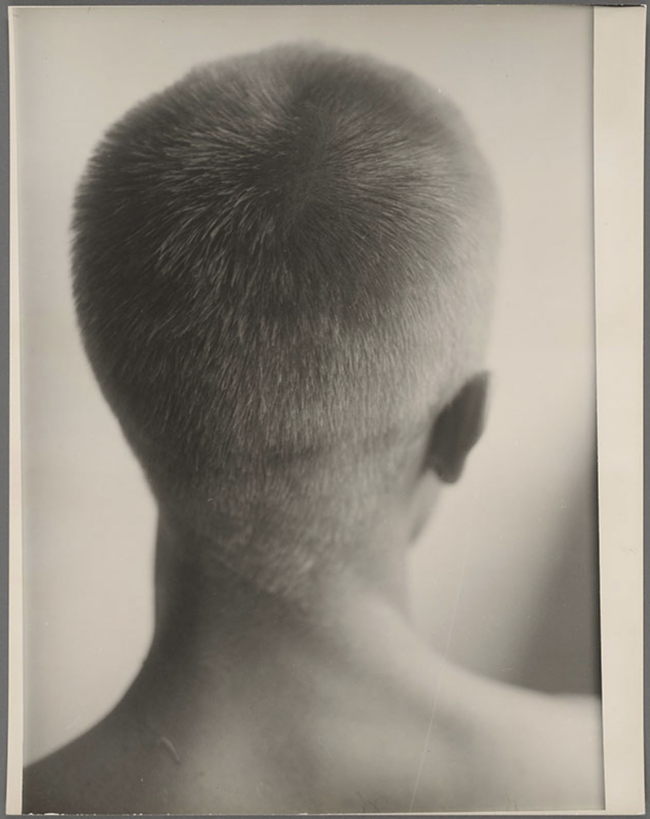

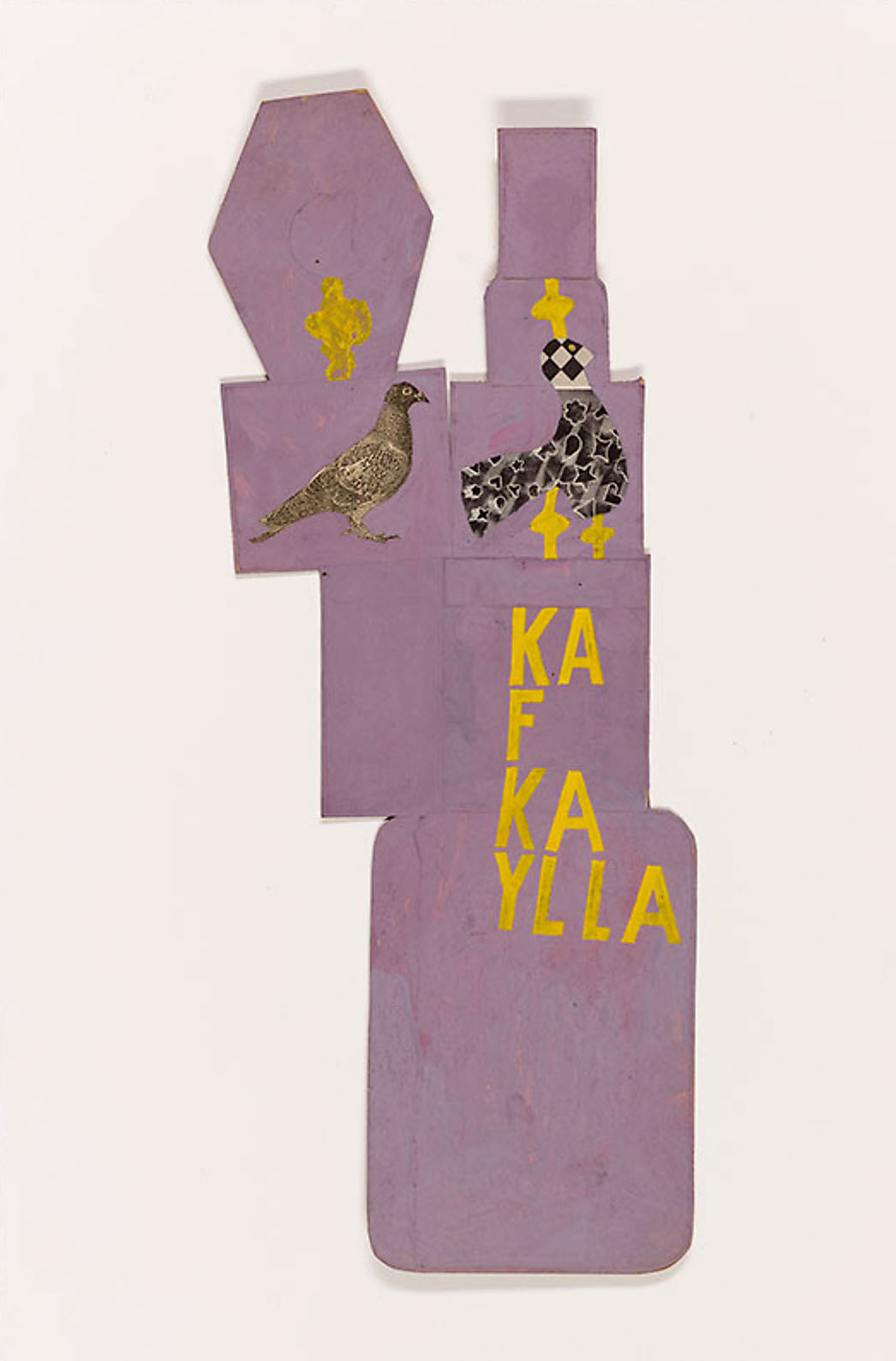
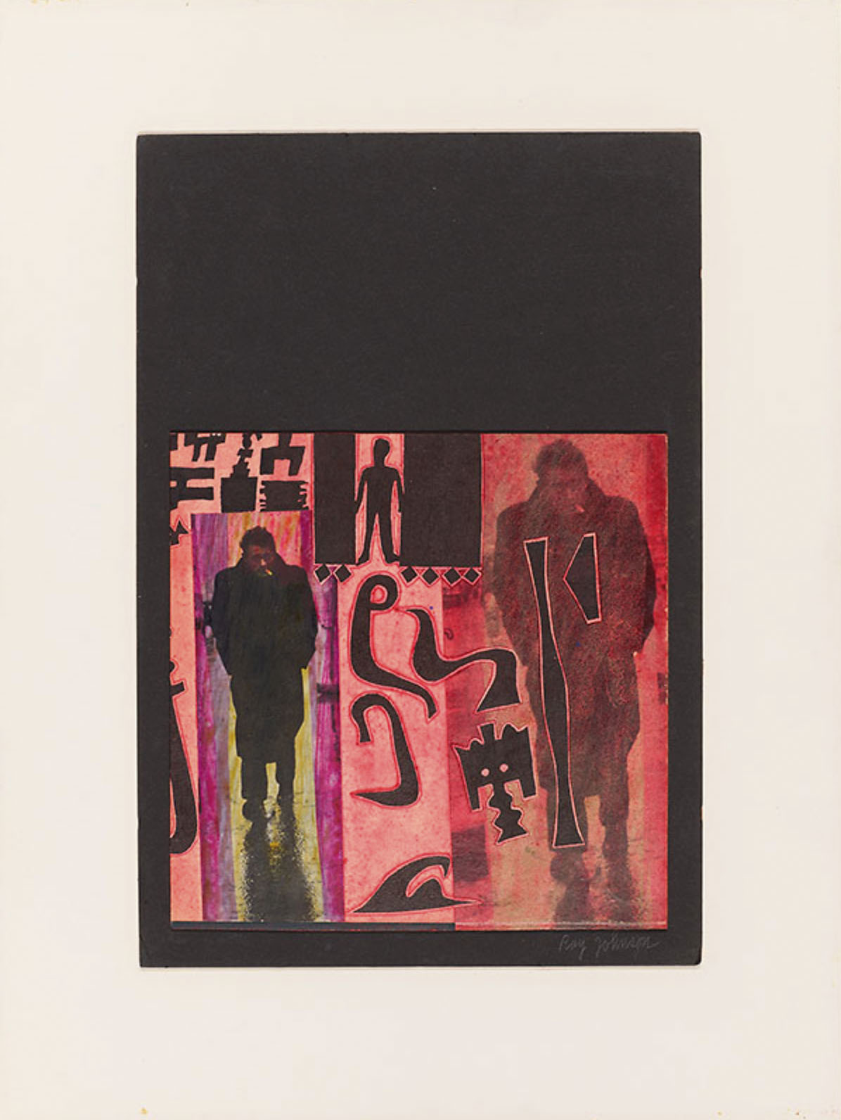


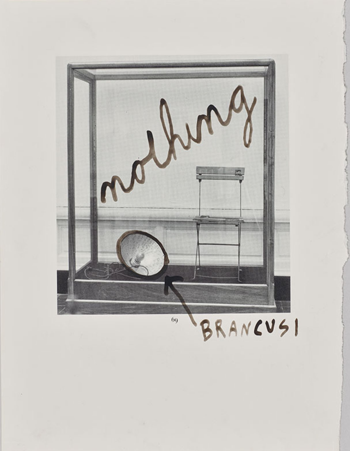



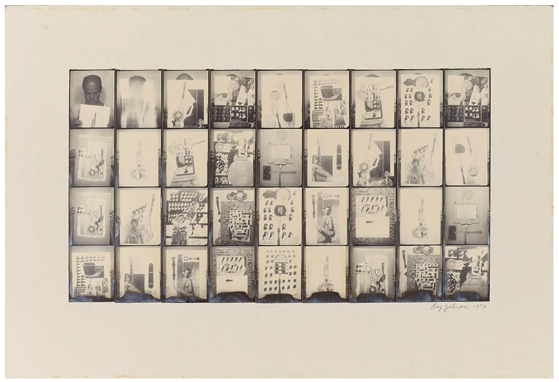


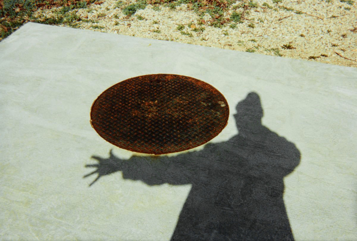


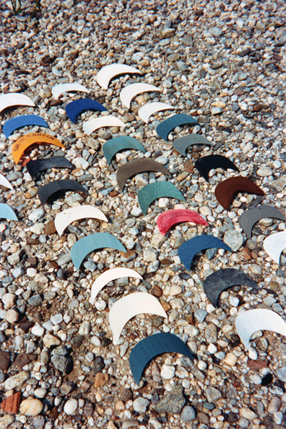


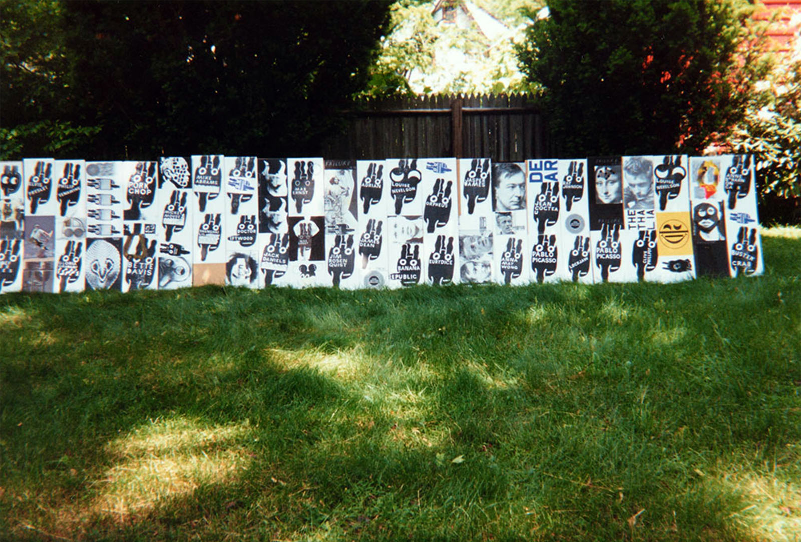


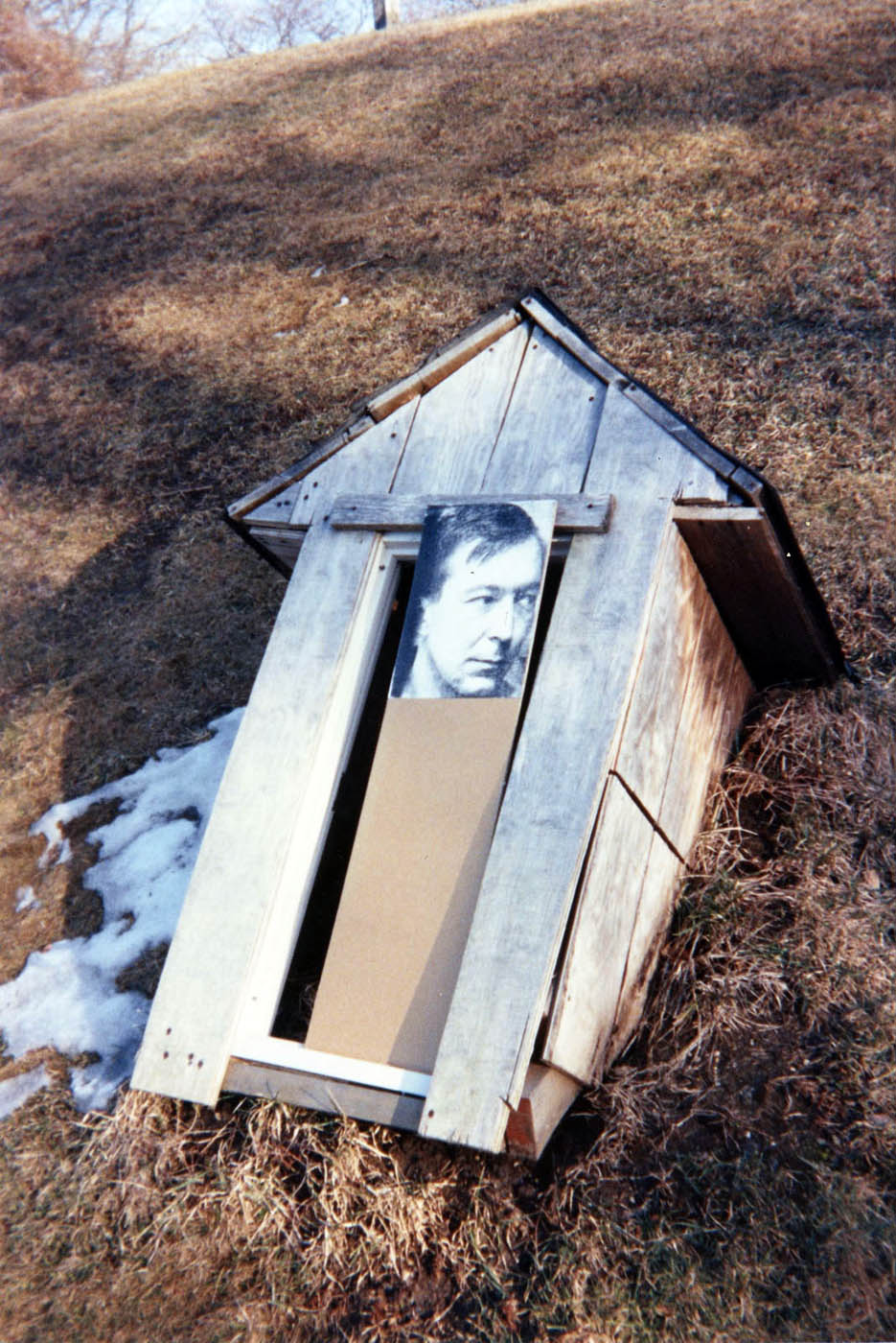


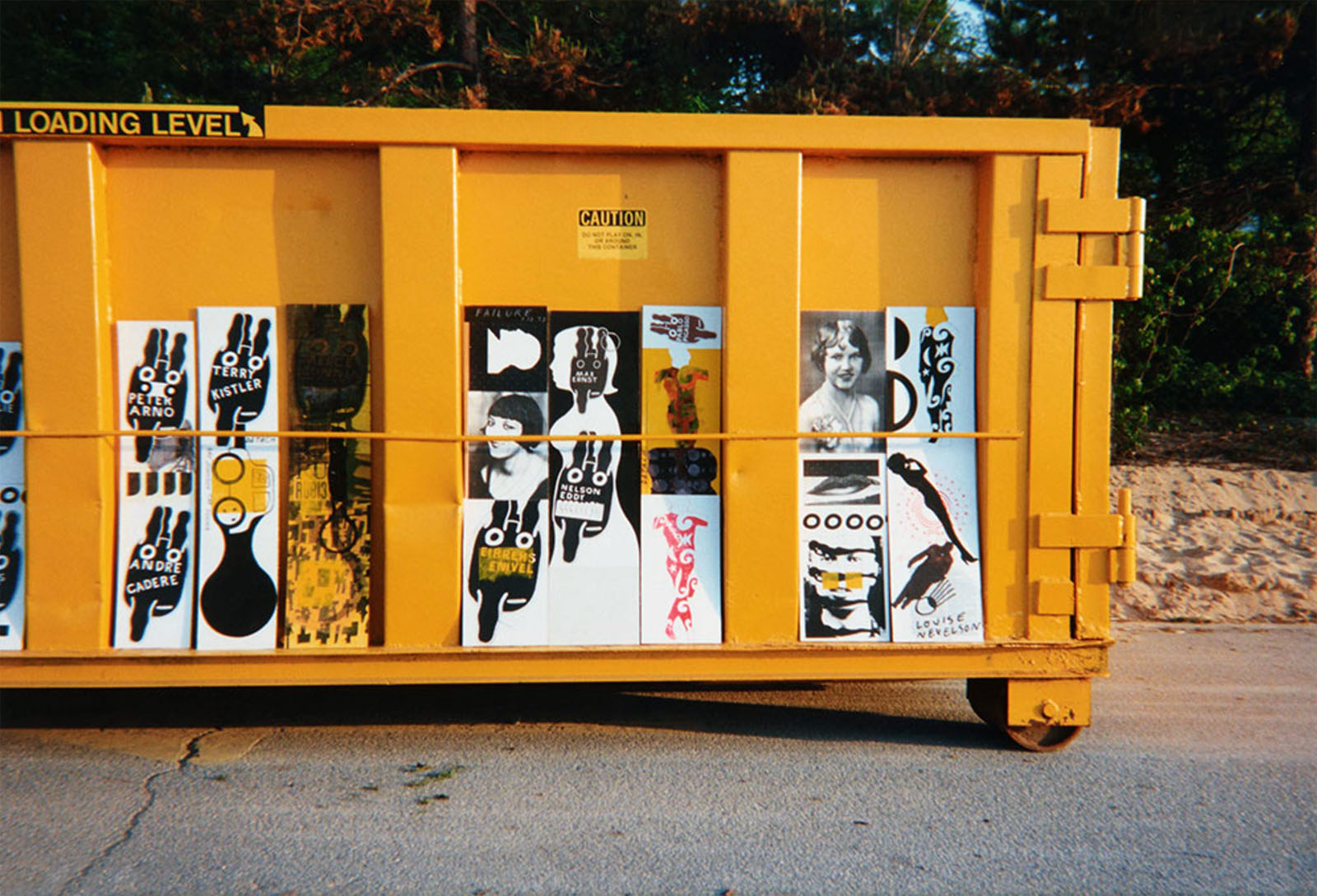


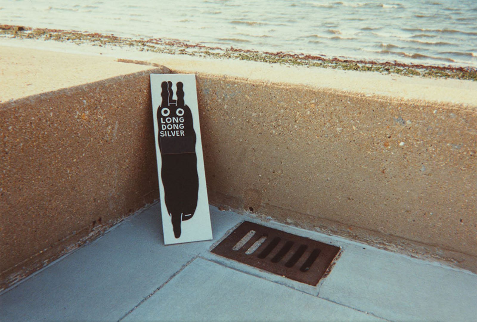


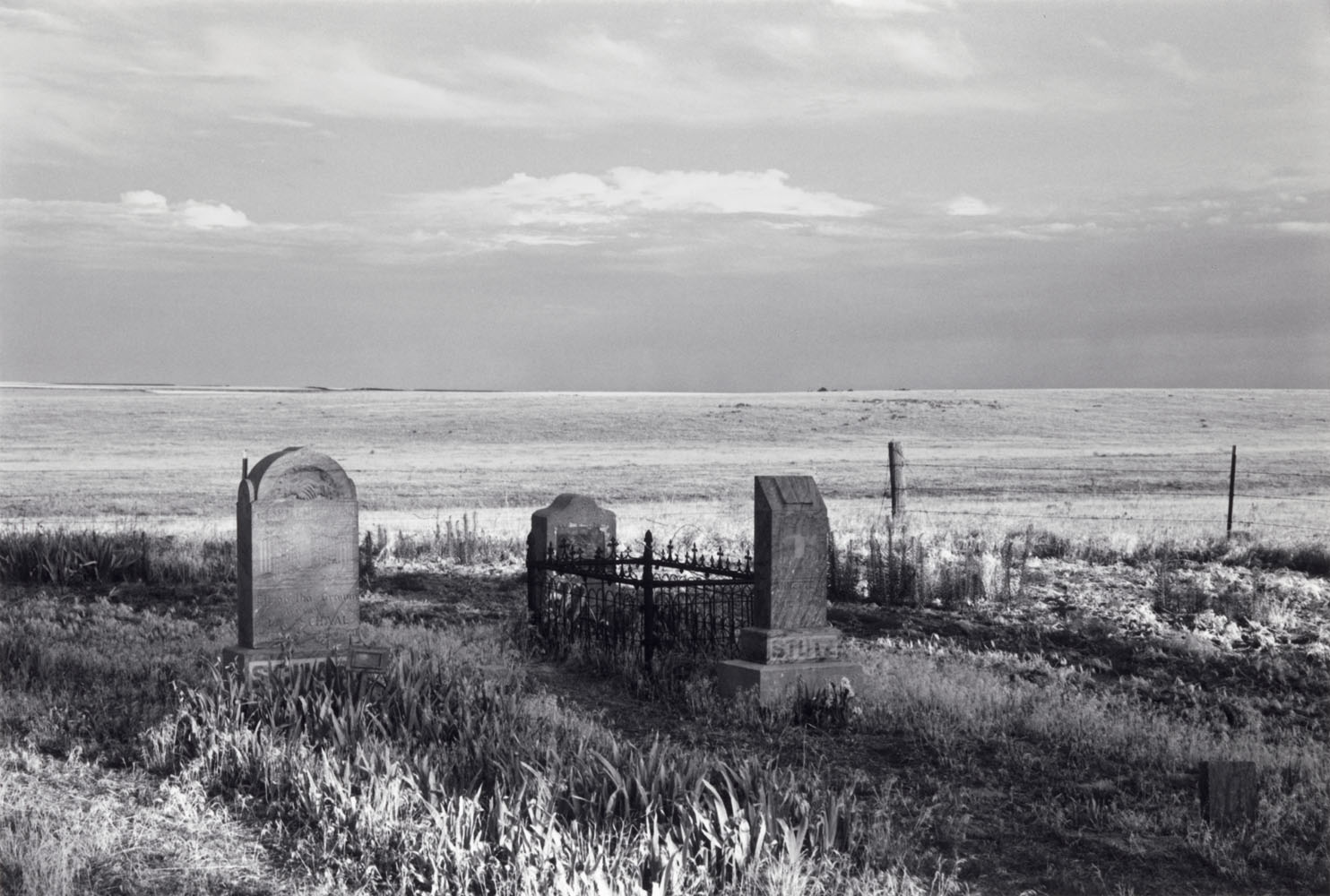
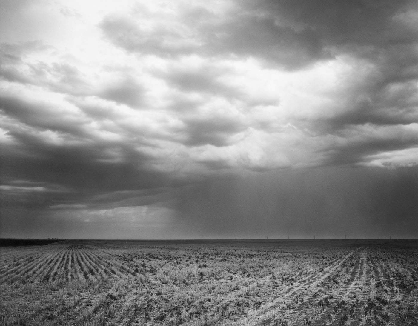
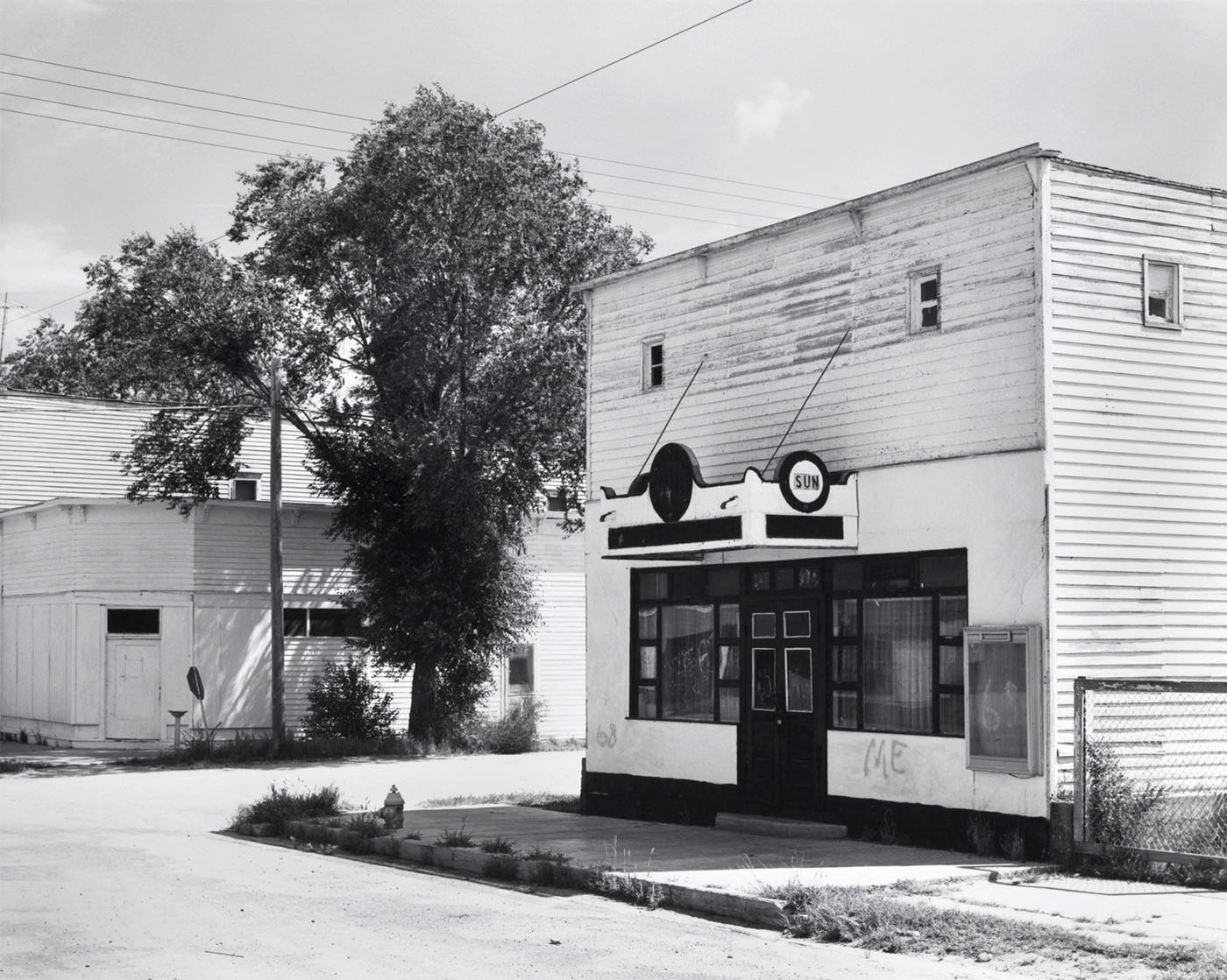
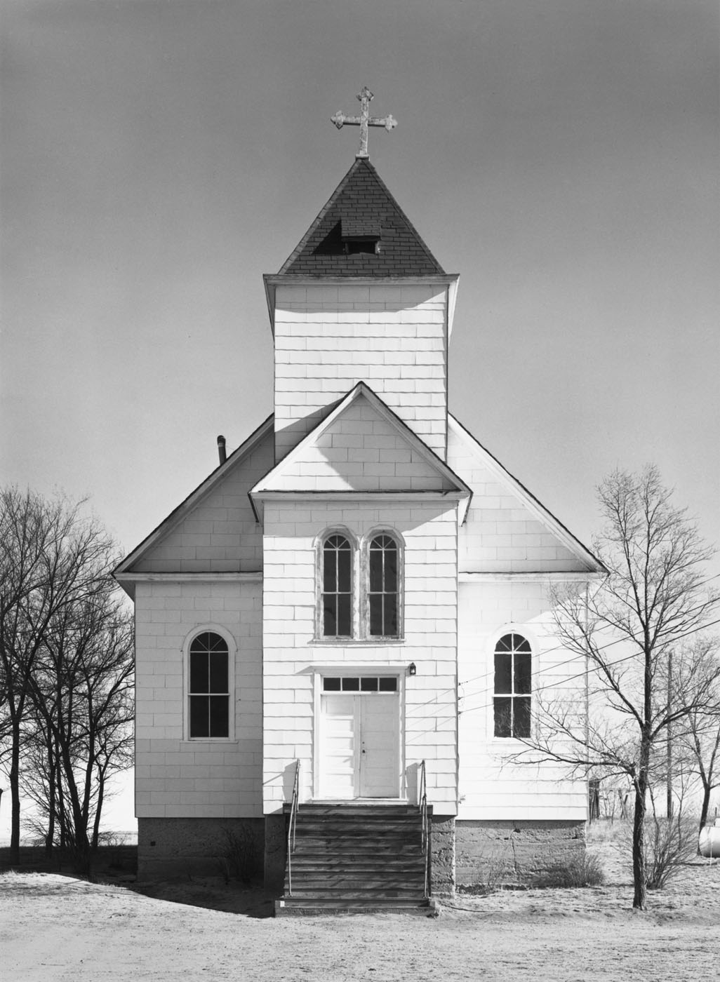
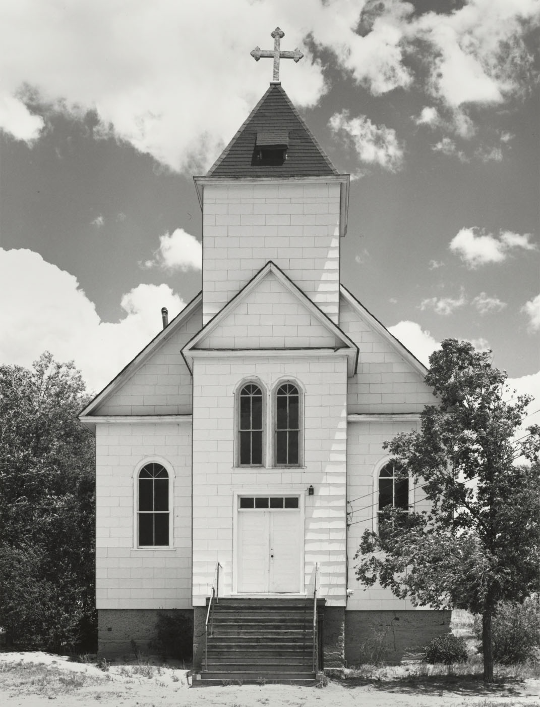
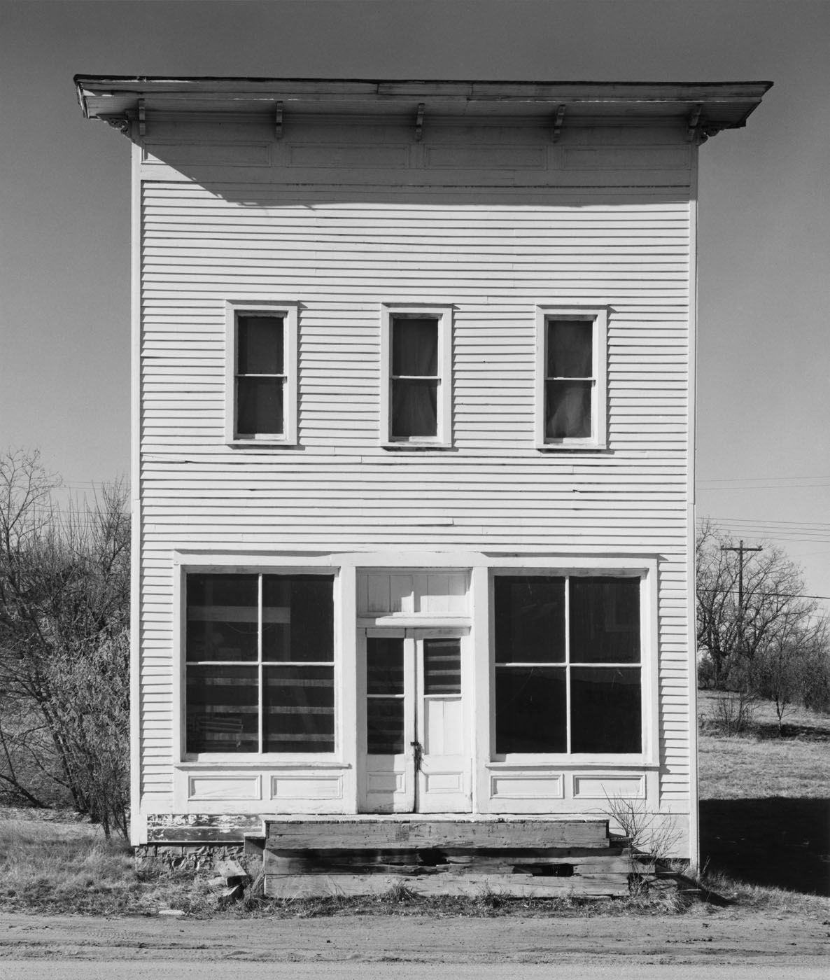
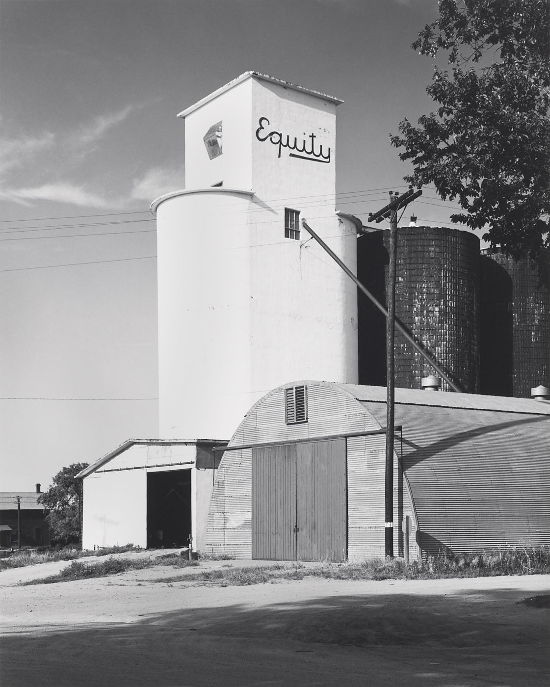
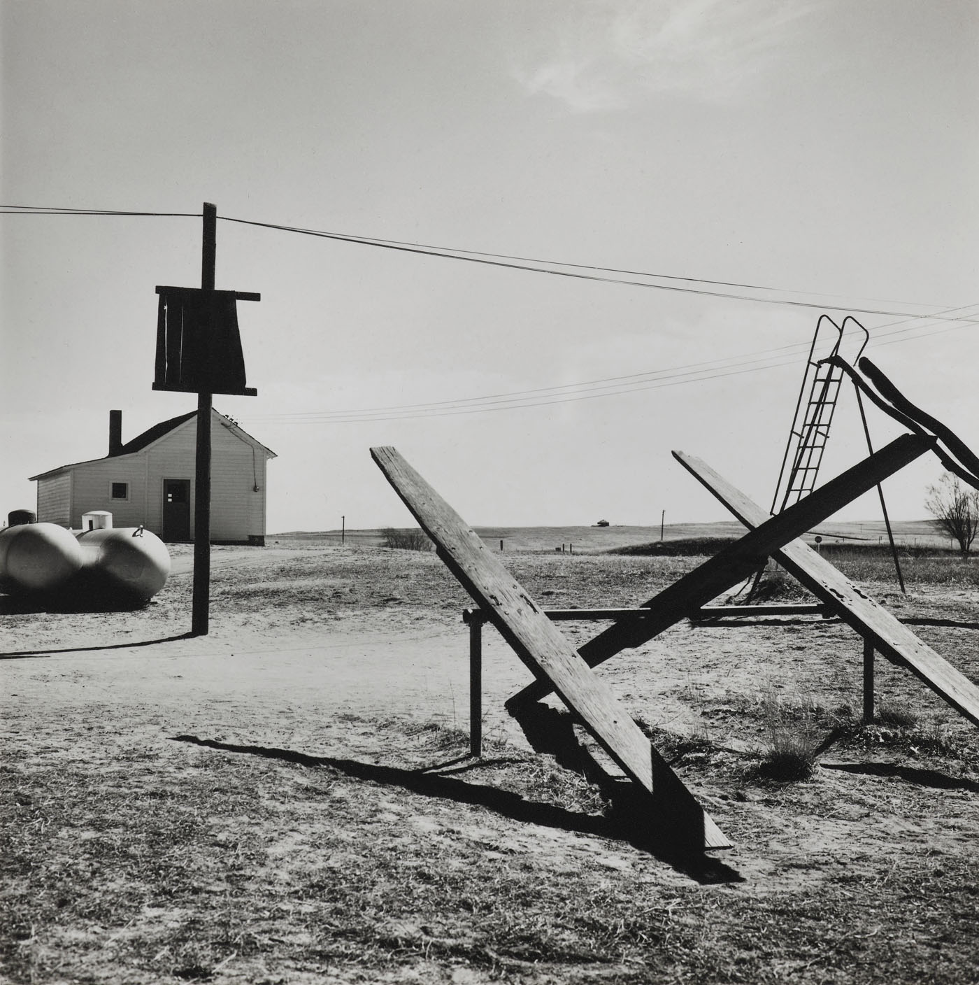
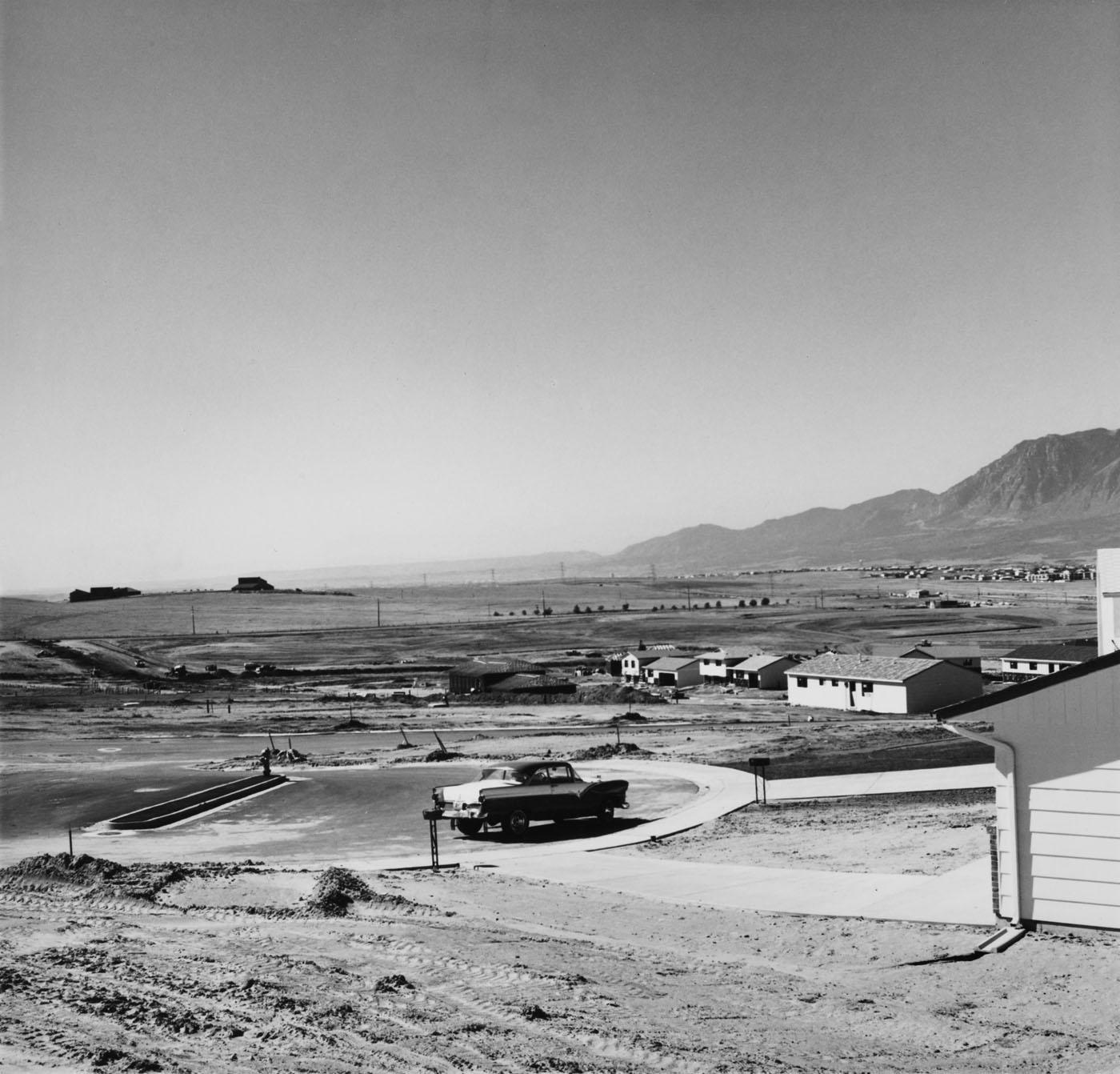
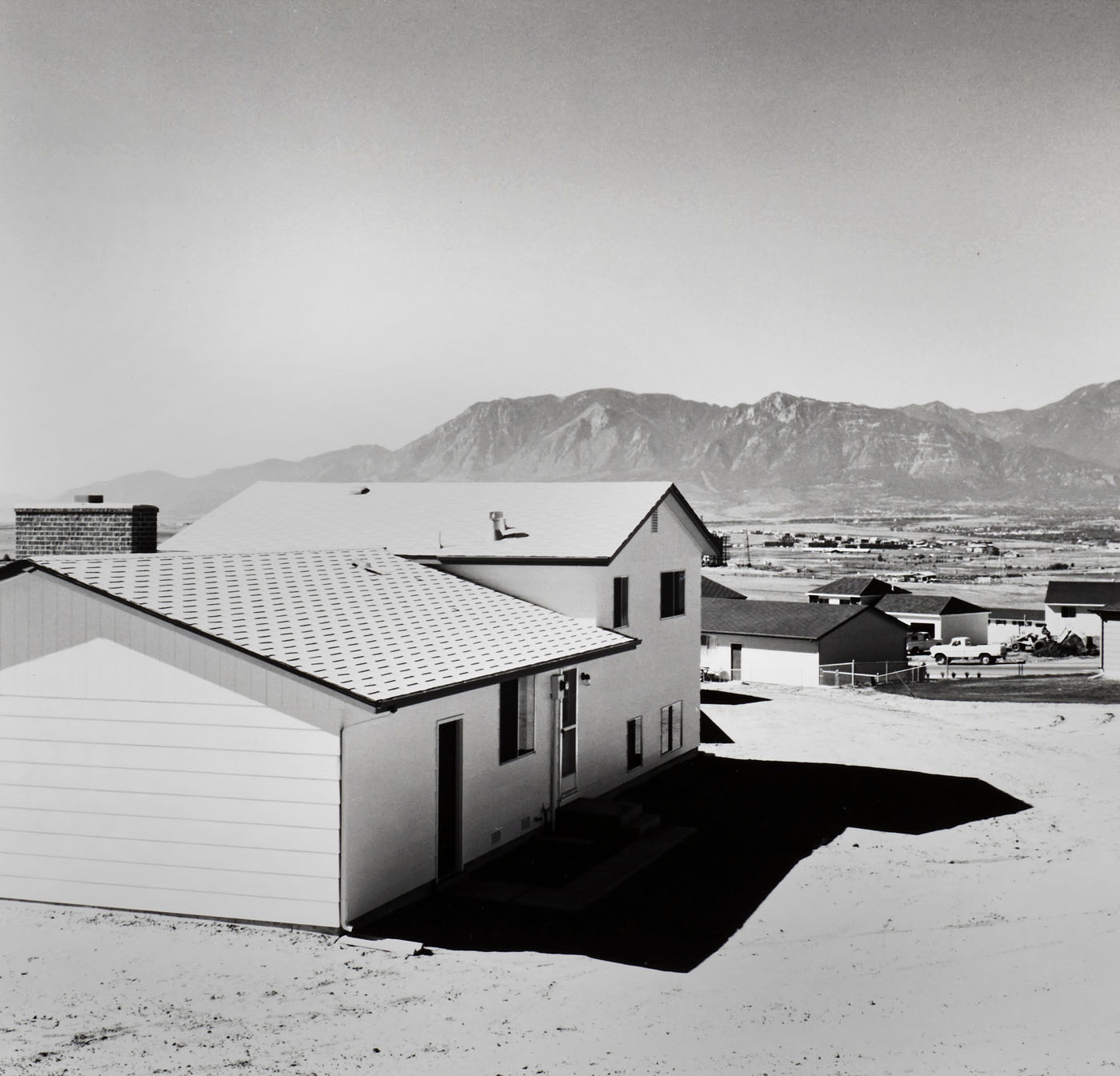
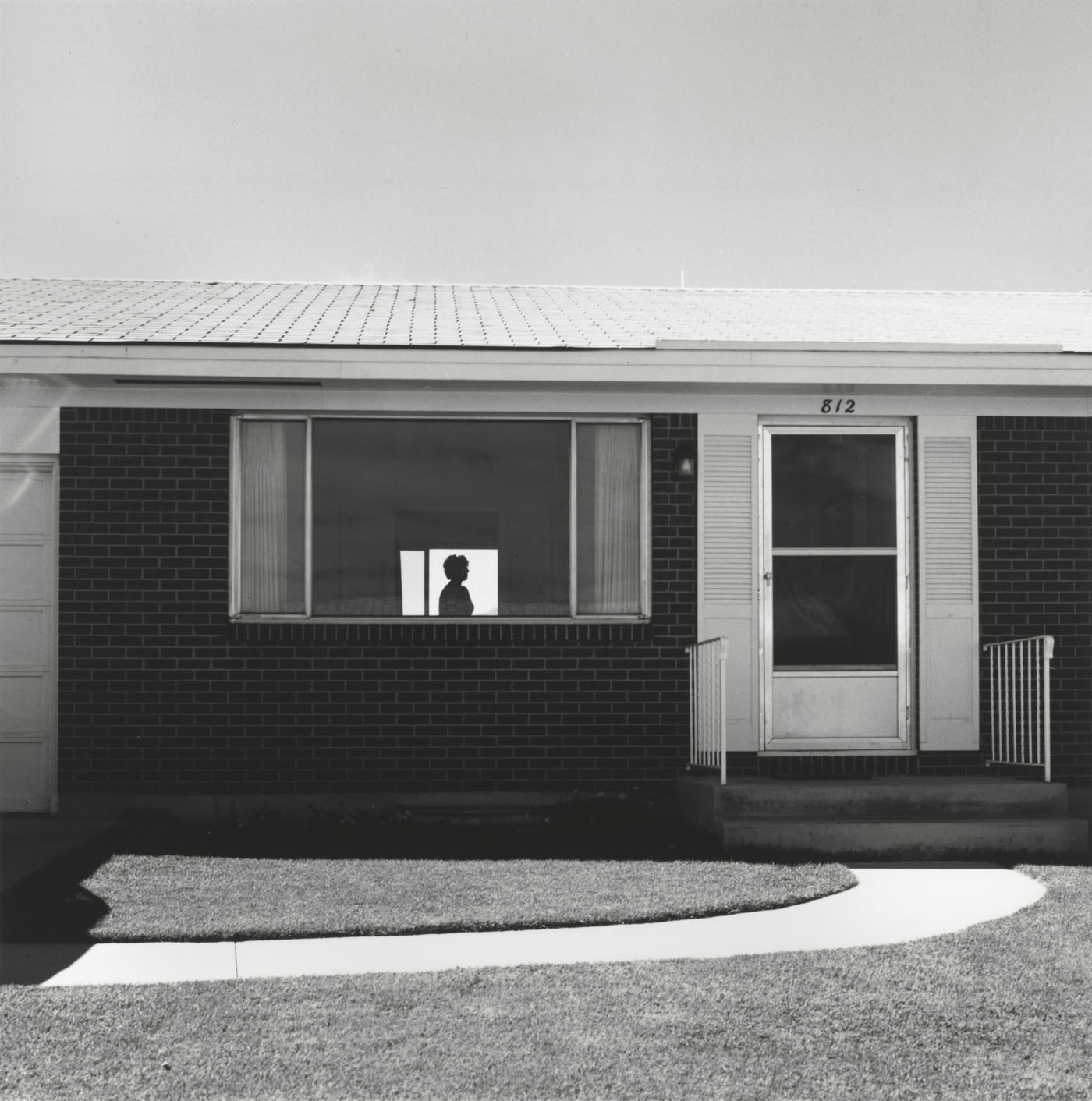
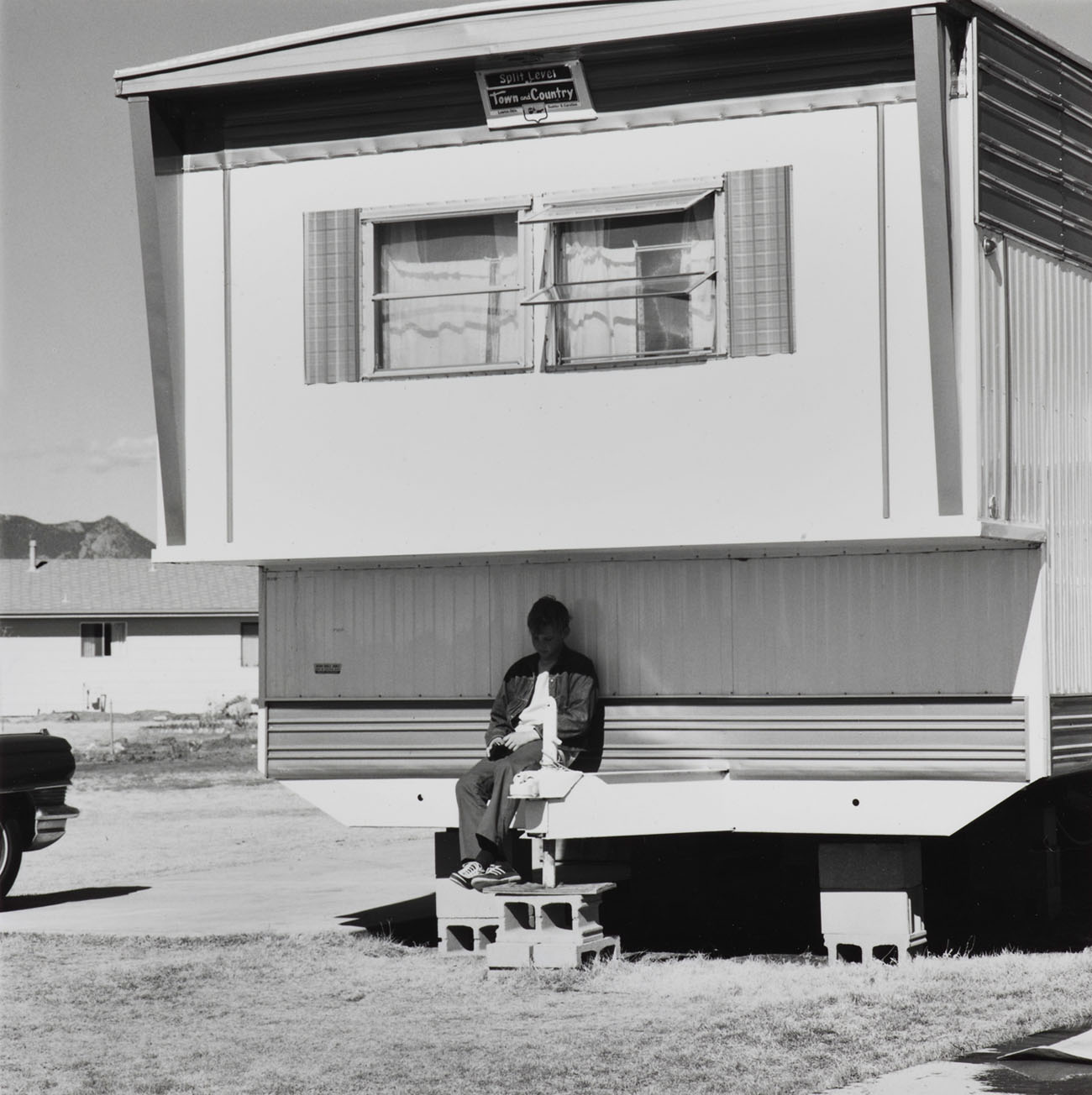
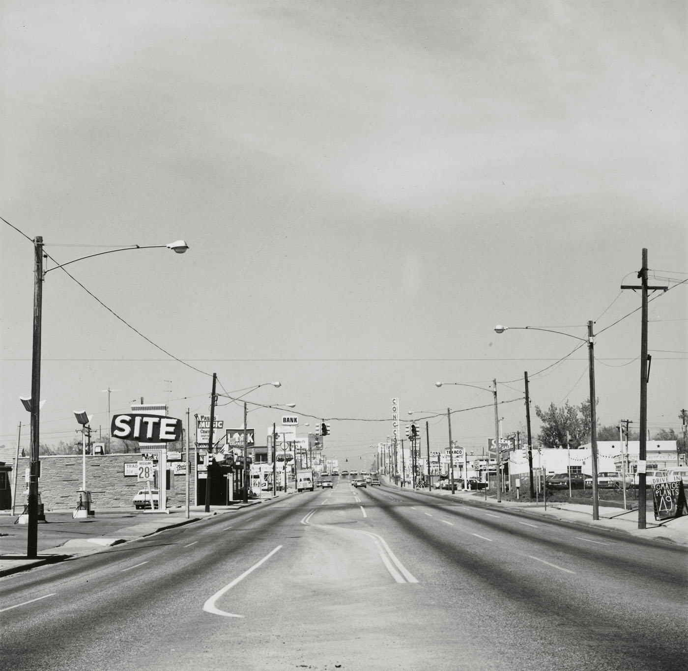
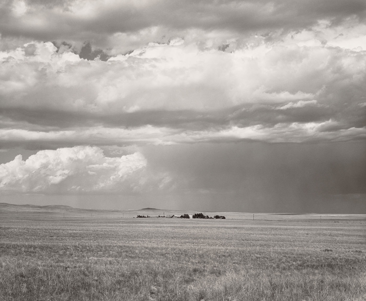
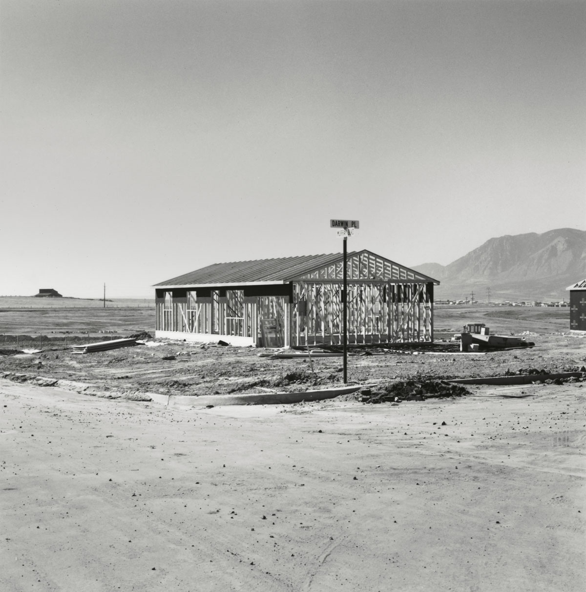
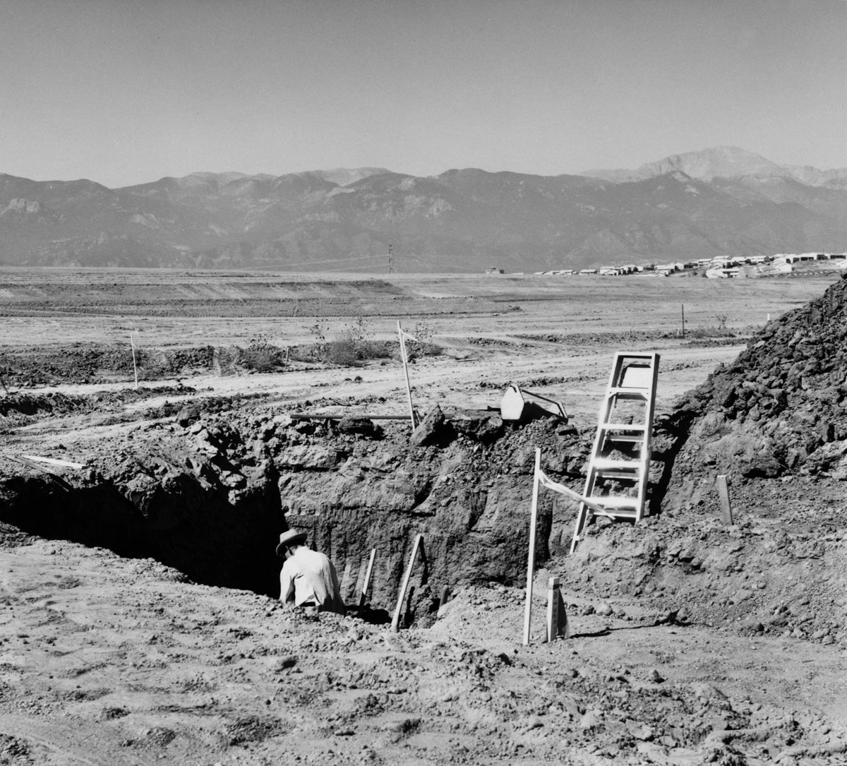
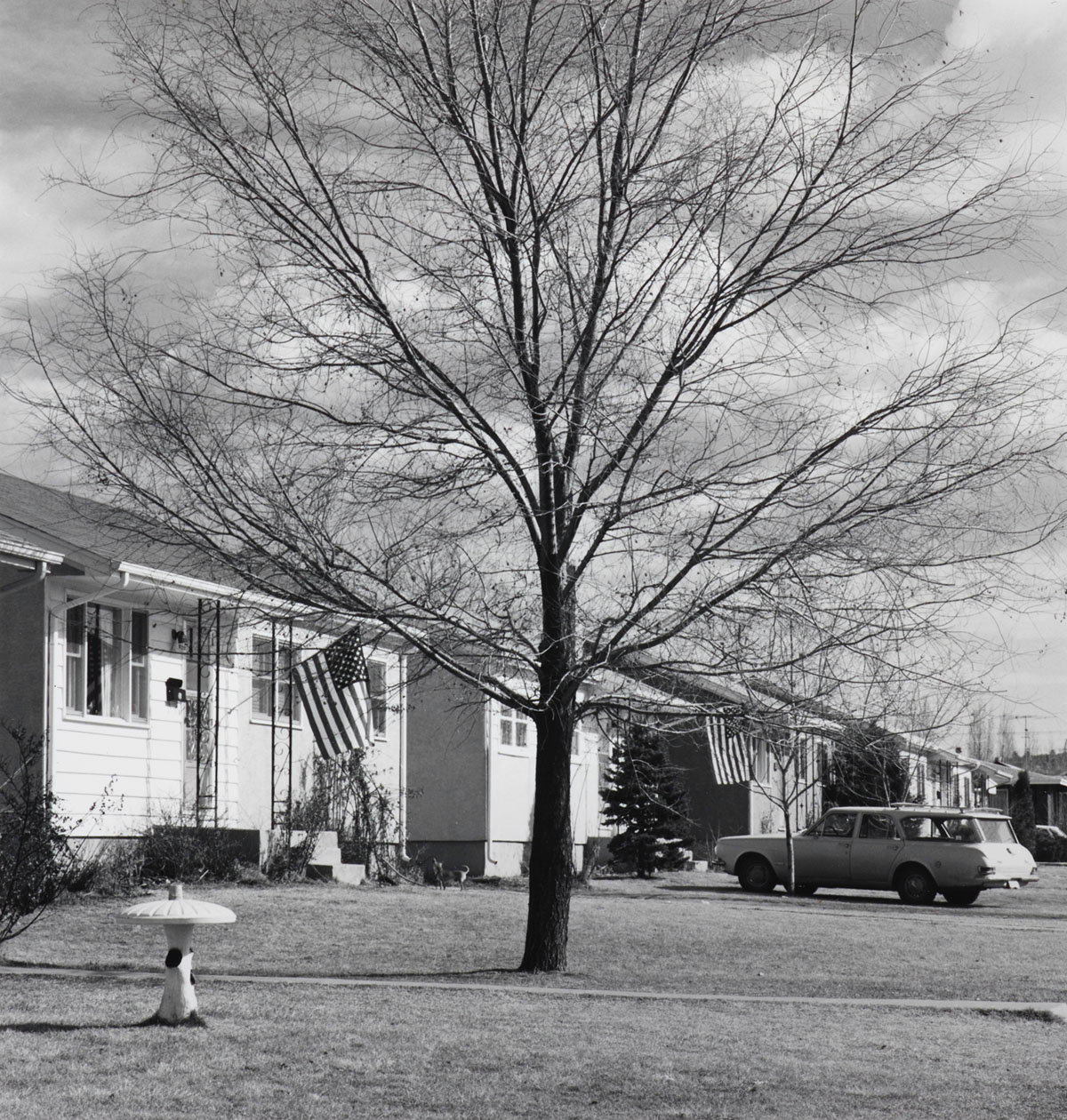
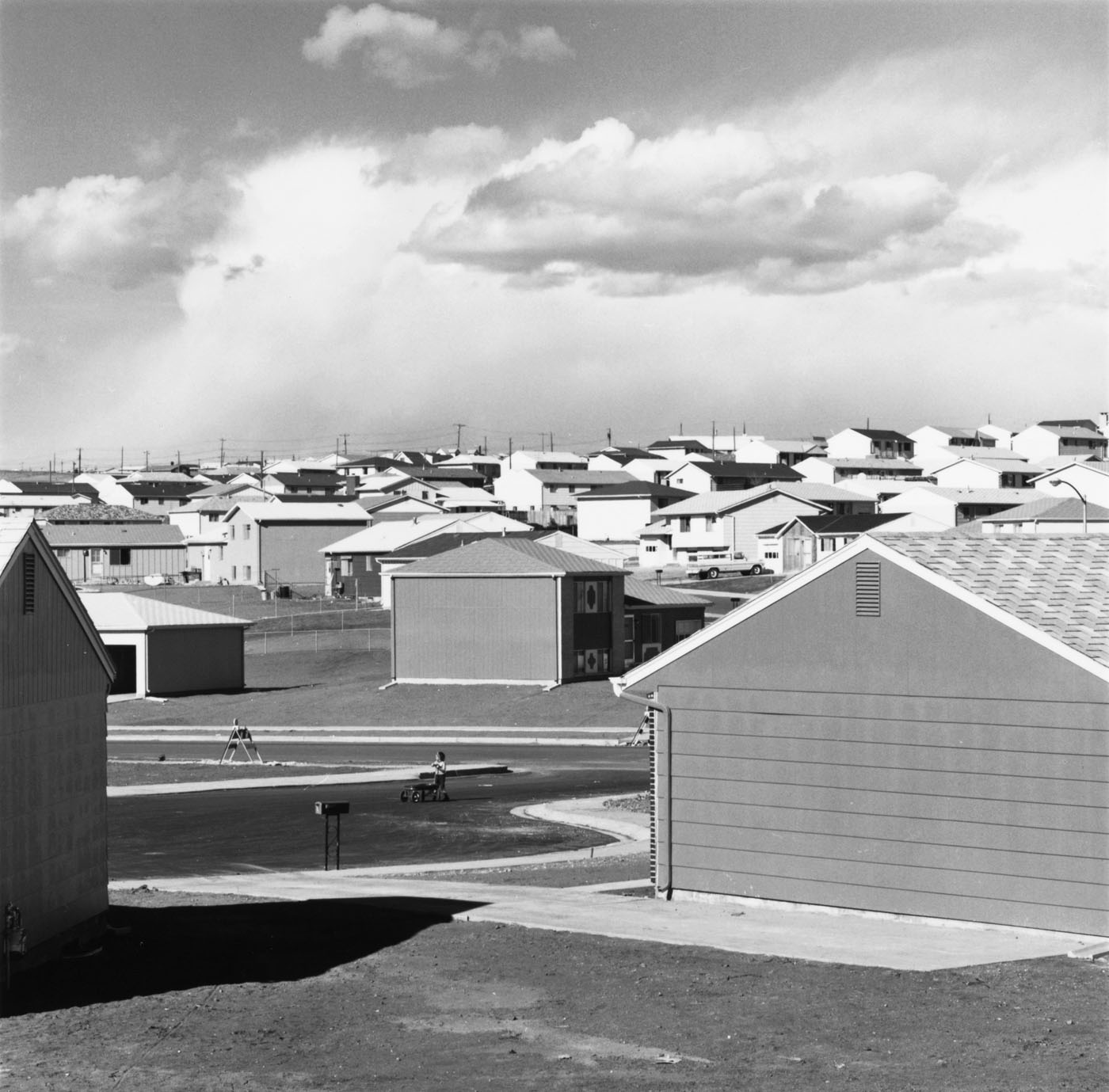
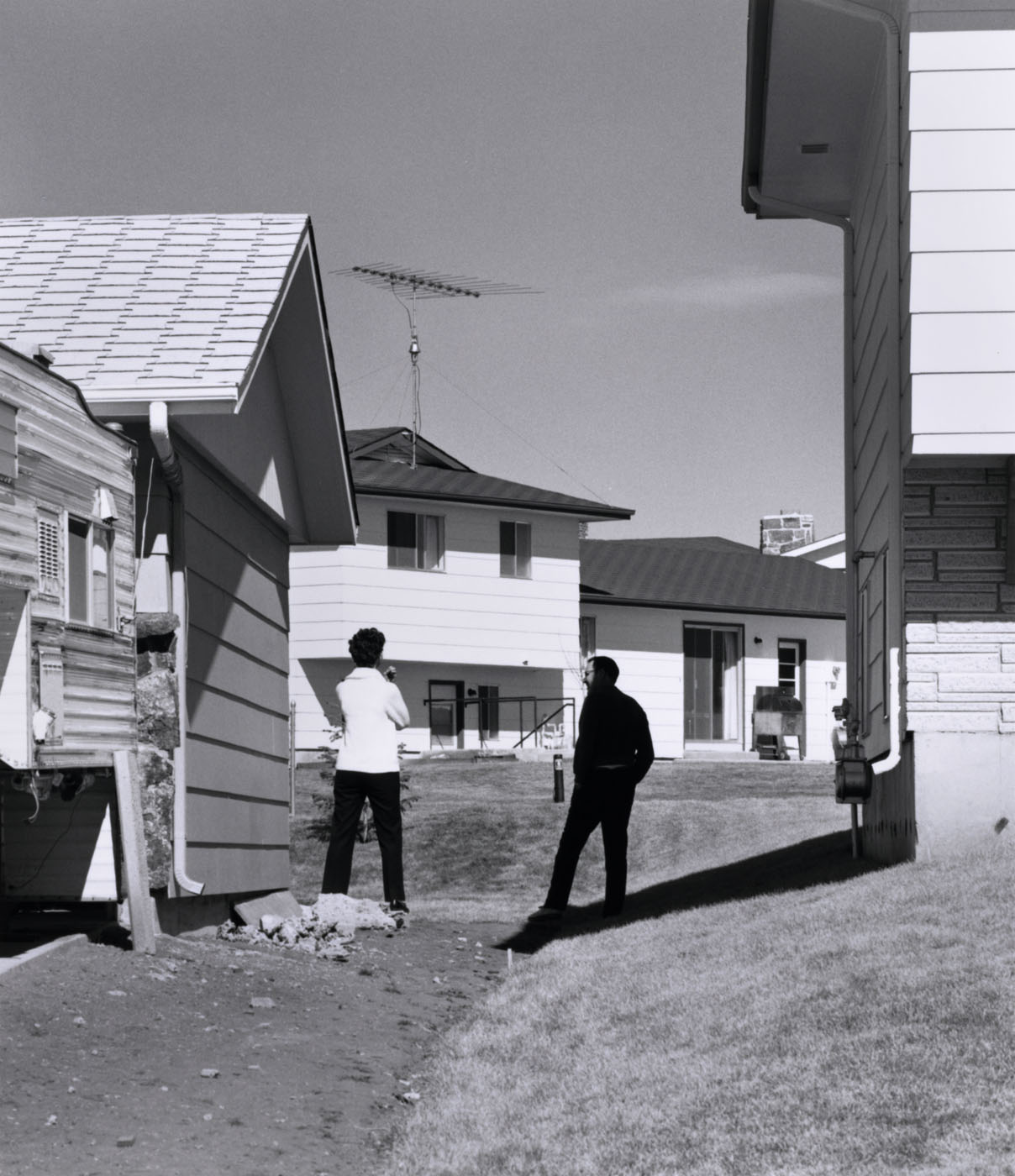
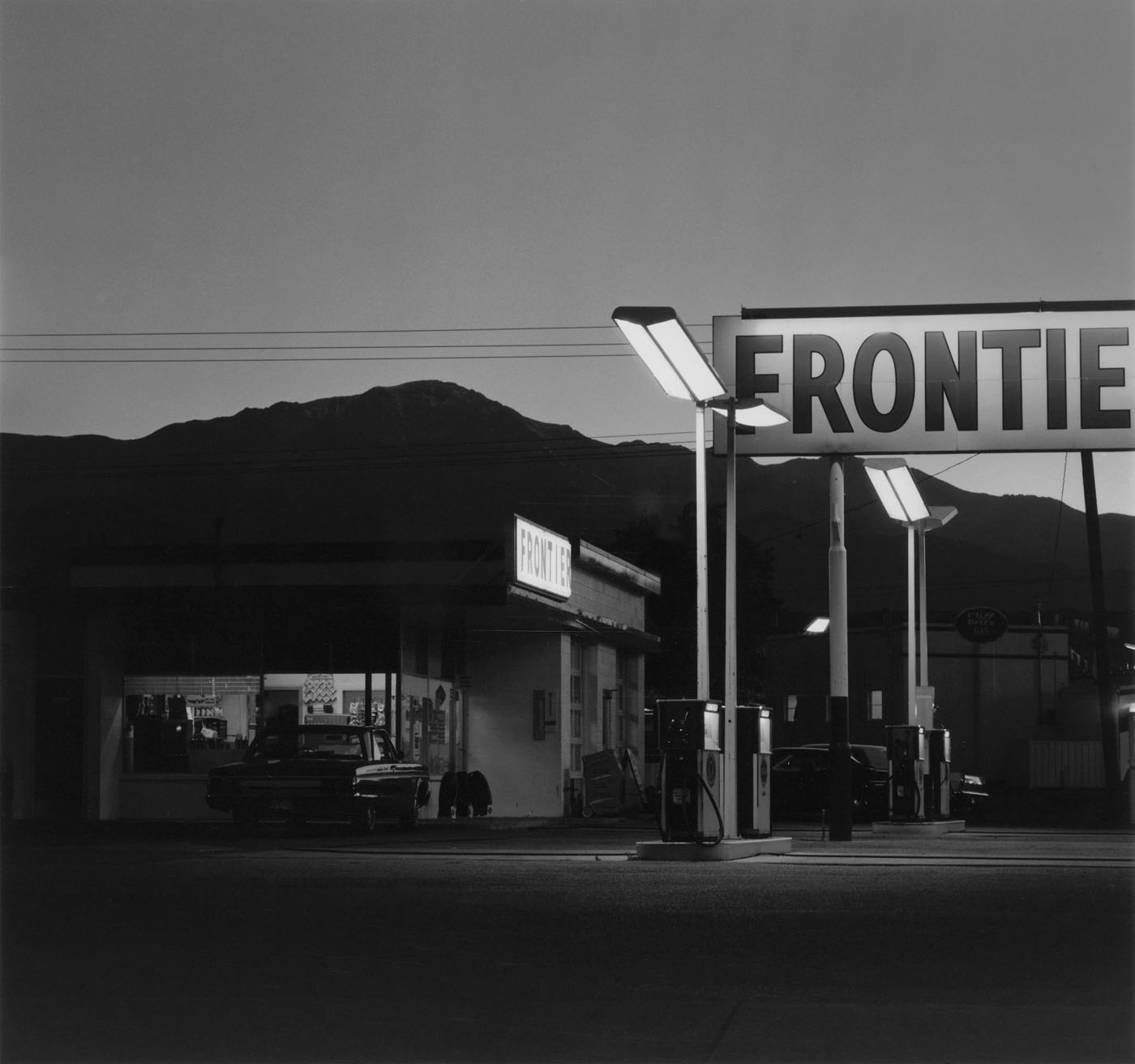
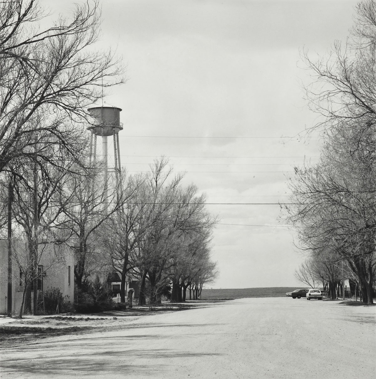
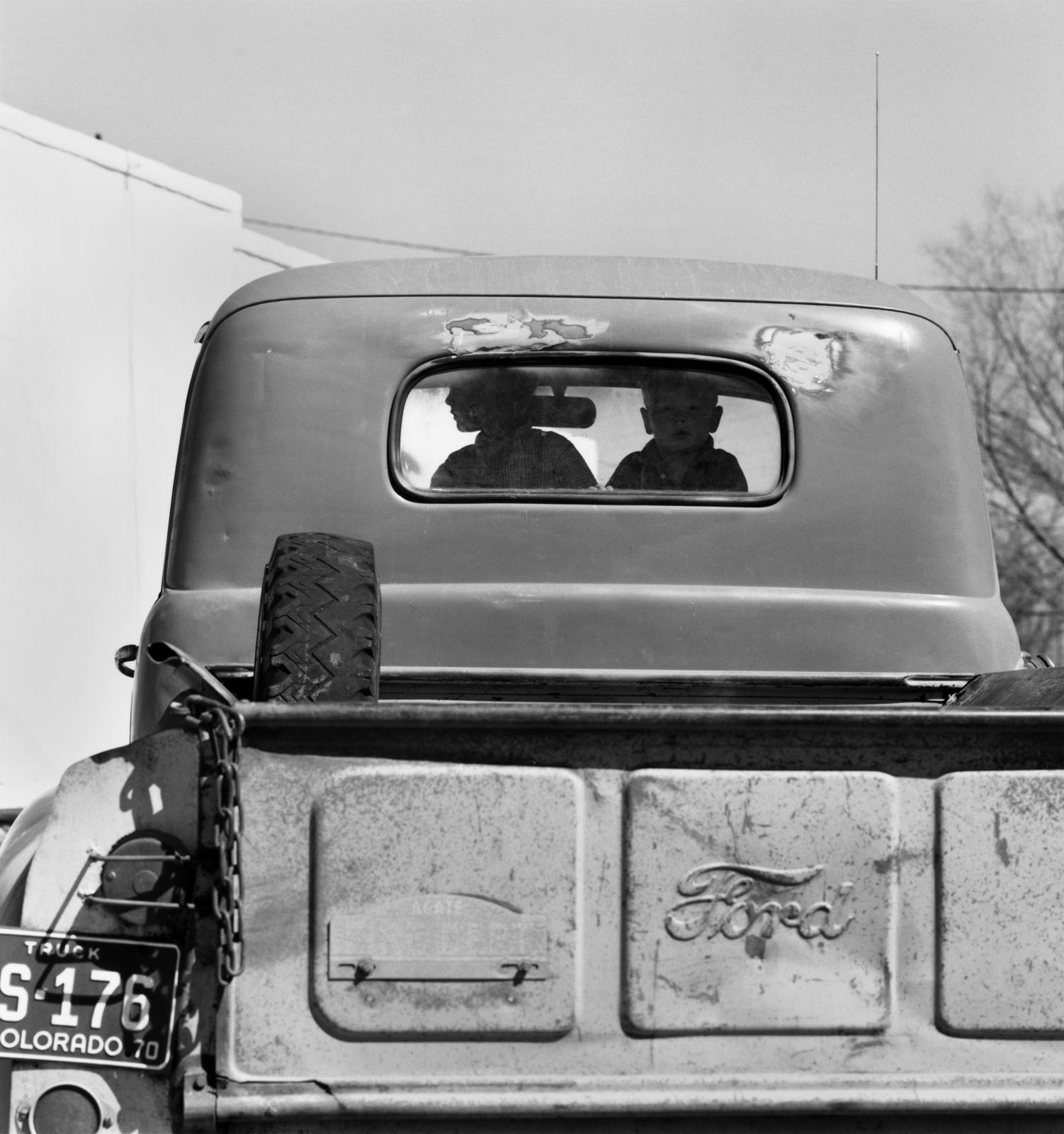
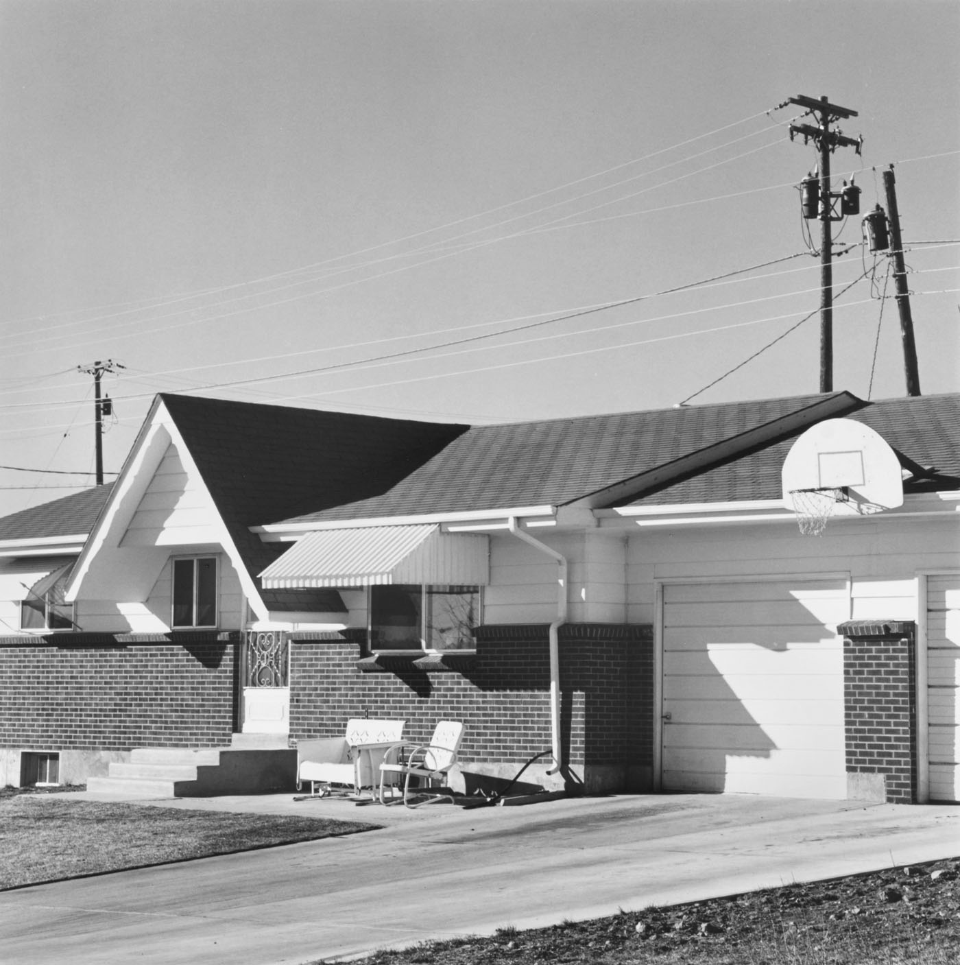
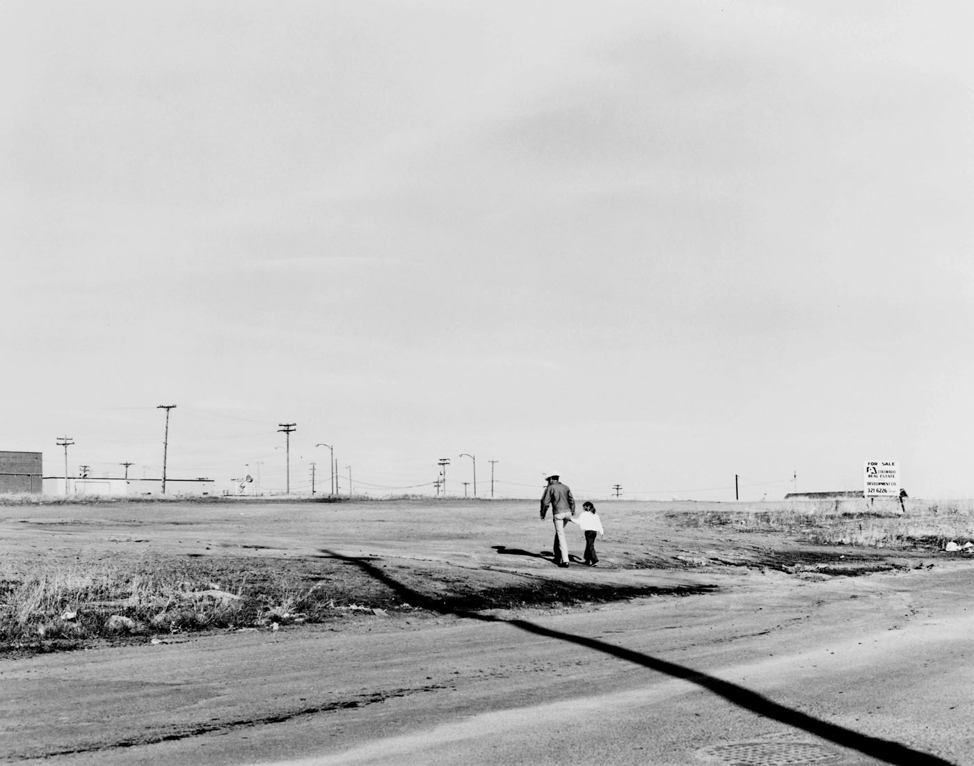
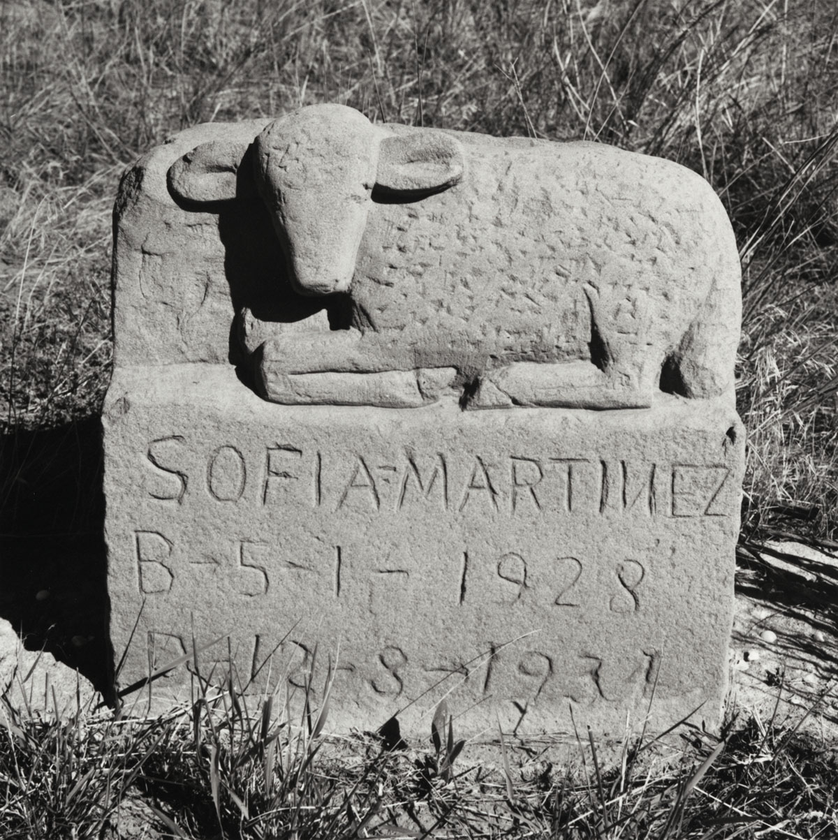
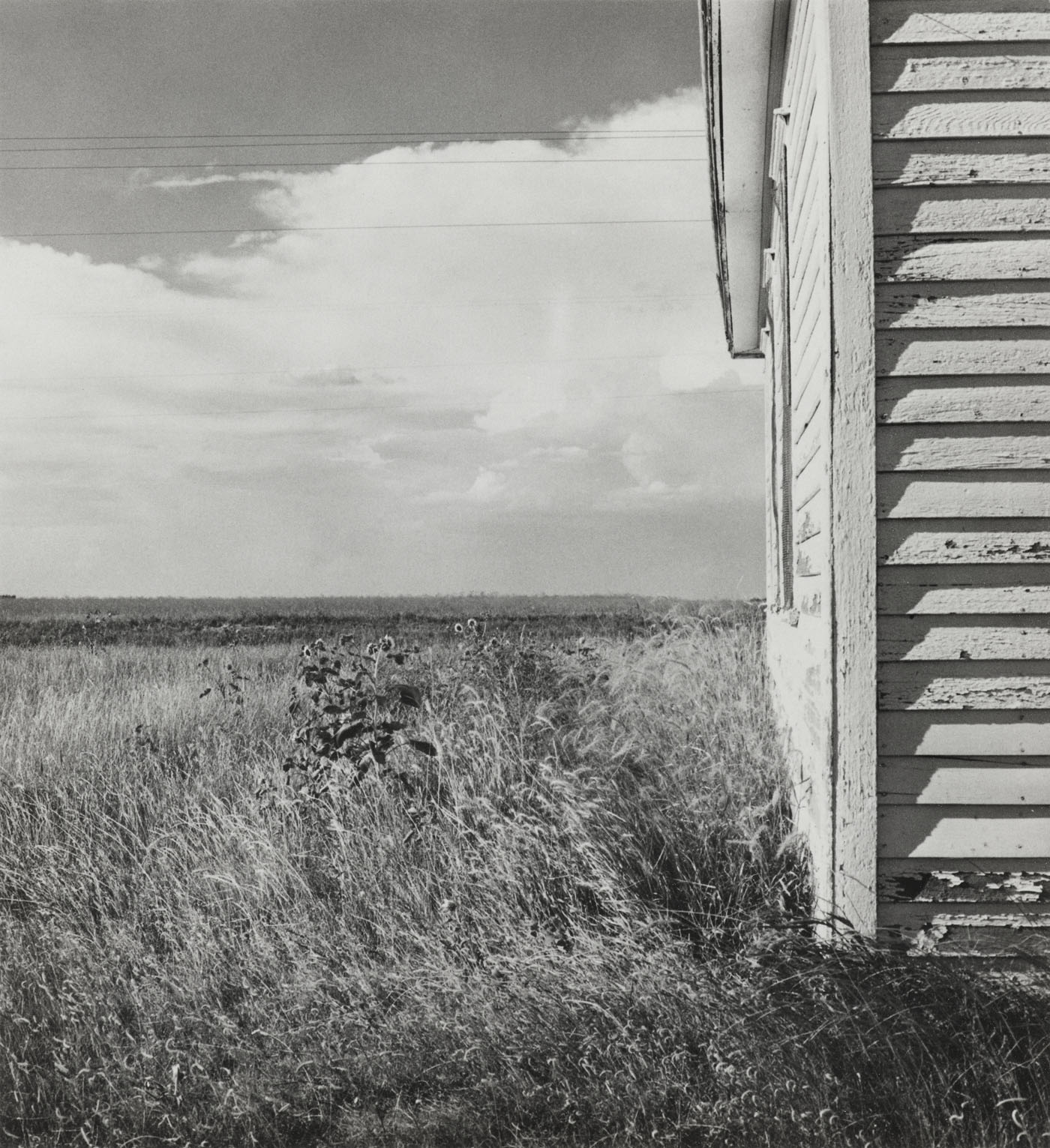
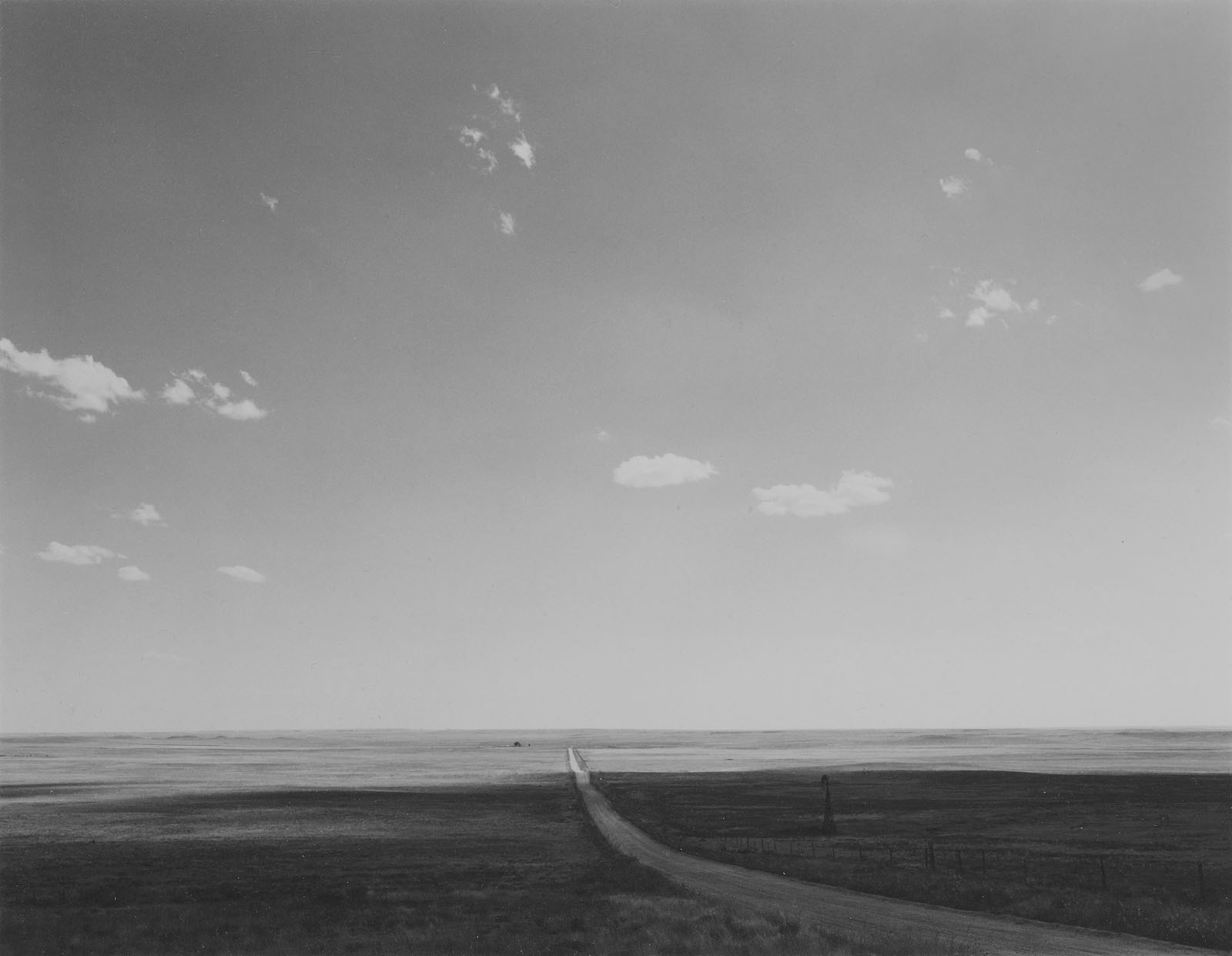
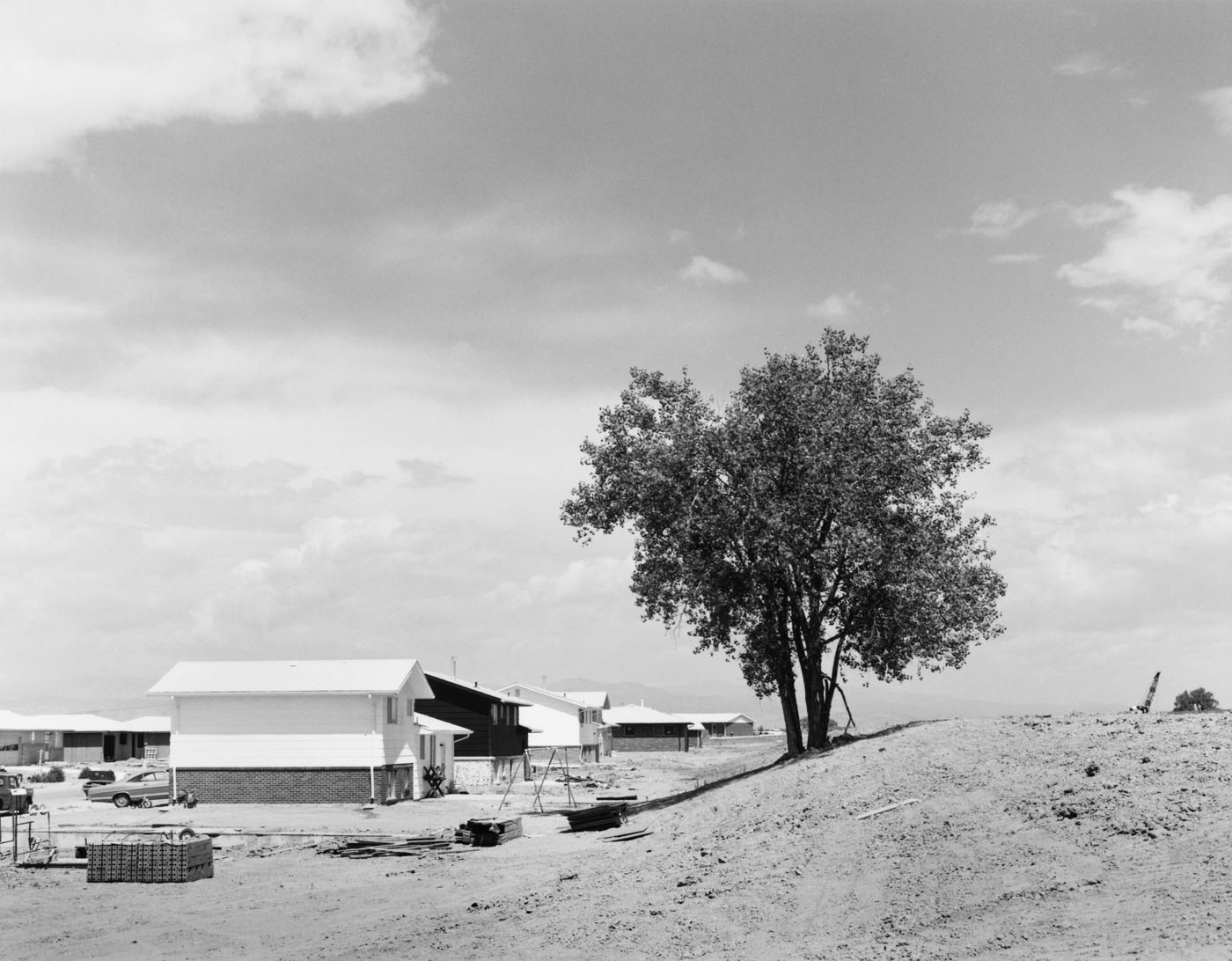
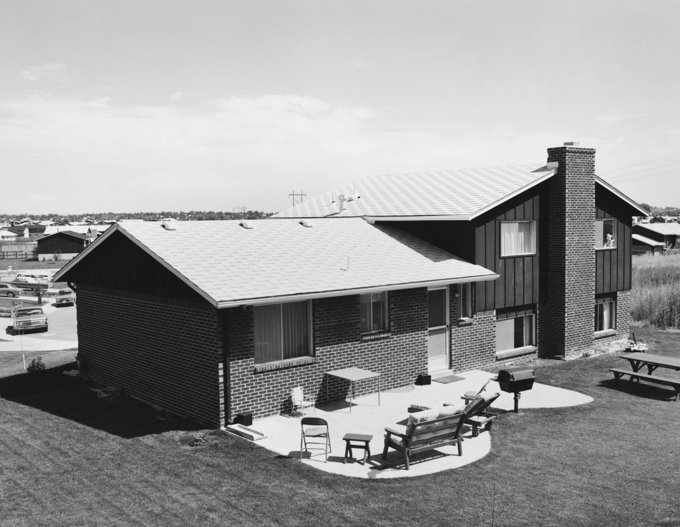
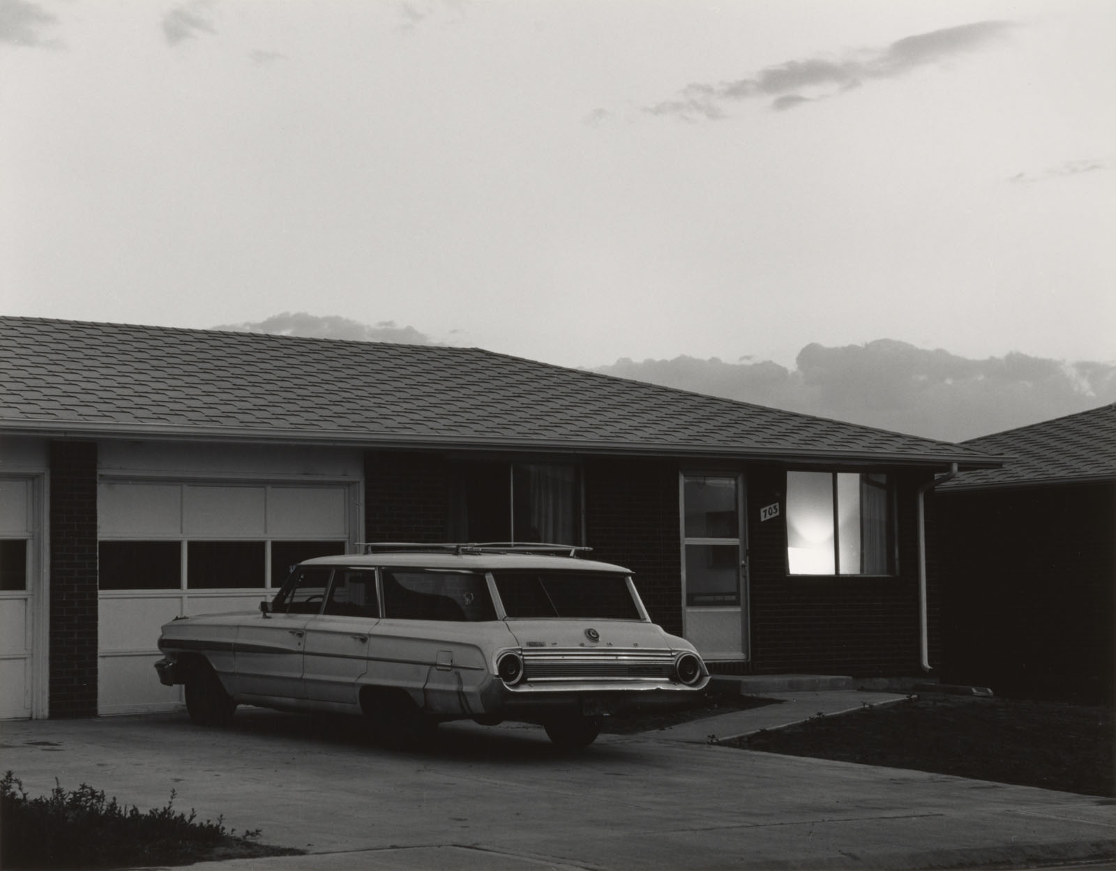
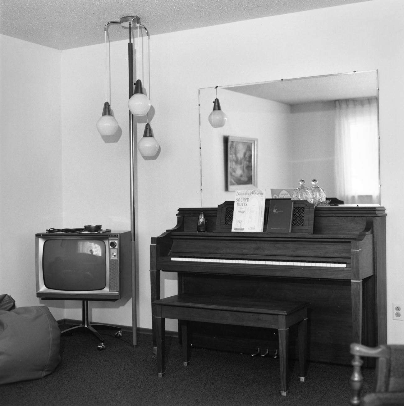
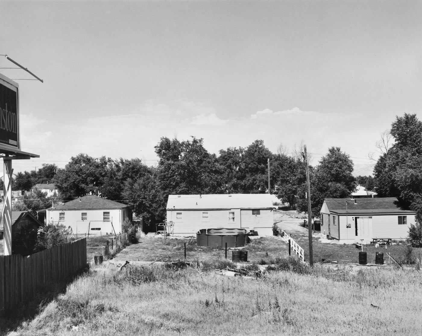
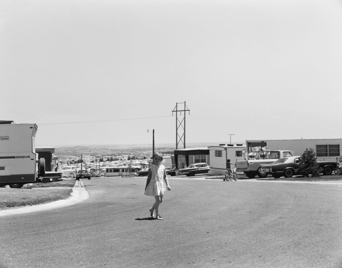
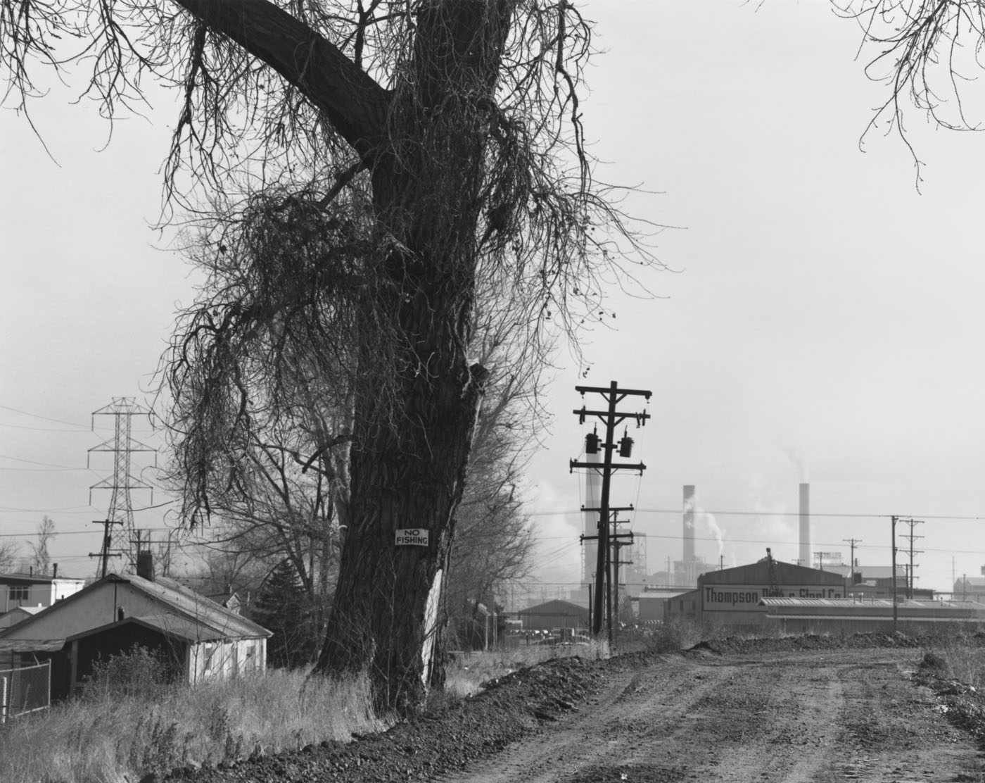
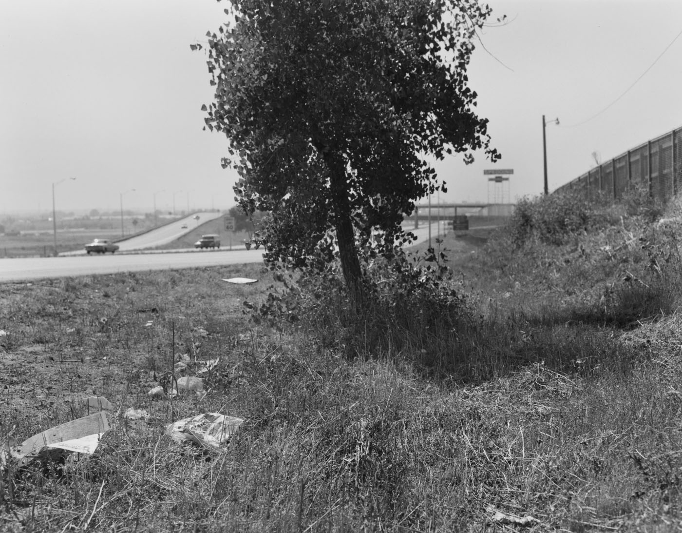
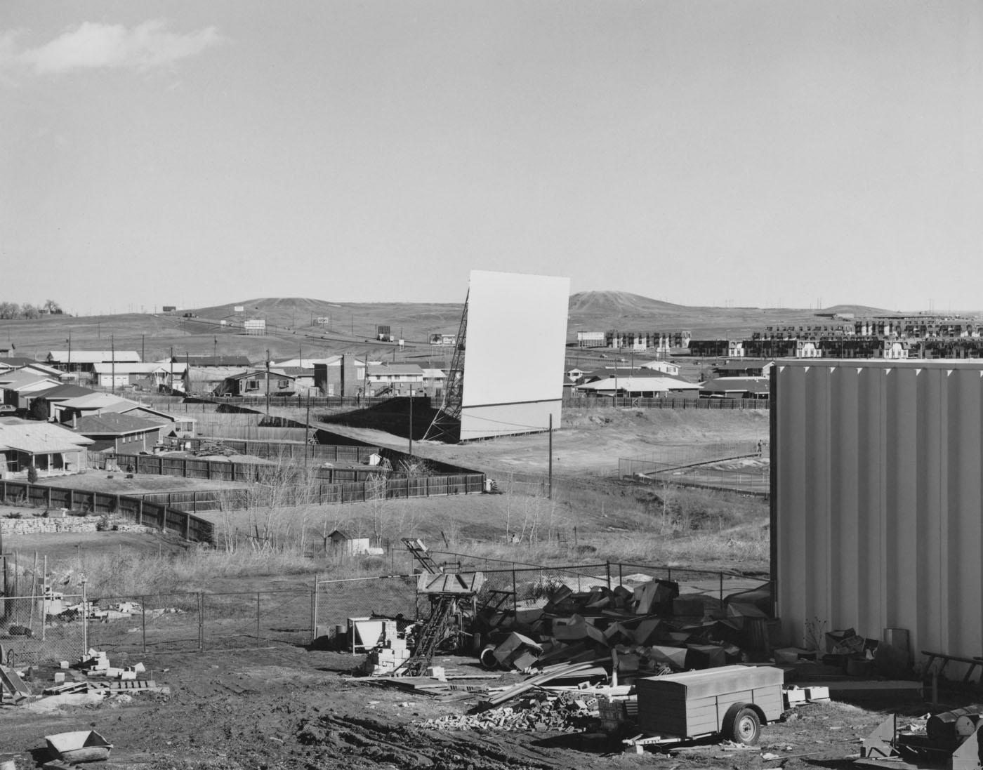
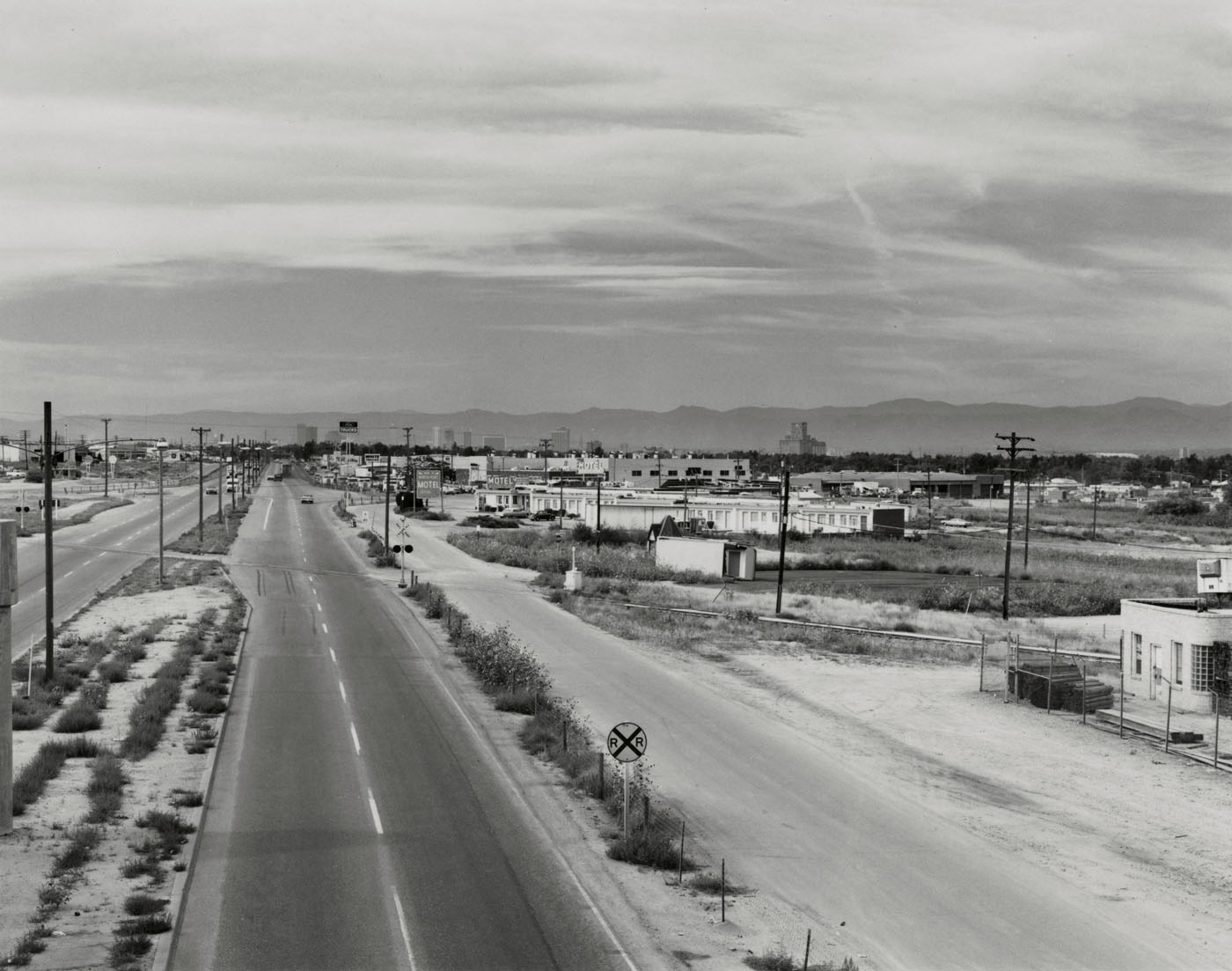
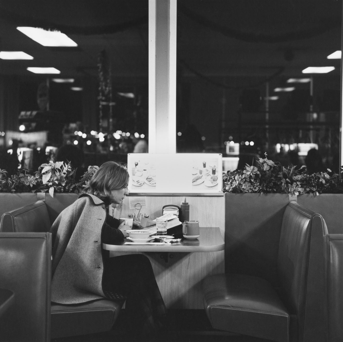
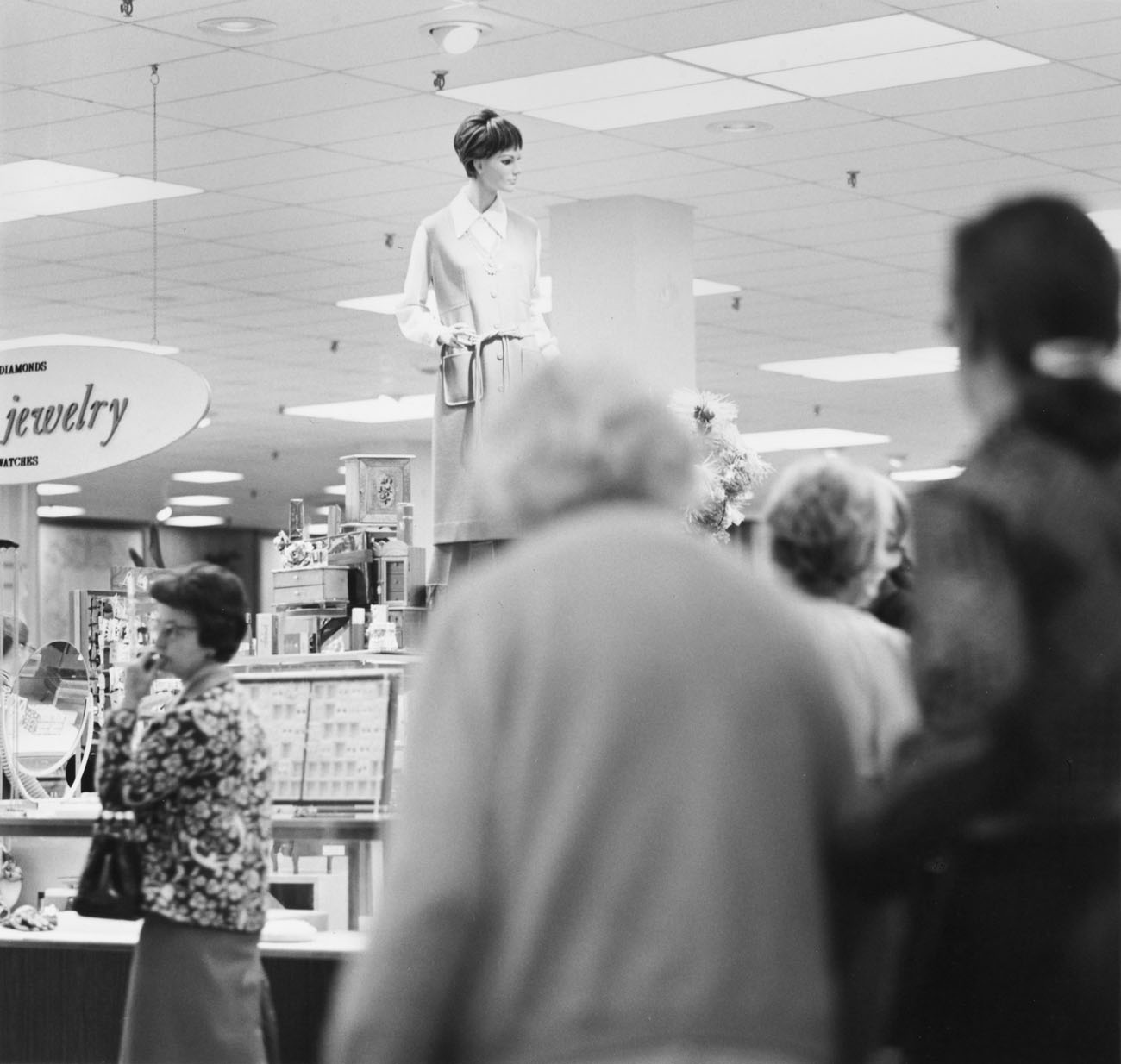
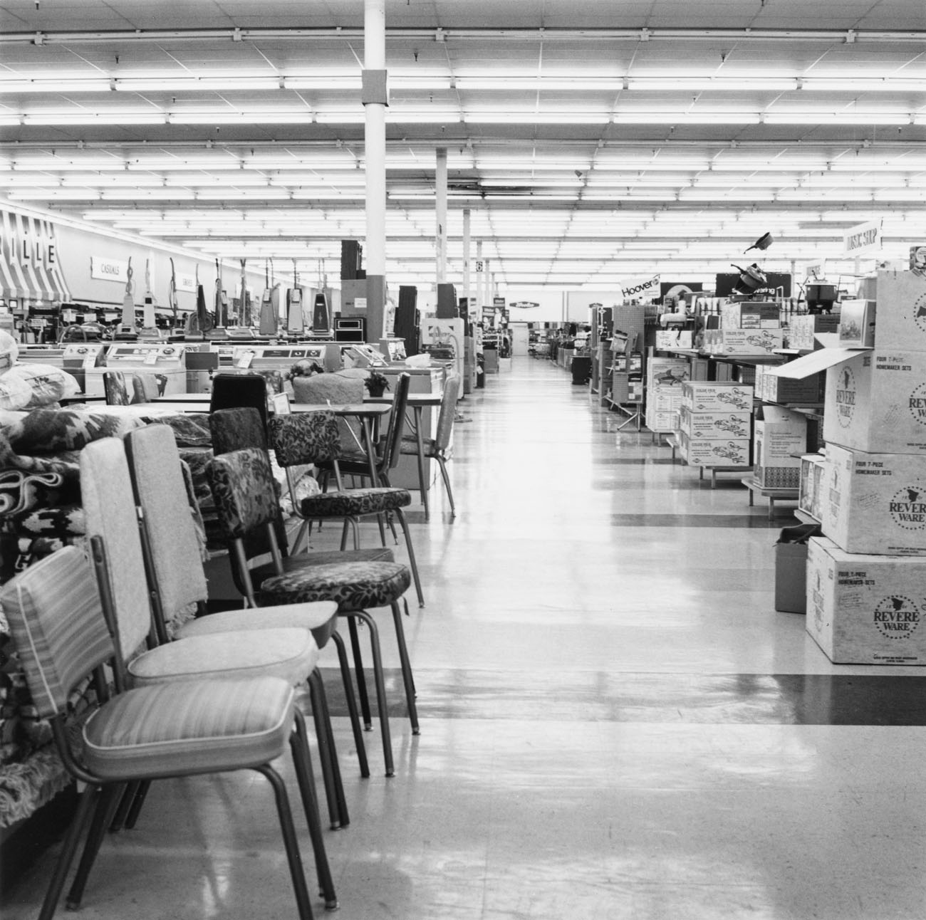
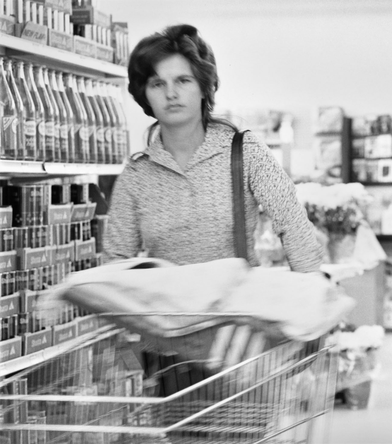
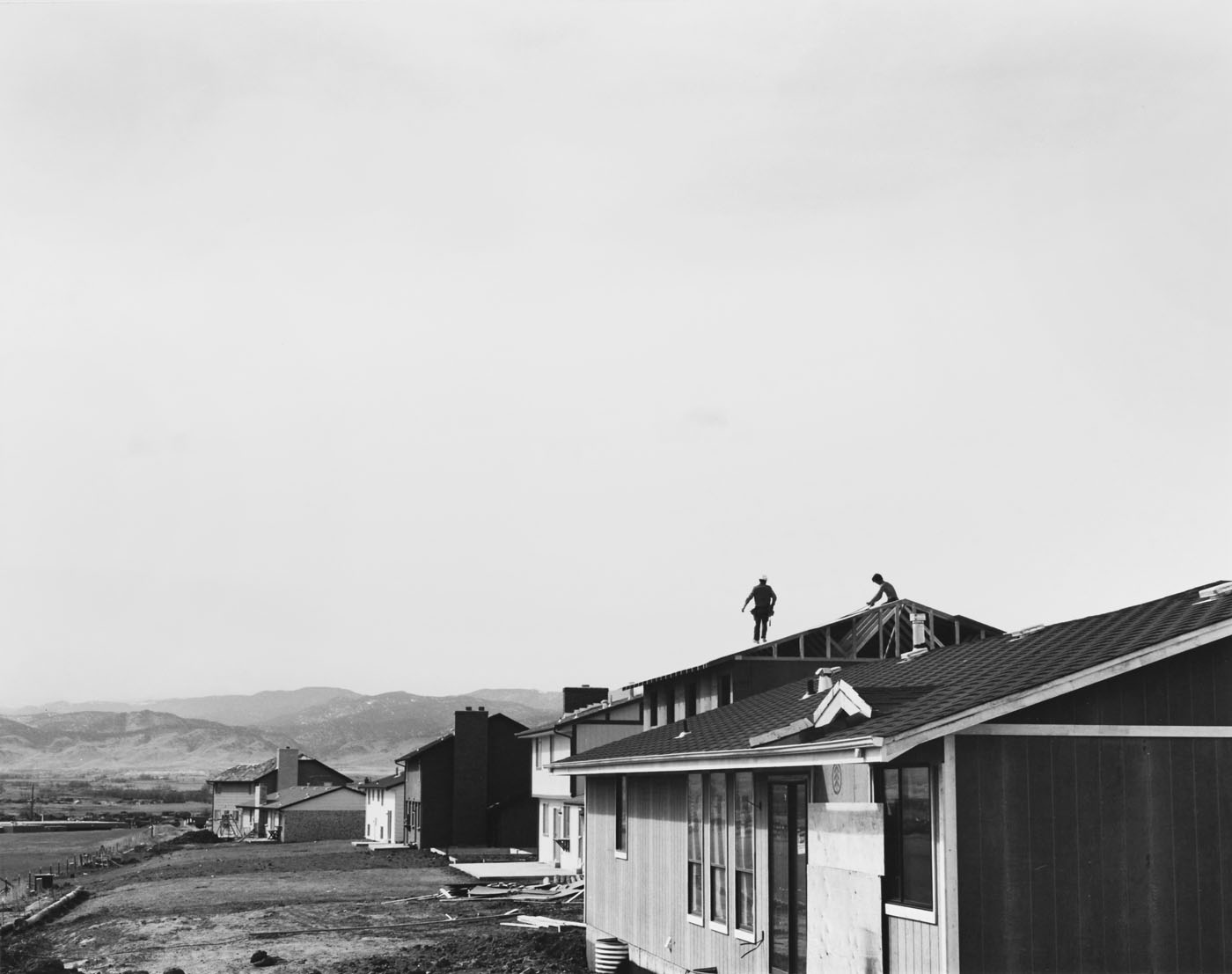
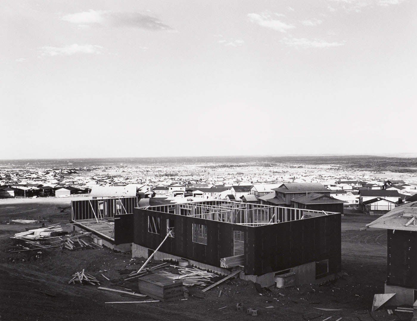
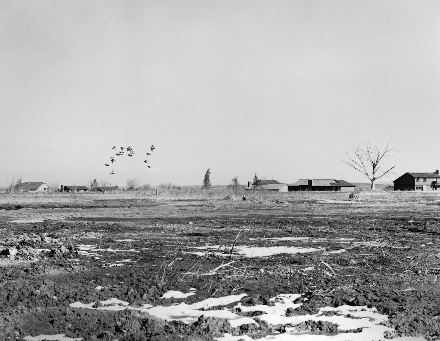
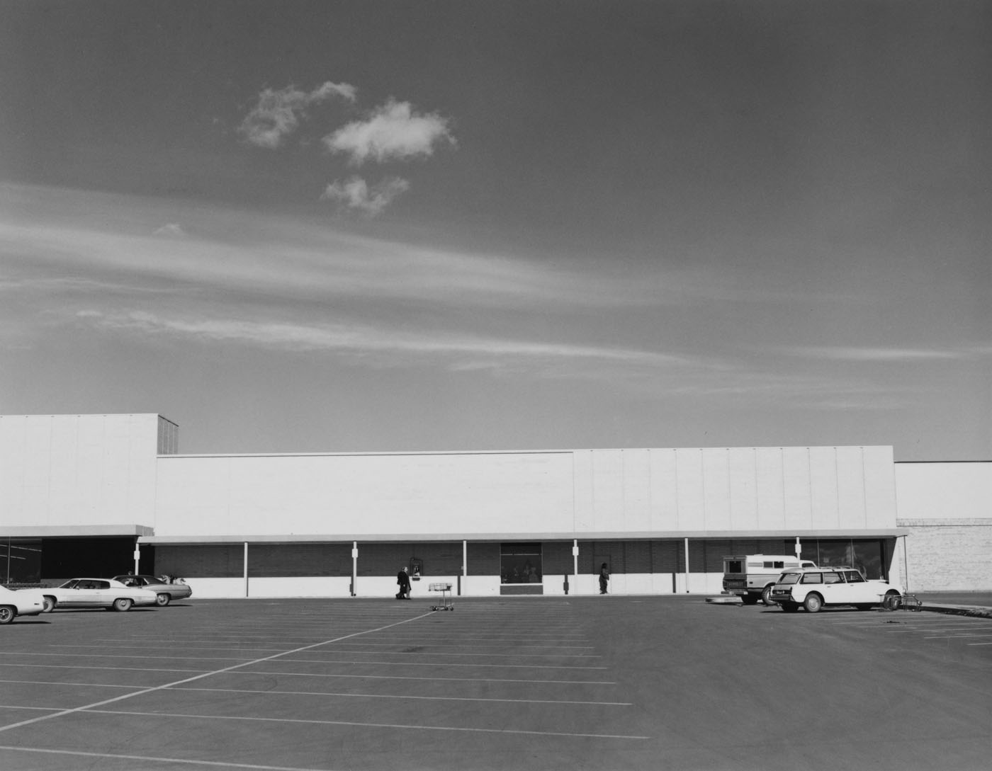
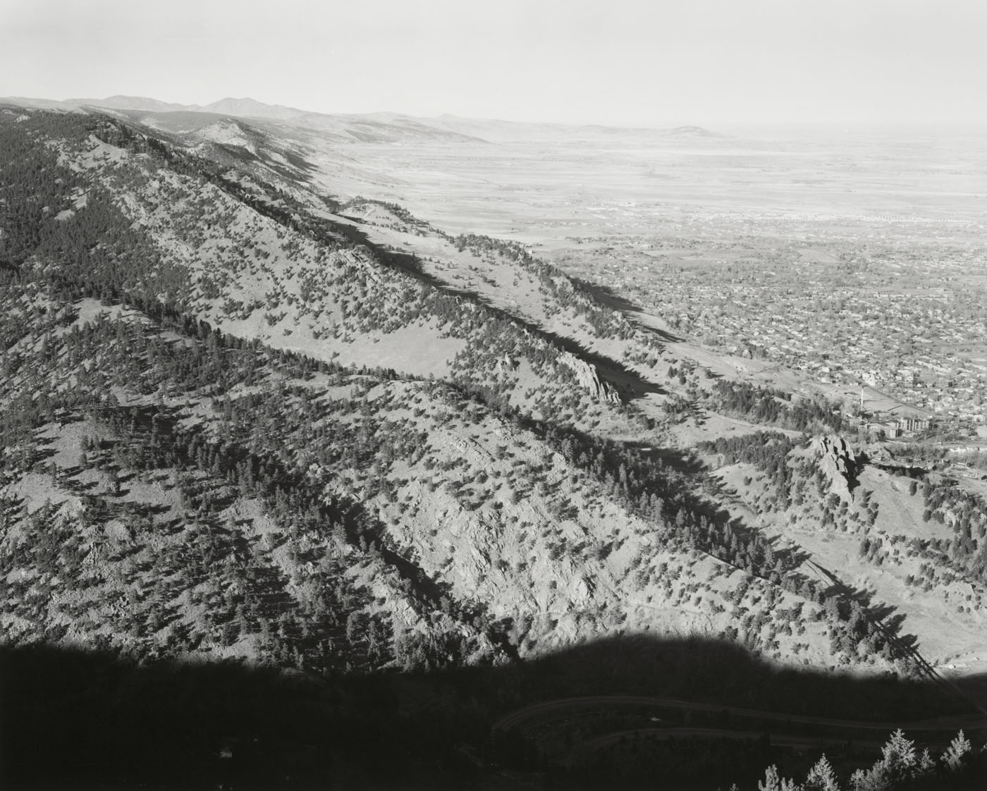
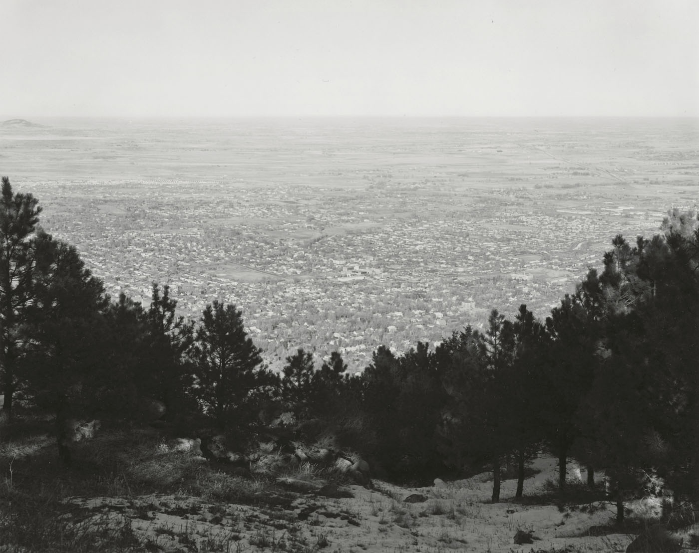
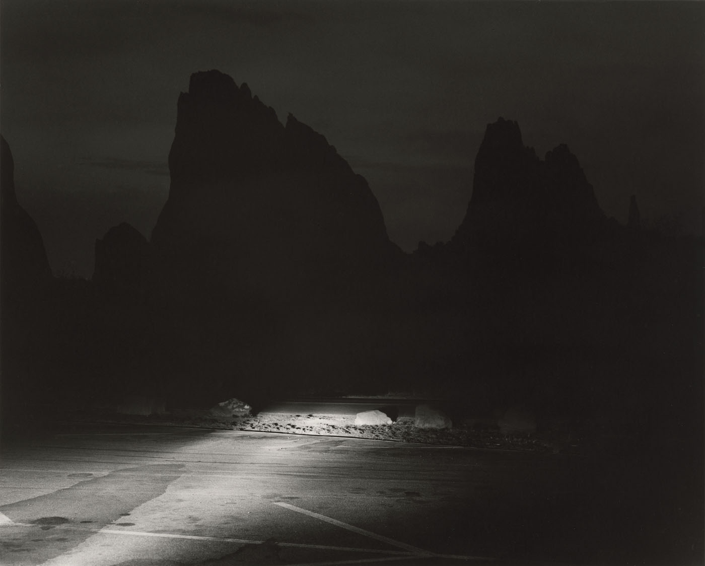
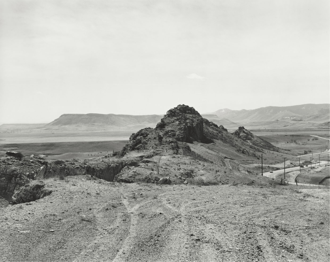
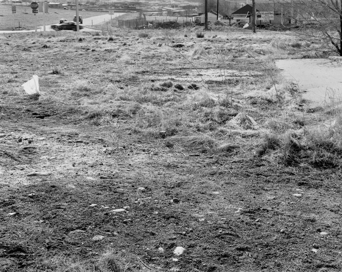
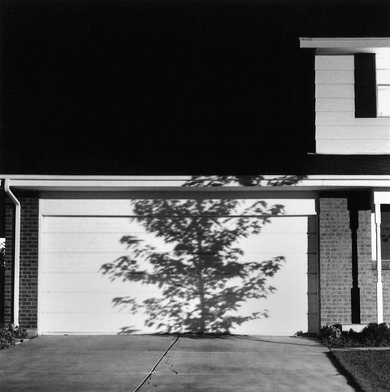
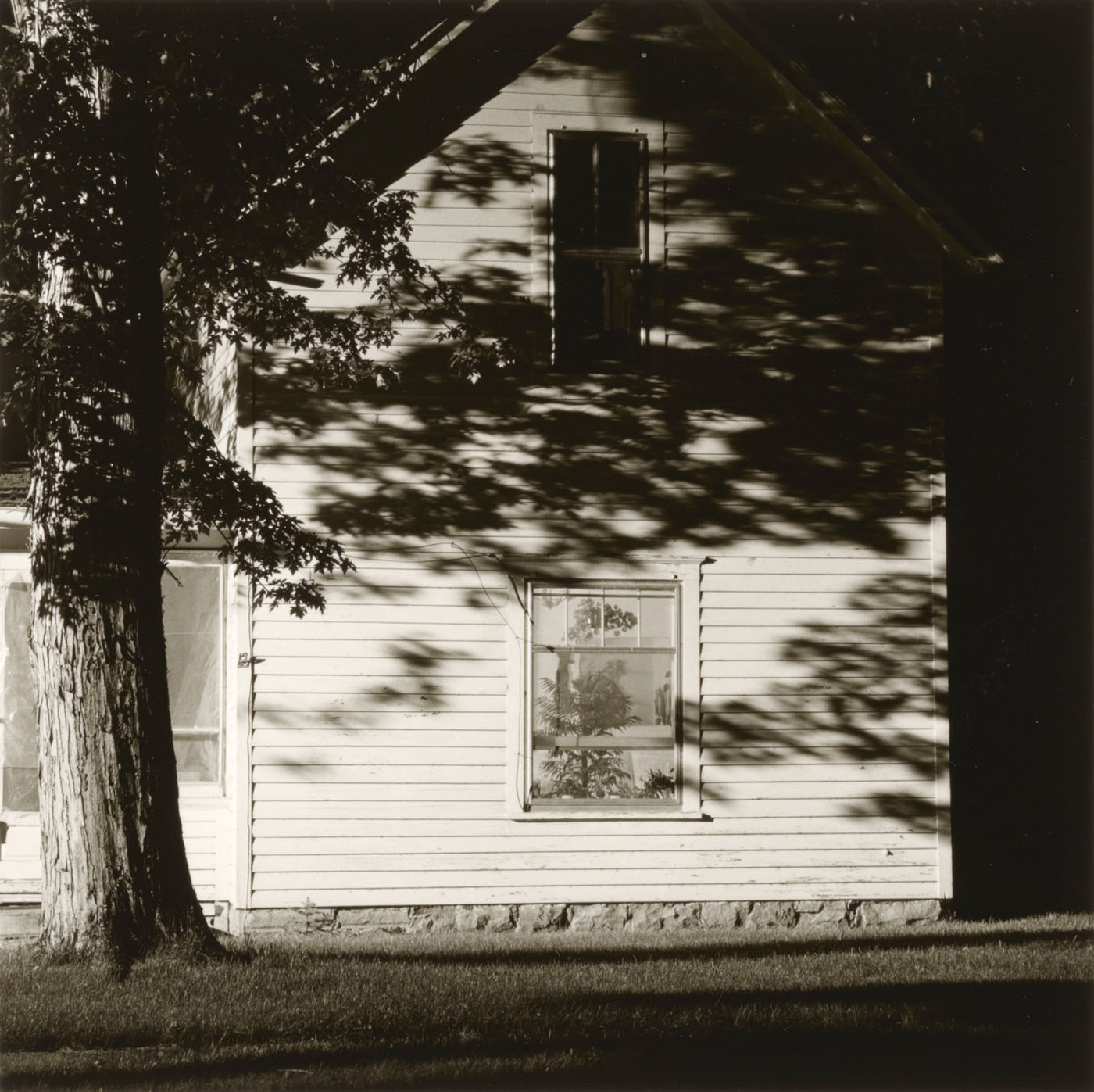
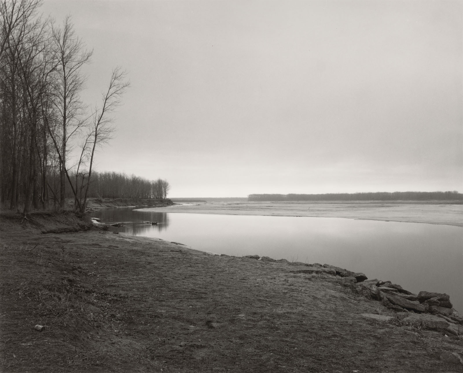
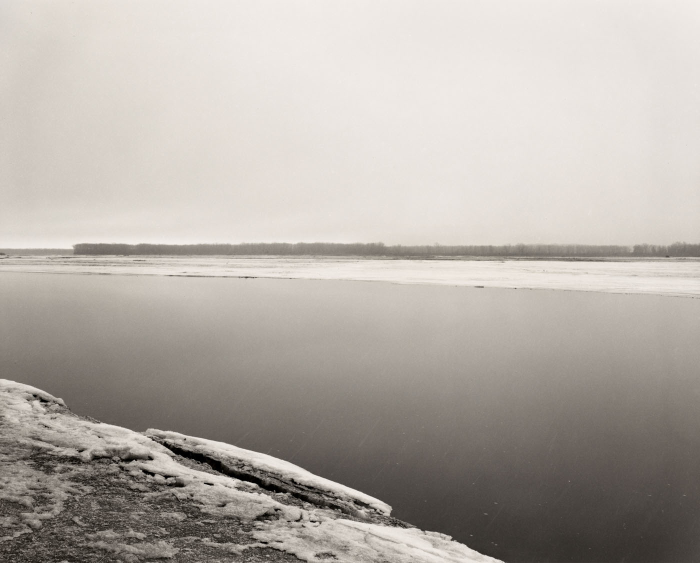
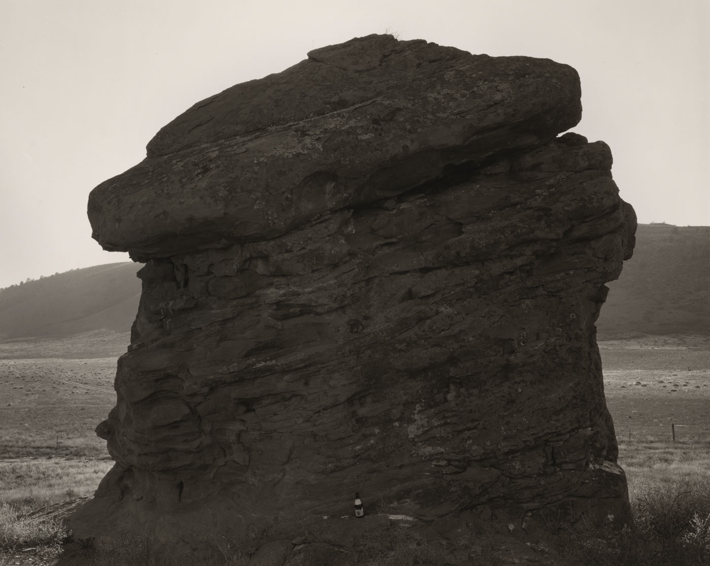
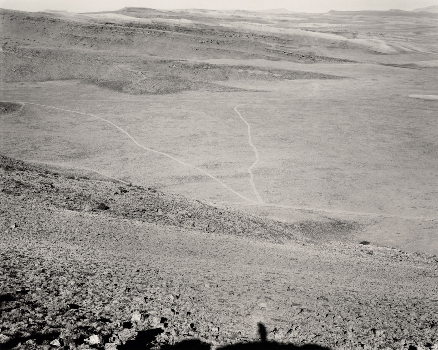
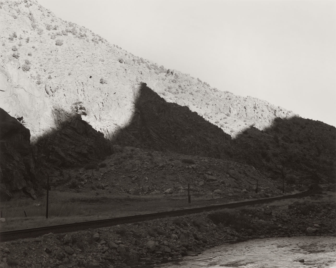
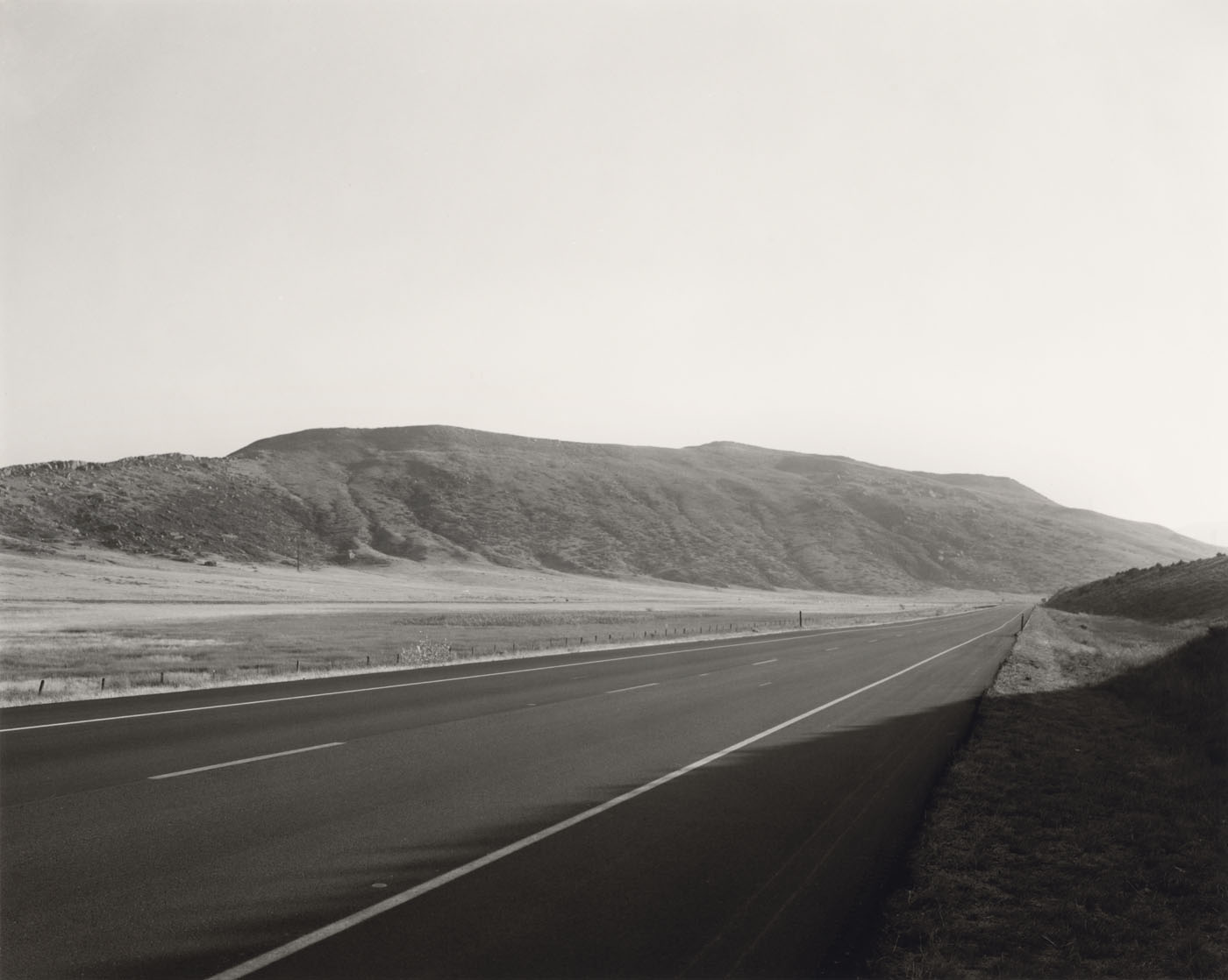
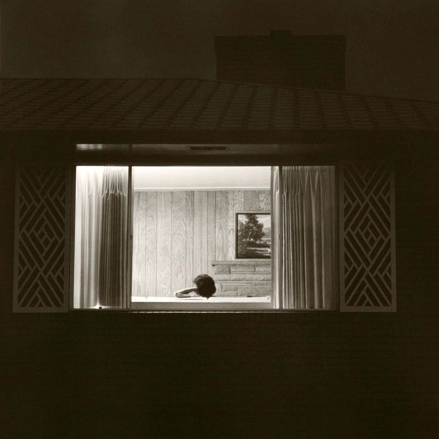
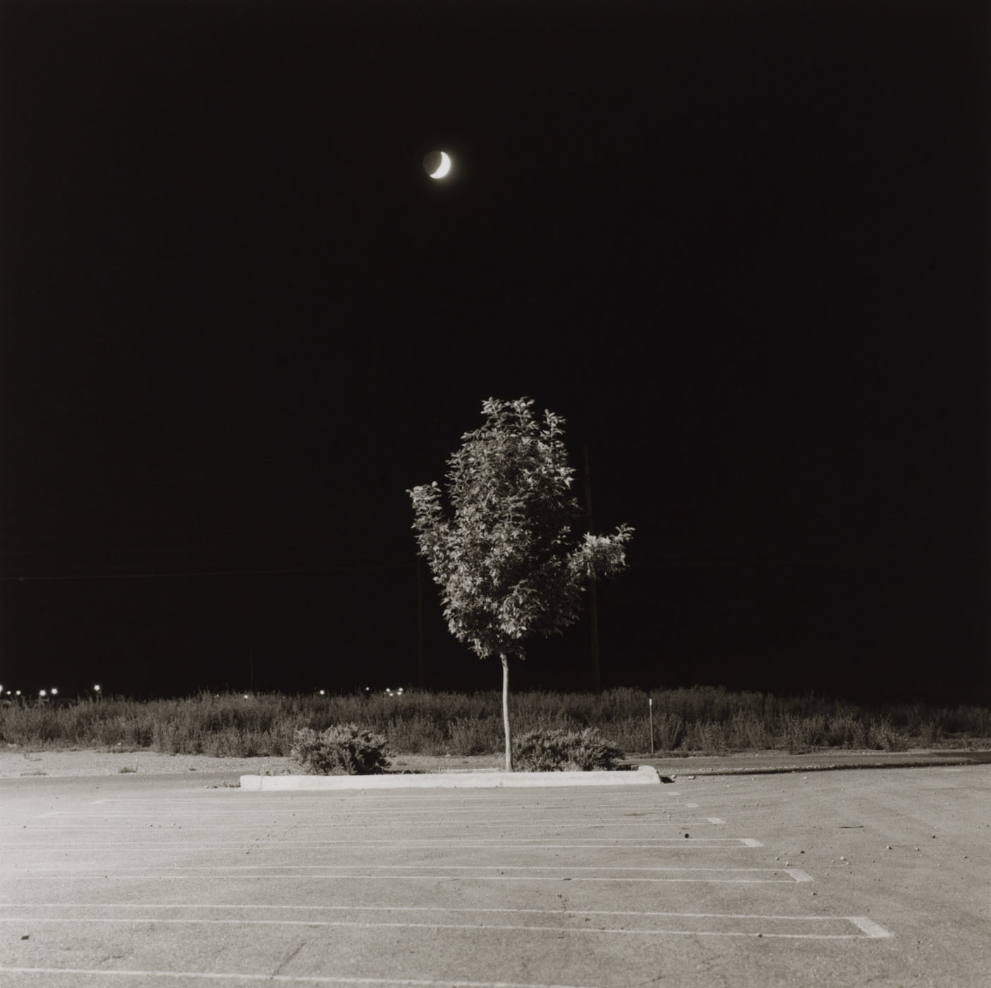
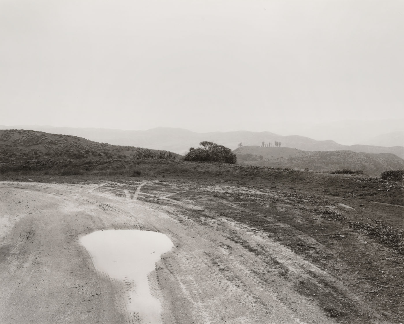
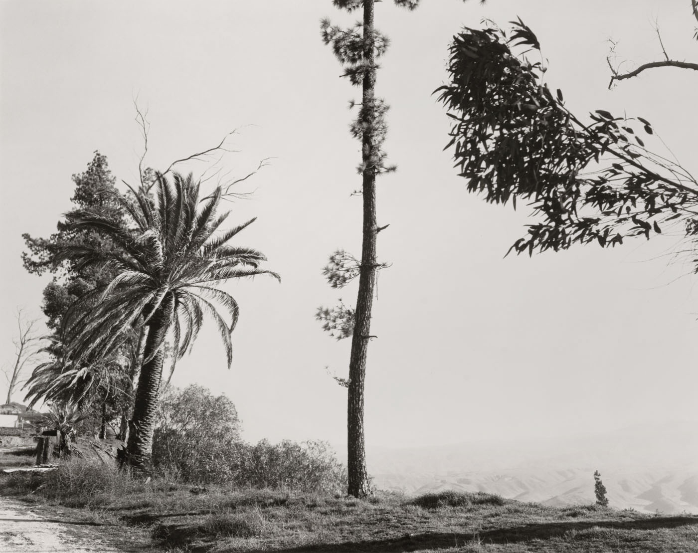
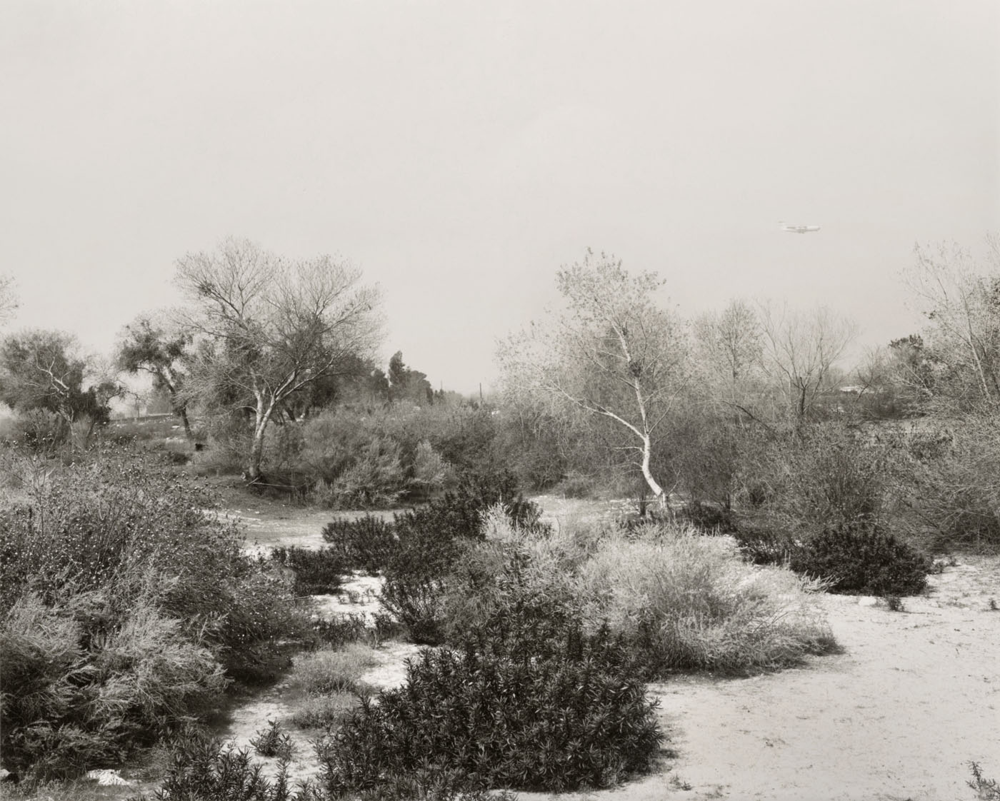
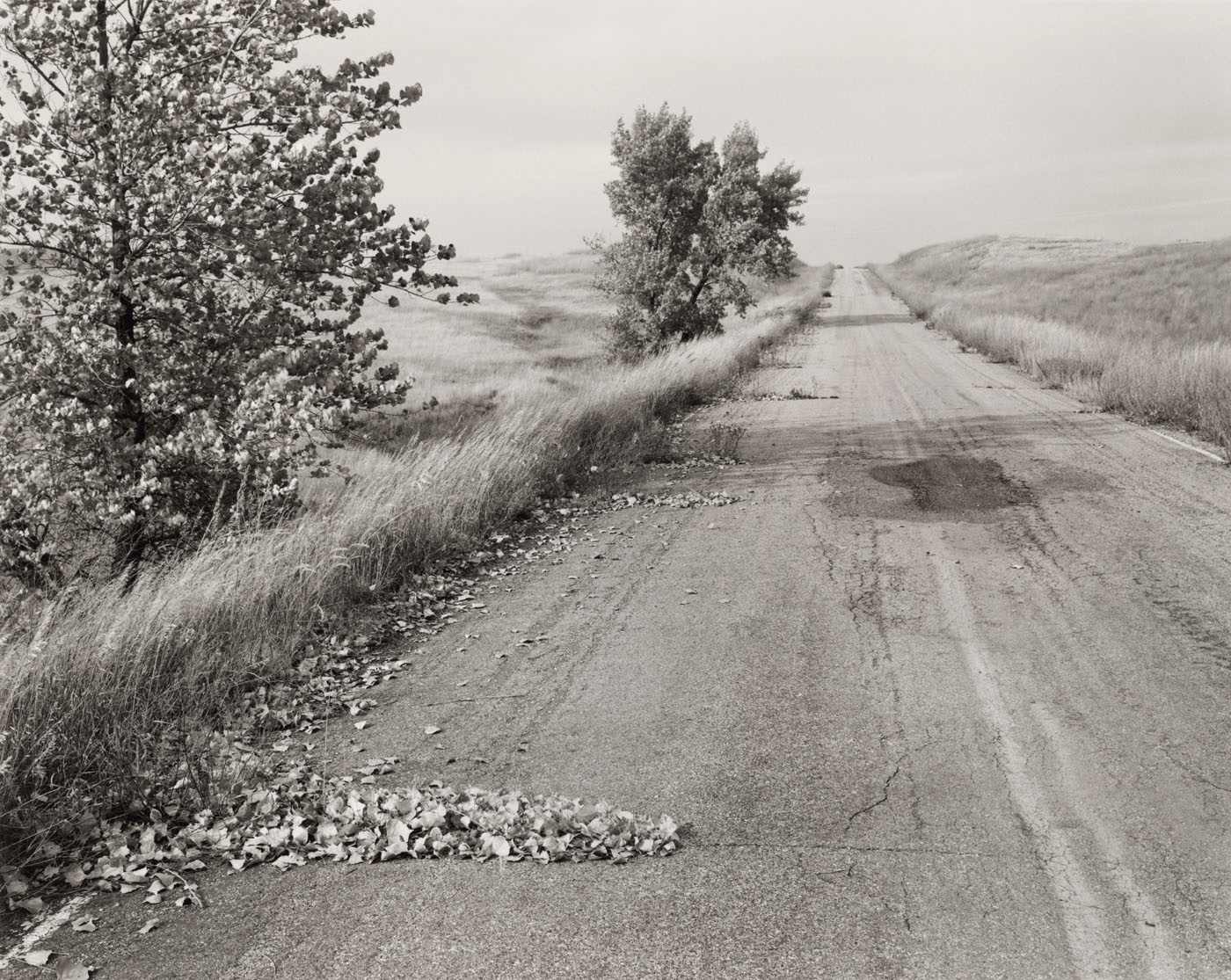
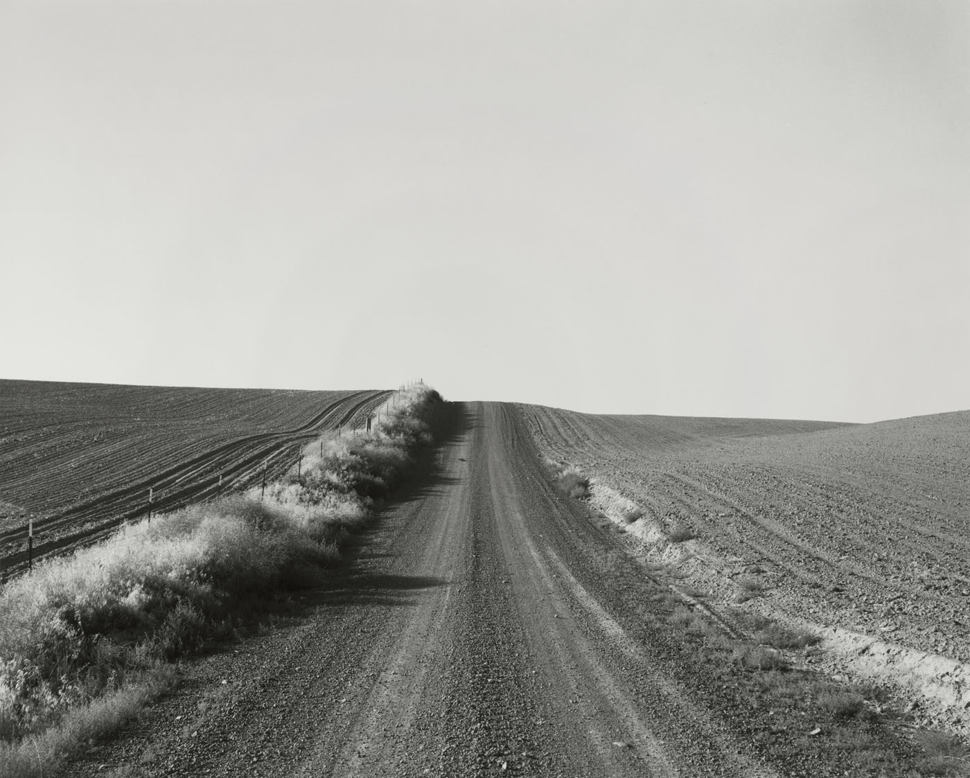
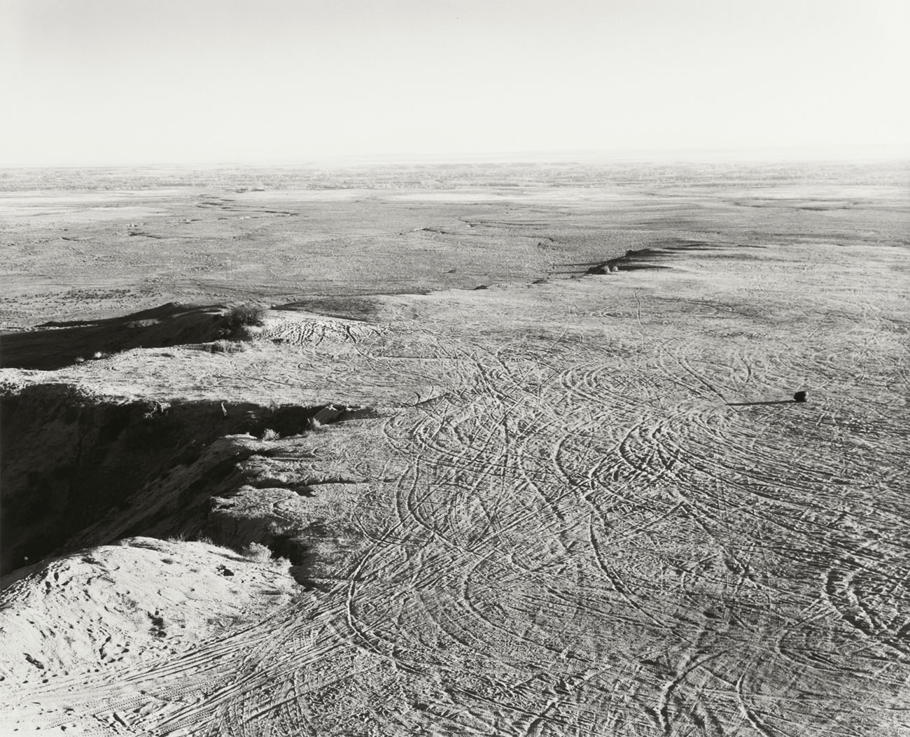
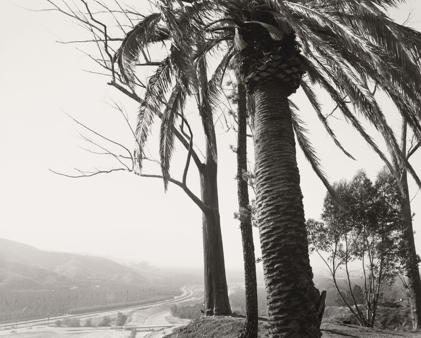
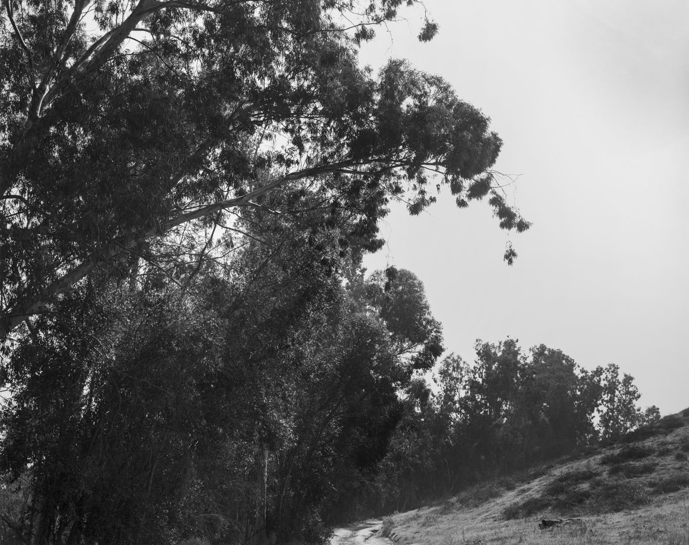
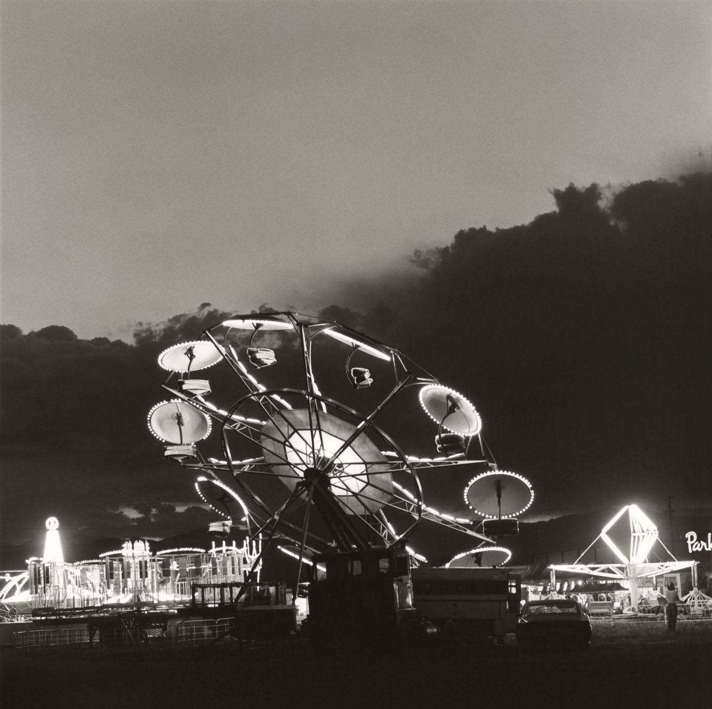
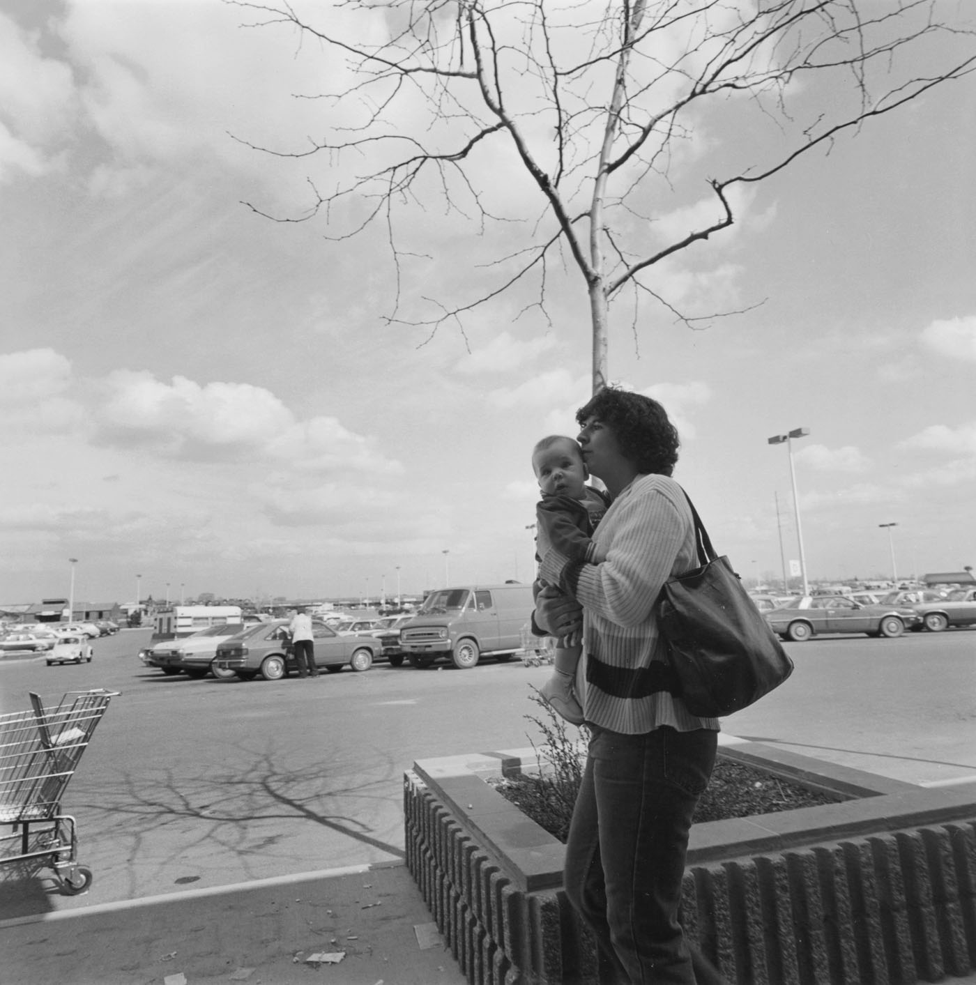
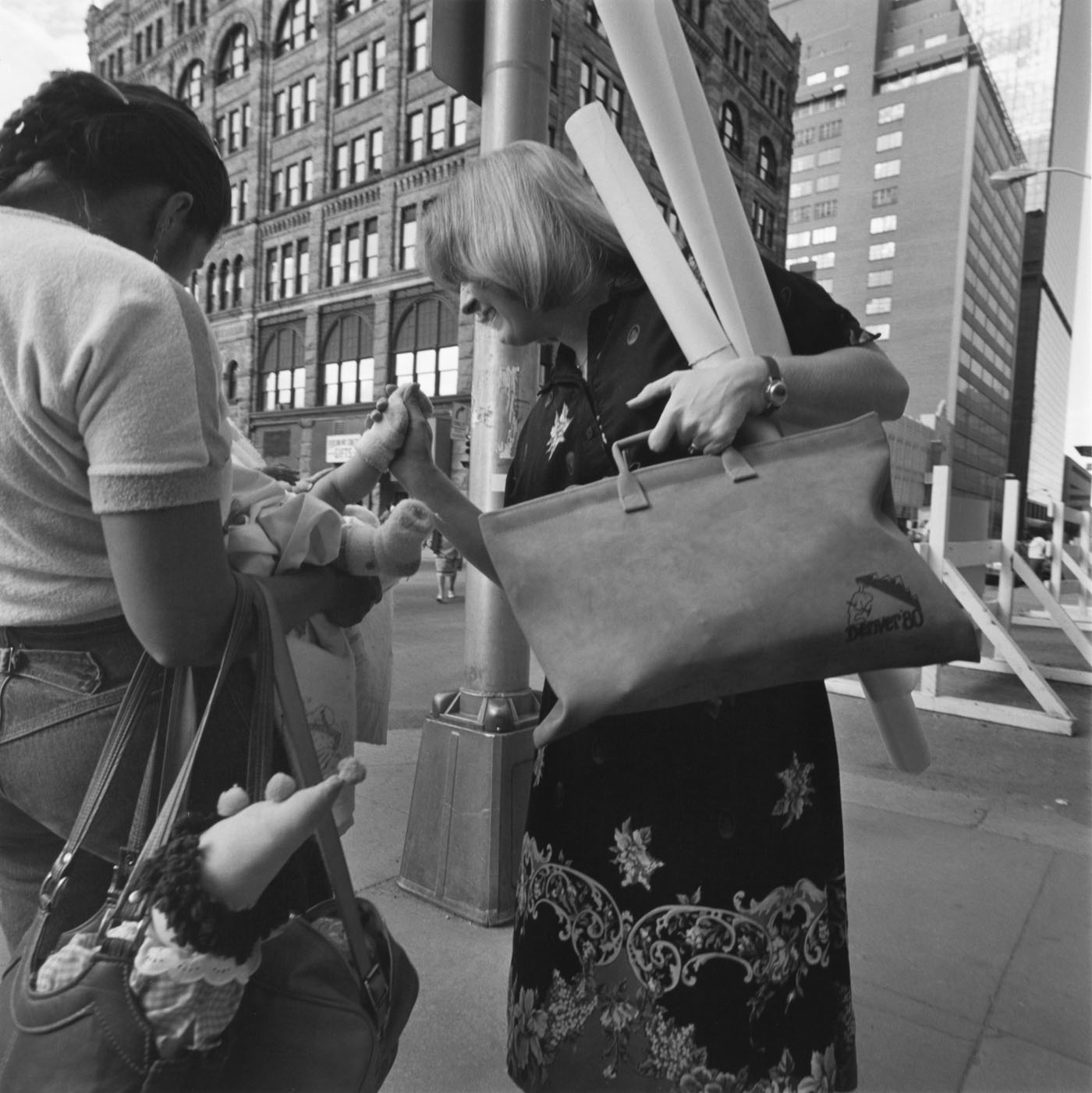
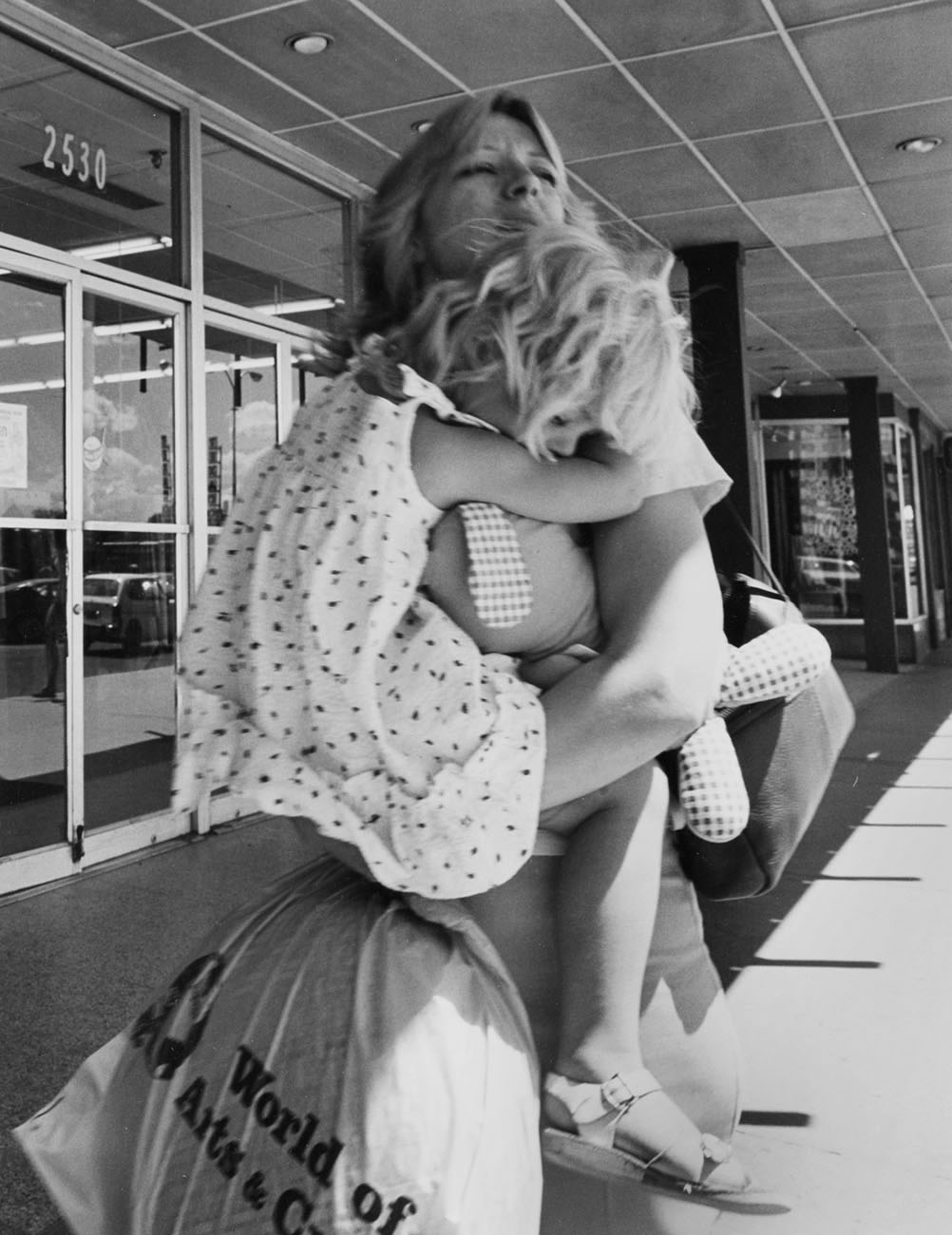
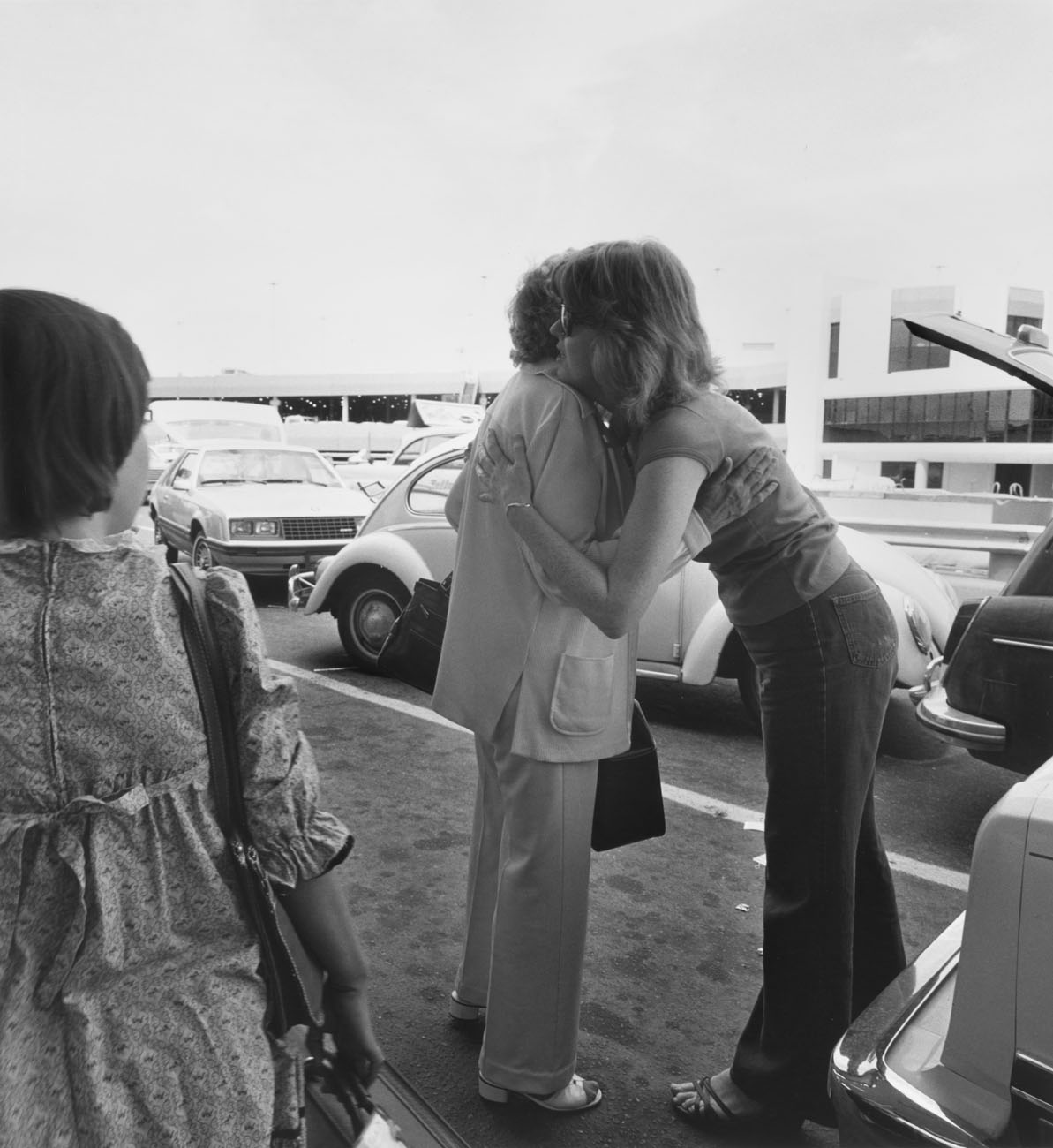
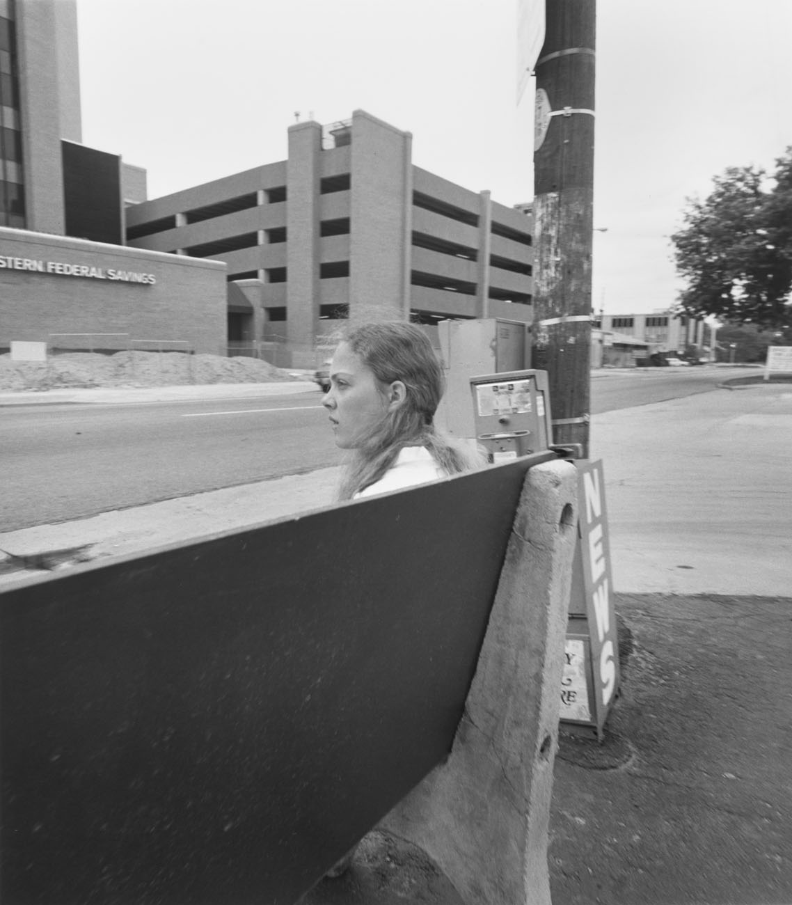
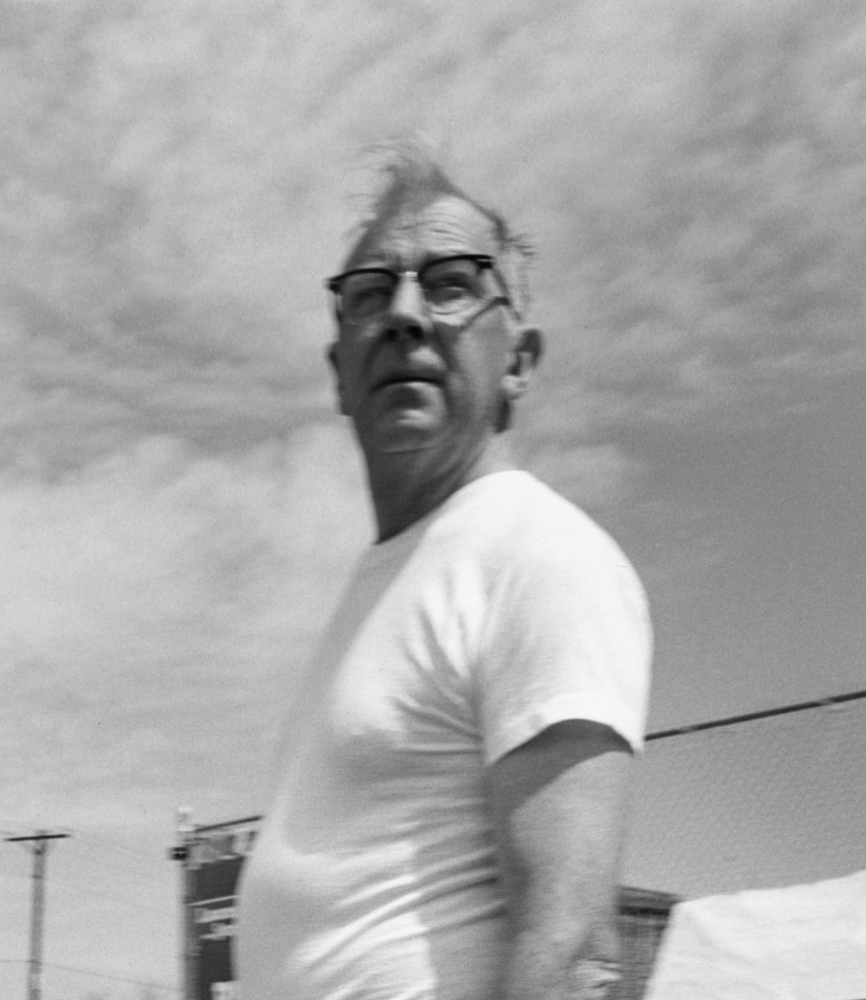
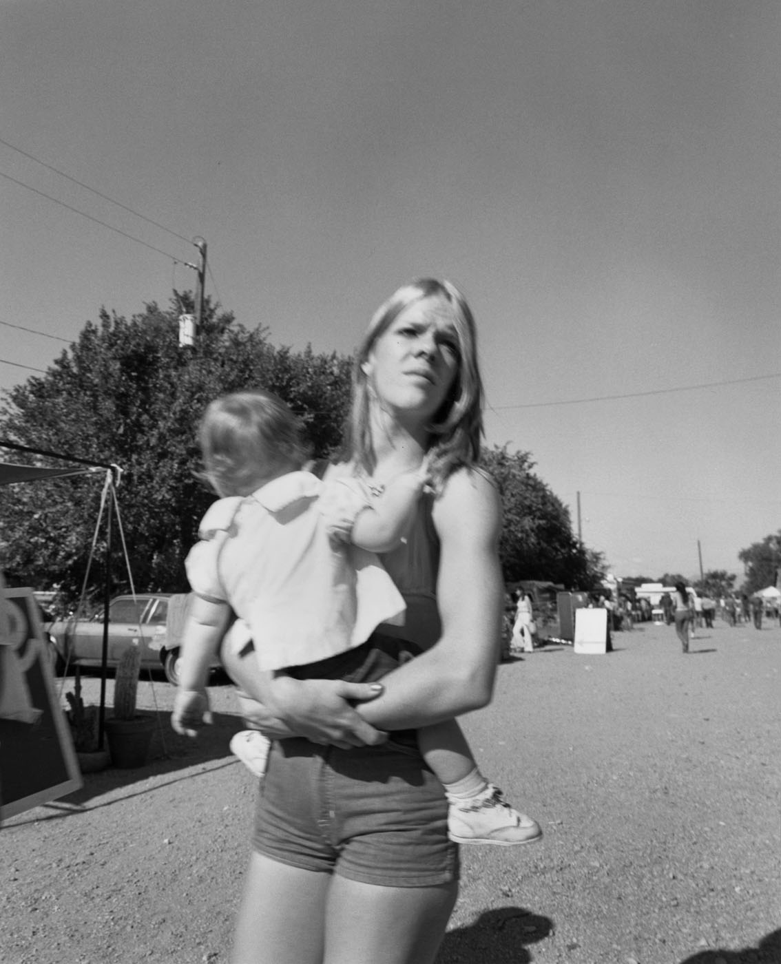
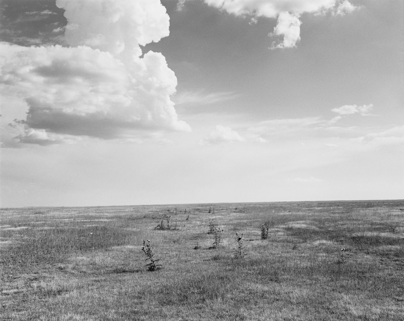
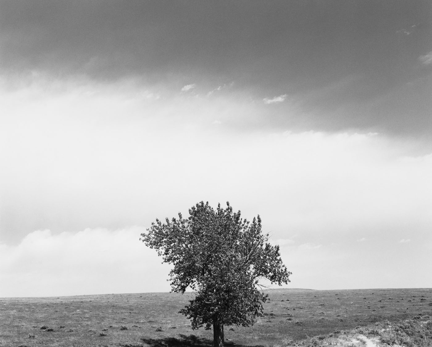
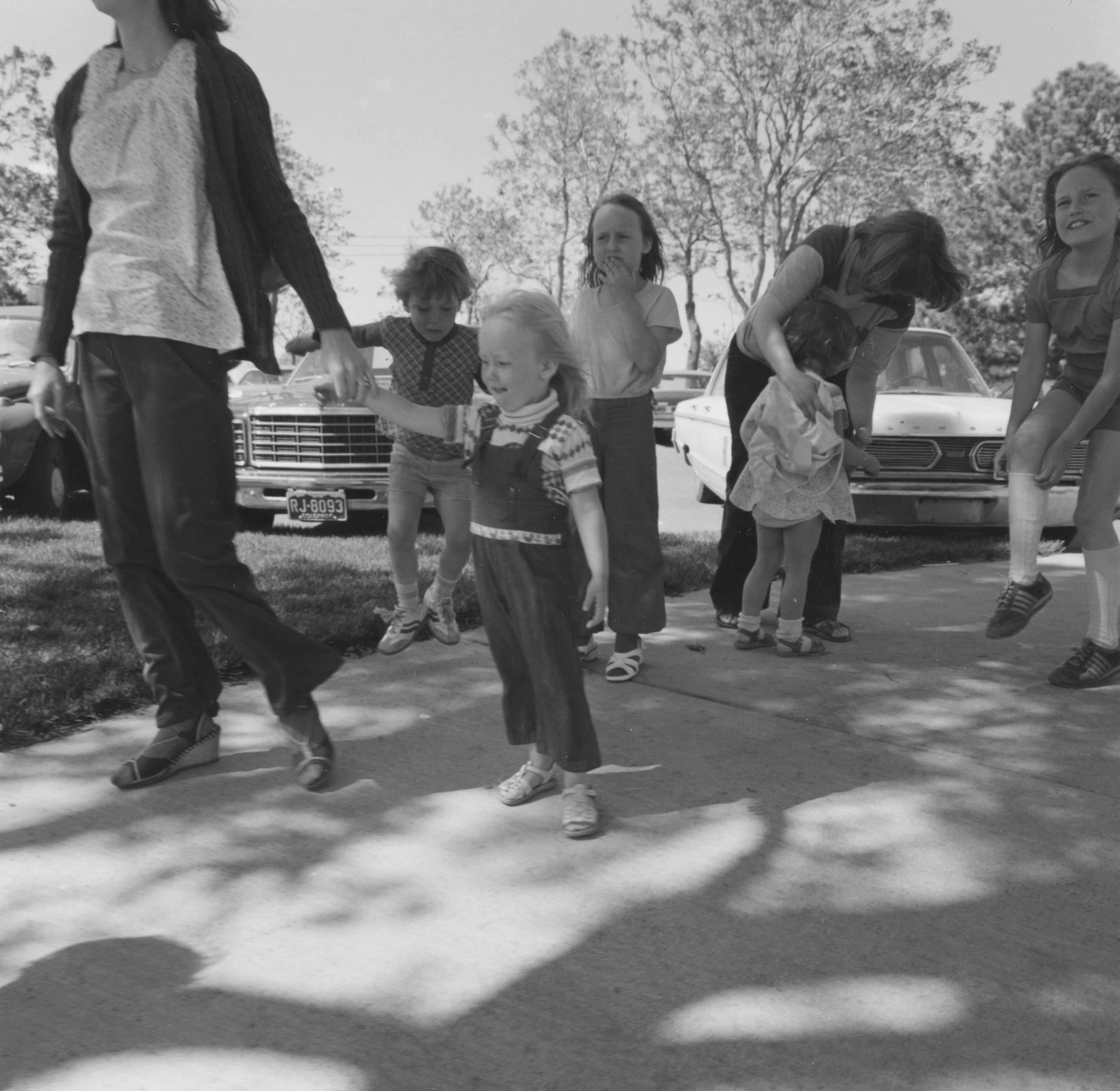
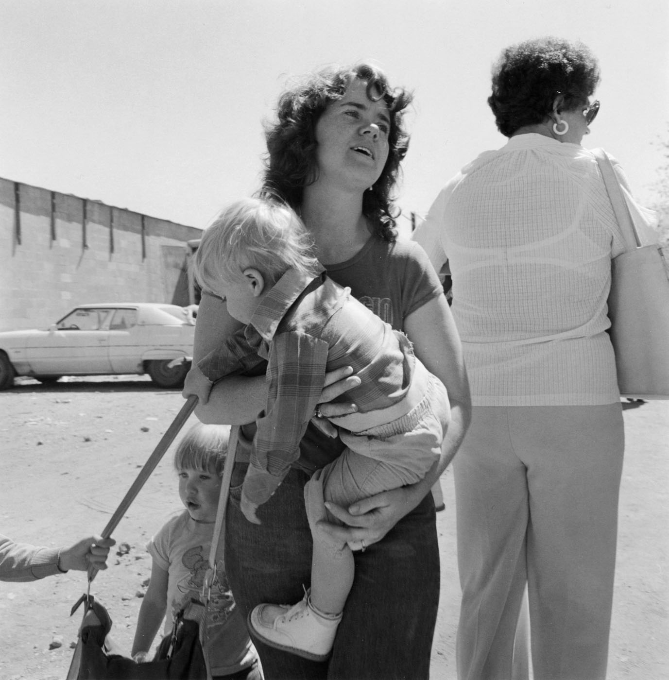
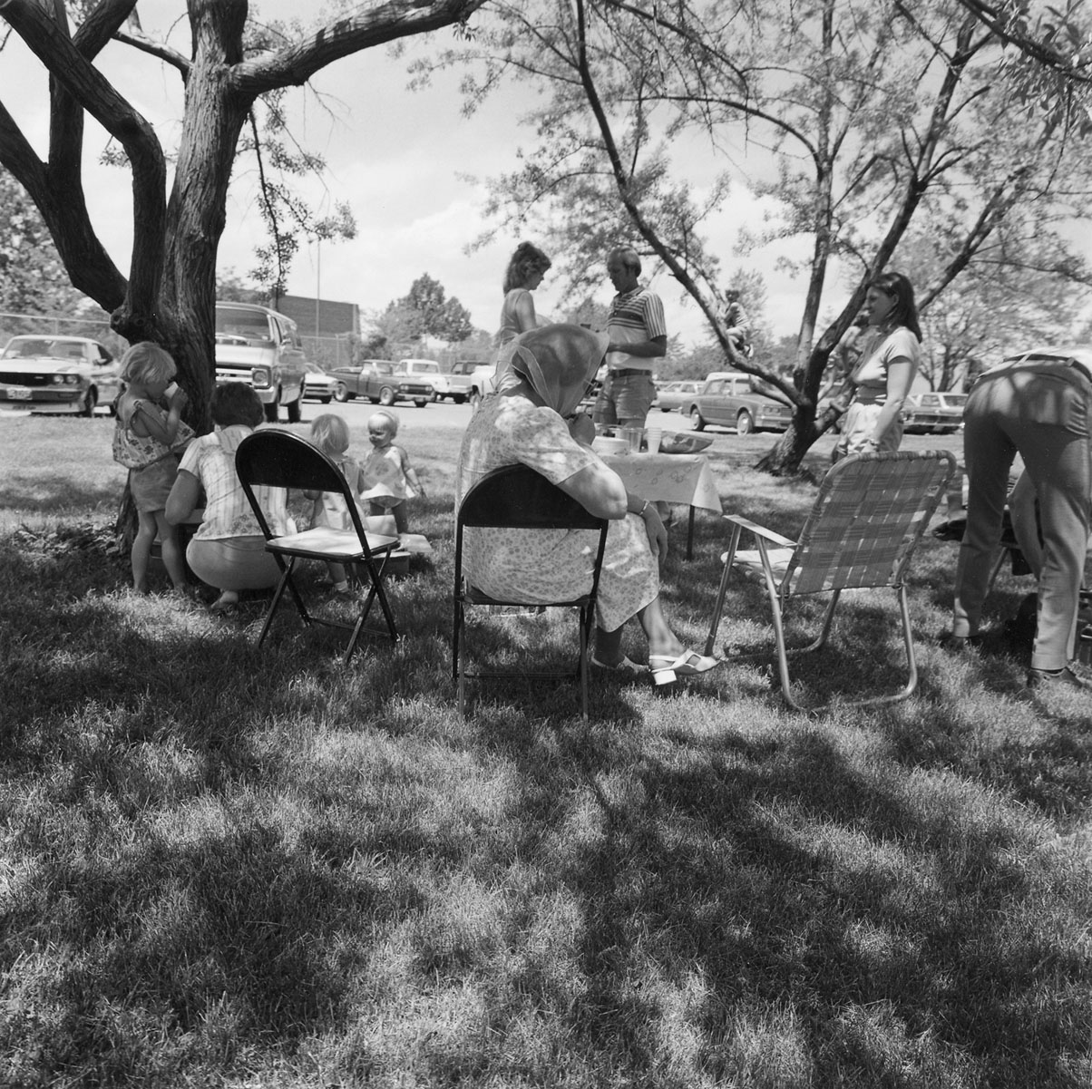
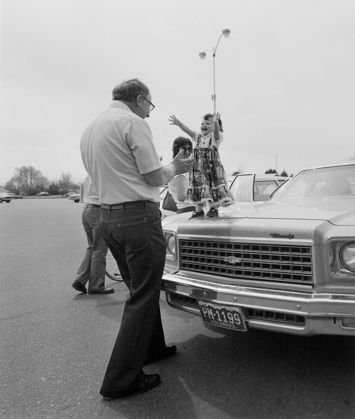
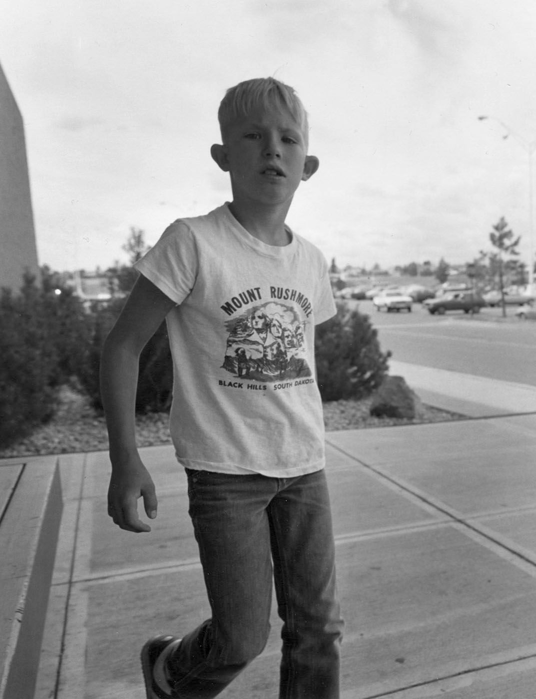
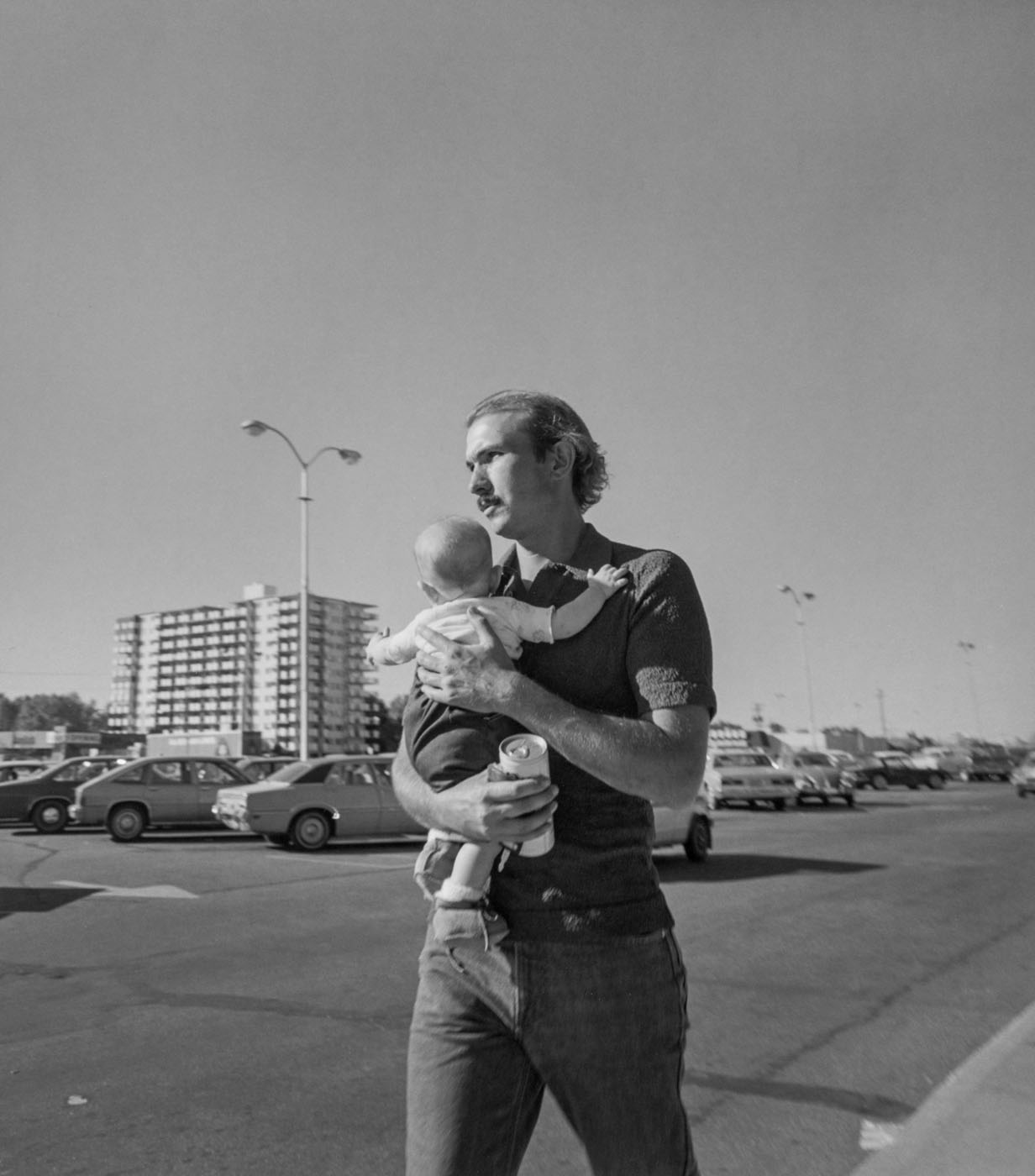
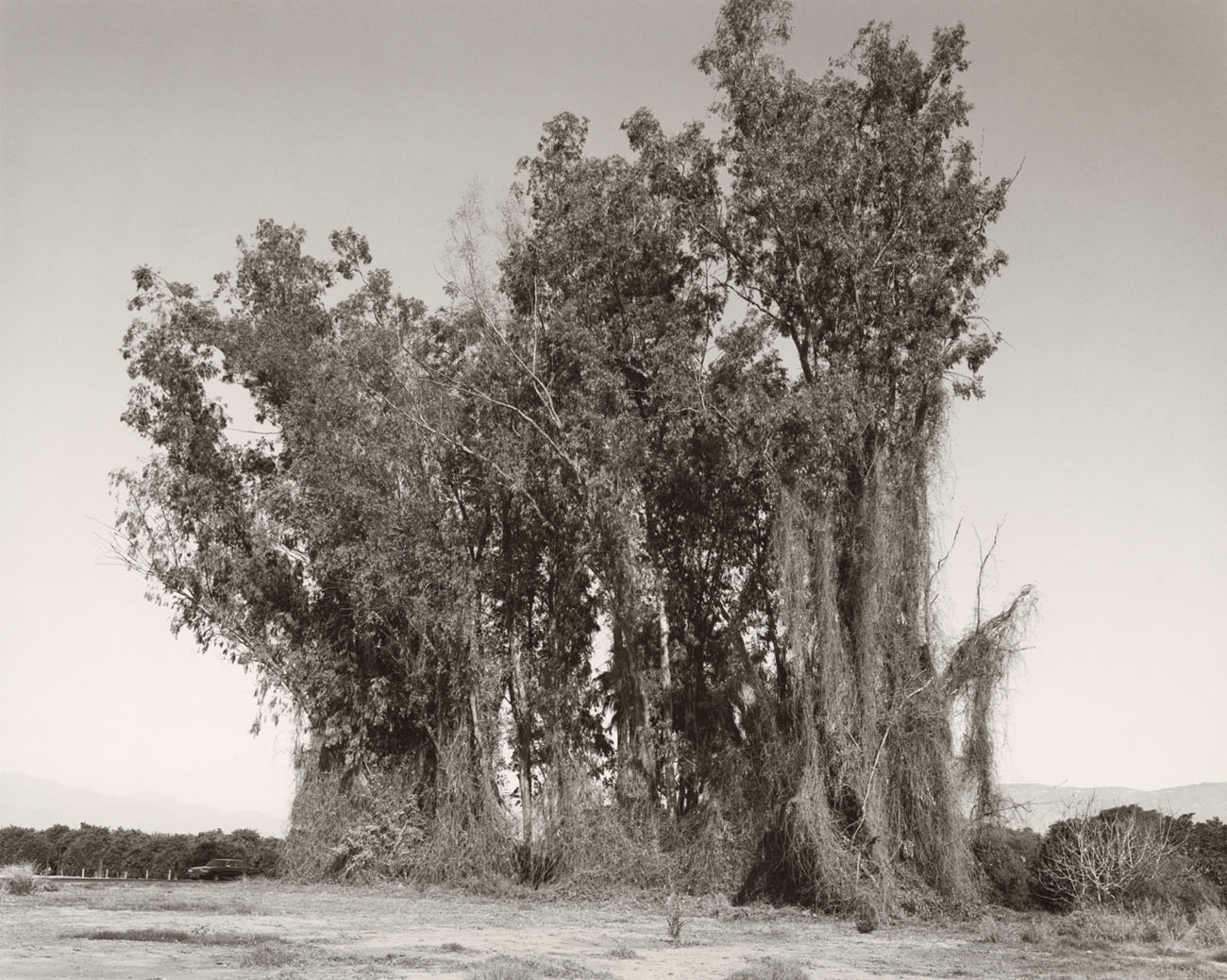
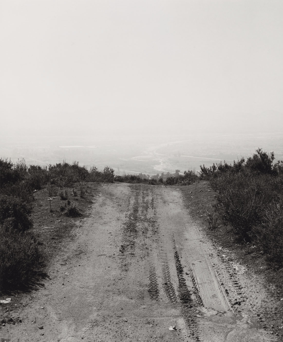
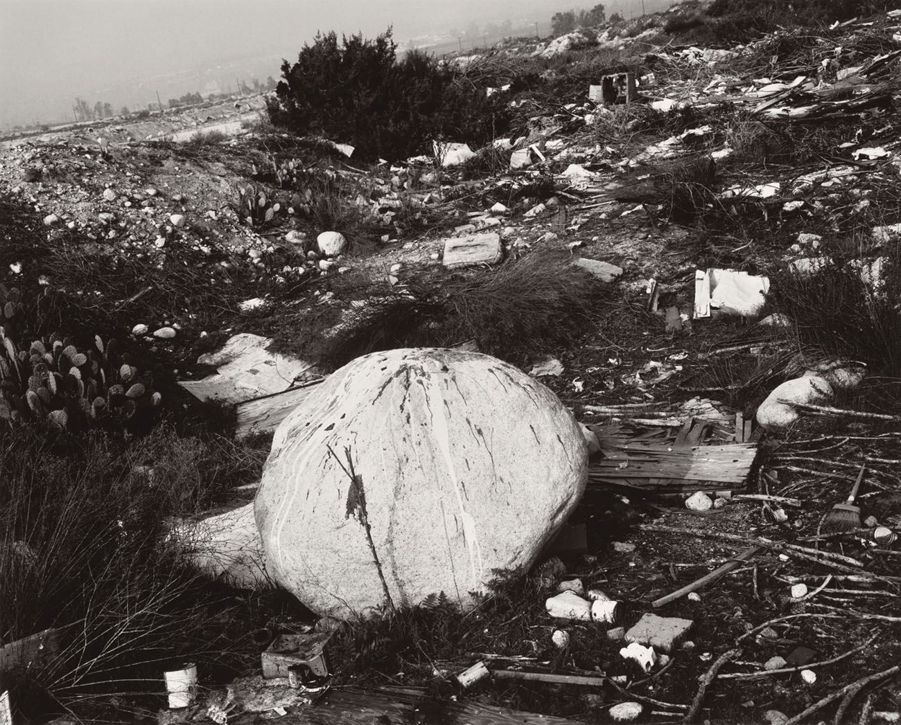
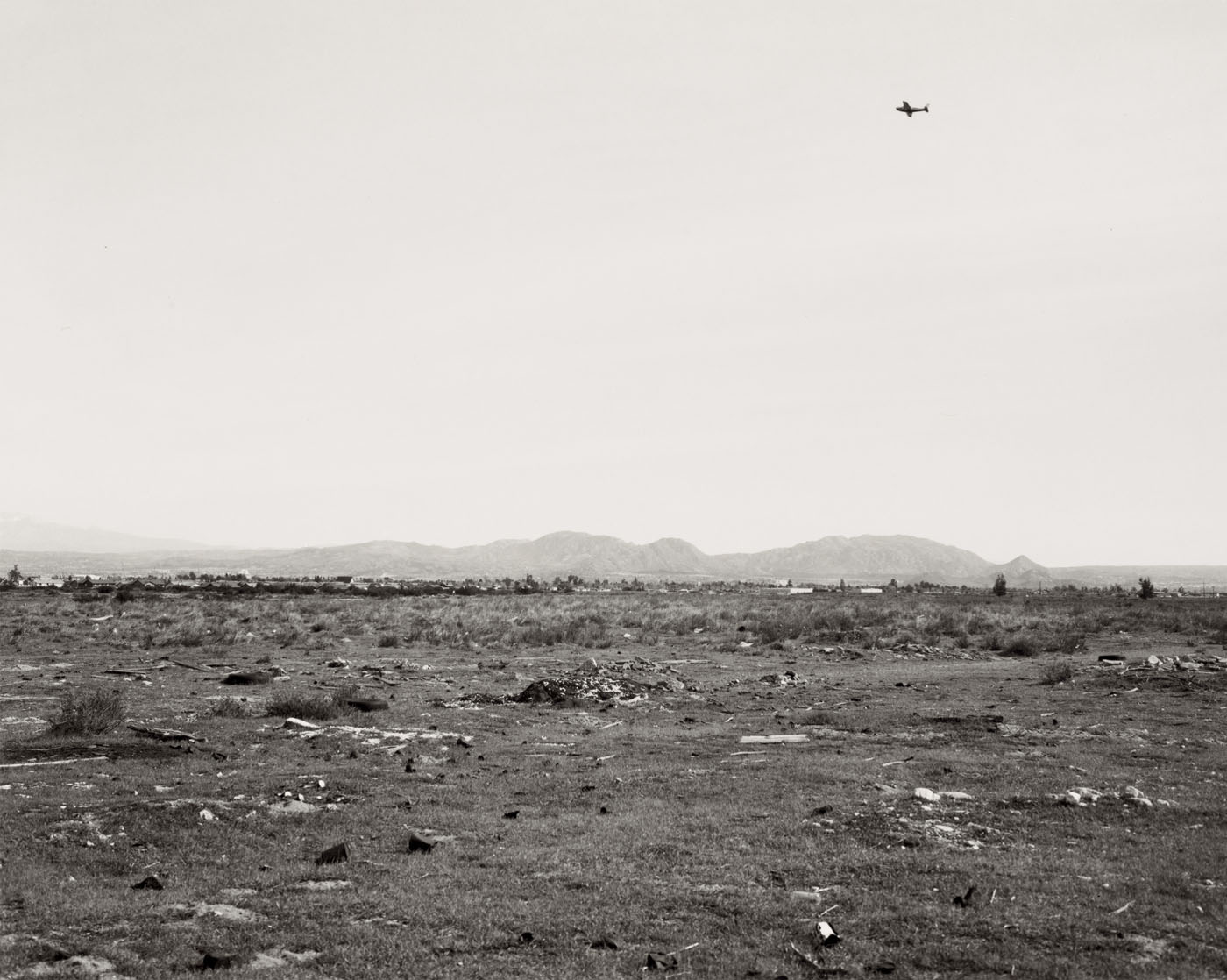
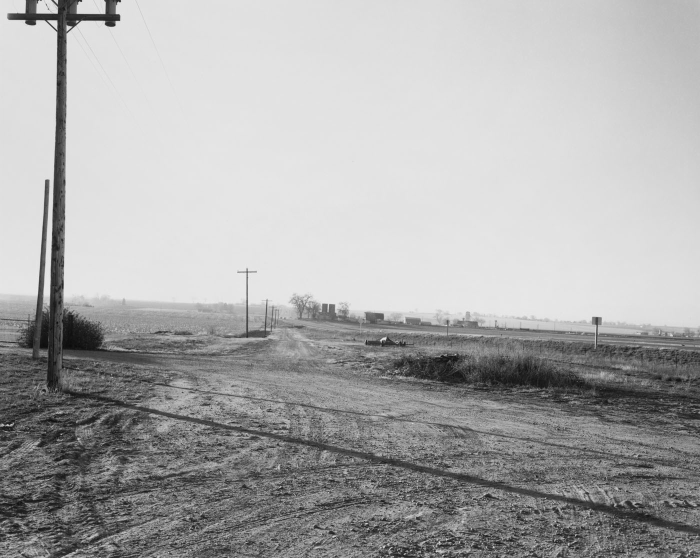
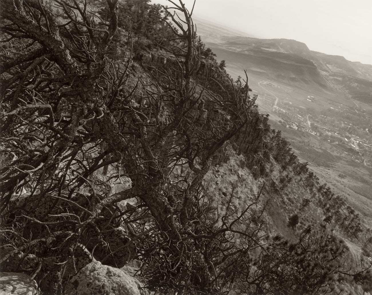
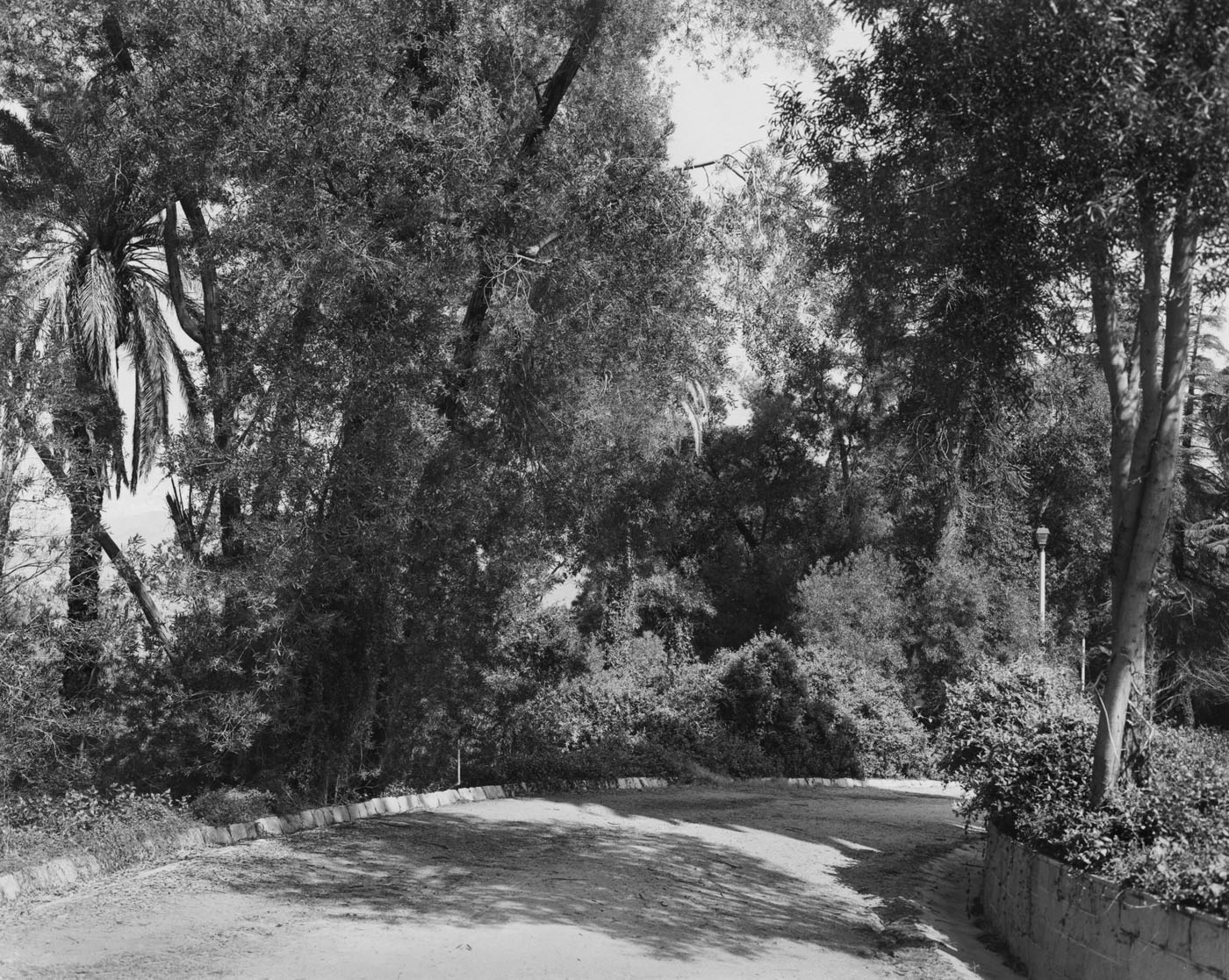
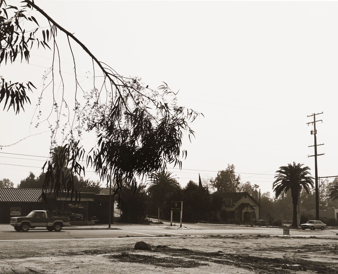
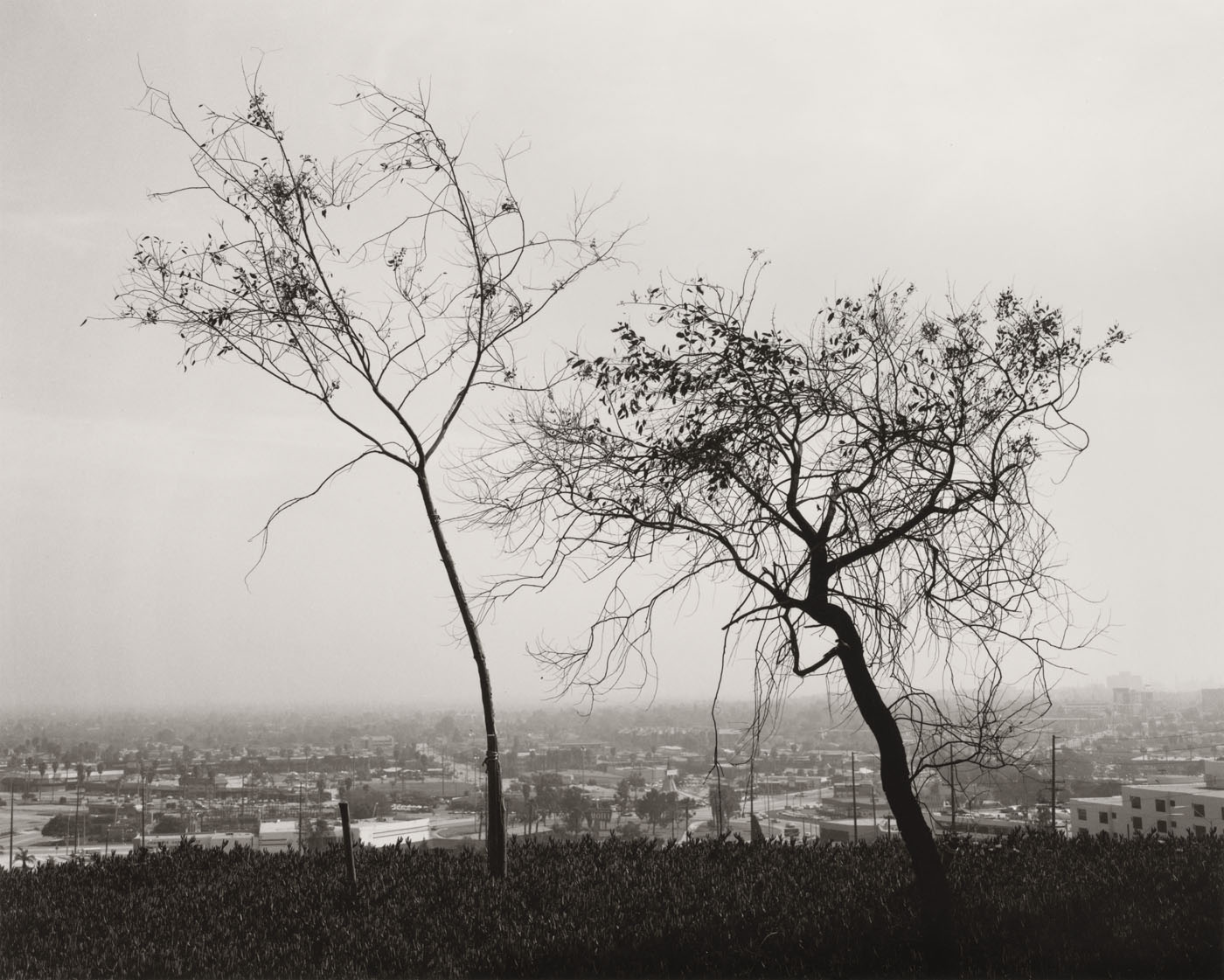
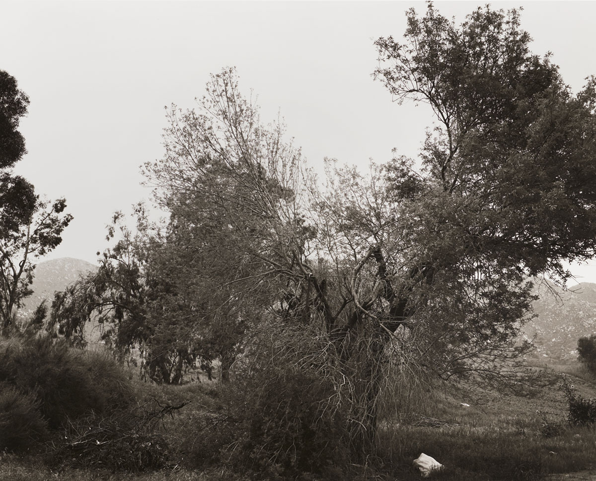
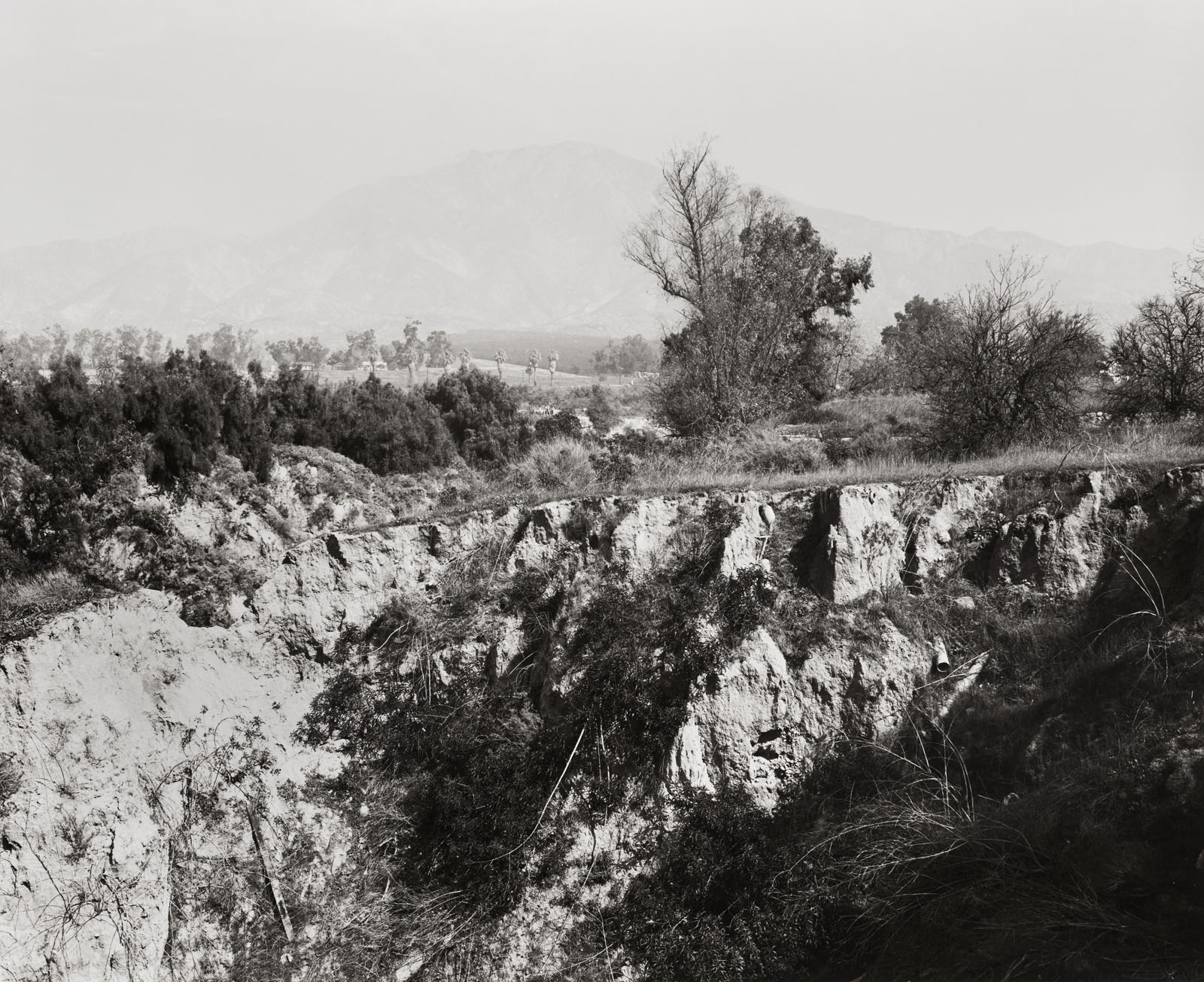
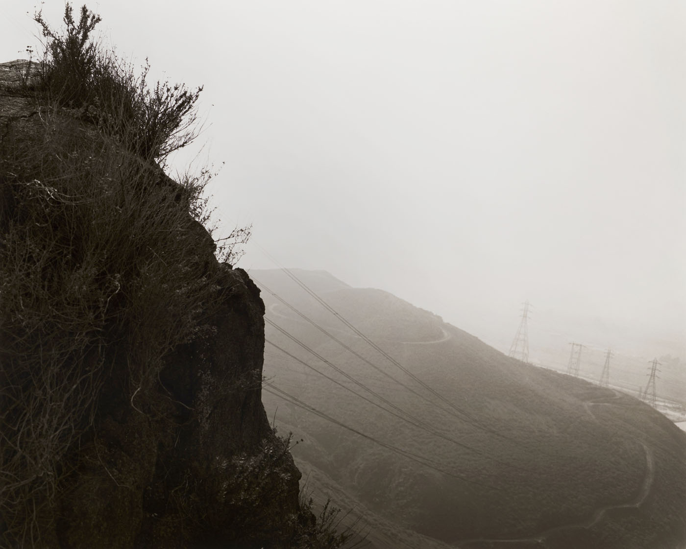
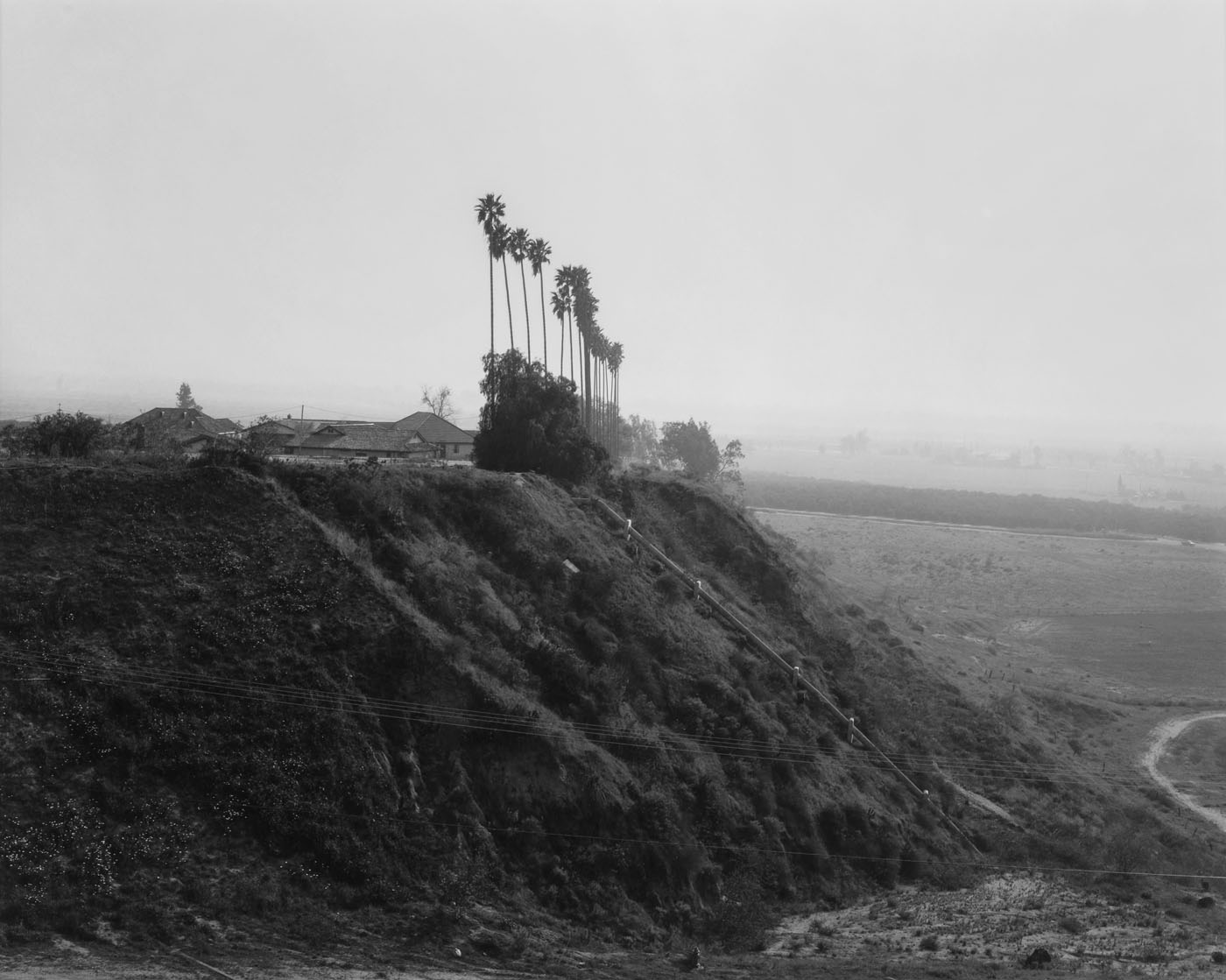
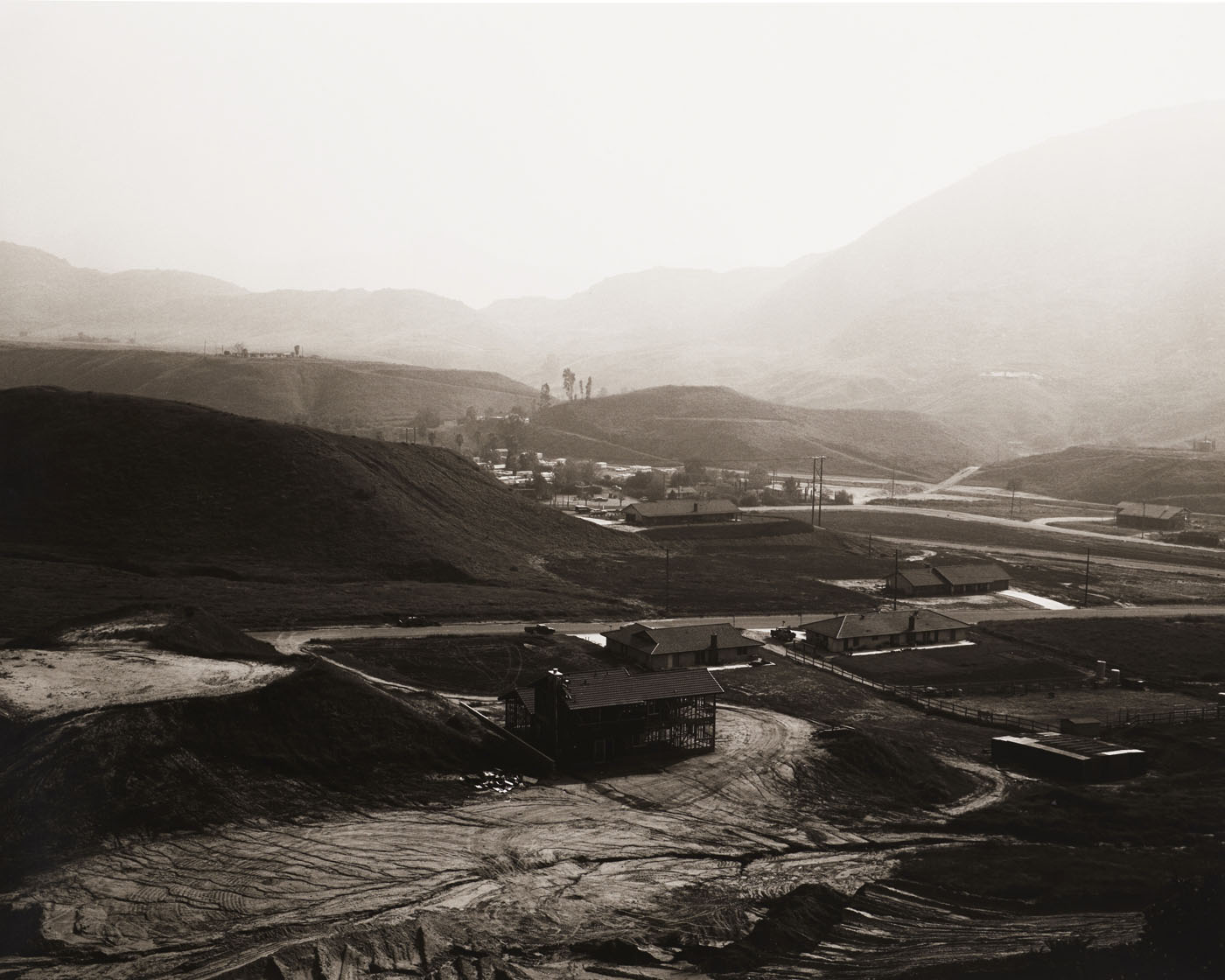
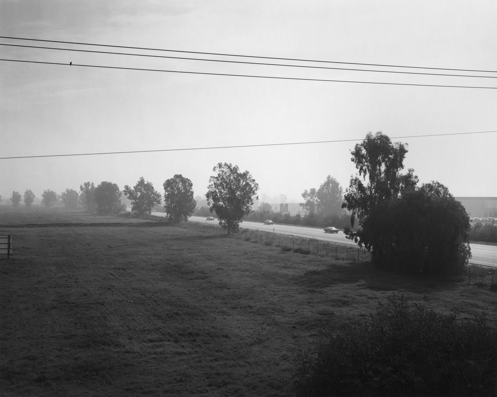
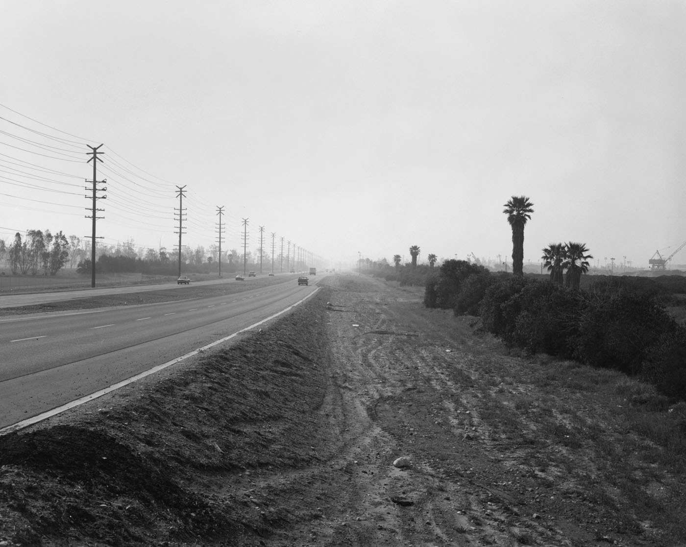
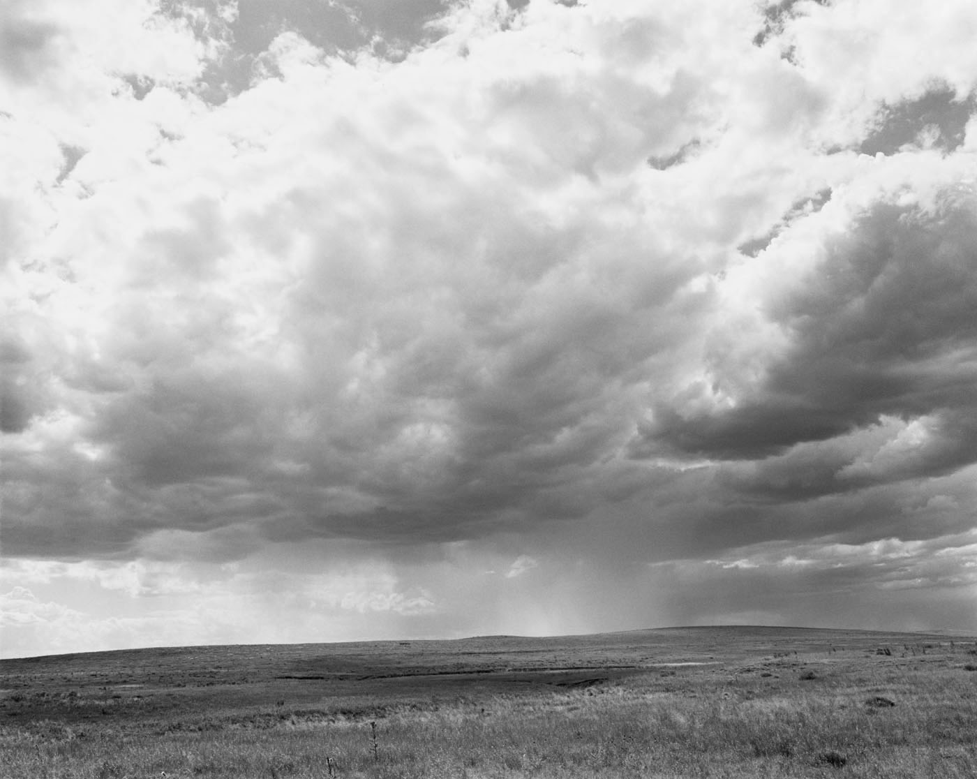
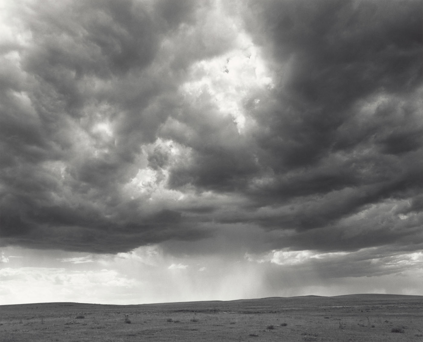
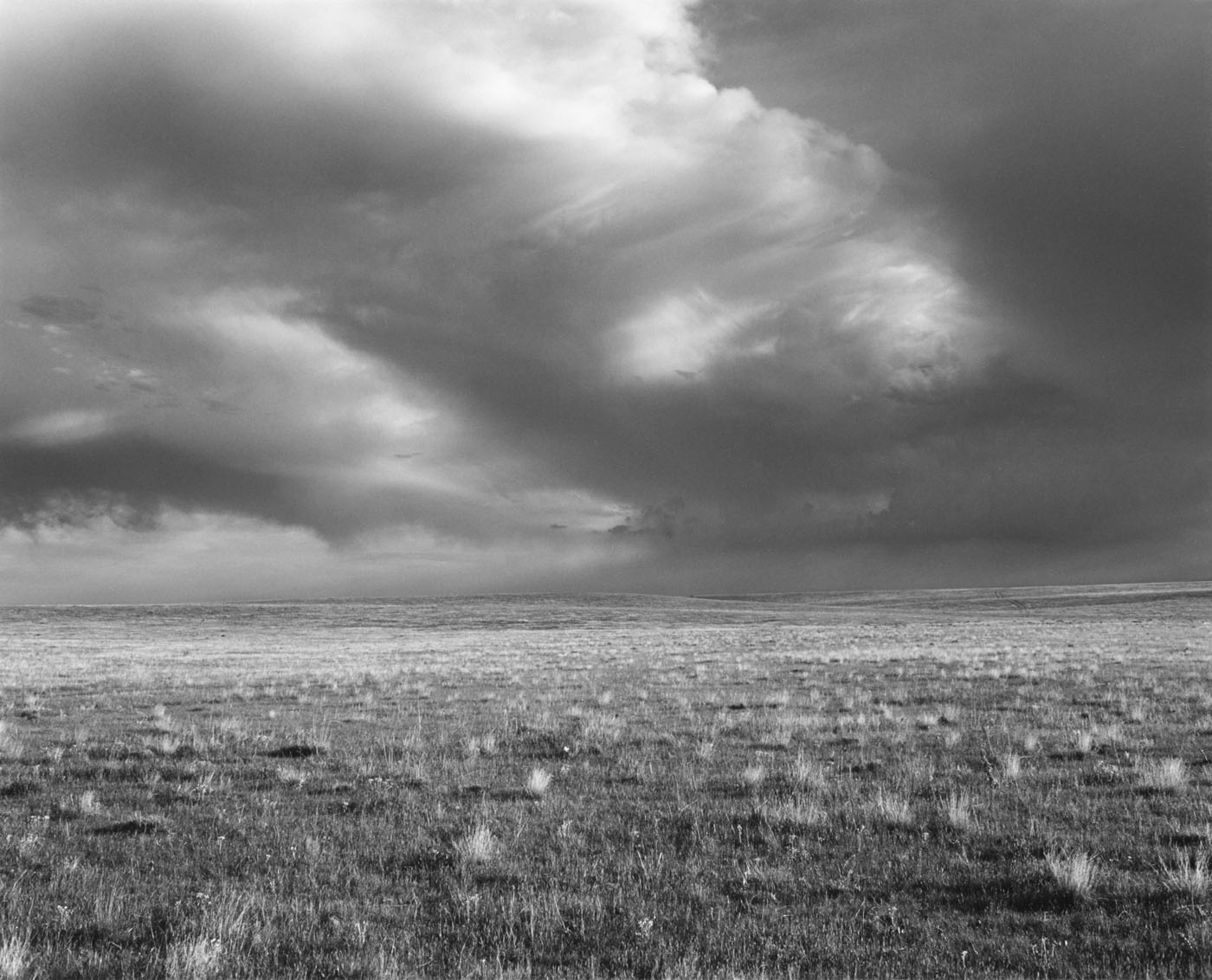
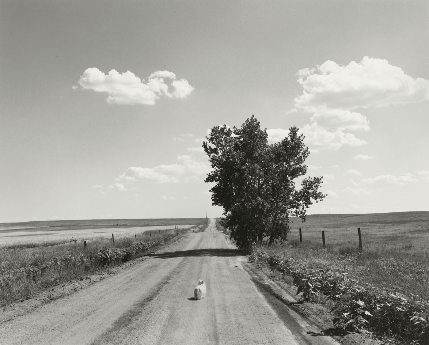
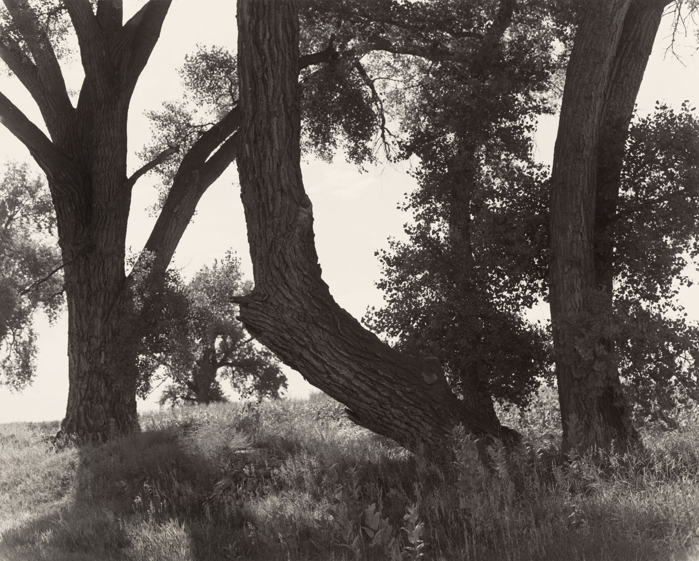
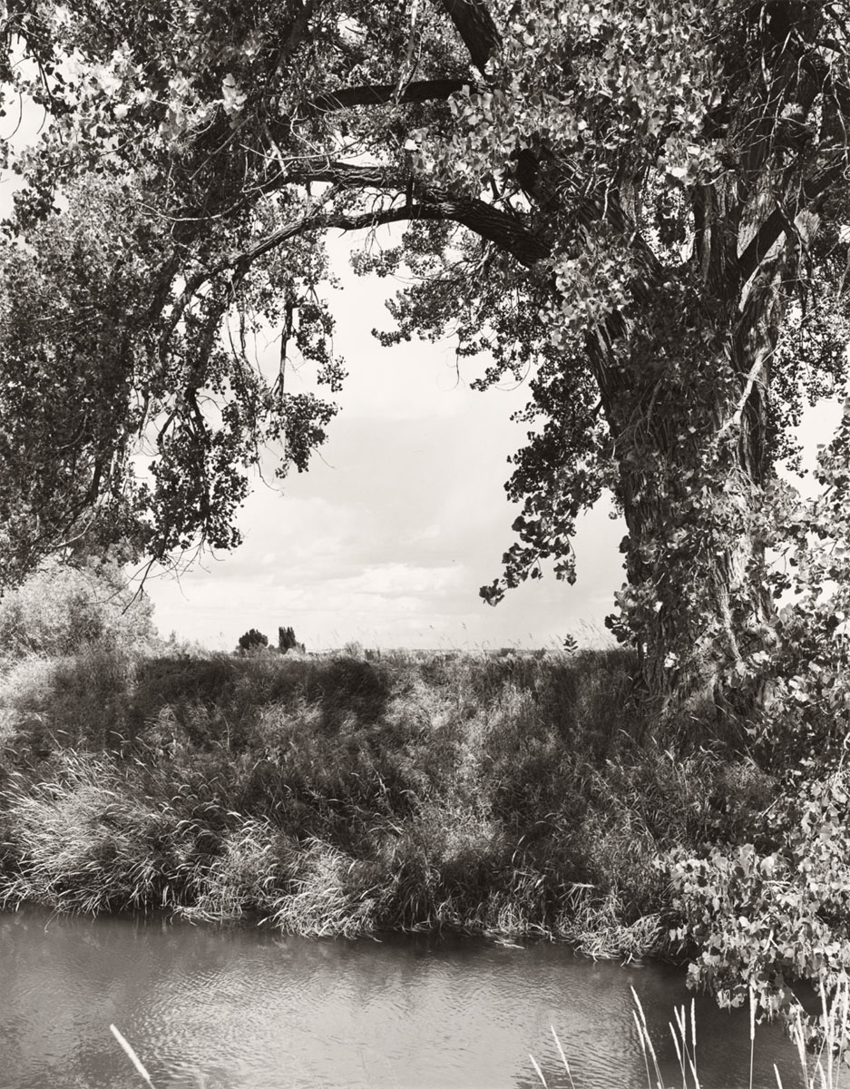
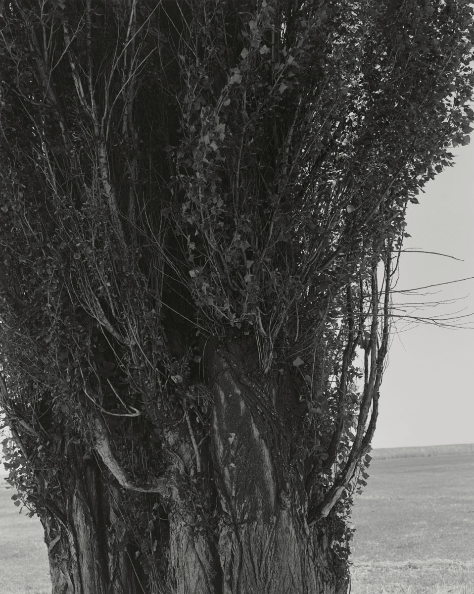
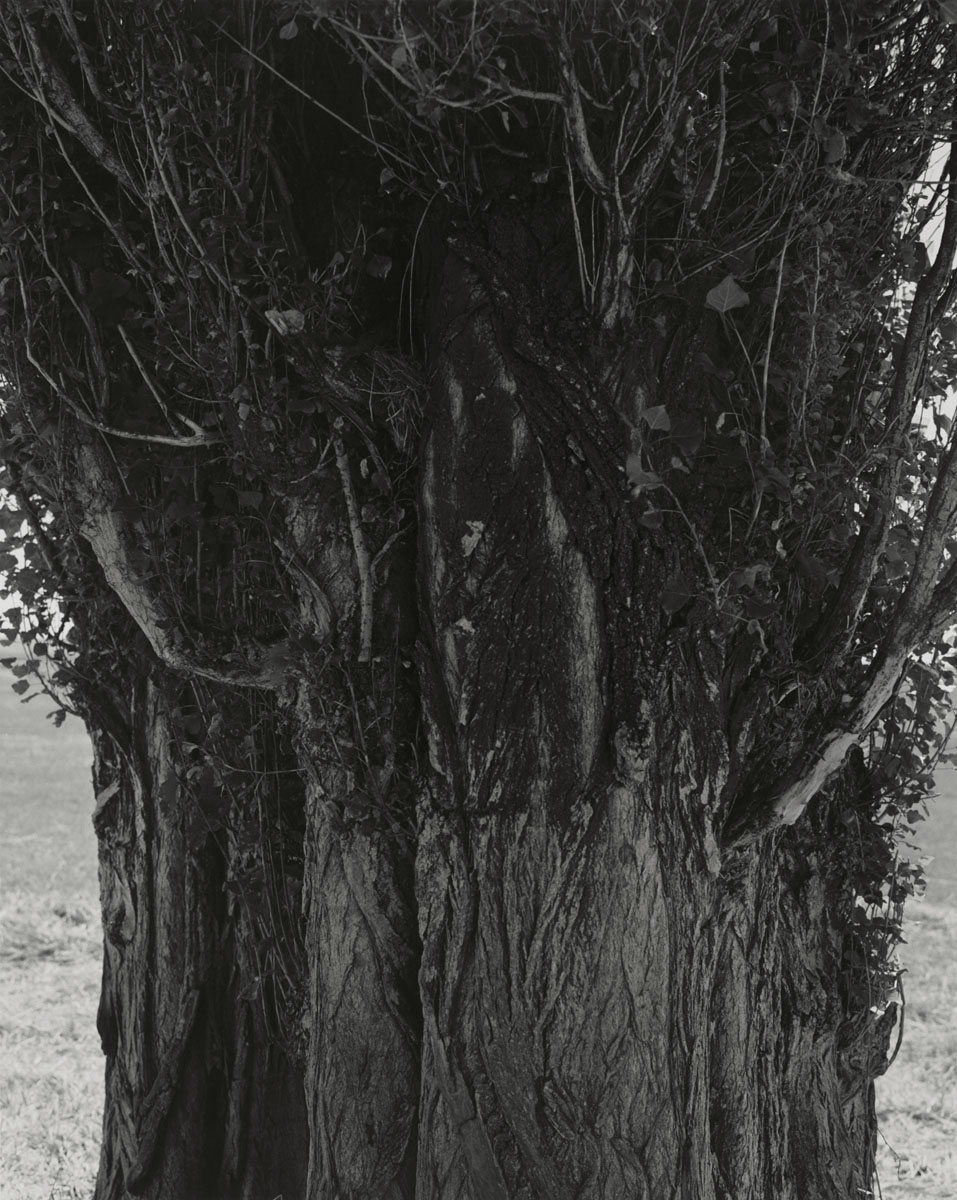
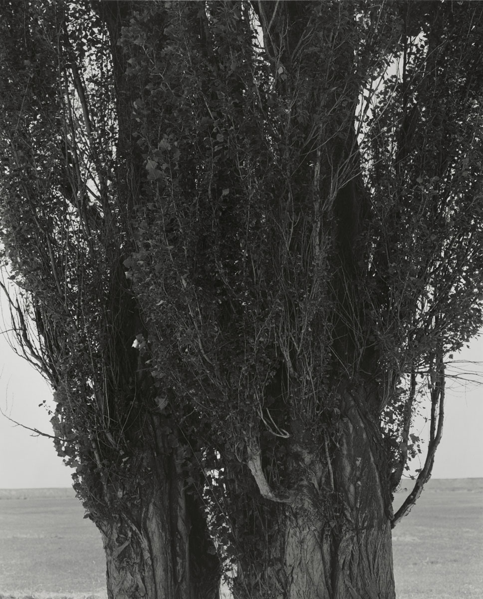
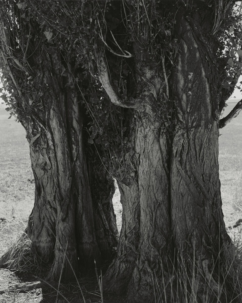
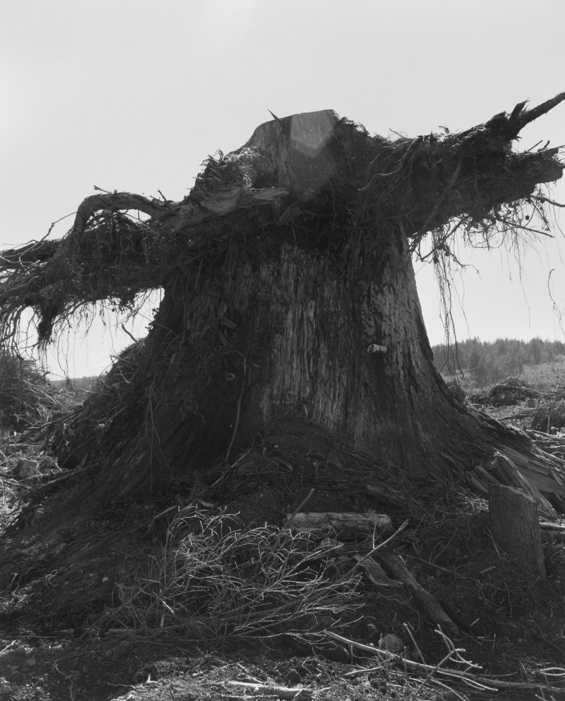
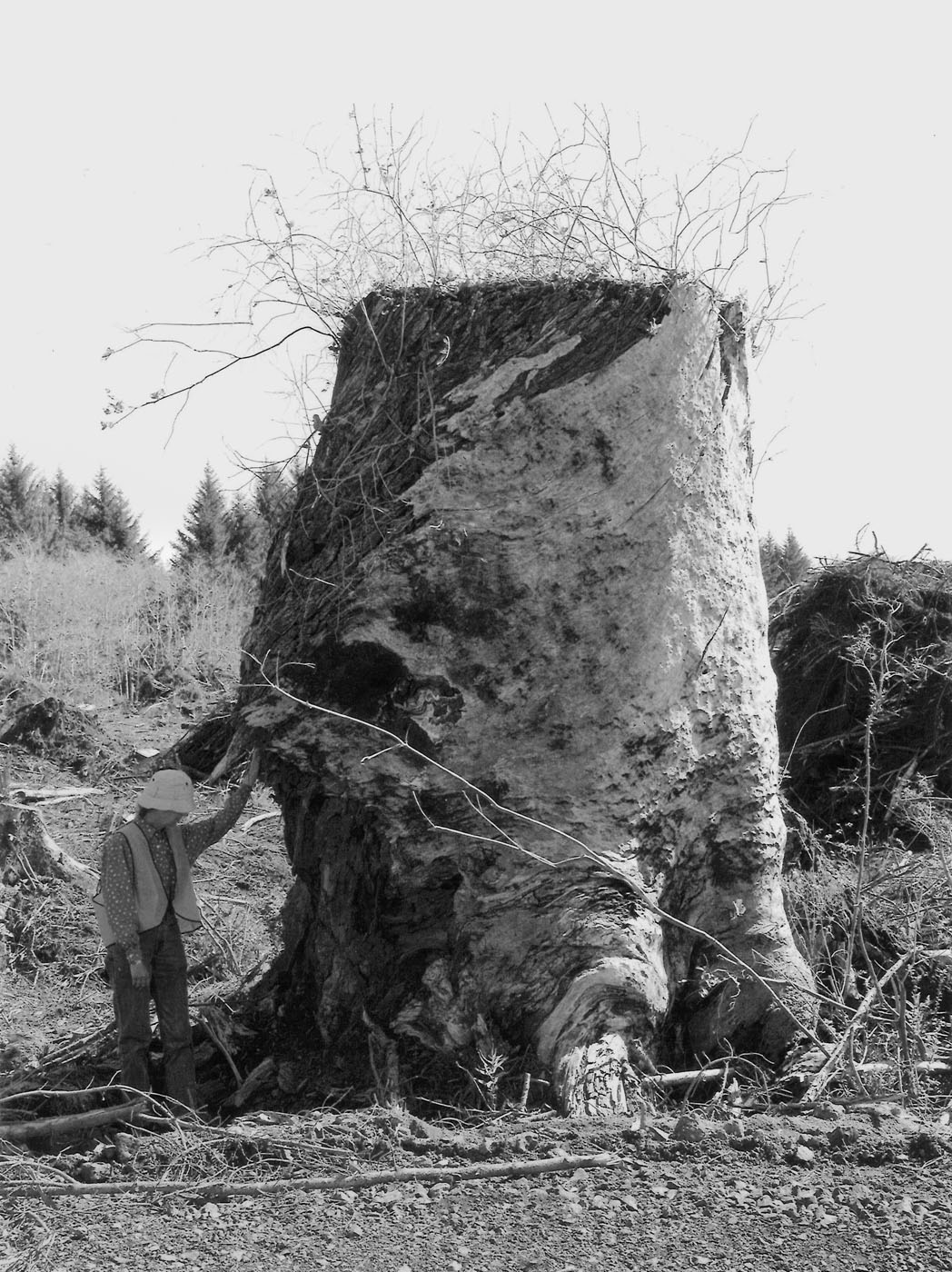
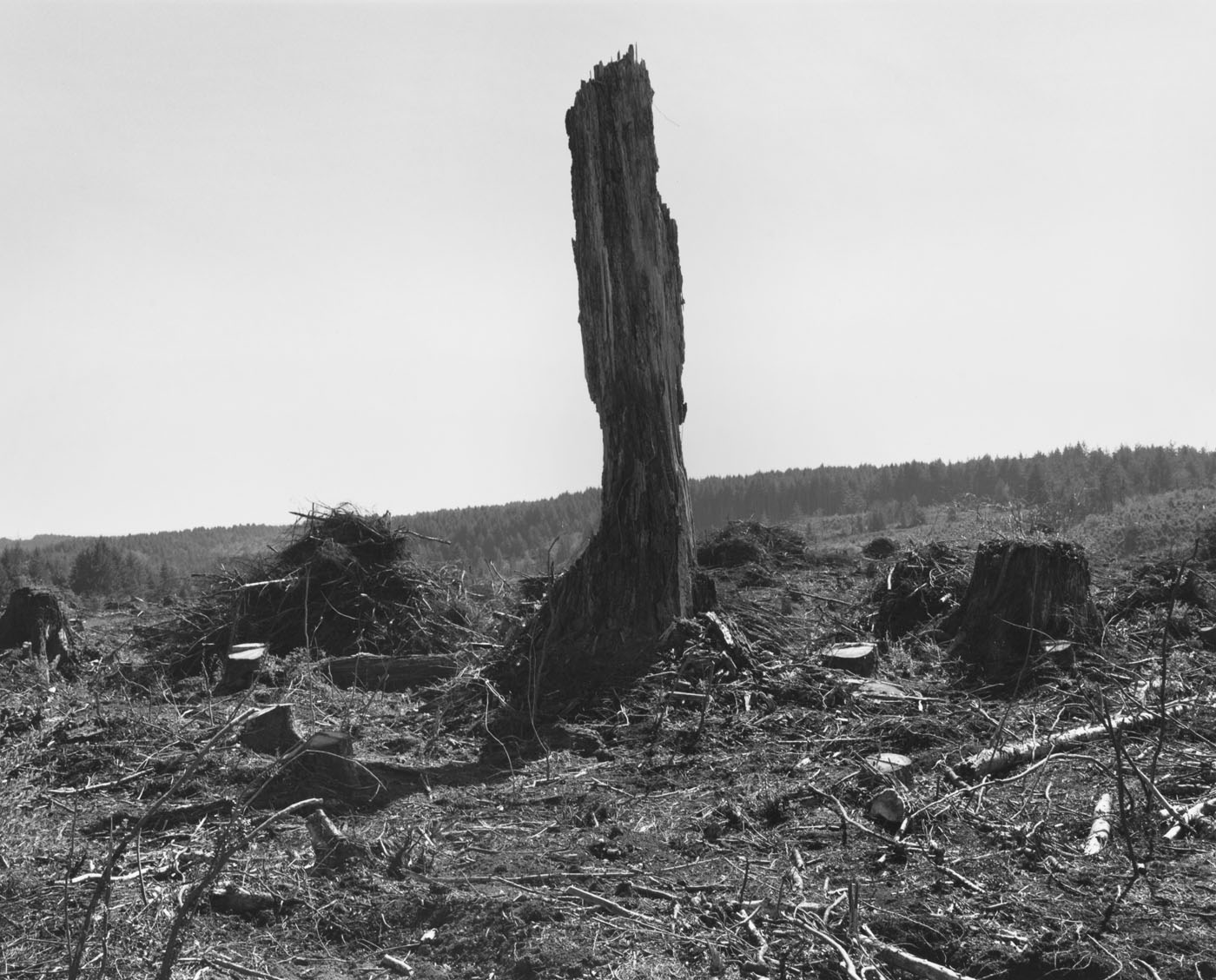

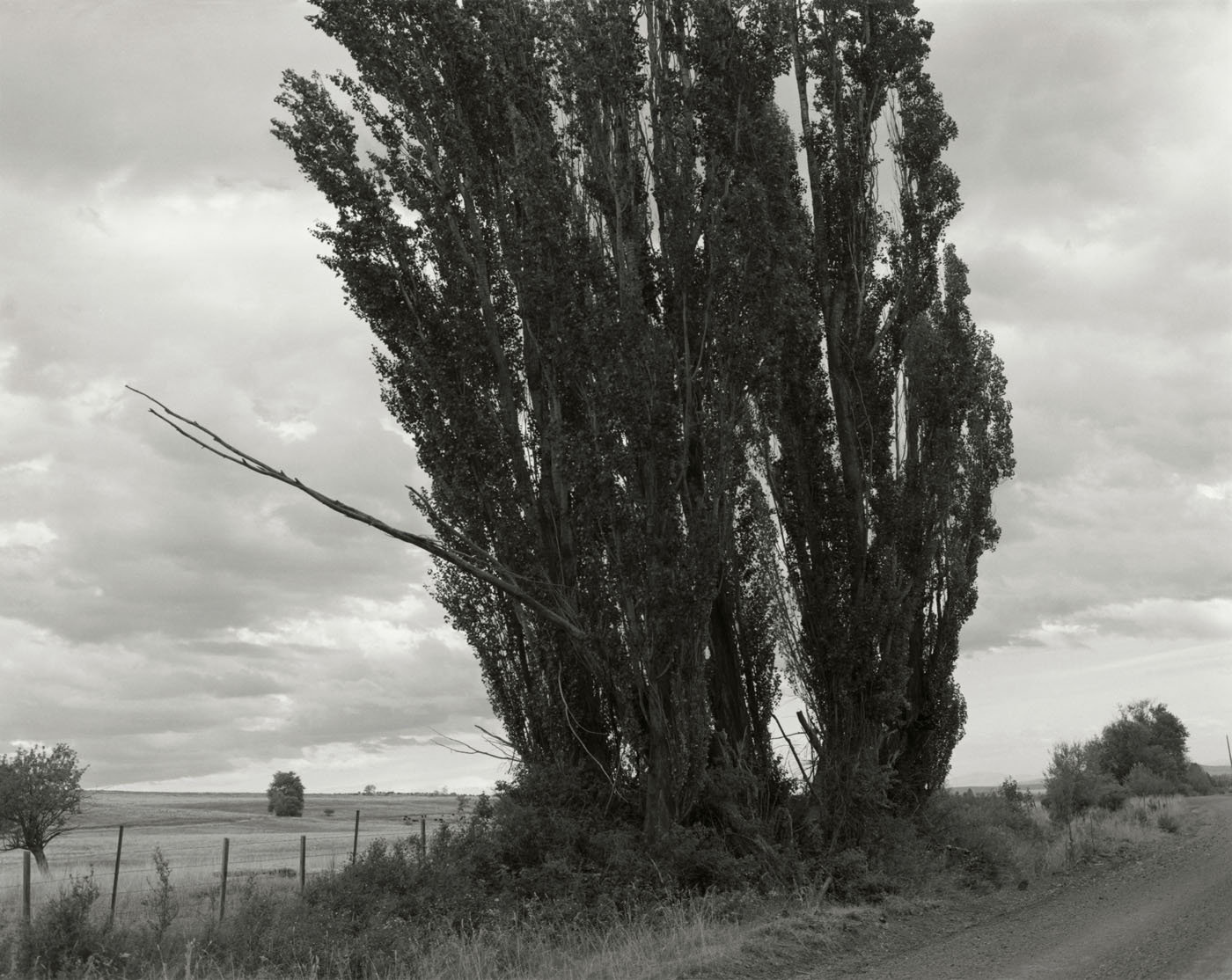
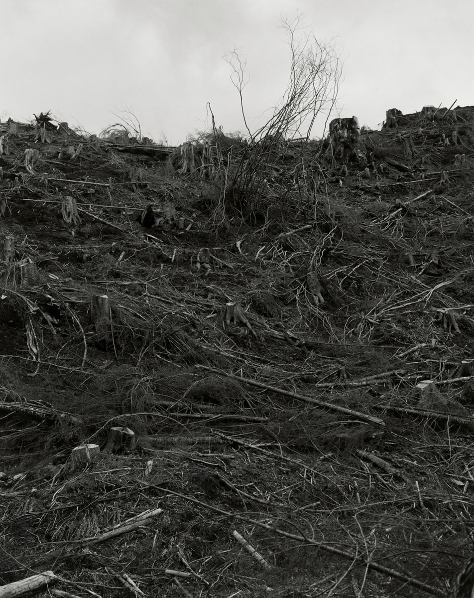
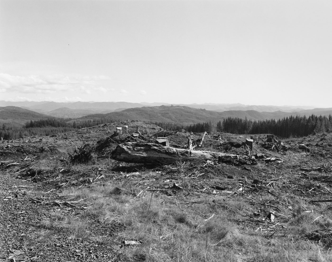
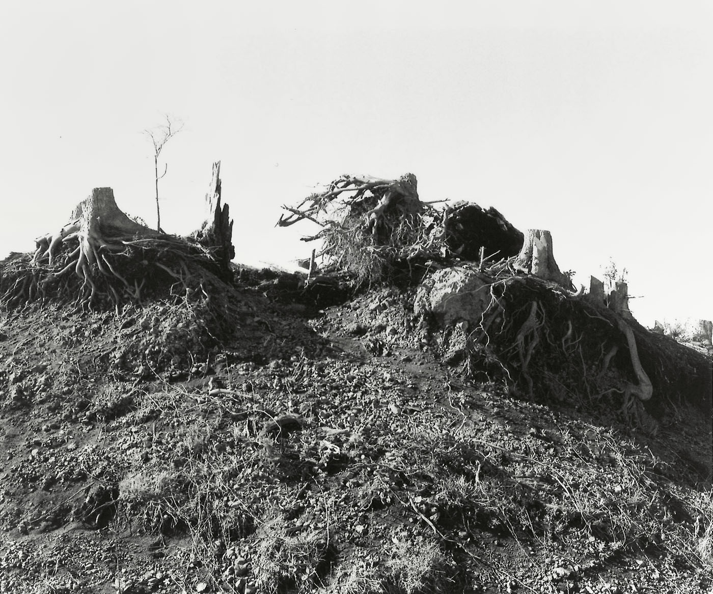
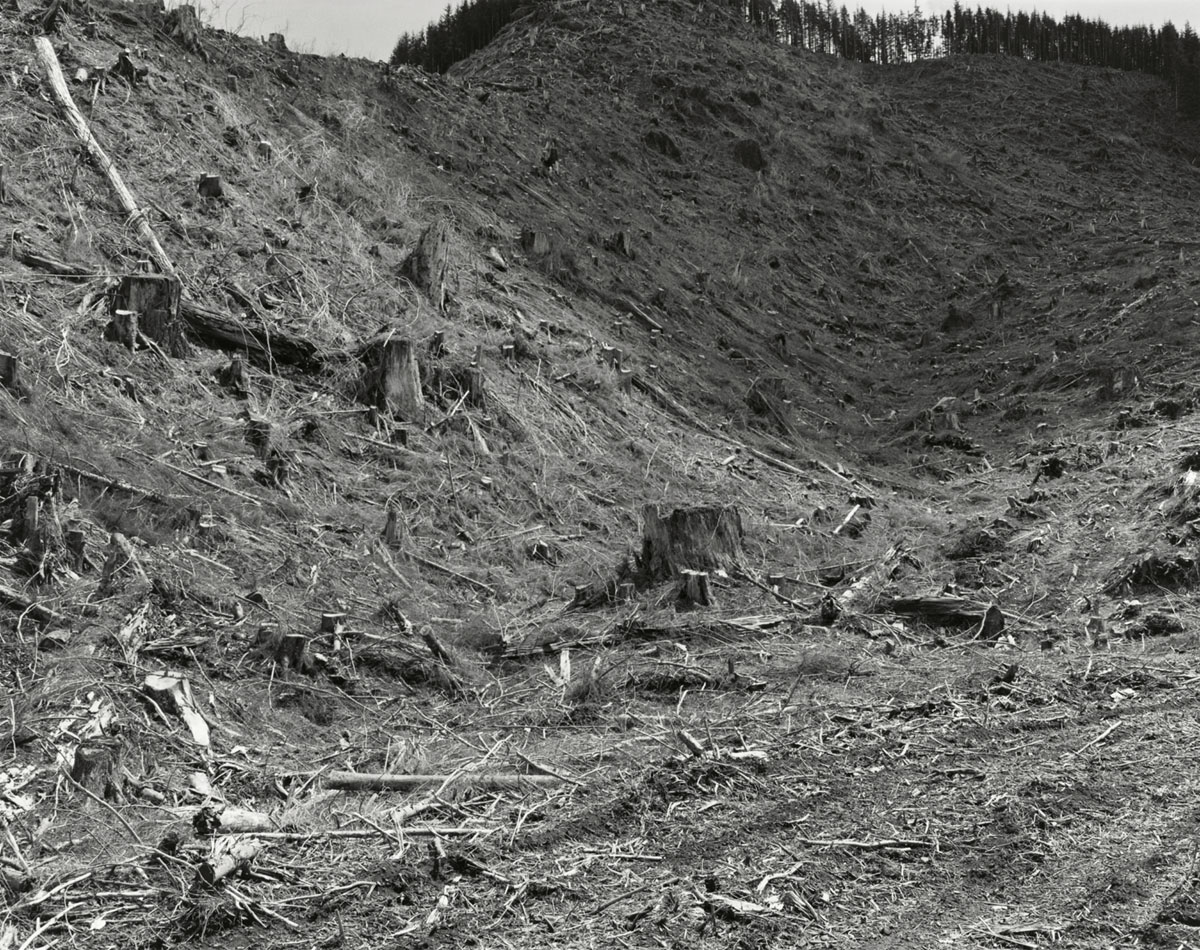
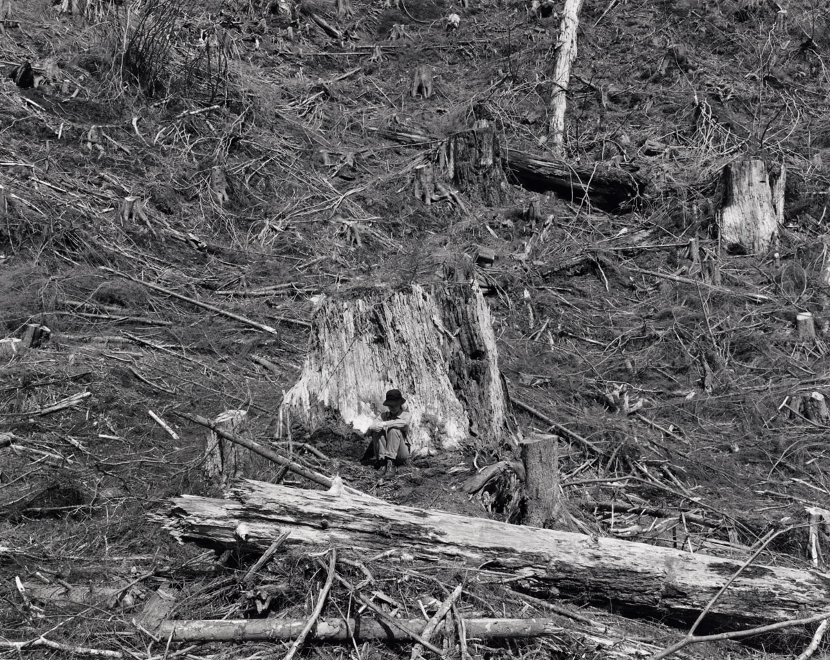
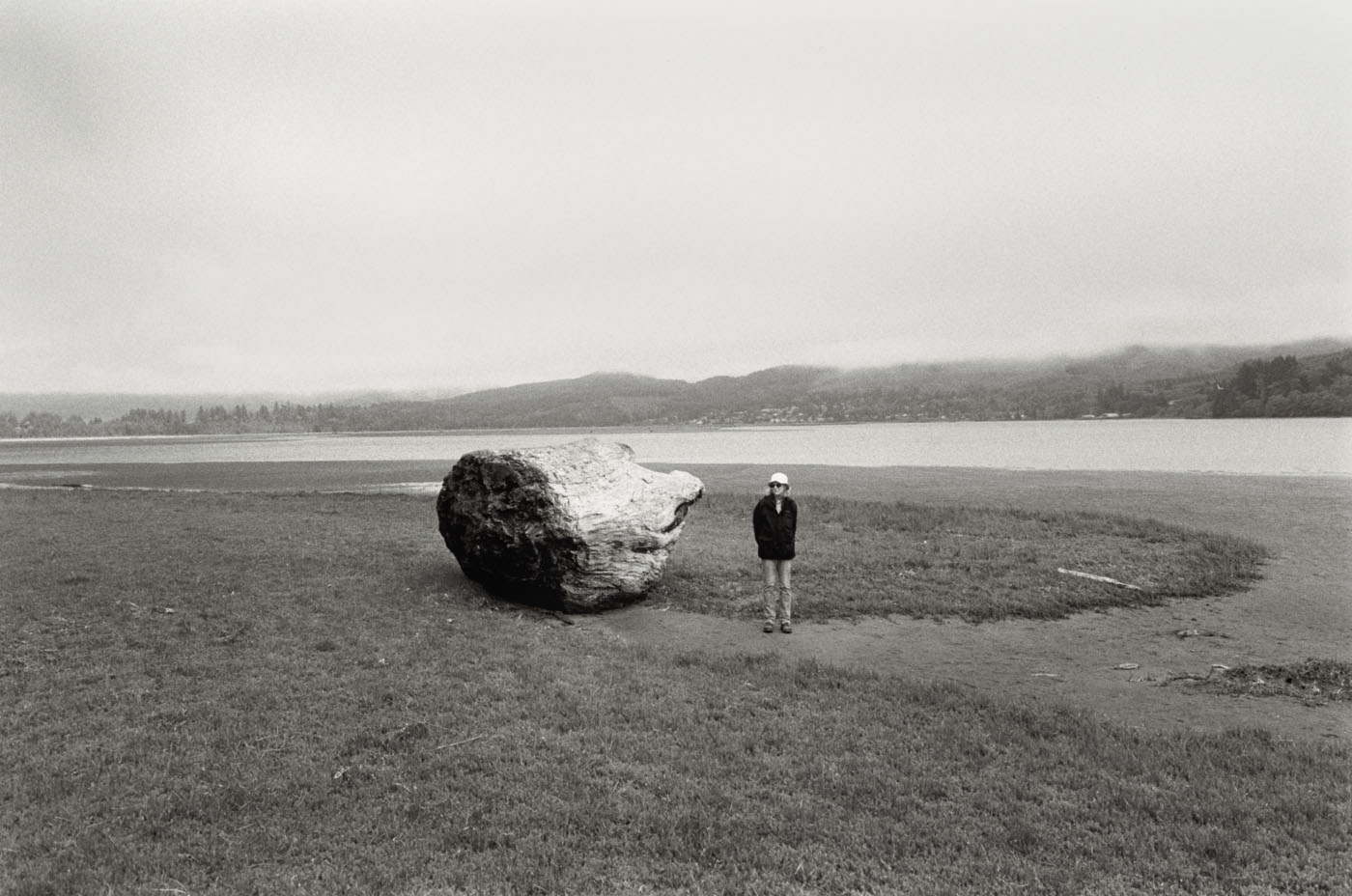
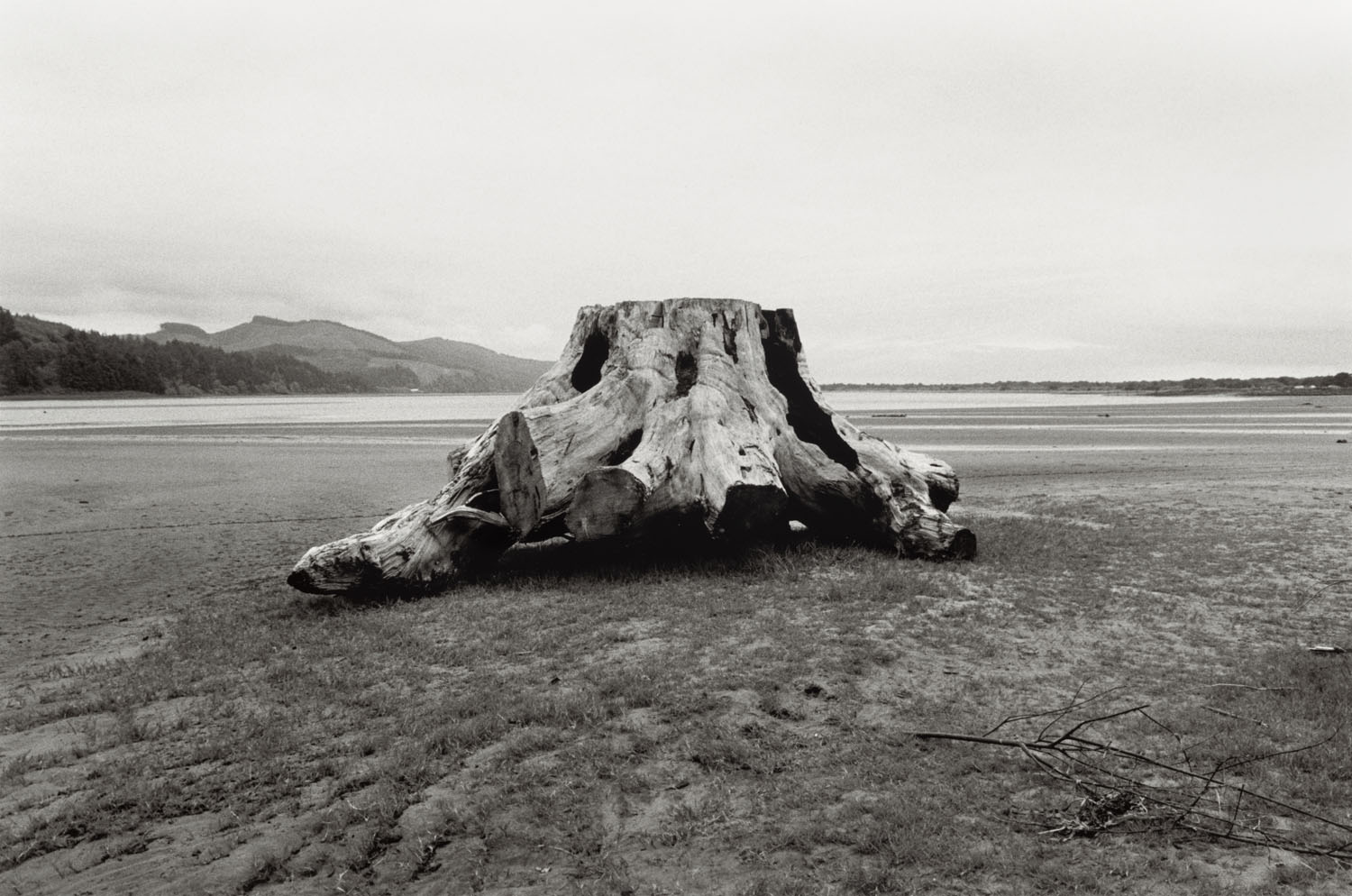
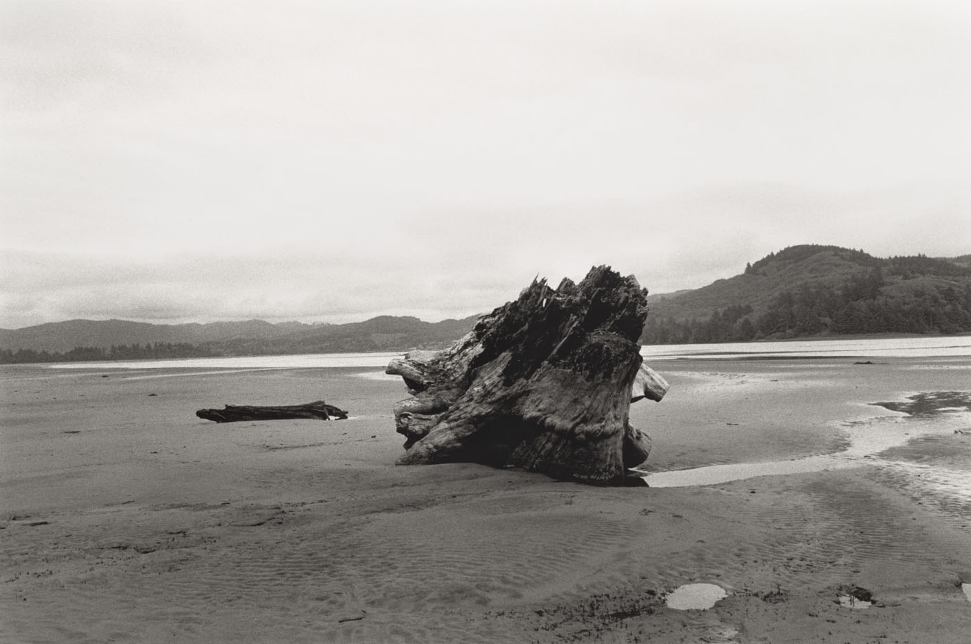
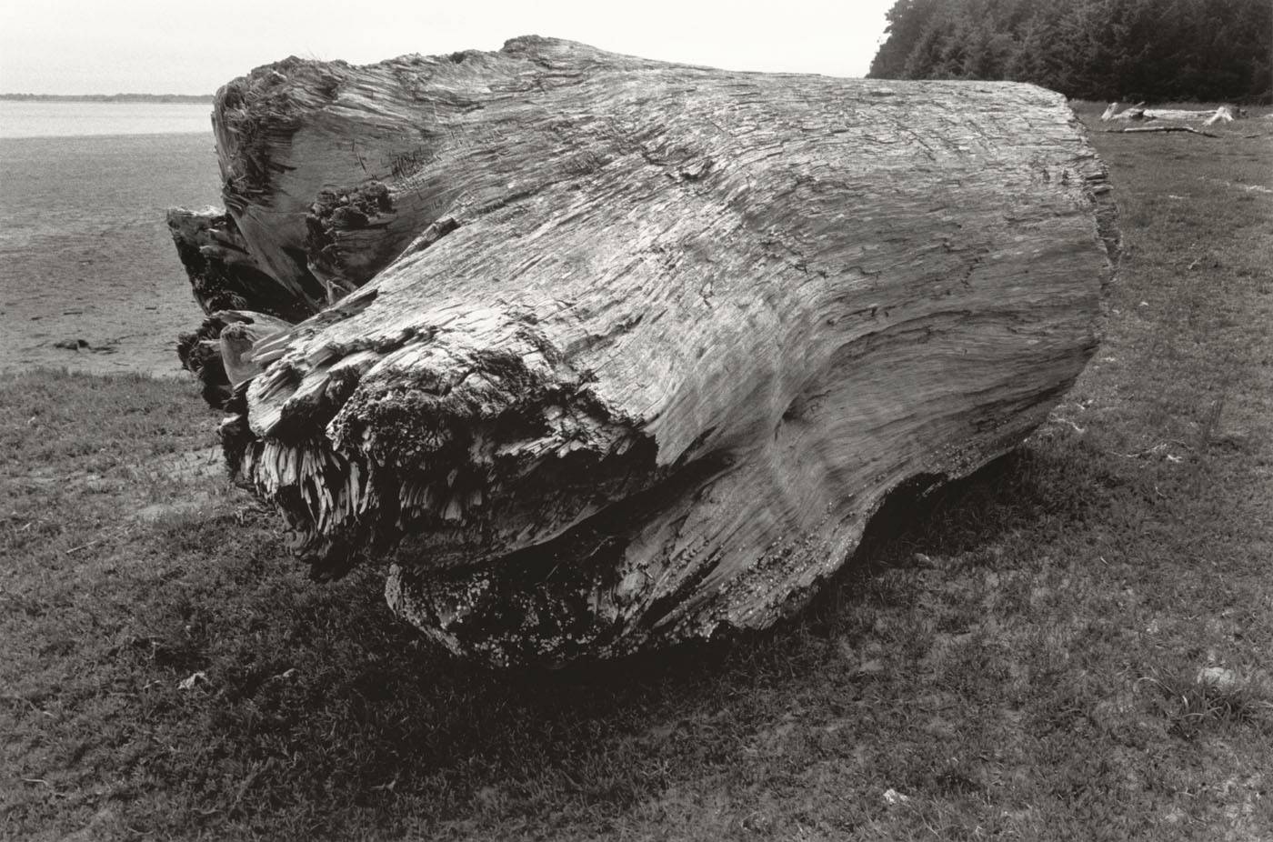
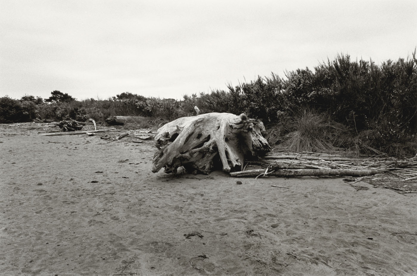
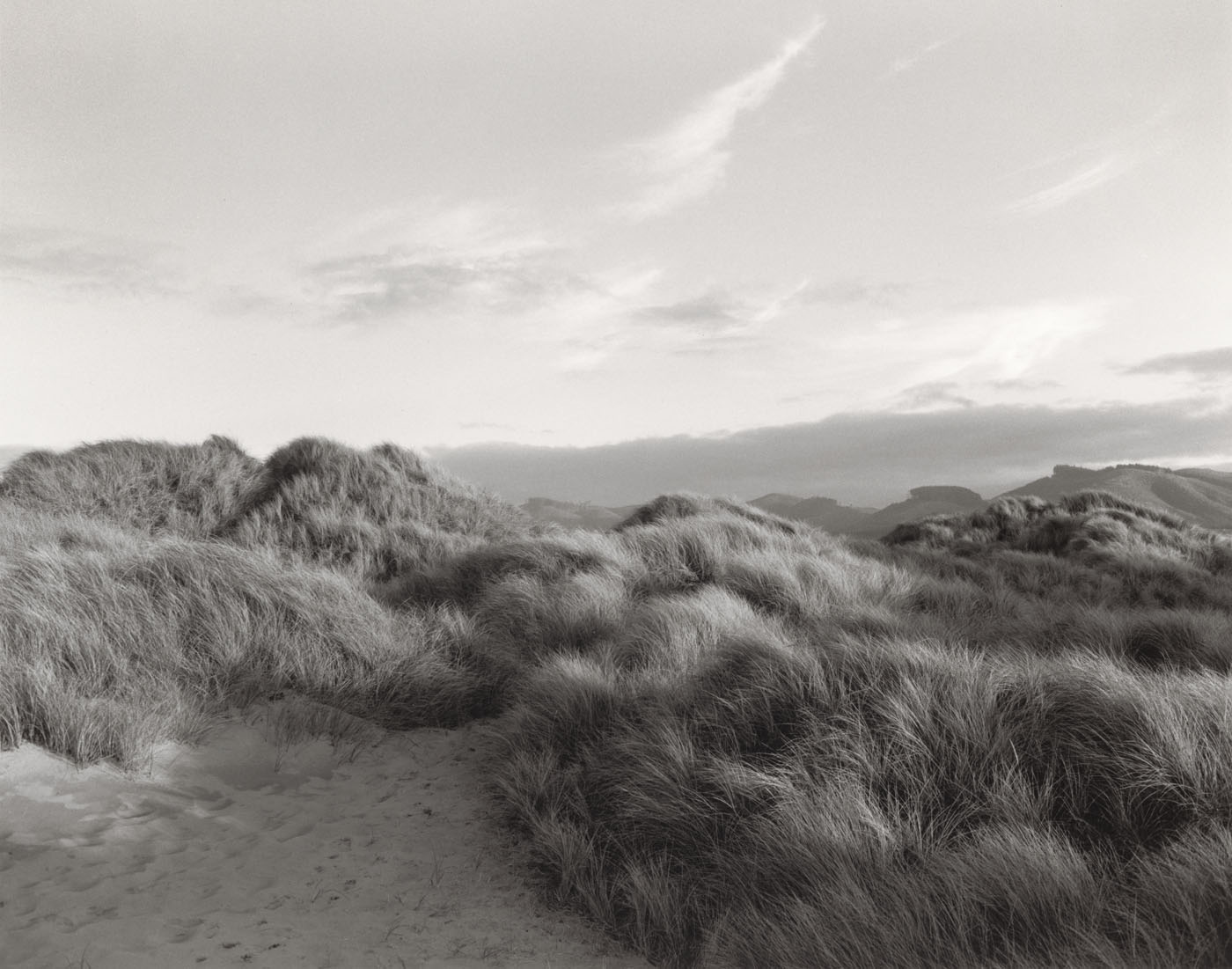
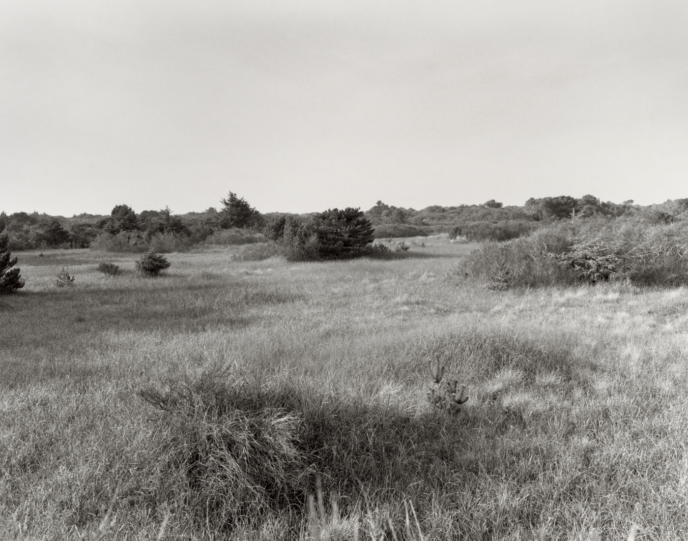
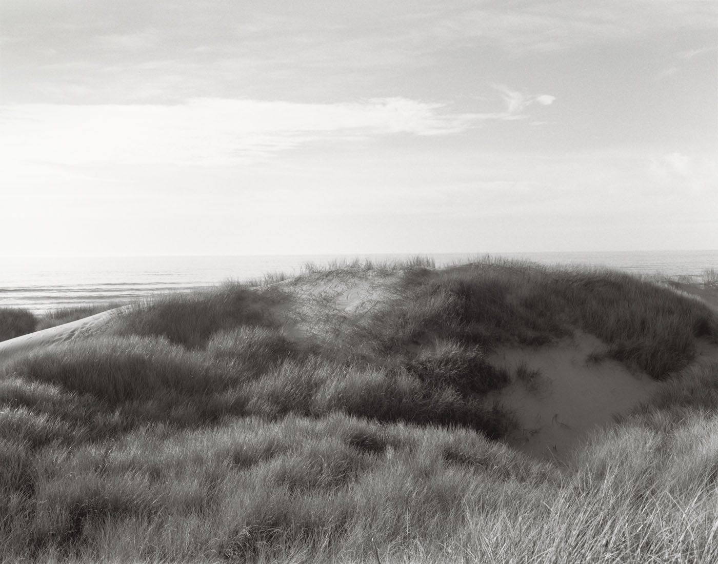
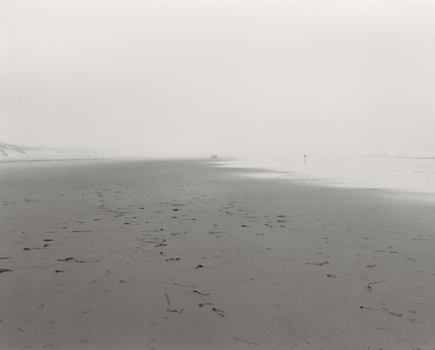
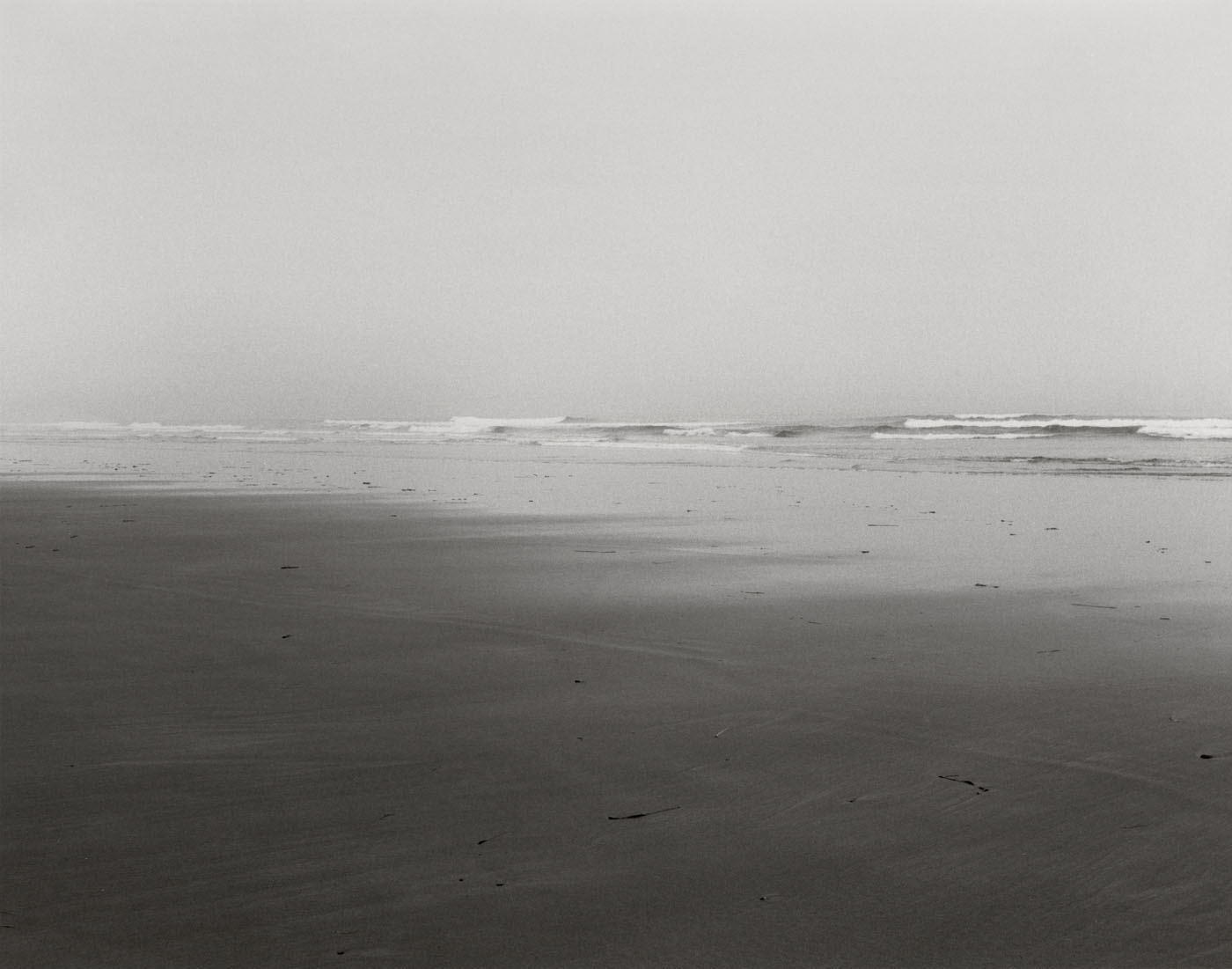
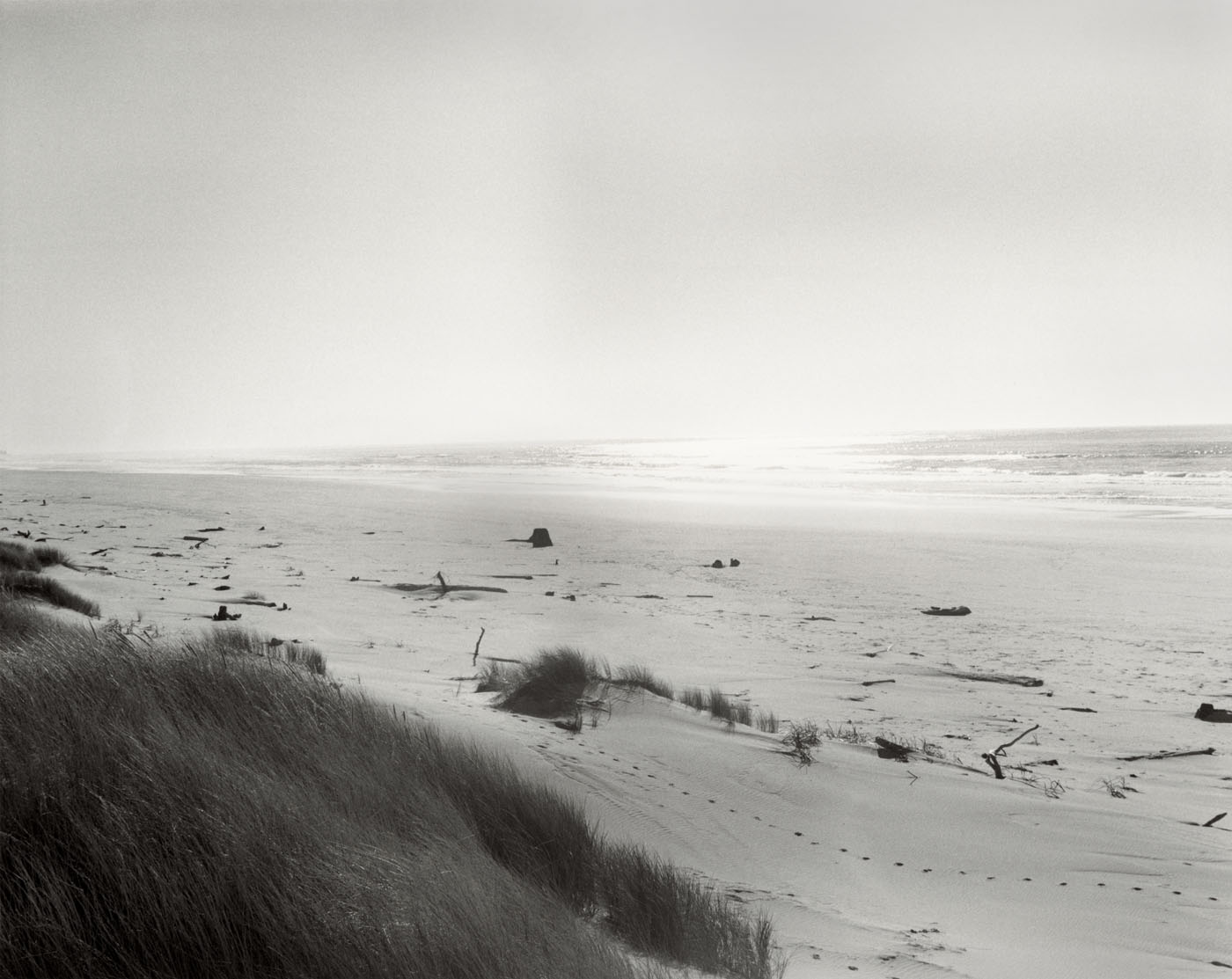
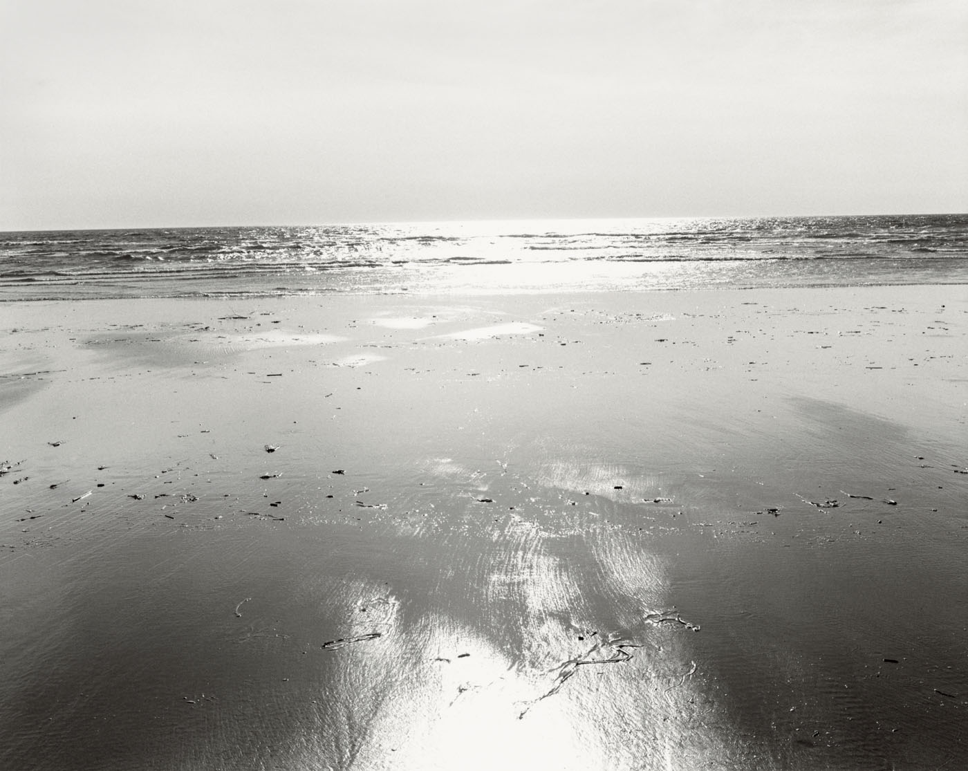
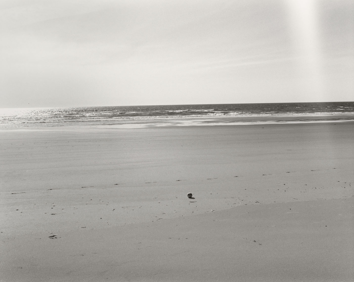
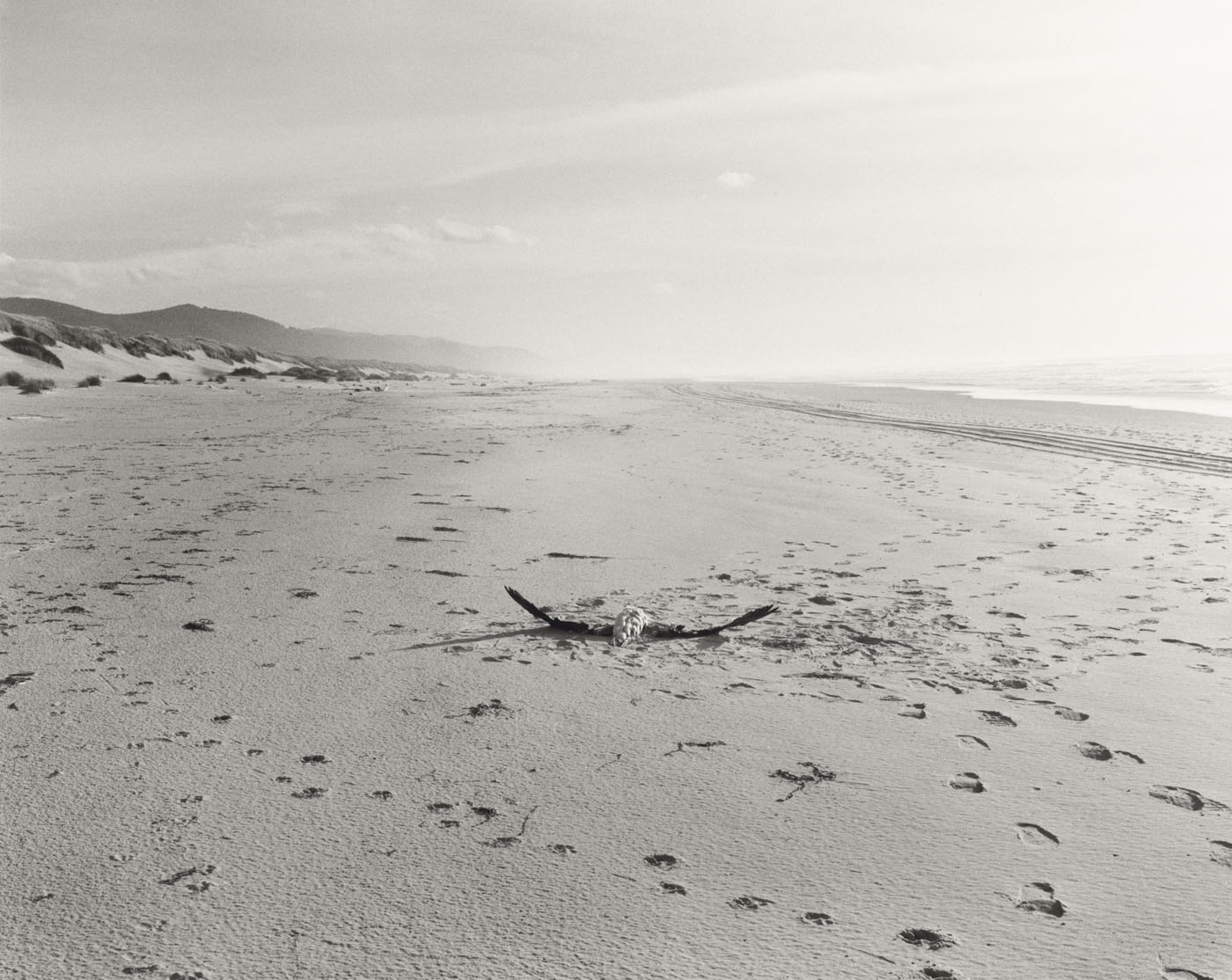
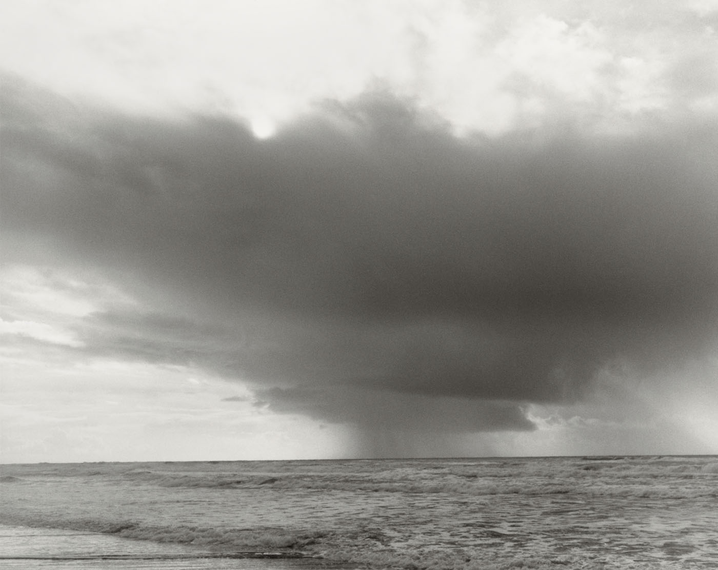
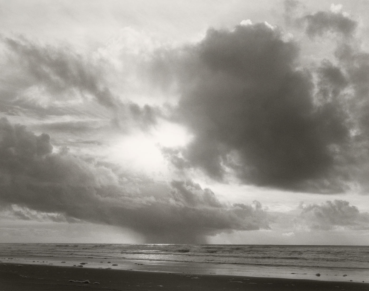
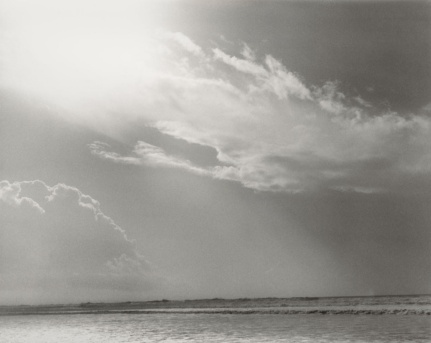
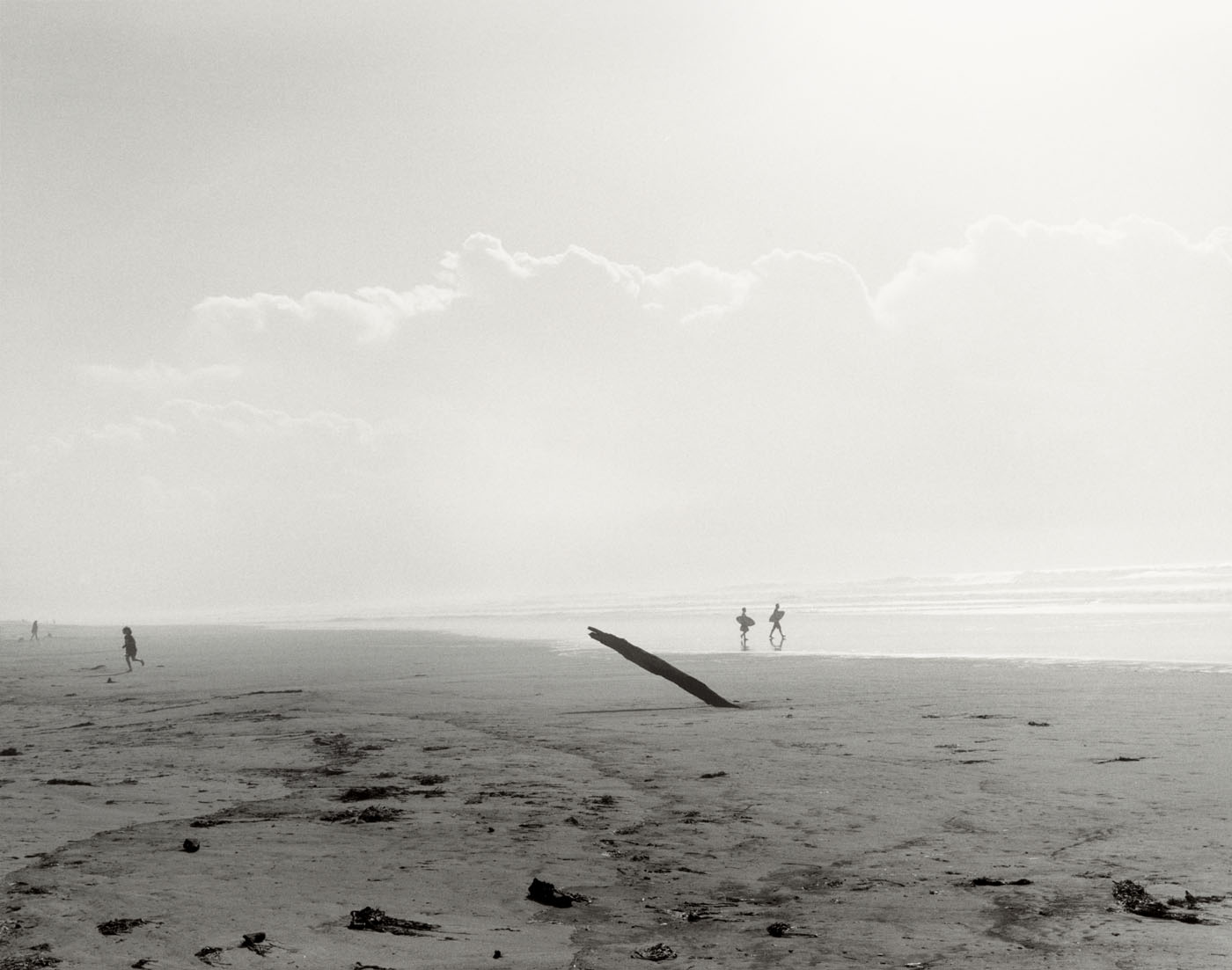
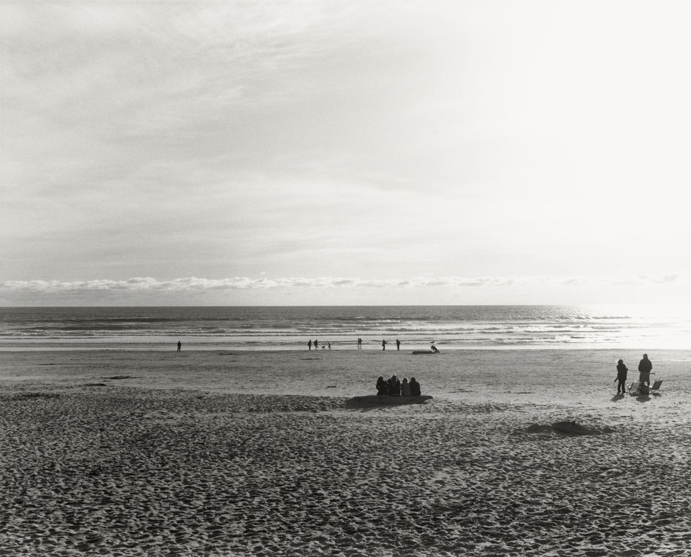
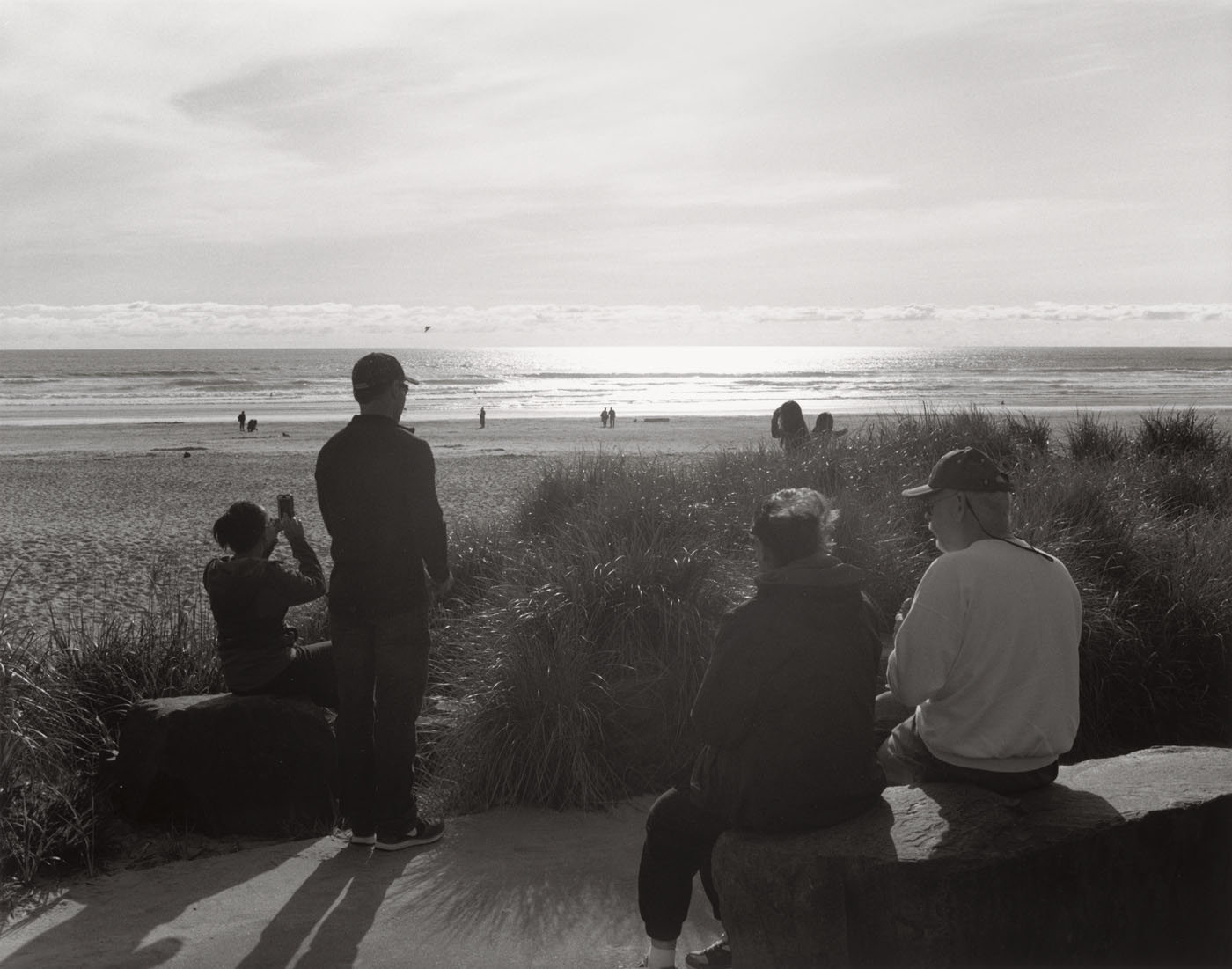
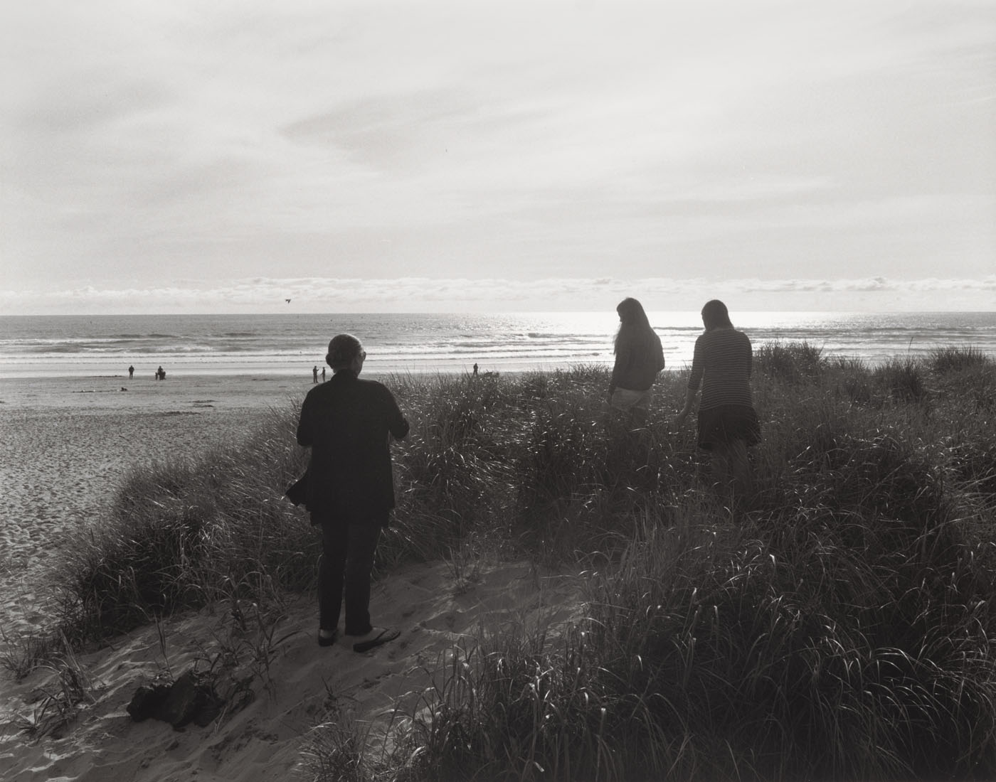
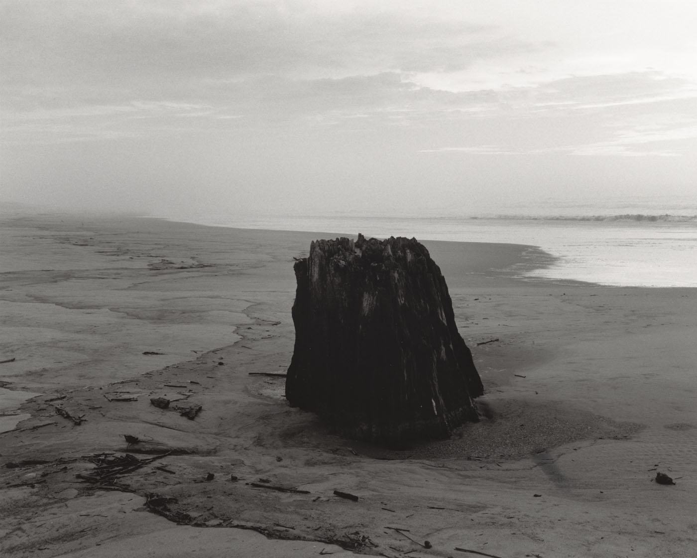


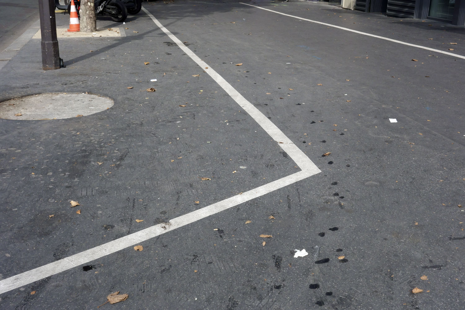
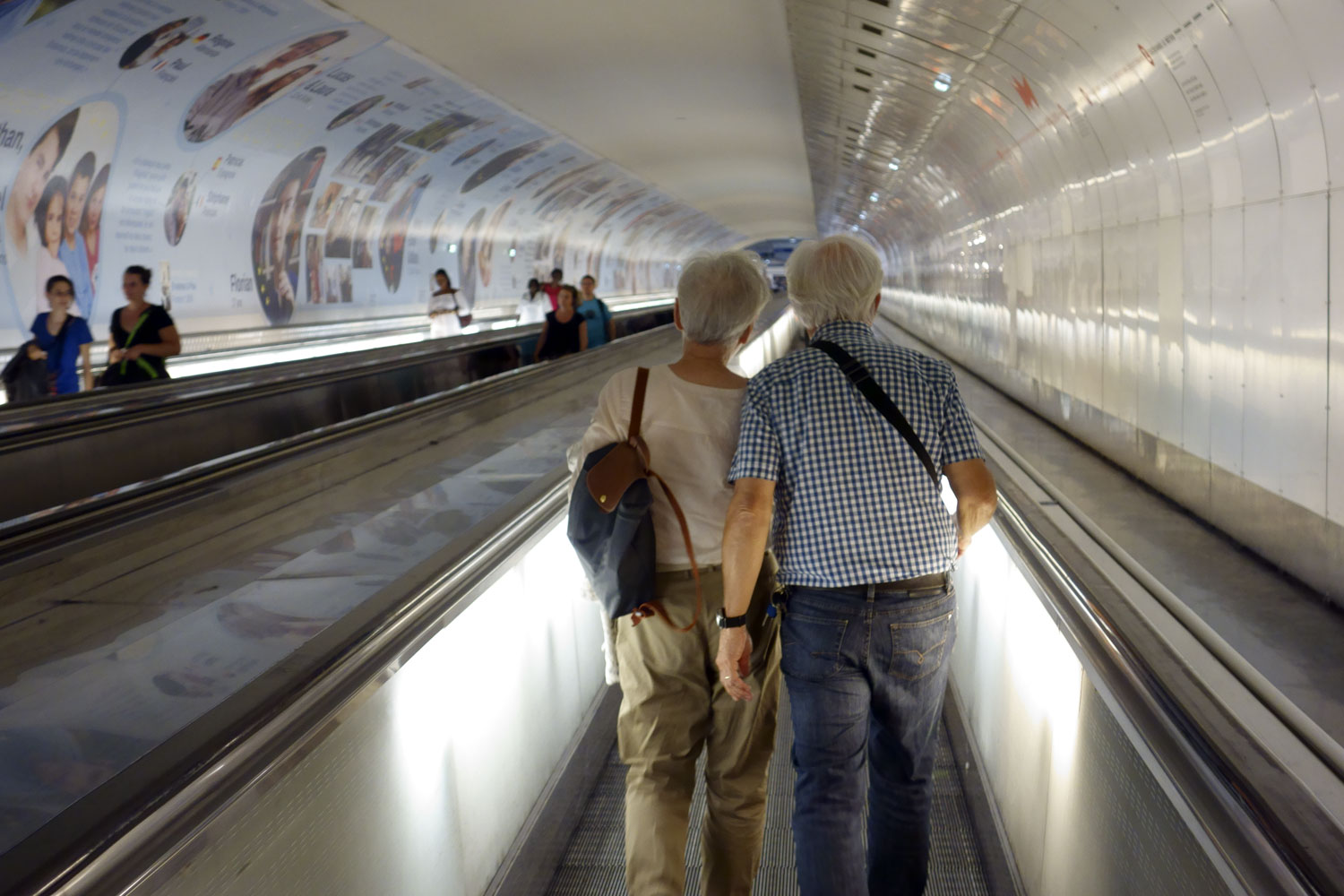


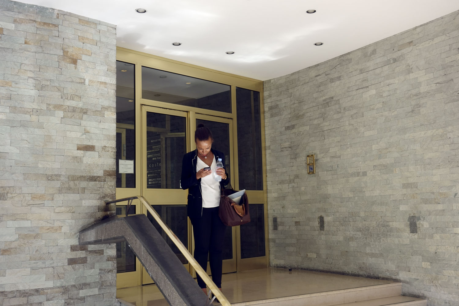


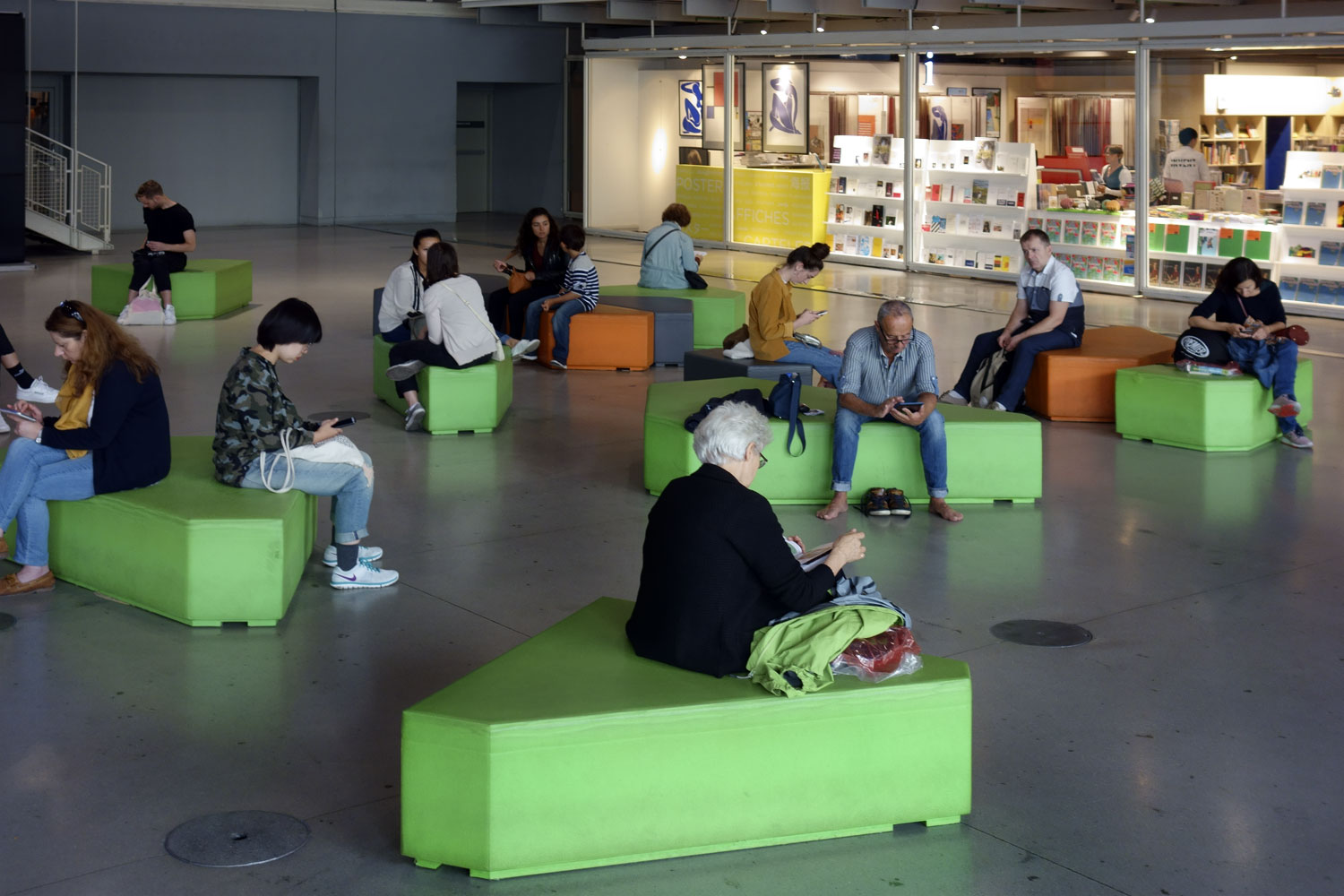


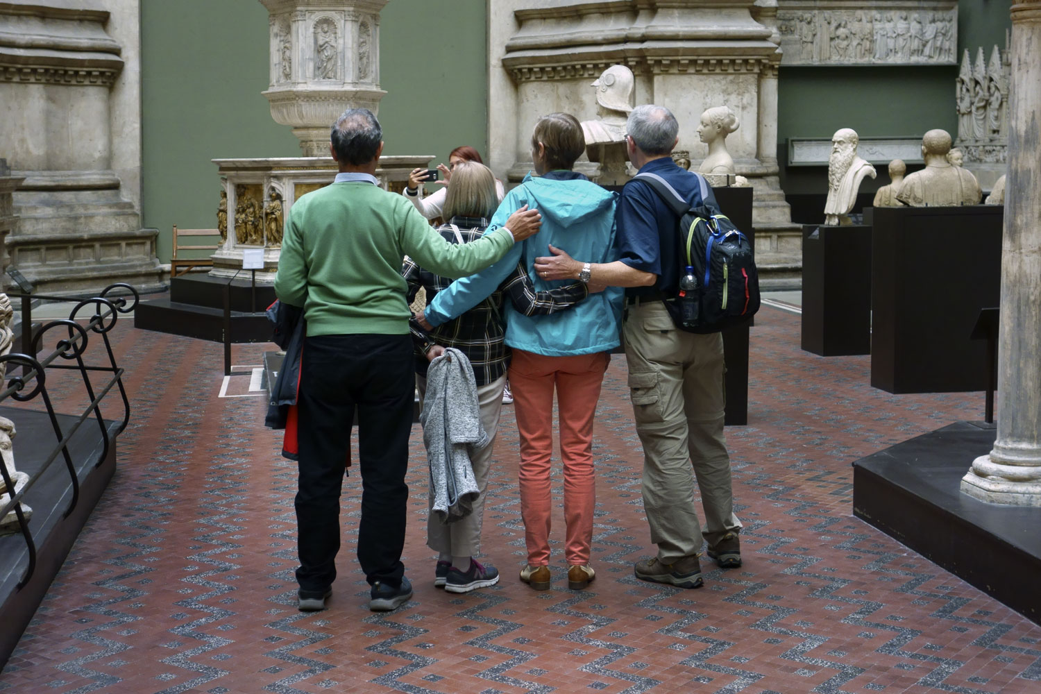


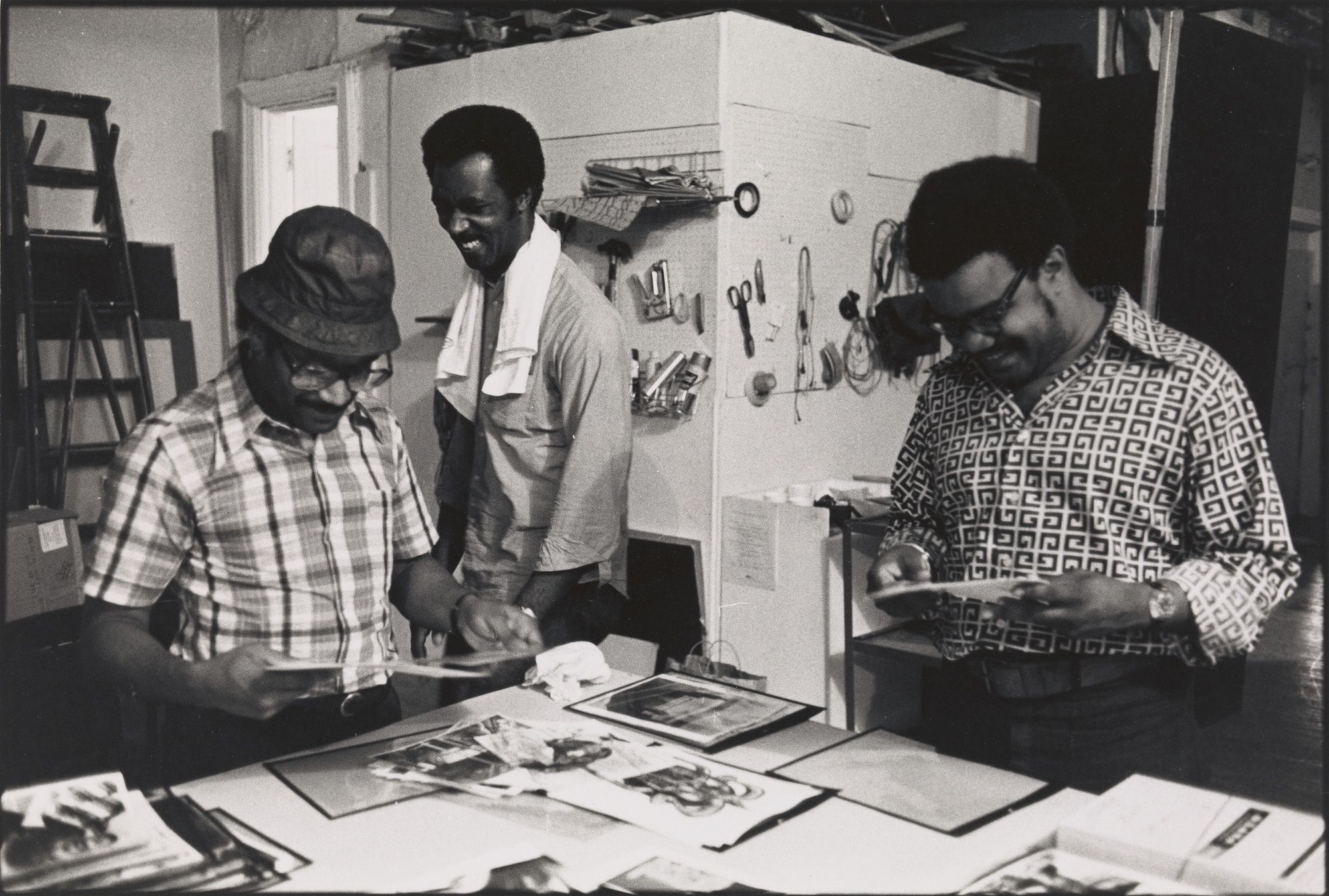


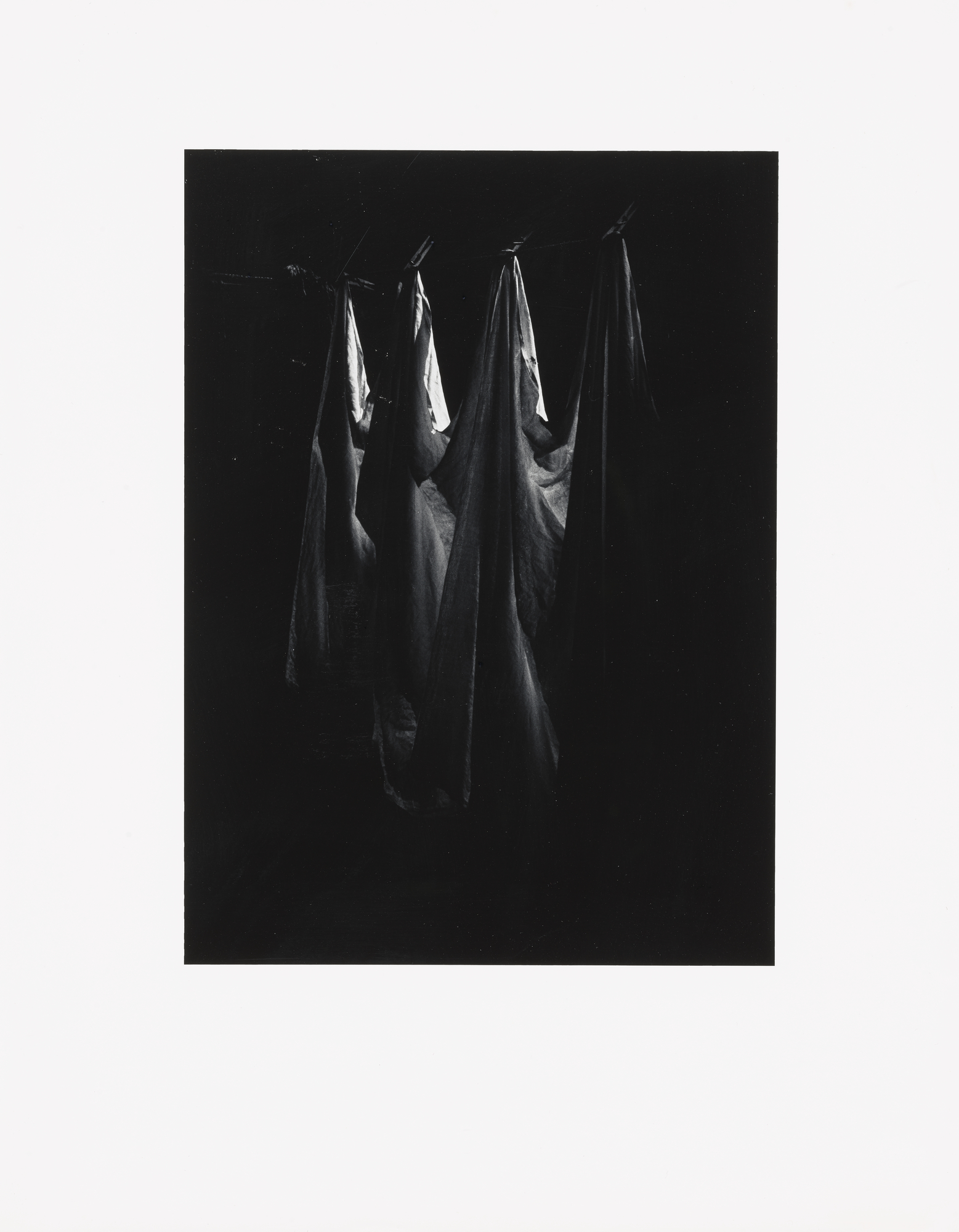


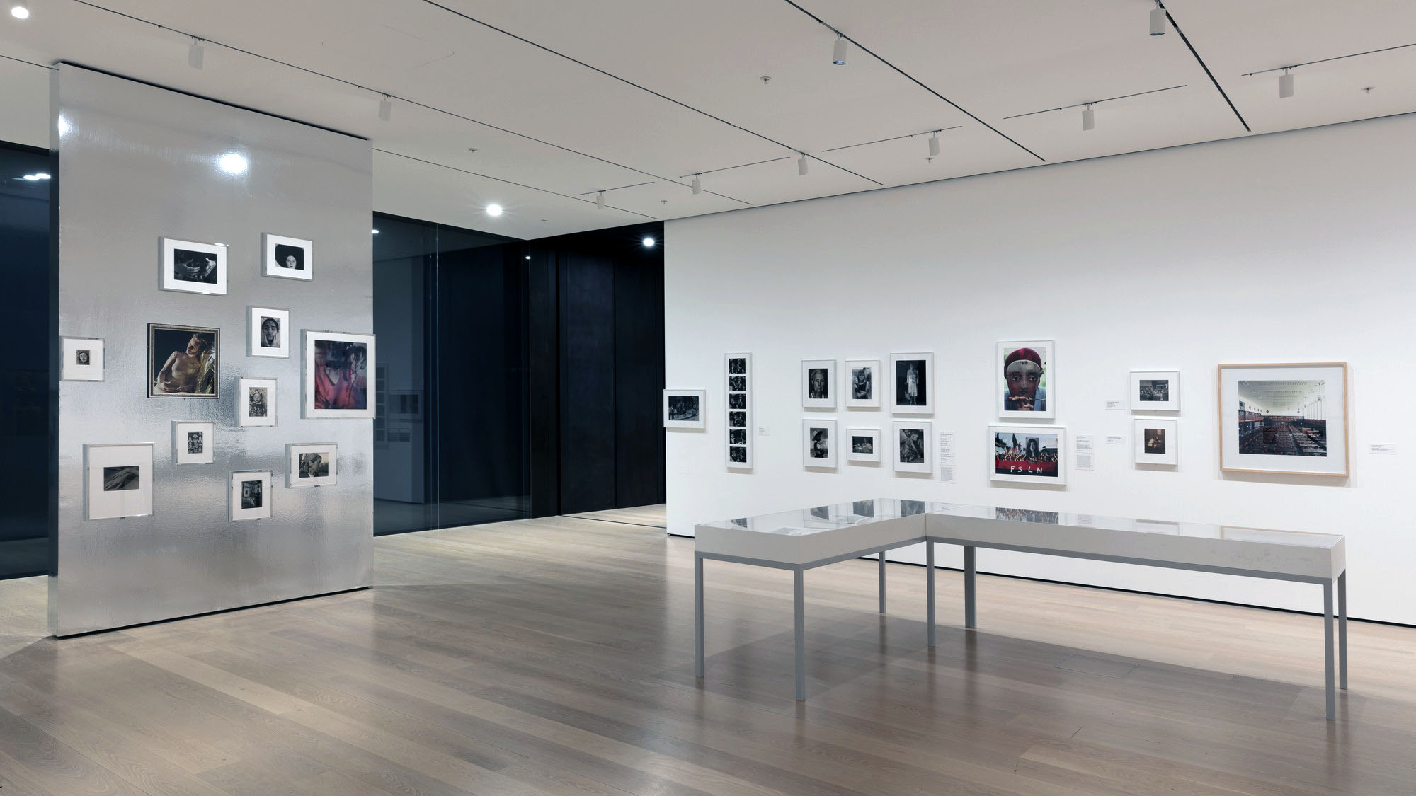


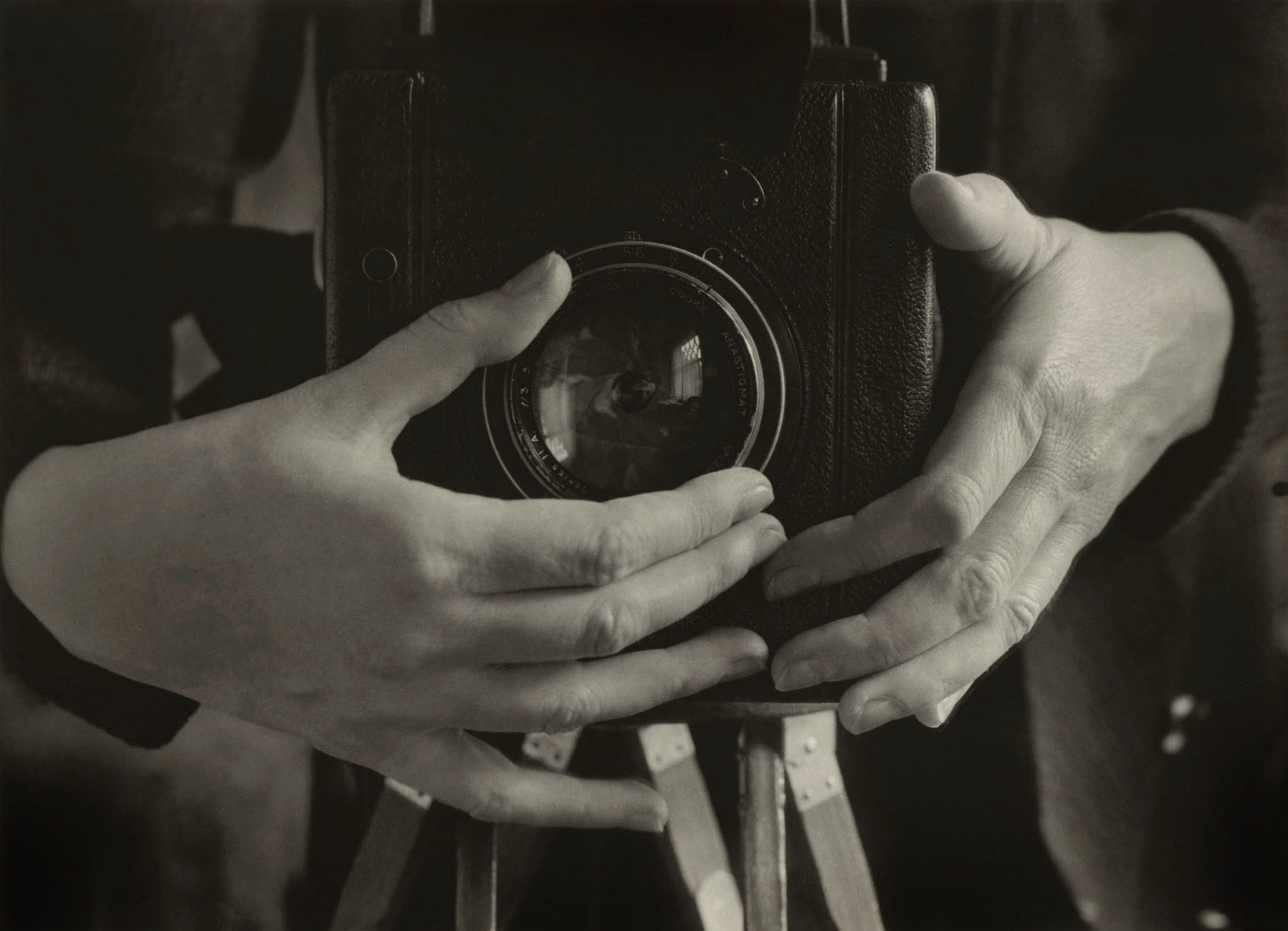

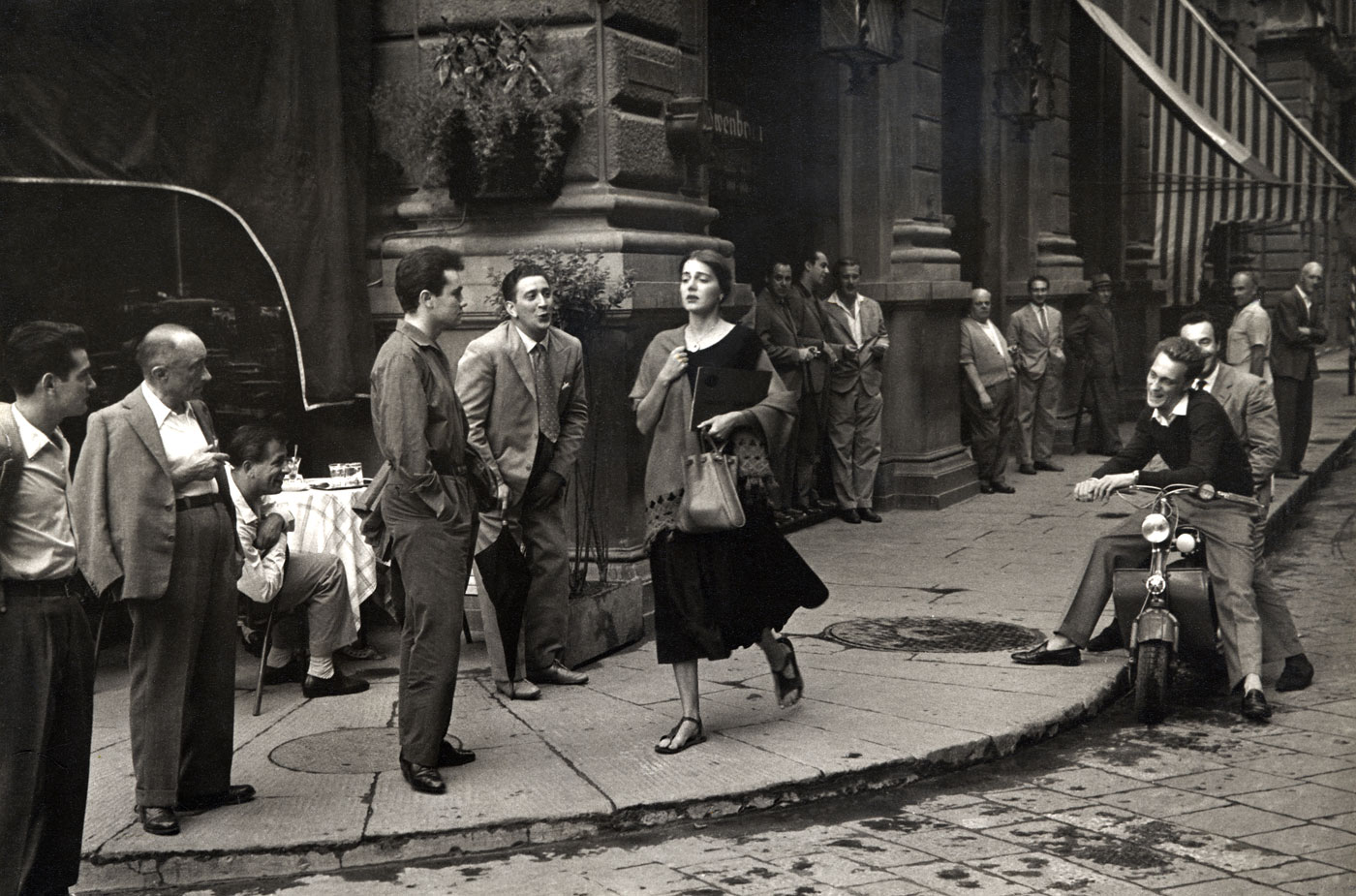

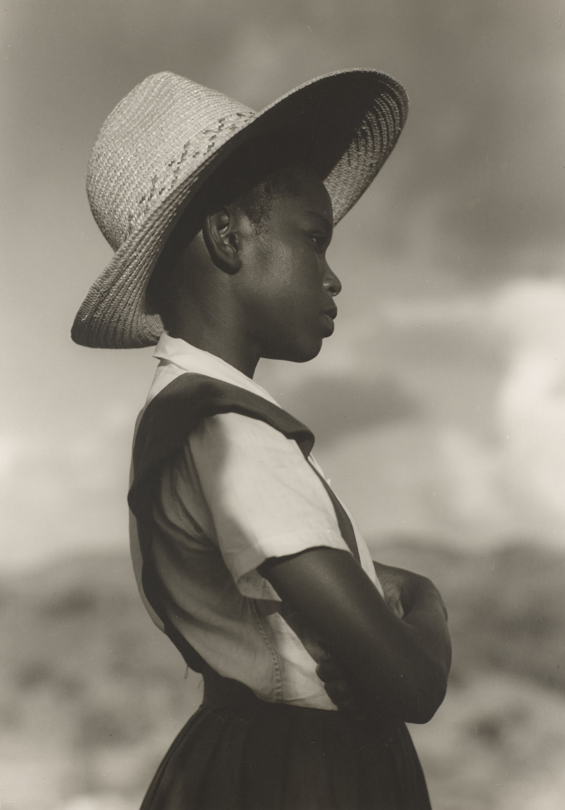

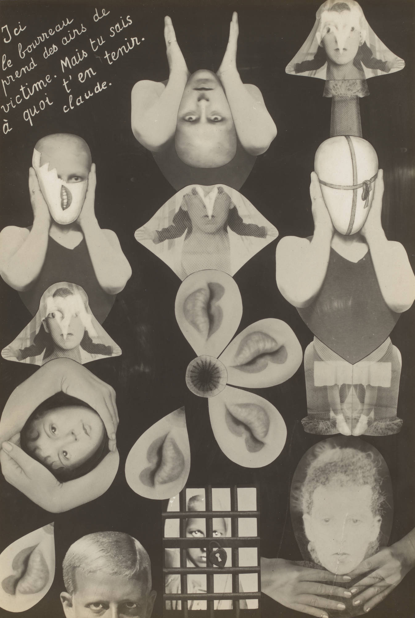

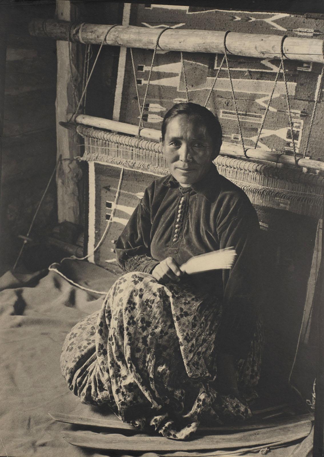

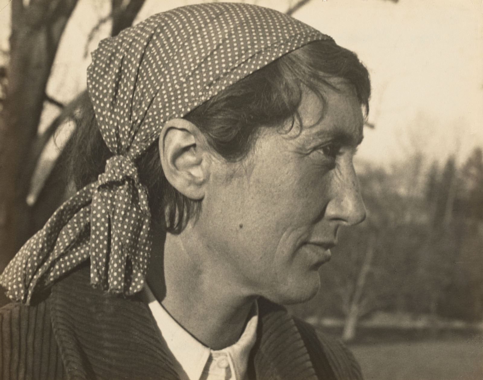
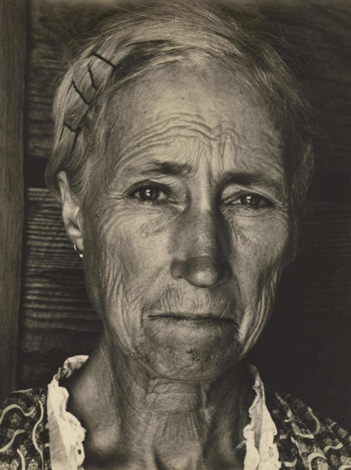

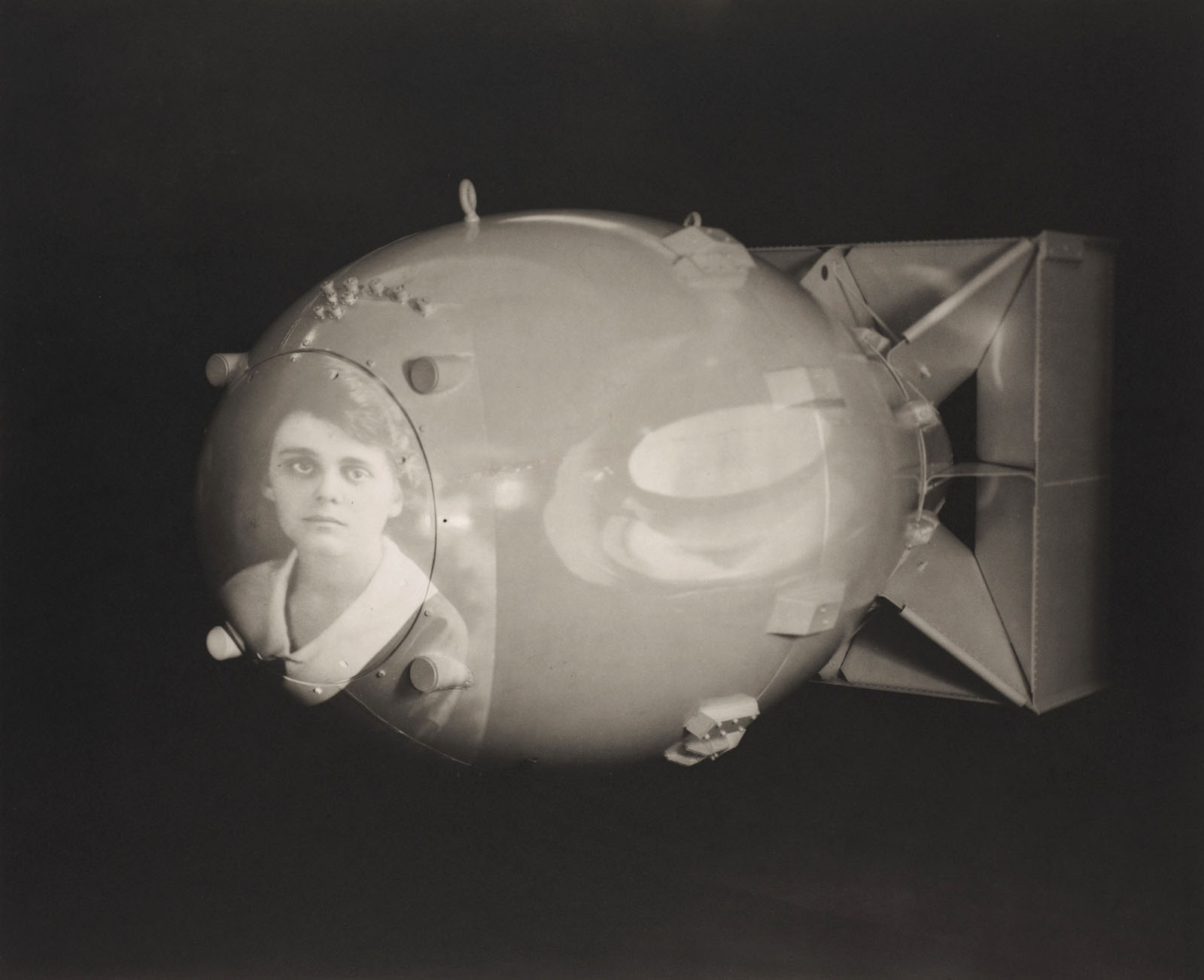
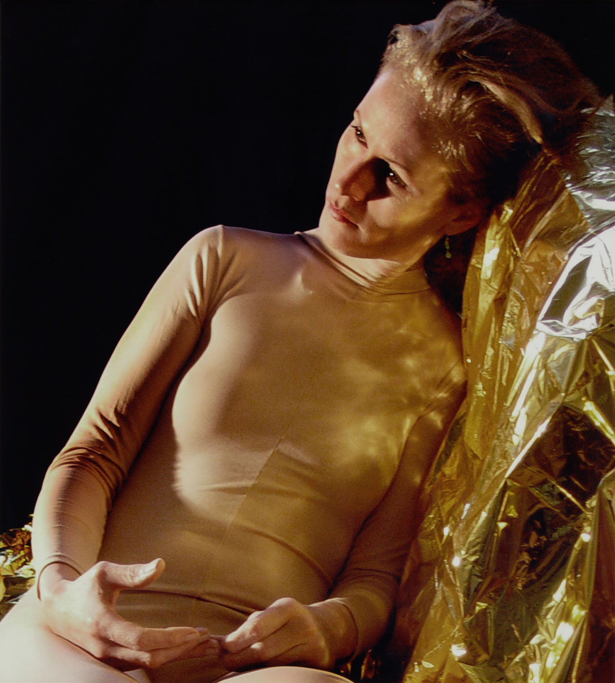
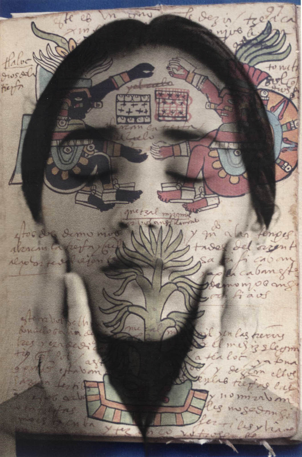
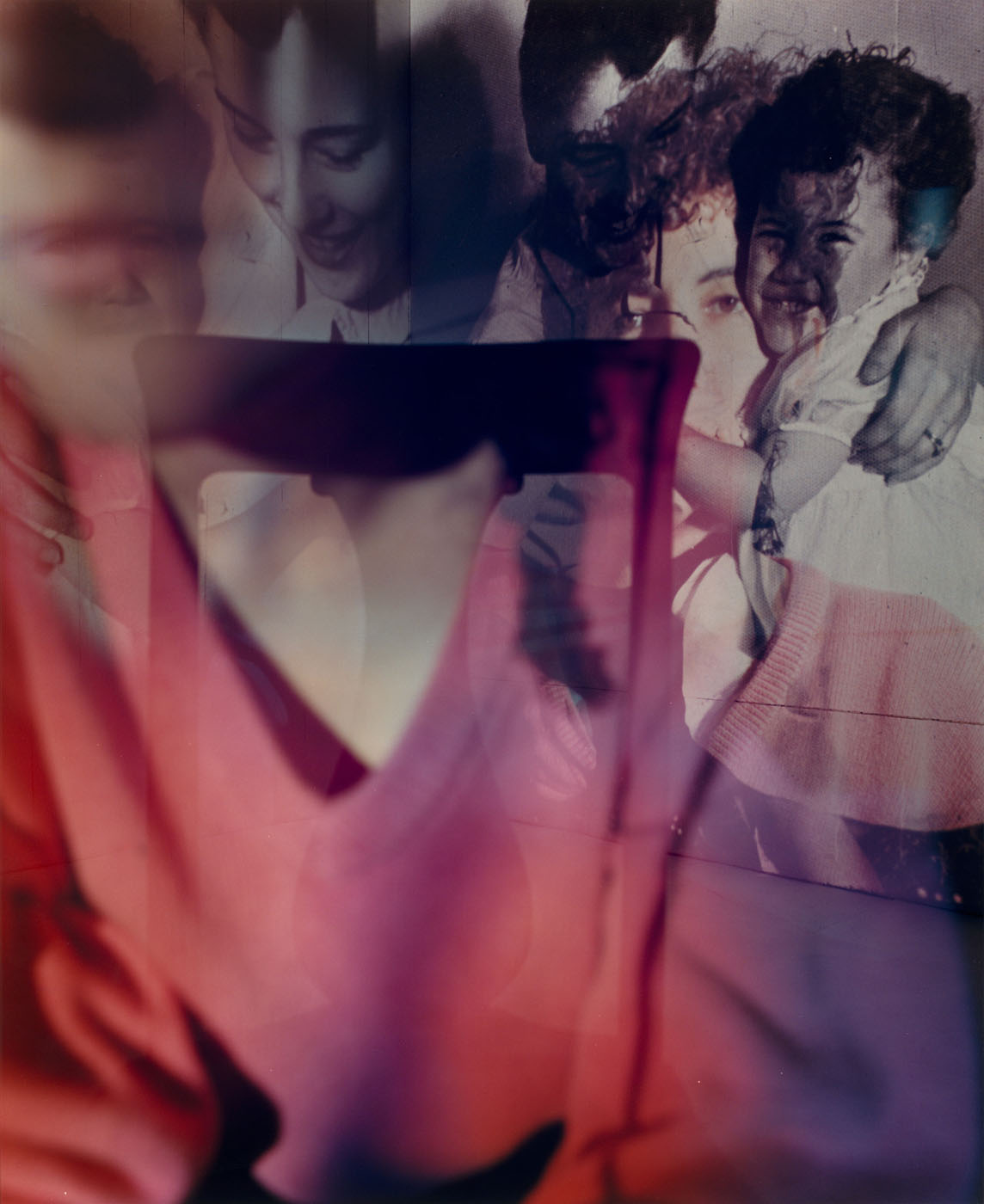


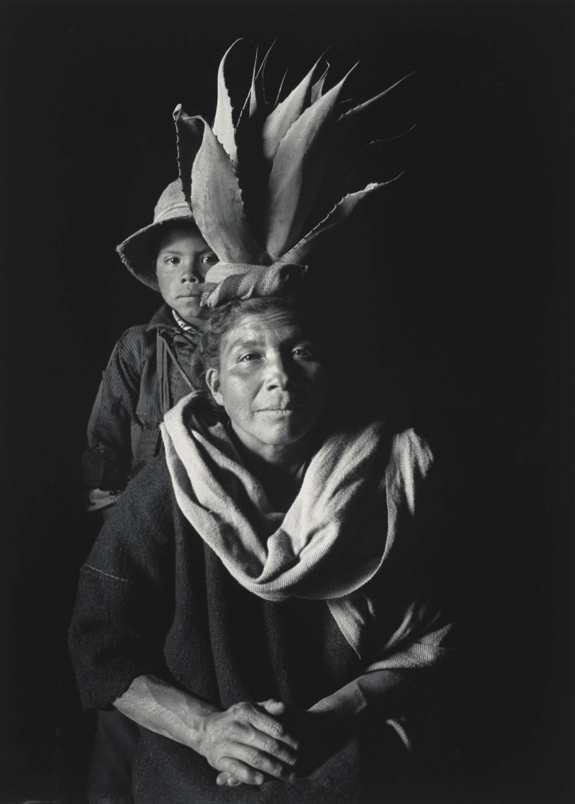


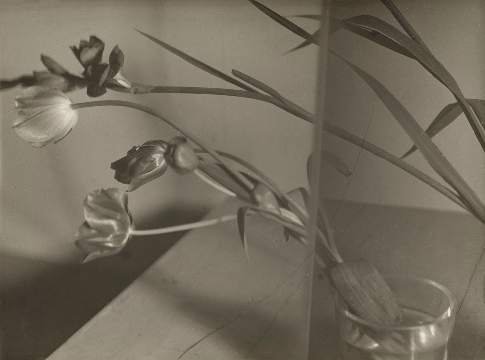


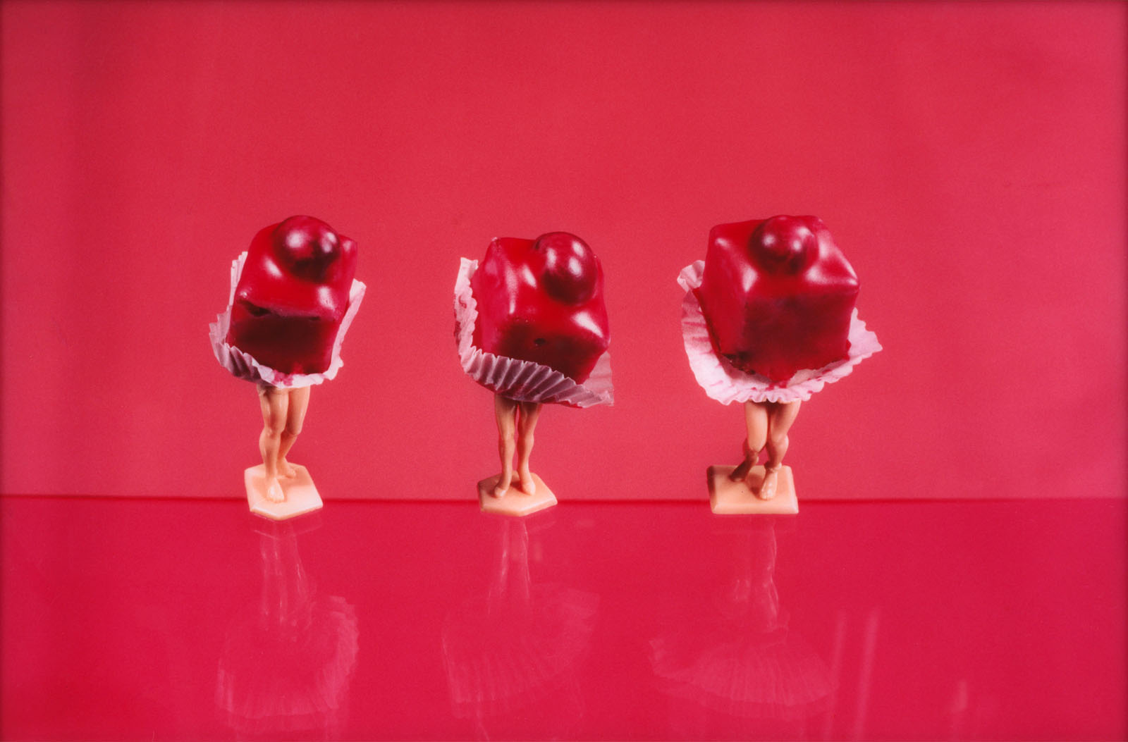




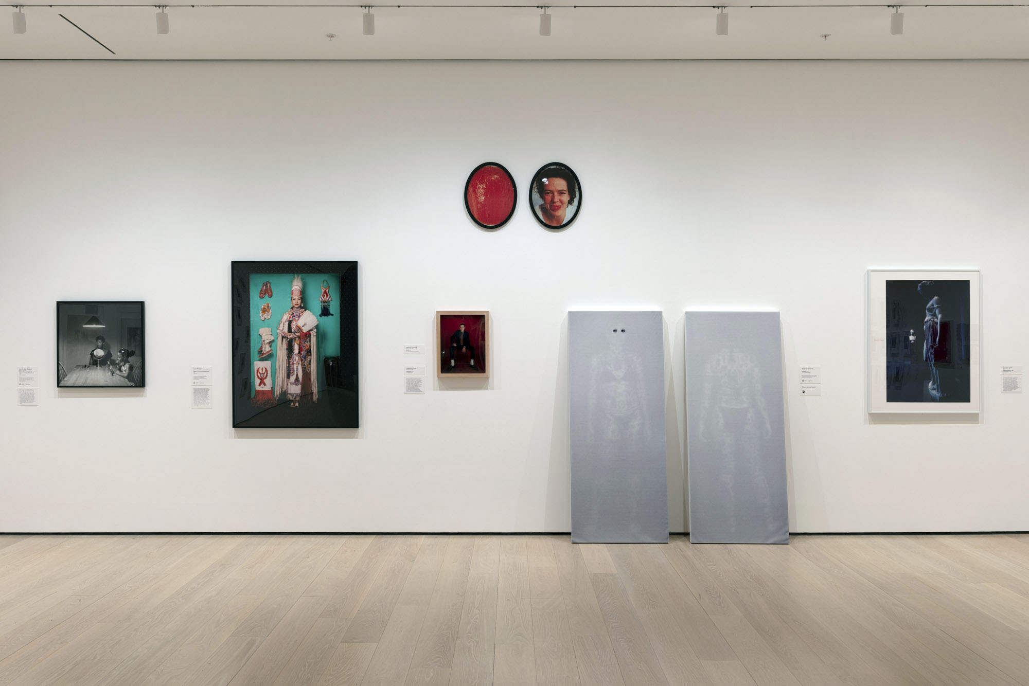


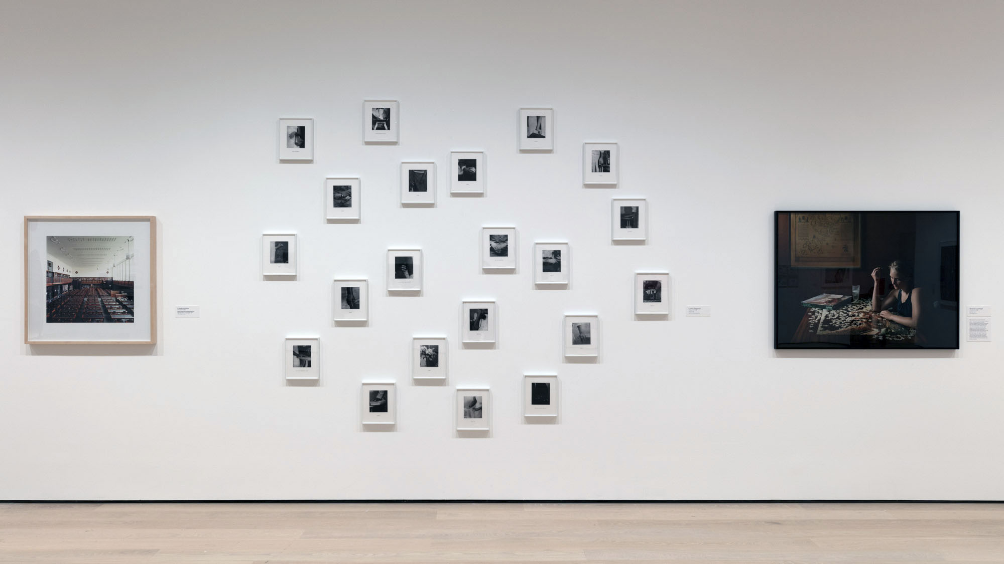
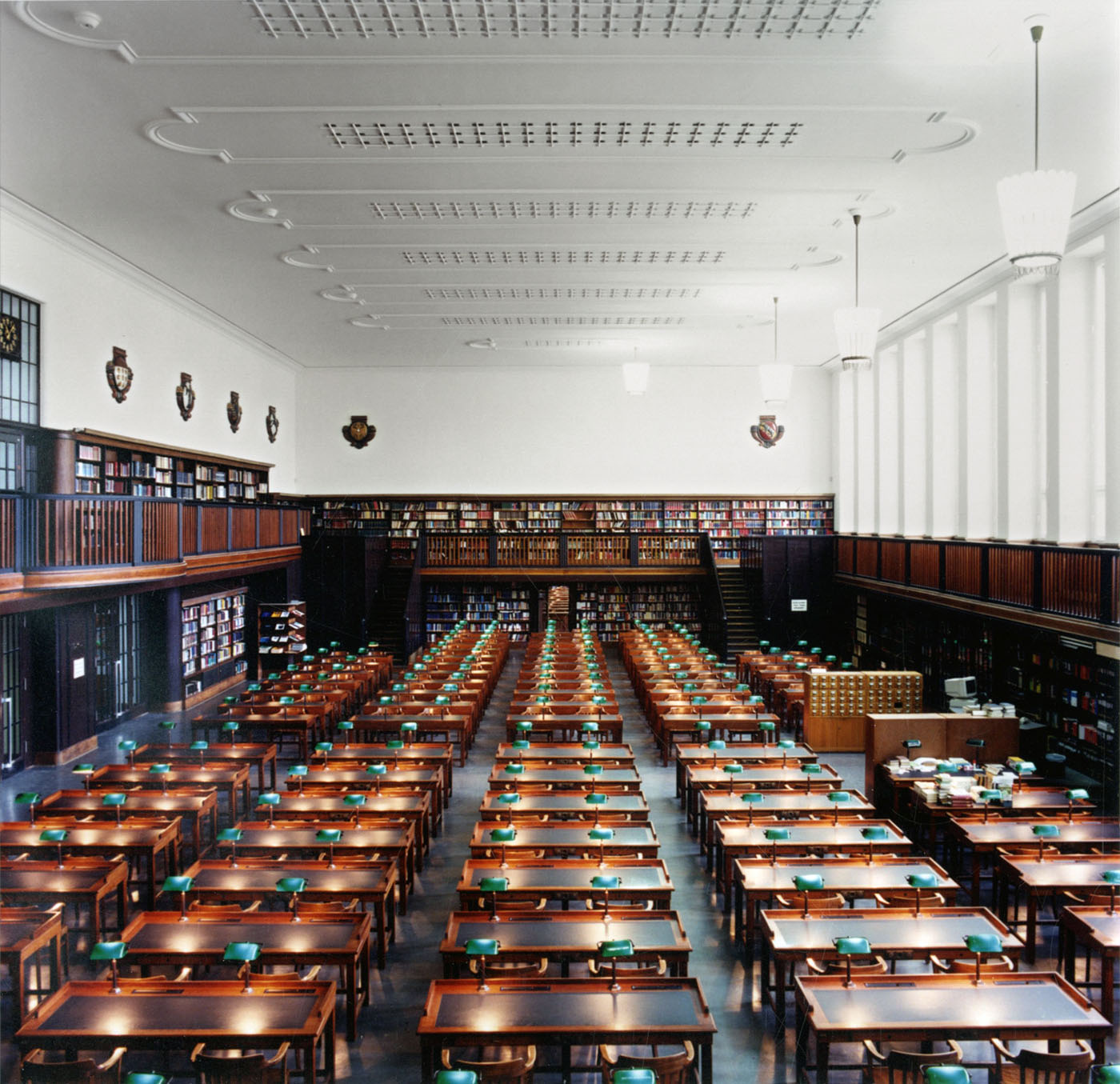

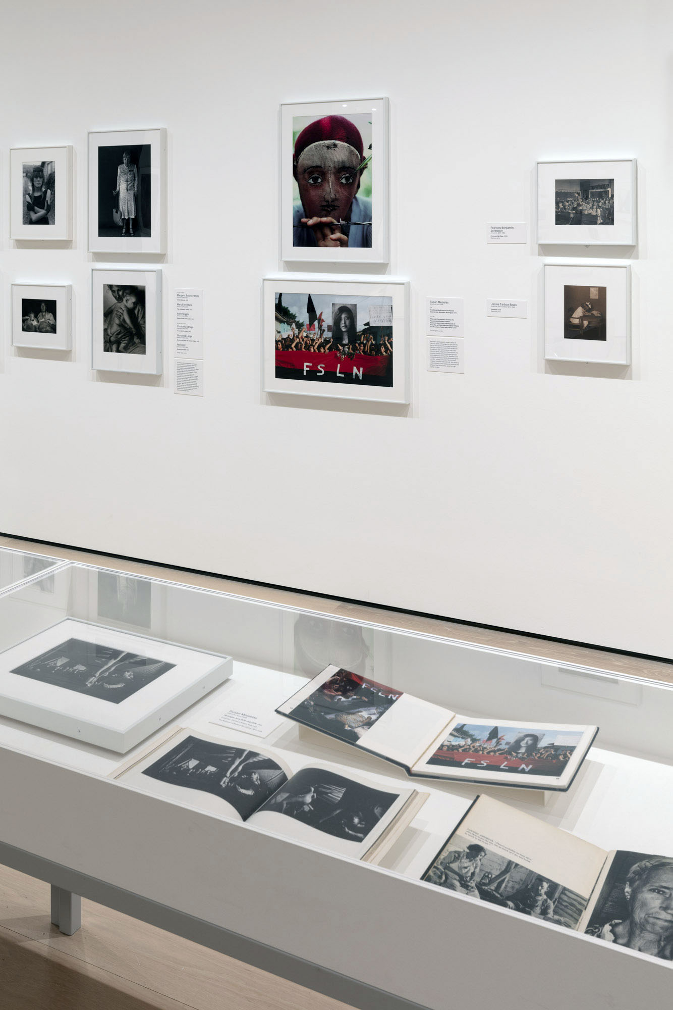


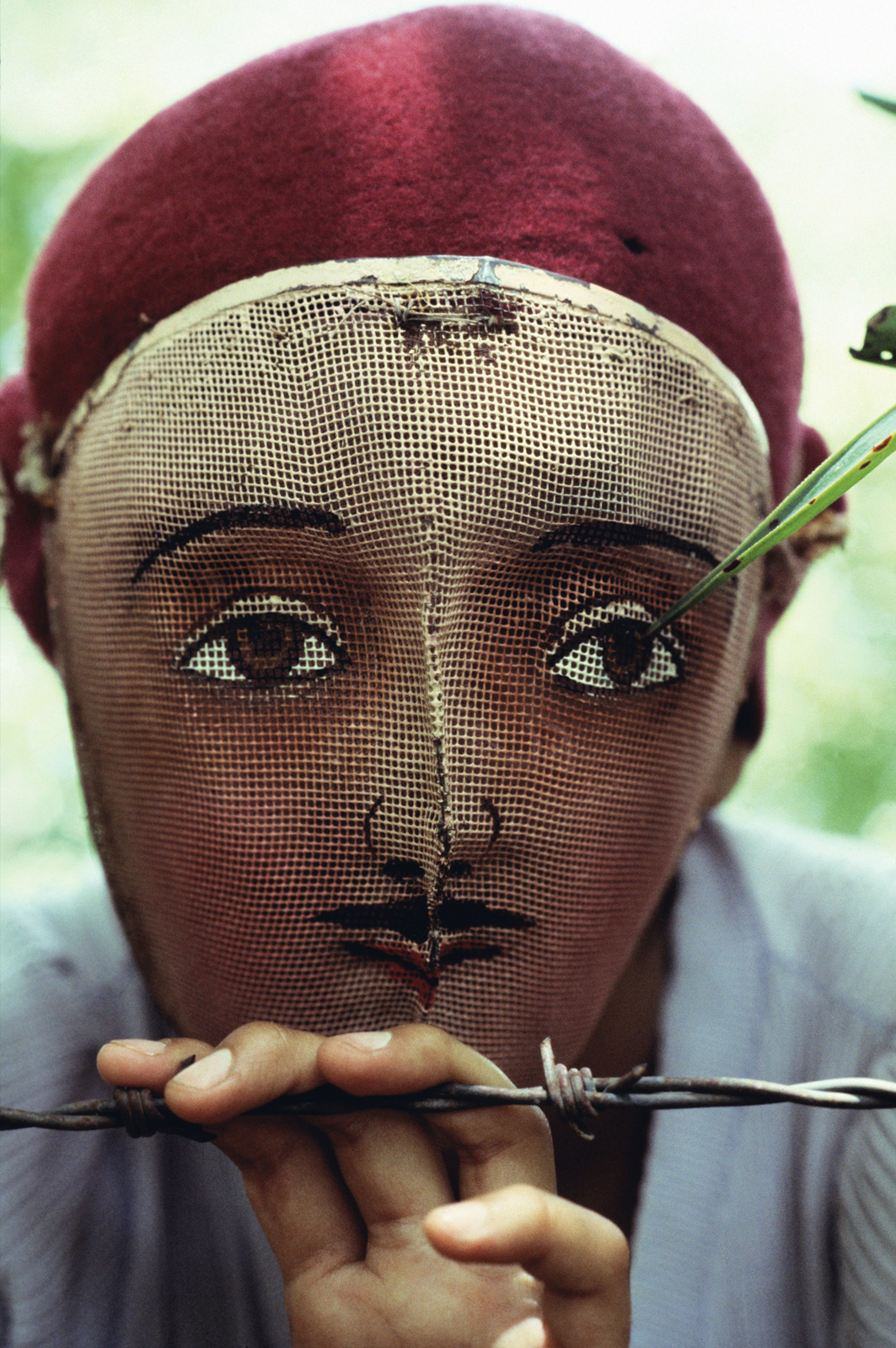


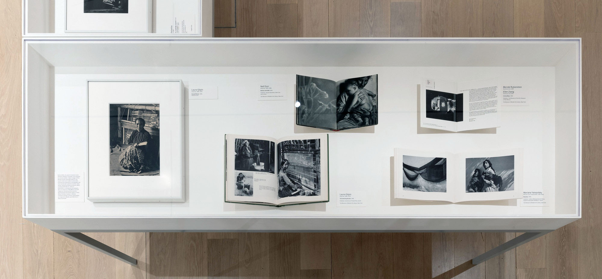

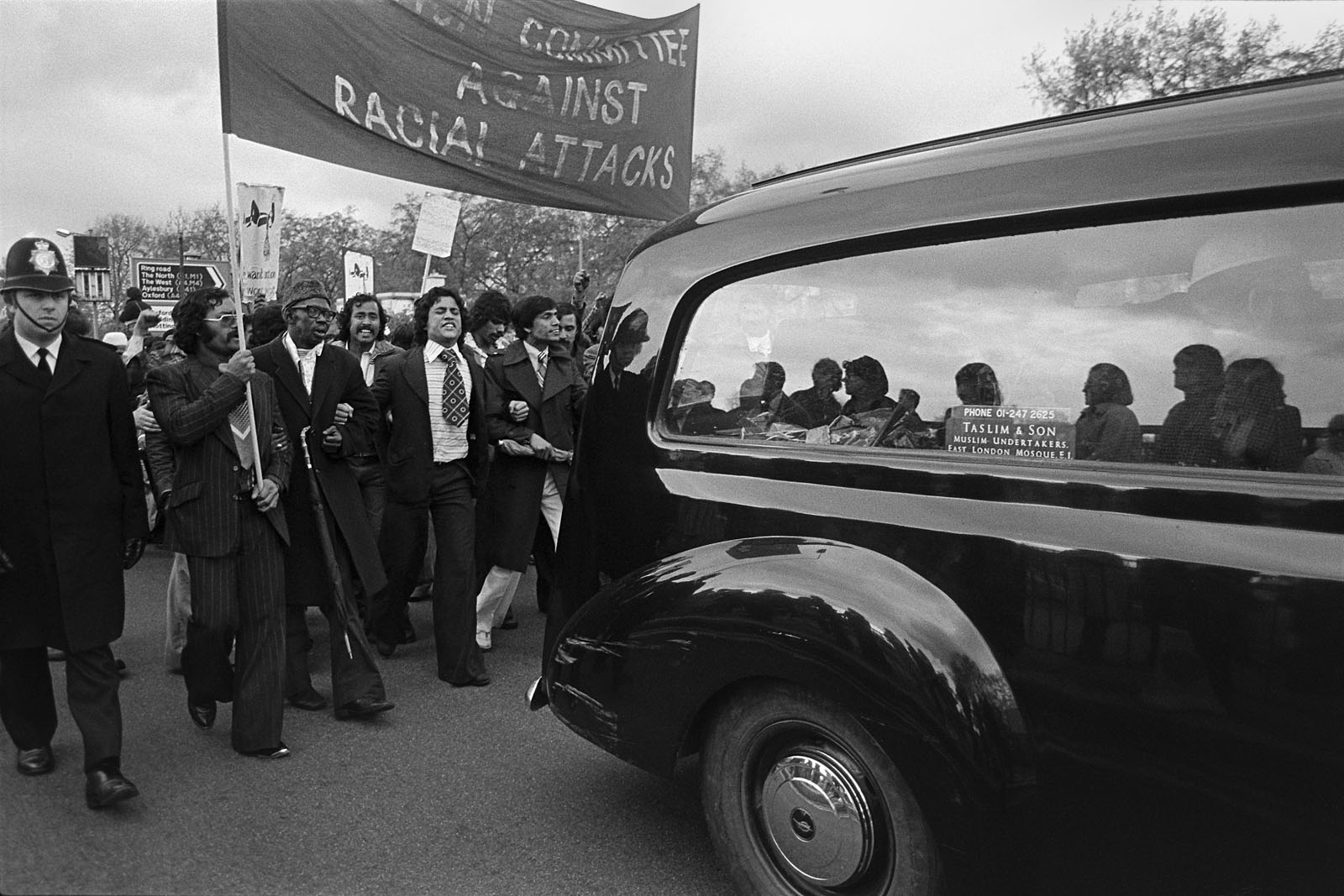
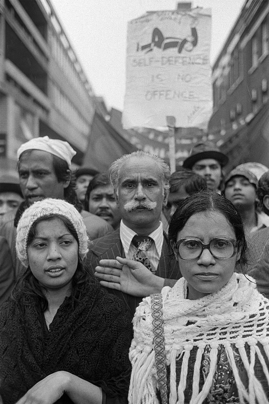
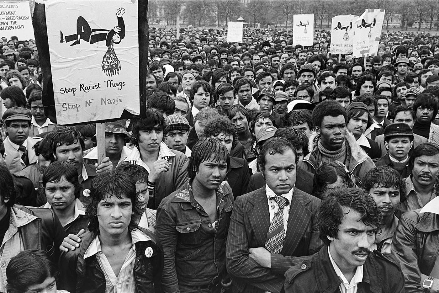
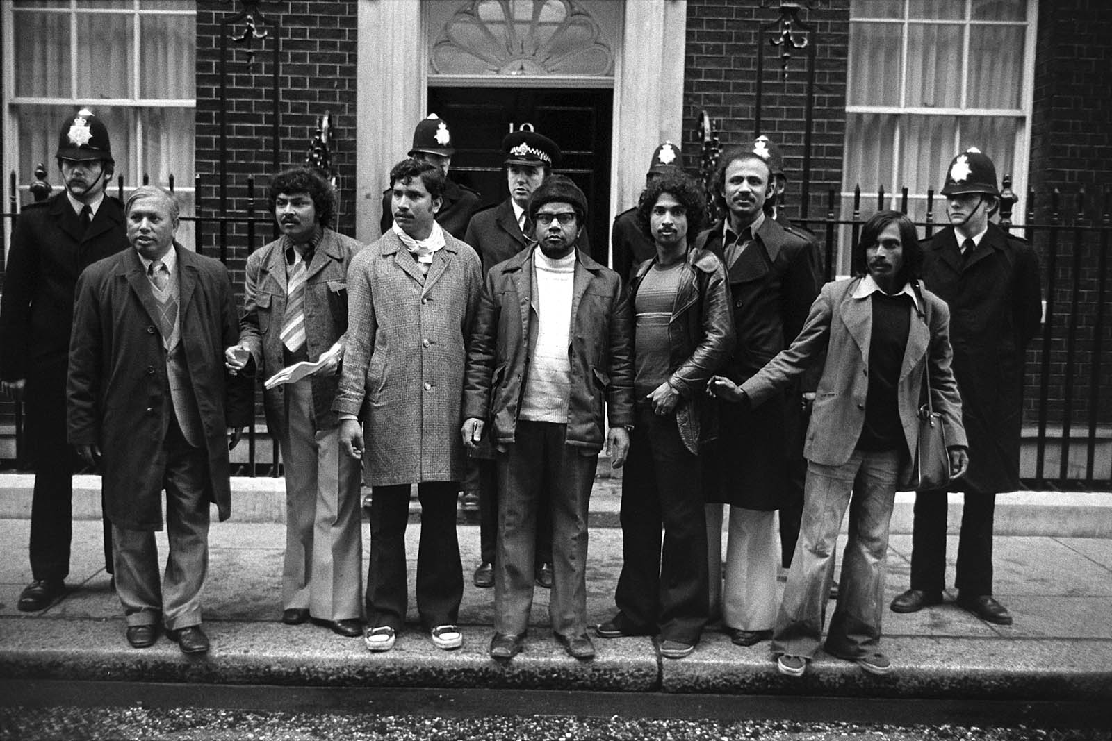
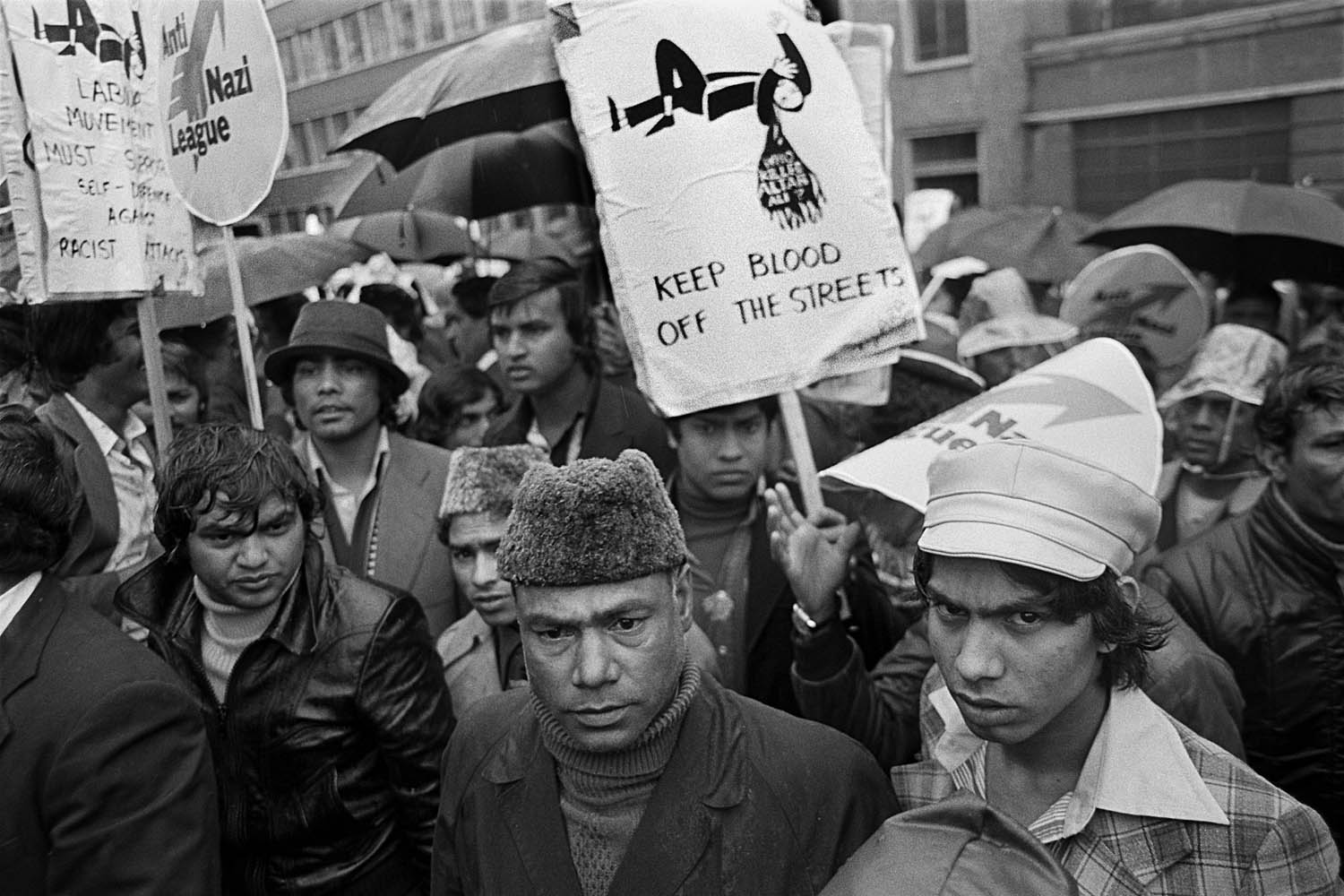
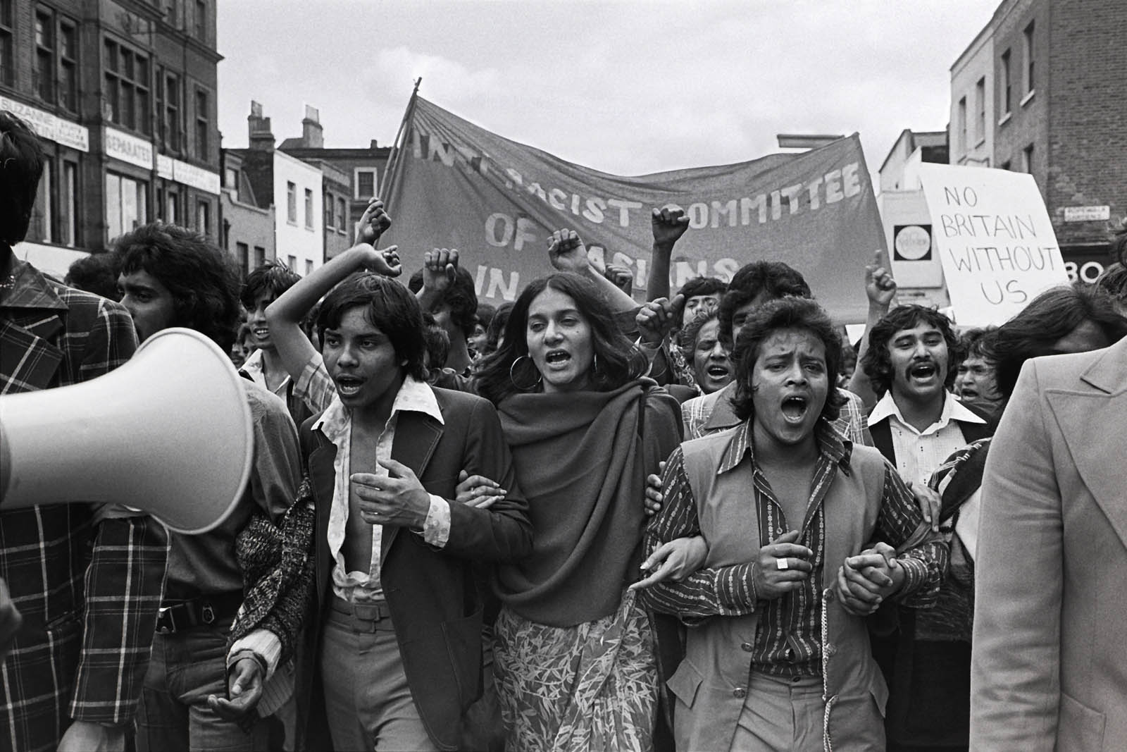
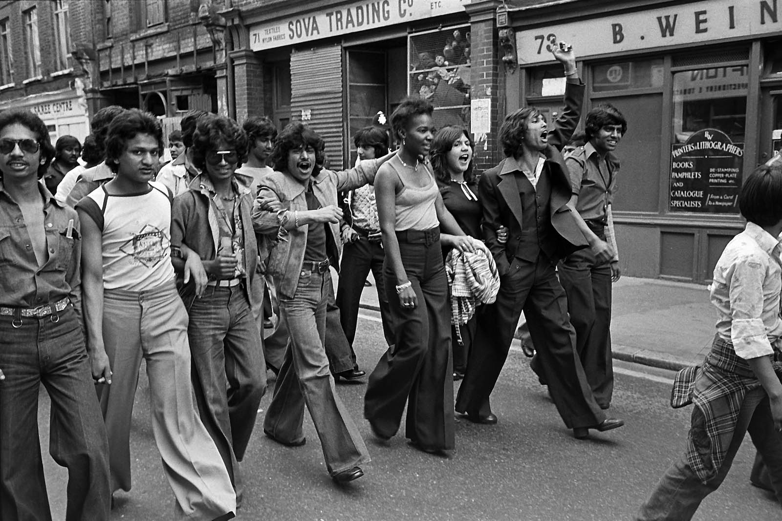
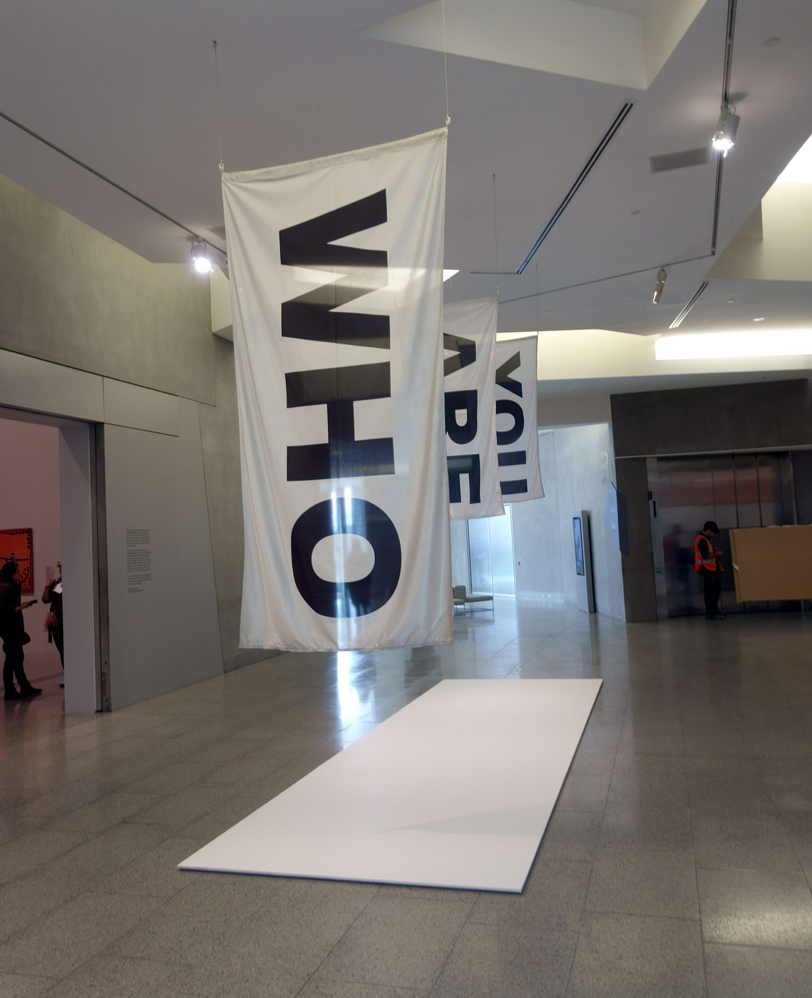
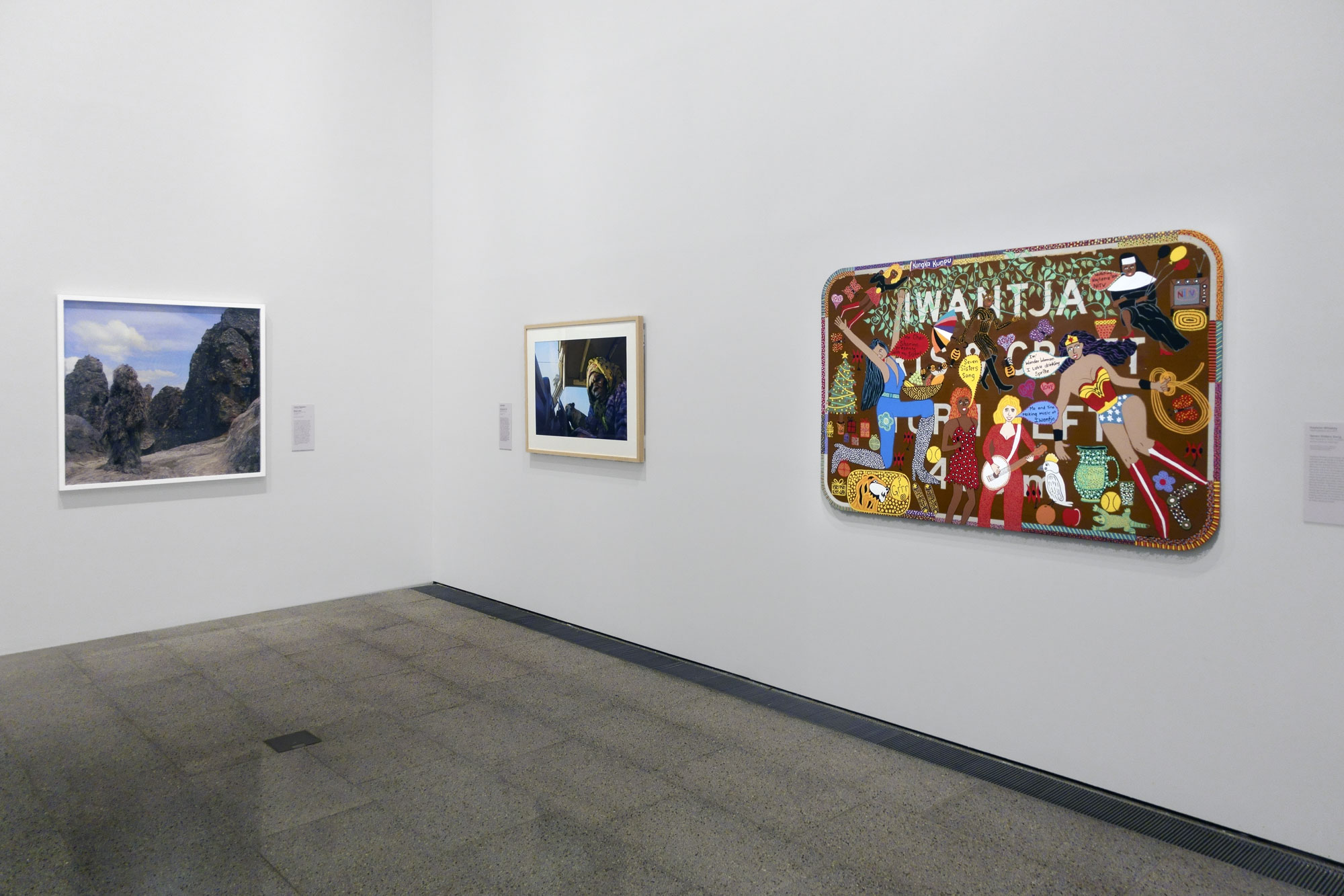
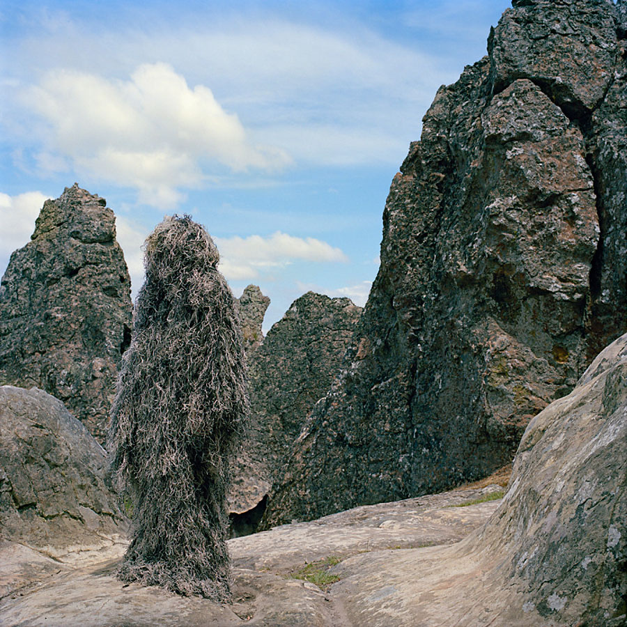




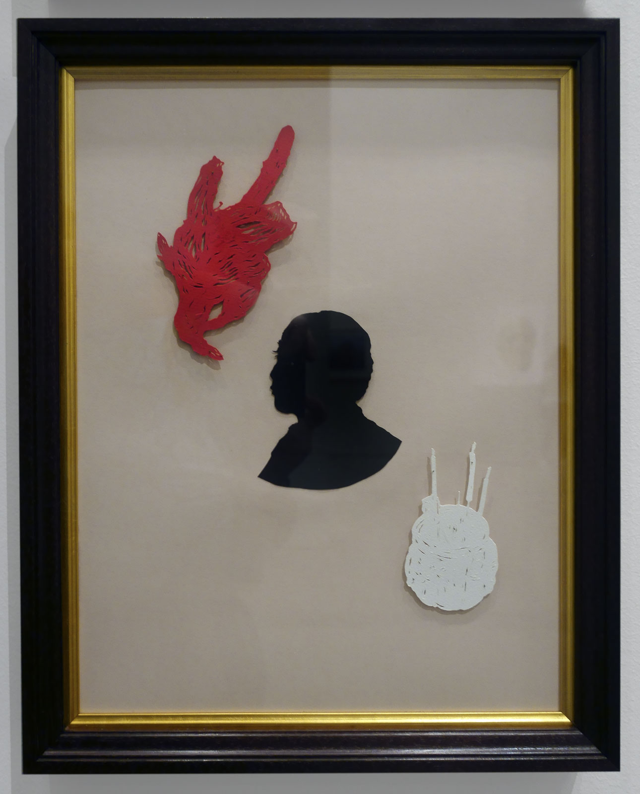










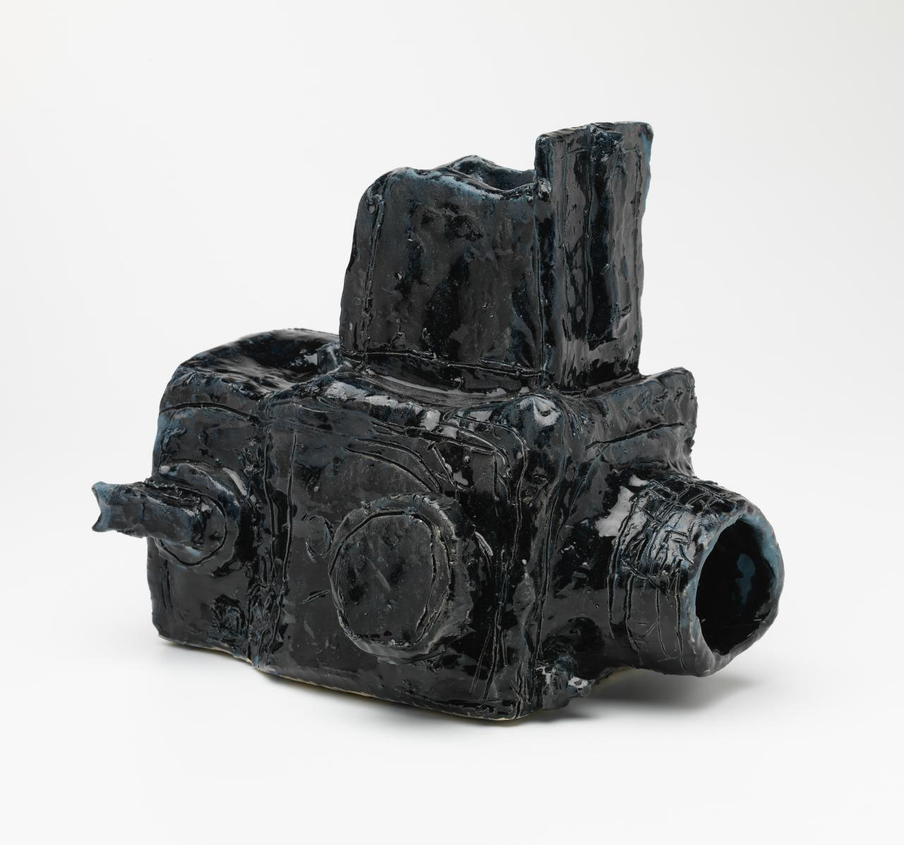


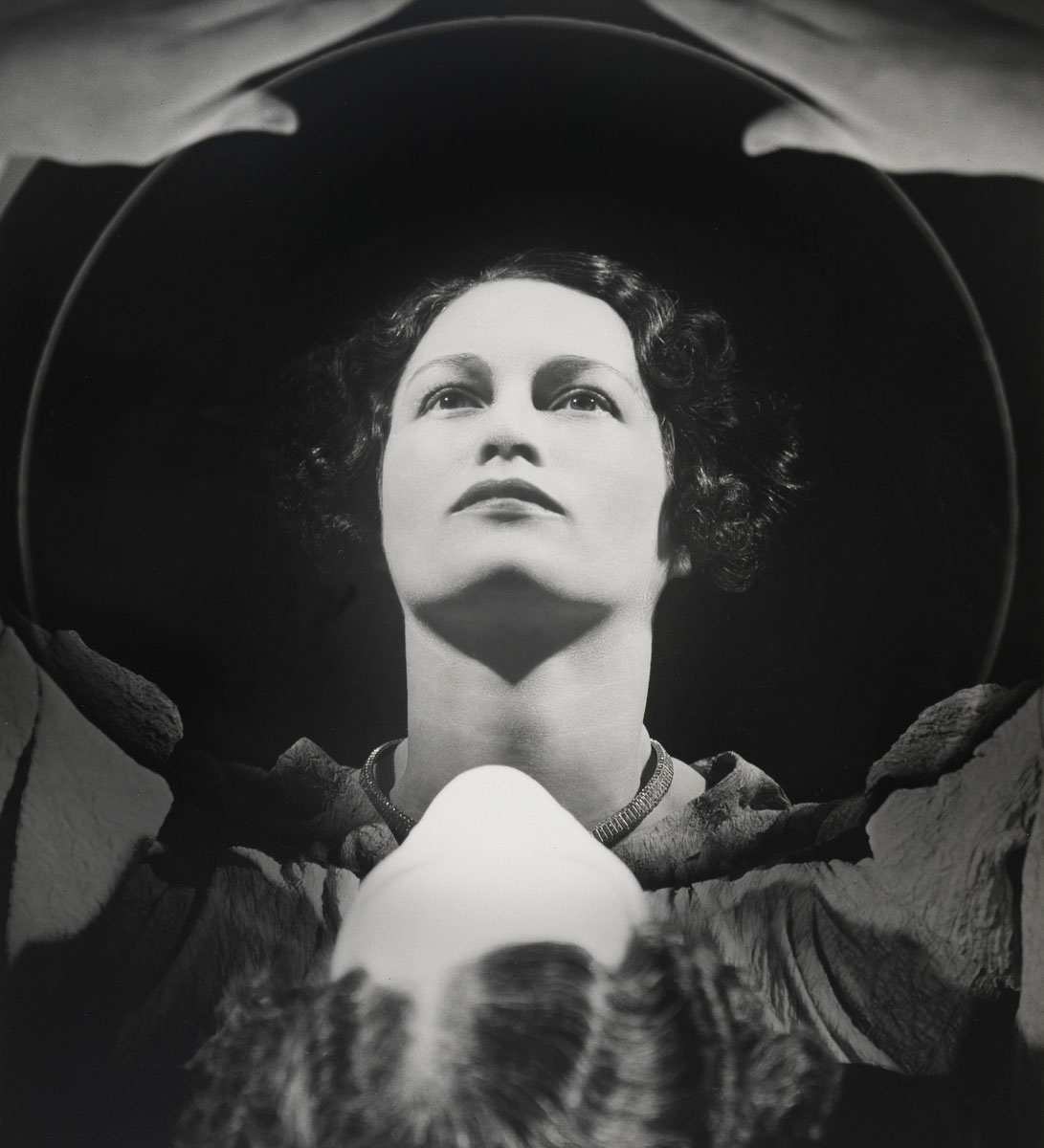

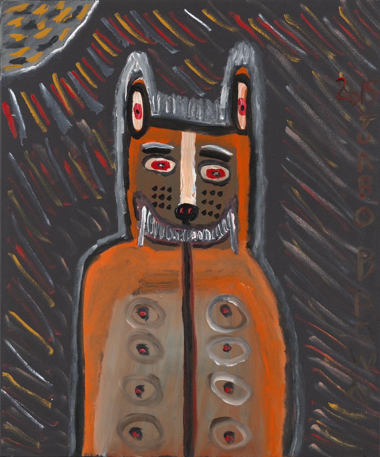

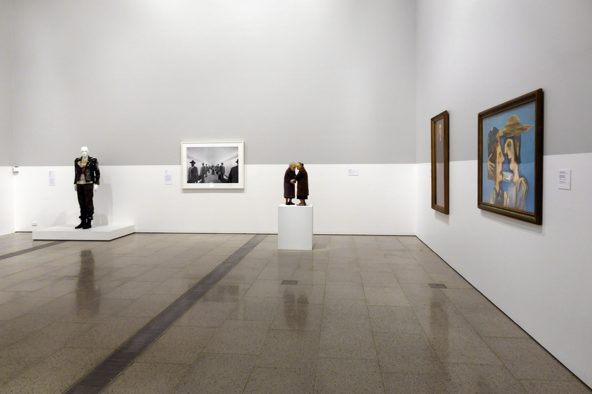



























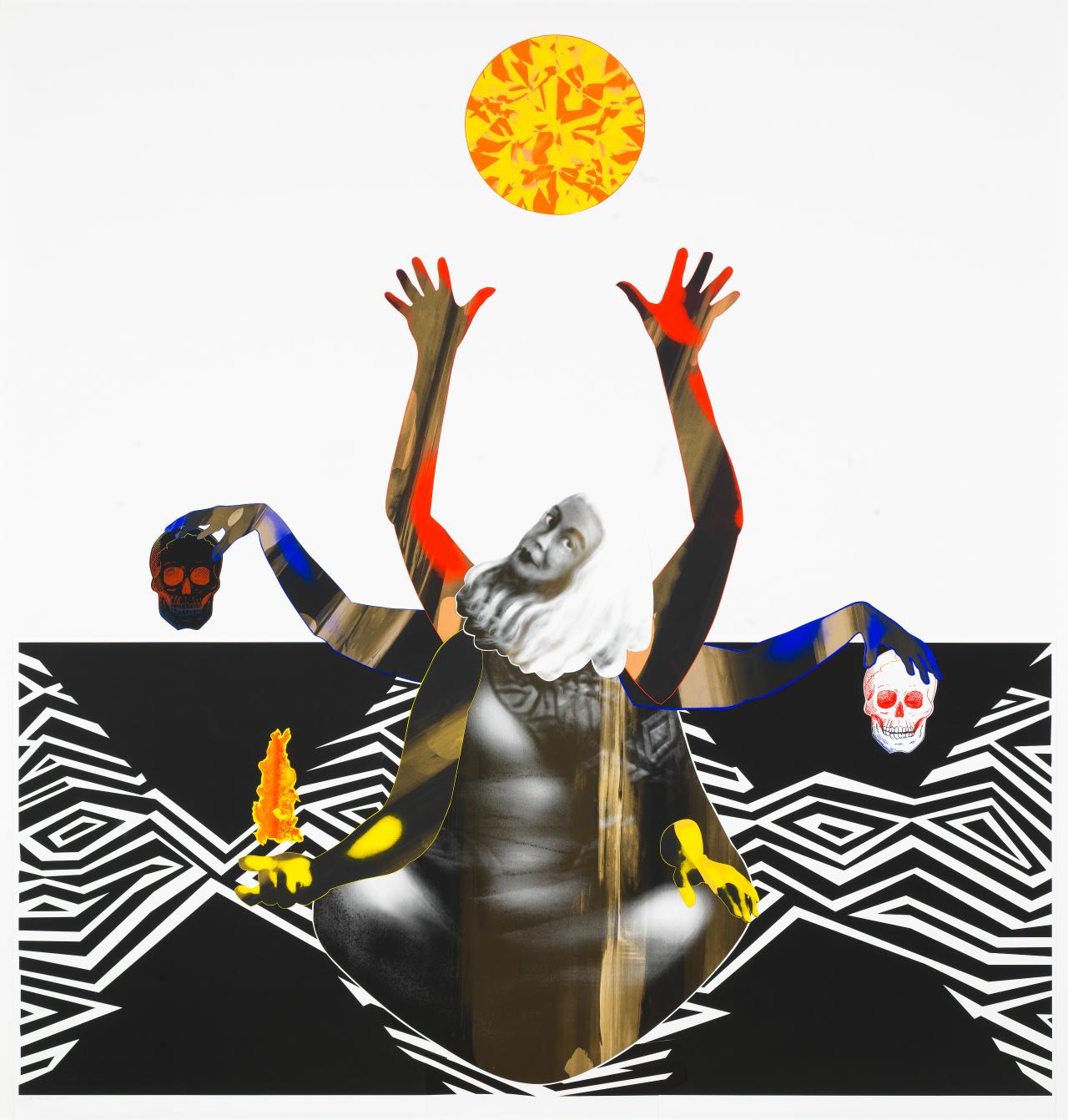




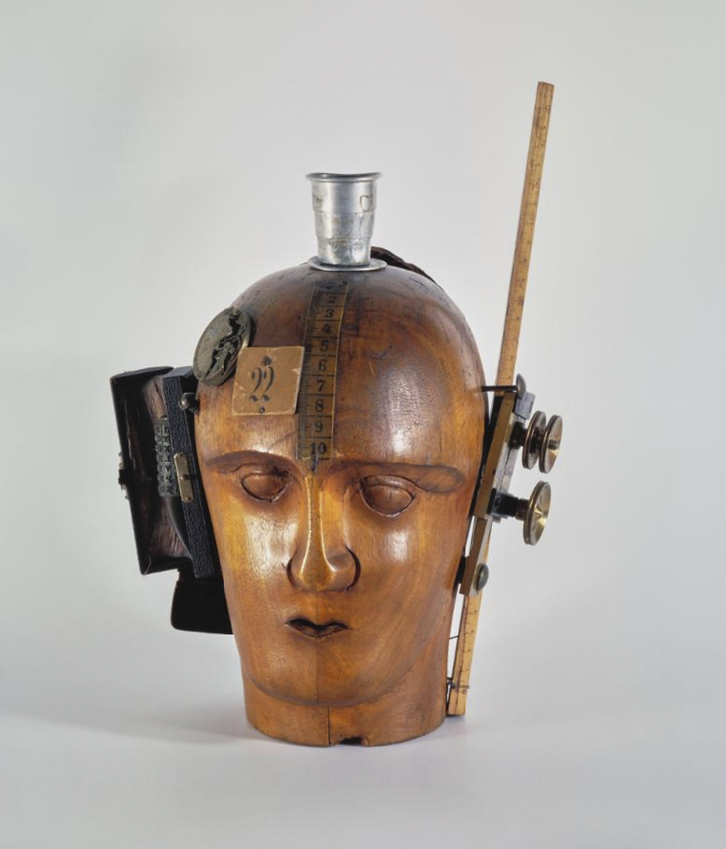


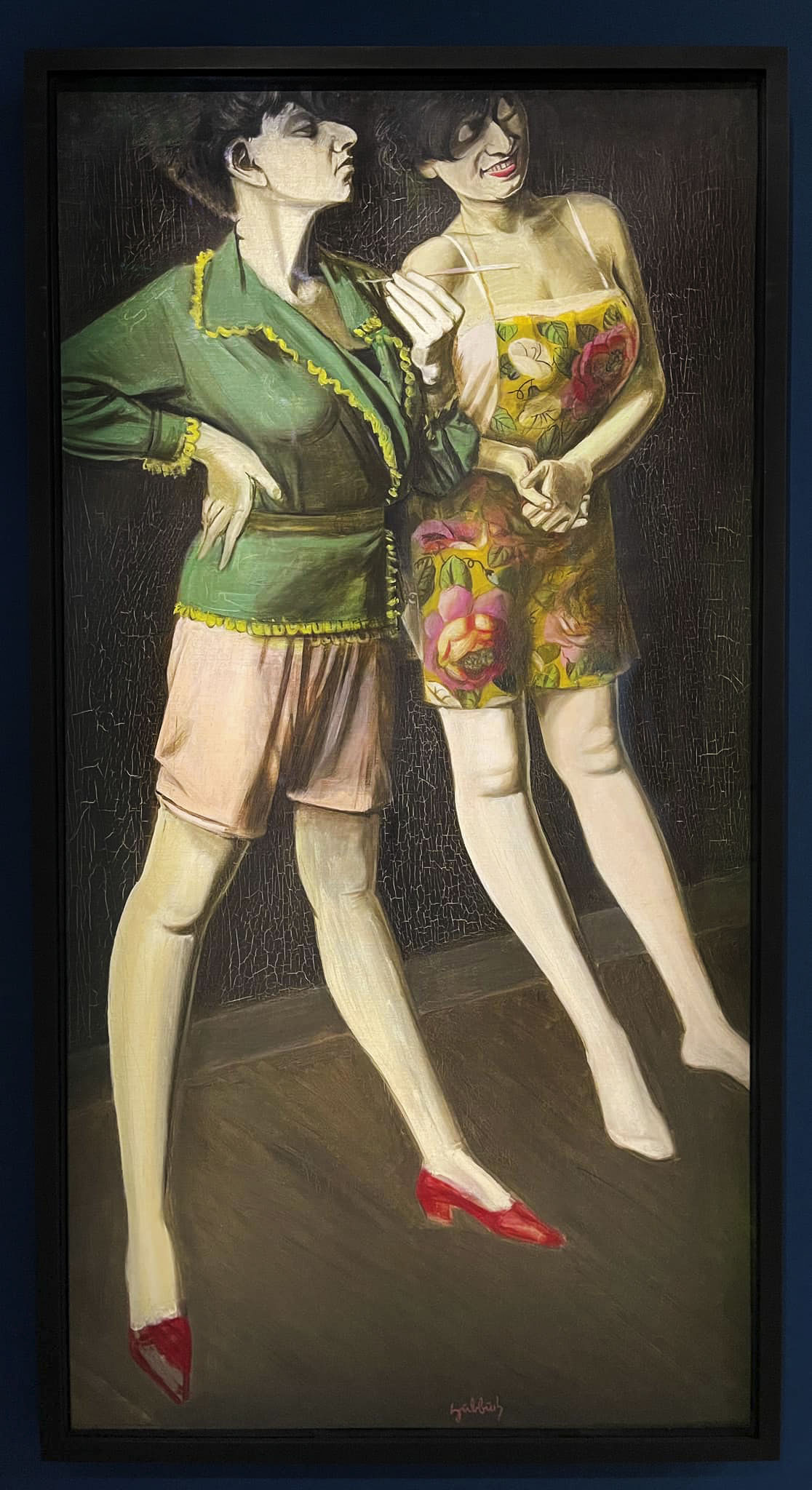






![August Sander (German, 1876-1964) '[Unemployed Man in Winter Coat, Hat in Hand]' 1920](https://artblart.com/wp-content/uploads/2013/10/unemployed-man-in-winter-coat-hat-in-hand-1920-august-sander1.jpg "August Sander (German, 1876-1964) '[Unemployed Man in Winter Coat, Hat in Hand]' 1920")









![August Sander (German, 1876-1964) 'Painter [Heinrich Hoerle]' 1928-1932](https://artblart.com/wp-content/uploads/2014/08/sander-maler-web.jpg "August Sander (German, 1876-1964) 'Painter [Heinrich Hoerle]' 1928-1932")


![August Sander (German, 1876-1964) 'Proletarian Intellectuals' [Else Schuler, Tristan Rémy, Franz Wilhelm Seiwert, Gerd Arntz] c. 1925](https://artblart.com/wp-content/uploads/2022/07/august-sander-proletarian-intellectuals.jpg "August Sander (German, 1876-1964) 'Proletarian Intellectuals' [Else Schuler, Tristan Rémy, Franz Wilhelm Seiwert, Gerd Arntz] c. 1925")


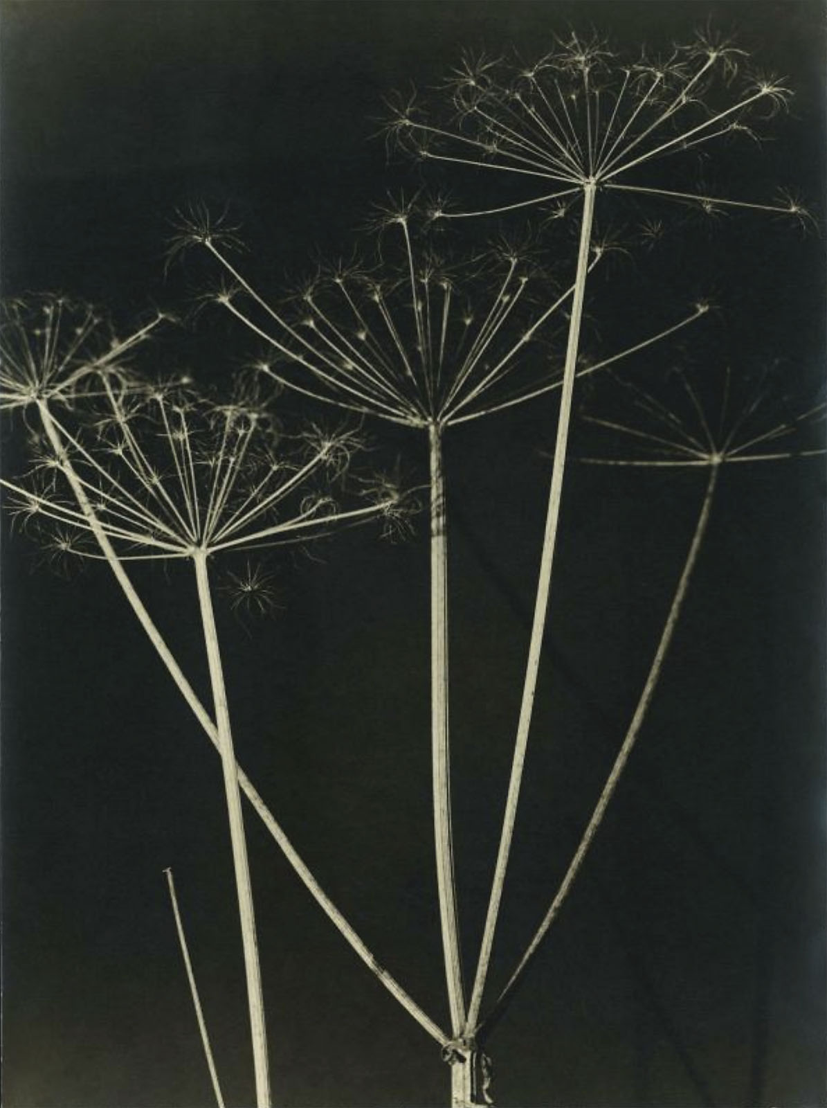


![George Grosz (Georg Ehrenfried Gross) (German, 1893-1959) 'Construction (Untitled)' (Konstruktion [Ohne Titel]) 1920 (installation view)](https://artblart.com/wp-content/uploads/2022/08/germany-installation-g.jpg "George Grosz (Georg Ehrenfried Gross) (German, 1893-1959) 'Construction (Untitled)' (Konstruktion [Ohne Titel]) 1920 (installation view)")
![George Grosz. 'Construction (Untitled) (Konstruktion [Ohne Titel])' 1920](https://artblart.com/wp-content/uploads/2016/01/grosz-construction.jpg "George Grosz. 'Construction (Untitled) (Konstruktion [Ohne Titel])' 1920")


![Albert Renger-Patzsch (1897-1966) 'Bügeleisen für Schuhfabrikation, Faguswerk Alfeld [Shoemakers' irons, Fagus factory, Alfeld]' 1928](https://artblart.com/wp-content/uploads/2018/01/renger-patzsch-bugeleisen-fur-schuhfabrikation.jpg "Albert Renger-Patzsch (1897-1966) 'Bügeleisen für Schuhfabrikation, Faguswerk Alfeld [Shoemakers' irons, Fagus factory, Alfeld]' 1928")


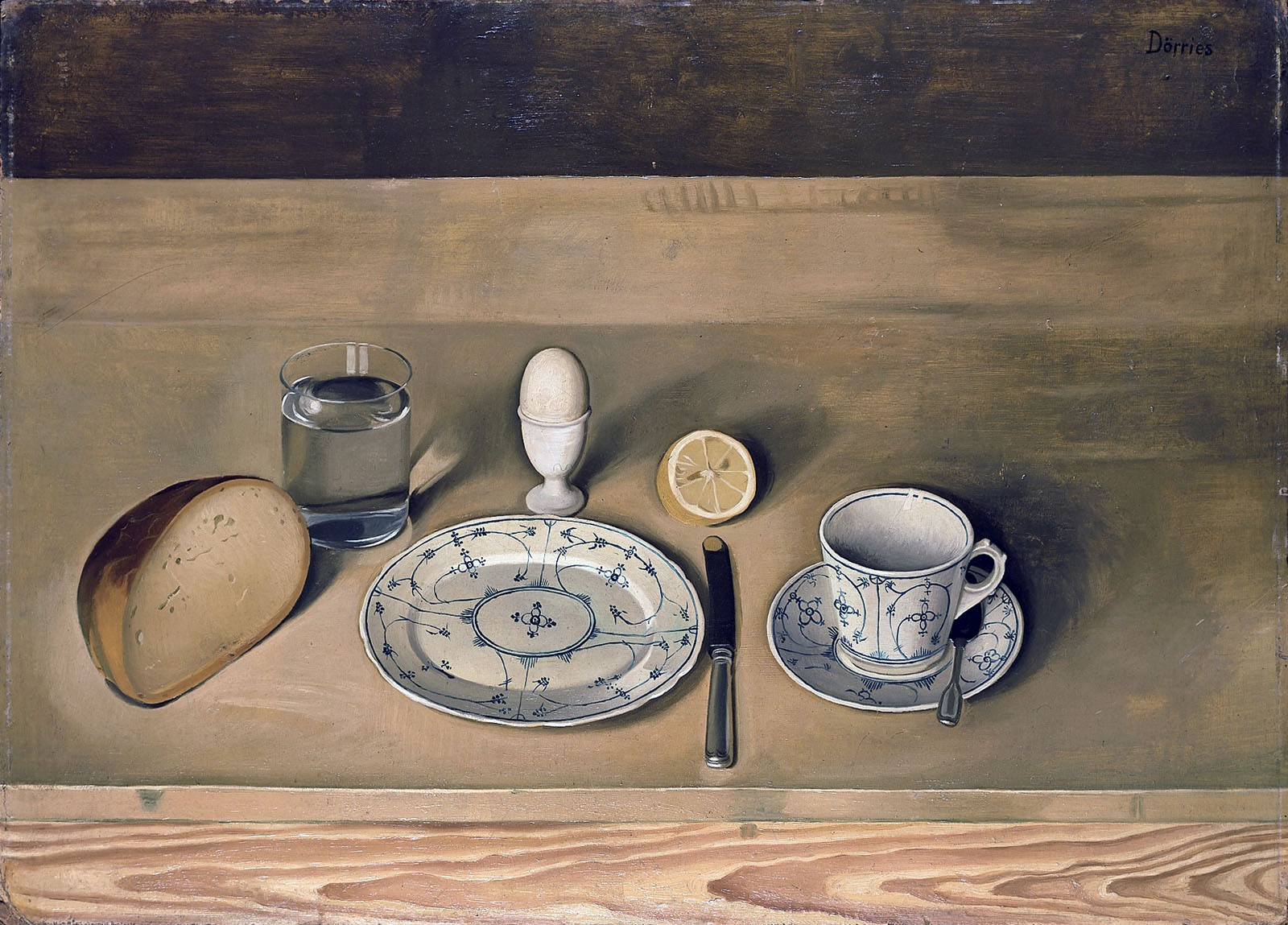


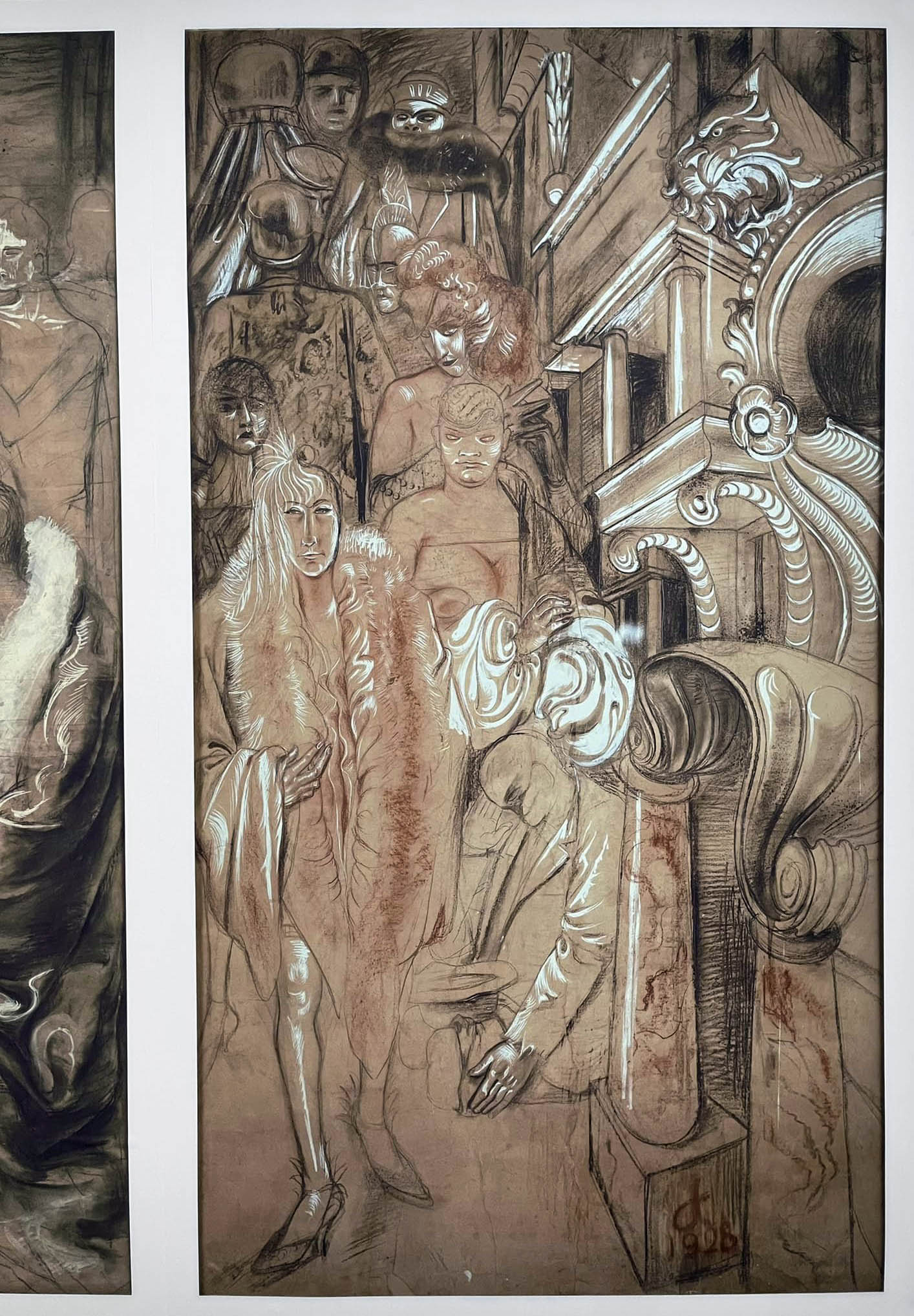






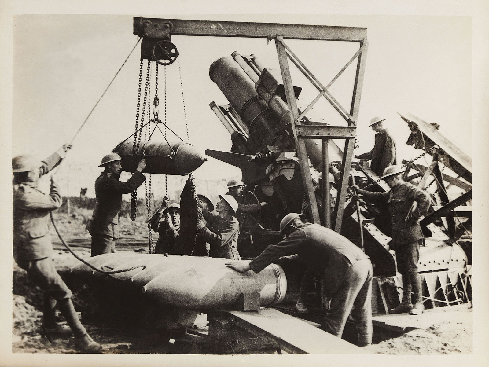
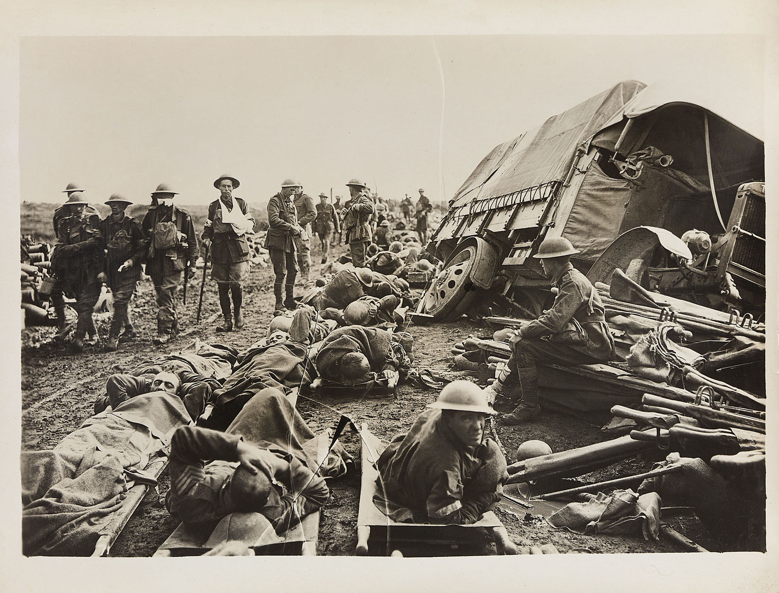
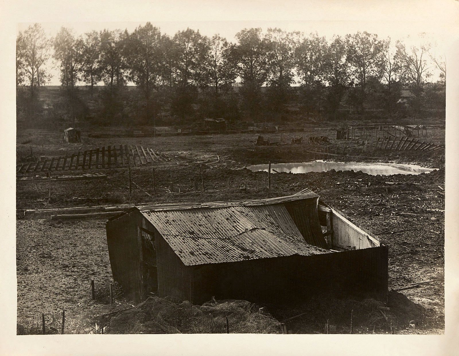
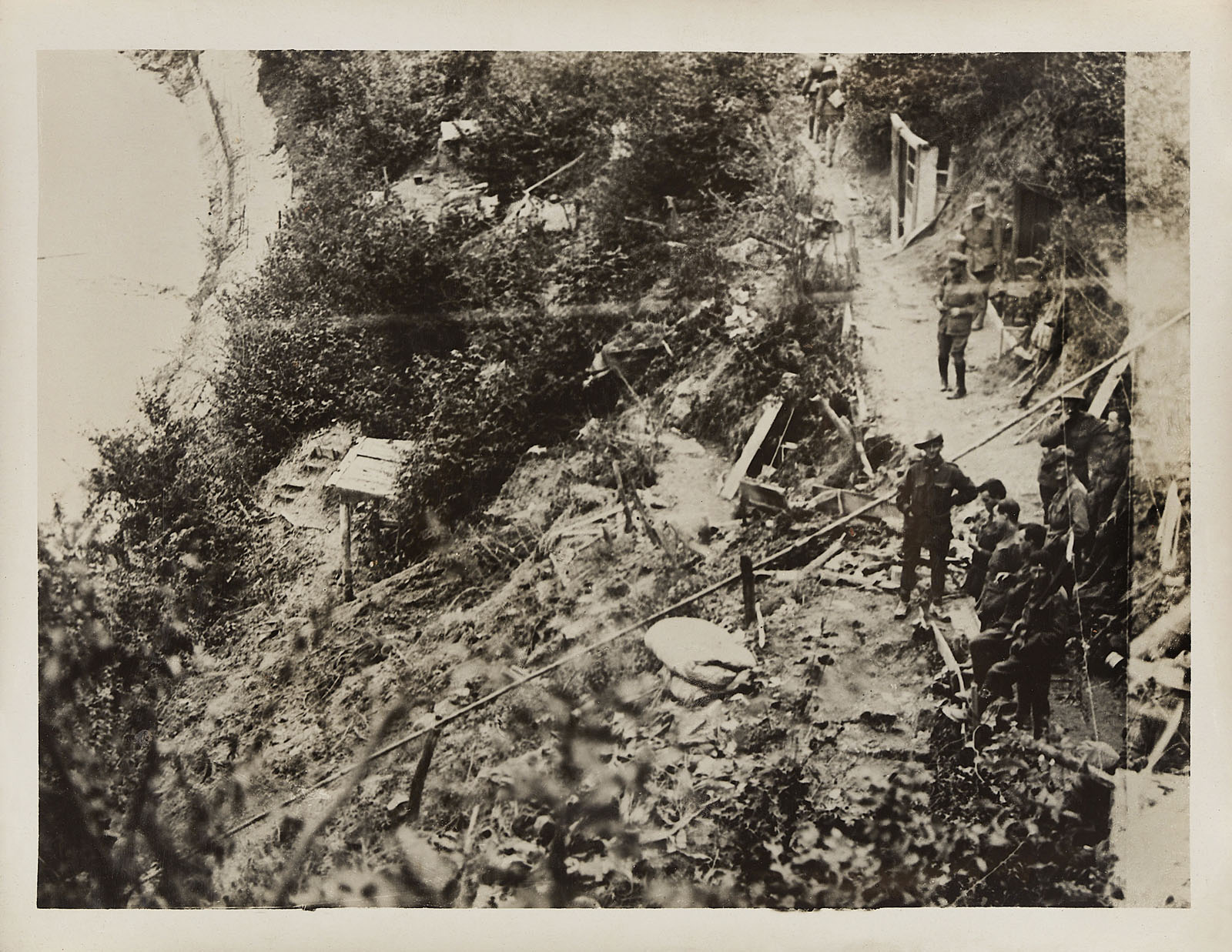

![Alexander Gardner (1821-1882) '[Gettysburg, Pennsylvania. Dead Confederate sharpshooter in "The devil's den."]' July 1863](https://artblart.com/wp-content/uploads/2013/04/gardner-sharpshooter-web.jpg "Alexander Gardner (1821-1882) '[Gettysburg, Pennsylvania. Dead Confederate sharpshooter in \"The devil's den.\"]' July 1863")
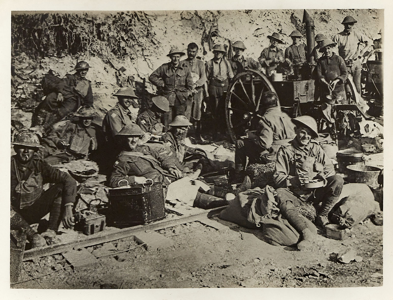
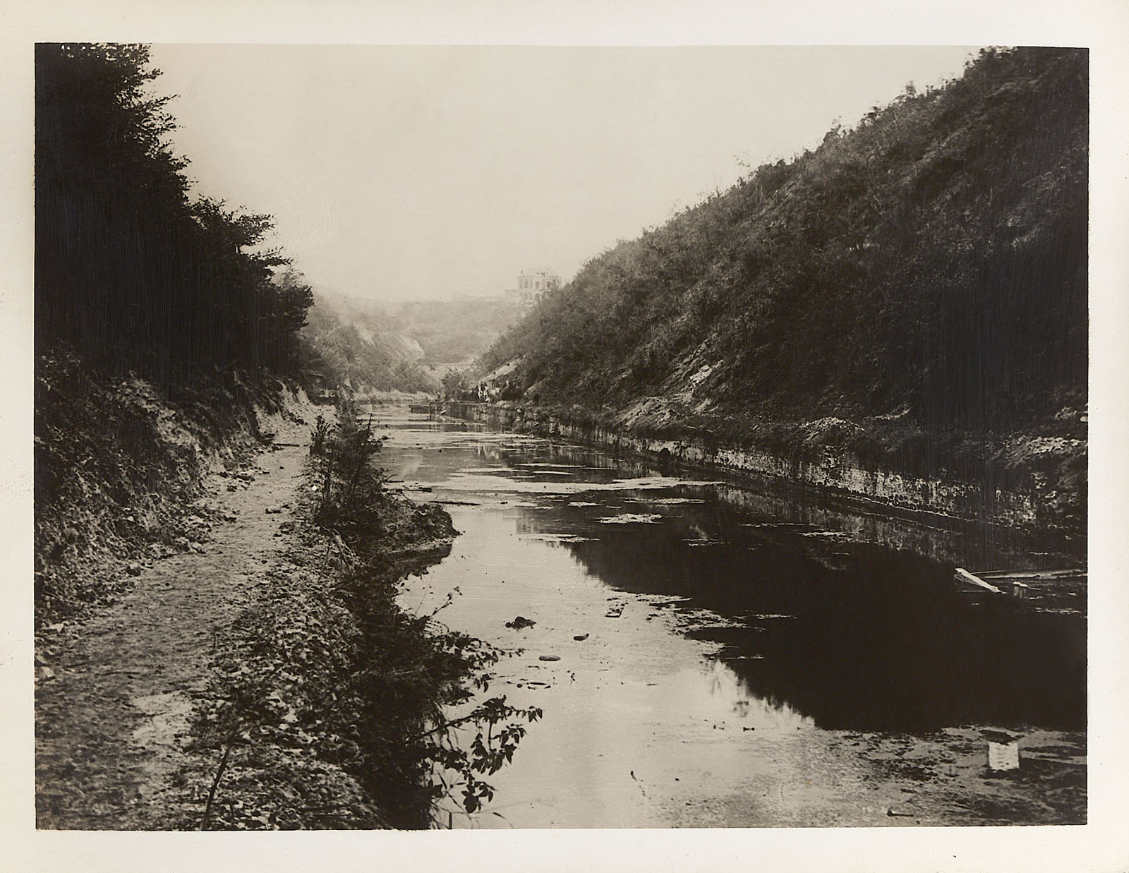
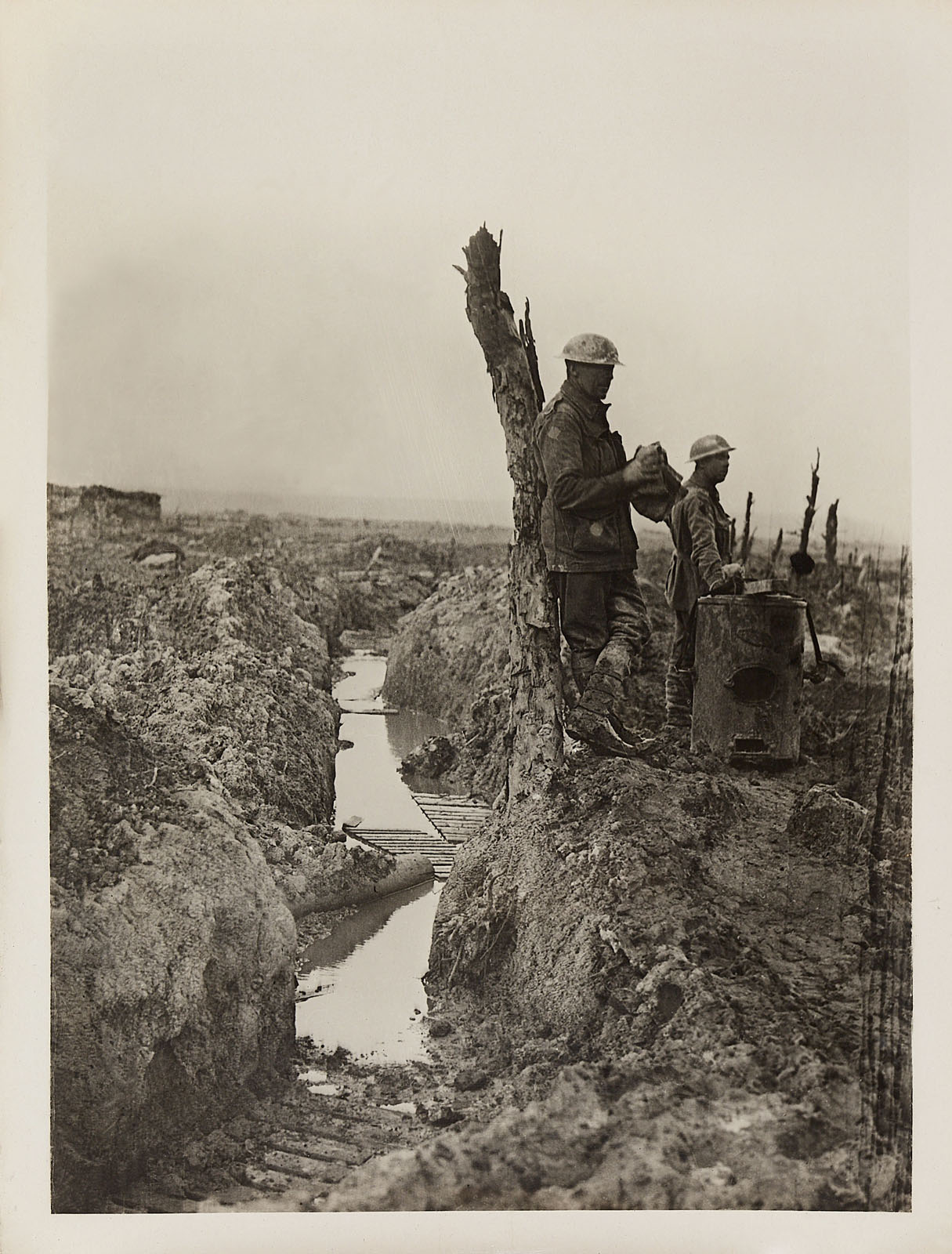


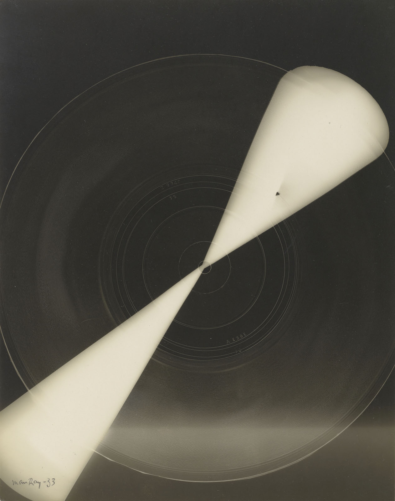


![Lisette Model (American born Austria, 1901-1983) '[Singer, Sammy's Bar, New York]' about 1940-1944](https://artblart.com/wp-content/uploads/2022/07/model-singer-sammys-bar-new-york.jpg "Lisette Model (American born Austria, 1901-1983) '[Singer, Sammy's Bar, New York]' about 1940-1944")


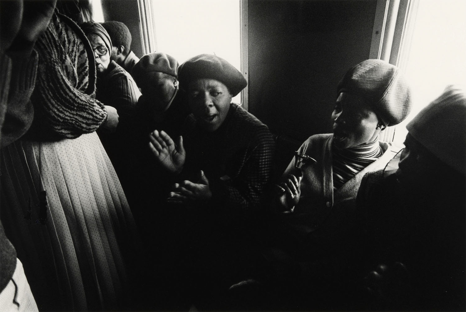


![Platt D. Babbitt. '[Scene at Niagara Falls]' c. 1855](https://artblart.com/wp-content/uploads/2015/03/platt_d_babbitt_scene_at_niagara_falls-web.jpg "Platt D. Babbitt. '[Scene at Niagara Falls]' c. 1855")




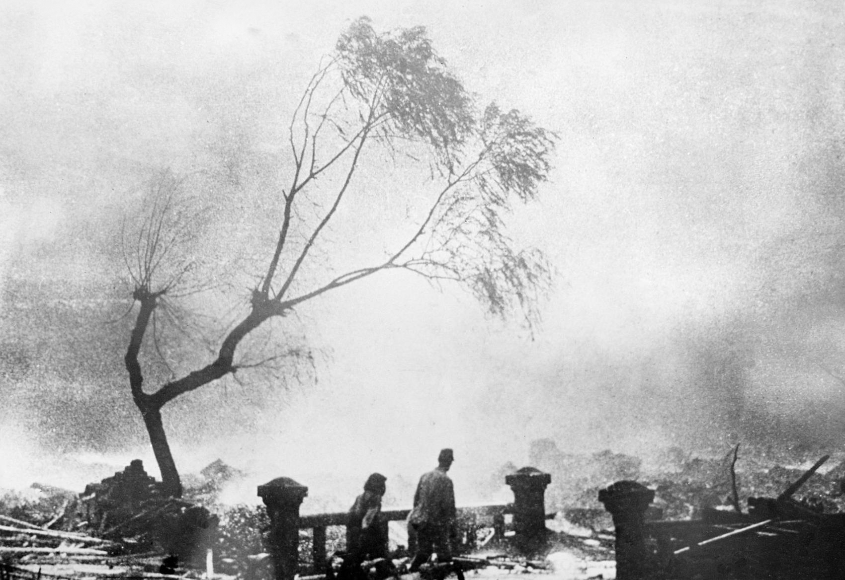


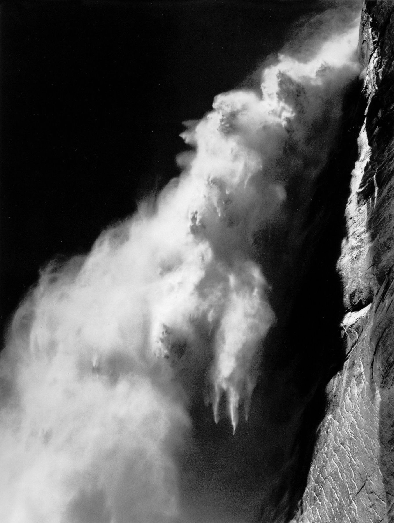


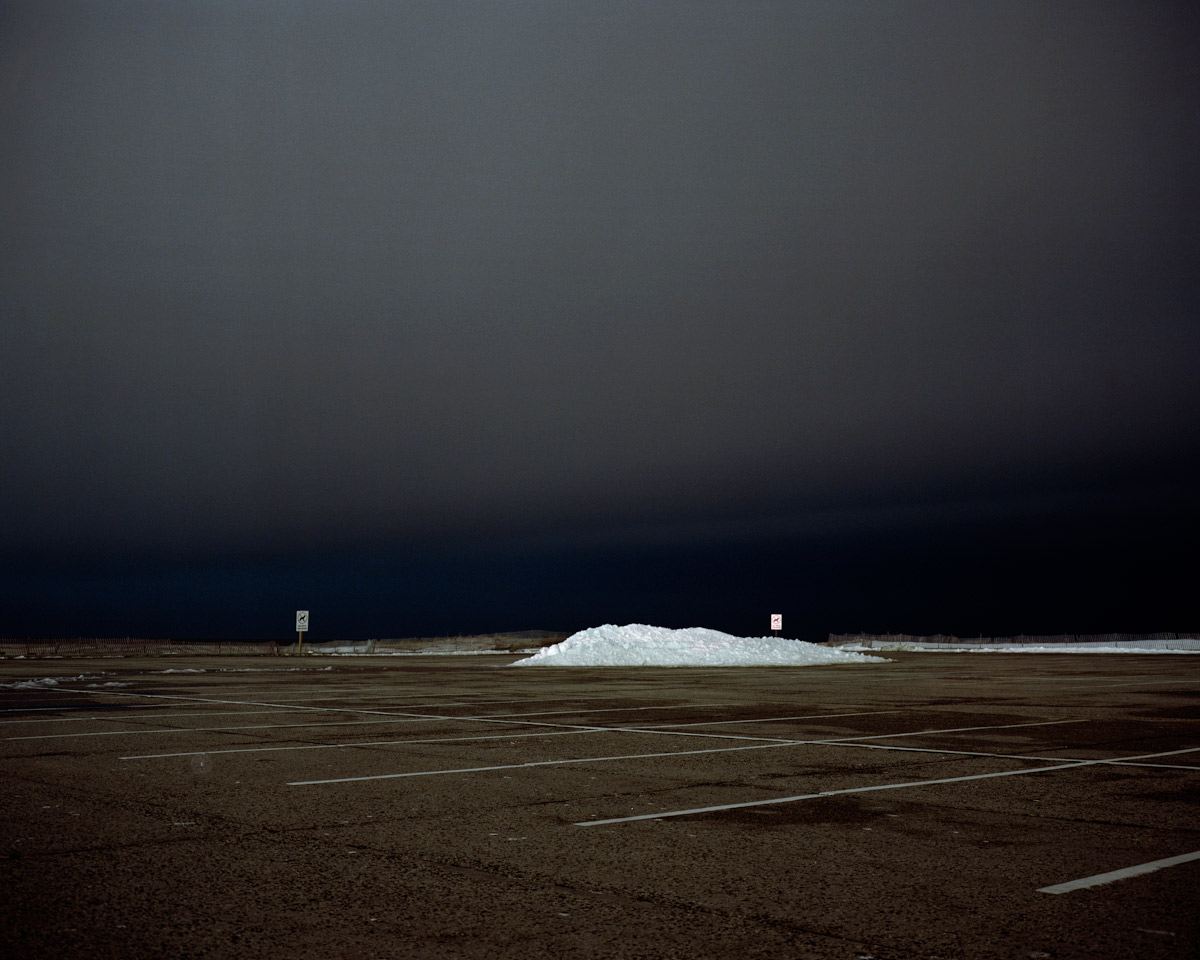


You must be logged in to post a comment.