Exhibition: ‘What Is a Photograph?’ at the International Center of Photography, New York

Exhibition dates: 31st January – 4th May, 2014

Curator: Carol Squiers, ICP Curator

Artist in the exhibition include:

Matthew Brandt b. 1982, Los Angeles; lives and works in Los Angeles. Marco Breuer b. 1966, Landshut, Germany; lives and works in New York State. Liz Deschenes b. 1966, Boston; lives and works in New York City. Adam Fuss b. 1961, London; lives and works in New York City. Owen Kydd b. 1975, Calgary, Canada; lives and works in Los Angeles. Floris Neusüss 1937-2020, German. Marlo Pascual 1972-2020, American. Sigmar Polke 1941-2010; Germany. Eileen Quinlan b. 1972, Boston; lives and works in New York City. Jon Rafman b. 1981, Montreal; lives and works in Montreal. Gerhard Richter b. 1932, Dresden; lives and works in Cologne. Mariah Robertson b. 1975, Indianapolis, Indiana; lives and works in Brooklyn. Alison Rossiter b. 1953, Jackson, Mississippi; lives and works in the metro New York area. Lucas Samaras 1936-2024, Macedonia, Greece; lives and works in New York City. David Benjamin Sherry b. 1981, Woodstock, New York; lives and works in Los Angeles. Travess Smalley b. 1986, Huntington, West Virginia; lives and works in New York City. Kate Steciw b. 1978, Bethlehem, Pennsylvania; lives and works in Brooklyn. Artie Vierkant b. 1986, Breinerd, Minnesota; lives and works in New York City. James Welling b. 1951, Hartford, Connecticut; lives and works in Los Angeles. Christopher Williams b. 1956, Los Angeles; lives and works in Cologne, Düsseldorf, and Amsterdam. Letha Wilson b. 1976, Honolulu; lives and works in Brooklyn.


James Welling (American, b. 1951) '6236' 2008 from the exhibition 'What Is a Photograph?' at the International Center of Photography, New York, January - May, 2014


James Welling (American, b. 1951)
6236
2008
© James Welling, courtesy David Zwirner, New York/London


A Vocabulary of Photography: representation and the original, the ‘I can’ of sight

What is a photograph? These days, it can be anything your imagination desires, any imag(in)ing that takes your fancy…

The images in this posting are a case in point. In a postmodern, post-photographic world where there is (allegedly) no centre and periphery, these art works are photography playing at the edges of photography. They examine “the range of creative experimentation that has occurred in photography since the 1970s,” reconsidering and reinventing, “the role of light, color, composition, materiality, and the subject in the art of photography.”

In an earlier posting I talked about A Vocabulary of Printing and the Syntax of the Image. Here we could equally posit a Vocabulary of Photography, a compendium of techniques and imaginings, noting that technology and imagination should never delimit the creativity of the photographer/artist. In other words visions, boundaries and technologies are there to be pushed!

All well and good. To solidify meaning in such a nebulous world, there is penchant for (ambiguous) numbers – titles such as 6236; Untitled (C-1189); 154 – or definitive titles that try to fix ambiguity in a specific time, place or typology (a classification according to general type) eg Image Object Friday 7 June 2013 4:33 PM, 2013 or Supplement ’13 (Mixed Typologies) #3.

However, what is produced by this experimentation, this voluminous vocabulary, seldom leads to satisfying results. When you actually look at this type of work, really look at it with a clear and aware mind (as Krishnamurti would say), a large proportion of it is blather, noise for the sake of making noise, tinkering for a terrestrial world saturated in meaningless images. No wonder I get disillusioned with the “contemporary” in photography. The art work seems to mean very little and takes me nowhere I particularly want to go.

While photographs are no longer necessarily “points of view” analogous to Littré’s rigorous definition: ‘The point of view is a collection of objects to which the eye is directed and on which it rests within a certain distance’,1 and “the image has nothing to do with signification, meaning, as implied by the existence of the world, the effort of truth, the law and the brightness of the day”2 – meaning that there is no single truth, there are only competing narratives and interpretations of a world that cannot be wholly, accurately described3 – for me there still needs to be a re(as)semblance towards some form of inherent truth in the image, ideally manifested in some form of human imagination, creativity and happiness.

The ‘I can’ of site (representation) / sight (vision) …

Dr Marcus Bunyan


1/ Virilio, Paul. The Vision Machine (trans. Julie Rose). Bloomington: Indiana University Press, 1994, p. 19

2/ Blanchot, Maurice. The Gaze of Orpheus. New York: Barrytown, 1981, p. 85

3/ Townsend, Chris. Vile Bodies: Photography and the Crisis of Looking. Munich: Prestel, 1998, p. 10


Many thankx to the International Center of Photography for allowing me to publish the photographs in the posting. Please click on the photographs for a larger version of the image.


“Vision is ordered according to a mode that may be generally called the function of images. This function is defined by a point-by-point correspondence of two unities in space. Whatever optical intermediaries may be used to establish their relation, whether their image is virtual, or real, the point-by-point correspondence is essential. That which is the mode of the image is therefore reducible to the simple schema that enables us to establish anamorphosis, that is to say, to the relation of an image, in so far as it linked to a surface, with a certain point that we shall call the ‘geometrical’ point. Anything that is determined by this method, in which the straight line plays its role of being the path of light, can be called an image.”


Lacan, Jacques. The Four Fundamental Concepts of Psycho-Analysis (trans. Alan Sheridan). London: The Hogarth Press, 1977, p. 86


“With the industrial proliferation of visual and audiovisual protheses and unrestrained use of instantaneous-transmission equipment from earliest childhood onwards, we now routinely see the encoding of increasingly elaborate mental images together with a steady decline in retention rates and recall. In other words we are looking at the rapid collapse of mnemonic [aiding memory] consolidation.

This collapse seems only natural, if one remembers a contrario that seeing, and its spatio-temporal organisation, precede gesture and speech and their co-ordination in knowing, recognising, making known (as images of our thoughts), our thoughts themselves and cognitive functions, which are never passive… (Romains, Jules. La Vision extra-rétinienne et le sens paroptique. Paris: Gallimard, 1964).

Everything I see is in principle within my reach, at least within reach of my sight, marked on the map of the ‘I can’. In this important formulation, Merleau-Ponty pinpoints precisely what will eventually find itself ruined by the banalisation of a certain teletopology. The bulk of what I see is, in fact and in principle, no longer with in my reach. And even if it lies within reach of my sight, it is no longer necessarily inscribed on the map of the ‘I can’. The logistics of perception in fact destroy what earlier modes of representation preserved of the original, ideally human happiness, the ‘I can’ of sight… “


Virilio, Paul. The Vision Machine (trans. Julie Rose). Bloomington: Indiana University Press, 1994, p. 7 (my bold)


Matthew Brandt (American, b. 1982) 'Grays Lake, ID 7' 2013 from the exhibition 'What Is a Photograph?' at the International Center of Photography, New York, January - May, 2014


Matthew Brandt (American, b. 1982)
Grays Lake, ID 7
2013
© Matthew Brandt, courtesy Yossi Milo Gallery, New York


Alison Rossiter (American, b. 1953) 'Kilborn Acme Kruxo, exact expiration date unknown, ca. 1940s, processed in 2013 (#1)' 2013


Alison Rossiter (American, b. 1953)
Kilborn Acme Kruxo, exact expiration date unknown, ca. 1940s, processed in 2013 (#1)
2013
© Alison Rossiter, courtesy Yossi Milo Gallery, New York


Eileen Quinlan (American, b. 1972) 'The Drink' 2011


Eileen Quinlan (American, b. 1972)
The Drink
2011
© Eileen Quinlan, courtesy Miguel Abreu Gallery, New York


Gerhard Richter (German, b. 1932) '18.2.08' 2008


Gerhard Richter (German, b. 1932)
18.2.08
2008
Overpainted photograph
© Gerhard Richter, courtesy Marian Goodman Gallery, New York


Kate Steciw (American, b. 1978) 'Armchair, Background, Basic, Beauty, Bed, Bedside, Bread, Breakfast, Bright, Cereal, Closeup, Cloth, Color, Contemporary, Couch, Crust, Day, Decor, Fox, Frame, Grain, Ingredient, Interior, Invitation, Irregular, Juice, Life, Living, Loaf, Luxury, Macro, Sofa, Speed, Style, Sweet, Texture' 2013


Kate Steciw (American, b. 1978)
Armchair, Background, Basic, Beauty, Bed, Bedside, Bread, Breakfast, Bright, Cereal, Closeup, Cloth, Color, Contemporary, Couch, Crust, Day, Decor, Fox, Frame, Grain, Ingredient, Interior, Invitation, Irregular, Juice, Life, Living, Loaf, Luxury, Macro, Sofa, Speed, Style, Sweet, Texture
2013
1 and 2 of infinite
© Kate Steciw


On view at the International Center of Photography from January 31 through May 4, 2014, What Is a Photograph? explores the range of creative experimentation that has occurred in photography since the 1970s.

This major exhibition brings together 21 emerging and established artists who have reconsidered and reinvented the role of light, colour, composition, materiality, and the subject in the art of photography. In the process, they have also confronted an unexpected revolution in the medium with the rise of digital technology, which has resulted in imaginative reexaminations of the art of analog photography, the new world of digital images, and the hybrid creations of both systems as they come together.

“Artists around the globe have been experimenting with and redrawing the boundaries of traditional photography for decades,” said ICP Curator Carol Squiers, who organised the exhibit. “Although digital photography seems to have made analog obsolete, artists continue to make works that are photographic objects, using both old technologies and new, crisscrossing boundaries and blending techniques.”

Among those included in the exhibition is Lucas Samaras, who adopted the newly developed Polaroid camera in the late 1960s and early 1970s and immediately began altering its instant prints, creating fantastical nude self-portraits. Another artist who turned to photography in the 1970s was Sigmar Polke. Although better known as a painter, Polke explored nontraditional ways of photographing and printing, manipulating both his film and prints in the darkroom and often drawing and painting on his images.

More recently, Liz Deschenes has used camera-less photography in a subtle investigation of nonrepresentational forms of expression and the outmoded technologies of photography. And, James Welling has created a heterogeneous body of work that explores optics, human perception, and a range of photographic genres both abstract and representational.

Press release from the International Center of Photography website


Letha Wilson (American, b. 1976) 'Colorado Purple' 2012


Letha Wilson (American, b. 1976)
Colorado Purple
2012
Concrete, chromogenic print transfer, and wood frame
Courtesy the artist and Higher Pictures, New York
© Letha Wilson, courtesy Higher Pictures, New York


Adam Fuss (American, b. 1961) 'Untitled' 1988


Adam Fuss (American, b. 1961)
Untitled
1988
© Adam Fuss, courtesy Cheim & Read, New York


Marco Breuer (German, b. 1966) 'Untitled (C-1189)' 2012


Marco Breuer (German, b. 1966)
Untitled (C-1189)
2012
© Marco Breuer, courtesy Yossi Milo Gallery, New York


David Benjamin Sherry (American, b. 1981) 'Lower Yosemite Falls, Yosemite, California' 2013


David Benjamin Sherry (American, b. 1981)
Lower Yosemite Falls, Yosemite, California
2013
© David Benjamin Sherry, courtesy the artist and Salon 94, New York


Mariah Robertson (American, b. 1975) '154' 2010 (detail)


Mariah Robertson (American, b. 1975)
154 (detail)
2010
© Mariah Robertson, courtesy American Contemporary, New York


Artie Vierkant (American, b. 1986) 'Image Object Friday 7 June 2013 4:33 PM, 2013' 2013


Artie Vierkant (American, b. 1986)
Image Object Friday 7 June 2013 4:33 PM, 2013
2013
© Artie Vierkant, courtesy Higher Pictures, New York


Christopher Williams (American, b. 1956) 'Supplement '13 (Mixed Typologies) #3' 2013 (detail)


Christopher Williams (American, b. 1956)
Supplement ’13 (Mixed Typologies) #3 (detail)
2013
© Christopher Williams, courtesy David Zwirner, New York/London and Galerie Gisela Capitain, Cologne


Jon Rafman (American, b. 1981) 'New Age Demanded (The heart was a place made fast)' 2013


Jon Rafman (American, b. 1981)
New Age Demanded (The heart was a place made fast)
2013
© Jon Rafman, courtesy the artist and Zach Feuer Galery, New York


Floris Neusüss (German, 1937-2020) 'Tango' 1983


Floris Neusüss (German, 1937-2020)
Tango
1983
© Floris Neusüss, courtesy the artist and Von Lintel Gallery, New York


Marlo Pascual (American, 1972-2020) 'Untitled' 2010


Marlo Pascual (American, 1972-2020)
Untitled
2010
© Marlo Pascual, courtesy the artist and Casey Kaplan, New York
Photo: Jean Vong


Owen Kydd (Canadian, b. 1975) 'Pico Boulevard (Nocturne)' 2012


Owen Kydd (Canadian, b. 1975)
Pico Boulevard (Nocturne)
2012
Courtesy the artist and Nicelle Beauchene Gallery
© Owen Kydd


International Center of Photography
79 Essex Street New York, NY 10002
Phone: 212 857 0000

Opening hours:
Wednesday – Monday 11am – 7pm
Closed Tuesday

International Center of Photography website

LIKE ART BLART ON FACEBOOK

Back to top

Review: ‘The Paper’ by Rosemary Laing at Tolarno Galleries, Melbourne

Exhibition dates: 5th April 2014 – 3rd May, 2014


Rosemary Laing (Australian, 1959-2024) 'The Paper, Monday' 2013 from the exhibition 'The Paper' by Rosemary Laing at Tolarno Galleries, Melbourne, April - May, 2014


Rosemary Laing (Australian, 1959-2024)
The Paper, Monday
2013
C Type photograph
110 x 214cm
Courtesy the artist and Tolarno Galleries, Melbourne


I always look forward to new work by the incomparable Rosemary Laing with great anticipation. I have never been disappointed. This magnificent group of five images is no exception, one of the photographic highlights so far this year in Melbourne.

These large, Type-C analogue landscape format photographs feature decomposing newspapers literally (being words) carpeting the forest floor. These site-specific interventions feature no digital manipulation and, as the erudite catalogue essay by George Alexander observes below, investigate the replacement of our daily newspaper by online information bytes, “the graphic graphic newsprint breaking down like typographic stew,” the “transmigration of matter from one form to another,” “a meditation on time,” recycling, deforestation, information overload. These concepts build on earlier fragments from work by the artist (such as groundspeed2001) into something transformational, transnational and, even, otherworldly.

These entropic panoramas, which hang mysteriously between words and worlds, are indeed meditations on time and space. As Annette Hughes states,

“Laing’s pictorial space, like that of cinema, is generally art-directed, constructed, rehearsed, performed and shot in physical time and space, and though it could easily be Photoshopped these days, that’s not the point. The art object is only the end product of the making of these images. Being able to see the many human hours devoted to their execution is also a way of building duration back into the photograph.”1


Here’s my tuppence worth on Laing’s new work.

This suite of photographs has a panoramic immersiveness. The viewer feels as though time has stood still when looking at these photographs, where the newspapers are analogous to snow upon the ground, imparting something of a dream-like existence to the images. There is a talismanic quality to the images, like a standing stone circle that is believed to have magic powers and cause good things to happen. And they are full of symbols, such as arrows, to mark the way (see The Paper, Wednesday, earlier, 2013, below).

These are not unquiet images, suspended midway between fantasy and reality, but (un)quiet images – a subtle but pivotal difference. They possess the quietness of the forest but also the isolation and loneliness. They are based on a harmonic instability, like a minor chord at the beginning of a Beethoven symphony, which is then eventually resolved in the major. These images are the journey of that resolution. The words, the flesh of the textural body, has been pulped: that immersive instability of the fecund body laying down in the soil of mother earth.

The viewer is disorientated. We have no idea where we are, the paper (the word and world) creating for the body this foggy, dream-like atmosphere. As in all of Laing’s work, there is an inquiring instability here, one that seeks the resolution of stability through the love of the human body and of our existence. I stand still before them.

Dr Marcus Bunyan


1/ Hughes, Annette. “ABIGAIL SOLOMON-GODEAU Rosemary Laing,” Review on The Newtown Review of Books website 3th July 2012 [Online] Cited 27th April 2014. No longer available online


Many thankx to Tolarno Galleries for allowing me to publish the photographs in the posting. Please click on the photographs for a larger version of the image.


Rosemary Laing (Australian, 1959-2024) 'The Paper, Tuesday' 2013 from the exhibition 'The Paper' by Rosemary Laing at Tolarno Galleries, Melbourne, April - May, 2014


Rosemary Laing (Australian, 1959-2024)
The Paper, Tuesday
2013
C Type photograph
110 x 209cm
Courtesy the artist and Tolarno Galleries, Melbourne


Rosemary Laing (Australian, 1959-2024) 'The Paper, Wednesday, earlier' 2013


Rosemary Laing (Australian, 1959-2024)
The Paper, Wednesday, earlier
2013
C Type photograph
110 x 203cm
Courtesy the artist and Tolarno Galleries, Melbourne


Rosemary Laing

The Paper

A forest is carpeted with truckloads of newspapers. A cacophony of printed voices layers the soil horizon of the ground. The former surface litter of loose and partly decayed organic matter is overlaid with pulped tree product. The 21st century cultural carpet of current events and mercenary babble is already time-lined by weathering, which is fast-tracking the decomposition of the worded pages. The graphic of newsprint is breaking down like typographic stew, falling apart like old lacework, dissolving like paint – it’s losing its imprint as fallen branches and leaves scatter over it. It seems to expect that over time it will disappear beneath what comes after, what fresh coats some future century will lay over it.

For this undertaking, Rosemary Laing located her activity among the woodlands of Bundanon, a casuarina forest peppered with eucalyptus and Burrawang. Located in the Shoalhaven of southern New South Wales, the site was originally the land of the Wodi Wodi people of the Yuin nation. Layered with subsequent occupations since the early 19th century, in 1993 the properties were gifted by Arthur and Yvonne Boyd and became the Bundanon Trust – a place for artists of all disciplines to work and a place for all people to draw inspiration.

Two unique opportunities here were made possible by the Trust to Rosemary Laing. The opportunity to develop and consider her actions unhindered by a time frame; together with access to the Bundanon collection of the influential gnarled ceramics that Arthur’s father Merric Boyd (1888-1959) made with their blue and green underglazes and swaying lines of treescapes on clay.

As it happened, while making this work, the place was inundated with floodwaters. Natural disaster has often enclosed her work, as in swanfires (2002-2004), with its incinerated sheds and buildings, following bushfires in the Sussex Inlet area – also part of the Shoalhaven. Destruction sculpts and re-sculpts the world, and Laing joins the material cycle, the perpetual transmigration of matter from one form to another. A “terrible beauty”, as a friend remarked.

This series is called The Paper, for the daily newspaper – our long time companion and a primary fix for information of the world – that is swiftly being superseded by the new material technologies of our times. If the overwhelming flood of data and culture and spin is hitting us with some 500,000 discrete bits of information at any time, then we may be faced with inabilities to absorb that Total Noise. We probably missed the 25 bits that were important. The latest innovations of the Infosphere replay confections of overstimulation and boredom, sugar-hits of overload followed by emotional numbness.

Yet the covering of the ground that we saw in 2001 with groundspeed – not far geographically from this site – isn’t the same as here in the series The Paper. The point of loungeroom carpets in groundspeed was as an index of the latecomer’s sense of belonging. A kind of comfort zone for the non-indigenous, bridging old world and new. The carpeting this time – as she writes in her notes – “seems to be composting the present as a past about to happen; taking a once-upon- a-time not-that-long-ago standard as the ground-amendment-of- tomorrow already.” It is, among other things, a meditation on time.

Every new presentation of Laing’s work is also a running commentary on her previous corpus of work. The Paper explores themes touched upon in – Natural Disasters (1988), groundspeed (2001) with its patterned loungeroom carpets out in the ‘wild’ and in 2006, weather with its cyclone of newspaper shreds – while constantly replenishing what had remained surplus to that work. And this compost of earlier fragments, that are dismembered and scattered and gathered again, expands her material formation on this site.

From top to bottom the planet is being transfigured. Something essential is changing now and forever. The “global” has become everyone’s “local”. The human race is going through things it has never experienced before – as we are forced to join the caravan of this moment in time.

Hellish or heavenly? Promised Land or Wasteland? Take your pick. You do get the sense – with the dramatic shiny green of the ancient Burrrawang palms scattered about – of human impermanence against the bedrock temporal dimensions of the primitive Gondawan rainforest margins. As anyone who has spent time slogging through genuine bushland, and sensing the century’s long pulse of trees: we’ve fallen out of tune with the eternal present of the animal world, we’ve fallen into Time with its past and future, the chopped-up time of daily newspapers.

Find tongues in trees, books in the running brooks, sermons in stones … wrote Shakespeare (As You Like It, 2.1). The quote recalls the medieval idea of the Book of Nature that we are here to read, whose infinite pages unfold enormous landscapes: some see good, some evil, some both, some neither. Laing’s art takes root in a fissure, in that crack in the covenant between word and world, and the historical moment is right: we are in the age of the “trans-book” with the rise of the Kindle and iGoogle, and with it the end of newspapers, the demise of print and the retrenchment of journalists.

So as you enter the space, walk around the room with the suite of images – named for the days of the week – there’s an entropic feel with their grubby matte and muted beauty. Underfoot, things fall apart, the riggings of the page disintegrate into tissue, print naturalises into leaf mould, and words on paper are composted back into wood pulp and waste slurry. Accordingly, to make the images this time around, she put her dalliances with digital cameras and print-output machines aside, in favour of analogue, for all the lovely limitations and imperfections of light on cellulose triacetate, and the physical shadings of Laing’s printer in the darkroom.

The curving earth is a body, and these lacework landscapes show off the marks of ageing. The woods are a damp chamber, with a thick carpet of newspapers, and many doors open to the wind and faraway light. The images enclose you in brushwork of soft jade while the soggy colours of disintegration make time tangible.

There’s nothing said about the world here (recycling, deforestation, information overload) that you couldn’t find more reliably elsewhere. It’s rather Laing’s process of invention, through the hinterlands of her material imagination, that communicates her unexpected vision, tells her story of an imagined afterwards of along-the-way. There’s a stand of trees in these pictures still growing inside the shellacking and composting of our times.

George Alexander
September 2013

Published with permission


Rosemary Laing (Australian, 1959-2024) 'The Paper, Wednesday' 2013


Rosemary Laing (Australian, 1959-2024)
The Paper, Wednesday
2013
C Type photograph
110 x 197.5cm
Courtesy the artist and Tolarno Galleries, Melbourne


Rosemary Laing (Australian, 1959-2024) 'The Paper, Thursday' 2013


Rosemary Laing (Australian, 1959-2024)
The Paper, Thursday
2013
C Type photograph
110 x 207cm
Courtesy the artist and Tolarno Galleries, Melbourne


Rosemary Laing (Australian, 1959-2024) 'The Paper, Friday' 2013


Rosemary Laing (Australian, 1959-2024)
The Paper, Friday
2013
C Type photograph
110 x 196.3cm
Courtesy the artist and Tolarno Galleries, Melbourne


Tolarno Galleries
Level 4
104 Exhibition Street
Melbourne VIC 3000
Australia
Phone: 61 3 9654 6000

Opening hours:
Tue – Fri 10am – 5pm
Sat 1pm – 4pm

Tolarno Galleries website

LIKE ART BLART ON FACEBOOK

Back to top

Exhibition: ‘Paris as Muse: Photography, 1840s-1930s’ at The Metropolitan Museum of Art, New York

Exhibition dates: 28th January – 4th May, 2014

Curator: Jeff L. Rosenheim


Eugène Atget (French, Libourne 1857–1927 Paris) 'Quai d'Anjou, 6h du matin' 1924 from the exhibition 'Paris as Muse: Photography, 1840s-1930s' at The Metropolitan Museum of Art, New York, January - May, 2014


Eugène Atget (French, Libourne 1857-1927 Paris)
Quai d’Anjou, 6h du matin
1924
Albumen silver print from glass negative
17.7 x 22.8cm (6 15/16 x 8 15/16 in.)
Gilman Collection, Purchase, William Talbott Hillman Foundation Gift, 2005


If there is one city in the world in which I would really like to live, it would be Paris. I have loved her since first going there as a teenager and she has never foresaken that love: always romantic, beautiful, intriguing, Paris is my kind of city. As a flâneur there is much to observe, much to digest and assimilate through periods of reflection.

Where do you start? Steichen, Stieglitz, Fox Talbot, Marville, Brassaï, Jeanloup Sieff, Cartier-Bresson, Jacques-Mandé Daguerre, Nadar, any photographer of note but above all Atget – all acquiescent to her charms. Strange as it may seem, it is not that the photographer takes photos of Paris (as though possessing an object of desire), but that the city allows these revelations to occur as a kind of benediction, a kind of divine blessing. Am I making any sense here? Perhaps I am just too much in love, but having photographed in Pere-Lachaise Cemetery for example, there is nothing quite like the feeling I get when in the City of Light.

The photographs in this posting are magnificent. The intimacy of the Brassaï, the tonality of the Steichen; the dankness of the Marville and the informality of the Stieglitz. The first two Atget are cracking images. Note how the auteur éditeur uses the darkness of the tree trunks to divide the picture plane, better than anyone has done before or since. It is a pleasure to be able to show you Atget’s Work Room with Contact Printing Frames (c. 1910, below), an image I have never seen before in all the years I have been looking at his work. Make sure you enlarge the image to see all the details including the simplicity of the trestle table: “On the table are the wooden frames the photographer used to contact print his glass negatives; at right are several bins of negatives stacked vertically; below the table are his chemical trays; on the shelves above are stacks of paper albums – a shelf label reads escaliers et grilles (staircases and grills).”

I am particularly taken by the feather duster, the parcels wrapped in newspapers and tied with string, and intrigued by the print of a moonrise(?) over a bridge high up, tacked to the wall (see detail image below). Obviously this image meant a lot to him because it is the only one in the room and it would have taken a bit of an effort to put it up there. I wonder whose image it is, and what bridge it is of…

Dr Marcus Bunyan


Many thankx to The Metropolitan Museum of Art for allowing me to publish the photographs in the posting. Please click on the photographs for a larger version of the image.


“Oysters and a glass of wine, a corner café, the Sunday bird market on the Île de la Cité, a lover’s stolen kiss: Paris has loomed large in the imagination of artists, writers, and architects for centuries. For 175 years, it has attracted photographers from around the world who have succumbed to its spell and made it their home for part, if not all, of their lives.

Paris as Muse: Photography, 1840s-1930s (January 27 – May 4, 2014) celebrates the first 100 years of photography in Paris and features some 40 photographs, all drawn from the Museum’s collection. Known as the “City of Light” even before the birth of the medium in 1839, Paris has been muse to many of the most celebrated photographers, from Louis-Jacques-Mandé Daguerre (one of the field’s inventors) and Nadar to Charles Marville, Eugène Atget, and Henri Cartier-Bresson. The show focuses primarily on architectural views, street scenes, and interiors. It explores the physical shape and texture of Paris and how artists have found poetic ways to record its essential qualities using the camera.”

Text from The Metropolitan Museum of Art website


Eugène Atget (French, Libourne 1857-1927 Paris) 'Nôtre Dame' 1922 from the exhibition 'Paris as Muse: Photography, 1840s-1930s' at The Metropolitan Museum of Art, New York, January - May, 2014


Eugène Atget (French, Libourne 1857-1927 Paris)
Nôtre Dame
1922
Albumen silver print from glass negative
18.2 x 22.1cm (7 1/8 x 8 11/16 in.)
Gilman Collection, Purchase, Joseph M. Cohen Gift, 2005


Atget likely avoided Nôtre Dame during his early career as it was already well documented by other photographers. In his old age, however, he worked more for his own pleasure and during the last five years of his life photographed the cathedral regularly. He always viewed it in an eccentric way – either in the distance, as here, or in detail.


Eugène Atget (French, Libourne 1857-1927 Paris) 'Untitled [Atget's Work Room with Contact Printing Frames]' c. 1910


Eugène Atget (French, Libourne 1857-1927 Paris)
Untitled [Atget’s Work Room with Contact Printing Frames]
c. 1910
Albumen silver print from glass negative
20.9 x 17.3cm (8 1/4 x 6 13/16 in.)
Purchase, The Horace W. Goldsmith Foundation Gift, through Joyce and Robert Menschel, 1990


This straightforward study by Atget of his own work room offers a rare glimpse of the inner sanctum of an auteur éditeur, as he described his profession. On the table are the wooden frames the photographer used to contact print his glass negatives; at right are several bins of negatives stacked vertically; below the table are his chemical trays; on the shelves above are stacks of paper albums – a shelf label reads escaliers et grilles (staircases and grills). Atget used these homemade albums to organise his vast picture collection from which he sold views of old Paris to clients.


Eugène Atget (French, Libourne 1857–1927 Paris) 'Untitled [Atget's Work Room with Contact Printing Frames]' c. 1910 (detail)


Eugène Atget (French, Libourne 1857-1927 Paris)
Untitled [Atget’s Work Room with Contact Printing Frames] (detail)
c. 1910
Albumen silver print from glass negative
20.9 x 17.3cm (8 1/4 x 6 13/16 in.)
Purchase, The Horace W. Goldsmith Foundation Gift, through Joyce and Robert Menschel, 1990


Eugène Atget (French, Libourne 1857-1927 Paris) 'Marchand de Vin, Rue Boyer, Paris' 1910-1911


Eugène Atget (French, Libourne 1857-1927 Paris)
Marchand de Vin, Rue Boyer, Paris
1910-1911
Albumen silver print from glass negative
21.5 x 17.6cm (8 7/16 x 6 15/16 in.)
Gilman Collection, Purchase, Joseph M. Cohen Gift, 2005


Eugène Atget (French, Libourne 1857–1927 Paris) 'Boulevard de Strasbourg, Corsets, Paris' 1912


Eugène Atget (French, Libourne 1857-1927 Paris)
Boulevard de Strasbourg, Corsets, Paris
1912
Gelatin silver print from glass negative
22.4 x 17.5cm (8 13/16 x 6 7/8 in.)
The Metropolitan Museum of Art, New York, Gilman Collection
Purchase, Ann Tenenbaum and Thomas H. Lee Gift, 2005


Atget found his vocation in photography in 1897, at the age of forty, after having been a merchant seaman, a minor actor, and a painter. He became obsessed with making what he termed “documents for artists” of Paris and its environs and compiling a visual compendium of the architecture, landscape, and artefacts that distinguish French culture and history. By the end of his life, Atget had amassed an archive of more than eight thousand negatives, which he organised into such categories as Parisian Interiors, Vehicles in Paris, and Petits Métiers (trades and professions).

In Atget’s inventory of Paris, shop windows figure prominently and the most arresting feature mannequin displays. In the 1920s the Surrealists recognised in Atget a kindred spirit and reproduced a number of his photographs in their journals and reviews. Antiquated mannequins such as the ones depicted here struck them as haunting, dreamlike analogues to the human form.


Marie-Charles-Isidore Choiselat (French, 1815-1858) Stanislas Ratel (French, 1824-1904) 'Untitled [The Pavillon de Flore and the Tuileries Gardens]' 1849


Marie-Charles-Isidore Choiselat (French, 1815-1858)
Stanislas Ratel (French, 1824-1904)
Untitled [The Pavillon de Flore and the Tuileries Gardens]
1849
Daguerreotype
15.2 x 18.7cm (6 x 7 3/8 in.)
Gilman Collection, Purchase, The Horace W. Goldsmith Foundation Gift, through Joyce and Robert Menschel, 2005


Taken in September 1849 from a window of the École des Beaux-Arts, this daguerreotype exhibits the dazzling exactitude and presence that characterise these mirrors of reality. True to the daguerreotype’s potential, stationary objects are rendered with remarkable precision; under magnification one can clearly discern minute architectural details on the Pavillon de Flore, features of statuary and potted trees in the Tuileries Gardens, even the chimney pots on the buildings in the background along the rue de Rivoli.

Daguerre himself had chosen a nearly identical vantage point in 1839 for one of his earliest demonstration pieces, and it may well have been with that archetypal image in mind that Choiselat and Ratel made this large daguerreotype a decade later. Choiselat and Ratel, among the earliest practitioners to utilise and improve upon Daguerre’s process, first published their methods for enhancing the sensitivity of the daguerreotype plate in 1840 and had achieved exposure times of under two seconds by 1843. Unlike Daguerre’s long exposure, which failed to record the presence of moving figures, this image includes people (albeit slightly blurred) outside the garden gates, on the Pont Royal, and peering over the quai wall above the floating warm-bath establishment moored in the Seine. Still more striking is the dramatic rendering of the cloud-laden sky, achieved by the innovative technique of masking the upper portion of the plate partway through the exposure.


William Henry Fox Talbot (British, 1800-1877) 'The Boulevards at Paris' May-June 1843


William Henry Fox Talbot (British, 1800-1877)
The Boulevards at Paris
May-June 1843
Salted paper print from paper negative
15.1 x 19.9cm (5 15/16 x 7 13/16 in. )
Gilman Collection, Purchase, The Horace W. Goldsmith Foundation Gift, through Joyce and Robert Menschel, 2005


Talbot traveled to Paris in May 1843 to negotiate a licensing agreement for the French rights to his patented calotype process and, with Henneman, to give first hand instruction in its use to the licensee, the Marquis of Bassano.

No doubt excited to be traveling on the continent with a photographic camera for the first time, Talbot seized upon the chance to fulfil the fantasy he had first imagined on the shores of Lake Como ten years before. Although his business arrangements ultimately yielded no gain, Talbot’s views of the elegant new boulevards of the French capital are highly successful, a lively balance to the studied pictures made at Lacock Abbey. Filled with the incidental details of urban life, architectural ornamentation, and the play of spring light, this photograph, unlike much of the earlier work, is not a demonstration piece but rather a picture of the real world. The animated roofline punctuated with chimney pots, the deep shopfront awning, the line of waiting horse and carriages, the postered kiosks, and the characteristically French shuttered windows all evoke as vivid a notion of mid-nineteenth-century Paris now as they must have when Talbot first showed the photographs to his friends and family in England.

A variant of this scene, taken from a higher floor in Talbot’s Paris hotel, appeared as plate 2 in The Pencil of Nature.


Alfred Stieglitz (American, Hoboken, New Jersey 1864 - 1946 New York) 'A Snapshot, Paris' 1911, printed 1912


Alfred Stieglitz (American, Hoboken, New Jersey 1864 – 1946 New York)
A Snapshot, Paris
1911, printed 1912
Photogravure
13.8 x 17.4cm (5 7/16 x 6 7/8 in.)
Gift of J. B. Neumann, 1958


Born in Hoboken, New Jersey, Stieglitz trained to be an engineer in Germany and moved to New York in 1890. His lifelong ambition as an artist (and advocate for the arts) was to prove that photography was as capable of artistic expression as painting or sculpture. As the editor of Camera Notes, the journal of the Camera Club of New York, and then later Camera Work (1902-1917), Stieglitz espoused his belief in the aesthetic potential of the medium. He published work by photographers who shared his conviction alongside European modernists such as Auguste Rodin, Pablo Picasso, Constantin Brancusi, and Francis Picabia.


Michel Seuphor (Belgian, 1901-1999) 'Paris' 1929


Michel Seuphor (Belgian, 1901-1999)
Paris
1929
Gelatin silver print
11.4 x 16.4cm (4 1/2 x 6 7/16 in.)
Purchase, The Horace W. Goldsmith Foundation Gift, through Joyce and Robert Menschel, 1994
© 2011 Artists Rights Society (ARS), New York


The Belgian painter, poet, designer, and art critic Seuphor moved to Paris in 1925 and entered the artistic community of such expatriate artists as Wassily Kandinsky, Piet Mondrian, and Theo van Doesburg. Little is known about his work with the camera except that this photograph was made the year Seuphor founded Cercle et Carré (Circle and Square), a group dedicated to abstraction that would include Kandinsky, Mondrian, Jean Arp, Kurt Schwitters, and Le Corbusier.


Marie-Charles-Isidore Choiselat (French, 1815-1858) Stanislas Ratel (French, 1824-1904) 'Défilé sur le Pont-Royal' May 1, 1844


Marie-Charles-Isidore Choiselat (French, 1815-1858)
Stanislas Ratel (French, 1824-1904)
Défilé sur le Pont-Royal
May 1, 1844
Daguerreotype
Gilman Collection, Gift of The Howard Gilman Foundation, 2005


In January 1839 the Romantic painter and printmaker Louis-Jacques-Mandé Daguerre (1787-1851) showed members of the French Académie des Sciences an invention he believed would forever change visual representation: photography. Each daguerreotype (as Daguerre dubbed his invention) is an image produced on a highly polished, silver-plated sheet of copper.

Using an “accelerating liquid” of their own devising, the daguerreotypists Choiselat and Ratel were able to reduce exposure times from minutes to seconds, which allowed them to capture events as they happened. Here the mounted guards stationed along one of Paris’s most famous bridges registered clearly on the daguerreotype plate, but even with a short exposure time the moving crowds and rolling carriages became a blur of activity.


Charles Marville (French, Paris 1813 - 1879 Paris) 'Rue Traversine (from the Rue d'Arras)' c. 1868


Charles Marville (French, Paris 1813 – 1879 Paris)
Rue Traversine (from the Rue d’Arras)
c. 1868
Albumen silver print from glass negative
34.8 x 27.5cm (13 11/16 x 10 13/16 in. )
Gift of Howard Stein, 2010


Brassaï (French born Romania, Brașov 1899 - 1984 Côte d'Azur) 'Street Fair, Boulevard St. Jacques, Paris' 1931


Brassaï (French born Romania, Brașov 1899 – 1984 Côte d’Azur)
Street Fair, Boulevard St. Jacques, Paris
1931
Gelatin silver print
22.9 x 17.1cm (9 x 6 3/4 in.)
Purchase, Alfred Stieglitz Society Gifts, 2007
© The Estate of Brassai


Born in Transylvania, Gyula Halász studied painting and sculpture in Hungary and moved to Paris in 1924 to work as a journalist. About 1930 he changed his name to Brassaï and took up photography. The camera became a constant companion on his nightly walks through the city’s seamier quarters, where he aimed his lens at showgirls, prostitutes, ragpickers, transvestites, and other inhabitants of the demimonde. His first and most famous book of photographs, Paris de nuit (Paris by Night), published in 1933, includes a variation of this scene of three masked women tempting men into a sideshow.


Edward J. Steichen (American born Luxembourg, Bivange 1879 - 1973 West Redding, Connecticut) 'Untitled [Brancusi's Studio]' c. 1920


Edward J. Steichen (American born Luxembourg, Bivange 1879 – 1973 West Redding, Connecticut)
Untitled [Brancusi’s Studio]
c. 1920
Gelatin silver print
24.4 x 19.4cm (9 5/8 x 7 5/8 in.)
Gift of Grace M. Mayer, 1992
Reprinted with permission of Joanna T. Steichen.


Steichen lived in Paris on and off from 1900 to 1924, making paintings and photographs. A cofounder with Alfred Stieglitz of the Photo-Secession, Steichen offered his former New York studio to the fledgling organisation as an exhibition space in 1905. Known first as the Little Galleries of the Photo-Secession and later simply by its address on Fifth Avenue, 291, the gallery introduced modern French art to America through the works of Rodin, Matisse, Cézanne, and, in 1914, Constantin Brancusi.

Steichen and Brancusi, who met at Rodin’s studio, became lifelong friends. This view of a corner of Brancusi’s studio on the impasse Roncin shows several identifiable works, including Cup (1917) and Endless Column (1918). The photograph’s centrepiece is the elegant polished bronze Golden Bird (1919), which soars above the other forms. Distinct from Brancusi’s studio photographs – subjective meditations on his own creations – Steichen’s view is more orchestrated, geometric, and objective. Golden Bird is centred, the light modulated, and the constellation of masses carefully balanced in the space defined by the camera. A respectful acknowledgment of the essential abstraction of the sculpture, the photograph seems decidedly modern and presages the formal studio photographs Steichen made in the service of Vanity Fair and Vogue beginning in 1923.


The Metropolitan Museum of Art
1000 Fifth Avenue at 82nd Street
New York, New York 10028-0198
Phone: 212-535-7710

Opening hours:
Thursday – Tuesday 10am – 5pm
Closed Wednesday

The Metropolitan Museum of Art website

LIKE ART BLART ON FACEBOOK

Back to top

Text / review: ‘A Vocabulary of Printing and the Syntax of the Image’ from the exhibition ‘KHEM’ at Strange Neighbour, Fitzroy, Melbourne

Exhibition dates: 11th April – 3rd May, 2014

Curator: Linsey Gosper

Artists: Jane Brown, Ponch Hawkes, Siri Hayes, Ruth Maddison, Lloyd Stubber, David Tatnall, Claudia Terstappen


Emmet Gowin printing mask for The Hint That Is a Garden: Siena, Italy 1975 from the text 'A Vocabulary of Printing and the Syntax of the Image' by Dr Marcus Bunyan


Emmet Gowin printing mask for The Hint That Is a Garden: Siena, Italy 1975 (below)


A Vocabulary of Printing and the Syntax of the Image


“No matter how slow the film, Spirit always stands still long enough for the photographer It has chosen.”

“One should not only photograph things for what they are but for what else they are.”


Minor White


As an artist who originally trained in the alchemical, analogue art of photography, the magic of this process will always hold sway in my heart. No matter how many excellent digital photographs I see, there is always a longing for silver – that indescribable feeling of looking at a master printers work, an image that literally takes your breath away. I hardly ever get that in a digital print. For me, it’s the difference between the fidelity of a CD and the aura of an LP, with all its scratches and pops, hisses and, yes, atmosphere.

Minor White, that guru of enlightenment, knew how difficult it was to capture spirit in a photograph. To make a connection between photographer and object, back through a glass lens and a metal box onto a piece of plastic or glass (completing a Zen circle), then printed onto a piece of paper. There are three ways it goes: you see something (you previsualise it) and you don’t capture it in the negative; you don’t see it, and the negative surprises you; but, best of all, you see it and you capture it – the object of your attention reveals itself to you. Then all you have to do is print it – easier said than done. Much testing and assessing, dodging and burning to balance the print knowing that, as MW says, each negative is like a dragon that an image has to be wrenched from.

No longer for ears …: sound
which like a deeper ear,
hears us, who only seem
to be hearing. Reversal of spaces.

Extract from Rainer Maria Rilke Gong 1925


When you do the analogue printing yourself (or when assessing a digital test print at a lab such as CPL Digital), the most important thing is to understand the vocabulary of printing. In both analogue and digital printing it all starts from the negative/file. If you don’t understand your negative or digital file, what hope have you of attaining a good end result? You must study the negative to understand its pushes and pulls, what needs to be held back, what other areas brought forward in the image. You have to feel the balance within the negative/file in the sensibility of the print. Darren from CPL observes that he has a lot of photographers and students come in and say, “I don’t want it to be like that,” but then they can’t explain what they do want it to be like or how they can get there. They have no vocabulary of printing or how to get the “feel” that they want from the print. I believe this is where training in the analogue darkroom can stand digital photographers in good stead.

What photographers need to understand is the syntax of an image, “the system of organization used in putting lines together to form pictures that can stand as representations of particular objects,”1 where they is a clear association between the structure of photographic prints and the linguistic structure that makes verbal communication possible. Photographers are the Keepers of Light and photography broke the boundaries of the visual field that had been delimited by etchings and prints, to allow human beings to see far beyond the physical field of view, to have photographic power over space and time which fundamentally changed the scope of human consciousness.2 Photography makes drawing unnecessary in the physical sense, but through previsualisation photography is predicated on mental drawing (with light) and through the physical form of the photograph, the print, photography has a syntactical basis – which comes from the languages of the photographer inherent in human consciousness and the chemical, optical and mechanical relationships that make photography possible. Both feeling and technology.

I believe that these two things go hand in hand and when photographers have no language, no vocabulary to describe what they want from a photographic print, then they are basically coming up against the limitations of their feelings, technologies and the machine. “Genius is constantly frustrated – and tempered – by the machine.”3 As William Crawford observes, “You simply cannot look at photographs as if they were ends without means. Each is the culmination of a process in which the photographer makes his decisions and discoveries within a technological framework.”4 “Each step in the photographic process plays a syntactical role to the degree that it affects the way the information, the sentiment, the surprises, and the frozen moments found in photographs actually meet the eye.”5 In the case of the photographic print, this means understanding the emotional linguistic vocabulary of printing through the syntax of the image.

With these thoughts in mind, the two standouts in this delightful group exhibition are Claudia Terstappen and Ponch Hawkes. Terstappen’s Brazilian rainforest photographs are as well seen and exquisitely printed as ever but this time they are slightly let down by the nearness of the frame and the colour of the moulding, both of which seen to limit the breathe of the image. Hawkes’ photographs are sublime (especially the two reproduced below), the best silver gelatin photographs that I have seen by an Australian artist in since Terstappen’s last solo exhibition In the Shadow of Change at Monash Gallery of Art. They have wonderful tonality and presence, and a quietness that really lets you contemplate the image through the beauty of the print – and a snip at only $800 each framed!

Other artists in the exhibition have singular images that are interesting (pictured below), but the major disappointment are the prints of Jane Brown. When I first saw the images of Brown’s Australian Gothic at Edmund Pearce Gallery in 2012 I said that they were, “small, darkly hewn, traditionally printed silver gelatin photographs… surrealist tinged, film noir-ish mise-en-scènes, the ones that emphasise the metaphorical darkness of the elements gathered upon the stage. Photographs such as Big TroutThe Female Factory, Adelong, New South Wales and Captain’s Flat Hotel, New South Wales really invoke a feeling of unhomely (or unheimlich), where nature is out of kilter. These images unsettle our idea of Oztraliana, our perceived sense of Self and our place in the world. They disrupt normal transmission; they transmutate the seen environment, transforming appearance, nature and form.”6 This was again the feeling that I got when I saw the series at a later exhibition at the Centre for Contemporary Photography.

Not this time. The prints shown here are much darker and have become almost ungrammatical; where the syntax of the image has broken down so that the linguistic structure of the image makes communication nearly impossible. It is not enough just to make prints darker and darker, hoping for some mystery to magically appear in the image because it won’t. This is a case of overprinting the negative, forcing the vocabulary of the image through a wish to impart something emphatic, some condition of being from the negative that has been imperfectly understood. Is this because this is Edition 2 out of 7, a different printer and a different size? I don’t know the answer to those questions, but Brown really needs to go back to the negatives and reassess the results, especially as these nearly incomprehensible prints are selling for an overinflated $2,000 each framed.

Dr Marcus Bunyan


Footnotes

1/ Crawford, William. “Photographic Syntax,” in Crawford, William. The Keepers of Light: A History and Working Guide to Early Photographic Processes. Morgan and Morgan, 1979, p. 2

2/ Ibid., p. 5

3/ Ibid., p. 6

4/ Ibid., p. 6

5/ Ibid., p. 7

6/ Bunyan, Marcus. Review: Jane Brown / Australian Gothic at Edmund Pearce Gallery, Melbourne, 6th May 2012 [Online] Cited 21st April 2014


Many thankx to Strange Neighbour for allowing me to publish the photographs in the posting. Please click on the photographs for a larger version of the image.


Emmet Gowin (American, b. 1941) 'The Hint That Is a Garden: Siena, Italy' Dedicated to Frederick Sommer, 1975


Emmet Gowin (American, b. 1941)
The Hint That Is a Garden: Siena, Italy
Dedicated to Frederick Sommer, 1975
Gelatin silver print
19.5 x 24.5cm (7 11/16 x 9 5/8 in.)
Gift of Mrs Saul Reinfeld


William Crawford. "Photographic Syntax," in William Crawford. The Keepers of Light: A History and Working Guide to Early Photographic Processes. Morgan and Morgan, 1979, p. 6.


William Crawford. “Photographic Syntax,” in William Crawford. The Keepers of Light: A History and Working Guide to Early Photographic Processes. Morgan and Morgan, 1979, p. 6.


Claudia Terstappen (Australian born Germany, b. 1959) 'Jungle I (Brazil)' 1991 from the exhibition 'KHEM' at Strange Neighbour, Fitzroy, Melbourne, April - May, 2014


Claudia Terstappen (Australian born Germany, b. 1959)
Jungle I (Brazil)
1991
From the series Ghosts at the Jucurucu
Silver gelatin print
46 x 68cm


Lloyd Stubber (Australian) 'Untitled' 2012 from the exhibition 'KHEM' at Strange Neighbour, Fitzroy, Melbourne, April - May, 2014


Lloyd Stubber (Australian)
Untitled
2012
Fibre-based silver gelatin print
11 x 14 inches


David Tatnall (Australian, b. 1955) 'Clifton Springs Jetty' 2012


David Tatnall (Australian, b. 1955)
Clifton Springs Jetty
2012
From the series Coastal Pinholes
Silver gelatin contact print
20 x 25cm


Ruth Maddison (Australian, b. 1945) 'Bellambi, NSW' 1989


Ruth Maddison (Australian, b. 1945)
Bellambi, NSW
1989
Hand coloured gelatin silver print
19.6 x 49cm
Vintage print, unique state


Ruth Maddison (Australian, b. 1945) 'Self-portrait #2' 2004


Ruth Maddison (Australian, b. 1945)
Self-portrait #2
2004
From the series Light touches
Sun print on black and white photographic paper
Vintage print, unique state


“The process of analogue photography is created through darkness and light. To celebrate the launch of the Strange Neighbour Darkroom this exhibition brings together a group of artists who pursue and extend the practice of analogue and darkroom photography. These artists work across many of the countless possibilities of the medium: 35mm, medium format and large format photography, and their diverse processes include pinhole photography, photograms, sun prints, fibre printing and hand colouring. Contemporary photographers are driving the current resurgence in analogue photography and Strange Neighbour is excited to be able to facilitate this irreplaceable art form. Darkroom practice is unique and magickal, alive and well.”

Press release from the Strange Neighbour website


Khem; a possible derivative of the word alchemy, the native name of Egypt, is thought to mean black. Some scholars maintain that Khem is derived from a root meaning wise.1

Alchemy is described as chemistry endowed with magic, and alchemists as those who work with metals and keep these operations secret.2 Apart from the obvious associations of working with metals (silver) and chemistry, there are more subtle and intimate parallels between the art and science of alchemy and darkroom practice.

It is common among darkroom practitioners to consider the process as ‘magic’. When most people encounter printing their first photograph in the darkroom, the simple sight of an image appearing on the paper in the developer tray seems ‘magical’. Even experienced darkroom practitioners never lose this special feeling. Exhibiting artist, Siri Hayes notes, “Watching images come up in developing tray is as mysterious and exciting as any magic show. Perhaps more so as there are no tricks except that the photographic product is the grandest of illusions.”

Distinct from many other forms of photography, darkroom based practice is now specialised, with few people having access to the knowledge, equipment and skills associated with the medium. Like a secret esoteric order, few share this wisdom, and even those willing to teach it may keep special recipes, techniques and discoveries to themselves or within a select dedicated group. Some of this information, although scientific, is not completely understood in rational terms of facts or calculations, but is more related to intuition and perception. It is technical and it is intuitive.

The complex rituals associated with the process allow practitioners to get into a headspace that is conducive to contemplation, bringing forth intuition, allowing space for chance and universal cause and effect. In this art and science there are so many variables with endless possibilities. Ruth Maddison‘s Sun prints are made without camera, film, enlarger or developer. She states, “the tonal range depends on variables like paper stock, length of time in sun or shade, whether the objects are wet or dry … and an unpredictable magic that happens when light sensitive paper is touched by light.”

In this unpredictable environment often mistakes lead to new ideas and create new methodologies. One of the charms of analogue processes is the discovery of beauty through error. Ponch Hawkes recalls this as disasters and wonderful happenstance. Claudia Terstappen remarks it is the number of variables in the darkroom that leaves the creative process wide open and it is often these inaccuracies caused by chemical reactions that lead to a new meaning. This is what makes analogue processes so valuable and irreplaceable. There are many effects in the analogue process that one can recreate with digital technologies, but not invent.

Imperfections caused by these variables or ‘mistakes’ may imbue the image with a ‘spirit’ and otherworldliness, as if the energy of a place or person has been captured. Black and white photography too has the ability to transcend time, memory and death. Jane Brown says, “I examine this a lot in my work – landscapes seem to have vestiges or traces of past life and memorials become otherworldly.” Claudia Terstappen‘s work, “is motivated by the stories, beliefs and histories of the people who live there. Here people spoke about the forest spirits that one should be aware of. B+W images suggest a kind of silence.” At a symbolic level, silence is part of most sacred traditions3, and it is part of darkroom practice.

Using analogue processes and working in the darkroom can be aligned to the slow movement, of valuing quality over quantity and returning to a feeling of connectedness. For the images in this exhibition David Tatnall has used an 8 x 10 inch pinhole camera and made contact prints. He expresses of this technology, “my reasons for using this slow, cumbersome and fickle means to make photographs is because I feel it conveys the interaction of the sky and water, the presence of wind and the pulse of nature. I am particularly interested in how the long exposures and lack of sharpness make these features merge into something else… (The) simplicity: no lens, shutter or batteries, no need to upgrade, no click or buzz, no flashing lights or mega pixels no viewfinder and no distortion.” For Ruth Maddision, “she says of working with hand colouring, the pleasure of it – I love working on the real object again, and away from the screen.”

Clearly there is belief and an element of trust in the medium. Lloyd Stubber‘s images in this exhibition are taken from a one-month round the world trip. On return he processed the 15 rolls of film in his laundry. Perhaps the potential fear of loss is overwhelmed by the sense of anticipation, surprise and the flood of memories that return on seeing the work at a later date, as compared to digital, which is immediate and holds none of the mystery.

Another important distinction of darkroom and analogue practice from other forms of photography is the presence of artist’s hand throughout the entire progression of creation to final outcome. In each step of the process, significant choices are made from the many possibilities, from exposing light sensitive film in the camera, developing the film, to printing and finishing the art object. The artist’s mark is therefore not only discernible but also inherently valuable. To Ponch Hawkes, being the maker is of significance. For Terstappen, The physicality of arriving at the ‘perfect’ Gelatin Silver print – with its deep tonal ranges – is something that I highly value.

Contemporary artists are driving the current resurgence in analogue photography. This is a treasured, magickal4 and irreplaceable art form. It is with great pleasure that I declare the Strange Neighbour Darkroom open, and may it provide the space and opportunity for the love of darkroom practice to be enjoyed, shared and fostered.”

Linsey Gosper, curator, darkroom lover, 2014

1/ Francis Melville. The Book of Alchemy. Quarto Publishing plc, 2002, p. 6
2/ Kurt Seligman. Magic, Supernaturalism and Religion. Pantheon Books, 1948, p. 84
3/ Ami Ronnberg (ed.,). The Book of Symbols. Taschen, 2010, p. 676
4/ Magick, in the context of Aleister Crowley’s Thelema, is a term used to differentiate the occult from stage magic and is defined as the Science and Art of causing Change to occur in conformity with Will, including both mundane acts of will as well as ritual magic


Jane Brown (Australian, b. 1967) 'Decommissioned Art History Library, University of Melbourne' 2012-2013


Jane Brown (Australian, b. 1967)
Decommissioned Art History Library, University of Melbourne
2012-2013
Fibre-based gelatin silver print
44 x 49.5cm
Edition 2 of 7


Jane Brown (Australian, b. 1967) 'Lathamstowe' 2011- 2013


Jane Brown (Australian, b. 1967)
Lathamstowe
2011- 2013
Fibre-based, gelatin silver print
46 x 44cm
Edition 2 of 7


Ponch Hawkes (Australian, b. 1946) 'Silken Seam' 2005


Ponch Hawkes (Australian, b. 1946)
Silken Seam
2005
Silver gelatin print
34 x 34cm
Courtesy of the artist and Chrysalis Gallery, Melbourne


Ponch Hawkes (Australian, b. 1946) 'Rouleau' 2005


Ponch Hawkes (Australian, b. 1946)
Rouleau
2005
Silver gelatin print
34 x 34cm
Courtesy of the artist and Chrysalis, Melbourne


Siri Hayes (Australian, b. 1977) 'Aquatic listening device' 2009


Siri Hayes (Australian, b. 1977)
Aquatic listening device
2009
Silver gelatin print
39 x 45cm
Courtesy of the artist and M.33, Melbourne


Strange Neighbour

This gallery has now closed

LIKE ART BLART ON FACEBOOK

Back to top

Review: ‘Stephen Dupont / The White Sheet Series No. 1’ at Edmund Pearce Gallery, Melbourne

Exhibition dates: 2nd April – 3rd May, 2014


Stephen Dupont (Australian, b. 1967) 'Untitled #16' 2010 from the exhibition 'Stephen Dupont / The White Sheet Series No. 1' at Edmund Pearce Gallery, Melbourne, April - May, 2014


Stephen Dupont (Australian, b. 1967)
Untitled #16
2010
Silver gelatin print and ink
20 x 16″ (51 x 40.5cm) / edition of 5 + 2 AP’s


This is a wonderful exhibition by Stephen Dupont at Edmund Pearce Gallery. Using a 4″ x 5″ Polaroid type 55 and striping away the emulsion, Dupont is left with a fine grain large format black and white negative (which he can use in an enlarger) with the “Polaroid frame look”, which he incorporates into the silver gelatin prints.1

Most of the photographs are glorious, notably the ones where Dupont pulls back from his subject to reveal the context of the sitter (much like taking the mat off a Daguerreotype to reveal more of the studio hidden underneath). I particularly like where you can see two hands poking over the top of the white sheet hiding the person behind (see Untitled #08 2010, below). The spontaneity and improvisation of this act is very appealing.

As Dupont observes this allows him “to reveal the audience gathering and the environment around the sheet. This is meant to give the viewer a real sense of place and time, and a window onto the streets of Haridwar.” This technique gives the images real presence, they fairly “sing” to me from the gallery wall. And then! to surround the silver with hand printed Indian textile stamps in red ink… these images are really something.

Dupont’s incisiveness at the coal face of the pictorial plane is also exemplary. Notice the construction of Untitled #14 (2010, below), and observe the arms of the protagonists. An arm is raised aloft mirroring the arm of the swami in the photograph behind and also the supporting pole of the tent at top right. His other arm points to the earth but this is crossed by the arm of an out of focus man at left, which forms a strong diagonal intervention into the image as he reaches out. The money and mobile phone, at bottom left, add to the incongruity of the scene.

I am less enamoured with Dupont’s riff on Richard Avedon’s contextless background portraits. They don’t really possess the power or presence of the photographs mentioned above or of Avedon’s portraits from the series In The American West. I would have also liked to have seen the field journal (the small images at the bottom of the posting) in the exhibition. It would have been fascinating to read the text and view the other textile stamp designs. Finally, a couple of prints at a much larger size would have been good to see, to break the regularity of the series.

Having said that, you really have to see these images in the flesh for they look so much better than when reproduced online. The red is luminous and it is a joy to see good silver gelatin prints instead of so-so digital failures (Polly Borland I hope your ears are burning). This exhibition is a perfect example of what Bill Henson was talking about in his recently curated exhibition Wildcards: Bill Henson shuffles the deck at Monash Gallery of Art (MGA) where he states that his interest “is in the photograph as an object, in the physical presence of the print or whatever kind of technology is being used to make it…”2 where the images appeal not just to the eye but to the whole body, “because photographs are first and foremost objects, their size, shape grouping and texture are as important as the images they’re recording.”3

These photographs have, as Henson notes of some photographs, “the ability to suggest some other thing and that’s what draws you in.”4 You stand in front of the best of these images and contemplate them with a sense of wonder, for they suggest to the viewer – through the hand and eye of the artist in the analogue process, through the hand of the artist when applying the wood block printing which was made with much spontaneity and feeling – other worlds of which we know very little brought close to our imagination.

Through their inherent textures and tonalities, their physical presence, there is a sense of the people who populate that place, but more than that, there is a sense of our own fragility and mortality. A feeling of anOther existence for our life if we had been born into such worlds.

That is what makes these images so compelling.

Dr Marcus Bunyan


Footnotes

1/ According to Wikipedia, “Type 55 negatives are the famous source of the “Polaroid frame look” … the Polaroid reagent / gel is squeezed between the negative and positive. Some of the reagent is trapped underneath the onion-skin-like frame that crops the print into a perfect 4 x 5 image. This reagent however creates an impression of that frame on the negative, which is not protected. The result is a perfect negative, but with imperfect frame-like image surrounded 3 of the four sides, while the 4th side shows the impression of the connective mesh that controls aspects of the Polaroid packet’s sleeve functionality.”

2/ Interview with Bill Henson by Toby Fehily posted 01 Feb 2014 on the Art Guide Australia website [Online] Cited 18/02/2014. No longer available online

3/ Fiona Gruber. “Review of Wildcards, Bill Henson Shuffles the Deck” on the Guardian website, Wednesday 12 February 2014 [Online] Cited 16/03/2014

4/ Fehily op. cit.,


Many thankx to Edmund Pearce Gallery for allowing me to publish the photographs in the posting. Please click on the photographs for a larger version of the image.


Stephen Dupont (Australian, b. 1967) 'Untitled #08' 2010 from the exhibition 'Stephen Dupont / The White Sheet Series No. 1' at Edmund Pearce Gallery, Melbourne, April - May, 2014


Stephen Dupont (Australian, b. 1967)
Untitled #08
2010
Silver gelatin print and ink
20 x 16″ (51 x 40.5cm) / edition of 5 + 2 AP’s


Stephen Dupont (Australian, b. 1967) 'Untitled #14' 2010


Stephen Dupont (Australian, b. 1967)
Untitled #14
2010
Silver gelatin print and ink
20 x 16″ (51 x 40.5cm) / edition of 5 + 2 AP’s


Stephen Dupont (Australian, b. 1967) 'Untitled #04' 2010


Stephen Dupont (Australian, b. 1967)
Untitled #04
2010
Silver gelatin print and ink
20 x 16″ (51 x 40.5cm) / edition of 5 + 2 AP’s


Edmund Pearce is excited to present a solo exhibition by legendary Australian photographer Stephen Dupont, entitled The White Sheet Series Number 1. This new series was shot during India’s most important Hindu Festival, Kumbh Mela, and features portraits of pilgrims and visitors combined with hand printed Indian textile stamps.

Stephen Dupont has produced a remarkable body of visual work throughout his career; hauntingly beautiful photographs of fragile cultures and marginalised peoples. He captures the human dignity of his subjects with great intimacy and his images have received international acclaim for their artistic integrity and valuable insight into the people, culture and communities that have existed for hundreds of years, yet are fast disappearing from our world.

Mark Feeney of the Boston Globe states, “Inevitably, Dupont is an outsider; yet he’s an engaged outsider, full of calm, clear-eyed curiosity. There’s not just a sense of place in his work but also something that matters even more: a sense of the people who populate that place.”

Stephen’s work has earned him a number of photography’s most prestigious prizes, including a Robert Capa Gold Medal citation from the Overseas Press Club of America. His work has featured in influential publications such as The New Yorker, Aperture and The New York Times Magazine; and he has had major exhibitions in London, Paris, New York, Sydney, Canberra, Tokyo, and Shanghai. His photographic artist books and portfolios are held in numerous private collections and by prestigious institutions such as the National Gallery of Australia, the National Library of Australia, the British Library and the Library of Congress in Washington DC to name but a few.

Press release from the Edmund Pearce Gallery website


Stephen Dupont (Australian, b. 1967) 'Untitled #07' 2010


Stephen Dupont (Australian, b. 1967)
Untitled #07
2010
Silver gelatin print and ink
20 x 16″ (51 x 40.5cm) / edition of 5 + 2 AP’s


Stephen Dupont (Australian, b. 1967) 'Untitled #13' 2010


Stephen Dupont (Australian, b. 1967)
Untitled #13
2010
Silver gelatin print and ink
20 x 16″ (51 x 40.5cm) / edition of 5 + 2 AP’s


Stephen Dupont (Australian, b. 1967) 'Untitled #12' 2010


Stephen Dupont (Australian, b. 1967)
Untitled #12
2010
Silver gelatin print and ink
20 x 16″ (51 x 40.5cm) / edition of 5 + 2 AP’s


Stephen Dupont (Australian, b. 1967) 'Untitled #18' 2010


Stephen Dupont (Australian, b. 1967)
Untitled #18
2010
Silver gelatin print and ink
20 x 16″ (51 x 40.5cm) / edition of 5 + 2 AP’s


Richard Avedon at work


Richard Avedon at work


Richard Avedon (American, 1923-2004) 'Bill Curry, drifter, Interstate 40, Yukon, Oklahoma, 6/16/80' 1980


Richard Avedon (American, 1923-2004)
Bill Curry, drifter, Interstate 40, Yukon, Oklahoma, 6/16/80
1980
From In the American West, 1979-1984


Stephen Dupont artist book


This body of work is a selection of portraits I made in 2010 at India’s most important Hindu festival called the Kumbh Mela. In one of four locations every four years Hindu pilgrims and visitors descend into the holy waters of the Ganges River to purify the soul in a spiritual ritual considered the largest peaceful gathering in the world. The photographs were taken in Haridwar of pilgrims and sadhus I chose randomly during that festival.

Inspired by an earlier series I made of anonymous portraits of Afghans in Kabul titled Axe Me Biggie, or Mr Take My Picture, but instead of an existing Afghan outdoor studio backdrop I chose the white sheet this time for its purity and simplicity. My subjects were asked to simply stand and pose before my camera. I use a white bed sheet to create an outdoor studio that not only captures my subject but also allows me to reveal the audience gathering and the environment around the sheet. This is meant to give the viewer a real sense of place and time, and a window onto the streets of Haridwar. Had I used the backdrop in a conventional way, to solely isolate a person, you’d have the impression that they were taken anywhere – New York, Sydney, or in a studio. This process is a creative choice and allows me with some control over my sitter but brings with it the spontaneity and surprise of what may take place around the zone I am working in: the gaze of someone holding the sheet that has no idea they are in the frame, or a hand holding the sheet or something else that crops up in front or behind. In the end my portraits are environmental or even landscapes.

Over many years of travel throughout India I have been collecting textile stamps and I decided to use them on my photographs. The research and experiments started in my field journal and then to the final hand printed images in this show. I wanted to create a relationship with Indian design and cloth, the Polaroid borders and the people in my pictures. Much like my photographic practice here the wood block printing was made with much spontaneity and feeling. The photographs have been handcrafted by Chris Reid at Blanco Negro using warmtone paper and processed in a specialised developer for unique tonality.

Stephen Dupont
Sydney, February 28, 2014


Edmund Pearce Gallery

This gallery has now closed.

LIKE ART BLART ON FACEBOOK

Back to top

Review: ‘Hoda Afshar / Under Western Eyes’ at Edmund Pearce Gallery, Melbourne

Exhibition dates: 2nd April – 3rd May, 2014


Hoda Afshar (Australian born Iran, b. 1983) 'Westoxicated #1' 2013


Hoda Afshar (Australian born Iran, b. 1983)
Westoxicated #1
2013
Archival Pigment Print
104 x 90cm / edition of 5


Dear readers, my apologies for the lack of local reviews and postings since the beginning of the year. It’s not that I haven’t been out and about looking at exhibitions, far from it, simply that there has been little stimulating enough to do a posting on. Photographically, it has been a very slow start to 2014 in Melbourne.

It is a great pleasure then to finally discover some strong exhibitions around Melbourne town that are worthy of a posting: Hoda Afshar / Under Western Eyes and Stephen Dupont / The White Sheet Series No. 1, both at Edmund Pearce; the group exhibition Khem at Strange Neighbour; The Rennie Ellis Show at Monash Gallery of Art; and the magnificent Rosemary Laing / The Paper at Tolarno Galleries. Other postings to follow in the next week or so.


I love Hoda Afshar’s work. It’s big, bold, brash, beautiful, and it has something important to say and does so, eloquently. I only wish I could read the text written on nipple and background to further understand the intricacies and references of the work.

The photographs pull back the veil on how Westerners commodify the representation of Islamic women in the form of decodable stereotypes.

This reductive interpretation of the identity of Muslim women is bound up with aspects of exoticism, which has links to the influential book Orientalism (1978), by Edward W. Saïd, “a foundational text for the academic field of Post-colonial Studies, wherein the denotations and connotations of the term “orientalism” are expanded to describe what Saïd sees as the false cultural assumptions of the “Western world”, facilitating the cultural misrepresentation of the “The Orient”, in general, and of the Middle East, in particular.” (Wikipedia)

For Western society, “oriental” art emanated from a type of primitive fantasy, reflecting the increasingly exotic tastes of Europe from the late 19th-century following European colonialism. In her work Afshar interrogates aspects of a visual neo-colonialism. Here the voices of the marginalised are acknowledged but only so far as the language of acknowledgement is controlled by neo-colonialism (another form of imperialism which is an out growth of classical colonialism) – in which the image and literature of the oppressed is controlled by societal structures that seek to delimit the nature of their independence.

As Bhabha notes, “Postcolonial perspectives emerge from the colonial testimony of Third World countries and the discourses of “minorities” within the geopolitical divisions of East and West, North and South. They intervene in those ideological discourses of modernity that attempt to give a hegemonic “normality” to the uneven development and the differential, often disadvantaged, histories of nations, race, communities, peoples.” (Bhabha, H. K. The location of culture. London: Routledge, 1994, p. 71)

Thus, postcolonial theory formulates its critique around the social histories, cultural differences and political discrimination that are practised and normalised by colonial and imperial machineries.

What Afshar does is poke a great big stick at these (visual) machineries, phenomenologies that continue to operate within the operating “theatres”, the mass-produced and parcelled consumer identities of the Western world.

Dr Marcus Bunyan


Many thankx to Edmund Pearce Gallery for allowing me to publish the photographs in the posting. Please click on the photographs for a larger version of the image.


Hoda Afshar (Australian born Iran, b. 1983) 'Westoxicated #2' 2013


Hoda Afshar (Australian born Iran, b. 1983)
Westoxicated #2
2013
Archival Pigment Print
104 x 90cm / edition of 5


Hoda Afshar (Australian born Iran, b. 1983) 'Westoxicated #3' 2013


Hoda Afshar (Australian born Iran, b. 1983)
Westoxicated #3
2013
Archival Pigment Print
104 x 90cm / edition of 5


Edmund Pearce is pleased to present Under Western Eyes, a solo exhibition by Hoda Afshar. The exhibition comprises a series of digitally manipulated photographs, criticising the continual representation of Islamic women in the contemporary art world as veiled, subjugated and suppressed. This new project explores how the veil – seen as a sort of forced enclosure – has become the dominant mode of representing Islamic women in the West.

In speaking of the series Hoda states, “veiled women are often portrayed as a homogeneous group; powerless subjects whose veil serves either as a symbol and tool of oppression, or is celebrated as an exotic commodity. As such, the images of Muslim women have been reduced to easily decodable stereotypes; mass-produced and parcelled for Western audiences as a consumer item. In this series, I intend to emphasise the reductive interpretation of the identity of Muslim women in the West and praising of such imagery as an attitude bound up with aspects of exoticism.”

Hoda Afshar is a visual artist and Photographer. She is currently a PhD candidate at the Department of Art at Curtin University. After finishing a BFA, majoring in Photography, at Azad University of Art and Architecture in Tehran, she began her career as a documentary photographer. In 2006 she was selected by World Press Photo as one of the top ten young documentary photographers of Iran to attend their Educational training program. Additionally, Hoda is currently a lecturer at the Photography Studies College in Melbourne. She has also been exhibiting locally and internationally since 2007 and was short listed for prestigious photography awards such as the Moran Contemporary Photographic Prizes (2012) and the Josephine Ulrick and Win Schubert Photography Prize (2013). She lives and works in Melbourne, Australia.


Hoda Afshar (Australian born Iran, b. 1983) 'Westoxicated #5' 2013


Hoda Afshar (Australian born Iran, b. 1983)
Westoxicated #5
2013
Archival Pigment Print
104 x 90cm / edition of 5


Hoda Afshar (Australian born Iran, b. 1983) 'Westoxicated #6' 2013


Hoda Afshar (Australian born Iran, b. 1983)
Westoxicated #6
2013
Archival Pigment Print
104 x 90cm / edition of 5


Hoda Afshar (Australian born Iran, b. 1983) 'Westoxicated #7' 2013


Hoda Afshar (Australian born Iran, b. 1983)
Westoxicated #7
2013
Archival Pigment Print
104 x 90cm / edition of 5


Hoda Afshar (Australian born Iran, b. 1983) 'Westoxicated #9' 2013


Hoda Afshar (Australian born Iran, b. 1983)
Westoxicated #9
2013
Archival Pigment Print
104 x 90cm / edition of 5


Edmund Pearce Gallery

This gallery has now closed.

LIKE ART BLART ON FACEBOOK

Back to top

Exhibition: ‘Manzanar: The Wartime Photographs Of Ansel Adams’ at the Jundt Art Gallery, Gonzaga University, Spokane, WA

Exhibition dates: 4th January – 29th March, 2014

Curator: Robert Flynn Johnson, Curator Emeritus of the Achenbach Foundation for Graphic Arts at the Fine Arts Museums of San Francisco


Ansel Adams (American, 1902-1984) 'Birds on wire, evening, Manzanar Relocation Center' 1943 from the exhibition 'Manzanar: The Wartime Photographs Of Ansel Adams' at the Jundt Art Gallery, Gonzaga University, Spokane, WA, January - March, 2014


Ansel Adams (American, 1902-1984)
Birds on wire, evening, Manzanar Relocation Center
1943
Silver gelatin print


Just a small celebration = this is the 900th posting on Art Blart since it started…

I sifted through all the photographs of the “war relocation center” (euphemism for concentration camp) named Manzanar that Ansel Adams took – over 220 photographs on the Library of Congress website – to bring you these, the best of the bunch. Adams wasn’t a particularly good documentary photographer and it was a struggle to come up with these images, but sprinkled in with the prosaic are some absolutely stunning landscape and still life images.

What is noteworthy however, is Adams moral stance towards the unlawful incarceration of Japanese Americans, something that went against everything American citizenship is supposed to stand for. In 1944 he published a book called Born Free and Equal which protests the treatment of these American citizens. Through photography and text he showed how they suffered under a great injustice – by portraying “Japanese American internees as loyal Americans going about their lives like regular citizens, not as dangerous aliens.”

As curator Robert Flynn Johnson notes, “Adams saved his harshest attack on their unjust imprisonment for the language of his book… In the text Adams struggled with the argument that the incarceration of these citizens was not just but justified by military necessity. However, he rejected that argument, clearly and forcefully articulating his opposition to the internment. The book was not well received. Adams was called a “Jap lover” and copies of the book were burned. To fully understand the “profiles in Courage” stand Ansel Adams took by publishing Born Free and Equal while the war was still raging, one must understand the emotionally volatile nature of those times in which it was published. Adams’s strong convictions are fully apparent when one reads his forceful words while viewing his beautiful photographic imagery…”

Can you imagine what courage it must have taken to publish a book in the middle of the Second World War – with all that was going on with America and the war in the Pacific against Japan – titled Born Free and Equal, a book that lays bare the hypocrisy of democracy as only contingent on those in power. This man and his supporters have my utmost admiration.

In Australia it’s a pity – no, it’s shameful – that those elected people on both sides of major politics do not possess similar fortitude. The guts to stand up for justice and freedom against the evils of incarceration and oppression when they see it staring them in the face.

Dr Marcus Bunyan

PS. What is also interesting is how Adams laid out this work for exhibition in the camp itself. The size of the prints, how they are displayed both vertically and horizontally, and how they move up and down and are not hung ‘on the line’ – plus the artefacts they are also displayed with. Fascinating stuff.


These photographs were sourced from the Prints & Photographs Online Catalog of the Library of Congress. The online archive contains all of Ansel Adams photographs of Manzanar War Relocation Center to download in high resolution, with no known restrictions on publication.

Please note: publication of these images in the posting does NOT mean that these images are in the exhibition.


Ansel Adams (American, 1902-1984) 'C.T. Hibino, artist, Manzanar Relocation Center' 1943 from the exhibition 'Manzanar: The Wartime Photographs Of Ansel Adams' at the Jundt Art Gallery, Gonzaga University, Spokane, WA, January - March, 2014


Ansel Adams (American, 1902-1984)
C.T. Hibino, artist, Manzanar Relocation Center
1943
Silver gelatin print


Ansel Adams (American, 1902-1984) 'Frank Hirosama [i.e., Hirosawa] in laboratory, Manzanar Relocation Center' 1943


Ansel Adams (American, 1902-1984)
Frank Hirosama [i.e., Hirosawa] in laboratory, Manzanar Relocation Center
1943
Silver gelatin print


Foreword to Born Free and Equal

“Moved by the human story unfolding in the encirclement of desert and mountains, and by the wish to identify my photography in some creative way with the tragic momentum of the times, I came to Manzanar with my cameras in the fall of 1943. For many years, I have photographed the Sierra Nevada, striving to reveal by the clear statement of the lens those qualities of the natural scene which claim the emotional and spiritual response of the people. In these years of strain and sorrow, the grandeur, beauty, and quietness of the mountains are more important to us than ever before. I have tried to record the influence of the tremendous landscape of Inyo on the life and spirit of thousands of people living by force of circumstance in the Relocation Center of Manzanar. …

I believe that the acrid splendour of the desert, ringed with towering mountains, has strengthened the spirit of the people of Manzanar. I do not say all are conscious of this influence, but I am sure most have responded, in one way or another, to the resonances of their environment. From the harsh soil they have extracted fine crops; they have made gardens glow in the firebreaks and between the barracks. Out of the jostling, dusty confusion of the first bleak days in raw barracks they have modulated to a democratic internal society and a praiseworthy personal adjustment to conditions beyond their control. The huge vistas and the stern realities of sun and wind and space symbolise the immensity and opportunity of America – perhaps a vital reassurance following the experience of enforced exodus. …

I trust the content and message of this book will suggest that the broad concepts of American citizenship, and of liberal, democratic life the world over, must be protected in the prosecution of the war, and sustained in the building of the peace to come.”

Ansel Adams, Foreword to Born Free and Equal, 1944


Library of Congress text

Well-known fine art and landscape photographer, Ansel Adams, took on several war-related assignments. When offering the Manzanar photos to the Library in 1965, Adams wrote in an accompanying letter, “The purpose of my work was to show how these people, suffering under a great injustice … had overcome the sense of defeat and dispair [sic] by building for themselves a vital community in an arid (but magnificent) environment.”

Summary: Photographs document the lives of Japanese Americans interned during World War II at the Manzanar Relocation Center, in Inyo County, California. There are numerous close-up and occupational portraits of individuals, including Roy Takeno, editor of the Manzanar Free Press, and photographer Tōyō Miyatake. Group portraits include families, women and children. Other photographs show people posed in their living quarters and engaged in indoor daily life such as shopping, religious services, health care, and education; more informal views portray outdoor agricultural scenes and sports and leisure activities. Landscape views feature the background mountains and desert as well as camp facilities and buildings.

Text from the Library of Congress website


Ansel Adams (American, 1902-1984) 'Manzanar street scene, spring, Manzanar Relocation Center' 1943


Ansel Adams (American, 1902-1984)
Manzanar street scene, spring, Manzanar Relocation Center
1943
Silver gelatin print


Ansel Adams (American, 1902-1984) 'Benji Iguchi driving tractor in field, Manzanar Relocation Center' 1943


Ansel Adams (American, 1902-1984)
Benji Iguchi driving tractor in field, Manzanar Relocation Center
1943
Silver gelatin print


“… that all Japanese, whether citizens or not, be placed in inland concentration camps. As justification for this, I submit that if an American born Japanese, who is a citizen, is really patriotic and wishes to make his contribution to the safety and welfare of this country, right here is his opportunity to do so, namely, by permitting himself to be placed in a concentration camp, he would be making his sacrifice. … Millions of other native-born citizens are willing to lay down their lives, which is a far greater sacrifice, of course, than being placed in a concentration camp.”


Secretary of War Henry Stinson, January 16, 1942


The Jundt Art Museum will display Manzanar: The Wartime Photographs of Ansel Adams in the Jundt Galleries Jan. 4 through March 29. The exhibition features 50 of the renowned photographer’s images of the Japanese-American relocation camp in Manzanar, Calif. during World War II. The photographs are included in the controversial book Born Free and Equal, which protests the treatment of these American citizens. The book was published in 1944 while the war was in progress. Also included in the exhibition are various photographs, documents and other works of art that further contextualise the images. Robert Flynn Johnson, curator emeritus for the Achenbach Foundation for Graphic Arts at the Fine Arts Museums of San Francisco, curated the exhibition.

Born in San Francisco, Adams was a visionary in nature photography and wilderness preservation. He has become an environmental folk hero for his work in conservation as well as a symbol of the American West, particularly for his photographs of Yosemite National Park. Adams’ Manzanar work is a departure from his signature style of landscape photography. Most of the Manzanar photographs are portraits, views of daily life, agricultural scenes, and sports and leisure activities. The Ansel Adams photographs taken between 1943-1944 are prints made from the original negatives in the Library of Congress. They were previously exhibited in the exhibition, Born Free and Equal: An Exhibition of Ansel Adams Photographs, organised by the Fresno Metropolitan Museum of Art, History and Science in 1984.

Robert Flynn Johnson, Curator Emeritus, Achenbach Foundation for Graphic Arts, Fine Arts Museums of San Francisco, in his essay for the exhibition writes, “This exhibition recounts one of the darkest moments in the history of the United States, one that the distinguished author John hersey referred to as ‘a mistake of terrifyingly horrible proportions.’ It is a story of ignorance and prejudice, but also a story of perseverance and nobility. What happened should never be forgotten so that it should never happen again.” Johnson continues, “This is not only an art exhibition, a history lesson, or a study in race relations; it is all three. My hope is that it educates us about an unfortunate moment in our country’s history that must be better understood. It also should serve as a warning as to what can occur when emotion and fear overwhelm clarity and courage.”

Also included in the exhibition is a first edition copy of Adams’s 1944 book, Born Free and Equal; a vintage gelatin silver print by Adams titled A Photograph of Yosemite, c. 1938; three reproductions of Dorothea Lange photographing Japanese-Americans being evacuated; a watercolour painting of a camp by an internee; an original 1942 poster of the Civilian Exclusion Order that announced that Japanese-Americans were to be rounded up for imprisonment; seven original magazine covers and a poster that documents the virulent anti-Japanese attitudes present at the time; a watercolour by Henry Minakata of one of the Relocation Camps; and three original drawings by the famous artist Chiura Obata, who was imprisoned in the Topaz Camp. The exhibition, which will tour museums in the United States over the next few years, was organised by Photographic Traveling Exhibitions of Los Angeles.”

Press release from the Jundt Art Gallery website


Ansel Adams (American, 1902-1984) 'Manzanar from guard tower, summer heat, view SW, Manzanar Relocation Center' 1943


Ansel Adams (American, 1902-1984)
Manzanar from guard tower, summer heat, view SW, Manzanar Relocation Center
1943
Silver gelatin print


Ansel Adams (American, 1902-1984) 'Manzanar from Guard Tower, view west (Sierra Nevada in background), Manzanar Relocation Center' 1943


Ansel Adams (American, 1902-1984)
Manzanar from Guard Tower, view west (Sierra Nevada in background), Manzanar Relocation Center
1943
Silver gelatin print


The first morning in Manzanar when I woke up and saw what Manzanar looked like, I just cried. And then I saw the high Sierra mountain, just like my native country’s mountain, and I just cried, that’s all.” Haruko Niwa, interned at Manzanar from 1942 until 1945.

Ten war relocation centres were built in remote deserts, plains, and swamps of seven states; Arkansas, Arizona, California, Colorado, Idaho, Utah, and Wyoming. Manzanar, located in the Owens Valley of California between the Sierra Nevada on the west and the Inyo mountains on the east, was typical in many ways of the 10 camps. About two-thirds of all Japanese Americans interned at Manzanar were American citizens by birth. The remainder were aliens, many of whom had lived in the United States for decades, but who, by law, were denied citizenship.

The first Japanese Americans to arrive at Manzanar, in March 1942, were men and women who volunteered to help build the camp. On June 1 the War Relocation Authority (WRA) took over operation of Manzanar from the U.S. Army. The 500-acre housing section was surrounded by barbed wire and eight guard towers with searchlights and patrolled by military police. Outside the fence, military police housing, a reservoir, a sewage treatment plant, and agricultural fields occupied the remaining 5,500 acres. By September 1942 more than 10,000 Japanese Americans were crowded into 504 barracks organised into 36 blocks. There was little or no privacy in the barracks – and not much outside. The 200 to 400 people living in each block, consisting of 14 barracks each divided into four rooms, shared men’s and women’s toilets and showers, a laundry room, and a mess hall. Any combination of eight individuals was allotted a 20-by-25-foot room. An oil stove, a single hanging light bulb, cots, blankets, and mattresses filled with straw were the only furnishings provided.

Coming from Los Angeles and other communities in California and Washington, Manzanar’s internees were unaccustomed to the harsh desert environment. Summer temperatures soared as high as 110ºF. In winter, temperatures frequently plunged below freezing. Throughout the year strong winds swept through the valley, often blanketing the camp with dust and sand. Internees covered knotholes in the floors with tin can lids, but dust continued to blow in between the floorboards until linoleum was installed in late 1942…

Two thirds of the Japanese Americans interned at Manzanar were under the age of 18. 541 babies were born at Manzanar. A total of 11,070 Japanese Americans were processed through Manzanar. From a peak of 10,046 in September 1942, the population dwindled to 6,000 by 1944. The last few hundred internees left in November 1945, three months after the war ended. Many of them had spent three-and-a-half years at Manzanar.

Anonymous. “Japanese Americans at Manzanar,” on the Manzanar National Historic Site (U. S. National Park Service) website [Online] Cited 08/03/2014. Used under fair use conditions for the purposes of education and research


Ansel Adams (American, 1902-1984) 'Manzanar street scene, clouds, Manzanar Relocation Center' 1943


Ansel Adams (American, 1902-1984)
Manzanar street scene, clouds, Manzanar Relocation Center
1943
Silver gelatin print


Ansel Adams (American, 1902-1984) 'Manzanar street scene, winter, Manzanar Relocation Center' 1943


Ansel Adams (American, 1902-1984)
Manzanar street scene, winter, Manzanar Relocation Center
1943
Silver gelatin print


Ansel Adams (American, 1902-1984) 'View south from Manzanar to Alabama Hills, Manzanar Relocation Center' 1943


Ansel Adams (American, 1902-1984)
View south from Manzanar to Alabama Hills, Manzanar Relocation Center
1943
Silver gelatin print


Ansel Adams (American, 1902-1984) 'View SW over Manzanar, dust storm, Manzanar Relocation Center' 1943


Ansel Adams (American, 1902-1984)
View SW over Manzanar, dust storm, Manzanar Relocation Center
1943
Silver gelatin print


This exhibition recounts one of the darkest moments in the history of the United States, one that the distinguished author John Hersey referred to as “a mistake of terrifyingly horrible proportions.”1 It is a story of ignorance and prejudice, but it is also a story of perseverance and nobility. What happened should never be forgotten so that it should never happen again.

Background

In the aftermath of the Japanese surprise attack on Pearl Harbor and the subsequent declaration of war by the United States, a wave of fear and paranoia swept the western United States and the Hawaiian Islands. Anxiety over possible invasion by Japanese forces or sabotage by fifth columnist Japanese and Japanese Americans living amongst the general American population overrode common sense in Government circles. Despite the protestations of Attorney General Francis Biddle, Interior Secretary Harold Ickes, and even F.B.I. Director J. Edgar Hoover.

President Franklin Delano Roosevelt, in the most unfortunate act of an otherwise admirable presidency, allowed public opinion and biased, racist attitudes of elements within the U.S. Army to induce him into issuing on February 19, 1942, Executive Order 9066: the forced evacuation of persons of Japanese ancestry from the West Coast. This evacuation was done despite the fact that the F.B.I. had, within three days of Pearl Harbor, rounded up and arrested 857 Germans, 147 Italians, and 1,291 Japanese (367 in Hawaii and 924 on the mainland) for subversive activities. The government did not inter Germans, Italians, nor, with few exceptions, Japanese residing in Hawaii. Instead they rounded up Japanese and Japanese Americans residing in the western United States. In the end, these individuals were interred in ten camps spread over underpopulated areas of the West and in Arkansas in the Midwest…

The act of rounding up civilians and imprisoning them in camps had occurred in earlier centuries. The term “concentration camp” was first used to describe the actions of the British against the Boers during the Second Boer War (1899-1902), but today it is indistinguishable from the horrors of the extermination camps perpetrated by the Nazis against Jews, Russians, and other victims of the Reich in World War II. American authorities euphemistically labeled the Japanese internments as “war relocation centers,” but given the harsh conditions Japanese Americans suffered, a more appropriate term might be war relocation “camps.”

Mine Okubo describes the conditions: “The camps represented a prison: no freedom, no privacy, no America. Internment camps were also guarded by U.S. military personnel and had a barbed wire perimeter.”2

Manzanar

The brilliant social activist photographer Dorothea Lange (1895-1965) was hired by the U.S. government in the spring of 1942 to document this forced relocation. Her assignment included the camp at Manzanar, located in the remote Owens Valley in the northern reaches of Death Valley, California. However, when her photographs were submitted, they were viewed with alarm for showing the government in a bad light; the decision was made to impound (censor) her images until the end of the war.

It was only in 1943 that Ralph Merritt, the enlightened second director at Manzanar, invited his old friend Ansel Adams to come and photograph there. By that time, the internees had settled into their lives there coping as best they could. In 1942 a confrontation with camp guards had led to shots being fired, resulting in the deaths of two internees and the wounding of nine. There were no further incidents. Some historians have criticised Adams’s photographs, comparing them to the more politicised imagery of Lange. Linda Gordon wrote,

“Ansel Adams photographed at Manzanar a year after Lange did, producing work that, by contrast, reveals much about Lange’s perspective. He tried to walk a cramped line, opposing anti-Asian racism, but avoiding identification with the opposition to the internment. Adams’s pictures, primarily portraits – surprisingly for a landscape photographer – emphasised the internees’ stoic, polite, even cheerful making the best of it. His subjects were almost exclusively happy, smiling. His goal was to establish the internees as unthreatening, Americanised, open – scrutable rather than inscrutable. By making mainly individual portraits, he masked collective racial discrimination. The resultant hiding of the internment’s violation of human rights was not an unintended consequence of this goal, but an expression of Adams’s patriotism.”3

There is no question that Lange was the stronger documentary photographer. However, Adams was working out of his comfort zone as a landscape photographer and his point was not to use his images to indict the authorities. Instead, he wished to portray the Japanese American internees as loyal Americans going about their lives like regular citizens, not as dangerous aliens. Adams saved his harshest attack on their unjust imprisonment for the language of his book, Born Free and Equal, published the following year, 1944.

In the text Adams struggled with the argument that the incarceration of these citizens was not just but justified by military necessity. However, he rejected that argument, clearly and forcefully articulating his opposition to the internment. The book was not well received. Adams was called a “Jap lover” and copies of the book were burned. To fully understand the “profiles in Courage” stand Ansel Adams took by publishing Born Free and Equal while the war was still raging, one must understand the emotionally volatile nature of those times in which it was published. Adams’s strong convictions are fully apparent when one reads his forceful words while viewing his beautiful photographic imagery…

Conclusion

This is not only an art exhibition, a history lesson, or a study in race relations; it is all three. My hope is that it educates us about an unfortunate moment in our country’s history that must be better understood and should serve as a warning against allowing emotion, prejudice and fear to overwhelm clarity and courage. Harold L. Ickes, the Secretary of the Interior, in his 1944 foreword to Born Free and Equal sums up the essence of this human drama,

“It has long been my belief that the greatness of America has arisen in large part out of the diversity of her peoples. Before the war, peoples of Japanese ancestry were a small but valuable element in our population. Their record of law-abiding, industrious citizenship was surpassed by no other group. Their contributions to the arts, agriculture, and science were indisputable evidence that the majority of them believed in America and were growing with America.

Then war came with the nation of their parental origin. The ensuing two and a half years have brought heartaches to many in our population. Among the causalities of war has been America’s Japanese minority. It is my hope that the wounds which it has received in the great uprooting will heal. It is my prayer that other Americans will fully realise that to condone the whittling away of the rights of any one minority group is to pave the way for us all to lose the guarantees of the Constitution.”4

Robert Flynn Johnson
Curator Emeritus
Achenbach Foundation for Graphic Arts, Fine Arts Museums of San Francisco


1/ John Hersey, “A Mistake of Terrifically Horrible proportions,” in Manzanar, by John Armor and Peter Wright (New York Times Books, 1988)
2/ Sara Ann McGill, “Internment of Japanese Americans,” accessed May 3, 2010. No longer available online
3/ Linda Gordon and Gary Y. Okihiro, ed., Impounded: Dorothea Lange and the Censored Images of Japanese American Internment (New York: W. W. Norton and Co., 2006), 34
4/ Ansel Adams, Born Free and Equal: The Story of Loyal Japanese-Americans (New York: U.S. Camera, 1944), 7


Ansel Adams (American, 1902-1984) 'Pictures and mementoes on phonograph top - Yonemitsu home, Manzanar Relocation Center' 1943


Ansel Adams (American, 1902-1984)
Pictures and mementoes on phonograph top – Yonemitsu home, Manzanar Relocation Center
1943
Silver gelatin print


Ansel Adams (American, 1902-1984) 'Roy Takeno's desk, Manzanar Relocation Center' 1943


Ansel Adams (American, 1902-1984)
Roy Takeno’s desk, Manzanar Relocation Center
1943
Silver gelatin print


Ansel Adams (American, 1902-1984) 'Manzanar museum (Ansel Adams exhibit), Manzanar Relocation Center' 1943


Ansel Adams (American, 1902-1984)
Manzanar museum (Ansel Adams exhibit), Manzanar Relocation Center
1943
Silver gelatin print


Ansel Adams (American, 1902-1984) 'Line crew at work in Manzanar, Manzanar Relocation Center' 1943


Ansel Adams (American, 1902-1984)
Line crew at work in Manzanar, Manzanar Relocation Center
1943
Silver gelatin print


Jundt Art Gallery
502 East Boone Avenue
Spokane, WA 99258-0001
This is the main address for Gonzaga University

Opening hours:
Monday – Saturday 10am – 4pm

Jundt Art Gallery website

LIKE ART BLART ON FACEBOOK

Back to top

Review: ‘Wildcards: Bill Henson shuffles the deck’ at Monash Gallery of Art, Wheelers Hill, Melbourne

Exhibition dates: 1st February – 30th March, 2014

Curator: Bill Henson

Warning: Aboriginal and Torres Strait Islander viewers should be aware that the following posting may contain images of deceased persons.


Installation photograph of 'Wildcards: Bill Henson shuffles the deck' at the Monash Gallery of Art

Installation photograph of 'Wildcards: Bill Henson shuffles the deck' at the Monash Gallery of Art


Installation photographs of Wildcards: Bill Henson shuffles the deck at the Monash Gallery of Art
Photos: Marcus Bunyan

1/ stygian gloom
2/large grouping of 14 works by Wesley Stacey


Unknown photographer. 'Untitled' c. 1900


Unknown photographer
Untitled
c. 1900
Cyanotype print
Monash Gallery of Art, City of Monash Collection
Acquired 2012


vapid [vap-id]
adjective
lacking or having lost life, sharpness, or flavour

Origin:
1650-60;  Latin vapidus;  akin to va·por [vey-per]
noun
a visible exhalation, as fog, mist, steam, smoke diffused through or suspended in the air; particles of drugs that can be inhaled as a therapeutic agent


This is an unexceptional exhibition, one that lacks jouissance in the sense of a transgressive kind of enjoyment, an investigation of the subject that gives pleasure in taking you to unexpected places. At times I felt like a somnambulist walking around this exhibition of photographs from the Monash Gallery of Art collection curated by Bill Henson, pitched into stygian darkness and listening to somewhat monotonous music. It was a not too invidious an exercise but it left me with a VAPID feeling, as though I had inhaled some soporific drug: the motion of the journey apparently not confined by a story, but in reality that story is Henson’s mainly black and white self-portrait. The photographs on the wall, while solid enough, seemed to lack sparkle. There were a couple of knockout prints (such as David Moore’s Himalaya at dusk, Sydney, 1950 below; the Untitled cyanotype c. 1900, above; and Mark Hinderaker’s delicate portrait of Fiona Hall, 1984 below) and some real bombs (the large Norman Lindsay photographs, modern reproductions printed many times their original size were particularly nauseous). And one has to ask: were the images chosen for how they were balanced on the wall or were they chosen for content?

Henson states that there was no concept or agenda when picking the 88 photographs for this exhibition, simply his INTENSITY of feeling and intuition, his intuitive response to the images when he first saw them – to allow “their aesthetics to determine their presence… our whole bodies to experience these photographs – objects as pictures as photographs.”1 Henson responded as much as possible to the thing which then becomes an iconography (which appeals to his eye) as he asks himself, why is one brush stroke compelling, and not another? The viewer can then go on a journey in which MEANING comes from FEELING, and SENSATIONS are the primary stuff of life.

One of Henson’s preoccupations, “is an interest in the photograph as an object, in the physical presence of the print or whatever kind of technology is being used to make it.”2 He would like us to acknowledge the presence and aura (Walter Benjamin) of the photograph as we stand in front of it, responding with our whole bodies to the experience, not just our eyes. He wants us to have an intensity of feeling towards these works, responding to their presence and how he has hung the works in the exhibition. “There are no themes but rather images that appeal to the eye and, indeed, the whole body. Because photographs are first and foremost objects, their size, shape grouping and texture are as important as the images they’re recording.”3

Henson insists that there was no preconceived conceptual framework for picking these particular photographs but this is being disingenuous. Henson was invited to select images from the MGA collection with the specific idea of holding an exhibition, so this is the conceptual jumping off point; he then selected the images intuitively only to then group and arrange then intuitively/conceptually – by thinking long and hard about how these images would be grouped and hung on the wall of the gallery. I would like to believe that Henson was thinking about MUSIC when he hung this exhibition, not photography. Listen to Henson talk about the pairing of Leonie Reisberg’s Portrait of Peggy Silinski, Tasmania (c. 1976, below) and Beverley Veasey’s Study of a Calf, Bos taurus (2006, below) in this video, and you will get the idea about how he perceives these photographs relate to each other, how they transcend time and space.

This is one of the key elements of the exhibition: how Henson pushes and pulls at time and space itself through the placing of images of different eras together. The other two key elements are how the music rises and falls through the shape of the photographs themselves; and how the figures within the images are pulled towards or pushed away from you. With regard to the rise and fall, Henson manipulates the viewer through the embodiedness of both horizontal and vertical photographs, reminding me of a Japanese artist using a calligraphy brush (see the second installation image above, where the photographs move from the vertical to the square and then onto panoramic landscape). In relation to the content of the images, there seems to be a preoccupation (a story, a theme?) running through the exhibition with the body being consumed by the landscape or the body being isolated from the landscape but with the threat of being consumed by it. Evidence of this can be seen in Wesley Stacey’s Willie near Mallacoota (1979, below) where the body almost melts into the landscape and David Moore’s Newcastle steelworks (1963, below) where the kids on the bicycles are trying to escape the encroaching doom that hovers behind them.

One of the key images in the exhibition for me also reinforces this theme – a tiny Untitled cyanotype (c. 1900, above) in which two Victorian children are perched on a bank near a stream with the bush beyond – but there are too many of this ilk to mention here: either the figures are pulled towards the front of the frame or pushed back into the encroaching danger, as though Henson is interrogating, evidencing un / occupied space. Overall, there is an element of control and lyrical balance in how he has grouped and hung these works together, the dark hue of the gallery walls allowing the photographs to exist as objects for themselves. Henson puts things next to each other in sequences and series to, allegedly, promote UNEXPECTED conversations and connections through a series of GESTURES.

As Henson notes,

“Maybe it’s the fact that the photographs have the ability to suggest some other thing and that’s what draws you in – that’s that feeling, the thing that slips away from thought. These are really the same things that apply to our meetings with any work of art, whether it’s a piece of music or a sculpture or anything else. There’s something compelling, there’s something there that sort of animates your speculative capacity, causes you to wonder. Other times, or most of the time, that’s not the case. Certainly most of the time that’s not the case with photography.”4

.
For me, there was little WONDER in this exhibition, something that you would go ‘oh, wow’ at, some way of looking at the world that is interesting and insightful and fractures the plaisir of cultural enjoyment and identity. While the photographs may have been chosen intuitively and then hung intuitively/conceptually, I simply got very little FEELING, no ICE/FIRE  (as Minor White would say) – no frisson between his pairings, groupings and arrangements. It was all so predictable, so ho-hum. Everything I expected Henson to do… he did!

There were few unexpected gestures, no startling insight into the human and photographic condition. If as he says, “Everything comes to you through your whole body, not just through your eyes and ears,”5 and that photographs are first and foremost objects, their size, shape, grouping and texture as important as the images they’re recording THEN I wanted to be moved, I wanted to feel, to be immersed in a sensate world not a visible exhalation (of thought?), a vapor that this exhibition is. Henson might have painted an open-ended self-portrait but this does not make for a very engaging experience for the viewer. In this case, the sharing of a story has not meant the sharing of an emotion.

Dr Marcus Bunyan


1/ Interview with Bill Henson by Toby Fehily posted 01 Feb 2014 on the Art Guide Australia website [Online] Cited 18/02/2014. No longer available online

2/ Ibid.,

3/ Fiona Gruber. “Review of Wildcards, Bill Henson Shuffles the Deck” on the Guardian website, Wednesday 12 February 2014 [Online] Cited 16/03/2014

4/ Fehily op. cit.,

5/ Fehily op. cit.,


Many thankx to the Monash Gallery of Art for allowing me to publish the photographs in the posting. Please click on the photographs for a larger version of the image.


MGA Collection: Bill Henson on Leonie Reisberg and Beverley Veasey

Bill Henson talks about the photographs of Leonie Reisberg and Beverley Veasey from the MGA Collection in WILDCARDS: BILL HENSON SHUFFLES THE DECK, Monash Gallery of Art, 1 February to 30 March 2014.


John Eaton (born United Kingdom 1881; arrived Australia 1889; died 1967) 'Sheep in clearing' c. 1920s


John Eaton (born United Kingdom 1881; arrived Australia 1889; died 1967)
Sheep in clearing
c. 1920s
Gelatin silver print
15.6 x 23.8cm
Monash Gallery of Art, City of Monash Collection
Donated by Janice Hinderaker through the Australian Government’s Cultural Gifts Program 2003


Fred Kruger (born Germany 1831; arrived Australia 1860; died 1888) 'Queen Mary and King Billy outside their mia mia' c. 1880


Fred Kruger (born Germany 1831; arrived Australia 1860; died 1888)
Queen Mary and King Billy outside their mia mia
c. 1880
Albumen print
13.4 x 20.8cm
Monash Gallery of Art, City of Monash Collection acquired 2012


David Moore (Australia 1927-2003) 'Himalaya at dusk, Sydney' 1950


David Moore (Australia 1927-2003)
Himalaya at dusk, Sydney
1950
Gelatin silver print, printed 2005
24.5 x 34.25cm
Monash Gallery of Art, City of Monash Collection donated by the Estate of David Moore 2006
Courtesy of the Estate of David Moore (Sydney)


Wesley Stacey (Australia, b. 1941) 'Willie near Mallacoota' 1979


Wesley Stacey (Australia, b. 1941)
Willie near Mallacoota
1979
From the series Koorie set
Gelatin silver print
Monash Gallery of Art, City of Monash Collection
Donated through the Australian Government’s Cultural Gifts Program by Christine Godden 2011

Published under fair use for the purpose of art criticism


David Moore (Australia, 1927-2003) 'Newcastle steelworks' 1963


David Moore (Australia, 1927-2003)
Newcastle steelworks
1963
Gelatin silver print
Monash Gallery of Art, City of Monash Collection
Acquired 1981

Published under fair use for the purpose of art criticism


One of those preoccupations is an interest in the photograph as an object, in the physical presence of the print or whatever kind of technology is being used to make it. Part of the reason for that is that photography, more than any other medium, suffers from a mistake or misunderstanding people have when they’ve seen a reproduction in a magazine or online: they think they’re seeing the original. A certain amount of photography is made with its ultimate intention being to be seen in a magazine or online, but most photography, historically, ended up in its final form as a print – a cyanotype, or a tin type or a daguerreotype or whatever it might be.”

Interview with Bill Henson by Toby Fehily posted 01 Feb 2014 on the Art Guide Australia website [Online] Cited 18/02/2014. No longer available online. Used under fair use for the purposes of education and research.


Leonie Reisberg (Australia, b. 1955) 'Portrait of Peggy Silinski, Tasmania' c. 1976


Leonie Reisberg (Australia, b. 1955)
Portrait of Peggy Silinski, Tasmania
c. 1976
Gelatin silver print
Monash Gallery of Art, City of Monash Collection
Donated by Janice Hinderaker through the Australian Government’s Cultural Gifts Program 2003


Beverley Veasey (Australia, b. 1968) 'Study of a Calf, Bos taurus' 2006


Beverley Veasey (Australia, b. 1968)
Study of a Calf, Bos taurus
2006
Chromogenic print
Monash Gallery of Art, City of Monash Collection
Acquired 2006


I think when you look through any collection, you’re often struck by the kind of pointlessness and banality of photography. It doesn’t matter which museum in the world you look at. It’s like, “is there any need for this thing to exist at all?”. It probably comes back to the capacity of the object, the image to suggest things, the suggestive potential rather than the prescriptive, which is a given in photography of course, the evidential authority of the medium preceding any individual reading we have of particular pictures. Maybe it’s the fact that the photographs have the ability to suggest some other thing and that’s what draws you in – that’s that feeling, the thing that slips away from thought. These are really the same things that apply to our meetings with any work of art, whether it’s a piece of music or a sculpture or anything else. There’s something compelling, there’s something there that sort of animates your speculative capacity, causes you to wonder. Other times, or most of the time, that’s not the case. Certainly most of the time that’s not the case with photography.

Interview with Bill Henson by Toby Fehily posted 01 Feb 2014 on the Art Guide Australia website [Online] Cited 18/02/2014. No longer available online. Used under fair use for the purpose of education and research.


Axel Poigant (born United Kingdom 1906; arrived Australia 1926; died 1986) 'Jack and his family on the Canning Stock Route' 1942


Axel Poigant (born United Kingdom 1906; arrived Australia 1926; died 1986)
Jack and his family on the Canning Stock Route
1942
Gelatin silver print, printed 1986
Monash Gallery of Art, City of Monash Collection
Acquired 1991


Tim Johson (Australia, b. 1947) 'Light performances' 1971-72


Tim Johson (Australia, b. 1947)
Light performances
1971-1972
Gelatin silver print
Monash Gallery of Art, City of Monash Collection
Acquired 2011


Cherine Fahd (Australia, b. 1974) 'Alicia' 2003


Cherine Fahd (Australia, b. 1974)
Alicia
2003
From the series A woman runs
Gelatin silver print
Monash Gallery of Art, City of Monash Collection
Donated through the Australian Government’s Cultural Gifts Program 2011


Wesley Stacey (Australia, b. 1941) 'Untitled' 1973


Wesley Stacey (Australia, b. 1941)
Untitled
1973
From the series Friends
Gelatin silver print
Monash Gallery of Art, City of Monash Collection
Donated by Bill Bowness 2013


That was one of the things that interested me and continues to interest me about photography: how these things inhabit the world as objects. And indeed we read them not just with our eyes but with how our whole bodies read and encounter and negotiate these objects, which happen to be photographs. And that’s very much a thing that interests me in the way that I work. I feel sometimes that I only happen to make photographs myself and that it’s a means to an end… So there’s a sense in which I’m interested in these objects that happen to be photographs and the way that they inhabit the same space that our bodies inhabit. Everything comes to you through your whole body, not just through your eyes and ears – it’s a vast amount of information. Watching something get bigger as you draw closer to it, not just matters of proximity, but texture or the way objects sit in a space when they’re lit a certain way – all of this is very interesting to me, always has been.”

Interview with Bill Henson by Toby Fehily posted 01 Feb 2014 on the Art Guide Australia website [Online] Cited 18/02/2014. Used under fair use for the purpose of art criticism. No longer available online.


Mark Hinderaker (born United States of America 1946; arrived Australia 1970; died 2004) 'Fiona Hall' 1984


Mark Hinderaker (born United States of America 1946; arrived Australia 1970; died 2004)
Fiona Hall
1984
Gelatin silver print
Monash Gallery of Art, City of Monash Collection
Donated by Janice Hinderaker through the Australian Government’s Cultural Gifts Program 2003


Lionel Lindsay (Australia 1874-1961) 'Norman Lindsay and Rose Soady, Bond Street studio' c. 1909


Lionel Lindsay (Australia 1874-1961)
Norman Lindsay and Rose Soady, Bond Street studio
c. 1909
Gelatin silver print, printed 2000
Monash Gallery of Art, City of Monash Collection
Donated by Katherine Littlewood 2000


Mark Strizic (born Germany 1928; arrived Australia 1950; died 2012) 'BHP steel mill, Port Kembla, 1959'


Mark Strizic (born Germany 1928; arrived Australia 1950; died 2012)
BHP steel mill, Port Kembla, 1959
1959
Gelatin silver print, printed 1999
Monash Gallery of Art, City of Monash Collection
Donated by the Bowness Family through the Australian Government’s Cultural Gifts Program 2008


Monash Gallery of Art
860 Ferntree Gully Road, Wheelers Hill
Victoria 3150 Australia
Phone: + 61 3 8544 0500

Opening hours:
Tue – Fri: 10am – 5pm
Sat – Sun: 10pm – 4pm
Mon/public holidays: closed

Monash Gallery of Art website

LIKE ART BLART ON FACEBOOK

Back to top

Exhibition preview: ‘Out of the closets, into the streets: gay liberation photography 1971-73’ at Edmund Pearce Gallery, Melbourne

Exhibition dates: 22nd July – 26th July, 2014

Opening: Tuesday 22nd July 6-8pm
Nite Art: Wednesday 23rd July until 11pm
Artists represented: Philip Potter, John Storey, John Englart, Barbara Creed, Ponch Hawkes, Rennie Ellis

Curated by Dr Marcus Bunyan and Nicholas Henderson


Rennie Ellis (Australian, 1940-2003 'Confrontation, Gay Pride Week Picnic, Botanical Gardens 1973' 1973, printed later from the exhibition 'Out of the closets, into the streets: gay liberation photography 1971-73' at Edmund Pearce Gallery, Melbourne, July 2014


Rennie Ellis (Australian, 1940-2003)
Confrontation, Gay Pride Week Picnic, Botanical Gardens 1973
1973, printed 2014
Silver gelatin photograph
© Rennie Ellis


Five days, that’s all you’ve got! Just five days to see this fabulous exhibition, so make a note of it now in your diaries…

The exhibition Out of the closets, into the streets: gay liberation photography 1971-73 pictures the very beginning of the gay liberation movement in Australia through the work of Philip Potter, John Storey, John Englart, Barbara Creed, Ponch Hawkes and Rennie Ellis. The exhibition examines for the first time images from the period as works of art as much as social documents. The title of the exhibition is a slogan from the period.

As gay people found their voice in the early 1970s artists, often at the very beginning of their careers, were there to capture meetings in lounge rooms, consciousness raising groups and street protests. The liberation movement meant ‘being there’, putting your body on the line. “It was a key feature of the new left that this embodied politics couldn’t stop in the streets: that is, the public arena as conventionally understood. ‘Being there’ politically also applied to households, classrooms, sexual relations, workplaces and the natural environment.”1

Curated by Dr Marcus Bunyan and Nicholas Henderson and with catalogue essays by Professor Dennis Altman and Dr Marcus Bunyan, the show is a stimulating experience for those who want to be inspired by the history and art of the early gay liberation movement in Australia.

The exhibition coincides with AIDS 2014: 20th International AIDS Conference (20-25 July 2014) and Nite Art which occurs on the Wednesday night (23rd July 2014). The exhibition will travel to Sydney to coincide with the 14th Australia’s Homosexual Histories Conference in November at a venue yet to be confirmed.

Dr Marcus Bunyan


1/ Connell, Raewyn. “Ours is in colour: the new left of the 1960s,” in Carolyn D’Cruz and Mark Pendleton (eds.,). After Homosexual: The Legacies of Gay Liberation. Perth: UWA Publishing, 2013, p. 43.


Many thankx to all the artists for allowing me to publish the photographs in the posting. Please click on the photographs for a larger version of the image.


Phillip Potter (Australian) 'Queens' 1971 from the exhibition 'Out of the closets, into the streets: gay liberation photography 1971-73' at Edmund Pearce Gallery, Melbourne, July 2014


Phillip Potter (Australian)
Queens
1971, printed 2014
Digital C type print on Kodak Endura Matte
© Phillip Potter


From a series of photographs of the very first gay rights demonstration which attracts 70 people outside NSW Liberal Party headquarters in support of the pre-selection of Tom Hughes against a right wing challenge following his support for homosexual law reform.


Unknown artist. 'Cricket is homosexual' Melbourne, c. 1971 - 1973


Unknown artist
Cricket is homosexual!
Melbourne, c. 1971-1973, printed 2014
Giclee print on Hahnemuhle william turner 310gsm
© Australian Lesbian and Gay Archives


Barbara Creed (Australian, b. 1943) 'Stills from a Super 8mm film of a Women’s Liberation march' Melbourne, 1973


Barbara Creed (Australian, b. 1943)
Stills from a Super 8mm film of a Women’s Liberation march
Melbourne, 1973, printed 2014
Still from a Super 8mm film
Digital C type print on Kodak Endura Matte
© Barbara Creed


Still from a super 8mm movie of a Women’s Liberation march, Melbourne, 1973.


John Storey (Australian, 1950-2019) 'I am a Lesbian and Beautiful' 1971, printed 2014


John Storey (Australian, 1950-2019)
I am a Lesbian and Beautiful
1971, printed 2014
Digital C type print on Kodak Endura Matte
© John Storey


From a series of photographs of the very first gay rights demonstration which attracts 70 people outside NSW Liberal Party headquarters in support of the pre-selection of Tom Hughes against a right wing challenge following his support for homosexual law reform.


Phillip Potter (Australian) 'Policeman reading 'Camp Ink' magazine' 1971


Phillip Potter (Australian)
Policeman reading ‘Camp Ink’ magazine
1971, printed 2014
Digital C type print on Kodak Endura Matte
© Phillip Potter


From a series of photographs of the very first gay rights demonstration which attracts 70 people outside NSW Liberal Party headquarters in support of the pre-selection of Tom Hughes against a right wing challenge following his support for homosexual law reform.


Sponsored by

CPL Digital logo

For photographic services in Australia, Art Blart highly recommends CPL Digital (03) 8376 8376 cpldigital.com.au

Art Blart logo

Dr Marcus Bunyan and the best cultural archive in Australia sponsor this event artblart.com

ALGA logo

AQUA actively collects and preserves lesbian and gay material from across Australia
queerarchives.org.au

Supported by

Rennie Ellis logo

Rennie Ellis is an award winning photographer and writer (03) 9525 3862 www.rennieellis.com.au


AIDS 2014: 20th International AIDS Conference
20 July – 25 July 2014
Melbourne, Australia

Edmund Pearce Gallery

This gallery has now closed.

LIKE ART BLART ON FACEBOOK

Back to top

Exhibition: ‘Only in England: Photographs by Tony Ray-Jones and Martin Parr’ at Media Space at Science Museum, London

Exhibition dates: 21st September, 2013 – 16th March, 2014

Curators: Greg Hobson (Curator of Photographs at the National Media Museum) and photographer Martin Parr


Tony Ray-Jones (English, 1941-1972) 'Beachy Head Tripper Boat, 1967' 1967 from the exhibition 'Only in England: Photographs by Tony Ray-Jones and Martin Parr' at Media Space at Science Museum, London, September 2013 - March 2014


Tony Ray-Jones (English, 1941-1972)
Beachy Head Tripper Boat, 1967
1967
© National Media Museum


“Be more aware of composition

Don’t take boring pictures

Get in closer

Watch camera shake

Don’t shoot too much”


Tony Ray-Jones from his diaries


Growing up in the 1960s we used to get taken to Butlins holiday camps (Billy Butlin founded the company, a chain of large holiday camps in the United Kingdom, to provide affordable holidays for ordinary British families). It was a great treat to be away from the farm, to be by the sea, even if the beach was made of stones. Looking back on it now you realise how seedy it was, how working class… but as a kid it was oh, so much fun!

Tony Ray-Jones photographed these environments (mainly the British at play by the sea) and their opposites – afternoon tea taken at Glyndebourne opera festival for example (Glyndebourne, 1967, below) – drawing on the tradition of great British social documentary photography by artists such as Bill Brandt. TRJ even pays homage to Brandt in one of his photographs, Dickens Festival, Broadstairs, c. 1967 (below) which echoes Brandt’s famous photograph Parlourmaid and Under-parlourmaid Ready to Serve Dinner, 1933 by changing “point of view” from up close, personal, oppressive and interior to distance, isolation, leisure/work and exterior.

Through his photographs Ray-Jones adds his own style and humour, using “a new conception of photography as a means of expression, over and above its accepted role as a recorder.” He does it all as an intimate expression of his own personality, his maverick, outsider, non-conformist self. I feel – and that is the key word with his art – that he had a real empathy with his subject matter. There is a twinkle in his eye that becomes embedded in his photographs. There is an honesty, integrity and respect for the people he is photographing, coupled with a wicked sense of humour and the most amazing photographic eye. What an eye he had!

To be able to sum up a scene in a split second, to previsualise (think), intuitively compose, frame and shoot in that twinkle of an eye, and to balance the images as he does is truly the most incredible gift, the quintessential British “decisive moment”. Look at the structural analysis of Location unknown, possibly Worthing (1967-1968, below) that I have presented in a slide show. This will give you a good idea of the visual complexity of Ray-Jones’ images… and yet he makes the sum of all components seem grounded (in this case by the man’s feet) and effortless. Devon Caranicas has observed that TRJ possessed a quick wit and adeptness for reducing a complex narrative into a single frame, the photographed subjects transformed into social actors of supreme stereotypes. The first part is insightful, but social actors of supreme stereotypes? I think not, because these people are not acting, this is their life, their humanity, their time out from the hum-drum of everyday working class life. They do not pose for TRJ, it’s just how they are. Look at the musicality of the first five images in the posting – how the line rises and falls, moves towards you and away from you. Only a great artist can do that, instinctively.

I cannot express to you enough the utmost admiration I have for this man’s art. In my opinion he is one of greatest British photographers that has ever lived (Julia Margaret Cameron, William Henry Fox Talbot, Roger Fenton, Francis Bedford, Frederick H. Evans, Cecil Beaton, Peter Henry Emerson and Herbert Ponting would be but a few others that spring to mind). He photographed British customs and values at a time of change and pictured a real affection for the lives of ordinary working class people. Being one of the them, he will always hold a special place in my heart.

Dr Marcus Bunyan


Many thankx to Media Space at Science Museum for allowing me to publish the photographs in the posting. Please click on the photographs for a larger version of the image.


“Although the entirety of the images from Only in England were shot throughout the politically and socially turbulent late 60’s and early 70’s both artists shy away from depicting the culture clashes that so often visually defined this period. Instead, they each opted to turn their lens onto the quintessential country side, and in doing so, pay homage to a traditional type of English life that was becoming a sort of sub-culture in itself – a way of living that was not yet touched by the encroaching globalisation, or “americanisation,” of the UK.”

Anonymous text on the ART WEDNESDAY website September 26th, 2013 [Online] Cited 05/03/2014. No longer available online


“Ray-Jones printed his black and white pictures small, in a dark register of tonally very dense prints. The National Media Museum has lots of these, and perhaps to devote the cavernous new space only to such small pictures would have been a mistake. Even backed up with a mass of supporting material, including the fascinating pages from Ray-Jones’ diaries, the prints would struggle to fill the space. So only the first section is devoted to about 50 beautiful little Ray-Jones vintage prints. Two whole sections have been added to the exhibition to flesh it out…

[Parr] has unfortunately chosen to print them [Ray-Jones prints] in a way quite alien to anything Ray-Jones ever made: they are printed in Parr’s own way, as larger, paler, more diffuse things in mid-tones that Ray-Jones would never have countenanced. They are printed, inevitably, by digital process…

Sadly, these Ray-Jones by Parr prints add up to an appropriation of the former by the latter: they are Martin Parr pictures taken from Tony-Ray Jones negatives, and it would have been better not to have shown them so. They are fine images, but they should have been seen in some other way: on digital screens, perhaps, or as modern post-cards. Anything to make quite explicit the clear break with Ray-Jones’ own prints. That the images they contain are very fine is not in doubt. But I take leave to question whether they “present a new way of thinking through creative use of the collections”. They are well labelled and for specialists there will be no difficulty in knowing that they are not by Ray-Jones. But for the public I am not so sure. Suddenly two-thirds of the show are in this larger, modern, digitally printed form, either by Parr himself or by Ray-Jones-through-Parr. It looks as if that is the dominant group…”

Extract from Francis Hodgson. “Two Exhibitions of Tony Ray-Jones – Two Ways of Giving Context to Photographs,” on the Photomonitor website, September 2013 Cited 05/03/2014. No longer available online. Used under fair use conditions for the purposes of education and research


Tony Ray-Jones (English, 1941-1972) 'Beauty contestants, Southport, Merseyside, 1967' 1967 from the exhibition 'Only in England: Photographs by Tony Ray-Jones and Martin Parr' at Media Space at Science Museum, London, September 2013 - March 2014


Tony Ray-Jones (English, 1941-1972)
Beauty contestants, Southport, Merseyside, 1967 
1967
© National Media Museum


Tony Ray-Jones (English, 1941-1972) 'Brighton Beach, West Sussex, 1966' 1966


Tony Ray-Jones (English, 1941-1972)
Brighton Beach, West Sussex, 1966
1966
© National Media Museum


Tony Ray-Jones (English, 1941-1972) 'Eastbourne Carnival, 1967' 1967


Tony Ray-Jones (English, 1941-1972)
Eastbourne Carnival, 1967
1967
© National Media Museum


Tony Ray-Jones (English, 1941-1972) 'Blackpool, 1968' 1968


Tony Ray-Jones (English, 1941-1972)
Blackpool, 1968
1968
© National Media Museum


Tony Ray-Jones (English, 1941-1972) 'Location unknown, possibly Worthing' 1967-1968


Tony Ray-Jones (English, 1941-1972)
Location unknown, possibly Worthing
1967-1968
© National Media Museum


Tony Ray-Jones Location unknown, possibly Worthing (1967-68) picture analysis by Dr Marcus Bunyan. Please click on the images to see the sequence


Fascinated by the eccentricities of English social customs, Tony Ray-Jones spent the latter half of the 1960s travelling across England, photographing what he saw as a disappearing way of life. Humorous yet melancholy, these works had a profound influence on photographer Martin Parr, who has now made a new selection including over 50 previously unseen works from the National Media Museum’s Ray-Jones archive. Shown alongside The Non-Conformists, Parr’s rarely seen work from the 1970s, this selection forms a major new exhibition which demonstrates the close relationships between the work of these two important photographers.

The first ever major London exhibition of work by British Photographer, Tony Ray-Jones (1941-1972) will open at Media Space on 21 September 2013. The exhibition will feature over 100 works drawn from the Tony Ray-Jones archive at the National Media Museum alongside 50 rarely seen early black and white photographs, The Non-Conformists, by Martin Parr (1952).

Between 1966 and 1969 Tony Ray-Jones created a body of photographic work documenting English customs and identity. Humorous yet melancholy, these photographs were a departure from anything else being produced at the time. They quickly attracted the attention of the Institute of Contemporary Arts (ICA), London where they were exhibited in 1969. Tragically, in 1972, Ray-Jones died from Leukaemia aged just 30. However, his short but prolific career had a lasting influence on the development of British photography from the 1970s through to the present.

In 1970, Martin Parr, a photography student at Manchester Polytechnic, had been introduced to Ray-Jones. Inspired by him, Parr produced The Non-Conformists, shot in black and white in Hebden Bridge and the surrounding Calder Valley. This project started within two years of Ray-Jones death and demonstrates his legacy and influence.

The exhibition will draw from the Tony Ray-Jones archive, held by the National Media Museum.  Around 50 vintage prints will be on display alongside an equal number of photographs which have never previously been printed. Martin Parr has been invited to select these new works from the 2700 contact sheets and negatives in the archive. Shown alongside these are Parr’s early black and white work, unfamiliar to many, which has only ever previously been exhibited in Hebden Bridge itself and at Camerawork Gallery, London in 1981.

Tony Ray-Jones was born in Somerset in 1941. He studied graphic design at the London School of Printing before leaving the UK in 1961 to study on a scholarship at Yale University in Connecticut, US. He followed this with a year long stay in New York during which he attended classes by the influential art director Alexey Brodovitch, and became friends with photographers Joel Meyerowitz and Garry Winogrand. In 1966 he returned to find a Britain still divided by class and tradition. A Day Off – An English Journal, a collection of photographs he took between 1967-1970 was published posthumously in 1974 and in 2004 the National Media Museum held a major exhibition, A Gentle Madness: The Photographs of Tony Ray-Jones.

Martin Parr was born in Epsom, Surry in 1952. He graduated from Manchester Polytechnic in 1974 and moved to Hebden Bridge in West Yorkshire, where he established the ‘Albert Street Workshop’, a hub for artistic activity in the town. Fascinated by the variety of non-conformist chapels and the communities he encountered in the town he produced The Non-Conformists. In 1984 Parr began to work in colour and his breakthrough publication The Last Resort was published in 1986. A Magnum photographer, Parr is now an internationally renowned photographer, filmmaker, collector and curator, best-known for his highly saturated colour photographs critiquing modern life.

Only in England: Photographs by Tony Ray-Jones and Martin Parr will run at Media Space, Science Museum from 21 September 2013 – 16 March 2014. The exhibition will then be on display at the National Media Museum from 22 March – 29 June 2014. The exhibition is curated by Greg Hobson, curator of Photographs at the National Media Museum, and Martin Parr has been invited to select works from the Tony Ray-Jones archives.

Greg Hobson, curator of Photographs at the National Media Museum says, “The combination of Martin Parr and Tony Ray-Jones’ work will allow the viewer to trace an important trajectory through the history of British photography, and present new ways of thinking about photographic histories through creative use of our collections.” Martin Parr says, “Tony Ray-Jones’ pictures were about England. They had that contrast, that seedy eccentricity, but they showed it in a very subtle way. They have an ambiguity, a visual anarchy. They showed me what was possible.”

The Tony Ray-Jones archive comprises of approximately 700 photographic prints, 1700 negative sheets, 2700 contact sheets, 600 boxes of Ektachrome / Kodachrome transparencies. It also includes ephemera such as notebooks, diary pages, and a maquette of England by the Sea made by Tony Ray-Jones.

Media Space is a collaboration between the Science Museum (London) and the National Media Museum (Bradford). Media Space will showcase the National Photography Collection of the National Media Museum through a series of exhibitions. Alongside this, photographers, artists and the creative industries will respond to the wider collections of the Science Museum Group to explore visual media, technology and science.

Press release from the Science Museum website


Tony Ray-Jones (English, 1941-1972) 'Bacup coconut dancers, 1968' 1968


Tony Ray-Jones (English, 1941-1972)
Bacup coconut dancers, 1968
1968
© National Media Museum


Tony Ray-Jones (English, 1941-1972) 
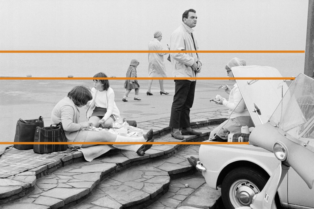
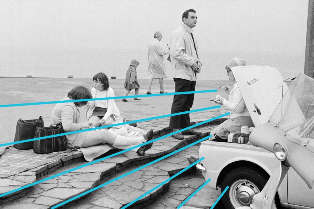
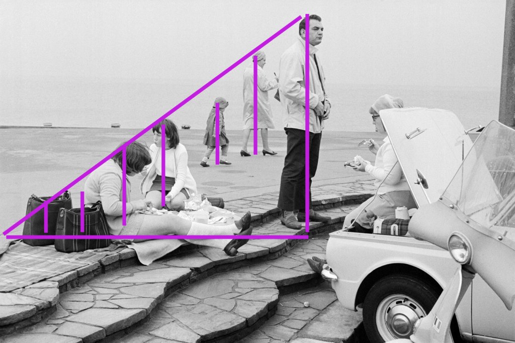
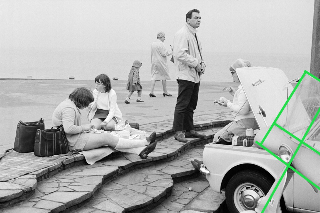
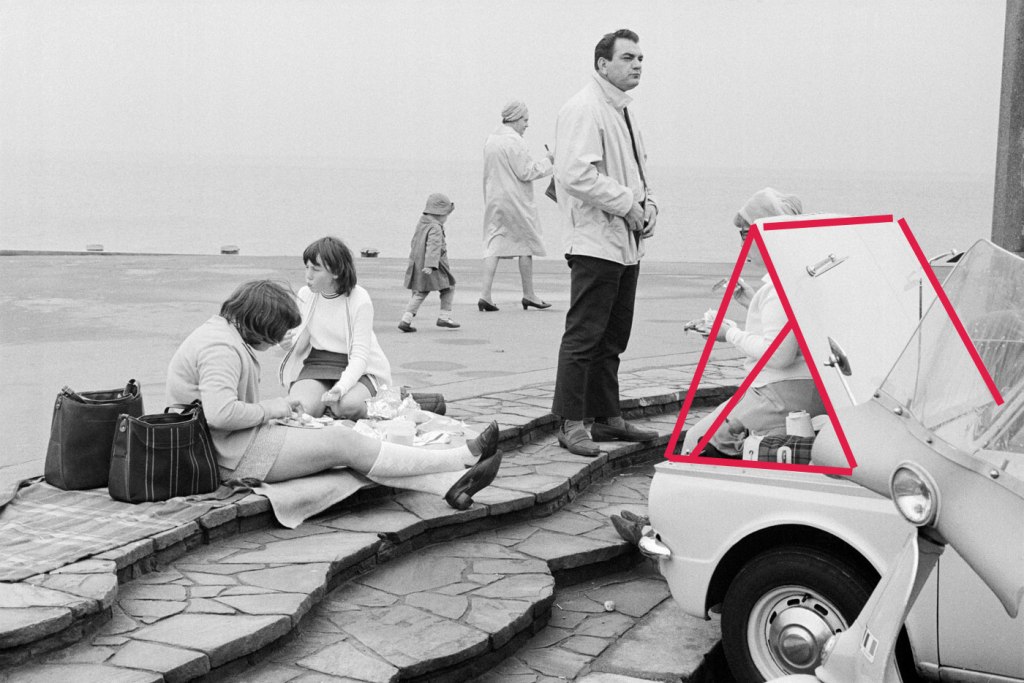
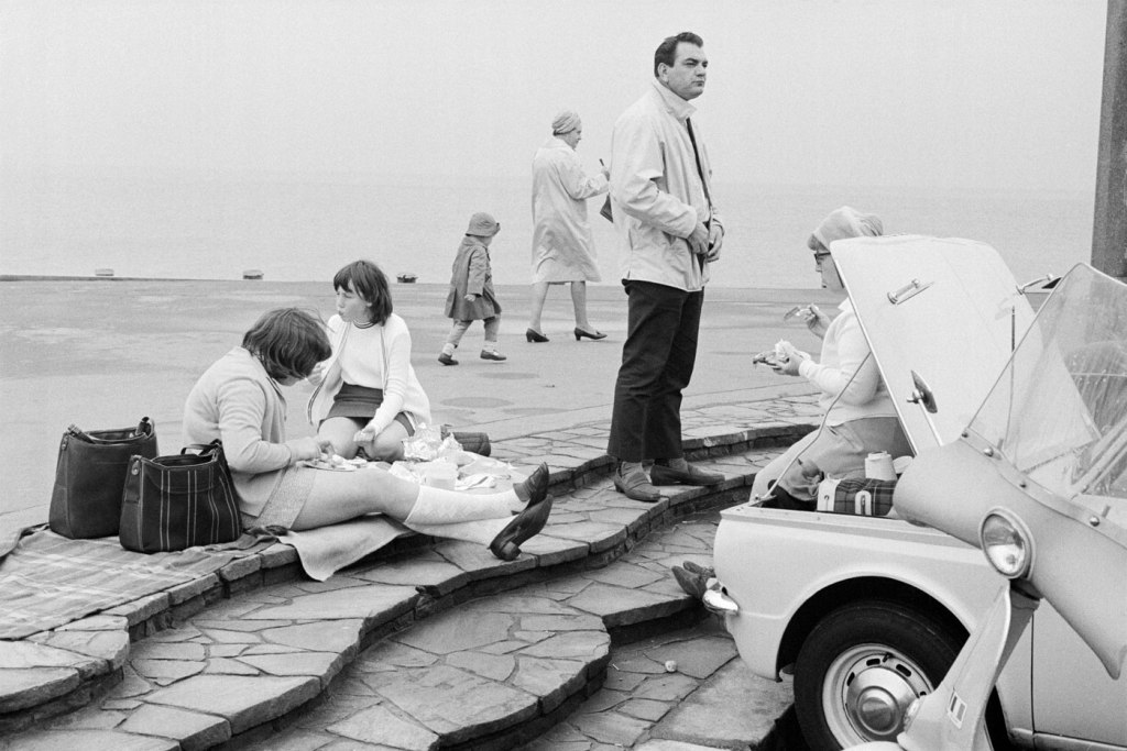
'Bournemouth, 1969' 1969 from the exhibition 'Only in England: Photographs by Tony Ray-Jones and Martin Parr' at Media Space at Science Museum, London, September 2013 - March 2014


Tony Ray-Jones (English, 1941-1972)
Bournemouth, 1969
1969
Vintage Gelatin Silver Print
16 x 25cm (6 x 10 inches)
© National Media Museum


Tony Ray-Jones (English, 1941-1972) 'Location unknown, possible Morecambe, 1967-68' 1967-1968


Tony Ray-Jones (English, 1941-1972)
Location unknown, possible Morecambe, 1967-68
1967-1968
© National Media Museum


Tony Ray-Jones (English, 1941-1972) 'Mablethorpe, 1967' 1967


Tony Ray-Jones (English, 1941-1972)
Mablethorpe, 1967
1967
Vintage Gelatin Silver Print
14 x 21cm (6 x 8 inches)
© National Media Museum


Tony Ray-Jones (English, 1941-1972) 'Ramsgate, 1967' 1967


Tony Ray-Jones (English, 1941-1972)
Ramsgate, 1967
1967
© National Media Museum


Tony Ray-Jones (English, 1941-1972) 'Mankinholes Methodist Chapel, Todmorden' 1975


Tony Ray-Jones (English, 1941-1972)
Mankinholes Methodist Chapel, Todmorden
1975
© Martin Parr/ Magnum


Tony Ray-Jones (English, 1941-1972) 'Cruft's Dog Show, London, 1966' 1966


Tony Ray-Jones (English, 1941-1972)
Cruft’s Dog Show, London, 1966
1966
© National Media Museum


Tony Ray-Jones (English, 1941-1972) 'Dickens Festival, Broadstairs, c. 1967' c. 1967


Tony Ray-Jones (English, 1941-1972)
Dickens Festival, Broadstairs, c. 1967
c. 1967
© National Media Museum


Tony Ray-Jones (English, 1941-1972) 'Dickens Festival, Broadstairs, c. 1967' c. 1967


Tony Ray-Jones (English, 1941-1972)
Dickens Festival, Broadstairs, c. 1967
c. 1967
© National Media Museum


Tony Ray-Jones (English, 1941-1972) 'Wormwood Scrubs Fair, London, 1967' 1967


Tony Ray-Jones (English, 1941-1972)
Wormwood Scrubs Fair, London, 1967
1967
© National Media Museum


Tony Ray-Jones (English, 1941-1972) 'Untitled' 1960s


Tony Ray-Jones (English, 1941-1972)
Untitled
1960s
© National Media Museum


Tony Ray-Jones (English, 1941-1972) 'Trooping the Colour, London, 1967' 1967


Tony Ray-Jones (English, 1941-1972)
Trooping the Colour, London, 1967
1967
© National Media Museum


Tony Ray-Jones (English, 1941-1972) 'Untitled' 1960s


Tony Ray-Jones (English, 1941-1972)
Untitled
1960s
© National Media Museum


Tony Ray-Jones (English, 1941-1972) 'Glyndebourne, 1967' 1967


Tony Ray-Jones (English, 1941-1972)
Glyndebourne, 1967
1967
© National Media Museum


Tony Ray-Jones (English, 1941-1972) 'Elderly woman eating pie seated in a pier shelter next to a stuffed bear, 1969' 1969


Tony Ray-Jones (English, 1941-1972)
Elderly woman eating pie seated in a pier shelter next to a stuffed bear, 1969
1969
© National Media Museum


Tony Ray-Jones (English, 1941-1972) 'Blackpool, 1968' 1968


Tony Ray-Jones (English, 1941-1972)
Blackpool, 1968
1968
Vintage Gelatin Silver Print
21 x 14.5cm (8.25 x 5.70 ins)


Tony Ray-Jones (English, 1941-1972) 'Tom Greenwood cleaning' 1976


Tony Ray-Jones (English, 1941-1972)
Tom Greenwood cleaning
1976
© Martin Parr/ Magnum


Media Space at Science Museum
Exhibition Road, South Kensington,
London SW7 2DD

Opening hours:
Open seven days a week, 10.00 – 18.00

Media Space at Science Museum website

LIKE ART BLART ON FACEBOOK

Back to top