Curators: Simon Baker, Senior Curator, International Art (Photography) and Shoair Mavlian, Assistant Curator, Tate Modern, with Emmanuelle de l’Ecotais, Curator for Photographs
Pierre Dubreuil (French, 1872-1944) Interpretation Picasso, The Railway 1911 Gelatin silver print on paper 238 x 194mm Centre Pompidou, Paris Musée National d’Art Moderne / Centre de Création Industrielle Purchased, 1987
An interesting premise –
“a premise is an assumption that something is true. In logic, an argument requires a set of (at least) two declarative sentences (or “propositions”) known as the premises or premisses along with another declarative sentence (or “proposition”) known as the conclusion” (Wikipedia)
– that the stories (the declarative sentences) of abstract art and abstract photography are intertwined (the conclusion). The two premises and one conclusion forms the basic argumentative structure of the exhibition.
Unfortunately in this exhibition, the abstract art and abstract photographs (declarations), seem to add up to less than the sum of its parts (conclusion).
Why is this so?
The reason these two bedfellows sit so uncomfortably together is that they are of a completely different order, one to the other.
Take painting for example. There is that ultimate linkage between brain, eye and hand as the artist “reaches out” into the unknown, and conjures an abstract representation from his imagination. This has a quality beyond my recognition. The closest that photography gets to this intuition is the cameraless Photogram, as the artist paints with light, from his imagination, onto the paper surface, the physical presence of the print.
Conversely, we grapple with the dual nature of photography, its relation to reality, to the real, and its interpretation of that reality through a physical, mechanical process – light entering a camera (metal, glass, digital chips, plastic film) to be developed in chemicals or on the computer, stored as a physical piece of paper or in binary code – but then we LOOK and FEEL what else a photograph can be. What it is, and what else it can be.
Initially, to take a photograph is to recognise something physical in the world which can then be abstracted. Here is a tree, a Platonic ideal, now here is the bark of the tree, or cracks in dried mud, or Aaron Siskind’s Pleasures and Terrors of Levitation in which, in our imagination, the body is no longer human. This archaeology of photography is a learnt behaviour (from the world, from abstract paintings) where ones learns to turn over the truth to something else, a recognition of something else. Where one digs a clod of earth, inspects it, and then turns it over to see what else it can be.
We can look at something in the world just for what it is and take a photograph of it, but then we can look at the same object for what else it can be (for example, Man Ray’s image Dust Breeding (1920), which is actually dust motes on the top of Duchamp’s Large Glass). Photographers love these possibilities within the physicality of the medium, its processes and outcomes. Photographers love changing scale, perspective, distortion using their intuition to perhaps uncover spiritual truths. Here I are not talking about making doodles – whoopee look what I can make as a photographer! it’s important because I can do it and show it and I said it’s important because I am an artist! the problem with lots of contemporary photography – it is something entirely different. It is the integrity of the emotional and intellectual process.
Not a reaching out through the arm and hand, but an unearthing (a reaching in?) of the possibilities of what else photography can be (other than a recording process). As Stieglitz understood in his Equivalents, and so Minor White espoused through his art and in one of his three canons:
When the image mirrors the man And the man mirrors the subject Something might take over
And that revelation is something completely different from the revelation of abstract art.
Dr Marcus Bunyan
Many thankx to the Tate Modern for allowing me to publish the art work in the posting. Please click on the photographs for a larger version of the image.
“Despite its roll call of stellar names, the show’s adrenaline soon slumps. A rhythm sets in, as each gallery offers perhaps a single non photographic work and dozens of medium format black and white abstracts arranged on an allied theme: extreme close ups, engineered structures, worms’ and birds’ eye views, moving light, the human body, urban fabric.
Individually each photograph is quite wonderful, but they echo each other so closely in their authors’ attraction to diagonal arrangements, rich surface textures, dramatic shadows, odd perspectives and close cropping, that the same ‘point’ is being made a dozen times with little to distinguish between the variants. …
By the present day, abstract photography has given in to its already Ouroboros-like tendencies, and swallowed itself whole, offering abstract photographs about the process of photography, and the action of light on its materials. This is a gesture I relished in Wolfgang Tillmans’s show in the same space this time last year, when it was broken up by a plethora of other ideas and perspectives on photography. Here it feels like another level of earnest self-absorption with a century-long backstory.”
Hettie Judah. “By halfway round I actually felt faint,” on the iNews website May 5th 2018 [Online] Cited 14/07/2018. No longer available online
For the first time, Tate Modern tells the intertwined stories of photography and abstract art. The birth of abstract art and the invention of photography were both defining moments in modern visual culture, but these two stories are often told separately.
Shape of Light is the first major exhibition to explore the relationship between the two, spanning the century from the 1910s to the present day. It brings to life the innovation and originality of photographers over this period, and shows how they responded and contributed to the development of abstraction.
Key photographs are brought together from pioneers including Man Ray and Alfred Stieglitz, major contemporary artists such as Barbara Kasten and Thomas Ruff, right up to exciting new work by Antony Cairns, Maya Rochat and Daisuke Yokota, made especially for the exhibition.
Shape of Light | First Look
Tate Curator, Simon Baker, meets Caroline von Courten from leading photography Magazine, Foam. Together they explore the exhibition Shape of Light: 100 Years of Photography and Abstract Art at Tate Modern.
Exhibition Review – Shape of Light: 100 years of Photography and Abstract Art at Tate Modern
Percy Wyndham Lewis (18 November 1882 – 7 March 1957) was a British writer, painter, and critic. He was a co-founder of the Vorticist movement in art and edited BLAST, the literary magazine of the Vorticists.
His novels include Tarr (1918) and The Human Age trilogy, composed of The Childermass (1928), Monstre Gai (1955) and Malign Fiesta (1955). A fourth volume, titled The Trial of Man, was unfinished at the time of his death. He also wrote two autobiographical volumes: Blasting and Bombardiering (1937) and Rude Assignment: A Narrative of my Career Up-to-Date (1950).
László Moholy-Nagy (Hungarian, 1895-1946) K VII 1922 Oil paint and graphite on canvas Frame: 1308 x 1512 x 80mm Tate Purchased 1961
The ‘K’ in the title of K VII stands for the German word Konstruktion (‘construction’), and the painting’s ordered, geometrical forms are typical of Moholy-Nagy’s technocratic Utopianism. The year after it was painted, he was appointed to teach the one year-preliminary course at the recently founded Bauhaus in Weimar. Moholy-Nagy’s appointment signalled a major shift in the school’s philosophy away from its earlier crafts ethos towards a closer alignment with the demands of modern industry, and a programme of simple design and unadorned functionalism.
László Moholy-Nagy (Hungarian, 1895-1946) Photogram c. 1925 Gelatin silver print on paper Photo: Jack Kirkland Collection, Nottingham
Wassily Kandinsky (Russian, 1866-1944) Swinging 1925 Oil paint on board 705 x 502mm Tate
Edward Steichen (American, 1879-1973) Bird in Space (L’Oiseau dans l’espace) 1926 Gelatin silver print on paper 253 x 202mm Bequest of Constantin Brancusi, 1957 Centre Pompidou, Paris Musée National d’Art Moderne / Centre de Création Industrielle
Luigi Veronesi (Italian, 1908-1998) Construction 1938 Gelatin silver print on paper 286 x 388mm Tate Accepted under the Cultural Gifts Scheme by HM Government from Massimo Prelz Oltramonti and allocated to Tate 2015
Luigi Veronesi (Italian, 1908-1998) Photo n.145 1940, printed 1970s Gelatin silver print on paper 310 x 280mm Tate Accepted under the Cultural Gifts Scheme by HM Government from Massimo Prelz Oltramonti and allocated to Tate 2015
Luigi Veronesi (Italian, 1908-1998) Photo n.152 1940, printed 1970s Gelatin silver print on paper 320 x 298mm Tate Accepted under the Cultural Gifts Scheme by HM Government from Massimo Prelz Oltramonti and allocated to Tate 2015
A major new exhibition at Tate Modern will reveal the intertwined stories of photography and abstract art. Shape of Light: 100 Years of Photography and Abstract Art will be the first show of this scale to explore photography in relation to the development of abstraction, from the early experiments of the 1910s to the digital innovations of the 21st century. Featuring over 300 works by more than 100 artists, the exhibition will explore the history of abstract photography side-by-side with iconic paintings and sculptures.
Shape of Light will place moments of radical innovation in photography within the wider context of abstract art, such as Alvin Langdon Coburn’s pioneering ‘vortographs’ from 1917. This relationship between media will be explored through the juxtaposition of works by painters and photographers, such as cubist works by George Braque and Pierre Dubreuil or the abstract expressionism of Jackson Pollock and Otto Steinert’s ‘luminograms’. Abstractions from the human body associated with surrealism will include André Kertesz’s Distorsions, Imogen Cunningham’s Triangles and Bill Brandt’s Baie des Anges, Frances 1958, exhibited together with a major painting by Joan Miró. Elsewhere the focus will be on artists whose practice spans diverse media, such as László Moholy-Nagy and Man Ray.
The exhibition will also acknowledge the impact of MoMA’s landmark photography exhibition of 1960, The Sense of Abstraction. Installation photographs of this pioneering show will be displayed with some of the works originally featured in the exhibition, including important works by Edward Weston, Aaron Siskind and a series by Man Ray that has not been exhibited since the MoMA show, 58 years ago.
The connections between breakthroughs in photography and new techniques in painting will be examined, with rooms devoted to Op Art and Kinetic Art from the 1960s, featuring striking paintings by Bridget Riley and installations of key photographic works from the era by artists including Floris Neussis and Gottfried Jaeger. Rooms will also be dedicated to the minimal and conceptual practices of the 1970s and 80s. The exhibition will culminate in a series of new works by contemporary artists, Tony Cairns, Maya Rochat and Daisuke Yokota, exploring photography and abstraction today.
Shape of Light is curated by Simon Baker, Senior Curator, International Art (Photography) and Shoair Mavlian, Assistant Curator, Tate Modern, with Emmanuelle de l’Ecotais, Curator for Photographs, Musée d’Art Moderne de la Ville de Paris. The exhibition will be accompanied by a fully illustrated catalogue from Tate Publishing and a programme of talks and events in the gallery.
Press release from Tate Modern
Otto Steinert (German, 1915-1978) Composition of Forms 1949 Gelatin silver print on paper 290 x 227mm Jack Kirkland Collection, Nottingham
Untitled c.1950s is a black and white photograph by the French photographer Guy Bourdin. The entirety of the frame is taken up by a close-up of peeling paint. The paint sections fragment the image into uneven geometric shapes, which are interrupted by a strip of the dark surface beneath that winds from the top to the bottom of the frame. There is little sense of scale or contextual detail, resulting in a near-abstract composition.
Bourdin is best known for his experimental colour fashion photography produced while working for French Vogue between 1955 and 1977. This photograph belongs to an earlier period of experimentation, before he began to use colour and work in fashion. Taken outside the studio, it shows Bourdin’s sensitivity to the natural world and his attempt to transform the everyday into abstract compositions, bridging the gap between surrealism and subjective photography. Bourdin’s early work was heavily influenced by surrealism, as well as by pioneers of photography as a fine art such as Edward Weston, Paul Strand and Bill Brandt. His surrealist aesthetic can be attributed to his close relationship with Man Ray, who wrote the foreword to the catalogue for Bourdin’s first solo exhibition of black and white photographs at Galerie 29, Paris, in 1952.
This and other early works in Tate’s collection (such as Untitled (Sotteville, Normandy) c. 1950s, Tate P81205, and Solange 1957, Tate P81216) are typical of Subjektive Fotografie (‘subjective photography’), a tendency in the medium in the late 1940s and early 1950s. Led by the German photographer and teacher Otto Steinert, who organised three exhibitions under the title Subjektive Fotografie in 1951, 1954 and 1958, the movement advocated artistic self-expression – in the form of the artist’s creative approach to composition, processing and developing – above factual representation. Subjektive Fotografie’s emphasis on, and encouragement of, individual perspectives invited both the photographer and the viewer to interpret and reflect on the world through images. Bourdin’s interest in this can be seen in his early use of texture and abstraction, evident in close-up studies of cracked paint peeling off an external wall or a piece of torn fabric. These still lives were often dark in subject matter and tone, highlighting Bourdin’s interest in surrealist compositions and the intersection between death and sexuality. The works made use of the photographer’s urban environment, with deep black and high contrast printing techniques employed to create a sombre mood.
This approach was also important for Bourdin’s early portraiture, which anticipated his subsequent work in fashion. The subject of his portraits – often Solange Gèze, to whom the artist was married from 1961 until her death in 1971 – is usually framed subtly, rarely appearing in the centre or as the main focus of the image. In these works the figure is secondary, showing how Bourdin let the natural or urban environment frame the subject and integrate the body into its immediate surroundings. Bourdin was meticulous about the creative process from start to finish, sketching out images on paper and then recreating them in the landscape, using the natural environment as a stage set for his work.
The Jazzmen is a section of what Jacques Villeglé termed affiches lacérées, posters torn down from the walls of Paris. These particular ones were taken on 10 December 1961. Following his established practice, Villeglé removed the section from a billboard and, having mounted it on canvas, presented it as a work of art. In ‘Des Réalités collectives’ of 1958 (‘Collective Realities’, reprinted in 1960: Les Nouveaux Réalistes, pp. 259-60) he acknowledged that he occasionally tore the surface of the posters himself, although he subsequently restricted interventions to repairs during the mounting process. The large blue and green advertisements for Radinola (at the top right and lower left) provide the main visible surface for The Jazzmen. These establish a compositional unity for the accumulated layers. Overlaid are fragmentary music posters and fly-posters, some dated to September 1961, including the images of the red guitarists that lend the work its title. The artist’s records give the source as rue de Tolbiac, a thoroughfare in the 13th arrondissement in south-east Paris. Villeglé usually uses the street as his title, but has suggested (interview with the author, February 2000) that the title The Jazzmen may have been invented for the work’s inclusion in the exhibition L’Art du jazz (Musée Galliera, Paris 1967).
Villeglé worked together with Raymond Hains (b. 1926) in presenting torn posters as works of art. They collaborated on such works as Ach Alma Manetro, 1949 (Musée nationale d’art moderne, Centre Georges Pompidou, Paris), in which typography dominates the composition. They first showed their affiches lacérées in May 1957 at the Galerie Colette Allendy, Paris, in a joint exhibition named Loi du 29 juillet 1881 ou le lyrisme à la sauvette (The Law of 29 July 1881 or Lyricism through Salvage) in reference to the law forbidding fly-posting. Villeglé sees a social complexity in the developments in the style, typography and subject of the source posters. He also considers the processes of the overlaying and the pealing of the posters by passers-by to be a manifestation of a liberated art of the street. Both aspects are implicitly political. As Villeglé points out, anonymity differentiates the torn posters from the collages of the Cubists or of the German artist Kurt Schwitters. In ‘Des Réalités collectives’ Villeglé wrote: ‘To collages, which originate in the interplay of many possible attitudes, the affiches lacérées, as a spontaneous manifestation, oppose their immediate vivacity’. He saw the results as extending the conceptual basis of Marcel Duchamp’s readymades, whereby an object selected by an artist is declared as art. However, this reduction of the artist’s traditional role brought an end to Villeglé’s collaboration with Hains, who held more orthodox views of creative invention.
In 1960 Villeglé, Hains and François Dufrêne (1930-1982), who also used torn posters, joined the Nouveaux Réalistes group gathered by the critic Pierre Restany (b.1930). Distinguished by the use of very disparate materials and techniques, the Nouveaux Réalistes – who also included Arman (b.1928), Yves Klein (1928-1962) and Jean Tinguely (1925-1991) – were united by what Villeglé has called their ‘distance from the act of painting’ as characterised by the dominant abstraction of the period (interview February 2000). In this way, Klein’s monochrome paintings (see Tate T01513) and Villeglé’s affiches lacérées (lacerated posters) conform to the group’s joint declaration of 27 October 1960: ‘The Nouveaux Réalistes have become aware of their collective singularity. Nouveau Réalisme = new perceptual approaches to reality.’ The Jazzmen, of the following year, embodies Villeglé’s understanding of his ‘singularity’ as a conduit for anonymous public expression.
Process is at the core of Yokota’s photographs. For his black-and-white work, such as the series Linger or Site/Cloud, Yokota sifts through an archive of more than 10 years of photographs in his Tokyo apartment. When he finds something that speaks to him – a nude figure, a chair, a building, a grove of trees – he makes a digital image of it, develops it, and rephotographs the image up to 15 times, until it becomes increasingly degraded. He develops the film in ways that are intentionally “incorrect,” allowing light to leak in, or singeing the negatives, using boiling water, or acetic acid. The purported subject fades, and shadows, textures, spots and other sorts of visual noise emerge. For his recent colour work, trippy, sensual abstractions, the process is similar, except that it is cameraless; he doesn’t start with a preexisting image. “I wanted to focus on the emulsion, on the different textures, more than on a subject being photographed,” says Yokota.
IN THE STUDIO Daisuke Yokota By Jean Dykstra
November – December 2015. No longer available online
Exhibition dates: 13th July – 30th September, 2018
Curators: This exhibition is co-curated by David Kiehl, Curator Emeritus, and David Breslin, DeMartini Family Curator and Director of the Collection.
David Wojnarowicz (American, 1954-1992) with Tom Warren Self-Portrait of David Wojnarowicz 1983-1984 Acrylic and collaged paper on gelatin silver print 60 × 40 in. (152.4 × 101.6cm) Collection of Brooke Garber Neidich and Daniel Neidich Photo: Ron Amstutz
Man on fire
… and two important ones I forgot: earth and spirit!
What an unforgettable, socially aware artist.
His work, and the concepts it investigates, have lost none of their relevance. With the rise of the right, Trump, fake news, discrimination and the ongoing bigotry of religion his thoughts and ideas, his writing, and his imagination are as critical as ever to understanding the dynamics of power and oppression. As Olivia Laing observes, ” …the forces he spoke out against are as lively and malevolent as ever.”
Remember: silence is the voice of complicity.
Although in his lifetime he never achieved the grace he desired, through his art the grace of his spirit lives on. Love and respect.
Dr Marcus Bunyan
Many thankx to the Whitney Museum of American Art for allowing me to publish the photographs in the posting. Please click on the photographs for a larger version of the image.
“I want to throw up because we’re supposed to quietly and politely make house in this killing machine called America and pay taxes to support our own slow murder, and I’m amazed that we’re not running amok in the streets and that we can still be capable of gestures of loving after lifetimes of all this.”
“It is exhausting, living in a population where people don’t speak up if what they witness doesn’t directly threaten them…”
“When I was told that I’d contracted this virus it didn’t take me long to realise that I’d contracted a diseased society, as well.”
“I’ve always painted what I see, and what I experience, and what I perceive, so it naturally has a place in the work. I think not all the work I do is about AIDS or deals with AIDS, but I think the threads of it are in the other work as well.”
“I think what I really fear about death is the silencing of my voice… I feel this incredible pressure to leave something of myself behind.”
“To make the private into something public is an action that has terrific ramifications.”
“I’m beginning to believe that one of the last frontiers for radical gesture is the imagination…”
“Smell the flowers while you can.”
“All I want is some kind of grace.”
David Wojnarowicz
The image of Rimbaud as a loner bad boy – shooting up, masturbating, prowling Times Square – embodied Wojnarowicz’s early view of what an artist should be: a guerrilla infiltrator, disrupter of what he called the “pre-invented world” that we’re all told is normal, a world of fake borders, gated hierarchies and controlling insider laws. …
A salon-like central gallery is lined with large-scale pictures from the mid-1980s that are basically the equivalent of the history paintings produced by Nicolas Poussin and Thomas Cole, big-thinking panoramas that addressed contemporary politics in a classical language of mythology and landscape. …
Wojnarowicz unabashedly turned, as he said, “the private into something public.” He collapsed political, cultural and personal history in a way that he hadn’t before. He took his outsider citizenship as a subject and weaponized it. The move was strategically effective: It got a lot of attention, including a barrage of right-wing attacks that have persisted into the near-present.”
“Wojnarowicz, the writer, painter, photographer, poet, printmaker and activist, was gay himself, and in his work addressed same-sex desire, the Aids crisis, the persecution of sexual minorities and the Reagan administration’s refusal to acknowledge their existence. But his work is really about America, a place he had described in his 1991 essay collection ‘Close to the Knives’ as an “illusion”, a “killing machine”, a “tribal nation of zombies … slowly dying beyond our grasp”.
“Long before the word intersectionality was in common currency, Wojnarowicz was alert to people whose experience was erased by what he called “the pre‑invented world” or “the one-tribe nation”. Politicised by his own sexuality, by the violence and deprivation he had been subjected to, he developed a deep empathy with others, a passionate investment in diversity.”
“AIDS is not history. The AIDS crisis did not die with David Wojnarowicz,” reads a mission statement displayed by protesters at the museum. “We are here tonight to honor David’s art and activism by explicitly connecting them to the present day. When we talk about HIV/AIDS without acknowledging that there’s still an epidemic – including in the United States – the crisis goes quietly on and people continue to die… The danger is when you look right now at young people, they think AIDS is over with. They don’t think anyone is living with HIV. They go to the museum and they see it as art – they don’t see AIDS as an urgent problem…”
This exhibition will be the first major, monographic presentation of the work of David Wojnarowicz (1954-1992) in over a decade. Wojnarowicz came to prominence in the East Village art world of the 1980s, actively embracing all media and forging an expansive range of work both fiercely political and highly personal. Although largely self-taught, he worked as an artist and writer to meld a sophisticated combination of found and discarded materials with an uncanny understanding of literary influences. First displayed in raw storefront galleries, his work achieved national prominence at the same moment that the AIDS epidemic was cutting down a generation of artists, himself included. This presentation will draw upon recently-available scholarly resources and the Whitney’s extensive holdings of Wojnarowicz’s work.
David Wojnarowicz’s Untitled (Buffalo) is one of the artist’s best-known works and perhaps one of the most haunting artistic responses to the AIDS crisis of the 1980s. The work depicts a herd of buffalo falling off a cliff to their deaths. The artist provides very little context for why and how the creatures got there. The work is in reality, a photograph of a diorama from a museum in Washington, DC depicting an early Native American hunting technique. Through appropriation of this graphic image, the artist evokes feelings of doom and hopelessness, making the work extremely powerful and provocative. Made in the wake of the artist’s HIV-positive diagnosis, Wojnarowicz’s image draws a parallel between the AIDS crisis and the mass slaughter of buffalo in America in the nineteenth century, reminding viewers of the neglect and marginalisation that characterised the politics of HIV/AIDS at the time.
Anonymous text from the Paddle 8 website Nd [Online] Cited 26/09/2022. No longer available online
Beginning in the late 1970s, David Wojnarowicz (1954-1992) created a body of work that spanned photography, painting, music, film, sculpture, writing, and activism. Largely self-taught, he came to prominence in New York in the 1980s, a period marked by creative energy, financial precariousness, and profound cultural changes. Intersecting movements – graffiti, new and no wave music, conceptual photography, performance, and neo-expressionist painting – made New York a laboratory for innovation. Wojnarowicz refused a signature style, adopting a wide variety of techniques with an attitude of radical possibility. Distrustful of inherited structures – a feeling amplified by the resurgence of conservative politics – he varied his repertoire to better infiltrate the prevailing culture.
Wojnarowicz saw the outsider as his true subject. Queer and later diagnosed as HIV-positive, he became an impassioned advocate for people with AIDS when an inconceivable number of friends, lovers, and strangers were dying due to government inaction. Wojnarowicz’s work documents and illuminates a desperate period of American history: that of the AIDS crisis and culture wars of the late 1980s and early 1990s. But his rightful place is also among the raging and haunting iconoclastic voices, from Walt Whitman to William S. Burroughs, who explore American myths, their perpetuation, their repercussions, and their violence. Like theirs, his work deals directly with the timeless subjects of sex, spirituality, love, and loss. Wojnarowicz, who was thirty-seven when he died from AIDS-related complications, wrote: “To make the private into something public is an action that has terrific ramifications.”
Text from the Whitney Museum of American Art
David Wojnarowicz in 1988
David Wojnarowicz (History Keeps Me Awake at Night) Whitney Museum of American Art
Beginning in the late 1970s, David Wojnarowicz (1954-1992) created a body of work that spanned photography, painting, music, film, sculpture, writing, and activism. Largely self-taught, he came to prominence in New York in the 1980s, a period marked by creative energy, financial precariousness, and profound cultural changes. Intersecting movements – graffiti, new and no wave music, conceptual photography, performance, and neo-expressionist painting – made New York a laboratory for innovation. Wojnarowicz refused a signature style, adopting a wide variety of techniques with an attitude of radical possibility. He saw the outsider as his true subject. Queer and later diagnosed as HIV-positive, he became an impassioned advocate for people with AIDS when an inconceivable number of friends, lovers, and strangers were dying due to government inaction.
Whitney Museum of American Art
This summer, the most complete presentation to date of the work of artist, writer, and activist David Wojnarowicz will be on view in a full-scale retrospective organised by the Whitney Museum of American Art. David Wojnarowicz: History Keeps Me Awake at Night is the first major re-evaluation since 1999 of one of the most fervent and essential voices of his generation.
Beginning in the late 1970s, David Wojnarowicz (1954-1992) created a body of work that spanned photography, painting, music, film, sculpture, writing, performance, and activism. Joining a lineage of iconoclasts, Wojnarowicz (pronounced Voyna-ROW-vich) saw the outsider as his true subject. His mature period began with a series of photographs and collages that honoured – and placed himself among – consummate countercultural figures like Arthur Rimbaud, William Burroughs, and Jean Genet. Even as he became well-known in the East Village art scene for his mythological paintings, Wojnarowicz remained committed to writing personal essays. Queer and HIV-positive, Wojnarowicz became an impassioned advocate for people with AIDS at a time when an inconceivable number of friends, lovers, and strangers – disproportionately gay men – were dying from the disease and from government inaction.
Scott Rothkopf, Deputy Director for Programs and Nancy and Steve Crown Family Chief Curator, remarked, “Since his death more than twenty-five years ago, David Wojnarowicz has become an almost mythic figure, haunting, inspiring, and calling to arms subsequent generations through his inseparable artistic and political examples. This retrospective will enable so many to confront for the first time, or anew, the groundbreaking multidisciplinary body of work on which his legacy actually stands.”
David Breslin noted, “With rage and beauty, David Wojnarowicz made art that questioned power, particularly why some lives are visible and others are hidden. Wojnarowicz wrote, ‘To make the private into something public is an action that has terrific ramifications.’ Present throughout his work and this exhibition is the will to show the desires, dreams, and politics of outsiders – like him – queer, economically marginalised, sick, vulnerable, and vibrantly idiosyncratic.”
Largely self-taught, Wojnarowicz came to prominence in New York in the 1980s, a period marked by great creative energy and profound cultural changes. Intersecting movements – graffiti, new and no wave music, conceptual photography, performance, neo-expressionist painting – made New York a laboratory for innovation. Unlike many artists, Wojnarowicz refused a signature style, adopting a wide variety of techniques with an attitude of radical possibility. Distrustful of inherited structures, a feeling amplified by the resurgence of conservative politics, Wojnarowicz varied his repertoire to better infiltrate the culture.
Wojnarowicz was a poet before he was a visual artist. His mature period began with Rimbaud in New York (1978-1979), in which he photographed friends wearing a mask of the nineteenth-century French poet’s face and posing throughout New York City. He became, in the 1980s, a figure in the East Village art scene, showing his paintings, photographs, and installations at galleries like Civilian Warfare, Gracie Mansion, and P.P.O.W. During a time when AIDS was ravaging the artistic community of New York, Wojnarowicz emerged as a powerful activist and advocate for the rights of people with AIDS and the queer community, becoming deeply entangled in the culture wars.
His essay for the catalogue accompanying the exhibition Witnesses: Against Our Vanishing (curated by Nan Goldin at Artists Space in 1989-1990) came under fire for its vitriolic attack on politicians and leaders who were preventing AIDS treatment and awareness. The National Endowment for the Arts (NEA) threatened to defund the exhibition, and Wojnarowicz fought against this and for the first amendment rights of artists.
The Whitney retrospective will include an excerpt of footage shot by Phil Zwickler, a filmmaker, fellow activist, and friend of Wojnarowicz who also died of AIDS, in which Wojnarowicz is seen preparing to talk to the press in the wake of the NEA controversy. Important text-photo works from this period, which incorporated writings from Close to the Knives: A Memoir of Disintegration, a collection of essays published a year prior to Wojnarowicz’s death, will also be in the Whitney show, including When I Put My Hands on Your Body (1990), Untitled (One day this kid…) (1989), and the iconic photograph Untitled (Falling Buffalo) (1988-1989).
The Whitney exhibition begins with the artist’s early experiments in collage and photography that were contemporaneous with the Rimbaud in New York series and features three of Wojnarowicz’s original journals that he kept during the time he was living in Paris and conceiving the Rimbaud photographs. Also on view will be the original Rimbaud mask the artist had his friends wear to pose for the photographs.
Wojnarowicz’s early stencil works first appeared on the streets of downtown Manhattan. These show him developing an iconographic language that he also used on the walls of the abandoned piers on the Hudson River and would figure in the more complex studio paintings that characterise his art later in the decade. An important group of spray and collage paintings in 1982 focus on an image of the artist Peter Hujar, his great friend and mentor. A group of Hujar’s photographs of Wojnarowicz will be shown in conversation with these paintings. By the mid-1980s, Wojnarowicz’s paintings combined mythological subject matter with elements that explored urbanism, technology, religion, and industry.
His masterful suite of four paintings from 1987, each named for one of the four elements, will be shown in their own gallery both to emphasise the centrality of painting and image-making during this moment and to mark the beginning of a period of mourning, rage, and action (both aesthetic and activist) marked by the death of Hujar and others to AIDS-related complications. His never-completed film, Fire in My Belly, will be shown among other unfinished film work that later would become the source for much of his photographic work from 1988-89: the Ant Series, The Weight of the World, and Spirituality (for Paul Thek). A gallery will be devoted to a recording of Wojnarowicz reading from his own writings in 1992 at The Drawing Center in Soho.
Installation view of David Wojnarowicz: History Keeps Me Awake at Night (Whitney Museum of American Art, New York, July 13-September 30, 2018). Clockwise, from top left: Andreas Sterzing, Something Possible Everywhere: Pier 34, NYC, 1983-1984; David Wojnarowicz, Fuck You Faggot Fucker, 1984; Peter Hujar, Untitled (Pier), 1983; Peter Hujar, Canal Street Piers: Krazy Kat Comic on Wall (by David Wojnarowicz), 1983; David Wojnarowicz, Untitled, 1982; David Wojnarowicz, Untitled (Slam Click), 1983 Photograph by Ron Amstutz
Installation view of David Wojnarowicz: History Keeps Me Awake at Night (Whitney Museum of American Art, New York, July 13-September 30, 2018) Photograph by Ron Amstutz
Installation view of David Wojnarowicz: History Keeps Me Awake at Night (Whitney Museum of American Art, New York, July 13-September 30, 2018)
Installation view of David Wojnarowicz: History Keeps Me Awake at Night (Whitney Museum of American Art, New York, July 13-September 30, 2018). From left to right: He Kept Following Me, 1990; I Feel A Vague Nausea, 1990; Americans Can’t Deal with Death, 1990; We Are Born into a Preinvented Existence, 1990. Photograph by Ron Amstutz
About the Artist
After hitchhiking across the U.S. and living for several months in San Francisco, and then in Paris, David Wojnarowicz settled in New York in 1978 and soon after began to exhibit his work in East Village galleries. He was included in the 1985 and 1991 Whitney Biennials, and was shown in numerous museum and gallery exhibitions throughout the United States and Europe. Previous exhibitions to focus on Wojnarowicz include “Tongues of Flame” at the University Galleries of Illinois State University (1990) and “Fever: The Art of David Wojnarowicz” at the New Museum (1999). Wojnarowicz was the author of a number of books, including Close to the Knives: A Memoir of Disintegration (1991). His artwork is in numerous private and public collections including the Whitney Museum of American Art; the Metropolitan Museum of Art; The Museum of Modern Art, New York; The Art Institute of Chicago; the Broad Art Foundation, Los Angeles; and Museo Nacional Centro de Arte Reina Sofía, Madrid, Spain.
Press release from the Whitney Museum of American Art
Gallery 1
Wojnarowicz, who aspired to be a writer in the 1970s, immersed himself in the work of William S. Burroughs and Jean Genet – two collages here feature them – but he felt a particular kinship to the iconoclastic nineteenth-century French poet Arthur Rimbaud. In the summer of 1979, just back from a stay in Paris with his sister, the twenty-four-year-old Wojnarowicz photographed three of his friends roaming the streets of New York wearing life-size masks of Rimbaud. Using a borrowed camera, Wojnarowicz staged the images in places important to his own story: the subway, Times Square, Coney Island, all-night diners, the Hudson River piers, and the loading docks in the Meatpacking District, just steps away from the Whitney Museum. Born one hundred years, almost to the month, before Wojnarowicz, Rimbaud rejected established categories and wanted to create new and sensuous ways to participate in the world. He, like Wojnarowicz, was the forsaken son of a sailor father, made his queerness a subject of his work, and knowingly acknowledged his status as an outsider (“Je est un autre” – “I is an other” – is perhaps Rimbaud’s most famous formulation).
David Wojnarowicz (American, 1954-1992) Arthur Rimbaud in New York 1978-1979 (printed 1990) Gelatin silver print 8 × 10 in. (20.3 × 25.4cm) Collection of the Estate of David Wojnarowicz Courtesy P.P.O.W, New York
David Wojnarowicz (American, 1954-1992) Arthur Rimbaud in New York (On Subway) 1978-1979 (printed 1990) Gelatin silver print 8 × 10 in. (20.3 × 25.4cm) Collection of the Estate of David Wojnarowicz Courtesy P.P.O.W, New York
David Wojnarowicz (American, 1954-1992) Arthur Rimbaud in New York (Duchamp, Pier) 1978-1979 (printed 2004) Gelatin silver print 10 × 8 in. (25.4 × 20.3cm) Collection of Philip E. Aarons and Shelley Fox Aarons Image courtesy the Estate of David Wojnarowicz and P.P.O.W., New York
David Wojnarowicz (American, 1954-1992) Untitled (Genet after Brassaï) 1979 Collage of offset-lithographs and coloured pencil 12 × 15 in. (30.5 × 38.1cm) Private collection Photo: Carson Zullinger
At the same time as he conceived the Rimbaud series, Wojnarowicz created homages to other personal heroes, including Jean Genet (1910-1986), the French novelist, poet, and political activist. Genet resonated with Wojnarowicz for his erotic vision of the universe, his embrace of the outsider, and his frank writing on gay sex. For Untitled (Genet after Brassaï), Wojnarowicz transforms the iconoclast writer into a saint; in the background, a Christ figure appears to be shooting up with a syringe. When later criticised by religious conservatives, Wojnarowicz explained that he saw drug addiction as a contemporary struggle that an empathetic Christ would identify with and forgive.
Gallery 2
In the early 1980s Wojnarowicz had no real income. He scavenged materials like supermarket posters and trashcan lids as well as cheap printed materials available in his Lower East Side neighbourhood. Incorporating them in his art, Wojnarowicz found radical possibilities in these discarded, forgotten artefacts and in the city itself. He embraced the abandoned piers on the Hudson River, particularly Pier 34 just off Canal Street, for the freedom they offered. He cruised for sex there, and he also wrote and made art on site. He appreciated their proximity to nature and the solitude he could find there.
Wojnarowicz began using stencils out of necessity. He was a member of the band, 3 Teens Kill 4, whose album, No Motive, can be played on the website. He produced posters for their shows, and to prevent their removal started making templates to spray-paint his designs on buildings, walls, and sidewalks. These images – the burning house, a falling man, a map outline of the continental United States, a dive-bombing aircraft, a dancing figure – became signature elements in his visual vocabulary, creating an iconography of crisis and vulnerability. Wojnarowicz frequently railed against what he called the “pre-invented world”: a world colonised and corporatised to such an extent that it seems to foreclose any alternatives. For him, using found objects, working at the abandoned piers for an audience of friends and strangers, and creating a language of his own were ways to shatter the illusion of the pre-invented world and make his own reality.
David Wojnarowicz (American, 1954-1992) Diptych II 1982 Spray paint with acrylic on composition board 48 × 96 in. (121.9 × 243.8cm) Collection of Raymond J. Learsy Image courtesy Raymond J. Learsy Photo: Brian Wilcox
David Wojnarowicz (American, 1954-1992) Jean Genet Masturbating in Metteray Prison (London Broil) 1983 Screenprint on supermarket poster 34 × 25 in. (86.4 × 63.5cm) Whitney Museum of American Art, New York Purchase, with funds from the Print Committee Photo: Mark-Woods.com
David Wojnarowicz (American, 1954-1992) Fuck You Faggot Fucker 1984 Four black-and-white photographs, acrylic, and collaged paper on Masonite 48 × 48 in. (121.9 × 121.9cm) Collection of Barry Blinderman Image courtesy Barry Blinderman, Normal, Illinois Photo: Jason Judd
This work was one of Wojnarowicz’s first to directly tackle homophobia and gay bashing and to embrace same-sex love. Its title comes from a scrap of paper containing a homophobic slur that Wojnarowicz found and affixed below the central image of two men kissing. Made with one of his stencils, these anonymous men are archetypes, stand-ins for a multitude of personal stories. Using photographs taken at the piers and in an abandoned building on Avenue B, Wojnarowicz also includes himself and his friends John Hall and Brian Butterick in this constellation. Maps like those in the background here often appear in Wojnarowicz’s work; for him, they represented a version of reality that society deemed orderly and acceptable. He often cut and reconfigured the maps to gesture toward the groundlessness, chaos, and arbitrariness of both man-made borders and the divisions between “civilisation” and nature.
David Wojnarowicz (American, 1954-1992) Fuck You Faggot Fucker (details) 1984 Four black-and-white photographs, acrylic, and collaged paper on Masonite 48 × 48 in. (121.9 × 121.9cm) Collection of Barry Blinderman Image courtesy Barry Blinderman, Normal, Illinois
David Wojnarowicz (American, 1954-1992) Prison Rape 1984 Acrylic and spray paint on posters on composition board 48 × 48 in. (121.9 × 121.9cm) Private collection Image courtesy Ted Bonin Photo: Joerg Lohse
Andreas Sterzing Something Possible Everywhere: Pier 34, NYC [Wojnarowicz’s Gagging Cow at the Pier] 1983 Courtesy the artist and Hunter College Art Galleries, New York
“So simple, the appearance of night in a room full of strangers, the maze of hallways wandered as in films, the fracturing of bodies from darkness into light, sounds of plane engines easing into the distance.”
~ David Wojnarowicz
Peter Hujar (American, 1934-1992) Canal Street Piers: Krazy Kat Comic on Wall (by David Wojnarowicz) 1983 Gelatin silver print 8 x 8 inches (20.3 x 20.3cm) Peter Hujar Archive, courtesy Pace/MacGill Gallery, New York, and Fraenkel Gallery, San Francisco
David Wojnarowicz (American, 1954-1992) Untitled (Two Heads) 1984 Acrylic on commercial screenprint poster 41 × 47 1/2 in. (104.1 × 120.7cm) Collection of the Ford Foundation Image courtesy the Fales Library and Special Collections, New York University
David Wojnarowicz (American, 1954-1992) Incident #2 – Government Approved 1984 Acrylic and collaged paper on composition board 51 × 51 × 7/8 in. (129.5 × 129.5 × 2.2cm) framed Collection of Howard Bates Johnson
Gallery 3
For his exhibition at the East Village gallery Civilian Warfare in May 1984, Wojnarowicz created a group of cast-plaster heads that he individualised by applying torn maps and paint. He made twenty-three of them, a reference to the number of chromosome pairs in human DNA, and explained that the series was about “the evolution of consciousness.” At the gallery, he installed these “alien heads” on long shelves on a wall painted with a bull’s-eye. Suggesting a ring line, the installation evoked the conflicts then ravaging Central and South America, from the Contra War in Nicaragua to the Salvadoran Civil War to the Argentine Dirty War. The spectre of torture, disappearance, and human-rights abuses cast a shadow over all of the Americas.
David Wojnarowicz (American, 1954-1992) Untitled 1984 From the Metamorphosis series Collaged paper and acrylic on plaster 9 1/2 × 9 1/2 × 9 1/2 in. (24.1 × 24.1 × 24.1cm) Collection of Beth Rudin DeWoody Image courtesy Beth Rudin DeWoody Photo: Monica McGivern
Gallery 4
Wojnarowicz met Peter Hujar in 1980. They were briefly lovers, but the relationship soon transitioned and intensified into a friendship that defied categorisation. The two frequently made artworks using the other as subject. Twenty years Wojnarowicz’s senior, Hujar was a photographer and a known figure in the New York art world, esteemed for his achingly beautiful, technically flawless portraits. At the time of their meeting, Wojnarowicz was still finding his way. It was Hujar who convinced him that he was an artist and, specifically, encouraged him to paint – something Wojnarowicz had never done. After Hujar’s death in 1987 due to complications from AIDS, Wojnarowicz would claim him as “my brother, my father, my emotional link to the world.”
David Wojnarowicz (American, 1954-1992) Peter Hujar Dreaming/Yukio Mishima: Saint Sebastian 1982 Acrylic and spray paint on Masonite 48 × 48 in. (121.9 × 121.9cm) Collection of Matthijs Erdman Image courtesy the Estate of David Wojnarowicz and P.P.O.W, New York
In this painting from 1982, Wojnarowicz composes a meditation on male desire. His friend and mentor Peter Hujar stretches across the bottom, reclining with his eyes closed, apparently dreaming the scene above. An image of the Japanese author Yukio Mishima (1925-1970) masturbating dominates the centre of the composition; it is inspired by the writer’s description of his first masturbatory experience, initiated by a reproduction of a Renaissance painting of Saint Sebastian. The torso of the Christian martyr – young, statuesque, and pierced with arrows – rises above, a glowing aura linking him to the night sky and offering him up as an icon of queerness.
This photograph of Wojnarowicz with his head bowed appeared on the cover of the June 28, 1983, edition of The Village Voice. It accompanied the article “Heartsick: Fear and Loving in the Gay Community” by Richard Goldstein. At the time of publication, very little was known about HIV and AIDS, including how it spread. Goldstein wrote: “If one were to devise a course of action based on incontrovertible evidence alone, there would be no conclusion to draw. Should I screen out numbers who look like they’ve been around? Should I travel to have sex? Should I look for lesions before I leap? How do I know my partner doesn’t have the illness in its (apparently protracted) dormant stage?” By the end of 1983, there were 2,118 reported AIDS-related deaths in the United States.
Peter Hujar (American, 1934-1992) David Wojnarowicz with Hand Touching Eye 1981 Gelatin silver print 14 3/4 x 14 3/4″ (37.4 x 37.4cm) The Museum of Modern Art, New York The Fellows of Photography Fund
Peter Hujar (American, 1934-1992) David Wojnarowicz Reclining (II) 1981 Gelatin silver print 14 11/16 x 14 13/16 in. (37.3 x 37.6cm) Princeton University Art Museum, Princeton, NJ Gift of Stephen Koch
David Wojnarowicz (American, 1954-1992) Untitled (Green Head) 1982 Acrylic on composition board 48 × 96 in. (121.9 × 243.8cm) Collection of Hal Bromm and Doneley Meris
Gallery 5
In the mid-1980s Wojnarowicz began to incorporate his disparate signs and symbols into complex paintings. A fierce critic of a society he saw degrading the environment and ostracising the outsider, Wojnarowicz made compositions that were dense with markers of industrial and colonised life. These include railroad tracks and highways, sprawling cities and factory buildings, maps and currency, nuclear power diagrams and crumbling monuments. Interspersed among them are symbols that he connected to fragility, such as blood cells, animals and insects, and the natural world. Wojnarowicz used these depictions as metaphors for a culture that devalues the lives of those on the periphery of mainstream culture. He made these paintings at a time when AIDS was ravaging New York, particularly the gay community. Although AIDS was first identified in 1981, President Ronald Reagan did not mention it publicly until 1985. By the end of that year, in New York alone there already had been 3,766 AIDS-related deaths.
David Wojnarowicz (American, 1954-1992) History Keeps Me Awake at Night (For Rilo Chmielorz) 1986 Acrylic, spray paint, and collaged paper on composition board 72 x 84 in. (170.2 x 200cm) Collection of John P. Axelrod Photo: Ron Cowie
In History Keeps Me Awake at Night (for Rilo Chmielorz) Wojnarowicz presents a dystopic vision of American life. Presenting simulated American currency and bureaucratic emblems alongside symbols of crime, monstrosity, and chaos, the painting’s threatening imagery runs counter to the apparently placid sleep of the man below. If the painting is about fear, perhaps the fear of staring down AIDS, Wojnarowicz presents it as an endemic condition in which new fears are built upon historical ones.
A nightmarish allegory of violence and capitalism, Das Reingold: New York Schism makes reference to Richard Wagner’s opera Das Rheingold (1854), in which the holder of a magical ring will gain the power to rule the world should he renounce love. This narrative assumed particular power at a moment when artists were joining the group ACT UP (AIDS Coalition to Unleash Power) to protest the profiteering of pharmaceutical companies and government mismanagement of the AIDS crisis.
The Death of American Spirituality contains a number of Wojnarowicz’s recurring symbols and imagery densely layered in a single composition. With its radically juxtaposed motifs that suggest different temporalities – from geologic landforms to emblems of the American West and the Industrial Revolution – the mythical tableau depicts destruction proliferating alongside technological advancement and geographic conquest.
David Wojnarowicz (American, 1954-1992) I Use Maps Because I Don’t Know How to Paint 1984 Acrylic and collaged paper on composition board 48 x 48 in. (121.9 x 121.9cm) Rubell Family Collection, Miami
David Wojnarowicz (American, 1954-1992) The Birth of Language II 1986 Acrylic, spray paint, and collaged paper on wood 67 x 79 in. (170.2 x 200.7cm) Collection of Matthijs Erdman
David Wojnarowicz (American, 1954-1992) Earth, Wind, Fire, and Water 1986 Acrylic and spray paint on canvas 78 3/4 in. × 157 1/2 in. (200 × 400cm) Private collection Image courtesy Daniel Buchholz and Christopher Müller, Cologne Photo: Nick Ash
Gallery 6
Wojnarowicz filmed constantly during this period, bringing his Super 8 camera with him on his frequent travels. At the end of October 1986, he went to Mexico where he filmed the Day of the Dead festivities and other scenes at Teotihuacán. This footage includes fire ants climbing on objects such as clocks, currency, and a crucifix that Wojnarowicz brought with him. Wojnarowicz, who was raised Roman Catholic, would later speak of Jesus Christ as one who “took on the suffering of all people.” As the AIDS crisis intensified, he sought to find a symbolic language that encapsulated ideas of spirituality, mortality, vulnerability, and violence. He began to edit the Mexican footage into a film entitled A Fire in My Belly, but it was never finished. Ravenous for the world and its offerings, Wojnarowicz used film as form of second sight, a visual notebook, and a record for us to see the world – at least in ashes – as he did.
David Wojnarowicz (American, 1954-1992) Still from an unfinished film Super 8 film, black and white, silent, 3 minutes Courtesy the Fales Library and Special Collections, New York University
David Wojnarowicz (American, 1954-1992) Unfinished Film (A Fire in My Belly) 1986-1987 Super 8 film transferred to digital video, black-and-white and colour, silent; 20:56 min. Fales Library and Special Collections, New York University
Original Silent Version of “A Fire in My Belly” by the late David Wojnarowicz. This film was censored by The National Portrait Gallery in early December, 2010.
Gallery 7
On September 17, 1987, Gracie Mansion Gallery opened an exhibition of Wojnarowicz’s work called The Four Elements. These symbolically and technically dense paintings – allegorical representations of earth, water, fire, and wind – are Wojnarowicz’s take on a theme with a long history in European art. By linking his contemporary moment to a historical subject, he claims a lineage for his work as he suggests the particularity – and particular violence – of his time.
David Wojnarowicz (American, 1954-1992) Water 1987 Acrylic, ink, and collaged paper on composition board 72 × 96 in. (182.9 × 243.8cm) Second Ward Foundation Image courtesy the Estate of David Wojnarowicz and P.P.O.W, New York
David Wojnarowicz (American, 1954-1992) Water (details) 1987 Acrylic, ink, and collaged paper on composition board 72 × 96 in. (182.9 × 243.8cm) Second Ward Foundation Image courtesy the Estate of David Wojnarowicz and P.P.O.W, New York
David Wojnarowicz (American, 1954-1992) Earth 1987 Acrylic and collaged paper on wood, two panels 72 × 96 in. (182.9 × 243.8cm) The Museum of Modern Art, New York Gift of Agnes Gund
David Wojnarowicz (American, 1954-1992) Wind (For Peter Hujar) 1987 Acrylic and collaged paper on composition board, two panels 72 × 96 in. (182.9 × 243.8cm) Collection of the Second Ward Foundation
Wind (For Peter Hujar) is the most personal and self-referential of Wojnarowicz’s Four Elements paintings. A red line running through an open window connects a baby – based on a photograph of his brother Steven’s newborn – to a headless paratrooper. Wojnarowicz, in his only painted self-portrait, stands behind. The bird’s wing dominating the upper left quarter of the painting is a copy of one of Hujar’s favorite works – a 1512 drawing by the German artist Albrecht Dürer. Hujar would die less than two months after this painting was first exhibited and Wojnarowicz later had the wing carved into his friend’s tombstone. Three days after Hujar’s death, Wojnarowicz wrote in his journal after visiting his grave: “He sees me, I know he sees me. He’s in the wind in the air all around me.”
David Wojnarowicz (American, 1954-1992) Fire 1987 Acrylic and collaged paper on wood, two panels 72 x 96 in. (182.9 x 243.8cm) The Museum of Modern Art, New York Gift of Agnes Gund and Barbara Jakobson Fund
Gallery 8: Sound Gallery
Writing and engaging in readings was an important part of David Wojnarowicz’s practice. The transcript on the website is text from audio recordings of Wojnarowicz reading his own work in 1992 at the Drawing Center, New York, at a benefit for Needle Exchange. He read excerpts from his books Close to the Knives: A Memoir of Disintegration (1991) and Memories That Smell Like Gasoline (1992); a short work, “Spiral,” which appeared in Artforum in 1992; and another brief piece that begins with the phrase “When I put my hands on your body,” which also appears in one of his photo-based works.
Gallery 9
Wojnarowicz was in the hospital room when Peter Hujar died from complications related to AIDS. He asked the others who were there to leave so that he could film and photograph his friend for the last time. The three tender images of Hujar’s head, hands, and feet installed here come from this final encounter. While Wojnarowicz would continue to draw and paint after Hujar’s death, photography and writing would preoccupy him until the end of his life. He moved into Hujar’s loft, which had a darkroom, enabling him to reconsider – and experiment with – the vast number of negatives he had accumulated over the years.
Wojnarowicz found himself at the centre of political debates involving the National Endowment for the Arts (NEA). In a newsletter that the American Family Association distributed to criticise NEA funding of exhibitions with gay content, the religious lobby group excerpted Wojnarowicz’s work out of context. He sued for copyright infringement and won. Wojnarowicz’s hand-edited affdavit and related materials are included here. The searing essay he contributed to the catalogue for Witnesses: Against Our Vanishing, an exhibition curated by artist Nan Goldin in 1989, triggered the NEA to withdraw its funding. In it Wojnarowicz strenuously criticised – and personally demonised conservative policy-makers for failing to halt the spread of AIDS by discouraging education about safe sex practices. One of its most memorable passages is the pronouncement: “WHEN I WAS TOLD THAT I’D CONTRACTED THIS VIRUS IT DIDN’T TAKE ME LONG TO REALIZE THAT I’D CONTRACTED A DISEASED SOCIETY AS WELL.”
David Wojnarowicz (American, 1954-1992) Bad Moon Rising 1989 Four gelatin silver prints, acrylic, string, and collage on composition board 36 3/4 x 36 5/8 x 2 1/4 in. (93.3 x 93 x 5.7cm) Collection of Steven Johnson and Walter Sudol Courtesy Second Ward Foundation
Phil Zwickler (b. 1954; Alexandria, VA; d. 1991; New York, NY) Footage of Wojnarowicz speaking about the National Endowment for the Arts controversy (extract) 1989 Video transferred to digital video, color, sound; 7:23 min. Fales Library and Special Collections, New York University; courtesy the Estate of Phil Zwickler
Artist David Wojnarowicz discusses right-wing backlash against the NEA and arts funding (circa 1989).
This 1989 video by Phil Zwickler, a filmmaker, journalist, and AIDS activist, was shot in Wojnarowicz’s apartment days before the opening of Witnesses: Against Our Vanishing, an exhibition that presented artists’ responses to the AIDS crisis. John Frohnmayer, the chairman of the National Endowment for the Arts (NEA), withdrew the NEA’s $10,000 grant to the exhibition in response to the essay that Wojnarowicz wrote for the catalogue. The grant was later partially reinstated, but with the stipulation that no money was to be used to support the catalogue. Zwickler filmed Wojnarowicz while the controversy was unfolding.
David Wojnarowicz (American, 1954-1992) Untitled (Hujar Dead) 1988-1989 Black-and-white photograph, acrylic, screenprint, and collaged paper on Masonite 39 × 32 in. (99.1 × 81.3cm) Whitney Museum of American Art, New York Gift of Steven Johnson and Walter Sudol in memory of David Wojnarowicz Image courtesy the Estate of David Wojnarowicz and P.P.O.W, New York
This painting presents an urgent condemnation of systemic homophobia and government inattention to people with AIDS – including, by that point, Wojnarowicz himself – and expresses the artist’s extreme anger at being at the mercy of those in power. The nine photographs at the centre of the painting are of Peter Hujar, taken shortly after his death. The painting was included in Witnesses: Against Our Vanishing at New York’s Artists Space from November 16, 1989, to January 6, 1990. Curated by Nan Goldin, the exhibition also included work by other artists responding to the AIDS crisis: David Armstrong, Tom Chesley, Dorit Cypris, Jane Dickson, Philip-Lorca DiCorcia, Darrel Ellis, Allen Frame, Peter Hujar, Greer Lankton, Siobhan Liddel, James Nares, Perico Pastor, Margo Pelletier, Clarence Elie Rivera, Vittorio Scarpati, Jo Shane, Kiki Smith, Janet Stein, Stephen Tashjian, Shellburne Thurber, and Ken Tisa.
David Wojnarowicz (American, 1954-1992) Childhood 1988 Acrylic, watercolour, and collaged paper on canvas 42 × 47 1/2 in. (106.7 × 120.7cm) Collection of Eric Ceputis and David W. Williams Photo: Michael Tropea
David Wojnarowicz (American, 1954-1992) Something from Sleep III (For Tom Rauffenbart) 1989 Acrylic and spray paint on canvas 48 1/2 x 39 x 1 5/8 in. (123.2 x 99.1 x 4.1cm) Collection of Tom Rauffenbart
Installation view of David Wojnarowicz: History Keeps Me Awake at Night at the Whitney Museum of American Art, New York showing some of the Ant series
David Wojnarowicz (American, 1954-1992) Untitled (Time and Money) 1988-1989 From the Ant Series Gelatin silver print 16 × 20 in. (40.6 × 50.8cm) Collection of Steve Johnson and Walter Sudol Courtesy Second Ward Foundation Image courtesy the Estate of David Wojnarowicz and P.P.O.W, New York
David Wojnarowicz (American, 1954-1992) Untitled (Desire) 1988-1989 From the Ant Series Gelatin silver print 16 x 20 in. (40.6 x 50.8cm) Collection of Steven Johnson and Walter Sudol Courtesy Second Ward Foundation
David Wojnarowicz (American, 1954-1992) Untitled (Violence) 1988-1989 From the Ant Series Gelatin silver print 16 x 20 in. (40.6 x 50.8cm) Collection of Steven Johnson and Walter Sudol Courtesy Second Ward Foundation
David Wojnarowicz (American, 1954-1992) Spirituality (For Paul Thek) 1988-1989 Gelatin silver prints on museum board 41 × 32 1/2 in. (104.1 × 82.6cm) Collection of Steve Johnson and Walter Sudol Courtesy Second Ward Foundation Image courtesy the Estate of David Wojnarowicz and P.P.O.W, New York
Wojnarowicz often presented a series of photographs as a single composition, as he does with Spirituality (For Paul Thek). This method allows the images to retain their singularity as they merge into one entity, and to serve as potent metaphors for the role – and importance – of the individual in the larger society. The central image of the crucifix was taken while Wojnarwicz was in Teotihuacán, north of Mexico City. He wanted to stage an image that suggested the eternal conflict between nature and man-made culture. Wojnarowicz considered ants to be evolved beings, writing in a 1989 text that they “are the only insects to keep pets, use tools, make war, and capture slaves.” The photograph of the reclining man was taken in 1980 and depicts Wojnarowicz’s friend Iola Carew, then a coworker at the nightclub Danceteria. Carew was the first person Wojnarowicz knew to be diagnosed with AIDS. The work is dedicated to the artist Paul Thek, who died of AIDS-related complications in 1988.
David Wojnarowicz (American, 1954-1992) Spirituality (For Paul Thek) (details) 1988-1989 Gelatin silver prints on museum board 41 × 32 1/2 in. (104.1 × 82.6cm) Collection of Steve Johnson and Walter Sudol Courtesy Second Ward Foundation Image courtesy the Estate of David Wojnarowicz and P.P.O.W, New York
The works in Wojnarowicz’s Sex Series are punctuated with circular insets containing an array of cropped details, including pornographic imagery. For Wojnarowicz, these voyeuristic “peepholes” evoked surveillance photos or objects under a microscope. This was one of his first projects after Hujar’s death and Wojnarowicz’s own diagnosis with HIV. “It came out of loss,” he said. “I mean every time I opened a magazine there was the face of somebody else who died. It was so overwhelming and there was this huge backlash about sex, even within the activist community… And it essentially came out of wanting some sexy images on the wall – for me. To keep me company. To make me feel better.”
The sole survey of Wojnarowicz’s work during his lifetime, David Wojnarowicz: Tongues of Flame, was held in 1990 at Illinois State University in Normal. In the lead-up to the exhibition, he began work on the four large-scale paintings of exotic flowers. Equating the beauty of the body with its very fragility, Wojnarowicz uses the flower as an allusion to the AIDS crisis, his own illness, and a continuum of loss. Importantly, the flower also suggests the possibility and necessity of beauty. The artist Zoe Leonard recalls showing Wojnarowicz, at the height of the AIDS crisis, her small work prints of clouds. Leonard, also an activist, recalls: “I felt guilty and torn. I felt detached – my work was so subtle and abstract, so apolitical on the surface. I remember showing those pictures to David and talking things over with him and he said – I’m paraphrasing – Don’t ever give up beauty. We’re fighting so that we can have things like this, so that we can have beauty again.”
David Wojnarowicz (American, 1954-1992) Weight of the Earth I 1988 Fourteen gelatin silver prints and watercolour on paper on board 39 x 41 1/4 in. (99.1 x 104.8cm) The Museum of Modern Art, New York; The Family of Man Fund
David Wojnarowicz (American, 1954-1992) Weight of the Earth II 1988-1989 Fourteen gelatin silver prints and watercolor on paper on board 39 x 41 1/4 in. (99.1 x 104.8cm) Collection of Dunja Siegel
Through compositions like these Wojnarowicz sought to create a language out of images. To him, the combination of images described something painful but also mysterious about the experience of being alive – “about captivity in all that surrounds us,” in his words, and the “heaviness of the pre-invented experience we are thrust into.”
David Wojnarowicz (American, 1954-1992) Fever 1988-1989 Three gelatin silver prints on museum board 31 × 25 in. (78.7 × 63.5cm) Collection of Michael Hoeh Image courtesy the Estate of David Wojnarowicz and P.P.O.W, New York
David Wojnarowicz (American, 1954-1992) Something from Sleep IV (Dream) 1988-1989 Gelatin silver print, acrylic, and collaged paper on Masonite 16 × 20 1/2 in. (40.6 × 52.1cm) Collection of Luis Cruz Azaceta and Sharon Jacques Image courtesy Luis Cruz Azaceta and Sharon Jacques Photo: by Dylan Cruz Azaceta
David Wojnarowicz (American, 1954-1992) I Feel A Vague Nausea 1990 Five gelatin silver prints, acrylic, string, and screenprint on composition board 62 × 50 × 3 in. (157.5 × 127 × 7.6cm) Collection of Michael Hoeh Image courtesy the Estate of David Wojnarowicz and P.P.O.W, New York
David Wojnarowicz (American, 1954-1992) Americans Can’t Deal with Death 1990 Two black-and-white photographs, acrylic, string, and screenprint on Masonite 60 × 48 in. (152.4 × 121.9cm) Collection of Eric Ceputis and David W. Williams Image courtesy the Estate of David Wojnarowicz and P.P.O.W, New York
“Americans can’t deal with death unless they own it. If they own it they will celebrate it…”
Gallery 11
Wojnarowicz’s work concerns itself with the mechanisms, politics, and manipulations of power that make some lives visible and others not. The will to make bodies present – the compulsion to clear a space for queer representations not commonly seen through language and image – was threaded throughout his work, exacerbated by the AIDS crisis, and crystallised in his work. Untitled (One Day This Kid… ) (1990-1991) is perhaps Wojnarowicz’s best-known work. Black script shapes the boundary of a boy’s body – a boy whom we know, with his high forehead, prominent teeth, and electric eyes, is Wojnarowicz as a child. He sits for what we assume is a school picture, and he’s no older than eight. The text that surrounds him projects the child into a future scarred by abuse and homophobia. This artwork, like many by Wojnarowicz, has rightly come to embody the spirit of protest, struggle, and resistance. Wojnarowicz died on July 22, 1992. By the end of that year, 38,044 others in New York had died from AIDS-related complications. In his essay “Postcards from America: X Rays from Hell,” Wojnarowicz states what is equally true of art and protest: “With enough gestures we can deafen the satellites and lift the curtains surrounding the control room.”
David Wojnarowicz (American, 1954-1992) Sub-Species Helms Senatorius 1990 Silver dye bleach print (Cibachrome) 16 x 20 in. (40.6 x 50.8cm) Whitney Museum of American Art, New York Gift of Steven Johnson and Walter Sudol
In this work, Senator Jesse Helms of North Carolina appears as a spider with a swastika on his back. In 1989, in response to the controversy regarding his essay for the Witnesses: Against Our Vanishing catalogue, Wojnarowicz drafted a press release that included a description of Helms as one of seven particularly bad actors in the fight against AIDS. It read, in part:
‘One of the more dangerous homophobes in the continental United States… Has introduced legislation that denies federal funding for any program that mentions homosexuality… Cut out any and all AIDS education funding that relates to gays and lesbians. Introduced legislation that we must now live with that prevents any HIV-positive people or PWA’s [people with AIDS] from entering any border of the U.S.A. as well as deporting people with green cards forcibly tested and found to be HIV-positive.’
David Wojnarowicz (American, 1954-1992) Bread Sculpture 1988-1989 Bread, string, and needle with newspaper 11 1/2 × 14 1/8 in. × 6 in. (29.2 × 35.9 × 15.2cm) Collection of Gail and Tony Ganz Photo: Ed Glendinning
Wojnarowicz used red string as a material throughout his practice. From his early supermarket posters to the flower paintings, he stitched red string into the surface of his compositions to suggest the seams and irreconcilable breaks in culture. In his unfinished film A Fire in My Belly (1986-1987, see above), Wojnarowicz included footage of the stitching together of a broken loaf of bread. This sculpture is a physical manifestation of that earlier idea. The film also included footage of what appeared to be a man’s lips being sewn together. A version of that image by Andreas Sterzing – picturing Wojnarowicz himself – would become one of the most galvanising images to come out of the AIDS crisis.
David Wojnarowicz (American, 1954-1992) What Is This Little Guy’s Job in the World 1990 Gelatin silver print 13 3/4 × 19 1/8 in. (34.9 × 48.6cm) Collection of Penelope Pilkington Image courtesy the Estate of David Wojnarowicz and P.P.O.W, New York
David Wojnarowicz (American, 1954-1992) Untitled (When I Put My Hands on Your Body) 1990 Gelatin silver print and screenprint on board 26 x 38 in. (66 x 96.5cm) Collection of Eric Ceputis and David W. Williams Promised gift to the Art Institute of Chicago
Wojnarowicz visited Dickson Mounds, a museum on the site of an ancient Indigenous community in Lewistown, Illinois, around the time of his 1989 exhibition at Illinois State University. There, he photographed a burial site displaying skeletons and artefacts that had been excavated in 1927. Wojnarowicz, facing his own mortality and the deaths of many whom he loved, returned to the photograph a few years later and layered it with his own text about loss to create this work. The exhibit at Dickson Mounds closed in 1992 after years of protests by Native American activists and their supporters who objected to the public display of human remains. Activists also were fighting at the national level around this time for legislation affirming Indigenous peoples’ right to protect the graves and remains of their ancestors. Wojnarowicz, who frequently wrote and spoke out in support of those who had been forgotten and disenfranchised due to U.S. policies, including Native Americans, recorded the following in an audio journal from 1989: “If I’m making a painting about the American West and I want to talk about the railroad bringing culture – white culture – across the country and exploiting or destroying Indian culture… I see that there’s a certain amount of information that is totally ignored in this country. That all this is built on blood.”
David Wojnarowicz (American, 1954-1992) Untitled (Face in Dirt) 1991 (printed 1993) Gelatin silver print 19 × 23 in. (48.3 × 58.4cm) Collection of Ted and Maryanne Ellison Simmons Image courtesy the Estate of David Wojnarowicz and P.P.O.W, New York
This photograph was taken in late May 1991 at Chaco Canyon in New Mexico while Wojnarowicz and his friend Marion Scemama took a road trip around the American Southwest. Cynthia Carr, Wojnarowicz’s biographer, describes how the photograph came to be:
‘He had been there before and knew exactly where he wanted to stage this. “We’re going to dig a hole,” he told her, “and I’m going to lie down.” They began digging without saying a word, a hole for his upper body and a bit for the legs. They used their hands. The dirt was loose and dry. He lay down and closed his eyes. Marion put dirt around his face till it was halfway up his cheeks and then stood over him, photographing his half buried face first with his camera and then with hers.’
Whitney Museum of American Art 99 Gansevoort Street New York, NY 10014 Phone: (212) 570-3600
Installation view of the exhibition Victor Vasarely. The Birth of Op Art at the Museo Nacional Thyssen-Bornemisza, Madrid showing Vasarely’s Feny (1973, below)
No comment is really necessary. You just have to look at the spirit and inventiveness of the art. A pioneer of light and colour, a genius of plastic grid and form, is at play here!
The installation photographs show just how optically magnetic these works are. How they are holistic, singular works which then play magnificently off each other when placed in close proximity. Like the fugues of J.S. Bach these optical illusions create dazzlingly beautiful, intricate and powerful works, an earthly divination of a ‘planetary folklore’.
As my good friend Elizabeth Gertsakis said of the work of Robert Hunter, “he had the mind of abstract divination for a music of the spheres, of any geometry.”
Visit the VR Microsite for a Virtual Reality walk through of the exhibition.
Dr Marcus Bunyan
Many thankx to the Museo Nacional Thyssen-Bornemisza for allowing me to publish the photographs in the posting. Please click on the photographs for a larger version of the image.
From 7 June to 9 September 2018, the Museo Nacional Thyssen-Bornemisza will be presenting a monographic exhibition devoted to Victor Vasarely (Pécs, 1906 – Paris, 1997), the founding father of Op Art. Comprising works from the Vasarely Museum in Budapest, the Victor Vasarely Museum in Pécs, the Fondation Vasarely in Aix-en- Provence and prominent loans from private collections, the exhibition will aim to offer an overall vision of the life and work of this Hungarian painter whose best output was created in France. The exhibition includes works from all the principal phases of Vasarely’s career in order to present a chronological survey of his artistic evolution. Visitors will thus be able to appreciate the key role played by the artist in the development of geometrical post-war abstraction and to learn about the experiments based on his artistic principles and theoretical reflections which he undertook with the aim of bringing art and society closer together.
Victor Vasarely is a towering figure in the history of abstract geometric art. The results of his experiments with spatially ambiguous, optically dynamic structures and their effects on visual perception burst into public consciousness in the mid-1960s under the name of Op Art, launching a short-lived yet extraordinarily popular wave of fashion.
The exhibition is organised in eight chronological sections and an introductory space devoted to Vega Structures, one of the best-known and most emblematic series produced by Vasarely at the height of his career named after the brightest star in the northern hemisphere’s summer night sky.
1. Vega Structures
Inspired by contemporary news reports about mysterious signals received from distant galaxies, Vasarely named many of his works after stars and constellations. The Vega pictures rely on convex-concave distortions of a grid-like network, a sophisticated combination of the cube and the sphere, symbolically referring to the two-way motion of the light that emanates from pulsating stars, and to the functioning of condensing galaxies and the expanding universe. The common denominator in these works is Vasarely’s realisation that two dimensions can be expanded into three simply by deforming the basic grid, and that, depending on the degree of enlargement or reduction, the elements in the deformed grid can be transformed into rhombuses or ellipses.
Installation view of the exhibition Victor Vasarely. The Birth of Op Art at the Museo Nacional Thyssen-Bornemisza, Madrid
Blessed with exceptional drawing ability, Vasarely studied the basics of graphic design at Műhely (Workshop) from 1929 to 1930. The private school in Budapest was run by Sándor Bortnyik, a painter and graphic designer who had connections with the Bauhaus in Weimar. Through Bortnyik, Vasarely began to take an interest in the formal problems of the kind of art in which composition is based on geometric principles, and as such he adopted Piet Mondrian, Theo van Doesburg, El Lissitzky, Kazimir Malevich and László Moholy-Nagy as his spiritual masters. In the first period of the artist’s career, which lasted until 1939, the imagery had not yet broken away from the primary visual world, that is, it was not entirely abstract, but the paradoxical optical effects produced by his networks of lines and crosses already bore hints of the illusionistic spatiality to come.
Installation view of the exhibition Victor Vasarely. The Birth of Op Art at the Museo Nacional Thyssen-Bornemisza, Madrid showing the works Man in motion. Study of Motion (The Man) 1943 (left) and Material Study-Wood 1939 (right)
In 1951, the Galerie Denise René in Paris held an exhibition titled Formes et couleurs murales (Mural Forms and Colours). It was at this time that the Hungarian-French artist first considered representing the spatial problems of his pictures on a more monumental scale. At this exhibition, Vasarely used photographic methods to blow up his earlier pen-and-ink drawings, which he then arranged in series covering entire walls. These compositions were later rechristened Naissances (Births). The new name came about when the artist swept the photographic negatives of the drawings over one another, and disquieting, randomly arranged patterns emerged. In is Oeuvres profondes cinétiques (deep kinetic works), first exhibited in 1955, which Vasarely created following the same method of image-making, structuring them out of superimposed sheets of glass, acrylic or transparent foil, the sense of spatiality was combined with actual three-dimensional depth. Exploiting the physical laws of refraction and reflection, he produced spatial collages in a constant state of flux generated by the interference of two abstract patterns projected over each other, which were brought alive as the viewer changed position.
In 1947, while spending the summer on Belle Île, an island off the coast of Brittany, he discovered the internal geometry of nature. He took irregularly shaped glass tiles and pebbles polished by the ocean waves and stylised their abstract forms into ellipses. In 1948, he produced delicate pen-and-ink drawings that conjured up the strange meandering patterns of the hairline cracks that pervaded the ceramic tiles covering the Paris metro station named Denfert-Rochereau. From his sketches, which reveal a vivid imagination, he created evocative paintings composed with well unified colours. Those same years also saw the beginning of his Crystal period, which was inspired by the strict geometric structure of the stone houses in Gordes, a medieval town built on a cliff in the South of France. Vasarely strove to transpose reality into the two-dimensional plane with the help of the axonometric approach.
Installation view of the exhibition Victor Vasarely. The Birth of Op Art at the Museo Nacional Thyssen-Bornemisza, Madrid showing from left, the works Lan 2, 1953; Amir (Rima) 1953; and Vessant, 1952
Inspired by Kazimir Malevich’s Suprematist composition, Black and White (1915), which embodies the harmony of spirituality and is widely interpreted as the ‘end point’ of painting, Vasarely conceived of the picture titled Homage to Malevich. Its basic component, a square rotated about its axis so that it appears as a rhombus, became the starting point of his ‘kinetic’ works.
Installation view of the exhibition Victor Vasarely. The Birth of Op Art at the Museo Nacional Thyssen-Bornemisza, Madrid showing from left, the works Doupla, 1970-1975; Kotzka, 1973-1976 and Gixeh, 1955-1962
Installation view of the exhibition Victor Vasarely. The Birth of Op Art at the Museo Nacional Thyssen-Bornemisza, Madrid showing from left, the works Nethe, 1964; Noorum, 1960-1977 and Tlinko-F, 1956-1962
Installation view of the exhibition Victor Vasarely. The Birth of Op Art at the Museo Nacional Thyssen-Bornemisza, Madrid showing from left, the works Afa III, 1957-1973 Nethe, 1964; Noorum, 1960-1977
Installation view of the exhibition Victor Vasarely. The Birth of Op Art at the Museo Nacional Thyssen-Bornemisza, Madrid showing from left, the works Taymir II, 1956 and Afa III, 1957-1973
6. Universal systems built from a plastic alphabet
Vasarely presented the results of his analytical research into the Plastic Unit at an exhibition held in the Musée des Arts Décoratifs in Paris in 1963. His formula for this was built on the structural interplay of form and colour. He regarded colour-forms as the cells or molecules out of which the universe was made. ‘The form-color unit […] is to plasticity what the particle-wave is to nature’, he declared. In pictures based on the mutual association between forms and colours, he claimed to perceive a ‘grammar’ of visual language, with which a set of basic forms making up a composition could be arranged into a system similar to musical notation.
The plastic alphabet
The plastic alphabet is a kind of programmed language with an infinite number of form and colour variations. The basic unit of the alphabet is a coloured square containing smaller basic shapes like squares, triangles, circles and rectangles. Vasarely used these patterns and primary colours plus endless colour permutations as the duplicating and changing elements in his works. In each unit there was a number which determined its colour, tone, form and place in the whole.
Vasarely saw that his plastic alphabet, by enabling serial production, could open the way to countless applications. It could be used as the basis for planning houses and whole environments for cities: it offered countless permutations of form and colour, and the size of the basic unit could be changed or enlarged as required.
Installation view of the exhibition Victor Vasarely. The Birth of Op Art at the Museo Nacional Thyssen-Bornemisza, Madrid showing from centre to right, the works Villog, 1979; Zila, 1981 and Pavo II, 1979
Installation view of the exhibition Victor Vasarely. The Birth of Op Art at the Museo Nacional Thyssen-Bornemisza, Madrid showing from left to right in the bottom image, the works Vonal-Fegn, 1968-1971; Helios, 1964 (multiple) and Villog, 1979
Installation view of the exhibition Victor Vasarely. The Birth of Op Art at the Museo Nacional Thyssen-Bornemisza, Madrid showing from left in the bottom image, Doupla, 1970-1975; Kotzka, 1973-1976 and Vonal-Fegn, 1968-1971
Installation view of the exhibition Victor Vasarely. The Birth of Op Art at the Museo Nacional Thyssen-Bornemisza, Madrid showing from left, Bi-Octans, 1979; Doupla, 1970-1975; Kotzka, 1973-1976; Vonal-Fegn, 1968-1971 and Helios, 1964 (multiple)
Installation view of the exhibition Victor Vasarely. The Birth of Op Art at the Museo Nacional Thyssen-Bornemisza, Madrid showing from left Dirac, 1978 and Bi-Octans, 1979
Vasarely first discussed the necessity for his works to be duplicated and disseminated widely in 1953. Then, in his Yellow Manifesto of 1955 he outlined his ideas on the possibilities of re-creation, multiplication and expansion. He believed that a basic set of corpuscular elements, by virtue of their multiplicability and permutability, could be transformed using a pre-selected algorithm into a virtually infinite number of different compositions. The programmations that would record the picture-composition process onto graph paper assumed that the colours, shades and forms making up each image could be notated numerically, and even fed into an electronic brain to be retrieved at any time. Although Vasarely himself had never worked with computers, his principles led logically to the possibility of creating images with such technology. As conceived by the artist, in future, employing codes of colour and form that were objectively defined using alphanumerical data, his compositions could be recreated at anytime, anywhere in the world, by anybody at all.
Installation view of the exhibition Victor Vasarely. The Birth of Op Art at the Museo Nacional Thyssen-Bornemisza, Madrid showing from left Kekub, 1976-1978; Black Orion, 1970; Marsan-2, 1964-1974 and Eroed-Pre, 1978
Installation view of the exhibition Victor Vasarely. The Birth of Op Art at the Museo Nacional Thyssen-Bornemisza, Madrid showing in the bottom image from left Yllus, 1978; V.P. 102, 1979; Trybox, 1979 and Toro, 1973-1974
Installation view of the exhibition Victor Vasarely. The Birth of Op Art at the Museo Nacional Thyssen-Bornemisza, Madrid showing in the bottom image from left Stri-Oet, 1979; Cheiyt-Stri-F, 1975; Peer-Rouge, 1977; Woo, 1972-1975; Kekub, 1976-1978 and Black Orion, 1970
8. Planetary Folklore
In the early 1960s, Vasarely put forward a proposal for the use of a universal visual language formulated in accordance with the principle of the Plastic Unit, which he called ‘planetary folklore’. He believed that regularly arranged and numbered, homogeneous colours and constant forms, of the kind that could be manufactured industrially, could have meaning attached to them. His intention was for the opportunity of aesthetic pleasure to become part of the everyday environment. As Vasarely argued, artworks not only belonged in museums and galleries, but were also needed in every single segment of urban life. His concept, which built on the ideas of Le Corbusier and Fernand Léger, and which proclaimed a synthesis of the different fields of the arts, was for the building blocks of the cities of the future to consist of mass-produced, monumental ‘plastic’ works that could be extended to any desired size, which would provide limitless possibilities of variation. The first of his architectural integrations was implemented in Venezuela in 1954, on the campus of the Central University of Caracas; this was followed by monumental ‘plastic’ installations on buildings in Bonn, Essen, Paris and Grenoble.
An important part of Vasarely’s art philosophy was his conscious refusal to discriminate between an individual work and its duplicate. He was convinced that an artwork came alive again when multiplied, and that the multiple was the most democratic form of art. His aim was to topple the elitist concept of owning unique and unrepeatable works by replacing it with the notion of making pictures for mass distribution. The artist experimented with the most diverse assortment of materials and techniques, from the most modern to the most ancient. Weaving workshops in Aubusson, following traditions dating back centuries, produced tapestries from his designs. Vasarely was also especially fond of the serigraph. His individually signed and numbered screen prints were commercially available on the art market, as were the multiple objects composed of individually handcoloured or industrially reproduced sheets mounted on wooden or metal backing materials.
When the major exhibition titled The Responsive Eye opened at the New York Museum of Modern Art in 1965, it made Optical Art famous almost overnight. The limelight was stolen by two Europeans: Josef Albers, who continued the legacy of the Bauhaus in his art, and Victor Vasarely. Both men were represented at the show with six works each. But whereas Albers, oft neglected by the critics, was turned into the black sheep of the movement by contemporary art history writing, for Vasarely, who was just reaching the peak of his career, the show served as a launch pad to fame.(…)
The scientific definition of Op Art came soon afterwards, with the first attempt made in 1967 by the German art historian, Max Imdahl. Imdahl interpreted the art of Victor Vasarely as deriving from the Orphism of Robert Delaunay, which ascribed meaning to colour, the Neo-Plasticism of Piet Mondrian, which rested on the symmetry of two-dimensional structures, and the Mechano-Faktura of Henryk Berlewi, which borrowed its aesthetic principles from the schematism of mechanical production. Vasarely, meanwhile, preferred to call his own invention Kineticism, and he was fully justified in doing so, because if we accept the contents of his art philosophical writings, published in chronological order under the title of Notes brutes, then the artist was the first person to consistently use this name for the movement. He coined the phrase ‘kinetic art’ in 1953, basing the term on the description of the movement of gases written by Nicolas Sadi Carnot, the nineteenth-century French engineer who developed thermodynamics. In the light of Vasarely’s consistency of thought, his wide-ranging knowledge and his enthusiasm for science, it would have been the logical outcome of his principles to classify his works under a style or movement of his own construction. Kineticism, however, was regarded by Vasarely as something more than a simple art movement. He not only referred to it in a formal sense, but also accorded it ethical, economic, social and philosophical functions. He believed it to be of greater significance than Cubism, and he was convinced the Kineticism offered, for the first time since the Renaissance, a synthesis of ‘the two creative expressions of man: the arts and the sciences’. The simultaneous representation of movement, space and time had already found expression in Constructivist art in the 1920s, but Vasarely’s Op Art was fundamentally different, in that it aimed to generate a spatial effect through the use of a two-dimensional surface by creating the illusion of motion in macro-time, whereby the image formed on the retina underwent virtual manipulation. Consequently, the name Op Art can be given to any artwork ‘that shifts during the spectator’s act of perception’. (…).
‘Optical’ paintings
(…) Vibrant surfaces created from patterns of geometric figures arranged according to a particular algorithm can be found among the mosaics of Antiquity. The first stage in the history of the autonomisation of retina-based art, however, came at the end of the nineteenth century with Pointillist painting, which relied on the scientific theory of the optical combination of colours, and with the so-called Divisionists, who strove to separate optical effects using an analytical method. Georges Seurat’s ‘optical painting’, however, remained firmly attached to the real spectacle. Primary shapes became a means of generating illusions with the arrival of non-objective, abstract art styles, especially Cubism. Optical games derived from periodic series of geometric elements were incorporated into the repertoire of applied photography in the second half of the 1920s. During his studies in Budapest, Vasarely may have come across such depictions, even in the printed press, such as the photograph of the Hollywood actress, Alice White, in a room of mirrors decorated with abstract patterns.
Yet optical illusion was not enough to bring about Op Art, which also needed the dynamism of kinetics. It became inseparable from the concept of the fourth dimension of motion-time, which tipped the static work out of its fixed position by involving the viewer and turning the eye into the active organ of sight. In this sense, Vasarely’s optical kineticism also posed the question of the dematerialisation of the artwork, for in his works, the actual spectacle is not present on the canvas at rest in front of us, but comes about through interacting with the work and is generated on the retina. Vasarely was never concerned with the type of mechanical movement that brought about the works of Jean Tinguely or Marcel Duchamp. The Hungarian artist’s planar kineticism was in this respect far more closely connected to visual research than to the approach of works that emphasise their industrial nature. (…)
Op Art as Algorithm
(…) When it came to the aesthetic and market values of artworks that existed in multiple copies, opinion was split even among the artists participating in the exhibition. In terms of form, the experiments into perception conducted by Vasarely and Bridget Riley, for example, had much in common, and yet their views on the democratisation and interdisciplinarity of art differed sharply. Unlike Riley, who always insisted on her paintings being one of a kind, Vasarely’s programme of art targeted a re-evaluation of the aesthetic of reproduced, duplicated objects. It was in this regard that Vasarely came closest to Pop Art and to its iconic exponent, Andy Warhol. In spite of this, Vasarely was not in thrall to Pop Art. He spoke appreciatively of its achievements, but he considered it to be a movement outside the realm of painting, a parody or caricature of its own times. Pop Art, meanwhile, suffered greatly from the fact that Op Art ultimately proved far more popular. ‘I am “pop” in the sense that I would like to be popular’, Vasarely wittily replied when one journalist pressed him on his personal position in Op Art, shortly after it had found fame as a fashion phenomenon. A few years later, at a reception held in the Galerie Spiegel in Cologne in September 1971, where a work by Vasarely hung on the wall beside Tom Wesselmann’s Great American Nude, an iconic piece from the rival movement, the Hungarian-born artist was asked his opinion of Pop Art. He could not refrain from commenting that the essence of Pop was exaggeration. He then cast a malicious glance at Wesselmann’s painting before declaring, ‘Art is not about painting gigantic pictures for billionaires’. When it was subsequently suggested that his democratic views were not compatible with the high prices commanded by his works, he replied, ‘The critics compare me to hippies who loathe money but who want to get around by hitchhiking. And at such times it is of no concern to them that they are travelling with the help of General Motors, Shell and other billionaire companies’.
There was, however, a whole group of Pop-Art fans who would never have dreamed of denigrating Kineticism. Warhol, for instance, began to follow Vasarely’s career after seeing his works at the opening of The Responsive Eye. He was present at the artist’s exhibition held in 1965 in the Pace Gallery in New York, and his admiration endured until 1984, when he attended Vasarely’s birthday party, arranged by Yoko Ono. It was probably on this occasion that Warhol was given a handkerchief signed by Vasarely, decorated with a pre-kinetic zebra composition, which the American artist preserved among his relics up until his death. We would find few artists in the twentieth century who achieved more in rethinking the aesthetic of the multiplied artwork than Vasarely and Warhol, so there is a striking contradiction in the fact that the only work by Vasarely in Warhol’s collection was a monochromatic oil painting, titled Onix 107 (1966), which actually represented the counterpoint to the paradigm expressing the latent artistic opportunities in duplication (including the entire spectrum of vibrant and saturated colours). (…)
I have been to so many clubs in my life I have lost count!
I started going to clubs in 1975 when I came out as a gay man – a year before disco hit, with Sylvester’s You Make Me Feel Mighty Real, the first (gay) superstar of disco. What a star he was. I danced on revolving turntables with lights underneath, just like in the movie Saturday Night Fever, dressed in my army gear for uniform night at Scandals nightclub in Soho, London. Adams club, in Leicester Square, was also a favourite gay nightclub haunt.
I remember dancing to a 17 minute extended version of Donna Summer’s MacArthur Park several times a night at the Pan Club in Luton; and going to Bang on Tottenham Court Road on a Monday and Thursday night to hear the latest releases from the USA. Heaven nightclub (still going), the largest gay nightclub in Europe at the time, was a particular favourite. All around the world, Ibiza, America, Amsterdam, Berlin, etc… I have partied, and still do, in clubs. Night fever for a night owl, one who loves do dance, loves music and life.
After disco came High NRG where we used to dance for hours on the dance floor at Heaven on pure adrenaline, only coming off the dance floor to have a drink of water. New romantics, punk, and soul, techno and trance (my favourite) followed. I am a recovering trance addict. So many memories, so many people, good times and tunes – Black Box, Gloria Gaynor, Barry White, David Bowie, Grace Jones, the list goes on and on.
While this posting shows the design of some amazing clubs, and some photographs of the people who inhabited them, what it cannot capture is the atmosphere of a place. The most important thing in any club are… the people; the music; the lighting; and the DJs.
Without all four working together it doesn’t matter how good the design of a club, it will fail. You can have the most minimal lighting but the most electric atmosphere if the vibe is there: a congress of like-minded people who love dance music, who commune together on the dance floor and in the club, all having a good time. The DJ’s orchestrate this secular celebration of spirit. They can take you up, bring you around, twist you inside out. The modern temple of love, light and healing. Party hard, party on.
Dr Marcus Bunyan
Many thankx to the Vitra Design Museum for allowing me to publish the photographs in the posting. Please click on the photographs for a larger version of the image.
The nightclub is one of the most important design spaces in contemporary culture. Since the 1960s, nightclubs have been epicentres of pop culture, distinct spaces of nocturnal leisure providing architects and designers all over the world with opportunities and inspiration. Night Fever. Designing Club Culture 1960 – Today offers the first large-scale examination of the relationship between club culture and design, from past to present. The exhibition presents nightclubs as spaces that merge architecture and interior design with sound, light, fashion, graphics, and visual effects to create a modern Gesamtkunstwerk. Examples range from Italian clubs of the 1960s created by the protagonists of Radical Design to the legendary Studio 54 where Andy Warhol was a regular, from the Haçienda in Manchester designed by Ben Kelly to more recent concepts by the OMA architecture studio for the Ministry of Sound in London. The exhibits on display range from films and vintage photographs to posters, flyers, and fashion, but also include contemporary works by photographers and artists such as Mark Leckey, Chen Wei, and Musa N. Nxumalo. A spatial installation with music and light effects takes visitors on a fascinating journey through a world of glamour and subcultures – always in search of the night that never ends.
Night Fever opens with the 1960s, exploring the emergence of nightclubs as spaces for experimentation with interior design, new media, and alternative lifestyles. The Electric Circus (1967) in New York, for example, was designed as a countercultural venue by architect Charles Forberg while renowned graphic designers Chermayeff & Geismar created its distinctive logo and font. Its multidisciplinary approach influenced many clubs in Europe, including Space Electronic (1969) in Florence. Designed by the collective Gruppo 9999, this was one of several nightclubs associated with Italy’s Radical Design avant-garde. The same goes for Piper in Turin (1966), a club designed by Giorgio Ceretti, Pietro Derossi, and Riccardo Rosso as a multifunctional space with a modular interior suitable for concerts, happenings, and experimental theatre as well as dancing. Gruppo UFO’s Bamba Issa (1969), a beach club in Forte dei Marmi, was another highly histrionic venue, its themed interior completely overhauled for every summer of its three years of existence.
With the rise of disco in the 1970s, club culture gained a new momentum. Dance music developed into a genre of its own and the dance floor emerged as a stage for individual and collective performance, with fashion designers such as Halston and Stephen Burrows providing the perfect outfits to perform and shine. New York’s Studio 54, founded by Ian Schrager and Steve Rubell in 1977 and designed by Scott Bromley and Ron Doud, soon became a celebrity favourite. Only two years later, the movie Saturday Night Fever marked the apex of Disco’s commercialisation, which in turn sparked a backlash with homophobic and racist overtones that peaked at the Disco Demolition Night staged at a baseball stadium in Chicago.
Around the same time, places in New York’s thriving nightlife like the Mudd Club (1978) and Area (1983) offered artists new spaces to merge the club scene and the arts and launched the careers of artists like Keith Haring and Jean-Michel Basquiat. In early 1980s London, meanwhile, clubs like Blitz and Taboo brought forth the New Romantic music and fashion movement, with wild child Vivienne Westwood a frequent guest at Michael and Gerlinde Costiff’s Kinky Gerlinky club night. But it was in Manchester that architect and designer Ben Kelly created the post-industrial cathedral of rave, The Haçienda (1982), from where Acid House conquered the UK. House and Techno were arguably the last great dance music movements to define a generation of clubs and ravers. They reached Berlin in the early 1990s just after the fall of the wall, when disused and derelict spaces became available for clubs like Tresor (1991); more than a decade later, the notorious Berghain (2004) was established in a former heating plant, demonstrating yet again how a vibrant club scene can flourish in the cracks of the urban fabric, on empty lots and in vacant buildings.
Developments have become ever more complex since the early 2000s. On the one hand, club culture is thriving and evolving as it is adopted by global brands and music festivals; on the other, many nightclubs have been pushed out of the city or survive merely as sad historical monuments and modern ruins of a hedonistic past. At the same time, a new generation of architects is addressing the nightclub typology. The architectural firm OMA, founded by Rem Koolhaas, has developed a proposal for a twenty-first-century Ministry of Sound II for London, while Detroit-based designers Akoaki have created a mobile DJ booth called The Mothership to promote their hometown’s rich club heritage.
Based on extensive research and featuring many exhibits never before displayed in a museum, Night Fever brings together a wide range of material, from furniture to graphic design, architectural models to art, film and photography to fashion. The exhibition takes visitors through a fascinating nocturnal world that provides a vital contrast to the rules and routines of our everyday life.
While the exhibition basically follows a chronological concept, a music and light installation created specially by exhibition designer Konstantin Grcic and lighting designer Matthias Singer offers visitors the opportunity to experience all the many facets of nightclub design, from visual effects to sounds and sensations. A display of record covers, ranging from Peter Saville’s designs for Factory Records to Grace Jones’s album cover Nightclubbing, underlines the significant relationship between music and design in club culture. The multidisciplinary exhibition reveals the nightclub as much more than a dance bar or a music venue; it is an immersive environment for intense experiences.
Represented artists, designers and architects (extract): François Dallegret, Gruppo 9999, Halston, Keith Haring, Arata Isozaki, Grace Jones, Ben Kelly, Bernard Khoury, Miu Miu, OMA (Office for Metropolitan Architecture), Peter Saville, Studio65, Roger Tallon, Walter Van Beirendonck, Andy Warhol
Represented clubs (extract): The Electric Circus, New York, 1967 Space Electronic, Florenz, 1969 Il Grifoncino, Bolzano, 1969 Studio 54, New York, 1977 Paradise Garage, New York, 1977 Le Palace, Paris, 1978 The Saint, New York, 1980 The Haçienda, Manchester, 1982 Area, New York, 1983 Palladium, New York, 1985 Tresor, Berlin, 1991 B018, Beirut, 1998 Berghain, Berlin, 2004
Artists: Drager Meurtant (assemblages, NL) and Petra Senn (photography, D); Jeanine Keuchenius (paintings, NL) Kelly Elmendorp, Stijn Geutjes, Robert van der Kroft, Drager Meurtant, Winny de Meij, Petra Senn.
Drager Meurtant (Dutch, b. 1951) Green bird day 2017
When the green bird / came to live / we agreed to call / it a day
Accumulating, life
I first had contact with Gerard Rutteman (artist alias Drager Meurtant) when he emailed me about a posting I had done on Art Blart about the Japanese photographer Shomei Tomatsu in 2015. Since then we have become firm friends. In 2017 on a trip to Europe, I caught a high speed train from Paris to the French city of Reims to meet him and his vivacious wife Jeanine. We spent a glorious day wandering the city, taking photographs, talking art, and eating a hearty lunch at a local brasserie. This pair of self-taught artists, creative human beings, are so talented.
While I greatly admire Jeanine’s paintings with their powerful and poetic muscularity (in my mind, I note the influence of artists such as Pierre Soulages, Cy Twombly and Anselm Kiefer) and their use of colour which can be seen in other paintings on her website – and observe the photographs of Petra Senn (I would need to see more to make constructive comment) – it is the work of Drager Meurtant to which I am going to focus my attention in this text.
The path of Drager Meurtant reminds me of that of Australian artist Rosalie Gascoigne.
“Gascoigne worked as a teacher before moving to Australia in 1943 following her marriage to astronomer Ben Gascoigne. She discovered a natural talent for creating assemblages through the ensuing seventeen years spent in relative isolation on the stony terrain of Mount Stromlo, home to Stromlo Observatory, and the wheat belt of Monaro near Canberra, a landscape she designated as the crucible from which her art emerged… Gascoigne’s lifelong passion for collecting and arranging developed initially from the Sogetsu school of ikebana, with its emphasis on form and line rather than colour. Its general principles of valuing immediate response, the experience of materials, process and experiment with variations can be seen as underpinning all of her later work. The collection of discarded materials, such as farm machinery parts, for use as suitable vessels for her arrangements, led her to also make sculptural assemblages… Gascoigne had no formal art training, often asserting that her fifty-year apprenticeship was in looking. She began exhibiting in 1974 at the age of 57.”1
Gascoigne went on to become one of Australia’s most loved and respected artists.
Drager Meurtant spent most of his life as a veterinarian-biomedical researcher. He is an autodidact and, like Gascoigne, his apprenticeship as an artist was one of looking and writing poetry. Only in the last five years has he really been able to fully concentrate on his art practice. To my mind, he has the potential to become a much beloved artist of his country, and an international artist of high repute. I am palpably excited by his art and its development. There is a frisson of expectation every time I see new work; that frisson enhanced by the amplitude of the music he creates and the temperature of the environment that surrounds his work.
In this latest exhibition, there is a wonderful, tensional balance between elements and energy in his constructions. Much of the basic elements are from demolition- / remnant materials (“recycling art”), sometimes called objets trouvés: things coil around, are contained, wire, wood, recycled materials, energy, intimacy. His un/civilised forms of expression create an interplay between the conscious and the unconscious minds.
Drager is true to the integrity of his materials, the inherent qualities of natural and man made materials, and his vision. He incorporates primitive, mythical, spiritual and folkloric elements into his art. And his pleasure is in the layering and painting, in the materials, forms and, finally, in the art itself. Here is humour (The snake kept its mouth shut, 2018 below; the moustache of The Orator, 2016 below), ecology and spirit. A sense of mystery and purpose at one and the same time.
Riffing on Guy Debord’s concept of dérive(“drift” in English) which Debord defines as “a mode of experimental behaviour linked to the conditions of urban society: a technique of rapid passage through varied ambiances”2, I can relate Drager’s art to an unplanned journey through the urban landscape in which he drops his everyday relations and lets himself be drawn by the attractions of the terrain and the encounters he finds there. Drager’s attractions are the refuse of the human race. His encounters lead to the construction of contexts and situations, an artistic practice of “the happening”, which is a structured but unencumbered, expressive approach that encourages us to question our finite place in the world. Who else would paint a mountain on a radiator!
While I believe that some of the most important qualities in this world have their meanings proscribed by their opposite, some of these qualities have to be understood by reference only to themselves – which is very difficult – but must be attempted. A lot of things have been made too simple (taught in art schools?) by constructing fraught dichotomies. In other words, as an artist and as a human being, do not rely on binaries but just “on the thing itself”. Let it reveal itself to you – whether that is through Dada, an enigmatic self, of movement and form – or through some other mechanism. Drager has enough intellect and talent not to fall into the too simple, too easy, trap.
In this small regional gallery in the Netherlands, this visionary of the romantic, otherworldy (definition: devoted to intellectual or imaginative pursuits), utopian / dystopian unification of art and life constructs his paradoxes. I love the poetry that accompanies and informs his work; I love the brown butchers paper that covered “the happenings” before the unveiling; and I love the energy, the concern for the environment, and the construction and conceptualisation of his assemblages. I am challenged, in a good way, by his art.
The next step on the path for my friend is to keep the faith, is to keep making the art for himself and no one else. To keep them free and not contained by unwanted concerns. For, as he said to me, “in the end the path followed will be more interesting than the stakes raised in passing.” But curators please take note… here is a star of the future!
Dr Marcus Bunyan
1/ Anonymous. “Rosalie Gascoigne,” on the Art Gallery of New South Wales website 08/08/2018. No longer available online
2/ Guy Debord (1958) Definitions. Internationale Situationniste #1 (Paris, June 1958). Translated by Ken Knabb.
Many thankx to the artists and Kunstwerk! Liemers Museum for allowing me to publish the art work in the posting. Please click on the photographs for a larger version of the image.
“The creation of art, to me, is not work. The end-result is not seen as a piece, but as a whole. Since it brings me comfort and relieves stress, I call my assemblages ‘art-peaces’.”
“The essence of working with found objects (or scrap material) is that their different natures will enrich the composition as they are expressed in its different layers. This effect is based upon the divergent origins, structures and functions of these elements: wood, metal, glass, stone, cloth, plastic, etc. As a consequence, each bears a different weight and ease for ‘penetrance’ (transparency), that will influence the final form of the composition.”
Drager Meurtant
“Nearly every work of assemblage, in its relational structure, approaches abstract art” [but] “the practice of assemblage raises materials from the level of formal relations to that of associational poetry.”
Seitz, W. C. The Art of Assemblage. New York: Museum of Modern Art, 1961, p. 25, 84.
“It’s not where you take things from, it’s where you take them to.”
Jean-Luc Godard
Before the exhibition Now, the new form of the past opening
Before the opening of the exhibition Now, the new form of the past at Kunstwerk! Liemers Museum, Netherlands
Now, the new form of the past is an exhibition based on international collaboration between Drager Meurtant (assemblages, NL) and Petra Senn (photography, D) with the theme Recycling Art . Both artists place most of the energy in their art and demand attention for its creativity, in the reuse of materials and objects.
Drager uses demolition material and remnants from construction, plus objets trouvés, to make assemblages; while Petra uses weathered matter and the perishableness (transitoriness) of materials in her photographs. Every artwork thus carries echoes from the past within itself. Senses is a parallel exhibition of abstract paintings by Jeanine Keuchenius.
Text from the Kunstwerk! Liemers Museum website
The artists Drager Meurtant and Petra Senn first met on ‘pictify’, a social medium for artists (at present no longer accepting new art submissions.) After an exchange of some ‘faves’ and views, the retrospective The Trauma of Painting by Alberto Burro in the museum K21 in Düsseldorf, Germany, became the place where at the end of June 2016 the three, Petra Senn, Drager Meurtant and his artist-partner Jeanine Keuchenius, met in person. With the overwhelming artistic environment, the basis of a human and artistic interest became established. Thus, when Stijn Geutjes, the curator of Kunstwerk! Liemers Museum asked Drager about willingness to exhibit his art in the museum, the answer came with the suggestion of the theme “Now, the new form of the past”, and introduction of colleague Petra Senn as associate, and Jeanine to come with an addition of the theme “Senses”. After some discussion, and rising interest of Stijn Geutjes in the abstract photographies of Petra Senn, the decision came to exhibit in a collaborative effort, that included partaking in the selection process of works of the curator and the three artists.
Text by Drager Meurtant
Objets trouvés
An objets trouvé is a found object; a natural or discarded object found by chance and held to have aesthetic value; an ordinary object, as a piece of driftwood, a shell, or a manufactured article, that is treated as an object of art by one who finds it aesthetically pleasing.
The term relates directly to Marcel Duchamp’s readymades, Dada and Fluxus art. Art critics have coined the terms arte povera (Italian) and junk art (Anglo-American) to signify art which incorporates said objects.
Arte Povera is basically the legitimate justification for creating art of junk and found objects. Arte Povera was a term coined by the Italian art critic Germano Celant. He used the word to sum up a type of art which combined elements of conceptual art, minimal art and performance art. He conceived the idea of the art movement in reaction to the ever increasing commercialism within the art world. The artists embrace the ideas of using valueless materials such as earth, gravel, rocks or litter in order to create works of art.
Junk art is the flattering name is given to 20th and 21st-century art in which the artist uses refuse, scrap metal, urban waste or just anything viewed as useless or cast of from modern society. Junk art is very much synonymous with American artist Robert Rauschenberg. It is also very much part of the 1960s Italian movement Arte Povera. The movement was the product of Antoni Tàpies, Alberto Burri, Michelangelo Pistoletto, Piero Manzoni, and Lucio Fontana.
Anonymous text. “Objet trouvé art,” on the Xamou website [Online] Cited 17/02/2022. No longer available online
Found object
Found object originates from the French objet trouvé, describing art created from undisguised, but often modified, objects or products that are not normally considered materials from which art is made, often because they already have a non-art function. …
Found objects derive their identity as art from the designation placed upon them by the artist and from the social history that comes with the object. This may be indicated by either its anonymous wear and tear (as in collages of Kurt Schwitters) or by its recognisability as a consumer icon (as in the sculptures of Haim Steinbach). The context into which it is placed is also a highly relevant factor. The idea of dignifying commonplace objects in this way was originally a shocking challenge to the accepted distinction between what was considered art as opposed to not art. …
As an art form, found objects tend to include the artist’s output – at the very least an idea about it, i.e. the artist’s designation of the object as art – which is nearly always reinforced with a title. There is usually some degree of modification of the found object, although not always to the extent that it cannot be recognised, as is the case with ready-mades. Recent critical theory, however, would argue that the mere designation and relocation of any object, ready-mades included, constitutes a modification of the object because it changes our perception of its utility, its lifespan, or its status.
Installation views of the exhibition Now, the new form of the past
Installation views of the exhibition Now, the new form of the past at Kunstwerk! Liemers Museum, Netherlands showing the work of Drager Meurtant and Petra Senn
Installation view of the exhibition Now, the new form of the past at Kunstwerk! Liemers Museum, Netherlands showing Drager Meurtant’s work connection not wireless (2014) top left, and Petra Senn’s Persuasiveness (2012) top right
Installation view of the exhibition Now, the new form of the past at Kunstwerk! Liemers Museum, Netherlands showing Drager Meurtant’s Under way Nd
Installation view of the exhibition Now, the new form of the past at Kunstwerk! Liemers Museum, Netherlands showing Drager Meurtant’s work Swan in essence (2014) at centre, with Petra Senn’s Insubordination (2017) top left and someone from the past I (Nd) top right
Installation view of the exhibition Now, the new form of the past at Kunstwerk! Liemers Museum, Netherlands showing the work of Drager Meurtant and Petra Senn with DM’s The promised land (2016) at right
About Drager Meurtant
In almost four decades since his training as as veterinarian-biomedical researcher, Drager Meurtant (artist alias of Gerard Rutteman) has channeled much creativity towards scientific publications and – in his free time – poetry. In more recent years, through a rapid learning curve, his creations have taken form as sculptures (in particular assemblages), collages, paintings and graphical works.
As autodidact and experienced carpenter, the circle saw, jig-saw, chisel, gouge, hammer are used to handle natural materials (wood, stone) in addition to manufactured (paper, cloth) and construction material (metal, glass, etcetera). Much of the basic elements are from demolition- / remnant materials (“recycling art”), sometimes objets trouvés. The assembly of contrasting elements creates tension, sometimes suspension.
The sculptures made by David Smith and (box) assemblages by Joseph Cornell, but also installations by Dieter Roth inspire Drager, as does the art by Joan Miró and members of CoBrA. The making of photographs is considered complementary to the assemblages, in an attempt to capture the fleeting world in which we live.
Drager Meurtant (Dutch, b. 1951) Movement from within 2016 Three-dimensional sculpture, mixed media Assemblage (relief), wood, paper, paint, sand, image 40 x 50 x 7cm
“When the pieces were seen fit / and fixed in their proper position / the movement was undeniable / as it arose from within”
Drager Meurtant (Dutch, b. 1951) Crawling, again 2018 Three-dimensional sculpture, mixed media 47 x 34 x 20cm
“How to make connections / of elements and the outside world? The answer to my question / came crawling, again”
Drager Meurtant (Dutch, b. 1951) Crawling, again (installation view) 2018 Three-dimensional sculpture, mixed media 47 x 34 x 20cm
Drager Meurtant (Dutch, b. 1951) Number 53 (installation view) 2016 Mixed media sculpture Assemblage, wood, paper, metal, plaster, paint 31 x 36 x 9cm
“In former times / you could buy / petroleum, paraffin and coal / at number 53”
Drager Meurtant (Dutch, b. 1951) The Orator (installation view) 2016 Sculpture, wood, paint
Drager Meurtant (Dutch, b. 1951) Tegut 2018 Collage, paper 11 x 15cm
“The next generation / has more generations / to lean upon”
Drager Meurtant (Dutch, b. 1951) Three of a kind (installation view) 2018 Mixed media 24 x 32 x 1cm
“When presented three figures / of different size / and writing / and colour”
Drager Meurtant (Dutch, b. 1951) Three of a kind 2018 Mixed media 24 x 32 x 1cm
Drager Meurtant (Dutch, b. 1951) Mon Combat 2018 Installation of book, metal 60 x 30 x 5cm
Mon Combat by A. Tempspassé: there is always someone who sees argument to start a battle
Installation view of the exhibition Now, the new form of the past at Kunstwerk! Liemers Museum, Netherlands showing Drager Meurtant’s works the listener (needs protection) (2018) at left, and The Mechanic (2018) at right
Drager Meurtant (Dutch, b. 1951) The Mechanic 2018 Mixed media (wood, iron, paint) 105 x 65 x 65cm
“With good tools / you get everything moving”
Drager Meurtant (Dutch, b. 1951) The snake kept its mouth shut 2018 Mixed media, trash 35 x 25 x 500cm
“Curling, the snake kept its mouth shut”
Drager Meurtant (Dutch, b. 1951) Destiny (installation view) 2018 Painting on discarded radiator with support 60 x 130cm
Drager Meurtant (Dutch, b. 1951) All humans are equal (installation view) 2018 Mixed media 100 x 50 x 200cm
All humans are equal. // To test this assumption / take two / and tilt the angle / and position towards, one another.
Drager Meurtant (Dutch, b. 1951) Rudimentary (installation view) 2016 Mixed media 23 x 13 x 16cm
“Mental metal / rudimentary face / mind you!”
Drager Meurtant (Dutch, b. 1951) The promised land 2016 Box assemblage Mixed media, wood, board, metal, paint 34 x 44 x 10cm
“The promised land / cannot be for outsiders. // They may look / how it is, yonder.”
Drager Meurtant (Dutch, b. 1951) Steep-2 (installation view) 2014 Mixed media, wood partly rotten, metal, paint and glass 35 x 23 x 10cm
Steep-2: The Monte Rotondo / is left behind / it weighs too much / for me. // The climbing rock of Feyr / I leave / to the climbers. // But / this wooden rock / serves as model / of a viewpoint on imagination.
Drager Meurtant (Dutch, b. 1951) The avail of propaganda 2016 Mixed media Assemblage, wood, cloth, metal, paper, paint 43 x 21 x 8cm
“The avail of propaganda / is that you and I / do what / we detest.”
Drager Meurtant (Dutch, b. 1951) Twosome (installation view) Nd Mixed media
Drager Meurtant (Dutch, b. 1951) fact-ohry (installation view) 2013 Mixed media 24 x 32 x 42cm
I said / now I will build a fact-ohry / and that / became factual. // With grabbing and placing / elements that together / took progressively the shape / of a fact-ohry / I became part of it. // Could shape the further design / and steer it at minor extent / but the end-result / was determined / by the starting point. // Voila.
(Note: This Fact-ohry is the only one with guarantee that risks during drilling for shale gas are secured.)
Drager Meurtant (Dutch, b. 1951) Progress (halted) (installation view) 2016 Bronze 26 x 18 x 21cm
“When going forth / from wood to bronze / and grasping the result / I realised progress had halted. // A result stands in the way / of the learning process.”
Drager Meurtant (Dutch, b. 1951) Progress (halted) 2016 Bronze 26 x 18 x 21cm
About Petra Senn
Petra’s work has mostly to do with memories and emotions. Her photos directly respond to the surrounding environment and use everyday experiences from the artist as a starting point. These experiences are often framed instances that would go unnoticed in their original context.
By contesting the division between the realm of memory and the realm of experience, she wants to amplify the astonishment of the spectator by creating compositions or settings that generate tranquil poetic images that leave traces and balances on the edge of recognition and alienation.
Her works appear as dreamlike images in which fiction and reality meet, well-known tropes merge, meanings shift, past and present fuse. Time and memory always play a key role. By applying abstraction, she absorbs the tradition of remembrance art into daily practice. She has a deep inner desire to protect the past from vanishing, both physically and, inevitably, mentally.
In her work Petra takes great care neither to simply reflect reality nor to just make visual statements. There is always left space for the spectators own emotions and opinions. She considers her work as visual stimulus, an invitation to enter ones inner world, knowing well that this process only works if she perceives deeper emotions while taking the pictures herself. Her search is for poetry in almost every item and condition.
Artist statement
Petra Senn Her Lips 2015
Petra Senn Insubordination 2017
Petra Senn Persuasiveness 2012
About Jeanine Keuchenius
Jeanine Keuchenius (1953, Indonesia) is a creative artist, dancer, and performer. Her background is as an art therapist (independent and within psychiatry) and social worker / pastoral worker. In the visual art she is an autodidact (a self-taught person), acquiring some skills at high school (teacher in visual art), she then followed several courses / workshops given by professional artists.
Jeanine’s painting uses paper, linen or panel, with palette filled with gouache, acrylic, oil, ink, with at times addition of tar, sand, and glue. Artists that inspire her are Henri Toulouse-Lautrec, Edvard Munch, Antoni Tapies and Emil Schumacher, but also the medium of modern dance moves her in her work, which is mostly abstract, but at times features more figurative elements. Sometimes echoes from mountain landscapes and abandoned hamlets (e.g. on the island of Corsica) are visualised. Her motto is: “In duet with myself.”
Installation views of the exhibition Senses
Installation views of the exhibition Senses at Kunstwerk! Liemers Museum, Netherlands
Jeanine Keuchenius (Dutch born Indonesia, b. 1953) Amulet (installation view) 2011 Gouache on paper 50 x 65cm
Jeanine Keuchenius (Dutch born Indonesia, b. 1953) Amulet 2011 Gouache on paper 50 x 65cm
Jeanine Keuchenius (Dutch born Indonesia, b. 1953) Pink and grey (installation view) 2012 Gouache on paper 50 x 65cm
Each painting is the reflection of memory or dream.
Jeanine Keuchenius (Dutch born Indonesia, b. 1953) Pink and grey 2012 Gouache on paper 50 x 65cm
Jeanine Keuchenius (Dutch born Indonesia, b. 1953) Lying figure 2 (installation view) 2017 Two-dimensional plaster cut, printed on newspaper 22 x 26cm
Jeanine Keuchenius (Dutch born Indonesia, b. 1953) Beautiful stay (installation view) 2014 Gouache on paper
Jeanine Keuchenius (Dutch born Indonesia, b. 1953) Unchained (installation view) 2016 Mixed media on panel (bitumen, acrylic, sand on panel) 45 x 57cm
Jeanine Keuchenius (Dutch born Indonesia, b. 1953) Memory 1 (installation view) 2018 Mixed media on panel (acrylic, sand, plaster, oil on panel) 60 x 70cm
Jeanine Keuchenius (Dutch born Indonesia, b. 1953) Gribusella 2014 Acrylic on paper 50 x 65cm
Form and colour accompany depth and emotion
Jeanine Keuchenius (Dutch born Indonesia, b. 1953) Senses 2012 Acrylic on paper 50 x 65cm
Jeanine Keuchenius (Dutch born Indonesia, b. 1953) Bwual ènzo 2014 Gouache on paper 50 x 65cm
Both when handling and avoiding themes, you sometimes walk in a circle.
Poster for the exhibitions Now, the new form of the past and Senses
Kunstwerk! Liemers Museum Kerkstraat 16, 6901 AB Zevenaar, Nederland Phone: +31 85 040 9971
Dale Cox (Australian, b. 1969) Usurper Ruminant 2016 Acrylic on gold enamel on board 120cm x 90cm
Clarion call
The sky is blue, the sun is shining and yet, in this era of the Anthropocene, the Earth is in deep shit. Through the activities of a virus, a contagion that infests the planet… that is – the ego, the selfishness of the individual human and, collectively, of the human race – “we are perhaps amongst the first to contemplate not just our own finite existence, but the doomed fate of the Earth itself.”
My friend Dale Cox’s exhibition Inner Logic at Australian Galleries dissects this situation in a most intelligent and imaginative manner. Instead of didactic protest, Cox uses the language of Australian pastoral landscape, iconic edifice and stratigraphic cross section to make ironic comment on popular culture, history and religion. As you dissect the various influences and concepts within the work you chuckle to yourself at the artist’s inventiveness and humour.
Mixing the tight style and formal, classical beauty of Australian colonial painting (with reference in particular to the work of John Glover) with the uncanny sense of reality and precision found in the paintings of Jeffrey Smart, Cox twists his realities and points of view. Shopping trolleys have a strange perspective when filled with Australian colonial landscapes; aircraft stairs seem strangely twisted as they lead to a geological cross-section topped with verdant greenery (a journey through time); clouds in the burning landscape look like that of an atomic bomb; an Uluru-like profile of Elvis in the Australian bush is dotted with tents and encampments; and Australian ute’s of unlikely shape sit at the base of a constructed Elvis edifice, the most prominent thing to my mind in the painting being the four air conditioning units at the base of the construction cabin, sitting in an absolutely barren landscape. The perspicacity of Cox’s (re)marks is exemplary.
My favourite works in the exhibition are the Usurper paintings. Here Cox condenses the customs, traditions and rituals of the human race (colonisation, farming, habitation – power, possession, destruction and modification of the environment and its animals) onto the body of the (b)ovine family, the livestock “genetically modified over time through the artificial selection of desirable traits by humans, with a view to increasing the docility of the animals, their size and productivity, their quality as agricultural products, and other culturally desired features,”1 to serve humans who are substantially dependent on their livestock for sustenance and other purposes. These artificial bodies, these illegitimate usurpers, float on a sea of gold enamel and wood grain form.
Cox’s declamations, his inner logic if you like, document in the most inventive way the liturgy of errors of the human race. His work is a clarion call for humans to be better custodians (for that is what we are) of the Earth. Through his subversive paintings, the artist “challenges the myopic tendency for us humans to fixate on ourselves in a way that bodes poorly for our ability to see the bigger picture and act as stewards for the entire planet rather than as self serving, selfish species.” (Email to the author, 28 July 2018). His humors (basic substances which are in balance when a person, or in this case the Earth, is healthy) add to the raised voices against the naysayers of global warming, the backward looking fossil fuel industry, the power of nations and corporations, and the vested interests of the rich and powerful, mainly men. It’s time for the dreamers, the artists, and the spiritual to confront these dinosaurs of the past, so that they may shape the future. So that the human race can cast aside their shadow and learn to walk on the Earth without leaving tracks.
Dr Marcus Bunyan
Many thankx to Dale Cox for allowing me to publish the text and the photographs in the posting. Please click on the photographs for a larger version of the image.
Shaman
“There are two kinds of people in this world.
There are those who are dreamers and those who are being dreamed.
There comes a time in every mans life when he must encounter his past.
For those that are dreamed, who have no more than a passing acquaintance with power, this moment is usually played out on their death beds as they try to bargain with fate for a few more moments of life time.
But for the dreamer, the person of power, this moment takes place alone, before a fire, when he calls upon the spectres of his personal past to stand before him like witnesses before the court…
I am not speaking of remembering the past. Anyone can remember the past, and in remembering we frame it to serve and justify the present. Remembering is a conscious act and therefore subject to embellishment. Remembering is easy.
The person of power sits alone before the fire and confronts his past. He hears the testimony of these spectres and he dismisses them one by one. He acquits himself of his past. If you comprehend this, the man of power has no past. No history that can claim him. He has cast aside his shadow and learnt to walk in the snow without leaving tracks.”
Dr Alberto Villoldo
Dale Cox (Australian, b. 1969) Usurper Transplant 2016 Acrylic on gold enamel on board 120cm x 90cm
Dale Cox (Australian, b. 1969) Usurper Glover 2016 Acrylic on gold enamel on board 120cm x 90cm
John Glover (England 1767 – Australia 1849, Australia from 1831) The River Nile, Van Diemen’s Land, from Mr Glover’s farm 1837 Oil on canvas 76.4 x 114.6cm National Gallery of Victoria, Melbourne Felton Bequest, 1956
John Glover’s colonial landscapes can be divided into two groups: pastoral scenes of the land surrounding his own property, and pre-contact Aboriginal Arcadias. Although the Aboriginal figures are at times generic, they are shown as active participants in the landscape. Such scenes were, however, entirely imagined, as Glover encountered very few Tasmanian Aboriginal people while in the colony. Glover had not experienced the conflict or witnessed the violence between Tasmanian Aboriginal resistance fighters and white settlers during the 1820s. By the time of his arrival in 1831, the Tasmanian Aboriginal survivors had been forced to leave Country and relocate to Flinders Island.
Dale Cox (Australian, b. 1969) Tract 38 (Burning landscape) 2012 Acrylic on canvas 102 x 152cm
Dale Cox (Australian, b. 1969) Tract 38 (Burning landscape) (detail) 2012 Acrylic on canvas 102 x 152cm
Dale Cox (Australian, b. 1969) Flight SQ2118 to Thailand 2018 Acrylic on board 81 x 122cm
Dale Cox (Australian, b. 1969) Rewilding II 2018 Acrylic on board 81 x 122cm
Dale Cox (Australian, b. 1969) Anticolonial 2018 Acrylic on board 81 x 122cm
Inner Logic 2018
The motifs and elements in this exhibition are all related to our human predicament; to this era of the Anthropocene and our unique capacity amongst living things to contemplate our own mortality. While we have grappled with our impermanence for thousands of years, we are perhaps amongst the first to contemplate not just our own finite existence, but the doomed fate of the Earth itself. A kind of double death.
It’s a lot to take on board.
Perhaps, unsurprisingly, we are well practiced at diversion, denial and a kind of wishful thinking when it comes to our fate. Religion has served us rather well as a kind of ‘soft landing’ into the unknown; furnishing us cradle to grave with a reassuring framework towards a life after death.
It is an intoxicating idea that when we die we go elsewhere. Anything but death seems like a plan. Indeed, many opine that a belief in an afterlife is essential to the very fabric of humanity, that our lives would be meaningless if it simply ended. Perhaps there is an inner logic to this: Is there a point to a life that simply ends?
Our aversion to annihilation runs deep, and in light of some fairly compelling arguments that it is so, humanity is slow to accept the deal. And now that we are facing mounting evidence that we are hurtling towards an environmental collapse of our own making, it seems the all too human ability to simply avert our gaze is once again at play. Desperate times call for desperate measures in collective denial, and so it seems we enter the post-truth era.
There are myriad ways in which we pull off this practised art of self-delusion. Central to it is our unerring fascination with ourselves, our own species. ‘Anthropocentricity’ has served us for millennia as an essential tool of survival by strengthening our ties as family units, tribes, villages and, by extension, nations. The gods we created invariably took a patriarchal form, and we still cling to these heroic manifestations of our own image.
Even our innate altruism appears limited to all things ‘us’. We seem ill-equipped as stewards of the planet of being capable of seeing the bigger picture, of accommodating the survival of all species. All animals are necessarily hardwired to fixate on their own collective survival at the expense of other species, but it is humans alone who can progress that exclusivity to global obliteration.
I generalise, of course. Many manage to stare reality squarely in the face, and many more understand the importance of the broader environment. And it will get harder to remain wilfully ignorant, as the ecological collapse is well underway, overtaking even the gloomiest of predictive models. It is in plain sight and will only become harder to ignore.
The environmental problems we face appear too colossal for individuals to consider; it all seems too overwhelming, too daunting. These are not ‘human-sized’ problems after all. But if we can apply the same collective fervour and inventiveness we applied to bettering our human lot, if we can find a global will to turn our remarkable capacity for enterprise in science, technology and innovation to repairing the planet as a whole, we may have just cause for hope.
Dale Cox
Dale Cox (Australian, b. 1969) The Bungle Bungles 2018 Acrylic on board 122 x 244cm
Dale Cox (Australian, b. 1969) Always on my mind 2018 Acrylic on board 101 x 244cm
Anthropocene definition
Relating to or denoting the current geological age, viewed as the period during which human activity has been the dominant influence on climate and the environment.
Evolutionary psychology definition
Evolutionary psychology is a theoretical approach to psychology that attempts to explain useful mental and psychological traits – such as memory, perception, or language – as adaptations, i.e., as the functional products of natural selection.
The purpose of this approach is to bring the functional way of thinking about biological mechanisms such as the immune system into the field of psychology, and to approach psychological mechanisms in a similar way.
In short, evolutionary psychology is focused on how evolution has shaped the mind and behaviour. Though applicable to any organism with a nervous system, most research in evolutionary psychology focuses on humans.
Evolutionary psychologists argue that much of human behaviour is the output of psychological adaptations that evolved to solve recurrent problems in human ancestral environments…
Evolutionary psychologists hold that behaviours or traits that occur universally in all cultures are good candidates for evolutionary adaptations including the abilities to infer others’ emotions, discern kin from non-kin, identify and prefer healthier mates, and cooperate with others.
A short piece of writing, especially on a religious or political subject, that is intended to influence other people’s opinions; a large area of land; a major passage in the body, large bundle of nerve fibres, or other continuous elongated anatomical structure or region.
Usurper definition
A usurper is an illegitimate or controversial claimant to power, often but not always in a monarchy. In other words, a person who takes the power of a country, city, or established region for themselves without any formal or legal right to claim it as their own. Usurpers are both those who overtake a region by often unexpected physical force, as well as individuals or organisations who overtake a region through political influence and subterfuge – though the word “usurper” denotes a single person; either an individual who acted alone, or the leader of a group which supported their controversial claim.
Dale Cox (Australian, b. 1969) Untitled (Lunar lander of wood) 2012 Acrylic on board 51 x 77cm
Dale Cox (Australian, b. 1969) Cold War Reliquary 2014 Mixed media Wood acrylics gold enamel metal rock glass Dimensions variable Created for the Blake Prize
Cold War Reliquary 2015-2016
A reliquary (also referred to as a shrine or by the French term châsse) is a container for relics. These may be the purported physical remains of saints, such as bones, pieces of clothing, or some object associated with saints or other religious figures. (Wikipedia definition)
. My sculpture is a vessel – a craft, a portal, a reliquary. Like many Religious objects its serves as a nexus, a transport between Earth and Heaven. The Apollo Lunar Module carried the first Human to the Moon landing on July 20 1969. I was 3 months old. Russia had landed an unmanned craft safely on the moon ten years earlier. The ‘Space Race’ was chiefly an assertion of Ideological superiority between Communism and Capitalism, and the most symbolic battlefield of the ‘Cold War’.
I have long thought of mans tentative forays into space as a kind of membrane piercing journey into the Spiritual – the body released of its Earthly mass and transcended into the Heavens. The reference to a Religious Relic and object of Art – a reliquary for the precious moon rock it houses within the glass dome, elevates a Mechanical Machine to the status of a Religious Relic and is intended to supplant and parody the Christian Canon that asserts our ascension to Heaven (or Hell) upon death.
The essential role of Science as the facilitator of Space Exploration is significant, and as such the Spacecraft itself is venerated here as a Religious object.
The use of Quasi Religious painted panels directly references early Christian Art, whilst most of the Latin Inscriptions are direct translations of NASA Radio Transcripts between (Earth) Base Command and the Astronauts during the critical stages of the Moon landing, and the first historic moments upon landing. Buzz Aldrins remark as he first set foot on the moon was “Beautiful, beautiful. Magnificent desolation.” In Latin Magnificus in desertum.
Dale Cox
Cold War Reliquary
The Cold War Reliquary is a vessel – a spacecraft, and a Holy Relic. Like many Religious objects, it serves as a nexus, a transport between Earth and Heaven. I have long thought of man’s forays into space as a kind of membrane piercing journey into the Spiritual – the body released of its Earthly mass and transcended into the Heavens. This reliquary for the precious moon rock it houses within a glass dome, elevates a Mechanical Machine to the status of a Religious Relic and playfully parodies the Space Race as the era in which Science finally transcended Religion.
Inner Logic continues Dale Cox’s insightful and evocative explorations into environmental, spiritual and anthropological themes; investigating the impact of humankind on this planet and our collective search for meaning.
“The motifs and elements within the current exhibition of my paintings all are in some way or another related to our human predicament and this era of the anthropocene and our unique capacity amongst living things to contemplate our own mortality,” says Cox, “We humans have been grappling with our own mortality for thousands of years. Are we today, however amongst the first generations to contemplate not just our own finite existence, but also the doomed fate of the Earth itself? A kind of double death…”
Inner Logic presents a dynamic series of recent paintings in Dale Cox’s highly distinctive visual language, in which elements from the natural world and icons from popular, religious, industrial and historical culture are assembled in precarious, yet harmonious balance upon a backdrop of the vast unknown. Meticulously executed in acrylic paint, these works are visually intricate and conceptually dense, yet the clarity and significance of their message resonates with immediacy and power.
Dale Cox is equally proficient in sculpture as he is in painting and works across a wide range of media. This exhibition presents the artist’s compelling Cold War Reliquary (Finalist in the 64th Blake Prize); a magnificent recreation of the Lunar Lander spacecraft realised as a gilded religious receptacle, “My sculpture is a vessel – a spacecraft, a portal, a reliquary. Like many religious objects its serves as a nexus, a transport between Earth and Heaven. I have long thought of man’s forays into space as a kind of membrane piercing journey into the spiritual – the body released of its Earthly mass and transcended into the Heavens. This reliquary for the precious moon rock it houses within a glass dome, elevates a Mechanical Machine to the status of a Religious Relic and playfully parodies and challenges the Christian Church.” Dale Cox, 2018
Press release from Australian Galleries
Dale Cox (Australian, b. 1969) Art Mart 2018 Acrylic on board 120 x 89cm
Dale Cox (Australian, b. 1969) Albert 2018 Acrylic on board 160 x 122cm
Dale Cox (Australian, b. 1969) The wonder of you 2018 Acrylic on board 120 x 90cm
Dale Cox (Australian, b. 1969) The wonder of you (detail) 2018 Acrylic on board 120 x 90cm
Presented in conjunction with the exhibition Colony: Frontier Wars (15 March – 2 September, 2018) which presents a powerful response to colonisation through a range of historical and contemporary works by Indigenous and non-Indigenous artists dating from pre-contact times to present day.
Warning: Aboriginal and Torres Strait Islander readers should be aware that this posting contains images and names of people who may have since passed away.
This is an ambitious double exhibition from the National Gallery of Victoria: historical with a contemporary response. I didn’t have time to take installation photographs of the contemporary exhibition on Level 3 during the media call, concentrating instead on Colony: Australia 1770-1861, the historical exhibition on the ground floor of NGV Australia at Federation Square, Melbourne.
A review, along with the installation photographs of the many early photographs present in the exhibition, will be presented in Part 2 of the posting.
Suffice to say that his exhibition should not be missed by any Australian.
Aboriginal people have occupied the Australian continent for more than 65,000 years. The arrival and settlement of Europeans, from 1788, affected them profoundly. This proud massing of nineteenth-century shields at the entrance to this exhibition serves as both a reminder of the resilience of Aboriginal people in the face of colonisation, and a representation of the first chapter in Australian art.
The painted and incised designs on the shields are signifiers of the identities and places of these artists whose names, language groups and precise locations were not recorded by European collectors.
There are two kinds of shields traditional to south-east Australia. The first type is narrow and fashioned from a single piece of hardwood, designed to block the forceful blows of clubs, usually in individual combat, and is called a parrying shield. The second is broad and thin with a convex outer face and concave under-surface, and is fashioned from the outer bark or cambium. It is known as a broad or spear shield. This type of shield deflects sharply barbed spears thrown in general fights and also has a ceremonial purpose. These precious cultural objects are of inestimable value to Aboriginal people today.
Text from the NGV website
Melchisédec Thévenot (cartographer, French c. 1620-1692) New Holland, revealed 1644: Terra Australis, discovered 1644 (Hollandia Nova detecta 1644: Terre Australe decouverte l’an 1644) 1644 Ink on paper 50 x 37cm Published in De l’imprimerie de Iaqves Langlois, 1663 National Library of Australia, Canberra Photo: National Library of Australia
Included in Melchisédec Thévenot’s travel account of 1663, this is the first published large-scale map of Australia. It shows how much of the continent’s coastline was known to Europeans 100 years before James Cook’s Pacific voyages, which would substantially complete European cartographic knowledge about both Australia and New Zealand. Thévenot’s map was published when French colonial aspirations were expanding and it divides the continent along the 135-degree meridian, which marked the western limit of Spain’s imperial claim in the South Pacific. Designating the eastern, undescribed expanse in French (‘Terre Australe’), the map signals French interest in the land east of New Holland.
Exhibition text
European exploration before 1770
The notion that James Cook ‘discovered’ Australia denies the presence of Aboriginal people for 65,000 years and overlooks other European and regional visitors to the Australian coast. The existence of a great southern land, Terra Australis, had long exercised Europeans’ imaginings about the world and began to take a more realistic shape on maps in the early seventeenth century because of maritime exploration. The earliest documented European contact was that of Willem Janszoon and his crew aboard the Dutch ship Duyken, which landed on the west coast of Cape York Peninsula in 1606.
Subsequently, a number of navigators on Dutch and English ships charted the west coast of the continent. Dutch explorer and trader Abel Tasman mapped the west and southern coasts of Van Diemen’s Land in 1642. Two years later, on his second voyage, he reached the north and west coast of Australia, which he named New Holland. The British privateer William Dampier reached the west coast in 1688, and trade between Aboriginal people and the Makassans (from modern-day Indonesia) is documented from around 1720. The Dutch charts of the western coast of Australia were known to the British for more than a century before Cook set sail on his first Pacific voyage.
Thirty years after the Batavia was wrecked off the Australian west coast, the VOC ship Vergulde Draeck was destroyed on a reef 100 kilometres north of current-day Perth. More than 300 years later, in 1963, the submerged wreck was discovered by fisherman, and a large quantity of gold and silver bullion and German beardman or bellarmine jugs retrieved from within. The latter name is popularly associated with late sixteenth- to early seventeenth-century cardinal Robert Bellarmine, an opponent of Protestantism who was known for his fierce anti-alcohol stance. These potbellied, anthropomorphic jugs were certainly intended to ridicule him; they were regularly used to store wine.
Isaac Gilsemans (cartographer) (Dutch, 1606-1646) Coastal profiles of Van Diemen’s Land, 4-5 December 1642 1642 Bound into Extract from the Journal of the Skipper Commander Abel Janssen Tasman kept by himself in discovering the unknown Southland 1642-43, compiled c. 1643-1647 Pen and ink 23.5 x 37.6cm State Library of New South Wales, Sydney Acquired from Martinus Nijhoff, 1926
Victor Victorszoon (draughtsman) (Dutch, b. 1653) Johannes van Keulen II Amsterdam Island, St Paul Island, Black swans near Rottnest Island c. 1724-1726 Plate from Oud en Nieuw Oost-Indien (The Old and New East Indies) by François Valentijn, vol. 3, part 2, published by Johannes von Braam and Gerard Onder de Linden, Dordrect and Amsterdam, 1724-1726 Engraving 30.4 x 18.5cm (plate) 34.7 x 22.1cm (sheet) Art Gallery of South Australia, Adelaide J.C. Earl Bequest Fund 2011
William Ellis (England 1751 – Belgium 1785, Australia 1777) View of Adventure Bay, Van Diemen’s Land, New Holland 1777 Watercolour and brush and ink 20.0 x 47.3cm National Library of Australia, Canberra
William Ellis served as surgeon’s mate on Cook’s Third Voyage and doubled his duties as unofficial natural history draughtsman, producing numerous sketches and watercolours. In these two watercolours he documents the Discovery and the Resolution harboured in the calm waters of Adventure Bay on Bruny Island, and the distinctive geological features of Fluted Cape at the southern end of the bay.
Exhibition text
William Bradley (England c. 1757 – France 1833, Australia 1788-1791) Botany Bay. Sirius & Convoy going in: Supply & Agents Division in the Bay. 21 Janry 1788 opposite p. 56 in his A Voyage to New South Wales 1786-92, compiled 1802 Watercolour and pen and ink 19.0 x 24.3cm (sheet) Mitchell Library, State Library of New South Wales, Sydney
William Bradley sailed with the First Fleet as first lieutenant on board HMS Sirius and remained in the colony until 1792. Like many officers he kept a journal, illustrating key events. This work shows the First Fleet’s second contingent of ships sailing in to Botany Bay to join the advance party already anchored there. Signed and dated 21 January 1788, this and other Bradley images are significant eyewitness accounts of history in the making. Bradley compiled this journal after 1802, and may have made copies of earlier drawings.
Exhibition text
Landing and settlement at Sydney Cove 1788
Although Botany Bay had been chosen as the site for the establishment of the new penal colony, within days of arriving in January 1788, Governor Arthur Phillip relocated the First Fleet north to Sydney Cove in Port Jackson. Here the ships could be safely anchored and a freshwater stream provided a crucial water supply around which the first rudimentary settlement of tents, huts and the governor’s residence was established. The early years were extremely difficult and the colony faced starvation as the crops failed due to the lack of skilled farmers, unfamiliar climate and poor soil. But as farming pushed into more arable lands during the 1790s, settlement expanded and new townships were laid out, competing for resources with the Aboriginal inhabitants and dispossessing them of their lands.
No official artists accompanied the First Fleet and the colony’s earliest works of art were drawings made by officers trained in draughtsmanship and convicts with artistic skills. These drawings largely comprised ethnographic records of local people, natural history images of flora and fauna, charts and coastal views of the harbour’s topography. By the early years of the nineteenth century views of Sydney emphasised its growth, as urban development symbolised for the colonists the progress of Empire.
Francis Fowkes (draughtsman) (active c. 1788 – c. 1800) Samuel John Neele (etcher) Sketch and description of the settlement at Sydney Cove Port Jackson in the County of Cumberland 1788 Hand-coloured etching and engraving published by R. Cribb, London, 24 July 1789 19.6 x 31.7cm (image) 26.8 x 38.7cm (sheet) National Library of Australia, Canberra
Dated 16 April 1788, this extremely rare map (there are only three known copies) was drawn by former navy midshipman and convict, Francis Fowkes, some three months after the First Fleet arrived in New South Wales. Published in London in July 1789, it presents a schematised view of the infant settlement with buildings, tents, sawpits, workshops, storehouses, quarries and gardens identified in the key. The eleven ships of the First Fleet are shown at anchor and the Governor’s ‘mansion’ is clearly identified on the eastern side of the cove.
Exhibition text
Port Jackson Painter View of the entrance into Port Jackson taken from a boat lying under the North Head c. 1790 Watercolour 11.7 x 24.2cm Rex Nan Kivell Collection: National Library of Australia and National Gallery of Australia, Canberra
Sarah Stone (British, c. 1760 – 1844) Shells 1781 Watercolour over black pencil 43 x 58cm National Gallery of Australia, Canberra Purchased 2016
Sarah Stone (British, c. 1760 – 1844)
Sarah Stone (c. 1760 – 1844), later known as Sarah Smith, was a British natural history illustrator and painter. Her works included many studies of specimens brought back to England from expeditions in Australia and the Pacific. Her illustrations are amongst the first studies of many species and are as scientifically significant.
Stone was the daughter of a fan painter. She worked as a draftsman, natural history and scientific illustrator, and painter between 1777 and 1820. She was commissioned by Sir Ashton Lever in the 1770s to sketch and paint images of objects in his Leverian Museum, which included specimens brought back by British expeditions to Australia, the Americas, Africa and the Far East in the 1780s and 1790s. She exhibited as an “Honorary Exhibitor” at the Royal Academy of Arts in 1781, 1785 and 1786. Stone created numerous watercolour paintings of specimens sent by John White, the First Surgeon General of the Australian colony, between 1789 and 1790. These paintings were used to produce engravings for White’s A Journal of a Voyage to New South Wales (1790). Although beautiful and skilfully drawn the drawings were sometimes compromised by the fact that she was working from skins collected in Australia and reconstructed by a taxidermist in London to reproduce an animal or bird that had never been seen. Her collection of more than a thousand water colours based on specimens from the Leverian Museum were dispersed along with the museum items auctioned in 1806. Some of her paintings were acquired by the Natural History Museum, London while others went into private collections. They may be valuable in resolving some species described by J.F. Gmelin, the specimens of which are now untraceable.
Unknown artist (England) Thomas Watling (after) (British, 1762-1814?) View of the town of Sydney in the colony of New South Wales c. 1799 Oil on canvas 65 x 133cm Art Gallery of South Australia, Adelaide Gift of M.J.M. Carter AO through the Art Gallery of South Australia Foundation in recognition of the abilities of James Bennett to promote public awareness and appreciation of Asian art and culture 2015 Donated through the Australian Government’s Cultural Gifts Program
Transportation to New South Wales
The favourable accounts of New South Wales by James Cook and Joseph Banks were influential in the government’s selection of Botany Bay as the site for a new penal colony. Britain’s loss of the American colonies in 1783 ended convict transportation across the Atlantic and increased the pressure for new solutions to the rising rates of crime and incarceration experienced in late eighteenth-century Britain. The founding of a penal settlement in New South Wales was perceived not only as providing a solution to domestic, social and political problems but also as holding the key to territorial expansion in the South Pacific and the promotion of imperial trade.
The lengthy preparation for the First Fleet raised huge public interest. For most people at that time it was a journey of unimaginable length to a place as remote and unknown as the moon. The eleven ships comprising the First Fleet left Portsmouth in May 1787 with more than 1300 men, women and children on board. Although most were British, there were also African, American and French convicts. After a voyage of eight months the First Fleet arrived in Botany Bay in January 1788.
This printed linen handkerchief shows five men popularly known as the ‘Scottish martyrs’. In 1794 they were sentenced to transportation to New South Wales for terms of up to fourteen years for the crime of sedition – inciting rebellion against the government of Britain. When published, or printed on paper, images such as this were also considered seditious and censored. Printed handkerchiefs, however, were not subjected to the same sanctions. They had the added advantage of being easily concealed and, when safe to do so, were displayed to show the owner’s political affiliation.
Exhibition text
Juan Ravenet (Italy 1766 – Spain c. 1821) Convicts in New Holland (Convictos en la Nueva Olanda) 1789-1794 From an album of drawings made on the Spanish Scientific Expedition to Australia and the Pacific in the ships Descubierta and Atrevida under the command of Alessandro Malaspina, 1789-1794 Brush and ink and wash 19.5 x 12.5cm Mitchell Library, State Library of New South Wales, Sydney
Juan Ravenet (Italy 1766 – Spain c. 1821) English in New Holland (Ingleses en la Nueva Olanda) 1789-1794 From an album of drawings made on the Spanish Scientific Expedition to Australia and the Pacific in the ships Descubierta and Atrevida under the command of Alessandro Malaspina, 1789-1794 Brush and ink and wash 19.5 x 12.5cm Mitchell Library, State Library of New South Wales, Sydney
Extremely few realistic depictions of convicts in Australia are known. These rare portraits, showing garments worn by male and female convicts and by officials, were painted by one of two artists on board the Spanish expedition (1789-1794), led by Alessandro Malaspina, that visited Sydney in 1793. A major scientific expedition, like Cook’s and La Pérouse’s, the visit also had political implications, as Sydney formed a strategic British base in the Pacific that could threaten Spanish interests in the Americas and Philippines.
Port Jackson Painter Half-length portrait of Gna-na-gna-na c. 1790 Gouache 29.4 x 24.0cm National Library of Australia, Canberra Rex Nan Kivell Collection
Indigenous representation
In the early years of settlement there was little contact with the Eora, the Traditional Owners of the area around Sydney Cove, who actively avoided the new arrivals, but as the colony grew, communication, and occasionally friendships, developed. The English had little understanding of the deep relationship between the Eora and their lands, and their careful management of resources, which were soon overstretched by the colonists. Famine and introduced diseases also devastated numerous communities. As the nineteenth century progressed, traditional life along the east coast of Australia was irrevocably changed.
Early images of Aboriginal people reflect the curiosity of the early colonists. Studies of the material culture of Indigenous people, and attempts to record everyday activities ranging from ceremonial gatherings to fishing and hunting, reveal the Europeans’ desire to understand Aboriginal people and culture through ethnographic documentation. Importantly, a number of these portraits include the names of the people depicted – they are not generic representations. The European artists who made these images were fascinated by the appearance of the individuals they encountered, sometimes producing finely detailed drawings and watercolours showing the particulars of hairstyles, ornamentation and scarification.
Text from the NGV website
Jean Piron (draughtsman, Belgium 1767/1771 – south-east Asia after 1795) Jacques Louis Copia (engraver, Germany 1764-1799) Natives of Cape Diemen fishing (Pêche des sauvages du Cap de Diemen) 1800 Plate 4 from the Atlas pour servir à relation du Voyage à la Recherche de La Pérouse (Atlas of the voyage in search of La Pérouse), by J-J. H. de Labillardière, published by Chez Dabo, Paris 1817 Etching and engraving National Gallery of Victoria, Melbourne Purchased NGV Foundation, 2017
Jean Piron was an artist trained in the Neoclassical tradition who accompanied the expedition led by Admiral Joseph-Antoine Raymond Bruni D’Entrecasteaux during 1791-1794. His drawings from this expedition are the earliest surviving visual observations of the Aboriginal people of Tasmania by French explorers. Prints, engraved after his death, show Piron’s idealised vision of Tasmanian Aboriginal people living in tranquil harmony with their surroundings. However, apart from the spear-throwing man and the accurately depicted fibre and kelp baskets, there is little to indicate Tasmania in the classicised representation of the landscape and its people.
Exhibition text
Unknown artist (draughtsman, active in England early 19th century) Samuel John Neele (etcher, England 1758-1825) Pimbloy [Pemuluwuy], native of New Holland in a canoe of that country 1804 Following p. 170 in The Narrative of a Voyage of Discovery in his Majesty’s vessel the Lady Nelson by James Grant, published by Thomas Egerton, London, 1803 Etching Special Collections, Deakin University, Melbourne
Pemuluwuy was an important man and warrior of the Eora nation. In December 1790 he gained notoriety after spearing, and killing, Governor Phillip’s gamekeeper. He then went on to lead raids on many of the settlements in the Sydney area, including Parramatta. David Collins, the lieutenant-governor, acknowledged that he was ‘a most active enemy’; however, he also noted that Pemuluwuy’s attacks were precipitated by the vicious ‘misconduct’ of the colonisers. In 1801 Governor King issued a proclamation that Indigenous people could be shot on sight, and placed a bounty on Pemuluwuy. He was murdered by a settler in 1802 and his body was subsequently desecrated.
Field Sports &c. &c. of the Native Inhabitants of New South Wales was the first publication to focus on the representation of Indigenous Australian life. The set of ten colour aquatints was part of a much larger series called Foreign Field Sports, which depicted sporting and hunting pursuits from around the world. These prints contain accurate details, such as the spear thrower, however, the plants and animals are inaccurate and were clearly unfamiliar to the London artists who made them, neither of whom came to Australia.
Between 1801 and 1804, skilled British navigator Matthew Flinders and his crew aboard the Investigator circumnavigated Australia, funded by the Royal Society and its president Sir Joseph Banks. Their directive was to chart the final stretch of southern coastline that remained unknown on European maps, and learn more about the continent’s extraordinary natural history. A similar French expedition led by Nicolas Baudin on the Géographe and the Naturaliste had already commenced (1800-1804). Sent by the Marine Ministry and Napoleon Bonaparte, the expedition sought to map and explore the unfamiliar land and its inhabitants; however, the British feared that it was a reconnaissance mission with a view to founding a French base in New Holland or Van Diemen’s Land.
The most dazzling record of both voyages’ scientific achievement was produced by the artists on board. Travelling with Baudin on the Géographe was Charles-Alexandre Lesueur, who delineated thousands of animal specimens, and Nicolas-Martin Petit, who represented the Aboriginal people encountered on the voyage. Their drawings were the basis for the engravings published in the official account of the expedition, Voyage of Discovery to the Southern Lands (1807-1811). Aboard the Investigator was the mature natural history artist Ferdinand Bauer and the talented young landscape painter William Westall.
Text from the NGV website
Charles-Alexandre Lesueur (draughtsman, France 1778-1846) Victor Pillement (engraver, France 1767-1814) Marie-Alexandre Duparc (engraver, active in France 18th century – 19th century) New Holland: New South Wales. View of the southern part of the town of Sydney (Nouvelle-Hollande: Nouvelle Galles du Sud. Vue de la partie meridionale de la Ville de Sydney) Plate 38 from Voyage de Découvertes aux Terres Australes (Voyage of Discovery to the Southern Lands) atlas, by François Peron and Louis de Freycinet, published by L’Imprimerie Impèriale, Paris, 1807-1816 Etching and engraving National Gallery of Victoria, Melbourne Presented through the NGV Foundation by John Baird, Member, 2005
Following their lengthy voyage and exploration of the south-east coastline of Australia, the Géographe and Naturaliste struggled into Port Jackson in June 1802. The French crew remained there for five months to recover and repair their ships. The surveying and scientific parties continued with their work, to some British suspicion, and Charles-Alexandre Lesueur drew scenes of Sydney and its surrounds, as well as exquisite natural history records. Taken from their camp on Bennelong Point (where the Sydney Opera House now stands) this view looks across Sydney Cove to where The Rocks and the southern end of the Harbour Bridge are now.
Ferdinand Bauer (Austria 1760-1826, England 1787-1801, 1805-1814, Australia 1801-1805) Banksia coccinea 1806-1813, published 1813 Plate 3 from Illustrationes florae Novae Hollandiae, sive icones generum quae in Prodromo Novae Hollandiae et insulae van Diemen decripsit Robertus Brown, published London 1813 Colour engraving with hand-colouring 36.2 x 24.3cm irreg. (image) 39 x 25.2cm (plate) 51 x 34cm (sheet) National Gallery of Australia, Canberra Purchased 2004
Austrian-born Ferdinand Bauer is recognised as one of the most accomplished natural history artists who did much of his art while travelling, both in the Mediterranean and then as an official artist on Matthew Flinders’ circumnavigation of Australia (1801-1803). Working closely with botanist Robert Brown, Bauer produced over 2000 drawings and watercolours, and continued with his meticulous work upon his return to London. This engraving exemplifies his skill: it is engraved, printed in colour and then carefully hand-painted, all by Bauer himself. Regrettably his intended botanical publication ran to only fifteen plates.
Exhibition text
Barthélemy Roger (engraver, France 1767-1841) Nicolas-Martin Petit (after) (draughtsman, France 1777-1804) Y-erran-gou-la-ga, a native of the environs of Port Jackson (Y-erran-gou-la-ga, suavage des environs du port Jackson) 1824 Plate 24 in the Voyage de Découvertes aux Terres Australes (Voyage of Discovery to the Southern Lands) atlas Arthus Bertrand, Paris, 1824, 2nd edition Hand-coloured engraving, etching and stipple engraving printed in black and brown ink 31.5 x 24.1cm (plate) 36.5 x 27.6cm (sheet) National Gallery of Victoria, Melbourne Joe White Bequest, 2010
William Westall (England 1781-1850, Australia 1801-1803) Chasm Island, native cave painting 1803 Watercolour 26.7 x 36.6cm National Library of Australia, Canberra
William Westall (England 1781-1850, Australia 1801-1803) A view of King George’s Sound 1802 Watercolour and pen and brown ink 27.9 x 42.9cm National Gallery of Victoria, Melbourne Purchased, 1978
William Westall was one of two artists who accompanied Matthew Flinders on the Investigator as it circumnavigated Australia between 1801 and 1803. This highly finished watercolour of King George’s Sound in south-western Australia is not a topographical study, but a romantic vision of a vast, silent and forbidding land. Two generic Aboriginal people figures are included in the foreground in the guise of the noble savage. Their classicised robes and the lack of a European presence, particularly the explorers encountering them, shows Westall casting the scene in an Arcadian period prior to British encounter.
Mary Bowman (attributed to) (active in Australia early 19th century) Bowman flag 1806 Oil on silk State Library of New South Wales, Sydney Presented by John Bowman’s great grandchildren to Richmond Superior Public School, 1905; transferred to the Mitchell Library by the Dept. of Public Instruction, 1916
Made to commemorate Lord Nelson’s naval victory at Trafalgar, this remarkable flag was flown at Scottish free settler John Bowman’s farm in 1806. The first Australian-made flag, it features the earliest recorded image of a kangaroo and emu supporting a shield, one hundred years prior to the implementation of the current coat of arms. According to family members, the Bowman flag was made from the silk of Honor Bowman’s wedding dress and sewn by her daughter Mary Bowman; however, more recent analysis suggests the design was most likely commissioned from a professional sign painter.
Surprisingly, koalas were not captured by colonists until 1803, although their existence had been known of for several years, and they were described as cullawine or colo, the names used by Aboriginal hunters. In August 1803 a female and two joeys were taken to Sydney, where they were reported in the recently founded Sydney Gazette. After one joey died, the mother and surviving joey were painted, proficiently by the Sydney-based artist John Lewin, and exquisitely by expedition artist Ferdinand Bauer. Bauer was unable to complete his watercolour in time to be sent on a departing ship, and thus Lewin’s was the first visual record of this animal to reach England.
Exhibition text
John Lewin (England 1770 – Australia 1819, Australia from 1800) The gigantic lyllie of New South Wales 1810 Watercolour 54.1x 43.6cm Art Gallery of New South Wales, Sydney Purchased 1968
Natural history
In the late eighteenth and nineteenth centuries, the world was being studied and described by Europeans on a scale never seen before. Exploration in the Pacific revealed unanticipated communities and environments and the vast quantities of material brought back – objects, artefacts, specimens, maps, records, descriptions – were regarded with awe and astonishment. Enlightenment ambitions to understand the world through empirical observation led to intense scientific scrutiny, as people sought to comprehend and to classify this exciting, bemusing abundance. In this period, visual imagery became increasingly important, far exceeding a written description and surpassing dried or dead specimens in its ability to depict form, texture, colour, oddity and beauty.
From the time of the British landing in 1770, the people of Britain and Europe were astounded by what they saw in the colony. Captain (later Governor) John Hunter wrote ‘it would require the pencil of an able limner [artist] to give a stranger an idea of [the colourful birds], for it is impossible by words to describe them’. John Lewin was the first professional artist to arrive in New South Wales. Trained in natural history illustration and printmaking, Lewin promptly began drawing and making etchings of local moths and birds perched on Australian plants.
Text from the NGV website
George Stubbs after (England 1724-1806) Unknown (etcher active in England 1770s) The kanguroo, an animal found on the coast of New Holland 1773 Plate in An Account of the Voyages undertaken … for making Discoveries in the Southern Hemisphere by John Hawkesworth, printed for W. Strahan and T. Cadell, London, 1773 Etching Rare Books Collection, State Library Victoria, Melbourne
Of all the ‘discoveries’ made in Australia by the crew of the Endeavour, one completely unexpected creature captured European imaginations; an animal, Cook wrote, like a greyhound except that ‘it jump’d like a Hare or Deer’. Several of these were caught in northern Queensland where they were called gangurru by the local Guugu Yimithirr. In London, Banks commissioned leading animal painter George Stubbs to paint the kangaroo, although he had only skins, skulls and sketches by Parkinson as his guide. This painting was reproduced in the official account of the voyage, published in 1773, two years after the Endeavour returned home.
James Sowerby (England 1757 – France 1822) Embothrium speciosissimum (now Telopea speciosissima) 1793 Plate 7 from A Specimen of the Botany of New Holland, part 2, by James Edward Smith, published by James Sowerby, London 1793 Hand-coloured etching and gum arabic 23.6 x 16cm (image and plate) 30 x 23.2cm (sheet) National Gallery of Victoria, Melbourne Joe White Bequest, 2015
A Specimen of the Botany of New Holland by the preeminent English botanist James Edward Smith was the first book dedicated to the study of Australia’s flora. The publication was illustrated by one of England’s leading botanical artists, James Sowerby, who was working from drawings made by John White, surgeon-general of New South Wales, as well as from dried specimens. The detailed illustrations and use of proper Latin names in Smith and Sowerby’s publication follows the authors’ intention to publish a scientific book that also reached a lay audience.
Exhibition text
Richard Browne (illustrator, Ireland 1776 – Australia 1824, Australia from 1811) Insects 1813 Page 52 in Select Specimens from Nature of the Birds Animals &c &c of New South Wales collected and arranged by Thomas Skottowe 1813 Watercolour 18.7 x 30.0cm (page) Mitchell Library, State Library of New South Wales, Sydney Bequeathed by D.S. Mitchell, 1907
Convicts with artistic talent were often put to work by their overseers. This was the case for convict Richard Browne who was assigned to Newcastle commandant Thomas Skottowe. Browne hand-painted the illustrations in Skottowe’s 1813 book, Select Specimens from Nature. Upon his release, Browne returned to Sydney, where he continued to paint stylised images of emus, lyrebirds and other animals. He also made portraits of Awabakal and Eora individuals, with the intention of selling these drawings to the developing local market, or as souvenirs to people aboard visiting ships.
John Lewin (England 1770 – Australia 1819, Australia from 1800) Fish catch and Dawes Point, Sydney Harbour c. 1813 Oil on canvas 86.5 x 113cm Art Gallery of South Australia, Adelaide Gift of the Art Gallery of South Australia Foundation and South Australian Brewing Holdings Limited 1989 Given to mark the occasion of the Company’s 1988 Centenary
In 1812, John Lewin wrote to a friend that he had two oil paintings underway, one of which is believed to be this unusual composition of a haul of fish caught in Sydney Harbour set against the background of Dawes Point (now The Rocks, Sydney). It is thus the earliest oil painting known to have been produced in Australia. Pictured in the composition are various identifiable fish varieties, including a crimson squirrelfish, estuary perch, rainbow wrasse, sea mullet and hammerhead shark, later named the Zygaena lewini (now Sphyrna lewini) after the artist.
Sydney Bird Painter Black Swan c. 1790 Watercolour and ink 48.1 x 29.2cm Kerry Stokes Collection, Perth
Images of the black swan, as well as living birds and skins, were sent back to a fascinated Europe. One depiction became the pose de rigueur – a swan afloat, shown in profile like a heraldic symbol, with wings raised to show the white flight feathers. Like the Stubbs kangaroo, this black swan appeared in numerous forms. This beautiful watercolour was painted by an unidentified artist, possibly a member of the First Fleet, whose hand has also been identified in a volume of watercolours depicting birds held in the Mitchell Library, Sydney. Two or three artists made these drawings, and they are now collectively referred to as the Sydney Bird Painter.
Exhibition text
Peter Brown (active in England 1758-1799) Blue-bellied parrot 1776 Plate VII in New Illustrations of Zoology: Containing Fifty Coloured Plates of New, Curious, and Non-Descript Birds, with a Few Quadrupeds, Reptiles and Insects, published by B. White, London 1776 Hand coloured etching 19 x 24.6cm (image and plate) 24 x 30.5cm (sheet) Special Collections, Deakin University, Melbourne
It is unusual to know about an individual bird but this rainbow lorikeet (as it is now known) was captured at Botany Bay by Tupaia, the skilled Polynesian navigator and arioi (priest) who joined the Endeavour in Tahiti. The bird was taken back alive to London, and presented by Joseph Banks to the wealthy collector Marmaduke Tunstall. A watercolour of it was painted in 1772, and this print was published in 1776, carefully hand-coloured to show the bird’s distinctive plumage.
Joseph Lycett (England c. 1775-1828, Australia 1814-1822) Inner view of Newcastle c. 1818 Oil on canvas 59.6 x 90cm Newcastle Art Gallery, Newcastle Purchased with assistance from the National Art Collections Fund, London UK 1961
Forger Joseph Lycett was sent to the secondary penal settlement in Newcastle in 1815 after reoffending. His artistic skills soon attracted the patronage of Commandant Captain James Wallis, and under his direction he produced several paintings and drawings for etchings of birds and the landscape, as well as keenly observed watercolours of the local Awabakal people. This view shows the unmistakable profile of Newcastle’s Nobby’s Island, a site which is, according to the Awabakal people, the home of a giant kangaroo that was banished from its kin. The crashing of his great tail against the ground is said to be the cause of earthquakes and tremors in the area.
Exhibition text
Newcastle 1804
A penal settlement was established in Newcastle in 1804 as a place of secondary punishment for convicts. The area was rich in natural resources, including timber in the hinterland, large deposits of coal in the cliffs at the entrance to the harbour and shell middens for lime burning. Reoffenders sent to Newcastle experienced gruelling physical labour extracting these materials and desertion occurred frequently.
Yet, from this brutal setting, a rich body of work was born which represents the first local art movement by settlers within the Australian colonies. Over a decade, two commandants overseeing the settlement, Lieutenant Thomas Skottowe (1811-1818) and Captain James Wallis (1816-1822), both of whom were appointed by Governor Lachlan Macquarie, used convicts with artistic skills on a range of projects and capital works programs. They set artists to work documenting the Newcastle region and the local flora and fauna in drawings, paintings and prints. Others interacted with the local Awabakal people and produced important visual documents recording specific individuals and their way of life. Convicted forger Joseph Lycett was sent to Newcastle in 1815, and was the most significant artist involved in these projects, executing a group of major oil paintings, numerous watercolours, and drawings for subsequent etchings.
This image is one of a number of watercolours painted by Captain James Wallis that were bound into his personal copy of this publication. This naive image shows Awabakal people from the Newcastle region, whose figures have been cut out and collaged over the coastal scene behind. This presents a harmonious relationship between the Awabakal, colonisers and the military. Such a suggestion is at odds with earlier events of April 1816 when Wallis, under the direction of Governor Macquarie, led an armed regiment against Dharawal and Gandangara people south of Sydney, in what is now acknowledged as the first officially sanctioned massacre of Indigenous people in Australia.
William Temple (cabinetmaker) (Australian born England, 1779-1839) Patrick Riley (cabinetmaker) (Australian born Ireland, 1786-1841) John Webster (cabinetmaker) Joseph Lycett (attributed to) (decorator) (British active Australia, c. 1774 – 1828) James Wallis (after) William Westall (after) Dixson collector’s chest c. 1818-1820 Australian Rose Mahogany (Dysoxylum fraserianum), Red Cedar (Toona ciliata), brass, oil, natural history specimens 56 x 71.3 x 46.5cm (closed) Dixson Galleries, State Library of New South Wales, Sydney Presented by Sir William Dixson, 1937
The Dixson collector’s chest
The Dixson collector’s chest, c. 1818-1820, and its close relation, the Macquarie collector’s chest, c. 1818, are rare examples of colonial ‘cabinets of curiosity’ and among the most fascinating and complex objects of the colonial period. The Macquarie collector’s chest was commissioned and likely designed by Captain James Wallis, commandant of Newcastle, to present to Governor Lachlan Macquarie. It is debated whether the Dixson collector’s chest, on display here, was produced as its prototype or subsequently as a second version.
Crafted by expert convict cabinet-makers from local Australian timbers, the cabinet opens to reveal painted panels by convict artist Joseph Lycett. Several show the Newcastle region, while others are painted after views by exploration artist William Westall. The drawers contain shells and originally would have also held other natural history specimens including birds, insects, coral and seaweed, tagged and arranged fastidiously by shape, colour and/or type. It is believed these specimens were collected with the assistance of the local Awabakal people, as Wallis had an amicable relationship with their kinsman Burigon.
Both of these chests were only discovered in the twentieth century; the example owned by Macquarie was found in a Scottish castle in the late 1970s, while the Dixson collector’s chest was acquired by Sir William Dixson, benefactor of the State Library of New South Wales, from a London dealer in 1937.
In the three years he spent in the colonies, Augustus Earle established himself as one of its leading artists, specialising in portraiture. He was commissioned to produce several portraits of prominent officials including surveyor George Evans, also on display; the departing governor, Sir Thomas Brisbane; and this pair of canvases depicting Captain John Piper and his family. Dressed in a uniform of his own design, Piper is portrayed as a man at the height of his power. The accompanying portrait of Mary Ann with four of their thirteen children depicts the family at home. Her gentility is emphasised by her fashionable dress, banishing all trace of her origins as the daughter of First Fleet convicts.
Unknown, England / Australia (maker) Firmin & Sons, London (button maker England est. 1677) Dress uniform worn by Sir Edward Deas Thomson, Colonial Secretary of New South Wales 1832-1842 Wool, silver brocade (appliqué), metal (buttons) Museum of Applied Arts and Sciences, Sydney Purchased 1966
Worn by Sir Edward Deas Thomson, Colonial Secretary of New South Wales between 1837 and 1856, this dress coat and trousers formed part of Thomson’s official livery. Loosely based on the Windsor uniform, introduced by King George III, the outfit’s striking red collar and cuffs with oak leaf and acorn hand embroidery impart splendour. In the nascent colony, uniforms were a way to differentiate status, easing anxieties about social mobility and instilling discipline and obedience.
The intrepid artist and adventurer Augustus Earle arrived in Australia in January 1825 at a time when the economic and social hierarchies of the new colony were still in flux. An accidental émigré, rescued from the tiny island of Tristan da Cunha, where he had been marooned, Earle’s enterprising nature and versatile talents saw him build up a rich visual record of the colonial encounter for local and international audiences. These large oils were produced in England, several years after his return from the colony, and are among the first to evoke the scale and grandeur of the Australian wilderness.
Exhibition text
Augustus Earle (England 1793-1838, Brazil 1820-1824, Australia 1825-1828) A bivouac of travellers in Australia in a cabbage-tree forest, day break (see installation photograph below at left) c. 1838 Oil on canvas 118 x 82cm Rex Nan Kivell Collection: National Library of Australia and National Gallery of Australia, Canberra
Bungaree, or Boongaree, (1775 – 24 November 1830) was an Aboriginal Australian from the Kuringgai people of the Broken Bay area, who was known as an explorer, entertainer, and Aboriginal community leader. He is significant in that he was the first person to be recorded in print as an Australian.
By the end of his life, he had become a familiar sight in colonial Sydney, dressed in a succession of military and naval uniforms that had been given to him. His distinctive outfits and notoriety within colonial society, as well as his gift for humour and mimicry, especially his impressions of past and present governors, made him a popular subject for portrait painters.
Bungaree first came to prominence in 1798, when he accompanied Matthew Flinders on a coastal survey as an interpreter, guide and negotiator with local indigenous groups. He later accompanied Flinders on his circumnavigation of Australia between 1801 and 1803 in the Investigator. Flinders was the cartographer of the first complete map of Australia, filling in the gaps from previous cartographic expeditions, and was the most prominent advocate for naming the continent “Australia”. Flinders noted that Bungaree was “a worthy and brave fellow” who, on multiple occasions, saved the expedition. Bungaree continued his association with exploratory voyages when he accompanied Phillip Parker King to north-western Australia in 1817 in the Mermaid.
In 1815, Governor Lachlan Macquarie dubbed Bungaree “Chief of the Broken Bay Tribe” and presented him with 15 acres (61,000 m2) of land on George’s Head. He also received a breastplate inscribed “BOONGAREE – Chief of the Broken Bay Tribe – 1815”. Bungaree was also known by the titles “King of Port Jackson” and “King of the Blacks”. Bungaree spent the rest of his life ceremonially welcoming visitors to Australia, educating people about Aboriginal culture (especially boomerang throwing), and soliciting tribute, especially from ships visiting Sydney. In 1828, he and his clan moved to the Governor’s Domain, and were given rations, with Bungaree described as ‘in the last stages of human infirmity’. He died at Garden Island on 24 November 1830 and was buried in Rose Bay. Obituaries of him were carried in the Sydney Gazette and The Australian.
Augustus Earle (England 1793-1838, Brazil 1820-1824, Australia 1825-1828) Portrait of Bungaree, a native of New South Wales c. 1826 Oil on canvas 68.5 x 50.5cm Rex Nan Kivell Collection: National Library of Australia and National Gallery of Australia, Canberra
Sydney 1810s-1850s
The 1810s through to the 1850s was an era of expansion for the colonists who had settled in New South Wales and a time of continuing dispossession for Aboriginal people. Transportation ended in 1840, but convict labour continued to be assigned to assist with building roads and clearing land for pastoralists. The settler population grew and continued to occupy land further inland, north and south of Sydney. Emigration commissioners in London, and advocates within the colony, worked to encourage the arrival of free settlers, particularly women.
Throughout this period Sydney was the local centre of political power, and social and cultural sophistication. Artistic patronage was fostered. This is reflected in the proliferation of images in which nature and civilisation are pleasantly unified; the newly tamed wilderness placed against views of newly constructed Georgian buildings, demonstrating the colony’s ability to create order and flourish. Portraits were also in demand, and not only reflected the material success of prominent families but were commissioned by the expanding middle class. A print industry was established and expanded as the demand for locally produced prints increased. Images of colonial subjects, including portraits of Aboriginal people, account for a significant proportion of the art market at this time.
Text from the NGV website
Edward Charles Close (Bengal (Bangladesh) 1790 – Australia 1866, Australia from 1817) The costume of the Australasians c. 1817 In his New South Wales Sketchbook: Sea Voyage, Sydney, Illawarra, Newcastle, Morpeth c. 1817-1840 Watercolour Mitchell Library, State Library of New South Wales, Sydney Purchased 2009
Unknown artist Elizabeth Macquarie c. 1819 Watercolour on ivory State Library of New South Wales, Sydney Presented by F. W. Lawson, 1928
Unknown artist Governor Lachlan Macquarie c. 1819 Watercolour on ivory State Library of New South Wales, Sydney Presented by Miss M. Bather Moore and Mr T. C. Bather Moore, 1965
Unknown artist Lachlan Macquarie junior c. 1817-1818 Watercolour on ivory State Library of New South Wales, Sydney Presented by Miss M. Bather Moore and Mr T. C. Bather Moore, 1965
Portrait miniatures were produced in England from the sixteenth century, with the first example on ivory painted in 1707. They remained a popular form of portraiture, as they were both intimate and easy to carry, until photography gradually took over all but the high end of the market. In Australia miniatures were similarly popular with the more affluent colonists. Lachlan Macquarie was the governor of New South Wales from 1810 to 1821. This suite of miniatures, painted in Australia by a skilled but now unknown artist, show Macquarie, his wife Elizabeth and their young son. They were presented to Captain John Cliffe Watts, Macquarie’s aide-de-camp, as a gift and memento of friendship, prior to Cliffe’s return to England in April 1819.
Hobart’s Mount Wellington was a landmark of such majestic beauty that for many it rivalled the magnificent natural harbour of Sydney. The site naturally attracted the pen and brush of many colonial artists including John Glover, Knud Bull and Eugene von Guérard. Henry Gritten, who lived in Hobart from 1856 until at least 1858, painted it many times, and it is almost as common in his oeuvre as his views of Melbourne from the Botanic Gardens of the 1860s. Most artists painted the view from the same vantage point adopted by Gritten, looking across the Derwent River towards the settlement nestled at the foot of the rising mountain.
Exhibition text
Van Diemen’s Land 1803
In 1803, 160 years after the Dutch explorer Abel Tasman named and charted Van Diemen’s Land, the British laid claim to the island by relocating convicts and officers from New South Wales to forestall any incursion by the French. Convict transports continued to arrive intermittently in Van Diemen’s Land, mostly bringing prisoners from Britain and Ireland, until 1856, by which time more than 72,000 convicts had been sent there. There were several penal settlements established in Van Diemen’s Land, the most notorious of which were at Macquarie Harbour and Port Arthur.
In 1804, a year after the arrival of the first transports of convicts, Hobart Town was founded on the banks of the Derwent River and it quickly became an important southern trading port.
Over the next twenty years the settlement developed into a cultured, albeit provincial, Georgian township. Local sandstone was widely used to build fine buildings, including places of worship and civic and commercial buildings, and in turn the cultural life of the colony developed. In 1822 fifty-eight per cent of the population of Van Diemen’s Land were convicts, and consequently the majority of artists and artisans came from their ranks.
Unknown Tasmania Jacket Mid 19th century Wool, linen, cotton, bone Collection of Port Arthur Historic Site Management Authority, Hobart
Unknown, Tasmania Indoor cap Mid 19th century Wool Collection of Port Arthur Historic Site Management Authority, Hobart
All convicts transported to Australia were issued with a set of clothing designed to differentiate between them and to facilitate identification should they attempt to escape. Although most convicts wore what became known as ‘slops’ in plain greys, dark browns and blues – like this jacket – the lowest class of convicts, particularly those with life sentences, were made to wear yellow. Colloquial terms soon emerged to describe these uniforms: a partly coloured black and buff uniform that demarcated reoffenders became known as a ‘magpie’, while the yellow-suited convicts were called ‘canaries’.
Unknown, Tasmania Lion’s head Mid 19th century Iron Collection of Port Arthur Historic Site Management Authority, Port Arthur
Unknown, Tasmania Book-shaped puzzle box Mid 19th century wood Queen Victoria Museum and Art Gallery, Launceston Beattie Collection
Unknown, Tasmania Bell Mid 19th century Wood, brass, iron, bronze Collection of Port Arthur Historic Site Management Authority, Hobart
Unknown, Tasmania Fork Mid 19th century Wood Collection of Port Arthur Historic Site Management Authority, Port Arthur
NGV Australia will host two complementary exhibitions that explore Australia’s complex colonial history and the art that emerged during and in response to this period. Presented concurrently, these two ambitious and large-scale exhibitions, Colony: Australia 1770-1861 and Colony: Frontier Wars, offer differing perspectives on the colonisation of Australia.
Featuring an unprecedented assemblage of loans from major public institutions around Australia, Colony: Australia 1770-1861 is the most comprehensive survey of Australian colonial art to date. The exhibition explores the rich diversity of art, craft and design produced between 1770, the arrival of Lieutenant James Cook and the Endeavour, and 1861, the year the NGV was established.
The counterpoint to Colony: Australia 1770-1861, Colony: Frontier Wars presents a powerful response to colonisation through a range of historical and contemporary works by Indigenous and non-Indigenous artists dating from pre-contact times to present day. From nineteenth-century drawings by esteemed Wurundjeri artist and leader, William Barak, to the iridescent LED light boxes of Jonathan Jones, this exhibition reveals how Aboriginal people have responded to the arrival of Europeans with art that is diverse, powerful and compelling.
Tony Ellwood, Director, NGV said: ‘Cook’s landing marks the beginning of a history that still has repercussions today. This two-part exhibition presents different perspectives of a shared history with unprecedented depth and scope, featuring a breadth of works never-before-seen in Victoria. In order to realise this ambitious project, we have drawn upon the expertise and scholarship of many individuals from both within and outside the NGV. We are extremely grateful to the Aboriginal Elders and advisory groups who have offered their guidance, expertise and support,’ said Ellwood.
Joy Murphy-Wandin, Senior Wurundjeri Elder, said: ‘I am overwhelmed at the magnitude and integrity of this display: such work and vision is a credit to the curatorial team. The NGV is to be congratulated for providing a visual truth that will enable the public to see, and hopefully understand, First Peoples’ heartache, pain and anger. Colony: Australia 1770-1861 / Frontier Wars is a must see for all if we are to realise and action true reconciliation.’
Charting key moments of history, life and culture in the colonies, Colony: Australia 1770-1861 includes over 600 diverse and significant works, including examples of historical Aboriginal cultural objects, early watercolours, illustrated books, drawings, prints, paintings, sculpture and photographs, to a selection of furniture, fashion, textiles, decorative arts, and even taxidermy specimens.
Highlights from the exhibition include a wondrous ‘cabinet of curiosities’ showcasing the earliest European images of Australian flowers and animals, including the first Western image of a kangaroo and illustrations by the talented young water colourist Sarah Stone. Examples of early colonial cabinetmaking also feature, including the convict made and decorated Dixson chest containing shells and natural history specimens, as well as a rarely seen panorama of Melbourne in 1841 will also be on display.
Following the development of Western art and culture, the exhibition includes early drawings and paintings by convict artists such as convicted forgers Thomas Watling and Joseph Lycett; the first oil painting produced in the colonies by professional artist John Lewin; work by the earliest professional female artists, Mary Morton Allport, Martha Berkeley and Theresa Walker; landscapes by John Glover and Eugene von Guérard; photographs by the first professional photographer in Australia, George Goodman, and a set of Douglas Kilburn’s silver-plated daguerreotypes, which are the earliest extant photographs of Indigenous peoples.
Colony: Frontier Wars attests to the resilience of culture and Community, and addresses difficult aspects of Australia’s shared history, including dispossession and the stolen generation, through the works of Julie Gough, Brook Andrew, Maree Clarke, Ricky Maynard, Marlene Gilson, Julie Dowling, S. T. Gill, J. W. Lindt, Gordon Bennett, Arthur Boyd, Tommy McRae, Christian Thompson, and many more.
Giving presence to the countless makers whose identities have been lost as a consequence of colonialism, Colony: Frontier Wars also includes a collection of anonymous photographic portraits and historical cultural objects, including shields, clubs, spear throwers and spears, by makers whose names, language groups and Countries were not recorded at the time of collection. Challenging global museum conventions, the exhibition will credit the subjects and makers of these cultural objects as ‘once known’ rather than ‘unknown’.
Press release from the National Gallery of Victoria
Andreas Fritsch (Germany 1808 – Australia 1896, Australia from 1849) Teapot c. 1850 Earthenware National Gallery of Victoria, Melbourne Gift of W. G. Tuck, 1972
Middle
Andreas Fritsch (Germany 1808 – Australia 1896, Australia from 1849) Coffee pot c. 1850 Earthenware National Gallery of Victoria, Melbourne Gift of W. G. Tuck, 1972
Right
Trewenack, Magill, South Australia (pottery 1853-1928) John Henry Trewenack (potter England 1853 – Australia 1883, Australia from 1849) Lidded storage jar c. 1855 Stoneware National Museum of Australian Pottery, Holbrook, New South Wales
This sharply waisted coffee pot, with its flat lid and nipped-in knob, is of a traditional German type. Fritsch arrived in Melbourne from Schwarzenbek in northern Germany in 1849, accompanied by his wife and four children. He showed eight earthenware objects (which may have included this coffee pot and teapot) at the Victoria Industrial Society exhibition in Melbourne in 1851. The Argus commented on 30 January that Fritsch’s exhibits, which earned him a large silver medal, ‘shewed [sic] how little necessity there is for Victoria being dependent in this article on any other portion of the globe’.
Edward Robert Mickleburgh was navigator on the whaling vessel Terror, and like many sailors practised the art of scrimshaw. Scrimshaw entails engraving or incising into bone, teeth or ivory and rubbing ink, or other pigments, into the lines to reveal the image. This particularly fine example illustrates both the art of the whaler and the industry of whaling. Mickleburgh has use the pantone, or lower jawbone of the sperm whale, to incise an image of the ship under full sail during the chase, lookouts atop its masts, boiling-down furnace fired up.
Lieutenant Robert Dale (draughtsman England 1810-1853, Australia 1829-1833) Robert Havell junior (engraver England 1793-1878, United States 1839-1878) Panoramic view of King George’s Sound, part of the colony of Swan River 1834 Engraving, colour aquatint and watercolour on 3 joined sheets National Gallery of Victoria, Melbourne Purchased, 1958
This lengthy and detailed print shows the distinctive coastline viewed from the rocky summit of Mount Clarence, with the recently established government farm at Strawberry Hill and what later became Albany below. Drawn by surveyor Lieutenant Robert Dale and translated into print by Robert Havell in London, it depicts Nyungar and European figures in friendly contact, surrounded by native vegetation and animals. The spectacular view may have enticed prospective investors or settlers, promoting an idyllic vision with its abundance of fertile land and peaceful relations with the Traditional Owners.
John Glover (England 1767 – Australia 1849, Australia from 1831) View of Mills Plains, Van Diemen’s Land 1833 Oil on canvas 76.2 x 114.6cm Art Gallery of South Australia, Adelaide Morgan Thomas Bequest Fund 1951
John Glover was a mature and well-established artist by the time he immigrated to Van Diemen’s Land in 1831. He had enjoyed a long and mostly successful career as a painter in England and had exhibited at London’s Royal Academy on several occasions. He took to the bright light and colour of Van Diemen’s Land easily, depicting the distinctive terrain and vegetation with unerring naturalism and the selective, idealising eye of the picturesque painter. He established a farm named Patterdale in Deddington, outside of Launceston, with his sons. The property and surrounding Mills Plains countryside often feature as a subject in his paintings.
Exhibition text
Van Diemen’s Land 1820s-1850s
The increased arrival of free settlers from the 1820s onwards saw the colony of Van Diemen’s Land evolve from a brutal penal settlement into an economically sound and vibrant cultural centre. With its pleasant climate, few droughts and floods, and open grassland, which seemed pre-prepared for aspiring pastoralists, Van Diemen’s Land became the preferred destination for immigrants. By 1830, almost a third of the arrivals to Australia settled in the south, and the small island experienced economic prosperity.
Colonial society was increasingly able to support a vibrant artistic community, composed of amateurs and professionals, free settlers, highly skilled convicts and emancipists who found patronage despite their unsavoury backgrounds. In August 1837 the colony asserted its cultural superiority when Hobart hosted the first exhibition of art to be held in Australia, under the patronage of Lieutenant-Governor John Franklin and his wife, Jane. The Franklins had arrived in Hobart earlier that year, and during their tenure (1837-43) enthusiastically fostered the development of intellectual life, regarding the visual arts as an outward signifier of culture in the colony. The Vandemonian art, decorative arts and design produced from the 1830s to the early 1850s are among the most sophisticated and diverse of the colonial era.
John Glover (England 1767 – Australia 1849, Australia from 1831) The River Nile, Van Diemen’s Land, from Mr Glover’s farm 1837 Oil on canvas 76.4 x 114.6cm National Gallery of Victoria, Melbourne Felton Bequest, 1956
John Glover’s colonial landscapes can be divided into two groups: pastoral scenes of the land surrounding his own property, and pre-contact Aboriginal Arcadias. Although the Aboriginal figures are at times generic, they are shown as active participants in the landscape. Such scenes were, however, entirely imagined, as Glover encountered very few Tasmanian Aboriginal people while in the colony. Glover had not experienced the conflict or witnessed the violence between Tasmanian Aboriginal resistance fighters and white settlers during the 1820s. By the time of his arrival in 1831, the Tasmanian Aboriginal survivors had been forced to leave Country and relocate to Flinders Island.
Unknown (Tasmanian Aboriginal active late 19th century) Necklace Late 19th century Maireener shells (Phasianotrochus sp.) Tasmanian Museum and Art Gallery, Hobart
Shell necklace-making represents the most significant cultural tradition of Tasmanian Aboriginal women, one of few customary practices that has continued without interruption from long before British colonisation of Van Diemen’s Land in 1803. This necklace is strung from the rarest and most highly prized of shells, the maireneer (Phasianotrochus sp.). Seasonally gathered directly from the sea, maireneer shells are painstakingly processed to remove the outer brown casing and reveal their pearlescent lustre before being pierced and strung. Eighteenth-century French explorers remarked on the iridescent beauty of maireneer shell necklaces, and the esteem in which they were held by their skilled makers.
Sentenced to transportation for fourteen years, Thomas Bock arrived in Hobart in 1824. He was already successful as an engraver in Birmingham so was put to work by government officials, engraving bank notes for the Bank of Van Diemen’s Land, stationery and illustrations for locally printed publications. Following his pardon, he was kept busy with painting commissions. His elegant and flattering portraits, executed in the grand Georgian manner fashionable in England, were greatly prized by colonists. In addition to painting these likenesses, Bock is believed to have photographed Captain Robertson, his wife and their son William junior in the early 1850s.
Unknown, (Tasmania) Hamilton Inn Sofa c. 1825 Red Cedar (Toona ciliata), Eucalyptus (Eucalyptus sp.), pearwood, Mahogany, metal (steel and brass fittings), horsehair, wool, cotton Tasmanian Museum and Art Gallery, Hobart Purchased for the Tasmanian Museum and Art Gallery by Federal Group with the assistance of the Art Foundation of Tasmania, 2005
This sofa is believed to be one of the earliest pieces of Tasmanian-made furniture. It is characteristically austere and reflects the Greek Revival taste popular in Britain during the Regency period, relying on the discipline of its refined line and silhouette for effect with ornamentation restricted to geometric motifs. Significantly, it has only been subject to repairs to stabilise the upholstery and framework, meaning it is in near original condition, rare for colonial furniture of this type. Usually, upholstery of this age has been replaced multiple times due to daily wear and tear and changing tastes in home furnishings.
Exhibition text
Little is known of the sofa’s provenance before the late 19th century, when it entered the Sonners family of Hamilton – residents of the original Hamilton Inn from 1912 until the 1990s. Its earliest confirmed owner was Albert Sonners (1860-1935). The sofa’s maker, their client and the circumstances of production – including the date of manufacture – remain the subject of ongoing research.
However, it appears likely that the sofa was made during the 1820s, when wealthy colonists started to build large houses of the kind implied by the scale of the Hamilton Inn sofa. The sofa’s ambitious design would have been the height of fashion in the first decade of the 19th century, and is typical of the then fashionable, Greek-revival style. Pattern books became increasingly important as sources of ideas and promulgators of fashions from the late eighteenth century.
Thomas Hope’s (1769-1831) Household Furniture and Interior Decoration, published in 1807, was the first to promote the Greek-revival style and may have indirectly influenced the design of the Hamilton Inn sofa. The double-ended sofa – with scrolled arms and ‘sabre’ legs – displays an aesthetic that is restrained and geometric, consisting of shaped and relieved panels, reeding and tablets of decorative veneers.
The apparent simplicity emphasises the sofa’s elegant, curved and sweeping profile. Structural components made in Tasmanian hardwoods are disguised by either the upholstery or by cedar panels that also serve to disguise the attaching points for the upholstery. Ultimately, the design and scale of the sofa records the rapid transmission of British fashions to the new island colony, as well as the early presence of highly skilled furniture makers in Tasmania.
Tasmanian Museum and Art Gallery. “Hamilton Inn sofa: c. 1825,” on the ABC website 15 February, 2013 [Online] Cited 16/02/2022
In November 2005, an unrestored red cedar couch discovered in a Tasmanian shed came up for auction in Hobart. The owner of the couch only wanted to make enough money to mend a fence. Instead, the couch sold at a drama-fuelled auction for more than $310,000.
At the auction, the couch was initially knocked down for $48,000 but a bidder protested and the auctioneer was forced to reopen the bidding. When the new round of bidding finally ceased, the sale was one of the highest prices ever paid for a piece of Australian furniture.
The couch was purchased by the Federal Group, a local Tasmanian hospitality and tourism group, with the assistance of the Art Foundation of Tasmania. It donated it to Hobart’s Tasmanian Museum and Art Gallery. …
When the gallery received the couch it faced a dilemma. The timber finish and upholstery were in poor condition and there was discussion over whether it should be restored or left untouched. After much consultation with experts, it was decided to improve the appearance without compromising the historical significance.
“It has the original upholstery, which is very unusual for this age,” says Hughes. “The finish and the wood are also pretty much original. So this makes it an extremely rare historical document, as well as a fantastic object.
“It has survived with more information than almost any other piece of colonial furniture. It has much to tell us about craftsmanship, materials and design in the early years of the Australian colonies.”
Bronwyn Watson. “Public works: Hamilton Inn couch,” on The Australian website 15/7/2011 [Online] Cited 16/02/2022
Mary Morton Allport (England 1806 – Australia 1895, Australia from 1830) John Glover c. 1832 Watercolour on ivory, Huon Pine veneer, gilt 11.8 x 9.3cm Allport Library and Museum of Fine Arts, Hobart
Between the establishment of the settlement of Hobart in 1804 and the early 1820s the British government granted to settlers just over 100,000 acres of land already occupied by Tasmanian Aboriginal people. By the beginning of the 1830s more than fourteen times this acreage had been taken over by Europeans. During these decades, Tasmanian Aboriginal communities were ravaged by introduced diseases and famine as their hunting grounds disappeared, and were involved in violent clashes with the settler population. These conflicts escalated during the 1820s and came to be known as the Black War.
In 1830, George Augustus Robinson was engaged in the so-called Friendly Mission, which sought to make peaceful contact with the Tasmanian Aboriginal people remaining on Country. With the assistance of groups of Aboriginal individuals, he persuaded those still living freely on the land to relocate to the Wybalenna settlement on Flinders Island. By 1835, many of the Tasmanian Aboriginal population lived permanently on Flinders Island, waiting to return to Country as they had been promised. Their numbers dwindled rapidly and in 1847 the remaining forty-seven individuals were forced to move to a former penal settlement at Oyster Cove, until the site was closed in 1874. Their traditions have lived on through Tasmanian Aboriginal people living outside of the official Wybalenna settlement in other coloniser and fishing communities.
Benjamin Duterrau arrived in Van Diemen’s Land at the age of sixty-five as a free settler. He had planned to take up the position of drawing and music master at Ellinthrop Hall in Hobart, a fashionable school for ladies; however, this post was instead taken up by Henry Mundy. He lectured often on the importance of the fine arts in the developing colony after his arrival. Working predominantly in portraiture and occasionally in landscape, he is best known for producing the first Australian history paintings, which recorded the so-called ‘conciliation’ between Chief Protector of the Aborigines George Augustus Robinson and the Tasmanian Aboriginal people.
Exhibition text
Thomas Bock (England 1790 – Australia 1855, Australia from 1824) Woureddy (Wurati): Native of Bruné Island, Van Diemen’s Land c. 1837 From the album Sketches in New South Wales and Tasmania by John Thompson, 1827-1832 watercolour 28.3 x 21cm Dixson Library, State Library of New South Wales, Sydney Bequeathed by Sir William Dixson, 1952
Between 1830 and 1834 Thomas Bock completed several watercolour portraits of Tasmanian Aboriginal people, many of whom were associated with George Augustus Robinson’s so-called ‘friendly mission’. Commissioned by Robinson himself, these sensitively rendered images were so admired for their accuracy that Bock was asked to make several duplicate copies by patrons Lady Jane Franklin and Reverend Henry Dowling. This group derives from one of these subsequent sets. The subject, Wurati of Bruny Island, was the husband of Trukanini and accompanied Robinson throughout Van Diemen’s Land in the early 1830s, and through Port Phillip between 1839 and 1842. He died just prior to returning to Flinders Island in 1842.
Ludwig Becker (Germany 1808 – Australia 1861, Australia from 1851) Aborigines of Tasmania: Woannadie, young woman 1852 Watercolour Pictures Collection, State Library Victoria, Melbourne Purchased 1960
Ludwig Becker (Germany 1808 – Australia 1861, Australia from 1851) Aborigines of Tasmania: Naplomata, grandmother 1852 Watercolour Pictures Collection, State Library Victoria, Melbourne Purchased 1960
Ludwig Becker arrived in Launceston in 1851 and remained in Van Diemen’s Land for a year before relocating to Melbourne. During this time he produced small but poignant portraits of Tasmanian Aboriginal women living at Oyster Cove, south of Hobart. In 1847, the survivors of Wybalenna had returned to the mainland. Of the some 200 who were removed to Bass Strait, only forty-seven returned. By the time of Becker’s visit, close to a third of their population had died, and by the end of the decade approximately twelve people remained.
Exhibition text
Douglas T. Kilburn (English-Australian, 1811-1871) No title (Group of Koori men) c. 1847 Daguerreotype; leather, wood, velvet, brass 7.5 x 6.5cm (image) 9.2 x 7.9 x 1.7cm (case)(closed) National Gallery of Victoria, Melbourne Purchased from Admission Funds, 1983
Douglas T. Kilburn (English-Australian, 1811-1871) No title (Group of Koori men) (detail) c. 1847 Daguerreotype; leather, wood, velvet, brass 7.5 x 6.5 cm (image) 9.2 x 7.9 x 1.7 cm (case)(closed) National Gallery of Victoria, Melbourne Purchased from Admission Funds, 1983
As a way of attracting attention to his newly opened business Douglas Kilburn took at least eight daguerreotypes of Aboriginal people in the lands of the Kulin nation. As a result of the nineteenth-century belief that the Aboriginal people were doomed to annihilation, Kilburn intended the images as ethnographic studies rather than individual portraits; nevertheless, his unnamed sitters project a proud and dignified presence. His photographs were popular with local artists such as Eugene von Guérard and John Skinner Prout, who copied them, and they also reached an international audience when they were used as the basis for wood engravings in William Westgarth’s Australia Felix in 1848, Nordisk Penning-Magazin in 1849 and the Illustrated London News in 1850.
Exhibition text
The Port Phillip District
In 1835, Melbourne was established on the Country of the Kulin nation on the northern bank of Birrarung, the ‘river of mists and shadows’. Contact between Indigenous peoples and European explorers and raiding groups of sealers had begun prior to the arrival of hopeful colonists from Van Diemen’s Land. They were soon followed by John Pascoe Fawkner and John Batman, each leading separate parties of settlers keen to secure acreage on the fertile lands found in what was soon to be known as the Port Phillip District.
In the early years Melbourne went through a period of rapid development, quickly becoming a progressive provincial town. In 1839 a visitor noted: ‘When I was here three years ago there were but two houses of any note whatever … Now I find a town occupying an area of nearly a mile square, on which are some hundreds of houses, and many of them spacious and well-built edifices’. In tandem with the settlement of Melbourne, pastoral expansion devastated Aboriginal communities already severely affected by disease. Dispossessed of their traditional lands and forced from Country and the food sources that had long sustained them, the remaining populations faced starvation.
Douglas T. Kilburn (English-Australian, 1811-1871) No title (Group of Koori women) 1847 Daguerreotype; glass, brass, gold 6.6 x 5.4cm (image) National Gallery of Victoria, Melbourne Purchased, 1999
Douglas T. Kilburn (English-Australian, 1811-1871) No title (Group of Koori women) (detail) 1847 Daguerreotype; glass, brass, gold 6.6 x 5.4 cm (image) National Gallery of Victoria, Melbourne Purchased, 1999
Henry Gritten (England 1818 – Australia 1873, Australia from 1853) Melbourne from the south bank of the Yarra 1856 Watercolour over traces of pencil (25.6 x 35.8cm) (image) National Gallery of Victoria, Melbourne Gift of John H. Connell, 1914
Ludwig Becker (Germany 1808 – Australia 1861, Australia from 1851) Melbourne from across the Yarra 1854 Tempera and watercolour on gesso on cardboard Art Gallery of South Australia, Adelaide V. K. Burmeister Bequest Fund and South Australian Government Grant 1990
Jane Sceales and her daughters lived at Merrang, the pastoral run next to Minjah, owned by Joseph Ware. This is one of two known mourning portraits commissioned by Jane after the death of her husband Adolphus Sceales in 1855, produced while Robert Dowling was staying and working at Minjah. Scottish-born Jane is depicted in mourning dress, a teal and black tartan bow knotted elegantly at her collar. The skirt of her elder daughter, Mary Jane, is trimmed in the same fabric. By the close of 1856, Jane had remarried Robin Hood, becoming the matriarch of one of the most prominent families of the Western District.
Robert Dowling (England 1827-1886, Australia 1834-1857, 1884-1886) Masters George, William and Miss Harriet Ware with the Aborigine Jamie Ware 1856 Oil on canvas National Gallery of Australia, Canberra Eleanor M. Borrow Bequest, 2007
In the late 1830s the young brothers Jeremiah, Joseph and John Ware, the eldest just twenty years of age, had played a major role in the settlement of the Western District in Victoria. By 1856 they were established and notable figures in the colony and had become significant patrons of the fine arts.
Robert Dowling’s family portrait Masters George, William, and Miss Harriet Ware and the Aborigine Jamie Ware is set in the grounds of pastoralist Joseph Ware’s property, Minjah. The group is headed by the eldest son, George, who bears a staff, the Biblical symbol of leadership often associated with Moses. To the right sits his younger brother, William, on the left is their sister Harriet and the Mopor youth from Spring Creek who took the family name, Jamie Ware. The portrait has remained with the descendants of the Ware family since its commission and is a poignant depiction of interracial accord.
There is an obvious affection between Jamie and Harriet: he reclines comfortably while the young girl drapes her arm casually over his leg. The absence of Jamie’s employers – the children’s parents, John and Barbara Ware, gives added resonance to the work, revealing the trust and intimate position Jamie held in the family. The depiction of the youth in European dress rather than as an anthropological study expresses the family’s concern for harmonious relations with Indigenous people.
Jamie’s inclusion is also symbolic of the Ware family’s awareness of the traumatic post-contact history experienced by Indigenous Australians, an understanding that was not generally shared in mid-nineteenth-century Victoria. By the 1850s it was reported that Tasmania’s Indigenous population had been decimated, which would have been a significant issue for Dowling and the Wares who had all migrated from the southern-most colony. Dowling painted a number of works that were intended as memorials, such as the NGV’s Tasmanian Aborigines, 1856, and Warrnambool Art Gallery’s Minjah in the old time, 1856. While these works look to the past and convey a sense of mourning, the Ware family portrait looks positively towards a more harmonious future and therefore is a transformative work to enter the NGV’s nineteenth-century Australian collection.
Masters George, William, and Miss Harriet Ware and the Aborigine Jamie Ware joins a number of works in the NGV collection that share a Ware family provenance. Joseph Ware commissioned six works from Dowling between 1855 and 1856, and the NGV collection contains works acquired by his younger brother, John Ware, that were donated in 2004 as part of the Joseph Brown Collection. These include Eugène von Guérard’s Spring in the valley of the Mitta Mitta with the Bogong Ranges in the distance, 1863, and the homestead portrait of John Ware’s Yalla-y-Poora, 1864.
Dowling continued to receive Ware family patronage after he left Australia in 1857; his portrait Miss Annie Ware, 1882, the daughter of John Ware, being commissioned during the sitter’s European travels.
Humphrey Clegg, Assistant Curator, Australian Art, NGV (in 2007)
As early as 1829 the development of a convict‑free colony, home to settlers and migrants from Britain, was mooted. Seven years later, with regal approval, the Province of South Australia was officially proclaimed. Nine ships carrying free settlers to the colony set sail from England in 1836. They landed at Kangaroo Island and Holdfast Bay and finally settled on the banks of the Torrens River, where the township of Adelaide was established. With a number of trained artists among the early colonists, South Australia rapidly secured a position comparable to that of Hobart as a sophisticated centre for the visual arts.
These artists documented the earliest years of the colony and the first settlers. In 1845, Australia’s first solo exhibition was held by George French Angas, and two years later Adelaide artists held a group exhibition in the new colony. The discovery of gold in Victoria led to an exodus to the eastern colonies, slowing but not halting activity in South Australia.
The Province of South Australia was established on the land of the Kaurna people; the South Australia Act of 1834 included a guarantee of the rights of ‘any Aboriginal Natives’ and their descendants to lands they ‘now actually enjoy’. Despite these worthy ambitions, colonial expansion did ultimately dispossess and marginalise Aboriginal people.
Martha Berkeley (England 1813 – Australia 1899, Australia from 1837) Georgina, Emily and Augusta Rose c. 1848 Oil on metal 36.4 x 39.5cm Art Gallery of South Australia, Adelaide M.J.M. Carter AO Collection 2007 Given in memory of Di Townsend, Betty McIlwham and fellow Gallery Guides’ education programs for children
Martha Berkeley’s painting practice encompassed landscapes and views of the infant settlement, flower studies and portraiture. She depicted her family on several occasions and her portraits of her husband Charles, sister Theresa, brother-in-law and children are among her finest paintings. This charming group portrait presents her three daughters against the backdrop of their home in Adelaide. Berkeley adopts a format typical of Regency depictions of children; the youthful trio are happily engaged in the wholesome activity of posy-making, with the eldest, Augusta Rose, looking towards the viewer, as though appealing to them to join in.
Exhibition text
S.T. Gill (England 1819 – Australia 1880, Australia from 1839) Port Adelaide looking north along Commercial Road 1847 Watercolour 20.3 x 32cm Art Gallery of South Australia, Adelaide Morgan Thomas Bequest Fund 1923
S.T. Gill (England 1819 – Australia 1880, Australia from 1839) Country NW of tableland, Aug. 22 1846 1846 Watercolour 19 x 30.7cm National Library of Australia, Canberra Gift of her Majesty Queen Elizabeth II to the Australian Government, 1956
Along with government-supported expeditions, individuals also sought to discover new stock routes and pastures. In 1846 John Ainsworth Horrocks organised one such venture to explore beyond Lake Torrens, and S. T. Gill volunteered to accompany the party, with goats for food and a pack camel, named Harry. The trip ended abruptly when Horrocks accidentally shot himself at a desolate salt lake – he died later at his property in the Clare Valley. Gill subsequently painted a series of ‘faithful scenic representations’ documenting their tragic journey and exhibited them in Adelaide in 1847, providing the public with an accurate indication of South Australia’s dry interior.
Exhibition text
George French Angas (England 1822-1886, Australia 1844-1845, 1850-1863) Encounter Bay looking south 1844 Watercolour 26.2 x 35.9cm Art Gallery of South Australia, Adelaide Bequest of J. Angas Johnson 1902
George French Angas was the eldest son of one of the founding members of the South Australian Land Company, formed to develop a settlement in South Australia, and came to Australia as an experienced naturalist, artist and author. He travelled widely throughout South Australia, to the Murray River and down to Lake Coorong, sketching the countryside, and the customs and dwellings of the Aboriginal people he met, as well as spending time in New Zealand. Angas exhibited his watercolours in Adelaide and Sydney and upon his return to London, where his book South Australia Illustrated, with impressive full-page coloured lithographs, was published.
Exhibition text
Melbourne 1851-1861
The township of Melbourne grew steadily as migrants from Britain and other European countries sought economic opportunities and political and religious freedom. In 1851, the Port Phillip District became an independent colony and was named Victoria in honour of the Queen. The town’s fortunes were further transformed that year when gold was discovered. Victoria was the richest source of gold in Australia, and consequently experienced the greatest levels of growth and change. The population exploded as enthusiastic and optimistic prospectors poured in from around the world with the hope of making their fortunes. Despite enormous social turmoil and environmental destruction, gold propelled Melbourne into an unprecedented phase of expansion and prosperity.
This had a profound impact on the arts and cultural life in colonial Australia. The desire to replicate the cultural institutions of European capitals reached new heights and wealth from gold enabled these aspirations to be realised, with the establishment of a university, library and museum. In 1861, in a moment of great significance and pride, the Museum of Art – Australia’s first art museum, later known as the National Gallery of Victoria – opened at the Melbourne Public Library on Swanston Street.
From the establishment of Melbourne in 1835, its colonial inhabitants campaigned for it to be a separate colony, rather than a distant district within New South Wales, controlled by the Sydney-based governor and legislative council. A public campaign began in 1839 and petitions were repeatedly sent to London. After many delays, on 11 November 1850 news was received that independence was to be granted. A jubilant population celebrated with fireworks, parades, balls and a three-day public holiday. Further festivities were held when the colony was formally proclaimed on 1 July 1851, and the first parliament sat in November of that year.
Exhibition text
Henry Burn (England c. 1807 – Australia 1884, Australia from 1853, died 1884) Swanston Street from the Bridge 1861 Oil on canvas 71.8 x 92.2cm National Gallery of Victoria, Melbourne Gift of John H. Connell, 1914
Painted just twenty-six years after foundation, Henry Burn’s view of young Melbourne looks north from the Yarra towards the centre of the city. It reveals a number of identifiable landmarks including the original St Paul’s Church; the coroner’s office and Registry of Births, Deaths and Marriages, at what is now Federation Square; and Johnson’s Bridge Hotel, now the Young & Jackson Hotel.
Exhibition text
Unknown, Australia Dress (see installation photo below right) c. 1855 Cotton, silk, metal, mother-of-pearl, baleen 152.0cm (centre back) 34.5cm (waist, flat) National Gallery of Victoria, Melbourne Gift of Mrs Michael Parker, 1983
Eugene von Guérard (Austria 1811 – England 1901, Italy 1830-1838, Australia 1852-1882, Germany 1838-1852, 1882-1891, England from 1891) Ferntree Gully in the Dandenong Ranges 1857 Oil on canvas 92 x 138cm National Gallery of Australia, Canberra Gift of Dr Joseph Brown AO OBE 1975
Within five years of arriving in Victoria to try his luck on the Ballarat goldfields, Eugene von Guérard had undertaken several trips to sketch remote wilderness regions of Victoria, Tasmania and South Australia. These meticulous studies were translated into sublime panoramic vistas of volcanic plains and mountain ranges, and primordial bushland views, which melded his romantic European sensibility with scientific intensity. In early 1857 he returned a second time to the Dandenong Ranges east of Melbourne and later completed this scene in his studio. This celebration of nature was an immediate local success and became an important image that was reproduced in subsequent drawings and engravings.
Exhibition text
Daniel Thomas discusses Eugene Von Guérard’s Ferntree Gully in the Dandenong Ranges
Unknown (Victoria / South Australia) Sofa 1840s Red Cedar (Toona ciliata), upholstery, (other materials) National Gallery of Victoria, Melbourne Gift of Michael and Traudl Moon, 1996
The success of German immigrants in South Australia saw the establishment of the German Immigration Committee in Melbourne in 1849 to encourage their settlement in Victoria. By the close of the decade, German immigrants had settled near Geelong, establishing Germantown, now the suburb of Grovedale, and by the 1850s were expanding into the Western District. It is likely this sofa was produced by German makers in either of these South Australian or Victorian communities. Its sweeping curves recall the architectural forms of the German Biedermeier style, but its lines and elaborate carved ornamentation reveal more Classical influences.
Exhibition text
Further images
Tommy McRae (Kwat Kwat/Wiradjuri) (c. 1836-1901) Ceremony; hunting and fishing 1860 Pen and ink on blue paper Pictures Collection, State Library Victoria, Melbourne Accessioned c. 1931
As a consequence of colonisation Tommy McRae created cross-cultural pen and ink drawings on paper as a dialogue with the colonisers and a means of recording a culture often subjected to change and silencing. On a single sheet, McRae creates a holistic picture of his rich culture, which includes two distinct corroborees, a eucalypt with bird perched atop its foliage and a hunting story of four emus being stalked by men in camouflage while another spears a large fish. Two lines of male dancers are freely sketched in silhouette upon Country, indicated by a light tangle of lines.
Exhibition text
Tommy McRae (Kwat Kwat/Wiradjuri) (c. 1836-1901) Pages from Sketchbook c. 1891 Sketchbook: pen and blue ink, 26 pages, paper and cardboard cover, stitched binding 24.4 x 31.2cm (image and sheet) 24.4 x 31.2cm (page) 24.4 x 31.2 x 1cm (closed) 24.4 x 62.4 x 0.5cm (open) National Gallery of Victoria, Melbourne Purchased, 2001 Purchased with the assistance of Ian Hicks AM, John Higgins and two anonymous donors, 2008
The Ian Potter Centre: NGV Australia
Federation Square Corner of Russell and Flinders Streets, Melbourne
Polixeni Papapetrou (Australian, 1960-2018) Drag queen wearing cut out dress 1993 From the series Drag Queens 1988-1999 Gelatin silver photograph 28.5 x 28.5cm Courtesy the artist and Nellie Castan Gallery, Melbourne and Stills Gallery, Sydney
My god, what a loss.
I am very sorry to hear of the passing of Polixeni Papapetrou. Sadness indeed…
Poli was a wonderful spirit and an incredibly gifted artist. Condolences to Robert Nelson and all of the family.
A selection of some of my favourite Papapetrou images are posted below – but really, there are so many memorable images, she leaves behind an indelible and lasting legacy.
From an earlier posting:
“What we should do is honour this talented and determined artist for creating so many memorable images over the years, for following her passion and her heart with courage and conviction. For the rest of my life I will always remember the spaces, the ambiguous vistas, the fantastical archetypes, the fables of her work. Images of drag queens and Dreamkeepers, Ghillies and goblins are etched in my memory. I will always remember them. You can’t ask much more from the work of an artist than that.”
You can kill the dreamer, but you cannot kill the dream.
Dr Marcus Bunyan
“Art does not reproduce the visible; rather, it makes visible.”
Paul Klee. Creative Credo (Schöpferische Konfession) 1920
Polixeni Papapetrou (Australian, 1960-2018) Three young men paying homage to Elvis on the 13th anniversary of Elvis’ death, Elvis Memorial Melbourne 1990 From the series Elvis Immortal 1987-2002 Selenium toned gelatin silver photograph 40.7 x 40.7cm Courtesy the artist and Nellie Castan Gallery, Melbourne and Stills Gallery, Sydney
Polixeni Papapetrou (Australian, 1960-2018) Mr Wrestling 1992 From the series Wrestlers 1992 Pigment ink print 100 x 100cm
Polixeni Papapetrou (Australian, 1960-2018) Indian Brave 2002 From the series Phantomwise 2002-2003 Pigment ink print 85 x 85cm Courtesy the artist and Nellie Castan Gallery, Melbourne and Stills Gallery, Sydney
Polixeni Papapetrou (Australian, 1960-2018) Lost 2005 From the series Fairy Tales 2004-2014 Type C print 100 x 100cm Courtesy the artist, Michael Reid Gallery, Sydney + Berlin and Jarvis Dooney Galerie, Berlin Reproduced with permission
Polixeni Papapetrou (Australian, 1960-2018) In the Wimmera 1864 #1 2006 From the series Haunted country 2006 Pigment ink print 105 x 105cm Geelong Gallery Collection
In the Wimmera 1864 #1 from the Haunted country series is amongst the earliest works by the artist to have been staged in the Australian landscape and is one in which she explores the narrative of the ‘lost child’. The work references the story of three children lost in Mallee scrub near their home outside Horsham in the Wimmera District and is reminiscent, as the artist intends, of Frederick McCubbin’s late 19th century paintings of children lost or at least wandering absent-mindedly through the Australia bush.
Text from the Culture Victoria website
Polixeni Papapetrou (Australian, 1960-2018) Hanging Rock 1900 #3 2006 From the series Haunted country 2006 Pigment ink print 105 x 105cm
Polixeni Papapetrou (Australian, 1960-2018) The Provider 2009 From the series Between Worlds 2009-2012 Pigment print 105 x 105cm
Polixeni Papapetrou (Australian, 1960-2018) The Mourner 2012 From the series Between Worlds 2009-2012 Pigment print 105 x 105cm
Polixeni Papapetrou (Australian, 1960-2018) The Joy Pedlars 2011 From the series The Dreamkeepers 2012 Pigment print 105 x 105cm
Polixeni Papapetrou (Australian, 1960-2018) The Wanderer No. 3 2012 From the series The Dreamkeepers 2012 Pigment print 105 x 105cm
Polixeni Papapetrou (Australian, 1960-2018) Ocean Man 2013 From the series The Ghillies 2013 120 x 120cm National Gallery of Victoria, Melbourne Purchased NGV Foundation, 2013
Polixeni Papapetrou (Australian, 1960-2018) Scrub Man 2012 From the series The Ghillies 2013 120 x 120cm National Gallery of Victoria, Melbourne Purchased NGV Foundation, 2013
Review of the exhibition Polixeni Papapetrou: Lost Psyche at Stills Gallery, 2014
When “facing” adversity, it is a measure of a person’s character how they hold themselves, what face they show to the world, and how their art represents them in that world. So it is with Polixeni Papapetrou. The courage of this artist, her consistency of vision and insightful commentary on life even while life itself is in the balance, are inspiring to all those that know her.
Papapetrou has always created her own language, integrating the temporal dissemination of the historical “case” into a two-dimensional space of simultaneity and tabulation (the various archetypes and ancient characters), into an outline against a ground of Cartesian coordinates.1 In her construction, in her observation and under her act of surveillance, Papapetrou moves towards a well-made description of the states of the body in the tables and classification of the psychological landscape. Her tableaux (the French tableau signifies painting and scene (as in tableau vivant), but also table (as in a table used to organise data)) are a classification and tabulation that is an exact “portrait” of “the” illness, the lost psyche of the title. Her images lay out, in a very visible way, the double makeover: of the outer and inner landscape.
These narratives are above all self-portraits. The idea that image, archetype and artist might somehow be one and the same is a potent idea in Papapetrou’s work. What is “rendered” visible in her art is her own spirit, for these visionary works are nothing less than concise, intimate, focused self-portraits. They speak through the mask of the commedia dell’arte of a face half turned to the world, half immersed in imaginary worlds. The double skin (as though human soul, the psyche, is erupting from within, forcing a face-off) and triple skin (evidenced in the lack of depth of field of the landscape tableaux) propose an opening up, a revealing of self in which the anatomy (anatemnein: to tear, to open a body, to dissect) of the living is revealed. The images become an autopsy on the living and the dead: “a series of images, that would crystallise and memorise for everyone the whole time of an inquiry and, beyond that, the time of a history.”2
Papapetrou’s images become the “true retina” of seeing, close to a scientific description of a character placed on a two dimensional background (notice how the stylised clouds in The Antiquarian, 2014 match the fur hat trim). In the sense of evidence, the artist’s archetypes proffer a Type that is balanced on the edge of longing, poetry, desire and death, one that the objectivity of photography seeks to fix and stabilise. These images serve the fantasy of a memory: of a masked archetype in a made over landscape captured “exact and sincere” by the apparatus of the camera. A faithful memory of a tableau in which Type is condensed into a unique image: the visage fixed to the regime of representation,3the universal become singular. This Type is named through the incorporated Text, the Legend: I am Day Dreamer, Immigrant, Merchant, Poet, Storyteller.
But even as these photographs seek to fix the Type, “even as the object of knowledge is photographically detained for observation, fixed to objectivity,”4 the paradox is that this kind of knowledge slips away from itself, because photography is always an uncertain technique, unstable and chaotic, as ever the psyche. In the cutting-up of bodies, cutting-up on stage, a staging aimed at knowledge – the facticity of the masked, obscured, erupting face; the corporeal surface of the body, landscape, photograph – the image makes visible something of the movements of the soul. In these heterotopic images, sites that relate to more stable sites, “but in such a way as to suspect, neutralise, or invert the set of relations that they happen to designate, mirror or reflect,”5 Papapetrou’s psyche, “creates the chain of tradition which passes a happening on from generation to generation.”6 In her commedia dell’ arte, an improvised comedy of craft, of artisans (a worker in a skilled trade), the artist fashions the raw material of experience in a unique way.7 We, the audience, intuitively recognise the type of person being represented in the story, through their half masks, their clothing and context and through the skilful dissemination of collective memory and experience.
Through her storytelling Papapetrou moves towards a social and spiritual transformation, one that unhinges the lost psyche. Her landscape narratives are a narrative of a recognisable, challenging, unstable non-linear art, an art practice that embraces “the speculative mystery of ancient roles… They’re all souls with divided emotions, torn between dream and reality, who like us, converge on the collective stage that is the world.” They are archetype as self-portrait: portraits of a searching, erupting, questioning soul, brave and courageous in a time of peril. And the work is for the children (of the world), for without art and family, extinction.
Dr Marcus Bunyan
Footnotes
1/ Adapted from Didi-Huberman, Georges. Invention of Hysteria: Charcot and the Photographic Iconography of the Salpetriere (trans. Alisa Hartz). Cambridge, Mass.: MIT Press, 2003, p. 24-25. I am indebted to the ideas of Georges Didi-Huberman for his analysis of the ‘facies’ and the experiments of Jean-Martin Charcot on hysteria at the Hôpital Salpêtrière in Paris in the 1880s. 2/ Ibid., p. 48 3/ Ibid., p. 49 4/ Ibid., p. 59 5/ Foucault, Michel. “Of Other Spaces,” in Diacritics Spring 1986, p. 24 quoted in Fisher, Jean. “Witness for the Prosecution: The Writings of Coco Fusco,” in Fusco, Coco. The Bodies That Were Not Ours. London: Routledge, 2001, pp. 226-227 6/ Fisher, Ibid., p. 227-228 7/ “One can go on and ask oneself whether the relationship of the storyteller to his material, human life, is not in itself a craftsman’s relationship, whether it is not his very task to fashion the raw material of experience, his own and that of others, in a solid, useful, and unique way.” Benjamin, Walter. Illuminations (trans. by Harry Zohn; edited by Hannah Arendt). New York: Schocken Books, 1968 (2007), p. 108
Polixeni Papapetrou (Australian, 1960-2018) The Immigrant 2014 From the series Lost Psyche 2014 Pigment print 100 x 150cm
Polixeni Papapetrou (Australian, 1960-2018) The Storyteller 2014 From the series Lost Psyche 2014 Pigment print 100 x 150 cm
Meaningless talk or activity / a form of words used by a person performing conjuring tricks. Language or ritual causing or intended to cause confusion or bewilderment.
I have never been convinced by the work Del Kathryn Barton and this medium-sized exhibition at NGV Australia does absolutely nothing to change my mind.
Replete with the artist’s usual cacophony of tits, vulva and penises, the works mine various forms: sculpture, drawing, painting, film and collage; have multiple influences: Louise Bourgeois, Max Ernst, Barbara Kruger to name a few; and investigate numerous concepts such as the fluidity of gender, the link between human and animal forms, women’s genitalia and the blooming of flowers, the ornate decoration of species, “the strength of women, the visceral power of female sexuality and … Barton’s multiple interests in feminism, nature and the maternal figure.” Too much she cried!
Barton has a certain facility in the drawing of line, but this is too often overwhelmed by her inability to let negative space speak for itself. Every work is filled to the brim with vacuous detail, then overlaid with multicoloured polka dots in both collages and paintings (see the detail of her work in the face of cosmic odds, 2016 below), as though this device will tie all the works together. Her signature paintings of women have surface presence, are “just so meticulously attractive”, but absolutely lack what Barton is seeking – “so inexplicably intimate, so beyond, so seemingly effortless that there can be no defence. In these moments there is an opening-up within the body, the mind, within all the senses …”
I felt nothing of that when looking at these works – no connection to an inner self or ‘the vast ocean of the collective-consciousness’.
Barton’s inability to engage the viewer in an intimate dialogue of body and mind can be seen in both text and graphic.
“today my body is feeling love you fell into my flesh…… and we are fresh…… again the unflesh are so clean somehow….. and their stirrings inform our smallness….. so that we are still small”
You fell into my flesh and we are fresh again. Please.
Then you look at the line work in volcanic woman (2016, below) as “these women erupt upward, as molten liquid bodies of agency. They display their genitals as though it is from their vaginas that the Earth’s energy spills forth,” and note the caricaturesque drawings lack any sense of intimacy or sensuality despite the subject matter. I think about Barton’s hero Louise Bourgeois and her work “10 AM IS WHEN YOU COME TO ME” (2006, below). Both works are displayed in a grid and produced in the same colour but the difference could not be more stark: Bourgeois’ use of negative space, the quiet sensitivity, eroticism and the superb intimacy of the work is the antithesis of Barton’s sexual megalomania. So often in art, less is more but Barton never seems to understand the adage.
To use Christopher Allen’s turn of phrase about the NGV Triennial, Barton’s works are “frenetically busy, but inherently insipid,” despite the overabundance / reliance on the display of sexual organs and excretions. While the artist desperately wants the viewer to be drawn into an intimate embrace with the supposed psychological and spiritual meanings of the work, the lack of emotional, sensual or erotic sensation negates any feeling towards it. Barton’s meaninglessness talk using confusing iconographies lays a surface trap for the viewer, taken in by decoration and sexual abundance.
But if you look beyond the psychedelic aesthetic and decorative surfaces it’s just a conjuring trick, ritual representation as pseudo-spiritual experience.
Dr Marcus Bunyan
Many thankx to the National Gallery of Victoria for allowing me to publish the photographs in the posting. Please click on the photographs for a larger version of the image.
“The creatures are so gorgeous. They’re just so meticulously attractive, I’m never repulsed. Without the darkness Barton seems to think is there, what is left? Passive psychedelia? I believe Barton feels intensely, but a second-hand trip, like a dream told to a friend, is never as emotional as the teller thinks it is.”
“I had a weak-at-the-knees, tingle-all-over moment when I saw Louise Bourgeois’ work for the first time about fifteen years ago in Los Angeles. Yes I am a CRAZY fan. And, yes, it’s true I lay under her big spider in Tokyo and cried…
These are the releases I hope for in our vast world of art. Encounters when the artwork is somehow so inexplicably intimate, so beyond, so seemingly effortless that there can be no defence. In these moments there is an opening-up within the body, the mind, within all the senses … an experience of recognition, relief and awe that informs one’s deeper creative makeup.”
Del Kathryn Barton
The NGV presents a major solo exhibition of one of Australia’s most popular artists, Del Kathryn Barton. Del Kathryn Barton: The Highway is a Disco reveals the artist’s imaginative and deeply sensuous world, where ornately decorated species – both human and animal – are rendered in seductive line and colour. Del Kathryn Barton: The Highway is a Disco is a survey of new and recent work by the two times Archibald Portrait Prize winner that reveals the breadth of Barton’s practice. Featuring comprehensive displays of recent paintings and drawings for which she is arguably best known, the exhibition also includes collage, sculpture, textiles and film, all drawn together by the artist’s exuberant and psychedelic aesthetic.
In this series of seventy-five montages that combine digital collage with hand painted details, Barton creates post-human visions in which women’s bodies are both human and plant. The Dadaists used collage to access the Freudian domain of the unconscious mind, and the great Dada artist Hannah Höch was a key proponent of photomontage in her exploration of the role of women in a changing world. Like the Surrealists, Barton uses collage as a method to critique the illusion of a defined and orderly world, in favour of absurdity. The visual delirium of these works induces a kind of hallucinatory experience in which new creatures seem possible.
It is widely understood that flowers symbolise female sexuality: their physical resemblance to women’s genitalia is coupled with an associative significance in their blooming, which invokes the creation of new life in birth. The history of floral representation strongly binds femininity and flowers, from the Greek nymph Chloris and her Roman counterpart Flora, who oversaw spring and flowers, to Sigmund Freud who was very clear on the matter: ‘Blossoms and flowers represent the female genitals, or more particularly, virginity. Do not forget that the blossoms are really the genitals of the plants’.
The flexibility of language is revealed in come home to me. Barton loves language but at the same time questions its ability to communicate. The floating words are a strategy for awakening us to the various, infinite and slippery meaning of words. Like poetry, Barton’s fiercely non-didactic texts are open to diverse understandings. There is no wrong or right interpretation of these texts. Without dictating the associations these words create in each of our minds, Barton evokes sensual delights and pleasures of the flesh.
Two-time Archibald prize-winner Del Kathryn Barton is being celebrated in the largest ever exhibition of her work to date at NGV Australia. Del Kathryn Barton: The Highway is a Disco features 150 new and recent works by Barton, including her famed kaleidoscopic portraits, a never-before-seen large-scale sculpture in homage to her mother and Barton’s short film RED, starring Australian actress and Academy Award-winner Cate Blanchett.
‘With a practice spanning art, fashion and film, Barton’s psychedelic images reveal her personal responses to the human experience. She is one of Australia’s most popular artists, renowned for her highly intricate and distinctive hybrid forms, that break down boundaries between humans and nature’, said Tony Ellwood, Director, NGV.
This show is deeply personal for Barton with the debut of her new sculpture, at the foot of your love, which has been created in response to her mother’s terminal illness. Completed in 2017 and comprised of printed silk and Huon pine, the sculpture is reflective of Barton’s reoccurring themes of motherhood and nature. Featuring a wooden conch shell and an enormous silk ‘handkerchief’, the work is symbolic of Barton’s grief for her own mother.
Comprised of five panels and over 10 metres in length, sing blood-wings sing is Barton’s newest and largest painting to date. The painting features a female-focused reimagining of the 1963 Peter, Paul and Mary coming-of-age song, Puff the Magic Dragon. Barton often listens to the folk tune whilst working in her studio as a symbolic reminder to maintain her childlike curiosity through her artistic practice. Barton’s interpretation of the song and its meaning is depicted by four breasted, rainbow coloured dragons. In her signature style, she blurs human, mythological and animal representations in art, encouraging her audience to see how imagination and desire can test traditional forms.
The exhibition also features Barton’s acclaimed film RED, where Cate Blanchett plays a mother re-enacting the redback spider’s deadly mating ritual, alongside actor Alex Russell, Sydney Dance Company’s Charmene Yap and Barton’s own daughter Arella. In RED Barton conveys the strength of women, the visceral power of female sexuality and encapsulates Barton’s multiple interests in feminism, nature and the maternal figure.
Born in Sydney in 1972, Barton graduated with a Bachelor of Fine Arts from the College of Fine Arts, University of New South Wales, Sydney, in 1993. She won her first Archibald prize in 2008 for her self-portrait with her two children and then again in 2013 for her portrait of Australian actor Hugo Weaving.
Del Kathryn Barton: The Highway is a Disco is one of five solo exhibitions by leading Australian artists for NGV Australia’s 2017-18 summer program. The exhibition is on display at the Ian Potter Centre: NGV Australia at Federation Square, Melbourne from 17 November 2017 – 12 March 2018.
at the foot of your love(2017) was made by Barton as she prepared for her mother’s death. The fabric represents a handkerchief for the tears of all children who mourn their mother’s departure. The wooden conch shell is envisaged by the artist as a boat on which to sail into the darkness of eternity and ‘the vast ocean of the collective-consciousness’. It celebrates home and place, since the Huon Pine tree, from which the work is made, is a precious and endangered timber of Australia, subject to decay.
In this work a creature with the head of a wallaby and the tail of a snake looks as though it might suckle from one of the woman’s five breasts. The breast is a dual organ, both of pleasure and sustenance, and multiple breasts suggest abundant life energy. Symbolically, the multi-breasted woman recalls the mythological icon Artemis of Ephesus, goddess of the wilderness, the hunt, wild animals and fertility. In some interpretations of the iconography, the nodes on Artemis’s chest are said to be the testes of bulls sacrificed to her. This fluidity of gender, human and animal forms is a strong current in Barton’s art.
The tangled and lush floral decoration of Barton’s paintings recreates the millefleur (1000 flowers) technique of late Middle Ages to early Renaissance tapestries, distinguished by a lack of uniform pattern. The medieval period is sometimes perceived as a time of pagan superstition when the mysteries of nature and humanity were still full of wonder and darkness, and the unknown and unexplained were revered. Barton’s works evoke this period and direct viewers to a mysteriously interconnected world where spirit, psyche, natural cycles and the body are interconnected in intimate, unknowable relationships.
‘I, too, overflow; my desires have invented new desires, my body knows unheard-of songs. Time and again I, too, have felt so full of luminous torrents that I could burst.’
HÉLÈNE CIXOUS, THE LAUGH OF THE MEDUSA (1975)
In this new series of works, entitled volcanic women, Barton coaxes and melts women into and out of the Earth’s larval core. Bodies flow from the ground, emerging as hot red lines of ink. These women erupt upward, as molten liquid bodies of agency. They display their genitals as though it is from their vaginas that the Earth’s energy spills forth. Barton here celebrates the abundance and generative necessity of women’s desire and sexual vigour. The suppression of women’s sexuality by a culture of fear is melted away in these volcanic works.
“The film is split into sections titled MOTHER, FATHER, LIFE, DEATH and DAUGHTER. When it comes time for the father to feature, he is accompanied by a shot of a car revving. When the spider arrives (in a wonderful dance performed by Charmene Yap), she moves in an incredibly enthralling manner, but she’s writhing on a muscle car. The performance of gender isn’t twisted, it moves straight past the iconic and into the parodic. But it’s not supposed to be a parody of the deadly spider that eats its mate, it’s dead serious. Barton has no intimation of the taboo and genuinely titillating danger that Bourgeois could reproduce in spades. Then it hits me, everything in Barton’s world is conventionally beautiful, yet we’re supposed to find it shocking. I don’t see women reflected in her vision of “hyper-women”, I see great beauties, I see movie stars and high-fashion models.”
Sylvia Plath’s words open Barton’s first short film, RED. The human maternal figure at the heart of this work (played by Cate Blanchett) is interchangeable with a red-back spider. Alongside Blanchett, Barton’s daughter, Arella Plater, and actor Alex Russell portray the nuclear family, and Sydney Dance Company’s Charmene Yap is the arching, writhing spider. The film explores women’s desire and maternal experience. In the realm of recent art history, the mother-spider recalls American sculptor Louise Bourgeois’s massive, looming arachnids. Bourgeois is one of Barton’s greatest influences and represented spiders in a renowned series begun in 1994 and continued until the end of her life in 2010. Like Plath and Bourgeois before her, in this work Barton has rendered the overwhelming complexities and contradictions of motherhood.
Wall text from the exhibition
The Ian Potter Centre: NGV Australia Federation Square Corner of Russell and Flinders Streets, Melbourne
John Gollings (Australian, b. 1944) Berman House (Harry Seidler), Joadja, New South Wales 2007
From ancient to modern; different but same
This is a solid exhibition of the work of architectural photographer John Gollings, which features highly colour saturated photographs of the built environment, from ancient to modern.
The formal, classical images are well seen and photographed, mainly for commercial clients who, at the end of the project, want to document their construction in the most flattering light. And that’s what you get with a Gollings architectural photograph – a known “style” used again and again to document an object devoid of human presence, usually photographed at the bewitching hour for photographers (dawn or dusk) or illuminated, to give the building that special glow. Sounds easy, but it isn’t!
For some people the intention of the photographer is primary… later on comes the successful manifestation of that intention. And of course, there is the public intention stated in the brief directed to a photographer who has accepted that brief. As well, there are the photographer’s private intentions and for these we have to refer to the image(s). I then ask, what happens when the photographer’s private intentions becomes his commercial practice, when his style becomes his trademark?
In these photographs which are about multiplicity / difference (in the sense of a different set of objects) / series and the pursuit of spirit (as compared to the pursuit of ego), Gollings evidences something inherent in man that has shown itself from the start – inhabitation – that has now has become something else. He has put these series together to make sense / no sense / nonsense and through this juxtaposition, he hopes that something transcendent happens when these environments are seen together. The contemporary structures are made by extraordinary people who keep pushing to make an ultimate ideal of their belief, and so they are extraordinary, yet different from each other. Gollings captures this difference.
“What is it that asks a question that cannot be answered” is a question that I believe that Gollings is interested in, and it manifests itself in people and some of their works, e.g. poetry, cinema, photography, music… and this is the scope of that question in architecture. I think that Gollings has just tried to be clear about this question in his work, in the images straightforward yet dramatic way.
In their usually monolithic grounding, the building is always front and centre, even in his views of ancient structures or the landscape. “Gollings will use dramatic lighting and acute points of view to create a moody effect, and draw people into the ambience of the architect’s creation.” (Wall text) That is the key word, effect. While Gollings has stripped everything back to the bare minimum, removed ego, has it got him any closer to that place of magic and noumenality – that place that we can know but never experience (e.g. death). SOME of the images work towards an exploration of this subliminal state of being, the unconscious raised to the surface (images such as Habitat filter (Matt Drysdale, Matt Myers and Tim Dow), Southbank, Victoria, 2017 and The Lotus Building (Studio 505), Changzhou, China, 2013), yet others just sit there, the camera angles too regulated, the monolithic structure too central. How I longed for a more unusual positioning of the camera – something Atget might have done for example – to capture the personality of the building, for I never really “get” the personality of the building in Gollings representational photographs.
Personally, what I love about photography is the magical space of exploration in the image, and that is something that I don’t really get in these photographs, from one image to the next. The same feeling emanates from them time after time. They have little human warmth despite their high colour sheen. But I think that a lot of the absence of the magical that I regret is probably quite intentional. That is not Gollings’ project or his projection, his “effect” if you like, for he is a very intelligent artist, and a very well informed photographer. He has considered all of this, and his photographs come out exactly the way he wants them to come out. They might not be my cup of tea but I can appreciate and understand them on an intellectual and aesthetic, if not a spiritual, level. Gollings’ holistic vision over more than 40 years has stood the test of time, proving that he is, indeed, a damn good photographer.
Installation views of the exhibition John Gollings: The history of the built world at the Monash Gallery of Art featuring the opening title and text Photos: Marcus Bunyan
Installation view of the exhibition John Gollings: The history of the built world at the Monash Gallery of Art showing the rear of opening wall featuring at right, Kay Street housing (Edmond & Corrigan), Carlton, Victoria 1983 Photo: Marcus Bunyan
Installation views of the exhibition John Gollings: The history of the built world at the Monash Gallery of Art showing at left in the bottom image, Melbourne CBD, Melbourne, Victoria 2009; middle, Federation Square, Melbourne, Victoria 2010; and right, Melbourne CBD, Melbourne, Victoria 2010 Photo: Marcus Bunyan
Installation view of the exhibition John Gollings: The history of the built world at the Monash Gallery of Art showing Gollings’ photograph Melbourne CBD, Melbourne, Victoria 2010 Photo: Marcus Bunyan
Installation views of the exhibition John Gollings: The history of the built world at the Monash Gallery of Art showing in the bottom image, Gollings’ photograph Vineyard House (Denton Corker Marshall), Yarra Valley, Victoria 2013 Photo: Marcus Bunyan
Installation view of the exhibition John Gollings: The history of the built world at the Monash Gallery of Art showing Gollings’ photograph Somers House (Kai Chen), Somers, Victoria 1997 Photo: Marcus Bunyan
Installation view of the exhibition John Gollings: The history of the built world at the Monash Gallery of Art Photo: Marcus Bunyan
Main gallery
Installation views of the exhibition John Gollings: The history of the built world at the Monash Gallery of Art showing in the bottom image, Gollings’ photograph Sabratha Theatre, Sabratha, Libya 2005 Photos: Marcus Bunyan
Installation view of the exhibition John Gollings: The history of the built world at the Monash Gallery of Art showing in the bottom image, Gollings’ photograph Underground temple, Kep, Cambodia 2007 Photo: Marcus Bunyan
Installation views of the exhibition John Gollings: The history of the built world at the Monash Gallery of Art Photos: Marcus Bunyan
Installation view of the exhibition John Gollings: The history of the built world at the Monash Gallery of Art showing Gollings’ photograph Jiaohe Old City, Turfan, China 2005 Photo: Marcus Bunyan
Installation view of the exhibition John Gollings: The history of the built world at the Monash Gallery of Art showing at right, Sidney Myer Music Bowl refurbishment (Yuncken Freeman/Greg Burgess), Melbourne, Victoria 2001 Photo: Marcus Bunyan
Installation view of the exhibition John Gollings: The history of the built world at the Monash Gallery of Art showing at second left, The Lotus Building (Studio 505), Changzhou, China 2013; third left, Croft House (James Stockwell), Inverloch, Victoria 2013; second right, Australian Centre for Contemporary Art (Wood Marsh), Southbank, Victoria 2002; and right, Habitat filter (Matt Drysdale, Matt Myers and Tim Dow), Southbank, Victoria 2017 Photo: Marcus Bunyan
Installation view of the exhibition John Gollings: The history of the built world at the Monash Gallery of Art showing Gollings’ photograph Croft House (James Stockwell), Inverloch, Victoria 2013 Photo: Marcus Bunyan
Installation views of the exhibition John Gollings: The history of the built world at the Monash Gallery of Art Photos: Marcus Bunyan
Installation view of the exhibition John Gollings: The history of the built world at the Monash Gallery of Art showing Gollings’ photograph Nawarla Gabarnmang, Arnhem Land, Northern Territory 2015 Photo: Marcus Bunyan
Installation view of the exhibition John Gollings: The history of the built world at the Monash Gallery of Art Photo: Marcus Bunyan
Third gallery
Installation view of the exhibition John Gollings: The history of the built world at the Monash Gallery of Art showing at left, El Dorado Motel, Surfers Paradise, Queensland 1973; second left, Golden Sun Motel, Surfers Paradise, Queensland 1973; second right, Biscayne Apartments, Surfers Paradise, Queensland 1973; and right, Cuba Flats, Surfers Paradise, Queensland 1973 Photo: Marcus Bunyan
Installation view of the exhibition John Gollings: The history of the built world at the Monash Gallery of Art showing at left Mid-century house, Surfers Paradise, Queensland 2017; middle, Mid-century house, Surfers Paradise, Queensland 2017; and right, Mid-century house, Surfers Paradise, Queensland 2017 Photo: Marcus Bunyan
Installation views of the exhibition John Gollings: The history of the built world at the Monash Gallery of Art showing at right in the bottom image, Gollings’ Every building on Surfers Paradise Boulevard west 1973 Photos: Marcus Bunyan
Installation view of the exhibition John Gollings: The history of the built world at the Monash Gallery of Art showing Every building on Surfers Paradise Boulevard west 1973 (detail) Photo: Marcus Bunyan
Installation view of the exhibition John Gollings: The history of the built world at the Monash Gallery of Art showing Every building on Surfers Paradise Boulevard west 1973 (detail) Photo: Marcus Bunyan
John Gollings is Australia’s most pre-eminent and prolific photographer of the built environment. For the past 50 years he has been synthesising his parallel interests in photography and architecture to explore the cultural construction of social spaces. From sacred rock art sites and ancient temples to suburban dream homes and the monuments of corporate architecture, Gollings’s catalogue of images provides a remarkable visual history of human habitats. The history of the built world is the first major survey of Gollings photographic practice, and offers a much anticipated opportunity to appreciate the full breadth of his unique photographic vision.
John Gollings (Australian, b. 1944) Monash Gallery of Art (Harry Seidler), Wheelers Hill, Victoria 1990
Wonderful photograph I love this.
Waverley City Gallery
Gollings photographed Harry Seidler’s Waverley City Gallery before it was extended and renamed as Monash Gallery of Art. Gollings worked under Seidler’s direction to document the building, and the photographs clearly reflect Seidler’s architectural philosophy of organic geometric forms and interlocking planes.
Gollings’s interior view shows a Josef Albers tapestry hanging in the original foyer; an artwork that Seidler donated to the gallery with the intention of it remaining a permanent feature. Seidler once stated that he learnt more about design from Albers than any architectural school, and two of Albers’s design principles are clearly articulated in the architecture of MGA. The first of these is the notion that a high centre of gravity makes visual forms more dynamic, as evidenced in MGA’s top-heavy roofline. And the second – that irregular forms are more interesting to the eye than symmetrical grids – is apparent in the complex geometry of the building.
Wall text from the exhibition
John Gollings (Australian, b. 1944) Webb Bridge (Robert Owen with Denton Corker Marshall), Docklands, Victoria 2003
Melbourne architecture
Gollings’s photographs of Melbourne offer a compelling portrait of the city he knows best. His aerial photographs draw out different features of Melbourne’s character, from the flatness of its suburban sprawl to the resplendent jewel box quality of its central business district. The sequence of images along this wall emphasises Gollings’s ability to metaphorically crawl inside the skin of his home town. Whether he’s photographing temporary architectural interventions or monumental entertainment stadiums, he finds ways to render them as skeletal structures or translucent surfaces. Gollings’s ability to embed the viewer in a scene is apparent across his work, but this is particularly evident in his images of Melbourne, where it seems he wears the built environment like a second skin. Even in his photograph of the Eureka Tower, Gollings uses the reflected light of a sunset to subdue this monolithic form and embed a reflected image of himself in the glass facade.
Wall text from the exhibition
John Gollings (Australian, b. 1944) Federation Square, Melbourne, Victoria 2010
John Gollings (Australian, b. 1944) Hotel Hotel foyer (March Studio), New Acton, Australian Capital Territory 2013
John Gollings (Australian, b. 1944) Karijini Visitor Centre (Woodhead International BDH), West Pilbara, Western Australia 2001
Modern and contemporary architecture
Gollings’s professional practice has always included fashion and advertising projects, and one could argue that his treatment of architecture is invested with a certain dramatic fl air that owes something to these other genres of photography. Rather than using a sequence of photographs to systematically document different aspects of an architect’s design, Gollings often composes a single shot that captures the personality of a building. These are like portrait photographs, which use props and the surrounding backdrop to accentuate a sitter’s identity. A domestic house might be photographed through foliage in order to give it a bucolic character. Or a photograph might include more sky than building in order to evoke the vista that can be enjoyed by the inhabitants. In a similar vein, Gollings will use dramatic lighting and acute points of view to create a moody effect, and draw people into the ambience of the architect’s creation.
Wall text from the exhibition
John Gollings (Australian, b. 1944) Penleigh and Essendon Grammar School (McBride Charles Ryan), Essendon, Victoria 2011
John Gollings (Australian, b. 1944) Featherston House (Robin Boyd), Ivanhoe, Victoria 2011
“Gollings’s photographic practice is driven by a deep enthusiasm and interest in the built environment,” explains MGA Senior Curator, Stephen Zagala. “He loves architecture and he uses photography to share his passion, bringing constructed spaces to life and drawing viewers into sensual encounters with architectural form.”
John Gollings is Australia’s pre-eminent, and most prolific, photographer of the built environment. For the past 50 years he has been synthesising his parallel interests in photography and architecture to explore the cultural construction of social spaces. While Gollings is well known for his documentation of new buildings and cityscapes, this survey exhibition situates these images within the broader context of his photographic practice. Alongside his commercial work, Gollings has always engaged in projects concerned with architectural history and heritage. This includes photographs of iconic modernist buildings, ancient sites of spiritual significance and the ruins of abandoned cities. Gollings’s interest in architectural heritage is also apparent in his documentation of places such as Melbourne and Surfers Paradise, where he has recorded the evolution of the built environment over extended periods of time.
From sacred rock art sites and ancient temples, to suburban dream homes, iconic monuments and architectural interventions, Gollings’s catalogue of images provides a remarkable visual history of how humans have chosen to inhabit their world. Constantly innovating with photographic technologies, and investigating new architectural subjects with a restless enthusiasm, Gollings has developed a distinctive visual style. This style typically conveys a personal or physical connection with the structure being photographed. Rather than documenting buildings in a way that reproduces the impersonal elevation plans of an architectural diagram, Gollings embeds the viewer in face-to-face encounters with built environments. Using a range of compositional techniques and visual effects to invest architecture with personality, he portrays buildings as lively habitats rather than static monuments.
The history of the built world is the first major survey of Gollings’s photographic practice and offers a much anticipated opportunity to appreciate the full breadth of his unique vision. With academic training in the history of architecture, and a professional grounding in photographic practice, Gollings documents and dramatises architecture with an informed artistic flair. Constantly innovating with photographic technologies, and investigating new architectural subjects with a restless enthusiasm, Gollings’s connoisseurship of the built world is unparalleled.
Press release from the Monash Gallery of Art
John Gollings (Australian, b. 1944) Uluru Visitor Centre (Gregory Burgess), Uluru, Northern Territory 1999
John Gollings (Australian, b. 1944) Kabaw Berber Granary, Kabaw, Libya 2005
John Gollings (Australian, b. 1944) Bayon, Angkor Thom, Cambodia 2012
John Gollings (Australian, b. 1944) North face, south gate, Angkor Thom, Cambodia 2007
John Gollings (Australian, b. 1944) Buddha detail, Borobudur, Java, Indonesia 2011
John Gollings (Australian, b. 1944) Mori Tim Stupa, Silk Road, China 2005
John Gollings (Australian, b. 1944) Jiaohe Old City, Turfan, China 2005
John Gollings (Australian, b. 1944) Pushkarani Kund (King’s Bath), Hampi, India 1988
John Gollings (Australian, b. 1944) Ta Prohm Temple, Angkor Thom, Cambodia 2007
John Gollings (Australian, b. 1944) Hanuman Temple, Hampi, India 2006
John Gollings (Australian, b. 1944) Small Ganesh, Hampi, India 2006
John Gollings (Australian, b. 1944) Vittala Dance Mandapa interior, Hampi, India 2005
Ancient architecture
Gollings has embarked on a number of heritage projects that document the evolution of architectural history under various religious and political regimes across Asia. This includes the Chinese city of Jiaohe, which was carved out of the earth 2 000 years ago and then abandoned after Genghis Khan invaded the area in the 13th century; the Khmer temples of the Angkor Empire that once extended across much of mainland south-east Asia; and the architecture of the Hindu Vijayanagara Empire that ruled over southern India for 200 years before being conquered by Muslim sultanates in the 16th century. Further a fi eld, Gollings has documented the grain stores of the nomadic Berbers in Lybia, and the marble theatres that supplanted them when the Roman Empire occupied northern Africa at the dawn of the Common Era. Gollings brings his characteristic style to bear on all these subjects, drawing the viewer into the built environment with embedded perspectives and dramatic lighting.
Wall text from the exhibition
John Gollings (Australian, b. 1944) Nawarla Gabarnmang, Arnhem Land, Northern Territory 2015
The Nawarla Gabarnmang rock shelter is the oldest human construction that Gollings has photographed. Located in southwestern Arnhem Land, on the traditional lands of the Jawoyn people, the architecture of this site was created by tunnelling into a naturally eroding cliff face. The roof is supported by 36 pillars, formed by the natural erosion of fissure lines in the bedrock. Archaeologists have shown that some pre-existing pillars were removed, some were reshaped and others were moved to new positions in order to modify the interior space. The ceiling, walls and pillars feature paintings of fi sh, wallabies, crocodiles, people and spiritual figures. Radiocarbon dating of floor deposits indicates that humans have used the shelter for over 45 000 years, and the rock art itself has been firmly dated back 28 000 years, making it some of the oldest surviving artwork in the world. Gollings’s photographs, with their accentuated perspectives and saturated colours, celebrate Nawarla Gabarnmang as a site of imagination and awe.
Wall text from the exhibition
John Gollings (Australian, b. 1944) Australian Centre for Contemporary Art (Wood Marsh), Southbank, Victoria 2002
John Gollings (Australian, b. 1944) Habitat filter (Matt Drysdale, Matt Myers and Tim Dow), Southbank, Victoria 2017
Wow! What a scintillating photograph…
John Gollings (Australian, b. 1944) Jean-Marie Tjibaou Cultural Centre (Renzo Piano), Nouméa, New Caledonia 1997
John Gollings (Australian, b. 1944) The Lotus Building (Studio 505), Changzhou, China 2013
Illuminated architecture
Photographing an inanimate object in the half light of dusk or dawn tends to invest it with a sense of life. A house with its interior lights on as night falls can seem enlivened with nocturnal possibilities. A building emerging from the shadows at daybreak might appear to be stirring from sleep. Gollings often takes advantage of the half light to give architecture a quiet vitality. He sometimes describes these photographs as ‘efficient images’, when the balance of sunlight and internal lighting allows him to make the interior and exterior of a building simultaneously visible. In effect, these images draw attention to the skin of architecture, rendering buildings as shells or envelopes rather than solid volumes. This approach is a particularly effective way of giving a sense of spiritual lightness to ancient stone temples.
Wall text from the exhibition
John Gollings (Australian, b. 1944) Surfers Paradise aerial, Surfers Paradise, Queensland 2012
Surfers Paradise
Gollings’s relationship with the Gold Coast stretches back to childhood road trips that he made to Queensland with his parents in the late 1950s and 1960s. While he was still a teenager, Gollings took photographs that testify to an early fascination with the fanciful architecture of roadside motels. And in recent years he has continued to record the quaint postwar architecture of Surfers Paradise, along with the high rise developments that now overshadow them.
During 1973 and 1974 Gollings embarked on a major survey of architecture in Surfers Paradise. This project was specifically inspired by a seminal book on postmodern architecture, Learning from Las Vegas, authored by Robert Venturi, Denise Scott Brown and Steven Izenour in 1972. This book turned its back on the formal purism of modernist architecture and argued for an approach to urban design that embraced popular culture, personal narratives and humour. Gollings, along with Mal Horner (urban planner), Julie James (graphic designer) and Tony Styant-Browne (architect), set out to produce a complimentary publication, Learning from Surfers Paradise. The publication was abandoned in 1975, but Gollings’s photographs remain an important record of Surfers Paradise and the postmodern condition in Australian culture.
The ideas associated with postmodern architecture have had a lasting influence on Gollings’s approach to photography. Throughout his work, Gollings subverts pure formalism with humorous juxtapositions and personal affectations.
Wall text from the exhibition
John Gollings (Australian, b. 1944) Every high rise on the Gold Coast, Surfers Paradise, Queensland 2012
John Gollings (Australian, b. 1944) Every high rise on the Gold Coast, Surfers Paradise, Queensland (detail) 2012
Monash Gallery of Art 860 Ferntree Gully Road, Wheelers Hill Victoria 3150 Australia Phone: + 61 3 8544 0500

 'Interpretation of Picasso, The Railway' 1911 from the exhibition 'Shape of Light: 100 Years of Photography and Abstract Art' at Tate Modern, London, May - Oct, 2018")
 'Workshop' c. 1914-1915 (installation view)")
 'Abstraction Bowls, Twin Lakes, Connecticut' 1916 from the exhibition 'Shape of Light: 100 Years of Photography and Abstract Art' at Tate Modern, London, May - Oct, 2018")
 'Vortograph' 1917")

 'K VII' 1922")
 'Rayograph' 1922")
 'Proun in Material (Proun 83)' 1924")
 'Photogram' c. 1925")
 'Swinging' 1925")
![Edward Steichen (American, 1879-1973) 'Bird in Space' [L'Oiseau dans l'espace] 1926](https://artblart.com/wp-content/uploads/2018/07/edward-steichen-bird-in-space-sculpture-by-brancusi-1926-web.jpg "Edward Steichen (American, 1879-1973) 'Bird in Space' [L'Oiseau dans l'espace] 1926")
")
 'Triangles' 1928")
 'Painting' 1927")
 'Anatomies' 1930")
 'Radio Station Power' 1929")
 'Xanti Schawinsky on the balcony of the Bauhaus' 1929")
 'Untitled' 1930s")
 'Homage to de Falla' 1937")
 'Light Tapestry' 1939")
 'Construction' 1938")
 'Photo n.145' 1940, printed 1970s")
 'Photo n.152' 1940, printed 1970s")
 'Composition of Forms' 1949")
 'Untitled' 1952")
 'Untitled' 1952")
 'Untitled' c. 1950s")
 'Number 23' 1948")
")
")
 'Luminogram II' 1952")
 'Mud Cracks' 1955")
 'Steel Pipes, Maximilian Smelter' 1958")
 'Unconcerned Photograph' 1959")
 'Jazzmen' 1961")
 'Gilmore Drive-In Theater - 6201 W. Third St.' 1967, printed 2013")


 '74V11' 1974")
 'Photogenic Painting, Untitled 74/13' (ID187) 1974")
 'Untitled' 1986")
' 1992")
 'Untitled (Uranium Green)' 1992")
 'Untitled' 2014")
 'LDN5_051' 2017")

 'A Rock is a River (META CARROTS)' 2017")
 'A Rock is a River (META RIVER)' 2017")
 with Tom Warren. 'Self-Portrait of David Wojnarowicz' 1983-1984 from the exhibition 'David Wojnarowicz: History Keeps Me Awake' at the Whitney Museum of American Art, New York, July - Sept, 2018")

 'Untitled (Buffalo)' 1988-1989 from the exhibition 'David Wojnarowicz: History Keeps Me Awake' at the Whitney Museum of American Art, New York, July - Sept, 2018")

. Clockwise, from top left: Andreas Sterzing, 'Something Possible Everywhere: Pier 34, NYC', 1983-1984; David Wojnarowicz, 'Fuck You Faggot Fucker', 1984; Peter Hujar, 'Untitled (Pier)', 1983; Peter Hujar, 'Canal Street Piers: Krazy Kat Comic on Wall (by David Wojnarowicz)', 1983; David Wojnarowicz, 'Untitled', 1982; David Wojnarowicz, 'Untitled (Slam Click)', 1983")
")
")
. From left to right: 'He Kept Following Me', 1990; 'I Feel A Vague Nausea', 1990; 'Americans Can't Deal with Death', 1990; 'We Are Born into a Preinvented Existence', 1990")
 'Arthur Rimbaud in New York' 1978-1979 (printed 1990)")
 'Arthur Rimbaud in New York (On Subway)' 1978-1979 (printed 1990)")
 'Arthur Rimbaud in New York (Duchamp, Pier)' 1978-1979 (printed 2004)")
 'Untitled (Genet after Brassaï)' 1979")
 'Untitled (Burning House)' 1982")
 'Untitled (Falling man and map of the U.S.A.)' 1982")
 '\"3 Teens Kill 4 - No Motive Poster\"' 1982-198")
 'Diptych II' 1982")
 'True Myth (Kraft Grape Jelly)' 1983")
 'Jean Genet Masturbating in Metteray Prison (London Broil)' 1983")
 'Fuck You Faggot Fucker' 1984")
 'Fuck You Faggot Fucker' 1984 (detail)")
 'Fuck You Faggot Fucker' 1984 (detail)")
 'Fuck You Faggot Fucker' 1984 (detail)")
 'Prison Rape' 1984")

![Peter Hujar (American, 1934-1992) 'Canal Street Piers: Krazy Kat Comic on Wall [by David Wojnarowicz]' 1983](https://artblart.com/wp-content/uploads/2018/07/peter-hujar-canal-street-piers-krazy-kat-comic-on-wall-by-david-wojnarowicz-web.jpg "Peter Hujar (American, 1934-1992) 'Canal Street Piers: Krazy Kat Comic on Wall [by David Wojnarowicz]' 1983")
 'Untitled (Two Heads)' 1984")
 'Incident #2 - Government Approved' 1984")
 'Untitled' 1984")
 'Peter Hujar Dreaming-Yukio Mishima: Saint Sebastian' 1982 from the exhibition 'David Wojnarowicz: History Keeps Me Awake' at the Whitney Museum of American Art, New York, July - Sept, 2018")
 'David Wojnarowicz (Village Voice \"Heartsick: Fear and Loving in the Gay Community\")' 1983")
 'David Wojnarowicz' 1981")
 'David Wojnarowicz with Hand Touching Eye' 1981")
 'David Wojnarowicz Reclining (II)' 1981")
 'David Lighting Up' 1985")
 'Untitled (Green Head)' 1982")
 'History Keeps Me Awake at Night (For Rilo Chmielorz)' 1986")
 'Das Reingold: New York Schism' 1987")
 'The Death of American Spirituality' 1987")
 'I Use Maps Because I Don't Know How to Paint' 1984")
 'The Birth of Language II' 1986")
 'The Birth of Language II' 1986'Earth, Wind, Fire, and Water' 1986")
 'Still from an unfinished film'")
 'Water' 1987")
 'Water' 1987 'Water' 1987 (detail)")
 'Water' 1987 'Water' 1987 (detail)")
 'Earth' 1987")
 'Wind (For Peter Hujar)' 1987")
 'Fire' 1987")
 'Bad Moon Rising' 1989")
 'Untitled' 1987 (printed 1988)")
 'Untitled' 1987 (printed 1988)")
 'Untitled' 1987 (printed 1988)")
 'Untitled (Hujar Dead)' 1988-1989")
 'Childhood' 1988")
 'Something from Sleep III (For Tom Rauffenbart)' 1989")

 'Untitled (Time and Money)' 1988-1989")
 'Untitled (Desire)' 1988-1989")
 'Untitled (Violence)' 1988-1989")
 'Spirituality (For Paul Thek)' 1988-1989")
 'Spirituality (For Paul Thek)' 1988-1989 (detail)")
 'Spirituality (For Paul Thek)' 1988-1989 (detail)")
 'Untitled' 1989 From the 'Sex Series (For Marion Scemama)'")
 'Untitled' 1989 From the 'Sex Series (For Marion Scemama)'")
 'Untitled' 1989 From the 'Sex Series (For Marion Scemama)'")
 'Weight of the Earth, Part I' 1988")
 'Weight of the Earth II' 1988-1989")
 'Fever' 1988-1989")
 'Something from Sleep IV (Dream)' 1988-1989")
 'I Feel A Vague Nausea' 1990")
 'Americans Cant Deal with Death' 1990")
 'Sub-Species Helms Senatorius' 1990")
 'Untitled (Act-Up)' 1990")
 'Bread Sculpture' 1988-1989")
 'Untitled (One Day This Kid...)' 1990-1991")
 'What Is This Little Guy's Job in the World' 1990")
 'Untitled (Sometimes I Come to Hate People)' 1992")
 'Untitled (When I Put My Hands on Your Body)' 1990")
 'Untitled (Face in Dirt)' 1991 (printed 1993)")
")
 'Feny' 1973 from the exhibition 'Victor Vasarely. The Birth of Op Art' at the Museo Nacional Thyssen-Bornemisza, Madrid, June - Sept, 2018")

 'Nora-Dell' 1974-1979 from the exhibition 'Victor Vasarely. The Birth of Op Art' at the Museo Nacional Thyssen-Bornemisza, Madrid, June - Sept, 2018")
 'Manipur–negativo' (Negative Manipur) 1971 from the exhibition 'Victor Vasarely. The Birth of Op Art' at the Museo Nacional Thyssen-Bornemisza, Madrid, June - Sept, 2018")
' 1943 (left) and 'Material Study-Wood' 1939 (right)")
 'Man in motion. Study of Motion (The Man)' 1943")
 'Cébras - Estudio precinético' (Zebras. Prekinetic Study) 1939")
 'Zebra' 1938-1960")
 'Sophia-III' 1952")
 ‘Naissances’ 1954-1960")
' 1953; and 'Vessant', 1952")
' 1953; and 'Vessant', 1952")
 'Vessant' (Versant) 1952")
 'Amir (Rima)' 1953")
 'Tlinko-F' 1956-1962")
 'Gixeh' 1955-1962")


 'Noorum' 1960-1977")

 'Taymir II' 1956")


 'Pavo II' 1979")

 and 'Villog', 1979")


")
 'Vonal-Fegn' 1968-1971")
 'Kotzka' 1973-1976")
 'Doupla' 1970-1975")

 'Bi-Octans' 1979")
 'Stri-Per' 1973-1974")


 'Eroed-Pre' 1978")
 'Marsan-2' 1964-1974")
 'Orion noir' 1970")
 'Zint-MC' 1960-1976")


 'Yllus' 1978")
 'Trybox' 1979")
 'Toro' 1973-1974")
 'Stri-Oet' 1979")


 'Ferde' 1966-1974")

 'Kroa-MC' 1969")
 'Tridim- HH' 1972")
 'Beryl-Positive' 1967")
 'Ajedrez' (Chess Set) 1980")
 'Transparence-XIII' 1952")


 collection for Mustang Jeans' Fall / Winter 1995/9")


 Nightclub Le Garage' Paris, 1965")

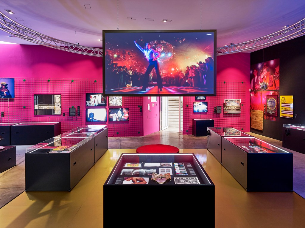
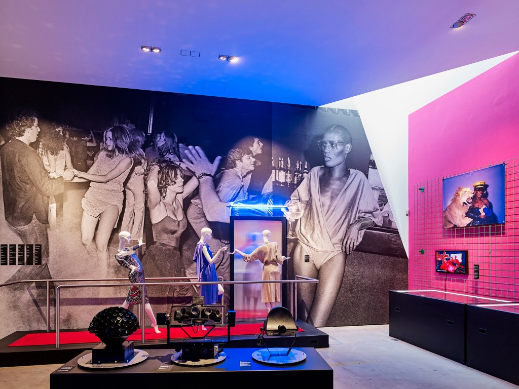
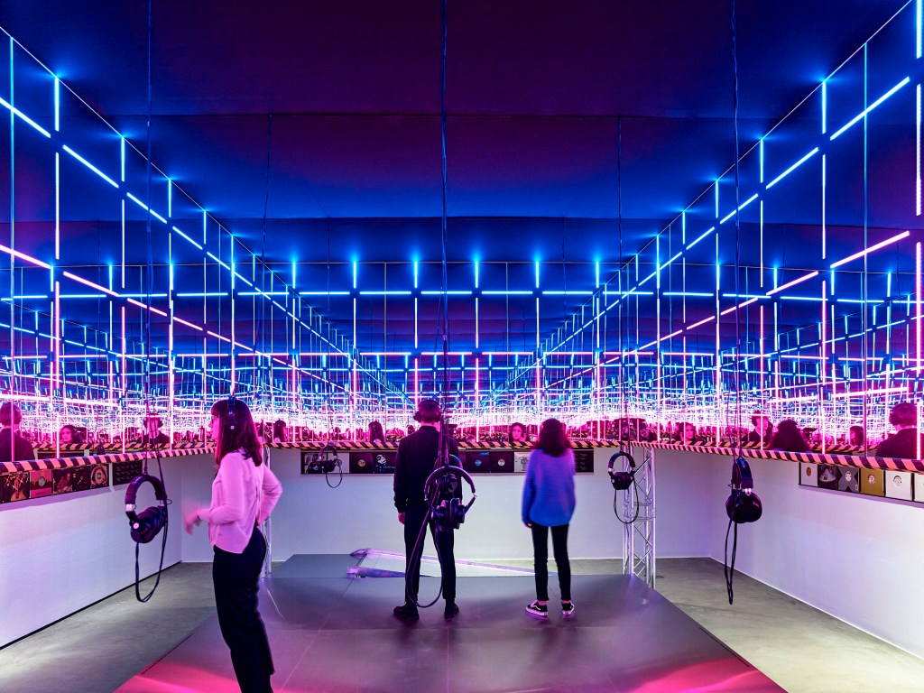
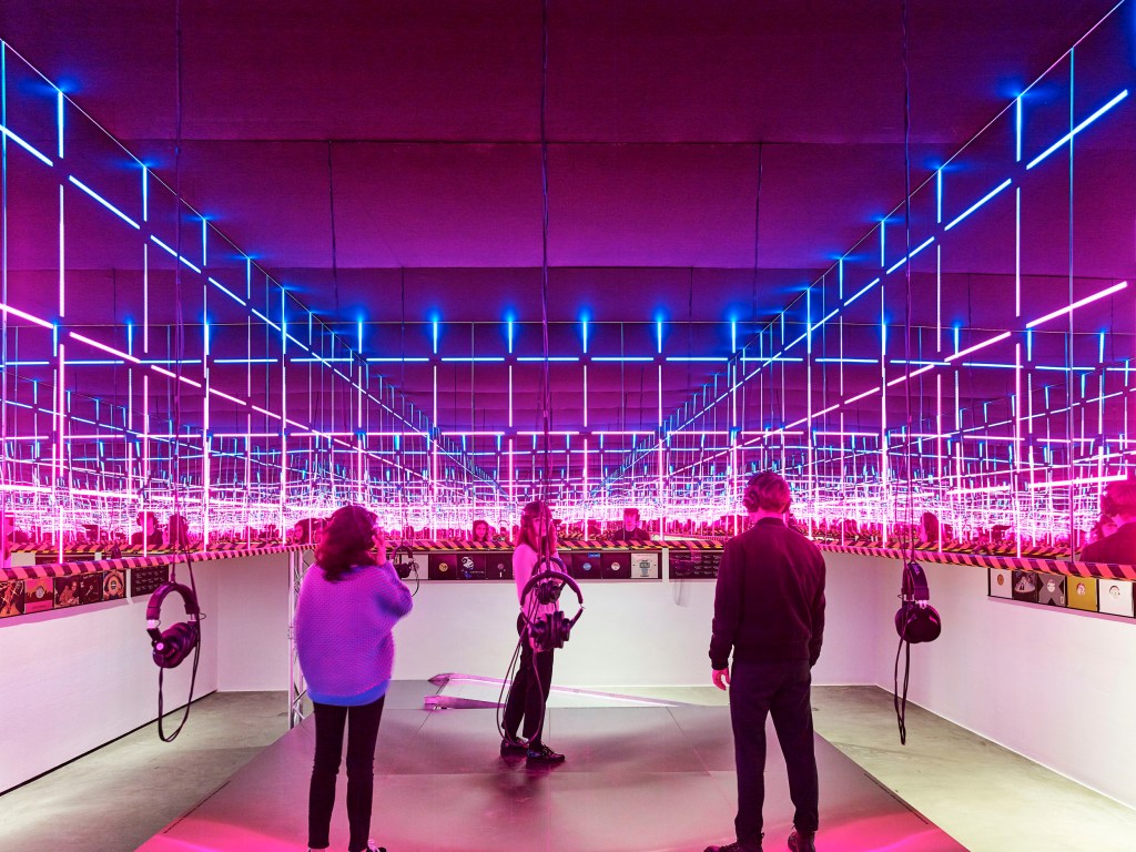
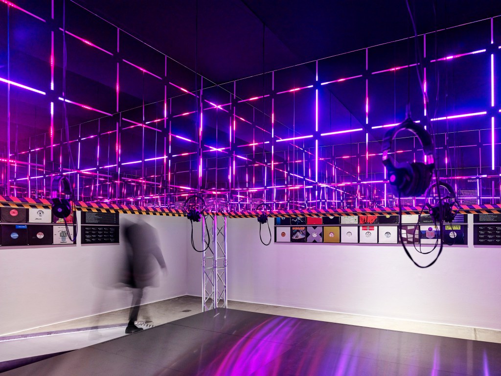
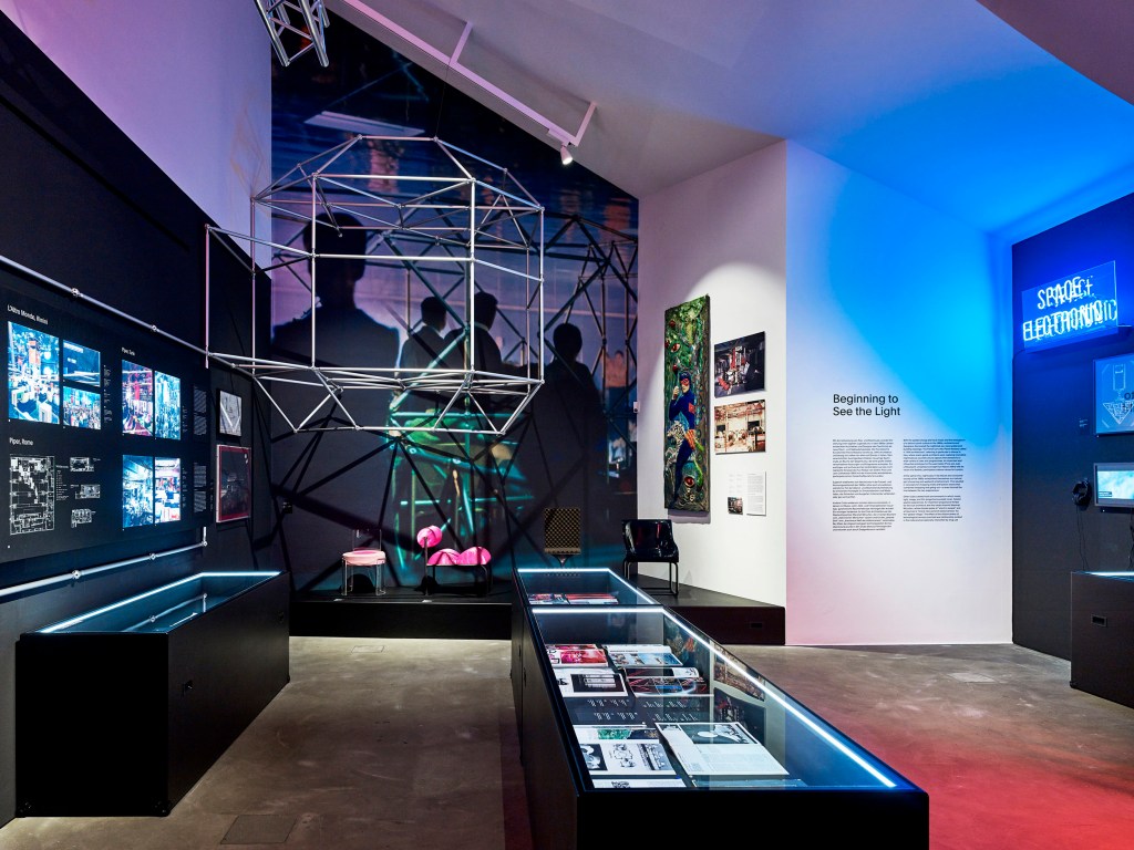
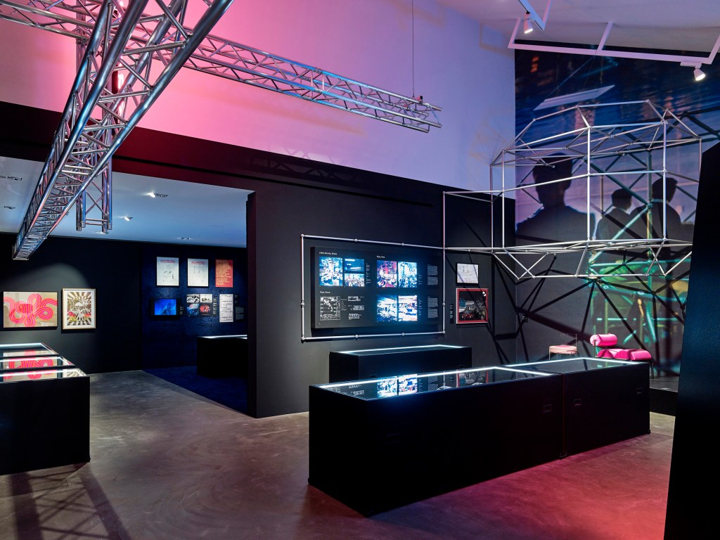
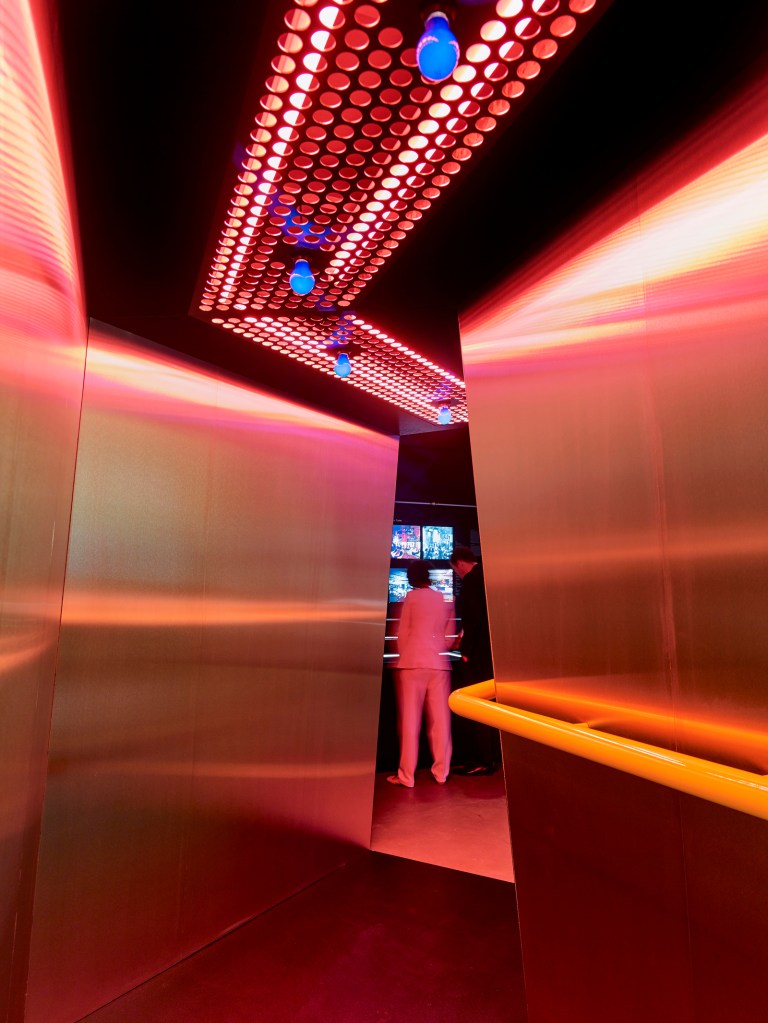
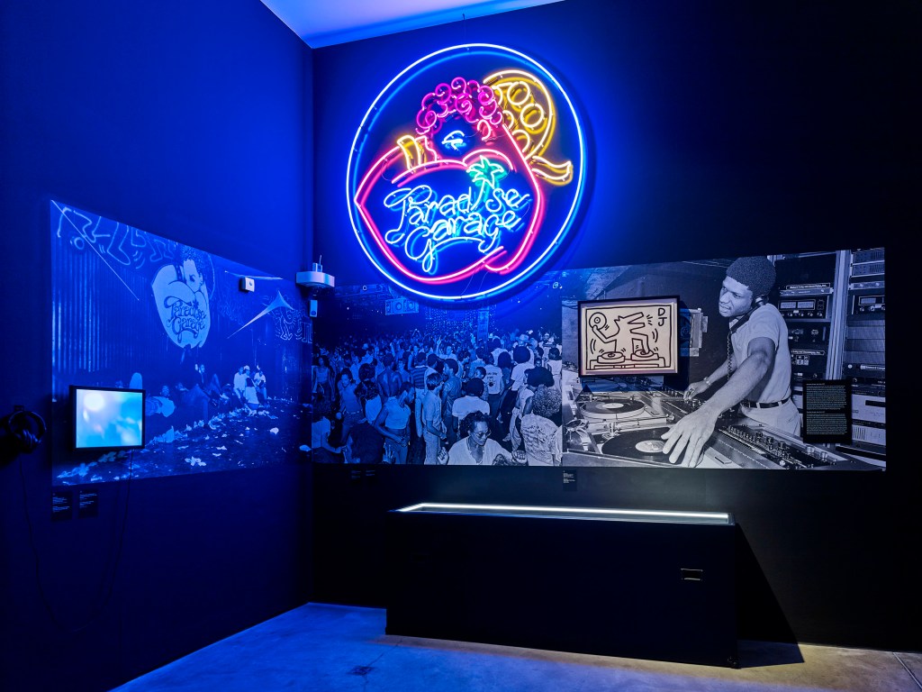
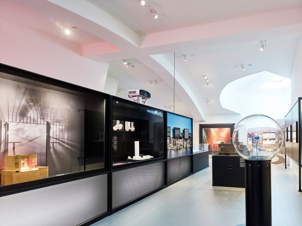
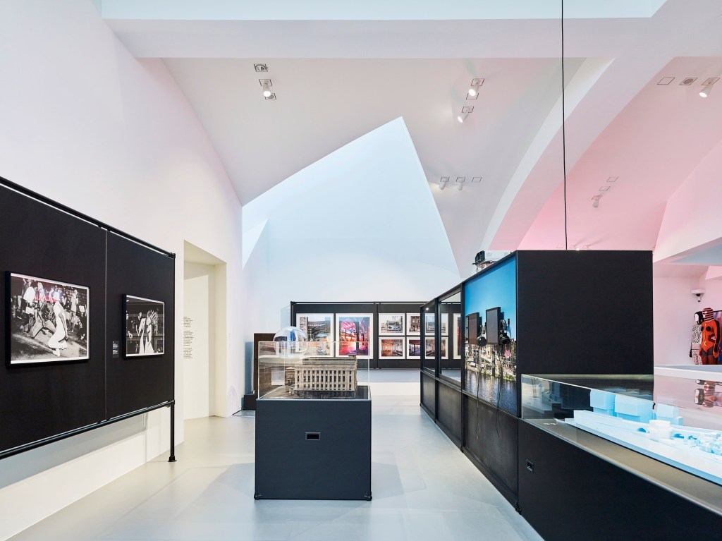
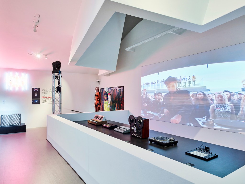
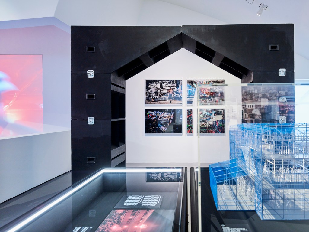
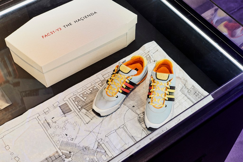
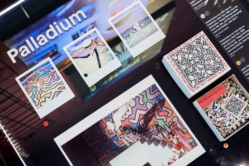
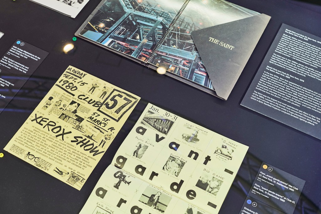


 'Green bird day' 2017")


 top left, and Petra Senn's 'Persuasiveness' (2012) top right")

 at centre, with Petra Senn's 'Insubordination' (2017) top left and 'someone from the past I' (Nd) top right")
 at right")
 'Movement from within' 2016")
 'Crawling, again' 2018")
 'Crawling, again' 2018 (installation view)")
 'Number 53' 2016 (installation view)")
 'The Orator' 2016")
 'Tegut' 2018")
 'Three of a kind' 2018 (installation view)")
 'Three of a kind' 2018")
 'Mon Combat' 2018")
' (2018) at left, and 'The Mechanic' (2018) at right")
 'The Mechanic' 2018")
 'The snake kept its mouth shut' 2018")
 'Destiny' 2018 (installation view)")
 'All humans are equal' 2018 (installation view)")
 'Rudimentary' 2016 (installation view)")
 'The promised land' 2016")
 'Steep-2' 2014 (installation view)")
 'The avail of propaganda' 2016")
 'Twosome' Nd (installation view)")
 'fact-ohry' 2013 (installation view)")
 'Progress (halted)' 2016 (installation view)")
 'Progress (halted)' 2016")


 'Amulet' 2011 (installation view)")
 'Amulet' 2011")
 'Pink and grey' 2012")
 'Pink and grey' 2012")
 'Lying figure 2' 2017")
 'Beautiful stay' 2014")
 'Unchained' 2016 (installation view)")
 'Memory 1' 2018 (installation view)")
 'Gribusella' 2014")
 'Senses' 2012")
 'Bwual ènzo' 2014")

 'Usurper Ruminant' 2016 from the exhibition 'Dale Cox: Inner Logic' at Australian Galleries, Melbourne, July - August, 2018")
 'Usurper Transplant' 2016 from the exhibition 'Dale Cox: Inner Logic' at Australian Galleries, Melbourne, July - August, 2018")
 'Usurper Glover' 2016")
 'The River Nile, Van Diemen's Land, from Mr Glover's farm' 1837")
 'Tract 38 (Burning landscape)' 2012")
 'Tract 38 (Burning landscape)' 2012 (detail)")
 'Flight SQ2118 to Thailand' 2018")
 'Rewilding II' 2018")
 'Anticolonial' 2018")
 'The Bungle Bungles' 2018")
 'Always on my mind' 2018")
 'Untitled (Lunar lander of wood)' 2012")
 'Cold War Reliquary' 2014")
 'Cold War Reliquary' 2014")
 'Cold War Reliquary' 2014")
 'Cold War Reliquary' 2014 (detail)")
 'Art Mart' 2018")
 'Albert' 2018")
 'The wonder of you' 2018")
 'The wonder of you' 2018 (detail)")


 (installation view)")
 New Holland, revealed 1644: Terra Australis, discovered 1644 (Hollandia Nova detecta 1644: Terre Australe decouverte l'an 1644) from the exhibition 'Colony: Australia 1770-1861' at NGV Australia at Federation Square, Melbourne, March - July, 2018")
 from the exhibition 'Colony: Australia 1770-1861' at NGV Australia at Federation Square, Melbourne, March - July, 2018")
")
 'Coastal profiles of Van Diemen's Land, 4-5 December 1642' from the exhibition 'Colony: Australia 1770-1861' at NGV Australia at Federation Square, Melbourne, March - July, 2018")
 Johannes van Keulen II. 'Amsterdam Island, St Paul Island, Black swans near Rottnest Island' c. 1724-1726")
 'View of Adventure Bay, Van Diemen's Land, New Holland' 1777")
 'Botany Bay. Sirius & Convoy going in: Supply & Agents Division in the Bay. 21 Janry 1788'")


 (active c. 1788 - c. 1800) Samuel John Neele (etcher) 'Sketch and description of the settlement at Sydney Cove Port Jackson in the County of Cumberland' 1788")

 of Adventure Bay, Van Diemans (Diemen's) Land' 1792 folio 16 in his 'Sketches on H.M.S. Providence; including some sketches from later voyages on Thetis and Princess Charlotte' album 1791-1831")

 'Shells' 1781 from the exhibition 'Colony: Australia 1770-1861' at NGV Australia at Federation Square, Melbourne, March - July, 2018")
 and 'English in New Holland' (Ingleses en la Nueva Olanda) 1789-1794")
 Thomas Watling (after) (British, 1762-1814?) 'View of the town of Sydney in the colony of New South Wales' c. 1799")
")
 'Convicts in New Holland (Convictos en la Nueva Olanda)' 1789-1794")
 'English in New Holland (Ingleses en la Nueva Olanda)' 1789-1794")


 Jacques Louis Copia (engraver, Germany 1764-1799) 'Natives of Cape Diemen fishing (Pêche des sauvages du Cap de Diemen)' 1800")
![Unknown artist (draughtsman, active in England early 19th century) Samuel John Neele (etcher, England 1758-1825) 'Pimbloy [Pemuluwuy], native of New Holland in a canoe of that country' 1804](https://artblart.com/wp-content/uploads/2018/03/neele-pimbloy-web.jpg "Unknown artist (draughtsman, active in England early 19th century) Samuel John Neele (etcher, England 1758-1825) 'Pimbloy [Pemuluwuy], native of New Holland in a canoe of that country' 1804")
 Matthew Dubourg (engraver active in England 1786-1838) 'Climbing trees' 1813 (installation view)")
 Matthew Dubourg (engraver active in England 1786-1838) 'Warriors of New S. Wales' 1813 (installation view)")
 Victor Pillement (engraver, France 1767-1814) Marie-Alexandre Duparc (engraver, active in France 18th century - 19th century) 'New Holland: New South Wales. View of the southern part of the town of Sydney' Plate 38 from 'Voyage de Découvertes aux Terres Australes' (Voyage of Discovery to the Southern Lands) atlas, by François Peron and Louis de Freycinet, published by L'Imprimerie Impèriale, Paris, 1807-1816")
 'Gymea Lily' 1806-1813, published 1813 (installation view)")
 'Banksia coccinea' 1806-1813")
 Nicolas-Martin Petit (after) (draughtsman, France 1777-1804) 'Y-erran-gou-la-ga' 1824 Plate 24 in the 'Voyage de Découvertes aux Terres Australes' (Voyage of Discovery to the Southern Lands) atlas Arthus Bertrand, Paris, 1824, 2nd edition")
 'Chasm Island, native cave painting' 1803")
 'A view of King George's Sound' 1802")


 'Koala and young' 1803")
 'The gigantic lyllie of New South Wales' 1810")
 Unknown (etcher active in England 1770s) 'The kanguroo, an animal found on the coast of New Holland' 1773 Plate in 'An Account of the Voyages undertaken ... for making Discoveries in the Southern Hemisphere by John Hawkesworth', printed for W. Strahan and T. Cadell, London, 1773")
 1793")
 1793")
 'Embothrium speciosissimum (now Telopea speciosissima)' 1793")
 'Insects' 1813")


 'Fish catch and Dawes Point, Sydney Harbour' c. 1813 (installation detail)")
 'Fish catch and Dawes Point, Sydney Harbour' c. 1813")
 'Platypus' 1810 (installation view)")

 'Blue-bellied parrot' 1776")

 'Inner view of Newcastle' c. 1818")
 'View of Awabakal Aboriginal people, with beach and river inlet, and distant Aboriginal group in background' c. 1818 (installation view)")

 (Australian born England, 1779-1839) Patrick Riley (cabinetmaker) (Australian born Ireland, 1786-1841) John Webster (cabinetmaker) Joseph Lycett (attributed to) (decorator) (British active Australia, c. 1774 - 1828) James Wallis (after) William Westall (after) 'Dixson collector's chest' c. 1818-1820")


")
 'Wentworth Falls' c. 1830 (installation view)")
 'A bivouac of travellers in Australia in a cabbage-tree forest, day break' c. 1838")


 'Portrait of Bungaree, a native of New South Wales' c. 1826")
 1790 - Australia 1866, Australia from 1817) 'The costume of the Australasians' c. 1817")


")


 'The barque Terror commencing after Sperm Whales' 1840s (installation view)")

 Robert Havell junior (engraver England 1793-1878, United States 1839-1878) 'Panoramic view of King George's Sound, part of the colony of Swan River' 1834")


 'Moulting Lagoon and Great Oyster Bay, from Pine Hill' c. 1838 (installation view)")
 'View of Mills Plains, Van Diemen's Land' 1833")


; 'Mrs William Robertson' mid 1830s (bottom left); 'Jessie Robertson' 1850 (top right); and 'Captain William Robertson' 1830s (bottom right)")
; 'Mrs William Robertson' mid 1830s (bottom left); 'Jessie Robertson' 1850 (top right); and 'Captain William Robertson' 1830s (bottom right)")

 'John Glover' c. 1832")
")


: Native of Bruné Island, Van Diemen's Land' c. 1837")
 'Tasmanian Aboriginal' 1837")
![Thomas Bock (England 1790 - Australia 1855, Australia from 1824) 'Woureddy [Wurati]: Native of Bruné Island, Van Diemen's Land' c. 1837](https://artblart.com/wp-content/uploads/2018/03/bock-woureddy-web.jpg "Thomas Bock (England 1790 - Australia 1855, Australia from 1824) 'Woureddy [Wurati]: Native of Bruné Island, Van Diemen's Land' c. 1837")

 'Aborigines of Tasmania: Woannadie, young woman' 1852")
 'Aborigines of Tasmania: Naplomata, grandmother' 1852")
 'No title (Group of Koori men)' c. 1847")
 'No title (Group of Koori men)' c. 1847 (detail)")
 'Club' 19th century (installation view)")
 'No title (Group of Koori women)' 1847")
 'No title (Group of Koori women)' 1847 (detail)")
 'Melbourne from the south bank of the Yarra' 1856")
 'Melbourne from across the Yarra' 1854")
 'Jane Sceales with daughters, Mary Jane and Hilda' c. 1856 (installation view)")
 'Masters George, William and Miss Harriet Ware with the Aborigine Jamie Ware' 1856 (installation view)")
 'Masters George, William and Miss Harriet Ware with the Aborigine Jamie Ware' 1856")

 'A scene in South Australia' c. 1850 (installation view)")
 'Georgina, Emily and Augusta Rose' c. 1848")
 'Port Adelaide looking north along Commercial Road' 1847")
 'Country NW of tableland, Aug. 22 1846' 1846")
 'Encounter Bay looking south' 1844")


 (India 1808 - Australia 1869, Australia from 1825) 'Glorious News! Separation at last!' Issued with the Melbourne Morning Herald 11 November 1850 (installation view)")
 'Swanston Street from the Bridge' 1861")


 'Ferntree Gully in the Dandenong Ranges' 1857")

 'Sofa' 1840s")
 (c. 1836-1901) 'Ceremony; hunting and fishing' 1860")
 (c. 1836-1901) Page from 'Sketchbook' c. 1891 Sketchbook")
 (c. 1836-1901) Page from 'Sketchbook' c. 1891 Sketchbook")
 (c. 1836-1901) Page from 'Sketchbook' c. 1891 Sketchbook")
 'Drag queen wearing cut out dress' 1993")
 'Three young men paying homage to Elvis on the 13th anniversary of Elvis’ death, Elvis Memorial Melbourne' 1990")
 'Mr Wrestling' 1992")
 'Indian Brave' 2002")
 'Lost' 2005")
 'In the Wimmera 1864 #1' 2006")
 'Hanging Rock 1900 #3' 2006")
 'The Provider' 2009")
 'The Mourner' 2012")
 'The Joy Pedlars' 2011 from 'The Dreamkeepers' 2011")
 'The Wanderer No. 3', 2012 from 'The Dreamkeepers'")
 'Ocean Man' 2013")
 'Scrub Man' 2012")
 'The Immigrant' 2014")
 'The Storyteller' 2014")
 'I’m going through changes' 2016 from the exhibition 'Del Kathryn Barton: The Highway is a Disco' at the Ian Potter Centre: NGV Australia at Federation Square, Melbourne, Nov 2017 - March 2018")


 'inside another land' 2017 (detail)")
 'inside another land' 2017 (detail)")
 'inside another land' 2017 (detail)")
 'inside another land' 2017 (detail)")
 'inside another land' 2017 (detail)")
 'inside another land' 2017 (detail)")
 'you’re not a bit ashamed' 2017 from the exhibition 'Del Kathryn Barton: The Highway is a Disco' at the Ian Potter Centre: NGV Australia at Federation Square, Melbourne, Nov 2017 - March 2018")
 'to speak of anger, I will take care' 2017")

")
 'briefly turned into dreams' 2016 (detail)")
 'come home to me' 2014-2017 (installation view)")
")
 'mud monster' 2014 (detail)")
 'mud monster' 2014 (detail)")
")
")
")
 'I am flesh again' 2008 (detail)")
 and the bronze 'up in this' (2012)")
")
")
")

 'the highway is a disco' 2015")
 'I want to love you' 2016")
")
")
")
")
 'of pink planets' 2014")
 'openly song' 2014")
 'or fall again' 2014")
")
")
 'See ya mumma' 2016")
 'is the energy' 2014")
 'girl as sorcerery figure' 2005")
 'girl #8' 2004 (installation view)")
 '10 AM IS WHEN YOU COME TO ME' 2006 (detail)")
 '10 AM IS WHEN YOU COME TO ME' 2006 (detail)")
 '10 AM IS WHEN YOU COME TO ME' 2006 (detail)")

 'volcanic woman' 2016")
")
 Still from 'RED' 2016")
 Still from 'RED' 2016")
 Still from 'RED' 2016")
 Still from 'RED' 2016")
 'Berman House (Harry Seidler), Joadja, New South Wales' 2007 from the exhibition 'John Gollings: The history of the built world' at the Monash Gallery of Art, Wheelers Hill, Melbourne, Dec 2017 - March 2018")


, Carlton, Victoria' 1983")


, Yarra Valley, Victoria' 2013")
, Somers, Victoria' 1997")


, Melbourne, Victoria' 2001")
, Changzhou, China' 2013; third left, 'Croft House (James Stockwell), Inverloch, Victoria' 2013; second right, 'Australian Centre for Contemporary Art (Wood Marsh), Southbank, Victoria' 2002; and right, 'Habitat filter (Matt Drysdale, Matt Myers and Tim Dow), Southbank, Victoria' 2017")
, Inverloch, Victoria' 2013")


")
")
 'Monash Gallery of Art (Harry Seidler), Wheelers Hill, Victoria' 1990")
 'Webb Bridge (Robert Owen with Denton Corker Marshall), Docklands, Victoria' 2003 from the exhibition 'John Gollings: The history of the built world' at the Monash Gallery of Art, Wheelers Hill, Melbourne, Dec 2017 - March 2018")
 'Federation Square, Melbourne, Victoria' 2010")
 'Hotel Hotel foyer (March Studio), New Acton, Australian Capital Territory' 2013")
 'Karijini Visitor Centre (Woodhead International BDH), West Pilbara, Western Australia' 2001")
 'Penleigh and Essendon Grammar School (McBride Charles Ryan), Essendon, Victoria' 2011")
 'Featherston House (Robin Boyd), Ivanhoe, Victoria' 2011")
 'Uluru Visitor Centre (Gregory Burgess), Uluru, Northern Territory' 1999")
 'Kabaw Berber Granary, Kabaw, Libya' 2005")
 'Bayon, Angkor Thom, Cambodia' 2012")
 'North face, south gate, Angkor Thom, Cambodia' 2007")
 'Buddha detail, Borobudur, Java, Indonesia' 2011")
 'Mori Tim Stupa, Silk Road, China' 2005")
 'Jiaohe Old City, Turfan, China' 2005")
 'Pushkarani Kund (King's Bath), Hampi, India' 1988")
 'Ta Prohm Temple, Angkor Thom, Cambodia' 2007")
 'Hanuman Temple, Hampi, India' 2006")
 'Small Ganesh, Hampi, India' 2006")
 'Vittala Dance Mandapa interior, Hampi, India' 2005")
 'Nawarla Gabarnmang, Arnhem Land, Northern Territory' 2015")
 'Australian Centre for Contemporary Art (Wood Marsh), Southbank, Victoria' 2002")
 'Habitat filter (Matt Drysdale, Matt Myers and Tim Dow), Southbank, Victoria' 2017")
 'Jean-Marie Tjibaou Cultural Centre (Renzo Piano), Nouméa, New Caledonia' 1997")
 'The Lotus Building (Studio 505), Changzhou, China' 2013")
 'Surfers Paradise aerial, Surfers Paradise, Queensland' 2012")
 'Every high rise on the Gold Coast, Surfers Paradise, Queensland' 2012")
 'Every high rise on the Gold Coast, Surfers Paradise, Queensland' 2012 (detail)")

You must be logged in to post a comment.