Candida Höfer (German, b. 1944) Ballettzentrum Hamburg III 2000 Chromogenic print Courtesy of Sonnabend Gallery
Inspired curating conjoins the monumental, classicist purity of Höfer with the picturesque, dystopian (dis)quietude of Gaillard in an exhibition that investigates our relationship to buildings and their environments and their relationship to us – the ‘i’ in our histor-i-city.
Dr Marcus Bunyan
Many thankx to the Carnegie Museum of Art for allowing me to publish the photographs in the posting. Please click on the photographs for a larger version of the image.
Candida Höfer (German, b. 1944) Fundação Bienal de São Paulo XI 2005 Chromogenic print 81 3/8 x 71 7/8 in. Courtesy of Sonnabend Gallery
Carnegie Museum of Art presents the powerful work of two contemporary artists – Candida Höfer and Cyprien Gaillard – who explore architectural environments and how they influence experiences and perceptions of the world.
“We shape our buildings, and afterwards our buildings shape us.” With that simple but profound insight, Winston Churchill conveyed people’s complex relationship to architecture: The physical form of a building is controlled by its designer, but the impact a constructed environment has can be unpredictable, emotional, and even visceral. That dynamic is evident in the upcoming exhibition You Are Here: Architecture and Experience, which brings together the photographs of German artist Candida Höfer and a video and etchings by French artist Cyprien Gaillard. Both artists express the formative power of architecture in different but complementary ways, according to Tracy Myers, curator of architecture at the Heinz Architectural Center and organiser of the exhibition.
Candida Höfer’s lush colour photographs of ornate historical and contemporary interior spaces are usually devoid of humans, yet they reveal details that draw the viewer into a consideration of what each place means. Höfer’s photographs usually focus on spaces of cultural and social activity. Printed very large (from about 4 x 4 feet to a massive 6 x 8 feet), the 17 photographs in You Are Here represent the range of Höfer’s work in terms of scale, point of view, building type, and geographical location.
By contrast, Cyprien Gaillard’s video Desniansky Raion and his meticulously detailed etchings probe the human legacy of Modernist high-rise housing blocks. Constructed after World War II throughout the United States, Europe, and the Eastern Bloc to provide decent housing, these buildings often became warehouses for the poor and incubators of crime and antisocial behaviours.
Named for an administrative district in Kiev, Desniansky Raion poignantly reflects on the gap between the utopian Modernist aspiration for universal housing and the banal reality that instead prevailed. It comprises three parts. In the first section, weekend fight clubs of 50 or 100 people face off against each other in a pugilistic ritual set against the backdrop of housing towers in St. Petersburg, Russia. The second part shows the implosion of a similar tower in Meaux, a small city near Paris; the demolition of the building was treated by the city government as a literal spectacle, with a light show and fireworks preceding the destruction. The final third is a very long panning aerial shot of seemingly endless ranks of virtually identical housing blocks in Kiev, Ukraine. The video is accompanied by a soundtrack composed by Koudlam, a young musician born in the Ivory Coast. Also featured are six etchings by Gaillard, collectively titled Belief in the Age of Disbelief, in which the Modernist housing tower is placed in classic picturesque landscapes.
“Gaillard’s video packs a powerful and direct emotional punch: each time I view it, I experience physically the anticipation that ebbs and flows through the course of the work,” said Myers. “By contrast, Höfer’s photographs embody a kind of quietude that encourages slow, sustained exploration of the meaning that builds through accumulation of detail. But both works are equally affecting and bring the viewer with compelling intensity into the realm of architectural experience. Höfer and Gaillard capture the constant oscillation between what we make of our buildings, and what they make of us.”
Artists’ Biographies
Candida Höfer has been creating photographs for more than 30 years. Born in Eberswalde, Germany, in 1944, she studied with Berndt Becher and is identified with a group of German artists – Thomas Ruff, Andreas Gursky, Axel Hütte, and Thomas Struth – best known for their unsentimental photographs of architecture, landscapes, and urban developments. Höfer has made interiors her focus.
Cyprien Gaillard, born in Paris in 1980 and currently based in Berlin, explores contemporary landscapes and buildings in a variety of media, including video, painting, and etchings. Much of his work is concerned with the legacy and inheritance of buildings and landscapes that are left to us, and the ways in which we interact with them.
Press release from the Carnegie Museum of Art website
The video takes place in a parking lot of a drab housing complex in St. Petersburg, Russia, where he witness two large groups of men – one mostly wearing red shirts and the other blue – slowly walking towards each other. Set by Gaillard to the hypnotic electronic beats of French composer Koudlam’s I See you All, the video shows the colour-coordinated groups marching in loose formation, reminiscent of ancient armies confronting each other on some distant battlefield. Suddenly, signal flares billowing smoke arc through the air and the two groups come together, clashing in flurry of fists – a breathtaking display of raw physical violence set against the stark backdrop of the housing block. As the sounds of Koudlam’s pulsing music draw louder and more urgent, the furious hand-to-hand combat intensifies while bodies of the fallen lay strewn on the pavement. Before long, the blue faction beats a hasty retreat, only to regroup moments later on one side of a nearby pedestrian bridge. The two sides come together again, this time clashing on the impossibly narrow span of the footbridge. The blue group is once more chased off, and the victors in red erupt in victorious celebration.
Julia Margaret Cameron – you are one of my heroes!
Many thankx to the Musée d’Orsay for allowing me to publish the photographs in the posting. Please click on the photographs for a larger version of the image.
Consumed by the passion of unrequited love, a young woman lies suspended in the dark space of her unrealised dreams in Henry Peach Robinson’s illustration of the Shakespearean verse “She never told her love,/ But let concealment, like a worm i’ the bud,/ Feed on her damask cheek” (Twelfth Night II,iv,111-13). Although this picture was exhibited by Robinson as a discrete work, it also served as a study for the central figure in his most famous photograph, Fading Away, of 1858.
Purportedly showing a young consumptive surrounded by family in her final moments, Fading Away was hotly debated for years. On the one hand, Robinson was criticised for the presumed indelicacy of having invaded the death chamber at the most private of moments. On the other, those who recognised the scene as having been staged and who understood that Robinson had created the picture through combination printing (a technique that utilised several negatives to create a single printed image) accused him of dishonestly using a medium whose chief virtue was its truthfulness.
While addressing the moral and literary themes that Robinson believed crucial if photography were to aspire to high art, this picture makes only restrained use of the cloying sentimentality and showy technical artifice that often characterise this artist’s major exhibition pictures. Perhaps intended to facilitate the process of combination printing, the unnaturally black background serves also to envelop the figure in palpable melancholia.
Text from the Metropolitan Museum of Art website [Online] Cited 27/01/2020
The historian and art critic, John Ruskin, had a great influence in Great Britain not only on the Pre-Raphaelite movement created in 1848, but on the development of early photography in the 1850s. The leading Pre-Raphaelite painters, John Everett Millais, Dante Gabriel Rossetti, Holman Hunt and Ford Madox Brown and their followers, wished to change the pictorial conventions laid down by the Royal Academy, and in order to demonstrate the transformations in modern life, invented a radically new idiom marked by bright colours and clarity of detail.
Pre-Raphaelite painters and photographers frequently made similar choices of subjects, and the photographers, particularly Julia Margaret Cameron, David Wilkie Wynfield and Lewis Carroll, were often had close links with the painters.
When painting landscapes, the Pre-Raphaelite artists answered Ruskin’s call, meticulously observing nature in order to capture every nuance of detail. For their part, photographers, such as Roger Fenton, Henry White, William J. Stillman and Colonel Henry Stuart Wortley, experimented with the new process of wet plate collodion negatives that allowed much greater image detail, and achieved similar effects. Although highly impressed at first by the daguerreotype, which enabled the eye to see tiny, overlooked details, Ruskin was nonetheless still very critical of landscape photography, which could not reproduce the colours of nature and in particular of the sky. This failing also gave rise to a major debate amongst photography critics.
In portraiture, there were clear links between the painted portraits of Watts and Cameron’s photographic portraits. By using special lenses and photographing her models in close-up, Cameron, achieved, with a glass negative, exactly the opposite effect to the clear image advocated by Ruskin, and her work was distinctive for the breadth of relief and contour, as well as the compositions evoking Raphael’s paintings, also a source of inspiration for Watts.
The painter Dante Gabriel Rossetti repeatedly drew and painted Jane Morris, a model with whom he was infatuated, and he asked Robert Parsons to produce a series of photographs, under his personal direction, which captured the fascinating presence of the young woman as effectively as his own paintings.
Just like the Pre-Raphaelite painters, Victorian photographers would turn to religious or historical subjects, finding a shared inspiration in the poems of Dante, Shakespeare and possibly Byron, and above all in the Arthurian legend made popular once more by Lord Tennyson, the poet laureate. From a formal point of view, Millais’ Ophelia, one of his most successful paintings, was a source for Henry Peach Robinson’s photograph, The Lady of Shalott, even though it had a different theme.
Finally, Pre-Raphaelite painters and Victorian photographers both liked to present scenes from modern life with a moralising undertone: hence She Never Told Her Love, a photograph by Robinson that was very successful when exhibited at the Crystal Palace in 1858, William Holman Hunt’s painting, Awakening of Conscience, and Rossetti’s Found, a painting depicting a countryman who comes across his former sweetheart, now a prostitute in the city.
In the 1880s, Pre-Raphaelite painting would be transformed, with artists and writers like William Morris, Burne-Jones, Whistler and Oscar Wilde, into a very different movement concerned only with the cult of beauty and rejecting Ruskin’s concept of art as something moral or useful. British photographers, however, inspired by the Pre-Raphaelites would inspire the Pictorialist movement that flourished in the 1890s, encouraged by the writings of Henry Peach Robinson and Peter Henry Emerson, extolling artistic photography.
Monika Tichacek (Australian, b. 1975 Switzerland) To all my relations 2011 Diptych Gouache, pencil and watercolour on paper 244 x 300cm overall
This is a stupendous exhibition by Monika Tichacek, at Karen Woodbury Gallery. One of the highlights of the year, this is a definite must see!
The work is glorious in it’s detail, a sensual and visual delight (make sure you click on the photographs to see the close up of the work!). The riotous, bacchanalian density of the work is balanced by a lyrical intimacy, the work exploring the life cycle and our relationship to the world in gouache, pencil & watercolour. Tichacek’s vibrant pink birds, small bugs, flowers and leaves have absolutely delicious colours. The layered and overlaid compositions show complete control by the artist: mottled, blotted, bark-like wings of butterflies meld into trees in a delicate metamorphosis; insects are blurred becoming one with the structure of flowers in a controlled effusion of life. The title of the exhibition, To all my relations,
“has inspired an understanding that all animist cultures’ peoples have who live in close relationship to the earth. We are all related, we all exist in an interdependent system. The ecosystem is such an unbelievably complex, harmonious system. Every drop of rain, every insect, every micro-organism has its place for the perfect functioning and health of nature… The title is an acknowledgement and honouring of all that is live-giving, every little element that makes up the big picture of life on earth.”1
It was very difficult to pull myself away from the beauty and intimate polyphony of voices contained within the work. I loved it!
Dr Marcus Bunyan
1/ O’Sullivan, Jane. “Artist Interview: Monika Tichacek,” on Australian Art Collector website, 19th May 2011 [Online] Cited 21/05/2010 no longer available online
Many thankx to Karen Woodbury Gallery for allowing me to publish the photographs and Art Guide Australia for allowing me to publish the text in the posting. The text by Dylan Rainforth was commissioned by Art Guide Australia and appears in the May/June 11 issue of Art Guide Australia magazine. Please click on the photographs for a larger version of the image.
Monika Tichacek (Australian, b. 1975 Switzerland) To all my relations (detail) 2011 Diptych Gouache, pencil and watercolour on paper 244 x 300cm overall
Monika Tichacek (Australian, b. 1975 Switzerland) To all my relations (detail) 2011 Diptych Gouache, pencil and watercolour on paper 244 x 300cm overall
Monika Tichacek (Australian, b. 1975 Switzerland) To all my relations (detail) 2011 Diptych Gouache, pencil and watercolour on paper 244 x 300cm overall
The Cycle of Nature – Monika Tichacek’s To All My Relations
Dylan Rainforth
Anyone used to the immaculately controlled, exactingly lit photographic and video mise en scène that Swiss-born artist Monika Tichacek presented in such series as The Shadowers, for which she won the prestigious Anne Landa Award for Video and New Media Arts in 2007, may be surprised by the direction her work has taken in her latest exhibition. To All My Relations consists entirely of works on paper – watercolour and ink drawings that evince a tension between abstract, gestural shapes and bleeds of colour, recalling (just for convenience’s sake) Kandinsky, and intricately rendered natural forms that owe more to the scientific, zoological and botanical narratives of the Endeavour voyages of Captain Cook, Joseph Banks and the artist Sydney Parkinson.
The work has come out of an intensive period over the last few years in which Tichacek spent considerable time in the jungles of South America and the deserts of the United States, as well as time spent in the New South Wales bush and studying nature books. “I’m getting more and more interested in the cellular, microscopic imagery that you get when you enlarge something and peer deeper into the structure of how material elements are composed, and that really coincides with my interest in Eastern philosophies of Buddhism and many other things too. I guess I’m looking as deeply into the nature of something as is possible but I’m trying not to do it so much with my mind – but of course that’s very challenging,” she says, laughing lightly.
“The exploration of feeling is quite important to me – it’s quite a departure from what I used to do, which were certainly works that came from a very inner landscape but then the execution would be very conceptual, obviously – it had to be and this new work is much more intimate.”
That challenge to the rational, objective Western subject is informed by Tichacek’s exposure to indigenous traditions in South America and other places.
“In 2006 I had a research grant and I went to the Amazon because I wanted to look more deeply into animist cultures, meaning cultures that really see the land as living and as alive with energy and with spirit or ‘beingness’. So I went to the Amazon and spent quite a long time there and also in the mountains in Peru and saw a little bit of Central America and also North America in the desert. I spent time there and really learnt a lot about their indigenous ways and got to participate in a lot of things and experience a lot of things. In the Amazon shamanic tradition there is a process – they call it dieting – you spend a few months more or less alone, existing on very limited foods. You get very little, limited food and very little contact and they give you different traditional plants that, through the communion they do, they are ‘told’ to give you. And you are encouraged to connect with this plant for its healing properties to come through. So that was quite an amazing time to get quite still…”
The exhibition title comes from a Native American ceremony. According to Tichacek, “It’s always said when entering the sweat lodge and it’s an acknowledgement of being related to everything in nature, every being, the understanding that without all these other relations one wouldn’t exist. In those cultures it’s much more understood – we’ve lost that understanding because we can just buy things in the supermarket and eat them but if we lived that way we would probably remember a lot more that we are closely related to everything around us.”
From this perspective we can see that this new work is not a complete departure from Tichacek’s earlier work after all, yet its intentions are radically different. Both the natural world and shamanistic knowledge played their part in The Shadowers. Professor Anne Marsh has described Tichacek’s video, played out in a violent scene occurring between three women (one of whom Marsh characterises as a witch doctor or shaman) in a forest environment, as “stretch[ing] the boundaries between body art, ritual and sado-masochism by assaulting the senses and transgressing the social realm. In psychoanalytic terms it tears at the screen of the real and immerses the viewer into the abject world of instinctual response where language has no authority.” [i]
Pain, sado-masochism, ritual and endurance certainly have their place in shamanistic traditions – one need only think of any number of initiation rites – but now Tichacek is looking for a less conflicted relationship with nature. “The work has always been very personal and I guess in The Shadowers that nature relationship was starting to come in but it was very tense and very violent and very confused. The continuation of that theme is still there – the exploration of how to understand the experience of the self and what we are doing here and how we come to exist. That’s definitely been there before but this new work is more in the realm of psychology and the previous works are more in the realm of the female body.”
To All My Relations will present several drawings, with one in particular being conceived on a massive scale that Tichacek intends to convey the sense of awe we experience when surrounded by nature. The artist will also stage a performance – something her interdisciplinary practice has always embraced – at the opening. Although she had not completely determined the details when I spoke to her the performance was inspired by a drawing she made a few years ago and will symbolically connect the artist’s body to the roots of a tree.
“I always feel like [performance serves] to bring my body into it. Although I feel like my body’s very much in these drawings there’s something about performance that’s really physically present.”
Dylan Rainforth.
Monika Tichacek (Australian, b. 1975 Switzerland) To all my relations (detail) 2011 Diptych Gouache, pencil and watercolour on paper 244 x 300cm overall
Monika Tichacek (Australian, b. 1975 Switzerland) To all my relations (detail) 2011 Diptych Gouache, pencil and watercolour on paper 244 x 300cm overall
Monika Tichacek (Australian, b. 1975 Switzerland) Birth of generosity 2011 Diptych Pencil and watercolour on paper 70 x 114cm overall
Monika Tichacek (Australian, b. 1975 Switzerland) Transmission 2011 Pencil and watercolour on paper 150 x 125cm
Adrian Mauriks (Australian, 1942-2020) Strange fruit 2010 Epoxy resin, steel, paint
“[Massumi] posits ‘a physiology of perception’ in which he analyses sensory forms of knowledge as being driven by affect. Massumi understands affect as a moment of confrontation in which there are many possibilities, a moment embedded with potential responses, reactions and directions which is characterised by a sense of openness … narratives produced through affect are the result of the tensions and interplays between form and content or space and objects and the viewer.”
Kate Gregory and Andrea Witcomb1
Meandering around the trails of the McClelland Sculpture Park is a wonderful experience; the meandering provides the suspense and excitement of a treasure hunt. Unfortunately, viewing most of the sculptures of the McCelland Sculpture Survey Award 2010 that are the prize of such a treasure hunt left me a little disappointed. I had little feeling for most of the sculptures dotted around the landscape. As conceptual ideas I understood their rationale but most left me cold and emotionally unengaged – they had little affect upon me.
Embodied forms of knowledge production apprehended by the senses, such as affect, produce new forms of understanding. Emotional responses open up possibilities for interpretation. In this sense, affect is important for the maintenance and production of memory as well as social and cultural understanding. For the historian Dipesh Chakrabarty, it is the subjective, felt response that is the most relevant for contemporary forms of political, social and cultural engagement – how emotional responses open up possibilities for interpretation.2
“Narratives produced through affect are the result of the tensions and interplays between form and content or space and objects and the viewer.” I felt little of that tension and interplay when viewing most of these works.
While understanding that, for an award of this nature, the work has to be self-contained, has to sit in a particular environment that the artist has only a general idea of (not a particular position) when proposing the work – on the evidence of this survey it would seem that contemporary Australian sculpture tends towards one shot statements that lack nuance and layering in composition and meaning. An understanding of how the work inhabits space and the aura that the work projects is notably absent from most of the works. Most are exercises in design rather than aesthetically pleasing artworks, the design aspect of making art works for these competitions having taken over from making work that has an emotional connection to the viewer and relevance to the world in which we live. As evidence see the photographs below and note how many are seemingly masculine, square / oblong / totemic / monolithic structures, compositions that assume the viewer cannot decipher sensual, layered narratives that are revealed over time, through space. There is little music and pleasure to be had here!
Notable exceptions include the primordial, reflective eggs of Matthew Harding (Primordial, 2010, below); the wonderfully tactile, sensual, stitched bronze dogs of Caroline Rothwell (Tygers I, II, III, 2010, below); and the incongruously placed, limpid, distorted, rusting Holden HQ Kingswood Station Wagon by Jason Waterhouse (Glory Days, 2010, below) covered in pine needles that delighted, surprised and made me feel something (about the work, myself and the world we inhabit). This was my winner, hands down. The most unedifying experience of the afternoon was walking under the black table of the winner, Louise Paramor’s Top shelf (2010). While the “brilliant assemblage” looks acceptable from a distance, “the oversized table acts as an altar upon which the saccharine paraphernalia of a modern, disposable age sit as objects that have been elevated for aesthetic contemplation,”3 the underside through which the viewer walks was the most emotionally dead space I have had to endure when viewing contemporary art over the past few years.
Gregory and Witcomb observe, “sculpture gives shape to emptiness, to space, as much as to material form.” The space to produce new forms of understanding that offer the viewer fresh perspectives, that allow the viewer to have a openness and receptiveness to the sensuality of the work and it’s placement in and relationship to, the world. The space to breathe, to touch, to explore, to be excited, to create and bring forth memory, to bear witness to the engagement with our senses. We are the product of numerous interactions with our environment; this survey, rather than leaving me feeling uplifted and informed through these interactions, left me feeling rather dead and deflated.
In this sense I loved the landscape but I didn’t feel most of the art.
Dr Marcus Bunyan
1/ Gregory, K. and Witcomb, A. “Beyond Nostalgia: the Role of Affect in Generating Historical Understanding at Heritage Sites,” in, Knell, S.J., Macleod, S. and Watson, S. (eds.,). Museum Revolutions: How Museums Change and are Changed. New York: Routledge, 2007, pp. 264-265
2/ Ibid., p. 263
3/ Lindsay, Robert. Art and Nature/Nature and Art. [Online] Cited 15/05/2011. No longer available online
Many thankx to the Fotomuseum Winterthur, Zurich for allowing me to publish the photographs in the posting. Please click on the photographs for a larger version of the image.
André Kertész (Hungarian, 1894-1985) Fork 1928 Gelatin silver print
André Kertész (Hungarian, 1894-1985) Elizabeth and I 1933, printed in the 1960s Gelatin silver print 25.3 x 17.5cm Collection of Sarah Morthland, New York
André Kertész (Hungarian, 1894-1985) Distortion No. 200 1933, printed c. 1938/1939 Gelatin silver print 34.4 x 25.7cm Courtesy of Klever Holdings
André Kertész is possibly the most photographic of all photographers: he sought out the play of light and shadow; he liked the concentration and overlapping of forms, of moments; and in the everyday, in banality, he recognised poetry, beauty, and even, for all his innate modesty, the “sublime.” Kertész is a photographic poet and seer, for whom it was long difficult to break into the market precisely because of his rich, chiseled iconography.
André Kertész (Budapest 1894 – 1985 New York) supported Brassaï, inspired Henri Cartier-Bresson, is considered one of the founders of photojournalism, and introduced stylistic elements into photography that can still be found in works by contemporary photographers. At heart, he was a photographer and artist in equal measure, poetic, probing, vital, independent in thought and actions. In a word, he was a master of photography, whose long period of production was very influential. Nevertheless, it took a remarkably long time for his special abilities, his poetic experimental version of photography, to find recognition in the history of photography. The three locations where he lived (Budapest, Paris, New York), his freedom, his form of “contemplative photography,” as Roland Barthes characterised it, made quick reception and categorisation of his work impossible. Today, more than twenty-five years after his death, he is recognised and considered to be a central photographer of the twentieth century who crucially enriched the language of photography.
With around 250 photographs and countless magazine contributions, the retrospective at Fotomuseum Winterthur on view until May 15, 2011, allows a comprehensive view of his work. The chronological order and the major themes show what it is that makes up his photographic practice: his unique methods (in photographic postcards, in distortions), his editorial engagement (for example, in the volume Paris vu par Kertész, 1934), his passion for experimentation (with light and shadow), and the evocation of emotions, above all of melancholy and loneliness. Periods that have remained neglected or unexplored until today (his life as a soldier from 1914-1918, for example) are reassessed, and juxtaposed with the development of photojournalism in Paris and the distribution of his pictures in the media, with which he earned his living.
André Kertész liked to characterise himself as an “eternal amateur.” But what a virtuosic “amateur” he was; what virtuosic visual language he employed his entire life to capture the poetry of the everyday! His photographic production was closely connected to his life and psyche. Even when he seemed to be documenting something, he let himself be guided almost exclusively by feeling, by instinct, from his soul. This resulted in a body of work that he liked to compare to a “visual journal”, and about which he said, “I have never just ‘made photos’. I express myself photographically.”
Text from the Fotomuseum Winterthur website
André Kertész (Hungarian, 1894-1985) Satiric Dancer 1926 Gelatin silver print
André Kertész (Hungarian, 1894-1985) Self-Portrait Paris, 1927, printed in the 1970s Gelatin silver print 25.4 x 20.3cm Courtesy of Estate of André Kertész, New York
André Kertész (Hungarian, 1894-1985) Arm and Ventilator 1937, printed in the 1940s-1950s Gelatin silver print 30.5 x 26.7cm Collection of Eric Cepotis and David Williams
André Kertész (Hungarian, 1894-1985) Washington Square New York, January 9, 1954 Vintage gelatin silver print 12.7 x 9.2cm Collection of Leslie, Judith and Gabrielle Schreyer
André Kertész (Hungarian, 1894-1985) July 3, 1979 1979 Polaroid SX-70 original 7.9 x 7.9cm Courtesy of Stephen Bulger Gallery
Alan Constable (Australian, b. 1956) Konica Pop 2009 Ceramic 21 x 32 x 10cm
“For me, art is what is most animal in us … It is the most noble thing because it’s a celebration precisely of the forces of the body and the forces of life.”
Elizabeth Grosz
This Saturday, after a journey around the galleries of Albert Street, Richmond (underwhelming) and a visit to Sutton Gallery to see Simon Terrill’s photographic exhibition Phantom (an exhibition that I was going to review but when I saw it I changed my mind: two excellent photographs, Balfron Tower 2010-2011 and Rivoli #2 2010-2011, let down by three “empty” long exposure photographs allegedly showing traces of humanity, residues of presence) had left me a little deflated, I ventured to the opening of Alan Constable’s twenty-year retrospective Viewfinder curated by Dr Cheryl Daye at Arts Project Australia.
What a breath of fresh air this exhibition is!
The exhibition shows beautifully in the gallery space. Hung chronologically, the more tightly controlled early series feature luminous pastels that investigate themes: landscapes, birds (rarely figures) – the rubbed and layered medium building up an almost translucent surface that reminded me of the pastel work of Odilon Redon. Later work, such as the two paintings Not titled (person with binoculars) 2009 and Not titled (figure with camera) 2006 (both below) show a greater engagement with the world and a freeing up of technique – running figures, Barak Obama, Dr. Who, suited men with headdresses, football players: happenings – with exaggerated form (hands for example), wonderful spontaneity and an essential simplicity that engages the viewer directly. All the paintings evidence a spatial flatness that brings everything onto the same plane, gives everything equal importance within the image (denying Renaissance perspective; as Cliff Burtt notes in the catalogue the converging lines and horizons act as elements of design, forming the scaffolding of composition). This technique is one of the most powerful elements of Constable’s work. A wonderful understanding of light and use of colour are other essential elements. The transformational, rough hewn, playful clay cameras (such as Konica Pop, 2009, below) are a particular favourite of mine. The glazes on the cameras, their tactility, the colours – are luscious. To hold them, to pick them up and feel them in your hands is a very special experience for me. Outstanding.
Constable has a unique way of seeing and imaging the world; his working method is unique. After carefully selecting source images from journals, magazines (for example National Geographic) and newspapers, Constable visually scans the photograph from a few inches, holding it up to his eyes and carefully manoeuvring his way across the surface of the image, then making what he sees – a direct pointing to reality. Without a concept to worry about, through an enabled fluidity and freedom of expression, the artist cuts to the essential form of what he wants to make and because of this directness his work contains absolute kernels of wisdom. His observation is fantastic.
These are exuberant works that are a celebration of the body and of life. They have great spontaneity. What Constable sees, he feels and makes: the mark of the maker writ bold. They made me feel so alive. After the disappointment of earlier exhibitions in the day, this work made me laugh and smile!
You really can’t ask for more. It made my day.
Dr Marcus Bunyan
Many thankx to Sue Roff, Melissa Petty, Sim Lutin and everyone at Arts Project Australia for their help and for allowing me to publish the photographs in the posting. Please click on the photographs for a larger version of the image.
Alan Constable (Australian, b. 1956) Untitled (three-lens camera) 2011 Ceramic
Alan Constable (Australian, b. 1956) Not titled (person with binoculars) 2009 acrylic on canvas 71 x 71.5cm
Alan Constable (Australian, b. 1956) Not titled (figure with camera) 2006 gouache on paper 65.5 x 45cm
Alan Constable is both a painter and a ceramicist. Alan Constable: Viewfinder is a major survey exhibition that will include paintings, drawings and ceramics, opening Saturday 30 April until Wednesday 1 June 2011.
Showcasing more than 60 works selected from over a 20 year period, Viewfinder offers new and rich insights into the unique art of Alan Constable. Legally blind, Constable has been able to create a body of work that is highly regarded. He is been a finalist in numerous Australian Art Awards and his ceramic cameras are highly collectable.
‘Often when a painter is faced with a scene, there’s simply so much that’s appealing it’s hard to choose what to focus on’, says Dr Cheryl Daye, founding director, Arts Project Australia. ‘This is where a viewfinder comes in useful; as it helps you focus on particular parts of the scene, enabling you to decide what will make the best composition, both in terms of focus and format’. Daye has worked closely with Constable from the time he joined the Arts Project studio in 1987.
Viewfinder the title of his survey suggests the artist’s process and methodology as well as the composition and subject matter of his work.
In Constable’s two-dimensional works this can be traced from very early self-portraits (1992), through to carefully observed depictions of birds and animals to the series based on silhouettes framed in industrial or stormy landscapes, a fascination with light and energy and, more recently with colourful interpretations of political and cultural figures, all of which are sourced from photographic images carefully and sometimes painstakingly selected by the artist.
Based on imagery from newspapers and magazines, Constables recent paintings are notable for their vibrant kaleidoscopic effects and strong sense colour and patterning. Though Constable’s works are often centred on political events and global figures, his thematic concerns are frequently subjugated by the pure visual experience of colour and form.
His three-dimensional works, most notably the cameras, also sit well within this theme and given the fact that Constable is legally blind is also obliquely referenced. Constable’s ceramic works reflect a life-long fascination with old cameras, which began with his making replicas from cardboard cereal boxes at the age of eight. The sculptures are lyrical interpretations of technical instruments, and the artist’s finger marks can be seen clearly on the clay surface like traces of humanity. In this way, Constable’s cameras can be viewed as extensions of the body, as much as sculptural representations of an object.
Arts Project Australia supports people with disabilities to become practitioners in the visual arts. The studio and gallery nurtures and promotes artists with an intellectual disability as they develop their body of work.
Press release from Arts Project Australia
Arts Project Australia Artist Profile: David Hurlston on Alan Constable
Alan Constable’s ceramic cameras have seen international acclaim for their tactile, poetic resonances. In this video David Hurlston, Senior Curator of Australian Art at the National Gallery of Victoria, talks through Constable’s process, Constable’s highly idiosyncratic practice and why he believes Constable is one of the most important contemporary artists working today.
Alan Constable (Australian, b. 1956) Red NEK SLR 2011 Ceramic 5.5 x 12.25 x 4.75 inches
Alan Constable (Australian, b. 1956) Orange AKI SLR 2011 Ceramic 6 x 10 x 4 inches
Alan Constable (Australian, b. 1956) Not titled (explosion II) 1996 pastel on paper 50 x 66cm
Alan Constable (Australian, b. 1956) Not titled (fruit) 1993 pastel on paper 66 x 50cm Arts Project Australia Permanent Collection
Arts Project Australia
Studio 24 High Street Northcote Victoria 3070 Phone: + 61 3 9482 4484
Gallery Level 1 Perry Street building Collingwood Yards Enter via 35 Johnson Street or 30 Perry Street, Collingwood Phone: +61 477 211 699
Hot on the heels of my reviews of Stormy Weather: Contemporary Landscape Photography at NGV Australia and Sidney Nolan: Drought Photographs at Australian Galleries, Melbourne comes the exhibition Photography & place: Australian landscape photography, 1970s until now at the Art Gallery of New South Wales. An insightful, eloquent text by Vigen Galstyan (Assistant curator, photographs, AGNSW) accompanies the posting.
Dr Marcus Bunyan
Many thankx to Susanne Briggs for her help and to the Art Gallery of New South Wales for allowing me to publish the photographs and the text in the posting. Please click on the photographs for a larger version of the image.
Australian born and American based photographer Douglas Holleley has experimented with many aberrant photographic techniques over the course of his career. Holleley received a Bachelor of Arts in Psychology in 1971 at Macquarie University before relocating to America to undertake a Master of Fine Arts, studying at the Visual Studies Workshop in Rochester, New York between 1974 and 1976. Founded by Nathan Lyons in 1969 and affiliated with important photographers including Minor White and Frederick Sommers, the Visual Studies Workshop was a bedrock institution that fostered innovative photographic practice from the 1970s onwards. It was here that Holleley received tutelage from Ansel Adams in 1975. His early photographic output includes hand coloured black and white photographs as well as photograms and gridded arrangements of Polaroids. He later began experimenting with digital photography, applying the same principles of the photogram to his experiments with a flatbed scanner.
During the time spent studying photography in America in the 1970s Holleley became interested in Polaroid technology. When he returned to Australia in 1979, before later relocating permanently to America, Holleley commenced an extensive photographic project of documenting the Australian bush with a Polaroid SX-70 camera, effectively becoming one of the first professional practitioners of the medium in the country. The resulting images were presented as a series and published as a book – Visions of Australia – in 1980. Employing a refined formalist vocabulary, Holleley produced photographic mosaics by arranging his Polaroids into gridded compositions.
Dissected, disassembled and then collated within the pictorial frame, the landscape in Holleley’s works becomes slightly unnatural and detached. These works negate linear single point perspective by focusing on the ground and reducing the scene to a formal composite. Here, the expanse of the view and the horizon does not dominate the space of the image. The tessellating images produce a ‘whole’ that is slightly misaligned and unsettled. In some works, the photographer’s shadow is visible. It asserts itself as an ambivalent presence that is not tethered to the scene. This spectral form heightens the sense of disquiet that pervades the images.
Text from the Art Gallery of New South Wales website [Online] Cited 16/01/2020
Ian North is an Adjunct Professor of Visual Arts at both the University of Adelaide and the University of South Australia. He is a photographer, painter and writer, and was the founding curator of photography at the National Gallery of Australia 1980-1984. Throughout his career, he has been concerned with the legacy of Australian landscape, the impact of colonial narratives and their established visual conventions and, as a consequence, the politics of representing the subject. …
North’s methodology is concerned with the processes of vision and interaction as they have shaped the landscape. In Canberra Suite North presents an encyclopaedic record of Walter Burley Griffin’s intricately designed city, exploring the spatial interface between nature and humanity. The works are absent of human life – reminiscent of Ed Ruscha’s Twenty-six Gasoline Stations. The emotional ambivalence of the images is reflected in their use of colour, like that of postcards. As one of the first instances of larger format colour art photography in Australia, the images topographically map space as a depersonalised, banal subject. Yet their colour, like that of landscape painting, highlights flora, revealing the number of non-native plants included in Canberra’s design. As such, these artefacts of North’s private wanderings and systemic mode of looking are able to subtly critique colonialism.
Text from the Art Gallery of New South Wales website [Online] Cited 16/01/2020
EARTH SCANS AND BUSH RELEVANCES: Photography & place in Australia, 1970s till now
For many of us, landscape is a noun. A view from the window or the balcony, a strange immaterial ‘thing’ that makes people exclaim in awe, point to in pride, recall nostalgically, pose in front of or be used to bump up real estate prices. If one is an urban dweller, which most Australians are, then the landscape exists essentially as a mirage, something to create in the backyard, occasionally look at on holidays or hang on the walls. However, noted American cultural theorist and art historian W. J. T. Mitchell has proposed that we should think of landscape as a verb: an act of creation on our part that engenders cultural constructs, national identities and shared mythologies.
Photography & place is an exhibition that investigates this process of ‘landscaping’ through the work of 18 Australian photographers between the 1970s and now. Their significant contribution to representation of landscape broke new ground in what has always been a confounding topic. Indeed, as Judy Annear has pointed out in a 2008 essay in Broadsheet magazine, the practice of documenting and interpreting the notion of ‘place’ in Australian photography has been fragmentary in comparison to traditions in America, Europe or New Zealand. This reluctance to focus on the natural environment is perhaps a residue of the ‘terra nullius’ polemic, which shifted the attention of many photographers on the building of colonial Australia. Photography from the mid 19th to the early 20th century by photographers such as Charles Bayliss and Nicholas Caire actively documented the conquest of nature by white settlers, or presented views of untouched wilderness as epitomes of the picturesque: endless waterfalls, lakes, forests in twilights, enigmatic caves and an occasional nymph like creature prancing. Despite Bayliss’ efforts to show the indigenous people on their land, they are, as Helen Ennis observed in her 2007 book Photography and Australia, conspicuous by their absence: the land that we see surrounding them in early Australian photography by the likes of J.W. Lindt is often a mass-produced painted studio backdrop.
The advent of modernism in the 1930s only served to entrench the photographers deeper into the urban space. ‘Place’ is the city and it is here that industry, progress and culture shapes the Australian identity. It is still difficult to dislodge the iconic images of Max Dupain and David Moore as epitomes of Australianness, promulgated as they were through countless renditions in mass media and consumer culture. But as post-modern anxiety started to seep through the patchwork of the Australian dream, it was landscape that many critically informed photographers turned to as a tool for analysis and revision.
A number of factors conflated in the mid 1970s, engendering a radical shift in perspectives. One of the primary forces that began to reshape the approaches to landscape in Australian photography was the awareness of new artistic movements taking place in USA and Europe. The enormously influential exhibition New Topographics: Photographs of a Man-Altered Landscape held in 1975 at the George Eastman House, Rochester, consolidated the spread of minimalist and conceptually informed photography which was avidly embraced by a younger generation of Australian photographers. One can also cite the rise of the Australian greens movement in Tasmania, the increasing awareness of Indigenous cultures and rights and not the least, the phenomenon of university-educated photographers as key milestones during this decade.
Lynn Silverman, Douglas Holleley, Jon Rhodes, Wes Stacey and Marion Marrison were among the practitioners who pointed their lenses out of the city, often exploring the fringes of human settlement and sometimes as in the case of Silverman, Stacey and Holleley, venturing into the desert. The element that collectively stamps their work is the ostensible fragmentation of the landscape. Instead of the holistic, positivist postcard views of Australia, we get something resembling a lunar vista. The palpable sense of alienation in American expatriate Lynn Silverman’s striking Horizons series from 1979 echoes in the disorienting grid-based Polaroid assemblages by Holleley conjuring up a space that appears hostile and to a degree indifferent to our presence. The foreignness of these landscapes is not necessarily a malevolent force as was customary to show in a slate of Australian New Wave films of the 70s and 80s. Rather a much more meditative stance is taken in regards to our relationship to a place which has been claimed without being understood or in many ways respected. Ingeborg Tyssen’s photographs hint at existing presences, forms and phenomena which are full of life and meaning that remain perpetually unresolved to an outsider. The imported paradigms of Western culture can not take root in this environment. One could easily define the landscape photography of this period in Lynn Silverman’s words as “an orienting experience” and a belated attempt at a proper reconnaissance of the land.
The coolly detached outlook that underlines the investigative drive of most of these photographers is magnified by their adoption of serial or multi-panel formats. It was certainly a way to expand and collapse the accepted faculties of the pictorial field, challenging and questioning the accepted notions of photographic ‘truth’. Jon Rhodes demonstrates the inherent power of this simple device in his cinematically sequential Gurkawey, Trial Bay, NT 1974, which transforms a seemingly wild and uninhabitable swamp into a joyful playground of an Aboriginal child.
In some instances the photographic approach is more concerned with elucidating the nature of the photographic image itself and the way it can influence and control our perception. As Arnold Hauser has lucidly described in his groundbreaking Social History of Art, images have always been used to secure and infer political power. As such, the metamorphosis of a visual representation into an iconographic one carries within it an element of danger as images begin to seduce the viewer away from objectivity. Indeed, images of Australia have been the most relentlessly and carefully used signifiers in promoting a (colonial) national consciousness by political, commercial and cultural institutions. In this light, it is not difficult to see the works of Wes Stacey and Ian North as acts of iconoclasm. Stacey’s droll and gently parodic series The road 1973-1975, charts a snapshot journey that goes nowhere. Seemingly random, half-glimpsed shots of empty dirt roads, sunburnt grass mounds and endless highways emanate a sense of rootlessness and displacement, negating any possibility of objectification or identification with the landscape. Instead of epic grandeur and jingoism we get something that is confronting, uncomfortably real and in no way ‘advertisable’.
‘The Real’ is even more startling in Ian North’s subversive Canberra suite 1980-81, where the utopian dream capital has been reduced to banal ‘documents’ of depopulated, custom-made suburbia. The hyperreal concreteness of North’s Canberra gives the city an aura of a De Chiricoesque waking nightmare. In line with the set practices of conceptual photography of the period, North has distilled his images from any sign of formal mediation, forcing the viewer to focus on the raw content. It is through this forensic directness that the strange incongruity of human intervention within the landscape becomes ostensible.
Daniel Palmer has noted that North’s images “are highly prescient of much photography produced by artists in Australia today”. Certainly by the 1980s photographers became more actively engaged in analysing the nature / culture median. Strongly influenced by feminist and post-colonial theory, a number of practitioners used photography as a medium to document ideas rather than objective reality. Anne Ferran and Simryn Gill are particularly notable in this regard. Both artists are concerned with the historical and political dimensions of the locations they chose to photograph, resulting in multi-layered and complex strategies that require more involved intellectual interaction from the audience. Gill’s ‘staged’ photographs relate to us the agency of nature and time upon the cultural environment. Synthesis and amalgamation of outwardly irreconcilable elements – imported plants, Australian bush, cotton shirts – slowly, but surely melt into new, as yet unknown entities in Rampant 1999. The force of inevitable decay is absolute yet imbued with generative power as well. Exploring the constantly shifting certainties of what constitutes a ‘place’ the artist draws the audience into questioning its own role in this transformative process.
Ferran takes a more archaeological position in relation to her subject matter. Her eerie surveys of rather ordinary grass mounds in the series Lost to worlds 2008 become evocative paeans to obliterated lives, once we learn that the mounds are all that remain of the factories where convict women were sent to work. Looking at these shimmering ghost worlds one is reminded of Walter Benjamin’s essay The Ruin where the writer analyses the capacity of ruins to reveal the “philosophical truth content”. It is through this allegorical device that Ferran achieves a degree of rehabilitation for the absent histories she photographs.
History, in its manifold and troubling guises, is directly ‘exposed’ in the landscapes of Ricky Maynard, Michael Riley and Rosemary Laing. As Indigenous photographers, Maynard and Riley have played an important role in translating the cultural and political status of Aboriginal peoples into a ‘language’ that is universally understood. Their work remains firmly rooted in the traditions of contemporary art, yet the heavily symbolical slant shows a more ardent and personal engagement with the Australian landscape. Riley’s expressionistic series flyblown 1998 sums up in a few strategically juxtaposed metaphors the spiritual dimension of the landscape, while simultaneously revealing the diverging connotations of Australia’s fundamentally divided identity. The colonial legacy is shown as one of conquest and domination that clashes with the artist’s engagement with country. Maynard’s Portrait of a distant land 2005, explores the same dichotomy in more site specific terms. After permanently settling in Flinders Island, Maynard decided to return to the portrayal of Tasmanian Aborigines, taking a more collaborative approach. He sees this as a way of bypassing the propensity of the photographic image “to subjugate its subjects”. The resulting series is a profoundly poetic treatment that rises above social documentation to suggest the wider implications of historical change and disclose the ability of people to overcome what the artist has described as victimisation through a deeply compassionate relationship with the land. Ultimately Maynard gives us an edifying testimony to the affirmative power of the landscape as collective memory.
Interest in the political aspects of landscape photography has continued unabated into the 21st century. Yet a more philosophically inclined thread has become evident in the last two decades. No longer is it enough to deconstruct and pull apart ideas about landscape’s relationship to identity and nationhood. What photographers like Bill Henson, David Stephenson, Simone Douglas and Rosemary Laing question is the very possibility (or impossibility) of seeing itself. If positioning oneself in relation to nature seems like a distinct, albeit problematic proposition in the 1970s and 80s, the later works in the exhibition are resolutely ambivalent on the subject.
What can one grab onto when faced with the endless expanses of white in Stephenson’s The ice 1992, the terrifying darkness of Henson’s night scenes or the infuriating haze of Douglas’s twilight worlds? Perhaps the only recourse is to dissolve into the beckoning ‘forever’ of the vanishing point in Laing’s To walk on a sea of salt 2004. This void is not a boundary point between nature and culture – it is where culture ends and an entirely new state of consciousness begins: the realm of the sublime and the imagination. As history seems no longer to be trustworthy, ‘place’ can only be constructed as a metaphysical entity. It is a curious turnabout in some ways that echoes some of the early, turn-of-the-century encounters with the Australian landscape by photographers such as John Paine and Norman C. Deck. The sense of fear and awe towards the unfamiliar environment permeates their images, transcending the merely investigative / didactic motives of most colonial photography. What has eventuated from walking into this environment? Subjugation? Destruction? Incomprehension? Indifference? By going back to the point zero of the void and the sublime, contemporary photography negotiates a second attempt at engagement with nature through a renewed and deeper understanding of humanity’s symbiotic relationship with this life-giving force.
Vigen Galstyan Assistant curator, photographs1
1/ Galstyan, Vigen. “EARTH SCANS AND BUSH RELEVANCES: Photography & place in Australia, 1970s till now,” in Look gallery magazine. Sydney: Art Gallery Society of New South Wales, 2011, pp. 25-29.
Michael Riley received his first introduction to photography through a workshop at the Tin Sheds Gallery in Sydney, 1982. A Wiradjuri / Kamilaroi man, the artist moved to Sydney from Dubbo in his late teens. He became part of a circle of young Indigenous artists drawn together in the city at that time. A founding member of the Boomalli Aboriginal Artists Co-operative Riley was also a key participant in the first exhibition of Indigenous photographers at the Aboriginal Artists Gallery, Sydney in 1986 (curator Ace Bourke). In 2003 Riley’s work was selected for the Istanbul Biennial, and in 2006 his work was permanently installed at Musée de quai Branly, Paris. A major retrospective toured nationally in 2006-2008.
Riley’s fine art photography began in black and white but he quickly progressed to large-scale colour, a format that also expanded the cinematic qualities of his images, no doubt reflecting the influence film and video were having upon the artist as he worked simultaneously with these media. He produced, for example, the documentaries Blacktracker and Tent boxers for ABC television in the late nineties.
The photographic series flyblown bears a close relationship to the film Empire which Riley created in 1997. Like the film, these photographs give expression to the artist’s concern with the impact of European culture upon that of Australia’s Indigenous population, specifically, as he described it, the ‘sacrifices Aboriginal people made to be Christian’ (Avril Quaill, ‘Marking our times: selected works of art from the Aboriginal and Torres Straight Islander Collection at the National Gallery of Australia’, National Gallery of Australia, Canberra 1996 p. 66).
Christian iconography looms large in the series, as it has across much of Riley’s work. In flyblown, an imposing reflective cross is raised in the sky. Repeated in red, gold and blue its presence is inescapable. A symbol capable of inspiring awe, fear, devotion, Riley also engages with its elegiac qualities so that it functions as memorial marker. Another image depicting a bible floating face down in water conceptualises the missionary deluge, perhaps; submersion and loss through baptism, definitely.
flyblown reverberates with a subtle ominous hum – the quiet tension that precedes a storm. The parched earth beneath a dead galah seems to ache for the rain and water promised in the other images of clouds and dark skies. The nourishment Christianity offered and the inadvertent drowning of traditional culture that often followed is implied.
Visually linking the natural environment with religious symbolism Riley articulates Indigenous spirituality’s connections to country and widens his examination beyond to examine the sustained environmental damage. The negative side effects of pastoralist Australia are indicated by contrasting images of the long grass of cattle pastures with that of drought and wildlife death.
Riley’s success in articulating these issues and complexities, incorporating religious iconography so laden by history and meaning is a testament to his sensitivity and subtlety. Allowing room for ambiguity, Riley provides space for the mixed emotions of the subject and its history.
Text from the Art Gallery of New South Wales website [Online] Cited 16/01/2020
In Rampant, Simryn Gill turned her eye once more on Australia ‘… to see if I could find friends among the local flora’. This series of photographs was shot in sub-tropical northern New South Wales and shows unnerving images of trees and plants dressed up in clothes. In the photographs these ghostly forms are seen lingering in groves of introduced plants such as bamboo, bananas, sugar cane and camphor laurels. The plants are dressed in lungis and sarongs, generic clothing from South and South- East Asia, where many of these plants originate. Rampant is a form of memento mori, a record of the aspirations that saw plants only too successfully introduced into a pristine terrain which was unable to offer any resistance to their feral ways.
French philosopher Gaston Bachelard condenses his complex thinking on creativity and the human imagination into the metaphor of a tree, with its living, evolving growth and the simultaneity of being earth bound and heaven reaching, symbolising both the real and ideal.1 However, what happens when that tree is a camphor laurel, an admirable thing in its native land but out of place and wrecking havoc along the creeks of rural New South Wales?
Many once-useful species are now noxious weeds and over-successful colonisers, despised for their commonness, their success, their over-familiarity, and for being where we feel they should not be. They disrupt the order we would like to impose and remind us of our fallibility when attempting to play god and create our own earthly Edens. The language of natural purity that we use to protect our landscape also resonates with the nationalist rhetoric used to police our borders and to decide who are acceptable new arrivals and who are illegal aliens, often determined through scales of economic and social usefulness.
Text from the Art Gallery of New South Wales website [Online] Cited 16/01/2020
1/ Gaston Bachelard, ‘The totality of the root image’, On poetic imagination and reverie, editor and translator Colette Graudin, Spring Publications, Quebec, 1987, p. 85.
Dorothea Lange (American, 1895-1965) Couple Seated on Porch, Gunlock, Utah 1953 Silver gelatin photograph Brigham Young University Museum of Art, purchased with funds provided by Jack and Mary Lois Wheatley
“The camera is an instrument that teaches people how to see without a camera.”
Dorothea Lange
Lange observes the minutiae, the precise details that go to make up the lives of these three towns and puts them together in a wonderful symphony of beautifully calculated, seemingly happenstance associations. Masterful!
Dorothea Lange (American, 1895-1965) Doorway, Toquerville, Utah 1953 Silver gelatin photograph Brigham Young University Museum of Art, purchased with funds provided by Jack and Mary Lois Wheatley
Dorothea Lange (American, 1895-1965) Mulberry Tree, Neagle Home, Toquerville, Utah 1953 Silver gelatin photograph Brigham Young University Museum of Art, purchased with funds provided by Jack and Mary Lois Wheatley
Dorothea Lange (American, 1895-1965) Riley Savage, Toquerville, Utah 1953 Silver gelatin photograph Brigham Young University Museum of Art, purchased with funds provided by Jack and Mary Lois Wheatley
Dorothea Lange (American, 1895-1965) Hands, Toquerville, Utah 1953 Silver gelatin photograph Brigham Young University Museum of Art, purchased with funds provided by Jack and Mary Lois Wheatley
Dorothea Lange (American, 1895-1965) Eggs, Toquerville, Utah 1953 Silver gelatin photograph Collection of John and Lolita Dixon
In August 1953, renowned American photographer Dorothea Lange travelled to southern Utah where she met up with her long-time friend Ansel Adams. The two photographers spent three weeks photographing the landscape and people of Toquerville, Gunlock and St. George with the intention of publishing the work in LIFE magazine.
Lange’s enthusiasm for her subject yielded hundreds of photographs from which she composed an extended essay of 135 photographs, including images by Ansel Adams. Thirty-five of those photographs with text by Daniel Dixon appeared under the title Three Mormon Towns in the September 6, 1954 issue of LIFE.
“Dorothea Lange’s Three Mormon Towns,” a new exhibition at the Brigham Young University Museum of Art, features 21 of Lange’s photographs from this series acquired by the museum. The exhibition also draws from the collections of the J. Paul Getty Museum of Art, the Museum of Contemporary Photography, Columbia College Chicago, and the collection of John and Lolita Dixon.
The 62 vintage prints in the exhibition, accompanied by excerpts from Dixon’s original text, examine Lange’s lasting interest in the people of southern Utah and their relationship with the land, their heritage and the transformation of the West in post-war America.
“Subtle and poetic, the series of photographs that has come to be known as Three Mormon Towns is a bridge between Lange’s famous Depression Era photographs and her detailed photo essays of the 1950s,” Diana Turnbow, Curator of Photography at Brigham Young University Museum of Art, said.
Utah attracted Lange’s interest when she and her first husband, Maynard Dixon, spent the summer of 1933 camping and working in Zion National Park. She originally intended to photograph southern Utah with the support of a Guggenheim Foundation fellowship in 1941; however, a family crisis, followed by the onset of World War II prevented Lange from traveling to Utah. Yet, the desire to photograph the Mormon towns of southern Utah never faded. In 1953, Lange returned to the place that had captured her attention decades earlier.
“While Lange’s photographs depict communities bound together by hard work and religion in the formidable landscape of the Colorado Plateau, they also explore the changes that were beginning to affect not only Utah, but rural communities throughout the United States,” Turnbow said. “Three Mormon Towns was a study of contrasts – of old and new, of quiet villages and a growing city, of deep roots and transient highways. In this series, Lange memorialised the dignity and simplicity of agrarian life in light of post-war urbanisation.”
Published in the September 6, 1954 issue of LIFE magazine, the series of photographs that has come to be known as Three Mormon Towns bridges Dorothea Lange’s famous Depression era photographs with her detailed photo essays of the 1950s. Featuring sixty-two vintage photographs from the series, this exhibition considers Dorothea Lange’s lasting interest in the people of southern Utah and their relationship with the land, their heritage, and the transformation of the West in post-war America.
Known for her candid and sympathetic depiction of people, Dorothea Lange (1895-1965) is one of the most revered photographers of the twentieth century. For over four decades she explored the human psyche through portraiture and documentary photography. The probing portraits of her early career prepared Lange to photograph the people involved in the tumultuous events of the San Francisco labor strikes of 1934, the Great Depression, and the Japanese internment during World War II. Her 1935 photograph, TheMigrant Mother, is one of the great icons of the American century.
In the 1950s, Lange began to create photographic essays for the popular picture and news magazine LIFE. She eventually completed five major essays for publication, with two of the essays, including Three Mormon Towns, printed in LIFE. In addition, Lange was a founding member of Aperture magazine and played a role in organising the influential Family of Man exhibition that premiered in New York in 1955.
In the later part of her life, Lange photographed and traveled extensively with her husband, Paul Taylor, in conjunction with his work in international development. Her photographs of South America, Africa, and Asia were deft and subtle, exploring a rich visual landscape populated with diverse objects and people.
In 1964, Lange was diagnosed with terminal cancer. Sustained by determination, she worked steadily to complete a number of projects including a retrospective exhibition of her work at the Museum of Modern Art in New York City. She passed away on October 11, 1965, content with the life that she had been able to live.
Text from the Brigham Young University Museum of Art website [Online] Cited 24/03/2011 no longer available online
Gunlock, Utah
Dorothea Lange (American, 1895-1965) Sky and Clouds, Gunlock, Utah 1953 Silver gelatin photograph Brigham Young University Museum of Art, purchased with funds provided by Jack and Mary Lois Wheatley
Dorothea Lange (American, 1895-1965) Jake Jones’ Hands, Gunlock, Utah 1953 Silver gelatin photograph Brigham Young University Museum of Art, purchased with funds provided by Jack and Mary Lois Wheatley
Dorothea Lange (American, 1895-1965) Horseplay, Gunlock, Utah 1953 Silver gelatin photograph Brigham Young University Museum of Art, purchased with funds provided by Jack and Mary Lois Wheatley
Dorothea Lange (American, 1895-1965) Four Young Riders in Summer 1953 Silver gelatin photograph Museum of Contemporary Photography, Columbia College Chicago
St. George, Utah
Dorothea Lange (American, 1895-1965) Anne Carter Johnson, St. George, Utah 1953 Silver gelatin photograph Brigham Young University Museum of Art, purchased with funds provided by Jack and Mary Lois Wheatley
Dorothea Lange (American, 1895-1965) Young Woman, St. George, Utah 1953 Silver gelatin photograph Brigham Young University Museum of Art, purchased with funds provided by Jack and Mary Lois Wheatley
Brigham Young University Museum of Art North Campus Drive, Provo, UT 84602-1400
Slow Swirl at the Edge of the Sea pictures two creatures dancing between sea and sky, surrounded by arabesques, spirals, and stripes. The forms “have no direct association with any particular visible experience, but in them one recognises the principle and passion of organisms,” Rothko said. For him art was “an adventure into an unknown world”; like the Surrealists before him, Rothko looked inward, to his own unconscious mind, for inspiration and material for his work.
Gallery label from Abstract Expressionist New York, October 3, 2010 – April 25, 2011
What a privilege to post all of these works together.
Aaron Siskind has to be one of my favourite photographers of all time (and space). His Martha’s Vineyard (see photograph below), like most of his work, is superb: the abstraction and counterpose are magnificent. Team this with a couple of Rothko, a Motherwell, a de Kooning and a knockout of a Hartigan and you certainly have the start of ‘The Big Picture’. I wish I could have been there to see this exhibition – sigh!
Dr Marcus Bunyan
Many thankx to The Museum of Modern Art for allowing me to publish the photographs in the posting. Please click on the photographs for a larger version of the image.
Installation view of the exhibition, Abstract Expressionist New York: The Big Picture at MoMA, New York October 3, 2010 – February 28, 2011 Photograph by Thomas Griesel
In the early 1940s Pollock, like many of his peers, explored primeval or mythological themes in his work. The wolf in this painting may allude to the animal that suckled the twin founders of Rome, Romulus and Remus, in the myth of the city’s birth. But “She-Wolf came into existence because I had to paint it,” Pollock said in 1944. In an attitude typical of his generation, he added, “Any attempt on my part to say something about it, to attempt explanation of the inexplicable, could only destroy it.” The She-Wolf was featured in Pollock’s first solo exhibition, at Art of This Century gallery in New York in 1943. MoMA acquired the painting the following year, making it the first work by Pollock to enter a museum collection.
Gallery label from Abstract Expressionist New York, October 3, 2010 – April 25, 2011
Installation view of the exhibition, Abstract Expressionist New York: The Big Picture at MoMA, New York October 3, 2010 – February 28, 2011 showing at right, Jackson Pollock’s painting Number 1A, 1948 Photograph by Thomas Griesel
While the style of “drip” painting has become synonymous with the name Jackson Pollock, here the artist has autographed the work even more directly, with several handprints found at the composition’s upper right. Around this time Pollock stopped giving his paintings evocative titles and began instead to number them. His wife, artist Lee Krasner, later explained, “Numbers are neutral. They make people look at a painting for what it is – pure painting.” Collectors did not immediately appreciate Pollock’s radical new style, and when first exhibited, in 1949 (then titled Number 1, 1948), this painting remained unsold. Later that year the work was shown again in the artist’s second solo exhibition (Pollock added “A” to the title to avoid confusion with more recent work) and shortly thereafter was purchased by MoMA.
Gallery label from Abstract Expressionist New York, October 3, 2010 – April 25, 2011
Bradley Walker Tomlin (American, 1899-1953) Number 20 1949 Oil on canvas 7′ 2″ x 6′ 8 1/4″ (218.5 x 203.9cm) Gift of Philip Johnson
Although some of the ribbons and bars that animate Number 20 are recognisable letters of the alphabet (E, X, or Z) these and their more abstract neighbours evoke calligraphy without constituting it. A critic described these symbols as “hieroglyphs that lack only the appropriate Rosetta Stone for their deciphering.” Tomlin distributed his nonobjective imagery evenly on the canvas, depriving the work of a traditional focal point and creating a staccato rhythm and allover design that invites the viewer’s glance to travel across its surface.
Gallery label from Abstract Expressionist New York, October 3, 2010 – April 25, 2011
Installation view of the exhibition, Abstract Expressionist New York: The Big Picture at MoMA, New York October 3, 2010 – February 28, 2011 showing at left, Barnett Newman’s painting Vir Heroicus Sublimis (1950-1951) Photograph by Thomas Griesel
Vir Heroicus Sublimis, Newman’s largest painting at the time of its completion, is meant to overwhelm the senses. Viewers may be inclined to step back from it to see it all at once, but Newman instructed precisely the opposite. When the painting was first exhibited, in 1951 at the Betty Parsons Gallery in New York, Newman tacked to the wall a notice that read, “There is a tendency to look at large pictures from a distance. The large pictures in this exhibition are intended to be seen from a short distance.” Newman believed deeply in the spiritual potential of abstract art. The Latin title of this painting means “Man, heroic and sublime.”
Gallery label from Abstract Expressionist New York, October 3, 2010 – April 25, 2011
Installation view of the exhibition, Abstract Expressionist New York: The Big Picture at MoMA, New York October 3, 2010 – February 28, 2011 showing at right, David Smith’s sculpture Australia (1951) Photograph by Thomas Griesel
At the time of its completion, Australia was Smith’s largest sculpture. By welding together thin rods and plates of steel he created a work that is simultaneously delicate and strong, a masterpiece of tension, balance, and form that he described as a “drawing in space.” Sculpture has traditionally been defined by volume and mass; Australia is, in contrast, built of lines. In what might be described as an allover sculpture, the linear activity is greatest at the perimeters, while the center is nearly empty. Because of its title, the work is sometimes read as an abstracted kangaroo, its lines capturing the spring of the animal’s leap.
Gallery label from Abstract Expressionist New York, October 3, 2010 – April 25, 2011
Installation view of the exhibition, Abstract Expressionist New York: The Big Picture at MoMA, New York October 3, 2010 – February 28, 2011 showing a wall of photographs by Aaron Siskind including at second right, Martha’s Vineyard (1954-1959) Photograph by Thomas Griesel
In the 1940s Gottlieb began to emulate the art of early Native American and Middle Eastern cultures, explorations that eventually inspired his Pictograph paintings, including Man Looking at Woman. This work and others like it feature hieroglyphic-like script distributed across the canvas in a series of gridded compartments. Gottlieb avoided using decipherable signs. In 1955 he said of these works, “I frequently hear the question, ‘What do these images mean?’ That is simply the wrong question. Visual images do not have to conform to either verbal thinking or optical facts. A better question would be: ‘Do these images convey any emotional truth?'”
Gallery label from Abstract Expressionist New York, October 3, 2010 – April 25, 2011
The evocative title of this work and the fiery intensity of the palette signal a departure from Gorky’s more lyrical abstractions of the preceding years. Agony, a blazing, impassioned scene, is often understood in relation to the traumatic events of the artist’s personal life, including a fire in his studio and cancer.
Gallery label from Abstract Expressionist New York, October 3, 2010 – April 25, 2011
Subtitled The Big Picture, this installation of 100 Abstract Expressionist paintings and a rich selection of some 60 sculptures, drawings, prints, and photographs, occupies the entire fourth floor of the Museum and chronicles the era of Abstract Expressionism. The movement drew together a host of artists with greatly varying stylistic approaches, but with a common commitment to the power of an abstract art that could express personal convictions and profound human values.
Organised in a loose chronology, intermittently interrupted by monographic galleries that allow for the in-depth study of an individual artist’s practice, the installation opens with a selection of paintings and drawings that attest to the acutely self-conscious sense of new beginnings present in the work of individuals such as Jackson Pollock and Mark Rothko. In the immediate aftermath of World War II, they and their peers – not yet a cohesive group – created imagery that evoked primitive man or ancient myth, and conjured an aquatic or geological pre-human world.
Upon entering the galleries, visitors are greeted by Jackson Pollock’s The She-Wolf (1943), which was featured in the artist’s first solo exhibition, in 1943, and was the first work by Pollock to enter a museum collection when MoMA acquired it the following year. Made before Pollock developed his signature “drip” style, the canvas shows that a free-form abstraction and an unfettered play of materials were already parts of his process. Also on view is Mark Rothko’s Slow Swirl at the Edge of the Sea (1944), a canvas picturing two creatures floating between sea and sky, surrounded by arabesques, spirals, and stripes that betrays the influence of Surrealism on Rothko’s early work.
A monographic gallery devoted to the work of Barnett Newman includes Onement, I (1952), which the artist later identified as his breakthrough painting. Modest in size, it consists of a monochromatic background divided in half by a vertical band, or “zip” as the artist later called it. Every successive painting by Newman, as seen in the seven works in this gallery, features this particular compositional motif, although their formal and emotional differences are apparent. The scale and proportions of the paintings, as well as their palette and brushwork, vary from work to work, as do the number of zips and their location in the field of colour. At the other end of the spectrum from this relatively small canvas is Vir Heroicus Sublimis (1950-1951), an 18-foot-wide, vibrant red expanse that was Newman’s largest painting at the time of its creation.
The distinctive materials, techniques, and approaches developed and practiced by the Abstract Expressionists can be seen in a number of other works from the late 1940s and early 1950s. For Painting (1948), Willem de Kooning used oil and enamel sign paint to create a densely packed painting in which the paint drips, bleeds, congeals, or dissolves into delicate streaks. Lee Krasner’s Untitled (1949) shows that she applied thick paint – sometimes directly from the tube – in rhythmic and repetitive strokes, giving equal attention to every inch of the canvas and creating an allover composition. Bradley Walker Tomlin, in Number 20 (1949), and Adolph Gottlieb, in Man Looking at Woman (1949), distributed imagery evoking the alphabet and hieroglyphics evenly across their canvases.
A large gallery focusing on the work of Jackson Pollock includes Full Fathom Five (1947), one of earliest “drip” paintings, and Number 1A, 1948 (1948), the first drip painting to enter MoMA’s collection (in 1950). For One: Number 31, 1950 (1950), a masterpiece of the drip technique and one of Pollock’s largest paintings (8′ 10″ x 17′ 5 5/8″ (269.5 x 530.8 cm)), the artist laid the canvas on the floor of his studio and poured, dribbled, and flicked enamel paint onto the surface, sometimes straight from the can, or with sticks and stiffened brushes. The density of interlacing liquid threads of paint is balanced and offset by puddles of muted colours and by allover spattering.
Eight paintings made by Mark Rothko over a 14-year period are presented in a single gallery. The earliest examples from 1948, such as No. 1 (Untitled), feature variously sized abstract forms caught mid-motion as they shift on the canvas. Beginning in 1950, Rothko’s “classic” style forms as the artist creates a composition from horizontal planes of thinly layered paint and highly modulated colour, simplifying the compositional structure of his paintings and arriving at his signature style. No. 10 (1950) is divided horizontally into three dominant planes of blue, yellow, and white that softly and subtly bleed into one another. Acquired by MoMA in 1952, it was the first Rothko to enter the Museum’s collection, and was considered so radical that a trustee of the Museum resigned in protest.
MoMA’s practice of making in-depth acquisitions of work by artists that its curators judged to be of greatest importance was complemented by acquisitions of smaller numbers of works by other artist who played roles too significant to be forgotten. The Big Picture includes paintings and sculptures by more than 20 artists.
There is a gallery devoted to a selection of photographs made by individuals who used a camera to explore kindred artistic concerns – often resulting in work with striking stylistic similarities. Aaron Siskind may be the photographer most closely associated with Abstract Expressionism, and numerous works of his on display suggest the depth of this connection. Also featured in this installation is work by Harry Callahan, Robert Frank, Minor White, and others, revealing the variety of ways in which the sensibility or structure of paintings from this period manifested itself photographically.
The exhibition includes some 30 items from the MoMA Archives, documenting the relation of the Museum to Abstract Expressionism. Materials represent the institution’s influential series of “Americans” exhibitions, organised by Dorothy C. Miller, which included several Abstract Expressionist artists in four of its iterations. In addition, documentation regarding the internationally circulating New American Painting show (also organised by Miller) is presented. This important exhibition travelled to eight European cities in 1958-59 and propelled the homegrown Abstract Expressionist movement onto the international art scene. A third section includes photographs of artists and their own statements and letters. Highlights include: exhibition catalogues, installation photographs, news clippings, and ephemera; photographs of artists in the studio with their artworks; a letter from Robert Motherwell to Miller describing the four themes of his art (automatic means, pure abstractions, political or a kind of “disasters” series, and intimate pictures), a letter from Ad Reinhardt to Miller recommending a different installation of his paintings, and a statement by Grace Hartigan identifying her subject as the “vulgar and vital in American life, and the possibilities of its transcendence into the beautiful.”
Text from the Museum of Modern Art press release
Installation view of the exhibition, Abstract Expressionist New York: The Big Picture at MoMA, New York October 3, 2010 – February 28, 2011 showing a wall of the photographs of Robert Frank (Swiss-American, 1924-2019) Photograph by Thomas Griesel
Robert Frank (Swiss-American, 1924-2019) Paris 1952 Gelatin silver print
Robert Frank (Swiss-American, 1924-2019) Mississippi, St Louis 1948 Gelatin silver print
Robert Frank (Swiss-American, 1924-2019) New York c. 1949 Gelatin silver print
This sculpture represents Kwannon (also known as Kannon), the Buddhist goddess of mercy and an attendant of Buddha. Lassaw thickened steel wire with molten bronze, creating an openwork metal scaffolding of irregular lines and voids – what he called a “drawing in space.” Lassaw wrote of this abstract figure, “Although I never try to depict or narrate or communicate, I feel that something of Kwannon entered this piece of sculpture.”
Gallery label from Abstract Expressionist New York, October 3, 2010 – April 25, 2011
De Kooning famously said, “Flesh is the reason oil paint was invented,” and although he often worked in an abstract style he continually returned to the figure. Woman I took an unusually long time to complete. De Kooning made numerous preliminary studies then repainted the canvas repeatedly, eventually arriving at this hulking, wild-eyed figure of a woman. An amalgam of female archetypes, from a Paleolithic fertility goddess to a 1950s pinup girl, her threatening gaze and ferocious grin are heightened by de Kooning’s aggressive brushwork and intensely coloured palette.
Gallery label from Abstract Expressionist New York, October 3, 2010 – April 25, 2011
In Memoria in Aeturnum (Eternal memory) Hofmann remembers five American painters who died in their prime: Arthur B. Carles, an early American Cubist, and four abstract painters whose work is on display in this exhibition – Arshile Gorky, Franz Kline, Jackson Pollock, and Bradley Walker Tomlin. Painted near the end of his life, Hofmann’s work is a tribute to the preceding decades of abstract art, incorporating a wide range of techniques that evoke the spirits of the departed: stains, drips, drawn-out brushstrokes, and smooth-edged geometric forms.
Gallery label from Abstract Expressionist New York, October 3, 2010 – April 25, 2011
Installation view of the exhibition, Abstract Expressionist New York: The Big Picture at MoMA, New York October 3, 2010 – February 28, 2011 showing at right, Mark Rothko’s painting No. 5 / No. 22 (1950) Photograph by Thomas Griesel
Bill Henson (Australian, b. 1955) Image No. 9 from an Untitled sequence 1977 1977 Gelatin silver print
This is an exquisite exhibition by one of Australia’s preeminent artists. Like Glenn Gould playing a Bach fugue, Bill Henson is grand master in the performance of narrative, structure, composition, light and atmosphere. The exhibition features thirteen large colour photographs printed on lustre paper (twelve horizontal and one vertical) – nine figurative of adolescent females, two of crowd scenes in front of Rembrandt paintings in The Hermitage, St. Petersburg (including the stunning photograph that features The return of the prodigal son c. 1662 in the background, see below) and two landscapes taken off the coast of Italy. What a journey this exhibition takes you on!
Throughout his career Henson has carefully and thoughtfully mined the history of art to create personal mythologies that have wider universal implications. His work is a spiral feeding back into itself. As it ascends so it expands. His inquiry has been consistent and persuasive – themes and techniques that were evident in the very first photographs still appear many years later. For example, the very early photograph Image No.9 from an Untitled sequence 1977 (above) features a Mannerist-influenced elongated body, a form that appears in the latest exhibition in several of the works. Other influences have been, in early work, the Baroque (Untitled 1983/84, below), Rembrandt’s use of chiaroscuro in the Paris Opera Project (Untitled 21/51, below), the Pre-Raphaelite (used in most of his figurative work, especially in the faces, see below). In the current exhibition the influence of Caravaggio on the form of the body and the relationship between a work and Leonardo da Vinci’s Head of Christ (c. 1494-1495, below) is evident as is the implementation of a flattened perspective that is opposed to the principles of linear perspective, used in Dutch still life of the 17th century (see ‘The Art of Describing’1) that Henson employed in early photographs of crowds (Untitled 1980/82, below) – now reappearing in the two photographs taken in front of the Rembrandt paintings.
Henson’s vulnerable bodies have always been marked, bruised and subject to distress, emerging into the light in fragments – unsure in their relationship to life, spirit and mortality. His naked adolescent subjects occupy interstitial spaces: the gap between spaces full of structure, between childhood and adulthood – fluid spaces of adventure, exploration and problematic transience. Using this metaphor the photographs invite the viewer to examine their own social identity for this is never fixed and stable, is always in a state of flux; we, the viewer, have an intimate relationship to this period in our life not as some distant memory but with a sense of wonder and appreciation.
The new photographs, with their languorous, limpid figures have a certain malaise to them – the disintegrating body, the surface of the skin all blotchy hues of blue, pink and purple as if diseased – are translucent like a chrysalis … the inner light seeming to magically emerge from under the skin. As John McDonald in his excellent article (an essential read!) in The Age comments,
“The bodies of teenagers are transformed into living sculptures, infused with a slivery-blue sheen, every bruise and blemish captured in unsettling detail. Henson does not provide us with fantasy objects; he makes us feel how lonely it can be within our own skins. These are disturbing images but not because they feature naked adolescents. They are disturbing because they have the beauty of old master paintings or antique statuary but depict beings of flesh and blood. They are disturbing because they touch parts of the psyche we might prefer to avoid, stripping away the social self, leaving us as defenceless as a snail without its shell.”2
As McDonald notes, these bodies are more melancholy than erotic although they do possess, powerfully, that ability to image “the primeval deity who embodies not only the force of love but also the creative urge of ever-flowing nature, the firstborn Light for the coming into being and ordering of all things in the cosmos.”3 In this sense they emerge from darkness into the (dying of the) Light and possess a foreboding sense of death as well as elegiac sensuality: the placement of a hand, the hair of a person enveloped in darkness languidly resting on an exposed stomach, easily missed if not being attentive to the image.
Henson’s photographs have been said by many to be haunting but his images are more haunted than haunting. There is an indescribable element to them (be it the pain of personal suffering, the longing for release, the yearning for lost youth or an understanding of the deprecations of age), a mesmeric quality that is not easily forgotten. The photographs form a kind of afterimage that burns into your consciousness long after the exposure to the original image has ceased. Haunted or haunting they are unforgettable.
Dr Marcus Bunyan
1/ See Alpers, Svetlana. The Art of Describing: Dutch Art in the Seventeenth Century. University Of Chicago Press, 1984
2/ McDonald, John. “Bill Henson,” in The Age newspaper. April 9th 2011 [Online] Cited 17/04/2011
3/ Anon. “Eros,” on Wikipedia [Online] Cited 17/04/2011
All photographs published other than the ones supplied by Tolarno Galleries are published under fair dealing for the purposes of criticism or review (Commonwealth of Australia Consolidated Acts: Copyright Act 1968 – Sect 41).
Bill Henson (Australian, b. 1955) Untitled 1980/1982 Gelatin silver photograph 28 × 47cm
David Bailly (Dutch, 1584-1657) Self-Portrait with Vanitas Symbols c. 1651 Oil on canvas
Bill Henson (Australian, b. 1955) Untitled 1983/84 1983-1984 Triptych Type C colour photograph Each 98.3 x 73.6cm
Bill Henson (Australian, b. 1955) Untitled 21/51 1990-1991 Paris Opera Project Type C photograph 127 × 127cm Series of 50 Edition of 10 + 2 A/Ps
Bill Henson (Australian, b. 1955) Untitled #125 2000/2003 LMO SH163 N15A Type C photograph 127 × 180cm Edition of 5 + 2 A/Ps
Sir John Everett Millais (English, 1829-1896) Ophelia 1851-1852 Oil on canvas Tate Britain
Tolarno Galleries is pleased to present Bill Henson’s most recent body of work.
Comprising 13 photographs depicting glowing interiors, stunning landscapes and softly lit figures, this exhibition shows, as David Malouf declared in 1988, that ‘Bill Henson is a maker of magic.’
Henson’s spellbinding new works push photography into the realm of painting. His masterly compositions, captured at twilight, remind us of Caravaggio. Hauntingly beautiful, they express a palpable tenderness through subtle gestures and exquisite modulations of colour. Such photographs tell us why Bill Henson is one of Australia’s leading contemporary artists.
Born in Melbourne, he had his first solo exhibition, at the age of 19, at the National Gallery of Victoria in 1975. Since then he has exhibited extensively in Australia and internationally. In 1995 he represented Australia at the Venice Biennale with his celebrated series of cut-screen photographs.
In 2003 his work appeared in Strangers: The First ICP Triennial of Photography and Video at the International Center of Photography, New York.
A major survey of his work was held at the Art Gallery of New South Wales and the National Gallery of Victoria in 2005. This landmark exhibition attracted record visitor numbers for a contemporary art exhibition in Australia. The following year he exhibited a major body of work in Twilight: Photography in the magic Hour at the Victoria and Albert Museum, London.
Press release from Tolarno Galleries
Bill Henson (Australian, b. 1955) Untitled 2010/2011 NH SH346 N10B Archival inkjet pigment print 127 x 180cm Edition of 5
Bill Henson (Australian, b. 1955) Untitled 2009/2010 CL SH733 N35B Archival inkjet pigment print 127 x 180cm Edition of 5
Bill Henson (Australian, b. 1955) Untitled 2009/2010 CL SH767 N17B Archival inkjet pigment print 127 x 180cm Edition of 5
Bill Henson (Australian, b. 1955) Untitled 2009/2010 NH SH353 N33D Archival inkjet pigment print 127 x 180cm Edition of 5
Leonardo da Vinci (Italian, 1452-1519) Study for the head of Christ for The Last Supper [Testa di Cristo] c. 1494-1495 Drawing on paper 40 x 32cm Pinacoteca di Brera, Milano
Tolarno Galleries Level 4, 104 Exhibition Street Melbourne VIC 3000 Australia Phone: 61 3 9654 6000

 'Ballettzentrum Hamburg III' 2000")
 'Belief in the Age of Disbelief (L'arbre incliné/étape VI)' 2005")
 'Fundação Bienal de São Paulo XI' 2005")
 'Desniansky Raion' video still, 2007")
 'Belief in the Age of Disbelief (Banja Luca)' 2005")
 'Pinacoteca Querini Stampalia Venezia I' 2003")
 'Palacio Nacional de Mafra VII' 2006")
 'Musee du Louvre Paris XX' 2005")


 'Palacio Real Madrid V' 2000")
 'Fougères et ronces' 1856")
 'Fribourg' 1859")
 'Fribourg, Switzerland, Palm Street and Berne Bridge' about 1854 or 1856")
 'Bolton Abbey' 1854")
 'La Chapelle de Bolton Abbey' 1853")
 'Fading Away' 1858")
 'She Never Told her Love' 1857")
 'Sunshine and Shade' 1859")
 'Weston Avenue, Warwickshire' c. 1860")
 'Le tournesol' 1866-1870")
, under the direction of Dante Gabriel Rossetti (English, 1828-1882) 'Jane Morris posing in the house of Rossetti' summer 1865")
 'Jane Morris posing in the garden of the house of Rossetti' summer 1865")
 'Jane Morris, the blue silk dress' 1868")
 (English, 1832-1898) 'Amy Hughes' 1863")
 'Maud' 1875")
 'A Huguenot, on St. Bartholomew's Day Refusing to Shield Himself from Danger by Wearing the Roman Catholic Badge' 1851-1852")
 'Princess Sabra (The King's Daughter)' 1865-1866")
 'And Enid Sang' 1874")
 'To all my relations' 2011")
 'To all my relations' 2011 (detail)")
 'To all my relations' 2011 (detail)")
 'To all my relations' 2011 (detail)")
 'To all my relations' 2011 (detail)")
 'To all my relations' 2011 (detail)")
 'Birth of generosity' 2011")
 'Transmission' 2011")
 'Strange fruit' 2010")
 'Strange fruit' 2010")
 'The mill' 2010")
 'The mill' 2010")
 'Tygers I, II, III' 2010")
 'Tygers I, II, III' 2010")
 'Tygers I, II, III' 2010")
 'A white nest: 2010' 2010")
 'A white nest: 2010' 2010")
 'National Anxiety Index' 2010")
 'National Anxiety Index' 2010 (detail)")
 'Development' 2010")
 'Development' 2010")
 'Alexander the Great' 2010")
 'Alexander the Great' 2010")
 'To the centre II' 2007")
 'To the centre II' 2007")
 'M-fifteen' 2010")
 'M-fifteen' 2010")
 'Glory days' 2010")
 'Glory days' 2010")
 'Glory days' 2010")
 'Watching and waiting' 2010")
 'A moment of media-tation' 2010")
 'A moment of media-tation' 2010")
 'Night imp' 2010")
 'Night imp' 2010")
 'Primordial' 2010")
 'Primordial' 2010")
 'Fell for silo' 2010")
 'Fell for silo' 2010")
 'At the altar of Terspichore' 2010")
 'At the altar of Terspichore' 2010")
 'Underwater Swimmer, Esztergom' 1917")
 'Fork' 1928")


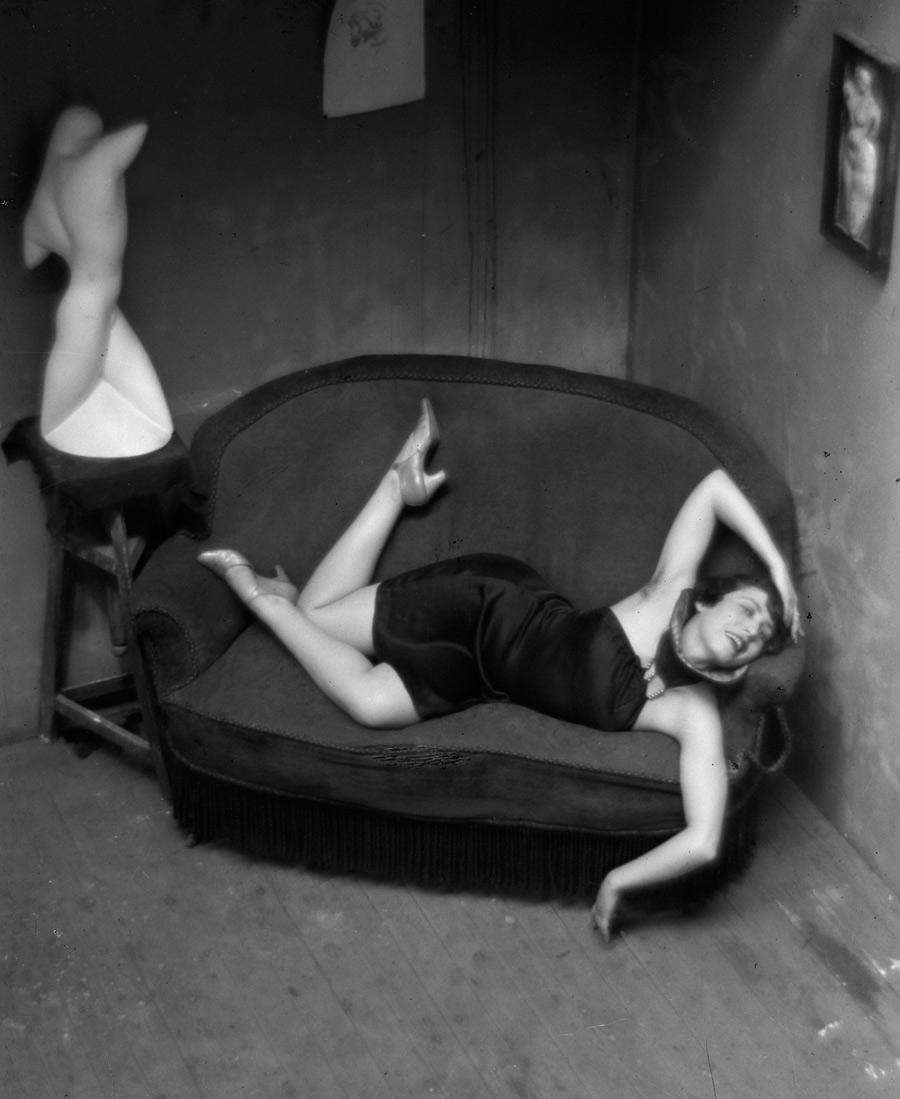
 'Peintre d'ombre, Paris' (Shadow painter, Paris) 1926")
 'Bastille, Rue de Lappe, Paris' 1926")


 'Konica Pop' 2009")
 'Untitled (three-lens camera)' 2011")
 'Not titled (person with binoculars)' 2009")
 'Not titled (figure with camera)' 2006")
 'Red NEK SLR' 2011")
 'Orange AKI SLR' 2011")
 'Not titled (explosion II)' 1996")
 'Not titled (fruit)' 1993")
 'Untitled 7 (view from model plane launch area)' 2001")
 'Bottle-brush near Sleaford Bay, South Australia' 1979")
 'Canberra suite no 2' 1980, printed c. 1984")
 'Canberra suite no 7' 1980, printed c. 1984")
 'After Heysen' 2005")
 'to walk on a sea of salt' 2004")
 'Hobart, Tasmania' 1972-75 from the album 'Australia'")
 'Tuncester, New South Wales' 1972-75 from the album 'Australia'")
 'Untitled' 1998 from the series 'flyblown'")
 'Untitled' 1998 from the series 'flyblown'")
 'Untitled' 1999 from the series 'Rampant'")
 'Untitled' 2008 from the series 'Lost to worlds'")
 'Untitled' 2008")
 'The road: Outback to the city 3' 1973-1975")
 'The road: Surfers to Hobart 15' 1973-1975")
 'The road: Port Hedland / Wittenoon / Roeburne, WA 14' 1973-1975")


 'Slow Swirl at the Edge of the Sea' 1944")

 'The She-Wolf' 1943")

 'Number 1A, 1948' 1948")
 'Number 20' 1949")
")
 'Vir Heroicus Sublimis' 1950-1951")
. 'West 23rd' 1963")
. 'Elegy to the Spanish Republic, 54' 1957-1961")
")
 'Australia' 1951")
")
. 'Martha's Vineyard' 1954-1959")
 'Man Looking at Woman' 1949")
 'Agony' 1947")
")
 'Paris' 1952")
 'Mississippi, St Louis' 1948")
 'New York' c. 1949")
 'Kwannon' 1952")
 'Woman, I' 1950-1952")
 'Shinnecock Canal' 1957")
 'Sky Cathedral' 1958")
 'Memoria in Aeternum' 1962")
")
 'No. 5/No. 22' 1950")
 'No. 3/No. 13' 1949")
 'Image No.9 from an Untitled sequence 1977' 1977")
 'Untitled' 1980/82")
 'Self-Portrait with Vanitas Symbols' c. 1651")
 'Untitled' 1983-84 Triptych")
 'Untitled 21/51' 1990-91")
 'Untitled #125' 2000-03")
 'Ophelia' 1851-1852")
 'Untitled' 2010/11")
 'Untitled' 2009/10")
 'Untitled' 2009/10")
 'Untitled' 2009/10")
![Leonardo da Vinci (Italian, 1452-1519) 'Study for the head of Christ for The Last Supper [Testa di Cristo]' c. 1494-1495](https://artblart.com/wp-content/uploads/2011/04/leonardo_da_vinci_head_of_christ_c1494_5.jpg "Leonardo da Vinci (Italian, 1452-1519) 'Study for the head of Christ for The Last Supper [Testa di Cristo]' c. 1494-1495")

You must be logged in to post a comment.