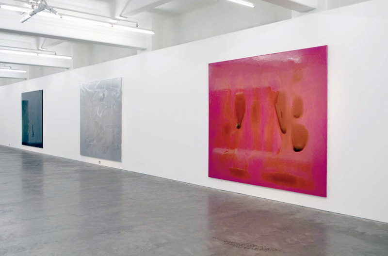
Dale Frank (Australian, b. 1959) The Big Black Bubble (installation view) Left to right: Timothy Oliphant (2008), Ryan Gosling (2008/2009) and Matthew Macfadyen (2008) 2009
This is a brilliant exhibition by Dale Frank, one of my favourites so far this year in Melbourne.
Six large varnish on linen landscape paintings are presented in the beautiful Anna Schwartz gallery space in Melbourne. Photographs really do not do the paintings justice – they can only give an impression of the size and scale of the work but not of their intimacy or smell. The smell of varnish permeates the air. The serendipity of the natural convulsions of the varnish and the facilitations of the hand of the artist, his performance, have been caught like bugs in amber in the final molecular structure of the painting. Here are pendulous, globular goops of varnish, immersive heroic tone poems that form images in the mind of the viewer. Moving close to the paintings you are surrounded by flows and eddies, the macro and the micro; details become more apparent as you study the work.
While disagreeing that these paintings are the viewers to create (the viewer as author) what I can say is that the artist offers the viewer the ability to generate their own resonances with the painting, to use the imagination of ‘equivalence’ to suggest what these paintings stand for – and also what else they stand for. States of being, of transformation, wonder and joy emerge in the playfulness of these works. Perhaps this is where the titles of the paintings come from, referencing film actors in the pop tradition, but this is the only thing that did not ring true with the work, their titles. The use of this trope seems to me a bit facile given the nature of the work.
The hot pink painting Rupert Grint (2008/2009, above) is hotter and lighter than in the photograph below, the varnish more translucent, the effect altogether mesmeric. You are drawn into the work, the intensity of the colour, the thickness of the hanging varnish. Two cosmological galaxies (Timothy Oliphant (2008) and Matthew Macfadyen (2008)) surround the most complex painting in the exhibition, the darkness and light that is Ryan Gosling (2008/2009, below).
This painting is a tour de force. With the poetic structure of an oil spill, the varnish forms intricate slick upon slick contours that are almost topographical in their mapping. The black oozes light, becomes ‘plastic’ black before your eyes, like the black of Rembrandt’s backgrounds, illusive, illuminative and hard to pin down – perpetually hanging there in two dripping rows, fixed but fluid at one and the same time (you can just see the suspensions in the photograph above).
The painting reminds me of the black paintings of Mark Rothko that he undertook for The Rothko Chapel in Houston, Texas (see below). As with the Rothko paintings, this painting is not just black (physically there are swirls of purple as in the Rothko paintings), not about darkness at all. What both artists do is create a contemplative, transformative space – in Frank’s case for a world on the edge of oblivion. This is a post post-modern landscape: process and nature, performance and chance coalescing in the colour : black!
This painting is one of the most overwhelming syntheses of art and nature, of universal forces that I have seen in recent contemporary art. This exhibition is an electric pulsating universe of life, landscape and transformation.
Magnificent!
Dr Marcus Bunyan
Many thankx to Anna Schwartz Gallery for allowing me to publish the photographs in the posting. Please click on the photographs for a larger version of the image.
Dale Frank (Australian, b. 1959) The Big Black Bubble (installation view) Left to right: Daniel Radcliffe (2008/2009), Khan Chittenden (2009) and Rupert Grint (2008/2009) 2009
The immersive scale of these new paintings at Anna Schwartz Gallery Melbourne allows us to experience their inner qualities of landscape and of transformation. This is painting at fundamental authenticity. The paint is its own agent; it is allowed to act, to behave. The artist is the facilitator of these phenomena of nature and natural forces, whose residue is a metaphor for nature itself.
Black contains all colours, contours and depths. A pink monochrome is transformed by pure varnish into an expressionistic moment of process and performance. All colour is absent from elemental silver aluminium and form and gesture alone survive. New dynamics are possible through an innovative colouration: the emergence of colour through black, and its equivalent power.
Dale Frank’s painting is one of poetry, performance and nature. It represents both the macro and micro. Huge universal forces pulsate with molecular, atomic activities. Imagination is gifted by the artist to the viewer. These are our paintings to create.
Anonymous text from the exhibition flyer.
Dale Frank (Australian, b. 1959) Ryan Gosling 2008/2009
The Rothko Chapel Houston, Texas
Anna Schwartz Gallery 185 Flinders Lane Melbourne 3000 Australia Phone: +61 3 9654 6131
Many thankx to Philadelphia Museum of Art for allowing me to publish the photographs in the posting. Please click on the photographs for a larger version of the image.
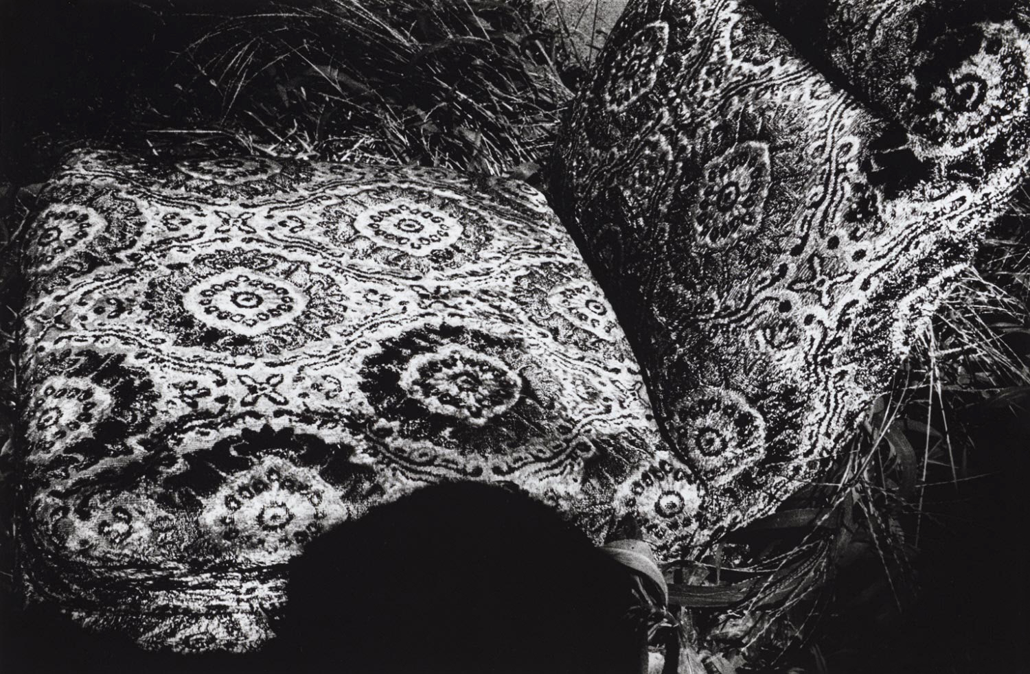
Daidō Moriyama often calls himself a “stray dog,” a reference to one of his iconic early pictures of a roaming mongrel, but also to his preferred incidental vantage points in relation to his subjects and his beguiled yet wary stance toward modernising Japanese society. In the series Memory of Dog, he revisited photographic scenarios and motifs from his previous two decades of work, overlaying his peripheral approach with another quality that he finds crucial to photography: its relationship to memory.
Daidō Moriyama is one of the most important and exciting Japanese photographers of our time, having made prolific, often experimental pictures of modern urban life since the 1960s. This exhibition showcases a group of approximately 45 photographs made in and around Tokyo in the 1980s, when Moriyama focused his mature aesthetic on the city with renewed intensity.
Moriyama approaches the world with an equalising eye, capturing disparate peripheral details that in themselves account for little, but together add up to a powerful diagnosis of modern experience. In 1980s Japan such details encompassed the disorienting and sometimes brutal juxtaposition of traditional culture and modernisation, most visible in the glut of consumer goods and images. But in Moriyama’s photographs these subjects appear alongside the banal elements of any streetscape: a derelict patch of pavement and wall, a car with an aggressive key scratch running its full length, even a single rose blossom.
Moriyama’s urban imagery shares some of its qualities with other great street photography of the 20th century, and he has cited the photographs of William Klein as a major influence. But his work involves strong responses to a wide range of modern art and literature, including photographs and graphic designs by many of his Japanese contemporaries, Andy Warhol’s silkscreens, and the novels of Jack Kerouac and James Baldwin. Moriyama’s mix of international and Japanese trends to represent modern Tokyo is one source of his photography’s power, and the exhibition will include a small number of works by other artists to demonstrate his visual sensibility, including prints and photographs by Warhol, Klein, Shomei Tomatsu, and Tadanori Yokoo.
Text from the Philadelphia Museum of Art website [Online] Cited 23/03/2009. Used under fair use conditions for the purposes of education and research
Since the 1960s Japanese photographer Daidō Moriyama (born 1938) has been making dynamic, often experimental images of modern urban life, establishing a reputation as one of the most important and exciting photographers of our time. The Philadelphia Museum of Art will present an exhibition of approximately 45 photographs by Moriyama, made in and around Tokyo in the 1980s, when the artist focused his mature aesthetic on the city with renewed intensity. The exhibition will be on view from February 28-June 30, 2009 in the Julien Levy Gallery at the Ruth and Raymond G. Perelman Building.
Born in 1938 in Ikeda-cho (now Ikeda-shi), Osaka, Moriyama witnessed the dramatic changes that swept over Japan in the decades following World War II. After his father’s death in a train accident, he began working as a freelance graphic designer at age 20. He was intrigued by the graphic possibilities of screenprinting, the cheapest and most prolific form for printed imagery, and by international trends in contemporary art. These interests, along with attention to the various forms of visual stimuli that populate the urban landscape have been a hallmark of Moriyama’s career.
In 1960 Moriyama took up the study of photography under Takeji Iwamiya and one year later moved to Tokyo hoping to join the eminent photographers’ group VIVO, a short-lived cooperative whose members were exploring and confronting the revolution in modern Japanese society in their work. Although VIVO disbanded a week after Moriyama’s arrival in the capital, the visual and existential turmoil they explored would become one of the core subjects in Moriyama’s photographs. His gritty, black and white images of streets and highways express the conflicting realities of contemporary Japan, the disorienting and sometimes brutal juxtaposition of traditional culture and modernisation.
“It is a pleasure to present this group of photographs from the Museum’s collection reflecting the distinctive vision of Daidō Moriyama, who is undoubtedly among the great urban photographers of the 20th century,” Curator of Photographs Peter Barberie said. These particular images focus on the visual experience of modern-day Tokyo, but through them Moriyama is documenting broader global trends of modernisation, and at the same time exploring the unique aesthetic qualities of his medium.”
His early images from the 1960s and 70s tested the notion of photographic artistry in an extreme fashion. He chose seemingly arbitrary subjects, and experimented with motion and overexposure to create blurred or nearly blank images, adopting an anti-aesthetic position. Other Japanese photographers were also working in this vein, but Moriyama’s 1972 book Bye Bye Photography became the defining statement of this particular style. The later photographs presented in this exhibition are generally sharper in focus but maintain the peripheral vantage point that Moriyama so often employed, as well as the seemingly random content. His images capture with an equalising eye the kinds of disparate peripheral details that litter the modern urban experience: shadows, cars, and abandoned corners, as well as the glut of consumer goods and commodities.
Profoundly influenced by Japanese photographers Eikoh Hosoe and Shomei Tomatsu, Moriyama’s vision was also enriched by his acquaintance with the work of American photographers William Klein and Robert Frank. Like them he practiced a new, more action-oriented street photography. His images are often out of focus, vertiginously tilted, or invasively cropped.
His work also involves strong responses to a wide range of modern art and literature, including photographs and graphic designs by many of his Japanese contemporaries, Andy Warhol’s silkscreens, and the novels of Jack Kerouac and James Baldwin. The exhibition will include a small number of works by other artists to demonstrate his visual sensibility, including prints and photographs by Warhol, Klein, Shomei Tomatsu, and Tadanori Yokoo.
“Richter’s spontaneous musings, his amorphous worlds, his bleeds and blends crack open the skin of our existential life on earth.’ Dr Marcus Bunyan
Exhibition dates: 20th February – 12th April, 2009
Curated/organised in conjunction with the Museum Morsbroich in Leverkusen, Germany, and edited/curated by museum director and art historian Markus Heinzelmann
Gerhard Richter (German, b. 1932) 9.4.89 10.1 x 14.8cm Oil on colour photograph
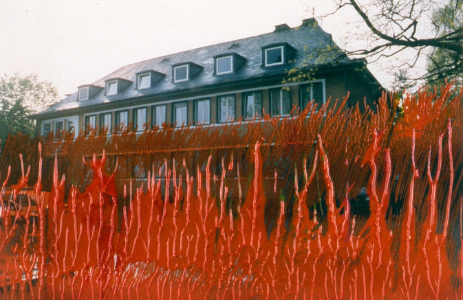
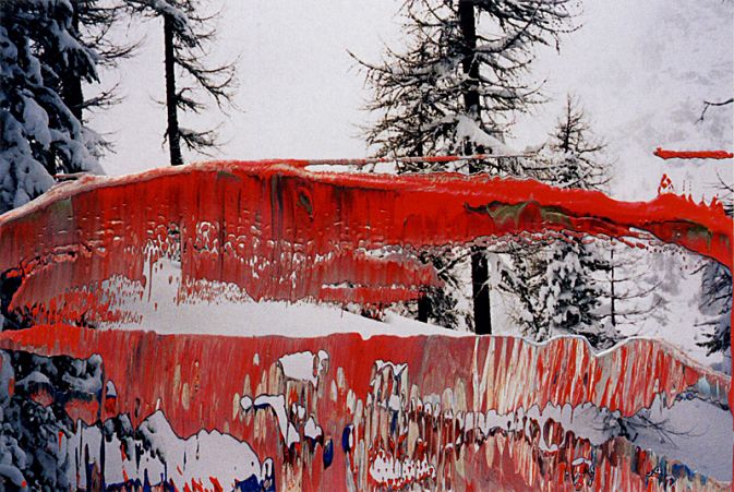
There is something unsettling in Richter’s serendipitious interventions. Using his own prosaic 10 x 15cm colour photographs that have been commercially printed as the basis of the works, Richter overlays the surface of the photograph with skeins of paint that disturb the reflexivity of each medium. Dragging the photograph through the paint or using a palette knife to apply layers of colour, the surfaces of paint and photograph no longer exist as separate entities. The process produces punctum like clefts rent in the fabric of time and space. If the intervention is judged unsuccessful the result if immediately destroyed.
In 5.Juli.1994 (below) blood red fingers of paint strain upwards as they invade the solidity of a dour suburban home, echoing the invading trees branches at top right of picture. In 11.2.98 (below) green paint slashes across the mouth and forehead of a woman in a floral dress, her eyes seemingly bloodshot and pleading stare into the distance to the left of our view, the silent scream strangled in her throat by the vibrations of paint. These are the instantaneous responses of the artist to the photograph, a single mood expounded in irreversible gestures, the actions of the painter’s hand disturbing the indexical link of the photograph and it’s ability to be ‘read’ as a referent of the object it depicts. Richter’s interventions challenge the concept of momentary awareness and offer the possibility of a space between, where the image stands for something else – access to Other, even a contemplation of the sublime.
“The colour of paint applied corresponds or contrasts the tonalities of the underlying photograph but link the two through formal relationships of the layers … Often a tense relationship, the results run the gamut of the surreal to the beautiful to the disturbed. It is all the more surprising that each in its perceived completeness was in essence accomplished by chance and trial and error.”1
“Richter’s painterly gestures bounce off the [photographs] content in peculiar ways, sometimes interacting with it, sometimes overlaying it and sometimes threatening to eclipse it altogether. The final effect is to cause both photography and painting to seem like incredibly bizarre activities, disparate in texture but often complicit in aspiration.”2
I love the violence, the sometimes subversive, sometimes transcendental ‘equivalence’ of these images: where a Steiglitz cloud can stand for music, where a Minor White infrared photograph posits a new reality, Richter offers us an immediacy that destroys the self-reflexive nature of everyday life. His spontaneous musings, his amorphous worlds, his bleeds and blends crack open the skin of our existential life on earth.
Here, certainly, are ‘the clefts in words, the words as flesh’.
Gerhard Richter (German, b. 1932) 11.4.89 10 x 15cm Oil on colour photograph
Gerhard Richter (German, b. 1932) 11.3.89 10 x 14.9cm Oil on colour photograph
Gerhard Richter (German, b. 1932) 5.Juli.1994 10.2 x 15.2cm Oil on colour photograph
Gerhard Richter (German, b. 1932) 11.2.98 10 x 14.7cm Oil on colour photograph
Gerhard Richter (German, b. 1932) 22.2.96 9.6 x 14.7cm Oil on colour photograph
Gerhard Richter (German, b. 1932) 11.Febr.05 10.1 x 14.9cm Oil on colour photograph
The exhibition presents 330 of Richter’s largely unknown overpainted photographs, a technique he has been using since 1982.
The exhibition UERBERNALTE FOTOGRAFIEN / PHOTOGRAPHIES PEINTES (OVERPAINTED PHOTOGRAPHS) at the Centre de la photographie Geneva (CPG) presented a side of the work of Gerhard Richter largely unknown up till now. Only a few collectors and gallerists close to the artist were aware of the practice that Gerhard Richter, one of the most important artists of our time, had developed systematically since 1982. It is only because of this exhibition that more than 1000 of his over-painted photographs will enter his catalogue raisonné. The CPG presents approximately 330 of them in this show.
“By placing paint on photographs, with all their random and involuntary expressiveness, Gerhard Richter reinforces the unique aspect of each of these mediums and opens a field of tension rich in paradoxes, as old as the couple – painting / photography – which has largely defined modern art.”
Gerhard Richter is justly famed for the photorealism of his early canvases, but it is less well known that he has also painted directly onto photographic prints. These (mostly small-format) pieces were reproduced in books as early as the first Atlas, but practically all of the works themselves are housed in private collections and rarely exhibited in public. Overpainted Photographs gathers this body of work, which unites the labor of the hand with the work of mechanical reproduction to produce a kind of art as conceptually rich as Richter’s better-known paintings, neutralizing the expressive powers of each medium to reach an indifference to their potency. In an overture to Duchamp’s “degree zero” found objects, the original photographs are frequently bland in content – an empty office, a ball, a beach scene or tourist snapshot – and Richter’s painterly gestures bounce off that content in peculiar ways, sometimes interacting with it, sometimes overlaying it and sometimes threatening to eclipse it altogether. The final effect is to cause both photography and painting to seem like incredibly bizarre activities, disparate in texture but often complicit in aspiration. This monograph offers a unique opportunity to savour what had previously been a neglected but copious aspect of Richter’s work.
“The public scenes, whether on the beach or the ski slope or children’s theatre, are beset with sudden surges of colour that tend to resemble interventions of the sky or elemental forces, more than the moods of a decorative or ornamental painter annotation. Sometimes they seem like catastrophic visions. Blood-red snowflakes dance above the white fern. The photo shows skyscrapers in the urban morning sun – and the oil paint adds to the sulpherous fire that pours over the city from the sky”
Exhibition dates: National Gallery of Art, January 18 – April 26, 2009; San Francisco Museum of Modern Art, May 16 – August 23, 2009; Metropolitan Museum of Art, September 22 – December 27, 2009
Curator: Sarah Greenough, senior curator and head of the Department of Photographs at the National Gallery of Art
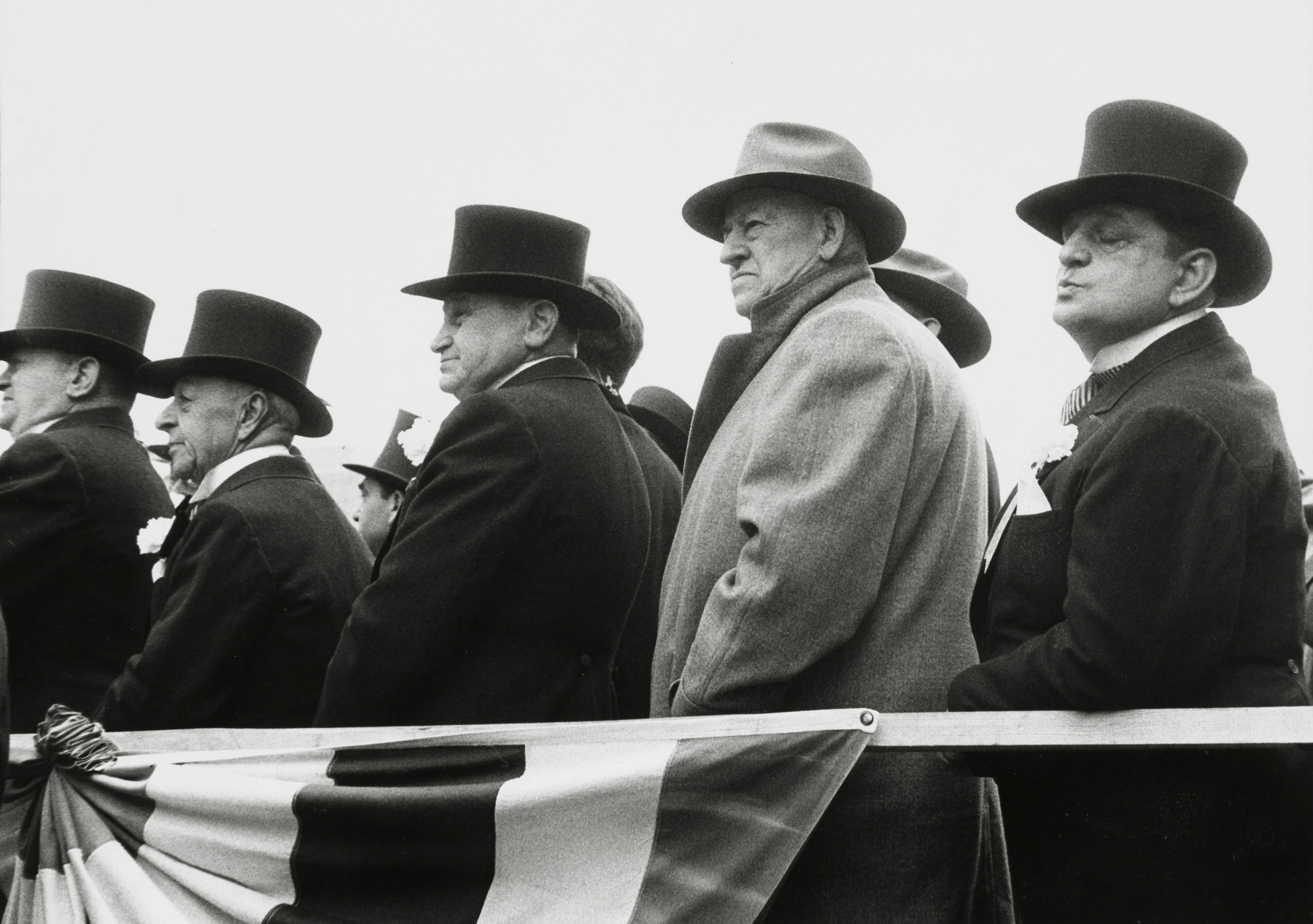
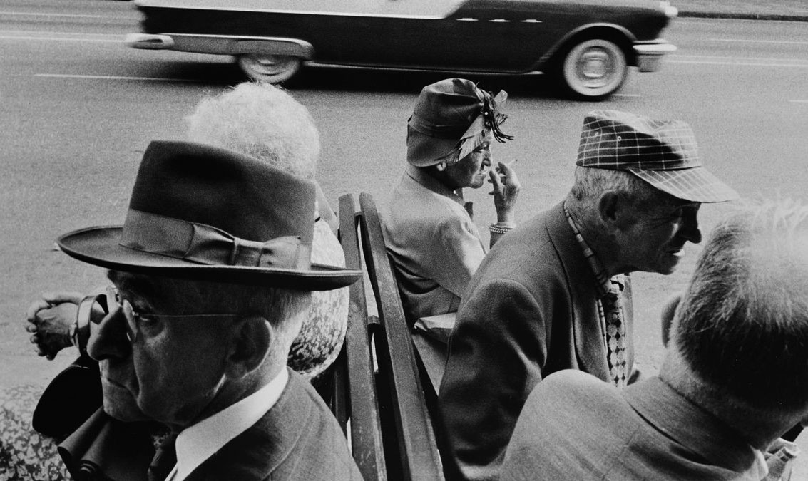
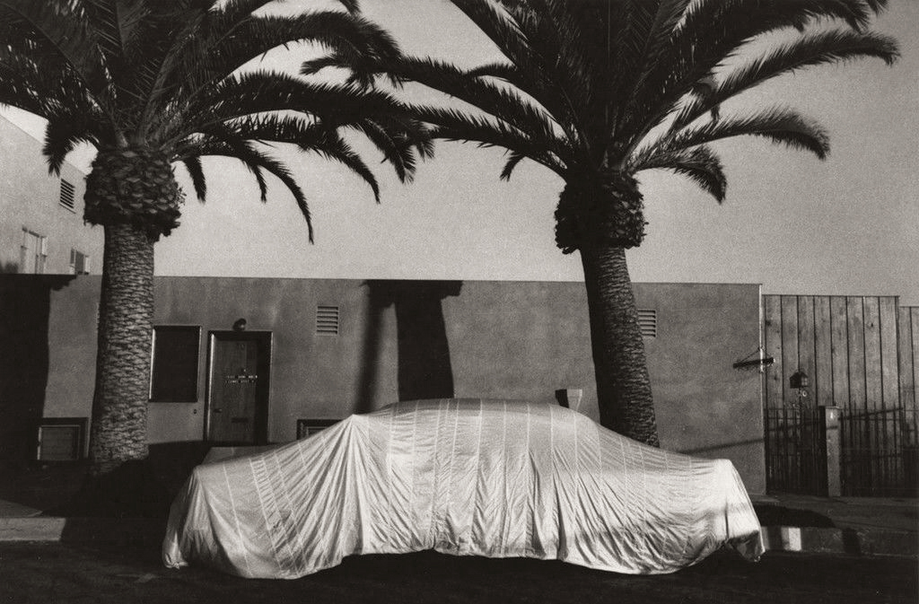
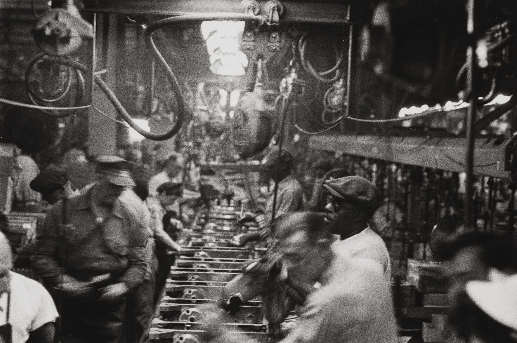
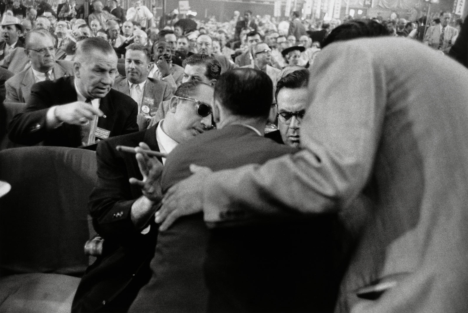
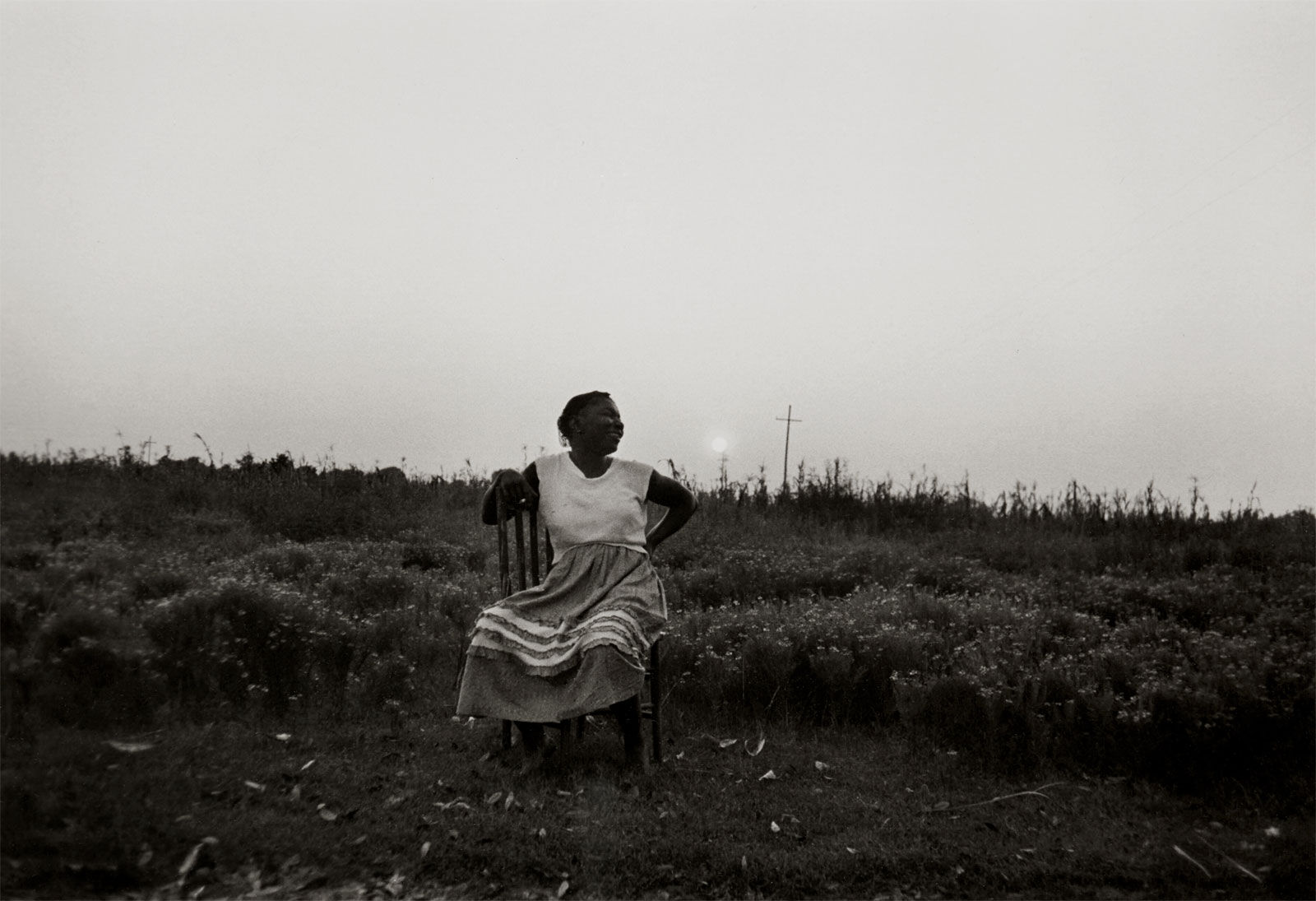
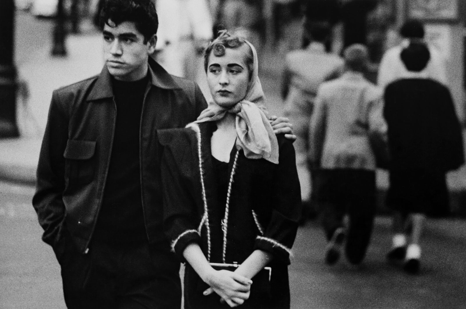
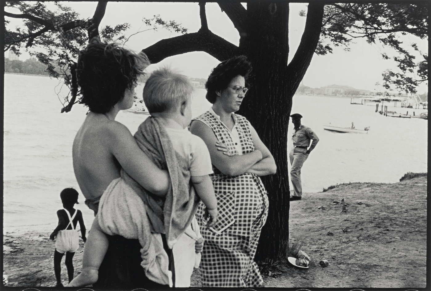
Robert Frank (Swiss-American, 1924-2019) The Americans New York: Grove Press 1959
One of the seminal photography books of the twentieth century, Robert Frank’s The Americans changed photography forever, changed how America saw itself and became a cult classic.
Like Eugene Atget’s positioning of the camera in an earlier generation Frank’s use of camera position is unique; his grainy and contrasty images add to his outsider vision of a bleak America; his sequencing of the images, like the cadences of the greatest music, masterful.
One of the easiest things for an artist to do is to create one memorable image, perhaps even a group of 4 or 5 images that ‘hang’ together – but to create a narrative of 83 images that radically alter the landscape of both photography and country is, undoubtedly, a magnificent achievement.
The photographs in the posting appear by number order that they appear in the book.
Dr Marcus Bunyan
Many thankx to the National Gallery of Art for allowing me to publish the photographs in the posting. Please click on the photographs for a larger version of the image.
Released at the height of the Cold War, The Americans was initially reviled, even decried as anti-American. Yet during the 1960s, many of the issues that Frank had addressed – racism, dissatisfaction with political leaders, skepticism about a rising consumer culture – erupted into the collective consciousness. The book came to be regarded as both prescient and revolutionary and soon was embraced with a cult-like following.
First published in France in 1958 and in the United States in 1959, Robert Frank’s The Americans is widely celebrated as the most important photography book since World War II. Including 83 photographs made largely in 1955 and 1956 while Frank (1924-2019) travelled around the United States, the book looked beneath the surface of American life to reveal a profound sense of alienation, angst, and loneliness. With these prophetic photographs, Frank redefined the icons of America, noting that cars, jukeboxes, gas stations, diners, and even the road itself were telling symbols of contemporary life. Frank’s style – seemingly loose, casual compositions, with often rough, blurred, out-of-focus foregrounds and tilted horizons – was just as controversial and influential as his subject matter. The exhibition celebrates the 50th anniversary of the book’s publication by presenting all 83 photographs from The Americans in the order established by the book, and by providing a detailed examination of the book’s roots in Frank’s earlier work, its construction, and its impact on his later art.
Anonymous text from The National Gallery of Art website [Online] Cited 06/03/2009. No longer available online. Used under fair use conditions for the purposes of education and research
“The photos revealed a bleaker, more dislocated view of America than Americans were used to (at least in photography). Frank’s “in-between moments” demonstrated that disequilibrium can seem more revealing, seeming to catch reality off-guard. In doing so the collection also announced to the world that photos with a completely objective reference / referent could be subjective, lyrical, and reveal a state of mind. Looser framing, more forced or odd juxtapositions, “drive-by” photos and other elements offer a sense of the process that has produced the photos”
Lloyd Spencer on Discussing The Americans in Hardcore Street Photography
“Frank’s contact sheets take us back to the moment he made the photographs for The Americans. They show us what he saw as he travelled around The United States and how he responded to it. These sheets are not carefully crafted objects; in his eagerness to see what he had captured, Frank did not bother to order his film strips numerically or even to orientate them all in the same direction.”
The 50th anniversary of a groundbreaking publication will be celebrated in the nation’s capital with the exhibition Looking In: Robert Frank’s The Americans, premiering January 18 through April 26, 2009, in the National Gallery of Art’s West Building ground floor galleries. In 1955 and 1956, the Swiss-born American photographer Robert Frank (b. 1924) traveled across the United States to photograph, as he wrote, “the kind of civilisation born here and spreading elsewhere.” The result of his journey was The Americans, a book that looked beneath the surface of American life to reveal a culture on the brink of massive social upheaval and one that changed the course of 20th-century photography.
First published in France in 1958 and in the United States in 1959, The Americans remains the single most important book of photographs published since World War II. The exhibition will examine both Frank’s process in creating the photographs and the book by presenting 150 photographs, including all of the images from The Americans, as well as 17 books, 15 manuscripts, and 28 contact sheets. In honour of the exhibition, Frank has created a film and participated in selecting and assembling three large collages. The exhibition will travel to the San Francisco Museum of Modern Art from May 17 through August 23, 2009, and The Metropolitan Museum of Art from September 22 through December 27, 2009.
“The Americans is as powerful and provocative today as it was 50 years ago,” said Earl A. Powell III, director, National Gallery of Art. “We are immensely grateful to Robert Frank and his wife, June Leaf, for their enthusiastic participation and assistance in all aspects of this exhibition and its equally ambitious catalogue. We also wish to thank Robert Frank for his donation of archival material related to The Americans, in addition to gifts of his photographs and other exhibition prints to the National Gallery of Art in 1990, 1994, and 1996, all of which formed the foundation of the project.”
“It’s hard to stress how different The Americans was. Over the course of those 83 pictures – shot from Detroit to San Francisco to Chattanooga, Tennessee – Frank captured the country in images that were intentionally unglamorous. On a technical level, he brazenly tossed out an adherence to traditional ideas of composition, framing, focus, and exposure.”
Sarah Greenough, Senior Curator of Photography at the National Gallery of Art in Washington
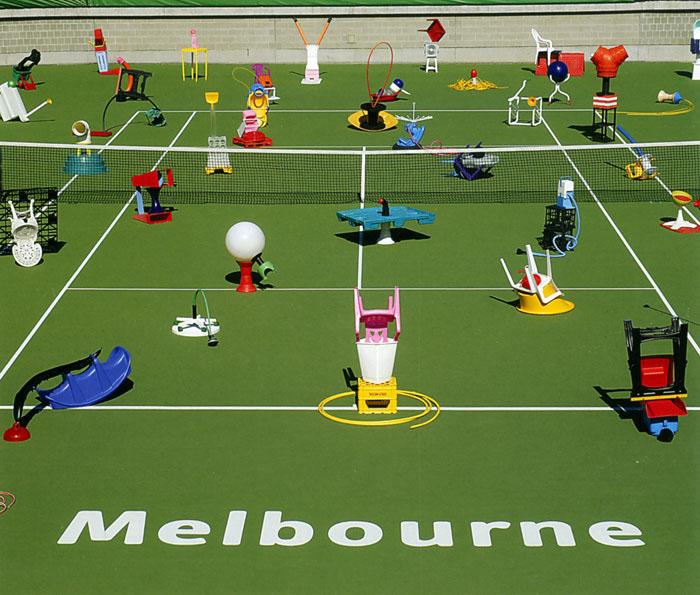
Louise Paramor (Australian, b. 1964) Show Court 3 (II) 2009
Boarding a train at Flinders Street we emerge at South Yarra station to stroll down to River Street for our third opening of the night at Nellie Castan Gallery. We are greeted by the ever gracious Nellie Castan who has just returned from an overseas trip to Europe where she was soaking up the wonders of Rome amongst other places. For the latest exhibition in the gallery Louise Paramor is presenting two bodies of work: Show Court 3 and Mood Bomb (both 2009). Lets look at Show Court 3 first as this work has older origins.
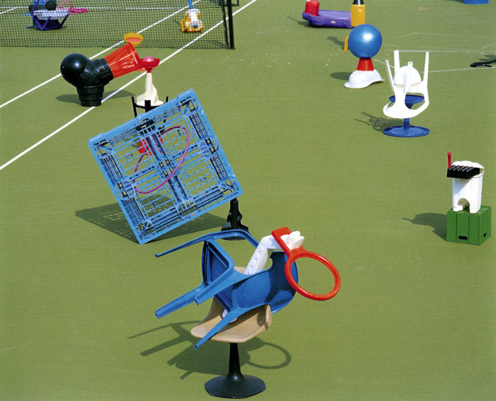
Originally exhibited in 2006 at Nellie Castan under the title Jam Session the sculptures from this exhibition and many more beside (75 in all) were then installed in 2007 on show court 3 at Melbourne & Olympic Parks, hence the title of the installation. In the smaller gallery in 2009 we have six Lambda photographic prints that are records of this installation plus a video of the installation and de-installation of the work.
While interesting as documentary evidence of the installation these photographs are thrice removed from the actual sculptures – the sculptures themselves, the installation of the sculptures on court and then the photographs of the installation of the sculptures. The photographs lose something in this process – the presence or link back to the referentiality of the object itself. There is no tactile suggestiveness here, no fresh visual connections to be made with the materials, no human interaction. The intertextual nature of the objects, the jamming together of found pieces of bright plastic to make seductive anthropomorphic creatures that ‘play’ off of each other has been lost.
What has been reinforced in the photographs is a phenomena that was observed in the actual installation.
“The sculptures created a jarring visual disruption when placed in a location normally associated with play and movement. The stadium seating surrounding the tennis court incited an expectation of entertainment; a number of viewers sat looking at the sculptures, as though waiting for them to spin and jump around. But mostly, the exhibition reversed the usual role of visitors to place where one sits and watches others move; here the objects on the tennis court were static and the spectators moved around.” (2007)1
In the photographs of these objects and in the installation itself what occurs is an inversion of perception, a concept noted by the urbanist Paul Virilio.2 Here the objects perceive us instead of us perceiving the object: they stare back with an oculocentric ‘suggestiveness’ which is advertising’s raison d’être (note the eye sculpture above). In particular this is what the photographs suggest – a high gloss surface, an advertising image that grabs our attention and forces us to look but is no longer a powerful image.
In the main gallery was the most stimulating work of the whole night – experiments of abstraction in colour “inspired by the very substance of paint itself.” Made by pouring paint onto glass and then exhibiting the smooth reverse side, these paintings are not so much about the texture of the surface (as is Dale Frank’s work below) but a more ephemeral thing: the dreamscapes of the mind that they promote in the viewer, the imaginative connections that ask the viewer to make. Simpler and perhaps more refined than Frank’s work (because of the smooth surface, the lack of the physicality of the layering technique? because of the pooling of amoebic shapes produced, not the varnish that accumulates and recedes?) paint oozes, bleeds, swirls, drips upwards and blooms with a sensuality of intense love. They are dream states that allow the viewer to create their own narrative with the title of the works offering gentle guides along the way: Girl with Flowers, Lovers, Mood Bomb, Emerald God, Mama, and Animal Dreaming to name just a few. To me they also had connotations of melted plastic, almost as if the sculptures of Show Court 3 had dissolved into the glassy surface of a transparent tennis court.
These are wonderfully evocative paintings. I really enjoyed spending time with them.
Dr Marcus Bunyan
1/ O’Neill, Jane. Louise Paramor: Show Court 3. Melbourne: Nellie Castan Gallery, 2009
2/ Virilio, Paul. The Vision Machine. (trans. Julie Rose). Bloomington: Indiana University Press, 1994, pp. 62-63
Many thankx to Nellie Castan Gallery for allowing me to publish the photographs in the posting. Please click on the photographs for a larger version of the image.
Louise Paramor (Australian, b. 1964) Show Court 3 (VI) 2009
Louise Paramor (Australian, b. 1964) Show Court 3 (detail) 2009
Louise Paramor (Australian, b. 1964) Show Court 3 (detail) 2009
Louise Paramor (Australian, b. 1964) Opening night crowd in front of Sky Pilot (left) and Mama (right) 2009 Paint on glass
Louise Paramor (Australian, b. 1964) Opening night crowd in front of Green Eyed Monster (right) and Sky Pilot (right) 2009 Paint on glass
Louise Paramor (Australian, b. 1964) Opening night crowd in front of Pineapple Express 2009 Paint on glass
Louise Paramor (Australian, b. 1964) A Dog and His Master (detail) 2009 Paint on glass
Louise Paramor (Australian, b. 1964) Lovers 2009 Paint on glass
Dale Frank (Australian, b. 1959) 2. One conversation gambit you hear these days: ‘Do you rotate?’ An interesting change of tack? No suck luck. ‘Do you rotate?’ simply fishes for information about the extent of your collection. Do you have enough paintings to hang a different one in your dining room every month? 2005
Louise Paramor (Australian, b. 1964) Mood Bomb 2009 Paint on glass
Louise Paramor (Australian, b. 1964) Slippery Slope (detail) 2009 Paint on glass
Louise Paramor (Australian, b. 1964) Green Eyed Monster (detail) 2009 Paint on glass
Many thankx to the Nelson-Atkins Museum of Art for allowing me to publish the photographs in the posting. Please click on the photographs for a larger version of the image.
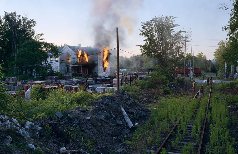
Gregory Crewdson (American, b. 1962) Untitled from the series Beneath the Roses 2006 Digital pigment print
Famed photographer Gregory Crewdson will present the inaugural discussion in a series sponsored by the Photography Society of The Nelson-Atkins Museum of Art, Kansas City…
Crewdson’s work has been widely exhibited and reviewed. He makes large-scale photographs of elaborate and meticulously staged tableaux, which have been described as “micro-epics” that probe the dark corners of the psyche. Working in the manner of a film director, he leads a production crew, which includes a director of photography, special effects and lighting teams, casting director and actors. He typically makes several exposures that he later digitally combines to produce the final image.
“Crewdson is one of the most daring and inventive contemporary artists using photography,” said Keith F. Davis, Curator of Photography at the Nelson-Atkins. “His meticulously crafted works are immensely rich in both narrative and psychological terms. They prod us to rethink our ‘usual’ relationship to photographs as physical objects and as records of worldly fact. Crewdson is a genuinely important figure in today’s art world. He has an international reputation and has influenced an entire generation of younger photographic artists.”
Attendance to the program is free.
Text from ArtDaily.org website
Gregory Crewdson (American, b. 1962) Untitled from the series Beneath the Roses 2005 Digital pigment print
Gregory Crewdson (American, b. 1962) Untitled from the series Beneath the Roses 2005 Digital pigment print
Gregory Crewdson (American, b. 1962) Untitled (Sunday Roast) from the series Beneath the Roses 2005 Digital pigment print
Nelson-Atkins Museum of Art 4525 Oak Street Kansas City, MO 64111
“Go’s musings on the existential nature of our being are both full and empty at one and the same time and help us contemplate the link to the breath of the sublime.” Dr Marcus Bunyan
Exhibition dates: 25th February – 14th March, 2009
Junko Go (Australian born Japan, b. 1955) Opium Poppy 2008
“One person’s heaven is another’s nightmare. Seeing both sides to every story can be a blessing and a curse. Good and bad, right and wrong, purity and impurity are inextricably linked.”
A delicate, refined but strong presence is felt in the work of Junko Go in the her new exhibition ‘all about … blooming’ at Gallery 101, Melbourne. Nominally landscape painting about flowers but featuring thoughts and ideas about the seed, the shoot, pollen and the breath of life the work addresses the essence of what it is to be human and live compassionately on this earth in an intelligent and profound way.
Denying the nihilism of abstract expressionism each mark is fully considered by being attentive to the connection between brush, hand and meaning. Almost childlike in their use of charcoal and acrylic her dogs, crosses and flowers, jottings and dashes, rain and rivers, seeds and people show a Zen like contemplation in the marks she makes on the canvas – just so. A releasement towards things is proffered, a letting go of the ego to create an awareness of just being. There is genuine warmth and humility to this work.
In Opium Poppy (2008, above) the darkness of the nightmare is represented by the black marks, ascending like Jacob’s ladder balanced by the mandala like poppies whose petals seem like feathers of a bird’s wing – a flight of fancy both good and bad. In Pollen (2009) bees swarm around a sunflower leaving traces of their presence, a bird flies close to a tiny blue cloud, the sun burst forth in a tiny patch of aqua colour, and people hug arm in arm. As Go says, “Bees in a flower bear pollen unawares and play a crucial roll for the plant to survive. Our love, kindness, warmth and wisdom affect one another unawares and play a crucial roll for our planet to survive.” In New Shoot (2008, below) the puzzle of our existence, the nature of our existential being is laid bare for all to see.
In Seeds (2008) Go reminds us that rather than being focused on what we hoped for, we must make the most of whatever opportunities we are blessed with. This means being aware of the gifts one possesses, not the distance between ‘I’ and want, need and desire – now! The seed of our experience – the calm before the force that propelled us into existence – is already present within us.
Go’s musings on the existential nature of our being are both full and empty at one and the same time and help us contemplate the link to the breath of the sublime. In the end Go’s paintings are about endings and beginnings, about being strong or not, about the infinity of the seed and about our responses to living in harmony on this planet. Through the seed, the shoot, the flower and the earth access may be granted to the sublime and this perfectly sums up the work of this artist, a reflection of her energy and radiance transferred to the canvas. I loved it.
Dr Marcus Bunyan
Many thankx to Gallery 101 for allowing me to publish the art work in the posting. Please click on the art work for a larger version of the image.
Junko Go (Australian born Japan, b. 1955) New Shoot 2008
“Each of us is born to fill a special place in this world. In the process, we sometimes have trouble finding our niche. Life is like a jigsaw puzzle in which we make every effort to find our own place that makes a right connection with others, with the world and even with the whole universe.”
Junko Go (Australian born Japan, b. 1955) Red Hot Poker 2009
“Push and pull our inner strength. Sometimes, we need courage to take risks in confronting pain and loss in order to gain a deep and profound experience.”
“We live in a world where high achievers are congratulated, yet true achievements are not related to what we can get done, but to how deeply we aware of how wonderful it is to be alive. In this exhibition, flowers are not only a predominant source of visual inspiration, looking at them also engenders a kind of appreciation and wonder. The fragile and ephemeral flower provokes in me an awareness of the human condition that reveals the true nature of our existence.
My goal is to create images which are strong and soft, bold and precise, beautiful and ugly, figurative and abstract, all at once. My greatest challenge is to make art about what it is to be human … What really matters in art making to me is a kind of awareness – a being able to say, ‘I am as I am’.”
Curator: Craig Richards, photography curator at the Whyte Museum of the Canadian Rockies
Edward Burtynsky (Canadian, b. 1955) Silver Lake Operations #1, Lake Lefroy, Western Australia 2007 2007
One of the great photographers of the world.
Enjoy some of his images and for more photographs please visit his website.
Many thankx to The Whyte Museum of the Canadian Rockies for allowing me to publish the photographs in the posting. Please click on the photographs for a larger version of the image.
Edward Burtynsky (Canadian, b. 1955) Tanggu Port, Tianjin, China 2005 2005
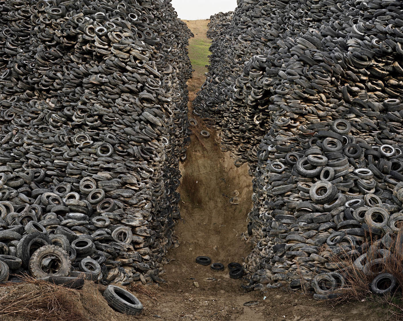
Nature transformed through industry is a predominant theme in my work. I set course to intersect with a contemporary view of the great ages of man; from stone, to minerals, oil, transportation, silicon, and so on. To make these ideas visible I search for subjects that are rich in detail and scale yet open in their meaning. Recycling yards, mine tailings, quarries and refineries are all places that are outside of our normal experience, yet we partake of their output on a daily basis.
These images are meant as metaphors to the dilemma of our modern existence; they search for a dialogue between attraction and repulsion, seduction and fear. We are drawn by desire – a chance at good living, yet we are consciously or unconsciously aware that the world is suffering for our success. Our dependence on nature to provide the materials for our consumption and our concern for the health of our planet sets us into an uneasy contradiction. For me, these images function as reflecting pools of our times.
Edward Burtynsky quoted on The Whyte Museum website
Edward Burtynsky (Canadian, b. 1955) Oxford Tire Pile #8, Westley, California 1999 1999
Edward Burtynsky (Canadian, b. 1955) Nickel Tailings #30, Sudbury, Ontario, 1996 1996
Edward Burtynsky (Canadian, b. 1955) Nickel Tailings #31, Sudbury, Ontario 1996 1996
Edward Burtynsky (Canadian, b. 1955) Feng Jie #4, Three Gorges Dam Project, Yangtze River, 2002 2002
“These images are meant as metaphors to the dilemma of our modern existence; they search for a dialogue between attraction and repulsion, seduction and fear,” said Edward Burtynsky, photographer. “We are drawn by desire – a chance at good living, yet we are consciously or unconsciously aware that the world is suffering for our success. Our dependence on nature to provide the materials for our consumption and our concern for the health of our planet sets us into an uneasy contradiction. For me, these images function as reflecting pools of our times.
Speaking of his “Quarries” series, Burtynsky has said, “The concept of the landscape as architecture has become, for me, an act of imagination. I remember looking at buildings made of stone, and thinking, there has to be an interesting landscape somewhere out there, because these stones had to have been taken out of the quarry one block at a time. I had never seen a dimensional quarry, but I envisioned an inverted cubed architecture on the side of a hill. I went in search of it, and when I had it on my ground glass I knew that I had arrived.”
Text from The Whyte Museum of the Canadian Rockies
Edward Burtynsky (Canadian, b. 1955) Shipbreaking #1, Chittagong, Bangladesh, 2000 2000
Edward Burtynsky (Canadian, b. 1955) Bao Steel #2, Shanghai, China, 2005 2005
Edward Burtynsky (Canadian, b. 1955) Iberia Quarries #3, Bencatel, Portugal, 2006 2006
Edward Burtynsky (Canadian, b. 1955) China Quarries #8, Xiamen, Fujian Province, 2004 2004
Edward Burtynsky (Canadian, b. 1955) Dam #6, Three Gorges Dam Project, Yangtze River, 2005 2005
Trailer for the film Manufactured Landscapes in which Jennifer Baichwal documents Edward Burtynsky doing what artists do – making art, in this case photographing Bangladesh and China as he observes the “manufacturer to the world”.
Edward Burtynsky Manufactured Landscapes
The Whyte Museum of the Canadian Rockies 111 Bear Street, Banff, Alberta T1L 1A3 Canada Phone: 1 403 762 2291
Marcus Bunyan (Australian, b. 1958) On Port Phillip Bay 2009
Port Phillip Bay in the morning from the 48th floor of a tower in Southbank, Melbourne
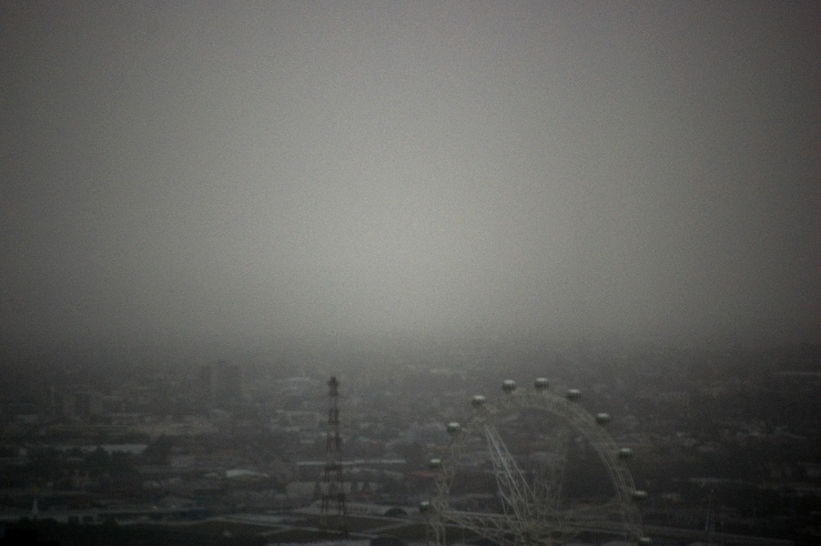
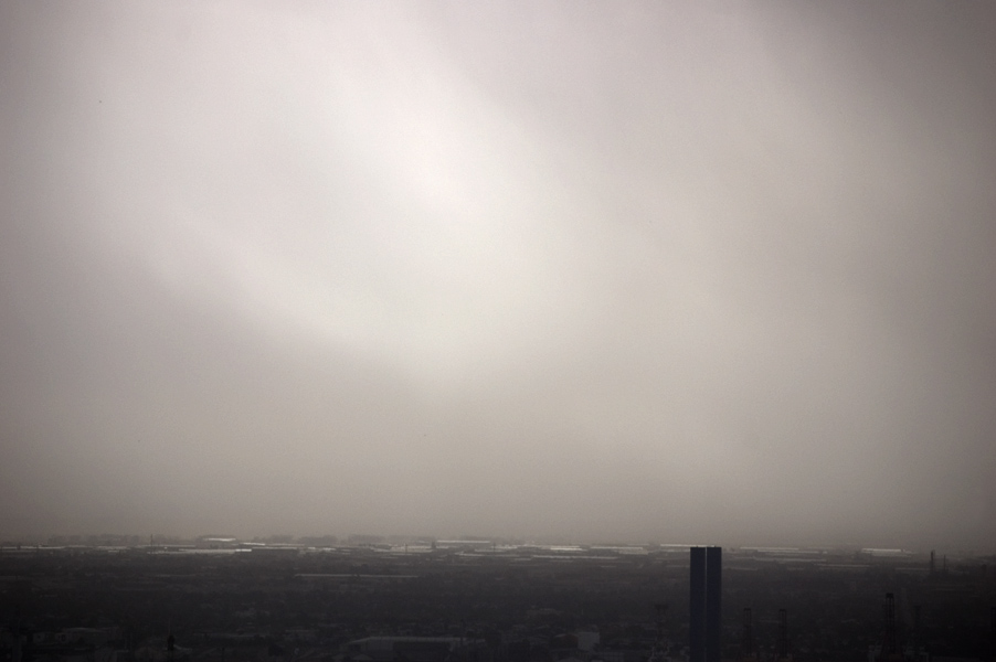
Melbourne’s hottest day ever 46.4 degrees. Firestorms to the north of the city, Port Phillip Bay completely obscured, very strange light seen from 48th floor. The day, 7th February 2009, is now known as the Black Saturday bushfires.
180 people died and 414 were injured as a result of the fires.
It was a very scary day. I cannot imagine what it would have been like to have been there, up close. My condolences to all those that lost loved ones.
Dr Marcus Bunyan
Please click on the photographs for a larger version of the image.
Marcus Bunyan (Australian, b. 1958) On Port Phillip Bay 2009
Port Phillip Bay during firestorm, in the afternoon from the 48th floor of a tower in Southbank, Melbourne
Marcus Bunyan (Australian, b. 1958) Looking towards the docks, Melbourne 2009
Looking towards the docks, Melbourne, during the firestorm
Marcus Bunyan (Australian, b. 1958) Looking across the city 2009
Looking across the city with the Melbourne Star Observation Wheel (at the time called the Southern Star) in the foreground
Black Saturday bushfires
The Black Saturday bushfires were a series of bushfires that ignited or were burning across the Australian state of Victoria on and around Saturday, 7 February 2009 and were Australia’s all-time worst bushfire disasters. The fires occurred during extreme bushfire-weather conditions and resulted in Australia’s highest ever loss of life from a bushfire; there were 180 fatalities, and 414 were injured as a result of the fires.
As many as 400 individual fires were recorded on 7 February. Following the events of 7 February 2009 and its aftermath, that day has become widely referred to in Australia as Black Saturday.
Background
A week before the fires, a significant heatwave affected southeastern Australia. From 28-30 January, Melbourne broke temperature records by experiencing three consecutive days above 43°C (109 °F), with the temperature peaking at 45.1°C (113.2°F) on 30 January, the third hottest day in the city’s history.
The wave of heat was caused by a slow moving high-pressure system that settled over the Tasman Sea, with a combination of an intense tropical low located off the North West Australian coast and a monsoon trough over northern Australia, which produced ideal conditions for hot tropical air to be directed down over southeastern Australia.
The February fires commenced on a day when several localities across the state, including Melbourne, recorded their highest temperatures since records began in 1859. On 6 February 2009 – the day before the fires started – the Premier of Victoria John Brumby issued a warning about the extreme weather conditions expected on 7 February: “It’s just as bad a day as you can imagine and on top of that the state is just tinder-dry. People need to exercise real common sense tomorrow”. The Premier went on to state that it was expected to be the “worst day [of fires conditions] in the history of the state”.
Events of 7 February 2009
A total of 358 firefighting personnel, mainly from the Country Fire Authority (CFA) and Department of Sustainability and Environment (DSE), were deployed across the state on Friday evening (6 February) in anticipation of the extreme conditions the following day. By mid-morning Saturday, hot northwesterly winds in excess of 100 kilometres per hour (62 mph) hit the state, accompanied by extremely high temperatures and extremely low humidity; a total fire ban was declared for the entire state of Victoria.
As the day progressed, all-time record temperatures were being reached. Melbourne hit 46.4°C (115.5°F), the hottest temperature ever recorded for the city and humidity levels dropped to as low as two percent. The McArthur Forest Fire Danger Index reached unprecedented levels, ranging from 160 to over 200. This was higher than the fire weather conditions experienced on Black Friday in 1939 and Ash Wednesday in 1983.
Around midday, as wind speeds were reaching their peak, an incorrectly-rigged SWER line was ripped down at Kilmore East. This sparked a bushfire that would become the deadliest and most intense firestorm ever experienced in Australia’s post-1788 history. The overwhelming majority of fire activity occurred between the afternoon of 7 February and 7:00 pm, when wind speed and temperature were at their highest, and humidity at its lowest.
Casualties
A total of 180 people were confirmed to have died as a result of the fires. The figure was originally estimated at 14 on the night of 7 February, and steadily increased over the following two weeks to 210. It was feared that it could rise as high as 240-280, but these figures were later revised down to 173 after further forensic examinations of remains, and after several people previously believed to be missing were located. This figure was later increased to 180 after several people succumbed to their injuries. …
Among the dead in the Kinglake West area were former Seven Network and Nine Network television personality Brian Naylor, and his wife Moiree. Actor Reg Evans and his partner, artist Angela Brunton, residing on a small farm in the St Andrews area, also died in the Kinglake area fire. Ornithologist Richard Zann perished in the Kinglake fire, together with his wife Eileen and daughter Eva.
Fatalities
General statistics
~ 164 people died in the fires themselves, 12 died later in hospital, and 4 died from other causes including car crashes
~ Out of the 180 deaths, 100 were male, 73 were female, and 7 were unidentified
~ There were 164 Australians, 9 foreign nationals, and 7 people of unidentified nationalities killed in the bushfires. The foreign nationals comprised citizens of:
~ Greece (2) ~ Indonesia (2) ~ Philippines (2) ~ Chile (1) ~ New Zealand (1) ~ United Kingdom (1)
~ 7 of the deaths occurred in bunkers of both fire-specific and non-fire-specific design
~ 1 firefighter, David Balfour, 47, from Gilmore, ACT, was killed near Cambarville on the night of 17 February, when a burnt-out tree fell on him as he attached a hose to a fire tanker
Location of deaths
~ Inside houses (113) ~ Outside houses (27) ~ In vehicles (11) ~ In garages (6) ~ Near vehicles (5) ~ On roadways (5) ~ Attributed to or associated with the fire but not within fire location (4) ~ On reserves (1) ~ In sheds (1) ~ Unknown locations (7)
“Gascoigne rightly commands a place in the pantheon of Australian stars. She has left us with a legacy of music that evokes the rhythms, the air, the spaces and colours of our country.” Dr Marcus Bunyan
This exhibition is a relatively small, muscular yet poetic evocation of the life and work of one of my favourite Australian artists, Rosalie Gascoigne. Perhaps I have an affinity with this artist that goes beyond words: being English I have grown to love the Australian landscape but to see the way Gascoigne visions it is a truly moving experience. I have also admired artists that can successfully combine images and sculptural elements visually in their work, language and memory impinging on consciousness (hence my infatuation with the work of Joseph Cornell).
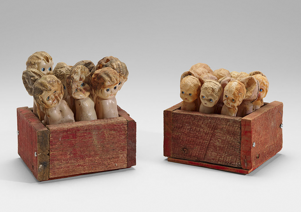
As we enter the exhibition early constructions – wooden boxes – are presented dating from 1975-1984. These have a rough hewn, rustic charm to them, made as they are of weathered thick planks of wood. Less refined than the boxes of Joseph Cornell (see below) they nevertheless draw on the Australian vernacular in their use of objects. As with the Cornell boxes there is a strong element of childhood fun and games in these constructions. Dolly boxes (1976, below) for example contains innumerable plastic dollies of different sizes held inside wooden boxes; Black bird box (1976) is like a shooting gallery at a fun fair; other boxes feature birds and sea shells trapped in plastic bottles, printed images of moths, test tubes, candlesticks, metal teapots and children’s bicycle seats. Cloister (1977) below echoes the work of Joseph Cornell in its use of classical Renaissance imagery but with a rustic Australian charm. Unlike Cornell’s boxes which are enclosed dreamscapes that do not live in the world, Gascoigne’s boxes are made her own by being open and receptive to the landscape from which they merge, by being open to the world.
Forty acre block (1977, above) is a play on the great Aussie dream of owning your own 1/4 acre block. Inside the crate like tableaux we find cardboard parrots perched menacingly on rusted cylindrical metal tubes, two cardboard cut out cows with their white faces turned towards the viewer and at the rear of the box a sun-bleached picture of an orchard and three cows with human heads: a surreal vision of the Aussie landscape. Continuing the playfulness Parrot morning (1976, below) extends the theme, the bicycle wheel almost having elements of Duchamp’s readymades but given an Australian twist with the perching parrots.
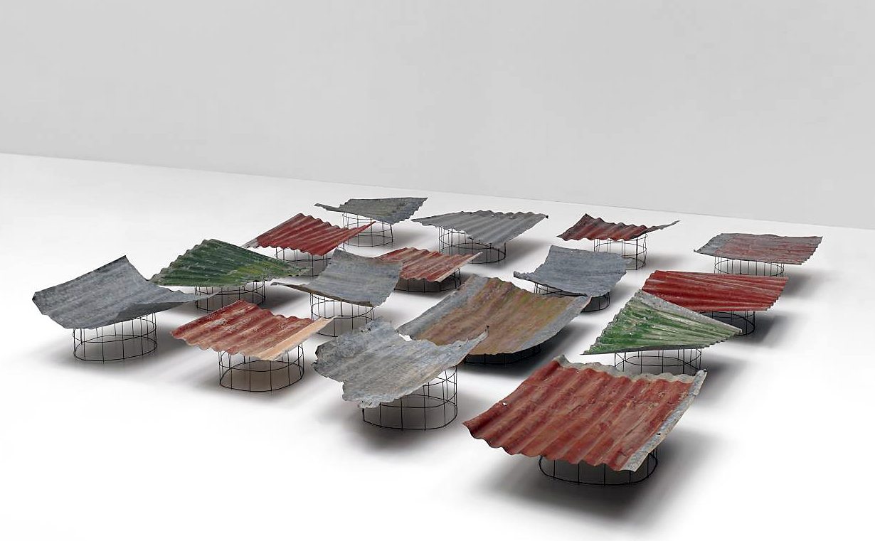
Moving forward we find one of my favourite works, Feathered chairs (1978, below), a most beautiful evocation of technology and nature. Two red rusted 1950s office chairs sit low on the floor, their seats, backs, and sides replaced by four rows of dark Cormorant feathers held in place by wooden slats clamped together. Simple yet eloquent these surreal chairs have a poetic rhythm of place and space, speaking of the abandonment of technology and its re-habitation by a trapped but beautiful nature. Other work becomes simpler, more focused around this time (and especially from 1984 onwards) as though the artist was finding her singular voice, was confident of the ‘less is more’ rhythms of the music she was creating. The essence appears: of the land, artefacts and spaces. In Swell (1984) for example two convex forms of corrugated iron (one horizontal, one vertical) play off of each other, forming an opposing flow of energies like the swelling of the sea. Nothing else is needed.
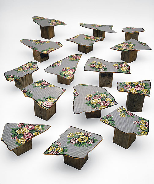
In Step through (1980, below) fragments of floral linoleum floor are mounted on wooden blocks at differing heights allowing the viewer to visually wander across the space of the installation as their mind wanders to memories of the floors of Australian kitchens of the 1950’s – either seen in childhood or in photographs – their is a recognition from all ages, in all Australians. This theme is further developed in the gridded Inland sea (1986, below) patches of corrugated iron float above the ground like gently moving waves. Beautiful in its simplicity the colours, shapes and spaces evocatively reflect the undulating rise and fall of the landscape from which the iron has been rescued, the breath of air on the wind rippling the water.
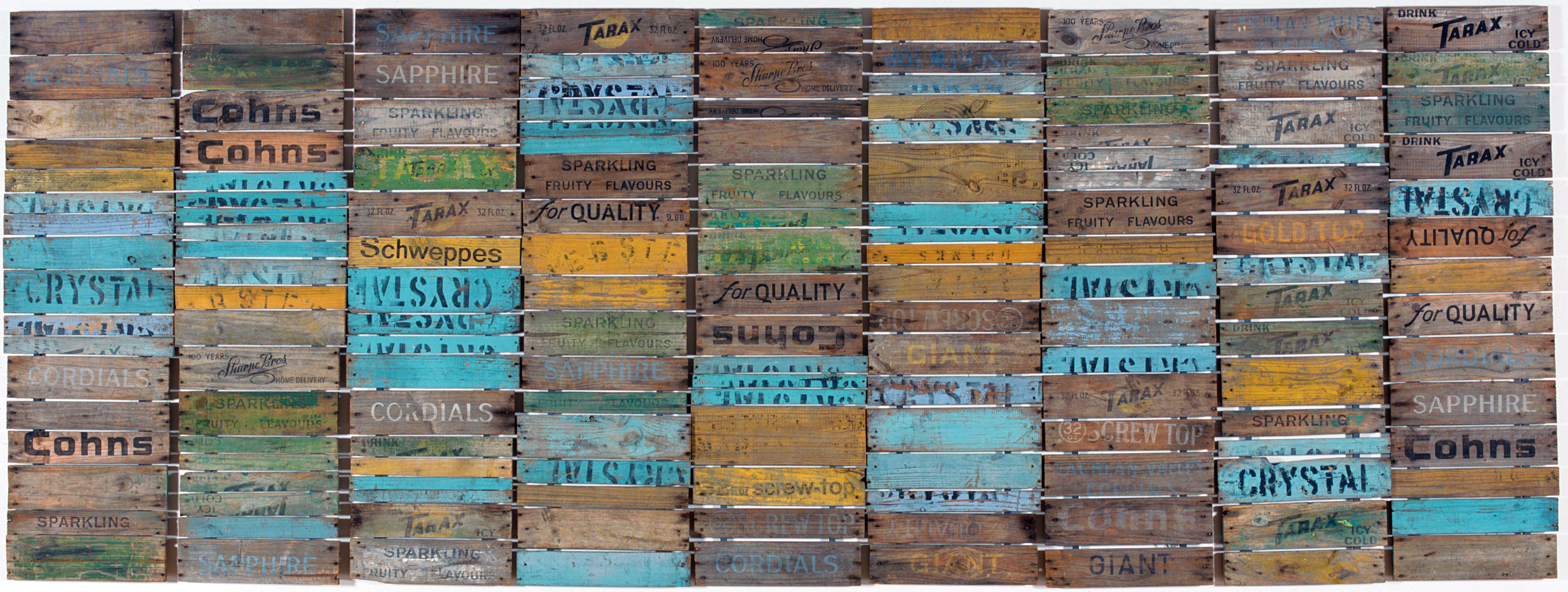
The use of regularised block and grids start to appear in wall mounted vistas: of loopholes, of lovers, the metropolis and the fall, of beach houses and far views, of grasslands and medusas. Promised land (1986) offers a vision resplendent of a faraway country – the promised land abstracted to Tarax, Dales, Cottee’s, Blue Bow home deliveries of a Sparkling Fruity Flavour! box ends, the 32 Fl. Oz weight is weighing the vision of the Australian landscape in the balance.
The most effective work uses the yellow colour of Schweppes boxes. In Monaro (1989), one of my favourite works in the exhibition, the painted blocks of yellow wood with unreadable fragmented words on them become, from a distance, like the wafting waving dried grasses of the Monaro landscape around Gascoigne’s home. Liquid music of air and place.
“I like the gold of the Schweppes boxes. I think that gold is one of the classical colours. I don’t care if it has got Schweppes written all over it, people seem to think I care. I don’t care! I just like the black and yellow. When I started I had lots of off-cuts, little pieces too good to throw away. So I started joining them up in a sort of way, walking around them, adding a few more. I soon had a 6 x 4 foot panel. In the end I realised that I needed to have four panels to say what I wanted to say. As it grew so did I. I kept thinking of the Monaro grasslands, and I thought of David Campbell saying ‘the Monaro rolls on to the sea’.”
~ Graeme Sullivan, Seeing Australia – Views of artists and art writers, Piper Press, Annandale, New South Wales, 1994, p. 19.
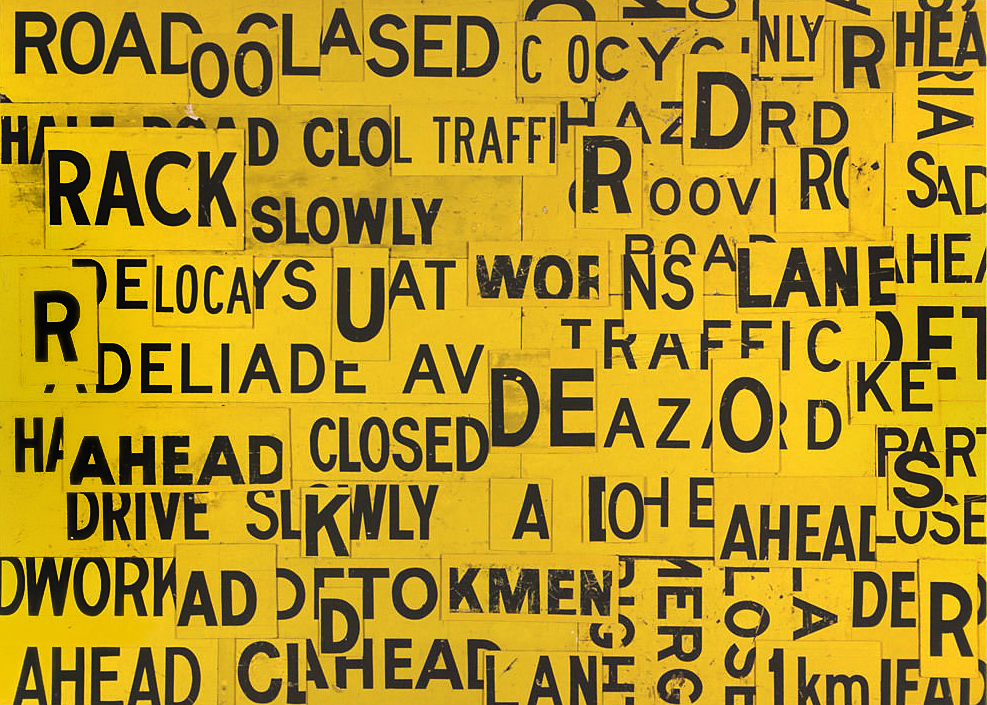
Summer swarm (1995) features small yellow blocks of wood an assemblage of yellow bees; Grassfest (1999, below) like a stand of yellow grass under the Australian sun Metropolis (1999, below) collaged and patched road signs are worked together overlaying spaces and language. In Plenty (1986) yellow wood bricks mounted in panels are held in place with rusted metal nails. if you move close to the work the effect is immersive – every inflection of colour, grain of the wood, knot, nail hole, rub, scuff, daub of paint becomes evident. Every block is same but different, an almost transcendental experience.
In this work there is a refining of the essence of her vision of the world, a paring back of all extraneous elements but conversely an expansion in the energy of the work. A mature artist at the peak of their power.
In the ‘white’ work Star chart (1995) and Milky way (1995), heaven and earth reflect each other, the grids and patterns linked in a cosmic dance. But mostly air (1994-1995) the large installation that closes the exhibition confirms this dance, containing as it does white blocks of wood (invisible air) with a row of weathered wooden posts propped up against the gallery wall and animal spirits made of wooden blocks: faces with wings and ears, gasping for breath, white animals on a white background hovering between here and there, between heaven and earth.
This is a wonderful exhibition. Gascoigne rightly commands a place in the pantheon of Australian stars. She has left us with a legacy of music that evokes the rhythms, the air, the spaces and colours of our country. As she herself said,
“Look at what we have: Space, skies. You can never have too much of nothing.”
Nothing more, nothing less.
Dr Marcus Bunyan
Many thankx to the NGV for allowing me to publish the photographs in the posting. Please click on the photographs for a larger version of the image.
Joseph Cornell (American, 1903-1972) Medici Princess 1948 Mixed media
Rosalie Gascoigne is one of Australia’s most acclaimed and respected visual artists. Her distinctive style is characterised by her recognition of beauty in the most humble of objects such as soft drink crates, linoleum, retro-reflective road signs, dried grasses and feathers. Collecting and arranging these items, often rescued from rubbish dumps, and scarred and faded by the ravages of weather, is an integral part of her practice. Like a magician she transforms these discarded materials into sculptures, wall pieces and assemblages, which create evocative visual poetry, capturing the essence of things or an experience rather than conveying a literal representation.
Gascoigne like Picasso realised later in life that one is not made an artist, one is born an artist. Some of her fondest memories as a child are of collecting shells on summer holidays at the beach, and the yellow china her grandmother owned. At the age of ten she won first prize for her entry in a table decoration competition that included yellow flowers, an unusual Indian brass vase and Indian brass bowls.
Her journey to becoming a professional artist was highly unconventional. She received no formal art education, openly declared that she could neither draw nor paint and was not officially recognised as part of the Australian art scene until she held her first critically acclaimed exhibition at the age of fifty-seven.
Gascoigne was born in New Zealand in 1917. She studied for a Bachelor of Arts degree, specialising in English and Latin, at the University of Auckland. During this time she got to know her future husband Ben Gascoigne. In 1943, following a short teaching career, she moved to Australia to marry Ben. They lived as part of a small isolated scientific community around Mt Stromlo Observatory outside Canberra, where Ben had taken up a position. The transition from the gentle, green landscape of her home to the hard, unforgiving, dry slopes of Mount Stromlo, bounded by seemingly endless space, was initially a tough and lonely experience. She didn’t fit into the mould of the happy domesticated wife expected of this era. The lack of stimulating conversation with the other wives on the establishment made her feel particularly alone. She befriended nature instead and as she brought up three children in these alien conditions she remembers:
“I’d push the children’s prams around that lonely mountain until I knew the shape of every stone and tree, the texture of every patch of dirt and grass, the colour of every leaf and weed. I’d gaze down at the valley below, a vastness of dry blond grass and grubby sheep and the sky used to hang, from there to there.”
~ Janet Hawley ‘A late developer’, Sydney Morning Herald, Good Weekend, 15 November 1997, p. 40.
She acclimatised to this new terrain and began to gather unusual natural forms. She displayed these found objects in her home, much to the bemusement of the conventional local community. Gascoigne began creating distinctive flower arrangements in the 1950s and won prizes for them in horticultural shows. When the family moved from Mount Stromlo to the Canberra suburb of Deakin in 1960, she studied ikebana, the Japanese art of flower arranging, under Norman Sparnon, a master of the Sogetsu School. Gascoigne appreciated the strict discipline of this form of arranging, which imposed a sense of order on her collected found objects. The emphasis on line, form and sculptural properties was to become a key part of her later practice.
When Gascoigne’s three children had grown up, she had increasing freedom to pursue her growing interest in art. She visited art galleries more often, looked at art books and met people in the art world who were to shape her future career, including James Mollison, who became the inaugural director of the Australian National Gallery (now National Gallery of Australia). Her discussions with those in the arts community taught her much about looking and thinking about art, and confirmed her sense of identity as an artist.
In the mid-1960s she began making assemblages of rusted iron, which were followed, from 1973, by assemblages in boxes. These miniature surreal and often humorous worlds, such as The colonel’s lady, 1976, employed rich patterning and repetition through the arrangement of man-made objects, including advertising symbols used on the packaging of products.
The eclectic mix of objects and surfaces in these early works gave way to her later wall-based works that were elegant compositions limited to one or two materials, and subtly evoke culture, nature, language and the landscape, particularly the country around Canberra, which she came to love. Scrub country, 1982, and Monaro, 1989, epitomise these works. They are made from soft-drink crates – weathered by the sun, rain, wind and time – dismantled, sawn into strips and reassembled.
Gascoigne reached meteoric heights in her career which spanned over two decades until her death in 1999 at the age of eighty-two. She was given a major survey show at the National Gallery of Victoria (NGV) in 1978, only four years after her first solo exhibition at Macquarie Galleries, Canberra. In 1982 she represented Australia with artist Peter Booth at the Venice Biennale. Her work is included in major public, corporate and private collections.
Despite their unusual appearance, this set of feathered chairs is not a departure from Rosalie Gascoigne’s usual practice. This work does not record, despite the reference to furniture in the title, a move to decorative arts – this feathered pair were never intended to function as seating – they are sculptures, conceived to fascinate the eye rather than conform to anyone’s behind.
Gascoigne collected the feathers for the chairs on the shores of Lake George, located about 35 kilometres from Canberra, on the road to Sydney.
“And then I came to this place,” she recalled in 1982, “where there were all these… black birds, you know, cormorants. And a shattering of black beautiful glossy [feathers] as if the birds had just undressed. … They’re beautiful feathers. They’re like the underside of mushrooms. You know… the quill.”
The feathers were assembled in racks similar to those used in Gascoigne’s Feathered Fence 1979 (NGA Collection, Canberra) which used swan feathers also found at Lake George. Racks of feathers were displayed on two reddish metal chairs that she had found at the dump. Gascoigne aimed to create poetic, rather than literal interpretations of her work, aiming for a succinct ‘plastic metaphor’, where a melding of disparate objects and textures might produce unexpected allusions and tangential meanings. Nonetheless, the claw foot of the chair suggests the foot of a bird and the splayed feathers conjure up the pose of a cormorant with its spread wings drying off in the sun. Or did the sun-basking bird with its arm rest wings suggest a throne? Gascoigne was not an artist to routinely create figurative works and it’s just as likely that in this work she sought a tension between the earthbound weight of the metal and the airy, windborne feathers. She had a longtime fascination with birds and the Feathered Chairs suggest an evocation of flight and freedom; a joyous ability to see and read the story of our ancient land. Elated by exploration and discovery, Gascoigne willingly shares her delight with the armchair traveller.
Extract from Michael Desmond. “Rosalie Gascoigne,” on the Menzies website [Online] Cited 19/12/2018. No longer available online. Used under fair use conditions for the purposes of education and research
After first exhibiting her work at the age of 57, Rosalie Gascoigne rapidly established a reputation as one of Australia’s foremost contemporary artists. Following her first exhibition in 1974, Gascoigne subsequently developed an impressive exhibition history that included her being honoured, in 1982, as the first female artist to represent Australia at the Venice Biennale.
This major exhibition of Rosalie Gascoigne’s work ranges from the boxlike assemblages of her early career through to large scale installations and her creation of master works constructed from Schweppes soft drink crates and retro-reflective road signs. The exhibition investigates the artist’s ability to draw creative inspiration from the discarded; her intrinsic response to her chosen materials, and her unique ability to evocatively convey the essence of nature and the transitory and captivating effects of light, air and space.
Rosalie Gascoigne is the first major retrospective exhibition of Gascoigne’s work to be seen in Melbourne and is accompanied by a comprehensive exhibition catalogue.
Extract from A Formal Focus – Art Elements and Principles
In Inland sea, 1986 (below), sixteen large sheets of corrugated tin hover above the floor in a loose grid arrangement. The grid format unifies the separate parts of the composition, and also enhances the expressive power of different visual elements through repetition. The shapes and lines repeated across the buckling sheets of tin create a powerful sense of the gentle movement of wind or water.
The strong visual rhythms and movement evident in Gascoigne’s compositions are often achieved through the repetition of different visual elements. Step through, 1980 (above), is made from fifteen separate parts, each made from a torn piece of brightly coloured, floral patterned linoleum mounted on a block of wood. The blocks sit at different angles creating different levels within the installation. The spaces between the different parts create a meandering path for the viewer to explore, highlighting the importance of movement through and across space in Gascoigne’s work.
“I was thinking about the unkempt empty blocks in built up city areas … usually covered in rank grasses and flowering weeds … rubble, old tins and bottles. One steps through them gingerly and, with possible snakes in mind, lifts one’s knees high.”
~ Vici MacDonald, Rosalie Gascoigne, Regaro Pty Ltd, Sydney, 1998, p. 48
…
Colour assumed a vital presence in Gascoigne’s work. In an overview of her work, as in the exhibition Rosalie Gascoigne (2008), the importance of particular colours is revealed in swathes and groupings of yellow, red, orange and white artworks, culminating in the grey, brown and ochre hues of the Earth series (1999), which were the artist’s last works. Individually, each work reveals something of the beauty of colour and its ability to suggest meaning; from sun-baked, muted yellows that remind us of vistas of dry grass, to soft pale greys and whites that murmur quietly of the open air and cloud.
Gascoigne was often drawn to particular materials because of the beauty of their colour and texture, and the associations or moods these suggested. The visual qualities and associations found in the textures of humble and / or discarded materials are clearly revealed in Gascoigne’s work – from the flaky layers of faded paint on weathered tin or wood that speak of both rural life and work, and the forces and seasons of nature, to the staccato flash of retro-reflective road signs that remind us of driving through the landscape.
Rosalie Gascoigne’s work is often referred to as visual poetry. Her training in literature and fascination for words infuse her work. She had a particular love of poetry. This included the modern Australian poets such as Peter Porter and David Campbell, who also evoked in his writing the landscape around Canberra. Just as a poet distils the essence of their subject with carefully chosen evocative words and phrases, so Gascoigne captures the spirit of a place, or the core of an idea with sensitive arrangements of visual elements. Instead of literary allusions, Gascoigne creates visual metaphors with materials such as corrugated iron in Inland sea, 1986, which evokes movement of air, while slivers of discarded, weathered timber in Monaro, 1989 suggest dried grassland. Repetition, ordering, fragmenting and editing out unnecessary materials are also part of her practice which echo the creation of poetry.
Gascoigne admired the English Romantic poets of the late eighteenth and early nineteenth centuries and often quoted William Wordsworth’s idea that: ‘Poetry is the spontaneous overflow of powerful feelings: it takes its origin from emotion recollected in tranquillity.’ She believed passionately that her work was intricately woven with glimpses of her past feelings and experiences. …
Other works studded with random words are more elusive and hark back to the poetry of Andre Bréton and the Surrealists, who scattered and re-arranged words cut from a newspaper.
Gascoigne frequently described her works as ‘stammering concrete poetry’ (Gregory O’Brien, 2004, p. 42), a reference to a style of poetry originating in the 1950s where the visual arrangement of words or letters suggests something about the subject of the poem. In All that jazz, 1989, for example, the artist has conjured up the pulsating chopped up rhythms of jazz with wooden strips of dazzling colour highlighted by splinters of black lettering. In contrast, the broken and fractured nature of the yellow and black road signs in Skylight, 1993, interspersed with ill-fitting patches of well-worn linoleum, sets up a tension that hints at both the tragedy of drought and the beauty of the Australian light in summer.
The evocative titles of Gascoigne’s works, which are selected after their completion and only after much contemplation, are chosen to be allusive and poetic rather than descriptive. They reveal an entry point but allow the viewer to experience their own intuitive response to the work.
Text from the NGV Rosalie Gascoigne Education Kit
Rosalie Gascoigne’s art comes from, is inspired by, and in turn reflects the spare countryside of the southern tablelands and the Monaro district, a unique natural environment that lies relatively close to Canberra, the artist’s home of more than fifty years. Gascoigne’s transformation and re-investment in her work of battered and weathered materials sourced in the landscape surrounding Canberra also highlights the importance of collecting to her oeuvre, as different materials appear in works from across the decades …
Gascoigne’s knowledge and love of language and of Romantic poetry is evident in many of her works as she aspired to make art that achieved ‘allusive and illusive’ qualities that she experienced in this form. Through the artist’s skill in making poetry of the commonplace and her intrinsic response to both her chosen materials and the particularities of the Australian landscape, we are able to witness her unique ability to evocatively capture and convey the essence of nature and the transitory and captivating effects of light, air and space.
Extract from Landscape – Place, Memory, Experience
The art of Rosalie Gascoigne has a unique place in the rich landscape tradition in Australian art. While painting has been the dominant artform in this tradition, Gascoigne worked in assemblage and installation, using natural and man-made materials collected from the landscape. Unlike many earlier artists, she was not interested in describing the visual reality, picturesque beauty or stories of the Australian landscape. Gascoigne’s artworks capture the essence of the landscape’s topography, space, air, vegetation; and the daily and seasonal natural rhythms of nature, in compositions that are often startling in their refined simplicity. …
In Scrub country, 1982 wooden slats from old soft-drink crates are arranged methodically in rows and columns, but their faded colours, worn surfaces and uneven edges reveal the impact of prolonged use and many hot summers. The medley of faded yellows and greens, and nearly naked wooden surfaces in Scrub country is punctuated by flashes of turquoise blues, evoking the patterns of dappled light and colour often found in the Australian bush.
“I called it Scrub country because to me it had the randomness and relaxed air and the quality of colour which I think is much more typical of the Australia I know than any of those ochres and oranges so often used. I have let air through because we see a lot of filtered light, random pattern and carelessness in the Australian landscape.”
~ Public Programs Department, Art Gallery of New South Wales Education Kit, Material as Landscape – Rosalie Gascoigne Education Kit, 1997
While a palette of ‘blue and gold’ colours was strongly associated with the paintings of the famous Australian landscape painter Arthur Streeton (1867-1943), Scrub country clearly breaks with the landscape conventions associated with Streeton and his generation. The repetition and ordering of elements in distinct rows and columns creates a strong formal structure and a flattened space that avoids literal landscape references. Sensations and moods more associated with memory and experience of the landscape are emphasised. Gascoigne’s focus on the formal qualities suggests some affinity between her landscape inspired artworks and those of her contemporary, Australian artist Fred Williams (1927-1982), who also broke with convention in representing the landscape.
Gascoigne worked intuitively with no preliminary drawings or plans. Her ideas, and the processes used to make each artwork, were inspired and determined by the look and feel of particular materials, and the visual and emotional associations they suggested. Depending on the materials used, many hundreds of hours would be spent on the labour intensive work of cutting, tearing, bending, scrubbing, sorting, grouping, arranging until the ‘right’ idea and visual effect crystallised. The process of transforming found materials into artworks was one of making the mood, experience and sensation of landscape visible.
“Your art has to come out of your daily life. I really believe that if anyone is born an artist they’ve only got to look at what’s round their feet and what’s available to them. They don’t have to be clever, they don’t have to go to art school, they don’t have to get the exotic stuff – make it with what’s there. People think art’s like you strike it lucky and you’re famous tomorrow, but it isn’t like that, it’s a search for honesty on your own terms. The journey to self-recognition took me decades.”
Vici MacDonald, Rosalie Gascoigne, Regaro Pty Ltd, Sydney, 1998, p. 9
“I look for the eternal truths in nature, the rhythms, cycles, seasons, shapes, regeneration, restorative powers, spirit. I’m showing what I believe to be interesting and beautiful.”
Janet Hawley. “A late developer”, Sydney Morning Herald, Good Weekend, 15 November 1997, p. 44
“I was hopeless at painting and drawing, and had no skills at making craftwork. At school, I envied people who could draw a perfect basket of apples. I regarded myself as totally non-artistic. My big love was, and remains, poetry; I always visualised every line of a poem as I read it.”
Janet Hawley. “A late developer”, Sydney Morning Herald, Good Weekend, 15 November 1997, p. 42
“My concerns are as much with my materials as with the work I make of it. They both have to satisfy me … I look for things that have been somewhere, done something. Second-hand materials aren’t deliberate; they have had sun and wind on them …”
Public Programs Department, Art Gallery of New South Wales, Material as Landscape, Rosalie Gascoigne Education Kit, 1997
“Once I’d started on my art journey I was in it with a vengeance. I needed it so badly. At last life was full of possibilities.”
Janet Hawley. “A late developer”, Sydney Morning Herald, Good Weekend, 15 November 1997, p. 41
“I have a real need to express elation at how interesting and beautiful things are and to see them arranged … I work with things I rather like and move them about until they recall the feeling of an actual moment in the landscape; then I’ve won.”
Rosalie Gascoigne interviewed by James Mollison and Steven Heath in Rosalie Gascoigne: Material as landscape (exh. cat), Deborah Edwards (ed.), Art Gallery of New South Wales, Sydney, 1997, p. 7
“My pieces can be looked at in many different ways. I try to provide a starting point from which people can let their imagination wander – what they will discover will be a product of their own experience as much as mine. My aim is to be allusive and elusive.”
Bob Weis, Judi Stack and Robert Lindsay, Survey 2 – Rosalie Gascoigne, video, colour, sound, 16 mins 50 secs, produced by the Media Resource Centre for the NGV, 1978


































You must be logged in to post a comment.