Curator: Clifford Chanin, National September 11 Memorial Museum curator and director for the project
Many thankx to the Imperial War Museum, London for allowing me to publish the photographs in the posting. Please click on the photographs for a larger version of the image.
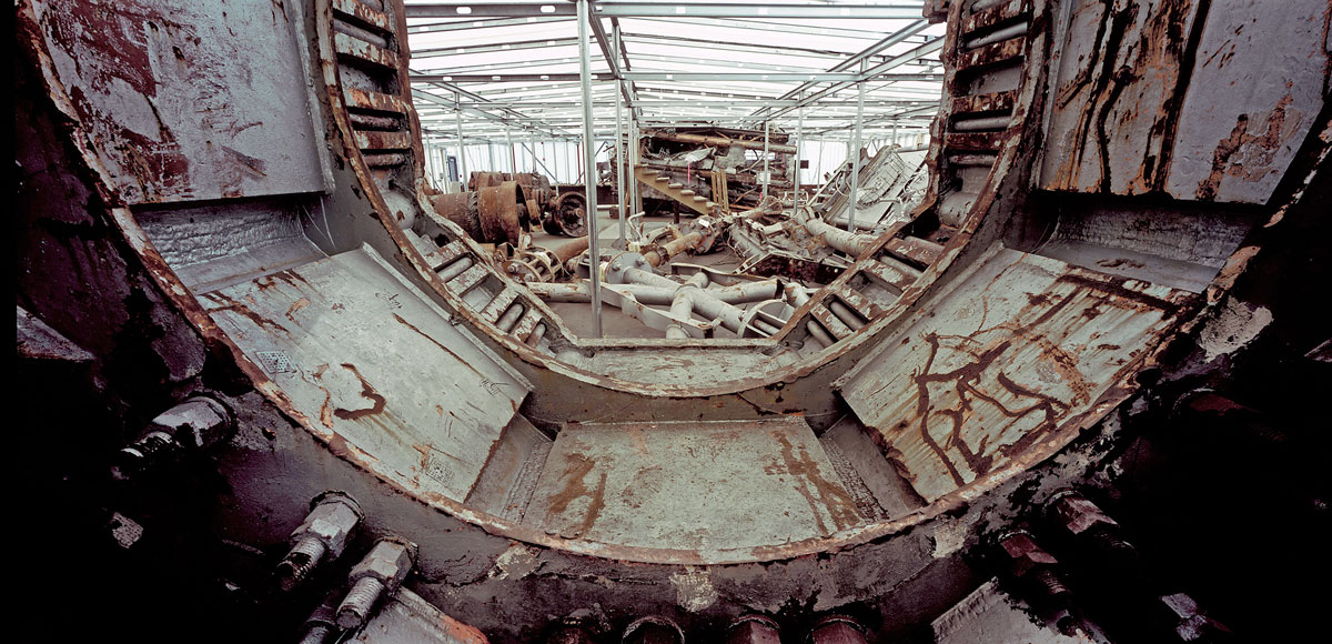
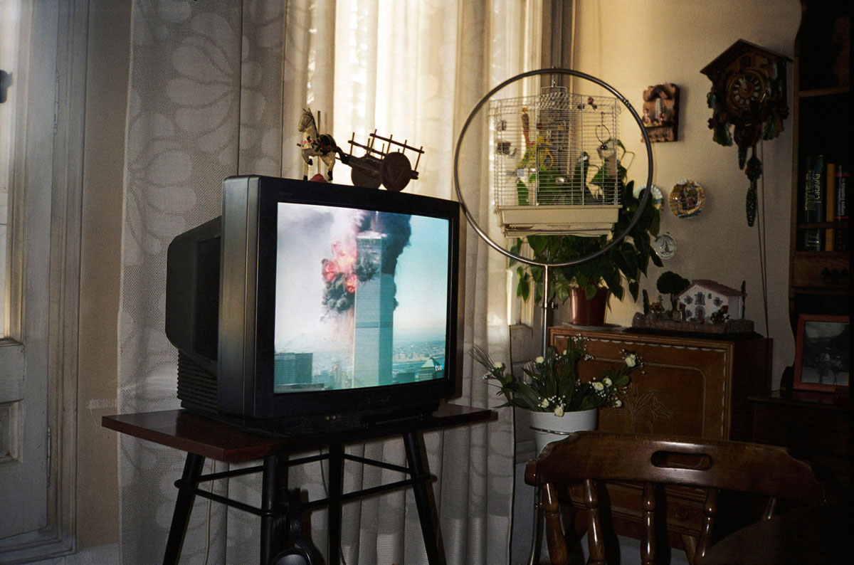
“Having watched the graphic destruction from my apartment, only two blocks from the Twin Towers, when I entered Hangar 17 at JFK International Airport for the first time in 2006, I was immediately hit by the deep sense that the objects I was confronted with, from large shards of rusted and burnt steel to bikes left forever by their owners, were the symbolic substitutes of the victims. Their overwhelming presence stood for all the people that lost their lives that late summer day a decade ago.”
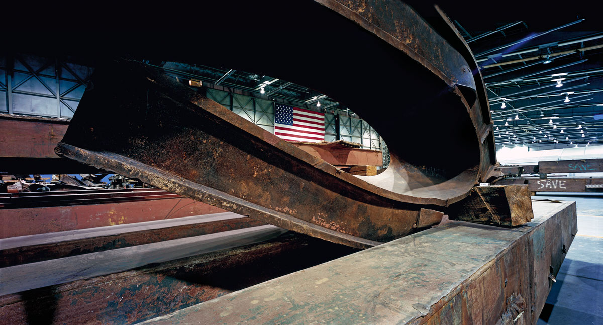
The empty shell of Hangar 17 at JFK Airport became a storehouse of memories when it was filled with the material cleared from the World Trade Center site following the September 11 attacks on New York City.
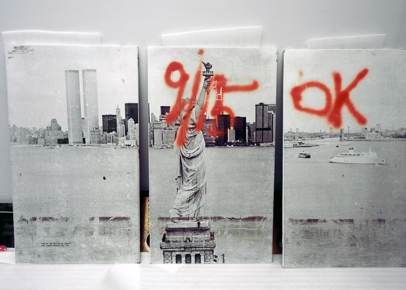
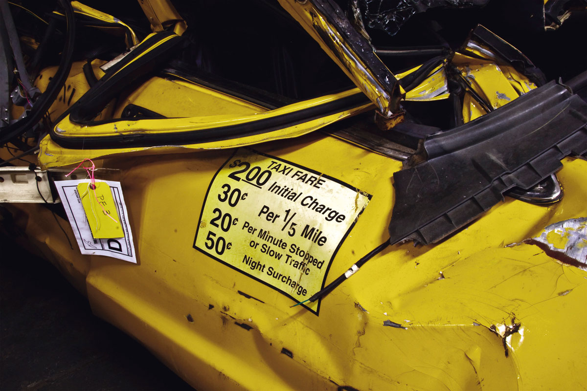
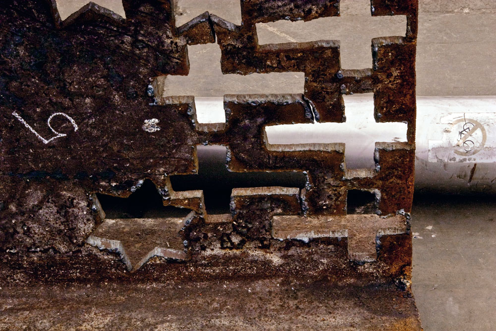
Marking the tenth anniversary of 9/11, Francesc Torres’s work features over 150 projected images which explore inside the hangar and reflect on the emotional power of what remained, from personal belongings to steel girders distorted by the force of the attacks. Alongside the photographs is a section of raw rusted steel over two metres in length from the ruins of the World Trade Center. As well as larger piece (over 1 tonne) that is due to go on display at IWM North in October, these objects are the first pieces of steel from Ground Zero to go on display in the UK. The exhibition will also be on display at the International Centre for Photography in New York and at the Centre de Cultura Contemporània de Barcelona.
Throughout his career, Spanish-American artist Francesc Torres has reflected on the diverse manifestations of culture, politics, memory and power. His latest exhibition at the Imperial War Museum, Memory Remains, is a bold and haunting amalgam of all four.
In 2009, Torres was granted rare access to Hangar 17 at John F Kennedy International Airport, a gaping space of over 80,000-square-feet. Within the hangar lie the remnants deemed worth preserving from the September 11 attacks, taken from the 1.8 million tonnes of debris from Ground Zero. For five weeks Torres daily confronted the legacy of terror and the ghosts of that fateful late-summer day, capturing images of objects that stand as symbolic substitutes to the victims.
“Look at it this way”, says Torres, relaying his experience, “it’s a hanger constructed to house a plane, which was transformed into a weapon used for the attack on the towers and now the sediment of that attack is here. With the sound of planes constantly flying overhead it was absolutely surreal.”
According to the photographer, the experience of walking around the hanger after the first day was so emotionally draining that he slept from four o’clock in the afternoon through to ten o’clock the next morning.
“I was absolutely exhausted; physically and emotionally… every single iota of energy I had was gone.”
His efforts have produced some exceptional results, however, displayed on a rolling slideshow in a small room near the entrance of the museum. Among the objects photographed are large shards of rusted, burnt steel, crumpled filing cabinets and a plethora of flattened Port Authority vehicles. Some unexpected pieces of detritus were also found, including a nine-foot, three-dimensional Bugs Bunny, made completely bizarre when juxtaposed by a sign whose letters read chillingly: “That’s All Folks!”
Prior to the Hangar 17 project, Torres documented the excavation of a mass Spanish Civil War grave that he said drew certain comparisons with the material at JFK.
“The clothing is something that just grabs you,” he says, “it’s very uncanny that nothing changes with the victims as historical subjects. The clothing [in Hangar 17] was exactly the same as the clothing I’ve seen in Spain or in the former Yugoslavia; it all has the same patina. The victim becomes universal… the remains have that quality.”
Along with the photographs, the museum has also acquired a section of steel from the structure of the World Trade Center, displayed outside the projection room. It is the first section of raw rusted steel from the ruins at Ground Zero – thought to be the box section from one of windows – to be displayed in the UK.
For the past year, pieces from the hangar have made their way to be placed in memorials in each of the 50 American states, as well as seven other countries across the globe. Some, but not all, of the remaining pieces will be housed in the 9/11 Memorial Museum near the site of the attack, which is something that concerns Torres.
“We have to preserve the hanger as a container. It’s an unbelievable narrative apparatus that had been created almost on the run,” he says.
With a lifelong interest in questions of human memory and meaning, Torres’ work is based on the concept that it is through the remains of history that memory remains. His latest show is an unforgettable testament to those horrendous attacks that capped the 20th century almost a decade ago.”
Exhibition dates: 20th January – 25th February, 2012
Curator: William Ewing
Many thankx to Christophe Guye Galerie, Zurich for allowing me to publish the photographs in the posting. Please click on the photographs for a larger version of the image.
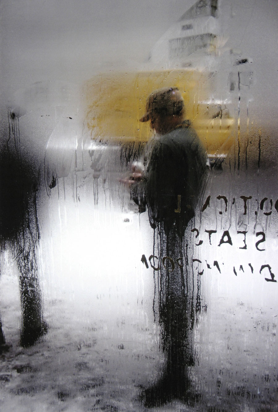
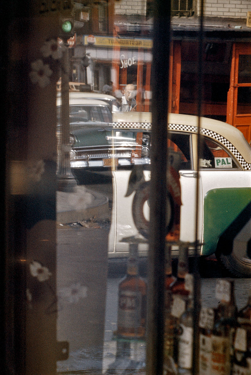
Ernst Haas (American born Austria, 1921-1986) New York 1980 C-print, later print 76.2 x 101.6cm (30 x 40 in) Edition of 15 Courtesy of Ernst Haas and Christophe Guye Galerie
“No photographer has worked more successfully to express the sheer physical joy of seeing.”
John Szarkowski
“Bored with obvious reality, I find my fascination in transforming it into a subjective point of view. Without touching my subject I want to come to the moment when, through pure concentration of seeing, the composed picture becomes more made than taken. Without a descriptive caption to justify its existence, it will speak for itself – less descriptive, more creative; less informative, more suggestive; less prose, more poetry.”
Ernst Haas from “About Color Photography,” in DU, 1961
Ernst Haas (American born Austria, 1921-1986) Rush Hour, New York City Nd C-print, later print 76.2 x 101.6cm (30 x 40 in) Edition of 15 Courtesy of Ernst Haas and Christophe Guye Galerie
Ernst Haas (American born Austria, 1921-1986) New York City, USA Nd C-print, later print 76.2 x 101.6cm (30 x 40 in) Edition of 15 Courtesy of Ernst Haas and Christophe Guye Galerie
Ernst Haas (American born Austria, 1921-1986) New York City, USA Nd Courtesy of Ernst Haas and Christophe Guye Galerie
Ernst Haas (American born Austria, 1921-1986) Feed Line, New York City, USA Nd Courtesy of Ernst Haas and Christophe Guye Galerie
Ernst Haas (American born Austria, 1921-1986) New York City, USA Nd Courtesy of Ernst Haas and Christophe Guye Galerie
Ernst Haas (American born Austria, 1921-1986) New York City 1951 C-print, later print 76.2 x 101.6cm (30 x 40 in) Edition of 15 Courtesy of Ernst Haas and Christophe Guye Galerie
Ernst Haas (American born Austria, 1921-1986) Food Day, New York City, USA 1953 C-print, later print Courtesy of Ernst Haas and Christophe Guye Galerie
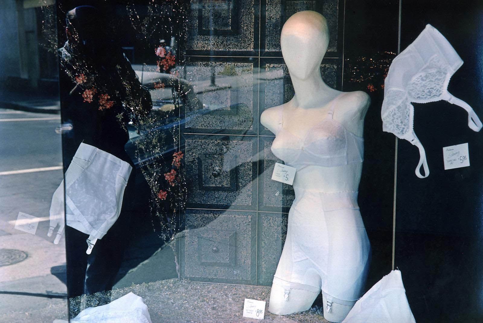
Ernst Haas (American born Austria, 1921-1986) 3rd Avenue, Reflection, New York City 1952 C-print, later print 76.2 x 101.6cm (30 x 40 in) Edition of 15 Courtesy of Ernst Haas and Christophe Guye Galerie
Ernst Haas (American born Austria, 1921-1986) New York City, USA 1953 C-print, later print 76.2 x 101.6cm (30 x 40 in) Edition of 15 Courtesy of Ernst Haas and Christophe Guye Galerie
Ernst Haas (American born Austria, 1921-1986) Paris, France 1954 C-print, later print 76.2 x 101.6cm (30 x 40 in) Edition of 15 Courtesy of Ernst Haas and Christophe Guye Galerie
Ernst Haas (American born Austria, 1921-1986) Frigidaire, Paris 1954 C-print, later print 76.2 x 101.6cm (30 x 40 in) Edition of 15 Courtesy of Ernst Haas and Christophe Guye Galerie
Ernst Haas (American born Austria, 1921-1986) New York City 1955 C-print, later print 76.2 x 101.6cm (30 x 40 in) Edition of 15 Courtesy of Ernst Haas and Christophe Guye Galerie
Ernst Haas (American born Austria, 1921-1986) New Orleans 1957 C-print, later print 76.2 x 101.6cm (30 x 40 in) Edition of 15 Courtesy of Ernst Haas and Christophe Guye Galerie
Ernst Haas (American born Austria, 1921-1986) Park Avenue Taxis 1958 C-print, later print 76.2 x 101.6cm (30 x 40 in) Edition of 15 Courtesy of Ernst Haas and Christophe Guye Galerie
Ernst Haas (American born Austria, 1921-1986) New Orleans, USA 1960 C-print, later print 76.2 x 101.6cm (30 x 40 in) Edition of 15 Courtesy of Ernst Haas and Christophe Guye Galerie
Ernst Haas (American born Austria, 1921-1986) New York City, USA 1962 C-print, later print 76.2 x 101.6cm (30 x 40 in) Edition of 15 Courtesy of Ernst Haas and Christophe Guye Galerie
Ernst Haas (American born Austria, 1921-1986) Traffic, Mexico City 1963 C-print, later print 76.2 x 101.6cm (30 x 40 in) Edition of 15 Courtesy of Ernst Haas and Christophe Guye Galerie
Ernst Haas (American born Austria, 1921-1986) New York City, USA 1963 C-print, later print Courtesy of Ernst Haas and Christophe Guye Galerie
Ernst Haas (American born Austria, 1921-1986) Lights of New York City, New York City 1966 C-print, later print Courtesy of Ernst Haas and Christophe Guye Galerie
Ernst Haas (American born Austria, 1921-1986) Torn Poster I, Wave, NYC 1968 C-print, later print 76.2 x 101.6cm (30 x 40 in) Edition of 15 Courtesy of Ernst Haas and Christophe Guye Galerie
Ernst Haas (American born Austria, 1921-1986) New York City, USA 1968 C-print, later print Courtesy of Ernst Haas and Christophe Guye Galerie
Ernst Haas (American born Austria, 1921-1986) Greenwich Village, New York City, USA 1970 C-print, later print 76.2 x 101.6cm (30 x 40 in) Edition of 15 Courtesy of Ernst Haas and Christophe Guye Galerie
Ernst Haas (American born Austria, 1921-1986) California, USA 1970 C-print, later print 76.2 x 101.6cm (30 x 40 in) Edition of 15 Courtesy of Ernst Haas and Christophe Guye Galerie
Ernst Haas (American born Austria, 1921-1986) New York City, USA 1972 C-print, later print Courtesy of Ernst Haas and Christophe Guye Galerie
Ernst Haas (American born Austria, 1921-1986) New York City, USA 1973 C-print, later print Courtesy of Ernst Haas and Christophe Guye Galerie
Ernst Haas (American born Austria, 1921-1986) New York City, USA 1974 C-print, later print 76.2 x 101.6cm (30 x 40 in) Edition of 15 Courtesy of Ernst Haas and Christophe Guye Galerie
“Making his first color photographs in 1949, Haas was a member of the prestigious Magnum agency. Known mainly for his commissioned work, whereby he created influential imagery such as iconic Marlboro Man advertisements long before other artists were commissioned to do so, Haas’ work would come to have great influence on later artists, such as Richard Prince, Marc Quinn or Robert Longo. Using color also for his personal work, with a pictorial language recalling at times the works by painter Edward Hopper, Haas has been described as a poet photographer. Haas cropped and abstracted, photographed against the light and out of focus, and used reflections and close-ups to mystify the visible. Interested in the everyday,as well, some of his personal photographs remind of the likes of Lee Friedlander or Stephan Shore.”
Anonymous. “Ernst Haas: Color Correction,” on the Lens Culture website Nd [Online] Cited 15/11/2024. Used under fair use conditions for the purposes of education and research
Ernst Haas (American born Austria, 1921-1986) New Mexico, USA 1975 C-print, later print 76.2 x 101.6cm (30 x 40 in) Edition of 15 Courtesy of Ernst Haas and Christophe Guye Galerie
Ernst Haas (American born Austria, 1921-1986) Western Skies Motel 1978 C-Print, later print 76.2 x 101.6cm (30 x 40 in) Edition of 15 Courtesy of Ernst Haas and Christophe Guye Galerie
Ernst Haas (American born Austria, 1921-1986) New York City, USA 1981 C-Print, later print 76.2 x 101.6cm (30 x 40 in) Edition of 15 Courtesy of Ernst Haas and Christophe Guye Galerie
Ernst Haas (American born Austria, 1921-1986) St Louis, Missouri, USA 1986 C-Print, later print 76.2 x 101.6cm (30 x 40 in) Edition of 15 Courtesy of Ernst Haas and Christophe Guye Galerie
Christophe Guye Galerie is proud to present Color Correction by one of the most important and influential artists in the development of colour photography and the history of the medium on a whole, this exhibition spotlights a body of work that poignantly describes the complex ways in which an artist’s ‘career’ took form. Ernst Haas belonged to the best known, most productive and widely published photographers of the twentieth century. Most commonly associated with vibrant colour photography, Haas was famed for his commercial work. It is undoubtedly however his other, private work that really illuminates the power of his sensibility and his true mastery. Unfortunately this side of his creative output has been kept private and thus escaped posthumous appreciation. It is only now, with the efforts and belief in Haas’ ability of a few, such as William Ewing, former Director of the Musée de l’Elysée in Lausanne, that this body of work is finally revealed and justly let’s this artist’s aptitude shine. The exhibition Color Correction, and Ewing’s corresponding book published by Steidl, uncovers, with an exciting and novel view, the “other” side of Ernst Haas’ visionary.
Color Correction is the first exhibition in Switzerland to present the to-date little known, non-commission work by the late Austrian-born photographer. Uncovering a new side to a much celebrated body of work, the show will include fifteen new and mostly never before seen large format works, alongside a handpicked selection of rare, vintage dye-transfer prints from the 1950s and ’60s. These astoundingly complex and ultimately enveloping pieces form a group exhibited under the title Colour Correction to coincide with the recent Steidl publication Color Correction, by William Ewing.”These images are of great sophistication, and rival (and sometimes surpass) the best of his colleagues”, says Ewing, revealing works “far more edgy, loose, enigmatic, and ambiguous than his celebrated work.”
“Color correction” is a term used in printing, through which the inked proofs are brought into as close equivalence as possible with the original photograph. Ewing has chosen to use the term metaphorically, to suggest “we owe it to Ernst Haas and our understanding of the history of colour photography, to reevaluate his importance in light of this marvellous imagery, kept under wraps for so many years.” It was in 1962 that the first ever colour photography exhibition, Ernst Haas Color Photography, was held at the prestigious MoMA in New York, and not until fourteen years later would colour photography be given another show at the museum with Color Photography by William Eggleston. Though introducing Haas’ work to a large audience and a major milestone in the history of the medium it would not come to have the same effect on the development of the artist’s career. On the contrary: an exhibition planned by Edward Steichen, renowned photographer and curator of MoMA at the time, it was in the end his predecessor John Szakowski who would actually see it realised. With this shift in curatorial visionary, Szakowski would enforce a different taste. Having the duty to complete Steichen’s idea, but keen to champion his own and dissimilar ideas, Szakowski’s enthusiasm regarding the artist and the exhibition Ernst Haas Color Photography was meek, the praise in his accompanying texts all but faint. Steichen, once in favour of Pictorialism, thus a subjective photography, valued Haas’ profound use of the camera, while Szakowski on the other hand chose to favour a less embellished sentiment; a more hardedge modernist inspired American approach. It was this disregard and clashing of personal agendas that would ultimately and erroneously see Haas excluded from the canon of colour photography; his indisputable talent became the victim of the cyclical debate of what art photography should be.
Making his first colour photographs in 1949, Haas was a member of the prestigious Magnum agency. Known mainly for his commissioned work, whereby he created influential imagery such as iconic Marlboro Man advertisements long before other artists were commissioned to do so, Haas’ work would come to have great influence on later artists, such as Richard Prince, Marc Quinn or Robert Longo. Using colour also for his personal work, with a pictorial language recalling at times the works by painter Edward Hopper, Haas has been described as a poet photographer. By no means the first to use the medium in colour, he was said to be “the first to do it masterfully.” Visionary, Haas early on cropped and abstracted, photographing against the light and out of focus, using reflections, close-up to mystify the visible, abstraction of colour and texture. Interested in the everyday, his photographs remind of the likes of Lee Friedlander or Stephan Shore, but rather than documents his works are “vignettes of personal experience.” The works on display in Color Correction reveal this more abstract side of the artist’s oeuvre.
Haas’ work never received the recognition it deserved. The works presented at Christophe Guye Galerie are based upon this dispute, attempting to reveal the true ability of Haas’ work and restore his rightful place in the medium’s canon.
Haas’ formal language echoes decades past while being extremely contemporary at once. Often shooting inches away from the subject at acute and unexpected angles, Haas work was visionary. Lyrical, evocative, and expressive, while at the same time exact, the artist moved away from obvious reality, finding fascination in transforming it into a subjective point of view. The works on view are to be understood not as informative but as creative; description gives way to suggestion. Color Correction – the exhibition as well as the book – show works that are rich, vibrant, and intelligent alike. With this new view on the body of work of one of the medium’s most important advocates, Color Correction hopes to evoke the excitement Steichen expressed when he first came across Haas imaginarium of seeing: “In my estimation we have experienced an epoch in photography. Here is a free spirit, untrammelled by tradition and theory, who has gone out and found beauty unparalleled in photography.”
Press release from the Christophe Guye Galerie website
Ernst Haas (American born Austria, 1921-1986) New York City 1952 C-print, later print 76.2 x 101.6cm (30 x 40 in) Edition of 15 Courtesy of Ernst Haas and Christophe Guye Galerie
Ernst Haas (American born Austria, 1921-1986) Brooklyn, New York 1952 C-print, later print 101.6 x 76.2cm (40 x 30 in) Edition of 15 Courtesy of Ernst Haas and Christophe Guye Galerie
Ernst Haas (American born Austria, 1921-1986) New York City, USA 1952 C-print, later print Courtesy of Ernst Haas and Christophe Guye Galerie
Ernst Haas (American born Austria, 1921-1986) New York City, USA 1955 C-print, later print Courtesy of Ernst Haas and Christophe Guye Galerie
Ernst Haas (American born Austria, 1921-1986) Bronco Rider, California 1957 C-print, later print 101.6 x 76.2cm (40 x 30 in) Edition of 15 Courtesy of Ernst Haas and Christophe Guye Galerie
Ernst Haas (American born Austria, 1921-1986) New York City, USA 1963 C-print, later print Courtesy of Ernst Haas and Christophe Guye Galerie
Ernst Haas (American born Austria, 1921-1986) Los Angeles, California, USA 1963 C-print, later print 101.6 x 76.2cm (40 x 30 in) Edition of 15 Courtesy of Ernst Haas and Christophe Guye Galerie
Ernst Haas (American born Austria, 1921-1986) Cafe Boi Charbon, Caen, France 1976 C-print, later print Courtesy of Ernst Haas and Christophe Guye Galerie
Ernst Haas (American born Austria, 1921-1986) California, USA 1976 C-print, later print 101.6 x 76.2cm (40 x 30 in) Courtesy of Ernst Haas and Christophe Guye Galerie
One of the great pleasures of presenting this archive is introducing myself and my readers to forgotten artists. Here we have a dazzling Australian artist who died largely forgotten especially, it seems, in his native country. He does not deserve this fate!
How many works does the National Gallery of Australia hold in its collection?
6
Count them … 1, 2, 3, 4, 5, 6
(and none displayed online)
AGNSW 5, NGV 0
(and none displayed online)
Tell me, is there something wrong with this picture?
Dr Marcus Bunyan
Many thankx to the Bruce Museum for allowing me to publish the images in the posting. Please click on the images for a larger version.
Martin Lewis (1881-1962) was born in Castlemaine, Victoria, Australia on June 7, 1881. He was the second of eight children and had a passion for drawing. At the age of 15, he left home and traveled in New South Wales, Australia, and in New Zealand, working as a pothole digger and a merchant seaman. He returned to Sydney and settled into a Bohemian community outside Sydney. Two of his drawings were published in the radical Sydney newspaper, The Bulletin. He studied with Julian Ashton at the Art Society’s School in Sydney. Ashton, a famous painter, was also one of the first Australian artists to take up printmaking.
In 1900, Lewis left Australia for the United States. His first job was in San Francisco, painting stage decorations for William McKinley’s presidential campaign of 1900. By 1909, Lewis was living in New York, where he found work in commercial illustration. His earliest known etching is dated 1915. However, the level of skill in this piece suggests he had been working in the medium for some time previously. It was during this period that he helped Edward Hopper learn the basics of etching. In 1920, after the break up of a romance, Lewis traveled to Japan, where for two years he drew and painted and studied Japanese art. The influence of Japanese prints is very evident in Lewis’s prints after that period. In 1925, he returned to etching and produced most of his well-known works between 1925 and 1935 Lewis’s first solo exhibition in 1929 was successful enough for him to give up commercial work and concentrate entirely on printmaking. Lewis is most famous for his black and white prints, mostly of night scenes of non tourist, real life street scenes of New York City. During the Depression, however, he was forced to leave the city for four years between 1932 and 1936 and move to Connecticut. When Lewis was able to return to the New York City in 1936, there was no longer a market interested in his work. He died largely forgotten.
The Bruce Museum in Greenwich, Connecticut, presents the new exhibition The Prints of Martin Lewis: From the Collection of Dr. Dorrance Kelly from October 2, 2011, through February 19, 2012. Recognised as one of the premier American printmakers of the first half of the 20th-century, Martin Lewis (1881-1962) left an indelible mark on the landscape of the art world. Although not as publicly well known as some of his contemporaries such as Edward Hopper, Lewis was a highly skilled printer who was greatly involved in the artistic scene of New York City during the 1920s and ’30s. This exhibition features more than thirty etchings and several canceled plates by the artist from the private collection of Dr. Dorrance Kelly of West Redding, Connecticut.
The exhibition The Prints of Martin Lewis: From the Collection of Dr. Dorrance Kelly provides a brief biographical account of Lewis and showcases some of the artist’s best technical prints. Lewis was an acknowledged master of the intaglio techniques of printmaking, experimenting with multiple processes including etching, aquatint, engraving, mezzotint, and dry point.
In 1915 he produced his first documented etching, Smoke Pillar, Weehawken. Images like this one documented the scenes of everyday life as they played out in the thriving metropolis around New York City. Lewis portrayed all aspects of city life including dockworkers, skyscrapers, tugboats, and pedestrians – mostly the ladies. He produced magnificent prints that captured the energy, bustle, and occasional solitude of New York. With his move to Connecticut in 1932, Lewis investigated another topic through his printmaking: country life. This firmly entrenched Lewis as a prominent American scene artist, as his prints captured the intersection between the urban and rural environments and shed light on the slowly emerging suburban culture.
Curator: Peter Pfrunder, director of the institution, in cooperation with Martin Gasser and Sabine Münzenmaier
Many thankx to Fotostiftung Schweiz for allowing me to publish the photographs in the posting. Please click on the photographs for a larger version of the image.
Albert Steiner (Swiss, 1877-1965) Schnee, Winter, Sonne Rotapfel-Verlag, Zurich-Erlenbach/Leipzig 1930
Albert Steiner was one of the finest Swiss photographers of the twentieth century. Like Ansel Adams, he favoured imposing natural phenomena, landscapes with what might be called good bone structure, (in his case the Alps, in Adams’s comparable work, the American West), and he printed his vision of them in black-and-white, revealing nature in all its majesty. His impressive scenic work has fundamentally shaped the world’s perception of Switzerland as an alpine country of timeless beauty. It spans the period from before World War I – an era of pictorially inspired images that look like oil paintings – to the straightforward and elegantly modern photography of the 1930s. Unlike many other photographers of the same generation active in the same area, Steiner saw photography as a completely appropriate means of creating works of art, and considered himself an artist.
Eduard Spelterini (Swiss, 1852-1931) Über den Wolken (cover) Brunner & Co. A.G., Zurich 1928
Eduard Spelterini(Swiss, 1852-1931)
Swiss balloonist Eduard Spelterini (1852-1931) lived an extraordinary life. Born the son of an innkeeper and beer brewer in a remote village in the Toggenburg area of Switzerland, Spelterini achieved international fame when he became the first aeronaut to fly over the Swiss Alps in 1898. Over the next two decades, Spelterini navigated his balloon through the skies of Europe, Africa, and Asia, and over such sites as the Great Pyramid of Giza and the gold mines of South Africa. Spelterini remains an important figure today because of his achievements in aerial photography. Seeking images to illustrate his lectures, he began taking a camera along with him on his expeditions in 1893, and his breathtaking photographs quickly became the talk of Europe.
Known as the “King of the Air,” the Swiss balloonist Eduard Spelterini enchanted the imaginations of European royalty, military generals, wealthy patrons, and the public alike with his mastery of the most whimsical mode of travel ever invented – the gas balloon. During the course of his storied aviation career, Spelterini flew his balloons over the Swiss Alps, across the Egyptian pyramids, and past the ziggurats of the Middle East, taking breathtaking photographs of landscapes and cities from the sky.
On Spelterini’s first ballooning ventures, he ferried aristocrats between Vienna, Bucharest, Athens, and other European capitals, on flights that became so famous that they were soon jam-packed with an international press corps looking for the next sensational story. Later in his life, Spelterini was the first aeronaut to succeed in the hazardous passage over the Swiss Alps, a trip then thought impossible. Eventually, he decided to bring his camera on every voyage in order to document the full panorama of international vistas he encountered.
Eduard Spelterini – Photographs of a Pioneer Balloonist. Verlag Scheidegger and Spiess; Bilingual edition December 30, 2007 is the first book after 80 years to present these images of his journeys, reproduced directly from the artist’s original glass negatives. Contextualized by essays that explore both Spelterini’s life and his photographic work, the photographs featured in this volume capture the heady mix of danger and discovery that defined the early years of international air travel when balloons ruled the skies.
Eduard Spelterini (Swiss, 1852-1931) Über den Wolken Brunner & Co. A.G., Zurich 1928
Walter Mittelholzer (Swiss, 1894-1937) Alpenflug (cover) Orell Füssli, Zurich/Leipzig 1928
The Swiss Foundation for Photography (Fotostiftung Schweiz) is marking its fortieth anniversary by presenting a fresh view of Swiss photography – a tour d’horizon covering a range of illuminating photobooks in which not only the great themes of photography are reflected but also the development of photographic styles and modes of expression. Since the late 1920s the book has repeatedly proved itself to be an ideal platform for the presentation of photographic works. Books have not only contributed to the dissemination and transmission of photography but also facilitated the integration of the individual image into a meaningful context.
In the history of photography the photobook plays a major role not only in publicising photographs, but also as an independent means of expression. The significance of many photographers’ works only emerges when presented in book form, in the coherent sequence or series of images. Content, design and printing quality combine to produce an intricate architectural whole.
This jubilee exhibition marking the 40th anniversary of the Fotostiftung Schweiz focuses on a selection of photobooks that have influenced photography in Switzerland since the late 1920s. At that time, technical advances made the reproduction of top quality photographic images possible and promptly gave rise to a first boom in illustrated books that placed greater emphasis on the photographs than on the texts. Since then, Swiss photobooks have continued to develop in various directions and have repeatedly attracted considerable attention at international level as well.
With the help of seven thematic areas – homeland, portraiture, mountain photography, the world of work, aerial photography, contemporary history, travel – this exhibition aims at a kind of typology of the Swiss photobook which draws attention to the potential interplay between book and photograph, while also revealing the extent to which modes of expression have altered over the course of time. Concise excerpts from these books exhibited on the walls highlight the basic principle of each photobook – a photograph positioned on a double page still remains an integral part of a larger sequence. The concept, design and reception of photobooks are examined more closely in display cases. A large wall installation is devoted to photobook covers. The photobook is also presented as an object in film form: “reading” illustrated photography books is not just an intellectual but also a sensual act.
Press release from the Fotostiftung Schweiz website
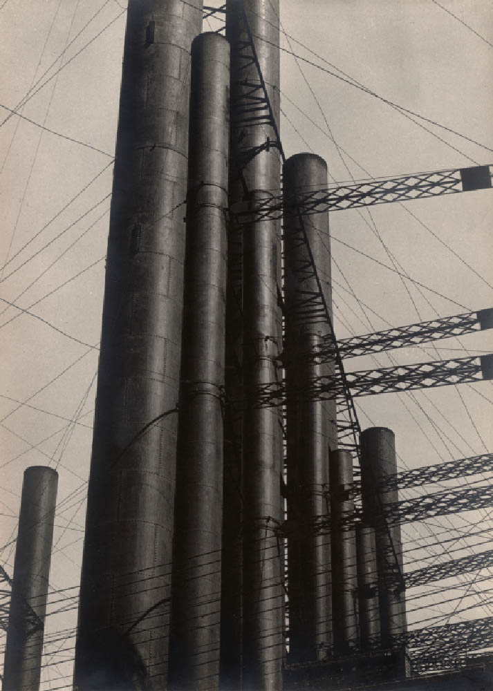
Jakob Tuggener (Swiss, 1904-1988) Fabrik (cover) Rotapfel Verlag, Erlenbach-Zurich 1943
Jakob Tuggener (Swiss, 1904-1988) Fabrik Rotapfel Verlag, Erlenbach-Zurich 1943
Jakob Tuggener’s Fabrik, published in Zurich in 1943, is a milestone in the history of the photography book. Its 72 images, in the expressionist aesthetic of a silent movie, impart a skeptical view of technological progress: at the time the Swiss military industry was producing weapons for World War II. Tuggener, who was born in 1904, had an uncompromisingly critical view of the military-industrial complex that did not suit his era. His images of rural life and high-society parties had been easy to sell, but Fabrik found no publisher. And when the book did come out, it was not a commercial success. Copies were sold at a loss and some are believed to have been pulped. Now this seminal work, which has since become a sought-after classic, is being reissued with a contemporary afterword. In his lifetime, Tuggener’s work appeared – at Robert Frank’s suggestion – in Edward Steichen’s Post-War European Photography and in The Museum of Modern Art’s seminal exhibition, The Family of Man, in whose catalogue it remains in print. Tuggener’s death in 1988 left an immense catalogue of his life’s work, much of which has yet to be shown: more than 60 maquettes, thousands of photographs, drawings, watercolors, oil paintings and silent films.The Family of Man,
Book description on Amazon. The book has been republished by Steidl in January, 2012. The classics never go out of fashion!
Le Corbusier (Swiss-French, 1887-1965) Aircraft The Studio, London/New York 1935
Robert Frank (Swiss-American, 1924-2019) The Americans Grove Press, New York 1958/1959
Werner Bischof (Swiss, 1916-1954) Japan Manesse, Zurich c. 1955
Werner Bischof (Swiss, 1916-1954) Courtyard of the Meiji shrine in Tokyo, Japan 1951 Gelatin silver print
René Burri (Swiss, 1933-2014) Die Deutschen Fretz & Wasmuth Verlag, Zurich 1962
Hugues de Wurstemberger (Swiss, b. 1955) Paysans Editions de la Sarine, Fribourg 1996
Andri Pol (Swiss, b. 1961) Grüezi Kontrast Verlag, Zurich 2006
In the 1970s, Daniel Meadows was at the forefront of the independent photography movement. His practice is complex, passionate and sometimes deeply autobiographical.
Daniel Meadows’ early work broke with tradition and infused the medium with new energies and ways of seeing. Between 1971 and 1987, he produced an astonishing record of urban society in Britain, working in a uniquely collaborative way through his interviews with – and writing about – his subjects.
Text from the National Science and Media Museum website
The National Science and Media Museum presents the first retrospective of the career of Daniel Meadows – photographer, documentarian, digital storyteller and unofficial co-founder of a uniquely British photography movement. Daniel Meadows was one of a group of photographers who spearheaded the independent photography movement in the early 1970s, breaking with tradition and infusing the medium with new energies and ways of seeing. His practice is complex, passionate and sometimes deeply autobiographical.
Between 1971 and 1987, he produced an astonishing record of urban society in Britain, working in a uniquely collaborative way through his interviews with – and writing about – his subjects. Meadows is a documentarist and an exceptional storyteller. He reveals historic and culturally significant aspects of people’s lives, dating from the 1970s to the present day. This exhibition displays photographic works alongside oral testimonies by some of the people featured in the photographs and Digital Stories.
Meadows’ practice developed at Manchester Polythechnic, where he trained alongside fellow photographers Martin Parr, Brian Griffin, Charlie Meecham and Peter Fraser. Together they spearheaded a new documentary movement intent on establishing an independent method for making and disseminating photographs, outside the existing conventions of commercial practitioners and photojournalists. Meadows’ resulting work displays complexity and passion, and confers a personal and sometimes deeply autobiographical imprint. During his career he has produced an astonishing record of urban British society, working in a uniquely collaborative way, through photography, digital stories and recorded interviews, to capture extraordinary aspects of everyday life.
His career began in 1972, when he opened a photographic studio in a former barber’s shop in the Moss Side area of Manchester. The Shop on Greame Street features residents from the district who posed for a portrait which they then received free of charge. None has been previously exhibited, and a selection will be on public display for the first time from October.
Two further early projects are also included in the exhibition, both undertaken in partnership with Martin Parr. June Street, 1973, is an intimate portrayal of working class households in an area of Salford, which have since been demolished. Butlin’s by the Sea, 1972, presents a fascinating record of the holiday camp in Filey, North Yorkshire, just after the heyday of this style of British resort.
In 1973, Meadows, aged 21, also bought a 25-year-old Leyland PD1 double-decker bus for £360.20. He removed the seats to make space for a darkroom and living quarters and named it the Free Photographic Omnibus. He spent 14 months taking his Greame Street studio philosophy of free portraits on tour around England. Original photographs from the journey appear in the retrospective, along with a selection from a follow-up project in which Meadows sought out his Photobus subjects more than 20 years later to re-photograph them for National Portraits: Now and Then, 1995-2000.
Other notable works displayed include Decline in the Cotton Industry, 1975-1978, Welfare State International, 1976-1983, and Nattering in Paradise, 1984-1987. The gallery will also screen a selection of Meadows’ Digital Storytelling films. Condensing personal stories into two-minute features of approximately 250 heartfelt words and 12 images, he created “multimedia sonnets from the people”, leading American commentator J.D Lasica to call him “one of the icons of the Digital Storytelling movement.”
This exhibition and the accompanying publication is the product of research by Professor Val Williams as part of an ongoing study into British photography of 1970s and 1980s at the University of the Arts London. It is preceded by the research project, The New British Photography, 1968-1981, funded by the Arts and Humanities Research Council.
Together Val Williams and Daniel Meadows have brought to light the photographer’s incredible archive of prints and negatives, along with ephemera and audio recordings. They have unearthed unpublished and sometimes forgotten treasures which add to a remarkable document – a dramatic, moving and empathetic evocation of a recognisable, yet increasingly alien era.
Press release from the National Science and Media Museum website
Curators: originally co-curated by Jonathan D. Katz and David C. Ward and organised by the National Portrait Gallery, Smithsonian Institution, its later presentation at the Brooklyn Museum was coordinated locally by Tricia Laughlin Bloom as project curator.
“The possibility of using our bodies as a possible source of very numerous pleasures is something that is very important. For instance, if you look at the traditional construction of pleasure, you see that bodily pleasure, or pleasures of the flesh, are always drinking, eating and fucking. And that seems to be the limit of the understanding of our bodies, our pleasures ….
It is very interesting to note, for instance, that for centuries people generally, as well as doctors, psychiatrists, and even liberation movements, have always spoken about desire, and never about pleasure. “We have to liberate our desire,” they say. No! We have to create new pleasure. And then maybe desire will follow.” (My bold)
Michel Foucault 1
George Platt Lynes, Minor White and The Temptation of Saint Anthony Is Mirrors
I had the great privilege of visiting The Minor White Archive at Princeton University while I was researching for my PhD. While there I studied the work cards and classic prints of the great photographer, paying particular attention to his photography of the male. What was a great surprise and delight to me were the presence of photographs of explicit sexual acts, men photographed with erections – images that have, to my knowledge, never been published. I don’t think that many people would even know that Minor White took such photographs. Although these images would have never been for public consumption it is still very unusual to find a classical photographer with such a public profile taking photographs of erect penises, especially in the 1940s!
Disturbed by having been in battle in the Second World War and seeing some of his best male friends killed, White’s early photographs of men (in their uniforms) depict the suffering and anguish that the mental and physical stress of war can cause. He was even more upset than most because he was battling his own inner sexual demons at the same time, his shame and disgust at being a homosexual and attracted to men, a difficulty compounded by his religious upbringing. In his photographs White both denied his attraction to men and expressed it. His photographs of the male body are suffused with both sexual mystery and a celebration of his sexuality despite his bouts of guilt. After the war he started to use the normal everyday bodies of his friends to form sequences of photographs, sometimes using the body as a metaphor for the landscape and vice versa. In the above photograph (Tom Murphy, left), based on a religious theme, we see a dismembered hairy body front on, the hands clutching and caressing the body, the lower hand hovering near the exposed genitalia, the upper hand cupping the breast. We see the agony and ecstasy of a homoerotic desire cloaked in a religious theme.
The image comes from the The Temptation of St Anthony is Mirrors (1948), four pages of which can be seen below. While at The Minor White Archive I looked at the only complete, undamaged book in existence. What an experience!
The book has a powerful and intense presence. It was beautifully sequenced as you would expect from Minor White and features photographs of Tom Murphy. There is a series of his hands over the back of a chair in different positions: hanging, curled, splayed, held slightly upwards, and these are paired with photographs of bare feet and turned up jeans, bare feet and rocks, and three other photographs of Tom Murphy. In an excellent paper Cruising and Transcendence in the Photographs of Minor White (Nd. Later published as an online-only feature accompanying Aperture magazine’s Spring 2015 issue, “Queer”), author Kevin Moore observes that the hand-bound volume with images paired on facing pages – “mirrors” to both one another and the artist – is a personal account as well as a meditation on the sins of the flesh.
“Temptation (which was never published or exhibited) begins with a sort of prologue, comprising a single full-length nude of Tom Murphy, White’s student and the model most commonly associated with his work. The pose is similar to those found in the beefcake pictures White was producing at this time: Murphy adopts a classical contrapposto stance and is entirely nude, his pale, wiry body positioned against a dark backdrop. A piece of driftwood at the model’s feet proposes a theme of innocence – man in his natural state. The sequence then moves to pairings of images describing man in his civilised state, featuring several loving close-ups of Murphy’s gesturing hands, a shot of his bare feet, and a single shoulder-length portrait, in which he wears a buttoned shirt and looks intently off to the side. Next, there is an interlude suggesting growing dissolution: an image of Murphy’s feet and a petrified stone is paired with a shot of Murphy in full dress slouched on a mass of rocks and staring vacantly off into the distance. The next pairing (images 9 and 10 below) accelerates the descent into temptation. Here, the pose in a second picture of Murphy’s feet suggests agitation, while a three-quarter length portrait of Murphy, crouched in the bushes and looking back over his shoulder, is as emblematic an image of cruising as White ever produced. The photographs that follow descend further into lust and self-recrimination, conveyed through photographs in which Murphy’s naked body alternates between expressions of pain and pleasure. The sequence ends with a series of beatific nudes (images 27 and 28 below), which express redemption through nonsexual treatments of the body and in the body’s juxtaposition with natural forms – a return to nature.
White may have thought at first that the sequence format would help him transcend the limits of personal biography, that he could use the breadth and fluidity of the sequence to emphasize a universal narrative while exercising control over the potentially explosive and revealing content of individual images. This proved to be overly optimistic, at least in his earliest uses of the form. White’s colleagues, for example, immediately understood Temptation for what it really was: an agonized portrayal of White’s love for his male student.”
Moore goes on to conclude that White obsfucated his sexuality, displacing gay ‘cruising’ “by a universalised mystical searching – sexual longing setting in motion a heroic search” using photography as his medium, and that his photographs became a dreamscape, perhaps even a dream(e)scape: “in which meanings are obscured, not clarified; signs are effaced, not illuminated; beauty is closeted, not set out for all to see. White was attracted to the ambiguity of the dream because it offered cover and protection but also freedom to maneuver. The dream supported the irrational, maintained a sense of mystery, and beautified frustration.”
I have to disagree with Kevin Moore.
Anyone who has seen The Temptation of Saint Anthony Is Mirrors in the flesh (so to speak) can feel the absolute presence of these images, their reality, the connection between image and viewer.
Maybe White was a Romantic but he was realistically romantic; his images are not dreamscapes, they offer multiple readings and contexts, insights into the human condition. Even though there was anguish and guilt present about his sexuality, channelled through his photography, anyone bold enough to take photographs of erections in 1940 has some ticker. It takes a clear eye and a courageous heart to do this, knowing what was at stake in this era of sexual repression. Beauty is not closeted here, unless I am looking at different images from Kevin Moore. In fact the magic of the photography of Minor White is his ability to modulate space, to modulate bodies so that they are beautiful, ambiguous and mystical whatever their context. Not everything in this world has to be in your face. Like a Glen Gould playing the Goldberg Variations revelation of beauty takes time, concentration and meditation.
Also, an overriding feeling when viewing the images was one of loneliness, sadness and anguish, for the bodies seemed to be observed and not partaken of, to be unavailable both physically and in a strange way, photographically.
For a photographer who prided himself on revealing the spirit within, through photography, these are paradoxical photographs, visually accessible and mysteriously (un)revealing, photographs of a strange and wonderful ambivalence. Two great words: obsfucation, ambivalence. Clouded with mixed feelings and emotions, not necessarily anything to do with sexuality. Not everything has to be about sexuality. It is the difference between imbibing Freud or Jung – personally I prefer the more holistic, more inclusive, more spiritual Jung.
And so to the image of George Platt Lynes that I have paired with the nude of Tom Murphy (below).
Platt Lynes was another artist who struggled with is sexuality, but seemingly not to such an extent as Minor White did. GPL worked as a fashion photographer and had his own studio in New York where he photographed dancers, artists and celebrities among others. He undertook a series of mythological photographs on classical themes (which are amazing in composition and feature Surrealist motifs). Privately he photographed male nudes but was reluctant to show them in public for fear of the harm that they could do to his reputation and business with the fashion magazines. Generally his earlier male nude photographs concentrate on the idealised youthful body or ephebe.
As Lynes became more despondent with his career as a fashion photographer his private photographs of male nudes tended to take on a darker and sharper edge. After a period of residence in Hollywood he returned to New York nearly penniless. His style of photographing the male nude underwent a revision. While the photographs of his European colleagues still relied on the sun drenched bodies of young adolescent males evoking memories of classical beauty and the mythology of Ancient Greece the later nudes of Platt Lynes feature a mixture of youthful ephebes and heavier set bodies which appear to be more sexually knowing. The compositional style of dramatically lit photographs of muscular torsos of older men shot in close up (see photograph below for example) were possibly influenced by a number of things – his time in Hollywood with its images of handsome, swash-buckling movie stars with broad chests and magnificent physiques; the images of bodybuilders by physique photographers that George Platt Lynes visited; the fact that his lover George Tichenor had been killed during WWII; and the knowledge that he was penniless and had cancer. There is, I believe, a certain sadness but much inner strength in his later photographs of the male nude that harnesses the inherent sexual power embedded within their subject matter.
When undertaking research into GPL’s photographs at The Kinsey Institute as part of my PhD I noted that most of the photographs had annotations in code on the back of them giving details of age, sexual proclivities of models and what they are prepared to do and where they were found. This information gives a vital social context to GPL’s nude photographs of men and positions them within the moral and ethical framework of the era in which they were made. The strong image (below) is always quoted as an example of GPL’s more direct way of photographing the male nude in the last years of his life. The male is solid, imposing, lit from above, heavy set, powerful, massive. The eyes are almost totally in shadow. Later photos have more chiaroscuro than earlier work, more use of contrasting light (especially down lit or uplit figures) but are they more direct? Yes. The men look straight into camera.
This monumentality of body and form was matched by a new openness in the representation of sexuality. There are intimate photographs of men in what seem to be post-coital revere, in unmade beds, genitalia showing or face down showing their butts off. Some of the faces in these later photographs remain hidden, as though disclosure of identity would be detrimental for fear of persecution. The photograph above is very ‘in your face’ for the conservative time from which it emerges, remembering it was the era of witch hunts against communists and subversives (including homosexuals). Conversely, this photograph is quite restrained compared to the most striking series of GPL’s photographs that I saw at The Kinsey Institute which involves an exploration the male anal area (a photograph from the 1951 series can be found in the book titled George Platt Lynes: Photographs from The Kinsey Institute). This explicit series features other photographs of the same model – in particular one that depicts the male with his buttocks in the air pulling his arse cheeks apart. After Lynes found out he had cancer he started to send his photographs to the German homoerotic magazine Der Kries under the pseudonym Roberto Rolf, and in the last years of his life he experimented with paper negatives, which made his images of the male body even more grainy and mysterious.
I believe that Lynes understood, intimately, the different physical body types that gay men find desirable and used them in his photographs. He visited Lon of New York (a photographer of beefcake men) in his studio and purchased photographs of bodybuilders for himself, as did the German photographer George Hoyningen-Huene. It is likely that these images of bodybuilders did influence his later compositional style of images of men; it is also possible that he detected the emergence of this iconic male body type as a potent sexual symbol, one that that was becoming more visible and sexually available to gay men.
The differences between the White and GPL nudes is instructive.
White: introspective, haunted, religious with an unrequited sense of longing – hands clutching self, inward pointing; GPL: more closely cropped, more open, one hand firmly grasping but the other hand open, receptive, presented to the viewer above the available phallic organ. It reminds me for some unknown reason, some quirk of my brain association, of the shell of Botticelli’s Birth of Venus (1486) inverted.
There is difference between the two artists – one struggling with his sexuality, being realistically romantic, the other physically doing something about it – posting his photographs to one of the first gay magazines in the world. But both were taking photographs of intimate sexual acts that could never have been published in their lifetimes – that are still are hidden from view today.
When, oh when, will someone have the courage to publish this work?
Dr Marcus Bunyan
My notes on Minor White’s photographs and notes on George Platt Lynes photographs from my Phd thesis Pressing the Flesh: Sex, Body Image and the Gay Male (2001) can be found below.
Many thankx to the Brooklyn Museum for allowing me to publish the photographs in the posting. Please click on the photographs for a larger version of the image.
1/ Gallagher, Bob and Wilson, Alexander. “Sex and the Politics of Identity: An Interview with Michel Foucault,” in Thompson, Mark. Gay Spirit: Myth and Meaning. New York: St. Martin’s Press, 1987, p.31.
Research notes on photographs from the Minor White Archive, Princeton University, New Jersey 06/08/1999
Research at The Kinsey Institute , Bloomington, Indiana 16/08/1999 – 19/08/1999. George Platt Lynes photographs from the Collection at The Kinsey Institute
(top) Minor White (American, 1908-1976) Images 9 and 10 in the bound sequence The Temptation of Saint Anthony Is Mirrors 1948 9.3 x 11.8cm; 11.2 x 9.1cm
(bottom) Minor White (American, 1908-1976) Images 27 and 28 in the bound sequence The Temptation of Saint Anthony Is Mirrors 1948. 5.3 x 11.6cm; 10.6 x 8.9cm
(left) Minor White (American, 1908-1976) Tom Murphy (San Francisco) 1948 From The Temptation of St Anthony is Mirrors 1948 Gelatin silver print 4 5/8 x 3 5/8 in. (11.7 x 9.2 cm)
George Platt Lynes (American, 1907-1955) Untitled (Frontal Male Nude) 1949-1950 Gelatin silver print
Thomas Eakins (American, 1844-1916) Walt Whitman (American, 1818-1892) 1891 10.3 x 12.2cm National Portrait Gallery, Smithsonian Institute
Charles Demuth (American, 1883-1935) Dancing Sailors 1917 Watercolour and pencil on paper 20.3 x 25.4cm Cleveland Museum of Art, Ohio; Mr and Mrs William H Marlatt Fund
George Wesley Bellows (American, 1882-1925) Riverfront No.1 1915 Oil on canvas 115.3 x 160.3cm Columbus Museum of Art, Ohio: Howald Fund Purchase
Marsden Hartley (American, 1877-1943) Eight Bells Folly: Memorial to Hart Crane 1933 Oil on canvas Gift of Ione and Hudson D. Walker Frederick R. Weisman Art Museum, University of Minnesota
Harold Hart Crane (American, 1899-1932)
Harold Hart Crane (July 21, 1899 – April 27, 1932) was an American poet. Finding both inspiration and provocation in the poetry of T. S. Eliot, Crane wrote modernist poetry that is difficult, highly stylised, and very ambitious in its scope. In his most ambitious work, The Bridge, Crane sought to write an epic poem in the vein of The Waste Land that expressed something more sincere and optimistic than the ironic despair that Crane found in Eliot’s poetry. In the years following his suicide at the age of 32, Crane has come to be seen as one of the most influential poets of his generation…
Crane visited Mexico in 1931-32 on a Guggenheim Fellowship and his drinking continued as he suffered from bouts of alternating depression and elation … While on board the steamship SS Orizaba enroute to New York, he was beaten after making sexual advances to a male crew member, seeming to confirm his own idea that one could not be happy as a homosexual. Just before noon on April 27, 1932, Hart Crane jumped overboard into the Gulf of Mexico. Although he had been drinking heavily and left no suicide note, witnesses believed his intentions to be suicidal, as several reported that he exclaimed “Goodbye, everybody!” before throwing himself overboard. (The legend among poets is: He walked to the fantail, took off his coat quietly, and jumped.) His body was never recovered.
David Wojnarowicz (American, 1954-1992) A Fire In My Belly (Film In Progress) (film still) 1986-1987 Super 8mm film Black and white & color (transferred to video) Courtesy of The Estate of David Wojnarowicz and P.P.O.W Gallery, New York and The Fales Library and Special Collection
One day before World AIDS Day, the renown painter, photographer, writer, filmmaker, performance artist and activist David Wojnarowicz, who died in 1992 at the age of 37 from AIDS-related complications, has had one of his most important works, A Fire In My Belly, pulled from The Smithsonian Institution’s National Portrait Gallery’s HIDE/SEEK exhibit because of pressure from conservative politicians and the Catholic League.”
HIDE/SEEK: Difference and Desire in American Portraiture, the first major museum exhibition to explore how gender and sexual identity have shaped the creation of American portraiture, organised by and presented at the National Portrait Gallery last fall, will be on view at the Brooklyn Museum from November 18, 2011, through February 12, 2012. With the cooperation of the National Portrait Gallery, the Brooklyn Museum has reconstituted the exhibition in concert with the Tacoma Art Museum, where it will be on view from March 17 through June 10, 2012.
HIDE/SEEK includes approximately a hundred works in a wide range of media created over the course of one hundred years that reflect a variety of sexual identities and the stories of several generations. Highlighting the influence of gay and lesbian artists, many of whom developed new visual strategies to code and disguise their subjects’ sexual identities as well as their own, HIDE/ SEEK considers such themes as the role of sexual difference in depicting modern Americans, how artists have explored the definition of sexuality and gender, how major themes in modern art – especially abstraction – have been influenced by marginalisation, and how art has reflected society’s changing attitudes.
Announcing the Brooklyn presentation, Museum Director Arnold L. Lehman states, “From the moment I first learned about this extraordinary exhibition in its planning stages, presenting it in Brooklyn has been a priority. It is an important chronicle of a neglected dimension of American art and a brilliant complement and counterpoint to ‘Youth and Beauty: Art of the American Twenties’, a touring exhibition organised by the Brooklyn Museum, also on view this fall.”
In addition to its commentary on a marginalised cultural history, HIDE/ SEEK offers an unprecedented survey of more than a century of American art. Beginning with late nineteenth-century portraits by Thomas Eakins and John Singer Sargent, it includes works from the first half of the 1900s by such masters as Romaine Brooks, George Bellows, Marsden Hartley, and Georgia O’Keeffe; the exhibition continues through the postwar period with works by Jasper Johns, Robert Rauschenberg, Agnes Martin, and Andy Warhol, and concludes with major works by late twentieth-century artists such as Keith Haring, Glenn Ligon, Nan Goldin, Felix Gonzalez-Torres, and Catherine Opie.
The Brooklyn presentation will feature nearly all of the works included in the National Portrait Gallery exhibition. Among them are rarely seen paintings by Charles Demuth, whose better-known industrialised landscapes are on view in the Brooklyn Museum exhibition Youth and Beauty; a poignant portrait of New Yorker writer Janet Flanner wearing two masks, taken by photographer Bernice Abbott; Andrew Wyeth’s painting of a young neighbour standing nude in a wheat field, much like Botticelli’s Venus emerging from her shell; Robert Mapplethorpe’s photograph riffing on the classic family portrait, in which a leather-clad Brian Ridley is seated on a wingback chair shackled to his whip-wielding partner, Lyle Heeter; and Cass Bird’s photographic portrait of a friend staring out from under a cap emblazoned with the words “I look Just Like My Daddy.” The exhibition will also include David Wojnarowicz’s A Fire in My Belly, an unfinished film the artist created between 1986 and 1987.
Press release from the Brooklyn Museum website
Berenice Abbott (American, 1898-1991) Janet Flanner (American, 1892-1978) 1927 Photographic print 23 x 17.3cm Prints and Photographs Division, Library of Congress, Washington, D.C C Berenice Abbott / Commerce Graphics Ltd., Inc.
Thomas Eakins (American, 1844-1916) Salutat 1898 Oil on canvas 127.0 x 101.6cm Addison Gallery of American Art, Phillips Academy, Andover, Massachusetts Gift of anonymous donor
Lincoln Edward Kirstein (May 4, 1907 – January 5, 1996) was an American writer, impresario, art connoisseur, philanthropist, and cultural figure in New York City, noted especially as co-founder of the New York City Ballet. He developed and sustained the company with his organising ability and fundraising for more than four decades, serving as the company’s general director from 1946 to 1989. According to the New York Times, he was “an expert in many fields,” organising art exhibits and lecture tours in the same years.
Photographer Walker Evans and writer-patron Lincoln Kirstein shared a pivotal creative partnership that shaped early American modern photography. Kirstein – co-founder of the New York City Ballet – was Evans’s early patron, funding his 1930–1931 New England architecture project, organising his first MoMA show in 1933, and writing the text for his landmark 1938 book, American Photographs.
Marsden Hartley (American, 1877-1943) Painting No. 47, Berlin 1915 Oil on canvas 39 7/16 x 32 in (100.1 x 81.3cm) Hirshhorn Museum and Sculpture Garden, Smithsonian Institution, Washington, D.C. Gift of Joseph H. Hirshhorn, 1972
Let’s not beat around the bush. Despite protestations to the contrary (appeals to the objectivity of the image, eschewing entirely the aspects of beauty, emotion and opinion; the rigorous frontality of the individual images giving them the simplicity of diagrams, while their density of detail offers encyclopaedic richness) these are subjective images for all their objective desire. The paradox is the more a photographer strives for objectivity, the more ego drops away, the more the work becomes their own: subjective, beautiful, emotive.
Even though the Bechers’ demonstrate great photographic restraint with regard to documenting the object, the documentary gaze is always corrupted / mutated / distorted by personal interpretation: where to position the camera, what to include or exclude, how to interpret the context of place, how to crop or print the image, and how to display the image, in grids, sequences or singularly. In other words there are always multiple (con)texts to which artists conform or transgress.
What makes great photographers, such as Eugène Atget, Walker Evans, August Sander and the Bechers, is the idiosyncratic “nature” of their vision: how Atget places his large view camera – at that particular height and angle to the subject – leaves an indelible feeling that only he could have made that image, to reveal the magic of that space in a photograph. It is their personal, unique thumbprint, recognisable in an instant. So it is with the Bechers.
These are intimate images, a personal reaction to space and place, to being. They make my heart ache for their stillness and ethereal beauty. Bravo!
Dr Marcus Bunyan
Many thankx to the Fotomuseum Winterthur, Zurich for allowing me to publish the photographs in the posting. Please click on the photographs for a larger version of the image.
“The pictures were stripped of any artistic frills and reduced to an essentially topographic state, conveying substantial amounts of visual information but eschewing entirely the aspects of beauty, emotion and opinion.”
William Jenkins, Curator of the ‘New Topographics’ exhibition, 1975
“The Ruhr Valley, where Becher’s family had worked in the steel and mining industries, was their initial focus. They were fascinated by the similar shapes in which certain buildings were designed. In addition, they were intrigued by the fact that so many of these industrial buildings seemed to have been built with a great deal of attention toward design. Together, the Bechers went out with a large 8 x 10-inch view camera and photographed these buildings from a number of different angles, but always with a straightforward “objective” point of view. They shot only on overcast days, so as to avoid shadows, and early in the morning during the seasons of spring and fall. Objects included barns, water towers, oal tipples, cooling towers, grain elevators, coal bunkers, coke ovens, oil refineries, blast furnaces, gas tanks, storage silos, and warehouses. At each site the Bechers also created overall landscape views of the entire plant, which set the structures in their context and show how they relate to each other.”
“The German artists Bernd and Hilla Becher, who began working together in 1959 and married in 1961, are best known for their “typologies” – grids of black-and-white photographs of variant examples of a single type of industrial structure. To create these works, the artists traveled to large mines and steel mills, and systematically photographed the major structures, such as the winding towers that haul coal and iron ore to the surface and the blast furnaces that transform the ore into metal. The rigorous frontality of the individual images gives them the simplicity of diagrams, while their density of detail offers encyclopaedic richness. At each site the Bechers also created overall landscape views of the entire plant, which set the structures in their context and show how they relate to each other. The typologies emulate the clarity of an engineer’s drawing, while the landscapes evoke the experience of a particular place.”
For more than forty years, the photographer couple Bernd (1931-2007) and Hilla Becher (1934-2015) worked on creating an inventory of industrial architecture. Warehouses, shaft towers, gas tanks, blast furnaces as well as half-timbered houses are among the subjects they photographed throughout Germany, England, France, Central Europe, and the USA. Calling these buildings “anonymous sculptures,” they refer to the artistic quality of the constructions, which played no role for the buildings’ largely unknown builders and users. Their photographs attempt to draw attention to these hidden sculptural qualities and to document them historically as a building tradition in decline.
Bernd and Hilla Becher have always held particular interest for the industrial architecture in the Ruhr region. The exhibition Mines and Mills – Industrial Landscapes systematically examines this aspect of their work for the first time. Even today, names such as the Concordia and Hannibal collieries or Gutehoffnungshütte stand for the industrial history of the Ruhr region. Instead of concentrating on individual buildings, the exhibition approaches the mining facilities (where coal was produced for the smelting works) as a whole and in the context of their urban or natural surroundings. This typology, which the Bechers described as “industrial landscape,” compares the Ruhr region with similar complexes elsewhere in Europe and the USA.
As with their typological multiple and serial views of buildings, Bernd and Hilla Becher strive for a comparative perspective in their industrial landscapes. Demonstrating great photographic restraint in their approach and in the name of a “New Objectivity” dedicated solely to the object, they stand in a long tradition of proponents of the documentary gaze that includes Eugène Atget, Karl Blossfeldt, Walker Evans, Albert Renger-Patzsch and August Sander. Their influence on the history of photography extends from the establishment of the “Dusseldorf School” into the present.
“The main aim of our work is to show that the forms of our time are technical forms, although they did not develop from formal considerations. Just as medieval thought is manifested in the gothic cathedral, our era is revealed in technical buildings and apparatuses,” Bernd and Hilla Becher stated in a conversation from 2005.
The industrial landscapes can be read from historical and social perspectives, to an even greater extent than the familiar photographs of simple building typologies. Next to the monumental, industrial buildings one often sees residential constructions, gardens, and allotment gardens, which convey how intertwined the organisation of life and work was at the time and how deeply rooted people were in this city-like structure. Photographed at waist-height, the broad, open views of the horizontally composed photographs have an aesthetic that is almost atypical of the Bechers. However, the images adhere systematically to the archival thinking of the artist couple.
Press release from the Fotomuseum Winterthur, Zurich website
Installation view of the exhibition Bernd and Hilla Becher: Landscape / Typology at the Museum of Modern Art, New York, May 21, 2008 – August 25, 2008 showing top row at right, Hippolyte Blancard’s Untitled (1888, below) Photograph by John Wronn
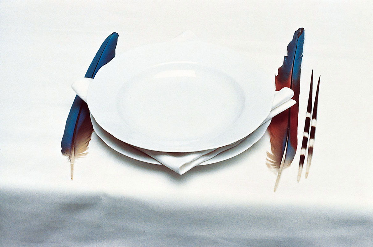
Hippolyte Blancard (French, 1843-1924) Untitled April 1888 Platinum print 8 13/16 × 6 1/8″ (22.4 × 15.6cm) Museum of Modern Art, New York Purchase
Hippolyte Blancard, a pharmacist and amateur photographer, documented Parisian architecture leading up to the 1889 Exposition Universelle, or World’s Fair, an international event held in Paris to showcase new innovations, geographic and scientific discoveries, and works of art. His series of photographs shows the construction of the Eiffel Tower, which was conceived as the entrance to the World’s Fair. Blancard’s photographs document the tower’s progression, from July 1887 to April 1889.
Installation view of the exhibition Bernd and Hilla Becher: Landscape / Typology at the Museum of Modern Art, New York, May 21, 2008 – August 25, 2008 showing the three images directly below – Duisburg-Bruckhausen (1999); Ensley, Alabama, USA (1982); and Knutange, Lorraine, France (1971) Photograph by John Wronn
Installation views of the exhibition Bernd and Hilla Becher: Landscape / Typology at the Museum of Modern Art, New York, May 21, 2008 – August 25, 2008 Photographs by John Wronn
Bernd and Hilla Becher (German, active 1959-2007) Bernd Becher (German, 1931-2007) Hilla Becher (German, 1934-2015) Industrial Façades (detail) 1978-1992 21 Gelatin silver prints Each 12 3/16 × 15 15/16″ (31 × 40.5cm) Acquired through the Gerald S. Elliot Bequest
Installation view of the exhibition Bernd and Hilla Becher: Landscape / Typology at the Museum of Modern Art, New York, May 21, 2008 – August 25, 2008 showing at second left, Winding Towers (1966-1997, below) Photograph by John Wronn
For more than forty years, the Bechers photographed winding towers, blast furnaces, silos, cooling towers, gas tanks, grain elevators, oil refineries, and the like – all examples of the European and American industrial architecture that had begun to disappear in the transition from an industrial society to an information society. Their works typically present each structure frontally against flat, evenly grey backgrounds. By using large-format cameras and finely grained black-and-white film, they ensured that the motifs they photographed were rendered with a high degree of precision and clarity.
The Bechers organised the images into groupings assembled in grids, classified by function into types. In this strict layout, each structure may easily be compared with the others. The nine separate pictures in Winding Towers together transform the specificity of the individual towers into variations on an ideal form and, conversely, preserve their individual characteristics within a typology.
Publication excerpt from MoMA Highlights: 375 Works from The Museum of Modern Art, New York (New York: The Museum of Modern Art, 2019). Used under fair use conditions for the purposes of education and research
Installation view of the exhibition Bernd and Hilla Becher: Landscape / Typology at the Museum of Modern Art, New York, May 21, 2008 – August 25, 2008 Photograph by John Wronn
Curator: conceived and curated by Leipzig-based curator and artist Helmut Völter
Wolken im Luftmeer (Clouds in a sea of air) (cover) 1917
I desire (I feel that is the correct word) to own a copy of the above book. Has anyone got a one for sale?
Please let me know as I would love to own one!
Update: I now own a copy of Wolken im Luftmeer purchased from a lovely person in Germany 🙂
Dr Marcus Bunyan
Many thankx to the Fotomuseum Winterthur, Zurich for allowing me to publish the photographs in the posting. Please click on the photographs for a larger version of the image.
Unknown photographer Wolkendecken, die ineinander übergehen. S.-Cu. und S., from: Wolken im Luftmeer (Merging cloud covers. S.-Cu. and S., from: Clouds in a sea of air) Photographs taken by German fighter pilots during WW1, Berlin, 1917
Unknown photographer Feine Schäfchen. Ci.-Cu, from: Wolken im Luftmeer (Delicate fluffy clouds. Ci.-Cu, from: Clouds in a sea of air) Photographs taken by German fighter pilots during WW1, Berlin, 1917
Unknown photographer Flying above a sea of clouds – altostratus from an aircraft (Plate Nr. 103 from: Wolken im Luftmeer / Clouds in a sea of air) Photographs taken by German fighter pilots during WW1, Berlin, 1917
Unknown photographer (Plate Nr. 90 from: Wolken im Luftmeer / Clouds in a sea of air) Photographs taken by German fighter pilots during WW1, Berlin, 1917
The English pharmacist and meteorologist Luke Howard wrote in 1802 in the preface to his manuscript On the Modification of Clouds: “Clouds are subject to certain distinct modifications, produced by the general causes which affect all the variations of the atmosphere; they are commonly as good visible indicators of the operation of these causes, as is the countenance of the state of a person’s mind or body.” Eighty years later, meteorologists had still not reached a consensus on how to classify, label, and read the forms of clouds. It was during this time that scientists first began using photography to record and measure clouds. With its help, they attempted to gain precise and accurate images that would provide insight on the interplay between clouds and the atmosphere and which could be used to create and convey a classification of cloud forms.
The exhibition CLOUD STUDIES – The Scientific View of the Sky presents six stages of meteorological cloud photography, from its infancy in the 1880s – in Switzerland with the first images by Albert Riggenbach photographed from Mount Säntis – up to the newspaper images in the United States that were captured by the first weather satellites in the 1960s. At the beginning of the 20th century, cloud formations and cloud systems were investigated foremost by the military and led to fundamental insights into interrelated weather situations.
CLOUD STUDIES – The Scientific View of the Sky is a rich collection of photographs, notes, records and atlases from diverse research sources and depicts the origins of contemporary weather forecasting. Each of the six parts of the exhibition represents a different scientific and photographic view of clouds while reflecting on the “history of the gaze” as well as the history of the medium with its various photographic mechanisms and reproductive technologies.
An additional theme running throughout the exhibition is the development of science and its varying ideas about clouds. The protagonists and working methods change over time – from the ambitious, wealthy amateur Ralph Abercromby to the anonymous teams of weather satellite technicians. Whereas Riggenbach still wished to capture images of ideal cloud types, the view of the cloud constellations and their chaotic systems expands with the introduction of film, at the latest, and with the constant recording and measuring capacities of digital cameras, which transmit images to earth, where they are evaluated and publicised.
Conceived by curator Helmut Völter (Leipzig), the exhibition CLOUD STUDIES – The Scientific View of the Sky explores the question as to how all these changes influenced the intentions, concepts, and technical developments associated with images of the clouds. It shows how similar or dissimilar photographs of clouds can be, when photographed according to individual specifications. Ultimately it is left to the viewer to decide if and how scientific cloud photography differs from related and frequently published motifs from the history of art and photography.
Press release from the Fotomuseum Winterthur, Zurich website
Many thankx to the Art Gallery of New South Wales for allowing me to publish the photographs in the posting. Please click on the photographs for a larger version of the image.
Glaister studio (Australian, 1855-1870) Untitled (portrait of a man and three girls) 1855-1870 Ambrotype, colour dyes 6.5 x 9cm sight; 9.3 x 11.9cm case Purchased 1989
This charming ambrotype was thought to have been produced by one of Australia’s most important early photographers, Thomas Glaister, owning to the presence of the Glaister stamp on the case. However, superb varnish was one of Glaister’s hallmarks and this ambrotype is not varnished. In addition, the hand-colouring is not considered to be to Glaister’s standard. As such, it is possible that the ambrotype was inserted into this case at a later date, not least because there is no form of blackening behind the image. This was standard practice to prevent the viewer seeing through to the inside of the case. The Eichmeyer ‘book’ case, patented in 1855 by Henry A Eichmeyer of Philadelphia, were made of fine leather and beautifully put together. Glaister certainly used these but the ambrotype is probably not his specifically and could have been made by one of his sons in the 1860s when they worked as travelling photographers. Regardless of who took the image, it is a charming colonial portrait which in size is typical of the period – it can easily be held in the hand.
Ambrotypes were developed in the 1850s. They were faster and cheaper to make than daguerreotypes, yet were still unique objects.
1/ 1989, ‘Masterpieces of Australian photography’, Josef Lebovic Gallery, Sydney p. 25
Olive Cotton (Australian, 1911-2003) Only to taste the warmth, the light, the wind c. 1939 Gelatin silver print Image/sheet: 33.2 x 30.0cm Purchased with funds provided by John Armati 2006 Art Gallery of NSW Collection
Only to taste the warmth, the light, the wind appears to have been the only print Cotton made of this image. It was found in the late 1990s and has been shown only once, in an exhibition at the AGNSW in 2000 where it was also used on the catalogue cover. It was unusual for Cotton to print so large, yet it is entirely fitting that this monumental head and shoulder shot of a beautiful young woman should be presented in this way. The subject was a model on a fashion shoot at which Cotton was probably assisting. Cotton often took her own photographs while on such shoots and used them for her private portfolio. The photograph transcends portraiture, fashion and time to become a remarkable image of harmony with the elements.
Cotton took the title for this photograph from an 1895 poem by English poet Laurence Binyon, ‘O summer sun’:
O summer sun, O moving trees! O cheerful human noise, O busy glittering street! What hour shall Fate in all the future find, Or what delights, ever to equal these: Only to taste the warmth, the light, the wind, Only to be alive, and feel that life is sweet?1
A photographer whose work straddles pictorialism, modernism and documentary, Cotton maintained an independent vision throughout her working life, based on the close observation of nature. Her understanding of the medium of photography was not to do with capture, but rather ‘drawing with light’.
1/ 1915, ‘Poems of today’, English Association, London p. 96.
Deacon is widely recognised for her staged photographs which employ various props, including souvenirs and kitsch, in satirical tableaus that critique notions of Aboriginality. Initially, in 1991, she employed dolls and since then they have become a signature motif. This use of non-living models informed her practice when she began to photograph people. As Deacon states, ‘I’ve never been one for “live action” shots… I’ve got to rule the roost. It’s no different dealing with inanimate objects or people, except with people I’m more terrified.’1
This method can be seen in Deacon’s Portrait: Janet Burchill & Jennifer McCamley, artists 1998. Burchill and McCamley, Melbourne and Mildura based collaborative artists, have been arranged in a re-enactment of Henri Matisse’s Conversation 1908-1912. The photograph echoes the deep blue background of the original painting. The two artists hold the stiff positions of Matisse and his seated wife gazing across at each other. This is one of a number of Deacon’s works that feature Australian writers, artists and other notable figures re-enacting iconic paintings. Other examples include artist Fiona Hall in a 2004 retake of Grace Cossington-Smith’s The sock knitter 1915 and a portrait of Gary Foley inspired by William Dobell’s The boy at the basin 1932.
1/ Destiny Deacon, ‘Interview with Virginia Fraser’ in Destiny Deacon: walk & don’t look blak, Museum of Contemporary Art, Sydney, 2004, p. 109.
Self portrait with Leica is a complex image in which the artist has photographed herself and her trademark Leica in one mirror, while the profile of both is reflected in another. The large button on her cuff disturbs the play between full face and profile, while the objects at the bottom of the frame lend a certain informality to an otherwise highly contrived set-up. The soft velvety curtain behind introduces a further element of rich tactility. The play between black, white and shades of grey softens and enriches the overall image.
Although Bing avoided becoming part of any specific movement of the 1920s or 1930s – for example, constructivism, the Bauhaus or surrealism, describing herself as being ‘on the edge of the periphery of the Bauhaus’ only – she was fully cognisant of the range of experimentation which was taking place across Europe. She forged her own path, combining an abiding belief in the importance of intuition and poetry with rigorous composition and superb technical skills.
Inspired by the work of Florence Henri, and with increasing confidence in her ability to marry naturalism with geometric formalism, Bing worked extensively as a press, fashion, portrait and documentary photographer in Paris until she was interned as an enemy alien in 1940. Late in her life Bing wrote:
‘I didn’t choose photography; it chose me. I didn’t know it at the time. An artist doesn’t think first and then do it, he [sic] is driven. Now over fifty years later, I can look back and explain it. In a way, it was the trend of the time; it was the time when you started to see differently … And the camera, that was, in a way, the beginning of the mechanical device penetrating into the field of art.’1
1/ Barrett N C 1985, Ilse Bing: three decades of photography, New Orleans Museum of Art, New Orleans pp. 13-14.
The four portraits in the Art Gallery of New South Wales collection reflect a particular period in Australian art, when the now established artists were beginning their careers. They depict members of the contemporary art scene of the late 1970s to mid 1980s associated with Art + Text, an Australian art magazine published from 1981-2000.
Philip Brophy formed the experimental group Tsk Tsk Tsk in 1977. The group produced experimental music, films, videos, and live theatrical performances. Brophy involved his friends in the group, including partner Maria Kozic on synthesiser. Kozic was also producing her own multimedia work. In this photograph, Kozic and Brophy are standing in a suburban backyard complete with Hills Hoist. This is reflective of Tsk Tsk Tsk’s suburban beginnings, based as it was at Clifton Hill’s Community Music Centre. After the group’s dissolution in the early 1980s, Brophy made several experimental films and curated numerous programs for the Melbourne international film festival as well as exhibitions such as Tezuka: the marvel of manga for the National Gallery of Victoria. Kozic moved to New York where she continued her artistic career. Her work has been exhibited widely throughout Australia and overseas and been collected by many museums including the Art Gallery of New South Wales.
Lux’s portraits are by no means traditional, ‘I call them imaginary portraits. They are not really about the children that I photographed’, commented the artist in interview with Wim van Sinderen (Loretta Lux: new work 2004). In relation to The waiting girl, Lux has said: ‘It’s a picture about time, and timelessness. For me they are sitting on the sofa as if they are waiting for eternity.’ (The Guardian 23 November 06)
Through subtle digital manipulation of the body and facial features of her subjects, Lux creates eerie doll-like creatures with glazed eyes, porcelain smooth skin and subtly ill-proportioned forms. The resulting portraits contain an uncanny blend of mute childish innocence and the self-contained stoicism of adulthood.
Lux’s images of children recall those of the old masters, such as Veláquez, Runge and Bronzino whom she cites as main inspirations alongside German photographer August Sander. Lux has stated in an interview with Louise Baring for the Telegraph (UK) that she uses children ‘as a metaphor for a lost paradise’. Dressing her young models in past fashions (often of the era of her own childhood) suggests the child’s game of ‘dress ups’ in order to be an adult yet somehow played out in reverse. That is, Lux’s children do not seem like children at all, but rather like serious world-weary adults manifested in childish forms.
Spanning over a century, What’s in a face? aspects of portrait photography is an exhibition of 45 photographs from the Art Gallery of NSW collection. The exhibition focuses on crucial points in the history of photographic depictions of the human face ranging from studio portraiture in the late 19th century to contemporary practices today.
Works by Australian photographers, such as Paul Foelsche, Olive Cotton, Max Dupain, Carol Jerrems, Destiny Deacon, Patrina Hicks, Darren Sylvester and others, are placed in an international context, represented by Man Ray, Edward Weston, Iwao Yamawaki, Nan Goldin, Ben Cauchi and Loretta Lux, amongst others.
All portraits reveal something of the sitter, the photographer and also of us as viewers, but none reveal a whole and complete being. This is part of the enduring fascination with the photographic portrait which purports to be an exact likeness but operates more accurately as a metaphor for the self and how that self might exist in the world at a particular point in time.
Judy Annear, senior curator photographs, Art Gallery of NSW
Using photography to depict the face and figure was initially a time-consuming and expensive business. However, the drive to document all things in the world, and rapid technological advances, meant that by the 1880s most people, willing or not and regardless of the photographer’s or their own desires, were documented in some way.
Spurious 19th century ideas to do with what a face could represent exploded in the early 20th century when identity came to be seen as a psychological rather than social phenomenon. Theatricality and performing for the camera, which had existed in photography since its inception, also became much more evident in this period.
In the post-WWII era representations of the face and the body quickly acquired a political and socially aware edge. More recently the face has tended to stand less as an expression of personal experience and more a statement that may signify a set of ideas, whether about the individual, the group or the society at large. Many of these highly constructed images acknowledge and play upon the problematics of the photographic portrait.”
Text from the AGNSW website
Petrina Hicks (Australian, b. 1972) Shenae and Jade 2005 From the series Untitled 2005 Lightjet print 85.5 x 80cm Courtesy the artist and Michael Reid Gallery
Shenae and Jade is typical of Hicks’ unconventional portraits. The young model holds the budgie’s head in her mouth. It’s the kind of slightly dangerous behaviour which can be unnerving to observe. The freckled nose of the model is in tension with her smooth pale temples, heavily lashed closed eyes and soft white top. The luminescent background and generally pale colouration throw the headless body of the brightly coloured budgie into high relief.
Informed by the slick stylistic conventions of high-end consumer images, Darren Sylvester’s body of work suggests the existential dilemma of living in an overtly consumerist society – one that promises fulfilment but fails to truly satisfy even the most ardent consumer. Perpetually tantalised with glossy images of affluence, ‘must-have’ products and brochure living, our ‘real’ lives can at times seem unfulfilling by comparison, sometimes painful and often a little pathetic. Sylvester’s work seems to suggest that even in our most personal heartfelt moments, our lives are just like everybody else’s, not so special or unique. Our lives could equally be a series of advertising moments.
Yet the nature of this work is resolutely ambiguous, alternately offering intimacy and emotion with cool detachment. Photo-shopped clean of incidental detail and anomaly, and featuring youthful agency models, Sylvester’s evenly lit, tightly focused images still tap a nerve despite their polished finish. Perhaps this is because they are precisely ‘generic’ (and emotive) experiences to which we can all relate. The same principles underpin a good pop song and in Sylvester’s work this is no coincidence – he strives to produce images that carry the same directness and lasting impact. Commenting on the music of the Carpenters, ‘their lyrics were always sad and about emotional relationships but sealed beneath glossy west coast melodies’, Sylvester reveals the pop-music strategies he employs in his work.1
Based on short stories written by the artist prior to composing the scene, his images carry their own inherent narrative. Yet we don’t need to read Sylvester’s story to understand the drama, nor do we need to hear the tune to recognise the song – it’s an old one, and a shared one, that each of us remembers well.
1/ Colless, E 2006, ‘Darren Sylvester: the right stuff’, Australian Art Collector, no 36, Apr-Jun p. 102.
Hans Hasenpflug (Australia/Germany 1907-1977) Untitled (head of a woman) 1940-1941 Gelatin silver photograph Image: 28.8 x 24.3cm Gift of Mr Christopher Hamilton, the artist’s son 1984
Hans Hasenpflug arrived in Australia in 1927 aged 20. He had been born into an educated Stuttgart family but it does not appear that he became involved in photography until 1932 when he was employed by Leica Photo Service, Sydney. Hasenpflug went on to work for prominent photographer Russell Roberts from 1935 to 1937 before moving to Melbourne and working with Athol Shmith and other Melbourne studios from 1937 to 1942. As an enemy alien Hasenpflug was not allowed to work on industrial assignments during World War Two but he was not interned and was naturalised in 1945. Hasenpflug exhibited in photography salons in the 1930s and his work appeared in the Sydney Morning Herald, Australian Woman’s Weekly and the Sunday Telegraph.
Hasenpflug was a versatile advertising photographer. He specialised in fashion and product advertising and some portraiture. Despite his apparent lack of photographic training until the 1930s, he seems to be have been strongly influenced by the European avant-garde. Many of his photographs, regardless of genre or subject matter, depend on diagonals through the picture plane and on raking light.
This is true of Untitled. Strong light has created deep shadows across the subject, a closely cropped image of a woman’s face. This, combined with the oblique camera angle, creates a vivid and disconcerting image. The woman is staring directly into the camera, yet a band of strong shadow across the centre of the image creates a blank eyed effect. The pupil free eyes seem inhuman; mask-like or alien. This is in stark contrast to the woman’s open smile that dominates the bottom of the work. The strong, full light on this area highlights her lips, gums and teeth to an almost hyper real extent. These contradictions create an image that on the surface seems friendly and intimate, yet contains an undertone of threat. The inherent strangeness of the image makes it unlikely that this was a commissioned photograph, but rather the artist’s experiment with his medium, and indeed is probably a portrait of his fiancee, Elizabeth Hamilton Crouch.
Edward Weston’s Mexican years were of great importance to him and allowed for the maturing of his vision in relation to photography. Accompanied by Tina Modotti, whose own work developed at this time, Weston experimented with pure form through monumental portraits (of which Guadalupe de Rivera, Mexico is a classic example), images of landscapes and buildings, still-lifes and nudes.
Weston’s portraits of those he encountered in Mexico are uniformly compelling. Often taken with a hand-held camera against a plain background and with strong lighting, these images emphasise individuality, modernity and dynamism.
Guadalupe de Rivera was Diego Rivera’s wife at the time and both were among the group of people Weston and Modotti associated with. Weston described Guadalupe in his ‘Daybooks’ as ‘tall, proud of bearing, almost haughty; her walk like a panther’s, her complexion almost green, with eyes to match’.1 As he worked on the portrait, Weston wrote: ‘I am finishing the portrait of Lupe. It is a heroic head, the best I have done in Mexico; with the Graflex, in direct sunlight I caught her, mouth open, talking, and what could be more characteristic of Lupe! Singing or talking I must always remember her’.2
This later print by Weston emphasises, through the dramatic effect of light and shade, the strong lines of the face. The shape of the open mouth is echoed by the shadowed eye above and the jawline below. The diagonal of jaw to ear which runs in parallel to the nose also adds to the dynamism of this image. Outdoors, with the sun shining on her hair, this is a portrait of a remarkable woman.
1/ Newhall, N (ed) 1981, ‘The daybooks of Edward Weston 1 Mexico’, Aperture, New York p. 26. 2/ Ibid p. 42.
A quintessential image of the 1970s, Vale Street has lost none of its capacity to enchant and disturb in the intervening years. In one sense it can be read as a sociological document; in another as a wholly subjective work of art. Like the mediumistic spirit-photographs of the nineteenth century, Jerrems’s photo seems to disclose the very souls of its subjects. As they respond, each in their individual fashion, to the regarding presence of the camera lens, the figures compose themselves, without theatrics, into telling attitudes. The prominence and bodily confidence of the open-faced young woman is set against the reticence of her boyish companions. As a portrait of relationships as well as individuals, Vale Street speaks of gender relations, adolescent sexuality, suburban mores and the photographer’s own subtly partisan demeanour in regard to these themes.
Max Dupain (Australia, 1911-1992) Untitled (self portrait) 1930s Gelatin silver photograph 19.3 x 14cm Art Gallery of NSW Collection
This engaging self-portrait by Max Dupain was kept by the artist in an album of photographs from the 1930s. The album was possibly a workbook which would enable Dupain and his clients to review his career as a young modernist photographer. Dupain had opened his own studio in 1934 at the age of 23 having previously been apprenticed to Cecil Bostock and studying painting and drawing at the Julian Ashton Art School in Sydney. In his teens, through the Photographic Society of New South Wales, Dupain had also had contact with Harold Cazneaux whom he later described as ‘the father of modern Australian photography’.1 Both Cazneaux and Bostock provided Dupain with a solid technical and aesthetic base from which to work.
The young working photographer has chosen to depict himself in Untitled (self portrait) with rolled-up sleeves and a furrowed brow. The image is bisected into light in the upper half and dark below with the photographer’s right hand pressing the cable release. Looking away, in three-quarter profile, Dupain is engaged with something out of the frame. The dynamism of the image is further enhanced by the bent arms and the strong shadow of Dupain’s profile.
The 1930s was a period of intense experimentation for Dupain as he applied the lessons learned from Bostock and Cazneaux and absorbed the material in international publications. He mastered solarisation, montage, portraiture, interiors and advertising photography. His interest in form and composition matured. His dedication to his work is manifested in this image.
1/ Dupain M 1978, Cazneaux: photographs by Harold Cazneaux 1878-1953, National Library of Australia, Canberra p. xi.
Foam presents Black Passport, a project by and about the American conflict photographer Stanley Greene (New York, 1949-2017). Black Passport shows photos of conflicts and disasters combined with photos of Greene’s private life. The result is a revealing portrait of a photographer who is addicted to the adrenaline rush of being on the move, but at the same time realises the sacrifices he makes in his personal life. Stanley Greene has photographed in regions such as Chechnya, Iraq, Rwanda and Sudan and is one of the founders of the international photo agency NOOR.
Every day, newspapers and magazines are filled with photos of war, oppression and violence. The photographer that enables us to watch what is happening in the rest of the world from the safety of our own homes, however, usually remains invisible. This is not the case in Black Passport, the biography of war photographer Stanley Greene, which appeared in book form in 2009 and will be exhibited in Foam starting on 16 December. Photos of conflict and disaster regions such as Rwanda, Sudan, Chechnya and Iraq are alternated with photos from the private life of Stanley Greene: photos of Paris and many women. Slide shows will also be presented, interspersed with texts from the book. Greene’s voice resounds through the exhibition space – he is disconcertingly frank: ‘I think you can only keep positive for eight years. If you stay at it longer than that, you turn. And not into a beautiful butterfly.’
Just as Stanley Greene, visitors to the exhibition are poised between the safety of Western life and the horrors of foreign wars. And it is precisely this juxtaposition that causes these photos to stir us more than the stream of bad-news images that inundate us daily. In addition, Black Passport is a fascinating story about what it is like to be a war photographer. Why does someone choose to be continually confronted with death and misery? Is it an escape from everyday reality and a craving for adventure?
Short Biography
Stanley Greene has photographed in the former Soviet Union, Central America, Asia and the Middle East. His work has appeared in publications including Newsweek, The New York Times Magazine, Stern and Paris Match. He has won various World Press Awards and in 2004 the W. Eugene Smith Award. Open Wound: Chechnya 1994-2003 was published in 2004 and his book Black Passport in 2009. Greene is one of the founders of the Amsterdam-based international photo agency NOOR.
“I think you can only do this for eight years. For eight years you can still keep the positive. If you stay at it longer than eight years, you turn. And not into a beautiful butterfly. You really turn. I see it in myself, I see it in all my friends and colleagues. I mean they are all victims of post trauma. We’re not the beautiful butterflies anymore. We become moths. We’re like moths flying to the flame.You know, sometimes your wings get singed or you just burn up. Get killed. Or you burn up inside.The drugs and the alcohol and the party and all of this is to push it away, push it away.”
“I’m an observer, I’m not an objective observer though, but I’m an observer. I feel it’s very important for journalists to go to these hell holes and photograph or write or do radio or whatever because I still believe that the public wants to know.”
Stanley Greene
Stanley Greene(American, 1949-2017)
Stanley Greene (February 14, 1949 – May 19, 2017) was an American photojournalist.
Greene was born to middle class parents in Brooklyn. Both his parents were actors. His father, who was born in Harlem, was a union organiser, one of the first African Americans elected as an officer in the Screen Actors Guild,and belonged to the Harlem Renaissance movement. Greene’s father was blacklisted as a Communist in the 1950s and forced to take uncredited parts in movies. Greene’s parents gave him his first camera when he was eleven years old.
Greene began his art career as a painter, but started taking photos as a means of cataloging material for his paintings. In 1971, when Greene was a member of the anti-Vietnam War movement and the Black Panther Party, his friend photographer W. Eugene Smith offered him space in his studio and encouraged him to study photography at the School of Visual Arts in New York and the San Francisco Art Institute.
Greene held various jobs as a photographer, including taking pictures of rock bands and working at Newsday. In 1986, he shot fashion photographs in Paris. He called himself a “dilettante, sitting in cafes, taking pictures of girls and doing heroin”. After a friend died of AIDS, Greene kicked his drug habit and began to seriously pursue a photography career.
He began photojournalism in 1989, when his image (“Kisses to All, Berlin Wall”) of a tutu-clad girl with a champagne bottle became a symbol of the fall of the Berlin Wall. While working for the Paris-based photo agency Agence Vu in October 1993, Greene was trapped and almost killed in the White House in Moscow during a stand-off between President Boris Yeltsin and the parliament. He covered the war-torn countries Azerbaijan, Bosnia and Herzegovina, Georgia, Iraq, Somalia, Croatia, Kashmir, and Lebanon. He took pictures of the genocide in Rwanda in 1994 and the US Gulf Coast in the aftermath of Hurricane Katrina in 2005.
After 1994, Greene was best known for his documentation of the conflict in Chechnya, between rebels and the Russian Armed Forces, which was compiled in his 2004 book, Open Wound. These photos drew attention to the “suffering that has marked the latest surge in Chechnya’s centuries-long struggle for independence from Russia”.
In 2008, Greene revealed that he had hepatitis C, which he believed he had contracted from a contaminated razor while working in Chad in 2007. After controlling the disease with medication, he traveled to Afghanistan and photographed a story about “the crisis of drug abuse and infectious disease”.
Stanley Greene co-founded NOOR Agency with Kadir van Lohuizen in 2007. They launched their agency with their colleagues on the 7th of September 2007 at Visa Pour L’Image. Greene died in Paris, at the age of 68. He had been undergoing treatment for liver cancer.
Black Passport is the biography of war photographer Stanley Greene, compiled out of hours of interviews by Teun van der Heijden. It shows Stanley’s war images alternated with private images.
Teun van der Heijden: “Black Passport started as any other photo book project. At the beginning Stanley did let me know that he was up for ‘something completely different’. While working on the project we had a lot of conversations in which I discovered that there were a lot of similarities between Stanley and me. What is it then that one person becomes a designer, living happily with the same woman for 25 years, being a father of two daughters and the other person becomes a war photographer. This question was the beginning of a series of interviews. Out of the interviews came Black Passport. Black Passport is nominated several times. Some people believe it is the most important photo book of 2010.
You must be logged in to post a comment.