Exhibition dates: Tuesday 22nd July – Saturday 26th, July, 2014
Opening: Tuesday 22nd July 6-8pm
Nite Art: Wednesday 23rd July until 11pm Artists represented: Philip Potter, John Storey, John Englart, Barbara Creed, Ponch Hawkes, Rennie Ellis Curators: Dr Marcus Bunyan and Nicholas Henderson Catalogue essays: Professor Dennis Altman (below) and Dr Marcus Bunyan (Being (t)here)
Five days, that’s all you’ve got! Just five days to see this fabulous exhibition. COME ALONG TO THE OPENING (Tuesday 22nd July 6-8pm) or NITE ART, the following night!
The exhibition Out of the closets, into the streets: gay liberation photography 1971-73 pictures the very beginning of the gay liberation movement in Australia through the work of Philip Potter, John Storey, John Englart, Barbara Creed, Ponch Hawkes and Rennie Ellis. The exhibition examines for the first time images from the period as works of art as much as social documents. The title of the exhibition is a slogan from the period.
As gay people found their voice in the early 1970s artists, often at the very beginning of their careers, were there to capture meetings in lounge rooms, consciousness raising groups and street protests. The liberation movement meant ‘being there’, putting your body on the line. “It was a key feature of the new left that this embodied politics couldn’t stop in the streets: that is, the public arena as conventionally understood. ‘Being there’ politically also applied to households, classrooms, sexual relations, workplaces and the natural environment.”1
Curated by Dr Marcus Bunyan and Nicholas Henderson and with catalogue essays by Professor Dennis Altman (below) and Dr Marcus Bunyan (Being (t)here: Gay Liberation Photography in Australia 1971-73), the show is a stimulating experience for those who want to be inspired by the history and art of the early gay liberation movement in Australia.
The exhibition coincides with AIDS 2014: 20th International AIDS Conference (20-25 July 2014) and Nite Art which occurs on the Wednesday night (23rd July 2014). The exhibition will travel to Sydney to coincide with the 14th Australia’s Homosexual Histories Conference in November at a venue yet to be confirmed.
Dr Marcus Bunyan
1/ Connell, Raewyn. “Ours is in colour: the new left of the 1960s,” in Carolyn D’Cruz and Mark Pendleton (eds.,). After Homosexual: The Legacies of Gay Liberation. Perth: UWA Publishing, 2013, p. 43.
Many thankx to all the artists for allowing me to publish the photographs in the posting. Please click on the photographs for a larger version of the image.
This exhibition chronicles a very specific time in several Australian cities, the period when lesbians and gay men first started demonstrating publicly in a demand to be accorded the basic rights of recognition and citizenship. Forty years ago to be homosexual was almost invariably to lead a double life; the great achievement of gay liberation was that a generation – although only a tiny proportion of us were ever Gay Liberationists – discovered that was no longer necessary.
The Archives have collected an extraordinary range of materials illustrating the richness of earlier lesbian and gay life in Australia, but this does not deny the reality that most people regarded homosexuality as an illness, a perversion, or a sin, and one for which people should be either punished or cured. It is revealing to read the first avowedly gay Australian novel, Neville Jackson’s No End to the Way [published in 1965 – in Britain – and under a pseudonym] to be reminded of how much has changed in the past half century.
Gay Liberation had both local and imported roots; the Stonewall riots in New York City, which sparked off a new phase of radical gay politics – when ‘gay’ was a term understood to embrace women, men and possibly transgender – took place in June 1969. They were barely noticed at the time in Australia, where a few people in the civil liberties world, most of them not homosexual, had started discussing the need to repeal anti-sodomy laws.
Small law reform and lesbian groups had already existed, but the real foundation of an Australian gay movement came in September 1970 when Christabel Pol and John Ware announced publicly the formation of CAMP, an acronym that stood for the Campaign Against Moral Persecution but also picked up on the most used Australian term for ‘homosexual’. Within two years there were both CAMP branches in most Australian capital cities, as well as small gay liberation groups that organised most of the demonstrations illustrated in this exhibition.
The differences between gay liberation and CAMP were in practice small, but those of us in Gay Liberation prided ourselves on our radical critique, and our commitment to radical social change. CAMP, with its rather daggy social events and its stress on law reform – at a time in history when homosexual conduct between men was illegal across the country – seemed to us too bourgeois, though ironically it was CAMP which organised the first open gay political protest in Australia [immediately identified by the balloons in the Exhibition photos].
It is now a cliché to say “the sixties” came to Australia in the early 1970s, but a number of forces came together in the few years between the federal election of 1969, when Gough Whitlam positioned the Labor Party as a serious contender for power, and 1972, the “It’s Time” election, when the ALP took office for the first time in 23 years. We cannot understand how a gay movement developed in Australia without understanding the larger social and cultural changes of the time, which saw fundamental shifts in the nature of Australian society and politics.
The decision of the Menzies government in 1965 to commit Australian troops to the long, and ultimately futile war in Vietnam, led to the emergence of a large anti-war movement, capable of mobilising several hundred thousand people to demonstrate by the end of the decade. Already under the last few years of Liberal government the traditional White Australia Policy was beginning to crumble, as it became increasingly indefensible, and awareness of the brutal realities of dispossession and discrimination against indigenous Australians was developing. Perhaps most significant for a movement based on sexuality, the second wave feminist movement, already active in the United States and Britain, began challenging the deeply entrenched sexist structures of society.
To quote myself, this at least reduces charges of plagiarism: “Anyone over fifty in Australia has lived through extraordinary changes in how we imagine the basic rules of sex and gender. We remember the first time we saw women bank tellers, heard a woman’s voice announce that she was our pilot for a flight, watched the first woman read the news on television. Women are now a majority of the paid workforce; in 1966 they made up twenty-nine per cent. When I was growing up in Hobart it was vaguely shocking to hear of an unmarried heterosexual couple living together and women in hats and gloves rode in the back of the trams (now long since disappeared). As I look back, it seems to me that some of the unmarried female teachers at my school were almost certainly lesbians, although even they would have been shocked had the word been uttered.”
In Australia Germaine Greer’s book The Female Eunuch became a major best seller, and Germaine appeared [together with Liz Fell, Gillian Leahy and myself] at the initial Gay Liberation forum at Sydney University in early 1972; looking back it is ironic that a woman who has been somewhat ambivalent in her attitudes to homosexuality was part of the public establishment of the gay movement.
But the early demonstrations illustrated in this exhibition did often include sympathetic “straights” – a term that seems to have disappeared from the language – for whom gay liberation was part of a wider set of cultural issues. It is essential to recognise that while political demonstrations may seem to assert certain claims they play widely different roles for those who participate. For some of us a public protest is a form of “coming out”; indeed many people had never been public about their sexuality before they attended their first demonstration. For others a demonstration is primarily a place to find solidarity, friendship, and, if lucky, sex.
For the gay movement more than any other just to declare oneself as gay was to take an enormous step, a step that some found remarkably easy while others had to wait until late in life to discover that actually almost everyone knew anyway. I remember the now dead Sydney playwright, Nick Enright, who was one of the first people to be open about his homosexuality, and was so without any sense of difficulty; at the same time there are still people who go to great lengths to hide their sexuality even while acknowledging they would face little risk of discrimination were they not to do so
Maybe there is a parallel for people who now declare their lost Aboriginal heritage, unsure how they will be regarded but aware that this is crucial to their sense of self. Every generation has its own version of coming out stories, this exhibition hones in on that time in our national history when everything seemed in flux, and gay liberation seemed a small part of creating a brave new world in which old hierarchies and restraints would disappear.
Looking back at the photos creates a certain nostalgia – we all look so young, so sure that we were changing the world, though in reality most of us were putting on a brave front. The oddest thing is that in some ways we did change the world. Forty years ago we looked at the police as threatening, symbolised in the photograph from Melbourne Gay Pride 1973 where the policeman is clearly telling people to move on. Today openly lesbian and gay cops march with us in the streets, and the very idea that homosexuality could be criminalised, as it still is in many parts of the world, has largely disappeared from historical memory. Indeed to many people attending this exhibition that may be the first time they confront the reality that being gay in Australia in the early 1970s was to live in a world of silence, evasion and fear.
Artists include: Sean Barrett, Danica Chappell, Kim Demuth, Jackson Eaton, Mike Gray, Megan Jenkinson, Benjamin Lichtenstein, Phuong Ngo, Izabela Pluta, Kate Robertson, Jo Scicluna, Vivian Cooper Smith, Melanie Jayne Taylor and Justine Varga
Installation view of the exhibition View from the Window at Edmund Pearce Gallery, Melbourne, July 2014 showing at right the work of Justine Varga including Morning and Evening from the series Sounding Silence (both 2014, below)
Photography can be anything your heart desires (or so they say)…
Another stimulating exhibition at Edmund Pearce Gallery, Melbourne.
My personal favourites are the works of Jo Scicluna and the two large “sculptural” photographs by Kim Demuth, but every artist in the exhibition had something interesting to offer.
Dr Marcus Bunyan
Many thankx to Edmund Pearce Gallery for allowing me to publish the photographs in the posting. Please click on the photographs for a larger version of the image.
Justine Varga (Australian, b. 1984) Morning from the series Sounding Silence 2014 Type C print 77 x 61cm Edition of 6 + 1AP Images courtesy of the artist, Stills Gallery, Sydney and Hugo Michell Gallery, Adelaide
Justine Varga (Australian, b. 1984) Evening from the series Sounding Silence 2014 Type C print 47 x 38.5cm Edition of 6 + 1AP Images courtesy of the artist, Stills Gallery, Sydney and Hugo Michell Gallery, Adelaide
Izabela Pluta (Australian born Poland, b. 1979) Left:Study for a sham ruin #7, pigment print, 50 x 50cm, 2012 (installation view) Right:Study for a sham ruin #8, acrylic on pigment print, 50 x 50cm, 2012 (installation view) Images courtesy of the artist, Dianne Tanzer Gallery + Projects, Melbourne and Galerie pompom, Sydney
Izabela Pluta (Australian born Poland, b. 1979) Left:Study for a sham ruin #7, pigment print, 50 x 50cm, 2012 Right:Study for a sham ruin #8, acrylic on pigment print, 50 x 50cm, 2012 Images courtesy of the artist, Dianne Tanzer Gallery + Projects, Melbourne and Galerie pompom, Sydney
Megan Jenkinson (New Zealand, b. 1958) Promise – Morrell’s Islands 2009 Type lenticular 22.6 x 38cm Edition of 5 Image courtesy the artist and Stills Gallery, Sydney
Megan Jenkinson (New Zealand, b. 1958) Solace – Morrell’s Islands 2009 Type lenticular 21.7 x 38cm Edition of 5 Image courtesy the artist and Stills Gallery, Sydney
View from the Window presents current thinking around photography (if we can even talk of something called photography any more).
The exhibition adapts its name from the oldest existing camera photograph, View from the Window at Le Gras by Nicéphore Niépce. Created with a cumbersome process using Bitumen of Judeah, it remains a trace of a day nearly two hundred years ago and a fragile, enigmatic object today. Since that time, photography has undergone continual seismic shifts in its short history. Given its technological foundations it was inevitable that as new processes and techniques were discovered they would influence current photographic practice. From daguerreotypes, cyanotypes through to Kodachrome, C-41, digital negatives and Photoshop just about everything has changed how we engage with the medium.
With the ubiquity of the modern photographic image View from the Window attempts to highlight the need for considered reflection upon the place and value of current photographic practices. The artists respond to this by considering what ‘photography’ is, and in doing so re-shape, re-imagine, expand and break it down. They explore new thinking with traditional techniques and invent new methods of image making. The work is digital and analogue, flat and sculptural, conceptual and experiential, whole and fragmented. Despite all this, the photographic ‘idea’ remains – reshaping the way we see the world.
Press release from the Edmund Pearce Gallery website
Installation view of the exhibition View from the Window at Edmund Pearce Gallery, Melbourne, July 2014 showing in the background works by Jo Scicluna
Jo Scicluna (Australian, b. 1969) Where A Circle Meets A Line (#4) (installation view) 2014 Archival pigment ink on cotton rag, victorian ash timber, tinted acrylic 37.5 x 37.5cm Edition of 5 Image courtesy of the artist
Jo Scicluna (Australian, b. 1969) Where I Have Always Been (An Island) (detail) 2014 Archival pigment ink on cotton rag, Victorian Ash timber, acrylic 45 x 45cm Edition of 5 Image courtesy of the artist
Extracts from the catalogue essay View from the Window
Over 180 years ago, the French inventor Nicéphore Niépce produced View from the Window at Le Gras. Depicting the view over a series of buildings and the countryside surrounding a French estate, this fragile work was produced in a camera obscura by focusing light onto a pewter plate coated with Bitumen of Judea. Its archaic form and production seem far removed from the digitally-augmented, large-scale work of many contemporary artists, yet it still haunts photography. As well as recalling the origins of photography, it indicates a number of enduring polarities: analogue and digital; image and object; physical darkroom practices and digital post-production; personal and institutional or collective experiences; and duration and snapshot…
As these artists’ works demonstrate, the field of contemporary photography is fundamentally multifarious, constantly eluding attempts to delimit and define it. Despite the diversity of these practices, they share a sense of critical inquiry. Whether working with analogue photographs in darkrooms or digital images in post-production, building physical objects or emphasising the immaterial, these artists all foreground the capacity for photography to interrogate our understanding of the world. Consequently these practices recall art historian Bernd Stiegler’s vision of photography as a ‘reflective medium’.5 By this term Stiegler refers to the inextricable link between photography and realism, but importantly not a form of realism understood as naïve mimesis. Rather, for Stiegler, photography reflects upon the structures and assumptions through which we perceive the world, it ‘plumbs the conditions and limits of our understanding of reality’.6 More than a veridical document or hollow simulacrum, photography thus exists as image, object and process, potentially all simultaneously.
The complexity of these works signals a second common element: the investment of time. All these artists expend considerable time and effort in producing their work, as do any dedicated artists. However, the relevance of this observation is that this temporal investment differentiates such work from the overwhelming glut of photographic images that circulate through the electronic networks of globalised society. Although it would be disingenuous and insensitive to claim that tourist snaps of well-travelled monuments are only meaningless ephemera or signs of globalised homogeneity,7 the near ubiquity of photographic images highlights the need for considered reflection upon the place and value of photographic practices. Committed to extended periods of observation and experimentation, these artists display the patience and persistence to interrogate the problems and possibilities of photography. At their gentle request we repay this dedication through our own extended viewing, for without the time to look we might lose the time to think.
Christopher Williams-Wynn 2014
Christopher Williams-Wynn is an art history honours graduate of The University of Melbourne, and co-founder and co-editor of Dissect Journal.
5/ Bernd Stiegler, “Photography as the Medium of Reflection,” in Robin Kelsey and Blake Stimson (eds), The Meaning of Photography. Williamstown, MA: Sterling and Francine Clark Art Institute, 2008, pp. 194-197 6/ Ibid., p. 197 7/ John Urry and Jonas Larsen, The Tourist Gaze 3.0. London: SAGE Publications, 2011, pp. 155-187
Kim Demuth (Australian born England) 12.16am 18.02.2009 2012 Sculptural photography 110 x 92 x 6.5cm Edition of 3 Image courtesy of the artist
Kim Demuth (Australian born England) 9.55am 11.06.2008 2012 Sculptural photography 110 x 88 x 6.5cm Edition of 3 Image courtesy of the artist
Sean Barrett Cool Aether 2014 Duratrans on blackwood lightbox 80 x 60cm Edition of 3 Image courtesy of the artist
Sean Barrett Bright Swarm 2014 Duratrans on blackwood lightbox 80 x 60cm Edition of 3 Image courtesy of the artist
Sean Barrett Dual Aurora 2014 Duratrans on blackwood lightbox 80 x 60cm Edition of 3 Image courtesy of the artist
Dario Escobar (Guatemalan, b. 1971) Obverse & Reverse XIV (installation view) 2013 Latex, leather, string and steel 11 1/2 × 6 9/16 × 6 9/16 ft. (349.89 × 199.94 × 199.94cm) Dario Escobar Courtesy of the artist and Josée Bienvenu Gallery, New York
In honour of the World Cup final and a wonderful tournament, here is a glorious posting to celebrate The Beautiful Game!
PS. So much of this work is conceptual graphic design, doesn’t anybody make art anymore?
Marcus
Many thankx to the Los Angeles County Museum of Art (LACMA) for allowing me to publish the photographs in the posting. Please click on the photographs for a larger version of the image.
On the eve of the World Cup – which, like the Olympics, takes place every four years – this exhibition celebrates football, the world’s game, and its richness as a field for metaphorical inquiry. Just as the World Cup brings together athletes and fans from around the globe, Fútbol: The Beautiful Game explores some of the ties that bind us as humans. Focusing on a simple game allows for a direct conversation about the communication and (more often) miscommunication that characterise our collective life, while celebrating one thing that most of the planet holds its breath for: the quadrennial event held to crown a nation as world champion of football. The sport has often been cited as a metaphor for nations, for cultures, and even for life, as is suggested by a statement attributed to the writer Albert Camus: “After many years in which the world has afforded me many experiences, what I know most surely about morality and obligations, I owe to football.” Camus believed that the simple rules governing the game often had more to teach us about life than did politicians and philosophers.
Fútbol: The Beautiful Game presents the work of more than 30 artists who address the game through its imagery, signs, symbols, and sounds while also touching on larger issues well apart from the field of play. These themes include masculinity and the construction of heroes; ritual and worship; marketing and power; and current political, social, and cultural phenomena.
In the background: Andreas Gursky (German, b. 1955) Amsterdam, EM Arena I (installation view) 2000 Chromogenic print 108 1/4 × 80 11/16 × 2 7/16 in. (275 × 205 × 6.2cm) Gagosian Gallery Andreas Gursky, Courtesy Gagosian Gallery
Nelson Leirner (Brazil, 1932-2020) Maracana (installation view details) 2003 Plaster, plastic, ceramic, wood 120 x 130 3/4 x 9.5 in. Brooklyn Museum
In case: Satch Hoyt (Anglo-Afro-Jamaican, b. 1957) Kick That (installation view) 2006 Mixed media with sound Satch Hoyt Courtesy of the artist
In the background: George Afedzi Hughes (Ghanaian-born American, b. 1962) Parallel (installation view) 2009-2011 Acrylic, oil, enamel on canvas 72 x 120 in. (182.88 x 304.8cm) Skoto Gallery Collection of the artist, Courtesy Skoto Gallery
George Afedzi Hughes (Ghanaian-born American, b. 1962) Parallel 2009-2011 Acrylic, oil, enamel on canvas 72 x 120 in. (182.88 x 304.8cm) Skoto Gallery Collection of the artist, Courtesy Skoto Gallery
Stephen Dean (French-American, b. 1968) Volta (installation view) 2002-2003 Single-channel color DVD installation (9′) with audio and fabric enclosure Collection of Ruth and William True
Right on floor: Mary Ellen Carroll (American, b. 1961) FREE THROW (installation view) 1984 Mannequin bottom and basketball with rubberised paint 4 x 3 x 1 ft. (121.91 x 91.44 x 30.48cm) Mary Ellen Carroll Courtesy of the artist, 3rd Streaming-NYC, Galerie Hubert Winter-Vienna, Austria
Centre: Wendy White (American, b. 1971) Clavado (installation view) 2013 Acrylic on canvas, wood, enamel 74 1/2 × 74 1/2 in. (189.23 × 189.23cm) Andrew Rafacz Gallery Courtesy of the artist and Andrew Rafacz
Right: Dewey Tafoya (American) Olmeca 1370 BCE (installation view) 2013 Serigraph 36 × 50 in. (91.44 × 127cm) Self-Help Graphics Self Help Graphics & Art, Professional Printmaking Program, 2013. On loan from the Self Help Graphics & Art Collection
Installation view of the exhibition Fútbol: The Beautiful Game at The Los Angeles County Museum of Art (LACMA)
The Los Angeles County Museum of Art (LACMA) presents Fútbol: The Beautiful Game, an exhibition examining the sport of fútbol, or soccer, as it is known in the United States. Featuring approximately 50 works by nearly 30 artists on the subject of Fútbol – often referred to as “the beautiful game” – the exhibition looks at issues of nationalism, identity, globalism, and mass spectacle as well as the shared human experience between spectators from a multitude of cultures. In anticipation of the 2014 World Cup that takes place in Brazil this summer, LACMA’s exhibition considers the sport through video, photography, painting, sculpture, and large-scale installation.
“A globally beloved sport celebrated in the context of a museum: what a great opportunity to explore the international scope of soccer through the lens of art,” said Michael Govan, CEO and Wallis Annenberg Director of LACMA. “Fútbol should excite all, especially as it coincides with the World Cup in Brazil in summer 2014.”
“When people watch a game, they feel inspired by the spirit of the team, the fans, and the sense of community,” remarked Franklin Sirmans, Terri and Michael Smooke Curator and department head of contemporary art at LACMA, “We, the fans, create the spirit of the team via our rituals. Witnessing a game is one of the few occasions during which a collective sense of enthusiasm is still possible. This exhibition explores that energy.”
Exhibition overview
Two room-sized video installations anchor Fútbol: The Beautiful Game. The first, Zidane: A 21st Century Portrait by the artists Philippe Parreno and Douglas Gordon, provides an intimate portrait of Zinedine Zidane – one of the greatest soccer players in the history of the sport – during the course of a single match. Meanwhile, Stephen Dean’s Volta, set to samba music, directs its gaze at stadium crowds and draws attention to both the pandemonium and organised ritual of mass audiences.
Other works by artists including Robin Rhode, Kehinde Wiley, Petra Cortright, Andy Warhol, Mark Bradford, Mary Ellen Carroll, Hassan Hajjaj, and Andreas Gursky, among others, provide a sense of the possibilities of the sport as a universal conversation piece. With artists hailing from as far afield as Morocco, Germany, Mexico, and South Africa – in addition to several Los Angeles–based artists – the geographic range represented in Fútbol: The Beautiful Game reflects the global reach of the sport.
Gustavo Artigas’s The Rules of the Game examines the ways in which communities that play different sports (basketball, soccer, and football) perceive one another, while Miguel Calderón’s video Mexico vs. Brasil dramatically unfolds during an unlikely victory for Mexico. Chris Beas harkens back to classical modes of presentation in his paintings: his athletic figures are depicted in a celebratory, almost mythic light. Meanwhile, the athletes featured in Generic Art Solutions’ works are almost caricatures caught in moments of extreme dramatisation.
In collaboration with LACMA, a new edition of prints has been commissioned by Self Help Graphics under the direction of executive director, Evonne Gallardo. The new prints by Carolyn Castano, Nery Gabriel Lemus, Ana Serrano, Dewey Tafoya, Ami Motevelli and Mario Ybarra, Jr. address varied aspects of the game – from a commemoration for the Colombian soccer player Andres Escobar who was shot and killed shortly after the 1994 World Cup, seemingly for his mistaken own goal, to references to the Olmec culture of the first major civilisation in Mexico.
As a nod to the imminent World Cup, the exhibition’s design alludes to the Brazilian flag with graphic symbolism as it evokes the environs of the sport – sun, sky, and grass – through a vibrant yellow, blue, and green.
Ana Serrano (American, b. 1983) Narco Soccer 2013 Serigraph 50 × 36 in. (127 × 91.44cm) Self-Help Graphics Self Help Graphics & Art, Professional Printmaking Program, 2013. On loan from the Self Help Graphics & Art Collection
As Minor White’s artist bookThe Temptation of St. Anthony is Mirrors (1948) is a visual love poem to Tom Murphy, so my artist book The Songs of Eternity (1994) is a visual love poem to my then long-time partner Paul. Both are exceedingly rare books: there are two copies of White’s book and there is one copy of mine.
The prints are even more beautiful in the flesh (so to speak).
Marcus
I am scanning my negatives made during the years 1991-1997 to preserve them in the form of an online archive as a process of active memory, so that the images are not lost forever. These photographs were images of my life and imagination at the time of their making, the ideas I was thinking about and the people and things that surrounded me.
Photographs are available from this series for purchase. As a guide, a vintage 8″ x 10″ silver gelatin print costs $700 plus tracked and insured shipping. For more information please see my store web page.
*PLEASE NOTE THIS POSTING CONTAINS ART PHOTOGRAPHS OF MALE NUDITY – IF YOU DO NOT LIKE PLEASE DO NOT LOOK, FAIR WARNING HAS BEEN GIVEN*
The Songs of Eternity
Images and poetry by M. Bunyan 1994
I stood at the edge of the precipice / and peered in as William Blake would say
The timepiece of eternity / swung hands through all the hours
so how naive I’ve been / not to see its powers
Did I deceive / or was I led
What a rude awakening / throughout my head
Many fabulous things were said /
many a doubt was in silence bled …
Nothing is certainty but the change – I was must be strong to attain
Depth, spirit, integrity and the rest
This affirmation I will confirm – not in conformity but in my own special way
Not this way nor that but my own path / that one day will whisper gently in my ear
Be strong, for we have much to say / when the sea becomes the sky.
Strong in your arms I become your scent
Lying in my bed the sheets of flowers enfold me
Trusting in my heart I know
Today Yesterday Tomorrow
The Songs of Eternity
Marcus Bunyan (Australian, b. 1958) Shroud 1994 From the series The Songs of Eternity Silver gelatin photograph
I stood at the edge of the precipice / and peered in as William Blake would say
Marcus Bunyan (Australian, b. 1958) Paul, shadows 1994 From the series The Songs of Eternity Silver gelatin photograph
The timepiece of eternity / swung hands through all the hours
Marcus Bunyan (Australian, b. 1958) Eternal timepiece 1994 From the series The Songs of Eternity Silver gelatin photograph
so how naive I’ve been / not to see its powers
Marcus Bunyan (Australian, b. 1958) Paul, head covered 1994 From the series The Songs of Eternity Silver gelatin photograph
Did I deceive / or was I led
Marcus Bunyan (Australian, b. 1958) Pendent #1 1994 From the series The Songs of Eternity Silver gelatin photograph
What a rude awakening / throughout my head
Marcus Bunyan (Australian, b. 1958) Untitled 1994 From the series The Songs of Eternity Silver gelatin photograph
Many fabulous things were said /
Marcus Bunyan (Australian, b. 1958) Untitled 1994 From the series The Songs of Eternity Silver gelatin photograph
many a doubt was in silence bled …
Marcus Bunyan (Australian, b. 1958) Suspension #1 1994 From the series The Songs of Eternity Silver gelatin photograph
Nothing is certainty but the change – I was must be strong to attain
Marcus Bunyan (Australian, b. 1958) Chrysalis 1994 From the series The Songs of Eternity Silver gelatin photograph
Depth, spirit, integrity and the rest
Marcus Bunyan (Australian, b. 1958) Décolleté 1994 From the series The Songs of Eternity Silver gelatin photograph
This affirmation I will confirm – not in conformity but in my own special way
Marcus Bunyan (Australian, b. 1958) Paul, doorway (for Georgia O’Keeffe) 1994 From the series The Songs of Eternity Silver gelatin photograph
Not this way nor that but my own path / that one day will whisper gently in my ear
Marcus Bunyan (Australian, b. 1958) Pendent #2 1994 From the series The Songs of Eternity Silver gelatin photograph
Be strong, for we have much to say / when the sea becomes the sky.
Marcus Bunyan (Australian, b. 1958) Shadow, wreath 1994 From the series The Songs of Eternity Silver gelatin photograph
Strong in your arms I become your scent
Marcus Bunyan (Australian, b. 1958) Madonna, male 1994 From the series The Songs of Eternity Silver gelatin photograph
Lying in my bed the sheets of flowers enfold me
Marcus Bunyan (Australian, b. 1958) Suspension #2 1994 From the series The Songs of Eternity Silver gelatin photograph
Trusting in my heart I know
Marcus Bunyan (Australian, b. 1958) Paul, wreath and hands 1994 From the series The Songs of Eternity Silver gelatin photograph
Today Yesterday Tomorrow
Marcus Bunyan (Australian, b. 1958) Untitled 1994 From the series The Songs of Eternity Silver gelatin photograph
Artists include: Marcus Bunyan, Juan Davila, Andrew Foster, Brent Harris, Mathew Jones, Peter Lyssiotis, Lex Middleton, Andi Nellsün, Marcus O’Donnell, Scott Redford, and Ross T Smith.
Opening: Wednesday 16 July 5.30 pm – 7.30 pm
Unknown photographer ACT UP D-Day on the steps of Flinders St. Station, 6 June 1991
1991
Image courtesy of the Australian Queer Archives
Another important exhibition to coincide with the 20th International AIDS Conference to be held in Melbourne this July. The exhibition – which focuses on the seminal exhibition Don’t Leave Me This Way: Art In The Age Of AIDS, curated by Ted Gott at the National Gallery of Australia in Canberra in 1994 – is supported by an extensive program of public events (see below) some of which I hope to get to. The community lost so many good people.
I just want to say ‘good on ya, Andi’, hope your smiling up there somewhere!
Dr Marcus Bunyan
Many thankx to Michael Graf and The George Paton Gallery for allowing me to publish the art work in the posting. Please click on the photographs for a larger version of the image. The exhibition will be open until 9pm on Wednesday 23 July as part of the Nite Art Walk.
Andi Nellsün (Australian) Matr’x 1993
To coincide with the 20th International AIDS Conference to be held in Melbourne in July, TRANSMISSIONS | Archiving HIV/AIDS | Melbourne 1979-2014 is an exhibition of artworks, manuscripts, and other material from private collections and public archives. It will focus on the partnership between government, health professionals, and Melbourne’s gay community, and on relations between activism, art and design.
Australia is recognised for having implemented one the world’s most successful HIV/AIDS prevention campaigns. The exhibition and conference, however, coincide with a twenty-year high in infection rates. To be able to reach a younger generation,current health promotion campaigns have become increasingly sophisticated. TRANSMISSIONS will investigate several of these campaigns in relation to others from the past thirty years.
TRANSMISSIONS will feature artworks by Marcus Bunyan, Juan Davila, Andrew Foster, Brent Harris, Mathew Jones, Peter Lyssiotis, Lex Middleton, Andi Nellsün, Marcus O’Donnell, Scott Redford, and Ross T Smith.
A publication and a comprehensive public program will accompany this two-week exhibition.
Exhibition curated by Michael Graf and Russell Walsh.
~ Thursday 17 July, 5.30 pm – 6.30 pm – Introduction to the archives
Nick Henderson (Australian Queer Archives) and Katie Wood (University of Melbourne Archives) in conversation with Russell Walsh.
~ Friday 18 July, 5.30 pm – 6.30 pm – Activism, archives and history
Graham Willett (Australian Lesbian & Gay Archives) in conversation with Russell Walsh.
~ Saturday 19 July, 3 pm – 4 pm – Curator floor-talk with Michael Graf and Russell Walsh
~ Wednesday 23 July – exhibition open till 9pm for Nite Art Walk
~ Wednesday 23 July 7.00 pm – 8.00 pm – Hares and Hyenas Word is Out presents: Charles Roberts, Infected Queer – 20 years on
Melbourne writer Javant Biarujia will read from the polemical AIDS diary that he helped edit and publish in 1994.
~ Thursday 24 July, 5.30 pm – 6.30 pm – Don’t Leave Me This Way: Art In The Age Of AIDS: 20 years on
Ted Gott, Curator of the seminal exhibition at the National Gallery of Australia in 1994, in conversation with Michael Graf, with several of the exhibition’s artists present for comment.
~ Friday 25 July, 5.30 pm – 6.30 pm – The Face of HIV/AIDS: Photographic Portraiture and HIV/AIDS 1984-1994
Susannah Seaholm-Rolan reflecting on why many of the artists featured in Don’t Leave Me This Way: Art In The Age Of AIDS worked in the medium of photographic portraiture and self-portraiture (includes exhibition closing drinks).
Please note: all events will commence sharply at advertised times owing to the early closure of the Student Union Building
The central theme of the exhibition is the response from Melbourne’s LGBT community to the HIV/AIDS epidemic. It will contain artworks from this period as well as activist, government and other cultural responses – some of the works have never been exhibited before.
Michael Graf is co-curator of Transmissions, along with Russell Walsh. Both Graf and Walsh have spent the past seven months trawling through the Australian Queer Archives (AQuA) and the University of Melbourne Archives, where they have discovered some of the most moving and unique stories in Melbourne’s LGBT history.
“We wanted to focus on some of the cultural responses to the crisis,” Graf says. “The main part of that has been Ted Gott’s exhibition at the National Gallery of Australia in 1994: Don’t leave me this way: art in the age of AIDS. That exhibition became an incredibly important event for a lot of people. The NGA actually thought they would get 10,000 people through the space in four or five months – they got 140,000 people.
“It became a kind of pilgrimage for people from Melbourne and Sydney and other places around Australia. They went to Canberra specifically to see that exhibition. It was the first time a national gallery anywhere in the world put on an exhibition about HIV/AIDS.”
Transmissions includes copies of the visitors books from Don’t leave me this way: art in the age of AIDS. As the exhibition became a place where people remembered those they had lost, they poured their emotions and their experiences of the exhibition into the visitors books.
“There are some extraordinary accounts,” Graf says. “They had this experience in a national gallery to actually grieve.”
Graf and Walsh also tracked down artists from this exhibition. While many concede that Don’t leave me this way has been long forgotten, the milieu surrounding Transmissions is that it is time for this work to be considered again.
“They [the artists] have also said this is the perfect time to remember it,” Graf says. “Sometimes these things have to wait until they have receded enough back into history before they can be looked at again.” …
Graf hopes people visiting Transmissions will take away the richness of these collections. He also hopes they attract a younger audience as well as those who will remember what life was like in the gay community at the height of the HIV/AIDS epidemic.
“We’re hoping people might be inspired to access places such as the Australia Lesbian and Gay Archives and for a younger generation of people in Melbourne to be exposed to this incredible important history.”
Rachel Cook. “Transmissions: Archiving HIV/AIDS – Melbourne 1979 – 2014,” on the Gay News Network website, 2nd July 2014 [Online] Cited 06/07/2014. No longer available online. Used under fair use conditions for the purposes of education and research
Marcus Bunyan (Australian, b. 1958) How will it be when you have changed 1994 Silver gelatin photograph
Marcus Bunyan (Australian, b. 1958) Tell me your face before you were born 1994 Silver gelatin photograph
George Paton Gallery Level 1 Arts and Cultural Building Monash Road, the University of Melbourne
Curators: Stephanie Rosenthal (Chief Curator of the Hayward Gallery, London) and Sabine Breitwieser (Director, Museum der Moderne Salzburg), with Tina Teufel (Curator, Museum der Moderne Salzburg)
PLEASE NOTE: THIS POSTING CONTAINS PHOTOGRAPHS WHICH MAY BE DISTRESSING TO SOME PEOPLE
If I had half of this artists courage, I might not even have a quarter of her talent.
Dr Marcus Bunyan
Many thankx to the Museum der Moderne Salzburg for allowing me to publish the photographs and text in the posting. Please click on the photographs for a larger version of the image.
“Art is a material act of culture, but its greatest value is its spiritual role, and that influences society, because it’s the greatest contribution to the intellectual and moral development of humanity that can be made”
“My art is grounded on the belief in one universal energy which runs through everything; from insect to man, from man to spectre, from spectre to plant, from plant to galaxy.”
“To me, the work has existed on different levels. It existed on the level of being in nature and eventually being eroded away. But obviously when it’s shown to someone as a photograph, that’s what it is.”
Ana Mendieta
The few women working with the body at that time were in instant affinity with each other… The struggle for all of us was to keep the sensuousness of the body and to de-eroticize it in terms of cultural expectations. It was gratifying and exciting to discover her work. Those of us who had already been situating the body as central to our visual aesthetic could also anticipate the resistance that would be around her.
I see her death as part of some larger denial of the feminine. Like a huge metaphor saying, we don’t want this depth of feminine eroticism, nature, absorption, integration to happen. It’s too organic. It’s too sacral. In a way, her death also has a symbolic trajectory. More than Ana dies, when she dies.”
Carolee Schneeman quoted in Camhi, Leslie. “ART; Her Body, Herself,” on the New York Times website published June 20, 2004 [Online] Cited 20/06/2014. Used under fair use conditions for the purposes of education and research
“You do feel the sadness that she’s not with us and you wonder where she would have gone with her work.”
Raquelin Mendieta
Ana Mendieta (Cuban-American, 1948-1985) Untitled (Facial Cosmetic Variations) (detail) 1972 Suite of eight colour photographs (estate prints, 1997) Each 50.8 x 406cm The Estate of Ana Mendieta Collection; courtesy Galerie Lelong, New York and Paris
Ana Mendieta (Cuban-American, 1948-1985) Rape 1973 Colour photograph (lifetime print) 20.4 x 25.4cm The Estate of Ana Mendieta Collection; courtesy Galerie Lelong, New York and Paris
Ana Mendieta (Cuban-American, 1948-1985) Rape Scene 1973 Colour photograph (lifetime print) 39.8 x 31 x 3.2cm (framed) Tate Presented by the American Patrons of Tate, courtesy of the Latin American Acquisitions Committee 2010
Rape Scene (1973) was part of series of works devised in response to the rape and murder of a fellow student on the Iowa University campus, where Mendieta completed her BA, MA (painting) and an MFA (inter-media). She invited friends and fellow students to her apartment. The viewer entered through a slightly ajar door into a dark apartment into a room where the artist appeared under a single source of light revealing Mendieta stripped from the waist down. The artist stood slouched and bound over a table, nude from the waist down with her body smeared in blood. Around her was an assemblage of broken plates and blood on the floor. Her direct identification with a specific victim meant that she could not be seen as an anonymous object in a theatrical tableau.
Ana Mendieta(Cuban-American, 1948-1985) Untitled (Self-Portrait with Blood)(detail) 1973 Suite of six colour photographs (estate prints 1997) Each 50.8 x 40.6cm Private collection, London; Courtesy Alison Jacques Gallery, London
Ana Mendieta: Traces is the first comprehensive survey of this influential artist’s work to be presented in Great Britain or the German-speaking world. It persuasively demonstrates that her art, while very much rooted in the concerns of her day, maintains a powerful connection to our present moment. Born in Cuba in 1948, Mendieta was forced to immigrate to the United States as a child due to her father’s political situation, and much of her work is obliquely haunted by the exile’s sense of displacement, while also reflecting her position as a double minority in North America’s largely white, male art world of the 1970s and 1980s. From the beginning, motifs of transience, absence, violence, belonging, and an identity in flux animated her multidisciplinary art, which ranged nomadically across practices associated with body art, land art, performance, sculpture, photography and film. At its core lay her recurring use of her own body – its physical and photographic traces – and her interest in marginal outdoor sites and elemental materials.
Spanning her brief, yet remarkably productive, career, this exhibition explores the many distinct facets of her practice. It captures her powerfully visceral evocation of ritual and sacrifice, as well as cycles of life and decay, while also highlighting her pioneering role as a conceptual border-crosser. Including photographs, drawings, sculptures, Super-8 films and a substantial selection of photographic slides, most of which have not been exhibited until now, Ana Mendieta: Traces reveals an artist whose underlying concerns led her to bravely re-work and re-combine genres, to draw on different cultures, both archaic and contemporary, while challenging the limits of the art discourse of her time. Her work continues to profoundly challenge, disturb, influence and inspire.
The Museum der Moderne Salzburg will open an extensive retrospective of the work of Ana Mendieta, one of our era’s most important and influential artists. Mendieta was born to a politically active family in Havana, Cuba in 1948. In the wake of the Cuban revolution, when she was only twelve years old, her parents sent her together with her sister to the United States. In 1985, at just thirty-six years old, she died under tragic circumstance in New York. During her short yet prolific career, she developed a unique visual language that is mesmerising in its intimacy, and equally challenging. Her pioneering work has been acknowledged by large retrospectives in the United States and Europe, and is represented in the collections of major museums.
According to Sabine Breitwieser, director at the Museum der Moderne Salzburg, who has arranged the exhibition, “a comprehensive exhibition in the German-speaking area, especially in Austria, and the German monograph on Ana Mendieta are long overdue. The artist’s distinctive work, in which she stages her body within the landscape, seems to be ideally exhibited at this site, where nature and the theatrical take on such a major role. Due to the fragility of the work, this could possibly be one of the last extensive Mendieta exhibitions.”
Among the central themes in Mendieta’s artistic work are exile and cultural displacement. In her search for identity and finding her place in the world, she attempted to create a dialogue between the landscape and the female body. Her work reveals numerous points of contingency with the emerging art movements of the 1960s and 1970s – Conceptual art, land art, and performance art. Nonetheless, it refuses any kind of categorisation and instead addresses missing links or gaps between different media and art forms. “Through my art I want to express the immediacy of life and the eternity of nature,” wrote Mendieta in 1981. Using her own body and elementary materials, such as blood, fire, earth, and water, she created transitory pieces that combine rituals with metaphors for life, death, rebirth, and spiritual transformation. Her disembodied “earth body” sculptures were private, meditative ceremonies in nature documented in the form of slides and films. From them, Mendieta developed the so-called Siluetas (silhouettes), which form the core of her work. In the 1980s, Mendieta’s body disappeared from her artworks and she started to generate indoor works for galleries. Her engagement with nature continued in her sculptures and drawings, which she created as lasting works.
The exhibition presents roughly 150 works, which are organised throughout twelve spaces; two of these spaces are reconstructions of the original exhibitions by the artist. The works shown are in a multitude of media ranging from photography, film, and sculpture through to drawing. A further section will present the artist’s archive. Slides and photographs, notebooks and postcards offer insight into Mendieta’s working methods. The concern of Stephanie Rosenthal, chief curator of the Hayward Gallery London, is “to show Ana Mendieta’s outstanding work in all of its facets, and to place her artistic process at the center.”
While the artistic media that Mendieta utilises in her works could not be any more diverse, the pictures that she produces are characterised by an unmistakable, overwhelming and mystical poetry. This exhibition makes clear that almost thirty years after the artist’s premature death, her work has lost none of its singularity and uniqueness.
Text from the Museum der Moderne Salzburg website
Ana Mendieta (Cuban-American, 1948-1985) Untitled (Silueta Series) 1978 Gelatin silver print 20.3 x 25.4cm Solomon R. Guggenheim Museum
Ana Mendieta (Cuban-American, 1948-1985) Alma, Silueta en Fuego (Soul, Silhouette on Fire) (still) 1975 Super-8 colour, silent film transferred to DVD 3:07 minutes The Estate of Ana Mendieta Collection; Courtesy Galerie Lelong, New York and Paris, and Alison Jacques Gallery, London
Ana Mendieta (Cuban-American, 1948-1985) Anima, Silueta de Cohetes (Firework Piece) (still) 1976 (Soul, Silhouette of Fireworks) Super-8 colour, silent film transferred to DVD 2:22 minutes The Estate of Ana Mendieta Collection; courtesy Galerie Lelong, New York and Paris
Ana Mendieta (Cuban-American, 1948-1985) Untitled (Cuilapán Niche) 1973 Black and white photograph (lifetime print) 25.4 x 20.4cm Private collection, London; Courtesy Gallery Lelong, New York and Paris, and Alison Jacques Gallery London
Ana Mendieta died at just 36 years old, but the imprint of her life digs deeper than most. Mendieta’s work occupies the indeterminate space between land, body and performance art, refusing to be confined to any one genre while working to expand the horizons of them all. With the immediacy of a fresh wound and the weightlessness of a half-remembered song, Mendieta’s artwork remains as haunting and relevant today as ever.
Her haunting imagery explores the relationship between earth and spirit while tackling the eternally plaguing questions of love, death and rebirth. Like an ancient cave drawing, Mendieta’s art gets as close as possible to her subject matter allowing no excess, using primal and visceral means to navigate her themes. Decades after her death, the Museum der Moderne Salzburg will show a retrospective of the late feminist artist’s work, simply titled “Ana Mendieta: Traces.”
Mendieta, who was born in Havana, Cuba in 1948, moved to the U.S. at 12 years old to escape Castro’s regime. There she hopped between refugee camps and foster homes, planting inside her an obsession with ideas of loss, belonging and the impermanence of place. As an artist in the 1970s, Mendieta embarked upon her iconic series “Silhouettes,” in which she merged body and earthly material, making nature both canvas and medium. In her initial “Silhouette,” Mendieta lay shrouded in an ancient Zapotec grave, letting natural forms eat up her diminutive form.
Her “earth-body” sculptures, as they came to be known, feature blood, feathers, flowers and dirt smothered and stuck on Mendieta’s flesh in various combinations. In “Imagen de Yagul,” speckled feverishly in tiny white flowers, she appears as ethereal and disembodied as Ophelia, while in “Untitled Blood and Feathers” Mendieta looks simultaneously the helpless victim and the guilty culprit. “She always had a direction – that feeling that everything is connected,” Ana’s sister Raquelin said of her work.
An uncertain mythology runs throughout Mendieta’s oeuvre, a feeling at once primal, pagan and feminine. Admirers have cited the Afro-Cuban religion of Santeria as an influence, as well as the ancient rituals of Mexico, where Mendieta made much of her work. Yet many of Mendieta’s pieces removed themselves from the spiritual realm to address present day events, for example “Rape Scene,” a 1973 performance based off the rape and murder of a close friend. For the piece Mendieta remained tied to a table for two hours, motionless, her naked body smeared with cow’s blood. In another work, Mendieta smushes her face and body against glass panes, like a child eager to peek into an off-limits locale, or a bug that’s crashed into a windshield. Against the glass, her scrambled facial features almost resemble a Cubist artwork.
Mendieta died tragically young in 1985, falling from her New York City apartment window onto a delicatessen below. She was living with her husband of eight months, minimalist sculptor Carl Andre at the time. Andre was convicted of murder following the horrific incident and later acquitted. Though the art world remains captivated by the mysterious nature of Mendieta’s passing, her sister emphasised the importance of removing Ana’s work from her life story. “I don’t want it to get in the way of the work,” she said. “Her death has really nothing to do with her work. Her work was about life and power and energy and not about death.”
Fellow feminist performance artist Carolee Schneeman disagrees, however, telling The New York Times in 2004: “I see her death as part of some larger denial of the feminine. Like a huge metaphor saying, we don’t want this depth of feminine eroticism, nature, absorption, integration to happen. It’s too organic. It’s too sacral. In a way, her death also has a symbolic trajectory.”
Since many of Mendieta’s artworks were bodily performances, the ephemera that remain are but traces of her original endeavours. For an artist whose career was built on imprints, ghosts and impressions, this seems aptly fitting. Visceral yet distant, bodily yet spiritual, Mendieta’s images speak a language very distant from the insular artistic themes that so often populate gallery and museum walls. Mendieta’s works present the female body turned out, at once vulnerable and all-powerful, frail and supernatural. As her retrospective makes obvious, her artistic traces are still oozing lifeblood.
Ana Mendieta (Cuban-American, 1948-1985) Untitled 1976 “Silueta Series, Mexico” Colour photograph (lifetime print) 39.8 x 31 x 3.2cm (framed) Tate Presented by the American Patrons of Tate, courtesy of the Latin American Acquisitions Committee 2010
Mendieta formed a silueta on the beach at La Ventosa, Mexico, filling it with red tempera that was ultimately washed away by the ocean waves. The artist documented the obliteration of the figure by the tide in a sequence of 35 mm slides.
Ana Mendieta (Cuban-American, 1948-1985) Untitled 1978 “Silueta Series, Iowa” Colour photograph (lifetime print) 25.4 x 20.3cm The Estate of Ana Mendieta Collection; courtesy Galerie Lelong, New York and Paris
Artists: Marcus Bunyan, Penny Byrne, Ray Cook, Deborah Kelly, Peter Lambropoulos, Salote Tawale Curated by: Angela Bailey and Nick Henderson
Nite Art Melbourne: Wednesday 23rd July 6 – 11pm
Short and sharp – on the hour, every hour – featuring artists and curator talks, music and performance. As part of the Nite Art CBD program Blindside is one of many galleries staying open late.
Queering the Archive panel discussion: Saturday 12th July 2.30 – 4pm
A panel discussion on GLBTQI representation in collections and its interpretations with: Susan Long (Artist and SLV Librarian); Nick Henderson (Archivist, AQuA Committee Member); Peter Lambropoulos (Vital Signs Artist). All welcome.
Penny Byrne (Australian) Badge of Honour (installation view detail) 2014
Vital Signs presents a unique opportunity for contemporary artists to engage with and creatively interpret the collection of the Australian Queer Archives (AQuA). Each of the artists have a rich art practise that considers social justice, activism and GLBTQI cultures and will engage with different aspects of the collection to inform their work.
The Archives (until 2020 the Australian Gay and Lesbian Archives) were established in 1978 and for the last 35 years has actively collected and preserved GLBTQI material from across Australia and actively sought to educate a wider audience about Australian GLBTQI history. The Archives is a community-orientated organisation committed to preserving and sharing the rich and diverse histories of the GLBTQI communities for future generations. The exhibition is presented as part of the Cultural Program of the 2014 20th International AIDS Conference in Melbourne and considers the shared histories of the GLBTQI and HIV communities in a contemporary representation.
Press release from the Blindside website. Please click on the photographs for a larger version of the image.
Peter Lambropoulos (Australian) Side A (video still) 2014 Duration 31 minutes Digital video on iPad (continuous loop)
Peter Lambropoulos (Australian) Side A, Side B and Master (still) 2014 Digital video on iPad (continuous loop)
Salote Tawale (Australian born Fiji) Pocari Sweat (video still) 2014 Video
Ray Cook (Australian, b. 1962) Arm 2009 Photograph 80 x 80cm Image courtesy the artist
Ray Cook (Australian, b. 1962) Untitled from the series Conversations with Ancestors 2014 (Lottie, Melbourne 1960’s from the ALGA collection) Digital photograph
Deborah Kelly (Australian, b. 1962) Acting up (in memory of the Floral Clock action, 1991) 2014 Paper collage on Stonehenge cotton paper with pigment ink 56 x 76.5cm
Marcus Bunyan(Australian, b. 1958) Untitled from the series Deep Water 2014 Digital photograph on archival rag paper 70 x 97cm
Marcus Bunyan (Australian, b. 1958) Untitled from the series Deep Water 2014 Digital photograph on archival rag paper 70 x 97cm
Blindside Level 7, Room 14, Nicholas Building 37 Swanston Street, Melbourne VIC 3000 Australia Phone: (+61 3) 9650 0093
Opening hours: Wednesday to Saturday, 12 – 6pm (during exhibition program) Closed on public holidays
Artists: Laurence Aberhart (NZ), Jananne al-Ani (IRQ/UK), Kader Attia (DEU/DZA), Saskia Doherty (AUS), Fabien Giraud & Raphaël Siboni (FRA), Igor Grubić (CRO), Carlos Irijalba (ESP), Nicholas Mangan (AUS), Rä di Martino (ITY), Ricky Maynard (AUS), Callum Morton (AUS), Tom Nicholson (AUS), Jamie North (AUS), Justin Trendall (AUS) and James Tylor (AUS)
Igor Grubic(Croatia, b. 1969) Monument 2014 Video still Courtesy of the artist
While not as strong as previous exhibitions such as NETWORKS (cells & silos) (2011) and Reinventing the Wheel: the Readymade Century(2013), this exhilarating show at the Monash University Museum of Art (MUMA) confirms that this is the premier public gallery in Melbourne staging intellectually stimulating group exhibitions on specific ideas, concepts and themes.
There are some really interesting works here and I easily spent an hour and a half on each visit pondering, looking, thinking and inquiring. Some of the work is a little overexposed, such as Tom Nicholson’s Comparative monument (Palestine) (2012) – seen in Melbourne Now; Nicholas Mangan’s Some kinds of duration (2011), Ricky Maynard’s photographs and even more Callum Morton after his appearance in the Reinventing the Wheel exhibition. It’s about time some other local artists were given a go.
Justin Trendall’s white Lego buildings are stunning; Laurence Aberhart’s war memorials are printed too dark and seemed to be neither a record nor a feeling (they looked so much better in the recently published book); James Tylor’s photographs are adaptive as they seek to place traditional Indigenous dwellings back into the landscape but the base photographs from which he is working are not up to much; Rä di Martino’s Star Wars ruins are just too cute; and Carlos Irijalba’s drilling/tides are fascinating, but only if you know the context from which the work emanates. Video art was the highlight of the exhibition, and I don’t get to make that statement too often. Igor Grubic’s film Monument (2014, below) was mesmerising, as was Jananne al-Ani’sShadow sites II (2011, below) – two of the best pieces of video art I have seen in a long time.
Monument features a series of meditative ‘portraits’ of the massive concrete memorials called ‘Spomenik’ built by the former Yugoslav communist state. Grubic abstracts these huge, cathedral-like memorials to various battles (usually of the Second World War) and events, instead focusing on textures, environments and seasons. He photographs the monuments in mist and accompanies the images with ambient soundscapes that are haunting and evocative. The film holds the viewer in the palm of its hand and you are unable to look away, as the artist’s camera scours the surface of concrete and steel, intercut with branches and leaves, angles and vistas, pulling back and pushing forward. Usually video art doesn’t hold my attention for all but a few minutes but this film you can’t take your eyes from. The screen flickers and crackles, fades to orange and back again – its almost like a failure of transmission, as though the signal is not strong enough to support these interstitial spaces.
In Jananne al-Ani’s immersive film Shadow sites II, the viewer sits in a darkened room and the screen is full width of the space. Here, we are constantly moving forward and the camera never pulls back from the image. The film offers a sequence of aerial views in sepia tones; second by second our perspective nears the ground – but we never arrive. Accompanied by a David Sylvian style ambient soundtrack, the images are absolutely beautiful and intriguing as they morph one to another. Are you looking at the earth, the ground or a closeup of the surface of concrete, such as the patterns in Man Ray’s Dust Breeding (1920), which documents Duchamp’s The Large Glass after it had collected a year’s worth of dust while he was in New York? You are never quite sure…
The other thing to note with this exhibition is that, like many contemporary exhibitions, there are no wall notes or even a hand-out at the beginning that would enable the casual visitor to gain insight into the nature and meaning of the works. If I had not read the press release and done my own research I would have had no idea about the origins of some of the concepts for the work. This really is not good enough for the casual visitor to the gallery, any gallery. Are visitors expected to spend hours before they arrive, researching what the work is about so that they might actually understand what is going on? I took a friend to the gallery and luckily I was on hand to explain to her the ‘how’ and ‘why’ of the works concepts and origins. For example, if you read the wall label for Monuments you would have no idea that these were in Yugoslavia and that they had mostly been built to honour the dead from World War II; similarly, if you read the wall label to Carlos Irijalba’s High Tides (drilling) (2012) you would gain only the vaguest idea that the soil drilling sample was taken from under the tarmac of a former weapons factory in the Urdaibai or Guernica Estuary, Basque Country. Guernica – that place of horror bombed in the Spanish Civil War and most notably memorialised in the painting by Picasso of the same name. We, the viewer, need to know these things… not as an addendum after hours of reading, or on getting home and reading the catalogue essay – but while we are at the gallery!
While artists hint at the meaning of a work, leaving interpretation open ended and up to the viewer’s imagination and what life history they bring to the work, it may be useful and indeed I think desirable to provide the viewer with some tangible clues. Not much, just a paragraph that they can take with them to help with interpretation. It’s not much to ask, is it?
Dr Marcus Bunyan
Many thankx to MUMA for allowing me to publish the photographs in the posting. Please click on the photographs for a larger version of the image.
“Concrete is an interesting metaphor in the sense that it’s an aggregate that’s then bonded together. In some ways, that might represent this positive idea of pluralism, or it could be this completely hideous idea of homogeneity. Many of the works deal with samples of time and cycles violence and trauma and how we go about representing that history.”
Geraldine Kirrihi Barlow
Igor Grubic (Croatia, b. 1969) Monument 2014 Video still Courtesy of the artist
Igor Grubic (Croatia, b. 1969) Monument (work in progress) Installation view, Monash University Museum of Art,2014 2014 Video projection, colour, sound 53 minutes Photo: Christian Capurro
Born in Zagreb, Croatia, 1969. Lives and works in Zagreb
In the film Monument Zagreb-based artist Igor Grubic offers a series of meditative ‘portraits’ of the massive concrete memorials built by the former Yugoslav state. With the rise of neo-fascism these mysterious sentinel forms, originally intended to honour World War II victims of fascism, are increasingly subject to neglect, even attack.
Emphasising the unexpected fragility of these monumental structures, Grubic sets human attempts to fix meaning, memory and the experience of loss against a backdrop of seasonal change. In a landscape which has witnessed so many cycles of trauma and upheaval, this work mirrors the rise and fall of many monuments built to preserve the memory of events which might otherwise be forgotten. Can such forms ever communicate a stable message through time?
“The work is void of explanation or commentary, instead concentrating on the surfaces of the monuments, their surrounding environments and the shifting seasons. We are left with little but their looming presence. “When we were filming, I was trying to read them without ideological background or context, but at the same time I couldn’t help but feel the fact that lots of people died and suffered at these sites – I could feel a real sense of spirituality. I began seeing them as new cathedrals in a way.””
Text from the Sydney Morning Herald website. Used under fair used conditions for the purposes of education and research
Jananne al-Ani (Iraq, b. 1966) Shadow sites II 2011 Video still Courtesy of the artist
Born in Kirkuk, Iraq, 1966. Lives and works in London
Jananne al-Ani’s film Shadow sites II offers a sequence of aerial views in sepia tones; second by second our perspective nears the ground. Our appreciation of the formal beauty of these images co-exists with our unease as we try to determine what it is we are looking at. Are these archaeological sites, or housing compounds damaged by missile or drone strikes? Iraqi-born al-Ani notes as inspiration the ‘strange beauty’ of Edward Steichen’s 1918 photographs of the Western Front taken whilst he was a member of the US Aerial Expeditionary Force.
“UK-based Iraqi artist Jananne al-Ani’s striking video work saw her film archaeological sites in the Middle East from high up in a fixed-wing airplane, the shadows of the early morning and late evening revealing former buildings, structures and sites of significance in extraordinary resolution. While al-Ani’s work evokes the nightmarish recent histories of drone strikes and bombing campaigns, it also digs deep into the past.”
Text from the Sydney Morning Herald website. Used under fair used conditions for the purposes of education and research
Extracts from Jananne al-Ani’s filmShadow sites II 2011
James Tylor (Australia, b. 1986) (Deleted scenes) From an untouched landscape #3 2013 Inkjet print on Hahemuhle paper with hole removed to a black velvet void, ed. 4/5 Photo: Christian Capurro
James Tylor (Australia, b. 1986) (Deleted scenes) From an untouched landscape #1 2013 Inkjet print on Hahemuhle paper with hole removed to a black velvet void, ed. 4/5 Photo: Christian Capurro
James Tylor (Australia, b. 1986) Un-resettling (stone footing for dome hut) 2013 Hand coloured archival inkjet prints Courtesy of the artist
Born in Mildura, Victoria. Lives and works in Adelaide, South Australia
Australian cities and communities feature a wide array of memorials, however the long history of Indigenous Australia is almost entirely absent from such solid forms of public acknowledgement. In Un-resettling James Tylor presents the beginnings of a formal typology of Indigenous dwellings, a number of which relate to his own personal heritage. Tylor states, “Un-resettling seeks to place traditional Indigenous dwellings back into the landscape as a public reminder that they once appeared throughout the area.” Tylor’s photographs remind us of the invisible histories of this land, for instance the fertile volcanic plains west of Melbourne with remnants of stone dwellings and larger ceremonial sites of which there is little public knowledge.
Kader Attia (French Algerian, b. 1970) Rochers carrés [Square rocks] 2008 Courtesy of the artist and Galerie Nagel Draxler, Berlin and Cologne
Concrete installation view, Monash University Museum of Art, 2014 Justin Trendall (at right), Tom Nicholson (on floor, see below), James Tylor (back wall middle, see above), Kader Attia (back wall left, see above) Photo: Christian Capurro
Concrete installation view, Monash University Museum of Art, 2014 Justin Trendall (back left), Tom Nicholson (on floor, see below), Rä di Martino (back wall right, see below) Photo: Marcus Bunyan
Rä di Martino (Italian, b. 1975) No More Stars (Abandoned Movie Set, Star Wars) 33°50’34 N 7°46’44 E Chot El-Gharsa, Tunisia 01 September 2010 (detail) 2010 Series of 9 photographs, unique edition, lambda prints, wooden frame 30cm x 30cm each
No More Stars (Abandoned Movie Set, Star Wars) 33°50’34 N 7°46’44 E Chot El-Gharsa, Tunisia 01 September 2010 is a series of photographs taken in the abandoned movie sets of the film saga Star Wars, filmed through the years in different locations in the south of Tunisia. Unexpectedly those sets have been left on the locations so after years have now mostly become ruins, almost as some sort strange archeological sites. The particular hot and dry climate has helped maintain intact many parts of the sets, or buried under the sand just sections of it. (Artist statement)
In September 2010, New York-based visual artist and filmmaker Rä di Martino set out on a quest to photograph and document old abandoned film sets in the North African deserts of Tunisia. The project had started when she discovered that it was common practice to abandon these sets without tearing them down, leaving them fully intact and crumbling over time, like archeological ruins. Martino spent that month traveling around Chott el Djerid in Tunisia, finding and photographing three Star Wars sets in all for her photo series No More Stars and Every World’s a Stage.
“I think is very interesting the amazing poetic potential of those ruins, being ruins of something that was the future in our imagination,” Martino explained in an email to The Huffington Post. “It’s bewildering to see the biological decay of those cheap materials, which once built perfect images of our past and future.”
Tom Nicholson (Australian, b. 1973) Comparative monument (Palestine) 2012 9 stacks of 1000 two-sided off-set printed posters 50 x 50cm each
Proposition for a monument, articulated as 9 stacks of 1000 two-sided off-set printed posters, each 50 x 50cm, for visitors to take away, and also pasted up around Ramallah.
Comparative monument (Palestine) is a proposition for a future monument, which takes the form of nine stacks of posters, from which the audience is free to take a poster. The project began with a search for war monuments bearing the name ‘Palestine’ erected in and around Melbourne in the early 1920s to commemorate the presence of Australian troops in Palestine during WW1. This project rethinks possibilities for the monument and suggests new forms of connection between different parts of the world and their histories.
Throughout Australia, war monuments bear the name “Palestine” to commemorate the presence of Australian troops in Palestine during World War I and, in particular, Australian involvement in the 1917 British capture of Beersheba (in turn a critical city in the events of 1948 and the Nakba). These monuments also reflect the realities of the 1920s (when they were erected) and the era of the British Mandate, when the name Palestine implicitly invoked the shared position of Australia and Palestine within British imperialism. Comparative monument (Palestine) begins with a complete photographic record of these monuments bearing the name “Palestine” in and around Melbourne. Figuring this material into a Palestinian context – both a kind of “homecoming” and exile for these Australian monumental forms – becomes a way to reanimate these linkages between Australia and Palestine. In these forms dedicated to 1917, Nicholson implicates the events and repercussions of 1948 with their echoes of Australian Aboriginal experiences of dispossession and colonial violence. Comparative monument (Palestine) is an attempt to rethink the possibilities of the monument in the face of these histories of dispossession and the acts of imagination and solidarity these histories demand.
Nicholas Mangan (Australian, b. 1979) Some kinds of duration (detail) 2011 Installation view, Monash University Museum of Art,2014 Photo: Marcus Bunyan
Nicholas Mangan (Australian, b. 1979) Some kinds of duration 2011 Installation view, Monash University Museum of Art,2014 Photo: Christian Capurro
MUMA’s second exhibition for 2014, Concrete brings together the work of twelve artists, both Australian and international. The exhibition explores the concrete, or the solid and its counter: change, the flow of time. As we prepare to mark the centenary of the First World War, the exhibition considers the impact of time upon built and monumental form, reading between materiality and emotion, form and memory.
Monuments reflect a desire for commemoration, truth, honour and justice. Equally, they may function to consolidate political power and national identity. Works in the exhibition locate the monumental in relation to longer cycles of construction, displacement and erasure; archaeology, geology and palaeontology; the shifting politics of memory and ways to describe a history of place.
“Concrete explores the human desire to mark our presence as a complex drive for memory – as well as the need for a blank or negative, a placeholder for the unknowable, the unsayable, the missing.”
Exhibition curator, Geraldine Kirrihi Barlow:
“Concrete introduces a number of artists to Australian audiences for the very first time. Continuing MUMA’s highly regarded series of thematic and discursive exhibitions, and presenting a broad range of significant projects, Concrete considers the function of monuments and ruins from poetic, material and political perspectives.”
Director, Charlotte Day
Text from the MUMA press release
Carlos Irijalba (Spanish, b. 1979) High Tides (drilling) (installation view) 2012 Installation view Courtesy of the artist
Carlos Irijalba (Spanish, b. 1979) High Tides (drilling) (installation view detail) 2012 Photo: Marcus Bunyan
Born in Pamplona, Spain, 1979. Lives and works in Amsterdam, Netherlands
High Tides (drilling) by Carlos Irijalba presents a 17 metre drilling core from the site of a former weapons factory in the Urdaibai or Guernica Estuary, Basque Country. Beneath an asphalt ‘cap’, layers of soil, clay, limestone and the sedimentary rock Marga are evident. The bombing of Guernica is remembered for its devastating impact upon the civilian population and was the subject of an iconic painting by Pablo Picasso. Irijalba offers a window into the history of this place, as well as longer geological measures of time and materiality.
Tides I, II and III 2012 is a series of three photographs of converging layers of asphalt from which the sample has been taken. Together, these images detail a common surface so ubiquitous we cannot value it as rare or particular. And yet these images record a very specific piece of ‘ground’ or earth, just as they also suggest a vast aerial view, perhaps the meeting of two oceans.
Concrete installation view, Monash University Museum of Art, 2014 Laurence Aberhart (left), Jamie North (doorway), Carlos Irijalba (right) Photo: Christian Capurro
Laurence Aberhart (New Zealand, b. 1949) Auroa Taranaki 1991 Silver gelatin photograph
Laurence Aberhart (New Zealand, b. 1949) Matakana, North Auckland 1994 Silver gelatin photograph
Born in New Zealand, 1949. Lives and works in Russell, Northland, New Zealand
Photographer Laurence Aberhart is drawn to the edge of dominant historical narratives, creating archives of built and monumental forms particular to certain places and periods of time. He returns to these chosen subjects repeatedly. His photographs of the ANZAC memorials of Australia and New Zealand have been taken over the past thirty years. Familiar across both countries, the memorials were built after the First World War to commemorate those who served with the Australia and New Zealand Army Corps. Very few families were able to visit the graves of those who died, and so these monuments served the bereaved as well as larger national concerns. As we approach the centenary of the war, these memorials are the focus of greater attention, yet what they mean is difficult to lock down. In these images the single figure on each column is a fixed point against landscapes in states of constant change.
Saskia Doherty Footfalls 2013-2014 Cast concrete and printed paper Installation view, Monash University Museum of Art,2014 Photo: Christian Capurro
Saskia Doherty poetically references the Samuel Beckett play Footfalls, expanding on an image of famed American palaeontologist Dr Barnum Brown discovering a dinosaur footprint with texts and concrete sculptural gestures, describing the footprint as “a vastly preserved index of a life”.
Jamie North (Australian, b. 1971) Tropic cascade #1 and #2 2014 Cement, blast furnace slag, coal ash, galvanised steel, Australian native plants Installation view, Monash University Museum of Art, 2014 Photo: Christian Capurro
Jamie North (Australian, b. 1971) Tropic cascade #2 (installation view detail) 2014 Cement, blast furnace slag, coal ash, galvanised steel, Australian native plants Installation view, Monash University Museum of Art, 2014 Photo: Marcus Bunyan
Monash University Museum of Art (MUMA) Ground Floor, Building F. Monash University Caulfield campus 900 Dandenong Road Caulfield East, VIC 3145 Phone: 61 3 9905 4217
*PLEASE NOTE THIS POSTING CONTAINS ART PHOTOGRAPHS OF MALE NUDITY – IF YOU DO NOT LIKE PLEASE DO NOT LOOK, FAIR WARNING HAS BEEN GIVEN*
Man Ray (American, 1890-1976) George Platt Lynes 1927
The greatest photographer of the male nude the world has ever seen – George Platt Lynes (American, April 15, 1907 – December 6, 1955).
Lynes worked as a fashion photographer in his own studio in New York (which he opened in 1932) before moving to Hollywood in 1946 where he took the post of Chief Photographer for the Vogue studios. Although an artistic success the sojourn was a financial failure and he returned to New York in 1948. Although continuing his commercial work he became disinterested in it, concentrating his energies on photographing the male nude. He began a friendship with Dr Alfred Kinsey of the Kinsey Institute in Bloomington, Indiana and helped with his sex research. Between 1949 and 1955, Lynes sold and donated much of his erotic nudes to Kinsey.1 By May 1955 he had been diagnosed terminally ill with lung cancer. He closed his studio. He destroyed much of his print and negative archives particularly his male nudes. However, it is now known that he had transferred many of these works to the Kinsey Institute. After a final trip to Europe, Lynes returned to New York City where he died.2
Since the early 1930s Lynes had photographed male nudes and distributed the images privately to his circle of friends. He was reluctant to show them in public for fear of the harm that they could do to his reputation and business with the fashion magazines, for he was a gay man “passing” in a homophobic society. Generally his earlier male nude photographs concentrate on the idealised youthful body or ephebe. As Lynes became more despondent with his career as a fashion photographer his private photographs of male nudes tend to take on a darker and sharper edge. After a period of residence in Hollywood he returned to New York nearly penniless. His style of photographing the male nude underwent a revision. While the photographs of his European colleagues still relied on the sun drenched bodies of young adolescent males evoking memories of classical beauty and the mythology of Ancient Greece the later nudes of Platt Lynes feature a mixture of youthful ephebes and heavier set bodies which appear to be more sexually knowing. The compositional style of dramatically lit photographs of muscular torsos of older, rougher men shot in close up were possibly influenced by a number of things – his time in Hollywood with its images of handsome, swash-buckling movie stars with broad chests and magnificent physiques; the images of bodybuilders by physique photographers that George Platt Lynes visited; the fact that his lover George Tichenor had been killed during WWII; and the knowledge that he was penniless and had cancer. There is, I believe, a certain sadness but much inner strength in his later photographs of the male nude that harnesses the inherent sexual power embedded within their subject matter.
This monumentality of body and form was matched by a new openness in the representation of sexuality. There are intimate photographs of men in what seem to be post-coital revere, in unmade beds, genitalia showing or face down showing their butts off (see Untitled [Charles ‘Tex’ Smutney, Charles ‘Buddy’ Stanley, and Bradbury Ball] c. 1942, below). Some of the faces in these later photographs remain hidden, as though disclosure of identity would be detrimental for fear of persecution or prosecution. However, this photograph is quite restrained compared to the most striking series of GPL’s photographs which involves an exploration the male anal area (a photograph from the 1951 series can be found in the book titled George Platt Lynes: Photographs from The Kinsey Institute). This explicit series features other photographs of the same model – in particular one that depicts the male with his buttocks in the air pulling his arse cheeks apart. After Lynes found out he had cancer he started to send his photographs to the German homoerotic magazine Der Kries under the pseudonym Roberto Rolf, and in the last years of his life he experimented with paper negatives (see below), which made his images of the male body even more grainy and mysterious.
Further, when undertaking research into GPL’s photographs at The Kinsey Institute as part of my PhD I noted that most of the photographs had annotations in code on the back of them giving details of age, sexual proclivities of models and what they are prepared to do and where they were found. This information gives a vital social context to GPL’s nude photographs of men and positions them within the moral and ethical framework of the era in which they were made. Most of the photographs list the names of the models used but we are unable to print them due to an agreement between GPL and Dr. Kinsey as to their secrecy.
I believe that Lynes understood, intimately, the different physical body types that gay men find desirable and used them in his photographs. He visited Lon of New York (a photographer of beefcake men) in his studio and purchased photographs of bodybuilders for himself, as did the German photographer George Hoyningen-Huene. It is likely that these images of bodybuilders influenced his later compositional style of images of men; it is also possible that he detected the emergence of this iconic male body type as a potent sexual symbol, one that that was becoming more visible and sexually available to gay men.
Dr Marcus Bunyan
1/ Brown, Elspeth. “Queer Desire and Cold War Homophobia,” on the In The Darkroom blog May 2013 [Online] Cited 24/06/2014. No longer available online
2/ “He clearly was concerned that this work, which he considered his greatest achievement as a photographer, should not be dispersed or destroyed…We have to remember the time period we’re talking about – America during the post-war Red Scare… “
Quotation from George Platt Lynes, The Male Nudes. Rizzoli International Pub, 2011 cited on “George Platt Lynes” on the Wikipedia website [Online] Cited 24/06/2014.
Many thankx to Associate Professor Elspeth H. Brown for allowing me to publish her text “Queer Desire and Cold War Homophobia”. Please click on the photographs for a larger version of the image.
“The depth and commitment he had in photographing the male nude, from the start of his career to the end, was astonishing. There was absolutely no commercial impulse involved – he couldn’t exhibit it, he couldn’t publish it.”
Allen Ellenzweig
George Platt Lynes (American, April 15, 1907 – December 6, 1955) Untitled (male nude with tattoo) 1950-1955 Silver gelatin photograph 24.5 x 19.5cm
George Platt Lynes (American, April 15, 1907 – December 6, 1955) Untitled Nd [c. 1951] Silver gelatin photograph
George Platt Lynes (American, April 15, 1907 – December 6, 1955) Jack Fontan c. 1950 Silver gelatin photograph
Samuel M. Steward. “George Platt Lynes,” in The Advocate, No. 332, December 10, 1981, pp. 22-24
George Platt Lynes (American, April 15, 1907 – December 6, 1955) Untitled [Charles ‘Tex’ Smutney, Charles ‘Buddy’ Stanley, and Bradbury Ball] c. 1942 Silver gelatin photograph
According to David Leddick the models are Charles ‘Tex’ Smutney, Charles ‘Buddy’ Stanley, and Bradbury Ball. The image comes from a series of 30 photographs of these three boys undressing and lying on a bed together. Leddick, David. Naked Men: Pioneering Male Nudes 1935-1955. New York: Universe Publishing, 1997, p. 21.
George Platt Lynes (American, April 15, 1907 – December 6, 1955) Ted Starkowski (standing, arms folded) c. 1950 Silver gelatin photograph from a paper negative
George Platt Lynes (American, April 15, 1907 – December 6, 1955) Ted Starkowski (standing, arms behind back) c. 1950 Silver gelatin photograph from a paper negative 22.9 x 19.1cm
George Platt Lynes (American, April 15, 1907 – December 6, 1955) Untitled 1952 Silver gelatin photograph
George Platt Lynes (American, April 15, 1907 – December 6, 1955) Untitled (male nude study) Nd Silver gelatin photograph
Queer Desire and Cold War Homophobia
Associate Professor Elspeth H. Brown
This photograph [above] archives queer, illicit desire in Cold War America. It was made by George Platt Lynes, and is part of a set of male nudes that the photographer made in the decades leading to his death, from lung cancer, in 1955. Because exhibiting these photographs was a impossibility during Lynes’s lifetime due to Cold War homophobia, he circulated them privately among his queer kinship networks.
Lynes was part of a closely connected circle of elite gay men who dominated American arts and letters in the interwar and early post-war years. For 16 years, Lynes lived with the writer Glenway Wescott and museum curator Monroe Wheeler, who were a couple for over fifty years; they had a variety of other sexual partners throughout, including Lynes, who shared a bedroom with Wheeler during their years together. All three of them, as well as friends and colleagues Lincoln Kirstein, Paul Cadmus, and other leading figures, participated in sex parties in the 1940s and 1950s, as documented in their personal papers. However, in the context of 1950s-era red scares, which particularly focused on homosexuals, the more open sexual subcultures of the 1930s and 1940s were driven even further underground.
In April of 1950, Glenway Wescott wrote George Platt Lynes that while the erotic explicitness of George’s nudes didn’t personally concern him, he was worried for Monroe Wheeler, since Wheeler held a public position as a curator at the Museum of Modern Art. “I really don’t mind scabrousness, etc., on my account, as you must know,” he wrote. “Only that our poor M [Monroe] must conclude his career with good effect and honor, I am anxious not to involve him in what is now called (in the nation’s capital) ‘guilty by association’ (have you been reading the columns and columns in the newspapers upon this and correlative points?).”
Although McCarthyism is often understood as the effort to purge suspected communists from the State Department and other branches of the federal government, the Red Scare equally targeted homosexuals, who were forced out of public service and into the closet. Wescott may well have been referring to the front page of the New York Times on March 1, 1950, where Secretary of State Dean Acheson testified about the Alger Hiss trial and the loyalty program at the State Department. Although the article purportedly concerned communism, it shows that the red scare mainly affected homosexuals, as Wescott clearly understood. Senator Bridges asked John E. Peurifoy, Deputy Under-Secretary of State in charge of the security program, how many members of the State Department had resigned since the investigations began in 1947. “Ninety-one persons in the shady category,” Mr. Peurifoy replied, “most of these were homosexuals.” This was not necessarily newsworthy in and of itself, so far as the New York Times was concerned in 1950, and the remainder of the article detailed the testimony relating to other aspects of the hearings.
Lynes continued to make and circulate his portraits, despite this climate of homophobia. He was very concerned that the work find an audience, and published it in several issues of the German homosexual journal Der Kreis in the 1950s. He also became an important informant for Alfred Kinsey’s research, as did Glenway Wescott and other members of their circle. Between 1949 and 1955, Lynes sold and donated much of his erotic nudes to Kinsey, where they are now part of the Kinsey Institute collections in Bloomington, Indiana.
George Platt Lynes (American, April 15, 1907 – December 6, 1955) Untitled 1951 Silver gelatin photograph
George Platt Lynes (American, April 15, 1907 – December 6, 1955) Untitled (Charles Romans in the artist’s apartment) 1953 Silver gelatin photograph 19.5 x 24.5cm
George Platt Lynes (American, April 15, 1907 – December 6, 1955) Don Cerulli 1952 Silver gelatin photograph
George Platt Lynes (American, April 15, 1907 – December 6, 1955) Male nude study 1951 Silver gelatin photograph
George Platt Lynes (American, April 15, 1907 – December 6, 1955) Untitled 1951 Silver gelatin photograph 22.9 x 19.1cm
George Platt Lynes (American, April 15, 1907 – December 6, 1955) Untitled 1936 Silver gelatin photograph
George Platt Lynes (American, April 15, 1907 – December 6, 1955) George Tooker 1945 Silver gelatin photograph
George Tooker (American, 1920-2011)
George Clair Tooker, Jr. (August 5, 1920 – March 27, 2011) was an American figurative painter. His works are associated with Magic realism, Social realism, Photorealism, and Surrealism. His subjects are depicted naturally as in a photograph, but the images use flat tones, an ambiguous perspective, and alarming juxtapositions to suggest an imagined or dreamed reality. He did not agree with the association of his work with Magic realism or Surrealism, as he said, “I am after painting reality impressed on the mind so hard that it returns as a dream, but I am not after painting dreams as such, or fantasy.” In 1968, he was elected to the National Academy of Design and was a member of the American Academy of Arts and Letters. Tooker was one of nine recipients of the National Medal of Arts in 2007.
George Platt Lynes (American, April 15, 1907 – December 6, 1955) Tex Smutney 1943 Silver gelatin photograph
Chronology by Jack Woody
1907-1924 Born April 15, 1907, East Orange, New Jersey. Raised in comfortable circumstances and privately educated. Schoolmate Lincoln Kirstein described the young Lynes as “precocious,” crediting him with a subsequent introduction to George Balanchine.
1925 Makes first trip to Europe. Meets lifetime companions Glenway Wescott and Monroe Wheeler. Befriends Gertrude Stein, Pavel Tchelitchew and Jean Cocteau during his stay. Returns to New York City, works at Brentano’s Bookstore for a short time.
1926 Publishes the As Stable Pamphlets in his parents’ house, Englewood, New Jersey. Includes Gertrude Stein’s DESCRIPTIONS OF LITERATURE and Ernest Hemingway’s first published play TODAY IS FRIDAY with cover designs by Pavel Tchelitchew and Jean Codeau. Enters Yale University in Autumn, leaves in December.
1927 Opens Park Place Book Shop in Englewood. The gift of a view camera encourages Lynes to make a career of photography.
1928-1930 During 1928 Lynes exhibits his celebrity portraits at Park Place Book Shop to launch a portrait business in the shop. Continues travelling to Europe, teaching himself by trial-and-error a technical understanding of the medium.
1931 Introduced to Julien Levy. Together they experiment with photographing surrealistic still-lifes. Levy arranges to include Lynes in Surrealism exhibition at Wadsworth Atheneum, Hartford, Connecticut. Visits and photographs Gertrude Stein at Bilignin.
1932 First important exhibition at the Julien Levy Gallery in tandem with Walker Evans. The death of his father forces Lynes to take up photography as a means of economic support.
1933 Opens first New York City studio on East 50th Street. Continued public showings of his work and interest in his celebrity portraits attracts a large clientele of New York socialites and their families.
1934 Begins publishing his fashion and portrait work in such magazines as Town and Country, Harpers’ Bazaar and Vogue magazines.
1935 Invited by Lincoln Kirstein and George Balanchine to document the repertoire and principal dancers in their fledgling American Ballet (now New York City Ballet), a collaboration that will continue until Lynes’ death in 1955.
1936 Surrealistic composition The Sleepwalker included in New York Museum of Modern Art’s exhibition, Fantastic Art, Dada and Surrealism. Lynes undertakes an extensive project to photographically interpret mythological situations.
1937-1940 Continues involvement with mythology series. Successful commercial career now headquartered in a large studio at 604 Madison Avenue. Commercial fashion accounts include Hattie Carnegie, Henri Bendel, Saks Fifth Avenue and Bergdorf Goodman.
1941-1945 Photographs airfield activities for First Air Force’s publicity and documentation. Begins to lose interest in commercial work, a process accelerated by the death of George Tichenor in 1942. Disillusioned with New York and his private life Lynes closes his studio and leaves for Los Angeles to head Vogue Magazine‘s Hollywood studio.
1946-1947 Lynes begins to photograph in his rented Hollywood Hills home, experimenting with effects achieved with minimal amounts of available light. Photographs Christopher Isherwood, Igor Stravinsky, Thomas Mann and Aldous Huxley.
1948-1950 Friends sponsor the financially troubled Lynes’ return to New York where he is uninterested in and unable to repeat his earlier commercial successes. Economics force Lynes to experiment with cheaper photographic tools. He is particularly interested in the paper negative. Meets sex researcher Alfred Kinsey; impressed with Lynes’ work, Kinsey arranges to purchase hundreds of photographs for his Bloomington, Indiana institute.
1951-1954 Publishes his male nudes in homoerotic magazine Der Kries using the pseudonyms Roberto Rolf and Robert Orville. Declares bankruptcy. Lives in a succession of apartments and studios as illness becomes apparent.
1955 In May diagnosed terminally ill with cancer. Last portrait sitting is June 16 with Monroe Wheeler. Closes studio and undergoes radium and drug therapy. Lynes begins to destroy large portions of his negative and print archives. In the Autumn he leaves for Europe, returning to New York in November to be hospitalised. At night Lynes leaves the hospital to attend the theatre and ballet. He dies on December sixth, forty-eight years old.
George Platt Lynes (American, April 15, 1907 – December 6, 1955) Mel Fillini 1950 Silver gelatin photograph
George Platt Lynes (American, April 15, 1907 – December 6, 1955) Robert McVoy c. 1941 Silver gelatin photograph
~ Photography by Ian Berry, Ernest Cole, David Goldblatt, Terry Kurgan, Sabelo Mlangeni, Santu Mofokeng, Billy Monk, Zanele Muholi, Lindeka Qampi, Jo Ractliffe, and Mikhael Subotzky and Patrick Waterhouse
~ Video works by William Kentridge, Donna Kukama, Anthea Moys, and Berni Searle
~ Painting and sculpture by Nicholas Hlobo and Penny Siopis
~ Puppetry by Handspring Puppet Company
~ Publications, prints, graphic works, and public interventions by Chimurenga, ijusi (Garth Walker), Anton Kannemeyer, and Cameron Platter
~ Performances by Athi-Patra Ruga, Kemang Wa Lehulere, and Sello Pesa and Vaughn Sadie with Ntsoana Contemporary Dance Theatre
Continuing my fascination with South African art and photography, here is another exhilarating collection of work from an exhibition jointly arranged between SFMOMA and the Yerba Buena Center for the Arts, San Francisco. This art has so much joy, life, movement and “colour”. I particularly like The Future White Women of Azania series by Athi-Patra Ruga, who presented his work at the 55th Venice Biennale in the African pavilion. Thank god not another rehashed colonial image, even though he is working with the tropes of myth and the history of Africa as a contemporary response to the post-apartheid era.
Dr Marcus Bunyan
Many thankx to SFMOMA and Yerba Buena Center for the Arts for allowing me to publish the installation photographs in the posting. Most of the other photographs were gathered from the internet. Please click on the photographs for a larger version of the image.
“Disrupting expected images of South Africa, the 25 contemporary artists and collectives featured in Public Intimacy eloquently explore the poetics and politics of the everyday. This collaboration with Yerba Buena Center for the Arts presents pictures from SFMOMA’s collection of South African photography alongside works in a broad range of media, including video, painting, sculpture, performance, and publications – most made in the last five years, and many on view for the first time on the West Coast. Coinciding with the 20th anniversary of democracy in South Africa, Public Intimacy reveals the nuances of human interaction in a country still undergoing significant change, vividly showing public life there in a more complex light.”
These images, by the South African photographer Santu Mofokeng, ostensibly depict scenes of segregated transport during apartheid. Yet in their composition they evoke something more: the rhythms and textures of everyday life. Taken from within and among a crowd of commuters, the pictures seem to sway with the velocity of the train carriage. Shards of light blur the edges of figures, interplaying with shifting shadows as passengers move in unison. Titled “Train Church,” Mofokeng’s series was made during a few weeks in 1986, and in South Africa it became veritably synonymous with his name. Mofokeng, who died in January, at the age of sixty-three, was a photographer whose body of work – both images and text – waded through themes of history and land, memory and spirituality, and helped shape the course of South African photography.
Oluremi C. Onabanjo. “How Santu Mofokeng Shaped South African Photography,” on The New Yorker website February 24, 2020 [Online] Cited 10/04/2021. Used under fair use conditions for the purposes of education and research
Ian Berry (British, b. 1934) Guests at a ‘moffie’drag party Cape Town, South Africa, 1960 Silver gelatin photograph
Ian Berry (British, b. 1934)
Ian Berry was born in Lancashire, England. He made his reputation in South Africa, where he worked for the Daily Mail and later for Drum magazine. He was the only photographer to document the massacre at Sharpeville in 1960, and his photographs were used in the trial to prove the victims’ innocence.
He moved to South Africa in 1952, where he soon taught himself photography. He worked under the tutelage of Roger Madden, a South African photographer who had been an assistant to Ansel Adams. After some time as an amateur photographer, Berry began photographing communities and weddings. During this period he met Jürgen Schadeberg, also a European immigrant and photographer. Schadeberg was offered a position with the new African Sunday newspaper eGoli but declined, suggesting Berry apply for the position instead. After working there only 10 months, the newspaper closed, and Berry began working for the Benoni City Times, but he soon became more interested in freelance work.
Berry returned to Great Britain and traveled for some time but returned to South Africa in the early 1960s and worked for the Daily Mail. Later Tom Hopkinson, previously editor of the British Picture Post, hired Berry to work for Drum magazine. He was in Sharpeville on 21 March 1960, when a peaceful protest turned violent, leading to the deaths of 69 people and the wounding of 178 others by police. There were no other photographs documenting the events, and Berry’s were entered into evidence in the court proceedings proving that the victims had done nothing wrong. Berry was invited by Henri Cartier-Bresson to join Magnum Photos in 1962 when he was based in Paris; five years later he became a full member. In 1964 he moved to London and began working for Observer Magazine. He has since traveled the globe, documenting social and political strife in China, Republic of Congo, Czechoslovakia, Ethiopia, Israel, Ireland, Vietnam, and the former Soviet Union. He has contributed to publications including Esquire, Fortune, Geo, Life, National Geographic, Paris-Match, and Stern.
William John Monk (died 31 July 1982) was a South African, known for his photographs of a Cape Town nightclub between 1967 and 1969, during apartheid. In 2012 a posthumous book was published, Billy Monk: Nightclub Photographs. …
When Monk’s work as a bouncer did not work out he took up photography. Still working in The Catacombs, he began to make his living taking pictures of the diverse clientele in a seedy bar. He used a Pentax camera, with a 35 mm focal-length lens, a small flash and Ilford FP4 film. Monk stopped taking pictures in 1969. His photographs show a variety of the underbelly of Cape Town life at the time – ranging from old men with young wives and gay couples, to midgets and mixed race relationships, he shows a side of life under apartheid that is rarely seen elsewhere.
Discovery of his work
Monk’s work was discovered in 1979 by Jac de Villiers, when he moved into Monk’s old studio. Not only were they already well constructed by the photographer, they were also impeccably annotated with dates and names, which made curation a simple and enjoyable process. The first exhibition of Monk’s work took place at the Market Gallery in Johannesburg in 1982 – and although Monk could not attend the event it was subject to much critical acclaim.
Apartheid
Monk was working during apartheid in South Africa – a time when the colour of your skin was indicative of where you could live, work, who you could marry, and where you could drink. The underground lifestyle of The Catacombs allowed for dissent. Monk chose to take pictures originally as a way of making money, by selling them to his clients.
His photographs reveal a variety of clientele. Some are sloppy, some are neat and put together. Many of the women are heavily made up with short dresses, and almost all the photographs are highly sexually charged. The photographs reveal much of what was not allowed under apartheid rule – specifically a variety of same sex and mixed race couples.
Muholi’s work addresses the reality of what it is to be LGBT (lesbian, gay, bisexual, transgender) in South Africa. She identifies herself as a visual activist, dealing with issues of violation, violence and prejudice that she and her community face, despite South Africa’s progressive constitution.
In Faces and Phases, she sets out to give visibility to black lesbians and to celebrate the distinctiveness of individuals through the traditional genre of portraiture. The portraits are taken outdoors with a hand-held camera to retain spontaneity and often shown in a grid to highlight difference and diversity. In the series Beulahs, she shows young gay men, wearing Zulu beads and other accessories usually worn by women, who invert normative gender codes in both costume and pose. At the same time her photographs evoke tourist postcards and recycled stereotypes of Africans and recall traditional anthropological and ethnographic iconography.
“Faces and Phases, is a group of black and white portraits that I have been working on from 2006 until now – it has become a lifetime project. The project is about me, the community that I’m part of. I was born in the township: I grew up in that space. Most of us grew up in a household where heterosexuality was the norm. When you grow up, you think that the only thing that you have to become as a maturing girl or woman is to be with a man; you have to have children, and also you need to have lobola or “bride price” paid for you. For young men, the expectation for them is to be with women and have wives and procreate: that’s the kind of space which most of us come from. We are seen as something else by society – we are seen as deviants. We’re not going to be here forever, and I wanted to make sure that we leave a history that is tangible to people who come after us.”
Zanele Muholi, interviewed by Tamar Garb, South Africa, 2010. Text from the V&A website
David Goldblatt HonFRPS (29 November 1930 – 25 June 2018) was a South African photographer noted for his portrayal of South Africa during the period of apartheid. After apartheid had ended he concentrated more on the country’s landscapes. What differentiates Goldblatt’s body of work from those of other anti-apartheid artists is that he photographed issues that went beyond the violent events of apartheid and reflected the conditions that led up to them. His forms of protest have a subtlety that traditional documentary photographs may lack: “[M]y dispassion was an attitude in which I tried to avoid easy judgments. … This resulted in a photography that appeared to be disengaged and apolitical, but which was in fact the opposite.”
Jointly organised by the San Francisco Museum of Modern Art (SFMOMA) and Yerba Buena Center for the Arts (YBCA), Public Intimacy: Art and Other Ordinary Acts in South Africa brings together 25 artists and collectives who disrupt expected images of a country known through its apartheid history. The exhibition features an arc of artists who look to the intimate encounters of daily life to express the poetics and politics of the “ordinary act,” with work primarily from the last five years as well as photographic works that figure as historical precedents. On view at YBCA February 21 through June 29, 2014, Public Intimacy presents more than 200 works in a wide range of mediums, many of them making U.S. or West Coast debuts.
The exhibition joins SFMOMA’s important and growing collection of South African photography with YBCA’s multidisciplinary purview and continued exploration of the Global South. Significant documentary photography is paired with new photographs and work in other mediums, including video, painting, sculpture, performance, and publications, to reveal the multifaceted nuances of everyday life in a country still undergoing significant change. Coinciding with the 20th anniversary of democracy in South Africa, Public Intimacy looks at the way artists imagine present and future possibilities in South Africa. A new orientation emerges through close-up views of street interactions, portraiture, fashion and costume, unfamiliar public actions, and human imprints on the landscape.
The exhibition’s three curators – Betti-Sue Hertz, director of visual arts at YBCA; Frank Smigiel, associate curator of public programs at SFMOMA; and Dominic Willsdon, Leanne and George Roberts Curator of Education and Public Programs at SFMOMA – developed the show after visits to South Africa, where they met with artists, curators, and critics. The exhibition – and a companion publication to be published in fall 2014 – grew out of this research.
“Although South Africa’s political history remains vital to these artists and is important for understanding their work, Public Intimacy offers a more subtle view of the country through personal moments,” said Hertz. “It goes against expectations in order to reveal the smaller gestures and illuminate how social context has affected artists and how they work.”
“The familiar image of contemporary South Africa as a place of turmoil is, of course, not the whole story,” added Willsdon. “The art in this exhibition restages how those violent incidents fit in the broader realm of human interactions – a way of showing public life there in a more complex light.”
“Another central aspect of the exhibition is live performance,” said Smigiel. “Three major live works will unfold both in and outside the gallery context, offering a way to situate and reframe San Francisco through the lens of what artists are producing in South Africa.”
Public Intimacy is part of SFMOMA’s collaborative museum exhibitions and extensive off-site programming taking place while its building is temporarily closed for expansion construction through early 2016. As neighbours across Third Street in San Francisco, YBCA and SFMOMA have partnered in the past on various performance and exhibition projects, but Public Intimacy represents the deepest collaboration of shared interests to date between the two institutions. It also brings together SFMOMA’s approach to curating live art and YBCA’s multidisciplinary interest in exhibitions, social practice, and performances.
Exhibition highlights
While the exhibition explores new approaches to daily life in post-apartheid South Africa, it also makes visible the continued commitment of artists to activism and contemporary politics. Beginning with photographs from the late 1950s and after, the exhibition includes vital moments in the country’s documentary photography – from Ian Berry’s inside look at an underground drag ball to Billy Monk’s raucous nightclub photos – each capturing a moment of celebration within different social strata of South African society. Ernest Cole’s photographs of miners’ hostels and bars and Santu Mofokeng’s stirring photographs of mobile churches on commuter trains reveal everyday moments both tender and harsh.
David Goldblatt’s photographs depict the human landscape in apartheid and after, providing the genesis of the idea of “public intimacy.” Over decades of photographs in urban, suburban, and rural locations, Goldblatt has chronicled the changing nature of interpersonal engagement in South Africa. At the same time, they provide a historical backdrop and visual precedent for other artists in the exhibition, including Zanele Muholi and Sabelo Mlangeni.
Muholi has won several awards for her powerful photographic portraits as well as her activism on behalf of black lesbians in South Africa. Although best known for her photographs – in particular her Faces and Phases series – Muholi continuously experiments with an expanded practice including documentary film, beadwork, text, and her social-action organisation Inkanyiso, which gives visibility to conditions facing lesbians of colour in her country. “Sexual politics has been looked at less than racial politics in South Africa, but in many ways, the two have always been intertwined,” said Willsdon.
Mikhael Subotzky and Patrick Waterhouse bring another perspective to the upheavals of life in the city of Johannesburg with works from their Ponte City (2008-2010) series, comprised of photographs, video, and a publication offering various views of this centrally located and iconic 54-story building. The works illustrate the struggles facing many native and immigrant South Africans in the years following the dissolution of apartheid, including stalled economic growth and social opportunities.
In contrast to the daily realities pictured in photographic works in the exhibition, Athi-Patra Ruga’s ongoing performance series The Future White Women of Azania (2010-present) features fantastical characters – usually played by the artist – whose upper bodies sprout colourful balloons while their lower bodies pose or process in stockings and high heels. Ruga’s Azania is a changing utopia, and Smigiel notes the shift: “The balloons are filled with liquid, and as the figure moves through the streets, they start popping, so the character dissolves and reveals a performer, and the liquid spills out and into a rather sloppy line drawing.” A new iteration of the series, The Elder of Azania, will premiere in the YBCA Forum during the exhibition’s opening weekend.
Chimurenga, an editorial collective working at the intersection of pan-African culture, art, and politics produces publications, events, and installations. Founded in 2002 by Ntone Edjabe, the collective has created the Chimurenga Library, an online archiving project that profiles independent pan-African paper periodicals from around the world. Expanding upon this concept, their presence in Public Intimacy will have two elements: a text and media resource space in YBCA’s galleries and an intervention at the San Francisco Public Library main branch that will explore the history of pan-African culture in the Bay Area, scheduled to open in late May.
Providing one of the most personally vulnerable moments in the exhibition, Penny Siopis’s series of 90 small paintings on enamel, Shame (2002), provokes a visceral reaction. With red paint reminiscent of blood and bruises, Siopis mixes colour and text in an attempt to convey emotion rather than narrative. While she is interested in the guilt and embarrassment most frequently associated with shame, she also looks at the possibility for empathy that emerges from traumatic experiences.
In all of these works, explains Hertz, “We are looking at how art and activism align, but we’re also interested in how politics is embedded in less obviously political practices, such as Sabelo Mlangeni’s photographs of mining workers’ hostels, Penny Siopis’s powerful painting series about human vulnerability, or Nicholas Hlobo’s large-scale, organically shaped sculptures made primarily of rubber.
Anton Kannemeyer (born 1967) is a South African comics artist, who sometimes goes by the pseudonym Joe Dog.
Anton Kannemeyer was born in Cape Town. He studied graphic design and illustration at the University of Stellenbosch, and did a Master of Arts degree in illustration after graduating. Together with Conrad Botes, he co-founded the magazine Bitterkomix in 1992 and has become revered for its subversive stance and dark humour. He has been criticised for making use of “offensive, racist imagery”. Kannemeyer himself said that he gets “lots of hate mail from white Afrikaners”.
His works challenge the rigid image of Afrikaners promoted under Apartheid, and depict Afrikaners having nasty sex and mangling their Afrikaans. “X is for Xenophobia”, part of his “Alphabet of Democracy”, depicts Ernesto Nhamwavane, a Mozambican immigrant who was burnt alive in Johannesburg in 2008. Some of Kannemeyer’s works deal with the issues of race relations and colonialism, by appropriating the style of Hergé’s comics, namely from Tintin in the Congo. In “Pappa in Afrika”, Tintin becomes a white African, depicted either as a white liberal or as a racist white imperialist in Africa. In this stereotyped satire, the whites are superior, literate and civilised, and the blacks are savage and dumb. In “Peekaboo”, a large acrylic work, the white African is jumping up in alarm as a black man figure pokes his head out of the jungle shouting an innocuous ‘peekaboo!’ A cartoon called “The Liberals” has been interpreted as an attack on white fear, bigotry and political correctness: a group of anonymous black people (who look like golliwogs) are about to rape a white lady, who calls her attackers “historically disadvantaged men”.
Siopis established herself as one of the most talented and challenging artists in South Africa and beyond, by working across painting, installation and film, bringing together diverse references and materials in ways that disturb disciplinary boundaries and binaries.
Concepts of time run through all her work often manifesting in the actual physical changes of her materials; in her early cake paintings oil paint is made to be unnaturally affected by gravity, age and decay; in her films using archival footage time is marked as much by the effects of age on the celluloid as by the historical period caught in the sweep of the camera; in her accumulations of found objects in her installations, ideas of the heirloom come to the fore with her ongoing conceptual work Will (1997- ) – in which she bequeaths objects to beneficiaries – being the ultimate time piece only becoming complete on her death; her glue and ink paintings index flux as they record the material transformation that happens when viscous glue matter reacts with pigment, gravity, the artist’s bodily gestures, and the drying effects of the air.
Siopis sees her art practice as ‘open form’, operating as an intimate model in which the physical changes of her materials can be extrapolated into a larger ethics of personal and political transformation. According to Achille Mbembe this quality marks her interest in process as a perpetual state of becoming and entails “the crafting of an unstable relation between form and formlessness, in the understanding that the process of becoming proceeds in ways that are almost always unpredictable and at times accidental.”
Shame paintings
Siopis began the Shame paintings in 2002 and they became a key feature of her exhibition Three Essays on Shame (2005), an intervention in the museum of Sigmund Freud, once his house, in London. It was part of a project that marked the centenary of Freud’s groundbreaking publication Three Essays on the Theory of Sexuality. Responding to Freud, Siopis’ installation consisted of three parts located in Freud’s study (with the famous couch), dining room and bedroom and titled Voice, Gesture and Memory. The small paintings shown in a grid in this room were presented as a frieze in the Memory section of the original exhibition. The artist invokes this exhibition here through the arrangement of some of the objects from the installation on a table reminiscent of that in Freud’s dining room, where she had placed Baubo, one of Freud’s objects from his collection of antiquities. Baubo is a small terracotta figurine who gestures to her genitalia in a provocative way, an act some have interpreted as a show of shame that speaks of both vulnerability and empowerment.
In the installation Siopis also evoked a complex dialogue between Freud’s ideas and her personal experiences by inserting references (voice recordings and objects) to the traumatic proceedings of the South African Truth and Reconciliation Commission and colonial and apartheid history. Once again she was interested in binding the traces of human vulnerability and the dramatic effects of sweeping historical narratives.
In this body of work Siopis manipulates thick and gooey lacquer gel paint, used in home-craft to create stained glass and coloured mirror effects on surfaces. For her it is a physical process that moulds anxiety into form. It translates the result of childhood trauma that we know as shame onto a painted surface. Through the reflective qualities of the medium Siopis blends the bodily sensation with the experience of being looked at, both of which define shame. The use of language in the form of ready-made rubber stamped clichés that clash with the raw power of this familiar emotion further underscores the ‘unspeakable’ character of the experience.
Athi-Patra Ruga (South Africa, b. 1984) The Future White Women of Azania 2012 Performed as part of Performa Obscura in collaboration with Mikhael Subotzky Commissioned for the exhibition Making Way, Grahamstown, South Africa Photo: Ruth Simbao, courtesy Athi-Patra Ruga and WHATIFTHEWORLD / GALLERY
Athi-Patra Ruga (South Africa, b. 1984) The Future White Women of Azania 2012 Performed as part of Performa Obscura in collaboration with Mikhael Subotzky Commissioned for the exhibition Making Way, Grahamstown, South Africa Photo: Ruth Simbao, courtesy Athi-Patra Ruga and WHATIFTHEWORLD / GALLERY
Athi-Patra Ruga (South Africa, b. 1984)
Athi-Patra Ruga (born in 1984) is a South African artist who uses performance, photography, video, textiles, and printmaking to explore notions of utopia and dystopia, material and memory. His work explores the body in relation to sensuality, culture, and ideology, often creating cultural hybrids. Themes such as sexuality, HIV/AIDS, African culture, and the place of queerness within post-apartheid South Africa also permeate his work. …
Future White Women of Azania (FWWoA, 2010-2016)
FWWoA consists of several works, including performance, tapestry, sculpture, video, and photography creating a saga. FWWoA is an allegory of post apartheid nationalism, where Ruga then becomes the “elder” or historian. Creating this constellationary history, drawing references from pre Xhosa history and post apartheid South Africa, tells the history of the non-dynastic line of queens who rule the lands of Azania. Ruga’s works are attentive to the demands for justice for his ancestors and the need for radical transformation in the future, to shatter the ideologies of “rainbowism”. By using Azania as the framework for a critical history of South Africa, FWWoA reveals the silencing of black voices that extends back to the first moments of colonial contact, while also addressing the impossible and unrealized ideologies of forgiveness, reconciliation and redemption practiced in a post apartheid South African.
Azania’s allegorical capacity derives from its status as a symbol of a liberated South Africa during the anti-apartheid struggle. However, the term has a specific history that complicates such dreams. The place name ‘Azania’ first appears in The Periplus of the Erythraean Sea (40 AD) to refer to the lands of southern and eastern Africa. By designating the lands of Africa as ‘Azania’, Ruga understands the label as one example in a long history of constructing Africa as uninhabited until European colonial contact.
Ruga’s tapestries in the FWWoA saga chronicles allegorical depictions of queens, maps, and other iconography of Azania. The struggles of the non-dynastic line of queens depicting signifiers of an Azanian national identity: national seal, crest, flower, maps, while also including Ruga’s long standing interest in popular culture. Taking inspirations from Gustave Eiffel’s ‘Statue of Liberty’ or Eugene Delacroix’s ‘Liberty Leading the People’, Ruga brings about the idea of objectifying the woman’s body as the conflict, but in his own work creates them as powerful but passive. In his work ‘The Lands of Azania’, Ruga reworks the map of Eastern Africa. Insetting a national animal, the saber-tooth zebra, the Azanian flag, and giving several countries new names. Throughout the geography of Azania he further explores the overlaps of exile and diaspora in the African and Jewish communities.
A narrative with five characters, a national flower, crest and animal including the rainbow coloured balloon characters. One of Ahti-Patra’s goals was to make a myth accessible even for children. A cute figure that has the capacity to be festive, create fanfare yet become disquieting when it violently pops and bleeds.
Athi-Patra Ruga (South Africa, b. 1984) The Night of the Long Knives I 2013 Archival inkjet Print on Photorag Baryta 202 x 157cm
The Future White Woman of Azania is an ongoing series of performances first conceived in 2010 and evolving to engage new definitions of nationhood in relation to the autonomous body. In the enactment of the site-specific work commissioned for the 55th Venice Biennale, the performance takes the form of an absurdist funerary procession. The participants are the ABODADE – the sisterhood order of Azania and the central protagonist – The Future White Woman.
“Azania, as a geographic location, is first described in 1stCentury Greek records of navigation and trade, The Peryplus of the Erythrean Sea and is thought to refer to a portion of the East and Southern African coast. The word Azania itself is thought to have been derived from an Arabic word referring to the ‘dark-skinned inhabitants of Africa.’
Azania is then eulogised in the black consciousness movement as a pre-colonial utopian black homeland – this Promised Land, referenced in struggle songs, political sermons and African Nationalist speeches. In Cold War pop culture, Marvel Comics used Azania as a fictional backdrop to a Liberation story that bares a close resemblance to the situation that was Apartheid in Old South Africa… so it is at once a mythical and faintly factual place/state that this performance unfolds… Who are the Azanians for what it’s worth? It is in this liminal state that the performance unfolds…”
Seeking to radically reimage the potential of Azania and its inhabitants, the performance questions the mythical place that we mourn for and asks who its future inhabitants may be. Using the “Nation-Finding language of pomp and procession,” Ruga proposes a bold and iconoclastic break with the past Utopian promise of the elders and instead presents us with a new potential and hybridity.
Text from the Athi-Patra Ruga blog March 17, 2015 [Online] Cited 08/04/2021. Used under fair use conditions for the purposes of education and research
Athi-Patra Ruga (South Africa, b. 1984) Uzuko 2013 Wool, thread and artificial flowers on tapestry canvas 200 x 180 cm
Athi-Patra Ruga is one of a handful of artists, working in South Africa today, who has adopted the tropes of myth as a contemporary response to the post-apartheid era. Ruga has always worked with creating alternative identities that sublimate marginalised experience into something strangely identifiable.
In The Future White Women of Azania he is turning his attention to an idea intimately linked to the apartheid era’s fiction of Azania – a Southern African decolonialised arcadia. It is a myth that perhaps seems almost less attainable now than when the Pan Africanist Congress (PAC) appropriated the name in 1965 as the signifier of an ideal future South Africa – then at least was a time to dream more optimistically largely because the idea seemed so infinitely remote.
But Ruga, in his imaginings of Azania, has stuck closer to the original myth, situating it in Eastern Africa as the Roman, Pliny the Elder, did in the first written record of the name. Here Ruga in his map The Lands of Azania (2014-2094) has created lands suggestive of sin, of decadence and current politics. Countries named Palestine, Sodom, Kuntistan, Zwartheid and Nunubia are lands that reference pre-colonial, colonial and biblical regions with all their negative and politically disquieting associations. However, in what seems like something of a response to the ‘politically’ embroidered maps of the Italian artist Alighiero e Boetti, Ruga infers that the politicisation of words are in a sense prior to the constructed ideology of the nation state.
What is more Azania is a region of tropical chromatic colours, which is populated with characters whose identities are in a state of transformation. At the centre of the panoply of these figures stands The Future White Woman whose racial metamorphosis, amongst a cocoon of multi-coloured balloons, suggests something disturbing, something that questions the processes of a problematic cultural assimilation. And it is here that the veracity of the myth of a future arcadia is being disputed if not entirely rejected.
To be sure, unlike Barthes’ suggestion in his essay ‘Myth Today’, Ruga is not creating myth in an act that depoliticises, simplifying form in order to perpetuate the idea of an erroneous future ‘good society’. Instead, placing himself in amongst the characters in a lavish self portrait Ruga imagines himself into the space of the clown or jester (much like the Rococo painter Watteau did in his painting ‘Giles’), into the space of interpreter as well as a cultural product of the forces outside of his own control.
Ruga’s Azania is a world of confusing transformations whose references are Rococo and its more modern derivative Pop. But whatever future this myth is foreshadowing, with its wealth, its tropical backdrop, its complicated and confusing identities, it is not a place of peaceful harmony – or at least not one that is easily recognisable. As Ruga adumbrated at a recent studio visit, his generation’s artistic approach of creating myths or alternative realities is in some ways an attempt to situate the traumas of the last 200 years in a place of detachment. That is to say at a farsighted distance where their wounds can be contemplated outside of the usual personalised grief and subjective defensiveness.
Statement from WHATIFTHEWORLD.com on the Empty Kingdom website [Online] Cited 20/06/2014. No longer available online. Used under fair use conditions for the purposes of education and research
Originally intended as a nuclear point in the upwardly mobile social cartography of Johannesburg’s Hillbrow, the 173 meter-high cylindrical apartment building Ponte City became an urban legend, and an essential part of visual renderings of the city. It was the conflicted spectacle of Ponte City that drew South African photographer, Mikhael Subotzky and Patrick Waterhouse, a British artist, to look more closely in rather than at the tower.
Mikhael Subotzky and Patrick Waterhouse Lift Portrait 2, Ponte City, Johannesburg (0328) 2008 C-print mounted on Dibond 124 cm x 151.5cm
Yerba Buena Center for the Arts 701 Mission Street San Francisco, CA 94103
Opening hours: Sunday and Wednesday noon – 6.00pm Thursday – Saturday noon – 8.00pm Free First Tuesday of the month noon – 8.00pm

 'Julian Desaily and Peter McEwan in the back of a VW Combi van, Melbourne' Melbourne, c. 1971-1973from the exhibition Exhibition: 'Out of the closets, into the streets: gay liberation photography 1971-73' at Edmund Pearce Gallery, Melbourne, July 2014")
 'Gay Liberation march, Russell Street, Melbourne' Melbourne, 1973 from the exhibition Exhibition: 'Out of the closets, into the streets: gay liberation photography 1971-73' at Edmund Pearce Gallery, Melbourne, July 2014")
 'Gay Pride Week poster, outside the Town Hall Hotel, Sydney Town Hall' Sydney, 1973")


")
 'Morning' from the series 'Sounding Silence' 2014 from the exhibition 'View from the Window' at Edmund Pearce Gallery, Melbourne, July 2014")
 'Evening' from the series 'Sounding Silence' 2014")
 'Study for a sham ruin #7 and #8' 2012 (installation view)")
 'Study for a sham ruin #7 and #8' 2012 from the exhibition 'View from the Window' at Edmund Pearce Gallery, Melbourne, July 2014")
 'Promise – Morrell’s Islands' 2009")
 'Solace – Morrell's Islands' 2009")

 'Where A Circle Meets A Line (#4)' 2014 (installation view)")
 'Where I Have Always Been (An Island)' 2014 (detail)")
 '12.16am 18.02.2009' 2012")
 '9.55am 11.06.2008' 2012")


 'Obverse & Reverse XIV' 2013 (installation view)")
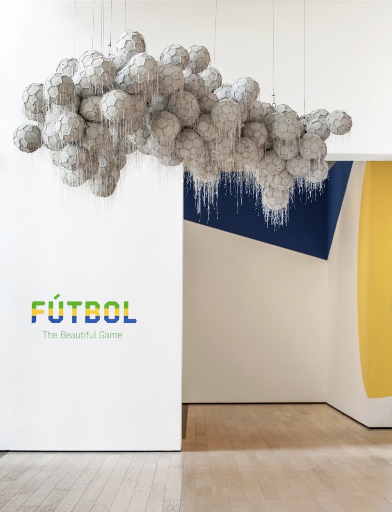
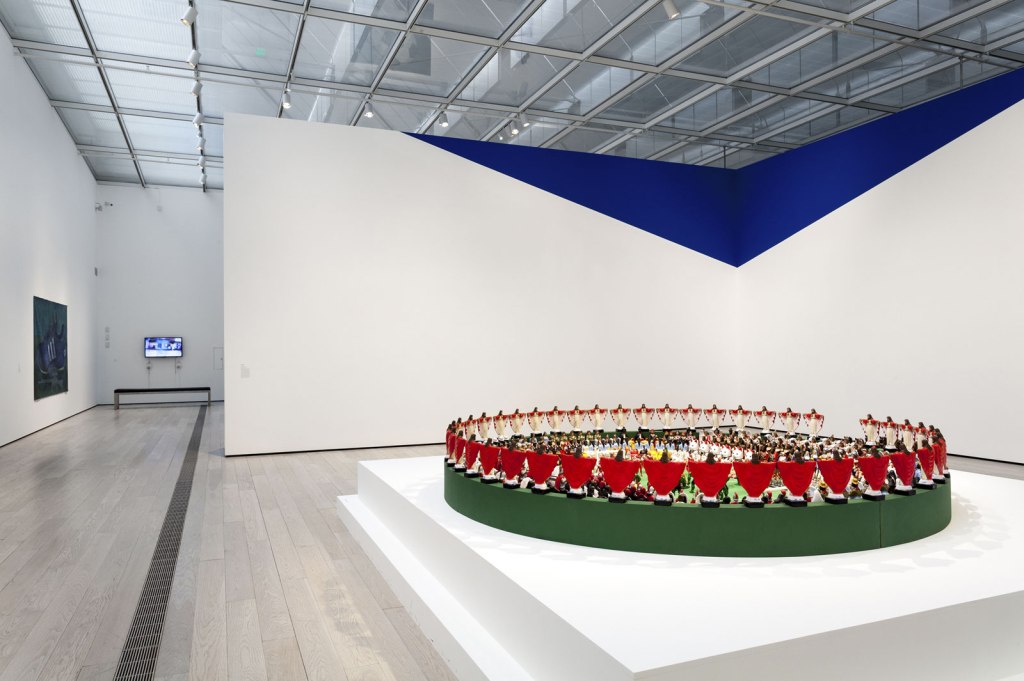
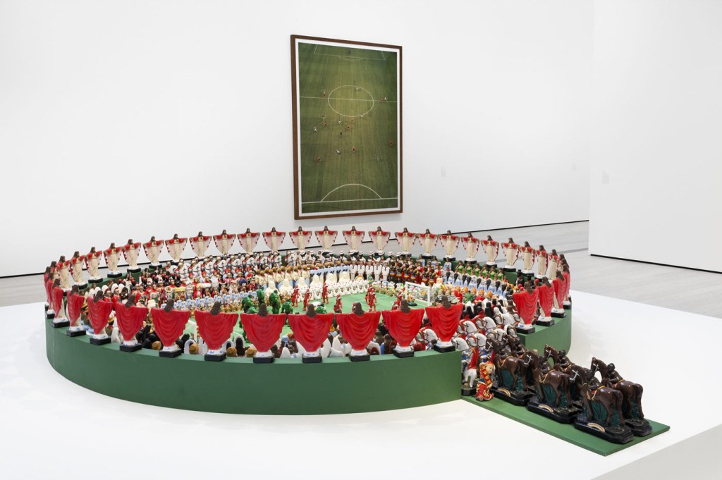

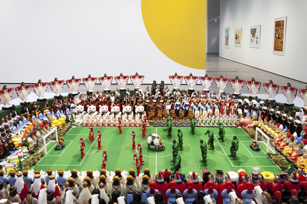
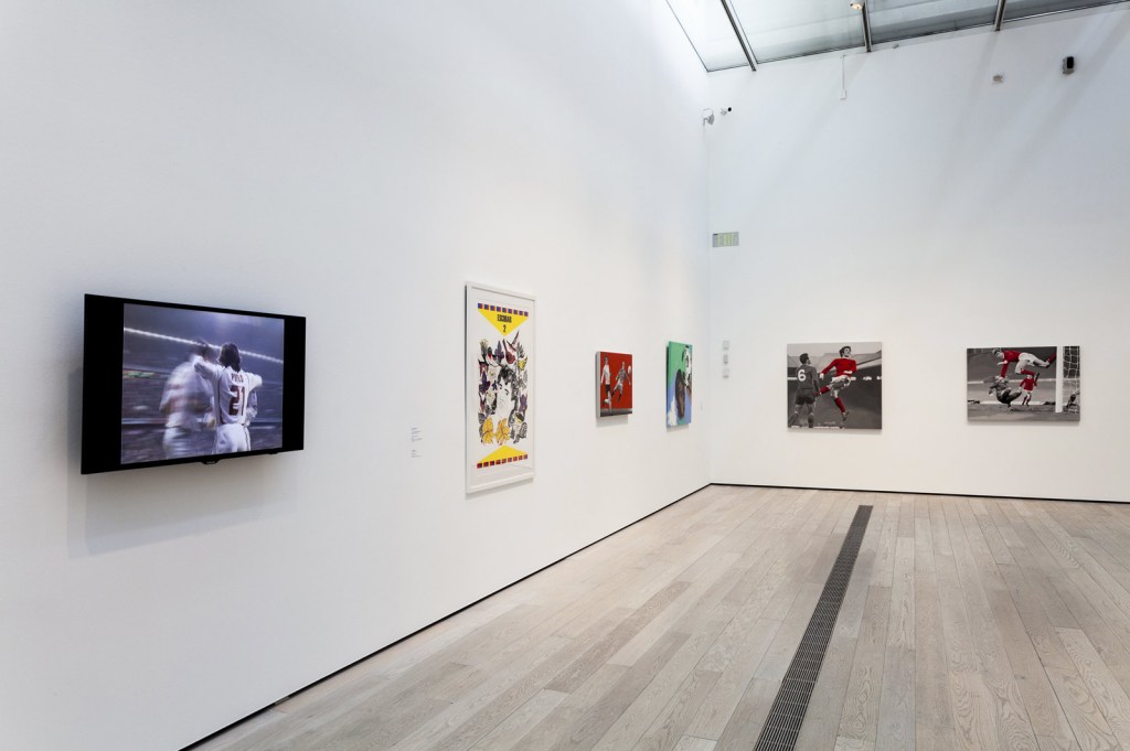

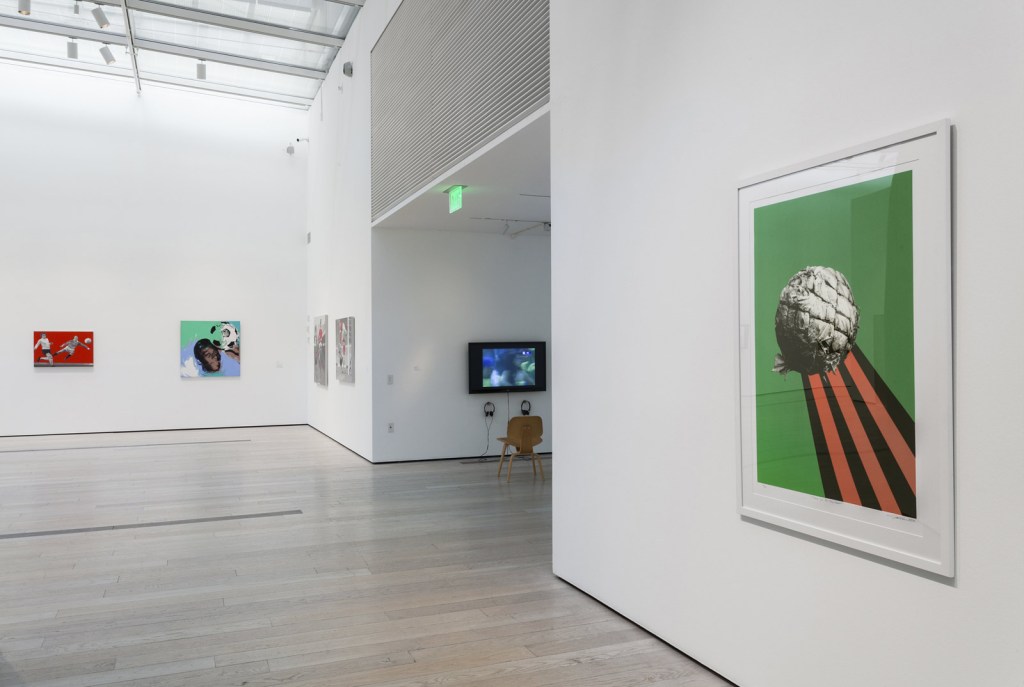

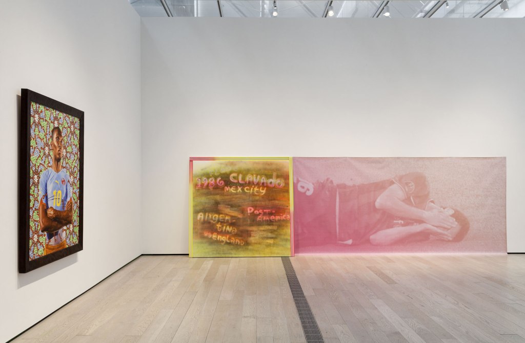
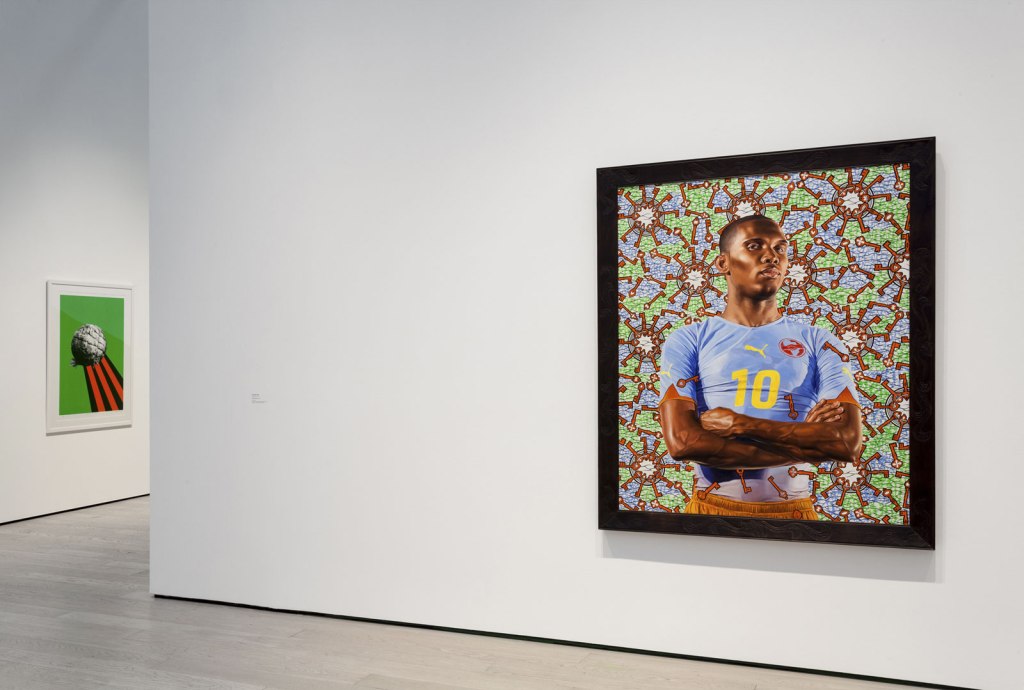
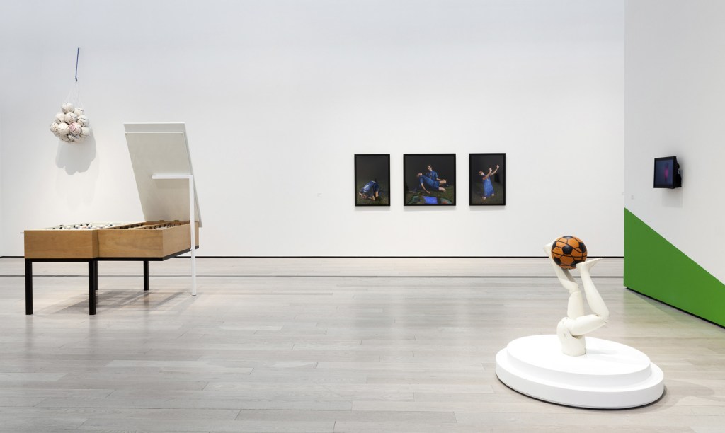
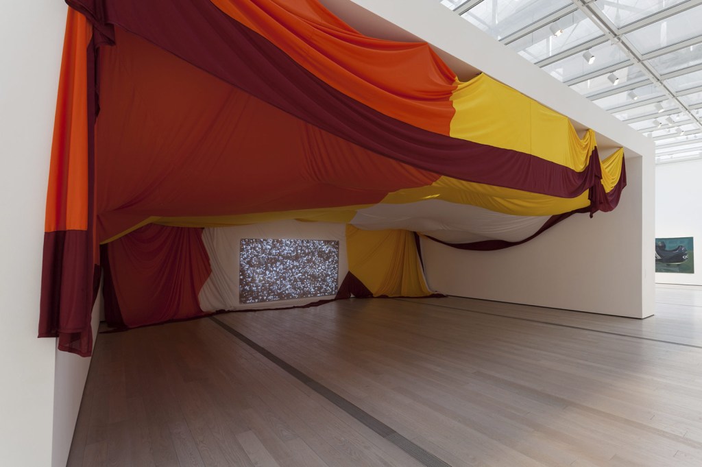
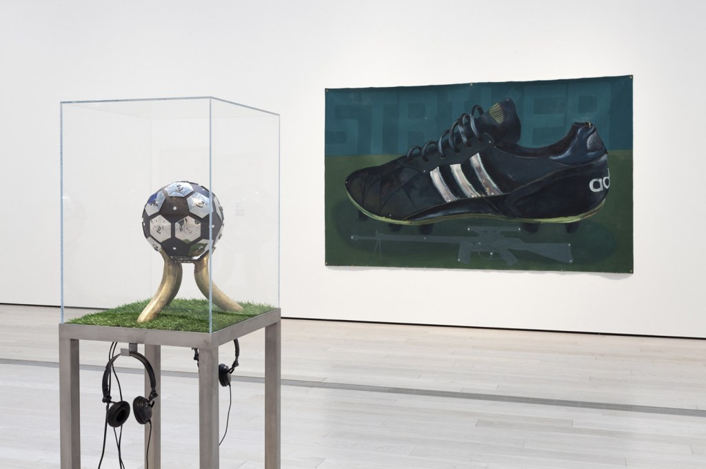
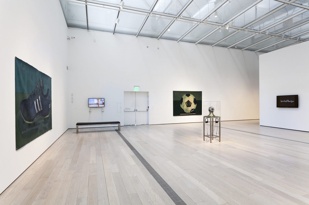
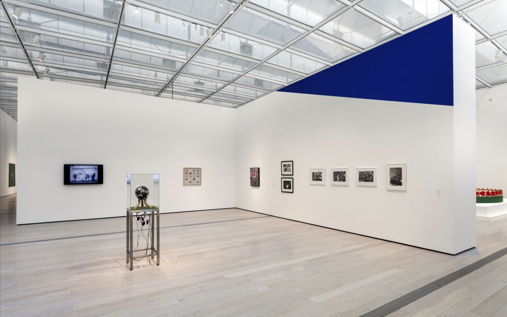
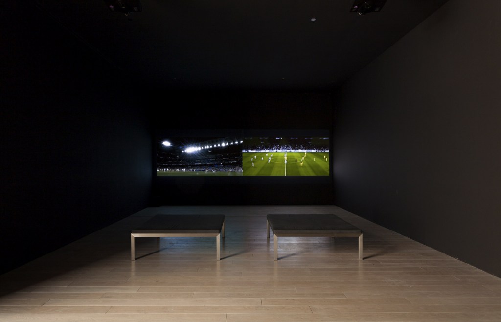
 'Maracana' 2003 (installation view)")
 'Maracana' 2003 and Andreas Gursky 'Amsterdam, EM Arena I' 2000. In the foreground: Nelson Leirner (Brazil, 1932-2020) 'Maracana' 2003 (installation view)")
 'Maracana' 2003 (installation view detail)")
 'Maracana' 2003 (installation view detail)")
")
")
 'Kick That' 2006 (in case) and George Afedzi Hughes (Ghanaian-born American, b. 1962) 'Parallel' 2009-2011")
 'Parallel' 2009-2011 from the exhibition 'Fútbol: The Beautiful Game' at the Los Angeles County Museum of Art (LACMA), February - July, 2014")
 'Volta' 2002-2003 (installation view)")
 'FREE THROW' 1984 (installation view)")
")
 'Clavado' 2013 (installation view)")
 'Samuel Eto'o' 2010 (installation view)")
 'Samuel Eto'o' 2010 from the exhibition 'Fútbol: The Beautiful Game' at the Los Angeles County Museum of Art (LACMA), February - July, 2014")
")
 'Thank You for the Game' 2013 (installation view)")
 'Thank You for the Game' 2013")
 'Olmeca 1370 BCE' 2013 (installation view)")
")
 'Verona #2' 2001-2004")
 'VOLTA' 2002-2003 (still)")
 'Mexico vs Brasil' 2004 (video still)")
 'Celebracions' 2009")
 'Sir Bobby' 2007")
 'Narco Soccer' 2013")

 'Pele' 1978")
 and Douglas Gordon (Scottish, b. 1966) 'Zidane: A 21st Century Portrait' 2006")
 and Douglas Gordon (Scottish, b. 1966) 'Zidane: A 21st Century Portrait' 2006")
 and Douglas Gordon (Scottish, b. 1966) 'Zidane: A 21st Century Portrait' 2006")
 'Shroud' 1994 from the series 'The Songs of Eternity'")
 'Paul, shadows' 1994 from the series 'The Songs of Eternity'")
 'Eternal timepiece' 1994 from the series 'The Songs of Eternity'")
 'Paul, head covered' 1994 from the series 'The Songs of Eternity'")
 'Pendent #1' 1994 from the series 'The Songs of Eternity'")
 'Untitled' 1994 from the series 'The Songs of Eternity'")
 'Untitled' 1994 from the series 'The Songs of Eternity'")
 'Suspension #1' 1994 from the series 'The Songs of Eternity'")
 'Chyralis' 1994 from the series 'The Songs of Eternity'")
 'Décolleté' 1994 from the series 'The Songs of Eternity'")
 'Paul, doorway (for Georgia O'Keeffe)' 1994 from the series 'The Songs of Eternity'")
 'Pendent #2' 1994 from the series 'The Songs of Eternity'")
 'Shadow, wreath' 1994 from the series 'The Songs of Eternity'")
 'Madonna, male' 1994 from the series 'The Songs of Eternity'")
 'Suspension #2' 1994 from the series 'The Songs of Eternity'")
 'Paul, wreath and hands' 1994 from the series 'The Songs of Eternity'")
 'Untitled' 1994 from the series 'The Songs of Eternity'")

 'Matr'x' 1993")
 'Synergy' 1993")
 'Gay Beauty Myth' 1992")
 'LOVE' 1988")
 'How will it be when you have changed' 1994 from the exhibition 'Transmissions: Archiving HIV/AIDS – Melbourne 1979-2014' at George Paton Gallery, The University of Melbourne, July 2014")
 'Tell me your face before you were born' 1994")

 'Untitled (Facial Hair Transplant)' 1972 from the exhibition Ana Mendieta: Traces' at the Museum der Moderne Salzburg, March - July, 2014")
 'Untitled (Facial Cosmetic Variations)' 1972 (detail)")
 'Rape' 1973")
 'Rape Scene' 1973")
 'Untitled (Self-Portrait with Blood)' 1973 (detail)")
 'Untitled (Body Tracks)' 1974")
 'Untitled (Glass on Body Imprints)' 1972 from the exhibition Ana Mendieta: Traces' at the Museum der Moderne Salzburg, March - July, 2014")
 'Untitled' 1973")
 'Blood and Feathers #2' 1974")
 'Imagen de Yagul' 1973")
 'Untitled (Silueta Series)' 1978")
 'Alma, Silueta en Fuego' (Soul, Silhouette on Fire) 1975 (still)")
 'Anima, Silueta de Cohetes (Firework Piece)' 1976 (still)")
 'Untitled (Cuilapán Niche)' 1973")
 'Untitled' 1976 \"Silueta Series, Mexico\"")
 'Tree of Life' 1976")
 'Untitled' 1978 \"Silueta Series, Iowa\"")
![Ana Mendieta (Cuban-American, 1948-1985) 'Itiba Cahubaba (Esculturas Rupestres)' [Old Mother Blood (Rupestrian Sculptures)] 1982](https://artblart.com/wp-content/uploads/2014/07/ana-mendieta_itiba-cuhababa-web.jpg "Ana Mendieta (Cuban-American, 1948-1985) 'Itiba Cahubaba (Esculturas Rupestres)' [Old Mother Blood (Rupestrian Sculptures)] 1982")
 'Untitled' 1982")

 'El Laberinto de Venus' (Labyrinth of Venus) 1985")
 'Badge of Honour' 2014 (installation view detail)")
 'Side A' 2014 (video still)")
 'Side A, Side B and Master' 2014")
 'Pocari Sweat' 2014 (video still)")
 'Arm' 2009")
 'Untitled' from the series 'Conversations with Ancestors' 2014")
 'Acting up' (in memory of the Floral Clock action, 1991) 2014")
 'Untitled' from the series 'Deep Water' 2014")
 'Untitled' from the series 'Deep Water' 2014")
 'Monument' 2014 (still) from the exhibition 'Concrete' at the Monash University Museum of Art (MUMA), Melbourne, May - July, 2014")
 'Monument' 2014")
 'Monument (work in progress)' installation view, Monash University Museum of Art, 2014")
 'Shadow sites II' 2011 (still) from the exhibition 'Concrete' at the Monash University Museum of Art (MUMA), Melbourne, May - July, 2014")
 '(Deleted scenes) From an untouched landscape #3' 2013")
 '(Deleted scenes) From an untouched landscape #1' 2013")
 'Un-resettling (stone footing for dome hut)' 2013")
 'Rochers carrés' 2008")


 'No More Stars (Abandoned Movie Set, Star Wars)' 2010 (detail)")
 'Comparative monument (Palestine)' 2012")
 'Comparative monument (Palestine)' 2012")
 'Some kinds of duration' 2011 (detail)")
 'Some kinds of duration' 2011")
 'High Tides (drilling)' 2012 (installation view)")
 'High Tides (drilling)' 2012 (installation view detail)")

 'Auroa Taranaki' 1991")
 'Matakana, North Auckland' 1994")

 'Tropic cascade #1 and #2' 2014")
 'Tropic cascade #2' 2014 (installation view detail)")
 'George Platt Lynes' 1927")
 'Untitled (male nude with tattoo)' 1950-1955")
![George Platt Lynes (American, April 15, 1907 - December 6, 1955) 'Untitled' Nd [c. 1951]](https://artblart.com/wp-content/uploads/2014/06/george-platt-lynes-untitled-1953.jpg "George Platt Lynes (American, April 15, 1907 - December 6, 1955) 'Untitled' Nd [c. 1951]")
 'Jack Fontan' c. 1950")


![George Platt Lynes (American, April 15, 1907 - December 6, 1955) 'Untitled [Charles 'Tex' Smutney, Charles 'Buddy' Stanley, and Bradbury Ball]' c. 1942](https://artblart.com/wp-content/uploads/2014/06/lynes-c-1942.jpg "George Platt Lynes (American, April 15, 1907 - December 6, 1955) 'Untitled [Charles 'Tex' Smutney, Charles 'Buddy' Stanley, and Bradbury Ball]' c. 1942")
 'Ted Starkowski (standing, arms folded)' c. 1950")
 'Ted Starkowski (standing, arms behind back)' c. 1950")
 'Untitled' 1952")
 'Untitled (male nude study)' Nd")
 'Untitled' 1951")
 'Untitled (Charles Romans in the artist's apartment)' 1953")
 'Don Cerulli' 1952")
 'Male nude study' 1951")
 'Untitled' 1951")
 'Untitled' 1936")
 'George Tooker' 1945")
 'Tex Smutney' 1943")
 'Mel Fillini' 1950")
 'Robert McVoy' c. 1941")
 'Opening Song, Hand Clapping and Bells' 1986 from the exhibition 'Public Intimacy: Art and Other Ordinary Acts in South Africa' at the Yerba Buena Center for the Arts, San Francisco, February - June, 2014")
 'Leading in Song, Johannesburg – Soweto Line' 1986")
 'Hands in Worship, Johannesburg – Soweto Line' 1986")
 'Supplication, Johannesburg – Soweto Line' 1986")
 'Guests at a 'moffie'drag party' Cape Town, South Africa, 1960")
 'The Catacombs, 30 September 1967' 1967, printed 2011 from the exhibition 'Public Intimacy: Art and Other Ordinary Acts in South Africa' at the Yerba Buena Center for the Arts, San Francisco, February - June, 2014")
 'The Catacombs, 5 February 1968' 1968, printed 2011")
 'Nomonde Mbusi, Berea, Johannesburg' 2007")
 'Woman smoking, Fordsburg, Johannesburg' 1975")


 'Couple Bheki and Sipho' 2009")
 'D is for dancing ministers' 2006")
 'Hotel Yeoville' 2012")
 'Untitled' from the series 'Shame' 2002")
 'The Future White Women of Azania' 2012")
 'The Future White Women of Azania' 2012")
 'The Night of the Long Knives I' 2013")
 'Uzuko' 2013")


' 2008")

You must be logged in to post a comment.