Disjunction and displacement in the Australian landscape
On a suitably apocalyptic day – in terms of our relationship to landscape, environment, elements and shelter – I drove up the Yarra Valley to the beautiful TarraWarra Museum of Art to see an exhibition of the works of Rosemary Laing. Through teeming rain, headlights gleaming, windshield wipers at full bore listening to Beethoven symphonies, I undertook an epic drive up to that most beautiful part of Victoria. The slightly surreal, disembodied experience of the drive continued once I stepped inside the gallery to view Laing’s work.
Laing’s work has always been a favourite, whether it be the floating brides, the carpet laid through the forest, or the melting newsprint after rain. I have always thought of her sensitive conceptual, performative work as evidenced through large, panoramic photographs as strong and focused, effective in challenging contemporary cultural cliché relating to the land, specifically the possession and inhabitation of it. As such, perhaps I was expecting too much of this exhibition but to put it bluntly, the presentation was a great disappointment.
There are various contributing factors that do not make this exhibition a good one.
Firstly, as the curator Victoria Lynn observes, “Laing’s photographs are conceived in series, so that each photograph is part of a larger cluster of images that are often arrange in specific sequences.” This exhibition, “includes 28 large-scale works selected from ten series over a thirty-year period” that focus on the themes of land and landscape in Laing’s oeuvre. The problem with this approach to Laing’s work is that the photographs from the different series sit uncomfortably together. The transitions between the photographs and different bodies of work as evidenced in this exhibition, simply do not work. Minor White’s ice / fire – that frisson of intensity between two disparate images that makes both images relevant to each other – is non-existent here. What might have more successful in displaying Laing’s work would have been a larger selection from a more limited number of series. It would have given the viewer a more holistic sense of belonging and investment in the work. This is the problem working in series and specific sequences… once the work leaves that cluster of energy, that magical place of nurture, nature and conceptualisation, how does it reintegrate itself into other states of being and display?
Secondly, the light levels in the gallery were so low the photographs seemed drained of all their energy. I understand that the “lux levels are quite particular according to museum requirements considering many works are lent from various institutions around Australia,” having done a conservation subject during my Master of Art Curatorship, but this is where the surreal experience from the drive continued: upon entering the gallery it was like navigating a stygian gloom, as can be seen in the installation photographs of the exhibition below. This is a museum of art situated in the most beautiful landscape and these are photographs, captured with light! that need light to bring them alive. I remember seeing Laing’s work leak at Tolarno galleries in Melbourne, and being amazed by their presence, their energy. Not here. Here the blues of the sky and the reds of the carpet seemed drained of energy, the vibrations of being of the forest and land victim to overzealous preservation.
Thirdly, and this relates to the first point, there was one work How we lost poor Flossie (fires) (1988, below) from Laing’s early series Natural Disasters. The work appeared out of nowhere at the end of the exhibition, had nothing that it related to around it, and had no explanation as to why it was there. I really would have liked to have known more about how Laing got from this work to the later series in the exhibition. What was her process of discovery, of change and experimentation. How did Laing go from Flossie – slicing together the spectacle and graphic imagery from media coverage of the Ash Wednesday fires – to the embeddedness [definition: the dependence of a phenomenon on its environment, which may be defined alternatively in institutional, social, cognitive, or cultural terms] of performances within the landscape of the later work? This would have been a more cogent, pungent and relevant investigation into the rigours of Laing’s art practice.
I emerged into the world and it was still pouring with rain. I rejoiced. It was as though I was alive again. Laing’s work is always strong and interesting. It was just such a pity that this iteration of it, specifically its closeted choreography, was not as restless as the landscape the works imagine.
Installation view of the exhibition Rosemary Laing at the TarraWarra Museum of Art featuring the works welcome to Australia (2004, C Type photograph, Collection of the University of Queensland) from the series to walk on a sea of salt Photos: Marcus Bunyan
“… the detention centre images, so that you’ve got the Heysen, you know, trees that you want to belong to, and then you’ve got this endless vista – though it be a difficult journey across a horizon that never ends – and then you have the raised wire fence, completely closing off access to that land, and that place, and those images of belonging and heritage.”
Art Talk with Rosemary Laing
Installation view of the exhibition Rosemary Laing at the TarraWarra Museum of Art featuring the works after Heysen (2004) at left, and to walk on a sea of salt (2004) at right, from the series to walk on a sea of salt Photo: Marcus Bunyan
Installation view of Rosemary Laing’s after Heysen (2004, C Type photograph, Collection of Carey Lyon and Jo Crosby) from the series to walk on a sea of salt Photo: Marcus Bunyan
The question of how to belong in Australia permeates Laing’s work. Australia has one of the highest immigrant populations in the world so that the question of arrival, and of making oneself at home, continues to be part of the everyday reality. We also have one of the world’s harshest policies for asylum seekers so that – in the political imaginary of contemporary Australia – land is conceived as a border that has to be protected.
The artist’s most potent response to the contested issue of being at home in Australia is the 2004 series to walk on a sea of salt, where images of Woomera detention centre, combined with photographs inspired by quintessential Australian imagery and stories, remind us that home does not travel with the asylum seeker. In after Heysen, Laing photographs the trees that Hans Heysen transformed into an Arcadian image of the Australian bush, but bleaches the image to invoke a sense of nationalistic nostalgia. By contrast, the spatial potential and magnitude of the Australian landscape is invoked by the image to walk on a sea of salt.
Wall text from the exhibition
Installation view of the exhibition Rosemary Laing at the TarraWarra Museum of Art featuring works from the series The Paper (2013) Photos: Marcus Bunyan
Installation view of Rosemary Laing’s work The Paper, Tuesday (2013, C Type photograph, Monash University Collection) from the series The Paper (2013) Photo: Marcus Bunyan
Installation view of Rosemary Laing’s work The Paper, Thursday (2013, C Type photograph, Monash University Collection) from the series The Paper (2013) Photo: Marcus Bunyan
Laing choreographs situations in the landscape, invoking a unique set of circumstances that reflect upon historic, social, environmental, economic and material conditions. Incongruous items are carefully positioned to flow with the compositional logic of a place.
On a hillside in Bundanon, New South Wales is a Casuarina forest sprinkled with Burrawang (cycads), an ancient plant that dates back to the Palaeozoic. The series The Paper was created on this hillside. The forest floor is covered in newspaper and photographed after the rains. The paper has literally been pressed into the forest floor by the torrent. It has been weathered. The sensationalism, headlines, imagery and opinion of the newspaper merge into a feathery ground cover of soft white, cream and beige hues. It is as if the area has flooded, not with water, but with paper. Words, colour and dates are dissolved into a tonal carpet. There is no light and shadow. This misalignment suggests the death of the daily paper, and here it inevitably returns to its natural habitat, its original ‘home’.
Wall text from the exhibition
Installation views of the exhibition Rosemary Laing at the TarraWarra Museum of Art Photos: Marcus Bunyan
Installation view of Rosemary Laing’s work weather (Eden) #1 (2006, C Type photograph, Collection of Peter and Anna Thomas) from the series weather Photo: Marcus Bunyan
The idea of a natural disaster in the Australian landscape occupies the same intensity for Laing as the human or ‘unnatural’ disasters. The each speak of the endless transformation of the landscape, its unfolding stories and its capacity to conjure anxiety and fear.
the series weather, located on the south coast of New South Wales, was inspired by the impact of natural phenomena – coastal storms – on the area. The flash of red fish netting snagged unawares by the battered grey melaleucas in weather (Eden) #1 also signals the historic Indigenous and colonial whaling in the area and the more recent slow demise of the fishing industry. These images seem haunted.
Wall text from the exhibition
Installation view of Rosemary Laing’s works The Flowering of the Strange Orchid (2017) left, from the series Buddens, and at right weather (Eden) #2 from the series weather Photo: Marcus Bunyan
Detail of Rosemary Laing’s work The Flowering of the Strange Orchid (2017) Photo: Marcus Bunyan
Installation view of the exhibition Rosemary Laing at the TarraWarra Museum of Art showing the work Walter Hood (2017) from the series Buddens Photo: Marcus Bunyan
In the most recent series Buddens, Laing turns again to the ‘unnatural disasters’ that impact ‘country’. The stream is covered in rolls of discarded clothing. It leads down to Wreck Bay, on the south coast of New South Wales, and is the site of multiple ship disasters. Historically these waters were used to transport convicts, goods, troops and settlers up and down the coast and they are littered with relics from shipwrecks including those of the vessels ‘Rose of Australia’ and ‘Walter Hood’.
The roof truss is like a piece of wreckage in amongst the trees, as if torn by the winds from an urban development on the outskirts of a city. Recalling the upside down house in the series leak (2010), it meets a natural A-frame in the foliage, yet the two don’t make a safe house.
The clothes seem to push through the landscape, like the rush of a river, perhaps in search of a safe haven. There is a mixture of metaphors in Buddens, highlighting the delicate balance between nature and culture required for survival.
Wall text from the exhibition
Installation view of Rosemary Laing’s work brumby mound #5 (2003, C Type photograph, National Gallery of Victoria, Melbourne) from the series one dozen unnatural disasters in the Australian landscape Photo: Marcus Bunyan
Installation view of Rosemary Laing’s work brumby mound #6 (2003, C Type photograph, National Gallery of Victoria, Melbourne) from the series one dozen unnatural disasters in the Australian landscape Photo: Marcus Bunyan
Landscape has a past, present an future; it is never the same as it used to be. In the face of wars, wrecks, and both natural and ‘unnatural’ destruction, we build shelters. We fence and furnish these landscape as we try to impose order on the precariousness and relative insignificance of life. As can be seen in a number of Laing’s series, the introduction of elements from our ‘settled’ environment including carpet, clothing, architectural structures, newspapers and the like – creates a disjunction. Some thing is literally awry.
In the one dozen unnatural disasters in the Australian landscape series, red interior furniture occupies and unsuccessfully domesticates this landscape. Painted in red earth and glue, these items almost disappear in the desert landscape. they are both like relics of a lost civilisation, but also seem to have become attuned to the terrain.
In the series leak, Laing continues her poetic and political engagement with the Australian landscape whereby powerful and dynamic tensions are elicited through the construction and insertion of foreign objects in the natural environment. Although the land depicted has already been altered through years of cleating and grazing practices, these works metaphorically signal that the continued ‘leak’ of residential development into both remnant bushland and farmland owned by generations of families is an unwelcome accident or breach that threatens to overturn the ecological balance between nature and culture.
Wall text from the exhibition
Installation view of Rosemary Laing’s work Aristide (2010, C Type photograph, Collection of the University of Queensland) from the series leak Photo: Marcus Bunyan
Landscape changes; its restless. It moves with the wind and rhymes with the seasons. It burns and floods. It is spatial, offering the visitor several perspectives that can be contradictory, paradoxical and durational. Landscape is also a ‘situation’, a complex interplay of historical and environmental conditions. Landscape has a past, present and future; it is never the same as it used to be. When we gaze out over a bay, or ponder and Indigenous site, we can’t help but wonder what it used to look like, how it used to be occupied, what tragedies and serendipities happened there. Landscape can be both a place of belonging and a destination, and depending on one’s perspective, it can embody the familiarity of home and the promise of adventure; the discomfort of displacement or the tragedy of invasion. Landscape is formed as much by natural forces as it is by human knowledge. …
Rosemary Laing introduces us to these histories by creating projects in the Australian landscape. These projects are sustained by her continuing search for understanding the multiple attitudes to belonging in the landscape. Miwon Kwon has argued that today ‘feeling out of place is the cultural symptom of late capitalism’s political and social reality’, so much so, that to be ‘situated’ is to be ‘displaced’. In Australia, the notion of displacement has a history that goes back to colonisation. Questions of who owns the land, how we inhabit it, and who feels displaced, are an intrinsic part of the Australian consciousness. Laing’s work also asks how we encounter the landscape; who or what is out of place; who or what does not belong; are ‘we’ the alien? …
Laing choreographs situations in the landscape, invoking a unique set of circumstances that reflect upon historic, social, environmental and material conditions…
Doherty argues that rather than being site specific, art has shifted from a fixed location, to one that, in the words of Kwon, is ‘constituted through social, economic, cultural and economic processes’. Such artworks are not located in a single place, but rather take the form of interactive activities, collective actions, and spatial experiences. They are constitutive rather than absolute; propositional rather than conclusive. Rosemary Laing’s mise-en-scènes are not public, events or performances, but they forge a compositional dialogue with the natural environment that provokes a social, economic and environmental conscience.
Laing’s photographs are conceived in series, so that each photograph is part of a larger cluster of images that are often arrange in specific sequences. Moreover, the spatial tableaux and the photographic outcome have an intrinsic connection. The installations cannot be seen without the photographic apparatus and yet each mise-en-scène is presented from a variety of perspectives and angles, so that we cannot necessarily rely on the photographic outcome to be ‘truthful’. The photograph is not simply documentation. It is an activator. In many respects Laing places us in the landscape, so that we fell part of the image. She does this through both the size and relative height of the image, along with the point of view and our relation with the horizon line. Laing tests the limits of the photograph, and also provokes the viewer to rearticulate their connection to landscape, and re-energise it. She comes to be the interlocutor between the histories and meanings embedded in landscape, the installation, the photograph and the viewer.
Victoria Lynn. “Rosemary Laing – Co-belonging with the Landscape,” in Rosemary Laing exhibition catalogue, TarraWarra Art Museum, 2017, pp. 7-9.
Installation view of Rosemary Laing’s work effort and rush #9 (swanfires) (2013-2015, C Type photograph, Collection of Alex Cleary) from the series effort and rush Photo: Marcus Bunyan
Detail of Rosemary Laing’s work effort and rush #9 (swanfires)(2013-2015) Photo: Marcus Bunyan
Installation view of Rosemary Laing’s work burning Ayer #12 (2003, C Type photograph, Art Gallery of New South Wales, Sydney) from the series one dozen unnatural disasters in the Australian landscape Photo: Marcus Bunyan
The fire in burning Ayer #12 gives us some clues to the relationship between fire and the artist’s quest to reimagine belonging in the Australian landscape. The earth-encrusted items of mass-produced domestic wooden furniture – a reference, once more, to the idea of ‘housing’, home and belonging. Their ashes fold back into the earth. The strength of the red desert plain holds its ground, as it were, as the stage for this enactment of both sacrifice and return. Fire comes to be a metaphor for the ways in which the Indigenous landscape refuses our presence and escapes from our control.
In effort and rush #9 (swanfires), the blur of movement across tall thin tree trunks, captured in a smoky black hue, considers both the rush of the fire, and the rush of escape. It is as if the camera has become a paintbrush.
Wall text from the exhibition
Installation view of Rosemary Laing’s work swanfires, Chris’s shed (2002-2004, C Type photograph, Monash Gallery of Art) from the series swanfires Photo: Marcus Bunyan
Detail of Rosemary Laing’s work swanfires, Chris’s shed (2002-2004) Photo: Marcus Bunyan
Installation view of Rosemary Laing’s work How we lost poor Flossie (fires) (1988, Gelatin silver photograph, Art Gallery of South Australia, Adelaide) from the series Natural Disasters Photo: Marcus Bunyan
When Laing first tackled disasters in her 1988 Natural Disasters series, it was from the point of view of the media phenomenon. Slicing together imagery from media coverage of the Ash Wednesday fires, the series, including works such as How we lost poor Flossie (fires) was more to do with the slipstream of spectacle in the wake of the bicentennial of Australia. At the time, competing propositions about our cultural identity jostled for attention: 200 years of settlement, Aboriginal calls for recognition, the tourist panorama, and the sensationalism of fire in the landscape.
After every significant fire near her house in Swanhaven, on the south cost of New South Wales, Laing takes photographs in the aftermath of the blaze, like a marker of the irreconcilable yet continuing presence of natural and unnatural disasters.
In the series swanfires there is an overwhelming sense of loss. These two images speak of the abject disaster of fire, before the clean up. They depict situations that exceed our comprehension. In swanfires, John and Kathy’s auto services, the intersecting forms of corrugated iron – the quintessential material of rural Australia – are unexpectedly bathed in the softest of pink, their forms reflecting the tree line behind.
Wall text from the exhibition
Installation view of Rosemary Laing’s work swanfires, John and Kathy’s auto services (2002-2004, C Type photograph,Courtesy of the artist and Tolarno Galleries, Melbourne) from the series swanfires (see below) Photo: Marcus Bunyan
TarraWarra Museum of Art will stage an exhibition of the works of Rosemary Laing, one of Australia’s most significant and internationally-renowned photo-based artists, 2 December 2017 – 11 February 2018.
Focusing on the theme of land and landscape in Laing’s oeuvre, the Rosemary Laing exhibition includes 28 large scale works selected from 10 series over a thirty-year period. The exhibition, which is the first large-scale showing of Laing’s work in Victoria, will be accompanied by an exhibition of works by Fred Williams focusing on a single year of the artist’s oeuvre, Fred Williams – 1974. Curated by Anthony Fitzpatrick, the Williams exhibition reveals the ways in which colour and human intervention in the landscape became a focus for the artist.
Born in Brisbane and based in Sydney, Laing has worked with the photographic medium since the mid-1980s. Her projects have engaged with culturally and historically resonant sites in the Australian landscape, as well as choreographed performances. TarraWarra director, Victoria Lynn, curator of the exhibition, says Laing’s work is highly representative of the Museum’s central interest in the exchange between art, place and ideas.
“This exhibition reveals Laing’s compositional and technical ingenuity. It shows that Laing can create images of dazzling luminosity as well as solemnly subdued light. Flickers of bright red catch our eye, while passages of verdant greens create an all-over intensity. Her images take us to open and infinite plains as well as the depths of entangled forest trails.
“The artist builds structures and installations in coastal, farming, forest and desert landscapes from which she then creates photographic images. Whether it is papering the floor of a forest in the 2013 series The Paper, or creating a river of clothes displacing the water of a flowing creek in the new series Buddens 2017, Laing’s images reflect upon the historical and contemporary stories of human engagement with our continent. More specifically, the artist draws on colonisation and the impact of waves of asylum seekers, suggesting that the landscape is forever transformed both physically and metaphorically. The exhibition also includes works depicting the aftermath of fire, and the ways it too transforms what we thought we knew of the landscape,” Ms Lynn said.
Rosemary Laing comments: “The arrival of people, throughout history, shifts what happens in land, challenging those who have left their elsewhere, and disrupting the continuum of their destination-place. A disruption causes a reconfiguration. It elaborates both the beforehand and the afterward. The works are somewhere between – a narrative for the movement of people, the condition of landforms with a changing peopled condition, expectations of home and haven, flow and flooding, and the effect and affect of these passages.” The exhibition is supported by major exhibition partner the Balnaves Foundation, and will be accompanied by a catalogue authored by Judy Annear, funded by the Gordon Darling Foundation.
Annear, writes: “How to make sense of what humanity does in and to their environment regardless of whether that environment appears to be natural or made? What is the spectrum, the temperature of that activity? Laing is an artist who grapples with these questions and how to reflect and interpret the times in which she lives.”
Neil Balnaves AO, Founder The Balnaves Foundation said, “The exhibitions Rosemary Laing and Fred Williams – 1974 will be the third year that The Balnaves Foundation have supported the TarraWarra Museum of Art to deliver exhibitions of note by Australian artists. The Foundation is proud to partner in these major endeavours, providing vital opportunities for important Australian artists to be showcased, whilst providing art lovers – including inner-regional audiences – access to outstanding arts experiences.”
Laing has exhibited in Australia and abroad since the late 1980s. She has participated in various international biennials, including the Biennale of Sydney (2008), Venice Biennale (2007), Busan Biennale (2004), and Istanbul Biennial (1995). Her work is present in museums Australia-wide and international museums including: the Museo Nacional Centro De Arte Reina Sofia, Madrid; North Carolina Museum of Art, Raleigh; Modern Art Museum of Fort Worth, USA; 21st Century Museum of Contemporary Art, Kanazawa, Japan; Kunstmuseum Luzern, Lucerne, Switzerland; Wadsworth Atheneum Museum of Art, Hartford, Connecticut, USA.
Laing has presented solo exhibitions at several museums, including the Museum of Contemporary Art, Sydney; Kunsthallen Brandts Klædefabrik, Odense; Domus Artium 2002, Salamanca; Frist Center for the Visual Arts, Nashville; and National Museum of Art, Osaka. A monograph, written by Abigail Solomon-Godeau has been published by Prestel, New York (2012).
“[Walter Isaacson] describes the photographs, of which 7200 … miraculously survive today, as the greatest record of curiosity, because his “cross-disciplinary brilliance whirls across every page, providing a delightful display of a mind dancing with nature”. Renger-Patzsch delighted in seeing patterns in nature, so he would juxtapose a photograph of the branching arteries of the heart with the roots of a sprouting tree.”1
A mind dancing with nature.
Of course, the original quote (which I have altered) was talking about Leonardo da Vinci… but the same enquiring mind, the same display can be seen in the work of Albert Renger-Patzsch. His was a mind entranced by the nature of technology, and the technology, the structure of nature. However, he is ambivalent about the benefits of industrialisation even as he photographed it in ‘New Objectivity’ style – that is, supposedly free from emotion and subjectivity.
No writing about his work can put it better than this quote from when this exhibition was at Fundación MAPFRE in Madrid:
“Technical precision and exact representation of the subject; psychological contention and rejection of pictorial stylisation and expressionism; a keen sense of composition with attention to details, structures and forms; a sharp and clear construction of the image: these were some of the fundamental premises of a tendency that understands photography as a privileged medium to promote an artistic and simultaneously perceptive shift.
Renger-Patzsch’s work amalgamates a great number of photographic subjects, typologies and genres. In a historical period marked by deep political tension and significant social and economic change, his work allows the viewer to envision a unique worldview, a platform of intersections and re-appreciations between the domains of nature and technology.”
The only point I would not support in this quotation are these words, “psychological contention and rejection of pictorial stylisation and expressionism.”
Of course, “through the disconcerting simplicity of the photographs Renger-Patzsch highlights the phenomenological and psychological aspects that are part of experiencing the image,” but he does so not through a REJECTION of pictorial stylisation and expressionism (and all the baggage that those words embody), but through an INTENSIFICATION of a different form of pictorial style which forces? the image to emit a new form of expression. That is, the object is just its surface and is captured, instantly, by the camera in this perceptive shift.
Can you imagine seeing these photographs in the 1920s, having never seen anything like them before? They would have been revolutionary, in their rendering of the surface of the object and nothing more. Placing the camera directly before the object which requires nothing else but itself… the eye of the snake, the darkness of a tree trunk, the ordering of shoemakers’ irons. But then he finishes his ode to life, Die Welt ist schön (The World is Beautiful), with his version of Albrecht Dürer’s Praying Hands (c. 1508).I suspect that the idea the Renger-Patzsch was working with is that beauty is truth, and truth is beauty.
In contemporary society, have we lost the ability to see these photographs as he intended, with a child-like innocence? Was he saying, this is objective, do you agree? Or does the poetic intensity in the life of things refuse to be stilled?
For me, these photographs are not e/motion-less, they are the very essence of a reality rendered wonderful in my eyes.
Dr Marcus Bunyan
1/ Paraphrase of Tina Allen. “Prophetic Polymath,” on Leonardo da Vinci by Walter Isaacson in Weekend Australian Review January 6-7 2018, p. 14
Many thankx to Jeu de Paume for allowing me to publish the photographs in the posting. Please click on the photographs for a larger version of the image.
Albert Renger Patzsch / Trailer
Independently of the role he played in New Objectivity – an artistic movement that appeared in Germany at the beginning of the 1920s – Albert Renger-Patzsch (1897-1966) is today considered one of the most important and most important figures / influences in the history of 20th century photography.
The exhibition pays tribute to this extraordinary photographer and allows us to rediscover the posterity of a work that invites us to reflect on the nature of photography and on its artistic and speculative potential in the context of contemporary art and culture.
Albert Renger-Patzsch (German, 1897-1966)
Albert Renger-Patzsch (1897-1966), who produced a huge body of work spanning four and half decades, was one of the most influential photographers of the New Objectivity movement that emerged in Germany in the mid 1920s. His work helped to establish photography as a unique and important medium within modern art. Renger-Patzsch revived realism in photography, adopting an approach that was characterised by formal and technical rigour and a rejection of expressionism and pictorial stylisation. He had a highly developed sense of composition, and his attention to detail, structure and form resulted in images with sharp, clear compositions. For Renger-Patzsch, photography was a medium that made possible new forms of artistic imagery, while being perfectly in step with a period marked by industrialisation and the spread of technology. By highlighting the medium’s unique properties and the creative possibilities of documentary photography, Renger-Patzsch forged a unique role for photography within the arts of his time.
His original, simple images combine extraordinary realism and documentary value with poetic and phenomenological resonance, giving them great power. Renger-Patzsch was a highly prolific photographer who explored a wide range of subjects and genres. This exhibition highlights the invaluable legacy of this extraordinary photographer, whose work provides an ideal context for reflecting on the specificities and relevance of photography within the field of contemporary art and culture.
– The Design of Nature – From Vernacular Landscape to the Modern City – The vision of things – Landscapes of the Ruhr: the Topography of a Transformation – Industrial Objects and Architecture: Geometry and Series – The Destiny of Nature
Sérgio Mah
The Design of Nature
During the initial phase of his career, Albert Renger-Patzsch produced a series of photographs depicting plants and flowers for the collection Die Welt der Pflanze (The World of Plants), coordinated by Ernst Fuhrmann as part of his biosophical studies.
The first two volumes in the series, both published in 1924, were Orchideen (Orchids) and Crassula. Renger-Patzsch worked within the general parameters of the book, reproducing fragments of nature with as much objectivity and clarity as possible. He produced a large number of photographs distinguished by their great technical and compositional rigour, including systematic close-ups of plants and flowers. In 1923, Renger-Patzsch wrote his first text, “Pflanzenaufnahmen” (Plant photographs), setting out his views on photography and its extraordinary capacity for capturing nature. Among the images and arguments in the text he outlines some of the key principles that would underpin his photography: attention to detail and emphasis on the formal, structural and material aspects of nature, as well as, correspondingly, a reiterative affirmation of the intrinsic qualities of photography – realism, objectivity, neutrality – and its unique role in expanding our perception of reality.
In 1927, Albert Renger-Patzsch published his most ambitious book to date, Die Halligen (The Halligen Islands), with images of the islands in the Wadden Sea, on the northern coast of Germany.
His photographs featured a number of subjects: landscapes, portraits, architectural motifs and everyday activities. These subjects encapsulated the relationship between local ways of life (genuine, deep-rooted, traditional) and the physical and symbolic characteristics of this peculiar area. This vernacular reality contrasted with the rampant industrialisation that was transforming many of the great urban centres in Germany.
Over the ensuing years, Renger-Patzsch published Lübeck (1928) and Hamburg (1930), books that highlight the emerging characteristics of the modern city, the coexistence of different historic periods and the intersection between historical culture and the impact of industrialisation. In these photographs the photographer’s interest in combining documentary objectives with the creative potential of a modern vision is evident in his use of close-cropped, asymmetrical compositions and innovative perspectives, alternating between general shots and a focus on details. He displays sensitivity to the formal and structural aspects of reality, rejecting the atavistic influence of painting in order to embrace the possibilities of a “new vision” governed by photography.
In 1928, Albert Renger-Patzsch’s best-known book was published, Die Welt ist schön (The World is Beautiful), although the photographer would have preferred the title Die Dinge (Things).
It exemplifies the principles and characteristics of the photographer’s work: a desire to represent the immanent substance of an object/subject while demonstrating photography’s capacity for recording reality. In this respect, representing the unique character of a particular thing was also a way of affirming the unique character of photography.
The book encompasses a wide range of subjects and elements from the photographer’s world. It is an anthology of photographs taken since the beginning of his career, including several images produced for the books Die Welt der Pflanze, Die Halligen and Lübeck. Photographic genres are equally diverse, spanning portrait, landscape, still life and architectural images. The subjects are presented in an evolving thematic and conceptual sequence: first nature, plants, animals, people and landscapes; next, the manmade world of objects, architecture, the city, machines, and industrial structures and spaces. In this way a worldview is organised, a context of intersections and reappraisals, between nature and technology, between the sacred and the profane, between historical heritage and modernity.
Focus on the book Die Welt ist schön (The World is Beautiful)
Like other artists of his time, Renger-Patzsch was especially keen on exploring the formal analogies between the things of nature and industrial things. Industry led to mass production and the manufacture of standardised objects, exemplified in this image. This contrasts with other images from Die Welt ist schön (The World is Beautiful), such as Gebirgsforst im Winter (Mountain forest in winter) (below), which capture repetition in nature.
Renger-Patzsch identifies a coherence, a parity, between nature and culture as non-antagonistic doHands. He suggests a measure of naturalness in technology, and a measure of rationality in nature. For the photographer the emphasis on industrial seriality also allowed him to underscore the seriality of photography itself (as a means of technical reproduction), thus demonstrating the unique, mediating condition of this medium for visual reproduction in the connection between the natural world and the world of modern industry.
Focus on the book Die Welt ist schön (The World is Beautiful)
Painstaking attention to detail is a central feature of Renger-Patzsch’s photography, as demonstrated by several images in Die Welt ist schön (The World is Beautiful). Resorting to pronounced close-ups or subsequent reframing, the photographer breaks down and isolates the vision of certain things, thereby providing a fresh perspective: in this case, the image of a serpent’s head surrounded by a section of its body.
The close-up framing allows him to accentuate the two-dimensionality of the image, the part being more suggestive than the whole. This is a realistic, objective vision, but one aimed at creating a tension between the concrete nature of the motif and its abstract character.
Focus on the book Die Welt ist schön (The World is Beautiful)
This is the hundredth and last image of Die Welt ist schön (The World is Beautiful). It shows a pair of hands joined together, isolated from the rest of the body, rising over a black background in a gesture heavy with symbolic, meditative and spiritual fervour.
Aware that photography was increasingly becoming mundane and banal, and that the experience of attention was crumbling in the face of the accelerating transformation of reality, in Die Welt ist schön Renger-Patzsch offers an imaginary world where modern subjects can be reconnected with the things surrounding them via the mediation of a diffuse and calm temporality, the temporality of tradition and myth. A symptom of this vision is precisely the closing image of the book.
“To do justice to modern technology’s rigid linear structure, to the lofty gridwork of cranes and bridges, to the dynamism of machines operating at one thousand horsepower – only photography can do that. […] The absolutely correct rendering of form, the subtlety of tonal gradation from the brightest light to the darkest shadow, impart to a technically expert photograph the magic of experience.”
Albert Renger-Patzsch, “Ziele”, ‘Das Deutsche Lichtbild’, Berlin, 1927
“There is an urgent need to examine old opinions and look at things from a new viewpoint. There must be an increase in the joy one takes in an object, and the photographer should become fully conscious of the splendid fidelity of reproduction made possible by this technique.”
Albert Renger-Patzsch, “Die Freude am Gegenstand,” ‘Das Kunstblatt’, Berlin, 1928
“[…] the eye is subjective; it views with pleasure the essential things and completely overlooks what is unimportant. The camera, on the other hand, has to reproduce the entire image in focus and in a particular size. It will see the essential and the inessential with equal clarity.”
Albert Renger-Patzsch, in ‘Meister der Kamera erzählen wie sie wurden und wie sie arbeiten’, Halle (Saale), 1937
“[…] the eye is not isolated in its perception of the world. Rather its connections to the brain and the support of our senses in experience heat, cold wind, noise, smells and so on create an extraordinarily compact image of the world, whose plasticity and density are perhaps intensified by a particularly appropriate emotional state. Photography reduces this colourful world into a black-and-white rectangle. It is obvious that this most unpretentious of art forms requires the greatest reliability of taste, ability for abstraction, fantasy and concentration.”
Albert Renger-Patzsch, in ‘Meister der Kamera erzählen wie sie wurden und wie sie arbeiten’, Halle (Saale), 1937
The aim of this exhibition is to rediscover and pay tribute to the legacy of this unique photographer in the conviction that his work offers a context for encouraging reflection on the nature and artistic and speculative potential of photography within the framework of contemporary art and culture.
Of enormous simplicity and originality, Renger-Patzsch’s photography is notable for being based on a documentary style that prioritised realist sobriety and frankness as fundamental characteristics of photographic representation. In other words, his work offers a rigorous approach in technical and formal terms, in which the camera is only used to intensify our vision and aware of things. For Renger-Patzsch, this not only explained his photographic procedures but above all the potential for an aesthetic and conceptual identity for photography that visibly distanced itself from the Pictorialist legacy and from the hybrid experimentalism characteristic of the early 20th-century avant-gardes.
Both Renger-Patzsch’s photography and the various texts in which he set out his ideas reveal his determination to exploit the qualities inherent in the photographic medium. He stated that his aim was: “to use photographic means to create a photography that could exist through its own photographic nature.” In another text Renger-Patzsch wrote that,
“the eyes are not isolated from their perception of the world.
On the contrary, they are part of our senses and, by being connected to the brain, allow us to experience heat, cold, wind, noise, smell, and to rapidly construct a remarkably compacted image of the world, the plasticity and density of which also depend on our emotional states.
Photography reduces the world in colour to a rectangle in black and white. And logically, given that it is the least pretentious form of art, it requires rigorous taste, a capacity for abstraction, imagination and concentration.”
Such statements reveal that the exceptional quality of Renger-Patzsch’s work and thought is also notable for the way it conceives and expands the horizon and scope of the idea of documentary photography. As a result, the descriptive and objective qualities of photography are combined with and articulated by its aesthetic, poetic and phenomenological powers.
This retrospective aims to encompass the principal themes, periods and genres that define Renger-Patzsch’s photographic output through the identification of three moments that are fundamental for an understanding of his career: firstly, his early years, from his photographs of plants taken for Folkwang / Auriga publishers, to the profusion of themes and photographic eclecticism which would be decisive for the creation of his book Die Welt ist schön (The World is Beautiful) of 1928. The period that began after his move to Essen was one of intense photographic creation on the Ruhr area, principally involving subjects associated with places, buildings and industrial objects. Finally, the years after World War II reveal a new interest in the themes of nature and landscape particularly trees and rocks.
Including around 154 photographs, this is one of the largest retrospectives on the artist to date and undoubtedly the one to bring together the largest number of works by Renger-Patzsch from institutional and private collections: the Stiftung Ann und Jürgen Wilde / Pinakothek der Moderne München (Munich), the Museum Folkwang (Essen), the Ludwig Museum (Cologne), the Galerie Berinson (Berlin), the Centre Georges Pompidou (Paris).
Press release from Jeu de Paume
Highlights of the exhibition
Author of a monumental oeuvre created over four and a half decades, Albert Renger-Patzsch (1897-1966) was the leading photographer of the New Objectivity movement that appeared in German art in the mid 1920s.
Renger-Patzsch was a prolific photographer and his oeuvre encompasses a variety of themes, types and genres. This exhibition covers the most important stages in Renger-Patzsch’s career, from his first photographs of plant details, urban scenes and industrial subjects to his later landscape work. In total the exhibition features more than 150 photographs, mostly vintage prints from the most important collections in Germany.
Renger-Patzsch devoted himself to creating a new photographic realism, characterised by an extreme simplicity and originality. He created a modern visual language that was imbued with a poetic resonance and helped to redefine the photographic image. For Renger-Patzsch, photography was the most appropriate medium for carrying out a change that was simultaneously artistic and perceptual, i.e., the possibility of a new kind of image that reflected the changes of the 1920s and 1930s, a period marked by industrialisation and the spread of technology.
Albert Renger-Patzsch is the author of one of the seminal books in the history of photography, Die Welt ist schön (The World is Beautiful), which was published in 1928. This work reveals the full scope of Renger-Patzsch’s approach, which was to capture the unique character of each concrete thing in order to affirm also the unique character of photography.
Renger-Patzsch produced an exceptional body of work on the theme of industrial architecture, which he helped to turn into a genre in itself. He exerted a decisive influence on generations of photographers, not least Bernd and Hilla Becher. This exhibition sets out to highlight the vital legacy of this extraordinary photographer. In so doing, it sheds light on the important role of photography within the context of contemporary art and culture.
Landscapes of the Ruhr: the Topography of a Transformation
In 1929, Renger-Patzsch relocated to Essen, in the Ruhr, Germany’s leading industrial region and one the photographer was familiar with.
Two years earlier, he had produced the first images in an ambitious project focusing on the landscapes of the Ruhr, which he would work on until 1935. In this realm of contrasts, he became particularly interested in spaces that were between cities, between the urban and the rural, landscapes that displayed the process of change that the region was undergoing due to industrialisation and the development of public infrastructure.
The works reflect a change in Renger-Patzsch’s photographic vision: the compositions are widened, in some cases into large panoramic views. The images now focus on a multiplicity of elements and explore interpretative relationships and associations. His preference for more open images that include the surroundings of objects, rather than just close-ups, reflects a more inclusive objectivity. Some images include people, usually seen from afar. These figures are set in particular socio-spatial contexts and help to highlight the enormous disparity in scale between the human figure and the new industrial complexes. Vertical and horizontal elements, close up and in the distance, are combined and juxtaposed. The relationship between different planes, between foreground and background, is intensified in order to show how industry has shaped the landscape, turning it into a heterogeneous and paradoxical landscape (in historical and social terms).
In the photographs of the Ruhr, the landscape emerges as a genre in which disparate elements are combined and contrasted, a way of exploring the boundaries between the rural and industrial worlds, the city and the periphery.
One of the most extraordinary examples from this period is the 1928 image Landschaft bei Essen und Zeche “Rosenblumendelle” (Landscape near Essen with the Rosenblumendelle colliery) (above). This photograph that seems to result from the collage of two layers (two regions, two realities), bringing together the idyllic serenity of the rural world, in the foreground, and the massive and disproportionate character of the new industrial complexes in the background, as the fatal destiny of the modern world.
At the centre is a road, a metaphor for history, mediating two different realities and suggesting the dilemma between tradition and modernity – a dilemma that highlights Renger-Paztsch’s ambivalent and paradoxical stance towards industrialisation.
Industrial Objects and Architecture: Geometry and Series
From the late 1920s onwards, Renger-Patzsch produced numerous works following commissions from architects and industrial companies.
At this time, the expansion of the press and advertising, boosted by industry, was having a big impact on art, providing an abundance of work opportunities for artists and photographers.
Photographs of industrial objects and buildings lent themselves to rigorous, carefully calculated compositions. In many cases, the viewer’s perception is guided by planimetric compositions, which are sometimes orthogonal, sometimes diagonal. His architectural photographs combine structural and formal aspects with a desire to record the functional reality of industrial complexes. His images of objects are characterised by their attention to detail and a desire to give aesthetic meaning to each of the objects photographed through meticulous graphic composition.
However, Renger-Patzsch emphasises the repetitive, standardised nature of the objects – aspects inherent to mass production. For him, the theme of technology was further confirmation of how photography differed from painting and provided the most suitable medium for representing the new reality – technical, material and spatial – of modern industrialisation.
Throughout his career, Renger-Patzsch created a huge number of photographs of industrial architecture. Its emergence as an artistic genre owes much to him, and his legacy exerted a decisive influence on generations of future photographers, including Bernd and Hilla Becher.
The perspective and the composition accentuate the geometry of the vertical, horizontal and diagonal lines. The photographer seeks to highlight the significance of a building designed according to strict functional and rational principles. In doing so, Renger-Patzsch reveals a correspondence between method and object in the sense that precision, objectivity and the documentary value of photography were in harmony with the rationality, coherence and functionality of the new industrial and modern architecture.
For Renger-Patzsch commercial commissions also provided opportunities for a personal and creative approach to photography. This image is part of a commission from the Jenaer Glaswerke Schott company, for whom he photographed several sets of laboratory objects in glass (recipients, flasks, tubes, jars). In this particular image Renger-Patzsch arranges eight glass beakers, all with the same cylindrical shape but of differing dimensions, on a reflecting surface and photographs them from a slightly elevated angle. The larger items are placed to the rear. The objects overlap with each other. The mirroring effect of the base creates the impression that the glassware is floating, especially at the centre of the image where the smaller cylinder (on which the manufacturer’s logo can be read) is the focal point. In their simple, standardised shape, and their transparency, the objects create a choreography of light, shadows and reflections, an experiment with the possibilities of looking at objects and reconfiguring their shapes.
The Destiny of Nature
In 1944, a large part of his archives at the Folkwang Museum were destroyed in an Allied bombing raid. With his family, Renger-Patzsch moved to the rural area of Wamel, close to Soest. He began to work on a new theme, returning to natural subjects, although now with an emphasis on landscape.
The photographer seemed to find among the trees, forests, rocks and craggy scenes a vital energy. These images suggest a diffuse sense of time contrasting with the linear nature of history and immune to the contingencies of modernity and the devastating consequences of war. In this final phase of his life, Renger-Patzsch published Baüme (Trees) in 1962 and Gestein (Rocks) in 1966, two volumes that exemplify the conceptual and aesthetic bases of this renewed, revitalised view of nature. Both books include essays by the writer and philosopher Ernst Jünger, with whom the photographer maintained an intense and regular correspondence for over twenty years.
The photographs in Baüme and Gestein are the logical corollary to Renger-Patzsch’s extraordinary trajectory. The images are less graphic, in part due to the fact that they depict forms that are apparently disordered, uncontrollable and unpredictable. Nevertheless, through the disconcerting simplicity and sobriety of these photographs, Renger-Patzsch also highlights the phenomenological and psychological aspects that are part of experiencing the image.
Nature can thus be seen as a subject that allows the viewer to experience a primal gaze. This is the condition for a vision simultaneously concrete, poetic and metaphysical that leads to a rediscovery of nature, its destiny, its silence, its rhythms, forms and forces.
This is one of Renger-Patzsch’s best-known and most outstanding photographs. This landscape with a tree in the middle heralds his later work. Because of its links to the history of painting, landscape was not a central theme of New Objectivity. In this image Renger-Patzsch chose a vertical landscape, a less usual format than the horizontal landscape. It is a hybrid image in the sense that it combines the tree as the central motif (leafless and reduced to its branch structure) with a panoramic view of a vast landscape. Of particular note is the way the photographer explores the different planes within the image, playing with depth and distance, with the foreground, where the tree stands and the background of the endless landscape. The differences between near and far are diluted on the two-dimensional surface of the image.
Rocks and geological phenomena became of great interest to Renger-Patzsch in the latter phase of his career as a photographer, during which he travelled to France, Norway, Northern Ireland, Italy, Sweden and several parts of Germany to take the photographs published in Gestein (Rocks). In the book, the images are strategically interspersed with text by geologist and palaeontologist Max Richter and an essay by writer and philosopher Ernst Jünger.
Renger-Patzsch photographed the rocks and layers of rock as evidence of the slower phenomena of nature, but also as metaphors for time and history. This image, taken on the coast of Brittany, shows a series of geological folds, a phenomenon that occurs when different forces cause the planar rock sheets to curve or fold. The photographic precision and objectivity of the image, along with the stunning (peculiar, expressive, pictorial) appearance generated by tectonic forces on the surface of the rock, create a vision that combines figuration and abstraction.
Jeu de Paume 1, Place de la Concorde 75008 Paris métro Concorde Phone: 01 47 03 12 50
Solomon D. Butcher (American, 1856-1927) Portrait of Professor C.W. Roush, principal of the Broken Bow Business College, and his stenographer, Miss Mable Holcomb 1903 Collection of Nebraska State Historical Society
NB. Note the use of Remington Standard Typewriter No. 6
Solomon D. Butcher (January 24, 1856 – March 18, 1927) was an itinerant photographer who spent most of his life in central Nebraska, in the Great Plains region of the United States. A settler under the Homestead Act, he began in 1886 to produce a photographic record of the history of white settlement in the region. Over 3,000 of his negatives survive; more than 1,000 of these depict sod houses. Butcher wrote two books incorporating his photographs: Pioneer History of Custer County and Short Sketches of Early Days in Nebraska (1901), and Sod Houses, or the Development of the Great American Plains (1904).
Butcher was unable to achieve financial success as a farmer, as a photographer, or in a number of other schemes later in his life, and at the time of his death felt that he had been a failure. However, the number and scope of his photographs of Nebraska pioneer life have made them a valuable resource to students of that period of history, and they have become a staple of historical texts and popular works alike. His oeuvre has been described as “the most important chronicle of the saga of homesteading in America”.
They may be obsolete technology, but boy do they have great design and so much style.
What a collection of machines… so many rare models in this exhibition.
Portable typewriters, folding typewriters, QWERTY keyboards (still with us), and the names: Royal Deluxe, Torpedo, and the Corona No. 3 Special. It sounds like a cigar, but that’s the one I would take home. Plus the Oliver Typewriter Company “Oliver 3” … the one with “wings” in the installation photographs of the first case.
A marvellous collection so well brought together in this exhibition. Congratulations to all involved.
Dr Marcus Bunyan
Many thankx to Daniel Calderon, Chad Anderson and the SFO Museum for allowing me to publish the photographs and text in the posting. Please click on the photographs for a larger version of the image.
@SFOMuseum #TheTypewriter
Installation views of the exhibition The Typewriter: An Innovation in Writing at the SFO Museum, San Francisco International Airport
Installation view of the exhibition The Typewriter: An Innovation in Writing at the SFO Museum, San Francisco International Airport with the Sholes & Glidden Type Writer (left) and Remington Standard No. 12 (second left)
Sholes & Glidden Type Writer 1875 E. Remington & Sons Ilion, New York Anonymous lender
Sholes & Glidden Type Writer
The Sholes & Glidden Type Writer ushered in a new era of communication technology. Invented by Christopher Latham Sholes (1819-1890) with assistance from Samuel Soulé (1830-1875) and Carlos Glidden (1834-1877) in Milwaukee, Wisconsin, it was the first commercially produced typewriter with hinged type-bars and a four-row keyboard. In 1873, the Type Writer introduced “QWERTY,” a keyboard layout named for the first six letters at the top-left row of letter keys. Organised to prevent type-bars from clashing and jamming prototype machines, QWERTY was mechanically suited to the Sholes & Glidden and not necessarily designed for efficient typing. Contemporary computers, tablets, and smart phones share the QWERTY keyboard layout.
Remington Standard No. 12 1927 Remington Typewriter Company Ilion, New York Type-O-Meter conversion c. 1938 General Coin Automatic Co. San Francisco Collection of Joe Welch American Antique Museum
Industry
Advances in industry and business made the typewriter both possible and indispensable. Early typewriter factories combined recently developed processes such as steel stamping and zinc plating with aluminum, cast iron, vulcanite, and other new materials into their assembly lines. At the same time, typewriters created massive amounts of paperwork to support increased organisation and communication in manufacturing and business. By the 1930s, the typewriter was such a commercial success that even coin-operated conversions were offered.
Installation view of the exhibition The Typewriter: An Innovation in Writing at the SFO Museum, San Francisco International Airport with the Hammond 1b (left) and Crandall New Model (centre)
Hammond 1b c. 1890 The Hammond Typewriter Company New York Anonymous lender
Type-shuttles
During the 1880s, a multitude of patents for new typewriter designs were introduced. One of the most innovative was invented by James B. Hammond (1839-1913), a Civil War correspondent who became frustrated as news press staff misinterpreted and incorrectly printed his handwritten reports. While too late for wartime use, Hammond’s typewriter was one of the most enduring non-type-bar designs. Patented in 1880, it featured a curved, piano-style keyboard and printed via a type-shuttle. On a Hammond, when a key is pressed the type mechanism rotates into place and is struck by a hammer, making the impression between paper and ink ribbon.
Crandall New Model c. 1890 Crandall Machine Company Groton, New York Courtesy of Steve Soboroff
Type-sleeves
A defining advantage of the rotating type mechanism was its adaptability. In contrast to the array of hinged type-bars found on more conventional machines, a type-shuttle or type-sleeve could be changed to convert from one language to another. Hundreds of options were available, from foreign languages to scientific applications. Patented in 1879, the Crandall was the first production typewriter that printed via a type-sleeve. Ornately decorated with mother-of-pearl inlays, it featured six rings of type moulded around a cylinder that rotated into place and swung directly onto the paper. Much like the IBM Selectric of the 1960s, type-sleeves for the Crandall were available in a variety of fonts.
Installation view of the exhibition The Typewriter: An Innovation in Writing at the SFO Museum, San Francisco International Airport with the Victor Type Writer (left), Blickensderfer No. 5 (centre left) and Corona No. 3 Special (right)
Odell Type Writer No. 4 c. 1900 Farquhar & Albrecht Chicago Anonymous lender
Victor Type Writer 1889-1892 Tilton Manufacturing Company Boston Anonymous lender
Index Typewriters
In the 1890s, the cost of a new, full-size typewriter was more than the average American earned in one month. Index typewriters were a simpler and more affordable alternative. Available at a fraction of the price and manufactured in a variety of designs, they were the earliest portable writing machines. The Odell was a popular, linear-index typewriter that printed upper-and lower-case characters through a sliding index coupled to shift and selector keys. The innovative wheel-index Victor typewriter printed from type attached to the ends of strips arranged in a daisy-wheel pattern, much like the IBM Wheelwriter a century later.
Blickensderfer No. 5 1902 Blickensderfer Manufacturing Company Stamford, Connecticut Collection of The Museum of American Heritage
Corona No. 3 Special 1929 L.C. Smith & Corona Typewriters, Inc. Groton, New York Collection of History San José
Early Portables
George C. Blickensderfer (1850-1917) introduced the first portable typewriter with a full keyboard in 1893. Designed around an easily changeable type-wheel that rotated and struck the platen to print, the Blickensderfer was quite popular and could accommodate over one-hundred foreign language and scientific applications through a variety of type-wheels. The next revolutionary portable was the Corona 3, first patented as the Standard Folding Typewriter in 1904. This front-stroke machine featured a three-row, double-shift keyboard with a carriage that folded forward for maximum portability.
The typewriter is one of the great inventions of the modern world. A marvel of industrial engineering and ingenuity, it revolutionised communication and was an essential tool for countless writers. To comprehend the typewriter’s impact, consider a world where typing did not exist and handwriting was the main form of non-verbal communication. Until refillable fountain pens were introduced in 1884, handwriting was a cumbersome process accomplished with pens dipped in ink. The ease and speed of communication on paper increased dramatically when typewriters became available in the late 1800s. Typewriting was efficient, created clear and legible documents, and easily produced multiple copies using carbon paper.
During the early 1900s, offices staffed by typists, bookkeepers, and clerks made the desktop typewriter indispensable. Inventions such as the telephone, telegraph, and railroad allowed business and manufacturing to grow exponentially, and extensive office organisation was required to keep pace. Countless agencies worldwide created professional offices based on principles of scientific management. Daily tasks were clearly defined for each employee, and working structures mirrored arrangements between foremen and workers on factory floors, with office personnel organised by hierarchies and job specialisation.
From local repair shops to international corporations, offices of all sizes employed typists trained in touch-typing techniques based on keyboard memorisation. The largest typing pools, staffed by legions of women entering the workforce for the first time, offered low wages for monotonous work in expansive, factory-like rooms. As businesses reorganised into smaller, specialised departments, typing environments improved. Secretaries played an instrumental role in this modern office system. Often trained as entry-level typists, they were promoted through the ranks to draft letters, take dictation, and work in liaison with managers and staff.
Although it has fallen out of widespread use, typewriter technology remains foundational in digital devices such as the computer, smart phone, and tablet. Modern typing is translated directly from typewriting, with the keyboard layout of most digital devices rooted in typewriter development. Nicknamed “QWERTY” for the first six letters at the top-left of the keyboard, this layout was not developed to promote efficient typing or for ergonomic reasons. In 1873, QWERTY was introduced to alleviate clashing and jamming of type-bars on the Type Writer, the first commercially produced writing machine with a four-row keyboard.
In recent years, a renewed interest in typewriting has brought many of these classic machines back into focus. While some writers never left their trusty Royal desktops and Olympia portables, other enthusiasts have discovered the typewriter as a creative outlet in an era defined by endless streams of information. Unlike computers, typewriters translate ideas directly onto paper through an audible rhythm of keys and swinging type-bars. There is no delete function to shroud errors, and a well-edited typescript illustrates a creative process through handwritten notations and corrections typed over in ink. Today, collectors and writers all over the world value the timeless aesthetics and utility of the typewriter. This exhibition traces a history of typewriter technology and innovation through more than a century of design, from early writing machines to modern portables and Asian typewriters with thousands of characters.
Thank you to the following lenders for making this exhibition possible: California Typewriter, Computer History Museum, History San José, Joe Welch American Antique Museum, Mickey McGowan, Thomas S. Mullaney, Timothy S. Mundorff, Museum of American Heritage, Peter Smith, Steve Soboroff, Nick Tauriainen, and Janine Vangool.
Installation view of the exhibition The Typewriter: An Innovation in Writing at the SFO Museum, San Francisco International Airport with Orson Welles’ Underwood Standard Portable Typewriter
Underwood Standard Portable Typewriter with hand-lettered case 1926 previously owned by Orson Welles (1915-1985) Underwood Typewriter Company New York Courtesy of Steve Soboroff
Orson Welles
On October 30, 1938, radio listeners across America were driven into a state of panic. That night, the Mercury Theater of the Air presented “War of the Worlds,” a radio show by theatre actor Orson Welles (1915-1985). An adaptation of the science fiction novel by H.G. Wells (1866-1946), it detailed scenes of a Martian invasion that thousands of listeners mistook for the real thing. Seven years before the broadcast, Welles, at age sixteen, had travelled to Europe and found work at the Gate Theatre in Dublin, Ireland, after convincing the theatre manager he was a vacationing member of the Theatre Guild. Welles returned to the States for a stint on Broadway, and worked for supplemental income in radio as the voice of “The Shadow.” His most famous project was Citizen Kane, a controversial, yet critically acclaimed motion picture based loosely on the life of newspaper baron William Randolph Hearst (1863-1951).
Installation view of the exhibition The Typewriter: An Innovation in Writing at the SFO Museum, San Francisco International Airport with the Corona Standard with Animal Keyboard bottom right
Corona Standard with Animal Keyboard 1936 L.C. Smith & Corona Typewriters, Inc. Groton, New York Anonymous lender
Corona Standard with Animal Keyboard
In the mid-1930s, L.C. Smith & Corona offered an “Animal Keyboard” option on their popular Silent, Sterling, and Standard portable typewriters. Marketed to teach children to type, these rare, Depression-era machines included a set of finger rings that corresponded with illustrated animals on the keys. Keyboard columns were colour-coordinated to the finger rings and featured animals such as bluebirds, bear cubs, kittens, and bunny rabbits. An illustrated play book was included, and colour-coordinated keyboards were also offered without animal keys as instructional devices for older children.
Installation view of the exhibition The Typewriter: An Innovation in Writing at the SFO Museum, San Francisco International Airport with the Japanese Typewriter at centre left
Japanese Typewriter 1940 Nippon Typewriter Co., Ltd. Tokyo & Osaka, Japan Courtesy of Thomas S. Mullaney
The Japanese Typewriter
Kanji, or Japanese character writing, is based on Chinese script and shares many meanings and definitions. Officially published in the Jōyō Kanji, around 2,000 Chinese-based characters are listed for use in conjunction with a distinct, Japanese kana alphabet. In 1915, Japanese printer and inventor Kyota Sugimoto (1882-1972) patented a typewriter that printed in both Chinese and Japanese. Manufactured by the Nippon Typewriter Company, the machine featured a large, sliding tray with room for 2,450 individual type-slugs. A moving carriage assembly mounted over the tray contained the typing mechanism. To operate, the typist positioned the tray and carriage along an x-y axis to select a type-slug, and depressed a button to retrieve, ink, and print.
Installation view of the exhibition The Typewriter: An Innovation in Writing at the SFO Museum, San Francisco International Airport with the Royal Quiet De Luxe at left
Royal Quiet De Luxe 1949 Royal Typewriter Company, Inc. Hartford, Connecticut Courtesy of California Typewriter
Modern Portables
After the Second World War, typewriter manufacturers that had converted to arms production returned to the typewriter business. Much like the automobile industry, most “new” models were mechanically similar, and at times identical, to pre-war machines – re-introduced with catchy names in updated bodies, colours, and trim packages. Based on their first portable of 1926, post-war Royals added trademark features from standard Royal desktop machines such as “Touch Control” to adjust key sensitivity, and “Magic Margin” to automatically control page margins. With a restyled case by industrial designer Henry Dreyfuss (1904-1972), the Quiet De Luxe was offered in an array of bright, mid-century colours, including a custom-order, gold-plated option also given as a prize for student writing contests.
Installation view of the exhibition The Typewriter: An Innovation in Writing at the SFO Museum, San Francisco International Airport with the Olympia SM7 at centre
Olympia SM7 1962 Olympia Werke AG Wilhelmshaven, West Germany Courtesy of Nick Tauriainen
European Portables
European typewriter companies also ramped up production in the late 1940s. Some of the finest machines were made in West Germany by Olympia, who first manufactured four-bank portables in the 1930s. With the partition of Germany after the Second World War, Olympia relocated from Erfurt in Soviet-controlled, East Germany to Wilhelmshaven in the Western Zone and introduced the SM series of portables. Known for their sharp and snappy typing action, Olympia’s SM series were popular with students and literary writers worldwide.
Installation view of the exhibition The Typewriter: An Innovation in Writing at the SFO Museum, San Francisco International Airport with the Olivetti Valentine at left
Olivetti Valentine 1969 Ing. C. Olivetti & Co., SpA Barcelona, Spain Collection of Computer History Museum
Olivetti Design
Founded in 1908 by Camillo Olivetti (1868-1943) and succeeded by his son Adriano Olivetti (1901-1960) thirty years later, Ing. C. Olivetti & Co. is associated with design more than any other typewriter company. Within a framework termed the “Olivetti style,” good design was central to all levels of production and advertising, and even extended to the factory floor and lifestyle of its workers. The Valentine is perhaps the most iconic Olivetti typewriter, envisioned by designer Ettore Sottsass (1917-2007) as an inexpensive and simple-yet-stylish portable. Based mechanically on the mid-1960s Lettera 32, the Valentine came in bright, pop-art colours and included an ABS plastic case that doubled as a waste-paper bin.
Installation photographs
Ray Bradbury
John Lennon
Tennessee Williams
Ernest Hemingway
Installation views of the first display case
Installation views of a second display case
Installation views of a third display case
Installation views of a fourth display case
SFO Museum San Francisco International Airport P.O. Box 8097 San Francisco, CA 94128 USA Phone: 650.821.6700
Charles Sheeler is a cracking good photographer who’s work has not got the recognition that it deserves – in comparison to, say, Stieglitz, Strand, Steichen or Weston. When you think of those top echelon artists from the early twentieth century, his name is never mentioned. And it should be.
Sheeler’s Side of White Barn, Bucks County, Pennsylvania (1915, above) predates one of the most famous early modernist photographs, Strand’s White Fence, Port Kent, New York (1916, above) by a year, yet is hardly known. While Strand’s image possesses low depth of field, strong lighting and a focus on the fence as physical, geometric, sculptural object within the picture frame, Sheeler’s photograph is much more subtle but no less effective in its modernist vocation. The pictorial space is flattened into geometric shapes, the bottom of the photograph grounded by a cracked wall, hay, chickens and a fence, the top of the image foreclosed by the tiled roof of the barn and its attendant shadow (showing that the sun was high in the sky when this image was taken). Within the boundaries of the rectangle are subtle graduations of tone, colour and form, almost like an modernist etching with light, so beautifully does the artist both understand what he is seeing and how to render it through the physicality of the print. Unlike Strand’s “knock you over the head with the white picket fence”, Sheeler’s subtle paean to the modern world requires contemplation on the nature of light, photography and the fine art print. This is a masterpiece in the history of photographic art.
I am similarly convinced by Sheeler’s Ford Plant – Criss–Crossed Conveyors (1927, below), in my opinion one of the top ten photographs of all time.
I cannot fault this image. The light falling on the subject is incredible (notice the shadow from the beam mid-upper left, telling us the time of day the photograph was taken), the tonality superb, the framing of the subject admirable – all elements tensioned perfectly within the pictorial plane. The bottom of the photograph is grounded by stacked tyres and the structure ascends to the heavens from there… not just in one element, but in five! The main criss-cross of the conveyors is placed off centre supported by an iron tower, which allows the eye to roam freely across the image. The placement also allows for another elevator to ascend behind the main two, while a set of steps climbs higher and higher eventually exiting the picture stage left. Behind the criss-crossed conveyors the depth of space that must exist in reality is proposed by two tanks, further reinforced by 8 chimney stacks, and yet this photograph evidences no such depth of field. While everything is reduced to flattened shapes in this machine age, modernist, objectified world – and while no human being is presented for scale – the human hand is all over this image: in the construction of such technology, in the presence of the human scale stairs, in the ascension to the sky of the organ pipes of the industrial cathedral, in the comprehending eye of the photographer, and in the presence, the aura, of this magnificent print. While this image may seem the antithesis of humanist photography in one sense, conversely it reaffirms the very act of humanity in another. Or perhaps I’m just an old romantic.
Dr Marcus Bunyan
Many thankx to the Museum of Fine Arts Boston for allowing me to publish the photographs in the posting. Please click on the photographs for a larger version of the image.
This exhibition celebrates the MFA’s unparalleled holdings of works by Charles Sheeler (1883-1965), presenting 40 photographs from three significant series created during the heyday of his career as a founder of American modernism.
After enjoying success as a painter, Sheeler initially took up photography as a way to make a living. His experiments with the medium included the 1916-1917 series of photographs capturing various elements of an 18th-century house he rented in Doylestown, Pennsylvania. The sequence of stark, geometric compositions was among the most abstract and avant-garde work being made in the US at the time – created in response to the Cubist art of Picasso and Braque that Sheeler had previously encountered in Europe.
In 1920, Sheeler collaborated with fellow photographer Paul Strand on the short film Manhatta, presenting dramatic views of lower Manhattan. Abstract stills from the 35mm film, which was shot from steep angles, are presented alongside larger prints of Sheeler’s cinematic images of New York City, produced shortly after Manhatta – which he used as source material for his paintings. The film Manhatta is on view in the gallery.
Charles Sheeler from Doylestown to Detroit culminates with the 1927 photographs of the Ford Motor Company plant in River Rouge, Michigan, commissioned to celebrate the introduction of Ford’s Model A. The cathedral-like scenes convey an optimism for American industry, and are now considered icons of Machine Age photography. All of the photographs in the exhibition are drawn from the Museum’s Lane Collection – one of the finest private holdings of 20th-century American art in the world, including Sheeler’s entire photographic estate – given to the MFA in 2012.
In 1920 Paul Strand and artist Charles Sheeler collaborated on Manhatta, a short silent film that presents a day in the life of lower Manhattan. Inspired by Walt Whitman’s book “Leaves of Grass,” the film includes multiple segments that express the character of New York. The sequences display a similar approach to the still photography of both artists. Attracted by the cityscape and its visual design, Strand and Sheeler favoured extreme camera angles to capture New York’s dynamic qualities. Although influenced by Romanticism in its view of the urban environment, Manhatta is considered the first American avant-garde film.
Installation view of the exhibition Brave New World: Australia 1930s at NGVA Photo: Eugene Hyland
Brave New World: Australia 1930s at NGV Australia, Melbourne is a small but stylishly designed exhibition that presents well in the gallery spaces. The look and feel of the exhibition is superb, and it was a joy to see so many works in so many disparate medium brought together to represent a decade in the history of Australia: photography, sculpture, painting, drawing, ceramic art, magazine art, travel posters, Art Deco radios, film, couture, culture, Aboriginal art, and furniture making, to name but a few.
The strong exhibition addresses most of the concerns of the 1930s – The Great Depression, beach and body culture, style, fashion, identity, culture, prelude to WW2, dystopian and utopian cities etc., – but it all felt a little cramped and truncated. Such a challenging time period needed a more expansive investigation. What there is was excellent but one display case on slums or magazine art was not substantive enough. The same can be said for most of the exhibition.
There needed to a lot more about the impact of the Great Depression and people living in poverty, for you get the feeling from this exhibition that everyone was living the Modernist high-life, wearing fashionable frocks and smoking cigarettes sitting around beautifully designed furniture surrounded by geometric textiles. The reality is that this paradigm was the exception rather than the rule. Many people struggled to even feed themselves due to The Great Depression, and it was a time of extreme hardship for people in Australia. Life for many, many people in Australia during the 1930s was a life of disenfranchisement, assimilation, oppression, social struggle, poverty, hunger and a hand to mouth existence.
“After the crash unemployment in Australia more than doubled to twenty-one per cent in mid-1930, and reached its peak in mid-1932 when almost thirty-two per cent of Australians were out of work… The Great Depression’s impact on Australian society was devastating. Without work and a steady income many people lost their homes and were forced to live in makeshift dwellings with poor heating and sanitation.” (Text from “The Great Depression,” on the Australian Government website [Online] Cited 06/10/2017. No longer available online)
New artists and designers may have been emerging, new skyscrapers being built and the new ‘Modern Woman’ may have made her appearance but the changes only affected white, middle and upper social classes. Migrants, particularly those from Italy and southern Europe, were resented because they worked for less wages than others; and only brief mention is made of the White Australia policy in the exhibition but not by name (see text under Indigenous art and culture below). This section was more interested in how white artists appropriated Aboriginal design during this period for their own ends.
With this in mind, it is instructive to read sections of the illustrated handbook (see cover below, handbook not in the exhibition) produced by the National Museum of Victoria (in part, the forerunner of the NGV) to accompany a special exhibition of objects illustrating Australian Aboriginal Art in 1929:
“The subject of aboriginal Art – in this case the Art of the Australian Aboriginal – has to be approached with the utmost caution, for, though it comes directly within the domain of anthropology, it is in an indirect way a very important question in psychology and pedagogies. We possess some knowledge of our own mentality through the kind of offices of psychology; but though we have some – many in certain classes – material relics of our primitive and prehistoric ancestor, the only evidence of evolution of thought and the development of his powers of abstract conception must be derived from his art…
Still it appears possible that the study of primitive man, as represented by our Australian black, will throw some new light on the subject, and even if not more important than the old world pictographs themselves, his art work will enable the efforts of the Aurignacian and Magdalenian artists [cultures of the Upper Paleolithic in western Europe] to be better comprehended, and their import understood. But, for that study to achieve even a modicum of success, it is essential that the inquiring psychologist divest his mind of all civilized conceptions and mentality and assume those of the prehistoric man – or of the infant of the present day.”1
This is the attitude towards Aboriginal art that pervaded major art institutions right across Australia well into the 1950s. That the white has to “divest his mind of all civilised conceptions and mentality and assume those of the prehistoric man” – in other words, he has to become a savage – in order to understand Aboriginal art. It says a lot that the Trustees of the National Museum of Victoria then decided to reprint the illustrated handbook in 1952 without amendment, reprinting the publication originally used for the Exhibition in 1929. Nothing had changed in 22 years!
Other small things in the exhibition rankle. The preponderance of the work of photographer Max Dupain is so overwhelming that from this exhibition, it would seem that he was the only photographer of note working in Australia throughout the decade. While Dupain was the first Modernist photographer in Australia, and a superb artist, Modernist photography was very much on the outer during most of the 1930s… the main art form of photography being that of Pictorialism. None of this under appreciated style of photography makes an appearance in this exhibition because it does not fit the theme of “Brave New World”. This dismisses the work of such people as Cecil Bostock, Harold Cazneaux, Henri Mallard, John Eaton et al as not producing “brave”, or valuable, portraits of a country during this time frame. This is a perspective that needs to be corrected.
Highlights in this exhibition included an earthenware vase by Ethel Blundell; a painting by that most incredible of atmospheric painters, Clarice Beckett (how I long to own one of her paintings!); a wonderful portrait by the underrated Cybil Craig; two stunning Keast Burke photographs; two beautiful stained glass windows of a male and female lifesaver; the slum photographs of F. Oswald Barnett (more please!); and the graphic covers of mostly short-lived radical magazines.
These highlights are worth the price of admission alone. A must see before the exhibition closes.
Dr Marcus Bunyan
Footnotes
1/ A. S. Kenyon. “The Art of the Australian Aboriginal.” in Australian Aboriginal Art. Melbourne: Trustees of the National Museum of Victoria, (1929) reprinted 1952, p. 15.
National Museum of Victoria Australian Aboriginal Art (cover) 1952 (reprint of 1929 illustrated handbook) Brown, Prior, Anderson Pty. Ltd., Melbourne (publishers) Trustees of the National Museum of Victoria 39 pages
The 1930s was a turbulent time in Australia’s history. During this decade major world events, including the Depression and the rise of totalitarian regimes in Europe, shaped our nation’s evolving sense of identity. In the arts, progressive ideas jostled with reactionary positions, and artists brought substantial creative efforts to bear in articulating the pressing concerns of the period. Brave New World: Australia 1930s encompasses the multitude of artistic styles, both advanced and conservative, which were practised during the 1930s. Included are commercial art, architecture, fashion, industrial design, film and dance to present a complete picture of this dynamic time.
The exhibition charts the themes of celebrating technological progress and its antithesis in the nostalgia for pastoralism; the emergence of the ‘New Woman’ and consumerism; nationalism and the body culture movement; the increasing interest in Indigenous art against a backdrop of the government policy of assimilation and mounting calls for Indigenous rights; the devastating effects of the Depression and the rise of radical politics; and the arrival of European refugees and the increasing anxiety at the impending threat of the Second World War. Brave New World: Australia 1930s presents a fresh perspective on the extraordinary 1930s, revealing some of the social and political concerns that were pertinent then and remain so today.
Text from the NGV website
Harold Cazneaux (New Zealand 1878 – Australia 1953, Australia from 1886) No title (Powerlines and chute) c. 1935 Gelatin silver photograph National Gallery of Victoria, Melbourne Purchased through The Art Foundation of Victoria with the assistance of the H. J. Heinz II Charitable and Family Trust, Governor, 1993
In 1934 BHP (Broken Hill Proprietary Company Limited) commissioned leading pictorialist photographer Harold Cazneaux to record their mining and steel operations for a special publication to mark their fiftieth anniversary in 1935. Cazneaux’s dramatic industrial images blended a soft, atmospheric focus with a modernist sense of space, form and geometry. In 1935-36 Australia exported close to 300,000 tonnes of iron ore to Japan; however, after Japan’s invasion of China in 1937 fear of its expansionist aims in the Pacific increased and soon afterwards the federal government announced a ban on the export of all iron ore to Japan.
Fred Ward (designer) (Australian, 1900-1990) E. M. Vary, Fitzroy, Melbourne (attributed to) (manufacturer) active 1920s-1940s
Sideboard c. 1932 Mountain ash (Eucalyptus sp.), painted wood, painted plywood, steel (a-e) 84.0 x 119.7 x 48.7cm (overall) Proposed acquisition
Side table c. 1932 Mountain ash (Eucalyptus sp.), jarrah (Eucalyptus marginata), steel 55.7 x 66.0 x 49.2cm Proposed acquisition
Tray table c. 1932 Mountain ash (Eucalyptus sp.), blackwood (Acacia melanoxylon), steel (a-b) 52.0 x 60.9 x 42.5cm (overall) Proposed acquisition
A new generation of artists and designers
While modern art was a source of debate and controversy throughout the 1930s, modernism in architecture, interior design, industrial design and advertising became highly fashionable. In Melbourne a small group of designers pioneered modern design in Australia. Furniture designer Fred Ward first designed and made furniture for his home in Eaglemont, where he had established a studio workshop. It was admired by friends and he was encouraged to produce furniture for sale. In 1932 Ward opened a shop in Collins Street, Melbourne. There he offered his furniture, as well as linens and Scandinavian glass. The fabrics for curtains and upholstery were printed by Australian designer Michael O’Connell with bold designs that shocked some but were favoured by a new generation looking to create modern interiors.
More than in most periods, in the 1930s art, design and architecture were closely integrated with the changing realities of contemporary life. It was a time when the last vestiges of the conservative art establishment were swept away by a new generation of artists and designers who were to drive Australian art in the second half of the twentieth century.
Installation views of the exhibition Brave New World: Australia 1930s at NGVA with Max Dupain’s Illustration for Kelvinator advertisement at left and Ethel Blundell’s Vase centre on sideboard Photos: Courtesy NGV Photographic Services
Fred Ward was one of the first and most important designers of modern furniture in Australia. He began making furniture around 1930, and in 1932 opened a shop in Collins Street selling his furniture, as well as textiles by Michael O’Connell and other modern design pieces. In 1934 Ward went into partnership with Myer Emporium and established the Myer Design Unit, for which he designed a line of modular ‘unit’ furniture for commercial production. Ward’s simple, functional aesthetic and use of local timbers with a natural waxed finish was in contrast to the luxurious materials and decorative motifs of the contemporary Art Deco style.
The armchair, sideboard and occasional tables were designed by Fred Ward and purchased by Maie Casey in the early 1930s. The wife of R. G. Casey, federal treasurer in the Lyons Government, Maie was a prominent supporter of modern art and design. Moving to Canberra in 1932, she furnished her house at Duntroon in a modern style with furniture by Ward and textiles by Michael O’Connell. The design of Ward’s armchair closely resembles a 1920s armchair by German Bauhaus furniture designer Erich Dieckmann, who was known for his standardised wooden furniture based on geometric designs.
Michael O’Connell designer (England 1898-1976, Australia 1920-1937) Textile c. 1933 Block printed linen National Gallery of Victoria, Melbourne Purchased, 1988
Michael O’Connell pioneered modernist textiles in Melbourne and was an influential advocate of modern design. Working with his wife Ella from his studio in Beaumaris, O’Connell used woodblocks and linocuts to hand print onto raw linens and silks, which were used for fashion garments and home furnishing. O’Connell’s boldly patterned and highly stylised designs were considered startlingly modern. Some of his early fabrics featured ‘jazz age’ scenes of nightclubs and dancing, while later motifs were based on Australian flora and fauna, or derived from Oceanic and Aboriginal art.
Sam Atyeo (Australian, 1910-1990) Album of designs: tables c. 1933 – c. 1936 Album: watercolour, brush and coloured inks, coloured pencils, 14 designs tipped into an album of 16 grey pages, card covers, tape and stapled binding 30.0 x 19.2 cm (page) 30.0 x 20.8 x 0.8cm (closed) National Gallery of Victoria, Melbourne Gift of the artist, 1988
Sam Atyeo was a leading figure in Melbourne’s emerging modernist circles in the early 1930s, the partner of artist Moya Dyring and lover of Sunday Reed. He had studied at the National Gallery School, where he was a brilliant and rebellious student. Around 1932 Atyeo became friendly with Cynthia Reed, who managed Fred Ward’s furniture shop and interior design consultancy on Collins Street. After she opened Cynthia Reed Modern Furnishings in Little Collins Street, Atyeo designed furniture for Reed, that was strongly influenced by Ward’s designs.
Max Dupain (Australia 1911-1992) Illustration for Kelvinator advertisement 1936 Gelatin silver photograph 32.8 x 25.3cm Art Gallery of New South Wales, Sydney Purchased with funds provided by the Photography Collection Benefactors’ Program 2000
Modernity reflected what was new and progressive in Australian urban life. The image of the city became an allegory for this in art, and efficiency and speed became watchwords for modernity. Many artists celebrated the city and technological advancements in works utilising a modern style of hard-edged forms, flat colours and dynamic compositions. The engineering marvel of the Sydney Harbour Bridge, which opened in 1932, was an ongoing source of fascination for artists, as were images of building the city, industry and modern modes of transport.
The skyscraper was also a powerful symbol of modern prosperity, especially when the Great Depression cast doubt on the inevitability of progress; hence the advent of tall buildings in Australian cities was hailed with relief and optimism. In 1932, at the peak of the Depression, the tallest building in Melbourne was opened: the Manchester Unity Building at the corner of Swanston and Collins streets. With its ornamental tower and spire taking its overall height to 64 metres, the building was welcomed by The Age newspaper as ‘a new symbol of enterprise and confidence, undaunted by the “temporary eclipse” of the country’s economic fortune’.
Installation view of the exhibition Brave New World: Australia 1930s at NGVA with Seventh city of the Empire – Melbourne, Victoria at left; and Evening dress at right Photo: Eugene Hyland
Percy Trompf (Australian, 1902-1964) Seventh city of the Empire – Melbourne, Victoria 1930s Colour lithograph printed by J. E. Hackett, Melbourne State Library Victoria, Melbourne Gift of Mr Grant Lee, 2007
Percy Trompf’s poster celebrates Melbourne’s first skyscraper, the iconic Manchester Unity Building on the corner of Swanston and Collins streets. Designed by architect Marcus Barlow in the Art Deco ‘Gothic’ style, it was built at high speed between 1930 and 1932, and provided much needed employment during the Depression. At twelve storeys high and topped with a decorative tower it was Melbourne’s tallest building and contained the city’s first escalators. A powerful symbol of the city’s modernity, it was often featured in images of Melbourne.
Unknown, Australia Evening dress c. 1935 Silk 144cm (centre back), 36cm (waist, flat) National Gallery of Victoria, Melbourne Gift of Miss Irene Mitchell, 1975
Ethel Spowers (Australia 1890-1947, England and France 1921-1924) The works, Yallourn 1933 Colour linocut, ed. 3/50 National Gallery of Victoria, Melbourne The Joseph Brown Collection Presented through the NGV Foundation by Dr Joseph Brown AO OBE, Honorary Life Benefactor, 2004
Ethel Spowers and Eveline Syme were leading figures in modern art in Melbourne. In the 1920s they studied with modernist Claude Flight at the Grosvenor School in London, where they learnt to make colour linocuts that followed Flight’s principles of rhythmic design combined with flat colour. In April 1933 Spowers and Syme visited the Yallourn Power Station in Gippsland, which had been opened in 1928 and was the largest supplier of electricity to the state.
Clarice Beckett (Australian, 1887-1935) Taxi rank c. 1931 Oil on canvas on board Kerry Stokes Collection, Perth
Installation view of Herbert Badham’s George Street, Sydney (1934) from the exhibition Brave New World: Australia 1930s at NGVA Photo: Dr Marcus Bunyan
After serving in the Royal Australian Navy during the First World War, Herbert Badham studied at the Sydney Art School and began exhibiting in 1927. In his paintings he was a keen observer of everyday urban life: streets with shoppers, city workers on their lunch break and drinkers in the pub were painted in a contemporary, hard-edged realist style.
Max Dupain (Australian, 1911-1992) Rush hour in King’s Cross 1938, printed c. 1986 Gelatin silver photograph 41.2 x 40.3cm National Gallery of Victoria, Melbourne Purchased through The Art Foundation of Victoria with the assistance of Mr A.C. Goode, Fellow, 1987
During the 1930s the city provided a rich source of imagery for artists working in modern styles, who celebrated the speed and efficiency of modern transport technology and expanding road and rail networks. Yet as car ownership increased during the 1930s, larger cities began to suffer congestion and the rush hour became part of urban life. Throughout the decade the pace and stress of modern life became a topic of public debate, with conservative commentators decrying this transformation of the Australian lifestyle.
Installation view of the exhibition Brave New World: Australia 1930s at NGVA with Max Dupain’s Rush hour in King’s Cross at right Photo: Courtesy NGV Photographic Services
Installation view of the exhibition Brave New World: Australia 1930s at NGVA with Grace Cossington Smith’s The Bridge in-curve at right Photo: Courtesy NGV Photographic Services
The slow rise of the Sydney Harbour Bridge above the city was recorded by numerous painters, printmakers and photographers, including Sydney modernist Grace Cossington Smith. Her iconic The Bridge-in-curve depicts the bridge just before its two arches were joined in August 1930, and conveys the sense of wonder, achievement and hope that was inspired by this engineering marvel. By painting the emerging, rather than the complete bridge, Cossington Smith also focuses our attention on the energy and ambition required to create it.
Installation view of Frank Hinder’s Trains passing (1940) from the exhibition Brave New World: Australia 1930s at NGVA Photo: Dr Marcus Bunyan
Frank Hinder (Australian, 1906-1992, United States 1927-1934) Trains passing 1940 Oil on composition board National Gallery of Australia, Canberra Purchased 1974
Frank Hinder was one of the first abstract artists in Australia. After living and studying in the United States, Hinder and his wife, the American sculptor Margel, returned to Sydney in 1934. There they became part of a small avant-garde group that included Grace Crowley, Rah Fizelle, Ralph Balson and the German sculptor and art historian Eleanore Lange, all of whom were interested in Cubist, Constructivist and Futurist art. Hinder later said that this work was inspired by seeing Lange, sitting next to him on a train, reflected in the windows of a passing train.
Frank Hinder (Australia 1906-1992, United States 1927-1934) Commuters 1938 Tempera on paper on board Private collection
Victorian Railways, Melbourne (publisher) (Australia, 1856-1976) The Victorian Railways present The Spirit of Progress 1937 Booklet: colour photolithographs and letterpress, 12 pages, cardboard cover printed by Queen City Printers, Melbourne 20.8 x 26.8cm (closed) State Library Victoria, Melbourne
Launched in November 1937, The Spirit of Progress express passenger train was a source of immense pride to Victorians. Built in Newport, Victoria, the train featured many innovations, including all-steel carriages and full air-conditioning. Designed in the Art Deco, streamlined style by architectural firm Stephenson & Turner, the passenger carriages were fitted out to a level of comfort not previously seen in Australia, and included a full dining carriage. The train ran between Melbourne and the New South Wales state border at Albury, the longest non-stop train journey in Australia at that time, at an average speed of 84 kilometres per hour.
Installation view of Ivor Francis’ Speed! from the exhibition Brave New World: Australia 1930s at NGVA Photo: Dr Marcus Bunyan
Ivor Francis (England 1906 – Australia 1993, Australia from 1924) Speed! 1931 Colour process block print Art Gallery of South Australia Adelaide South Australian Government Grant 1986
Randille, Melbourne (maker) active 1930s Night gown c. 1938 Silk (a) 166cm (centre back) 38.9cm (waist, flat) (dress) (b) 121cm (centre back) 38cm (waist, flat) (slip) National Gallery of Victoria, Melbourne Presented by Mrs A. G. Pringle, 1982
Installation view of the exhibition Brave New World: Australia 1930s at NGVA with Max Dupain’s Rush hour in King’s Cross left and Frank Hinder’s Jackhammer third from right and Margel Hinder’s Man with jackhammer second right Photo: Courtesy NGV Photographic Services
Margel Hinder (United States 1906 – Australia 1995, Australia from 1934) Man with jackhammer 1939 Cedar National Gallery of Victoria, Melbourne Purchased through the NGV Foundation with the assistance of J. B. Were & Son, Governor, 2001
American-born Margel Hinder was one of Australia’s leading modernist sculptors. She had studied art in Boston, where she met and married Sydney artist Frank Hinder. In 1934 they moved to Australia and became an important part of Sydney’s small modern art scene. In Man with jackhammer Hinder has simplified and contained the figure within a square frame, the strong diagonal form of the jackhammer creating a sense of compressed energy and force. Man and machine have fused in this celebration of industry and progress.
In the 1930s the new ‘Modern Woman’ made her appearance as a more serious and emancipated version of the giddy 1920s ‘flapper’. A woman who worked, she often lived alone in one of the new city apartment buildings, visited nightclubs and showed less interest in traditional marriage and child rearing. A lean body type became fashionable and was enhanced by the lengthened hemlines and defined waists introduced by French couturier Jean Patou in 1929. This slender silhouette was supported by form-fitting foundation garments by manufacturers such as Berlei.
The Modern Woman became one of the most potent images of contemporary life, being celebrated in women’s magazines such as the ultra-stylish Home and the Australian Women’s Weekly, launched in 1933. While such magazines were congratulating her and promoting new consumer goods to the Modern Woman, at the same time she was criticised by conservative commentators. In 1937 photographer Max Dupain wrote: ‘There must be a great shattering of modern values if woman is to continue to perpetuate the race… In her shred of a dress and little helmet of a hat, her cropped hair, and stark bearing, the modern woman is a sort of a soldier… It is not her fault it is her doom’.
Installation view of the exhibition Brave New World: Australia 1930s at NGVA with Peter Purves Smith’s Maisie left, Cybil Craig’s Peggy second left and Peter Purves Smith’s Lucile at top right Photo: Eugene Hyland
Installation view of the exhibition Brave New World: Australia 1930s at NGVA with Cybil Craig’s Peggy second left and Lina Bryans The babe is wise at right Photo: Courtesy NGV Photographic Services
Peter Purves Smith (Australia 1912-1949, England 1935-1936, England and France 1938-1940) Maisie 1938-1939 Gouache National Portrait Gallery, Canberra Bequest of Lady Maisie Drysdale 2001
In 1937 the striking, auburn-haired Maisie Newbold was a student at the George Bell School in Melbourne, where she met fellow student Peter Purves Smith and his best friend Russell Drysdale. Maisie and Purves Smith were married in 1946, only three years before latter’s premature death from tuberculosis. Purves Smith painted this portrait at the start of their relationship. It depicts Maisie as a stylish woman wearing the latest fashion, the angularity of her features contrasted by the soft fur of her collar and feathers of her hat. Many years later Maisie married Drysdale.
Installation view of Sybil Craig’s work Peggy c. 1932 Photo: Dr Marcus Bunyan
Lina Bryans (Germany (of Australian parents) 1909 – Australia 2000, Australia from 1910) The babe is wise 1940 Oil on cardboard National Gallery of Victoria, Melbourne Gift of Miss Jean Campbell, 1962
Lina Bryans’s portrait of author Jean Campbell is titled after Campbell’s 1939 novel The Babe is Wise, a contemporary story set in Melbourne and in which the main protagonists are European migrants. A well-known figure in Melbourne’s literary circles, Campbell was noted for her ‘quick and slightly audacious wit’. Bryans had begun painting in 1937 with the support of William Frater. In the late 1930s she lived at Darebin Bridge House, which became an informal artists’ colony and meeting place for writers associated with the journal Meanjin.
Peter Purves Smith (Australian, 1912-1949, England 1935-1936, England and France 1938-1940) Lucile 1937 Oil on board Queensland Art Gallery, Brisbane Purchased 2011 with funds raised through the Queensland Art Gallery Foundation Appeal
Nora Heysen (Australian, 1911-2003, England and Italy 1934-1937) Self-portrait 1932 Oil on canvas National Gallery of Australia, Canberra Acquired with the assistance of the Masterpieces for the Nation Fund 2011
During the first decade of her life as a professional artist, Nora Heysen completed numerous self-portraits. In many of these she depicts herself in the act of drawing or painting, holding a palette and brush or with other accoutrements of the artist, and thereby asserting her professional identity. Yet these are also highly charged works in which Heysen scrutinises herself (and the viewer) with an unflinching and unsmiling gaze.
Installation view of the exhibition Brave New World: Australia 1930s at NGVA with Arthur Challen’s Miss Moira Madden above chair Photo: Eugene Hyland
The terrible physical losses and psychological traumas of the First World War changed Australian society and prompted anxious concerns about the direction of the nation. For some this meant an inward-looking isolationism, a desire that Australian culture should develop independently and untouched by the ‘degenerate’ influences of Europe.
The search for rejuvenation frequently involved explorations of the capabilities and vulnerabilities of the human body. In the hands of artists, corporeal forms came to symbolise nationhood, most often expressed through references to the art of Classical Greece and mythological subjects. The evolution of a new Australian ‘type’ was also proposed in the 1930s – a white Australian drawn from British stock, but with an athletic and streamlined shape honed by time spent swimming and surfing on local beaches.
This art often has a distinctive quality to it, which in the light of history can sometimes make for disquieting viewing. With the terrible knowledge of how the Nazi Party in Germany subsequently used eugenics in its systematic slaughter of those with so-called ‘bad blood’, the Australian enthusiasm for ‘body culture’ can now seem problematic. Images of muscular nationalism soon lost their cache in Australia following the Second World War, tainted by undesirable fascistic overtones.
Keast Burke (New Zealand 1896 – Australia 1974, Australia from 1904) Harvest c. 1940 Gelatin silver photograph (25.6 x 30.5cm) National Gallery of Victoria, Melbourne Gerstl Bequest, 2000
Keast Burke (New Zealand 1896 – Australia 1974, Australia from 1904) Husbandry 1 c. 1940 Gelatin silver photograph Art Gallery of New South Wales, Sydney Gift of Iris Burke 1989
Max Dupain (Australian, 1911-1992) Discus thrower 1937, printed (c. 1939) Gelatin silver photograph 38.5 x 37.5cm National Gallery of Victoria, Melbourne Purchased, 2003
Max Dupain (Australian, 1911-1992) Souvenir of Cronulla 1937 Gelatin silver photograph National Gallery of Victoria, Melbourne Purchased through The Art Foundation of Victoria with the assistance of National Australia Bank Limited, Honorary Life Benefactor, 1992
In the 1930s Max Dupain responded to Henri Bergson’s book Creative Evolution (1907) in which he considered creativity and intuition as central to the renewed development of society, and the artist as prime possessor of these powers. Vitalism, as this philosophy was termed, was believed to be expressed through polarised sexual energies. In this work Dupain focuses on the sexually differentiated ‘energies’ of men and women, associating women with the forces of nature.
Installation view of the exhibition Brave New World: Australia 1930s at NGVA with Daphne Mayo’s A young Australian in foreground Photo: Eugene Hyland
Installation view of the exhibition Brave New World: Australia 1930s at NGVA with Dorothy Thornhill’s Neo-classical nudes and Resting Diana at left; Tom Purvis’ Australia’s 150th Anniversary Celebrations (wall print) at centre rear; and Jean Broome-Norton’s Abundance on plinth at right Photo: Courtesy NGV Photographic Services
Tom Purvis (England, 1888-1959) Australia’s 150th Anniversary Celebrations c. 1938 Colour lithograph Courtesy of Josef Lebovic Gallery, Sydney
Installation view of Dorothy Thornhill’s Neo-classical nudes from the exhibition Brave New World: Australia 1930s at NGVA Photo: Dr Marcus Bunyan
Dorothy Thornhill (England 1910 – Australia 1987, New Zealand 1920-1929, Australia from 1929) Resting Diana 1931 Oil on canvas National Gallery of Australia, Canberra Purchased 1977
The invocation of the Classical body as a modern prototype was a powerful idea in the 1930s. The Graeco- Roman goddess Diana, the virgin patron goddess of the hunt, was popularly invoked as an ideal of female perfection, and represented with a slender and athletic physique. Dorothy Thornhill’s Diana is a remarkable visualisation of such a ‘modern Diana’, her angular body and defined musculature reflecting the masculinisation of female bodies at this time. She is a formidable presence, the quiver of arrows slung nonchalantly across her shoulders a trophy of her victory over the male gender.
Jean Broome-Norton (Australian, 1911-2002) Abundance 1934 Plaster, bronze patination National Gallery of Victoria, Melbourne Purchased through The Art Foundation of Victoria with the assistance of ICI Australia Limited, Fellow, 1994
“High-rise buildings, fast trains and engineering feats such as the Sydney Harbour Bridge jostled against the Great Depression, conservatism and a looming Second World War during the 1930s, one of the most turbulent decades in Australian history. The major exhibition at the NGV, Brave New World: Australia 1930s, will explore the way artists and designers engaged with these major issues providing a fresh look at a period characterised by both optimism and despair. The exhibition will present a broad-ranging collection of more than 200 works spanning photography, painting, printmaking, sculpture and decorative arts as well as design, architecture, fashion, graphics, film and dance.
Tony Ellwood, Director, NGV, commented, “Brave New World explores an important period of Australian art history during which Abstraction, Surrealism and Expressionism first emerged, and women artists arose as trailblazers of the modern art movement. It will offer an immersive look at the full spectrum of visual and creative culture of the period, from Max Dupain’s iconic depictions of the Australian body and beach culture to a vast display of nearly 40 Art Deco radios, which were an indispensable item for the Australian home during the 1930s.”
Presented thematically, Brave New World will show how artists and designers responded to major social and political concerns of the 1930s. The Great Depression, which saw Australia’s unemployment rate rise to 32% by 1932, is seen through the eyes of photographer F. Oswald Barnett in his powerful images of poverty-stricken inner Melbourne suburbs such as Fitzroy, Collingwood and Carlton, and in the works of Danila Vassilieff, Yosl Bergner, Arthur Boyd and Albert Tucker who were among the first artists to depict Australia’s working class and destitute.
In contrast, many other artists at the time chose to focus upon the vibrant city streets, cafes and buildings of contemporary Australian cities, such as renowned modernist Grace Cossington Smith with her energetic canvasses of flat colours and abstracted forms. Other artists featured in Brave New World including Hilda Rix Nicholas and Elioth Gruner concentrated on more traditional scenes of the Australian bush, which was seen as a place of respite from the frenetic pace of modern city life.
The exhibition will explore artists’ responses to the growing calls for Indigenous rights during the 1930s, which was accompanied by a rising interest in Aboriginal art and particularly the work of Albert Namatjira, the first Indigenous artist of renown in Australia; and the rise of the ‘modern woman’, a female who favoured urban living, freedom and equality over marriage and child rearing.
The 1930s also saw the idea of the ‘Australian body’, a tanned, muscular archetype shaped by sand and surf, come to the fore of the Australian identity. Artists who engaged with this idea, including Max Dupain, Charles Meere and Olive Cotton, will be presented in Brave New World. The exhibition will be accompanied by a fully-illustrated, 212-page hardback publication, featuring essays by leading writers on each of the exhibition themes. A series of public programs will also be offered including a major symposium, an Art Deco walking tour of Melbourne and a dance performance, recreating Demon machine (1924) by the Bodenweiser company that toured Australia in the late 1930s as well as an original solo by the choreographer, Carol Brown (NZ).
Press release from the NGV
Nanette Kuehn (Germany 1911 – Australia 1980, Australia from 1937) Borislav Runanine and Tamara Grigorieva in Jeux D’Enfants, original Ballets Russes, Australian tour 1939-1940 Gelatin silver photograph Performing Arts Collection, Arts Centre, Melbourne The Australian Ballet Collection. Gift of The Australian Ballet, 1998
The expressive body: dance in Australia
If modern art encapsulated the ideals and conflicting forces of the early twentieth century, then modern dance embodied its restless vitality and the quest for a different kind of subjectivity and expression. To many, modern dance is the pivotal art form for a mid twentieth century concerned with plasticity, the expressive body and tensions between the individual and its collective formation.
The decade of the 1930s is framed by the 1928-1929 tour of Anna Pavlova’s dance company and the three tours of the remnant Ballets Russes companies (1936-1937, 1938-1939,1939-1940) that excited many aspiring modernist artists. These tours sowed the seeds for subsequent ballet narratives in Australia, because the eruption of war in 1939 meant that Ballets Russes dancers, including Helene Kirsova and Edouard Borovansky, stayed in the country and established ballet companies. While trained in Russian dance technique, these artists were also influenced by the aesthetics of change in European art and dance that included new bodily techniques, dynamic movement patterns and modern technologies. It was the individual dancers of modern dance, however, including Louise Lightfoot and Sonia Revid, who produced the expressive intensity of a more autonomous art of movement.
Installation views of the exhibition Brave New World: Australia 1930s at NGVA featuring a wall print of Sonia Revid dancing on Brighton beach c. 1935 by an unknown Australian photographer Photos: Courtesy NGV Photographic Services
Australia, Unknown photographer Sonia Revid dancing on Brighton beach c. 1935 Courtesy of State Library Victoria, Melbourne
Sonia Revid was one of the leading proponents of modern interpretative dance in Melbourne. Born in Latvia, she studied with the great dancer Mary Wigman in Germany before coming to Australia in 1932. Revid is credited with introducing the ‘German Dance’ to Australian audiences, and in the mid 1930s established the Sonia Revid School of Art and Body Culture in Collins Street. She composed her own dances, one of the best known being Bushfire drama (1940), based on the 1939 Victoria Bushfires.
Max Dupain (Australian, 1911-1992) Ballet (Emmy Towsey and Evelyn Ippen, Bodenwieser Dancers performing Waterlilies) 1937, printed (c. 1939) Gelatin silver photograph 44.5 x 33.5cm National Gallery of Victoria, Melbourne Purchased, 2003
Jack Cato (Australia 1889-1971, England 1909-1914, South Africa 1914-1920) Helene Kirsova and Igor Youskevitch in Les Presages, Monte Carlo Russian Ballet 1936-1937 Gelatin silver photograph 24.8 x 19.4cm Performing Arts Collection, Arts Centre, Melbourne The Australian Ballet Collection Gift of The Australian Ballet, 1998
Choreographed by Léonide Massine in 1933, Les Presages (Destiny) was a popular and avant-garde work during the Ballets Russes tours to Australia in 1936-1937. It was one of the first contemporary ballets to be choreographed to an existing musical score, Tchaikovsky’s Fifth Symphony. Portrayed in this picture are two principal dancers from the Monte Carlo Ballets Russes: Hélène Kirsova, who remained in Australia and formed her own ballet company in Sydney in the early 1940s, and Igor Youskevitch, who became a leading American ballet dancer, appearing here in the role of the Hero.
Evelyn Ippen designer and maker active in Australia 1930s Dress for Slavonic Dances 1939 Cotton, silk (velvet) (appliqué), elastic, metal (zip) for a production of the Bodenwieser Ballet, choreographed by Gertrud Bodenwieser Performing Arts Collection, Arts Centre, Melbourne Bodenwieser Collection. Gift of Barbara Cuckson, 2000
The Slavonic Dances were choreographed by Gertrud Bodenwieser to represent what she described as the ‘vigour and passionate feelings of the Slavonic people’, and toured with her first company in Australia in 1939. Loosely using folk-dance motifs, this ensemble work would have been a stylish crowd-pleaser in contrast to more serious dances. The appliqué and colourful flower motifs on this dress are similar to designs by Natalia Goncharova for the Ballets Russes, although the simplified appeal of its ‘red bodice, long, swirling skirt, and gathered white sleeves’ were probably designed by one of the company dancers, Evelyn Ippen.
Max Dupain (Australian, 1911-1992) Tamara Tchinarova in Presages Published in Art in Australia, February 15, 1937 National Gallery of Victoria Melbourne Shaw Research Library
Australia Tunes Into The World
These radios comprise a selection of Australian designed and manufactured tabletop models from the 1930s at a time when this new method of communication became an integral part of every home. They reflect the rapid spread of the streamlined style to Australia from the United States, England and Europe, where industrial designers applied machine-age styling to everyday household appliances. The use of new synthetic plastics (Bakelite) and mass production helped to make radios affordable for ordinary people, even in the depths of the Depression, and radio transmission brought the world into every Australian home. As cheap alternatives to the expensive wooden console in the lounge room, these small, portable radios allowed individual family members to listen to serials, quizzes and popular music in other rooms such as the kitchen, bedroom and verandah, as well as in the workplace.
Radios of the 1930s are now appreciated as quintessential examples of Art Deco styling, and one of the first expressions of art meeting industry. These colourful and elegant radio sets were one of the first pieces of modern styling in the Australian home. They were also a symbol of modern technology and a new future.
Installation view of Australian Art Deco radios from the exhibition Brave New World: Australia 1930s at NGVA Photo: Eugene Hyland
Airzone (1931) Ltd, Sydney (manufacturer) Mullard (white) 1938 Collection of Peter Sheridan and Jan Hatch
Airzone (1931) Ltd, Sydney (manufacturer) Mullard (speckled green) 1938 Collection of Peter Sheridan and Jan Hatch
Installation views of Australian Art Deco radios from the exhibition Brave New World: Australia 1930s at NGVA Photos: Courtesy NGV Photographic Services
Sun and surf
The beach was a complex location in the Australian creative imagination. It was a democratic site in which the trappings of wealth and position were abandoned as people stripped down to their bathers. It was a place of hedonistic pleasures that offered sensuous engagement with sun and surf, and a primitive landscape where natural forces restored the bodies of those depleted by modern life. It was a playground for the tourist that was considered distinctively Australian. As war loomed again in the late 1930s, it was also a pseudo-militaristic zone in which the lifesaver was honed for ‘battle’ in the surf.
The lifesavers that helped protect the beach-going public were regularly praised as physical exemplars who could build the eugenic stock of the nation. As the Second World War approached, the connection of these trained lifesavers to military servicemen also became painfully apparent.
Male lifesavers were used by artists in promoting Australia to tourists: a poster commemorating the opening of the Sydney Harbour Bridge in 1932 positioned the lifesaver as the quintessential representative of Australian manhood. Douglas Annand and Arthur Whitmore’s virile lifesaver proudly gestures towards the new bridge, his muscles as strong and protective as the steel girders that span the harbour.
Max Dupain (Australian, 1911-1992) On the beach. Man, woman, boy 1938 Gelatin silver photograph 39.2 x 47.2cm National Gallery of Australia, Canberra Purchased 1982
Showing a naked family on the beach, Max Dupain’s work is a perfect illustration of social concerns of the times. As Australia moved closer to engagement in another world war, fears about the poor physical fitness of the population were debated, with a ‘national fitness’ campaign instituted by the government in 1938. Dupain’s father, George, was one of the country’s first physical educationalists, opening the Dupain Institute of Physical Education and Medical Gymnastics in 1900 and writing extensively on the subject of health and fitness. Max Dupain attended the gym and was well versed in contemporary concerns about fitness.
Installation view of the exhibition Brave New World: Australia 1930s at NGVA Photo: Eugene Hyland
Installation view of Male lifesaver, window and Female lifesaver, window (both c. 1935) from the exhibition Brave New World: Australia 1930s at NGVA Photo: Dr Marcus Bunyan
Unknown, Melbourne Male lifesaver, window c. 1935 Stained glass, lead 47.5 x 40.8cm Williamstown Swimming and Life Saving Club, Williamstown Donated by C. J Dennis
‘On golden and milky sands, bodily excellence is displayed the year round, clearly defined by the sun in an atmosphere as viewless and benign as the air of Hellas as described by Euripides.’
J. S. Macdonald, 1931
Unknown, Melbourne Female lifesaver, window c. 1935 Stained glass, lead 47.0 x 40.9cm Williamstown Swimming and Life Saving Club, Williamstown Donated by Councillor R. T. Bell
Although much was made of the ‘gods of the golden sand’, as one poet glowingly described lifesavers, lifesaving clubs were not entirely male in membership. Women lifesavers also made their mark, albeit in more limited numbers and with much less recognition. At the Williamstown Lifesaving Club in Melbourne a woman lifesaver was included in this fine and very rare stained glass window that, along with its counterpart featuring a male lifesaver, graced the newly established clubhouse around 1935.
Installation view of the exhibition Brave New World: Australia 1930s at NGVA with the male and female lifesavers (centre); Max Dupain’s The carnival at Bondi (fourth from right); Sydney Bridge celebrations (second right); and Douglas Annand and Max Dupain’s Australia (right) Photo: Courtesy NGV Photographic Services
Max Dupain (Australian 1911-1992) Sunbaker (1938), dated 1937, printed c. 1975 Gelatin silver photograph 38.0 x 43.1cm National Gallery of Victoria, Melbourne Purchased with the assistance of the Visual Arts Board, 1976
Taken on a camping trip near Culburra, on the Shoalhaven River in New South Wales, in January 1938, Max Dupain’s original version of the Sunbaker was a much darker image that existed at the time only in an album gifted to his friend Chris Van Dyke. Dupain lost the original negative and printed this variant version in 1975 for an exhibition. It is an image that is now considered an icon in Australian photography, and has come to represent key values of the interest in ‘body culture’, celebrating health and fitness in the context of the beach.
Max Dupain (Australian, 1911-1992) The carnival at Bondi 1938 Gelatin silver photograph National Gallery of Australia, Canberra Purchased 1982
‘The lifesaving teams … are splendid examples of the physique, resourcefulness and vitality of our youth and manhood. They are typical of the outdoor life which Australians lead and they are living testimonies to the value of surfing and the vigour and stamina of our race.’
DAILY EXAMINER, July 1935
Max Dupain (Australian, 1911-1992) Manly 1938, printed c. 1986 Gelatin silver photograph National Gallery of Victoria, Melbourne Purchased from funds donated by Hallmark Cards Australia Pty Ltd, 1987
Gert Sellheim (Russia (of German parents) 1901 – Australia 1970, Australia from 1926) The seaside calls – go by train – take a Kodak 1930s Colour lithograph Printed by F. W. Niven, Melbourne State Library Victoria, Melbourne Gift of Mr Grant Lee
Gert Sellheim was born to German parents in Estonia, at that time part of the Russian Empire. After studying architecture in Europe he travelled to Western Australia in 1926, before settling in Melbourne in 1931, where he began working as an industrial and commercial designer. Working for the Australian National Travel Association, Sellheim created a series of posters promoting beach holidays, which incorporated Art Deco motifs and typography. His most famous design is the flying kangaroo logo for Qantas, which he created in 1947.
Douglas Annand (attributed to) (Australian, 1903-1976) Follow the sun – Australia’s 150th Anniversary celebrations 1938 Colour lithograph and photolithograph Courtesy of Josef Lebovic Gallery, Sydney
The 1930s were the heyday of the travel poster. Posters were commissioned by railway and tourism groups or shipping companies and airlines to promote Australian holiday destinations, both at home and overseas. The Australian National Travel Association was formed in 1929 to promote Australia to overseas markets. As part of its strategy it commissioned posters from leading graphic artists, such as Percy Trompf, James Northfield and Douglas Annand. From the late 1920s Australia began to actively promote itself to the world by using the beach, sun and surf as motifs.
Installation views of the exhibition Brave New World: Australia 1930s at NGVA with the work of John Rowell, Hilda Rix Nicholas, Gert Sellheim and Percy Trompf on the far wall, and Robert E. Coates Photographs of Australian Pavilion at New York World’s Fair (1939) on the projector screen at left Photos: Courtesy NGV Photographic Services
The Australian Pavilion at the New York World’s Fair projected an image of Australia as a young and healthy nation, a place of industry, sport and tourism. Designed by John Oldham of Sydney architectural firm Stephenson & Turner, the modern design of the building was complemented by Douglas Annand’s interior displays featuring the latest graphic design, and audio-visual and photomontage techniques. These photographs of the Australian Pavilion at the New York World’s Fair were taken by commercial photographer Robert E. Coates.
Installation views of Robert E. Coates’ Photographs of Australian Pavilion at New York World’s Fair (1939) (digital images, looped) Photos: Dr Marcus Bunyan
Pastoral landscapes
Along with the beach, another national myth evolved around the Australian bush. Although most Australians lived in cities, in the years following the First World War the nation became increasingly informed by a mythology centred on the bush and the landscape. For those who considered the modern city a profoundly depleting force, the bush was a touchstone of traditional ‘values’. It was nostalgically conceived of as an idyllic natural realm whose soil, literally and metaphorically, sustained its people. Both the classical Pastoral ideal of a land in which only sheep and cattle roam, and the Georgic tradition, which celebrated the achievements of agriculture, became dominant themes in landscape art.
Pastoral landscapes were admired above all as representing the antithesis of ‘decadent’ modern life. As art critic and gallery director J. S. Macdonald wrote, such art would ‘point the way in which life should be lived in Australia, with the maximum of flocks and the minimum of factories’. With their emphasis on farming and pastoral industries, such works affirmed white landownership, with Indigenous people largely absent.
John Rowell (Australian, 1894-1973) Blue hills c. 1936 Oil on canvas National Gallery of Victoria, Melbourne Felton Bequest, 1936
Gert Sellheim (Russia (of German parents) 1901 – Australia 1970, Australia from 1926) Spring in the Grampians 1930s Colour photolithograph State Library Victoria, Melbourne Purchased 2000
Hilda Rix Nicholas (Australian, 1884-1961, Europe 1911-1918) The fair musterer c. 1935 Oil on canvas Queensland Art Gallery, Brisbane Purchased 1971
As a young artist Hilda Rix Nicholas had a successful career in France before returning to Australia after the First World War. In 1934, several years after the birth of her son, Rix Nicholas returned to painting and depicted her new life living on the family property Knockalong, on the Monaro Plains in New South Wales. Depicting the governess of her young son holding the reins of her horse, dog at her feet, and sheep in the distance, in The fair musterer Rix Nicholas claims for women an active role in the masculine world of pastoral Australia.
Hilda Rix Nicholas (Australian, 1884-1961, Europe 1911-1918) The shepherd of Knockalong 1933 Oil on canvas Collection of Peter Rix, Sydney Courtesy of Deutscher & Hackett
Depicting the artist’s husband and young son, The shepherd of Knockalong is a reminder of the traditional importance of the wool industry to the nation’s economy. With his legs firmly connected to the ground and pictured as a large figure dominating the landscape setting, the farmer is the benign owner and ‘shepherd’ of the land spreading out behind him, the presence of his young son ensuring dynastic succession. At a time when Aboriginal people were confined to reservations and denied citizenship, Hilda Rix Nicholas’s painting can also be considered as an assertion of the British colonisers’ right to ownership of Australia.
Percy Trompf (Australian, 1902-1964) Western Australia c. 1936 Colour lithograph Courtesy of Josef Lebovic Gallery, Sydney
Indigenous art and culture
During the 1930s Aboriginal people were often pejoratively referred to as a ‘dying race’. The Australian Government continued to enforce a ‘divide and rule’ assimilationist policy. Determined by eugenics, this entailed removing Aboriginal people of mixed descent from their families and reserves, and absorbing them into the dominant society, with consequent loss of their own language and customary ritual practices. Increasingly during this period, Aboriginal people formed their own organisations and agitated for full citizenship rights.
This was also a decade that saw increasing awareness of, and interest in, Indigenous art. Albert Namatjira astonished Melbourne audiences at his first solo exhibition at the Athenaeum Gallery in 1938. Comprising forty-one watercolour paintings, all of his works sold within three days of the opening. The following year the Art Gallery of South Australia purchased one of Namatjira’s works. Indigenous art also inspired non-Indigenous artists, including Margaret Preston and Frances Derham who appropriated design elements in their works. The idea of ‘Aboriginalism’, in which settlers sought an Australian identity in the context of Britishness and the Empire, saw artists travelling to the outback to paint and sketch subjects they believed connected them to Indigenous history.
Best known as a progressive educator and advocate of children’s art, Frances Derham was also an active member of the Arts and Crafts Society of Victoria, and with potter Allan Lowe shared Margaret Preston’s interest in the appropriation of Indigenous art. From the mid 1920s Derham began to incorporate Aboriginal motifs into her linocuts and in 1929, synchronous with the exhibition Australian Aboriginal Art at the Museum of Victoria, Derham presented a lecture to the Arts and Crafts Society, entitled ‘The Interest of Aboriginal Art to the Modern Designer’.
Frances Derham (Australian, 1894-1987, New Zealand and Ireland 1902-1908) Kangaroo (at the zoo) c. 1931 Linocut printed in brown ink on Chinese paper National Gallery of Victoria, Melbourne Gift of Mr Richard Hodgson Derham, 1988
Frances Derham (Australia 1894-1987, New Zealand and Ireland 1902-1908) The Aboriginal artist 1931 Colour linocut on Japanese paper National Gallery of Victoria, Melbourne Gift of Mr Richard Hodgson Derham, 1988
During the 1920s Margaret Preston considered Aboriginal art a source of good design in the decoration of household items. In the 1930s her study of Aboriginal culture intensified, as she developed a greater interest in its anthropological and cosmological elements. In 1940 Preston travelled to the Northern Territory to study Aboriginal art. On her return she developed a more explicit Aboriginal style in paintings featuring earthy tones, strong black outlines and patterns of dots and lines.
Unknown Walamangu active (1930s) Dhukurra dhaawu (Sacred clan story) c. 1935 Earth pigments on Stringybark (Eucalyptus sp.), resin 128.3 x 63.9cm The Donald Thomson Collection Donated by Mrs Dorita Thomson to the University of Melbourne and on loan to Museums Victoria, Melbourne
During the late nineteenth and early twentieth centuries, segregation was the main government policy regarding Aboriginal people. It was re-enforced by the 1909 Aborigines Protection Act, which gave the Aborigines Protection Board the power to control where Aboriginal people lived in New South Wales. In 1937 the Commonwealth Government adopted a policy of assimilation, whereby Aboriginal people of mixed descent were henceforth to be assimilated into white society, while others were confined to reserves. In 1931 Arnhem Land was declared an Aboriginal Reserve by the government and non-Indigenous entry into the region was restricted.
Tjam Yilkari Katani Liyagalawumirr active 1930s Wagilag dhaawu (Wagilag Sisters story) (installation view) 1937 Earth pigments on Stringybark (Eucalyptus sp.) The Donald Thomson Collection Donated by Mrs Dorita Thomson to the University of Melbourne and on loan to Museums Victoria, Melbourne Photo: Dr Marcus Bunyan
For Yolgnu people, painting on bark or objects is intimately connected with painting on the body, and the Yolgnu term barrawan means both ‘skin’ and ‘bark’. These paintings are transcriptions of the sacred designs that were painted onto men’s bodies and convey the power of the Yolgnu ancestors whose actions created their world. The Wagilag Sisters Dreaming story chronicles the creative acts of the sisters as they travelled across Arnhem Land. Such stories pass on important knowledge, cultural values and belief systems to later generations.
Arthur Murch (Australian, 1902-1989, Europe 1936-1940) Walila, Pintupi tribe 1934 Pencil National Gallery of Victoria, Melbourne Purchased, 1934
In 1933, on the invitation of Professor H. Whitridge Davies, Sydney artist Arthur Murch accompanied a research team from Sydney University to Hermannsburg Lutheran Mission, south-west of Alice Springs. Murch remained there for six weeks painting the landscapes and making portraits of Indigenous people. These were exhibited in Sydney soon after his return.
Percy Leason (Australia 1888 – United States 1959, United States from 1938) Thomas Foster (installation view) 1934 Oil on canvas State Library Victoria, Melbourne Gift of Mrs Isabelle Leason, 1969 Photo: Dr Marcus Bunyan
Thomas Foster was born at Coranderrk Station in 1882, the son of Edward Foster and Betsy Benfield. Foster’s was one of the last portraits painted by Leason as part of the unfortunately titled exhibition The Last of the Victorian Aborigines. These portraits were debuted on 11 September at the Athenaeum Gallery in Collins Street, Melbourne, to great public acclaim. Foster, like most of Leason’s subjects, appears shirtless, his arms folded behind his back, pushing forward his chest and clearly showing his scarification marks.
Gert Sellheim (Russia (of German parents) 1901 – Australia 1970, Australia from 1926) Corroboree Australia 1934 Colour lithograph printed by F. W. Niven, Melbourne State Library Victoria, Melbourne Gift of the Australian National Travel Association, 1934
Dystopian cities
Australia was hit hard by the Great Depression. The worst year was 1932, when unemployment reached nearly thirty-two per cent, and by the following year almost a third of all unemployed men had been without work for three years. With wages cut and unemployment rising, many families were left struggling to survive and this poverty was most evident in run-down, inner-city areas. Two émigrés, Danila Vassilieff and Yosl Bergner, were the first Australian artists to turn their attention to the plight of the urban poor and the disposed. Their powerful, expressive style was influential upon young artists, including Arthur Boyd and Albert Tucker.
Economic hardship fostered bitterness and political unrest, and membership of radical groups on both the left and right increased. Boundaries between political agendas and art production became porous in this decade, and many artists believed, like Bergner, ‘that by painting we would change the world’. The complex enmeshment of the creative and political became a defining feature of the decade, and art in Australia became increasingly political, with the political realm involving itself with art.
By the end of the decade the worsening political situation overseas and a sense that another world war was inevitable contributed to a growing sense of unease. Many artists expressed this anxiety and foreboding in their works.
Laurence Le Guay (Australian, 1917-1990) No title (War montage with globe) c. 1939 Gelatin silver photograph 30.4 x 24.9cm National Gallery of Victoria, Melbourne Purchased through the NGV Foundation with the assistance of Mrs Mem Kirby, Fellow, 2001
Max Dupain (Australian, 1911-1992) Hot rhythm! 1936 Silver gelatin photograph 24.7 x 17.8cm National Gallery of Victoria, Melbourne William Kimpton Bequest, 2016
In this work, Max Dupain has the shadow of a slide trombone seemingly bisect the naked body of a woman in a photograph that, in the context of his known views, is less an erotic celebration of modern jazz culture and nightlife than a comment on the disruptive nature of modernity.
Max Dupain (Australian, 1911-1992) Doom of youth 1937 Gelatin silver photograph National Gallery of Australia, Canberra Purchased 1982
In Doom of youth – a title taken from Wyndham Lewis’s 1932 polemical book of the same name – Max Dupain creates an allegorical photograph in which a naked male body represents his vision of modern Australia. Using symbols that suggest disempowerment, Dupain implies that the flywheel of mechanisation has doomed youth (the representatives of a nation’s future) to a bleak fate.
Max Dupain (Australian, 1911-1992) Night with her train of stars and her gift of sleep 1936-1937 Gelatin silver photograph National Gallery of Victoria, Melbourne William Kimpton Bequest, 2016
Referring to Edward Hughes’s 1912 Symbolist work of the same name, Max Dupain has replaced the painter’s dark-winged goddess of the night, who tries to calm the putti (or ‘stars’) that cling to her, with an updated modern version in which city lights replace starlight. The symbolism of the giant breast that towers over the electric lights of the urban landscape suggests an inversion of the natural for the man-made. The personification of night refers to the Greek goddess Nyx, a powerful force born of Chaos, and the mother of children including Sleep, Death and Pain. Given his often gloomy assessment of modernity, Dupain’s invocation of Nyx seems appropriate in the context.
Installation views of the exhibition Brave New World: Australia 1930s at NGVA with Herbert Badham’s Paint and morning tea second left and Albert Tucker’s Self-portrait third from right Photos: Courtesy NGV Photographic Services
Installation view of the exhibition Brave New World: Australia 1930s at NGVA with Albert Tucker’s Self-portrait (1937) at left Photo: Eugene Hyland
Installation view of Albert Tucker’s Self-portrait (1937)from the exhibition Brave New World: Australia 1930s at NGVA Photo: Dr Marcus Bunyan
In the late 1930s Albert Tucker’s contact with émigré artists Yosl Bergner and Danila Vassilieff was to provide important encouragement for him to pursue his artistic vocation and to make art that was responsive to the issues of his time. In 1938 Tucker was a founding member of the Contemporary Art Society, and he became one of the most articulate voices in the often bitter debates between modernists and conservatives. In the 1940s, together with his partner Joy Hester, Tucker was a key member of the group of artists and writers that formed around John and Sunday Reed at Heide.
From 1936 until the early 1940s Albert Tucker chronicled himself with numerous painted and drawn self-portraits. In these works we witness a harrowing disintegration of his physical self, which mirrored the artist’s overwrought emotional state. He recalled: ‘It was a period when the whole world, and all the people I knew, seemed to be seething with ideas and energies and experiences; and my own mind was a seething mess … The highly emotional, overwrought expressionist paintings suited my state at the time’.
Installation view of the exhibition Brave New World: Australia 1930s at NGVA with work by Danila Vassilieff on the centre black wall including Street scene with graffiti (left), Truth, Woolloomooloo (second left) and Young girl (Shirley) the large painting at right; and F. Oswald Barnett’s photographs of Melbourne slums in the display cabinet Photos: Courtesy NGV Photographic Services
Installation view of Danila Vassilieff ‘s Street scene with graffiti (1938) from the exhibition Brave New World: Australia 1930s at NGVA Photo: Dr Marcus Bunyan
Danila Vassilieff (Russia 1897 – Australia 1958, Australia from 1923, Central and South America, Europe, England 1929-1934) Truth, Woolloomooloo 1936 Oil on canvas Private collection
It is notable that the first artists to depict the poverty of inner-city slums were two recently arrived émigrés, Danila Vassilieff and Yosl Bergner. Russian-born Vassilieff, who had fought with the white Russian army, first arrived in Australia in 1923 before leaving again in 1929. On his return in 1935 he painted a series of dark streetscapes, depicting the inner suburban areas of Woolloomooloo and Surry Hills in Sydney. Moving to Melbourne, Vassilieff’s expressionist style influenced many young artists, including Lina Bryans, Albert Tucker, Arthur Boyd and Sidney Nolan.
Danila Vassilieff (Russia 1897 – Australia 1958, Australia from 1923, Central and South America, Europe, England 1929-1934) Young girl (Shirley) 1937 Oil on canvas on composition board National Gallery of Victoria, Melbourne National Gallery Society of Victoria Century Fund, 1984
F. Oswald Barnett (Australian, 1883-1972)
Fitzroy. View from the Brotherhood of St Lawrence Fitzroy. Rear view of house North Melbourne. Group of children in Erskine Place West Melbourne. A Dudley Mansion Carlton. Wash-house and bath-room, 48 Palmerston Street North Melbourne. No. 19 Byron Street West Melbourne rubbish tip
c. 1930 – c. 1935 Gelatin silver photograph and typewriting on card State Library Victoria, Melbourne F. Oswald Barnett Collection Gift of Department of Human Services, Victoria 2001
One of the most visible and lasting effects of the Great Depression was the housing crisis in the poor working class areas of Melbourne and Sydney. Many of the nineteenth-century houses had fallen into disrepair, overcrowding was endemic and a great number of families lived in squalid and unhealthy conditions. Throughout the decade ‘slum’ abolition movements in Melbourne and Sydney ran public campaigns to place public housing on the political agenda, leading to the creation of the first state Housing Commissions.
In Melbourne, Methodist layman F. Oswald Barnett led a campaign calling for slum demolition and the rehousing of residents in government-financed housing. He took hundreds of photographs that were used in public lectures and to illustrate the 1937 report of the Housing Investigation and Slum Abolition Board. This led to the creation of the Housing Commission of Victoria in 1938, with its first major project being the Garden City estate at Fishermans Bend. In Sydney a similar campaign led to the Housing Improvement Act of 1936 and the construction of the first fifty-six home units at Erskineville. (NGV)
The photographs in the F. Oswald Barnett Collection were taken by Barnett and other unidentified photographers in the 1930s. Many of them were used to illustrate a government report on slum housing and/or made into lantern slides for lectures in a public campaign. F. Oswald Barnett was born in Brunswick, Victoria. A committed Methodist and housing reformer, he led a crusade against Melbourne’s inner city slums. In 1936 he was appointed to the Slum Abolition Board and from 1938-1948 he was the vice-chair of the Housing Commission. In this position he attempted to shape compassionate public housing policy. He later protested vigorously against proposed high-rise housing (Monash Biographical Dictionary of 20th century Australia).
Scenes from Melbourne during the depression (extract) c. 1935 Black and white film transferred to media player 1 min. 51 sec. silent (looped) Courtesy of National Film and Sound Archive of Australia, Canberra Video: Dr Marcus Bunyan
While there is an abundance of newspaper and documentary photographs which document the 1930s shanty towns, slums, relief and charity works, there is very little moving image recordings available. Instead, the moving image medium at the time was primarily focused on providing entertainment that would allow the audience temporary relief from the Depression. This rare footage depicts slum areas of inner Melbourne, and provides great insight into the horrible living conditions that many Australian families experienced.
Ola Cohn (Australian, 1892-1964, England 1926-1930) The sundowner 1932 Painted plaster National Gallery of Victoria, Melbourne Gift of Jack and Zena Cohn, 2016
Ola Cohn studied sculpture with Henry Moore at the Royal College of Art in London in the 1920s. She returned to Melbourne in 1930, where the following year her solo exhibition established her as a leading proponent of modern sculpture. During the Depression the sight of ‘swagmen’ or ‘sundowners’ became commonplace as unemployed men travelled across the country in order to find work. In 1932 Cohn submitted this maquette of a sundowner to a competition for a full-scale sculpture to be erected in Fitzroy Gardens in Melbourne: unsurprisingly it was not chosen as the winning entry.
Installation view of the exhibition Brave New World: Australia 1930s at NGVA with Bernard Smith’s The advance of Lot and his Brethren at centre and Albert Tucker’s The futile city at right Photo: Eugene Hyland
Installation view of Bernard Smith’s The advance of Lot and his Brethren from the exhibition Brave New World: Australia 1930s at NGVA Photo: Dr Marcus Bunyan
Bernard Smith (Australian, 1916-2011, England and Europe 1948-1951) The advance of Lot and his Brethren 1940 Oil on canvas National Gallery of Australia, Canberra Gift of the artist, 2008
In the early 1930s, artists depicted the city as a modern utopia, a place of triumphant progress and aspiration later in the decades, a new radical iconography of the city as a place of moral decay and corruption appeared. Painted at the start of the Second World War, Lot and his brethren expresses Bernard Smith’s despair at the conflagration that the world had been plunged into. Based on the biblical story of Lot, who fled from God’s destruction of Sodom, Smith depicts Karl Marx as the saviour who leads his people from the burning city.
Albert Tucker (Australian, 1914-1999, Europe and United States 1947-1960) The futile city 1940 Oil on cardboard Heide Museum of Modern Art, Bulleen, Melbourne Purchased from John and Sunday Reed, 1980
At the start of the Second World War Surrealism was an important influence upon Albert Tucker, as were the writings of T. S. Eliot. The futile city was inspired by Eliot’s epic poem The Waste Land (1922): ‘I came on T. S. Eliot, and instantly I recognised a twin soul because here was horror, outrage, despair, futility, and all the images that went with them. He confirmed my own feelings and also became a source … because of the images that would involuntarily form while I was reading the poetry’.
Installation view of the exhibition Brave New World: Australia 1930s at NGVA with Yosl Bergner’s Citizen (c. 1940) at left Photo: Eugene Hyland
Installation view of Yosl Bergner’s Citizen (c. 1940) from the exhibition Brave New World: Australia 1930s at NGVA Photo: Dr Marcus Bunyan
Yosl Bergner was one of approximately 7000-8000 Jewish people, mainly from Germany, Austria and Czechoslovakia, who arrived in Australia between 1933 and 1939 fleeing Nazi persecution. This number included many artists, musicians, architects, writers and intellectuals who were to contribute greatly to Australia’s cultural life. However, government policy remained opposed to large-scale intake of Jewish refugees, and some were met with anti-Semitic sentiments upon their arrival.
Installation view of Yvonne Atkinson The tram stop (1937) from the exhibition Brave New World: Australia 1930s at NGVA Photo: Dr Marcus Bunyan
Max Dupain (Australian, 1911-1992) Brave New World 1938 Gelatin silver photograph 29 x 20cm National Gallery of Victoria, Melbourne William Kimpton Bequest, 2017
In 1935 Max Dupain referred to Aldous Huxley’s book Brave New World (1932) in his photograph of a woman trapped by technology. Dupain was attracted to this biting satire on the ethical dilemmas of social engineering because it appeared to endorse his own fervently held ideas of how modernity was affecting the individual and national body. At the time his choice to directly reference this book was surprisingly provocative: Brave New World had been banned by the Australian customs department, with existing copies rounded up and burned. Dupain returned again to the theme in 1938, producing this variant version.
Installation view of the exhibition Brave New World: Australia 1930s at NGVA with Max Dupain’s Brave New World (wall print) at centre rear with Sideboard and Chest of drawers at right Photo: Eugene Hyland
Installation view of Sideboard and Chest of drawers from the exhibition Brave New World: Australia 1930s at NGVA Photo: Eugene Hyland
Unknown, Australia Sideboard 1920s-1940s Painted wood, wood, tin National Gallery of Victoria, Melbourne Purchased NGV Foundation, 2013
Unknown, Australia Chest of drawers 1920s-1940s Painted wood, wood, tin National Gallery of Victoria, Melbourne Purchased NGV Foundation, 2013
Unknown, Australia Sideboard 1920s-1940s Painted wood, wood, tin National Gallery of Victoria, Melbourne Purchased NGV Foundation, 2013
Unknown, Australia Chest of drawers 1920s-1940s Painted wood, wood, tin National Gallery of Victoria, Melbourne Purchased NGV Foundation, 2013
Working-class people were the most affected by the high levels of unemployment during the Depression. By 1932 more than 60,000 men, women and children were dependent on the susso, a state-based sustenance payment that enabled families to buy only the bare minimum of food. Many families unable to pay their rent were evicted from their homes. For those suffering economic hardship, ‘making do’ became a way of life, and furniture would be constructed from found items such as kerosene tins and packing crates.
J. M. Harcourt (writer) (Australian, 1902-1971) John Long (publisher) Upsurge 1934 London, March 1934 State Library Victoria, Melbourne
Censorship of books was vigorously pursued by federal and state governments during the 1930s. Australia was one of only two countries in the world to ban Aldous Huxley’s Brave New World when it was first published in 1932. Australian author J. M. Harcourt’s novel Upsurge (1934) was the first book to be banned following a recommendation by the newly established Book Censorship Board in 1934. Portraying the lives of Western Australia’s working class during the Depression, it was described by one customs official as ‘thinly disguised propaganda on behalf of Communism and social revolution’.
Activism
During the 1930s a small number of artists became active in the militant working-class struggle through their involvement in social and cultural organisations affiliated with the Communist Party, such as the Friends of the Soviet Union, the Workers’ Art Club and the Workers’ Theatre Group, which were formed in Sydney, Melbourne and other metropolitan centres. A number of these artists were also involved with a variety of mostly short-lived radical magazines, helping with their production, as well as providing covers and illustrations. Linocuts were a preferred medium for these artists, as the materials were inexpensive and the images reproduced well.
Jack Maughan (illustrator) (Australia 1897-1980) Masses Cover illustration for Masses, vol. 1, no. 1, printed by Bright Printing Services, published by the Workers’ Art Club, Melbourne, November 1932 1932 Linocut printed in red and black ink State Library Victoria, Melbourne
Installation view of Herbert McClintock’s cover illustration for Strife, vol. 1, no. 1 (1930) from the exhibition Brave New World: Australia 1930s at NGVA Photo: Dr Marcus Bunyan
Edited by eighteen-year-old communist Judah Waten, with Herbert McClintock as art editor, Strife declared itself ‘an organ of the new culture, destructive and constructive’. The first issue was due for release in October 1930; however, a blasphemous poem by Brian Fitzpatrick published in the magazine prompted a police raid on the Strife office and the editor’s hasty destruction of (most) copies of the issue.
Installation view of cover illustration for Proletariat, vol. 2, no. 1 (1933) by an unknown illustrator from the exhibition Brave New World: Australia 1930s at NGVA Photo: Dr Marcus Bunyan
The Ian Potter Centre: NGV Australia Federation Square Corner of Russell and Flinders Streets, Melbourne
Queer British Art 1861-1967 at Tate Britain examines the “historical reality of same-sex relationships and non-normative sexual identities” from 1861, the year for the end of the death penalty for sodomy in Great Britain, through to 1967 which is when sex between consenting adults in private, obviously male homosexuality is partially decriminalised in England and Wales. The timescale of the exhibition encompasses the beginning of a more considered understanding of gender and sexual identity through to the beginnings of a limited freedom: from repression to liberation.
For a man who came out in London in 1975, only 8 short years after the decriminalisation of homosexuality, this exhibition should have been more engaging than it was. While there were some outstanding art works and artefacts presented in the eight rooms of the exhibition, chronologically laid out in the posting below – such as the prison door from Oscar Wilde’s cell at Reading Gaol, Joe Orton and Kenneth Halliwell’s book covers, the paintings of Henry Scott Tuke and the photography of Angus McBean – there was little of the passion of being gay in evidence in much of the objects, or how they were presented. It all seemed so very academic, and not in a good way. Other than some stunning erotic drawings by Aubrey Beardsley, Duncan Grant and Keith Vaughan (see below) there was little to suggest that being gay had anything to do with sex, the exhibition living up to that very British of axiom’s, “No sex please, we’re British!” The curators may have thought that sex would be a distraction, for it was all ‘very Pauline’.
The exhibition is full of innuendo, supposition, obfuscation, abstinence, hints, traces, clouded desires and supposed longings – in both the art work and the wall texts which accompanied the work. Of course, this is how artists had to hide their sexuality, same-sex desires and relationships during much of this period for fear of ostracisation from society and possible prosecution, but the presentation came across as little more than “au fait”, so much matter of fact. The exhibition was not helped by illuminating texts such as this: “The exact nature of Thomas and Philpot’s relationship is unknown. Many of Philpot’s depictions of Thomas carry a homoerotic charge and some are exoticising. What Thomas felt about his years with Philpot from 1929 to the artist’s death in 1937 is unknown.” Ugh!
You might as well have said nothing, and let the art work speak for itself.
Other commentaries could have done with a more insightful enunciation of the circumstances of the particular artist, in addition to text on the specific art work. A perceptive anointing of their life would have added invaluably to the frisson of the exhibition. For example, I wanted to know why the painter Christopher Wood died at the young age of 29 as well as the specifics of his painting Nude Boy in a Bedroom (1930, below). According to Wikipedia, Wood – bisexual, addicted to opium and painting frenetically in preparation for his Wertheim exhibition in London – became psychotic and jumped under a train at Salisbury railway station. These are the things that you need to know if you are to fully appreciate the gravitas of a life and a person’s relationship to their art, don’t you think?
Further, no pictures were allowed in the gallery spaces. Whereas I could take photographs of the Rachel Whiteread exhibition at the same venue to my heart’s content (even after being confronted by a guard who said I couldn’t, who was then corrected by a colleague with no apology for his attitude to me), I had to play a Machiavellian game of cunning hide and seek with guards and attendants to get the installation photographs of this exhibition. Why was this so? It almost seemed to be a case of the gallery being ashamed of the art they were exhibiting, as though the attitudes of the past towards art that explores same-sex relationships was being replicated by the duplicity of the gallery itself: the art could be seen but not heard, hidden away in the bowls of an academic institution. I also noted that one of 19 collages that Kenneth Halliwell exhibited at the Anno Domino gallery in 1967 (see below) was purchased by the Tate in 2016. Considering “the exhibition was a failure and Halliwell’s professional frustration contributed to the breakdown of his relationship with Orton,” eventuating the murder of the playwright and his own suicide… for some of those very same works to now reside at the Tate is the ultimate irony. I doubt Halliwell would have been laughing in his grave.
The stand out works in this exhibition were by Duncan Grant and Keith Vaughan. Their work explores the strength and beauty of the male form with a vitality of purpose and harmony of composition that was succinct and illuminating for this viewer. Grant’s Bathing (1911, below) ascribes anthropomorphic qualities to distorted figures whose elongated arms, distended chests and exposed buttocks would have been shocking to the people of Belle Epoque Britain. His erotic drawings (below) were the most beautiful, sensitive and sensual art works in the whole exhibition. Vaughan’s simplification of the figuration of the male form into abstract shapes, whilst still retaining the enigma of sensuality, narrative and context, are the triumph of this inverts painting. Their patterning and displacement of time and space onto an intimate other – a copious, coital realm of existence full of feeling, information and matter – were a revelation to me.
While the exhibition enunciates a remarkable range of identities and stories, from the playful to the political and from the erotic to the domestic, it was a deflating experience. I came away thankful that I had seen the work, that the artist’s had been able to express themselves however surreptitiously, but angry that so much of the world still sees LGBTQI people as second class citizens whose art work has to be examined through the prism of sexuality, rather than on the quality of the work itself.
Dr Marcus Bunyan
PS. How you can classify Claude Cahun as a British artist I will never know: she lived on the Channel Islands for a few years, but she was the very epitome of a French artist!
“Much more fucking and they’ll be screaming hysterics in next to no time.”
Joe Orton
“For me, to use the word ‘queer’ is a liberation; it was a word that frightened me, but no longer.”
Derek Jarman
“It’s really interesting as to whether or not we should be concerned with the sexuality of an artist when we consider the merits of his artwork, because really what he does behind closed doors – or she does – has nothing to do, or shouldn’t have anything to do with the impact of the artwork as we see it. But what is important is the artist can use that material of their personal life and create a work that is almost a personal diary but visually.”
Estelle Lovatt
Featuring works from 1861-1967 relating to lesbian, gay, bisexual, trans and queer (LGBTQ) identities, the show marks the 50th anniversary of the partial decriminalisation of male homosexuality in England. Queer British Art explores how artists expressed themselves in a time when established assumptions about gender and sexuality were being questioned and transformed.
Deeply personal and intimate works are presented alongside pieces aimed at a wider public, which helped to forge a sense of community when modern terminology of ‘lesbian’, ‘gay’, ‘bisexual’ and ‘trans’ were unrecognised. Together, they reveal a remarkable range of identities and stories, from the playful to the political and from the erotic to the domestic. With paintings, drawings, personal photographs and film from artists such as John Singer Sargent, Dora Carrington, Duncan Grant and David Hockney the diversity of queer British art is celebrated as never before.
Text from the Tate Britain website
100 years of gay art history, from repression to liberation
On the 50th anniversary of the partial decriminalisation of homosexuality in England and Wales, the Tate Britain gallery is launching a major exhibition exploring Queer British Art. The new exhibition showcases 100 years of art and artists from the repression of the Victorian era through to the love and lust of 1960s Soho.
Room 1: Coded Desires
In spite of the Victorian era’s prudish reputation, there are many possible traces of transgressive desire in its art – in Frederic Leighton’s sensuous male nudes, for instance, or Evelyn De Morgan’s depictions of Jane Hales. Simeon Solomon attracted sustained criticisms of ‘unwholesomeness’ or ‘effeminacy’ – terms which suggest disapproval of alternative forms of masculinity as much as same sex desire. Yet other works which might look queer to us passed without comment.
The death penalty for sodomy was abolished in 1861 but it was still punishable with imprisonment. Sex between women was not illegal and society sometimes tolerated such relationships. Yet for most people, there seems to have been little sense that certain sexual practices or forms of gender expression reflected a core aspect of the self. Instead, this was a world of fluid possibilities.
These ambiguities offered scope for artists to produce work that was open to homoerotic interpretation. Queer subcultures developed: new scholarship on same-sex desire in Renaissance Italy and ancient Greece allowed artists to use these civilisations as reference points, while the beautiful youths in Wilhelm von Gloeden’s photographs attracted communities of collectors. As long as there was no public suggestion that artists had acted on their desires, there was much that could be explored and expressed.
Simeon Solomon (British, 1840-1905) Sappho and Erinna in a Garden at Mytilene 1864 Watercolour on paper 330 x 381mm Tate. Purchased 1980
Sappho and Erinna in a Garden at Mytilene is a touching image of female love. The piece is inspired by fragmented poems written by a woman named Sappho in the 4th century BC, in which she pleads that Aphrodite help her in her same-sex relationship. The term ‘lesbian’ derives directly from this poet, as her homeland was the Greek Island of Lesbos. Sappho’s story points to a longer history of same-sex desire. It’s perhaps for this reason that Simeon Solomon, a man who was attracted to men in defiance of the law, painted her. While a depiction of two men kissing would have been completely taboo, this is a passionate depiction of same-sex desire.
Solomon’s own sexual preferences eventually lead to his incarceration. When he was released from prison he was rejected by many of his acquaintances, struggled to find work and soon became homeless; a painful reminder of our repressive past.
Text from the Tate website
This strikingly frank image shows the ancient Greek poet Sappho in a passionate embrace with her fellow poet Erinna. Sappho is associated with the Island of Lesbos and her story gives us the word ‘lesbian’. There was a surge of interest in Sappho’s achievements and desires from the 1840s onwards. Solomon may be responding to his friend Algernon Charles Swinburne’s poem Anactoria which includes Erinna amongst Sappho’s lovers. While female same-sex desire was considered more acceptable than its male equivalent, Solomon’s depiction of Sappho’s fervent kiss and Erinna’s swooning response is unusually explicit and the image was not publicly exhibited.
Wall text from the exhibition
Simeon Solomon (British, 1840-1905) The Bride, Bridegroom and Sad Love 1865 Ink on paper Victoria and Albert Museum
This work was inspired by a passage from the Gospel of St John which tells how ‘the friend of the bridegroom… rejoices greatly at the bridegroom’s voice’. In Solomon’s drawing, the friend of the bridegroom has the wings of love but his downcast expression identifies him as ‘sad love’, forever excluded. The positioning of his and the bridegroom’s hands hints at the reason for his grief, implying that that they are former sexual partners. He is forced to look on as his lover enters a heterosexual marriage: a fate shared by many men in same-sex relationships in this period.
Wall text from the exhibition
Simeon Solomon (British, 1840-1905) Bacchus 1867 Oil paint on paper on canvas Lent by Birmingham Museums Trust on behalf of Birmingham City Council
The classical god of wine, Bacchus also embodies sexual ambiguity and gender fluidity. While grapes and vine leaves identify the god in Solomon’s painting, Bacchus’s full lips, luxuriant hair and enigmatic gaze hint at his elusive sexuality. When it was exhibited at the Royal Academy in 1867, the critic of The Art Journal thought the figure looked effeminate, commenting ‘Bacchus is a sentimentalist of rather weak constitution; he drinks mead, possibly sugar and water, certainly not wine’. Solomon’s friend, critic Walter Pater wrote a favourable essay about the painting and poet Algernon Charles Swinburne said he found in Solomon and Bacchus alike, ‘the stamp of sorrow; of perplexities unsolved and desires unsatisfied’.
Wall text from the exhibition
Simeon Solomon (British, 1840-1905) The Moon and Sleep 1894 Oil paint on canvas Tate. Presented by Miss Margery Abrahams in memory of Dr Bertram L. Abrahams and Jane Abrahams 1973
Made a few years after Solomon’s arrest and social ostracisation, this painting depicts the love of the moon goddess Selene for Endymion, who, in one version of the myth, is given eternal youth and eternal sleep by Zeus. While it ostensibly depicts a heterosexual pairing, the striking similarity of the profiles of the figures in Solomon’s painting gives them both an air of androgyny. This painting was given to Tate by a descendent of Rachel Simmons, Solomon’s first cousin, who helped to support him after his fall from public favour by regularly buying his works for small sums of money.
John Addington Symonds was a writer, critic and an early campaigner for greater tolerance of same-sex desire. This photograph probably dates from Symonds’s time at Oxford University (1858-1863). His studies informed his later essay, A Problem in Greek Ethics 1873, one of the earliest attempts at a history of male same-sex desire. Symonds frankly discussed his desires in his diaries and unpublished writings, which he believed would be ‘useful to society’. However, when his friend Edmund Gosse inherited Symonds’s papers in 1926, he burned them all apart from Symonds’s autobiography. This destruction nauseated Symonds’s granddaughter Janet Vaughan. It was not until 1984 that Symonds’s autobiography was finally published.
Wall text from the exhibition
Sidney Harold Meteyard (English, 1868-1947) Hope Comforting Love in Bondage Exhibited 1901 Oil paint on canvas Lent by Birmingham Museums Trust on behalf of Birmingham City Council
Hope is depicted as a respectably fully-clothed matron, whereas Love’s only costume is his elaborate cloth bindings and the rose briars that are delicately threaded through the feathers of his wings. The flowers and thorns of the roses hint at pleasures and pains combined. Love’s pensive expression and androgynous beauty is reminiscent of the work of Simeon Solomon and, while Hope stretches out her hand to comfort him, his gaze is fixed elsewhere, leaving the object of his affections undefined.
Frederic Leighton (British, 1830-1896) Daedalus and Icarus Exhibited 1869 Oil paint on canvas Private collection
In a story from the Roman poet Ovid’s Metamorphoses, Daedalus made wings for his son Icarus to escape from Rhodes. Icarus’s golden beauty is here contrasted with his weather-beaten father. When the work was exhibited at the Royal Academy Summer Exhibition in 1869, The Times anxiously remarked that Icarus had the air of ‘a maiden rather than a youth’ and exhibited ‘the soft rounded contour of a feminine breast’. This response may reflect increasing concern amongst educated circles about the pairings of older men and adolescent youths in books such as Plato’s Symposium, as new scholarship explored the eroticism of the original texts.
Henry Scott Tuke (English, 1858-1929) A Bathing Group 1914 Oil paint on canvas Lent by the Royal Academy of Arts, London
While Henry Scott Tuke used the professional model Nicola Lucciani for this painting, it is similar to his images of Cornish youths in its frank appreciation of the male nude. Lucciani’s torso is illuminated by a shaft of sunlight and he looks towards the second figure, who crouches as if in awe of his godlike beauty. Tuke presented the painting to the Royal Academy on his election as a member. Tuke used professional models when he first moved to Cornwall, but he soon befriended some of the local fishermen and swimmers in Falmouth who modelled for him in many paintings.
Wall text from the exhibition
Henry Scott Tuke (English, 1858-1929) The Critics 1927 Oil paint on board Courtesy of Leamington Spa Art Gallery & Museum (Warwick District Council)
Made just two years before Tuke’s death, The Critics is one of a number of works by Henry Scott Tuke depicting young men bathing off the Cornish coast. There has been much speculation about his relationships with his Cornish models although nothing has been substantiated. It is, however, not difficult to find a homoerotic undercurrent in this painting, as the two men on the shore appraise the swimming technique – and possibly the physique – of the youth in the water. Writer John Addington Symonds was a frequent visitor and he encouraged Tuke in his painting of male nudes in a natural outdoor setting.
Wall text from the exhibition
Room 2: Public Indecency
This room looks at ways in which sexuality and gender identity did – and did not – go public, from the 1880s to the 1920s. Public debate over sexuality and gender identity was stirred up by scandals, campaigns and scientific studies. The trials of Oscar Wilde in 1895 for gross indecency and Radclyffe Hall’s novel The Well of Loneliness in 1928 for supposed obscenity put a spotlight on same-sex desire. In the field of science, the project of classifying sexual practices and forms of gender presentation into distinct identities, which had been begun by German psychiatrists such as Richard von Krafft-Ebing, reached Britain through the work of Havelock Ellis who co-authored his book Sexual Inversion 1896 with John Addington Symonds. However, change was slow, and many people remained unaware of new terminologies and approaches to the self that this new science offered.
Henry Bishop (British, 1868-1939) Henry Havelock Ellis 1890s Oil paint on canvas National Portrait Gallery, London. Bequeathed by François Lafitte, 2003
The sexologist Henry Havelock Ellis’s great work Sexual Inversion, co-authored with John Addington Symonds, defined queer sexualities in Britain for a generation. Published in English in 1897, it drew on the experiences of people such as Edward Carpenter (whose portrait hangs nearby). It was effectively banned in Britain after the prosecution of a bookseller, George Bedborough. This informal portrait was probably made around the time of Bedborough’s trial. It depicts Ellis sitting in a deckchair in Henry Bishop’s studio in St Ives. There is some evidence Bishop was attracted to men and Ellis’s non-judgemental attitudes may have encouraged Bishop to make his acquaintance. He became a lifelong friend.
Wall text from the exhibition
Edmund Dulac (British born France, 1882-1953) Charles Ricketts and Charles Shannon as Medieval Saints 1920 Tempera on linen over board The Syndics of the Fitzwilliam Museum, University of Cambridge
Oscar Wilde described the home of the artist and designer Charles Ricketts and his lifelong partner the painter Charles Shannon as ‘the one house in London where you will never be bored’. Here, the couple are playfully depicted by their friend Edmund Dulac in the robes of Dominican friars. These robes possibly hint at the permanence of their bond: monastic vows were, after all, intended to mark entry for life into an all-male community. The peacock feather in Rickett’s hand signals their devotion to aestheticism, an art movement dedicated to beauty and ‘art for art’s sake’. By the 1920s, this was an emblem of a previous era.
Born ‘Marguerite’ Radclyffe Hall and known as ‘John’ to close friends, Radclyffe Hall was a key figure in provoking debate on female same-sex desire. This portrait was made ten years before Hall found fame as the author of The Well of Loneliness 1928. Despite the pleas of literary figures, including Virginia Woolf, this novel was effectively banned on the grounds of obscenity for its frank depiction of female same-sex desire. It was semi-autobiographical and was influenced by Havelock Ellis’s Sexual Inversion. Hall’s sober jacket, skirt, cravat and monocle in this image reflected contemporary female fashions for a more masculine style of dress. After the trial, Hall’s clothes and cropped hair became associated with lesbianism and this portrait has become a queer icon. It was given to the National Portrait Gallery by Hall’s lover, Una Troubridge.
This is the door of Oscar Wilde’s prison cell at Reading Gaol. Wilde spent three months of his incarceration writing a tortured letter to his lover Lord Alfred Douglas. This was later published as De Profundis (‘from the depths’). Wilde was not allowed to send the letter, although the manuscript was given back to him when he left prison. He told his friend Robert Ross, ‘I know that on the day of my release I will merely be moving from one prison into another, and there are times when the whole world seems to be no larger than my cell, and as full of terror for me’.
The American artist Harper Pennington gave this portrait to Wilde and his wife Constance as a wedding present in 1884. It captures Wilde as a young man aged 27, on the cusp of success and it hung in Wilde’s home in Tite Street, Chelsea, London. While awaiting trial, Wilde was declared bankrupt and all his possessions, including this portrait, were sold at public auction to pay his debts. Few objects from his extensive collection have been traced. This painting was bought by Wilde’s friend Ada Leverson and it was kept in storage. Wilde told a friend that Ada’s husband ‘could not have it in his drawing-room as it was obviously, on account of its subject, demoralising to young men, and possibly to young women of advanced views’.
Wall text from the exhibition
Aubrey Beardsley (English, 1872-1898) Enter Herodias from ‘Salome’ by Oscar Wilde 1890s Photo-process print on paper Victoria and Albert Museum
Here Herodias, Salome’s mother makes a dramatic entrance, bare-breasted and positioned at the centre of the composition. The grotesque figure on the left plucks at her cloak, his robe barely concealing his giant phallus, while the slender page appears notably unmoved. They seem to epitomise two forms of masculinity: the grotesquely heterosexual and the elegantly ambiguous. Oscar Wilde is satirised as the showman-like jester in the foreground.
Wall text from the exhibition
Cecil Beaton (British, 1904-1980) Cecil Beaton and his Friends 1927 Photograph, bromide print on paper National Portrait Gallery, London. Accepted in lieu of tax by H.M. Government and allocated to the Gallery, 1991
This photograph was taken at Wilsford Manor in Wiltshire, Stephen Tennant’s childhood home. The party depicted here includes Tennant, artist Rex Whistler, society hostess Zita Jungman and Beaton himself, although their elaborate fancy dress and make-up makes it hard to tell them apart. The poet Siegfried Sassoon, Tennant’s lover at this time, wrote in his diary, ‘It was very amusing, and they were painted up to the eyes, but I didn’t quite like it’.
Wall text from the exhibition
Room 3: Theatrical Types
The use of ‘theatrical’ as a euphemism for queer hints at the rich culture on the late nineteenth and early twentieth century stage. The extent to which audiences were aware of this varied. Music hall male and female ‘impersonation acts’ were wildly popular but were mostly seen as innocent ‘family fun’. In the formal theatre, plays for public production had to be passed by the Lord Chamberlain’s office. While some directors found ways to avoid censorship, there were few positive and explicit depictions of queer lives and experience. Many celebrities who were in same-sex relationships understandably tried to keep their lives from public view, although their desires were often open secrets. Nevertheless, whether as the subject of a moralistic ‘problem’ play or an innuendo in a saucy song, queer perspectives could find public expression on the stage.
Unknown photographer, published by The Philco Publishing Company Hetty King (Winifred Ems) 1910s National Portrait Gallery
Angus McBean (Welsh, 1904-1990)
Angus McBean’s career was forged in the theatre. Success came in 1936 with his photographs of Max Beerbohm’s The Happy Hypocrite 1896, starring Ivor Novello. In a break with convention, McBean’s close-up images were well lit with studio lights and staged as intimate tableaux. Inspired by the International Surrealist exhibitions of 1936 and 1937, he began to make playful ‘surrealised portraits’, which were initially published in The Sketch. These used complex props and staging to create fantastical scenes and to give the illusion of distorted scale.
The images here all depict sitters who were in same-sex relationships. McBean’s own relationships with men led to a police raid on his house and his arrest in 1942 for criminal acts of homosexuality. He was convicted and sentenced to four years in jail but was released in 1944 and quickly reestablished his reputation as a photographer.
McBean’s portrait of Robert Helpmann, published in The Tatler and Bystander on 28 April 1948, shows him in the role of Hamlet, which he was then playing at Stratford-upon-Avon. The production was designed to be Victorian gothic: an Elsinore of guttering candles and chiaroscuro lighting effects. There is perhaps some suggestion of this in the heavy shadows of McBean’s photograph, while Helpmann’s dramatic make-up emphasises his melancholic expression. The backdrop was created from a blown-up photograph of text from the First Folio of the play. In defiance of the law, Helpmann lived comparatively openly with his partner, the theatre director Michael Benthall. Their relationship lasted from 1938 until Benthall’s death, in 1974.
Wall text from the exhibition
Angus McBean (Welsh, 1904-1990) Danny La Rue 1968 Photograph, bromide print on paper National Portrait Gallery, London
Born Danny Carroll, Danny La Rue was one of the greatest stars in female impersonation. La Rue first performed while in the navy during the Second World War and later toured with all male revues such as Forces in Petticoats before becoming a cabaret star. La Rue’s glamorous appearance on stage, captured here, was undercut by the gruff ‘wotcher mates’, with which he opened his set. La Rue preferred the term ‘comic in a frock’ to ‘female impersonator’ and described his act as ‘playing a woman knowing that everyone knows it’s a fella’.
Wall text from the exhibition
Glyn Warren Philpot (British, 1884-1937) Glen Byam Shaw as ‘Laertes’ 1934-1935 Oil paint on canvas Kindly lent by the sitter’s grandson, Charles Hart
The actor Glen Byam Shaw is depicted here as Laertes in John Gielgud’s 1934 critically acclaimed production of Hamlet in a costume designed by Motley: Elizabeth Montgomery, Margaret Percy and Sophie Harris. Glyn Philpot cut down the original three-quarter length portrait after it was exhibited at the Royal Academy in 1935. This reduction puts even greater focus on Byam Shaw’s face and heavy stage make-up. While the image is typical of productions of the period, the medium of the portrait removes it from its original theatrical context. Coupled with Byam Shaw’s arch expression, the overriding impression is one of high camp. Byam Shaw had almost certainly been the lover of the poet Siegfried Sassoon (1886-1967) and may have met Philpot through Sassoon.
Wall text from the exhibition
Francis Goodman (English, 1913-1989) Oliver Messel 1945 Photograph, silver gelatin print on paper National Portrait Gallery, London Bequeathed by the estate of Francis Goodman, 1989
Francis Goodman’s carefully posed photograph depicts Oliver Messel, the foremost British stage designer from the 1920s to the 1950s, surrounded by eclectic props. The producer Charles Cochran recalled how Messel ‘would pull something new out of his pocket – usually something used for domestic work – which he proposed to employ to give the illusion of some other fabric’. Messel was attracted to men and his fascination with dandyish excess, pastiche and artifice has been interpreted as a queer aesthetic.
Wall text from the exhibition
Paul Tanqueray (English, 1905-1991) Douglas Byng 1934 Photograph, bromide print on paper National Portrait Gallery. Given by Paul Tanqueray, 1974
Gay performer Douglas Byng gained the title ‘The Highest Priest of Camp’ with songs such as ‘Doris the Goddess of Wind’, ‘I’m a Mummy (An Old Egyptian Queen)’ and ‘Cabaret Boys’, which he performed with Lance Lester. Coward described him as ‘The most refined vulgarity in London, mais quel artiste!’ Byng’s costume in Paul Tanqueray’s photograph was probably the one he wore for his song ‘Wintertime’.
Wall text from the exhibition
Room 4: Bloomsbury and Beyond
The Bloomsbury Group of artists and writers famously ‘lived in squares and loved in triangles’. Dora Carrington had relationships with men and women but loved and was loved by Lytton Strachey, who was attracted to men. Duncan Grant and Vanessa Bell lived together in Charleston Farmhouse in East Sussex. A chosen few of Duncan Grant’s male lovers made visits but Paul Roche was forced to camp on the South Downs as he did not meet with Bell’s approval. Bell’s husband Clive lived apart from her but they remained happily married. While sexual intimacy was valued by the Group, it was not the most important bond tying the members together. Their network was a profoundly queer experiment in modern living founded on radical honesty and mutual support.
Bloomsbury’s matter-of-fact acceptance of same-sex desire was unusual but not unique. The objects in this room show a variety of different perspectives, from the quiet homeliness of Ethel Sands’s Tea with Sickert, to Gluck’s defiant self-portrait. Together, they reveal a generation of artists and sitters exploring, confronting and coming to terms with themselves and their desires.
Ethel Walker (Scottish, 1861-1951) Decoration: The Excursion of Nausicaa 1920 Oil paint on canvas
The composition of this painting reveals Ethel Walker’s fascination with Greco-Roman friezes, as well as the artistic possibilities of the female nude. The painting is inspired by Book IV of Homer’s Odyssey, in which the princess Nausicaa bathes with her maidens. In 1900, Walker became the first woman member of the New English Arts Club, whose select committee reacted to this painting with ‘spontaneous and enthusiastic applause’. There has been some speculation about the nature of Walker’s relationship with painter Clara Christian, with whom she lived and worked in the 1880s, although little evidence survives. This image offers a utopian vision of an all-female community.
Bathing was conceived as part of a decorative scheme for the dining room at Borough Polytechnic, and it was Duncan Grant’s first painting to receive widespread public attention. Grant’s design takes inspiration from summers spent around the Serpentine in Hyde Park, which was one of a number of sites associated with London’s queer culture. The painting celebrates the strength and beauty of the male form, and its homoerotic implications were not lost on Grant’s contemporaries: the National Review described the dining room as a ‘nightmare’ which would have a ‘degenerative’ effect on the polytechnic’s working-class students.
This painting shows a scene filled with homoerotic possibilities. The setting is possibly Charleston Farmhouse in East Sussex, where Duncan Grant lived with Vanessa Bell, her children and his lover David (Bunny) Garnett. Grant’s use of dots of colour shows the influences of the pointillist technique pioneered by Georges Seurat. The nude figure in the foreground basks in the sun while the seated figures behind him exchange appreciative glances. Swimming ponds often served as cruising grounds and it is perhaps unsurprising that this work was not exhibited in Grant’s lifetime.
This painting depicts Duncan Grant’s close friend and possible lover Paul Roche, lying as if asleep. He is depicted against a patterned background reminiscent of colours and fabrics produced by the Omega Workshop, the design collective founded in 1913 by Roger Fry. These soft textures contrast with Roche’s bare torso, which is further emphasised by his briefs, socks and open shirt. Grant and Roche met by chance in July 1946: after making eye contact crossing the road at Piccadilly Circus, the two struck up a conversation. Their friendship lasted until Grant’s death in 1978.
Wall text from the exhibition
Duncan Grant (British, 1885-1978)
Duncan Grant produced erotic works on paper prolifically throughout his life. These objects were created in private and for personal consumption only. Racially diverse figures are presented in various states of sexual play, and Grant’s range of representation moves from explicit passion to tender post-coital repose. Overlapping bodies are depicted in impossible contortions, and the works reveal Grant’s fascination with the artistic possibilities of the male form as well as the importance of harmonious composition. The objects also demonstrate a characteristically witty approach to sexuality, with some copulating figures playfully masquerading as ballet dancers and wrestlers. As his daughter Angelica Garnett recalled, one of Grant’s favourite maxims was to ‘never be ashamed’, and his private erotica offers an unapologetic celebration of gay male sex and love.
Ethel Sands (English born America, 1873-1962) Tea with Sickert c. 1911-1912 Oil paint on canvas Tate. Bequeathed by Colonel Christopher Sands 2000, accessioned 2001
The scene of this painting is the sitting room Nan Hudson and Sands’s home. Although it features two figures – the artist Walter Sickert and Hudson – the table is set for afternoon tea for three. The composition of the painting is arranged as if the artist was standing behind Nan, and this perspective highlights their position as a couple. In 1912, the work was exhibited as part of Sands and Hudson’s joint exhibition at the Carfax Gallery and it drew mixed reactions: Westminster Gazette called it ‘a daring picture’ but ‘a somewhat overwhelming indulgence in pure orange vermilion’.
Wall text from the exhibition
Clare Atwood (British, 1866-1962) John Gielgud’s Room 1933 Oil paint on canvas Tate. Presented by Mrs E.L. Shute 1937
This picture was painted in Sir John Gielgud’s flat at the time he was playing Richard II in Gordon Daviot’s Richard of Bordeaux at the New Theatre. Rather than emphasising his life in the public eye, this work draws attention to Gieglud’s domestic life. In this way, Clare ‘Tony’ Atwood gently subverts traditional associations of the feminine with private space. Atwood lived in a menage a trois with Gielgud’s second-cousin, Edith (Edy) Craig and the feminist playwright Christopher St John, who had previously lived together as an openly lesbian couple. St John later stated that ‘the bond between Edy and me was strengthened not weakened by Tony’s association with us’.
Gluck (Hannah Gluckstein) (British, 1895-1978) Self-Portrait 1942 Oil paint on canvas National Portrait Gallery, London Given by the sitter and artist, ‘Gluck’ (Hannah Gluckstein), 1973
Gluck locks gazes with the viewer in this unflinching self-portrait. Born Hannah Gluckstein, Gluck requested that the name Gluck be reproduced with ‘no prefix, suffix or quotes’. Gluck exhibited to great acclaim at the ‘The Gluck Room’ of The Fine Art Society, where visitors included Queen Mary. This painting was painted in 1942, in a difficult period in Gluck’s relationship with Nesta Obermer, Gluck’s ‘darling wife’. Obermer was frequently away, sometimes with her husband Seymour Obermer. In 1944, their relationship broke down and Gluck went to live with Edith Shackleton Herald. Their relationship lasted until Gluck’s death.
Wall text from the exhibition
Gluck (Hannah Gluckstein) (British, 1895-1978) Lilac and Guelder Rose 1932-1937 Oil paint on canvas Manchester Art Gallery
This was one of a number of flower paintings that Gluck made during and immediately after her relationship with society florist and author Constance Spry, who she met in 1932. Spry was a leading figure in cultivating a fashion for white flowers, and often used Gluck’s paintings to illustrate her articles. Many of Spry’s customers also commissioned flower paintings from Gluck. When Lilac and Guelder Rose was exhibited at Gluck’s 1937 exhibition at the Fine Art Society, it was much admired by Lord Villiers, who remarked ‘It’s gorgeous, I feel I could bury my face in it’.
Henry Thomas was Glyn Philpot’s servant and one of his favourite models. The high-cheekboned angularity of Thomas’s face is echoed in the diagonal lines of the abstracted background, perhaps an allusion to the batik fabric behind. The exact nature of Thomas and Philpot’s relationship is unknown. Many of Philpot’s depictions of Thomas carry a homoerotic charge and some are exoticising. What Thomas felt about his years with Philpot from 1929 to the artist’s death in 1937 is unknown. The words he wrote on Philpot’s funeral wreath, ‘For memory to my dear master as well as my father and brother to me’, hints at the imbalance between them, while also suggesting many complex layers of relationship.
Patrick Nelson emigrated from Jamaica to North Wales in 1937, before settling in London to study law the following year. While living in Bloomsbury, Nelson worked as an artists’ model and soon became acquainted with Edward Wolfe. Nelson would also meet other prominent gay artists at this time, including his sometime boyfriend and lifelong friend Duncan Grant. Wolfe’s depiction of Nelson against the rich green background is exoticising and his pose invites the viewer to admire his body. Such objectification was typical of many depictions of black men from this time and reflects an uneven power dynamic, although Nelson’s friendship with members of the Bloomsbury group adds a level of complexity to the relationship between artist and sitter.
Glyn Philpot developed a strong reputation as a society portraitist until the 1930s, at which point he began to explore modernist forms, as well as express his sexuality more openly. This work depicts Philpot’s friend Jan Erland, who was the subject of a series of paintings by Philpot on the theme of sports and leisure. Erland is depicted cradling a gun which, he recalled, had been specifically borrowed for the occasion. Erland’s firm grip on the gun’s phallic barrel seems suggestive. Writing to his sister Daisy, Philpot described ‘every moment with this dear Jan’ as filled with ‘inspiration and beauty’.
Wall text from the exhibition
Glyn Warren Philpot (British, 1884-1937) Man with a Gun 1933 Oil paint on canvas The Ashmolean Museum, Oxford. Bequeathed by Jeffrey Daniels, 1986
Tate Britain today opens the first exhibition dedicated to queer British art. Unveiling material that relates to lesbian, gay, bisexual, trans and queer (LGBTQ+) identities, the show marks the 50th anniversary of the partial decriminalisation of male homosexuality in England and Wales. It presents work from the abolition of the death penalty for sodomy in 1861 to the passing of the Sexual Offences Act in 1967 – a time of seismic shifts in gender and sexuality that found expression in the arts as artists and viewers explored their desires, experiences and sense of self.
Spanning the playful to the political, the explicit to the domestic, Queer British Art 1861-1967 showcases the rich diversity of queer visual art and its role in society. Themes explored in the exhibition include coded desires amongst the Pre-Raphaelites, representations of and by women who defied convention (including Virginia Woolf), and love and lust in sixties Soho. It features works by major artists such as Francis Bacon, Keith Vaughan, Evelyn de Morgan, Gluck, Glyn Philpot, Claude Cahun and Cecil Beaton alongside queer ephemera, personal photographs, film and magazines.
Work from 1861 to 1967 by artists with diverse sexualities and gender identities is showcased, ranging from covert images of same-sex desire such as Simeon Solomon’s Sappho and Erinna in a Garden at Mytilene 1864 through to the open appreciation of queer culture in David Hockney’s Going to be a Queen for Tonight 1960. A highlight of the exhibition is a section focusing on the Bloomsbury set and their contemporaries – an artistic group famous for their bohemian attitude towards sexuality. The room includes intimate paintings of lovers, scenes of the homes artists shared with their partners and large commissions by artists such as Duncan Grant and Ethel Walker.
Many of the works on display were produced in a time when the terms ‘lesbian’, ‘gay’, ‘bisexual’ and ‘trans’ had little public recognition. The exhibition illustrates the ways in which sexuality became publicly defined through the work of sexologists such as Henry Havelock Ellis and campaigners such as Edward Carpenter. It also looks at the high profile trials of Oscar Wilde and Radclyffe Hall. Objects on display include the door from Wilde’s prison cell, Charles Buchel’s portrait of Radclyffe Hall and erotic drawings by Aubrey Beardsley.
In contrast to the bleak outlook from the courtroom prior to 1967, queer culture was embraced by the British public in the form of theatre. From music hall acts to costume design, the theatre provided a forum in which sexuality and gender expression could be openly explored. Striking examples on display include photographs of performers such as Beatrix Lehmann, Berto Pasuka and Robert Helpmann by Angus McBean, who was jailed for his sexuality in 1942, alongside stage designs by Oliver Messel and Edward Burra. Theatrical cards of music hall performers such as Vesta Tilley (whose act as ‘Burlington Bertie’ had a large lesbian following) are featured, as well as a pink wig worn in Jimmy Slater’s act ‘A Perfect Lady’ from the 1920s.
Queer British Art 1861-1967 shows how artists and audiences challenged the established views of sexuality and gender identity between two legal landmarks. Some of the works in the show were intensely personal while others spoke to a wider public, helping to forge a sense of community. Alongside the exhibition is a room showing six films co-commissioned by Tate and Channel 4 Random Acts. Created in response to Queer British Art 1861-1967 and featuring figures in the LGBTQ+ community, including Sir Ian McKellen and Shon Faye, they present personal stories prompted by the themes in the show, and invite visitors to relate their own experiences.
Queer British Art 1861-1967 is curated by Clare Barlow, Assistant Curator, Tate Britain with Amy Concannon, Assistant Curator, Tate Britain. The exhibition is accompanied by a fully illustrated catalogue from Tate Publishing and a programme of talks and events in the gallery.
Press release from Tate Britain
Why is the word ‘queer’ used in the exhibition title?
Queer has a mixed history – from the 19th century onwards it has been used both as a term of abuse and as a term by LGBT people to refer to themselves. Our inspiration for using it came from Derek Jarman who said that it used to frighten him but now ‘for me to use the word queer is a liberation’. More recently, of course, it has become reclaimed as a fluid term for people of different sexualities and gender identities. Historians of sexuality have also argued that it is preferable to other terms for sexualities in the past as these often don’t map onto modern sexual identities. In addition to carrying out audience research, we took advice from Stonewall and other LGBT charities and held focus groups with LGBT people. The advice from all of these sources was overwhelmingly that we should use it. While we tried other titles, no other option captured the full diversity of sexualities and gender identities that are represented in the show.
Text provided by Clare Barlow, curator of Queer British Art.
Alvaro Guevara (Chilean, 1894-1951) Dame Edith Sitwell 1916 Oil paint on canvas Tate. Presented by Lord Duveen, Walter Taylor and George Eumorfopoulos through the Art Fund 1920
The poet Edith Sitwell does not seem to have had sexual relationships but was viciously satirised by the artist and writer Wyndham Lewis as a lesbian. Sitwell described the life of the artist as ‘very Pauline’, referring to the letters of St Paul, which may suggest she thought sex would be a distraction. She was close friends with Alvaro Guevara, the artist of this portrait, who had relationships with men and women. Diana Holman Hunt in her 1974 biography of Guevara suggested that Sitwell and Guevara shared a love that was ‘not physical but certainly romantic and spiritual.’ The bright colours reflect the designs of Roger Fry and Vanessa Bell’s Omega Workshops and Sitwell is sitting on a dining chair designed by Fry.
Wall text from the exhibition
Room 5: Defying Conventions
This room shows how artists and writers in the late nineteenth and early twentieth century challenged gender norms. Some, such as Laura Knight, laid claim to traditionally masculine sources of artistic authority by depicting themselves in the act of painting nude female models. Others, such as Vita Sackville-West, had open marriages and same-sex relationships, or, like Claude Cahun, questioned the very concept of gender binaries. This was a period of radical social change. Women took on new roles during the First and Second World Wars, and gained the vote in 1918. Sackville-West worked with the Land Girls. Cahun resisted the Nazis on Jersey and was sentenced to death, imprisoned for a year and only freed by the end of the war. New fashions developed. For women, wearing trousers in public became stylishly avant-garde. Expectations were changing. Public discussion about female same-sex desire offered ways of viewing the self, but it also brought problems. Lives that had previously passed without comment might now be labelled transgressive. But for some, this was a time of liberating possibilities.
William Strang (Scottish, 1859-1921) Lady with a Red Hat 1918 Oil paint on canvas Lent by Glasgow Life (Glasgow Museums) on behalf of Glasgow City Council Purchased 1919
This portrait is of writer Vita Sackville-West. According to her son, Nigel Nicolson, she attended sittings with her lover Violet Trefusis. Sackville-West adopted a male persona, ‘Julian’, at some points in this relationship, allowing her and Trefusis to pose as a married couple so they could stay together at a boarding-house. Her fashionable dress in this image, however, gives no sign of such androgynous role-playing. The book in Sackville-West’s hand may refer to her book Poems of East and West 1917. At the time this was painted she was writing Challenge, a novel about her relationship with Trefusis, but this was not published until 1974.
Wall text from the exhibition
Laura Knight (English, 1877-1970) Self-portrait 1913 Oil paint on canvas National Portrait Gallery, London
When this painting was exhibited at the Grosvenor Gallery in 1913, the reviewer Claude Phillips wrote ‘it repels, not by any special inconvenience – for it is harmless enough and with an element of sensuous attraction – but by dullness and something dangerously close to vulgarity’. His strong reaction hints at anxieties over women painting the female nude, which subverted the hierarchy of male artist and female model. When Laura Knight was at art school women were not been allowed to attend life classes. Her sensuous depiction of herself painting Ella Naper, a friend, lays claim to a professional artistic identity. In 1936, Knight was the first woman to become an Academician since its foundation.
Wall text from the exhibition
Dorothy Johnstone (Scottish, 1892-1980) Rest Time in the Life Class 1923 Oil paint on canvas City Art Centre, City of Edinburgh Museums and Galleries
This image depicts the life-class Johnstone taught for women at Edinburgh College of Art, which Johnstone presents as a space of friendship and collaboration. In the foreground, one woman comments on another’s drawing while in the background, Johnstone depicts herself gesturing towards the canvas. Johnstone had an intense relationship with Cecile Walton and Walton’s husband Eric Robertson, who were also part of the Edinburgh Group of artists. She later married fellow artist David Macbeth Sutherland.
Wall text from the exhibition
Claude Cahun (French, 1894-1954) Untitled 1936 2 photographs, gelatin silver print on paper
These images (to the left and right of I Extend My Arms), from a larger group of photographs, hint at different narrative possibilities for the sexless manikin. In one, the doll seems to take on a feminine air, posed as if delighting in the long hair that trails round its body. The other is less overtly gendered, wearing a hat made from an upright feather and holding aloft a tiny plant. The porcelain dolls’ heads outside the jar in one image are reminiscent of the masks that repeated occur in Cahun’s work and these images seem to hint at the themes of role-playing that Cahun explored in earlier self-portraits.
Wall text from the exhibition
Room 6: Arcadia and Soho
London was a magnet for queer artists. In the 1950s and 1960s, Soho was the epicentre of queer culture, described by Francis Bacon as ‘the sexual gymnasium of the city’. Many of the artists shown in this room were friends, often living in London, sometimes sharing studios. Several were encouraged by the patron and collector Peter Watson, founder of the influential literary magazine Horizon and co-founder of the Institute of Contemporary Arts. Their work was often inspired by travel: to the Mediterranean, to costal Brittany, or to the seedy American bars that inspired works such as Edward Burra’s Izzy Orts.
John Craxton, John Minton and Keith Vaughan have been described as ‘neo-romantics’. Craxton, however, preferred the term ‘Arcadian’, referencing a classical utopian vision of a harmonious wilderness, populated by innocent shepherds. Yet, while it is idealised, depictions of Arcadia still sometimes include references to death and its peace can be disrupted by undercurrents of desire.
Christopher Wood (English, 1901-1930) Nude Boy in a Bedroom 1930 Oil paint on hardboard laid on plywood Scottish National Gallery of Modern Art, Edinburgh
Christopher Wood’s Nude Boy in a Bedroom depicts the artist’s friend and sometime lover Francis Rose, in a hotel room in Brittany where they stayed with a group of friends in 1930. The group was later joined by Wood’s mistress, Frosca Munster. According to Rose, the work ‘is a nude painting of me washing at a basin’ in which Wood ‘scattered playing cards on the bed’. The cards are tarot cards and the top card shows the Page of Cups reversed, symbolising anxiety about a deception that will be soon discovered, or referring to someone incapable of making commitments. Wood may have included these cards as an oblique reference to his ongoing relationships with his male lover and female mistress.
Edward Burra based Soldiers at Rye on sketches of troops around his home town of Rye between September and October 1940. His macabre sensibility was informed by his experiences in the Spanish Civil War. In the final stages of painting, he added red and yellow Venetian carnival masks, giving the figures the air of predatory birds – a regular symbol in Burra’s work from the 1930s. Seen from behind, the soldiers’ close-fitting uniforms and bulbous physiques led one critic to comment that they had the ‘bulging husky leathery shape’ of ‘military ruffians’. There is an ominous atmosphere to the painting, conveying a dangerous homoeroticism.
The sitter in this portrait was on national service in the Greek Navy when he first met John Craxton in a taverna in Poros. He caught Craxton’s eye with his performance of the Greek dance the zeibékiko, with ‘splendidly controlled steps, clicking his thumbs and forefingers and circling round and round in his white uniform like a seagull’. Craxton followed him to Crete in 1947, where the sailor was now working as a butcher in Herákleion. The island was a revelation and Craxton returned often, eventually partly settling there in 1960.
Robert Medley (English, 1905-1994) Summer Eclogue No. 1: Cyclists 1950 Oil paint on canvas Tate. Purchased 1992
Exhibited at the Hanover Gallery in February 1950, Robert Medley’s painting of racing cyclists on a summer’s evening in a Gravesend public park underscores his attraction to cross-class sociability. The river esplanade offers a permissible space for observing the muscular bodies and taut limbs of the youths and their admirers. The title refers to Virgil’s Eclogues, in which pastoral tranquillity is disrupted by erotic forces and revolutionary change. Medley wrote in his autobiography that the eclogue theme provided for ‘a more contemporary subject matter’. One of the cyclists was modelled on fellow artist Keith Vaughan’s lover, Ramsay McClure.
Keith Vaughan (British, 1912-1977) Kouros 1960 Oil paint on canvas Private collection
In a diary entry for 1956, Keith Vaughan wrote of ‘A silver bromide image of Johnny standing naked in my studio, aloof, slightly tense, withdrawn like a Greek Kouros, gazing apprehensively at himself in the mirror, lithe, beautiful… it lies tormenting me on my table’. This was a photograph of Vaughan’s lover Johnny Walsh who is also represented in this painting. A ‘Kouros’ was a free-standing ancient Greek sculpture of a male youth and the image may also have been inspired by a visit Vaughan made to Greece in 1960.
Three Figures is typical of Keith Vaughan’s approach to group figure painting. The subjects are depicted in indeterminate locations and the lack of details a makes it to impossible to identify them or guess at their social class or profession. The close proximity of the figures in this image and the contrast between the nudity of the man with his back towards us and the other two men might suggest that this is an erotic encounter. Yet the composition remains intentionally enigmatic.
Wall text from the exhibition
Keith Vaughan (British, 1912-1977) Bather: August 4th 1961 1961 Oil paint on canvas Tate. Purchased 1962
Keith Vaughan wrote in his journal, ‘The continual use of the male figure…retains always the stain of a homosexual conception… “K.V. paints nude young men”. Perfectly true, but I feel I must hide my head in shame. Inescapable, I suppose – social guilt of the invert’. He wrestled with the competing impulses of figuration and abstraction in his work, describing how: ‘I wanted to go beyond the specific, identifiable image – yet I did not want to do an “abstract” painting. Bather: August 4th 1961 was the first break through. Every attempt up to then had finally resolved itself into another figure painting or an “abstract”.’
Wall text from the exhibition
Keith Vaughan (British, 1912-1977)
In contrast over his concerns whether his desires would be shown in his paintings, Keith Vaughan’s private drawings are explicitly erotic. Across them he depicts a range of different encounters, from sadomasochistic fantasies through to moments of tender intimacy. This is perhaps a hint of these fluctuating desires in his descriptions of relationship with his lover Jonny Walsh, of which Vaughan said, ‘I can move from tenderness to sadism in the same harmonic key’.
This room explores the contradictions of queer life in the 1950s and 1960s. Before the partial decriminalisation of sex between men in 1967, the boundaries between public and private were acutely important to couples in same-sex relationships. Joe Orton and Kenneth Halliwell had separate beds in their tiny flat to maintain the pretence that they weren’t a couple. Such caution was justified. Peter Wildeblood, Lord Montagu of Beaulieu and Michael Pitt-Rivers were sent to jail in a case that became a rallying point for calls to change the law, which was increasingly attacked as a ‘blackmailer’s charter’. Lesbianism was not illegal, but women faced prejudice. Avant-garde photographer Barbara Ker-Seymer was thrown out of her room after she left a copy of Radclyffe Hall’s banned book The Well of Loneliness out in plain sight.
Yet despite the threat of exposure, couples lived happily together, community flourished, and a few even became queer celebrities.
Stephen Tennant (British, 1906-1986) Lascar, a story of the Maritime Boulevard Nd Ink, watercolour and collage on paper The Viktor Wynd Museum of Curiosities, Fine Art & Natural History, London
In this illustration for Stephen Tennant’s novel Lascar a riotous collage of burly sailors, bright flowers, letters and visiting cards seem to burst forth from the page. Some of Tennant’s initial sketches of sailors were made on visits to the Old Port of Marseilles in the 1930s, but he constantly reworked the illustrations and text, never completing it. In the last two decades of his life, visitors to Wilsford Manor in Wiltshire where Tennant lived in virtual seclusion, found pages of the novel strewn across the decaying interiors.
Wall text from the exhibition
Because We’re Queers
Between 1959 and 1962, couple Joe Orton and Kenneth Halliwell borrowed and stole books from libraries around Islington. They cut out some of the illustrations, which they used to paper the walls of their flat and to create new collaged covers for the books. They then returned the volumes to the shelves of the libraries and waited to watch reactions.
The covers they created are full of jokes and references to queer culture. The addition of wrestling men turns Queen’s Favourite into an innuendo. Acting family the Lunts become kitsch glass figurines, while The Secret of Chimneys is depicted as a pair of giant cats. Others were more explicit: The World of Paul Slickey gains not only a phallic budgerigar but also a cut out shape of an erect penis. The plays of Emlyn Williams are retitled Knickers must fall and Fucked by Monty.
Orton and Halliwell were eventually caught and jailed for six months for ‘malicious damage’, which Orton claimed was ‘because we’re queers’. Prison destroyed Halliwell. While Orton became a successful playwright, Halliwell became an alcoholic. In 1967, he killed Orton and took his own life. Yet while their lives ended in tragedy, the book covers give insight into a playful and subversive relationship.
Joe Orton (British, 1933-1967) and Kenneth Halliwell (British, 1951-1967) The Secret Chimneys by Agatha Christie Islington Local History Centre
Joe Orton (British, 1933-1967) and Kenneth Halliwell (British, 1951-1967) Queen’s Favourite Islington Local History Centre
Interior of the flat at 25 Noel Rd showing the extent of the collages Image courtesy of Islington Council
This is one of 19 collages that Halliwell exhibited at the Anno Domino gallery in 1967. Unlike the earlier book-covers, these were made by Halliwell alone, yet they are similarly kaleidoscopic in their use of images. An archeological artefact here sits alongside fashion photography, sea-shells, insects and words from newspapers and magazines. Some of these juxtapositions are playful: ‘Eye’ appears where an eye would be. Others are more obscure and the phrases ‘Blackmail’ and ‘dirty word’ perhaps hint at oppression. The exhibition was a failure and Halliwell’s professional frustration contributed to the breakdown of his relationship with Orton, who was now established as a playwright.
Wall text from the exhibition
George Elam Joe Orton in Islington, London 1967 George Elam/Daily Mail/REX
Angus McBean (Welsh, 1904-1990) Quentin Crisp 1941 Photograph, bromide print on paper National Portrait Gallery, London
Angus McBean met the writer and raconteur Quentin Crisp while walking in the blackout in 1941 and the two became lovers. McBean later said of Crisp, ‘He was really one of the most beautiful people I have ever photographed. It was a completely androgynous beauty and under different circumstances it would have been difficult to know what sex he was’. This ambiguity is captured in McBean’s photograph, which is posed to emphasise Crisp’s long lashes, glossy lips and elaborate ring, the position of which is suggestive of an earring. Crisp’s refusal to conform to traditional masculine appearance was courageous and unswerving.
We don’t know anything about the sitter in this portrait. Deakin’s friend Bruce Bernard, who catalogued John Deakin’s negatives, likely gave it the label ‘Colin’, perhaps from memory, perhaps from an original sleeve note by Deakin. It is therefore not clear whether it depicts a drag performance or whether the glamorous outfit reflects the sitter’s true identity. It is, however, shot in a domestic setting rather than on the stage, leaving open the possibility that it depicts the sitter’s lived experience.
Wall text from the exhibition
John Deakin (English, 1912-1972)
John Deakin seems almost to embody queer Soho of the 1950s. A close friend and drinking companion of Francis Bacon, his portrait photographs include many artists, actors, poets and celebrities. His style was often startlingly unflattering, capturing his sitters as they truly were. He said of his work, ‘Being fatally drawn to the human race, what I want to do when I take a photograph is make a revelation about it. So my sitters turn into my victims’. Deakin admitted to a drink problem which led to a chequered career and was twice sacked from Vogue. After his death, many of his photographic negatives were found in a box under his bed and were saved by his friend, writer and picture editor Bruce Bernard.
John Deakin (Englsih, 1912-1972) The Two Roberts Asleep – Colquhoun and MacBryde c. 1953 Photograph, gelatin silver print on paper John Deakin Archive / James Moores Collection
Robert Colquhoun and Robert MacBryde are here shown asleep on each other shoulders in a moment of tender intimacy. They had met on their first day at Glasgow School of Art and became lovers and lifelong partners. This photograph was probably taken at Tilty Mill, the home of the writer Elizabeth Smart, who invited Colquhoun and MacBryde to live with her and her partner the poet George Barker, when they’d been evicted from their studio in London. They spent the next four years there, combining painting with helping to raise Smart and Barker’s four children. The edges of the image show evidence of fire damage from some forgotten occasion.
Wall text from the exhibition
Barbara Ker-Seymer (British, 1905-1993)
Barbara Ker-Seymer was a photographer active in the interwar years. After studying at the Chelsea School of Art, she worked for the society portrait photographer Olivia Wyndham. When Wyndham moved to New York to be with her lover, the African-American actress Edna Lloyd-Thomas, Ker-Seymer was left in charge of her studio. She established her own studio on New Bond Street in 1931, and began a successful career as a fashion photographer for Harper’s Bazaar. She pursued relationships with both men and women, and was associated with the queer subculture known as the Bright Young Things. After the Second World War, she ceased to work as a photographer, opening a laundrette in 1951. Her papers, in Tate Archive, are full of playful images of her friends.
This creatively arranged spread in one of Ker-Seymer’s photograph albums shows images of a number of her friends, including Marty Mann, an American who was for a time Ker-Seymer’s business partner and lover. Mann’s drinking was increasingly a problem and their relationship floundered. She later became an important advocate for the newly formed ‘Alcoholics Anonymous’.
Wall text from the exhibition
Room 8: Francis Bacon and David Hockney
The most fearless depictions of male same-sex desire in the years before 1967 are in the work of Francis Bacon and David Hockney. Bacon told how as a teenager his parents threw him out of their home for trying on his mother’s underwear. He gravitated to London, where he began his visceral exploration of the human figure. Hockney arrived in London in 1959 to study at the Royal College of Art. He was deeply impressed by Bacon’s 1960 exhibition at the Marlborough Gallery, commenting ‘you can smell the balls’, but his own style was more playful, experimenting with abstraction and graffiti.
Hockney and Bacon both drew heavily on the visual culture that surrounded them, from well-established artistic sources such as Eadweard Muybridge’s innovative photographs of wrestlers to cheap bodybuilding magazines. They were not alone in spotting the homoerotic potential of this material – artists such as Christopher Wood had already used the trope of wrestlers to hint at queer intimacy. Yet Hockney and Bacon went further, fearlessly stripping away ambiguities.
Their work was controversial. Bacon’s 1955 exhibition at the Institute of Contemporary Arts was investigated by the police for obscenity while Hockney once described his early paintings as ‘homosexual propaganda’. They both continued to push the boundaries of what could be depicted in art, breaking new ground.
Two Figures in a Landscape combines the homoerotic themes of the ‘crouching nude’ and ‘figures in the grass’ that Francis Bacon explored in multiple paintings throughout the 1950s. He was inspired by Eadweard Muybridge’s photographs of wrestlers and athletes, along with Michelangelo’s drawings and sculpture. Bacon adapted these to explore his homosexuality with varying degrees of ambiguity. He later explained ‘Michelangelo and Muybridge are mixed up in my mind together’ and ‘I manipulate the Muybridge bodies into the form of the bodies I have known’.
This image probably depicts Francis Bacon’s former lover Peter Lacy. Bacon was a masochist and Lacy once told him ‘you could live in a corner of my cottage on straw. You could sleep and shit there’. Lacy’s suit and the inclusion of domestic details such as the exotic rug and chair contrast with the tempestuous abstract backdrop, giving the image an air of suppressed violence. Bacon spoke of his treatment of sitters in his portraits as an ‘injury’ and once said ‘I hate a homely atmosphere… I want to isolate the image and take it away from the interior and the home’.
David Hockney (British, b. 1937) Life Painting for a Diploma 1962 Oil paint, charcoal and collage on canvas Yageo Foundation Collection, Taiwan
Life Painting for a Diploma formed part of David Hockney’s final submission at the Royal College of Art. The hanging skeleton displays Hockney’s skills as a draftsman but it is the well-toned bodybuilder who catches the viewer’s attention. Hockney’s gay American friend Mark Berger introduced him to ‘beefcake’ magazines such as Physique Pictorial. Here, the stereotypical model and inscription PHYSIQUE references this material. Hockney claimed he painted this image to satisfy the RCA’s requirement that students produce a number of life-drawings. The work’s title and its contrast between the arid skeleton and lively model (clearly not painted from life) subtly mocks his instructors.
Wall text from the exhibition
David Hockney (British, b. 1937) Going to be a Queen for Tonight 1960 Oil paint on canvas Royal College of Art
The words ‘queer’ and ‘queen’, both terms for gay men at this time, are scrawled across the surface of this image. Hockney was fascinated with the graffiti in the public toilets at Earls Court Underground station. Here, messages about opportunities for casual sex were mixed with other slogans. The title playfully hints at these possibilities – ‘queen’ but only for the night. It was one of a number of paintings made by Hockney at the Royal College Of Art which reference queer urban life. Hockney described his early works as ‘a kind of mixture of Alan Davie cum Jackson Pollock cum Roger Hilton’.
British Physique photography flourished after the Second World War. Body-building magazines such as Health and Strength or Man’s World could be purchased quite innocently in newsagents. For many gay men, however, these publications were an important first step towards finding a community.
Bodybuilding shots, wrestlers and ‘art studies’ offered a pretext for gay photographers such as Vince, Basil Clavery (alias ‘Royale’ and ‘Hussar’), Lon of London and John Barrington to produce homoerotic imagery. Their work often included references to classical civilisation, an established shorthand for queer culture. Some dropped the pretence of bodybuilding altogether and sold more explicit material directly to a burgeoning private market.
This was a risky business: selling or sending such images through the post could land both photographer and purchaser in jail. Yet for many gay men, the easy availability of physique imagery gave reassurance that they were not alone. Somebody out there understood and shared their desires.
“A GREAT review Marcus. As always. A master piece.” ~ Peter Barker, artist
Installation view of the entrance to the exhibition Under the sun: Reimagining Max Dupain’s Sunbaker at Monash Gallery of Art, Melbourne Photo: Marcus Bunyan
The misery of too much sun
Simply put (where the work in this exhibition is anything but), this is one of the most depressing Australian group photography exhibitions that I have seen in a very long time. I left the exhibition feeling like I wanted to slit my wrists.
“Reimagining” an image is always going to be problematic, especially such an iconic photograph as Max Dupain’s no-face, monolithic, Uluru-shaped, low depth of field, wet, British male tourist lying on Culburra Beach, New South Wales in the 1930s – an image that “supposedly conveys a quintessential Australian identity,” a “casual holiday snap that came to symbolise leisure and freedom in the 1970s [which] was taken in the uncertain economic times before the Second World War.”
The scope for such a contemporary conceptual exercise is vast and the artists in this exhibition don’t waste the opportunity. Variously but not exclusively we have:
~ Snow White and the Seven Dwarfs, the Breakfast Club (1985), a movie in which five teenagers navigate identity issues ~ Indigenous massacres in Australia … positions of the planets between 1789 and 1928, when 63 massacres of Indigenous peoples took place ~ Samoan culture – malu – the female-Samoan tattoo (tatau) ~ The lifeless body of three-year-old refugee Aylan Kurdi, lying face down on a beach in Turkey which now haunts the figure of the Sunbaker ~ Sufi-inspired choreography, the dancers wearing a hammam cloth ~ 1920s swimwear based on wartime camouflage schemes ~ Reclaiming of the feminist body both as a medium of deliberate submission and active resistance through women’s strength, endurance and resilience by undertaking physical and psychological experiments that test the limits of her body, playfully and painfully ~ Denunciating the violence of the sand mining industry on the ecosystem, the land and its peoples ~ Grandfather opal-mine worker in South Australia excluded from Aboriginal rights until 1967 ~ Paradox of a nation seen as a sun-blessed paradise while its shores have been a place of contestation and misery ~ Memories of childhood landscapes and research into the Massacre Map published by the Koorie Heritage Trust, which identified sites where Indigenous massacres occurred between 1836 and 1853 ~ Digitally animated Sunbaker to make it resonate as a symbol of the 229 years since colonisation
How you get from a holiday snap of a tourist visiting Australia, having a swim, flopping down on the beach and all the joy that this entails to Snow White and the Seven Dwarfs, the Breakfast Club, female-Samoan tattoos, camouflage schemes, reclaiming the feminist body and more contestation and misery than you can poke a stick at – massacres, more massacres, symbol of 229 years of colonisation and a body of a three-year-old refugee which now supposedly haunts the figure of Sunbaker – is mind boggling. And no, the powerful image of that small body does not haunt Sunbaker. It never will. Only in the titular imagination of the artist!
Some of these reconceptualisations draw such a long bow that the arrow fell out of the sky long before the art work was finished. The trajectory of most of this work is so cerebral that you wonder whether the artists actually thought about visual and associative outcomes, something that the viewer would make connection to and with, before they started making the work. Is this really a good idea? Does the image, Sunbaker, actually evoke any of these relationships? For example, what have positions of the planets between 1789 and 1928 and identified sites where Indigenous massacres occurred between 1836 and 1853 have to do with a sun baker… other than to assuage white guilt over the invasion of Aboriginal land? That is the crux of the matter: it’s all about white guilt.
There is such a thing as acknowledging the past and letting it go, while taking responsibility for the present and the future. As a Black American friend of mine said to me recently, he doesn’t blame white people for slavery, and neither do most Black Americans… it’s history, acknowledge it and move on; take responsibility for present injustices. Of course, past, present and future time are linked; memory and history influence culture, narrative and identity. But to constantly conceptualise, as much contemporary Australian photography does, the past AS the present through existential angst ridden explorations that produce forgettable images simply beggars belief. Let’s have more contestation and misery; let’s perpetuate the cycle of guilt, shame, misery and despair that we acknowledge was totally wrong. Let’s invert Sunbaker into a demon – a fractured, negative identity – both literally and metaphysically. Two artists literally do this, as though by inverting an image using this trope, you give the negative image profound power.
Other than Anne Zahalka’s wonderful feminist re-imag(in)ing of Sunbaker, the most evocative excavation of relationship to the original image comes from that gorgeous photographer William Yang. Just a celebration of sun, sand, sea, and male identity through beautiful, intimate images of the male body – “At Bondi Beach, people were sunbathing. There was an attractive openness in the atmosphere…” An atmosphere and a generosity of spirit sorely lacking in the rest of the work.
Max Dupain (Australian, 1911-1992) Sunbaker c. 1937 Gelatin silver print Monash Gallery of Art, City of Monash Collection acquired 1980
Anne Zahalka (Australian, b. 1957) The sunbather #2 1989 From the series Bondi: playground of the Pacific Monash Gallery of Art, City of Monash Collection acquired 1997
Installation views of Sara Oscar’s Pleasant Island (The Pacific Solution) (2017) from the exhibition Under the sun: Reimagining Max Dupain’s Sunbaker at Monash Gallery of Art, Melbourne Photos: Marcus Bunyan
Sara Oscar (Australian born 1975, Sydney, NSW) Pleasant Island (The Pacific Solution) 2017 Inkjet print on Hahnemuehle paper Courtesy the artist
Sara Oscar draws connections between the present and the past. Interested in how time changes the meaning of images, her practice is drawn to allegory and metaphor.
In late 2015, photographs circulated widely of the lifeless body of three-year-old refugee Aylan Kurdi, lying face down on a beach in Turkey. The pose has come to symbolise the plight of all refugees and now haunts the figure of the Sunbaker. Nauru – a picturesque island in Micronesia that imprisons refugees to Australia under the Pacific Solution – is the subject of this series that draws connections between the themes of colonialism, beach culture and immigration.
Nasim Nasr’s multimedia practice explores the cultural differences between East and West, looking at the complex identities that exist at their nexus.
Shot on Culburra Beach, NSW – where Dupain photographed the Sunbaker – Still for Eighty Years juxtaposes traditional motifs from the Middle East with the Australian beach landscape. Here, the beach becomes a place for cross-cultural dialogue. Inviting us to contemplate their mesmerising Sufi-inspired choreography, the dancers wear a hammam cloth specifically woven for the performance. Nasr’s work is a meditation on the transient nature of identity.
Installation views of Nasim Nasr’s Still for Eighty Years (2017) from the exhibition Under the sun: Reimagining Max Dupain’s Sunbaker at Monash Gallery of Art, Melbourne Photos: Marcus Bunyan
Nasim Nasr (born 1964, Tehran, Iran; lives and works Sydney, NSW) Still for Eighty Years 2017 Production stills from video Courtesy the artist and Greenaway Art Gallery, Adelaide
Installation view of Justene Williams’ Home security: out of the sun (2017) from the exhibition Under the sun: Reimagining Max Dupain’s Sunbaker at Monash Gallery of Art, Melbourne Photo: Marcus Bunyan
Justene Williams (Australian, b. 1970, Sydney, NSW) Home security: out of the sun 2017 Dye sublimation print on chromaluxe metal Courtesy of the artist and Sarah Cottier Gallery, Sydney
Home security is inspired by Dupain’s involvement in the Department of Home Security during the Second World War as part of the Sydney Camouflage Group. Working for the Australian Government, the group deployed visual illusions inspired by surrealism, cubism and abstraction to conceal military equipment. With his astute photographic eye for shadows, exposure and patterns, Dupain contributed to The Art of Camouflage, a manual that described techniques he later taught to soldiers in Darwin and Papua-new Guinea.
Inspired by the sheltering trees of the Sydney College of the Arts Callan Park Campus and 1920s swimwear based on wartime camouflage schemes, this work continues Williams exploration of the poetics and politics of camouflage.
Installation view of Daniel von Sturmer’s Sunbaker (MGA replica) (2017) from the exhibition Under the sun: Reimagining Max Dupain’s Sunbaker at Monash Gallery of Art, Melbourne Photo: Marcus Bunyan
Continuing his After Images series (begun in 2013), Daniel von Sturmer has photographed the shadow cast by the replica of Dupain’s Sunbaker held in the Monash Gallery of Art collection. Using a specially constructed ‘set’, the resulting work – a 1:1 image of the Sunbaker shadow – questions the aura held by the original, iconic image. How relevant is the original when multiple reproductions exist?
Examining the ability of photography to accurately capture the real world, this abstract black square draws connections between an image’s meaning and how significance is transferred from the original to the shadow.
Daniel von Sturmer (Born 1972, Auckland, Aotearoa, New Zealand Lives and works in Melbourne, Vic) Sunbaker (MGA replica) 2017 Unique archival pigment print Courtesy the artist and Anna Schwartz Gallery, Melbourne / Sydney
Under the sun: Reimagining Max Dupain’s Sunbaker is a large-scale exhibition of new works commissioned from 15 artists responding to Australian photographer Max Dupain’s iconic ‘Sunbaker’ image. Artists include Peta Clancy, Christopher Day, Destiny Deacon, Michaela Gleave, Nasim Nasr, Sara Oscar, Julie Rrap, Khaled Sabsabi, Yhonnie Scarce, Christian Thompson, Angela Tiatia. Kawita Vatanajyankur, Daniel Von Sturmer, Justene Williams and William Yang. Under the sun is a travelling exhibition produced by the Australian Centre for Photography (ACP).
MGA Curator Stella Loftus-Hills said, “MGA is delighted to be hosting Under the sun and to be revisiting Max Dupain’s Sunbaker (1937) 80 years after its creation. Dupain’s iconic photograph entered MGA’s collection in 1980 and this exhibition is a wonderful opportunity for our audiences to view the work in the context of contemporary art and to reflect upon its relationship to current ideas around national identity.”
Under the sun explores views of our culture, our identity and our nationhood through works that surprise, challenge and enthuse audiences. Commissioned by ACP, the mix of artists reflects Australia’s multi-cultural, multi-ethnic and multi-faith nature, enabling a creative and often very personal exploration of the question ‘is there something new under the sun?’ These artists contemplate, challenge and interpret the representation of Max Dupain’s photograph – which became an icon of a particular time and a particular vision of Australian culture – while offering unique perspectives on what it could possibly signify in our current society.
ACP Curator, Claire Monneraye said: “Max Dupain’s ‘Sunbaker’, remains an iconic representation of the Australian way of life and a milestone in the history of Australian photography. In this exhibition, the 15 artists have interrogated the social and political implications embedded within this image but also challenged the status of this photograph in our visual culture. Pushing the boundaries of the photographic medium, their works expose the aesthetical complexities at play in discussions around collective identity.
Examining the legacy of the past and questioning the relevance that this image might retain in the future, the exhibition draws on a range of diverse practitioners and creative forms to consider questions of representation and cultural pluralism while also reflecting on the depiction of the idealised body, discussing gender issues, cultural and political ideas relating to immigration and colonisation, and our relationship with the land.”
In this video work, Kawita Vatanajyankur reflects on her experience of migrating to Australia, exploring the resulting shift of identity. Celebrating women’s strength, endurance and resilience, Vatanajyankur’s captivating, seductive – and yet disquieting – video work critiques the challenges faced by migrant Asian women in relation to everyday labour.
Referring to her performances as ‘meditation postures’, the artist undertakes physical and psychological experiments that test the limits of her body, playfully and painfully. The artist’s self-objectification is part of a feminist art tradition that reclaims the female body, both as a medium of deliberate submission and active resistance.
Installation views of Kawita Vatanajyankur’s Carrier (2017) from the exhibition Under the sun: Reimagining Max Dupain’s Sunbaker at Monash Gallery of Art, Melbourne Photos: Marcus Bunyan
Kawita Vatanajyankur (Born 1987, Bangkok, Thailand Lives and works Bangkok and Sydney, NSW) Carrier 2017 Video stills Courtesy the artist and Stills Gallery, Sydney
Installation views of Destiny Deacon’s Sand minding and Sand grabs (2017) from the exhibition Under the sun: Reimagining Max Dupain’s Sunbaker at Monash Gallery of Art, Melbourne Photos: Marcus Bunyan
Destiny Deacon (Born 1957, Maryborough, Qld Lives and works Melbourne, Vic KuKu (Cape York) and Erub/Mer (Torres Strait) peoples) Sand minding 2017 Archival inkjet pigment print Sand grabs 2017 Archival inkjet pigment prints Courtesy the artist and Roslyn Oxley9 Gallery, Sydney
Throughout her career Destiny Deacon has orchestrated a personal and political theatre of kitsch and poignant ‘Aboriginalia’ to expose and deconstruct Indigenous issues. Deacon’s anti-art aesthetic confronts us with the cruelty of racism and the sombre reality of Australia’s colonial history.
Acknowledging the sand as central to Dupain’s photograph, Destiny Deacon denunciates the violence of the sand mining industry on the ecosystem, the land and its peoples. While hands are performing a destructive soil surgery, two uncanny dolls emerge from the sand. Both whistleblowers and guardians of the land, they invite us to consider a topical issue and its consequences.
Installation view of Christopher Day’s Untitled (2017) from the exhibition Under the sun: Reimagining Max Dupain’s Sunbaker at Monash Gallery of Art, Melbourne Photo: Marcus Bunyan
Christopher Day (Born 1978, Melbourne, Vic, 1978 Lives and works Melbourne, Vic) Untitled 2017 Pigment print
After processing, developing and scanning the photographs shot on his 35 mm camera, Christopher Day assembles, crops, combines and rearranges his images, again and again. Blending personal and historical narratives, Day’s complex imagery is ambiguous, humorous and allegorical, challenging simplistic definitions of identity and gender.
In this work a shiny round apple bearing visible teeth marks alludes to the story of Snow White and the Seven Dwarfs – each character embodying a set of clichés including Snow White herself, whose beauty and feminine charm become her undoing. The artist also refers to The Breakfast Club (1985), a movie in which five teenagers navigate identity issues.
Installation view of Michaela Gleave’s Under One Sun (2017) from the exhibition Under the sun: Reimagining Max Dupain’s Sunbaker at Monash Gallery of Art, Melbourne Photo: Marcus Bunyan
Michaela Gleave (Born 1980, Alice Springs, NT Lives and works Sydney, NSW) Under One Sun (detail) 2017 Silver gelatin prints Courtesy the artist and Anna Pappas Gallery, Melbourne
Under One Sun highlights the complexity of colonial history and the ambivalence of representing identity. Using Wikipedia‘s listing of Indigenous massacres in Australia, Michaela Gleave highlights the lack of the associated verified historical data. Her zoomed out installation documents the positions of the planets between 1789 and 1928, when 63 massacres of Indigenous peoples took place.
James Cook’s first Pacific voyage, to document the 1769 Transit of Venus and investigate the existence of Terra Australis Incognita, opened the way for the European settlement of Australia. Drawing parallels between the development of photography, science and colonisation, the artist reminds us that technological advances in astronomy and navigation helped expand the British Empire, with science often justifying the atrocities committed.
Installation views of Yhonnie Scarce’s Working Class Man (Andamooka Opal Fields) (2017) from the exhibition Under the sun: Reimagining Max Dupain’s Sunbaker at Monash Gallery of Art, Melbourne Photos: Marcus Bunyan
Yhonnie Scarce (Born 1973, Woomera, SA Lives and works Melbourne, Vic and Adelaide, SA Kokatha and Nukunu peoples) Working Class Man (Andamooka Opal Fields) 2017 Inkjet print on cotton rag paper, vintage metal bucket, blown glass Courtesy the artist and This Is No Fantasy + Dianne Tanzer Gallery, Melbourne
In this deeply personal work, Yhonnie Scarce pays tribute to her grandfather, who endured many hardships during his life as an opal-mine worker in South Australia. Looking at this family photograph, Scarce felt compelled to tell the story of a man who provided for his family and contributed to society, yet remained excluded from the rights of Australian citizenship until 1967.
Beyond the nostalgic, Scarce includes vernacular photographs in her installations not only to control her personal narrative but also to reaffirm the presence of unsung heroes. ‘Politically motivated and emotionally driven’, Working Class Man (Andamooka Opal Fields) epitomises the experience of many Indigenous Australians while interrogating the effects of colonisation on future generations.
Installation views of Angela Tiatia’s Dark Light (2017) from the exhibition Under the sun: Reimagining Max Dupain’s Sunbaker at Monash Gallery of Art, Melbourne Photos: Marcus Bunyan
Angela Tiatia (Born 1973, Auckland, Aotearoa, New Zealand Lives and works in Sydney, NSW) Dark Light 2017 Video, duration: 4 min, self-adhesive inkjet pigment print Courtesy the artist and Alcaston Gallery, Melbourne
With Dark Light, Angela Tiatia deconstructs every element of the Sunbaker to reconfigure its exact opposite. The sensual tension created by this process forces us to re-examine the familiar.
Tiatia also reveals deeper contradictions. A chandelier symbolising opulence and power is hung over the artist’s body which is baring the malu – the female-Samoan tattoo (tatau). In pre-Christian times, the malu signified protection and shelter as young women entered womanhood. However, it was condemned by missionaries alongside their male equivalent (pe’a) and some Samoan communities still forbid women to publicly expose the malu. Dark Light sees Tiatia resisting the forces of colonialism embedded within Samoan culture.
Christian Thompson (Born 1978, Gawler, SA Lives and works in London, England Bidjara people) This Brutal World 2017 Inkjet pigment print Courtesy the artist and Michael Reid, Sydney / Berlin
With This Brutal World, Christian Thompson focuses on portraiture and its ability to trouble the relationship between past and present.
Where Dupain’s Sunbaker supposedly conveys a quintessential Australian identity, Thompson reminds us of assimilation policies first outlined at the Aboriginal Welfare Initial Conference of Commonwealth and State Aboriginal Authorities in 1937. Here the artist wears a costume borrowed from London’s National Theatre. His eyes are covered with dried roses and his body is superimposed on the glittering shallow creek beds – images captured during trips to his traditional homelands in outback Queensland. Thompson employs references to the natural world to evoke spirituality.
Installation views of Julie Rrap’s Speechless (2017) from the exhibition Under the sun: Reimagining Max Dupain’s Sunbaker at Monash Gallery of Art, Melbourne Photos: Marcus Bunyan
Julie Rrap (Born 1950, Lismore, NSW Lives and works Sydney, NSW) Speechless 2017 Bronze and steel Courtesy the artist and Roslyn Oxley9 Gallery, Sydney
Julie Rrap’s long interest in the politics of the human body informed her investigation of the Sunbaker pose. A casual holiday snap that came to symbolise leisure and freedom in the 1970s, Dupain’s photograph was taken in the uncertain economic times before the Second World War.
Exploring the ambivalence of the pose and transposing this contradiction to now, Rrap draws attention to the paradox of a nation seen as a sun-blessed paradise while its shores have been a place of contestation and misery. Speechless places the viewer in two positions, showing the viewpoint of both the person who speaks out and the one who keeps their head down.
Installation views of Peta Clancy’s Fissures in time (2017) from the exhibition Under the sun: Reimagining Max Dupain’s Sunbaker at Monash Gallery of Art, Melbourne Photos: Marcus Bunyan
Peta Clancy (Born 1970, Melbourne, Vic, Lives and works Melbourne, Vic) Fissures in time (L to R) #3 #1 #2 #4 2017 Archival pigment prints Courtesy the artist
Drawing on memories of childhood landscapes, Peta Clancy repeatedly visited several locations in Victoria, taking photographs with her large-format camera. Informed by her research into the Massacre Map published by the Koorie Heritage Trust, which identified sites where Indigenous massacres occurred between 1836 and 1853, the artist has produced placeless images that question our relationship to landscapes of trauma and how we perceive reality.
After photographing a site, Clancy returned to install a large print on a custom-designed frame in front of the same landscape; slicing through the paper, then revealing sections of the scene behind before re-photographing it. The resulting images challenge you to see with fresh eyes.
Installation views of William Yang’s SUMMER, A suite of images and My Time at South Bondi (2017) from the exhibition Under the sun: Reimagining Max Dupain’s Sunbaker at Monash Gallery of Art, Melbourne Photos: Marcus Bunyan
William Yang (Born 1943, Mareeba, Qld Lives and works Sydney, NSW) SUMMER, A suite of images 2017 Digital pigment prints Courtesy the artist and Stills Gallery, Sydney
My Time at South Bondi 2017 Video with music by Daniel Holdsworth Duration: 4 min Courtesy the artist and Stills Gallery, Sydney
A prolific documentary photographer, storyteller and performer, William Yang creates works that tell an intimate, autobiographical story.
For this installation, William Yang draws on his extensive archive of images, memories and sensual experiences, showing the unique atmosphere of freedom that prevailed on Sydney beaches in the 70s, 80s and 90s. Taken around Bondi and Tamarama, Yang has captured the joy of an era and the beauty of the elements with humour and generosity. More than reminiscence or exposé, Yang’s images reveal sensitive connections and insightful reflections about cultural identity.
William Yang (Born 1943, Mareeba, Qld Lives and works Sydney, NSW) Golden Summer 1987/2016 Digital print with gold foil Courtesy the artist and Stills Gallery, Sydney
William Yang (Born 1943, Mareeba, Qld Lives and works Sydney, NSW) Lifesaver Double 1987/2017 Digital print Courtesy the artist and Stills Gallery, Sydney
William Yang (Born 1943, Mareeba, Qld Lives and works Sydney, NSW) Lifesavers #3 1987/2017 Digital print Courtesy the artist and Stills Gallery, Sydney
William Yang (Born 1943, Mareeba, Qld Lives and works Sydney, NSW) Splashproof #1 1994/2017 Digital print with digital text Courtesy the artist and Stills Gallery, Sydney
William Yang (Born 1943, Mareeba, Qld Lives and works Sydney, NSW) Splashproof #2 1994/2017 Digital print Courtesy the artist and Stills Gallery, Sydney
William Yang (Born 1943, Mareeba, Qld Lives and works Sydney, NSW) Splashproof #3 1994/2017 Digital print Courtesy the artist and Stills Gallery, Sydney
William Yang (Born 1943, Mareeba, Qld Lives and works Sydney, NSW) Bondi Beach (1970s) 1970s/2017 Digital print with text Courtesy the artist and Stills Gallery, Sydney
William Yang (Born 1943, Mareeba, Qld Lives and works Sydney, NSW) Tamarama Lifesavers 1981/2017 Digital print Courtesy the artist and Stills Gallery, Sydney
William Yang (Born 1943, Mareeba, Qld Lives and works Sydney, NSW) Checking Out Bondi 1981/2017 Digital print Courtesy the artist and Stills Gallery, Sydney
William Yang (Born 1943, Mareeba, Qld Lives and works Sydney, NSW) Childhood of Icarus 1975/2017 Digital print Courtesy the artist and Stills Gallery, Sydney
Khaled Sabsabi has recreated the negative of the Sunbaker by reframing the image and playing with the essential codes of the photographic medium. Sabsabi has multiplied, handpainted and digitally animated the photograph to make it resonate as a symbol of the 229 years since colonisation.
229 challenges the representation of race by inverting black and white, forcing us to question the almost imperceptible alterations, and examine notions of copyright and origin. Ultimately, 229 asks the viewer to be actively engaged and socially responsible.
Installation views of Khaled Sabsabi’s 229 (2017) from the exhibition Under the sun: Reimagining Max Dupain’s Sunbaker at Monash Gallery of Art, Melbourne Photos: Marcus Bunyan
Khaled Sabsabi (Born 1965, Tripoli, Lebanon Lives and works Sydney, NSW) 229 2017 Production stills from video Courtesy the artist and Milani Gallery, Brisbane
Monash Gallery of Art 860 Ferntree Gully Road, Wheelers Hill Victoria 3150 Australia Phone: + 61 3 8544 0500
e e e e e e e e e e e e e e e e e e e e e e e e e e e e e e e e e e e e e e e e e e e e e e e e e e e e e e e e e e e e e e e e e e e e e e e e e e e e e e e e e e e e e e e e e e e e e e e e e e e e e e e e e e e e e e e e e e e e e e e e e e e e e e e e e e e e e e e e e e e e e e e e e e e e e e e e e e e e e e e e e e e e e e e e e e e e e e e e e e e e e e e e e e e e e e e e e e e e e e e e e e e e e e e e e e e e e e e e e e e e e e e e e e e e e e e e e e e e e e e e e e e e e e e e e e e e e e e e e e e e e e e e e e e e e e e e e e e e e e e e e e e e e e e e e e e e e e e e e e e e e e e e e e e e e e e e e e e e e e e e e e e e e e e e e e e e e e e e e e e e e e e e e e e e e e e e e e e e e e e e e e e e e e e e e e e e e e e e e e e e e e e e e e e e e e e e e e e e e e e e e e e e e e e e e e e e e e e e e e e e e e e e e e e e e e e e e e e e e e e e e e e e e e e e e e e e e e e e e e e e e e e e e e e e e e e e e e e e e e e e e e e e e e e e e e e e e e e e e e e e e e e e e e e e e e e e e e e e e e e e e e e e e e e e e e e e e e e e e e e e e e e e e e e e e e e e e e e e e e e e e e e e e e e e e e e e e e e e e e e e e e e e e e e e e e e e e e
E
This polymorphic album of an exhibition by Patrick Pound at NGV Australia, Melbourne is unfortunately stuck with a most ridiculous title.
The great “show and tell” consists of 6 large galleries which are crammed full of thousands of photographs from the artists collection and artefacts from the NGV collection which form a (according to the exhibition blurb) “diagrammatic network of intersections, and in that way shows one of the underlying ideas of the whole exhibition, which is to seek out patterns and similarities and connections across objects and works of art and ideas. In other words, one thing leads to another.”
Not necessarily.
Pound is interested in the writing of Georges Perec (a member of the Oulipo group of writers and mathematicians which formed in France in 1960) and his use of “restrictions in his writing as a way of encouraging new patterns and structures.” Perec wrote a whole novel in 1969, A Void, translated from the original French La Disparition (literally, “The Disappearance”) entirely without using the letter e (except for the author’s name). Oulipo writers sought to produce a document that undermines its own reliability. Through structures – or constraints – on composition, Oulipo writers sought to produce new and interesting works.
In a similar vein Pound restricts his collections of photographs to restrictive themes, such as people falling, sleepers, holes, readers, the air, lamps, listening to music, hands, shadows, interventions, backs, possibly dead people, holding cameras, self-portraits, doubles, entrants, etc. He seeks to gather his thoughts through these collections, and proposes that collecting found photographs “is like taking cuttings from the world.” A form of collage.
For me the grouping of all these “found” photographs together in display cases is a form of conceptual conceit: the collection of such varied instances of the shadow of the photographer appearing in every image, for example, means very little. Unlike the restrictions that Perec proposes which lead to interesting outcomes, Pound’s restrictions do not enrich the individual photographs by placing them all together, in fact the opposite. The totality is less than the sum of the parts. Reductio ad absurdum.
As individual photographs (as seen below in this posting), the images have presence, they have an aura which emanates from the moment, and context, in which the photograph was taken. Different in each instance. But in this exhibition we are overwhelmed by thousands of images and cannot give them due attention; the photographic “trace” becomes specious. The aura of the singular image is denuded; the aura of the collective does not exist. The collections become the collective photograph (of space) as reassurance: that the interrupting time freeze of individual photographs is not unique and occurs again and again and again. Pound’s collections are a form of photographic cancer… a kind of photographic plate-spinning, where the artist tries to keep all topics rotating in mid-air.
Pound’s existential typologies and classifications are a form of superficial play, using one photo to beget another. The addition of artefacts from the NGV collection only highlights the folly, in which two ceramic parrots paired with a photograph of two parrots is the indulgent nadir. The typologies and collections can, however, be seen as an ironic comment on the nature of our image saturated society, where millions of photographs are uploaded and viewed on the www every day. They can also be seen as a comment on the way people view photography in contemporary culture, where every selfie or picture of what I had for breakfast is posted online for consumption. While I admire Pound’s pugnaciousness and the obsessiveness needed to collect all of these images (being a collector myself) and, further, the tenacity required to catalogue and arrange them all – I really wonder about the clinamen, a term coined by Lucretius to describe the unpredictable swerve of atoms in his version of physics. It was adopted by the Oulipo set as – quoting Paul Klee – ‘the error in the system’. By gathering all of these photographs together in groups, the periphery becomes the centre … AND LOSES ITS UNPREDICTABILITY – the collective photographs loose their punctum, their unpredicatability. The photographs loose their individual transcendence of time. Perec’s missing eeeeeeeeeeeeeee’s at the beginning of this text thus exclude chaos, randomness, the capital E.
Other statements and ideas also grate. “The camera reduces the world to a list of things to photograph. When I click BUY on eBay – for me that’s the equivalent of taking a photograph. The mouse is my camera.” Well, no actually. The camera never reduces the world, it just is, it’s a machine. It is the person who takes the photograph, the human, that reduces the world to what they want to photograph. And when you click BUY on eBay it is not the equivalent of taking a photograph. You have used your money, your capitalism, your CAPITAL, to purchase your DESIRE. You are taking someone else’s vernacular, their moment of deciding what to photograph, to purchase their desire so that you can possess it yourself. You are coveting time and space. “Eventually every photograph is a photograph of a dead person.” Well, no actually, because not every photograph is of a person. “The camera is an idling hearse.” Yes, and so is your body, and the motor car, and walking across the road. The effect of these oblique statements is to further dumb down the public understanding of photography.
The work in the exhibition starts to come alive in Room 2 The Museum of There / Not there, where all of the things in the room are asked to stand in for an absence, where everything is a remnant or a trace. “Each thing here is a reminder of something else, it can be seen a surrogate or a partial representation.” The dissociative associations challenge the viewer to create their own connections and narratives from the objects placed before them. They mentally challenge the viewer to imagine. This challenge is further heightened in some of the best work in the exhibition, the series Portmanteau – definition: a large travelling bag; a word blending the sounds and combining the meanings of two others: podcast is a portmanteau, a made-up word coined from a combination of the words iPod and broadcast – in which visually disparate images (a cloud, a person blowing gum; a golf ball hovering over the cup, an eclipse) make unusual but sympathetic and intriguing connections across time and space. Photographs such as High wire act (2015) and The Fountainhead (2016, both below) are complex and creative examples of focused image making which reminded me of the Bauhaus collages of Josef Albers where Albers nowhere changes, “the rules of the game more profoundly than in his collages that feature a multitude of photographs. His collage of a bullfight in San Sebastian can be read as a short story or experimental film, where we as viewers recognise that we are being transported to a distant time and place, no less enchanting for its impossibility.” Randomness and synchronicity are back in the game.
Speaking of games, my favourite Pound objects in the exhibition were his Solander box series The game of things (2016, below). Their charm, wittiness, beauty, visual and mental acuity put paid to many other forced associations in the exhibition. He observes that, “Some things have little to do with each other until they come into contact.” But even when they do come into contact, they can still have very little to do with each other. Why The game of things series works so well is that Pound restricts himself (yes that Perec restriction that actually means something) in order / disorder to create something new and interesting, a document that undermines its own reliability (its a game!). The clinamen, the unpredictable swerve which, according to Lucretius occurs “at no fixed place or time” and which provides the “free will which living things throughout the world have” appears. Pound’s free will combines disparate elements in a pared down aesthetic, a playful game, where there is no need for thousands of photographs to focus his ideas.
While Pound’s description of multiplicities, repetitions and differences is engaging in a humorous and ironic way as “lines of escape from the generalities of society,” they create distance from laws and norms even while still re-enacting them. Much more interesting are Pound’s subversions of a singular reality through the overlapping of images – both mental and physical. While existing in a physical space, the “game of things” actually lives in my mind because humanness is the ultimate clinamen.
Dr Marcus Bunyan
Word count: 1,372
Many thankx to the National Gallery of Victoria for allowing me to publish the photographs in the posting. Please click on the photographs for a larger version of the image. See Part 1 of the posting.
A page from Georges Perec’s book Species of Spaces (Espèces d’espaces) and Other Pieces 1974
Entrance to the exhibition Patrick Pound: The Great Exhibition with the work The photographer’s shadow (2000-2017) right Photo: Wayne Taylor
Installation view of Patrick Pound’s work The photographer’s shadow (2000-2017, detail) Photo: Wayne Taylor
Installation view of Patrick Pound’s work The photographer’s shadow (2000-2017, detail) Photo: Wayne Taylor
Installation views of the exhibition Patrick Pound: The Great Exhibition at NGV Australia, Federation Square. Presented as part of the NGV Festival of Photography. Photos: Wayne Taylor
Installation views of Patrick Pound’s work Damaged 2008-2017 (detail) Photos: Wayne Taylor
Installation views of The Museum of there / Not there 2016-2017 (detail) with (above) John Brack’s Self-portrait (1955), David Potts Cat show, London (1953), Eugène Atget’s Eclipse (1911, top right), Lee Friedlander’s Mount Rushmore (1969, middle right) and Erich Salomon’s Banquet at the Quai d’Orsay, Paris, August 1931 (bottom right). Photos: Wayne Taylor
Erich Salomon (German, 1886-1944) Banquet at the Quai d’Orsay, Paris, August 1931. ‘A le voilà, le roi des indiscrets!’ 1931, printed 1970 Gelatin silver photograph, ed. 3/100 Purchased, 1971
Here are some examples of how The Museum of There / Not there works:
From Rodin’s marble head without its helmet …
to a sculpture that’s lost its head yet remains holding onto its hair …
and from a broken comb found in an Egyptian tomb to a novelty wig …
it is full of missing parts, surrogates and substitutions, apparitions and disappearing acts.
Every representation is, after all, something of a conjurer’s trick.
Patrick Pound
The Museum of There / Not there is a collection of my things, and the NGV’s things. All of the things in this room are asked to stand in for an absence. To make its presence shimmer.
From a ventriloquist’s dummy to a copy of Jean-Paul Sartre’s Being and Nothingness; from a photo of an empty shell to a nineteenth-century bustle; from an American toy border patrol car to a painting of an immigrant – everything in this room is a remnant or a trace. They speak of being there or not being all there.
Each thing here is a reminder of something else, it can be seen a surrogate or a partial representation. There are things that are unfinished or incomplete; there are ghosts and traces; things that are missing parts or that are simply missing. Meanings too might have changed, or become fluid, with the passing of time. In effect, this is a giant collage where things are asked to stand in for other things. They are material realisations of ephemeral and ethereal states.
There is also a soundtrack, featuring music ranging from Tom Petty’s “Refugee” to Aretha Franklin’s “I Wonder (Where You Are Tonight)”.
“To collect is to gather your thoughts through things.”
“When I began collecting photographs I was thinking of the way the camera reduces the world to a list of things to photograph. I thought that to photograph was to collect the world in the form of pictures… As writer Susan Sontag said, photography is not so much a representation of the world but a piece of it. Collecting found photos is like taking cuttings from the world. For me it is a form of collage.”
“I did suggest the call the show ‘Enough Already’ but they went with ‘The Great Exhibition’. Perhaps the best thing about that is that even people who really don’t like it will still have to call it ‘The Great Exhibition’.”
“The camera reduces the world to a list of things to photograph. When I click BUY on eBay – for me that’s the equivalent of taking a photograph. The mouse is my camera.”
“As Honoré de Balzac said, “A hobby, a mania, is pleasure transformed into the shape of an idea!””
“Some things have little to do with each other until they come into contact.”
“To collect is to look for like-minded things. One thing inevitably leads to another. When you pair one thing with another, some things start to make sense – or not. In the end, every collection is, after all, a reflecting pool.”
“Every representation is, after all, something of a conjurer’s trick.”
“Art traditionally becalms her sitters.”
“Photography stops people in their tracks. Eventually every photograph is a photograph of a dead person. The camera is an idling hearse.”
Patrick Pound
Patrick Pound: The Great Exhibition is the first comprehensive exhibition of the New Zealand-born, Melbourne-based artist. An avid collector, Patrick Pound is equally interested in systems and the ordering of objects: an attempt, perhaps, to make things coherent. As Pound says, ‘to collect is to gather your thoughts through things’.
Through complex arrangements and installations of objects drawn from the artist’s expansive archives, Pound’s work playfully and poetically explores the art of collecting, and the ways in which things can hold and project ideas. For this exhibition Pound has created several vast new collections, which he describes as ‘museums of things’. Objects that are seemingly redundant or overlooked are meticulously collected by the artist and put back into ‘use’ in these museums. There are museums of falling, sleepers, and of holes.
The Museum of there / not there houses objects ranging from a souvenir spoon to a mask, a mourning locket to a painted ruin – one thing standing in for another. Within each museum a new logic or narrative is created for the viewer to unravel or identify. In several of Pound’s museums, works from the NGV Collection are grouped into their own categories or sit alongside his ‘things’, with the artist inviting us to rethink these works and consider what it means to collect.
“This room started with my collection of photos of reflections, and of photos of pairs of things; of twins and double exposures. I then began researching the NGV Collection and found an abundance of “pairs and doubles”, assembled within paintings, decorative arts objects, prints and photographs.
To collect is to look for like-minded things. One thing inevitably leads to another. When you pair one thing with another, some things start to make sense – or not. In the end, every collection is, after all, a reflecting pool.”
William De Morgan & Co., London (manufacturer, England 1872-1911) William De Morgan (designer, England 1839-1917) Startled tigers, dish c. 1880 Earthenware Felton Bequest, 1980
Man Ray (born United States 1890, lived in France 1921-1939, 1951-1976, died France 1976) Solarised double portrait 1930s Gelatin silver photograph Purchased through The Art Foundation of Victoria with the assistance of Miss F. MacDonald Anderson and Mrs E. E. O. Lumsden, Founder Benefactors, 1983
Guercino (Italian, 1591-1666) Study for Esther before Ahasuerus c. 1639 Red chalk Felton Bequest, 1923
Patrick Pound (New Zealander/Australian, b. 1962) The collection of shelves (installation view) 1999-2017 Circles 1999-2015 28 (screwed) 2004 Knife blocks 1999-2017 Things Change 2015 The Collector 2000-2017 Some French things 2014 Museum darts 1989-2017 Twenty six and one books 2010 Tangled 2012-2015 Blade magazine 2014 Criminal records 2012 Index cards 2012 Lost birds 1999-2014 Index photos 2013 The names 2007 Small arms 2000-2017 Soldiers 2009 Lockets 1989-2016 26 brown things 2002 Site specific installation comprising objects collected by the artist Photos: Wayne Taylor
Installation view of Patrick Pound’s work Twenty six and one books 2010 (detail) Photo: Wayne Taylor
These shelves house a range of collections which Pound has been gathering over many years: they demonstrate how collections of things gradually evolved into works of art. These collections tend to be smaller than others seen throughout this exhibition, and each one operates according to a very specific constraint. Their organisational technique derives from Pound’s interest in the Oulipo group of writers and mathematicians which formed in France in 1960 and, specifically, in the writing of key member Georges Perec. Pound is fascinated by Perec’s use of restrictions in his writing as a way of encouraging new patterns and structures, and has translated some of those ideas into the formation of these collections.
In Pound’s work Twenty six and one books, 2010, each book has a number in the title, starting with Ground Zero, all the way through to Maxim Gorky’s story collection Twenty-Six and One. The entire 26 brown things, 2002, collection was found and purchased by the artist in one shop, on the same day, with everything being – you guessed it – brown.
Like some vast novel cycle, collections reflect the world. The use of such constraints when organising the collections allows for surprising and poetic responses. If we look closely enough, things are found to reflect, to hold and to project ideas.
Installation view of the exhibition Patrick Pound: The Great Exhibition at NGV Australia with the work Portmanteau (2015-2017) at middle centre. Presented as part of the NGV Festival of Photography. Photo: Wayne Taylor
Photographs, objects and curios sourced from the internet and op shops will be organised alongside artworks from the NGV Collection in a wondrous series of encyclopaedic displays for Patrick Pound’s major exhibition Patrick Pound: The Great Exhibition.
An avid collector, the New Zealand-born, Melbourne-based artist is fascinated by the categorisation and ordering of objects. Irreverently titled The Great Exhibition, with a knowing nod to the epic ambitions of the famous London exposition of 1851, in his largest ever presentation Pound will showcase more than 50 collections, which he describes as ‘museums of things’, featuring hundreds of items from the artist’s expansive archives.
Pound has also extensively researched the scope of the NGV Collection, identifying more than 300 works from across all of the NGV collecting departments to incorporate into his ‘museums of things’. The connections that Pound draws between objects will allow audiences to see the NGV’s diverse holdings in surprising new contexts.
Among the ‘museums’, viewers will encounter vast displays of found photographs which, at closer glance, reveal their common thread, such as The hand of the photographer, a display in which the eclipsing thumb of the photographer is ever-present, and Damaged, a huge display of photographs which have been defaced by their original owners; faces marred by cigarette burns, marker or ripped out of the photo entirely.
Other ‘museums’ incorporate seemingly disparate items, like The Museum of there / Not there, which explores the idea of absence and presence, illustrated by a curated selection of objects such as an obsolete Australian $2 banknote and a mourning locket alongside a milk jug produced to commemorate the forthcoming coronation of King Edward VIII, who abdicated before he was crowned.
Tony Ellwood, Director, NGV, commented, “Through complex arrangements of items drawn from the artist’s archives alongside works from the NGV Collection, Pound’s installations playfully explore the art of collecting, and the ways in which things can hold and project ideas. Within each museum a new logic or exciting narrative is created for the viewer to unravel or identify.”
Pound last exhibited at the NGV in the 2013 exhibition Melbourne Now with his popular “Gallery of Air”, a wunderkammer of diverse artworks and objects that held the idea of air, drawn from the NGV Collection and the artist’s archives.
Press release from the NGV
Room 5
Installation views of the exhibition Patrick Pound: The Great Exhibition at NGV Australia, Federation Square. Presented as part of the NGV Festival of Photography. Photos: Wayne Taylor
This room contains several of Pound’s collections which intersect with each other in various ways, revealing what the artist describes as a ‘matrix of connections’. Occasionally the collections also connect to works of art in the NGV Collection, and vice versa. The room is a vast diagrammatic network of intersections, and in that way shows one of the underlying ideas of the whole exhibition, which is to seek out patterns and similarities and connections across objects and works of art and ideas. In other words, one thing leads to another.
This installation also reflects the way in which Pound searches on the internet, and the ways in which the internet leads us from one thing to another via algorithms. The room is a visual representation of what Pound describes as ‘thinking through things’.
Man Ray (born United States 1890, lived in France 1921-1939, 1951-1976, died France 1976) Eye and tears 1930s, printed 1972 Gelatin silver photograph Purchased, 1973
The photographs collected by Patrick Pound include masses of family and vernacular snapshots, as well as newspaper archives and movie stills, which he describes as being ‘unhinged’ from their original sources. Pound does not create photographs in the traditional sense; rather, he spends hours searching for, sorting and buying prints on the internet. He describes this process as a form of ‘retaking’ the photograph.
The images are then organised according to an idea or theme or pattern, such as: ‘readers’, ‘the air’, ‘lamps’ or ‘listening to music’. Pound says he likes the idea of photographing something you cannot otherwise see. Unexpected connections, repetitions and coincidences emerge when the images are placed together in this way. Looking through these images reminds the viewer of the dramatic changes that have occurred in photography – not only in terms of the evolving technology of cameras and prints, but also in terms of what people photograph, why, and how these photographs are shared.
“When I began collecting photographs I was thinking of the way the camera reduces the world to a list of things to photograph. I thought that to photograph was to collect the world in the form of pictures. I love the way photography is so directly connected with the world. It has a remarkable familiarity. We all think we can understand it immediately. As writer Susan Sontag said, photography is not so much a representation of the world but a piece of it. Collecting found photos is like taking cuttings from the world. For me it is a form of collage.
Typically, the analogue photograph stopped life in its tracks. It couldn’t stop time, of course, but it could hold it up to a mirror. The vernacular snap reminds us that the camera is both a portal and a mirror. Photographers used to put photographs in albums and in boxes to be viewed and reviewed at will. Photographs were never made to be scanned and redistributed on eBay. Whether they are analogue or digital, printed photographs have an afterlife that no one saw coming. Photography used to be the medium of record. Now it is equally the medium of transmission.”
Wall text from the exhibition
Room 6
Installation view of the exhibition Patrick Pound: The Great Exhibition at NGV Australia with at left, People from behind 2016-2017; at centre, People who look dead but (probably) aren’t 2011-2014; and at right, The sleepers 2007-2017. Presented as part of the NGV Festival of Photography. Photo: Wayne Taylor
The exhibition ends as it began, with figures whose backs are turned to us. Alongside are images of people who are asleep for the moment, and some forever; this gallery houses images of people who are all somehow removed from us. They are absorbed in their actions; they are unconscious, or not conscious, of us as they look away. There is a peculiar aspect of voyeurism that is afforded by the camera; the people in these photographs cannot see us looking at them. The camera also has a long association with the idea of stopping time – of freezing, or embalming, fleeting moments.
As Pound says, “Photography stops people in their tracks. Eventually every photograph is a photograph of a dead person. The camera is an idling hearse.”
My hand is progressing slowly. A return to part-time work in the next couple of weeks, for which I will be grateful. It has been tough road dealing with this injury.
Dr Marcus Bunyan
Many thankx to the National Gallery of Victoria for allowing me to publish the photographs in the posting. Please click on the photographs for a larger version of the image.
Antoine-Louis Barye (French, 1796-1875) Walking tiger Tigre qui marche c. 1841, cast 1900 Bronze National Gallery of Victoria Felton Bequest, 1927
John Armstrong (English, 1893-1973) Invocation 1938 Tempera on plywood National Gallery of Victoria Purchased with funds donated by Ian Hicks AM and Dorothy Hicks, 2006
Invocation is one of a series of paintings, which John Armstrong begun in the 1930’s as a direct statement against the rise of Fascism in Europe. John Armstrong observed Fascism in Italy at first hand and became an active left wing campaigner against the proliferation of nuclear weapons. He was commissioned as an official war artist, designing a cover for a leaflet in the 1945 election campaign and contributed occasional articles and poetry to left wing journals. In his painting Victory, he imagined the result of a nuclear holocaust, which attracted the attention at the Royal Academy Summer Exhibition in 1958.
Text from the Leicester Galleries website [Online] Cited 17/07/2017. No longer available online
Eugène Atget (French, 1857-1927) Eclipse 1911, printed 1956- early 1970s Gelatin silver photograph National Gallery of Victoria Purchased, 1978
Surrogates and the Surreal
Atget’s photograph Pendant l’éclipse (During the eclipse) was featured on the cover of the seventh issue of the Parisian Surrealists’ publication La Révolution surréaliste, with the caption Les Dernières Conversions (The last converts), in June 1926. The picture was uncredited, as were the two additional photographs reproduced inside. Although Atget firmly resisted the association, his work – in particular his photographs of shop windows, mannequins, and the street fairs around Paris – had captured the attention of artists with decidedly avant-garde inclinations, such as Man Ray and Tristan Tzara. Man Ray lived on the same street as Atget, and the young American photographer Berenice Abbott (working as Man Ray’s studio assistant) learned of the French photographer and made his acquaintance in the mid-1920s – a relationship that ultimately brought the contents of Atget’s studio at the time of his death (in 1927) to The Museum of Modern Art almost forty years later.
Pierre Bonnard (France, 1867-1947) Siesta La Sieste 1900 Oil on canvas National Gallery of Victoria Felton Bequest, 1949
Eugène Boudin (French, 1824-1998) Low tide at Trouville Trouville, Mareé basse 1894 Oil on canvas National Gallery of Victoria Felton Bequest, 1939
John Brack (Australian, 1920-1999) Self-portrait 1955 Melbourne, Victoria Oil on canvas National Gallery of Victoria Purchased with the assistance of the National Gallery Women’s Association, 2000
Striking in its candour, with its subject stripped of vanity and dressed in early-morning attire, Self portrait is a piercing study of a man engaged in the intimacy of shaving. Although images of women at their toilette have been frequently depicted by both male and female Australian artists, it is unusual for men to be shown or to show themselves in this context. Modest in scale, Brack’s image is conceived in a complex yet subtle colour scheme, applied with clarity and precision.
Geoffrey Smith. “John Brack’s Self Portrait,” on the National Gallery of Victoria website 4th June 2014 [Online] Cited 21/12/2021
Britains Ltd, London manufacturer (English, 1860-1997) Milk float and horse no. 45F from the Model home farm series 1921-1961 c. 1950 Painted lead alloy National Gallery of Victoria Presented by Miss Lucy Kerley and her nephew John Kerley, 1982
Jacques Callot (French, 1592-1635) The firing squad L’Arquebusade Plate 12 from Les Misères et les malheurs de la guerre The miseries and misfortunes of war series 1633 Etching, 2nd of 3 states National Gallery of Victoria Purchased, 1950
Paul Caponigro (American, 1932-2024) Nahant, Massachusetts 1965 Gelatin silver photograph National Gallery of Victoria Purchased with the assistance of the National Gallery Society of Victoria, 1977
Jean Charles Cazin (French, 1841-1901, lived in England 1871-1875) The rainbow L’Arc-en-ciel late 1880s Oil on canvas National Gallery of Victoria Felton Bequest, 1913
Marshall Claxton (English, 1813-1881, lived in Australia 1850-1854) An emigrant’s thoughts of home 1859 Oil on cardboard National Gallery of Victoria Presented by the National Gallery Women’s Association, 1974
Marshall Claxton’s painting An emigrant’s thoughts of home (1859) belongs to a clutch of works, both fine and popular, both pictorial and literary, that for an Australasian audience are perhaps the most resonant of the many products of Victorian culture. Emigration, a social and political phenomenon for mid-nineteenth-century Britain, and the essential lubricant of British imperialism, inspired a profusion of paintings, prints, novels, plays, poems, essays and letters that speak eloquently about the realities and myths of Victorian Britain and its role in the world, engaging concepts of the family, womanhood, the artist’s role and function and, indeed, the meaning of life.
Olive Cotton (Australian, 1911-2003) Teacup ballet 1935, printed 1992 Gelatin silver photograph National Gallery of Victoria Purchased from Admission Funds, 1992
Among Cotton’s most famous photographs, Teacup ballet has very humble origins. It was taken after hours in the Dupain studio and used a set of cheap cups and saucers Cotton had earlier bought from a Woolworths store for use around the studio. As she later recounted: ‘Their angular handles suggested to me the position of “arms akimbo” and that led to the idea of a dance pattern’. The picture uses a range of formal devices that became common to Cotton’s work, especially the strong backlighting used to create dramatic tonal contrasts and shadows. The picture achieved instant success, and was selected for exhibition in the London Salon of Photography for 1935.
Olive Cotton (Australian, 1911-2003) The sleeper 1939, printed 1992 Gelatin silver photograph, ed. 4/25 National Gallery of Victoria Purchased from Admission Funds, 1992
The sleeper 1939, Olive Cotton’s graceful study of her friend Olga Sharp resting while on a bush picnic, made around the same time as Max Dupain’s Sunbaker, presents a different take upon the enjoyment of life in Australia. The woman is relaxed, nestled within the environment. The mood is one of secluded reverie.
Edward Curtis (American, 1868-1952) Kalóqutsuis – Qágyuhl 1914, printed 1915 Photogravure National Gallery of Victoria Gift of Ms Christine Godden, 1991
Not only was he one of the greatest ethnographic photographers of all time (as well as being an ethnographer recording more than 10,000 songs on a primitive wax cylinder, and writing down vocabularies and pronunciation guides for 75 languages) … he was also an aesthetic photographer. Looking at his photographs you can feel that he adhered to the principles of the nature and appreciation of beauty situated within the environment of the Native American cultures and peoples. He had a connection to the people and to the places he was photographing…
Curtis created a body of work unparrallleled in the annals of photography – an ethnographic study of an extant civilisation before it vanished (or so they thought at the time). Such a project stretched over thirty years, producing 45-50 thousand negatives “many of them on glass and some as large as fourteen by seventeen inches” of which 2,200 original photographs appeared in his magnum opus, The North American Indian…
While all great photographers have both technical skill and creative ability it is the dedication of this artist to his task over so many years that sets him apart. That dedication is critically coupled with his innate ability to capture the “spirit” of the Native American cultures and peoples, their humanity.
Frances Derham (Australian, 1894-1987) Building the bridge 1929 Colour linocut on Japanese paper National Gallery of Victoria Gift of Mr Richard Hodgson Derham, 1988
Kerry Dundas (Australian, b. 1931, lived in Europe 1958-1967) A girl is carried away under arrest From the Youth against the Bomb series 1961-1963 Gelatin silver photograph National Gallery of Victoria Purchased 1971
Max Dupain (Australian, 1911-1992) Bondi 1939 Gelatin silver photograph 30.3 × 29.5cm National Gallery of Victoria Purchased with the assistance of the Visual Arts Board, 1976
Walker Evans (American, 1903-1975) Hitchhikers, near Vicksburg, Mississippi 1936, printed c. 1975 Gelatin silver photograph National Gallery of Victoria Purchased 1975
Walker Evans (American, 1903-1975) Auto dump, near Easton, Pennsylvania 1935, printed c. 1975 Gelatin silver photograph National Gallery of Victoria Purchased 1975
William Frater (born Scotland 1890, arrived Australia 1913, died 1974) The blue nude c. 1934 Oil on canvas on cardboard National Gallery of Victoria Gift of Mrs Lina Bryans 1969
His contribution to art in Australia was, however, as a painter who introduced Post-Impressionist principles and challenged the notion that art was an imitation of nature.
Frater’s oeuvre developed between 1915 and 1920 towards a simplification of design, an interplay of massed lights and shadows, and sonorous low-keyed colour that reflected his interest in the classical seventeenth century painters in interaction with the analytical tonal theory of Max Meldrum. Notable examples of his predominantly figure and portrait paintings are ‘The artist’s wife reading’ (1915) and ‘Portrait of artist’s wife’ (1919). An experimental Colourist phase followed in the next decade. His first solo exhibition was held in May 1923 at the Athenaeum, Melbourne, and he exhibited with the Twenty Melbourne Painters from the late 1920s, and the Contemporary Group of Melbourne in the 1930s.
His approach in the 1930s was markedly indebted to Cézanne, especially in the portraits which predominated until his retirement… Frater gave aggressive leadership to the small group of modernists in the 1920s. His example, teaching, lecturing and crusty style of polemic did much to disrupt the academic style as the arbiter of pictorial values and to pioneer a change of taste in the community.
L. J. Course. “Frater, William (1890-1974),” on the Australian Dictionary of Biography website, published first in hardcopy 1981 [Online] Cited 23 December 2021
Emmanuel Frémiet (French, 1824-1910) Gorilla carrying off a woman Gorille enlevant une femme 1887 Bronze National Gallery of Victoria Gift of the artist 1907
Lee Friedlander (American, b. 1934) Hillcrest, New York 1970, printed c. 1977 Gelatin silver photograph National Gallery of Victoria Purchased 1977
Lee Friedlander (American, b. 1934) Mount Rushmore 1969, printed c. 1977 Gelatin silver photograph National Gallery of Victoria Purchased 1977
The ‘tourist gaze’
As Grundberg notes, Friedlander’s terse depiction shows both the sight and the tourists themselves, being brought into existence through the effects of looking, reflecting, framing and imaging. These, he adds, are all linked to the general project of culturally appropriating the natural world. ‘Natural site has become acculturated sight’ (Grundberg 1990: 15).
As the image makes clear, the ‘sight’ or the ‘site’ is a ‘seeing’ without a subject, for it pre-exists the arrival and activity of any individual tourist-photographer, who, once located there, is framed as much as framing. The sight is not so much an object to be viewers an already structured condition of seeing, a situation which places the sightseer even as he or she freely choose to look or shoot.
The effects of photography’s presence in the tourist system merely completed a process under way before photography’s birth. As tourists, even at the moment of photographing, even if touring cameraless, we are not so much looking as looking at images, or looking for images. Tourism provides us less with experience than with events to be seen, Or rather, events to look at. The privileging of the visual grants us separation from our own experience… We look on or look in through the distancing arrangements of the camera or through eyes educated to see with the same ontological remoteness. The world of the tourist is ‘over there’, in the past-present, in the exotic-ordinary. It is framed off, the object of imaging or description, in some spectacular distance, or set back as performance (Greenwood in Smith 1989).
Peter Osborne. Traveling Light: Photography, Travel and Visual Culture. Manchester University Press, 2000, pp. 81-82.
Barbara Hepworth (English, 1903-1975) Eidos 1947 Stone, synthetic polymer paint National Gallery of Victoria Purchased with the assistance of the Samuel E. Wills Bequest to commemorate the retirement of Dr E. Westbrook, Director of Arts for Victoria, 1981
Eidos a Greek term meaning “form” “essence”, “type” or “species”. The early Greek concept of form precedes attested philosophical usage and is represented by a number of words mainly having to do with vision, sight, and appearance. The words, εἶδος (eidos) and ἰδέα (idea) come from the Indo-European root *weid-, “see”.Eidos (though not idea) is already attested in texts of the Homeric era, the earliest Greek literature. This transliteration and the translation tradition of German and Latin lead to the expression “theory of Ideas.” The word is however not the English “idea,” which is a mental concept only.
The meaning of the term εἶδος (eidos), “visible form”, and related terms μορφή (morphē), “shape”, and φαινόμενα (phainomena), “appearances”, from φαίνω (phainō), “shine”, Indo-European *bhā-, remained stable over the centuries until the beginning of philosophy, when they became equivocal, acquiring additional specialised philosophic meanings.
Lewis Hine (American, 1874-1940) Sam Pine, 8 year old truant newsboy who lives at 717 West California Street 1917 Gelatin silver photograph National Gallery of Victoria Purchased 1980
David Hockney (born England 1937, worked in United States 1964-1968, 1975- ) Reclining figure 1975 Etching and liftground etching, ed. 38/75 National Gallery of Victoria Gift of Margaret Toll 2006
Edmond-François Aman-Jean (French, 1860-1936) Woman resting La Femme couchée c. 1904 Oil on canvas National Gallery of Victoria Felton Bequest 1905
Max Klinger (German, 1857-1920) Cast of artist’s hands 1920 plaster National Gallery of Victoria Gift of Mrs Marcelle Osins, 1994
Fred Kruger (Australian born Germany, 1831-1888) Coast scene, Mordialloc Creek, near Cheltenham c. 1871 Albumen silver photograph National Gallery of Victoria Gift of Mrs Beryl M. Curl, 1979
The best of the landscape photographs have nothing to do with Arcadian, pastoral life at all. For me, Kruger’s photographs only start to come alive when he is photographing gum trees against the sky. Anyone who has tried to photograph the Australian bush knows how difficult it is to evince a “feeling” for the bush and Kruger achieves this magnificently in a series of photographs of gum trees in semi-cleared land, such as Bush scene near Highton (c. 1879). These open ‘park-like’ landscapes are not sublime nor do they picture the spread of colonisation but isolate the gum trees against the sky. They rely on the thing itself to speak to the viewer, not a constructed posturing or placement of figures to achieve a sterile mise-en-scène.
Kusakabe Kimbei (Japanese, 1841-1934) No title (Couple with a cabinet photograph and ghost in background) 1880s Albumen silver photograph, colour dyes National Gallery of Victoria Purchased 2004
Kimbei Kusakabe arrived in Yokohama in 1856 and became Felice Beato’s pupil, hand-colouring his photographs until 1863. In 1881, he opened his own studio and promptly became one of the most prosperous and influential photographers of his generation, rivalling the Western artists that had until then dominated the market. With his coloured portraits, everyday scenes and landscapes, he is the purveyor of souvenir images for Westerners visiting Japan. Kimbei Kusakabe depicted men in serene social and economic contexts while women – his favourite subjects – were represented in romantic portraits as well as domestic and cultural scenes. The young mysterious and submissive geisha was particularly appealing to Western audiences and the Japanese photographer helped establish their visual identity as icons of feminine beauty and social etiquette. Kimbei Kusakabe’s rare images are a rich resource for the comprehension of a Japan that has now disappeared.
Text from The Red List website [Online] Cited 17/07/2017. No longer available online
Kusakabe Kimbei worked with Felice Beato and Baron Raimund von Stillfried as a photographic colourist and assistant before opening his own workshop in Yokohama in 1881, in the Benten-dōri quarter, and from 1889 operating in the Honmachi quarter. He also opened a branch in the Ginza quarter of Tokyo. Around 1885, he acquired the negatives of Felice Beato and of Stillfried, as well as those of Uchida Kuichi. Kusakabe also acquired some of Ueno Hikoma’s negatives of Nagasaki. He stopped working as a photographer in 1912-1913.
Dorothea Lange (American, 1895-1965) Towards Los Angeles, California 1936, printed c. 1975 Gelatin silver photograph National Gallery of Victoria Purchased 1975
Dorothea Lange (American, 1895-1965) Ditched, stalled and stranded, San Joaquin Valley, California 1935, printed c. 1975 Gelatin silver photograph National Gallery of Victoria Purchased 1975
Russell Lee (American, 1903-1986) Interlude, after watching the Fourth of July Parade, Vale, Oregon 1941, printed c. 1975 Gelatin silver photograph National Gallery of Victoria Purchased 1975
José López (born Cuba 1941, lived in United States c. 1961-1992, died United States 1992) Luis Medina (born Cuba 1942, lived in United States 1961-1985, died United States 1985) Boy asleep by the beach 1976 Gelatin silver photograph National Gallery of Victoria Purchased 1978
Ruth Maddison (Australian, b. 1945) No title (Woman collecting a Christmas present from the car) from the Christmas Holidays with Bob’s Family, Mermaid Beach, Queensland series 1977-1978, printed 1979 Gelatin silver photograph, coloured pencils and fibre tipped pen, ed. 1/5 National Gallery of Victoria Purchased 1980
This was a very hands on process, an observation confirmed by artist Ruth Maddison. “The process was like hand watering your garden, an intense exchange and engagement with the object. When I started I was completely untrained, but I loved the process. I just experimented in order to understand what medium does what on what paper surface. There was the beauty of its object and its physicality. I just loved the object.” Her series Christmas holiday with Bob’s family, Mermaid Beach, Queensland (1977-1978), photographed over Christmas Day and several days afterwards, evidences this magical transformation. Vernacular photographs of a typical Australia Christmas holiday become something else, transformed into beautiful, atypical representations of family, friendship, celebration and life.
Henri Matisse (France, 1869-1954) Reclining nude on a pink couch Nu couché sur canapé rose 1919 Oil on canvas National Gallery of Victoria Felton Bequest 1952
Amedeo Modigliani (born Italy 1884, lived in France 1906-1920, died France 1920) Nude resting c. 1916-1919 Pencil on buff paper; laid down National Gallery of Victoria Felton Bequest 1948
László Moholy-Nagy (born Hungary 1895, lived in Germany 1920-1934, lived in United States 1935-1937, United States 1937-1946, died United States 1946) Helsinki 1927, printed 1973 Gelatin silver photograph National Gallery of Victoria Purchased 1975
David Moore (Australian, 1927-2003) Migrants arriving in Sydney 1966 Gelatin silver photograph National Gallery of Victoria Purchased 1991
In this evocative image Moore condenses the anticipation and apprehension of immigrants into a tight frame as they arrive in Australia to begin a new life. The generational mix suggests family reconnections or individual courage as each face displays a different emotion.
Moore’s first colour image Faces mirroring their expectations of life in the land down under, passengers crowd the rail of the liner Galileo Galilei in Sydney Harbour was published in National Geographic in 1967.1 In that photograph the figures are positioned less formally and look cheerful. But it is this second image, probably taken seconds later, which Moore printed in black-and-white, that has become symbolic of national identity as it represents a time when Australia’s rapidly developing industrialised economy addressed its labour shortage through immigration. The strength of the horizontal composition of cropped figures underpinned by the ship’s rail is dramatised by the central figure raising her hand – an ambiguous gesture either reaching for a future or reconnecting with family. The complexity of the subject and the narrative the image implies ensured its public success, which resulted in a deconstruction of the original title, ‘European migrants’, by the passengers, four of whom it later emerged were Sydneysiders returning from holiday, alongside two migrants from Egypt and Lebanon.2 Unintentionally Moore’s iconic image has become an ‘historical fiction’, yet the passengers continue to represent an evolving Australian identity in relation to immigration.
1/ Max Dupain and associates: Accessed 17/06/2006. No longer available online 2/ Thomas D & Sayers A 2000, From face to face: portraits by David Moore, Chapter & Verse, Sydney
Henry Moore (English, 1898-1986) Reclining figure distorted – Sectional line 1979 Chalk, charcoal, wax crayon, ballpoint pen and watercolour over pencil National Gallery of Victoria Gift of Ginny Green, Sandra Bardas OAM family, Vicki Vidor OAM and Bindy Koadlow in memory of their parents Loti Smorgon AO and Victor Smorgon AC through the Australian Government’s Cultural Gifts Program, 2014
William De Morgan & Co., London (manufacturer, England 1872-1911) William De Morgan (designer, England 1839-1917) Startled tigers, dish c. 1880 Earthenware National Gallery of Victoria Felton Bequest 1980
Helen Ogilvie (Australian, 1902-1993) (Four figures seated at a table listening to a phonograph through earpieces) Illustration to Flinders Lane: recollections of Alfred Felton by Russell Grimwade. Melbourne University Press, Carlton, 1947 c. 1947 Wood-engraving on Japanese paper, proof National Gallery of Victoria
“What interested me I think were the English wood engravers. I would have seen them in reproductions in books … I think it appealed to me as an artistic expression because it was done so directly with the hand. I know that when a painter is painting the hand is connected with the brain. But with wood engraving it seemed to me it was almost more so. And I got very worked up about it, but I had no way of learning … I know how I got started. Eric Thake was the man who said to me, “I’ll show you how to use your tool.”‘
from Anne Ryan, ‘Australian etchings and engravings 1880s-1930s from the Gallery’s collection’, AGNSW, Sydney 2007
John Perceval (Australian, 1923-2000) Lover’s walk in the corn, summer, England 1964 Oil and toy mouse on canvas National Gallery of Victoria Presented through The Art Foundation of Victoria by Fingal Pastoral Property Limited, Fellow, 1997
Peter Peryer (New Zealand, 1941-2018) Seeing 1989 Gelatin silver photograph National Gallery of Victoria Purchased 1996
G. B. Poletto (Italian, 1915-1988) No title (Ava Gardner in wardrobe still for On the beach: Street) 1957 Gelatin silver photograph National Gallery of Victoria Purchased 2003
David Potts (Australian, 1926-2012, lived in England 1950-1955) Cat show, London 1953 Gelatin silver photograph National Gallery of Victoria Purchased through the KODAK (Australasia) Pty Ltd Fund 1975
August Sander (German, 1876-1964) Itinerant basket makers from the People of the Twentieth Century project 1929, printed 1973 Gelatin silver photograph National Gallery of Victoria Purchased 1974
Nomadism
In the literature on nomadism, there is considerable disagreement over the range of societies that should be designated as “nomadic,” but there is some consensus that at least three categories of mobile peoples should be recognised. The first category, to which many wish to restrict the term “nomadic,” is that of pastoral nomads… The second broad category of nomads is that of hunter-gatherers, whose mode of subsistence sets them apart from both pastoralists and sedentary farmers…
The third basic category is that of Gypsies, itinerant basket-makers, tinkers, weavers, mimes, magicians, musicians, horse dealers, nostrum traders, carnival people, circus performers, and so on. Characterised the variously as “service nomads,” “economic nomads,” “commercial nomads,” “craftsman nomads,” “non-food producing nomads,” “floating industrial populations,” “peripatetic tribes,” “peripatetic peoples” or plain “peripatetics,” these are spatially mobile peoples who primarily exploit resources in the social environment. They exploit what Berland and Salo call a distinct peripatetic niche: “the regular demand for specialised goods and/or services that more sedentary or pastoral communities cannot, or will not, support on a permanent basis.”
Ronald Bogue. Deleuze’s Way: Essays in Transverse Ethics and Aesthetics. London and New York: Routledge, 2007, pp. 114-115.
Ben Shahn (born Lithuania 1898, lived in United States c. 1925-1969, died United States 1969) A deputy with a gun on his hip during the September 1935 strike in Morgantown, West Virginia 1935, printed c. 1975 Gelatin silver photograph National Gallery of Victoria Purchased, 1975
Athol Shmith (Australian, 1914-1990) Misses Mary and Rae Plotkin, bridesmaids at the wedding of Mrs Edith Sheezel 1940 Hand-coloured gelatin silver photograph National Gallery of Victoria Gift of Mary Lipshut through the Australian Government’s Cultural Gift’s Program, 2012
Baron Raimund von Stillfried (Austrian, 1839-1911, lived throughout Europe and Asia 1871-1910) No title (Tattooed bettōs, porters) c. 1875, printed c. 1877-1880 Albumen silver photograph, colour dyes National Gallery of Victoria Purchased through the NGV Foundation with the assistance of The Herald & Weekly Times Limited, Fellow, 2001
“There are two employments which I have mentioned among those of domestic servants because they would be so classed by us, but which in Japan rank among the trades. The jinrikisha man and the groom belong, as a rule, to a certain class at the bottom of the social ladder, and no samurai would think of entering either of these occupations, except under stress of severest poverty. The bettōs, or grooms, are a hereditary class and a regular guild, and have a reputation, among both Japanese and foreigners, as a betting, gambling, cheating, good-for-nothing lot. An honest bettō is a rare phenomenon.”
Alice Mabel Bacon. Japanese Girls and Women. Boston and New York: Houghton Mifflin Company The Riverside Press, 1891, p. 319.
Hiroshi Sugimoto (born Japan 1948, lived in United States and Japan 1976- ) Winnetka Drive-In, Pb aramount 1993 Gelatin silver photograph, ed. 8/25 National Gallery of Victoria Bowness Family Fund for Contemporary Photography, 2009
Hiroshi Sugimoto’s famous series Theaters is represented in the exhibition by the work Winnetka Drive-In, Paramount (1993) where Sugimoto “photographs auditoriums of American movie theaters, and drive-in movies, during showings. The exposure time used for the photograph corresponds with the projection time of the film. This allows him to save the duration of the entire film in a single shot. What remains visible of the film’s time-compressed, individual images is the bright screen of the movie theater, which illuminates the architecture of the space. That its content retreats into the background makes the actual film a piece of information, manifesting itself in the (movie theater) space. As a result, instead of a content-related event, film presents itself here as the relationship between time and spatial perception.”3
If we think of the camera lens as being fully open, like an eye without blinking, for the duration of the length of the film then the shutter of the lens has to be set on “B” for Bulb which allows for long exposure times under the direct control of the photographer. “The term bulb is a reference to old-style pneumatically actuated shutters; squeezing an air bulb would open the shutter and releasing the bulb would close it… It appears that when instantaneous shutters were introduced, they included a B setting so that the familiar bulb behaviour could be duplicated with a cable release.”4 In other words light waves, reflecting from the surface of objects, are controlled by the photographer over an indefinite period (not the short “snap” of the freeze frame / the decisive moment), accumulating light from thousands of years in the past through the lens of the camera onto the focal plane, coalescing into a single image, controlled and constructed by the photographer.
Dr Marcus Bunyan from a review of the NGV exhibition Light Works 2012
3/ Kellein, Thomas and Sugimoto, Hiroshi. Time Exposed. Thames & Hudson, First edition, 1995, p. 91, quoted in Heike Helfert. “Hiroshi Sugimoto “Theaters”,” on the Media Art Net website Nd [Online] Cited 08/09/2012. 4/ Anonymous. “Bulb (photography),” on the Wikipedia website Nd [Online] Cited 08/09/2012.
James Thomas (English, 1854-1921, lived in Italy 1889-1906) Thyrsis 1914 Bronze, patina National Gallery of Victoria Felton Bequest, 1915
Joseph Turner (active in Australia 1856-1880s) No title (Laying the foundation stone of the Geelong clock tower) 1856 Daguerreotype leather, wood, silk, gilt metal and glass (case) National Gallery of Victoria Purchased, 1974
Market Square was a town square located in the centre of Geelong, Victoria, Australia. Consisting of eight acres (2.9 hectares) of land, the area was reserved by Governor Sir George Gipps as a town square during the initial surveying of Geelong. The area later became a produce market, before being progressively built upon. Today the Market Square Shopping Centre occupies the site, having been opened in 1985 by the City of Geelong…
A clock tower was built in the centre of the square in 1856. It was the idea of the second mayor of Geelong James Austin, who offered to pay for a clock tower in Geelong to mark his term as mayor. The clock was featured in The Illustrated London News in March 1855. Components for the clock arrived in Geelong on November 13, 1855 from England, but the location for the clock had yet to be decided. Suggestions of high ground at top of Moorabool, Yarra or Gheringhap Streets were put forward at the time, the indecision lasting into early 1856. In July 1857 a decision was made, and the foundation stone was finally laid in the Market Square…
The clock tower remained until October 1923 when it was demolished to make way for the CML Building. There was a public outcry, and no one was willing to demolish it. However, it was deemed too impractical to move intact, and was brought down by steel cables attached to traction engine. The site of the clock tower is marked by a plaque in the Market Square Shopping Centre.
Curators: guest curator Wanda M. Corn, Robert and Ruth Halperin Professor Emerita in Art History, Stanford University, and coordinated by Lisa Small, Curator of European Painting and Sculpture, Brooklyn Museum
Hilda Belcher (American, 1881-1963) The Checkered Dress (Young Georgia O’Keeffe) 1907 Oil on canvas
I love this woman. Such style, class and talent.
Fabulous art, clothes and photographs. An icon in every sense of the word.
Dr Marcus Bunyan
Many thankx to the Brooklyn Museum for allowing me to publish the photographs in the posting. Please click on the photographs for a larger version of the image.
Georgia O’Keeffe (American, 1887-1986) Blue #2 1916 Watercolour on paper 15 7/8 x 11 in. (40.3 x 27.8cm) Brooklyn Museum; Bequest of Mary T. Cockcroft, by exchange Photo: Sarah DeSantis, Brooklyn Museum
“Even in photographs in which O’Keeffe gazes directly at the camera, she telegraphs an elegant aloofness – not a coldness, exactly, but a demand to be seen from a distance, like the vast Southwestern landscapes that she made her own. Looking into her face repeated on gallery walls, I was reminded of the way a horizon invites one’s eye to the farthest possible point. Our gaze shifts; the horizon stays the same.”
Georgia O’Keeffe: Living Modern takes a new look at how the renowned modernist artist proclaimed her progressive, independent lifestyle through a self-crafted public persona – including her clothing and the way she posed for the camera. The exhibition expands our understanding of O’Keeffe by focusing on her wardrobe, shown for the first time alongside key paintings and photographs. It confirms and explores her determination to be in charge of how the world understood her identity and artistic values.
In addition to selected paintings and items of clothing, the exhibition presents photographs of O’Keeffe and her homes by Alfred Stieglitz, Ansel Adams, Annie Leibovitz, Philippe Halsman, Yousuf Karsh, Cecil Beaton, Andy Warhol, Bruce Weber, and others. It also includes works that entered the Brooklyn collection following O’Keeffe’s first-ever museum exhibition – held at the Brooklyn Museum in 1927.
The exhibition is organised in sections that run from her early years, when O’Keeffe crafted a signature style of dress that dispensed with ornamentation; to her years in New York, in the 1920s and 1930s, when a black-and-white palette dominated much of her art and dress; and to her later years in New Mexico, where her art and clothing changed in response to the surrounding colours of the Southwestern landscape. The final section explores the enormous role photography played in the artist’s reinvention of herself in the Southwest, when a younger generation of photographers visited her, solidifying her status as a pioneer of modernism and as a contemporary style icon.
Georgia O’Keeffe: Living Modern is organised by guest curator Wanda M. Corn, Robert and Ruth Halperin Professor Emerita in Art History, Stanford University, and coordinated by Lisa Small, Curator of European Painting and Sculpture, Brooklyn Museum.
Text from the Brooklyn Museum website
Installation views of the exhibition Georgia O’Keeffe: Living Modern at the Brooklyn Museum, New York with Alfred Stieglitz’s Georgia O’Keeffe at 291 (1917) at left, and Gaston Lachaise’s sculpture Georgia O’Keeffe (1925-1927, below) at centre
Gaston Lachaise (American born France, 1882-1935) Georgia O’Keeffe 1925-27 Alabaster H. 22 3/4 x W. 7 3/4 x D. 12 1/4 in. (57.8 x 19.7 x 31.1cm); including 5 3/4 in. high base Weight 70lb (31.8kg) Alfred Stieglitz Collection, 1949 The Metropolitan Museum of Art
Georgia O’Keeffe: Living Modern installation view with her painting Clam and Mussel (1926, below) at second left
Installation views of the exhibition Georgia O’Keeffe: Living Modern at the Brooklyn Museum, New York with in the bottom image, O’Keeffe’s painting Manhattan (1932, below) at left, and Brooklyn Bridge (1949, below) at right
Georgia O’Keeffe (American, 1887-1986) Manhattan 1932 Oil on canvas 84 3/8 x 48 1/4 in. (214.3 x 122.6cm) Smithsonian American Art Museum, Washington, D.C.; Gift of The Georgia O’Keeffe Foundation Photo: Smithsonian American Art Museum, Washington, D.C./Art Resource, NY
Georgia O’Keeffe (American, 1887-1986) Brooklyn Bridge 1949 Oil on Masonite 48 x 35 7/8 in. (121.8 x 91.1cm) Brooklyn Museum; Bequest of Mary Childs Draper Photo: Brooklyn Museum
Installation view of the exhibition Georgia O’Keeffe: Living Modern at the Brooklyn Museum, New York with her painting Rams Head, White Hollyhock – Hills (Rams Head and White Hollyhock, New Mexico) (1935) at right
Installation view of the exhibition Georgia O’Keeffe: Living Modern at the Brooklyn Museum, New York with her painting In the Patio IX (1950, below) at left; and an Emilio Pucci dress second right
Installation view of the exhibition Georgia O’Keeffe: Living Modern at the Brooklyn Museum, New York with her painting The Mountain, New Mexico (1931) at left
Installation view of the exhibition Georgia O’Keeffe: Living Modern at the Brooklyn Museum, New York with in the bottom image, Georgia O’Keeffe by Irving Penn (1948) second left, and Georgia O’Keeffe by Laura Gilpin (1953, below) at right
Georgia O’Keeffe (American, 1887-1986) Black Pansy & Forget-Me-Nots (Pansy) 1926 Oil on canvas 27 1/8 x 12 1/4 in. (68.9 x 31.1cm) Brooklyn Museum; Gift of Mrs. Alfred S. Rossin Photo: Christine Gant, Brooklyn Museum
Georgia O’Keeffe: Living Modern offers a new look at the iconic American artist’s powerful ownership of her identity as an artist and a woman. This major exhibition examines the modernist persona that Georgia O’Keeffe crafted for herself through her art, her dress, and her progressive, independent lifestyle. It will mark the first time O’Keeffe’s understated yet remarkable wardrobe will be presented in dialogue with key paintings, photographs, jewellery, accessories, and ephemera. Opening on March 3, Georgia O’Keeffe: Living Modern represents a homecoming of sorts, as the artist had her first solo museum exhibition at the Brooklyn Museum, in 1927.
On view through July 23, 2017, Georgia O’Keeffe: Living Modern is part of A Year of Yes: Reimagining Feminism at the Brooklyn Museum, a yearlong project celebrating a decade of feminist thinking at the Brooklyn Museum.
In addition to a number of O’Keeffe’s key paintings and never-before-exhibited selections from her wardrobe, the exhibition will also feature portraits of her by such luminary photographers as Alfred Stieglitz, Ansel Adams, Philippe Halsman, Yousuf Karsh, Todd Webb, Cecil Beaton, Bruce Weber, Annie Leibovitz, and others. These images, along with the garments and artworks on view, testify to the ways that O’Keeffe learned to use photographic sittings as a way to construct her persona, framing her status as a pioneer of modernism and as a style icon.
“Fifteen years ago I learned that when Georgia O’Keeffe died and left her two homes to her estate, her closets were filled with her belongings. The O’Keeffe Museum in Santa Fe now owns the homes and their contents, but no one had yet studied the sixty years of dresses, coats, suits, casual wear, and accessories she left behind. I took on that task. The Georgia O’Keeffe who emerged from my research and is presented in this exhibition was an artist not only in her studio but also in her homemaking and self-fashioning,” says guest curator, Wanda M. Corn, Robert and Ruth Halperin Professor Emerita in Art History, Stanford University.
“This exhibition reveals O’Keeffe’s commitment to core principles associated with modernism – minimalism, seriality, simplification – not only in her art, but also in her distinctive style of dress,” says Lisa Small, Curator of European Painting and Sculpture, Brooklyn Museum, who serves as the exhibition’s in-house coordinator.
Georgia O’Keeffe: Living Modern opens with an introduction that demonstrates how O’Keeffe began to craft her signature clothing style as a high school student, dispensing with the bows and frills worn by young women at the time. The exhibition continues in four parts. The first is devoted to New York in the 1920s and ’30s, when she lived with Alfred Stieglitz and made many of her own clothes. It also examines Stieglitz’s multiyear, serial portrait project, which ultimately helped her to become one of the most photographed American artists in history and contributed to her understanding of photography’s power to shape her public image.
Her years in New Mexico comprise the second section, in which the desert landscape – surrounded by colour in the yellows, pinks, and reds of rocks and cliffs, and the blue sky – influenced her painting and dress palette. A small third section explores the influence and importance of Asian aesthetics in her personal style. The final section displays images made after Stieglitz’s era by photographers who came to visit her in the Southwest.
Georgia O’Keeffe (American, 1887-1986) The Mountain, New Mexico 1931 Oil on canvas 30 1/16 × 36 1/8 in. (76.4 × 91.8cm) Whitney Museum of American Art, New York
Georgia O’Keeffe (American, 1887-1986) Rams Head, White Hollyhock – Hills (Rams Head and White Hollyhock, New Mexico) 1935 Oil on canvas 30 x 36 in. (76.2 x 91.4cm) Brooklyn Museum; Bequest of Edith and Milton Lowenthal Photo: Brooklyn Museum

 'weather (Eden) #1' 2006 from the exhibition 'Rosemary Laing' at TarraWarra Museum of Art, Healesville, Victoria, Dec 2017 - Feb 2018")


 from the series 'to walk on a sea of salt'")
 at left, and 'to walk on a sea of salt' (2004) at right, from the series 'to walk on a sea of salt'")
 from the series 'to walk on a sea of salt'")
")
")
 from the series 'The Paper' (2013)")
 from the series 'The Paper' (2013)")


 #1' (2006, C Type photograph, Collection of Peter and Anna Thomas) from the series 'weather'")
 left, from the series 'Buddens', and at right 'weather (Eden) #2' from the series 'weather'")
")
 from the series 'Buddens'")
 from the series 'one dozen unnatural disasters in the Australian landscape'")
 from the series 'one dozen unnatural disasters in the Australian landscape'")
 from the series 'leak'")
' (2013-2015, C Type photograph, Collection of Alex Cleary) from the series 'effort and rush'")
' (2013-2015)")
 from the series 'one dozen unnatural disasters in the Australian landscape'")
 from the series 'swanfires'")
")
' (1988, Gelatin silver photograph, Art Gallery of South Australia, Adelaide) from the series 'Natural Disasters'")
 from the series 'swanfires'")
 'swanfires, John and Kathy's auto services' 2002-2004")
 'brumby mound #6' 2003 from the exhibition 'Rosemary Laing' at TarraWarra Museum of Art, Healesville, Victoria, Dec 2017 - Feb 2018")
 'The Paper, Tuesday' 2013")
 'Aristide' 2010")
 'Walter Hood' 2017")
 'The Flowering of the Strange Orchid' 2017")
 'Drapery and wattle' 2017")
 'Stapelia variegata, Asclepiadaceae' 1923 from the exhibition Exhibition: 'Albert Renger-Patzsch: Things' at Jeu de Paume, Paris, Oct 2017 - Jan 2018")
 'Catasetum trindentatum, Orchidaceae' 1922-1923 from the exhibition Exhibition: 'Albert Renger-Patzsch: Things' at Jeu de Paume, Paris, Oct 2017 - Jan 2018")
![Albert Renger-Patzsch (German, 1897-1966) 'Brasilianischer Melonenbaum von unten gesehen [Brazilian melon tree seen from below]' 1923](https://artblart.com/wp-content/uploads/2018/01/renger-patzsch-brasilianischer-melonenbaum.jpg "Albert Renger-Patzsch (German, 1897-1966) 'Brasilianischer Melonenbaum von unten gesehen [Brazilian melon tree seen from below]' 1923")
![Albert Renger-Patzsch (German, 1897-1966) 'Krabbenfischerin [Shrimp fisherwoman]' 1927](https://artblart.com/wp-content/uploads/2018/01/renger-patzsch-krabbenfischerin.jpg "Albert Renger-Patzsch (German, 1897-1966) 'Krabbenfischerin [Shrimp fisherwoman]' 1927")
![Albert Renger-Patzsch (German, 1897-1966) 'Ritzel and Zahnräder, Lindener Eisen-und Stahlwerke [Sprockets and gears, Lindener Eisen-und Stahlwerke factory]' 1927](https://artblart.com/wp-content/uploads/2018/01/renger-patzsch-ritzel-und-zahnracc88der.jpg "Albert Renger-Patzsch (German, 1897-1966) 'Ritzel and Zahnräder, Lindener Eisen-und Stahlwerke [Sprockets and gears, Lindener Eisen-und Stahlwerke factory]' 1927")
![Albert Renger-Patzsch (German, 1897-1966) 'Bügeleisen für Schuhfabrikation, Faguswerk Alfeld [Shoemakers' irons, Fagus factory, Alfeld]' 1928](https://artblart.com/wp-content/uploads/2018/01/renger-patzsch-bugeleisen-fur-schuhfabrikation.jpg "Albert Renger-Patzsch (German, 1897-1966) 'Bügeleisen für Schuhfabrikation, Faguswerk Alfeld [Shoemakers' irons, Fagus factory, Alfeld]' 1928")
![Albert Renger-Patzsch (German, 1897-1966) 'Gebirgsforst im Winter (Fichtenwald im Winter)' [Mountain forest in winter (spruce forest in winter)] 1926](https://artblart.com/wp-content/uploads/2018/01/renger-patzsch-gebirgsforst-im-winter.jpg "Albert Renger-Patzsch (German, 1897-1966) 'Gebirgsforst im Winter (Fichtenwald im Winter)' [Mountain forest in winter (spruce forest in winter)] 1926")
![Albert Renger-Patzsch (German, 1897-1966) 'Natterkopf [Head of an adder]' 1925](https://artblart.com/wp-content/uploads/2018/01/renger-patzsch-natterkopf.jpg "Albert Renger-Patzsch (German, 1897-1966) 'Natterkopf [Head of an adder]' 1925")
![Albert Renger-Patzsch (German, 1897-1966) 'Hände [Hands]' 1926-1927](https://artblart.com/wp-content/uploads/2018/01/renger-patzsch-hacc88nde.jpg "Albert Renger-Patzsch (German, 1897-1966) 'Hände [Hands]' 1926-1927")
![Albert Renger-Patzsch (German, 1897-1966) 'Landstraße bei Essen [Country road near Essen]' 1929](https://artblart.com/wp-content/uploads/2018/01/renger-patzsch-landstrac39fe-bei-essen.jpg "Albert Renger-Patzsch (German, 1897-1966) 'Landstraße bei Essen [Country road near Essen]' 1929")
![Albert Renger-Patzsch (German, 1897-1966) 'Landschaft bei Essen und Zeche "Rosenblumendelle" [Landscape near Essen with the Rosenblumendelle colliery]' 1928](https://artblart.com/wp-content/uploads/2018/01/renger-patzsch-landschaft.jpg "Albert Renger-Patzsch (German, 1897-1966) 'Landschaft bei Essen und Zeche \"Rosenblumendelle\" [Landscape near Essen with the Rosenblumendelle colliery]' 1928")
![Albert Renger-Patzsch (German, 1897-1966) 'Zeche "Victoria Mathias" in Essen [Colliery "Victoria Mathias" in Essen]' 1929](https://artblart.com/wp-content/uploads/2018/01/renger-patzsch-zeche-victoria-mathias.jpg "Albert Renger-Patzsch (German, 1897-1966) 'Zeche \"Victoria Mathias\" in Essen [Colliery \"Victoria Mathias\" in Essen]' 1929")
![Albert Renger-Patzsch (German, 1897-1966) 'Kauper, Hochofenwerk Herrenwyk, Lübeck [Cowper, blast furnace Herrenwyk, Lübeck]' 1927](https://artblart.com/wp-content/uploads/2018/01/renger-patzsch-kauper.jpg "Albert Renger-Patzsch (German, 1897-1966) 'Kauper, Hochofenwerk Herrenwyk, Lübeck [Cowper, blast furnace Herrenwyk, Lübeck]' 1927")
![Albert Renger-Patzsch (German, 1897-1966) 'Ein Knotenpunkt der Fachwerkbrücke Duisburg-Hochfeld [A node from the latticework bridge in Duisburg-Hochfeld]' 1928](https://artblart.com/wp-content/uploads/2018/01/albert-renger-patzsch-ein-knotenpunkt-der-fachwerkbrucc88cke-duisburg-hochfeld-1928-web.jpg "Albert Renger-Patzsch (German, 1897-1966) 'Ein Knotenpunkt der Fachwerkbrücke Duisburg-Hochfeld [A node from the latticework bridge in Duisburg-Hochfeld]' 1928")
![Albert Renger-Patzsch (German, 1897-1966) 'Zeche "Heinrich-Robert", Turmförderung, Pelkum bei Hamm [Headframe at the Heinrich-Robert colliery in Pelkum, near Hamm]' 1951](https://artblart.com/wp-content/uploads/2018/01/renger-patzsch-zeche-heinrich-robert.jpg "Albert Renger-Patzsch (German, 1897-1966) 'Zeche \"Heinrich-Robert\", Turmförderung, Pelkum bei Hamm [Headframe at the Heinrich-Robert colliery in Pelkum, near Hamm]' 1951")
![Albert Renger-Patzsch (German, 1897-1966) 'Zeche "Graf Moltke", Gelsenkirchen-Gladbeck [Graf Moltke colliery, in the Gladbeck district of Gelsenkirchen]' 1952-1953](https://artblart.com/wp-content/uploads/2018/01/renger-patzsch-zeche-graf-moltke.jpg "Albert Renger-Patzsch (German, 1897-1966) 'Zeche \"Graf Moltke\", Gelsenkirchen-Gladbeck [Graf Moltke colliery, in the Gladbeck district of Gelsenkirchen]' 1952-1953")
![Albert Renger-Patzsch (German, 1897-1966) 'Zeche "Katharina", Schacht Ernst Tengelmann, Essen-Kray [Katharina colliery, Ernst Tengelmann well, in the Kray district of Essen]' 1955-1956](https://artblart.com/wp-content/uploads/2018/01/renger-patzsch-zeche-katharina.jpg "Albert Renger-Patzsch (German, 1897-1966) 'Zeche \"Katharina\", Schacht Ernst Tengelmann, Essen-Kray [Katharina colliery, Ernst Tengelmann well, in the Kray district of Essen]' 1955-1956")
![Albert Renger-Patzsch (German, 1897-1966) 'Jenaer Glas (Zylindrische Gläser) [Jena glass (cylinders)]' 1934](https://artblart.com/wp-content/uploads/2018/01/renger-patzsch-jenaer-glas.jpg "Albert Renger-Patzsch (German, 1897-1966) 'Jenaer Glas (Zylindrische Gläser) [Jena glass (cylinders)]' 1934")
![Albert Renger-Patzsch (German, 1897-1966) 'Buchenwald [Beech forest]' 1936](https://artblart.com/wp-content/uploads/2018/01/renger-patzsch-buchenwald.jpg "Albert Renger-Patzsch (German, 1897-1966) 'Buchenwald [Beech forest]' 1936")
![Albert Renger-Patzsch (German, 1897-1966) 'Das Bäumchen [The little tree]' 1928](https://artblart.com/wp-content/uploads/2018/01/renger-patzsch-das-bacc88umchen.jpg "Albert Renger-Patzsch (German, 1897-1966) 'Das Bäumchen [The little tree]' 1928")
![Albert Renger-Patzsch (German, 1897-1966) 'Mechanismus der Faltung [Fold mechanism]' 1962](https://artblart.com/wp-content/uploads/2018/01/renger-patzsch-mechanismus-der-faltung.jpg "Albert Renger-Patzsch (German, 1897-1966) 'Mechanismus der Faltung [Fold mechanism]' 1962")

 'Portrait of Professor C.W. Roush, principal of the Broken Bow Business College, and his stenographer, Miss Mable Holcomb' 1903 from the exhibition 'The Typewriter: An innovation in Writing' at SFO Museum (SFOM), San Francisco International Airport, may 2017 - January 2018")


 and Remington Standard No. 12 (second left)")

, San Francisco International Airport, may 2017 - January 2018")
 and Crandall New Model (centre)")


, Blickensderfer No. 5 (centre left) and Corona No. 3 Special (right)")
 and Victor Type Writer 1889-1892 (right)")
 and Corona No. 3 Special 1929 (right)")


 'Side of White Barn, Bucks County, Pennsylvania' 1915 from the exhibition Exhibition: 'Charles Sheeler from Doylestown to Detroit' at Museum of Fine Arts, Boston, July - November, 2017")
 'White Fence, Port Kent, New York' 1916 (negative); 1945 (print)")
 'Doylestown House - The Stove' about 1917 from the exhibition Exhibition: 'Charles Sheeler from Doylestown to Detroit' at Museum of Fine Arts, Boston, July - November, 2017")
 'Doylestown House - Stairs from Below' Negative date: about 1916-1917")
 'Doylestown House - Stairwell' Negative date: about 1916-1917")
 'Buggy, Doylestown, Pennsylvania' Negative date: 1917")
 'Manhatta - Ferry Docking' Negative date: 1920")
 'Manhatta - Rooftops' Negative date: 1920")
 'Manhatta - Through a Balustrade' Negative date: 1920")
 'New York, Buildings in Shadows and Smoke' Negative date: 1920")
 'Ford Plant - Criss-Crossed Conveyors' 1927")
 'Ford Plant - Ladle Hooks, Open Hearth Building' Negative date: 1927")
 'Ford Plant - Stamping Press' Negative date: 1927")

")
 'No title (Powerlines and chute)' c. 1935 from the exhibition 'Brave New World: Australia 1930s' at The Ian Potter Centre: NGV Australia, Melbourne, July - Oct, 2017")
 (Australia 1900-90) Sideboard, side table and tray table' c. 1932 from the exhibition 'Brave New World: Australia 1930s' at The Ian Potter Centre: NGV Australia, Melbourne, July - Oct, 2017")


 'Textile' c. 1933 from the exhibition 'Brave New World: Australia 1930s' at The Ian Potter Centre: NGV Australia, Melbourne, July - Oct, 2017")

 'Illustration for Kelvinator advertisement' 1936")


 'Seventh city of the Empire - Melbourne, Victoria' 1930s")

 'The works, Yallourn' 1933")
 'Sultry noon (Central Station Brisbane)' 1931")
 from the exhibition 'Brave New World: Australia 1930s' at NGVA")
 'Rush hour in King's Cross' 1938, printed c. 1986")


 'Trains passing' 1940 (installation view)")
 'Trains passing' 1940")
 'Commuters' 1938")
 Australia 1856-1976 'The Victorian Railways present The Spirit of Progress' 1937")

 'Speed!' 1931")
 active 1930s 'Night gown' c. 1938")

 'Man with jackhammer' 1939")
 'Jackhammer' 1936")


 'Maisie' 1938-1939")

 'Peggy' c. 1932")
 1909-Australia 2000, Australia from 1910) 'The babe is wise' 1940")
 'Lucile' 1937")
 'Self-portrait' 1932")


 'Harvest' c. 1940")
 'Husbandry 1' c. 1940")
 'Discus thrower' 1937, printed (c. 1939)")
 'Souvenir of Cronulla' 1937")

 'A young Australian' 1930, cast 1931")
 at centre rear; and Jean Broome-Norton's 'Abundance' on plinth at right")
 'Australia's 150th Anniversary Celebrations' c. 1938")

 'Resting Diana' 1931")
 'Abundance' 1934")
 'Borislav Runanine and Tamara Grigorieva in Jeux D'Enfants, original Ballets Russes, Australian tour' 1939-1940")


 'Ballet (Emmy Towsey and Evelyn Ippen, Bodenwieser Dancers performing Waterlilies)' 1937, printed (c. 1939)")
 'Helene Kirsova and Igor Youskevitch in Les Presages, Monte Carlo Russian Ballet' 1936-1937")
 'Dress for Slavonic Dances' 1939")
 'Tamara Tchinarova in Presages' 1937")

 Ltd, Sydney (manufacturer) 'Mullard' 1938")
 Ltd., Sydney (manufacturer) est. 1913 'AWA 'Egg crate' (various colours)' 1938")
 Ltd., Sydney (manufacturer) est. 1913 'AWA Radiolette 'Empire State' and cigarette box (green)' 1934")


 'On the beach. Man, woman, boy' 1938")

")


; Max Dupain's 'The carnival at Bondi' (fourth from right); 'Sydney Bridge celebrations' (second right); and Douglas Annand and Max Dupain's 'Australia' (right)")
 'Sunbaker' 1937")
 'The carnival at Bondi' 1938")
 'Manly' 1938, printed c. 1986")
 1901-Australia 1970, Australia from 1926) 'The seaside calls - go by train - take a Kodak' 1930s")
 Arthur Whitmore (Australian, 1910-1965) 'Sydney Bridge celebrations' 1932")
 Max Dupain (Australian, 1911-1992) 'Australia' c. 1937")
 (Australian, 1903-1976) 'Follow the sun - Australia's 150th Anniversary celebrations' 1938")
 on the projector screen at left")
 on the projector screen at left")
")
")
")
")
")
 'Blue hills' c. 1936")
 1901-Australia 1970, Australia from 1926) 'Spring in the Grampians' 1930s")
 'The fair musterer' c. 1935")
 'The shepherd of Knockalong' 1933")
 'Western Australia' c. 1936")
 Kangaroo and 'Aboriginal motifs' 1925-1940")
 'Kangaroo (at the zoo)' c. 1931")
 'The Aboriginal artist' 1931")
 'Shoalhaven Gorge, New South Wales' 1940-1941")
 'Dhukurra dhaawu (Sacred clan story)' c. 1935")
' 1937")
 'Walila, Pintupi tribe' 1934")
 'Thomas Foster' (installation view) 1934")
 1901 - Australia 1970, Australia from 1926) 'Corroboree Australia' 1934")
 'No title (War montage with globe)' c. 1939")
 'Hot rhythm!' 1936")
 'Doom of youth' 1937")
 'Night with her train of stars and her gift of sleep' 1936-1937")


 'Paint and morning tea' 1937")
 at left")

, 'Truth, Woolloomooloo' (second left) and 'Young girl (Shirley)' the large painting at right; and F. Oswald Barnett's photographs of Melbourne slums in the display cabinet")
 'Street scene with graffiti' 1938")
 'Truth, Woolloomooloo' 1936")
 'Young girl (Shirley)' 1937")
 'Fitzroy. View from the Brotherhood of St Lawrence'")
 'Fitzroy. Rear view of house'")
 'North Melbourne. Group of children in Erskine Place'")
 'West Melbourne. A Dudley Mansion'")
 'Carlton. Wash-house and bath-room 48 Palmerston Street'")
 'North Melbourne. No. 19 Byron Street'")

 'The sundowner' 1932")


 'The advance of Lot and his Brethren' 1940")
 'The futile city' 1940")
 at left")

 'The tram stop' 1937")
 'Brave New World' 1938")
 at centre rear with Sideboard and Chest of drawers at right")


 John Long (publisher) 'Upsurge' 1934")
 'Masses' 1932")

 by an unknown illustrator")

 in the middle of the room")
 in the middle of the room")
 'Sappho and Erinna in a Garden at Mytilene' 1864 from the exhibition 'Queer British Art 1861-1967' at Tate Britain, London, April - October, 2017")
 'The Bride, Bridegroom and Sad Love' 1865 from the exhibition 'Queer British Art 1861-1967' at Tate Britain, London, April - October, 2017")
 'Bacchus' 1867")
 'The Moon and Sleep' 1894")
 c. 1850s")
 'Hope Comforting Love in Bondage' Exhibited 1901")

 'Daedalus and Icarus' Exhibited 1869")

 'A Bathing Group' 1914")
 'The Critics' 1927")

 'Henry Havelock Ellis' 1890s")
 'Charles Ricketts and Charles Shannon as Medieval Saints' 1920")
 'Radclyffe Hall' 1918 (installation view)")


 'Oscar Wilde' c. 1881 (installation view)")
 'Enter Herodias' 1893")
 'Cecil Beaton and his Friends' 1927")

' 1910s")
 'Sir Robert Murray Helpmann' 1950")
 'Danny La Rue' 1968")
 'Glen Byam Shaw as 'Laertes'' 1934-1935")
 'Oliver Messel' 1945")
 'Douglas Byng' 1934")

 'Decoration: The Excursion of Nausicaa' 1920")


 'Bathing' 1911")
 'Bathers by the Pond' 1920-1921 (installation view)")
 'Paul Roche Reclining' c. 1946 (installation view)")


 'Tea with Sickert' c. 1911-1912")
 'John Gielgud's Room' 1933")

 (British, 1895-1978) 'Self-Portrait' 1942")
 (British, 1895-1978) 'Lilac and Guelder Rose' 1932-1937")
 'Henry Thomas' 1934-1935 (installation view)")
 'Portrait of Pat Nelson' 1930s (installation view)")
 'Man with a Gun' 1933 (installation view)")
 'Man with a Gun' 1933")

 'Dame Edith Sitwell' 1916")


 'Lady with a Red Hat' 1918")
 'Self-portrait' 1913")
 'Rest Time in the Life Class' 1923")
 'Untitled' 1936")
 'Untitled' 1936")

 'Nude Boy in a Bedroom' 1930")
 'Soldiers at Rye' 1941")
 'Head of a Cretan Sailor' 1946")


 'Summer Eclogue No. 1: Cyclists' 1950")

 'Kouros' 1960")
 'Three Figures' 1960-1961 (installation view)")
 'Bather: August 4th 1961' 1961")
 'Drawing of two men kissing' 1958-1973")
 'Lascar, a story of the Maritime Boulevard' Nd")
 and Kenneth Halliwell (British, 1951-1967) 'The Secret Chimneys by Agatha Christie'")
 and Kenneth Halliwell (British, 1951-1967) 'Queen's Favourite'")

 'Untitled' 1967 (installation view)")

 'Quentin Crisp' 1941")
 'Colin' c. 1950s (installation view)")
 'The Two Roberts Asleep - Colquhoun and MacBryde' c. 1953")
 'Photograph album' Nd (installation view)")
 'Two Figures in a Landscape' 1956 (installation view)")
 'Seated Figure' 1961")

 'Life Painting for a Diploma' 1962")
 'Going to be a Queen for Tonight' 1960")
 'Wrestlers' 1965 (installation view)")


 'The sunbather #2' 1989")

' (2017)")
' (2017)")
' (2017)")
' (2017)")
' (2017)")
 'Pleasant Island (The Pacific Solution)' 2017 from the exhibition 'Under the sun: Reimagining Max Dupain's Sunbaker' at the Monash Gallery of Art, Melbourne, May - August, 2017")
 'Pleasant Island (The Pacific Solution)' 2017")
 'Pleasant Island (The Pacific Solution)' 2017")
 'Pleasant Island (The Pacific Solution)' 2017")
 'Pleasant Island (The Pacific Solution)' 2017")
")
")
")
 'Still for Eighty Years' 2017 from the exhibition 'Under the sun: Reimagining Max Dupain's Sunbaker' at the Monash Gallery of Art, Melbourne, May - August, 2017")
 'Still for Eighty Years' 2017")
 'Still for Eighty Years' 2017")
 'Still for Eighty Years' 2017")
 'Still for Eighty Years' 2017")
")
 'Home security: out of the sun' 2017")
' (2017)")
 'Sunbaker (MGA replica)' 2017")
")
")
 'Carrier' 2017 (video still)")
 'Carrier' 2017 (video still)")
")
")
")
 and Erub/Mer (Torres Strait) peoples) 'Sand minding' 2017")
 and Erub/Mer (Torres Strait) peoples) 'Sand minding' 2017")
 and Erub/Mer (Torres Strait) peoples) 'Sand minding' 2017")
 and Erub/Mer (Torres Strait) peoples) 'Sand minding' 2017")
")
 'Untitled' 2017")
")
 'Under One Sun' (detail) 2017")
' (2017)")
' (2017)")
' (2017) (detail)")
' (2017) (detail)")
' (2017) (detail)")
")
")
")
")
 'This Brutal World' 2017")
")
")
")
")
 'Speechless' 2017")
 'Speechless' 2017")
")
")
")
 'Fissures in time #3' 2017")
 'Fissures in time #3' 2017 'Fissures in time #1' 2017")
 'Fissures in time #2' 2017")
 'Fissures in time #4' 2017")
")
")
")
")
")
")
")
")
 'Golden Summer' 1987/2016")
 'Lifesaver Double' 1987/2017")
 'Lifesavers #3' 1987/2017")
 'Splashproof #1' 1994/2017")
 'Splashproof #2' 1994/2017")
 'Splashproof #3' 1994/2017")
 'Bondi Beach (1970s)' 1970s/2017")
 'Tamarama Lifesavers' 1981/2017")
 'Checking Out Bondi' 1981/2017")
 'Childhood of Icarus' 1975/2017")
")
")
")
")
")
")
")
 '229' 2017 (video still)")
 '229' 2017 (video still)")
 '229' 2017 (video still)")
 '229' 2017 (video still)")
 '229' 2017 (video still)")
 'Pairs (and the double)' 2016-2017 (detail) from the exhibition 'Patrick Pound: The Great Exhibition' as part of the NGV Festival of Photography at NGV Australia, Melbourne, March - July, 2017")
 and Other Pieces' 1974")
 right")
")
")
 'The photographer's shadow' 2000-2017 (detail) from the exhibition 'Patrick Pound: The Great Exhibition' as part of the NGV Festival of Photography at NGV Australia, Melbourne, March - July, 2017")


")
")
")
 'Damaged' 2008-2017 (detail)")
 'Damaged' 2008-2017 (detail)")
 'Damaged' 2008-2017 (detail)")
 'Damaged' 2008-2017 (detail)")
")
")
")
 'The hand of the photographer' (detail) 2007-2017")
 'The hand of the photographer' (detail) 2007-2017")
 'The hand of the photographer' 2007-2017 (detail)")
")
")
")
")
")
")
")
")
")
 with John Brack's 'Self-portrait' (1955), David Potts 'Cat show, London' (1953), Eugène Atget's 'Eclipse' (1911, top right), Lee Friedlander's 'Mount Rushmore' (1969, middle right) and Erich Salomon's 'Banquet at the Quai d'Orsay, Paris, August 1931' (bottom right)")
 'Banquet at the Quai d'Orsay, Paris, August 1931. 'A le voilà, le roi des indiscrets!'' 1931, printed 1970")
")
")
")
")
 'The game of things' 2016 (installation view detail)")
 'The game of things' 2016 (installation view detail)")
 'The game of things' 2016 (installation view detail)")
 'The game of things' 2016 (installation view detail)")
 'The game of things' 2016 (installation view detail)")
 'Pairs (and the double)' 2016-2017 (detail)")
 'Pairs (and the double)' 2016-2017 (detail)")
 'Pairs (and the double)' 2016-2017 (detail)")


 'Startled tigers, dish' c. 1880")


 'Pairs (and the double)' 2016-2017 (installation view detail)")


")
 'Twenty six and one books' 2010 (installation view detail)")
 'Tangled' 2012-2015 (installation view)")
 'Tangled' 2012-2015 (installation view detail)")
 at middle centre")
 'Portmanteau' 2015-2017")
 'Portmanteau' 2015-2017 (installation view detail)")
 'Portmanteau' 2015-2017 (installation view detail)")
 'Portmanteau' 2015-2017 (installation view detail)")
 'Portmanteau' 2015-2017 (installation view detail)")
 'Portmanteau' 2015-2017 (installation view detail)")
 'High wire act' 2015 (installation view)")
 'The Fountainhead' 2016 (installation view)")


 'In tears' 2016-2017 (installation view)")
 'Eye and tears' 1930s, printed 1972")
 'With arms outstretched' 2016-2017 (installation view detail)")
 'Drive by (en passant)' 2016-2017 (installation view detail)")
 'Drive by (en passant)' 2016-2017 (installation view detail)")
 'Drive by (en passant)' 2016-2017 (installation view detail)")
 'Drive by (en passant)' 2016-2017 (installation view detail)")
 aren't' 2011-2014; and at right, 'The sleepers' 2007-2017")
 'People who look dead but (probably) aren't' 2011-2014")
 'People who look dead but (probably) aren't' 2011-2014 (detail)")
 'People who look dead but (probably) aren't' 2011-2014 (installation view detail)")
")
 'The sleepers' 2007-2017 (installation view detail)")

 'People from behind' 2016-2017 (installation view detail)")
 'People from behind' 2016-2017 (installation view detail)")
 'Bondi' 1939, printed c. 1975")
 'Walking lion' c. 1840 from the exhibition 'Patrick Pound: The Great Exhibition' as part of the NGV Festival of Photography at NGV Australia, Melbourne, March - July, 2017")
 'Walking tiger' c. 1841 from the exhibition 'Patrick Pound: The Great Exhibition' as part of the NGV Festival of Photography at NGV Australia, Melbourne, March - July, 2017")
 'Invocation' 1938 from the exhibition 'Patrick Pound: The Great Exhibition' as part of the NGV Festival of Photography at NGV Australia, Melbourne, March - July, 2017")
 'Eclipse' 1911, printed 1956- early 1970s")
 'Siesta' 1900")
 'Low tide at Trouville' 1894")
 'Self-portrait' 1955")
 'Milk float and horse' c. 1950")
 'The firing squad' 1633")
 'Nahant, Massachusetts' 1965")
 'The rainbow' late 1880s")
 'An emigrant's thoughts of home' 1859")
 'Teacup ballet' 1935, printed 1992")
 'The sleeper' 1939, printed 1992")
 'Kalóqutsuis - Qágyuhl' 1914, printed 1915")
 'Building the bridge' 1929")
 'A girl is carried away under arrest' 1961-1963")
 'Bondi' 1939")
 'Hitchhikers, near Vicksburg, Mississippi' 1936, printed c. 1975")
 'Auto dump, near Easton, Pennsylvania' 1935, printed c. 1975")
 'The blue nude' c. 1934")
 'Gorilla carrying off a woman' 1887")
 'Hillcrest, New York' 1970, printed c. 1977")
 'Mount Rushmore' 1969, printed c. 1977")
 'Eidos' 1947")
 'Sam Pine, 8 year old truant newsboy who lives at 717 West California Street' 1917")
 'Reclining figure' 1975")
 'Woman resting' c. 1904")
 'Cast of artist's hands' 1920")
 'Coast scene, Mordialloc Creek, near Cheltenham' c. 1871")
 'No title (Couple with a cabinet photograph and ghost in background)' 1880s")
 'Towards Los Angeles, California' 1936, printed c. 1975")
 'Ditched, stalled and stranded, San Joaquin Valley, California' 1935, printed c. 1975")
 'Interlude, after watching the Fourth of July Parade, Vale, Oregon' 1941, printed c. 1975")
 Luis Medina (born Cuba 1942, lived in United States 1961-1985, died United States 1985) 'Boy asleep by the beach' 1976")
 'No title (Woman collecting a Christmas present from the car)' 1977-1978")
 'Reclining nude on a pink couch' 1919")
 'Nude resting' c. 1916-1919")
 'Helsinki' 1927, printed 1973")
 'Migrants arriving in Sydney' 1966")
 'Reclining figure distorted - Sectional line' 1979")
 '(Four figures seated at a table listening to a phonograph through earpieces)' c. 1947")
 'Lover's walk in the corn, summer, England' 1964")
 'Seeing' 1989")
 'No title (Ava Gardner in wardrobe still for On the beach: Street)' 1957")
 'Cat show, London' 1953")
 'Itinerant basket makers' 1929")
 'A deputy with a gun on his hip during the September 1935 strike in Morgantown, West Virginia' 1935, printed c. 1975")
 'Misses Mary and Rae Plotkin, bridesmaids at the wedding of Mrs Edith Sheezel' 1940")
 'No title (Tattooed bettōs, porters)' c. 1875, printed c. 1877-1880")
 'Winnetka Drive-In, Paramount' 1993")
 'Thyrsis' 1914")
 'No title (Laying the foundation stone of the Geelong clock tower)' 1856")
 'Horned hound' 1991")
 'The Checkered Dress (Young Georgia O'Keeffe)' 1907 from the exhibition 'Georgia O'Keeffe: Living Modern' at the Brooklyn Museum, New York, March - July, 2017")
 'Georgia O'Keeffe at 291' 1917 from the exhibition 'Georgia O'Keeffe: Living Modern' at the Brooklyn Museum, New York, March - July, 2017")
 'Blue #2' 1916")
 'Georgia O'Keeffe' 1918")
 'Georgia O'Keeffe' c. 1920-1922")
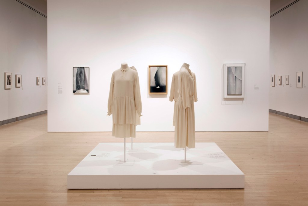
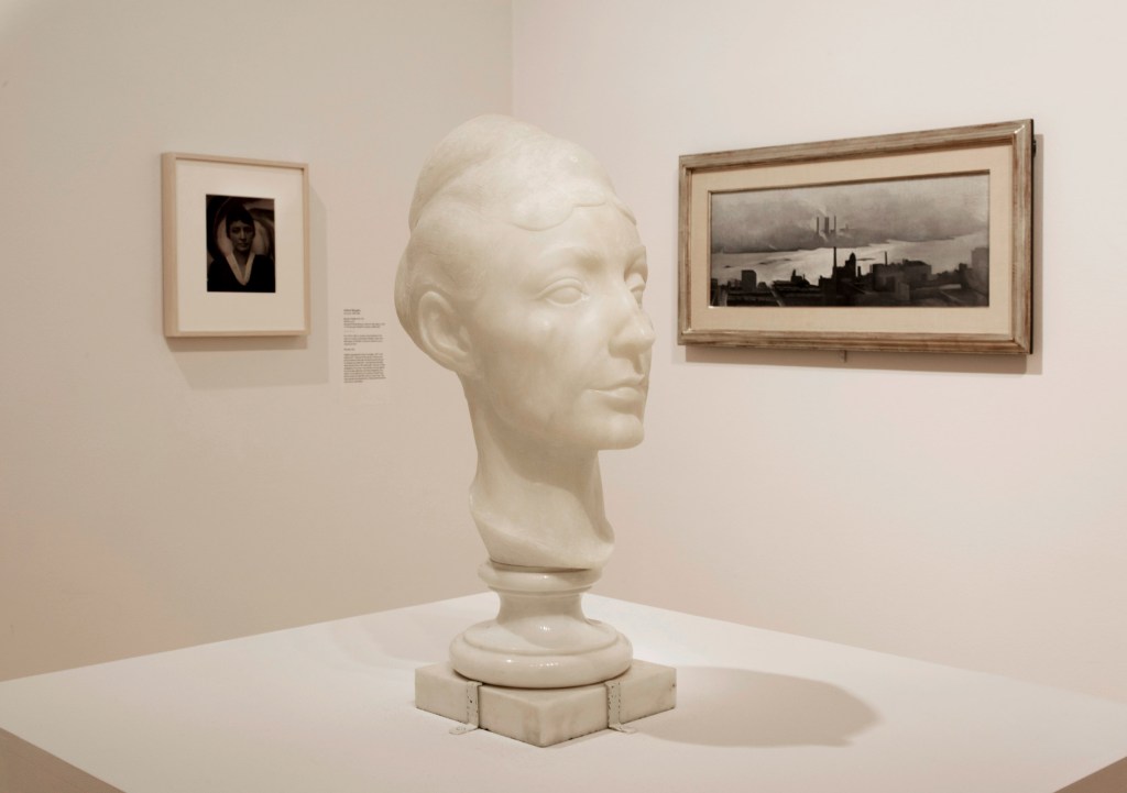
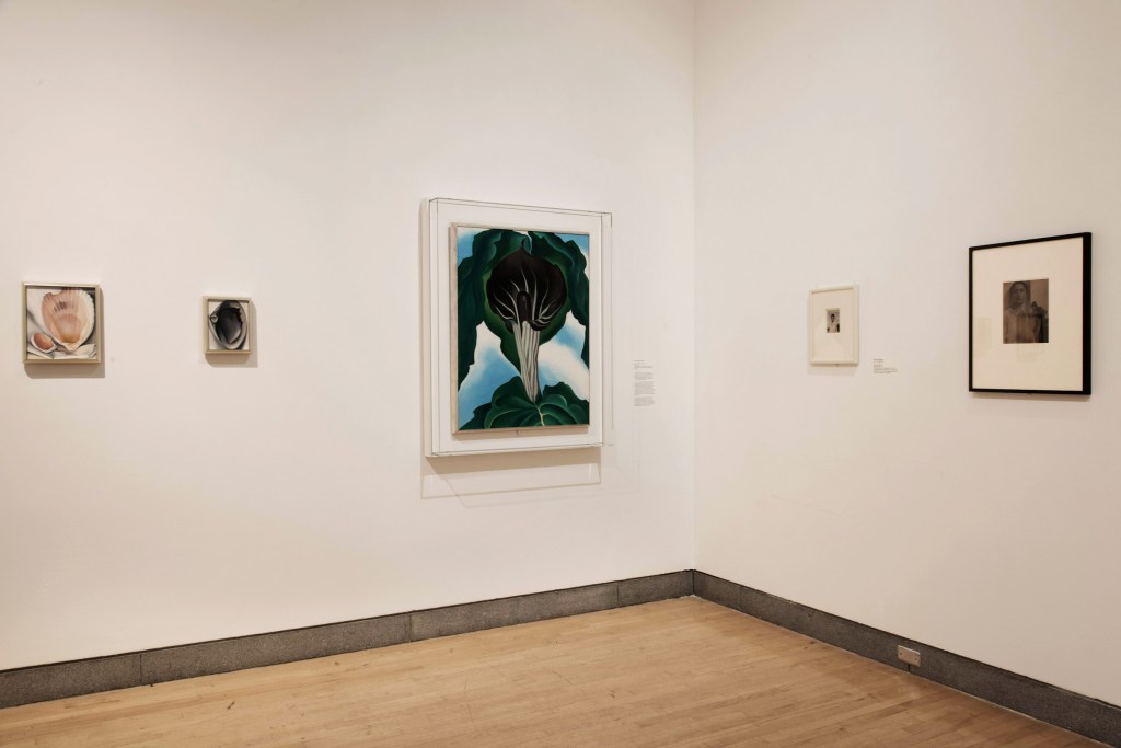
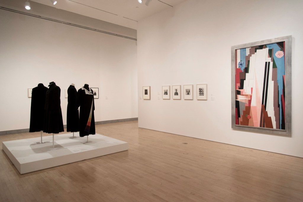
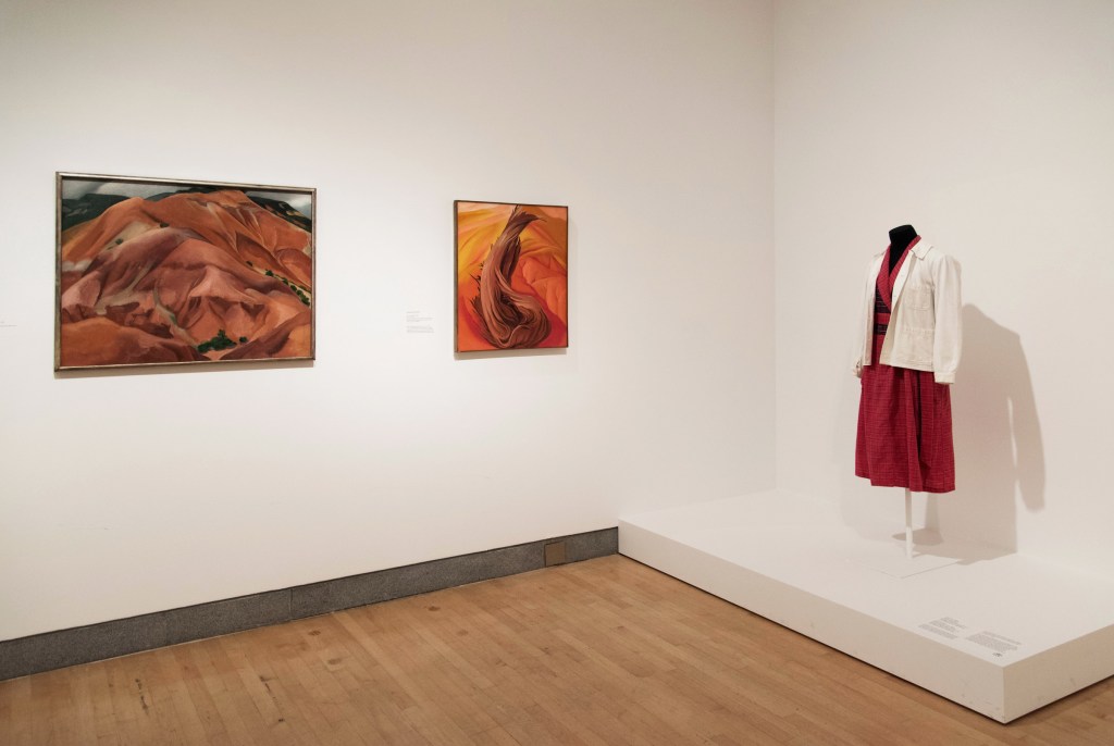
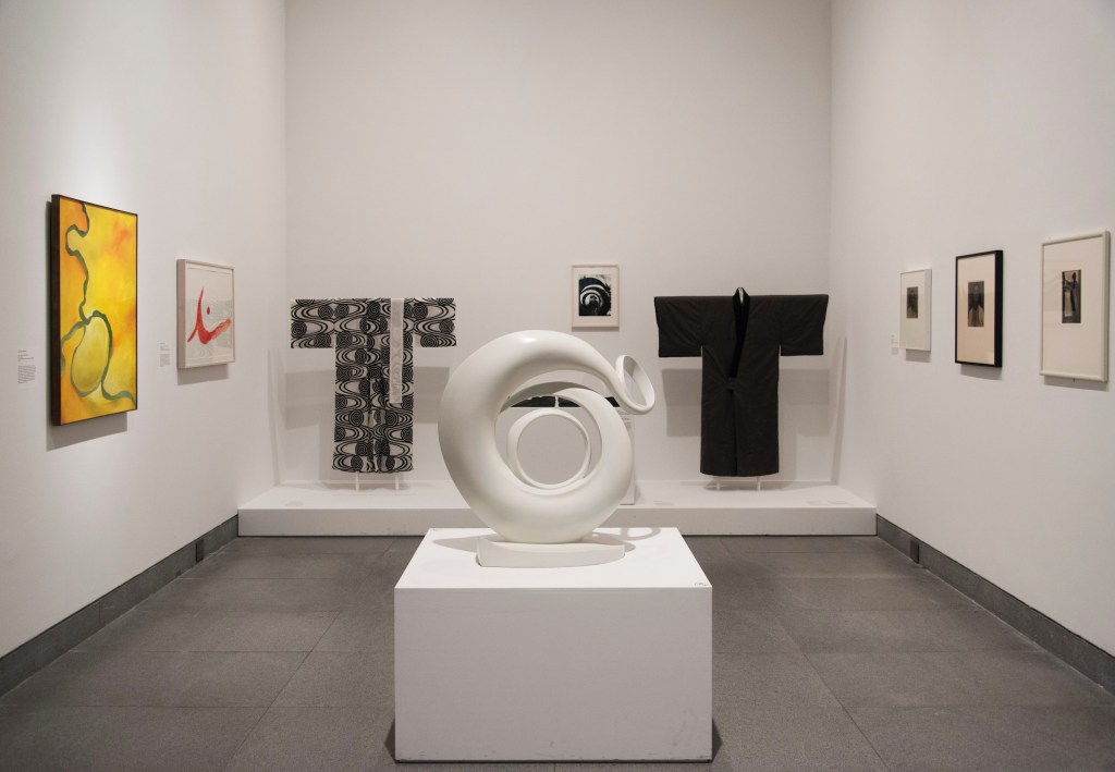
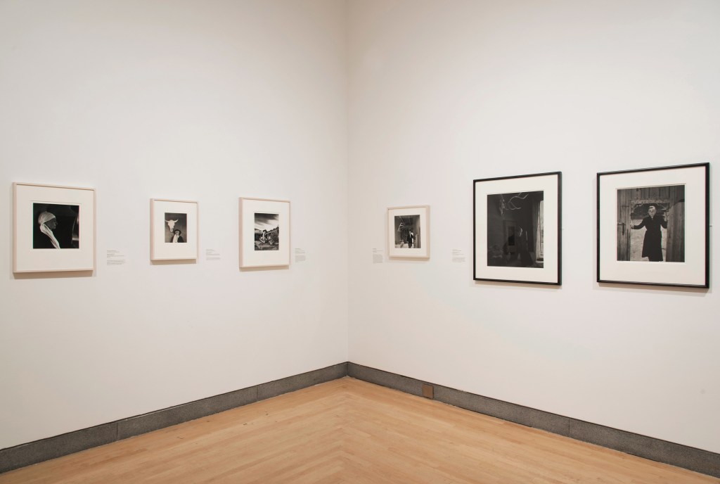
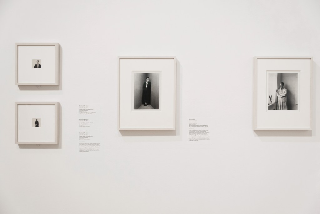

 at left, and Gaston Lachaise's sculpture 'Georgia O'Keeffe' (1925-1927) at centre")
 'Georgia O’Keeffe' 1925-1927")
 second left")
 'Clam and Mussel' 1926")
 right")
 left, and 'Brooklyn' Bridge (1949) right")
 'Manhattan' 1932")
 'Brooklyn Bridge' 1949")
' (1935) at right")

 at left; and an Emilio Pucci dress second right")
 'In the Patio IX' 1950")
 at left")


 second left, and 'Georgia O'Keeffe' by Laura Gilpin (1953) at right")
 'Georgia O'Keeffe' 1953")
 'Georgia O'Keeffe' 1922")
 'Pool in the Woods, Lake George' 1922")
 'Black Pansy & Forget-Me-Nots (Pansy)' 1926")
 'Georgia O'Keeffe, Prospect Mountain, Lake George' 1927")
' c. 1926")
 'Line and Curve' 1927")
 'Georgia O'Keeffe' 1929")
 'Georgia O'Keeffe and Orville Cox' 1937")


 'The Mountain, New Mexico' 1931")
 'Rams Head, White Hollyhock - Hills' (Rams Head and White Hollyhock, New Mexico) 1935")
 'Georgia O'Keeffe at Yosemite' 1938")
 'Patio with Cloud' 1956")
 'Georgia O'Keeffe on Ghost Ranch Portal, New Mexico' c. 1960s")
' c. 1960s-1970s")
 'Georgia O'Keeffe, Abiquiu, N.M.' 1984")
' 1983")
 'Georgia O'Keeffe, Carmel Highlands, California' 1981")


You must be logged in to post a comment.