My apologies to Chris Round that I did not get this posting up during the short run of the exhibition. It was a bit of a crowded time with the exhibition Out of the closets and Nite Art on.
The work, shown in the small black gallery at Edmund Pearce, had great presence and beauty. The backgrounds had a luminous pastel affect, much more so than in the reproductions shown here. The objects seemed to float off the paper. This is experimental work for Round (vis a vis his landscape practice) but the influences for the work can be seen in the two landscape photographs that I have included here.
I really enjoyed the beauty, serenity and context of these metaphorical landscapes.
Dr Marcus Bunyan
Many thankx to Edmund Pearce Gallery for allowing me to publish the photographs in the posting. Please click on the photographs for a larger version of the image.
Inversion marks a departure from my normal landscape based work and in to experimental still life. This series is an investigation into form and visual illusion using functional, mass-produced objects. By removing context – using a reflective surface that’s not immediately apparent and at times changing colours – I’m interrogating the duality of the real and the imagined, the prosaic and the beautiful. I’m also exploring the physicality of depth and space, re-evaluating both utilitarian aesthetic and function simultaneously.
Curated from the private collection of Marc Dessauce
Knud Lonberg-Holm (Danish, 1895-1972) The New – The Coming, Detroit, Streetcars
1924
Reproduced in Erich Mendelsohn’s Amerika, p. 73
Vintage gelatin silver print
3 1/4 x 4 1/4 inches (8.3 x 10.8cm)
The Knud Lonberg-Holm Archive from the Marc Dessauce Collection; Courtesy Ubu Gallery, New York
I am so excited by this monster two-part posting about the work of architect Knud Lonberg-Holm. His drawings and models are incredible and his photographs of industry and skyscrapers a revelation. The textures and inky blackness of his Dazzlescapes and the New Photography images of skyscrapers (both in Part 2) mark these images as the greatest collection of photographs of skyscrapers that I have ever seen. More comment tomorrow but for now just look at the dark Gotham-esque photograph The New – The Coming, Detroit, Streetcars (1924, below). The streetcar reminds me of the armoured trains so popular during the inter-war years and during World War II. And what a title: The New – The Coming…
Many thankx to Ubu Gallery for allowing me to publish the photographs in the posting. Please click on the photographs for a larger version of the image.
“Lonberg-Holm was the first architect in my knowledge ever to talk about the ultimately invisible architecture. In 1929, when I first met him, he said the greatest architect in history would be the one who finally developed the capability to give humanity completely effective environmental control without any visible structure and machinery.”
Buckminster Fuller
Knud Lonberg-Holm (Danish, 1895-1972) View from the roof Detroit, 1924 Vintage gelatin silver print 2 3/4 x 4 1/2 inches (7 x 11.4cm) approx. The Knud Lonberg-Holm Archive from the Marc Dessauce Collection; Courtesy Ubu Gallery, New York
Knud Lonberg-Holm (Danish, 1895-1972) Detroit 1924 Reproduced in Erich Mendelsohn’s Amerika, p. 71 (top) Vintage gelatin silver print 3 3/8 x 4 3/8 inches (8.6 x 11.1cm) The Knud Lonberg-Holm Archive from the Marc Dessauce Collection; Courtesy Ubu Gallery, New York
Knud Lonberg-Holm (Danish, 1895-1972) Detroit, A New Street 1924 Reproduced in Erich Mendelsohn’s Amerika, p. 71 (bottom) Vintage gelatin silver print 3 3/8 x 4 3/8 inches (8.6 x 11.1cm) The Knud Lonberg-Holm Archive from the Marc Dessauce Collection; Courtesy Ubu Gallery, New York
Ubu Gallery is pleased to present Knud Lonberg-Holm: The Invisible Architect, a debut exhibition devoted to this overlooked, yet highly influential, 20th Century modernist. Never-before-seen photographs, architectural drawings, letters, graphic design, and ephemera from Lonberg-Holm’s remarkably diverse career will be on view through August 1, 2014. The exhibition, which consists of selections from the extensive archive assembled by architectural historian Marc Dessauce, will solidify the importance of this emblematic figure in early 20th Century cultural and architectural history. Metropolis Magazine, the national publication of architecture and design, will publish an article on Knud Lonberg-Holm to coincide with this groundbreaking exhibition.
Born in Denmark, Knud Lonberg-Holm (January 15, 1895 – January 2, 1972), was an architect, photographer, author, designer, researcher, and teacher. Lonberg-Holm’s early work in Denmark and Germany initially associated him with the Berlin Constructivist and Dutch De Stijl groups. An émigré to America in 1923, Lonberg-Holm was a fundamental correspondent with prominent European architects and their modernist counterparts in the U.S. The exhibition will feature a selection of letters to Lonberg-Holm from a pantheon of the European avant-garde including László Moholy-Nagy, Walter Gropius, Theo Van Doesburg, Buckminster Fuller, Hannes Meyer, J.J.P. Oud, El Lissitzky, and Richard Neutra.
From 1924–1925, Lonberg-Holm was a colleague of Eliel Saarinen at the University of Michigan at Ann Arbor, where he taught a course in basic design modeled on the famed Bauhaus Vorkurs, the first-ever introduced in U.S. design schools. An agent of inter-continental communication, his reports on the state of American architecture appeared abroad. Lonberg-Holm’s 1928 article, Amerika: Reflections, featured buildings on the University of Michigan campus and appeared in the Dutch avant-garde publication i10, which employed Moholy-Nagy as its photo editor. The article not only contributed to international discourse on the building industry, but also touched on the “time-space convention,” a subject Lonberg-Holm would explore throughout his career. This publication, among others, will be on display.
Lonberg-Holm’s interest in American industry is best viewed in his collection of photographs taken between 1924-1926. These works document his pioneering views of industry and technology in burgeoning, jazz-age New York, Detroit, and Chicago; they would appear later, un-credited, in Erich Mendelsohn’s seminal 1926 publication Amerika, the first book on the ‘International Style’ in American architecture. Thirteen vintage photographs reproduced in Amerika will be on exhibit, as well as additional early photographs depicting technological advancements, such as cable cars and radio antennae, American culture in mass crowds and billboards, and the commercial architecture of skyscrapers and factories. Backside-views of buildings and fire escapes, rather than historicist ornamental facades, are presented in their “unselfconscious beauty” in opposition to traditional, pictorialist architectural photography. The content of the works coupled with progressive view points, like worm’s eye perspectives and extreme close-ups, align them squarely within the then emerging ‘New Photography’. El Lissitzky wrote that the dynamic photos “grip us like a dramatic film.”1 Mendelsohn’s publication, featuring Lonberg-Holm’s dynamic photography, received immediate acclaim, domestically and abroad.
While still in Germany, Lonberg-Holm created a submission for the Chicago Tribune Tower competition of 1922. Although never officially submitted, the project was published widely in magazines and newspapers, alongside other prominent architects’ designs. From his office in the historically designed Donner Schloss in Altona, Germany, Lonberg-Holm envisioned a modern construction for Chicago that incorporated references to American mass culture, specifically the automobile. The West elevations on view show the Chicago Tribune sign, which includes circular signage reminiscent of headlights. The Side elevation exhibited clearly demonstrates how the printing plant function of the ground floors of the building, rendered in black, are visually distinct from the offices of the higher floors, rendered in white with black accents for visual continuity throughout the building. Lonberg-Holm’s proposed construction, whose outward visual design distinguished its internal functions, was reproduced in L’Architecture vivante,La Cite, Le Courbusier’s Almanach d’architecture in France and Walter Gropius’ Internationale Architektur in Munich; the Berliner Illustrirte Zeitung displayed his building next to that of Mies van der Rohe and a full spread devoted to the skyscraper, featuring Lonberg-Holm’s Chicago design adjacent to plans by Walter Gropius, Saarinen and van der Rohe, appeared in H. Th. Wijdeveld’s November / December 1923 issue of the innovative publication Wendingen.
The drawings Lonberg-Holm created during this first decade as an émigré are striking for their early use of European modernist, particularly Neo-plastic, influences. He was close with the DeStijl movement in Holland, and corresponded with both Theo van Doesburg and J.J.P. Oud, with whom he would continue to work within CIAM, the Congrès Internationaux d’Architecture Modern. Early renderings done by Lonberg-Holm in the U.S. demonstrate an affinity for DeStijl principles. His plans for the 1926 MacBride residence in Ann Arbor are dynamic and asymmetrical, with intersecting planes in simple primary colors. Surely the first American allusion to Gerrit Rietvel’s iconic 1924 Schröder House in Utrecht, Holland, the MacBride residence is one of the first ‘International Style’ modernist houses designed in the Western hemisphere.
Lonberg-Holm’s importance to and knowledge of European architectural trends resulted in an invitation by Jane Heap to participate in the 1927 landmark New York exhibition, Machine Age, which was heralded as “the first international exposition of architecture held in America.” This exhibition, held at the New York Scientific American Building, May 16-28, stressed the new mechanical world and its key player, the Engineer. Lonberg-Holm’s 1925 Detroit project, Radio Broadcasting Station, was featured. The New York’s review of the exhibition explicitly referenced Lonberg-Holm’s project, noting its “delicacy and exquisite technique of execution.”
Lonberg-Holm worked with the F.W. Dodge corporation for 30 years, first in the division responsible for The Architectural Record (1930-1932), and then as head of the research department of Sweet’s Catalog Service (1932-1960.) At The Architectural Record, Lonberg-Holm acted as research editor and wrote technical news, a precursor to his lifelong interest in data-driven analytics. During his New York based employment, Lonberg-Holm’s involvement with international architectural trends did not diminish. In addition to prolonged correspondence with the various directors of the Bauhaus, including Hannes Meyer, he and his wife Ethel would visit the Bauhaus at Dessau in 1931. In 1946, Lonberg-Holm was also ultimately a candidate to replace Moholy-Nagy as director of the Institute of Design in Chicago.
At the same time, Lonberg-Holm was involved in domestic architecture and building theory. Richard Neutra would reach out to Lonberg-Holm in 1928 for illustrations and photographs to include in his account of the modern architecture movement in the US; he would approach him again in 1932 to lecture on the West Coast. Lonberg-Holm and Neutra were the “American” representatives to CIAM. It was Lonberg-Holm who nominated Buckminster Fuller and Theodore Larson for membership into CIAM in 1932.
What little scholarship exists about Knud Lonberg-Holm briefly examines his nearly twenty-year relationship with the Czech pioneering graphic designer Ladislav Sutnar, with whom Lonberg-Holm worked at Sweet’s Catalog Service. From 1942 through 1960 at the research department of Sweet’s, the bible for all the building trades, Lonberg-Holm and Sutnar revolutionized the catalog by standardising information techniques. They presented systemised communication through a simple, modern, and intelligible visual language that influenced all areas of architectural and graphic design. Together, Lonberg-Holm and Sutnar co-authored Catalog Design (1944), Designing Information (1947), and Catalog Design Progress (1950).
The vital roles and communication between city planning, architecture, and civil productivity where important to Lonberg-Holm and would be explored throughout his career. In A. Lawerence Kocher’s letter to Lonberg-Holm, the article “Architecture-or organized space” is referenced. This 1929 essay, published in Detroit, addressed the “building problem” in the US – the “an-organic structure of its cities” – and proposed “a new conception of city-planning based on a clearer understanding of the organic functions of a community.” Lonberg-Holm would be an important participant in the city planning survey of Detroit, one of CIAM’s analytical initiatives in 1932-1933. Field Patterns and Fields of Activity, a visual diagram further illustrating the interconnectivity of intelligence, welfare, production, and control in a community, graphically illustrates these early principles.
Collaboration was critical to Lonberg-Holm, who would work with Theodore Larson to improve information indexing and the production cycle. Field Patterns, as well as the visuals for Planning for Productivity (1940), were components of Lonberg-Holm’s collaboration with Theodore Larson. Lonberg-Holm sought to apply some of the theories set forth in Development Index. This collaborative project with Larson was published by the University of Michigan in 1953 and focused on the relationship between community, industry, and education, analytical theories that were proposed by Lonberg-Holm during the formation of the University’s Laboratory of Architectural Research. Lonberg-Holm’s 1949 visual diagram of the relationship between the university, the building industry, and the community, is on view, as well as the Sutnar-designed steps of Planning for Productivity. Lonberg-Holm had returned to the University as a guest lecturer and professor in the late 1940s and early 1950s. At the suggestion of Lonberg-Holm, Theordore Larson was among the new faculty hired at the University in 1948, along with Walter Sanders and William Muschenheim, whom Lonberg-Holm had worked with in the Detroit survey.
In 1949, Lonberg-Holm was issued a Dymaxion License and became a trustee to the Fuller Institute/Research Foundation; among the trustees are his contemporaries George Nelson and Charles Eames. Initially meeting Buckminster Fuller in c. 1929, he and Fuller would correspond throughout Lonberg-Holm’s life. Lonberg-Holm was a member of the Structural Studies Associates (SSA), a short-lived group of architects in the 1930s surrounding Fuller and his briefly published architectural magazine Shelter. A number of Shelter issues are on view, many of which have contributions by Lonberg-Holm; the cover of the May 1932 issue was designed by Lonberg-Holm. Planning for Productivity and Development Index were later data-driven projects that furthered the SSA’s and Fuller’s principles – that the evolution of science and technology would influence social progress and could be beneficial to the community only through research, analysis and macroapplication.
Arriving to the US a decade before his European contemporaries, Lonberg-Holm occupied a unique position as a cultural bridge, communicating between the US and Europe in a period when the state of art and architecture was radically changing. He exposed his students and colleagues to European protagonists of avant-garde architecture theory while enthusiastically exploring American industry and building. Exclusively through collaboration, Lonberg-Holm worked to modernise both architecture and design. Integral to Lonberg-Holm’s principles was that technology alone could not suffice as the sole perpetuator of architecture – advancements in building and new designs needed to promote human culture in an ever-evolving manner where new information was continuously integrated into design theory. Throughout his career, Lonberg-Holm embodied the antithesis of the stereotype architect, egocentric and insulated from the community in which his designs were to exist. From his beginnings at The Architectural Record to his final project, Plan for Europe 2000: Role of the Mass Media in Information and Communication, Lonberg-Holm held to the belief that a collective approach, with applied research, could form a generative knowledge base that could be cultivated for altruistic means.
Text from the Ubu Gallery website
1/ Beaumont Newhall, The History of Photography from 1839 to the Present, London, Seeker & Warburg, 1982, p. 1.
Unknown photographer Portrait of Knud Lonberg-Holm New York, 1950s (prior to 1960) Vintage gelatin silver print 6 7/8 x 10 inches (17.5 x 25.4cm) The Knud Lonberg-Holm Archive from the Marc Dessauce Collection Courtesy Ubu Gallery, New York
Unknown photographer Portrait of Knud Lonberg-Holm New York, 1950s (prior to 1960) Vintage gelatin silver print 7 7/8 x 9 1/2 inches (20 x 24.1cm) The Knud Lonberg-Holm Archive from the Marc Dessauce Collection Courtesy Ubu Gallery, New York
Knud Lonberg-Holm (Danish, 1895-1972) Le Corbusier at CIAM Conference c. 1954-1964 Vintage gelatin silver print 5 5/8 x 8 3/8 inches (14.3 x 21.3cm) The Knud Lonberg-Holm Archive from the Marc Dessauce Collection Courtesy Ubu Gallery, New York
Knud Lonberg-Holm (Danish, 1895-1972) Buckminster Fuller, Lonberg-Holm and other Bayside, New York Nd Vintage gelatin silver print 3 x 4 1/4 inches (7.6 x 10.8cm) The Knud Lonberg-Holm Archive from the Marc Dessauce Collection Courtesy Ubu Gallery, New York
Knud Lonberg-Holm (Danish, 1895-1972) Photograph of the Dymaxion Car Bridgeport, Connecticut, July 21, 1933 Vintage gelatin silver print 7 5/8 x 9 3/4 inches (19.4 x 24.8cm) Stamped on verso The Knud Lonberg-Holm Archive from the Marc Dessauce Collection Courtesy Ubu Gallery, New York
In July of 1933, the Dymaxion car was introduced in Bridgeport, Connecticut, where it caused a great stir. Lonberg-Holm can be seen holding the car door open while the artist Diego Rivera (who was in attendance with his wife and artist Frida Kahlo) looks on, coat on his arm.
Knud Lonberg-Holm (Danish, 1895-1972) Diego Rivera and Frida Kahlo Bridgeport, Connecticut, July 21, 1933 Vintage gelatin silver print The Knud Lonberg-Holm Archive from the Marc Dessauce Collection Courtesy Ubu Gallery, New York
Knud Lonberg-Holm (Danish, 1895-1972) Radio Broadcasting Station Photograph of Model Detroit, 1925 Vintage gelatin silver print 4 7/8 x 6 7/8 inches (12.4 x 17.5cm) The Knud Lonberg-Holm Archive from the Marc Dessauce Collection Courtesy Ubu Gallery, New York
Knud Lonberg-Holm (Danish, 1895-1972) Radio Broadcasting Station Photograph of Model Detroit, 1925 Vintage gelatin silver print 5 3/8 x 7 1/2 inches (13.7 x 19.1cm) The Knud Lonberg-Holm Archive from the Marc Dessauce Collection Courtesy Ubu Gallery, New York
Knud Lonberg-Holm (Danish, 1895-1972) Photograph of Chicago’s new skyline North of Randolph Street All new since 1926 except Wrigley and Tribune buildings May 1929 Vintage gelatin silver print 2 1/4 x 4 1/2 inches (5.7 x 11.4cm) Titled on verso The Knud Lonberg-Holm Archive from the Marc Dessauce Collection Courtesy Ubu Gallery, New York
Ubu Gallery 416 East 59th Street New York 10022 Phone: 212 753 4444
Just to have one in your home would be like wishing upon a star… to contemplate, to observe, to understand these inherently tactile sculptures. What a joy.
The Los Angeles County Museum of Art (LACMA) presents Calder and Abstraction: From Avant-Garde to Iconic, the first monographic presentation of Alexander Calder’s work in a Los Angeles museum. Taking as its compass the large-scale sculpture Three Quintains (Hello Girls),a site-specific fountain commissioned by LACMA’s Art Museum Council in 1964 for the opening of LACMA’s Hancock Park campus, Calder and Abstractionbrings together a range of nearly fifty abstract sculptures, including mobiles, stabiles, and maquettes for larger outdoor works, that span more than four decades of the artist’s career. The exhibition at LACMA is organised by LACMA’s senior curator of modern art Stephanie Barron and designed by Gehry Partners, LLP.
Barron remarks, “Calder is recognised as one of the greatest pioneers of modernist sculpture, but his contribution to the development of abstract modern sculpture – steeped in beauty and humour – has long been underestimated by critics. Calder was considered a full-fledged member of the European avant-garde, becoming friendly with André Breton, Marcel Duchamp, Joan Miró, and Piet Mondrian, and exhibited alongside Jean Arp, Wassily Kandinsky, Fernand Léger, and many of the Surrealists. His radical inventions move easily between seeming opposites: the avant-garde and the iconic, the geometric and the organic, art and science – an anarchic upending of the sculptural paradigm.”
“Calder and Abstraction offers a window into the remarkably original thinking of this distinguished artist and elucidates his revolutionary and pivotal contribution to the development of modern sculpture,” says Michael Govan, CEO and Wallis Annenberg Director of LACMA. “Three Quintains (Hello Girls) at LACMA has for decades been seen as an emblem of the museum. Following in the footsteps of its legacy, our campus continues to be enhanced by large-scale, public art – most recently with the inclusion of Chris Burden’s Urban Light (2008) and Michael Heizer’s Levitated Mass (2012).”
Exhibition overview
Calder and Abstraction traces the evolution of abstraction in the artist’s sculptural practice. The exhibition, arranged in loose chronological order, presents highlights of Calder’s oeuvre from his earliest abstract works to the crescendo of his career in the late 1940s to his later public sculptural commissions. While he is considered one of the most popular artists of his time, his work also shares sensibilities with less immediately accessible artists, including the Surrealists and the champions of pure abstraction that made up the Abstraction-Création group, such as Robert Delaunay, Theo van Doesburg, and Kurt Schwitters, among others.
From 1926 to 1933, Pennsylvania-born Calder lived primarily in Paris and was a prevalent figure of the European avant-garde along with peers Marcel Duchamp, Joan Miró, Piet Mondrian, Jean Hélion, Wassily Kandinsky, Fernand Léger, Alberto Giacometti, fellow American Man Ray, and many of the Surrealists. At the time, Paris was the epicentre of creative production, and Surrealism was the most significant artistic movement in France. A number of his works from the 1930s referenced astronomy, a preoccupation shared by a number of avant-garde artists. In Gibraltar two off-kilter rods thrust upward from a plane encircling a wood base, suggesting a personal solar system. Calder was fascinated with representing the natural world and the cosmos as potent and brimming with energy: “When I have used spheres and discs … they should represent more than what they just are. … [T]he earth is a sphere but also has some miles of gas about it, volcanoes upon it, and the moon making circles around it. … A ball of wood or a disc of metal is rather a dull object without this sense of something emanating from it.”
A crucial encounter for Calder occurred in 1930 upon visiting artist Piet Mondrian’s studio. Calder credited Mondrian with opening his eyes to the term “abstract,” providing the catalyst to a new phase in his practice. Calder later described this visit as pivotal in his move towards abstraction: “The visit gave me a shock. … Though I had heard the word ‘modern’ before, I did not consciously know or feel the term ‘abstract.’ So now, at thirty-two, I wanted to paint and work in the abstract.”
Calder appropriated Surrealism’s affinity to curvilinear, biomorphic forms into his sculptures, and when he met Miró in 1928, the two men discovered a mutual admiration for each other’s work and developed a close friendship. As Calder stated, “Well, the archaeologists will tell you there’s a little bit of Miró in Calder and a little bit of Calder in Miró.”
The decade after he met Miró and Mondrian proved to be the most radical of Calder’s career. He embraced the Surrealist notion of integrating chance into his works in addition to the Constructivist idea that painting and sculpture should be freed from their standard constraints, such as gravity and traditional sculptural mass. He consequently developed his two signature typologies: the mobile, a term coined by Marcel Duchamp after a visit to Calder’s home and studio in 1931; and the stabile, named by Jean Arp in 1932.
Calder’s mobiles are hanging, kinetic sculptures made of discrete movable parts stirred by air currents, creating sinuous and delicate drawings in space. Either suspended or freestanding, these often large constructions consist of flat pieces of painted metal connected by wire veins and stems. Eucalyptus (1940), one of Calder’s first mature mobiles, was created during World War II. The piece can be seen as a composition of violent, tortured biomorphic shapes that suggest gaping mouths, body parts, sexual organs, and sinister weapons.
Stabiles, which were developed alongside Calder’s mobiles but came to full maturity later in his career, are stationary abstract sculptures, often with mobiles attached to them (standing mobiles). In several of Calder’s works from the 1940s – the most prolific decade of his sculptural production – he effectively blended the mobile and stabile forms, as seen in Laocoön (1947), in which the stabile supports graceful, arcing branches that cut a broad swath as they rotate at an irregular rhythm.
In the mid-1950s, Calder began working with quarter-inch steel (thicker than the aluminium he had used during the 1940s), which enabled him to construct larger, more durable, and more ambitious sculptures and posed him as an ideal collaborator with architects to create works for public spaces. With commissions from the city of Spoleto, Italy (1962), Montreal’s Expo (1967) and Grand Rapids, Michigan (1969) – represented in the exhibition by La Grande vitesse (intermediate maquette) – Calder began a virtually non-stop output of public sculpture until his death in 1976.
Calder’s public sculpture evolved at a time when communities were becoming increasingly proud of public sculpture, although his resolutely bold abstract forms, though hard to imagine now, were initially met with some controversy. Today encountering Calder’s iconic sculpture in the centre of a city, in front of a courthouse, in the midst of the Senate Office Building, or in front of a museum is a hallmark of postwar public sculpture that he helped to invent.
Exhibition design and installation
Calder was constantly in conversation and collaborated with other artists and architects in his lifetime, but a major architect has not designed a Calder show since the 1980s. Frank O. Gehry’s design for LACMA’s exhibition allows for quiet areas of contemplation, unexpected juxtapositions of related works, and opportunities for both intimate and panoramic views of the works. Gehry’s gently curved walls frame the sculptures and recall the harmony between art and architecture, emphasising the organic nature of Calder’s works. Gehry’s own method of developing architectural forms is inherently tactile, sharing some of the same hands-on techniques of a sculptor.
With the assistance of technology and effective planning, Calder and Abstraction at LACMA features a selection of sculptures that are animated throughout the course of the day.
Like the my earlier posting on the exhibition ‘Caravaggio – Bacon’ at Gallery Borghese, Rome, what an inspired curatorial decision this is. I would have never have thought to have brought Bacon and Moore together, but the synergy between the two artists work is undeniable.
Personally, I don’t think that Moore is as immobile and measurable as Radoslaw Kudlinski states in the quotation below: while rooted in anthropological concerns his anthropomorphic “nightmares” have a heft and gravitas that move you, not physically, but in the pit of your stomach. Look at the open mouth of Reclining Figure (1951, below) and tell me you are not drawn down into the bowls of the soul through the pointed tit of mother earth. Tactile, yes. Immobile and measurable, NO!
Moore moves you from within. His roots are from an ancient and emotional landscape, one of decay, time and change. His works are like embryonic sacs, pushing out at you from different points. The holes in his work are like looking into a black hole. The spaces he creates with his sculptures DENY a perfect formal economy, for they are really awkward images that impinge on a space. Never stationary, his sculptures move you from within in the most powerful way. A perfect counterbalance to the external, cinematic rambunctiousness of Bacon.
Dr Marcus Bunyan
Many thankx to the Art Gallery of Ontario for allowing me to publish the photographs in the posting. Please click on the photographs for a larger version of the image.
“While Moore’s figures are sustaining themselves entirely from within, Bacon’s are disengaged fugitives from history. Bacon is already “after” when Moore is still “before.”
And while Moore’s nightmares are still rooted in anthropological concerns – corporeal and measurable – Bacon’s subject is a phantom without a name, without a past, because a collectivised subject is only and always an abstract fragment of a person.
But we need Moore’s confrontation with Bacon. Moore is a guardian of our sanity. His forms are stationary – despite the refined movement of all their structural lines, and their impeccable pronunciation of architectural tempo, as well as their perfect formal economy, they are going nowhere.
And because of Moore’s immobility, tactility and measurability, I welcome his presence with relief. He defends us from Bacon’s radical, cinematic mobility, forever escaping our grasp.
Bacon’s state of convulsive stasis is an illusion, because looking at his canvas you have an impression that between the two or three takes, there are more frames, as in a movie, trapped in the same space. There is also a sense that this trapping of multiplicity is not a conscious choice, but the consequence of there being nowhere else to go.
Bacon is the scandal of the flesh, the existential strip-tease – even a post-flesh, post-body concept of a person. He is a fugitive, and his natural state is motion, appearance and disappearance. He belongs to non-materiality, to cyberspace – and this is his paradox, because together with the sensuality of his pictorial matter, the materiality of subject is gone. That’s why Bacon is so relevant today.”
Radoslaw Kudlinski. “Serious Scary: Francis Bacon and Henry Moore in Toronto,” on the Canadian Art website, May 7, 2014 [Online] Cited 05/07/2014. No longer available online. Used under fair use conditions for the purposes of education and research
The tortured British painter Francis Bacon, whose triptych recently set a new record for the most expensive artwork ever sold at auction, makes his Canadian debut this spring at the Art Gallery of Ontario (AGO) alongside rarely-seen works by the British sculptor Henry Moore in the exhibition Francis Bacon & Henry Moore: Terror and Beauty. Featuring more than 130 artworks, including paintings, sculptures, drawings, photographs and archival materials, the exhibition explores the two artists’ shared fascination with the human form in relation to the violence of the Second World War and other key events of the 20th century.
Although they were neither friends nor collaborators, Bacon (b. 1909) and Moore (b. 1898) were contemporaries who shared an obsession with expressing themes of violence, trauma and conflict, both social and personal. Drawing on the artists’ personal experiences during the London Blitz and other conflicts, the exhibition examines how confinement and angst fostered their extraordinary creativity and unique visions. Bacon, whose dark depictions of human torment have inspired several characters in popular culture, including the appearance of Heath Ledger’s Joker in The Dark Knight, was a sado-masochist who sought to process the trials of humanity through his canvases. Moore, a British war artist, was one of the most renowned sculptors of his time. His works evoke endurance and stability, but when considered in light of his wartime experience, they read as an effort to rebuild and redeem the fragile human psyche and body.
Curated for the AGO by Dan Adler, associate professor of art history at York University, Francis Bacon and Henry Moore: Terror and Beauty is the first Canadian exhibition of Bacon’s work and includes rarely seen Moore pieces, from both the AGO collection and elsewhere. Moore’s works are a cornerstone of the AGO collection, and pairing them with those by Francis Bacon sets them in a new light. The exhibition also presents more than 30 archival photographs by acclaimed German-born British photographer Bill Brandt. Loans for the exhibition have also been secured from several institutions, including MoMA, Tate Britain and the Museum of Contemporary Art, Chicago.
Dario Escobar (Guatemalan, b. 1971) Obverse & Reverse XIV (installation view) 2013 Latex, leather, string and steel 11 1/2 × 6 9/16 × 6 9/16 ft. (349.89 × 199.94 × 199.94cm) Dario Escobar Courtesy of the artist and Josée Bienvenu Gallery, New York
In honour of the World Cup final and a wonderful tournament, here is a glorious posting to celebrate The Beautiful Game!
PS. So much of this work is conceptual graphic design, doesn’t anybody make art anymore?
Marcus
Many thankx to the Los Angeles County Museum of Art (LACMA) for allowing me to publish the photographs in the posting. Please click on the photographs for a larger version of the image.
On the eve of the World Cup – which, like the Olympics, takes place every four years – this exhibition celebrates football, the world’s game, and its richness as a field for metaphorical inquiry. Just as the World Cup brings together athletes and fans from around the globe, Fútbol: The Beautiful Game explores some of the ties that bind us as humans. Focusing on a simple game allows for a direct conversation about the communication and (more often) miscommunication that characterise our collective life, while celebrating one thing that most of the planet holds its breath for: the quadrennial event held to crown a nation as world champion of football. The sport has often been cited as a metaphor for nations, for cultures, and even for life, as is suggested by a statement attributed to the writer Albert Camus: “After many years in which the world has afforded me many experiences, what I know most surely about morality and obligations, I owe to football.” Camus believed that the simple rules governing the game often had more to teach us about life than did politicians and philosophers.
Fútbol: The Beautiful Game presents the work of more than 30 artists who address the game through its imagery, signs, symbols, and sounds while also touching on larger issues well apart from the field of play. These themes include masculinity and the construction of heroes; ritual and worship; marketing and power; and current political, social, and cultural phenomena.
In the background: Andreas Gursky (German, b. 1955) Amsterdam, EM Arena I (installation view) 2000 Chromogenic print 108 1/4 × 80 11/16 × 2 7/16 in. (275 × 205 × 6.2cm) Gagosian Gallery Andreas Gursky, Courtesy Gagosian Gallery
Nelson Leirner (Brazil, 1932-2020) Maracana (installation view details) 2003 Plaster, plastic, ceramic, wood 120 x 130 3/4 x 9.5 in. Brooklyn Museum
In case: Satch Hoyt (Anglo-Afro-Jamaican, b. 1957) Kick That (installation view) 2006 Mixed media with sound Satch Hoyt Courtesy of the artist
In the background: George Afedzi Hughes (Ghanaian-born American, b. 1962) Parallel (installation view) 2009-2011 Acrylic, oil, enamel on canvas 72 x 120 in. (182.88 x 304.8cm) Skoto Gallery Collection of the artist, Courtesy Skoto Gallery
George Afedzi Hughes (Ghanaian-born American, b. 1962) Parallel 2009-2011 Acrylic, oil, enamel on canvas 72 x 120 in. (182.88 x 304.8cm) Skoto Gallery Collection of the artist, Courtesy Skoto Gallery
Stephen Dean (French-American, b. 1968) Volta (installation view) 2002-2003 Single-channel color DVD installation (9′) with audio and fabric enclosure Collection of Ruth and William True
Right on floor: Mary Ellen Carroll (American, b. 1961) FREE THROW (installation view) 1984 Mannequin bottom and basketball with rubberised paint 4 x 3 x 1 ft. (121.91 x 91.44 x 30.48cm) Mary Ellen Carroll Courtesy of the artist, 3rd Streaming-NYC, Galerie Hubert Winter-Vienna, Austria
Centre: Wendy White (American, b. 1971) Clavado (installation view) 2013 Acrylic on canvas, wood, enamel 74 1/2 × 74 1/2 in. (189.23 × 189.23cm) Andrew Rafacz Gallery Courtesy of the artist and Andrew Rafacz
Right: Dewey Tafoya (American) Olmeca 1370 BCE (installation view) 2013 Serigraph 36 × 50 in. (91.44 × 127cm) Self-Help Graphics Self Help Graphics & Art, Professional Printmaking Program, 2013. On loan from the Self Help Graphics & Art Collection
Installation view of the exhibition Fútbol: The Beautiful Game at The Los Angeles County Museum of Art (LACMA)
The Los Angeles County Museum of Art (LACMA) presents Fútbol: The Beautiful Game, an exhibition examining the sport of fútbol, or soccer, as it is known in the United States. Featuring approximately 50 works by nearly 30 artists on the subject of Fútbol – often referred to as “the beautiful game” – the exhibition looks at issues of nationalism, identity, globalism, and mass spectacle as well as the shared human experience between spectators from a multitude of cultures. In anticipation of the 2014 World Cup that takes place in Brazil this summer, LACMA’s exhibition considers the sport through video, photography, painting, sculpture, and large-scale installation.
“A globally beloved sport celebrated in the context of a museum: what a great opportunity to explore the international scope of soccer through the lens of art,” said Michael Govan, CEO and Wallis Annenberg Director of LACMA. “Fútbol should excite all, especially as it coincides with the World Cup in Brazil in summer 2014.”
“When people watch a game, they feel inspired by the spirit of the team, the fans, and the sense of community,” remarked Franklin Sirmans, Terri and Michael Smooke Curator and department head of contemporary art at LACMA, “We, the fans, create the spirit of the team via our rituals. Witnessing a game is one of the few occasions during which a collective sense of enthusiasm is still possible. This exhibition explores that energy.”
Exhibition overview
Two room-sized video installations anchor Fútbol: The Beautiful Game. The first, Zidane: A 21st Century Portrait by the artists Philippe Parreno and Douglas Gordon, provides an intimate portrait of Zinedine Zidane – one of the greatest soccer players in the history of the sport – during the course of a single match. Meanwhile, Stephen Dean’s Volta, set to samba music, directs its gaze at stadium crowds and draws attention to both the pandemonium and organised ritual of mass audiences.
Other works by artists including Robin Rhode, Kehinde Wiley, Petra Cortright, Andy Warhol, Mark Bradford, Mary Ellen Carroll, Hassan Hajjaj, and Andreas Gursky, among others, provide a sense of the possibilities of the sport as a universal conversation piece. With artists hailing from as far afield as Morocco, Germany, Mexico, and South Africa – in addition to several Los Angeles–based artists – the geographic range represented in Fútbol: The Beautiful Game reflects the global reach of the sport.
Gustavo Artigas’s The Rules of the Game examines the ways in which communities that play different sports (basketball, soccer, and football) perceive one another, while Miguel Calderón’s video Mexico vs. Brasil dramatically unfolds during an unlikely victory for Mexico. Chris Beas harkens back to classical modes of presentation in his paintings: his athletic figures are depicted in a celebratory, almost mythic light. Meanwhile, the athletes featured in Generic Art Solutions’ works are almost caricatures caught in moments of extreme dramatisation.
In collaboration with LACMA, a new edition of prints has been commissioned by Self Help Graphics under the direction of executive director, Evonne Gallardo. The new prints by Carolyn Castano, Nery Gabriel Lemus, Ana Serrano, Dewey Tafoya, Ami Motevelli and Mario Ybarra, Jr. address varied aspects of the game – from a commemoration for the Colombian soccer player Andres Escobar who was shot and killed shortly after the 1994 World Cup, seemingly for his mistaken own goal, to references to the Olmec culture of the first major civilisation in Mexico.
As a nod to the imminent World Cup, the exhibition’s design alludes to the Brazilian flag with graphic symbolism as it evokes the environs of the sport – sun, sky, and grass – through a vibrant yellow, blue, and green.
Ana Serrano (American, b. 1983) Narco Soccer 2013 Serigraph 50 × 36 in. (127 × 91.44cm) Self-Help Graphics Self Help Graphics & Art, Professional Printmaking Program, 2013. On loan from the Self Help Graphics & Art Collection
Many thankx to the Grand Palais for allowing me to publish the photographs in the posting. Please click on the photographs for a larger version of the image.
“I have boundless admiration for the naked body. I worship it.”
“I was a Catholic boy, I went to church every Sunday. A church has a certain magic and mystery for a child. It still shows in how I arrange things. It’s always little altars.”
“I am looking for perfection in form. I do that with portraits. I do it with cocks. I do it with flowers.”
The exhibition will present over 250 works making it one of the largest retrospective shows for this artist ever held in a museum. It will cover Mapplethorpe’s entire career as a photographer, from the Polaroids of the early 1970s to the portraits from the late 1980s, touching on his sculptural nudes and still lifes, and sadomasochism.
The focus on his two muses Patti Smith and Lisa Lyon explores the theme of women and femininity and reveals a less known aspect of the photographer’s work. The challenge of this exhibition is to show that Mapplethorpe is a great classical artist, who addressed issues in art using photography as he might have used sculpture. It also puts Mapplethorpe’s art into the context of the New York art scene in the 1970-1980s.
In his interview with Janet Kardon in 1987, Mapplethorpe explained that photography in the 1970s was the perfect medium for a fast-paced time. He did not really choose photography; in a way it was photography that chose him. Later in the same interview, he said “If I had been born one hundred or two hundred years ago, I might have been a sculptor, but photography is a very quick way to see, to make a sculpture. Lisa Lyon reminded me of Michelangelo’s subjects, because he did muscular women.”
Mapplethorpe positioned himself from the outset as an Artist, with a capital A. Unlike Helmut Newton, who as a teenager already wanted to be a fashion photographer, and imposed his vision of the world and photography, making it an art in its own right, Robert Mapplethorpe is a sculptor at heart, a plastic artist driven by the question of the body and its sexuality and obsessed by the search for perfect form.
Like Man Ray, Mapplethorpe wanted to be “a creator of images” rather than a photographer, “a poet” rather than a documentarist. In the catalogue for the Milan exhibition which compared the two artists, Bruno Cora recalls the parallels in their lives and works: “Before becoming masterly photographers, Man Ray and Mapplethorpe had both been painters and sculptors, creators of objects; they both lived in Brooklyn in New York; they both made portraits of the intellectuals of their time; and they were both incisive explorers of the nude form, its sculptural qualities and the energy emanating from it.”
Mapplethorpe was an artist before being a photographer. His images come from a pictorial culture in which we find Titian (The Flaying of Marsyas / Dominick and Elliot), David, Dali, and even the great artists of the Italian Renaissance, Michelangelo, Piero della Francesca, Bernini …
As in Huysmans’s novel, the exhibition is a countdown for this other dandy from the end of another world, Robert Mapplethorpe. It starts with his self-portrait with a skull-headed cane, the image of a young man already old, the tragedy of a life cut down in full flight by AIDS. But his almost royal final posture, as if beyond death, still (just) alive but already in the posterity of his oeuvre, seems to beckon us with a gesture of his pastoral cane to follow him into the world that he constructed in twenty years of photography. The exhibition continues with statuary, a dominant theme in Mapplethorpe’s last years, photos of statues of the gods in his personal pantheon: Eros, of course, and Hermes … The artist always said he used photography to make sculptures, and he ended his oeuvre with photographs of sculptures. His nudes were already photographic sculptures.
Works are not created just anywhere. To be fully appreciated, Mapplethorpe’s art must be put into the socio-cultural context of arty New York in the 1970s and 80s, and the underground gay culture there at that time. Two permeable and equally radical worlds. To take the measure of the libertarian explosion of the time, we need to watch Flesh, Warhol’s film with Joe Dalessandro, which narrates 24 hours in the life of a young New York male prostitute. To understand the violence and passion of gay sexuality for young New Yorkers fighting for freedom in a repressive period, we must read Edmund White’s The Beautiful Room is Empty, the story of a young gay in the years of riots and demonstrations and extreme emancipation; and Andrew Holleran’s Dancer from the Dance (1978), to plunge into the sexual experiments of Fire Island in the 1970s.
Mapplethorpe is hailed as one of the world’s greatest photographers and the exhibition aims to give a broad view of his work.
Robert Mapplethorpe was an artist with an obsessive quest for aesthetic perfection.
A sculptor at heart, and in his imagination, he wanted “people to see [his] works first as art and second as photography.”1 An admirer of Michelangelo, Mapplethorpe championed the classical ideal – revised and reworked for the libertarian New York of the 1970s – and explored sophisticated printing techniques to create unique works and mixed compositions, which he framed in unusual ways.
Like the novel by Joris-Karl Huysmans, this exhibition has been organised “À rebours” [against the nap] and examines the work of another dandy, living at the end of another world. It opens with Mapplethorpe’s self-portrait with the skull-head cane: the image of a young man, already old, tragically cut down in the prime of life by AIDS, it also reveals how the master of the realm of shadows – photography – gave free rein to his imagination. Like a modern day Orpheus, beyond death, he seems alive – although only just – yet already in the afterlife of his work, beckoning us with his satanic cane to follow him into the underworld of his life, in search of his desire.
“Photography and sexuality have a lot in common,” explains Mapplethorpe. “Both are question marks, and that’s precisely what excites me most in life.”2 Exploring the photography of the body, he pushed it to the limits of pornography, perhaps like no other artist before him. The desire we see in these images – often the photographer’s own desire – also reflects life in New York, as lived by some, in the 1970s and 80s, at the height of the sexual liberation movement. “I’m trying to record the moment I’m living in and where I’m living, which happens to be in New York. I am trying to pick up on the madness and give it some order.”3
This retrospective of Mapplethorpe’s work – the first in France since he passed away – features some two hundred and fifty images exploring a range of themes. They cover every aspect of Mapplethorpe’s art – bronze bodies and flesh sculptures, geometric and choreographic, still lives and anatomical details, bodies as flowers and flowers as bodies, court portraiture, night photography, and eroticism, soft and hard – interspersed with self-portraiture in all its forms. The works from the photographer’s early career, which close the exhibition, reveal how the path taken by his art was already mapped out in his first Polaroids. The sign of a great artist.
1/ Inge Biondi, “The Yin and the Yang of Robert Mapplethorpe,” in The Print Collector’s Newsletter, New York, January 1979, p. 11 2/ Mark Thompson, “Mapplethorpe,” in The Advocate, Atlanta, 24 July 1980 3/ Sarah Kent, “Mapplethorpe,” in Time Out, London, 3-9 November 1983
Alan Constable creating one of the cameras for the Polaroid Project
Polaroid Project is a vaguely disappointing exhibition at Arts Project Australia. The intentions and concept are good but the work sits rather silently and uneasily in the gallery space.
Constable’s anthropomorphised cameras are as lumpy and charismatic as ever, but the black colour does them no favours. Instead of transporting the viewer they become rather heavy and dull. They loose most of their transformative appeal.
Atkins’ boxes, “readymade abstractions” – his first attempt at sculpture – needed to be pushed further. While his painting practice uses distinctive graphic, jazz and minimalist colour forms, what makes them so watchable and mesmerising is that the eye has to attempt to go beyond the two-dimensional plane, to interrogate the juxtaposition of shape and space. The MDF cubes hand painted with auto acrylic paint deny the eye the ability to probe beyond the surface because the surface is already three dimensional. These boxes, these gestures of appropriation (devoid of text) just become perfect simulacra and, in reality, they really don’t take you anywhere.
Here’s an idea (or two): as Constable has had to take the camera out of the boxes – interior becomes exterior – what about carving into the MDF boxes in a series of steps that move inwards – exterior becomes interior! The colours would then move away from you. Not in all of them, just a few. It would certainly add more life and movement to the ensemble. And then, for good measure, paint a couple of the walls in the colours of the boxes – the whole goddam wall. THEN, place the cameras and cubes against this neon pop surface and see what happens… WHAM! KAPOW! Now we have something to think about, not this side by side act of representation that is really rather awkward.
Just me rabbiting on with some ideas, but as I said at the beginning, the whole exhibition is too silent and deadly. The whole shebang needs a good jolt of electricity to get the juices flowing. After all these ARE pop colours and these ARE Polaroid cameras – which produced the most popular form of instantaneous photograph, and representation in a physical form, so far invented. Ah, that speed and velocity of transmission.
Polaroid Project is an in-depth collaborative project between celebrated Melbourne based artists Alan Constable and Peter Atkins which examines both artists shared interests in the reinterpretation of existing forms, offering the viewer an opportunity to experience the complimentary ways these diverse artists view their distinctive worlds. This significant exhibition sees both artists responding to a collection of twelve original Polaroid cameras and packaging manufactured in the 1960s and 1970s.
Alan Constable (Arts Project Australia, Melbourne)
Alan Constable is both a painter and a ceramicist who has exhibited in Australian and International galleries for over 25 years and has been a finalist in a number of significant contemporary art awards. Based on imagery from newspapers and magazines, his recent paintings are notable for their vibrant kaleidoscopic effects and strong sense colour and patterning. Though Constable’s works are often centred on political events and global figures, his thematic concerns are frequently subjugated by the pure visual experience of colour and form. Despite the occasional gravity of his subject matter, there is a genuine sense of joy within Constable’s paintings.
Constable’s ceramic works reflect a life-long fascination with old cameras, which began with his making replicas from cardboard cereal boxes at the age of eight. The sculptures are lyrical interpretations of technical instruments, and the artist’s finger marks can be seen clearly on the clay surface like traces of humanity. In this way, Alan Constable cameras can be viewed as extensions of the body, as much as sculptural representations of an object. Alan Constable’s clay cameras were recently exhibited in Melbourne Now at the National Gallery of Victoria. All thirteen cameras displayed were subsequently acquired by the National Gallery of Victoria for their permanent collection.
Peter Atkins (Tolarno Galleries, Melbourne)
Peter Atkins is a leading Australian contemporary artist and an important representative of Australian art in the International arena. Over the past twenty-five years he has exhibited in Australia, New Zealand, England, France, Spain, Italy, Japan, Korea, Taiwan and Mexico. His practice has centred around the appropriation and reinterpretation readymade abstract forms and patterns that are collected within his immediate environment, either within a local or international context. This material becomes the direct reference source for his work, providing tangible evidence to the viewer of his relationship and experience within the landscape. Particular interest is paid to the cultural associations of forms that have the capacity to trigger within the viewer, memory, nostalgia or a shared history of past experiences. Recent projects including ‘Disney Color Project’, ‘The Hume Highway Project’, ‘Monopoly Project’ and ‘In Transit’ all reference this collective cultural recall and shared experience.
Peter Atkins has held over 40 solo exhibitions with his survey exhibition titled Big Paintings 1990-2003 touring regional galleries during 2003-04. He has been represented in over fifty significant group exhibitions, including The Loti and Victor Smorgan Gift of Australian Contemporary Art at the Museum of Contemporary Art in Sydney, Uncommon World: Aspects of Contemporary Australian Art and Home Sweet Home: Works from the Peter Fay Collection, both at the National Gallery of Australia, Canberra and more recently in the prestigious Clemenger Contemporary Art Award at the National Gallery of Victoria in 2009/2010. His work is represented in the collections of every major Australian State Gallery as well as prominent Institutional, Corporate and Private collections both Nationally and Internationally. In 2010 his solo exhibition for Tolarno Galleries at the Melbourne Art Fair titled Hume Highway Project was purchased for The Lyon Collection in Melbourne.
Text from the Arts Project Australia website
Peter Atkins with Alan Constable in the Arts Project Australia Studio in Northcote
Alan Constable work in progress at Arts Project Australia Studio in Northcote. The cameras are inspired by a collection of retro Polaroid cameras collected by Peter Atkins
Installation views of the exhibition Polaroid Project at Arts Project Australia, Melbourne Photos: Marcus Bunyan
Two Takes On The Pop Object
Polaroid Project, which brings together Peter Atkins’ re-creations of Polaroid camera packaging and Alan Constable’s versions of the cameras found within those boxes, demonstrates the continued relevance of how artists engage with the objects of consumer culture fifty years after the advent of Pop Art. At first glance, Peter Atkins and Alan Constable seem like unlikely collaborators. Atkins is a painter and Constable is best known as a sculptor, a maker of ceramic cameras. Atkins is invested in reproducing the clean lines and abstract, colourful design of the advertising industry in exacting detail. The lines of Constable’s cameras are never clean. His forms are inherently exaggerated, and the cameras themselves showcase the thumbing, handling, and kneading of the clay medium. If Atkins goes out of his way to convince us that his Polaroid box paintings-cum-sculptures share the near-seamlessness of the real thing, Constable seems to do just the opposite with his cameras. The latter are obviously NOT real cameras: their comic-book personalities, decidedly handmade disposition, their larger-than-life scale, and the fact that they wear their ceramic qualities so proudly (glazed in any number of colours) collectively proclaim their fiction. Despite the apparent disparity of the two artists, both rely exclusively on their own hands to create their work, even when that labour replicates the aesthetic of mechanical reproduction, in the case of Atkins. If we dig deep, we can ascertain a pronounced kinship shared by the two artists that dates back to early Pop in the United States – before the advent of Warhol’s screenprinting techniques that relied on the photograph. Both Atkins and Constable inhabit the handmade rather than the machine-produced realm of Pop, and signal to us that such strategies are still surprisingly timely today despite the digital and highly mediated culture we inhabit.
For nearly 20 years, Peter Atkins has been painting design forms on tarpaulin canvases (occasionally using other supports as well) appropriated from a range of sources including outdoor advertising, record albums, matchbooks, paperback books, product packaging, and street signage. Atkins reduces the essential forms of selected designs by deleting accompanying text and focusing completely on the graphic qualities of the image itself. Atkins has labelled his engagement with the graphic design of packaging and signage ‘readymade abstraction’ – utilising imagery that already exists in the world to transpose and distil into pared-down paintings. Steeped in the gesture of appropriation that has concerned artists for a century now (the readymade made its debut at the 1913 Armory Show when Marcel Duchamp displayed a porcelain urinal as a sculpture), Atkins has worked exclusively as a painter until recently.
Atkins has long been a collector of the objects on which he bases his paintings and the genesis of Polaroid Project firmly demonstrates this. Struck by the iconic graphic design of bright rainbow colour patterns on the original containers for Polaroid instant cameras, Atkins began collecting the camera boxes in earnest about three years ago (the original cameras were still inside the packaging). All of the packages and cameras date between 1969 and 1978; the colour spectrum / rainbow motif evident on the packages is not only indicative of graphic design of the period, but also alludes to the purported chromatic vibrancy of Polaroid film. Atkins knew he wanted to make a body of work using the boxes and was aware that he would be breaking new ground within the evolution of his practice by painting three-dimensionally. Atkins acknowledges that he first ignored what was inside the boxes he was collecting – the cameras themselves. Fetishising the veneer surrounding the product rather than the thing itself, Atkins almost forgot that the purpose of the packaging was to sell cameras. Halfway through the development of the project, Atkins began to marvel at the engineering elegance of the cameras and a light bulb went off in his head – the Arts Project Australia studio artist Alan Constable, recognised for his ceramic sculptures of cameras, would be an inspired collaborator for the project. If Atkins explores the visual language of how we are drawn to things, thereby making images designed for the masses his own, Constable’s skill lies in personalising what is inside the box, transforming a mass-produced consumer product into an idiosyncratic object.
Polaroid Project marks the first time Atkins has focused on replicating consumer packaging in 3D, creating what Donald Judd might have termed ‘specific objects’, art objects that incorporate aspects of painting and sculpture, but do not fit neatly into either category. As Atkins admits himself, his transformed Polaroid camera containers are difficult to categorise: Are they 3D paintings or sculptures? Similarly, they exist in the interstices of Pop and Minimalism, referencing images taken from advertisements, but eliminating descriptive text, distilling ads to abstraction. If it were not for Alan Constable’s cameras exhibited nearby, the viewer would most likely be unable to make the associative leap that these brightly coloured objects are in fact based on commercial packaging that housed and marketed cameras. In order to create boxes that appear as realistic as possible while still retaining proper rigidity as a support for a painting, Atkins used 6mm thick MDF board that he painstakingly sanded, infilling any gaps or surface blemishes with epoxy in order to simulate paper packing material as closely as possible. He then masked out the designs with tape and finally painted the Polaroid signature designs using carefully matched automobile spray paint. What looks machine-printed and fabricated is actually the product of artistic labour. Atkins’ boxes are the same size as the original packaging and are seemingly authentic in every way except for his decision not to reproduce text or photographic imagery, concentrating only on the colourful designs and the cubic format of the container.
Alan Constable’s glazed ceramic cameras lack precise lines and angles; their handmade wonkiness imbues them with a sentience, as if each sculpture is a character, a refugee from a cartoon narrative. If Philip Guston was a ceramicist, these are the kind of objects he would make. Constable has had a near life-long fascination with cameras. He made his first cameras from cardboard at the age of eight. The ceramic cameras have ranged from accordion-style devices to digital cameras to Polaroids, and all share the noticeable imprint of the artist’s hands and fingers, and quite often, an enlargement of scale compared to their real-world counterparts. Constable is legally blind and has pinhole vision so must work close-up during the creative process. For objects whose very existence are predicated on recording the visible, Constable’s cameras are created far more out of a sense of touch than sight. In Constable’s hands, cameras, which we usually associate with the optical, are transformed into the tactile.
Constable’s cameras are made by adding, subtracting, forming, and inscribing clay. A viewfinder or dial might be modelled separately from the camera body and then grafted on later and finally secured in the firing process. Viewfinders and lenses may be actual apertures or voids, but sometimes (as in the case of Constable’s copies of digital cameras) the display might feature an incised drawing of an imagined landscape, Constable’s take on trompe l’oeil realism. Constable also incises line work onto the camera’s surface to suggest dimension and detail. Constable’s cameras are structurally engineered from the inside out, containing internal chambers and walls to provide inherent stability, but also, perhaps, as a nod to speculative authenticity. Constable usually makes his cameras based on magazine advertisements; for Polaroid Project he had the rare opportunity of using real cameras as models for his sculptures.
Atkins is firmly situated within the handmade domain of the pop object / painting, as his renditions of Polaroid boxes are fabricated and painted only by him not by mechanical means, although the precise and seamless nature of his paint application replicates the look of commercial printing nearly exactly. While Alan Constable also relies on his hands in an endeavour to create a rendering of a commercial product, he does not in any way attempt to copy the Polaroid camera perfectly, or at least the results of his labour do not suggest a desire for verisimilitude. In a certain sense, Atkins plays Roy Lichtenstein to Constable’s Claes Oldenburg – two masters of early 1960s Pop. Lichtenstein made paintings of mass-produced printed imagery – notably comics – enlarging the image to reveal the building block of newsprint, the Ben Day dot. While Atkins does not necessarily play with scale the way Lichtenstein did, he shares with Lichtenstein a keen interest in exploring the imagery of popular culture, transposing it in paint to mimic commercial printing. In his installation The Store (1961), Claes Oldenburg riffed on the consumer products of the day creating handmade, cartoonish objects of exaggerated scale. While Constable forms his cameras out of clay, Oldenburg made his renditions of consumer goods from plaster-soaked muslin formed over wire frames, then painted in enamel – making no attempt to ape the real. Oldenburg’s objects have more in common with paintings than Constable’s cameras, but both amplify scale and instil an animated sensibility in the work, anthropomorphising objects. Lichtenstein and The Store-era Oldenburg represent the extremes of how Pop artists engaged with representation – mimicking commercial printing technology through exacting paintings, on the one hand, versus reproducing commercial goods through awkward handcraft on the other. The pairing of Atkins and Constable shows that the Lichtenstein / Oldenburg diametric is alive and well today and that artists continue to explore different registers of the real in depicting the pop object, relying solely on their own hands.
Alan Constable (Australian, b. 1956) and Peter Atkins (Australian, b. 1963) Square Shooter 2 #2 (installation view) 2014 Ceramic camera and auto acrylic on MDF Box: 16.7 x 16.7 x 18.4cm Camera: 16 x 14 x 16cm Photo: Marcus Bunyan
Alan Constable (Australian, b. 1956) and Peter Atkins (Australian, b. 1963) Super Shooter (installation view) 2014 Ceramic camera and auto acrylic on MDF Box: 16 x 17.5 x 18cm Camera: 16 x 14 x 16cm Photo: Marcus Bunyan
Alan Constable (Australian, b. 1956) and Peter Atkins (Australian, b. 1963) Colorpack ll (installation view) 2014 Ceramic camera and auto acrylic on MDF Box: 16.7 x 16.7 x 19.8cm Camera: 15.5 x 16 x 20cm Photo: Marcus Bunyan
Alan Constable (Australian, b. 1956) and Peter Atkins (Australian, b. 1963) Colorpack ll (installation view details) 2014 Ceramic camera and auto acrylic on MDF Camera: 15.5 x 16 x 20cm Photos: Marcus Bunyan
Alan Constable (Australian, b. 1956) and Peter Atkins (Australian, b. 1963) The Clincher (installation view detail) 2014 Ceramic camera and auto acrylic on MDF Camera: 17.5 x 18 x 18cm Photo: Marcus Bunyan
Alan Constable (Australian, b. 1956) and Peter Atkins (Australian, b. 1963) Colorpack 82 (catalogue view) 2014 Ceramic camera and auto acrylic on MDF Box: 16.7 x 16.7 x 18.4cm Camera: 16.5 x 14.5 x 20cm
Alan Constable (Australian, b. 1956) and Peter Atkins (Australian, b. 1963) Super Color Swinger (catalogue view) 2014 Ceramic camera and auto acrylic on MDF Box: 16.7 x 16.7 x 18.4cm Camera: 17 x 15 x 15cm
Alan Constable and Peter Atkins Square Shooter 2 (with flash) (catalogue view) 2014 Ceramic camera and auto acrylic on MDF Box: 16.7 x 16.7 x 18.4cm Camera: 17 x 14 x 18cm
Arts Project Australia
Studio 24 High Street Northcote Victoria 3070 Phone: + 61 3 9482 4484
Gallery Level 1 Perry Street building Collingwood Yards Enter via 35 Johnson Street or 30 Perry Street, Collingwood Phone: +61 477 211 699
Curators: Stephanie Rosenthal (Chief Curator of the Hayward Gallery, London) and Sabine Breitwieser (Director, Museum der Moderne Salzburg), with Tina Teufel (Curator, Museum der Moderne Salzburg)
PLEASE NOTE: THIS POSTING CONTAINS PHOTOGRAPHS WHICH MAY BE DISTRESSING TO SOME PEOPLE
If I had half of this artists courage, I might not even have a quarter of her talent.
Dr Marcus Bunyan
Many thankx to the Museum der Moderne Salzburg for allowing me to publish the photographs and text in the posting. Please click on the photographs for a larger version of the image.
“Art is a material act of culture, but its greatest value is its spiritual role, and that influences society, because it’s the greatest contribution to the intellectual and moral development of humanity that can be made”
“My art is grounded on the belief in one universal energy which runs through everything; from insect to man, from man to spectre, from spectre to plant, from plant to galaxy.”
“To me, the work has existed on different levels. It existed on the level of being in nature and eventually being eroded away. But obviously when it’s shown to someone as a photograph, that’s what it is.”
Ana Mendieta
The few women working with the body at that time were in instant affinity with each other… The struggle for all of us was to keep the sensuousness of the body and to de-eroticize it in terms of cultural expectations. It was gratifying and exciting to discover her work. Those of us who had already been situating the body as central to our visual aesthetic could also anticipate the resistance that would be around her.
I see her death as part of some larger denial of the feminine. Like a huge metaphor saying, we don’t want this depth of feminine eroticism, nature, absorption, integration to happen. It’s too organic. It’s too sacral. In a way, her death also has a symbolic trajectory. More than Ana dies, when she dies.”
Carolee Schneeman quoted in Camhi, Leslie. “ART; Her Body, Herself,” on the New York Times website published June 20, 2004 [Online] Cited 20/06/2014. Used under fair use conditions for the purposes of education and research
“You do feel the sadness that she’s not with us and you wonder where she would have gone with her work.”
Raquelin Mendieta
Ana Mendieta (Cuban-American, 1948-1985) Untitled (Facial Cosmetic Variations) (detail) 1972 Suite of eight colour photographs (estate prints, 1997) Each 50.8 x 406cm The Estate of Ana Mendieta Collection; courtesy Galerie Lelong, New York and Paris
Ana Mendieta (Cuban-American, 1948-1985) Rape 1973 Colour photograph (lifetime print) 20.4 x 25.4cm The Estate of Ana Mendieta Collection; courtesy Galerie Lelong, New York and Paris
Ana Mendieta (Cuban-American, 1948-1985) Rape Scene 1973 Colour photograph (lifetime print) 39.8 x 31 x 3.2cm (framed) Tate Presented by the American Patrons of Tate, courtesy of the Latin American Acquisitions Committee 2010
Rape Scene (1973) was part of series of works devised in response to the rape and murder of a fellow student on the Iowa University campus, where Mendieta completed her BA, MA (painting) and an MFA (inter-media). She invited friends and fellow students to her apartment. The viewer entered through a slightly ajar door into a dark apartment into a room where the artist appeared under a single source of light revealing Mendieta stripped from the waist down. The artist stood slouched and bound over a table, nude from the waist down with her body smeared in blood. Around her was an assemblage of broken plates and blood on the floor. Her direct identification with a specific victim meant that she could not be seen as an anonymous object in a theatrical tableau.
Ana Mendieta(Cuban-American, 1948-1985) Untitled (Self-Portrait with Blood)(detail) 1973 Suite of six colour photographs (estate prints 1997) Each 50.8 x 40.6cm Private collection, London; Courtesy Alison Jacques Gallery, London
Ana Mendieta: Traces is the first comprehensive survey of this influential artist’s work to be presented in Great Britain or the German-speaking world. It persuasively demonstrates that her art, while very much rooted in the concerns of her day, maintains a powerful connection to our present moment. Born in Cuba in 1948, Mendieta was forced to immigrate to the United States as a child due to her father’s political situation, and much of her work is obliquely haunted by the exile’s sense of displacement, while also reflecting her position as a double minority in North America’s largely white, male art world of the 1970s and 1980s. From the beginning, motifs of transience, absence, violence, belonging, and an identity in flux animated her multidisciplinary art, which ranged nomadically across practices associated with body art, land art, performance, sculpture, photography and film. At its core lay her recurring use of her own body – its physical and photographic traces – and her interest in marginal outdoor sites and elemental materials.
Spanning her brief, yet remarkably productive, career, this exhibition explores the many distinct facets of her practice. It captures her powerfully visceral evocation of ritual and sacrifice, as well as cycles of life and decay, while also highlighting her pioneering role as a conceptual border-crosser. Including photographs, drawings, sculptures, Super-8 films and a substantial selection of photographic slides, most of which have not been exhibited until now, Ana Mendieta: Traces reveals an artist whose underlying concerns led her to bravely re-work and re-combine genres, to draw on different cultures, both archaic and contemporary, while challenging the limits of the art discourse of her time. Her work continues to profoundly challenge, disturb, influence and inspire.
The Museum der Moderne Salzburg will open an extensive retrospective of the work of Ana Mendieta, one of our era’s most important and influential artists. Mendieta was born to a politically active family in Havana, Cuba in 1948. In the wake of the Cuban revolution, when she was only twelve years old, her parents sent her together with her sister to the United States. In 1985, at just thirty-six years old, she died under tragic circumstance in New York. During her short yet prolific career, she developed a unique visual language that is mesmerising in its intimacy, and equally challenging. Her pioneering work has been acknowledged by large retrospectives in the United States and Europe, and is represented in the collections of major museums.
According to Sabine Breitwieser, director at the Museum der Moderne Salzburg, who has arranged the exhibition, “a comprehensive exhibition in the German-speaking area, especially in Austria, and the German monograph on Ana Mendieta are long overdue. The artist’s distinctive work, in which she stages her body within the landscape, seems to be ideally exhibited at this site, where nature and the theatrical take on such a major role. Due to the fragility of the work, this could possibly be one of the last extensive Mendieta exhibitions.”
Among the central themes in Mendieta’s artistic work are exile and cultural displacement. In her search for identity and finding her place in the world, she attempted to create a dialogue between the landscape and the female body. Her work reveals numerous points of contingency with the emerging art movements of the 1960s and 1970s – Conceptual art, land art, and performance art. Nonetheless, it refuses any kind of categorisation and instead addresses missing links or gaps between different media and art forms. “Through my art I want to express the immediacy of life and the eternity of nature,” wrote Mendieta in 1981. Using her own body and elementary materials, such as blood, fire, earth, and water, she created transitory pieces that combine rituals with metaphors for life, death, rebirth, and spiritual transformation. Her disembodied “earth body” sculptures were private, meditative ceremonies in nature documented in the form of slides and films. From them, Mendieta developed the so-called Siluetas (silhouettes), which form the core of her work. In the 1980s, Mendieta’s body disappeared from her artworks and she started to generate indoor works for galleries. Her engagement with nature continued in her sculptures and drawings, which she created as lasting works.
The exhibition presents roughly 150 works, which are organised throughout twelve spaces; two of these spaces are reconstructions of the original exhibitions by the artist. The works shown are in a multitude of media ranging from photography, film, and sculpture through to drawing. A further section will present the artist’s archive. Slides and photographs, notebooks and postcards offer insight into Mendieta’s working methods. The concern of Stephanie Rosenthal, chief curator of the Hayward Gallery London, is “to show Ana Mendieta’s outstanding work in all of its facets, and to place her artistic process at the center.”
While the artistic media that Mendieta utilises in her works could not be any more diverse, the pictures that she produces are characterised by an unmistakable, overwhelming and mystical poetry. This exhibition makes clear that almost thirty years after the artist’s premature death, her work has lost none of its singularity and uniqueness.
Text from the Museum der Moderne Salzburg website
Ana Mendieta (Cuban-American, 1948-1985) Untitled (Silueta Series) 1978 Gelatin silver print 20.3 x 25.4cm Solomon R. Guggenheim Museum
Ana Mendieta (Cuban-American, 1948-1985) Alma, Silueta en Fuego (Soul, Silhouette on Fire) (still) 1975 Super-8 colour, silent film transferred to DVD 3:07 minutes The Estate of Ana Mendieta Collection; Courtesy Galerie Lelong, New York and Paris, and Alison Jacques Gallery, London
Ana Mendieta (Cuban-American, 1948-1985) Anima, Silueta de Cohetes (Firework Piece) (still) 1976 (Soul, Silhouette of Fireworks) Super-8 colour, silent film transferred to DVD 2:22 minutes The Estate of Ana Mendieta Collection; courtesy Galerie Lelong, New York and Paris
Ana Mendieta (Cuban-American, 1948-1985) Untitled (Cuilapán Niche) 1973 Black and white photograph (lifetime print) 25.4 x 20.4cm Private collection, London; Courtesy Gallery Lelong, New York and Paris, and Alison Jacques Gallery London
Ana Mendieta died at just 36 years old, but the imprint of her life digs deeper than most. Mendieta’s work occupies the indeterminate space between land, body and performance art, refusing to be confined to any one genre while working to expand the horizons of them all. With the immediacy of a fresh wound and the weightlessness of a half-remembered song, Mendieta’s artwork remains as haunting and relevant today as ever.
Her haunting imagery explores the relationship between earth and spirit while tackling the eternally plaguing questions of love, death and rebirth. Like an ancient cave drawing, Mendieta’s art gets as close as possible to her subject matter allowing no excess, using primal and visceral means to navigate her themes. Decades after her death, the Museum der Moderne Salzburg will show a retrospective of the late feminist artist’s work, simply titled “Ana Mendieta: Traces.”
Mendieta, who was born in Havana, Cuba in 1948, moved to the U.S. at 12 years old to escape Castro’s regime. There she hopped between refugee camps and foster homes, planting inside her an obsession with ideas of loss, belonging and the impermanence of place. As an artist in the 1970s, Mendieta embarked upon her iconic series “Silhouettes,” in which she merged body and earthly material, making nature both canvas and medium. In her initial “Silhouette,” Mendieta lay shrouded in an ancient Zapotec grave, letting natural forms eat up her diminutive form.
Her “earth-body” sculptures, as they came to be known, feature blood, feathers, flowers and dirt smothered and stuck on Mendieta’s flesh in various combinations. In “Imagen de Yagul,” speckled feverishly in tiny white flowers, she appears as ethereal and disembodied as Ophelia, while in “Untitled Blood and Feathers” Mendieta looks simultaneously the helpless victim and the guilty culprit. “She always had a direction – that feeling that everything is connected,” Ana’s sister Raquelin said of her work.
An uncertain mythology runs throughout Mendieta’s oeuvre, a feeling at once primal, pagan and feminine. Admirers have cited the Afro-Cuban religion of Santeria as an influence, as well as the ancient rituals of Mexico, where Mendieta made much of her work. Yet many of Mendieta’s pieces removed themselves from the spiritual realm to address present day events, for example “Rape Scene,” a 1973 performance based off the rape and murder of a close friend. For the piece Mendieta remained tied to a table for two hours, motionless, her naked body smeared with cow’s blood. In another work, Mendieta smushes her face and body against glass panes, like a child eager to peek into an off-limits locale, or a bug that’s crashed into a windshield. Against the glass, her scrambled facial features almost resemble a Cubist artwork.
Mendieta died tragically young in 1985, falling from her New York City apartment window onto a delicatessen below. She was living with her husband of eight months, minimalist sculptor Carl Andre at the time. Andre was convicted of murder following the horrific incident and later acquitted. Though the art world remains captivated by the mysterious nature of Mendieta’s passing, her sister emphasised the importance of removing Ana’s work from her life story. “I don’t want it to get in the way of the work,” she said. “Her death has really nothing to do with her work. Her work was about life and power and energy and not about death.”
Fellow feminist performance artist Carolee Schneeman disagrees, however, telling The New York Times in 2004: “I see her death as part of some larger denial of the feminine. Like a huge metaphor saying, we don’t want this depth of feminine eroticism, nature, absorption, integration to happen. It’s too organic. It’s too sacral. In a way, her death also has a symbolic trajectory.”
Since many of Mendieta’s artworks were bodily performances, the ephemera that remain are but traces of her original endeavours. For an artist whose career was built on imprints, ghosts and impressions, this seems aptly fitting. Visceral yet distant, bodily yet spiritual, Mendieta’s images speak a language very distant from the insular artistic themes that so often populate gallery and museum walls. Mendieta’s works present the female body turned out, at once vulnerable and all-powerful, frail and supernatural. As her retrospective makes obvious, her artistic traces are still oozing lifeblood.
Ana Mendieta (Cuban-American, 1948-1985) Untitled 1976 “Silueta Series, Mexico” Colour photograph (lifetime print) 39.8 x 31 x 3.2cm (framed) Tate Presented by the American Patrons of Tate, courtesy of the Latin American Acquisitions Committee 2010
Mendieta formed a silueta on the beach at La Ventosa, Mexico, filling it with red tempera that was ultimately washed away by the ocean waves. The artist documented the obliteration of the figure by the tide in a sequence of 35 mm slides.
Ana Mendieta (Cuban-American, 1948-1985) Untitled 1978 “Silueta Series, Iowa” Colour photograph (lifetime print) 25.4 x 20.3cm The Estate of Ana Mendieta Collection; courtesy Galerie Lelong, New York and Paris
FINALLY… two postings on consecutive days by conceptual artists who use photography to document their staging, performance, sculpture, body, earth-body, action art, found art, land art – WORK THAT I REALLY LIKE AND CAN REALLY CARE ABOUT.
I care about both artists work not so much because of the quality of the photography but because of their passion, insight, ideas and general human nous, their need to understand humans and the worlds we inhabit: that INTELLIGENCE necessary for understanding what is true or real, using their intuition to root out, to dig down into the human psyche.
In this posting Divola eloquently investigates the mysterious process of creation through imagination (only for the original “model” then to be destroyed); the notion of photographic authenticity and an interrogation of the human impulse to master the natural world; photography at its most deceptively naturalistic revealing hidden, dead animals; and the landscape altered by human presence and staged to serve as a theatre for creative activity through the “captured” act of running away.
Dr Marcus Bunyan
Many thankx to the Los Angeles County Museum of Art (LACMA) for allowing me to publish the photographs in the posting. Please click on the photographs for a larger version of the image.
In Divola’s words, the Polaroids feature “The photograph as an object has an relationship to that which it represents, something like the relationship the snake skin has to the snake that sheds it. The relationship of something dead to something living.” The Polapan prints especially lend themselves to this associate with skin. Their plasticity and their alchemical marks bear witness to a mysterious process of creation; their subject matter conjured up, and then discarded. Divola’s “studio constructions,” as he called them, were temporary structures made solely for the purpose of photographic depiction, including funnels, human and animal figures, and expressively painted backdrops. Divola’s photographs are themselves echo chambers: they replicate and reverberate light from objects that have long since vanished.
Divola’s process has important photo-conceptual precedents: Richard Long’s photographic records of lines made by walking, Jan Dibbets’ play with optical illusion through the camera’s lens, or Robert Smithson’s Yucatan Mirror Displacements. Divola’s work, though, is equally in conversation with the work of Jasper Johns. Johns, known for his paintings of numbers, flags, maps, and targets, focused on flat subjects as a means to conjoining the surface of subject matter with a painting’s flat picture plane. Divola has transmuted the achievements and medium-specificity of high modern painting into images that explore photography’s mimetic qualities and its sheer surface. These are images are about a recognisable reality we cannot access, dim echoes of a familiar world, yet one that has vanished.
Anonymous. “JOHN DIVOLA – Echo Chamber” on the Gallery Luisotti website [Online] Cited 01/07/2014. No longer available online. Used under fair use conditions for the purposes of education and research
Across the gallery is a series of found photographs, “Artificial Nature” (2002), made up of continuity stills (the photographs taken on film sets to make ensure uniformity from scene to scene) from mid-century films. The photographs show fabricated landscapes created in studio backlots. The images zero in on the notion of photographic truth – the idea that when you look at a photograph, what you’re seeing is an accurate representation of the world – by presenting a false natural landscape. Without outside knowledge, upon first glance, the photographs look like ordinary landscapes.
Maxwell Williams. “John Divola’s SoCal Moment,” on the Art in America website [Online] Cited 01/07/2014. No longer available online. Used under fair use conditions for the purposes of education and research
“Artificial Nature” (2002) stands out, and as with many of Divola’s series, the bluntness of the title belies the delicacy and actual locus of interest. Composed of thirty-six “continuity stills”, these black and white prints have been repurposed from movie studio archives, framed and hung in a tight grid. Ranging in provenance from the 1930s to the 1960s, each picture documents a movie set dressed as a lush, natural landscape. A clapperboard sign planted in the foreground might identify the scene as “wooded hillside” or “the beach.” At once romantic and businesslike, the series opens a delicious gap between intention and effect. To view these pictures only through the lens of nature vs. artifice would be reductive and superficial at best. Treat them instead as a peek into the cabinetry of early pop mechanics, or evidence of a peculiar temporality where worlds should be fixed with a sign because they so routinely congeal and vanish.
Kristin Posehn. “John Divola: As Far As I Could Get,” on The Miami Rail website [Online] Cited 01/07/2014. Used under fair use conditions for the purposes of education and research
With a career compromising four decades, John Divola is as distinctive for his commitment to the photographic community as for his thought-provoking work, Divola’s influence within the field of photography is widely recognised by curators, critics, scholars and photographers throughout the country; yet, his work has remained largely uncelebrated. Many of his former students have achieved illustrious careers and far more recognition, even as Divola continues to mentor and inspire both undergraduate and graduate students in contemporary practice.
As Far As I Could Get is the first over-arching presentation of Divola’s work and is a collaborative project led by the Santa Barbara Museum of Art (SBMA), shown simultaneously at SBMA, the Los Angeles County Museum of Art (LACMA), and the Pomona College Museum of Art (PCMA) in the fall of 2013. Though Divola’s photographic series are diverse in subject matter, this approach as one exhibition among three Southern California venues emphasises the consistent conceptual and performative threads that run through Divola’s entire body of work.
Divola was born in Los Angeles in 1949. After graduating with a BA from California State University, Northridge, he entered the MFA program at the University of California Los Angeles. There, under the tutelage of Robert Heineken, the artist began to develop his own unique photographic practice, one that merges photography, painting, and conceptual art. In addition to his own studio practice, he teaches contemporary art in the underserved California inland empire and writes on current photographic practice for a national audience.
John Divola’s photos of photographs range widely but the intellectual rigour from which they spring is unvarying. Whether testing the visual limits of photography by vandalising abandoned houses, interrogating the iconography of the divine through paint, flour, and film, or emphasising the distance between image and reality through the blurred figure of a running dog, Divola’s work is simultaneously fun and philosophical, visually appealing as well as intellectually stimulating.
LACMA On view: Four series of John Divola’s work in the Ahmanson Building, 2nd Floor
The series 20 x 24 Polaroids is Divola’s earliest work exhibited at LACMA, shot between 1987 and 1989. Hastily fabricated sculptures created out of impermanent materials attempt, on one level, to approximate actual physical objects in the world – branches, a rabbit, the moon, etc. At the same time, the roughly-hewn surfaces and ticky-tacky backdrops insist on the artificiality of what is depicted. These works express Divola’s ambivalence to the idea of photography as a descriptive medium with a one-to-one relationship to the real. Photography, in this case, is not employed in the service of documentary truth, but instead is held up as a crucial interlocutor in a creative exercise.
Artificial Nature (2002) offers a clear example of Divola’s interrogation of the human impulse to master the natural world. The work is a collection of 36 continuity stills from films made between the 1930s and the 1960s. These photographs, taken on film sets to establish consistency across multiple cuts (to ensure that the placement of objects remains constant from take to take), document fabricated landscapes contained within the artificial space of the film studio. Representing the diversity of natural topographies add weather patterns, the images also include accessories such as signage and clapperboards, highlighting the distance between ourselves and the natural world – a distance that is only accentuated by cinematic representation.
Seven Songbirds and a Rabbit (1995) is a series of details from the Keystone Mast collection of stereographic negatives housed at the California Museum of Photography, University of California Riverside. Stereoscopy, a three-dimensional imaging technology popular from the mid 19th to the early 20th century, exemplifies photography at its most deceptively naturalistic. When Divola began to examine the original glass-plate negatives in the Keystone collection, he found a wealth of detail, such as the birds and rabbit nestled amidst the foliage that gave the series its title.
The series As Far As I Could Get(1996-2010), five works of which are included in the LACMA exhibition, has Divola once again engaging with the natural environment, but this time in a more performative vein. Divola positioned his camera on a tripod, set the timer for ten seconds, and then ran straight into the established frame. At one level, this was a completely dispassionate endeavour. On another level, because the resulting pictures depict a man in a landscape, not in a controlled experimental setting, the viewer cannot suppress a frisson of physical and emotional tension. The works engage the viewer with the natural landscape – a landscape altered by human presence and staged to serve as a theatre for creative activity.
“Divola is a photographer who works in distinct conceptual series that span and stretch the reaches of photography as art. For instance, at LACMA, the works include a series called “As Far As I Could Get” (1996-2010), where Divola sets a 10-second timer and sprints as far from the camera as he can. It’s performative, simple, amusing and alienating – a tiny body in full physical exertion, far off in the landscape.”
Maxwell Williams. “John Divola’s SoCal Moment,” on the Art in America website [Online] Cited 01/07/2014. No longer available online.
Artists: Laurence Aberhart (NZ), Jananne al-Ani (IRQ/UK), Kader Attia (DEU/DZA), Saskia Doherty (AUS), Fabien Giraud & Raphaël Siboni (FRA), Igor Grubić (CRO), Carlos Irijalba (ESP), Nicholas Mangan (AUS), Rä di Martino (ITY), Ricky Maynard (AUS), Callum Morton (AUS), Tom Nicholson (AUS), Jamie North (AUS), Justin Trendall (AUS) and James Tylor (AUS)
Igor Grubic(Croatia, b. 1969) Monument 2014 Video still Courtesy of the artist
While not as strong as previous exhibitions such as NETWORKS (cells & silos) (2011) and Reinventing the Wheel: the Readymade Century(2013), this exhilarating show at the Monash University Museum of Art (MUMA) confirms that this is the premier public gallery in Melbourne staging intellectually stimulating group exhibitions on specific ideas, concepts and themes.
There are some really interesting works here and I easily spent an hour and a half on each visit pondering, looking, thinking and inquiring. Some of the work is a little overexposed, such as Tom Nicholson’s Comparative monument (Palestine) (2012) – seen in Melbourne Now; Nicholas Mangan’s Some kinds of duration (2011), Ricky Maynard’s photographs and even more Callum Morton after his appearance in the Reinventing the Wheel exhibition. It’s about time some other local artists were given a go.
Justin Trendall’s white Lego buildings are stunning; Laurence Aberhart’s war memorials are printed too dark and seemed to be neither a record nor a feeling (they looked so much better in the recently published book); James Tylor’s photographs are adaptive as they seek to place traditional Indigenous dwellings back into the landscape but the base photographs from which he is working are not up to much; Rä di Martino’s Star Wars ruins are just too cute; and Carlos Irijalba’s drilling/tides are fascinating, but only if you know the context from which the work emanates. Video art was the highlight of the exhibition, and I don’t get to make that statement too often. Igor Grubic’s film Monument (2014, below) was mesmerising, as was Jananne al-Ani’sShadow sites II (2011, below) – two of the best pieces of video art I have seen in a long time.
Monument features a series of meditative ‘portraits’ of the massive concrete memorials called ‘Spomenik’ built by the former Yugoslav communist state. Grubic abstracts these huge, cathedral-like memorials to various battles (usually of the Second World War) and events, instead focusing on textures, environments and seasons. He photographs the monuments in mist and accompanies the images with ambient soundscapes that are haunting and evocative. The film holds the viewer in the palm of its hand and you are unable to look away, as the artist’s camera scours the surface of concrete and steel, intercut with branches and leaves, angles and vistas, pulling back and pushing forward. Usually video art doesn’t hold my attention for all but a few minutes but this film you can’t take your eyes from. The screen flickers and crackles, fades to orange and back again – its almost like a failure of transmission, as though the signal is not strong enough to support these interstitial spaces.
In Jananne al-Ani’s immersive film Shadow sites II, the viewer sits in a darkened room and the screen is full width of the space. Here, we are constantly moving forward and the camera never pulls back from the image. The film offers a sequence of aerial views in sepia tones; second by second our perspective nears the ground – but we never arrive. Accompanied by a David Sylvian style ambient soundtrack, the images are absolutely beautiful and intriguing as they morph one to another. Are you looking at the earth, the ground or a closeup of the surface of concrete, such as the patterns in Man Ray’s Dust Breeding (1920), which documents Duchamp’s The Large Glass after it had collected a year’s worth of dust while he was in New York? You are never quite sure…
The other thing to note with this exhibition is that, like many contemporary exhibitions, there are no wall notes or even a hand-out at the beginning that would enable the casual visitor to gain insight into the nature and meaning of the works. If I had not read the press release and done my own research I would have had no idea about the origins of some of the concepts for the work. This really is not good enough for the casual visitor to the gallery, any gallery. Are visitors expected to spend hours before they arrive, researching what the work is about so that they might actually understand what is going on? I took a friend to the gallery and luckily I was on hand to explain to her the ‘how’ and ‘why’ of the works concepts and origins. For example, if you read the wall label for Monuments you would have no idea that these were in Yugoslavia and that they had mostly been built to honour the dead from World War II; similarly, if you read the wall label to Carlos Irijalba’s High Tides (drilling) (2012) you would gain only the vaguest idea that the soil drilling sample was taken from under the tarmac of a former weapons factory in the Urdaibai or Guernica Estuary, Basque Country. Guernica – that place of horror bombed in the Spanish Civil War and most notably memorialised in the painting by Picasso of the same name. We, the viewer, need to know these things… not as an addendum after hours of reading, or on getting home and reading the catalogue essay – but while we are at the gallery!
While artists hint at the meaning of a work, leaving interpretation open ended and up to the viewer’s imagination and what life history they bring to the work, it may be useful and indeed I think desirable to provide the viewer with some tangible clues. Not much, just a paragraph that they can take with them to help with interpretation. It’s not much to ask, is it?
Dr Marcus Bunyan
Many thankx to MUMA for allowing me to publish the photographs in the posting. Please click on the photographs for a larger version of the image.
“Concrete is an interesting metaphor in the sense that it’s an aggregate that’s then bonded together. In some ways, that might represent this positive idea of pluralism, or it could be this completely hideous idea of homogeneity. Many of the works deal with samples of time and cycles violence and trauma and how we go about representing that history.”
Geraldine Kirrihi Barlow
Igor Grubic (Croatia, b. 1969) Monument 2014 Video still Courtesy of the artist
Igor Grubic (Croatia, b. 1969) Monument (work in progress) Installation view, Monash University Museum of Art,2014 2014 Video projection, colour, sound 53 minutes Photo: Christian Capurro
Born in Zagreb, Croatia, 1969. Lives and works in Zagreb
In the film Monument Zagreb-based artist Igor Grubic offers a series of meditative ‘portraits’ of the massive concrete memorials built by the former Yugoslav state. With the rise of neo-fascism these mysterious sentinel forms, originally intended to honour World War II victims of fascism, are increasingly subject to neglect, even attack.
Emphasising the unexpected fragility of these monumental structures, Grubic sets human attempts to fix meaning, memory and the experience of loss against a backdrop of seasonal change. In a landscape which has witnessed so many cycles of trauma and upheaval, this work mirrors the rise and fall of many monuments built to preserve the memory of events which might otherwise be forgotten. Can such forms ever communicate a stable message through time?
“The work is void of explanation or commentary, instead concentrating on the surfaces of the monuments, their surrounding environments and the shifting seasons. We are left with little but their looming presence. “When we were filming, I was trying to read them without ideological background or context, but at the same time I couldn’t help but feel the fact that lots of people died and suffered at these sites – I could feel a real sense of spirituality. I began seeing them as new cathedrals in a way.””
Text from the Sydney Morning Herald website. Used under fair used conditions for the purposes of education and research
Jananne al-Ani (Iraq, b. 1966) Shadow sites II 2011 Video still Courtesy of the artist
Born in Kirkuk, Iraq, 1966. Lives and works in London
Jananne al-Ani’s film Shadow sites II offers a sequence of aerial views in sepia tones; second by second our perspective nears the ground. Our appreciation of the formal beauty of these images co-exists with our unease as we try to determine what it is we are looking at. Are these archaeological sites, or housing compounds damaged by missile or drone strikes? Iraqi-born al-Ani notes as inspiration the ‘strange beauty’ of Edward Steichen’s 1918 photographs of the Western Front taken whilst he was a member of the US Aerial Expeditionary Force.
“UK-based Iraqi artist Jananne al-Ani’s striking video work saw her film archaeological sites in the Middle East from high up in a fixed-wing airplane, the shadows of the early morning and late evening revealing former buildings, structures and sites of significance in extraordinary resolution. While al-Ani’s work evokes the nightmarish recent histories of drone strikes and bombing campaigns, it also digs deep into the past.”
Text from the Sydney Morning Herald website. Used under fair used conditions for the purposes of education and research
Extracts from Jananne al-Ani’s filmShadow sites II 2011
James Tylor (Australia, b. 1986) (Deleted scenes) From an untouched landscape #3 2013 Inkjet print on Hahemuhle paper with hole removed to a black velvet void, ed. 4/5 Photo: Christian Capurro
James Tylor (Australia, b. 1986) (Deleted scenes) From an untouched landscape #1 2013 Inkjet print on Hahemuhle paper with hole removed to a black velvet void, ed. 4/5 Photo: Christian Capurro
James Tylor (Australia, b. 1986) Un-resettling (stone footing for dome hut) 2013 Hand coloured archival inkjet prints Courtesy of the artist
Born in Mildura, Victoria. Lives and works in Adelaide, South Australia
Australian cities and communities feature a wide array of memorials, however the long history of Indigenous Australia is almost entirely absent from such solid forms of public acknowledgement. In Un-resettling James Tylor presents the beginnings of a formal typology of Indigenous dwellings, a number of which relate to his own personal heritage. Tylor states, “Un-resettling seeks to place traditional Indigenous dwellings back into the landscape as a public reminder that they once appeared throughout the area.” Tylor’s photographs remind us of the invisible histories of this land, for instance the fertile volcanic plains west of Melbourne with remnants of stone dwellings and larger ceremonial sites of which there is little public knowledge.
Kader Attia (French Algerian, b. 1970) Rochers carrés [Square rocks] 2008 Courtesy of the artist and Galerie Nagel Draxler, Berlin and Cologne
Concrete installation view, Monash University Museum of Art, 2014 Justin Trendall (at right), Tom Nicholson (on floor, see below), James Tylor (back wall middle, see above), Kader Attia (back wall left, see above) Photo: Christian Capurro
Concrete installation view, Monash University Museum of Art, 2014 Justin Trendall (back left), Tom Nicholson (on floor, see below), Rä di Martino (back wall right, see below) Photo: Marcus Bunyan
Rä di Martino (Italian, b. 1975) No More Stars (Abandoned Movie Set, Star Wars) 33°50’34 N 7°46’44 E Chot El-Gharsa, Tunisia 01 September 2010 (detail) 2010 Series of 9 photographs, unique edition, lambda prints, wooden frame 30cm x 30cm each
No More Stars (Abandoned Movie Set, Star Wars) 33°50’34 N 7°46’44 E Chot El-Gharsa, Tunisia 01 September 2010 is a series of photographs taken in the abandoned movie sets of the film saga Star Wars, filmed through the years in different locations in the south of Tunisia. Unexpectedly those sets have been left on the locations so after years have now mostly become ruins, almost as some sort strange archeological sites. The particular hot and dry climate has helped maintain intact many parts of the sets, or buried under the sand just sections of it. (Artist statement)
In September 2010, New York-based visual artist and filmmaker Rä di Martino set out on a quest to photograph and document old abandoned film sets in the North African deserts of Tunisia. The project had started when she discovered that it was common practice to abandon these sets without tearing them down, leaving them fully intact and crumbling over time, like archeological ruins. Martino spent that month traveling around Chott el Djerid in Tunisia, finding and photographing three Star Wars sets in all for her photo series No More Stars and Every World’s a Stage.
“I think is very interesting the amazing poetic potential of those ruins, being ruins of something that was the future in our imagination,” Martino explained in an email to The Huffington Post. “It’s bewildering to see the biological decay of those cheap materials, which once built perfect images of our past and future.”
Tom Nicholson (Australian, b. 1973) Comparative monument (Palestine) 2012 9 stacks of 1000 two-sided off-set printed posters 50 x 50cm each
Proposition for a monument, articulated as 9 stacks of 1000 two-sided off-set printed posters, each 50 x 50cm, for visitors to take away, and also pasted up around Ramallah.
Comparative monument (Palestine) is a proposition for a future monument, which takes the form of nine stacks of posters, from which the audience is free to take a poster. The project began with a search for war monuments bearing the name ‘Palestine’ erected in and around Melbourne in the early 1920s to commemorate the presence of Australian troops in Palestine during WW1. This project rethinks possibilities for the monument and suggests new forms of connection between different parts of the world and their histories.
Throughout Australia, war monuments bear the name “Palestine” to commemorate the presence of Australian troops in Palestine during World War I and, in particular, Australian involvement in the 1917 British capture of Beersheba (in turn a critical city in the events of 1948 and the Nakba). These monuments also reflect the realities of the 1920s (when they were erected) and the era of the British Mandate, when the name Palestine implicitly invoked the shared position of Australia and Palestine within British imperialism. Comparative monument (Palestine) begins with a complete photographic record of these monuments bearing the name “Palestine” in and around Melbourne. Figuring this material into a Palestinian context – both a kind of “homecoming” and exile for these Australian monumental forms – becomes a way to reanimate these linkages between Australia and Palestine. In these forms dedicated to 1917, Nicholson implicates the events and repercussions of 1948 with their echoes of Australian Aboriginal experiences of dispossession and colonial violence. Comparative monument (Palestine) is an attempt to rethink the possibilities of the monument in the face of these histories of dispossession and the acts of imagination and solidarity these histories demand.
Nicholas Mangan (Australian, b. 1979) Some kinds of duration (detail) 2011 Installation view, Monash University Museum of Art,2014 Photo: Marcus Bunyan
Nicholas Mangan (Australian, b. 1979) Some kinds of duration 2011 Installation view, Monash University Museum of Art,2014 Photo: Christian Capurro
MUMA’s second exhibition for 2014, Concrete brings together the work of twelve artists, both Australian and international. The exhibition explores the concrete, or the solid and its counter: change, the flow of time. As we prepare to mark the centenary of the First World War, the exhibition considers the impact of time upon built and monumental form, reading between materiality and emotion, form and memory.
Monuments reflect a desire for commemoration, truth, honour and justice. Equally, they may function to consolidate political power and national identity. Works in the exhibition locate the monumental in relation to longer cycles of construction, displacement and erasure; archaeology, geology and palaeontology; the shifting politics of memory and ways to describe a history of place.
“Concrete explores the human desire to mark our presence as a complex drive for memory – as well as the need for a blank or negative, a placeholder for the unknowable, the unsayable, the missing.”
Exhibition curator, Geraldine Kirrihi Barlow:
“Concrete introduces a number of artists to Australian audiences for the very first time. Continuing MUMA’s highly regarded series of thematic and discursive exhibitions, and presenting a broad range of significant projects, Concrete considers the function of monuments and ruins from poetic, material and political perspectives.”
Director, Charlotte Day
Text from the MUMA press release
Carlos Irijalba (Spanish, b. 1979) High Tides (drilling) (installation view) 2012 Installation view Courtesy of the artist
Carlos Irijalba (Spanish, b. 1979) High Tides (drilling) (installation view detail) 2012 Photo: Marcus Bunyan
Born in Pamplona, Spain, 1979. Lives and works in Amsterdam, Netherlands
High Tides (drilling) by Carlos Irijalba presents a 17 metre drilling core from the site of a former weapons factory in the Urdaibai or Guernica Estuary, Basque Country. Beneath an asphalt ‘cap’, layers of soil, clay, limestone and the sedimentary rock Marga are evident. The bombing of Guernica is remembered for its devastating impact upon the civilian population and was the subject of an iconic painting by Pablo Picasso. Irijalba offers a window into the history of this place, as well as longer geological measures of time and materiality.
Tides I, II and III 2012 is a series of three photographs of converging layers of asphalt from which the sample has been taken. Together, these images detail a common surface so ubiquitous we cannot value it as rare or particular. And yet these images record a very specific piece of ‘ground’ or earth, just as they also suggest a vast aerial view, perhaps the meeting of two oceans.
Concrete installation view, Monash University Museum of Art, 2014 Laurence Aberhart (left), Jamie North (doorway), Carlos Irijalba (right) Photo: Christian Capurro
Laurence Aberhart (New Zealand, b. 1949) Auroa Taranaki 1991 Silver gelatin photograph
Laurence Aberhart (New Zealand, b. 1949) Matakana, North Auckland 1994 Silver gelatin photograph
Born in New Zealand, 1949. Lives and works in Russell, Northland, New Zealand
Photographer Laurence Aberhart is drawn to the edge of dominant historical narratives, creating archives of built and monumental forms particular to certain places and periods of time. He returns to these chosen subjects repeatedly. His photographs of the ANZAC memorials of Australia and New Zealand have been taken over the past thirty years. Familiar across both countries, the memorials were built after the First World War to commemorate those who served with the Australia and New Zealand Army Corps. Very few families were able to visit the graves of those who died, and so these monuments served the bereaved as well as larger national concerns. As we approach the centenary of the war, these memorials are the focus of greater attention, yet what they mean is difficult to lock down. In these images the single figure on each column is a fixed point against landscapes in states of constant change.
Saskia Doherty Footfalls 2013-2014 Cast concrete and printed paper Installation view, Monash University Museum of Art,2014 Photo: Christian Capurro
Saskia Doherty poetically references the Samuel Beckett play Footfalls, expanding on an image of famed American palaeontologist Dr Barnum Brown discovering a dinosaur footprint with texts and concrete sculptural gestures, describing the footprint as “a vastly preserved index of a life”.
Jamie North (Australian, b. 1971) Tropic cascade #1 and #2 2014 Cement, blast furnace slag, coal ash, galvanised steel, Australian native plants Installation view, Monash University Museum of Art, 2014 Photo: Christian Capurro
Jamie North (Australian, b. 1971) Tropic cascade #2 (installation view detail) 2014 Cement, blast furnace slag, coal ash, galvanised steel, Australian native plants Installation view, Monash University Museum of Art, 2014 Photo: Marcus Bunyan
Monash University Museum of Art (MUMA) Ground Floor, Building F. Monash University Caulfield campus 900 Dandenong Road Caulfield East, VIC 3145 Phone: 61 3 9905 4217

 'Inversion #5' 2014 from the exhibition Exhibition: 'Chris Round / Inversion' at Edmund Pearce Gallery, Melbourne, July 2014")
 'Inversion #4' 2014 from the exhibition Exhibition: 'Chris Round / Inversion' at Edmund Pearce Gallery, Melbourne, July 2014")
 'Nowra, NSW' 2013")
 'Inversion #2' 2014")
 'Inversion #1' 2014")
 'Ulladulla harbour, NSW' 2012")
 'Inversion #1' 2014")
 'Inversion #6' 2014")
 'Inversion #7' 2014")
 'Inversion #8' 2014")
 'The New – The Coming, Detroit, Streetcars' 1924")
 'View from the roof' Detroit, 1924")
 'Detroit' 1924")
 'Detroit, A New Street' 1924")
")
")
 'Le Corbusier at CIAM Conference' c. 1954-1964")
 'Buckminster Fuller, Lonberg-Holm and other' Bayside, New York Nd")
 'Photograph of the Dymaxion Car' Bridgeport, Connecticut, July 21, 1933")
 'Diego Rivera and Frida Kahlo' Bridgeport, Connecticut, July 21, 1933")
 'Radio Broadcasting Station' Photograph of Model Detroit, 1925")
 'Radio Broadcasting Station' Photograph of Model Detroit, 1925")
 'Photograph of Chicago's new skyline North of Randolph Street All new since 1926 except Wrigley and Tribune buildings' May 1929")
 'Blue Feather' c. 1948")
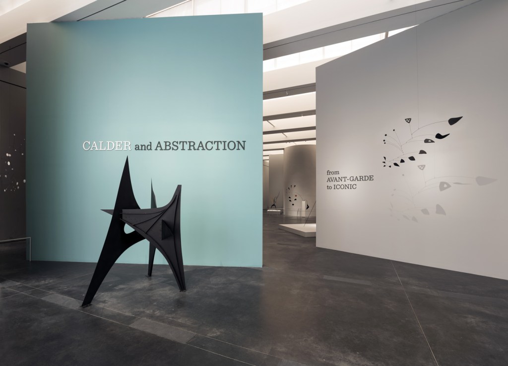
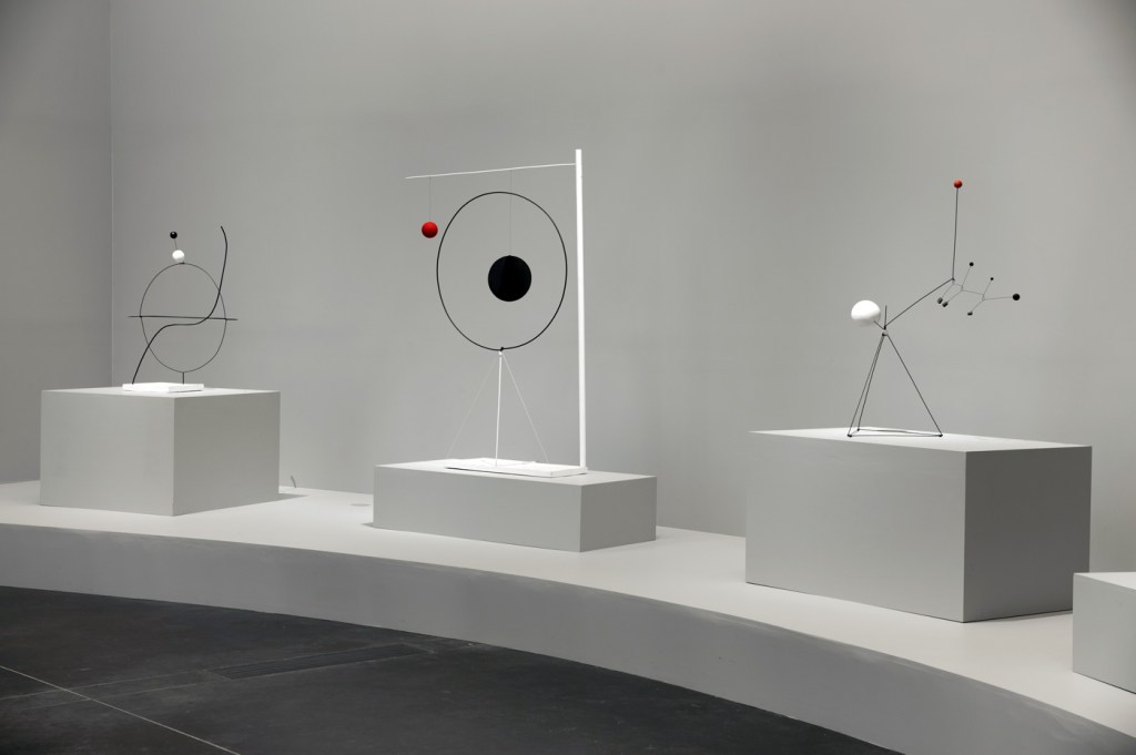
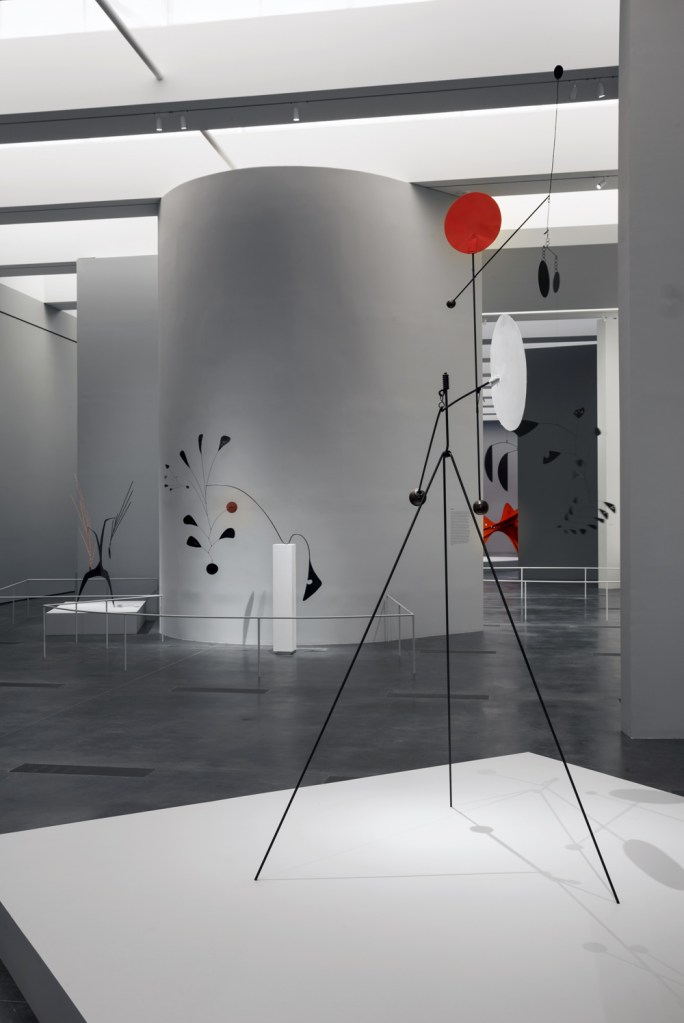
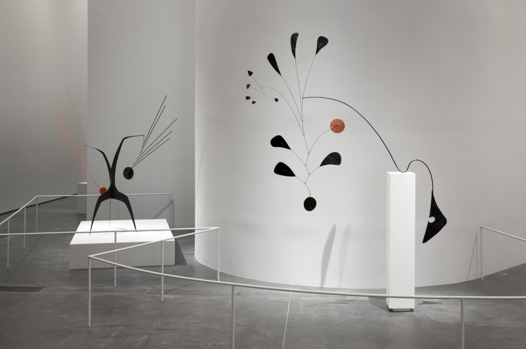
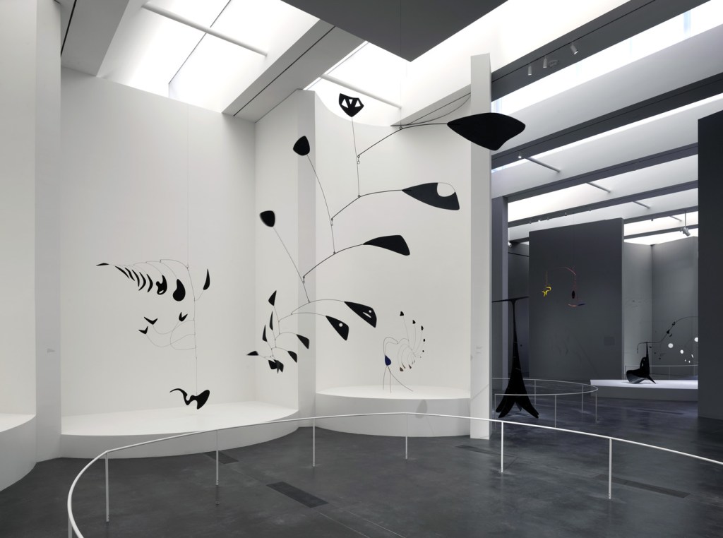
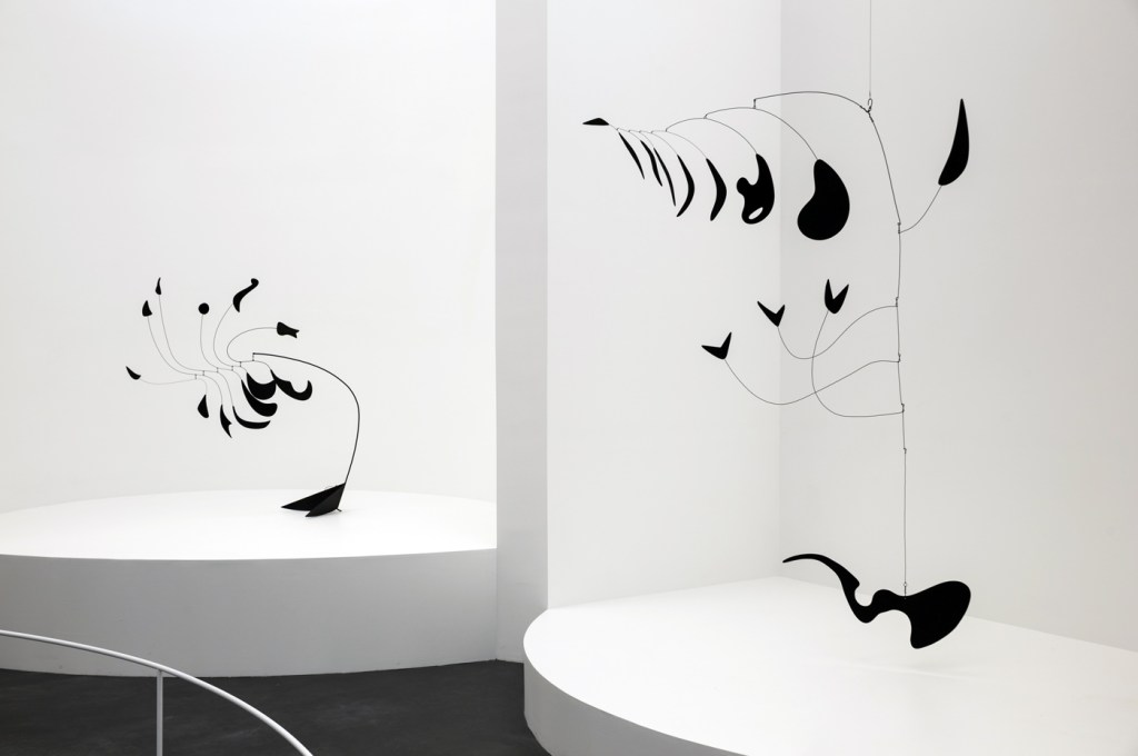
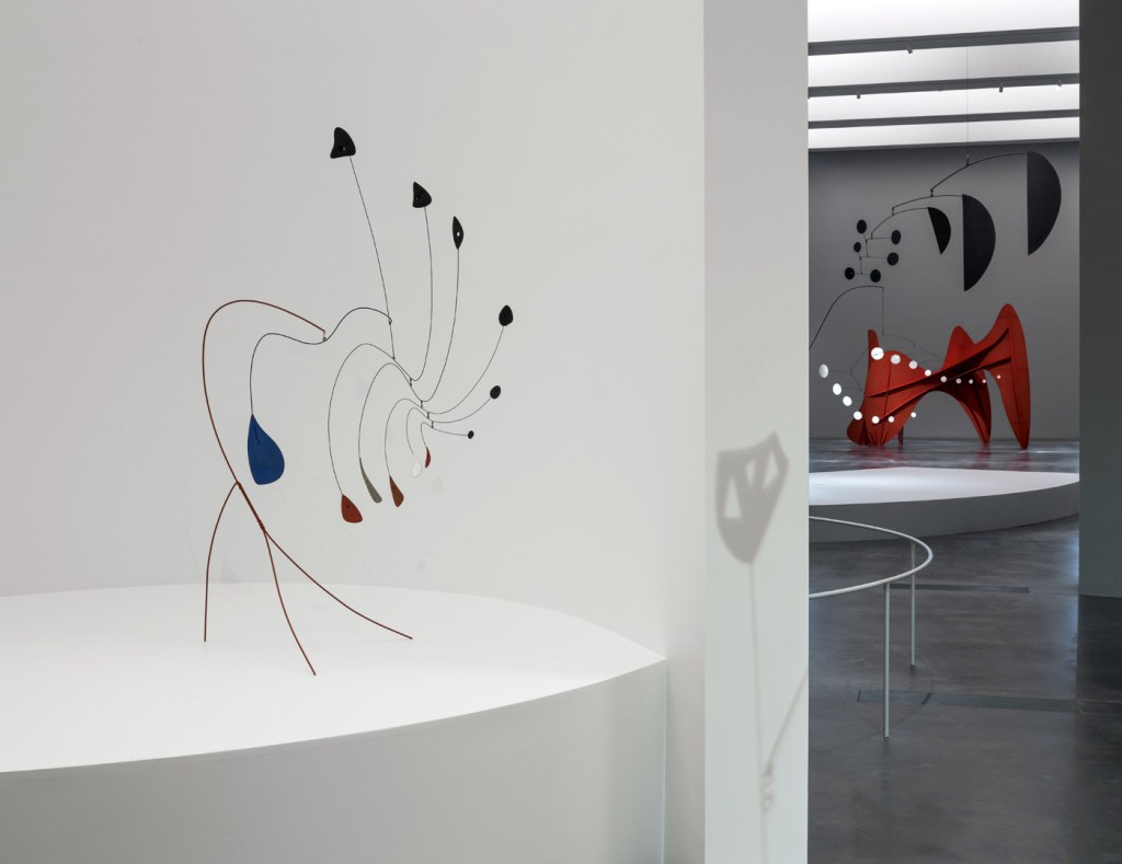
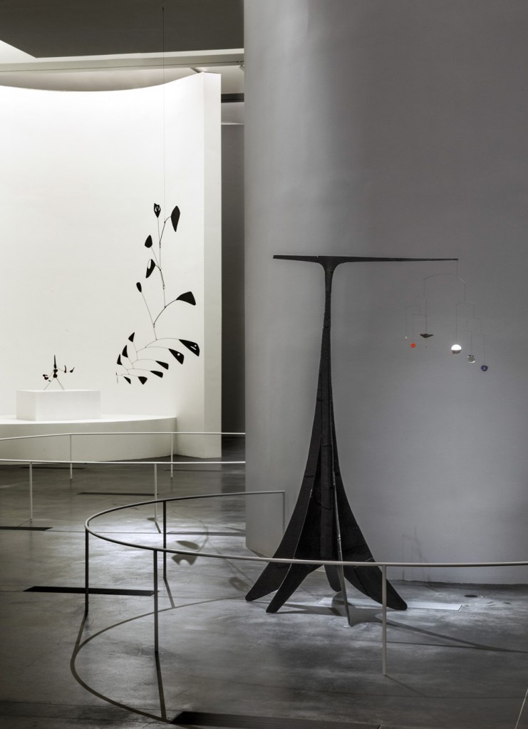
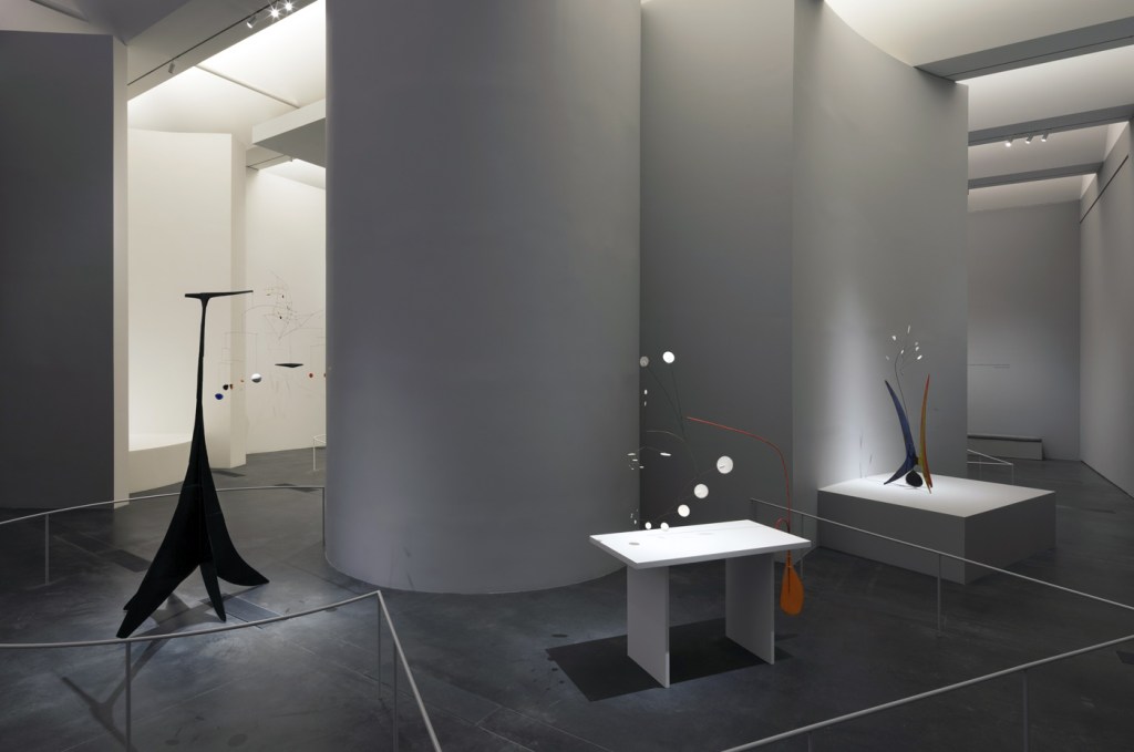
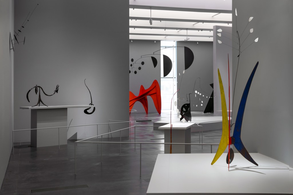
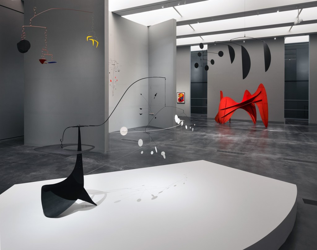
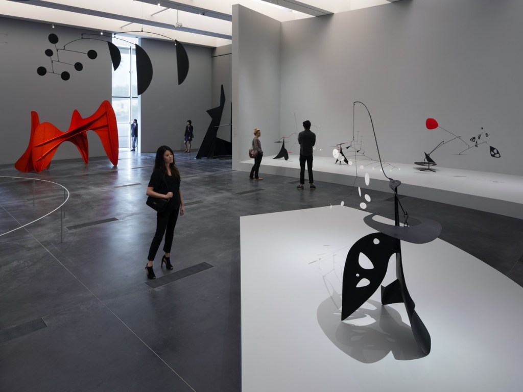
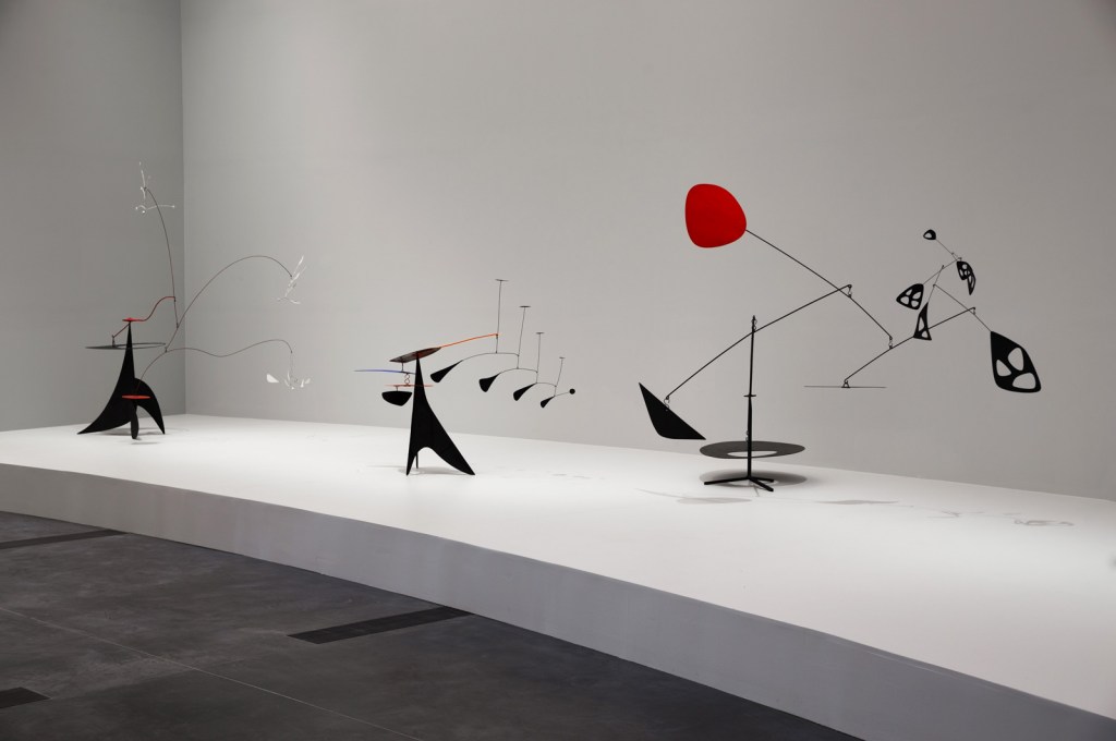
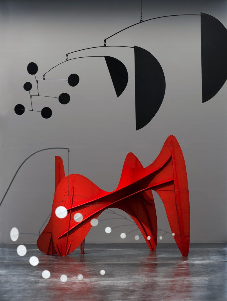
")
")
")
")
")
")
")
")
")
")
")
")
")
")
 'Three Quintains (Hello Girls)' 1964")
 'Little Face' 1962")
 'Laocoön' 1947")
 'Yucca' 1941")
 'Un effet du japonais' 1941")
 'Gibraltar' 1936")
 'Constellation Mobile' 1943")
 'Bougainvillier' 1947")
 'Le Demoiselle' 1939")
 'Red Disc' 1947")
 'Untitled' 1947")
 'Trois Pics (intermediate maquette)' 1967")
 'Second Version of Triptych 1944' 1988")
 'Second Version of Triptych 1944' 1988 (detail)")
 'Second Version of Triptych 1944' 1988 (detail)")
 'Francis Bacon' Nd")
 'Study for Portrait VI' 1953")
 'Study for Portrait II (After the life mask of William Blake)' 1955")
 'Two Figures in a Room' 1959")
 'Study for Portrait on Folding Bed' 1963")
 'Portrait of Isabel Rawsthorne' 1966")
 'Lying Figure in a Mirror' 1971")
 'Three Figures and a Portrait, 1975' 1975")
 'Untitled (Kneeling Figure)' 1982")
 'Spanish Prisoner' 1939")
 'Henry Moore in his Studio at Much Hadham, Hertfordshire' 1940")
 'Sleeping Positions' 1940-1941")
 'Three Fates' 1941")
 'Maquette for Strapwork Head' 1950")
 'Reclining Figure' 1951")
 'Helmet Head and Shoulders' 1952")
 'Mother and Child' 1953")
 'Falling Warrior' 1956-1957")
 'Obverse & Reverse XIV' 2013 (installation view)")
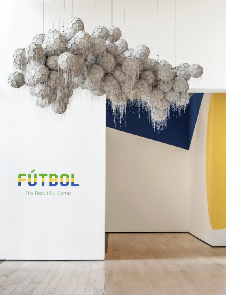
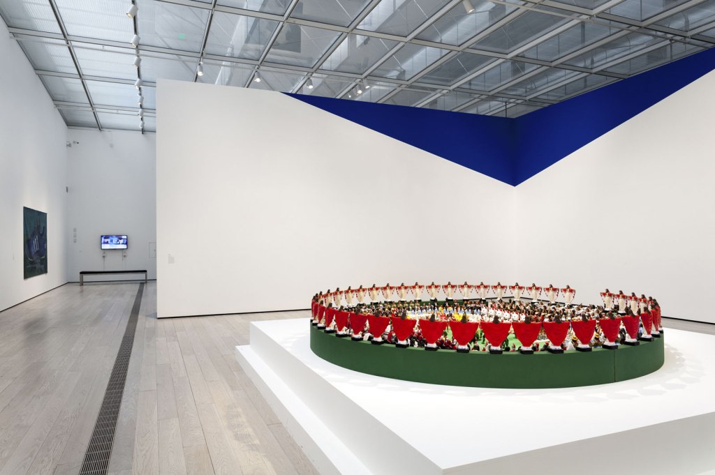
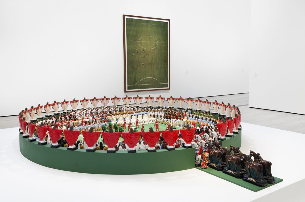

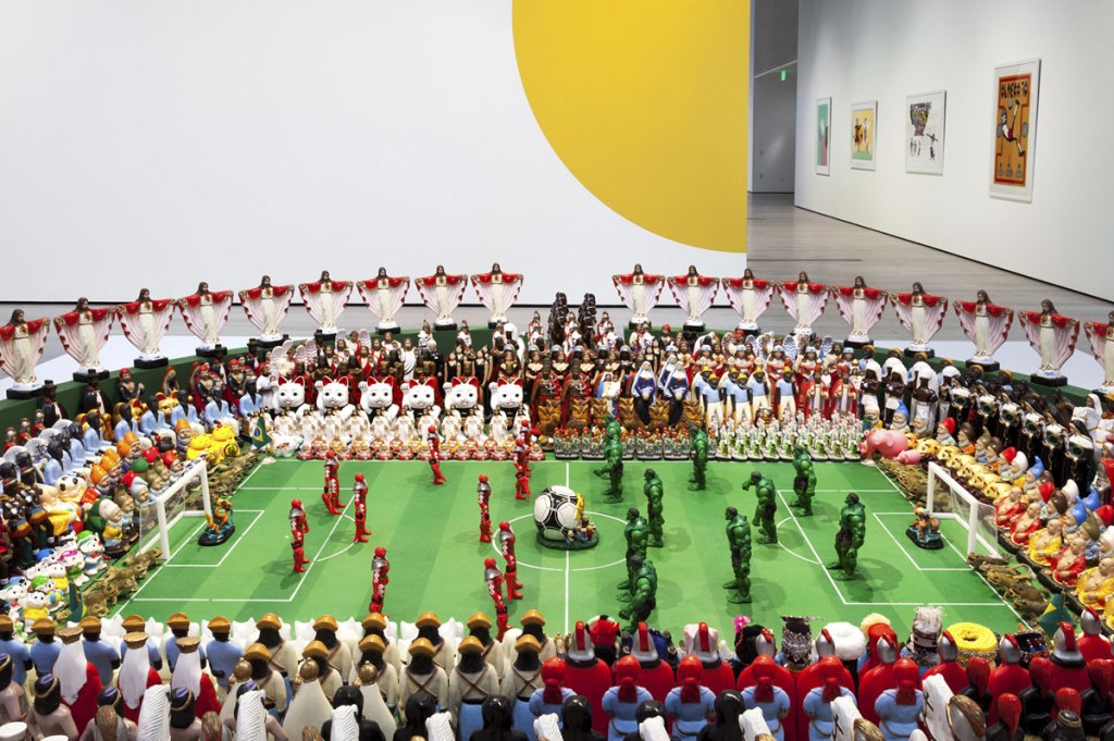
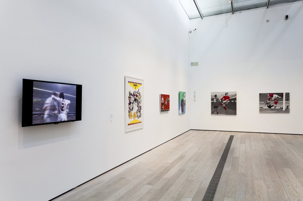

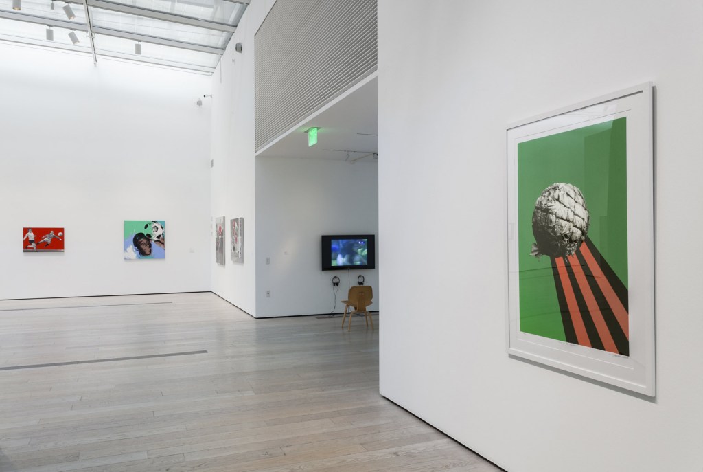

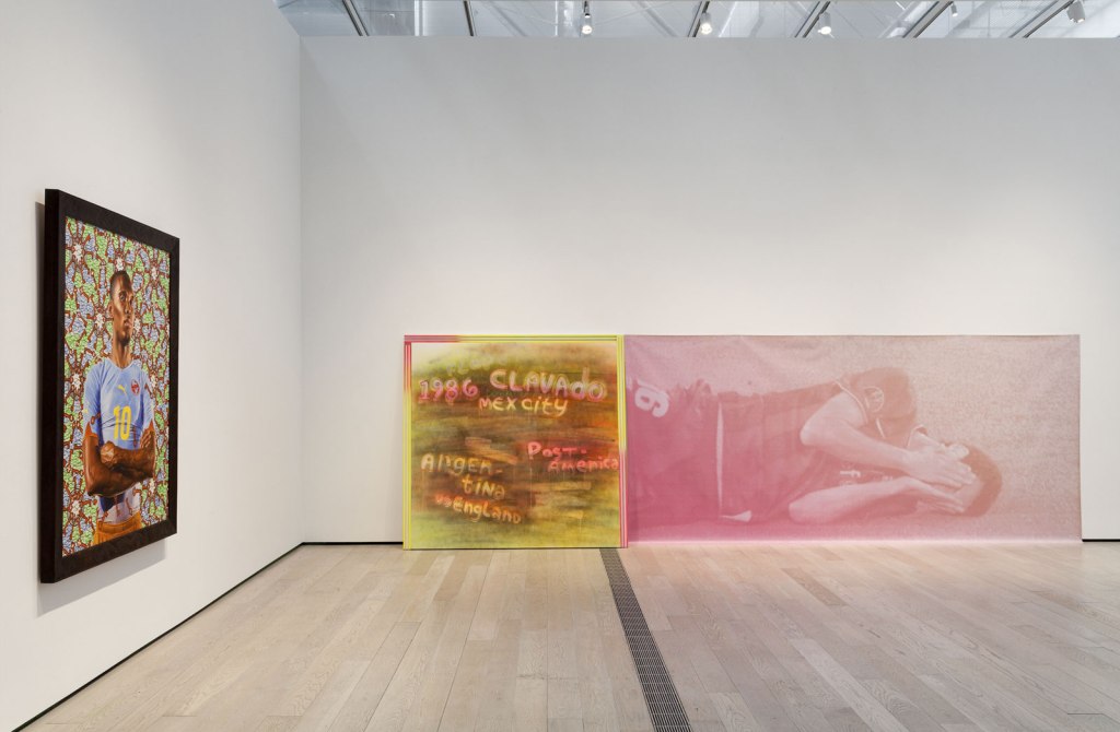
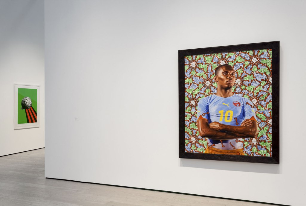
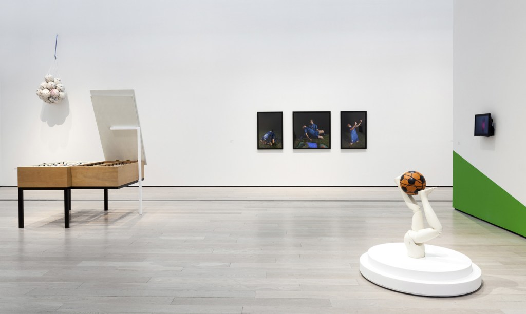
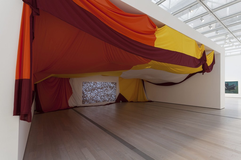
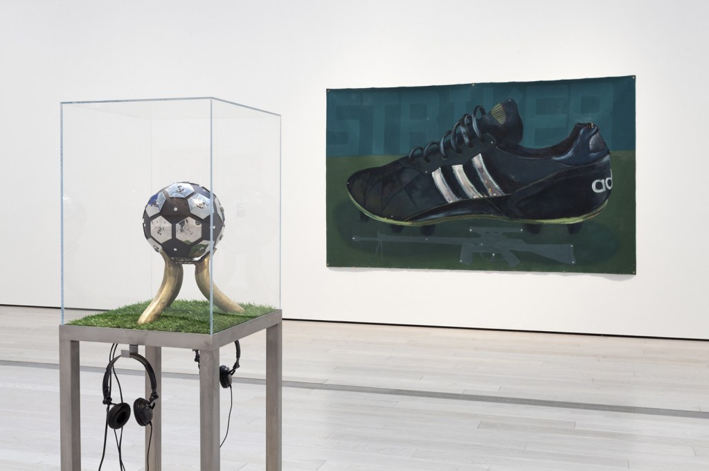
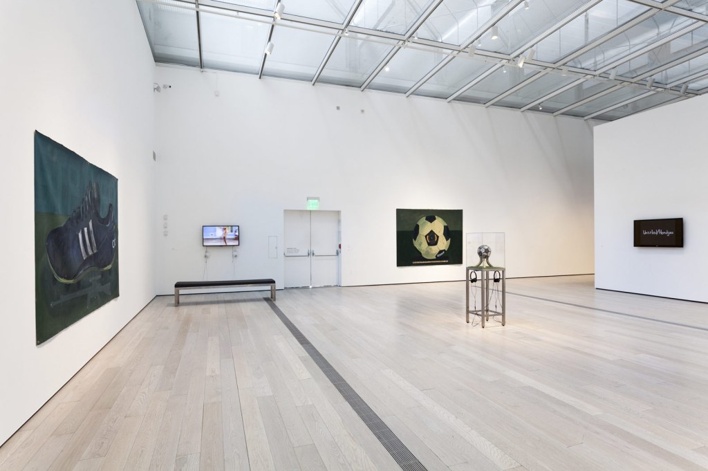
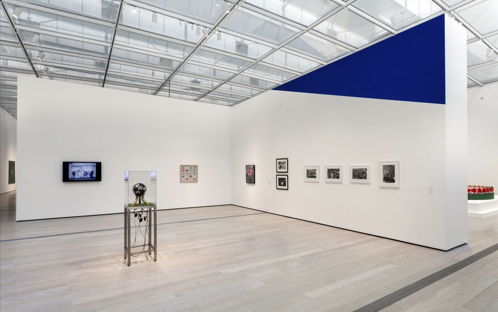
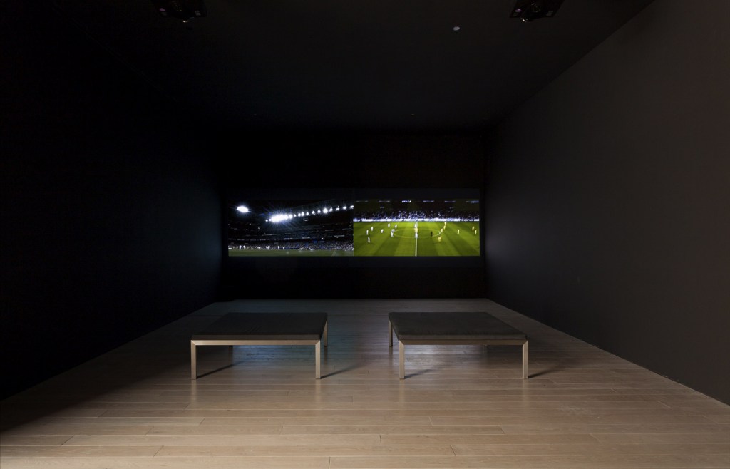
 'Maracana' 2003 (installation view)")
 'Maracana' 2003 and Andreas Gursky 'Amsterdam, EM Arena I' 2000. In the foreground: Nelson Leirner (Brazil, 1932-2020) 'Maracana' 2003 (installation view)")
 'Maracana' 2003 (installation view detail)")
 'Maracana' 2003 (installation view detail)")
")
")
 'Kick That' 2006 (in case) and George Afedzi Hughes (Ghanaian-born American, b. 1962) 'Parallel' 2009-2011")
 'Parallel' 2009-2011 from the exhibition 'Fútbol: The Beautiful Game' at the Los Angeles County Museum of Art (LACMA), February - July, 2014")
 'Volta' 2002-2003 (installation view)")
 'FREE THROW' 1984 (installation view)")
")
 'Clavado' 2013 (installation view)")
 'Samuel Eto'o' 2010 (installation view)")
 'Samuel Eto'o' 2010 from the exhibition 'Fútbol: The Beautiful Game' at the Los Angeles County Museum of Art (LACMA), February - July, 2014")
")
 'Thank You for the Game' 2013 (installation view)")
 'Thank You for the Game' 2013")
 'Olmeca 1370 BCE' 2013 (installation view)")
")
 'Verona #2' 2001-2004")
 'VOLTA' 2002-2003 (still)")
 'Mexico vs Brasil' 2004 (video still)")
 'Celebracions' 2009")
 'Sir Bobby' 2007")
 'Narco Soccer' 2013")

 'Pele' 1978")
 and Douglas Gordon (Scottish, b. 1966) 'Zidane: A 21st Century Portrait' 2006")
 and Douglas Gordon (Scottish, b. 1966) 'Zidane: A 21st Century Portrait' 2006")
 and Douglas Gordon (Scottish, b. 1966) 'Zidane: A 21st Century Portrait' 2006")
 'Milton Moore' 1981")
 'Milton Moore' 1981 (detail)")


 'Ken Moody' 1983")
 'Thomas' 1987")
 'Calla Lily' 1986")
 'The Sluggard' (Le Paresseux) 1988")
 'Self-portrait (Autoportrait)' 1988")


 and Peter Atkins (Australian, b. 1963) 'Square Shooter 2 #2' 2014 (installation view) from the exhibition 'Polaroid Project' at Arts Project Australia, Melbourne, June - July, 2014")
 and Peter Atkins (Australian, b. 1963) 'Super Shooter' 2014 (installation view)")
 and Peter Atkins (Australian, b. 1963) 'Colorpack ll' 2014 (installation view)")
 and Peter Atkins (Australian, b. 1963) 'Colorpack ll' 2014 (installation view detail)")
 and Peter Atkins (Australian, b. 1963) 'Colorpack ll' 2014 (installation view detail)")
 and Peter Atkins (Australian, b. 1963) 'The Clincher' 2014 (installation view detail)")
 and Peter Atkins (Australian, b. 1963) 'Colorpack 82' 2014 (catalogue view)")
 and Peter Atkins (Australian, b. 1963) 'Super Color Swinger' 2014 (catalogue view) from the exhibition 'Polaroid Project' at Arts Project Australia, Melbourne, June - July, 2014")
 and Peter Atkins (Australian, b. 1963) 'Square Shooter 2 (with flash)' 2014 (catalogue view)")
 'Untitled (Facial Hair Transplant)' 1972 from the exhibition Ana Mendieta: Traces' at the Museum der Moderne Salzburg, March - July, 2014")
 'Untitled (Facial Cosmetic Variations)' 1972 (detail)")
 'Rape' 1973")
 'Rape Scene' 1973")
 'Untitled (Self-Portrait with Blood)' 1973 (detail)")
 'Untitled (Body Tracks)' 1974")
 'Untitled (Glass on Body Imprints)' 1972 from the exhibition Ana Mendieta: Traces' at the Museum der Moderne Salzburg, March - July, 2014")
 'Untitled' 1973")
 'Blood and Feathers #2' 1974")
 'Imagen de Yagul' 1973")
 'Untitled (Silueta Series)' 1978")
 'Alma, Silueta en Fuego' (Soul, Silhouette on Fire) 1975 (still)")
 'Anima, Silueta de Cohetes (Firework Piece)' 1976 (still)")
 'Untitled (Cuilapán Niche)' 1973")
 'Untitled' 1976 \"Silueta Series, Mexico\"")
 'Tree of Life' 1976")
 'Untitled' 1978 \"Silueta Series, Iowa\"")
![Ana Mendieta (Cuban-American, 1948-1985) 'Itiba Cahubaba (Esculturas Rupestres)' [Old Mother Blood (Rupestrian Sculptures)] 1982](https://artblart.com/wp-content/uploads/2014/07/ana-mendieta_itiba-cuhababa-web.jpg "Ana Mendieta (Cuban-American, 1948-1985) 'Itiba Cahubaba (Esculturas Rupestres)' [Old Mother Blood (Rupestrian Sculptures)] 1982")
 'Untitled' 1982")

 'El Laberinto de Venus' (Labyrinth of Venus) 1985")
 'Cone, 87CN09' 1987")
")
")
")
 'Man in Vortex, 87CA2' 1987")
 'Rock and Water #1, 88RW1' 1988")
 'Cells, 87CA1' 1987-1989")
 'Man on Hill, 89MHA1' 1987-1989")
 'Moon, 88MOA1' 1988")
 'Rabbit, 87RBA1' 1987")
 'Artificial Nature' (detail, 1 of 36) 2002")
 'Artificial Nature' (detail, 1 of 36) 2002")
 'Artificial Nature' (detail, 1 of 36) 2002")
 'Artificial Nature' (detail, 1 of 36) 2002")
 'Artificial Nature' (detail, 1 of 36) 2002")
 'Seven Songbirds and a Rabbit' 1995 (detail)")
 'Seven Songbirds and a Rabbit' 1995 (detail)")
 'Seven Songbirds and a Rabbit' 1995 (detail)")
 'Seven Songbirds and a Rabbit' 1995 (detail)")
 'Seven Songbirds and a Rabbit' 1995 (detail)")
 'Seven Songbirds and a Rabbit' 1995 (detail)")
 'As Far As I Could Get (R02F09), 10 Seconds' 1996-1997")
 'As Far As I Could Get (R02F06), 10 Seconds' 1996-1997")
 'As Far As I Could Get (R02F33), 10 Seconds' 1996-1997")
 'As Far As I Could Get, 10 Seconds' 1996-1997")
 'As Far As I Could Get, 10 Seconds' 1996-1997")
 'As Far As I Could Get, 10 Seconds' 1996-1997")
 'Monument' 2014 (still) from the exhibition 'Concrete' at the Monash University Museum of Art (MUMA), Melbourne, May - July, 2014")
 'Monument' 2014")
 'Monument (work in progress)' installation view, Monash University Museum of Art, 2014")
 'Shadow sites II' 2011 (still) from the exhibition 'Concrete' at the Monash University Museum of Art (MUMA), Melbourne, May - July, 2014")
 '(Deleted scenes) From an untouched landscape #3' 2013")
 '(Deleted scenes) From an untouched landscape #1' 2013")
 'Un-resettling (stone footing for dome hut)' 2013")
 'Rochers carrés' 2008")


 'No More Stars (Abandoned Movie Set, Star Wars)' 2010 (detail)")
 'Comparative monument (Palestine)' 2012")
 'Comparative monument (Palestine)' 2012")
 'Some kinds of duration' 2011 (detail)")
 'Some kinds of duration' 2011")
 'High Tides (drilling)' 2012 (installation view)")
 'High Tides (drilling)' 2012 (installation view detail)")

 'Auroa Taranaki' 1991")
 'Matakana, North Auckland' 1994")

 'Tropic cascade #1 and #2' 2014")
 'Tropic cascade #2' 2014 (installation view detail)")

You must be logged in to post a comment.