
Exhibition dates: 27th March – 30th June, 2014
Curator: Timothy Benson
 'Blue Man' 1917 from the exhibition 'Hans Richter: Encounters – \"From Dada till today\"' at Martin-Gropius-Bau, Berlin, March - June, 2014")
Hans Richter (German, 1888-1976)
Blue Man
1917
Oil on canvas
61 x 48.5cm
© Kunsthaus Zürich, Geschenk Frida Richter, 1977
© Estate Hans Richter
Many thankx to Martin-Gropius-Bau, Berlin for allowing me to publish the art work in the posting. Please click on the photographs for a larger version of the image.
Marcus
“One can also pursue politics with art.
Everything that intervenes in the processes of life, and transforms them, is politics.”
Hans Richter
The oeuvre of Hans Richter (1888-1976) spanned nearly seven decades. Born in Berlin, he was one of the most significant champions of modernism. Berlin, Paris, Munich, Zurich, Moscow and New York were the major stations of his life. He was a painter and draughtsman, a Dadaist and a Constructivist, a film maker and a theoretician, as well as a great teacher. His great scroll collages remain icons of art history to this day. His work is characterised by a virtually unparalleled interpenetration of different artistic disciplines. The link between film and art was his major theme. Many of the most famous artists of the first half of the twentieth century were among his friends.
 'Ghosts Before Breakfast' 1928")
Hans Richter (German, 1888-1976)
Ghosts Before Breakfast (Vormittagsspuk)
1928
B/W, 35mm
Approx. 7 minutes
© Estate Hans Richter
Hans Richter Ghosts Before Breakfast – 1929 German DaDa silent film
Hans Richter created the film Ghosts Before Breakfast (Vormittagsspuk) in 1928. This was a silent experimental avant-garde film and it was the fifth film that he had made. The film is considered to be one of the first surrealist films ever made. Richter’s interest in Dadaism is shown directly in this work as he challenges the art standards of the time by presenting a theme of obscurity and fantasy. Clocks, legs, ladders, hats, and people undergo total irrational happenings in unusual settings. Men have beards magically appear and disappear before the viewer’s eyes. All strange manner of things are brought together by associative logic. The flying hats perform this function by continually reappearing in the sequence of shots to tie the film together. Richter tries to increase the viewer’s knowledge of reality of showing them surrealist fantasy. He accomplished this through his use of rhythm, and his use of the camera.
Rhythm is a very important element in all of Richter’s works. In this film rhythm is shown in the use of movement in the characters. All of the characters seem to move at the same space distance from one another and at the same speed. This clarifies a sense of rhythm and intensifies a sense of stability within the frame. The same number of characters or items also seems to preserve rhythm… if there are three hats then in the next shot there are three men. The numbers do fluctuate, but a number would remain constant throughout a couple of shots. Shapes in the film also preserve rhythm. This can be seen in Richter’s bulls-eye scene, where the circles of the bulls-eye fill the screen and are spaced equally apart from one another. The target then breaks up and the circles the spread out in the frame to relocate in different areas continuing the rhythm.
The original score, attributed to Paul Hindemith, was destroyed in the Nazi purge of ‘degenerate art’.

Unknown artist
Hans Richter, Sergei Eisenstein and Man Ray, Paris
1929
© Estate Hans Richter
© 2013 Man Ray Trust / Artists Rights Society (ARS), New York / ADAGP, Paris
Dreams That Money Can Buy 1947 (Fantasy Film) Hans Richter, Max Ernst, Marcel Duchamp, Man Ray
A young man discovers he can create dreams and sells them to others. The film as a whole is an exploration of the subconscious mind and the interplay between dreams and reality. This frame story serves as a link between several dream sequences created by leading visual artists. An attempt to bring the work of surrealist artists to a wider public. The avant-garde / surrealism / dadaism artists who contributed to the film include Max Ernst, Marcel Duchamp, Man Ray, Alexander Calder, Fernand Léger, and Richter himself.
Text from the YouTube website
Dreams That Money Can Buy excerpt – John Cage dream sequence
Joe/Narcissus (Jack Bittner) is an ordinary man who has recently signed a complicated lease on a room. As he wonders how to pay the rent, he discovers that he can see the contents of his mind unfolding whilst looking into his eyes in the mirror. He realises that he can apply his gift to others (“If you can look inside yourself, you can look inside anyone!”), and sets up a business in his room, selling tailor-made dreams to a variety of frustrated and neurotic clients. Each of the seven surreal dream sequences in the diegesis is in fact the creation of a contemporary avant-garde and / or surrealist artist (such as Marcel Duchamp, Alexander Calder, Max Ernst et al). Joe’s waiting room is full within minutes of his first day of operation, “the first instalment of the 2 billion clients” according to the male narrator in voiceover, whose voice is the only one we hear in the non-dream sequences.
 'Dreams That Money Can Buy' 1944-1947")
Hans Richter (German, 1888-1976)
Dreams That Money Can Buy
1944-1947
Color, 16mm
Approx. 83 minutes
© Estate Hans Richter

HR Productions
Production still of Dreams That Money Can Buy
1944-1947
Left: Jack Bittner, Middle: Hans Richter
© Estate Hans Richter
Foto: HR Productions
Hans Richter (1888-1976) life’s work spans nearly 70 years. Born in Berlin, he is one of the most important protagonists of modernity. Berlin, Paris, Munich, Zurich, Moscow and New York are stages of his life. He was a painter and draftsman, Dadaist and Constructivist, filmmakers and theorists, and also a great teacher. His great scroll collages remain icons of art history to this day. His work is characterised by a virtually unparalleled interpenetration of different artistic disciplines. The link between film and art was his major theme. Many of the most famous artists of the first half of the 20th Century were his friends.
Hans Richter: Encounters from Dada to the Present is the title of one of his books, published in the 1970s. By that time in the West in postwar Germany there had been a rediscovery of this important artist, outlawed by the Nazis, whose work was shown in 1937 in the infamous exhibition “Degenerate Art”. For the first time since the 1980s, this big Berlin artist has a dedicated exhibition in his home town, with over 140 works, including his important films and about 50 works of those artists who were influenced by Hans Richter. Hans Richter worked with multimedia in an era when this term hadn’t even been invented. The movie he saw as part of Modern Art: “Film absolutely opens your eyes to what the camera is and what it can and wants to do.”
The Los Angeles County Museum of Art has developed the exhibition with the Martin-Gropius-Bau and the Centre Pompidou Metz. Timothy Benson has curated it. The program explains how Richter understood his cross-disciplinary work and what effect his work had on the art of the 20th century. In ten chapters, the exhibition describes the extensive work of the artist: Early Portraits / War and Revolution / Dada / Richter and Eggeling / Magazine “G” / Malevich and Richter / Film and Photo (FIFO) / Painting / Series / Confronting the Object. Important works of the avant-garde as well as films, photographs, and extensive documentary material make this exhibition an important artistic event.
Hans Richter was active in the broad field of the European avant-garde beginning in the 1910s. Not only art, but also the new medium of film interested him from the very start of his artistic career. In 1908 Hans Richter began his studies at the School of Fine Arts in Berlin. He switched to Weimar the following year. In 1910 he studied at the Académie Julian in Paris. Starting in 1913 he was associated with Herwarth Walden’s gallery Der Sturm and became acquainted with the artists of the “Brücke” and the “Blauer Reiter”. He distributed Marinetti’s “Futurist Manifesto” to hackney drivers in Berlin. In 1914 he also drew for Franz Pfemfert’s magazine Die Aktion and was called up to military service in the summer of that year. In 1916, having suffered severe wounds, he travelled to Zurich (“an island in a sea of fire, steel and blood”) where, together with Tristan Tzara, Hugo Ball and others, he founded the Dada movement, about which he would one day write: ” … it was a storm that broke over the art of that time just as the war broke over the peoples.”
In 1918 he met Viking Eggeling, with whom he conducted his first film experiments as precursors of “abstract film”. Both dreamt of discovering a universal language within film which could promote peace among human beings. In 1919 Richter served as chairman of the “Action Committee for Revolutionary Artists” in the Munich Soviet Republic. He was arrested shortly after the entry of Reichswehr troops. His mother Ida secured his release.
Richter’s first film, Rythmus 21 in 1921 [see below], was a scandal – the audience attempted to beat up the pianist. Moholy-Nagy regarded it as “an approach to the visual realisation of a light-space-continuum in the movement thesis”. The film, which is now recognised as a classic, also attracted the attention of Theo van Doesburg, who invited Richter to work on his magazine De Stijl. In 1922 Richter attended two famous congresses where many of the most significant avant-gardists of the era assembled: The Congress of International Progressive Artists in Düsseldorf and the International Congress of Constructivists and Dadaists – the Dada movement was dismissed on this occasion. In 1923 Richter and other artists founded the short-lived but celebrated Magazine G: Material zur Elementaren Gestaltung (G: Materials for Elemental Form-Creation) (G for “Gestaltung”, i.e. design), which sought to build a bridge between Dadaism and Constructivism. Prominent contributors included Arp, Malevich, El Lissitzky, Mies van der Rohe, Schwitters and van Doesburg.
In 1927 Richter worked with Malevich, who was then visiting Berlin for his first large exhibition, on a – naturally, “suprematist” – film, which, however, was never completed due to the political situation.
Text from Martin-Gropius-Bau website
Rhythmus 21 (1921) | MoMA
Hans Richter was convinced that he invented abstract cinema with Rhythmus 21. He didn’t, but he was an important early figure who quickly became one of the biggest names among the avant-garde, producing an impressive body of work that continuously pushed the boundaries of cinema for more than 40 years. Richter believed that film appealed more to the sense of sight than painting could, and he used his roots as a Cubist painter to explode the rectangle of the film frame.
The first in Richter’s series of animated “rhythm” shorts, Rhythmus 21 plays with form and depth, as squares and rectangles pulse and change size in comparison both to one another and to the film frame itself. Animated completely by hand, the work sets the stage for Richter’s subsequent explorations of the time-based medium of film – and for the burgeoning field of experimental animation and the artists who would come after him, such as Len Lye, Oskar Fischinger, and John and Faith Hubley. Additionally, Richter’s creative, radical use of light, shadow, and shape were a markedly different viewing experience for 1910s and ’20s audiences accustomed to seeing newsreels, serials, and narrative films, and whose exposure to animation would likely have been limited to nickelodeons and cartoons based on comic strips, like Gertie the Dinosaur. Richter embraced the Dadaist ethos of collaboration and worked with many Dada artists – most famously with Marcel Duchamp, Max Ernst, Fernand Léger, and Man Ray in Dreams That Money Can Buy – while inspiring younger experimental filmmakers like Shirley Clarke.
Text from the YouTube website
Hans Richter’s first truly surrealist film was Rhythmus 21. Richter broke from conventions of the time when rather than attempting to visually orchestrate formal patterns, he focused instead on the temporality of the cinematic viewing experience. He emphasised movement and the shifting relationship of form elements in time. His major creative breakthrough, in other words, was the discovery of cinematic rhythm…
For Richter, rhythm, “as the essence of emotional expression”, was connected to a Bergsonian life force:
Rhythm expresses something different from thought. The meaning of both is incommensurable. Rhythm cannot be explained completely by thought nor can thought be put in terms of rhythm, or converted or reproduced. They both find their connection and identity in common and universal human life, the life principle, from which they spring and upon which they can build further. (Richter, Hans. “Rhythm,” in Little Review, Winter 1926, p. 21)
Completed by using stop motion and forward and backward printing in addition to an animation table, the film consists of a continuous flow of rectangular and square shapes that “move” forward, backward, vertically, and horizontally across the screen (Gideon Bachmann and Jonas Mekas. “From Interviews With Hans Richter during the Last Ten Years,” in Film Culture, No. 31, Winter 1963-1964, p. 29). Syncopated by an uneven rhythm, forms grow, break apart and are fused together in a variety of configurations for just over three minutes (at silent speed). The constantly shifting forms render the spatial situation of the film ambivalent, an idea that is reinforced when Richter reverses the figure-background relationship by switching, on two occasions, from positive to negative film. In so doing, Richter draws attention to the flat rectangular surface of the screen, destroying the perspectival spatial illusion assumed to be integral to film’s photographic base, and emphasising instead the kinetic play of contrasts of position, proportion and light distribution. By restricting himself to the use of square shapes and thus simplifying his compositions, Richter was able to concentrate on the arrangement of the essential elements of cinema: movement, time and light. Disavowing the beauty of “form” for its own sake, Rhythmus ’21 instead expresses emotional content through the mutual interaction of forms moving in contrast and relation to one another. Nowhere is this more evident than in the final “crescendo” of the film, in which all of the disparate shapes of the film briefly coalesce into a Mondrian-like spatial grid before decomposing into a field of pure light.
Suchenski, Richard. “Hans Richter” on the Senses of Cinema website [Online] Cited 19/06/2014. Used under fair use conditions for the purposes of education and research
 'Neither Hand nor Foot' 1955/56")
Hans Richter (German, 1888-1976)
Neither Hand nor Foot
1955-1956
Paint and collages on board (with doorbell)
16 1/2 x 18 1/4 in. (41.9 x 46.4cm)
Private collection
© Estate Hans Richter
 'Justitia Minor' 1917/1960s")
Hans Richter (German, 1888-1976)
Justitia Minor
1917/1960s
Assemblage (wood, copper, plastic, iron file and string, Christmas decoration)
24 x 18 x 10 in (61 x 45.7 x 25.4cm)
Private Collection
© Estate Hans Richter
Foto © 2013 Museum Associates/LACMA
 'Houses' 1917")
Hans Richter (German, 1888-1976)
Houses
1917
Ink wash on paper
8 1/4 x 6 1/2 in. (20.9 x 16.5cm)
Private collection
© Estate Hans Richter Foto
Foto © 2013 Museum Associates/LACMA
“Influenced by cubism and its search for structure, but not satisfied with what it offered, I found myself between 1913-1918 increasingly faced with the conflict of suppressing spontaneous expression in order to gain an objective understanding of a fundamental principle with which I could control the ‘heap of fragments’ inherited from the cubists. Thus I gradually lost interest in the subject – in any subject – and focused instead on the positive-negative (white-black) opposition, which at least gave me a working hypothesis whereby I could organise the relationship of one part of a painting to the other.”
Richter, Hans. “Easel-Scroll-Film,” in Magazine of Art, No. 45 (February 1952), p. 82.

Unknown artist
Hans Arp, Tristan Tzara and Hans Richter, Zurich
1918
© Estate Hans Richter
In 1929 Richter curated the film section of the famous FiFo exhibition (Film und Foto), a milestone in the history of the cinematic and photographic arts. More than 1,000 photos were presented – curated by, among others, Edward Weston and Edward Steichen for the USA and El Lissitzky for the USSR. More than sixty silent films were shown, including works by Duchamp, Egeling, Léger, Man Ray and Chaplin. This important exhibition, initiated by the German Werkbund (which was founded in 1907), was also shown in the Martin-Gropius-Bau, which in those days was called “the former Museum of Applied Arts” – a fact that is rarely mentioned in current photographic histories. On this occasion, Richter published his first film book: Film Enemies of Today, Film Friends of Tomorrow.
That same year, the first Congress of Independent Film was held in the remote Swiss castle of “La Sarraz”: Hans Richter was invited along with Sergei Eisenstein, Bela Balazs, Walter Ruttmann and others. He made a film with Eisenstein, which has since been lost. The Congress is still regarded as the first festival dedicated solely to film. Back then, the still young art of film-making had to struggle for recognition. Also in 1929 the SA (“Sturmabteilung” or Nazi “Brown Shirts”) declares him the first time a “Kulturbolschewisten” – a “cultural Bolshevik”.
In 1930 he travelled to Moscow to make the film Metal. But objections by the Soviet government prevented its completion. In 1933, when the Nazis seized power and Richter was living in Moscow, storm troopers sacked his Berlin flat and made off with his art collection. Fearing for his life, he was soon forced to flee Moscow without a penny to his name. In the Netherlands he made advertising films for Philips. He also worked for a number of chemical companies that were eager to invest in film as an advertising medium. He sought permanent residency in France and Switzerland. In Switzerland, he and Anna Seghers cooperated on a script, and in 1939 Jean Renoir arranged for him to create a major film project in Paris. But the outbreak of war prevented this film as well.
When the Swiss Foreign Police ask him to leave the country he succeeds in 1941, with emigration to the United States. Hilla Rebay, artist and once a member of Ricther’s famous Berlin “November Group” is at this time advisor to the New York art patron Solomon Guggenheim. With his help they can implement their idea of a “Temple of Non-Objectivity” – the Museum of Non-Objective Painting (1939), later the Guggenheim. The museum provided Richter with the necessary invitation and a Jewish support fund for refugees sponsored his long journey. In 1942 Richter became a teacher for film – and later director – at the Institute of Film Techniques at the College of the City of New York. Until 1956 he trained students who were later counted among the great figures of American independent film, including Stan Brackhage, Shirley Clarke, Maya Deren and Jonas Mekas.
In 1940s America, after a fifteen-year pause, Richter began painting again. In 1943/44 he created his great scroll paintings and collages about the war: Stalingrad, Invasion and Liberation of Paris. After the war he made the episodic film Dreams That Money Can Buy, working alongside five of the most famous artists of the twentieth century: Léger, Ernst, Calder, Ray and Duchamp. In 1946 he presented his first great American art exhibition in Peggy Guggenheim’s Art of This Century gallery.
In the 1950s, Richter returned to Europe for the first time following his emigration to deliver lectures. Portions of his art collection, which he had left behind in Germany following his move to Moscow, were returned to him. Numerous exhibitions led to the rediscovery of Hans Richter’s works in Western Europe as well. He worked in Connecticut during the summers and spent his winters in Ascona near his artist friends. Richter experienced an extraordinarily prolific creative phase during which – after he set aside his painting utensils in the late 1960s – many works appeared using special collage techniques. In 1971 he became a member of the Berlin Academy of the Arts. By the time of his death in Switzerland in 1976, his work was shown and appreciated in many exhibitions in Western Europe. Now, for the first time in over thirty years, Hans Richter can be rediscovered in an exhibition from Los Angeles.
Press release from the Martin-Gropius-Bau website
 'Visionary Portrait' 1917")
Hans Richter (German, 1888-1976)
Visionary Portrait
1917
Oil on canvas
53 x 38cm
© Estate Hans Richter
Foto: Galerie Berinson
 'Triptych in Gray, Red, and Green' 1959 (detail)")
Hans Richter (German, 1888-1976)
Triptych in Gray, Red, and Green (detail)
1959
Oil on canvas on boards
Three parts, each: 15 1/2 x 19 1/2 in. (39.4 x 49.5cm); all: 20 1/2 x 49 1/2 in. (52 x 125.7cm)
Private collection
© Estate Hans Richter
Foto © 2013 Museum Associates/LACMA
 'Dragonfly (Counterpoint in Red, Black,Gray, and White)' 1943")
Hans Richter (German, 1888-1976)
Dragonfly (Counterpoint in Red, Black,Gray, and White)
1943
Oil on canvas
29 1/2 x 15 1/2 in. (74.9 x 39.4cm)
Private collection
© Estate Hans Richter
Foto © 2013 Museum Associates/LACMA
 'Orchestration of Colors' 1923/1970")
Hans Richter (German, 1888-1976)
Orchestration of Colors
1923/1970
Serigraph on linen
54 x 16 in. (137.2 x 40.6cm)
Private collection
© Estate Hans Richter Foto
Foto © 2013 Museum Associates/LACMA
Martin-Gropius-Bau Berlin
Niederkirchnerstraße 7
Corner Stresemannstr. 110
10963 Berlin
Phone: +49 (0)30 254 86-0
Opening hours:
Wednesday to Monday 10 – 19 hrs
Tuesday closed


 'Nanna' 1864")
![Anselm Feuerbach (German, 1829-1880) 'Studienkopf zur Stuttgarter Iphigenie [Study of a Head for Stuttgart Iphigenia]' 1870](https://artblart.com/wp-content/uploads/2014/05/feuerbach_studienkopf-web.jpg "Anselm Feuerbach (German, 1829-1880) 'Studienkopf zur Stuttgarter Iphigenie [Study of a Head for Stuttgart Iphigenia]' 1870")
![Anselm Feuerbach (German, 1829-1880) 'Poesie, Zweite Fassung [Poetry, Second Version]' 1863](https://artblart.com/wp-content/uploads/2014/05/feuerbach_poesie-web.jpg "Anselm Feuerbach (German, 1829-1880) 'Poesie, Zweite Fassung [Poetry, Second Version]' 1863")
![Anselm Feuerbach (German, 1829-1880) 'Lucrezia Borgia, Bildnis einer Römerin in weißer Tunika und rotem Mantel [Lucrezia Borgia, Portrait of a roman in white tunic and red cloak]' 1864/1865](https://artblart.com/wp-content/uploads/2014/05/feuerbach_borgia-web.jpg "Anselm Feuerbach (German, 1829-1880) 'Lucrezia Borgia, Bildnis einer Römerin in weißer Tunika und rotem Mantel [Lucrezia Borgia, Portrait of a roman in white tunic and red cloak]' 1864/1865")
 'Nanna' 1861")
![Anselm Feuerbach (German, 1829-1880) 'Das Urteil des Paris [The Judgement of Paris]' 1870](https://artblart.com/wp-content/uploads/2014/05/feuerbach_paris-web.jpg "Anselm Feuerbach (German, 1829-1880) 'Das Urteil des Paris [The Judgement of Paris]' 1870")
![Anselm Feuerbach (German, 1829-1880) 'Ruhende Nymphe [Resting Nymph]' 1870](https://artblart.com/wp-content/uploads/2014/05/feuerbach_nymphe-web.jpg "Anselm Feuerbach (German, 1829-1880) 'Ruhende Nymphe [Resting Nymph]' 1870")
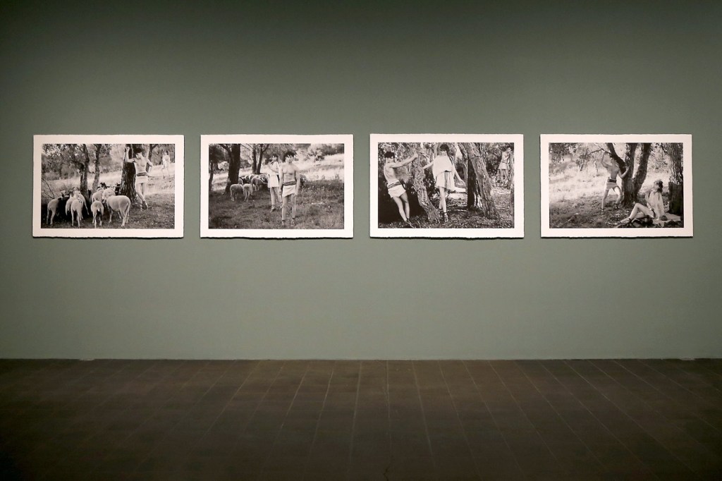
 'Modern Mythology' 2013")
 'Modern Mythology' 2013 from the exhibition 'Feuerbach's Muses – Lagerfeld's Models' at Hamburger Kunsthalle, Hamburg, February - June, 2014")
 'Modern Mythology' 2013 from the exhibition 'Feuerbach's Muses – Lagerfeld's Models' at Hamburger Kunsthalle, Hamburg, February - June, 2014")
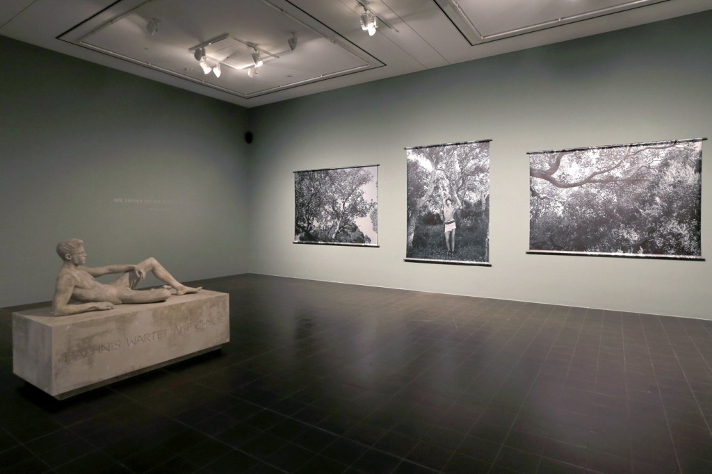
 'Modern Mythology' 2013")
 'Modern Mythology' 2013")
 'Modern Mythology' 2013")
 'Modern Mythology' 2013")
 'Sam Eric, Pennsylvania' 1978")
 'Polar Bear' 1976 from the exhibition 'Hiroshi Sugimoto: Past Tense' at the J. Paul Getty Museum, Getty Center, Los Angeles, February - June, 2014")
 'Wapiti' 1980")
 'Sable Antelope' 1994")
 'Manatee' 1994")
 'Birds of Japan' 1994")
 'Cheetah' 1980")
 'White Rhinoceros' 1980")
 'Henry VIII' 1999 from the exhibition 'Hiroshi Sugimoto: Past Tense' at the J. Paul Getty Museum, Getty Center, Los Angeles, February - June, 2014")
 'Queen Victoria' 1999")
 'Anne Boleyn' 1999")
 'Asplenium Halleri, Grande Chartreuse 1821 - Cardamine Pratensis, April 1839' 2008")
 'Roofline of Lacock Abbey, circa 1835-1839' 2008")
 'Bust of Venus, November 26, 1840' 2009")
 'A Stem of Delicate Leaves of an Umbrellifer, circa 1843-1846' 2009")
 'Arrangement of Botanical Specimens, 1839' 2008")
 'Nicolaas Henneman, circa 1841' 2008")
 'Bust of Patroclus, September 8, 1841' 2009")
 'Grouped Towers, Chicago Project' 1930 from the exhibition 'Frank Lloyd Wright and the City: Density vs. Dispersal' at The Museum of Modern Art, February - June, 2014")
 'Grouped Towers, Chicago Project' 1930")
 'Broadacre City Project' 1934-1935")


 'Broadacre City Project' 1934-1935 from the exhibition 'Frank Lloyd Wright and the City: Density vs. Dispersal' at The Museum of Modern Art, February - June, 2014")
 'Broadacre City Project' 1934-1935")
 'Broadacre City Project' 1934-1935")
 'H. C. Price Company Tower, Bartlesville, Oklahoma' 1952-1956")
 'National Life Insurance Company Building, Chicago Project' 1924-1925")
 'S.C. Johnson & Son Inc. Research Laboratory Tower, Racine, Wisconsin' 1943-1950")
 'St. Mark’s-in-the-Bouwerie Towers, New York Project' 1927-1931")
 'St. Mark's-in-the-Bouwerie Tower, New York Project' 1927-1931")
 'The San Francisco Call Building Project' 1913")
 'The Mile High Illinois, Chicago Project' 1956")
 '\"Modern Cuff\" Bracelet' designed c. 1948")
 '\"Lava\" Bracelet' designed c. 1946")
 'Autumn Leaves Brooch' 1974")
 'Untitled' 1948-1979")
 'Linked Oval Necklace' designed by 1974")
 'Triangle Necklace' c. 1969")
 'Ellington Necklace' c. 1962")
 'New Orleans Necklace' c. 1962")
 '\"Bauble\" Necklace' c. 1953")
 'Model Wearing Art Smith's \"Modern Cuff\" Bracelet' c. 1948")
 'Standing Stone' 2014")
 'Constellation II' 2014")

")
")
")
 'Bruise II' 2014")


 'L'Énigme d'Isidore Ducasse' (The Riddle of Isidore Ducasse) 1920 (1971)")
 'L'Énigme d'Isidore Ducasse' (The Riddle of Isidore Ducasse) 1920 (1975)")
 'Enfant à la Bouchée de pain' (Child in the soup kitchen) 1897 (1892-1893)")
 ''Enfant à la Bouchée de pain' in the Cézanne room at the Salon d'Automne' 1904")
 'Tête d’enfant endormi' (Head of a Sleeping Child) 1906-1907")
 'La Muse endormie' (Sleeping muse) 1910")
 'Noire et blanche (Black and white)' 1926")
 'Enfant malade (Ziek kind)' c. 1909")
 'Enfant malade (Ziek kind) 1895 (1903-1904)")
 'Madame X' 1896")
 'Princesse X' (Princess X) c. 1930")
 'Princesse X (Princess X)' 1915-1916")
 'View of the Studio with Maïastra' 1917")
 'Self-portrait in the studio' c. 1934")
 'Rayographie' (Rayograph) 1925")
 'Le Violon d'Ingres' (Ingres's Violin or The Hobby) 1924")
 'Self-portrait with the lamp' 1934")
 'Self-portrait in the studio' c. 1906")

 'Heritage' 2013")
 'Heritage' 2013")
 'Heritage' 2013")
 'Heritage' 2013")
 'Heritage' 2013")
 'Heritage' 2013")
 'Tea Pavilion' 2013")
 'Eucalyptus' 2013")
 'Eucalyptus' 2013")
 'Eucalyptus' 2013")
 'Head On' 2006")
 'Head On' 2006")
 'Head On' 2006")
 'Head On' 2006")

You must be logged in to post a comment.