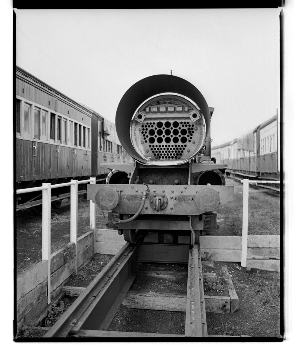
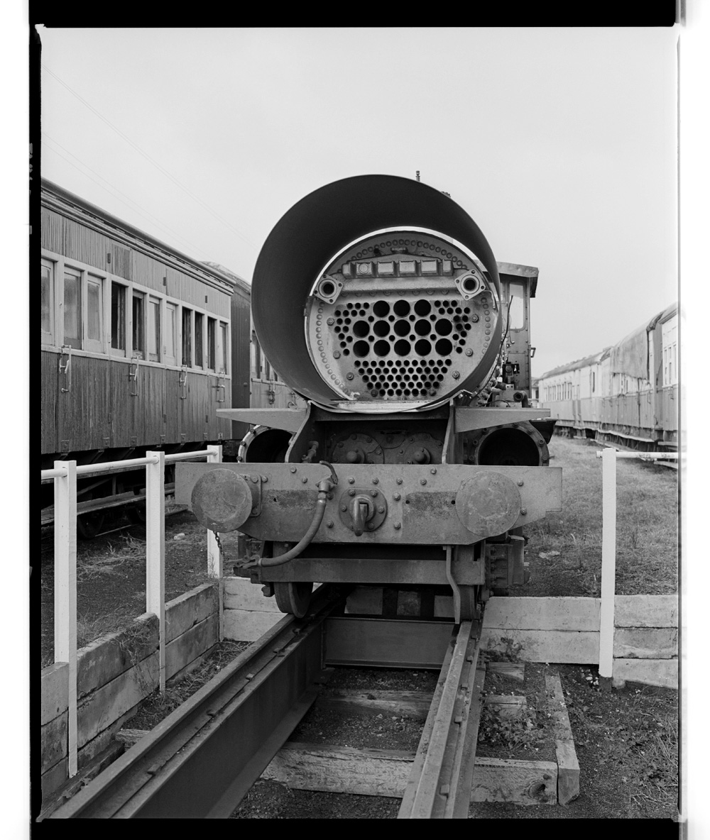
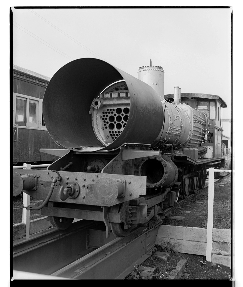
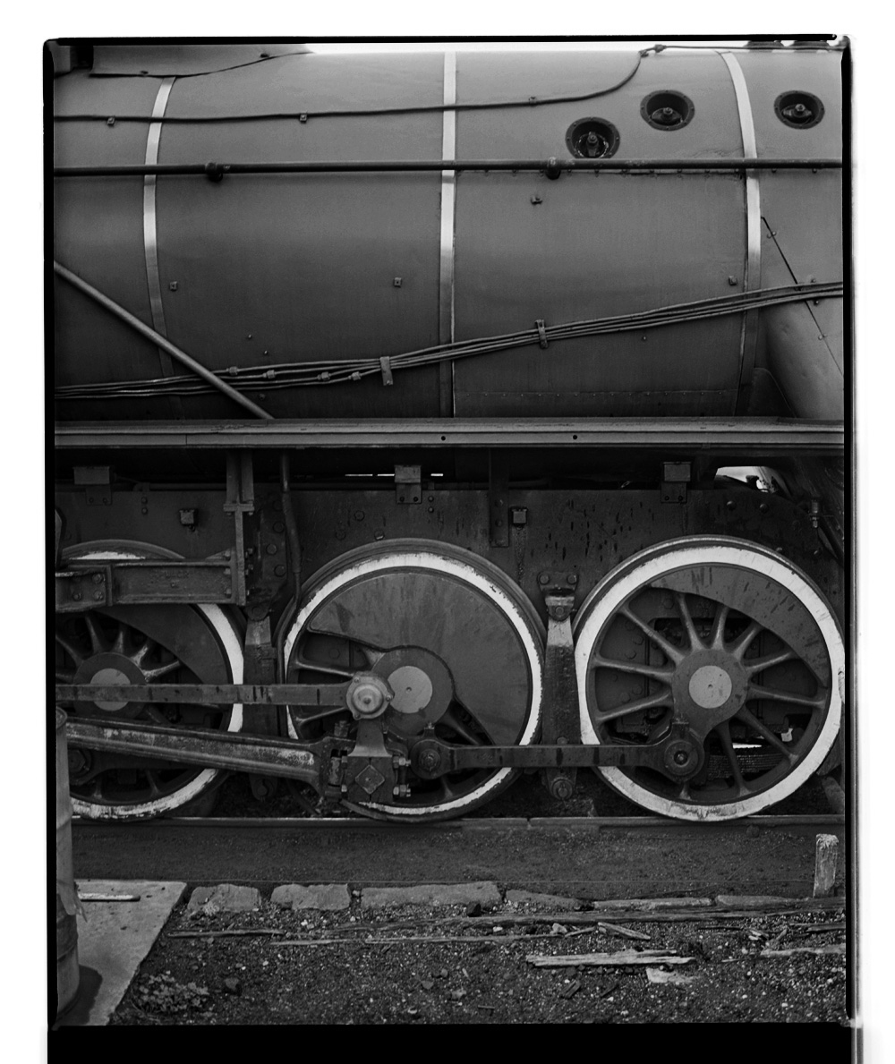
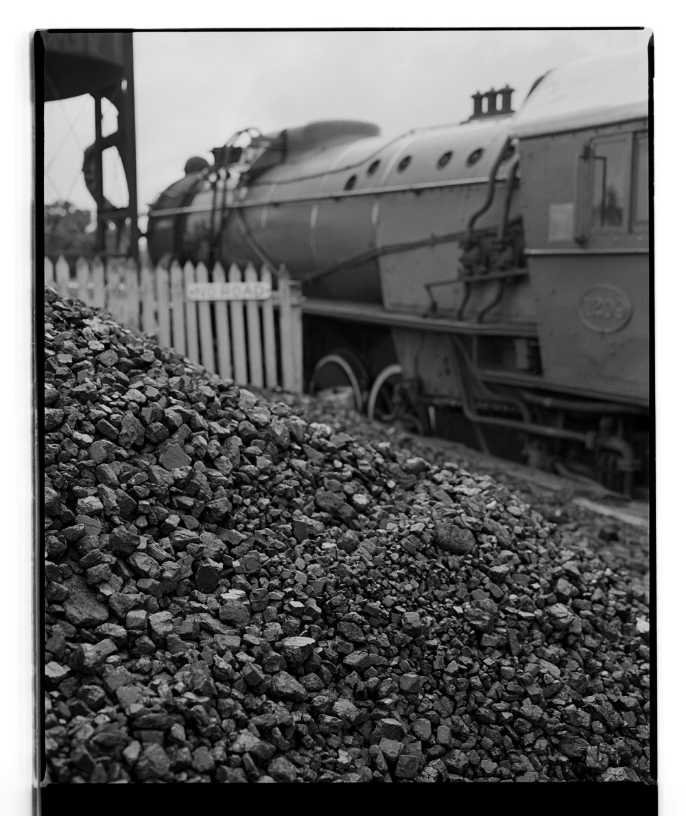
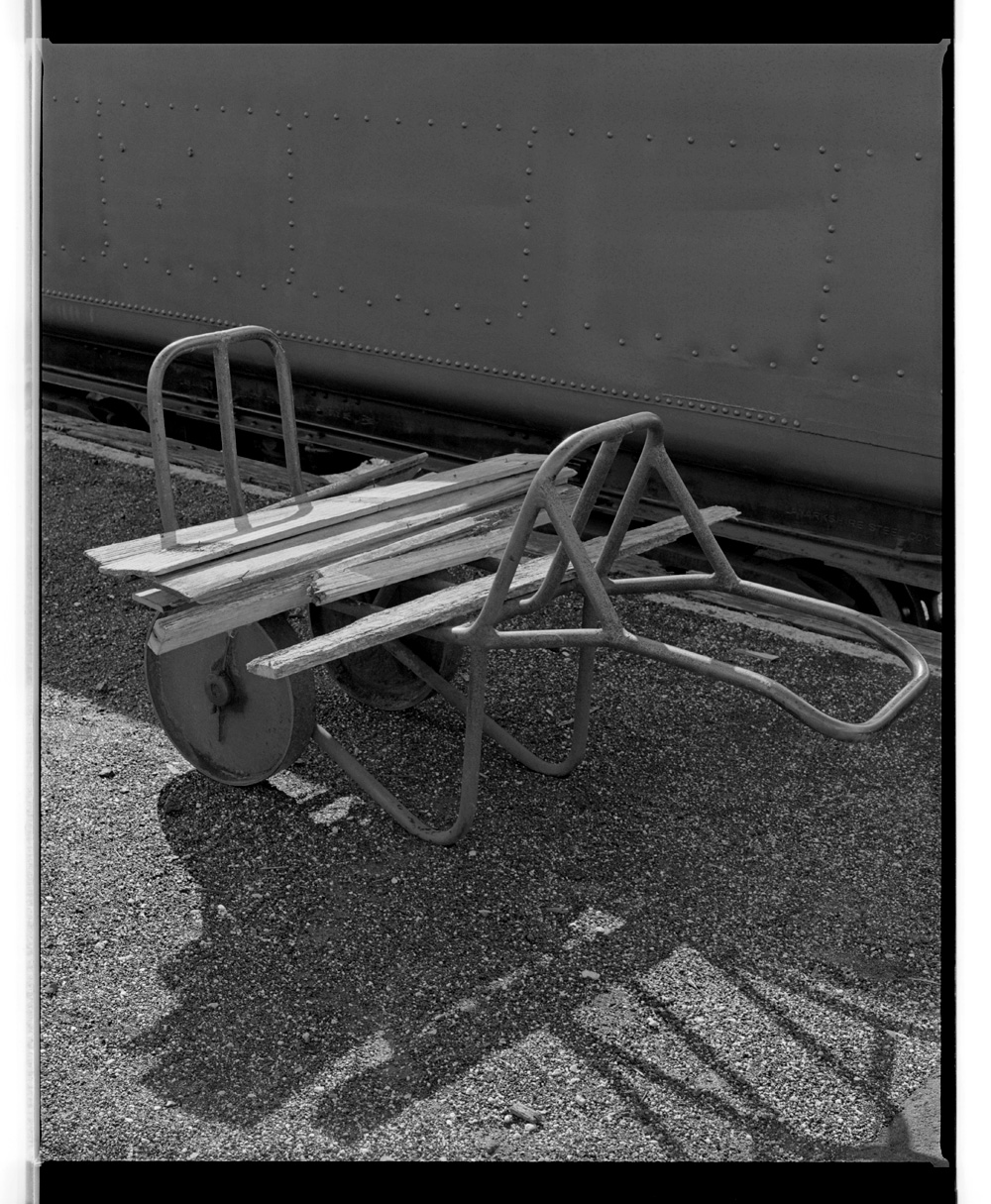
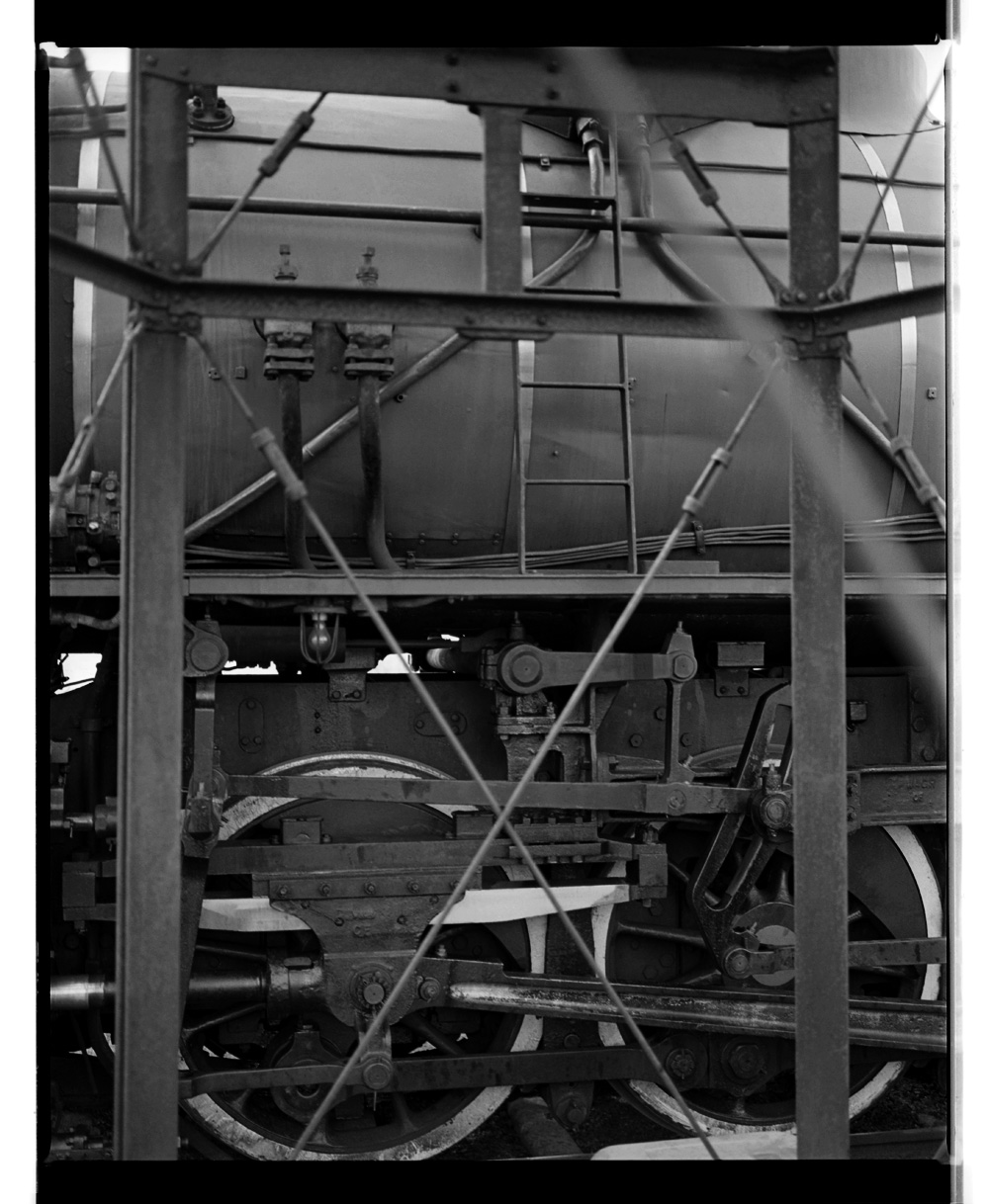
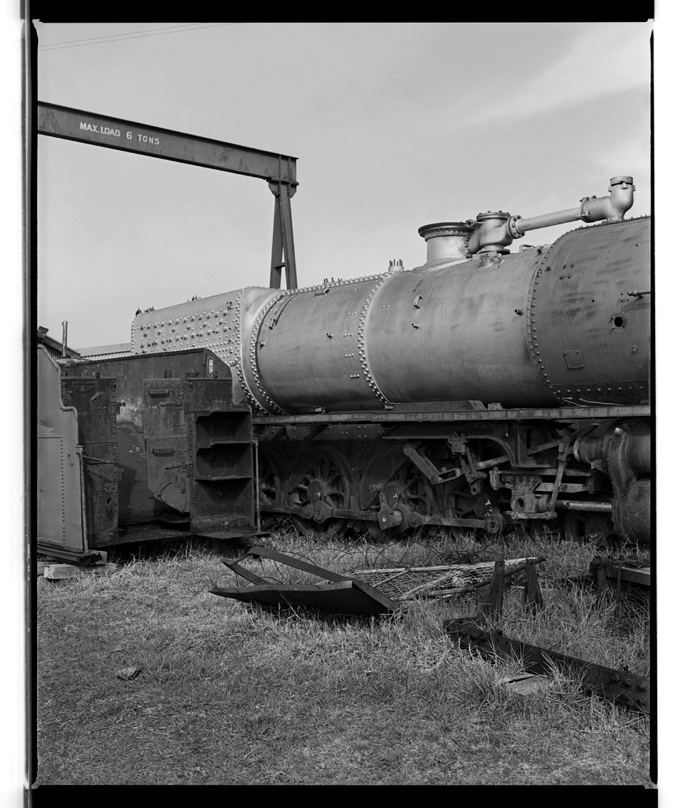
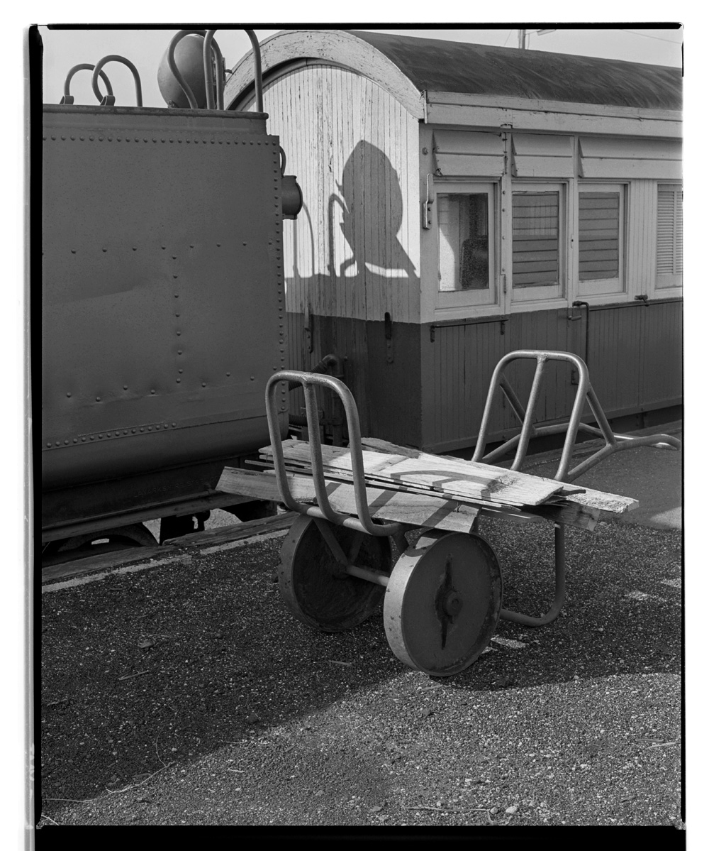
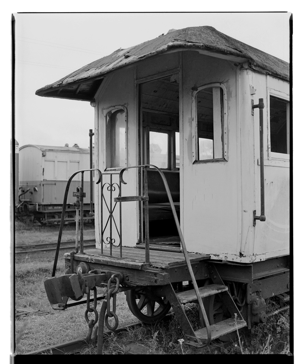
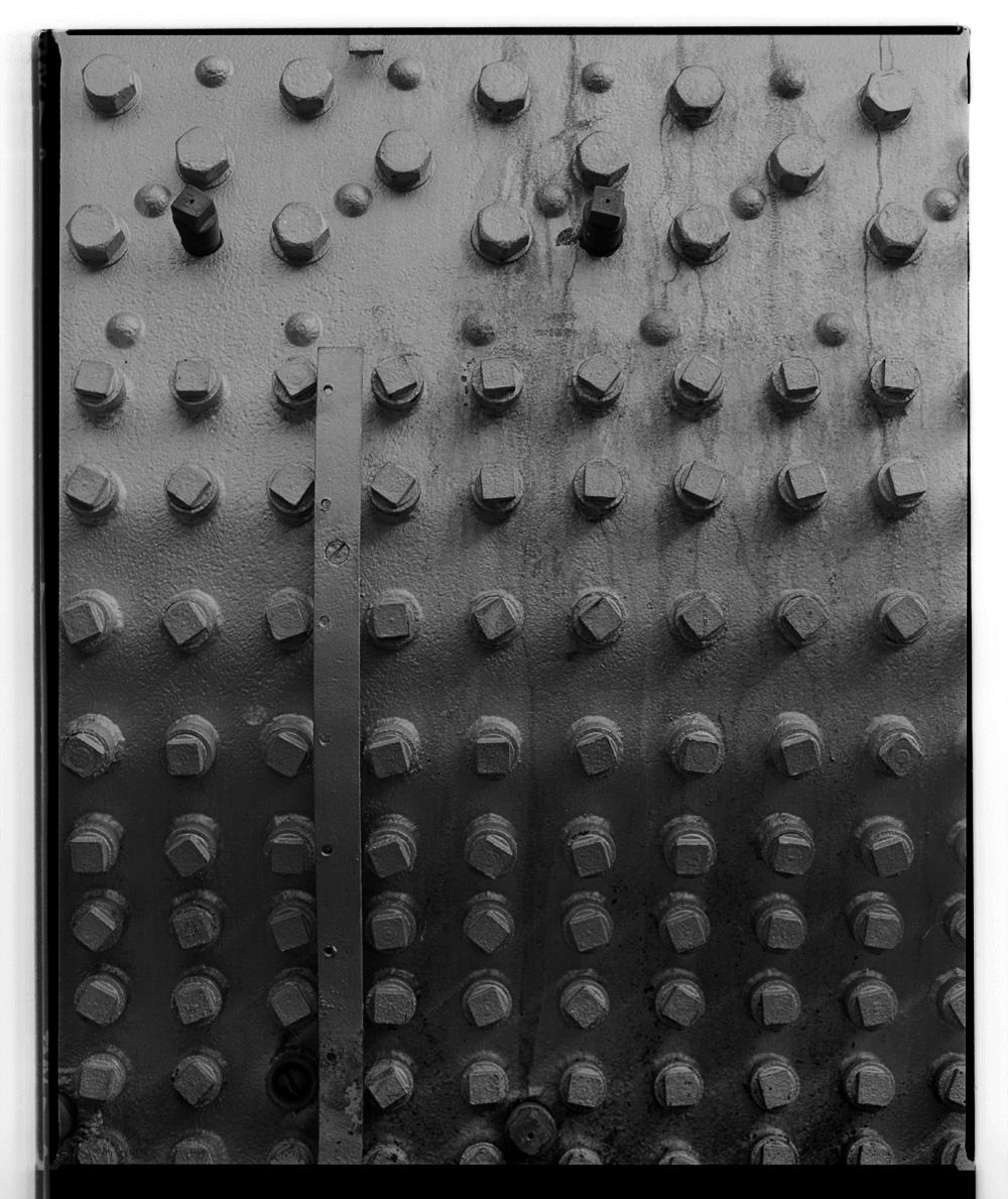
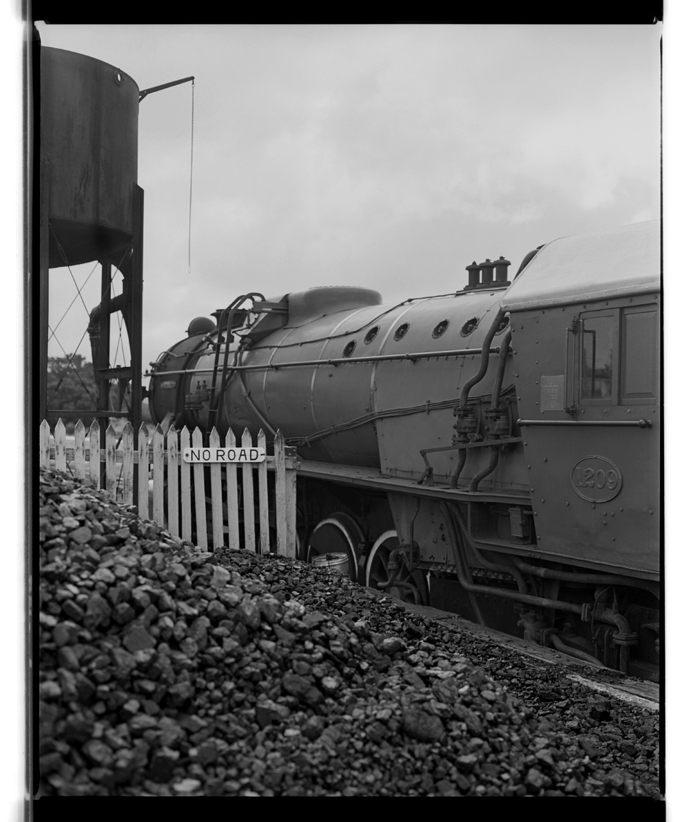
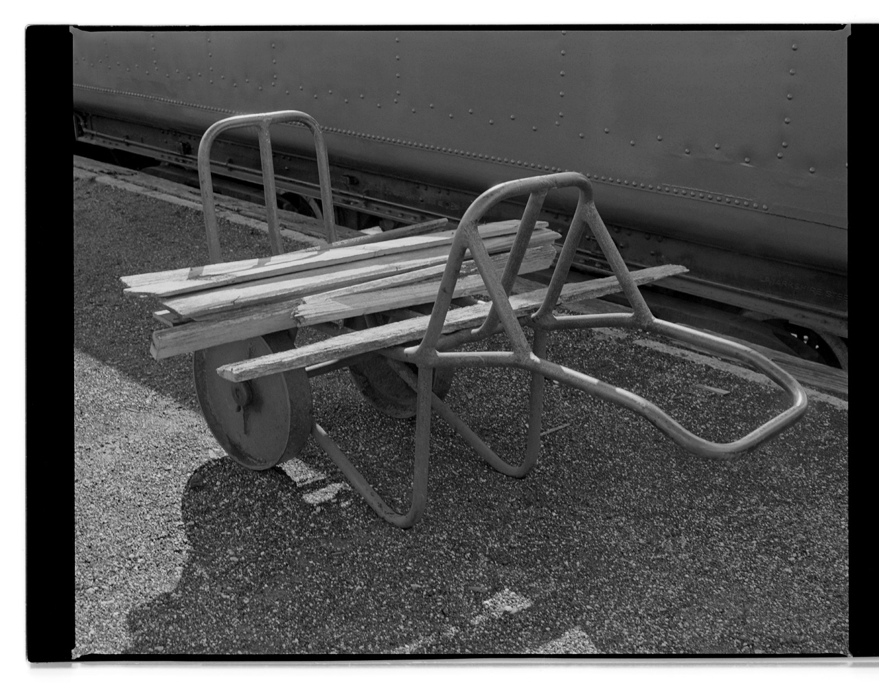
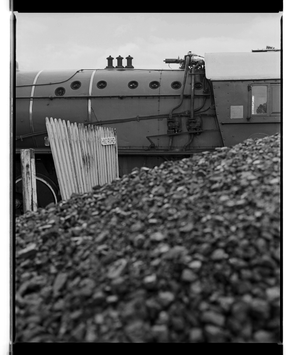
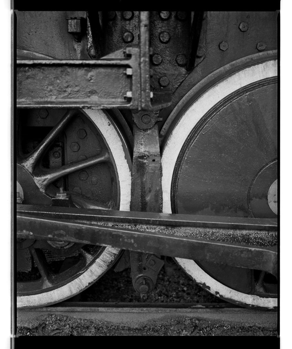
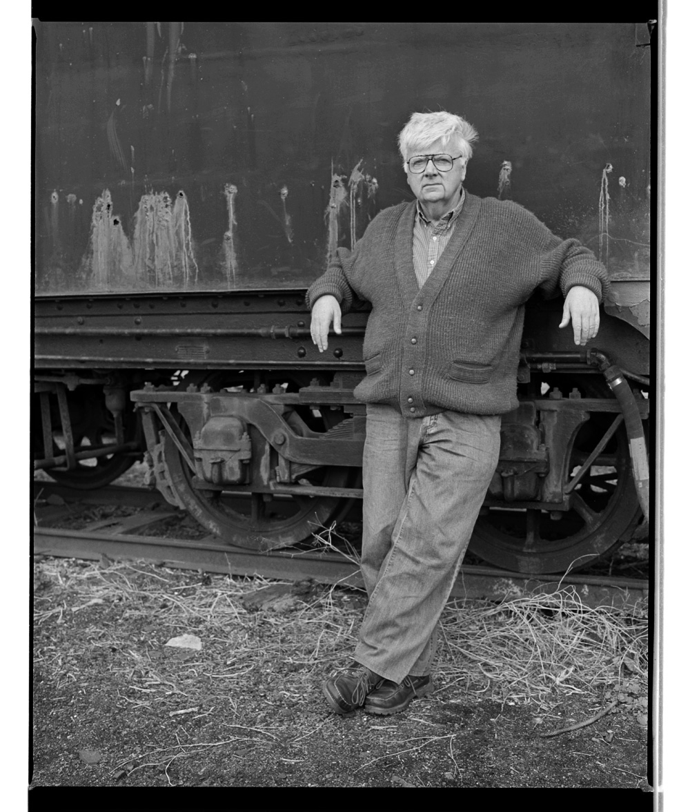
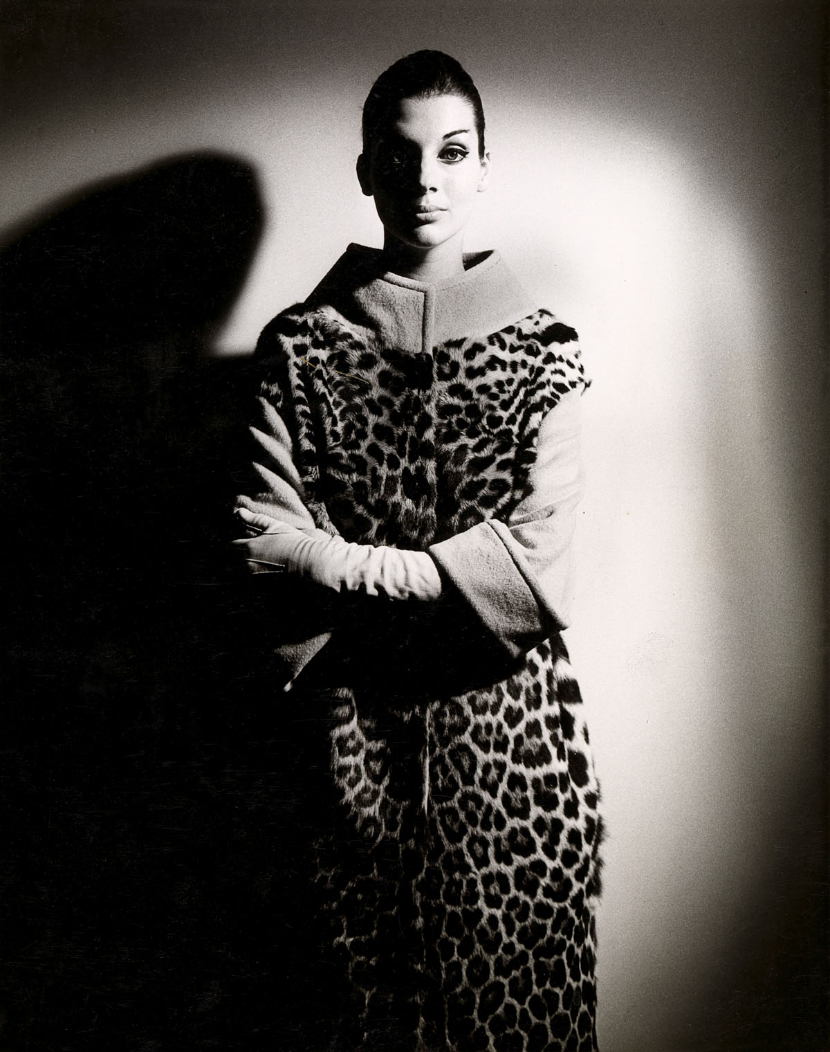
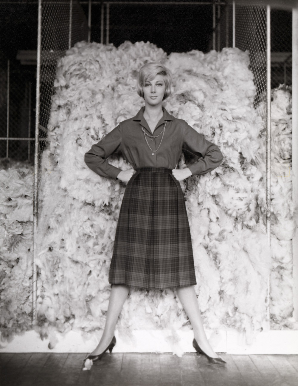
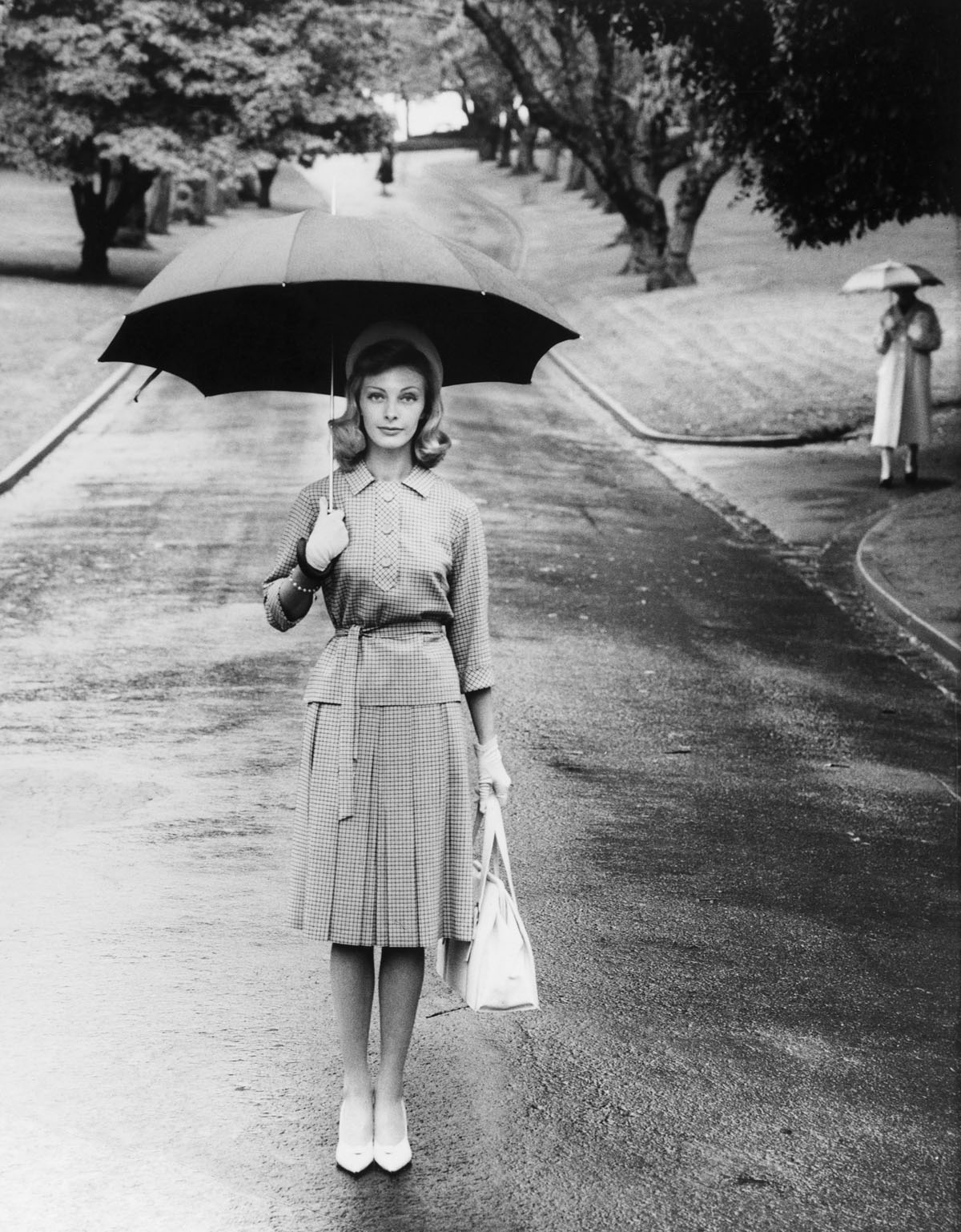
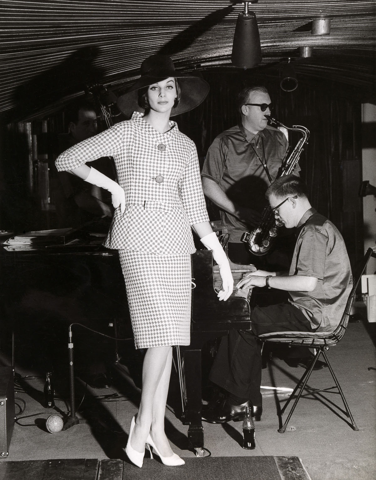
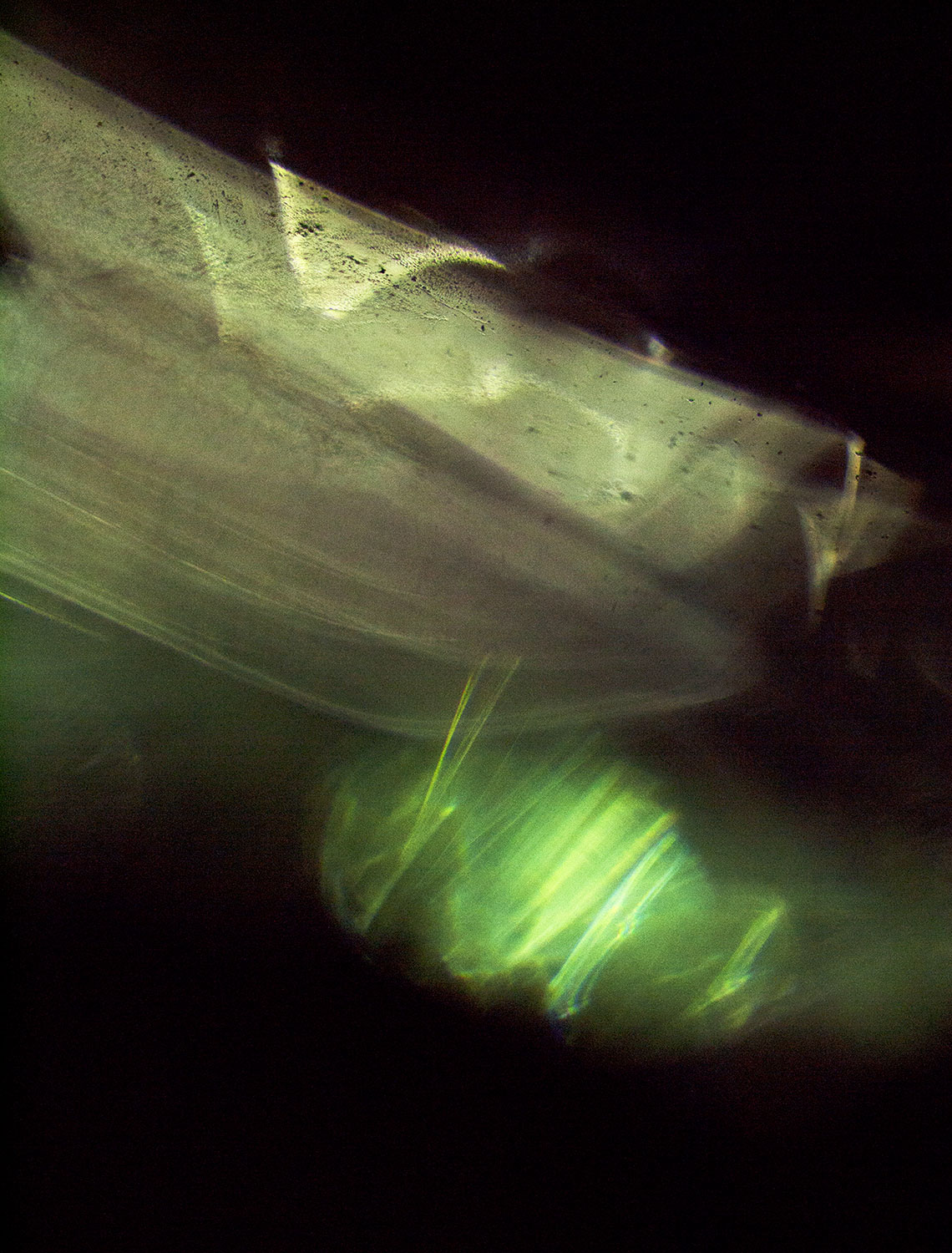
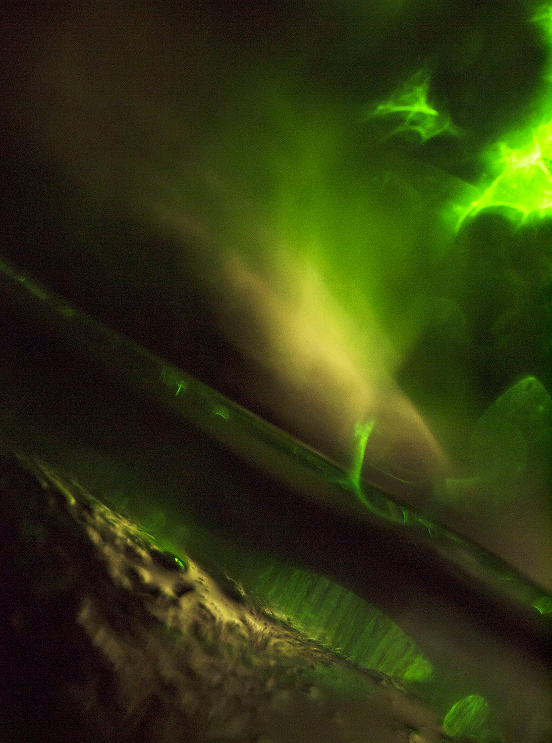
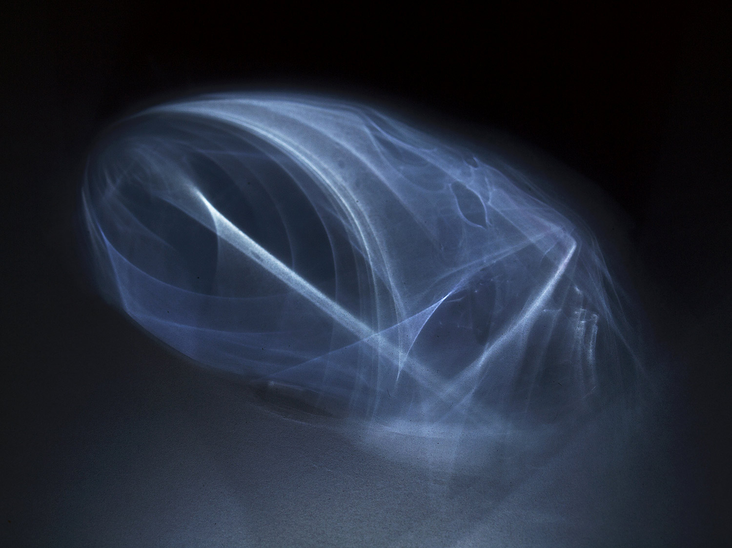
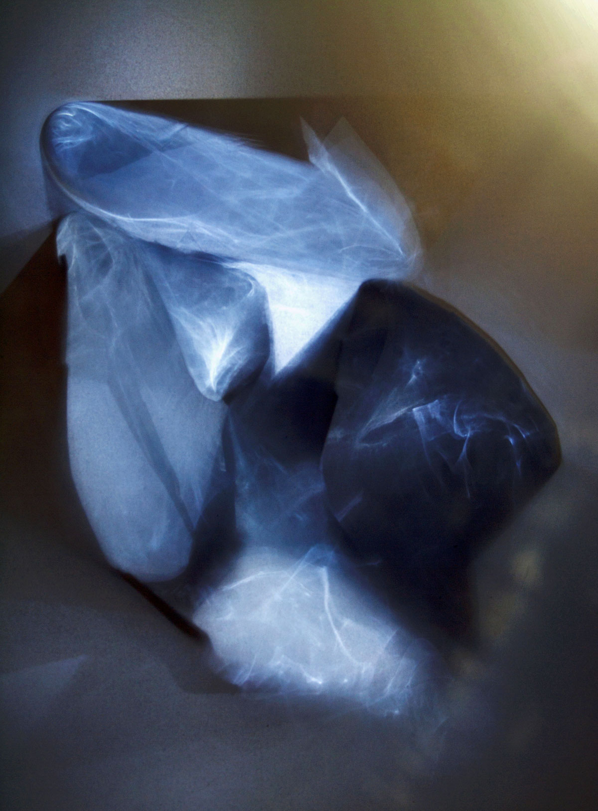
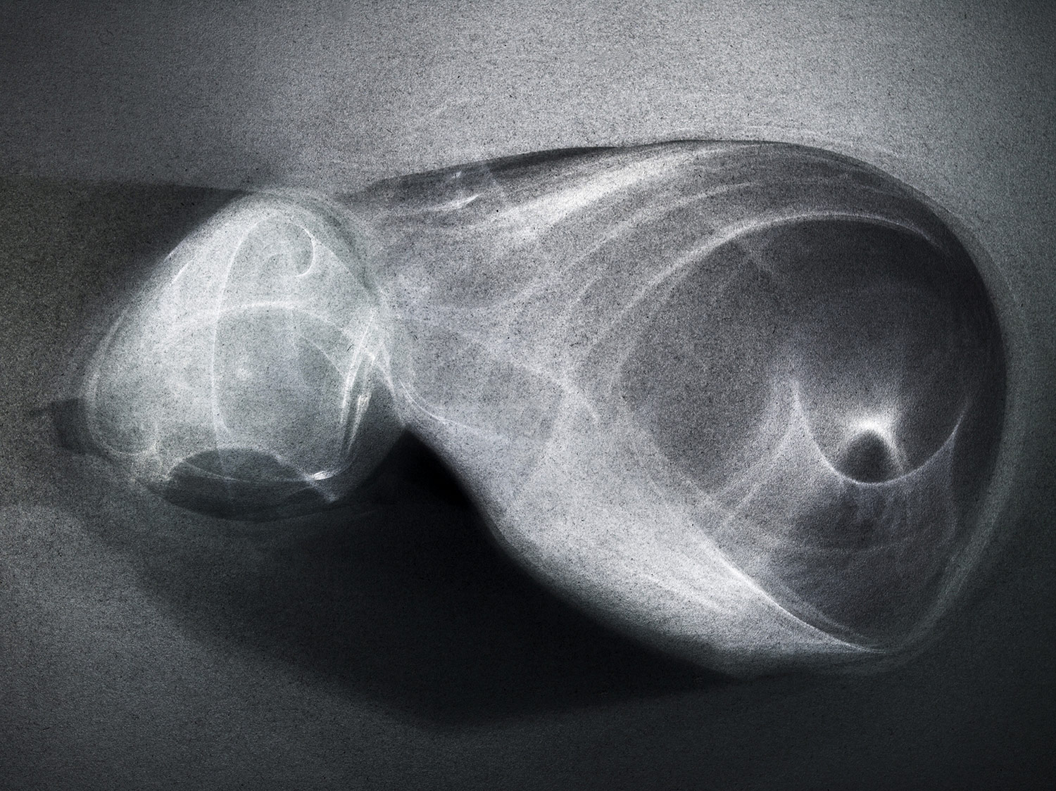
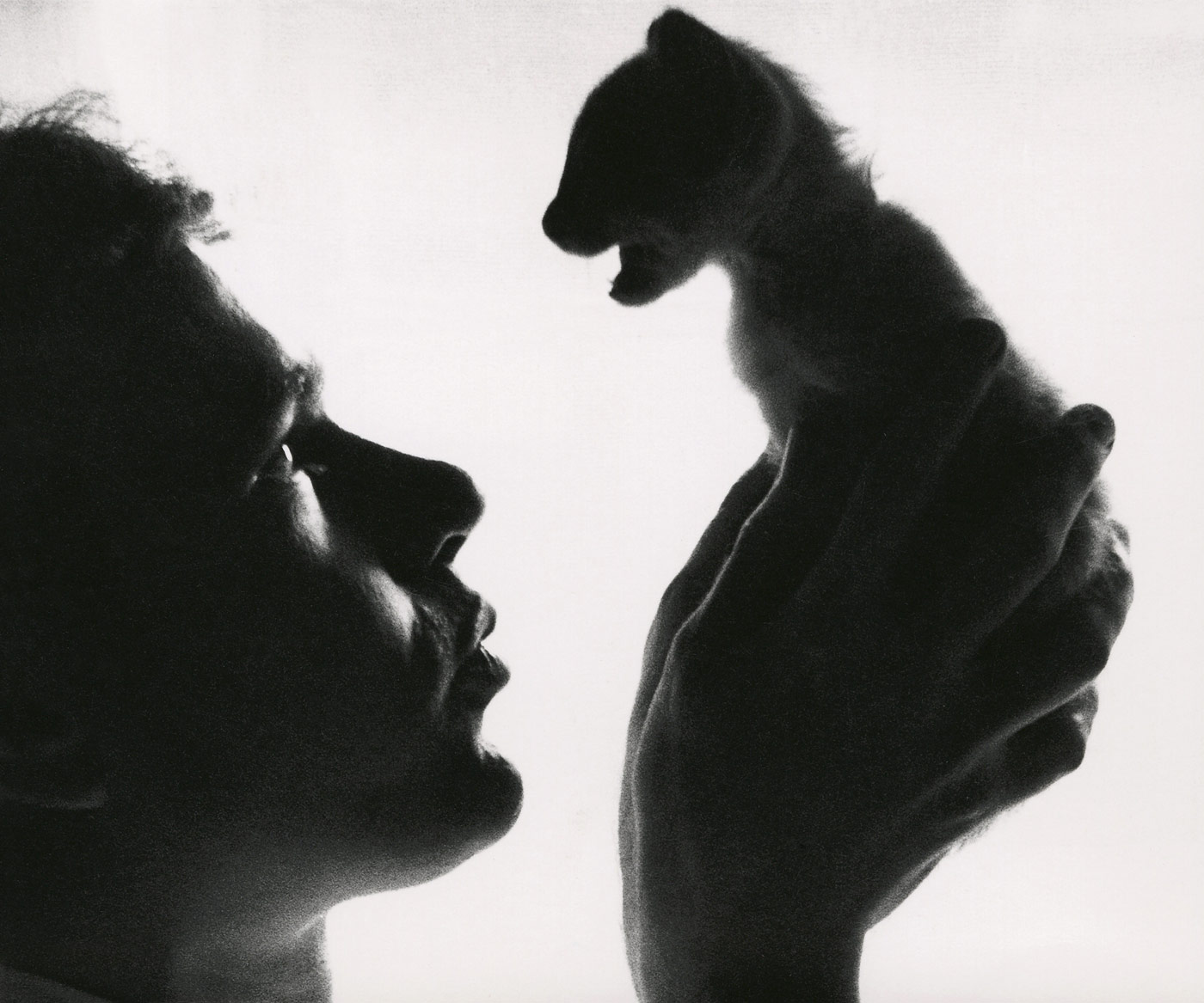
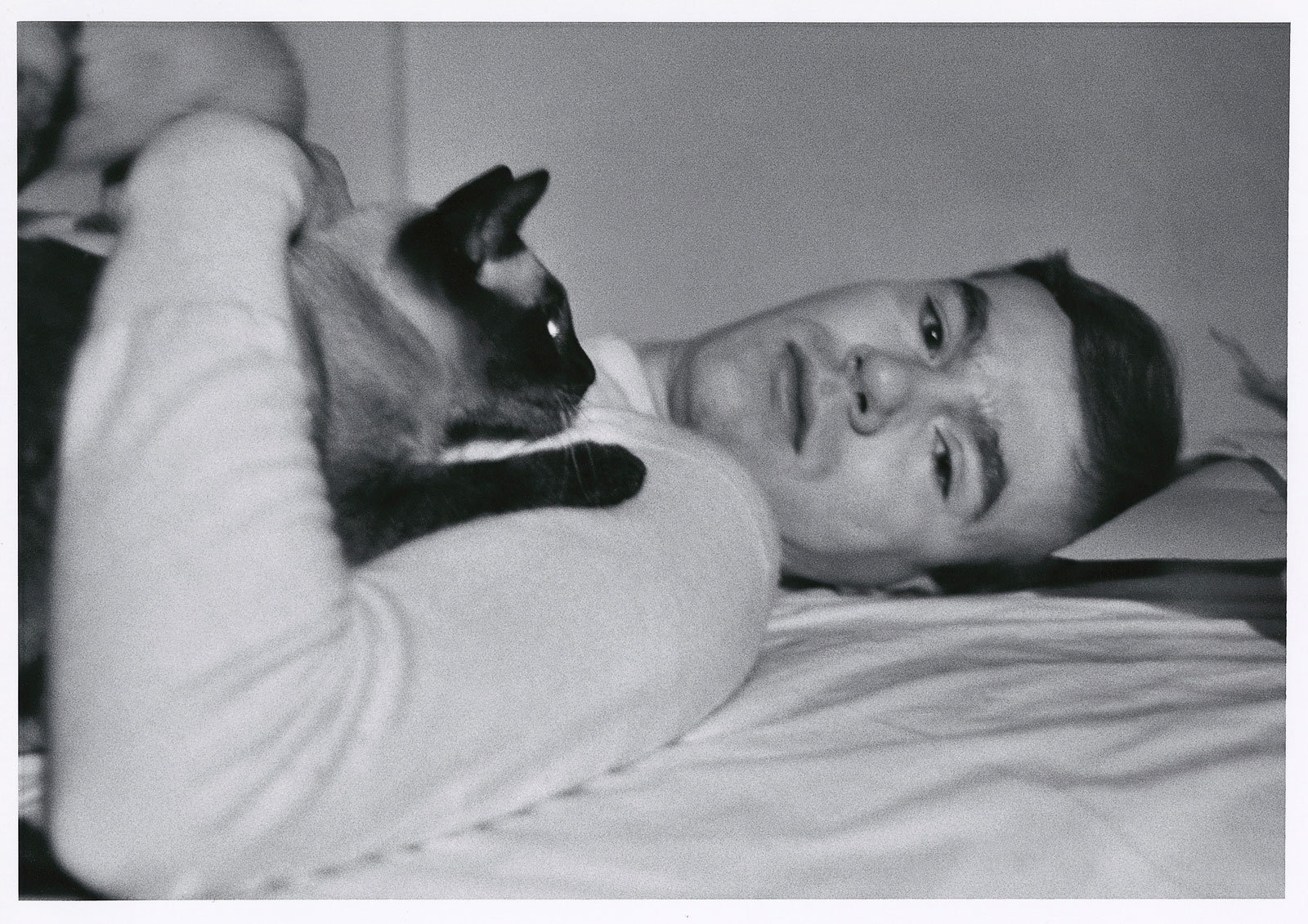
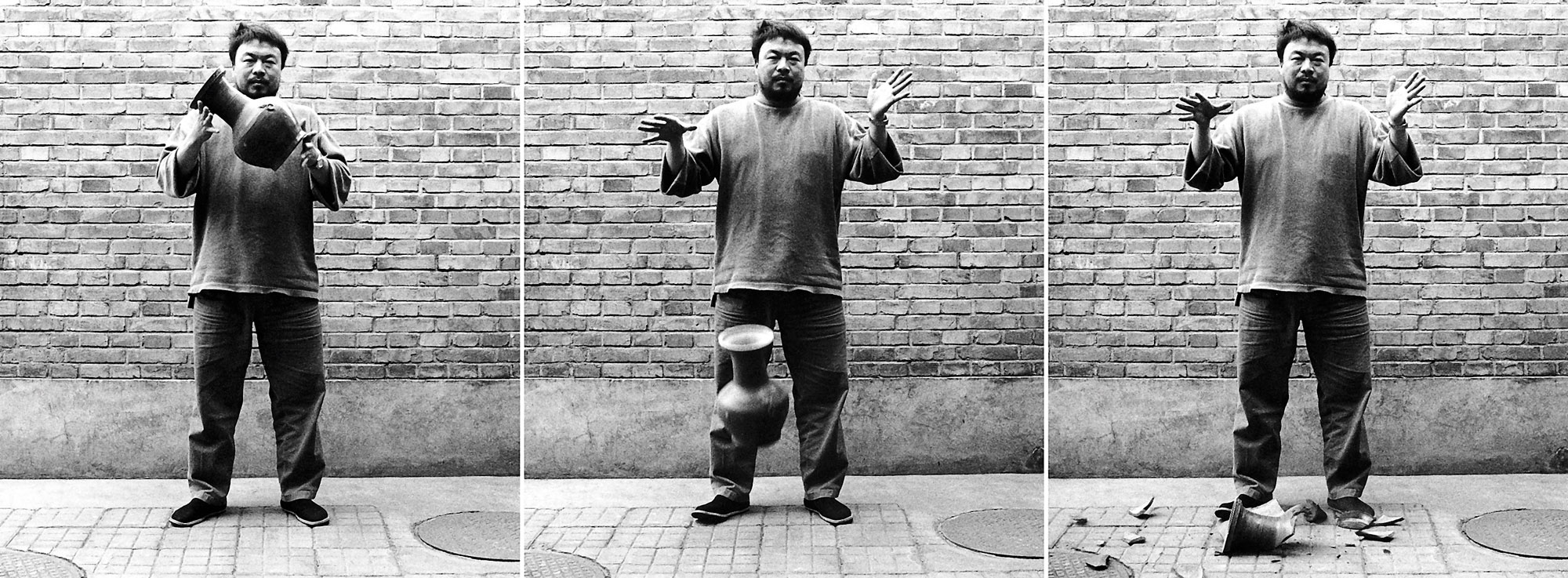
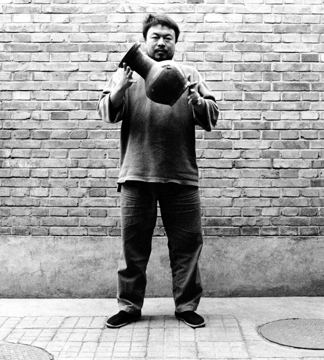
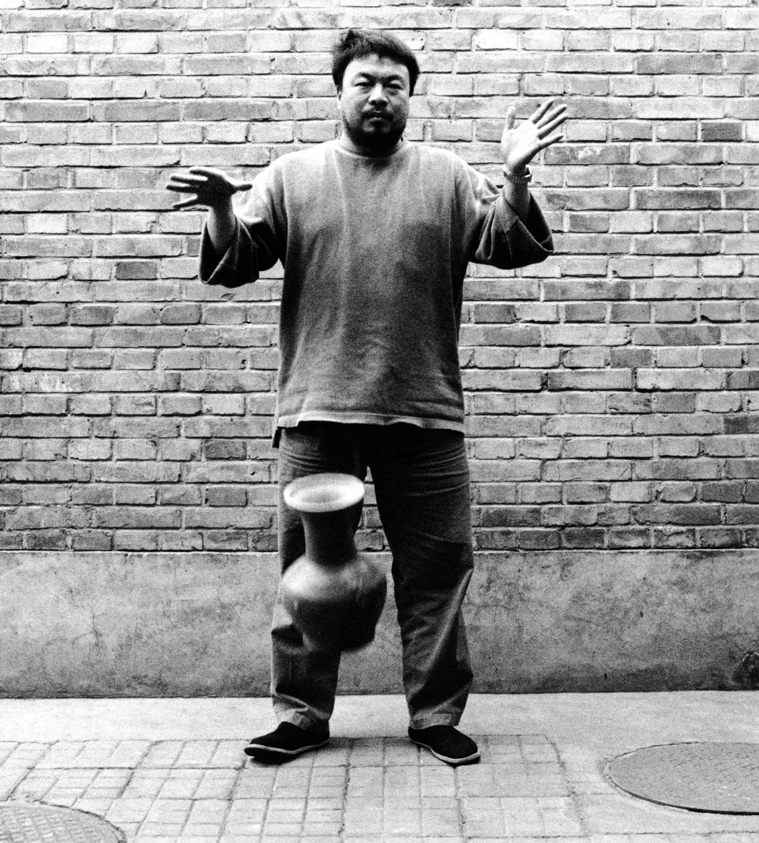
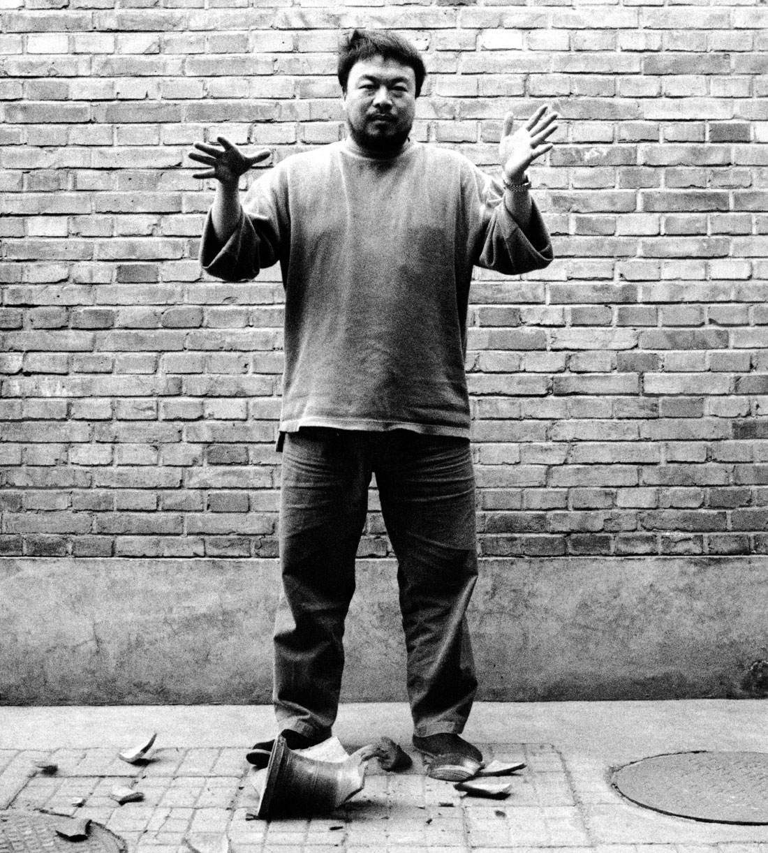
Marcus Bunyan (Australian, b. 1958) Untitled 1994 from the series Études Silver gelatin print
Studies taken at Newport railway workshops, Melbourne in 1994 with my Mamiya RZ67.
I am scanning my negatives made during the years 1991-1997 to preserve them in the form of an online archive as a process of active memory, so that the images are not lost forever. These photographs were images of my life and imagination at the time of their making, the ideas I was thinking about and the people and things that surrounded me.
Please remember these are just straight scans of the prints, all full frame, no cropping!
Photographs are available from this series for purchase. As a guide, a vintage 8″ x 10″ silver gelatin print costs $700 plus tracked and insured shipping. For more information please see my Store web page.
Marcus Bunyan (Australian, b. 1958) Untitled 1994 from the series Études Silver gelatin print
Marcus Bunyan (Australian, b. 1958) Jim Black, artist 1994 from the series Études Silver gelatin print
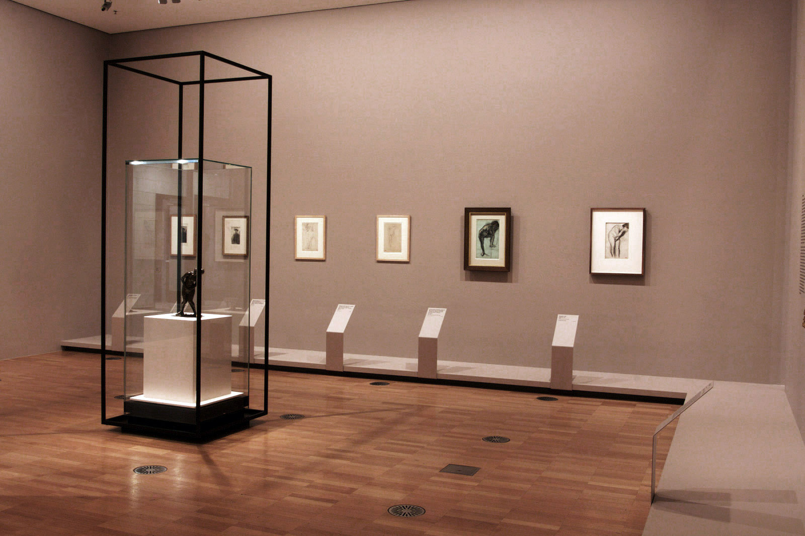
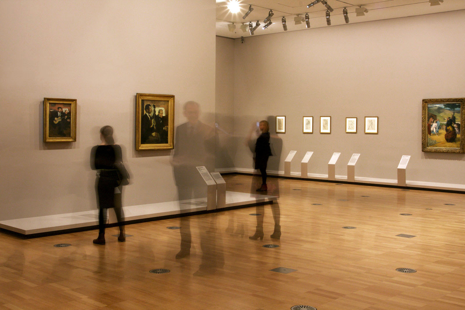
A magnificent exhibition of the work of Edgar Degas at NGV International. So nice to see a blockbuster without papered walls or patterned floors, an exhibition that just allows the work to speak for itself.
“Il y a quelque chose plus terrible encore que le bourgeois – c’est l’homme qui nous singe [There’s something even more awful than the bourgeois – it’s the man who apes us]”
Edgar Degas as noted down by Oscar Wilde when he met him in 1883.
At the start of the 1860s Degas’s family still acted as his primary models for portraiture. In early 1863 he painted this engagement portrait of his sister Thérèse. He shows her as a young woman all dressed up to go out; in fact, to go abroad. Timidly she show off her engagement ring before a view of Naples, her face serene, the sky blue with future happiness. She was to move to Naples after her marriage in Paris on 11 April 1863 to her first cousin Edmondo Morbilli, the son of Rose Morbilli, the sister of Degas’s father.
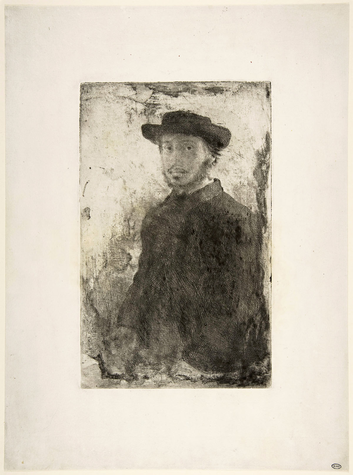
While studying in Rome as a young man degas became increasingly interested in printmaking and also in the portraits of Rembrandt, which he first saw in publication by the French art writer Charles Blanc. The effects of light and shadow in Rembrandt’s portraits inspired Degas to undertake a series of self-portraits including this, his only self-portrait etching, which he produced in four separate states. He experimented with altering the appearance of these etchings through leaving varying amounts of ink on the plate before printing. Degas was very pleased with this exercise, and gave away examples of these trials to his friends.
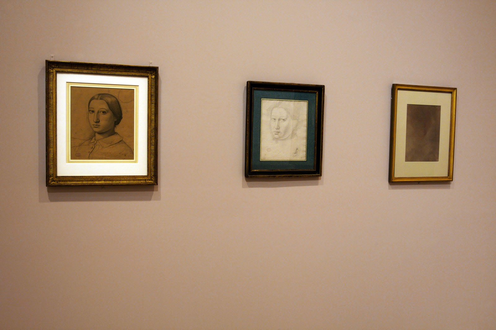
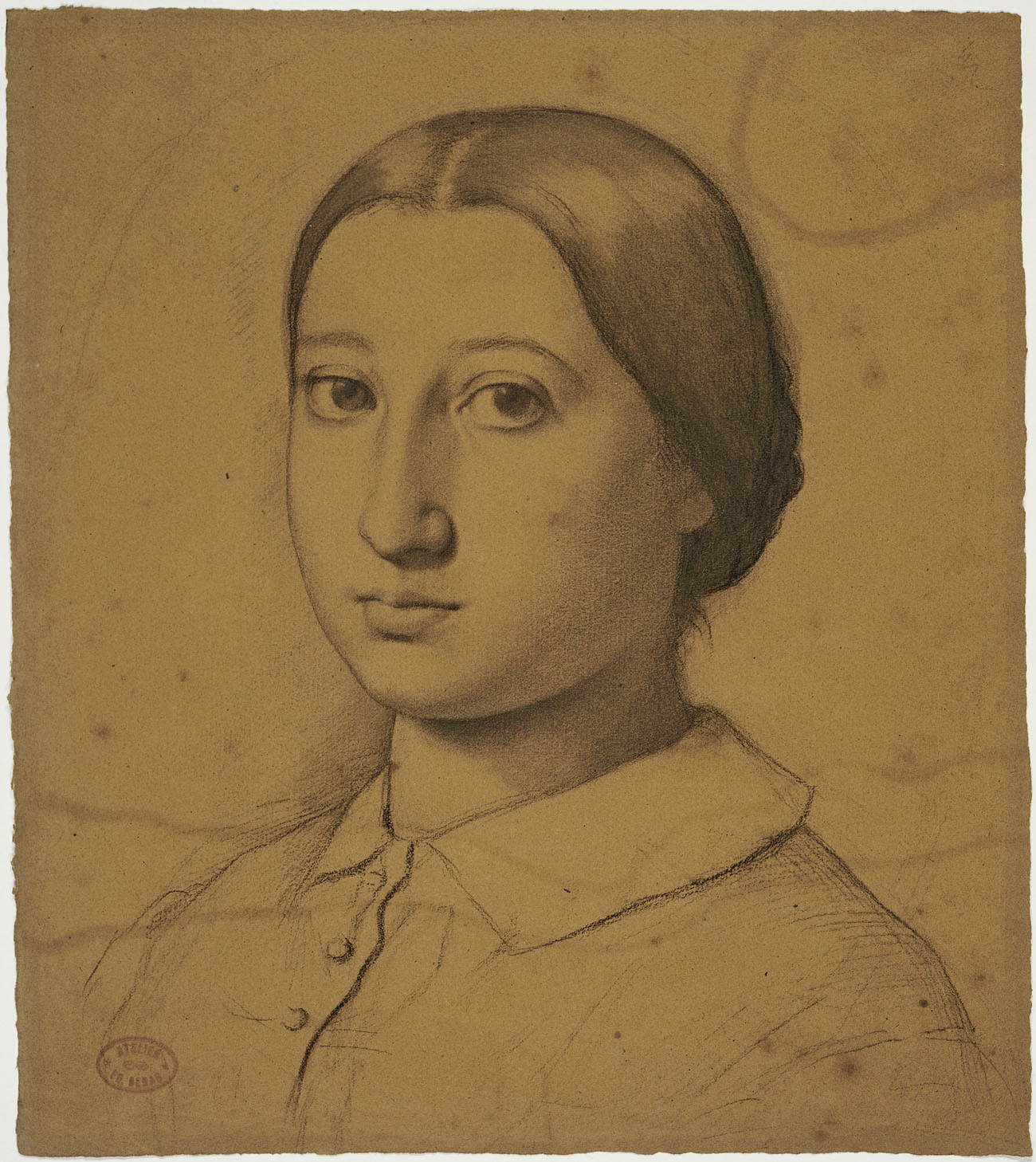
Traces of Ingres’s influence on the young Degas are clearly visible here in the clean, firm contours delineating the face of his hen fifteen-year-old sister Thérèse De Gas. Offsetting the crisp edge drawn along her cheek is a subtle modelling of the chin and cheeks produced with smudged pencil, recalling the sfumato (soft or blurred) effects of Leonardo da Vinci.
Degas’s family members were his principal models in the early years of his career. His first art lessons were undertaken with Louis Lamothe, a loyal follower of the Neoclassical master Jean-Auguste-Dominique Ingres. This portrait of his younger brother René, the family darling, betrays Degas’s resolve to follow in the footsteps of his mentor Ingres, whose work was exhibited at the Exposition Universelle in September 1854. Degas visited the elderly master of Neoclassical portraiture in 1855, the year the he undertook this portrait. Preparatory drawings show that degas radically simplified his composition, eliminating a complex interior setting in favour of a dramatic dark background reminiscent of the Mannerist Old Master, Angolo Bronzino.
This work is both a portrait and a genre scene, but it leans towards the former in that there is little trace of narrative, local colour or exotic reference. Degas details the marks of old age, fatigue and poverty – wrinkled skin, gnarled hands, the motley garments of a pauper – along with the faded colours that he recorded in a contemporary notebook: ‘figure of an old woman / very tanned skin, white veil / cloak thrown over / shoulder faded brown / faded free dress / a little like the back wall / of my room / yellow apron’
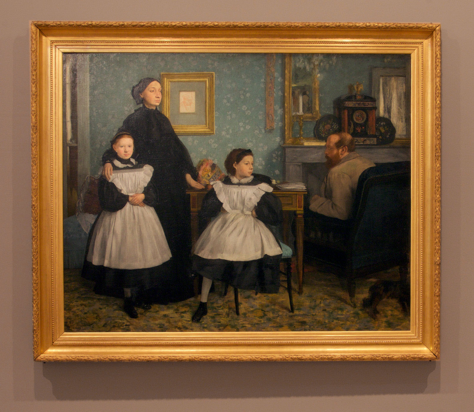
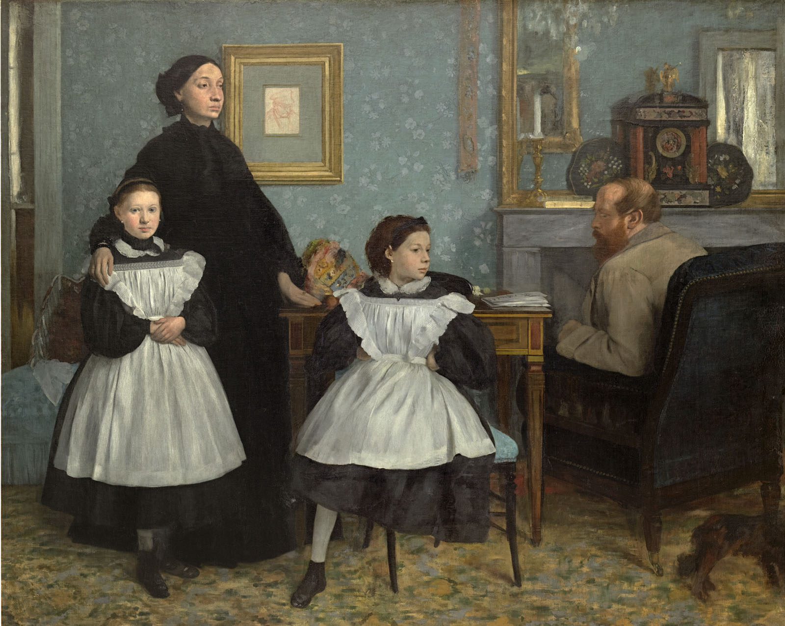
In 1858-1859, during an Italian sojourn, Degas stayed in Florence for nine months with his aunt Laure and her husband, Baron Gennaro Bellelli. There he embarked on the largest painting he would ever create – a monumental portrait of Laure, Gennaro and their daughters, Giovanna and Giulia. A study of marital discontent presented on the scale of a history painting, Family portrait, also called The Bellelli family, reflected Degas’ recent study of the dignified sitters in the Flemish master Anthony van Dyck’s early seventeenth-century portraits, which he had seen in Genoa. He worked on this painting continuously after his return to Paris, completing a final version of it for the Paris Salon of 1867. Alive to the unhappy marital dynamics between Laure and her husband, a political exile from Naples, Degas showed his morose relatives in their rented apartment, physically separated from one another by items of furniture and Giovanna (on the left) and Giulia. Although expecting her third child, Laure Bellelli (la Baronne) stands proud and aloof, in full mourning for her recently deceased father (Degas’ grandfather) Hilaire Degas, whose portrait hangs on the wall behind her. Meanwhile, her husband, conspicuously not in mourning, sits in comfort by the fire. Adults and children are compressed into a shallow plane, an airless, static vacuum. The uneasy ambience is accentuated by Giulia’s absent leg and the family dog, shown without its head, in the right foreground.
In this portrait of Monsieur Ruelle, Degas shows his father’s former bank cashier as a man of seriousness and restrained sophistication, dressed in a dinner suit and black bow tie as if preparing to go the opera. In its combination of informality and masculine severity the portrait conforms to a convention among nineteenth-century Realist artists of portraying each other and their friends as modern men of leisure and the metropolis.
On returning to Paris from Italy in 1860 Degas began work on scenes from the Bible and ancient history, including this preparatory oil sketch for a vignette from an ancient greek subject. In the foreground two groups of adolescents are seen confronting each other on the plains of Sparta, watched over by the white-haired law-giver Lycurgus and the teenagers’ mothers. The subject has conventionally been read as the exercises traditionally undertaken by Spartans in preparation for war, but it has also been suggested that it represents Spartan courtship rites. In the Life of Lycurgus it was noted that display of physical prowess by girls assisted young men in choosing strong mothers, who would produce strong children.
An exhibition of one of the world’s most beloved artists, Edgar Degas, opens to the public from tomorrow at NGV International showcasing significant works never-before-seen in Australia.
In its world premiere, Degas: A New Vision presents the largest display of Degas’ works to ever come to Australia, and forms the most comprehensive retrospective of the artist’s oeuvre in decades. Featuring more than 200 works, Degas: A New Vision reveals Degas’ talent in a new light; not only as a great master of painting, but also as a master of drawing, printmaking, sculpture and photography. The works travel to Melbourne from 65 lenders in more than 40 cities across the globe.
The Premier of Victoria, the Hon. Daniel Andrews MP, said, “Degas: A New Vision is a coup for the NGV and for Victoria. Local audiences will be the first in the world to experience this incredible exhibition – another example of how we are leading the way as the creative state. Part of the Melbourne Winter Masterpieces series, this exhibition continues the tradition of creating drawcard cultural events for locals and visitors and bringing must-see art to our city each year.”
Some of Degas’ most famous masterworks are presented including the bronze sculpture The little fourteen-year-old dancer, 1879-1881, and In a café (The Absinthe drinker), c. 1875-1876. World-renowned paintings, never-before-seen in Australia, are also exhibited such as the celebrated ballet paintings The rehearsal, c. 1874, and Finishing the arabesque, 1877, and Degas’ monumental portrait The Bellelli family, 1867.
Tony Ellwood, Director, NGV, said, “Presenting Edgar Degas’ magnificent oeuvre in a fresh and reinvigorated light showcases him as one of the defining artists of the nineteenth and twentieth centuries. Considered one of the world’s most celebrated and significant artists, his influence upon modern and contemporary art is undeniable. Degas: A New Vision provides audiences with a rare experience to truly be immersed in the creativity and originality of his art, giving visitors a deeper and richer understanding of his brilliance.”
Degas: A New Vision is presented thematically, grouping together the subjects which Degas continually returned to throughout his career, including not only his famous ballet scenes but also arresting portraits, the nude, horse-racing, the social world of Parisian nightlife, and women at work and leisure. The exhibition also explores the great technical, conceptual and expressive freedoms that Degas achieved in his later years, and reveals his experiments with a range of mediums including sculpture and photography. This approach emphasises Degas’ obsessive and highly creative working methods, and allows visitors to enjoy the development of Degas’ art from its beginnings.
Degas was fascinated by aspects of modern life – voraciously painting Paris’ dance halls and cabarets, cafés, racetracks, opera and ballet stages. He also studied the simple, everyday gestures of working women: milliners, dressmakers and laundresses. He was drawn to explore movement that was precise and disciplined, such as that of racehorses and ballet dancers, and absorbed a diverse range of influences from Japanese prints to Italian Mannerism.
The National Gallery of Victoria is pleased to be working with the world’s pre-eminent expert on Edgar Degas, Henri Loyrette, former Director of the Musée du Louvre (2001-2013) and Musée d’Orsay (1994-2001), who is principal curator of the exhibition. The National Gallery of Victoria and the Museum of Fine Arts, Houston, are both staging this major retrospective, which has been developed by both institutions in association with Art Exhibitions Australia. Degas: A New Vision travels to the Museum of Fine Arts, Houston, in October 2016.
Press release from the National Gallery of Victoria
Edgar Degas (French, 1834-1917) Portrait of Mademoiselle Eugénie Fiocre in the ballet The Spring 1867-1868 Oil on canvas 130.8 x 145.1cm Brooklyn Museum, New York Gift of James H. Post, A. Augustus Healy, and John T. Underwood, 1921
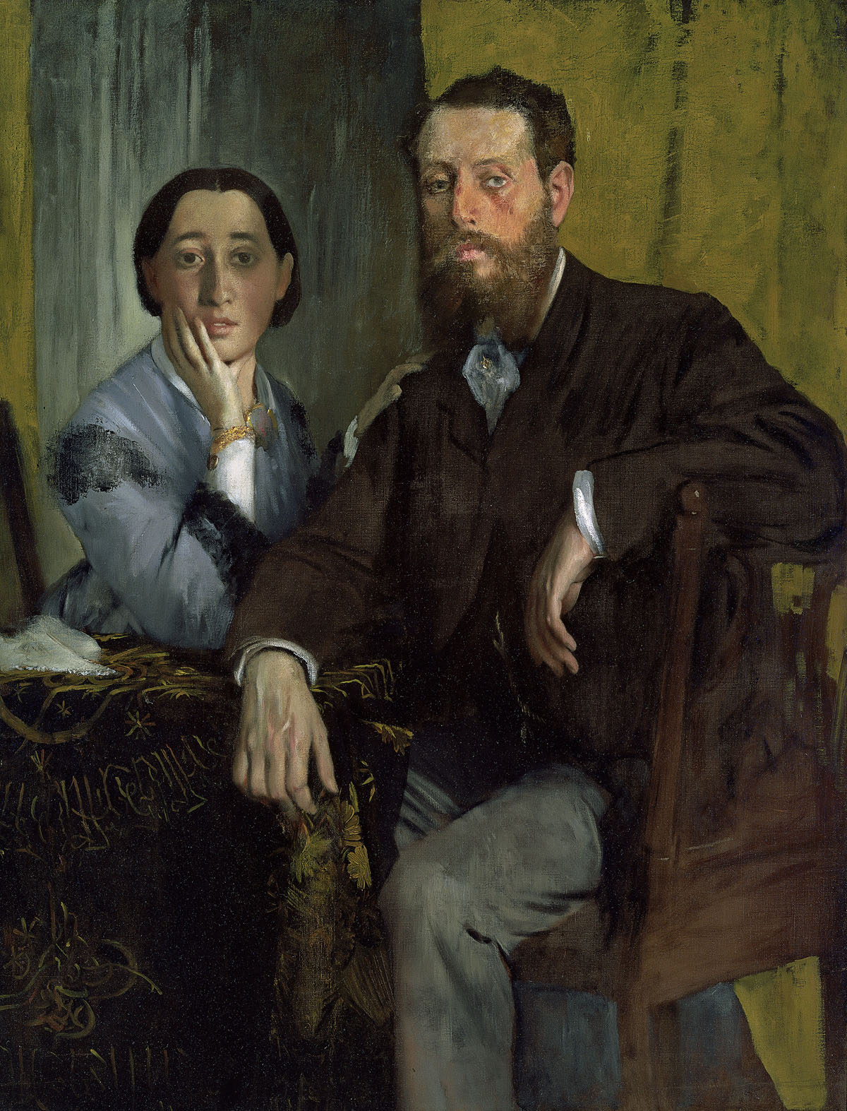
Among Degas’s circle of Realist painters were some outstanding practitioners of still life, a genre that enjoyed a resurgence of popularity following the revival of interest in the French eighteenth-century painter Jean-Baptiste Siméon Chardin. The identity of the man in this portrait is unknown, although he seems to be a still-life artist. He is depicted by Degas in his studio, informal seated with hands clasped, surrounded by the standard props of his trade: hunks of meat, white cloths, glassware and sketches of past still lives displayed on a wall as aides-mémoire – a masculine counterpart to the portrait of Victoria Dubourg that is also displayed here.
Wall text from the exhibition
Edgar Degas (French, 1834-1917) Victoria Dubourg c. 1868-1869 Oil on canvas 81.3 x 64.8cm Toledo Museum of Art, Toledo, Ohio Gift of Mr. and Mrs. William E. Levis
Berthe Marie Jeantaud was the wife of Charles Jeantaud, with whom Degas served in the artillery company under the command of Henri Rouart in 1870-1871, during the chaos of the Franco-Prussian War and Paris Commune. Following Berthe Marie’s marriage to Jeantaud in 1872, Degas produced this as well as a second portrait of her. Her cousin was Vicomte Ludovic Lepic, a landscape painter and etcher who taught degas methods of manipulating plate tones in his monotypes. In this remarkable candid and economical oil sketch, Degas depicts Madame Jeantaud at home with her two small dogs at 24 rue de Téhéran.
So cordial were Degas’s relations with Henri Rouart and his brother Alexis, who was also an art collector, that he dined with Alexis on Tuesdays and Henri on Fridays. In 1906 Degas wrote to his sister Thérèse that the Rouarts were his only remaining family in France. This portrait of Henri with his daughter Hélène was the first of many portraits. Henri is seen here as a paterfamilias, head of his household (a role that Degas esteemed) and in front of one of his landscapes, which degas also admired enough to invite Henri to exhibit with the ‘impressionists’.
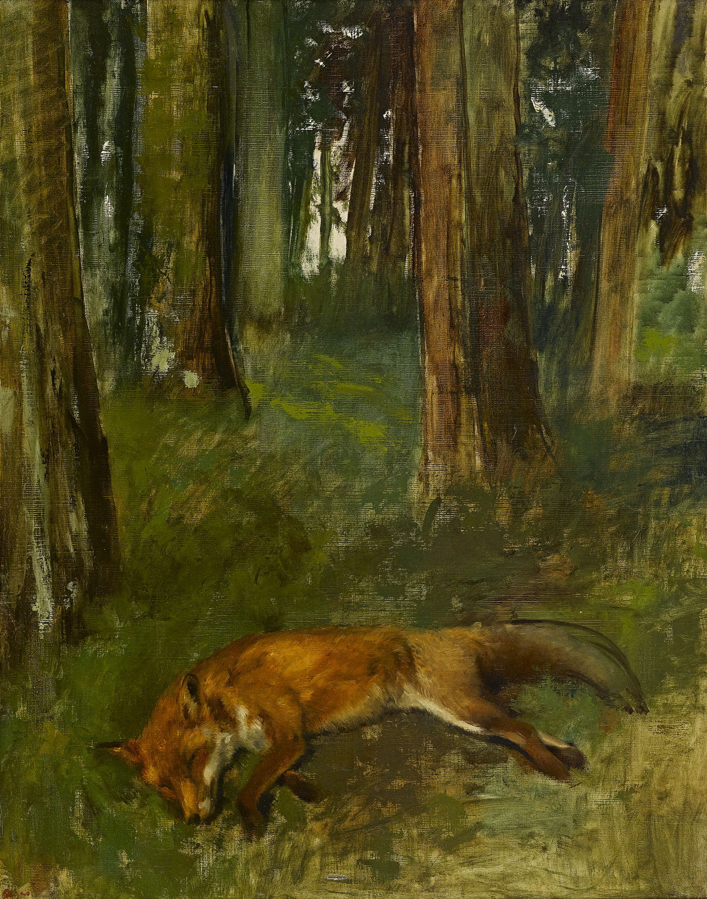
While his colleagues exhibition plein-air landscapes as ‘Impressionists’, degas adhered to his position as a ‘Realist’ during the 1860s and 70s, with at times awkward results. Dead fox in the undergrowth displays the powerful sense of physical presence that can be achieved by studying a dead fox in the studio under artificial light, and by using a brush to render the fox’s luscious pelt. Less convincing is the forest setting, which is invited and only roughly blocked out. Here Degas applied thin slashes of green and brown paint to suggest trees and forest floor, emulating, some have suggested, the Realist technique of Gustave Courbet.
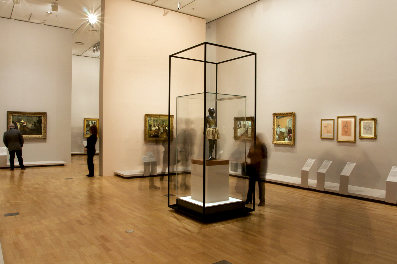
Edgar Degas (French, 1834-1917) The little fourteen-year-old dancer 1879-1881, cast 1922-1937 Bronze with cotton skirt and satin ribbon 99.0 x 35.2 x 24.5cm Czestochowski/Pingeot 73 (cast unlettered) Museu de Arte de São Paulo, Assis Chateaubriand Donated by Alberto José Alves, Alberto Alves Filho and Alcino Ribeiro de Lima
At the 1881 ‘impressionist’ group exhibition Degas unveiled a large wax sculpture of an immature ballerina (of which this is a bronze version), which he provocatively clad in real clothing. Critics were scandalised, accusing him of having dredged ‘the lower depths of dance’, choosing his dancer from among the ‘most hatefully ugly’. Degas’ model, ballet student Marie Van Goethem, the daughter of a tailor and a laundress and part-time prostitute, was later to abandon her dance studies and disappear into Paris’ underworld.
Degas produced sculptures in his studio from the 1860s until the 1910s. He modelled them in wax, over steel wire and cork armatures. Never satisfied, he made, destroyed and remade them repeatedly, his primary subjects being thoroughbred racehorses, female dancers and women at their toilette. As Degas’ eyesight deteriorated in his later years, making three-dimensional figures fulfilled a physical and emotional need that transcended any desire to perfect a finished object; he allegedly said that sculpture was ‘a blind man’s trade’.
After Degas’ death in 1917, some 150 wax sculptures were found in his studio, some broken but many intact. His heirs subsequently authorised the casting in bronze, by the Adrien-A. Hébrard Foundry, Paris, and their Milanese master craftsman Albino Palazzolo, of seventy four of the most intact of Degas’ sculptures. While many of Degas’ original wax sculptures still survive, they are too fragile to travel. These bronzes allow wider audiences today to engage with some of the most beautiful sculptures of the nineteenth century.
Wall text from the exhibition
Edgar Degas (French, 1834-1917) The song rehearsal c. 1872-1873 Oil on canvas 81.0 x 64.9cm House Collection, Dumbarton Oaks, Washington D.C.
In October 1872 Degas travelled to New Orleans in the United States, where he stayed for five months with his late mother’s brother Michel Musson and the extended Musson family. The artist’s younger brothers René and Achille had already relocated there, and had opened a wine import business financed by the Parisian Degas family bank. During his stay in Louisiana, Degas painted A cotton office in New Orleans, 1873, which reflected his observations of the industry that was central to that city. This now celebrated painting, which became the first work by Degas to enter a public collection when acquired by Pau’s Musée des Beaux-Arts in 1878, depicts Michel Musson in the foreground sampling cotton fibre in the office of his cotton export business.
René and Achille De Gas appear as relaxed visitors – René reading a newspaper and Achille casually observing the other men at work – in this complex group portrait of fourteen men, which has echoes of the artist’s love of seventeenth-century Dutch guild portraits. A cotton office in New Orleans was the prototype for many of Degas’ works of the 1870s and 1880s: framing that cuts to the heart of the subject and slices through men and objects alike; a de-centred composition viewed from slightly overhead, with a steep, diagonal perspective; a depth of field that creates close-ups while miniaturising anything farther off; and contrasts provided by light sources and, more particularly, by the frequently reproduced backlighting effect.
The partially finished state of Courtyard of a house (New Orleans, sketch) reflects Degas’s experiences in the city, as he struggled to fulfil social obligations with his American relatives. The view here looking out from a shaded interior also indicates that Degas was already experiencing problems with his eyesight, which was affected by the harsh Louisiana sunlight.
The young girl being attended to by a chiropodist in this painting is believed to be Joe Balfour, daughter of Degas’s widowed cousin Estelle Musson, whose husband had been killed in 1862 during the American Civil War. Degas here uses a technique he invented, peinture à l’essence (which entailed using oil pigments with most of the oil blotted away, thinned out with turpentine). Applied like watercolour, it dried with a soft matt finish that Degas preferred to the glossy sheen of traditional oil paintings.
Degas ironically referred to this painting as ‘my genre picture’, by which he understated the gravitas of this domestic scene. This drama of seeming violation perpetrated on a young working-class woman b a man displaying the clothing and posture of a young bourgeois acquired in Degas’s hands the breadth and intensity of history painting. The muted colours and dim light accentuate the unspoken violence, anguish and simmering tension between the two people. The open box on the round table at the centre of the painting is a telling symbol of lost virginity. The rosy interior of the gaping jewel-case is brutally expired by the lamp standing next to it.
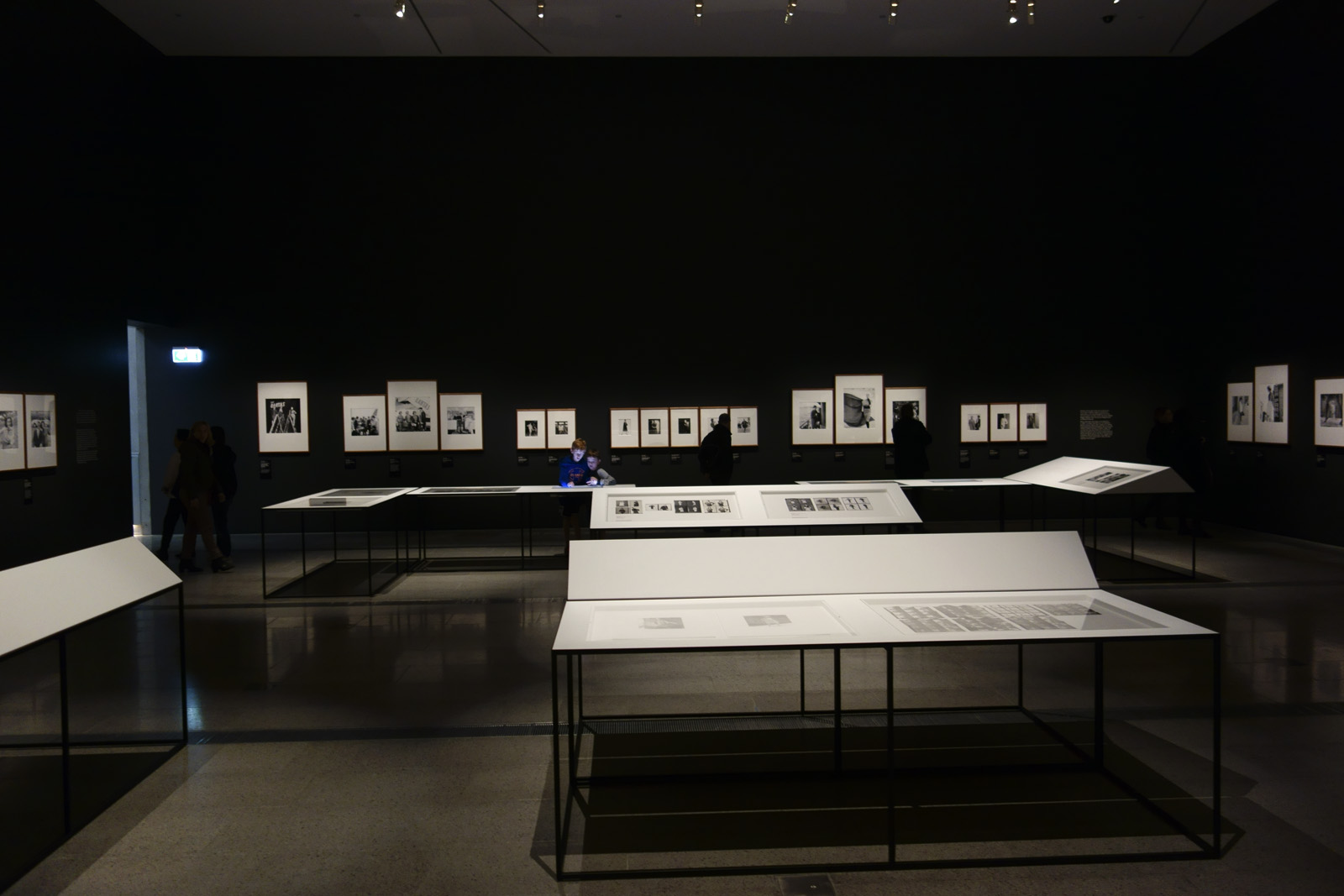
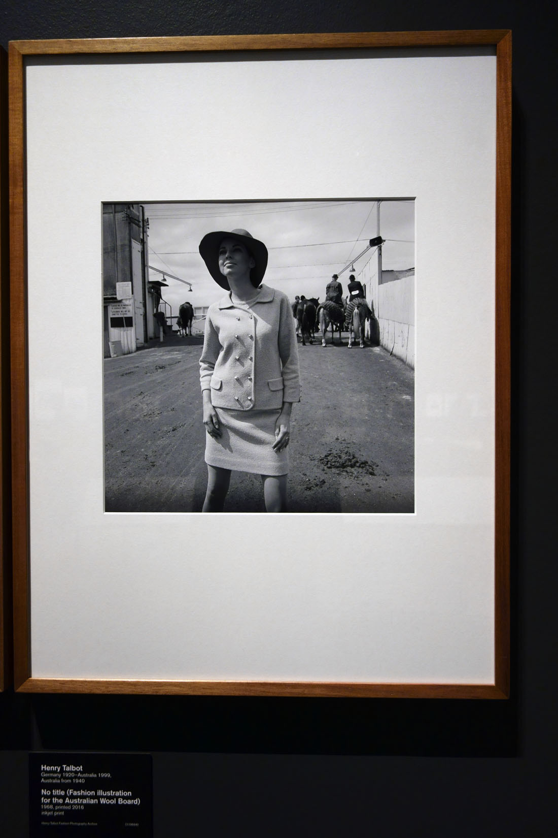
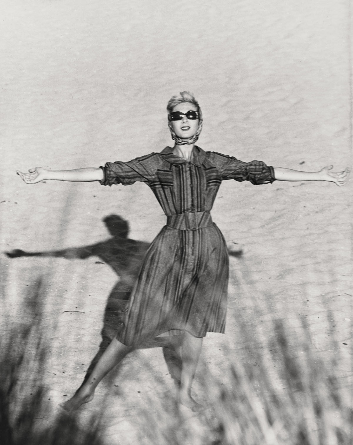
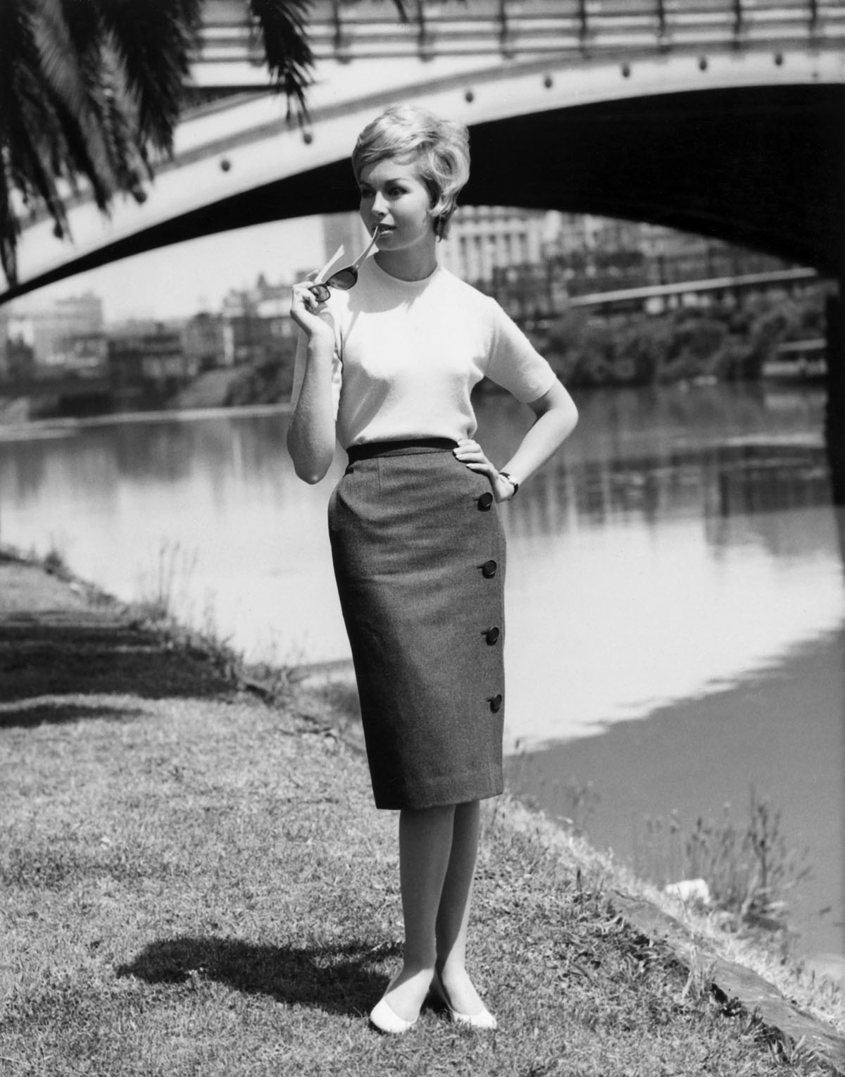
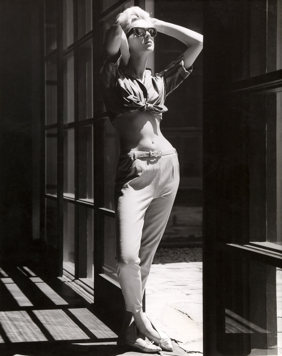
To be frank, this handsomely installed exhibition of the work of Australian fashion photographer Henry Talbot is a bit of a let down. The images look terribly dated, and while historically they have some significance in terms of the time and context from which they emerged – the movement towards en plein air photography, taking the model from the studio to the street – most of the photographs are not very good. The prints are either commercial vintage prints with all their faults (dust, scratches, poor printing, over exposure, lack of burning in etc.) evidencing a lack of care and attention to detail, or modern inkjet reproductions from original negatives and even then some of the printing is poor: for example, the hair of the model in Fashion illustration for Blunden Wool, models Joan Crellin and Bruce Anderson (1961, below) is completely blown out with no detail retained in the highlights. Some of the angles in his images (the positioning of the figure) are just off, the cropping of the negatives (the space above and below the figure) often does not work and framing of the prints is also less than exemplary. But we must remember Talbot was a commercial photographer from the 1960s and that’s just what these photographs are: commercial fashion photographs that fulfil a client brief.
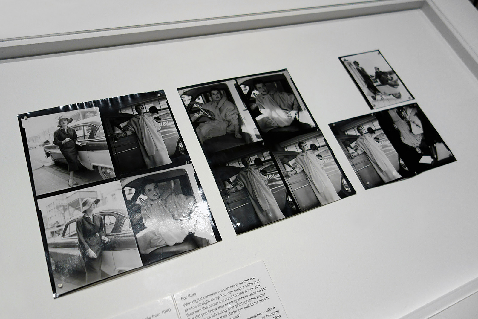
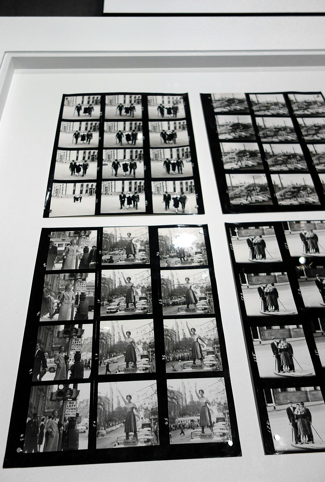
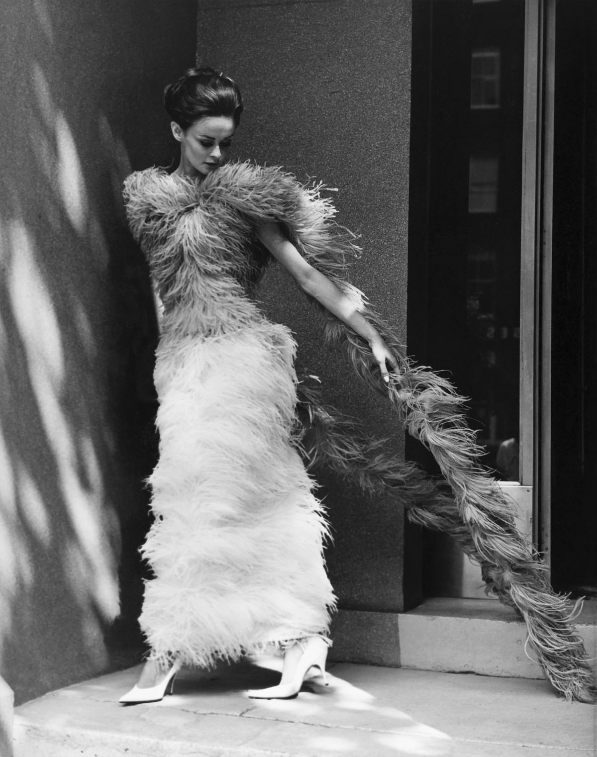
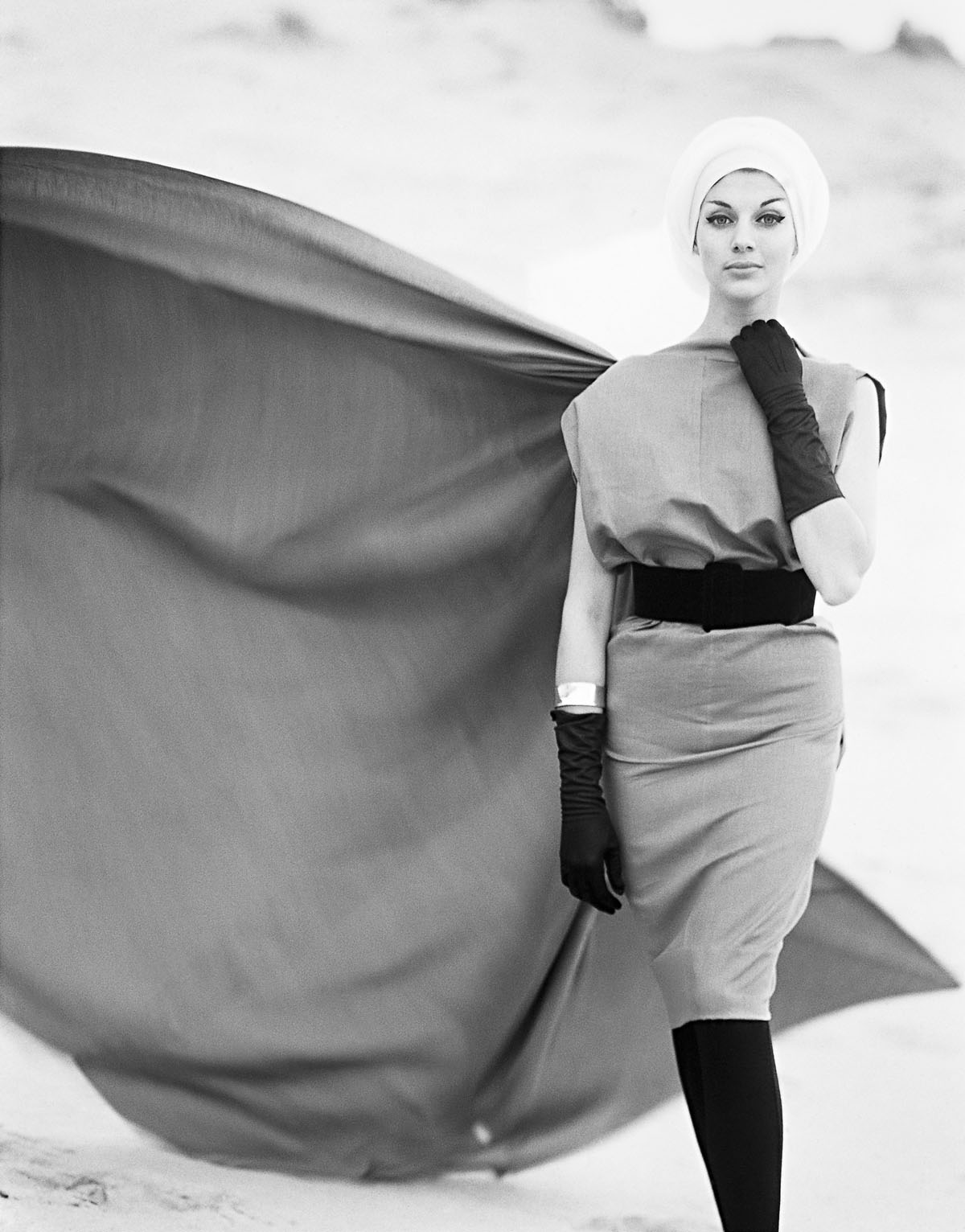
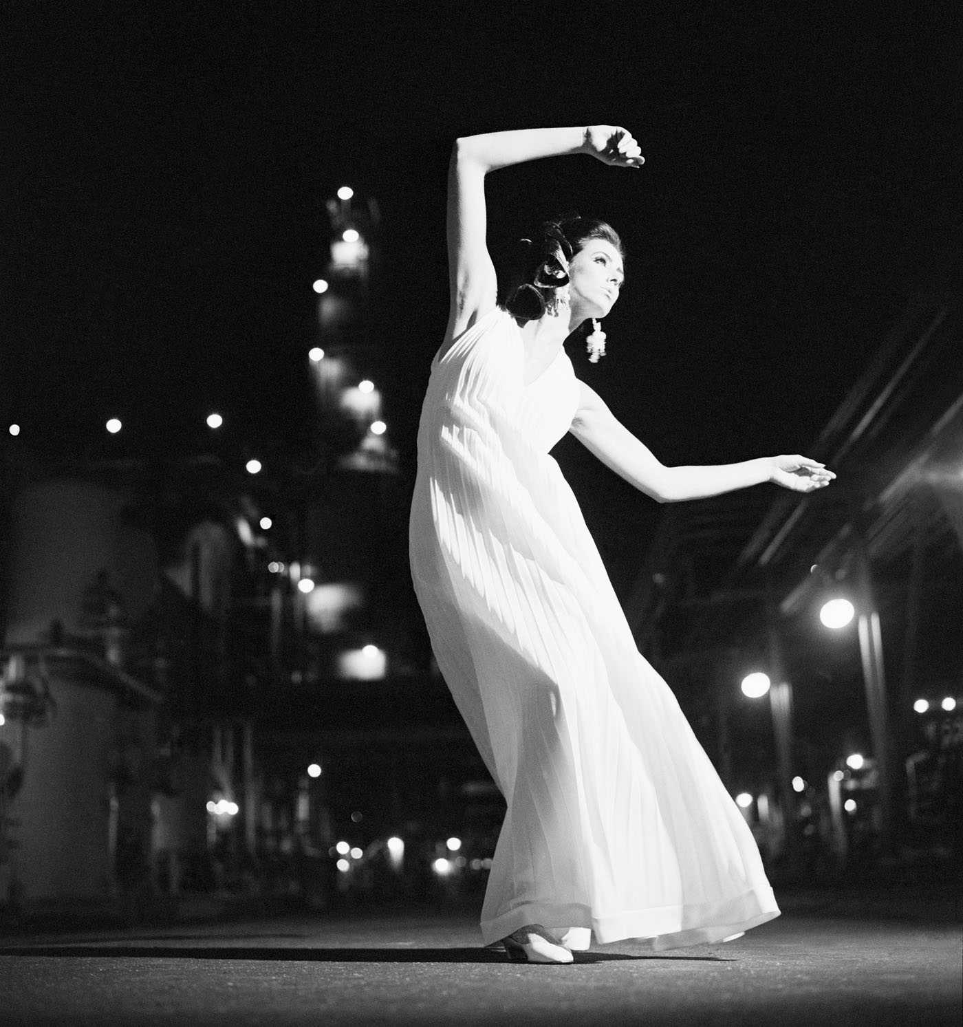
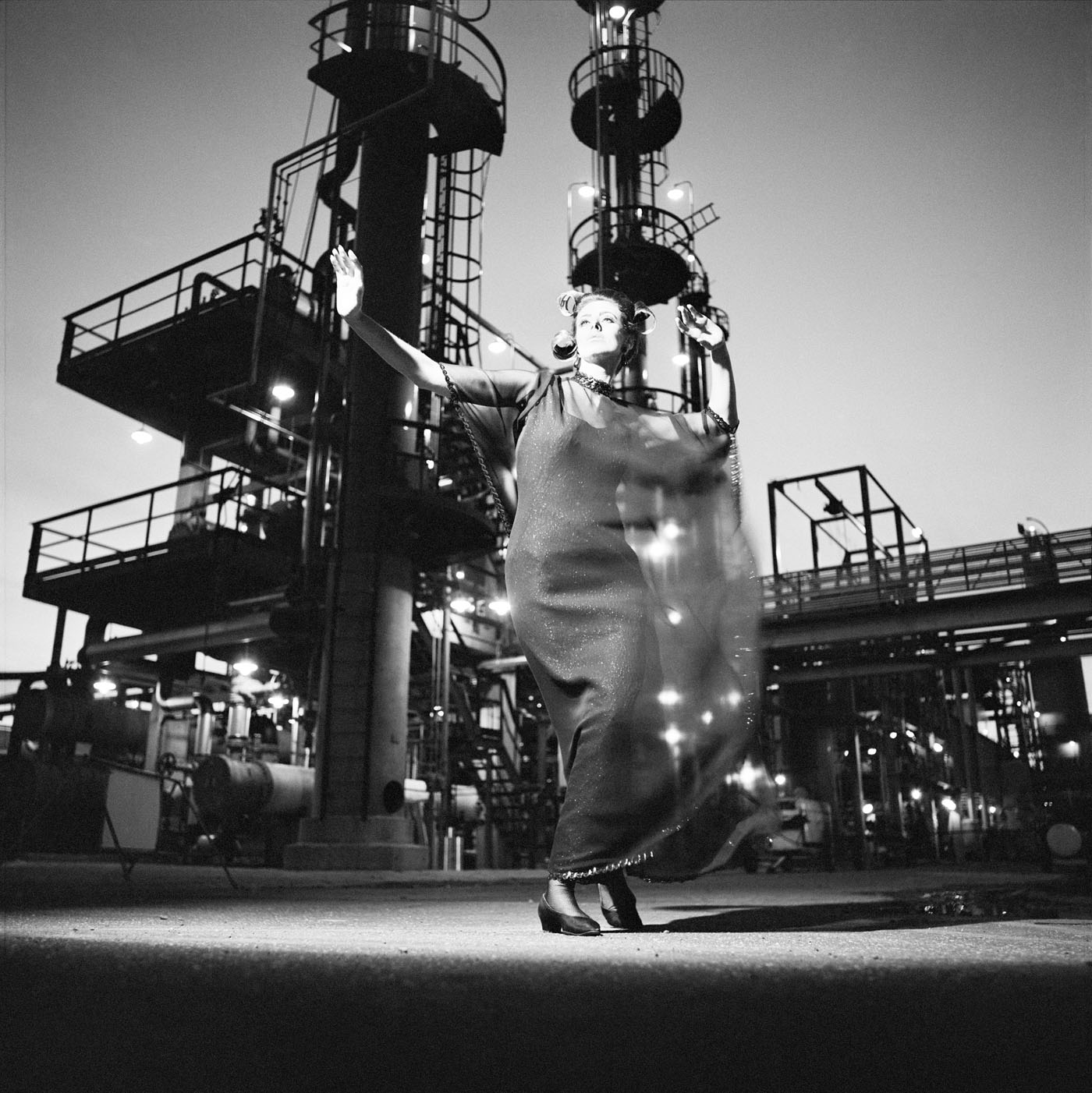
Talbot was no experimenter. Too often his images are really basic, a basic visualisation, and he has a fixed idea for a shot and goes with that idea and variations of it, even when it is evident that the photograph is not working. Any photographer worth their salt would recognise such a situation and be flexible enough to change it up but with Talbot this does not happen. Positioning his model centrally, he usually uses low depth of field so that everything falls out of focus behind. In this sense he still seems to possess a studio mindset. While professing his love of free-moving fashion, his photographs seem stilted and conformist, even as they are taken out of doors. His proof sheets are evidence of a “team” oriented focus in order to fulfil a client brief, but in these very proof sheets we see uneven exposures and severe cropping into the frame to get the final image. And while he was more romantic than the hard edged Helmut Newton, his photographs only ever project a surface and rarely show any true emotion. Without doubt his best two photographs are Fashion illustration for Fibremakers, model Maggi Eckardt (1966, below) taken at the Altona Petrochemical Company. The photographs are a symphony of form, movement and light. They possess a “feeling” a lot of his other photographs simply cannot, and do not, contain.
There is no catalogue to the exhibition so this posting will have to serve historically to document the exhibition and Talbot’s work. Thus, there is an in depth interview included with Australian curator, artist and photography collector Joyce Evans who ran Church Street Photographic Centre in Melbourne from 1976 and who showed Talbot’s work in her gallery. It is all very well that I have an opinion on the work but what I write needs to be an informed opinion, and the interview with Joyce provides valuable background with regard to the people, the era and the context from which these photographs emerged. One thing noted in the conversation is that Talbot photographed strong, independent women like Janice Wakeley and Maggie Taberer… something that is not mentioned at all in the wall text and press release that accompanies the exhibition. I would have thought it vital that a curator would have linked the presence of these independent women in fashion photography to the work of art photographers such as Australian artist Carol Jerrems who published her seminal book A Book About Australian Women in 1975.
Another insight into the times is provided by a friend Ian Lobb who knew Talbot:
“People said he was good, and he charged enough, but he just thought he was having fun, fun with a certain quality. I don’t think he had any grand ideas about his talent, but he was quite prepared to sell a print or sell his time if someone wanted to pay. Henry knew the fun he was having wasn’t going to last beyond his life. And now, it is weird and very country town that his work should be regurgitated. His work looks poor because people are making him into something he wasn’t.
There is a seminal incident that can help with the context of the Henry Talbot, Athol Shmith and Helmut Newton generation. Athol Shmith was giving a print critique at Prahran, and someone had left a glass of fixer on the shelf of the room. Athol finished his critique and drank it. Rushed to hospital of course. But think of that from all its angles. The world in which these photographers worked and the stories from those times reveal a world that was flying by the seat of its pants – just.”
Talbot is a solid photographer, no more. While the exhibition gives some sense of depth to the quality of work that was coming out of Melbourne at that time, perhaps it would have been best to let sleeping dogs lie.
In conversation with Australian curator, artist and photography collector Joyce Evans about the Australian photographer Henry Talbot
17/07/2016
MB: Just before we started this conversation you said to me Joyce that Talbot was a gentle man. Can you explain what you meant by that please?
JE: I use the word gentle in comparison to his one-time partner Helmut Newton, who I found to be an aggressive man.
MB: So they were in partnership together before Newton left for Europe
JE: Yes
MB: So Talbot was intelligent, he knew his field and understood the history of the genre that he was working in, he could speak well, and was well liked both by clients, models and the society in which he worked.
JE: Well, he was not a superficial person. When he spoke he researched things properly, he had the depth of knowledge which came from a sort of European intellect. This intellect was broadly read, and he was also a person that listened.
MB: And he was also a good teacher as well…
JE: In his commercial work, Henry photographed his women (as far as I could see), with the idea of having a client, and he was displaying clothes on the women, which was part of the old tradition. In an environment where, if you wanted to make a living, that’s what you had to do. If he had been, however, in a place like New York – which was avant-garde as compared to Melbourne, which was not avant-garde – he may well have gone the same way as Helmut Newton. The very big difference, though, is in the personality of the two men.
Helmut Newton went out and he was an aggressive man. He had charm, but it was an aggressive charm, it wasn’t a gentle charm. He had intelligence and he knew how to handle his women so that he got aggression out of his women, that’s what he wanted.
MB: Whereas Talbot was doing it for a job?
JE: Talbot A was doing it for a job and B, he had a gentle nature. He was not an aggressive man and actually if you look at those photographs you can see that he liked the women that he photographed and he lived in an environment where fashion was still, fairly soft, in many ways. You can see in things like the swimwear industry and the sports industry there was quite a lot of Australian independence, but he, combined with Athol Shmith in Melbourne, took his models out into the street, they interacted with the environment, and he did not depend on the studio.
MB: When I look at his photographs they are quite modernist, they are quite clean, but his vision seems to me to be quite limited… in the sense that he uses a central female figure (sometimes two central figures), low depth of field, out of focus background. And then you look at the proof sheets and you can see that he is not an experimenter. From shot to shot there is a slight change in angle of a hand or the tilt of a head but he really doesn’t push the boundaries of what he is trying to say with the image. He has his set idea (for the shot, for the location) and then he does slight variants in the proof sheet towards that idea. Very rarely do you get a feeling, a sense of atmosphere in his images – of the outdoors in the sense of the outdoors enveloping the model. The models seem to be isolated within their environment…
JE: But who does what is asked of him, at that time? You can compare him to Avedon or Athol Shmith, but you cannot compare him to today. You cannot ask someone to work outside of his own time. You can ask him to lead in his own time and the leading that occurred at that time, by both Shmith and Talbot, was that they took models out into the city and the environment and away from the studio. This was something that Avedon did and these two photographers did also. The big argument is, did Talbot do it effectively? Who chose his proofs? Which ones got published?
MB: But also, a quite organised and restricted view of the world, even though he was pushing the boundaries by taking fashion photography outdoors, he still seems to be in a studio mindset when he was outside.
JE: What you did in those days, is that you would do the shoot, you would come in with your proof sheets, and the art director would go over it with the red crayon with the team – it tended often to be team work. So he’s working to a brief …. and you are the instrument of the team. The art director sets everything up and you do the shoot. Now, when you get a name like Talbot had, you could start to begin to influence what the art director was doing. Now, how much and when and at what time and what effect – I really don’t know.
MB: Did he photograph strong women? You mentioned Maggie Taberer and Janice Wakeley.
JE: Maggie Taberer and Janice Wakeley – both educated women, well read women – Talbot would have chosen his own models and they were two of his favourites. Or been offered models, depending on the control of the art director and what they desired.
MB: Today, all we can do is try and understand the history of these photographs, and the time and context from which they emerged. From today’s standpoint they look rather dated and stilted.
JE: You have to see them from a decade earlier, looking at fashion photography in Australia from the 1930s and 1940s to see what was happening. The 1930s fashion stuff was very very largely in the studio. Very little of it was en plein air.
MB: But that doesn’t negate his aesthetic choices to shoot with so low a depth of field that the context of the outdoors becomes more or less irrelevant. Yes, you have the images of the oil refinery behind with the movement of the women, in my opinion some of his best photographs, that are more romantic in feel… and these tend to work better than other more prosaic shots.
JE: He was more of a romantic than Newton was. Newton was very hard edged and he managed to get that extra particular something out of his women…
MB: Even in his Melbourne images?
JE: Well, we don’t know Newton’s Melbourne images, because he has denied them all.
MB: Yes exactly, that’s the thing.
JE: Thinking about Talbot, he was part of a movement. He wasn’t the leader of it or the only one, but he was part of the early evolution of the movement.
MB: Does that mean his photographs stand up to scrutiny today?
JE: I have this feeling that when you only look at the top of the cake, you don’t know what the cake is all about. I don’t know whether I would put him as the fairy on top of the cake or one of the really nice pieces of icing. I think that Athol Shmith is a stronger photographer.
MB: What about the Australian photographer Bruno Benini? I find him incredibly strong in terms of his style, his lighting.
JE: My understanding of Bruno is that he is a decade younger that Talbot…
MB: So 1950s?
JE: Yes I think so
MB: So he has a more classical influence…
JE: It’s not that, he’s like John Eaton is to Pictorialism, he’s a very good photographer – but he’s not a groundbreaker, he’s not of the beginning of Pictorialism. I think Benini is a very good fashion photographer and I think he is working on other people’s shoulders. I think Athol Shmith is stronger and if I had a choice about having to show one, but I like the fact that we have shown Talbot, because it gives some sense of depth to the quality of work that was coming out of Melbourne. Places like Sportscraft were exceptionally good at encouraging talent, both in design and in photography.
MB: All I can do is understand the history and the context and what was going on at the time and then, as I was thinking the other day, all I can write is what I see.
JE: Compare this… Athol Shmith had Bambi. Bambi was the most exquisite women you would ever find in your whole life. I remember her when I was a teenager, me and my girlfriend were both sitting in a room and she was there, both in our late teens / early 20s, and I remember saying to my friend that I feel as though I have ten feet – and I am so clumsy when I look at her. She is so beautiful. Now Janice Wakeley was also a stunning looking women as was Maggie Taberer. But the number one model with Athol was Bambi and then there were really other top people that he had. And he, I think, had a much broader base to work with – not only his models, but his clientele was broader. Talbot was predominantly clothing as compared to Shmith who did a whole stack of things other than fashion. His love of music, he did a lot of musicians, he did some amazing portraiture. Shmith did H.G. Wells etc…
MB: His breadth was greater than Talbot. My concern with Talbot is 1/ the dating of the images, and 2/ his aesthetic choices when taking those photographs which may be a team decision but, the fact that he didn’t experiment that much. When looking at his proof sheets there are only slight changes to the positioning of the model…
JE: He’s got an idea and he goes for it.
MB: And that just really shows a lack of flexibility in his vision.
JE: No, I don’t think so I just think that it shows that he knows what he wants and that’s it.
MB: I think that is where we differ.
JE: He is very professional. How many shots of a person do you make at a time?
MB: I work on a ratio of 10 to 1, so if you take 10 shots you will get one, possibly two excellent shots. Talbot must have been thinking I need one good shot and he kept shooting and shooting, even though some of his exposures are poor, even though he radically crops the full frame image to get the final shot. It shows he was not as confident as you think about getting the shot, because he is hedging his bets with his in camera framing, relying on cropping later.
JE: He knows he wants her getting this feeling, and he goes bang, bang, bang, head turned slightly, arm down slightly and that’s it… and he knew what he wanted at the beginning and then he just saw the variations to fine tune it. And that’s what every photographer tends to do.
MB: And that’s where I really think there is a problem with his photography. Most of his images don’t really work – and yet he never recognised that fact at the time, when he was taking or setting up the shot, that it was not working. Any good photographer worth his salt, worth his previsualisation of the shot, must know how to adapt and be flexible enough to change on the run. He didn’t recognise that they weren’t working and change the idea. That’s the problem I have with him. It shows a fixed mindset in terms of not being able to see through the viewfinder when a shot is not working.
JE: That’s another story…
MB: Let’s leave it there. Thank you Joyce so very much for your thoughts.
“Well man, this is 1966 and in this game you have to be open to, and live, contemporary influences to a certain degree. The younger generation is very strong in fashion – very much in command. They’re spending a great deal of money in the garment industry, so fashion is geared to the young. There is, of course, in this “with it” idea itself, certain conformity to non-conformity, to a non-conformity standard. But, as a photographer, you must accept this idea as far as you can and that probably reflects to some extent in your own behaviour and dress.”
Henry Talbot, 1966
“I always tried to show models in a free-moving fashion. I avoided stiff poses and I tried to keep up with what the great fashion photographers overseas were doing”
Henry Talbot (Germany 1920 – Australia 1999, Australia from 1940) No title (Fashion illustration for Blunden Wool, models Joan Crellin and Bruce Anderson) (installation view) 1961, printed 2016 Photographed on location at the National Gallery of Victoria Inkjet print Henry Talbot Fashion Photography Archive
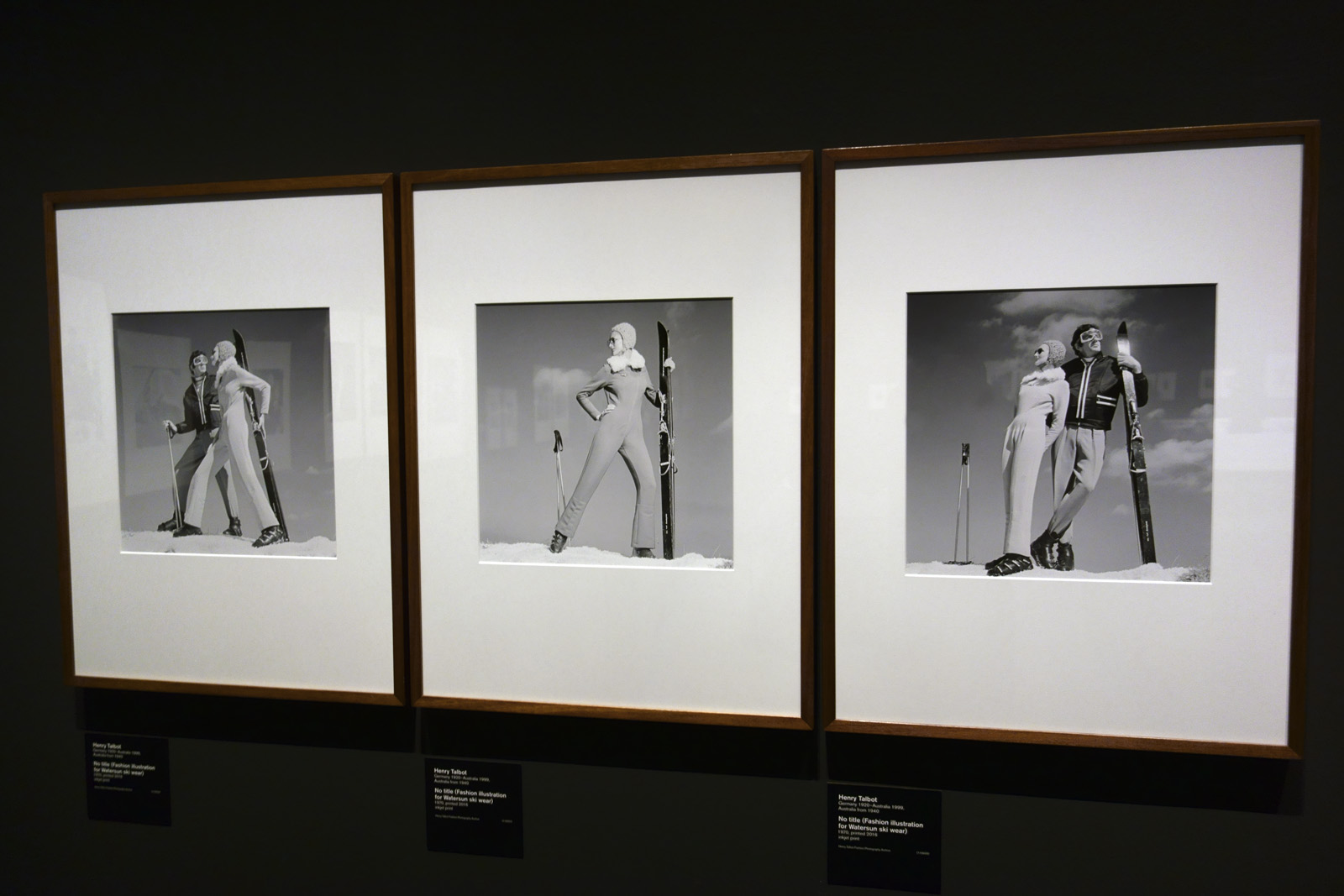
Henry Talbot (Germany 1920 – Australia 1999, Australia from 1940) No title (Fashion illustration for Watersun ski wear) (installation view) 1970, printed 2016 Inkjet print Henry Talbot Fashion Photography Archive
“There is little an Australian fashion photographer can do that has not been done overseas, and often better. But one thing they do not have is our Australian environment. I use it a great deal because the idea makes it possible to come up with something uniquely different.”
Henry Talbot 1966
“The striking and youthful fashion of 1960s Melbourne is the starring subject of more than eighty photographs by fashion photographer Henry Talbot, many of which have never been exhibited before. Showcasing the shifting face of fashion from a time that has captured popular imagination, many of the images have never been seen since their original publication 50 years ago and offer an insight into the styles and attitudes of the 1960s. The photographs on display have been carefully selected from an extraordinary archive of 35,000 negatives that Talbot gifted to the NGV in the 1980s.
“Henry Talbot’s photography captures the exuberance and changing times of a generation. His modern photographs depict an emerging youth culture and offer an insider’s look into a thriving cultural scene during the 1960s,” said Tony Ellwood, Director, NGV.
A European émigré artist from Germany, Talbot brought an invigorating internationalism to Australian photography and partnered with Helmut Newton. Their Flinders Lane studio was very successful enterprise and secured major clients including the Australian Wool Board and Sportscraft. It was during the 1960s that Talbot established his place as a dynamic force in Australian fashion photography and his work was regularly published in Australian Vogue.
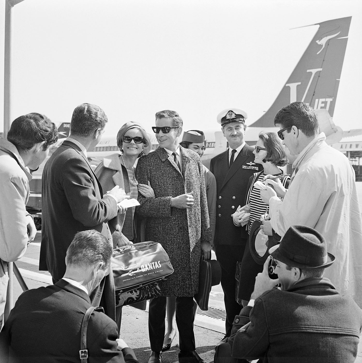
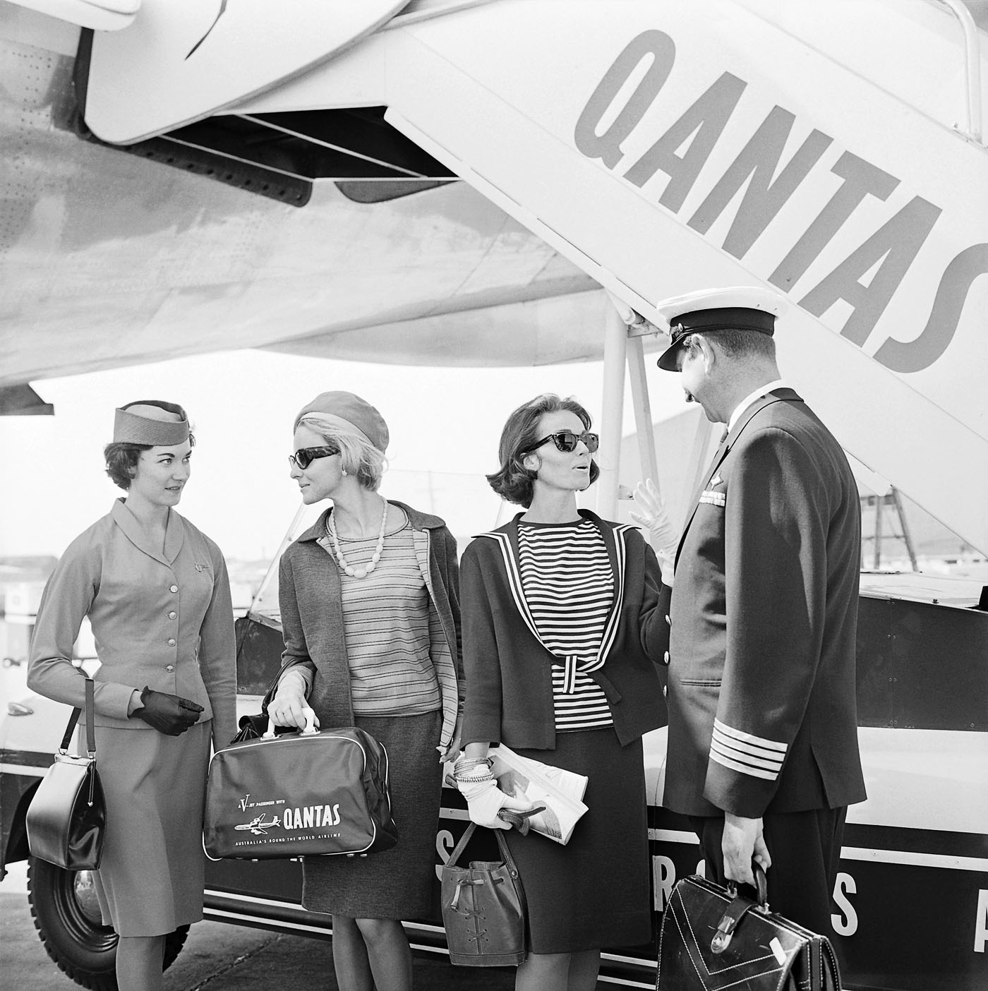
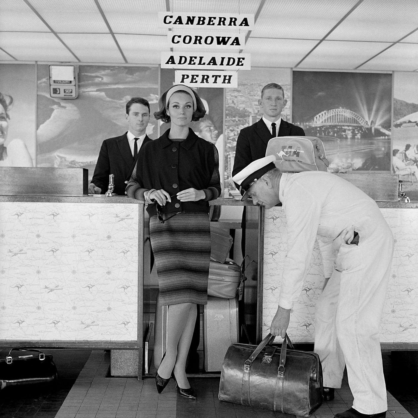
The exhibition includes some of Talbot’s beautiful fashion spreads from 1960s Australian Vogue, providing a visual history that chronicles the magazine’s first decade in Australia. The photographs will be presented alongside a display of early edition Australian Vogue magazines, including those in which Talbot’s photographs originally appeared, offering an insight into the aspirational fashion and lifestyle choices of Australians living in this era. Talbot’s photography also highlights the public’s affinity with uniquely Australian brands, such as Qantas and Holden. Fast cars and air travel were aspirational luxury experiences in the 1960s and, as a result, airports, planes and brand new cars were the glamorous setting for many of Talbot’s photographs, demonstrating his astute understanding of current trends and consumer culture.
From an outback sheep station, to lamp-lit streets of Melbourne, Australian cityscapes and landscapes also provided the backdrop to some of Talbot’s most arresting photographs. Shot on location around Melbourne, these photographs showcase Talbot’s adventurous style and ability to transform 1960s Melbourne into scenes that looked like Paris, London, New York – a testament to his ‘international eye’. A photographer with an astute vision, Talbot also ingeniously transformed Altona Petrochemical Company into an intergalactic, futuristic setting that captured the public’s fascination with space travel during the ‘space race’ of the 1960s. This exciting suite of images demonstrates the ways in which space travel permeated popular culture, including space-age fashion trends.
The exhibition will open during the NGV’s landmark 200 Years of Australian Fashion exhibition and together, these two exhibitions will offer a comprehensive and fresh new look at Australian fashion in the 1960s.”
Press release from the National Gallery of Victoria
Henry Talbot (Australian born Germany, 1920-1999)
Henry Talbot was born in Germany in 1920. As a young man he studied graphic design and photography in Berlin and Birmingham. After leaving Germany in 1939, he arrived in Australia in 1940. Following a period of internment, Talbot then served in the Australian army. In the postwar years he left Australia, travelling to South America and Europe, before returning to Melbourne in 1950. At the time Melbourne was the most important centre of fashion in Australia because of the abundance of textile and garment manufacturing in Flinders Lane; boutiques in the Paris End of Collins Street, and major department stores around the city.
Talbot worked in some of the leading Melbourne photographic studios and quickly established a reputation as a major fashion photographer in Melbourne. In 1956 he was invited to go into partnership with Helmut Newton. Newton was already renowned for his innovate fashion images and this partnership offered Talbot recognition for his talent in this field. In 1973 Talbot closed his studio, and ten years later presented the NGV with what is now known as the Henry Talbot Fashion Photography Archive. Works in this exhibition at taken from this remarkable collection, comprising 35,000 black-and-white negatives, photographs and contact prints.
Wall text
Installation view of the National Gallery of Victoria’s Henry Talbot: 1960s Fashion Photographer exhibition at NGV Australia at Federation Square with at left, No title (Fashion illustration, model Janice Wakely) (1961, below) (installation view) Photo: Brooke Holm
Working with the right model was as important to the success of Talbot’s images as choosing the right location. Like most photographers he had his favourite models, and often worked with Janice Wakely, Maggie Tabberer, Helen Homewood, Maggi Eckardt and Margot McKendry.
Talbot’s philosophy was simple, as he explained it in 1995: “I’ve always held that if you can establish a definite emotional rapport with a model you’re halfway toward producing good photographs. My own favourite method of fashion working is to explain roughly what I am after then leave the model more or less free to interpret the garment she’s to show. A good model will absorb and become part of what she is wearing almost completely. Whilst shooting away I may suggest minor changes, the model senses what I’m after, and then really good shots happen.”
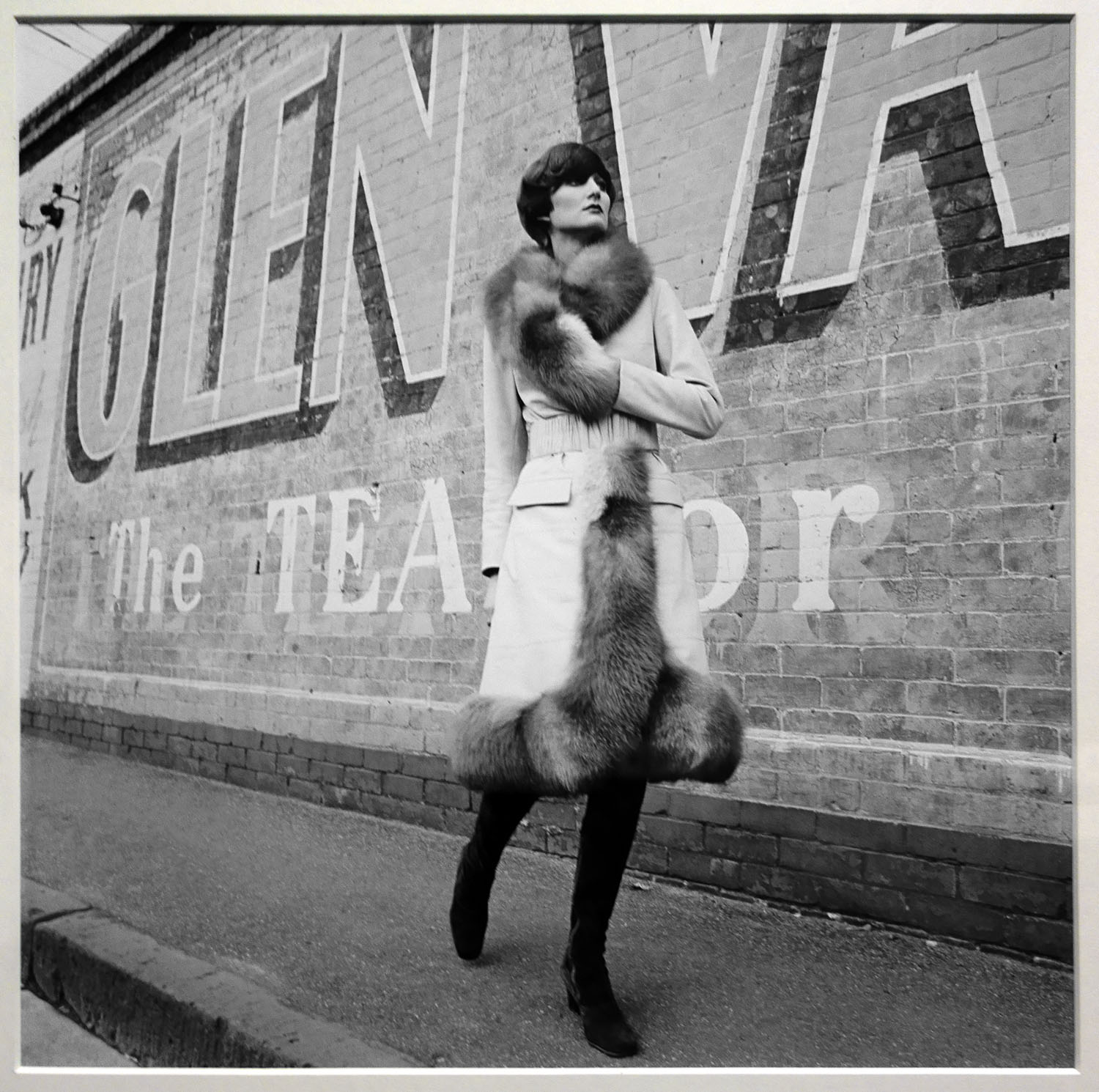
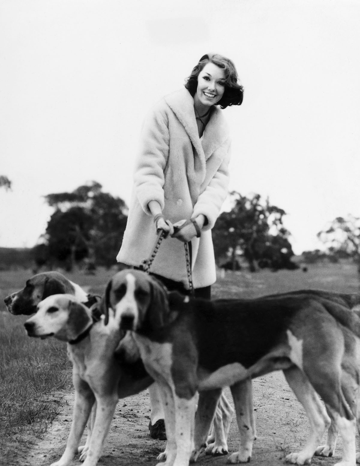
‘Forsaking city airs for cool country breezes, she previews the three day event at Oaklands Hunt Club which will finish the Melbourne Cup season, wearing a three-quarter oat of palest blue pearl lamb.’
Descriptive caption, 1966
Installation view of the National Gallery of Victoria’s Henry Talbot: 1960s Fashion Photographer exhibition at NGV Australia at Federation Square
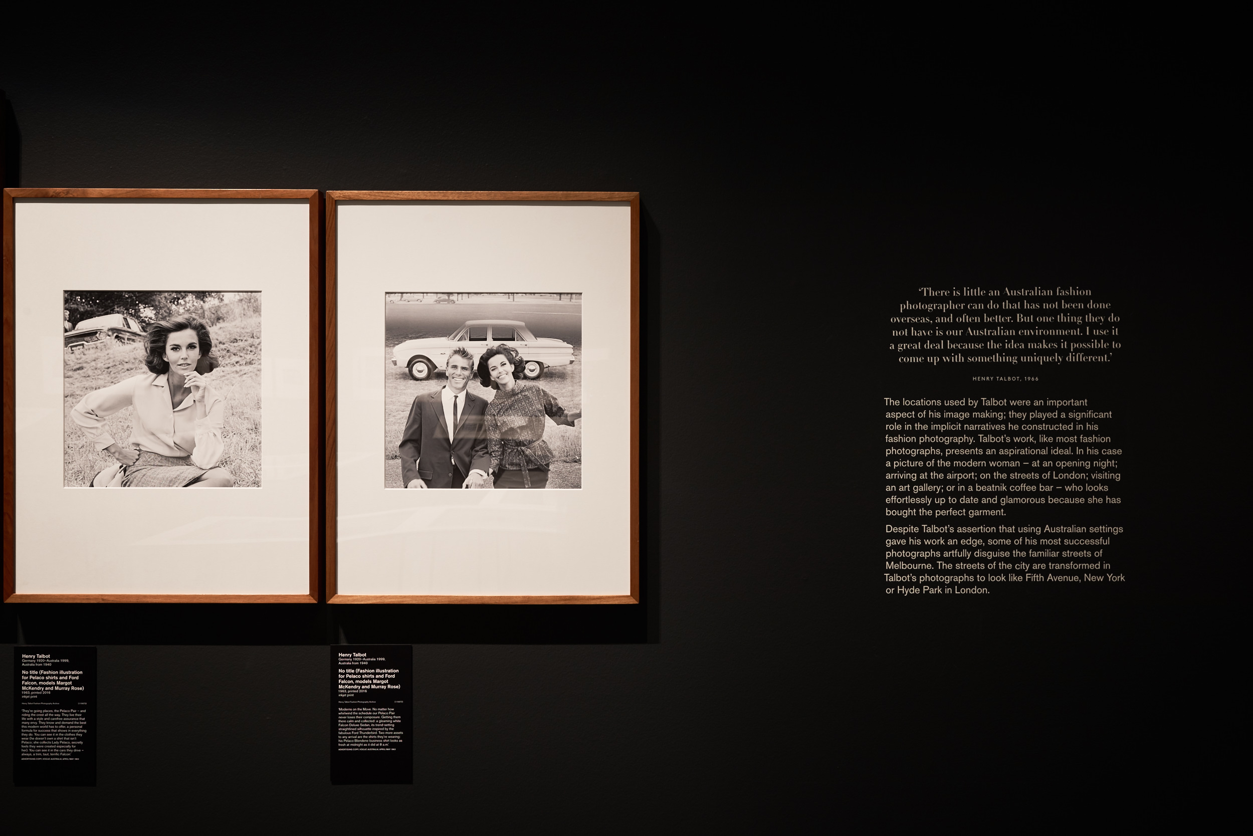
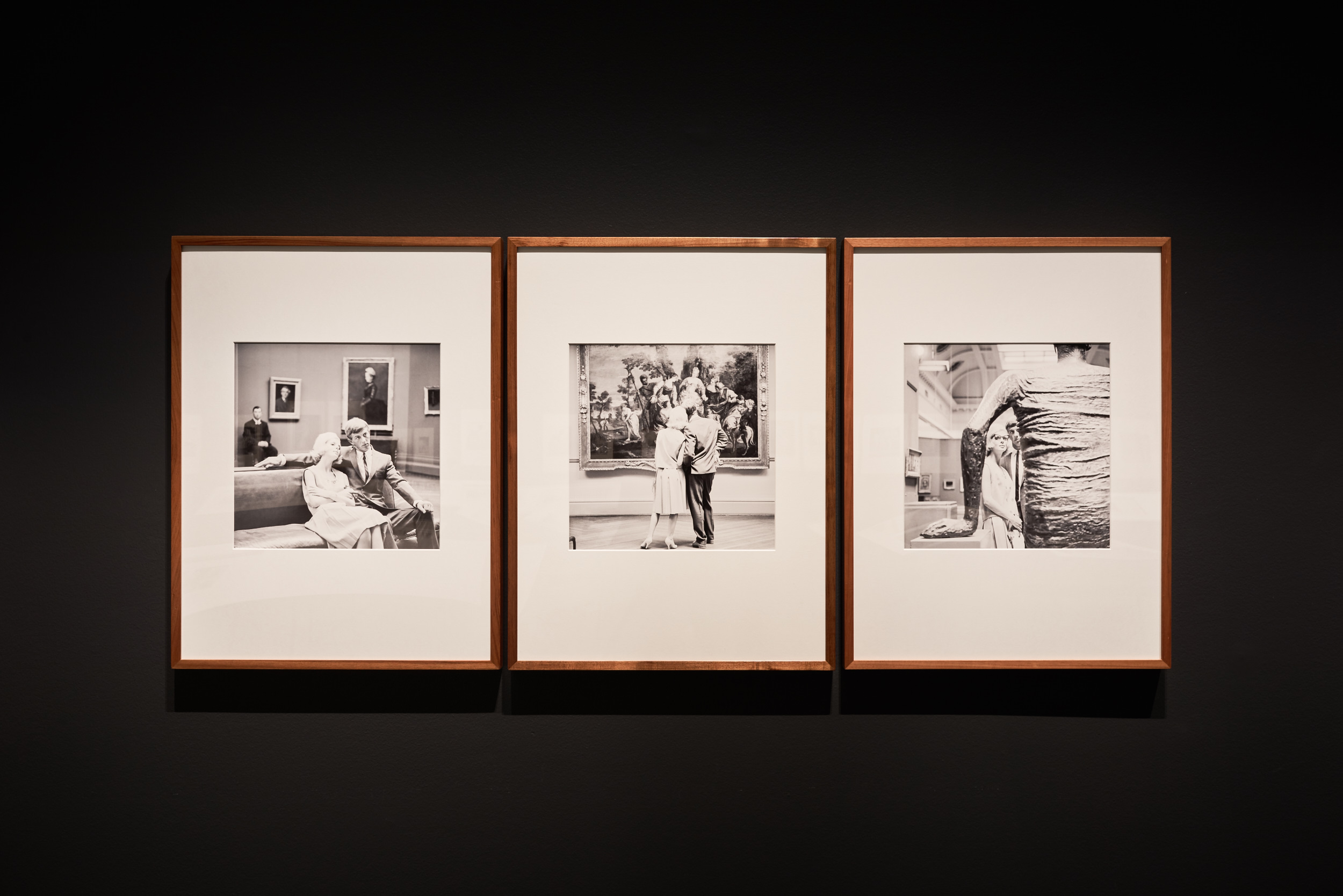
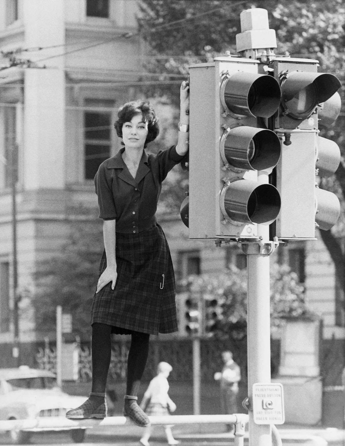
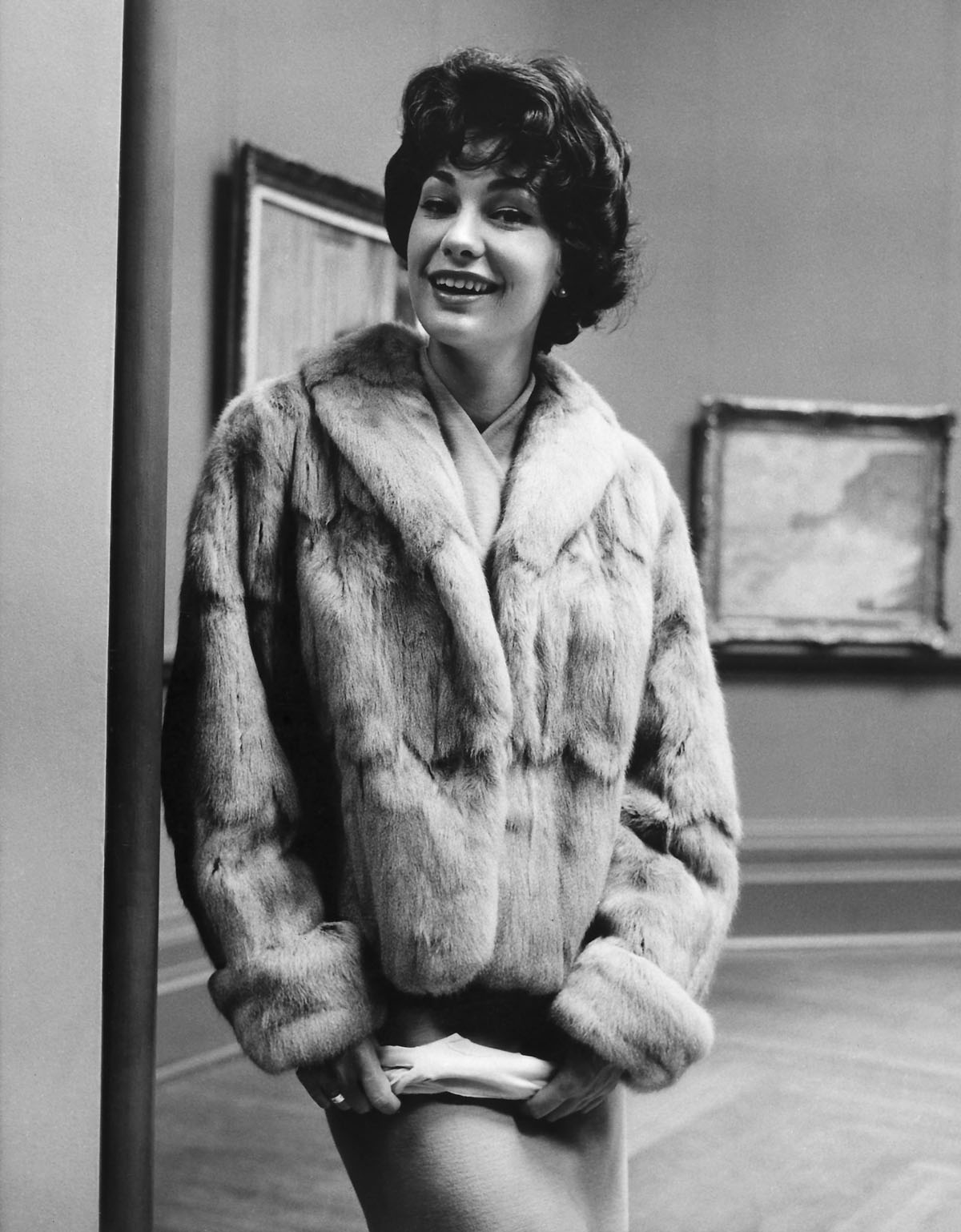
The locations used by Talbot were an important aspect of his image making; they played a significant role in the implicit narratives he constructed in his fashion photography. Talbot’s work, like most fashion photographs, presents an aspirational ideal. In his case a picture of the modern woman – at an opening night; arriving at the airport; on the streets of London; visiting an art gallery; or in a beatnik coffee bar – who looks effortlessly up to date and glamorous because she has bought the perfect garment.
Despite Talbot’s assertion that using Australian settings gave his work an edge, some of his most successful photographs artfully disguise the familiar streets of Melbourne. The streets of the city are transformed in Talbot’s photographs to look like Fifth Avenue, New York or Hyde Park in London.
The 1960s was a period of social turbulence, when youth-led movements changed the world. In Australia it was a time of prosperity: employment rates were high and, for many, the opportunities seemed boundless. The fashions of the day, including mini skirts and hipster pants, reflected the “youthquake” that was shaking up the status quo. Photography studios made the transition to the 1960s by creating images with a fresh, contemporary edge, and increasingly worked on location rather than in the studio.
Henry Talbot began to work in fashion photography in the 1950s, but it was in the 1960s that he established himself as a leading force in Melbourne’s fashion industry. He worked for designers and manufacturers, department stores and boutiques, as well as on the job for the Australian Wool Bureau, taking photographs that showed Australian fashion to the world.
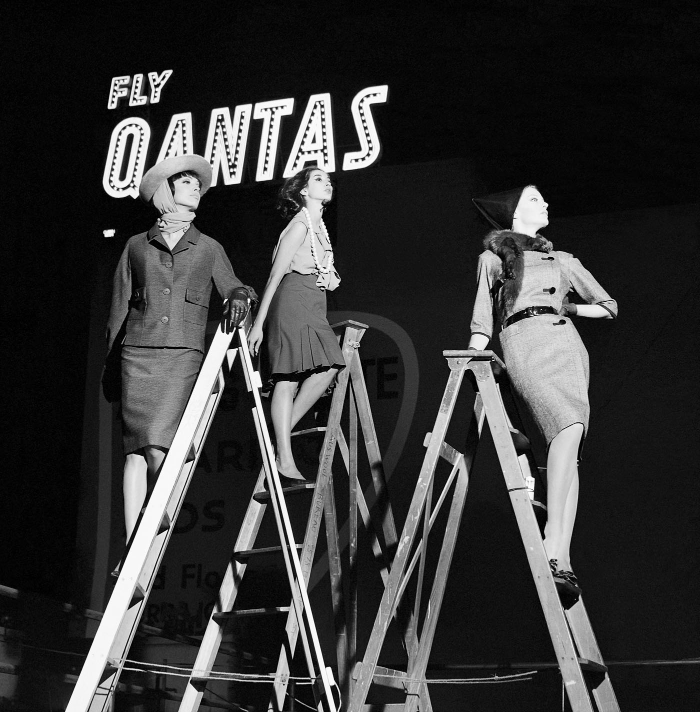
‘The magic carpet revisited: Classweave takes to the air. Classweave deny weaving the magic carpet, but [the] chic three disagree, find Classweave fabrics magic. Feel like flying,and choose Qantas.’
Advertising copy, Australian Vogue, 1963
Installation view of the National Gallery of Victoria’s Henry Talbot: 1960s Fashion Photographer exhibition at NGV Australia at Federation Square Photo: Brooke Holm
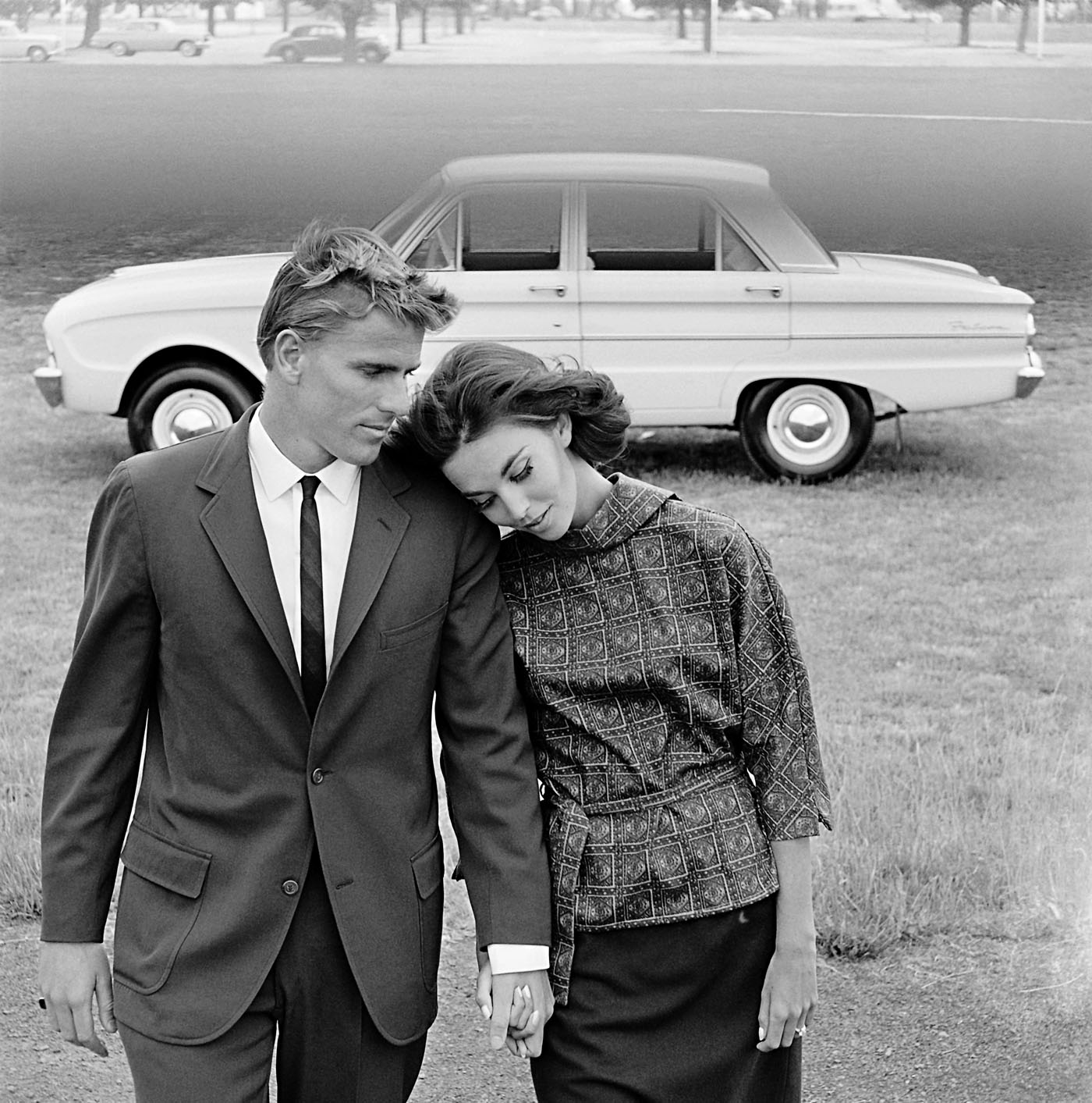
‘They’re going places, the Pelaco Pair – and riding the crest all the way. They live their life with a style and carefree assurance that many envy. They know and demand the best this modern world has to offer, a personal formula for success that shows in everything they do. You can see it in the clothes they wear (he doesn’t own a shirt that isn’t Pelaco; she collects Lady Pelaco, secretly feels they were created especially for her). You can see it in the cars they drive – always, a trim, taut, terrific Falcon.’
Advertising copy, Vogue Australia, April/May 1963
Murray Rose (Australian, 1939-2012)
Iain Murray Rose, AM (6 January 1939 – 15 April 2012) was an Australian swimmer, actor, sports commentator and marketing executive. He was a six-time Olympic medalist (four gold, one silver, one bronze), and at one time held the world records in the 400-metre, 800-metre, and 1500-metre freestyle (long course). He made his Olympic debut at the 1956 Summer Olympics as a 17-year-old and won three Olympic medals, all gold. Four years later, as a 21-year-old, he won three Olympic medals (one gold, one silver, one bronze) at the 1960 Summer Olympics.
At the age of 17, Rose participated in the 1956 Summer Olympics in Melbourne. He won the 400-metre and 1500-metre freestyle races and was a member of the winning team in the 4×200-metre freestyle relay. Winning three gold medals in his home country immediately made him a national hero. He was the youngest Olympian to be awarded three gold medals in one Olympic Games. Afterwards, Rose moved to the United States to accept an athletic scholarship at the University of Southern California where he received a Bachelor of Arts degree in Business/Communications.
He continued competing while at USC, and graduated in 1962. At the 1960 Summer Olympics in Rome, Italy, Rose again won an Olympic gold medal in the 400m freestyle, as well as a silver in the 1500m freestyle and a bronze in the 4 x 200m freestyle relay, bringing his haul to six Olympic medals. In addition to his Olympic medals, he won four gold medals at the 1962 Commonwealth Games in Perth, Australia. He eventually set 15 world records, including the world record in the 800-metre freestyle in 1962, which was not broken until Semyon Belits-Geiman set a new record in 1966. Rose continued to compete as a masters swimmer. During the 1960s, he also pursued an acting career, starring in two Hollywood films and making guest appearances on television shows.
In addition, Rose worked as an Australian sports commentator for the Nine Network, plus each of the major US networks, participating in seven consecutive Olympic Games.
Installation views of the National Gallery of Victoria’s Henry Talbot: 1960s Fashion Photographer exhibition at NGV Australia at Federation Square Photos: Brooke Holm
Maggie Tabberer AM (also known as Maggie T; born 11 December 1936 – died 6 December 2024) is a dual Gold Logie-winning Australian fashion, publishing and media / television personality. Maggie’s first modelling job was a one-off assignment at the age of 14, after a photographer spotted her at her sister’s wedding. She attended a modelling school in her early twenties, and at the age of 23 was discovered by photographer Helmut Newton, who mentored her and launched a highly successful modelling career. While living in Melbourne in 1960, she won ‘Model of the Year’, and moved to Sydney to take advantage of the modelling opportunities there, but she chose to end her modelling career at the age of 25 after she began to lose her slim figure.
Tabberer stayed well connected to the fashion industry, however. In 1967 she started a public relations company, Maggie Tabberer & Associates, which took on many fashion-related clients and assignments. In 1981, she launched a plus-size clothing label called Maggie T. A portrait of her by Australian artist Paul Newton was a finalist in the 1999 Archibald Prize.
Publishing work
Tabberer began working in publishing when she wrote a fashion column, “Maggie Says”, for Sydney’s Daily Mirror newspaper in 1963. She remained with the paper for sixteen years, until billionaire Kerry Packer asked her to become fashion editor of Australian Women’s Weekly magazine in 1981, and she soon became the public face of the magazine, frequently appearing on its cover and television advertising. Tabberer stayed with Women’s Weekly for fifteen years until 1996.
Television work
Tabberer began appearing on television in 1964, as the “beauty” on panel talk show Beauty and the Beast (the “beast” being the show’s host: Eric Baume until 1965, and then Stuart Wagstaff). Tabberer’s appearances on Beauty and the Beast made her a household name, and she began hosting her own daily chat show, Maggie, for which she won two consecutive Gold Logies, in 1970 and 1971. She was the first person to win back-to-back awards, although Graham Kennedy had already won three non-consecutive Gold Logies by 1970.
Since 2005, she has hosted her own television interview show, Maggie… At Home With on Australian pay TV channel Bio. (formerly The Biography Channel). On her show she “visits the homes of various Australian celebrities and elites to discuss their lives, careers, tragedies, and triumphs.”
“Fibres for fashions future. Its theme was fibres for the present and the future … pictures taken by Melbourne photographer Henry Talbot – a man who is as sophisticated as James Bond and always a jump ahead of ‘now’. The visiting ‘Venusians’ in Mr Talbot’s photographs (Maggi Eckardt and Jackie Holme) are gyrating at the Altona Petrochemical Company in Victoria.”
Maggi had been brought up on Sydney’s northern beaches and went to a ladies’ college in Manly. She had the proud, sultry looks of a flamenco dancer. Her distinctive appearance limited her potential in Australian modelling but she was heaven-sent for elegant Parisian designers such as Balenciaga and Givenchy and was transformed through the worshipping lens of American photographer Richard Avedon into an international icon. After seven years overseas, Maggi returned to Sydney in 1972 to be embraced as a TV personality and high-profile fashion adviser to David Jones.
Text from Gerald Stone. “The six wives of Singo,” on The Sydney Morning Herald website July 27, 2002 [Online] Cited 09/10/2021
During the 1960s Maggi Eckhardt was one of the world’s most sought after models. Her modelling career began in 1958 when she was selected to model for celebrated British designer Norman Hartnell. He offered her a job in his London salon and she never looked back. The brunette beauty rapidly shot to international fame modelling top designer brands including Dior and Balenciaga. She posed for a string of famous photographers such as Richard Avedon and Helmut Newton and graced the covers of Australian and French Vogue.
Text from “Australia’s 25 top models named” on the News.com.au website [Online] Cited 17/08/2016. No longer available online
Henry Talbot (Germany 1920 – Australia 1999, Australia from 1940) No title (Fashion illustration for Blunden Wool, models Joan Crellin and Bruce Anderson) (installation view) 1961, printed 2016 Photographed on location at the National Gallery of Victoria Inkjet print Henry Talbot Fashion Photography Archive
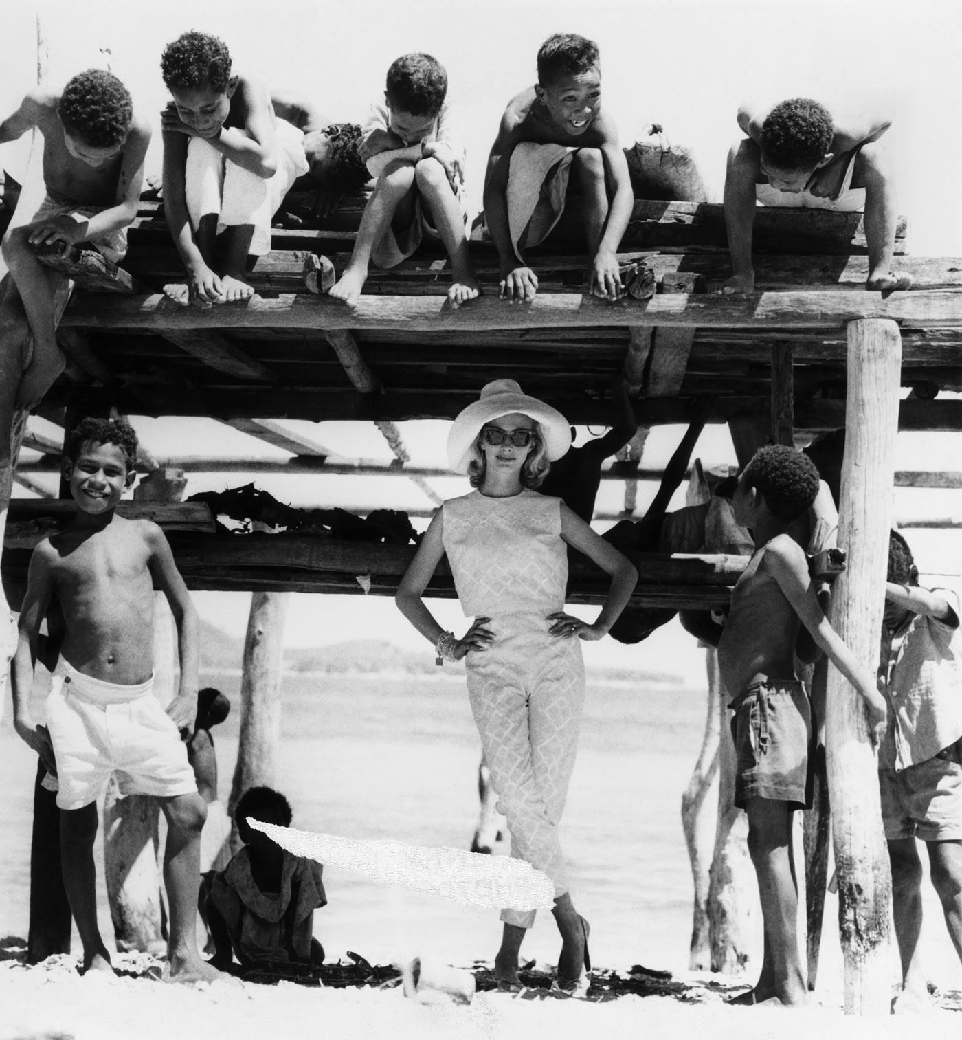
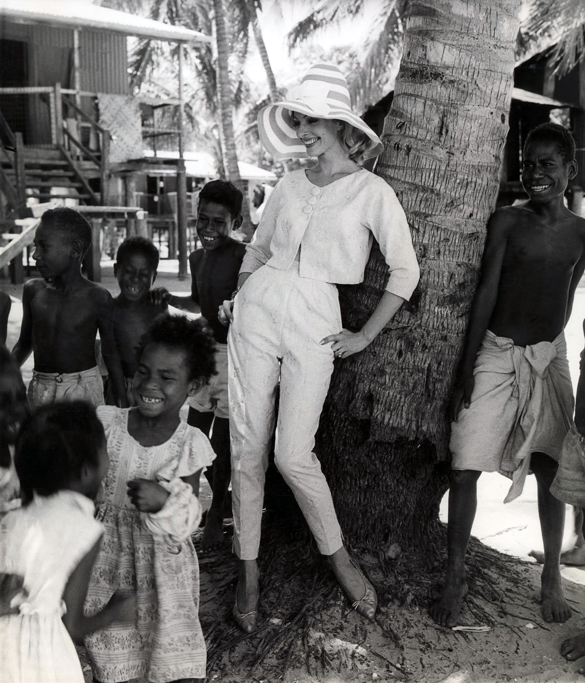
‘Discovering the hidden charms of New Guinea in the obvious attributes of Swiss cotton… she wears a cropped top and lean slack in sunny yellow, embroidered in diamond panels of white.’ Descriptive caption, 1966
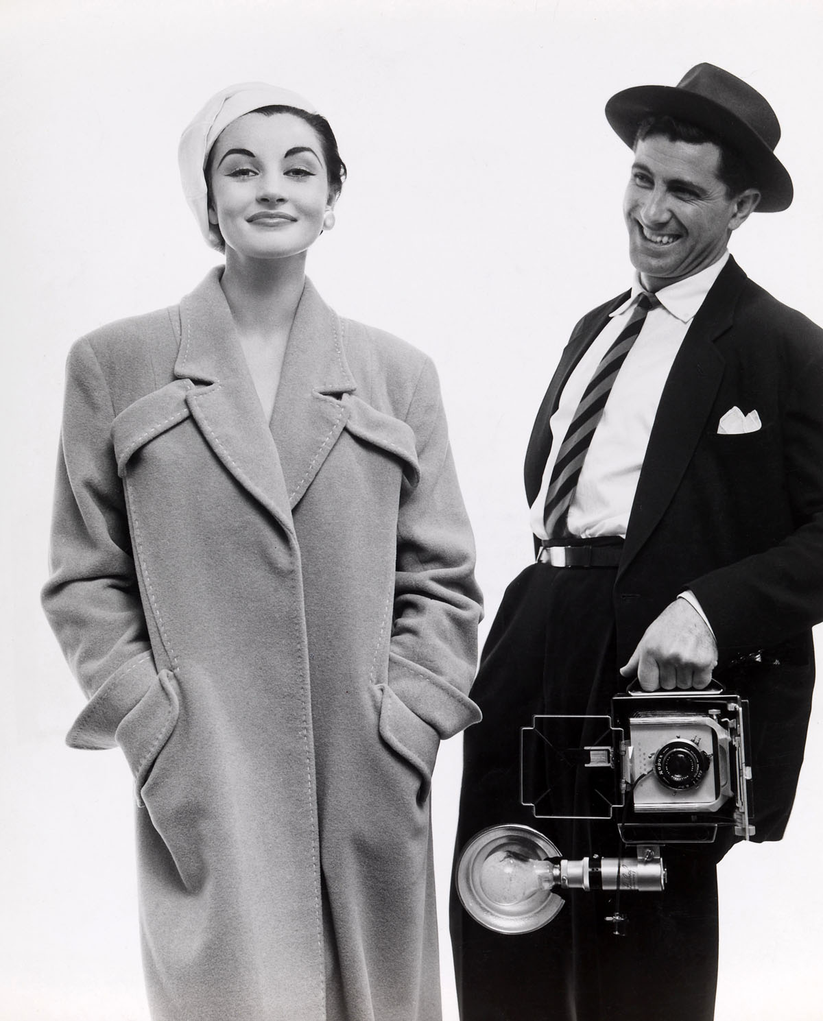
‘Town and country, sport and travel are words enough to place this American style coat in the all-purpose group, and its colour is the outstanding feature – honey bamboo saddle stitched with white. Loose and casual it has fly-away cuffs on sleeves, hip, and breast pockets, and a tailored revere collar. By Stella Ricks.’ Descriptive caption, 1960s
Janice Wakely, fashion model and photographer, graduated from Sydney’s Mannequin Academy in 1952 and began her modelling career in Melbourne two years later. Dismissed as ‘too thin’ by various Australian agencies after working on a Department of Trade-sponsored fashion tour to New Zealand in 1956, she decamped for London. Within ten days, Wakely snared a shoot with Marie Claire in Paris and St Tropez; soon, she was dubbed ‘The Girl of the Moment’ with ‘The Look of 1958’.
The Australian Women’s Weekly reported that, in the competitive English market, her “fragile but tough and oh, so carefully casual” look had set her apart – for the time being – from “the thousands from Commonwealth countries who invade Britain each year to see something of the world before they settle down to marriage and the building of a home and family.”
Returning to Australia in 1958, Wakely commandeered the camera herself, proceeding to capture photographers such as Helmut Newton, Athol Shmith and Henry Talbot while they worked with models on location. During this time, Wakely maintained a strong presence in front of the camera. Photographed by Terence Donovan in London in 1960, in 1961 and 1962, she starred in the All-Australian Fashion Parades, was featured on the cover of The Women’s Weekly, was Model of the Year and wore the Gown of the Year.
Then, in 1963, she stepped down from the catwalk, establishing the Penthouse modelling agency and photographic studio in Flinders Lane, Melbourne with co-model Helen Homewood. After an overseas tour in 1965, Wakely returned to Melbourne and set up a studio with fashion photographer Bruno Benini, who, according to People magazine, had “given many other girls a helping hand up the ladder to success”.
Wakely commented in 1968 that “the Australian sense of fashion is appalling”.
Extract from “Treasure Trove: Janice Wakely, fashion icon,” on the ABC Canberra website 11 October, 2012 [Online] Cited 30/07/2016. No longer available online
The Ian Potter Centre: NGV Australia Federation Square Corner of Russell and Flinders Streets, Melbourne
“An afterimage … is an optical illusion that refers to an image continuing to appear in one’s vision after the exposure to the original image has ceased.”1
I don’t usually mix politics and art on this website but today, before the general election this Saturday in Australia, I ask this question: what kind of country do we want in the future? One that cares about human beings of all ages, races, sexualities, socio-economic positions and health – or one that has no vision for the future and which is governed by market greed.
As an immigrant I am forever grateful that I can call Australia home. I arrived in 1986 and got to stay as a permanent resident because of a gay de facto relationship. I was one of the lucky few. But today, dear friends, I feel that something has gone terribly wrong with this country. Looking back nearly 30 years later I wonder what has happened to that progressive country that was an unpolished diamond, a bit rough around the edges but generous and welcoming when I arrived all those years ago. Things seem to have gone backwards, terribly backwards over the last 30 years. It’s almost as though the country of hope and fun that I arrived in is just an afterimage located in my memory, a vision that continues to flicker in the recesses of the mind but is no longer present in actuality.
Today, as with many countries in the Western world which are edging towards the right through a “conservative movement” with clearly defined tenets and agenda, we live in a country governed by the politics of fear. This politics of fear – grounded in rampant capitalism where making a buck takes precedence over the lives of people: its business – and linked to the Christian fundamentalist right and the “re-engagement between church and state” – is, as David Kindon notes, “moving Australia away from the notion of a secular democracy.”2
Australia is now a less generous place than it was 30 years ago, ruled by god-given, government-aligned order. Bugger the pensioners, cut the arts program funding, get rid of public health care, call for plebiscite on gay marriage where the bigots can come out of the woodwork and other people decide whether you are deemed “equal” to them, imprison vulnerable people in state run concentration camps where the government has the right to hurt other people… and the list goes on and on: Border Force as a quasi paramilitary force for our protection, more people in jail than at any time in our history (due to the privatisation of the jails = money, profit), and “new anti-protest laws [In New South Wales which] are the latest example of an alarming and unmistakeable trend. Governments across Australia are eroding some of the vital foundations of our democracy, from protest rights to press freedom, to entrench their own power and that of vested business interests.”3
Further, there is the “privatisation of government assets and services, attacks on public broadcasting services, deregulation of the private sector, and widespread cuts in the public sector.” (Kindon) As ever, the rich get richer, the miners get wealthier, and the poor get screwed. More entitlements were delivered to the wealthy and the corporate sector despite having seen the “end of the age of entitlement” announced by the Treasurer. Those very vested business interests.
This situation is not akin to the concept of “permanent temporariness” used to describe the plight of the Palestine State but is akin to that of a “permanent blindness” of a nation. Middle Australia will not hear what they don’t want to hear, will not see what they don’y want to see. Today, nationalism has become framed in terms of external (and internal) threats. Xenophobia in the recent Brexit poll in the UK is mirrored by simmering racism in this sun blessed country. Otherness, difference, liberal views, alternative thinking and, heaven forbid, being an open and responsible member of the human race (on human rights, on global warming, on not being in wars we have no business being in) are all seen as threatening to the middle-brow status quo. Steady as she goes for “Team Australia” and if you’re not with us, you’re against us.
Yes, let’s stick with this mob for a little while longer…
WAKE UP AUSTRALIA BEFORE ITS TOO LATE!
Dr Marcus Bunyan
1/ Anon. “Afterimage,” on the Wikipedia website [Online] Cited 21/09/2011
2/ David Kindon. “The Political Theology of Conservative Postmodern Democracies: Fascism by Stealth,” on the A Fairer Society website [Online] Cited 29/06/2016. No longer available online
Persons Of Interest – Australian Security Intelligence Organisation (ASIO) surveillance 1949-1980 Author Frank Hardy in the doorway of the Building Workers Industrial Union, 535 George St, Sydney, August 1955 NAA A9626, 212
Lifejacket and lifebuoy from the MV Tampa 2001 Wallenius Wilhelmsen MV Tampa collection National Museum of Australia
“There was one man from Nauru who sent me a letter that I should have let him die in the Ind … the Indian Ocean, instead of picking him up. Because, the conditions on Nauru were terrible. And that is a terrible thing to tell people, that you should have just let them drown.”
J.W.C. Adam Asylum seekers protesting against detention at Villawood Immigration Detention Centre on 22 April 2011 2011 CC BY-SA 2.5
“And when we call these places of horror in the Pacific ‘concentration camps’, that is an appropriate term, because that is what they are.
And when we accuse the Australian government of selectively torturing brown-skinned people in the way the Nazis chose the Jews and other groups to torture and ultimately eliminate, that is an appropriate thing to do, because we all know, in our heart of hearts, that if these people fleeing oppression were white, English-speaking Christians (white Zimbabweans, say) then their treatment would be completely different.”
Ben Quilty (Australian, b. 1973) Trooper M, after Afghanistan 2012 Oil on linen Collection of the artist
Keast Burke (New Zealand, Australia, 1896-1974) Husbandry 1 c. 1940 Gelatin silver photograph, vintage 30.5 x 35.5cm image/sheet Gift of Iris Burke 1989
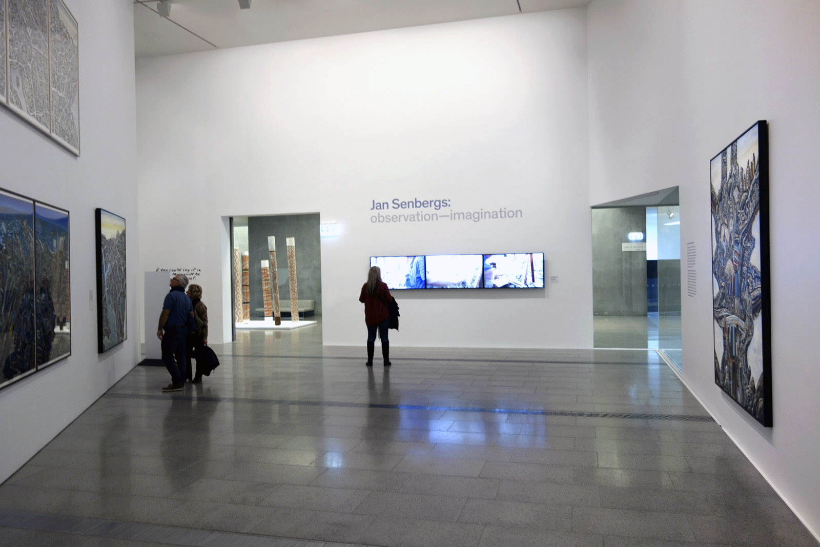
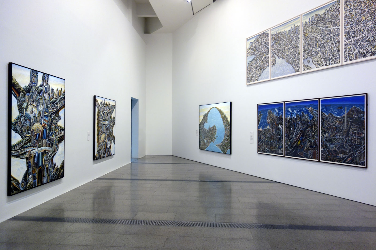
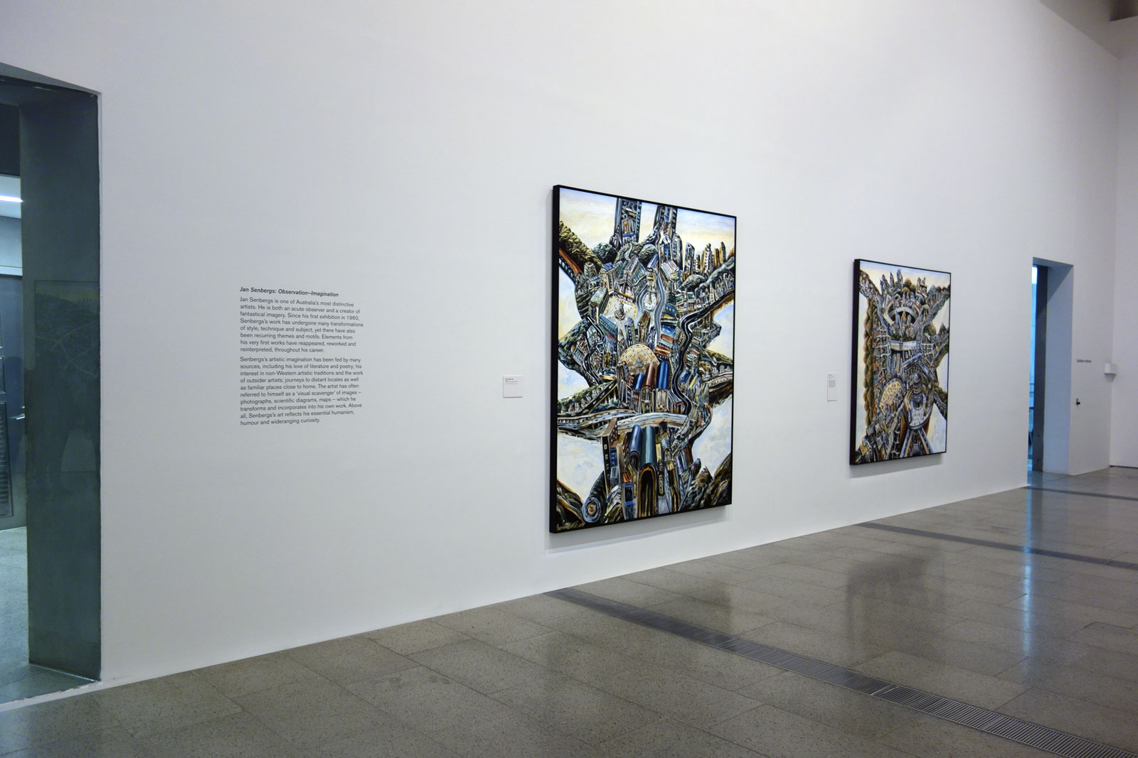
Installation view of the opening room of the exhibition Jan Senbergs: Observation – Imagination at The Ian Potter Centre: NGV Australia Photo: Marcus Bunyan
You only have five days left to catch what I consider to be one of the best exhibitions I have seen this year in Melbourne.
If ever there was a man deserving of a large retrospective, it is Jan Senbergs. This wondrous, intelligent, immersive exhibition by this iconic Australian artist is a joy. Particularly so as you witness the gestation of the artist, the journey from very first exhibition to latest work.
Witness is a particularly apt metaphor for Senbergs – he is a witness to the world who uses his imagination to create, as he says, “maybe something architectonic or machine-like, but not quite: and ambiguous … I was trying to create something irrational, something out of the imagination but belonging to the world.” He belongs to the world but creates things not of the world as we know it. It is a twisted world n/visioned in multiple forms. Twisted labyrinthine structures – mechanistic, naturalistic, humanistic – swirling around in his head, put down as marks on paper, synthetic polymer paint on canvas.
Mark making is important to this man. He maps mechanistic and biomorphic elements, always intelligently informed by sources as diverse as “literature, history, architecture and non-Western art, and finds imagery within obscure technical journals, ancient mythology and illustrated encyclopaedias.” His influences are various – German Expressionism, Max Beckmann, Neo-Expressionist painting of the early 1980s, Brutalism, Eduardo Paolozzi, Pop Art and the writing of American postmodernist author Donald Bartheme – to name but a few. And his perspective is unique, as John Olsen insightfully observes, “not often on the vanishing point, but … more related to the spatial orientation in Chinese or Islamic art. This kind of perspective gives weight to an object; the sensation is abrupt and very blunt, ideally related to his vision.”
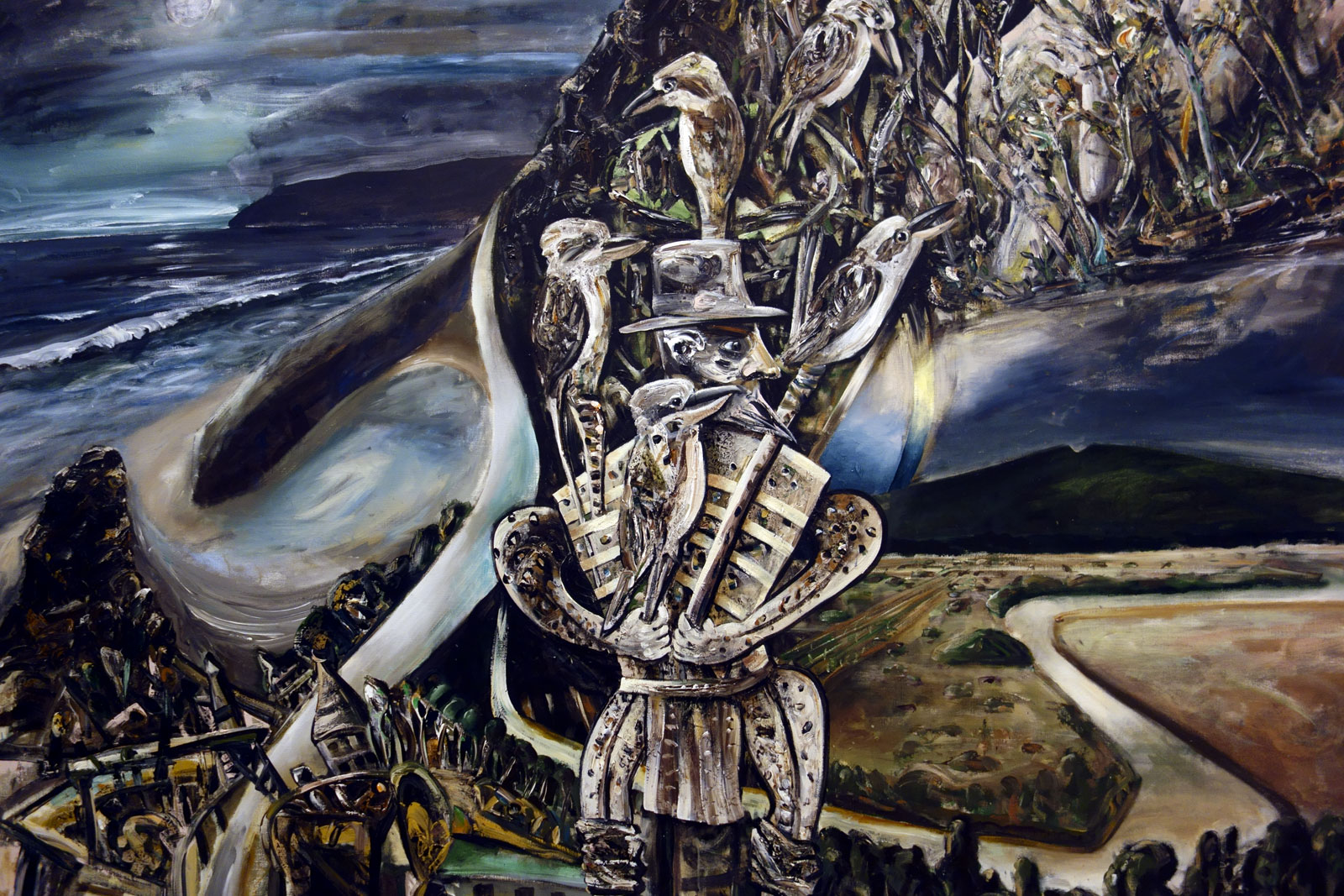
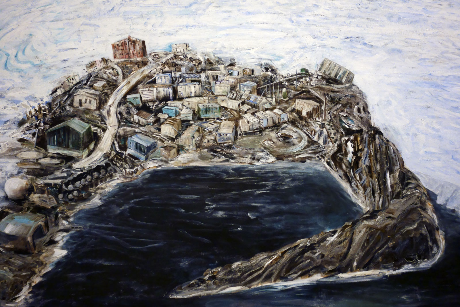
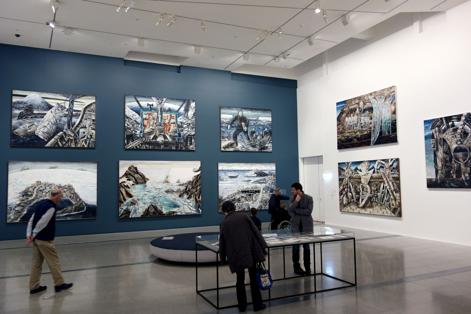
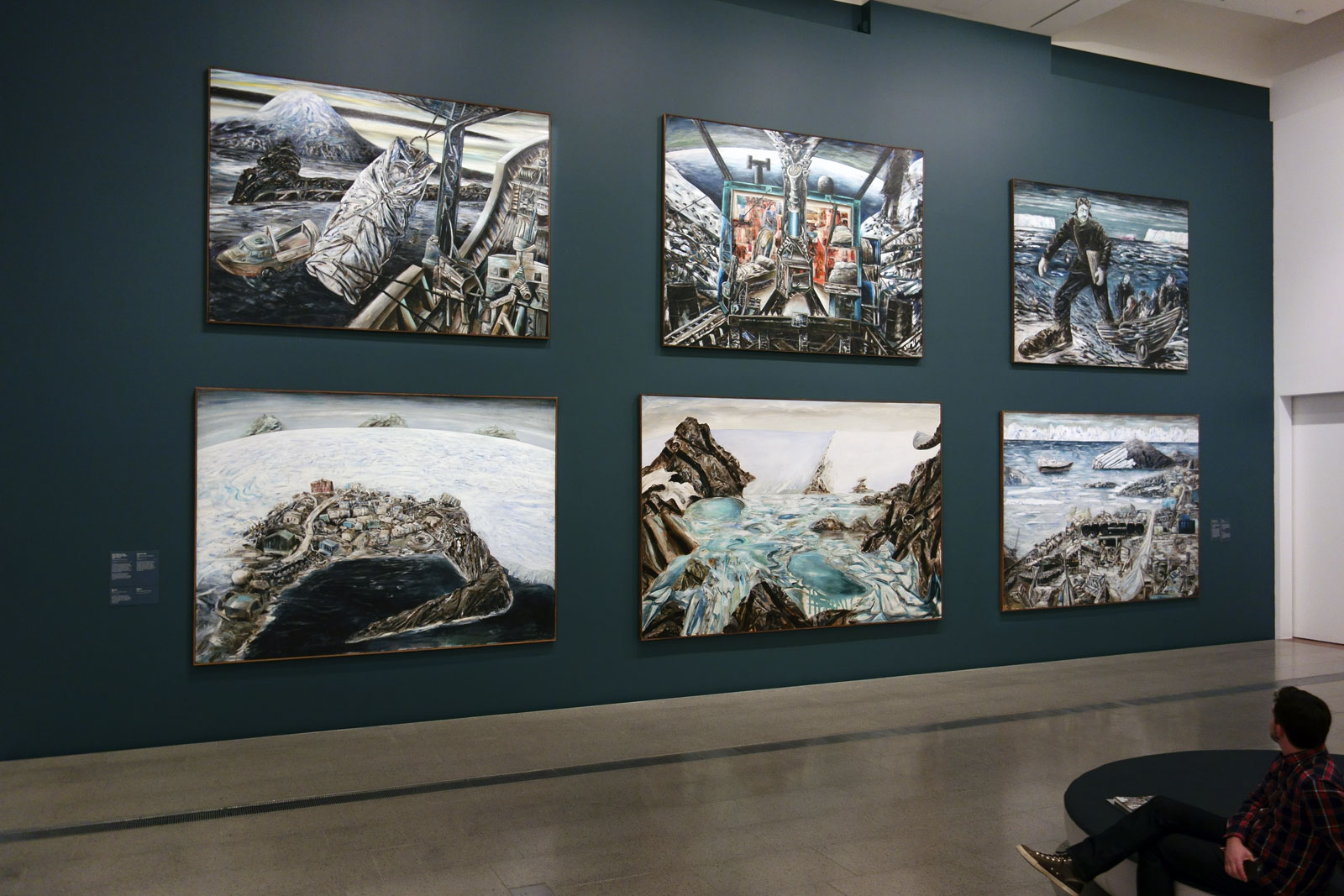
Standing in front of the huge six painting wall of Senbergs’ Antarctic paintings you feel the power of that (topographical? analytical? cut-away) vision. I dare you not to.
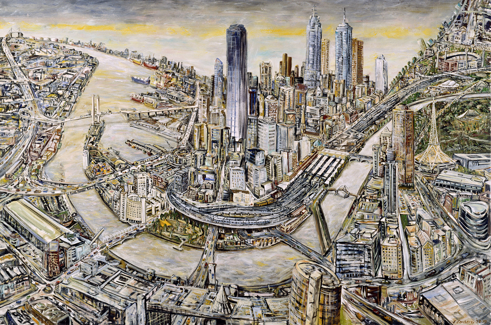
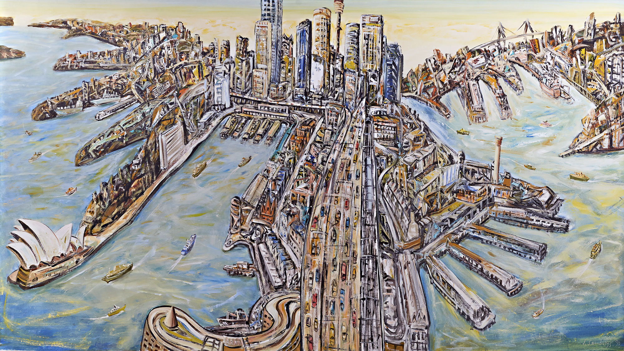
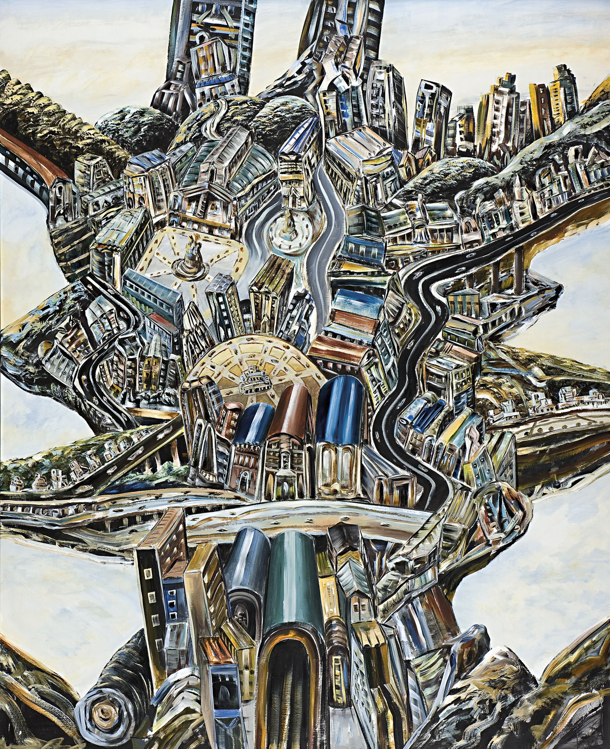
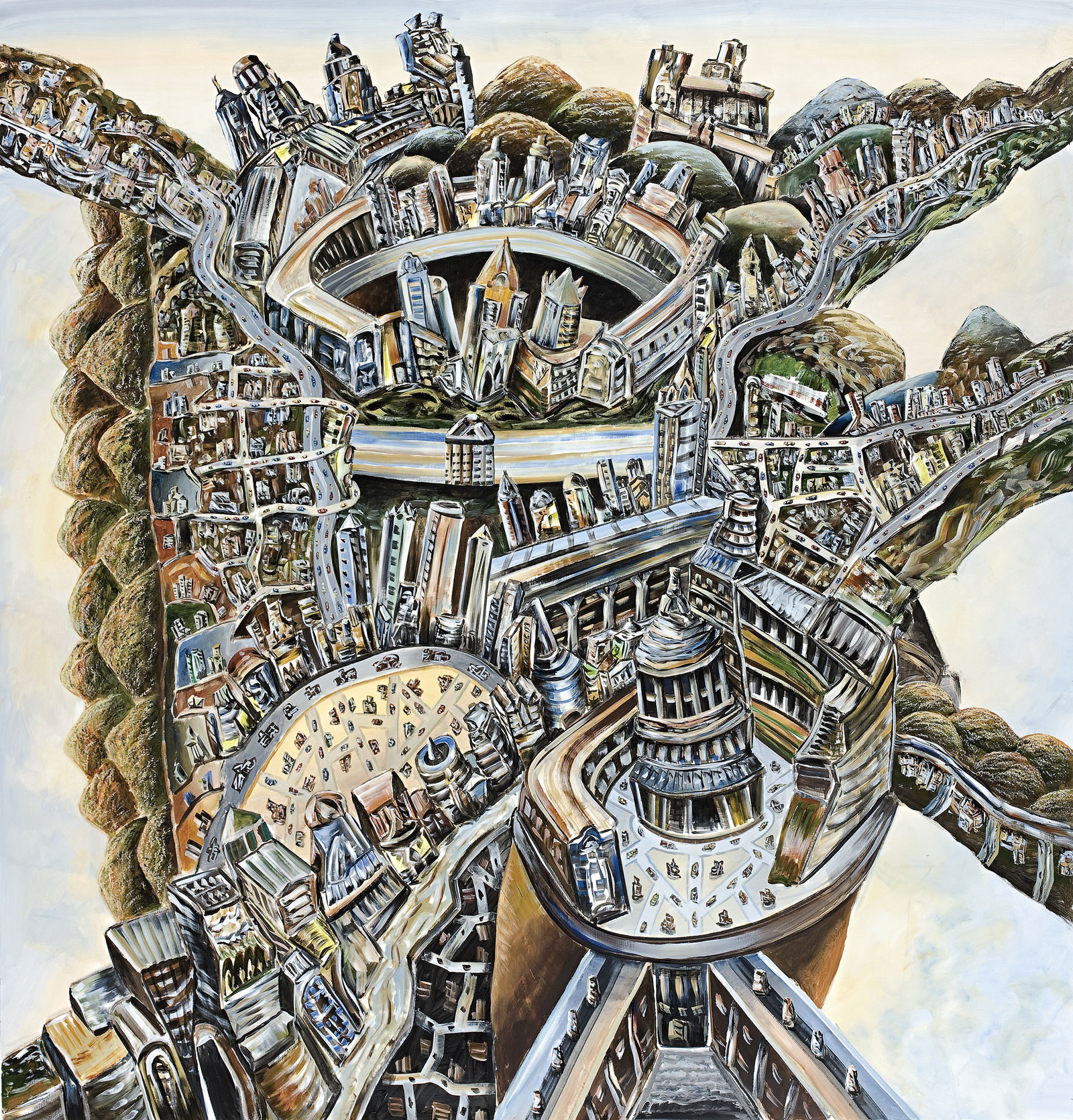
There are downsides. When they do appear in his paintings, his literal figures and landscapes (such as people, boats and bays), are weak. But that’s not what this artist is about. His screen print work of the mid to late 1970s lead him into a formally stylistic dead end. But he was an intelligent enough artist to recognise it as such and returned to mark making: “But it was a period when I was getting too confident. It was time to leave it alone, go back to the mark.” And his popularist map paintings of Sydney and Melbourne, painted in a brighter colour palette, don’t have the depth of feeling and response to the world that other works possess.
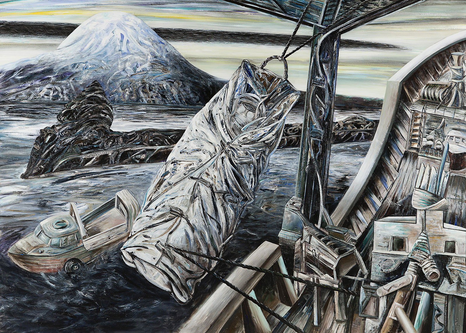
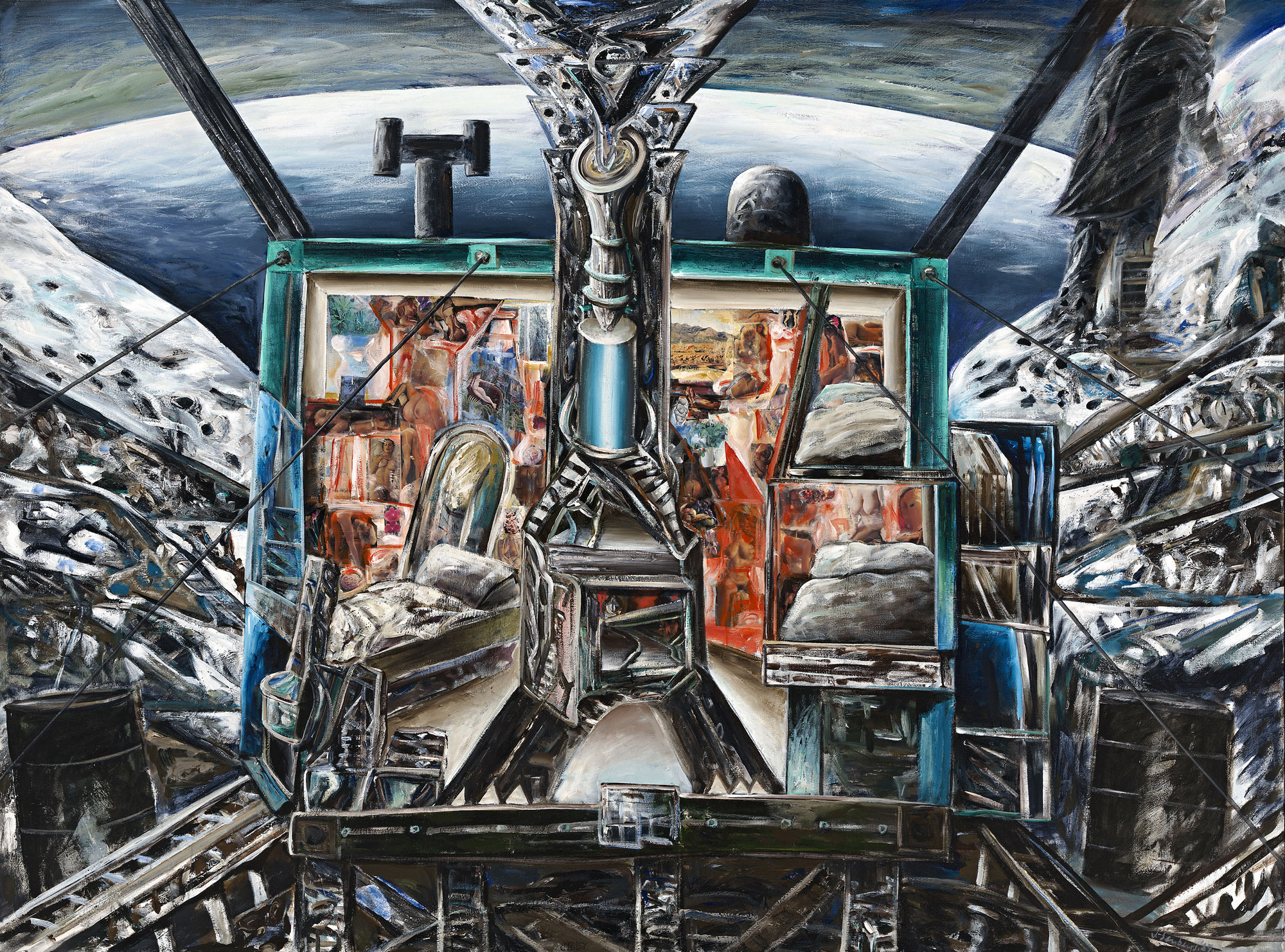
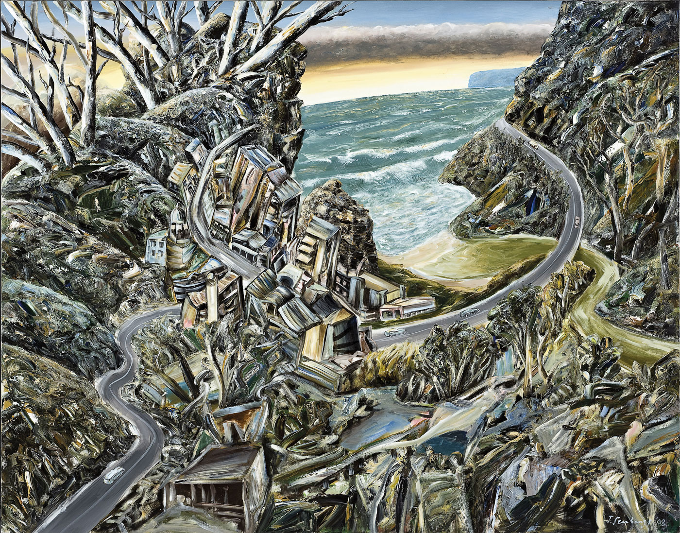
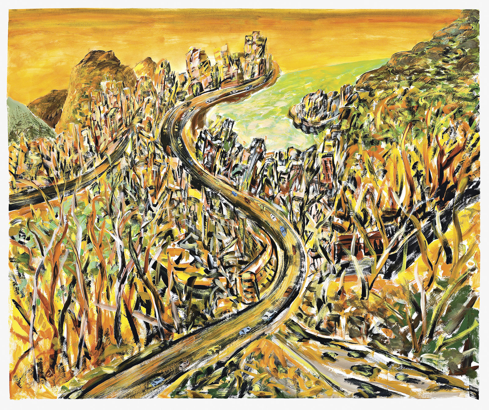
His limited colour palette – all blacks and subdued colours in the early enamel work; green and browns in the 1970s work; greys, blacks and beiges in the early 1980s; blues and greens with splashes of colour for the Antarctic and mining paintings; through to the more colourful map paintings of the 1990s and the recent oranges of the bushfire paintings – has always given weight to the object, weight to his constructed upside-down world, weight to his vision of a place where anything might happen. And frequently does.
Irrational, perhaps (but the irrational can only exist if there is the rational). Something out of the imagination but belonging to the world, indubitably. A world that is neither dysfunctional in vision nor balance.
“I was always interested in painting buildings and things and I tried to make them half human, trying to put figures into them, in the end they blended together as one, the figures, the buildings and the people.”
Jan Senbergs, 1965
“I was always trying to invent new forms, different forms, shapes which were recognisable – maybe something architectonic or machine-like, but not quite: and ambiguous … I was trying to create something irrational, something out of the imagination but belonging to the world.”
Jan Senbergs, 2008
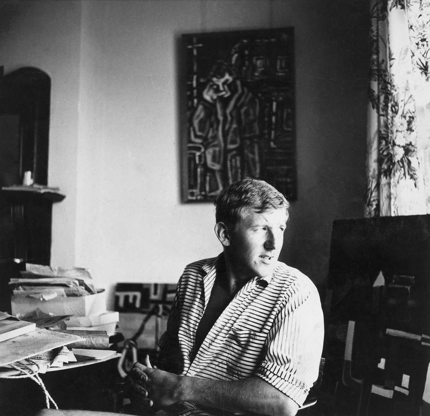
Alan Kilner Jan Senbergs, Melbourne c. 1959 Image courtesy Jan Senbergs
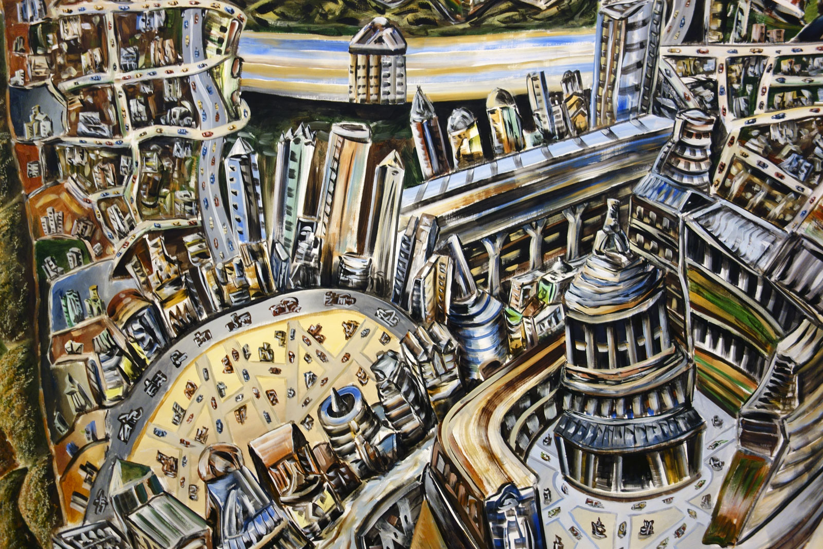
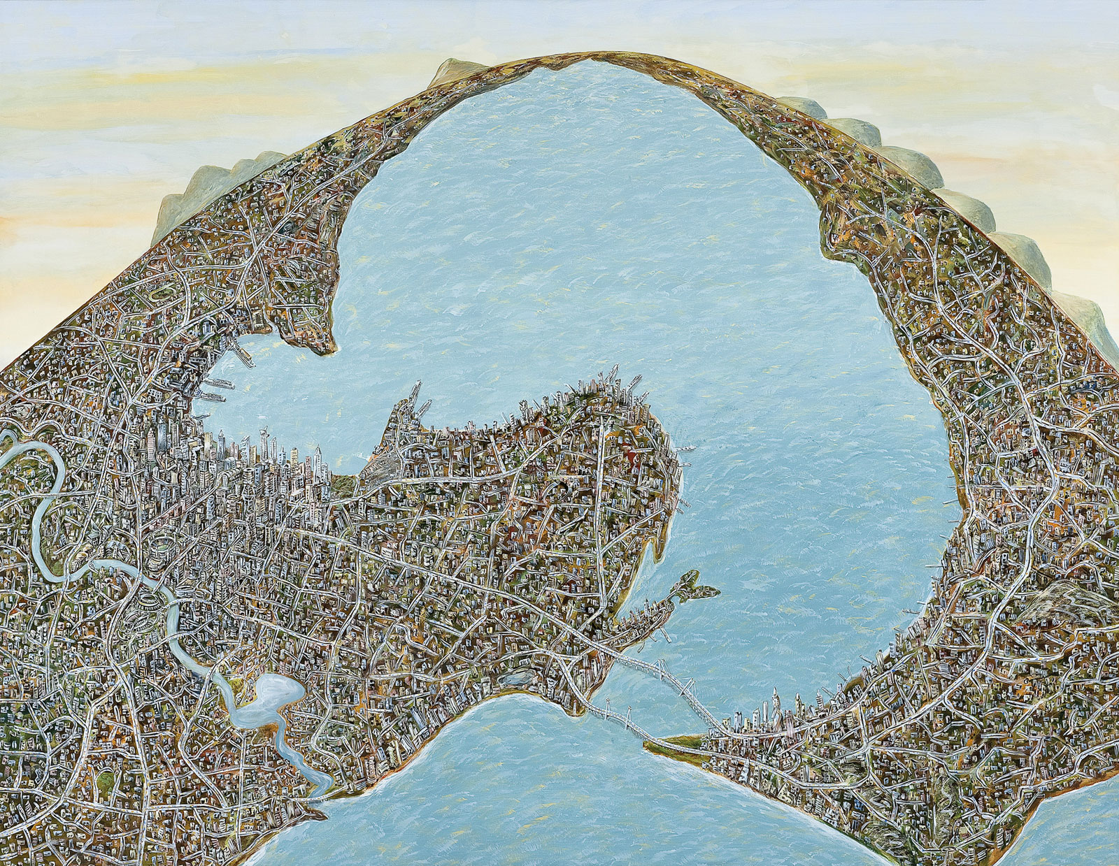
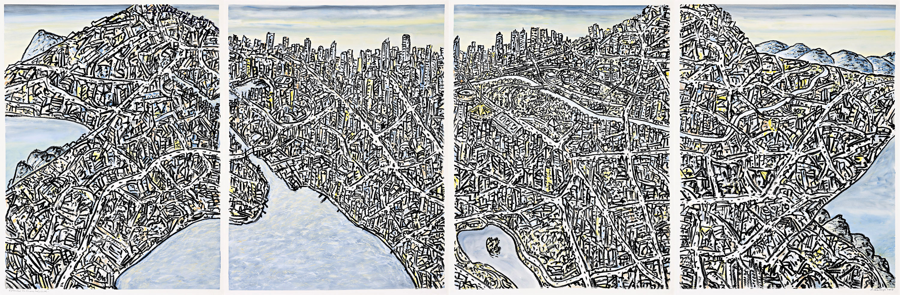
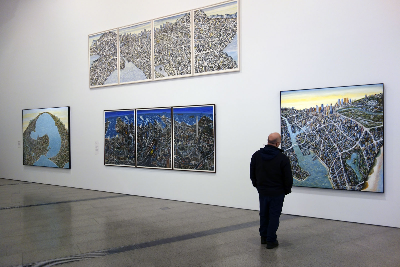
This is the first comprehensive retrospective of renowned Melbourne artist Jan Senbergs. Throughout his long career, Senbergs’ work has been characterised by a fundamental humanist vision, a finely-honed sense of the absurd, and a rigorous studio practice spanning printmaking, drawing and painting. He is considered to be amongst Australia’s leading painters and his large-scale expressive drawings are highly regarded. More recently Senbergs has created labyrinthine views of cities, employing aerial perspectives to present a bird’s eye view of humankind’s endeavours. The exhibition includes paintings, drawings and prints from his first exhibition in 1960 until the present day, borrowed from public and private collections around Australia.
Jan Senbergs is one of Australia’s most distinctive artists. He is both an acute observer and a creator of fantastical imagery. Since his first exhibition in 1960, Senbergs’s work has undergone many transformations of style, technique and subject, yet there have also been recurring themes and motifs. Elements from his very first works have reappeared, reworked and reinterpreted, throughout his career.
Senbergs’s artistic imagination has been fed by many sources, including his love of literature and poetry; his interest in no-Western artistic traditions and the work of outsider artists; journeys to distant locales as well as familiar places close to home. The artist has often referred to himself as a ‘visual scavenger’ of images – photographs, scientific diagrams, maps – which he transforms and incorporates into his own work. Above all, Senbergs’s art reflects his essential humanism, humour and wide-ranging curiosity.
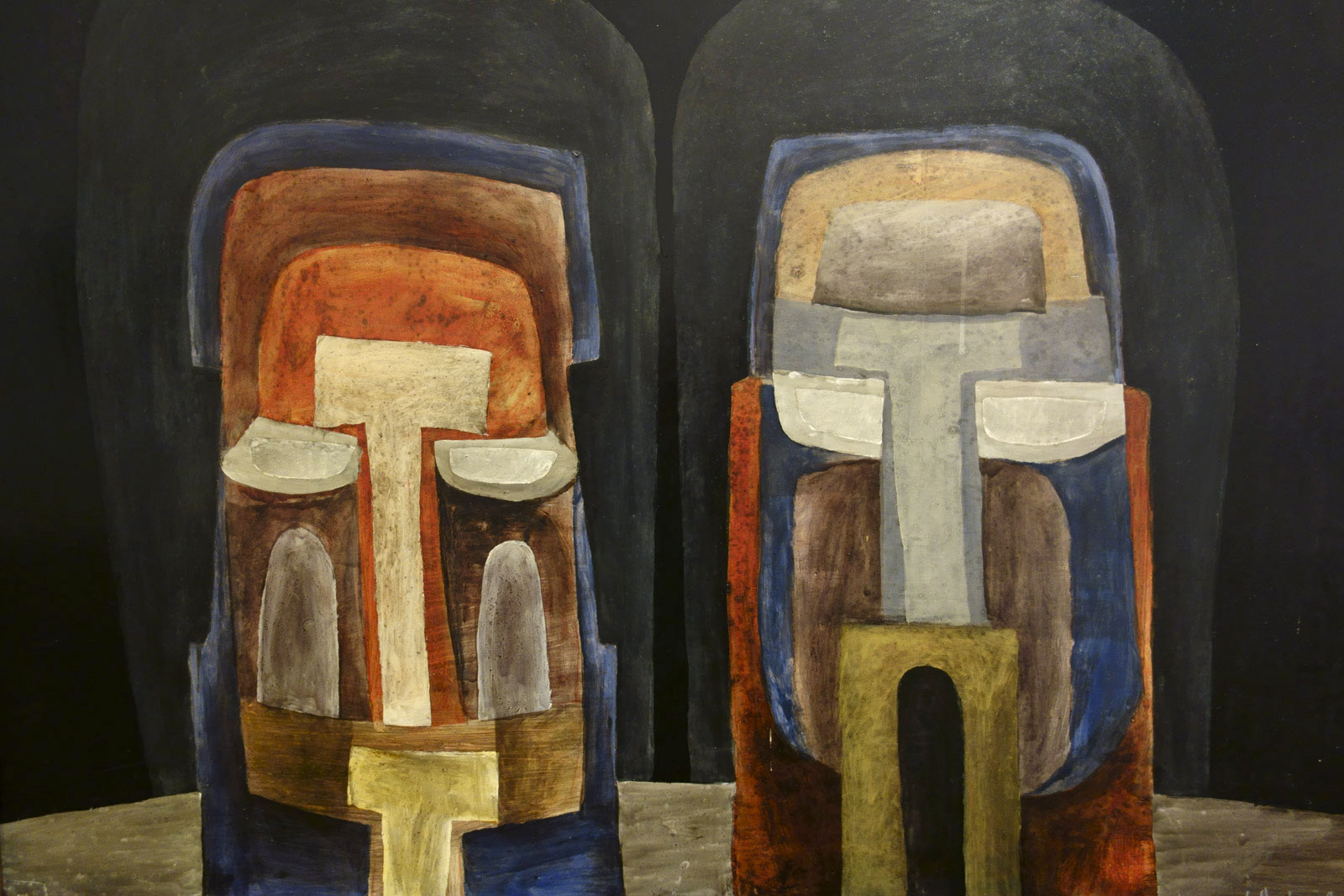
Literature has always been an important source of imagery for Senbergs. This work, one of his earliest, is based upon an episode in The Trial (1925) by Czech writer Franz Kafka. In the painting two figures cower beneath ‘the whipper’, who metes out a brutal punishment to them. This work was included in Senbergs’s second solo exhibition at the Argus Gallery, Melbourne, in 1962.
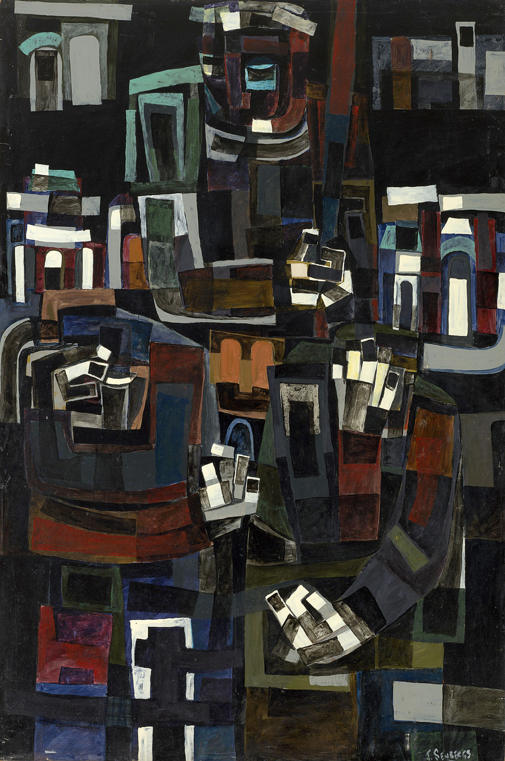
Jan Senbergs (born Latvia 1939, arrived Australia 1950, died Melbourne 2024) Two heads 1961 Enamel paint on composition board Private collection, Melbourne
“I was always interested in painting buildings and things and I tried to make them half-human, trying to put the figures into them; in the end they blended together as one, the figures and the buildings and the people.”
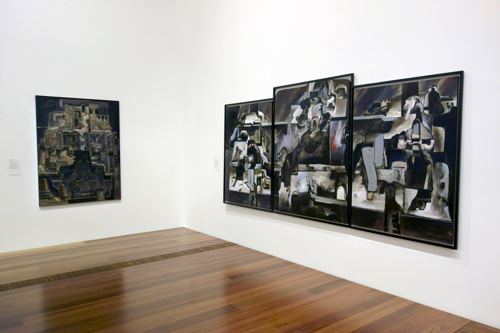
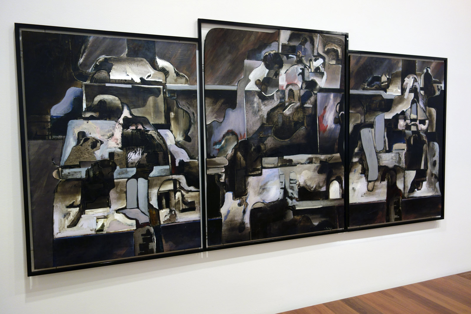
Jan Senbergs (born Latvia 1939, arrived Australia 1950, died Melbourne 2024) The night parade (installation views) 1966 Enamel paint on composition board Mornington Peninsula Regional Gallery Gift of the artist, 1977 Photos: Marcus Bunyan
At the time of its creation, this was Senbergs’s largest and most ambitious painting to date, and it formed the centrepiece of his 1966 exhibition at Georges Gallery in Melbourne. The triptych format recalls the work of German Expressionist painter Max Beckmann, one of Senbergs’s earliest and ongoing artistic heroes. In his review of the exhibition, critic Allan McCulloch wrote: “Instead of simply looking at abstract pictures we have the feeling of standing on the perimeter of a vast industrial landscape in which hills and slag heaps, factories and cities are relentlessly pushed and jostled by an omni-present parade of silent watchers. The huge triptych “The night parade’ … illustrates the point.”
On his return to Melbourne in late 1967, Senbergs’ work changed dramatically. He ceased painting with enamel on Masonite composition boards, and instead started working with oil or acrylic on canvas and began to incorporate screen printed elements into his paintings. Of his year in Europe he later recalled, “I got a lot out of it, it completely made me revise and rethink a whole lot of things regarding my painting, my work, my attitudes and so on … I felt very refreshed and confident when I came back.”
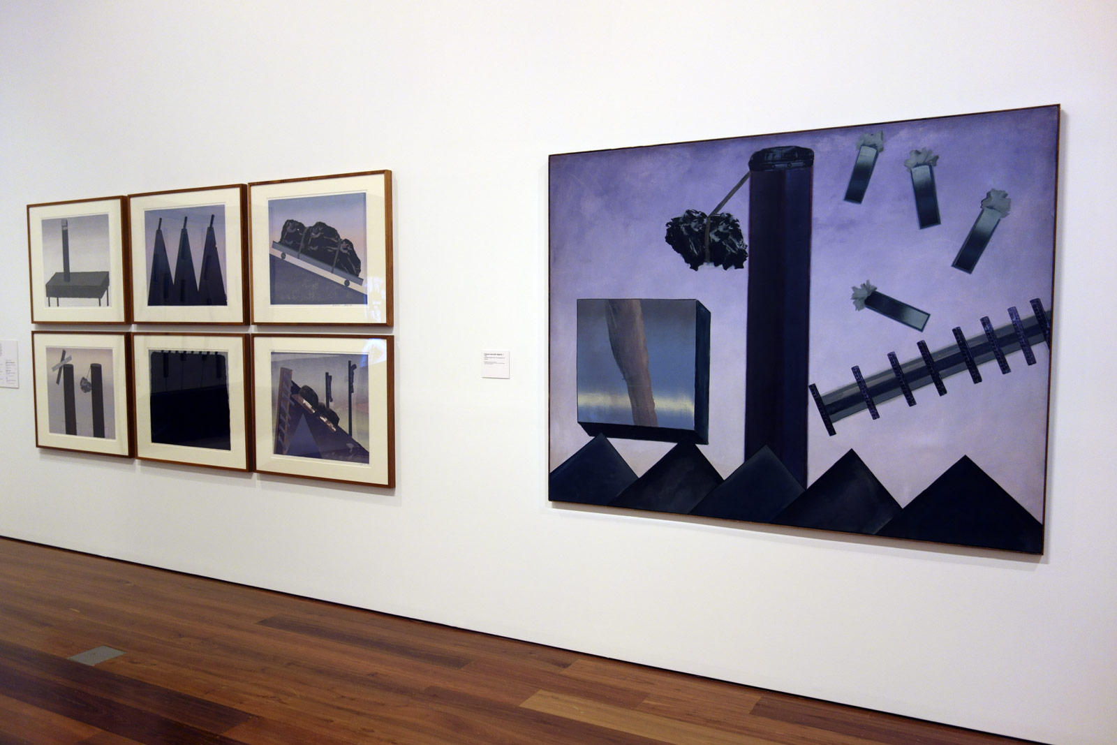
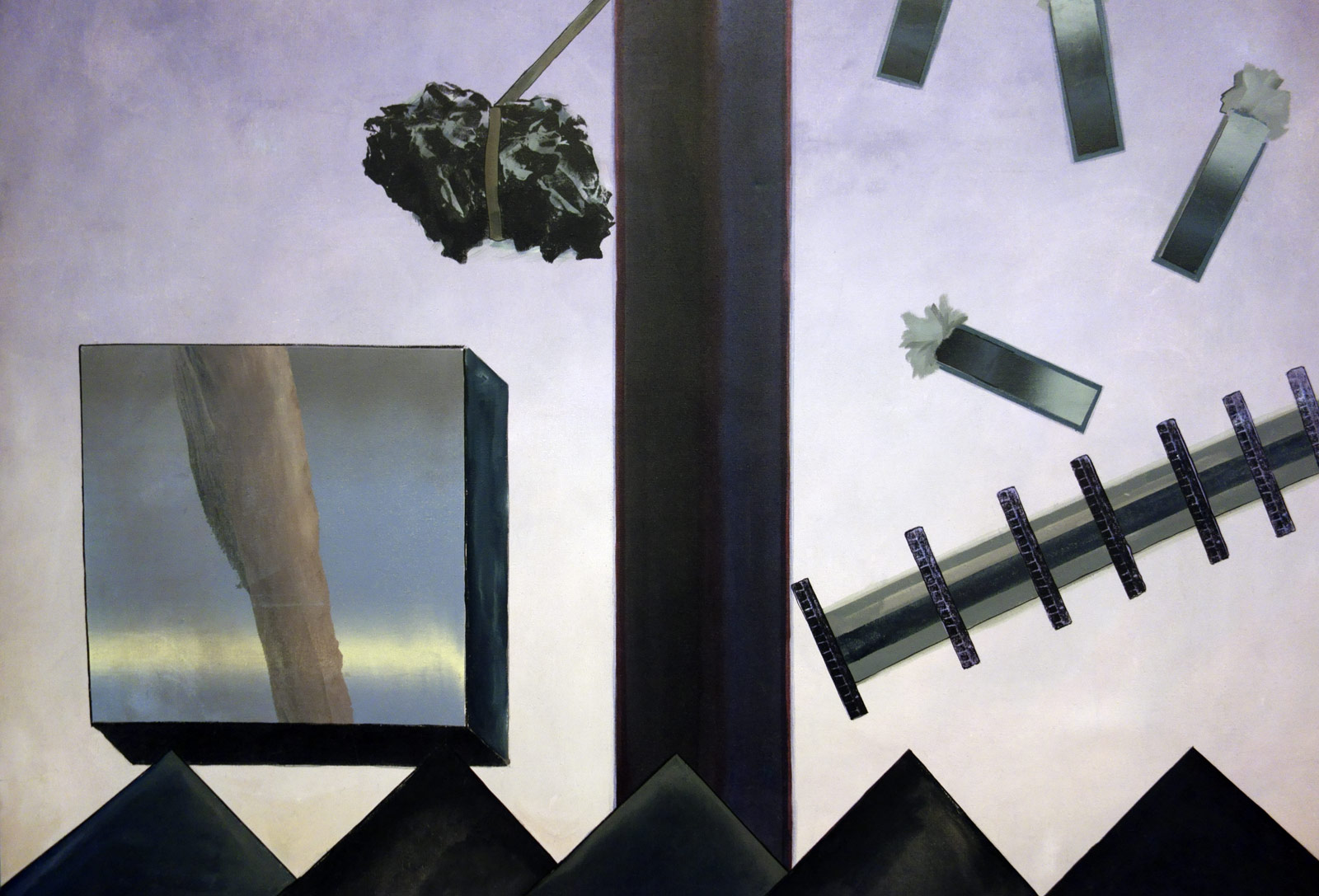
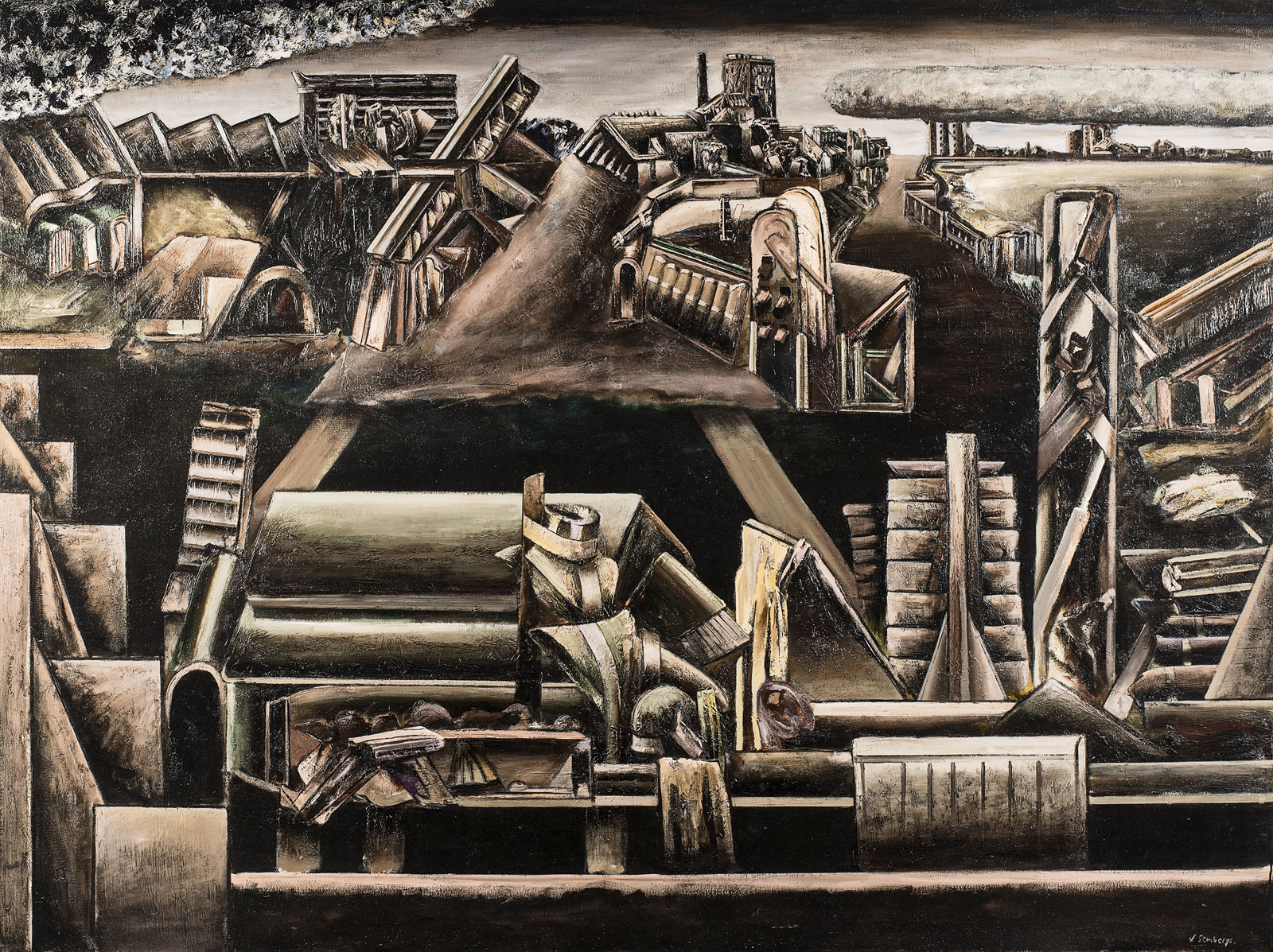
By the mid 1960s Senbergs’ imagery was becoming increasingly sculptural, merging mechanistic and biomorphic elements, in part stimulated by his interest in the work of Scottish Pop artist Eduardo Paolozzi. Senbergs entered what he refers to as his ‘axle-grease’ period, when his colours became darker and more sombre, which he considered would enhance form in his work.
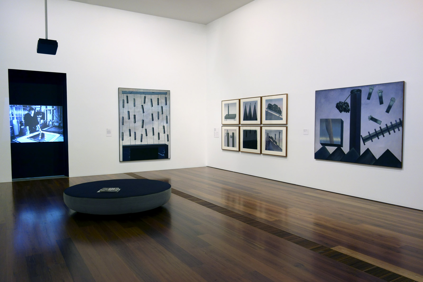
Installation views of the exhibition Jan Senbergs: Observation – Imagination at The Ian Potter Centre: NGV Australia showing at right, Column and still objects 1 (1968) Photos: Marcus Bunyan
Jan Senbergs (born Latvia 1939, arrived Australia 1950, died Melbourne 2024) Column and still objects 1 (detail) 1968 The Edith Cowan University Art Collection Donated through the Australian Government’s Cultural Gifts Program by Mr Timothy James Bernadt
Jan Senbergs (born Latvia 1939, arrived Australia 1950, died Melbourne 2024) Black garden (detail) 1972 Synthetic polymer paint, oil screenprint on canvas plywood National Gallery of Australia, Canberra Purchased 1973
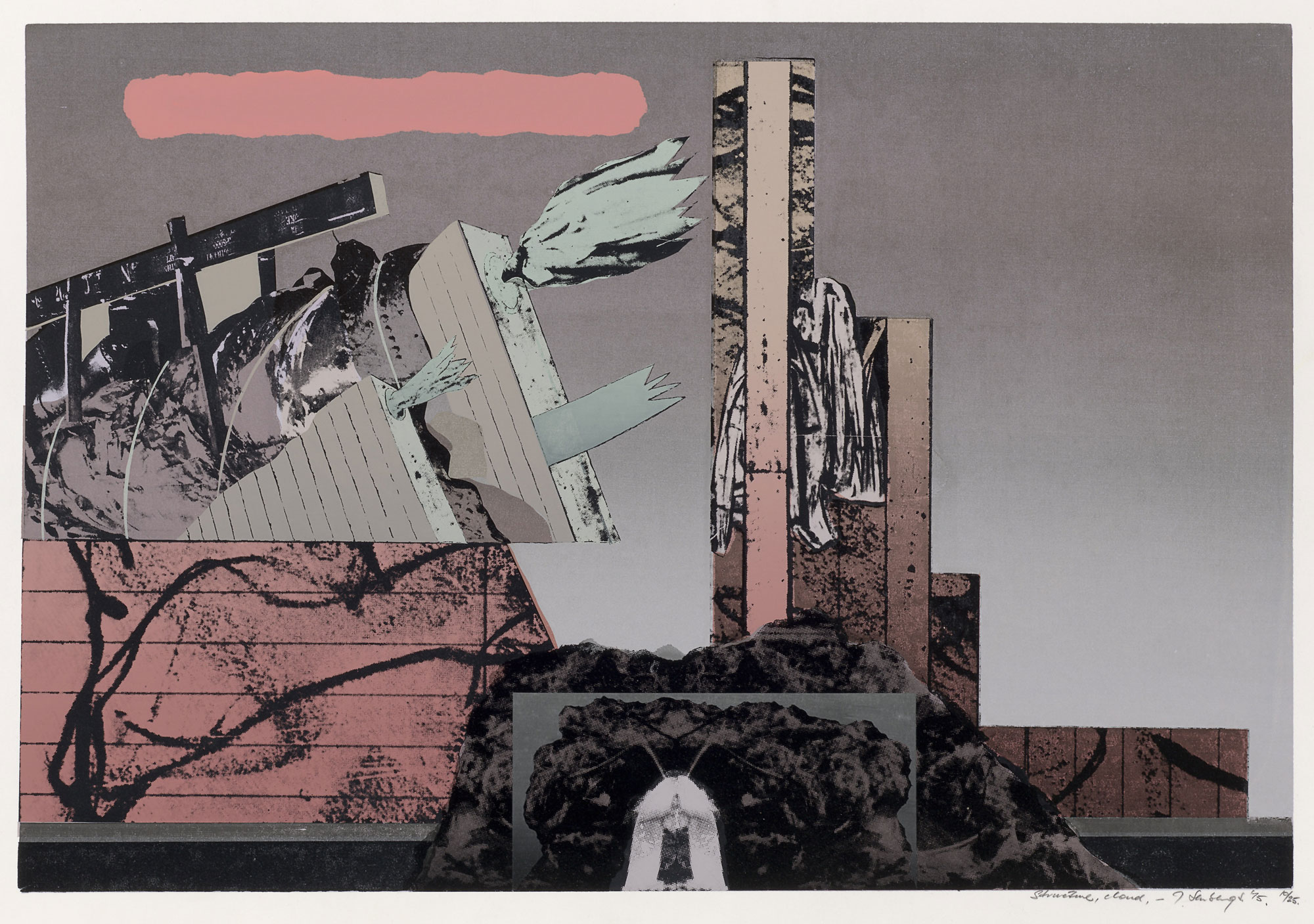
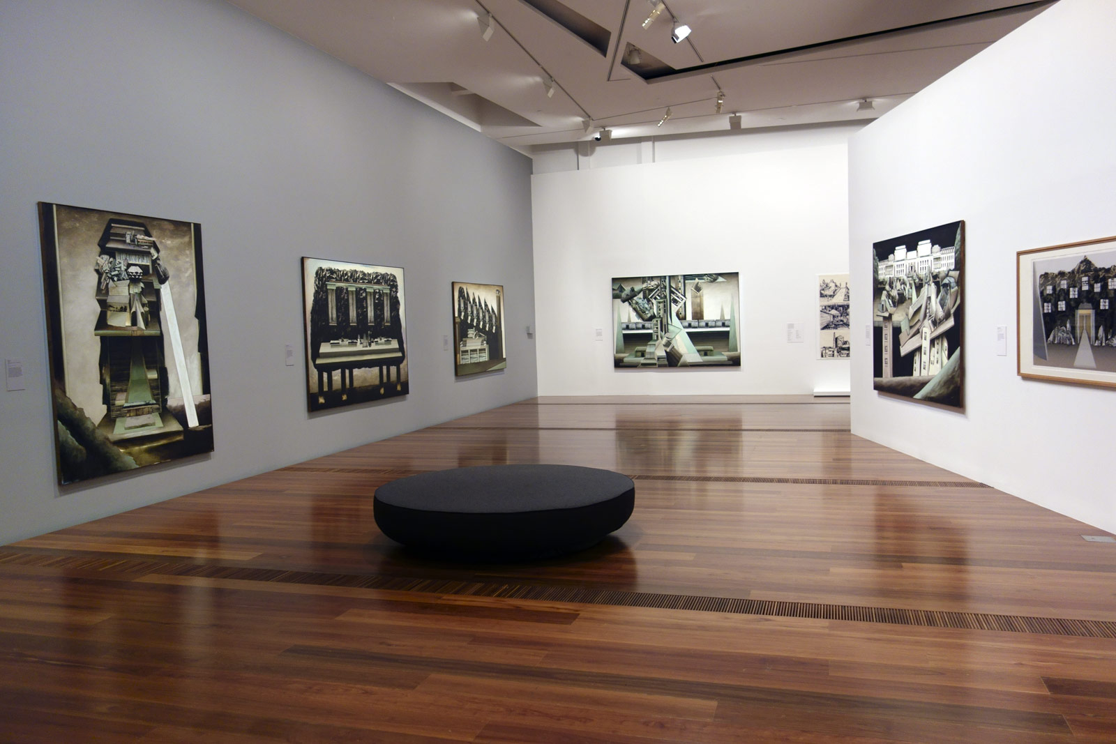
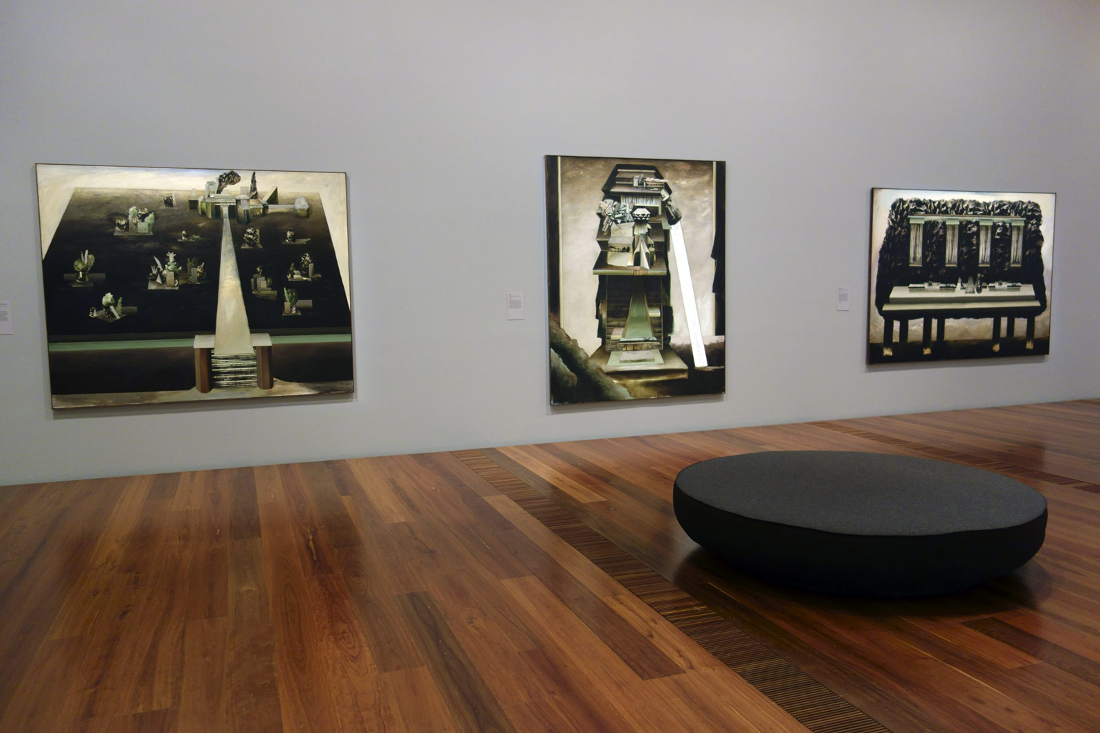
In 1972 Senbergs exhibition sixteen new paintings at Melbourne’s Gallery A, including Black garden, in which he created ambiguous cityscapes from surrealistic combinations of screen printed fragments of images. With their absurdist sensibility and disjointed fragmentary images, these paintings emulate the writing of American postmodernist author Donald Bartheme, whose short stories Senbergs admired greatly and whom he credits with being a major influence upon him.
The paintings Senbergs created in 1973 in response to his selection to represent Australia at the 12th São Paolo Biennial in Brazil were larger and more imposing than his 1972 paintings, and often incorporated an image of a ramp to suggest entry into the forms. With their realistic modelling of architectural forms set against a horizon line, these works evoke the real world, yet remain defiantly resistant to interpretation.
“The printing technique was very important to me because I was a kind of scavenger of odd sorts of images. I mean a lot of those sort of shapes and forms were things that one saw perhaps in an old engraving book, a little detail of a section of some background somewhere and I’d look into it and see certain sorts of forms there … I was a collector, a scavenger. I used to go to libraries and collect these images and I’d buy a lot of books.”
~ Jan Senbergs
“When I was doing these prints and as I was coming to a conclusion to them, I also realised I was handling it in a more sophisticated way. The prints were becoming more refined, more in control … But it was a period when I was getting too confident. It was time to leave it alone, go back to the mark.”
~ Jan Senbergs 2008
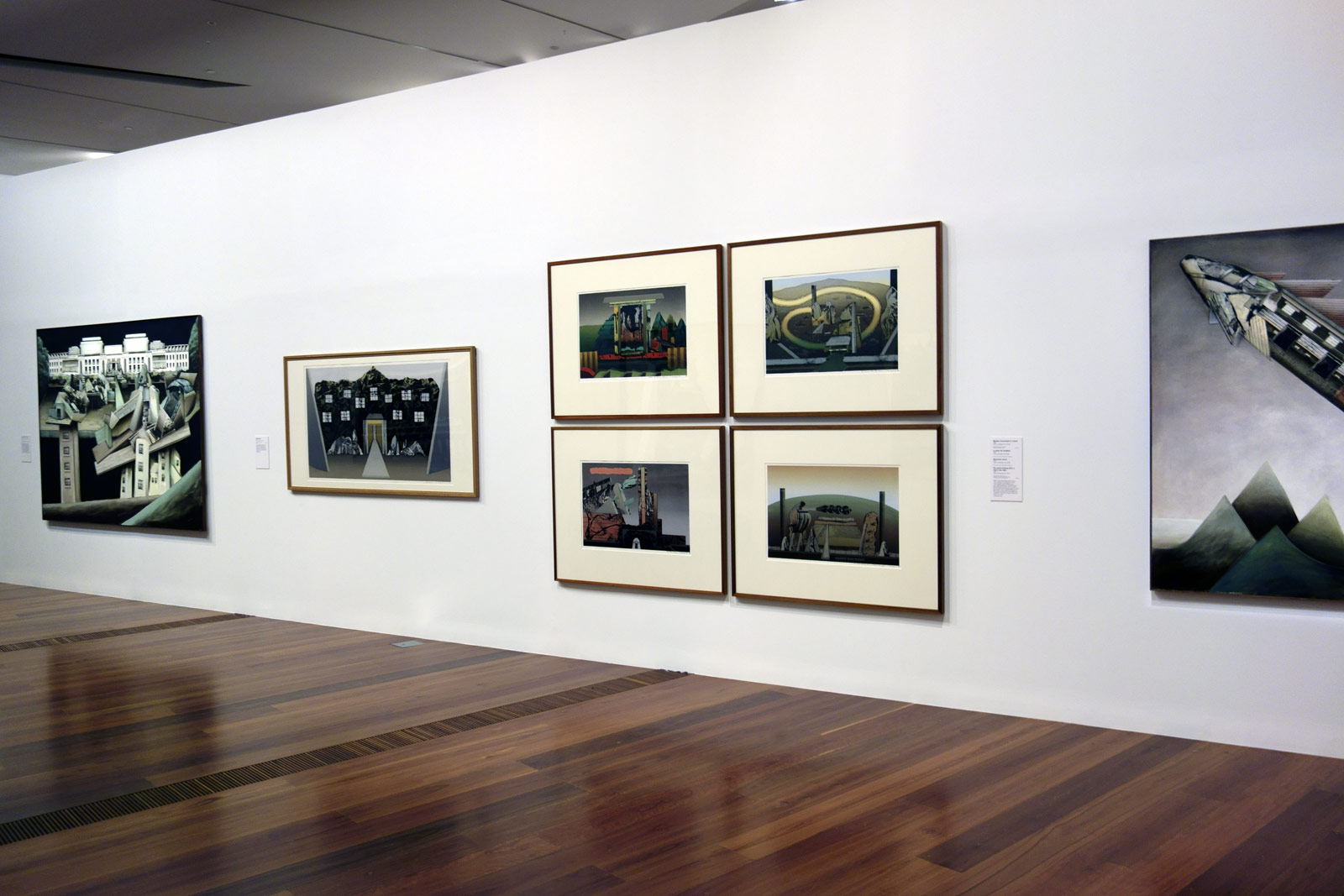
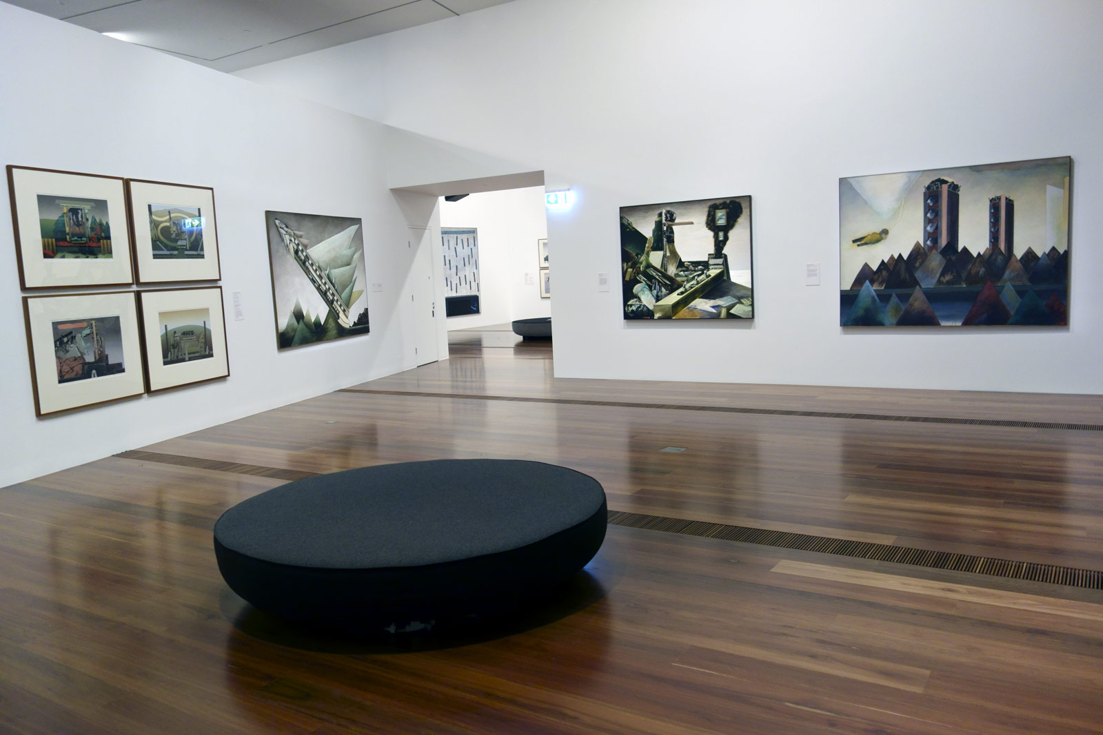
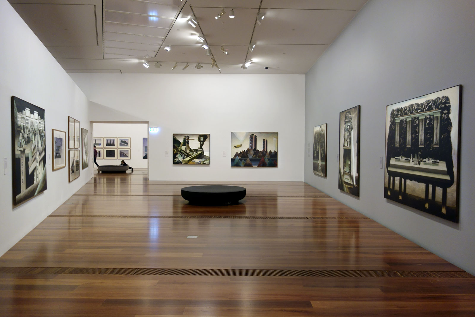
Installation views of the exhibition Jan Senbergs: Observation – Imagination at The Ian Potter Centre: NGV Australia Photos: Marcus Bunyan
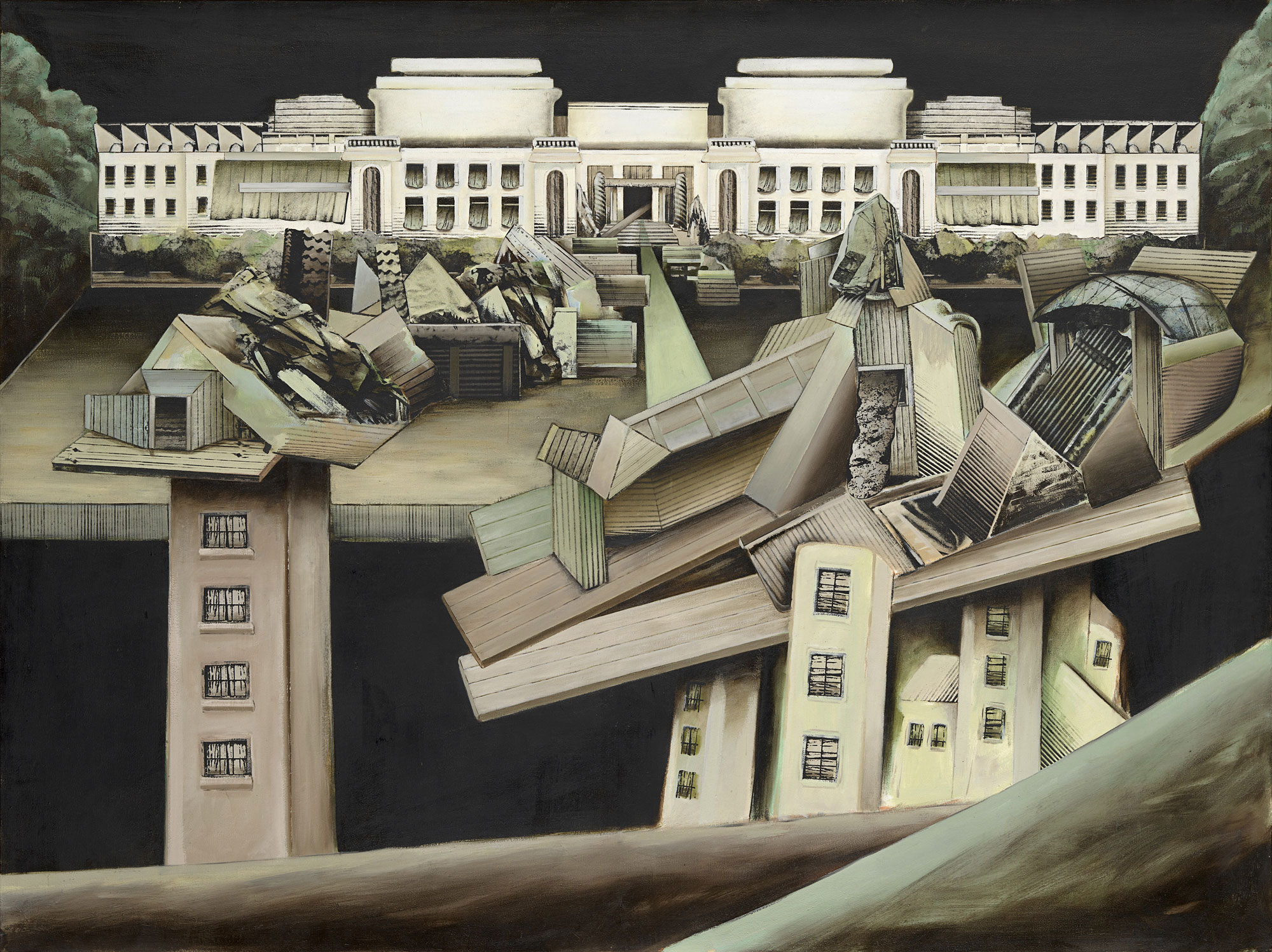
While living in Canberra, on his walk home Senbergs would see Parliament House: “I’d see this white glowing dreadnought in the distance … that’s the way it appeared, sort of floating, just this whiteness because it was lit up … This form fascinated me. But also, and on another level, I was there in ’75 when all the political things happened and [after that] it didn’t have that sort of purity and whiteness that it appeared to have beforehand. In a way that gave me more liberty to change the imagery of the building.”
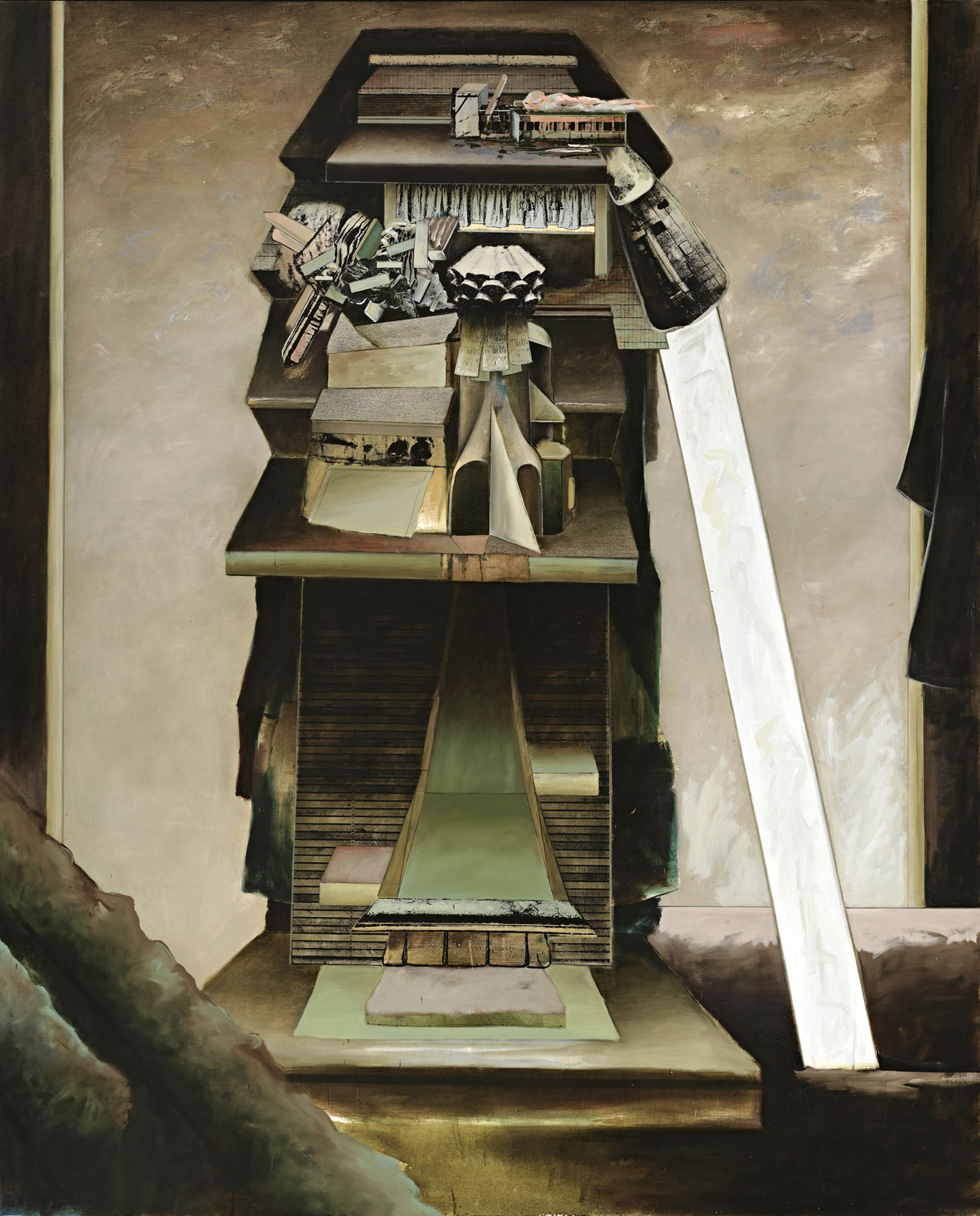
Jan Senbergs (born Latvia 1939, arrived Australia 1950, died Melbourne 2024) Observatory of hard edges (detail) 1976 Synthetic polymer paint, oil screen print on canvas National Gallery of Australia, Canberra Purchased 1976
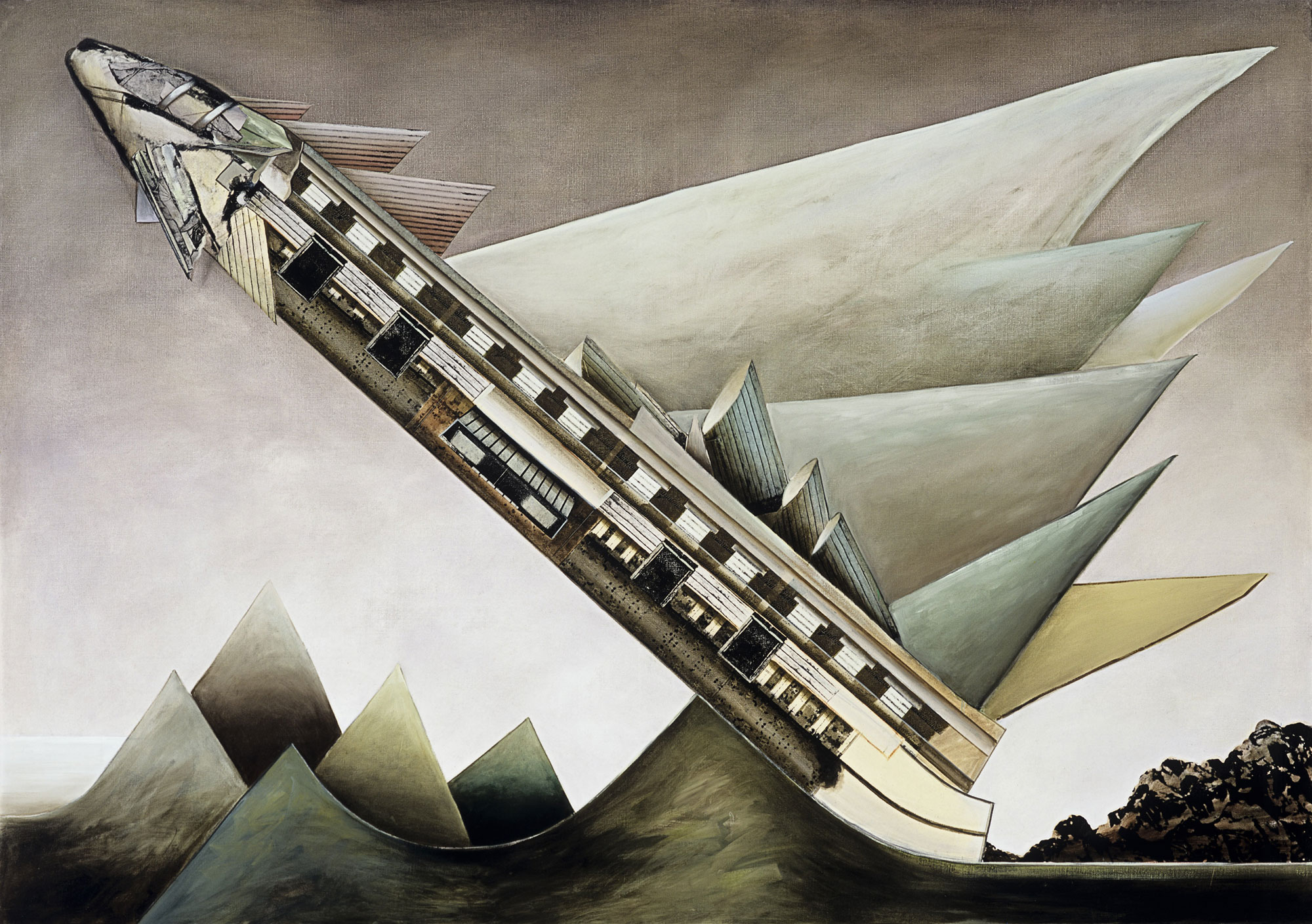
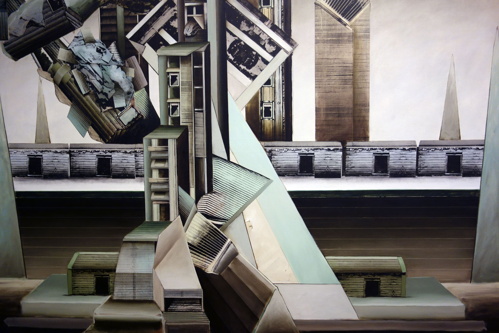
This is one of Senbergs’ most architectonic images; its massing of asymmetrical forms, pronounced geometry and pale colours bring to mind the contemporaneous style of Brutalist architecture.
Jan Senbergs (born Latvia 1939, arrived Australia 1950, died Melbourne 2024)
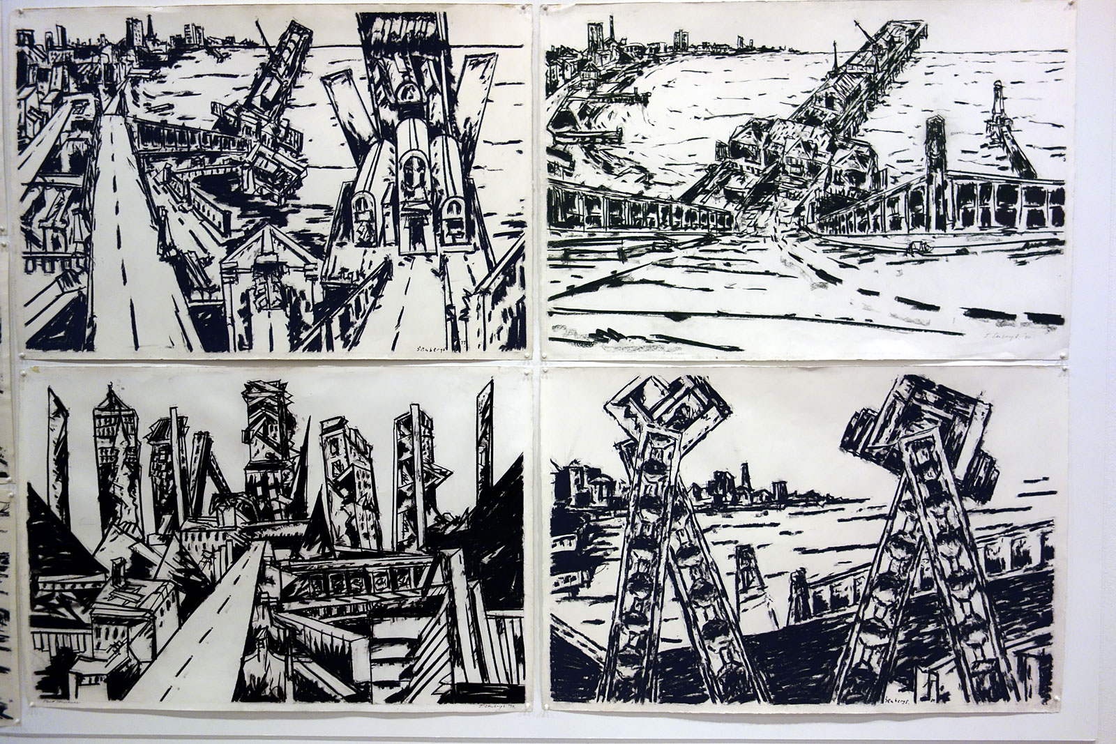
Port piers and overpass (top left) 1979 Pastel on paper Courtesy of the artist and Niagara Galleries, Melbourne
Port structure (bottom left) 1979 Pastel on paper Courtesy of the artist and Niagara Galleries, Melbourne
Station Pier (top right) 1980 Pastel on paper Courtesy of the artist and Niagara Galleries, Melbourne
Port signals (bottom right) 1980 Pastel on paper Courtesy of the artist and Niagara Galleries, Melbourne Photo: Marcus Bunyan
“Yesterday I visited Jan Senbergs at his studio in Port Melbourne … I was greatly impressed by what I saw: he has moved away from a photo image to observation, perhaps with [Max] Beckmann as his distant father. His line is slow and sullen and he creates a feeling of junk-heap menace … His perspective is not often on the vanishing point, but is more related to the spatial orientation in Chinese or Islamic art. This kind of perspective gives weight to an object; the sensation is abrupt and very blunt, ideally related to his vision.”
Installation view of the exhibition Jan Senbergs: Observation – Imagination at The Ian Potter Centre: NGV Australia with Sticht’s view to the smelters 1 at right Photo: Marcus Bunyan
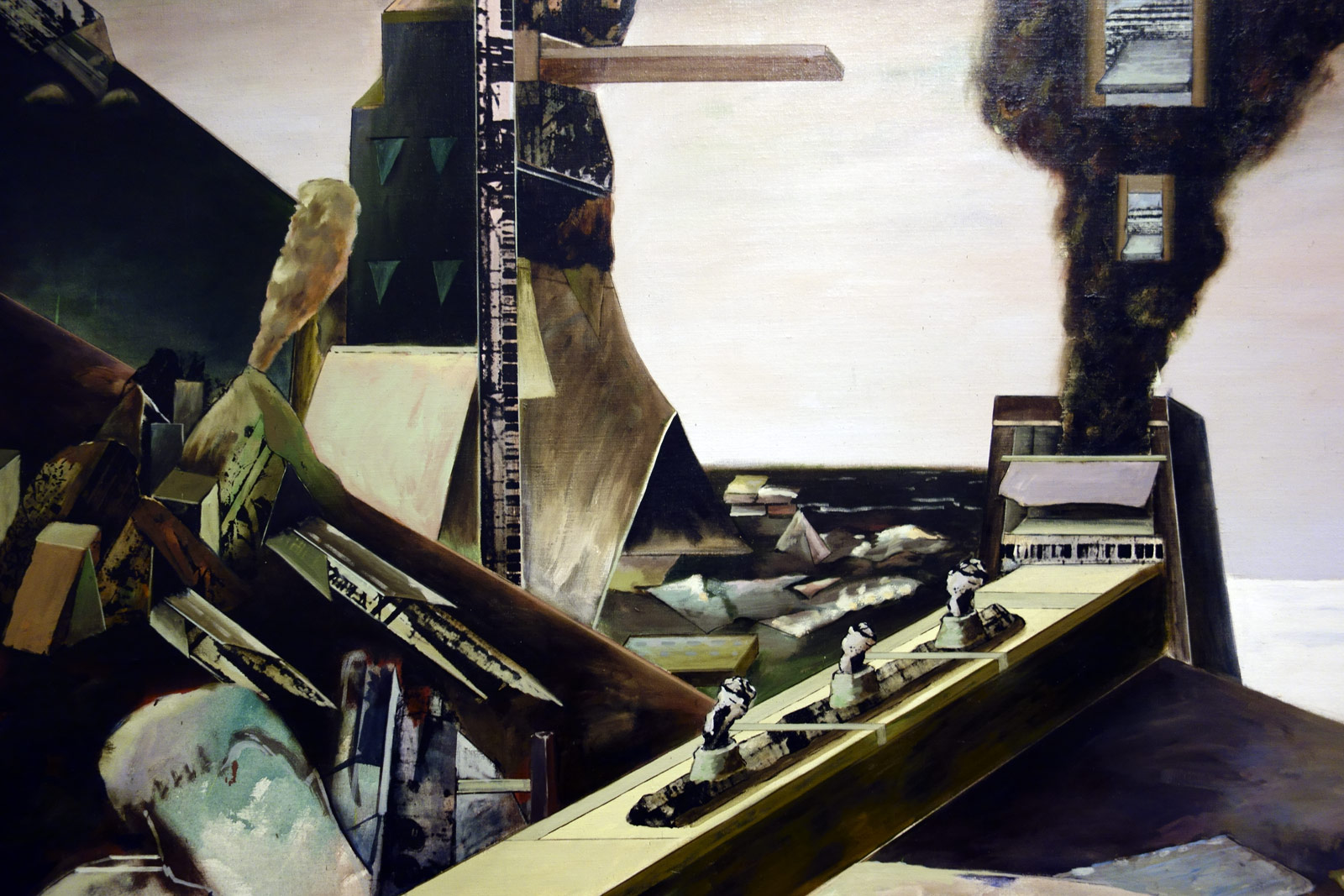
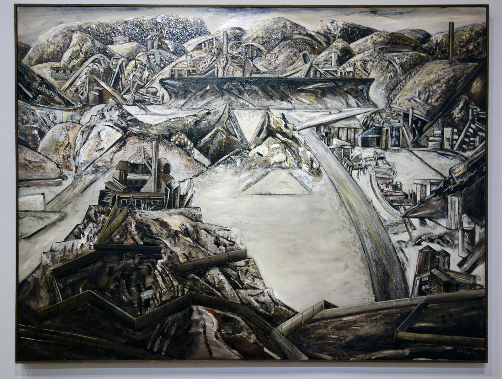
Jan Senbergs (born Latvia 1939, arrived Australia 1950, died Melbourne 2024) Sticht’s view to the smelters 1 (installation view) 1982 Synthetic polymer paint on canvas Tasmanian Museum and Art Gallery, Hobart Purchase with funds presented by Renison Goldfields Consolidated, 1983 Photo: Marcus Bunyan
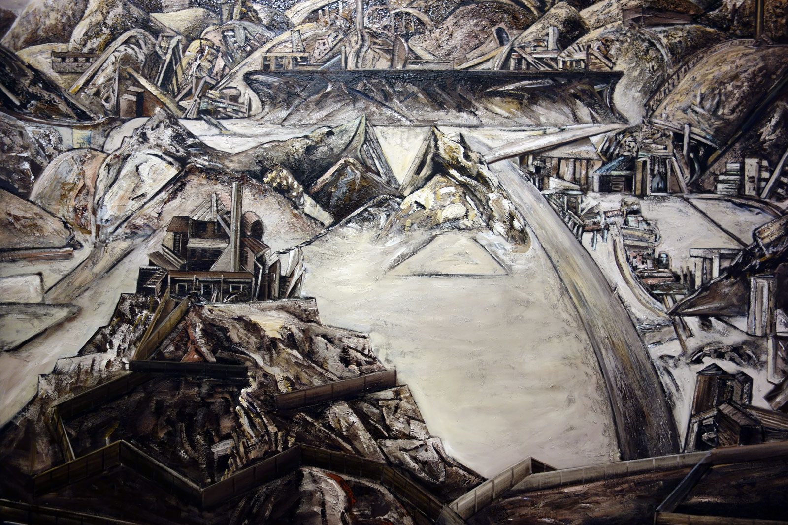
Jan Senbergs (born Latvia 1939, arrived Australia 1950, died Melbourne 2024) Sticht’s view to the smelters 1 (detail) 1982 Synthetic polymer paint on canvas Tasmanian Museum and Art Gallery, Hobart Purchase with funds presented by Renison Goldfields Consolidated, 1983
Robert Carl Sticht was an American metallurgist who in 1897 became general manager of the copper mine at Mount Lyell on the remote and rugged west coast of Tasmania. There he introduced a new technique of smelting which released large amounts of deadly sulphur into the air, one of the principal agents of destruction of the natural environment of the region.
In the Copperopolis – Mt Lyell series, Senbergs moved away from the smooth surfaces and clearly articulated forms of his Port Liardet paintings to a more gestural, painterly mode, in accord with the style of Neo-Expressionist painting of the early 1980s.
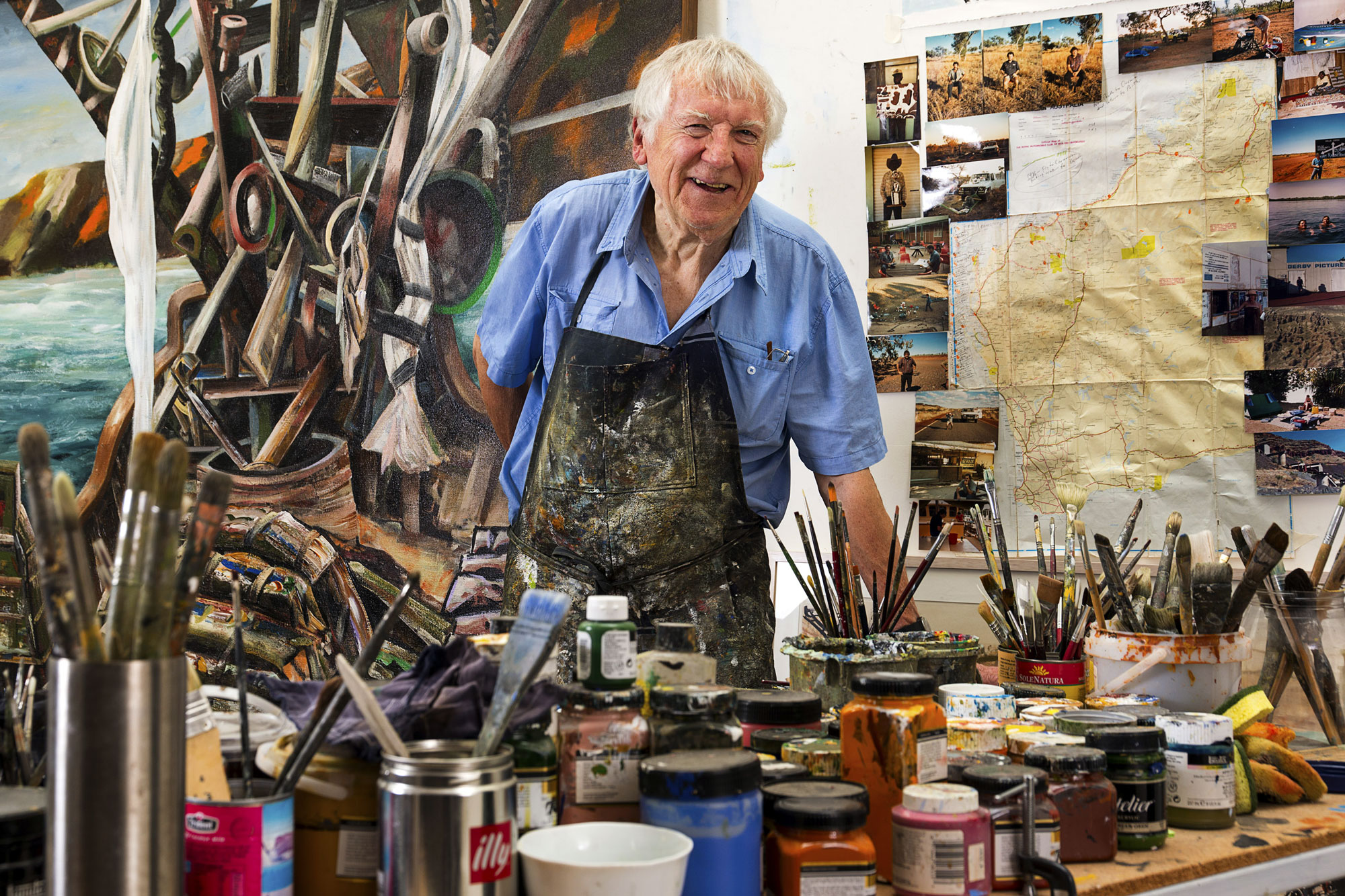
Predrag Cancar/NGV Photographic Services Jan Senbergs in his studio 2015
From the vast expanses of Antarctica to labyrinthine Melbourne cityscapes, more than five decades of artist Jan Senbergs’ prolific oeuvre will be revealed in the major retrospective Jan Senbergs: Observation – Imagination.
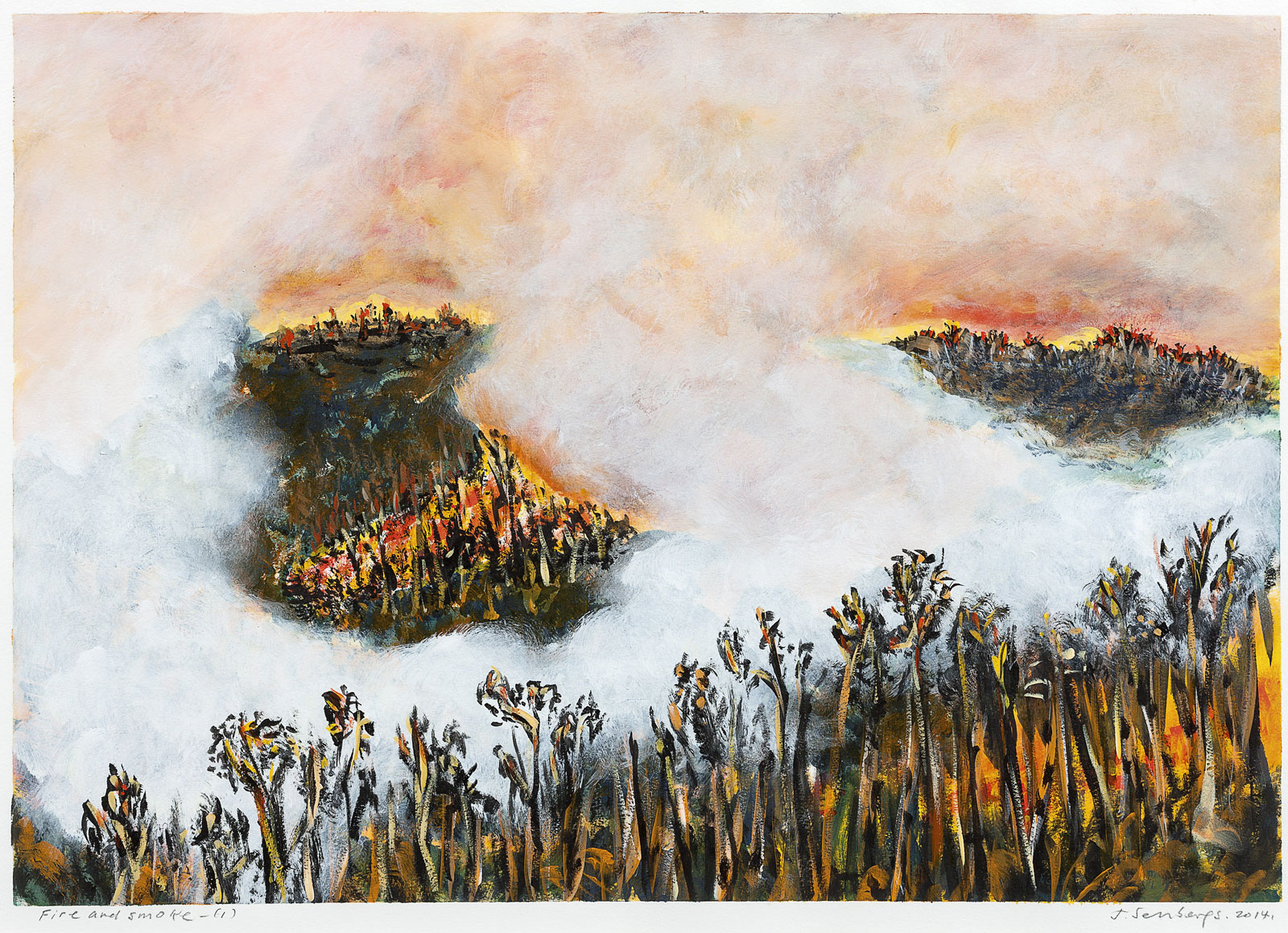
The exhibition, Senbergs’ first-ever comprehensive survey, will feature over 120 works including large-scale paintings, drawings and prints which depict sprawling aerial views of Australian cities, dystopic industrial landscapes, raging bushfires in the Victorian Otways, the remote deserts of north-Western Australia and more. The exhibition spans Senbergs’ first exhibition in 1960 through to the present day, representing all periods of his career. Recognised for his sheer visual inventiveness and sitting outside any defined artistic trend, Senbergs draws inspiration from a remarkably diverse range of influences; literature, history, architecture and non-Western art, and finds imagery within obscure technical journals, ancient mythology and illustrated encyclopaedias.
Tony Ellwood, Director, NGV, said, “As one of Australia’s leading contemporary artists, Jan Senbergs is an extraordinary inventor of his own visual language, at once simple and bold. From lush landscapes to barren urban spaces, his body of work signifies an artist who has continually experimented with shape, form and motif, and one who to this day continues to push his art in new and unexpected directions. The NGV is pleased to present the first major retrospective of Jan Senbergs’ work and offer visitors the opportunity to experience the full spectrum and constant evolution of his career.”
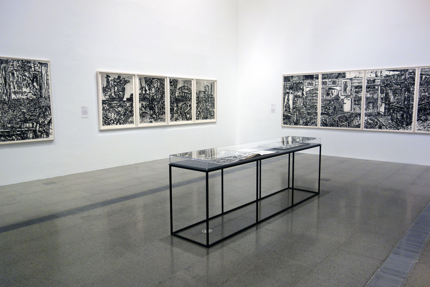
Senbergs, born in 1939 in Latvia, moved to Melbourne in 1950 following the end of World War II. Among other honours, he represented Australia at the prestigious 12th São Paolo Biennial in 1973 and was appointed to the Visiting Chair in Australian Studies at Harvard University in 1989, the first artist to hold this illustrious post. Observation – Imagination will include key works from Senbergs’ most important and critically acclaimed series including his 1973 São Paolo Biennial paintings, the Copperopolis – Mt Lyell mining landscape series, 1983, and his immense multi-panelled studio drawings of 1993-1995.
Senbergs’ Antarctica series is considered one of the most significant artistic responses to the continent. In 1987, Senbergs spent six weeks with the Australian Antarctic Division, travelling with fellow artists Bea Maddock and John Caldwell, on an annual resupply mission. Observation – Imagination will include key works such as his epic landscapes Mawson and Davis. The exhibition will also present Senbergs’ epic, 4.6 metre long Pulaski Skyway painting, which reflects the post-industrial landscape of the five and a half kilometre freeway that crosses the wasteland of western New Jersey from Newark to Jersey City. In this, Senbergs found a metaphor for the American experience and its splendour and decay.
More recently Senbergs has produced intricate labyrinthine views of cities, combining memory and imagination, and the exhibition will include map-like images of Melbourne, Sydney, Geelong, Wollongong and Port Kembla. The exhibition will also feature works from Senbergs’ recent 2014 Victorian bushfire series, which burst with visual drama and chromatic brilliance. Senbergs often refers to himself as a scavenger and collector of imagery taken from a wide variety of sources, and Observation – Imagination will include an enormous showcase, created by the artist, filled with cut-outs, photographs and personal artefacts that reference the people, places and artworks which have fuelled his visual imagination.
Press release from the National Gallery of Victoria
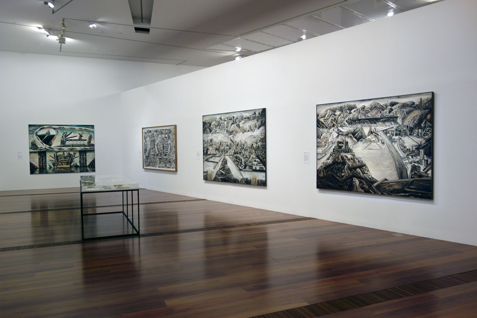
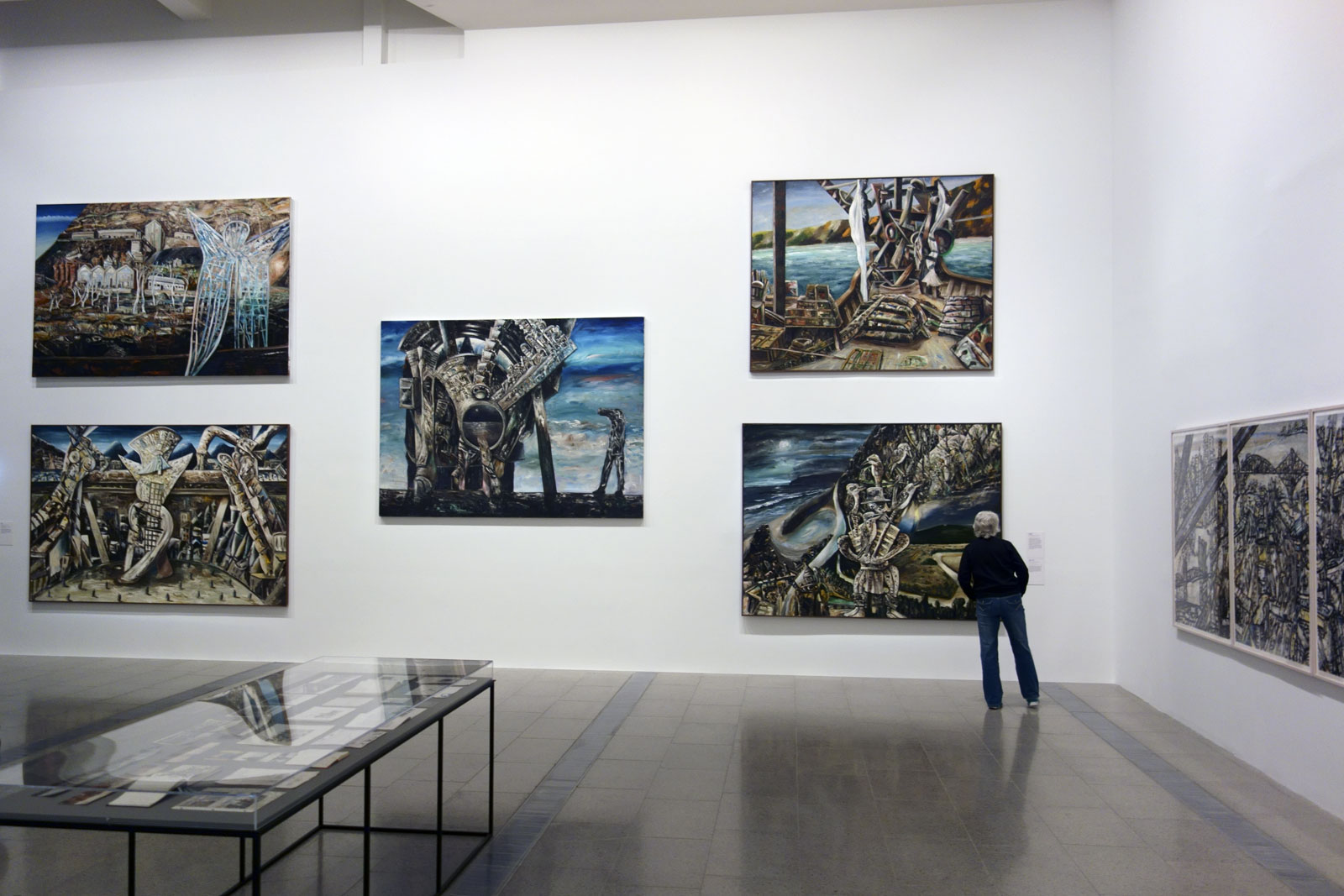
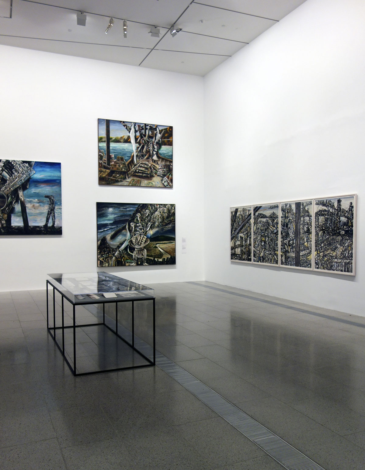
Installation views of the exhibition Jan Senbergs: Observation – Imagination at The Ian Potter Centre: NGV Australia showing in the top image, Blue angel of Wittenoom at top left (1988, below); and Otway night at bottom right (1994, below) Photos: Marcus Bunyan
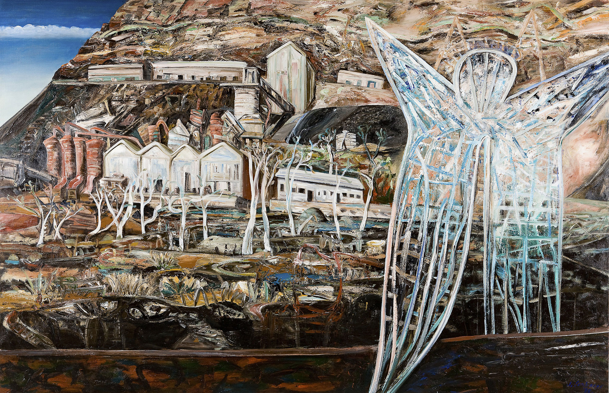
The blue angel in the painting refers to the dangers of asbestos in the mining town of Wittenoom.
Wittenoom is a ghost town 1,106 kilometres (687 mi) north-north-east of Perth in the Hamersley Range in the Pilbara region of Western Australia. The area around Wittenoom was mainly pastoral until the 1930s when mining began in the area. By 1939, major mining had begun in Yampire Gorge, which was subsequently closed in 1943 when mining began in Wittenoom Gorge. In 1947 a company town was built, and by the 1950s it was Pilbara’s largest town. During the 1950s and early 1960s Wittenoom was Australia’s only supplier of blue asbestos. The town was shut down in 1966 due to unprofitability and growing health concerns from asbestos mining in the area.
Today, six residents still live in the town, which receives no government services. In December 2006, the Government of Western Australia announced that the town’s official status would be removed, and in June 2007, Jon Ford, the Minister for Regional Development, announced that the townsite had officially been degazetted. The town’s name was removed from official maps and road signs and the Shire of Ashburton is able to close roads that lead to contaminated areas.
The Wittenoom steering committee met in April 2013 to finalise closure of the town, limit access to the area and raise awareness of the risks. Details of how that would be achieved were to be determined but it would likely necessitate removing the town’s remaining residents, converting freehold land to crown land, demolishing houses and closing or rerouting roads. by 2015 six residents remained.
Jan Senbergs (born Latvia 1939, arrived Australia 1950, died Melbourne 2024) Otway night (detail) 1994 Synthetic polymer paint on canvas Art Gallery of New South Wales Purchase with assistance from Ruth Komon, 1994
After purchasing a holiday house at Aireys Inlet, Senbergs became interested in the history of Victoria’s west coast and the story of escaped convict William Buckley, ‘the wild white man’ who lived with the local Wathaurung people from 1803 until 1835 before being integrated back into colonial society.
Jan Senbergs (born Latvia 1939, arrived Australia 1950, died Melbourne 2024) Mawson (detail) 1987 Synthetic polymer paint on canvas Private collection, Melbourne
“As in previous settlements in history, in Antarctica we are again squatting on the edge of yet another continent and bringing our cultural baggage with us. Already there is a sense of history there: architectural, social and visual.”
~ Jan Senbergs, 2002
Installation views of the exhibition Jan Senbergs: Observation – Imagination at The Ian Potter Centre: NGV Australia showing in the bottom image at top left, Bea Maddock being lifted onto the Icebird – Heard Island (1987, below); at top middle, Antarctic night (1989, below); at bottom left, Mawson; and at bottom middle, Platcha (1987, below) Photos: Marcus Bunyan
Senbergs was one of three artists invited by the Australian Antractic Division to take part in the resupply Voyage Six to Antarctica as observers. Leaving Hobart in early January 1987, during their six‐week journey the artists visited Heard Island, Scullin Monolith, Law Base, Davis, Mawson and the Russian base at Mirny. This painting depicts fellow artist Bea Maddock who broke her leg while disembarking at Heard Island and needed to be winched back on board. Unfortunately, she was incapacitated for the remainder of the trip.
“In a “cut-away” view, [Antarctic night] shows the interior of a winterer’s hut with its wall covered in a “tapestry” of pin-up images – from the earliest “pin‐up”, the Venus of Willendorf, to the Playboy centrefolds of the 1950s and 1960s … The more you saw of it, the more it seemed like an Antarctic Pop Art movement.”
Installation view of the exhibition Jan Senbergs: Observation – Imagination at The Ian Potter Centre: NGV Australia Photo: Marcus Bunyan
Installation view of New Guinea sheilas triptych (centre row) and New Guinea male triptych (bottom row) both 1993 Pastel on paper Courtesy of the artist and Niagara Galleries, Melbourne Photo: Marcus Bunyan
Detail view of New Guinea sheilas triptych (centre row) and New Guinea male triptych (bottom row) both 1993 Pastel on paper Courtesy of the artist and Niagara Galleries, Melbourne Photo: Marcus Bunyan
“I enjoy the freedom of drawing, the directness of what I call my “Long Arm Drawing” with a black pastel or an oil stick, where there’s no room for corrections or embellishments – dancing in front of a sheet of paper, keeping a spontaneous line, and if you hesitate, it shows. It’s “unforgiving” drawing and if you’re out of form you lose, and sheets of paper end up in the bin. Like an athlete or a dancer, you’ve got to put in the hours to make the confident mark.”
“[The] map-like images of the city that I’ve developed – of Melbourne, Sydney, Wollongong, Barcelona – they come out of a fascination with map-making, particularly early map-making … I started to look for an imagined way of painting and drawing actual places like Melbourne or Sydney: not exactly what you see in front of you but what you know to be there … It’s like those early maps, imaginary maps where people were drawing what they knew, not what they saw or measured.”
Figures and heads made from mechanistic and architectural elements was one of Senbergs’s earliest subjects. He returned to this motif recently in several monumental paintings, including Paolozzi’s city, 2010, and The elated city, 2009.
In the history of painting, a capriccio refers to an architectural fantasy where buildings and other architectural elements and places come together in imaginary settings. Senbergs’ Melbourne capriccio offers the viewer the pleasure of a bird’s-eye view of familiar landmarks, seen through a rich blend of memory and imagination.
As a young artist in the 1960s, Senbergs greatly admired Scottish Pop artist Edouardo Paolozzi’s strange fusions of machine and organic forms, and explored similar ideas in his own paintings and screen prints. In Paolozzi’s city Senbergs has created a fantastical head out of buildings and roads, and pays homage to one of his first artistic heroes.
“One of the rarest qualities in contemporary painting is wit … Jan Senberg’s ‘Geelong capriccio’ is in every way a painting of wit, its single and absurd proposition as to what the world would look like if Geelong had become the capital and the site of Melbourne remained open paddocks … It seems to be a very Antipodean painting: the upside-down world, which Europe imagined Australia to be, a place where anything might happen.”
Installation view of the opening room of the exhibition Jan Senbergs: Observation – Imagination at The Ian Potter Centre: NGV Australia showing at top, Extended Melbourne labyrinth (2013, above); at left, Geelong capriccio (if Geelong were settled instead of Melbourne) (2010, above); at right Melbourne capriccio 3 Photo: Marcus Bunyan
Installation views of the opening room of the exhibition Jan Senbergs: Observation – Imagination at The Ian Potter Centre: NGV Australia showing at left in both images, The elated city followed by Paolozzi’s city Photo: Marcus Bunyan
In contrast to the enclosed, almost claustrophobic spaces of the studio interiors, by the end of the 1990s Senbergs had embarked upon a new series of map-like paintings, sprawling bird’s-eye view of cities, which continue to occupy him to the present day. Initially inspired by seeing Melbourne from a high-rise building, these works reflect the artist’s long fascination with early and non-Western map-making traditions. Like these maps, Senbergs’ views are not scientifically measured recordings; rather they are imaginative constructions of place based on observation and memory.
At the same time Senbergs began his most extensive group of landscapes, painting the rugged terrain of the Victorian west coast, an area that he knew well. While some of these works depict untouched wilderness, others include roads and townships and employ multiple perspectives to convey the experience of travelling through the landscape. Senbergs’ recent Heat – Fire – Smoke series is a response to the 2014 bushfires in Victoria, a new subject for the artist, in which he reflects on the cycle of destruction and regeneration. (Wall text from the exhibition)
“In January 2014 in Melbourne we had four days of forty-plus degrees of intense heat – with bushfires raging in the countryside casting a pall of acrid smoke over the extended city and all around ominous skies that seemed to portend an inferno that would be all engulfing. That oppressive atmosphere and that sense of threat at the edges of the extended city seemed as if an overwhelming and merciless force was at the gates and ready to break down the barricades.”
~ Jan Senbergs, 2015
The Ian Potter Centre: NGV Australia Federation Square Corner of Russell and Flinders Streets, Melbourne
Andrew Follows (Australian, d. 2019) Two 1930s Chevrolet hotrods 2016 From the series Carmania 2 Digital photograph
Australian vernacular
Hats off to my photographer friend Andrew Follows for another stunning set of Australian automobile photographs.
These photographs were taken at a fund raising display for brain injury in Epping, Melbourne, Australia.
Great job Andrew… with a little digital clean, retouch and colour balance from me!
Dr Marcus Bunyan
PS. Don’t forget Andrew is a vision impaired photographer, with only 10% vision in one eye and no vision at all in the other eye. All the more remarkable…
** Please make sure you enlarge these images to see them to best advantage. **
Darron Davies (Australian) Voyager 2016 From the series The Travellers Pigment print
I opened this exhibition for Darron Davies at the Centre for Theology and Ministry, Melbourne. I can’t remember exactly what I said but it went something like this…
When artists find themselves on a path to new ways of seeing the world, to new forms of enlightenment, then that is a magical and energising place to be. And so it is with this new body of work by Darron Davies. A path of many patterns and possibilities.
I spoke of synaesthesia – the production of a sense impression relating to one sense or part of the body by stimulation of another sense or part of the body. Here, colour and form produce music. As in Messiaen’s music, rather than being a decorative element Davies shows that colour can be a structural, a fundamental element which is the material of the music itself. Little vibrations of energy (in the universe), are caught in time and space and brought forth into consciousness through colour.
I extemporised on the question – is the [origami] model immanent in the paper, or is the paper a blank slate to be written on by the creator? – by asking, are these images already in Davies’ mind before he creates them as a kind of subconscious previsualisation, before he looks through the camera lens, before he relies on the serendipity and happenstance to capture what emerges out of the ether. Does the artist’s consciousness bring forth what he needs to see as an artist so that he can recognise it as such, forms that are already buried in the structure of the cosmos itself.
Perhaps this recognition does allow the artist (and subsequently the viewer) to go on a journey, to travel into other realms of being, of existence, to probe the boundaries of what is possible and what is probable. This work is about just that – being in the world and transcending it, and recognising that we can exist between the phenomenal and the noumenal. As has been said of Joseph Cornell’s boxes, “They partake of both dream and reality, and of something else that doesn’t have a name. They tempt the viewer in two opposite directions. One is to look and admire… and the other is to make up stories about what one sees… Neither (way) by itself is sufficient. It’s the mingling of the two that makes up the third image.”1
The Thirdspace – in which “everything comes together… subjectivity and objectivity, the abstract and the concrete, the real and the imagined, the knowable and the unimaginable, the repetitive and the differential, structure and agency, mind and body, consciousness and the unconscious, the disciplined and the transdisciplinary, everyday life and unending history”2 – allows that none of these couples, such as the phenomenal and the noumenal, can be divided by an either-or attitude. “This… does not mean differences are denied, instead, it most of all means the inevitable reciprocity of any pair of definitions. In such a case both leave a mark on the other. It is a question of both-and – how each of the pair influences the other.”3 In the case of Davies’ work, this reciprocity allows the images to possess a multivalent narrative, which is neither here nor there. It allows the work to be accessible to different interpretations, meanings, and values: a new door or path opens up on the basis of very diverse needs and objectives. For the artist the possibilities are endless.
Dr Marcus Bunyan
Footnotes
1/ Simic, Charles. “First, there are,” in Dime Store Alchemy. New York: The Ecco Press, 1992, p. 60 quoted in Heaney, Seamus. The Redress of Poetry. Faber and Faber, London, 1995, p. 181.
2/ Soja, Edward W. Thirdspace. Malden (Mass.): Blackwell, 1996, p. 57 quoted in “Edward Soja” on the Wikipedia website [Online] Cited 01/05/2016.
3/ Hannula, Mika. “Third space – a merry-go-round of opportunity,” on the Kiasma Magazine website No 12 Vol 4, 2001 [Online] Cited 01/05/2016. No longer available online
Many thankx to Darron Davies for allowing me to publish the photographs in the posting. Please click on the photographs for a larger version of the image.
Darron Davies (Australian) Horizon 2016 From the series The Travellers Pigment print
Darron Davies (Australian) Unbridle 2016 From the series The Travellers Pigment print
Darron Davies (Australian) Emanation 2016 From the series The Travellers Pigment print
Darron Davies (Australian) The Break 2016 From the series The Travellers Pigment print
The Travellers is a series exploring light, in particular its abstractions as it passes through glass. Utilising a framework that supports glass sheets, a light, filters, and all manner of glass ranging from old ash trays to vases, I use a macro lens to focus on patterns created by the interaction of light. The prismatic effects are extraordinary. The narrow depth of field allows patterns to be further discovered within the glass.
Based on the experiments of photographers such as Wynn Bullock – his much under-recognised light abstraction work from 1959 to 1965 utilising similar experimentation – this project uses a digital camera to create fascinating landscapes. These landscapes in their variety of forms, at times volcanic, primordial, celestial, or atomic, are a metaphor for the ancient and current travellers – perhaps the subatomic world – that shape and have shaped our world.
Apart from slightly adjusting the blowing out of light caused by the delicate uneveneness of light within the macro image none of these images are highly photoshopped. What is captured is pretty much true to what is seen through the lens – an extraordinary world at play within light and colour fields. I have a heard the story that the experimental filmmaker Stan Brakhage once changed a film about the interior of a house to a pure focus of patterns that he found in ashtrays lying on a table. Fantastic! See the film The Text of Light. This is an interesting tradition embracing the likes of Brakhage, Bullock , Len Lye and the Cantrills.
At the discussion session after the premiere of his film The Text of Light at the Carnegie Institute, Pittsburgh in 1974, he (Brakhage) paraphrased the later English ‘Light Philosopher’ Robert Grosseteste: “all that sense can comprehend, is Light: because it partakes of that which it is. To comprehend dark, or a shape, it must withdraw from its own nature – it must withdraw or turn against its own electrical illuminating nature in order to comprehend a shape”.
Courtesy Cantrill’s Filmnotes, 21/22, (April 1975) photography. (Arthur was my lecturer at Melb State College in the early 80s and he and Corinne live now in Castlemaine, where I live, so have discussed these ideas on many occasions, as well as assisted them with their screenings).
Extract from the artist’s statement
Darron Davies (Australian) Horizon 2016 From the series The Travellers Pigment print
Darron Davies (Australian) Embodiment 2016 From the series The Travellers Pigment print
Darron Davies (Australian) Guise 2016 From the series The Travellers Pigment print
Darron Davies (Australian) Frame 2016 From the series The Travellers Pigment print
Darron Davies (Australian) The Self Returning 2016 From the series The Travellers Pigment print
Darron Davies (Australian) Advent 2016 From the series The Travellers Pigment print
Darron Davies (Australian) The Mainspring 2016 From the series The Travellers Pigment print
Darron Davies (Australian) Designer 2016 From the series The Travellers Pigment print
The Centre for Theology and Ministry 29 College Crescent, Parkville, Melbourne, Victoria Phone: (03) 9340 8800
Gallery hours: Monday to Friday 9am – 5pm (not weekends)
This mega-exhibition has been a popular success for the National Gallery of Victoria, Melbourne, with over 300,000 visitors during its run. But does that make it an interesting, or even memorable, exhibition? Personally, I think this is an exhibition based on a curatorial concept, an interesting concept, that does not then lead to a memorable exhibition. I will explain why.
The idea behind the exhibition, to compare and contrast the work of Andy Warhol (one of the most influential artists of the twentieth century) and the work of Ai Weiewei (that denizen and superstar of contemporary art and free speech, in China and around the world) is sound but in reality, on actual viewing, the relationship between the ideas of both artists seems rather forced.
While the synergy of ideas between both artists is present – “a vocabulary which celebrates freedom of speech and, at the same time, the wisdom of pop culture” – evidenced through the symbology of popular culture and the specificity and uniqueness of the original, the installation of the work does neither of the artist’s work justice.
In this game of comparisons (where Andy Warhol’s photographs of New York sit opposite those of Ai Weiwei’s, where Andy Warhol’s portraits of Chairman Mao sit diagonally opposite Ai Weiwei’s) neither artist’s work can be contemplated as a whole… and it is Warhol’s work that comes out a poor second best in this artistic exchange.
Why?
Mainly because both artist’s are talking about completely different things from completely different eras and it is Ai who dominates the conversation. As Monica Tan observes in an article on the Guardian website, “In their art, Ai aggressively engages with politics and current affairs… while Warhol was forever occupied with consumerism, pop culture iconography and celebrity.”1
With regard to the work of Ai Weiwei there is the key word, aggressively. His brazen installations simply overwhelm the sophistication of the work of Andy Warhol, and this should never have happened, should never have been allowed to happen. The exhibition does not do Warhol’s work justice.
Ai Weiwei comments, “We’re dealing with different societies, Andy Warhol and I. We are involved with very different social and political circumstances. But we’re both trying to face out reality honestly and to give a better illustration of our time.”2
While the last sentence is true, facing out reality honestly does not mean that both mens work can be understood or compared in the same breath, which is what happens in this exhibition. For each artist’s work I felt there was no space to breathe in the whole eight galleries. The visitor needs at least three hours, and a couple of visits, to get through all of the work and at the end of it all you feel is rather exhausted and only a little enlightened.
After the forced curatorial concept of the whole exhibition, this is my second major criticism of the show: the unnecessary “noise” of the installation. Everything and the art kitchen sink (preferably teamed with an ancient Chinese sink with ceramic flowers growing out of it) has been thrown at the installation of the exhibition, not necessarily to its benefit.
Susan Sontag despairs of the “ambience of distraction” that pervades contemporary museums – less room to contemplate, more rooms for noise.
The NGV seems particularly adept at this distraction and this exhibition is just another example of the phenomenon. Room after room is filled to the brim with artefacts which are then placed on more noise – busy, repetitious wallpaper!
Andy Warhol’s silkscreen portraits of Mao (1972) are hung on his Mao Wallpaper (1974, reprint 2015), on the exterior of Ai Weiwei’s Letgo room (2015) meaning that you can’t really “read” the colours of the silkscreens properly as they are subsumed amongst this mass of wallpaper noise. A similar thing happens with Warhol’s Electric Chairs (1971) silkscreens and his Electric Chair (1967) painting which are hung on Warhol’s Washington Monument Wallpaper (1974, reprint 2015). This means that the luminosity of the colours of the silkscreens and painting completely loose their impact if you were viewing the works against a plain wall. They just blend into the gallery wall.
It’s as though the curators at the NGV are frightened of empty wall space, both in the number of objects in a room and the lack of negative space (plain coloured walls) behind the art works. And this is not a singular occurrence of this phenomenon at the NGV… the exhibition David McDiarmid: When This You See Remember Me featured this installation technique while the exhibition Masterpieces from the Hermitage: The Legacy of Catherine the Greatwas nearly ruined by garish wall colourings and patterned floors. Less is more.
Speaking of which, some of superstar of the contemporary art world Ai Weiwei’s work was, dare I say it, woeful. When he hits the mark, such as in bodies of work like the photographic series Study of Perspective (1995-2011, below), his incisive commentary on freedom and surveillance With Flowers(2013-2015) or his installation of S.A.C.R.E.D. Maquettes(2011), which depicts scenes from the detention cell where he was held without charge by the Chinese government for eighty-one days – he is masterful as an artist, in complete control of his visual and symbolic language.
But then you have pieces of work such as the dire Letgo (2015) (focusing on Australian activists, advocates and champions of human rights and freedom of speech) made of pseudo-LEGO which is just a hideous and ugly art work that has very few redeeming features. There also seems no logical reason to remake the famous photographic triptych Dropping a Han Dynasty Urn (1995, below) in children’s building bricks. To no particularly good effect, why is this statement, this re-imagining being made?
Similarly, when Ai remakes a pair of handcuffs in jade and wood, Handcuffs (2015), other than the historic qualities of the materials in relation to the history of China and issues of freedom of speech, where does the work actually take you? Not very far. Noise, noise and more noise, just a symptom and comment on our social media society.
The third major criticism of this exhibition and the most crucial to its failure to be a memorable exhibition: is its lack of TIME.
Lumping both Warhol and Ai Weiwei side by side, cheek by jowl, gives neither artist’s work the time to breathe and the viewer no time to contemplate, to IMAGINE, the relationship between the two artists. Two artist’s from different eras separated by time. Here, time (and space) is conflated as though the intervening period between them never existed. My idea was this: first, have the first four gallery rooms full of Warhol’s work so that you could understand the ambience of his colour and subtlety, yes subtlety, of his visual language. Then a dark passageway before emerging into four galleries of Ai Weiwei’s work. In this way, you could have understood each artist’s work independently of each other in a holistic way, and then made you own linkages between the two artist’s works… instead of, oh look, here’s Warhol’s photographs of NY and, oh, there’s Ai Weiwei’s photographs of NY!
This simplistic, popularist, comparative curatorial strategy never allows these major artists work room to breathe or the time and space to exist in the sphere and realm of each other. Warhol’s work is denuded by Ai’s aggressive, contemporary take on politics and freedom of speech. Warhol did not deserve that. A sense of TIME and SPACE is what this exhibition needed in its installation in order for the viewer to be able to fully contemplate and IMAGINE the relationship between the two artists. To trust the intelligence of the viewer to make the connections, not treat them as some number walking through the door. Less noise and more imagination.
2/ “Max Delany in conversation with Ai Weiwei,” in Gallery magazine, January-February 2016. National Gallery of Victoria, 2016, p. 29.
Many thankx to the National Gallery of Victoria for allowing me to publish the art work in the posting. Please click on the photographs for a larger version of the image.
“Marilyn Monroe, the electric chair, Mickey Mouse, Mao Zedong, wallpaper, disasters, comic books, the Empire State Building, dollar bills, Coca-Cola, Einstein – no one knows how many works he left behind; they are varied and miscellaneous, touching upon almost all the important personalities and things of his time, and encompassing almost any possible means of expression: design, painting, sculpture, installation, recordings, photography, video, texts, advertising … Andy Warhol’s creations have rebelled against traditional, commercial, consumerist, plebeian, capitalist and globalised art… no matter when or where he was he was always taking photographs and recording; he was several decades ahead of his time. …
Andy Warhol was a self-created product, and the transmission of that product was a characteristic of his identity, including all of his activities and his life itself. He was a complicated composite of interests and actions; he practiced the passions, desires, ambitions and imaginations of his era. He shaped a broad perception of the world, an experimental world, a popular world, and a non-traditional, anti-elitist world. This is the true significance of Andy Warhol that people aren’t willing to accept, and the reason that he is still not recognised as a true artist by everyone.”
Ai Weiwei. “Ai Weiwei: A tribute to Andy Warhol,” in Gallery magazine, January-February 2016. National Gallery of Victoria, 2016, pp. 31-32.
“Warhol is someone I think of as a unique treasure from the past century, which I call the ‘American Century’. His work has all the qualities of that time and reflects all its mythologies. Warhol’s value has always been underrated. He was many evades ahead of his time. I think, even today, he is still one of the most important figures in contemporary art.”
Ai Weiwei quoted in “Max Delany in conversation with Ai Weiwei,” in Gallery magazine, January-February 2016. National Gallery of Victoria, 2016, p. 27.
Gao Yuan Ai Weiwei 2012 Image courtesy Ai Weiwei Studio
This major international exhibition features two of the most significant artists of the twentieth and twenty-first centuries: Andy Warhol and Ai Weiwei.
Andy Warhol | Ai Weiwei, developed by the NGV and The Andy Warhol Museum, with the participation of Ai Weiwei, explores the significant influence of these two exemplary artists on modern art and contemporary life, focusing on the parallels, intersections and points of difference between the two artists’ practices. Surveying the scope of both artists’ careers, the exhibition at the NGV presents more than 300 works, including major new commissions, immersive installations and a wide representation of paintings, sculpture, film, photography, publishing and social media.
Presenting the work of both artists, the exhibition explores modern and contemporary art, life and cultural politics through the activities of two exemplary figures – one of whom represents twentieth century modernity and the ‘American century’; and the other contemporary life in the twenty-first century and what has been heralded as the ‘Chinese century’ to come.
Andy Warhol | Ai Weiwei premieres a suite of major new commissions from Ai Weiwei, including an installation from the Forever Bicycles series, composed from almost 1500 bicycles; a major five-metre-tall work from Ai’s Chandelier series of crystal and light; Blossom 2015, a spectacular installation in the form of a large bed of thousands of delicate, intricately designed white porcelain flowers; and a room-scale installation featuring portraits of Australian advocates for human rights and freedom of speech and information.
Text from the National Gallery of Victoria website
Ai Weiwei in conversation with Virginia Trioli
Icons and iconoclasm
Andy Warhol is among the most influential artists of the twentieth century. He was a leading figure in the development of Pop Art, and his influence extended to the worlds of film, music, television and popular culture. Warhol created some of the most defining iconography of the late twentieth century through his exploration of consumer society, fame and celebrity, media and advertising, politics and capital.
Ai Weiwei is a Chinese artist, social activist and one of today’s most renowned contemporary artists. His provocative work encompasses diverse fields, including visual art, architecture, curatorial practice, cultural criticism, social media and activism. Ai’s practice addresses some of the most critical global issues of the early twenty-first century, such as the relationship between tradition and modernity, the role of the individual and the state, questions of human rights and the value of freedom of expression.
In this gallery we are introduced to the artists through their engagement with self-portraiture and self-representation, and through some of their most iconic, performative and iconoclastic works. These works not only attest to both artists’ transformation of aesthetic value through artistic innovation and experimentation, but also reference their shared interest in cultural heritage and vernacular expression in the United States and China, respectively.
The source image for Warhol’s numerous portraits of Mao Zedong is the frontispiece to the Chairman’s famous Little Red Book of quotations. Mao’s image was in the media spotlight in 1972, the year US President Richard Nixon travelled to China, and his official portrait could be seen on the walls of homes, businesses and government buildings throughout the country. It was also extremely popular among literary and intellectual circles in the West. Warhol’s repetition of the image as pop-cultural icon underlines the cult of celebrity surrounding Mao, and the ways in which the proliferation of images in media and advertising promotes consumer desire and identification.
Text from exhibition wall panel
Cultural revolutions
Andy Warhol’s Mao paintings, based on a photograph of Mao Zedong taken from his famous Little Red Book of quotations (1964-1976), adopt the subject matter of totalitarian propaganda to create pop portraits of the communist leader. Created in 1972, the year US President Richard Nixon travelled to China – signalling a thawing of relations between the two nations after almost three decades of intense political rivalry – Warhol’s paintings address the cult of personality surrounding Mao. Warhol’s Mao paintings, prints and wallpaper highlight not only the status and influence of the Chinese leader at the height of the Cold War, but also the instrumental role the repetition of images played in establishing his fame.
In the aftermath of the Cultural Revolution, avant-garde artists in China embraced a wide range of aesthetic positions, including Pop and postmodern critiques of Socialist Realism, sometimes known as cynical realism, to recalibrate historical Chinese images and propaganda. These deadpan critiques of official state imagery are apparent in Ai Weiwei’s large-scale, hand-painted images of Mao produced in the mid 1980s in New York. Ai’s representations of Mao subject the communist leader to various distortions familiar from television signals and screens and painterly gestural abstraction.
This self-portrait was shot by Ai in an elevator while being taken into police custody in 2009. On the night before the trial of a fellow political activist in Chengdu Ai was preparing for, Chinese police officers forced their way into his hotel room around 3 am and arrested him. This candid, documentary-style snap plays on the tradition of the ‘selfie’ in contemporary social media, transforming the form into a political tool. Illumination is a defiant expression of personal autonomy.
Images of death and disaster were a recurrent theme for Warhol from the early 1960s onwards – a preoccupation fatefully realised at a personal level in 1968 when he was shot and seriously injured by the radical feminist writer Valerie Solanas. The gun in the painting is similar to the .22 pistol that Solanas used. While it may be read as autobiographical, Warhol’s Gun series can also be considered in the tradition of still life. It reflects on the ubiquity of violence in popular culture and the media, as well as the role of guns in US culture.
Andy Warhol’s and Ai Weiwei’s practices, like those of many artists, began with a strong interest in drawing. Following art school at the Carnegie Institute of Technology, Pittsburgh, Warhol relocated to New York and worked as a commercial illustrator throughout the 1950s. His professional success was largely due to a simple yet sophisticated style and his ability to create art quickly using the ‘blotted line’ technique – a signature style which combined drawing with very basic printmaking. One of his best known advertising campaigns in the 1950s was for I. Miller Shoes; other clients included book publishers, record companies and fashion magazines. These early drawings are of a more personal nature and reveal Warhol’s interest in themes explored in later paintings, screen-prints and films, such as beauty, celebrity, commodities and urban life.
Ai’s early drawings display the poetic sensibility of a young artist whose childhood was largely spent in western Xinjiang Province, a remote desert area where his father, the eminent poet and intellectual Ai Qing had been sent for manual labour and ‘re-education’ during the Cultural Revolution. Made in the late 1970s, when Ai became involved in burgeoning democracy movements and the avant-garde artists’ collective the Stars group, the drawings – while classical in appearance – are marked by an individualistic world view and artistic experimentation at odds with the officially sanctioned aesthetics of Socialist Realism.
Warhol’s paintings of Marilyn Monroe were made from a production still from the 1953 film Niagara, and are among his first photo-silkscreen works. Warhol recalls that he began using this process in August 1962: ‘When Marilyn Monroe happened to die that month, I got the idea to make silkscreens of her beautiful face – the first Marilyns’. The repetition of Monroe’s image can be read as a memorial for the deceased American icon as well as a reflection of the media’s insatiable appetite for celebrity and tragedy.
It is perhaps surprising, in view of his self-consciousness and fondness for the anonymity of silkscreen printing, that Warhol produced many self-portraits over a twenty-year period. In Self-Portrait No. 9 his gaunt, disembodied image floats against a starry black background, partially concealed by a fluorescent camouflage pattern – an eloquent reflection on the nature of fame and privacy in an age of mass media. Produced only months before Warhol’s death from surgical complications, this haunting self-portrait is sometimes interpreted as a postmodern death mask.
Nine months before his untimely death due to complications after gall bladder surgery, Warhol undertook a large series of iconic self-portrait paintings. Many viewers and critics alike regard these gaunt staring faces as memento mori, or reminders of human mortality. Each work centres on a levitating head surrounded by a halo of spiky hair. Monumental in scale, the works have a melancholic, haunting quality created in part by the use of dark tones and a dense black ground, and in part by variations across the series in the ghostlike negative photographic reproduction.
The first series of Warhol paintings on a silver background – the Electric Chairs and Tunafish Disasters of 1963 – suggest that the artist’s silver paintings are related to death. Even in the Liz paintings, which appear to highlight Elizabeth Taylor’s Hollywood career, there is an underlying theme of mortality. Warhol created this portrait when Taylor was at the height of stardom, but also very ill with pneumonia. He later recalled: ‘I started those a long time ago, when she was so sick and everyone said she was going to die. Now I’m doing them all over, putting bright colours on her lips and eyes’.
Warhol returned to the Statue of Liberty image many times during his career, repeatedly adapting the iconic form from different stylistic angles. In this work, Warhol focused on Lady Liberty’s face to produce a heroic celebrity portrait. The painting was created in 1986 – 100 years after the statue arrived in New York as a gift from France. The Fabis logo in the painting’s left corner is that of a French cookie company. Warhol played with all sorts of brands and logos in large-scale paintings of this period, often juxtaposing brands on top of images in contradictory and humorous ways.
The Study of Perspective series of photographs depicts Ai defiantly raising his middle finger to architectural monuments symbolic of state and cultural power. Measuring the distance between the artist and his subject, the composition of these works invokes the spatial relationship between the individual and the state while also echoing the unforgettable image of a lone demonstrator blocking the path of a military tank at Tiananmen Square in 1989.
Andy Warhol | Ai Weiwei at the NGV maps out where the two artists intersect. Works such as Ai’s neolithic urn defaced with a Coca-Cola logo seem to echo Warhol’s Campbell’s Soup Cans. But it would be reductive to call Ai “the Andy Warhol of 2015”. He says the show is interesting because it simultaneously highlights how close but also “so far away, so far apart” the artists are in their respective cultural backgrounds.
In their art, Ai aggressively engages with politics and current affairs (such as his moving roll call of the more than 5,000 students that died in the 2008 Sichuan earthquake) while Warhol was forever occupied with consumerism, pop culture iconography and celebrity.
A frisson is created by their respective portrayals of Mao Zedong hung in tandem. Ai says Warhol was a “very keen and very sensitive” artist, but portrayed the chairman as “no different to Marilyn Monroe or a Coca-Cola sign – purely a sign or signature of that time.”
The Chinese artist has a very different relationship to the ruthless political leader who he says was “very responsible” for damaging the nation, the destruction of so much Chinese tradition and so much personal, family crisis (Ai’s father, the notable poet Ai Qing, was exiled to Xinjiang as part of the late 1950s anti-rightist campaign).
In another room Warhol’s photographic impressions of China during a 1982 visit face Ai’s photos of his life in New York. Ai finds it strange Warhol visited the country since it was “every bit” the opposite of what he believed. “He said China was not beautiful because it didn’t have McDonald’s yet.”
AW: Contemporary art always changes its own form; it is always questioning its own condition. Social media is a way to connect and, for me as an artist, it is also a way to connect to reality and search for new expressions and ways to communicate. This has become essential because contemporary art is not a series but a practice. It is connected to our inherent human need to express our inner world, and to make that association possible with others. Social media is the best for this purpose.
MD: Warhol’s Polaroids and portrait paintings not only document his social milieu but also constitute a form of history painting. You recently embarked upon two major portrait projects, including Trace, 2014, and Letgo, 2015, focusing on Australian activists, advocates and champions of human rights and freedom of speech. Can you expand on the relationship between portraiture, celebrity, dissidence and political authority?
AW: These things differ a lot and they form different sections of human expression. As humans, our feelings relate to our desires, fears, anxieties or inner needs for justice and fairness. Above all, we have the idea of right or wrong, but we also make aesthetic judgements about proportion, light, colour, shape and sound. All these aspects have to work together to express ourselves.
Our values are not abstract. They are really about out wellbeing as humanity. We’re dealing with different societies, Andy Warhol and I. We are involved with very different social and political circumstances. But we’re both trying to face out reality honestly and to give a better illustration of our time.
Ai Weiwei quoted in “Max Delany in conversation with Ai Weiwei,” in Gallery magazine, January-February 2016. National Gallery of Victoria, 2016, p. 29.
A major international exhibition featuring two of the most significant artists of the twentieth and twenty-first centuries – Andy Warhol and Ai Weiwei – will open at the National Gallery of Victoria (NGV), Melbourne, in December 2015, and The Andy Warhol Museum, Pittsburgh, in June 2016.
Andy Warhol | Ai Weiwei, developed by the NGV and The Warhol, with the participation of Ai Weiwei, will explore the significant influence of these two exemplary artists on modern and contemporary life, focussing on the parallels, intersections and points of difference between the two artists’ practices. Surveying the scope of both artists’ careers, the exhibition at the NGV will present over 300 works, including major new commissions, immersive installations and a wide representation of paintings, sculpture, film, photography, publishing and social media.
Presenting the work of both artists’ in dialogue and correspondence, the exhibition will explore modern and contemporary art, life and cultural politics through the activities of two exemplary figures – one of whom represents twentieth century modernity and the ‘American century’; and the other contemporary life in the twenty-first century and what has been heralded as the ‘Chinese century’ to come.
Ai Weiwei commented, “I believe this is a very interesting and important exhibition and an honour for me to have the opportunity to be exhibited alongside Andy Warhol. This is a great privilege for me as an artist.”
Ai Weiwei lived in the United States from 1981 until 1993, where he experienced the works of Marcel Duchamp, Andy Warhol and Jasper Johns, among others. The Philosophy of Andy Warhol (From A to B & Back Again) was the first book that Ai Weiwei purchased in New York, and was a significant influence upon his conceptual approach. Ai Weiwei’s relationship to Warhol is explicitly apparent in a photographic self-portrait (taken in New York in 1987) in which Ai Weiwei poses in front of Warhol’s multiple self-portrait, adopting the same gesture.
Each artist is also recognised for his unique approach to notions of artistic value and studio production. Warhol’s Factory was legendary for its bringing together of artists and poets, film-makers and musicians, bohemians and intellectuals, drag queens, superstars and socialites, and for the serial-production of silkscreen paintings, films, television, music and publishing.
The studio of Ai Weiwei is renowned for its interdisciplinary approach, post-industrial modes of production, engagement with teams of assistants and collaborators, and strategic use of communications technology and social media. Both artists have been equally critical in redefining the role of ‘the artist’ – as impresario, cultural producer, activist, and brand – and both are known for their keen observation and documentation of contemporary society and everyday life.
Andy Warhol (born Pittsburgh 1928 – died New York 1987) was a leading protagonist in the development of Pop Art, and his influence extended beyond the world of fine art to music, film, television, celebrity and popular culture. Warhol created some of the most defining iconography of the late twentieth century, through his exploration of consumer society, fame and celebrity, media, advertising, politics and capital.
The NGV will present over 200 of Warhol’s most celebrated works including portraits, paintings and silkscreens such as Campbell’s Soup, Mao, Elvis, Three Marilyns, Flowers, Electric Chairs, Skulls and Myths series; early drawings and commercial illustrations from the 1950s; sculpture and installation, including Brillo Boxes 1964, Heinz Tomato Ketchup Boxes 1964, and Silver Clouds 1968; films such as Empire 1964, Blow job 1964, and Screen Tests 1965, among others from Warhol’s extensive filmography; music and publishing; alongside a selection of previously unseen work. The exhibition will also bring together a wide range of photography including over 500 Polaroids documenting Warhol’s friends, colleagues, artistic and social milieux.
Ai Weiwei (born Beijing 1957) is an artist and social activist who is among the most renowned contemporary artists practicing today. One of China’s most provocative artists, his work encompasses diverse fields including visual art, architecture, publishing and curatorial practice, cultural criticism, social media and activism. Ai Weiwei’s work addresses some of the most critical global issues of the early twenty-first century, including the relationship between tradition and modernity, the role of the individual and the state, questions of human rights, and the value of freedom of expression.
For the NGV exhibition, a suite of major commissions will be premiered, including a new installation from the Forever bicycles series and a new monumental work from his Chandelier series, among others. These will be presented alongside key works by Ai Weiwei from his early drawings in the 1970s, readymades of the 1980s, and painting, sculpture and photography of the 1990s and 2000s. New and recent installations, including new configurations of major works such as S.A.C.R.E.D. 2013 and Trace 2014, will sit alongside a wide range of photography, film and social media from over the past four decades. It will be the most comprehensive representation of the artist’s work in Australia to date.
Three major illustrated publications
The Andy Warhol | Ai Weiwei exhibition will be accompanied by a suite of three dynamic and visually-led publication formats: a deluxe collectors’ book in a presentation case, including an original limited-edition print by Ai Weiwei; a prestigious hardback edition; and sumptuous paperback volume. The major publications will explore the conceptual, formal, strategic and historical resonances between both artists’ work.
Press release from the National Gallery of Victoria
Andy Warhol’s expanded cinema and multimedia performance the Exploding Plastic Inevitable (EPI), featuring legendary rock group The Velvet Underground and Nico, debuted in April 1966 at The Dom, a Polish meeting hall in New York City. In the context of Warhol’s own practice, the EPI evolved from his work as a filmmaker, the social environment of his studio and earlier performances known as Andy Warhol, Up-Tight, in which members of Warhol’s entourage antagonistically confronted the audience while The Velvet Underground played onstage.
The EPI was a sensory assault – an immersive sound-and-light environment involving numerous collaborators. Warhol shot new footage that was projected simultaneously with older films as part of the show. Danny Williams helped orchestrate light effects, including strobes, spotlights and assorted coloured gels and mattes; Jackie Cassen created psychedelic slides; Gerard Malanga, Mary Woronov, and Ingrid Superstar staged dance routines with sadomasochistic theatrics; and The Velvet Underground performed their proto-punk songs and avant-garde rock improvisations at ear-splitting volume.
This evocation of the EPI is the result of detailed research by The Andy Warhol Museum into the original performances. It includes films that were projected during the shows, digitised copies of the slides, mattes that were used and live recordings of the Velvet Underground and Nico.
In Ai’s series of Coloured Vases, ongoing since 2006, Neolithic and Han dynasty urns are plunged into tubs of industrial paint to create an uneasy confrontation between tradition and modernity. In what might be considered an iconoclastic form of action painting, Ai gives ancient vessels a new glaze and painterly glow, appealing to new beginnings and cultural change through transformative acts of obliteration, renovation and renewal.
Warhol’s paintings of Campbell’s Soup Cans were first exhibited at the Ferus Gallery, Los Angeles, in 1962, and he returned to the subject repeatedly throughout his career. The works’ readymade commercial imagery, mechanical manufacture and serial production ran counter to prevailing artistic tendencies, offering a comment on notions of artistic originality, uniqueness and authenticity. The familiar red-and-white label of a Campbell’s Soup can was immediately recognisable to most Americans, regardless of their social or economic status, and eating Campbell’s Soup was a widely shared experience. This quintessential American product represented modern ideals: it was inexpensive, easily prepared and available in any supermarket.
First created in late 1963, Warhol’s Brillo Soap Pads Box recasts the Duchampian readymade through the lens of American popular culture. Warhol produced approximately 100 of these boxes for his exhibition at Stable Gallery, New York, in March 1964, where they were tightly packed and piled high in a display reminiscent of a grocery warehouse. Unlike Duchamp’s use of real objects as readymade works of art, Warhol’s Brillo Soap Pads Boxes are carefully painted and silkscreened to resemble everyday consumer items. For philosopher Arthur C. Danto, Warhol’s Brillo boxes marked the end of an art-historical epoch and represented a new model of how art could be produced, displayed and perceived.
The assembly and replication of readymade bicycles in Ai’s Forever Bicycles series, ongoing since 2003, promotes an intensely spectacular effect. ‘Forever’ is a popular brand of mass-produced bicycles manufactured in China since the 1940s and desired by Ai as a child. Composed from almost 1500 bicycles, this installation suggests both the individual and the multitude, with the collective energy of social progress signalled in the assemblage and perspectival rush of multiple forms.
Forever Bicycles disconnects the bicycles from their everyday function – reconfiguring them as an immense labyrinth-like network. The multi-tiered installation also achieves an architectural presence, much like a traditional arch or gateway to the exhibition.
Experimenting with decoration – one of modernist painting’s most controversial subjects – Warhol’s Flowers prints were exhibited in tight grids at his first show at Leo Castelli Gallery, New York City, in 1964. A subsequent series was exhibited in Paris, where more than 100 works were hung almost edge to edge, mimicking the decorative effect of wallpaper. The source photograph, taken by Patricia Caulfield, appeared in the June 1964 issue of Modern Photography magazine. Caulfield sued to maintain ownership of the image, and while the suit was settled out of court, the issues of authorship and copyright it raised remain relevant to contemporary art debates.
Text from exhibition wall panel
Flowers
Flowers in Western art history have symbolised love, death, sexuality, nobility, sleep and transience. In Chinese culture flowers also carry rich and auspicious symbolic meanings; from wealth and social status to beauty, reflection and enlightenment. The flower is a repeated motif in Andy Warhol’s work, from his earliest drawings and commercial illustrations to his Pop paintings and prints, first shown at the Leo Castelli Gallery, New York, in 1964. While the production of Warhol’s Flower paintings and silkscreens through the 1960s and early 1970s coincided with the burgeoning Flower Power movement, their bold plasticity, mechanical reproduction and seriality also suggested a more commercial undercurrent to the counterculture.
Flowers feature repeatedly in the work of Ai Weiwei, from his celebrated Sunflower Seeds, 2010, to a new installation, Blossom, 2015, composed of thousands of delicate white flowers created in the finest traditions of Chinese porcelain production. Along with poetic ideals of beauty, remembrance and renewal Ai directs the symbolism of flowers towards political ends in projects such as With Flowers, 2013-15, a daily act of placing fresh flowers in the basket of a bicycle outside Ai’s studio, for the benefit of surveillance cameras trained upon it. The act was a form of protest against the Chinese authorities’ confiscation of the artist’s passport and restriction of his right to travel freely.
Andy Warhol fanatically recorded his everyday life on audiotape, celluloid and photographic film. He moved effortlessly between underground, avant-garde and glamorous social circles and his photographs of the 1970s and 1980s provide an intimate insight into his social world. They also show his keen observation of the urban life, architecture, advertising, popular culture and personalities of his adopted New York City. When Warhol visited China in 1982, he turned his photographic gaze to the people and significant sites of a culture in transition.
Ai Weiwei lived in New York for a decade from 1983 onwards, and his New York Photographs document the young artist’s social context as part of the city’s Chinese artistic and intellectual diaspora community. The images also show his participation on the margins of the New York art world; his commitment to social activism; his involvement with influential poets, such as Allen Ginsberg; and his identification with the work of Marcel Duchamp, Jasper Johns and Warhol.
In one photograph, taken at the Museum of Modern Art in 1987 – the year of Warhol’s death – Ai, in his late twenties, identifies himself explicitly with Warhol by adopting a Warholian pose in front of the Pop artist’s multiple Self-Portrait of 1966.
This stark, singular image of an empty electric chair is one of Warhol’s most austere works. It is based on a 1953 death chamber photograph taken at New York’s notorious Sing Sing Prison, where the convicted Soviet spies Julius and Ethel Rosenberg had been executed in January 1953 at the height of the Cold War. Warhol used this image for all of his Electric Chair paintings and prints, varying the cropping and background colours. As Warhol noted: ‘You’d be surprised how many people want to hang an electric chair on their living-room wall. Specially if the background colour matches the drapes’.
The Electric Chairs series of prints from 1971 employ imagery first developed in Warhol’s paintings of 1967. The repeated single image derives from a photograph of the electric chair in New York’s Sing Sing Penitentiary released by the press service Wide World Photo on the day two Soviet spies were executed in 1953, at the height of the Cold War. Warhol’s treatment, using pastel decorator colours applied in a painterly manner, contrasts with the macabre scene devoid of human presence.
Ai’s major installation S.A.C.R.E.D., [is] a series of architecturally scaled dioramas depicting scenes from the detention cell where he was held without charge by the Chinese government for eighty-one days in 2011. The work consists of six parts to which its acronymic title refers: Supper, Accusers, Cleansing, Ritual, Entropy and Doubt. The maquettes serve as archaeological evidence of the denial of personal freedom and dignity that Ai and many other dissidents have experienced, and cast him in the dual roles of rebel and victim of oppression.
Text from exhibition wall panel
The individual and the state
The relationship between individual freedom and state power is a relevant subject for both Andy Warhol and Ai Weiwei. Warhol began exploring the electric chair as a motif in 1963, and the image remains a potent symbol of state disciplinary power. The artist’s celebrated Death and Disaster series – including representations of political assassinations, guns and knives, the hammer and sickle and most-wanted men – also explores the glamorisation of violence in the United States. These works, as well as the spectacular images of capital itself in Warhol’s Dollar Signs series, might be seen as a grand narrative of his time.
As an artist and human rights activist committed to freedom of expression, Ai Weiwei has been a longstanding advocate of individual acts of resistance against state, political or corporate power. Ai’s irrepressible impulse to defy the authority of the state is illustrated through his art and political activism. Vocal criticisms of Chinese government policy made by Ai on his blog led to its shutdown by authorities in 2009, and he was detained without charge for eighty-one days in 2011. Ai regained the right to travel only recently, in July 2015, when his passport was reinstated.
Warhol’s full-length portraits of Elvis Presley were first shown in 1963, accompanied by a series of portraits of film star Elizabeth Taylor. These large-scale screen-printed paintings show Warhol’s innovative painterly approach in the early 1960s. The image of popular American singer and actor Elvis Presley – derived from a publicity still for the film Flaming Star (1960) – captures him at the height of his acting career. The painting references the power and transience of fame while also highlighting violence in the cultural mythology of America.
Caution: Art Blart advises that the subject of this posting may include images and names of deceased people that may cause distress to Aboriginal and Torres Strait Islander peoples.
William Bardwell (Australian, active 1858-1895) Untitled (Alfred William Howitt, William Barak and unidentified man) Melbourne, 1866-1870(?) Albumen photograph Cabinet card
This cabinet card (above) was offered for sale recently and went for a large sum of money. I have never seen this photograph before and, although I have searched for it on the National Library of Australia Trove website and online, I cannot find it anywhere. But I thought I recognised the figure in the middle of the photograph. Some research ensued…
Firstly, according to Alan Davis’ seminal 1985 book The mechanical eye in Australia: photography 1841-1900 William Bardwell, photographer, operated from 21 Collins Street East, Melbourne between 1880-88. But Bardwell was at 21 Collins Street from at least 1877, and may well have been there earlier, as he was listed as insolvent there in 1879 before reopening his business. It could have been the case that Bardwell took the photograph in the early 1870s and that he only issued it as a cabinet photograph after he recovered from bankruptcy.
Secondly – and I might be mistaken – I thought I recognised the distinctive countenance and piercing stare of that inspirational Indigenous leader, William Barak (c. 1824 – 15 August 1903) in the centre of the image. We can see he is wearing a roughly hewn jacket with waistcoat, stripped shirt and zigzag patterned necktie. His presence dominates the photograph – central, frontal, tallest and flanked by two sitting people, all placed idyllically against a lush backdrop of trees and an Arcadian stone fence. “Those who knew Barak described him unanimously as wise and dignified, with penetrating eyes and firm principles.”
If it is Barak, dating the photograph is something of a conundrum since Bardwell was known to be at 21 Collins Street officially from 1877 onwards but he could have taken this photograph much earlier. If we compare this cabinet card to other images of Barak from 1866 and 1875 and 1876 (see below), Barak’s hair and beard colour, with tinges or grey in the 1866 image and our cabinet card – compared to the grey bearded man in the 1875 images – leads us to the supposition that this image was taken between approximately 1866-1870(?). Florence Ada Fuller’s oil painting of Barak dated 1885 (LaTrobe Picture Collection, below) also shows his hair as being slightly grizzled but his beard as being fully white. What also supports the dating of the cabinet card to the mid-late 1860s is a comparison of the hair and beard of the other person we definitely know is in the photograph, that of Alfred William Howitt. If you compare Batchelder & O’Neill’s portrait of Alfred William Howitt (below) with the cabinet card, we can see that the hair and beard in both are very similar. Barak did travel to Gippsland in 1882 and 1884 to meet up with Howitt, so it is possible they knew each other much earlier.
My initial identification that the Indigenous Australian in the cabinet card was Barak was made on a comparison of the shape of the beard; the strong flared nose; the fact that the beard comes down over his cheek bones in both the 1866 and cabinet card images; the furrowed shape of the brow which to me is very distinctive; and those penetrating eyes. Admittedly the hair is slightly different and we also cannot see the scar on the right hand cheek of Barak which is present in the 1866 image, because of the size of the enlargement of the cabinet card. But I still stand by my recognition of Barak until we can prove substantially otherwise.
At the time this photograph was taken, Barak would have been anywhere between 42-46 years old, depending on the exact year it was taken.
Ahead in Barak’s life would be leadership, creativity … and heartache. From 1874 onwards, Barak would have been the sole ngurungaeta (clan-head) of the Wurundjeri-balluk clan of Woi wurrung,2 and would lead his people living on the Coranderrk Station, near Healesville. But there were unsettling times ahead. In 1866, sixty people were evicted from the station and the station lost half its land in 1893. So much for the Aboriginal Protection Board, what a misnomer the title of that organisation turned out to be. As Barak famously said, “Me no leave it, Yarra, my country. There’s no mountains for me on the Murray.”
All of this was happening when Barak was going through the most tremendous personal hardship as well. In 1882, his son David (see photograph by Fred Kruger below) fell ill from tuberculosis and arrangements were made to admit him to hospital in Melbourne. These were thwarted by Captain Page, secretary of the Aboriginal Protection Board, and Barak had to carry his sick child all the way from Coranderrk to Melbourne and the home of his supporter Anne Bon. David was admitted to hospital but died soon after, with his father not even allowed to be by his bedside. After David’s death there is a heavy sadness noticeable in Barak’s eyes (see the book First Australians by Rachel Perkins, Marcia Langton, p. 104).
I have much admiration for this man, for the hardships he personally endured and which his people went through, and continue to go through to this day.
And thirdly, the pith helmet was the give away to the identity of the person sitting at left in the photograph: Alfred William Howitt (1830-1908), explorer, natural scientist and pioneer authority on Aboriginal culture and social organisation. As an explorer, Howitt led the relief exhibition (June 1861) to rescue Robert O’Hara Burke, William Wills, John King and Charley Gray, to find only King alive and bring him back to Melbourne. He then returned a second time to Cooper’s Creek to repatriate the bodies of Burke and Wills (December 1861).
In 1863 he began a distinguished career of thirty-eight years as a public official, twenty-six of them as magistrate. In 1889 he became acting secretary of mines and water supply and in 1895 commissioner of audit and a member of the Public Service Board. But his real passion was as an anthropologist, his work stretching through fours phases between 1861-1907 (see the full biography for details).
“On his expedition to the Barcoo Howitt had met members of the Yantruwanta, Dieri and other tribes while they were uninfluenced by Europeans. He learned, though inexpertly, something of their ecology, languages, beliefs and customs. The experience confirmed in him a dissociation between the Aboriginals as an object of scientific interest and as a challenge to social policy. Family letters show that he went to central Australia sharing the racial and social prejudices of the day. His attitudes softened later but nothing in his writings suggests that he ever agreed with the condemnation of Europeans for their treatment of native peoples expressed in his father’s polemical Colonization and Christianity (1838). Even in official roles – he was for a time a local guardian of Aboriginals in Gippsland and in 1877 sat on the royal commission which inquired into their whole situation – his attitude appears always to have been that of the dispassionate scientist. His view of their problems did not extend beyond charitable paternalism and segregated training in institutions. His dealings with Aboriginals were cordial and appreciative if somewhat calculated, and he had no difficulty in finding long-serving helpers among them in all his inquiries. But he saw them as a people doomed to extinction by an extraordinary primitivity, and this quality aroused his scientific interest…
“More appreciative eyes … now recognise that Howitt greatly widened the base, improved the methods and deepened the insights of a nascent science. He wrote in a careful, informed way on a wealth of empirical topics – boomerangs, canoes, name-giving, cannibalism, migrations, wizardry, songs, message-sticks, sign-language – but most valuably on the kinship structures and intergroup relations of social life.”2
This is a fascinating cabinet card for its cultural implications… and for what it leaves unsaid of the attitudes and history of the men pictured in this bucolic scene. William Barak was a man, a leader and an elder who kept the flame of his people and his culture alive. Who after all of his travails, turned to creativity and painting to record his culture for future generations. Culture and creativity in any language is a powerful healing force in what is an ongoing story of injustice and persecution. I would have very much liked to have meet this wise man.
Dr Marcus Bunyan
1/ Box 1053/2 (b/c), ‘Notes by Howitt on the Kulin nation from information provided by William Barak’ c. 1882 quoted in Ian D. Clark. “The A.W. How Papers,” in La Trobe Journal No 43, Autumn 1989, p. 30 on the La Trobe Journal website [Online] Cited 06/10/2021.
2/ W. E. H. Stanner. “Howitt, Alfred William (1830-1908),” on the Australian Dictionary of Biography website Volume 4, (MUP), 1972 [Online] Cited 09/04/2016.
Carl Walter (Australian, 1831-1907) William Barak – age 42 – Yarra Yarra Tribe 1866 Albumen silver photograph Approx. 10.0 x 6.7cm State Library of Victoria
Carl Walter (c. 1831 – 7 October 1907), also known as Charles Walter, was a German-born botanist and photographer who worked in Australia. Walter was born in Mecklenburg, Germany in about 1831 and arrived in Victoria in the 1850s.
Walter set up a photographic studio in Melbourne, promoting himself as a “Country Photographic Artist” or “Landscape Photographic Artist”. For a twenty-year period starting from about 1862, he would periodically travel to eastern and alpine regions of Victoria with camera equipment and camping gear in a backpack.
In 1866 Walter took 106 photographs of Aboriginal people at Coranderrk east of Melbourne, which were exhibited at the Intercolonial Exhibition of Australasia in Melbourne in 1866-67.
Fred Kruger (Australian born Germany, 1831-1888) William and Annie Barak with their son, David, at Coranderrk Aboriginal Station c. 1875
Fred Kruger (Australian born Germany, 1831–1888) William and Annie Barak with their son David at Coranderrk Aboriginal Station c. 1875 Yarra Ranges Regional Museum, 9499
Fred Kruger (Australian born Germany, 1831-1888)
Fred Kruger (born Johan Friedrich Carl Kruger, 18 April 1831 – 15 February 1888) was a German-born photographer noted for his early photography of landscape and indigenous peoples in Victoria, Australia. …
In 1866, Kruger first registered his photography business at 133 Cardigan Street, Carlton, Melbourne, before moving it in August 1867 to High Street, Prahran, Melbourne, continuing there until 1871, then relocating in Preston to High Street and again to Regent Street in that suburb.
During this period, Kruger was achieving international recognition for his landscape photography, including the award of medals from both the 1872 Vienna Exhibition and the 1876 Philadelphia Centennial Exhibition. He became the first photographer to take group photos of the first Aboriginal cricket team in 1866, which became one of his most recognised images, and was subsequently commissioned in 1877 by the Aboriginal Protection Board to create a collection of work including portraits of the Aboriginal residents of the Coranderrk reserve, an Aboriginal reserve run by the colonial government of Victoria, which was made public in 1883. Kruger won more awards; a gold medal for the best collection of landscape views and another, for the best panoramic view of Geelong, at the Geelong Industrial and Juvenile Exhibition in 1879.
In March 1879 Kruger was photographing groups of Geelong residents, ensuring each person could easily be identified in his detailed views, as he did when photographing the Corio Bay rowing crew in November 1879. …
Kruger then settled in Geelong permanently, and his photography studio is registered on 29 December 1887 at Skene Street, in the Geelong suburb of Newtown. He created a collection in 1880 of twelve views of the streets and buildings of Geelong, winning him an award at the Melbourne International Exhibition (1880). The government of Victoria engaged him to photograph the Yan Yean Waterworks for the Colonial and Indian Exhibition in London. Kruger gained commissions from house owners to photograph their homes, most famous of which was from Lady Loch, the wife of the Governor.
Kruger made three visits to the Queenscliff region in 1881, 1882 and 1885, capturing views to include the buildings of the settlement and its marine setting. On 15 February 1888, Kruger died of peritonitis (inflammation of the membranes of abdominal wall and organs). Large holdings of his work have been showcased at the National Gallery of Victoria.
Unknown photographer William Barak 1876 National Archives of Australia, A1200, L22062
Florence Ada Fuller (Australian born South Africa, 1867-1946) Barak – last chief of the Yarra Yarra tribe of Aborigines 1885 Oil on board State Library of Victoria LaTrobe Picture Collection
William Barak (Australian, c. 1824-1903) and Coranderrk
William Barak (or Beruk), was the last traditional ngurungaeta (elder) of the Wurundjeri-willam clan, first inhabitants of present-day Melbourne, Australia. He became an influential spokesman for Aboriginal social justice and an important informant on Wurundjeri cultural lore.
Barak was born in the early 1820s at Brushy Creek near present-day Croydon, in the country of the Wurundjeri people… Barak attended the government’s Yarra Mission School from 1837 to 1839. When he joined the Native Mounted Police in 1844, he was given the name of William Barak. He was Police Trooper No.19. In early 1863, Barak moved to Coranderrk Station, near Healesville, Victoria with about thirty others… Upon the death of Simon Wonga in 1875, Barak became the Ngurungaeta of the clan. He worked tirelessly for his people and was a successful negotiator on their behalf. He was a highly respected man and leader, with standing amongst the Indigenous people and the European settlers.
Coranderrk Station
Coranderrk Station ran successfully for many years as an Aboriginal enterprise, selling wheat, hops and crafts on the burgeoning Melbourne market. Produce from the farm won first prize at the Melbourne International Exhibition in 1881; and other awards in previous years, such as 1872. By 1874, the Aboriginal Protection Board (APB) was looking for ways to undermine Coranderrk by moving people away due to their successful farming practices. Neighbouring farmers also wanted the mission closed as the land was now deemed ‘too valuable’ for Aboriginal people to occupy. Photographer Fred Kruger was commissioned to document the site and its inhabitants.
Coranderrk Petition
In the 1870s and ’80s, Coranderrk residents sent deputations to the Victorian colonial government protesting their lack of rights and the threatened closure of the reserve. A Royal Commission in 1877 and a Parliamentary Inquiry in 1881 on the Aboriginal ‘problem’ led to the Aborigines Protection Act 1886, which required ‘half-castes under the age of 35’ to leave the reserve.
Activist William Barak and others sent a petition on behalf of the Aboriginal people of Coranderrk to the Victorian Government in 1886, which reads: “Could we get our freedom to go away Shearing and Harvesting and to come home when we wish and also to go for the good of our Health when we need it … We should be free like the White Population there is only few Blacks now rem[a]ining in Victoria, we are all dying away now and we Blacks of Aboriginal Blood, wish to have now freedom for all our life time … Why does the Board seek in these latter days more stronger authority over us Aborigines than it has yet been?”
As a result of the Aborigines Protection Act of 1886, around 60 residents were ejected from Coranderrk on the eve of the 1890s Depression. Their forced departure crippled Coranderrk as an enterprise, with only around 15 able-bodied men left to work the hitherto successful hop gardens. Almost half the land was reclaimed by government in 1893, and by 1924 orders came for its closure as an Aboriginal Station, despite protests from Wurundjeri returned servicemen who had fought in World War I.
Barak is now best remembered for his artworks, which show both traditional Indigenous life and encounters with Europeans. Most of Barak’s drawings were completed at Coranderrk during the 1880s and 1890s. They are now highly prized and exhibited in leading public galleries in Australia. His work is on permanent display in the National Gallery of Victoria Ian Potter Centre at Federation Square, Melbourne.”
Fred Kruger (Australian born Germany, 1831-1888) David Barak at Coranderrk Aboriginal Station c.1876 Museum Victoria
“This small, carte de visite sized photograph says more to me than most of the other photographs in the exhibition put together. It is almost as though the photographer had a personal attachment and connection to the subject. This poignant (in light of following events) dark, brown-hued photograph shows the son of elder and leader William Barak about the age of 9 years old in 1876. In 1882, David fell ill from tuberculosis and arrangements were made to admit him to hospital in Melbourne. These were thwarted by Captain Page, secretary of the Aboriginal Protection Board, and Barak had to carry his sick child all the way from Coranderrk to Melbourne and the home of his supporter Anne Bon. David was admitted to hospital but died soon after, with his father not even allowed to be by his bedside. After David’s death there is a heavy sadness noticeable in Barak’s eyes (see the book First Australians by Rachel Perkins, Marcia Langton, p. 104).
Unlike other photographs of family groups taken at Coranderrk, Kruger places David front on to the camera in the lower 2/3 rds of the picture plane on his own, framed by the symmetry of the steps and door behind. David glasps his hands in a tight embrace in front of him (nervously?), his bare feet touching the earth, his earth. The only true highlight in the photograph is a white neckerchief tied around his throat. There is an almost halo-like radiance around his head, probably caused by holding back (dodging) during the printing process. Small, timid but strong, in too short trousers and darker jacket, this one image – of a child, a human being, standing on the earth that was his earth before invasion – has more intimacy than any other image Kruger ever took, even as he tried to engender a sense of intimacy with the environment.”
Fred Kruger (born Germany 1831, arrived Australia 1860, died 1888) Aboriginal cricketers at Coranderrk c.1877 albumen silver photograph 13.3 x 18.6cm National Gallery of Victoria, Melbourne Gift of Mrs Beryl M. Curl, 1979
Unknown photographer [A group of Aboriginal men at Coranderrk Station, Healesville] Nd [perhaps c. 1895-1900 looking at the age of Barak] Silver gelatin photograph 15.6 x 20.1cm Collection of the State Library of Victoria
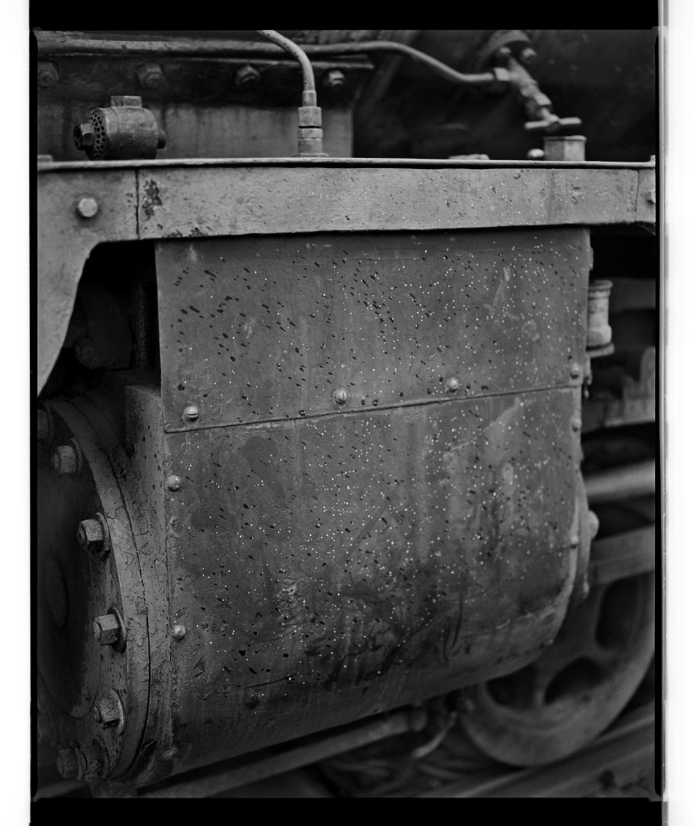
Studio portrait of sixteen Aboriginal men, five standing, five seated on chairs, the rest on the ground, all except two full face, wearing European dress. Barak back row 2nd left. Information provided by Aunty Joy Murphy, Wurundjeri Senior Elder confirming that Barak is correctly identified. Preferred title supplied by the Aboriginal Liaison Officer, Museum of Victoria.
Talma & Co. (1893-1932) 119 Swanston St. Melbourne Barak, Chief of the Yarra Yarra Tribe [Barak drawing a corroboree] c. 1895-98 Gelatin silver photograph 13.3 x 8.5cm., on mount 22.7 x 16.5cm Inscribed in ink on mount l.l.: From Mrs. A. Bon, / “Wappan”. Collection of the State Library of Victoria
Barak working on a drawing attached to the wall of a vertical slab hut. There is a wooden picket fence at the right hand side.
Barak (Yarra Yarra chief, 1824-1903) Aboriginal ceremony c. 1880 – c. 1890 Brown ochre and charcoal on cardboard 73.2 x 55.5cm Collection of the State Library of Victoria
William Barak (Yarra Yarra chief, 1824-1903) Aboriginal ceremony, with wallaby and emu c. 1880 – c. 1890 Brown ochre and charcoal on cardboard 73.0 x 56.0cm Collection of the State Library of Victoria
Alfred William Howitt (Australian born England, 1830-1908)
Alfred William Howitt (1830-1908), explorer, natural scientist and pioneer authority on Aboriginal culture and social organisation, was born on 17 April 1830 at Nottingham, England, the oldest surviving son of William Howitt and his wife Mary, née Botham. He was educated in England, Heidelberg and University College School, London. In 1852, under the press of family needs, he went with his father and brother Charlton to Melbourne where they had been preceded in 1840 by William’s youngest brother Godfrey. A reunion was one purpose of the visit but William and his sons also intended to try their fortunes on the new goldfields. They did so with modest success at intervals in the next two years. The experience turned the course of Alfred’s life. He learned to live with confidence in the bush, and its natural phenomena, so strange and as yet so little studied, stimulated his mind to their scientific study. In 1854 his father and brother returned to England but Howitt elected to remain, thoroughly at home in the Australian scene.
Young and handsome, of short and wiry build and notably calm and self-possessed, he fulfilled his mother’s prophecy that ‘someday Alfred will be a backwoodsman’. For a time he farmed his uncle’s land at Caulfield but, unattracted by the life, turned again to the bush and as a drover on the route from the Murray to Melbourne made the passing acquaintance of Lorimer Fison. An experienced bushman and ardent naturalist, Howitt was sent in 1859 by a Melbourne syndicate to examine the pastoral potential of the Lake Eyre region on which Peter Warburton had reported rosily. He led a party with skill and speed from Adelaide through the Flinders Ranges into the Davenport Range country but found it desolated by drought and returned to warn his sponsors. His ability as a bushman and resourceful leader came to public notice when, after briefly managing a sheep station at Hamilton and prospecting in Gippsland, he took a government party through unexplored alpine country to gold strikes on the Crooked, Dargo and Wentworth Rivers. He was an obvious choice as leader when in 1861 the exploration committee of the Royal Society of Victoria decided to send an expedition to relieve or, as the worst fears sensed, to rescue Robert O’Hara Burke, William Wills, John King and Charley Gray. Howitt’s discharge of this assignment was exemplary. Without blunder or loss he twice led large parties on the long journey to Cooper’s Creek. He soon found King, the only survivor, and took him to a public welcome in Melbourne but avoided the limelight for himself. Then, at request, he returned to bring the remains of Burke and Wills to the capital for interment. On the second expedition he had explored a large tract of the Barcoo country.
For his services Howitt was appointed police magistrate and warden of the Omeo goldfields, and in 1863 began a distinguished career of thirty-eight years as a public official, twenty-six of them as magistrate. In 1889 he became acting secretary of mines and water supply and in 1895 commissioner of audit and a member of the Public Service Board. He retired in January 1902 on a pension but served on the royal commission which in 1903 examined sites for the seat of government of the Commonwealth, and was chairman of the royal commission on the Victorian coal industry in 1905-06.
Such a career would have sufficed an ordinary man but Howitt attained greater things within it. Physical and intellectual fatigue seemed unknown to him. ‘What are they?’ he asked drily at 75 when Fison inquired if he never felt the infirmities of old age. In his long magistracy he travelled enormous distances annually (in one year, it was said, 7000 miles [11,265 km]) on horseback throughout Victoria. He read while in the saddle and studied the natural scene with such assiduous care that from 1873 onward he began to contribute to official reports, scientific journals and learned societies papers of primary value on the Gippsland rocks. He pioneered the use in Australia of thin-section petrology and chemical analysis of rocks. His fundamental contribution was his discovery and exploration of the Upper Devonian series north of Bairnsdale. He also made important studies of the Lower Devonian volcanics in East Gippsland and compiled magnificent geological maps of the area. In botany his Eucalypts of Gippsland (1889) became a standard authority and he collected hundreds of varieties of ferns, grasses, acacias and flowering plants. But his greatest eminence came from his work in anthropology, which was his main interest and relaxation after 1872…
Read the full biography by W. E. H. Stanner. “Howitt, Alfred William (1830-1908),” on the Australian Dictionary of Biography website Volume 4, (MUP), 1972 [Online] Cited 09/04/2016.
Alfred Howitt, the leader of the party to rescue Burke and Wills, circa 1861, from William Strutt album illustrating the Burke and Wills exploring expedition crossing the continent of Australia from Cooper’s Creek to Carpentaria, June 1861, DL PXX 3
Batchelder & O’Neill Alfred William Howitt c. 1863 Albumen silver carte-de-visite 9.0 x 5.2cm Collection of the State Library of Victoria
Howitt full length in the photographers’ studio, leaning on a button-backed chair, wearing a three-piece winter suit, with a watch-chain and holding a pair of gloves in his right hand.
Batchelder & O’Neill Alfred William Howitt Nd Albumen silver carte-de-visite on mount 10.7 x 6.5cm approx. Collection of the State Library of Victoria
Artists: Danica Chappell, Peta Clancy, Eliza Hutchison, Megan Jenkinson, Justine Khamara, Paul Knight, Derek Kreckler, Luke Parker, Emidio Puglielli, David Rosetzky, Jo Scicluna, Martin Smith, Vivian Cooper Smith, James Tylor and Joshua Yeldham
This is a solid if slightly dour exhibition at the Monash Gallery of Art which examines the phenomena of the deconstruction of the physicality of the photograph. It “features the work of contemporary artists who disrupt the seamless uniformity of screen-based photography by cutting, pinning, folding and puncturing photographic prints. These are photographs that need to be engaged with in physical space, rather than contemplated on a screen; this is an exhibition about making rather than taking photographs.”
Therein lies the rub. If you start such an exercise (the physical deformation of the surface of the print), without caring about the quality of the base image, then you are automatically starting from a bad position. It’s like printing a black and white print from an underexposed negative. Further, much as many of these works are interesting conceptual exercises, most of them lead to emotional dead ends.
A friend of mine, Ian Lobb, has a good analogy: imagine standing on a bridge with a fast running stream flowing underneath, and dropping a pebble off the bridge. And then another, and another. Unless they cluster around each other to form an ongoing enquiry by a group of people – such as Australian women’s hand-coloured photography of the 1970s – INTO ONE IDEA (in the 1970s it was feminism and the urban environment), then they will be washed away. And this is the feeling I get from this exhibition: every idea possible is up for grabs (in an earnest kind of way), but nothing sticks memorably in the mind. That is the world in which we live today.
To my mind the best work in the exhibition is the simplest and most eloquent. Out of Joshua Yeldham’s trio of images, it is Owl of tranquillity (2015, below) which is the standout. The base image is beautiful and the careful incision work just adds to the magical resonance of the image. A truly knockout piece that would be a joy in any collection. The other two works suffer from the base image being taken on a mobile phone… the quality of the image is just not there to start with, and to then print and work the image at such great scale (see installation images below) means both images tend to loose cohesiveness. You can get away with it once, but not three times.
I also very much liked the concept and execution of the installation by Jo Scicluna (below). The photographs were well printed, the alterations intellectually and visually challenging, the framing and construction of the installation effective with the use of wood and shadow, and the whole had a wonderful resonance in the corner of the gallery. Plus you got a free poster of the work to take away with you!
In the early years of the 21st century many cultural commentators were excited by the prospect of photography becoming a truly global art form. With cameras, computers and printers all communicating seamlessly through digital networks, and with the internet providing a worldwide platform for sharing photographs, it looked like the photographic medium might transcend the specificities of both place and materials.
While global digital networks have clearly impacted photography generally, the work of many art photographers has taken a different turn. Instead of embracing the seamless space of digital production, or the expanded horizon of online galleries, artists working with photography have found a range of ways to ground their practices in the material world.
Cutting edge: 21st-century photography features the work of contemporary artists who disrupt the seamless uniformity of screen-based photography by cutting, pinning, folding and puncturing photographic prints. These are photographs that need to be engaged with in physical space, rather than contemplated on a screen; this is an exhibition about making rather than taking photographs.”
Danica Chappell‘s practice belongs to a long artistic tradition of visual abstraction, which rejects representation in favour of sensual and experimental processes. While this tradition is dominated by painters, Chappell employs the light-sensitive chemistry of traditional photography to generate her images. Even though Chappell’s practice can be described as ‘photographic’, she doesn’t use a camera to produce her work. This helps turn photography into something abstract, rather than representational, but it also allows Chappell to distance herself from the ‘instamatic moment’ and foreground an extended process of creative intuition with colour and form. The work being exhibited here, Light shadow (5 days + 5 hrs in 8 parts + test strips), was created in a colour darkroom over several hours. Approaching this as a type of unseeable performance, Chappell arranged and rearranged scraps of paper and other off-cuts on the light sensitive paper while exposing it to light for different periods of time. Chappell’s final installation of this work incorporates test strips, which have been placed at intervals over the print. The test strips, which were integral in the making of the work, interrupt the fl ow of the underlying print, adding an extra layer of abstraction and temporality.
David Rosetzky (Australian, b. 1970) Hamish 2004 Chromogenic prints Courtesy of the artist and Sutton Gallery (Melbourne) Monash Gallery of Art, City of Monash Collection acquired 2005
David Rosetzky‘s practice encompasses a range of media, including video and photography, and typically explores themes of identity and interpersonal relationships. Throughout his career, Rosetzky has created photographic series and has periodically returned to work on photographic cut-out and collaged portraits. To produce these images, Rosetzky creates cool studio portraits of young models, referencing the style of photography found in advertising and fashion magazines. He then layers as many as three photographic portraits on top of each other before hand cutting sections to reveal parts of the underlying prints (above). Through these works Rosetzky represents his subjects as being multi-layered and highlights the idea that identity is fragile, changeable and often concealed. The crumpled paper, represented in his more recent portraits (below), suggests that surfaces are dynamic thresholds rather than superficial masks. Used in a photographic context, the crumpled paper can also be seen as a reference to photography’s power to transform and elaborate a person’s social identity.
David Rosetzky (Australian, b. 1970) Pieces #2 2015 Chromogenic prints Courtesy of the artist and Sutton Gallery (Melbourne) Collection of Ten Cubed Collection of the artist
Megan Jenkinson began working with lenticular printing technologies in 2007. Lenticular printing combines multiple still images to give the impression of movement and three-dimensionality. The work on display here is from Jenkinson’s Transfigurations series, which employs a handmade form of lenticular photography to evoke the transience of the natural world. This large-scale image of water foliage is composed of two separate photographs that have been digitally spliced together and printed on a single sheet of paper. The artist has then hand-folded the photograph to create a concertinaed surface that can only be seen in its complete form when viewed from multiple angles. As a consequence, viewers need to physically interact with the photographic object, walking from side-to-side in order to experience the artwork. This form of photography disrupts traditional expectations of two-dimensional photography and introduces a tactile aspect to digital production.
In a world where photographs are often viewed on screens, Justine Khamara is interested in the physicality of the photographic surface and how this affects the meaning of an image. Her works begin as two-dimensional photographic portraits, which she then sculpts into three-dimensional forms that protrude from walls or stand alone in exhibition spaces. To create these works, Khamara cuts her photographic prints, either by hand or using a laser cutter. She then manipulates the intricately shredded surfaces by hand to give them a sculptural form. This involves an array of different techniques, such as adhering part of the photograph to a backing board and allowing the filleted paper to hang loosely from the top. In other instances she pulls and weaves the segmented photograph to create more purposeful geometric shapes. By working in this way, Khamara invests the photographic still with a sense of movement and playful elaboration, which effaces the mechanical nature of photographic reproduction.
Justine Khamara (born Australia 1971) Orbital spin trick #2 2013 UV print on plywood 50.0 x 50.0 x 50.0cm Reproduction courtesy of the artist and ARC ONE Gallery (Melbourne) Collection of the artist
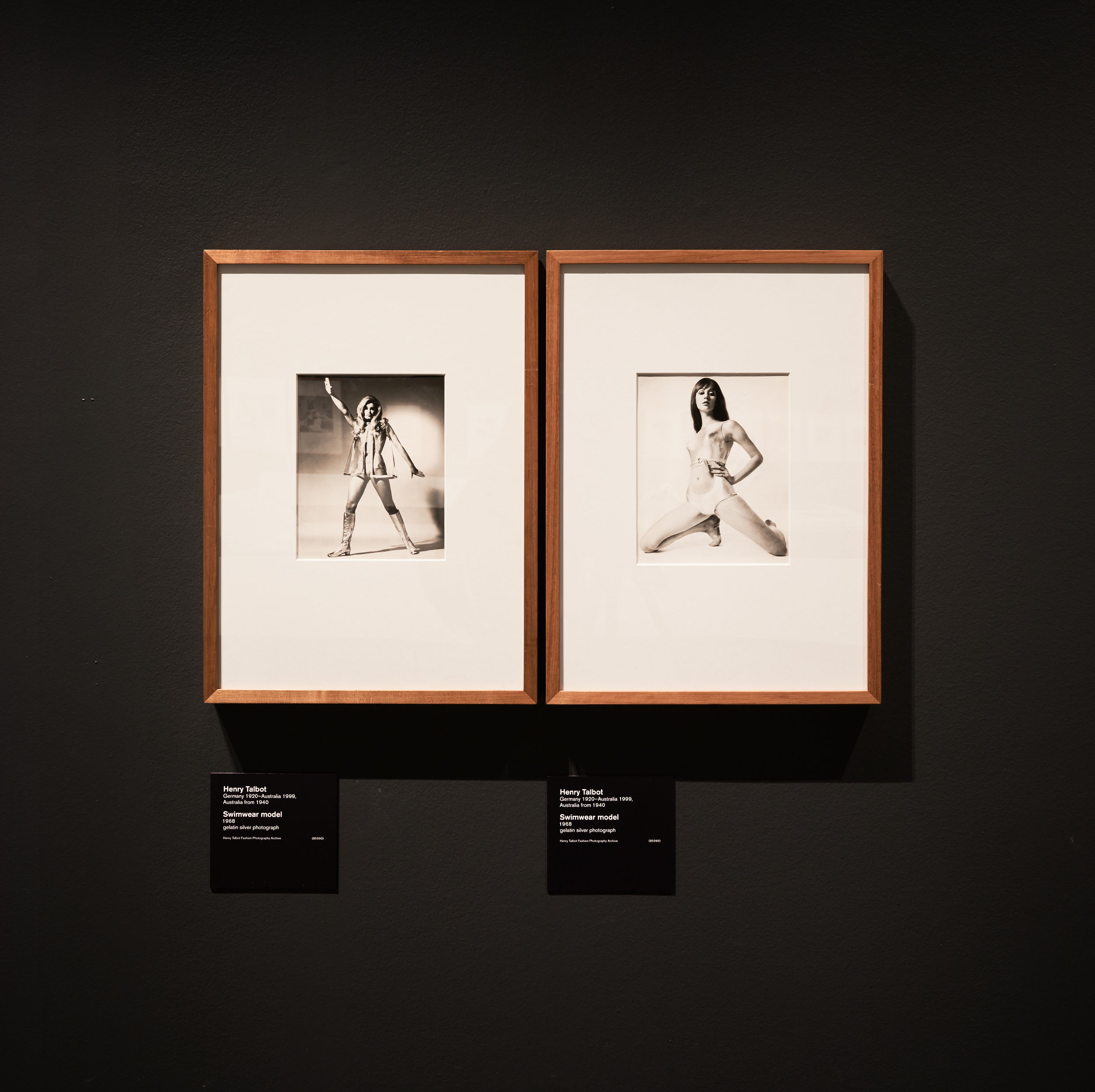
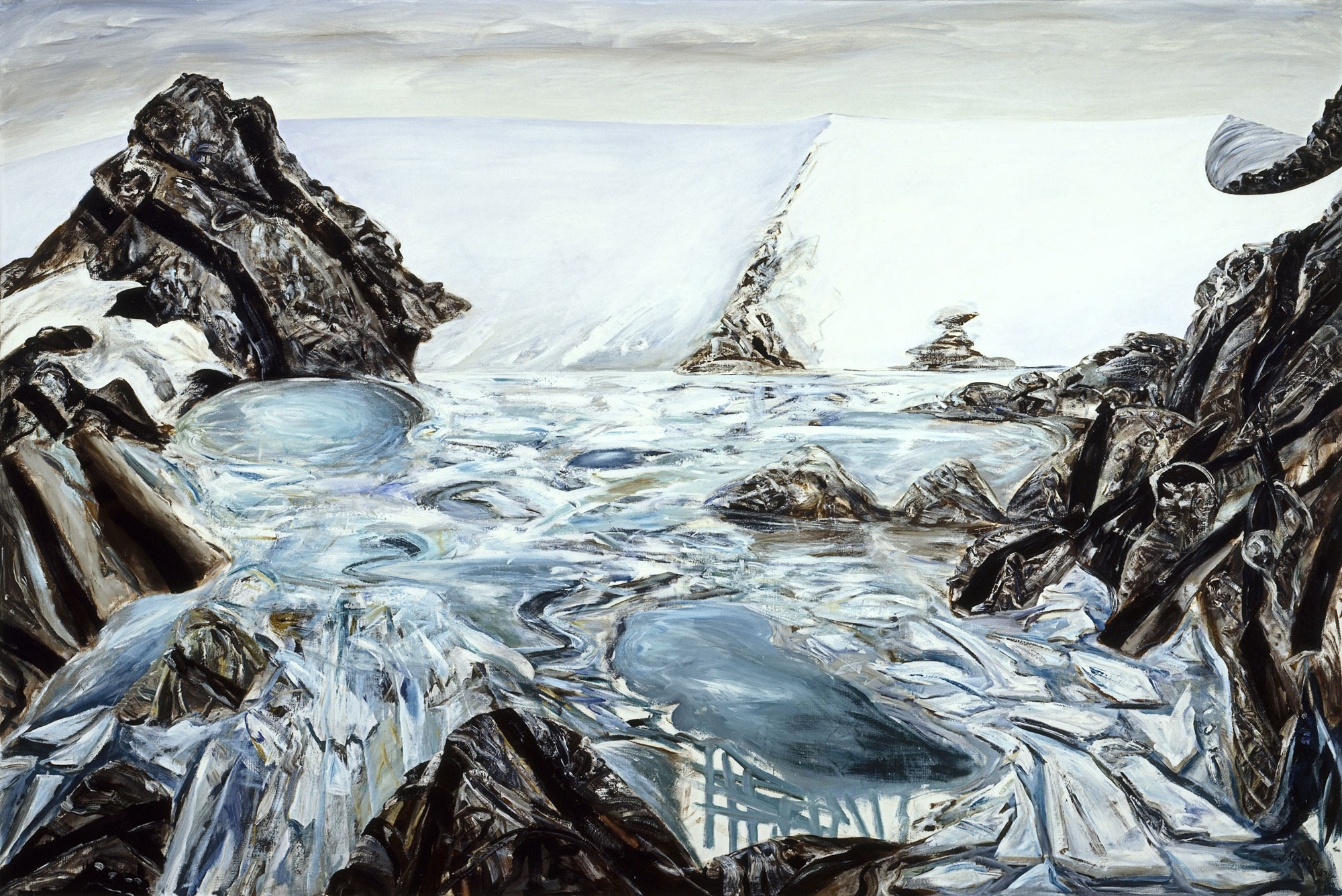
Luke Parker works across a range of media, his practice is largely concerned with giving a sense of metaphysical weight to everyday events and chance encounters. The works on display here are made up of Parker’s own photographs combined with found images that he has collected over the past 20 years. To create these works, Parker categorised seemingly disparate images according to formal patterns and poetic associations. He then arranged the images onto a unifying background and used a needle and thread to stitch them into a type of artistic circuit board. Parker created this series as a way of making sense of his own image archive as well as the proliferation of images encountered in everyday life.
In a world where images are increasingly set adrift from specific economies of meaning, to circulate freely through digital networks, Parker’s works function as conceptual nets that encourage viewers to think about photographs rather than just watch them pass by.
Martin Smith‘s practice revolves around the integration of photography and text. Using photographs that have been recovered from family albums or personal archives, Smith incorporates texts into the visual fi eld of the image. The texts, which have no obvious relationship with the content of the photographs, recall personal memories or lyrics from popular songs. To incorporate the texts, Smith hand-cuts letters out of the photographic prints, often leaving the letters scattered beneath the image. The disconnect between the text and the image is a deliberate attempt to combine two discrete methods of storytelling – image and text – while also emphasising the way memories of an event are usually different from the original experience. By cutting letters out of the photograph, Smith complicates the viewer’s ability to believe in either the text or the image, and opens up a space that encourages new interpretations.
Paul Knight‘s style of his photographs is influenced by his background in commercial photography; they are technically proficient and almost illustrative in their documentary clarity. These cool formal qualities, however, are unsettled by the subject matter, which is often about private desires and passions. Knight’s 2010-11 untitled series of folded photographs document couples embracing in bed. The series reflects Knight’s broader interest in photographing moments of candour and intimacy between lovers, which remains a preoccupation of his practice. In this series, however, Knight has folded the photographic prints to frustrate any expectation we might have about a photograph’s capacity to show or reveal its subject. Instead of offering a crude, voyeuristic perspective, the intimacy documented in these images is obscured and concealed in the folds of the print.
Emidio Puglielli‘s work focuses on the relationship between the photograph as a material object and the photograph as an image. He is particularly interested in old photographs and their continued resonance in contemporary society. Puglielli finds and collects vernacular photography to use as the starting point for his works. He then highlights the materiality of the photographs by drawing attention to their surface and structure. To do this he employs strategies such as rubbing off the emulsion or piercing the surface with map pins. Puglielli is interested in the way such interventions alter the meaning of a photograph and offer new readings of images.
By damaging the smooth surface of the print, he is able to disrupt the illusion of the photographic image, but his interventions also embellish the photographs in sympathetic ways. This is particularly evident in Snow disruption, where the pins appear as snowflakes, and Shadow disruption where pins become eyeballs in the shadow of the unknown photographer. Puglielli’s works therefore seek to question the nature of photography and the way in which photographs are viewed and reinterpreted.
Vivian Cooper Smith‘s artistic practice revolves around photography. Timeless (2013) explores identity and conceptions of self while also reflecting on the nature of photography. To create this work, Smith photographed film noir classics directly from an old television screen. He then printed the images and hand-cut them to fit pieces of irregularly shaped plywood. Smith created this work during a period of personal turmoil and felt that the film noir genre of the post-war period resonated with his own desire to remake himself after a relationship breakdown. As is common to his practice, Smith has interfered with the photograph’s smooth, seamless surface, in this case by dissecting it and creating a three dimensional sculpture. By focussing on the materiality of the photograph, Smith aims to highlight its artificial or constructed nature.
Derek Kreckler originally trained as a sculptor and established himself as a performance and sound artist during the 1990s, he has more recently concentrated on producing photographic and installation work. Kreckler’s Holey series consists of beach scenes and seascapes that have been punctured with circular apertures. The excised sections of the images have been transformed into spherical objects that sit in front of the two photographs, as if the photographs have spawned offspring from their holey orifices. This sculptural configuration challenges the notion that photography offers a straightforward document of time and place. Instead, the photograph has been turned into a type of puzzle that the viewer is encouraged to investigate and solve. To further deepen the viewing experience, Holey 1 is a diptych. The two photographs show the same location; the right side captured a short time after the left side. A number of the subjects in the photographs, beach goers on a summer’s day, are displaced by time. Some have remained static, some seem to have meandered between beach and sand, whilst others have disappeared from the scene altogether.
Jo Scicluna works with a range of media, including photography, video, sculpture and installation, often combining these art forms to bring photography into the space of lived experience. Dissatisfied with the way photography, as a documentary device, is almost always tied to past events, Scicluna encourages viewers to engage with the presence of photographic objects. By cutting into the smooth surface of a photographic print, she disrupts the notion that a photograph is a window into the past. She also elaborates conceptual relationships between different photographic objects in her installations. In doing this, Scicluna activates the space between the photographic print, the sculptural form and the phenomenology of a gallery space. For Scicluna, the experience of being in-between things is related to her personal experience of migration and geographic rupture. Scicluna is not interested in using photography to create documents of specific times and places but uses the medium in a conceptual way to evoke sensations that are not as easy to represent in a literal sense.
Joshua Yeldham uses a range of media, his practice is focused on exploring the landscape and elaborating spiritual and symbolic narratives around his engagement with the natural world. He captures photographic images on a smart phone before blowing them up and printing them on cotton paper. He then uses tools to physically carve into the paper, disrupting the smooth surface of the photographic image and adding a personal, handmade effect. It is as if the artist is tattooing his own map or story into the skin of the image. The intricate carving creates a textured pattern of lightness over his otherwise dark and mysterious photographs. The technique allows Yeldham to explore history and mythology in the landscape and imbue his works with elements of both the real and the imagined. It also allows him to reference the passing of time as well as the weather and destruction that the natural environment endures on a daily basis.
You must be logged in to post a comment.