Installation view of the exhibition Emanations: The Art of the Cameraless Photograph at the Govett-Brewster Art Gallery
This is how best a contemporary art exhibition can show the work to advantage. Just gorgeous!
The well curated, comprehensive content is complemented by a beautifully paced hang nestled within stunning contemporary art spaces. Labels are not just plonked on the wall, but are discretely displayed on horizontal shelves next to the work – accessible but so as not to interrupt the flow of the work. Coloured walls add to the ambience of the installation and act as an adjunct to the colours of the art. Beautiful modernist contemporary display cabinets keep the spaces fresh and vibrant.
Many thankx to the Govett-Brewster Art Gallery for allowing me to publish the photographs in the posting. Please click on the photographs for a larger version of the image. All images are photographed by Bryan James.
“Exploring the art of cameraless photography, encompassing historical, modern and contemporary works. Emanations: The Art of the Cameraless Photograph is the first comprehensive survey of cameraless photography held anywhere in the world, presenting more than 200 examples, from 1839 – when photography’s invention was announced – through to contemporary artists. We present the most complete study of cameraless photography to date, focusing on the cameraless mode from the 1830s through to today and offering a global perspective on this way of working.
The theme of the exhibition is inspired by artist Len Lye’s cameraless photographs from 1930 and 1947, and it’s the first time all 52 of Lye’s photograms have been seen together. Emanations is an opportunity to put Lye’s photographic work in a suitably global context, surrounded by his predecessors, contemporaries and successors. Emanations includes many masterpieces of photographic art and showcases the talents of some of the world’s leading contemporary photographic artists.
The exhibition has work by photographic pioneers William Henry Fox Talbot and Anna Atkins, important modernist photographers Man Ray and László Moholy-Nagy, and many of today’s most significant photographic artists including Walead Beshty, Marco Breuer, Liz Deschenes, Joan Fontcuberta, Christian Marclay, Thomas Ruff, and Hiroshi Sugimoto. Emanations also includes work by both senior and emerging Australian and New Zealand artists, from Anne Noble and Anne Ferran to Andrew Beck and Justine Varga.
The exhibition presents artwork by more than 50 artists hailing from New Zealand, Australia, Japan, Poland, Czechoslovakia, Hungary, France, Germany, Italy, England, Canada and the United States. Almost every photographic process is included in the exhibition – photogenic drawings, calotypes, daguerreotypes, and tintypes, as well as gelatin silver, chromogenic and ink-jet photographic prints, photocopies, verifax and thermal prints.
The exhibition is accompanied by a major book by the same name and on the same theme, co-published by the Govett-Brewster Art Gallery and DelMonico Books/Prestel, based in New York and Munich. The book contains 184 full-page colour plates and a 25,000 word essay by Geoffrey Batchen. The Govett-Brewster is also publishing another book reproducing all the cameraless photographs by Len Lye, along with an essay by Wystan Curnow.
Emanations is curated by Geoffrey Batchen, Professor of Art History at Victoria University of Wellington, and a world-renowned historian and curator of photography.”
Text from the Govett-Brewster Art Gallery website
Installation views of Andrew Beck (New Zealand, b. 1987) Double Screen 2016 Glass, acrylic paint, gelatin silver photographs
In the 1930s, László Moholy-Nagy made art that combined a cameraless photograph, plexiglass and paint. New Zealand artist Andrew Beck works in a similar way to produce sculptural installations that complicate our expectations of the relationship between light and shadow, the natural and the artificial, images and objects, art and reality. He forces us to look very closely at what we are seeing, and even to critically reflect on the act of seeing itself.
Installation view of the exhibition Emanations: The Art of the Cameraless Photograph at the Govett-Brewster Art Gallery with at left, Anne Ferran and at right, Joyce Campbell
Installation view of Joyce Campbell (New Zealand, b. 1971) LA Bloom 2002 Cibachrome photographs Courtesy of the artist, Auckland
In 2002 the New Zealand photographer Joyce Campbell decided to conduct a microbial survey of Los Angeles, a city in which she lives for part of each year. She swabbed the surfaces of plants and soil from twenty-seven locations chosen out of her Thomas Guide to the city. She then transferred each sample onto a sterilised plexiglass plate of agar and allowed it to grow as a living culture. The Cibachrome positive colour contact prints she subsequently made from these plates resemble abstract paintings and yet also offer a critical mapping of the relative fertility of this particular urban landscape, revealing its dependence on the politics of water distribution.
Although raised in Italy, Aldo Tambellini was working in New York in 1969 when he manipulated the cathode ray tube of a TV set into the shape of a spiral (for this artist, a universal sign of energy) and exposed sheets of light-sensitive paper by laying them over its screen. The calligraphic inscriptions that resulted made his paper look as if it had been scorched from the inside out. These ‘videograms,’ as Tambellini called them, highlight the chaos and chance operations that lurk just beneath the surface of technology’s apparent rationality.
Installation views of Shaun Waugh (New Zealand, b. 1982) ΔE2000 1.1 2014 24 Agfa boxes with mounted solid colour inkjet photographs
This work by New Zealand artist Shaun Waugh began with the purchase of empty boxes that once held Agfa photographic paper. Waugh then took readings of all four sides of the inside lip of each box lid using a spectrophotometer, employing this data and Photoshop to generate a solid orange-red inkjet print. The box lid is used to frame a two-dimensional version of itself, bringing analogue and digital printing into an uncomfortably close proximity to create a memorial to a kind of photography that is now defunct. Hung salon style, like so many small paintings, Waugh’s work manages to turn the photograph inside out, and thus into something other than itself.
Wall text from the exhibition Emanations: The Art of the Cameraless Photograph at the Govett-Brewster Art Gallery
Installation view of the exhibition Emanations: The Art of the Cameraless Photograph at the Govett-Brewster Art Gallery with at left, Anne Ferran and at right, Adam Fuss
In 1998 Australian artist Anne Ferran was offered an artist-in-resident’s position at an historic homestead not far from Sydney that had been occupied by successive generations of the same family since 1813. Ferran spent six months systematically making contact prints using the dresses, bodices, skirts, petticoats, and collars still contained in the house. Hovering in a surrounding darkness, softly radiating an inner light, the ghostly traces of these translucent garments now act as residual filaments for a century of absorbed sunshine. Many of them have been patched over the years and their signs of wear and repair are made clear. This allows us to witness a history of the use of each piece of clothing, seeing inside them to those small and skilful acts of home economy – the labour of women – usually kept hidden from a public gaze.
Anne Ferran (Australian, b. 1949) Untitled (baby’s bonnet) 1998 Unique gelatin silver photograph
Installation view of the exhibition Emanations: The Art of the Cameraless Photograph at the Govett-Brewster Art Gallery with at left, Adam Fuss and at right, Lisa Clunie
Installation view of Adam Fuss (UK/Australia/US) Caduceus 2010 (left) and Untitled 1991 (right)
Born in England, raised in Australia, and resident in New York, Adam Fuss has produced a diverse range of large cameraless photographs since the 1980s, asking his light-sensitive paper to respond to the physical presence of such phenomena as light, water, a slithering snake, flocks of birds, and sunflowers.
Adam Fuss (British, b. 1961) Untitled 1991 Type C photograph
Lisa Clunie (New Zealand) Fold I 2014 Silver gelatin photograph
The work of New Zealand artist Lisa Clunie looks back to the work of pioneer modernist László Moholy-Nagy in order to manifest the idea that our lives are shaped by a continual play of forces. Like Moholy, she wets her photographic paper and then tightly folds it, before moving the paper back and forth under her enlarger, selectively exposing these folds to the ‘force’ of light. The resulting work reminds us that a photograph has weight, surface, texture, tension and edges.
Installation view of the exhibition Emanations: The Art of the Cameraless Photograph at the Govett-Brewster Art Gallery with at right, the work of Robert L. Buelteman
Installation view of Robert L. Buelteman (American, b. 1954) Cannabis sativa (left) 2002 Digital chromogenic development photograph
Robert L. Buelteman (American, b. 1954) Eucalyptus polyanthemos (right) 2002 Digital chromogenic development photograph
The San-Franciscan artist Robert Buelteman takes his leaves and other botanical specimens and slices them into paper-thin sections, before charging them, in a complicated and dangerous process, with a pulse of 40,000 volts of electricity. This leaves behind a colorised trace on his photographic paper, a photogram in which these plants appear to be aflame, as if emitting an energy all their own. Hovering between life and death, this is a nature that seems to be on the cusp of its transmutation into something else entirely.
Installation view of the exhibition Emanations: The Art of the Cameraless Photograph at the Govett-Brewster Art Gallery with at centre, Robert Owen and at right, Joan Fontcuberta
Robert Owen (Australian, b. 1937) Endings (Rothko died today) – Kodachrome 64, No. 21, 26/02/1970 2009 Pigment ink-jet print
The photographic work of Australian artist Robert Owen is part of a broader tendency on the part of contemporary artists to reflect in morbid terms on aspects of photography’s past. Owen has been collecting film stubs since 1968. Although better known as a painter and sculptor, he recently decided to print these end strips of film as a series of large colour photographs, paying homage to this residue of the Kodak era in a chronological sequence of readymade chromatic fields. This one was collected on the day that the American abstract painter Mark Rothko killed himself.
Adam Fuss (British, b. 1961) Untitled (from the series My Ghost) 2001 Unique gelatin silver photograph
In his series, titled My Ghost, Adam Fuss put together a body of contact photographs of such things as plumes of smoke, patterns of light, a butterfly, a swan and a baptism dress. As his title suggests, Fuss’s work aims to evoke rather than describe; for all their evident tactility, these photographs are meant as metaphors, as prayers, perhaps even as poems.
Installation view of Adam Fuss (British, b. 1961) Untitled 1989 Cibachrome photograph
Adam Fuss (British, b. 1961) Untitled 1989 Cibachrome photograph
Installation views of Joan Fontcuberta (Spanish, b. 1955) MN 62: OPHIUCUS (NGC 6266), AR 17 h. 01,2 min. / D -30º 07′ (left) LAMBDA CORONAE AUSTRALIS (Mags 5,1/9,7 Sepn 29,2″ AP 214º), AR 18 h 43,8 min. / D -38º 19′ (right) both 1993 From the Constellations series Cibachrome photographs
Photographs from the Constellations series by Spanish artist Joan Fontcuberta come filled with fields of sparkling blackness, their speckled surfaces redolent of infinite space and twinkling stars. Their titles imply we are looking upwards towards the heavens. But this artist’s prints actually record dust, crushed insects and other debris deposited on the windscreen of his car, a trace of the evidence of his own rapid passage through terrestrial space and time. The artist applied sheets of 8-by-10-inch film directly onto the glass windscreen and shone a light through, creating photograms which were then made into glossy Cibachrome prints.
Installation views and detail of Paul Hartigan (New Zealand, b. 1939) Colourwords 1980-1981 Colour photocopy
Consistently defined by a subversive edge and a darkly witty humour, the work of New Zealand artist Paul Hartigan is often subtly permeated by astute social and political perceptions. Shortly after they were introduced into New Zealand in 1980, Hartigan explored the creative possibilities of a colour photocopying machine, making a series of images in which words and found objects ironically refer to each other in an endless loop. With the objects arranged to spell out their own colour, each picture offers an oscillation of word and meaning, flatness and dimension, art and detritus.
Installation view of Gavin Hipkins (left) and Lucinda Eva-May (right) as part of the exhibition Emanations: The Art of the Cameraless Photograph at the Govett-Brewster Art Gallery
Installation view of Gavin Hipkins (New Zealand, b. 1968) The Coil 1998 Silver gelatin photographs
Inspired by the kinetic films of Len Lye, in the 1990s Gavin Hipkins made a series of cameraless photographs that play with sequence and implied movement. The 32 images that make up The Coil were made by resting polystyrene rings on sheets of photographic paper and then exposing them to light.
Installation view of Lucinda Eva-May (Australia) Unity in light #6, 2012 (left) Unity in light #9, 2012 (right) C-type prints
Australian artist Lucinda Kennedy has sought to capture a phenomenological representation of the feelings and sensations of sexual intercourse through the direct imprint on sheets of photographic paper of this most primal of human interactions. Turned into a single blurred organism by the extended duration of the exposure, the artist and her partner become an abstraction, thereby aptly conjuring an experience that has always been beyond the capacity of mere description.
Installation view of the exhibition Emanations: The Art of the Cameraless Photograph at the Govett-Brewster Art Gallery with at left, Thomas Ruff, and at right, Justine Varga
Installation views of Thomas Ruff (Germany, b. 1958) r.phg.07_II 2013 Chromogenic print
Thomas Ruff (Germany, b. 1958) r.phg.07_II 2013 Chromogenic print
German artist Thomas Ruff uses his computers to construct virtual objects with simulated surfaces and to calculate the lights and shadows they might cast in different compositions. He then prints the results, in colour and at very large scale. Combining variations of spheres, curves, zig-zags and sharp edges, all set within richly coloured surrounds, Ruff’s images are both untethered abstractions and historical ciphers. Although referred to by the artist as photograms, the final prints are perhaps better conceived as being about the photogram, studiously replaying an analogue process in digital terms so as to make a spectacle of its logic.
Installation view of the exhibition Emanations: The Art of the Cameraless Photograph at the Govett-Brewster Art Gallery with at left, Shimpei Takeda and at right, Justine Varga
Justine Varga (Australian, b. 1984) Desklamp 2011-2012 Chromogenic photograph
Australian artist Justine Varga creates photographic works from an intimate and often prolonged exchange between a strip of film and the world that comes to be inscribed on it. Desklamp involved the year-long exposure of a large format negative placed on top of the artist’s desk lamp. Exit was derived from a similar piece of film that was scarred and weathered during a three-month exposure on her windowsill during a residency in London. Both were then turned into luscious colour photographs in the darkroom via various printing procedures.
Govett-Brewster Art Gallery/Len Lye Centre Queen St, New Plymouth, New Zealand Phone: +64 6 759 6060 Email:info@govettbrewster.com
A magnificent installation from one of the world’s great photographers.
Why this artist is not having sell out retrospectives at MoMA New York, Centre Georges Pompidou Paris or the Tate in London is beyond me. Is it because of continuing cultural cringe, or the fact that he’s not as well known in Europe and America?
Their loss is our gain.
The darkened room contains only eight images beautifully lit to create a wondrous, enveloping atmosphere. Henson’s night photographs emit light as though a result of the excitation of atoms by energy – the energy of the mind transferred to the light of place. A luminescence of thought is imaged in the photograph through the emission of light … produced not so much by physiological or electromagnetic processes as much as by a culturally informed mind that seems to bring forth its own light. And behold there is light.
As that eminent photographer Minor White used to opine when asked for technical information on his photographs in the back of popular American photography monthlies: for technical information the camera was creatively used.
For me, these are not images of ethereal malevolence or Australian anxiety about our environment and the ominous ordinary. They do not possess that feeling at all. These pictures are about an understanding and contemplation of light and place, a process which is in balance one with the other. Yes, the transient nature of earthly existence but more than that. The soft details of flowers in the grass, or the spatter of rain on water, not noticed until you really look at the image; or the shadow of a truck on a bridge underpass. In my mind I know where this is, in Gipps Street, Abbottsford near the train bridge… or so I believe in my imagination. All of these photographs have a feeling of a subtle vibration of energy in the universe. There is no malevolence here.
My only criticism of this, the first photographic exhibition at Castlemaine Art Gallery, is that there is not enough of it. There needed to be more of the work. It just felt a little light on. Another gallery was needed to make the installation experience fully enveloping. Having said that, congratulations must go to the artist and to gallery who are putting on some amazing exhibitions in the heart of regional Victoria.
Bill Henson (Australian, b. 1955) Untitled #9 2005/2006 2005-2006 CL SH541 N2 Type C photograph 127 x 180cm (sheet) Courtesy of the artist and Roslyn Oxley9 Gallery, Sydney
Bill Henson (Australian, b. 1955) Untitled #9 2005/2006 (detail) 2005-2006 CL SH541 N2 Type C photograph 127 x 180cm (sheet) Courtesy of the artist and Roslyn Oxley9 Gallery, Sydney
Bill Henson (Australian, b. 1955) Untitled #21 2005-2006 (detail) 2005-2006 CL SH541 N2 Type C photograph 127 x 180cm
Bill Henson (Australian, b. 1955) Untitled 1999-2000 1999-2000 Type C photograph 103.8 x 154.0cm (image) 126.8 x 179.9cm (sheet) National Gallery of Victoria, Melbourne Purchased with funds from the Victorian Foundation for Living Australian Artists, 2005 (2005.501) Courtesy of the artist and Roslyn Oxley9 Gallery, Sydney
“Our current exhibition, Bill Henson: Landscapes captures the haunting convergence of opposites; two worlds, darkness and light.
These dreamlike pictures pursue the Romantic project by engulfing the viewer in the urban or semi-rural sublime. Through these landscapes, we are immersed in a realm which offers an otherworldly view of the transient nature of earthly existence. The inky depths of the encroaching natural environment suggest a dark abyss, an ethereal malevolence that relates to both the artistic conventions of Renaissance landscape painting and, a uniquely Australian anxiety about our environment and the ominous ordinary.”
Text from the Castlemaine Art Gallery Facebook page
Bill Henson (Australian, b. 1955) Untitled #28 (detail) 1998 Type C photograph 104 × 154cm
Bill Henson (Australian, b. 1955) Untitled #48 (detail) 1998/1999/2000 Type C photograph 127 × 180cm
Castlemaine Art Gallery and Historical Museum 14 Lyttleton Street (PO Box 248) Castlemaine, Vic 3450 Australia Phone: (03) 5472 2292 Email:info@castlemainegallery.com
This mega-exhibition has been a popular success for the National Gallery of Victoria, Melbourne, with over 300,000 visitors during its run. But does that make it an interesting, or even memorable, exhibition? Personally, I think this is an exhibition based on a curatorial concept, an interesting concept, that does not then lead to a memorable exhibition. I will explain why.
The idea behind the exhibition, to compare and contrast the work of Andy Warhol (one of the most influential artists of the twentieth century) and the work of Ai Weiewei (that denizen and superstar of contemporary art and free speech, in China and around the world) is sound but in reality, on actual viewing, the relationship between the ideas of both artists seems rather forced.
While the synergy of ideas between both artists is present – “a vocabulary which celebrates freedom of speech and, at the same time, the wisdom of pop culture” – evidenced through the symbology of popular culture and the specificity and uniqueness of the original, the installation of the work does neither of the artist’s work justice.
In this game of comparisons (where Andy Warhol’s photographs of New York sit opposite those of Ai Weiwei’s, where Andy Warhol’s portraits of Chairman Mao sit diagonally opposite Ai Weiwei’s) neither artist’s work can be contemplated as a whole… and it is Warhol’s work that comes out a poor second best in this artistic exchange.
Why?
Mainly because both artist’s are talking about completely different things from completely different eras and it is Ai who dominates the conversation. As Monica Tan observes in an article on the Guardian website, “In their art, Ai aggressively engages with politics and current affairs… while Warhol was forever occupied with consumerism, pop culture iconography and celebrity.”1
With regard to the work of Ai Weiwei there is the key word, aggressively. His brazen installations simply overwhelm the sophistication of the work of Andy Warhol, and this should never have happened, should never have been allowed to happen. The exhibition does not do Warhol’s work justice.
Ai Weiwei comments, “We’re dealing with different societies, Andy Warhol and I. We are involved with very different social and political circumstances. But we’re both trying to face out reality honestly and to give a better illustration of our time.”2
While the last sentence is true, facing out reality honestly does not mean that both mens work can be understood or compared in the same breath, which is what happens in this exhibition. For each artist’s work I felt there was no space to breathe in the whole eight galleries. The visitor needs at least three hours, and a couple of visits, to get through all of the work and at the end of it all you feel is rather exhausted and only a little enlightened.
After the forced curatorial concept of the whole exhibition, this is my second major criticism of the show: the unnecessary “noise” of the installation. Everything and the art kitchen sink (preferably teamed with an ancient Chinese sink with ceramic flowers growing out of it) has been thrown at the installation of the exhibition, not necessarily to its benefit.
Susan Sontag despairs of the “ambience of distraction” that pervades contemporary museums – less room to contemplate, more rooms for noise.
The NGV seems particularly adept at this distraction and this exhibition is just another example of the phenomenon. Room after room is filled to the brim with artefacts which are then placed on more noise – busy, repetitious wallpaper!
Andy Warhol’s silkscreen portraits of Mao (1972) are hung on his Mao Wallpaper (1974, reprint 2015), on the exterior of Ai Weiwei’s Letgo room (2015) meaning that you can’t really “read” the colours of the silkscreens properly as they are subsumed amongst this mass of wallpaper noise. A similar thing happens with Warhol’s Electric Chairs (1971) silkscreens and his Electric Chair (1967) painting which are hung on Warhol’s Washington Monument Wallpaper (1974, reprint 2015). This means that the luminosity of the colours of the silkscreens and painting completely loose their impact if you were viewing the works against a plain wall. They just blend into the gallery wall.
It’s as though the curators at the NGV are frightened of empty wall space, both in the number of objects in a room and the lack of negative space (plain coloured walls) behind the art works. And this is not a singular occurrence of this phenomenon at the NGV… the exhibition David McDiarmid: When This You See Remember Me featured this installation technique while the exhibition Masterpieces from the Hermitage: The Legacy of Catherine the Greatwas nearly ruined by garish wall colourings and patterned floors. Less is more.
Speaking of which, some of superstar of the contemporary art world Ai Weiwei’s work was, dare I say it, woeful. When he hits the mark, such as in bodies of work like the photographic series Study of Perspective (1995-2011, below), his incisive commentary on freedom and surveillance With Flowers(2013-2015) or his installation of S.A.C.R.E.D. Maquettes(2011), which depicts scenes from the detention cell where he was held without charge by the Chinese government for eighty-one days – he is masterful as an artist, in complete control of his visual and symbolic language.
But then you have pieces of work such as the dire Letgo (2015) (focusing on Australian activists, advocates and champions of human rights and freedom of speech) made of pseudo-LEGO which is just a hideous and ugly art work that has very few redeeming features. There also seems no logical reason to remake the famous photographic triptych Dropping a Han Dynasty Urn (1995, below) in children’s building bricks. To no particularly good effect, why is this statement, this re-imagining being made?
Similarly, when Ai remakes a pair of handcuffs in jade and wood, Handcuffs (2015), other than the historic qualities of the materials in relation to the history of China and issues of freedom of speech, where does the work actually take you? Not very far. Noise, noise and more noise, just a symptom and comment on our social media society.
The third major criticism of this exhibition and the most crucial to its failure to be a memorable exhibition: is its lack of TIME.
Lumping both Warhol and Ai Weiwei side by side, cheek by jowl, gives neither artist’s work the time to breathe and the viewer no time to contemplate, to IMAGINE, the relationship between the two artists. Two artist’s from different eras separated by time. Here, time (and space) is conflated as though the intervening period between them never existed. My idea was this: first, have the first four gallery rooms full of Warhol’s work so that you could understand the ambience of his colour and subtlety, yes subtlety, of his visual language. Then a dark passageway before emerging into four galleries of Ai Weiwei’s work. In this way, you could have understood each artist’s work independently of each other in a holistic way, and then made you own linkages between the two artist’s works… instead of, oh look, here’s Warhol’s photographs of NY and, oh, there’s Ai Weiwei’s photographs of NY!
This simplistic, popularist, comparative curatorial strategy never allows these major artists work room to breathe or the time and space to exist in the sphere and realm of each other. Warhol’s work is denuded by Ai’s aggressive, contemporary take on politics and freedom of speech. Warhol did not deserve that. A sense of TIME and SPACE is what this exhibition needed in its installation in order for the viewer to be able to fully contemplate and IMAGINE the relationship between the two artists. To trust the intelligence of the viewer to make the connections, not treat them as some number walking through the door. Less noise and more imagination.
2/ “Max Delany in conversation with Ai Weiwei,” in Gallery magazine, January-February 2016. National Gallery of Victoria, 2016, p. 29.
Many thankx to the National Gallery of Victoria for allowing me to publish the art work in the posting. Please click on the photographs for a larger version of the image.
“Marilyn Monroe, the electric chair, Mickey Mouse, Mao Zedong, wallpaper, disasters, comic books, the Empire State Building, dollar bills, Coca-Cola, Einstein – no one knows how many works he left behind; they are varied and miscellaneous, touching upon almost all the important personalities and things of his time, and encompassing almost any possible means of expression: design, painting, sculpture, installation, recordings, photography, video, texts, advertising … Andy Warhol’s creations have rebelled against traditional, commercial, consumerist, plebeian, capitalist and globalised art… no matter when or where he was he was always taking photographs and recording; he was several decades ahead of his time. …
Andy Warhol was a self-created product, and the transmission of that product was a characteristic of his identity, including all of his activities and his life itself. He was a complicated composite of interests and actions; he practiced the passions, desires, ambitions and imaginations of his era. He shaped a broad perception of the world, an experimental world, a popular world, and a non-traditional, anti-elitist world. This is the true significance of Andy Warhol that people aren’t willing to accept, and the reason that he is still not recognised as a true artist by everyone.”
Ai Weiwei. “Ai Weiwei: A tribute to Andy Warhol,” in Gallery magazine, January-February 2016. National Gallery of Victoria, 2016, pp. 31-32.
“Warhol is someone I think of as a unique treasure from the past century, which I call the ‘American Century’. His work has all the qualities of that time and reflects all its mythologies. Warhol’s value has always been underrated. He was many evades ahead of his time. I think, even today, he is still one of the most important figures in contemporary art.”
Ai Weiwei quoted in “Max Delany in conversation with Ai Weiwei,” in Gallery magazine, January-February 2016. National Gallery of Victoria, 2016, p. 27.
Gao Yuan Ai Weiwei 2012 Image courtesy Ai Weiwei Studio
This major international exhibition features two of the most significant artists of the twentieth and twenty-first centuries: Andy Warhol and Ai Weiwei.
Andy Warhol | Ai Weiwei, developed by the NGV and The Andy Warhol Museum, with the participation of Ai Weiwei, explores the significant influence of these two exemplary artists on modern art and contemporary life, focusing on the parallels, intersections and points of difference between the two artists’ practices. Surveying the scope of both artists’ careers, the exhibition at the NGV presents more than 300 works, including major new commissions, immersive installations and a wide representation of paintings, sculpture, film, photography, publishing and social media.
Presenting the work of both artists, the exhibition explores modern and contemporary art, life and cultural politics through the activities of two exemplary figures – one of whom represents twentieth century modernity and the ‘American century’; and the other contemporary life in the twenty-first century and what has been heralded as the ‘Chinese century’ to come.
Andy Warhol | Ai Weiwei premieres a suite of major new commissions from Ai Weiwei, including an installation from the Forever Bicycles series, composed from almost 1500 bicycles; a major five-metre-tall work from Ai’s Chandelier series of crystal and light; Blossom 2015, a spectacular installation in the form of a large bed of thousands of delicate, intricately designed white porcelain flowers; and a room-scale installation featuring portraits of Australian advocates for human rights and freedom of speech and information.
Text from the National Gallery of Victoria website
Ai Weiwei in conversation with Virginia Trioli
Icons and iconoclasm
Andy Warhol is among the most influential artists of the twentieth century. He was a leading figure in the development of Pop Art, and his influence extended to the worlds of film, music, television and popular culture. Warhol created some of the most defining iconography of the late twentieth century through his exploration of consumer society, fame and celebrity, media and advertising, politics and capital.
Ai Weiwei is a Chinese artist, social activist and one of today’s most renowned contemporary artists. His provocative work encompasses diverse fields, including visual art, architecture, curatorial practice, cultural criticism, social media and activism. Ai’s practice addresses some of the most critical global issues of the early twenty-first century, such as the relationship between tradition and modernity, the role of the individual and the state, questions of human rights and the value of freedom of expression.
In this gallery we are introduced to the artists through their engagement with self-portraiture and self-representation, and through some of their most iconic, performative and iconoclastic works. These works not only attest to both artists’ transformation of aesthetic value through artistic innovation and experimentation, but also reference their shared interest in cultural heritage and vernacular expression in the United States and China, respectively.
The source image for Warhol’s numerous portraits of Mao Zedong is the frontispiece to the Chairman’s famous Little Red Book of quotations. Mao’s image was in the media spotlight in 1972, the year US President Richard Nixon travelled to China, and his official portrait could be seen on the walls of homes, businesses and government buildings throughout the country. It was also extremely popular among literary and intellectual circles in the West. Warhol’s repetition of the image as pop-cultural icon underlines the cult of celebrity surrounding Mao, and the ways in which the proliferation of images in media and advertising promotes consumer desire and identification.
Text from exhibition wall panel
Cultural revolutions
Andy Warhol’s Mao paintings, based on a photograph of Mao Zedong taken from his famous Little Red Book of quotations (1964-1976), adopt the subject matter of totalitarian propaganda to create pop portraits of the communist leader. Created in 1972, the year US President Richard Nixon travelled to China – signalling a thawing of relations between the two nations after almost three decades of intense political rivalry – Warhol’s paintings address the cult of personality surrounding Mao. Warhol’s Mao paintings, prints and wallpaper highlight not only the status and influence of the Chinese leader at the height of the Cold War, but also the instrumental role the repetition of images played in establishing his fame.
In the aftermath of the Cultural Revolution, avant-garde artists in China embraced a wide range of aesthetic positions, including Pop and postmodern critiques of Socialist Realism, sometimes known as cynical realism, to recalibrate historical Chinese images and propaganda. These deadpan critiques of official state imagery are apparent in Ai Weiwei’s large-scale, hand-painted images of Mao produced in the mid 1980s in New York. Ai’s representations of Mao subject the communist leader to various distortions familiar from television signals and screens and painterly gestural abstraction.
This self-portrait was shot by Ai in an elevator while being taken into police custody in 2009. On the night before the trial of a fellow political activist in Chengdu Ai was preparing for, Chinese police officers forced their way into his hotel room around 3 am and arrested him. This candid, documentary-style snap plays on the tradition of the ‘selfie’ in contemporary social media, transforming the form into a political tool. Illumination is a defiant expression of personal autonomy.
Images of death and disaster were a recurrent theme for Warhol from the early 1960s onwards – a preoccupation fatefully realised at a personal level in 1968 when he was shot and seriously injured by the radical feminist writer Valerie Solanas. The gun in the painting is similar to the .22 pistol that Solanas used. While it may be read as autobiographical, Warhol’s Gun series can also be considered in the tradition of still life. It reflects on the ubiquity of violence in popular culture and the media, as well as the role of guns in US culture.
Andy Warhol’s and Ai Weiwei’s practices, like those of many artists, began with a strong interest in drawing. Following art school at the Carnegie Institute of Technology, Pittsburgh, Warhol relocated to New York and worked as a commercial illustrator throughout the 1950s. His professional success was largely due to a simple yet sophisticated style and his ability to create art quickly using the ‘blotted line’ technique – a signature style which combined drawing with very basic printmaking. One of his best known advertising campaigns in the 1950s was for I. Miller Shoes; other clients included book publishers, record companies and fashion magazines. These early drawings are of a more personal nature and reveal Warhol’s interest in themes explored in later paintings, screen-prints and films, such as beauty, celebrity, commodities and urban life.
Ai’s early drawings display the poetic sensibility of a young artist whose childhood was largely spent in western Xinjiang Province, a remote desert area where his father, the eminent poet and intellectual Ai Qing had been sent for manual labour and ‘re-education’ during the Cultural Revolution. Made in the late 1970s, when Ai became involved in burgeoning democracy movements and the avant-garde artists’ collective the Stars group, the drawings – while classical in appearance – are marked by an individualistic world view and artistic experimentation at odds with the officially sanctioned aesthetics of Socialist Realism.
Warhol’s paintings of Marilyn Monroe were made from a production still from the 1953 film Niagara, and are among his first photo-silkscreen works. Warhol recalls that he began using this process in August 1962: ‘When Marilyn Monroe happened to die that month, I got the idea to make silkscreens of her beautiful face – the first Marilyns’. The repetition of Monroe’s image can be read as a memorial for the deceased American icon as well as a reflection of the media’s insatiable appetite for celebrity and tragedy.
It is perhaps surprising, in view of his self-consciousness and fondness for the anonymity of silkscreen printing, that Warhol produced many self-portraits over a twenty-year period. In Self-Portrait No. 9 his gaunt, disembodied image floats against a starry black background, partially concealed by a fluorescent camouflage pattern – an eloquent reflection on the nature of fame and privacy in an age of mass media. Produced only months before Warhol’s death from surgical complications, this haunting self-portrait is sometimes interpreted as a postmodern death mask.
Nine months before his untimely death due to complications after gall bladder surgery, Warhol undertook a large series of iconic self-portrait paintings. Many viewers and critics alike regard these gaunt staring faces as memento mori, or reminders of human mortality. Each work centres on a levitating head surrounded by a halo of spiky hair. Monumental in scale, the works have a melancholic, haunting quality created in part by the use of dark tones and a dense black ground, and in part by variations across the series in the ghostlike negative photographic reproduction.
The first series of Warhol paintings on a silver background – the Electric Chairs and Tunafish Disasters of 1963 – suggest that the artist’s silver paintings are related to death. Even in the Liz paintings, which appear to highlight Elizabeth Taylor’s Hollywood career, there is an underlying theme of mortality. Warhol created this portrait when Taylor was at the height of stardom, but also very ill with pneumonia. He later recalled: ‘I started those a long time ago, when she was so sick and everyone said she was going to die. Now I’m doing them all over, putting bright colours on her lips and eyes’.
Warhol returned to the Statue of Liberty image many times during his career, repeatedly adapting the iconic form from different stylistic angles. In this work, Warhol focused on Lady Liberty’s face to produce a heroic celebrity portrait. The painting was created in 1986 – 100 years after the statue arrived in New York as a gift from France. The Fabis logo in the painting’s left corner is that of a French cookie company. Warhol played with all sorts of brands and logos in large-scale paintings of this period, often juxtaposing brands on top of images in contradictory and humorous ways.
The Study of Perspective series of photographs depicts Ai defiantly raising his middle finger to architectural monuments symbolic of state and cultural power. Measuring the distance between the artist and his subject, the composition of these works invokes the spatial relationship between the individual and the state while also echoing the unforgettable image of a lone demonstrator blocking the path of a military tank at Tiananmen Square in 1989.
Andy Warhol | Ai Weiwei at the NGV maps out where the two artists intersect. Works such as Ai’s neolithic urn defaced with a Coca-Cola logo seem to echo Warhol’s Campbell’s Soup Cans. But it would be reductive to call Ai “the Andy Warhol of 2015”. He says the show is interesting because it simultaneously highlights how close but also “so far away, so far apart” the artists are in their respective cultural backgrounds.
In their art, Ai aggressively engages with politics and current affairs (such as his moving roll call of the more than 5,000 students that died in the 2008 Sichuan earthquake) while Warhol was forever occupied with consumerism, pop culture iconography and celebrity.
A frisson is created by their respective portrayals of Mao Zedong hung in tandem. Ai says Warhol was a “very keen and very sensitive” artist, but portrayed the chairman as “no different to Marilyn Monroe or a Coca-Cola sign – purely a sign or signature of that time.”
The Chinese artist has a very different relationship to the ruthless political leader who he says was “very responsible” for damaging the nation, the destruction of so much Chinese tradition and so much personal, family crisis (Ai’s father, the notable poet Ai Qing, was exiled to Xinjiang as part of the late 1950s anti-rightist campaign).
In another room Warhol’s photographic impressions of China during a 1982 visit face Ai’s photos of his life in New York. Ai finds it strange Warhol visited the country since it was “every bit” the opposite of what he believed. “He said China was not beautiful because it didn’t have McDonald’s yet.”
AW: Contemporary art always changes its own form; it is always questioning its own condition. Social media is a way to connect and, for me as an artist, it is also a way to connect to reality and search for new expressions and ways to communicate. This has become essential because contemporary art is not a series but a practice. It is connected to our inherent human need to express our inner world, and to make that association possible with others. Social media is the best for this purpose.
MD: Warhol’s Polaroids and portrait paintings not only document his social milieu but also constitute a form of history painting. You recently embarked upon two major portrait projects, including Trace, 2014, and Letgo, 2015, focusing on Australian activists, advocates and champions of human rights and freedom of speech. Can you expand on the relationship between portraiture, celebrity, dissidence and political authority?
AW: These things differ a lot and they form different sections of human expression. As humans, our feelings relate to our desires, fears, anxieties or inner needs for justice and fairness. Above all, we have the idea of right or wrong, but we also make aesthetic judgements about proportion, light, colour, shape and sound. All these aspects have to work together to express ourselves.
Our values are not abstract. They are really about out wellbeing as humanity. We’re dealing with different societies, Andy Warhol and I. We are involved with very different social and political circumstances. But we’re both trying to face out reality honestly and to give a better illustration of our time.
Ai Weiwei quoted in “Max Delany in conversation with Ai Weiwei,” in Gallery magazine, January-February 2016. National Gallery of Victoria, 2016, p. 29.
A major international exhibition featuring two of the most significant artists of the twentieth and twenty-first centuries – Andy Warhol and Ai Weiwei – will open at the National Gallery of Victoria (NGV), Melbourne, in December 2015, and The Andy Warhol Museum, Pittsburgh, in June 2016.
Andy Warhol | Ai Weiwei, developed by the NGV and The Warhol, with the participation of Ai Weiwei, will explore the significant influence of these two exemplary artists on modern and contemporary life, focussing on the parallels, intersections and points of difference between the two artists’ practices. Surveying the scope of both artists’ careers, the exhibition at the NGV will present over 300 works, including major new commissions, immersive installations and a wide representation of paintings, sculpture, film, photography, publishing and social media.
Presenting the work of both artists’ in dialogue and correspondence, the exhibition will explore modern and contemporary art, life and cultural politics through the activities of two exemplary figures – one of whom represents twentieth century modernity and the ‘American century’; and the other contemporary life in the twenty-first century and what has been heralded as the ‘Chinese century’ to come.
Ai Weiwei commented, “I believe this is a very interesting and important exhibition and an honour for me to have the opportunity to be exhibited alongside Andy Warhol. This is a great privilege for me as an artist.”
Ai Weiwei lived in the United States from 1981 until 1993, where he experienced the works of Marcel Duchamp, Andy Warhol and Jasper Johns, among others. The Philosophy of Andy Warhol (From A to B & Back Again) was the first book that Ai Weiwei purchased in New York, and was a significant influence upon his conceptual approach. Ai Weiwei’s relationship to Warhol is explicitly apparent in a photographic self-portrait (taken in New York in 1987) in which Ai Weiwei poses in front of Warhol’s multiple self-portrait, adopting the same gesture.
Each artist is also recognised for his unique approach to notions of artistic value and studio production. Warhol’s Factory was legendary for its bringing together of artists and poets, film-makers and musicians, bohemians and intellectuals, drag queens, superstars and socialites, and for the serial-production of silkscreen paintings, films, television, music and publishing.
The studio of Ai Weiwei is renowned for its interdisciplinary approach, post-industrial modes of production, engagement with teams of assistants and collaborators, and strategic use of communications technology and social media. Both artists have been equally critical in redefining the role of ‘the artist’ – as impresario, cultural producer, activist, and brand – and both are known for their keen observation and documentation of contemporary society and everyday life.
Andy Warhol (born Pittsburgh 1928 – died New York 1987) was a leading protagonist in the development of Pop Art, and his influence extended beyond the world of fine art to music, film, television, celebrity and popular culture. Warhol created some of the most defining iconography of the late twentieth century, through his exploration of consumer society, fame and celebrity, media, advertising, politics and capital.
The NGV will present over 200 of Warhol’s most celebrated works including portraits, paintings and silkscreens such as Campbell’s Soup, Mao, Elvis, Three Marilyns, Flowers, Electric Chairs, Skulls and Myths series; early drawings and commercial illustrations from the 1950s; sculpture and installation, including Brillo Boxes 1964, Heinz Tomato Ketchup Boxes 1964, and Silver Clouds 1968; films such as Empire 1964, Blow job 1964, and Screen Tests 1965, among others from Warhol’s extensive filmography; music and publishing; alongside a selection of previously unseen work. The exhibition will also bring together a wide range of photography including over 500 Polaroids documenting Warhol’s friends, colleagues, artistic and social milieux.
Ai Weiwei (born Beijing 1957) is an artist and social activist who is among the most renowned contemporary artists practicing today. One of China’s most provocative artists, his work encompasses diverse fields including visual art, architecture, publishing and curatorial practice, cultural criticism, social media and activism. Ai Weiwei’s work addresses some of the most critical global issues of the early twenty-first century, including the relationship between tradition and modernity, the role of the individual and the state, questions of human rights, and the value of freedom of expression.
For the NGV exhibition, a suite of major commissions will be premiered, including a new installation from the Forever bicycles series and a new monumental work from his Chandelier series, among others. These will be presented alongside key works by Ai Weiwei from his early drawings in the 1970s, readymades of the 1980s, and painting, sculpture and photography of the 1990s and 2000s. New and recent installations, including new configurations of major works such as S.A.C.R.E.D. 2013 and Trace 2014, will sit alongside a wide range of photography, film and social media from over the past four decades. It will be the most comprehensive representation of the artist’s work in Australia to date.
Three major illustrated publications
The Andy Warhol | Ai Weiwei exhibition will be accompanied by a suite of three dynamic and visually-led publication formats: a deluxe collectors’ book in a presentation case, including an original limited-edition print by Ai Weiwei; a prestigious hardback edition; and sumptuous paperback volume. The major publications will explore the conceptual, formal, strategic and historical resonances between both artists’ work.
Press release from the National Gallery of Victoria
Andy Warhol’s expanded cinema and multimedia performance the Exploding Plastic Inevitable (EPI), featuring legendary rock group The Velvet Underground and Nico, debuted in April 1966 at The Dom, a Polish meeting hall in New York City. In the context of Warhol’s own practice, the EPI evolved from his work as a filmmaker, the social environment of his studio and earlier performances known as Andy Warhol, Up-Tight, in which members of Warhol’s entourage antagonistically confronted the audience while The Velvet Underground played onstage.
The EPI was a sensory assault – an immersive sound-and-light environment involving numerous collaborators. Warhol shot new footage that was projected simultaneously with older films as part of the show. Danny Williams helped orchestrate light effects, including strobes, spotlights and assorted coloured gels and mattes; Jackie Cassen created psychedelic slides; Gerard Malanga, Mary Woronov, and Ingrid Superstar staged dance routines with sadomasochistic theatrics; and The Velvet Underground performed their proto-punk songs and avant-garde rock improvisations at ear-splitting volume.
This evocation of the EPI is the result of detailed research by The Andy Warhol Museum into the original performances. It includes films that were projected during the shows, digitised copies of the slides, mattes that were used and live recordings of the Velvet Underground and Nico.
In Ai’s series of Coloured Vases, ongoing since 2006, Neolithic and Han dynasty urns are plunged into tubs of industrial paint to create an uneasy confrontation between tradition and modernity. In what might be considered an iconoclastic form of action painting, Ai gives ancient vessels a new glaze and painterly glow, appealing to new beginnings and cultural change through transformative acts of obliteration, renovation and renewal.
Warhol’s paintings of Campbell’s Soup Cans were first exhibited at the Ferus Gallery, Los Angeles, in 1962, and he returned to the subject repeatedly throughout his career. The works’ readymade commercial imagery, mechanical manufacture and serial production ran counter to prevailing artistic tendencies, offering a comment on notions of artistic originality, uniqueness and authenticity. The familiar red-and-white label of a Campbell’s Soup can was immediately recognisable to most Americans, regardless of their social or economic status, and eating Campbell’s Soup was a widely shared experience. This quintessential American product represented modern ideals: it was inexpensive, easily prepared and available in any supermarket.
First created in late 1963, Warhol’s Brillo Soap Pads Box recasts the Duchampian readymade through the lens of American popular culture. Warhol produced approximately 100 of these boxes for his exhibition at Stable Gallery, New York, in March 1964, where they were tightly packed and piled high in a display reminiscent of a grocery warehouse. Unlike Duchamp’s use of real objects as readymade works of art, Warhol’s Brillo Soap Pads Boxes are carefully painted and silkscreened to resemble everyday consumer items. For philosopher Arthur C. Danto, Warhol’s Brillo boxes marked the end of an art-historical epoch and represented a new model of how art could be produced, displayed and perceived.
The assembly and replication of readymade bicycles in Ai’s Forever Bicycles series, ongoing since 2003, promotes an intensely spectacular effect. ‘Forever’ is a popular brand of mass-produced bicycles manufactured in China since the 1940s and desired by Ai as a child. Composed from almost 1500 bicycles, this installation suggests both the individual and the multitude, with the collective energy of social progress signalled in the assemblage and perspectival rush of multiple forms.
Forever Bicycles disconnects the bicycles from their everyday function – reconfiguring them as an immense labyrinth-like network. The multi-tiered installation also achieves an architectural presence, much like a traditional arch or gateway to the exhibition.
Experimenting with decoration – one of modernist painting’s most controversial subjects – Warhol’s Flowers prints were exhibited in tight grids at his first show at Leo Castelli Gallery, New York City, in 1964. A subsequent series was exhibited in Paris, where more than 100 works were hung almost edge to edge, mimicking the decorative effect of wallpaper. The source photograph, taken by Patricia Caulfield, appeared in the June 1964 issue of Modern Photography magazine. Caulfield sued to maintain ownership of the image, and while the suit was settled out of court, the issues of authorship and copyright it raised remain relevant to contemporary art debates.
Text from exhibition wall panel
Flowers
Flowers in Western art history have symbolised love, death, sexuality, nobility, sleep and transience. In Chinese culture flowers also carry rich and auspicious symbolic meanings; from wealth and social status to beauty, reflection and enlightenment. The flower is a repeated motif in Andy Warhol’s work, from his earliest drawings and commercial illustrations to his Pop paintings and prints, first shown at the Leo Castelli Gallery, New York, in 1964. While the production of Warhol’s Flower paintings and silkscreens through the 1960s and early 1970s coincided with the burgeoning Flower Power movement, their bold plasticity, mechanical reproduction and seriality also suggested a more commercial undercurrent to the counterculture.
Flowers feature repeatedly in the work of Ai Weiwei, from his celebrated Sunflower Seeds, 2010, to a new installation, Blossom, 2015, composed of thousands of delicate white flowers created in the finest traditions of Chinese porcelain production. Along with poetic ideals of beauty, remembrance and renewal Ai directs the symbolism of flowers towards political ends in projects such as With Flowers, 2013-15, a daily act of placing fresh flowers in the basket of a bicycle outside Ai’s studio, for the benefit of surveillance cameras trained upon it. The act was a form of protest against the Chinese authorities’ confiscation of the artist’s passport and restriction of his right to travel freely.
Andy Warhol fanatically recorded his everyday life on audiotape, celluloid and photographic film. He moved effortlessly between underground, avant-garde and glamorous social circles and his photographs of the 1970s and 1980s provide an intimate insight into his social world. They also show his keen observation of the urban life, architecture, advertising, popular culture and personalities of his adopted New York City. When Warhol visited China in 1982, he turned his photographic gaze to the people and significant sites of a culture in transition.
Ai Weiwei lived in New York for a decade from 1983 onwards, and his New York Photographs document the young artist’s social context as part of the city’s Chinese artistic and intellectual diaspora community. The images also show his participation on the margins of the New York art world; his commitment to social activism; his involvement with influential poets, such as Allen Ginsberg; and his identification with the work of Marcel Duchamp, Jasper Johns and Warhol.
In one photograph, taken at the Museum of Modern Art in 1987 – the year of Warhol’s death – Ai, in his late twenties, identifies himself explicitly with Warhol by adopting a Warholian pose in front of the Pop artist’s multiple Self-Portrait of 1966.
This stark, singular image of an empty electric chair is one of Warhol’s most austere works. It is based on a 1953 death chamber photograph taken at New York’s notorious Sing Sing Prison, where the convicted Soviet spies Julius and Ethel Rosenberg had been executed in January 1953 at the height of the Cold War. Warhol used this image for all of his Electric Chair paintings and prints, varying the cropping and background colours. As Warhol noted: ‘You’d be surprised how many people want to hang an electric chair on their living-room wall. Specially if the background colour matches the drapes’.
The Electric Chairs series of prints from 1971 employ imagery first developed in Warhol’s paintings of 1967. The repeated single image derives from a photograph of the electric chair in New York’s Sing Sing Penitentiary released by the press service Wide World Photo on the day two Soviet spies were executed in 1953, at the height of the Cold War. Warhol’s treatment, using pastel decorator colours applied in a painterly manner, contrasts with the macabre scene devoid of human presence.
Ai’s major installation S.A.C.R.E.D., [is] a series of architecturally scaled dioramas depicting scenes from the detention cell where he was held without charge by the Chinese government for eighty-one days in 2011. The work consists of six parts to which its acronymic title refers: Supper, Accusers, Cleansing, Ritual, Entropy and Doubt. The maquettes serve as archaeological evidence of the denial of personal freedom and dignity that Ai and many other dissidents have experienced, and cast him in the dual roles of rebel and victim of oppression.
Text from exhibition wall panel
The individual and the state
The relationship between individual freedom and state power is a relevant subject for both Andy Warhol and Ai Weiwei. Warhol began exploring the electric chair as a motif in 1963, and the image remains a potent symbol of state disciplinary power. The artist’s celebrated Death and Disaster series – including representations of political assassinations, guns and knives, the hammer and sickle and most-wanted men – also explores the glamorisation of violence in the United States. These works, as well as the spectacular images of capital itself in Warhol’s Dollar Signs series, might be seen as a grand narrative of his time.
As an artist and human rights activist committed to freedom of expression, Ai Weiwei has been a longstanding advocate of individual acts of resistance against state, political or corporate power. Ai’s irrepressible impulse to defy the authority of the state is illustrated through his art and political activism. Vocal criticisms of Chinese government policy made by Ai on his blog led to its shutdown by authorities in 2009, and he was detained without charge for eighty-one days in 2011. Ai regained the right to travel only recently, in July 2015, when his passport was reinstated.
Warhol’s full-length portraits of Elvis Presley were first shown in 1963, accompanied by a series of portraits of film star Elizabeth Taylor. These large-scale screen-printed paintings show Warhol’s innovative painterly approach in the early 1960s. The image of popular American singer and actor Elvis Presley – derived from a publicity still for the film Flaming Star (1960) – captures him at the height of his acting career. The painting references the power and transience of fame while also highlighting violence in the cultural mythology of America.
Curators: Gilbert & George with organising curators, Mona’s Co-Directors of Exhibitions and Collections, Olivier Varenne and Nicole Durling
Gilbert & George (Gilbert Prousch, British born Italy, 1943; George Passmore, British, b. 1942) FORWARD 2008 Mixed media 381 x 604cm Courtesy of the artists and White Cube
Gentlemen of the gutter
While I admire the mythology of Gilbert and George, that ever so British pair of deviant artists, they have never been among my favourites.
They had a tough road. Imagine meeting in 1967, pre-Stonewall and the beginning of gay liberation, and then moving into the roughest part of London, the East End, to live together and make art, dressed as a pair of besuited businessmen. The prejudice and the abuse would have been intense, but they stuck together, they stuck to their path as artists, and they stuck to each other as human beings. It is fascinating to see the trajectory of their development, to follow the development of the grid, the introduction of one colour and then multiple colours.
I understand what they do, empathise with their endeavour (anti-nationalism, religion, bigotry, racism, homophobia etc etc…) but wonder whether they have not painted themselves and their art into a corner. They are so well known for their long running performance – their vaudeville act reminding me of a contemporary Hieronymus Bosch with text ripped from the headlines / images riffed from hell (portraits of cut up reflections assembled to make surreal creatures with gaping mouths), the gridded works, the colours, the content AS graphic gothic cathedral with stained glass windows – that they seem incapable or willing to push themselves and their art further. To shock us in an altogether different way? Now that would be a greater surprise, than just semen, spit and shit.
What I am saying is that they have got their schtick down pat. They worked hard for their anti-establishment schlock horror. The work has presence and they do know how to reach people with a picture but with each repetition, with each ritual performance the cracks grow ever larger. As John McDonald observes, “They are iconoclastic non-entities making art that attracts and repels.”
What actually lies underneath all of this rhetoric. Two caring human beings, two compassionate souls? I think not, therefore I am.**
As can be seen in many of their works, the emperors literally have no clothes…
Dr Marcus Bunyan
** Perhaps it should have been “I care not, therefore I am” … because they don’t really give a dam what people think. This is part of the problem: their rather mean spirited view of the world.
Many thankx to MONA for allowing me to publish the photographs in the posting. Please click on the photographs for a larger version of the image.
“We are unhealthy, middle-aged, dirty-minded, depressed, cynical, empty, tired-brained, seedy, rotten, dreaming, badly-behaved, ill-mannered, arrogant, intellectual, self-pitying, honest, successful, hard-working, thoughtful, artistic, religious, fascistic, blood-thirsty, teasing, destructive, ambitious, colourful, damned, stubborn, perverted and good. We are artists.”
“Art has just become decoration for the very, very rich. We manage to keep our feet on the ground. We have never been part of an elitist art group. Our art is so confrontational that a lot of collectors would never touch it because they don’t want a naked shit picture in their living room… More and more it is difficult to speak as an artist. Nobody hears you because there are too many and there are too many different ways of making art today that there didn’t use to be when we started out in 1969.”
“We never go to the cinema, the theatre, or the ballet or opera. We stopped 40 years ago. We just didn’t want to become contaminated. We know what we’re interested in, we know how we can reach people with a picture. We have a feeling, what we put in that picture that will mean something to somebody.”
Gilbert & George
Gilbert & George: The Art Exhibition
Gilbert & George In Conversation With Olivier Varenne
Two people, but one artist: the legendary Gilbert & George’s first ever exhibition in Australasia, Gilbert & George: The Art Exhibition, is now open at the Museum of Old and New Art in Tasmania, Australia, until March 28, 2016.
Gilbert & George: The Art Exhibition is a major retrospective, including pictures spanning five decades; dating from 1970 to most recent pictures of 2014. Curated by Gilbert & George with organising curators, Mona’s Co-Directors of Exhibitions and Collections, Olivier Varenne and Nicole Durling, the pictures are installed across the entirety of Mona’s touring galleries, 14 metres underground.
“Our pictures deal with the great universals: death, hope, life, fear, sex, money, race and religion. Seeing is believing. See for yourself: Gilbert & George: The Art Exhibition. This is your very first – and last – chance to see one hundred of our pictures, at the wonderful Museum of Old and New Art in Hobart, Tasmania.” ~ Gilbert & George
Since first meeting at St Martin’s school of Art, London, in 1967, Gilbert & George have lived and worked together as one single and fiercely independent artist, dedicated solely to the creation of their art. They have no allegiance to any other trend, school, movement, doctrine, theory or style of art.
Gilbert & George already knew that they were seeking for a form of art that was to them entirely rooted in the real world – in the streets and clamour and traffic and buildings and hearts of strangers: an “Art for All.”
Today, their art continues to be multi-allusive, contemporary and contentious, as their subject is literally at their feet – along countless streets, the thoroughfares of the passage of millions of lives, and dense with the sedimentary tracings of social existence.
Text from MONA
Installation view of the exhibition Gilbert & George: The Art Exhibition at the Museum of Old and New Art, Hobart showing at left, BOMBERS (2006), and at right, FORWARD (2008)
Gilbert & George (Gilbert Prousch, British born Italy, 1943; George Passmore, British, b. 1942) BOMBERS 2006 From Bomb Pictures Mixed media 336 x 493cm Courtesy of the artists and White Cube
Gilbert & George created an important group of six pictures for their major retrospective at Tate Modern. The six Bomb Pictures, the only pictures created by the artists in 2006, comprise a 14 metre triptych entitled Bomb and five other pictures: Bombs; Bomber; Bombers; Bombing; and Terror. The artists have described this group of pictures as their most chilling to date. The artists intend the pictures to be seen as modern townscapes reflecting the daily exposure in urban life to terror alerts.
Installation view of the exhibition Gilbert & George: The Art Exhibition at the Museum of Old and New Art, Hobart showing at left, TOPSY TURVY (1989) from The Cosmological Pictures
Gilbert & George (Gilbert Prousch, British born Italy, 1943; George Passmore, British, b. 1942) DEAD HEAD 1989 From The Cosmological Pictures Picture courtesy of the artists and Mona, Museum of Old and New Art, Tasmania, Australia
With this body of work Gilbert & George stress the power of human thought to remake life and so create the future through a process of communication, discussion and questioning, stimulated by the pictures. The word ‘cosmology’ derives from the Greek words for ‘world’ and ‘discourse’. Since September 1991, The Cosmological Pictures have been touring many European cities. Gilbert and George’s aim – to speak to many people in all of these cities – is at the heart of their cosmology.
Installation view of the exhibition Gilbert & George: The Art Exhibition at the Museum of Old and New Art, Hobart showing at left, NEXT DOOR (2013), in the middle HANDBALL (2008), and at right, SUICIDE STRAIGHT (2011) from The London Pictures
Gilbert & George (Gilbert Prousch, British born Italy, 1943; George Passmore, British, b. 1942) KILLERS STRAIGHT 2011 From The London Pictures
The London Pictures are made up of 292 of the 3,712 newspaper ‘bills’ the pair have doggedly pilfered from outside London newsagents over many years. The pictures present an epic survey of modern urban life in all its volatility, tragedy, absurdity and routine violence. They are Dickensian in scope and ultra-modern in sensibility.
Installation view of the exhibition Gilbert & George: The Art Exhibition at the Museum of Old and New Art, Hobart showing in the middle HANDBALL (2008), and at right, SUICIDE STRAIGHT (2011) from The London Pictures
Installation view of the exhibition Gilbert & George: The Art Exhibition at the Museum of Old and New Art, Hobart showing from left (large pictures), CITY DROP (1991), FLAT MAN (1991), EIGHT SHITS (1994) and ILL WORLD (1994), both from The Naked Shit Pictures
Gilbert & George (Gilbert Prousch, British born Italy, 1943; George Passmore, British, b. 1942) ILL WORLD 1994 Mixed media 253 x 426cm Courtesy of the artists
The frieze-like composition of The Naked Shit Pictures, with its striking contrasts of scale, was displayed high on the gallery walls. As the title indicates, works in the group depict the artists naked, or semi-dressed, often in conjunction with scaled-up images of faeces. These primary motifs are juxtaposed with urban/parkland scenes, giant anonymous suited bodies and the artists, or set against colour grounds. Marked contrasts in scale are a dominant feature in the series.
Installation view of the exhibition Gilbert & George: The Art Exhibition at the Museum of Old and New Art, Hobart showing at middle, IN THEIR ELEMENT (1998) from the series The Rudimentary Pictures (1998) followed by FIVE (1992)
Gilbert & George (Gilbert Prousch, British born Italy, 1943; George Passmore, British, b. 1942) IN THEIR ELEMENT 1988 From the series The Rudimentary Pictures Mixed media 254 x 528 cm Courtesy of the artists
The Rudimentary Pictures, presents thirty-three new works, in which they explore such themes as alienation, sex, race, and human existence. Many of these striking pictures extend the distinctive range of images they have created exploring city life. In Gum City, City Sweat, Money City, Blood City, Piss City, Sex City and Crying City, backgrounds of London street plans are combined with map-like microscopic details of blood, sweat, tears, urine and semen, together with themselves.
Installation view of the exhibition Gilbert & George: The Art Exhibition at the Museum of Old and New Art, Hobart showing at middle, FLYING SHIT WHEEL OF DEATH (1998) and, at right, RAIN WHEEL OF LIFE (1998), both from The Rudimentary Pictures
Gilbert & George (Gilbert Prousch, British born Italy, 1943; George Passmore, British, b. 1942) FLYING SHIT WHEEL OF DEATH (installation view) 1998 from the series The Rudimentary Pictures
Gilbert & George hardcover catalogue Photo Credit: Mona/Rémi Chauvin Image Courtesy Mona, Museum of Old and New Art, Hobart, Tasmania, Australia
Gilbert & George (Gilbert Prousch, British born Italy, 1943; George Passmore, British, b. 1942) RED MORNING DEATH 1977 Mixed media 241 x 201cm Private collection
Gilbert & George (Gilbert Prousch, British born Italy, 1943; George Passmore, British, b. 1942) BLACK JESUS 1980 Mixed media 181 x 251cm Private collection
In the early 1980s, Gilbert & George began to add a range of bright colours to their photographic images. They dramatically expanded their palette although black & white still remained. The series of photo-pieces that emerge during this vibrant period display a heightened reality, moving away from the earlier naturalism. They also began photographing each other as gargoyles, producing large close-ups of their faces, lit from below, grimacing horribly.
“… In a show as vast as the MONA survey, one sees the shit pictures as only a small chapter in their catalogue of would-be outrages. There are microscopic close-ups of their own sweat, blood, piss and sperm, presented as a form of decorative art. There are galleries of handsome young men, lined up like homoerotic altarpieces. There are works that excoriate religion – all forms of religion – and nationalism.
It would be an understatement to say these works sail close to the edge – they have plunged joyously over the precipice, beyond any conventions of good or bad taste. The “moral dimension” Gilbert & George seek is a systematic attempt to explode everything they see as false morality and hypocrisy. Homophobia is a constant target, as is racism and religious dogmatism. They are not the first to see organised religion as the root of all evil, but few artists or thinkers have been so consistently, so violently anti-religious.
The joke, of course, is that they look and act like conservative businessmen. Even their most confronting works are as bold and colourful as advertising billboards, or perhaps stained glass windows. They are iconoclastic non-entities making art that attracts and repels.
From behind a façade of consummate Englishness they set out to expose the grossness and depravity of the world around them. The Jack Freak Pictures (2008) use images of the Union Jack combined with grotesque morphings of their own figures that make them look like demons or mutants. The London Pictures (2011) use hundreds of daily newspaper banners, purloined from newsagents, to produce a chorus of sordidness and sensationalism.
We see two deadpan comedians enjoying the adolescent humour of exposing themselves to an audience, making wall-sized images of all those things not spoken of in ‘polite’ society. I could almost accept the idea of Gilbert & George as two overgrown children, intent on making mischief, but every so often they hit the mark with surprising force.”
John McDonald. “Gilbert & George,” on the John McDonald website December 4, 2015 [Online] Cited 11/03/2016.
Installation view of the exhibition Gilbert & George: The Art Exhibition at the Museum of Old and New Art, Hobart showing at left, MONEY (2011) from The London Pictures and, at right, Raack (2005) from Ginkgo Pictures
Installation view of the exhibition Gilbert & George: The Art Exhibition at the Museum of Old and New Art, Hobart showing at left, VALLANCE ROAD (2013); at centre left RIDLEY ROAD (2013) and at centre right HABDABS (2013) all from the series Scapegoating Pictures
There are 292 pieces in this series featuring whippets and hippy crack (laughing gas). The SCAPEGOATING PICTURES unflinchingly describe the volatile, tense, accelerated and mysterious reality of our increasingly technological, multi-faith and multi-cultural world. It is a world in which paranoia, fundamentalism, surveillance, religion, accusation and victimhood become moral shades of the city’s temper.
Installation view of the exhibition Gilbert & George: The Art Exhibition at the Museum of Old and New Art, Hobart showing at left, Citied Gents (2005) from Ginkgo Pictures; at left rear, COLOURED FRIENDS (1982); and at right rear SPEAKING YOUTH (1981)
Installation view of the exhibition Gilbert & George: The Art Exhibition at the Museum of Old and New Art, Hobart showing at left, RAIN WHEEL OF LIFE (1998), and at right KINK (1998), both from The Rudimentary Pictures
Installation view of the exhibition Gilbert & George: The Art Exhibition at the Museum of Old and New Art, Hobart showing at left, TONGUES (1992) followed by IN THEIR ELEMENT (1998) from the series The Rudimentary Pictures followed by FIVE (1992); to the right TOFF’S OUT! (2014) followed by THEY SHOT THEM! (2014), both from the series Utopian Pictures
Gilbert & George (Gilbert Prousch, British born Italy, 1943; George Passmore, British, b. 1942) THEY SHOT THEM! 2014 Mixed media 254 x 453 cm Courtesy of ARNDT and Gilbert & George
The 26 UTOPIAN PICTURES convey, like an energy storm, the frenetic forces of an endlessly embattled state: between the voices of authority and civic order. These pictures depict a modern world in which authority and the resentment of authority, rules and rebellion, advertising and public information, dogma and warning, boasts and threats co-exist in seemingly endless proclamations.
Installation view of the exhibition Gilbert & George: The Art Exhibition at the Museum of Old and New Art, Hobart showing from left to right, SHIT ON SPIT (1997) from The New Testamental Pictures, BLOOD ROADS (1998), BLOOD CITY (1998) and PISS GARDEN (1998) from The Rudimentary Pictures
Gilbert & George (Gilbert Prousch, British born Italy, 1943; George Passmore, British, b. 1942) BLOOD CITY 1988 Mixed media 151 x 127 cm Courtesy of the artists
Installation view of the exhibition Gilbert & George: The Art Exhibition at the Museum of Old and New Art, Hobart showing at left, KINK (1998), and at rear, COLD STREET (1991)
Installation view of the exhibition Gilbert & George: The Art Exhibition at the Museum of Old and New Art, Hobart showing from left to right, BLOODY LIFE No. 4 (1975), AKIMBO (2005) from Sonofagod Pictures,SHITTY WORLD (1994), DEAD HEAD (1989), and CHRISTS (1992) from The China Pictures
In the BLOODY LIFE pictures, from 1975, Gilbert & George strike poses with clenched fists and legs kicking. Even the introspective image of the artists in BLOODY LIFE NO.3 is embedded within a frame of alcohol and the boxing ring. The brutality of these pictures reflects their experience at the time. ‘We went through this big destructive period of the drunken scenery, exploring ourselves, exploring our dark side, going out, getting drunk, all those destructive elements’.
The SONOFAGOD PICTURES consist of 20 paintings that possess a darkly graven strangeness, at once archaic and ultra-modern, in which their temper no less than their signage appears deeply contemporary, ritualistic and disturbed and have all of the dramatic visual impact which one might expect to find in neo-Gothic medievalism.
Christs shows a local youth imagining a butterfly Christ with Gilbert and George wings.
Installation view of the exhibition Gilbert & George: The Art Exhibition at the Museum of Old and New Art, Hobart showing at left, FORWARD (2008) and in the middle right, SCAPEGOATING (2013)
Gilbert & George (Gilbert Prousch, British born Italy, 1943; George Passmore, British, b. 1942) ASTRO STAR 2013 From Scapegoating Pictures Picture courtesy of the artists and Mona, Museum of Old and New Art, Tasmania, Australia
There are 292 pieces in this series featuring whippets and hippy crack (laughing gas). The SCAPEGOATING PICTURES unflinchingly describe the volatile, tense, accelerated and mysterious reality of our increasingly technological, multi-faith and multi-cultural world. It is a world in which paranoia, fundamentalism, surveillance, religion, accusation and victimhood become moral shades of the city’s temper.
Gilbert & George (Gilbert Prousch, British born Italy, 1943; George Passmore, British, b. 1942) FIGHT BACK 2014 From the series Utopian Pictures Mixed media 254 x 377cm Courtesy of ARNDT and Gilbert & George
Gilbert & George (Gilbert Prousch, British born Italy, 1943; George Passmore, British, b. 1942) ONE WORLD 1988 Mixed media 226 x 254cm Courtesy of the artists
Gilbert & George (Gilbert Prousch, British born Italy, 1943; George Passmore, British, b. 1942) ALL MY LIFE I GIVE YOU NOTHING AND STILL YOU ASK FOR MORE (Gilbert) 1970 Mixed media Each 193 x 75cm Private collection
Gilbert & George (Gilbert Prousch, British born Italy, 1943; George Passmore, British, b. 1942) ALL MY LIFE I GIVE YOU NOTHING AND STILL YOU ASK FOR MORE (George) 1970 Mixed media Each 193 x 75cm Private collection
Museum of Old and New Art 655 Main Road Berriedale Hobart Tasmania 7011, Australia
This is another solid thematic group exhibition at the Mornington Peninsula Regional Art Gallery (curator Wendy Garden), following on from their recent success, Storm in a teacup.
The exhibition is not as successful as Storm in a teacup, mainly because most of the works are based on the monolithic, monosyllabic representation of beach culture, and its figuration, during the early decades of the twentieth century (White Australia policy, Australian stereotypes of the interwar period) and the re-staging of these ideas in the contemporary art presented through a diachronic (through/time), performative discourse.
There is so much re-staging in this exhibition I was left to wonder whether there was any original art work being produced that does not quote sources of history, memory, identity, representation and art from past generations. Daniel Boyd re-stages Captain Cook’s landing at Botany Bay with said hero as a pirate. Stephen Bowers replicates the Minton willow pattern motif and early paintings of kangaroos. Leanne Tobin re-stages Bungaree’s disrobing on the beach during his journey with Matthew Flinders. Diane Jones re-stages Max Dupain’s Sunbaker replacing the anonymous prostrate man with her head looking into the camera, or Dupain’s Form at Bondi with her head turned towards the camera. Worst offender is Anne Zahalka who re-states Dupain’s Sunbaker (again!) as a red-headed white women on the beach; or re-presents Charles Meere’s Australian beach pattern (1940, below) not once but twice – the first time in The bathers (1989) broadening the racial background of people to depict multicultural Australia in the 1980s, the second time in The new bathers (2013) broadening the mix even further. Most successful of these re-stagings is Michael Cook’s series of photographs Undiscovered in which the artist subverts deeply ingrained understandings of settlement, that of terra nullius, by depicting Captain Cook as black and positioning him in high-key, grey photographs of impressive beauty and power, surveying the land he has ‘discovered’ while perched upon an invisibly balanced ladder.
But with all of the works that quote from the past there is a sense that, even as the artists are critiquing the culture, they are also buying into the system of patriarchy, racism and control that they seek to comment on. They do not subvert the situation, merely (and locally) extrapolate from it. The idealised, iconic representation of early 20th century Australia culture in the paintings from the 1920-30s and the photographs from the 1940s-70s – specimens of perfect physical beauty – are simply shifted to a new demographic – that of iconic, individual figures in the same poses as the 1940s but of a different ethnicity. The colour of the figure and the clothing might have changed, but the underlying structure remains the same. And if you disturb one of the foundation elements, such as the base figure in one of George Caddy’s balancing beachobatics photographs, the whole rotten edifice of a racism free, multicultural Australia will come tumbling down, just as it did during the Cronulla Riot.
What I would have liked to have seen in this exhibition was a greater breadth of subject matter. Where are the homeless people living near the beach, the sex (for example, as portrayed in Tracey Moffat’s voyeuristic home video Heavenwhich shows footage of male surfers changing out of their wetsuits in car parks – “shot by Moffatt and a number of other women as if they were making a birdwatching documentary” – which challenges the masculinity of Australian surf culture and the ability of women to stare at men, instead of the other way around), death (drownings on beaches, the heartbreak of loss), and debauchery (the fluxus of Schoolies, that Neo-Dada performance of noise and movement), the abstract nature of Pictorialist photographs of the beach, not to mention erosion and environmental loss due to global warming. The works presented seem to have a too narrowly defined conceptual base, and a present narrative constructed on a coterie of earlier works representing what it is to be Australian at the beach. The contemporary narrative does not address the fluidity of the landscape in present time (in works such as Narelle Autio’s series Watercolours or The place in between).
The dark underside of the beach, its abstract fluidity, its constant movement is least well represented in this exhibition. Although I felt engaged as a viewer the constant re-quoting and rehashing of familiar forms left me a little bored. I wanted more inventiveness, more insight into the conditions and phenomena of beach culture in contemporary Australia. An interesting exhibition but an opportunity missed.
“The landing of Captain Cook in Botany Bay, 1770 by E. Phillips Fox is such an iconic and important image relating to the birth of Australia. Shifting the proposed view of Fox’s painting to something that was an indigenous person’s perspective allowed for me to challenge the subjective history that has been created.”
Daniel Boyd, 2008
In this painting Daniel Boyd parodies E. Phillips Fox’s celebrated painting which was commissioned in 1902 by the Trustees of the National Gallery of Victoria to commemorate federation. No longer an image valorising colonial achievement, Boyd recasts the scene as one of theft and invasion. Captain Cook is depicted as a pirate to contest his heroic status in Australia’s foundation narratives. Smoke in the distance is evidence of human occupation and is a direct retort to the declaration that Australia was ‘terra nullius’ – land belonging to no-one, which was used to justify British possession.
In these works Bowers combines the willow pattern motif, a ready-made metaphor of hybridity, with an image of a kangaroo as envisioned by George Stubbs in 1772. The willow pattern as an English invention, created by Thomas Minton in 1790. It is an imaginative geography and, like the first known European painting of a kangaroo, considers other lands as strange, exotic places. In this work the imagery of colonial occupation is visualised as a fusion of cultures underpinned by half-truths, fantasy and desire.
Installation views of Leanne Tobin’s Clothes don’t always maketh the man (2012)
Bungaree (c. 1755-1830) was a Garigal man who circumnavigated the continent of Australia with Matthew Flinders on the H.M.S. Investigator between 1802-1803. Unlike Bennelong, who attempted to assimilate with British ways and Pemulwuy, who resisted, Bungaree made the decision to navigate a relationship with the British while still maintaining his cultural traditions. He played an important role as an envoy on Flinder’s voyages, negotiating with the different Aboriginal groups they encountered. A skilled mediator, Bungaree was adept at living between both worlds. When coming ashore he would shed his white man’s clothes so that he could conduct protocol relevant to the local elders. In this respect the beach became a zone of transformation and exchange.
Michael Cook (Australian, b. 1968) Undiscovered 4 2010 inkjet print on Hahnemuhle paper 124.0 x 100.0cm Australian National Maritime Museum
A selection of works from a series of ten photographs in which Michael Cook contests the idea of ‘discovery’ that underpins narratives of the British settlement of Australia… Cook depicts the historic Cook as an Aboriginal man replete in his British naval officers attire. His ship, the famed Endeavour, is anchored in the sea behind him. By mimicking the moment of first discovery Cook subverts deeply ingrained understandings of settlement and asks us to consider what type of national Australia would be if the British had acknowledged Aboriginal people’s prior ownership.
Max Dupain (Australian, 1911-1992) At Newport 1952, Sydney Silver gelatin photograph
George Caddy (Australian, 1914-1983) Chest strength and breathing exercise, 20 February 1937 1937 Digital print on paper Paul Caddy collection Courtesy of Paul Caddy
Like Max Dupain, who was three years his senior, Caddy was interested in the new modernist approach to photography. During 1936 he read magazines such as Popular Photography from New York and US Camera rather than Australasian Photo-Review which continued to champion soft-focus pictorialism. This photograph was taken the same year as Dupain’s famous Sunbather photograph. The framing and angle is similar reflecting their common interest in sharp focus, unusual vantage points and cold composition.
George Caddy (Australian, 1914-1983) Freshwater Surf Life Saving Club reel team march past, 3 April 1938 1938 Digital print Collection of the Mitchell Library, State Library of New South Wales Purchased from Paul Caddy, 2008
This photograph was taken only months after an infamous rescue at Bondi. On 6 February 1938 a sand bar collapsed sweeping two hundred people out to sea. 80 lifesavers rescued all but 5 people in a day subsequently described as Black Sunday. By 1938 the Surf Life Saving Association, which incorporated clubs from around Australia, had rescued 39,149 lives in its 30 year history. In 1938 alone there were 3,442 rescues. Up until the events of Black Sunday no one had drowned while lifesavers were on duty at Australian beaches. In comparison 2,000 people drowned in England each year.1
1/ Alan Davies, Bondi Jitterbug: George Caddy and his amera, Sydney: State Library of New South Wales, p. 13.
Zahalka restates Charles Meere’s painting in order to subvert the narrow stereotype of the Australian ideal… In this work Zahalka broadens the racial background of people depicted to create a more representative image of multicultural Australia in the 1980s
A now iconic representation of early 20th century Australia culture… The scene is dominated by a mass of suntanned bodies: muscular, square-jawed white Australians – specimens of perfect physical beauty – enjoying the strenuous physical activities of the beach. A glorification of the strong, healthy, racially pure Australian ideal of the 1930s, it is eerily reminiscent of Nazi German Aryan propaganda between the wars.
Notably, the figures themselves all appear anonymous and disconnected, with indistinct facial features that show no acknowledgement of their fellow beach-goers. Their identities are overwhelmed by Meere’s obsession with arrangement. Rather than reflect real life, the figures are placed to create an idealised work of perfect balance. It is fascinating to consider that this iconic representation of Australian beach culture actually came from the imagination of an Englishman, who had only lived in Australia since the mid-1930s and who, according to his apprentice, ‘never went to the beach’ and ‘made up most of the figures’.1
1/ Freda Robertshaw quoted in Linda Slutzkin, Charles Meere 1890-1961. Sydney: S. H. Ervin Gallery, 1987, p. 6.
When bans on daylight bathing were lifted in 1902, the beach became a prime leisure destination. The beach became not only as a public space of recreation but also as a place where the Australian identity was developing, for many epitomising the liberties of Australia’s society. On the beach brings together 76 outstanding and iconic paintings, photographs and installations to consider the defining relationship we have to the shore.
Works by artists including Vernon Ah Kee, Arthur Boyd, Gordon Bennett, Daniel Boyd, Max Dupain, Charles Meere, Tracey Moffatt, David Moore, Sidney Nolan, Polixeni Papapetrou, John Perceval, Scott Redford, Jeffrey Smart, Albert Tucker, Guan Wei and Anne Zahalka, as well as outstanding recently discovered works by George Caddy (see above). A champion jitterbug dancer, Caddy’s photographs of ‘beachobatics’ were kept undisturbed in a shoebox for 60 years until they were ‘discovered’ by his son after his death. They capture the exuberance and optimism of Australian society between the wars.
The beach first became a prime leisure destination in the early decades of the twentieth century. Up to Federation many artists had looked to the bush to galvanise a fledging nationalism, but during the interwar years this shifted and increasingly the beach became the site of Australian identity. Already by 1908 one Melbourne newspaper commented upon the ‘vast throng of holidaymakers all along the coast.’ In the years following the First World War, against a backdrop of a growing interest in physical fitness, the beach was seen as a place for creating ‘a fine healthy race of men.’ Understandings of the beach as an Australian way of life emerged during this period and increasingly the Australian type was associated with bronzed athletic bodies on the beach.
On the beach looks at artists’ responses to the stereotype of the interwar period and juxtaposes modernist works with contemporary artists’ responses to include a more culturally diverse mix of people. Other artists in the exhibition challenge understandings of the beach as a benign space and consider the history of violence that is latent.
Press release from the Mornington Peninsula Regional Art Gallery
Rennie Ellis (Australian, 1940-2003) Union Jack, Lorne c. 1968 Silver gelatin selenium toned fibre-based print Rennie Ellis Photographic Archive
Rennie Ellis (Australian, 1940-2003) Four Sunbathers, Lorne c. 1968 Type C photograph (ed. AP) Rennie Ellis Photographic Archive
Rennie Ellis (Australian, 1940-2003) Bondi, New South Wales 1997
“On the beach we chuck away our clothes, our status and our inhibitions and engage in rituals of sun worship and baptism. It’s a retreat to our primal needs.”
Rennie Ellis
Installation views of Vernon Ah Kee’s cantchant 2007-09
Vernon Ah Kee’s response to the events at Cronulla (the Cronulla Riot) us a powerful retort to the racists and their mantra ‘we grew here, you flew here’ chanted on the beach during the riots. Ah Kee takes issue pointing out the hypocrisy in their statement.
“We grew here, you flew here is an insincere statement and they were chanting it over and over again. It’s a way to exercise racism. I’m like ‘WE’ grew here, say what you want, but we’re the fellas that grew here.”
The surfboards are printed with Yidinji shield designs and the portraits are members of the artists family. The work was exhibited in the Australian Pavilion at the 2009 Venice Biennale.
This is one of a number of paintings and drawings made in response to Blackman’s observations of life on Melbourne’s beaches. Blackman moved from Sydney to Melbourne in 1945 to be part of Melbourne’s burgeoning art scene, making friends with John Perceval, Joy Hester and John and Sunday Reed amongst others.
During this period Blackman regularly took the tram to St Kilda beach to swim and paint. Although he enjoyed spending time on the beach, there is a sinister overtone to this painting of a prostrate figure lying on the sand. A bleak, grey palette articulates the pallid lifeless flesh amplifying a sense of death. The hollow slits that substitute for eyes further accentuate the corpse-like appearance. It is a stark contrast to many paintings of the era that emphasise physical vitality and wellbeing. Rather the sense of isolation and heavy treatment of shadows and water creates a painting that is psychologically disturbing. This painting can be seen as a response to his wife, Barbara’s developing blindness. It has been noted that as the ‘darkness grew in her life, his pictures got darker.’1 Blackman stated many years later ‘I was trying to paint pictures which were unseeable.’2
1/ Barry Humphries quoted in Peter Wilmoth. “An artist in wonderland,” in The Age, 21 May 2006 2/ Charles Blackman interviewed by James Gleeson, 28 April 1979
Nancy Kilgour (Australian, 1904-1954) Figures on Manly Beach c. 1930 Oil on canvas 76 x 117cm Manly Art Gallery and Museum, Sydney Purchase with the assistance of the NSW Ministry for the Arts, 1986
Nancy Kilgour’s artificial arrangement of figures is believed to have been painted in the 1930s before Charles Meere painted his highly contrived composition Australian Beach Pattern, 1940. The staged poses create a tableau of Australians enjoying the freedoms of life on the beach. What is interesting about Kilgour’s painting is that a number of people are depicted fully clothed. so the emphasis is not so much on toned physiques but rather the pleasures of relaxing on the beach. The painting is also unusual because, whereas most beach scenes are cast in brilliant sunshine, the figures in the foreground in this painting are rendered in shadow suggesting the presence of the towering Norfolk Island Pine trees which form a crescent along the Manly foreshore.
Norma Bull (Australian, 1906-1980) Bathing Beach c. 1950s-60s Oil on aluminium 30.5 x 40cm Collection of the Warrnambool Art Gallery, Victoria
Norma Bull began her career at the National Gallery School in 1929, Receiving acclaim for her portraits she won the Sir John Longstaff Scholarship in 1937 and travelled to London where she worked as a war artist during the Second World War. After nine years in Europe, Bull returned to Australia and spent the next year following Wirth’s Circus, painting acrobats, clowns and scenes from circus life. She settled in the Melbourne suburb of Surrey Hills and spent her summer holidays at Anglesea which provided the opportunity to paint seascapes and beach scenes.
George Lambert, Australia’s official war artist, travelled to Gallipoli where he created detailed studies of large battle scenes. He also painted a number of smaller, more intimate works which were execute rapidly on the spot such as this scene of men bathing in the sea. Lambert’s focus is the musculature of their bodies. They are depicted as exemplars of heroic Australian masculinity. Historian C.E.W. Bean reflected in the 1920s that it was through the events on Anzac Cove on 25th April 1915 ‘that the consciousness of Australian nationhood was born.’1 In this respect the painting can be seen to have baptismal overtures.
1/ C.E.W. Bean, Official history of Australia in the War of 1914-1918 Volume 2, Sydney: Angus and Robertson, 1934, p. 346.
Anne Zahalka (Australian, b. 1957) The girls #2, Cronulla Beach 2007 From the series Scenes from the Shire 2007 Type C photograph 73.3 x 89.2cm Mornington Peninsula Regional Art Gallery Gift of the artist, 2012
John Hopkins (Australian, b. 1943) The crowd 1970 Synthetic polymer paint on canvas 172.7 x 245.2cm Mornington Peninsula Regional Art Gallery Gift of the artist, 1974
Polixeni Papaetrou (Australian, 1960-2018) Ocean Man 2013 From the series The Ghillies 2012-13 National Gallery of Victoria, Melbourne Purchased NGV Foundation, 2013
The ghillie suit is a form of camouflage originally used by hunters and the military. Recently popularised in the video game, Call of duty, the ghillie suit is worn by Papapetrou’s son, Solomon, who poses on the beach at Queenscliff. Appearing neither man nor nature, his indistinct form speaks of transformation and becoming – of prison and absence. By depicting the figure as some sort of monster emerging from the depths of the ocean, Papapetrou creates an image that draws upon Jungian understanding of the sea as a symbol of the collective unconscious – both a source of life and return.
Mornington Peninsula Regional Art Gallery Civic Reserve, Dunns Road, Mornington
Curator of Coney Island exhibition: Dr Robin Jaffee Frank
Samuel S. Carr (American, 1837-1908) Beach Scene c. 1879 Oil on canvas 12 x 20 in. (30.5 x 50.8cm) Smith College Museum of Art, Northampton, Massachusetts; Bequest of Annie Swan Coburn (Mrs. Lewis Larned Coburn)
The first posting of 2016, and it is a doozy – a multimedia extravaganza of sight and sound showcasing exhibitions that focus on that eclectic playground, Coney Island.
Featuring images supplied by the gallery – plus videos, other art work featured in the exhibitions and texts that I sourced myself – this posting documents “the luridness of the sideshow acts, the drunk sailors, the amorous couples and the scantily dressed bathers who were so much a part of the allure and menace of Coney Island.” I spent many hours scouring the internet, undertaking research and cleaning poor quality images to bring this selection to you.
The exhibition is divided into five sections, and I have attempted to keep the posting in this chronological order.
~ Down at Coney Isle, 1861-1894 ~ The World’s Greatest Playground, 1895-1929 ~ The Nickel Empire, 1930-1939 ~ A Coney Island of the Mind, 1940-1961 ~ Requiem for a Dream, 1962-2008
There are some interesting art works in both exhibitions. The correspondence between elephant / handler and mural is delightful in Edgar S. Thomson’s Coney Island (1897, below), while Joseph Stella’s Battle of Lights, Coney Island, Mardi Gras (1913-1914, below) is a revelation to me, considering the date of production and the portrayal of contemporary life which is akin to our own. Walker Evans’ Couple at Coney Island, New York (1928, below) seems staged and confused in its pictorial construction, not one of his better photographs, while Edward J. Kelty’s photographs of sideshow revues including a “coloured revue” are interesting for their social context and formalism.
Paul Cadmus’ satirical view of American vacationers Coney Island (1934, below) is a riot of colour, movement and social commentary, including references to homosexuality and Hitler, while his friend Reginald Marsh’s effusive Coney Island paintings play with “reimagined bathers and sideshow audiences in poses derived from Michelangelo and Rubens” packed into compressed, collage like spaces. Particular favourites are photographs by Garry Winograd, Bruce Davidson, Diane Arbus and Robert Frank. Surprise of the posting are the black and white photographs of Morris Engel.
Dr Marcus Bunyan
Many thankx to the Brooklyn Museum for allowing me to publish the photographs in the posting. Please click on the photographs for a larger version of the image.
Strobridge Lithographing Company The great Forepaugh & Sells Brothers shows combined. Terrific flights over ponderous elephants by a company of twenty five splendid artists in a great contest for valuable prizes, introducing high, long distance, layout, twisting, single and double somersault leapers, enlivened by mirth provoking comedy surprises. c. 1899 Promotional poster for Forepaugh & Sells Brothers circus Colour lithograph poster
“The mixed-media exhibit captures Coney Island’s campy, trippy aesthetic with a hodgepodge of photographs by the likes of Walker Evans, Weegee, Bruce Davidson, and Diane Arbus (since Coney Island was basically tailor-made for a Diane Arbus photo shoot). Also on view are pastoral seascapes from the 1800s; sideshow posters galore; a turn-of-the-century gambling wheel and carousel animals presented like sculpture; film stills from Woody Allen’s Annie Hall and Darren Aronofsky’s Requiem for a Dream; and a modernist abstract composition by Frank Stella. With red and yellow stripes around a blue square, Stella distills the sand and sea and sun into a primary-colored flag for Brooklyn’s most famous destination.
In these pictures, Coney Island serves as a microcosm of American mass culture as a whole, and the chronology of 140 art objects here chart major societal shifts, from the dawn of the Great Depression to desegregation. “The modern American mass-culture industry was born at Coney Island, and the constant novelty of the resort made it a seductively liberating subject for artists,” Dr Robin Jaffee Frank, curator of the exhibit, which Wadsworth Athenaeum helped organize, said in a statement. “What these artists saw from 1861 to 2008 at Coney Island, and the varied ways in which they chose to portray it, mirrored the aspirations and disappointments of the era and the country. Taken together, these tableaux of wonder and menace, hope and despair, dreams and nightmares become metaphors for the collective soul of a nation.”
Strobridge Lithographing Company The Barnum & Bailey Greatest Show on Earth /The Great Coney Island Water Carnival /Remarkable Head-Foremost Dives from Enormous Heights into Shallow Depths of Water 1898 Colour lithograph poster 30 1/6 x 38 3/4 in. (76.6 x 98.4 cm) Cincinnati Art Museum; Gift of the Strobridge Lithographing Company
Strobridge Lithographing Company Beach and boardwalk scenes, Coney Island c. 1898 Colour lithograph foldout poster approx. 21 feet long
George Bradford Brainerd (American, 1845-1887) Bathers, Steel Pier, Coney Island c. 1880-1885, printed 1940s Gelatin silver photograph 7 5/8 x 12 in. (19.4 x 30.5cm) Brooklyn Museum, Brooklyn Museum Collection Photo: Sarah DeSantis, Brooklyn Museum
Edgar S. Thomson (American, active 1890s-1900s) Coney Island 1897 Gelatin dry glass plate negative 4 x 5 in. (10.2 x 12.7cm) Brooklyn Museum, Brooklyn Museum/Brooklyn Public Library, Brooklyn Collection Photo: Althea Morin, Brooklyn Museum
Edgar S. Thomson (American, active 1890s-1900s) Coney Island (detail) 1897 Gelatin dry glass plate negative 4 x 5 in. (10.2 x 12.7cm) Brooklyn Museum, Brooklyn Museum/Brooklyn Public Library, Brooklyn Collection Photo: Althea Morin, Brooklyn Museum
William Merritt Chase (American, 1849-1916) Landscape, near Coney Island c. 1886 Oil on panel 8 1/8 x 12 5/8 in. (20.6 x 32cm) The Hyde Collection, Glens Falls, New York; Gift of Mary H. Beeman to the Pruyn Family Collection
Joseph Stella (American born Italy, 1877-1946) Battle of Lights, Coney Island, Mardi Gras 1913-1914 Oil on canvas 77 by 84 3/4 inches Yale University Art Gallery, New Haven, Conn.
“In 1913, to celebrate Mardi Gras, Joseph Stella took a bus ride to Coney Island that changed his life. The Italian immigrant painter remembered that up until this point he had been “struggling … working along the lines of the old masters, seeking to portray a civilization long since dead.” He continued:
“Arriving at the Island I was instantly struck by the dazzling array of lights. It seemed as if they were in conflict. I was struck with the thought that here was what I had been unconsciously seeking for so many years… On the spot was born the idea for my first truly great picture.” (Joseph Stella, “I Knew Him When (1924),” in Barbara Haskell, ed., Joseph Stella, New York, Whitney Museum of American Art, distributed by Harry N. Abrams, 1994, p. 206)
The result of Stella’s revelation, the enormous oil painting Battle of Lights, Coney Island, Mardi Gras (1913-1914), was the inspiration for the traveling exhibition Coney Island: Visions of an American Dreamland, 1861-2008…
If the broken planes and neon coloring of Stella’s painting suggest the exhilaration of contemporary life, they also express dislocation and alienation. Stella himself spoke of the “dangerous pleasures” of Coney Island, implying that its unleashing of desires could provoke anxiety (Joseph Stella, “Autobiographical Notes (1946),” in Barbara Haskell, ed., Joseph Stella, p. 213). And yet for all of the dynamism of Stella’s aesthetic, his painting’s sweeping arabesques are checked by the rectangle of the picture plane, and its decorative unity distances the disruptive power of its discordant subjects. The contained anarchy of Stella’s painting is the perfect metaphor for Coney Island’s manipulation and control of the unruly masses, who, at the end of the day, go back to their homes and their ordered existence.
Looking closely at Battle of Lights we might be able to make out fragments of actual rides and even shapes that suggest people, but Stella’s abstraction obscures the luridness of the sideshow acts, the drunk sailors, the amorous couples and the scantily dressed bathers who were so much a part of the allure and menace of Coney Island.”
Text from Jonathan Weinberg “Coney Island Forever,” on the Art in America website, October 1st 2015 [Online] Cited 14/12/2015.
Irving Underhill (American, 1872-1960) Luna Park and Surf Avenue, Coney Island 1912 Gelatin dry glass plate negative Brooklyn Museum, Brooklyn Museum/Brooklyn Public Library, Brooklyn Collection Photo: Althea Morin, Brooklyn Museum
Irving Underhill (American, 1872-1960) Luna Park and Surf Avenue, Coney Island (detail) 1912 Gelatin dry glass plate negative Brooklyn Museum, Brooklyn Museum/Brooklyn Public Library, Brooklyn Collection Photo: Althea Morin, Brooklyn Museum
Roscoe Fatty Arbuckle (director) Fatty Arbuckle and Buster Keaton (actors) Coney Island 1917 25 mins – short, comedy
The 5th film starring the duo of Buster Keaton & Fatty Arbuckle, who also directed. Taking place at the Coney Island amusement park of New York City, it’s notable as the only film where Buster Keaton is seen laughing as this is before he developed his “Great Stoneface” persona.
Gambling Wheel 1900-1920 Wood, glass, metal 65 x 14 in. (165.1 x 35.6cm) Collection of The New-York Historical Society; Purchase
Charles Carmel (American born Russia, 1865-1931) Carousel Horse with Raised Head, Coney Island, Brooklyn, New York c. 1914 Paint on wood, jewels, glass eyes, horsehair tail 62 x 58 x 14 in. (157.5 x 147.3 x 36.6cm) Collection of American Folk Art Museum, New York; Gift of Laura Harding
Born in Russia in 1865, Charles Carmel and his young bride immigrated to the U.S. in 1883 and lived in Brooklyn for most of their lives. Charles was a perfectionist in his work and a disciplinarian with his family. Their home was located close to Prospect Park and its stable of riding horses, which served as a source of inspiration for Charles’ carousel horse carving work. It is generally accepted that Charles Carmel carved carousel horses from 1905 to 1920, and sold his work to all of the major carousel manufacturers of the time including Dolle, Borelli, Murphy, and Mangels.
In 1911 Charles invested most of his money in a newly constructed carousel that he intended to operate on Coney Island. The day before the park was to open, a fire totally destroyed the amusement park along with the uninsured carousel. This was a devastating financial blow to the Carmel family. Later his health deteriorated due to diabetes and arthritis until Charles closed his shop and carved a few hours a day at home, filling orders. Charles died in 1933 of cancer, but his legacy lives on with the exquisite carousel animals that he produced throughout his life.
Text from the Gesa Carousel of Dreams website [Online] Cited 01/01/2016. No longer available online
Anonymous artist Looping the Loop, Coney Island 1901-1910 Postcard Private Collection
Walker Evans (American, 1903-1975) Couple at Coney Island, New York 1928 Gelatin silver print 8 x 5 13/16 inches The Metropolitan Museum of Art, New York, Ford Motor Company Collection. Gift of Ford Motor Company and John C. Waddell, 1987
Edward J. Kelty (American, 1888-1967) X-ray of Ajax, “The Sword Swallower” 1928 20 x 20 inches Collection of Ken Harck
Paul Cadmus (American, 1904-1999) Coney Island 1934 Oil on canvas 32 7/16 x 36 5/16 inches Los Angeles County Museum of Art. Gift of Peter Paanakker
Paul Cadmus’s “Coney Island” takes a satirical view of American vacationers. The fleshy members of the human pyramid seem carefree and frivolous in light of the ominous rise to power of the Nazi Party in Germany (Hitler’s face can be seen printed on the magazine resting on the sleeping man’s chest at the bottom of the painting).
“… Paul Cadmus, who shared Marsh’s use of old-master forms and techniques but not his heterosexuality, filled his beach painting with purposely ugly women and mostly beautiful men. The main action in Cadmus’s Coney Island (1934) is the human pyramid of men and women at its center. And yet the Adonis who lies on his stomach in the foreground has no interest in this heterosexual game. Instead, he looks off at another muscular youth farther down the beach. For Marsh, Cadmus and their fellow Coney Island artists, the chance to gaze unabashedly at the body of a stranger was one of the great pleasures of the milieu.
… traditional figuration, like that of Cadmus and Marsh, is so dominant that the exhibition arguably offers an alternate history of American art – one in which the modernist painting of Milton Avery or Frank Stella seems like a sideshow. Breaking out of the canon of modernism, “Coney Island” puts new focus on neglected realist painters like Harry Roseland, Robert Riggs, George Tooker and a particular favorite of mine, Henry Koerner.”
Text from Jonathan Weinberg “Coney Island Forever,” on the Art in America website, October 1st 2015 [Online] Cited 14/12/2015.
Curator notes
Coney Island was the first painting Cadmus made after he ceased working for the federally sponsored Public Works of Art Project. It is typical of his paintings of the period in both theme and form. Cadmus viewed the prosaic activity of bathing on a beach in devastatingly satirical terms. Poking fun at the bathers’ carefree pleasures, Cadmus accumulated an odd assortment of bulging, burnt bodies. The bathers are oblivious to their ridiculous appearance and uncouth behaviour. Swarming the beach, their bodies are strangely intertwined, their faces smiling inanely. Everything is exaggerated, the color verging on the garish to intensify their grossness. In the 1930s Cadmus used oil paint almost as if it were a graphic medium, consequently Coney Island looks more like a tinted drawing than a painting. His small, exacting brushstrokes impart a flickering quality to the surface, which intensifies the impression that the figures are in constant motion. Cadmus actually began to sketch the scene on Martha’s Vineyard, before he visited Coney Island. He was attracted to the Brooklyn beach because it offered him the opportunity to delineate the human figure with as little clothing as possible. Moreover, he considered the beach scene to be a classical subject. His treatment, however, is rather baroque.
As was his friend Reginald Marsh, Cadmus was attracted to the elaborate compositions of old master paintings. Coney Island, with its seminude figures arranged in complex groupings, their bodies twisted and in constant motion, was for Cadmus the twentieth-century version of a baroque allegorical composition. Cadmus claimed that his intent was not to be sensational, but when the painting was exhibited in the Whitney Museum of American Art’s second biennial, it suffered the same hostile reception as did his earlier The Fleet’s In!. The Coney Island Showmen’s League, a local trade group, denounced the painting as offensive and inaccurate and threatened a libel suit if the painting was not removed from the exhibition. According to the artist’s incomplete records, it seems that the painting was rejected from several annual exhibitions to which it was submitted soon after it was shown at the Whitney biennial, probably because of the controversy it stirred. In 1935 Cadmus produced an etching from a photograph of the painting in the hope that it would reach a larger public. In the etching the image is reversed but otherwise differs only in a few minor details.
Exhibition Label, 1997
Cadmus was one of the most controversial American artists of the 1930s. His satirical perspective made people uncomfortable, and consequently reviewers sometimes questioned the decency of his rollicking scenes of New York City life. Coney Island, with its amusement park and beach on the south shore of Brooklyn, was a favourite destination of working-class people. Rather than glamorise labourers enjoying their day off, Cadmus poked fun at these beachgoers and their bulging, entangled bodies. They seem oblivious to their sunburnt flesh and the silliness of their activities. Coney Island met a particularly hostile reception when it was first exhibited. A businessman organisation associated with the amusement park denounced the painting as offensive, resulting in its rejection from subsequent exhibitions. Cadmus’s meticulous painting technique – pigments applied with thin, pencil like strokes – enabled him to delineate minute detail. For example, the viewer can read the headline about Hitler in the newspaper held by the reclining man in the foreground. This subtle reference to the horrifying political developments abroad underscores the inanities of the beachgoers. Carved in wood, this simple frame was rubbed with pigment rather than gilded, a treatment that came into fashion during World War I, as gold became scarce.
Text from the LACMA website [Online] Cited 01/01/2016.
Reginald Marsh (American, 1898-1954) Pip and Flip 1932 Tempera on paper mounted on canvas 48 1/4 x 48 1/4 in. Terra Foundation for American Art, Chicago Daniel J. Terra Collection
“Such bodies were the great subjects of Reginald Marsh. Instead of Stella’s spirals of lights abstracted and seen from a distance, Marsh’s George C. Tilyou’s Steeplechase Park (1936) gives us a close-up view of the Human Roulette Wheel where young women are spun into all kinds of unladylike postures. For the Yale-educated Marsh, Coney Island was a chance to go “slumming,” to mingle with the lower classes on the beach and in the amusement parks. Hostile to modernism and abstract art, he reimagined bathers and sideshow audiences in poses derived from Michelangelo and Rubens. And yet, like Stella, Marsh overpacked his Coney Island paintings so that every inch is activated and in motion like a carnival ride. The highly compressed space of a Marsh painting like Pip and Flip (1932, above), with its collage-like play of rectangular billboards advertising human-oddity sideshows, would be unthinkable without the precedent of Cubism that he supposedly detested.”
Text from Jonathan Weinberg “Coney Island Forever,” on the Art in America website, October 1st 2015 [Online] Cited 14/12/2015.
Human Roulette Wheel at Steeplechase Park, Coney Island, early 1900s
Reginald Marsh (American, 1898-1954) George Tilyou’s Steeplechase Park 1936 Oil and egg tempera on linen mounted on fiberboard 30 1/8 x 40 1/8 in. (76.5 x 101.8cm) Smithsonian American Art Museum Gift of the Sara Roby Foundation
Steeplechase Mechanical Horse Ride at Steeplechase Park, Coney Island, early 1900s
The spirit of Coney Island comes alive with Coney Island: Visions of an American Dreamland, 1861-2008 on view at the Brooklyn Museum. The exhibition traces the evolution of the Coney Island phenomenon from tourist destination during the Civil War to the World’s Greatest Playground to a site of nostalgia. Covering a period of 150 years, the exhibition features 140 objects, including paintings, drawings, photographs, prints, posters, artefacts, carousel animals, ephemera, and film clips. Also on view is Forever Coney, 42 photographs from the Brooklyn Museum collection.
An extraordinary array of artists have viewed Coney Island as a microcosm of the American experience and used their works to investigate the area as both a place and an idea. Coney Island: Visions of an American Dreamland offers up early depictions of “the people’s beach” by Impressionists William Merritt Chase and John Henry Twachtman; modernist depictions of the amusement park by Joseph Stella; Depression-era scenes of cheap thrills by Reginald Marsh; photographs by Walker Evans, Diane Arbus, Weegee, and Bruce Davidson; and contemporary works by Daze and Swoon.
“The modern American mass-culture industry was born at Coney Island, and the constant novelty of the resort made it a seductively liberating subject for artists,” said Dr Robin Jaffee Frank, exhibition curator. “What these artists saw from 1861 to 2008 at Coney Island, and the varied ways in which they chose to portray it, mirrored the aspirations and disappointments of the era and the country. Taken together, these tableaux of wonder and menace, hope and despair, dreams and nightmares become metaphors for the collective soul of a nation.”
Coney Island: Visions of an American Dreamland, 1861-2008 is organised by the Wadsworth Atheneum Museum of Art, Hartford, Connecticut. The Brooklyn presentation is organised by Connie H. Choi, Assistant Curator, Arts of the Americas and Europe, Brooklyn Museum. A fully illustrated 304-page catalogue, co-published by Yale University Press and the Wadsworth Athenaeum, incorporates the first continuous visual analysis of great works of art about Coney Island by Dr Frank as well as essays by distinguished cultural historians.
Forever Coney
As one of America’s first seaside resorts, Coney Island has attracted adventurous visitors and undergone multiple transformations, inspiring photographers since the mid-nineteenth century. Forever Coney: Photographs from the Brooklyn Museum Collection features forty-two images that celebrate the people and places that make up Coney Island. The earliest works, taken by photographers such as George Bradford Brainerd and Irving Underhill, document the resort from the post-Civil War period through the turn of the twentieth century. Later artists such as Harry Lapow and Stephen Salmieri have photographed the many personalities that have passed through the site.
The photographers included in this exhibition are George Bradford Brainerd, Lynn Hyman Butler, Anita Chernewski, Victor Friedman, Kim Iacono, Sidney Kerner, Harry Lapow, Nathan Lerner, Jack Lessinger, H.S. Lewis, John L. Murphy, Ben Ross, Stephen Salmieri, Edgar S. Thomson, Arthur Tress, Irving Underhill, Breading G. Way, Eugene Wemlinger, and Harvey R. Zipkin. Forever Coney: Photographs from the Brooklyn Museum Collection is organized by Connie H. Choi, Assistant Curator of American Art, Brooklyn Museum. It is presented in conjunction with the exhibition Coney Island: Visions of an American Dreamland, 1861-2008.
Morris Engel (American, 1918-2005) Mother with Children 1938 Gelatin silver print 8 x 10 inches Orkin/Engel Film and Photo Archive, New York
Nieman Studios, Inc., Chicago Shackles the Great 1940 Sideshow banner 118 x 108 inches Collection of Ken Harck
Quito, Human Octopus 1940 Sideshow banner 140 x 117 inches Collection of Ken Harck
Steeplechase Funny Face Nd Painted metal 23 inches Collection of Ken Harck
Henry Koerner (American born Austria, 1915-1991) The Barker’s Booth 1948-1949 Oil on Masonite 26 x 40 1/2 in. (66 x 102.9cm) Collection of Alice A. Grossman
George Tooker (American, 1920-2011) Coney Island 1948 Egg tempera on gesso panel 19 1/4 x 26 1/4 inches Curtis Galleries, Minneapolis
George Tooker’s thought-provoking “Coney Island” places traditional beach goers in a Pietà tableau.
Weegee (Arthur Fellig) (American, 1899-1968) Coney Island Beach 1940 Gelatin silver print 8 1/8 x 10 inches The Metropolitan Museum of Art, New York. Ford Motor Company Collection, Gift of Ford Motor Company and John C. Waddell, 1987
Looking at Weegee’s photograph, it is easy to be carried away with longing for what seems like a simpler and happier time. Undoubtedly, the picture’s sense of naïve jubilation was part of its appeal for Red Grooms, who essentially copied the image in paint for Weegee 1940 (1998-1999). And yet, like much at Coney Island, Weegee’s photograph is an illusion. Taken when Europe was already at war and the Depression had not yet ended, its merriment was only a momentary respite.
Text from Jonathan Weinberg “Coney Island Forever,” on the Art in America website, October 1st 2015 [Online] Cited 14/12/2015.
Unknown artist Modern Venus of 1947 Coney Island, 1947 Gelatin silver photograph 10 3/4 x 13 7/8 in. (27.3 x 35.2cm) Brooklyn Museum, Brooklyn Museum Collection Photo: Christine Gant, Brooklyn Museum
Unknown artist Modern Venus of 1947 (detail) Coney Island, 1947 Gelatin silver photograph 10 3/4 x 13 7/8 in. (27.3 x 35.2cm) Brooklyn Museum, Brooklyn Museum Collection Photo: Christine Gant, Brooklyn Museum
Morris Engel (American, 1918-2005) Under the Boardwalk, Coney Island [Production still from Little Fugitive] 1953 Gelatin silver print 8 x 10 inches Orkin/Engel Film and Photo Archive, New York
Raymond Abrashkin (as “Ray Ashley”), Morris Engel and Ruth Orkin (directors) Little Fugitive 1953
Joey, a young boy, runs away to Coney Island after he is tricked into believing he has killed his older brother. Joey collects glass bottles and turns them into money, which he uses to ride the rides.
“Little Fugitive (1953), one of the most beautiful films featured in the exhibition, conveys the feeling of moving through the enormous crowds in Weegee’s photograph. The creation of two master still photographers, Morris Engel and Ruth Orkin, and writer Ray Ashley, the film tells the story of Joey, a seven-year-old boy who runs away to Coney Island. But if Joey initially exalts in the freedom of being lost in the crowd, he feels abandoned when the amusement park closes down. Robert Frank’s photograph from the same year of a man asleep on a deserted beach with the Parachute Tower at his back [see below] echoes the film’s invocation of the resort’s fleeting joys. When Coney Island empties out it reveals the superficiality and pathos of the fantasies it evokes. In 1894, even before the big amusement parks were built, Stephen Crane mused about how in winter the “mammoth” hotels became “gaunt and hollow, impassively and stolidly suffering from an enormous hunger for the public.” (Stephen Crane, “Coney Island’s Failing Days,” in A Coney Island Reader, p. 69).”
Text from Jonathan Weinberg “Coney Island Forever,” on the Art in America website, October 1st 2015 [Online] Cited 14/12/2015.
Installation of views of the exhibition Coney Island: Visions of an American Dreamland, 1861-2008 at the Brooklyn Museum, New York
Cyclops Head from Spook-A-Rama c. 1955 Mixed media 60 x 47 x 42 inches The Vourderis Family. Deno’s Wonder Wheel
Garry Winogrand (American, 1928-1984) Coney Island, New York City, N.Y., 1952 Silver bromide 8 1/2 x 13 inches Yale University Art Gallery, New Haven, Conn. Gift of Barbara and James L. Melcher
Bruce Davidson (American, b. 1933) Untitled (Cathy and Cigarette Machine), from the series Brooklyn Gang 1959, printed later Gelatin silver print Image: 8 3/8 x 12 5/8 Sheet: 11 x 14 inches Yale University Art Gallery, New Haven, Conn. The Heinz Family Fund
Diane Arbus (American, 1923-1971) The House of Horrors 1961 Gelatin silver print 14 1/2 x 14 inches Fraenkel Gallery, San Francisco
“As its carnival rides and sideshows became increasingly dated in the 1960s, Coney Island was unable to maintain even the phony thrills that Miller derided in the 1930s. In Diane Arbus’s The House of Horrors (1961), the fake skeleton and the cartoon ape mask aren’t as scary as the ride’s sorry state and the impression that something terrible has driven all the people away. (The 1970 low-budget slasher film Carnival of Blood, not included in the exhibition, brilliantly uses this seediness to create a sense of uncanny doom.) In Arnold Mesches’s painting Anomie 1991: Winged Victory (1991), the creaky rides mingle with images of war, turning dreamland into an apocalyptic nightmare.”
Text from Jonathan Weinberg “Coney Island Forever,” on the Art in America website, October 1st 2015 [Online] Cited 14/12/2015.
Diane Arbus (American, 1923-1971) Couple Arguing, Coney Island, N.Y., 1960 Vintage gelatin silver print Image: 8 1/2 x 6 5/8 inches Sheet: 14 x 11 inches Collection Thomas H. Lee and Ann Tenenbaum
Robert Frank (American, 1924-2019) Coney Island July 4, 1958 15 5/8 x 11 9/16 inches Gelatin silver print National Gallery of Art, Washington, D.C., Robert Frank Collection. Gift of the Richard Florsheim Art Fund and an Anonymous Donor
Frank Stella (American, b. 1936) Coney Island 1958 Oil on canvas 85 1/4 x 78 3/4 inches Yale University Art Gallery, New Haven, Conn. Gift of Larom B. Munson, B.A. 1951
Harry Lapow began frequenting Coney Island to capture quirks of the beach and boardwalk after receiving a Ciroflex camera on his forty-third birthday. He was intrigued by the camera’s ability to isolate details and fleeting moments of everyday life. Here, a toddler’s crossed legs appear above the head of a buried woman whose eyes are covered by a floral towel. In cropping this beach sighting, Lapow crafts a surprising juxtaposition, forming an unlikely dynamic between the lively child and the masked adult.
Bruce Davidson (American, b. 1933) Untitled July 4, 1962 Gelatin silver print 11 x 14 inches Howard Greenberg Gallery, New York
Daze (American, b. 1962) Coney Island Pier 1995 Oil on canvas 60 x 80 in. (152.4 x 203.2cm) Collection of the artist
Daze (American, b. 1962) Kiddyland Spirits 1995 Oil on canvas 42 x 71 inches Collection of the artist
Requiem for a Dream, production still, directed by Darren Aronofsky, 2000
Marie Roberts (American, b. 1954) A Congress of Curious Peoples 2005 Acrylic on unstretched canvas 84 x 120 in. (213.4 x 304.8cm) Collection of Liz and Marc Hartzman
Swoon Coney, Early Evening 2005 Linoleum print on Mylar Variable; overall: 213 x 39 x 113 inches Brooklyn Museum. Healy Purchase Fund B, Emily Winthrop Miles Fund, and Designated Purchase Fund
Swoon’s “Coney, Early Evening” suspends youthful figures intertwined throughout the iconic tracks of a Coney Island roller coaster.
Co-curators: Rock Hushka, Chief Curator, Tacoma Art Museum and Dr. Jonathan D. Katz
Living and breathing
This is the biggest exhibition on art relating to HIV/AIDS since the seminal exhibition Art in the Age of AIDSat the National Gallery of Australia, Canberra in 1995, which I was a part of.
I was lucky to survive the initial wave of HIV/AIDS infections. The Centers for Disease Control issued its first statement about a cluster of 19 cases of Kaposi’s sarcoma (a rare skin cancer most common in elderly men from southern Italy) and Pneumocystis carinii pneumonia in young, gay men in New York, Los Angeles, and San Francisco in July 1981… and I had my first HIV test in London in 1983. In those days, as the wall text from the exhibition spells out above, you had to wait 16 days to get the result of a blood test. I vividly remember sitting outside a doctor’s office knowing that when I went in, if he said yes you have it, it was a death sentence. In those early days, there was no treatment. You were going to die. I only survived by luck. Many of my friends and lovers didn’t.
“Art reflects and reacts to social, cultural, and political climates, and in the past 30 years, HIV and AIDS has been a constant presence,” says exhibition co-curator Rock Hushka. “So many of us recall friends, family, and partners we have lost and the terror of the early years of the crisis, while younger people are just learning this story. We seek to create a deeper understanding of the legacy of HIV / AIDS in contemporary American art, and encourage our visitors to see their experiences in these works.” (Press release)
This deep understanding can be supplemented by this posting. I spent many hours securing more images than were sent to me in the press pack, because I think it is really important to have as great a cross-section as possible of work online from this exhibition, as a record of this time and space in the ongoing HIV / AIDS story.
In terms of the art, I find the earlier narratives are much more powerful and focused than the contemporary work. One of the most moving of these, and one that I have never seen before, is Keith Haring’s Altar Piece (1990, cast 1996, below). Can you imagine being an artist, being Haring, working on the wax mould in hospital being treated for AIDS-related illness, thinking that this could possibly be the last art work that you would ever complete. That you would never see it produced. And then to make something that is so compassionate, so beautiful that it is almost beyond belief… my heart is full of admiration and, like the crowd in the triptych, I am washed with tears.
By comparison, some of the contemporary works seem to have become mere graphic symbolism (leaves, milk and flowers) rather than engaging activism. For example, Tino Rodriguez’s Eternal Lovers (2010, below) – while referencing his Mexican heritage through skull imagery from Dia de los Muertos, the Day of the Dead – is not about loss with presence but loss without presence: a febrile graphic activity that is pure decoration. Other works such as Derek Jackson’s Perfect Kiss (2007, below) or LADZ’s Eden #31 (2012, below) enact only the most tenuous link to HIV/AIDS and only when it is spelled out in text. Again, while not denying the pain of the death of her mother, her persecution when growing up or the problems with living with HIV, Kia Labeija’s 24 (Mourning Sickness; Kia and Mommy; In my room) (2014, below) propositions us with a women photographed in deadpan photography style as glamorous mother with vivid pink lipstick or a Beyonce music star in sequin dress and 6 inch heels. Only in the last photograph is there any hint of vulnerability and, funnily enough, it is the only photograph that I care about and engage with.
In all of these works the key word is enact, for these works are performances of gender and sexuality conceptualised for the viewer, where living with HIV/AIDS is shown to us at a distance. Instead of ACTing up, unleashing the power of the oppressed, artists are now acting out in this (supposed) post-death HIV/AIDS climate. Look at me, I can be whoever I want to be (and still have HIV). Nothing wrong with that I hear you say, and you would be completely right… if only the art commenting on this post-death resurrection of the author, was memorable.
While 1,218,400 persons aged 13 years and older are living with HIV infection in the USA and an estimated 47, 352 people were diagnosed with the disease in 2013, people are still dying by the thousands in America (an estimated 13,712 people died in 2012 of an AIDS related disease – source Centers for Disease Control and Prevention website).
This is not pretty pink lipstick and sequin dresses, this is 13 thousand people a year still DYING from this disease.
Just think about that for a while.
Dr Marcus Bunyan
Many thankx to the Tacoma Art Museum, Mark I. Chester and Steven Miller for allowing me to publish the photographs in the posting. Please click on the photographs for a larger version of the image.
ACT UP NY/Gran Fury (active New York, New York, 1987-1995) Let the Record Show… 1987/recreated 2015 Mixed media installation, dimensions variable Courtesy of Gran Fury and the New Museum, New York Photo courtesy of the artists
In 1987, the New Museum’s curator William Olander invited ACT UP (the AIDS Coalition to Unleash Power) to create a work about AIDS. ACT UP, a diverse, nonpartisan, grassroots organisation, responded with Let the Record Show… providing information about the crisis.
At the time, the only visual presence of AIDS activism was the Silence=Death stickers. Let the Record Show… recreated here in full for the first time, included an LED reader board with statistics about the unfolding medical and political crisis, the neon pink triangle with “Silence=Death,” a photomural from the Nuremberg trials, and photographs of contemporary public figures with their statements about AIDS.
Using the 1986 graphics from the Silence=Death Project, ACT UP appropriated the pink triangle from the badges assigned to gay prisoners in Nazi Germany during World War II. The artists combined this historic symbol of powerlessness along with the photomural of the Nuremberg courtroom to make an explicit comparison between the severity of the AIDS crisis and government inaction and the Holocaust.
The complicated installation asked whether simple silence in a crisis is as culpable as actively encouraging one. The anonymous collective Gran Fury formed as a committee of ACT UP, as a result of Olander’s invitation. Gran Fury continued to make provocative and important works about the AIDS crisis.
For the installation of Let the Record Show… at the New Museum, quotes were cast in concrete under the photograph of the irresponsible speaker:
“The logical outcome of testing is a quarantine of those infected.” Jesse Helms, U.S. Senator
“It is patriotic to have the AIDS test and be negative.” Cory Servass, Presidential AIDS Commission
“We used to hate faggots on an emotional basis. Now we have a good reason.” Anonymous Surgeon
“AIDS is God’s judgment of a society that does not live by His rules.” Jerry Falwell, Televangelist
“Everyone detected with AIDS should be tattooed in the upper forearm to protect common needle users, and on the buttocks to prevent the victimization of other homosexuals.” William F. Buckley, Columnist
” …” Ronald Reagan, President of the United States
ACT UP NY/Gran Fury (active New York, New York, 1987-1995) Let the Record Show… (detail) 1987/recreated 2015 Mixed media installation, dimensions variable Courtesy of Gran Fury and the New Museum, New York Photo courtesy of the artists
Carrie Yamaoka (American, born Glen Cove, New York, 1957) Steal This Book #2 1991 Unique chemically altered gelatin silver print Courtesy of the artist
Carrie Yamaoka takes inspiration from Abbie Hoffman’s iconic Steal This Book, a counterculture manual for social revolution. By photographing a page spread and then obliterating all of the words except “slaughter” and “history,” Yamaoka rejects any passive understanding of history. As an activist and artist, Yamaoka will use any means necessary to affect change. Steal This Book #2 may be considered as referring to Yamaoka’s experience as an AIDS activist and her desire to reshape our understanding of our relations with HIV.
Jerome Caja (American, 1958-1995) Bozo Fucks Death 1988 Nail polish on plastic tray Collection of Ed Frank and Sarah Ratchye
One of Jerome Caja’s alter egos was the clown Bozo. Here Caja aggressively turns the tables on death and seeks to gain some control and power over the inevitable, even if only a transgressive, psychological fantasy.
Working with collaborator Professor Silvio Barandun, Niki de Saint Phalle wrote and illustrated AIDS: You Can’t Catch It Holding Hands for young adults. Using her characteristically colourful and joyous style, de Saint Phalle offers unusually straightforward information about the transmission of HIV from unprotected sex and unclean needles in intravenous drug use. She also uses the same frank approach to assuring her readers that casual contact from flowers, doorknobs, and toilet seats does not transmit AIDS, notions that were not widely understood in the early years of the AIDS crisis.
Jenny Holzer (American, born Gallipolis, Ohio, 1950) Untitled (In a Dream You Saw a Way To Survive and You Were Full of Joy) 1983-1985 Packaged latex condoms with printed text, each is 2 x 2 inches Mildred Lane Kemper Art Museum, Washington University in St. Louis, Anonymous gift, 2001
Jenny Holzer (American, born Gallipolis, Ohio, 1950) Untitled (Expiring for Love Is Beautiful but Stupid) 1983-1985 Packaged latex condoms with printed text, each is 2 x 2 inches Mildred Lane Kemper Art Museum, Washington University in St. Louis, Anonymous gift, 2001
Art AIDS America aims to abolish the silence about the pervasive presence of HIV / AIDS in American art and open meaningful and respectful dialogues about our experiences with the ongoing epidemic. For too long, we have considered art about AIDS as a tragic, closed chapter in the history of American art. This exhibition demonstrates the deep and continued impact of the AIDS crisis on American art from the early 1980s and continuing to today.
For more than thirty years, artists have actively responded with exquisite sensitivity to HIV / AIDS. They have adopted a broad spectrum of styles and messages from politically activist to quietly mournful art that nonetheless thrums with political content. Through poignant portraits, some artists brought much needed attention to personal suffering and loss from the AIDS crisis. Others employed abstraction and coded imagery to reveal the social and political factors that exacerbated the spread of HIV / AIDS. Artists also widely appropriated various art historical traditions to speak about the devastating impact of the epidemic. Art AIDS America offers an overview of how these various approaches redirected the course of American art from postmodern “art for art’s sake” formulas to art practice that highlights the personal experience and expertise of the artist.
Since the first reports of mysterious illnesses in the early 1980s, HIV and AIDS have touched nearly every American in some way, and operated as an undeniable (though often unacknowledged) force in shaping politics, medicine, and culture. Art AIDS America presents the full spectrum of artistic responses to AIDS, from the politically outspoken to the quietly mournful. HIV and AIDS are not just past-tense problems. As we persist in the struggle with HIV/AIDS, these artworks remind us of humanity’s resilience, responsibility, and history. The legacy of the AIDS crisis and our new relationships with the virus continue to inform contemporary art and American culture.
Text from the Tacoma Art Museum website
Keith Haring (American, 1958-1990) Apocalypse I 1988 From the series Apocalypse, 1988 Silkscreen, Edition of 90 Courtesy of the Keith Haring Foundation
In their first collaboration, Keith Haring illustrated William S. Burroughs’ dystopic poem Apocalypse by mixing references to advertising, art history, and Catholic theology. Haring included his “devil sperm,” the black, horned symbol he created to give shape to HIV and its reign of death and terror.
Burroughs introduced the chaos unfolding:
“The final Apocalypse is when every man sees what he sees, feels what he feels, and hears what he hears. The creatures of all your dreams and nightmares are right here, right now, solid as they ever were or ever will be, electric vitality of careening subways faster faster faster stations flash by in a blur.”
Keith Haring (American, 1958-1990) Apocalypse III 1988 From the series Apocalypse, 1988 Silkscreen, Edition of 90 Courtesy of the Keith Haring Foundation
Grassroots Activism
Artists provided the early warnings of the AIDS crisis with their artworks deployed at the street level. Posters, stickers, T-shirts and other projects made it impossible to ignore messages about AIDS. These activist artists were informed by earlier precedents of feminist art and artists working on issues of identity politics. Communities coalesced around the calls to action.
The most prominent group to address the AIDS crisis was the anonymous artist collective Gran Fury in New York, a committee of ACT UP (the AIDS Coalition to Unleash Power). The collective used techniques and ideas from advertising, marketing, and the art world to raise awareness and affect political change. Their bold graphic style and refined text continues to influence politically-themed art.
Gran Fury and other activists changed how Americans thought about AIDS. The political and social pressure instigated by their actions and artworks played important roles in changing the approval process for AIDS drugs and treatment protocols. Women’s health issues were brought to the forefront. As a result, American society positively changed their opinions about HIV / AIDS when they had correct information.
Memento Mori
The AIDS crisis compelled contemporary American artists to address death with urgency. Artists witnessed a plague sweep through their communities and wipe out their friends, colleagues, and lovers. They used art to express their rage and terror when AIDS had no effective treatment. Their artwork provided a vitally important way to mourn their losses and share their sorrow.
Artists looked back to European and American artistic traditions of memento mori, Latin for “Remember that you must die,” to share their experiences, feelings, and stories. They adapted symbols like skulls and flowers to depict the fragility and fleeting nature of life.
Artists in this section shifted the intent of memento mori away from concepts of death and the afterlife. They refocused on the preciousness and precariousness of life, without forgetting the political and social realities behind the massive wave of death. Nayland Blake’s clock marks the passing of so many individuals with a call to action. David Wojnarowicz rages against the senseless death of Peter Hujar. Bill Jacobson and Karen Finley give form to the fragility of memory. Latino folk traditions connect the living and the dead in the paintings of Tino Rodriguez and Thomas Woodruff.
Poetic Postmodernism
In the early 1980s, American art was dominated by a new, postmodern theory. It held that meaning belongs not to the artist who made the work but to their audiences who interpret the works. Called “the death of the author,” the theory was named after a 1967 essay by the French postmodernist thinker Roland Barthes.
As AIDS actually caused the death of thousands of authors and artists by the late 1980s, this metaphor became a terrifying reality. At the same time, a powerful Christian conservative movement aggressively politicised AIDS. Using homophobia and fear of the disease, these politicians passed Federal laws that made it illegal to “promote, encourage, or condone homosexual sexual activities or the intravenous use of illegal drugs” in an AIDS awareness and education bill.
The ramifications for artists and art exhibitions were equally prohibitive. Federal laws were passed that made it impossible for museums to receive government support if an exhibition included obscene content, which was understood to mean gay themes among others, including AIDS-specific art. In this climate, artists knew that overt political content would result in censorship. So they developed a new way to smuggle political meaning into art.
In his research for Art AIDS America, Jonathan David Katz named this new approach “poetic postmodernism.” Artists used the postmodern theory “death of the author” to camouflage their own personal, expressive meanings. Many of the works in this exhibition have the same title format, the word “untitled” followed by a more specific description in parentheses such as in “Untitled” (Water), Untitled (Hujar Dead), or Untitled (Corrupt HIV Activism). The first term, “untitled,” signals the prevailing postmodernist idea that all meanings come from the audience. But the phrase inside the parentheses reveals clues to the artist’s associations and intentions. Because recognition of AIDS content was a product of the viewer’s thought and not the artist’s explicit claim, such works could be shown in museums without fear of being censored under the new laws.
Andres Serrano (American, b. 1950) Milk/Blood 1989, printed 2015 Chromogenic colour print Exhibition print Courtesy of the artist
Milk/Blood recall the pure, flat colour of hard edged abstract painters such as Ellsworth Kelly. But the simple saturated colour fields in Serrano’s photograph bear the evocative title Milk / Blood, the two main body fluids that transmit HIV. Serrano appropriates the formal language of modernism for political purposes, a means of potentially slipping AIDS consciousness into a museum context without fear of exclusion or censure. As with HIV infection itself, the photograph underscores how our key sense, vision, is unreliable in the face of AIDS.
Andres Serrano (American, b. 1950) Blood and Semen III 1990 Chromogenic colour print, edition 1 of 4 40 × 60 inches Courtesy of the artist Photo courtesy of the artist
Like his Milk/Blood in this exhibition, Blood and Semen III also appears to be a rigorously formal composition, this time evoking the gestural appearance of an abstract expressionist painting. Again, the title references two body fluids that transmit HIV. As examples of poetic postmodernism, Serrano activates meaning in Blood and Semen III and Milk / Blood using formal arrangements and references to earlier artistic styles to inform his photographs with personal and potentially political content.
After an extensive period working in Europe memorialising the Holocaust, Shimon Attie returned to San Francisco in 1996 and began his series Untitled Memory. Attie projected old photographs of his friends and lovers onto places with special meaning to him, including this room of a former apartment. His photographs of these projections became personal studies of loss and melancholy.
David Wojnarowicz (American, 1954-1992) Untitled (Hujar Dead) 1988-89 Black and white photograph, acrylic, text and collage on Massonite Collect of Steven Johnson and Walter Sudol Courtesy Second Ward Foundation
Wojnarowicz was briefly lovers with and then became a close friend of the famous photographer Peter Hujar, who died of AIDS-related causes in 1987. Untitled (Hujar Dead) incorporates still images from a film by Wojnarowicz of Hujar’s lifeless body on his hospital bed. Wojnarowicz then overprinted the text of one of his famous “rants.” In these politically-charged performances and texts, he laid blame for the AIDS crisis squarely on the conservative right-wing demagogues who politicised the disease and continually spewed homophobic rhetoric which only exacerbated the crisis.
Tino Rodriguez (Mexican-American born Guadalajara, Mexico, b. 1965) Eternal Lovers 2010 Oil on wood Private collection
Tino Rodriguez (Mexican-American, born Guadalajara, Mexico, b. 1965) Eternal Lovers (detail) 2010 Oil on wood Private collection
Tino Rodriguez’s Eternal Lovers incorporates aspects of his Mexican heritage, and especially the tradition of skull imagery from Dia de los Muertos, the Day of the Dead. This family-oriented celebration of ancestors brings the living and dead into affectionate proximity. Rodriguez here exuberantly conflates familiar American oppositions such as death and life, growth and decay, and even good and evil. Inherently androgynous, the gender of the skulls remains unknown as does their cause of death. But as in the Dia de los Muertos celebration itself, Rodriguez’s image supplants horror with humour and loss with presence, offering the triumph of love and memory over death in the age of AIDS.
David Wojnarowicz (American, 1954-1992) Untitled (Buffalo) 1988-1989 Vintage gelatin silver print, signed on verso Collection of Michael Sodomick
For Untitled (Buffalo), David Wojnarowicz simply photographed a diorama in a museum in Washington, DC. This image of buffalo being herded off a cliff served as a chilling metaphor of the politics of AIDS in the US in the late 1980s. Rather than an illustration of traditional Native American hunting techniques, Wojnarowicz eloquently expressed his rage, desperation, and helplessness through the great symbol of American identity. His shifting and layering of meaning onto this symbol is a classic example of poetic postmodernism.
One example of how artists hid their message is David Wojnarowicz’s Untitled (Buffalo). It’s a diorama of a buffalo fall, a traditional method of harvesting large numbers of buffalo by chasing herds off cliffs. The buffalo are made from plastic. Wojnarowicz photographed the diorama and cropped it. “This is appropriation,” Hushka said. “He used it as this extraordinarily eloquent cry about the state of American politics at the time.” Katz added, “It’s telling that even an artist of Wojnarowicz’s activist fervour engaged in a metaphor that only cohered in the mind’s eye. You needed to be attentive to what it might be saying to read it. There’s nothing specifically AIDS about it.”
Spiritual Forces
Because of the overwhelming number of deaths, the unspeakable losses, and the constant presence of disease, it should not be surprising that artists also turned to issues of spirituality. Yet, the art history of AIDS often neglects this important aspect. Across the United States, faith communities tended to the spiritual needs of people with AIDS and provided critical services for them. These communities continue to support people living with HIV.
The AIDS crisis exposed deep division within many spiritual traditions. Artists such as Jerome Caja, Robert Gober, and Barbara Kruger expressed discomfort and displeasure in how some religious ideologies oppressed gays and lesbians and worsened the AIDS crisis. Others made inspiring works within long-established traditions like Keith Haring’s altar piece. In other artworks, artists created symbols for the dignity of people suffering from AIDS, ranging from Christian saints and Biblical texts to imagery inspired by Buddhism and healing traditions from India.
This altar piece by Keith Haring is the last work the artist completed. He worked on the wax mould while he was hospitalised for AIDS-related illnesses. The triptych format echoes traditional Roman Catholic altar pieces. The image of the crying mother holding an infant speaks to the inconsolable losses from AIDS. The mother’s tears fall on the crowds, seeking solace and mercy from the AIDS epidemic.
Barbara Kruger (American, born Newark, New Jersey, 1945) Untitled (It’s our pleasure to disgust you) 1991 Photographic silkscreen on vinyl The Museum of Contemporary Art, Los Angeles, Gift of Eric and Nannette Brill
Despite provocative imagery and text, Barbara Kruger intends no specific meaning to her artworks. Rather, Kruger wants to demonstrate how the reader generates meaning each time the text is read. She activates ambiguity and political charge with the phrase “It’s our pleasure to disgust you.” Kruger underscores the gulf between and image and its possible meanings, an issue brought into high relief in the culture wars promoted by religious conservatives, during the period when this work was made.
The work may be interpreted as evidence that artists like Kruger were deliberately insensitive to cultural norms. Alternatively, it could be read as proof that artworks were deliberately manipulated for political purpose by others. Because AIDS was framed in political terms from its earliest moment, Kruger’s Untitled (It’s our pleasure to disgust you) reflects the complexity and deliberate uses of language about AIDS.
Robert Gober (American, born Wallingford, Connecticut, 1954) Drains 1990 Cast pewter Edition of 8, with 2 artist’s proofs, artist’s proof 1 of 2 Collection of the artist
Robert Gober’s Drains is meticulously handcrafted to resemble a mass-produced consumer good. Because we think about drains primarily as a tool to remove waste often associated with personal hygiene and cleaning, connections to HIV/AIDS are obvious. By placing the sculpture in an unexpected position on a gallery wall, Gober seeks to generate unanswerable, metaphorical questions about the functions of a drain and the unknown space behind it. The cruciform shape at the back of the drain recalls his childhood and his complicated relationship with Catholicism.
Izhar Patkin (American born Israel, b. 1955) Unveiling of a Modern Chastity 1981 Rubber paste, latex theatrical wounds, and printing ink on a stretched linen canvas Courtesy of the artist
Izhar Patkin painted Unveiling of a Modern Chastity one year before there was any public announcement about a new disease striking formerly healthy young men. This is the earliest work in the exhibition, and, in retrospect, one of the earliest AIDS paintings ever. Troubled by the sight of a group of such young men with similar dark purple skin lesions waiting in his dermatologist’s office, he presciently titled the work to reflect what he felt might be a forthcoming change in sexual culture. The painting’s skin-like surface erupts in what looks like Kaposi’s sarcoma lesions.
Patkin’s heavily textured surface and use of artificial wounds was his effort to destroy minimalism and other traditions of pure abstraction. He wanted to expose the inability of modernist art to contain pressing social and contextual significance.
DID YOU KNOW? The Centers for Disease Control issued its first statement about a cluster of 19 cases of Kaposi’s sarcoma (a rare skin cancer most common in elderly men from southern Italy) and Pneumocystis carinii pneumonia in young, gay men in New York, Los Angeles, and San Francisco in July 1981.
Albert J. Winn (American, 1947-2014) Akedah 1995 Gelatin silver print 171/2 × 21 3/4 inches Courtesy of Scott R. Portnoff Photo courtesy of the Estate of Albert J. Winn
In the artist’s own words: “Every month, because of my illness, I need to undergo a blood test. During the process, a tourniquet is bound tightly about my upper arm. At times when I’ve been on a study protocol for an experimental medicine, I’ve had my blood drawn every day. Having my blood drawn has become a ritual in what sometimes seems is a new religious practice, an AIDS ritual.
“Over time, I’ve transformed this ritual in relation to my Judaism. I wonder if like Isaac, I am being sacrificed. This time to science. I pray that an angel will intercede and spare my life. When my arm is bound with a tourniquet and the veins bulge, I am reminded that I am bound to my illness. I look at the rubber strap and see tefillin. Sometimes the impression of the leather straps from the tefillin are still visible on my skin by the time the tourniquet is wrapped around my arm. The binding of the tefillin is a reminder of being bound to my heritage. The straps also make my veins bulge. Except for the needle stick the binding feels the same.”
Art AIDS America at the Tacoma Art Museum
Politics, sex, religion, loss, and beauty – all of the topics that you can’t talk about over dinner but can at a museum – are open for discussion in Art AIDS America, an exhibition that reveals for the first time how the AIDS crisis forever changed American art. Since the first reports of mysterious illnesses in the early 1980s, HIV and AIDS have touched nearly every American in some way, and operated as an undeniable (though often unacknowledged) force in shaping politics, medicine, and culture. Art AIDS America presents the full spectrum of artistic responses to AIDS, from the politically outspoken to the quietly mournful.
Art AIDS America is a story of resilience and beauty revealed through art, and the community that gathered to bring hope and change. While recognising and honouring loss and grief, it refutes the narrative that AIDS is only a tragic tangent in American art, exploring how artists’ responses to the crisis and its legacy continue to inform contemporary American art. These artworks offer a vibrant representation of community, caring, creativity and activism. And, Art AIDS America will serve as a vivid reminder that the crisis is not over; HIV infections are increasing. According to the Centers for Disease Control and Prevention (CDC), more than 1.2 million Americans are living with HIV.
A decade in the making, this exhibition is co-curated by TAM’s Chief Curator, Rock Hushka, and Jonathan D. Katz, PhD, Director, Visual Studies Doctoral Program, University at Buffalo.
“AIDS fundamentally changed American art, remaking its communicative strategies, its market, its emotional pitch and – not least – its political possibilities. But we’ve repressed the role of AIDS in the making of contemporary American culture, as we’ve repressed the role of AIDS in every other aspect of our lives. This exhibition underscores how powerfully a plague that is still with us has changed us,” says Katz. “Art AIDS America creates spaces for mourning and loss, yes, but also for anger and for joy, for political resistance and for humor, for horror, and for eroticism.”
The exhibition assembles 125 significant works in a wide range of media. The artists are diverse, including the internationally acclaimed such as Robert Gober, Felix Gonzalez-Torres, Keith Haring, Jenny Holzer, Annie Leibovitz, Robert Mapplethorpe, and Martin Wong, and those not yet as widely celebrated such as Luis Cruz Azaceta, Chloe Dzubilo, Derek Jackson, Kia Labeija, and Joey Terrill. The works date from 1981 to today, and some, like Catherine Opie’s photographs of the 1986 AIDS / ARC vigil in San Francisco, will be on public view for the first time.
“Art reflects and reacts to social, cultural, and political climates, and in the past 30 years, HIV and AIDS has been a constant presence,” says Hushka. “So many of us recall friends, family, and partners we have lost and the terror of the early years of the crisis, while younger people are just learning this story. We seek to create a deeper understanding of the legacy of HIV / AIDS in contemporary American art, and encourage our visitors to see their experiences in these works.”
Works in the exhibition will generally fall into two categories: art with a clear tie to AIDS, and art that requires the viewer to look beyond the surface to understand its connection to HIV / AIDS. Some artists addressed the AIDS crisis through activist works, community projects, graphics, and direct political statements. For example, the collective ACT UP NY / Gran Fury’s installation Let the Record Show… sears the words of public officials whose actions inflamed the crisis, including the silence of President Ronald Reagan, who would not speak publicly about AIDS until 1987. Other artists use camouflage, coding, misdirection, symbols, or other covert strategies to address the social, political, and physical impacts of HIV. An example is Robert Sherer’s beautifully rendered Sweet Williams, a basket of cut flowers, painted in HIV-negative and HIV-positive blood, about the untimely deaths of so many young men. The exhibition will be organised roughly by works created pre- and post-cocktail (in this case, ‘cocktail’ refers to the combination of drugs and therapies used to manage HIV and prevent the development of AIDS).
“Tacoma Art Museum is a safe space where people are able to address important and challenging issues. We are proud to present Art AIDS America. It is fitting that the exhibition debuts in Tacoma, the city that established the nation’s first government-sanctioned needle exchange program in a proactive approach toward controlling the spread of AIDS,” said Stephanie Stebich, TAM’s Executive Director. “TAM also has the scholarship to support this exhibition through our chief curator Rock Hushka and the exhibition’s co-curator Dr. Jonathan D. Katz, who also co-curated the award-winning Hide/Seek: Difference and Desire in American Portraiture, which we brought to TAM in 2012.”
The Art AIDS America catalogue is a significant component of the exhibition, with 15 contributors, nearly 300 pages, and more than 200 illustrations. It is published in association with the University of Washington Press of Seattle and London and designed by Marquand Books, Seattle. Art AIDS America is organised by TAM in partnership with the Bronx Museum of the Arts and will tour nationally. See it first at TAM, on view October 3, 2015 through January 10, 2016. The exhibition will then travel to Zuckerman Museum of Art, Kennesaw State University, GA; and The Bronx Museum of the Arts, NY.
Press release from the Tacoma Art Museum website
Bill Jacobson (American, b. 1955) Interim Portrait #373 1992 Chromogenic colour print 24 × 20 inches Courtesy of the artist Photo courtesy of the artist
Alon Reininger (American born Tel Aviv, Israel, b. 1947) Ken Meeks, PWA 1985 Archival pigment print Courtesy of Contact Press Images, New York
Mark I. Chester (American, born Milwaukee, Wisconsin, 1950) Robert Chesley – ks portraits with harddick & superman spandex, #1-#6 from the series Diary of a Thought Criminal 1989, printed 2015 Pigment print Courtesy of the artist
Mark I. Chester gives us the first portrait of a sexually active person with AIDS. Robert Chesley (1943-1990) was a playwright, theatre critic for the San Francisco Bay Guardian, and music composer. Perhaps his most celebrated play was Jerker, or The Helping Hand: A Pornographic Elegy with Redeeming Social Value and a Hymn to the Queer Men of San Francisco in Twenty Telephone Calls, Many of Them Dirty. At a time when many gay men had come to associate their own sexuality with death, the artist showed Chesley as a vibrant, active person with AIDS, intended as a rebuke to the routine AIDS portraits of mortally ill people. With this series, Chester rewrote the late-1980s codes for representing gay male sexuality from sexlessness and death towards a renewed embrace of life and its pleasure.
Steven Miller (American, b. 1968) Robert from the series Milky 2004 Inkjet print Edition 2 of 10 Tacoma Art Museum, Museum purchase with funds from Curtis Man
For his series Milky, photographer Steven Miller asked his friends if he could photograph them as he poured milk over their heads. These portraits capture the different reactions to the sensation and convey a sense of discomfort from being drenched by fluids like milk. Miller likens these two aspects to a symbolic infection of HIV. For many gay artists of his generation, HIV looms as a constant presence, and body fluids remain deeply ingrained as transmitters of the virus.
Portraiture
Artists used portraits to directly convey the devastating effects of the crisis on individuals. Even if we do not know the subject, portraits remind us that someone we know was likely affected by AIDS. Because the science about the retrovirus was new and extremely complicated and frightening, such portraits humanised the disease so it could be understood through personal stories.
Early portraits brought attention to the physical symptoms of AIDS such as the deep purple lesions of the skin cancer Kaposi’s sarcoma and the devastating weakness caused by AIDS-related wasting syndrome. Artists soon refocused on portraits of defiant individuals living with HIV. Refusing to show people as victims of an incurable disease, these portraits depicted fighters and survivors.
From pure abstract representations to straightforward photographic likenesses, portraits continue to illuminate how individuals respond to and overcome even the most complex aspects of HIV/AIDS such as stigma, racism, sexism, and poverty.
The Legacy of the AIDS Crisis
HIV is no longer an immediate life-or-death issue facing American artists, but one that quietly and continually persists in intriguing ways. The legacy of the AIDS crisis can be traced either through the motifs and influences of earlier artists or by understanding the psychological trauma and challenges that result from living in a world with HIV.
Artworks made after antiretroviral medicines became available in the mid-1990s beg the questions: If HIV is undetectable in a body and all but invisible in society, why should visibility in art be any different? How do you identify HIV if an artist is unwilling to speak about it but doesn’t live a moment of his or her intimate life without being aware of its near-certain presence?
Artists such as John Arsenault, Kalup Linzy, Patte Loper, and Donald Moffett bring their personal histories as activists and care givers into their artwork. They also use their art to express the discomfort and complexities of living in a world with the constant presence of HIV.
Works of art should be read with empathy and compassion to understand the fullness and richness of the artist’s experience. We need to remind ourselves of the stresses, anxieties, fears, and realities caused by the burden of HIV. To honor these artists’ experiences, we must insist that HIV inform at least part of the meaning of their work. This will ensure an understanding of their art as part of an art history of deep social engagement and connection.
Julie Tolentino (American, b. 1964) THE SKY REMAINS THE SAME: Tolentino Archives Ron Athey’s Self-Obliteration #1 2008 Chromogenic colour print Edition 1 of 5 Documentation courtesy of Leon Mostovoy Courtesy of the artist and Commonwealth & Council, Los Angeles
Section 1 (left): The work begins with Athey’s solo performance of Self-Obliteration #1 while Tolentino, from a nearby platform, aims to capture his performance movements and affect (a reading of tones, gestures, and movements) as an archival action.
This work involves a long blond wig pierced onto the scalp with hidden needles. The needles are removed, causing blood to stream and pool onto two panes of glass. Ultimately, these glass pieces are positioned to encase the individual body.
Section 2 (center and right): Tolentino and Athey “repeat” his performance, a true impossibility in the live form – displaying a disrupted mirroring of the other.
Like a low current running throughout the work, THE SKY REMAINS THE SAME‘s tension opens to the spectator’s subjectivity. A range of issues are activated: Athey’s openly HIV positive status; the actions performed on a differently-gendered person of colour; and the intimate act of bleeding. This becomes entangled with Tolentino’s practice, history of activism and advocacy, caregiving and artist-to-artist relations as a living archive.
Catherine Opie (American, b. 1961) Ron Athey/The Sick Man (from Deliverance) 2000 Polaroid Private collection
This work by Catherine Opie, taken with the world’s largest polaroid camera, was made in collaboration with the performance artist Ron Athey. Athey achieved both fame and censure as an HIV positive performance artist whose work involved physical and psychic trials, along with, on occasion, blood.
Clearly a response to AIDS, the pose of Ron Athey/The Sick Man recalls the traditional iconography of the Pieta, in which the Virgin Mary supports the body of the dead Christ. Athey is held by his performance partner Darryl Carlton (a.k.a. Divinity Fudge), two heavily tattooed men in place of the holy family. The implications of self-sacrifice and transcendence through pain and suffering animate both the original scene and this more contemporary incarnation. Opie situated the figures in a beautiful, richly saturated black space. She offers a contemporary allegory of the excluded sufferer whose exile and death can be laid at the feet of those who consider themselves pious.
Eric Rhein (American, b. 1961) Life Altering Spencer from Leaves 2013 Wire and paper Addison Gallery of American Art, Phillips Academy, Andover, Massachusetts Purchased as the gift of Louis Wiley, Jr. (PA 1963) in Memory of Paul Monette (PA 1963) and his partner Roger Horwitz
Eric Rhein began The Leaf Project in 1996 to raise awareness around HIV/AIDS and chose to memorialise his friends who had died of AIDS-related causes. He selected the leaf motif to honour the individuality of each person, while also evoking the countless leaves shed by trees in autumn. Life Altering Spencer honours AIDS activist Spencer Cox (1968-2012), a member of ACT UP, Treatment Action Group, and the Food and Drug Administration’s Anti-Viral Advisory Committee. In this capacity, Cox and others became experts on drug trials and approval, successfully lobbying to hasten the approval time for new HIV medications. Cox and his group thus changed the course of medicine in America – the first non-physicians to do so – and, not coincidentally, these new treatments saved the life of artist Eric Rhein.
fierce pussy (formed New York, New York, 1991) For the Record 2013 Two offset prints on newsprint, two panels, installed: 22⅝ x 70 inches Courtesy of the artists Photo courtesy of the artists
The collaborative group fierce pussy created this work for the organisation Visual AIDS in New York City. Playing off Gran Fury’s 1987 Let the Record Show… and evoking postmodern text based art, fierce pussy asks that we remember the thousands of people who died of HIV-related causes before antiretroviral drugs became available to control the virus. They insist that we continue the work to end HIV/AIDS despite these new drugs.
The horse with no rider at the centre of the composition represents individuals on the reservation who have died of AIDS-related causes. Using the 19th-century tradition of ledger drawing, with a riderless horse as symbolic of a warrior who fell in battle, Haukaas weaves together the complicated issues of stigma surrounding HIV / AIDS and the Native American experience with the disease.
Robert Sherer (American, b. 1957) Sweet Williams 2013 HIV- and HIV+ blood on paper Courtesy of the artist
The title Sweet Williams comes from Robert Sherer’s childhood. His grandmother, an avid gardener, often asked him to help gather flowers from her garden and instructed, “Now, honey, cut down the most beautiful ones first.” Upon reflection, Sherer realised that AIDS was deeply correlated to beauty and sexual attraction. He remembers his many handsome friends and acquaintances who died too early – the Williams, the Billys, the Wills, the Willies – memorialising them in an image drawn in HIV negative and positive blood. Of all his colleague friends, two of whom were named William, only Sherer is still alive.
Joey Terrill (American, b. 1955) Still-Life with Forget-Me-Nots and One Week’s Dose of Truvada 2012 Mixed media on canvas Leslie-Lohman Museum of Gay and Lesbian Art, Foundation purchase
Long-time Latino queer rights and AIDS activist Joey Terrill makes paintings that resemble the work of such well-known pop artists as Tom Wesselmann. Departing from Wesselmann’s 1960s pop still-life paintings, Terrill subverts the genre through his many queer references, not least the regular inclusion of the HIV medication Truvada. In these his appropriations of the American dream, Terrill shows himself to be a political activist – a role he has inhabited since the 1970s.
Terrill’s addition of the forget-me-nots at the centre of the composition pays homage to his artistic hero David Wojnarowicz. He also alludes to the daily routine of the antiviral medicine Truvada and pointedly questions why changes in the social and political realms have allowed this to be a normal part of so many people’s lives.
Derek Jackson (American, b. 1972) Perfect Kiss 2007 Slideshow with found music and original still imagery Courtesy of the artist
Derek Jackson enacts a series of “hookups” in which his sexual activity should necessarily raise issues of HIV. Although not explicitly mentioned, HIV is evoked by the lyrics of his soundtrack. Jackson relies on New Order’s 1987 hit Perfect Kiss to equate unsafe sex with a suicide. The lyrics of the chorus plead with a suicidal friend, “I know, you know, you believe in a land of love.” Jackson’s hookups demonstrate how self-esteem, mutual respect, and communication are necessary to avoid becoming HIV positive.
LADZ (John Arsenault and Adrian Gilliland) John Arsenault, b. 1971 Adrian Gilliland, b. 1980 Eden #31 2012 Chromogenic colour print Courtesy of the artists
LADZ coined their name after a humorous autocorrect of “ladies” while texting on their smart phones. The artist group finds virtually abandoned industrial spaces where they enact elaborate scenarios reflecting the complexities of life in Los Angeles. The heightened sexual tension combined with the boxing gloves provides a glimpse into the daily navigation of sexual activity and HIV.
Kalup Linzy (American, born Stuckey, Florida, 1977) Lollypop 2006 Single-channel video 3 minutes, 24 seconds Collection of Driek and Michael Zirinsky
Kalup Linzy and his friend, artist Shaun Leonardo, lip sync the 1933 Hunter & Jenkins tune. Laden with the sexual innuendo of the song’s lyrics, Linzy attempts to coax treats from Leonardo. The artist playfully raises issues of gender and performance.
Given the high rates of HIV infection of men of colour who have sex with men particularly in urban centres, a viewer should keep in mind that individuals like Linzy continually navigate HIV in all their sexual encounters. Unlike a generation ago, young men and women have come to have a different relationship with HIV and no longer fear the virus as a death sentence. Empathy toward their experiences is key to understanding how they cope and survive.
Deborah Kass painted Still Here as part of a group of paintings called Feel Good Paintings for Feel Bad Times, beginning in 2006. A response to the ongoing foreign wars and domestic political issues after the second election of George W. Bush, Kass underscored the gulf between the literal and metaphorical significance of the phrases she painted. Still Here comes from the Stephen Sondheim musical Follies in which a faded film star recalls how she persevered. The song opens “Good times and bum times, I’ve seen them all, and, my dear, I’m still here.”
The sentiment of the song speaks to the resilience of the many people who lived through the AIDS crisis and those who continue the struggle against the virus and social injustice. Kass’s title may also recall Still/Here, a dance about perseverance, dying, and HIV by the HIV positive choreographer Bill T. Jones.
Kia Labeija (American, b. 1990) 24 (Mourning Sickness; Kia and Mommy; In my room) 2014 Inkjet prints 13 × 19 inches Courtesy of the artist
Artist and performer Kia Labeija was born HIV positive. She struggled with HIV throughout her childhood, including the side effects of the medications, the stigma associated with the disease, and the death of her mother. In her three photographs titled 24, she celebrates coming to terms with the disease and her new-found role as advocate and spokesperson for AIDS awareness. The title also commemorates her 24th birthday and her home on the 24th floor of a Manhattan apartment building.
Tacoma Art Museum 1701 Pacific Avenue Tacoma, WA 98402
Exhibition dates: 11th December, 2015 – 24th April, 2016
Curator: Max Delany, Senior Curator of Contemporary Art at the NGV
Marcus photographing the exhibition Andy Warhol | Ai Weiwei at the National Gallery of Victoria Photo: Nick Henderson
A monster posting of installation images of the exhibition Andy Warhol | Ai Weiwei at the National Gallery of Victoria, in chronological order. Thoughts to follow. See my review of the exhibition.
The assembly and replication of readymade bicycles in Ai’s Forever Bicycles series, ongoing since 2003, promotes an intensely spectacular effect. ‘Forever’ is a popular brand of mass-produced bicycles manufactured in China since the 1940s and desired by Ai as a child. Composed from almost 1500 bicycles, this installation suggests both the individual and the multitude, with the collective energy of social progress signalled in the assemblage and perspectival rush of multiple forms.
Forever Bicycles disconnects the bicycles from their everyday function – reconfiguring them as an immense labyrinth-like network. The multi-tiered installation also achieves an architectural presence, much like a traditional arch or gateway to the exhibition.
In Ai’s series of Coloured Vases, ongoing since 2006, Neolithic and Han dynasty urns are plunged into tubs of industrial paint to create an uneasy confrontation between tradition and modernity. In what might be considered an iconoclastic form of action painting, Ai gives ancient vessels a new glaze and painterly glow, appealing to new beginnings and cultural change through transformative acts of obliteration, renovation and renewal.
Ai’s photographic triptych Dropping a Han Dynasty Urn, 1995, which shows the artist holding, releasing and smashing a Han dynasty vase, is one of the artist’s most iconic works and demonstrates his critical engagement with China’s violent cultural tradition. Drawing attention to the desecration of cultural heritage, the artist’s performative action is presented matter-of-factly, with the viewer left to contemplate the event and what might be salvaged from the destruction. Ai has recreated the image here in children’s building blocks, in pixelated form, attesting to the distribution of images by digital technologies.
Bringing together a readymade cultural artefact (after Marcel Duchamp) and pop-cultural imagery (after Andy Warhol), Ai’s painted Neolithic vase presents a rich albeit uneasy confrontation of elements. The Coca-Cola logo – emblem of American capitalism and brand identity – adorns an ancient, revered Chinese artefact. In branding a unique handcrafted object with a product of mass-consumption, Ai delivers a nuanced cultural comment, candidly invoking the conflicted contemporary identity of Chinese cultural heritage, socialist government and capitalist economics.
Installation views of second room including at centre, Ai Weiwei’s Pillar through Round Table (2004-2005) with Ai’s black and white photographs behind
Pillar through Round Table is constructed from a pair of elmwood half-tables bisected horizontally by an ironwood pillar. It is one of an extensive body of works by Ai composed of furniture and architectural fragments from the Qing dynasty period (1644-1911) which have been dismantled and painstakingly reassembled with the assistance of highly skilled carpenters to create new and often confounding arrangements. Ai’s reinvention of historical forms serves to enliven traditional crafts and skills, while his disavowal of modern industrial production processes also acts as a counterpoint to contemporary models of productivity and efficiency in Chinese industrial production.
Ai Weiwei (Chinese, b. 1957) Tonne of Tea 2006 Compressed pu’er tea, wood base Ai Weiwei Studio, Beijing
Ai’s Tonne of Tea is a readymade object redolent of the artist’s cultural context and heritage. Ai’s compressed cube of Pu’er tea – a staple of Chinese life, trade and custom – recalls not only the commercial aesthetics of Warhol’s Brillo Soap Pads Box but also the minimalist sculpture of postwar American artists such as Donald Judd, while introducing a specifically Chinese historical reference and cultural narrative into the readymade tradition.
Andy Warhol (American, 1928-1987) Brillo Soap Pads Box 1964 Silkscreen ink and house paint on plywood The Andy Warhol Museum, Pittsburgh Founding Collection, Contribution The Andy Warhol Foundation for the Visual Arts, Inc.
First created in late 1963, Warhol’s Brillo Soap Pads Box recasts the Duchampian readymade through the lens of American popular culture. Warhol produced approximately 100 of these boxes for his exhibition at Stable Gallery, New York, in March 1964, where they were tightly packed and piled high in a display reminiscent of a grocery warehouse. Unlike Duchamp’s use of real objects as readymade works of art, Warhol’s Brillo Soap Pads Boxes are carefully painted and silkscreened to resemble everyday consumer items. For philosopher Arthur C. Danto, Warhol’s Brillo boxes marked the end of an art-historical epoch and represented a new model of how art could be produced, displayed and perceived.
Andy Warhol (American, 1928-1987) You’re in 1967 Spray paint, glass bottles, printed wooden crate The Andy Warhol Museum, Pittsburgh Founding Collection, Contribution The Andy Warhol Foundation for the Visual Arts, Inc.
Warhol was interested in the democratic cultural significance of mass-produced consumer goods. Popular grocery items distributed in vast quantities worldwide, at an affordable price, represented the best and brightest of American consumer society. Warhol’s first paintings of Coke bottles appeared in 1961. Here the artist turned to readymade objects as source material, coating the actual softdrink bottles with silver paint. Three years later Warhol went a step further by filling 100 silver bottles with a perfume he rakishly labelled ‘You’re In’ / ‘Eau d’Andy’. Not surprisingly, the Coca-Cola Company responded with a cease and desist letter.
A major international exhibition featuring two of the most significant artists of the twentieth and twenty-first centuries – Andy Warhol and Ai Weiwei – opened at the National Gallery of Victoria, Melbourne, on 11 December 2015.
Andy Warhol | Ai Weiwei, developed by the NGV and The Warhol, with the participation of Ai Weiwei, explores the significant influence of these two exemplary artists on modern art and contemporary life, focussing on the parallels, intersections and points of difference between the two artists’ practices. Surveying the scope of both artists’ careers, the exhibition at the NGV presents over 300 works, including major new commissions, immersive installations and a wide representation of paintings, sculpture, film, photography, publishing and social media.
The exhibition explores modern and contemporary art, life and cultural politics through the activities of two exemplary figures – one of whom represents twentieth century modernity and the ‘American century’; and the other contemporary life in the twenty-first century and what has been heralded as the ‘Chinese century’ to come. Ai Weiwei commented, “I believe this is a very interesting and important exhibition and an honour for me to have the opportunity to be exhibited alongside Andy Warhol. This is a great privilege for me as an artist.”
Andy Warhol | Ai Weiwei premieres a suite of major new commissions from Ai Weiwei, including an installation from the Forever bicycles series, composed from nearly 1500 bicycles; a major five metre-tall work from Ai’s Chandelier series of crystal and light; Blossom 2015, a spectacular installation in the form of a large bed of thousands of delicate, intricately designed white porcelain flowers; and a room-scale installation featuring portraits of Australian advocates for human rights and freedom of speech and information.
Ai Weiwei lived in the United States from 1981 until 1993, where he experienced the works of Marcel Duchamp, Andy Warhol and Jasper Johns, among others. The Philosophy of Andy Warhol (From A to B & Back Again) was the first book that Ai Weiwei purchased in New York, and was a significant influence upon his conceptual approach. Ai Weiwei’s relationship to Warhol is explicitly apparent in a photographic self-portrait, taken in New York in 1987, in which Ai Weiwei poses in front of Warhol’s multiple self-portrait, adopting the same gesture.
Each artist is also recognised for his unique approach to notions of artistic value and studio production. Warhol’s Factory was legendary for its bringing together of artists and poets, film-makers and musicians, bohemians and intellectuals, ‘drag queens’, ‘superstars’ and socialites, and for the serial-production of silkscreen paintings, films, television, music and publishing.
The studio of Ai Weiwei is renowned for its interdisciplinary approach, post-industrial modes of production, engagement with teams of assistants and collaborators, and strategic use of communications technology and social media. Both artists have been equally critical in redefining the role of ‘the artist’ – as impresario, cultural producer, activist and brand – and both are known for their keen observation and documentation of contemporary society and everyday life.
Blossom is a new installation in the form of a garden bed, comprising thousands of flowers made from fine white porcelain. In response to the Flowers for Freedom movement which grew out of the artist’s With Flowers project, Blossom serves as a memorial to people who live in restricted conditions because of their fight for freedom of speech or human rights. The work was fabricated in collaboration with the finest craftspeople from Jingdezhen, whose predecessors once produced the highest quality porcelain for emperors of the past. Because of its size, the technical aspect of manufacturing this work was highly complex.
By reassembling Qing Dynasty furniture, which was constructed by traditional joinery techniques without glue or nails, Ai transforms the meaning and function of these cultural artefacts. Here he reconfigures a collection of wooden stools into a group resembling an organically formed cluster of grapes. The arrangement serves as a metaphor for the relationship between the individual and the collective, signifying the deferral of personal interests to those of the community and state characteristic of China’s socialist history. The linked structure of Grapes also recalls the idea of networks and communication, which are recurrent motifs in the Ai work. Manufactured by skilled craftsmen, this type of three-legged stool was used for centuries in China by all kinds of people – the rich and the poor, in towns and in the country. Every family had one, and they were passed on through many generations.
In 2011 Ai was detained by Chinese authorities for eighty-one days without being charged. Upon his release, Ai’s passport was revoked and his studio placed under constant surveillance. With Flowers saw the artist place a fresh bunch of flowers in the basket of a bicycle outside his studio on a daily basis in a poetic protest against restriction on his right to travel. Images of the flowers were posted to Ai’s social media feeds, and an internet movement called Flowers for Freedom emerged. The project concluded upon the return of Ai’s passport in July 2015.
Composed of more than three million plastic building blocks, Ai Weiwei’s Letgo room is a new installation featuring portraits of Australian activists and champions of human rights and freedom of speech. Ai has chosen people who represent grassroots community activism and advocacy within the fields of international law and academia, social welfare and the rights of Indigenous people, asylum seekers, sex workers and the gender nonspecific, among other cultural contexts. Each subject was asked to provide a one-line statement reflecting their philosophy and views to accompany his or her portrait.
The work attests to Ai’s longstanding commitment to liberty, manifested in his work as an artist, social commentator, activist and public intellectual. Letgo room was intended to be constructed from LEGO blocks; however, the LEGO company declined to provide a bulk order of their product due to the purported ‘political’ nature of the proposed work. Instead, the installation is composed of building blocks manufactured in China, continuing the artist’s exploration of the copy and fake.
Andy Warhol (American, 1928-1987) Mao 1972 Colour silkscreens on paper, ed. 162/250 National Gallery of Australia, Canberra Purchased, 1973
The source image for Warhol’s numerous portraits of Mao Zedong is the frontispiece to the Chairman’s famous Little Red Book of quotations. Mao’s image was in the media spotlight in 1972, the year US President Richard Nixon travelled to China, and his official portrait could be seen on the walls of homes, businesses and government buildings throughout the country. It was also extremely popular among literary and intellectual circles in the West. Warhol’s repetition of the image as pop-cultural icon underlines the cult of celebrity surrounding Mao, and the ways in which the proliferation of images in media and advertising promotes consumer desire and identification.
These maquettes are sculptural models for Ai’s major installation S.A.C.R.E.D., a series of architecturally scaled dioramas depicting scenes from the detention cell where he was held without charge by the Chinese government for eighty-one days in 2011. The work consists of six parts to which its acronymic title refers: Supper, Accusers, Cleansing, Ritual, Entropy and Doubt. The maquettes serve as archaeological evidence of the denial of personal freedom and dignity that Ai and many other dissidents have experienced, and cast him in the dual roles of rebel and victim of oppression.
Ai Weiwei (Chinese, b. 1957) Feet 2005 Set of 13 fragments of sculpture from the Northern Wei dynasty CE 386-535 and North Qi dynasty CE 550-77 on a table stone, wood Queensland Art Gallery/Gallery of Modern Art, Brisbane Purchased, 2006
Ai Weiwei is a connoisseur of Chinese antiquity and Feet is an example of his practice of giving new life to found cultural artefacts. These stone feet are the remains of looted Buddhist statues dating from the Northern Wei (386-535 CE) and Northern Qi (550-577 CE) dynasties. Much destruction took place during periods of dynastic change in China as new regimes attempted to destroy the cultural and aesthetic achievements of former rulers. These fragments gathered by Ai demonstrate that the past cannot be erased that easily.
Ai Weiwei (Chinese, b. 1957) Handcuffs 2015 Jade Ai Weiwei Studio, Beijing
This pair of handcuffs sculpted in jade – the most precious stones in Chinese culture – replicate those worn by Ai during his imprisonment in 2011. Historically, the wearing of jade was reserved for high-ranking members of the imperial family, and today wearing jade jewellery is still believed to bestow good health and protection upon the wearer. Here Ai recasts this material and its historical cultural connotations in relation to the containment of dissident political expression in contemporary China.
Ai Weiwei’s Circle of Animals is based on twelve zodiac animal heads which functioned as a water clock-fountain in the European-style gardens of Yuanmingyuan palace, Beijing, designed in the eighteenth century by two European Jesuits for the Qing dynasty Emperor Qianlong. In 1860 Yuanmingyuan was ransacked by French and British troops and the heads were pillaged. In reinterpreting these objects, Ai focuses attention on the ethics of looting and repatriation, the role of the fake and the copy and power relations between China and the West.
The text Reflections on David: In a galaxy all of his own (below) was written for a special LGBTQI themed edition of the peer reviewed journal Fashion, Style and Popular Culture. At short notice, the co-editor asked me to write, and I quote, “a queer focused review of the Bowie exhibition at ACMI.” When I delivered the piece below, it was rejected as not being academic enough!
Apparently they wanted a deconstruction of the exhibition, its layout, construction, themes, lighting, and good and bad points. No mention of LGBTQI+ issues mind you.
What the kind of review they wanted has to do with a LGBTQI+ themed issue I have absolutely no idea. If they had known anything about my writing, they would have known they would not get academic speak, but something a little more interesting. Their loss, our gain.
The text focuses on Bowie’s impact on me at the time, as a gay man. Bowie is tight. Singing my all time favourite track of his, Young Americans, Bowie is a vocalist like no other. What a voice. Team that with charisma, soul, style, and all the moves … hands on hips, guitar slung backwards, padded shoulders to die for, cheekbones that you could cut with a knife and a presence that is just luminous. No wonder I loved him as an adolescent, he was my Hero. As someone commented on the YouTube live performance of the song (below), “ain’t there 1 goddam song that can make me breakdown + cry*”
This is a flawed but mesmerising exhibition. Allow three to fours hours at least. If you are a Bowie fan it’s a 100% must see; and if you are an aficionado of contemporary culture, you will be amazed at the sources Bowie draws from to create his art, his personas. It did no harm, either, that Bowie had access to some of the most creative designers in the world for his costumes and sets, but he was the inventive force. What a man, what an artist, not just a man who fell to earth, but a man who changed the world.
Dr Marcus Bunyan
Many thankx to ACMI for allowing me to publish the art work in the posting. Please click on the photographs for a larger version of the image. Download the text Reflections on David: In a galaxy all of his own(1.6Mb pdf)
David Bowie – Young Americans
Bowie performing live on the Dick Cavett Show (4th December 1974)
Reflections on David: In a galaxy all of his own
The year was 1975. In London, six years after that seminal event of early gay liberation, the Stonewall Riots, six years after the landing on the moon, and six years after the release of David Bowie’s single, Space Oddity, I came out as a gay man age 17. At the time I felt a bit of a space oddity myself, troubled by my hidden identity and the double life I was leading. My first act of rebellion was to walk into a newsagent at Notting Hill Gate underground station, pick up a copy of Gay Times, fling the money at the store attendant and run from the place as red as a beetroot. I was so embarrassed.
Things quickly changed. I had been listening to Bowie’s music since my early days in boarding school – The Man Who Sold the World, Hunky Dory, Ziggy Stardust, Aladdin Sane – and now, after outing myself, I rocked up to the Royal College of Music with silver hair, wearing the most outrageous satin pink and white bomber jacket, with rings on every finger. I walked down St. Albans high street on a Saturday morning through the market in fake white fur coat and eye shadow. It’s only now, forty years later, that I realise I was channeling my inner Bowie.
This was the era of Campaign for Homosexual Equality (CHE) in England, where we had to gather in people’s lounge rooms to meet other gay men, or once a month at a disco in country Hertfordshire. Or we went to the Pan Club in Luton where drag queens peered imperiously down at us through a grill before they allowed us through the door. The best thing was going to Scandals or Adams night clubs in London, where we danced on illuminated glass dance floors (like in Saturday Night Fever) and wore our army uniforms. We could be whoever we wanted to be. And this was all influenced by the multiple persona of Bowie.
Like an intelligent bower bird, Bowie constructed his different personae through bricolage, building them from cultural signifiers such as German Expressionism, Marlene Dietrich, Sonia Delaunay, Metropolis, Hollywood, Japanese film, JG Ballard and Clockwork Orange, to name just a few. My gay friends and I did much the same. Like Bowie, for us it wasn’t so much about sexuality but about androgyny and the public play of gender (although the two are obviously interlinked). We adored David, a self-educated lad from a poor working class family, initially a Mod, who created his own universe of creatures and characters. Glam yes, but so much more than just putting on a costume like Kiss, David lived and breathed his worlds and we, his fans, believed in him. Not so much gender bender as cultural gender blender.
Critical to this time in my life was the period that followed Ziggy: Young Americans and the Thin White Duke. I got heavily into soul music, going to a basement nightclub behind Bang on Tottenham Court Road, where they played reggae, Barry White and the Love Unlimited Orchestra… and David Bowie. I used to pretend to be one of the back up singers on the song Young Americans: “Young American, young American, she wants the young American.” Bowie is tight. Singing my all time favourite track of his, Young Americans, Bowie is a vocalist like no other. What a voice. Team that with charisma, soul, style, and all the moves … hands on hips, guitar slung backwards, padded shoulders to die for, cheekbones that you could cut with a knife and a presence that is just luminous. No wonder I loved him as an adolescent, he was my Hero. As someone commented on the YouTube live performance of the song, “ain’t there 1 goddam song that can make me breakdown + cry*”. From talking to other gay men, I know that the Young Americans album was also critical for them – all cinched waist, high cheekbones, eye shadow, padded shoulders, flaming hair and soul music.
Australian disc jockey Stephen Allkins observed the same phenomena in Sydney. In a recent interview with me he commented, “My first introduction to the world of David Bowie was in 1975 when I was a 14 year old gay boy hanging out with my gay cousin, coming out unknowingly together. Young Americans was so damn funky and classy and totally different to anything that was happening in the white music world at the time. I couldn’t quite get my head around the way Bowie had gone from Ziggy and Aladdin Sane to the Thin White Duke and funk in one swoop, but I loved it. It’s hard to put into words how, as everyone else was glamming up, Bowie starting wearing suits and playing with the hottest funk band on the planet. No one else at that time moved or evolved with such speed and ease and he made me believe every look and note. He didn’t copy or just follow a trend to get noticed, he created and influenced several generations of people with his music and visual ideas. I say ideas because what he created visually was more than mere fashion, it became art. Looking back on all he’s done now, all that he did was art – musically, visually and sensually.”
Which leads me on to David Bowie is, an exhibition at the Australian Centre for the Moving Image (ACMI) in Melbourne. This is a fascinating but flawed exploration of the life of one of the world’s great artists. To see his early life, influences, and upbringing, and to have access to his personal archives – especially the wonderful sketches and storyboards showing his creative process – is invaluable. One of the strongest elements of the performance is how the exhibition links his art to the many cultural signifiers he used to construct it: from collage to construction. The costumes are magnificent including the additional Australian content, like the Pierrot costume from Ashes to Ashes. To see artefacts such as the original handwritten stanzas of Ziggy Stardust and Fame is as close as many of us will get to the source of greatness.
Much less successful was the thematic layout of the exhibition. Sections on film stars, 1930s, and Berlin cabaret (to name but a few), in non-chronological order, made it difficult to comprehend the development of each character and their place in the flow of time and space. While this assemblage of ideas might mimic how Bowie actually constructed his characters, quickly moving from one to another, and then reviving the same character many years later (for example, Space Oddity‘s Major Tom of 1969 and then creating a sequel in Ashes to Ashes in 1980), the imitative representation, or mimesis, of Bowie’s process in the layout of the exhibition simply did not work. Knowing how important Young Americans was to my own gay history, I searched for about 15 minutes with a guide from the exhibition looking for references to Young Americans and the influence of soul music on Bowie. We eventually found just two Thin White Duke suits tucked away right at the end of the show. In the bowels of the dark, subterranean bunker that is ACMI too many artefacts were crammed into too small a location. The artefacts, the ideas and the art have little room to breathe.
Having said that, this is still a mesmerising exhibition. Allow three to fours hours at least. If you are a Bowie fan it’s a 100% must see; and if you are an aficionado of contemporary culture, you will be amazed at the sources Bowie draws from to create his art, his personas. It did no harm, either, that Bowie had access to some of the most creative designers in the world for his costumes and sets, but he was the inventive force. What a man, what an artist, not just a man who feel to earth, but a man who changed the world. He was REAL, his personae were REAL, his art was REAL. He was an astronaut of inner space and when he looked down the barrel of the lens he spoke to young rebels in an authentic voice. He was our hero and no one else’s. As the singer Sylvester would later say: “You make me feel mighty real.” Chimerical, pansexual David, we love you!
David or ‘Davie’ Jones, as he was then known, became heavily involved in London’s burgeoning music scene at a young age. Before leaving school at the age of 16, he had already joined the band The Kon-rads, playing saxophone and singing vocals. Demonstrating the experimental energy that has driven his solo career, Bowie spent the 1960s trying out different musical, artistic and sartorial styles and performing with several different bands. In 1965 he changed his stage name to David Bowie. The exhibition features several objects from Bowie’s early career including sketches of set, costume and poster designs created for his first bands and footage of early performances.
On 6 July 1972 David Bowie performed Starman, the first single from his album The Rise and Fall of Ziggy Stardust and the Spiders from Mars, on BBC One’s Top of the Pops. This pivotal performance was crucial in making Bowie a music star and is acclaimed as a watershed moment which changed rock music and youth culture forever. Appearing on national television with flame-orange hair, make-up, multi-coloured clothing and red patent boots, Ziggy’s otherworldly look and sexual ambiguity created a seismic shift in pop culture. The exhibition features the original suit and boots created by Freddie Burretti and designed in collaboration with Bowie, who took inspiration from the costumes worn by the ‘droogs’ street gang in Stanley Kubrick’s film adaptation of A Clockwork Orange (1971).
Ziggy Stardust | David Bowie
Footage taken from BBC 4’s documentary, The Story of Ziggy Stardust
Bowie first saw the work of Japanese fashion designer Kansai Yamamoto at the exhibition Kansai in London in 1971. He could not afford the original designs so copied the look instead, recruiting friends such as Natasha Korniloff and Freddie Burretti to create cheaper versions of Yamamoto’s signature bodysuits and platform boots. After the success of Ziggy Stardust, Bowie approached Yamamoto and commissioned a set of even more flamboyant stage costumes for the Aladdin Sane tour in 1973. These outfits, inspired by the style of Japanese samurai and kabuki actors, are outrageous, sculptural and eye-catching. The exhibition features several Kansai Yamamoto costumes including the black and white striped bodysuit and a white cloak with Japanese kanji lettering spelling out ‘David Bowie’. A flamboyant suit from Yamamoto’s 1971 exhibition which he gifted to the V&A at the time is also on display.
The Australian Centre for the Moving Image (ACMI) today launched the critically acclaimed exhibition celebrating one of the most influential artists in music, film and video, fashion and performance. David Bowie is comes to ACMI from London’s Victoria and Albert Museum (V&A) for a strictly limited season from 16 July 2015 as part of the Victorian Government’s Melbourne Winter Masterpieces series.
Seen by over 1 million people worldwide at sell-out shows in London, Chicago, Sao Paolo, Paris, and Berlin, David Bowie is was conceived by the prestigious V&A in London, where it premiered in March 2013 before quickly becoming V&A’s fastest selling show. This once-in-a-lifetime experience, now in its only Australasian season, is set to take Melbourne by storm.
Drawing upon unprecedented access to objects from the David Bowie Archive, the exhibition charts the extraordinary career of the boy from London who became an iconic artist and cultural innovator. David Bowie is features over 50 legendary costumes, original stage set designs, handwritten lyric sheets, album artwork, rare film, video and photographs, and interviews with key collaborators. Special displays explore the artistic chameleon’s continuing influences as a musician, stage performer, writer and actor.
ACMI Director and CEO, Katrina Sedgwick, says the groundbreaking exhibition is testament to Bowie’s profound and everlasting impact as a true pioneer in music, fashion and culture. “We are thrilled to be hosting the Australian incarnation of David Bowie is… It is an exhibition that not only illuminates the extraordinary breadth of Bowie’s creative genius and his enormous impact over the decades – but it is also a beautifully curated and staged experience that will delight the many thousands of people who will see it in the coming weeks and months.”
The V&A’s curators, Victoria Broackes and Geoffrey Marsh, from the Museum’s Department of Theatre and Performance, selected more than 300 objects and films for the show. Of the exhibition they said; “We are absolutely delighted to see David Bowie is travel to ACMI. Bowie himself has a long-standing relationship with Australia, including creating the music videos for Let’s Dance and China Girl there. We hope that the exhibition meets the expectations of his extensive Australian fan base.”
The exhibition offers insight into Bowie’s early years and his first steps musical greatness. The creative aspiration of the young David Robert Jones are showcased by early photographs and Bowie’s sketches for stage sets and costumes created for his bands The Kon-rads and The Delta Lemons in the 1960s. Bowie’s first major hit Space Oddity (1969) and the introduction of the fictional character Major Tom inspired by Stanley Kubrick’s 1968 film 2001: A Space Odyssey granted him critical and commercial success as an established solo artist. His cinematic influences abound with his elaborate storyboards and set design for the Diamond Dogs tour (1974) inspired by Fritz Lang’s film Metropolis (1927).
Excerpts and props from Bowie’s on-screen performance in films including The Man Who Fell to Earth (1976), Labyrinth (1986), Basquiat (1996) and The Prestige (2006) show how Bowie has continually explored different notions of character and drawn together the numerous cultural influences that feed into his work. On display is the original multi-coloured suit worn for the pivotal performance of Starman on Top of the Pops in July 1972. An interactive audio-visual display presents some of Bowie’s most ambitious music videos including DJ (1979) and The Hearts Filthy Lesson (1995). Immersive, large-scale projections show recently uncovered footage of Bowie performing Jean Genie on Top of the Pops in 1973 and excerpts from D. A. Pennebaker’s film Ziggy Stardust and the Spiders from Mars: The Motion Picture (1973).
Bowie’s collaborations with artists and designers in the fields of fashion, sound, graphics, theatre, art and film are explored throughout the exhibition. On display are more than 50 stage costumes including Ziggy Stardust bodysuits (1972) designed by Freddie Burretti, Kansai Yamamoto’s flamboyant creations for the Aladdin Sane tour (1973), and the Union Jack coat designed by Bowie and Alexander McQueen for the Earthling album cover (1997). An area has been dedicated to the monochrome theatricality of Bowie’s Berlin period and the creation of the Thin White Duke persona identified with the Station to Station album and tour (1976). It also investigates the series of experimental records he produced between 1977 and 1979 whilst living in Germany, known as the Berlin Trilogy.
More personal items such as never-before-seen storyboards, handwritten set lists and lyrics are also featured in the exhibition as well as some of Bowie’s own sketches, musical scores and diary entries, revealing the evolution of his creative ideas. ACMI is the exclusive Australasian venue for a strictly limited season of David Bowie is. The ACMI season includes a curated program of talks and special events, late night programs, film screenings and live performances.
Press release from ACMI
Ziggy Stardust jumpsuit designed by Freddie Burretti (1972)
Alexander McQueen Union Jack coat designed in collaboration with David Bowie for the Earthling album cover
David Bowie (English, 1947-2016) and Freddie Burretti (British, b. 1952) (designer) Bodysuit with graphic print (replica) ‘Ziggy Stardust’ tour and album cover 1972
Kansai Yamamoto striped bodysuit for the Aladdin Sane tour (1973)
Installation photographs of the exhibition David Bowie is at the Australian Centre for the Moving Image, Melbourne Photographer: Mark Gambino
Exhibition overview
The exhibition offers insight into Bowie’s early years and his first steps towards musical success. Tracing the creative aspirations of the young David Robert Jones (born 1947 in Brixton, London), it shows how he was inspired by innovations in art, theatre, music, technology and youth culture in Britain during the aftermath of the Second World War. Pursuing a professional career in music and acting, he officially adopted the stage name ‘David Bowie’ in 1965 and went through a series of self-styled changes from Mod to mime artist and folk singer to R&B musician in anticipation of the shifting nature of his future career. On display are early photographs and Bowie’s sketches for stage sets and costumes created for his bands The Kon-rads and The Delta Lemons in the 1960s.
This opening section concludes with a focus on Bowie’s first major hit Space Oddity (1969) and the introduction of the fictional character Major Tom, who would be revisited by Bowie in both Ashes to Ashes (1980) and Hallo Spaceboy (1995). Inspired by Stanley Kubrick’s 1968 film 2001: A Space Odyssey, the single was released to coincide with the first moon landing and was Bowie’s breakthrough moment, granting him critical and commercial success as an established solo artist.
The exhibition moves on to examine Bowie’s creative processes from song writing, recording and producing to his collaborations on costume designs, stage sets and album artwork. Showing how Bowie works within both established art forms and new artistic movements, this section reveals the scope of his inspirations and cultural references from Surrealism, Brechtian theatre and avant-garde mime to West End musicals, German Expressionism and Japanese Kabuki performance. This section traces the influence of these movements on Bowie’s own work, including the evolution of the lavishly produced Diamond Dogs tour (1974), the design of which was inspired by Fritz Lang’s film Metropolis (1927) and George Orwell’s novel Nineteen Eighty-Four (1949). The tour combined exuberant choreography and a colossal set design, taking the combination of rock music and theatre to new heights. On display are previously unseen storyboards for the proposed musical that Bowie would eventually transform into the Diamond Dogs album and touring show.
In addition, this section chronicles Bowie’s innovative approach to creating albums and touring shows around fictionalised stage personas and narratives. 1972 marked the birth of his most famous creation; Ziggy Stardust, a human manifestation of an alien being. Ziggy’s daringly androgynous and otherworldly appearance has had a powerful and continuous influence on pop culture, signalling a challenge of social conventions and inspiring people to shape their own identities. On display is the original multi-coloured suit worn for the pivotal performance of Starman on Top of the Pops in July 1972, as well as outfits designed for stage characters Aladdin Sane and The Thin White Duke. Costumes from The 1980 Floor Show (1973), album cover sleeves for The Man Who Sold the World (1970) and Hunky Dory (1971), alongside fan material, highlight Bowie’s fluid stylistic transformations and his impact on social mobility and gay liberation.
Excerpts from Bowie’s on-screen performances in films including The Man Who Fell to Earth (1976), Labyrinth (1986), Basquiat (1996) and The Prestige (2006) show how Bowie has continually explored different notions of character and drawn together the numerous cultural influences that feed into his work. Footage and photography of recording sessions for Outside (1995) and ‘Hours…’ (1999) as well as handwritten lyrics and word collages inspired by William Burroughs’ ‘cut up’ method of writing that have never previously been publicly displayed, reveal Bowie’s working processes from writing to recording.
This expansive retrospective also celebrates David Bowie as a pioneering performer concentrating on key performances throughout his career. An interactive audio-visual display presents some of Bowie’s most ambitious music videos including DJ (1979) and The Hearts Filthy Lesson (1995). Immersive, large-scale projections show recently uncovered footage of Bowie performing Jean Genie on Top of the Pops in 1973 and excerpts from D. A. Pennebaker’s film Ziggy Stardust and the Spiders from Mars: The Motion Picture (1973).
An area has been dedicated to the monochrome theatricality of Bowie’s Berlin period and the creation of the stylish Thin White Duke persona identified with the Station to Station album and tour (1976). It also investigates the series of experimental and pioneering records he produced between 1977 and 1979 whilst living in Germany, known as the Berlin Trilogy. Finally, David Bowie is features a display of striking performance and fashion photography taken by photographers including Helmut Newton, Herb Ritts and John Rowlands. These professional portraits are juxtaposed with a collage of visual projections illustrating Bowie’s immense creative influence and ubiquitous presence in music, fashion and contemporary visual and virtual culture.
Press release from the Australian Centre for the Moving Image website
Some of the photographs in this posting are sad, others are just gruesome.
One animal’s in/humanity to many others.
Dr Marcus Bunyan
Many thankx to the J. Paul Getty Museum for allowing me to publish the photographs in the posting. Please click on the photographs for a larger version of the image.
In the United States, all living white tigers are the result of selective inbreeding to artificially create the genetic conditions that lead to white fur, ice-blue eyes and a pink nose. Kenny was born to a breeder in Bentonville, Arkansas on February 3, 1999. As a result of inbreeding, Kenny is mentally retarded and has significant physical limitations. Due to his deep-set nose, he has difficulty breathing and closing his jaw, his teeth are severely malformed and he limps from abnormal bone structure in his forearms. The three other tigers in Kenny’s litter are not considered to be quality white tigers as they are yellow-coated, crosseyed, and knock-kneed.
Frank Haes (British, 1832-1916) The South African Cheetah (Felis Jubata.) c. 1865 Albumen silver print 8.2 x 17.2cm (3 1/4 x 6 3/4 in.) The J. Paul Getty Museum, Los Angeles
Frank Haes (British, 1832-1916) The South African Cheetah (Felis Jubata.) (detail) c. 1865 Albumen silver print 8.2 x 17.2cm (3 1/4 x 6 3/4 in.) The J. Paul Getty Museum, Los Angeles
Frank Haes (British, 1832-1916) The Zebra, Burchell’s, or Dauw. (Asinus Burchellii.) c. 1865 Albumen silver print 8.3 x 17.2cm (3 1/4 x 6 3/4 in.) The J. Paul Getty Museum, Los Angeles
Frank Haes (British, 1832-1916) The Zebra, Burchell’s, or Dauw. (Asinus Burchellii.) (detail) c. 1865 Albumen silver print 8.3 x 17.2cm (3 1/4 x 6 3/4 in.) The J. Paul Getty Museum, Los Angeles
Frank Haes (British, 1832-1916) The Tiger. (Felis Tigris.) c. 1865 Albumen silver print 8.2 x 17.1cm (3 1/4 x 6 3/4 in.) The J. Paul Getty Museum, Los Angeles
Frank Haes (British, 1832-1916) The Tiger. (Felis Tigris.) (detail) c. 1865 Albumen silver print 8.2 x 17.1cm (3 1/4 x 6 3/4 in.) The J. Paul Getty Museum, Los Angeles
Capt. Horatio Ross (British, 1801-1886) [Dead stag in a sling] c. 1850s – 1860s Albumen silver print 27.9 x 33.2cm (11 x 13 1/16 in.) The J. Paul Getty Museum, Los Angeles
Capt. Horatio Ross (British, 1801-1886) [Dead stag in a sling] (detail) c. 1850s – 1860s Albumen silver print 27.9 x 33.2cm (11 x 13 1/16 in.) The J. Paul Getty Museum, Los Angeles
Animals have never been camera shy – almost since the introduction of the medium in 1839, they have appeared in photographs. While early photographs typically depicted animals that were tame, captive, or dead, modern and contemporary artists have delved into the interdependent relationship between man and beast.
Drawn entirely from the J. Paul Getty Museum’s photographs collection, In Focus: Animalia, on view May 26-October 18, 2015 at the Getty Center, illustrates some of the complex relationships between people and animals. From an intimate studio portrait with dog and owner to the calculated cruelty of inbreeding practices, these photographs offer nuanced views of the animal kingdom.
“It is easy to understand why artists choose animals for their subject matter – their lives are profoundly intertwined with our own, often eliciting powerful emotions,” says Timothy Potts, Director of the J. Paul Getty Museum. “Whether seen as beloved pets, kept in zoos, or threatened by human activity, animals continue to fascinate and act as catalysts for artistic creativity. This exhibition highlights the many different ways in which animals as subject matter have served as an endearing theme for photographers throughout history right up to the present day.”
Photographs of pets, working animals, taxidermied game, and exotic beasts in newly opened zoos circulated widely during the second half of the 19th century. Early daguerreotypes required a subject to remain still for several minutes to ensure that the image would not blur, so photographing moving animals posed a problem. In Study of a White Foal (about 1845) the Swiss nobleman and amateur daguerreotypist Jean-Gabriel Eynard (1775-1863), focused the lens of his camera on a foal at rest, a moment when its movements were limited, in order to make a successful picture.
By the early 1850s most major cities in Europe and America could boast studios specialising in daguerreotype photography. Customers sat for portraits in order to preserve their own images, and also commissioned photographs of their family members and loved ones, including pets. In Dog Sitting on a Table (about 1854; artist unknown) an eager dog is photographed sitting on a tasseled pedestal. The slight blurring of the head, indicating movement during exposure, betrays the barely contained energy of this otherwise well-trained animal.
The mid-19th century saw increasing demand for stereoscopic photographs – two nearly identical prints made with a double lens camera that created a three-dimensional image when viewed in a stereoscope viewer. Frank Haes (British, 1832-1916) made a reputation for himself by photographing animals at the London Zoo, much to the delight of those fascinated by hippos, lions, zebras, and other exotic beasts. Eadweard J. Muybridge’s (American, born England, 1830-1904) pioneering work in motion studies are best remembered for his depictions of animals. Devising a system for successively tripping the shutters of up to 24 cameras, Muybridge created the illusion of movement in a galloping horse.
Artists have also relied on animals to convey symbolism and to represent fantastical worlds. A photograph by Alfred Stieglitz (American, 1864-1946) of a harnessed and castrated horse serves as a critical metaphor for American identity in the early 1920s, which Stieglitz viewed as materialist and culturally bankrupt. An elaborately staged photograph by Sandy Skoglund (American, b. 1946) presents a dreamlike atmosphere filled with handmade, larger-than-life sculptures of goldfish that create a scene at once playful and disturbing. Recently-acquired works by Daniel Naudé (South African, b. 1984) depict portraits of wild dogs the photographer found on the arid plains of South Africa. Made from a low vantage point, individual dogs are cast against broad views of the landscape, and the photographs harken back to the equestrian portrait tradition popular during the 17th century. Taryn Simon’s photograph of a caged white tiger (American, b. 1975) demonstrates the oftentimes debilitating results of the inbreeding practices utilised to obtain highly desired traits such as a white coat. This work illuminates the mistakes and failures of human intervention into a territory governed by natural selection.
In Focus: Animalia is on view May 26 – October 18, 2015 at the J. Paul Getty Museum, Getty Center. The exhibition will be accompanied by the publication of Animals in Photographs (Getty Publications) by Arpad Kovacs.
Press release from the J. Paul Getty Museum website
Like many of her other works, such as Radioactive Cats and Fox Games, the piece is a set composed of props and human models, which Skoglund poses and then photographs.In the piece, a child sits on the edge of a bed while an adult sleeps next to him. The set of the scene is a monochromatic blue, with contrasting bright orange goldfish floating through the room. The goldfish in the piece were sculpted by Skoglund out of terracotta and bring an element of fantasy to an otherwise normal scene.According to Skoglund, “If the fish are eliminated the image shows nothing unusual; just a room with two people in bed.” The piece was first on display at the Saint Louis Art Museum in 1981.Since then, the piece has been in several collections at various museums, including Smith College Museum of Art,Dallas Museum of Art,Akron Art Museum,and Amon Carter Museum of American Art.Smith College Museum of Art also owns the original installation.
Eadweard J. Muybridge (American born England, 1830-1904) Running (Galloping) 1878-1881 Iron salt process 18.9 x 22.6cm (7 7/16 x 8 7/8 in.) The J. Paul Getty Museum, Los Angeles
Unknown maker (American) Portrait of a Girl with her Deer c. 1854 Daguerreotype 1/4 plate Image: 6.9 x 9cm (2 11/16 x 3 9/16 in.) Plate: 8.1 x 10.7cm (3 3/16 x 4 3/16 in.) Mat: 8.2 x 10.6cm (3 3/16 x 4 3/16 in.) The J. Paul Getty Museum, Los Angeles
Unknown maker (American) Portrait of a Girl with her Deer (detail) c. 1854 Daguerreotype 1/4 plate Image: 6.9 x 9cm (2 11/16 x 3 9/16 in.) Plate: 8.1 x 10.7cm (3 3/16 x 4 3/16 in.) Mat: 8.2 x 10.6cm (3 3/16 x 4 3/16 in.) The J. Paul Getty Museum, Los Angeles
Alfred Stieglitz (American, 1864-1946) Spiritual America 1923 Gelatin silver print The J. Paul Getty Museum, Los Angeles
Unknown maker (American) [Dog sitting on a table] c. 1854 Hand-coloured daguerreotype 1/6 plate Image: 6.8 x 5.7cm (2 11/16 x 2 1/4 in.) Mat: 8.3 x 7cm (3 1/4 x 2 3/4 in.) The J. Paul Getty Museum, Los Angeles
Legendary photographer Yasuhiro Wakabayashi, known as “Hiro,” the man whose fashion photography revolutionized the medium as an art form and defined the aesthetic of a generation, died this week at the age of 90.
Though the son of Japanese parents, Hiro was born in Shanghai, China, in 1930, one year before the outbreak of the Sino-Japanese War. He and his family eventually repatriated to Japan in 1946, but it wasn’t long after that he relocated to New York City. There, Hiro became an apprentice to Richard Avedon, whose iconic and exclusively black-and-white photography brought a new facet to fashion photography: stark portraiture that bordered on the surreal and often showed celebrities and other high-profile figures as they were, not gilded by fashion editors.
By 1956, Hiro had become a staff photographer for the fashion magazine Harper’s Bazaar, where he remained until the mid-1970s. He opened his own New York studio in 1958, just months after the untimely death of fashion icon Christian Dior. A decade earlier, Dior had debuted his “New Look,” which was a strikingly architectural approach to fashion that emphasized the female figure by casting it in dresses designed to accentuate a “figure eight,” with pronounced shoulders and hips and a tiny waist. Dior’s simple silhouettes dominated the fashion and art world just as Hiro was coming of age into it.
Hiro, similar to his mentor Avedon, dealt in stark, clean images with elements of the surreal. One collector described his work as a “simple but elegant design with sophisticated technique and striking color.”
“A diamond-and-ruby Harry Winston necklace draped on the hoof of a Black Angus steer. A pyramid of Cartier watches set in a luminous lunar landscape of vivid green and shocking blue. A mysterious woman in the dunes at twilight, floating like a ghost off the ground in a windblown black nightgown,” wrote the New York Times’s Robert D. McFadden in a description of Hiro’s most famous images. His work was more “brilliant and infinitely more beautiful than reality.”
Beyond simply beautiful, Hiro’s photography is known for its precision: light, lines, objects all precisely placed and measured to create works reminiscent of surrealist artists such as Salvador Dali and Renee Magritte. The effect was something phantasmagorical but adamantly, elegantly real.
His life itself was surreal. His father was a Japanese linguist living in Shanghai putatively for the purpose of creating a Japanese-Chinese dictionary. However, the New York Times noted in Hiro’s obituary, his father might have actually been a spy. Following the end of World War II, Hiro and his family returned home to a changed, and occupied, Japan reeling in the aftermath of Hiroshima and Nagasaki. Amid that chaos, Hiro became “fascinated with Jeeps, Red Fox beer cans and other artifacts of American culture.” He collected fashion magazines and saved for a camera, honing his skills until he could travel to the United States, where he worked entry-level jobs until he was able to score the coveted New York apprenticeship with Avedon.
He became an American citizen in 1990.
Hiro eventually became so influential in fashion photography that American Photographer dedicated an issue entirely devoted to Hiro’s work, provocatively asking, “Is this man America’s greatest photographer?”
“Hiro stands as one of the pre-eminent photographers of his adopted country,” the 1982 magazine said. “With the pragmatic brilliance of a Renaissance master, Hiro has changed the way photographs look, and with an endlessly inventive technique has changed the way photographers work.”
Yasuhiro Wakabayashi is survived by his wife, designer Elizabeth Clark, two sons, and several grandchildren, as well as a remarkable body of work that will continue to live on far after.
Emily Zanotti. “Hiro Wakabayashi, 1930-2021,” on the Yahoo News! website August 20, 2021 [Online] Cited 25/12/2022. No longer available online


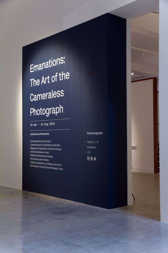
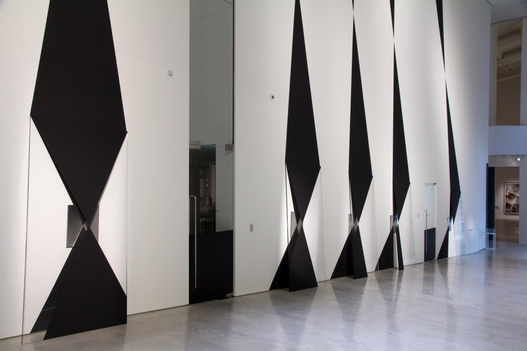
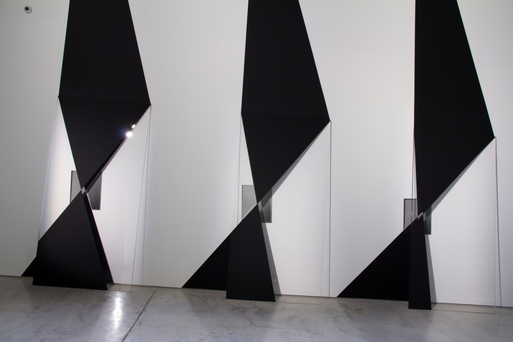
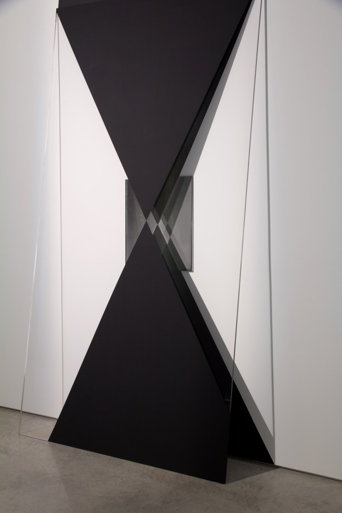
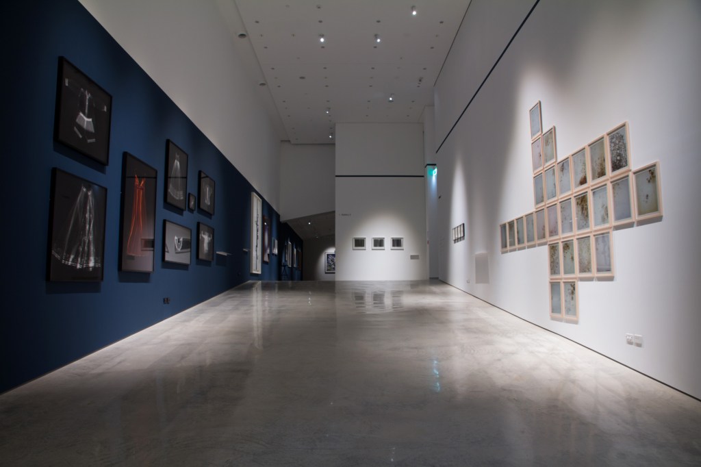
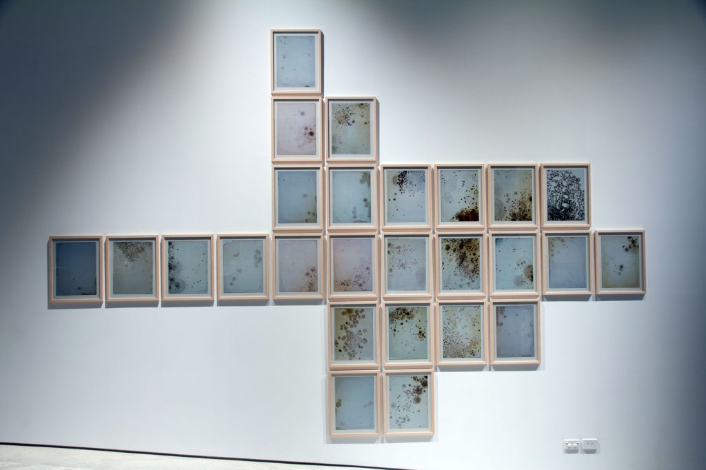
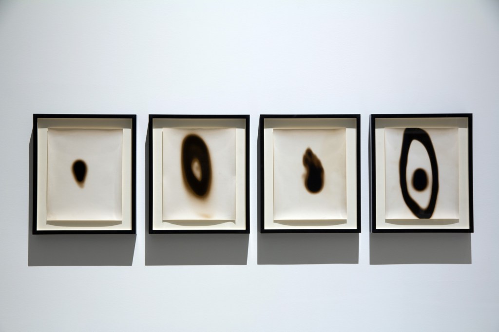
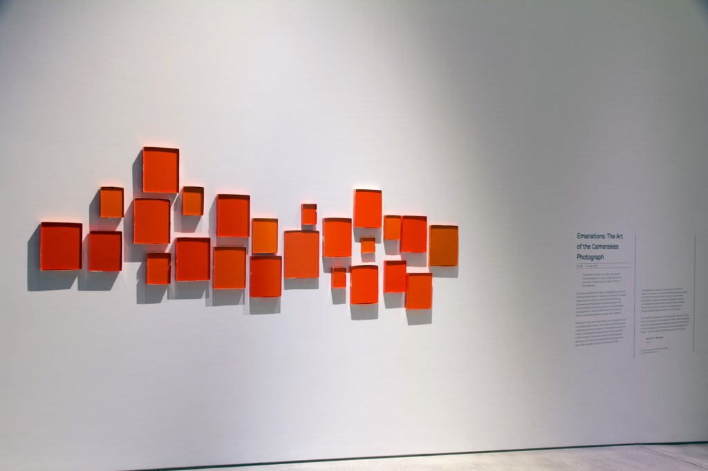
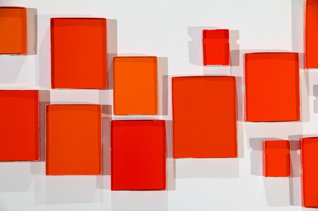
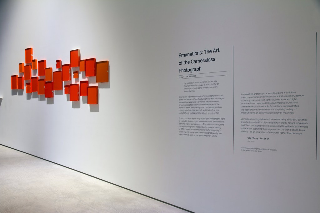
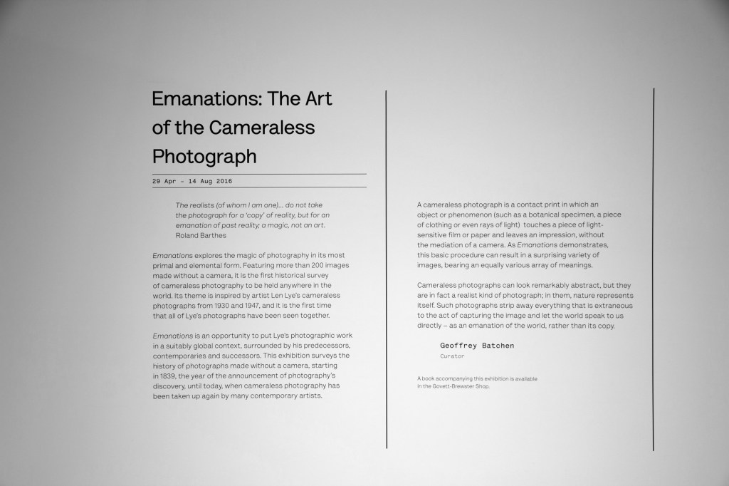
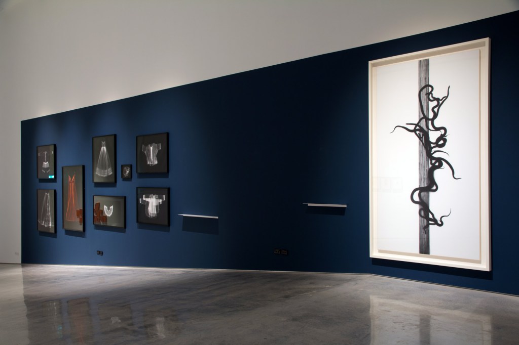
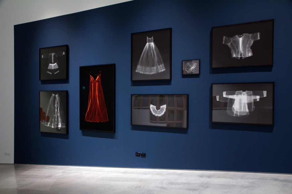
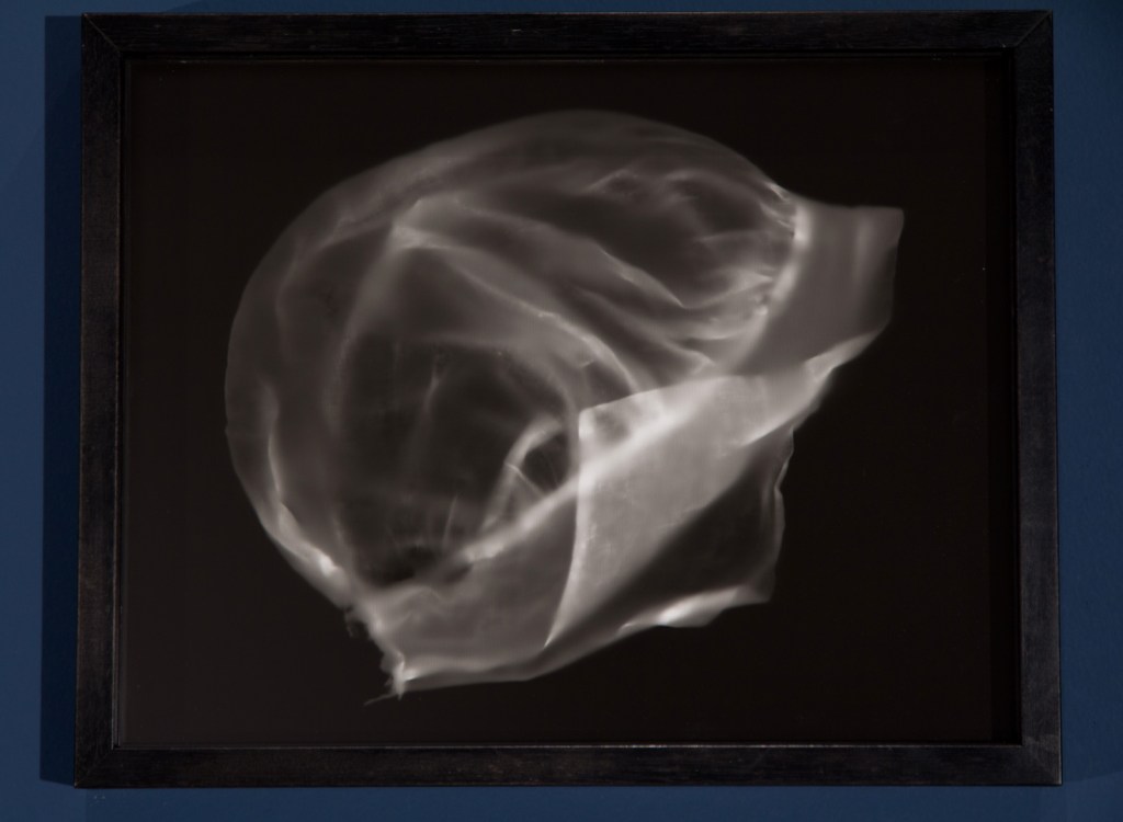
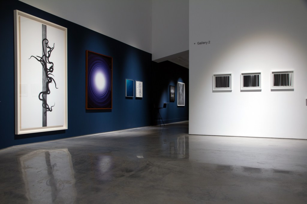
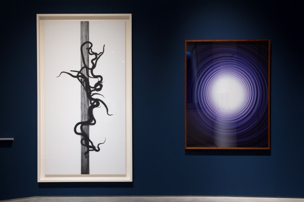
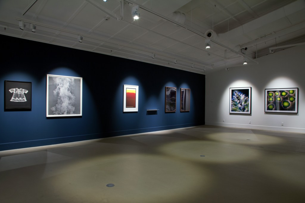
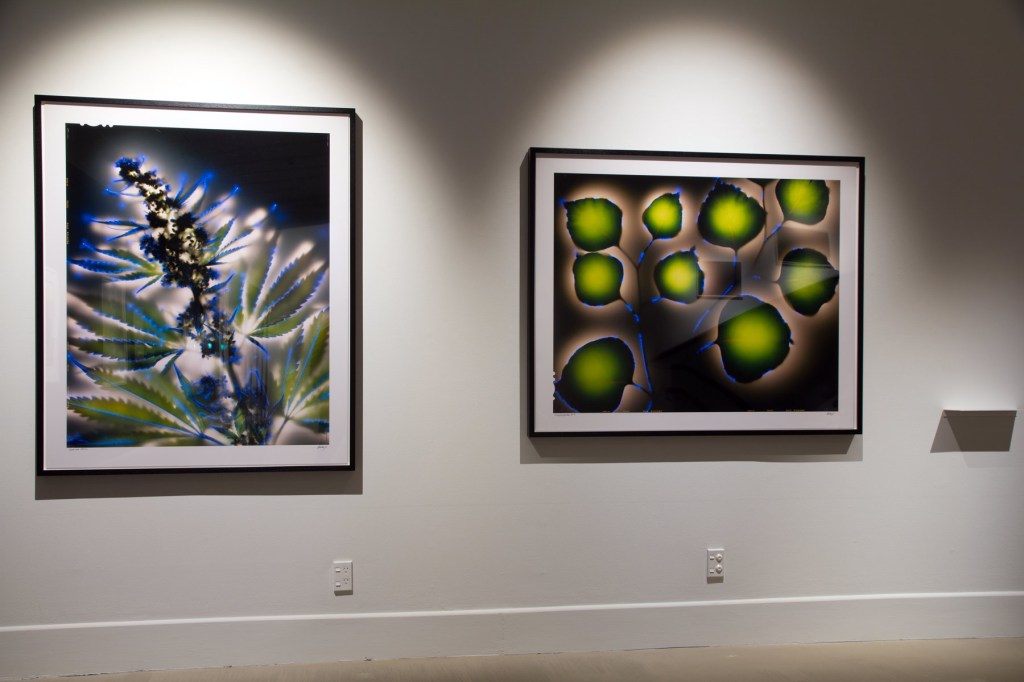

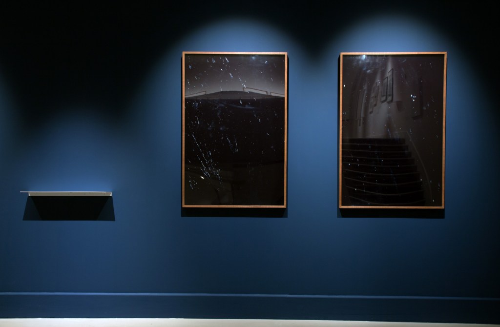
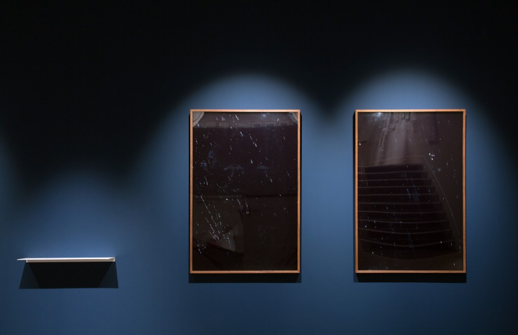
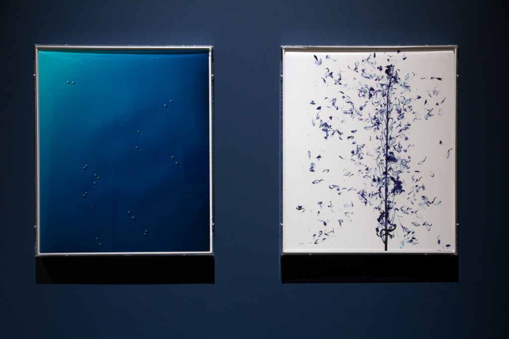
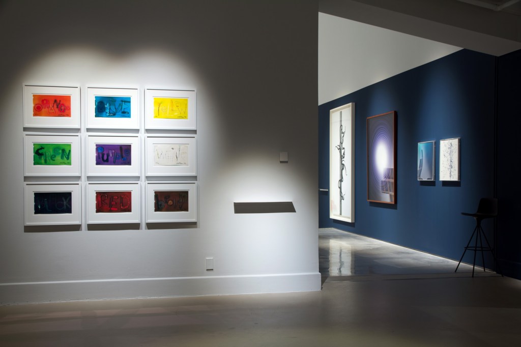
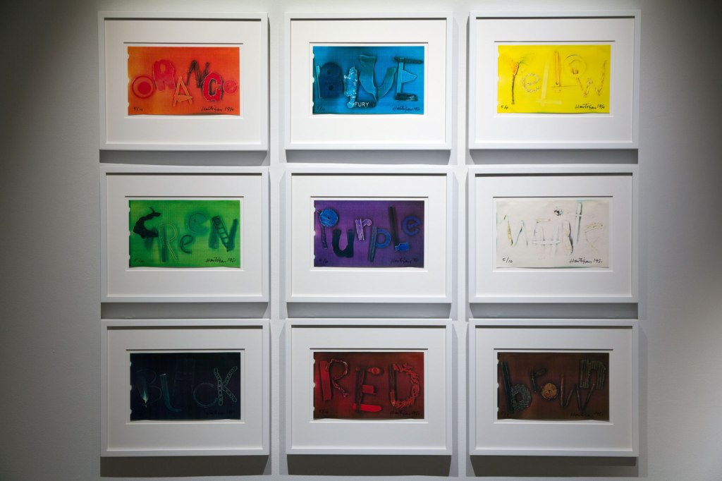

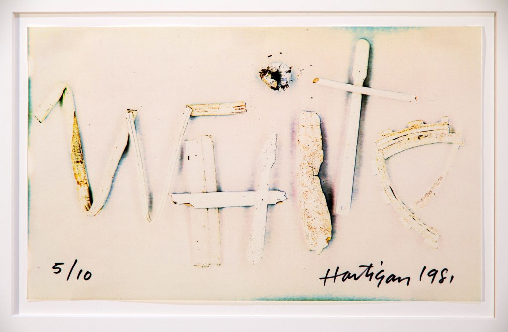
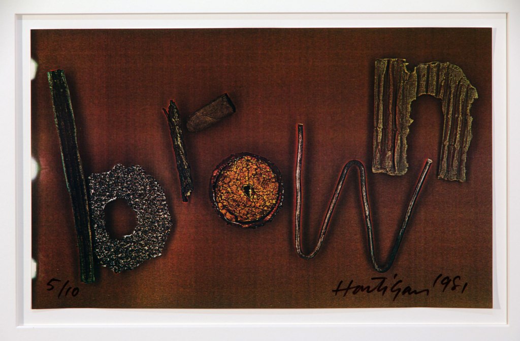
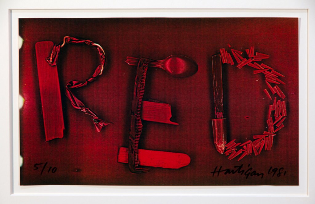
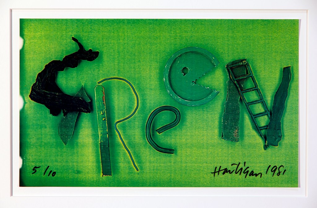
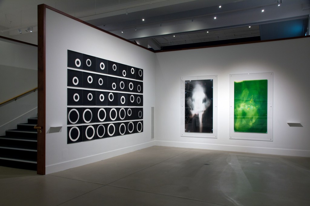
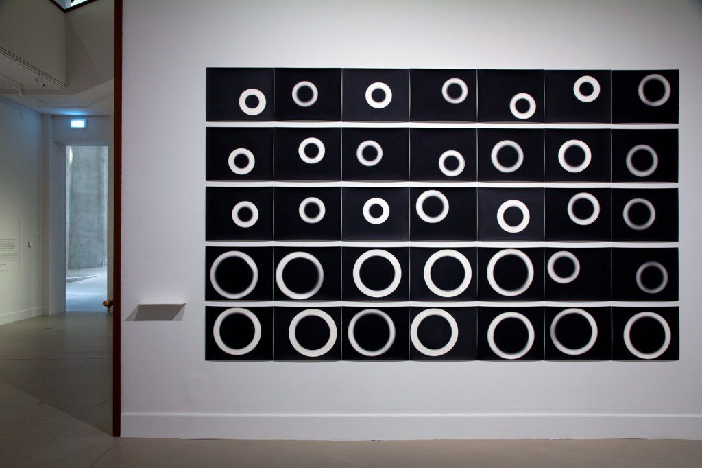
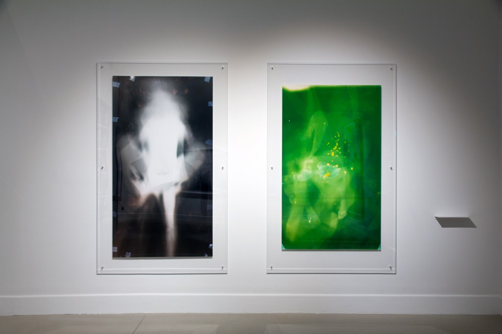
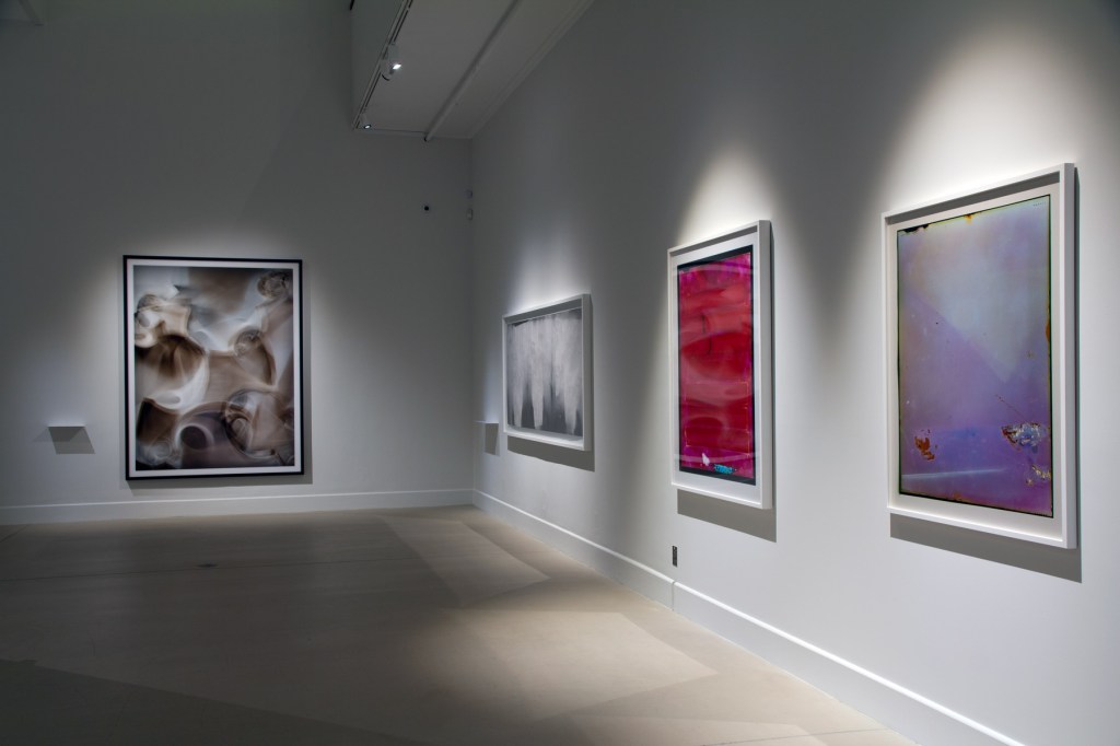
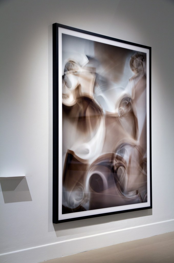
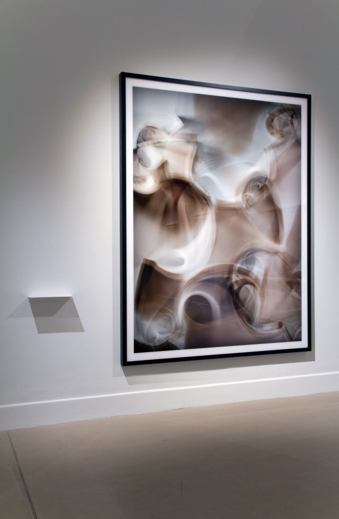
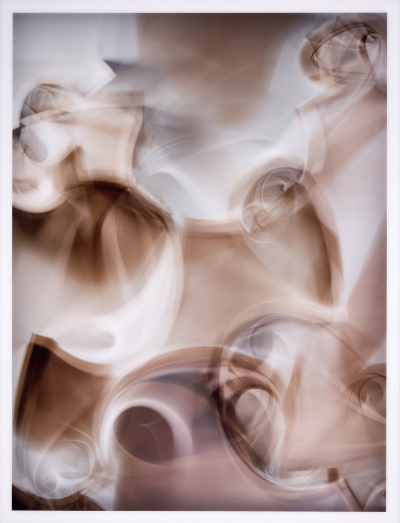
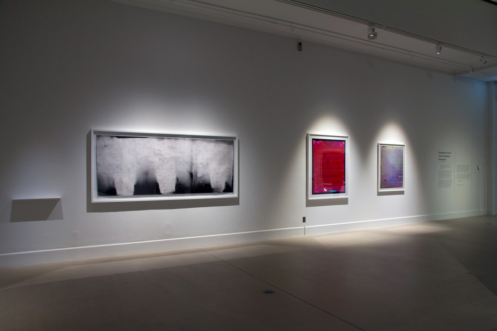
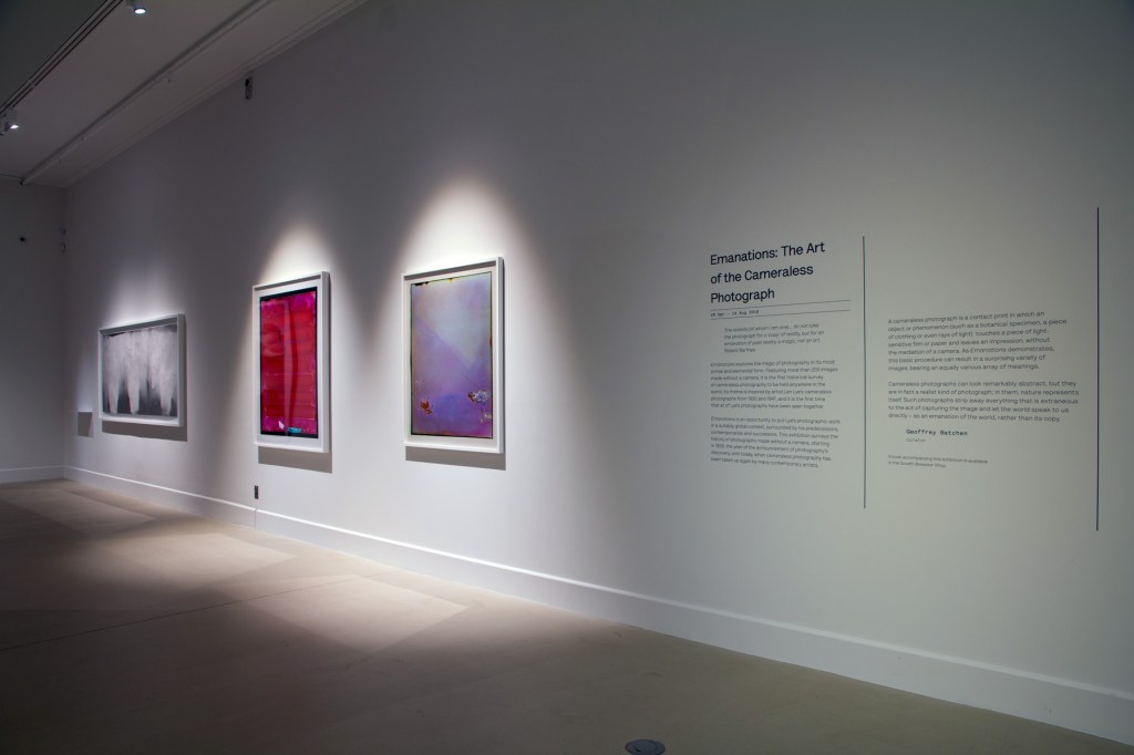
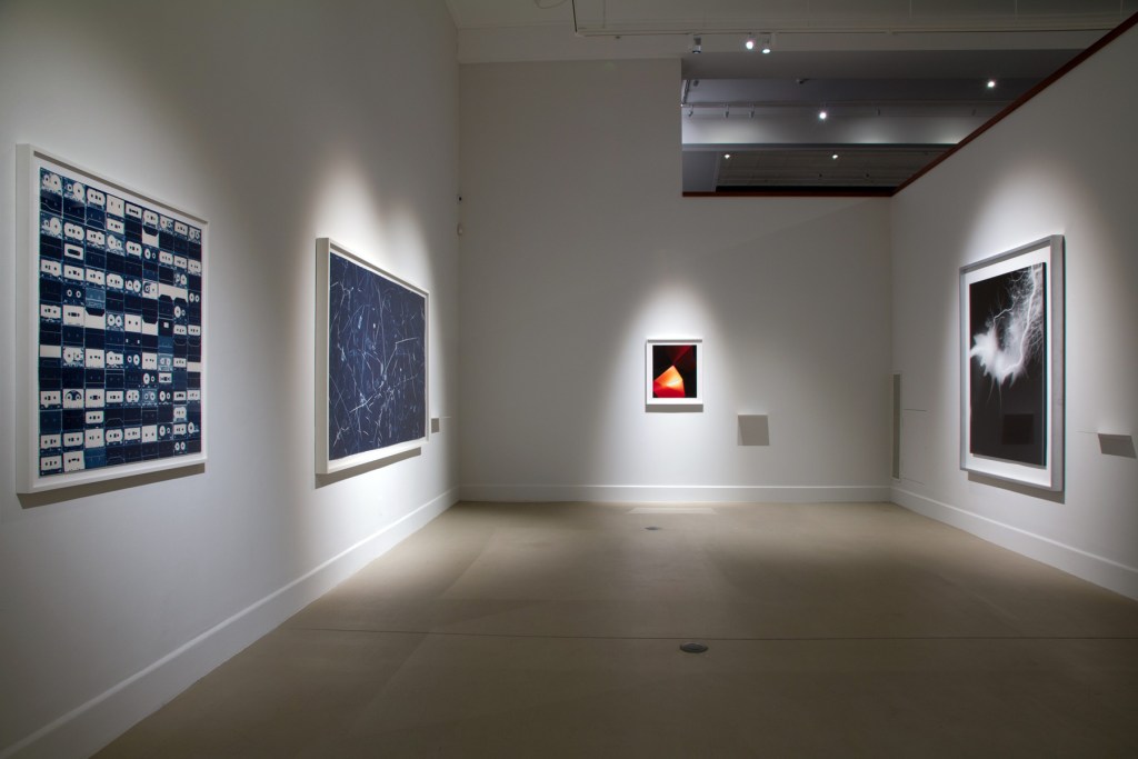
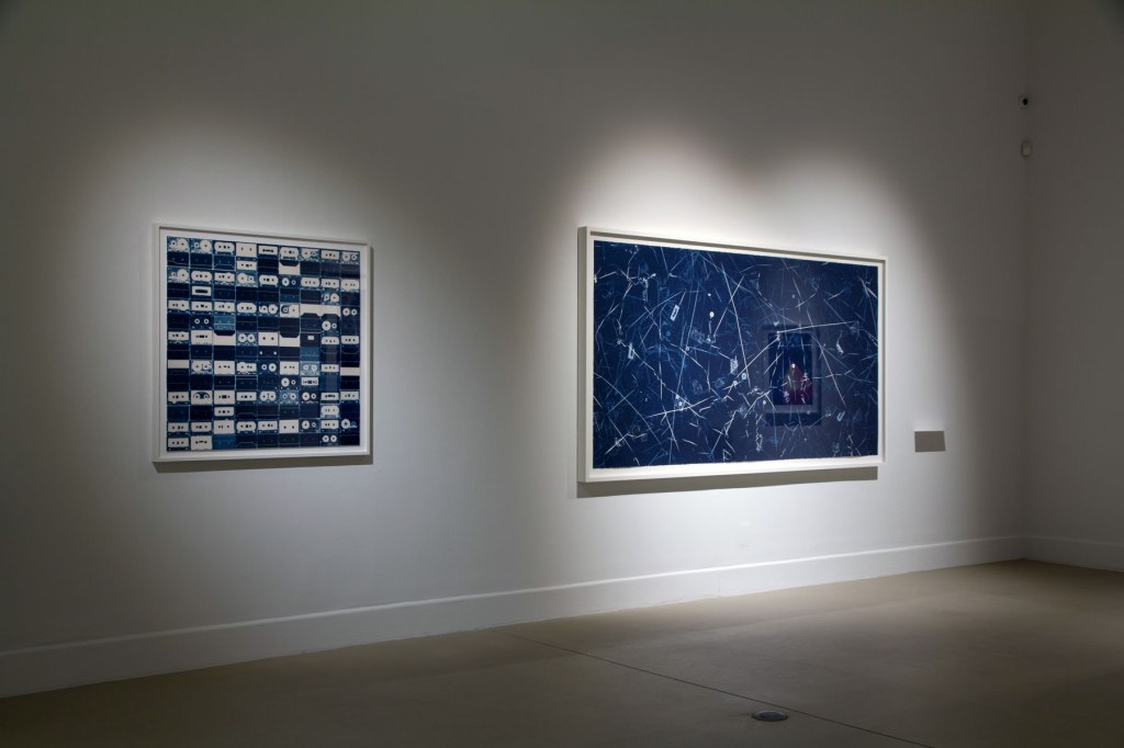


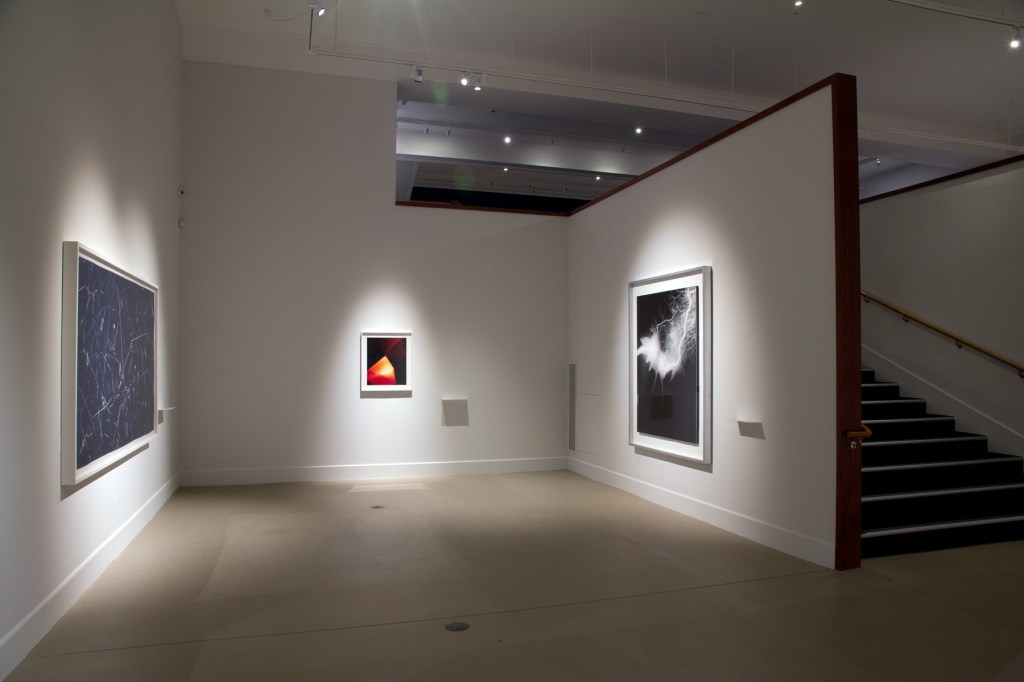
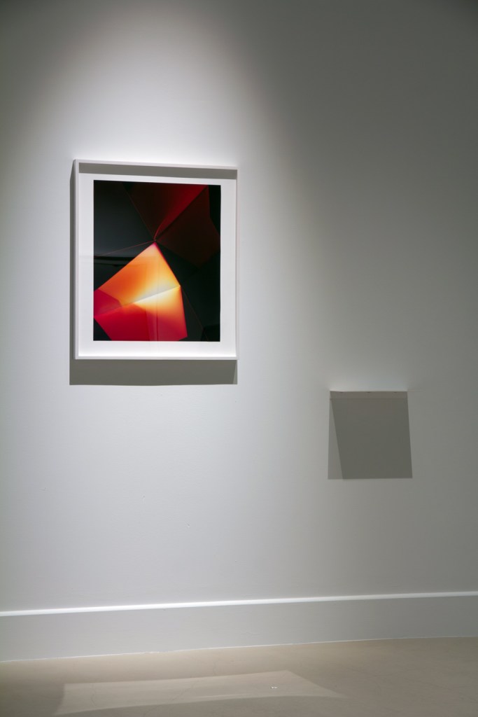
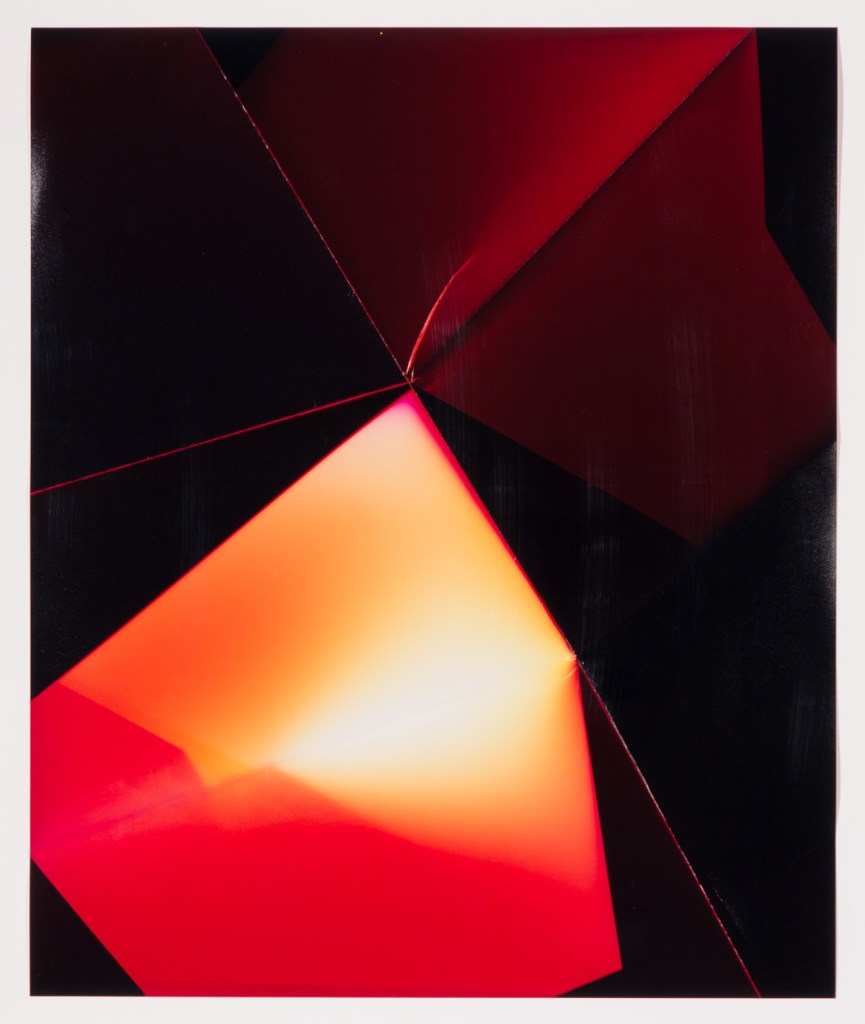
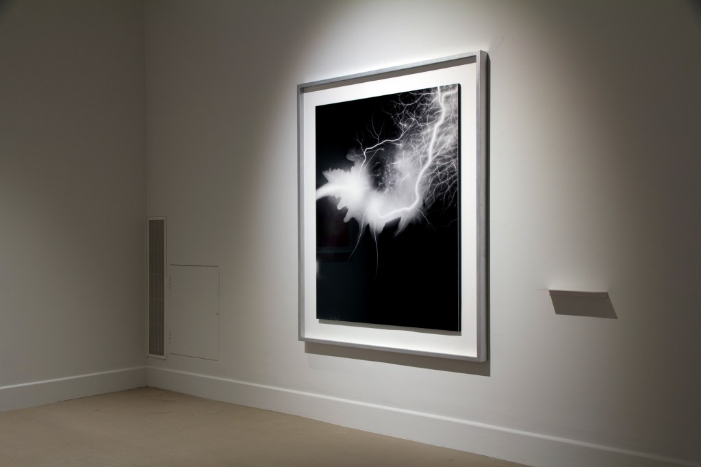
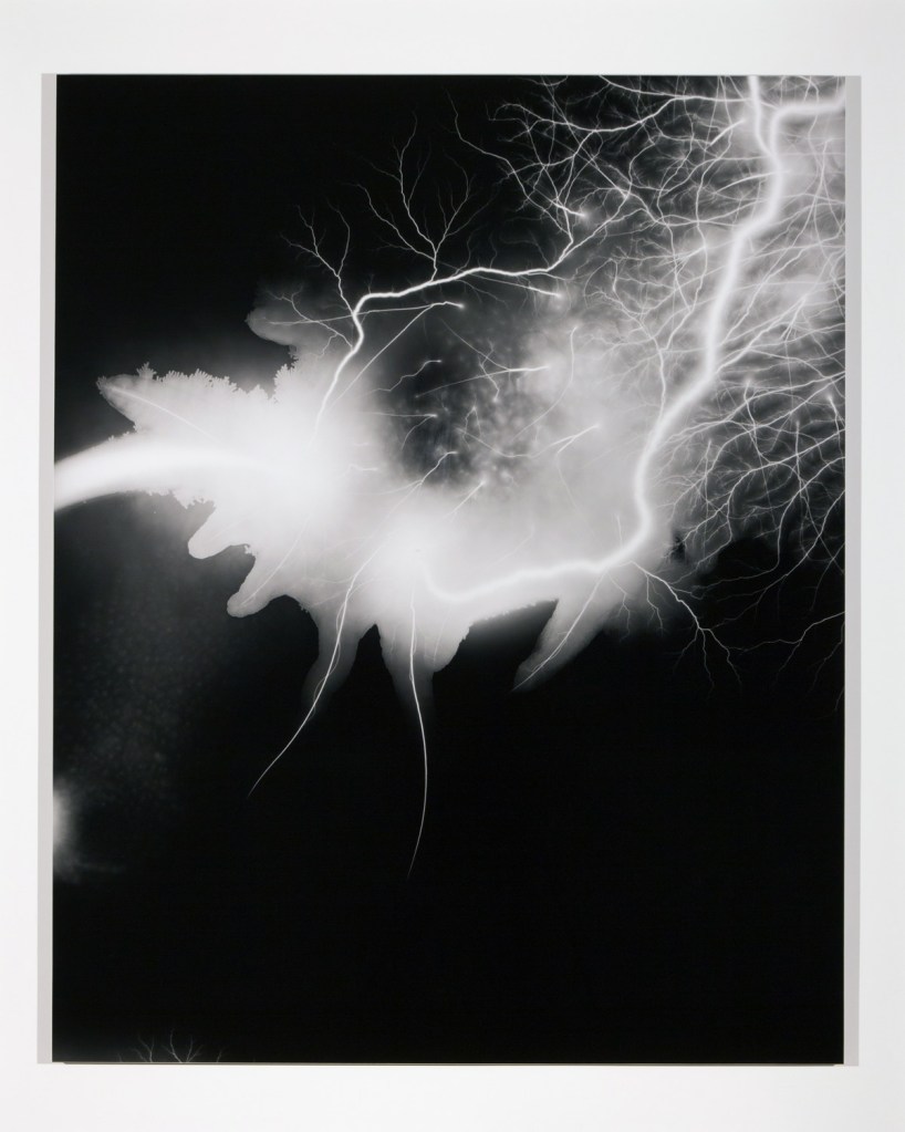
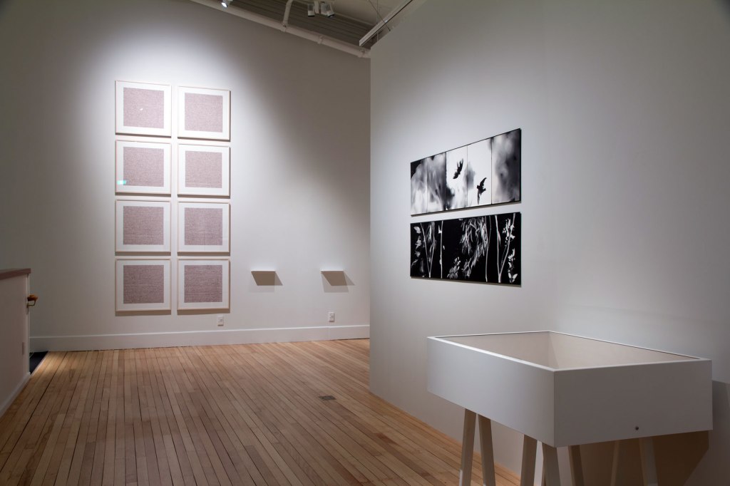
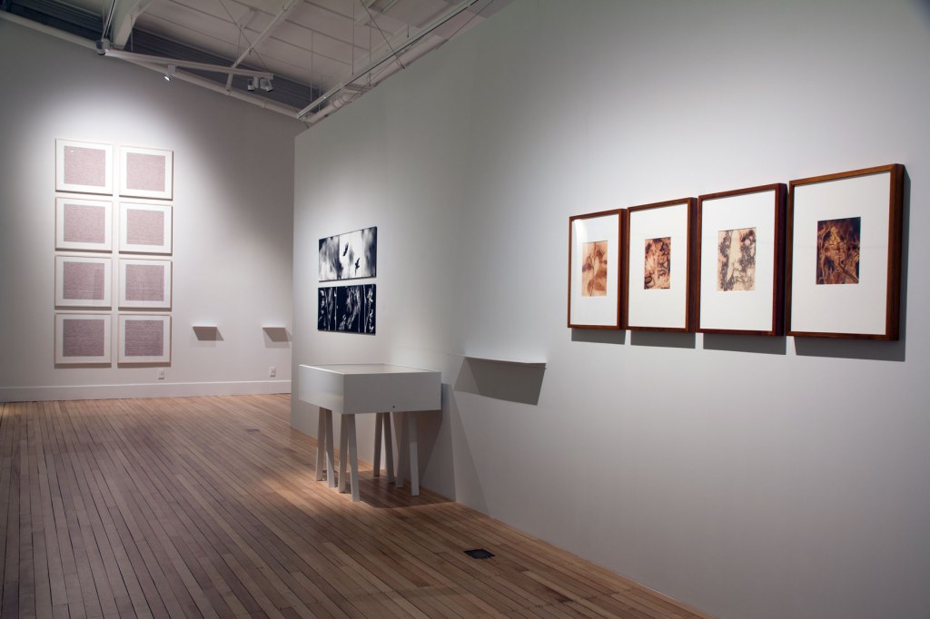
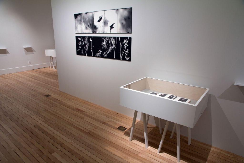
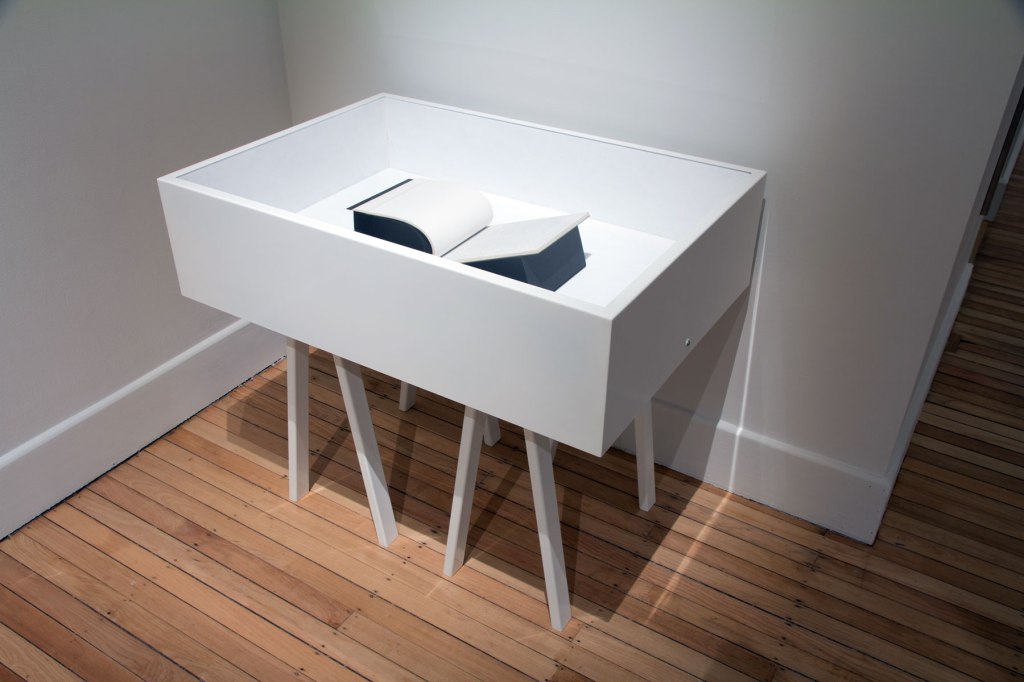
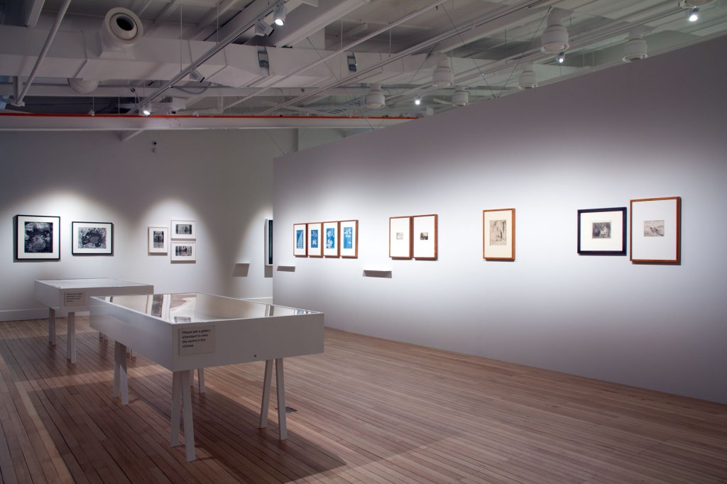
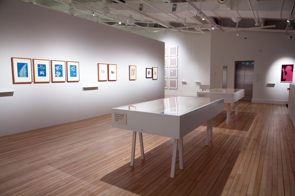

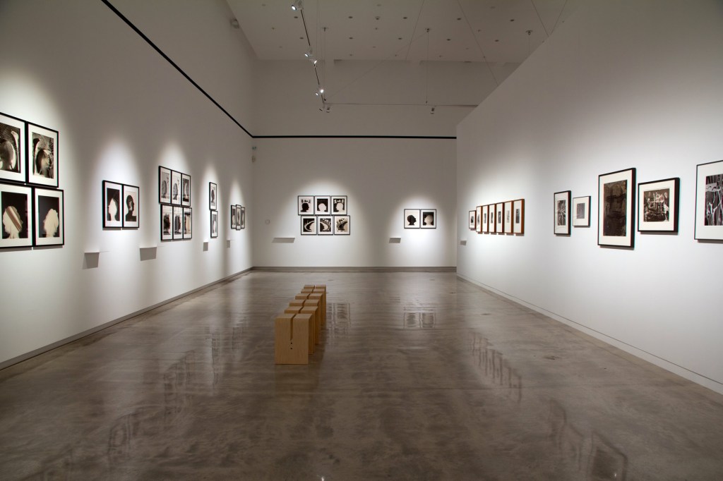
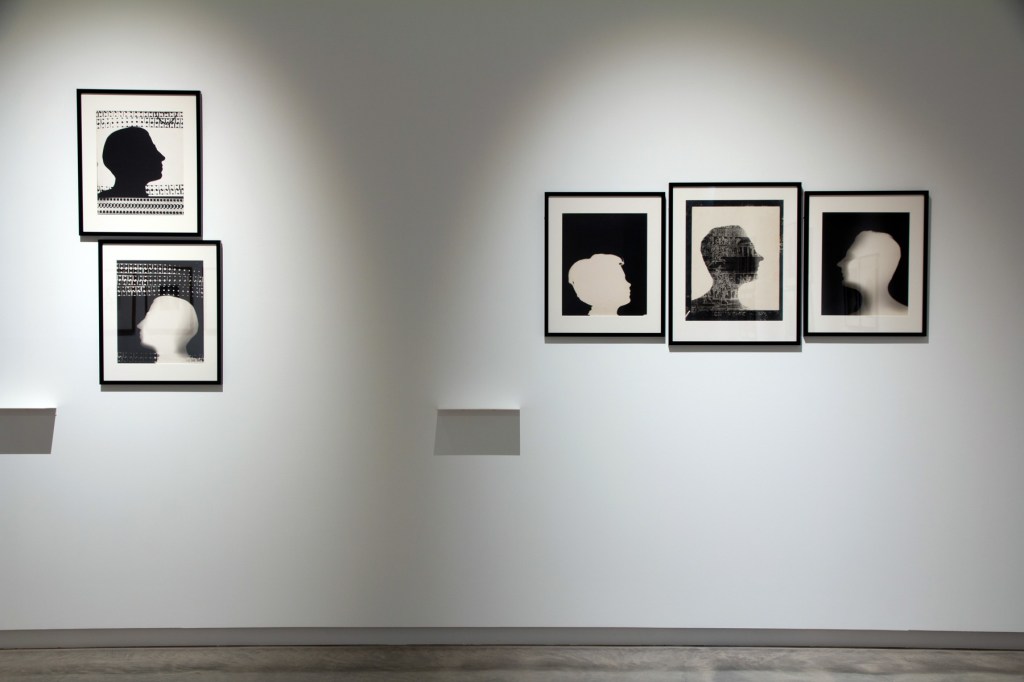
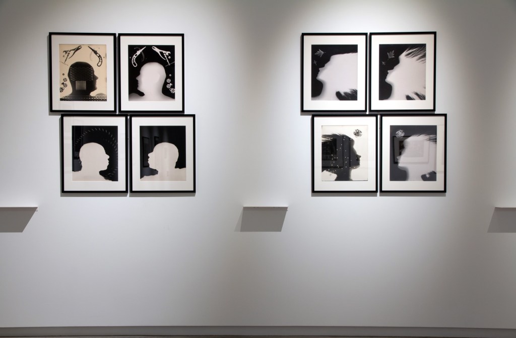
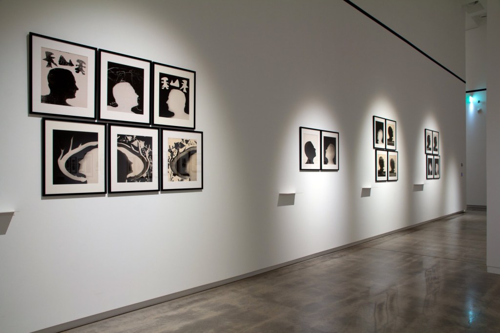
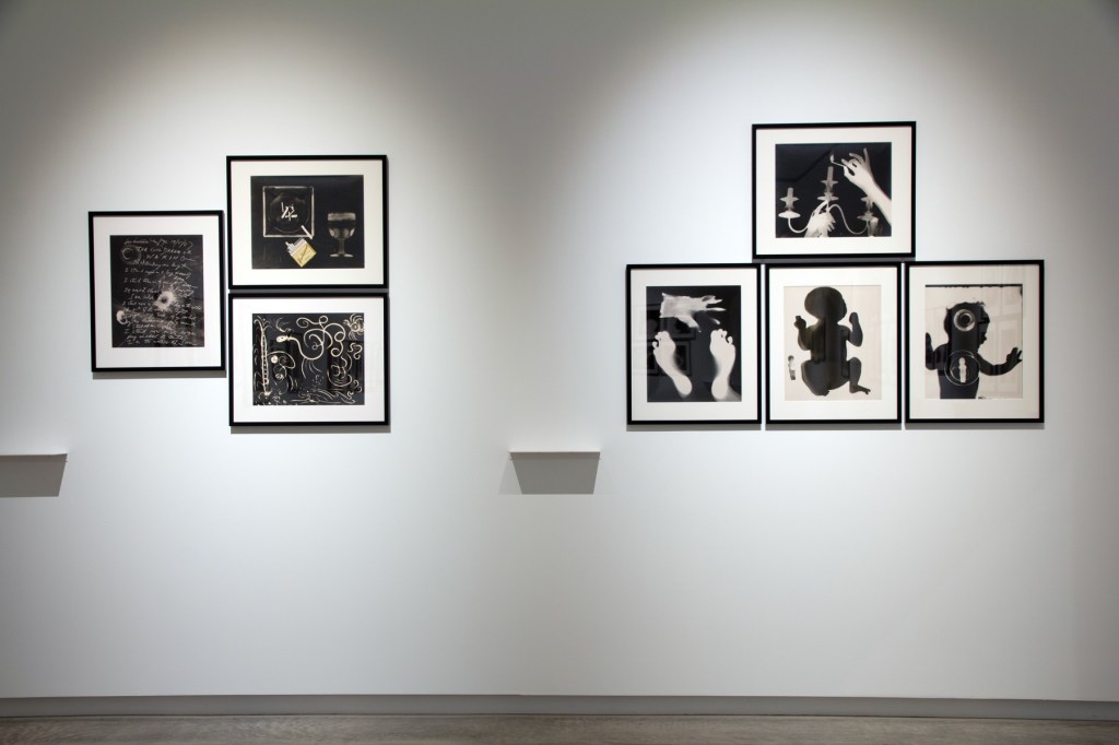


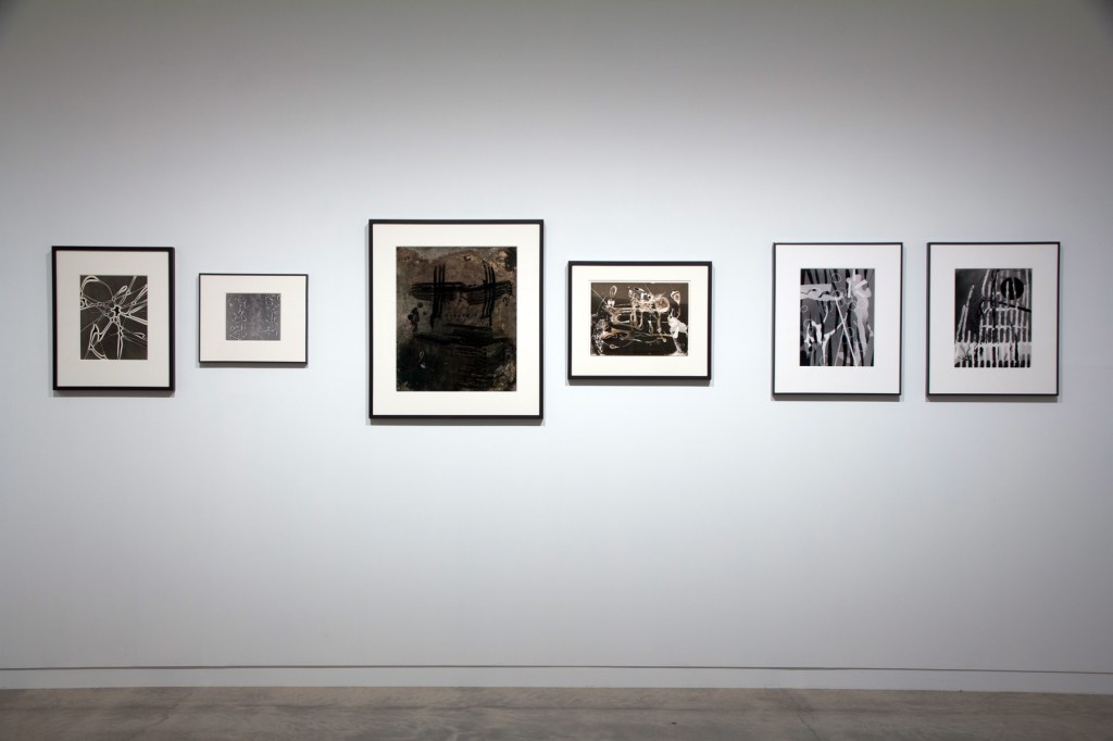
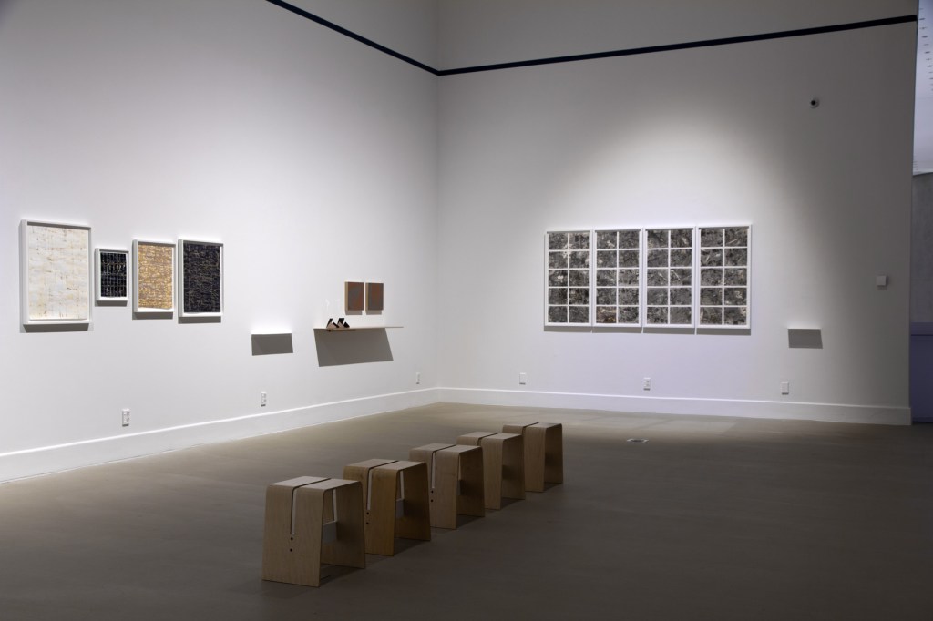
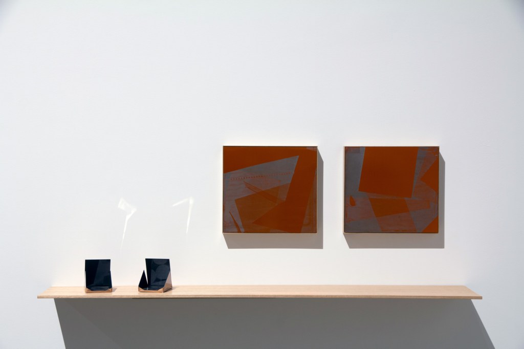
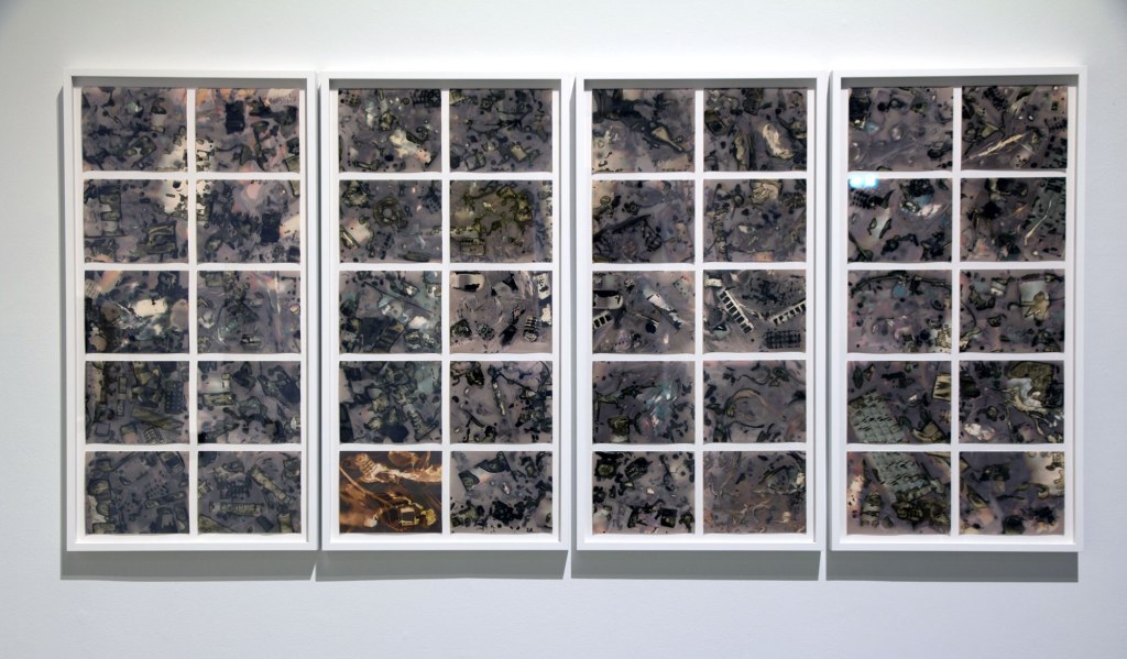

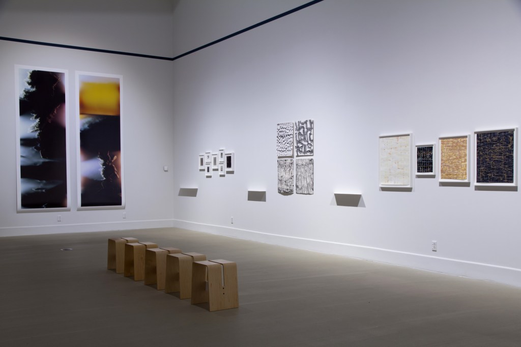
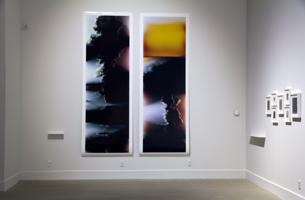
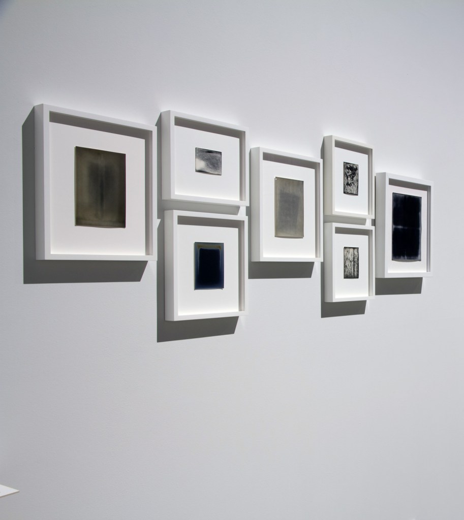
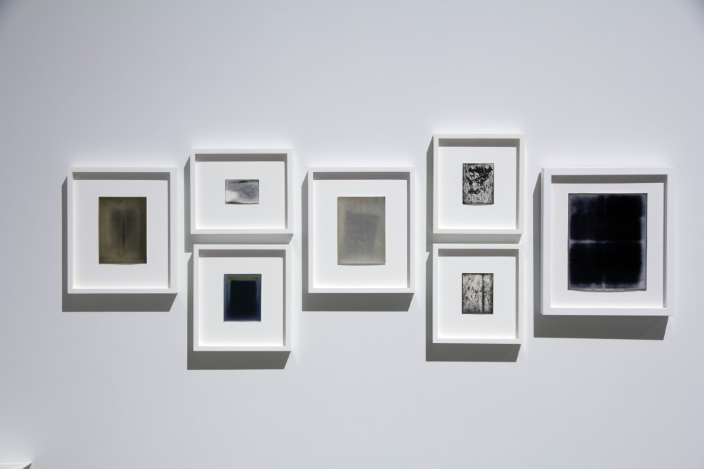
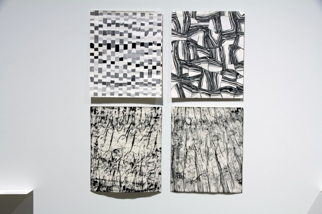
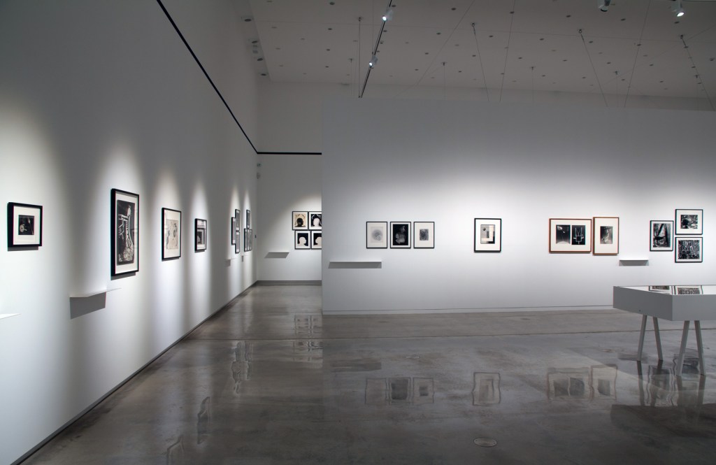

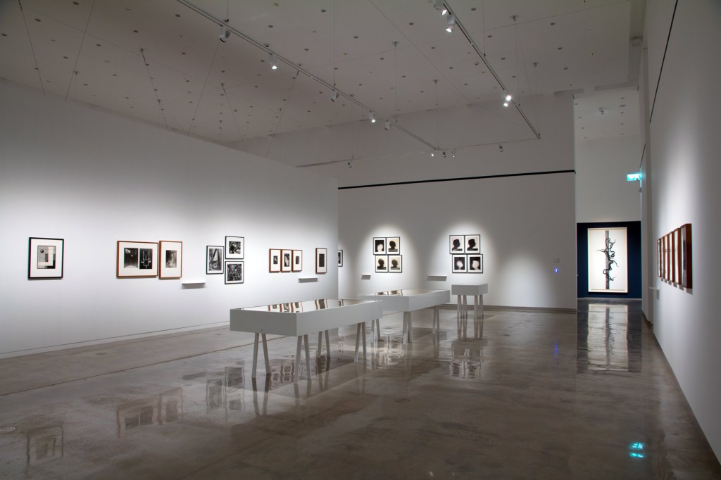
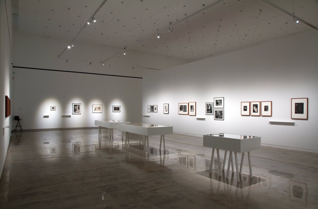
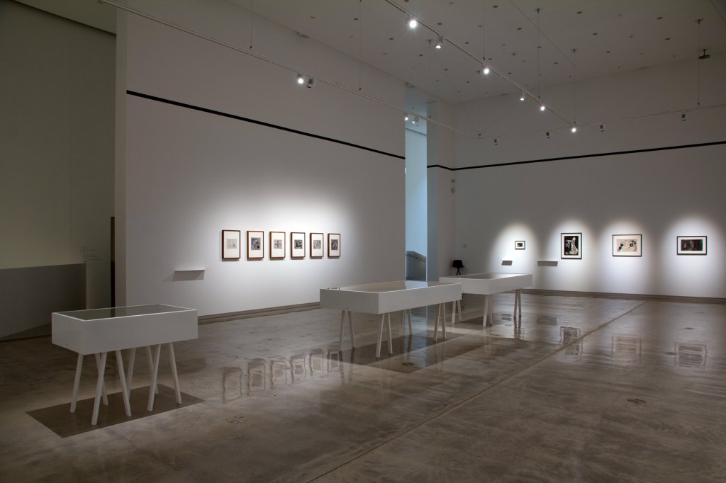
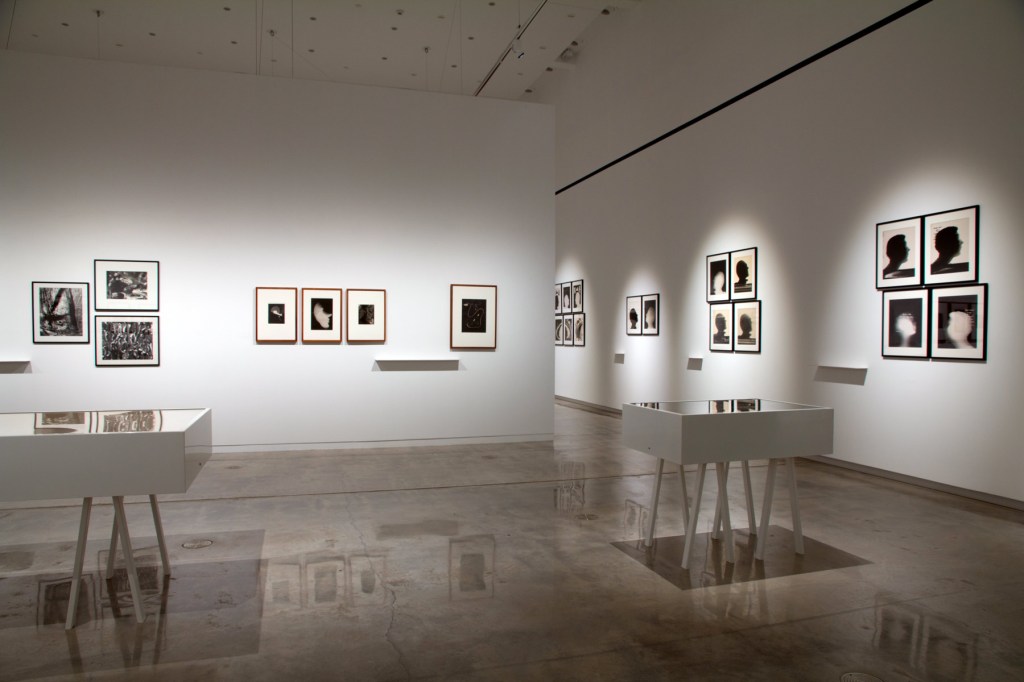
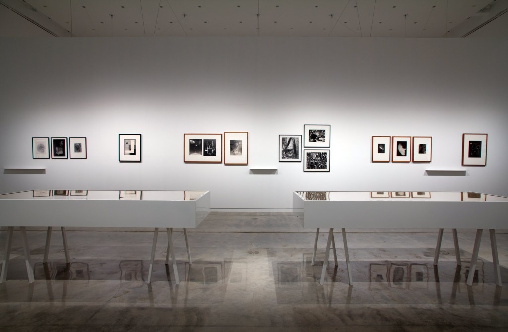


 'Videograms' 1969")
 'ΔE2000 1.1' 2014 part of the exhibition of the exhibition 'Emanations: The Art of the Cameraless Photograph' at the Govett-Brewster Art Gallery")
 'ΔE2000 1.1' 2014 part of the exhibition of the exhibition 'Emanations: The Art of the Cameraless Photograph' at the Govett-Brewster Art Gallery")
 'ΔE2000 1.1' 2014 part of the exhibition of the exhibition 'Emanations: The Art of the Cameraless Photograph' at the Govett-Brewster Art Gallery")


 Untitled, 1998; Untitled, 1998; Untitled, 1998; Untitled (baby's petticoat), 1998; Untitled (collar), 1998; Untitled (baby's bonnet), 1998; Untitled (sailor suit), 1998; Untitled (shirts), 1998")
 'Untitled (baby's bonnet)' 1998")

 ‘Caduceus’ 2010 (left) and ‘Untitled’ 1991 (right)")
 'Untitled' 1991 from the exhibition 'Emanations: The Art of the Cameraless Photograph' at the Govett-Brewster Art Gallery/Len Lye Centre, New Plymouth, New Zealand, April - August, 2016")
 ‘Fold I’ 2014 from the exhibition 'Emanations: The Art of the Cameraless Photograph' at the Govett-Brewster Art Gallery/Len Lye Centre, New Plymouth, New Zealand, April - August, 2016")

 ‘Cannabis sativa’ 2002 (left) and ‘Eucalyptus polyanthemos’ 2000 (right)")

 ‘Endings (Rothko died today) – Kodachrome 64, No. 21, 26/02/1970’ 2009")
 'Untitled' (from the series 'My Ghost') 2001")
 both 'Untitled' 1989")
. ‘MN 62: OPHIUCUS (NGC 6266), AR 17 h. 01,2 min. / D -30º 07’’ (left) and ‘LAMBDA CORONAE AUSTRALIS (Mags 5,1/9,7 Sepn 29,2\" AP 214º), AR 18 h 43,8 min. / D -38º 19’’ (right) both 1993")
 ‘MN 62: OPHIUCUS (NGC 6266), AR 17 h. 01,2 min. / D -30º 07’’ (left) and ‘LAMBDA CORONAE AUSTRALIS (Mags 5,1/9,7 Sepn 29,2\" AP 214º), AR 18 h 43,8 min. / D -38º 19’’ (right) both 1993")
 'Colourwords' 1980-1981 as part of the exhibition 'Emanations: The Art of the Cameraless Photograph' at the Govett-Brewster Art Gallery")
 'Colourwords' 1980-1981 as part of the exhibition 'Emanations: The Art of the Cameraless Photograph' at the Govett-Brewster Art Gallery")
 'Colourwords' 1980-1981 as part of the exhibition 'Emanations: The Art of the Cameraless Photograph' at the Govett-Brewster Art Gallery")
 'Colourwords' 1980-1981 as part of the exhibition 'Emanations: The Art of the Cameraless Photograph' at the Govett-Brewster Art Gallery")
 'Colourwords' 1980-1981 as part of the exhibition 'Emanations: The Art of the Cameraless Photograph' at the Govett-Brewster Art Gallery")
 'Colourwords' 1980-1981 as part of the exhibition 'Emanations: The Art of the Cameraless Photograph' at the Govett-Brewster Art Gallery")
 'Colourwords' 1980-1981 as part of the exhibition 'Emanations: The Art of the Cameraless Photograph' at the Govett-Brewster Art Gallery")
 ‘The Coil’ 1998 (left) and Lucinda Eva-May as part of the exhibition 'Emanations: The Art of the Cameraless Photograph' at the Govett-Brewster Art Gallery")
 ‘The Coil’ 1998")
 'Unity in light #6' 2012 (left) 'Unity in light #9' 2012 (right)")

 'r.phg.07_II' 2013")
 'r.phg.07_II' 2013")
 'r.phg.07_II' 2013")


 'Exit (Red State)' 2014-15")
 'Desklamp' 2011-12")


 'Untitled #9 2005/2006' 2005-2006 from the exhibition 'Bill Henson: Landscapes' at Castlemaine Art Gallery and Historical Museum, Victoria, April - June, 2016")
 'Untitled #9 2005/2006' 2005-2006 (detail)")

 'Untitled #21 2005-2006' 2005-2006 (detail)")
 'Untitled 1999/2000' 1999-2000 from the exhibition 'Bill Henson: Landscapes' at Castlemaine Art Gallery and Historical Museum, Victoria, April - June, 2016")


 'Untitled 2001-2002' 2001-2002")
 'Untitled 2001/02' 2001-2002 (detail)")

 'Untitled #28' 1998 (detail)")
 'Untitled #48' 1998/1999/2000 (detail)")
 'Mao (Facing Forward)' 1986 from the exhibition 'Andy Warhol | Ai Weiwei' at the National Gallery of Victoria, Melbourne, Dec 2015 - April 2016")

 'Mao' 1972")
 'Self-Portrait with Skull' 1977 from the exhibition 'Andy Warhol | Ai Weiwei' at the National Gallery of Victoria, Melbourne, Dec 2015 - April 2016")

 'Illuminations' 2014")
 'Gun' 1981-1982")
 'Jackie' 1964")
 'Cat in Front of Church' c. 1959")
 'Cat Collage' (from 25 Cats Name Sam and One Blue Pussy) c. 1954")
 Julia Warhola (American 1892-1972) 'So Happy' 1950s")
 'You're In' 1967")
 'Neolithic Pottery with Coca Cola Logo' 2007")
 'Three Marilyns' 1962")
 'Self-Portrait No. 9' 1986")
![Andy Warhol (American, 1928-1987) 'Silver Liz [Ferus Type]' 1963](https://artblart.com/wp-content/uploads/2016/03/exhi032777-web.jpg "Andy Warhol (American, 1928-1987) 'Silver Liz [Ferus Type]' 1963")
 'Fabis Statue of Liberty' 1986")
 'Sydney Opera House, Sydney, Australia' 2006")
 'Tiananmen Square, Beijing, China' 1995")
 'Andy Warhol in Tiananmen Square' 1982")
 'Self-Portrait' 1981")
 'Andy Warhol Holding Kitten' 1957")
 'Andy Warhol with Siamese Cat' c. 1957")
 'Ai Weiwei with cat, @aiww, Instagram' 2006")
![Andy Warhol (American, 1928-1987) 'Screen Test: Edie Sedgwick [ST308]' 1965](https://artblart.com/wp-content/uploads/2016/03/exhi037605-web.jpg "Andy Warhol (American, 1928-1987) 'Screen Test: Edie Sedgwick [ST308]' 1965")
 'Andy Warhol Under the Silver Cloud Pillow, New York' 1965")
 gallery")
 'Andy Warhol Blowing Up Silver Cloud Pillow, Los Angeles' 1966")

 'Andy Warhol, Gerard Malanga and Philip Fagan in New York' 1964")
 'Coloured Vases' 2006")
 'Campbell's Soup II: Tomato-Beef Noodle O's' 1969")
 'Williamsburg, Brooklyn' 1983")
 'Brillo Soap Pads Box' 1964")
 'Forever Bicycles' 2011")
 'Flowers' 1970")
 'Debbie Harry' 1980")
 'Self-Portrait' 1966-1967")
 'At the Museum of Modern Art' 1987")
 'Andy Warhol Factory Portrait, New York' 1963")
 'Electric Chair' 1967")
 'S.A.C.R.E.D.' (detail) 2011-2013")
 'Dropping a Han Dynasty Urn' 1995")
 'Dropping a Han Dynasty Urn' 1995 (detail)")
 'Dropping a Han Dynasty Urn' 1995 (detail)")
 'Dropping a Han Dynasty Urn' 1995 (detail)")
 'Elvis' 1963")
 'FORWARD' 2008 from the exhibition 'Gilbert & George: The Art Exhibition' at the Museum of Old and New Art (MONA), Hobart, Nov 2015 - March 2016")

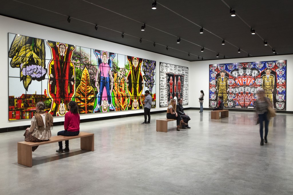
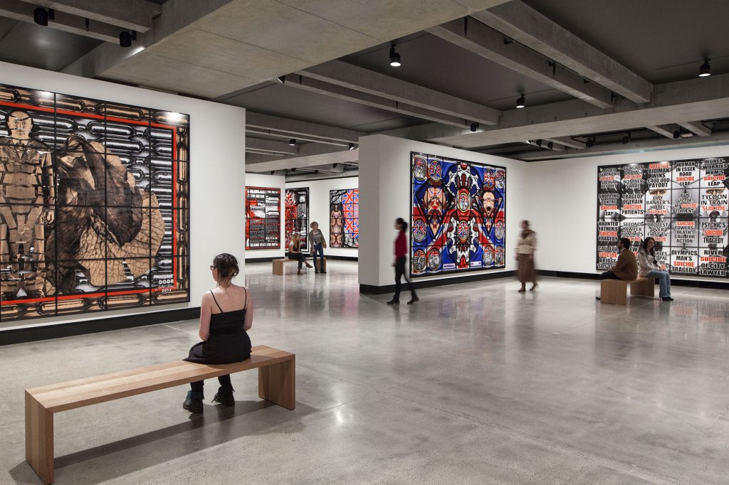
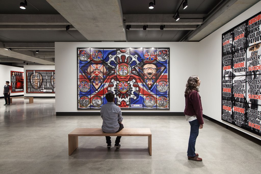
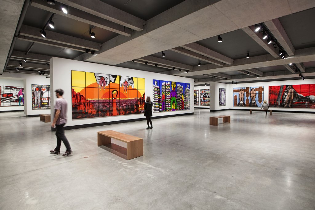
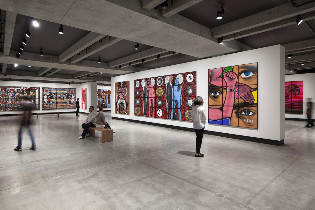
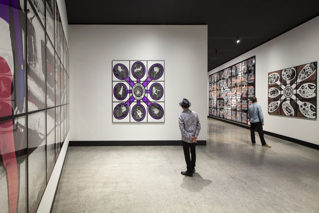
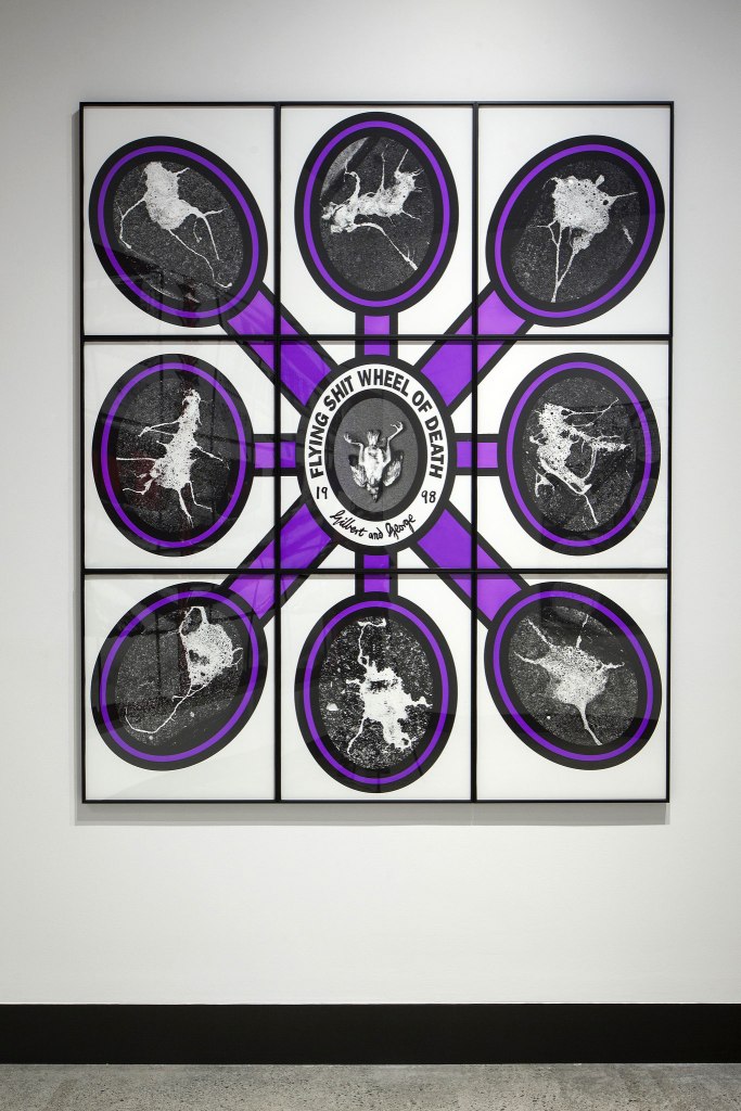
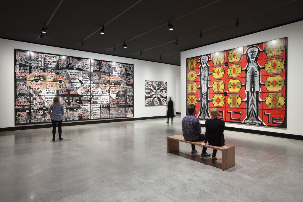
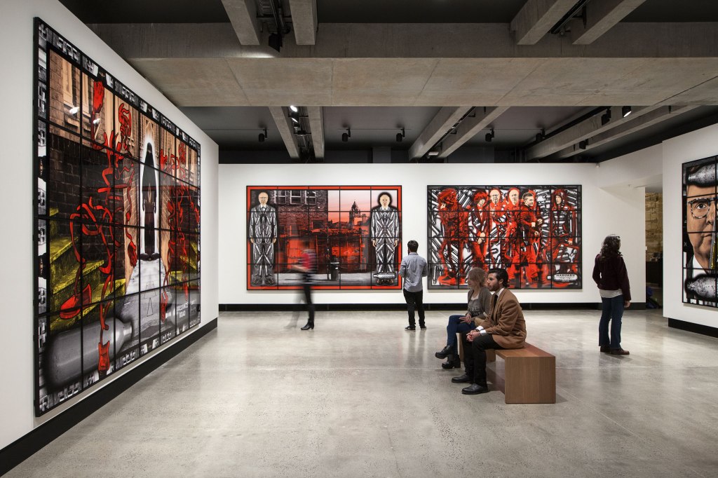
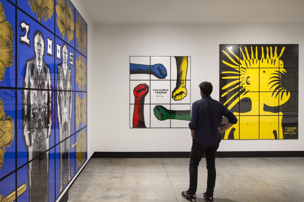
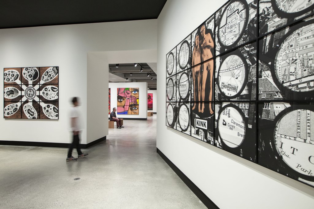
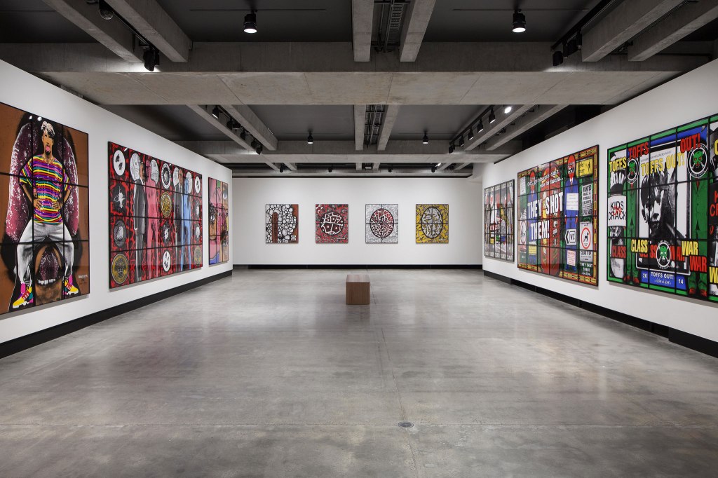
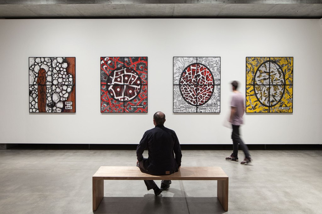
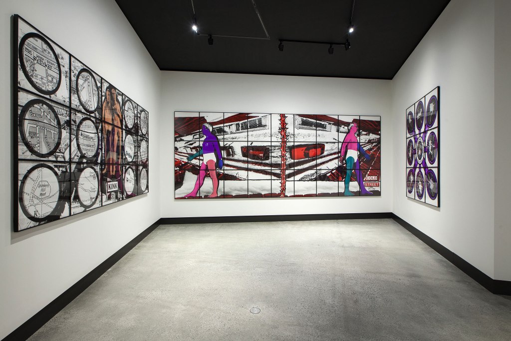
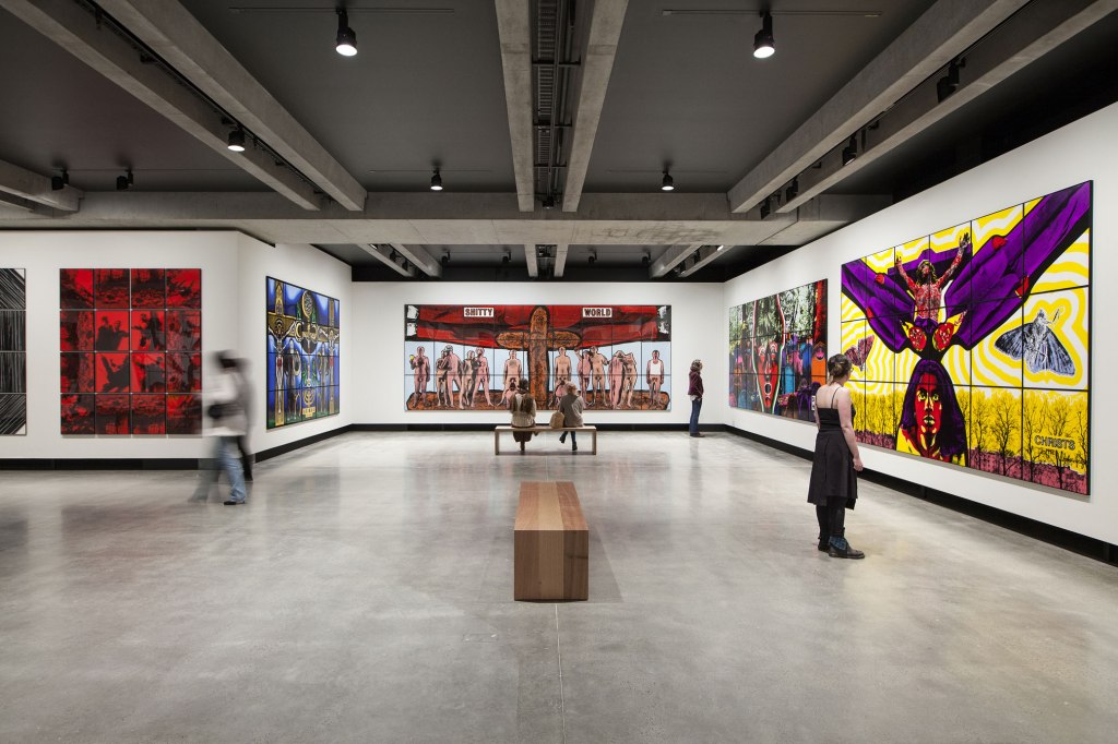
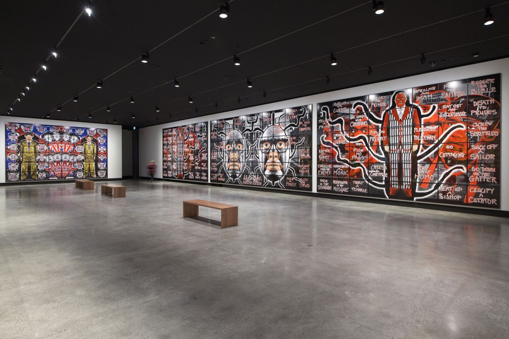
, and at right, 'FORWARD' (2008)")
 'BOMBERS' 2006 from the exhibition 'Gilbert & George: The Art Exhibition' at the Museum of Old and New Art (MONA), Hobart, Nov 2015 - March 2016")
 from 'The Cosmological Pictures'")
 'DEAD HEAD' 1989")
, in the middle 'HANDBALL' (2008), and at right, 'SUICIDE STRAIGHT' (2011) from 'The London Pictures'")
 'KILLERS STRAIGHT' 2011")
, and at right, 'SUICIDE STRAIGHT' (2011) from 'The London Pictures'")
, 'CITY DROP' (1991), 'FLAT MAN' (1991), 'EIGHT SHITS' (1994) and 'ILL WORLD' (1994), both from 'The Naked Shit Pictures'")
 'ILL WORLD' 1994")
 from the series 'The Rudimentary Pictures' (1998) followed by 'FIVE' (1992)")
 'IN THEIR ELEMENT' 1988")
; and at right, 'RAIN WHEEL OF LIFE' (1998), both from 'The Rudimentary Pictures'")
 'FLYING SHIT WHEEL OF DEATH' 1998 (installation view)")

 'RED MORNING DEATH' 1977")
 'BLACK JESUS' 1980")
 from 'The London Pictures' and, at right, 'Raack' (2005) from 'Ginkgo Pictures'")
; at centre left 'RIDLEY ROAD' (2013) and at centre right 'HABDABS' (2013) all from the series 'Scapegoating Pictures'")
 from 'Ginkgo Pictures'; at left rear, 'COLOURED FRIENDS' (1982); and at right rear 'SPEAKING YOUTH' (1981)")
, and at right 'KINK' (1998), both from 'The Rudimentary Pictures'")
 followed by 'IN THEIR ELEMENT' (1998) from the series 'The Rudimentary Pictures' followed by 'FIVE' (1992); to the right 'TOFF'S OUT!' (2014) followed by 'THEY SHOT THEM!' (2014), both from the series 'Utopian Pictures'")
 'THEY SHOT THEM!' 2014")
 from 'The New Testamental Pictures', 'BLOOD ROADS' (1998), 'BLOOD CITY' (1998) and 'PISS GARDEN' (1998) from 'The Rudimentary Pictures'")
 'BLOOD CITY' 1988")
, and at rear, 'COLD STREET' (1991)")
, 'AKIMBO' (2005) from 'Sonofagod Pictures', 'SHITTY WORLD' (1994), 'DEAD HEAD' (1989), and 'CHRISTS' (1992) from 'The China Pictures'")
 and in the middle right, 'SCAPEGOATING' (2013)")
 'ASTRO STAR' 2013")
 'FIGHT BACK' 2014")
 'ONE WORLD' 1988")
 'ALL MY LIFE I GIVE YOU NOTHING AND STILL YOU ASK FOR MORE' 1970 (Gilbert)")
 'ALL MY LIFE I GIVE YOU NOTHING AND STILL YOU ASK FOR MORE' 1970 (George)")

")
 'We call them pirates out here' 2006 (installation view)")
 Peter Walker (board maker) (Australian, b. 1961) 'Antipodean willow surfboard' 2012 'Antipodean willow surfboard (Mini Simmons)' 2012 (installation view)")
 Peter Walker (board maker) (Australian, b. 1961) 'Antipodean willow surfboard (Mini Simmons)' 2012 (installation view detail)")
 'Clothes don't always maketh the man' 2012 (installation view)")
 'Clothes don't always maketh the man' 2012 (installation view detail)")
, and in the background left, photographs from Michael Cook's 'Undiscovered' series (2010)")
, and in the background right, photographs from Michael Cook's 'Undiscovered' series (2010)")
 'Undiscovered 4' 2010 from the exhibition 'On the beach' at the Mornington Peninsula Regional Art Gallery, Mornington, Dec 2015 - Feb 2016")
; to the right of that Dupain's 'At Newport' (1952); to the right upper is George Caddy's 'Chest strength and breathing exercise, 20 February 1937'; followed at far right by Rennie Ellis' 'St Kilda Lifesavers' (1968, top) and David Moore's 'Lifesavers at Manly' (1959, bottom)")
 'At Newport' 1952, Sydney from the exhibition 'On the beach' at the Mornington Peninsula Regional Art Gallery, Mornington, Dec 2015 - Feb 2016")
 'Chest strength and breathing exercise, 20 February 1937' 1937")
 'Freshwater Surf Life Saving Club reel team march past, 3 April 1938' 1938")
 and, at right, a selection of George Caddy's beachobatics photographs")
 with Diane Jones 'Sunbaker' (2003, below); in the centre Anne Zahalka's 'The sunbather #2' (1989); then Max Dupain's 'Form at Bondi' (1939, top) with Diane Jones 'Bondi' (2003) underneath")
 'The sunbather #2' 1989")
 and Anne Zahalka's photograph 'The bathers' (1989) from the series 'Bondi: playground of the Pacific' 1989")
 'Australian beach pattern' 1940 (installation view detail)")
 and Jeffrey Smart's 'Surfers Bondi' (1963)")
 'Bathers' 1943 (installation view)")
 'Surfers Bondi' 1963 (installation view)")


")
 'Union Jack, Lorne' c. 1968")
 'Four Sunbathers, Lorne' c. 1968")
 'Bondi, New South Wales' 1997")
 'cantchant' 2007-2009 (installation view)")
 'cantchant' 2007-2009 (installation view detail)")
 'cantchant' 2007-2009 (installation view detail)")
 'cantchant' 2007-2009 (installation view detail)")
 'cantchant' 2007-2009 (installation view detail)")
 'cantchant' 2007-2009 (installation view detail)")
 'cantchant' 2007-2009 (installation view detail)")
 'cantchant' 2007-2009 (installation view detail)")
 'cantchant' 2007-2009 (installation view detail)")
 and Arthur Boyd's 'Kite flyers (South Melbourne)' (1943)")
 'Sunbather' c. 1954 (installation view)")
 'Kite flyers (South Melbourne)' 1943 (installation view)")
. To the left of this painting is Nancy Kilgour's 'Figures on Manly Beach' (1930) and to the right Norma Bull's 'Bathing Beach' (c. 1950-1960s) with at bottom, George W. Lambert's 'Anzacs bathing in the sea' (1915)")
. To the left of this painting is Nancy Kilgour's 'Figures on Manly Beach' (1930) and to the right Norma Bull's 'Bathing Beach' (c. 1950-1960s) with at bottom, George W. Lambert's 'Anzacs bathing in the sea' (1915)")
. To the left of this painting is Nancy Kilgour's 'Figures on Manly Beach' (1930) and to the right Norma Bull's 'Bathing Beach' (c. 1950-1960s) with at bottom, George W. Lambert's 'Anzacs bathing in the sea' (1915)")
 'Balmoral' 1975-1978 (installation view detail)")
 'Figures on Manly Beach' c. 1930")
 'Bathing Beach' c. 1950-1960s")
 'Anzacs bathing in the sea' 1915 (installation view)")
 'Anzacs bathing in the sea' 1915 (installation view detail)")
; at left on the far wall John Anderson's 'Abundance' (2015) followed by John Hopkins 'The crowd' (1970)")
 'The girls #2, Cronulla Beach' 2007 from the series 'Scenes from the Shire' 2007")
 'Abundance' 2015 (installation view detail)")
 'The crowd' 1970")
 'Ocean Man' 2013")
. 'Beach Scene' c. 1879 from the exhibition 'Coney Island: Visions of an American Dreamland, 1861-2008', Nov 2015 - March 2016")


. 'Bathers, Steel Pier, Coney Island' c. 1880–1885")
 'Coney Island' 1897")
 'Coney Island' 1897 (detail)")
. 'Landscape, near Coney Island' c. 1886")
 'Battle of Lights, Coney Island, Mardi Gras' 1913-1914")
. 'Luna Park and Surf Avenue, Coney Island' 1912")
. 'Luna Park and Surf Avenue, Coney Island' 1912 (detail)")

 'Carousel Horse with Raised Head, Coney Island, Brooklyn, New York' c. 1914")

 'Couple at Coney Island, New York' 1928")
 'X-ray of Ajax, the sword swallower' 1928")
 'Wonderland Circus Sideshow, Coney Island' 1929")
 'Harlem Black Birds, Coney Island' 1930")
 'Harlem Black Birds, Coney Island' 1930 (detail)")
 'The Steeplechase, Coney Island' 1929")
 'Coney Island' 1934")
 'Pip and Flip' 1932")
. 'Wooden Horses' 1936")
 'George Tilyou's Steeplechase Park' 1936")
. 'Coney Island Embrace, New York City' 1938")
 'Mother with Children' 1938")


 'The Barker’s Booth' 1948-1949")
 'Coney Island' 1948")
 (American, 1899-1968) 'Coney Island' 1940")

")
. 'Coney Island' July 30, 1949")
 'Little Fugitive', production still, 1953")


 'Coney Island, New York City, N.Y.,' 1952")
 'Two Youths, Coney Island'From the series 'Brooklyn Gang, 1958' print c. 1965")
 ‘The House of Horrors’ 1961")
 'Couple Arguing, Coney Island, N.Y.,' 1960")
 ‘Coney Island' 4th of July, 1958")
 'Coney Island' 1958")
 'Untitled (Buried Alive)' c. 1960s or 1970s")
 'Untitled' July 4, 1962")
 'Coney Island' 1971")
 'The Hug: Closed Eyes and Smile' 1982")
 'Weegee 1940' 1998-1999")
 'Anomie 1991: Winged Victory' 1991")
 'Coney Island Pier' 1995")
 'Kiddlyand Spirits' 1995")

 'A Congress of Curious Peoples' 2005")

 'Fortune Teller, Jones Walk, Coney Island' 2008")

, Let the Record Show… 1987/recreated 2015 from the exhibition 'Art AIDS America' at Tacoma Art Museum, Tacoma, Oct 2015 - Jan 2016")
 'Let the Record Show…' (detail) 1987/recreated 2015")
 'Steal This Book #2' 1991 from the exhibition 'Art AIDS America' at Tacoma Art Museum, Tacoma, Oct 2015 - Jan 2016")
 'Bozo Fucks Death' 1988")
 'AIDS, you can't catch it holding hands' 1987")
 'Untitled (In a Dream You Saw a Way To Survive and You Were Full of Joy)' 1983-1985")
 'Untitled (Expiring for Love Is Beautiful but Stupid)' 1983-1985")
 'Apocalypse I' 1988")
 'Apocalypse III' 1988")
 'Milk/Blood' 1989, printed 2015")
 'Blood and Semen III' 1990")
 'Untitled Memory (projection of Axel H.)' 1998")
 'Untitled Memory (projection of Axel H.)' 1998 (detail)")
 'Untitled (Hujar Dead)' 1988-1989")
 'Eternal Lovers' 2010")
 'Eternal Lovers' 2010 (detail)")
 'Untitled (Buffalo)' 1988-1989")
 'Altar Piece' 1990 (cast 1996)")
 'Untitled (It's our pleasure to disgust you)' 1991")
 'Drains' 1990")
 'Unveiling of a Modern Chastity' 1981")
 'Akedah' 1995")
 'Interim Portrait #373' 1992")
 'Ken Meeks, PWA' 1985")
 'Robert Chesley - ks portraits with harddick & superman spandex, #1–#6' 1989, printed 2015")
 'Robert' from the series 'Milky' 2004")
 'THE SKY REMAINS THE SAME: Tolentino Archives Ron Athey's Self-Obliteration #1' 2008")
 'Ron Athey/The Sick Man (from Deliverance)' 2000")
 'Life Altering Spencer from Leaves' 2013")
 'For the Record' 2013")
 Tribal Affiliation: Sicangu Lakota 'More Time Expected' 2002")
 Tribal Affiliation: Sicangu Lakota 'More Time Expected' 2002 (detail)")
 'Sweet Williams' 2013")
 'Still-Life with Forget-Me-Nots and One Week's Dose of Truvada' 2012")
 'Perfect Kiss' 2007")
 John Arsenault, Born Haverhill, Massachusetts, 1971 Adrian Gilliland, Born Douglas, Arizona, 1980 'Eden #31' 2012")
 'Lollypop' 2006")
 'Still Here' 2007")
 '24' 2014")
 '24' 2014")
 '24' 2014")

 at the opening of the exhibition 'Andy Warhol | Ai Weiwei' at the National Gallery of Victoria, Melbourne")
 'Forever Bicycles' 2015 (installation view detail)")
 'Forever Bicycles' 2015 (installation view detail)")
 'Forever Bicycles' 2015 (installation view detail)")
 'Forever Bicycles' 2015 (installation view detail)")
 'Forever Bicycles' 2015 (installation view detail)")
 'Forever Bicycles' 2015 (installation view detail)")

 and screen prints from his 'Campbell's Soup II' series (1969), with Ai Weiwei's 'Dropping a Han Dynasty Urn' (2015) made of LEGO-style plastic bricks at back left with, on the floor, his 'Coloured Vases' (2015) from the exhibition 'Andy Warhol | Ai Weiwei' at the National Gallery of Victoria, Melbourne")
, with Ai Weiwei's 'Coloured Vases' (2015, detail)")
, with Ai Weiwei's 'Dropping a Han Dynasty Urn' (2015) made of Lego, with on the floor his 'Coloured Vases' (2015, detail)")
 'Coloured Vases' 2015 (installation view detail)")
 'Coloured Vases' 2015 (installation view detail)")
 'Coloured Vases' 2015 (installation view detail)")
 'Dropping a Han Dynasty Urn' 2015 (installation view)")
 'Dropping a Han Dynasty Urn' 2015 (installation view)")
 'Dropping a Han Dynasty Urn' 2015 (installation view detail)")
 'Dropping a Han Dynasty Urn' 2015 (installation view detail)")
 'Neolithic Pottery with Coca-Cola Logo' 2007 (installation view)")
 with Ai's black and white photographs behind")
 with Ai's black and white photographs behind")
 with Ai's black and white photographs at the exhibition 'Andy Warhol | Ai Weiwei' at the National Gallery of Victoria, Melbourne")

 at the exhibition 'Andy Warhol | Ai Weiwei' at the National Gallery of Victoria, Melbourne")
 at the exhibition 'Andy Warhol | Ai Weiwei' at the National Gallery of Victoria, Melbourne")
 with a group of Andy Warhol's black and white photographs behind at the exhibition 'Andy Warhol | Ai Weiwei' at the National Gallery of Victoria, Melbourne")


 and And Warhol's 'Brillo Soap Pads Box' (1964) at the exhibition 'Andy Warhol | Ai Weiwei' at the National Gallery of Victoria, Melbourne")
 and And Warhol's 'Brillo Soap Pads Box' (1964) at the exhibition 'Andy Warhol | Ai Weiwei' at the National Gallery of Victoria, Melbourne")
 and And Warhol's 'Brillo Soap Pads Box' (1964) at the exhibition 'Andy Warhol | Ai Weiwei' at the National Gallery of Victoria, Melbourne")
 and And Warhol's 'Brillo Soap Pads Box' (1964) and 'You're in' (1967) at the exhibition 'Andy Warhol | Ai Weiwei' at the National Gallery of Victoria, Melbourne")
 and And Warhol's 'Brillo Soap Pads Box' (1964) and 'You're in' (1967) at the exhibition 'Andy Warhol | Ai Weiwei' at the National Gallery of Victoria, Melbourne")
 and And Warhol's 'Brillo Soap Pads Box' (1964) and 'You're in' (1967) at the exhibition 'Andy Warhol | Ai Weiwei' at the National Gallery of Victoria, Melbourne")
 with his 'Grapes' (2011) rear left, and Andy Warhol's 'Flowers (Hand Coloured)' (1974) on the wall behind at the exhibition 'Andy Warhol | Ai Weiwei' at the National Gallery of Victoria, Melbourne")
 'Blossom' 2015 (installation view detail)")
 'Blossom' 2015 (installation view detail)")
 'Grapes' 2011 (installation view detail)")
 'Grapes' 2011 (installation view detail)")
 'With Flowers' 2013-2015 (installation view detail)")

 'Letgo room' 2015 (installation view detail)")
 'Letgo room' 2015 (installation view detail)")
 'Letgo room' 2015 (installation view detail)")
 'Letgo room' 2015 (installation view detail)")
 hung on his 'Mao Wallpaper' (1974, reprint 2015), on the exterior of Ai Weiwei's 'Letgo room' (2015) at the exhibition 'Andy Warhol | Ai Weiwei' at the National Gallery of Victoria, Melbourne")
' (1986) and 'Mao (Facing Forward)' (1986) at the exhibition 'Andy Warhol | Ai Weiwei' at the National Gallery of Victoria, Melbourne")
 with Andy Warhol's 'Electric Chairs' (1971) silkscreens at left, and his 'Electric Chair' (1967) painting at right, hung on Warhol's 'Washington Monument Wallpaper' (1974, reprint 2015) at the exhibition 'Andy Warhol | Ai Weiwei' at the National Gallery of Victoria, Melbourne")
 with Andy Warhol's 'Gun' (1981-1982) paint and silkscreen ink on linen work on the wall behind at the exhibition 'Andy Warhol | Ai Weiwei' at the National Gallery of Victoria, Melbourne")
 'S.A.C.R.E.D. Maquettes' 2011 (installation view detail)")
 'S.A.C.R.E.D. Maquettes' 2011 (installation view detail)")
 'S.A.C.R.E.D. Maquettes' 2011 (installation view detail)")
 at the exhibition 'Andy Warhol | Ai Weiwei' at the National Gallery of Victoria, Melbourne")
 in the sixth room of the exhibition with his 'Study of Perspective' (1995-2011) series of photographs on the wall behind at the exhibition 'Andy Warhol | Ai Weiwei' at the National Gallery of Victoria, Melbourne")
' (2010), with Andy Warhol's silkscreen skulls on the wall behind at the exhibition 'Andy Warhol | Ai Weiwei' at the National Gallery of Victoria, Melbourne")
' (2010) (detail)")
' (2010) (detail)")

 (photographer) 'David Bowie' 1973 from the exhibition 'David Bowie is' at the Australian Centre for the Moving Image (ACMI), Melbourne, July - Nov, 2015")
, Melbourne, July - Nov, 2015")
 (designer) 'Quilted two‐piece suit' 1972")
 (designer) Masayoshi Sukita (Japanese, b. 1938) (photographer) 'Striped bodysuit for the Aladdin Sane tour' 1973")

 (designer) 'Metallic bodysuit' 1973")
 'Album cover shoot for Aladdin Sane' 1973")
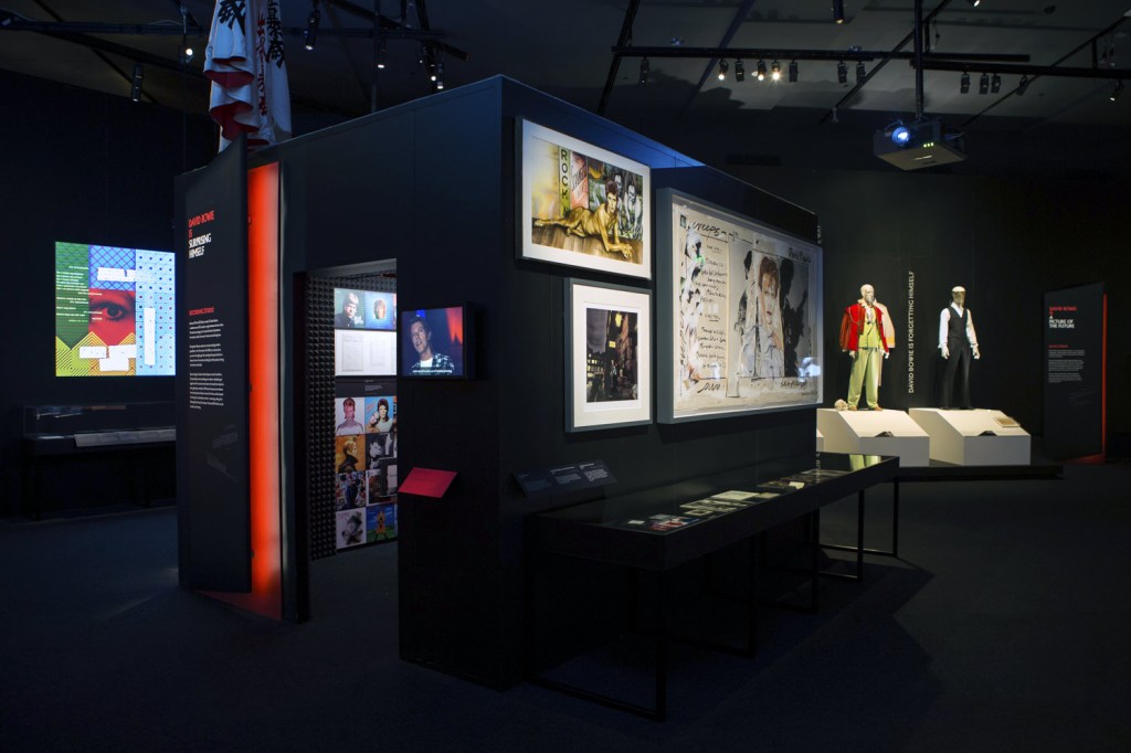
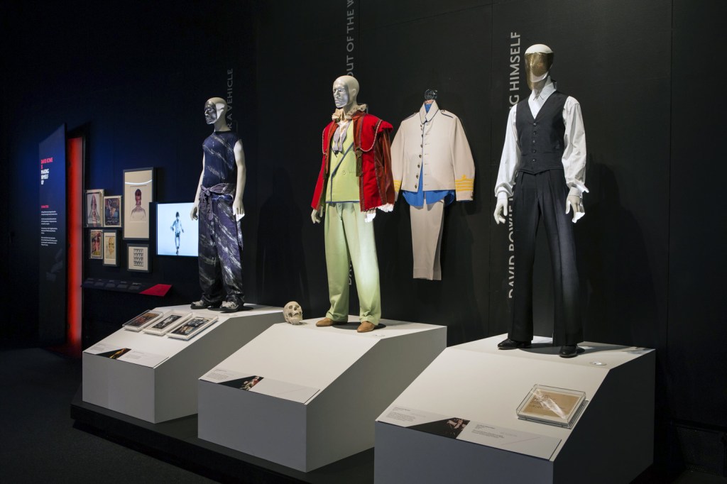

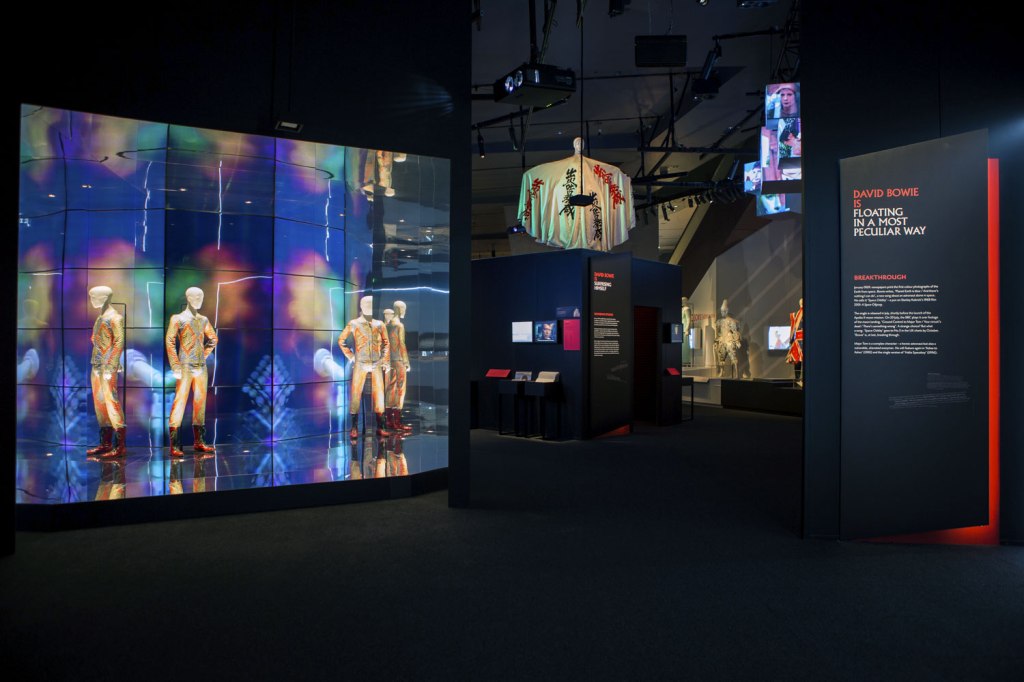


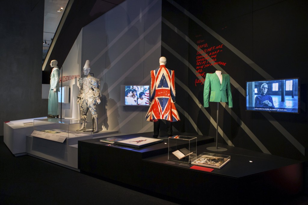
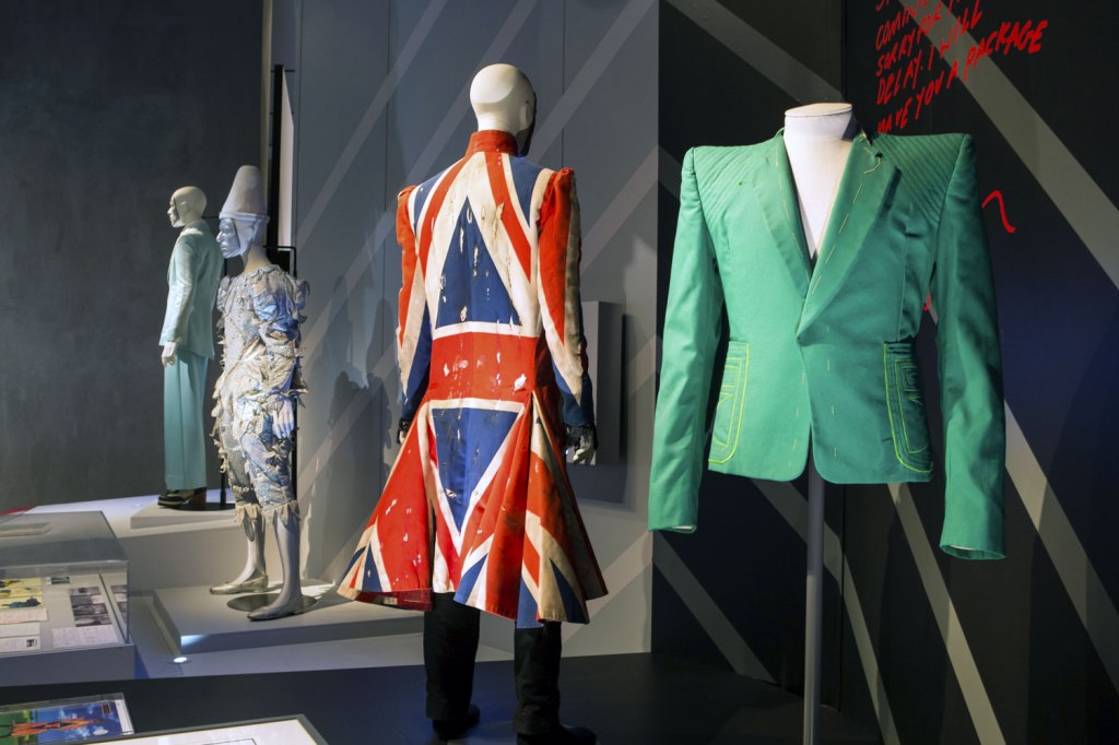
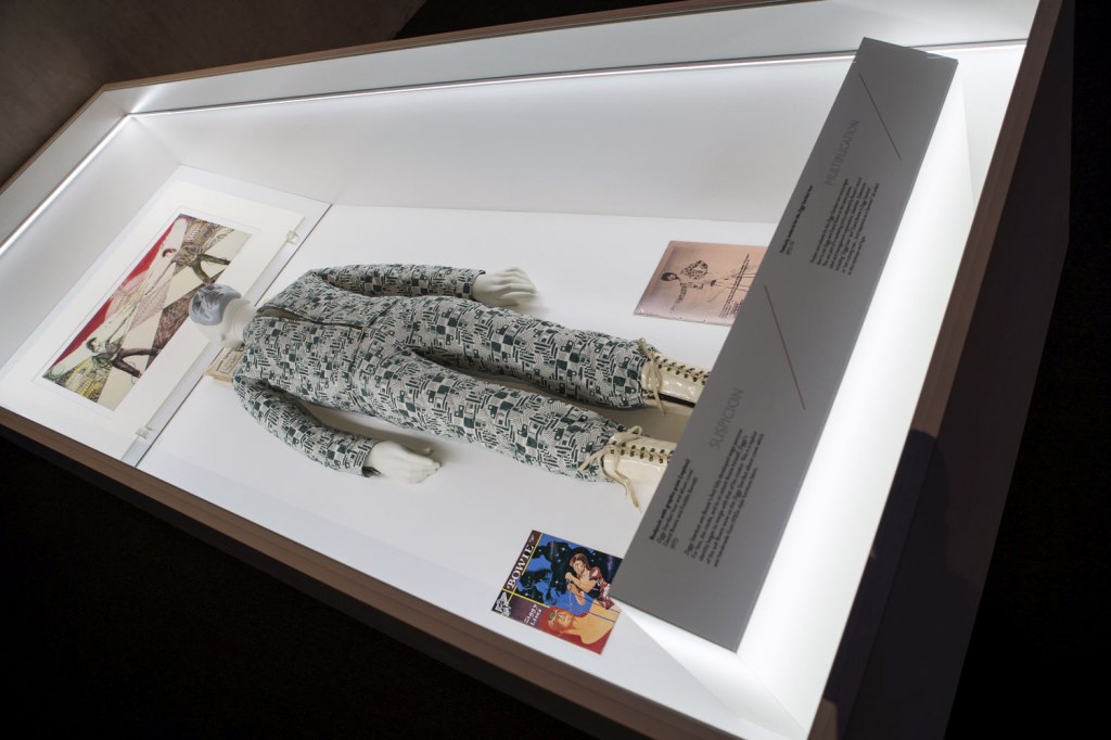

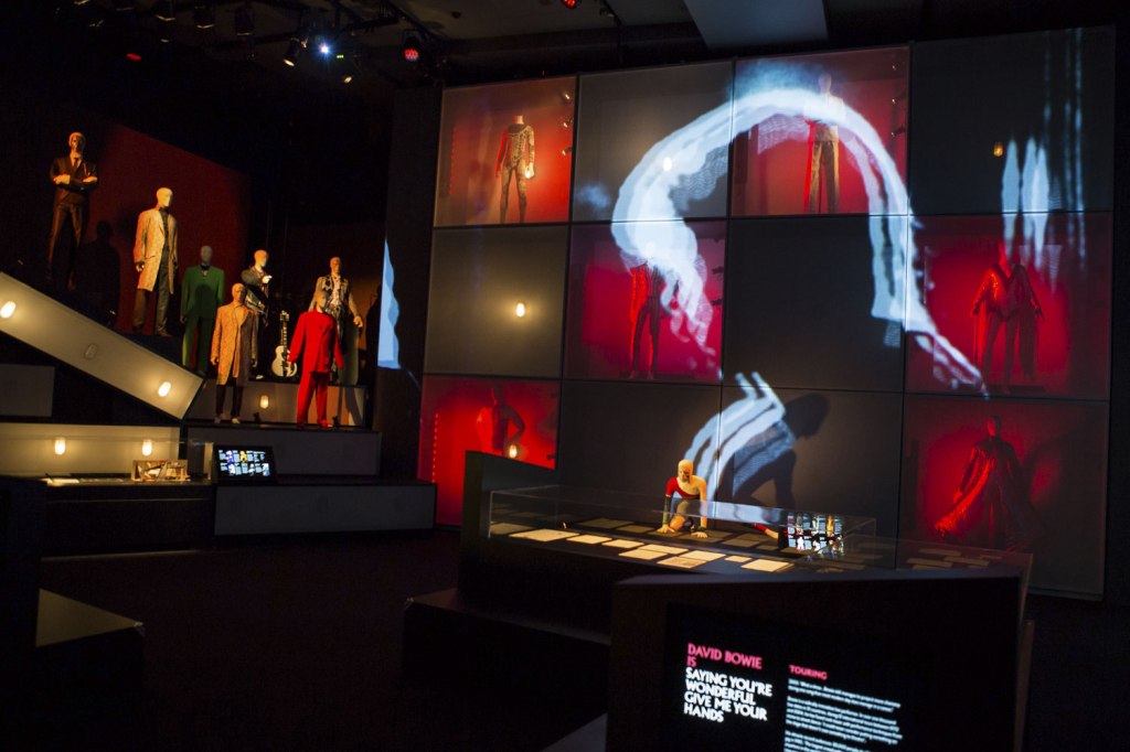


 and Freddie Burretti (British, b. 1952) (designer) 'Bodysuit with graphic print (replica)' 'Ziggy Stardust' tour and album cover 1972")
")

 (designer) 'Ice-blue suit' 1972")
 (designer) 'Asymmetric knitted bodysuit' 1973")
 'David Bowie with William Burroughs, February 1974' 1974")

 'Photo-collage by David Bowie of manipulated film stills from The Man Who Fell to Earth' 1975-1976")


 'David Bowie during the filming of the 'Ashes to Ashes' video' 1980")

 'Africanis 17. Danielskuil, Northern Cape, 25 February 2010' 2010 from the exhibition 'In Focus: Animalia' at the J. Paul Getty Museum, Getty Center, Los Angeles, May - Oct, 2015")
 'White Tiger (Kenny)' 2007 from the exhibition 'In Focus: Animalia' at the J. Paul Getty Museum, Getty Center, Los Angeles, May - Oct, 2015")
 'The South African Cheetah (Felis Jubata.)' c. 1865")
 'The South African Cheetah (Felis Jubata.)' c. 1865 (detail)")
 'The Zebra, Burchell's, or Dauw. (Asinus Burchellii.)' c. 1865")
 'The Zebra, Burchell's, or Dauw. (Asinus Burchellii.)' c. 1865 (detail)")
 'The Tiger. (Felis Tigris.)' c. 1865")
 'The Tiger. (Felis Tigris.)' c. 1865 (detail)")
![Capt. Horatio Ross (British, 1801-1886) '[Dead stag in a sling]' c. 1850s - 1860s](https://artblart.com/wp-content/uploads/2015/10/gm_05996801-web.jpg "Capt. Horatio Ross (British, 1801-1886) '[Dead stag in a sling]' c. 1850s - 1860s")
![Capt. Horatio Ross (British, 1801-1886) '[Dead stag in a sling]' c. 1850s - 1860s (detail)](https://artblart.com/wp-content/uploads/2015/10/gm_05996801-detail.jpg "Capt. Horatio Ross (British, 1801-1886) '[Dead stag in a sling]' c. 1850s - 1860s (detail)")
 'Revenge of the Goldfish' 1981")
 'Running (Galloping)' 1878-1881")
 'Portrait of a Girl with her Deer' c. 1854")
 'Portrait of a Girl with her Deer' c. 1854 (detail)")
 'Memphis' Negative 1971; print 1974")
 'Goodbye to a Horse' 1993")
![André Kertész (American born Hungary, 1894-1985) '[Wooden Mouse and Duck]' 1929](https://artblart.com/wp-content/uploads/2015/10/gm_04006701-web.jpg "André Kertész (American born Hungary, 1894-1985) '[Wooden Mouse and Duck]' 1929")
 'Spiritual America'
1923")
![Unknown maker (American) '[Dog sitting on a table]' c. 1854](https://artblart.com/wp-content/uploads/2015/10/gm_05620501-web.jpg "Unknown maker (American) '[Dog sitting on a table]' c. 1854")
 'David Webb, Jeweled Toad, New York, 1963' 1963")
 Hong (South Korean, b. 1934) 'Chong Ju' 1970")
![William Wegman (American, b. 1943) 'In the Box/Out of the Box [right]' 1971](https://artblart.com/wp-content/uploads/2015/10/gm_32612201-web.jpg "William Wegman (American, b. 1943) 'In the Box/Out of the Box [right]' 1971")
![William Wegman (American, b. 1943) 'In the Box/Out of the Box [left]' 1971](https://artblart.com/wp-content/uploads/2015/10/gm_32612101-web.jpg "William Wegman (American, b. 1943) 'In the Box/Out of the Box [left]' 1971")

You must be logged in to post a comment.