An end of week posting before the exhibition closes.
Ernst A. Heiniger seems to have been a man of much learning and creativity … a polymath.
He belonged to the avant-garde of the Swiss “New Photography” movement in the 1930s; he was a retoucher by trade who taught himself the art of photography. He created one of the first photobooks in Switzerland; he created innovative designs combining photography and graphic design, photo | graphic design, “an entirely novel concept at the time.” He made posters. He started shooting short black and white promotional and documentary films. He taught himself the wide format of Cinemascope and Technicolor film – “previously untested creative tools for Heiniger” – and was hired by Walt Disney to shoot his “edutainment” films all over the world. He was commissioned to produce a 360 degree film for Expo 64 in Lausanne and produced the oldest panorama shots in Switzerland (see video below), and then went on to develop his own 360 degree recording and projection technology in 1965, which was ready for use under the name “Swissorama” at the beginning of the 1980s (see images and film below).
What an artist, what creativity, intelligence and drive. Was there nothing this man couldn’t do!
Dr Marcus Bunyan
Many thankx to Fotostiftung Schweiz for allowing me to publish the photographs in the posting. Please click on the photographs for a larger version of the image.
Ernst A. Heiniger (1909-1993) belonged to the avant-garde of the Swiss “New Photography” movement in the 1930s. A photo retoucher by trade, he taught himself the art of photography autodidactically. He quickly developed a keen sense for contemporary and modern aesthetics and soon became one of the first photographers to be admitted to the Swiss Werkbund (SWB). After this initial spark to his career, Heiniger constantly took on new challenges and continued to do pioneering work. In 1936 he created Puszta-Pferde (“Horses in Hungary”), one of the first modern photobooks in Switzerland. He worked with well-known graphic artists such as Heiri Steiner, Herbert Matter and Josef Müller-Brockmann and created innovative designs by combining photography and graphic design, an entirely novel concept at the time. In the 1950s, Heiniger travelled the world as a documentary filmmaker for Walt Disney – two of his short films were awarded an Oscar. He later created Switzerland’s first 360 degree film for Expo 64 in Lausanne.
Even though Ernst A. Heiniger’s visual worlds were admired by a broad public in his day, his name is still largely absent from the canon of Swiss photographic history. In 1986, he left Switzerland determined never to return and lived in Los Angeles until his death in 1993. Since then, the Fotostiftung Schweiz has sought to return his photographic estate to Switzerland – which it finally accomplished in 2014. The exploration and processing of his archive provide the basis for the first comprehensive retrospective of this creative visual designer. The exhibition Ernst A. Heiniger – Good Morning, World! shows object and nature photographs, photobooks, posters, films, making-of pictures and documentaries that situate his work within the history of photography. His 360 degree film Rund um Rad und Schiene (“Magic of the Rails”) – the SBB’s attraction at Expo 64 in Lausanne – has been recreated as an all-around projection. Ernst A. Heiniger’s diverse photographic and cinematic oeuvre was always at the cutting edge of technology and oscillates between cool perfection and sensual closeness to nature.
New Photography and the Swiss Werkbund
In 1929, at the age of twenty, Ernst A. Heiniger set up his own business as a positive retoucher. In the same year, the exhibition Film und Foto (FiFo) by the German Werkbund took place at the School of Applied Arts in Zurich. The title of the exhibition was to be emblematic of Heiniger’s further career, as the two camera-based media, film and photography, defined his entire artistic output. At the time, the international touring exhibition was considered a manifesto for a modern visual aesthetic. The terms “Neues Sehen” (New Vision) and “Neue Sachlichkeit” (New Objectivity) were used to describe those avant-garde tendencies that emphasised genuinely photographic means of design. The characteristics of the new aesthetic included sharpness of image, attention to detail, unusual perspectives such as high and low angle shots, (abstracting) close-ups or multiple exposures. The precise capture of structures and forms was also one of the typical qualities of this “New Photography”, as it became known in Switzerland. After only a short period as a self-employed retoucher, Ernst A. Heiniger decided to learn how to take photographs himself. He made his customers an offer: for the same price, they would receive a new, better photograph instead of a retouched one. Inspired by visits to exhibitions and publications such as Werner Gräff’s Es kommt der neue Fotograf! (“Here Comes the New Photographer”, 1929), he adapted the aesthetics of the international avant-garde and became one of the pioneers of New Photography in Switzerland. His achievements as a photographer did not go unnoticed by the Swiss Werkbund (SWB), which campaigned for the advancement of “New Photography in Switzerland” and organised an exhibition with this title in 1932. Heiniger was represented with several pictures at the exhibition and was one of the first photographers to be admitted to the SWB Zurich in 1933.
Ernst A. Heiniger book covers
Photobooks
In 1936, Ernst A. Heiniger ventured into a new medium – the photobook. For his first essayistic photobook Puszta-Pferde (“Horses in Hungary”), he travelled to Hungary to take pictures of the wild horses of the Pannonian Steppe over the course of several weeks. While designing the book, he experimented freely with his photographic material and composed lively and varied photo pages. In 1937, the book was published in high-quality rotogravure by the Zurich publishing house Fretz & Wasmuth. With a total (German) print run of 23,000 copies, it was a great success and showed for the first time that Ernst A. Heiniger was not merely an aloof representative of avant-garde photography, but also had a talent for inspiring a wider audience with his pictures.
Heiniger was able to build on this success with his next two books Tessin (“Ticino”, 1941) and Viertausender (“Four-Thousanders”, 1942). Both were produced during the Second World War against the backdrop of closed borders and a revival of sentimental homeland imagery. In the context of “spiritual national defence”, the “Heimatbuch”, a genre of books painting an idealised image of Alpine nature and culture, was encouraged by the authorities as a means to inspire the moral uplift of a beleaguered nation. For Heiniger, however, high alpine landscape photography was also a fresh opportunity to translate a subject he was passionate about into book form. The overly romantic transfiguration of the local landscape was kept in check by the fact that he remained true to his detached, objective style. With a firm belief in the documentary power of photography, he wanted to convey the experience that was revealed to the alpinist upon reaching a mountain peak. The many enthusiastic book reviews give an indication of the entertaining, escapist potential of his books in an age when a destructive war was raging outside Switzerland’s borders.
Heiri Steiner (Swiss, 1906-1983) (designer) Ernst A. Heiniger (Swiss, 1909-1993) (photographer) Grindewald poster 1935
Heiri Steiner (Swiss, 1906-1983) (designer) Ernst A. Heiniger (Swiss, 1909-1993) (photographer) Bally Shoes poster 1936
Installation view of the exhibition Ernst A. Heiniger – Good Morning, World!’ at Fotostiftung Schweiz, Winterthur, Zürich showing at right, Telefon poster (1942)
Ernst A. Heiniger (Swiss, 1909-1993) Telefon poster 1942 Poster 128 x 90.5cm (50.4 x 35.6 in.)
Ernst A. Heiniger (Swiss, 1909-1993) World Exhibition of Photography Lucerne poster 1952
Photo|graphic design
The medium of photography experienced a boom in the 1930s in the form of printed images. The quality standards of the printing trade were high in Switzerland, and photography was increasingly used for magazine illustrations, poster designs and commercial art. Important innovators in typography and graphic design such as Max Bill, Anton Stankowski or Jan Tschichold resided in Zurich; Ernst A. Heiniger worked in a creative and innovative environment. Under the terms “Fotografik” or “Typofoto”, photography entered into a new kind of combination with graphic and typographic elements. The progressive, neo-objective aesthetics of New Photography was ideally suited to applications in the field of advertising. Heiniger supplied images for well-known graphic artists such as Herbert Matter, Richard Paul Lohse and Josef Müller-Brockmann and also practised graphic design himself. From 1934 to 1939, he managed a studio for photography and graphic art on St. Annagasse in Zurich together with Heiri Steiner. As a duo with Steiner, and later as a solo artist, he designed visionary posters that still have a timeless and modern effect today.
Ernst A. Heiniger Das Buch vom Telephon book cover
“Pro Telephon” and first films
After parting company with Heiri Steiner, Ernst A. Heiniger was fortunate to have the opportunity to work for a loyal client that was open to modern advertising. The Swiss telecommunications company PTT had launched a campaign in 1927 to popularise the telephone in Switzerland. Heiniger worked for them as a photographer and graphic designer throughout the war and beyond. From 1942, he also started making his first short promotional films for “Pro Telephon”, and in 1946 he was behind the camera for the 20-minute documentary Sül Bernina (CH, 1948). The film uses impressive scenes and modernist imagery to show how the heavy telephone cable was joined together from the north and south at the Bernina Pass to replace the telephone poles that were susceptible to interference.
Ernst A. Heiniger World Exhibition of Photography 1952 Lucern, Switzerland catalogue
The World Exhibition of Photography in Lucerne
The year 1952 marked a turning point in Heiniger’s life and career. The World Exhibition of Photography was held in Lucerne – a universally oriented exhibition that aimed to show the medium’s areas of application as comprehensively as possible. Heiniger was involved in the major event in various capacities: as a graphic designer, he won the competition for the poster design, and as an expert in the field of object photography, he was entrusted with the curatorial task of organising the “Sachwiedergabe” (“object reproduction”) section. His own pictures were omnipresent at the exhibition. A prominent visitor recognised Heiniger’s talent, and in the summer of 1952 he and Walt Disney met for the first time at the Hotel Palace in Lucerne. Disney cut right to the chase and offered Heiniger a job as a cameraman for his planned documentary film about Switzerland. While working with the American media company, Ernst A. Heiniger met his future wife Jean Feaster. After their marriage in 1953, the two became an inseparable team, not only in private but also professionally.
Ernst A. Heiniger Masterpieces of Photography 1952
Masterpieces
In addition to the platform offered to Ernst A. Heiniger at the Lucerne exhibition, he produced an illustrated book in the same year to draw attention to his photographic work. He edited a portfolio of sorts comprising 52 of his best independent and applied works that he had produced since the 1930s. The publication appeared in two languages; he called the German edition Das Jahr des Fotografen (“The Year of the Photographer”). On each double-page spread he arranged two pictures that are characterised by contrasts in form or content, but have something in common in their juxtaposition, which the lyricist Albert Ehrismann pondered in the captions. The English edition contains picture commentary by the British writer R.A. Langford and bears the self-confident title Masterpieces of Photography. The estate includes almost all the original prints of these Masterpieces, which were used as print templates at the time. The objects laminated on photo mounting board form the core of the exhibition and provide an insight into Heiniger’s appraisal of his own work as the focus of his activity began to shift from the static to the moving image.
Films for Walt Disney
In the early 1950s, Walt Disney launched the documentary film series People & Places for the supporting programme of his animated films – an anthology of half-hour short films designed to introduce foreign countries and peoples to American audiences. One of these countries was Switzerland. While searching for a suitable cameraman, Disney became aware of Ernst A. Heiniger. Switzerland (CH, 1955) was to be the third film in the series and also the first to be shot in Cinemascope. The pronounced wide format of Cinemascope and Technicolor film were new, previously untested creative tools for Heiniger. But he never shied away from a challenge and quickly learned to work with the format and colour, and so he was immediately rehired for further films by Walt Disney Productions. From 1955 to 1957, Jean and Ernst A. Heiniger travelled extensively in Asia. They shot two new People & Places films in Japan: Ama Girls (USA, 1958) follows the lives of a fishing family from Inatori with a special focus on the unusual profession of the 18-year-old daughter, who earns her living as a seaweed diver. For the second film Japan (USA, 1960), the Heinigers documented Japanese festivals, traditional crafts and a Shinto wedding. Disney’s so-called “edutainment” films were designed to inform and entertain a broad cinema audience. Although Walt Disney gave the camera teams travelling all over the world for him a great deal of creative freedom, the films were eventually edited according to commercial criteria under the supervision of his producer Ben Sharpsteen. In 1958, the Heinigers spent another whole year in the Colorado River area for the film project Grand Canyon (USA, 1958), a film adaptation of the extremely popular suite of the same name by the composer Ferde Grofé. The short film was shown in 1959 as a supporting film for Sleeping Beauty. In the same year, the two films Ama Girls and Grand Canyon both won an Academy Award (“Oscar”) – one for Best Documentary (Short Subject), the other for Best Live Action Short Film.
The Ernst A. Heiniger Archive contains numerous slides that document the filming of Disney productions or can also be described as stills. The films Ama Girls, Japan, Grand Canyon and the German version of Switzerland were made available for viewing thanks to digital copies from film archives and are also part of the exhibition.
360 degree cinema
After film was plunged into crisis by the spread of television, the industry steadily introduced new film formats to enhance the viewing experience at the cinema. Following the various widescreen formats, Disney’s patented “Circarama” technology set new standards in the 1950s. The system, consisting of a camera and projection display, enabled the capture and reproduction of a full 360 degree angle. In the early 1960s, Ernst A. Heiniger was commissioned by the SBB to produce a 360 degree film for Expo 64 in Lausanne. He was not only responsible for the production, cinematography and direction of the project, but also developed the script for Rund um Rad und Schiene (“Magic of the Rails”, CH, 1964) in cooperation with the client. The 20-minute film was shown every half hour at the Expo in a round auditorium with a diameter of 26.5 metres and a capacity of 1500 people. Around 4 million people had seen the film by the end of the Expo. The Fotostiftung Schweiz is showing this first Swiss 360-degree film, which was restored and digitised in 2014 as part of a Memoriav project, on a smaller scale as a walk-in circular projection.
Despite the success of Magic of the Rails, Heiniger was only partially satisfied with the result; he was bothered by the technical shortcomings of the Circarama system, which did not allow seamless projection. He therefore began developing his own 360 degree recording and projection technology in 1965, which was ready for use under the name “Swissorama” at the beginning of the 1980s. From 1982 to 1984, he used his system to produce the film Impressions of Switzerland (CH, 1984), a total image of Switzerland, which was shown continuously from 1984 to 2002 at the Museum of Transport in Lucerne in a custom-built auditorium.
The exhibition was curated by Teresa Gruber and Katharina Rippstein. The publication Ernst A. Heiniger – Good Morning, World! accompanying the exhibition is available from Scheidegger & Spiess. The Ernst A. Heiniger Archive, which is maintained by the Fotostiftung Schweiz, has been comprehensively indexed and digitised and is accessible to the public via an online database: fss.e-pics.ethz.ch.
Press release from the Fotostiftung Schweiz website
A day’s trip west of Tokyo, Ernst A. Heiniger found a place that he imagined: the archaic-looking fishing village of Inatori. He selected a few villagers, arranged them into a family and let them play their “authentic” everyday life. Yukiko – an 18-year-old hairdresser in real life – is one of those divers with special skills in the film. They stay under water for minutes to harvest the coveted seaweed.
The 30-minute film “Ama Girls” won an Oscar in 1959 and spurred Heiniger’s further career. Numerous photographs were taken on the set between filming, such as this shot of the alleged diver who had just emerged from the sea. As a kind of mermaid, she embodies a phantasm: beautiful, mysterious, exotic and aloof.
Fotostiftung Schweiz. “Die Bildkritik – Perlen der Fotostiftung Schweiz,” on the NZZ website 8/9/2021 [Online] Cited 13/09/2021. Translated from the German.
Echorama in 360°: Eine Schweizer Zeitreise in die 60er-Jahre und zurück Echorama in 360°: A Swiss journey through time to the 1960s and back
The oldest panorama shots in Switzerland come from the film “All about wheel and rail” by Ernst A. Heiniger. The recordings amazed the visitors of Expo 64. Discover scenes from the crowd puller here: take a look around Bern’s old town, a dining car with neatly dressed people or a construction site from the 1960s. Recordings from the present also show how cityscapes, technologies and worldviews have changed. With headphones you can dive deeper into the pictures, which are underlaid with news articles from the respective time.
Heiniger, who had a passion for technology, was very much involved in the development of Disney’s “Circarama” system. Creating a circular movie theatre that screened 360° films became one of his dreams. He was able to realise this dream when the Swiss Federal Railways commissioned him to shoot a movie in this format for the Expo 64 in Lausanne. The film All About Wheels and Rails was a huge success. It is allegedly one of Switzerland’s most watched films with almost four million viewers.
Heiniger continued to develop the 360° technology until the end of the 1980s when he launched “Swissorama”, a new-and-improved cylindrical 360° film system. Europeans were sceptical of the system, and when Heiniger moved to Los Angeles with his wife in 1986, he sold it to a US company which marketed it under the new name “Imagine 360”.
His last wide-screen film, Destination Berlin, was due to be screened in a dome cinema near West Berlin’s tourist district, the Ku’damm, but historic events shuttered his project. With German reunification, half of the city, namely East Berlin, was missing from the movie. Audiences stayed away and the film never reached the expected success.
Heiniger’s death
The money he made with the sale of “Swissorama” enabled him to buy a house in the Hollywood Hills, where he lived for the remainder of his life. His death in 1993 went unnoticed in Switzerland where he is still relatively unknown, even though several exhibitions and events have been dedicated to him.
In 1997 the newly established Swiss Photo Foundation organised an exhibition of his work at the Zurich Art Museum, and one of his wide-screen films was shown at the Transportation Museum in Lucerne until 2002. When the Swissorama closed that year, this kind of film disappeared, dashing his dream of creating a worldwide network of 360° cinemas.
Anonymous. “On the trail of photographer and Oscar winner Ernst A. Heiniger,” on the Swissinfo website August 2, 2021 [Online] Cited 13/09/2021.
Books
Puszta horses (Zurich 1936) The Photo Book of the National Exhibition (Zurich 1939) Ticino (Zurich 1941) Four-thousanders. A picture book of the beauty of our Alps (Zurich 1942) The Year of the Photographer (Zurich 1952) Grand Canyon, nature and wildlife in 157 colour photos. Kümmerly & Frey Geographischer Verlag, Bern 1971 The Great Book of Jewels (Lausanne 1974)
Filmography
1942: The telephone cable 1943: The telephone set 1944: From wire to cable 1945: The telephone exchange 1948: On the Bernina 1954: Switzerland 1957: Japan 1956-1957: Ama Girls (TV series in 13 parts) 1958: Grand Canyon 1965-1967: Switzerland 1964: All about wheels and rails 1984: Impressions of Switzerland 1988: Shikoku Alive 1989: Destination Berlin
Installation view of the exhibition László Moholy-Nagy and New Typography: A Reconstruction of a Berlin Exhibition from 1929 at the Staatliche Museen zu Berlin Photo: Marcus Bunyan
A small, tight, focused exhibition which was stimulating for anyone interested in graphic design, photography, and typography – Neue Typografie.
Highlights included Covers for the Bauhaus books, 1925-1930, travel posters by A. M. Cassandre, plates from Moholy-Nagy’s 1929 Wohin geht die typographische Entwicklung? (Where is typography headed?) and a poster for the 1929 exhibition film und foto.
The inventiveness and creativity with colour, collage and the use of negative and positive space was peerless, elemental.
Wohin geht die typographische Entwicklung? Where is typography headed?
Installation views of the exhibition László Moholy-Nagy and New Typography: A Reconstruction of a Berlin Exhibition from 1929 at the Staatliche Museen zu Berlin Photos: Marcus Bunyan
die besten stuhl modelle der heutigen produktion The best models of today’s production ausstellung exhibition der Stuhl (installation view) 1929 Poster kunstgewerbemuseum Arts and Crafts Museum Kunstbibliothek der Staatlichen Museen zu Berlin Photo: Marcus Bunyan
Installation view of the exhibition László Moholy-Nagy and New Typography: A Reconstruction of a Berlin Exhibition from 1929 at the Staatliche Museen zu Berlin Photo: Staatliche Museen zu Berlin
Installation view of the exhibition László Moholy-Nagy and New Typography: A Reconstruction of a Berlin Exhibition from 1929 at the Staatliche Museen zu Berlin showing at left, Ausstellung Europäisches Kunstgewerbe (Exhibition of European applied arts) 1927; in the centre, Der Stuhl. Neue Typografie (New typography) 1929; and at right, Umschläge zu den Bauhausbüchern, 1925-1930 (Covers for the Bauhaus books, 1925-1930) 1925-1930 Photo: Marcus Bunyan
Herbert Bayer (1900-1985) Ausstellung Europäisches Kunstgewerbe (Exhibition of European applied arts) (installation view) 1927 Poster Druckerei Ernst Hedrich Nachfolger, Leipzig Buchdruck Ernst Hedrich printer, Leipzig Letterpress Lithograph Kunstbibliothek der Staatlichen Museen zu Berlin Photo: Marcus Bunyan
Herbert Bayer (1900-1985) Ausstellung Europäisches Kunstgewerbe (Exhibition of European applied arts) 1927 Poster Druckerei Ernst Hedrich Nachfolger, Leipzig Buchdruck Ernst Hedrich printer, Leipzig Letterpress Lithograph 35 1/4 x 23 3/4″ (89.5 x 60.3cm) Kunstbibliothek der Staatlichen Museen zu Berlin
László Moholy-Nagy (Hungarian, 1895-1946) Der Stuhl. Neue Typografie (New typography) (installation view) 1929 Poster Entwerfer Berek-Druck (Nachweiszeit: 1928-1940), Drucker Designer Berek-Druck (record time: 1928-1940), printer Printed in Berlin Printing ink (black) & paper Linocut 61.0 x 43.5cm Kunstbibliothek der Staatlichen Museen zu Berlin Photo: Marcus Bunyan
László Moholy-Nagy (Hungarian, 1895-1946) Umschläge zu den Bauhausbüchern, 1925-1930 (Covers for the Bauhaus books, 1925-1930) (installation view) 1925-1930 Book covers Druckerei Hesse & Becker, Leipzig Hesse & Becker printing company, Leipzig Druckerei Ohlenroth, Erfurt Klischees von Dr. von Löbbeke u. Co., Erfurt Buchdruck Ohlenroth printing company, Erfurt Letterpress Kunstbibliothek der Staatlichen Museen zu Berlin Photo: Marcus Bunyan
László Moholy-Nagy (Hungarian, 1895-1946) Bauhausbücher 8, L. Moholy-Nagy: Malerei, Fotografie, Film 1925 Albert Langen Verlag Herstellung, Entwerfer, Mitarbeit, Verleger Albert Langen Verlag, Manufacture, designer, collaboration, publisher Offset printing on paper and letterpress Art Library / Collection of graphic design Kunstbibliothek der Staatlichen Museen zu Berlin Photo: Marcus Bunyan
Installation view of the exhibition László Moholy-Nagy and New Typography: A Reconstruction of a Berlin Exhibition from 1929 at the Staatliche Museen zu Berlin showing at left, Etoile du Nord 1927 (below); and at second left, Chemin de Fer du Nord. Vitesse-Luxe-Confort 1929 (below) Photo: Marcus Bunyan
A. M. Cassandre (French, 1901-1968) Etoile du Nord (North Star) 1927 Poster Druckerei Hachard et Cie., Paris Hachard et Cie. Printing house, Paris Lithograph
A. M. Cassandre (French, 1901-1968)
Cassandre, pseudonym of Adolphe Jean-Marie Mouron (24 January 1901 – 17 June 1968) was a French painter, commercial poster artist, and typeface designer.
He was born Adolphe Jean-Marie Mouron in Kharkiv, Ukraine, to French parents. As a young man, Cassandre moved to Paris, where he studied at the École des Beaux-Arts and at the Académie Julian. The popularity of posters as advertising afforded him an opportunity to work for a Parisian printing house. Inspired by cubism as well as surrealism, he earned a reputation with works such as Bûcheron (Woodcutter), a poster created for a cabinetmaker that won first prize at the 1925 Exposition Internationale des Arts Décoratifs et Industriels Modernes.
Cassandre became successful enough that with the help of partners he was able to set up his own advertising agency called Alliance Graphique, serving a wide variety of clients during the 1930s. He is perhaps best known for his posters advertising travel, for clients such as the Compagnie Internationale des Wagons-Lits. He was a pioneer on airbrush arts.
His creations for the Dubonnet wine company were among the first posters designed in a manner that allowed them to be seen by occupants in moving vehicles. His posters are memorable for their innovative graphic solutions and their frequent denotations to such painters as Max Ernst and Pablo Picasso. In addition, he taught graphic design at the École des Arts Décoratifs and then at the École d’Art Graphique.
With typography an important part of poster design, the company created several new typeface styles. Cassandre developed Bifur in 1929, the sans serif Acier Noir in 1935, and in 1937 an all-purpose font called Peignot. In 1936, his works were exhibited at the Museum of Modern Art in New York City which led to commissions from Harper’s Bazaar to do cover designs.
A. M. Cassandre (French, 1901-1968) Chemin de Fer du Nord. Vitesse-Luxe-Comfort (Northern Railway. Speed-Luxury-Comfort) 1929 Poster Druckerei L. Danel, Lille L. Danel printing house, Lille Lithograph
Max Burchartz (1887-1961) Schubertfeier der Städtischen Bühnen Essen (Schubert celebration of the municipal theatres of Essen) (installation view) 1927 Poster Druckerei F.W. Rohden Essen Buchdruck F.W. Rohden Essen printing house Letterpress
Max Burchartz (1887-1961) Kölner Kammerorchester. Konzert aum Besten des Essener Blindenfürsorge-Vereins (Cologne Chamber Orchestra. Concert for the benefit of the Essen Blind Welfare Association) (installation view) 1927 Poster Druckerei C.W. Haafeld, Essen Buchdruck C.W. Haafeld, Essen printing house Letterpress Photo: Marcus Bunyan
Max Burchartz (1887-1961) Schubertfeier der Städtischen Bühnen Essen (Schubert celebration of the municipal theatres of Essen) 1927 Poster Druckerei F.W. Rohden Essen Buchdruck F.W. Rohden Essen printing house Letterpress
Installation view of the exhibition László Moholy-Nagy and New Typography: A Reconstruction of a Berlin Exhibition from 1929 at the Staatliche Museen zu Berlin showing American advertisement 1925 from The Saturday Evening Post Photos: Marcus Bunyan
Installation view of the exhibition László Moholy-Nagy and New Typography: A Reconstruction of a Berlin Exhibition from 1929 at the Staatliche Museen zu Berlin showing at left, Otto Baumberger’s Marque PKZ (1923, below) Photo: Marcus Bunyan
Otto Baumberger (1889-1961) Marque PKZ (installation view) 1923 Steindruckerei Wolfensberg, Zürich Wolfensberg lithography, Zurich Lithograph Photo: Marcus Bunyan
Otto Baumberger (21 May 1889 Altstetten, Zurich – 26 December 1961 Weiningen), was a noted Swiss painter and poster artist. Baumberger produced some 200 posters of great quality and style. His realistic rendering of a herringbone tweed coat became a classic of Swiss poster, an example of a Sachplakat (object poster).
Installation view of the exhibition László Moholy-Nagy and New Typography: A Reconstruction of a Berlin Exhibition from 1929 at the Staatliche Museen zu Berlin Photo: Marcus Bunyan
American advertisement Mallory Straws (installation view) 1926 Chicago Sunday Tribune Photo: Marcus Bunyan
Das Illustrierte Blatt (The Illustrated Sheet) Nr. 35, Page 895 “Boxweltmeister Tunneys Memoiren” (Boxing World Champion Tunney’s Memoir) 1927 First German publication
Jan Tschichold (1902-1974) Die Hose (The pants) (installation view) 1927 F. Bruckmann printing house, Munich Letterpress Photo: Marcus Bunyan
Jan Tschichold (1902-1974) Die Hose (The pants) 1927 F. Bruckmann printing house, Munich Letterpress
Jan Tschichold (German, 1902-1974) Die Frau ohne Namen (The woman without a name) (installation view) 1927 Lithographische Anstalt Gebr. Obpacher AG, Munich Lithographic Institute Gebr. Obpacher AG, Munich Letterpress Photo: Marcus Bunyan
Jan Tschichold (German, 1902-1974)
Jan Tschichold (born Johannes Tzschichhold, also known as Iwan Tschichold, or Ivan Tschichold; 2 April 1902 – 11 August 1974) was a calligrapher, typographer and book designer. He played a significant role in the development of graphic design in the 20th century – first, by developing and promoting principles of typographic modernism, and subsequently (and ironically) idealising conservative typographic structures. His direction of the visual identity of Penguin Books in the decade following World War II served as a model for the burgeoning design practice of planning corporate identity programs. He also designed the much-admired typeface Sabon. …
This artisan background and calligraphic training set him apart from almost all other noted typographers of the time, since they had inevitably trained in architecture or the fine arts. It also may help explain why he never worked with handmade papers and custom fonts as many typographers did, preferring instead to use stock fonts on a careful choice from commercial paper stocks.
Although, up to this moment, he had only worked with historical and traditional typography, he radically changed his approach after his first visit to the Bauhaus exhibition at Weimar. After being introduced to important artists such as László Moholy-Nagy, El Lissitzky, Kurt Schwitters and others who were carrying out radical experiments to break the rigid schemes of conventional typography. He became sympathetic to this attempt to find new ways of expression and to reach a much more experimental way of working, but at the same time, felt it was important to find a simple and practical approach.
He became one of the most important representatives of the “new typography” and in a famous special issue of ‘typographic communications’ in 1925 with the title of “Elemental Typography”, he put together the new approaches in the form of a thesis.
After the election of Hitler in Germany, all designers had to register with the Ministry of Culture, and all teaching posts were threatened for anyone who was sympathetic to communism. Soon after Tschichold had taken up a teaching post in Munich at the behest of Paul Renner, they both were denounced as “cultural Bolshevists”. Ten days after the Nazis surged to power in March 1933, Tschichold and his wife were arrested. During the arrest, Soviet posters were found in his flat, casting him under suspicion of collaboration with communists. All copies of Tschichold’s books were seized by the Gestapo “for the protection of the German people”. After six weeks a policeman somehow found him tickets for Switzerland, and he and his family managed to escape Nazi Germany in August 1933.
Jan Tschichold (1902-1974) Die Frau ohne Namen (The woman without a name) 1927 Lithographische Anstalt Gebr. Obpacher AG, Munich Lithographic Institute Gebr. Obpacher AG, Munich Letterpress
As part of the bauhauswoche berlin 2019 (Bauhaus week Berlin 2019) the Kunstbibliothek is showing an historical exhibition room by the Bauhaus artist László Moholy-Nagy.
This pioneering exhibition room, entitled Wohin geht die typographische Entwicklung? (Where is typography headed?), was first shown in May 1929 in the Martin-Gropius-Bau as part of the exhibition Neue Typographie (“New Typography”), organised by the Staatliche Kunstbibliothek. Moholy-Nagy had been invited to design a room presenting the future of typography. He came up with 78 wall charts with photos, texts and pictures, all of which have been preserved. The exhibition room can therefore be shown again, complemented by additional posters, letterheads, and other specimens of New Typography from the Kunstbibliothek collection.
Moreover, well-known posters and advertisements from the Kunstbibliothek collection in the style known as New Typography augment the Moholy-Nagy exhibition. The selection includes works by Willi Baumeister, A. M. Cassandre, Walter Dexel, Johannes Molzahn, Kurt Schwitters and Jan Tschichold. The functional graphic design of New Typography, a style of advertising designed by artists that gained wide acceptance in the 1920s, broke with a long design tradition in the printing trade. Its aim was to create a contemporary design: first by propagating a standardisation of fonts and the industrial DIN norms, and second, by promoting ideals of readability, clarity and directness in keeping with the principles of Constructivist Art.
The exhibition focuses on this large-scale presentation with which artist Moholy-Nagy summed up years of his own teaching work at the Bauhaus and the ideas and visions of New Typography, ranging from Jan Tschichold and Willi Baumeister to Herbert Bayer. The exhibition programme includes evening discussions evaluating Moholy-Nagy’s ideas from a contemporary standpoint. An important part of the programme will be the launch of a new publication on Moholy-Nagy’s historical exhibition, edited in collaboration with Gutenberg Design Lab at Mainz University of Applied Sciences.
Text from the Staatliche Museen zu Berlin website
Installation view of the exhibition László Moholy-Nagy and New Typography: A Reconstruction of a Berlin Exhibition from 1929 at the Staatliche Museen zu Berlin showing at right, Paul Schuitema’s 13 Tentoonstelling van Schilderijen en Beeldhouw 1927 Photo: Marcus Bunyan
Paul Schuitema (1897-1973) 13 Tentoonstelling van Schilderijen en Beeldhouw (13 Exhibition of Paintings and Sculptures) (installation view) 1927 Kühn & Zoon printing house, Rotterdam Lithograph Photo: Marcus Bunyan
Paul Schuitema (Dutch, 1897-1973) 13 Tentoonstelling van Schilderijen en Beeldhouw (13 Exhibition of Paintings and Sculptures) 1927 Kühn & Zoon printing house, Rotterdam Lithograph
Paul Schuitema (Dutch, 1897-1973)
Geert Paul Hendrikus Schuitema (February 27, 1897 in Groningen – October 25, 1973 in Wassenaar) was a Dutch graphic artist. He also designed furniture and expositions and worked as photographer, film director, painter and teacher for publicity design at the Royal Academy of Art in The Hague.
Industrial design
Schuitema studied at the Academie voor Beeldende Kunsten in Rotterdam. In the 1920s, he began to work on graphic design, applying the principles of De Stijl and constructivism to commercial advertising. Along with Gerard Kiljan and his famous colleague Piet Zwart, he followed ideas pioneered in the Soviet Union by El Lissitzky and Rodchenko, in Poland by Henryk Berlewi and in Germany by Kurt Schwitters.
During his employment at the NV Maatschappij Van Berkel Patent scale company in Rotterdam, Schuitema gained recognition for his original designs of stationery and publicity material, often using only the colours black, red and white and bold sans serif fonts. From 1926 on, he started working with photomontages, becoming one of the pioneers of this technique in the field of industrial design.
Even though he was a convinced socialist and often designed leftist publications directed at industrial workers, Schuitema also worked for major companies, such as Philips.
Kurt Hermann Eduard Karl Julius Schwitters (20 June 1887 – 8 January 1948) was a German artist who was born in Hanover, Germany. Schwitters worked in several genres and media, including dadaism, constructivism, surrealism, poetry, sound, painting, sculpture, graphic design, typography, and what came to be known as installation art. He is most famous for his collages, called Merz Pictures.
Internationalism, 1922-1937
Merz (periodical)
As the political climate in Germany became more liberal and stable, Schwitters’ work became less influenced by Cubism and Expressionism. He started to organise and participate in lecture tours with other members of the international avant-garde, such as Hans Arp, Raoul Hausmann and Tristan Tzara, touring Czechoslovakia, the Netherlands, and Germany with provocative evening recitals and lectures.
Schwitters published a periodical, also called Merz, between 1923 and 1932, in which each issue was devoted to a central theme. Merz 5 1923, for instance, was a portfolio of prints by Hans Arp, Merz 8/9, 1924, was edited and typeset by El Lissitsky, Merz 14/15, 1925, was a typographical children’s story entitled The Scarecrow by Schwitters, Kätte Steinitz and Theo van Doesburg. The last edition, Merz 24, 1932, was a complete transcription of the final draft of the Ursonate, with typography by Jan Tschichold.
His work in this period became increasingly Modernist in spirit, with far less overtly political context and a cleaner style, in keeping with contemporary work by Hans Arp and Piet Mondrian. His friendship around this time with El Lissitzky proved particularly influential, and Merz pictures in this period show the direct influence of Constructivism.
Thanks to Schwitters’ lifelong patron and friend Katherine Dreier, his work was exhibited regularly in the US from 1920 onwards. In the late 1920s he became a well-known typographer; his best-known work was the catalogue for the Dammerstocksiedlung in Karlsruhe. After the demise of Der Sturm Gallery in 1924 he ran an advertising agency called Merzwerbe, which held the accounts for Pelikan inks and Bahlsen biscuits, amongst others, and became the official typographer for Hanover town council between 1929 and 1934. Many of these designs, as well as test prints and proof sheets, were to crop up in contemporary Merz pictures. In a manner similar to the typographic experimentation by Herbert Bayer at the Bauhaus, and Jan Tschichold’s Die neue Typographie, Schwitters experimented with the creation of a new more phonetic alphabet in 1927. Some of his types were cast and used in his work. In the late 1920s Schwitters joined the Deutscher Werkbund (German Work Federation).
Exile, 1937-1948
Norway
As the political situation in Germany under the Nazis continued to deteriorate throughout the 1930s, Schwitters’ work began to be included in the Entartete Kunst (Degenerate Art) touring exhibition organised by the Nazi party from 1933. He lost his contract with Hanover City Council in 1934 and examples of his work in German museums were confiscated and publicly ridiculed in 1935. By the time his close friends Christof and Luise Spengemann and their son Walter were arrested by the Gestapo in August 1936 the situation had clearly become perilous.
On 2 January 1937 Schwitters, wanted for an “interview” with the Gestapo, fled to Norway to join his son Ernst, who had already left Germany on 26 December 1936. His wife Helma decided to remain in Hanover, to manage their four properties. In the same year, his Merz pictures were included in the Entartete Kunst exhibition titled in Munich, making his return impossible.
Installation views of the exhibition László Moholy-Nagy and New Typography: A Reconstruction of a Berlin Exhibition from 1929 at the Staatliche Museen zu Berlin showing at right, Photos: Staatliche Museen zu Berlin
László Moholy-Nagy (Hungarian, 1895-1946) Prospekttitelblatt (Prospectus title page) (installation view) 1928 film und foto 1929
László Moholy-Nagy (Hungarian, 1895-1946) 14 Bauhausbücher 1928 Letterpress 5 7/8 x 8 1/4″ (14.9 x 21cm)
Johannes Molzahn (German, 1892-1965) Wohung und Werkraum, Werkbundausstellung in Breslau (Apartment and workshop, Werkbund exhibition in Breslau) (installation view) 1929 Schenkalowsky, Breslau (Wroclaw) printing house Lithograph Photo: Marcus Bunyan
Johannes Molzahn (German, 1892-1965)
Johannes Ernst Ludwig Molzahn was born 21 May 1892 in Duisburg. He learned drawing and photography, but later concentrated on painting. 1908-1914 he stayed in Switzerland. Molzahn became acquainted with Herwarth Walden, Walter Gropius, Theo van Doesburg and El Lissitzky. He was a member of the Arbeitsrat für Kunst. After World War I he worked as a graphic designer and through intervention of Bruno Taut became a graphics teacher in Magdeburg. He was forbidden to work by the Nazis in 1933 and fired.Eight of his works were shown in the exhibition of entartete Kunst in 1937.
He emigrated to the United States in 1938 and returned to Germany 1959, settling in Munich. He died there 31 December 1965.
Text from the Wikipedia website
Johannes Molzahn (German, 1892-1965) Wohung und Werkraum, Werkbundausstellung in Breslau (Apartment and workshop, Werkbund exhibition in Breslau) 1929 Schenkalowsky, Breslau (Wroclaw) printing house Lithograph
Thanks to playing pinball, I’ve had my name up in lights as “highest scorer” in New York, Paris and London – just like the perfume bottles – and also Melbourne, Mentone (a suburb of the city), Adelaide and various other places around the world. As luck and skill would have it, on my recent trip around Europe, I scored highest score on Scared Stiff (1996, above and below) in a gay sauna – where else you might ask! – in Budapest. A surreal experience.
Along with my friends Jeff and Woody, I have been an addicted pinball playing wizard for many years. I love the sounds, the colour, the movement; the frenzy of the multiball (during which the flashing lights and noise serve to distract the player from the position of the balls), the exultation of the knocker when you score a replay; and the ultimate elation of becoming the highest scorer on the machine. Good fun is to be had, a test of skill and concentration in order to beat the machine and score a replay.
To say that I was in my element at the Flippermúzeum, Budapest is an understatement. Situated in a suitably dark underground cavern, and after paying the entry fee, you can play all the pinballs for free for as long as you want. There are “more than 140 machines, making the venue one of the biggest ongoing pinball collections in Europe… Some of the exhibition’s older pieces qualify as truly unique antiques, like the first pinball machines ever made with flippers, dating back to 1947.” Photographs of this pinball made by D. Gottlieb & Co. named Humpty Dumpty can be seen in the posting below. This is the oldest pinball I have ever played. Note that the flippers are not at the bottom of the machine, but in three pairs at the side of the machine. I found it very difficult to play, as the ball was easily lost between the large gap at the bottom, once the ball had made its way past the side mounted flippers. Other early idiosyncrasies were the outward facing flippers on Williams’ Jalopy (1951, below), and the fact that you got 5 balls for your money on the early machines, whereas today you only get 3.
The graphic art of the backglass and cabinet art add immeasurably to the playing experience. The art is linked to the theme of the particular machine and is often film, sci-fi, circus or mythically based – innovative, funny and sometimes lascivious – totally un-PC. In games up to the 1980s the eye-catching graphics would often objectify women, depicting them as playthings to be won (Genco’s Triple Action 1948, with graphic roots in the nose art of Second World War bombers), or portray them as available, large-breasted women in skimpy clothing (see Bally’s Wizard 1975; Bally’s Elvira and the Party Monsters 1989; and Bally’s Dr. Dude And His Excellent Ray 1990). In house jokes abound, such as the drum kit being named “The Bootles” in Williams’ Beat Time (1967) and “Gravestone Pizza Dig it!” in Bally’s Elvira and the Party Monsters 1989. My particular favourite graphic in this selection is Williams’ The Machine: Bride of Pinbot (1991) where humans work to repair the Metropolis-like robot, her leg lighting up in millions the closer you reach the jackpot. Completely sexist, completely over the top but fantastic, fantasy art nevertheless.
Ultimately for me, playing pinball is a complete melding between human and machine, a space where you loose yourself in the moment and movement of the ball(s), and the sights and sounds of the machine. On a good day when I am playing I become one with the machine, lost in time and space. Your concentration is so intense that nothing else matters. I remember playing a pinball up in Circular Quay in Sydney, and I was going so well that I had people two deep watching me play. What a blast!
Dr Marcus Bunyan
All iPhone images Dr Marcus Bunyan. Please click on the photographs for a larger version of the image.
“Two kind of people in this world; pinball people and video game people. You, Freddy, you’re pinball people.”
Gary Figgis (Ray Liotta) in the movie Cop Land (1997)
“So fun, It’s Scary!” “Elvira has the features that turn players on.”
Special scores
High score lists: If a player attains one of the highest scores ever (or the highest score on a given day), they are invited to add their initials to a displayed list of high-scorers on that particular machine. “Bragging rights” associated with being on the high-score list are a powerful incentive for experienced players to master a new machine.
Pinball designers also entice players with the chance to win an extra game or replay. Ways to get a replay might include the following:
Replay Score: An extra game is rewarded if the player exceeds a specified score. Some machines allow the operator to set this score to increase with each consecutive game in which the replay score is achieved, in order to prevent a skilled player from gaining virtually unlimited play on one credit by simply achieving the same replay score in every game.
Special: A mechanism to get an extra game during play is usually called a “special.” Typically, some hard-to-reach feature of the game will light the outlanes (the areas to the extreme left and right of the flippers) for special. Since the outlanes always lose the ball, having “special” there makes it worth shooting for them (and is usually the only time, if this is the case).
Match: At the end of the game, if a set digit of the player’s score matches a random digit, an extra game is rewarded. In earlier machines, the set digit was usually the ones place; after a phenomenon often referred to as score inflation had happened (causing almost all scores to end in 0), the set digit was usually the tens place. The chances of a match appear to be 1 in 10, but the operator can alter this probability – the default is usually 7% in all modern Williams and Bally games for example. Other non-numeric methods are sometimes used to award a match.
High Score: Most machines award 1-3 bonus games if a player gets on the high score list. Typically, one or two credits are awarded for a 1st – 4th place listing, and three for the Grand Champion.
When an extra game is won, the machine typically makes a single loud bang, most often with a solenoid that strikes a piece of metal, or the side of the cabinet, with a rod, known as a knocker, or less commonly with loudspeakers. “Knocking” is the act of winning an extra game when the knocker makes the loud and distinctive noise.
Installation view of the exhibition of pinball art at the Flippermúzeum, Budapest showing from left to right, Williams Terminator 2: Judgment Day (1991); Data East USA, Inc. Tales from the Crypt (1993); Data East USA, Inc. The Who’s Tommy Pinball Wizard (1994) Photo: Marcus Bunyan
Installation view of the exhibition of pinball art at the Flippermúzeum, Budapest showing from left to right, Gottlieb’s Caveman (1982); Gottlieb’s the Amazing Spiderman (1980); Gottlieb’s Circus (1980); Gottlieb’s Pink Panther (1981); and Gottlieb’s Rocky (1982) Photo: Marcus Bunyan
Installation view of the exhibition of pinball art at the Flippermúzeum, Budapest Photo: Marcus Bunyan
Installation view of the exhibition of pinball art at the Flippermúzeum, Budapest showing at left, Zaccaria’s FarFalla (1983); at second left, Game Plan, Inc. Attila the Hun (1984); and at right back, Bally’s Rolling Stones (1980) Photo: Marcus Bunyan
Installation view of the exhibition of pinball art at the Flippermúzeum, Budapest showing from left to right, Gottlieb’s Centigrade 37 (1977); Recel S. A. Criterium 75 (1978); Chicago Coin Machine Mfg. Co. Sound Stage (1976) Photo: Marcus Bunyan
Installation view of the exhibition of pinball art at the Flippermúzeum, Budapest showing at left, Bally’s Medusa (1981); and at second left, Bally’s Xenon (1980); and at right, Gottlieb’s Haunted House (1982) Photo: Marcus Bunyan
Installation view of the exhibition of pinball art at the Flippermúzeum, Budapest showing from left to right, Williams Beat Time (1967); Bally’s Wizard! featuring Ann Margret and Roger Daltrey (1975); and Bally’s Capt. Fantastic and the Dirt Brown Cowboy featuring Elton John (1976) Photo: Marcus Bunyan
Budapest Pinball Museum magnet
Budapest Pinball Museum
Budapest Pinball Museum deploys more than 140 machines (pinball, arcade video cabinets and other games), making the venue one of the biggest ongoing pinball collections in Europe. All of our games are set to free play. Some of the exhibition’s older pieces qualify as truly unique antiques, like the first pinball machines ever made with flippers, dating back to 1947. Some of pinball’s predecessors are also on display, such as the unique bagatelles from the 1880s. It is the most popular museum in Hungary, usually in the top 10 out of some 600 Budapest tourist attractions on Tripadvisor.
Pinballs are time machines
It might as well be the occasion of an anniversary. It was a quarter of a century ago that legendary Data East marketed a pinball called the Time Machine. This name has got a symbolic meaning ever since. Today all pinballs have transformed into a time machine, remnants of an old age. Their natural environment, the arcade has been outdated since then, yet we can find an ever increasing number of pinballs at collectors.
The moment that dwells in our memories will never pass, never fade away: the moment as we were standing in front of the machines or waiting our turn at the arcade. Beyond the lights, colours and sounds of pinballs, a mystical children’s dreamworld is still shaping for us. A dreamworld that is still alive in us adults, even as we read this.
This dreamworld, these lights, these colours and sounds will be reawaken by our ‘time machines’, at our carefully selected exhibition. Our inner Child is inviting us for an encounter we will never forget.
It was the 70’s: that’s where my love for pinball has really started, by the way. I have encountered first with these tinkling machines at camp sites and arcades of my childhood. Pinballs have been thrilling me ever since: anytime the opportunity arises, I try new ones out. I have met many people during the last four years who share my passion for pinball. This also encouraged me to set up an ‘institute’, with pinballs playing the main role, offering however, experiences also for those interested in the history of technology and for the pinball rookie.
In April 2013 I have finally succeeded in my endeavours: I was granted license to open the museum / exhibition. Pbal Gallery opened at last to the public on April 10th, 2014.
You’re welcome to join an unforgettable time travel at the gallery!
Balázs Pálfi (owner)
Text from the Flippermúzeum, Budapest [Online] Cited 03/11/2020
D. Gottlieb & Co. (1931-1977) Humpty Dumpty 1947 6,500 produced Photos: Marcus Bunyan
“Announcing… The Greatest Triumph in Pin Game History – Sensationally New Player Controlled Flipper Bumpers..The player will Laugh! The Spectator will Roar! The operator will be Thrilled!”
The very first FLIPPER Game. Harry Mabs invented the Flipper with this machine.
This is the oldest pinball I have ever played. Note that the flippers are not at the bottom of the machine, but in three pairs at the side of the machine. I found it very difficult to play, as the ball was easily lost between the large gap.
Humpty Dumpty flyer
Williams Electronic Games, Inc. (1967-1985) Jalopy 1951 Photos: Marcus Bunyan
Note the outward facing flippers, and the non-central exit lanes. Also, this is a five ball game, whereas later games are only 3 ball games. If you get a replay in 1 ball, you get 10 free replays. YOUR JALOPY is a WINNAH!
D. Gottlieb & Co. (1931-1977) Roto Pool (detail) 1958 Photo: Marcus Bunyan
Genco Manufacturing Company (Chicago, Illinois, USA, 1931-1958) Triple Action 1948 Photo: Marcus Bunyan
Williams Electronic Games, Inc. (1967-1985) Tic-Tac-Toe (detail) 1959 Photo: Marcus Bunyan
D. Gottlieb & Co. (1931-1977) Buckaroo (detail) 1965 2,600 produced Photo: Marcus Bunyan
Sega Basketball 1966 Photo: Marcus Bunyan
Sega Basketball flyer
D. Gottlieb & Co. (1931-1977) Dancing Lady 1966 2,675 produced Photo: Marcus Bunyan
Dancing Lady exists in 2 versions – the Serial-Run had a new, larger Top with a completely new designed Glass in different colours (above). Test-Samples (approximately 100 to 150 Machines) from Summer / Autumn 1966 had slightly different Art on the lower Playboard and a complete different, more colourful and smaller Backglass, because the Serial-Run from December 1966 used the new and much higher Backbox. This new sort of Backbox was used for the Four-Players until 1977 while the Two-Players still used the smaller Backbox.
Text from the Pinside website [Online] Cited 04/11/2020
D. Gottlieb & Co. (1931-1977) Masquerade (detail) 1966 3,662 produced Photo: Marcus Bunyan
Williams Electronic Games, Inc. (1967-1985) Beat Time (detail) 1967 2,802 produced Photo: Marcus Bunyan
Bally Manufacturing Corporation (1931-1983) Wizard! (details) 1975 10,005 produced Photos: Marcus Bunyan
Wizard!, released in May 1975, was Bally’s highest production flipper game to that date with over 10,000 units produced. The game comes at the tail end of Bally’s electromechanical production schedule, and sets the stage for the company’s solid state success in the years to follow. Widely regarded as one of the first proper licensed games in pinball history, Wizard! features the likenesses of Ann Margret and Roger Daltrey, stars of the 1976 Ken Russell film Tommy (a screen adaptation of the Who’s rock opera of the same name). Other than its classic theme, Wizard! is notable as being the first game to showcase playfield “flip flags”, a feature used on only a handful of other Bally games.
Text from the Pinside website [Online] Cited 04/11/2020
Wizard! flyer
Pinball
Pinball is a type of arcade game, in which points are scored by a player manipulating one or more metallic balls on a play field inside a glass-covered cabinet called a pinball machine. The primary objective of the game is to score as many points as possible. Many modern pinball machines include a “storyline” where the player must complete certain objectives in a certain fashion to complete the story, usually earning high scores for different methods of completing the game. Different numbers of points are earned when the ball strikes different targets on the play field. A drain is situated at the bottom of the play field, partially protected by player-controlled paddles called flippers. A game ends after all the balls fall into the drain a certain number of times. Secondary objectives are to maximise the time spent playing (by earning “extra balls” and keeping the ball in play as long as possible), and to earn bonus credits by achieving a high enough score or through other means.
Backglass
The backglass is a vertical graphic panel mounted on the front of the backbox, which is the upright box at the top back of the machine. The backglass contains the name of the machine and eye-catching graphics; in games up to the 1980s the artwork would often portray large-breasted women in skimpy clothing. The score displays (lights, mechanical wheels, an LED display, or a dot-matrix display depending on the era) would be on the backglass, and sometimes also a mechanical device tied to game play, for example, elevator doors that opened on an image or a woman swatting a cat with a broom such as on Williams’ 1989 “Bad Cats”. For older games, the backglass image is screen printed in layers on the reverse side of a piece of glass; in more recent games, the image is imprinted into a translucent piece of plastic-like material called a translite which is mounted behind a piece of glass and which is easily removable. The earliest games did not have backglasses or backboxes and were little more than playfields in boxes. Games are generally built around a particular theme, such as a sport or character and the backglass art reflects this theme to attract the attention of players. Recent machines are typically tied into other enterprises such as a popular film series, toy, or brand name. The entire machine is designed to be as eye-catching as possible to attract players and their money; every possible space is filled with colourful graphics, blinking lights, and themed objects, and the backglass is usually the first artwork the players see from a distance. Since the artistic value of the backglass may be quite impressive, it is not uncommon for enthusiasts to use a deep frame around a backglass (lighted from behind) and hang it as art after the remainder of the game is discarded.
Bally Manufacturing Corporation (1931-1983) Capt. Fantastic and the Dirt Brown Cowboy (detail) 1976 16,155 produced Photo: Marcus Bunyan
‘Capt. Fantastic’ was inspired by the movie ‘Tommy’ and includes a representation of Elton John, as his character from the movie, playing pinball on the backglass. The game name, however, is the title of Elton John’s 1975 autobiographical song and album where “Captain Fantastic” was Elton and “The Brown Dirt Cowboy” was his then-lyricist Bernie Taupin. Included in the song lyrics are the words “From the end of the world to your town” which appear at the very top center of the backglass.
Text from the The Internet Pinball Machine Database website [Online] Cited 04/11/2020
Bally Manufacturing Corporation (1931-1983) Space Invaders (detail) 1980 11,400 produced Photo: Marcus Bunyan
The alien depicted on the backglass was deemed an unlicensed use of the one used in the 1979 Hollywood movie Alien. Some playfield art elements and game sounds were borrowed from the 1978 ‘Space Invaders’ video game which was still popular at the time that this pinball machine came out.
Text from the The Internet Pinball Machine Database website [Online] Cited 04/11/2020
D. Gottlieb & Company, a Columbia Pictures Industries Company (1977-1983) The Amazing Spider-Man (details) 1980 7,625 produced Photos: Marcus Bunyan
D. Gottlieb & Company, a Columbia Pictures Industries Company (1977-1983) Circus (detail) 1980 1,700 produced Photo: Marcus Bunyan
“The Greatest Pinball On Earth!”
Circus pinball flyer
Bally Manufacturing Corporation (1931-1983) Xenon 1980 11,000 produced Photo: Marcus Bunyan
Bally Manufacturing Corporation (1931-1983) Centaur (detail) 1981 3,700 produced Photo: Marcus Bunyan
Centaur pinball flyer
Bally Manufacturing Corporation (1931-1983) Medusa (detail) 1981 3,250 produced Photo: Marcus Bunyan
“Bally MEDUSA… A Legend of Features”
Bally Manufacturing Corporation (1931-1983) Fathom 1981 3,500 produced Photo: Marcus Bunyan
Williams Electronics Incorporated (1967-1985) Hyperball (details) 1981 5,000 produced Photos: Marcus Bunyan
D. Gottlieb & Company, a Columbia Pictures Industries Company (1977-1983) Rocky (detail) 1982 1,504 produced Photo: Marcus Bunyan
Zaccaria (Bologna, Italy, 1974-1987) Farfalla 1983 Photos: Marcus Bunyan
Farfalla is Italian for “butterfly”
Bally (Midway Manufacturing Company) (Chicago, 1988-1999) Elvira and the Party Monsters (details) 1989 4,000 produced Photos: Marcus Bunyan
“Monstrous Pinball” “You’re Gonna Have a Ball!” “When They Named a Game After Me, It Had to be Built!”
Williams Electronic Games (1985-1999) Diner (detail) 1990 3,552 produced Photo: Marcus Bunyan
Bally (Midway Manufacturing Company) (Chicago, 1988-1999) Dr. Dude And His Excellent Ray (details) 1990 4,000 produced Photos: Marcus Bunyan
“Get Hip! Earn Respect! Be the Envy of your Friends!”
Dr. Dude And His Excellent Ray flyer
Williams Electronic Games (1985-1999) FunHouse (details) 1990 10,750 produced Photos: Marcus Bunyan
FunHouse backglass
FunHouse pinball flyer
Williams Electronic Games (1985-1999) The Machine: Bride of Pinbot (details) 1991 8,100 produced Photos: Marcus Bunyan
“Here Comes the Bride!” “Watch Her Turn Heads!”
Artist John Youssi provided us the following information:
“I painted the backglass based on a rough sketch Python [Anghelo] gave me. I re-sketched the whole thing, adding detail while tightening it up. Python was the artist for the cabinet while Kevin O’Connor inked only. I remember Python doing all the art except for the backglass. Plus it all looks like his style.”
Text from the The Internet Pinball Machine Database website [Online] Cited 04/11/2020
The Machine: Bride of Pinbot flyer
Williams Electronic Games (1985-1999) Fish Tales (detail) 1992 13,640 produced Photo: Marcus Bunyan
“Catch Em All – Hook Line and Sinker”
Bally (Midway Manufacturing Company) (Chicago, 1988-1999) The Addams Family (detail) 1992 20,270 produced Photo: Marcus Bunyan
Williams Electronic Games (1985-1999) The Getaway: High Speed II (detail) 1992 13,259 produced Photo: Marcus Bunyan
Sega Pinball Incorporated (Chicago, Illinois, USA, 1994-1999) Mary Shelley’s Frankenstein 1995 3,000 produced Photo: Marcus Bunyan
Sega Pinball Incorporated (Chicago, Illinois, USA, 1994-1999) Apollo 13 1995 2,000 produced Photo: Marcus Bunyan
“I Believe this will be Our Finest Hour.” “‘Apollo 13 the Pinball’ is on the Launch Pad with All Systems Go!” “The First Game in the Universe with 13 Ball Multiball!”
Flippermúzeum Radnóti Miklós utca 18. 1137, Budapest, Hungary
Curators: Caroline Corbeau-Parsons, Curator of British Art 1850-1915, and Stephen Calloway with Alice Insley, Assistant Curator, Historic British Art
#MuseumFromHome
Frederick Evans (British, 1853-1943) Aubrey Beardsley [with hands] 1893 Platinum print and photogravure, mounted on opposing pages of a paper folio Wilson Centre for Photography
While working as a clerk, Beardsley spent his lunchtimes browsing in Frederick Evans’ nearby second-hand bookshop. This had an important impact on his developing artistic and literary tastes. Beardsley became close friends with Evans, who was also a talented amateur photographer. The image on the left has become known as the ‘gargoyle portrait’ because Beardsley’s pose echoes the famous carved figure on Notre-Dame Cathedral in Paris. This portrait was used in early editions of Beardsley’s work and has become the defining image of the artist.
There he is
There he is, all aquiline nose, patrician air; thin wrists and hands that infinity strengthens,
Mannerist hands, hands like the buttresses of some great cathedral, supporting that noble face.
There he is, this genius of invention, this suave sophisticate, this pervader of decadent beauty,
this grotesque who produced a thousand drawings in seven years, who lived a thousand lives in just seven years.
There he is, this son of Blake, this offspring of Lautrec and japonaiserie,
all primed in subtle sexualities, shocking, fame, subversion… strange.
There he is, love of yellow, flowering enormous genitalia, erotic illustrations of distorting scale, women ambiguity,
as bold as life, diseased as death, driving his body on while his mind accretes mythologies.
Now he stands, a fantastical visionary, existing as product of unchecked imagination.
An illusion, a fabrication of the mind; an unrealisable dream, a fancy,
his utopia a grotesque, chimerical beauty.
Dr Marcus Bunyan
Many thankx to Tate Britain for allowing me to publish the media images in the posting. Please click on the photographs for a larger version of the image.
Tate Britain’s major new exhibition celebrates the brief but astonishing career of Aubrey Beardsley. Although he died tragically young at the age of just 25, Beardsley’s strange, sinuous black-and-white images have continued to shock and delight for over a century. Bringing together 200 spectacular works, this is the largest display of his original drawings in over 50 years and the first exhibition of his work at Tate since 1923.
Beardsley (1872-1898) became one of the enfants terribles of fin-de-siècle London, best remembered for illustrating Oscar Wilde’s controversial play Salomé. His opulent imagery anticipated the elegance of Art Nouveau but also alighted on the subversive and erotic aspects of life and legend, shocking audiences with a bizarre sense of humour and fascination with the grotesque. Beardsley was prolific, producing hundreds of illustrations for books, periodicals and posters in a career spanning just under seven years. Line block printing enabled his distinct black-and-white works to be easily reproduced and widely circulated, winning notoriety and admirers around the world, but the original pen and ink drawings are rarely seen. Tate Britain exhibits a huge array of these drawings, revealing his unrivalled skill as a draughtsman in exquisite detail.
The exhibition highlights each of the key commissions that defined Beardsley’s career as an illustrator, notably Malory’s Le Morte d’Arthur 1893-1894, Wilde’s Salomé 1893 and Alexander Pope’s The Rape of the Lock 1896, of which five of the original drawings are shown together for the first time. As art director of the daring literary quarterly The Yellow Book, the artist also created seminal graphic works that came to define the decadence of the era and scandalised public opinion. Bound editions and plates are displayed alongside subsequent works from The Savoy and illustrations for Volpone 1898 and Lysistrata 1896, in which Beardsley further explored his fascination with eroticism and the absurd.
Beardsley’s imagination was fuelled by diverse cultural influences, from ancient Greek vases and Japanese woodblock prints, to illicit French literature and the Rococo. He also responded to his contemporaries such as Gustave Moreau, Edward Burne-Jones and Toulouse Lautrec, whose works are shown at Tate Britain to provide context for Beardsley’s individual mode of expression. A room in the exhibition is dedicated to portraits of Beardsley and the artist’s wider circle, presenting him at the heart of the arts scene in London in the 1890’s despite the frequent confinement of his rapidly declining health. As notorious for his complex persona as he was for his work, the artist had a preoccupation with his own image, relayed throughout the exhibition by striking self-portraits and depictions by the likes of Walter Sickert and Jacques-Emile Blanche.
Additional highlights include a selection of Beardsley’s bold poster designs and his only oil painting. Charles Bryant and Alla Nazimova’s remarkable 1923 film Salomé is also screened in a gallery adjacent to Beardsley’s illustrations, showcasing the costume and set designs they inspired. The exhibition closes with an overview of Beardsley’s legacy from Art Nouveau to the present day, including Picasso’s Portrait of Marie Derval 1901 and Klaus Voormann’s iconic artwork for the cover of Revolver 1966 by the Beatles.
Aubrey Beardsley is organised by Tate Britain in collaboration with the Musée d’Orsay, Paris, with the generous support of the V&A, private lenders and other public institutions. It is curated by Caroline Corbeau-Parsons, Curator of British Art 1850-1915, and Stephen Calloway with Alice Insley, Assistant Curator, Historic British Art.
Press release from the Tate Britain website
Aubrey Beardsley at Tate Britain – Exhibition Tour | Tate
Join Tate curators Caroline Corbeau-Parsons and Alice Insley as they discuss the iconic illustrator’s short and scandalous career.
Before his untimely death aged twenty-five, Beardsley produced over a thousand illustrations. He drew everything from legendary tales featuring dragons and knights, to explicit scenes of sex and debauchery. His fearless attitude to art continues to inspire creatives more than a century after his death.
Aubrey Beardsley (British, 1872-1898) Withered Spring 1891 Graphite, ink and gouache on paper National Gallery of Art, Washington, Rosenwald Collection
The framing of the main image by ornamental panels and lettering shows the influence of aesthetic movement illustrators, as well as that of Burne-Jones. The inscription on the gate behind the figure is partly obscured. In full it would read ‘Ars Longa Vita Brevis’ (‘art is long-lasting, life is short’). As Beardsley was diagnosed with tuberculosis aged seven, this Latin saying must have had personal resonance.
Introduction
Few artists have stamped their personality so indelibly on their era as Aubrey Beardsley. He died in 1898 at the age of just 25 but had already become one of the most discussed and celebrated artists in Europe. His extraordinary black-and-white drawings were instantly recognisable. Then, as now, he seemed the quintessential figure of 1890s decadence.
At the end of the 19th century, a period that had seen vast social and technological changes, many began to fear that civilisation had reached its peak and was doomed to crumble. ‘Decadent’ artists and writers retreated into the imagination. Severing the link between art and nature, they created a new sensibility based upon self-indulgence, refinement and often a love of the bizarre. No other artist captured the danger and the beauty, the cynicism and brilliance of the age as Beardsley did with pen and ink.
Beardsley was diagnosed with tuberculosis at the age of seven. The disease was then incurable, so he knew from childhood that his life would be a brief one. This led him to work at a hectic pace. One contemporary described his determination ‘to fill his few working years with the immediate echo of a great notoriety’. Moving rapidly from style to style, he created well over a thousand illustrations and designs in just five years. Beardsley was catapulted to fame in 1893 by an article about his work in The Studio magazine. He went on to illustrate Oscar Wilde’s play Salome and become art editor of The Yellow Book, a periodical that came to define the era.
Beardsley’s illustrations displayed remarkable skill and versatility, but few people ever saw his actual drawings. He always drew for publication and his work was seen primarily in books and magazines. He was one of the first artists whose fame came through the easy dissemination of images, his reputation growing day by day as his sensational designs appeared.
This exhibition offers a rare chance to see many of Beardsley’s original drawings. It also sets Beardsley in his social and artistic context. Works by other artists punctuate the exhibition, showing how he absorbed diverse artistic influences but always retained his own style.
Aubrey Beardsley (British, 1872-1898) Incipit Vita Nova 1892 Graphite, ink and gouache on paper Linda Gertner Zatlin
The title of this drawing refers to Dante Alighieri’s 1294 text La Vita Nuova and translates as ‘New Life Begins’. Some have seen the foetus as a potent symbol for Beardsley. Its significance is unclear beyond linking sexuality, life and death, all key themes in Beardsley’s work. It also reflects his fascination with shocking imagery and the grotesque, the term used traditionally to describe deliberate distortions and exaggerations of forms to create an effect of fantasy or strangeness. He once said, ‘if I am not grotesque I am nothing’.
Beginnings
Beardsley’s artistic career spanned just under seven years, between 1891 and 1898. When he was 18 he met the Pre-Raphaelite painter Edward Burne-Jones, an artist he deeply admired. Having seen Beardsley’s portfolio, Burne-Jones responded: ‘I seldom or never advise anyone to take up art as a profession, but in your case I can do nothing else.’ On his recommendation, for a short time Beardsley attended classes at Westminster School of Art.
Beardsley longed for fame and recognition. This went hand in hand with an intensely cultivated self-image and pose as a dandy-aesthete. This important aspect of his identity is illuminated through self-portraits and portraits by his contemporaries throughout the exhibition.
Witty, tall, ‘spotlessly clean & well-groomed’, Beardsley was soon noted for his dandyism. A delight in refinement and artificiality in both dress and manner, dandyism was integral to the decadent creed. Some contemporaries related the artist’s extreme thinness and fragile physical appearance to ideas of morbidity also associated with decadence.
While Beardsley rejected the label of decadence, his work explores many aspects of it, such as a fascination with the ‘anti-natural’ and the bizarre, with sexual freedom and gender fluidity. What present-day society refers to as LGBTQIA+ identities were only just beginning to be formulated and articulated during his lifetime. Beardsley was attracted to women, but he was a pioneer in representing what we might now call queer desires and identities. Though fascinated by all aspects of sexuality, it seems likely that his explorations of these interests were primarily through literature and art.
Aubrey Beardsley (British, 1872-1898) Self-portrait 1892 Ink on paper British Museum Presented by Robert Ross in 1906
Apart from a few childish sketches, this is Beardsley’s first recorded self-portrait, made at the age of about 19. His newly adopted centre-parted fringe, fashionable high collar and large bow tie show that he had already formed a distinctive self-image. A few months earlier, he had described himself as having ‘a vile constitution, a sallow face and sunken eyes’.
Russell & Sons (Photographers) Portrait of Aubrey Beardsley c. 1893? Cartes de visite / cabinet card Albumen print
Please note: This photograph is not in the exhibition
Edward Coley Burne-Jones (British, 1833-1898) The Finding of Medusa; The Death of Medusa (The Birth of Pegasus and Chrysaor); Perseus Pursued by the Gorgons 1875-1876 Gouache, paint and ink on paper Tate. Presented by the Trustees of the Chantrey Bequest 1919 Image released under Creative Commons CC-BY-NC-ND (3.0 Unported)
This design forms part of Burne-Jones’s ambitious scheme for a series of large wall decorations on the theme of Perseus. Although the work was never completed as he intended, Burne-Jones still proudly displayed ten full-scale preparatory drawings for the panels in his garden studio. They must have made a strong impression on Beardsley when he visited Burne-Jones in August 1891.
Edward Coley Burne-Jones (British, 1833-1898) The Finding of Medusa 1875-1876 Gouache, paint and ink on paper Tate. Presented by the Trustees of the Chantrey Bequest 1919 Image released under Creative Commons CC-BY-NC-ND (3.0 Unported)
Edward Coley Burne-Jones (British, 1833-1898) The Death of Medusa (The Birth of Pegasus and Chrysaor) 1875-1876 Gouache, paint and ink on paper Tate. Presented by the Trustees of the Chantrey Bequest 1919 Image released under Creative Commons CC-BY-NC-ND (3.0 Unported)
Edward Coley Burne-Jones (British, 1833-1898) Perseus Pursued by the Gorgons 1875-1876 Gouache, paint and ink on paper Tate. Presented by the Trustees of the Chantrey Bequest 1919 Image released under Creative Commons CC-BY-NC-ND (3.0 Unported)
Perseus eventually discovers Medusa with her sisters, the Gorgons. Unlike her they are all immortal. Using Athena’s mirror to defend himself, Perseus beheads Medusa, at which point the winged horse Pegasus and the warrior Chrysaor spring from her decapitated body. When the Gorgons attempt to punish Perseus for killing their sister, he evades them by using the helmet given to him by the sea nymphs, thus becoming invisible.
Gallery label, June 1993
Aubrey Beardsley (British, 1872-1898) The Litany of Mary Magdalen 1891 Graphite on cream wove paper laid down on board 227 × 169 mm The Art Institute of Chicago, The Charles Deering Collection Public domain
The Italian painter Andrea Mantegna (c. 1431-1506) was a key reference for both Burne-Jones and Beardsley. At Burne-Jones’s suggestion, Beardsley particularly studied the early engravings after Mantegna’s designs. Throughout his life Beardsley kept a set of reproductions of these prints pinned to his wall. In this subject of his own invention, he freely borrows details of costume, pose and gesture from figures in various of Mantegna’s works, particularly The Entombment (c. 1465-1470).
Andrea Mantegna (Italian, c. 1431-1506) The Entombment of Christ c. 1465-1475 Engraving and drypoint; second state of two 11 7/16 × 16 3/8 in. (29 × 41.6cm) The Metropolitan Museum of Art, Harris Brisbane Dick Fund, 1937 Public domain
Please note: This engraving is not in the exhibition
Aubrey Beardsley (British, 1872-1898) Tannhäuser 1891 Ink, wash and gouache on paper National Gallery of Art, Washington, Rosenwald Collection Public domain
Beardsley was an avid opera-goer. He attended several performances of Wagner’s works at this time, including Tannhäuser at Covent Garden in April or May 1891. He would return to Wagnerian subjects many times in his art and writings. The story of Tannhäuser was a particular favourite. He later made it the subject of his own erotic novella The Story of Venus and Tannhäuser. Here he shows the knight in pilgrim’s robes, among trees that appear like prison bars, trying to find his way back to the goddess’s enchanted realm, the Venusberg.
Aubrey Beardsley (British, 1872-1898) Die Götterdämmerung 1892 Ink, wash and gouache on paper Aubrey Beardsley Collection, Manuscripts Division, Department of Special Collections, Princeton University
Beardsley took this subject from Wagner’s opera, the title of which translates as ‘The Twilight of the Gods’. It has been suggested that the frieze-like composition depicts three different moments of the story. According to this interpretation, the scene to the right refers to the prologue, showing the Fates, with the bearded Wotan holding his magic spear. He also appears seated at the centre of the composition with Siegfried standing by him to tell his story to a group of hunters. Finally, Wotan may be represented again seated, in profile, wearing his Wanderer’s hat.
Götterdämmerung (Twilight of the Gods), is the last in Richard Wagner’s cycle of four music dramas titled Der Ring des Nibelungen (The Ring of the Nibelung, or The Ring for short). It received its premiere at the Bayreuth Festspielhaus on 17 August 1876, as part of the first complete performance of the Ring.
“Die Götterdämmerung,” notes Emma Sutton in Aubrey Beardsley and British Wagnerism in the 1890s (2002), “Beardsley’s only drawing of the concluding part of the Ring cycle, was probably prompted by the first performance for a decade of the Ring in London in June and July 1892. It is extremely likely that he attended a performance of the drama; he certainly attended Siegfried, and produced drawings on Siegfried and Götterdämmerung, and of the principle singers, in this year.
No interpretation of the drawing has, to my knowledge, ever been offered, perhaps because its stylistics might suggest that it is an incomplete or experimental, Impressionistic work. The drawing is, however, an intricate and highly knowledgeable representation of Wagner’s work, demonstrating Beardsley’s comprehensive knowledge of Die Götterdämmerung (and, indeed, of the whole cycle) from the very start of the decade. Beardsley presents the gods shrouded in long drapes in a bleak forest setting; with their elongated limbs and enveloping robes they appear androgynous figures, listless and melancholy, entrapped by the sharp bare stems that rise from the border and ground around them.
Despite the undulating lines of the landscape, Die Gotterdammerung is a scene of desolate stasis, bleakly portraying Wagner’s Twilight of the Gods. A compression of several scenes from Wagner’s drama, the drawing is, I would suggest, an extraordinarily innovative and ambitious attempt to evoke concisely the narrative events and cumulative tone of the entire drama.”
~ Emma Sutton, Aubrey Beardsley and British Wagnerism in the 1890s (2002)
Anonymous. “Aubrey Beardsley’s “Die Götterdämmerung”,” on the Graphic Arts Collection, Princeton website [Online] Cited 02/03/2020
Le Morte Darthur
In early 1892, Beardsley received his first major commission. His friend, the photographer and bookseller Frederick H. Evans, introduced him to J.M. Dent. The energetic and enterprising publisher was looking for an illustrator for Le Morte Darthur, Sir Thomas Malory’s 15th-century version of the legends of King Arthur. Dent planned a substantial edition in the style of William Morris’s Kelmscott Press books. Between autumn 1892 and June 1894 Beardsley produced 353 drawings, including full and double-page illustrations, elaborate border designs and numerous small-scale ornamental chapter headings. He received £250 over the course of this commission. This freed him to leave his hated job as a clerk and focus on art-making.
Beardsley gradually grew weary of this colossal undertaking and went off-brief. Subversive details started to appear in his drawings. He also introduced incongruous characters such as mermaids and satyrs, goat-legged hybrid creatures from classical mythology.
His illustrations were reproduced using the relatively new and economical line block printing process in which drawings are transferred onto printing plates photographically. Beardsley was at first disappointed with the printing of his drawings, but he quickly adapted his style to suit the line block process. Uniquely, this could reproduce both the finest of lines and large, flat areas of black.
The works in this room demonstrate the development of Beardsley’s art over two years, and how he combined many different sources to create his own visual language.
Aubrey Beardsley (British, 1872-1898) The Achieving of the Sangreal 1892 Ink and wash on paper Private collection
This is the sample drawing that secured Beardsley the Morte Darthur commission. Dent declared it ‘a masterpiece’, and it was used as the frontispiece for Volume II. It seems to refer to the crucial episode of the book, in Chapter XIV, where Sir Percival kneels to make a prayer to Jesus in the presence of Sir Ector, and the Sangreal (popularly called the Holy Grail) appears to him, ‘borne by a maiden’.
Aubrey Beardsley (British, 1872-1898) How Morgan Le Fay Gave a Shield to Sir Tristram 1893 Ink on paper The Syndics of the Fitzwilliam Museum, University of Cambridge
(Illustration from: Sir Thomas Malory, Le Morte d’Arthur. London: Dent, 1894)
Aubrey Beardsley (British, 1872-1898) How la Beale Isoud Wrote to Sir Tristram c. 1893 Ink over graphite on paper Alessandra and Simon Wilson
This drawing brings to mind the comment by the art historian John Rothenstein that ‘the greatest among Beardsley’s gifts was his power of assimilating every influence and yet retaining, nay developing, his own peculiar individuality’.
Isoud (Isolde) here resembles the Pre-Raphaelite figure Jane Morris. The German Renaissance form of her desk is borrowed from Albrecht Dürer’s engraving St Jerome in his Study (1513-1514). The simple, flattened construction of the space reflects Beardsley’s interest in Japanese prints. These contrast with the flowing lines of the sunflower border, a typical aesthetic motif.
Aubrey Beardsley (British, 1872-1898) How Sir Tristram Drank of the Love Drink 1893 Ink on paper Harvard Art Museums/Fogg Museum, Bequest of Scofield Thayer
This is one of Beardsley’s boldest and most rhythmic drawings. Tristram’s outstretched arm follows the movement of the hybrid flower. The flat outline of Isolde’s recoiling body parallels that of Tristram’s cloak, all against the strong vertical and horizontal lines formed by the curtains with their stylised rose border. Isolde’s long cape, seen from the back, is a forerunner of Beardsley’s famous Peacock Skirt in his Salome illustrations (on display later in this exhibition).
Aubrey Beardsley (British, 1872-1898) How La Beale Isoud Nursed Sir Tristram 1893 Ink over graphite on paper Harvard Art Museums/Fogg Museum, Bequest of Scofield Thayer
Aubrey Beardsley (British, 1872-1898) How King Arthur saw the Questing Beast, and thereof had great marvel 1893 Ink and wash on paper Victoria and Albert Museum
Together with Siegfried Act II (shown nearby), this drawing reflects the height of Beardsley’s fine ‘hair-line manner’. The drawing has great variety of treatment, showing that Beardsley’s style evolved while working on the commission. To alleviate boredom, he took great liberties with Malory’s text. He introduced mythological characters with little to do with the Arthurian legend, such as Pan, here. There are also discreet additions, including a treble clef top right, and even a phallus on the far left of the bank.
Something suggestive of Japan
The European craze for Japanese visual culture had begun in the 1860s after trade links were re-established. Beardsley grew up surrounded by western interpretations of Japanese art. In the summer of 1891, together with his sister Mabel, he visited the London mansion of the shipping magnate Frederick Leyland. There he saw the ‘Peacock Room’ created 15 years earlier by the expatriate North American artist James McNeill Whistler. Decorated with borrowed and reworked Japanese motifs, this masterpiece of the aesthetic movement had become one of the most celebrated interiors in London. Mesmerised by his visit, Beardsley began to introduce such details into his own drawings.
Japanese woodblock prints (Ukiyo-e) were also an important influence. Beardsley adopted their graphic conventions. His new style included areas of flat pattern contrasted with precisely drawn figures against abstracted or empty backgrounds. Like several artists at this time, he also favoured the distinctive, tall and narrow format of traditional Japanese kakemono scrolls.
In a letter to a friend, Beardsley bragged, ‘I struck for myself an entirely new method of drawing and composition, something suggestive of Japan… The subjects were quite mad and a little indecent.’
Aubrey Beardsley (British, 1872-98) Design for a Frontispiece to Virgilius the Sorcerer c. 1893 Ink over graphite on paper laid down on board The Art Institute of Chicago, Gift of Robert Allerton
Following the glowing article in The Studio, many publishers approached Beardsley with commissions for illustrations and book covers. David Nutt, an old established publishing firm, generally specialised in early texts and folklore. Although made for Nutt’s ‘medieval legends’ series, Beardsley’s design is, somewhat incongruously, in the style of a Japanese print.
A New Illustrator
Beardsley first came to public notice in April 1893. He was the subject of the lead article, ‘A New Illustrator’, in the first issue of the new art magazine The Studio. In it, the graphic art expert Joseph Pennell praised Beardsley’s work as ‘quite as remarkable in its execution as in its invention: a very rare combination.’
Pennell welcomed Beardsley’s use of ‘mechanical reproduction for the publication of his drawings’. The article highlighted how photographic line block printing showed the true quality of an artist’s line.
The reproductions in The Studio article included both medieval and Pre-Raphaelite style illustrations for the forthcoming Le Morte Darthur and examples of Beardsley’s work inspired by Japanese woodblock prints. This displayed his versatility and led to further commissions for books and popular journals, such as the Pall Mall Magazine. J.M. Dent, the publisher of Le Morte Darthur, rightly worried Beardsley would get bored of that long-term project. To keep him interested, he invited him to create hundreds of tiny ‘grotesque’ illustrations for the Bon-Mots series, three miniature books of witty sayings. In this context, the term grotesque relates to distortion or exaggeration of form to create an effect of fantasy or strangeness. For Beardsley the idea was central to his way of seeing the world. Summing up his own art, he later said, ‘I am nothing if I am not grotesque.’
Grotesque
In art history, the grotesque – which originally referred to the decoration of grottoes – has come to denote a strand of Renaissance art composed of deliberately weird elements, often including imaginary hybrid forms. These often combine parts of human heads and bodies, animals and plants. Mermaids, satyrs, fauns and other mythical figures frequently appear in Beardsley’s art. But he also added foetuses, often with adult bodies, and other distorted figures to his grotesque repertoire. The resulting imagery is playful, irreverent and fantastical, but also has dark undertones. The grotesque lies at the heart of Beardsley’s art. He explained: ‘I see everything in a grotesque way. When I go to the theatre, for example, things shape themselves before my eyes just as a I draw them… They all seem weird and strange to me. Things have always impressed me in this way.’
Aubrey Beardsley (British, 1872-1898) The Kiss of Judas 1893 Ink on paper Victoria and Albert Museum
This drawing illustrates a short story by ‘X.L’ (the North American writer of horror fiction Julian Osgood Field). The macabre tale tells of a legend of the descendants of Judas, the disciple who betrayed Jesus in the Christian New Testament. It is written with the arch tone of much 1890s fiction:
‘They say that the children of Judas, lineal descendants of the arch traitor, are prowling about the world, seeking to do harm, and that they will kill you with a kiss.’ ‘Oh, how delightful!’ murmured the Dowager Duchess.
Smaller figures appear in many of Beardsley’s works, such as the nude in The Kiss of Judas. Some viewers have read these as representations of people with dwarfism. In most cases we do not know if this was Beardsley’s intention. He never strived for realism in his work. He played with scale, exaggerating and distorting lines and shapes, including in self-portraits. But the cultural stereotyping of people with dwarfism was prevalent in Beardsley’s lifetime. In the late 19th and early 20th century, they were predominantly seen as sources of entertainment in ‘freak shows’ and carnivals. These offensive attitudes almost certainly influenced Beardsley’s imagery to some extent.
Salomé
In 1892, Beardsley made a drawing in response to Salomé, Oscar Wilde’s play, originally written in French and based on the biblical story. Salomé falls in love with Iokanaan (John the Baptist). When he rejects her, she demands his head from her step-father, Herod Antipas, as a reward for performing the dance of the seven veils. Beardsley depicts her about to kiss Iokanaan’s severed head. Wilde admired the drawing and he and his publisher, John Lane, chose Beardsley to illustrate the English translation of the play. The illustrations weave together themes of sensuality and death, and explore a wide range of sexual desires. The play’s publication created a sensation, just as Beardsley and Wilde had hoped.
Beardsley delighted in hiding provocative elements in his drawings. Lane recalled, ‘one had, so to speak, to place his drawings under a microscope, and look at them upside down’. Nervously, he censored ‘problematic’ details in Beardsley’s title page and the illustration Enter Herodias and rejected two designs altogether from the first edition. Even so, Lane missed many erotic details and, surprisingly, also allowed publication of Beardsley’s teasing drawings that include caricatures of Wilde.
Beardsley produced 18 designs in total, of which only 10 appeared in the first printing of the play. The impressions exhibited here come from the portfolio which Lane issued in 1907, almost a decade after Beardsley’s death. This was the first edition to contain all the original designs and an additional one, Salome on Settle.
Aubrey Beardsley (British, 1872-1898) The Climax 1893 Line block print on paper Stephen Calloway
The flowing, sinuous lines in this design demonstrate how much art nouveau is indebted to Beardsley. He abandoned the Japanese kakemono format and hairline style of his original version of the image J’ai baisé ta bouche, Iokanaan (also in this room). By simplifying the lines of the design, he creates a more powerful focus on the moment when Salome can finally kiss Jokanaan’s lips – now that he has been beheaded. The stream of blood forms an elegant ribbon, while the lily rising from the pool that the fluid creates symbolises his chastity.
The Climax
The Climax is an 1893 illustration by Aubrey Beardsley (1872-1898), a leading artist of the Decadent (1880-1900) and Aesthetic movements. It depicts a scene from Oscar Wilde’s play Salome, in which the femme fatale Salome has just kissed the severed head of John the Baptist, which she grasps in her hands. Elements of eroticism, symbolism, and Orientalism are present in the piece. This illustration is one of sixteen Wilde commissioned Beardsley to create for the publication of the play. The series is considered to be Beardsley’s most celebrated work, created at the age of 21. …
First published in 1894, The Climax consists of strong, precise lines, decorative motifs characteristic of the developing Art Nouveau style, and the use of only black ink. Beardsley’s style was influenced by Japanese woodcuts also known as Ukiyo-e, which comes through in the flatness of imagery, compositional arrangement, and the stylistic motifs. Elements of eroticism are also apparent.
The main focus of this illustration, Salome, floats in midair and in her hands she holds the head of John the Baptist just after she kissed it, depicting the final words said by Salome in the play “J’ai baisé ta bouche Iokanaan, j’ai baisé ta bouche” (“I have kissed your mouth, Jokannan, I have kissed your mouth”). Her hair billows in snake-like tendrils above her as she stares powerfully into the eyes of John the Baptist. His severed head drips blood that nourishes the phallic lily. The flower also symbolises purity. Composing the background behind these two figures is a white quarter section of the moon and a stylised depiction of peacock feathers, a signature motif in Beardsley’s illustrations, made of concentric circles.
Beardsley satirised Victorian values regarding sex, that at the time highly valued respectability, and men’s fear of female superiority, as the women’s movement made gains in economic rights and occupational and educational opportunities by the 1880s. Salome’s power over men can be seen in the way that Beardsley presents her as a monster-like figure, reminiscent of Medusa.
Reaction
Beardsley said of his drawing that rather than using thicker lines for the foreground than those for the background, he felt that the lines should be the same width. Morgan Meis of The New Yorker states that “his influence on the look of Art Nouveau, and then on early modernism, is hard to overstate. His thick black lines fused the graphical ideas of the past with the techniques and subject matter of a new age just on the horizon.” He was an inspiration to Japanese illustrators, graphic designers, and printmakers of the early 20th century Taishō period.
The Climax is described as among his finest works by Ian Fletcher and established him as one of the “Decadence”. It was not appreciated, though, by mainstream art critics of the time, who found the Salome drawings repulsive and unintelligible. Art historian Kenneth Clark said that it “aroused more horror and indignation than any graphic work hitherto produced in England.”
Aubrey Beardsley (British, 1872-1898) The Dancer’s Reward 1893 Line block print on paper Stephen Calloway
Salome is contemplating her prize. Gaping, she tilts Jokanaan’s severed and bleeding head towards her. Once again, their expressions mirror each other. The elongated arm of the executioner holds up the platter on which the head rests. This drawing resonates with European symbolist art, in which the contemplation of a severed head is a recurring image.
Aubrey Beardsley (British, 1872-1898) The Toilette of Salome (second version) 1893 Line block print on paper Stephen Calloway
Aubrey Beardsley (British, 1872-1898) The Stomach Dance 1893 Line block print on paper Stephen Calloway
Salome is shown performing her celebrated dance to the sounds produced by an impish musician. Wilde wrote appreciatively to Beardsley after Salome was published: ‘For Aubrey: for the only artist who, besides myself, knows what the dance of the seven veils is, and can see that invisible dance.’
Aubrey Beardsley (British, 1872-1898) The Eyes of Herod 1893 Line block print on paper Stephen Calloway
This illustrates the passage before Salome’s famous dance in exchange for the head of Jokanaan. Talking about Herod, Salome remarks pensively: ‘Why does the Tetrarch look at me all the while with his mole’s eyes under his shaking eyelids? It is strange that the husband of my mother looks at me like that. I know not what it means. Of a truth I know it too well.’
Aubrey Beardsley (British, 1872-1898) Enter Herodias 1893 (published 1907) Stephen Calloway
Enter Herodias is named after a stage direction in Oscar Wilde’s play Salomé. Wilde originally wrote the play in French, and he chose Beardsley to illustrate the English translation of the play. Beardsley drew erotic and satirical images, some of which were entirely unrelated to the plot of play.
Enter Herodias shows the moment when Salome’s mother enters the stage. To the bottom right there is a caricature of Oscar Wilde holding a copy of Salome and gesturing up at his own play. It also includes two nude figures. Herodias’s breasts are exposed but she is covered by the large cloak. John Lane, who was Beardsley’s publisher, demanded that Beardsley cover the page on the right’s genitalia with a fig-leaf. But he failed to spot the penis-shaped candles the artist had drawn in the foreground, and the erection of the figure to the left.
Beardsley’s obsession with the erotic played upon Victorian taboos. Beardsley was often deliberately trying to be provocative. Many people at the time thought that Beardsley’s obsession with erotic art came from the fact that he was young and ‘consumptive’. Today we call ‘consumption’ Tuberculosis (or TB). A strange, but frequent 19th century perception of TB was that it went hand in hand with an obsession about sex.
Aubrey Beardsley (British, 1872-1898) John and Salome 1893 Line block print on paper Stephen Calloway
This depicts a scene of powerful tension between Jokanaan (left) and Salome (right). By the use of mirrored poses and interlocking folds of drapery – like an image of yin and yang – he expresses the characters’ conflicted feelings of attraction and rejection. John Lane refused the design, either because of the partial nudity of Salome, or possibly because of the androgynous appearance of the Baptist who could here be Salome’s twin.
Aubrey Beardsley (British, 1872-1898) The Black Cape 1893 Line block print on paper Stephen Calloway
Aubrey Beardsley (British, 1872-1898) The Peacock Skirt 1893 Line block print on paper Stephen Calloway
This is one of Beardsley’s most famous and acclaimed designs. It conflates two scenes from the play. In one, the page of Herodias warns the young Syrian about looking too much at Salome. In the other, Herod promises 50 of his white peacocks in exchange for Salome’s dance and imagines them forming a ‘great white cloud’ around her. The scene was abstracted by Beardsley in a flamboyant demonstration of his calligraphic skills.
Aubrey Beardsley (British, 1872-1898) J’ai baisé ta bouche Iokanaan 1892-3 Ink and wash on paper Aubrey Beardsley Collection, Manuscripts Division, Department of Special Collections, Princeton University
This is Beardsley’s first interpretation of Oscar Wilde’s play, before it was translated into English. It was reproduced in the first issue of The Studio, and it is characteristic of Beardsley’s intricate hairline style. It may well have been a bid to illustrate the play. If it was, it paid off, as Wilde did ask John Lane to commission Beardsley. The artist applied some green watercolour to the drawing after it was published.
Gustave Moreau (French, 1826-1898) The Apparition (detail) 1874-1876 Watercolour on paper Musée d’Orsay, Paris, gift of Charles Ayem
This watercolour made a strong impression on Oscar Wilde at the 1876 Paris Salon exhibition. It represents the bloody vision of John the Baptist’s head appearing while Salomé dances for Herod. It featured in Joris-Karl Huysmans’s 1884 novel À Rebours (Against Nature). In it, the reclusive hero contemplates this watercolour. Wilde could quote at length from this ‘bible’ of decadence. Both the novel and The Apparition played a part in the creation of Wilde’s own Salomé.
Alla Nazimova (1879-1945) Charles Bryant (1879-1948) Salomé 1923 Film, 35 mm, black and white Running time: 1hr 12mins Sets and costumes by Natacha Rambova, after Aubrey Beardsley
This 1923 silent “Salome” is probably the best filmed version of the scandalous Oscar Wilde one-act play. It’s basically a photographed avant-garde theatre production performed on a single set based on Aubrey Beardsley’s illustrations for the published play.
Alla Nazimova’s Salomé
This 1923 silent film is an adaptation of Oscar Wilde’s play. The imaginative set and costumes by Natacha Rambova are directly inspired by Beardsley’s drawings, and credited as such. The project was conceived and led by Alla Nazimova, a famous Hollywood actor during the silent movie era. She was drawn to Salome and financed its screen adaptation herself. Nazimova had relationships with women and her film reflects themes of same-sex desire present in Beardsley’s drawings. Charles Bryant, with whom she pretended to be married, was credited as the director, as women did not have equal status in Hollywood.
This film perpetuates some demeaning stereotypes that were current during Beardsley’s lifetime and beyond. This is reflected particularly in the portrayal of the musicians with dwarfism. At that time people with restricted growth were widely associated with servitude and treated as a source of spectacle.
Posters
When Beardsley first travelled to Paris in 1892, he was enthralled by the many posters that adorned the city. The French posters showed the possibilities of this new mass-produced outdoor format and the potential of large-scale colour reproduction. Beardsley was quick to embrace this. Understanding that posters would be viewed in passing, often at a distance, his designs experimented with bold, simplified forms and solid blocks of colour. For Beardsley, advertising was central to modern life and an opportunity to integrate art into everyday experience. As he put it, ‘Beauty has laid siege to the city’.
In the autumn of 1894, the first ever English exhibition of posters opened in London. Pictorial posters were enjoying a boom in Britain and were beginning to be recognised as an art form. The exhibition featured work by celebrated French artists such as Jules Chéret and Henri de Toulouse-Lautrec, known as the ‘fathers’ of the modern poster. Significantly, it also included several works by Beardsley. Not only did this place Beardsley’s posters on a par with the art that had inspired him, it also attested to his importance in the development of British poster design.
Henri de Toulouse-Lautrec (French, 1864-1901) Divan Japonais 1892 Colour lithograph on paper Victoria and Albert Museum
In Paris, Beardsley would have encountered Toulouse-Lautrec’s posters, including this one, on hoardings across the city. It advertises the popular cabaret nightspot, the Divan Japonais, and depicts two stars of Parisian nightlife, the singer Yvette Guilbert and the dancer Jane Avril. Beardsley was inspired as much by Toulouse-Lautrec’s vivid portrayal of modern life as his striking style, typified by dramatic blocks of colour, silhouettes and bold outlines. The admiration was mutual: Toulouse-Lautrec also expressed the wish to buy a copy of Salome.
Aubrey Beardsley (British, 1872-1898) The Pseudonym and Autonym Libraries 1894 Colour lithograph on paper Victoria and Albert Museum
This poster shares its title with the series of novels and short story collections it promotes. The name was inspired by the publisher, T. Fisher Unwin’s, recognition that women often wrote under a pseudonym, whereas men used their actual name (autonym). The woman pictured here appears confident as she rushes towards the bookshop, implying that knowledge brings freedom.
Aubrey Beardsley (British, 1872-1898) Isolde Printed 1899 Colour lithograph and line block print on paper Victoria and Albert Museum
Turning again to Wagner for inspiration, Beardsley depicts the tragic heroine, Isolde, on the brink of drinking the fateful love potion. She stands against a stage curtain, bright red in the original design and equally bold in the orange used for this first printing. Beardsley asserted, ‘I have no great care for colour, but [in posters] colour is essential’. This design was published as a colour lithograph supplement in The Studio in October 1895.
Aubrey Beardsley (British, 1872-1898) A Comedy of Sighs 1894 Colour lithograph on paper Victoria and Albert Museum
This was Beardsley’s first poster design. It appeared on walls and hoardings around London shortly after the publication of Salome and introduced his art to an even wider audience. The poster stole the limelight from the performances of the two short plays it advertised. Critics were outraged by the woman’s ‘ugliness’ and the indecency of her plunging neckline. Punch magazine even punned, ‘Let’s “Ave-a-nue” Poster!’
Beardsley’s Circle
This room introduces the key figures in Beardsley’s life. The glowing article in The Studio and his success with Le Morte Darthur had brought him into the public eye at the age of 20. Following this, a sequence of fortuitous meetings with leading cultural figures of the day led him to the heart of avant-garde literary and artistic circles in 1890s London. Witty, talented and well-read, he was rapidly taken up by a group of young artists and writers who identified as aesthetes, acutely sensitive to art and beauty. These included the portrait painter William Rothenstein; Max Beerbohm, the essayist and caricaturist; and the art critic and dealer Robert Ross, the friend and former lover of Oscar Wilde. Beardsley’s fame grew with the publication of his illustrations to Wilde’s Salome in 1894 and his involvement in the fashionable magazine The Yellow Book, a period addressed in the following room. At this point his group of friends began to expand rapidly. But with the fall of Wilde early in 1895, Beardsley moved first to Dieppe, and thereafter spent little time in England.
In his last years his circle included fellow contributors to The Savoy magazine: the poets W.B. Yeats and Arthur Symons and the painter Charles Conder. The wealthy French-Russian poet and writer Marc-André Raffalovich became an important supporter and patron. His most significant friend in this period was Leonard Smithers, his endearing but unscrupulous publisher.
His mother and sister Mabel were constants throughout his brief life. They were with him when he died at Menton on the French Riviera in 1898.
This room nods at Beardsley’s orange and black decoration scheme in the Pimlico house that he and Mabel owned briefly in 1894. ‘Orangé’ was famously described as the chief decadent colour by Joris-Karl Huysmans in his 1884 novel À rebours (Against Nature), which may have informed Beardsley’s choice.
Aubrey Beardsley (British, 1872-1898) Professor Fred Brown 1892 Graphite and ink on paper Tate. Presented by Mrs Helen Thorp 1927
In 1891 Beardsley enrolled at the Westminster School of Art on the advice of Edward Burne-Jones. For just a few months he attended evening classes given by the school’s principal, the painter Fred Brown. Brown was a pillar of the avant-garde exhibiting society, the New English Art Club. Beardsley added the society’s initials to Brown’s name in the title of this drawing.
Jacques-Émile Blanche (French, 1861-1942) Charles Conder 1904 Oil paint on canvas Tate, Presented by Georges A. Mevil-Blanche 1947
Conder specialised in painting fans and small pictures on silk depicting romanticised figures in 18th-century costume. He and Beardsley became close during the planning of The Savoy magazine in the summer of 1895 when many of their circle were gathered in Dieppe.
Jacques-Emile Blanche lived near Dieppe and was a friend of Degas, Manet and Renoir. However, he also made frequent visits to England, where he painted and exhibited and was well known in artistic and society circles. This is a portrait of the British painter Charles Conder (1868-1909), who was greatly interested in contemporary French art. Conder befriended Toulouse-Lautrec who helped him obtain an exhibition in Paris. Blanche first met Conder in Paris, but they became friends in 1895 when they both spent the summer in Dieppe. This portrait, which captures his flamboyant character, was painted in Conder’s house in London.
Gallery label, August 2004
Jacques-Émile Blanche (French, 1861-1942) Aubrey Beardsley 1895 Oil paint on canvas National Portrait Gallery, London
The society painter Blanche welcomed many of the English artists and writers who visited Dieppe to his nearby family home. This portrait, painted during the summer of 1895, shows the extent to which Beardsley had adopted the dress and cultivated the manner of Parisian dandies such as Comte Robert de Montesquiou.
Walter Richard Sickert (British, 1860-1942) Aubrey Beardsley 1894 Tempera on canvas Tate, Purchased with assistance from the Art Fund 1932
Sickert observed Beardsley in Hampstead churchyard following a ceremony for the unveiling of a bust commemorating the Romantic poet John Keats (1795-1821). Though angular and painfully thin, he was elegantly dressed as always. Keats had died young from tuberculosis. The parallel between the poet and the artist cannot have been lost on those friends, like Sickert, who knew of Beardsley’s condition.
Alvin Langdon Coburn (English born America, 1882-1966) W.B. Yeats 1908 Photo-etching on paper National Portrait Gallery, London
Yeats was a leading figure of the Irish poetic and nationalist movement, the ‘Celtic Twilight’. He was also central as an activist in London literary circles. The idea of the poets, writers and artists of the 1890s as sensitive, decadent and doomed owes much to Yeats’s myth-making in his later memoirs. In these he painted a compelling picture of ‘The Tragic Generation’.
The writer and art critic Robert Ross was a pivotal figure in the aesthetic and decadent culture of 1890s London. He was Oscar Wilde’s first male lover and later became his literary executor, working tirelessly to safeguard his works and re-establish his reputation. Ross also used his connections and influence to promote and protect many friends, including Beardsley and his family. His 1909 book on Beardsley was one of the first serious studies and remains a valuable source of insights.
Reginald Savage (British, 1886-1932) John Gray c. 1896-1897 Lithograph on paper National Portrait Gallery, London
As a young poet John Gray was initially a protégé of Oscar Wilde. He later moved away from the decadents and converted to Catholicism. He was ordained in 1901 and served for many years as the priest at St Peter’s Morningside, Edinburgh. The church was built by his lifelong companion Marc-André Raffalovich, a wealthy writer who provided Beardsley’s principal financial support in his last years.
The Yellow Book
In 1894, Beardsley became art editor of The Yellow Book, a magazine that would become the most iconic publication of the decade. Its distinctive appearance immediately set the tone. Yellow was fashionable, urban, ironic and risqué, recalling the yellow wrappers of popular French erotic novels. The first volume was an instant and controversial success. Notably, it put art and literature on an equal footing. But it was Beardsley’s drawings that stole the show and gave the magazine its avant-garde reputation. Their bold style and daring modernity received praise and scorn in equal measure. With each new volume, his notoriety increased. To many the publication embodied the decadent spirit, and, as one critic observed, ‘to most, Aubrey Beardsley is The Yellow Book.‘
However, Beardsley’s meteoric success was short-lived. In 1895, Oscar Wilde was put on trial for sexual relationships with men and prosecuted for ‘gross indecency’. As the scandal tore through London, the backlash turned towards the notorious magazine and its audacious art editor. In the public mind, Beardsley was already connected to Wilde through his Salome illustrations. When Wilde was seen at his arrest carrying a yellow book (in fact a French novel, not The Yellow Book), the link between the author and the artist was damning. Outraged crowds broke the windows of the publishing house. John Lane, the publisher, succumbed to pressure and sacked Beardsley.
Aubrey Beardsley (British, 1872-1898) Cover Design for The Yellow Book Vol.I 1894 Ink on paper Tate. Bequeathed by John Lane 1926
Beardsley instantly set the tone for the magazine with this design for the first volume. His highly stylised manner, dramatically setting pure white against flat black, was completely new. The subject, two masked revellers abandoning themselves to hedonism, was also bold. The overt sensuality of the laughing woman was particularly shocking for the time. Oscar Wilde described her as ‘a terrible naked harlot’.
Aubrey Beardsley (British, 1872-1898) Edited by Aubrey Beardsley 1872-1898 (art) and Henry Harland 1861-1905 (literature) The Yellow Book, Volume I 1894 Elkin Mathews & John Lane, London April 1894 Stephen Calloway
In 1894 Aubrey Beardsley became the first Art Editor for The Yellow Book, a new literary periodical. There were hostile reactions to The Yellow Book from the wider press, who were alarmed by the shocking and ‘immoral’ illustrations and writing. The Westminster Gazette even commented that the publication should be made illegal. Things only got worse for Beardsley and The Yellow Book in 1895. The trial and conviction of Oscar Wilde for ‘gross indecency’ with men became linked to the publication. The press mistakenly reported seeing Wilde leaving the Cadogan Hotel with a copy of The Yellow Book under his arm. In fact, he was carrying a French erotic novel, which often had yellow covers.
Beardsley, who had collaborated with Wilde on Salome and whose art was strongly linked with The Yellow Book, was caught up in the scandal. He was dismissed as editor for The Yellow Book. Having lost his regular source of income, he was forced to sell his house and he temporarily moved to France.
Aubrey Beardsley (British, 1872-1898) The Slippers of Cinderella 1894 Ink and watercolour on paper Mark Samuels Lasner Collection, University of Delaware Library, Museums and Press
This is one of the rare drawings in which Beardsley used colour. It was first printed in black and white as he added the watercolour later. When it was published in the second volume of The Yellow Book, it was accompanied by a caption, probably written by the artist himself. This outlined a darker version of the Cinderella story, in which she is poisoned by powdered glass from her own slippers.
Aubrey Beardsley (British, 1872-1898) La Dame aux Camélias 1894 Ink and watercolour on paper Tate. Presented by Colonel James Lister Melvill at the request of his brother, Harry Edward Melvill 1931
Beardsley was fascinated with the depiction of women at their dressing-tables. Here, the woman gazing into the mirror is the tragic heroine of the novel La Dame aux Camélias (1848), by French writer Alexandre Dumas. Beardsley may have identified with her because she, like him, had tuberculosis. He added washes of watercolour to the drawing between 1894 and 1897, after it had been published in The Yellow Book.
The title refers to the novel by Alexandre Dumas fils, published in 1852, which tells the tragic story of a courtesan who sacrificed herself for her lover. The picture is part of a group of drawings of a woman at her dressing table and was originally published simply as Girl at Her Toilet. It is not clear whether Beardsley intended it from the outset to be a portrait of Madeleine Gautier, but it appears to relate to an earlier drawing of 1890, which is inscribed with the title of Dumas’s novel and bears some resemblance to this work in the silhouetted figure and treatment of the draperies. Beardsley may have identified with Madeleine Gautier, since, like her, he suffered from tuberculosis and would eventually also die of the disease.
The leitmotif of a woman admiring herself in a mirror recalls the paintings of Dante Gabriel Rossetti (1828-1882), which Beardsley would have known. He may also have had in mind the work of Edgar Degas (1834-1917), who devoted much of his later career to pictures of woman at their toilet. Like many of Beardsley’s drawings of this period the picture is highly stylised. A solid black mass envelops the lower half of the room and seems about to consume the figure. Her arms have disappeared altogether, and her face is barely revealed above the extravagant collar of her frilly overcoat. The influence of Japanese woodcuts, which Beardsley collected, is apparent in the broad flat areas of colour and the use of silhouette. The most carefully realised passages in the drawing are the objects on the dressing table and the floral pattern of the wallpaper, which depicts either roses or camellias. The woman’s profile reveals dark shadows under the narrowed eyes and a turned down mouth, giving the impression of either illness or dissipation. However, in general, realism and individuality are suppressed in favour of surface pattern and overall design.
The drawing was first published in the journal St Paul’s on 2 April 1894, and at the time it was one of Beardsley’s most popular works. Six months later it was illustrated with the present title in Volume Three of The Yellow Book, an avant-garde journal of which Beardsley was art editor. Between 1894 and 1897 Beardsley added watercolour washes of pinkish-purple to the drawing, reducing the clarity of the image.
Aubrey Beardsley (British, 1872-1898) The Black Cat 1894-1895 Line block print on paper Stephen Calloway
Commissioned by a North American publisher, Beardsley made four designs for the macabre tales of Edgar Allan Poe (1809-1849). This illustrates Poe’s story of a man who tries to cover up the murder of his wife by concealing her body in the wall. He is betrayed by the shrieks of his black cat, mistakenly enclosed in the wall as well. The fearsome cat appears out of the darkness, its form outlined in white and starkly contrasting with the white of the dead woman’s face.
Aubrey Beardsley (British, 1872-1898) Frontispiece to Chopin’s Third Ballade 1895 Ink and wash on paper Tate. Presented by the Patrons of British Art through the Tate Gallery Foundation 1999 Image released under Creative Commons CC-BY-NC-ND (3.0 Unported)
The Polish composer Frédéric Chopin (1810-1849) was one of Beardsley’s musical heroes. Beardsley emphasises his delicately pointed fingers here. This relates to Chopin’s reputation as a powerful and subtle pianist. Beardsley’s setting is not historically accurate. Instead it is reminiscent of 1870s aesthetic movement interiors. The position of the figure and the curtain recall Whistler’s celebrated portrait of his mother, copied by Beardsley in the letter nearby.
Private collection, Maas Gallery
The Third Ballade was one of the greatest compositions by the Polish pianist and composer Frédéric Chopin who died in 1849 at the age of thirty nine. While an initial viewing might suggest a simple equestrian portrait, there is an implicit subtext of female domination in the woman’s mastery of the horse. Her determined expression, and the disparity between the horse and rider, reinforce this. Although never published in his lifetime, this design was used to illustrate Beardsley’s obituary in The Studio in 1898.
Gallery label, August 2004
Aubrey Beardsley (British, 1872-1898) The Fat Woman 1894 Ink on paper Tate. Presented by Colonel James Lister Melvill at the request of his brother, Harry Edward Melvill 1931
John Lane refused to publish this drawing in The Yellow Book. The most likely reason is because it is an unflattering caricature of the artist Beatrice Whistler, James McNeill Whistler’s wife. Seated in the Café Royal, she is depicted as a domineering member of the demi-monde. Beardsley’s alternative title for the drawing – A Study in Major Lines – emphasises its artistic qualities but also jibes at Whistler’s musical titles.
Aubrey Beardsley (British, 1872-1898) Title page to The Story of Venus and Tannhäuser 1895 Line block and letterpress print on paper Victoria and Albert Museum
This design was planned as the frontispiece for Beardsley’s own novel. The story was an erotic and humorous version of the Tannhäuser legend, in which the poet discovers the home of Venus and becomes one of her worshippers. Beardsley had ambitions to be a writer and he continued to obsess over the ultimately unfinished novel until his death. He admitted early on that it progressed ‘tortoise fashion but admirably’. Initially Lane agreed to publish the novel, but in the aftermath of Wilde’s trial he did not dare.
Aubrey Beardsley (British, 1872-1898) The Mirror of Love 1895 Ink over traces of graphite on paper Victoria and Albert Museum
Beardsley first met Marc-André Raffalovich, a poet and writer, in April 1895. It was not long afterwards that he drew this frontispiece for his collection of poems, The Thread and the Path. The figure in the mirror expresses the theme of the first poem: the quest towards a new ideal that transcended traditional definitions of gender and sexuality. However, the publisher, David Nutt, was shocked by the figure which he believed had both female and male attributes and refused to print it.
Aubrey Beardsley (British, 1872-1898) Venus between Terminal Gods 1895 Ink on paper Trustees of the Cecil Higgins Art Gallery (The Higgins Bedford)
This drawing was also intended as an illustration for Beardsley’s unrealised novel for John Lane. It depicts Venus framed by two statues of male gods in the form of herms. Frederic Leighton (1830-1896), then President of the Royal Academy, was interested in the rising generation of artists and often commissioned drawings from them. Beardsley recorded that Leighton was encouraging about his work and greatly admired this design.
Aubrey Beardsley (British, 1872-1898) Caprice Verso: Masked Woman with a White Mouse c. 1894 Oil paint on canvas Tate. Purchased 1923
This is Beardsley’s only known oil painting. Unusually, it is double-sided. He began it in Walter Sickert’s studio, under his guidance. The subject on the front, Caprice, was painted first and relates closely to The Comedy Ballet of Marionettes I, displayed nearby. It shows a young woman being led through a doorway by an unfinished figure in a fanciful 18th-century costume. In the late-17th and 18th centuries, servants in European noble households included people of colour who were often enslaved and people with dwarfism. They were considered as ‘trophies’, demonstrating the power and status of those they served. Servants with dwarfism were often treated as ‘pets’, expected to amuse and entertain.
This is the only known oil painting by the illustrator Aubrey Beardsley and was painted in the studio of Walter Sickert. It comprises two pictures on one canvas. Caprice, in which a woman is invited through a doorway by a dwarf, and on the back, Woman with a White Mouse. Both are ambiguous scenes that appear to represent carnival. Caprice derives from the drawing Comedy Ballet of Marionettes I which appeared in The Yellow Book in 1894. Like Beardsley’s drawings, Caprice simplifies shape and colour to strengthen the effect.
Gallery label, February 2016
This is the only known oil painting by Beardsley and, unusually, it comprises two pictures on the one canvas. The first painting to be completed appears to have been A Caprice, a fanciful yet sinister work, depicting a woman in a black dress with green trimmings and a black dwarf in a red costume. On the other side, painted between the stretchers, is an almost surreal image of a masked woman with a white mouse. Both works are unfinished, and should be regarded as experimental
A Caprice appears to derive from the drawing Comedy Ballet of Marionettes I, one of a series of three which appeared in the avant-garde journal, The Yellow Book, in July 1894. In both drawing and painting the woman is being invited by the sinister dwarf to pass through a doorway. The sexual connotations of this gesture are made more overt in the drawing, where the phallic form of the door is emphasised. Beardsley was constantly challenging the conventional view of male-female relations and in the second drawing in the series the woman approaches a door symbolising the female sexual organs.
The symbolism of Woman with a White Mouse also appears to be sexual, and Wilson refers to Freud’s theory that in dreams such things as mice become a substitute for the penis. Nevertheless, although Reade, too, describes the symbolism in this picture as ‘Freudian’, he also points out that Freud’s work was unknown in England in 1894.
Aware of the dramatic potential of black and shadowed areas, Beardsley contrasts areas of dark and light to great effect in both works. He also employs his favourite complementaries, red and green, to provide a stronger colour note in A Caprice. Stylistically he may have been influenced in these paintings by the early work of William Rothenstein (1872-1945), with whom he shared a studio, and whose pictures are inhabited by similarly bold and gloomy saturated forms. He may also have had in mind the work of the Venetian artist Pietro Longhi (1702-1783).
The title A Caprice was invented by the Beardsley scholar R.A. Walker who was the picture’s first owner. The name invites associations with the work of the fin-de-siècle poet Théodore Wratislaw (1871-1933), who published a selection of poems entitled Caprices in 1893.
Frances Fowle December 2000
Aubrey Beardsley (British, 1872-1898) Masked Woman with a White Mouse c. 1894 Oil paint on canvas Tate. Purchased 1923
Masked Woman with a White Mouse was painted second. Beardsley seems to have preferred this side and hung it on the wall in the house he bought in Pimlico.
The Savoy
Dismissed from The Yellow Book, Beardsley faced the loss of his income and a newly hostile atmosphere in London. Despite his international fame, his financial situation was precarious, and he was forced to sell his house. Beardsley left England for Dieppe, the favourite French seaside resort of English writers and artists. There he encountered Leonard Smithers, an enterprising publisher (and occasional pornographer). Smithers proposed starting a new magazine to rival The Yellow Book.
With Beardsley as art editor and the poet Arthur Symons in charge of literature, The Savoy was launched in 1896, at first as a quarterly. After two issues, Smithers – perhaps unwisely – decided to publish monthly. The consequent strain on his resources meant The Savoy folded after just a year. However, over just eight numbers it became one of the most significant and most beautifully produced ‘little magazines’ of the period.
The Savoy was published in Britain, but social and artistic conservatism were on the rise there following Wilde’s trial. Smithers was the only publisher who would print work by Wilde or Beardsley at this time. Some booksellers, like W.H. Smith, refused to display works by Beardsley in their windows. W.B. Yeats famously declared that The Savoy had valiantly waged ‘warfare on the British public at a time when we had all against us’.
Aubrey Beardsley (British, 1872-1898) The Savoy, Number 1 1896 Edited by Aubrey Beardsley 1872-1898 (art) and Arthur Symons 1865-1945 (literature) Leonard Smithers, London, January 1896 Stephen Calloway
Aubrey Beardsley (British, 1872-1898) Third Tableau of Das Rheingold c. 1896 Ink on paper Lent by Museum of Art, Rhode Island School of Design, Providence, Museum Appropriation Fund
This drawing, like a play-within-a-play, illustrates an episode in Under the Hill in which the Abbé is ‘ravished with the wit and beauty’ of a performance of Wagner’s opera Das Rheingold.
Aubrey Beardsley (British, 1872-1898) The Savoy, Number 2 1896 Edited by Aubrey Beardsley 1872-1898 (art) and Arthur Symons 1865-1945 (literature) Leonard Smithers, London, April 1896 Stephen Calloway
Aubrey Beardsley (British, 1872-1898) Ave Atque Vale 1896 Ink on paper Private collection
This drawing accompanies Beardsley’s translation of the Hail and Farewell poem (Carmen CI) by Catullus (c. 84 – c. 54 BCE). In it, the Roman poet addresses his dead brother. Beardsley’s spare and beautiful composition captures the moving spirit of the poem. It attracted considerable praise when it appeared in the seventh number of The Savoy. Max Beerbohm wrote that ‘Catullus could not have craved a more finely emotional picture for his elegy’.
The Rape of Lock
Beardsley was a great admirer of the poet Alexander Pope (1688-1744). Oscar Wilde had ridiculed his poetic taste, claiming ‘there are two ways of disliking poetry; one way is to dislike it, the other is to like Pope’.
Yet in 1896 Beardsley embarked on the illustration of his mock-epic poem, The Rape of the Lock (1712). In Pope’s title, the word ‘rape’ is used in its original sense of theft or abduction, rather than referring to sexual assault. The poem makes fun of a real incident during which Lord Petre (renamed ‘the Baron’) cut off a lock of the hair of Arabella Fermor (‘Belinda’ in the poem) without her permission, causing a feud between their families.
Inspired by the linear intricacies of French 18th-century copper-plate engravings, which he admired and collected, Beardsley developed a new, highly decorative style. The title page amusingly credits him as having ’embroidered’ the illustrations.
This is the first time that so many of the original drawings for the book have been exhibited together.
Aubrey Beardsley (British, 1872-1898) The Dream 1896 Ink over graphite on paper The J. Paul Getty Museum, Los Angeles
Beardsley drew this as the frontispiece for Pope’s poem. It illustrates Ariel, Belinda’s guardian sylph (a spirit of the air), by her bed, while she is still dreaming. Beardsley used his new ‘stippled manner’ or use of dots, to render the intricate patterns on the bed curtains.
Aubrey Beardsley (British, 1872-1898) The Baron’s Prayer 1896 Ink and graphite on paper Harvard Art Museums/Fogg Museum, Bequest of Scofield Thayer
The Baron is depicted kneeling at an altar made from a pile of books of love stories. He prays to the God of Love for help to obtain the prize of a lock of Belinda’s hair.
Aubrey Beardsley (British, 1872-1898) The Rape of the Lock 1896 Ink over graphite on paper Private collection
The drawing illustrates the fateful moment when the Baron approaches to cut a lock of Belinda’s hair. She is unaware, her back turned to him. The fancifully dressed pageboy in the foreground (who may be a person with dwarfism) seems to reference a similar character in The Toilette scene in the Marriage A-la-mode series by William Hogarth (1697-1764). This adds an 18th-century connection to the work. He is the only figure to engage with the viewer, as if to point knowingly to the Baron’s mischief.
Aubrey Beardsley (British, 1872-1898) The Cave of Spleen 1896 Ink on paper Museum of Fine Arts, Boston. William Sturgis Bigelow Collection
Belinda, sitting to the right, across the drawing, has sought refuge in the Cave of Spleen. Umbriel, a gnome, is addressing her. Beardsley interpreted the author’s fantastical description of the cave and creatures within. This unleashed his delight in grotesque forms:
Unnumbered throngs on every side are seen of bodies changed to various forms by Spleen. Here living teapots stand, one arm held out, One bent; the handle this, and that the spout… Men prove with child, a powerful fancy works, And maids, turned bottles, cry aloud for corks.
Aubrey Beardsley (British, 1872-1898) The Battle of the Beaux and the Belles c. 1896 Ink on paper The Henry Barber Trust, the Barber Institute of Fine Art, The University of Birmingham
Belinda, furious at the theft of the lock of her hair, faces her attacker the baron. Beardsley chose to depict the moment in the poem just before she throws a pinch of snuff in his face and overpowers him. This drawing was praised for its dramatic action. Beardsley’s virtuosity as a draughtsman is seen in the close-laid lines of his Rape of the Lock illustrations which were particularly admired by his contemporaries. Many thought this series of designs his best work.
Mademoiselle de Maupin
Beardsley worked on illustrating Théophile Gautier’s novel Mademoiselle de Maupin (1835) for Leonard Smithers between February and October 1897. The hero of the story, D’Albert, searches for the ‘perfect’ woman. Instead he becomes overwhelmingly drawn to a young man. The object of his desire is eventually revealed to be Madelaine de Maupin, a woman who does not conform to gender expectations of the day, particularly through dress, and is attracted to both men and women. The plot reflects on an ideal unification of male and female attributes, a widely discussed idea in literary and artistic circles in 19th-century Europe.
In his preface, Gautier promoted ‘art for art’s sake’. This would become the doctrine of the aesthetic movement, which developed in the late 19th century to promote beauty over meaning or morality in art. D’Albert and de Maupin’s sexual encounter is described in terms of aesthetic perfection. However, de Maupin leaves D’Albert immediately afterwards.
Beardsley used watercolour in his drawings to create a new softer decorative style. His friend Robert Ross suggested that this technique was ‘less demanding’ at a time when his health was in rapid decline. But Beardsley later reverted to a more detailed approach, showing that he was simply exploring new modes of expression.
Aubrey Beardsley (British, 1872-1898) Mademoiselle de Maupin 1898 Photo-etching on paper Stephen Calloway
This is Beardsley’s frontispiece for Mademoiselle de Maupin. It shows the heroine dressed in her preferred outfit, men’s clothes as imagined by Beardsley. This is the first illustration of just six that Beardsley completed for Smithers’s planned edition of Gautier’s novel. He had optimistically intended to draw 32 but was too unwell to fulfil this ambition.
Aubrey Beardsley (British, 1872-1898) The Lady with the Rose 1897 Ink, wash and graphite on paper Harvard Art Museums/Fogg Museum, Bequest of Scofield Thayer
D’Albert does not find Madelaine de Maupin straight away. He first embarks on an affair with a woman he calls Rosette, the subject of this illustration. Beardsley developed different ‘types’ of women in his work, defined by particular features. Here, Rosette, sultry with large, heavy-lidded eyes, conforms to Beardsley’s late ‘type’. The striped walls of the room recall the style of interior decoration that Beardsley had favoured in his own house at 114 Cambridge Street, Pimlico.
Curiosa
While recuperating in the south of England during the summer of 1896, Beardsley began his two most explicit series of drawings yet. These were both inspired by classical sources. The first was a set of eight designs for the Ancient Greek comedy, Lysistrata, by Aristophanes. In this famous satirical play, Athenian and Spartan women bring an end to conflict by refusing to have sex with their warring menfolk until there is peace between their two cities. Beardsley’s other, equally outrageous set of drawings was made for Juvenal’s Sixth Satire, a misogynistic attack on the morals and sexual habits of the women of Ancient Rome.
These subjects chimed with Beardsley’s own irreverent humour and fascination with all aspects of sexuality – and, perhaps, his own sexual frustrations. Smithers, who prided himself that he would ‘publish what all the others are afraid to touch’, no doubt encouraged him. Matching the exuberant eroticism of the texts, Beardsley adopted a starkly linear style for these drawings. This bold new direction was inspired by his knowledge of Ancient Greek vase painting and Japanese erotic prints.
Very few of Beardsley’s contemporaries would have known of these drawings. Their ‘indecency’ meant they could not be published and advertised in the usual way. Instead they were only made available by Smithers to a select group of like-minded collectors through private subscription. Even so, Beardsley seems to have had second thoughts, perhaps prompted by his growing Catholic faith. On his deathbed, he wrote to Smithers imploring him to destroy all his ‘obscene drawings’, a request that Smithers ignored.
Aubrey Beardsley (British, 1872-1898) Lysistrata Shielding her Coynte 1896 Ink over graphite on paper Victoria and Albert Museum
Beardsley made this as the frontispiece image for the book. It introduces the key themes of the play. Lysistrata, the women’s leader, turns her back on a statue of an aroused male deity, usually a symbol of fertility and virility. With one hand she seems to bar sexual relations or, perhaps, pleasure herself. With the other she holds an olive branch and delicately touches the top of an enormous phallus. The implication is that peace will bring an end to war and male sexual frustration. Her knowing smile reveals her control. Her sexual empowerment disrupts traditional Victorian views of male power and of female ignorance about sex.
Aubrey Beardsley (British, 1872-1898) Two Athenian Women in Distress 1896 Collotype print on paper Victoria and Albert Museum
Beardsley referred to this scene as ‘the rampant women’. The play describes the women deserting Athens as abstinence begins to take its toll. One woman even tries to escape by flying on the back of a sparrow. The bird was used as a symbol for male virility and dominance in contemporary pornography, as Beardsley would have known. He subverts that association here by making the sparrow a symbol of female sexual liberation. The drawing for this illustration was destroyed in a fire in 1929. Fortunately, a set of full-size collotype photographic reproductions had been made shortly before.
Aubrey Beardsley (British, 1872-1898) Cinesias Entreating Myrrhina to Coition 1896 Line block printed in purple on paper Victoria and Albert Museum Wikipedia Commons Public domain
Originally Beardsley wanted to print the Lysistrata series in purple ink, but Smithers abandoned this idea, probably for financial reasons. It depicts Myrrhina dashing away after teasing her husband, Cinesias. Myrrhina has provoked him to the point that he will do anything in return for sex. She has all the power while her husband is incapacitated by desire. Her clothes, particularly the thigh-high black stockings, suggest Beardsley was influenced by 18th-century pornography and more recent erotic works such as those of the Belgian artist Félicien Rops (1833-1898).
Aubrey Beardsley (British, 1872-1898) The Examination of the Herald 1896 Ink over graphite on paper Victoria and Albert Museum
Beardsley was greatly inspired by Japanese shunga (erotic) prints. He even hung a series by Utamaro (c. 1753-1806) on the walls of his house in Pimlico, London – to the shock of those that visited. His study of such art is apparent in his adoption of exaggeratedly large phalluses to dramatise the extent of the men’s sexual frustration. In this illustration, the herald’s arrival in Athens to announce that Sparta is prepared to make peace becomes a bawdy joke. The young Spartan is conspicuously vigorous and virile. In contrast, the Athenian is elderly and shrivelled. His close inspection could be read as desire for the younger man or an interest in restoring his own virility.
Aubrey Beardsley (British, 1872-1898) The Lacedaemonian Ambassadors 1896 Ink over graphite on paper Victoria and Albert Museum
The success of the women’s sex strike is apparent in this drawing. The Lacedaemonian (or Spartan) ambassadors arrive in Athens to make peace, their frustrated sexual desires evident in their absurdly enlarged erections. Beardsley subverts this symbol of male virility and power as it incapacitates the Spartans and makes them ridiculous. The drawing also reveals Beardsley’s knowledge of classical culture. In Ancient Greek comic stage performances, actors sometimes wore large stage-prop phalluses to signal aspects of their character to the more distant sections of the audience.
Aubrey Beardsley (British, 1872-1898) The Impatient Adulterer 1896-7 Ink over graphite on paper Victoria and Albert Museum
Beardsley described this drawing as ‘the adulterer fiddling with his foreskin in impatient expectation’. It illustrates Juvenal’s warning against Roman women who pretend to be ill, only so they can stay in bed and await their lovers. The man’s intention is clear, his toes are curled in desire and echo his insulting hand gesture, making the horns of a cuckold (a man whose wife is unfaithful). Contemporary viewers would also have identified his low brow as an indicator of an unintelligent and brutish character – perhaps a subtle signal that this is not his plot, but that of his scheming lover.
Aubrey Beardsley (British, 1872-1898) Messalina and her Companion 1895 Graphite, ink and watercolour on paper Tate. Presented by A.L. Assheton 1928
Messalina was the third wife of the Roman Emperor, Claudius I, and a shrewd political strategist. Yet historically she has been portrayed entirely in terms of her sexuality, either as a woman with no control over her desires or as a ruthless courtier using sex to achieve her goals. In his Sixth Satire, Juvenal perpetuated the myth that she secretly volunteered in a brothel. In this, Beardsley’s first depiction of the empress, he shows her disguised in a blonde wig and hooded cloak as she goes on one of her nightly visits. It was rejected from The Yellow Book as too daring.
Epilogue
After a wild spur-of-the-moment trip to Brussels in the spring of 1896, Beardsley suffered a much more severe haemorrhage of the lung from which he never fully recovered. Painfully aware of his own mortality, he moved from place to place in search of the ‘healthier’ air his doctors advised. Though the advance of his condition was relentless, with each change of location came new inspiration. His final years are characterised by a pattern of enthusiastically taking up new projects only to grow tired and abandon them. While his focus and energy gradually diminished, his late works show that his ambition, intellect, imagination and technical power did not.
Beardsley died in Menton in the south of France on 16 March 1898. He was 25 years old. As his friend Robert Ross commented: ‘there need be no sorrow for an “inheritor of unfulfilled renown.” Old age is no more a necessary complement to the realisation of genius than premature death. Within six years… he produced masterpieces he might have repeated but never surpassed.’
William Rothenstein (English, 1872-1945) Aubrey Beardsley 1897 (published 1899) Lithograph on paper National Portrait Gallery, London
This sensitive portrait of Beardsley was drawn by Rothenstein, one of his closest friends. It was probably done while Beardsley was in Paris in April 1897. The city – with its promenades, shops and cafés – raised his spirits and temporarily revived his health.
Aubrey Beardsley (British, 1872-1898) Volpone Adoring his Treasure 1898 Ink over graphite on paper Aubrey Beardsley Collection, Manuscripts Division, Department of Special Collections, Princeton University Library
Beardsley’s final project was to illustrate Ben Jonson’s 17th-century play, Volpone or the Foxe. He had originally planned a sequence of 24 illustrations but died before the project was completed. This picture of Volpone worshipping at the altar of his wealth is a testament to Beardsley’s technical skill. Evoking 17th-century engravings, the drawing balances intricate linework with curving forms and blocks of white space. This was to be his last great drawing. It poignantly shows that Beardsley’s imagination and stylistic development continued even as his health was declining.
Monsieur Abel Aubrey Beardsley in the room in which he died, Hôtel Cosmopolitain, Menton 1897 Photograph, collodion printing-out paper print on paper National Portrait Gallery, London
This photograph is the last portrait of Beardsley before his death. Despite his poor health, he is still dressed elegantly and languorously posed. The walls are covered with his cherished prints by Andrea Mantegna (c. 1431-1506). The bookshelf is lined with photographs of those he loved and admired: his mother and sister, Raffalovich and a likeness of Wagner. On his desk stands a crucifix, reflecting his recent conversion to Catholicism.
Aubrey Beardsley (British, 1872-1898) Ali Baba 1897 Line block print on paper Victoria and Albert Museum
This is Beardsley’s only other completed design for Ali Baba and the Forty Thieves. It was made almost a year after his first drawing (shown nearby) and intended as the cover of the book. Ali Baba is shown, having discovered the cave of treasures, dripping in jewels and grown fat.
After Beardsley – The Early Years
The fall of Oscar Wilde was a blow from which the decadent artistic and literary world of the fin de siècle (‘end of century’) never fully recovered. But it was Beardsley’s death in 1898 that truly marked the end of an era. His friend Max Beerbohm caught this mood when he wrote of himself, ‘I belong to the Beardsley period’.
Beardsley’s drawings had been much imitated in his lifetime. Following his death, many young illustrators sought to step into his shoes. They worked in his style or, in some cases, made deliberate forgeries of his work. Few approached his skill as a draftsman or the rich fantasy of his imagination. Gathered here are some notable exceptions.
Collected editions of Beardsley’s drawings published after his death brought his work to an even wider audience. Alongside the illustrations to his most famous books, these included many of his drawings previously printed only in ephemeral publications. His designs proved influential for artists not only in Britain, but also throughout Europe and in Russia and Japan.
The large stylised flower held by the woman and the bold expressive lines used by Mackintosh in this poster were enough for contemporaries to make a link with Beardsley. The art dealer Alexander Reid exhibited posters and designs by Mackintosh, Beardsley and others together in his Glasgow gallery in 1895. This prompted a comparison between both artists in the press.
Harry Clarke (Irish, 1889-1931) The Hindu Maid 1916 In Hans Christian Andersen, Fairy Tales, 1st edition, George Harrap & Co, London 1916 Private collection
Harry Clarke (Irish, 1889-1931) ‘Music! Music’ cried the Emperor. ‘You little precious golden bird, sing!’ 1916 In Hans Christian Andersen, Fairy Tales, 1st edition, George Harrap & Co, London 1916 Private collection
The Irish artist Harry Clarke became known for his book illustrations and, later in his career, for his stained-glass windows. His illustrations for Hans Christian Andersen’s Fairy Tales were his first to be published, in 1916. They reveal a close observation of Beardsley’s intricate lines, but also of his subjects. ‘Music! Music’ … in particular seems to pay homage to Beardsley’s Self-portrait in Bed, published in The Yellow Book.
Harry Clarke (Irish, 1889-1931) ‘I know what you want,’ said the Sea Witch 1916 In Hans Christian Andersen, Fairy Tales, 1st edition, George Harrap & Co, London 1916 Private collection Wikipedia Commons Public domain
Tate Britain Millbank, London SW1P 4RG United Kingdom Phone: +44 20 7887 8888
Exhibition dates: 20th November 2019 – 15th March 2020
Curators: Dora Maar is curated by Karolina Ziebinska-Lewandowska, Curator, Centre Pompidou, Paris, Damarice Amao, Assistant Curator, Centre Pompidou, Paris and Amanda Maddox, Associate Curator, the J. Paul Getty Museum, Los Angeles with Emma Lewis, Assistant Curator, Tate Modern. The Tate Modern presentation is curated by Emma Lewis, Assistant Curator with Emma Jones, Curatorial Assistant, Tate Modern.
What a creative woman. But yet another abused by the ego of a male, that of her lover, Picasso.
Beth Gersh-Nesic observes, “Was Dora Maar’s brilliant career cut short by the typical conflicts facing professional women in the 1930s, and even today? Or was she a victim of Picasso’s psychological abuse, which chipped away at her original confidence? Was she compromised to the point that she only wanted to please the man she loved? According to art historian John Richardson, Dora Maar sacrificed her gifts on the altar of her art god, her idol, Picasso. Based on the early Surrealist photographs we see in her retrospective, one can only wish she hadn’t taken up with Picasso, for it seems she might have achieved far more in her lifetime without him.”
What we can say is that Maar left behind a strong body of photographic work – from fashion and commercial, to restrained, classical formalism with surrealist inflections; from street photography to “the stuff of delirium and nightmare, [which] taps into the unconscious, internalised sublime”, her Portrait of Ubu (1936, below) reminding me strongly of William Blake’s painting The Ghost of a Flea (c. 1819). Ubu is “a ghastly being of indeterminate origin and melancholy aspect… [an idea] something like l’informe, the concept Maar’s lover Georges Bataille coined to describe his fellow-Surrealists’ admiration for all things larval and grotesquely about-to-be.” Ubu is a her dark notion of a street “urchin”.
Her warped photomontages are technical marvels. “”She captures the mysterious,” Caws wrote, “in a combination of the unresolved and the sharply angled. This frequently creates a sense of ambiguity, even menace.” Caws notes that Dora Maar responded to Louis Aragon’s invocation “for each person there is one image to find that will disturb the whole universe.” Maar’s images managed to “disturb and reveal” with a bit of the macabre mixed in.”
But her images are more than a bit of this and a bit of that. They possess a utilitarian feeling in the enunciation of their menace, which makes them all the more effective when impinging on our waking dreams. Susan Sontag notes, “Photographs are perhaps the most mysterious of all the objects that make up, and thicken, the environment we recognise as modern” (Sontag, On Photography, p. 2). Thicken is the critical word. Maar’s photographs thicken our atmospheric (and mental) miasma, prescient of our modern world full of dark passages: pitch black sewers, fatbergs, drone strikes, bush fire skies, virus, murder and mayhem. In the back of my head. My eyes. Roll, roll, roll. Skewered. Roasted.
Dr Marcus Bunyan
Many thankx to the Tate Britain for allowing me to publish the photographs in the posting. Please click on the photographs for a larger version of the image.
The most accomplished examples of Maar’s art are the photomontages of 1935 and 1936. There were already many vaults and arches in her Mont-Saint-Michel pictures; now she took the cloistral galleries of the Orangerie at Versailles, upended them so that they looked like sewers, and populated them with cryptic beings engaged in arcane rituals or dramas. In “The Simulator,” [below] a boy from one of her street photographs is bent backward at an obscene angle; Maar has retouched his eyes so that they roll back in his head toward us, like one of those thrashing hysterics photographed in the nineteenth century. In “29 Rue d’Astorg” (below) – of which Maar made several versions, black-and-white and hand-coloured – a human figure with a curtailed, avian head is seated beneath arches that have been subtly warped in the darkroom.
During the 1930s, Dora Maar’s provocative photomontages became celebrated icons of surrealism.
Her eye for the unusual also translated to her commercial photography, including fashion and advertising, as well as to her social documentary projects. In Europe’s increasingly fraught political climate, Maar signed her name to numerous left-wing manifestos – a radical gesture for a woman at that time.
Her relationship with Pablo Picasso had a profound effect on both their careers. She documented the creation of his most political work, Guernica 1937. He painted her many times, including Weeping Woman 1937. Together they made a series of portraits combining experimental photographic and printmaking techniques.
In middle and later life Maar withdrew from photography. She concentrated on painting and found stimulation and solace in poetry, religion, and philosophy, returning to her darkroom only in her seventies.
This exhibition will explore the breadth of Maar’s long career in the context of work by her contemporaries.
Installation views of the exhibition Dora Maar at Tate Modern, 2019 showing, in the bottom image, the photographs Untitled (Nude) 1930s (left) and Untitled (Nude) c. 1938 (right)
Dora Maar (French, 1907-1997) Assia 1934 Gelatin silver print 26.4 x 19.5cm
This autumn, Tate Modern presents the first UK retrospective of the work of Dora Maar (1907-1997) whose provocative photographs and photomontages became celebrated icons of surrealism. Featuring over 200 works from a career spanning more than six decades, this exhibition shows how Maar’s eye for the unusual also translated to her commercial commissions, social documentary photographs, and paintings – key aspects of her practice which have, until now, remained little known.
Born Henriette Théodora Markovitch, Dora Maar grew up between Argentina and Paris and studied decorative arts and painting before switching her focus to photography. In doing so, Maar became part of a generation of women who seized the new professional opportunities offered by advertising and the illustrated press. Tate Modern’s exhibition will open with the most important examples of these commissioned works. Around 1931, Maar set up a studio with film set designer Pierre Kéfer specialising in portraiture, fashion photography and advertising. Works such as Untitled (Les années vous guettent) c. 1935 – believed to be an advertising project for face cream that Maar made by overlaying two negatives – will reveal Maar’s innovative approach to constructing images through staging, photomontage and collage. Striking nude studies such as that of famed model Assia Granatouroff will also reveal how women photographers like Maar were beginning to infiltrate relatively taboo genres such as erotica and nude photography.
During the 1930s, Maar was active in left-wing revolutionary groups led by artists and intellectuals. Reflecting this, her street photography from this time shot in Barcelona, Paris and London captured the reality of life during Europe’s economic depression. Maar shared these politics with the surrealists, becoming one of the few photographers to be included in the movement’s exhibitions and publications. A major highlight of the show will be outstanding examples of this area of Maar’s practice, including Portrait d’Ubu 1936, an enigmatic image thought to be an armadillo foetus, and the renowned photomontages 29, rue d’Astorg c. 1936 and Le Simulateur 1935. Collages and publications by André Breton, Georges Hugnet, Paul and Nusch Eluard, and Jacqueline Lamba will place Maar’s work in context with that of her inner circle.
In the winter of 1935-1936 Maar met Pablo Picasso and their relationship of around eight years had a profound effect on both their careers. She documented the creation of his most political work Guernica 1937, offering unprecedented insight into his working process. He in turn immortalised her in the motif of the ‘weeping woman’. Together they made a series of portraits that combined experimental photographic and printmaking techniques, anticipating her energetic return to painting in 1936. Featuring rarely seen, privately-owned canvases such as La Conversation 1937 and La Cage 1943, and never-before exhibited negatives from the Dora Maar collection at the Musée National d’art Moderne, the exhibition will shed new light on the dynamic between these two artists during the turbulent wartime years.
After the Second World War, Maar began dividing her time between Paris and the South of France. During this period, she explored diverse subject matter and styles before focusing on gestural, abstract paintings of the landscape surrounding her home. Though these works were exhibited to acclaim in London and Paris into the 1950s, Maar gradually withdrew from artistic circles. As a result, the second half of her life became shrouded in mystery and speculation. The exhibition will reunite over 20 works from this little-known – yet remarkably prolific – period. Dora Maar concludes with a substantial group of camera-less photographs that she made in the 1980s when, four decades after all but abandoning the medium, Maar returned to her darkroom.
Dora Maar is curated by Karolina Ziebinska-Lewandowska, Curator, Centre Pompidou, Paris, Damarice Amao, Assistant Curator, Centre Pompidou, Paris and Amanda Maddox, Associate Curator, the J. Paul Getty Museum, Los Angeles with Emma Lewis, Assistant Curator, Tate Modern. The Tate Modern presentation is curated by Emma Lewis, Assistant Curator with Emma Jones, Curatorial Assistant, Tate Modern.
The exhibition will be accompanied by a fully-illustrated catalogue jointly published by Tate and the J. Paul Getty Museum and a programme of talks and events in the gallery.
Press release from Tate Britain [Online] Cited 16/11/2019
Installation views of the exhibition Dora Maar at Tate Modern, 2019 showing at second left, Untitled (Study of Beauty) (c. 1931, below)
Dora Maar (French, 1907-1997) Portrait of Lise Deharme, chez elle devant sa cage a oiseaux Portrait of Lise Deharme, at home in front of her birdcage 1936 Gelatin silver print
Associated with Pierre Kéfer from 1930 to 1934, she collaborated in 1931 on the photographic illustration of the art historian Germain Bazin’s book Le Mont Saint-Michel (1935). She then shared a studio with Brassaï, after which Emmanuel Sougez, the spokesman for the New Photography movement, became her mentor. Her work met the aesthetic criteria of the time: close-ups of flowers and objects, and photograms in the style of Man Ray. She also took portraits, original publicity shots, and fashion and erotic photographs. In 1934, while traveling alone in Spain, Paris and London, she shot a vast number of urban views (posters, shop windows, ordinary people). Both a passionate lover and committed intellectual, she became the mistress of the filmmaker Louis Chavance and of the writer Georges Bataille, whom she met in a left-wing activist group. She signed the Contre-Attaque manifesto and rubbed shoulders with the agitprop artistic group Octobre. A close friend of Jacqueline Lamba, who became Breton’s wife, she was fully involved in the surrealist group, of whose members she made many portraits. At the height of her creativity in 1935-1936, she composed strange and bold photomontages, the most famous being 29, rue d’Astorg and The Simulator (both below). Some of her compositions verge on eroticism, like the photomontage showing fingers crawling out of a shell and sensually digging into the sand (Untitled, 1933-1934, top). She also used her city photographs as backdrops for unsettling scenes: her Portrait of Ubu (1936, below) – in fact the picture of an armadillo foetus – conforms to the surrealists’ fascination for macabre and deformity.
Anne Reverseau. “Dora Maar,” from the Dictionnaire universel des créatrices on the Archives of Women Artists Research & Exhibitions website [Online] Cited 16/11/2019
When Maar began her career, the illustrated press was expanding quickly. This created a growing market for experimental photography. Maar embraced this opportunity, exploring the creative potential of staged images, darkroom experiments, collage and photomontage.
Most of Maar’s work had one thing in common: an uncanny atmosphere. Her connection to the surrealists led her to create fantastical images. This included using photomontage to bring together contrasting images and reflect the workings of the unconscious mind.
Unlike many other photomontage creators of this time, Maar did not use photographs taken from illustrated newspapers or magazines. Instead the images often came from her own work, including both street and landscape photography. This experimentation and obvious construction became a defining feature of Maar’s work.
Anonymous text from “Seven Things to Know: Dora Maar,” on the Tate website [Online] Cited 16/11/2019
Installation view of the exhibition Dora Maar at Tate Modern, 2019 showing at second left, Arcade (1934, see below)
Dora Maar (French, 1907-1997) Arcade 1934 Photomontage
Dora Maar (French, 1907-1997) Danger 1936 Gelatin silver print
Maar’s early photomontages look almost as modish and styled as her fashion work. From a shell resting on sand, a dummy hand protrudes, with delicate fingers and painted nails, just like Maar’s own (see top image). In a way, the image could be by one of many photographers of the period – Cecil Beaton, say, or Angus McBean – who politely surrealised their pictures, as if the artistic movement were merely a visual style. Except: there is something ominously self-involved about this hybrid thing. The shell and hand recall Bataille’s obsessions with crustaceans, mollusks, and orphaned or butchered body parts. The hand rhymes with similar ones in the photographs of Claude Cahun, where they sometimes have masturbatory implications. And what are we to make of the storm-lit, gothic sky that looms over this auto-curious object?
The most accomplished examples of Maar’s art are the photomontages of 1935 and 1936. There were already many vaults and arches in her Mont-Saint-Michel pictures; now she took the cloistral galleries of the Orangerie at Versailles, upended them so that they looked like sewers, and populated them with cryptic beings engaged in arcane rituals or dramas. In “The Simulator,” (above) a boy from one of her street photographs is bent backward at an obscene angle; Maar has retouched his eyes so that they roll back in his head toward us, like one of those thrashing hysterics photographed in the nineteenth century. In “29 Rue d’Astorg” (above) – of which Maar made several versions, black-and-white and hand-coloured – a human figure with a curtailed, avian head is seated beneath arches that have been subtly warped in the darkroom.
Dora Maar also participated in the Surrealists’ group exhibitions, such as the one at Charles Ratton’s Gallery in 1936, wherein her Portrait of Ubu became the “icon of Surrealism,” according to her biographer Mary Ann Caws in her exceptional book Picasso’s Weeping Woman: The Life and Art of Dora Maar (2000). “She captures the mysterious,” Caws wrote, “in a combination of the unresolved and the sharply angled. This frequently creates a sense of ambiguity, even menace.” (p. 20) Caws notes that Dora Maar responded to Louis Aragon’s invocation “for each person there is one image to find that will disturb the whole universe.” Maar’s images managed to “disturb and reveal” with a bit of the macabre mixed in. (p. 71)
Installation view of the exhibition Dora Maar at Tate Modern, 2019 showing Maar’s photographs Portrait of Ubu (1936, left), Untitled (Hand-Shell) (1934, top middle) and Danger (1936, bottom right) Photo: Tate (Andrew Dunkley)
In 1936, at the summit of her celebrity as a photographic artist, Dora Maar showed her picture “Portrait of Ubu” in the International Surrealist Exhibition, at the New Burlington Galleries, London. Named after a scatological, ur-Surrealist play by Alfred Jarry, from 1896, the black-and-white photograph shows a ghastly being of indeterminate origin and melancholy aspect. Maar would never say what the clawed, scaly creature was, nor where she had come across it. Her Ubu has elements of Jarry’s porcine, louse-like original, and, with its doleful eye and drooping ears, it also resembles an ass or an elephant. Scholars generally agree that the monster is in fact an armadillo foetus, preserved in a specimen jar. It is also an idea: something like l’informe, the concept Maar’s lover Georges Bataille coined to describe his fellow-Surrealists’ admiration for all things larval and grotesquely about-to-be.
To produce this complex image, Maar sandwiched together two negatives of the same model, one frontal and one profile, scavenged from a magazine assignment on springtime hats, and painted the background and hat (or decomposing halo?) onto the negative. Softening the emulsion, she scraped and lifted it off, techniques that involve destruction and suggest disintegration. The face evokes Picasso’s depictions of female faces, especially his 1938 paintings of weeping women for which Maar was the model. Although the divided face is not Maar’s, it is tempting to interpret it as a reflection of her emotional state at the time, torn between her career and independence and Picasso’s demands and potent personality. frontal and one profile, scavenged from a magazine assignment on springtime hats, and painted the background and hat (or decomposing halo?) onto the negative. Softening the emulsion, she scraped and lifted it off, techniques that involve destruction and suggest disintegration. The face evokes Picasso’s depictions of female faces, especially his 1938 paintings of weeping women for which Maar was the model. Although the divided face is not Maar’s, it is tempting to interpret it as a reflection of her emotional state at the time, torn between her career and independence and Picasso’s demands and potent personality.
Text from The Cleveland Museum of Art website [Online] Cited 16/11/2019
Maar became involved with the surrealists from 1933 and was one of the few artists – and even fewer women – to be included in the surrealists’ exhibitions. She became close to the group because of their shared left-wing politics at a time of social and civil unrest in France.
Maar’s photography and photomontages explore surrealist themes such as eroticism, sleep, the unconscious and the relationship between art and reality. Cropped frames, dramatic angles, unexpected juxtapositions and extreme close-ups are used to create surreal images. Contrasting with the idea of a photograph as a factual record, Maar’s scenes disorientate the viewer and create new worlds altogether.
Anonymous text from “Seven Things to Know: Dora Maar,” on the Tate website [Online] Cited 16/11/2019
Installation view of the exhibition Dora Maar at Tate Modern, 2019 showing Maar’s photographs Portrait of Nusch Éluard (1935, left) and Les années vous guettent (The Years are Waiting for You) (1932, right)
Dora Maar (French, 1907-1997) Portrait of Nusch Éluard 1935 Gelatin silver print
Dora Maar (French, 1907-1997) Untitled c. 1940 Gelatin silver print
Eileen Agar (British-Argentinian, 1899-1991) Photograph of Dora Maar and Pablo Picasso on the beach September 1937 Gelatin silver print 68 x 60 mm Taken in Juan-les-pins, France Tate Archive Presented to Tate Archive by Eileen Agar in 1989 and transferred from the photograph collection in 2012
Eileen Agar (British-Argentinian, 1899-1991) Photograph of Dora Maar, Nusch Éluard, Pablo Picasso and Paul Éluard on the beach September 1937 Gelatin silver print 66 x 66 mm Taken in Juan-les-pins, France Tate Archive Presented to Tate Archive by Eileen Agar in 1989 and transferred from the photograph collection in 2012
Pablo Picasso (Spanish, 1881-1973) Portrait of Dora Maar 1937 Musée National Picasso-Paris Copyright RMN-Grand Palais, Mathieu Rabeau and Succession Picasso, 2018
Dora Maar (French, 1907-1997) Guernica May-June, 1937 Gelatin silver print Musée National Picasso-Paris Copyright RMN-Grand Palais, Mathieu Rabeau and Succession Picasso, 2018
Dora Maar (French, 1907-1997) Picasso working on “Guernica” 1937 Gelatin silver print Courtesy VEGAP / Museo Nacional Centro de Arte Reina Sofia
Dora Maar (French, 1907-1997) Picasso working on “Guernica” 1937 Gelatin silver print Courtesy VEGAP / Museo Nacional Centro de Arte Reina Sofia
Installation view of the exhibition Dora Maar at Tate Modern, 2019 showing Maar’s painting The Conversation 1937 Photo: Tate (Andrew Dunkley)
“I must dwell apart in the desert,” the artist and surrealist photographer Dora Maar once said. “I want to create an aura of mystery about my work. People must long to see it.
“I’m still too famous as Picasso’s mistress to be accepted as a painter.”
These words form part of a conversation recorded by Maar’s friend, the art writer James Lord, in his memoir “Picasso and Dora.” During the exchange, the French artist also explains how she rationalised the work of her later years, given that she rarely exhibited and was not in demand. …
With its deliberate focus on their art, the exhibition doesn’t address certain troubling questions about the pair’s unequal personal relationship. In her memoirs, Picasso’s later lover, Françoise Gilot, recounted the brutal bullying to which the artist subjected Maar. Picasso once described the time that Maar and a previous lover, Marie-Thérèse Walter, came to blows in his studio as one of his “choicest memories.”
It’s a subject Maar didn’t shy away from in her art, painting herself alongside Walter in “The Conversation,” one of the works on show at the Tate Modern. Maar is depicted facing away while Walter looks directly at the viewer.
During the aforementioned exchange with James Lord, Maar told the writer that Picasso’s portraits of her were “lies.” But the struggle for recognition she went on to describe is more insightful – that she had to survive in the “desert” to be celebrated on her own terms.
Pablo Picasso (Spanish, 1881-1973) Dora Maar seated 1938 Ink, gouache and oil paint on paper on canvas Support: 689 x 625 mm Frame: 925 x 685 x 120 mm Tate Purchased 1960
In late 1935 or early 1936, Maar met Pablo Picasso. They became lovers soon afterwards. She was at the height of her career, while he was emerging from what he described as ‘the worst time of my life’. He had not sculpted or painted for months.
Their relationship had a huge affect on both their careers. Maar documented the creation of Picasso’s most political work, Guernica 1937, encouraged his political awareness and educated him in photography. Specifically, Maar taught Picasso the cliché verre technique – a complex method combining photography and printmaking.
Picasso painted Maar in numerous portraits, including Weeping Woman 1937. However, Maar explained that she felt this wasn’t a portrait of her. Instead it was a metaphor for the tragedy of the Spanish people. Picasso also encouraged Maar to return to painting. The flattened features and bold outlines of the cubist-style portraits Maar made at this time suggest Picasso’s influence. By 1940 her passport listed her profession as ‘photographer-painter’.
Anonymous text from “Seven Things to Know: Dora Maar,” on the Tate website [Online] Cited 16/11/2019
Installation view of the exhibition Dora Maar at Tate Modern, 2019 showing portraits of the artist by numerous artists, some of which you can see below
Dora Maar (French, 1907-1997) Self-portrait with Fan 1930 Gelatin silver print
Emmanuel Sougez (French, 1889-1972) Dora Maar Paris, 1934 Gelatin silver print
Dora Maar considered the French commercial photographer Emmanuel Sougez (1889-1972) her mentor. Her first commission was a book on Mont-Saint-Michel written by art critic Germain Bazin. She collaborated with the stage-set designer Pierre Kéfer in 1931. From that experience they formed a business partnership, set up at first in his parents’ garden in Neuilly and then moving to their own studio at 9 rue Campagne-Première, lent by the Polish photographer Harry Ossip Meerson (1910-1991), younger brother of the cinema art director Lazare Meerson (1900-1938), who had worked with Kéber at Film Albatros studio in the mid-1920s. Harry Meerson also lent out his darkroom to the Hungarian photographer Brassai (Gyula Halász, 1899-1984), who became Dora Maar’s close friend. Her contact with Brassai brought her into the Surrealist circle.
The Kéfer-Dora Maar studio produced glamorous, innovative images for advertising and portraits, becoming part of the booming industry of commercial photography in glossy magazines. It was a fertile context for Dora Maar’s imagination. Her perspective on the modern women of the 1930s produced models oozing with elegant sensuality. Cool, natural, sometimes athletic, sometimes aristocratic, the Kéfer-Dora Maar female gave off a whiff of eroticise insouciance that emanated from Dora’s own disposition. This conceptualisation of contemporary beauty fed the appetite for luxury and leisure time activities, despite the Great Depression. It was a fantasy for some, a reality for others. During this period of working intensely with Pierre Kéfer, Dora had affairs with the filmmaker Louis Chavance (c. 1932-1933) and the erotically transgressive writer Georges Bataille (late 1933-1934). The Kéfer-Dora Maar studio closed in 1934.
Israëlis Bidermanas (17 January 1911 in Marijampolė – 16 May 1980 in Paris), who worked under the name of Izis, was a Lithuanian-Jewish photographer who worked in France and is best known for his photographs of French circuses and of Paris.
Upon the liberation of France at the end of World War II, Izis had a series of portraits of maquisards (rural resistance fighters who operated mainly in southern France) published to considerable acclaim. He returned to Paris where he became friends with French poet Jacques Prévert and other artists. Izis became a major figure in the mid-century French movement of humanist photography – also exemplified by Brassaï, Cartier-Bresson, Doisneau, Sabine Weiss and Ronis – with “work that often displayed a wistfully poetic image of the city and its people.”
For his first book, Paris des rêves (Paris of Dreams), Izis asked writers and poets to contribute short texts to accompany his photographs, many of which showed Parisians and others apparently asleep or daydreaming. The book, which Izis designed, was a success. Izis joined Paris Match in 1950 and remained with it for twenty years, during which time he could choose his assignments.
Although the late works are not as significant contributions to the history of art as her Surrealist photomontages, they inform our knowledge of this Parisian artist’s accomplishments in general and beg the question: Was Dora Maar’s brilliant career cut short by the typical conflicts facing professional women in the 1930s, and even today? Or was she a victim of Picasso’s psychological abuse, which chipped away at her original confidence? Was she compromised to the point that she only wanted to please the man she loved? According to art historian John Richardson, Dora Maar sacrificed her gifts on the altar of her art god, her idol, Picasso. Based on the early Surrealist photographs we see in her retrospective, one can only wish she hadn’t taken up with Picasso, for it seems she might have achieved far more in her lifetime without him.
The 1940s brought a series of traumas. Maar’s father left Paris for Argentina, her mother and best friend Nusch Eluard both died suddenly, her relationship with Picasso ended, and friends went into exile. The difficulty of this time is reflected in some of her work from this period.
Maar was included in many group and solo exhibitions in the 1940s and 1950s. In the mid-1940s she began to spend more time in rural surroundings of Ménerbes in the south of France. Here she regained her confidence as a painter and developed her own style of abstract landscapes. Exhibited across Europe, this work received very positive reviews.
In the 1980s, Maar returned to photography. However, she was no longer interested in photographing life on the street. Instead, Maar was interested in what she could create in the darkroom and experimented with hundreds of photograms (camera-less photographs).
Dora Maar died on July 16, 1997, at 89 years old. Throughout her life she created a vast and varied range of work, much of which was only discovered after her death.
Anonymous text from “Seven Things to Know: Dora Maar,” on the Tate website [Online] Cited 16/11/2019
Exhibition dates: 11th September, 2019 – 2nd February, 2020 Visited October 2019 posted February 2020
Curators: Martin Myrone, Senior Curator, pre-1800 British Art, and Amy Concannon, Curator, British Art 1790-1850
Room 3 continued…
Patronage and independence
Installation views of the exhibition William Blake at Tate Britain, London showing twelve large colour prints Photos: Marcus Bunyan
Visions of divine damnation
I believe. I am a believer… a person who believes in the truth and/or existence of something, that ineffable something, that is the magic of the art of William Blake.
I believe that it would take a lifetime of scholarship to begin to fully understand the mythology, symbolism, and poetry of this man. I do not possess that knowledge. What I do posses is the ability to look at these images, process their form, colour, movement and, possibly, feel their spirit.
From academic beginnings Blake develops a unique artistic language. The rebellious, radical symbolism of his books, humanist veins, tap into the un/bound scrimmage of pleasure and pain, f(l)ights of good and evil told through visual poems, paeans to the diabolical munificence of the cosmos.
When I look at Blake I am swept along in the sensuous, writhing curves of the body. I feel their lyrical movement, whether they are partner to themes of childhood and morality, or suffering and social injustice for example. I feel that they touch my soul, deeply. Suffused with melancholy, damnation, joy, redemption and forgiveness his forms raise me up from the everyday. They challenge me to understand… to understand the work, myself and the world in which I live. They have as much relevance today as they ever did. They are revelatory.
The startling a/symmetry and interweaving of forms that characterises so much of his work is particularly affective. The symmetry of the hands in Small Book of Designs: Plate 11, Gowned Male Seen from behind (1794) with the diagonal sweep of the leg; the interwoven leg and arms of The Great Red Dragon and the Beast from the Sea (c. 1805); and the glorious design for The Angel Rolling away the Stone (c. 1805) with its suffused colour scheme and ethereal light are three examples in this rich tapestry of creation. His work seems to float as if a breathless cloud, suffused with sex and spiritual ecstasy, imbibing of the realm of the sublime and the imagination.
In this second part of the posting, most impressive were the twelve large colour prints (below), a series of 12 large ‘frescos’ as Blake called them. To stand in a gallery and be surrounded by such powerful images was incredible. One after the other took your breath away through their musical form and colour. The binary opposites of The Good and Evil Angels (1795 – c. 1805), the Active Evil angel – “strong, muscular, agile; but dirty, indolent and trifling” – with his sightless eyes transfixing you. The hybrid of man and beast that is Nebuchadnezzar (1795 – c. 1805), “crawling the Earth on his hands and knees, skin like hide, toes turning into griffin’s talons.” Or the question mark of the form that is Newton (1795 – c. 1805), which shows “the mathematician and physicist completely absorbed in a geometrical problem, oblivious to the wondrous rock on which he sits.” Blind to the wonders of the world, here scientific rationalism is seen to be inadequate without the imagination and the creativity of the artist. Just a small detail, but the colouration of the rocks behind Newton will long live in my memory for its delicacy and radiance – a colour print enhanced with additional watercolour on paper, almost sponged on, like the under/world sponges at the bottom of the sea.
Other highlights in the second half of the exhibition was a recreation of Blake’s 1809 solo exhibition at his home at 28 Broad Street, London. Even though the paintings have darkened significantly over the years, the installation gave you an idea of how the paintings, highlighted with gold leaf, would have looked through the filtered light of Georgian windows, or would have shimmered under candlelight, as your eyes strained to see the forms of his paradise / lost. Another physiognomic “vision” – “the stuff of delirium and nightmare, [which] taps into the unconscious, internalised sublime” – was the painting The Ghost of a Flea (c. 1819) used to illustrate John Varley’s Treatise on Zodiacal Physiognomy (1828). In studying the work of Blake for this posting, I found it instructive to look at Blake’s preparatory sketches for his works which can be found online. They give you a good idea of the spontaneity of the drawing and the ideas that arise, transformed into the finished work. Here in the graphite on paper drawing of The Ghost of a Flea we can see Blake’s initial vision, a more static, pensive figure with serrated wings which morphs into a muscular, blood sucking monster set on a cosmic stage, of life framed by curtains and a shooting star. As the vision appeared to Blake he is said to have cried out: ‘There he comes! his eager tongue whisking out of his mouth, a cup in his hand to hold blood, and covered with a scaly skin of gold and green.’
My favourite works in this exhibition were Blake’s two exquisite large paintings, The Virgin and Child in Egypt (1810) and An Allegory of the Spiritual Condition of Man (? 1811). Bearing in mind that these two paintings would have darkened over time and the colours have changed, I was completely mesmerised by the intimacy of these images. The Mannerist hands and beatific nature of the first, and the Ascension of the figures in the second were completely sublime. His largest surviving canvases are RADIANT, all triangular structure, shimmering paint and Buddhist, Northern European iconography. That’s something that I did notice that hardly anyone talks about – how some of his figures echo the Zen-like quality of Buddhist painting.
His celestial bodies seem to exist in a place outside of this world, but they speak to us today as strongly as ever, of the trials and tribulations of our contemporary world – the struggle for the existence of life, of the animals and creatures of this planet, against the avarice of the rich and powerful, of nations and corporations that rape and pillage. Blake was an artist of the imagination rather than reason, a champion of creativity and feeling. Humanity, nature, creatures and creation are still the stuff of life on earth. Our life on earth.
I was so fully immersed in Blake’s world I did not want to leave. The spirit of this man and his work places him at the pinnacle of artistic creation, up there with Michelangelo and Rembrandt. At the time that Blake was working (and was considered a crackpot and mad), Beethoven was still conducting his own symphonies and dedicating his ‘Eroica’ (heroic) symphony to the tyrant Napoleon in 1804 before, in a fit of rage, scrubbing out Napoleon’s name after he ignominiously named himself Emperor. Both Blake and Beethoven were inspired by the ideals of the French Revolution and the liberty of the common man. Just think about that.
“The curators of this colossal survey, the first on such a scale in nearly 20 years, are wise to point out the almost impenetrable complexities of Blake’s thinking from the start. Their aim is to throw the focus on his works as images, as opposed to emblems – tiny, teeming visions of gods, monsters and wild scenarios taking place at the bottom of the ocean or outer space, but above all in the free world of Blake’s imagination. …
And Blake’s art remains irreducibly strange. Familiarity cannot diminish the utter singularity of his home-grown aesthetic: heads floating on columns of transparent Lycra-like material, rippling up towards multicoloured skies or gathering in tumultuous spirals. Saints diving through the firmament, devils flickering like fire, angels back-crawling through transparent seas. Lone bodies are shown in convulsion, drowning, paralysed or hunched tight as padlocks. Unbound, they appear spreadeagled, levitating, or hurtling upwards like the bellowed flames up a chimney.”
Blake made these prints using a form of experimental monotype. This involved painting tacky ink onto a board and transferring it through pressure onto paper. He enhanced the basic printed image with ink and watercolour. The end result is very painterly, but with textures impossible to achieve by hand. Blake referred to these works as ‘frescos’. This reflects his wish to imitate the grand wall paintings of the ancient world and medieval times.
Thomas Butts purchased eight of these prints from Blake in 1805, and probably owned a full set. The subject matter comes from the Bible, Shakespeare and Milton, as well as Blake’s imagination. There is no definitive sequence. Scholars have connected the prints in many different, inventive ways.
Wall text
A collection of twelve large prints by William Blake have been brought together at Tate Britain. Over 200 years old, these fragile works are normally only shown in small groups for short periods of time, making this an unmissable opportunity to see the remarkable full series together. The striking prints were sold by Blake as a group in 1805 and included one of his most iconic images, Newton 1795 – c. 1805. Produced using an experimental form of monotype printing that was enhanced with ink and watercolour, they appear painterly but with some extraordinary textures which would be impossible to achieve by hand. The collection draws inspiration from the world of science, the Bible, Shakespeare and Milton, as well as Blake’s own mind. Scholars have connected the prints in many different, inventive ways, but each image remains open to the viewers’ imagination.
Text from Tate Britain
William Blake (British, 1757-1827) The Good and Evil Angels (installation views) 1795 – c. 1805 Colour print, ink and watercolour on paper Tate. Presented by W. Graham Robertson 1939 Photos: Marcus Bunyan
William Blake (British, 1757-1827) The Good and Evil Angels 1795 – c. 1805 Colour print, ink and watercolour on paper 445 × 594 mm Tate. Presented by W. Graham Robertson 1939
In his annotations to a text by Lavater, Blake claimed that ‘Active Evil is better than Passive Good’, rendering the figures in this picture somewhat ambiguous. Perhaps the chain attached to the ‘evil’ angel’s ankle suggests the curtailing of energy by misguided rational thought?
In constructing his figures, Blake evokes conventional eighteenth century stereotypes. The heavy build and darker skin of the ‘evil’ angel suggest a non-European character, described by Lavater as ‘strong, muscular, agile; but dirty, indolent and trifling’, while the fair hair and light skin of the ‘good’ angel are consonant with ideas of physical – and intellectual – perfection.
Gallery label, March 2011
William Blake (British, 1757-1827) The Good and Evil Angels (installation views details) 1795 – c. 1805 Colour print, ink and watercolour on paper Tate. Presented by W. Graham Robertson 1939 Photos: Marcus Bunyan
Installation view of the exhibition William Blake at Tate Britain, London showing at left, Christ Appearing to the Apostles after the Resurrection (c. 1795) and at right, Nebuchadnezzar (1795 – c. 1805) Photo: Marcus Bunyan
William Blake (British, 1757-1827) Nebuchadnezzar (installation views) 1795 – c. 1805 Colour print, ink and watercolour on paper Tate. Presented by W. Graham Robertson 1939 Photos: Marcus Bunyan
William Blake (British, 1757-1827) Nebuchadnezzar 1795 – c. 1805 Colour print, ink and watercolour on paper 54.3 x 72.5cm Tate. Presented by W. Graham Robertson 1939 Gift of Mrs. Robert Homans Wikipedia Commons, Public Domain
William Blake (British, 1757-1827) Nebuchadnezzar (installation view details) 1795 – c. 1805 Colour print, ink and watercolour on paper Tate. Presented by W. Graham Robertson 1939 Photos: Marcus Bunyan
The king of Babylon is a terrible warning to us all: “those that walk in pride, the Lord can abase”. Blake’s Nebuchadnezzar has been so abased it is by now a hybrid of man and beast, crawling the Earth on his hands and knees, skin like hide, toes turning into griffin’s talons.
William Blake (British, 1757-1827) Newton (installation views) 1795 – c. 1805 Colour print, ink and watercolour on paper Tate. Presented by W. Graham Robertson 1939 Photos: Marcus Bunyan
Newton (1795 – c. 1805), the first impression, is another of Blake’s most famous images. It shows the brilliant mathematician and physicist completely absorbed in a geometrical problem, oblivious to the wondrous rock on which he sits. Its standard interpretation is that Newton’s scientific rationalism was inadequate without imagination and the creativity of the artist – a negative view of the man who is still considered a towering genius.
William Blake (British, 1757-1827) Newton 1795 – c. 1805 Colour print, ink and watercolour on paper 460 x 600 mm Tate. Presented by W. Graham Robertson 1939
In this work Blake portrays a young and muscular Isaac Newton, rather than the older figure of popular imagination. He is crouched naked on a rock covered with algae, apparently at the bottom of the sea. His attention is focused on a diagram which he draws with a compass. Blake was critical of Newton’s reductive, scientific approach and so shows him merely following the rules of his compass, blind to the colourful rocks behind him.
Gallery label, October 2018
William Blake (British, 1757-1827) Newton (installation view detail) 1795 – c. 1805 Colour print, ink and watercolour on paper Tate. Presented by W. Graham Robertson 1939 Photo: Marcus Bunyan
Tate Britain has reimagined Blake’s paintings on the grand scale he envisioned, alongside recreating the humble reality of the only exhibition he staged in his lifetime. For the first time, The Spiritual Form of Nelson Guiding Leviathan c. 1805-1809 and The Spiritual Form of Pitt Guiding Behemoth c. 1805 have been digitally enlarged to be projected onto the gallery wall. The original paintings are shown nearby in a reconstruction of Blake’s ill-fated exhibition of 1809.
William Blake had grand ambitions as a visual artist and proposed vast frescos that were never realised. The artist suggested that Nelson and Pitt be executed 100-feet-high, following in the tradition of Renaissance masters such as Michelangelo and Raphael. Blake was confident he would ‘receive a national commission to execute these two pictures on a scale that was suitable to the grandeur of the nation’. However, the subjects he chose were ambiguous. Although depicting great British heroes of the time, each figure is shown commanding a vicious biblical beast, hinting at Blake’s own liberal and anti-war politics.
Blake first exhibited these images in 1809 above his family’s hosiery business in Soho. The architectural details of this small domestic space have been recreated at Tate Britain, allowing visitors to see the original works in context. The 1809 exhibition was a critical and commercial disaster and Blake consequently withdrew from public life. Attracting few visitors, the only review described ‘a few wretched pictures … a farrago of nonsense, unintelligibleness, and egregious vanity, the wild effusions of a distempered brain’.
Martin Myrone, Senior Curator, pre-1800 British Art, Tate said: “We are thrilled to celebrate Blake as a true visionary and to finally realise the full scale of his ambitions as a visual artist. It’s also important to set him in context, considering the reception of his work and how it was experienced by his contemporaries. Through the re-staging of the 1809 exhibition, as well as through the rare display of his illuminated books in their original bindings, visitors will be able to encounter Blake’s works as they were first seen over 200 years ago.”
Text from Tate Britain
Short Biography
William Blake (28 November 1757 – 12 August 1827) was an English poet, painter, and printmaker. Largely unrecognised during his lifetime, Blake is now considered a seminal figure in the history of the poetry and visual arts of the Romantic Age. What he called his prophetic works were said by 20th-century critic Northrop Frye to form “what is in proportion to its merits the least read body of poetry in the English language”. His visual artistry led 21st-century critic Jonathan Jones to proclaim him “far and away the greatest artist Britain has ever produced”. In 2002, Blake was placed at number 38 in the BBC’s poll of the 100 Greatest Britons. While he lived in London his entire life, except for three years spent in Felpham, he produced a diverse and symbolically rich œuvre, which embraced the imagination as “the body of God” or “human existence itself”.
Although Blake was considered mad by contemporaries for his idiosyncratic views, he is held in high regard by later critics for his expressiveness and creativity, and for the philosophical and mystical undercurrents within his work. His paintings and poetry have been characterised as part of the Romantic movement and as “Pre-Romantic”. A committed Christian who was hostile to the Church of England (indeed, to almost all forms of organised religion), Blake was influenced by the ideals and ambitions of the French and American Revolutions. Though later he rejected many of these political beliefs, he maintained an amiable relationship with the political activist Thomas Paine; he was also influenced by thinkers such as Emanuel Swedenborg. Despite these known influences, the singularity of Blake’s work makes him difficult to classify. The 19th-century scholar William Michael Rossetti characterised him as a “glorious luminary”, and “a man not forestalled by predecessors, nor to be classed with contemporaries, nor to be replaced by known or readily surmisable successors”.
Text from the Wikipedia website
William Blake (British, 1757-1827) Pity (installation views) c. 1795 Colour print, ink and watercolour on paper 425 x 539 mm Tate. Presented by W. Graham Robertson 1939 Photos: Marcus Bunyan
This image is taken from Macbeth: ‘pity, like a naked newborn babe / Striding the blast, or heaven’s cherubim horsed / Upon the sightless couriers of the air’. Blake draws on popularly-held associations between a fair complexion and moral purity. These connections are also made by Lavater, who writes that ‘the grey is the tenderest of horses, and, we may here add, that people with light hair, if not effeminate, are yet, it is well known, of tender formation and constitution’. Blake’s interest in the characters of different horses can also be seen in his Chaucer’s Canterbury Pilgrims.
Gallery label, March 2011
And pity, like a naked new-born babe, Striding the blast, or heaven’s cherubim, horsed Upon the sightless couriers of the air, Shall blow the horrid deed in every eye, That tears shall drown the wind. …
Act 1 Scene 7 of Shakespeare’s tragedy Macbeth
William Blake (British, 1757-1827) Pity c. 1795 Colour print, ink and watercolour on paper 425 x 539 mm Tate. Presented by W. Graham Robertson 1939
Installation view of the exhibition William Blake at Tate Britain, London showing at left, Satan Exulting over Eve (c. 1795) and at right, Lamech and his Two Wives (1795) Photo: Marcus Bunyan
Installation view of the exhibition William Blake at Tate Britain, London showing at left, Lamech and his Two Wives (1795) and at right, Naomi Entreating Ruth and Orpah to Return to the Land of Moab (c. 1795) Photos: Marcus Bunyan
William Blake (British, 1757-1827) Naomi Entreating Ruth and Orpah to Return to the Land of Moab (installation views) c. 1795 Colour print finished in pen and ink, shell gold and Chinese white on paper 42.5 x 60cm Victoria and Albert Museum. Given by J. E. Taylor, Esq, London Photos: Marcus Bunyan
Naomi Entreating Ruth and Orpah to Return to the Land of Moab (c. 1795) is another first impression, showing a slightly more familiar Biblical narrative from the book of Ruth, chapter 1, verses 11-17. Naomi, seen at the left in a black robe, and her two daughters-in-law have become widowed. She decides to leave the land of Moab to return to her kin in Judah. Ruth, who is embracing her, remains devoted to Naomi, and returns with her, but Orpah, walking off to the right, decides to stay. Interestingly, because of her place in the lineage of David and so that of Jesus, Blake gives Naomi a halo, but not Ruth.
William Blake (British, 1757-1827) The House of Death (installation views) 1795 – c.1805 Colour print, ink and watercolour on paper Tate. Presented by W. Graham Robertson 1939 Photos: Marcus Bunyan
Blake produced a number of designs relating to plague, war, fire and disaster … This design has been linked to the poet John Milton’s vision of a ‘Lazar House’ – a hospital for infectious diseases – from Paradise Lost (1664).
The English poet John Milton, who died in 1674, was viewed by Blake as England’s greatest poet, worthy of emulation but by no means above criticism. It was inevitable that in the large colour prints, his most important printing project, Blake would include Miltonic subjects.This print illustrates lines from Book XI of Milton’s poem Paradise Lost. The Archangel Michael shows Adam the misery that will be inflicted on Man now he has eaten the Forbidden Fruit. In a vision of ‘Death’s ‘grim Cave” Adam sees a ‘monstrous crew’ of men afflicted by ‘Diseases dire’.
Gallery label, August 2004
The House of Death (1795 – c. 1805), sometimes known as The Lazar House (a lazar is someone afflicted with a disease), is the first impression. It is a rather grim image taken from Milton’s Paradise Lost book 11, lines 477-493. There, the Archangel Michael shows Adam the afflictions that man will suffer in the form of disease, now that he has eaten the Forbidden Fruit. So rather than the bodies being dead, they are in the throes of suffering the diseases which have been unleashed following the Fall.
The similarity of the figure, who should (by Milton) be the Archangel Michael, to Blake’s images of Urizen, is clear, and may refer back to his illuminated books, and to the French Revolution.
William Blake (British, 1757-1827) The House of Death 1795 – c.1805 Colour print, ink and watercolour on paper Tate. Presented by W. Graham Robertson 1939
William Blake (British, 1757-1827) Elohim Creating Adam (installation views) 1795 – c. 1805 Colour print, ink and watercolour on paper Tate. Presented by W. Graham Robertson 1939 Photos: Marcus Bunyan
Elohim is a Hebrew name for God. This picture illustrates the Book of Genesis: ‘And the Lord God formed man of the dust of the ground’. Adam is shown growing out of the earth, a piece of which Elohim holds in his left hand.
For Blake the God of the Old Testament was a false god. He believed the Fall of Man took place not in the Garden of Eden, but at the time of creation shown here, when man was dragged from the spiritual realm and made material.
Gallery label, May 2003
Elohim Creating Adam (1795, c 1805) is the only surviving impression of this work, which appears to have been listed by Blake as God Creating Adam. It is based on the book of Genesis chapter 2 verse 7:
And the Lord God formed man of the dust of the ground, and breathed into his nostrils the breath of life; and man became a living soul.
Blake shows this fairly literally, with Adam’s body still being formed out of the earth, and a large worm (not a serpent) is coiled around his left leg. The worm is also a symbol of mortality.
Blake’s mythology for Elohim, the Hebrew word for God and judge, is different from the ‘standard’ Christian concept of God, and distinct from Urizen too. I am not convinced that Blake intended to show his Elohim or Urizen here, and therefore the work may better be titled simply as God Creating Adam.
William Blake (British, 1757-1827) Elohim Creating Adam (installation views) 1795 – c. 1805 Colour print, ink and watercolour on paper Tate. Presented by W. Graham Robertson 1939
Installation view of the exhibition William Blake at Tate Britain, London showing The Horse c. 1805 Photos: Marcus Bunyan
Quote above The Horse
“For when Los joind with me he took me in his firy whirlwind My Vegetated portion was hurried from Lambeths shades He set me down in Felphams Vale & prepard a beautiful Cottage for me that in three years I might write all these Visions To display Natures cruel holiness: the deceits of Natural Religion Walking in my Cottage Garden, sudden I beheld The Virgin Ololon & address’d her as a Daughter of Beulah.”
William Blake, from ‘Milton a Poem’, c. 1804-1811
William Blake (British, 1757-1827) The Horse (installation view) c. 1805 Tempera and ink on copper engraving plate Yale Center for British Art, Paul Mellon Collection Photo: Marcus Bunyan
Room 4
Independence and despair
The Enquiry in England is not whether a Man has Talents. & Genius – But whether he is Passive & Polite & a Virtuous Ass
This gallery traces a particularly tumultuous period in Blake’s life, from 1805 to 1812. In 1805 he secured work illustrating Robert Blair’s poem The Grave. Published in 1808, his designs were a critical success, praised by many leading artists and patrons. But Blake was disappointed that he did not get the work of engraving the illustrations as well as designing them. He also suspected the publisher, Robert Cromek, of stealing his idea to do an engraving of the pilgrims from Chaucer’s Canterbury Tales.
In 1809 Blake organised a retrospective exhibition of his work. This was held in Broad Street, Soho, in the family home where his brother was now running the hosiery business. The exhibition catalogue set out his highly personal ideas about art and his ambitions as a painter of large-scale frescos. This room includes a recreation of the 1809 exhibition where you can experience Blake’s work as it would have been seen in Broad Street. There is also a projection showing his paintings at the gigantic scale he hoped to realise them.
The exhibition of 1809 was, however, a critical and commercial disaster. Blake was bitterly disappointed and felt betrayed by his friends in the art world. Having made big claims about restoring ‘the grand style of Art’, he exhibited for the last time in 1812. He then withdrew from the public gaze for several years.
Installation views of the exhibition William Blake at Tate Britain, London Photos: Marcus Bunyan
William Blake (British, 1757-1827) The Death of the Good Old Man (installation views) 1805 Pen and ink and watercolour over traces of graphite on paper Collection of Robert N. Essick Photos: Marcus Bunyan
William Blake (British, 1757-1827) Death of the Strong Wicked Man (installation views) 1805 Ink, watercolour and graphite on paper Paris, Musée du Louvre, Départment of Arts graphiques Photos: Marcus Bunyan
The materials gathered here relate to Blake’s work for an edition of Robert Blair’s poem, The Grave, published in 1808. Blake scholars have not given these images as much attention as illustrations of his original writings. But he took this project seriously, and it secured him a degree of acclaim at a difficult time in his career.
The illustrations were commissioned by Robert Cromek in 1805. This was the first publishing venture of Cromek, an engraver. Blake quickly produced the 20 drawings. He may have been invigorated by the themes of Blair’s poem, a reflection on death and the afterlife.
Cromek promoted The Grave tirelessly, taking Blake’s work to new places and new publics. As well as displaying them at his London house, Cromek toured Blake’s designs to Birmingham and Manchester. The illustrations were generally well received, but Blake came to feel betrayed by Cromek, who employed the fashionable engraver Luigi Schiavonetti to produce the prints.
Wall text from the exhibition William Blake
William Blake (British, 1757-1827) A Title Page for The Grave (installation views) 1806 Ink and blue watercolour on paper 238 × 200 mm The Huntington Library, Art Collections, and Botanical Gardens Photos: Marcus Bunyan
The 1809 Exhibition
The space opposite evokes the upstairs rooms at 28 Broad Street, Soho, where Blake held his one-man exhibition in 1809. This was an ordinary London town-house, built in the 1730s. The Blake family had lived there since the 1750s. We know the proportions of the front room on the first floor from archival records and images. Visitors probably gained access to the exhibition through the hosiery shop downstairs. In 1809 this was being run by Blake’s brother, James. This was a strange setting for an art exhibition.
It was even stranger given the visionary character of Blake’s works and the gigantic ambitions he expressed in the accompanying Descriptive Catalogue. There were only a handful of visitors, and a single published review which dismissed Blake as ‘an unfortunate lunatic’. Every 20 minutes two works in this recreated exhibition will be virtually ‘restored’. They will be illuminated so you can see how they would have looked in 1809. You will also hear Blake’s words about these pictures, expressing his ambition to be a painter of large-scale wall paintings. Blake’s words are spoken by the actor Kevin Eldon.
The projection shows details from two of Blake’s paintings at the scale Blake hoped his work might one day be seen. They depict the ‘spiritual forms’ of the Prime Minster, William Pitt, and the naval hero, Admiral Nelson. In the catalogue of his 1809 exhibition, Blake wrote of his ambition to execute these and other paintings 30 metres high or more, for display in public buildings.
Many artists in Blake’s time aspired to such ambitious paintings, inspired by the high-minded rhetoric of the Royal Academy. But Blake himself observed: ‘The Painters of England are unemployed in Public Works’. There was no state support for artists, and little patronage from the monarchy or Church of England. Artists were instead freelancers, dependent on the market.
Despite his aspirations, Blake must have known that his dreams would never be fulfilled. After the failure of his one-man show in 1809 he became increasingly withdrawn and bitter.
William Blake (British, 1757-1827) The Penance of Jane Shore in St Paul’s Church c. 1793 Ink, watercolour and gouache on paper 245 × 295 mm Tate Presented by the executors of W. Graham Robertson through the Art Fund 1949 Creative Commons CC-BY-NC-ND (3.0 Unported)
Jane Shore was a mistress of King Edward IV. After his death in 1483 she was accused of being a harlot and condemned to do public penance in St Paul’s Cathedral. The ‘golden glow’ of this watercolour comes from a very thick, now-yellowed glue layer that was almost certainly applied as a varnish by Blake. He varnished his temperas in a similar way. Once it had yellowed someone else added a picture varnish on top. This also went yellow but has since been removed. The subtle colouring of Blake’s painting is suppressed by the glue varnish.
Gallery label, September 2004
William Blake (British, 1757-1827) Christ in the Sepulchre, Guarded by Angels c. 1805 Ink and watercolour on paper 42.0 x 30.2 cm Lent by the Victoria and Albert Museum, London Wikipedia Commons, Public Domain
William Blake (British, 1757-1827) Ruth the Dutiful Daughter in Law 1803 Wash, graphite, and coloured chalk on paper Southampton City Art Gallery
Blake’s one-man exhibition was organised during a period of war and social upheaval. His imagery is spiritual and allegorical. It may appear disconnected from contemporary politics. But Blake imagined a public role for art. In connection with his watercolour of angels hovering over the body of Christ, on display here, he wrote: ‘The times require that every one should speak out boldly; England expects that every man should do his duty, in Arts, as well as in Arms, or in the Senate’.
Installation view of the exhibition William Blake at Tate Britain, London showing the recreation of the 1809 exhibition. From left to right on the wall were: Satan calling up his Legions (1800-1805, out of shot); The Spiritual Form of Nelson Guiding Leviathan (c. 1805-1809); The Spiritual Form of Pitt Guiding Behemoth (1805); and The Bard, from Gray (? 1809) Photo: Marcus Bunyan
Frederick Adcock (British, 1864-1930) William Blake’s house, Soho, London 1912 Wikipedia Commons, Public Domain
Birthplace of William Blake at No. 28 Broad (now Broadwick) Street, Soho, London. Demolished to make way for a block of flats.
28 Broad Street
Blake’s exhibition was held in the first-floor rooms of 28 Broad Street. The plasterwork and window surrounds were later 19th-century additions. In 1809 Blake’s sister, brother and his wife lived at this address and ran the hosiery and haberdashery shop on the ground floor.
“The execution of my Designs, being all in Water-colours, (that is in Fresco) are regularly refused to be exhibited by the Royal Academy, and the British Institution has, this year, followed its example, and has effectually excluded me by this Resolution … it is therefore become necessary that I should exhibit to the Public, in an Exhibition of my own, my Designs, Painted in Watercolours. If Italy is enriched and made great by RAPHAEL, if MICHAEL ANGELO is its supreme glory, if Art is the glory of a Nation, if Genius and Inspiration are the great Origin and Bond of Society, the distinction my Works have obtained from those who best understand such things, calls for my Exhibition as the greatest of Duties to my Country.”
William Blake, from ‘[Advertisement of] Exhibition of Paintings in Fresco, Poetical and Historical Inventions’, 1809
William Blake (British, 1757-1827) Satan calling up his Legions (from John Milton’s Paradise Lost) (installation views) 1800-1805 Tempera and gold leaf on canvas 533 × 496 mm National Trust Collections, Petworth House, (The Egremont Collection) Photos: Marcus Bunyan
William Blake (British, 1757-1827) The Spiritual Form of Nelson Guiding Leviathan c. 1805-9 Tempera and gold on canvas 762 x 625 mm Tate. Purchased 1914
Blake showed this painting in his 1809 exhibition. It was exhibited alongside The Spiritual Form of Pitt Guiding Behemoth. He provided a long commentary on his ‘spiritual forms’ of both Pitt and Nelson. The recently-deceased Prime Minster William Pitt and naval hero Admiral Nelson had both led Britain in the war against France. Blake shows these national figures guiding biblical monsters bringing chaos and destruction to the world. The symbolism used is complex. In the picture of Nelson ‘The Nations of the Earth’ are shown as contorted figures enveloped by the serpent. A figure of colour in chains lies collapsed at the bottom. He appears to be freed of the serpent’s coils, perhaps suggesting that such destruction could also lead to new freedoms and spiritual rebirth.
This work is cracked and damaged because Blake used a thin canvas and chalk-based ground. The ground layer has darkened due to the conservation treatment of ‘glue’ lining; this is only suitable for oil paintings. Layers of glue in some of Blake’s paints have also darkened. The orange tonality comes from remnants of a discoloured varnish. The contraction of the glue-rich layers and the movement of the thin canvas has created stress, causing cracking.
Gallery label, October 2019
Blake provided a long commentary on his ‘spiritual forms’ of Pitt and Nelson. The recently deceased Prime Minister William Pitt and naval hero Admiral Nelson had both led Britain in the war against France. Blake shows these national figures guiding biblical monsters bringing chaos and destruction to the world. The symbolism is complex. In the picture of Nelson ‘The Nations of the Earth’ are show as contorted figures enveloped by the serpent. A figure of colour in chains lies collapsed at the bottom. He appears to be freed of the serpent’s coils, perhaps suggesting that such destruction could also lead to new freedoms and spiritual rebirth.
Wall text
William Blake (British, 1757-1827) The Spiritual Form of Pitt Guiding Behemoth 1805 Tempera and gold on canvas 740 x 627 mm Tate. Purchased 1882
William Blake (British, 1757-1827) The Spiritual Form of Pitt Guiding Behemoth 1805 Tempera and gold on canvas 740 x 627 mm Tate. Purchased 1882 Wikipedia Commons, Public Domain
The subject of this picture is the prime minister, William Pitt. Blake showed this work in his exhibition in 1809, describing Pitt as ‘that Angel who, pleased to perform the Almighty’s orders, rides on the whirlwind, directing the storms of war.’
Pitt had led Britain into war against France after the 1789 Revolution. Blake saw him as one ‘ordering the Reaper to reap the Vine of the Earth, and the Plowman to plow up the Cities and Towers’. The words reflect Blake’s apocalyptic vision of war. The huge beast, Behemoth, is under Pitt and at his command.
Gallery label, December 2004
Installation views of the exhibition William Blake at Tate Britain, London showing paintings from the 1809 exhibition Photos: Marcus Bunyan
Understanding the objectives behind Blake’s exhibition is far from straightforward. Although this display of sixteen works could be considered as a retrospective exhibition, Blake seems to have had several principal aims. Both the exhibition advertisement issued by Blake and the text of the Descriptive Catalogue itself make clear that the works on display were for sale. At the same time Blake was promoting and seeking subscriptions for his engraving of the Canterbury Pilgrims (issued in 1810). Moreover, the exhibition displayed Blake’s painting of Chaucer’s Canterbury Pilgrims (Pollok House, Glasgow) as a deliberate challenge to Thomas Stothard’s rival version of the same subject, The Pilgrimage to Canterbury 1806-1807 (Tate). Blake complained that his works were not accepted by the two most important exhibition venues of the time, the Royal Academy and the British Institution, because they were in the form of watercolours (rather than oil paintings). That might seem to be motivation for setting up this independent show. However, his works had been accepted at the Royal Academy on six different occasions, the last time being the year before his 1809 exhibition. And the exhibition was promoting what Blake called his latest invention: the ‘portable fresco’ (a kind of tempera painting). Blake explained that he could enlarge such fresco works and decorate public buildings. The Spiritual Form of Nelson and The Spiritual Form of Pitt (nos. I and II in the Descriptive Catalogue) were intended as monuments to the heroes of his country. This aspiration, expressed amidst the Napoleonic wars, at a time of rampant nationalism when several public monuments were commissioned and executed by sculptors, shows that Blake was hoping to gain a state commission. He thus associated his fresco productions with patriotic works and the advancement of the English School of art.
Above all, however, I believe that Blake’s exhibition was intended to present Blake as a painter, and the ‘inventor’ of subjects and techniques. He asserted unequivocally that this was an exhibition of ‘paintings’ or ‘pictures’ and designated them as ‘poetical and historical inventions’. His portable fresco, for example, as Aileen Ward has argued, was Blake’s attempt, ‘to circumvent the Academy prejudice against watercolour’ in the hope of being elected at the Academy as a painter.
Extract from Kostantinos Stefanis. “Reasoned Exhibitions: Blake in 1809 and Reynolds in 1813,” in Tate Papers no.14 Autumn 2010 on the Tate website [Online] Cited 26/01/2020
William Blake (British, 1757-1827) The Bard, from Gray (installation view) ? 1809 Tempera and gold on canvas Tate. Purchased 1920 Photo: Marcus Bunyan
A bad iPhone photo I know but it gives you an idea of how dark these paintings were
William Blake (British, 1757-1827) The Bard, from Gray ? 1809 Tempera and gold on canvas Tate. Purchased 1920
This tempera has greatly altered since it was painted. Blake used a very thin, white, preparatory layer of chalk and glue. This was impregnated with more glue during a conservation ‘lining’ treatment more appropriate to an oil painting. This reduced the effect of transparent colours over a white background, and displaced some details painted in shell gold. Blake’s paint medium has also darkened greatly. The opaque red vermilion used for the line of blood, glazed over with madder lake, has survived better than blue areas.
Gallery label, September 2004
Installation views of the exhibition William Blake at Tate Britain, London showing Blake’s work The Virgin and Child in Egypt (1810) Photos: Marcus Bunyan
William Blake (British, 1757-1827) The Virgin and Child in Egypt (installation views) 1810 Tempera on canvas Lent by the Victoria and Albert Museum, London Photos: Marcus Bunyan
This painting demonstrates Blake’s enduring ambition to work on a larger scale. He adopted the ‘Tüchlein’ technique of 16th-century Netherlandish painting, using tempera (glue-based paint) on linen. Blake had seen such paintings on the London art market. It is one of four life-size figure paintings done for Thomas Butts in 1810.
William Blake (British, 1757-1827) The Virgin and Child in Egypt 1810 Tempera on canvas Lent by the Victoria and Albert Museum, London
Installation views of the exhibition William Blake at Tate Britain, London showing Blake’s work An Allegory of the Spiritual Condition of Man (? 1811) Photo: Marcus Bunyan
William Blake (British, 1757-1827) An Allegory of the Spiritual Condition of Man (installation views) ? 1811 Ink and tempera on canvas The Syndics of the Fitzwilliam Museum, University of Cambridge Photos: Marcus Bunyan
This is the largest surviving painting by Blake. The title is not Blake’s, and the subject matter remains open to interpretation. The symmetrical composition evokes large-scale European church paintings of the Middle Ages and Renaissance.
A new kind of man
After years of obscurity, Blake enjoyed a burst of creativity in the last ten years of his life. In 1818 he met a younger, more business-savvy artist, John Linnell. Together with fellow artists Samuel Palmer and John Varley, Linnell provided Blake with employment, friendship and a new sense of recognition.
Buoyed by their material and moral support, Blake produced some of his most extraordinary works. He completed his last and most ambitious illuminated book, Jerusalem, in 1820. He also found new purchasers for his older books and relief-etchings. He created a series of ‘visionary heads’ to indulge Varley’s spiritualist interests. For Linnell he made a long series of large and vivid watercolours illustrating Dante’s Divine Comedy and engravings for the biblical Book of Job, undertaken in the antiquated style he had always admired.
Blake spent his last years living with Catherine in modest accommodation in Fountain Court off the Strand, with a view onto the Thames. For the younger, more materially successful artists who gathered around him, he represented an ideal of creative integrity and spiritual authenticity. Their memories of him have been crucial in shaping modern perceptions of the artist. An influential 1863 biography drew on Blake’s followers’ recollections of him as ‘a new kind of man, wholly original’.
Text from the Tate website
Installation views of the exhibition William Blake at Tate Britain, London showing in bottom image at second right, Capaneus the Blasphemer (1824-1827) and at fourth right, Cerberus (1824-1827) Photos: Marcus Bunyan
William Blake (British, 1757-1827) Capaneus the Blasphemer 1824-1827 Illustration for The Divine Comedy by Dante Alighieri (Inferno XIV, 46-72) Pen and ink and watercolour over pencil and black chalk, with sponging and scratching out 374 x 527 mm National Gallery of Victoria, Melbourne
William Blake (British, 1757-1827) Cerberus 1824-1827 From Illustrations to Dante’s Divine Comedy Graphite, ink and watercolour on paper Tate. Purchased with the assistance of a special grant from the National Gallery and donations from the Art Fund, Lord Duveen and others, and presented through the the Art Fund 1919 Creative Commons CC-BY-NC-ND (3.0 Unported)
Cerberus, the terrifying three-headed monster, guards the circle of Hell where gluttons are punished.
Blake drew this design with charcoal as well as pencil and, later, pen and ink. The distant flames of Hell are contrasts of deep red vermilion, a brownish-pink lake pigment that is probably brazilwood, and yellow gamboge. Brazilwood was one of the cheaper and less popular red/pink lake colours. Blake was always careful not to overlay colours or drawing media. This served him in good stead here because, as he undoubtedly knew, charcoal tends to absorb a lot of colour from red lakes.
Gallery label, September 2004
Cerberus is the horrifying three-headed canine monster shown in Blake’s late illustrations to Dante’s Divine Comedy, painted between 1824-27. This refers to Dante’s Inferno, canto 6 verses 12-24, where Dante and Virgil enter the Third Circle, in which gluttons are punished. Blake is true to his source, except that he adds a cave to signify the weight of the material world. There are two versions of this painting: this in the Tate, and another in The National Gallery of Victoria in Melbourne, Australia.
Cerberus is a good example of the redeployment of pre-Christian mythology into Christian beliefs: it was originally the guardian of the Underworld, and prevented those within from escaping back to the earthly world. It even features in the twelve labours of Heracles (Hercules), in which he captured Cerberus. Dante – with Virgil’s explicit involvement – incorporates it into his Christian concepts of the afterlife.
Most recently, Cerberus has been used in a more faithful transliteration from the Greek as Kerberos, a computer network authentication protocol. Such are the changes that have taken place in human mythology.
Hoakley. “Tyger’s eye: the paintings of William Blake, 16 – A miscellany,” on The Electric Light Company website December 28, 2016 [Online] Cited 18/01/2020
Cerberus, cruel monster, fierce and strange, Through his wide threefold throat, barks as a dog Over the multitude immersed beneath. His eyes glare crimson, black his unctuous beard, His belly large, and claw’d the hands, with which He tears the spirits, flays them, and their limbs Piecemeal disparts. Howling there spread, as curs, ~ Under the rainy deluge, with one side The other screening, oft they roll them round, A wretched, godless crew.
The Divine Comedy
The last three years of Blake’s life were dominated by a major commission from Linnell. This was to illustrate The Divine Comedy by medieval Italian poet Dante Alighieri. This epic poem describes a journey through Hell, Purgatory and Paradise.
Blake threw himself into the task and apparently learned Italian especially. The young artist Samuel Palmer observed him at work on the watercolours, ‘hard working on a bed covered with books… like one of the Antique patriarchs, or a dying Michael Angelo.’
In his designs Blake uses colour to convey the transition from dark, menacing Hell to luminous Paradise. No other British artist since Flaxman had attempted to illustrate the poem in its entirety. Sadly the project, totalling 102 watercolours and seven engravings, remained unfinished at Blake’s death. Even in its unfinished state, this series demonstrates the power of Blake’s imagination, his unceasing creative energy and technical skill.
Wall text from the exhibition
Installation view of the exhibition William Blake at Tate Britain, London showing work from Blake’s The Divine Comedy Photo: Marcus Bunyan
William Blake (British, 1757-1827) The Inscription over the Gate (installation view) 1824-1827 From Illustrations to Dante’s Divine Comedy Graphite, ink and watercolour on paper 527 × 374 mm Tate Photo: Marcus Bunyan
Here Dante and his guide, the Roman poet Virgil, stand before the gates of Hell. The sublime landscape is populated by souls trapped in alternating circles of fire and ice.
Three quarters of Blake’s Divine Comedy illustrations depict Hell. Displayed nearby are Blake’s interpretations of its resident beasts and the various painful fates suffered by sinners. A corrupt Pope is plunged into a fiery pit, and a thief, Agnello Brunelleschi, undergoes a grotesque mutation, becoming half-man, half-serpent.
Wall text from the exhibition
William Blake (British, 1757-1827) The Inscription over the Gate 1824-1827 From Illustrations to Dante’s Divine Comedy Graphite, ink and watercolour on paper 527 × 374 mm Tate
In his Divine Comedy, Dante describes the pilgrimage he made with the poet Virgil, travelling into Hell, up the Mountain of Purgatory to reach Paradise at last. Entering the Gate of Hell was a moment when Dante (in red) wept with fear.
Dante describes the ‘dim’ colours which contribute to his terror. Blake’s dark shadows of pure black pigment next to areas of unpainted white paper contribute to this. He used Prussian blue for the blue areas, and indigo blue mixed with yellow for the green foliage, so that they contrast. The blue, green and vermilion red do not overlap.
Gallery label, September 2004
Through me you pass into the city of woe: Through me you pass into eternal pain: Through me among the people lost for aye. Justice the founder of my fabric moved: To rear me was the task of Power divine, Supremest Wisdom, and primeval Love. Before me things create were none, save things Eternal, and eternal I endure. All hope abandon, ye who enter here.
Such characters, in colour dim, I mark’d Over a portal’s lofty arch inscribed.
Dante is being led by Virgil, the Roman poet, through Hell, Purgatory and Paradise. Here they are shown entering the Gate of Hell. Once inside, they shall first pass through the region where the souls of the uncommitted (those who lived their lives without doing anything notably good or bad) reside. They shall then be ferried by Charon across the river Acheron into Hell proper. Virgil is the right-hand figure in blue, Dante the left-hand one in grey.
Notice how the greenery framing the outside of the gate contrasts with the bleak panorama of fire and ice inside. If you look carefully you can see tiny figures in torment on the hills. These successive hills represent the different circles of hell, where the souls of people guilty of different sins are punished in an appropriate manner. Those guilty of the sin of lust, for example, are buffeted about by the winds of passion and desire in the second circle.
Text from “William Blake’s illustrations to Dante’s Divine Comedy,” on the Tate website [Online] Cited 27/01/2020
William Blake (British, 1757-1827) The Serpent Attacking Buoso Donati (installation view) 1824-1827 From Illustrations to Dante’s Divine Comedy Ink and watercolour on paper Tate. Purchased with the assistance of a special grant from the National Gallery and donations from the Art Fund, Lord Duveen and others, and presented through the the Art Fund 1919 Photo: Marcus Bunyan
William Blake (British, 1757-1827) The Serpent Attacking Buoso Donati 1824-1827 From Illustrations to Dante’s Divine Comedy Ink and watercolour on paper Tate. Purchased with the assistance of a special grant from the National Gallery and donations from the Art Fund, Lord Duveen and others, and presented through the the Art Fund 1919 Creative Commons CC-BY-NC-ND (3.0 Unported)
In Hell, Dante and Virgil see a thief, in the guise of a serpent ‘all on fire’, preparing to attack another thief, named Buoso de’Donati.
Here Blake’s figures show subtle effects of light and shade, particularly in their flesh tones. He used small brushstrokes of red, blue and black for this, laying the colours side by side rather than mixing them. The robber Donati (right) is about to be punished by being turned into a serpent. Blake’s technique and colour give form to his figure, but the blue also shows human life draining away into coldness.
Gallery label, August 2004
William Blake (British, 1757-1827) The Lawn with the Kings and Angels (installation view) 1824-1827 Illustration for The Divine Comedy by Dante Alighieri (Purgatorio VII, 64-90 and VIII, 22-48 and 94-108) Ink and watercolour over black chalk and traces of graphite, with sponging on paper National Gallery of Victoria, Melbourne, Felton Bequest, 1920 through the the Art Fund 1919 Photo: Marcus Bunyan
William Blake (British, 1757-1827) The Lawn with the Kings and Angels 1824-1827 Illustration for The Divine Comedy by Dante Alighieri (Purgatorio VII, 64-90 and VIII, 22-48 and 94-108) Ink and watercolour over black chalk and traces of graphite, with sponging on paper National Gallery of Victoria, Melbourne, Felton Bequest, 1920
Purgatorio VII, 64-90 and VIII, 22-48 and 94-108. The poets are now accompanied by Virgil’s fellow Mantuan, the poet Sordello and have come to a lawn scooped out from the mountainside. Here they see a group of Negligent Rulers singing sacred songs. Two angels appear with blunted, flaming swords to guard the kings from a serpent. Dante describes the richly coloured grass and flowers, but Blake shows the kings in a grove of trees, the symbol of error.
William Blake (British, 1757-1827) Matilda and Dante on the Banks of the Lethe with Beatrice on the Triumphal Chariot (installation views) 1824-1827 From Illustrations to Dante’s Divine Comedy Graphite, ink and watercolour on paper Lent by The British Museum, London Photos: Marcus Bunyan
In Dante’s Divine Comedy, Matilda is a beautiful woman who represents the active life of the soul. She stands on the Earthly Paradise side of the river Lethe, and offers to answer Dante’s questions. She tells him to look at Beatrice’s procession, which can be seen in Blake’s painting behind Matilda. Blake illustrated Dante’s Divine Comedy in 1824, a commission he undertook in 1824 at the request of John Linnell. A reverse Newtonian rainbow hangs above the scene.
John Linnell (British, 1792-1882) William Blake wearing a hat c. 1825 Graphite on paper The Syndics of the Fitzwilliam Museum, University of Cambridge Photos: Marcus Bunyan
Linnell made this seemingly spontaneous portrait of Blake during one of their regular walks on Hampstead Heath, to the north of London. Linnell, who lived by the Heath, was Blake’s most important friend during his final years. Their families became close and through Linnell Blake’s social circle expanded. He met landscape artist John Constable at Linnell’s house. Looking at Constable’s drawing of trees on Hampstead Heath, Blake exclaimed that it was ‘not drawing, but inspiration!‘
Wall text
John Linnell (British, 1792-1882) and John Varley (British, 1778-1842) The Blake / Varley Sketchbook (installation view) 1819 Book Private collection
Varley gave Blake sketchbooks to record his nocturnal visions. This page shows Rowena, a Saxon queen renowned for her beauty.
The ‘Visionary Heads’
In October 1819 Blake began a series of extraordinary sketches of spirits. He claimed to have seen and even spoken with the spirits in ‘visions’. John Varley encouraged him. He provided Blake with drawing materials to make these so-called ‘Visionary Heads’. He also attended the séance-like sessions when the spirits appeared to Blake. Varley described sitting with Blake ‘from ten at night till three in the morning sometimes slumbering and sometimes waking, but Blake never slept’. According to Linnell, Varley believed in Blake’s visions ‘more than even Blake himself’.
Over a period of about six years Blake made over 100 ‘Visionary Heads’. They depict real historical figures such as medieval kings, as well as legendary characters like Merlin and a range of imagined beasts. Blake’s contemporaries debated whether his nocturnal visions were a sign of mental ill health or a charming quirk.
Wall text from the exhibition
William Blake (British, 1757-1827) The Ghost of a Flea (installation views) c. 1819 Tempera heightened with gold on mahogany 214 x 162 mm Tate. Bequeathed by W. Graham Robertson 1949 Photos: Marcus Bunyan
William Blake (British, 1757-1827) The Ghost of a Flea c. 1819 Tempera heightened with gold on mahogany 214 x 162 mm Tate. Bequeathed by W. Graham Robertson 1949
The Ghost of a Flea is one of Blake’s most bizarre and famous characters. As the vision appeared to Blake he is said to have cried out: ‘There he comes! his eager tongue whisking out of his mouth, a cup in his hand to hold blood, and covered with a scaly skin of gold and green.’ John Varley watched Blake make the original sketch of this character. He also owned this painting showing the creature on a stage, flanked by curtains with a shooting star behind. Varley was a keen astrologer. He paid Linnell to engrave Blake’s drawings, including the Flea, to illustrate his Treatise on Zodiacal Physiognomy (1828).
Wall text from the exhibition
Artist and astrologer John Varley encouraged Blake to sketch the figures, called ‘visionary heads’, who populated his visions. This image is the best known. While sketching the flea, Blake claimed it told him that fleas were inhabited by the souls of bloodthirsty men, confined to the bodies of insects because, if they were the size of horses, they would literally drain the population. Their bloodthirsty nature is shown by the eager tongue flicking at the ‘blood’ cup it carries. This intense disorientating image, the stuff of delirium and nightmare, taps into the unconscious, internalised sublime.
William Blake, “The Ghost of a Flea c. 1819-20,” in Nigel Llewellyn and Christine Riding (eds.), The Art of the Sublime, Tate Research Publication, January 2013
William Blake (British, 1757-1827) The Ghost of a Flea c. 1819 Graphite on paper Private collection Photo: Marcus Bunyan
William Blake (British, 1757-1827) The Creation of Eve 1822 Illustration for Paradise Lost by John Milton (VIII, 452-77) Pen and brown and black ink and watercolour over pencil and black chalk, with stippling and sponging 50.4 × 40.7cm (sheet) National Gallery of Victoria, Melbourne, Felton Bequest, 1920
William Blake (British, 1757-1827) The Creation of Eve (installation views) 1822 Illustration for Paradise Lost by John Milton (VIII, 452-77) Pen and brown and black ink and watercolour over pencil and black chalk, with stippling and sponging 50.4 × 40.7cm (sheet) National Gallery of Victoria, Melbourne, Felton Bequest, 1920 Photos: Marcus Bunyan
William Blake (British, 1757-1827) Satan Smiting Job with Sore Boils(installation views) c. 1826 Ink and tempera on mahogany Tate. Presented by Miss Mary H. Dodge through the Art Fund 1918 Photos: Marcus Bunyan
William Blake (British, 1757-1827) Satan Smiting Job with Sore Boils c. 1826 Ink and tempera on mahogany Tate. Presented by Miss Mary H. Dodge through the Art Fund 1918 Creative Commons CC-BY-NC-ND (3.0 Unported)
The first owner of this tempera was George Richmond, a member of the ‘Ancients’. This was a circle of young artists who gathered around Blake in the 1820s.
In the biblical text this work refers to, Satan is given permission by God to torture Job in order to test the limits of his faith. The Body of Abel Found by Adam and Eve and the set of engravings to the Old Testament Book of Job (displayed nearby) reprise work that Blake had made for Thomas Butts 20 years earlier.
Wall text from the exhibition
The biblical ‘Book of Job’ addresses the existence of evil and suffering in a world where a loving, all-powerful God exists. It has been described as ‘the most profound and literary work of the entire Old Testament’. In ‘Job’, God and Satan discuss the limits of human faith and endurance. God lets Satan force Job to undergo extreme trials and tribulations, including the destruction of his family. Despite this, as God predicted, Job’s faith remains unshaken and he is rewarded by God with the restoration of his health, wealth and family. Here Blake shows Satan torturing Job with boils.
William Blake, “Satan Smiting Job with Sore Boils c. 1826,” in Nigel Llewellyn and Christine Riding (eds.), The Art of the Sublime, Tate Research Publication, January 2013.
William Blake (British, 1757-1827) The Body of Abel Found by Adam and Eve (installation views) c. 1826 Ink, tempera and gold on mahogany Tate. Bequeathed by W. Graham Robertson 1949 Photos: Marcus Bunyan
In the 1820s Blake’s work took on a richer appearance. He began to use more vibrant colour and to apply gold leaf more frequently. Another new practice was his use of a mahogany support. These innovations were perhaps inspired by Northern European art of the late 15th century, which adapted ideas of the Italian Renaissance. Blake and Linnell often visited such works in private and public collections across London. Blake’s use of gold may have been facilitated by the fact that one of his Fountain Court neighbours was a gilder.
Wall text
William Blake (British, 1757-1827) The Body of Abel Found by Adam and Eve c. 1826 Ink, tempera and gold on mahogany Tate. Bequeathed by W. Graham Robertson 1949 Creative Commons CC-BY-NC-ND (3.0 Unported)
Pilgrim’s Progress
John Bunyan’s The Pilgrim’s Progress from This World, to That Which Is to Come (1678) was a popular religious text in Blake’s day. It is not known why Blake embarked on this series of illustrations. They were left unfinished at his death.
Pilgrim’s Progress tells the story of a challenging journey. Taking place in the realm of a dream, it follows the character Christian as he travels from the City of Destruction (earth) to the Celestial City (heaven) in the hope of unburdening himself of his sins.
Although it contains some of Blake’s most imaginative and original imagery, Pilgrim’s Progress has not received the same level of attention as his other late projects. One reason for this may be that Catherine, Blake’s wife, is thought to have been involved in colouring the illustrations. For nearly all their married life Catherine helped Blake to print and hand-colour his works. Her creative and practical influence is only beginning to be fully appreciated.
Wall text from the exhibition
William Blake (British, 1757-1827) Christian in the Arbour 1824-1827 Illustration to Pilgrim’s Progress Watercolour and ink over graphite and chalk on paper Private collection
Reader! lover of books! lover of heaven, And of that God from whom all books are given, Who in mysterious Sinais awful cave To Man the wond’rous art of writing gave, Again he speaks in thunder and in fire! Thunder of Thought, & flames of fierce desire: Even from the depths of Hell his voice I hear, Within the unfathomd caverns of my Ear. Therefore I print; nor vain my types shall be: Heaven, Earth & Hell, henceforth shall live in harmony I must Create a System, or be enslav’d by another Mans
I will not Reason & Compare: my business is to Create
William Blake
William Blake (British, 1757-1827) Jerusalem, plate 28, proof impression, top design only 1820 Relief etching with pen and black ink and watercolour on medium, smooth wove paper 111 x 159 mm Yale Center for British Art (New Haven, USA)
William Blake (British, 1757-1827) The Sea of Time and Space (installation views) 1821 Ink, watercolour and body colour on gesso ground on paper National Trust Collections, Arlington Court (The Chichester Collection) Photos: Marcus Bunyan
The subject of this detailed and richly coloured painting is a mystery. It appears to relate to the theme of choice. The kneeling figure has been identified as divine inspiration and imagination. Its title comes from Blake’s poem Vala, or the Four Zoas and was only applied in 1949.
It is shown in its original frame, which was made by John Linnell’s father, the framer James Linnell. It is thought that Colonel John Palmer Chichester, of Arlington Court, may have purchased it directly from Blake.
Wall text from the exhibition
William Blake (British, 1757-1827) ‘Europe’ Plate i: Frontispiece, ‘The Ancient of Days’ (installation views) 1827 Relief etching with ink and watercolour on paper 232 x 120mm The Whitworth, The University of Manchester Photos: Marcus Bunyan
William Blake (British, 1757-1827) ‘Europe’ Plate i: Frontispiece, ‘The Ancient of Days’ 1827 Relief etching with ink and watercolour on paper 232 x 120mm The Whitworth, The University of Manchester
Tate Britain’s major William Blake retrospective ends with what is believed to be the artist’s final work. On his deathbed, Blake is said to have coloured this impression of Ancient of Days 1827, claiming with satisfaction that it was ‘the best I have ever finished’. This ominous figure was created as a frontispiece for Blake’s 1794 prophetic book Europe a Prophecy. Along with its partner publication America, a Prophecy 1793, these epic and highly symbolic texts relate to the French revolution and revolutionary war in America respectively. Blake created several known versions of the work in his lifetime, including one thought coloured by his wife Catherine. One of Blake’s own favourite works, the image has since been embraced in popular culture and has been used to cover books and albums in recent years. It is reported that upon finishing this version the artist turned to Catherine, a constant source of support and inspiration, and proclaimed ‘you have ever been an angel to me’. He died only days later on 12 August 1827.
Text from Tate Britain
In his final days Blake is said to have coloured an impression of this work. He is reported to have claimed it ‘the best I have ever finished’. Though small in size it has become one of Blake’s best-known images. Its central figure is Urizen. He represents the scientific quest for answers. Urizen measures the world below with his golden compass. This act symbolises a threat to freedom of thought, imagination and creativity. For Blake, these were the cornerstones of human happiness.
Wall text from the exhibition
The divine white-beard, reaching down from his burning disc to measure the Earth below with his shining dividers. For all the force and similarity, this is not in fact God but Blake’s Urizen, the despised personification of Reason and Science.
Exhibition dates: 4th October, 2019 – 19th January, 2020 Visited October 2019 posted January 2020
Curator: Florence Ostende
Theo van Doesburg (Dutch, 1883-1931) The Ciné-bal (cinema-ballroom) at Café L’Aubette, Strasbourg, designed by Theo van Doesburg 1926-1928 Image: Collection Het Nieuwe Instituut, donation Van Moorsel, archive (code): DOES, inv.nr AB5252
Part 2 on this exceptional exhibition. Of particular interest here are:
the inspired paintings and drawings by Jeanne Mammen of Berlin nightlife which documents “the changing role of women and offer rare images of queer female desire.” Her work, associated with the New Objectivity and Symbolism movements, is incisive and sympathetic in its observation of difference and “depravity”. Her line is strong and the characterisation, assured;
Elfriede Lohse-Wächtler’s “scenes of Hamburg after dark [which] convey a raw sense of possibility through bold line, clashing colour and startling imagery.” The attitude of the hands in the painting Lissy (1931, below) balanced by the simplicity of the chair at left, and the furious line and bleeding, washes of watercolour of the men at the table at right – replete with their protruding, predatory teeth – make this a compelling image.
Installation views of the exhibition Into the Night: Cabarets and Clubs in Modern Art at the Barbican Art Gallery, London Photos: Marcus Bunyan
Theo van Doesburg (Dutch, 1883-1931) L’Aubette: Projet de composition pour le sol du café-brasserie et du café-restaurant (L’Aubette: Design for a composition for the floor of the café-brasserie and the café-restaurant) (installation view) 1927 Gouache and graphite pencil on tracing paper Paris, Centre Pompidou – Museé national d’art moderne – Centre de création industrielle Photo: Marcus Bunyan
Theo van Doesburg (Dutch, 1883-1931) L’Aubette: Projet de composition pour le sol du café-brasserie et du café-restaurant (L’Aubette: Design for a composition for the floor of the café-brasserie and the café-restaurant)(installation view) 1927 Gouache and graphite pencil on tracing paper Paris, Centre Pompidou – Museé national d’art moderne – Centre de création industrielle Photo: Marcus Bunyan
Theo van Doesburg (Dutch, 1883-1931) Final colour design for the screen wall of the Ciné-Dancing at L’Aubette(installation view) 1927 East India ink and paint on paper Collection Het Nieuwe Instituut, Rotterdam. Gift Van Moorsel Photo: Marcus Bunyan
Theo van Doesburg Ciné-Dancing wall text Photo: Marcus Bunyan
Sophie Taeuber-Arp (Swiss, 1889-1943) Aubette 63 (installation view) 1927 Gouache on paper Musée d’Art Moderne et Contemporain de Strasbourg Photo: Marcus Bunyan
Paris: Loïe Fuller 1890s wall text Photos: Marcus Bunyan
Unknown photographer (attributed to Falk Studio) Loïe Fuller c. 1901 Courtesy of the Library of Congress, Prints and Photographs Division, Washington, DC
1895-1908 Loie Fuller’s Serpentine Dance (highlights from the greatest movie pioneers’ films)
Many of the earliest filmmakers chose Loie Fuller’s Serpentine Dance as a subject for one or more films: the Skladanowsky brothers (1895), Dickson and Heise for Edison Manifacturing Company (1895), Dickson for American Mutoscope (1896), Lumière (1896), Demeny (1897), possibly Alice Guy (1899+1900+1902), Méliès (1899), G.A. Smith (1902), De Chomon (1902+1908) and many others.
Loie Fuller was a pioneer of modern dance and of theatrical lighting effects. She developed this dance in 1891 and combined her choreography with silk costumes illuminated by multi-colored lighting of her own design. In several of the Serpentine Dance movies her lighting has been reinterpreted through hand-colored effects. Fuller also had a successful Fire Dance of which elements are often incorporated in filmed Serpentine Dance performances (yet rarelymentioned).
It is unclear whether any performance by Loie Fuller herself has ever been filmed. Possibly all of the featured dancers are imitators, although Segundo de Chomon’s 1902 film title “Loie Fuller” makes a strong claim.
Text from the YouTube website
Magnificent! Not Loïe Fuller but one of her many imitators. She refused to be captured on film.
Installation views of the exhibition Into the Night: Cabarets and Clubs in Modern Art at the Barbican Art Gallery, London showing the work of Henri de Toulouse-Lautrec Photos: Marcus Bunyan
Henri de Toulouse-Lautrec (French, 1864-1901) Miss Loïe Fuller 1893 Bibliothèque de l’Institut National d’Histoire de l’Art, Collections Jacques Doucet Inv. no. NUM EM TOULOUSE-LAUTREC 49 e Courtesy Bibliothèque de l’Institut National d’Histoire de l’Art, Collections Jacques Doucet
Jules Chéret (French, 1836-1932) Fioles Bergère, La Loïe Fuller (installation view) 1893 Lithograph Paris, Musée des Arts Décoratifs Photos: Marcus Bunyan
Jules Chéret (French, 1836-1932) Folies Bergère, La Danse du Feu (The Fire Dance) (installation view) 1897 Lithograph Paris, Musée des Arts Décoratifs Photos: Marcus Bunyan
Paris: Chat Noir 1880s-90s wall text Photos: Marcus Bunyan
Installation views of the exhibition Into the Night: Cabarets and Clubs in Modern Art at the Barbican Art Gallery, London Photos: Marcus Bunyan
Henri Rivière (French, 1864-1951) Poster for the performances Clairs de lune by Georges Fragerolle, L’honnête gendarme by Jean Richepin and Le treizième travail d’Hercule by Eugène Courboin (Le Chat Noir, 16 December 1896) (installation view) Cliché and letterpress printing in black on wove paper on linen 58.7cm x 42.2cm Van Gogh Museum, Amsterdam Photo: Marcus Bunyan
Installation views of the exhibition Into the Night: Cabarets and Clubs in Modern Art at the Barbican Art Gallery, London showing Henri Rivière and Henry Somm’s shadow theatre and wall text Photos: Marcus Bunyan
Adolphe-Leon Wilette (French, 1857-1926) La Vierge verte (The Green Virgin) (installation view) c. 1881 Oil on canvas Collection Zimmerli Art Museum at Rutgers University Photo: Marcus Bunyan
In this oil study for a stained-glass window exhibited inside the cabaret, the black cat is held aloft in adoration under the full moon, as though part of an occult ceremony. The ‘chat’ noir’ of the cabaret’s title was celebrated throughout its design, symbolising fierce independence as well as night-time frolics. It gazes imperiously at the onlooker from Théophile-Alexandre Steinlen’s famous posters, perches on a crescent moon in Adolphe-Léon Willette’s street sign, and endangers pet goldfish in humorous cartoons.
Wall text from the exhibition
Installation view of the exhibition Into the Night: Cabarets and Clubs in Modern Art at the Barbican Art Gallery, London Photo: Marcus Bunyan
Théophile-Alexandre Steinlen (Swiss-born French, 1859-1923) Réouverture du cabaret du Chat Noir (Reopening of the Chat Noir Cabaret) (installation view) 1896 Lithograph Victoria and Albert Museum, London Photo: Marcus Bunyan
George Auriol (French, 1863-1938) Théâtre du Chat Noir (Couverture aux coquelicots) (Programme for the Chat noir Theatre (Cover with Poppies)) (installation view) 1890 Photomechanical print Bibliothèque nationale de France, Paris Photo: Marcus Bunyan
Opening 4 October 2019, Into the Night: Cabarets and Clubs in Modern Art explores the social and artistic role of cabarets, cafés and clubs around the world. Spanning the 1880s to the 1960s, the exhibition presents a dynamic and multi-faceted history of artistic production. The first major show staged on this theme, it features both famed and little-known sites of the avant-garde – these creative spaces were incubators of radical thinking, where artists could exchange provocative ideas and create new forms of artistic expression. Into the Night offers an alternative history of modern art that highlights the spirit of experimentation and collaboration between artists, performers, designers, musicians and writers such as Henri de Toulouse-Lautrec, Loïe Fuller, Josef Hoffmann, Giacomo Balla, Theo van Doesburg and Sophie Taeuber-Arp, as well as Josephine Baker, Jeanne Mammen, Aaron Douglas, Jacob Lawrence, Ramón Alva de la Canal and Ibrahim El-Salahi.
Focusing on global locations from New York to Tehran, London, Paris, Mexico City, Berlin, Vienna and Ibadan, Into the Night brings together over 350 works rarely seen in the UK, including paintings, drawings, prints, photographs, films and archival material. Liberated from the confines of social and political norms, many of the sites provided immersive, often visceral experiences, manifesting the ideals of the artists and audiences who founded and frequented them. The exhibition features full-scale recreations of specific spaces, such as the multi-coloured ceramic tiled bar of the Cabaret Fledermaus in Vienna (1907), designed by Josef Hoffmann for the Wiener Werkstätte, and the striking abstract composition of the Ciné-Dancing designed by Theo van Doesburg for L’Aubette in Strasbourg (1926-1928). The exhibition will feature a soundscape created by hrm199, the studio of acclaimed artist Haroon Mirza, specifically commissioned for the show.
Jane Alison, Head of Visual Arts, Barbican, said: “Into the Night casts a spotlight on some of the most electrifying cabarets and clubs of the modern era. Whether a creative haven, intoxicating stage or liberal hangout, all were magnets for artists, designers and performers to come together, collaborate and express themselves freely. Capturing the essence of these global incubators of experimentation and cross-disciplinarity, immersive 1:1 scale interiors will take the visitor on a captivating journey of discovery.”
Into the Night begins in Paris, on the eve of the 20th century, with two thrilling and iconic locations of the avant-garde. The theatrical shadow plays of the Chat Noir in the 1880s are brought to life through original silhouettes and works that decorated the interior of the cabaret, which acted as a forum for satire and debate for figures such as founder Rodolphe Salis, artist Henri Rivière and composer Erik Satie. The captivating serpentine dances of Loïe Fuller staged at the Folies Bergère in the 1890s were trail-blazing experiments in costume, light and movement. Henri de Toulouse-Lautrec captured her performances in his extraordinary series of delicately hand-coloured lithographs, brought together for the exhibition. Visitors will encounter the immersive “Gesamtkunstwerk” (total work of art) design of the Cabaret Fledermaus (1907) in Vienna by the Wiener Werkstätte, where experimental cabaret productions were staged. The exhibition includes original documentation of Oskar Kokoschka’s exuberant puppet theatre and Gertrude Barrison’s expressionist dance.
The Cave of the Golden Calf (1912), an underground haunt in Soho epitomising decadence and hedonism, is evoked through designs for the interior by British artists Spencer Gore and Eric Gill, as well as Wyndham Lewis’s highly stylised programmes for the eclectic performance evenings – advertised at the time as encompassing “the picturesque dances of the South, its fervid melodies, Parisian wit, English humour.” In Zurich, the radical atmosphere of the Cabaret Voltaire (1916) is manifested through absurdist sound poetry and fantastical masks that deconstruct body and language, evoking the anarchic performances by Hugo Ball, Emmy Hennings and Marcel Janco. This is the birthplace of Dada, where humour, chaos and ridicule reign. Two significant clubs in Rome provide insights into the electrifying dynamism of Futurism in Italy in the 1920s. Giacomo Balla’s mesmerising Bal Tic Tac (1921) is summoned by colour-saturated designs for the club’s interior, capturing the swirling movement of dancers. Also on show are drawings and furnishings for Fortunato Depero’s spectacular inferno-inspired Cabaret del Diavolo (1922) which occupied three floors representing heaven, purgatory and hell. Depero’s flamboyant tapestry writhes with dancing demons, expressing the club’s motto “Tutti all’inferno!!! (Everyone to hell!!!)”.
A few years later, a group of artists and writers from the radical movement Estridentismo, including Ramón Alva de la Canal, Manuel Maples Arce and Germán Cueto, began to meet at the Café de Nadie (Nobody’s Café) in Mexico City, responding to volatile Post-Revolutionary change and the urban metropolis. The ¡30-30! group expressed its values by holding a major print exhibition (partially reassembled here) in a travelling circus tent open to all. Meanwhile in Strasbourg, Theo van Doesburg, Hans Arp and Sophie Taeuber-Arp worked together to create the L’Aubette (1926-1928), conceived as the ultimate “deconstruction of architecture”, with bold geometric abstraction as its guiding principle. The vast building housed a cinema-ballroom, bar, tearoom, billiards room, restaurant and more, each designed as immersive environments.
After a period of restraint in Germany during the First World War, the 1920s heralded an era of liberation and the relaxation of censorship laws. Numerous clubs and bars in metropolitan cities, such as Berlin, playing host to heady cabaret revues and daring striptease; the notorious synchronised Tiller Girls are captured in Karl Hofer’s iconic portrait. Major works by often overlooked female artists such as Jeanne Mammen and Elfriede Lohse-Wächtler, as well as George Grosz, Otto Dix and Max Beckmann, capture the pulsating energy of these nightclubs and the alternative lifestyles that flourished within them during the 1920s and 1930s. During the same time in New York, the literary and jazz scenes thrived and co-mingled in the predominantly African American neighbourhood of Harlem, where black identity was re-forged and debated. Paintings and prints by Aaron Douglas and Jacob Lawrence convey the vibrant atmosphere and complex racial and sexual politics of the time, while poetry by Langston Hughes and early cinema featuring Duke Ellington shed light on the rich range of creative expression thriving within the city.
Into the Night also celebrates the lesser known but highly influential Mbari Artists and Writers Club, founded in the early 1960s in Nigeria. Focusing on two of the club’s key locations, in Ibadan and Osogbo, the exhibition explores how they were founded as laboratories for postcolonial artistic practices, providing a platform for a dazzling range of activities – including open-air dance and theatre performances, featuring ground breaking Yoruba operas by Duro Ladipo and Fela Kuti’s Afro-jazz; poetry and literature readings; experimental art workshops; and pioneering exhibitions by African and international artists such as Colette Omogbai, Ibrahim El-Salahi and Uche Okeke. Meanwhile in Tehran, Rasht 29 emerged in1966 as a creative space for avant-garde painters, poets, musicians and filmmakers to freely discuss their practice. Spontaneous performances were celebrated and works by artists like Parviz Tanavoli and Faramarz Pilaram hung in the lounge while a soundtrack including Led Zeppelin and the Beatles played constantly.
The exhibition is curated and organised by Barbican Centre, London, in collaboration with the Belvedere, Vienna.
Press release from the Barbican Art Gallery [Online] Cited 28/12/2019
Berlin: Weimar Nightlife 1920s-30s wall text from the exhibition Photos: Marcus Bunyan
Jeanne Mammen (German, 1890-1976) Bierseidelbetrachtung I (The Contemplative Drinkers I) (installation views) c. 1929 Watercolour and pencil on paper Ömer Koç Collection Photos: Marcus Bunyan
Jeanne Mammen (German, 1890-1976) Untitled (Vor dem Auftritt) (Before the Performance) (installation views) c. 1928 Jeanne Mammen Foundation at Stadtmuseum Berlin Photos: Marcus Bunyan
Jeanne Mammen (German, 1890-1976) Café Nollendorf (installation view) c. 1931 Watercolour and India ink over pencil Private collection Photo: Marcus Bunyan
Jeanne Mammen’s paintings and drawings of Berlin nightlife document the changing role of women and offer rare images of queer female desire. In contrast to the bitingly satirical images characteristic of George Grosz and Max Beckmann, Mammen sympathetically portrays her mostly female figures. Café Nollendorf is one of several by Mammen published in Curt Moreck’s subversive 1931 Guide to ‘Depraved’ Berlin (shown nearby). It illustrates his account of a lesbian club for ‘open-minded’ clientele. Mammen was also a successful commercial artist, recording modern fashions and mores in popular magazines.
Wall text from the exhibition
Otto Dix (German, 1891-1969) Anita Berber (installation view) 1925 Pastel on paper Private collection Photo: Marcus Bunyan
Otto Dix met the 26-year-old cabaret dancer and silent film star Anita Berber in Dūsseldorf in 1925. Berber was among the most provocative performers of her time, appearing at major Berlin venues like the Wintergarten and the Apollo, as well as the political cabaret Schall und Rauch and the lesbian club Topkeller. In her notorious dance ‘Cocaine’, accompanied by Camille Saint-Saëns’ Valse mignonne (1896), Berber played a sex worker and addict, wearing a leather corset with her breast exposed. Simulating trembles of pain, she dances spasms of hallucination before collapsing on the floor. Despite her theatrical makeup, Dix’s portrait offers a more intimate side of Berber.
Wall text from the exhibition
Installation view of the exhibition Into the Night: Cabarets and Clubs in Modern Art at the Barbican Art Gallery, London showing on the left, the work of Dodo Burgner and on the right, the work of George Grosz. Photo: Marcus Bunyan
Dodo (Dodo Burgner, German, 1927-1933) Revue neger (Josephine Baker) (installation view) c. 1926 Gouache over pencil on cardboard Collection Krümmer, Hamburg Photo: Marcus Bunyan
Dodo (Dodo Burgner, German, 1927-1933) The Fortune Teller, published in ULK (installation views) February 1929 Gouache over pencil on cardboard Collection Krümmer, Hamburg Photos: Marcus Bunyan
George Grosz (German, 1893-1959) Schönheit, dich will ich preisen (Beauty, Thee Will I Praise) (installation views) 1923 Offset lithograph Publisher: Malik-Verlag, Berlin Printer: Kunstanstalt Dr. Selle & Co. A.G. Berlin Photos: Marcus Bunyan
Installation view of the exhibition Into the Night: Cabarets and Clubs in Modern Art at the Barbican Art Gallery, London Photos: Marcus Bunyan
Installation view of the exhibition Into the Night: Cabarets and Clubs in Modern Art at the Barbican Art Gallery, London showing at left, Elfriede Lohse-Wächtler’s Ausblick im Nachtlokal (View of a Nightclub) 1930 Photo: Marcus Bunyan
Elfriede Lohse-Wächtler (German, 1899-1940) Ausblick im Nachtlokal (View of a Nightclub) (installation view) 1930 Pastel on paper Private collection, Berlin Photos: Marcus Bunyan
Elfriede Lohse-Wächtler Ausblick im Nachtlokal (View of a Nightclub) wall text Photo: Marcus Bunyan
Elfriede Lohse-Wächtler (German, 1899-1940) Ausblick im Nachtlokal (View of a Nightclub) 1930 Private collection, Berlin
Installation view of the exhibition Into the Night: Cabarets and Clubs in Modern Art at the Barbican Art Gallery, London showing at left, showing at left, Elfriede Lohse-Wächtler’s Lissy (1931) and at right, Karl Hofer’s Tiller Girls (before 1927) Photo: Marcus Bunyan
Elfriede Lohse-Wächtler (German, 1899-1940) Lissy (installation views) 1931 Watercolour and pencil on paper Private collection. Courtesy Städel Museum, Frankfurt Photos: Marcus Bunyan
Elfriede Lohse-Wächtler (born Anna Frieda Wächtler; 4 December 1899 – 31 July 1940) was a German painter of the avant-garde whose works were banned as “degenerate art”, and in some cases destroyed, in Nazi Germany. She was murdered in a former psychiatric institution at Sonnenstein castle in Pirna under Action T4, a forced euthanasia program of Nazi Germany. Since 2000, a memorial centre for the T4 program in the house commemorates her life and work in a permanent exhibition.
Life
Elfriede Lohse-Wächtler grew up in a middle-class family, but left at the age of 16 to study at the Royal Arts School Dresden from 1915 to 1918 (fashion, then applied graphics). From 1916 to 1919, she also attended drawing and painting courses at the Dresden Art Academy. She came into contact with the Dresden Secession Group 1919 and became part of the circle of friends around Otto Dix, Otto Griebel, and Conrad Felixmüller. Renting part of the studio of the latter near the Dresden city center she made a living with batiks, postcards and illustrations.
In June 1921, she married the painter and opera singer Kurt Lohse [de], following him to Görlitz in 1922 and in 1925 to Hamburg. The marriage was a difficult one and the couple separated several times in the following years. In 1926, Elfriede Lohse-Wächtler joined the Federation of female Hamburgian artists and art lovers; in 1928. she was able to participate in some exhibitions of the New Objectivity.
In 1929, she suffered a nervous breakdown because of financial and partnership difficulties and was committed to a psychiatric institution in Hamburg-Friedrichsberg. During the two months’ stay she painted the Friedrichsberg heads, a piece of work consisting of about 60 drawings and pastels, mainly portraits of fellow patients. After her recovery and a final separation from Kurt Lohse (in 1926), she had a very creative phase. She painted numerous paintings of Hamburg’s harbor, scenes from the life of workers and prostitutes, and pitiless self-portraits. But despite some exhibitions, sales, and smaller grants, she lived in grinding poverty.
Due to financial problems and increasing social isolation, she returned to her parents’ home in Dresden by midyear 1931. When her mental state worsened her father admitted her to the state mental home at Arnsdorf in 1932. There she was diagnosed with schizophrenia. From 1932 to 1935 she was still creatively active, drawing portraits and creating arts and crafts. After Kurt Lohse divorced her in May 1935 she was incapacitated due to “incurable insanity”.
After refusing to consent to a sterilisation, she was denied the permission to go out of the hospital any more. In December 1935, she underwent a forced surgical sterilisation in the Dresden-Friedrichstadt women’s hospital on the grounds of Nazi eugenicist policies. After this traumatic event she never painted again. In 1940 she was deported to the former psychiatric institution at Pirna-Sonnenstein (located in the Sonnenstein castle in Pirna), where, on 31 July, she was murdered along with the majority of the other residents as part of the Nazi “euthanasia” program, Action T4. The official cause of death was “pneumonia with myocardial insufficiency”. In the years of 1940 and 1941, a total of 13,720 mainly mentally ill or handicapped people were gassed by Nazis in this institution formerly well known for its humanistic traditions.
Installation view of the exhibition Into the Night: Cabarets and Clubs in Modern Art at the Barbican Art Gallery, London showing at left, Karl Hofer’s Tiller Girls (before 1927) Photo: Marcus Bunyan
Karl Hofer (German, 1878-1955) Tiller Girls (installation view) before 1927 Photo: Marcus Bunyan
Installation view of the exhibition Into the Night: Cabarets and Clubs in Modern Art at the Barbican Art Gallery, London showing at left, Karl Hofer’s Tiller Girls (before 1927, above); and at third from left, Erna Schmidt-Caroll’s Chansonette (Singer) (c. 1928, below) Photo: Marcus Bunyan
Installation view of the exhibition Into the Night: Cabarets and Clubs in Modern Art at the Barbican Art Gallery, London showing the work of George Grosz and Max Beckmann Photo: Marcus Bunyan
George Grosz (German, 1893-1959) Menschen in Cáfe (People in a Cáfe) (installation view) 1917 Black ink and pen on paper On loan from the Trustees of the British Museum Photo: Marcus Bunyan
Max Beckmann (German, 1884-1950) Nackttanz (Striptease), from Berliner Reise (Trip to Berlin) (installation view) 1922 Lithograph, one from a portfolio of eleven (including cover) Publisher: J.B. Neumann, Berlin Photo: Marcus Bunyan
Jeanne Mammen (German, 1890-1976) Sie reprasentiert! (She Represents!), published in Simplicissimus vol. 32, no 47, February 1928 Printed magazine Jeanne Mammen Foundation at Stadtmuseum Berlin Photo: Marcus Bunyan
Jeanne Mammen (German, 1890-1976) Maskenball (Masked Ball), published in Jugend vol. 34, no 5, January 1929 Printed magazine Jeanne Mammen Foundation at Stadtmuseum Berlin Photo: Marcus Bunyan
Jeanne Mammen (German, 1890-1976) Fasting (Carnival), published in Simplicissimus vol. 34, no 46, February 1930 Printed magazine Jeanne Mammen Foundation at Stadtmuseum Berlin Photo: Marcus Bunyan
Unknown photographer ‘Slide on the Razor’, performance as part of the Haller Revue ‘Under and Over’, Berlin, 1923 Courtesy Feral House
Ibadan & Osogbo Mbari Clubs 1961-66 wall text Photos: Marcus Bunyan
Installation view of the exhibition Into the Night: Cabarets and Clubs in Modern Art at the Barbican Art Gallery, London showing at left, Twins Seven-Seven Devil’s Dog (1964) and at right, Twins Seven-Seven THE BEAUTIFUL LADY and THE FULLBODIED GENTLEMAN THAT REDUCED TO HEAD (1967) Photo: Marcus Bunyan
Twins Seven-Seven Devil’s Dog (installation view detail) 1964 Ink, gouache and varnishon paper Iwalewahaus, Universitat Bayreuth Photos: Marcus Bunyan
Twins Seven-Seven THE BEAUTIFUL LADY and THE FULLBODIED GENTLEMAN THAT REDUCED TO HEAD (installation views) 1967 Gouache on paper Iwalewahaus, Universitat Bayreuth Photos: Marcus Bunyan
Installation view of the exhibition Into the Night: Cabarets and Clubs in Modern Art at the Barbican Art Gallery, London showing at left, Muraina Oyelami’s Burial Ground (1967) with Georgina Beier’s Gelede (1966) third from right Photo: Marcus Bunyan
Muraina Oyelami (Nigerian, b. 1940) Burial Ground (installation views) 1967 Oil on board Collection of M.K. Wolford Photos: Marcus Bunyan
Installation view of the exhibition Into the Night: Cabarets and Clubs in Modern Art at the Barbican Art Gallery, London showing at second left, Valente Malangatana Ngwenya’s Untitled (1961) Photo: Marcus Bunyan
Valente Malangatana Ngwenya (Mozambican, 1936-2011) Untitled (installation views) 1961 Oil on canvas Iwalewahaus, Universität Bayreuth Photos: Marcus Bunyan
The programme at the Mbari clubs was highly international: in addition to artists from across Africa, those from Europe, the Caribbean and the UA (particularly African Americans) were often invited to participate. When Mozambican artist Malangatana exhibited in Ibadan in 1962, Uli Beier’s accompanying text described his work as ‘wild and powerful but it is more than that. Far from being repelled by the scenes of horror, we are brought under an irresistible spell. For Malangatana’s work also contains a strong element of human sympathy and suffering and agony… he is full of stories. The artist was closely involved in the struggle against Portuguese rule in Mozambique and many of his works can be seen as allegories of colonial oppression.
Wall text from the exhibition
Colette Omogbai (Nigeria, b. 1942) Agony (installation view) 1963 Oil on hardboard Iwalewahaus, Universität Bayreuth Photo: Marcus Bunyan
Collete Omogbai held her first solo exhibition at the Mbari club in Ibadan in 1963, while still a student. Deconstructing the body ith saturated colours and jagged shapes, Agony conveys great emotional intensity. Omogbai’s highly expressive forms reflect the modernist ideas advocated in her 1965 manifesto, ‘Man Loves What is “Sweet” and Obvious’, in which she parodied mainstream taste: “‘Give us reality’, Man proclaims, ‘if possible, the reality as real as that of Bouguereau… No touch of black’.” Like many of the works in this section, it was acquired by Mbari founder Ulli Beier and later entered the collection of the University of Bayreuth in Germany.
Installation views of the exhibition Into the Night: Cabarets and Clubs in Modern Art at the Barbican Art Gallery showing some of the publishing output of the Mbari clubs and wall text Photos: Marcus Bunyan
London Cave of the Golden Calf wall text Photos: Marcus Bunyan
Installation view of the exhibition Into the Night: Cabarets and Clubs in Modern Art at the Barbican Art Gallery Photo: Marcus Bunyan
Spencer Gore (British, 1878-1914) Design for Tiger Hunting Mural in the Cabaret Theatre Club (installation view) 1912 Oil and pencil on card Yale Center for British Art, Paul Mellon Fund Photo: Marcus Bunyan
Spencer Gore (British, 1878-1914) Design for Deer Hunting Mural in the Cabaret Theatre Club(installation view) 1912 Oil and chalk on paper Yale Center for British Art, Paul Mellon Fund Photo: Marcus Bunyan
None of the original decorations from the Cave of the Golden Calf survive except for Eric Gill’s carved bull calf. Contemporaneous reports, however, describe their collective impact as intense, conveying a hedonistic energy. Gore’s murals depicted an Arcadian hunt, with frisking tigers and deep portrayed in glowing colours. The Times recounted ‘mural decorations representing we should not care to say what precise stage beyond impressionism – they would easily, however, turn into appalling goblins after a little too much supper in the cave’. The artists then at the forefront of modernism in Britain, were dubbed ‘Troglodytes’ or ‘Cave-dwellers’ by the press.
Wall text from the exhibition
Installation view of the exhibition Into the Night: Cabarets and Clubs in Modern Art at the Barbican Art Gallery showing some of the works by Wyndham Lewis (below) Photo: Marcus Bunyan
Wyndham Lewis (English, 1882-1957) Kermesse (installation views) 1912 Gouache, watercolour, pen and black ink, black wash and graphite on paper Yale Center for British Art, Paul Mellon Fund Photos: Marcus Bunyan
Wyndham Lewis designed the cabaret’s programme and posted as well as some of its interior decorations, which are now lost. His large oil painting, Kermesse (1912), whose dynamic figures evoked a carnival spirit hung on the club’s wall; only this drawing now survives. Along with other British modernist contemporaries, Lewis was fascinated by dance during this period, producing multiple works that may have been inspired by the cabaret’s ‘exotic’ programme.
Wall text
Wyndham Lewis (English, 1882-1957) Drop curtain design (installation views) 1912 Pencil, black in and watercolour on paper V&A Theatre and Performance, London Photos: Marcus Bunyan
Wyndham Lewis (English, 1882-1957) Indian Dance (installation view) 1912 Chalk and watercolour on paper Tate, Purchased 1955 Photo: Marcus Bunyan
Harlem Jazz Clubs and Cabarets 1920s-1940s wall text Photos: Marcus Bunyan
Installation view of the exhibition Into the Night: Cabarets and Clubs in Modern Art at the Barbican Art Gallery showing at left in the bottom image, Jacob Lawrence’s Vaudeville (1951); at second left, William H, Johnson’s Jitterbugs (III) (c. 1941); at second right, William H, Johnson’s Jitterbugs (II) (c. 1941); and at right, Edward Burra’s Savoy Ballroom, Harlem (1934) Photos: Marcus Bunyan
Jacob Lawrence (American, 1917-2000) Vaudeville (installation view) 1951 Egg tempera and pencil on Fibreboard Hirshhorn Museum and Sculpture Garden Photos: Marcus Bunyan
in this work, Lawrence pays tribute to his formative experiences watching vaudeville performances at the Apollo Theater as a young man during the Harlem renaissance. He later recalled, ‘I wanted a staccato-type thing – raw, sharp, rough – that’s what I tried to get’. The vibrant composition reveals Lawrence’s virtuoso handling of colour and form. The patterned backdrop comprises circles, triangles and organic forms in myriad colours, interlocking to create a syncopated, rhythmic effect. In contrast to their carnivalesque costumes and the comedic nature of vaudeville, the figure bear sorrowful expressions, perhaps reflecting the ‘melancholy-comic’ mood that contemporary Harlem writer Claude McKay identified as central to the black American experience.
Wall text from the exhibition
William H. Johnson (American, 1901-1970) Jitterbugs (III) (installation view) c. 1941 Oil on plywood Smithsonian American Art Museum Gift of the Harmon Foundation Photo: Marcus Bunyan
William H. Johnson (American, 1901-1970) Jitterbugs (II) (installation view) c. 1941 Oil on paperboard Smithsonian American Art Museum Gift of the Harmon Foundation Photo: Marcus Bunyan
Edward Burra (English, 1905-1976) Savoy Ballroom, Harlem (installation views) 1934 Gouache and watercolour on paper Omer Koc Collection Photos: Marcus Bunyan
Aaron Douglas (American, 1899-1979) Dance (installation view) c. 1930 Gouache on illustration board Collection of Dr Anita White Photo: Marcus Bunyan
Aaron Douglas (American, 1899-1979) Untitled (Dancers and Cityscape) (installation views) c. 1928 Ink on paper Private collection Photos: Marcus Bunyan
Tehran Rasht 29 1966-69 wall text Photos: Marcus Bunyan
Installation views of the exhibition Into the Night: Cabarets and Clubs in Modern Art at the Barbican Art Gallery showing the Tehran Rasht 29 1966-69 section Photos: Marcus Bunyan
Kamran Diba (Iranian, b. 1937) I’m a Clever Waterman (installation view) 1966 Lithograph (reproduction of lost painting) Collection Kamran Diba Photo: Marcus Bunyan
I’m a Clever Waterman was first created during a performance by artist and architect Kamran Diba and his contemporaries, which combined movement and live music with live painting. Faramarz Pilaram added the calligraphic text, which includes the work’s enigmatic title and the number 29, reflecting the importance of the Rasht 29 club to their artistic circle. The painting was shown at the bar area at Rasht but was lost during the 1979 Iranian Revolution: only the print survives now.
Parviz Tanavoli (Iranian, b. 1937) Cage, cage, cage (installation view) 1966 (repaired 2009) Wood, metal, feather, glass, paint and light Tate Photo: Marcus Bunyan
Parviz Tanavoli (Iranian, b. 1937) Boohoo, boohoo, boohoo, or her, or a gazelle (installation view) 1966 Wood, paint, plexiglass and metal Collection Parviz Tanavoli Photo: Marcus Bunyan
Throughout the 1960s Iran’s economy was rapidly industrialising. Tanavoli began incorporating found industrial elements into his work, scouring welding shops, blacksmiths, potteries and street vendors for salvage. Boohoo, boohoo, boohoo, or her, or a gazelle, which was shown at Rasht 29, incorporates the decorative grille motif that recurs in the artists work. Playfully juxtaposed with elements from pop culture, the grille alludes to the traditional design of a saqqakhaneh, the sacred commemorative water fountains from which the artistic community took its name.
Wall text from the exhibition
Faramarz Pilaram (Iranian, 1937-1982) Untitled (Composition 8) (installation view) c. 1960-1965 Ink, metallic paint and acrylic on paper Mohammed Afkhami Collection Photo: Marcus Bunyan
Exhibition dates: 4th October, 2019 – 19th January, 2020 Visited October 2019 posted January 2020
Curator: Florence Ostende
Installation view of the exhibition Into the Night: Cabarets and Clubs in Modern Art at the Barbican Art Gallery, London Photo: Marcus Bunyan
I saw this exhibition in London in October, my last on my European research trip.
Having been a clubber since 1975, I was fascinated to see the history of cabarets and clubs in modern art. I remember going to gay clubs such as Scandals in Soho in the 1970s with their Saturday Night Fever lit up glass dance floor – except this one had a revolving glass turntable at its centre; or Adams under the the Leicester Square Odeon (I think it was the Odeon?) with walls padded and buttoned in red velvet, where they played the latest funk and international disco. Sylvester was the first out and out gay disco star, still beloved, who was taken from us by AIDS. And then there was Heaven, at the time of its opening in December 1979 the biggest gay club in Europe, housed in the arches beneath Charing Cross railway station – the site of many a debauched evening of gay disco, then hi-energy, and sex. We could dance for hours on that huge dance floor, under the lasers and neons, only leaving to get water at the bar, just dancing on pure energy, and then cruise the famous tunnels and bars of the club. Fabulous.
Getting back to the exhibition, Into the Night was a tale of two halves, as can be seen in the installation photographs. The upper level gallery at the Barbican was stirring, intoxicating, mesmerising, especially the sections on Vienna and the Cabaret Fledermaus (see below) and Berlin and the Weimar Nightlife 1920s-1930s, always a favourite avant-garde era of mine (see part 2 of the posting). The lower level featured 3 separate rooms, recreations of the bar at the Cabaret Fledermaus; the Ciné-Dancing space of L’Aubette; and the shadow theatre of Chat Noir: interesting to see as a walk through but nothing more – then followed by some sparse sections on London’s Cave of the Golden Calf, Harlem’s Jazz Clubs and Cabarets and Tehran’s Rasht 29 (Part 2 of the posting). It felt to me as though the curators ran out of money / time? objects? and curatorial inspiration for the last sections of the exhibition.
Whatever the case, looking at the exhibition as a whole, this was a fascinating insight into cabaret and club art, architecture and design with gems such as Jeanne Mammen’s glorious watercolour paintings on queer female desire and Lohse-Watchler’s dark scenes of Hamburg nightlife.
The complex breadth of bohemian and artistic culture covered in the exhibition was truly breathtaking.
Catalogue cover for Into the Night: Cabarets and Clubs in Modern Art at the Barbican Art Gallery, London
Vienna: Cabaret Fledermaus 1907-1913 wall text Photos: Marcus Bunyan
Josef Hoffmann (Austrian, 1870-1956) Weiner Werkstätte Postkarte (left to right) (installation views) No. 74 (Interior view of the bar at the Cabaret Fledermaus); No. 75 (Interior view of the bar at the Cabaret Fledermaus); No. 67 (Interior view of the auditorium with stage at the Cabaret Fledermaus) 1907 Lithograph postcards Collection of Leonard A. Lauder Photos: Marcus Bunyan
Wall text about the Weiner Werkstätte postcards Photo: Marcus Bunyan
Josef Hoffmann (Austrian, 1870-1956) Wiener Werkstätte Postkarte No. 74 (Interior view of the bar at the Cabaret Fledermaus) 1907 Collection of Leonard A. Lauder
Josef von Divéky (Hungarian, 1887-1951) Poster design fro the Cabaret Fledermaus (unrealised) (installation views) 1907 Gouache over pencil on paper University of Applied Arts Vienna, Collection and Archive Photos: Marcus Bunyan
Carl Otto Czeschka (Austrian, 1878-1960) (design) with illustrations by various artists First programme for the Cabaret Fledermaus (installation view) 1907 Printed book Publisher: Wiener Werkstate, Vienna Printer: August Chwala, Vienna Theatermuseum, Vienna Photo: Marcus Bunyan
This programme for the opening night at the Cabaret Fledermaus on 19 October 1907 showcases its variety of experimental performances. Carl Otto Czeschka conceived the overarching design for the booklet, while vivid interior illustrations by contributing artists summon the spirit of the evenings activities.
Carl Otto Czeschka (design)(Austrian, 1878-1960) with illustrations by various artists First programme for the Cabaret Fledermaus (installation views) 1907 Printed book Publisher: Wiener Werkstate, Vienna Printer: August Chwala, Vienna Theatermuseum, Vienna Photos: Marcus Bunyan
Fritz Zeymer’s lyrical drawings capture the movements of Gertrude Barrison, who along with her sisters had become known in Europe and America for her bold, expressive dancing style. At the opening of the cabaret, Barrison performed solo to Edvard Greig’s romantic ‘Morgenstimmung’ (1875) in the ethereal white costume design by Zeymer himself (design shown here).
Carl Otto Czeschka (Austrian, 1878-1960) (design) with cover design and illustrations by Moriz Jung Second programme for the Cabaret Fledermaus (installation view) 1907 Printed book Publisher: Wiener Werkstate, Vienna Printer: August Chwala, Vienna Ariel Muzicant Collection, Vienna Photo: Marcus Bunyan
Le Corbusier (Swiss-French, 1887-1965) Plan at 1:100 for the Cabaret Fledermaus (installation views) 1907 Graphite pencil, ink and wash on paper Fondation Le Corbusier, Paris Photos: Marcus Bunyan
Artefacts in display cabinet include Josef Hoffmann plant pot (1907), pepper mill (1907), vases for the Cabaret Fledermaus (1907) and an ashtray (1907) (installation views) Photos: Marcus Bunyan
Installation views of the exhibition Into the Night: Cabarets and Clubs in Modern Art at the Barbican Art Gallery Photo: Marcus Bunyan
Bertold Löffler (Austrian, 1874-1960) Poster for the Cabaret Fledermaus (installation view) 1907 Lithograph The Albertina Museum, Vienna Photo: Marcus Bunyan
Bertold Löffler (Austrian, 1874-1960) Poster for a performance by Miss Macara at the Cabaret Fledermaus (installation view) 1909 Lithograph The Albertina Museum, Vienna Photo: Marcus Bunyan
Wall text about the poster for a performance by Miss Macara Photo: Marcus Bunyan
Fritz Lang (Austrian-German-American, 1890-1976) Poster for the Cabaret Fledermaus (installation view) 1911 Lithograph The Albertina Museum, Vienna Photo: Marcus Bunyan
Josef von Divéky (Hungarian, 1887-1951) Design for ‘Green Domino’, ‘Orange Domino’ and ‘Blue Domino’ for the Cabaret Fledermaus (installation views) 1908 Ink and pencil on paper MAK – Austrian Museum of Applied Arts, Vienna Photos: Marcus Bunyan
Opening 4 October 2019, Into the Night: Cabarets and Clubs in Modern Art explores the social and artistic role of cabarets, cafés and clubs around the world. Spanning the 1880s to the 1960s, the exhibition presents a dynamic and multi-faceted history of artistic production. The first major show staged on this theme, it features both famed and little-known sites of the avant-garde – these creative spaces were incubators of radical thinking, where artists could exchange provocative ideas and create new forms of artistic expression. Into the Night offers an alternative history of modern art that highlights the spirit of experimentation and collaboration between artists, performers, designers, musicians and writers such as Henri de Toulouse-Lautrec, Loïe Fuller, Josef Hoffmann, Giacomo Balla, Theo van Doesburg and Sophie Taeuber-Arp, as well as Josephine Baker, Jeanne Mammen, Aaron Douglas, Jacob Lawrence, Ramón Alva de la Canal and Ibrahim El-Salahi.
Focusing on global locations from New York to Tehran, London, Paris, Mexico City, Berlin, Vienna and Ibadan, Into the Night brings together over 350 works rarely seen in the UK, including paintings, drawings, prints, photographs, films and archival material. Liberated from the confines of social and political norms, many of the sites provided immersive, often visceral experiences, manifesting the ideals of the artists and audiences who founded and frequented them. The exhibition features full-scale recreations of specific spaces, such as the multi-coloured ceramic tiled bar of the Cabaret Fledermaus in Vienna (1907), designed by Josef Hoffmann for the Wiener Werkstätte, and the striking abstract composition of the Ciné-Dancing designed by Theo van Doesburg for L’Aubette in Strasbourg (1926-28). The exhibition will feature a soundscape created by hrm199, the studio of acclaimed artist Haroon Mirza, specifically commissioned for the show.
Jane Alison, Head of Visual Arts, Barbican, said: “Into the Night casts a spotlight on some of the most electrifying cabarets and clubs of the modern era. Whether a creative haven, intoxicating stage or liberal hangout, all were magnets for artists, designers and performers to come together, collaborate and express themselves freely. Capturing the essence of these global incubators of experimentation and cross-disciplinarity, immersive 1:1 scale interiors will take the visitor on a captivating journey of discovery.”
Into the Night begins in Paris, on the eve of the 20th century, with two thrilling and iconic locations of the avant-garde. The theatrical shadow plays of the Chat Noir in the 1880s are brought to life through original silhouettes and works that decorated the interior of the cabaret, which acted as a forum for satire and debate for figures such as founder Rodolphe Salis, artist Henri Rivière and composer Erik Satie. The captivating serpentine dances of Loïe Fuller staged at the Folies Bergère in the 1890s were trail-blazing experiments in costume, light and movement. Henri de Toulouse-Lautrec captured her performances in his extraordinary series of delicately hand-coloured lithographs, brought together for the exhibition. Visitors will encounter the immersive “Gesamtkunstwerk” (total work of art) design of the Cabaret Fledermaus (1907) in Vienna by the Wiener Werkstätte, where experimental cabaret productions were staged. The exhibition includes original documentation of Oskar Kokoschka’s exuberant puppet theatre and Gertrude Barrison’s expressionist dance.
The Cave of the Golden Calf (1912), an underground haunt in Soho epitomising decadence and hedonism, is evoked through designs for the interior by British artists Spencer Gore and Eric Gill, as well as Wyndham Lewis’s highly stylised programmes for the eclectic performance evenings – advertised at the time as encompassing “the picturesque dances of the South, its fervid melodies, Parisian wit, English humour.” In Zurich, the radical atmosphere of the Cabaret Voltaire (1916) is manifested through absurdist sound poetry and fantastical masks that deconstruct body and language, evoking the anarchic performances by Hugo Ball, Emmy Hennings and Marcel Janco. This is the birthplace of Dada, where humour, chaos and ridicule reign. Two significant clubs in Rome provide insights into the electrifying dynamism of Futurism in Italy in the 1920s. Giacomo Balla’s mesmerising Bal Tic Tac (1921) is summoned by colour-saturated designs for the club’s interior, capturing the swirling movement of dancers. Also on show are drawings and furnishings for Fortunato Depero’s spectacular inferno-inspired Cabaret del Diavolo (1922) which occupied three floors representing heaven, purgatory and hell. Depero’s flamboyant tapestry writhes with dancing demons, expressing the club’s motto “Tutti all’inferno!!! (Everyone to hell!!!)”.
A few years later, a group of artists and writers from the radical movement Estridentismo, including Ramón Alva de la Canal, Manuel Maples Arce and Germán Cueto, began to meet at the Café de Nadie (Nobody’s Café) in Mexico City, responding to volatile Post-Revolutionary change and the urban metropolis. The ¡30-30! group expressed its values by holding a major print exhibition (partially reassembled here) in a travelling circus tent open to all. Meanwhile in Strasbourg, Theo van Doesburg, Hans Arp and Sophie Taeuber-Arp worked together to create the L’Aubette (1926-28), conceived as the ultimate “deconstruction of architecture”, with bold geometric abstraction as its guiding principle. The vast building housed a cinema-ballroom, bar, tearoom, billiards room, restaurant and more, each designed as immersive environments.
After a period of restraint in Germany during the First World War, the 1920s heralded an era of liberation and the relaxation of censorship laws. Numerous clubs and bars in metropolitan cities, such as Berlin, playing host to heady cabaret revues and daring striptease; the notorious synchronised Tiller Girls are captured in Karl Hofer’s iconic portrait. Major works by often overlooked female artists such as Jeanne Mammen and Elfriede Lohse-Wächtler, as well as George Grosz, Otto Dix and Max Beckmann, capture the pulsating energy of these nightclubs and the alternative lifestyles that flourished within them during the 1920s and 1930s. During the same time in New York, the literary and jazz scenes thrived and co-mingled in the predominantly African American neighbourhood of Harlem, where black identity was re-forged and debated. Paintings and prints by Aaron Douglas and Jacob Lawrence convey the vibrant atmosphere and complex racial and sexual politics of the time, while poetry by Langston Hughes and early cinema featuring Duke Ellington shed light on the rich range of creative expression thriving within the city.
Into the Night also celebrates the lesser known but highly influential Mbari Artists and Writers Club, founded in the early 1960s in Nigeria. Focusing on two of the club’s key locations, in Ibadan and Osogbo, the exhibition explores how they were founded as laboratories for postcolonial artistic practices, providing a platform for a dazzling range of activities – including open-air dance and theatre performances, featuring ground breaking Yoruba operas by Duro Ladipo and Fela Kuti’s Afro-jazz; poetry and literature readings; experimental art workshops; and pioneering exhibitions by African and international artists such as Colette Omogbai, Ibrahim El-Salahi and Uche Okeke. Meanwhile in Tehran, Rasht 29 emerged in1966 as a creative space for avant-garde painters, poets, musicians and filmmakers to freely discuss their practice. Spontaneous performances were celebrated and works by artists like Parviz Tanavoli and Faramarz Pilaram hung in the lounge while a soundtrack including Led Zeppelin and the Beatles played constantly.
The exhibition is curated and organised by Barbican Centre, London, in collaboration with the Belvedere, Vienna.
Press release from the Barbican Art Gallery [Online] Cited 28/12/2019
Rome: Cabaret Del Diavolo 1922 wall text Photos: Marcus Bunyan
Installation views of the exhibition Into the Night: Cabarets and Clubs in Modern Art at the Barbican Art Gallery showing Fortunato Depero’s tapestry Diavoletti neri e bianchi. Danza di diavoli (Black and White Little Devils: Dance of the Devils), 1922 Photos: Marcus Bunyan
Rome: Bal Tic Tac 1921 wall text Photos: Marcus Bunyan
Giacomo Balla (Italian, 1871-1958) Design for the sign and flashing light for the facade of the Bal Tic Tac (installation views) 1921 Photos: Marcus Bunyan
Installation views of the exhibition Into the Night: Cabarets and Clubs in Modern Art at the Barbican Art Gallery Photos: Marcus Bunyan
Giacomo Balla (Italian, 1871-1958) Dancer from the Bal Tic Tac (installation views) 1921 Pencil on paper Biagiotti Cigna Foundation Photos: Marcus Bunyan
Giacomo Balla (Italian, 1871-1958) Design for a light for the Bal Tic Tac (installation view) 1921 Pencil and tempera on paper Torino, GAM – Galleria Civica d’Arte moderna e Contemporanea, Gabinetto Disegni e Stampe Photo: Marcus Bunyan
Giacomo Balla wall text Photo: Marcus Bunyan
Installation views of the exhibition Into the Night: Cabarets and Clubs in Modern Art at the Barbican Art Gallery Photos: Marcus Bunyan
Mexico City: Cafe De Nadie & Carpa Amaro 1920s wall text Photos: Marcus Bunyan
Installation views of the exhibition Into the Night: Cabarets and Clubs in Modern Art at the Barbican Art Gallery showing a group of Mexican woodcuts 1922-1928 Photos: Marcus Bunyan
Justino Fernandez (Mexican, 1904-1972) El corrido (The Corrido) (installation views) 1928 Woodcut Fondo Diaz de León Colección Andres Blastien, Mexico Photos: Marcus Bunyan
Justino Fernandez (Mexican, 1904-1972) La hora del mando (Market Time) (installation views) 1928 Woodcut Fondo Diaz de León Colección Andres Blastien, Mexico Photos: Marcus Bunyan
Fernando Leal (Mexican, 1896-1964) Danzantes (Dancers) (installation view) 1922 Woodcut Fondo Diaz de León Colección Andres Blastien, Mexico Photo: Marcus Bunyan
Francisco Diaz de León (Mexican, 1897-1975) Retablo (Altarpiece) 1928 Woodcut Fondo Diaz de León Colección Andres Blastien, Mexico Photos: Marcus Bunyan
Isabella Villaseñor (Mexican, 1909-1953) Autorretrato (Self-portrait) (installation view) 1928 Woodcut Colecciones Carlos Monsivais Museo del Estanquillo Photo: Marcus Bunyan
Fernando Leal (Mexican, 1896-1964) Dance of the Crescent Moon (installation view) 1922 Woodcut Museo Nacional de Arte, INBA Photo: Marcus Bunyan
Gabriel Fernández Ledesma (Mexican, 1900-1983) Cabeza de Lenin (Head of Lenin) (installation view) 1927 Woodcut Fondo Diaz de León Colección Andres Blastien, Mexico Photo: Marcus Bunyan
Gabriel Fernández Ledesma (Mexican, 1900-1983) Tlacuache (Opposum) (installation view) c. 1920s Woodcut Fondo Diaz de León Colección Andres Blastien, Mexico Photo: Marcus Bunyan
Gabriel Fernández Ledesma (Mexican, 1900-1983) Patos Chinos (Chinese Ducks) (installation view) 1928 Woodcut Fondo Diaz de León Colección Andres Blastien, Mexico Photo: Marcus Bunyan
Installation view of the exhibition Into the Night: Cabarets and Clubs in Modern Art at the Barbican Art Gallery showing Germán Cueto’s Máscara estridentista (Stridentist Masks), c. 1924 Photos: Marcus Bunyan
Germán Cueto (Mexican, 1893-1975) Máscara estridentista (Stridentist Mask) c. 1924 Colección Ysabel Galán, México Photo: Cortesia del Museo Frederico Silva Escultura Contemporeana, San Luis Potosi, Mexico
Installation views of the exhibition Into the Night: Cabarets and Clubs in Modern Art at the Barbican Art Gallery showing Ramón Alva de la Canal’s painting El Café de Nadie (Nobody’s Café), c. 1970 Photos: Marcus Bunyan
Installation views of the exhibition Into the Night: Cabarets and Clubs in Modern Art at the Barbican Art Gallery showing Mexican printed books 1923-1927 Photos: Marcus Bunyan
Ramón Alva de la Canal (Mexican, 1892-1985) El movimiento estridentista (The Stridentist Movement) (installation views) 1926 Woodcut Francisco Reyes Palma Collection Photos: Marcus Bunyan
Ramón Alva de la Canal (Mexican, 1892-1985) Manuel Maples Arce en el Café de Nadie (Manuel Maples Arce in the Café de Nadie) (installation view) c. 1924 Woodcut Museo Nacional de Arte, Mexico City Photos: Marcus Bunyan
Christian Waller (Australian, 1894-1954) The daughter of the sun 1932 Paper lithograph, printed in black ink, from one zinc plate 21.4 x 15.8cm National Gallery of Australia, Canberra Purchased 1983
I travelled up to Bendigo to see this small gem of an exhibition with a friend of mine… and the trip was so very worthwhile.
Being a ceramic tragic (especially in my love of vases), I was in seventh heaven observing and admiring the sublime work of Klytie Pate – the precision of incised and pierced motifs, the clean, classic forms and the gorgeous, colourful glazes. Absolutely brilliant work.
But the revelation of the exhibition was the work of Christian Waller. Oh My God – literally, religion as “an idiosyncratic fusion of orthodox and alternative spiritual philosophies: Christianity, Theosophy, the Golden Dawn and the International Peace Mission Movement,” portrayed through a personal language of symbols in Waller’s art, used “to express her pantheistic sense of the spiritual and encourage spiritual contemplation…”
To the list of spiritual philosophies you can add the Tarot, Egyptology, and mythology – Arthurian and Irish. The list of influences includes the British Arts and Crafts Movement, the Pre-Raphaelites, and Art Deco. And the list of personal symbols includes the sun, the moon, stars and flowers.
These are mighty works, particularly the impressive linocuts. They had such a depth of form and feeling, the blackness of the ink seeming to draw you into the physical and spiritual structure of the works. The highlight was a darkened room at the centre of the exhibition in which was presented all seven linocuts from Waller’s book The Great Breath: A book of seven designs (1932, below).
Swear to my god (that is, an energy that I believe permeates every atom, tree, animal and pore of the earth and the cosmos), I had a spiritual revelation while contemplating this work. Some might say that the designs are “of their time”, the sentiments expressed romantic and trite. To that I have one word to say: bullshit.
Great art, great design, and great feeling (for/of spirit) never, ever, leaves the creator or the creation.
“The Spirit of Light… Who descended into the depths of Chaos.” “The Lords of the Flame… Who brought down to Earth the Divine Fire of Heaven.”
Australia has so many hidden gems in their artists. Thank you, thank you Bendigo Art Gallery for showing me two of them. Simply magical.
Christian Waller (Australian, 1894-1954) Destiny 1916 Oil on canvas 51.0 × 61.1cm National Gallery of Victoria, Melbourne Purchased with funds donated from the Estate of Ouida Marston, 2011
Destiny, 1916, a painting completed by Christian shortly after leaving the school, indicates that the influence of Hall’s teaching extended beyond her student years. She adroitly renders the flesh in paint, yet adds her personal style. Florence modelled for this work and assumes the character of a sorceress watching over a mystical concoction. Through the use of dark, muted tones, Christian suggests a macabre, mystical narrative: the woman dressed in a medieval cloak is depicted bent over a bubbling cauldron, while the naked humans are trapped in the bubbles.15 This work demonstrates that by 1916 she possessed high-level artistic skills and the capacity to develop original compositions informed by her literary and mystical interests.
Extract from Woman of the Sun: Christian Waller by Dr Grace Blakeley-Carroll
Christian Waller (Australian, 1894-1954) The conspirators c. 1920 Drawing in pen and black ink Image: 12.9 h x 25.9 w cm Sheet: 12.9 h x 25.9 w cm National Gallery of Australia
The phase of Christian’s practice immediately after she had left the National Gallery School, including the period when she and Napier were developing their home at Fairy Hills, saw her employ dynamic line and decorative expression to create original drawings (mainly in pen and ink) and book illustrations that increasingly reflected her engagement with mysticism and spiritual symbols, such as The Conspirators, c. 1920 (above), one of her finest pen-and-ink drawings. Her intricate line work evokes a sinister scene, one that bears little resemblance to the world in which she lived, suggesting instead a narrative from a medieval story. Her strong graphic abilities and striking use of symbolism were repeatedly singled out in reviews of the Victorian Artists’ Society exhibitions in which she participated from 1913 through to the 1920s.27
Extract from Woman of the Sun: Christian Waller by Dr Grace Blakeley-Carroll
Photographer unknown Napier and Christian Waller 1922 Gelatin silver photograph Courtesy the Trustees of the Waller Estate, Melbourne
Christian Waller, in a 1948 interview about her stained glass for the Woman’s Magazine, stated that there were ‘two words printed on my consciousness’, these being ‘work and God’.1 As she implies, Christian created artworks that unified her aesthetic interests with the spiritual values she held so profoundly – her art was inspired by her spiritual thinking. And her evolving artistic and spiritual values were expressed through the array of expressive decorative media harnessed by her, including drawing, illustration, printmaking, painting and stained glass.
Christian was driven by her aim to communicate spiritual values through art, articulating this towards the end of her life in the newspaper interview from which the earlier quotation was obtained: ‘My life is to get the message through, and I am trying to make religion real’.2 Her spirituality was an idiosyncratic fusion of orthodox and alternative spiritual philosophies: Christianity, Theosophy, the Golden Dawn and the International Peace Mission Movement. To express her pantheistic sense of the spiritual and encourage spiritual contemplation, she developed a personal language of symbols, these being predominantly the sun, the moon, stars and flowers. Her engagement with the values associated with the British Arts and Crafts Movement, specifically the privileging of the handmade work of art and its social function, was central to the overall spiritual significance of her work. Christian’s artworks were generally accompanied by – or explicitly responded to – written narratives, with the harmony of word, image and message central to her creative process.
Extract from Woman of the Sun: Christian Waller by Dr Grace Blakeley-Carroll
This exhibition tells the story of Christian Waller, celebrated Australian printmaker of the Art Deco era, and her niece, the pioneering ceramic artist, Klytie Pate.
Christian Waller, born in Castlemaine in Central Victoria in 1894, had a deep personal interest in spiritualism, symbolism and the mystical philosophies of the modern theosophical movement. Her print work is characterised by a complex symbolism, combining ancient classical and literary subjects alongside occult motifs in a dynamic style owing much to the bold geometry of Art Deco and the handmade ethos of the Arts and Crafts movement. In 1954, aged 59, Waller died a virtual recluse in the Fairy Hills home she shared with her artist husband, Napier Waller. At this time, she had also established a reputation as one of Australia’s leading stained glass artists, having produced some 65 windows for churches in Victoria, South Australia and New South Wales.
Christian Waller’s niece, Klytie Pate, came to live with the Wallers as a young teenager. As Pate’s maternal figure from a formative age, Christian Waller was an influential force in Pate’s life, directing her notable artistic talent into formal studies and guiding her early career. Klytie Pate mastered her chosen craft of ceramic art, forging innovations in design and glazing to become one of Australia’s foremost studio potters of the 20th century. Her aunt’s influence, in design and in subject, continued in Pate’s work for the whole of her long and successful career.
Daughters of the Sun: Christian Waller & Klytie Pate explores the intertwining lives and work of these artists, bringing together works from Bendigo Art Gallery’s own collection, as well as the Klytie Pate Treasury at Beleura, Napier Waller House, the National Gallery of Victoria, the National Gallery of Australia and other lenders. A major publication will accompany the exhibition, with essays by the exhibition curator, Emma Busowsky Cox, and art historian Dr Grace Blakeley-Carroll.
Text from the Bendigo Art Gallery website
Christian Waller (Australian, 1894-1954) Morgan Le Fay [Morgan the fairy] c. 1925 Oil on wood panel Collection of Dennis O’Hoy, AM
Christian Waller (Australian, 1894-1954) Morgan Le Fay [Morgan the fairy] c. 1927 Linocut on paper, printed in colour, hand coloured Sheet: 27.5 x 18.9cm Collection: Art Gallery of Ballarat Purchased, 1976
Daughters of the Sun: Christian Waller & Klytie Pate tells a story with its origins in Central Victoria. Christian Waller was born in Castlemaine in 1894, and received some of her early artistic tuition in Bendigo. A child prodigy, Waller first exhibited her work at Bendigo Art Gallery in 1909 with a classically themed painting called A Petition. She was just fourteen years old.
Christian Waller’s notable artistic talent saw the family move to Melbourne so she could attend the National Gallery School. Establishing a reputation in book illustration, printmaking and stained glass (both design and execution), Waller’s interests in the occult, ancient mythology, literature and theosophy are brought together in dazzling, original works. With her husband, the artist Napier Waller, she established a superb Arts and Crafts style home in an area of Melbourne’s Ivanhoe, fittingly called Fairy Hills.
In around 1925, following difficult family circumstances, Christian Waller’s young niece, Klytie Pate, came to live with the Wallers under their guardianship. As Pate’s maternal figure from a formative age, Christian Waller was an influential force in Pate’s life, directing her notable artistic talent into formal studies and guiding her early career. Klytie Pate mastered her chosen craft of ceramic art, forging innovations in design and glazing to become one of Australia’s foremost studio potters of the twentieth century. Her aunt’s influence, in design and in subjects, can be seen throughout Pate’s oeuvre – a career that spanned more than sixty years.
Karen Quinlan, Director of Bendigo Art Gallery
Installation views of the exhibition Daughters of the Sun showing the work Christian Waller with Baldur, Undine and Siren at Fairy Hills by Napier Waller, 1932 Photos: Marcus Bunyan
Napier Waller (Australian, 1893-1972) Christian Waller with Baldur, Undine and Siren at Fairy Hills 1932 Oil and tempera on canvas mounted on composition board 121.5 x 205.5cm National Gallery of Australia, Canberra Purchased 1984
Napier Waller (Australian, 1893-1972) Christian Waller with Baldur, Undine and Siren at Fairy Hills (detail) 1932 Oil and tempera on canvas mounted on composition board 121.5 x 205.5cm National Gallery of Australia, Canberra Purchased 1984
Christian Waller (Australian, 1894-1954) Ex Libris: Klytie c. 1932 Linocut 13.6 x 7.8cm Irreg. (block) 15.4 x 9.5 cm irreg. (sheet) National Gallery of Victoria, Melbourne Presented through The Art Foundation of Victoria by Ms Klytie Pate, Member, 1999
Christian Waller (Australian, 1894-1954) Untitled (Thomas and the Persian) 1932 Paper lithograph, printed in black ink, from one zinc plate 22.8 x 17.4cm National Gallery of Australia, Canberra Purchased 1979
Installation views of the exhibition Daughters of the Sun showing the 7 linocuts from The Great Breath: A book of seven designs by Christian Waller, 1932 Photos: Marcus Bunyan
Christian Waller (Australian, 1894-1954) The Lords of Venus from The Great Breath: A book of seven designs 1932 Linocut 31.8 x 13.5cm (block) 35.3 x 16.6cm irreg. (sheet) Bendigo Art Gallery R.H.S. Abbott Bequest Fund, 1990
Christian Waller (Australian, 1894-1954) The Magician of the Beautiful from The Great Breath: A book of seven designs 1932 Linocut 31.8 x 13.5cm (block) 35.3 x 16.6cm irreg. (sheet) Bendigo Art Gallery R.H.S. Abbott Bequest Fund, 1990
Christian Waller (Australian, 1894-1954) The Spirit of Light from The Great Breath: A book of seven designs 1932 Linocut 31.8 x 13.5cm (block) 35.3 x 16.6cm irreg. (sheet) Bendigo Art Gallery R.H.S. Abbott Bequest Fund, 1990
Installation view of the exhibition Daughters of the Sun showing the work The robe of glory by Christian Waller, 1937 Photo: Marcus Bunyan
Christian Waller (Australian, 1894-1954) The robe of glory 1937 Oil on canvas 172.0 x 267.0cm Collection of the Greater Metropolitan Cemeteries Trust
Christian Waller (Australian, 1894-1954) The robe of glory (detail) 1937 Oil on canvas 172 x 267cm Collection of the Greater Metropolitan Cemeteries Trust
Christian Waller (Australian, 1894-1954) Untitled (Angus Og and Caer Ormaith) c. 1930s Stained glass, lead 32cm diameter The Hilda Johns Collection on loan from Peter Johns
Installation views of the exhibition Daughters of the Sun showing the work East of the Sun and West of the Moon by Christian Waller, c. 1940 Photos: Marcus Bunyan
Christian Waller (Australian, 1894-1954) East of the Sun and West of the Moon c. 1940 Stained glass window Beleura House & Garden
One of Christian’s most impressive windows is also one of her only known secular windows, the baptistery-sized window East of the Sun and West of the Moon. It was made for her friend Tallis, whom she and her husband had met while travelling to London on the boat Otranto in 1929; the then teenager recorded his impressions of the ‘terribly imaginative and emotional’ Christian in his diary, which she illustrated.50 The window is located alongside a collection of Christian’s art and that of her niece at Beleura House & Garden in Mornington, Victoria. The use of pattern, symbols and sinuous line in East of the Sun and West of the Moon owes a stylistic debt to Danish illustrator Kay Nielsen, specifically his work in East of the Sun and West of the Moon: Tales from the North (1914), from which Christian derived the name for the window.51
Extract from Woman of the Sun: Christian Waller by Dr Grace Blakeley-Carroll
Jack Cato (Australian, 1889-1971) Untitled (Christian Waller) 1930s Gelatin silver photograph 24.3 × 18.8cm National Gallery of Victoria, Melbourne Presented through The Art Foundation of Victoria by Ms Klytie Pate, Member, 1999
Photographer unknown Untitled (Klytie Pate and cat) c. 1930 Gelatin silver photograph Klytie Pate Archive, Shaw Research Library, National Gallery of Victoria
Klytie Pate (Australian, 1912-2010) Youth and girl (detail) c. 1936 Brush and ink over pencil 11.9 x 21.0cm irreg. (image and comp.) 18.5 x 29.3cm irreg. (sheet) National Gallery of Victoria, Melbourne Purchased, 1981
Klytie Pate (Australian, 1912-2010) Youth and girl c. 1936 Brush and ink over pencil 11.9 x 21.0cm irreg. (image and comp.) 18.5 x 29.3cm irreg. (sheet) National Gallery of Victoria, Melbourne Purchased, 1981
Klytie Pate (Australian, 1912-2010) Youth and girl, plaque 1932-1936 Plaster 31.9 x 55.7 x 2.4cm irreg. National Gallery of Victoria, Melbourne Purchased from the artist, 1984
Installation view of the exhibition Daughters of the Sun showing the ceramics of Klytie Pate Photo: Marcus Bunyan
Klytie Pate (Australian, 1912-2010) Spirit of the trees (back) Terracota Collection John McPhee
Klytie Pate (Australian, 1912-2010) Fauna (right) 1937 wood engraving On loan courtesy of the Klytie Pate Collection at Beleura, Mornington
Installation view of the exhibition Daughters of the Sun showing the ceramics of Klytie Pate Photo: Marcus Bunyan
Klytie Pate (Australian, 1912-2010) Vase 1936 Incised and glazed earthenware On loan courtesy of the Klytie Pate Collection at Beleura, Mornington
Klytie Pate (Australian, 1912-2010) Vase 1936 Incised and glazed earthenware The Trustees of the Waller Estate, Melbourne
Klytie Pate (Australian, 1912-2010) Vase 1936 Incised and glazed earthenware The Trustees of the Waller Estate, Melbourne
Klytie Pate (Australian, 1912-2010) Vase 1936 Earthenware The Trustees of the Waller Estate, Melbourne Photo: Marcus Bunyan
Installation views of the exhibition Daughters of the Sun showing the ceramics of Klytie Pate Photos: Marcus Bunyan
Pate’s work from the late 1930s through to the 1940s indicates a maturing of her personal style and approach. Covered jar of 1939 embodies her deference both to the ginger jar form and the monochrome glaze, elements taken from the Chinese tradition and to which she would continuously return. The ginger jar, with its large globular body, provided the ideal vehicle to showcase her spectacular glazing technique and skilful decorative incising. Pate took a highly experimental approach to glazing, one adopted in the lean years of the Depression, when materials were scarce. (She was known to grind up mosaic tiles from Napier’s commissions to use in her glazes, and on a later occasion, employed sand pocketed during a trip to the Grand Canyon, to glittering effect.) However, the serene sea blue so favoured by Pate, known as ‘Klytie blue’, became a hallmark of her work.49 Pate acquired glazes from a range of sources, including England, with her recipes closely guarded secrets.50 Applied with a spray gun, their successes were garnered through trial and error and a bit of luck in the final firing, after which the kiln was not opened for three days. About the process, she said: ‘The suspense is awful’.51
Both the natural and spiritual worlds provided Pate with a wellspring of imagery and readily translated into designs for the ceramic form. Bottle-brush vase of c. 1939, to which the artist wrote a poetic ode for a competition, takes its motif from the plant Banksia serrata, and is a stunning conceptualisation of subject and form.52 The motif of her namesake and symbol of modern Spiritualism, the sunflower, repeatedly appears, as does the Tudor rose; it is also seen dotted throughout Christian’s work and that of Vienna Secession artist Michael Powolny, to whom Christian is arguably indebted. The Ouija board used as a plinth, and celestially themed works such as Milky Way vase, c. 1956, show that the formative influence of her spiritualist aunt continued as a tangible presence.53
Animals, often her adored cats, commonly appear in both incised frieze-like filigree decorations and in sculptural form. Material collected and kept by Pate indicates her admiration for the animal works of the late nineteenth-century Italian sculptor, Rembrandt Bugatti, as well as Sumerian animal sculpture from Ur.54 Dragons, gryphons and more earthly, but no less bizarre, sea creatures are favoured motifs for both non-functional and functional ceramic forms. Theatre and music are also recurring themes: Pate fondly recalls Christian taking her to piano recitals at Melbourne Town Hall in the 1930s.55 The pianist Roy Shepherd became a close friend and urged Pate to design pots for particular records. Mahler, Monteverdi, Chopin and Debussy were amongst her favourite composers.56
Pate remained true to the earthenware tradition, despite the proliferation of stoneware in the 1950s, which was ushered in by the ready availability of higher temperature kilns and a shift towards the utilitarian simplicity espoused by influential British studio potter Bernard Leach. In the first of many subsequent trips abroad, Pate took extended leave in 1951, travelling to Britain with Bill aboard the Otranto. It was the same elegant passenger ship that Christian and Napier had taken to the UK twenty one years earlier, a trip during which they had made the acquaintance of the young composer, John (Jack) Tallis. The trip was the foundation of a lifelong friendship between Tallis and the Wallers.57 Tallis later became a significant supporter of Pate’s work and also the final owner of Beleura, the splendid mansion on the Mornington Peninsula, built in 1863 by Scottish immigrant James Butchart. Tallis bequeathed Beleura to the people of Victoria in 1996 as a memorial to his late father, Sir George Tallis, the well-known theatre entrepreneur and head of J.C. Williamson Ltd. Several works by Christian Waller adorn Beleura, which now operates as a house museum, including the wonderful stained glass window, East of the Sun and West of the Moon, in what was Tallis’s bedroom. The Klytie Pate ceramics that Tallis collected over the years became the nucleus of the largest collection of her work in any museum. Anthony Knight, Director of Beleura and one of the trustees of the Tallis Foundation, has considerably expanded Beleura’s collection of Pate’s work. In 2015, Dr Will Twycross, whose parents had been lifelong friends of the Pates, donated significant pieces from their collection to Beleura. The Twycross family also contributed to the construction of the Klytie Pate Treasury to ensure the ongoing display, preservation and enjoyment of her work.
Extract from Daughter of the Sun: Klytie Pate by Emma Busowsky Cox
Installation views of the exhibition Daughters of the Sun showing the ceramics of Klytie Pate Photos: Marcus Bunyan
Klytie Pate (Australian, 1912-2010) Lidded jar (Tragedy and Comedy) c. 1943 Earthenware On loan courtesy of the Klytie Pate Collection, Beleura, Mornington
Klytie Pate (Australian, 1912-2010) Display plate Nd Earthenware with wax resist glaze On loan courtesy of the Klytie Pate Collection, Beleura, Mornington
Klytie Pate (Australian, 1912-2010) Incised ginger jar Nd Earthenware On loan courtesy of the Klytie Pate Collection, Beleura, Mornington
Klytie Pate (Australian, 1912-2010) Incised urn-shaped vase with carved seahorse lugs (flying fish motif) Nd Earthenware On loan courtesy of the Klytie Pate Collection, Beleura, Mornington
Klytie Pate (Australian, 1912-2010) Incised urn-shaped vase with carved seahorse lugs (flying fish motif) Date unknown Earthenware with biscuit glaze 36.5 x 25.5cm Beleura House & Garden Photo: Marcus Bunyan
Installation views of the exhibition Daughters of the Sun showing the ceramics of Klytie Pate Photos: Marcus Bunyan
Klytie Pate (Australian, 1912-2010) Vase (ovoid shape with rimmed neck) (left) Nd Earthenware On loan courtesy of the Klytie Pate Collection, Beleura, Mornington
Klytie Pate (Australian, 1912-2010) Sunflower plate (front) Nd Earthenware On loan courtesy of the Klytie Pate Collection, Beleura, Mornington
Klytie Pate (Australian, 1912-2010) Lidded jar (sunflower buds) (middle) Nd Earthenware On loan courtesy of the Klytie Pate Collection, Beleura, Mornington
Klytie Pate (Australian, 1912-2010) Covered jar (right) c. 1943 Earthenware National Gallery of Victoria, Melbourne
Klytie Pate (Australian, 1912-2010) Lidded jar (sunflower buds) Date unknown Glazed earthenware, incised Beleura House & Garden Photo: Marcus Bunyan
Klytie Pate (Australian, 1912-2010) Lidded jar (sunflower buds) (detail) Date unknown Glazed earthenware, incised Beleura House & Garden Photo: Marcus Bunyan
Installation view of the exhibition Daughters of the Sun showing the ceramics of Klytie Pate Photo: Marcus Bunyan
Klytie Pate (Australian, 1912-2010) Covered jar 1971 Earthenware National Gallery of Victoria, Melbourne Gift of Mrs Anne Howett Molan through the Australian Government’s Cultural Gifts Program, 2009
Klytie Pate (Australian, 1912-2010) Ginger jar 1981 Earthenware On loan courtesy of the Klytie Pate Collection at Beleura, Mornington
Klytie Pate (Australian, 1912-2010) Zodiac plates (from a suite) Nd Earthenware On loan courtesy of the Klytie Pate Collection at Beleura, Mornington
Klytie Pate (Australian, 1912-2010) Ginger jar (music) Nd Earthenware On loan courtesy of the Klytie Pate Collection at Beleura, Mornington
Klytie Pate (Australian, 1912-2010) Lidded bottle 1981 Earthenware On loan courtesy of the Klytie Pate Collection at Beleura, Mornington
Klytie Pate (Australian, 1912-2010) Urn Nd Earthenware On loan courtesy of the Klytie Pate Collection at Beleura, Mornington
Installation views of the exhibition Daughters of the Sun showing the ceramics of Klytie Pate Photos: Marcus Bunyan
Klytie Pate (Australian, 1912-2010) Ginger jar 1977 Terracota On loan courtesy of the Klytie Pate Collection at Beleura, Mornington
Klytie Pate (Australian, 1912-2010) Ginger jar Nd (late 1970s) Terracota On loan courtesy of the Klytie Pate Collection at Beleura, Mornington
Klytie Pate (Australian, 1912-2010) Bowl Nd (late 1970s) Terracota On loan courtesy of the Klytie Pate Collection at Beleura, Mornington
Klytie Pate (Australian, 1912-2010) Candleholder (central cross design) Nd (late 1970s) Terracota On loan courtesy of the Klytie Pate Collection at Beleura, Mornington
Klytie Pate (Australian, 1912-2010) Candleholder (filigree design) 1979 Terracota On loan courtesy of the Klytie Pate Collection at Beleura, Mornington
Klytie Pate (Australian, 1912-2010) Ginger jar Date unknown Terracotta, turquoise glaze Beleura House & Garden Photo: Marcus Bunyan
Klytie Pate (Australian, 1912-2010) Large pierced ginger jar (woven waterlily motif) 1950 Glazed earthenware 51 x 28cm Beleura House & Garden Photo: Marcus Bunyan
Installation views of the exhibition Daughters of the Sun showing the ceramics of Klytie Pate Photos: Marcus Bunyan
Klytie Pate (Australian, 1912-2010) Candlestick holder (filigree pheasant motif) (right) 1979 Earthenware Bendigo Art Gallery Purchased with a gift from the Bendigo Rotary Club and the assistance of the Crafts Board of the Australia Council, 1982
Co-curators: Antoine de Galbert, Barbara Safarova, Aline Vidal and Bruno Decharme
Georges Méliès (French, 1861-1938) Le voyage dans la lune. Le clair de terre – (10e tableau) A Trip to the Moon 1902 Courtesy Collection La Cinémathèque française
Another fantastic, esoteric exhibition that will resonant with a lot of human beings. The curators of L’envol (Flight) “have imagined an exhibition that examines mankind’s dream of flying – though without any reference to those who have actually made this dream come true.”
Man has long wanted to fly even though even though men are not birds. But we can, each in our own way, imagine what it is like to fly; we can dream about flying; we can meditate on flying; we can partake in shamanic rituals where our spirit becomes a bird (Carlos Castaneda); we can fly during orgasmic sex as we are taken out of our own body (la petite mort); we can loose ourselves ecstatically during a dance party when we commune with the cosmic beyond; or we can make films such as Alan Parker’s outstanding film Birdy where the protagonist “imagines himself flying like a bird around his room, throughout the house and outside in the neighbourhood.”
Many and varied are the ways human beings examine the melancholy and fantastical desire to fly.
In my own contemporary work, I investigate the moral and ethical reasons why a human being would want to fly the very latest piece of technology, a fighter plane, only to kill, bomb and maim. The reason to fly such war machines, to be as one with the latest technology, the speed, the thrill of flying – to fight for freedom, democracy, to bomb, to kill; and the moral and ethical choices that human beings make, to undertake one action over another.
Again, the melancholy and the fantastical, perhaps flight as a means of escape from the realities of the everyday, much as a child I often imagined being a bird and flying away, never to come back. So this exhibition has special resonance with me. What an incredible collection of ideas, feelings, dreams and fantastical creations these magnificent inventors have released into the universe, in order to defy a literal and promote a metaphysical gravity (love).
Dr Marcus Bunyan
Many thankx to La maison rouge for allowing me to publish the photographs in the posting. Please click on the photographs for a larger version of the image.
Henry Darger (American, 1892-1973) Human headed Blengins of Calverine Island Catherine Isles 1920-30 Pencil and watercolour on paper
Henry Joseph Darger (American, 1892-1973)
Henry Joseph Darger Jr. (c. April 12, 1892-April 13, 1973) was a reclusive American writer and artist who worked as a hospital custodian in Chicago, Illinois. He has become famous for his posthumously discovered 15,145-page, single-spaced fantasy manuscript called The Story of the Vivian Girls, in What Is Known as the Realms of the Unreal, of the Glandeco-Angelinian War Storm, Caused by the Child Slave Rebellion, along with several hundred drawings and watercolour paintings illustrating the story.
The visual subject matter of his work ranges from idyllic scenes in Edwardian interiors and tranquil flowered landscapes populated by children and fantastic creatures, to scenes of horrific terror and carnage depicting young children being tortured and massacred. Much of his artwork is mixed media with collage elements. Darger’s artwork has become one of the most celebrated examples of outsider art. …
In the Realms of the Unreal is a 15,145-page work bound in fifteen immense, densely typed volumes (with three of them consisting of several hundred illustrations, scroll-like watercolour paintings on paper derived from magazines and colouring books) created over six decades. Darger illustrated his stories using a technique of traced images cut from magazines and catalogues, arranged in large panoramic landscapes and painted in watercolours, some as large as 30 feet wide and painted on both sides. He wrote himself into the narrative as the children’s protector.
The largest part of the book, The Story of the Vivian Girls, in What is Known as the Realms of the Unreal, of the Glandeco-Angelinian War Storm Caused by the Child Slave Rebellion, follows the adventures of the daughters of Robert Vivian, seven princesses of the Christian nation of Abbieannia who assist a daring rebellion against the child slavery imposed by John Manley and the Glandelinians. Children take up arms in their own defense and are often slain in battle or viciously tortured by the Glandelinian overlords. The elaborate mythology includes the setting of a large planet, around which Earth orbits as a moon (where most people are Christian and mostly Catholic), and a species called the “Blengigomeneans” (or Blengins for short), gigantic winged beings with curved horns who occasionally take human or part-human form, even disguising themselves as children. They are usually benevolent, but some Blengins are extremely suspicious of all humans, due to Glandelinian atrocities.
Charles August Albert Dellschau (American, 1830-1923) Untitled 1921 Book Courtesy Collection abcd / Bruno Decharme
Charles August Albert Dellschau (American born Prussia, 1830-1923)
Charles August Albert Dellschau (4 June 1830 Brandenburg, Prussia-20 April 1923 Houston, Texas) was one of America’s earliest known visionary artists, who created drawings, collages and watercolours of airplanes and airships and bound them in 12 known large scrapbooks that were discovered decades after his death. …
After his death, Dellschau’s home remained in the hands of his descendants. His notebooks of paintings and drawings, as well as his diaries were left virtually untouched for half a century until the late 1960s. Following a fire, the house was cleared and at least 12 of the notebooks were placed on the sidewalk to be discarded. Fred Washington, a local antiques and used furniture dealer, spotted the books, and for $100 bought them from the trash collector. The books sat undisturbed in Washington’s store under a pile of discarded carpet for over a year. In 1968, Mary Jane Victor, an art student at the University of St. Thomas in Houston stumbled upon the notebooks, and persuaded Washington to lend some of them to the university for a display on the story of flight. She also brought them to the attention of art patron and collector Dominique de Menil. Mrs. de Menil purchased four of the notebooks for $1,500. Of the remaining books, seven were purchased Peter (Pete) G. Navarro, a Houston commercial artist and UFO researcher. After studying them, Navarro sold four of the notebooks to the Witte Museum in San Antonio, and the San Antonio Museum of Art. One notebook ultimately ended in the private abcd (art brut connaissance & diffusion) collection in Paris belonging to Bruno Decharme, a French filmmaker and art collector. The rest of the notebooks ended up in private hands. Some were dismantled and single pages were sold. In 2016, a double sided page dated 1919, sold for $22,500 at Christie’s.
Dellschau’s earliest known work is a diary dated 1899, and the last is an 80-page book dated 1921-1922, giving his career as an artist a 21-year span. His work was in large part a record of the activities of the “Sonora Aero Club,” of which he was a purported member. Dellschau’s writings describe the club as a secret group of flight enthusiasts who met in Sonora, California in the mid-19th century. According to Dellschau, one of the club members discovered a formula for an anti-gravity fuel called “NB Gas.” The club mission was to design and build the first navigable aircraft using the NB Gas for lift and propulsion. Dellschau called these flying machines Aeros. Dellschau never claimed to be a pilot or a designer of any of the airships; he identifies himself only as a draftsman for the Sonora Aero Club. His collages incorporate newspaper clippings (called “press blooms”) of then-current news articles about aeronautical advances and disasters.
Despite exhaustive research, including searches of census records, voting rosters, and death records, nothing has been found to substantiate the existence of this group except for a few gravestones in the Columbia Cemetery where several of the surnames are found. It is speculated that, like the voluminous “Realms of the Unreal” notebooks by outsider artist Henry Darger (1882-1973), the Sonora Aero Club is a fiction by Dellschau.
L’envol is the final exhibition at La maison rouge, which will close its doors for the last time on October 28, 2018. Antoine de Galbert has invited Barbara Safarova, Aline Vidal and Bruno Decharme as co-curators. Together, these specialists in art brut and contemporary art have imagined an exhibition that examines mankind’s dream of flying – though without any reference to those who have actually made this dream come true. As always at La maison rouge, the curators have considered the subject matter independently of “categories” to bring together works of art brut, modern, contemporary, ethnographic and folk art. A walk through the various themes reveals a succession of some 200 works, including installations, films, documents, paintings, drawings and sculptures.
In the beginning there was Dedalus, that inspired inventor who dreamed of escaping into the skies, taking his son Icarus with him. Harnessed to wings made from feathers and wax, they rose into the heavens, intoxicated with their flight, borne aloft into the atmosphere. We all know what happened next. Icarus ventured too near the sun, his wings melted and he hurtled into the sea to die. From legend to reality, the sky has always been a dangerous playground for mankind. This is no small undertaking by the 130 artists in Lenvol, as they endeavour to challenge the laws of gravity, break free of Earth’s magnetic field, launch themselves into the unknown or experience the gaseous envelope of the atmosphere between two periods of turbulence. Some are hedonists, others are activists, intent on saving mankind as the world heads for destruction, whether by building flying shelters or constructing utopias. The sky offers ample territory for experiment, shared between the extravagant artists who are convinced of their ability to overcome gravity and the gods that live there, and the conceptualists designing utopias – more poet than scientist.
Defying gravity
The dream of flying may be as old as mankind – and the sky may have lost some of its mystery thanks to progress in aviation – but men are not birds, all the same. Clothing oneself in feathers is not enough. We are earthly creatures, and the body alone will always struggle to leave the ground. We can never achieve this freedom nor expand the scope of our action without the will to surpass ourselves.
Devoid of wings, dancers soar upwards, defying the laws of gravity with no fear of falling or exhaustion (Loie Fuller, Nijinsky, Cuningham, etc.) Rodchenko, a photographer for the Russian propaganda machine, uses daring, low-angle shots to make his athletes appear to take off in flight, idealising the body to further the needs of the revolution whose heroes were held aloft.
Lucien Pelen seeks anti-matter as he attempts to merge his body with the atmosphere. Arms outstretched, he launches himself into the air and, for a split second, achieves the ecstasy of flight before coming brutally back down to earth. Such is this fragile balance at the boundaries of possibility.
When Gustav Messmer attached springs to his shoes so he could bounce rather than walk, or fitted a bicycle with enormous bat-like wings, did he realise how precarious these inventions were? To hell with scepticism! Surely it takes some degree of madness to invent your own freedom?
Or engage in excesses like Rebecca Horn who, in search of new ways to experience the space around her, shrouds her ailing body in feather fans then seeks the limits of its extension, stretching these articulated wings as far as they will go before the mechanism gives way.
To infinity and beyond
The weight of the world gives artists cause to wander in the shadow of earthly paradises. Fréderic Pardo, a psychedelic star, uses tempera, an ancient technique, to produce spaced-out paintings while high on LSD. He floats alongside magic carpets (Urs Lüthi), ridden by souls from an Arabian Nights dream. We discover a limitless space filled with superheroes, Batman and witches straddling broomsticks; a world teeming with chimera and fairies.
The sky seethes with mystery. Shamans, accustomed to travelling between worlds, converse with spirits and collect information while improbable creatures, part angel, part human, bump and bowl along (Henry Darger’s Blengins side by side with Moebius’s Arzach, Friedrich Schröder-Sonnenstern’s hybrids and Kiki Smith’s bird-women).
Engineering the impossible
Tatlin’s sculpture, more fine art than flying machine, seeks to rediscover an age-old, mythical experience. Letatlin is a melding of art, technique and utopia; an attempt at a personal dream. The year is 1929 and the Great Depression has spared no-one. Heads are hot with the desire to escape, minds filled with fantasies of infinity. “We must learn to fly through the air just as we learned to swim in the water or ride a bicycle,” Tatlin declared.
Some forty years later, Belgian artist Panamarenko appears to have taken him at his word. Obsessed with the freedom of flight, he makes sophisticated yet poetic constructions, bristling with bellows and motors. However crazy or technically unfeasible they may be, the artist never tires of convincing us they will lift him off the ground.
These are beautiful machines, created by the engineers of the impossible and of no purpose whatsoever – except for the dreams they inspire. Snuggling into Fabio Mauri’s Luna inspires a feeling of weightlessness with the senses immersed in a light, fluffy environment. Stationed on the deck of his Spacecraft, inspired as much by the Mercury project as Henry David Thoreau’s cabin in the woods, Stéphane Thidet combines musical arrangements with conversations between astronauts in an electroacoustic performance.
They shut themselves away in their own worlds, all the better to escape to another place, experience the extraordinary and relive childhood fantasies, but with adult toys. Roman Signer, for example, plays with explosives and sets off conflagrations that are both fascinating and illusory. After all, what is the point of smashing everyday objects to smithereens? Of starting up a helicopter in an inflatable pool when it will probably destroy everything around? What is the point of risking danger, other than to try and become one with the inventor of the world and reproduce the forces of nature.
Indoor aviators
Some of these dream merchants are inspired by an intercelestial mission. They are the off-the-wall artists, incomprehensible to the rational world, imbued with a different logic and convinced that flight can be achieved with contraptions made from bits and bobs. Theirs is a world free from explosions or falls, bolstered by belief and the quest for the absolute. Hans-Jörg Georgi, for one, is driven by the need to save humanity from inevitable destruction. His studio is crammed with the aeroplanes he painstakingly builds, day after day, from cardboard boxes stuck together with glue.
Karl Hans Janke is another master of the art of spaceship building, having produced an astonishing 4,500 drawings describing hundreds of technical innovations. Charles Dellschau is further testament to this obsessive dream of flying. He was a member of the Sonora Aero Club, a secret group of mid-nineteenth-century flight enthusiasts whose self-appointed mission was to build the world’s first navigable aircraft.
These are crazy escapades, guided only by the imagination and ultimately less dangerous, and just as exhilarating, as those undertaken by reality’s utopians. Adolf Wölfli chose to rise above it all, deliriously determined to embrace Creation, Space and Eternity. His associations of opposite perspectives produce apparently real and contradictory visions that are dizzying to behold.
Aviation’s spectacular progress has in no way diminished the dreams of these magnificent inventors. Two irreconcilable worlds continue to share the skies. And why shouldn’t artists seek inspiration from other suns? Despite his fall, Icarus is a hero for all eternity.
Excerpt from the exhibition catalogue, introduction by Aline Vidal.
Fabio Mauri (Italian, 1926-2009) Luna 1968 Installation
Anonymous photographer Untitled c. 1940 Black and white photograph Courtesy Collection abcd / Bruno Decharme
Alexandre Rodchenko (Russian, 1891-1956) A leap 1934 Black and white photograph Courtesy Collection Multimedia Art Museum, Moscow / Moscow House of Photography Museum
Photographs made from above or below or at odd angles are all around us today – in magazine and television ads, for example – but for Rodchenko and his contemporaries they were a fresh discovery. To Rodchenko they represented freedom and modernity because they invited people to see and think about familiar things in new ways.
Text from the MoMA website
Photography was important to Rodchenko in the 1920s in his attempt to find new media more appropriate to his goal of serving the revolution. He first viewed it as a source of preexisting imagery, using it in montages of pictures and text, but later he began to take pictures himself and evolved an aesthetic of unconventional angles, abruptly cropped compositions, and stark contrasts of light and shadow. His work in both photomontage and photography ultimately made an important contribution to European photography in the 1920s.
Eikoh Hosoe’s groundbreaking Kamaitachi was originally released in 1969 as a limited-edition photobook of 1,000 copies. A collaboration with Tatsumi Hijikata, the founder of ankoku butoh dance, it documents their visit to a farming village in northern Japan and an improvisational performance made with local villagers, inspired by the legend of kamaitachi, a weasel-like demon who haunts rice fields and slashes people with a sickle. Hosoe photographed Hijikata’s spontaneous interactions with the landscape and the people they encountered. A seductive combination of performance and photography, the two artists enact an personal and symbolic investigation of Japanese society during a time of massive upheaval.
From the late 1950s until his death in 1986, Emery Blagdon created a constantly changing installation of paintings and sculptures in a small building on his Nebraska farm. He believed in the power of “earth energies” and in his own ability to channel such forces in a space that, through constant adjusting and aesthetic power, could alleviate pain and illness.
Blagdon used found materials like hay baling wire, magnets, and remnant paints from farm sales, but he also sought out special ingredients like salts and other “earth elements” through a nearby pharmacy. He called the individual pieces his “pretties,” but collectively they comprised The Healing Machine. Blagdon worked on his Healing Machine for more than three decades, tending, tinkering with, and reorganising its components every day and, in his own words, “according to the phases of the moon.” He believed it was a functional machine in which energies were drawn upward from the building’s earthen floor into the space, where they could bounce around and remain dynamic.
As in his carefully choreographed paintings in which he used nude female models dipped in blue paint as paintbrushes, Klein’s photomontage paradoxically creates the impression of freedom and abandon through a highly contrived process. In October 1960, Klein hired the photographers Harry Shunk and Jean Kender to make a series of pictures re-creating a jump from a second-floor window that the artist claimed to have executed earlier in the year. This second leap was made from a rooftop in the Paris suburb of Fontenay-aux-Roses. On the street below, a group of the artist’s friends from held a tarpaulin to catch him as he fell. Two negatives – one showing Klein leaping, the other the surrounding scene (without the tarp) – were then printed together to create a seamless “documentary” photograph. To complete the illusion that he was capable of flight, Klein distributed a fake broadsheet at Parisian newsstands commemorating the event. It was in this mass-produced form that the artist’s seminal gesture was communicated to the public and also notably to the Vienna Actionists.
Rebecca Horn (born 24 March 1944, Michelstadt, Hesse) is a German visual artist, who is best known for her installation art, film directing, and her body modifications such as Einhorn (Unicorn), a body-suit with a very large horn projecting vertically from the headpiece. She directed the films Der Eintänzer (1978), La ferdinanda: Sonate für eine Medici-Villa (1982) and Buster’s Bedroom (1990). Horn presently lives and works in Paris and Berlin.
Panamarenko (pseudonym of Henri Van Herwegen, born in Antwerp, 5 February 1940) was a prominent assemblagist in Belgian sculpture. Famous for his work with aeroplanes as theme; none of which are able nor constructed to actually leave the ground.
Panamarenko studied at the academy of Antwerp. Before 1968, his art was inspired by pop-art, but early on he became interested in aeroplanes and human powered flight. This interest is also reflected in his name, which supposedly is an acronym for “Pan American Airlines and Company”.
Starting in 1970, he developed his first models of imaginary vehicles, aeroplanes, balloons or helicopters, in original and surprising appearances. Many of his sculptures are modern variants of the myth of Icarus. The question of whether his creations can actually fly is part of their mystery and appeal.
The Kabakovs are amongst the most celebrated artists of their generation, widely known for their large-scale installations and use of fictional personas. Critiquing the conventions of art history and drawing upon the visual culture of the former Soviet Union – from dreary communal apartments to propaganda art and its highly optimistic depictions of Soviet life – their work addresses universal ideas of utopia and fantasy; hope and fear. …
The Kabakovs are best known for their ‘total’ installations, a type of immersive artwork that they pioneered. A ‘total installation’ completely immerses the viewer in a dramatic environment. They transform the gallery spaces they are displayed in, creating a new reality for the viewer to enter and experience. They often explore dark themes like power and control, oppression and destruction. Over their career, the Kabakovs have created almost two hundred total installations.
“Ilya’s world and work are based and built on fantasy and on the history of art. I, on the other hand, very early in life, somehow learned to combine both reality and fantasy and to live in both. My fantasy world is always close to and coexists with reality. Our life is very much based on this combination: I am trying to make reality seem like the realisation of fantasy, or, maybe, a continuation of fantasy, where there is no place for real, everyday situations and problems. Our life consists of our work, dreams and discussions.”
Moebius (Jean Henri Gaston Giraud) (French, 1938-2012) Arzach 1977 Heavy Metal Magazine, April 1977, Vol. I, No. 1
The first of Moebius’ Arzach comic series. Arzach made his debut in the first issue of Heavy Metal Magazine April – Vol. 1 No. 1. Arzach is seen flying atop his trusty pterodactyl in a strange world. Spotting a beautiful naked woman through a rounded window, Arzach is determined to win her heart, but what awaits him is utterly unexpected.
Jean Henri Gaston Giraud (French, 8 May 1938 – 10 March 2012) was a French artist, cartoonist, and writer who worked in the Franco-Belgian bandes dessinées (BD) tradition. Giraud garnered worldwide acclaim under the pseudonym Mœbius, as well as Gir outside the English-speaking world, used for the Blueberry series – his most successful creation in the non-English speaking parts of the world – and his Western-themed paintings. Esteemed by Federico Fellini, Stan Lee, and Hayao Miyazaki, among others, he has been described as the most influential bande dessinée artist after Hergé.
His most famous works include the series Blueberry, created with writer Jean-Michel Charlier, featuring one of the first antiheroes in Western comics. As Mœbius, he created a wide range of science-fiction and fantasy comics in a highly imaginative, surreal, almost abstract style. These works include Arzach and the Airtight Garage of Jerry Cornelius. He also collaborated with avant garde filmmaker Alejandro Jodorowsky for an unproduced adaptation of Dune and the comic book series The Incal.
Mœbius also contributed storyboards and concept designs to numerous science-fiction and fantasy films, such as Alien, Tron, The Fifth Element, and The Abyss. Blueberry was adapted for the screen in 2004 by French director Jan Kounen.
Sethembile Msezane was born in 1991 in KwaZulu Natal, South Africa. She lives and works in Cape Town, South Africa. Using interdisciplinary practice encompassing performance, photography, film, sculpture and drawing, Msezane creates commanding works heavy with spiritual and political symbolism. The artist explores issues around spirituality, commemoration and African knowledge systems. She processes her dreams as a medium through a lens of the plurality of existence across space and time, asking questions about the remembrance of ancestry. Part of her work has examined the processes of myth-making which are used to construct history, calling attention to the absence of the black female body in both the narratives and physical spaces of historical commemoration.
Text from the Tyburn Gallery website
“The Rhodes Must Fall protests had been going on for a month, kickstarted by an activist smearing his statue with excrement. During a lecture, students were asked whether they were for or against. Most said “for”, that it was a painful reminder of our colonial past, but one student – with a piece of paper that said “#procolonialism” on her chest – called protesters neanderthals, and said, “If you’re against the statue you’re against enlightenment and education, and you shouldn’t be at university.”
I knew it was only a matter of time before the statue fell, but at 11am on 9 April my supervisor said: “It’s coming down today.” I’d prepared my costume for the occasion and rushed to get ready. A friend helped me transport my plinth and wings. I arrived just before 2pm and was up on the plinth by quarter past. It was a little nerve-racking to be so high up because I was wearing high heels.
I looked at people’s phones and sunglasses, trying to see the reflection of the statue coming down. I saw the shadow move and thought, “This is the moment.” That’s when I lifted my wings.
I was up there for four hours. I would hold up my wings for about two minutes, take a 10-minute break and then put them up again. My legs hurt, but I didn’t realise how sore my arms were until I came down – they were shaking. My feet were blue, I was sunburnt; I had heat stroke and blurry vision from looking directly into the sun. I went home, had a shower and went straight to sleep. I felt like we were beginning to question this idealistic “rainbow nation”.”
I first saw the picture the next day on Facebook. When someone told me it was all over the global news, I was surprised.”
Largely inspired by The Defaming Portrait and by the hung man’s figure, the series Les Suspendus uses assemblage and montage to rephrase a new reality, which combines two images in a series of several diptychs. Agnès Geoffray interrogates the fictional power of imagery through her own staging and through assembled images. She accomplishes this by presenting multiple associations to the idea of suspension as a frozen moment between falling and ascension, collapsing and rising. Geoffray creates a gap and confusion between preexisting images and her own, which makes the resulting image appear as if it is part of an archive. Geoffray multiplies the references, axes of meaning of the text and genres of her work through still life, archive and stage settings to create a space, which plays with the unlimited possibilities of interpretation. The images convey the relic of the gestures and the violence connected to them, like a memory or a future memory of disorders and disasters.
Urs Lüthi (born 1947, Kriens) is a Swiss conceptual artist who attended the School of Applied Arts in Zurich. Noted for using his body and alter ego as the subject of his artworks, he has worked in photography, sculpture, performance, silk-screen, video and painting.
Several important themes can be found in Mauri’s work, all shaped into his works of art: the Screen, the Prototypes, the Projections, the Photography as Painting, the substantial Identity of Expressive Structures, the lasting relationship between Thought and World and between Thought as World. Mauri’s work, as complex as an history essay, becomes his autobiography, compact and uniform in its development and multifaceted in the attention to the contemporary world: an analysis where the fate of the individual and history co-exist.

 '\"Bjesprisorni\", Sleeping boy in Leningrad' 1932 from the exhibition 'Ernst A. Heiniger – Good Morning, World!' at Fotostiftung Schweiz, Winterthur, Zürich, June - Oct, 2021")
 'Bahnhofplatz, Zurich' 1933 from the exhibition 'Ernst A. Heiniger – Good Morning, World!' at Fotostiftung Schweiz, Winterthur, Zürich, June - Oct, 2021")
 'Jumping over a crevasse, Bernese Oberland' 1933")
 'Grey and Brown, Puszta (Hungary)' 1936")
 'White wine star' 1939")
 'Rope team on the Bianco ridge, Grisons' 1941")
 'Fitting' 1942")
 'Water drop' 1943")

 (designer) Ernst A. Heiniger (Swiss, 1909-1993) (photographer) 'Grindewald poster' 1935")
 (designer) Ernst A. Heiniger (Swiss, 1909-1993) (photographer) 'Bally Shoes poster' 1936")
 (installation view)")
 'Telefon poster' 1942")
 'World Exhibition of Photography Lucerne poster' 1952")


 'Poster \"so telephonieren\"' 1950")
 'Self-portrait' around 1950")
 'Ernst A. Heiniger and his wife Jean were inseparable: here they traveled to Japan for a Cinemascope film' around 1956")
 'Seaweed diver, film scene from 'Ama Girls' (USA, 1958)' around 1956")
 'Women at a festival, Japan' around 1956")
 'Jean and Ernst A. Heiniger during the shooting of the Cinemasope film \"Grand Canyon\" (USA, 1958)' 1958")
 'Ernst A. Heiniger with his wife Jean while shooting a Cinemascope film' Nd")


 'Self-portrait' 1960s")


")

 1927; in the centre, 'Der Stuhl. Neue Typografie' (New typography) 1929; and at right, 'Umschläge zu den Bauhausbüchern, 1925-1930' (Covers for the Bauhaus books, 1925-1930) 1925-1930")
 'Ausstellung Europäisches Kunstgewerbe' (Exhibition of European applied arts) 1927 (installation view)")
 'Ausstellung Europäisches Kunstgewerbe' (Exhibition of European applied arts) 1927 from the exhibition 'László Moholy-Nagy and New Typography: A Reconstruction of a Berlin Exhibition from 1929' at the Staatliche Museen zu Berlin, Aug - Sept, 2019")
 'Der Stuhl. Neue Typografie' (New typography) 1929 (installation view)")
 'Umschläge zu den Bauhausbüchern, 1925-1930' (Covers for the Bauhaus books, 1925-1930) 1925-30 (installation view)")
 'Bauhausbücher 8, L. Moholy-Nagy: Malerei, Fotografie, Film' 1925")
 'Etoile du Nord' (North Star) 1927 from the exhibition 'László Moholy-Nagy and New Typography: A Reconstruction of a Berlin Exhibition from 1929' at the Staatliche Museen zu Berlin, Aug - Sept, 2019")
 'Chemin de Fer du Nord. Vitesse-Luxe-Comfort' (Northern Railway. Speed-Luxury-Comfort) 1929")
 'Posters' 1927")
 'Schubertfeier der Städtischen Bühnen Essen' (Schubert celebration of the municipal theatres of Essen) 1927")


 'Marque PKZ' 1923 (installation view)")
 'Marque PKZ' 1923")


\" 1927 (installation view)")
 'Where is typography headed? Chart 58' 1929 (installation view)")
 'Die Hose' (The pants) 1927 (installation view)")
 'Die Hose' (The pants) 1927")
 'Die Frau ohne Namen' (The woman without a name) 1927 (installation view)")
 'Die Frau ohne Namen' (The woman without a name) 1927")

 '13 Tentoonstelling van Schilderijen en Beeldhouw' (13 Exhibition of Paintings and Sculptures) 1927 (installation view)")
 '13 Tentoonstelling van Schilderijen en Beeldhouw' (13 Exhibition of Paintings and Sculptures) 1927")
 'Where is typography headed? Chart 1' 1929")
 'Where is typography headed? Chart 12' 1929")
 'Where is typography headed? Chart 22' 1929")
 'Where is typography headed? Chart 34' 1929")
 'Where is typography headed? Chart 44' 1929")
 'Merz 11 Pelikan Nummer, Zeitschrift' 1924")
 'Einladung zur Ausstellung \"Neue Typographie\"' (Invitation to the exhibition \"New Typography\") Berlin 1929")


 'Prospekttitelblatt' (Prospectus title page) 1928 and 'film und foto' 1929 (installation view)")
 '14 Bauhausbücher' 1928")
 'Wohung und Werkraum, Werkbundausstellung in Breslau' (Apartment and workshop, Werkbund exhibition in Breslau) 1929 (installation view)")
 'Wohung und Werkraum, Werkbundausstellung in Breslau' (Apartment and workshop, Werkbund exhibition in Breslau) 1929")

 Pinball art at the Flippermúzeum, Budapest")
 from the posting Pinball art at the Flippermúzeum, Budapest")

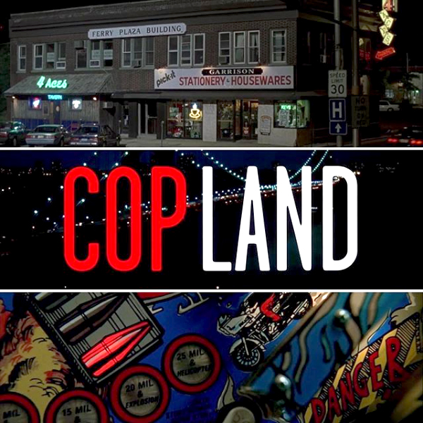

; Data East USA, Inc. Tales from the Crypt (1993); Data East USA, Inc. The Who's Tommy Pinball Wizard (1994)")
; Gottlieb's the 'Amazing Spiderman' (1980); Gottlieb's 'Circus' (1980); Gottlieb's 'Pink Panther' (1981); and Gottlieb's 'Rocky' (1982)")

; at second left, Game Plan, Inc. 'Attila the Hun' (1984); and at right back, Bally's 'Rolling Stones' (1980)")
; Recel S. A. 'Criterium 75' (1978); Chicago Coin Machine Mfg. Co. 'Sound Stage' (1976)")
; and at second left, Bally's 'Xenon' (1980); and at right, Gottlieb's 'Haunted House' (1982)")
; Bally's 'Wizard! featuring Ann Margret and Roger Daltrey' (1975); and Bally's 'Capt. Fantastic and the Dirt Brown Cowboy featuring Elton John' (1976)")


")
")
")

")
")
")
 'Triple Action' 1948 (detail)")
")
")


")
")
 'Wizard!' 1975 (detail)")
 'Wizard!' 1975 (detail)")

 'Capt. Fantastic and the Dirt Brown Cowboy' 1976 (detail)")
 'Space Invaders' 1980 (detail)")
")
")
 'Circus' 1980 (detail)")

 'Xenon' 1980 (detail)")
 'Centaur' 1981 (detail)")

 'Medusa' 1981")
 'Fathom' 1981 (detail)")
 'Hyperball' 1981 (detail)")
 'Hyperball' 1981 (detail)")
")
")
")
")
")
 'Diner' 1990 (detail)")
 (Chicago, 1988-1999) 'Dr. Dude And His Excellent Ray' 1990 (detail)")
 (Chicago, 1988-1999) 'Dr. Dude And His Excellent Ray' 1990 (detail)")

 'FunHouse' 1990 (detail)")
 'FunHouse' 1990 (detail)")
 'FunHouse' 1990 (detail)")


 'The Machine: Bride of Pinbot' 1991 (detail)")
 'The Machine: Bride of Pinbot' 1991 (detail)")

 'Fish Tales' 1992 (detail)")
")
 'The Getaway: High Speed II' 1992 (detail)")
")
")
![Frederick Evans (British, 1853-1943) 'Aubrey Beardsley [with hands]' 1893 from the exhibition 'Aubrey Beardsley' at Tate Britain, London, March - May, 2020](https://artblart.com/wp-content/uploads/2020/04/frederick-evans-portrait-of-aubrey-beardsley.jpg "Frederick Evans (British, 1853-1943) 'Aubrey Beardsley [with hands]' 1893 from the exhibition 'Aubrey Beardsley' at Tate Britain, London, March - May, 2020")
 'Withered Spring' 1891 from the exhibition 'Aubrey Beardsley' at Tate Britain, London, March - May, 2020")
 'Incipit Vita Nova' 1892")
 'Self-portrait' 1892")

 'The Finding of Medusa; The Death of Medusa (The Birth of Pegasus and Chrysaor); Perseus Pursued by the Gorgons' 1875-1876")
 'The Finding of Medusa' 1875-1876")
 'The Death of Medusa (The Birth of Pegasus and Chrysaor)' 1875-1876")
 'Perseus Pursued by the Gorgons' 1875-1876")
 'The Litany of Mary Magdalen' 1891")
 'The Entombment of Christ' c. 1465-1475")
 'Tannhäuser' 1891")
 'Die Götterdämmerung' 1892")
 'The Achieving of the Sangreal' 1892")
 'How Morgan Le Fay Gave a Shield to Sir Tristram' 1893")
 'How la Beale Isoud Wrote to Sir Tristram' c. 1893")
 'How Sir Tristram Drank of the Love Drink' 1893")
 'How La Beale Isoud Nursed Sir Tristram' 1893")
 'How King Arthur saw the Questing Beast, and thereof had great marvel' 1893")
 Design for a Frontispiece to 'Virgilius the Sorcerer' c. 1893")
 'The Kiss of Judas' 1893")
 'The Climax' 1893")
 'The Dancer’s Reward' 1893")
 'The Toilette of Salome' (second version) 1893")
 'The Stomach Dance' 1893")
 'The Eyes of Herod' 1893")
 'Enter Herodias' 1893")
 'John and Salome' 1893")
 'The Black Cape' 1893")
 'The Peacock Skirt' 1893")
 'J’ai baisé ta bouche Iokanaan' 1892-1893")
")
 Divan Japonais 1892")
 'The Pseudonym and Autonym Libraries' 1894")
 'Isolde' Printed 1899")
 'A Comedy of Sighs' 1894")
 'Professor Fred Brown' 1892")
 'Charles Conder' 1904")
 'Aubrey Beardsley' 1895")
 'Aubrey Beardsley' 1894")
 'W.B. Yeats' 1908")
 'Robbie Ross' 1895-1930")
 'John Gray' c. 1896-1897")
 'Cover Design for 'The Yellow Book'' Vol.I 1894")
 'The Yellow Book' Volume I 1894")
 'The Slippers of Cinderella' 1894")
 'La Dame aux Camélias' 1894")
 'The Black Cat' 1894-1895")
 'Frontispiece to Chopin’s Third Ballade' 1895")
 'The Fat Woman' 1894")
 Title page to 'The Story of Venus and Tannhäuser' 1895")
 'The Mirror of Love' 1895")
 'Venus between Terminal Gods' 1895")
 'Caprice' c. 1894")
 'Masked Woman with a White Mouse' c. 1894")
 'The Savoy', Number 1 1896")
 'Third Tableau of Das Rheingold' c. 1896")
 'The Savoy', Number 2 1896")
 'Ave Atque Vale' 1896")
 'The Dream' 1896")


 'The Cave of Spleen' 1896")
 'The Battle of the Beaux and the Belles' c. 1896")
 'Mademoiselle de Maupin' 1898")
 'The Lady with the Rose' 1897")
 'Lysistrata Shielding her Coynte' 1896")
 'Two Athenian Women in Distress' 1896")
 'Cinesias Entreating Myrrhina to Coition' 1896")
 'The Examination of the Herald' 1896")
 'The Lacedaemonian Ambassadors' 1896")
 'The Impatient Adulterer' 1896-1897")
 'Messalina and her Companion' 1895")
 'Aubrey Beardsley' 1897")
 'Volpone Adoring his Treasure' 1898")

 'Ali Baba' 1897")
 'Poster for ‘The Glasgow Institute of Fine Arts’' 1894-1896")
 'The Hindu Maid' 1916")
 '‘Music! Music’ cried the Emperor. ‘You little precious golden bird, sing!’' 1916")
 ''I know what you want,' said the Sea Witch' 1916")
 'Untitled (Hand-Shell)' 1934 from the exhibition 'Dora Maar' at Tate Modern, London, November 2019 - March 2020")
 'Woman sitting in profile, the bust dressed in a blouse made of tattoo patterns drawn on the photograph' c. 1930 from the exhibition 'Dora Maar' at Tate Modern, London, November 2019 - March 2020")
 'Child with a Beret' c. 1932")
 'Barcelona, Saleswomen in the Butcher Shop' 1933")
 'Blind Street Peddler, Barcelona' 1933")
 'Street Boy on the Corner of the rue de Genets' 1933")
 'Repent for the Kingdom of Heaven is at Hand' 1934")
 'Stairwell and Plants in Kew Gardens' 1934")
 'Pearly King collecting money for the Empire Day' 1935")
 'Carousel at Night' 1931-1936")

' 1930s (left) and 'Untitled (Nude)' c. 1938 (right)")
 'Assia' 1934")
' (c. 1931)")
' c. 1931")
 'Untitled (Lee Miller)' c. 1933")
 'Untitled (Mannequin sitting in profile in dress and evening jacket)' c. 1932-1935")
 'Untitled (Fashion photograph Model star)' c. 1935")
 'Model in Swimsuit' 1936")
 'Portrait of Lise Deharme, at home in front of her birdcage' 1936")
 'Publicity Study, Pétrole Hahn' 1934-1935")
 'Les yeux' c. 1932-1935")
 'Untitled' 1935")
")

 'Danger' 1936")
 '29 rue d'Astorg' c. 1936")
 'The Simulator' 1936")
, 'Untitled (Hand-Shell)' (1934, top middle) and 'Danger' (1936, bottom right)")
 'Portrait of Ubu' 1936")

 'Double Portrait with Hat' c. 1936-1937")
 'Profile portrait with glasses and hat' 1930-1935")
 'Man looking inside a sidewalk inspection door, London' c. 1935")
 and 'Les années vous guettent' (The Years are Waiting for You) (1932, right)")
 'Portrait of Nusch Éluard' 1935")
 'Les années vous guettent' (The Years are Waiting for You) 1932")
 'Untitled' c. 1940")
 'Photograph of Dora Maar and Pablo Picasso on the beach' September 1937")
 'Photograph of Dora Maar, Nusch Éluard, Pablo Picasso and Paul Éluard on the beach' September 1937")
 'Portrait of Picasso, Paris, studio 29, rue d'Astorg' Winter, 1935")
 'Portrait of Pablo Picasso' 1936")
 'Portrait of Dora Maar' 1937")
 'Guernica' May-June, 1937")


 'The Conversation' 1937")
 'Dora Maar seated' 1938")

 'Self-portrait with Fan' 1930")
 'Dora Maar' Paris, 1934")
 'Portrait of Dora Maar' 1936")
 'Dora Maar, Paris' 1941")
 'Dora Maar in her workshop rue de Savoie' 1943")
 (Lithuanian-Jewish, 1911-1980) 'Dora Maar' 1946")
 'Dora Maar' France 1948")
 'Still life' 1941")
 'Still Life with Jar and Cup' 1945")
 'Landscape in Lubéron' 1950's")

 'Untitled' c. 1957")
 'Untitled' 1980s")
 'Untitled' c. 1980")
 'Untitled' 1980s")
 'Untitled' c. 1980")


 'The Good and Evil Angels' 1795 - c. 1805 (installation view)")
 'The Good and Evil Angels' 1795 - c. 1805 (installation view)")
 'The Good and Evil Angels' 1795 - c. 1805 (installation view)")
 'The Good and Evil Angels' 1795 - c. 1805 (installation view)")
 'The Good and Evil Angels' 1795 - c. 1805 from the exhibition 'William Blake' at Tate Britain, London, Sept 2019 - Feb 2020")
 'The Good and Evil Angels' 1795 - c. 1805 (installation view detail)")
 'The Good and Evil Angels' 1795 - c. 1805 (installation view detail)")
 'The Good and Evil Angels' 1795 - c. 1805 (installation view detail)")
 and at right, 'Nebuchadnezzar' (1795 - c. 1805)")
 'Nebuchadnezzar' 1795 - c. 1805 (installation view)")
 'Nebuchadnezzar' 1795 - c. 1805 (installation view)")
 'Nebuchadnezzar' 1795 - c. 1805 from the exhibition 'William Blake' at Tate Britain, London, Sept 2019 - Feb 2020")
 'Nebuchadnezzar' 1795 - c. 1805 (installation view detail)")
 'Nebuchadnezzar' 1795 - c. 1805 (installation view detail)")
 'Nebuchadnezzar' 1795 - c. 1805 (installation view detail)")
 'Newton' 1795 - c. 1805 (installation view)")
 'Newton' 1795 - c. 1805 (installation view)")
 'Newton' 1795 - c. 1805 from the exhibition 'William Blake' at Tate Britain, London, Sept 2019 - Feb 2020")
 'Newton' 1795 - c. 1805 (installation view detail)")
 'Pity' c. 1795 (installation view)")
 'Pity' c. 1795 (installation view)")
 'Pity' c. 1795 (installation view)")
 'Pity' c. 1795 (installation view detail)")
 'Pity' c. 1795")
 and at right, 'Lamech and his Two Wives' (1795)")
 and at right, 'Naomi Entreating Ruth and Orpah to Return to the Land of Moab' (c. 1795)")
 and at right, 'Naomi Entreating Ruth and Orpah to Return to the Land of Moab' (c. 1795)")
 'Naomi Entreating Ruth and Orpah to Return to the Land of Moab' c. 1795 (installation view)")
 'Naomi Entreating Ruth and Orpah to Return to the Land of Moab' c. 1795 (installation view)")
 'Naomi Entreating Ruth and Orpah to Return to the Land of Moab' c. 1795 (installation view detail)")
 'Naomi Entreating Ruth and Orpah to Return to the Land of Moab' c. 1795")
 'The House of Death' 1795 - c.1805 (installation view)")
 'The House of Death' 1795 - c.1805 (installation view)")
 'The House of Death' 1795 - c.1805 (installation view detail)")
 'The House of Death' 1795 - c.1805 (installation view detail)")
 'The House of Death' 1795 - c.1805")
 'Elohim Creating Adam' 1795 - c. 1805 (installation view)")
 'Elohim Creating Adam' 1795 - c. 1805 (installation view)")
 'Elohim Creating Adam' 1795 - c. 1805 (installation view)")
 'Elohim Creating Adam' 1795 - c. 1805 (installation view detail)")
 'Elohim Creating Adam' 1795 - c. 1805")
 'The Horse' c. 1805 (installation view)")
 'The Horse' c. 1805 (installation view)")
 'The Horse' c. 1805 (installation view)")


 'The Death of the Good Old Man' 1805 (installation view)")
 'The Death of the Good Old Man' 1805 (installation view)")
 'Death of the Strong Wicked Man' 1805 (installation view)")
 'Death of the Strong Wicked Man' 1805 (installation view detail)")
 'Death of the Strong Wicked Man' 1805")
 A Title Page for 'The Grave' 1806 (installation view)")
 A Title Page for 'The Grave' 1806 (installation view)")
 A Title Page for 'The Grave' 1806 (installation view detail)")
 'The Penance of Jane Shore in St Paul's Church' c. 1793")
 'Christ in the Sepulchre, Guarded by Angels' c. 1805")
 'Ruth the Dutiful Daughter in Law' 1803")
; 'The Spiritual Form of Nelson Guiding Leviathan' (c. 1805-1809); 'The Spiritual Form of Pitt Guiding Behemoth' (1805); and 'The Bard, from Gray' (? 1809)")
 'William Blake's house, Soho, London' 1912")
 'Satan calling up his Legions (from John Milton's 'Paradise Lost')' 1800-1805 (installation view)")
 'Satan calling up his Legions (from John Milton's 'Paradise Lost')' 1800-1805 (installation view detail)")
 'The Spiritual Form of Nelson Guiding Leviathan' c. 1805-1809")
 'The Spiritual Form of Pitt Guiding Behemoth' 1805")
 'The Spiritual Form of Pitt Guiding Behemoth' 1805")


 'The Bard, from Gray' ? 1809 (installation view)")
 'The Bard, from Gray' ? 1809")
 'The Virgin and Child in Egypt' 1810 (installation view)")
 'The Virgin and Child in Egypt' 1810 (installation view)")
 'The Virgin and Child in Egypt' 1810 (installation view)")
 'The Virgin and Child in Egypt' 1810 (installation view detail)")
 'The Virgin and Child in Egypt' 1810 (installation view detail)")
 'The Virgin and Child in Egypt' 1810")
 'An Allegory of the Spiritual Condition of Man' ? 1811 (installation view)")
 'An Allegory of the Spiritual Condition of Man' ? 1811 (installation view)")
 'An Allegory of the Spiritual Condition of Man' ? 1811 (installation view)")
 'An Allegory of the Spiritual Condition of Man' ? 1811 (installation view detail)")
 'An Allegory of the Spiritual Condition of Man' ? 1811 (installation view detail)")


 and at fourth right, 'Cerberus' (1824-1827)")
 'Capaneus the Blasphemer' 1824-1827")
 'Cerberus' (from Illustrations to Dante's 'Divine Comedy') 1824-1827")

 'The Inscription over the Gate' 1824-1827 (installation view)")
 'The Inscription over the Gate' 1824-1827")
 'The Serpent Attacking Buoso Donati' 1824-1827 (installation view)")
 'The Serpent Attacking Buoso Donati' 1824-1827")
 'The Lawn with the Kings and Angels' 1824-1827 (installation view)")
 'The Lawn with the Kings and Angels' 1824-1827")
 'Matilda and Dante on the Banks of the Lethe with Beatrice on the Triumphal Chariot' 1824-1827 (installation view)")
 'Matilda and Dante on the Banks of the Lethe with Beatrice on the Triumphal Chariot' 1824-1827 (installation view)")
 'William Blake wearing a hat' c. 1825 (installation view)")
 'William Blake wearing a hat' c. 1825 (installation view)")
 and John Varley (British, 1778-1842) 'The Blake / Varley Sketchbook' 1819 (installation view)")
 'The Ghost of a Flea' c. 1819 (installation view)")
 'The Ghost of a Flea' c. 1819 (installation view)")
 'The Ghost of a Flea' c. 1819")
 'The Ghost of a Flea' c. 1819 (installation view)")
 'The Creation of Eve' 1822")
 'The Creation of Eve' 1822 (installation view)")
 'The Creation of Eve' 1822 (installation view)")
 'Satan Smiting Job with Sore Boils' c. 1826 (installation view)")
 'Satan Smiting Job with Sore Boils' c. 1826 (installation view detail)")
 'Satan Smiting Job with Sore Boils' c. 1826")
 'The Body of Abel Found by Adam and Eve' c. 1826 (installation view)")
 'The Body of Abel Found by Adam and Eve' c. 1826 (installation view)")
 'The Body of Abel Found by Adam and Eve' c. 1826 (installation view detail)")
 'The Body of Abel Found by Adam and Eve' c. 1826")
 'Christian in the Arbour' 1824-1827")
 'Jerusalem', plate 28, proof impression, top design only 1820")
 'The Sea of Time and Space' 1821 (installation view)")
 'The Sea of Time and Space' 1821 (installation view detail)")
 'Europe' Plate i: Frontispiece, 'The Ancient of Days' 1827 (installation view)")
 'Europe' Plate i: Frontispiece, 'The Ancient of Days' 1827 (installation view)")
 'Europe' Plate i: Frontispiece, 'The Ancient of Days' 1827 (installation view)")
 'Europe' Plate i: Frontispiece, 'The Ancient of Days' 1827")
 'The Ciné-bal (cinema-ballroom) at Café L'Aubette, Strasbourg, designed by Theo van Doesburg' 1926-1928 from the exhibition 'Into the Night: Cabarets and Clubs in Modern Art' at the Barbican Art Gallery, Oct 2019 - Jan 2020")
 'The Ciné-bal (cinema-ballroom) at Café L'Aubette, Strasbourg, designed by Theo van Doesburg' 1926-1928 from the exhibition 'Into the Night: Cabarets and Clubs in Modern Art' at the Barbican Art Gallery, Oct 2019 - Jan 2020")
 'The Ciné-bal (cinema-ballroom) at Café L'Aubette, Strasbourg, designed by Theo van Doesburg' 1926-1928 from the exhibition 'Into the Night: Cabarets and Clubs in Modern Art' at the Barbican Art Gallery, Oct 2019 - Jan 2020")


 'L'Aubette: Projet de composition pour le sol du café-brasserie et du café-restaurant' (L'Aubette: Design for a composition for the floor of the café-brasserie and the café-restaurant) 1927 (installation view)")
 'L'Aubette: Projet de composition pour le sol du café-brasserie et du café-restaurant' (L'Aubette: Design for a composition for the floor of the café-brasserie and the café-restaurant) 1927 (installation view)")
 'Final colour design for the screen wall of the Ciné-Dancing at L'Aubette' 1927 (installation view)")

")
 'Aubette 63' 1927 (installation view)")


. 'Loie Fuller' c. 1901")
 'Miss Loïe Fuller' 1893 (installation view)")
 'Miss Loïe Fuller' 1893 (installation view)")

 'Miss Loïe Fuller' 1893")
 'Folies Bergere La Loie Fuller' lithographs from the exhibition 'Into the Night: Cabarets and Clubs in Modern Art' at the Barbican Art Gallery, Oct 2019 - Jan 2020")
 'Fioles Bergère, La Loïe Fuller' 1893 (installation view)")
 'Folies Bergère, La Danse du Feu' (The Fire Dance) 1897 (installation view)")


 'Poster for the performances Clairs de lune by Georges Fragerolle, L'honnête gendarme by Jean Richepin and Le treizième travail d'Hercule by Eugène Courboin (Le Chat Noir, 16 December 1896)' (installation view)")


")
")
 'La Vierge verte' (The Green Virgin) c. 1881 (installation view)")

 'Réouverture du cabaret du Chat Noir' (Reopening of the Chat Noir Cabaret) 1896 (installation view)")
 'Réouverture du cabaret du Chat Noir' (Reopening of the Chat Noir Cabaret) 1896")
 'Théâtre du Chat Noir (Couverture aux coquelicots)' (Programme for the Chat noir Theatre (Cover with Poppies)) 1890 (installation view)")


 'Damenkneipe' (Women's Club) c. 1925")
 'Damenkneipe' (Women's Club) c. 1925 (installation view)")
 c. 1925 at left, followed by work by Jeanne Mammen")
 'Bar' c. 1930 (installation view)")
 'Bar' c. 1930")
 'Bierseidelbetrachtung I' (The Contemplative Drinkers I) c. 1929 (installation view)")
 'Bierseidelbetrachtung I' (The Contemplative Drinkers I) c. 1929 (installation view detail)")
 'Untitled (Vor dem Auftritt)' (Before the Performance) c. 1928 (installation view)")
 'Untitled (Vor dem Auftritt)' (Before the Performance) c. 1928 (installation view)")
 'Café Nollendorf' c. 1931 (installation view)")
 'Anita Berber' 1925 (installation view)")

 'Revue neger (Josephine Baker)' c. 1926 (installation view)")
 'The Fortune Teller', published in 'ULK' February 1929 (installation view)")
 'The Fortune Teller', published in 'ULK' February 1929 (installation view)")
 'Schönheit, dich will ich preisen' (Beauty, Thee Will I Praise) 1923 (installation view)")
 'Schönheit, dich will ich preisen' (Beauty, Thee Will I Praise) 1923 (installation view)")

 1930")
 'Ausblick im Nachtlokal' (View of a Nightclub) 1930 (installation view)")
 'Ausblick im Nachtlokal' (View of a Nightclub) 1930 (installation view)")
 wall text from the exhibition 'Into the Night: Cabarets and Clubs in Modern Art' at the Barbican Art Gallery, Oct 2019 - Jan 2020")
 'Ausblick im Nachtlokal' (View of a Nightclub) 1930")
 and at right, Karl Hofer's 'Tiller Girls' (before 1927)")
 'Lissy' 1931 (installation view)")
 'Lissy' 1931 (installation view)")
 'Lissy' 1931 (installation view)")
 'Lissy' 1931 (installation view detail)")
")
")
 'Tiller Girls' before 1927")
; and at centre, Karl Hofer's 'Tiller Girls' (before 1927)")
; and at third from left, Erna Schmidt-Caroll's 'Chansonette' (Singer) (c. 1928)")
 'Chansonette' (Singer) c. 1928 (installation view)")
 'Chansonette' (Singer) c. 1928 (installation view)")
 'Chansonette' (Singer) c. 1928")

 'Menschen in Cáfe' (People in a Cáfe) 1917 (installation view)")
 'Nackttanz' (Striptease), from 'Berliner Reise' (Trip to Berlin) 1922 (installation view)")
 'Sie reprasentiert!' (She Represents!), published in 'Simplicissimus' vol. 32, no 47, February 1928")
 'Maskenball' (Masked Ball), published in 'Jugend' vol. 34, no 5, January 1929")
 'Fasting' (Carnival), published in Simplicissimus vol. 34, no 46, February 1930")


 and at right, Twins Seven-Seven 'THE BEAUTIFUL LADY and THE FULLBODIED GENTLEMAN THAT REDUCED TO HEAD' (1967)")
 (installation view detail)")
")
")
 with Georgina Beier's 'Gelede' (1966) third from right")
 'Burial Ground' 1967 (installation view)")
 'Burial Ground' 1967 (installation view)")
 'Burial Ground' 1967 (installation view detail)")
 'Gelede' 1966 (installation view)")
")
 'Untitled' 1961 (installation view)")
 'Untitled' 1961 (installation view)")
 'Agony' 1963 (installation view)")
 'Agony' c. 1963")
' 1964 (installation view)")
' 1964 (installation view detail)")

' 1964")
, Osogbo, Oshun State, Nigeria / Iwalewahaus, University of Bayreuth, Germany")


 'Design for Tiger Hunting Mural in the Cabaret Theatre Club' 1912 (installation view)")
 'Design for Deer Hunting Mural in the Cabaret Theatre Club 1912' (installation view)")

 'Kermesse' 1912 (installation view)")
 'Kermesse' 1912 (installation view)")
 'Drop curtain design' 1912 (installation view)")
 'Drop curtain design' 1912 (installation view)")
 'Indian Dance' 1912 (installation view)")


; at second left, William H, Johnson's 'Jitterbugs (III)' (c. 1941); at second right, William H, Johnson's 'Jitterbugs (II)' (c. 1941); and at right, Edward Burra's 'Savoy Ballroom, Harlem' (1934)")
 'Vaudeville' 1951 (installation view)")
 'Vaudeville' 1951 (installation view)")
 'Jitterbugs (III)' c. 1941 (installation view)")
 'Jitterbugs (II)' c. 1941 (installation view)")
 'Savoy Ballroom, Harlem' 1934 (installation view)")
 'Savoy Ballroom, Harlem' 1934 (installation view)")
 'Dance' c. 1930 (installation view)")
 'Dance' c. 1930")
 'Untitled (Dancers and Cityscape)' c. 1928 (installation view)")
 'Untitled (Dancers and Cityscape)' c. 1928 (installation view)")


 'I'm a Clever Waterman' 1966 (installation view)")
 'I'm a Clever Waterman' 1966")
 'Still-life' 1962 (installation view)")
 'Heech and Hands' 1964")
 'Cage, cage, cage' 1966 (repaired 2009) (installation view)")
 'Boohoo, boohoo, boohoo, or her, or a gazelle' 1966 (installation view)")
 'Untitled (Composition 8)' c. 1960-65 (installation view)")


 'Weiner Werkstätte Postkarte' (left to right) No. 74 (Interior view of the bar at the Cabaret Fledermaus); No. 75 (Interior view of the bar at the Cabaret Fledermaus); No. 67 (Interior view of the auditorium with stage at the Cabaret Fledermaus) 1907 (installation view)")
 'Weiner Werkstätte Postkarte' (left to right) No. 74 (Interior view of the bar at the Cabaret Fledermaus); No. 75 (Interior view of the bar at the Cabaret Fledermaus); No. 67 (Interior view of the auditorium with stage at the Cabaret Fledermaus) 1907 (installation view)")

 'Wiener Werkstätte Postkarte No. 74 (Interior view of the bar at the Cabaret Fledermaus)' 1907")
, 2019")
, 2019")
, 2019")
 'Poster design for the Cabaret Fledermaus (unrealised)' 1907 (installation view)")
 'Poster design for the Cabaret Fledermaus (unrealised)' 1907 (installation view)")
 (design) 'First programme for the Cabaret Fledermaus' (installation view)")
 (design) 'First programme for the Cabaret Fledermaus' 1907 (installation view)")
 (design) 'First programme for the Cabaret Fledermaus' 1907 (installation view)")
 (design) 'Second programme for the Cabaret Fledermaus' 1907 (installation view)")
 'Plan at 1:100 for the Cabaret Fledermaus' 1907 (installation view)")
 'Plan at 1:100 for the Cabaret Fledermaus' 1907 (installation view)")

, pepper mill (1907), vases for the Cabaret Fledermaus (1907) and an ashtray (1907)")


")
 'Poster for the Cabaret Fledermaus' 1907")
 'Poster for a performance by Miss Macara at the Cabaret Fledermaus' 1909 (installation view)")

 'Poster for the Cabaret Fledermaus' 1911 (installation view)")
 'Design for 'Green Domino'for the Cabaret Fledermaus' 1908 (installation view)")
 'Design for 'Orange Domino'for the Cabaret Fledermaus' 1908 (installation view)")
 'Design for 'Blue Domino'for the Cabaret Fledermaus' 1908")

 'Design for Maskenspiele (Masquerades) (two characters)' 1907")


, 1922")


, 1922")
, 1922")

, 1922")

, 1922")
 'Diavoletti neri e bianchi. Danza di diavoli' (Black and White Little Devils: Dance of the Devils) 1922")


 'Design for the sign and flashing light for the facade of the Bal Tic Tac' 1921 (installation view)")
 'Design for the sign and flashing light for the facade of the Bal Tic Tac' 1921 (installation view)")

 'Design for the sign and flashing light for the facade of the Bal Tic Tac' 1921")


")
")
 'Design for a light for the Bal Tic Tac' 1921 (installation view)")


 'El corrido' (The Corrido) 1928 (installation view)")
 'El corrido' (The Corrido) 1928 (installation view)")
 'La hora del mando' (Market Time) 1928 (installation view)")
 'La hora del mando' (Market Time) 1928 (installation view)")
 'Danzantes' (Dancers) 1922 (installation view)")
 'Retablo' (Altarpiece) 1928 (installation view)")
 'Retablo' (Altarpiece) 1928 (installation view)")
 'Autorretrato' (Self-portrait) 1928 (installation view)")
 'Dance of the Crescent Moon' 1922 (installation view)")
 'Cabeza de Lenin' (Head of Lenin) 1927 (installation view)")
 'Tlacuache' (Opposum) c. 1920s")
 'Patos Chinos' (Chinese Ducks) 1928 (installation view)")

, c. 1924")
, c. 1924")

, c. 1924")
, c. 1924")
, c. 1924")
, c. 1924")
 'Máscara estridentista' (Stridentist Mask) c. 1924")
, c. 1970")
, c. 1970")
 wall text from the exhibition 'Into the Night: Cabarets and Clubs in Modern Art' at the Barbican Art Gallery, London, October 2019 - January 2019")
, c. 1970")
 'El Café de Nadie' (Nobody's Café) c. 1970")


 'El movimiento estridentista' (The Stridentist Movement) 1926 (installation view)")
 'Manuel Maples Arce en el Café de Nadie' (Manuel Maples Arce in the Café de Nadie) c. 1924 (installation view)")
 'The daughter of the sun' 1932 from the exhibition Daughters Of The Sun: Christian Waller & Klytie Pate' at Bendigo Art Gallery, Australia, Nov 2018- Feb 2019")
 'Destiny' 1916")
 The conspirators c. 1920")

 'Ethlinn' c. 1921")
 'Morgan Le Fay' c. 1925")
 'Morgan Le Fay' c. 1927")


 'Christian Waller with Baldur, Undine and Siren at Fairy Hills' 1932")
 'Christian Waller with Baldur, Undine and Siren at Fairy Hills' 1932 (detail)")
 'Ex Libris: Klytie' c. 1932")
 'Untitled (Thomas and the Persian)' 1932")


 'The Magician of the Beautiful' from 'The Great Breath: A book of seven designs' 1932")
 'The Spirit of Light' from 'The Great Breath: A book of seven designs' 1932")

 'The robe of glory' 1937")
 'The robe of glory' 1937 (detail)")
 'Untitled (Angus Og and Caer Ormaith)' c. 1930s")

")
 'East of the Sun and West of the Moon' c. 1940")
 'Untitled (Christian Waller)' 1930s")
' c. 1930")
 Studies for the linocut 'Limpang Tung' 1932")
![Photographer unknown. 'Untitled (Klytie Pate [centre] at Melbourne Technical College)' early 1930s](https://artblart.com/wp-content/uploads/2019/01/photographer-unknown-untitled-klytie-pate-at-melbourne-technical-college-early-1930s-web.jpg "Photographer unknown. 'Untitled (Klytie Pate [centre] at Melbourne Technical College)' early 1930s")
 'Scarab beetle plate' c 1932")
 'The sun, plaque' 1932")
 'Youth and girl' c. 1936 (detail)")
 'Youth and girl' c. 1936")
 'Youth and girl, plaque' 1932-1936")


 'Vase' 1936")


. 'Bottle-brush, vase' c. 1939")
 'Milky way vase' c. 1956")


 'Incised urn-shaped vase with carved seahorse lugs (flying fish motif)' Date unknown")


 'Covered jar' c. 1943")
 'Covered jar' c. 1943 (detail)")
 'Lidded jar' (sunflower buds) Date unknown")
 'Lidded jar' (sunflower buds) Date unknown (detail)")


 'Ginger jar' Date unknown")
 'Large pierced ginger jar (woven waterlily motif)' 1950")


 'Magnificent cat' 1980")
 'Magnificent cat' 1980 (detail)")


 'Le voyage dans la lune. Le clair de terre - (10e tableau)' 1902 from the exhibition 'L'envol' ('Flight') at La maison rouge, Paris, June - October, 2018")
 'Young Rebonna Dorthereans Blengins - Catherine Isles, Female, One Whip-Lash-Tail' 1920-1930 from the exhibition 'L'envol' ('Flight') at La maison rouge, Paris, June - October, 2018")
 'Human headed Blengins of Calverine Island Catherine Isles' 1920-1930")
 'Untitled' 1921")

 'A leap' 1934")
 'Kamaitachi 17' 1965")
 'Untitled' Nd")
 'Chair n°2' (detail) 2005")
 'L'envol de Bichonnade' 1905")
 'Leap into the Void' 1960")

 'The little Mermaid' 1990")
 'Japanese Flying Pak 3' 2001")
 'How Can One Change Oneself' 2010")
 (French, 1938-2012) 'Arzach' 1977")
 'Chapungu - The Day Rhodes Fell' 2015")
 'Suspendue' 2016")
 'Selfportrait (flying carpet)' 1976")
![Fabio Mauri (Italian, 1926-2009) 'Macchina per fissare acquerelli [Machine for fixing watercolours]' 2007](https://artblart.com/wp-content/uploads/2018/10/fabiomauri-web.jpg "Fabio Mauri (Italian, 1926-2009) 'Macchina per fissare acquerelli [Machine for fixing watercolours]' 2007")
 'Fusée Soviet Union' 2013")

You must be logged in to post a comment.