Review: ‘Martin Parr: In Focus’ at Niagara Galleries, Richmond, Melbourne

“And so it goes. The dirt under the fingernails of the child eating a doughnut, the lurid colours of the popsicle and jacket of the kid with dribble on his face…” Dr Marcus Bunyan

Exhibition dates: 6th March – 31st March, 2012

 Curator: the artist
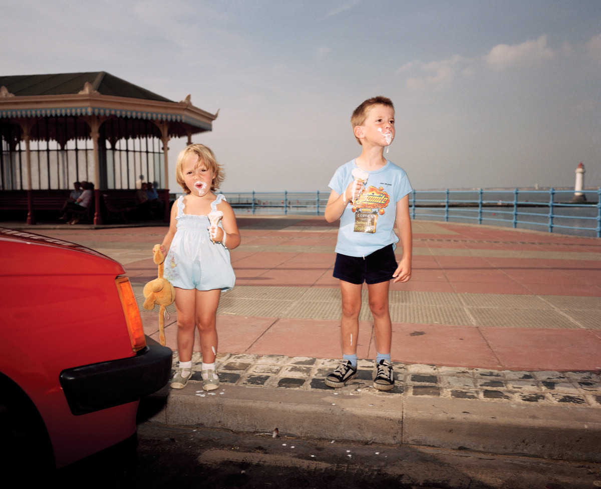
 

Martin Parr (British, 1952-2025) 'New Brighton, England' from the series 'The Last Resort' 1983-1985 from the exhibition 'Martin Parr: In Focus' at Niagara Galleries, Richmond, Melbourne, March 2012


Martin Parr (British, 1952-2025)
New Brighton, England
From the series Last Resort
1983-1985
Pigment print
Edition of 5
102 x 127cm
Image courtesy of the artist and Niagara Galleries, Melbourne


This is a fine exhibition of the work of celebrated English photographer Martin Parr at Niagara Galleries, Richmond, albeit with one proviso.

The mainly large colour prints are handsomely displayed in plain white frames within the gallery space and are taken from his well known series: Last Resort, Luxury, New British and British Food. Parr’s work is at its best when he concentrates on the volume of space within the image plane and the details that emerge from such a concentrated visualisation – whether it be the tension points within the image, assemblage of colour, incongruity of dress, messiness of childhood or philistine nature of luxury.

The best photographs have a wonderful frisson about them, a genuine love of and resonance with the things he is imaging. This frisson can be seen in all of the photographs in this posting but most notably in :

~ The incursion of the surreal red colour to left in England. New Brighton (above) and Parr’s masterful use of vertical and horizontal lines within the image. Note the verticality: of the child’s toy, the two children themselves, the pillars of the pavilion and the lighthouse holding the whole image together at right. If this lighthouse were not there the eye would fall out of the image. As it is it is contained, forcing the viewer to look closely at the absurdity of the melting ice cream and the splashes that have fallen on the ground.

~ The complexity of the photograph England. New Brighton (below) where the eye does not know what to rest upon, constantly jumping from object to object. Do you look at the women on the ground, the shoes to right, the piece of fabric to left, the screaming baby, the sunlit pink umbrella, the women in blue bikini up the ramp, the long elongated shadowed wall with peek-a-boo heads leading to the outlined figures at the vanishing point of image – the top of the ramp. The understanding of light (with the use of flash) and the construction of the image is superlative. Wow!

~ The incongruity evidenced in the photograph England, Ascot. 2003: the over tight pink sateen dress with unfortunate stain (which the eye is irrevocably drawn to), applique bow linked through to hideous flower embossed handbag which then contrasts with the seated women behind in hat and purple floral dress. In the large print in the gallery the background is more out of focus than in the small reproduction here, allowing the viewer’s eye an avenue of escape via the grass and deck chair beyond.

~ The delicious, choreographed mise-en-scène of Australia, The Melbourne Cup. 2008 – the suits, ties and glasses, the teezed hair, the alcohol – where none of the participants is looking at the camera, where only the ladies hand clutches at the back of the man’s shoulder. They look down, they look left, they look right, they look away, they never engage with each other or the viewer. The critical space in this assemblage is the distance between the man and the woman’s noses, that vitally small space of separation that is a synonym for the interactions occurring in the rest of the image. The blindness of Lux’ry, its crassness, its stain.


And so it goes. The dirt under the fingernails of the child eating a doughnut, the lurid colours of the popsicle and jacket of the kid with dribble on his face, all fantastic. There are moments of stasis, for example in the contemplative photograph Australia. South Hedland. Blackrock Tourist Park. 2011 (below) taken from Parr’s new series Australia, where Parr has photographed Australian life in three Western Australian port cities, Fremantle, Broome and Port Hedland. See the video at the bottom of the posting and listen to Parr talk about his work.

This is all fine and dandy, dressed up in polka dots and a lurid bow tie, but when the photographs become too reductive, as in the large photograph in the exhibition England. Dorset. West Bay. 1997 (see first column, fourth down) there is really not enough to hang your hat on. This feeling of over simplification, as though the photographer has said to himself “here’s something I have seen that you haven’t recognised, and I think it is important for you to recognise it” – the perceived essentialness of the object – can become a bit strained. I know that these type of images are part of the series about British or Scottish food or about objects from a specific place but do they really have this grand an importance in the scheme of things? This feeling is reinforced in the exhibition, and this is my proviso to show, when the images such as Scotland. Glasgow. Fairy cakes. 1999, England. Blackpool. 1995 (bread and butter on a plate on red check cloth) are presented at A4 size surrounded by heavy white frames. These photographs have to be large to have any chance of working at all and at the small size they fall flat.

The size of a photograph raises interesting questions about the display of contemporary photography. The giant light boxes of Jeff Wall, the huge group portraits of Thomas Struth, the huge portraits of Thomas Ruff, the huge environments of Candida Hofer and the huge panoramas of Andreas Gursky (to name but a few) are all points in case. Would they work at a smaller size? No. They rely on scale and detail, visual impact for their effect: the same with Martin Parr. What is really ‘In Focus’ is the visualisation of the artist, his ability to envisage the final print at this large size. The A4 prints in this exhibition simply do not work at that size, for these photographs.

Think of Ansel Adams’ famous Monolith, The Face of Half Dome, Yosemite National Park, Calif., (circa 1926). Originally printed as a contact 8″ x 10″ from the negative, Adams gradually increased the size of this image till it became a huge print as tall as a man in his later life. The image works at multiple sizes, it spoke to him (and the viewer) at all these sizes: the small contact is intense and gem-like, the larger imitating the monolithic structure of the Face itself. I feel that some large contemporary photographs are quite vacuous at this large size, that there is no reason for them to be at this size. In other words it is not appropriate for the image. Conversely it would seem that artists previsualise for this size in the end print, which is fine, but that the print cannot exist, cannot breathe in the world at a smaller size. Is this a problem? Does this matter? I believe it does, especially when a photograph is displayed at a size that simply doesn’t work. I was always taught to print a photograph at an appropriate size for the image, whatever size(s) that may be (and there can be multiples), as long as it has resonance for that particular image.

As evidenced in this exhibition, if the photograph cannot “work” at the size that it is to be exhibited then it should not be displayed at all – it is a diminution not just of the artists vision but of the resonance of the photograph, in this case going from large to small. In an upcoming posting about the retrospective of the work of American photographer Fransceca Woodman, there is an installation photograph of the exhibition at The Guggenheim, New York (see above). Her vintage prints (seen in the background) – small, intense visions – have been printed at a huge scale (with her permission) and they simply do not work at this floor to ceiling height. They have lost all of their intimacy, which is one of the strengths of her photography. Again, I believe it is a diminution of the artists vision and the integrity of the photograph, this time from small to large. Artists are not always right. The same can be said of the retrospective of Cartier-Bresson that I saw at the National Galleries of Scotland in Edinburgh in 2005. One room out of four had very small, intense vintage prints in brown hues and the other three galleries had large 20″ x 24″ grainy prints with strong contrast that really ruined any response I had to the work as evidenced by the vintage prints. They were almost reproductions, a simulacra of the real thing. I had a feeling that they weren’t even by the artist himself. The same could be said here.

To conclude I would say this is a fine exhibition of large photographs by Martin Parr that would have been even more focused without the small A4 prints. They are joyous paeans to the quirky, incongruous worlds in which we live and circulate. They evidence life itself in all its orthogonal absurdity. I love ’em!

Dr Marcus Bunyan


Many thankx to the artist and Niagara Galleries for allowing me to publish the photographs in the posting. Please click on the photographs for a larger version of the image.
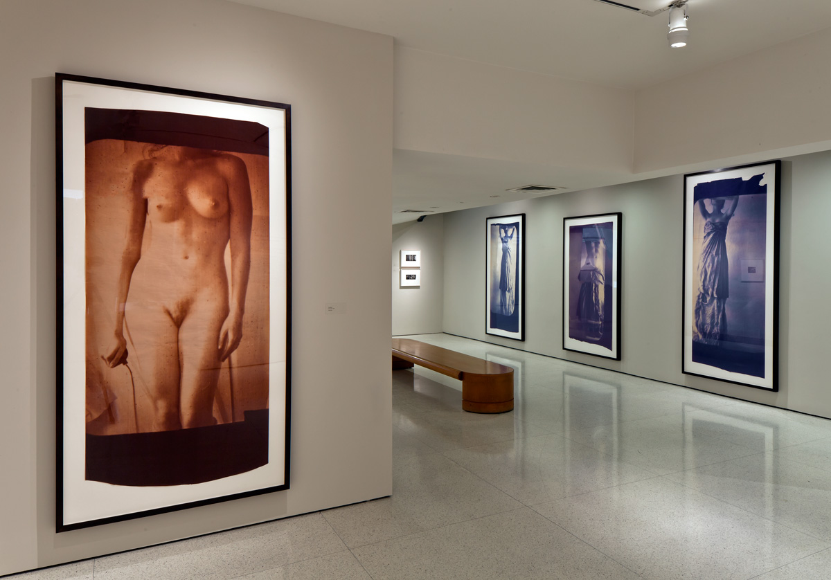


Francesca Woodman installation photograph at The Guggenheim Museum, New York


Francesca Woodman installation photograph at The Guggenheim Museum, New York. Note the small, vintage prints on the far wall.
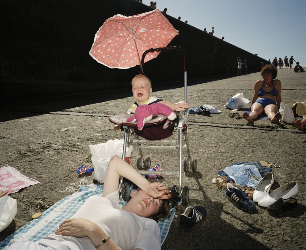
 

Martin Parr (British, 1952-2025) 'New Brighton, England' from the series 'The Last Resort' 1983-1985 from the series 'The Last Resort' 1983-1985 from the exhibition 'Martin Parr: In Focus' at Niagara Galleries, Richmond, Melbourne, March 2012


Martin Parr (British, 1952-2025)
New Brighton, England
From the series The Last Resort
1983-1985
Pigment print
Edition of 5
102 x 127cm
Image courtesy of the artist and Niagara Galleries, Melbourne
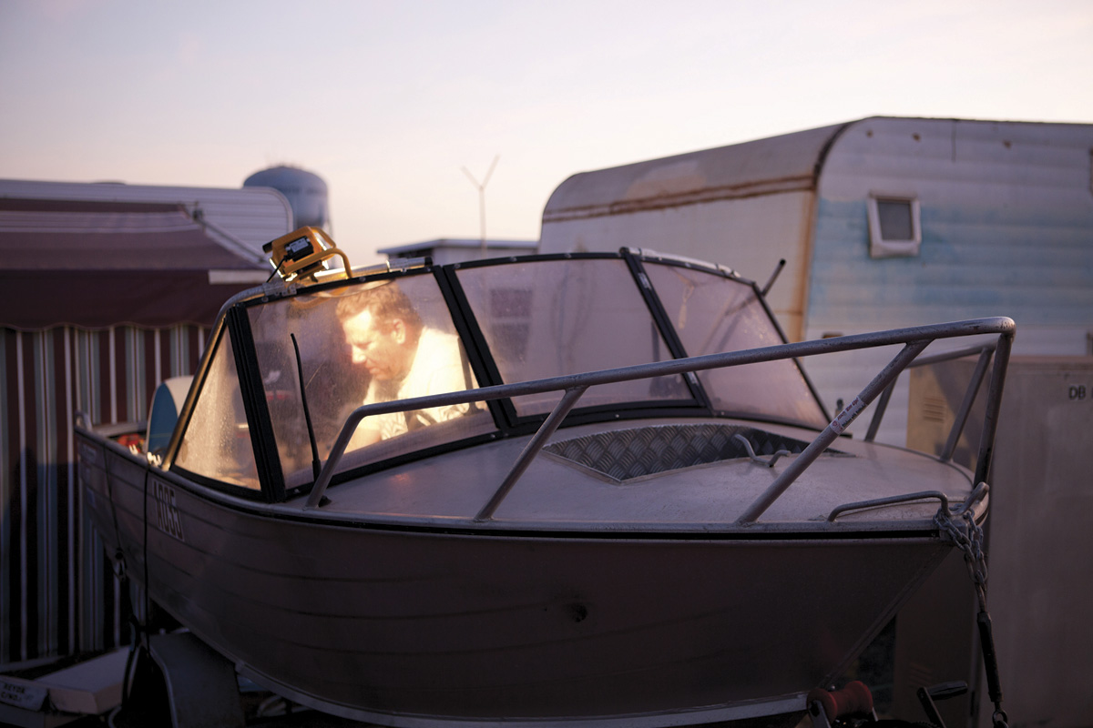
 

Martin Parr (British, 1952-2025) 'Blackrock Tourist Park, South Hedland, Australia, 2011' from the series 'Australia' 2011


Martin Parr (British, 1952-2025)
Blackrock Tourist Park
, South Hedland, Australia, 2011
From the series Australia
2011
Pigment print
Edition of 5
101.6 x 152.4cm
Image courtesy of the artist and Niagara Galleries, Melbourne
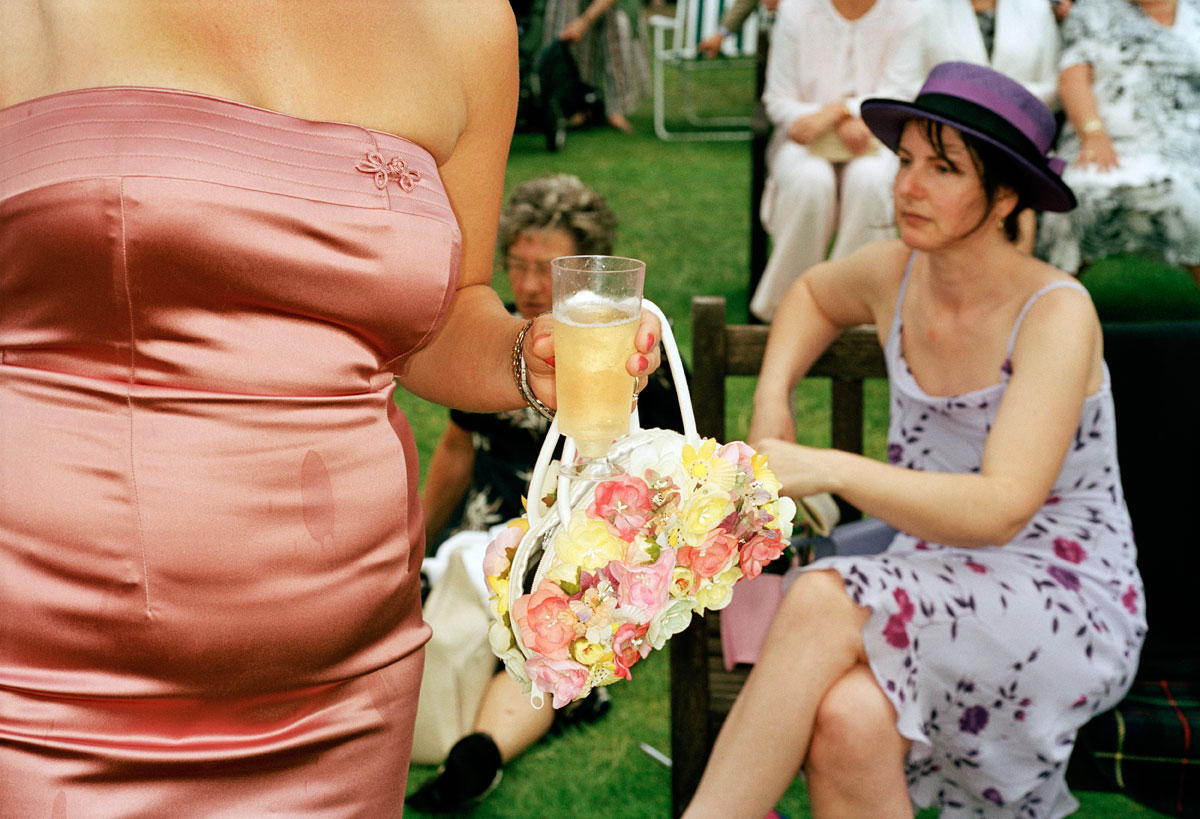
 

Martin Parr (British, 1952-2025) 'Ascot, England, 2003' from the series 'Luxury' 1995-2009


Martin Parr (British, 1952-2025)
Ascot, England, 2003
From the series Luxury
1995-2009
Traditional C-type print
Edition of 5
101.6 x 152.4cm
Image courtesy of the artist and Niagara Galleries, Melbourne
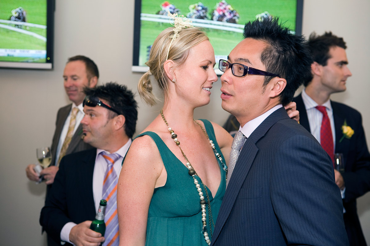
 

Martin Parr (British, 1952-2025) 'The Melbourne Cup, Australia, 2008' from the series 'Luxury' 1995-2009


Martin Parr (British, 1952-2025)
The Melbourne Cup
, Australia, 2008
From the series Luxury
1995-2009
Pigment print
Edition of 5
101.6 x 152.4cm
Image courtesy of the artist and Niagara Galleries, Melbourne
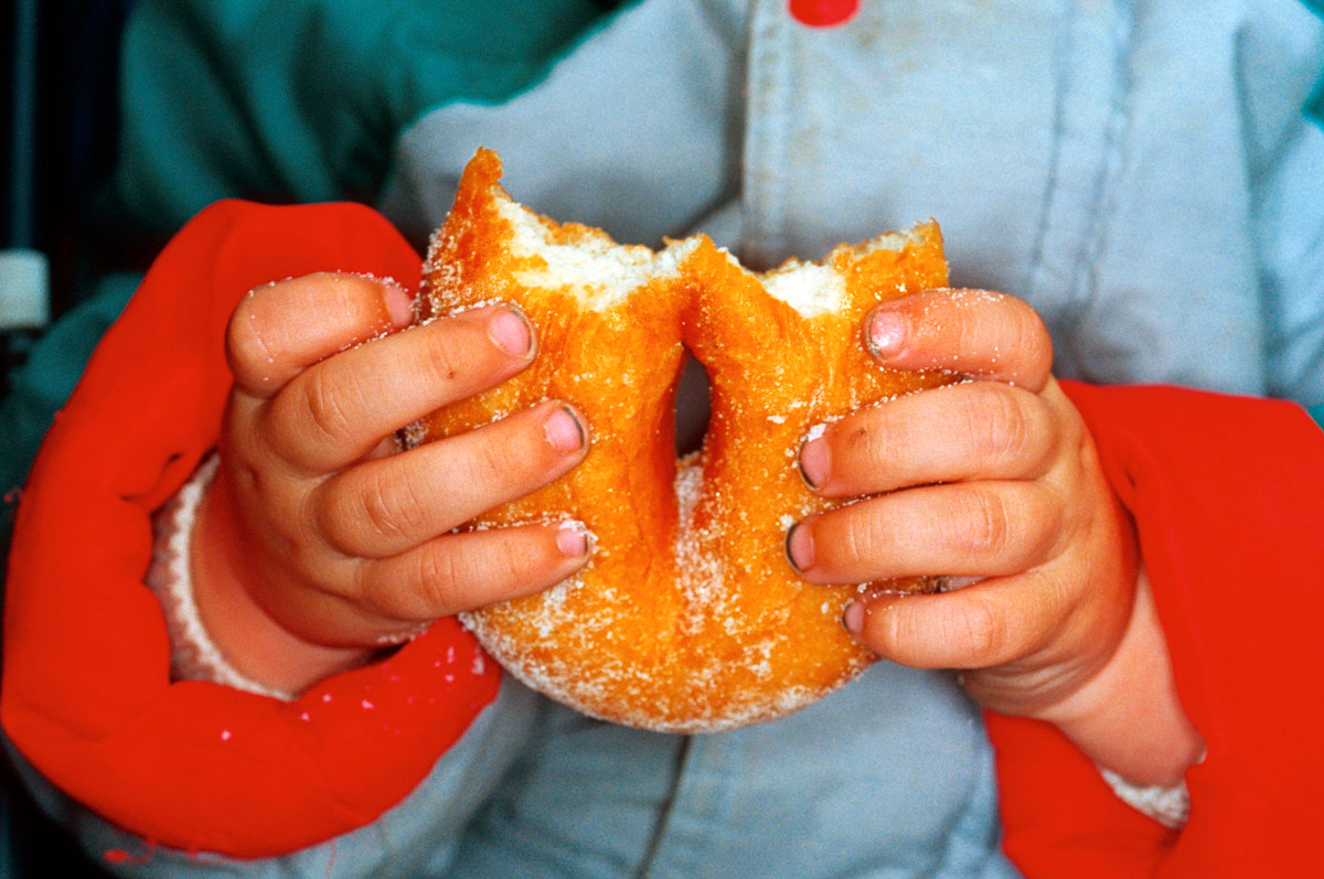
 

Martin Parr (British, 1952-2025) 'Ramsgate, England, 1996' from the series 'New British' 1994-1996


Martin Parr (British, 1952-2025)
Ramsgate
, England, 1996
From the series New British
1994-1996
Traditional C-type print
Edition of 5
105.5 x 157.5cm
Image courtesy of the artist and Niagara Galleries, Melbourne
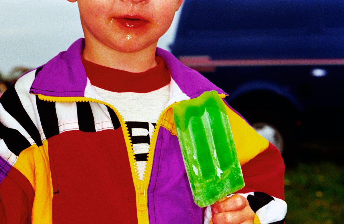
 

Martin Parr (British, 1952-2025) 'Car boot sale, Bristol, England, 1995' from the series 'British Food' 1994-1995


Martin Parr (British, 1952-2025)
Car boot sale, Bristol, England, 1995
From the series British Food
1994-1995
Traditional C-type print
Edition of 33
18 x 25.5cm
Image courtesy of the artist and Niagara Galleries, Melbourne


No Worries: Martin Parr – FotoFreo 2012

Magnum photographer Martin Parr was asked by FotoFreo Festival Director Bob Hewitt to photograph three Western Australian port cities, Fremantle, Broome and Port Hedland. Photographer David Dare Parker was assigned to document the project, the work titled No Worries.

© David Dare Parker


Niagara Galleries
245 Punt Road
Richmond, Melbourne
Victoria, 3121
Australia
Phone: +61 3 9429 3666

Opening hours:
Wednesday – Saturday 12pm – 5pm
Niagara Galleries website

LIKE ART BLART ON FACEBOOK

Back to top

Review: The work of Robyn Hosking, ‘AT_SALON’ at Anita Traverso Gallery, Richmond

“Every observation on contemporary politics, war and beauty regimes is concisely conceptualised and executed with panache and humour.” Dr Marcus Bunyan

Exhibition dates: 6th March – 24th March, 2012

Curator: the artist


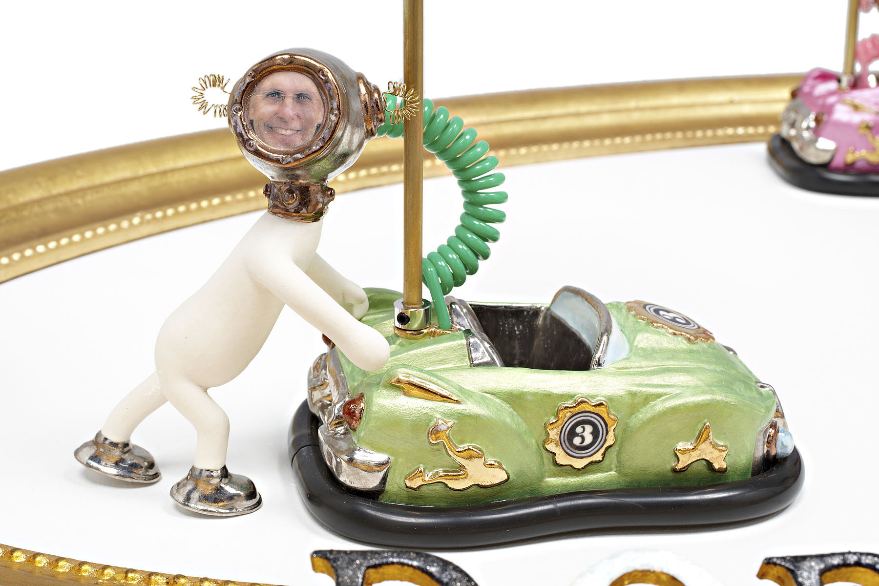
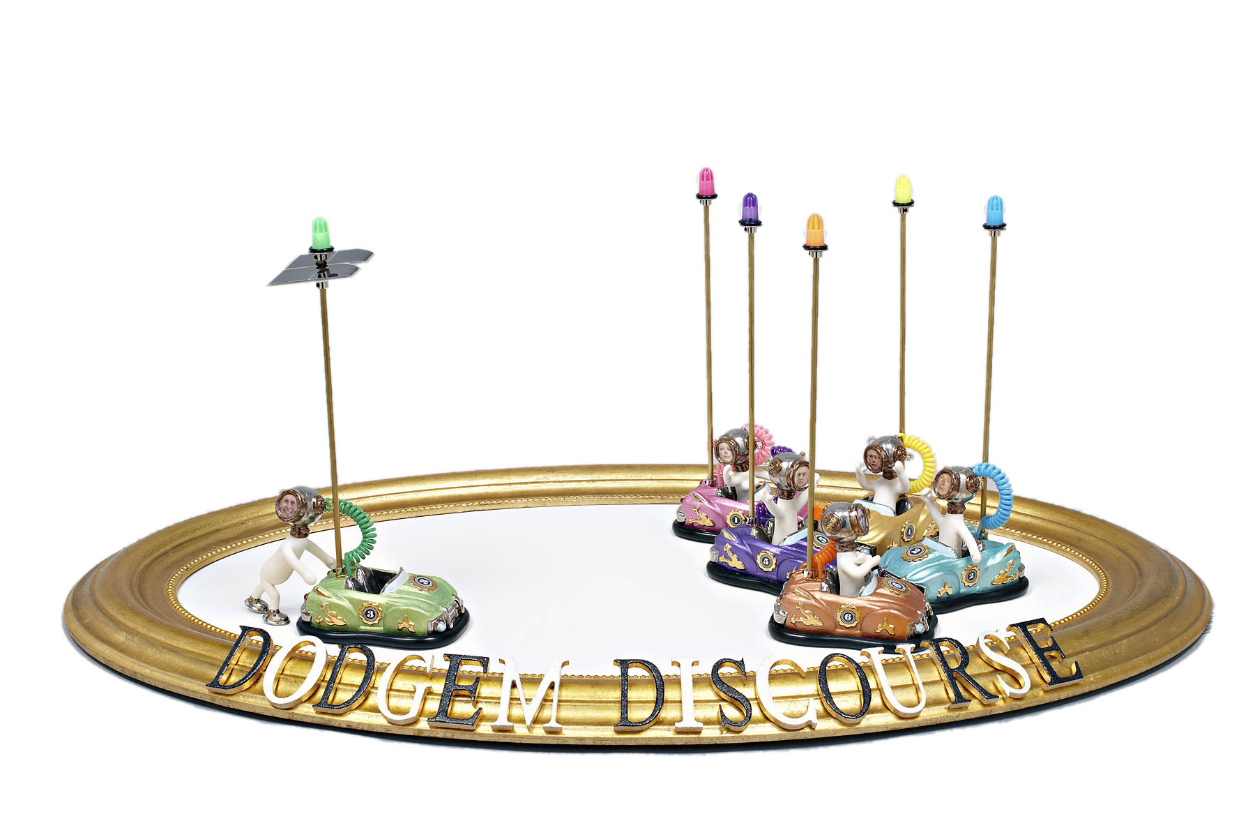
Robyn Hosking (Australian, b. 1948) 'Dodgem Discourse' 2011


Robyn Hosking (Australian, b. 1948)
Dodgem Discourse
2011
Mixed media


Although not the first to promote the concept, Anita Traverso Gallery must be congratulated for exhibiting nine unrepresented emerging and mid-career artists in the AT_SALON exhibition program. This inaugural exhibition features hand-picked artists practicing over a variety of media including ceramics, textiles, drawing, painting and photography allowing them to exhibit in a professional gallery environment which bridges the gap between artist-run spaces and full gallery representation.

Out of the nine artists it was the hilarious work of Robyn Hosking that was the standout for me. While guffaw inducing one couldn’t help but be entranced by these waggish, chimerical creations and wonder at their technical brilliance. Every detail, every nuance is meticulously observed and the sculptures are beautifully made (mostly using glazed ceramics). Every observation on contemporary politics, war and beauty regimes is concisely conceptualised and executed with panache and humour. For example, in the work Dodgem Discourse (2011) Senator Bob Brown, leader of the Australian Greens, is the only diver figure not to be in his dodgem car while everyone else is bashing into each other, having got out to push his car because the solar power has failed. What you cannot see in the photograph is that the lights atop the dodgem poles flash on and off on every other car except his! While Julia Gillard’s car is emblazoned with the number 1 on its side, another gem is that the number plates say “Question Time” referring to question time in Parliament, but also a double entendre as the viewer questions the supposed wisdom of our elected officials.

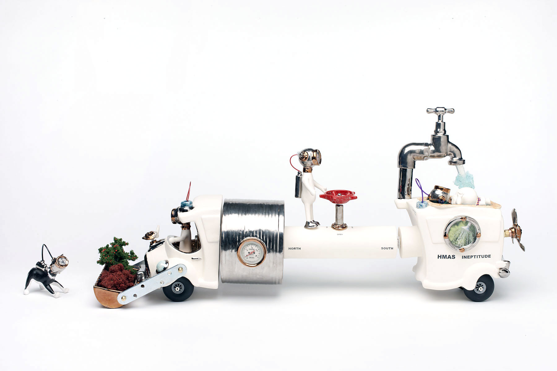
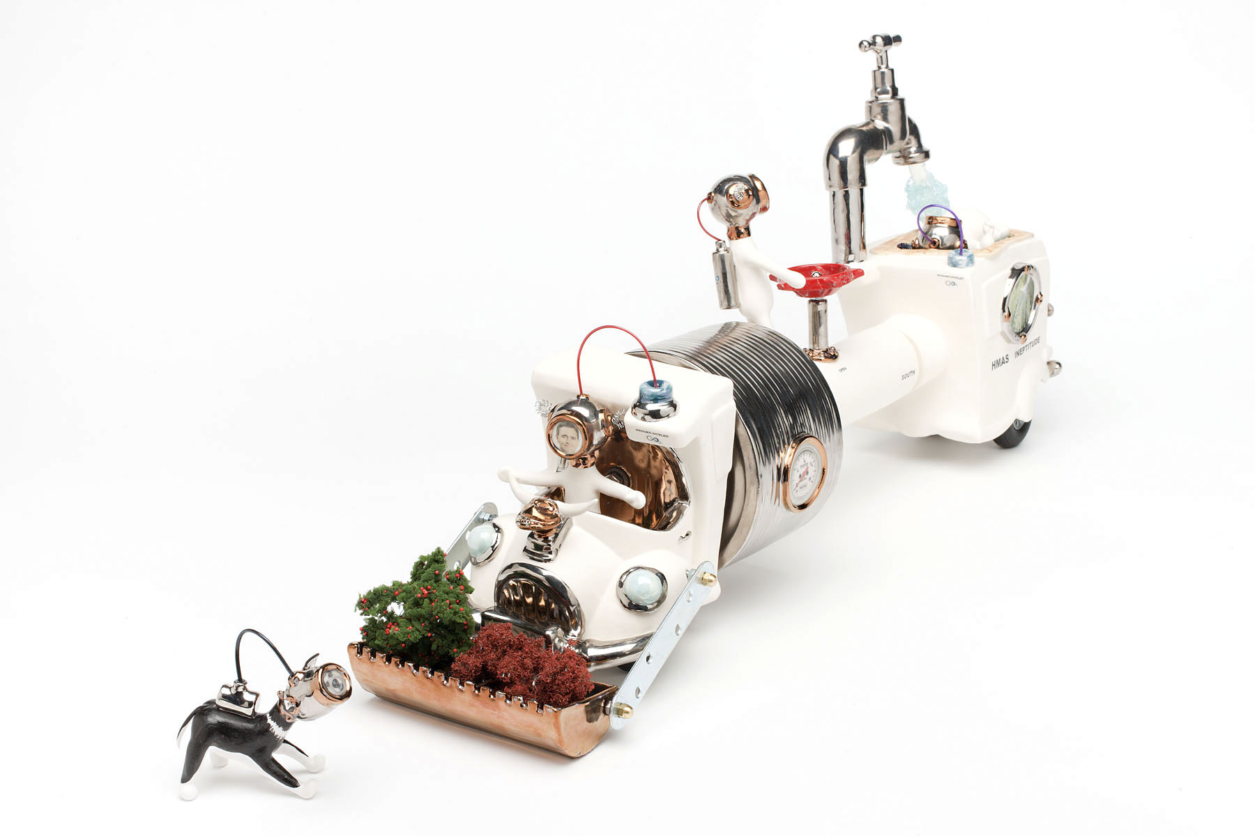
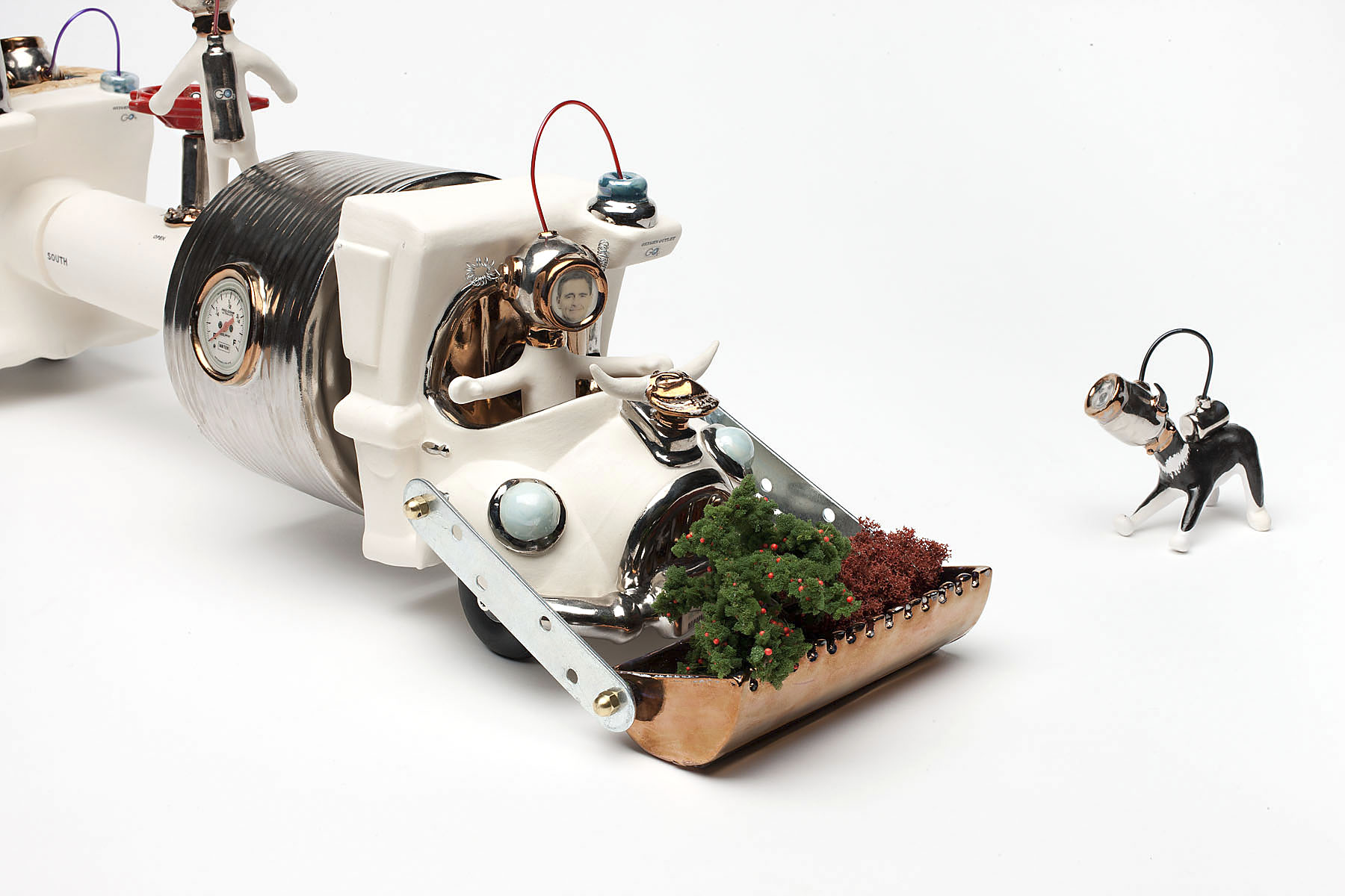
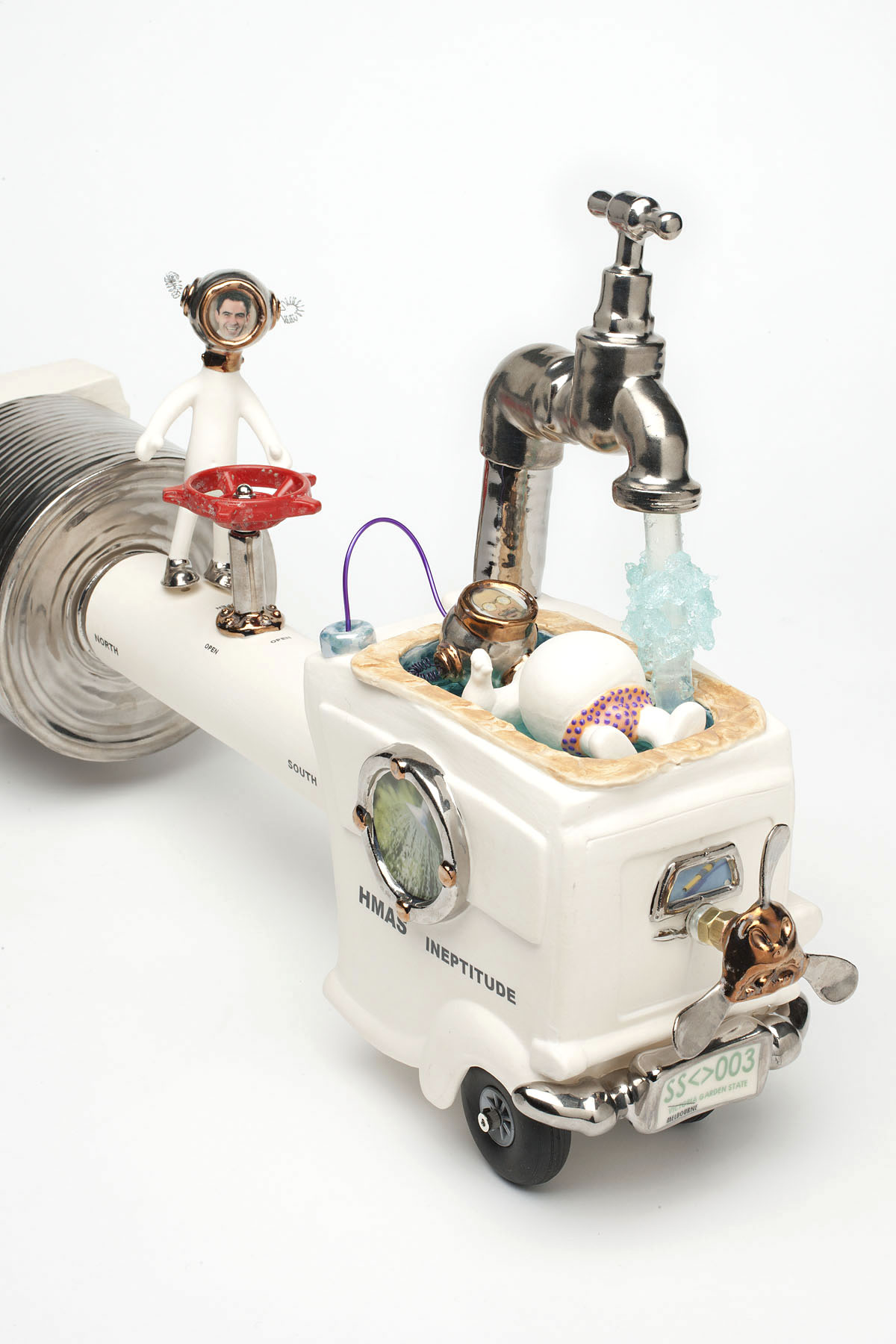
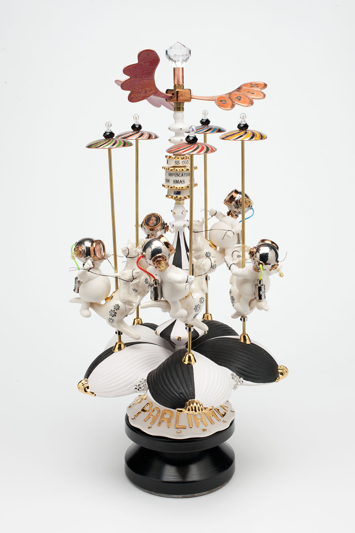
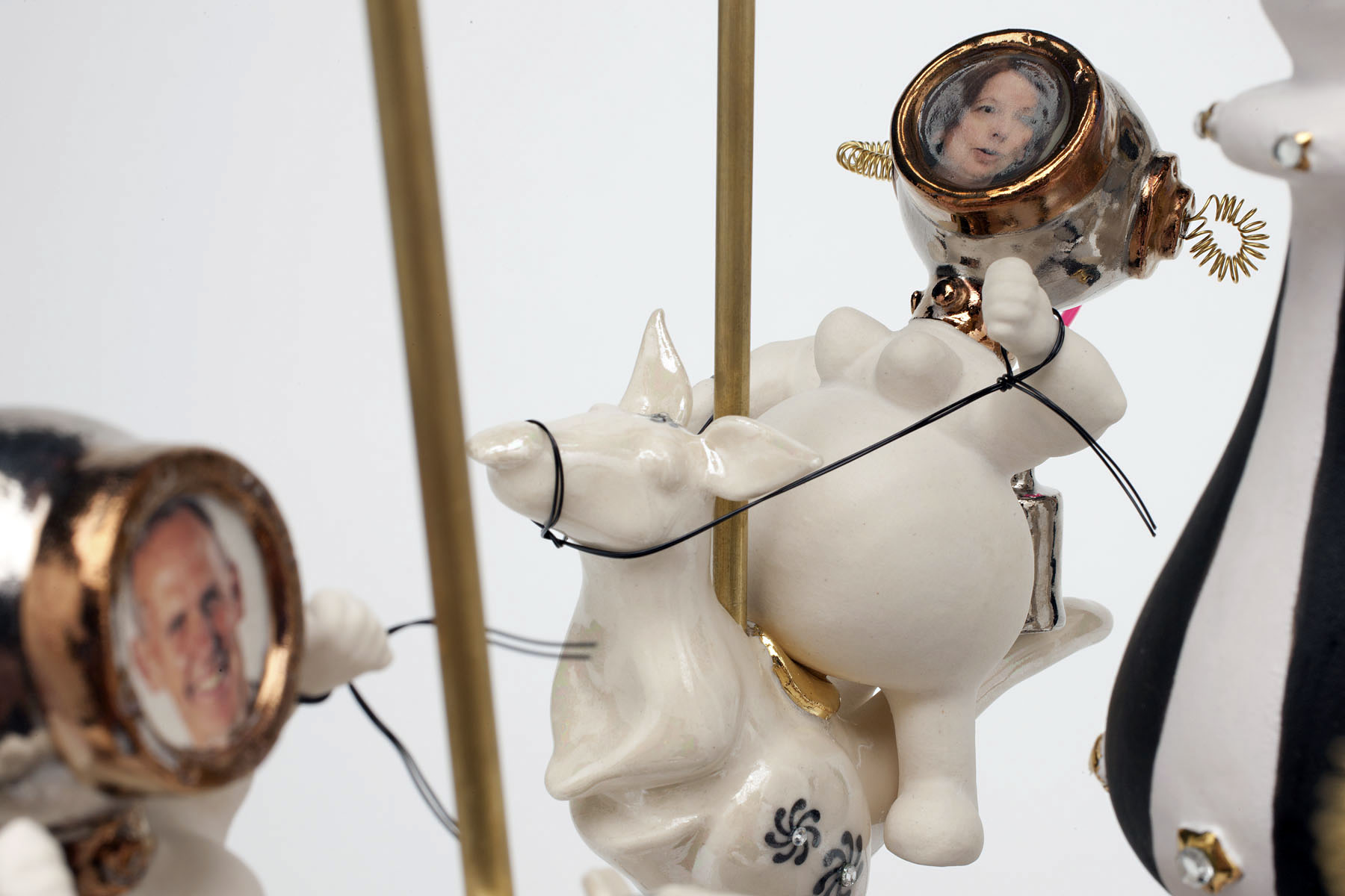
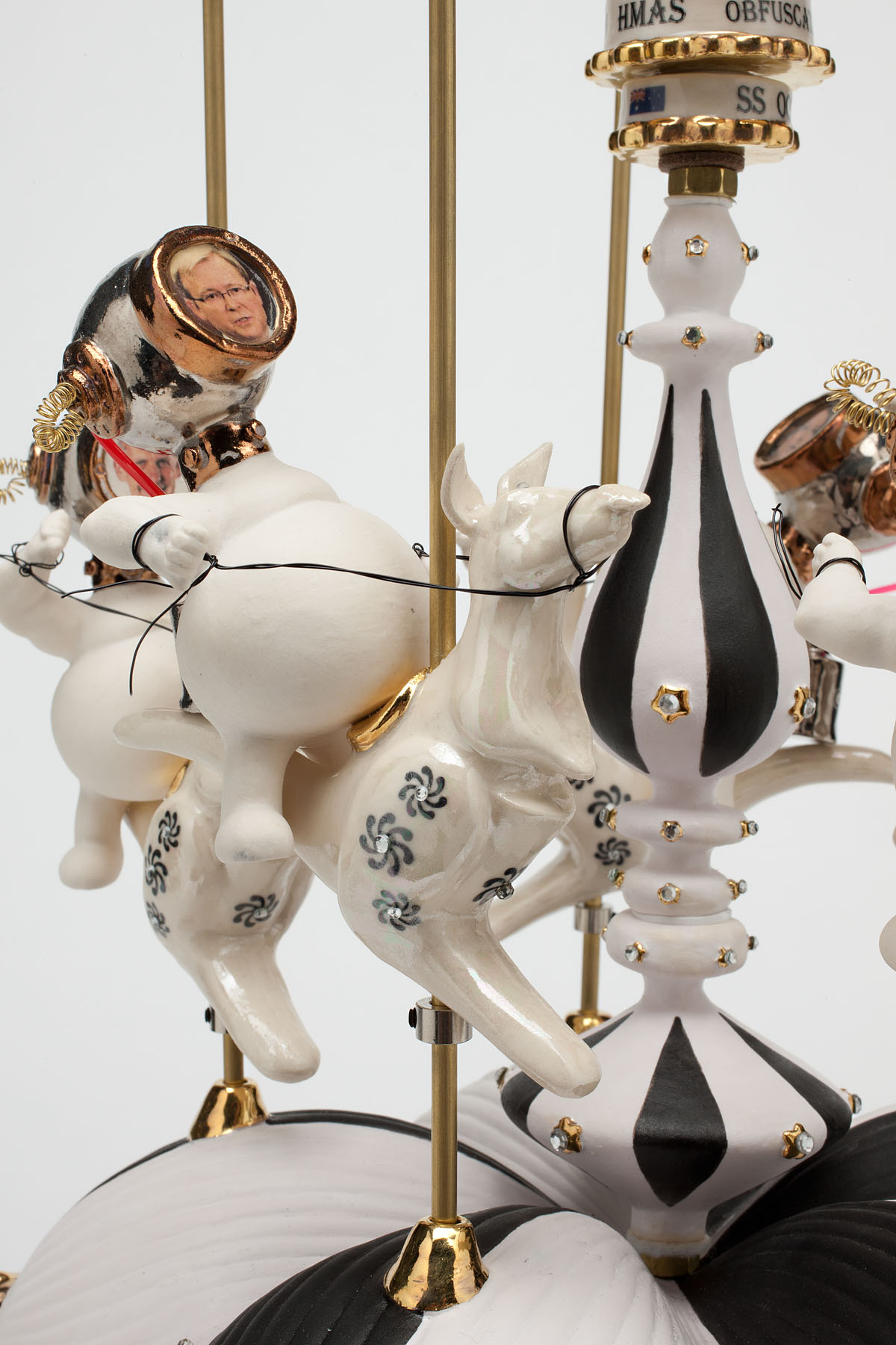
HMAS Ineptitude (2011) assiduously comments on the white elephant that is the North South pipeline while the slowly revolving HMAS Obfuscation (2011) – how I love that word: the hiding of intended meaning in communication, making communication confusing, wilfully ambiguous – spins the SPIN, spelt out on the wing-like form at the top of the sculpture, on the machinations of our politicians who are mounted on rearing ceramic kangaroos with the large, gold lettered word PARLIAMENT on the base. Profound, amusing and beautifully made.

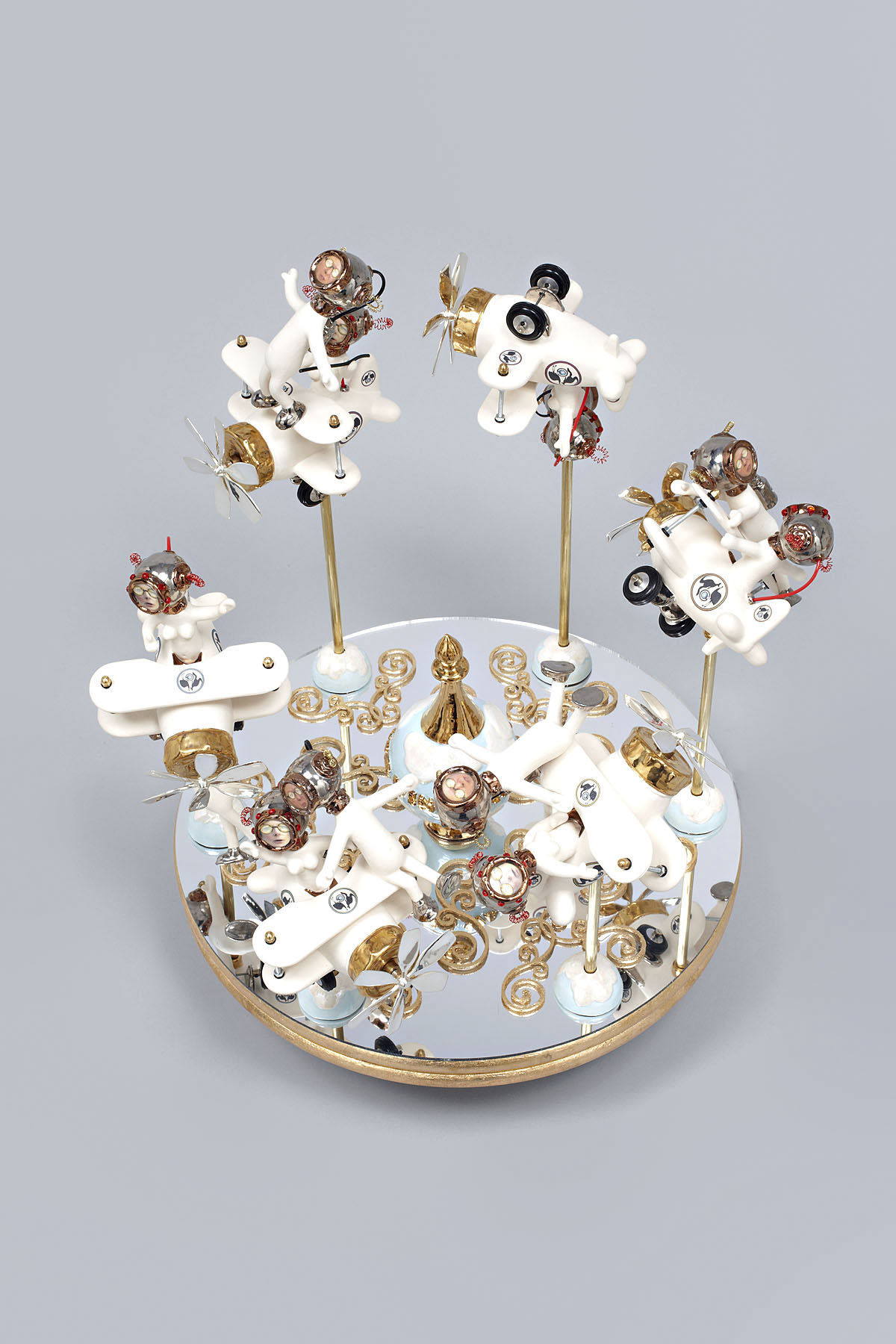
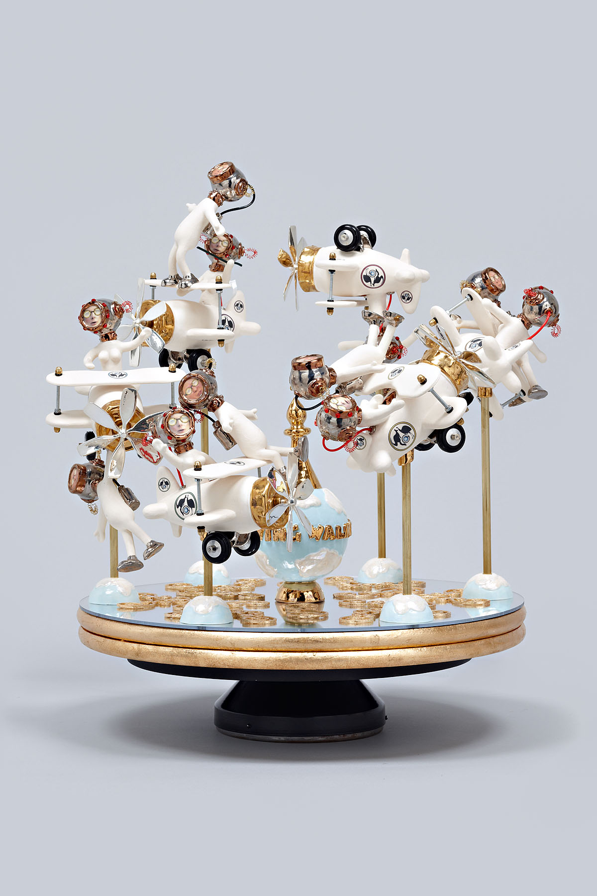
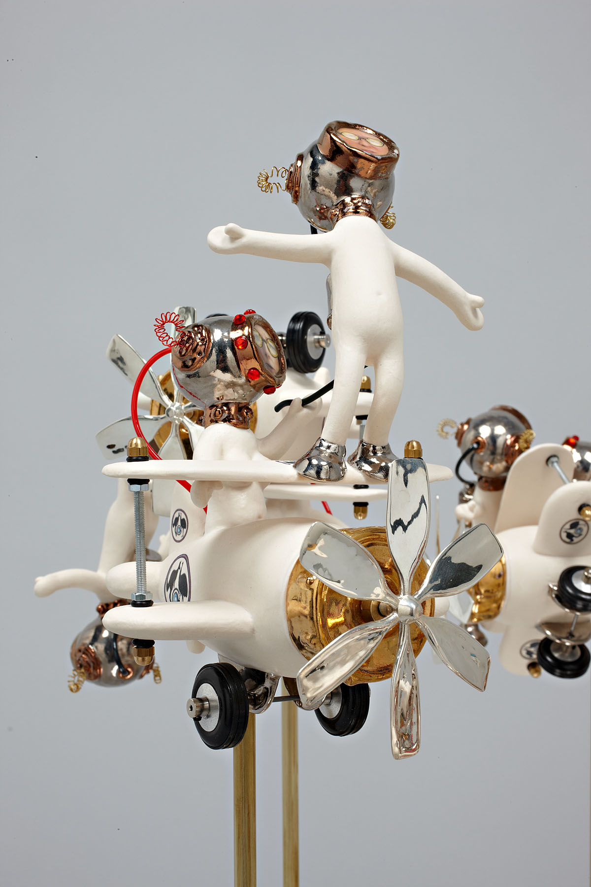
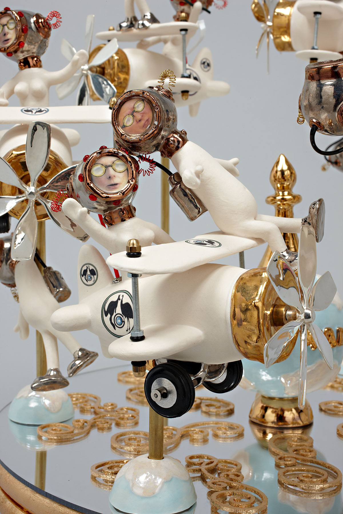
My favourite has to be The Wing Walker (2011) as an irate Julia Gillard tries to get rid of Kevin Rudd once and for all, even poking him with a stick to push him off the edge of the biplane. Balanced on a slowly revolving turntable with the world at its centre, this political merry-go round is panacea for the soul for people sick of politicians. This is brilliant political satire. The planes are all ends up and even when Julia thinks she has got rid of Kevin there he is, hanging on for dear life from the undercarriage of one of the planes. Priceless…

Reminding me of the fantasy creatures of Tom Moore, these whimsical manifestations deal with serious, life changing and challenging issues with purpose, feeling and a wicked sense of humour. I really enjoyed this art (and joy is the correct word) because it takes real world issues, melds fantasy and pointed observation and reflects it back, as the artist observes, in a funfair’s distorted mirror.

Magic!

Dr Marcus Bunyan


Many thankx to Anita for allowing me to publish the photographs in the posting. Please click on the photographs for a larger version of the image.


Robyn Hosking (Australian, b. 1948) 'Dodgem Discourse' 2011 (detail)


Robyn Hosking (Australian, b. 1948)
Dodgem Discourse (detail)
2011
Mixed media


Robyn Hosking (Australian, b. 1948) 'The Wing Walker' 2011

Robyn Hosking (Australian, b. 1948) 'The Wing Walker' 2011


Robyn Hosking (Australian, b. 1948)
The Wing Walker
2011
Mixed media


Robyn Hosking (Australian, b. 1948) 'The Wing Walker' 2011 (detail)

Robyn Hosking (Australian, b. 1948) 'The Wing Walker' 2011 (detail)


Robyn Hosking (Australian, b. 1948)
The Wing Walker (detail)
2011
Mixed media


Robyn Hosking Artist Statement

My work launches a humorous, freewheeling attack on our desensitisation to the white noise and emptiness surrounding us. Looking like a hybrid between art, machine and toy, my sculptures maintain a circus-like sense of amusement and curiosity for the viewer, all the while sending up societal norms and politics.

I like to celebrate the lavishly eccentric design of past eras and the sense of possibility it embodied. As hackneyed as it sounds, a Brave New World is upon us, stranger perhaps than our imaginations can conceive of. While my work casts a disparaging eye at the use of technology for inane and selfish reasons – from Botox to weaponry – it retains a playful, humorous edge. I am not interested in producing depressingly macabre images. Every work becomes a caricature or parody, as though the world is being viewed in a funfair’s distorted mirror.


Robyn Hosking (Australian, b. 1948) 'HMAS Ineptitude' 2011

Robyn Hosking (Australian, b. 1948) 'HMAS Ineptitude' 2011


Robyn Hosking (Australian, b. 1948)
HMAS Ineptitude
2011
Mixed media


Robyn Hosking (Australian, b. 1948) 'HMAS Ineptitude' 2011 (detail)

Robyn Hosking (Australian, b. 1948) 'HMAS Ineptitude' 2011 (detail)


Robyn Hosking (Australian, b. 1948)
HMAS Ineptitude (detail)
2011
Mixed media


Robyn Hosking (Australian, b. 1948) 'HMAS Obfuscation' 2011


Robyn Hosking (Australian, b. 1948)
HMAS Obfuscation
2011
Mixed media


Robyn Hosking (Australian, b. 1948) 'HMAS Obfuscation' 2011 (detail)

Robyn Hosking (Australian, b. 1948) 'HMAS Obfuscation' 2011 (detail)


Robyn Hosking (Australian, b. 1948)
HMAS Obfuscation (detail)
2011
Mixed media


Anita Traverso Gallery

Anita Traverso Gallery website

LIKE ART BLART ON FACEBOOK

Back to top

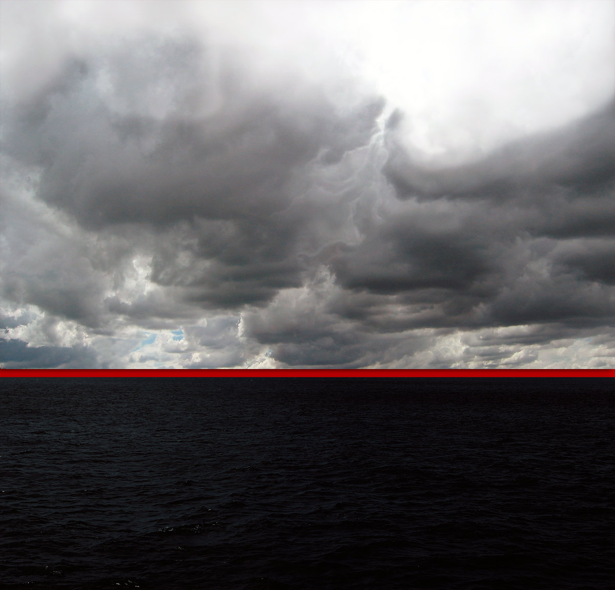
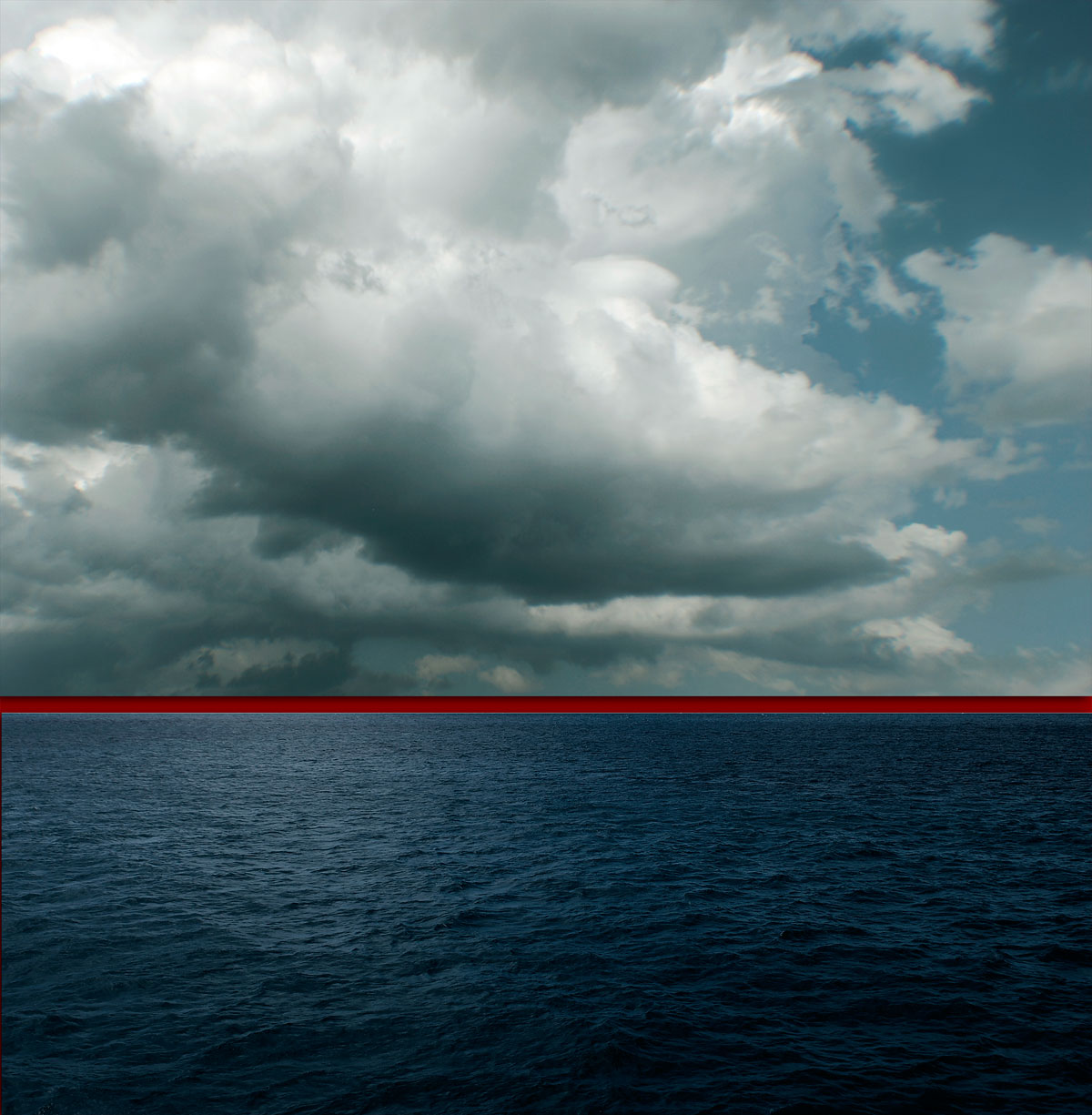
Opening: ‘Traverse’ by Kim Percy at Stockroom, Kyneton

Exhibition dates: 10th March – 8th April 2012

Curator: the artist


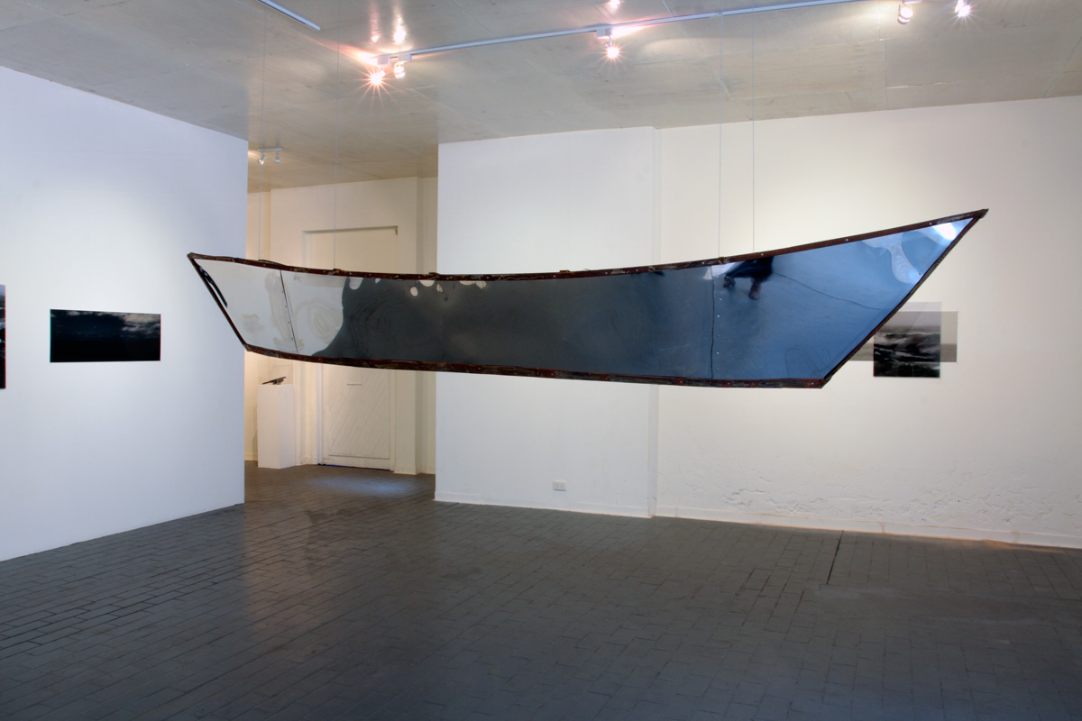
Installation of 'Traverse' by Kim Percy at Stockroom, Kyneton


Installation of Traverse by Kim Percy at Stockroom, Kyneton
Installation photograph by Marcus Bunyan
© Kim Percy and Marcus Bunyan


Many thanx to Jason, Magali and Kent for inviting me to the gallery, and Kim for asking me to open the exhibition – it was fun!

I have known Kim since the early 1990s when we both did our Bachelor of Arts in photography at RMIT University so it was wonderful to have opened her show yesterday. Reprinted below is the speech I gave at the opening with its musings on the (in)visibility of asylum seekers arriving by boat in Australia.

I hope you enjoy reading the text.

Marcus


Opening speech by Dr Marcus Bunyan, 10th March 2012

Out of Sight, Out of Mind
__________________


“What I am about to say, my musings if you like, are inspired by Kim’s wonderful installation. The work before you is the basis of my inquiry. The issues involved are difficult and not to be dealt with lightly but I hope you will follow my drift, my traverse if you like.

I would like to take you on a journey – physical, metaphorical and maybe even philosophical. I want to ask questions of the world, questions about the journey we all take as human beings. These questions are prompted by my personal response to two elements of Kim’s work – water and the journey, specifically the image of asylum seekers arriving here in Australia. Imagine being an asylum seeker making that journey.

Imagine living in an (in)between space, living in a refugee camp over there. Marc Augé coined the phrase “non-place” to refer to places of transience that do not hold enough significance to be regarded as “places.”1 These camps are such places. Put yourself in that predicament, seeking a better life, seeking to escape persecution, war (of which we as a nation are often part), prejudice and death, deliberately placing yourself and your family in a fragile boat, like a seed pod floating upon the waters, taking the dangerous journey to reach Australia. Imagine the emotional and intellectual turmoil that must surround such a decision, the decision to place your life in the hands of the ocean. Important decisions affecting the entire course of one’s life are rarely made without some form of mental distress.

Nurtured in water, some baptised in it, water is the life-blood of the world and the asylum seeker must trust to its benevolence. Marc Augé “argues that we are in transit through non-place for more and more of our time, as if between immense parentheses.”2 This is the journey that the asylum seeker takes over water, a journey through an interstitial space that has no beginning and no end caught between a set of parentheses [insert life here / or not].

Now let us move our line of sight. What about a visual parentheses?


Asylum seekers are almost invisible from Australia living over there. They are over the horizon, out of sight and out of mind. When they journey across the sea – an open ended journey passing through a liminal space, a forgotten space – they suddenly appear as if by magic washed up on the shore, unseen despite surveillance planes, ships and other forms of tracking and reconnaissance. Think, for example, of the sudden and surprising arrival of the boat SIEV-221 when it was washed onto the rocks of Christmas Island in December 2010. The invisible made visible caught in a non-place.

This (in)visibility can be evidenced in other ways. The specks of humanity waving from the deck of the Tampa, the asylum seekers being escorted from arriving boats, seen for a few brief seconds on the evening news and then disappearing from view, almost like being sucked into the depths of the sea. Here and not here; here and there. Halfway between nothingness and being: they walk between one state and another, forward and backward, backward and forward.

Displacement
Diaspora
Disruption


The spectacle of the asylum seekers is despectacularised by and for the viewer. We remove ourselves from the emotion of these people, the presence of these images. They become ordinary as if seen from far away – glimpsed every so often as though viewing the world of another. They become Other.

The movement of the ship, the movement of the sky, the movement of vision is a constant decentering through a push / pull with something else – some other order of the world. Their journey into the unknown is a journey to submit to the ordering of another: the socially constructed system of classification: “refugee,” “asylum seeker.” The axis of visibility3 that operates in relation to subject, object, and space is not interrogated as to the representations that are constructed. This is what I am interested in here. These vital, alive human beings come from one taxonomic system (of ordered death, persecution, injustice), become visible from a brief instance, and are then fed into another taxonomic system of order – that of the detention centre.

Taking the metaphor of the horizon line further, I would argue that detention centres are like an inverted Panopticon. The Panopticon “is a type of institutional building, a prison, designed by English philosopher and social theorist Jeremy Bentham in the late eighteenth century. The concept of the design is to allow an observer to observe all inmates of an institution without them being able to tell whether or not they are being watched.”4 The guard sits in a central tower and can observe and inspect all prisoners on the outer 360 degree circle, while the prisoners cannot see the guard and can only presume he is there (an omnipresent God) and hence they behave.

Let us invert this concept.

Now the asylum seekers sit in the tower looking outwards, seeing the promised land but unable to touch it and the guards (prison officers, government, the Australian people) are all around but most are blind. They look inwards but cannot see / they look outwards and most go about their daily business. The perimeter fence of the detention centre becomes the horizon line of the sea. As in Kim’s red lined horizons, over the horizon is out of sight, out of mind 
___________________________________


What Kim’s eloquent, minimal, brooding installation does is hold our attention and ask certain questions of us as human beings. If photography is a mode of visually addressing a certain order in the world – be it horror, war, peace, human tragedy, public, private – and then destabilising it, then Kim destabilises the binary sea / sky through fragmentation and isolation. She redlines our experience and asks us to inhabit the non-space, the non-place of the gallery, allowing us to hover between boat and image, between sea and sky, between seeing and feeling. Through her work she asks us to become more aware. She asks us to see things more clearly. Above all she asks us to have faith in the compassion of human beings.

The asylum seekers have faith: faith to get into a fragile boat to venture upon the sea in search of a better life. If we had more faith in ourselves then we would have less need to rely on the images of the past, a white colonial past.

I will finish with a quote from Jeff Brown.

“Sometimes we have to surrender to the not knowing. At other times, it is helpful to adventure outward and explore new possibilities. Like swashbucklers of the spirit, we bravely seek out any experience that might inform our path. When we are afraid of something, we live it fully and see what floats to the surface in the doing. We participate in our own revealing. We have faith in the shaping of what we cannot see.”5


The seekers surrender to the not knowing and have faith in the shaping of what they cannot see. These risk takers are the strong ones that are going to make a difference in a new society by the very fact of their strength and determination to survive and live in a free society, for the very fact of the risks undertaken. This exhibition informs their path as it informs our path. Be aware of the doing, be bold and forthright in the being. Enjoy.

Thank you

Dr Marcus Bunyan


Footnotes

1/ Augé, Marc (trans. John Howe). Non-Places: Introduction to an Anthropology of Supermodernity. London: Verso, 1995

2/ Ibid.,

3/ Hooper-Grenhill, Eilean. Museums and the Shaping of Knowledge. London: Routledge, 2000, p. 7

4/ Anon. “Panopticon,” on Wikipedia [Online] Cited 09/03/2012

5/ Brown, Jeff. Soulshaping. Berkeley, CA: North Atlantic Books, 2009, np quoted on Stroud, Jeff. The reluctant blogger website. [Online] Cited 09/03/2012


Installation of 'Traverse' by Kim Percy at Stockroom, Kyneton

Installation of 'Traverse' by Kim Percy at Stockroom, Kyneton


Installation of Traverse by Kim Percy at Stockroom, Kyneton
Installation photographs by Marcus Bunyan
© Kim Percy and Marcus Bunyan


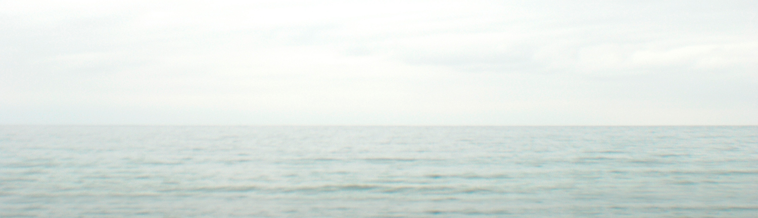
Kim Percy (Australian) 'Pale Sea' 2012


Kim Percy (Australian)
Pale Sea
2012
Digital photograph


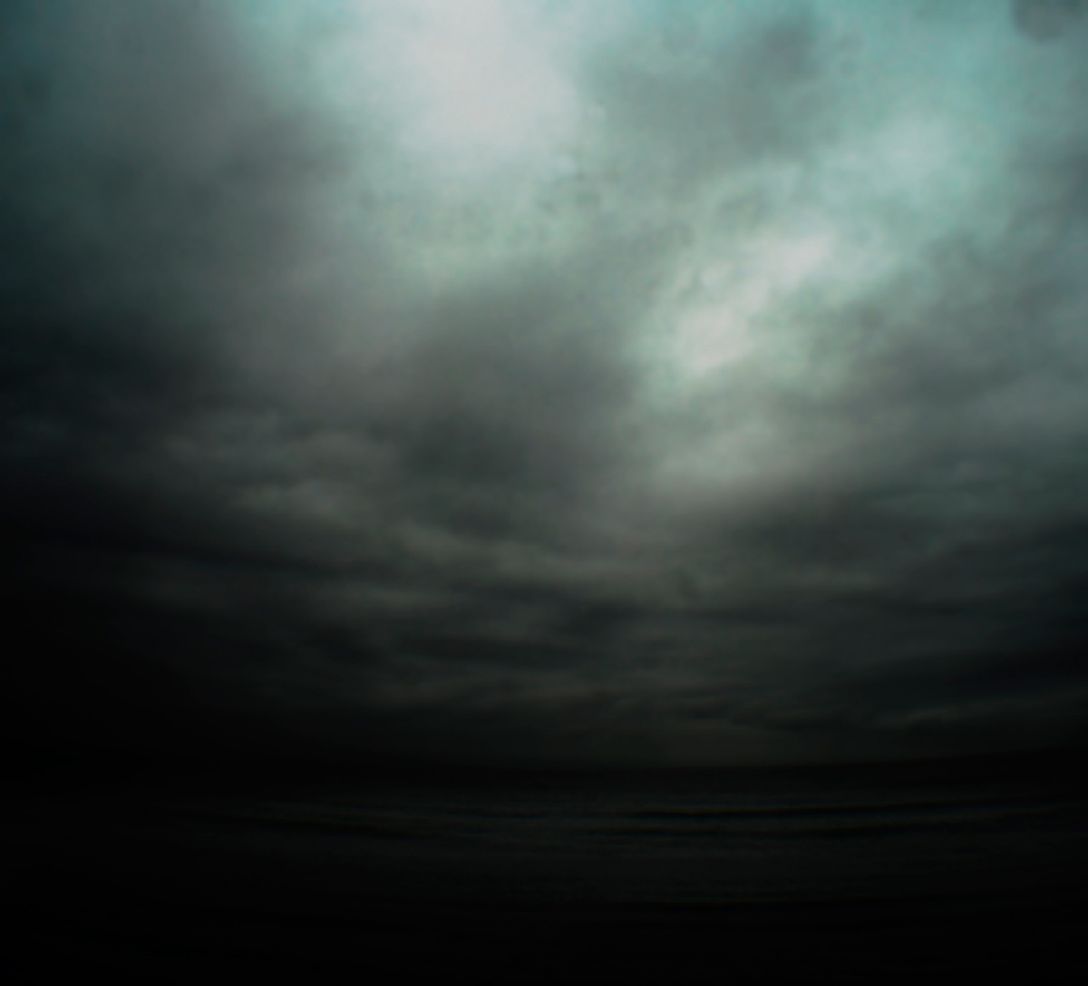
Kim Percy (Australian) 'Where' 2012


Kim Percy (Australian)
Where
2012
Digital photograph


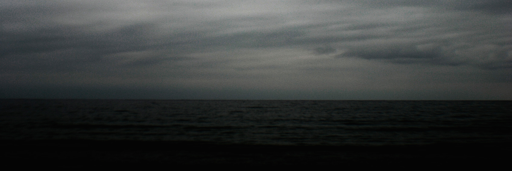
Kim Percy (Australian) 'Rough Water' 2012


Kim Percy (Australian)
Rough Water
2012
Digital photograph


Kim Percy (Australian) 'Traverse' 2012


Kim Percy (Australian)
Traverse
2012
Digital photograph


Kim Percy (Australian) 'Red Horizon No.1' 2012


Kim Percy (Australian)
Red Horizon No.1
2012
Digital photograph


Kim Percy (Australian) 'Red Horizon No.2' 2012


Kim Percy (Australian)
Red Horizon No.2
2012
Digital photograph


Stockroom
98 Piper street, Kyneton
Phone: 03 5422 3215

Opening hours:
Thursday – Saturday 10am – 5pm
Sunday 11am – 3pm
Closed Monday and Tuesday
Wednesday by appointment

Stockroom website

LIKE ART BLART ON FACEBOOK

Back to top

Exhibition: ‘Joel Sternfeld – Color Photographs since 1970’ at Foam, Amsterdam

Exhibition dates: 16th December, 2011 – 14th March, 2012


Foam Curator Colette Olof on Joel Sternfeld


In mid-December Foam will present the first major retrospective exhibition in the Netherlands of the work of Joel Sternfeld (1944, New York), one of the pioneers of colour photography. Foam will be showing more than one hundred photos from ten different series in an exhibition spanning two floors. A highlight is Sternfeld’s early work from the 1970s, which has never been previously exhibited. A large selection from famed series such as American Prospects, the result of his legendary journey through the United States, and Stranger Passing will also be on show. A constant factor in his work is his native land America, its inhabitants and the traces left by people on the landscape. With a subtle feeling for irony and an exceptional feeling for colour, Sternfeld offers us an image of daily life in America over the last three decades.

New Color Photography

Along with William Eggleston and Stephen Shore, Sternfeld saw to it that colour photography became a respected artistic medium in the 1970s. Until that time, colour was used widely in advertising and amateur photography, but was rarely seen in museums and galleries. Sternfeld was influenced by the colour theory of the Bauhaus and by the work of William Eggleston, whose exhibition in MoMA in 1976 marked the official acceptance of colour photography in the art world.

Early Work

A typical ‘street photographer’ style can be recognised in Sternfeld’s early and as yet unknown work, using a 35mm camera, to record everyday life in America. This work already contained the characteristics that made his later work so successful. In 1978, Joel Sternfeld began a long journey through the United States. For eight years he crisscrossed his homeland and recorded everything he encountered with his large-format camera. His investigation into the landscape and people moving within it resulted in the American Prospects series (1979-1983). In Stranger Passing (1987-2000) Sternfeld concentrated on people. He photographed them in an unambiguous way: from the same distance and looking directly into the camera. This series is a portrait of a society, comparable to the magnum opus of August Sander in the early twentieth century. Just as in American Prospect, there is evidence of a light absurdism as well as sympathy for those being portrayed.

The American Landscape

For the On This Site series (1993-1996), Sternfeld photographed urban and rural locations which were at first glance unremarkable. In the accompanying text, however, it becomes clear that these were the locations of ‘crime passionnels’, racial violence and stabbings. The photos thus acquire an entirely different connotation. In Sweet Earth (1993-2005) Sternfeld shows alternative lifestyles and communities which have arisen in America over the past two centuries. He travelled to the homes and communities of people that do not fit into conventional lifestyles and instead pursue another way of life. In Oxbow Archive (2005-2007) Sternfeld depicts the effects of the changing seasons on the landscape and how human behaviour influences nature.”

Press release from Foam website


Foam
Keizersgracht 609
1017 DS Amsterdam
The Netherlands
Phone: + 31 20 5516500

Opening hours:
Mon – Wed 10.00 – 18.00 hrs
Thu – Fri 10.00 – 21.00 hrs
Sat – Sun 10.00 – 18.00 hrs

Foam website

LIKE ART BLART ON FACEBOOK

Back to top

Exhibition: ‘Saul Leiter: New York Reflections’ at the Jewish Historical Museum, Amsterdam

Exhibition dates: 24th October, 2011 – 4th March, 2012

Curator: prepared directly by the museum (JHM) in collaboration with the Howard Greenberg Gallery


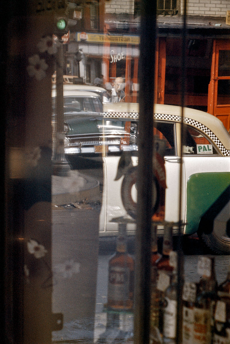
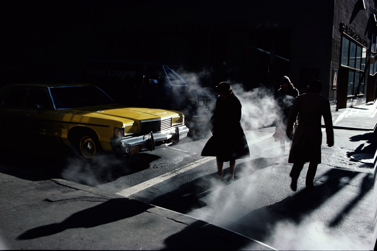
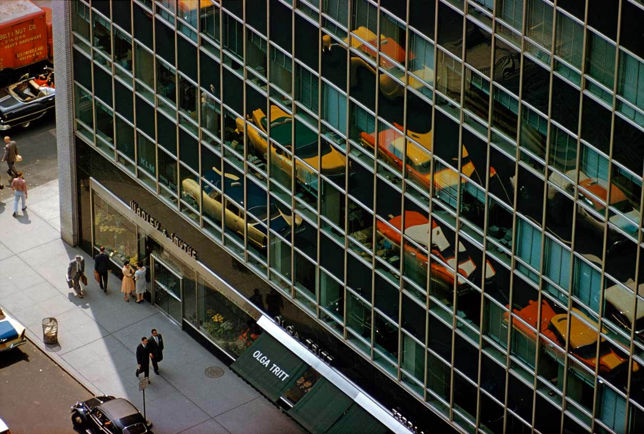
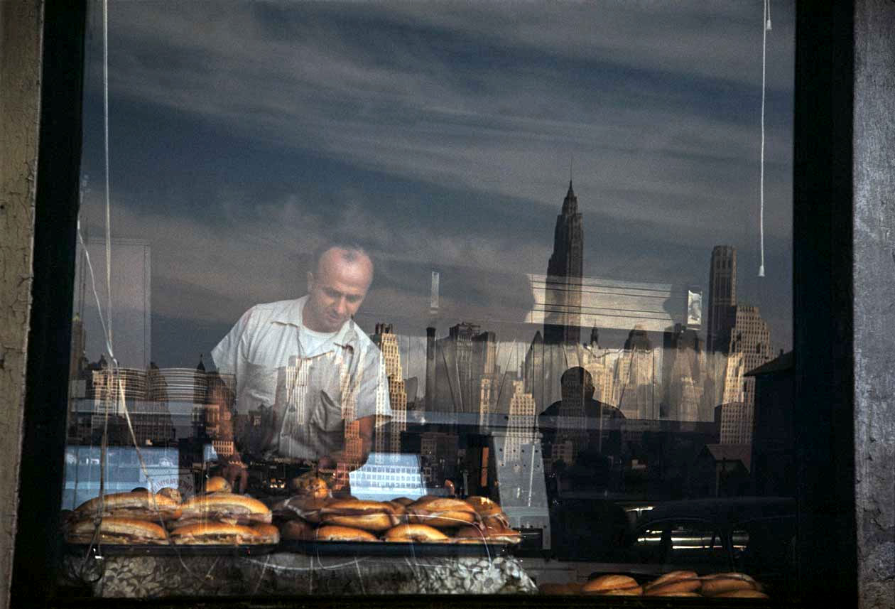
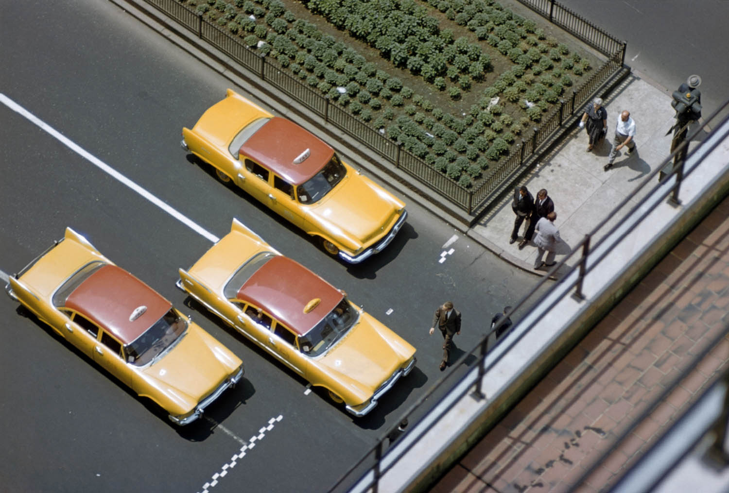
Saul Leiter (American, 1923-2013) 'Taxi' 1957 from the exhibition 'Saul Leiter: New York Reflections' at the Jewish Historical Museum, Amsterdam, October 2011 - March 2012


Saul Leiter (American, 1923-2013)
Taxi
1957
© Saul Leiter, Collection Howard Greenberg Gallery, New York


“I must admit that I am not a member of the ugly school. I have a great regard for certain notions of beauty even though to some it is an old fashioned idea. Some photographers think that by taking pictures of human misery, they are addressing a serious problem. I do not think that misery is more profound than happiness.”


“Seeing is a neglected enterprise.”


Saul Leiter


“Leiter’s sensibility… placed him outside the visceral confrontations with urban anxiety associated with photographers such as Robert Frank or William Klein. Instead, for him the camera provided an alternate way of seeing, of framing events and interpreting reality. He sought out moments of quiet humanity in the Manhattan maelstrom, forging a unique urban pastoral from the most unlikely of circumstances.”


Martin Harrison. ‘Saul Leiter Early Color’


The first of two postings on the underrated, underexposed American photographer Saul Leiter.* These photographs are a delightful surprise!

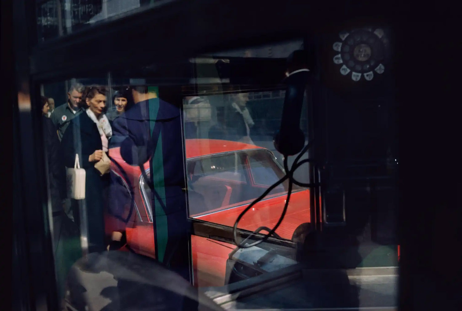
Some, like Through Boards (1957, below) are as illuminating as any Rothko going around. His art is not of the documentary gaze but of a brief glimpse, glanz, refulgence of desire ∞ snatched from the nonlinearity of time ∞ cleft in(to) its fabric. What wonderfully composed reflections they are. I absolutely adore them.

The media release states, “… but where his color photography is concerned, he cannot be compared with any other photographer. In the 1940s and 1950s, Leiter was virtually the only non-commercial photographer working in color.”

Galleries and museums must beware such bombastic claims.

Other photographers working in colour in the 1940s-50s include Paul Outerbridge, László Moholy-Nagy, Nickolas Muray, Jack Smith, Eliot Porter and William Eggleston to name but a few (also see the posting on the exhibition Beyond COLOR: Color in American Photography, 1950-1970).

The second posting will be from a major retrospective of his work at The House of Photography at Deichtorhallen.

Perhaps this photographer is finally getting the accolades he so rightly deserves.

Dr Marcus Bunyan

* Since this posting in 2012, the work of Saul Leiter has come to prominence and the artist is now (in 2026) rightly appreciated as one of the early masters of colour photography.


Many thankx to the Jewish Historical Museum for allowing me to publish the photographs in the posting. Please click on the photographs for a larger version of the image.


Saul Leiter (American, 1923-2013) 'Haircut' 1956 from the exhibition 'Saul Leiter: New York Reflections' at the Jewish Historical Museum, Amsterdam, October 2011 - March 2012


Saul Leiter (American, 1923-2013)
Haircut
1956
© Saul Leiter, Collection Howard Greenberg Gallery, New York


Saul Leiter (American, 1923-2013) 'Through Boards' 1957


Saul Leiter (American, 1923-2013)
Through Boards
1957
© Saul Leiter, Courtesy Howard Greenberg Gallery, New York


Saul Leiter (American, 1923-2013) 'Harlem' 1960


Saul Leiter (American, 1923-2013)
Harlem
1960
© Saul Leiter, Collection Howard Greenberg Gallery, New York


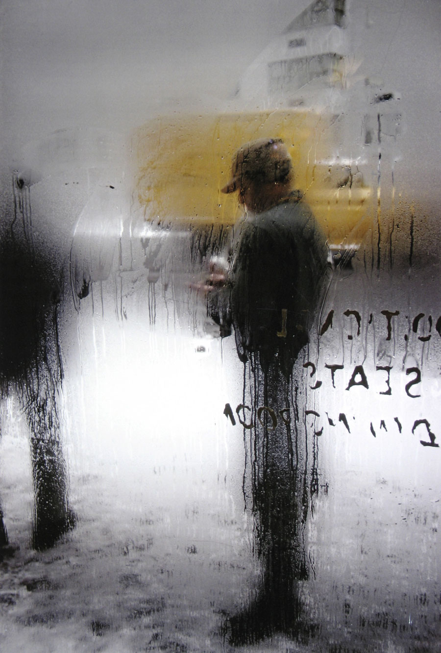
Saul Leiter (American, 1923-2013) 'Snow' 1960


Saul Leiter (American, 1923-2013)
Snow
1960
© Saul Leiter, Collection Howard Greenberg Gallery, New York


From 24 October 2011 to 4 March 2012 the JHM is presenting a retrospective exhibition of the work of the American photographer and painter Saul Leiter (1923-2013). Following a long period of obscurity, Leiter’s work has recently been rediscovered in the United States and Europe. This is the first exhibition of his work in the Netherlands.

Saul Leiter is celebrated particularly for his painterly colour photographs of the street life in New York, which he produced between 1948 and 1960. Amid the hectic life of the city he captured tranquil moments of everyday beauty. He was able to transform mundane objects – a red umbrella in a snowstorm, a foot resting on a bench in the metro, or a human figure seen through the condensation on a pane of glass – into what has been described as ‘urban visual poetry’. His photographs are frequently layered, near-abstract compositions of reflections and shadows, which recall paintings by abstract expressionists such as Mark Rothko and Willem de Kooning, with whom Leiter felt a strong affinity.

Saul Leiter is seen as belonging to the New York School of Photographers, a group of innovative artists, most of them Jewish, who achieved fame in New York in the period 1936-1963, primarily with their images of the street and their documentary photography. His black-and-white work displays a lyricism, dreaminess and surrealism that might prompt comparison with photographers such as Ted Croner, Leon Levinstein and Louis Faurer, but where his colour photography is concerned, he cannot be compared with any other photographer. In the 1940s and 1950s, Leiter was virtually the only non-commercial photographer working in colour.

Born in Pittsburgh, Leiter was destined to become a rabbi like his father. But his growing interest in art led him to abandon his religious studies. Instead, he went to New York and dedicated himself to painting. His friendship there with the abstract expressionist painter Richard Pousette-Dart, who was experimenting with photography, and the work of the photographer Henri Cartier-Bresson, inspired Leiter to take up photography. His friendship with the photographer W. Eugene Smith was another inspiring influence.

The exhibition Saul Leiter: New York Reflections was prepared by the JHM in collaboration with the Howard Greenberg Gallery in New York. Besides over 60 colour and 40 black-and-white examples of his street photography, a small selection of fashion photographs, paintings, and painted photographs will be shown. Visitors will also be able to watch a recent documentary about Leiter by the British film maker Tomas Leach. This autumn, the publisher Steidl will be publishing the third edition of Early Color, the first book of Leiter’s photographs, compiled in 2006 by Martin Harrison of the Victoria & Albert Museum in London.

Press release from the Jewish Historical Museum website


Saul Leiter (American, 1923-2013) 'Foot on El' 1954


Saul Leiter (American, 1923-2013)
Foot on El
1954
© Saul Leiter, Courtesy Howard Greenberg Gallery, New York


Saul Leiter (American, 1923-2013) 'Taxi' 1956


Saul Leiter (American, 1923-2013)
Taxi
1956
© Saul Leiter, Courtesy Howard Greenberg Gallery, New York


Saul Leiter (American, 1923-2013) 'Reflection' 1958


Saul Leiter (American, 1923-2013)
Reflection
1958
© Saul Leiter, Courtesy Howard Greenberg Gallery, New York


Saul Leiter (American, 1923-2013) 'Paris' 1959


Saul Leiter (American, 1923-2013)
Paris
1959
© Saul Leiter, Collection Howard Greenberg Gallery, New York


Saul Leiter (American, 1923-2013) 'Walk with Soames' Nd


Saul Leiter (American, 1923-2013)
Walk with Soames
Nd
© Saul Leiter, Courtesy Howard Greenberg Gallery, New York


Jewish Historical Museum
Nieuwe Amstelstraat
1
1011 PL Amsterdam
Phone: +31 (0)20 5 310 310

Opening hours:
Daily from 10.00 – 17.00

Jewish Historical Museum website

LIKE ART BLART ON FACEBOOK

Back to top

Exhibition: ‘Harry Callahan at 100’ at the National Gallery of Art, Washington

Exhibition dates: 2nd October, 2011 – 4th March, 2012

Curator: Sarah Greenough, senior curator and head of the department of photographs at the National Gallery of Art, Washington


Harry Callahan (American, 1912-1999) 'Detroit' 1943 from the exhibition 'Harry Callahan at 100' at the National Gallery of Art, Washington, October 2011 - March 2012


Harry Callahan (American, 1912-1999)
Detroit
1943
Gelatin silver print
Overall (sheet, trimmed to image): 8.3 x 11cm (3 1/4 x 4 5/16 in)
National Gallery of Art, Washington
Gift of the Callahan Family
© Estate of Harry Callahan, courtesy Pace/MacGill Gallery, New York


Personally, the early photographs of his wife Eleanor and Eleanor with their child Barbara and the most poignant, intimate and beautiful of Callahan’s work while the later modernist Cape Cod photographs presage the spirit and aesthetics of the New Topographics: Photographs of a Man-Altered Landscape of 1975.

Mario Cutajar observes of these photographs:

“These pictures of strangely vacant, light haunted intersections of sky, land, and ocean are confrontations with the limits of both the ego and photography itself as the ego’s instrument. They are oriented toward death rather than life, intimating in a cold, unsentimental way passage to another world or, perhaps, the engulfing oblivion at the horizon.”

Dr Marcus Bunyan


Many thankx to the National Gallery of Art for allowing me to publish the photographs in the posting. Please click on the photographs for a larger version of the image.


Harry Callahan (American, 1912-1999) 'Chicago' 1950 from the exhibition 'Harry Callahan at 100' at the National Gallery of Art, Washington, October 2011 - March 2012


Harry Callahan (American, 1912-1999)
Chicago
1950
Gelatin silver print
Sheet (trimmed to image): 19 x 24.2 cm (7 1/2 x 9 1/2 in.)
National Gallery of Art, Washington
© Estate of Harry Callahan, Collection of Pace/MacGill Gallery, New York


Harry Callahan (American, 1912-1999) 'Eleanor, Chicago' 1952


Harry Callahan (American, 1912-1999)
Eleanor, Chicago
1952
Gelatin silver print
National Gallery of Art, Washington
© Estate of Harry Callahan, Collection of Pace/MacGill Gallery, New York


Harry Callahan (American, 1912-1999) 'Ivy Tentacles on Glass, Chicago' c. 1952


Harry Callahan (American, 1912-1999)
Ivy Tentacles on Glass, Chicago
c. 1952
Gelatin silver print
Image (can’t tell sheet size due to matting): 19.21 x 24.13cm (7 9/16 x 9 1/2 in.)
National Gallery of Art, Washington
Gift of Susan and Peter MacGill
© Estate of Harry Callahan, Collection of Pace/MacGill Gallery, New York


Harry Callahan (American, 1912-1999) 'Eleanor and Barbara, Chicago' 1953


Harry Callahan (American, 1912-1999)
Eleanor and Barbara, Chicago
1953
Gelatin silver print
Overall (image): 19.5 x 24.45cm (7 11/16 x 9 5/8 in)
National Gallery of Art, Washington
Promised Gift of Susan and Peter MacGill
© Estate of Harry Callahan, courtesy Pace/MacGill Gallery, New York


Harry Callahan (American, 1912-1999)
'Cape Cod' 1972


Harry Callahan (American, 1912-1999)
Cape Cod
1972
Gelatin silver print
Overall (image): 23.7 x 23.9cm (9 5/16 x 9 7/16 in)
National Gallery of Art, Washington
Gift of Joyce and Robert Menschel
© Estate of Harry Callahan, courtesy Pace/MacGill Gallery, New York


Harry Callahan (American, 1912-1999) 'Cape Cod' 1974


Harry Callahan (American, 1912-1999)
Cape Cod
1974
Gelatin silver print
Overall (image): 21.8 x 22.6cm (8 9/16 x 8 7/8 in.)
National Gallery of Art, Washington
Gift of Joyce and Robert Menschel
© Estate of Harry Callahan, courtesy Pace/MacGill Gallery, New York


Harry Callahan (American, 1912-1999)
'Ansley Park, Atlanta'
1992


Harry Callahan (American, 1912-1999)
Ansley Park, Atlanta
1992
Gelatin silver print
Overall (image): 15.72 x 15.72cm (6 3/16 x 6 3/16 in)
National Gallery of Art, Washington
Gift of Susan and Peter MacGill
© Estate of Harry Callahan, courtesy Pace/MacGill Gallery, New York


The year 2012 marks the centenary of the birth of Harry Callahan (1912-1999), whose highly experimental, visually daring, and elegant photographs made him one of the most innovative artists of the 20th century.

On view in the West Building of the National Gallery of Art from October 2, 2011, through March 4, 2012, Harry Callahan at 100 explores all facets of his work in some 100 photographs, from its genesis in the early 1940s Detroit to its flowering in Chicago in the late 1940s and 1950s, and finally to its maturation in Providence and Atlanta from the 1960s through the 1990s. In 1996, the Gallery organised the exhibition Harry Callahan, which traveled to Philadelphia, Atlanta, Detroit, and Chicago, and included numerous works on loan from the artist.

“Using the rich holdings of the Gallery’s own collection of Callahan’s work, as well as a large collection of photographs on long-term loan from the artist’s widow, the exhibition will reveal the remarkable consistency of his vision and will demonstrate how his strong, inventive formal language repeatedly enriched his art,” said Earl A. Powell III, director, National Gallery of Art.

The Exhibition

Organised thematically and chronologically, Harry Callahan at 100 examines Callahan’s work in relation to the places where he lived and to his family, unveiling his unparalleled devotion to both his subjects and the medium of photography.

In his earliest photographs made in and around Detroit, Callahan explored the limits of the camera, constructing photographs of multiple exposures in both black-and-white and colour. In works such as Twig in Snow (c. 1942) and Store Front and Reflections (c. 1943), he sought to capture simultaneously the simplicity and complexity of nature and the theatre of urban life.

Callahan continued his aesthetic and technical experiments through photographs of his wife, Eleanor. His nudes play with dramatic contrasts of light and dark: his layered multiple exposures reveal Eleanor’s body against landscapes and frosted glass windows (Eleanor, Chicago, 1948). His photographs of his wife and their daughter, Barbara, in the lake, the city, and the woods (Eleanor and Barbara, Lake Michigan, c. 1953) exploit the spontaneity and intimacy of snapshots – yet, paradoxically, were made with a large, cumbersome 8- x 10-inch view camera.

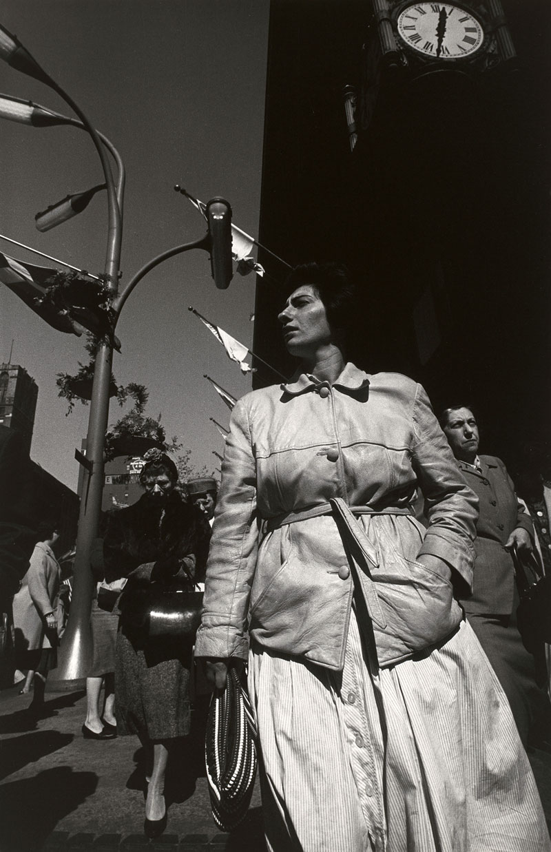
Callahan’s twin interests in the city and the land expanded during his years in Chicago and Providence, where he created both spare and evocative photographs of the natural landscape and complex compositions of urban architecture and pedestrians. He began to document anonymous women on the streets of Chicago, first in close shots of squinting eyes, open mouths, and downcast faces seen in Chicago (1950), then in full-figure shots from a low angle that feature the women against backgrounds of skyscrapers and flagpoles, as in Chicago (1961).

In the 1970s Callahan returned to colour photography, continuing to push the boundaries of the medium, seen in the well-known Providence (1977). Taken in Atlanta and during travels abroad, his late photographs emphasised vibrant colours, long shadows, and the complex humanity of urban life, seen in Morocco (1981) and Atlanta (1985).

Harry Callahan (1912-1999)

Born in Detroit in 1912, Callahan began to photograph in 1938. Although he received no formal training in the medium, his exceptional talent was immediately recognised. In 1946 László Moholy-Nagy hired him to teach at the Institute of Design in Chicago. There and at the Rhode Island School of Design (he moved to Providence in 1961) he taught generations of younger photographers, inspiring them both with the creativity of his vision and his steadfast commitment to the medium. In a career that spanned nearly six decades, he repeatedly explored a few select themes – his wife Eleanor and daughter Barbara, nature, and the urban environment. Yet each time he returned to a familiar subject, he reinvented it, endowing each photograph with both a personal and symbolic significance.

Press release from the National Gallery of Art website


Harry Callahan (American, 1912-1999) 'Eleanor, New York' 1945


Harry Callahan (American, 1912-1999)
Eleanor, New York
1945
Gelatin silver print
Overall (image): 21.2 x 16.83cm (8 3/8 x 6 5/8 in)
National Gallery of Art, Washington
Gift of the Callahan Family
© Estate of Harry Callahan, courtesy Pace/MacGill Gallery, New York


Harry Callahan (American, 1912-1999) 'Eleanor' about 1947


Harry Callahan (American, 1912-1999)
Eleanor
Chicago, 1947
Gelatin silver print
National Gallery of Art, Washington
The Herbert and Nannette Rothschild Memorial Fund in memory of Judith Rothschild
© Estate of Harry Callahan, courtesy Pace/MacGill Gallery, New York


Harry Callahan (American, 1912-1999) 'Eleanor, Chicago' 1948


Harry Callahan (American, 1912-1999)
Eleanor, Chicago
1948
Gelatin silver print
Overall (image): 11.59 x 8.5cm (4 9/16 x 3 3/8 in)
National Gallery of Art, Washington
The Joyce and Robert Menschel Fund
© Estate of Harry Callahan, courtesy Pace/MacGill Gallery, New York


During the 1940s and ’50s, Callahan’s work was deeply affected by the resolutely humanizing presence of his wife, Eleanor, and daughter, Barbara. Frequent subjects, though consistently inscrutable, Eleanor and Barbara are the shadow puppets of his career, a direct testament to his family life, but always seen as if behind some kind of veil or scrim. They are markers of an intimacy that Callahan never violates by direct exposure.

Eleanor, in particular, is photographed down to the very last details of anatomy. She remembers that during these years, she might be cooking or cleaning, and suddenly Harry would announce: “‘Take off your clothes.’ And that would be that.”

The results are sometimes staggering. A 1947 image of what appears to be the lines created by Eleanor’s legs and buttocks looks like a Cycladic statue, relentlessly rectilinear but soft around the edges, freakishly modern and ancient at the same time. An 1953 image of Eleanor and Barbara bathing in Lake Michigan dissolves the horizon, fusing lake and sky into a field of shimmering gray. The two figures seem suspended in space, dematerialized, like characters in a dream.

It’s a small miracle that no matter how much Callahan’s camera dissects the world, the photographs never seem clinical. He divorces things from context, pulls out small vignettes from the larger city, but without violence, and without the gamesmanship of a photographer inclined to the cheap surreal.

Philip Kennicott. “Review: Harry Callahan photography exhibit at the National Gallery of Art,” on The Washington Post website October 4, 2011 [Online] Cited 22/02/2012


Harry Callahan (American, 1912-1999) 'Eleanor, Chicago' c. 1947


Harry Callahan (American, 1912-1999)
Eleanor, Chicago
c. 1947
Gelatin silver print
Overall (sheet, trimmed to image): 11.91 x 8.6cm (4 11/16 x 3 3/8 in)
National Gallery of Art, Washington
Promised Gift of Susan and Peter MacGill
© Estate of Harry Callahan, courtesy Pace/MacGill Gallery, New York


Harry Callahan (American, 1912-1999) 'Chicago' 1961


Harry Callahan (American, 1912-1999)
Chicago
1961
Gelatin silver print
Overall (image):
40.6 x 27.1cm (16 x 10 11/16 in)
National Gallery of Art, Washington
Gift of the Callahan Family
© Estate of Harry Callahan, courtesy Pace/MacGill Gallery, New York


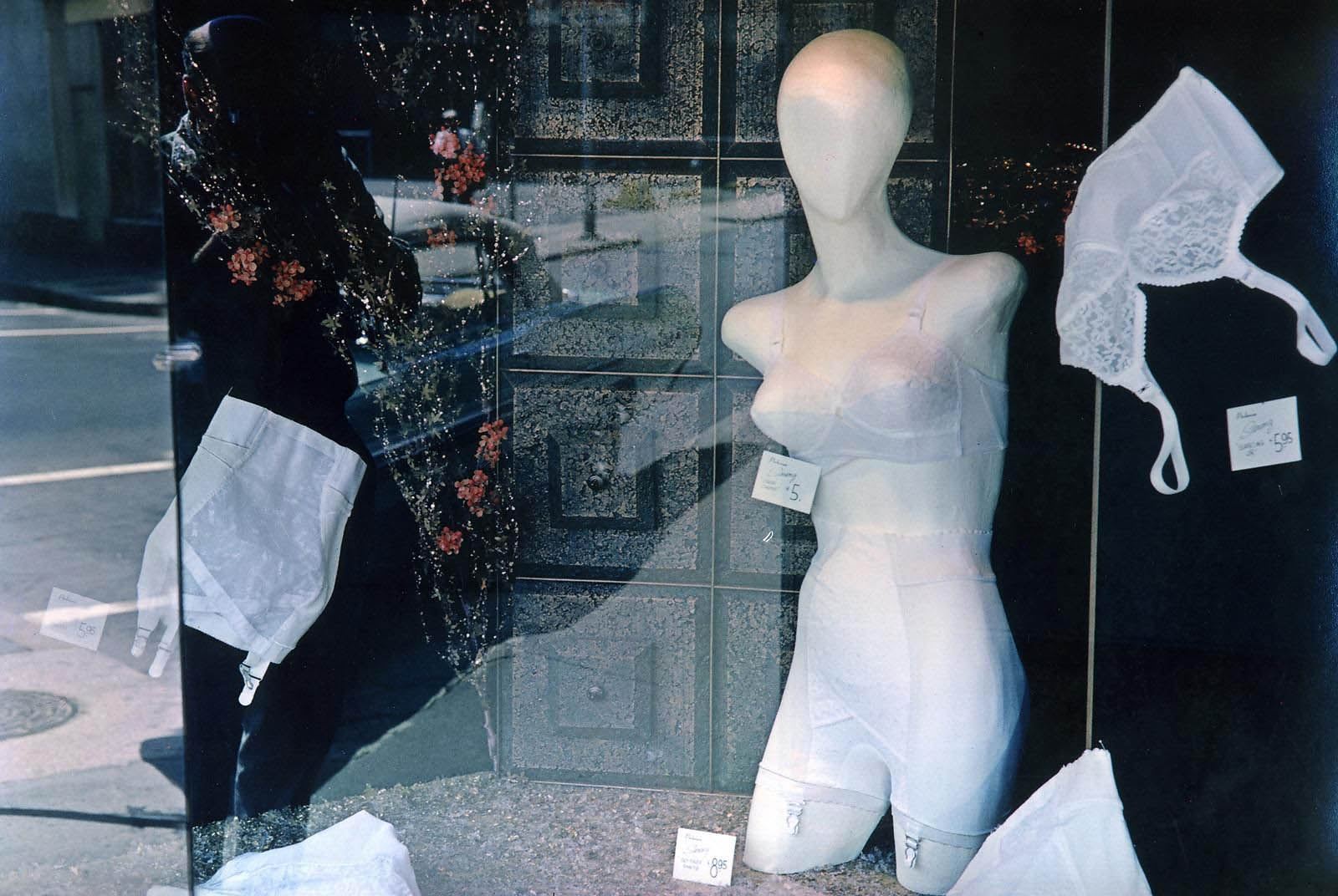
Harry Callahan (American, 1912-1999) 'Store Window with Mannequin with Lingerie, Providence' 1962


Harry Callahan (American, 1912-1999)
Store Window with Mannequin with Lingerie, Providence
1962
Dye imbibition print
22.4 x 34.1cm (8 13/16 x 13 7/16 in.)
National Gallery of Art, Washington
Gift of Mary and Dan Solomon and Patrons’ Permanent Fund
© Estate of Harry Callahan, courtesy Pace/MacGill Gallery, New York


Harry Callahan (American, 1912-1999) 'Kansas City' 1981


Harry Callahan (American, 1912-1999)
Kansas City
1981
Dye imbibition print
Overall (image): 24.3 x 36.7cm (9 9/16 x 14 7/16 in.)
National Gallery of Art, Washington
Gift of The Very Reverend and Mrs. Charles U. Harris
© Estate of Harry Callahan, courtesy Pace/MacGill Gallery, New York


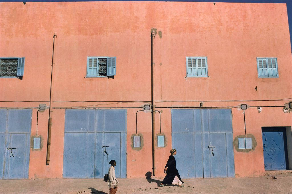
Harry Callahan (American, 1912-1999) 'Morocco' 1981


Harry Callahan (American, 1912-1999)
Morocco
1981
Dye imbibition print
Overall (image): 24.2 x 36.7cm (9 1/2 x 14 7/16 in.)
National Gallery of Art, Washington
Gift of the Collectors Committee
© Estate of Harry Callahan, courtesy Pace/MacGill Gallery, New York


Harry Callahan (American, 1912-1999) 'Atlanta' 1985


Harry Callahan (American, 1912-1999)
Atlanta
1985
Dye imbibition print
Overall (image): 24.4 x 36.7cm (9 5/8 x 14 7/16 in.)
National Gallery of Art, Washington
Gift of the Callahan Family
© Estate of Harry Callahan, courtesy Pace/MacGill Gallery, New York


National Gallery of Art
National Mall between 3rd and 7th Streets
Constitution Avenue NW, Washington

Opening hours:
Daily 10.00am – 5.00pm

National Gallery of Art website

LIKE ART BLART ON FACEBOOK

Back to top

Review: ‘Looking at Looking’ at the National Gallery of Victoria, Melbourne

Exhibition dates: 30th September, 2011 – 4th March, 2012

Curator: Maggie Finch, Assistant Curator of Photography at the NGV


Bill Henson (Australian, b. 1955) 'Untitled 1980/82' 1980-1982 from the exhibition 'Looking at Looking' at the National Gallery of Victoria, Melbourne, September 2011 - March 2012


Bill Henson (Australian, b. 1955)
Untitled 1980/82
1980-1982
From the Untitled 1980/82 series 1980-1982
Gelatin silver photograph
43.0 x 38.8cm
National Gallery of Victoria, Melbourne
Anonymous gift, 1993
© Courtesy of the artist and Roslyn Oxley9 Gallery, Sydney


“The paradox is the more we seek to fix our vision of the world and to control it the less sure we are as to who we are and what our place is in the world.”


Marcus Bunyan 2011


This is a delightful, intimate exhibition at the National Gallery of Victoria which examines how looking through a camera directs and structures the way we see the world. The exhibition mines the same ground as one of my top exhibitions from last year, In camera and in public that was presented at the Centre for Contemporary Photography, Fitzroy.

Numerous artists use photography to examine the ways in which gender, race and sexuality have been ‘looked at’ in visual culture, including the politics of looking in relation to Indigenous cultures and identities. In I split your gaze (1997) by Brook Andrew, the artist has split the face of an Aboriginal man down the middle, and reassembled the face ear to ear. No longer can we look on the man as a whole because our gaze is split. Andrew is said to have “reclaimed” the image from colonial scientific, anthropological documentation but this presupposes some holistic whole existed a priori to white intervention. The split photograph does alter perception but to what extent it promotes a different reading, a postcolonial gaze that is understood as such by the viewer, is debatable.

Chi Peng poses more interesting gender reversals and masquerades. In Consubstantiality (2004, below) misaligned pairs of people, of androgynous face and hard to distinguish gender, are “reflected” in a pseudo mirror. Consubstantiality references the Christian principle describing the intertwined relationship of the Trinity (God the Father, the Son, and the Holy Spirit) as being of one essence, one being.

“Chi Peng uses digital technologies to manipulate photographic surfaces and often uses his own body and identity as a homosexual man living in China as a means of creating new ways of looking at himself and at the construction of identity… With powdered faces and bodies, the naked ‘reflections’ press the palms of their hands together across a pane of glass. At first glance, it is as though the photographer is intruding on a private scene, a moment of self-scrutiny in a mirror. However the hands do not quite align and the gazes diverge…”1

This self-reflexivity and its relation to the Lacan’s mirror stage in the development of male and female identity – in which the mirror can be looked at and looks back in return – lends these ethereal images real beauty and presence as they explore the psychology of identity and gender reversal.

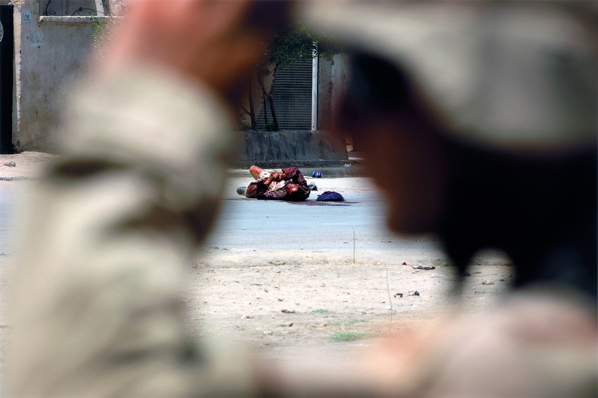
“Photographers Ashley Gilbertson and John Imming, and collaborative artists Lyndell Brown and Charles Green have all used cameras to document war, and their works off three distinct views.The common link appears to be an engagement with ideas of the observer and the observed and questioning who is looking at whom, and why?”2 Attempting an apolitical view of the war in Iraq, Gilbertson was embedded with different US military outfits on numerous visits to the country between 2002-2008, reliant on them for his safety. Many of his “objective” photographs deal with representations of surveillance and covert looking from ‘within the ranks’. But not from within enemy ranks. The very fact of his embedding, his lying down within a disciplinary system of control and power, to shoot from one point of view, politicises his gaze.

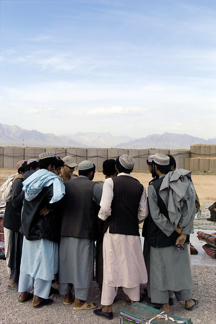
Brown and Green’s painterly photograph features a tightly choreographed scene, “a market within a military camp in which traders were invited to sell their wares. The scene is indicative, however, of the ‘strained atmosphere’ prevalent when different cultures interact in military situations – seemingly harmonious but concealing the ‘control that was exerted in the selection of traders’.”3 This traditional tableau vivant sees the traders become actors on a stage, their gaze directed towards the female officer at the centre of the group holding a piece of clothing which is blocked from our view. We the viewer are excluded from the circle of gazes; we become other, looking at the looking of the traders. Their gaze and our gaze are at cross-purpose; we wish to become a player on the stage but are denied access and can only observe the spectacle from a distance. Excluded, the viewer feels disempowered, the photographic mise en scène leaving me unmoved.

John Imming’s photographs use found images from the Vietnam war, the first war in which photographers had unrestricted access and were given absolute freedom to record what they saw. Vietnam was a stage for intense exploration, photographers bombarding the public with images of extreme violence. Imming rephotographs images from the television screen using a Leica camera, abstracting them into darkly hued creatures, the borders miming the shape of early television screens. “The images become abstracted and our gaze is ‘reduced’ into blurred shapes of contrasting tones … His photographs force us to slow down the memories of the somewhat ephemeral television imagery and look deeply at what is being portrayed, and how.”4 These photographs fail in that task for they are very surface photographs. The photographs do not have the structure to support such a vision nor the support of beauty to prick the consciousness of the gaze. They are ugly images because war is ugly and abstracting them in order to ask the viewer to look deeply and have an incredible insight into the condition ‘war’ and how it is portrayed simply did not work for me.

The two standout works in the exhibition are Thomas Struth’s luminous photograph Pergamon Museum IV, Berlin (2001, below) and Bill Henson’s seminal (perhaps even ubiquitous) series Untitled 1980/82 (1980-1982, see above) – these photographs seem to be everywhere at the moment, perhaps a change is as good as a rest!

Struth’s magnificent large colour photograph is an investigation into the theatre of seeing. In the photograph Struth directs his cast and choreographs the visitors, the arrangement of the spectators re-assembling the open-ended narrative of the 2nd century Telephos frieze behind. “Similarities between the poses of the audience members and the poses of the carve relief figures gradually emerge, suggesting an unconscious dialogue between the viewers and the objects they regard. The result of Struth’s directorial mode of working is the creation of a type of theatre based on intersecting viewpoints, raising questions about the gaze of the spectator and the process of looking at works of art and each other.”5

Beholders observe beholders and the subjects of vision become historical, according to art historian Wold-Dieter Heilmeyer. Here I observe that:

~ The suffused light that falls from the skylight leaves no shadow.

~ A man who casts no shadow has no soul.

~ The shadow according to Jung is the seat of creativity. In this photograph there is no depth of field, the sculptures and the figures feel like they are almost on one plane.

~ None of the viewers looks at the camera, they avoid its probing gaze, passively becoming the feminine aspect – like the central raised figure, robbed of head and arms, being gazed upon from all sides. We, the viewer, are looking at the spectacle of the viewers looking at the frieze. Looking at looking the observer becomes the observed (surveillance camera where are you?)

~ Consider the freeze frame of the models as they posed for the sculptor all those years ago; the freeze frame of the sculptures themselves; the freeze frame of the spectators posing for the camera; the freeze frame of the photograph itself; and then consider the freeze frame of time and space as we stand before the photograph looking at it. Then notice the women in the photograph videotaping the scene, another excoriating layer that tears at the fabric of time and looking, that causes lacrimation for our absent soul. What a photograph!

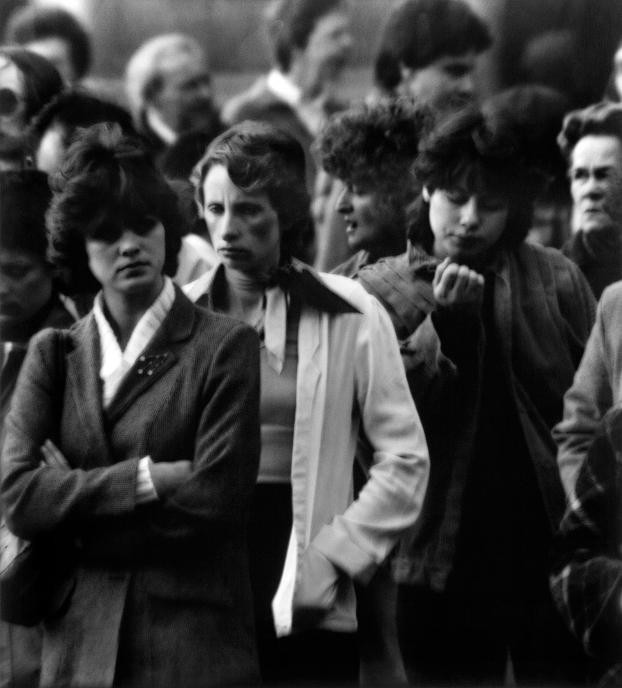
The Henson photographs are presented in a wonderfully musical installation, mimicking the movement of the crowds portrayed. I republish below my comments on this series from the review of the In camera and in public exhibition.

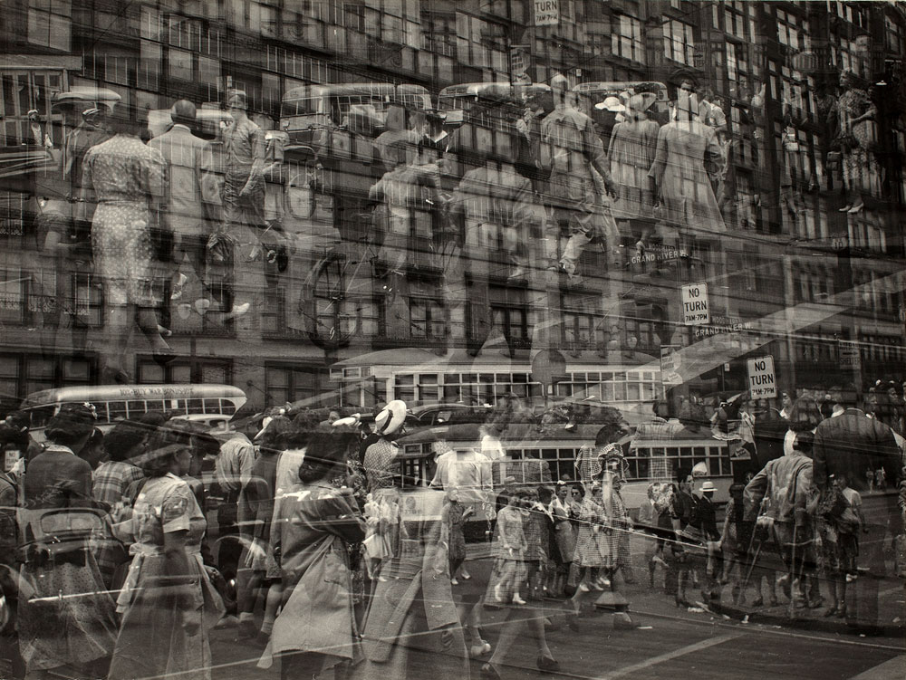
A selection of photographs from the Crowd Series (1980-1982) by Bill Henson. Snapped in secret these black and white journalistic surveillance photographs (‘taken’ in an around Flinders Street railway station in Melbourne) have a brooding intensity and melancholic beauty. Henson uses a flattened perspective that is opposed to the principles of linear perspective in these photographs. Known as The Art of Describing6 and much used in Dutch still life painting of the 17th century to give equal weight to objects within the image plane, here Henson uses the technique to emphasise the mass and jostle of the crowd with their “waiting, solemn and compliant” people.

“When exhibiting the full series, Henson arranges the works into small groupings that create an overall effect of aberrant movement and fragmentation. From within these bustling clusters of images, individual faces emerge like spectres of humanity that will once again dissolve into the crowd … all apparently adrift in the flow of urban life. The people in these images have an anonymity that allows them to represent universal human experiences of alienation, mortality and fatigue.”7

Henson states, “The great beauty in the subject comes, for me, from the haunted space, that unbridgeable gap – which separates the profound intimacy and solitude of our interior world from the ‘other’… The business of how a child’s small hand appearing between two adults at a street crossing can suggest both a vulnerability, great tenderness, and yet also contain within it all of the power that beauty commands, is endlessly fascinating to me.”8 His observation is astute but for me it is the un/awareness of the people in these photographs that are their beauty, their insertion into the crowd but their isolation from the crowd and from themselves. As Maggie Finch observes, it is “that feeling of being both alone and private in a crowd, thus free but also exposed.”9

In the sociologist Erving Goffman’s terms the photographs can be seen as examples of what he calls “civil inattention”10 which is a carefully monitored demonstration of what might be called polite estrangement, the “facework” as we glance at people in the crowd, holding the gaze of the other only briefly, then looking ahead as each passes the other.

“Civil inattention is the most basic type of facework commitment involved in encounters with strangers in circumstances of modernity. It involves not just the use of the face itself, but the subtle employment of bodily posture and positioning which gives off the message “you may trust me to be without hostile intent” – in the street, public buildings, trains or buses, or at ceremonial gatherings, parties, or other assemblies. Civil inattention is TRUST as ‘background noise’ – not as a random collection of sounds, but as carefully restrained and controlled social rhythms. It is characteristic of what Goffman calls “unfocused interaction.””11

This is what I believe Henson’s photographs are about. Not so much the tenderness of the child’s hand but a fear of engagement with the ‘other’. As such they can be seen as image precursors to the absence/presence of contemporary communication and music technologies. How many times do people talk on their mobile phone or listen to iPods in crowds, on trams and trains, physically present but absenting themselves from interaction with other people. Here but not here; here and there. The body is immersed in absent presence, present and not present, conscious and not conscious, aware and yet not aware of the narratives of a ‘recipro/city failure’. A failure to engage with the light of place, the time of exposure and an attentiveness to the city.

As Susan Stewart insightfully observes,

“To walk in the city is to experience the disjuncture of partial vision/partial consciousness … The walkers of the city travel at different speeds, their steps like handwriting of a personal mobility. In the milling of the crowd is the choking of class relations, the interruption of speed, and the machine.”12

Dr Marcus Bunyan


Footnotes

1/ Finch, Maggie. Looking at Looking: The Photographic Gaze. Catalogue. Melbourne: National Gallery of Victoria, 2011, p. 10

2/ Ibid., p. 16

3/ Ibid., p. 21

4/ Ibid., p. 24

5/ Ibid., p. 7

6/ See Alpers, Svetlana. The Art of Describing: Dutch Art in the Seventeenth Century. University Of Chicago Press, 1984

7/ Anon. BILL HENSON: early work from the MGA collection. Education Resource. A Monash Gallery of Art Travelling Exhibition [Online] Cited 14/10/2011. No longer available online

8/ Henson, Bill quoted in the exhibition catalogue. First published as a pdf for the exhibition In camera and in public Curated by Naomi Cass. Centre for Contemporary Photography, 16 September – 23 October 2011

9/ Stephens, Andrew. “Who’s watching you?” in The Saturday Age. 23rd September 2011 [Online] Cited 14/10/2011

10/ See  Goffman, E. Behaviour in Public Places. New York: Free Press, 1963

11/ Giddens, Anthony. The Consequences of Modernity. Cambridge: Polity Press, 1991, pp. 82-83

12/ Stewart, Susan. On Longing: Narratives of the Miniature, the Gigantic, the Souvenir, the Collection. Durham: Duke University Press, 1993, p. 2. Prologue


Many thankx to the National Gallery of Victoria for allowing me to publish the photographs in the posting. Please click on the photographs for a larger version of the image.


Bill Henson (Australian, b. 1955) 'Untitled 1980/82' 1980-1982


Bill Henson (Australian, b. 1955)
Untitled 1980/82
1980-1982
From the Untitled 1980/82 series 1980-1982
Gelatin silver photograph
43.0 x 38.8cm
National Gallery of Victoria, Melbourne
Anonymous gift, 1993
© Courtesy of the artist and Roslyn Oxley9 Gallery, Sydney


Bill Henson (Australian, b. 1955) 'Untitled 1980/82' 1980-1982


Bill Henson (Australian, b. 1955)
Untitled 1980/82
1980-1982
From the Untitled 1980/82 series 1980-1982
Gelatin silver photograph
29.2 x 47cm
National Gallery of Victoria, Melbourne
Anonymous gift, 1993
© Courtesy of the artist and Roslyn Oxley9 Gallery, Sydney


On 30 September the National Gallery of Victoria will present Looking at Looking: The Photographic Gaze, a unique exhibition exploring how photography can construct particular ways of looking. Looking at Looking will feature works by 10 Australian and international photographers including 20 photographs from Bill Henson’s Untitled 1980-82 series.

Drawn entirely from the NGV Collection, this exhibition will bring together a fascinating selection of photographs inviting the viewer to consider the diverse nature of the photographic gaze and explore the complex relationships between the subject, the photographer and the audience. The displayed photographs will include observations of people in crowds, surveillance images from war zones and photographs that explore different ways of looking at gender, race and identity.

Maggie Finch, Assistant Curator, Photography, NGV said: “The act of photographing people involves a process of observation and scrutiny. At times, photographers remain detached and anonymous while at other times they are complicit, directing their subjects and encouraging specific actions.”

Frances Lindsay, Deputy Director, NGV, said: “In the NGV’s 150th year this exhibition allows visitors to explore the dynamic relationship between the observer and the observed. This is a rare opportunity to view these photographs in a truly unique context.”

Looking at Looking will consider the anonymous photographer, one who is able to look without being looked at in return and consequently see more than otherwise possible. This idea is explored in Bill Henson’s series Untitled 1980-82, where the artist photographed people on city streets. Hung in a dense display, these photographs provide a psychological study of the nature of people when in a crowd.

Looking at Looking will feature works by Brook Andrew, Chi Peng, Anne Ferran, Ashley Gilbertson, Charles Green and Lyndell Brown, Bill Henson, John Immig, Thomas Struth and David Thomas.

Press release from the National Gallery of Victoria


Thomas Struth (German, b. 1954) 'Pergamon Museum IV, Berlin' 2001 from the exhibition 'Looking at Looking' at the National Gallery of Victoria, Melbourne, September 2011 - March 2012


Thomas Struth (German, b. 1954)
Pergamon Museum IV, Berlin
2001
Type C photograph
144.1 x 219.9cm
National Gallery of Victoria, Melbourne
Purchased with the assistance of The Bowness Family Fund for Contemporary Photography, 2008
© 2011 Thomas Struth


David Thomas (born Northern Ireland 1951, arrived Australia 1958) 'Amid history 2 (Large version)' 2006


David Thomas (born Northern Ireland 1951, arrived Australia 1958)
Amid history 2 (Large version)
2006
Enamel paint on type C photograph on aluminium and plastic
100 x 145cm
National Gallery of Victoria, Melbourne
Purchased, Victorian Foundation for Living Australian Artists, 2007
© the artist


Ashley Gilbertson (Australian, b. 1978) 'A member of the Mahdi Army RPG team' 2004 from the 'Whiskey Tango Foxtrot' series 2004


Ashley Gilbertson (Australian, b. 1978)
A member of the Mahdi Army RPG team
2004
From the Whiskey Tango Foxtrot series 2004
Digital type C print
66.5 x 99.8cm
National Gallery of Victoria, Melbourne
Purchased, Victorian Foundation for Living Australian Artists, 2009
© Ashley Gilbertson / VII Network


John Immig (Dutch/Australian, 1935-2018) 'No title (T.V. images)' 1975-1976


John Immig (Dutch/Australian, 1935-2018)
No title (T.V. images)
1975-1976
From the Vietnam series 1975-1976
Gelatin silver photograph
20.2 x 25.3cm
National Gallery of Victoria, Melbourne
Purchased with the assistance of the Visual Arts Board, 1977
© John Immig


Chi Peng (Chinese, b. 1981) 'Consubstantiality' 2004


Chi Peng (Chinese, b. 1981)
Consubstantiality
2004
Type C photograph
87.5 x 116.7cm
National Gallery of Victoria, Melbourne
Purchased with the assistance of the NGV Foundation, 2004
© Chi Peng, courtesy of Red Gate Gallery, Beijing


Brook Andrew (Australian, b. 1970) 'I Split Your Gaze' 1997


Brook Andrew (Australian, b. 1970)
I Split Your Gaze
1997
Gelatin silver print
122.6 × 114cm (image and sheet)
National Gallery of Victoria, Melbourne
Purchased with funds from the Victorian Foundation for Living Australian Artists, 2005
© Brook Andrew/Copyright Agency, 2023


Charles Green (Australian, b. 1953) and Lyndell Brown (Australian, b. 1961) 'Afghan traders with soldiers, market, Taran Kowt Base Uruzgan Province, Afghanistan' 2007 printed 2009


Charles Green (Australian, b. 1953)
Lyndell Brown (Australian, b. 1961)
Afghan traders with soldiers, market, Taran Kowt Base Uruzgan Province, Afghanistan
2007 printed 2009
From The approaching storm series 2009
Inkjet print
155.0 x 107.5cm
National Gallery of Victoria, Melbourne
Purchased, Victorian Foundation for Living Australian Artists, 2009
© Courtesy of the Artists and Arc One Gallery, Melbourne


NGV International
180 St Kilda Road

Opening hours
Daily 10am – 5pm

National Gallery of Victoria website

LIKE ART BLART ON FACEBOOK

Back to top

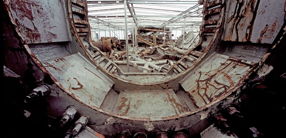
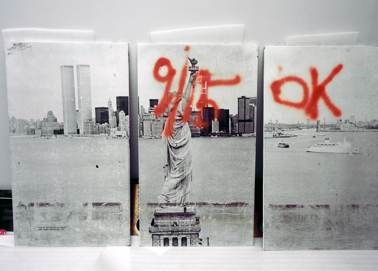
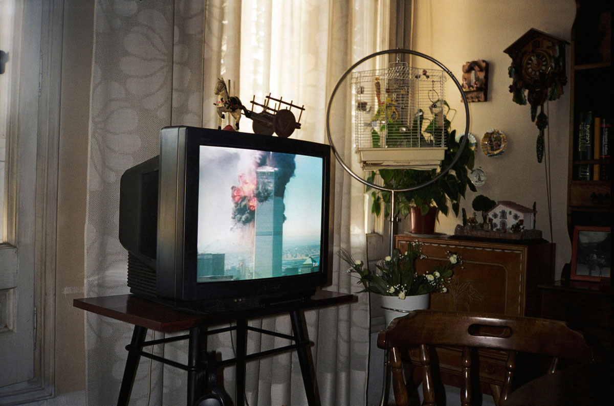
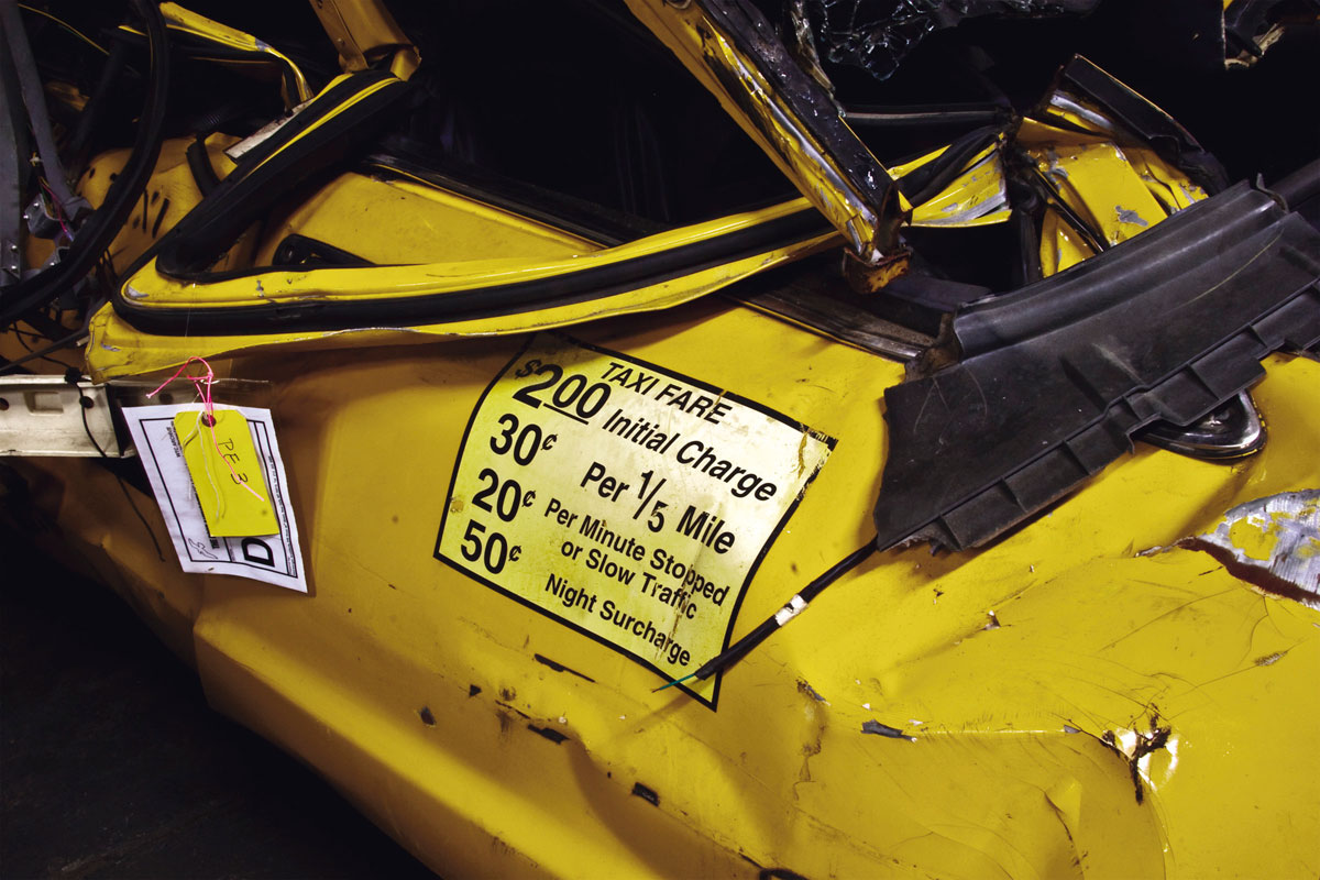
Exhibition: ‘Memory Remains: 9/11 Artifacts at Hangar 17 by Francesc Torres’ at the Imperial War Museum, London

Exhibition dates: 26th August, 2011 – 26th February, 2012

Curator: Clifford Chanin, National September 11 Memorial Museum curator and director for the project


Many thankx to the Imperial War Museum, London for allowing me to publish the photographs in the posting. Please click on the photographs for a larger version of the image.


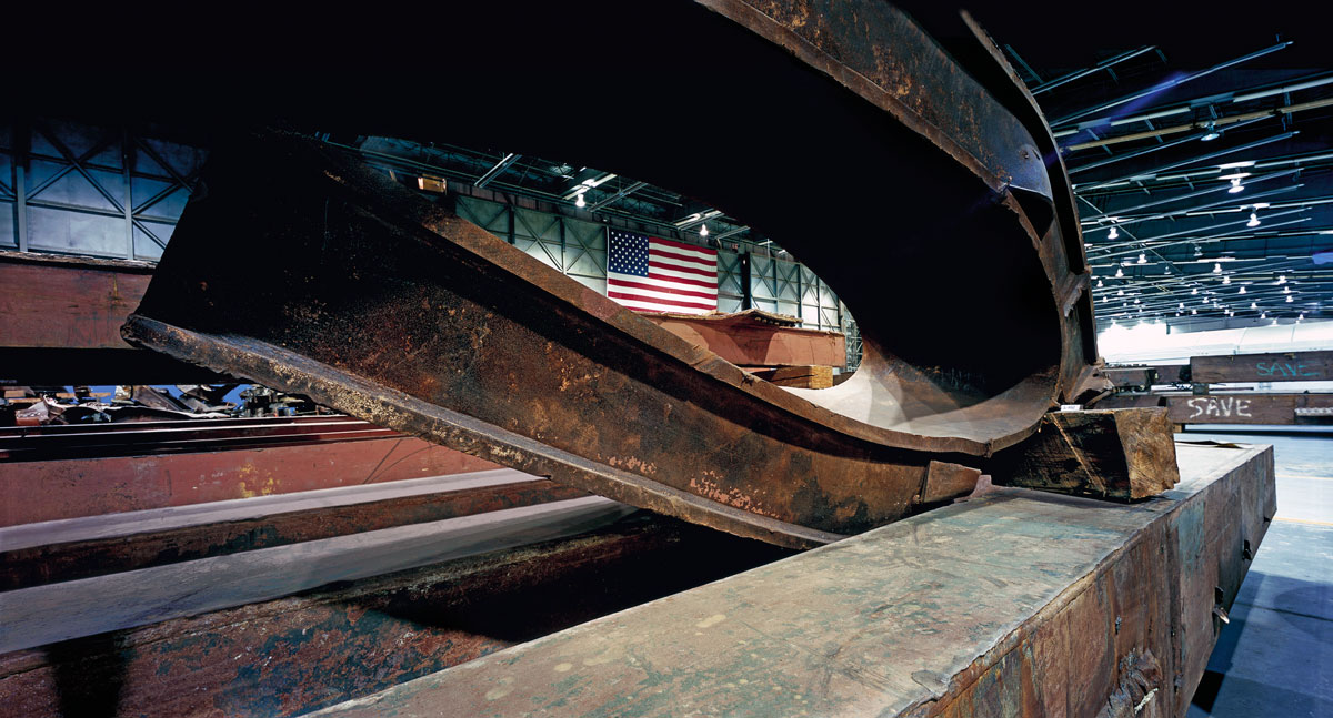
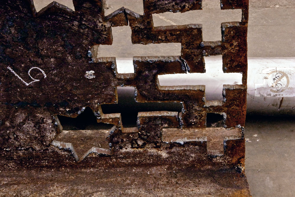
Francesc Torres (Spanish, b. 1948) 'Steel beams taken from ground zero for storage at John F. Kennedy International Airport's Hangar 17' 2009 from the exhibition 'Memory Remains: 9/11 Artifacts at Hangar 17 by Francesc Torres' at the Imperial War Museum, London, August 2011 - February 2012


Francesc Torres (Spanish, b. 1948)
Steel beams taken from ground zero for storage at John F. Kennedy International Airport’s Hangar 17
2009
© Francesc Torres


“Having watched the graphic destruction from my apartment, only two blocks from the Twin Towers, when I entered Hangar 17 at JFK International Airport for the first time in 2006, I was immediately hit by the deep sense that the objects I was confronted with, from large shards of rusted and burnt steel to bikes left forever by their owners, were the symbolic substitutes of the victims. Their overwhelming presence stood for all the people that lost their lives that late summer day a decade ago.”


Francesc Torres


Francesc Torres (Spanish, b. 1948) 'Twisted steel beams from ground zero dominate the space in JFK International Airport's Hangar 17, where 9/11 artifacts were housed for study and safekeeping' 2009 from the exhibition 'Memory Remains: 9/11 Artifacts at Hangar 17 by Francesc Torres' at the Imperial War Museum, London, August 2011 - February 2012


Francesc Torres (Spanish, b. 1948)
Twisted steel beams from ground zero dominate the space in JFK International Airport’s Hangar 17, where 9/11 artifacts were housed for study and safekeeping
2009
© Francesc Torres


Francesc Torres (Spanish, b. 1948) 'View through a portion of the broadcast antenna that fell from the top of the north tower. A number of fragments of the 360-foot antenna were kept at Hangar 17' 2009


Francesc Torres (Spanish, b. 1948)
View through a portion of the broadcast antenna that fell from the top of the north tower. A number of fragments of the 360-foot antenna were kept at Hangar 17
2009
© Francesc Torres


Francesc Torres (Spanish, b. 1948) 'The collapse of the twin towers created a series of iconic objects...' 2009


Francesc Torres (Spanish, b. 1948)
The collapse of the twin towers created a series of iconic objects, transformed by force and fire from their daily uses into artifacts that tell a story. At Hangar 17, tented enclosures were built for artifacts of various kinds that, in the view of curators and conservators, needed the added protection of humidity control and stillness. Perhaps the most dramatic example of this transformation could be found inside the vehicle tent, where trucks and cars, normally left outside in all conditions, were given shelter
2009
© Francesc Torres


Francesc Torres (Spanish, b. 1948) 'Because the Last Column had inscriptions and attachments on all sides' 2009


Francesc Torres (Spanish, b. 1948)
Because the Last Column had inscriptions and attachments on all sides, it was raised onto a specially constructed steel cradle at Hangar 17 so conservators had enough clearance to work. A mirror provides a glimpse of tributes on the underside of the column. Visible on the facing side are the taped-on memorials for Firefighter Christian Regenhard, 28, and Deputy Battalion Chief Dennis Cross, 60
2009
© Francesc Torres


The empty shell of Hangar 17 at JFK Airport became a storehouse of memories when it was filled with the material cleared from the World Trade Center site following the September 11 attacks on New York City.

Marking the tenth anniversary of 9/11, Francesc Torres’s work features over 150 projected images which explore inside the hangar and reflect on the emotional power of what remained, from personal belongings to steel girders distorted by the force of the attacks. Alongside the photographs is a section of raw rusted steel over two metres in length from the ruins of the World Trade Center. As well as larger piece (over 1 tonne) that is due to go on display at IWM North in October, these objects are the first pieces of steel from Ground Zero to go on display in the UK. The exhibition will also be on display at the International Centre for Photography in New York and at the Centre de Cultura Contemporània de Barcelona.

Throughout his career, Spanish-American artist Francesc Torres has reflected on the diverse manifestations of culture, politics, memory and power. His latest exhibition at the Imperial War Museum, Memory Remains, is a bold and haunting amalgam of all four.

In 2009, Torres was granted rare access to Hangar 17 at John F Kennedy International Airport, a gaping space of over 80,000-square-feet. Within the hangar lie the remnants deemed worth preserving from the September 11 attacks, taken from the 1.8 million tonnes of debris from Ground Zero. For five weeks Torres daily confronted the legacy of terror and the ghosts of that fateful late-summer day, capturing images of objects that stand as symbolic substitutes to the victims.

“Look at it this way”, says Torres, relaying his experience, “it’s a hanger constructed to house a plane, which was transformed into a weapon used for the attack on the towers and now the sediment of that attack is here. With the sound of planes constantly flying overhead it was absolutely surreal.”

According to the photographer, the experience of walking around the hanger after the first day was so emotionally draining that he slept from four o’clock in the afternoon through to ten o’clock the next morning.

“I was absolutely exhausted; physically and emotionally… every single iota of energy I had was gone.”

His efforts have produced some exceptional results, however, displayed on a rolling slideshow in a small room near the entrance of the museum. Among the objects photographed are large shards of rusted, burnt steel, crumpled filing cabinets and a plethora of flattened Port Authority vehicles. Some unexpected pieces of detritus were also found, including a nine-foot, three-dimensional Bugs Bunny, made completely bizarre when juxtaposed by a sign whose letters read chillingly: “That’s All Folks!”

Prior to the Hangar 17 project, Torres documented the excavation of a mass Spanish Civil War grave that he said drew certain comparisons with the material at JFK.

“The clothing is something that just grabs you,” he says, “it’s very uncanny that nothing changes with the victims as historical subjects. The clothing [in Hangar 17] was exactly the same as the clothing I’ve seen in Spain or in the former Yugoslavia; it all has the same patina. The victim becomes universal… the remains have that quality.”

Along with the photographs, the museum has also acquired a section of steel from the structure of the World Trade Center, displayed outside the projection room. It is the first section of raw rusted steel from the ruins at Ground Zero – thought to be the box section from one of windows – to be displayed in the UK.

For the past year, pieces from the hangar have made their way to be placed in memorials in each of the 50 American states, as well as seven other countries across the globe. Some, but not all, of the remaining pieces will be housed in the 9/11 Memorial Museum near the site of the attack, which is something that concerns Torres.

“We have to preserve the hanger as a container. It’s an unbelievable narrative apparatus that had been created almost on the run,” he says.

With a lifelong interest in questions of human memory and meaning, Torres’ work is based on the concept that it is through the remains of history that memory remains. His latest show is an unforgettable testament to those horrendous attacks that capped the 20th century almost a decade ago.”

Text from the Imperial War Museum


Francesc Torres (Spanish, b. 1948) 'These three panels, offering a view of the Statue of Liberty from 1977, were salvaged from the Cortlandt Street subway station under the World Trade Center' 2009


Francesc Torres (Spanish, b. 1948)
These three panels, offering a view of the Statue of Liberty from 1977, were salvaged from the Cortlandt Street subway station under the World Trade Center. The spray-painted markings indicate that the area nearby had been searched by rescue workers for survivors or victims
2009
© Francesc Torres


Francesc Torres (Spanish, b. 1948) '9/11, as seen live on television in Barcelona, Spain' 2009


Francesc Torres (Spanish, b. 1948)
9/11, as seen live on television in Barcelona, Spain. Photographed at roughly 3 p.m. local time by Maria Iturrioz de Torres, Francesc Torres’ mother, while they spoke by phone
2009
© Francesc Torres


Francesc Torres (Spanish, b. 1948) 'Though most of the vehicles at Hangar 17 came from first responders' 2009


Francesc Torres (Spanish, b. 1948)
Though most of the vehicles at Hangar 17 came from first responders, this taxi, an emblem of daily life in New York, was also preserved. At left, the tags hanging from the frame indicate its Port Authority inventory number (white) and mark its selection for inclusion in the permanent collection of the Memorial Museum (yellow)
2009
© Francesc Torres


Francesc Torres (Spanish, b. 1948) 'During the recovery at the site, some ironworkers would cut religious or other symbols out of pieces of steel...' 2009


Francesc Torres (Spanish, b. 1948)
During the recovery at the site, some ironworkers would cut religious or other symbols out of pieces of steel from the World Trade Center and give them as keepsakes to family members or other visitors
2009
© Francesc Torres


Imperial War Museum, London
Lambeth Road
London SE1 6HZ
United Kingdom
Phone: 020 7416 5000

Opening hours:
Daily from 10am – 6pm
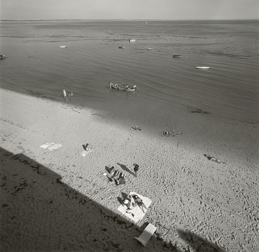
Imperial War Museum, London website

LIKE ART BLART ON FACEBOOK

Back to top

Exhibition: ‘Color Correction’ by Ernst Haas at Christophe Guye Galerie, Zurich

Exhibition dates: 20th January – 25th February, 2012

Curator: William Ewing


Many thankx to Christophe Guye Galerie, Zurich for allowing me to publish the photographs in the posting. Please click on the photographs for a larger version of the image.


Ernst Haas (American born Austria, 1921-1986) 
'New York' 1980 from the exhibition 'Color Correction' by Ernst Haas at Christophe Guye Galerie, Zurich, January - February, 2012


Ernst Haas (American born Austria, 1921-1986)
New York
1980
C-print, later print
76.2 x 101.6cm (30 x 40 in)
Edition of 15
Courtesy of Ernst Haas and Christophe Guye Galerie


“No photographer has worked more successfully to express the sheer physical joy of seeing.”


John Szarkowski


“Bored with obvious reality, I find my fascination in transforming it into a subjective point of view. Without touching my subject I want to come to the moment when, through pure concentration of seeing, the composed picture becomes more made than taken. Without a descriptive caption to justify its existence, it will speak for itself – less descriptive, more creative; less informative, more suggestive; less prose, more poetry.”


Ernst Haas from “About Color Photography,” in DU, 1961


Ernst Haas (American born Austria, 1921-1986) 'Rush Hour, New York City' Nd from the exhibition 'Color Correction' by Ernst Haas at Christophe Guye Galerie, Zurich, January - February, 2012


Ernst Haas (American born Austria, 1921-1986)
Rush Hour, New York City
Nd
C-print, later print
76.2 x 101.6cm (30 x 40 in)
Edition of 15
Courtesy of Ernst Haas and Christophe Guye Galerie


Ernst Haas (American, 1921-1986) 'New York City, USA' Nd


Ernst Haas (American born Austria, 1921-1986)
New York City, USA
Nd
C-print, later print
76.2 x 101.6cm (30 x 40 in)
Edition of 15
Courtesy of Ernst Haas and Christophe Guye Galerie


Ernst Haas (American, 1921-1986) 'New York City, USA' Nd


Ernst Haas (American born Austria, 1921-1986)
New York City, USA
Nd
Courtesy of Ernst Haas and Christophe Guye Galerie


Ernst Haas (American, 1921-1986) 'New York City, USA' Nd


Ernst Haas (American born Austria, 1921-1986)
New York City, USA
Nd
Courtesy of Ernst Haas and Christophe Guye Galerie


Ernst Haas (American, 1921-1986) 'Feed Line, New York City, USA' Nd


Ernst Haas (American born Austria, 1921-1986)
Feed Line, New York City, USA
Nd
Courtesy of Ernst Haas and Christophe Guye Galerie


Ernst Haas (American, 1921-1986) 'New York City, USA' Nd


Ernst Haas (American born Austria, 1921-1986)
New York City, USA
Nd
Courtesy of Ernst Haas and Christophe Guye Galerie


Ernst Haas (American, 1921-1986) 'New York City' 1951


Ernst Haas (American born Austria, 1921-1986)
New York City
1951
C-print, later print
76.2 x 101.6cm (30 x 40 in)
Edition of 15
Courtesy of Ernst Haas and Christophe Guye Galerie


Ernst Haas (American, 1921-1986) 'Food Day, New York City, USA' 1953


Ernst Haas (American born Austria, 1921-1986)
Food Day, New York City, USA
1953
C-print, later print
Courtesy of Ernst Haas and Christophe Guye Galerie


Ernst Haas (American, 1921-1986) '3rd Avenue, Reflection, New York City' 1952


Ernst Haas (American born Austria, 1921-1986)
3rd Avenue, Reflection, New York City
1952
C-print, later print
76.2 x 101.6cm (30 x 40 in)
Edition of 15
Courtesy of Ernst Haas and Christophe Guye Galerie


Ernst Haas (American, 1921-1986) 'New York City, USA' 1953


Ernst Haas (American born Austria, 1921-1986)
New York City, USA
1953
C-print, later print
76.2 x 101.6cm (30 x 40 in)
Edition of 15
Courtesy of Ernst Haas and Christophe Guye Galerie


Ernst Haas (American, 1921-1986) 'Paris, France' 1954


Ernst Haas (American born Austria, 1921-1986)
Paris, France
1954
C-print, later print
76.2 x 101.6cm (30 x 40 in)
Edition of 15
Courtesy of Ernst Haas and Christophe Guye Galerie


Ernst Haas (American, 1921-1986) 'Frigidaire, Paris' 1954


Ernst Haas (American born Austria, 1921-1986)
Frigidaire, Paris
1954
C-print, later print
76.2 x 101.6cm (30 x 40 in)
Edition of 15
Courtesy of Ernst Haas and Christophe Guye Galerie


Ernst Haas (American, 1921-1986) 'New York City' 1955


Ernst Haas (American born Austria, 1921-1986)
New York City
1955
C-print, later print
76.2 x 101.6cm (30 x 40 in)
Edition of 15
Courtesy of Ernst Haas and Christophe Guye Galerie


Ernst Haas (American, 1921-1986) '
New Orleans' 1957


Ernst Haas (American born Austria, 1921-1986)

New Orleans
1957
C-print, later print
76.2 x 101.6cm (30 x 40 in)
Edition of 15
Courtesy of Ernst Haas and Christophe Guye Galerie


Ernst Haas (American, 1921-1986) 'Park Avenue Taxis' 1958


Ernst Haas (American born Austria, 1921-1986)
Park Avenue Taxis
1958
C-print, later print
76.2 x 101.6cm (30 x 40 in)
Edition of 15
Courtesy of Ernst Haas and Christophe Guye Galerie


Ernst Haas (American, 1921-1986) '
New Orleans, USA' 1960


Ernst Haas (American born Austria, 1921-1986)
New Orleans, USA
1960
C-print, later print
76.2 x 101.6cm (30 x 40 in)
Edition of 15
Courtesy of Ernst Haas and Christophe Guye Galerie


Ernst Haas (American, 1921-1986) 'New York City, USA' 1962


Ernst Haas (American born Austria, 1921-1986)
New York City, USA
1962
C-print, later print
76.2 x 101.6cm (30 x 40 in)
Edition of 15
Courtesy of Ernst Haas and Christophe Guye Galerie


Ernst Haas (American, 1921-1986) 'New York City, USA' 1962


Ernst Haas (American born Austria, 1921-1986)
New York City, USA
1962
C-print, later print
76.2 x 101.6cm (30 x 40 in)
Edition of 15
Courtesy of Ernst Haas and Christophe Guye Galerie


Ernst Haas (American, 1921-1986) 'Traffic, Mexico City' 1963


Ernst Haas (American born Austria, 1921-1986)
Traffic, Mexico City
1963
C-print, later print
76.2 x 101.6cm (30 x 40 in)
Edition of 15
Courtesy of Ernst Haas and Christophe Guye Galerie


Ernst Haas (American, 1921-1986) 'New York City, USA' 1963


Ernst Haas (American born Austria, 1921-1986)
New York City, USA
1963
C-print, later print
Courtesy of Ernst Haas and Christophe Guye Galerie


Ernst Haas (American, 1921-1986) 'Lights of New York City, New York City' 1966


Ernst Haas (American born Austria, 1921-1986)
Lights of New York City, New York City
1966
C-print, later print
Courtesy of Ernst Haas and Christophe Guye Galerie


Ernst Haas (American, 1921-1986) 'Torn Poster I, Wave, NYC' 1968


Ernst Haas (American born Austria, 1921-1986)
Torn Poster I, Wave, NYC
1968
C-print, later print
76.2 x 101.6cm (30 x 40 in)
Edition of 15
Courtesy of Ernst Haas and Christophe Guye Galerie


Ernst Haas (American, 1921-1986) 'New York City, USA' 1968


Ernst Haas (American born Austria, 1921-1986)
New York City, USA
1968
C-print, later print
Courtesy of Ernst Haas and Christophe Guye Galerie


Ernst Haas (American, 1921-1986) 'Greenwich Village, New York City, USA' 1970


Ernst Haas (American born Austria, 1921-1986)
Greenwich Village, New York City, USA
1970
C-print, later print
76.2 x 101.6cm (30 x 40 in)
Edition of 15
Courtesy of Ernst Haas and Christophe Guye Galerie


Ernst Haas (American, 1921-1986) 'California, USA' 1970


Ernst Haas (American born Austria, 1921-1986)
California, USA
1970
C-print, later print
76.2 x 101.6cm (30 x 40 in)
Edition of 15
Courtesy of Ernst Haas and Christophe Guye Galerie


Ernst Haas (American, 1921-1986) 'New York City, USA' 1972


Ernst Haas (American born Austria, 1921-1986)
New York City, USA
1972
C-print, later print
Courtesy of Ernst Haas and Christophe Guye Galerie


Ernst Haas (American, 1921-1986) 'New York City, USA' 1973


Ernst Haas (American born Austria, 1921-1986)
New York City, USA
1973
C-print, later print
Courtesy of Ernst Haas and Christophe Guye Galerie


Ernst Haas (American, 1921-1986) 'New York City, USA' 1974


Ernst Haas (American born Austria, 1921-1986)
New York City, USA
1974
C-print, later print
76.2 x 101.6cm (30 x 40 in)
Edition of 15
Courtesy of Ernst Haas and Christophe Guye Galerie


“Making his first color photographs in 1949, Haas was a member of the prestigious Magnum agency. Known mainly for his commissioned work, whereby he created influential imagery such as iconic Marlboro Man advertisements long before other artists were commissioned to do so, Haas’ work would come to have great influence on later artists, such as Richard Prince, Marc Quinn or Robert Longo. Using color also for his personal work, with a pictorial language recalling at times the works by painter Edward Hopper, Haas has been described as a poet photographer. Haas cropped and abstracted, photographed against the light and out of focus, and used reflections and close-ups to mystify the visible. Interested in the everyday,as well, some of his personal photographs remind of the likes of Lee Friedlander or Stephan Shore.”

Anonymous. “Ernst Haas: Color Correction,” on the Lens Culture website Nd [Online] Cited 15/11/2024. Used under fair use conditions for the purposes of education and research


Ernst Haas (American, 1921-1986) 'New Mexico, USA' 1975


Ernst Haas (American born Austria, 1921-1986)
New Mexico, USA
1975
C-print, later print
76.2 x 101.6cm (30 x 40 in)
Edition of 15
Courtesy of Ernst Haas and Christophe Guye Galerie


Ernst Haas (American, 1921-1986)
 'Western Skies Motel' 1978


Ernst Haas (American born Austria, 1921-1986)
Western Skies Motel
1978
C-Print, later print
76.2 x 101.6cm (30 x 40 in)
Edition of 15
Courtesy of Ernst Haas and Christophe Guye Galerie


Ernst Haas (American, 1921-1986) 'New York City, USA' 1981


Ernst Haas (American born Austria, 1921-1986)
New York City, USA
1981
C-Print, later print
76.2 x 101.6cm (30 x 40 in)
Edition of 15
Courtesy of Ernst Haas and Christophe Guye Galerie


Ernst Haas (American, 1921-1986) 'St Louis, Missouri, USA' 1986


Ernst Haas (American born Austria, 1921-1986)
St Louis, Missouri, USA
1986
C-Print, later print
76.2 x 101.6cm (30 x 40 in)
Edition of 15
Courtesy of Ernst Haas and Christophe Guye Galerie


Christophe Guye Galerie is proud to present Color Correction by one of the most important and influential artists in the development of colour photography and the history of the medium on a whole, this exhibition spotlights a body of work that poignantly describes the complex ways in which an artist’s ‘career’ took form. Ernst Haas belonged to the best known, most productive and widely published photographers of the twentieth century. Most commonly associated with vibrant colour photography, Haas was famed for his commercial work. It is undoubtedly however his other, private work that really illuminates the power of his sensibility and his true mastery. Unfortunately this side of his creative output has been kept private and thus escaped posthumous appreciation. It is only now, with the efforts and belief in Haas’ ability of a few, such as William Ewing, former Director of the Musée de l’Elysée in Lausanne, that this body of work is finally revealed and justly let’s this artist’s aptitude shine. The exhibition Color Correction, and Ewing’s corresponding book published by Steidl, uncovers, with an exciting and novel view, the “other” side of Ernst Haas’ visionary.

Color Correction is the first exhibition in Switzerland to present the to-date little known, non-commission work by the late Austrian-born photographer. Uncovering a new side to a much celebrated body of work, the show will include fifteen new and mostly never before seen large format works, alongside a handpicked selection of rare, vintage dye-transfer prints from the 1950s and ’60s. These astoundingly complex and ultimately enveloping pieces form a group exhibited under the title Colour Correction to coincide with the recent Steidl publication Color Correction, by William Ewing.”These images are of great sophistication, and rival (and sometimes surpass) the best of his colleagues”, says Ewing, revealing works “far more edgy, loose, enigmatic, and ambiguous than his celebrated work.”

“Color correction” is a term used in printing, through which the inked proofs are brought into as close equivalence as possible with the original photograph. Ewing has chosen to use the term metaphorically, to suggest “we owe it to Ernst Haas and our understanding of the history of colour photography, to reevaluate his importance in light of this marvellous imagery, kept under wraps for so many years.” It was in 1962 that the first ever colour photography exhibition, Ernst Haas Color Photography, was held at the prestigious MoMA in New York, and not until fourteen years later would colour photography be given another show at the museum with Color Photography by William Eggleston. Though introducing Haas’ work to a large audience and a major milestone in the history of the medium it would not come to have the same effect on the development of the artist’s career. On the contrary: an exhibition planned by Edward Steichen, renowned photographer and curator of MoMA at the time, it was in the end his predecessor John Szakowski who would actually see it realised. With this shift in curatorial visionary, Szakowski would enforce a different taste. Having the duty to complete Steichen’s idea, but keen to champion his own and dissimilar ideas, Szakowski’s enthusiasm regarding the artist and the exhibition Ernst Haas Color Photography was meek, the praise in his accompanying texts all but faint. Steichen, once in favour of Pictorialism, thus a subjective photography, valued Haas’ profound use of the camera, while Szakowski on the other hand chose to favour a less embellished sentiment; a more hardedge modernist inspired American approach. It was this disregard and clashing of personal agendas that would ultimately and erroneously see Haas excluded from the canon of colour photography; his indisputable talent became the victim of the cyclical debate of what art photography should be.

Making his first colour photographs in 1949, Haas was a member of the prestigious Magnum agency. Known mainly for his commissioned work, whereby he created influential imagery such as iconic Marlboro Man advertisements long before other artists were commissioned to do so, Haas’ work would come to have great influence on later artists, such as Richard Prince, Marc Quinn or Robert Longo. Using colour also for his personal work, with a pictorial language recalling at times the works by painter Edward Hopper, Haas has been described as a poet photographer. By no means the first to use the medium in colour, he was said to be “the first to do it masterfully.” Visionary, Haas early on cropped and abstracted, photographing against the light and out of focus, using reflections, close-up to mystify the visible, abstraction of colour and texture. Interested in the everyday, his photographs remind of the likes of Lee Friedlander or Stephan Shore, but rather than documents his works are “vignettes of personal experience.” The works on display in Color Correction reveal this more abstract side of the artist’s oeuvre.

Haas’ work never received the recognition it deserved. The works presented at Christophe Guye Galerie are based upon this dispute, attempting to reveal the true ability of Haas’ work and restore his rightful place in the medium’s canon.

Haas’ formal language echoes decades past while being extremely contemporary at once. Often shooting inches away from the subject at acute and unexpected angles, Haas work was visionary. Lyrical, evocative, and expressive, while at the same time exact, the artist moved away from obvious reality, finding fascination in transforming it into a subjective point of view. The works on view are to be understood not as informative but as creative; description gives way to suggestion. Color Correction – the exhibition as well as the book – show works that are rich, vibrant, and intelligent alike. With this new view on the body of work of one of the medium’s most important advocates, Color Correction hopes to evoke the excitement Steichen expressed when he first came across Haas imaginarium of seeing: “In my estimation we have experienced an epoch in photography. Here is a free spirit, untrammelled by tradition and theory, who has gone out and found beauty unparalleled in photography.”

Press release from the Christophe Guye Galerie website


Ernst Haas (American, 1921-1986) 'New York City' 1952


Ernst Haas (American born Austria, 1921-1986)
New York City
1952
C-print, later print
76.2 x 101.6cm (30 x 40 in)
Edition of 15
Courtesy of Ernst Haas and Christophe Guye Galerie


Ernst Haas (American, 1921-1986) 'Brooklyn, New York' 1952


Ernst Haas (American born Austria, 1921-1986)
Brooklyn, New York
1952
C-print, later print
101.6 x 76.2cm (40 x 30 in)
Edition of 15
Courtesy of Ernst Haas and Christophe Guye Galerie


Ernst Haas (American, 1921-1986) 'New York City, USA' 1952


Ernst Haas (American born Austria, 1921-1986)
New York City, USA
1952
C-print, later print
Courtesy of Ernst Haas and Christophe Guye Galerie


Ernst Haas (American, 1921-1986) 'New York City, USA' 1955


Ernst Haas (American born Austria, 1921-1986)
New York City, USA
1955
C-print, later print
Courtesy of Ernst Haas and Christophe Guye Galerie


Ernst Haas (American, 1921-1986) 'Bronco Rider, California' 1957


Ernst Haas (American born Austria, 1921-1986)
Bronco Rider, California
1957
C-print, later print
101.6 x 76.2cm (40 x 30 in)
Edition of 15
Courtesy of Ernst Haas and Christophe Guye Galerie


Ernst Haas (American, 1921-1986) 'New York City, USA' 1963


Ernst Haas (American born Austria, 1921-1986)
New York City, USA
1963
C-print, later print
Courtesy of Ernst Haas and Christophe Guye Galerie


Ernst Haas (American, 1921-1986) 'Los Angeles, California, USA' 1963


Ernst Haas (American born Austria, 1921-1986)
Los Angeles, California, USA
1963
C-print, later print
101.6 x 76.2cm (40 x 30 in)
Edition of 15
Courtesy of Ernst Haas and Christophe Guye Galerie


Ernst Haas (American, 1921-1986) 'Cafe Boi Charbon, Caen, France' 1976


Ernst Haas (American born Austria, 1921-1986)
Cafe Boi Charbon, Caen, France
1976
C-print, later print
Courtesy of Ernst Haas and Christophe Guye Galerie


Ernst Haas (American, 1921-1986) 'California, USA' 1976


Ernst Haas (American born Austria, 1921-1986)
California, USA
1976
C-print, later print
101.6 x 76.2cm (40 x 30 in)
Courtesy of Ernst Haas and Christophe Guye Galerie


Christophe Guye Galerie
Dufourstrasse 31
8008 Zurich, Switzerland
Phone: +41 44 252 01 11

Opening hours:
Monday to Friday 10am – 6pm
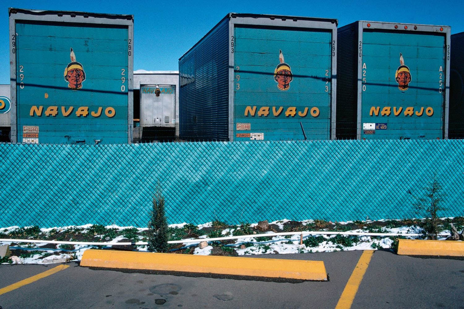
Saturday 11am – 4pm
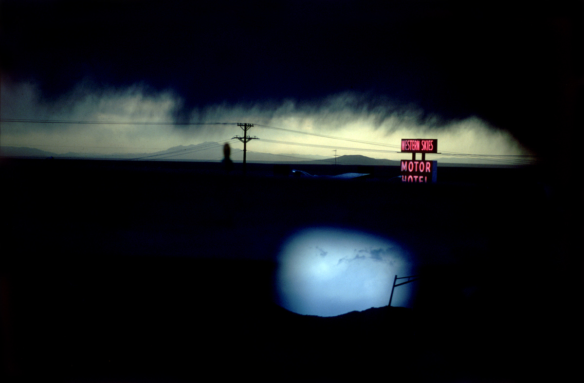
Christophe Guye Galerie website

LIKE ART BLART ON FACEBOOK

Back to top

Exhibition: ‘Swiss Photobooks from 1927 to the present – A Different History of Photography’ at Fotostiftung Schweiz, Zurich

Exhibition dates: 22nd October, 2011 – 19th February, 2012

Curator: Peter Pfrunder, director of the institution, in cooperation with Martin Gasser and Sabine Münzenmaier


Many thankx to Fotostiftung Schweiz for allowing me to publish the photographs in the posting. Please click on the photographs for a larger version of the image.


Albert Steiner (Swiss, 1877-1965) 'Schnee, Winter, Sonne' Rotapfel-Verlag, Zurich-Erlenbach/Leipzig 1930 from the exhibition 'Swiss Photobooks from 1927 to the present – A Different History of Photography' at Fotostiftung Schweiz, Zurich, October 2011 - February 2012


Albert Steiner (Swiss, 1877-1965)
Schnee, Winter, Sonne
Rotapfel-Verlag, Zurich-Erlenbach/Leipzig
1930


Albert Steiner was one of the finest Swiss photographers of the twentieth century. Like Ansel Adams, he favoured imposing natural phenomena, landscapes with what might be called good bone structure, (in his case the Alps, in Adams’s comparable work, the American West), and he printed his vision of them in black-and-white, revealing nature in all its majesty. His impressive scenic work has fundamentally shaped the world’s perception of Switzerland as an alpine country of timeless beauty. It spans the period from before World War I – an era of pictorially inspired images that look like oil paintings – to the straightforward and elegantly modern photography of the 1930s. Unlike many other photographers of the same generation active in the same area, Steiner saw photography as a completely appropriate means of creating works of art, and considered himself an artist.

Text from Amazon. Albert Steiner The Photographic Work. Steidl November 21, 2008


Eduard Spelterini (Swiss, 1852-1931) 'Über den Wolken' Brunner & Co. A.G., Zurich 1928


Eduard Spelterini (Swiss, 1852-1931)
Über den Wolken (cover)
Brunner & Co. A.G., Zurich
1928


Eduard Spelterini (Swiss, 1852-1931)

Swiss balloonist Eduard Spelterini (1852-1931) lived an extraordinary life. Born the son of an innkeeper and beer brewer in a remote village in the Toggenburg area of Switzerland, Spelterini achieved international fame when he became the first aeronaut to fly over the Swiss Alps in 1898. Over the next two decades, Spelterini navigated his balloon through the skies of Europe, Africa, and Asia, and over such sites as the Great Pyramid of Giza and the gold mines of South Africa. Spelterini remains an important figure today because of his achievements in aerial photography. Seeking images to illustrate his lectures, he began taking a camera along with him on his expeditions in 1893, and his breathtaking photographs quickly became the talk of Europe.

Known as the “King of the Air,” the Swiss balloonist Eduard Spelterini enchanted the imaginations of European royalty, military generals, wealthy patrons, and the public alike with his mastery of the most whimsical mode of travel ever invented – the gas balloon. During the course of his storied aviation career, Spelterini flew his balloons over the Swiss Alps, across the Egyptian pyramids, and past the ziggurats of the Middle East, taking breathtaking photographs of landscapes and cities from the sky.

On Spelterini’s first ballooning ventures, he ferried aristocrats between Vienna, Bucharest, Athens, and other European capitals, on flights that became so famous that they were soon jam-packed with an international press corps looking for the next sensational story. Later in his life, Spelterini was the first aeronaut to succeed in the hazardous passage over the Swiss Alps, a trip then thought impossible. Eventually, he decided to bring his camera on every voyage in order to document the full panorama of international vistas he encountered.

Text from Amazon


Eduard Spelterini and the Spectacle of Images: The Colored Slides of the Pioneer Balloonist. Verlag Scheidegger and Spiess; Bilingual edition August 15, 2010, presents a selection of around eighty of Spelterini’s never-before-published colored slides, offering readers an altogether new look at the spectacular work of this pioneer of photography and aviation.

Eduard Spelterini – Photographs of a Pioneer Balloonist. Verlag Scheidegger and Spiess; Bilingual edition December 30, 2007 is the first book after 80 years to present these images of his journeys, reproduced directly from the artist’s original glass negatives. Contextualized by essays that explore both Spelterini’s life and his photographic work, the photographs featured in this volume capture the heady mix of danger and discovery that defined the early years of international air travel when balloons ruled the skies.


Eduard Spelterini (Swiss, 1852-1931) 'Über den Wolken' Brunner & Co. A.G., Zurich 1928 from the exhibition 'Swiss Photobooks from 1927 to the present – A Different History of Photography' at Fotostiftung Schweiz, Zurich, October 2011 - February 2012


Eduard Spelterini (Swiss, 1852-1931)
Über den Wolken
Brunner & Co. A.G., Zurich
1928


Walter Mittelholzer (Swiss, 1894-1937) 'Alpenflug' Orell Füssli, Zurich/Leipzig 1928


Walter Mittelholzer (Swiss, 1894-1937)
Alpenflug (cover)
Orell Füssli, Zurich/Leipzig
1928


The Swiss Foundation for Photography (Fotostiftung Schweiz) is marking its fortieth anniversary by presenting a fresh view of Swiss photography – a tour d’horizon covering a range of illuminating photobooks in which not only the great themes of photography are reflected but also the development of photographic styles and modes of expression. Since the late 1920s the book has repeatedly proved itself to be an ideal platform for the presentation of photographic works. Books have not only contributed to the dissemination and transmission of photography but also facilitated the integration of the individual image into a meaningful context.

In the history of photography the photobook plays a major role not only in publicising photographs, but also as an independent means of expression. The significance of many photographers’ works only emerges when presented in book form, in the coherent sequence or series of images. Content, design and printing quality combine to produce an intricate architectural whole.

This jubilee exhibition marking the 40th anniversary of the Fotostiftung Schweiz focuses on a selection of photobooks that have influenced photography in Switzerland since the late 1920s. At that time, technical advances made the reproduction of top quality photographic images possible and promptly gave rise to a first boom in illustrated books that placed greater emphasis on the photographs than on the texts. Since then, Swiss photobooks have continued to develop in various directions and have repeatedly attracted considerable attention at international level as well.

With the help of seven thematic areas – homeland, portraiture, mountain photography, the world of work, aerial photography, contemporary history, travel – this exhibition aims at a kind of typology of the Swiss photobook which draws attention to the potential interplay between book and photograph, while also revealing the extent to which modes of expression have altered over the course of time. Concise excerpts from these books exhibited on the walls highlight the basic principle of each photobook – a photograph positioned on a double page still remains an integral part of a larger sequence. The concept, design and reception of photobooks are examined more closely in display cases. A large wall installation is devoted to photobook covers. The photobook is also presented as an object in film form: “reading” illustrated photography books is not just an intellectual but also a sensual act.

Press release from the Fotostiftung Schweiz website


Jakob Tuggener (Swiss, 1904-1988) 'Fabrik' (cover) Rotapfel Verlag, Erlenbach-Zurich 1943


Jakob Tuggener (Swiss, 1904-1988)
Fabrik (cover)
Rotapfel Verlag, Erlenbach-Zurich
1943


Jakob Tuggener (Swiss, 1904-1988) 'Fabrik' Rotapfel Verlag, Erlenbach-Zurich 1943


Jakob Tuggener (Swiss, 1904-1988)
Fabrik
Rotapfel Verlag, Erlenbach-Zurich
1943


Jakob Tuggener’s Fabrik, published in Zurich in 1943, is a milestone in the history of the photography book. Its 72 images, in the expressionist aesthetic of a silent movie, impart a skeptical view of technological progress: at the time the Swiss military industry was producing weapons for World War II. Tuggener, who was born in 1904, had an uncompromisingly critical view of the military-industrial complex that did not suit his era. His images of rural life and high-society parties had been easy to sell, but Fabrik found no publisher. And when the book did come out, it was not a commercial success. Copies were sold at a loss and some are believed to have been pulped. Now this seminal work, which has since become a sought-after classic, is being reissued with a contemporary afterword. In his lifetime, Tuggener’s work appeared – at Robert Frank’s suggestion – in Edward Steichen’s Post-War European Photography and in The Museum of Modern Art’s seminal exhibition, The Family of Man, in whose catalogue it remains in print. Tuggener’s death in 1988 left an immense catalogue of his life’s work, much of which has yet to be shown: more than 60 maquettes, thousands of photographs, drawings, watercolors, oil paintings and silent films.The Family of Man,

Book description on Amazon. The book has been republished by Steidl in January, 2012. The classics never go out of fashion!


Le Corbusier (Swiss-French, 1887-1965) 'Aircraft' 1935


Le Corbusier (Swiss-French, 1887-1965)
Aircraft
The Studio, London/New York
1935


Le Corbusier (Swiss-French, 1887-1965) 'Aircraft' 1935

Le Corbusier (Swiss-French, 1887-1965) 'Aircraft' 1935


Le Corbusier (Swiss-French, 1887-1965)
Aircraft
The Studio, London/New York
1935


Robert Frank 'The Americans' New York: Grove Press 1959 front cover


Robert Frank (Swiss-American, 1924-2019)
The Americans
Grove Press, New York
1958/1959


Werner Bischof (Swiss, 1916-1954) 'Japan' 1955


Werner Bischof (Swiss, 1916-1954)
Japan
Manesse, Zurich
c. 1955


Werner Bischof (Swiss, 1916-1954) 'Courtyard of the Meiji shrine in Tokyo, Japan' 1951


Werner Bischof (Swiss, 1916-1954)
Courtyard of the Meiji shrine in Tokyo, Japan
1951
Gelatin silver print


René Burri (Swiss, 1933-2014) 'Die Deutschen' 1962


René Burri (Swiss, 1933-2014)
Die Deutschen
Fretz & Wasmuth Verlag, Zurich
1962


Hugues de Wurstemberger (Swiss, b. 1955) 'Paysans' 1996


Hugues de Wurstemberger (Swiss, b. 1955)
Paysans
Editions de la Sarine, Fribourg
1996


Andri Pol (Swiss, b. 1961) 'Grüezi' Kontrast Verlag, Zurich 2006


Andri Pol (Swiss, b. 1961)
Grüezi
Kontrast Verlag, Zurich
2006


Fotostiftung Schweiz
Grüzenstrasse 45
CH-8400 Winterthur (Zürich)
Phone: +41 52 234 10 30

Opening hours:
Daily 11am – 6pm
Wednesday 11am – 8pm
Closed on Mondays

Fotostiftung Schweiz website

FOLLOW ART BLART ON FACEBOOK

Back to top