Exhibition dates: 11th October 2023 - 7th January 2024
Curators:Hiroshi Sugimoto: Time Machine is curated by Hayward Gallery Director Ralph Rugoff with Assistant Curators Thomas Sutton and Gilly Fox, and Curatorial Assistant Suzanna Petot.
Rachael Smith Hiroshi Sugimoto in the Hayward Gallery with his ‘Seascapes’ series 2023
The world is a reality, not because of the way it is, but because of the possibilities it presents
Frederick Sommer
Almost real
I have an ambivalent relationship with the work of Hiroshi Sugimoto.
On the one hand I truly admire the beauty and presence of Sugimoto’s photographs; how his images “contradict the medium’s conventional tasks – to record reality as precisely as possible”; and how his work, through an investigation of “fundamental questions of space and time, past and present, art and science, imagination and reality” push at the boundaries of what a photograph is and can be through an exploration of the very nature of photography.
Through this erudite, conceptual, scientific and creative investigation, Sugimoto’s staged images proffer a reorientation of the referent – of the world, in the world – unsettling the certainty of the truth of the photograph as a visual record of the world.
In my favourite series – such as the movie in a moment Theaters (1976 – ), the stuffed animal Dioramas (1974 – ), some of the wax works dead pan Portraits (1999 -) (particularly Oscar Wilde, Queen Victoria and Princess Diana), and the Seascapes (1980 -) – I feel released from the bounds of reality as we perceive it. The artist takes me out of myself and into a new plane of existence. He has reanimated the in/animate through an alchemical process, a mystery of mysteries, to create new life – a transubstantiation of the elements earth, air, water, fire.
On the other hand I am less impressed with bodies of work that simply do not work for me… that leave me feeling cold, lifeless. Series such as Revolution (1990/2012), Lightning Fields (2009), Photogenic Drawings (2009), Architecture (1997 – below) and the recent Opticks (2018 – below), while not derivative, owe a great debt to other artists that have already strode that golden path… and have done it better.
As I have observed in another review of Sugimoto’s work: “I’m not saying Sugimoto is derivative but because of these other works, they don’t have much room to move. Indeed, they hardly move at all. They are so frozen in attitude that all the daring transcendence of light, the light! of space time travel, the transition from one state to another, has been lost. The Flame of Recognition (Edward Weston) – has gone.”
Taking his work as a whole, we observe in Sugimoto’s work a slightly malevolent aura – follow my argument here – not in the sense of the work “showing a wish to do evil to others” but through the photographs unsettling ability to confound the reality of others. The artist’s work is very male/volent, very masculine and in the Latin etymology of the word “volent” (present participle of velle to will, wish) very much (reality) constructed at the will and wish of the artist.
While Sugimoto’s volition (from Latin volo ‘I wish’) creates beautiful and subversive images of true presence and power, it is the artist’s ability to will into existence images that engage with mystical forces beyond the apparent and the factual but which live as completely real and part of the total world of man and nature … that is his most impressive attribute as an artist. Through his photographs he brings to consciousness things only a small portion of which most of us experience directly.1
Dr Marcus Bunyan
1/ Adapted from Ansel Adams’ essay for The Flame of Recognition 1964 in “Edward Weston’s The Flame of Recognition” on the Aperture website August 12, 2015 [Online] Cited 22/12/2023
Many thankx to the Hayward Gallery for allowing me to publish the photographs in the posting. Please click on the photographs for a larger version of the image.
“All my life I have made a habit of never believing my eyes.”
Hiroshi Sugimoto
“Sugimoto’s unique accomplishments in his genre contradict the medium’s conventional tasks – to record reality as precisely as possible. In Sugimoto’s work, one is confronted with the formal reduction of conceptual images, in which he addresses fundamental questions of space and time, past and present, art and science, imagination and reality. “I was concerned,” noted the artist in 2002, “with revealing an ancient stage of human memory through the medium of photography. Whether it is individual memory or the cultural memory of mankind itself, my work is about returning to the past and remembering where we came from and how we came about.” His pictures, which leave a lasting impression through their beauty and their auratic effect, interweave Japanese traditions with Western ideas. This East-West dialogue remains characteristic of his work today, which is captivating in its exceptional craftsmanship and strong aesthetic presence, and can exercise an almost magical effect on viewers.”
Anonymous. “Hiroshi Sugimoto. Revolution,” on the Museum Brandhorst website February 8, 2013
Hiroshi Sugimoto | curator tour with Ralph Rugoff | Hayward Gallery
Hiroshi Sugimoto: ‘My camera works as a time machine’ | Hayward Gallery
‘A camera can be able to stop the world, in that we stop the world and then investigate what is there, carefully.’
~ Hiroshi Sugimoto
Ahead of the opening of Hiroshi Sugimoto: Time Machine at the Hayward Gallery – the largest survey to date of the Sugimoto’s works – we travelled to meet the photographer at the Enoura Observatory in Japan. Situated against the outer rim of the country’s Hakone Mountains, the observatory was designed by Sugimoto as a forum for disseminating art and culture.
In this short video interview Sugimoto considers the impact of the invention of the camera – with this new ability to pause the world around us – and explains how his own photography, such as his Seascapes series, draws on this idea of the camera’s ability to distort linear time.
Dioramas (1974 – )
Installation view of Hiroshi Sugimoto, Dioramas (1974 – ) Silver gelatin prints Photo: Mark Blower. Courtesy the artist and the Hayward Gallery
‘My life as an artist began the moment I saw that I had succeeded in bringing the bear back to life on film,’ said Sugimoto about his 1976 work Polar Bear. The image is of an Arctic diorama in the American Museum of Natural History in New York, but through clever use of framing and exposure, Sugimoto was able to make the scene appear real. As well as revisiting the museum, and others across the US, to expand his Dioramas series, Sugimoto later took a similar approach to the waxworks of Madame Tussauds in his Portraits. By removing the figures from their staged displays, and photographing them against a black backdrop with sympathetic lighting, the artist gave the impression that these famous faces had themselves modelled for his portraiture.
Installation view of Hiroshi Sugimoto, Polar Bear, 1976. Silver gelatin print Photo: Mark Blower. Courtesy the artist and the Hayward Gallery
“Polar Bear” (1976) shows the majestic white animal roaring over a fresh kill: the bloodied body of a seal whose inert form is bulky and dark against an Arctic white background that stretches into the distance. Look closely and behind the bear – with its luscious coat of fur, its big paws so heavy in the snow you can almost hear it crunch – the line between two and three dimensions is just visible: a jagged crevasse in the ice floe beneath the two animals merges almost seamlessly with a painted backdrop of receding icy peaks.
The eye judders between these realities. The dead bear, momentarily brought to life by the vividness of the photograph, dies again, and is preserved again, a copy of a copy, frozen between past and present. Similar fates await a pair of ostriches defending their new hatchlings against a family of wart hogs (“Ostrich-Wart Hog,” 1980) and a placidly floating mother manatee and her calf (“Manatee,” 1994).
Installation view of Hiroshi Sugimoto, Theaters series (1976 – ) Gelatin silver prints Photo: Mark Blower. Courtesy the artist and the Hayward Gallery
Installation view of Hiroshi Sugimoto, Goshen Indiana, 1980. Gelatin silver print Photo: Mark Blower. Courtesy the artist and the Hayward Gallery
Installation view of Hiroshi Sugimoto, Cabot Street Cinema, Beverly, Massachusetts 1978. Gelatin silver print
Installation view of Hiroshi Sugimoto, Abandoned Theaters series (2015 – ). Gelatin silver prints Photo: Mark Blower. Courtesy the artist and the Hayward Gallery
Installation view of Hiroshi Sugimoto, Union City Drive-in, Union City, 1993. Gelatin silver print Photo: Mark Blower. Courtesy the artist and the Hayward Gallery
The largest survey to date of Hiroshi Sugimoto, an artist renowned for creating some of the most alluringly enigmatic photographs of our time. Over the past 50 years, Sugimoto has created pictures which are meticulously crafted, deeply thought-provoking and quietly subversive.
Featuring key works from all of the artist’s major photographic series, this survey highlights Sugimoto’s philosophical yet playful inquiry into our understanding of time and memory, and photography’s ability to both document and invent.
The exhibition also includes lesser-known works that reveal the artist’s interest in the history of photography, as well as in mathematics and optical sciences.
Often employing a large-format wooden camera and mixing his own darkroom chemicals, Sugimoto has repeatedly re-explored ideas and practices from 19th century photography while capturing subjects including dioramas, wax figures and architecture. His work has stretched and rearranged concepts of time, space and light that are integral to the medium.
Born and raised in Tokyo, Japan, Hiroshi Sugimoto divides his time between Tokyo and New York City. Over the past five decades, his photographs have received international acclaim and have been presented in major institutions across the globe.
While best known as a photographer, Sugimoto has more recently added architecture and sculpture to his multidisciplinary practice, as well as being artistic director on performing arts productions.
Text from the Hayward Gallery website
Seascapes (1980 -)
Installation view of Hiroshi Sugimoto, Seascapes series. Gelatin silver prints Photo: Mark Blower. Courtesy the artist and the Hayward Gallery
Installation view of Hiroshi Sugimoto, Seascapes series. Gelatin silver prints Photo: Mark Blower. Courtesy the artist and the Hayward Gallery
Over the past 50 years, Hiroshi Sugimoto has created some of the most alluringly enigmatic photographs of our time: pictures that are precisely crafted and deeply thought-provoking, familiar yet tantalisingly ambiguous. Featuring key works from all of the artist’s major photographic series, this survey highlights the artist’s philosophical yet playful inquiry into our understanding of time and memory, and the ambiguous character of photography as a medium suited to both documentation and invention.
The exhibition also includes lesser-known works that illuminate the artist’s interest in the history of photography as well as in mathematics and optical sciences. Often employing a large-format wooden camera, mixing his own darkroom chemicals and developing his black-and-white prints by hand, Sugimoto has repeatedly re-explored ideas and practices from 19th century photography, including subjects such as dioramas, wax figures and architecture. In the process, his work has stretched and rearranged concepts of time, space and light that are integral to the medium.
Hiroshi Sugimoto says: “The camera is a time machine capable of representing the sense of time… The camera can capture more than a single moment, it can capture history, geological time, the concept of eternity, the essence of time itself… The more I think about that sense of time, the more I think this is probably one of the key factors of how humans became humans.”
Ralph Rugoff, Director of the Hayward Gallery, says: “Hiroshi Sugimoto is a brilliant visual poet of paradox, a polymath postmodern who embraces meticulous old school craftsmanship to produce exquisite, uncanny pictures that reference science and maths as well as abstract art and Renaissance portraits. Juggling different conceptions of time, and evoking visions ranging from primordial prehistory to the end of civilisation, his photographs ingeniously recalibrate our basic assumptions about the medium, and alter our sense of history, time and existence itself. Amidst all his peers, his work stands apart for its depth and striking originality of thought.”
Time Machine commences with a selection of Sugimoto’s black-and-white photographs of natural history dioramas, a series he began in the mid-1970s. The Dioramas photos draw attention less to the natural world than to its theatrical representation in museums, whilst at the same time conjuring what the artist has called the ‘fragility of existence’.
The subject of time is also explored in two subsequent bodies of work featured in the exhibition: shot in movie palaces as well as drive-ins, Sugimoto’s Theaters (1976 – ) capture entire films with a single long exposure, thus compressing all the dramatic action that appeared on screen into a single image of radiant whiteness. His renowned Seascapes (1980 -), which depict evenly divided expanses of sea and sky unmarked by any trace of human existence, are equally beguiling in their temporal reference, evoking the immediacy of abstract painting even as they speak to Sugimoto’s interest in focusing on vistas that, as he remarks, “are before human beings and after human beings.”
For Architecture (1997 – ), a series of deliberately out-of-focus studies of iconic modernist buildings – ranging from the Eiffel Tower to the Twin Towers – Sugimoto displays the expansive ambiguity that informs his art, at the same time conveying a sense of the visual germ of an idea in an architect’s imagination, as well as fashioning ghostly images of what he has described as “architecture after the end of the world.” For his subsequent Portraits (1999) series, meanwhile, the artist focused his camera on wax models of famous historical figures from Madame Tussauds; rendered more life-like in black-and-white, figures ranging from Queen Elizabeth II to Oscar Wilde and Salvador Dali take on a disarmingly lively appearance, underscoring the camera’s potential for altering our perception. As the artist has noted, “However fake the subject, once photographed, it’s as good as real.”
A final section of Hiroshi Sugimoto: Time Machine focuses on photographs that evoke different notions of timelessness, including his Sea of Buddha (1995) series, which portrays an installation in a 12th century Kyoto temple featuring 1001 gilded wooden statues of Buddha; and Lightning Fields (2006 – ), spectacular camera-less photographs created by exposing sensitised paper to electrical impulses produced by a Van der Graaf generator.
The exhibition comes to a stunning conclusion with a gallery dedicated to Sugimoto’s Opticks (2018 – ), intensely coloured photographs of prism-refracted light. Taking inspiration from Newton’s research into the properties of light whilst calling to mind colour field painting and artists like Mark Rothko, Opticks presents deeply immersive fields of subtly varying hues.
Alongside his photographs, two of Sugimoto’s elegantly contoured and polished aluminium sculptural models are presented, alluding to both mathematical equations and the abstract forms favoured by modernists such as Constantin Brâncuși.
The exhibition is accompanied by a fully-illustrated, 216pp catalogue with newly commissioned essays and an illustrated chronology, co-published with Hatje Cantz. Texts by Ralph Rugoff (on Dioramas), James Attlee (on Theaters), Mami Kataoka (on Seascapes), Lara Strongman (on Portraits), Geoffrey Batchen (on Lightning Fields), Edmund de Waal (on Sea of Buddha), Margaret Wertheim (on Conceptual Forms), Allie Biswas (on Opticks) and David Chipperfield (in conversation, on Architecture).
The show is set to tour internationally in 2024, at the UCCA Center for Contemporary Art (23 March – 23 June 2024) and The Museum of Contemporary Art Australia (2 August – 27 October 2024).
Press release from the Hayward Gallery
Sea of Buddha (1995)
Installation views of Hiroshi Sugimoto, Sea of Buddha series. Gelatin silver prints Photo: Mark Blower. Courtesy the artist and the Hayward Gallery
Installation view of Hiroshi Sugimoto, Sea of Buddha 049 (Triptych) 1995. Gelatin silver print Photo: Mark Blower. Courtesy the artist and the Hayward Gallery
Chamber of Horrors (1994 – ) and Portraits (1999 -)
Installation view of Hiroshi Sugimoto, Chamber of Horrors series. Gelatin silver prints Photo: Mark Blower. Courtesy the artist and the Hayward Gallery
Installation view of Hiroshi Sugimoto, The Garrote 1994. Gelatin silver print Photo: Mark Blower. Courtesy the artist and the Hayward Gallery
Installation view of Hiroshi Sugimoto, The Electric Chair 1994. Gelatin silver print Photo: Mark Blower. Courtesy the artist and the Hayward Gallery
Installation views of Hiroshi Sugimoto, Diana, Princess of Wales 1999. Gelatin silver print Photo: Mark Blower. Courtesy the artist and the Hayward Gallery
Hiroshi Sugimoto: formative years and significant works
For five decades the work of photographer Hiroshi Sugimoto has received international acclaim, whilst being presented in major galleries and institutions the world over.
Sugimoto’s photographs are meticulously crafted, often stretching and rearranging the concept of time, and our understanding of the world around us, and he has often re-explored ideas and practices from photography’s earliest exponents. Over the past 50 years, he has often revisited and expanded upon his own ideas, and series, which we take a closer look at, along with the artist’s formative years, here.
Hiroshi Sugimito: early years
Hiroshi Sugimoto was born in Tokyo in 1948 to a family of merchants. Among the young Sugimoto’s interests were trains, electronics, carpentry and photography, with his early fascination with the latter further enhanced by one of his elementary school science teachers, who showed Sugimoto and his classmates how to use photosensitive paper to make photograms. ‘He used spoons and forks and other items and he exposed the paper under the light for five or six minutes.’ explained Sugimoto, looking back. ‘When he removed it, the shapes of the spoons and forks remained on the paper. It was an amazing experience for me that left a lasting impression’.
At the age of 12 Sugimoto was given his first camera, a Mamiya 6 medium-format, by his father, which he would use to take photographs of trains and gather reference material for model-making. When he moved on to high school, Sugimoto joined the photography club and also began developing an interest in the cinema, which he would visit regularly. It wasn’t long before his love of film and photography combined, as he recalls, ‘Audrey Hepburn was beautiful and I fell in love with her on the screen. I wanted her portrait so I brought my Minolta SR7 camera into a movie theatre, and I studied how to stop the image on the screen. I found that one-fifteenth and one-thirteenth of a second stops the image’.
In 1970, after graduating in Economics from Tokyo’s Rikkyo University, Sugimoto backpacked across Russia and Europe. Influenced by communist ideology, and the writings of Karl Marx and Friedrich Engels as a student, he had wanted to experience Russian society, but disillusioned by what he found, he duly continued on to Europe. ‘I kept moving westwards. I stayed in Moscow for a few weeks and took another train to Poland, and then to Czechoslovakia, Bulgaria and other Eastern European countries. After several weeks I arrived in Vienna for my first taste of Western civilization’.
Hiroshi Sugimoto in America
Later in 1970 Sugimoto would get another taste of Western civilisation as he travelled to the US, and California. Here he studied at Los Angeles’ ArtCentre College of Design, specialising in photography. Speaking of his studies here, Sugimoto has said ‘ArtCenter College was more like a training school for technicians: car design and advertising. For photography you trained to be a commercial photographer, which is what I wanted. I wasn’t interested in academic study at all’.
After completing his study in Los Angeles Sugimoto moved to New York in 1974 in order to pursue a full-time career in photography. Here, Sugimoto soon became part of the city’s hippy counter-culture. ‘I got serious about using photography as a tool in my art after I moved to New York’, says Sugimoto. ‘I saw many good shows, mainly minimalist shows: Sol LeWitt, Dan Flavin, Donald Judd. When I moved to the East Coast I found so many interesting people that I decided to stay. I’d just finished my photographic studies and was hungry to work. Since photography was considered a second-class citizen in the art world then why not use photography? It was more interesting for me to start with something a step down and bring it up’.
Dioramas
In 1974, Sugimoto made his first visit to the American Museum of Natural History in New York, it was a visit that would inspire his first major breakthrough in photography. ‘I made a curious discovery while at the exhibition of animal dioramas,’ the artist explains. ‘The stuffed animals positioned before painted backdrops looked utterly fake, yet by taking a quick peek with one eye closed, all perspective vanished, and suddenly they looked very real. I had found a way to see the world as a camera does. However fake the subject, once photographed, it’s as good as real’.
Inspired by these taxidermy dioramas, he went on to commence his Dioramas series, which among its initial works included Polar Bear (1976) and Hyena – Jackal – Vulture (1976). Sugimoto would return to this idea two decades on, adding more works to Dioramas in the 1990s including 1994’s Earliest Human Relatives. In 1978 Polar Bear was acquired by The Museum of Modern Art, representing Sugimoto’s first photographic sale. The work was also exhibited in the museum’s Recent Acquisitions show, that same year.
Theaters
It was whilst working on his Dioramas series, that Sugimoto also found the inspiration for his next series, Theaters, as he would later detail. ‘I am a habitual self-interlocutor. One evening while taking photographs at the American Museum of Natural History, I had a near-hallucinatory vision. My internal question-and-answer session leading up to this vision went something like this: ‘Suppose you shoot a whole movie in a single frame?’ The answer: ‘You get a shining screen.’ Immediately I began experimenting in order to realise this vision’.
He began this series in 1976, by photographing St. Marks Cinema in Manhattan’s East Village, and the first group of works would also see Sugimoto capture other movie theatres and cinemas in the Northeast and Midwest of the US. It was an approach that the photographer has returned to again and again over the course of his career, firstly in 1993 when he broadened the Theaters series to include depictions of Drive-Ins across the US. The photographer later travelled to Europe, primarily Italy, to replicate the approach with Opera Houses in 2014, and then in 2015 began photographing Abandoned Theaters.
Seascapes
The seeds for Sugimoto’s Seascapes series were sown in 1980. ‘One New York night, during another of my internal question-and-answer sessions I pictured two great mountains’, the photographer has explained. ‘One, today’s Mount Fuji, and the other, Mount Hakone in the days before its summit collapsed, creating the Ashinoko crater lake. When hiking up from the foothills of Hakone, one would see a second freestanding peak as tall as Mount Fuji. Two rivals in height – what a magnificent sight that must have been! Unfortunately, the topography has changed. Although the land is forever changing its form, the sea, I thought, is immutable. Thus began my travels back through time to the ancient seas of the world’.
Sugimoto began the series that same year with a photograph of the Caribbean Sea, taken from a bluff in Jamaica while on a family holiday to the island. Seascapes would subsequently lead Sugimoto across the globe, photographing bodies of water from the Ligurian Sea viewed from Italy to the North Pacific Ocean viewed from Japan.
Chamber of Horrors and Portraits
In 1994 Sugimoto made his first visit to Madame Tussaud’s in London, where he photographed his Chamber of Horrors series on location. ‘I saw the blade that guillotined Louis XVI and Marie Antoinette, and the electric chair that executed the Lindbergh baby’s kidnapper, among other exhibits. They all looked very real to me’, Sugimoto said. ‘To corroborate these various murderous instruments invented by civilised men, I took the requisite eye-witness photographs: thus did people in times past face death head on’.
Sugimoto would return to the wax museum five years later to photograph his Portraits series, for which he was given special permission to remove selected figures from the display to photograph individually, among them Diana, Princess of Wales (1999), Fidel Castro (1999) and Anne of Cleeves (1999). However, he found that the exhibits he had previously captured for Chamber of Horrors had now been removed from the museum. ‘When I asked why,’ he said ‘I was told they’d been removed in a gesture to political correctness. Must we moderns be so sheltered from death?’
Opticks
In 2018 Sugimoto began printing his Opticks series, which was inspired by an 1704 work of the same name by Isaac Newton, in which Newton, through his experiments with prisms presented proof that natural light was not purely white. Drawing on Newton’s approach, Sugimoto used a batch of Polaroid film he had been gifted – one of the last batches of film Polaroid ever produced – along with a glass prism and a mirror to create condensed vivid compositions of pure colour. Sugimoto then enlarged these works into chromogenic prints. Opticks was presented for the first time in 2020 at the Kyoto City KYOCERA Museum of Art in Japan, and received its first UK presentation here at the Hayward Gallery.
Installation views of Hiroshi Sugimoto, Opticks series. Chromogenic prints Photo: Mark Blower. Courtesy the artist and the Hayward Gallery
Opticks isn’t the only series in which Sugimoto has experimented with historic techniques. In his 2006 series Lightning Fields, informed by the work of 19th century photography pioneer Henry Fox Talbot, Sugimoto captured the lightning-like shapes of electrical currents as they passed across a negatively-charged metal plate.
In his commitment to historic approaches the artist had initially attempted to supply the current to the plates using a hand-operated 18th century Wimshurst Electrostatic Machine, before switching to a more consistent Van de Graaff Generator.
In 2009, Sugimoto was gifted a batch of colour Polaroid film to see how a photographer who worked primarily in black and white might use it. This proved to be one of the last batches of the film ever produced (Polaroid went out of business in that same year) and would eventually find use in Sugimoto’s 2018 series, Opticks.
The images in Opticks – Sugimoto’s newest series, which has yet to be featured in any surveys of the artist’s work – are inspired by Isaac Newton’s seminal 1704 work of the same name, in which he presented proof that natural light was not purely white. Taking his cue from Newton’s experiments with prisms, Sugimoto used the Polaroid, along with glass and a mirror, to create condensed yet vivid compositions of colour in its purest form, before later enlarging these works into chromogenic prints.
Installation views of Hiroshi Sugimoto, Opticks series. Chromogenic print Photo: Mark Blower. Courtesy the artist and the Hayward Gallery
Installation views of Hiroshi Sugimoto, Opticks series. Chromogenic print Photo: Mark Blower. Courtesy the artist and the Hayward Gallery
Installation view of Hiroshi Sugimoto, Opticks series. Chromogenic print Photo: Mark Blower. Courtesy the artist and the Hayward Gallery
Installation view of Hiroshi Sugimoto, Opticks series. Chromogenic print Photo: Mark Blower. Courtesy the artist and the Hayward Gallery
Rachael Smith Hiroshi Sugimoto in the Hayward Gallery with his ‘Opticks’ series 2023
Installation view of Hiroshi Sugimoto, Conceptual Forms 0003 and Mathematical Model 002. Gelatin silver print, aluminium and steel Photo: Mark Blower. Courtesy the artist and the Hayward Gallery
Installation view of Hiroshi Sugimoto, Conceptual Forms 0003 2004. Gelatin silver print Photo: Mark Blower. Courtesy the artist and the Hayward Gallery
Installation view of Hiroshi Sugimoto, Conceptual Forms and Mathematical Model 006. Gelatin silver print, aluminium and steel Photo: Mark Blower. Courtesy the artist and the Hayward Gallery
Installation view of Hiroshi Sugimoto, Conceptual Form Surface 0001 Helicoid: Minimal Surface 2004. Gelatin silver print Photo: Mark Blower. Courtesy the artist and the Hayward Gallery
Curators: Caroline Corbeau-Parsons, Curator of British Art 1850-1915, and Stephen Calloway with Alice Insley, Assistant Curator, Historic British Art
#MuseumFromHome
Frederick Evans (British, 1853-1943) Aubrey Beardsley [with hands] 1893 Platinum print and photogravure, mounted on opposing pages of a paper folio Wilson Centre for Photography
While working as a clerk, Beardsley spent his lunchtimes browsing in Frederick Evans’ nearby second-hand bookshop. This had an important impact on his developing artistic and literary tastes. Beardsley became close friends with Evans, who was also a talented amateur photographer. The image on the left has become known as the ‘gargoyle portrait’ because Beardsley’s pose echoes the famous carved figure on Notre-Dame Cathedral in Paris. This portrait was used in early editions of Beardsley’s work and has become the defining image of the artist.
There he is
There he is, all aquiline nose, patrician air; thin wrists and hands that infinity strengthens,
Mannerist hands, hands like the buttresses of some great cathedral, supporting that noble face.
There he is, this genius of invention, this suave sophisticate, this pervader of decadent beauty,
this grotesque who produced a thousand drawings in seven years, who lived a thousand lives in just seven years.
There he is, this son of Blake, this offspring of Lautrec and japonaiserie,
all primed in subtle sexualities, shocking, fame, subversion… strange.
There he is, love of yellow, flowering enormous genitalia, erotic illustrations of distorting scale, women ambiguity,
as bold as life, diseased as death, driving his body on while his mind accretes mythologies.
Now he stands, a fantastical visionary, existing as product of unchecked imagination.
An illusion, a fabrication of the mind; an unrealisable dream, a fancy,
his utopia a grotesque, chimerical beauty.
Dr Marcus Bunyan
Many thankx to Tate Britain for allowing me to publish the media images in the posting. Please click on the photographs for a larger version of the image.
Tate Britain’s major new exhibition celebrates the brief but astonishing career of Aubrey Beardsley. Although he died tragically young at the age of just 25, Beardsley’s strange, sinuous black-and-white images have continued to shock and delight for over a century. Bringing together 200 spectacular works, this is the largest display of his original drawings in over 50 years and the first exhibition of his work at Tate since 1923.
Beardsley (1872-1898) became one of the enfants terribles of fin-de-siècle London, best remembered for illustrating Oscar Wilde’s controversial play Salomé. His opulent imagery anticipated the elegance of Art Nouveau but also alighted on the subversive and erotic aspects of life and legend, shocking audiences with a bizarre sense of humour and fascination with the grotesque. Beardsley was prolific, producing hundreds of illustrations for books, periodicals and posters in a career spanning just under seven years. Line block printing enabled his distinct black-and-white works to be easily reproduced and widely circulated, winning notoriety and admirers around the world, but the original pen and ink drawings are rarely seen. Tate Britain exhibits a huge array of these drawings, revealing his unrivalled skill as a draughtsman in exquisite detail.
The exhibition highlights each of the key commissions that defined Beardsley’s career as an illustrator, notably Malory’s Le Morte d’Arthur 1893-1894, Wilde’s Salomé 1893 and Alexander Pope’s The Rape of the Lock 1896, of which five of the original drawings are shown together for the first time. As art director of the daring literary quarterly The Yellow Book, the artist also created seminal graphic works that came to define the decadence of the era and scandalised public opinion. Bound editions and plates are displayed alongside subsequent works from The Savoy and illustrations for Volpone 1898 and Lysistrata 1896, in which Beardsley further explored his fascination with eroticism and the absurd.
Beardsley’s imagination was fuelled by diverse cultural influences, from ancient Greek vases and Japanese woodblock prints, to illicit French literature and the Rococo. He also responded to his contemporaries such as Gustave Moreau, Edward Burne-Jones and Toulouse Lautrec, whose works are shown at Tate Britain to provide context for Beardsley’s individual mode of expression. A room in the exhibition is dedicated to portraits of Beardsley and the artist’s wider circle, presenting him at the heart of the arts scene in London in the 1890’s despite the frequent confinement of his rapidly declining health. As notorious for his complex persona as he was for his work, the artist had a preoccupation with his own image, relayed throughout the exhibition by striking self-portraits and depictions by the likes of Walter Sickert and Jacques-Emile Blanche.
Additional highlights include a selection of Beardsley’s bold poster designs and his only oil painting. Charles Bryant and Alla Nazimova’s remarkable 1923 film Salomé is also screened in a gallery adjacent to Beardsley’s illustrations, showcasing the costume and set designs they inspired. The exhibition closes with an overview of Beardsley’s legacy from Art Nouveau to the present day, including Picasso’s Portrait of Marie Derval 1901 and Klaus Voormann’s iconic artwork for the cover of Revolver 1966 by the Beatles.
Aubrey Beardsley is organised by Tate Britain in collaboration with the Musée d’Orsay, Paris, with the generous support of the V&A, private lenders and other public institutions. It is curated by Caroline Corbeau-Parsons, Curator of British Art 1850-1915, and Stephen Calloway with Alice Insley, Assistant Curator, Historic British Art.
Press release from the Tate Britain website
Aubrey Beardsley at Tate Britain – Exhibition Tour | Tate
Join Tate curators Caroline Corbeau-Parsons and Alice Insley as they discuss the iconic illustrator’s short and scandalous career.
Before his untimely death aged twenty-five, Beardsley produced over a thousand illustrations. He drew everything from legendary tales featuring dragons and knights, to explicit scenes of sex and debauchery. His fearless attitude to art continues to inspire creatives more than a century after his death.
Aubrey Beardsley (British, 1872-1898) Withered Spring 1891 Graphite, ink and gouache on paper National Gallery of Art, Washington, Rosenwald Collection
The framing of the main image by ornamental panels and lettering shows the influence of aesthetic movement illustrators, as well as that of Burne-Jones. The inscription on the gate behind the figure is partly obscured. In full it would read ‘Ars Longa Vita Brevis’ (‘art is long-lasting, life is short’). As Beardsley was diagnosed with tuberculosis aged seven, this Latin saying must have had personal resonance.
Introduction
Few artists have stamped their personality so indelibly on their era as Aubrey Beardsley. He died in 1898 at the age of just 25 but had already become one of the most discussed and celebrated artists in Europe. His extraordinary black-and-white drawings were instantly recognisable. Then, as now, he seemed the quintessential figure of 1890s decadence.
At the end of the 19th century, a period that had seen vast social and technological changes, many began to fear that civilisation had reached its peak and was doomed to crumble. ‘Decadent’ artists and writers retreated into the imagination. Severing the link between art and nature, they created a new sensibility based upon self-indulgence, refinement and often a love of the bizarre. No other artist captured the danger and the beauty, the cynicism and brilliance of the age as Beardsley did with pen and ink.
Beardsley was diagnosed with tuberculosis at the age of seven. The disease was then incurable, so he knew from childhood that his life would be a brief one. This led him to work at a hectic pace. One contemporary described his determination ‘to fill his few working years with the immediate echo of a great notoriety’. Moving rapidly from style to style, he created well over a thousand illustrations and designs in just five years. Beardsley was catapulted to fame in 1893 by an article about his work in The Studio magazine. He went on to illustrate Oscar Wilde’s play Salome and become art editor of The Yellow Book, a periodical that came to define the era.
Beardsley’s illustrations displayed remarkable skill and versatility, but few people ever saw his actual drawings. He always drew for publication and his work was seen primarily in books and magazines. He was one of the first artists whose fame came through the easy dissemination of images, his reputation growing day by day as his sensational designs appeared.
This exhibition offers a rare chance to see many of Beardsley’s original drawings. It also sets Beardsley in his social and artistic context. Works by other artists punctuate the exhibition, showing how he absorbed diverse artistic influences but always retained his own style.
Aubrey Beardsley (British, 1872-1898) Incipit Vita Nova 1892 Graphite, ink and gouache on paper Linda Gertner Zatlin
The title of this drawing refers to Dante Alighieri’s 1294 text La Vita Nuova and translates as ‘New Life Begins’. Some have seen the foetus as a potent symbol for Beardsley. Its significance is unclear beyond linking sexuality, life and death, all key themes in Beardsley’s work. It also reflects his fascination with shocking imagery and the grotesque, the term used traditionally to describe deliberate distortions and exaggerations of forms to create an effect of fantasy or strangeness. He once said, ‘if I am not grotesque I am nothing’.
Beginnings
Beardsley’s artistic career spanned just under seven years, between 1891 and 1898. When he was 18 he met the Pre-Raphaelite painter Edward Burne-Jones, an artist he deeply admired. Having seen Beardsley’s portfolio, Burne-Jones responded: ‘I seldom or never advise anyone to take up art as a profession, but in your case I can do nothing else.’ On his recommendation, for a short time Beardsley attended classes at Westminster School of Art.
Beardsley longed for fame and recognition. This went hand in hand with an intensely cultivated self-image and pose as a dandy-aesthete. This important aspect of his identity is illuminated through self-portraits and portraits by his contemporaries throughout the exhibition.
Witty, tall, ‘spotlessly clean & well-groomed’, Beardsley was soon noted for his dandyism. A delight in refinement and artificiality in both dress and manner, dandyism was integral to the decadent creed. Some contemporaries related the artist’s extreme thinness and fragile physical appearance to ideas of morbidity also associated with decadence.
While Beardsley rejected the label of decadence, his work explores many aspects of it, such as a fascination with the ‘anti-natural’ and the bizarre, with sexual freedom and gender fluidity. What present-day society refers to as LGBTQIA+ identities were only just beginning to be formulated and articulated during his lifetime. Beardsley was attracted to women, but he was a pioneer in representing what we might now call queer desires and identities. Though fascinated by all aspects of sexuality, it seems likely that his explorations of these interests were primarily through literature and art.
Aubrey Beardsley (British, 1872-1898) Self-portrait 1892 Ink on paper British Museum Presented by Robert Ross in 1906
Apart from a few childish sketches, this is Beardsley’s first recorded self-portrait, made at the age of about 19. His newly adopted centre-parted fringe, fashionable high collar and large bow tie show that he had already formed a distinctive self-image. A few months earlier, he had described himself as having ‘a vile constitution, a sallow face and sunken eyes’.
Russell & Sons (Photographers) Portrait of Aubrey Beardsley c. 1893? Cartes de visite / cabinet card Albumen print
Please note: This photograph is not in the exhibition
Edward Coley Burne-Jones (British, 1833-1898) The Finding of Medusa; The Death of Medusa (The Birth of Pegasus and Chrysaor); Perseus Pursued by the Gorgons 1875-1876 Gouache, paint and ink on paper Tate. Presented by the Trustees of the Chantrey Bequest 1919 Image released under Creative Commons CC-BY-NC-ND (3.0 Unported)
This design forms part of Burne-Jones’s ambitious scheme for a series of large wall decorations on the theme of Perseus. Although the work was never completed as he intended, Burne-Jones still proudly displayed ten full-scale preparatory drawings for the panels in his garden studio. They must have made a strong impression on Beardsley when he visited Burne-Jones in August 1891.
Edward Coley Burne-Jones (British, 1833-1898) The Finding of Medusa 1875-1876 Gouache, paint and ink on paper Tate. Presented by the Trustees of the Chantrey Bequest 1919 Image released under Creative Commons CC-BY-NC-ND (3.0 Unported)
Edward Coley Burne-Jones (British, 1833-1898) The Death of Medusa (The Birth of Pegasus and Chrysaor) 1875-1876 Gouache, paint and ink on paper Tate. Presented by the Trustees of the Chantrey Bequest 1919 Image released under Creative Commons CC-BY-NC-ND (3.0 Unported)
Edward Coley Burne-Jones (British, 1833-1898) Perseus Pursued by the Gorgons 1875-1876 Gouache, paint and ink on paper Tate. Presented by the Trustees of the Chantrey Bequest 1919 Image released under Creative Commons CC-BY-NC-ND (3.0 Unported)
Perseus eventually discovers Medusa with her sisters, the Gorgons. Unlike her they are all immortal. Using Athena’s mirror to defend himself, Perseus beheads Medusa, at which point the winged horse Pegasus and the warrior Chrysaor spring from her decapitated body. When the Gorgons attempt to punish Perseus for killing their sister, he evades them by using the helmet given to him by the sea nymphs, thus becoming invisible.
Gallery label, June 1993
Aubrey Beardsley (British, 1872-1898) The Litany of Mary Magdalen 1891 Graphite on cream wove paper laid down on board 227 × 169 mm The Art Institute of Chicago, The Charles Deering Collection Public domain
The Italian painter Andrea Mantegna (c. 1431-1506) was a key reference for both Burne-Jones and Beardsley. At Burne-Jones’s suggestion, Beardsley particularly studied the early engravings after Mantegna’s designs. Throughout his life Beardsley kept a set of reproductions of these prints pinned to his wall. In this subject of his own invention, he freely borrows details of costume, pose and gesture from figures in various of Mantegna’s works, particularly The Entombment (c. 1465-1470).
Andrea Mantegna (Italian, c. 1431-1506) The Entombment of Christ c. 1465-1475 Engraving and drypoint; second state of two 11 7/16 × 16 3/8 in. (29 × 41.6cm) The Metropolitan Museum of Art, Harris Brisbane Dick Fund, 1937 Public domain
Please note: This engraving is not in the exhibition
Aubrey Beardsley (British, 1872-1898) Tannhäuser 1891 Ink, wash and gouache on paper National Gallery of Art, Washington, Rosenwald Collection Public domain
Beardsley was an avid opera-goer. He attended several performances of Wagner’s works at this time, including Tannhäuser at Covent Garden in April or May 1891. He would return to Wagnerian subjects many times in his art and writings. The story of Tannhäuser was a particular favourite. He later made it the subject of his own erotic novella The Story of Venus and Tannhäuser. Here he shows the knight in pilgrim’s robes, among trees that appear like prison bars, trying to find his way back to the goddess’s enchanted realm, the Venusberg.
Aubrey Beardsley (British, 1872-1898) Die Götterdämmerung 1892 Ink, wash and gouache on paper Aubrey Beardsley Collection, Manuscripts Division, Department of Special Collections, Princeton University
Beardsley took this subject from Wagner’s opera, the title of which translates as ‘The Twilight of the Gods’. It has been suggested that the frieze-like composition depicts three different moments of the story. According to this interpretation, the scene to the right refers to the prologue, showing the Fates, with the bearded Wotan holding his magic spear. He also appears seated at the centre of the composition with Siegfried standing by him to tell his story to a group of hunters. Finally, Wotan may be represented again seated, in profile, wearing his Wanderer’s hat.
Götterdämmerung (Twilight of the Gods), is the last in Richard Wagner’s cycle of four music dramas titled Der Ring des Nibelungen (The Ring of the Nibelung, or The Ring for short). It received its premiere at the Bayreuth Festspielhaus on 17 August 1876, as part of the first complete performance of the Ring.
“Die Götterdämmerung,” notes Emma Sutton in Aubrey Beardsley and British Wagnerism in the 1890s (2002), “Beardsley’s only drawing of the concluding part of the Ring cycle, was probably prompted by the first performance for a decade of the Ring in London in June and July 1892. It is extremely likely that he attended a performance of the drama; he certainly attended Siegfried, and produced drawings on Siegfried and Götterdämmerung, and of the principle singers, in this year.
No interpretation of the drawing has, to my knowledge, ever been offered, perhaps because its stylistics might suggest that it is an incomplete or experimental, Impressionistic work. The drawing is, however, an intricate and highly knowledgeable representation of Wagner’s work, demonstrating Beardsley’s comprehensive knowledge of Die Götterdämmerung (and, indeed, of the whole cycle) from the very start of the decade. Beardsley presents the gods shrouded in long drapes in a bleak forest setting; with their elongated limbs and enveloping robes they appear androgynous figures, listless and melancholy, entrapped by the sharp bare stems that rise from the border and ground around them.
Despite the undulating lines of the landscape, Die Gotterdammerung is a scene of desolate stasis, bleakly portraying Wagner’s Twilight of the Gods. A compression of several scenes from Wagner’s drama, the drawing is, I would suggest, an extraordinarily innovative and ambitious attempt to evoke concisely the narrative events and cumulative tone of the entire drama.”
~ Emma Sutton, Aubrey Beardsley and British Wagnerism in the 1890s (2002)
Anonymous. “Aubrey Beardsley’s “Die Götterdämmerung”,” on the Graphic Arts Collection, Princeton website [Online] Cited 02/03/2020
Le Morte Darthur
In early 1892, Beardsley received his first major commission. His friend, the photographer and bookseller Frederick H. Evans, introduced him to J.M. Dent. The energetic and enterprising publisher was looking for an illustrator for Le Morte Darthur, Sir Thomas Malory’s 15th-century version of the legends of King Arthur. Dent planned a substantial edition in the style of William Morris’s Kelmscott Press books. Between autumn 1892 and June 1894 Beardsley produced 353 drawings, including full and double-page illustrations, elaborate border designs and numerous small-scale ornamental chapter headings. He received £250 over the course of this commission. This freed him to leave his hated job as a clerk and focus on art-making.
Beardsley gradually grew weary of this colossal undertaking and went off-brief. Subversive details started to appear in his drawings. He also introduced incongruous characters such as mermaids and satyrs, goat-legged hybrid creatures from classical mythology.
His illustrations were reproduced using the relatively new and economical line block printing process in which drawings are transferred onto printing plates photographically. Beardsley was at first disappointed with the printing of his drawings, but he quickly adapted his style to suit the line block process. Uniquely, this could reproduce both the finest of lines and large, flat areas of black.
The works in this room demonstrate the development of Beardsley’s art over two years, and how he combined many different sources to create his own visual language.
Aubrey Beardsley (British, 1872-1898) The Achieving of the Sangreal 1892 Ink and wash on paper Private collection
This is the sample drawing that secured Beardsley the Morte Darthur commission. Dent declared it ‘a masterpiece’, and it was used as the frontispiece for Volume II. It seems to refer to the crucial episode of the book, in Chapter XIV, where Sir Percival kneels to make a prayer to Jesus in the presence of Sir Ector, and the Sangreal (popularly called the Holy Grail) appears to him, ‘borne by a maiden’.
Aubrey Beardsley (British, 1872-1898) How Morgan Le Fay Gave a Shield to Sir Tristram 1893 Ink on paper The Syndics of the Fitzwilliam Museum, University of Cambridge
(Illustration from: Sir Thomas Malory, Le Morte d’Arthur. London: Dent, 1894)
Aubrey Beardsley (British, 1872-1898) How la Beale Isoud Wrote to Sir Tristram c. 1893 Ink over graphite on paper Alessandra and Simon Wilson
This drawing brings to mind the comment by the art historian John Rothenstein that ‘the greatest among Beardsley’s gifts was his power of assimilating every influence and yet retaining, nay developing, his own peculiar individuality’.
Isoud (Isolde) here resembles the Pre-Raphaelite figure Jane Morris. The German Renaissance form of her desk is borrowed from Albrecht Dürer’s engraving St Jerome in his Study (1513-1514). The simple, flattened construction of the space reflects Beardsley’s interest in Japanese prints. These contrast with the flowing lines of the sunflower border, a typical aesthetic motif.
Aubrey Beardsley (British, 1872-1898) How Sir Tristram Drank of the Love Drink 1893 Ink on paper Harvard Art Museums/Fogg Museum, Bequest of Scofield Thayer
This is one of Beardsley’s boldest and most rhythmic drawings. Tristram’s outstretched arm follows the movement of the hybrid flower. The flat outline of Isolde’s recoiling body parallels that of Tristram’s cloak, all against the strong vertical and horizontal lines formed by the curtains with their stylised rose border. Isolde’s long cape, seen from the back, is a forerunner of Beardsley’s famous Peacock Skirt in his Salome illustrations (on display later in this exhibition).
Aubrey Beardsley (British, 1872-1898) How La Beale Isoud Nursed Sir Tristram 1893 Ink over graphite on paper Harvard Art Museums/Fogg Museum, Bequest of Scofield Thayer
Aubrey Beardsley (British, 1872-1898) How King Arthur saw the Questing Beast, and thereof had great marvel 1893 Ink and wash on paper Victoria and Albert Museum
Together with Siegfried Act II (shown nearby), this drawing reflects the height of Beardsley’s fine ‘hair-line manner’. The drawing has great variety of treatment, showing that Beardsley’s style evolved while working on the commission. To alleviate boredom, he took great liberties with Malory’s text. He introduced mythological characters with little to do with the Arthurian legend, such as Pan, here. There are also discreet additions, including a treble clef top right, and even a phallus on the far left of the bank.
Something suggestive of Japan
The European craze for Japanese visual culture had begun in the 1860s after trade links were re-established. Beardsley grew up surrounded by western interpretations of Japanese art. In the summer of 1891, together with his sister Mabel, he visited the London mansion of the shipping magnate Frederick Leyland. There he saw the ‘Peacock Room’ created 15 years earlier by the expatriate North American artist James McNeill Whistler. Decorated with borrowed and reworked Japanese motifs, this masterpiece of the aesthetic movement had become one of the most celebrated interiors in London. Mesmerised by his visit, Beardsley began to introduce such details into his own drawings.
Japanese woodblock prints (Ukiyo-e) were also an important influence. Beardsley adopted their graphic conventions. His new style included areas of flat pattern contrasted with precisely drawn figures against abstracted or empty backgrounds. Like several artists at this time, he also favoured the distinctive, tall and narrow format of traditional Japanese kakemono scrolls.
In a letter to a friend, Beardsley bragged, ‘I struck for myself an entirely new method of drawing and composition, something suggestive of Japan… The subjects were quite mad and a little indecent.’
Aubrey Beardsley (British, 1872-98) Design for a Frontispiece to Virgilius the Sorcerer c. 1893 Ink over graphite on paper laid down on board The Art Institute of Chicago, Gift of Robert Allerton
Following the glowing article in The Studio, many publishers approached Beardsley with commissions for illustrations and book covers. David Nutt, an old established publishing firm, generally specialised in early texts and folklore. Although made for Nutt’s ‘medieval legends’ series, Beardsley’s design is, somewhat incongruously, in the style of a Japanese print.
A New Illustrator
Beardsley first came to public notice in April 1893. He was the subject of the lead article, ‘A New Illustrator’, in the first issue of the new art magazine The Studio. In it, the graphic art expert Joseph Pennell praised Beardsley’s work as ‘quite as remarkable in its execution as in its invention: a very rare combination.’
Pennell welcomed Beardsley’s use of ‘mechanical reproduction for the publication of his drawings’. The article highlighted how photographic line block printing showed the true quality of an artist’s line.
The reproductions in The Studio article included both medieval and Pre-Raphaelite style illustrations for the forthcoming Le Morte Darthur and examples of Beardsley’s work inspired by Japanese woodblock prints. This displayed his versatility and led to further commissions for books and popular journals, such as the Pall Mall Magazine. J.M. Dent, the publisher of Le Morte Darthur, rightly worried Beardsley would get bored of that long-term project. To keep him interested, he invited him to create hundreds of tiny ‘grotesque’ illustrations for the Bon-Mots series, three miniature books of witty sayings. In this context, the term grotesque relates to distortion or exaggeration of form to create an effect of fantasy or strangeness. For Beardsley the idea was central to his way of seeing the world. Summing up his own art, he later said, ‘I am nothing if I am not grotesque.’
Grotesque
In art history, the grotesque – which originally referred to the decoration of grottoes – has come to denote a strand of Renaissance art composed of deliberately weird elements, often including imaginary hybrid forms. These often combine parts of human heads and bodies, animals and plants. Mermaids, satyrs, fauns and other mythical figures frequently appear in Beardsley’s art. But he also added foetuses, often with adult bodies, and other distorted figures to his grotesque repertoire. The resulting imagery is playful, irreverent and fantastical, but also has dark undertones. The grotesque lies at the heart of Beardsley’s art. He explained: ‘I see everything in a grotesque way. When I go to the theatre, for example, things shape themselves before my eyes just as a I draw them… They all seem weird and strange to me. Things have always impressed me in this way.’
Aubrey Beardsley (British, 1872-1898) The Kiss of Judas 1893 Ink on paper Victoria and Albert Museum
This drawing illustrates a short story by ‘X.L’ (the North American writer of horror fiction Julian Osgood Field). The macabre tale tells of a legend of the descendants of Judas, the disciple who betrayed Jesus in the Christian New Testament. It is written with the arch tone of much 1890s fiction:
‘They say that the children of Judas, lineal descendants of the arch traitor, are prowling about the world, seeking to do harm, and that they will kill you with a kiss.’ ‘Oh, how delightful!’ murmured the Dowager Duchess.
Smaller figures appear in many of Beardsley’s works, such as the nude in The Kiss of Judas. Some viewers have read these as representations of people with dwarfism. In most cases we do not know if this was Beardsley’s intention. He never strived for realism in his work. He played with scale, exaggerating and distorting lines and shapes, including in self-portraits. But the cultural stereotyping of people with dwarfism was prevalent in Beardsley’s lifetime. In the late 19th and early 20th century, they were predominantly seen as sources of entertainment in ‘freak shows’ and carnivals. These offensive attitudes almost certainly influenced Beardsley’s imagery to some extent.
Salomé
In 1892, Beardsley made a drawing in response to Salomé, Oscar Wilde’s play, originally written in French and based on the biblical story. Salomé falls in love with Iokanaan (John the Baptist). When he rejects her, she demands his head from her step-father, Herod Antipas, as a reward for performing the dance of the seven veils. Beardsley depicts her about to kiss Iokanaan’s severed head. Wilde admired the drawing and he and his publisher, John Lane, chose Beardsley to illustrate the English translation of the play. The illustrations weave together themes of sensuality and death, and explore a wide range of sexual desires. The play’s publication created a sensation, just as Beardsley and Wilde had hoped.
Beardsley delighted in hiding provocative elements in his drawings. Lane recalled, ‘one had, so to speak, to place his drawings under a microscope, and look at them upside down’. Nervously, he censored ‘problematic’ details in Beardsley’s title page and the illustration Enter Herodias and rejected two designs altogether from the first edition. Even so, Lane missed many erotic details and, surprisingly, also allowed publication of Beardsley’s teasing drawings that include caricatures of Wilde.
Beardsley produced 18 designs in total, of which only 10 appeared in the first printing of the play. The impressions exhibited here come from the portfolio which Lane issued in 1907, almost a decade after Beardsley’s death. This was the first edition to contain all the original designs and an additional one, Salome on Settle.
Aubrey Beardsley (British, 1872-1898) The Climax 1893 Line block print on paper Stephen Calloway
The flowing, sinuous lines in this design demonstrate how much art nouveau is indebted to Beardsley. He abandoned the Japanese kakemono format and hairline style of his original version of the image J’ai baisé ta bouche, Iokanaan (also in this room). By simplifying the lines of the design, he creates a more powerful focus on the moment when Salome can finally kiss Jokanaan’s lips – now that he has been beheaded. The stream of blood forms an elegant ribbon, while the lily rising from the pool that the fluid creates symbolises his chastity.
The Climax
The Climax is an 1893 illustration by Aubrey Beardsley (1872-1898), a leading artist of the Decadent (1880-1900) and Aesthetic movements. It depicts a scene from Oscar Wilde’s play Salome, in which the femme fatale Salome has just kissed the severed head of John the Baptist, which she grasps in her hands. Elements of eroticism, symbolism, and Orientalism are present in the piece. This illustration is one of sixteen Wilde commissioned Beardsley to create for the publication of the play. The series is considered to be Beardsley’s most celebrated work, created at the age of 21. …
First published in 1894, The Climax consists of strong, precise lines, decorative motifs characteristic of the developing Art Nouveau style, and the use of only black ink. Beardsley’s style was influenced by Japanese woodcuts also known as Ukiyo-e, which comes through in the flatness of imagery, compositional arrangement, and the stylistic motifs. Elements of eroticism are also apparent.
The main focus of this illustration, Salome, floats in midair and in her hands she holds the head of John the Baptist just after she kissed it, depicting the final words said by Salome in the play “J’ai baisé ta bouche Iokanaan, j’ai baisé ta bouche” (“I have kissed your mouth, Jokannan, I have kissed your mouth”). Her hair billows in snake-like tendrils above her as she stares powerfully into the eyes of John the Baptist. His severed head drips blood that nourishes the phallic lily. The flower also symbolises purity. Composing the background behind these two figures is a white quarter section of the moon and a stylised depiction of peacock feathers, a signature motif in Beardsley’s illustrations, made of concentric circles.
Beardsley satirised Victorian values regarding sex, that at the time highly valued respectability, and men’s fear of female superiority, as the women’s movement made gains in economic rights and occupational and educational opportunities by the 1880s. Salome’s power over men can be seen in the way that Beardsley presents her as a monster-like figure, reminiscent of Medusa.
Reaction
Beardsley said of his drawing that rather than using thicker lines for the foreground than those for the background, he felt that the lines should be the same width. Morgan Meis of The New Yorker states that “his influence on the look of Art Nouveau, and then on early modernism, is hard to overstate. His thick black lines fused the graphical ideas of the past with the techniques and subject matter of a new age just on the horizon.” He was an inspiration to Japanese illustrators, graphic designers, and printmakers of the early 20th century Taishō period.
The Climax is described as among his finest works by Ian Fletcher and established him as one of the “Decadence”. It was not appreciated, though, by mainstream art critics of the time, who found the Salome drawings repulsive and unintelligible. Art historian Kenneth Clark said that it “aroused more horror and indignation than any graphic work hitherto produced in England.”
Aubrey Beardsley (British, 1872-1898) The Dancer’s Reward 1893 Line block print on paper Stephen Calloway
Salome is contemplating her prize. Gaping, she tilts Jokanaan’s severed and bleeding head towards her. Once again, their expressions mirror each other. The elongated arm of the executioner holds up the platter on which the head rests. This drawing resonates with European symbolist art, in which the contemplation of a severed head is a recurring image.
Aubrey Beardsley (British, 1872-1898) The Toilette of Salome (second version) 1893 Line block print on paper Stephen Calloway
Aubrey Beardsley (British, 1872-1898) The Stomach Dance 1893 Line block print on paper Stephen Calloway
Salome is shown performing her celebrated dance to the sounds produced by an impish musician. Wilde wrote appreciatively to Beardsley after Salome was published: ‘For Aubrey: for the only artist who, besides myself, knows what the dance of the seven veils is, and can see that invisible dance.’
Aubrey Beardsley (British, 1872-1898) The Eyes of Herod 1893 Line block print on paper Stephen Calloway
This illustrates the passage before Salome’s famous dance in exchange for the head of Jokanaan. Talking about Herod, Salome remarks pensively: ‘Why does the Tetrarch look at me all the while with his mole’s eyes under his shaking eyelids? It is strange that the husband of my mother looks at me like that. I know not what it means. Of a truth I know it too well.’
Aubrey Beardsley (British, 1872-1898) Enter Herodias 1893 (published 1907) Stephen Calloway
Enter Herodias is named after a stage direction in Oscar Wilde’s play Salomé. Wilde originally wrote the play in French, and he chose Beardsley to illustrate the English translation of the play. Beardsley drew erotic and satirical images, some of which were entirely unrelated to the plot of play.
Enter Herodias shows the moment when Salome’s mother enters the stage. To the bottom right there is a caricature of Oscar Wilde holding a copy of Salome and gesturing up at his own play. It also includes two nude figures. Herodias’s breasts are exposed but she is covered by the large cloak. John Lane, who was Beardsley’s publisher, demanded that Beardsley cover the page on the right’s genitalia with a fig-leaf. But he failed to spot the penis-shaped candles the artist had drawn in the foreground, and the erection of the figure to the left.
Beardsley’s obsession with the erotic played upon Victorian taboos. Beardsley was often deliberately trying to be provocative. Many people at the time thought that Beardsley’s obsession with erotic art came from the fact that he was young and ‘consumptive’. Today we call ‘consumption’ Tuberculosis (or TB). A strange, but frequent 19th century perception of TB was that it went hand in hand with an obsession about sex.
Aubrey Beardsley (British, 1872-1898) John and Salome 1893 Line block print on paper Stephen Calloway
This depicts a scene of powerful tension between Jokanaan (left) and Salome (right). By the use of mirrored poses and interlocking folds of drapery – like an image of yin and yang – he expresses the characters’ conflicted feelings of attraction and rejection. John Lane refused the design, either because of the partial nudity of Salome, or possibly because of the androgynous appearance of the Baptist who could here be Salome’s twin.
Aubrey Beardsley (British, 1872-1898) The Black Cape 1893 Line block print on paper Stephen Calloway
Aubrey Beardsley (British, 1872-1898) The Peacock Skirt 1893 Line block print on paper Stephen Calloway
This is one of Beardsley’s most famous and acclaimed designs. It conflates two scenes from the play. In one, the page of Herodias warns the young Syrian about looking too much at Salome. In the other, Herod promises 50 of his white peacocks in exchange for Salome’s dance and imagines them forming a ‘great white cloud’ around her. The scene was abstracted by Beardsley in a flamboyant demonstration of his calligraphic skills.
Aubrey Beardsley (British, 1872-1898) J’ai baisé ta bouche Iokanaan 1892-3 Ink and wash on paper Aubrey Beardsley Collection, Manuscripts Division, Department of Special Collections, Princeton University
This is Beardsley’s first interpretation of Oscar Wilde’s play, before it was translated into English. It was reproduced in the first issue of The Studio, and it is characteristic of Beardsley’s intricate hairline style. It may well have been a bid to illustrate the play. If it was, it paid off, as Wilde did ask John Lane to commission Beardsley. The artist applied some green watercolour to the drawing after it was published.
Gustave Moreau (French, 1826-1898) The Apparition (detail) 1874-1876 Watercolour on paper Musée d’Orsay, Paris, gift of Charles Ayem
This watercolour made a strong impression on Oscar Wilde at the 1876 Paris Salon exhibition. It represents the bloody vision of John the Baptist’s head appearing while Salomé dances for Herod. It featured in Joris-Karl Huysmans’s 1884 novel À Rebours (Against Nature). In it, the reclusive hero contemplates this watercolour. Wilde could quote at length from this ‘bible’ of decadence. Both the novel and The Apparition played a part in the creation of Wilde’s own Salomé.
Alla Nazimova (1879-1945) Charles Bryant (1879-1948) Salomé 1923 Film, 35 mm, black and white Running time: 1hr 12mins Sets and costumes by Natacha Rambova, after Aubrey Beardsley
This 1923 silent “Salome” is probably the best filmed version of the scandalous Oscar Wilde one-act play. It’s basically a photographed avant-garde theatre production performed on a single set based on Aubrey Beardsley’s illustrations for the published play.
Alla Nazimova’s Salomé
This 1923 silent film is an adaptation of Oscar Wilde’s play. The imaginative set and costumes by Natacha Rambova are directly inspired by Beardsley’s drawings, and credited as such. The project was conceived and led by Alla Nazimova, a famous Hollywood actor during the silent movie era. She was drawn to Salome and financed its screen adaptation herself. Nazimova had relationships with women and her film reflects themes of same-sex desire present in Beardsley’s drawings. Charles Bryant, with whom she pretended to be married, was credited as the director, as women did not have equal status in Hollywood.
This film perpetuates some demeaning stereotypes that were current during Beardsley’s lifetime and beyond. This is reflected particularly in the portrayal of the musicians with dwarfism. At that time people with restricted growth were widely associated with servitude and treated as a source of spectacle.
Posters
When Beardsley first travelled to Paris in 1892, he was enthralled by the many posters that adorned the city. The French posters showed the possibilities of this new mass-produced outdoor format and the potential of large-scale colour reproduction. Beardsley was quick to embrace this. Understanding that posters would be viewed in passing, often at a distance, his designs experimented with bold, simplified forms and solid blocks of colour. For Beardsley, advertising was central to modern life and an opportunity to integrate art into everyday experience. As he put it, ‘Beauty has laid siege to the city’.
In the autumn of 1894, the first ever English exhibition of posters opened in London. Pictorial posters were enjoying a boom in Britain and were beginning to be recognised as an art form. The exhibition featured work by celebrated French artists such as Jules Chéret and Henri de Toulouse-Lautrec, known as the ‘fathers’ of the modern poster. Significantly, it also included several works by Beardsley. Not only did this place Beardsley’s posters on a par with the art that had inspired him, it also attested to his importance in the development of British poster design.
Henri de Toulouse-Lautrec (French, 1864-1901) Divan Japonais 1892 Colour lithograph on paper Victoria and Albert Museum
In Paris, Beardsley would have encountered Toulouse-Lautrec’s posters, including this one, on hoardings across the city. It advertises the popular cabaret nightspot, the Divan Japonais, and depicts two stars of Parisian nightlife, the singer Yvette Guilbert and the dancer Jane Avril. Beardsley was inspired as much by Toulouse-Lautrec’s vivid portrayal of modern life as his striking style, typified by dramatic blocks of colour, silhouettes and bold outlines. The admiration was mutual: Toulouse-Lautrec also expressed the wish to buy a copy of Salome.
Aubrey Beardsley (British, 1872-1898) The Pseudonym and Autonym Libraries 1894 Colour lithograph on paper Victoria and Albert Museum
This poster shares its title with the series of novels and short story collections it promotes. The name was inspired by the publisher, T. Fisher Unwin’s, recognition that women often wrote under a pseudonym, whereas men used their actual name (autonym). The woman pictured here appears confident as she rushes towards the bookshop, implying that knowledge brings freedom.
Aubrey Beardsley (British, 1872-1898) Isolde Printed 1899 Colour lithograph and line block print on paper Victoria and Albert Museum
Turning again to Wagner for inspiration, Beardsley depicts the tragic heroine, Isolde, on the brink of drinking the fateful love potion. She stands against a stage curtain, bright red in the original design and equally bold in the orange used for this first printing. Beardsley asserted, ‘I have no great care for colour, but [in posters] colour is essential’. This design was published as a colour lithograph supplement in The Studio in October 1895.
Aubrey Beardsley (British, 1872-1898) A Comedy of Sighs 1894 Colour lithograph on paper Victoria and Albert Museum
This was Beardsley’s first poster design. It appeared on walls and hoardings around London shortly after the publication of Salome and introduced his art to an even wider audience. The poster stole the limelight from the performances of the two short plays it advertised. Critics were outraged by the woman’s ‘ugliness’ and the indecency of her plunging neckline. Punch magazine even punned, ‘Let’s “Ave-a-nue” Poster!’
Beardsley’s Circle
This room introduces the key figures in Beardsley’s life. The glowing article in The Studio and his success with Le Morte Darthur had brought him into the public eye at the age of 20. Following this, a sequence of fortuitous meetings with leading cultural figures of the day led him to the heart of avant-garde literary and artistic circles in 1890s London. Witty, talented and well-read, he was rapidly taken up by a group of young artists and writers who identified as aesthetes, acutely sensitive to art and beauty. These included the portrait painter William Rothenstein; Max Beerbohm, the essayist and caricaturist; and the art critic and dealer Robert Ross, the friend and former lover of Oscar Wilde. Beardsley’s fame grew with the publication of his illustrations to Wilde’s Salome in 1894 and his involvement in the fashionable magazine The Yellow Book, a period addressed in the following room. At this point his group of friends began to expand rapidly. But with the fall of Wilde early in 1895, Beardsley moved first to Dieppe, and thereafter spent little time in England.
In his last years his circle included fellow contributors to The Savoy magazine: the poets W.B. Yeats and Arthur Symons and the painter Charles Conder. The wealthy French-Russian poet and writer Marc-André Raffalovich became an important supporter and patron. His most significant friend in this period was Leonard Smithers, his endearing but unscrupulous publisher.
His mother and sister Mabel were constants throughout his brief life. They were with him when he died at Menton on the French Riviera in 1898.
This room nods at Beardsley’s orange and black decoration scheme in the Pimlico house that he and Mabel owned briefly in 1894. ‘Orangé’ was famously described as the chief decadent colour by Joris-Karl Huysmans in his 1884 novel À rebours (Against Nature), which may have informed Beardsley’s choice.
Aubrey Beardsley (British, 1872-1898) Professor Fred Brown 1892 Graphite and ink on paper Tate. Presented by Mrs Helen Thorp 1927
In 1891 Beardsley enrolled at the Westminster School of Art on the advice of Edward Burne-Jones. For just a few months he attended evening classes given by the school’s principal, the painter Fred Brown. Brown was a pillar of the avant-garde exhibiting society, the New English Art Club. Beardsley added the society’s initials to Brown’s name in the title of this drawing.
Jacques-Émile Blanche (French, 1861-1942) Charles Conder 1904 Oil paint on canvas Tate, Presented by Georges A. Mevil-Blanche 1947
Conder specialised in painting fans and small pictures on silk depicting romanticised figures in 18th-century costume. He and Beardsley became close during the planning of The Savoy magazine in the summer of 1895 when many of their circle were gathered in Dieppe.
Jacques-Emile Blanche lived near Dieppe and was a friend of Degas, Manet and Renoir. However, he also made frequent visits to England, where he painted and exhibited and was well known in artistic and society circles. This is a portrait of the British painter Charles Conder (1868-1909), who was greatly interested in contemporary French art. Conder befriended Toulouse-Lautrec who helped him obtain an exhibition in Paris. Blanche first met Conder in Paris, but they became friends in 1895 when they both spent the summer in Dieppe. This portrait, which captures his flamboyant character, was painted in Conder’s house in London.
Gallery label, August 2004
Jacques-Émile Blanche (French, 1861-1942) Aubrey Beardsley 1895 Oil paint on canvas National Portrait Gallery, London
The society painter Blanche welcomed many of the English artists and writers who visited Dieppe to his nearby family home. This portrait, painted during the summer of 1895, shows the extent to which Beardsley had adopted the dress and cultivated the manner of Parisian dandies such as Comte Robert de Montesquiou.
Walter Richard Sickert (British, 1860-1942) Aubrey Beardsley 1894 Tempera on canvas Tate, Purchased with assistance from the Art Fund 1932
Sickert observed Beardsley in Hampstead churchyard following a ceremony for the unveiling of a bust commemorating the Romantic poet John Keats (1795-1821). Though angular and painfully thin, he was elegantly dressed as always. Keats had died young from tuberculosis. The parallel between the poet and the artist cannot have been lost on those friends, like Sickert, who knew of Beardsley’s condition.
Alvin Langdon Coburn (English born America, 1882-1966) W.B. Yeats 1908 Photo-etching on paper National Portrait Gallery, London
Yeats was a leading figure of the Irish poetic and nationalist movement, the ‘Celtic Twilight’. He was also central as an activist in London literary circles. The idea of the poets, writers and artists of the 1890s as sensitive, decadent and doomed owes much to Yeats’s myth-making in his later memoirs. In these he painted a compelling picture of ‘The Tragic Generation’.
The writer and art critic Robert Ross was a pivotal figure in the aesthetic and decadent culture of 1890s London. He was Oscar Wilde’s first male lover and later became his literary executor, working tirelessly to safeguard his works and re-establish his reputation. Ross also used his connections and influence to promote and protect many friends, including Beardsley and his family. His 1909 book on Beardsley was one of the first serious studies and remains a valuable source of insights.
Reginald Savage (British, 1886-1932) John Gray c. 1896-1897 Lithograph on paper National Portrait Gallery, London
As a young poet John Gray was initially a protégé of Oscar Wilde. He later moved away from the decadents and converted to Catholicism. He was ordained in 1901 and served for many years as the priest at St Peter’s Morningside, Edinburgh. The church was built by his lifelong companion Marc-André Raffalovich, a wealthy writer who provided Beardsley’s principal financial support in his last years.
The Yellow Book
In 1894, Beardsley became art editor of The Yellow Book, a magazine that would become the most iconic publication of the decade. Its distinctive appearance immediately set the tone. Yellow was fashionable, urban, ironic and risqué, recalling the yellow wrappers of popular French erotic novels. The first volume was an instant and controversial success. Notably, it put art and literature on an equal footing. But it was Beardsley’s drawings that stole the show and gave the magazine its avant-garde reputation. Their bold style and daring modernity received praise and scorn in equal measure. With each new volume, his notoriety increased. To many the publication embodied the decadent spirit, and, as one critic observed, ‘to most, Aubrey Beardsley is The Yellow Book.‘
However, Beardsley’s meteoric success was short-lived. In 1895, Oscar Wilde was put on trial for sexual relationships with men and prosecuted for ‘gross indecency’. As the scandal tore through London, the backlash turned towards the notorious magazine and its audacious art editor. In the public mind, Beardsley was already connected to Wilde through his Salome illustrations. When Wilde was seen at his arrest carrying a yellow book (in fact a French novel, not The Yellow Book), the link between the author and the artist was damning. Outraged crowds broke the windows of the publishing house. John Lane, the publisher, succumbed to pressure and sacked Beardsley.
Aubrey Beardsley (British, 1872-1898) Cover Design for The Yellow Book Vol.I 1894 Ink on paper Tate. Bequeathed by John Lane 1926
Beardsley instantly set the tone for the magazine with this design for the first volume. His highly stylised manner, dramatically setting pure white against flat black, was completely new. The subject, two masked revellers abandoning themselves to hedonism, was also bold. The overt sensuality of the laughing woman was particularly shocking for the time. Oscar Wilde described her as ‘a terrible naked harlot’.
Aubrey Beardsley (British, 1872-1898) Edited by Aubrey Beardsley 1872-1898 (art) and Henry Harland 1861-1905 (literature) The Yellow Book, Volume I 1894 Elkin Mathews & John Lane, London April 1894 Stephen Calloway
In 1894 Aubrey Beardsley became the first Art Editor for The Yellow Book, a new literary periodical. There were hostile reactions to The Yellow Book from the wider press, who were alarmed by the shocking and ‘immoral’ illustrations and writing. The Westminster Gazette even commented that the publication should be made illegal. Things only got worse for Beardsley and The Yellow Book in 1895. The trial and conviction of Oscar Wilde for ‘gross indecency’ with men became linked to the publication. The press mistakenly reported seeing Wilde leaving the Cadogan Hotel with a copy of The Yellow Book under his arm. In fact, he was carrying a French erotic novel, which often had yellow covers.
Beardsley, who had collaborated with Wilde on Salome and whose art was strongly linked with The Yellow Book, was caught up in the scandal. He was dismissed as editor for The Yellow Book. Having lost his regular source of income, he was forced to sell his house and he temporarily moved to France.
Aubrey Beardsley (British, 1872-1898) The Slippers of Cinderella 1894 Ink and watercolour on paper Mark Samuels Lasner Collection, University of Delaware Library, Museums and Press
This is one of the rare drawings in which Beardsley used colour. It was first printed in black and white as he added the watercolour later. When it was published in the second volume of The Yellow Book, it was accompanied by a caption, probably written by the artist himself. This outlined a darker version of the Cinderella story, in which she is poisoned by powdered glass from her own slippers.
Aubrey Beardsley (British, 1872-1898) La Dame aux Camélias 1894 Ink and watercolour on paper Tate. Presented by Colonel James Lister Melvill at the request of his brother, Harry Edward Melvill 1931
Beardsley was fascinated with the depiction of women at their dressing-tables. Here, the woman gazing into the mirror is the tragic heroine of the novel La Dame aux Camélias (1848), by French writer Alexandre Dumas. Beardsley may have identified with her because she, like him, had tuberculosis. He added washes of watercolour to the drawing between 1894 and 1897, after it had been published in The Yellow Book.
The title refers to the novel by Alexandre Dumas fils, published in 1852, which tells the tragic story of a courtesan who sacrificed herself for her lover. The picture is part of a group of drawings of a woman at her dressing table and was originally published simply as Girl at Her Toilet. It is not clear whether Beardsley intended it from the outset to be a portrait of Madeleine Gautier, but it appears to relate to an earlier drawing of 1890, which is inscribed with the title of Dumas’s novel and bears some resemblance to this work in the silhouetted figure and treatment of the draperies. Beardsley may have identified with Madeleine Gautier, since, like her, he suffered from tuberculosis and would eventually also die of the disease.
The leitmotif of a woman admiring herself in a mirror recalls the paintings of Dante Gabriel Rossetti (1828-1882), which Beardsley would have known. He may also have had in mind the work of Edgar Degas (1834-1917), who devoted much of his later career to pictures of woman at their toilet. Like many of Beardsley’s drawings of this period the picture is highly stylised. A solid black mass envelops the lower half of the room and seems about to consume the figure. Her arms have disappeared altogether, and her face is barely revealed above the extravagant collar of her frilly overcoat. The influence of Japanese woodcuts, which Beardsley collected, is apparent in the broad flat areas of colour and the use of silhouette. The most carefully realised passages in the drawing are the objects on the dressing table and the floral pattern of the wallpaper, which depicts either roses or camellias. The woman’s profile reveals dark shadows under the narrowed eyes and a turned down mouth, giving the impression of either illness or dissipation. However, in general, realism and individuality are suppressed in favour of surface pattern and overall design.
The drawing was first published in the journal St Paul’s on 2 April 1894, and at the time it was one of Beardsley’s most popular works. Six months later it was illustrated with the present title in Volume Three of The Yellow Book, an avant-garde journal of which Beardsley was art editor. Between 1894 and 1897 Beardsley added watercolour washes of pinkish-purple to the drawing, reducing the clarity of the image.
Aubrey Beardsley (British, 1872-1898) The Black Cat 1894-1895 Line block print on paper Stephen Calloway
Commissioned by a North American publisher, Beardsley made four designs for the macabre tales of Edgar Allan Poe (1809-1849). This illustrates Poe’s story of a man who tries to cover up the murder of his wife by concealing her body in the wall. He is betrayed by the shrieks of his black cat, mistakenly enclosed in the wall as well. The fearsome cat appears out of the darkness, its form outlined in white and starkly contrasting with the white of the dead woman’s face.
Aubrey Beardsley (British, 1872-1898) Frontispiece to Chopin’s Third Ballade 1895 Ink and wash on paper Tate. Presented by the Patrons of British Art through the Tate Gallery Foundation 1999 Image released under Creative Commons CC-BY-NC-ND (3.0 Unported)
The Polish composer Frédéric Chopin (1810-1849) was one of Beardsley’s musical heroes. Beardsley emphasises his delicately pointed fingers here. This relates to Chopin’s reputation as a powerful and subtle pianist. Beardsley’s setting is not historically accurate. Instead it is reminiscent of 1870s aesthetic movement interiors. The position of the figure and the curtain recall Whistler’s celebrated portrait of his mother, copied by Beardsley in the letter nearby.
Private collection, Maas Gallery
The Third Ballade was one of the greatest compositions by the Polish pianist and composer Frédéric Chopin who died in 1849 at the age of thirty nine. While an initial viewing might suggest a simple equestrian portrait, there is an implicit subtext of female domination in the woman’s mastery of the horse. Her determined expression, and the disparity between the horse and rider, reinforce this. Although never published in his lifetime, this design was used to illustrate Beardsley’s obituary in The Studio in 1898.
Gallery label, August 2004
Aubrey Beardsley (British, 1872-1898) The Fat Woman 1894 Ink on paper Tate. Presented by Colonel James Lister Melvill at the request of his brother, Harry Edward Melvill 1931
John Lane refused to publish this drawing in The Yellow Book. The most likely reason is because it is an unflattering caricature of the artist Beatrice Whistler, James McNeill Whistler’s wife. Seated in the Café Royal, she is depicted as a domineering member of the demi-monde. Beardsley’s alternative title for the drawing – A Study in Major Lines – emphasises its artistic qualities but also jibes at Whistler’s musical titles.
Aubrey Beardsley (British, 1872-1898) Title page to The Story of Venus and Tannhäuser 1895 Line block and letterpress print on paper Victoria and Albert Museum
This design was planned as the frontispiece for Beardsley’s own novel. The story was an erotic and humorous version of the Tannhäuser legend, in which the poet discovers the home of Venus and becomes one of her worshippers. Beardsley had ambitions to be a writer and he continued to obsess over the ultimately unfinished novel until his death. He admitted early on that it progressed ‘tortoise fashion but admirably’. Initially Lane agreed to publish the novel, but in the aftermath of Wilde’s trial he did not dare.
Aubrey Beardsley (British, 1872-1898) The Mirror of Love 1895 Ink over traces of graphite on paper Victoria and Albert Museum
Beardsley first met Marc-André Raffalovich, a poet and writer, in April 1895. It was not long afterwards that he drew this frontispiece for his collection of poems, The Thread and the Path. The figure in the mirror expresses the theme of the first poem: the quest towards a new ideal that transcended traditional definitions of gender and sexuality. However, the publisher, David Nutt, was shocked by the figure which he believed had both female and male attributes and refused to print it.
Aubrey Beardsley (British, 1872-1898) Venus between Terminal Gods 1895 Ink on paper Trustees of the Cecil Higgins Art Gallery (The Higgins Bedford)
This drawing was also intended as an illustration for Beardsley’s unrealised novel for John Lane. It depicts Venus framed by two statues of male gods in the form of herms. Frederic Leighton (1830-1896), then President of the Royal Academy, was interested in the rising generation of artists and often commissioned drawings from them. Beardsley recorded that Leighton was encouraging about his work and greatly admired this design.
Aubrey Beardsley (British, 1872-1898) Caprice Verso: Masked Woman with a White Mouse c. 1894 Oil paint on canvas Tate. Purchased 1923
This is Beardsley’s only known oil painting. Unusually, it is double-sided. He began it in Walter Sickert’s studio, under his guidance. The subject on the front, Caprice, was painted first and relates closely to The Comedy Ballet of Marionettes I, displayed nearby. It shows a young woman being led through a doorway by an unfinished figure in a fanciful 18th-century costume. In the late-17th and 18th centuries, servants in European noble households included people of colour who were often enslaved and people with dwarfism. They were considered as ‘trophies’, demonstrating the power and status of those they served. Servants with dwarfism were often treated as ‘pets’, expected to amuse and entertain.
This is the only known oil painting by the illustrator Aubrey Beardsley and was painted in the studio of Walter Sickert. It comprises two pictures on one canvas. Caprice, in which a woman is invited through a doorway by a dwarf, and on the back, Woman with a White Mouse. Both are ambiguous scenes that appear to represent carnival. Caprice derives from the drawing Comedy Ballet of Marionettes I which appeared in The Yellow Book in 1894. Like Beardsley’s drawings, Caprice simplifies shape and colour to strengthen the effect.
Gallery label, February 2016
This is the only known oil painting by Beardsley and, unusually, it comprises two pictures on the one canvas. The first painting to be completed appears to have been A Caprice, a fanciful yet sinister work, depicting a woman in a black dress with green trimmings and a black dwarf in a red costume. On the other side, painted between the stretchers, is an almost surreal image of a masked woman with a white mouse. Both works are unfinished, and should be regarded as experimental
A Caprice appears to derive from the drawing Comedy Ballet of Marionettes I, one of a series of three which appeared in the avant-garde journal, The Yellow Book, in July 1894. In both drawing and painting the woman is being invited by the sinister dwarf to pass through a doorway. The sexual connotations of this gesture are made more overt in the drawing, where the phallic form of the door is emphasised. Beardsley was constantly challenging the conventional view of male-female relations and in the second drawing in the series the woman approaches a door symbolising the female sexual organs.
The symbolism of Woman with a White Mouse also appears to be sexual, and Wilson refers to Freud’s theory that in dreams such things as mice become a substitute for the penis. Nevertheless, although Reade, too, describes the symbolism in this picture as ‘Freudian’, he also points out that Freud’s work was unknown in England in 1894.
Aware of the dramatic potential of black and shadowed areas, Beardsley contrasts areas of dark and light to great effect in both works. He also employs his favourite complementaries, red and green, to provide a stronger colour note in A Caprice. Stylistically he may have been influenced in these paintings by the early work of William Rothenstein (1872-1945), with whom he shared a studio, and whose pictures are inhabited by similarly bold and gloomy saturated forms. He may also have had in mind the work of the Venetian artist Pietro Longhi (1702-1783).
The title A Caprice was invented by the Beardsley scholar R.A. Walker who was the picture’s first owner. The name invites associations with the work of the fin-de-siècle poet Théodore Wratislaw (1871-1933), who published a selection of poems entitled Caprices in 1893.
Frances Fowle December 2000
Aubrey Beardsley (British, 1872-1898) Masked Woman with a White Mouse c. 1894 Oil paint on canvas Tate. Purchased 1923
Masked Woman with a White Mouse was painted second. Beardsley seems to have preferred this side and hung it on the wall in the house he bought in Pimlico.
The Savoy
Dismissed from The Yellow Book, Beardsley faced the loss of his income and a newly hostile atmosphere in London. Despite his international fame, his financial situation was precarious, and he was forced to sell his house. Beardsley left England for Dieppe, the favourite French seaside resort of English writers and artists. There he encountered Leonard Smithers, an enterprising publisher (and occasional pornographer). Smithers proposed starting a new magazine to rival The Yellow Book.
With Beardsley as art editor and the poet Arthur Symons in charge of literature, The Savoy was launched in 1896, at first as a quarterly. After two issues, Smithers – perhaps unwisely – decided to publish monthly. The consequent strain on his resources meant The Savoy folded after just a year. However, over just eight numbers it became one of the most significant and most beautifully produced ‘little magazines’ of the period.
The Savoy was published in Britain, but social and artistic conservatism were on the rise there following Wilde’s trial. Smithers was the only publisher who would print work by Wilde or Beardsley at this time. Some booksellers, like W.H. Smith, refused to display works by Beardsley in their windows. W.B. Yeats famously declared that The Savoy had valiantly waged ‘warfare on the British public at a time when we had all against us’.
Aubrey Beardsley (British, 1872-1898) The Savoy, Number 1 1896 Edited by Aubrey Beardsley 1872-1898 (art) and Arthur Symons 1865-1945 (literature) Leonard Smithers, London, January 1896 Stephen Calloway
Aubrey Beardsley (British, 1872-1898) Third Tableau of Das Rheingold c. 1896 Ink on paper Lent by Museum of Art, Rhode Island School of Design, Providence, Museum Appropriation Fund
This drawing, like a play-within-a-play, illustrates an episode in Under the Hill in which the Abbé is ‘ravished with the wit and beauty’ of a performance of Wagner’s opera Das Rheingold.
Aubrey Beardsley (British, 1872-1898) The Savoy, Number 2 1896 Edited by Aubrey Beardsley 1872-1898 (art) and Arthur Symons 1865-1945 (literature) Leonard Smithers, London, April 1896 Stephen Calloway
Aubrey Beardsley (British, 1872-1898) Ave Atque Vale 1896 Ink on paper Private collection
This drawing accompanies Beardsley’s translation of the Hail and Farewell poem (Carmen CI) by Catullus (c. 84 – c. 54 BCE). In it, the Roman poet addresses his dead brother. Beardsley’s spare and beautiful composition captures the moving spirit of the poem. It attracted considerable praise when it appeared in the seventh number of The Savoy. Max Beerbohm wrote that ‘Catullus could not have craved a more finely emotional picture for his elegy’.
The Rape of Lock
Beardsley was a great admirer of the poet Alexander Pope (1688-1744). Oscar Wilde had ridiculed his poetic taste, claiming ‘there are two ways of disliking poetry; one way is to dislike it, the other is to like Pope’.
Yet in 1896 Beardsley embarked on the illustration of his mock-epic poem, The Rape of the Lock (1712). In Pope’s title, the word ‘rape’ is used in its original sense of theft or abduction, rather than referring to sexual assault. The poem makes fun of a real incident during which Lord Petre (renamed ‘the Baron’) cut off a lock of the hair of Arabella Fermor (‘Belinda’ in the poem) without her permission, causing a feud between their families.
Inspired by the linear intricacies of French 18th-century copper-plate engravings, which he admired and collected, Beardsley developed a new, highly decorative style. The title page amusingly credits him as having ’embroidered’ the illustrations.
This is the first time that so many of the original drawings for the book have been exhibited together.
Aubrey Beardsley (British, 1872-1898) The Dream 1896 Ink over graphite on paper The J. Paul Getty Museum, Los Angeles
Beardsley drew this as the frontispiece for Pope’s poem. It illustrates Ariel, Belinda’s guardian sylph (a spirit of the air), by her bed, while she is still dreaming. Beardsley used his new ‘stippled manner’ or use of dots, to render the intricate patterns on the bed curtains.
Aubrey Beardsley (British, 1872-1898) The Baron’s Prayer 1896 Ink and graphite on paper Harvard Art Museums/Fogg Museum, Bequest of Scofield Thayer
The Baron is depicted kneeling at an altar made from a pile of books of love stories. He prays to the God of Love for help to obtain the prize of a lock of Belinda’s hair.
Aubrey Beardsley (British, 1872-1898) The Rape of the Lock 1896 Ink over graphite on paper Private collection
The drawing illustrates the fateful moment when the Baron approaches to cut a lock of Belinda’s hair. She is unaware, her back turned to him. The fancifully dressed pageboy in the foreground (who may be a person with dwarfism) seems to reference a similar character in The Toilette scene in the Marriage A-la-mode series by William Hogarth (1697-1764). This adds an 18th-century connection to the work. He is the only figure to engage with the viewer, as if to point knowingly to the Baron’s mischief.
Aubrey Beardsley (British, 1872-1898) The Cave of Spleen 1896 Ink on paper Museum of Fine Arts, Boston. William Sturgis Bigelow Collection
Belinda, sitting to the right, across the drawing, has sought refuge in the Cave of Spleen. Umbriel, a gnome, is addressing her. Beardsley interpreted the author’s fantastical description of the cave and creatures within. This unleashed his delight in grotesque forms:
Unnumbered throngs on every side are seen of bodies changed to various forms by Spleen. Here living teapots stand, one arm held out, One bent; the handle this, and that the spout… Men prove with child, a powerful fancy works, And maids, turned bottles, cry aloud for corks.
Aubrey Beardsley (British, 1872-1898) The Battle of the Beaux and the Belles c. 1896 Ink on paper The Henry Barber Trust, the Barber Institute of Fine Art, The University of Birmingham
Belinda, furious at the theft of the lock of her hair, faces her attacker the baron. Beardsley chose to depict the moment in the poem just before she throws a pinch of snuff in his face and overpowers him. This drawing was praised for its dramatic action. Beardsley’s virtuosity as a draughtsman is seen in the close-laid lines of his Rape of the Lock illustrations which were particularly admired by his contemporaries. Many thought this series of designs his best work.
Mademoiselle de Maupin
Beardsley worked on illustrating Théophile Gautier’s novel Mademoiselle de Maupin (1835) for Leonard Smithers between February and October 1897. The hero of the story, D’Albert, searches for the ‘perfect’ woman. Instead he becomes overwhelmingly drawn to a young man. The object of his desire is eventually revealed to be Madelaine de Maupin, a woman who does not conform to gender expectations of the day, particularly through dress, and is attracted to both men and women. The plot reflects on an ideal unification of male and female attributes, a widely discussed idea in literary and artistic circles in 19th-century Europe.
In his preface, Gautier promoted ‘art for art’s sake’. This would become the doctrine of the aesthetic movement, which developed in the late 19th century to promote beauty over meaning or morality in art. D’Albert and de Maupin’s sexual encounter is described in terms of aesthetic perfection. However, de Maupin leaves D’Albert immediately afterwards.
Beardsley used watercolour in his drawings to create a new softer decorative style. His friend Robert Ross suggested that this technique was ‘less demanding’ at a time when his health was in rapid decline. But Beardsley later reverted to a more detailed approach, showing that he was simply exploring new modes of expression.
Aubrey Beardsley (British, 1872-1898) Mademoiselle de Maupin 1898 Photo-etching on paper Stephen Calloway
This is Beardsley’s frontispiece for Mademoiselle de Maupin. It shows the heroine dressed in her preferred outfit, men’s clothes as imagined by Beardsley. This is the first illustration of just six that Beardsley completed for Smithers’s planned edition of Gautier’s novel. He had optimistically intended to draw 32 but was too unwell to fulfil this ambition.
Aubrey Beardsley (British, 1872-1898) The Lady with the Rose 1897 Ink, wash and graphite on paper Harvard Art Museums/Fogg Museum, Bequest of Scofield Thayer
D’Albert does not find Madelaine de Maupin straight away. He first embarks on an affair with a woman he calls Rosette, the subject of this illustration. Beardsley developed different ‘types’ of women in his work, defined by particular features. Here, Rosette, sultry with large, heavy-lidded eyes, conforms to Beardsley’s late ‘type’. The striped walls of the room recall the style of interior decoration that Beardsley had favoured in his own house at 114 Cambridge Street, Pimlico.
Curiosa
While recuperating in the south of England during the summer of 1896, Beardsley began his two most explicit series of drawings yet. These were both inspired by classical sources. The first was a set of eight designs for the Ancient Greek comedy, Lysistrata, by Aristophanes. In this famous satirical play, Athenian and Spartan women bring an end to conflict by refusing to have sex with their warring menfolk until there is peace between their two cities. Beardsley’s other, equally outrageous set of drawings was made for Juvenal’s Sixth Satire, a misogynistic attack on the morals and sexual habits of the women of Ancient Rome.
These subjects chimed with Beardsley’s own irreverent humour and fascination with all aspects of sexuality – and, perhaps, his own sexual frustrations. Smithers, who prided himself that he would ‘publish what all the others are afraid to touch’, no doubt encouraged him. Matching the exuberant eroticism of the texts, Beardsley adopted a starkly linear style for these drawings. This bold new direction was inspired by his knowledge of Ancient Greek vase painting and Japanese erotic prints.
Very few of Beardsley’s contemporaries would have known of these drawings. Their ‘indecency’ meant they could not be published and advertised in the usual way. Instead they were only made available by Smithers to a select group of like-minded collectors through private subscription. Even so, Beardsley seems to have had second thoughts, perhaps prompted by his growing Catholic faith. On his deathbed, he wrote to Smithers imploring him to destroy all his ‘obscene drawings’, a request that Smithers ignored.
Aubrey Beardsley (British, 1872-1898) Lysistrata Shielding her Coynte 1896 Ink over graphite on paper Victoria and Albert Museum
Beardsley made this as the frontispiece image for the book. It introduces the key themes of the play. Lysistrata, the women’s leader, turns her back on a statue of an aroused male deity, usually a symbol of fertility and virility. With one hand she seems to bar sexual relations or, perhaps, pleasure herself. With the other she holds an olive branch and delicately touches the top of an enormous phallus. The implication is that peace will bring an end to war and male sexual frustration. Her knowing smile reveals her control. Her sexual empowerment disrupts traditional Victorian views of male power and of female ignorance about sex.
Aubrey Beardsley (British, 1872-1898) Two Athenian Women in Distress 1896 Collotype print on paper Victoria and Albert Museum
Beardsley referred to this scene as ‘the rampant women’. The play describes the women deserting Athens as abstinence begins to take its toll. One woman even tries to escape by flying on the back of a sparrow. The bird was used as a symbol for male virility and dominance in contemporary pornography, as Beardsley would have known. He subverts that association here by making the sparrow a symbol of female sexual liberation. The drawing for this illustration was destroyed in a fire in 1929. Fortunately, a set of full-size collotype photographic reproductions had been made shortly before.
Aubrey Beardsley (British, 1872-1898) Cinesias Entreating Myrrhina to Coition 1896 Line block printed in purple on paper Victoria and Albert Museum Wikipedia Commons Public domain
Originally Beardsley wanted to print the Lysistrata series in purple ink, but Smithers abandoned this idea, probably for financial reasons. It depicts Myrrhina dashing away after teasing her husband, Cinesias. Myrrhina has provoked him to the point that he will do anything in return for sex. She has all the power while her husband is incapacitated by desire. Her clothes, particularly the thigh-high black stockings, suggest Beardsley was influenced by 18th-century pornography and more recent erotic works such as those of the Belgian artist Félicien Rops (1833-1898).
Aubrey Beardsley (British, 1872-1898) The Examination of the Herald 1896 Ink over graphite on paper Victoria and Albert Museum
Beardsley was greatly inspired by Japanese shunga (erotic) prints. He even hung a series by Utamaro (c. 1753-1806) on the walls of his house in Pimlico, London – to the shock of those that visited. His study of such art is apparent in his adoption of exaggeratedly large phalluses to dramatise the extent of the men’s sexual frustration. In this illustration, the herald’s arrival in Athens to announce that Sparta is prepared to make peace becomes a bawdy joke. The young Spartan is conspicuously vigorous and virile. In contrast, the Athenian is elderly and shrivelled. His close inspection could be read as desire for the younger man or an interest in restoring his own virility.
Aubrey Beardsley (British, 1872-1898) The Lacedaemonian Ambassadors 1896 Ink over graphite on paper Victoria and Albert Museum
The success of the women’s sex strike is apparent in this drawing. The Lacedaemonian (or Spartan) ambassadors arrive in Athens to make peace, their frustrated sexual desires evident in their absurdly enlarged erections. Beardsley subverts this symbol of male virility and power as it incapacitates the Spartans and makes them ridiculous. The drawing also reveals Beardsley’s knowledge of classical culture. In Ancient Greek comic stage performances, actors sometimes wore large stage-prop phalluses to signal aspects of their character to the more distant sections of the audience.
Aubrey Beardsley (British, 1872-1898) The Impatient Adulterer 1896-7 Ink over graphite on paper Victoria and Albert Museum
Beardsley described this drawing as ‘the adulterer fiddling with his foreskin in impatient expectation’. It illustrates Juvenal’s warning against Roman women who pretend to be ill, only so they can stay in bed and await their lovers. The man’s intention is clear, his toes are curled in desire and echo his insulting hand gesture, making the horns of a cuckold (a man whose wife is unfaithful). Contemporary viewers would also have identified his low brow as an indicator of an unintelligent and brutish character – perhaps a subtle signal that this is not his plot, but that of his scheming lover.
Aubrey Beardsley (British, 1872-1898) Messalina and her Companion 1895 Graphite, ink and watercolour on paper Tate. Presented by A.L. Assheton 1928
Messalina was the third wife of the Roman Emperor, Claudius I, and a shrewd political strategist. Yet historically she has been portrayed entirely in terms of her sexuality, either as a woman with no control over her desires or as a ruthless courtier using sex to achieve her goals. In his Sixth Satire, Juvenal perpetuated the myth that she secretly volunteered in a brothel. In this, Beardsley’s first depiction of the empress, he shows her disguised in a blonde wig and hooded cloak as she goes on one of her nightly visits. It was rejected from The Yellow Book as too daring.
Epilogue
After a wild spur-of-the-moment trip to Brussels in the spring of 1896, Beardsley suffered a much more severe haemorrhage of the lung from which he never fully recovered. Painfully aware of his own mortality, he moved from place to place in search of the ‘healthier’ air his doctors advised. Though the advance of his condition was relentless, with each change of location came new inspiration. His final years are characterised by a pattern of enthusiastically taking up new projects only to grow tired and abandon them. While his focus and energy gradually diminished, his late works show that his ambition, intellect, imagination and technical power did not.
Beardsley died in Menton in the south of France on 16 March 1898. He was 25 years old. As his friend Robert Ross commented: ‘there need be no sorrow for an “inheritor of unfulfilled renown.” Old age is no more a necessary complement to the realisation of genius than premature death. Within six years… he produced masterpieces he might have repeated but never surpassed.’
William Rothenstein (English, 1872-1945) Aubrey Beardsley 1897 (published 1899) Lithograph on paper National Portrait Gallery, London
This sensitive portrait of Beardsley was drawn by Rothenstein, one of his closest friends. It was probably done while Beardsley was in Paris in April 1897. The city – with its promenades, shops and cafés – raised his spirits and temporarily revived his health.
Aubrey Beardsley (British, 1872-1898) Volpone Adoring his Treasure 1898 Ink over graphite on paper Aubrey Beardsley Collection, Manuscripts Division, Department of Special Collections, Princeton University Library
Beardsley’s final project was to illustrate Ben Jonson’s 17th-century play, Volpone or the Foxe. He had originally planned a sequence of 24 illustrations but died before the project was completed. This picture of Volpone worshipping at the altar of his wealth is a testament to Beardsley’s technical skill. Evoking 17th-century engravings, the drawing balances intricate linework with curving forms and blocks of white space. This was to be his last great drawing. It poignantly shows that Beardsley’s imagination and stylistic development continued even as his health was declining.
Monsieur Abel Aubrey Beardsley in the room in which he died, Hôtel Cosmopolitain, Menton 1897 Photograph, collodion printing-out paper print on paper National Portrait Gallery, London
This photograph is the last portrait of Beardsley before his death. Despite his poor health, he is still dressed elegantly and languorously posed. The walls are covered with his cherished prints by Andrea Mantegna (c. 1431-1506). The bookshelf is lined with photographs of those he loved and admired: his mother and sister, Raffalovich and a likeness of Wagner. On his desk stands a crucifix, reflecting his recent conversion to Catholicism.
Aubrey Beardsley (British, 1872-1898) Ali Baba 1897 Line block print on paper Victoria and Albert Museum
This is Beardsley’s only other completed design for Ali Baba and the Forty Thieves. It was made almost a year after his first drawing (shown nearby) and intended as the cover of the book. Ali Baba is shown, having discovered the cave of treasures, dripping in jewels and grown fat.
After Beardsley – The Early Years
The fall of Oscar Wilde was a blow from which the decadent artistic and literary world of the fin de siècle (‘end of century’) never fully recovered. But it was Beardsley’s death in 1898 that truly marked the end of an era. His friend Max Beerbohm caught this mood when he wrote of himself, ‘I belong to the Beardsley period’.
Beardsley’s drawings had been much imitated in his lifetime. Following his death, many young illustrators sought to step into his shoes. They worked in his style or, in some cases, made deliberate forgeries of his work. Few approached his skill as a draftsman or the rich fantasy of his imagination. Gathered here are some notable exceptions.
Collected editions of Beardsley’s drawings published after his death brought his work to an even wider audience. Alongside the illustrations to his most famous books, these included many of his drawings previously printed only in ephemeral publications. His designs proved influential for artists not only in Britain, but also throughout Europe and in Russia and Japan.
The large stylised flower held by the woman and the bold expressive lines used by Mackintosh in this poster were enough for contemporaries to make a link with Beardsley. The art dealer Alexander Reid exhibited posters and designs by Mackintosh, Beardsley and others together in his Glasgow gallery in 1895. This prompted a comparison between both artists in the press.
Harry Clarke (Irish, 1889-1931) The Hindu Maid 1916 In Hans Christian Andersen, Fairy Tales, 1st edition, George Harrap & Co, London 1916 Private collection
Harry Clarke (Irish, 1889-1931) ‘Music! Music’ cried the Emperor. ‘You little precious golden bird, sing!’ 1916 In Hans Christian Andersen, Fairy Tales, 1st edition, George Harrap & Co, London 1916 Private collection
The Irish artist Harry Clarke became known for his book illustrations and, later in his career, for his stained-glass windows. His illustrations for Hans Christian Andersen’s Fairy Tales were his first to be published, in 1916. They reveal a close observation of Beardsley’s intricate lines, but also of his subjects. ‘Music! Music’ … in particular seems to pay homage to Beardsley’s Self-portrait in Bed, published in The Yellow Book.
Harry Clarke (Irish, 1889-1931) ‘I know what you want,’ said the Sea Witch 1916 In Hans Christian Andersen, Fairy Tales, 1st edition, George Harrap & Co, London 1916 Private collection Wikipedia Commons Public domain
Tate Britain Millbank, London SW1P 4RG United Kingdom Phone: +44 20 7887 8888
Queer British Art 1861-1967 at Tate Britain examines the “historical reality of same-sex relationships and non-normative sexual identities” from 1861, the year for the end of the death penalty for sodomy in Great Britain, through to 1967 which is when sex between consenting adults in private, obviously male homosexuality is partially decriminalised in England and Wales. The timescale of the exhibition encompasses the beginning of a more considered understanding of gender and sexual identity through to the beginnings of a limited freedom: from repression to liberation.
For a man who came out in London in 1975, only 8 short years after the decriminalisation of homosexuality, this exhibition should have been more engaging than it was. While there were some outstanding art works and artefacts presented in the eight rooms of the exhibition, chronologically laid out in the posting below – such as the prison door from Oscar Wilde’s cell at Reading Gaol, Joe Orton and Kenneth Halliwell’s book covers, the paintings of Henry Scott Tuke and the photography of Angus McBean – there was little of the passion of being gay in evidence in much of the objects, or how they were presented. It all seemed so very academic, and not in a good way. Other than some stunning erotic drawings by Aubrey Beardsley, Duncan Grant and Keith Vaughan (see below) there was little to suggest that being gay had anything to do with sex, the exhibition living up to that very British of axiom’s, “No sex please, we’re British!” The curators may have thought that sex would be a distraction, for it was all ‘very Pauline’.
The exhibition is full of innuendo, supposition, obfuscation, abstinence, hints, traces, clouded desires and supposed longings – in both the art work and the wall texts which accompanied the work. Of course, this is how artists had to hide their sexuality, same-sex desires and relationships during much of this period for fear of ostracisation from society and possible prosecution, but the presentation came across as little more than “au fait”, so much matter of fact. The exhibition was not helped by illuminating texts such as this: “The exact nature of Thomas and Philpot’s relationship is unknown. Many of Philpot’s depictions of Thomas carry a homoerotic charge and some are exoticising. What Thomas felt about his years with Philpot from 1929 to the artist’s death in 1937 is unknown.” Ugh!
You might as well have said nothing, and let the art work speak for itself.
Other commentaries could have done with a more insightful enunciation of the circumstances of the particular artist, in addition to text on the specific art work. A perceptive anointing of their life would have added invaluably to the frisson of the exhibition. For example, I wanted to know why the painter Christopher Wood died at the young age of 29 as well as the specifics of his painting Nude Boy in a Bedroom (1930, below). According to Wikipedia, Wood – bisexual, addicted to opium and painting frenetically in preparation for his Wertheim exhibition in London – became psychotic and jumped under a train at Salisbury railway station. These are the things that you need to know if you are to fully appreciate the gravitas of a life and a person’s relationship to their art, don’t you think?
Further, no pictures were allowed in the gallery spaces. Whereas I could take photographs of the Rachel Whiteread exhibition at the same venue to my heart’s content (even after being confronted by a guard who said I couldn’t, who was then corrected by a colleague with no apology for his attitude to me), I had to play a Machiavellian game of cunning hide and seek with guards and attendants to get the installation photographs of this exhibition. Why was this so? It almost seemed to be a case of the gallery being ashamed of the art they were exhibiting, as though the attitudes of the past towards art that explores same-sex relationships was being replicated by the duplicity of the gallery itself: the art could be seen but not heard, hidden away in the bowls of an academic institution. I also noted that one of 19 collages that Kenneth Halliwell exhibited at the Anno Domino gallery in 1967 (see below) was purchased by the Tate in 2016. Considering “the exhibition was a failure and Halliwell’s professional frustration contributed to the breakdown of his relationship with Orton,” eventuating the murder of the playwright and his own suicide… for some of those very same works to now reside at the Tate is the ultimate irony. I doubt Halliwell would have been laughing in his grave.
The stand out works in this exhibition were by Duncan Grant and Keith Vaughan. Their work explores the strength and beauty of the male form with a vitality of purpose and harmony of composition that was succinct and illuminating for this viewer. Grant’s Bathing (1911, below) ascribes anthropomorphic qualities to distorted figures whose elongated arms, distended chests and exposed buttocks would have been shocking to the people of Belle Epoque Britain. His erotic drawings (below) were the most beautiful, sensitive and sensual art works in the whole exhibition. Vaughan’s simplification of the figuration of the male form into abstract shapes, whilst still retaining the enigma of sensuality, narrative and context, are the triumph of this inverts painting. Their patterning and displacement of time and space onto an intimate other – a copious, coital realm of existence full of feeling, information and matter – were a revelation to me.
While the exhibition enunciates a remarkable range of identities and stories, from the playful to the political and from the erotic to the domestic, it was a deflating experience. I came away thankful that I had seen the work, that the artist’s had been able to express themselves however surreptitiously, but angry that so much of the world still sees LGBTQI people as second class citizens whose art work has to be examined through the prism of sexuality, rather than on the quality of the work itself.
Dr Marcus Bunyan
PS. How you can classify Claude Cahun as a British artist I will never know: she lived on the Channel Islands for a few years, but she was the very epitome of a French artist!
“Much more fucking and they’ll be screaming hysterics in next to no time.”
Joe Orton
“For me, to use the word ‘queer’ is a liberation; it was a word that frightened me, but no longer.”
Derek Jarman
“It’s really interesting as to whether or not we should be concerned with the sexuality of an artist when we consider the merits of his artwork, because really what he does behind closed doors – or she does – has nothing to do, or shouldn’t have anything to do with the impact of the artwork as we see it. But what is important is the artist can use that material of their personal life and create a work that is almost a personal diary but visually.”
Estelle Lovatt
Featuring works from 1861-1967 relating to lesbian, gay, bisexual, trans and queer (LGBTQ) identities, the show marks the 50th anniversary of the partial decriminalisation of male homosexuality in England. Queer British Art explores how artists expressed themselves in a time when established assumptions about gender and sexuality were being questioned and transformed.
Deeply personal and intimate works are presented alongside pieces aimed at a wider public, which helped to forge a sense of community when modern terminology of ‘lesbian’, ‘gay’, ‘bisexual’ and ‘trans’ were unrecognised. Together, they reveal a remarkable range of identities and stories, from the playful to the political and from the erotic to the domestic. With paintings, drawings, personal photographs and film from artists such as John Singer Sargent, Dora Carrington, Duncan Grant and David Hockney the diversity of queer British art is celebrated as never before.
Text from the Tate Britain website
100 years of gay art history, from repression to liberation
On the 50th anniversary of the partial decriminalisation of homosexuality in England and Wales, the Tate Britain gallery is launching a major exhibition exploring Queer British Art. The new exhibition showcases 100 years of art and artists from the repression of the Victorian era through to the love and lust of 1960s Soho.
Room 1: Coded Desires
In spite of the Victorian era’s prudish reputation, there are many possible traces of transgressive desire in its art – in Frederic Leighton’s sensuous male nudes, for instance, or Evelyn De Morgan’s depictions of Jane Hales. Simeon Solomon attracted sustained criticisms of ‘unwholesomeness’ or ‘effeminacy’ – terms which suggest disapproval of alternative forms of masculinity as much as same sex desire. Yet other works which might look queer to us passed without comment.
The death penalty for sodomy was abolished in 1861 but it was still punishable with imprisonment. Sex between women was not illegal and society sometimes tolerated such relationships. Yet for most people, there seems to have been little sense that certain sexual practices or forms of gender expression reflected a core aspect of the self. Instead, this was a world of fluid possibilities.
These ambiguities offered scope for artists to produce work that was open to homoerotic interpretation. Queer subcultures developed: new scholarship on same-sex desire in Renaissance Italy and ancient Greece allowed artists to use these civilisations as reference points, while the beautiful youths in Wilhelm von Gloeden’s photographs attracted communities of collectors. As long as there was no public suggestion that artists had acted on their desires, there was much that could be explored and expressed.
Simeon Solomon (British, 1840-1905) Sappho and Erinna in a Garden at Mytilene 1864 Watercolour on paper 330 x 381mm Tate. Purchased 1980
Sappho and Erinna in a Garden at Mytilene is a touching image of female love. The piece is inspired by fragmented poems written by a woman named Sappho in the 4th century BC, in which she pleads that Aphrodite help her in her same-sex relationship. The term ‘lesbian’ derives directly from this poet, as her homeland was the Greek Island of Lesbos. Sappho’s story points to a longer history of same-sex desire. It’s perhaps for this reason that Simeon Solomon, a man who was attracted to men in defiance of the law, painted her. While a depiction of two men kissing would have been completely taboo, this is a passionate depiction of same-sex desire.
Solomon’s own sexual preferences eventually lead to his incarceration. When he was released from prison he was rejected by many of his acquaintances, struggled to find work and soon became homeless; a painful reminder of our repressive past.
Text from the Tate website
This strikingly frank image shows the ancient Greek poet Sappho in a passionate embrace with her fellow poet Erinna. Sappho is associated with the Island of Lesbos and her story gives us the word ‘lesbian’. There was a surge of interest in Sappho’s achievements and desires from the 1840s onwards. Solomon may be responding to his friend Algernon Charles Swinburne’s poem Anactoria which includes Erinna amongst Sappho’s lovers. While female same-sex desire was considered more acceptable than its male equivalent, Solomon’s depiction of Sappho’s fervent kiss and Erinna’s swooning response is unusually explicit and the image was not publicly exhibited.
Wall text from the exhibition
Simeon Solomon (British, 1840-1905) The Bride, Bridegroom and Sad Love 1865 Ink on paper Victoria and Albert Museum
This work was inspired by a passage from the Gospel of St John which tells how ‘the friend of the bridegroom… rejoices greatly at the bridegroom’s voice’. In Solomon’s drawing, the friend of the bridegroom has the wings of love but his downcast expression identifies him as ‘sad love’, forever excluded. The positioning of his and the bridegroom’s hands hints at the reason for his grief, implying that that they are former sexual partners. He is forced to look on as his lover enters a heterosexual marriage: a fate shared by many men in same-sex relationships in this period.
Wall text from the exhibition
Simeon Solomon (British, 1840-1905) Bacchus 1867 Oil paint on paper on canvas Lent by Birmingham Museums Trust on behalf of Birmingham City Council
The classical god of wine, Bacchus also embodies sexual ambiguity and gender fluidity. While grapes and vine leaves identify the god in Solomon’s painting, Bacchus’s full lips, luxuriant hair and enigmatic gaze hint at his elusive sexuality. When it was exhibited at the Royal Academy in 1867, the critic of The Art Journal thought the figure looked effeminate, commenting ‘Bacchus is a sentimentalist of rather weak constitution; he drinks mead, possibly sugar and water, certainly not wine’. Solomon’s friend, critic Walter Pater wrote a favourable essay about the painting and poet Algernon Charles Swinburne said he found in Solomon and Bacchus alike, ‘the stamp of sorrow; of perplexities unsolved and desires unsatisfied’.
Wall text from the exhibition
Simeon Solomon (British, 1840-1905) The Moon and Sleep 1894 Oil paint on canvas Tate. Presented by Miss Margery Abrahams in memory of Dr Bertram L. Abrahams and Jane Abrahams 1973
Made a few years after Solomon’s arrest and social ostracisation, this painting depicts the love of the moon goddess Selene for Endymion, who, in one version of the myth, is given eternal youth and eternal sleep by Zeus. While it ostensibly depicts a heterosexual pairing, the striking similarity of the profiles of the figures in Solomon’s painting gives them both an air of androgyny. This painting was given to Tate by a descendent of Rachel Simmons, Solomon’s first cousin, who helped to support him after his fall from public favour by regularly buying his works for small sums of money.
John Addington Symonds was a writer, critic and an early campaigner for greater tolerance of same-sex desire. This photograph probably dates from Symonds’s time at Oxford University (1858-1863). His studies informed his later essay, A Problem in Greek Ethics 1873, one of the earliest attempts at a history of male same-sex desire. Symonds frankly discussed his desires in his diaries and unpublished writings, which he believed would be ‘useful to society’. However, when his friend Edmund Gosse inherited Symonds’s papers in 1926, he burned them all apart from Symonds’s autobiography. This destruction nauseated Symonds’s granddaughter Janet Vaughan. It was not until 1984 that Symonds’s autobiography was finally published.
Wall text from the exhibition
Sidney Harold Meteyard (English, 1868-1947) Hope Comforting Love in Bondage Exhibited 1901 Oil paint on canvas Lent by Birmingham Museums Trust on behalf of Birmingham City Council
Hope is depicted as a respectably fully-clothed matron, whereas Love’s only costume is his elaborate cloth bindings and the rose briars that are delicately threaded through the feathers of his wings. The flowers and thorns of the roses hint at pleasures and pains combined. Love’s pensive expression and androgynous beauty is reminiscent of the work of Simeon Solomon and, while Hope stretches out her hand to comfort him, his gaze is fixed elsewhere, leaving the object of his affections undefined.
Frederic Leighton (British, 1830-1896) Daedalus and Icarus Exhibited 1869 Oil paint on canvas Private collection
In a story from the Roman poet Ovid’s Metamorphoses, Daedalus made wings for his son Icarus to escape from Rhodes. Icarus’s golden beauty is here contrasted with his weather-beaten father. When the work was exhibited at the Royal Academy Summer Exhibition in 1869, The Times anxiously remarked that Icarus had the air of ‘a maiden rather than a youth’ and exhibited ‘the soft rounded contour of a feminine breast’. This response may reflect increasing concern amongst educated circles about the pairings of older men and adolescent youths in books such as Plato’s Symposium, as new scholarship explored the eroticism of the original texts.
Henry Scott Tuke (English, 1858-1929) A Bathing Group 1914 Oil paint on canvas Lent by the Royal Academy of Arts, London
While Henry Scott Tuke used the professional model Nicola Lucciani for this painting, it is similar to his images of Cornish youths in its frank appreciation of the male nude. Lucciani’s torso is illuminated by a shaft of sunlight and he looks towards the second figure, who crouches as if in awe of his godlike beauty. Tuke presented the painting to the Royal Academy on his election as a member. Tuke used professional models when he first moved to Cornwall, but he soon befriended some of the local fishermen and swimmers in Falmouth who modelled for him in many paintings.
Wall text from the exhibition
Henry Scott Tuke (English, 1858-1929) The Critics 1927 Oil paint on board Courtesy of Leamington Spa Art Gallery & Museum (Warwick District Council)
Made just two years before Tuke’s death, The Critics is one of a number of works by Henry Scott Tuke depicting young men bathing off the Cornish coast. There has been much speculation about his relationships with his Cornish models although nothing has been substantiated. It is, however, not difficult to find a homoerotic undercurrent in this painting, as the two men on the shore appraise the swimming technique – and possibly the physique – of the youth in the water. Writer John Addington Symonds was a frequent visitor and he encouraged Tuke in his painting of male nudes in a natural outdoor setting.
Wall text from the exhibition
Room 2: Public Indecency
This room looks at ways in which sexuality and gender identity did – and did not – go public, from the 1880s to the 1920s. Public debate over sexuality and gender identity was stirred up by scandals, campaigns and scientific studies. The trials of Oscar Wilde in 1895 for gross indecency and Radclyffe Hall’s novel The Well of Loneliness in 1928 for supposed obscenity put a spotlight on same-sex desire. In the field of science, the project of classifying sexual practices and forms of gender presentation into distinct identities, which had been begun by German psychiatrists such as Richard von Krafft-Ebing, reached Britain through the work of Havelock Ellis who co-authored his book Sexual Inversion 1896 with John Addington Symonds. However, change was slow, and many people remained unaware of new terminologies and approaches to the self that this new science offered.
Henry Bishop (British, 1868-1939) Henry Havelock Ellis 1890s Oil paint on canvas National Portrait Gallery, London. Bequeathed by François Lafitte, 2003
The sexologist Henry Havelock Ellis’s great work Sexual Inversion, co-authored with John Addington Symonds, defined queer sexualities in Britain for a generation. Published in English in 1897, it drew on the experiences of people such as Edward Carpenter (whose portrait hangs nearby). It was effectively banned in Britain after the prosecution of a bookseller, George Bedborough. This informal portrait was probably made around the time of Bedborough’s trial. It depicts Ellis sitting in a deckchair in Henry Bishop’s studio in St Ives. There is some evidence Bishop was attracted to men and Ellis’s non-judgemental attitudes may have encouraged Bishop to make his acquaintance. He became a lifelong friend.
Wall text from the exhibition
Edmund Dulac (British born France, 1882-1953) Charles Ricketts and Charles Shannon as Medieval Saints 1920 Tempera on linen over board The Syndics of the Fitzwilliam Museum, University of Cambridge
Oscar Wilde described the home of the artist and designer Charles Ricketts and his lifelong partner the painter Charles Shannon as ‘the one house in London where you will never be bored’. Here, the couple are playfully depicted by their friend Edmund Dulac in the robes of Dominican friars. These robes possibly hint at the permanence of their bond: monastic vows were, after all, intended to mark entry for life into an all-male community. The peacock feather in Rickett’s hand signals their devotion to aestheticism, an art movement dedicated to beauty and ‘art for art’s sake’. By the 1920s, this was an emblem of a previous era.
Born ‘Marguerite’ Radclyffe Hall and known as ‘John’ to close friends, Radclyffe Hall was a key figure in provoking debate on female same-sex desire. This portrait was made ten years before Hall found fame as the author of The Well of Loneliness 1928. Despite the pleas of literary figures, including Virginia Woolf, this novel was effectively banned on the grounds of obscenity for its frank depiction of female same-sex desire. It was semi-autobiographical and was influenced by Havelock Ellis’s Sexual Inversion. Hall’s sober jacket, skirt, cravat and monocle in this image reflected contemporary female fashions for a more masculine style of dress. After the trial, Hall’s clothes and cropped hair became associated with lesbianism and this portrait has become a queer icon. It was given to the National Portrait Gallery by Hall’s lover, Una Troubridge.
This is the door of Oscar Wilde’s prison cell at Reading Gaol. Wilde spent three months of his incarceration writing a tortured letter to his lover Lord Alfred Douglas. This was later published as De Profundis (‘from the depths’). Wilde was not allowed to send the letter, although the manuscript was given back to him when he left prison. He told his friend Robert Ross, ‘I know that on the day of my release I will merely be moving from one prison into another, and there are times when the whole world seems to be no larger than my cell, and as full of terror for me’.
The American artist Harper Pennington gave this portrait to Wilde and his wife Constance as a wedding present in 1884. It captures Wilde as a young man aged 27, on the cusp of success and it hung in Wilde’s home in Tite Street, Chelsea, London. While awaiting trial, Wilde was declared bankrupt and all his possessions, including this portrait, were sold at public auction to pay his debts. Few objects from his extensive collection have been traced. This painting was bought by Wilde’s friend Ada Leverson and it was kept in storage. Wilde told a friend that Ada’s husband ‘could not have it in his drawing-room as it was obviously, on account of its subject, demoralising to young men, and possibly to young women of advanced views’.
Wall text from the exhibition
Aubrey Beardsley (English, 1872-1898) Enter Herodias from ‘Salome’ by Oscar Wilde 1890s Photo-process print on paper Victoria and Albert Museum
Here Herodias, Salome’s mother makes a dramatic entrance, bare-breasted and positioned at the centre of the composition. The grotesque figure on the left plucks at her cloak, his robe barely concealing his giant phallus, while the slender page appears notably unmoved. They seem to epitomise two forms of masculinity: the grotesquely heterosexual and the elegantly ambiguous. Oscar Wilde is satirised as the showman-like jester in the foreground.
Wall text from the exhibition
Cecil Beaton (British, 1904-1980) Cecil Beaton and his Friends 1927 Photograph, bromide print on paper National Portrait Gallery, London. Accepted in lieu of tax by H.M. Government and allocated to the Gallery, 1991
This photograph was taken at Wilsford Manor in Wiltshire, Stephen Tennant’s childhood home. The party depicted here includes Tennant, artist Rex Whistler, society hostess Zita Jungman and Beaton himself, although their elaborate fancy dress and make-up makes it hard to tell them apart. The poet Siegfried Sassoon, Tennant’s lover at this time, wrote in his diary, ‘It was very amusing, and they were painted up to the eyes, but I didn’t quite like it’.
Wall text from the exhibition
Room 3: Theatrical Types
The use of ‘theatrical’ as a euphemism for queer hints at the rich culture on the late nineteenth and early twentieth century stage. The extent to which audiences were aware of this varied. Music hall male and female ‘impersonation acts’ were wildly popular but were mostly seen as innocent ‘family fun’. In the formal theatre, plays for public production had to be passed by the Lord Chamberlain’s office. While some directors found ways to avoid censorship, there were few positive and explicit depictions of queer lives and experience. Many celebrities who were in same-sex relationships understandably tried to keep their lives from public view, although their desires were often open secrets. Nevertheless, whether as the subject of a moralistic ‘problem’ play or an innuendo in a saucy song, queer perspectives could find public expression on the stage.
Unknown photographer, published by The Philco Publishing Company Hetty King (Winifred Ems) 1910s National Portrait Gallery
Angus McBean (Welsh, 1904-1990)
Angus McBean’s career was forged in the theatre. Success came in 1936 with his photographs of Max Beerbohm’s The Happy Hypocrite 1896, starring Ivor Novello. In a break with convention, McBean’s close-up images were well lit with studio lights and staged as intimate tableaux. Inspired by the International Surrealist exhibitions of 1936 and 1937, he began to make playful ‘surrealised portraits’, which were initially published in The Sketch. These used complex props and staging to create fantastical scenes and to give the illusion of distorted scale.
The images here all depict sitters who were in same-sex relationships. McBean’s own relationships with men led to a police raid on his house and his arrest in 1942 for criminal acts of homosexuality. He was convicted and sentenced to four years in jail but was released in 1944 and quickly reestablished his reputation as a photographer.
McBean’s portrait of Robert Helpmann, published in The Tatler and Bystander on 28 April 1948, shows him in the role of Hamlet, which he was then playing at Stratford-upon-Avon. The production was designed to be Victorian gothic: an Elsinore of guttering candles and chiaroscuro lighting effects. There is perhaps some suggestion of this in the heavy shadows of McBean’s photograph, while Helpmann’s dramatic make-up emphasises his melancholic expression. The backdrop was created from a blown-up photograph of text from the First Folio of the play. In defiance of the law, Helpmann lived comparatively openly with his partner, the theatre director Michael Benthall. Their relationship lasted from 1938 until Benthall’s death, in 1974.
Wall text from the exhibition
Angus McBean (Welsh, 1904-1990) Danny La Rue 1968 Photograph, bromide print on paper National Portrait Gallery, London
Born Danny Carroll, Danny La Rue was one of the greatest stars in female impersonation. La Rue first performed while in the navy during the Second World War and later toured with all male revues such as Forces in Petticoats before becoming a cabaret star. La Rue’s glamorous appearance on stage, captured here, was undercut by the gruff ‘wotcher mates’, with which he opened his set. La Rue preferred the term ‘comic in a frock’ to ‘female impersonator’ and described his act as ‘playing a woman knowing that everyone knows it’s a fella’.
Wall text from the exhibition
Glyn Warren Philpot (British, 1884-1937) Glen Byam Shaw as ‘Laertes’ 1934-1935 Oil paint on canvas Kindly lent by the sitter’s grandson, Charles Hart
The actor Glen Byam Shaw is depicted here as Laertes in John Gielgud’s 1934 critically acclaimed production of Hamlet in a costume designed by Motley: Elizabeth Montgomery, Margaret Percy and Sophie Harris. Glyn Philpot cut down the original three-quarter length portrait after it was exhibited at the Royal Academy in 1935. This reduction puts even greater focus on Byam Shaw’s face and heavy stage make-up. While the image is typical of productions of the period, the medium of the portrait removes it from its original theatrical context. Coupled with Byam Shaw’s arch expression, the overriding impression is one of high camp. Byam Shaw had almost certainly been the lover of the poet Siegfried Sassoon (1886-1967) and may have met Philpot through Sassoon.
Wall text from the exhibition
Francis Goodman (English, 1913-1989) Oliver Messel 1945 Photograph, silver gelatin print on paper National Portrait Gallery, London Bequeathed by the estate of Francis Goodman, 1989
Francis Goodman’s carefully posed photograph depicts Oliver Messel, the foremost British stage designer from the 1920s to the 1950s, surrounded by eclectic props. The producer Charles Cochran recalled how Messel ‘would pull something new out of his pocket – usually something used for domestic work – which he proposed to employ to give the illusion of some other fabric’. Messel was attracted to men and his fascination with dandyish excess, pastiche and artifice has been interpreted as a queer aesthetic.
Wall text from the exhibition
Paul Tanqueray (English, 1905-1991) Douglas Byng 1934 Photograph, bromide print on paper National Portrait Gallery. Given by Paul Tanqueray, 1974
Gay performer Douglas Byng gained the title ‘The Highest Priest of Camp’ with songs such as ‘Doris the Goddess of Wind’, ‘I’m a Mummy (An Old Egyptian Queen)’ and ‘Cabaret Boys’, which he performed with Lance Lester. Coward described him as ‘The most refined vulgarity in London, mais quel artiste!’ Byng’s costume in Paul Tanqueray’s photograph was probably the one he wore for his song ‘Wintertime’.
Wall text from the exhibition
Room 4: Bloomsbury and Beyond
The Bloomsbury Group of artists and writers famously ‘lived in squares and loved in triangles’. Dora Carrington had relationships with men and women but loved and was loved by Lytton Strachey, who was attracted to men. Duncan Grant and Vanessa Bell lived together in Charleston Farmhouse in East Sussex. A chosen few of Duncan Grant’s male lovers made visits but Paul Roche was forced to camp on the South Downs as he did not meet with Bell’s approval. Bell’s husband Clive lived apart from her but they remained happily married. While sexual intimacy was valued by the Group, it was not the most important bond tying the members together. Their network was a profoundly queer experiment in modern living founded on radical honesty and mutual support.
Bloomsbury’s matter-of-fact acceptance of same-sex desire was unusual but not unique. The objects in this room show a variety of different perspectives, from the quiet homeliness of Ethel Sands’s Tea with Sickert, to Gluck’s defiant self-portrait. Together, they reveal a generation of artists and sitters exploring, confronting and coming to terms with themselves and their desires.
Ethel Walker (Scottish, 1861-1951) Decoration: The Excursion of Nausicaa 1920 Oil paint on canvas
The composition of this painting reveals Ethel Walker’s fascination with Greco-Roman friezes, as well as the artistic possibilities of the female nude. The painting is inspired by Book IV of Homer’s Odyssey, in which the princess Nausicaa bathes with her maidens. In 1900, Walker became the first woman member of the New English Arts Club, whose select committee reacted to this painting with ‘spontaneous and enthusiastic applause’. There has been some speculation about the nature of Walker’s relationship with painter Clara Christian, with whom she lived and worked in the 1880s, although little evidence survives. This image offers a utopian vision of an all-female community.
Bathing was conceived as part of a decorative scheme for the dining room at Borough Polytechnic, and it was Duncan Grant’s first painting to receive widespread public attention. Grant’s design takes inspiration from summers spent around the Serpentine in Hyde Park, which was one of a number of sites associated with London’s queer culture. The painting celebrates the strength and beauty of the male form, and its homoerotic implications were not lost on Grant’s contemporaries: the National Review described the dining room as a ‘nightmare’ which would have a ‘degenerative’ effect on the polytechnic’s working-class students.
This painting shows a scene filled with homoerotic possibilities. The setting is possibly Charleston Farmhouse in East Sussex, where Duncan Grant lived with Vanessa Bell, her children and his lover David (Bunny) Garnett. Grant’s use of dots of colour shows the influences of the pointillist technique pioneered by Georges Seurat. The nude figure in the foreground basks in the sun while the seated figures behind him exchange appreciative glances. Swimming ponds often served as cruising grounds and it is perhaps unsurprising that this work was not exhibited in Grant’s lifetime.
This painting depicts Duncan Grant’s close friend and possible lover Paul Roche, lying as if asleep. He is depicted against a patterned background reminiscent of colours and fabrics produced by the Omega Workshop, the design collective founded in 1913 by Roger Fry. These soft textures contrast with Roche’s bare torso, which is further emphasised by his briefs, socks and open shirt. Grant and Roche met by chance in July 1946: after making eye contact crossing the road at Piccadilly Circus, the two struck up a conversation. Their friendship lasted until Grant’s death in 1978.
Wall text from the exhibition
Duncan Grant (British, 1885-1978)
Duncan Grant produced erotic works on paper prolifically throughout his life. These objects were created in private and for personal consumption only. Racially diverse figures are presented in various states of sexual play, and Grant’s range of representation moves from explicit passion to tender post-coital repose. Overlapping bodies are depicted in impossible contortions, and the works reveal Grant’s fascination with the artistic possibilities of the male form as well as the importance of harmonious composition. The objects also demonstrate a characteristically witty approach to sexuality, with some copulating figures playfully masquerading as ballet dancers and wrestlers. As his daughter Angelica Garnett recalled, one of Grant’s favourite maxims was to ‘never be ashamed’, and his private erotica offers an unapologetic celebration of gay male sex and love.
Ethel Sands (English born America, 1873-1962) Tea with Sickert c. 1911-1912 Oil paint on canvas Tate. Bequeathed by Colonel Christopher Sands 2000, accessioned 2001
The scene of this painting is the sitting room Nan Hudson and Sands’s home. Although it features two figures – the artist Walter Sickert and Hudson – the table is set for afternoon tea for three. The composition of the painting is arranged as if the artist was standing behind Nan, and this perspective highlights their position as a couple. In 1912, the work was exhibited as part of Sands and Hudson’s joint exhibition at the Carfax Gallery and it drew mixed reactions: Westminster Gazette called it ‘a daring picture’ but ‘a somewhat overwhelming indulgence in pure orange vermilion’.
Wall text from the exhibition
Clare Atwood (British, 1866-1962) John Gielgud’s Room 1933 Oil paint on canvas Tate. Presented by Mrs E.L. Shute 1937
This picture was painted in Sir John Gielgud’s flat at the time he was playing Richard II in Gordon Daviot’s Richard of Bordeaux at the New Theatre. Rather than emphasising his life in the public eye, this work draws attention to Gieglud’s domestic life. In this way, Clare ‘Tony’ Atwood gently subverts traditional associations of the feminine with private space. Atwood lived in a menage a trois with Gielgud’s second-cousin, Edith (Edy) Craig and the feminist playwright Christopher St John, who had previously lived together as an openly lesbian couple. St John later stated that ‘the bond between Edy and me was strengthened not weakened by Tony’s association with us’.
Gluck (Hannah Gluckstein) (British, 1895-1978) Self-Portrait 1942 Oil paint on canvas National Portrait Gallery, London Given by the sitter and artist, ‘Gluck’ (Hannah Gluckstein), 1973
Gluck locks gazes with the viewer in this unflinching self-portrait. Born Hannah Gluckstein, Gluck requested that the name Gluck be reproduced with ‘no prefix, suffix or quotes’. Gluck exhibited to great acclaim at the ‘The Gluck Room’ of The Fine Art Society, where visitors included Queen Mary. This painting was painted in 1942, in a difficult period in Gluck’s relationship with Nesta Obermer, Gluck’s ‘darling wife’. Obermer was frequently away, sometimes with her husband Seymour Obermer. In 1944, their relationship broke down and Gluck went to live with Edith Shackleton Herald. Their relationship lasted until Gluck’s death.
Wall text from the exhibition
Gluck (Hannah Gluckstein) (British, 1895-1978) Lilac and Guelder Rose 1932-1937 Oil paint on canvas Manchester Art Gallery
This was one of a number of flower paintings that Gluck made during and immediately after her relationship with society florist and author Constance Spry, who she met in 1932. Spry was a leading figure in cultivating a fashion for white flowers, and often used Gluck’s paintings to illustrate her articles. Many of Spry’s customers also commissioned flower paintings from Gluck. When Lilac and Guelder Rose was exhibited at Gluck’s 1937 exhibition at the Fine Art Society, it was much admired by Lord Villiers, who remarked ‘It’s gorgeous, I feel I could bury my face in it’.
Henry Thomas was Glyn Philpot’s servant and one of his favourite models. The high-cheekboned angularity of Thomas’s face is echoed in the diagonal lines of the abstracted background, perhaps an allusion to the batik fabric behind. The exact nature of Thomas and Philpot’s relationship is unknown. Many of Philpot’s depictions of Thomas carry a homoerotic charge and some are exoticising. What Thomas felt about his years with Philpot from 1929 to the artist’s death in 1937 is unknown. The words he wrote on Philpot’s funeral wreath, ‘For memory to my dear master as well as my father and brother to me’, hints at the imbalance between them, while also suggesting many complex layers of relationship.
Patrick Nelson emigrated from Jamaica to North Wales in 1937, before settling in London to study law the following year. While living in Bloomsbury, Nelson worked as an artists’ model and soon became acquainted with Edward Wolfe. Nelson would also meet other prominent gay artists at this time, including his sometime boyfriend and lifelong friend Duncan Grant. Wolfe’s depiction of Nelson against the rich green background is exoticising and his pose invites the viewer to admire his body. Such objectification was typical of many depictions of black men from this time and reflects an uneven power dynamic, although Nelson’s friendship with members of the Bloomsbury group adds a level of complexity to the relationship between artist and sitter.
Glyn Philpot developed a strong reputation as a society portraitist until the 1930s, at which point he began to explore modernist forms, as well as express his sexuality more openly. This work depicts Philpot’s friend Jan Erland, who was the subject of a series of paintings by Philpot on the theme of sports and leisure. Erland is depicted cradling a gun which, he recalled, had been specifically borrowed for the occasion. Erland’s firm grip on the gun’s phallic barrel seems suggestive. Writing to his sister Daisy, Philpot described ‘every moment with this dear Jan’ as filled with ‘inspiration and beauty’.
Wall text from the exhibition
Glyn Warren Philpot (British, 1884-1937) Man with a Gun 1933 Oil paint on canvas The Ashmolean Museum, Oxford. Bequeathed by Jeffrey Daniels, 1986
Tate Britain today opens the first exhibition dedicated to queer British art. Unveiling material that relates to lesbian, gay, bisexual, trans and queer (LGBTQ+) identities, the show marks the 50th anniversary of the partial decriminalisation of male homosexuality in England and Wales. It presents work from the abolition of the death penalty for sodomy in 1861 to the passing of the Sexual Offences Act in 1967 – a time of seismic shifts in gender and sexuality that found expression in the arts as artists and viewers explored their desires, experiences and sense of self.
Spanning the playful to the political, the explicit to the domestic, Queer British Art 1861-1967 showcases the rich diversity of queer visual art and its role in society. Themes explored in the exhibition include coded desires amongst the Pre-Raphaelites, representations of and by women who defied convention (including Virginia Woolf), and love and lust in sixties Soho. It features works by major artists such as Francis Bacon, Keith Vaughan, Evelyn de Morgan, Gluck, Glyn Philpot, Claude Cahun and Cecil Beaton alongside queer ephemera, personal photographs, film and magazines.
Work from 1861 to 1967 by artists with diverse sexualities and gender identities is showcased, ranging from covert images of same-sex desire such as Simeon Solomon’s Sappho and Erinna in a Garden at Mytilene 1864 through to the open appreciation of queer culture in David Hockney’s Going to be a Queen for Tonight 1960. A highlight of the exhibition is a section focusing on the Bloomsbury set and their contemporaries – an artistic group famous for their bohemian attitude towards sexuality. The room includes intimate paintings of lovers, scenes of the homes artists shared with their partners and large commissions by artists such as Duncan Grant and Ethel Walker.
Many of the works on display were produced in a time when the terms ‘lesbian’, ‘gay’, ‘bisexual’ and ‘trans’ had little public recognition. The exhibition illustrates the ways in which sexuality became publicly defined through the work of sexologists such as Henry Havelock Ellis and campaigners such as Edward Carpenter. It also looks at the high profile trials of Oscar Wilde and Radclyffe Hall. Objects on display include the door from Wilde’s prison cell, Charles Buchel’s portrait of Radclyffe Hall and erotic drawings by Aubrey Beardsley.
In contrast to the bleak outlook from the courtroom prior to 1967, queer culture was embraced by the British public in the form of theatre. From music hall acts to costume design, the theatre provided a forum in which sexuality and gender expression could be openly explored. Striking examples on display include photographs of performers such as Beatrix Lehmann, Berto Pasuka and Robert Helpmann by Angus McBean, who was jailed for his sexuality in 1942, alongside stage designs by Oliver Messel and Edward Burra. Theatrical cards of music hall performers such as Vesta Tilley (whose act as ‘Burlington Bertie’ had a large lesbian following) are featured, as well as a pink wig worn in Jimmy Slater’s act ‘A Perfect Lady’ from the 1920s.
Queer British Art 1861-1967 shows how artists and audiences challenged the established views of sexuality and gender identity between two legal landmarks. Some of the works in the show were intensely personal while others spoke to a wider public, helping to forge a sense of community. Alongside the exhibition is a room showing six films co-commissioned by Tate and Channel 4 Random Acts. Created in response to Queer British Art 1861-1967 and featuring figures in the LGBTQ+ community, including Sir Ian McKellen and Shon Faye, they present personal stories prompted by the themes in the show, and invite visitors to relate their own experiences.
Queer British Art 1861-1967 is curated by Clare Barlow, Assistant Curator, Tate Britain with Amy Concannon, Assistant Curator, Tate Britain. The exhibition is accompanied by a fully illustrated catalogue from Tate Publishing and a programme of talks and events in the gallery.
Press release from Tate Britain
Why is the word ‘queer’ used in the exhibition title?
Queer has a mixed history – from the 19th century onwards it has been used both as a term of abuse and as a term by LGBT people to refer to themselves. Our inspiration for using it came from Derek Jarman who said that it used to frighten him but now ‘for me to use the word queer is a liberation’. More recently, of course, it has become reclaimed as a fluid term for people of different sexualities and gender identities. Historians of sexuality have also argued that it is preferable to other terms for sexualities in the past as these often don’t map onto modern sexual identities. In addition to carrying out audience research, we took advice from Stonewall and other LGBT charities and held focus groups with LGBT people. The advice from all of these sources was overwhelmingly that we should use it. While we tried other titles, no other option captured the full diversity of sexualities and gender identities that are represented in the show.
Text provided by Clare Barlow, curator of Queer British Art.
Alvaro Guevara (Chilean, 1894-1951) Dame Edith Sitwell 1916 Oil paint on canvas Tate. Presented by Lord Duveen, Walter Taylor and George Eumorfopoulos through the Art Fund 1920
The poet Edith Sitwell does not seem to have had sexual relationships but was viciously satirised by the artist and writer Wyndham Lewis as a lesbian. Sitwell described the life of the artist as ‘very Pauline’, referring to the letters of St Paul, which may suggest she thought sex would be a distraction. She was close friends with Alvaro Guevara, the artist of this portrait, who had relationships with men and women. Diana Holman Hunt in her 1974 biography of Guevara suggested that Sitwell and Guevara shared a love that was ‘not physical but certainly romantic and spiritual.’ The bright colours reflect the designs of Roger Fry and Vanessa Bell’s Omega Workshops and Sitwell is sitting on a dining chair designed by Fry.
Wall text from the exhibition
Room 5: Defying Conventions
This room shows how artists and writers in the late nineteenth and early twentieth century challenged gender norms. Some, such as Laura Knight, laid claim to traditionally masculine sources of artistic authority by depicting themselves in the act of painting nude female models. Others, such as Vita Sackville-West, had open marriages and same-sex relationships, or, like Claude Cahun, questioned the very concept of gender binaries. This was a period of radical social change. Women took on new roles during the First and Second World Wars, and gained the vote in 1918. Sackville-West worked with the Land Girls. Cahun resisted the Nazis on Jersey and was sentenced to death, imprisoned for a year and only freed by the end of the war. New fashions developed. For women, wearing trousers in public became stylishly avant-garde. Expectations were changing. Public discussion about female same-sex desire offered ways of viewing the self, but it also brought problems. Lives that had previously passed without comment might now be labelled transgressive. But for some, this was a time of liberating possibilities.
William Strang (Scottish, 1859-1921) Lady with a Red Hat 1918 Oil paint on canvas Lent by Glasgow Life (Glasgow Museums) on behalf of Glasgow City Council Purchased 1919
This portrait is of writer Vita Sackville-West. According to her son, Nigel Nicolson, she attended sittings with her lover Violet Trefusis. Sackville-West adopted a male persona, ‘Julian’, at some points in this relationship, allowing her and Trefusis to pose as a married couple so they could stay together at a boarding-house. Her fashionable dress in this image, however, gives no sign of such androgynous role-playing. The book in Sackville-West’s hand may refer to her book Poems of East and West 1917. At the time this was painted she was writing Challenge, a novel about her relationship with Trefusis, but this was not published until 1974.
Wall text from the exhibition
Laura Knight (English, 1877-1970) Self-portrait 1913 Oil paint on canvas National Portrait Gallery, London
When this painting was exhibited at the Grosvenor Gallery in 1913, the reviewer Claude Phillips wrote ‘it repels, not by any special inconvenience – for it is harmless enough and with an element of sensuous attraction – but by dullness and something dangerously close to vulgarity’. His strong reaction hints at anxieties over women painting the female nude, which subverted the hierarchy of male artist and female model. When Laura Knight was at art school women were not been allowed to attend life classes. Her sensuous depiction of herself painting Ella Naper, a friend, lays claim to a professional artistic identity. In 1936, Knight was the first woman to become an Academician since its foundation.
Wall text from the exhibition
Dorothy Johnstone (Scottish, 1892-1980) Rest Time in the Life Class 1923 Oil paint on canvas City Art Centre, City of Edinburgh Museums and Galleries
This image depicts the life-class Johnstone taught for women at Edinburgh College of Art, which Johnstone presents as a space of friendship and collaboration. In the foreground, one woman comments on another’s drawing while in the background, Johnstone depicts herself gesturing towards the canvas. Johnstone had an intense relationship with Cecile Walton and Walton’s husband Eric Robertson, who were also part of the Edinburgh Group of artists. She later married fellow artist David Macbeth Sutherland.
Wall text from the exhibition
Claude Cahun (French, 1894-1954) Untitled 1936 2 photographs, gelatin silver print on paper
These images (to the left and right of I Extend My Arms), from a larger group of photographs, hint at different narrative possibilities for the sexless manikin. In one, the doll seems to take on a feminine air, posed as if delighting in the long hair that trails round its body. The other is less overtly gendered, wearing a hat made from an upright feather and holding aloft a tiny plant. The porcelain dolls’ heads outside the jar in one image are reminiscent of the masks that repeated occur in Cahun’s work and these images seem to hint at the themes of role-playing that Cahun explored in earlier self-portraits.
Wall text from the exhibition
Room 6: Arcadia and Soho
London was a magnet for queer artists. In the 1950s and 1960s, Soho was the epicentre of queer culture, described by Francis Bacon as ‘the sexual gymnasium of the city’. Many of the artists shown in this room were friends, often living in London, sometimes sharing studios. Several were encouraged by the patron and collector Peter Watson, founder of the influential literary magazine Horizon and co-founder of the Institute of Contemporary Arts. Their work was often inspired by travel: to the Mediterranean, to costal Brittany, or to the seedy American bars that inspired works such as Edward Burra’s Izzy Orts.
John Craxton, John Minton and Keith Vaughan have been described as ‘neo-romantics’. Craxton, however, preferred the term ‘Arcadian’, referencing a classical utopian vision of a harmonious wilderness, populated by innocent shepherds. Yet, while it is idealised, depictions of Arcadia still sometimes include references to death and its peace can be disrupted by undercurrents of desire.
Christopher Wood (English, 1901-1930) Nude Boy in a Bedroom 1930 Oil paint on hardboard laid on plywood Scottish National Gallery of Modern Art, Edinburgh
Christopher Wood’s Nude Boy in a Bedroom depicts the artist’s friend and sometime lover Francis Rose, in a hotel room in Brittany where they stayed with a group of friends in 1930. The group was later joined by Wood’s mistress, Frosca Munster. According to Rose, the work ‘is a nude painting of me washing at a basin’ in which Wood ‘scattered playing cards on the bed’. The cards are tarot cards and the top card shows the Page of Cups reversed, symbolising anxiety about a deception that will be soon discovered, or referring to someone incapable of making commitments. Wood may have included these cards as an oblique reference to his ongoing relationships with his male lover and female mistress.
Edward Burra based Soldiers at Rye on sketches of troops around his home town of Rye between September and October 1940. His macabre sensibility was informed by his experiences in the Spanish Civil War. In the final stages of painting, he added red and yellow Venetian carnival masks, giving the figures the air of predatory birds – a regular symbol in Burra’s work from the 1930s. Seen from behind, the soldiers’ close-fitting uniforms and bulbous physiques led one critic to comment that they had the ‘bulging husky leathery shape’ of ‘military ruffians’. There is an ominous atmosphere to the painting, conveying a dangerous homoeroticism.
The sitter in this portrait was on national service in the Greek Navy when he first met John Craxton in a taverna in Poros. He caught Craxton’s eye with his performance of the Greek dance the zeibékiko, with ‘splendidly controlled steps, clicking his thumbs and forefingers and circling round and round in his white uniform like a seagull’. Craxton followed him to Crete in 1947, where the sailor was now working as a butcher in Herákleion. The island was a revelation and Craxton returned often, eventually partly settling there in 1960.
Robert Medley (English, 1905-1994) Summer Eclogue No. 1: Cyclists 1950 Oil paint on canvas Tate. Purchased 1992
Exhibited at the Hanover Gallery in February 1950, Robert Medley’s painting of racing cyclists on a summer’s evening in a Gravesend public park underscores his attraction to cross-class sociability. The river esplanade offers a permissible space for observing the muscular bodies and taut limbs of the youths and their admirers. The title refers to Virgil’s Eclogues, in which pastoral tranquillity is disrupted by erotic forces and revolutionary change. Medley wrote in his autobiography that the eclogue theme provided for ‘a more contemporary subject matter’. One of the cyclists was modelled on fellow artist Keith Vaughan’s lover, Ramsay McClure.
Keith Vaughan (British, 1912-1977) Kouros 1960 Oil paint on canvas Private collection
In a diary entry for 1956, Keith Vaughan wrote of ‘A silver bromide image of Johnny standing naked in my studio, aloof, slightly tense, withdrawn like a Greek Kouros, gazing apprehensively at himself in the mirror, lithe, beautiful… it lies tormenting me on my table’. This was a photograph of Vaughan’s lover Johnny Walsh who is also represented in this painting. A ‘Kouros’ was a free-standing ancient Greek sculpture of a male youth and the image may also have been inspired by a visit Vaughan made to Greece in 1960.
Three Figures is typical of Keith Vaughan’s approach to group figure painting. The subjects are depicted in indeterminate locations and the lack of details a makes it to impossible to identify them or guess at their social class or profession. The close proximity of the figures in this image and the contrast between the nudity of the man with his back towards us and the other two men might suggest that this is an erotic encounter. Yet the composition remains intentionally enigmatic.
Wall text from the exhibition
Keith Vaughan (British, 1912-1977) Bather: August 4th 1961 1961 Oil paint on canvas Tate. Purchased 1962
Keith Vaughan wrote in his journal, ‘The continual use of the male figure…retains always the stain of a homosexual conception… “K.V. paints nude young men”. Perfectly true, but I feel I must hide my head in shame. Inescapable, I suppose – social guilt of the invert’. He wrestled with the competing impulses of figuration and abstraction in his work, describing how: ‘I wanted to go beyond the specific, identifiable image – yet I did not want to do an “abstract” painting. Bather: August 4th 1961 was the first break through. Every attempt up to then had finally resolved itself into another figure painting or an “abstract”.’
Wall text from the exhibition
Keith Vaughan (British, 1912-1977)
In contrast over his concerns whether his desires would be shown in his paintings, Keith Vaughan’s private drawings are explicitly erotic. Across them he depicts a range of different encounters, from sadomasochistic fantasies through to moments of tender intimacy. This is perhaps a hint of these fluctuating desires in his descriptions of relationship with his lover Jonny Walsh, of which Vaughan said, ‘I can move from tenderness to sadism in the same harmonic key’.
This room explores the contradictions of queer life in the 1950s and 1960s. Before the partial decriminalisation of sex between men in 1967, the boundaries between public and private were acutely important to couples in same-sex relationships. Joe Orton and Kenneth Halliwell had separate beds in their tiny flat to maintain the pretence that they weren’t a couple. Such caution was justified. Peter Wildeblood, Lord Montagu of Beaulieu and Michael Pitt-Rivers were sent to jail in a case that became a rallying point for calls to change the law, which was increasingly attacked as a ‘blackmailer’s charter’. Lesbianism was not illegal, but women faced prejudice. Avant-garde photographer Barbara Ker-Seymer was thrown out of her room after she left a copy of Radclyffe Hall’s banned book The Well of Loneliness out in plain sight.
Yet despite the threat of exposure, couples lived happily together, community flourished, and a few even became queer celebrities.
Stephen Tennant (British, 1906-1986) Lascar, a story of the Maritime Boulevard Nd Ink, watercolour and collage on paper The Viktor Wynd Museum of Curiosities, Fine Art & Natural History, London
In this illustration for Stephen Tennant’s novel Lascar a riotous collage of burly sailors, bright flowers, letters and visiting cards seem to burst forth from the page. Some of Tennant’s initial sketches of sailors were made on visits to the Old Port of Marseilles in the 1930s, but he constantly reworked the illustrations and text, never completing it. In the last two decades of his life, visitors to Wilsford Manor in Wiltshire where Tennant lived in virtual seclusion, found pages of the novel strewn across the decaying interiors.
Wall text from the exhibition
Because We’re Queers
Between 1959 and 1962, couple Joe Orton and Kenneth Halliwell borrowed and stole books from libraries around Islington. They cut out some of the illustrations, which they used to paper the walls of their flat and to create new collaged covers for the books. They then returned the volumes to the shelves of the libraries and waited to watch reactions.
The covers they created are full of jokes and references to queer culture. The addition of wrestling men turns Queen’s Favourite into an innuendo. Acting family the Lunts become kitsch glass figurines, while The Secret of Chimneys is depicted as a pair of giant cats. Others were more explicit: The World of Paul Slickey gains not only a phallic budgerigar but also a cut out shape of an erect penis. The plays of Emlyn Williams are retitled Knickers must fall and Fucked by Monty.
Orton and Halliwell were eventually caught and jailed for six months for ‘malicious damage’, which Orton claimed was ‘because we’re queers’. Prison destroyed Halliwell. While Orton became a successful playwright, Halliwell became an alcoholic. In 1967, he killed Orton and took his own life. Yet while their lives ended in tragedy, the book covers give insight into a playful and subversive relationship.
Joe Orton (British, 1933-1967) and Kenneth Halliwell (British, 1951-1967) The Secret Chimneys by Agatha Christie Islington Local History Centre
Joe Orton (British, 1933-1967) and Kenneth Halliwell (British, 1951-1967) Queen’s Favourite Islington Local History Centre
Interior of the flat at 25 Noel Rd showing the extent of the collages Image courtesy of Islington Council
This is one of 19 collages that Halliwell exhibited at the Anno Domino gallery in 1967. Unlike the earlier book-covers, these were made by Halliwell alone, yet they are similarly kaleidoscopic in their use of images. An archeological artefact here sits alongside fashion photography, sea-shells, insects and words from newspapers and magazines. Some of these juxtapositions are playful: ‘Eye’ appears where an eye would be. Others are more obscure and the phrases ‘Blackmail’ and ‘dirty word’ perhaps hint at oppression. The exhibition was a failure and Halliwell’s professional frustration contributed to the breakdown of his relationship with Orton, who was now established as a playwright.
Wall text from the exhibition
George Elam Joe Orton in Islington, London 1967 George Elam/Daily Mail/REX
Angus McBean (Welsh, 1904-1990) Quentin Crisp 1941 Photograph, bromide print on paper National Portrait Gallery, London
Angus McBean met the writer and raconteur Quentin Crisp while walking in the blackout in 1941 and the two became lovers. McBean later said of Crisp, ‘He was really one of the most beautiful people I have ever photographed. It was a completely androgynous beauty and under different circumstances it would have been difficult to know what sex he was’. This ambiguity is captured in McBean’s photograph, which is posed to emphasise Crisp’s long lashes, glossy lips and elaborate ring, the position of which is suggestive of an earring. Crisp’s refusal to conform to traditional masculine appearance was courageous and unswerving.
We don’t know anything about the sitter in this portrait. Deakin’s friend Bruce Bernard, who catalogued John Deakin’s negatives, likely gave it the label ‘Colin’, perhaps from memory, perhaps from an original sleeve note by Deakin. It is therefore not clear whether it depicts a drag performance or whether the glamorous outfit reflects the sitter’s true identity. It is, however, shot in a domestic setting rather than on the stage, leaving open the possibility that it depicts the sitter’s lived experience.
Wall text from the exhibition
John Deakin (English, 1912-1972)
John Deakin seems almost to embody queer Soho of the 1950s. A close friend and drinking companion of Francis Bacon, his portrait photographs include many artists, actors, poets and celebrities. His style was often startlingly unflattering, capturing his sitters as they truly were. He said of his work, ‘Being fatally drawn to the human race, what I want to do when I take a photograph is make a revelation about it. So my sitters turn into my victims’. Deakin admitted to a drink problem which led to a chequered career and was twice sacked from Vogue. After his death, many of his photographic negatives were found in a box under his bed and were saved by his friend, writer and picture editor Bruce Bernard.
John Deakin (Englsih, 1912-1972) The Two Roberts Asleep – Colquhoun and MacBryde c. 1953 Photograph, gelatin silver print on paper John Deakin Archive / James Moores Collection
Robert Colquhoun and Robert MacBryde are here shown asleep on each other shoulders in a moment of tender intimacy. They had met on their first day at Glasgow School of Art and became lovers and lifelong partners. This photograph was probably taken at Tilty Mill, the home of the writer Elizabeth Smart, who invited Colquhoun and MacBryde to live with her and her partner the poet George Barker, when they’d been evicted from their studio in London. They spent the next four years there, combining painting with helping to raise Smart and Barker’s four children. The edges of the image show evidence of fire damage from some forgotten occasion.
Wall text from the exhibition
Barbara Ker-Seymer (British, 1905-1993)
Barbara Ker-Seymer was a photographer active in the interwar years. After studying at the Chelsea School of Art, she worked for the society portrait photographer Olivia Wyndham. When Wyndham moved to New York to be with her lover, the African-American actress Edna Lloyd-Thomas, Ker-Seymer was left in charge of her studio. She established her own studio on New Bond Street in 1931, and began a successful career as a fashion photographer for Harper’s Bazaar. She pursued relationships with both men and women, and was associated with the queer subculture known as the Bright Young Things. After the Second World War, she ceased to work as a photographer, opening a laundrette in 1951. Her papers, in Tate Archive, are full of playful images of her friends.
This creatively arranged spread in one of Ker-Seymer’s photograph albums shows images of a number of her friends, including Marty Mann, an American who was for a time Ker-Seymer’s business partner and lover. Mann’s drinking was increasingly a problem and their relationship floundered. She later became an important advocate for the newly formed ‘Alcoholics Anonymous’.
Wall text from the exhibition
Room 8: Francis Bacon and David Hockney
The most fearless depictions of male same-sex desire in the years before 1967 are in the work of Francis Bacon and David Hockney. Bacon told how as a teenager his parents threw him out of their home for trying on his mother’s underwear. He gravitated to London, where he began his visceral exploration of the human figure. Hockney arrived in London in 1959 to study at the Royal College of Art. He was deeply impressed by Bacon’s 1960 exhibition at the Marlborough Gallery, commenting ‘you can smell the balls’, but his own style was more playful, experimenting with abstraction and graffiti.
Hockney and Bacon both drew heavily on the visual culture that surrounded them, from well-established artistic sources such as Eadweard Muybridge’s innovative photographs of wrestlers to cheap bodybuilding magazines. They were not alone in spotting the homoerotic potential of this material – artists such as Christopher Wood had already used the trope of wrestlers to hint at queer intimacy. Yet Hockney and Bacon went further, fearlessly stripping away ambiguities.
Their work was controversial. Bacon’s 1955 exhibition at the Institute of Contemporary Arts was investigated by the police for obscenity while Hockney once described his early paintings as ‘homosexual propaganda’. They both continued to push the boundaries of what could be depicted in art, breaking new ground.
Two Figures in a Landscape combines the homoerotic themes of the ‘crouching nude’ and ‘figures in the grass’ that Francis Bacon explored in multiple paintings throughout the 1950s. He was inspired by Eadweard Muybridge’s photographs of wrestlers and athletes, along with Michelangelo’s drawings and sculpture. Bacon adapted these to explore his homosexuality with varying degrees of ambiguity. He later explained ‘Michelangelo and Muybridge are mixed up in my mind together’ and ‘I manipulate the Muybridge bodies into the form of the bodies I have known’.
This image probably depicts Francis Bacon’s former lover Peter Lacy. Bacon was a masochist and Lacy once told him ‘you could live in a corner of my cottage on straw. You could sleep and shit there’. Lacy’s suit and the inclusion of domestic details such as the exotic rug and chair contrast with the tempestuous abstract backdrop, giving the image an air of suppressed violence. Bacon spoke of his treatment of sitters in his portraits as an ‘injury’ and once said ‘I hate a homely atmosphere… I want to isolate the image and take it away from the interior and the home’.
David Hockney (British, b. 1937) Life Painting for a Diploma 1962 Oil paint, charcoal and collage on canvas Yageo Foundation Collection, Taiwan
Life Painting for a Diploma formed part of David Hockney’s final submission at the Royal College of Art. The hanging skeleton displays Hockney’s skills as a draftsman but it is the well-toned bodybuilder who catches the viewer’s attention. Hockney’s gay American friend Mark Berger introduced him to ‘beefcake’ magazines such as Physique Pictorial. Here, the stereotypical model and inscription PHYSIQUE references this material. Hockney claimed he painted this image to satisfy the RCA’s requirement that students produce a number of life-drawings. The work’s title and its contrast between the arid skeleton and lively model (clearly not painted from life) subtly mocks his instructors.
Wall text from the exhibition
David Hockney (British, b. 1937) Going to be a Queen for Tonight 1960 Oil paint on canvas Royal College of Art
The words ‘queer’ and ‘queen’, both terms for gay men at this time, are scrawled across the surface of this image. Hockney was fascinated with the graffiti in the public toilets at Earls Court Underground station. Here, messages about opportunities for casual sex were mixed with other slogans. The title playfully hints at these possibilities – ‘queen’ but only for the night. It was one of a number of paintings made by Hockney at the Royal College Of Art which reference queer urban life. Hockney described his early works as ‘a kind of mixture of Alan Davie cum Jackson Pollock cum Roger Hilton’.
British Physique photography flourished after the Second World War. Body-building magazines such as Health and Strength or Man’s World could be purchased quite innocently in newsagents. For many gay men, however, these publications were an important first step towards finding a community.
Bodybuilding shots, wrestlers and ‘art studies’ offered a pretext for gay photographers such as Vince, Basil Clavery (alias ‘Royale’ and ‘Hussar’), Lon of London and John Barrington to produce homoerotic imagery. Their work often included references to classical civilisation, an established shorthand for queer culture. Some dropped the pretence of bodybuilding altogether and sold more explicit material directly to a burgeoning private market.
This was a risky business: selling or sending such images through the post could land both photographer and purchaser in jail. Yet for many gay men, the easy availability of physique imagery gave reassurance that they were not alone. Somebody out there understood and shared their desires.
Exhibition dates: 29th May, 2016 – 2nd January, 2017
Curators: Sarah Greenough, senior curator, department of photographs, and Philip Brookman, consulting curator, department of photographs, both National Gallery of Art, are the exhibition curators.
Louis Stettner (American, 1922-2016) Times Square, New York City 1952-1954 Gelatin silver print Sheet (trimmed to image): 42.1 x 27.5cm (16 9/16 x 10 13/16 in.) National Gallery of Art, Washington, Patrons’ Permanent Fund
The last posting of a fruitful year for Art Blart. I wish all the readers of Art Blart a happy and safe New Year!
The exhibition is organised around five themes – movement, sequence, narrative, studio, and identity – found in the work of Muybridge and Stieglitz, themes then developed in the work of other artists. While there is some interesting work in the posting, the conceptual rationale and stand alone nature of the themes and the work within them is a curatorial ordering of ideas that, in reality, cannot be contained within any one boundary, the single point of view.
Movement can be contained in sequences; narrative can be unfolded in a sequence (as in the work of Duane Michals); narrative and identity have a complex association which can also be told through studio work (eg. Gregory Crewdson), etc… What does Roger Mayne’s Goalie, Street Football, Brindley Road (1956, below) not have to do with identity, the young lad with his dirty hands, playing in his socks, in a poverty stricken area of London; why has Hiroshi Sugimoto’s Oscar Wilde (1999, below) been included in the studio section when it has much more to do with the construction of identity through photography – “Triply removing his portrait from reality – from Oscar Wilde himself to a portrait photograph to a wax sculpture and back to a photograph” – which confounds our expectations of the nature of photography. Photography is nefariously unstable in its depiction of an always, constructed reality, through representation(s) which reject simple causality.
To isolate and embolden the centre is to disclaim and disavow the periphery, work which crosses boundaries, is multifaceted and multitudinous; work which forms a nexus for networks of association beyond borders, beyond de/lineation – the line from here to there. The self-contained themes within this exhibition are purely illusory.
Dr Marcus Bunyan
Many thankx to the National Gallery of Art for allowing me to publish the photographs in the posting. Please click on the photographs for a larger version of the image.
“We can no longer accept that the identity of a man can be adequately established by preserving and fixing what he looks like from a single viewpoint in one place.”
John Berger. “No More Portraits,” in New Society August 1967
“Intersections: Photographs and Videos from the National Gallery of Art and the Corcoran Gallery of Art explores the connections between the two newly joined photography collections. On view from May 29, 2016, through January 2, 2017, the exhibition is organised around themes found in the work of the two pioneers of each collection: Eadweard Muybridge (1830-1904) and Alfred Stieglitz (1864-1946). Inspired by these two seminal artists, Intersections brings together more than 100 highlights of the recently merged collections by a range of artists from the 1840s to today.
Just as the nearly 700 photographs from Muybridge’s groundbreaking publication Animal Locomotion, acquired by the Corcoran Gallery of Art in 1887, became the foundation for the institution’s early interest in photography, the Key Set of more than 1,600 works by Stieglitz, donated by Georgia O’Keeffe and the Alfred Stieglitz Estate, launched the photography collection at the National Gallery of Art in 1949.”
Press release from the National Gallery of Art
Exhibition highlights
The exhibition is organised around five themes – movement, sequence, narrative, studio, and identity – found in the work of Muybridge and Stieglitz.
Movement
Works by Muybridge, who is best known for creating photographic technologies to stop and record motion, anchor the opening section devoted to movement. Photographs by Berenice Abbott and Harold Eugene Edgerton, which study how objects move through space, are included, as are works by Roger Mayne, Alexey Brodovitch, and other who employed the camera to isolate an instant from the flux of time.
Wall text
Eadweard Muybridge (English, 1830-1904) Horses. Running. Phyrne L. No. 40, from The Attitudes of Animals in Motion 1879 Albumen print Image: 16 x 22.4cm (6 5/16 x 8 13/16 in.) Sheet: 25.7 x 32.4cm (10 1/8 x 12 3/4 in.) National Gallery of Art, Washington, Gift of Mary and Dan Solomon
In order to analyse the movement of racehorses, farm animals, and acrobats, Muybridge pioneered new and innovative ways to stop motion with photography. In 1878, he started making pictures at railroad magnate Leland Stanford’s horse farm in Palo Alto, California, where he developed an electronic shutter that enabled exposures as fast as one-thousandth of a second. In this print from Muybridge’s 1881 album The Attitudes of Animals in Motion, Stanford’s prized racehorse Phryne L is shown running in a sequential grid of pictures made by 24 different cameras with electromagnetic shutters tripped by wires as the animal ran across the track. These pictures are now considered a critical step in the development of cinema.
Eadweard Muybridge (English, 1830-1904) Internegative for Horses. Trotting. Abe Edgington. No. 28, from The Attitudes of Animals in Motion 1878 Collodion negative Overall (glass plate): 15.3 x 25.4cm (6 x 10 in.) National Gallery of Art, Washington, Gift of Mary and Dan Solomon and Patrons’ Permanent Fund
This glass negative shows the sequence of Leland Stanford’s horse Abe Edgington trotting across a racetrack in Palo Alto, California – a revolutionary record of the changes in the horse’s gait in about one second. Muybridge composed the negative from photographs made by eight different cameras lined up to capture the horse’s movements. Used to print the whole sequence together onto albumen paper, this internegative served as an intermediary step in the production of Muybridge’s 1881 album The Attitudes of Animals in Motion.
Étienne Jules Marey (French, 1830-1904) Chronophotograph of a Man on a Bicycle c. 1885-1890 Glass lantern slide Image: 4 x 7.5cm (1 9/16 x 2 15/16 in.) Plate: 8.8 x 10.2cm (3 7/16 x 4 in.) National Gallery of Art, Washington, Gift of Mary and David Robinson
A scientist and physiologist, Marey became fascinated with movement in the 1870s. Unlike Muybridge, who had already made separate pictures of animals in motion, Marey developed in 1882 a means to record several phases of movement onto one photographic plate using a rotating shutter with slots cut into it. He called this process “chronophotography,” meaning photography of time. His photographs, which he published in books and showed in lantern slide presentations, influenced 20th-century cubist, futurist, and Dada artists who examined the interdependence of time and space.
William Henry Fox Talbot (English, 1800-1877) The Boulevards of Paris 1843 Salted paper print Image: 16.6 × 17.1cm (6 9/16 × 6 3/4 in.) Sheet: 19 × 23.2cm (7 1/2 × 9 1/8 in.) National Gallery of Art, Washington, New Century Fund
As soon as Talbot announced his invention of photography in 1839, he realised that its ability to freeze time enabled him to present the visual spectacle of the world in an entirely new way. By capturing something as mundane as a fleeting moment on a busy street, he could transform life into art, creating a picture that could be savoured long after the event had transpired.
David Octavius Hill (Scottish, 1802-1870) and Robert Adamson (Scottish, 1821-1848) Colinton Manse and weir, with part of the old mill on the right 1843-1847 Salted paper print Image: 20.7 x 14.6cm (8 1/8 x 5 3/4 in.) National Gallery of Art, Washington, Paul Mellon Fund
In 1843, only four years after Talbot announced his negative / positive process of photography, painter David Octavius Hill teamed up with engineer Robert Adamson. Working in Scotland, they created important early portraits of the local populace and photographed Scottish architecture, rustic landscapes, and city scenes. Today a suburb southwest of Edinburgh, 19th-century Colinton was a mill town beside a river known as the Water of Leith. Because of the long exposure time required to make this photograph, the water rushing over a small dam appears as a glassy blur.
Thomas Annan (Scottish, 1829-1887) Old Vennel, Off High Street 1868-1871 Carbon print Image: 26.9 x 22.3cm (10 9/16 x 8 3/4 in.) Sheet: 50.8 x 37.9cm (20 x 14 15/16 in.) National Gallery of Art, Washington, Patrons’ Permanent Fund
In 1868, Glasgow’s City Improvements Trust hired Annan to photograph the “old closes and streets of Glasgow” before the city’s tenements were demolished. Annan’s pictures constitute one of the first commissioned photographic records of living conditions in urban slums. The collodion process Annan used to make his large, glass negatives required a long exposure time. In the dim light of this narrow passage, it was impossible for the photographer to stop the motion of the restless children, who appear as ghostly blurs moving barefoot across the cobblestones.
Thomas Annan (Scottish, 1829-1887) Old Vennel, Off High Street (detail) 1868-1871 Carbon print Image: 26.9 x 22.3cm (10 9/16 x 8 3/4 in.) Sheet: 50.8 x 37.9cm (20 x 14 15/16 in.) National Gallery of Art, Washington, Patrons’ Permanent Fund
Alfred Stieglitz (American, 1864-1946) Going to the Post, Morris Park 1904 Photogravure Image: 30.8 x 26.4cm (12 1/8 x 10 3/8 in.) Sheet: 38.5 x 30.3cm (15 3/16 x 11 15/16 in.) National Gallery of Art, Washington, Alfred Stieglitz Collection
In the 1880s and 1890s, improvements in photographic processes enabled manufacturers to produce small, handheld cameras that did not need to be mounted on tripods. Faster film and shutter speeds also allowed practitioners to capture rapidly moving objects. Stieglitz was one of the first fine art photographers to exploit the aesthetic potential of these new cameras and films. Around the turn of the century, he made many photographs of rapidly moving trains, horse-drawn carriages, and racetracks that capture the pace of the increasingly modern city.
Harold Eugene Edgerton (American, 1903-1990) Wes Fesler Kicking a Football 1934 Gelatin silver print Image: 11 1/2 x 9 5/8 in. Sheet: 13 15/16 x 11 in. National Gallery of Art, Washington, Corcoran Collection (Museum Purchase with the aid of funds from the National Endowment for the Arts, Washington, D.C., a Federal Agency, and The Polaroid Corporation)
A professor of electrical engineering at the Massachusetts Institute of Technology, Edgerton in the early 1930s invited the stroboscope, a tube filled with gas that produced high-intensity bursts of light at regular and very brief intervals. He used it to illuminate objects in motion so that they could be captured by a camera. At first he was hired by industrial clients to reveal flaws in their production of materials, but by the mid-1930s he began to photography everyday events… Edgerton captured phenomena moving too fast for the naked eye to see, and revealed the beauty of people and objects in motion.
Alexey Brodovitch (American born Russia, 1898-1971) Untitled from “Ballet” series 1938 Gelatin silver print Overall: 20.4 x 27.5cm (8 1/16 x 10 13/16 in.) National Gallery of Art, Washington, Diana and Mallory Walker Fund
A graphic artist, Russian-born Brodovitch moved to the United States from Paris in 1930. Known for his innovative use of photographs, illustrations, and type on the printed page, he became art director for Harper’s Bazaar in 1934, and photographed the Ballets Russes de Monte Carlo during their American tours from 1935 to 1939. Using a small-format, 35 mm camera, Brodovitch worked in the backstage shadows and glaring light of the theatre to produce a series of rough, grainy pictures that convey the drama and action of the performance. This photograph employs figures in motion, a narrow field of focus, and high-contrast effects to express the stylised movements of Léonide Massine’s 1938 choreography for Beethoven’s Seventh Symphony.
Harry Callahan (American, 1912-1999) Detroit c. 1943 Dye imbibition print, printed c. 1980 Overall (image): 18 x 26.7cm (7 1/16 x 10 1/2 in.) Sheet: 27.31 x 36.83cm (10 3/4 x 14 1/2 in.) National Gallery of Art, Washington, Gift of the Callahan Family
Harry Callahan (American, 1912-1999) Camera Movement on Neon Lights at Night 1946 Dye imbibition print, printed 1979 Image: 8 3/4 x 13 5/8 in. Sheet: 10 3/8 x 13 15/16 in. National Gallery of Art, Washington, Corcoran Collection (Gift of Richard W. and Susan R. Gessner)
Frank Horvat (Italian, 1928-2020) Paris, Gare Saint-Lazare 1959 Gelatin silver print Overall: 39.3 x 26.2cm (15 1/2 x 10 5/16 in.) National Gallery of Art, Washington, Patrons’ Permanent Fund
Gare Saint-Lazare is one of the principal railway stations in Paris. Because of its industrial appearance, steaming locomotives, and teeming crowds, it was a frequent subject for 19th-century French painters – including Claude Monet, Édouard Manet, and Gustave Caillebotte – who used it to express the vitality of modern life. 20th-century artists such as Horvat also depicted it to address the pace and anonymity that defined their time. Using a telephoto lens and long exposure, he captured the rushing movement of travellers scattered beneath giant destination signs.
Roger Mayne (English, 1929-2014) Goalie, Street Football, Brindley Road 1956 Gelatin silver print Image: 34.7 × 29.1cm (13 11/16 × 11 7/16 in.) National Gallery of Art, Washington, Patrons’ Permanent Fund
From 1956 to 1961, Mayne photographed London’s North Kensington neighbourhood to record its emergence from the devastation and poverty caused by World War II. This dramatic photograph of a young goalie lunging for the ball during an after-school soccer game relies on the camera’s ability to freeze the fast-paced and unpredictable action. Because the boy’s daring lunge is forever suspended in time, we will never know its outcome.
Shōmei Tōmatsu (Japanese, 1930-2012) Rush Hour, Tokyo (detail) 1981 Gelatin silver print Sheet: 11 5/16 x 9 7/16 in. (28.73 x 23.97 cm) National Gallery of Art, Washington, Corcoran Collection (Gift of Michael D. Abrams)
Best known for his expressive documentation of World War II’s impact on Japanese culture, Tomatsu was one of Japan’s most creative and influential photographers. Starting in the early 1960s, he documented the country’s dramatic economic, political, and cultural transformation. This photograph – a long exposure made with his camera mounted on a tripod – conveys the chaotic rush of commuters on their way through downtown Tokyo. Tomatsu used this graphic description of movement, which distorts the faceless bodies of commuters dashing down a flight of stairs, to symbolise the dehumanising nature of work in the fast-paced city of the early 1980s.
Sequence
Muybridge set up banks of cameras and used electronic shutters triggered in sequence to analyse the motion of people and animals. Like a storyteller, he sometimes adjusted the order of images for visual and sequential impact. Other photographers have also investigated the medium’s capacity to record change over time, express variations on a theme, or connect seemingly disparate pictures. In the early 1920s, Stieglitz began to create poetic sequences of cloud photographs meant to evoke distinct emotional experiences. These works (later known as Equivalents) influenced Ansel Adams and Minor White – both artists created specific sequences to evoke the rhythms of nature or the poetry of time passing.
Wall text
Alfred Stieglitz (American, 1864-1946) From My Window at An American Place, Southwest March 1932 Gelatin silver print Sheet (trimmed to image): 23.8 x 18.4cm (9 3/8 x 7 1/4 in.) National Gallery of Art, Washington, Alfred Stieglitz Collection
Alfred Stieglitz (American, 1864-1946) From My Window at An American Place, Southwest April 1932 Gelatin silver print Sheet (trimmed to image): 23.8 x 18.8cm (9 3/8 x 7 3/8 in.) National Gallery of Art, Washington, Alfred Stieglitz Collection
Alfred Stieglitz (American, 1864-1946) Water Tower and Radio City, New York 1933 Gelatin silver print Sheet: 23.7 x 18.6cm (9 5/16 x 7 5/16 in.) National Gallery of Art, Washington, Alfred Stieglitz Collection
Whenever Stieglitz exhibited his photographs of New York City made in the late 1920s and early 1930s, he grouped them into series that record views from the windows of his gallery, An American Place, or his apartment at the Shelton Hotel, showing the gradual growth of the buildings under construction in the background. Although he delighted in the formal beauty of the visual spectacle, he lamented that these buildings, planned in the exuberance of the late 1920s, continued to be built in the depths of the Depression, while “artists starved,” as he said at the time, and museums were “threatened with closure.”
Ed Ruscha (American, b. 1937) Every Building on the Sunset Strip 1966 Offset lithography book: 7 x 5 3/4 in. (17.78 x 14.61cm) Unfolded (open flat): 7 x 276 in. National Gallery of Art, Washington, Corcoran Collection (Gift of Philip Brookman and Amy Brookman)
Vito Acconci (American, 1940-2017) Step Piece 1970 Five gelatin silver prints and four sheets of type-written paper, mounted on board with annotations in black ink Sheet: 76.2 x 101.6cm (30 x 40 in.) National Gallery of Art, Washington, Dorothy and Herbert Vogel Collection
Acconci’s Step Piece is made up of equal parts photography, drawing, performance, and quantitative analysis. It documents a test of endurance: stepping on and off a stool for as long as possible every day. This performance-based conceptual work is rooted in the idea that the body itself can be a medium for making art. To record his activity, Acconci made a series of five photographs spanning one complete action. Like the background grid in many of Muybridge’s motion studies, vertical panels in Acconci’s studio help delineate the space. His handwritten notes and sketches suggest the patterns of order and chaos associated with the performance, while typewritten sheets, which record his daily progress, were given to people who were invited to observe.
Narrative
The exhibition also explores the narrative possibilities of photography found in the interplay of image and text in the work of Robert Frank, Larry Sultan, and Jim Goldberg; the emotional drama of personal crisis in Nan Goldin’s image grids; or the expansion of photographic description into experimental video and film by Victor Burgin and Judy Fiskin.
Wall text
Alfred Stieglitz (American, 1864-1946) Judith Being Carted from Oaklawn to the Hill. The Way Art Moves 1920 Gelatin silver print Image: 24.1 x 18.8cm (9 1/2 x 7 3/8 in.) Sheet: 25.2 x 20.1cm (9 15/16 x 7 15/16 in.) National Gallery of Art, Washington, Alfred Stieglitz Collection
In 1920, Stieglitz’s family sold their Victorian summerhouse on the shore of Lake George, New York, and moved to a farmhouse on a hill above it. This photograph shows three sculptures his father had collected – two 19th-century replicas of ancient statues and a circa 1880 bust by Moses Ezekiel depicting the Old Testament heroine Judith – as they were being moved in a wooden cart from one house to another. Stieglitz titled it The Way Art Moves, wryly commenting on the low status of art in American society. With her masculine face and bared breast, Judith was much maligned by Georgia O’Keeffe and other younger family members. In a playful summer prank, they later buried her somewhere near the farmhouse, where she remained lost, despite many subsequent efforts by the perpetrators themselves to find her.
Dan Graham (American, 1942-2022) Homes for America 1966-1967 Two chromogenic prints Image (top): 23 x 34cm (9 1/16 x 13 3/8 in.) Image (bottom): 27.8 x 34cm (10 15/16 x 13 3/8 in.) Mount: 101 x 75cm (39 3/4 x 29 1/2 in.) Framed: 102 x 76.2 x 2.8cm (40 3/16 x 30 x 1 1/8 in.) National Gallery of Art, Washington, Glenstone in honour of Eileen and Michael Cohen
Beginning in the mid-1960s, conceptual artist Dan Graham created several works of art for magazine pages and slide shows. When Homes for America was designed for Arts magazine in 1966, his accompanying text critiqued the mass production of cookie-cutter homes, while his photographs – made with an inexpensive Kodak Instamatic camera – described a suburban world of offices, houses, restaurants, highways, and truck stops. With their haphazard composition and amateur technique, Graham’s pictures ironically scrutinised the aesthetics of America’s postwar housing and inspired other conceptual artists to incorporate photographs into their work. Together, these two photographs link a middle-class family at the opening of a Jersey City highway restaurant with the soulless industrial landscape seen through the window.
Larry Sultan (American, 1946-2009) Thanksgiving Turkey/Newspaper (detail) 1985-1992 Two plexiglass panels with screen printing Framed (Thanksgiving Turkey): 76 × 91cm (29 15/16 × 35 13/16 in.) Framed (Newspaper): 76 × 91cm (29 15/16 × 35 13/16 in.) Other (2 text panels): 50.8 × 76.2cm (20 × 30 in.) Overall: 30 x 117 in. National Gallery of Art, Washington, Corcoran Collection (Gift of the FRIENDS of the Corcoran Gallery of Art)
From 1983 to 1992, Sultan photographed his parents in retirement at their Southern California house. His innovative book, Pictures from Home, combines his photographs and text with family album snapshots and stills from home movies, mining the family’s memories and archives to create a universal narrative about the American dream of work, home, and family. Thanksgiving Turkey/Newspaper juxtaposes photographs of his mother and father, each with their face hidden and with adjacent texts where they complain about each other’s shortcomings. “I realise that beyond the rolls of film and the few good pictures … is the wish to take photography literally,” Sultan wrote. “To stop time. I want my parents to live forever.”
Shimon Attie (American, b. 1957) Mulackstrasse 32: Slide Projections of Former Jewish Residents and Hebrew Reading Room, 1932, Berlin 1992 Chromogenic print Unframed: 20 x 24 in. (50.8 x 60.96cm) National Gallery of Art, Washington, Corcoran Collection (Gift of Julia J. Norrell in honor of Hilary Allard and Lauren Harry)
Attie projected historical photographs made in 1932 onto the sides of a building at Mulackstrasse 32, the site of a Hebrew reading room in a Jewish neighbourhood in Berlin during the 1930s. Fusing pictures made before Jews were removed from their homes and killed during World War II with photographs of the same dark, empty street made in 1992, Attie has created a haunting picture of wartime loss.
Nan Goldin (American, b. 1953) Relapse/Detox Grid 1998-2000 Nine silver dye bleach prints Overall: 42 1/2 x 62 1/8 in. (107.95 x 157.8cm) National Gallery of Art, Washington, Corcoran Collection (Museum Purchase with funds donated by the FRIENDS of the Corcoran Gallery of Art)
Goldin has unsparingly chronicled her own community of friends by photographing their struggles, hopes, and dreams through years of camaraderie, abuse, addiction, illness, loss, and redemption. Relapse/Detox Grid presents nine colourful yet plaintive pictures in a slide show-like narrative, offering glimpses of a life rooted in struggle, along with Goldin’s own recovery at a detox center, seen in the bottom row.
Nan Goldin (American, b. 1953) Relapse/Detox Grid (detail) 1998-2000 Nine silver dye bleach prints Overall: 42 1/2 x 62 1/8 in. (107.95 x 157.8cm) National Gallery of Art, Washington, Corcoran Collection (Museum Purchase with funds donated by the FRIENDS of the Corcoran Gallery of Art)
Victor Burgin (British, b. 1941) Watergate 2000 Video with sound, 9:58 minutes National Gallery of Art, Washington, Corcoran Collection (Museum Purchase, with funds from the bequest of Betty Battle to the Women’s Committee of the Corcoran Gallery of Art)
An early advocate of conceptual art, Burgin is an artist and writer whose work spans photographs, text, and video. Watergate shows how the meaning of art can change depending on the context in which it is seen. Burgin animated digital, 160-degree panoramic photographs of nineteenth-century American art hanging in the Corcoran Gallery of Art and in a hotel room. While the camera circles the gallery, an actor reads from Jean-Paul Satre’s Being and Nothingness, which questions the relationship between presence and absence. Then a dreamlike pan around a hotel room overlooking the nearby Watergate complex mysteriously reveals Niagara, the Corcoran’s 1859 landscape by Frederic Church, having on the wall. In 1859, Niagara Falls was seen as a symbol of the glory and promise of the American nation, yet when Church’s painting is placed in the context of the Watergate, an icon of the scandal that led to Richard Nixon’s resignation, it assumes a different meaning and suggests an ominous sense of disillusionment.
Studio
Intersections also examines the studio as a locus of creativity, from Stieglitz’s photographs of his gallery, 291, and James Van Der Zee’s commercial studio portraits, to the manipulated images of Wallace Berman, Robert Heinecken, and Martha Rosler. Works by Laurie Simmons, David Levinthal, and Vik Muniz also highlight the postmodern strategy of staging images created in the studio.
Wall text
Nadar (Gaspard-Félix Tournachon) (French, 1820-1910) Self-Portrait with Wife Ernestine in a Balloon Gondola c. 1865 Gelatin silver print, printed c. 1890 8.6 × 7.7cm (3 3/8 × 3 1/16 in.) National Gallery of Art, Washington, Horace W. Goldsmith Foundation through Robert and Joyce Menschel
Nadar (a pseudonym for Gaspard-Félix Tournachon) was not only a celebrated portrait photographer, but also a journalist, caricaturist, and early proponent of manned flight. In 1863, he commissioned a prominent balloonist to build an enormous balloon 196 feet high, which he named The Giant. The ascents he made from 1863 to 1867 were widely covered in the press and celebrated by the cartoonist Honoré Daumier, who depicted Nadar soaring above Paris, its buildings festooned with signs for photography studios. Nadar made and sold small prints like this self-portrait to promote his ballooning ventures. The obviously artificial construction of this picture – Nadar and his wife sit in a basket far too small for a real ascent and are posed in front of a painted backdrop – and its untrimmed edges showing assistants at either side make it less of the self-aggrandising statement that Nadar wished and more of an amusing behind-the-scenes look at studio practice.
Alfred Stieglitz (American, 1864-1946) Self-Portrait probably 1911 Platinum print Image: 24.2 x 19.3cm (9 1/2 x 7 5/8 in.) Sheet: 25.3 x 20.3cm (9 15/16 x 8 in.) National Gallery of Art, Washington, Alfred Stieglitz Collection
Unlike many other photographers, Stieglitz made few self-portraits. He created this one shortly before he embarked on a series of portraits of the artists who frequented his New York gallery, 291. Focusing only on his face and leaving all else in shadow, he presents himself not as an artist at work or play, but as a charismatic leader who would guide American art and culture into the 20th century.
Alfred Stieglitz (American, 1864-1946) 291 – Picasso-Braque Exhibition 1915 Platinum print Image: 18.5 x 23.6 cm (7 5/16 x 9 5/16 in.) Sheet: 20.1 x 25.3 cm (7 15/16 x 9 15/16 in.) National Gallery of Art, Washington, Alfred Stieglitz Collection
291 was Stieglitz’s legendary gallery in New York City (its name derived from its address on Fifth Avenue), where he introduced modern European and American art and photography to the American public. He also used 291 as a studio, frequently photographing friends and colleagues there, as well as the views from its windows. This picture records what Stieglitz called a “demonstration” – a short display of no more than a few days designed to prompt a focused discussion. Including two works by Picasso, an African mask from the Kota people, a wasps’ nest, and 291’s signature brass bowl, the photograph calls into question the relationship between nature and culture, Western and African art.
James Van Der Zee (American, 1886-1983) Sisters 1926 Gelatin silver print Sheet (trimmed to image): 17.6 x 12.5cm (6 15/16 x 4 15/16 in.) National Gallery of Art, Washington, Horace W. Goldsmith Foundation through Robert and Joyce Menschel
James Van Der Zee was a prolific studio photographer in Harlem during a period known as the Harlem Renaissance, from the end of World War I to the middle of the 1930s. He photographed many of Harlem’s celebrities, middle-class residents, and community organisations, establishing a visual archive that remains one of the best records of the era. He stands out for his playful use of props and retouching, thereby personalising each picture and enhancing the sitter’s appearance. In this portrait of three sisters, clasped hands show the tender bond of the two youngest, one of whom holds a celebrity portrait, revealing her enthusiasm for popular culture.
Wallace Berman (American, 1926-1976) Silence Series #7 1965-1968 Verifax (wet process photocopy) collage Actual: 24 1/2 x 26 1/2 in. (62.23 x 67.31cm) National Gallery of Art, Washington, Corcoran Collection (Museum Purchase, William A. Clark Fund)
An influential artist of California’s Beat Generation during the 1950s and 1960s, Berman was a visionary thinker and publisher of the underground magazine Semina. His mysterious and playful juxtapositions of divers objects, images, and texts were often inspired by Dada and surrealist art. Silence Series #7 presents a cinematic sequence of his trademark transistor radios, each displaying military, religious, or mechanical images along with those of athletes and cultural icons, such as Andy Warhol. Appropriated from mass media, reversed in tone, and printed backward using an early version of a photocopy machine, these found images, pieced together and recopied as photomontages, replace then ew transmitted through the radios. Beat poet Robert Duncan once called Berman’s Verify collages a “series of magic ‘TV’ lantern shows.”
Doug and Mike Starn (American) Double Rembrandt (with steps) 1987-1991 Gelatin silver prints, ortho film, tape, wood, plexiglass, glue and silicone 2 interlocking parts: Part 1 overall: 26 1/2 x 13 7/8 in. Part 2 overall: 26 3/8 x 13 3/4 in. Overall: 26 1/2 x 27 3/4 in. National Gallery of Art, Washington, Gift of Susan and Peter MacGill
Doug and Mike Starn, identical twins who have worked collaboratively since they were thirteen, have a reputation for creating unorthodox works. Using take, wood, and glue, the brothers assembles sheets of photographic film and paper to create a dynamic composition that includes an appropriated image of Rembrandt van Rijn’s Old Man with a Gold Chain (1631). Double Rembrandt (with steps) challenges the authority of the austere fine art print, as well as the aura of the original painting, while playfully invoking the twins’ own double identity.
Martha Rosler (American, b. 1943) Cleaning the Drapes, from the series, House Beautiful: Bringing the War Home 1967-1972 Inkjet print, printed 2007 Framed: 53.5 × 63.3cm (21 1/16 × 24 15/16 in.) National Gallery of Art, Washington, Gift of the Collectors Committee and the Pepita Milmore Memorial Fund
A painter, photographer, video artist, feminist, activist writer, and teacher, Martha Rosler made this photomontage while she was a graduate student in the late 1960s and early 1970s. Frustrated by the portrayal of the Vietnam War on television and in other media, she wrote: “The images were always very far away and of a place we couldn’t imagine.” To bring “the war home,” as she announced in her title, she cut out images from Life magazine and House Beautiful to make powerfully layered collages that contrast American middle-class life with the realities of the war. She selected colour pictures of the idealised American life rich in the trappings of consumer society, and used black-and-white pictures of troops in Vietnam to heighten the contrast between here and there, while also calling attention to stereotypical views of men and women.
Sally Mann (American, b. 1951) Self-Portrait 1974 Gelatin silver print Image: 17 × 14.9cm (6 11/16 × 5 7/8 in.) Sheet: 35 × 27.2cm (13 3/4 × 10 11/16 in.) National Gallery of Art, Washington, Corcoran Collection (Gift of Olga Hirshhorn)
Sally Mann, who is best known for the pictures of her children she made in the 1980s and 1990s, began to photograph when she was a teenager. In this rare, early, and intimate self-portrait, the artist is reflected in a mirror, clasping her loose shirt as she stands in a friend’s bathroom. Her thoughtful, expectant expression, coupled with her finger pointing directly at the lens of the large view camera that towers above her, foreshadows the commanding presence photography would have in her life.
David Levinthal (American, b. 1949) Untitled (from the series Hitler Moves East) 1975 Gelatin silver print Sheet: 15 15/16 x 20 in. (40.48 x 50.8cm) Image: 10 9/16 x 13 7/16 in. (26.83 x 34.13cm) National Gallery of Art, Washington, Corcoran Collection (Gift of the artist)
Levinthal’s series of photographs Hitler Moves East was made not during World War II, but in 1975, when the news media was saturated with images of the end of America’s involvement in the Vietnam War. In this series, he appropriates the grainy look of photojournalism and uses toy soldiers and fabricated environments to stage scenes from Germany’s brutal campaign on the Eastern Front during World War II. His pictures are often based on scenes found in television and movies, further distancing them from the actual events. A small stick was used to prop up the falling soldier and the explosion was made with puffs of flour. Hitler Moves East casts doubt on the implied authenticity of photojournalism and calls attention to the power of the media to define public understanding of events.
Hiroshi Sugimoto (Japanese, b. 1948) Oscar Wilde 1999 Gelatin silver print Image: 148.59 × 119.6cm (58 1/2 × 47 1/16 in.) Framed: 182.25 × 152.4cm (71 3/4 × 60 in.) National Gallery of Art, Washington, Corcoran Collection (Gift of The Heather and Tony Podesta Collection)
Hiroshi Sugimoto (Japanese, b. 1948) Oscar Wilde (detail) 1999 Gelatin silver print Image: 148.59 × 119.6cm (58 1/2 × 47 1/16 in.) Framed: 182.25 × 152.4cm (71 3/4 × 60 in.) National Gallery of Art, Washington, Corcoran Collection (Gift of The Heather and Tony Podesta Collection)
While most traditional portrait photographers worked in studios, Sugimoto upended this practice in a series of pictures he made at Madame Tussaud’s wax museums in London and Amsterdam, where lifelike wax figures, based on paintings or photographs, as is the case with Oscar Wilde, are displayed in staged vignettes. By isolating the figure from its setting, posing it in a three-quarter-length view, illuminating it to convey the impression of a carefully lit studio portrait, and making his final print almost six feet tall, Sugimoto renders the artificial as real. Triply removing his portrait from reality – from Oscar Wilde himself to a portrait photograph to a wax sculpture and back to a photograph – Sugimoto collapses time and confounds our expectations of the nature of photography.
Vik Muniz (Brazilian, b. 1961) Alfred Stieglitz (from the series Pictures of Ink) 2000 Silver dye bleach print Image: 152.4 × 121.92cm (60 × 48 in.) Framed: 161.29 × 130.81 × 5.08cm (63 1/2 × 51 1/2 × 2 in.) National Gallery of Art, Washington, Corcoran Collection (Museum Purchase with funds provided by the FRIENDS of the Corcoran Gallery of Art)
Muniz has spent his career remaking works of art by artists as varied as Botticelli and Warhol using unusual materials – sugar, diamonds, and even junk. He has been especially interested in Stieglitz and has re-created his photographs using chocolate syrup and cotton. Here, he refashioned Stieglitz’s celebrated self-portrait using wet ink and mimicking the dot matrix of a halftone reproduction. He then photographed his drawing and greatly enlarged it so that the dot matrix itself becomes as important as the picture it replicates.
Identity
Historic and contemporary works by August Sander, Diane Arbus, Lorna Simpson, and Hank Willis Thomas, among others, make up the final section, which explores the role of photography in the construction of identity.”
Wall text
Witkacy (Stanislaw Ignacy Witkiewicz) (Polish, 1885-1939) Self-Portrait (Collapse by the Lamp/Kolaps przy lampie) c. 1913 Gelatin silver print 12.86 x 17.78cm (5 1/16 x 7 in.) National Gallery of Art, Washington, Foto Fund and Robert Menschel and the Vital Projects Fund
A writer, painter, and philosopher, Witkiewicz began to photograph while he was a teenager. From 1911 to 1914, while undergoing psychoanalysis and involved in two tumultuous relationships (one ending when his pregnant fiancée killed herself in 1914), he made a series of startling self-portraits. Close-up, confrontational, and searching, they are pictures in which the artist seems to seek understanding of himself by scrutinising his visage.
August Sander (German, 1876-1964) The Bricklayer 1929, printed c. 1950 Gelatin silver print Sheet (trimmed to image): 50.4 x 37.5cm (19 13/16 x 14 3/4 in.) National Gallery of Art, Washington, Gift of Gerhard and Christine Sander, in honour of the 50th Anniversary of the National Gallery of Art
In 1911, Sander began a massive project to document “people of the twentieth century.” Identifying them by their professions, not their names, he aimed to create a typological record of citizens of the Weimar Republic. He photographed people from all walks of life – from bakers, bankers, and businessmen to soldiers, students, and tradesmen, as well as gypsies, the unemployed, and the homeless. The Nazis banned his project in the 1930s because his pictures did not conform to the ideal Aryan type. Although he stopped working after World War II, he made this rare enlargement of a bricklayer for an exhibition of his photographs in the early 1950s.
Walker Evans (American, 1903-1975) Photographer’s Display Window, Birmingham, Alabama 1936 Gelatin silver print Image: 24.1 x 19.3cm (9 1/2 x 7 5/8 in.) Sheet: 25.2 x 20.3cm (9 15/16 x 8 in.) National Gallery of Art, Washington, Gift of Mr. and Mrs. Harry H. Lunn, Jr. in honor of Jacob Kainen and in Honor of the 50th Anniversary of the National Gallery of Art
Diane Arbus (American, 1923-1971) Triplets in their Bedroom, N.J., 1963 Gelatin silver print Image: 37.7 x 37.8cm (14 13/16 x 14 7/8 in.) Sheet: 50.4 x 40.4cm (19 13/16 x 15 7/8 in.) National Gallery of Art, Washington, R. K. Mellon Family Foundation
Celebrated for her portraits of people traditionally on the margins of society – dwarfs and giants – as well as those on the inside – society matrons and crying babies – Arbus was fascinated with the relationship between appearance and identity. Many of her subjects, such as these triplets, face the camera, tacitly aware of their collaboration in her art. Rendering the familiar strange and the strange familiar, her carefully composed pictures compel us to look at the world in new ways. “We’ve all got an identity,” she said. “You can’t avoid it. It’s what’s left when you take away everything else.”
Lorna Simpson (American, b. 1960) Untitled (Two Necklines) 1989 Two gelatin silver prints with 11 plastic plaques Overall: 101.6 x 254 cm (40 x 100 in.) National Gallery of Art, Washington, Gift of the Collectors Committee
From the mid-1980s to the present, Simpson has created provocative works that question stereotypes of gender, identity, history, and culture, often by combining photographs and words. Two Necklines shows two circular and identical photographs of an African American woman’s mouth, chin, neck, and collarbone, as well as the bodice of her simple shift. Set in between are black plaques, each inscribed with a single word: “ring, surround, lasso, noose, eye, areola, halo, cuffs, collar, loop.” The words connote things that bind and conjure a sense of menace, yet when placed between the two calm, elegant photographs, their meaning is at first uncertain. But when we read the red plaque inscribed “feel the ground sliding from under you” and note the location of the word “noose” adjacent to the two necklines, we realise that Simpson is quietly but chillingly referring to the act of lynching.
Hank Willis Thomas (American, b. 1976) And One 2011 Digital chromogenic print Framed: 248.29 × 125.73 × 6.35cm (97 3/4 × 49 1/2 × 2 1/2 in.) National Gallery of Art, Washington, Corcoran Collection (Gift of the artist and Jack Shainman Gallery, New York)
And One is from Thomas’s Strange Fruit series, which explores the concepts of spectacle and display as they relate to modern African American identity. Popularised by singer Billie Holiday, the series title Strange Fruit comes from a poem by Abel Meeropol, who wrote the infamous words “Black bodies swinging in the southern breeze; Strange fruit hanging from the poplar trees” after seeing a photograph of a lynching in 1936. In And One, a contemporary African American artist reflects on how black bodies have been represented in two different contexts: lynching and professional sports. Thomas ponders the connections between these disparate forms through his dramatic photograph of two basketball players frozen in midair, one dunking a ball through a hanging noose.
National Gallery of Art National Mall between 3rd and 7th Streets Constitution Avenue NW, Washington
Curators: Dr Carol Jacobi, Curator of British Art 1850-1915 at Tate Britain, and Dr Hope Kingsley, Curator, Education and Collections, Wilson Centre for Photography, with Tim Batchelor, Assistant Curator at Tate Britain
Peter Henry Emerson (British, 1856-1936) Haymaker with Rake c. 1888, published 1890 From Pictures of East Anglian Life portfolio Photogravure on paperImage: 277 x 196mm Victoria and Albert Museum Gift from the photographer
An interesting concept for an exhibition. I would have liked to have seen the exhibition to make a more informed comment. Parallels can be drawn, but how much import you put on the connection is up to you vis-à-vis the aesthetic feeling and formal construction of each medium. It is fascinating to note how many of the original art works are photographs with the painting following at a later date, or vice versa. Photographically, Julia Margaret Cameron and John Cimon Warburg are the stars.
Photographs have always been used by artists as aide-mémoire since the birth of photograph. Eugené Atget called his photographs of Paris “Documents pour artistes”, declaring his modest ambition to create images for other artists to use as source material … but I take that statement with a pinch of salt. Perhaps a salt print from a calotype paper negative!
Dr Marcus Bunyan
Many thankx to the Tate for allowing me to publish the art work and photographs in the posting. Please click on the photographs for a larger version of the image.
Tate Britain presents the first major exhibition to celebrate the spirited conversation between early photography and British art. It brings together photographs and paintings including Pre-Raphaelite, Aesthetic and British impressionist works. Spanning 75 years across the Victorian and Edwardian ages, the exhibition opens with the experimental beginnings of photography in dialogue with painters such as J.M.W. Turner and concludes with its flowering as an independent international art form.
Stunning works by John Everett Millais, Dante Gabriel Rossetti, JAM Whistler, John Singer Sargent and others will for the first time be shown alongside ravishing photographs by pivotal early photographers such as Julia Margaret Cameron, which they inspired and which inspired them.
John Everett Millais (English, 1829-1896) The Woodman’s Daughter 1850-51 Oil paint on canvas 889 x 648mm Guildhall Art Gallery, City of London
Dante Gabriel Rossetti (English, 1828-1882) Proserpine 1874 Oil on canvas Support: 1251 x 610mm Frame: 1605 x 930 x 85mm Presented by W. Graham Robertson 1940
Zaida Ben-Yusuf (American born England, 1869-1933) The Odor of Pomegranates 1899, published 1901 Photogravure on paper Tate
Zaida Ben-Yusuf (American born England, 1869-1933)
Zaida Ben-Yusuf (21 November 1869 – 27 September 1933) was a New York-based portrait photographer noted for her artistic portraits of wealthy, fashionable, and famous Americans of the turn of the 19th-20th century. She was born in London to a German mother and an Algerian father, but became a naturalised American citizen later in life. In 1901 the Ladies Home Journal featured her in a group of six photographers that it dubbed, “The Foremost Women Photographers in America.” In 2008, the Smithsonian National Portrait Gallery mounted an exhibition dedicated solely to Ben-Yusuf’s work, re-establishing her as a key figure in the early development of fine art photography…
In 1896, Ben-Yusuf began to be known as a photographer. In April 1896, two of her pictures were reproduced in The Cosmopolitan Magazine, and another study was exhibited in London as part of an exhibition put on by The Linked Ring. She travelled to Europe later that year, where she met with George Davison, one of the co-founders of The Linked Ring, who encouraged her to continue her photography. She exhibited at their annual exhibitions until 1902.
In the spring of 1897, Ben-Yusuf opened her portrait photography studio at 124 Fifth Avenue, New York. On 7 November 1897, the New York Daily Tribune ran an article on Ben-Yusuf’s studio and her work creating advertising posters, which was followed by another profile in Frank Leslie’s Weekly on 30 December. Through 1898, she became increasingly visible as a photographer, with ten of her works in the National Academy of Design-hosted 67th Annual Fair of the American Institute, where her portrait of actress Virginia Earle won her third place in the Portraits and Groups class. During November 1898, Ben-Yusuf and Frances Benjamin Johnston held a two-woman show of their work at the Camera Club of New York.
In 1899, Ben-Yusuf met with F. Holland Day in Boston, and was photographed by him. She relocated her studio to 578 Fifth Avenue, and exhibited in a number of exhibitions, including the second Philadelphia Photographic Salon. She was also profiled in a number of publications, including an article on female photographers in The American Amateur Photographer, and a long piece in The Photographic Times in which Sadakichi Hartmann described her as an “interesting exponent of portrait photography”.
1900 saw Ben-Yusuf and Johnston assemble an exhibition on American women photographers for the Universal Exposition in Paris. Ben-Yusuf had five portraits in the exhibition, which travelled to Saint Petersburg, Moscow, and Washington, D.C. She was also exhibited in Holland Day’s exhibition, The New School of American Photography, for the Royal Photographic Society in London, and had four photographs selected by Alfred Stieglitz for the Glasgow International Exhibition of 1901, Scotland.
In 1901, Ben-Yusuf wrote an article, “Celebrities Under the Camera”, for the Sunday Evening Post, where she described her experiences with her sitters. By this stage she had photographed Grover Cleveland, Franklin Roosevelt, and Leonard Wood, amongst others. For the September issue of Metropolitan Magazine she wrote another article, “The New Photography – What It Has Done and Is Doing for Modern Portraiture”, where she described her work as being more artistic than most commercial photographers, but less radical than some of the better-known art photographers. The Ladies Home Journal that November declared her to be one of the “foremost women photographers in America”, as she began the first of a series of six illustrated articles on “Advanced Photography for Amateurs” in the Saturday Evening Post.
Ben-Yusuf was listed as a member of the first American Photographic Salon when it opened in December 1904, although her participation in exhibitions was beginning to drop off. In 1906, she showed one portrait in the third annual exhibition of photographs at Worcester Art Museum, Massachusetts, the last known exhibition of her work in her lifetime.
Many photographers trained as painters. They set up studios and employed artists’ models, skilled at holding poses for the time it took to take a picture. Later in the century, improved photographic negatives required shorter exposure times and it became easier to stage and capture difficult positions and spontaneous gestures.
Painters and illustrators used photographs as preparatory studies and as substitutes for props, costumes and models, and art schools created photographic archives for their students. Photographs commissioned and sold by institutions such as the British Museum made classical sculpture and old master paintings more accessible, inspiring both painters and photographers.
Henry Wallis (British, 1830-1916) Chatterton 1856 Oil paint on canvas Support: 622 x 933mm Frame: 905 x 1205 x 132mm Tate Bequeathed by Charles Gent Clement 1899
Chatterton is Wallis’s earliest and most famous work. The picture created a sensation when it was first exhibited at the Royal Academy in 1856, accompanied by the following quotation from Marlowe:
Cut is the branch that might have grown full straight And burned is Apollo’s laurel bough.
Ruskin described the work in his Academy Notes as ‘faultless and wonderful’.
Thomas Chatterton (1752-1770) was an 18th Century poet, a Romantic figure whose melancholy temperament and early suicide captured the imagination of numerous artists and writers. He is best known for a collection of poems, written in the name of Thomas Rowley, a 15th Century monk, which he copied onto parchment and passed off as mediaeval manuscripts. Having abandoned his first job working in a scrivener’s office he struggled to earn a living as a poet. In June 1770 he moved to an attic room at 39 Brooke Street, where he lived on the verge of starvation until, in August of that year, at the age of only seventeen, he poisoned himself with arsenic. Condemned in his lifetime as a forger by influential figures such as the writer Horace Walpole (1717-1797), he was later elevated to the status of tragic hero by the French poet Alfred de Vigny (1797-1863).
Wallis may have intended the picture as a criticism of society’s treatment of artists, since his next picture of note, The Stonebreaker (1858, Birmingham City Museum and Art Gallery), is one of the most forceful examples of social realism in Pre-Raphaelite art. The painting alludes to the idea of the artist as a martyr of society through the Christ-like pose and the torn sheets of poetry on the floor. The pale light of dawn shines through the casement window, illuminating the poet’s serene features and livid flesh. The harsh lighting, vibrant colours and lifeless hand and arm increase the emotional impact of the scene. A phial of poison on the floor indicates the method of suicide. Following the Pre-Raphaelite credo of truth to nature, Wallis has attempted to recreate the same attic room in Gray’s Inn where Chatterton had killed himself. The model for the figure was the novelist George Meredith (1828-1909), then aged about 28. Two years later Wallis eloped with Meredith’s wife, a daughter of the novelist Thomas Love Peacock (1785-1866).
Frances Fowle. “Chatterton,” on the Tate website December 2000 [Online] Cited 16/02/2023
James Robinson The Death of Chatterton 1859 Two photographs, hand-tinted albumen prints on paper mounted on card Collection Dr Brian May
THIS STEREOCARD IS NOT IN THE EXHIBITION
James Robinson The Death of Chatterton (detail) 1859 Two photographs, hand-tinted albumen prints on paper mounted on card Collection Dr Brian May
THIS STEREOCARD IS NOT IN THE EXHIBITION
One of the most famous paintings of Victorian times was Chatterton, 1856 (Tate) by the young Pre-Raphaelite-style artist, Henry Wallis (1830-1916). Again, the tale of the suicide of the poor poet, Thomas Chatterton, exposed as a fraud for faking medieval histories and poems to get by, had broad appeal. Chatterton was also an 18th-century figure, but Wallis set his picture in a bare attic overlooking the City of London which evoked the urban poverty of his own age. The picture toured the British Isles and hundreds of thousands flocked to pay a shilling to view it. One of these was James Robinson, who saw the painting when it was in Dublin. He immediately conceived a stereographic series of Chatterton’s life. Unfortunately Robinson started with Wallis’s scene (The Death of Chatterton, 1859). Within days of its publication, legal procedures began, claiming his picture threatened the income of the printmaker who had the lucrative copyright to publish engravings of the painting. The ensuing court battles were the first notorious copyright cases. Robinson lost, but strangely, in 1861, Birmingham photographer Michael Burr published variations of Death of Chatterton with no problems. No other photographer was ever prosecuted for staging a stereoscopic picture after a painting and the market continued to thrive…
Robinson’s The Death of Chatterton illustrates the way this uncanny quality [the ability to record reality in detail] distinguishes the stereograph from even the immaculate Pre-Raphaelite style of Wallis’s painting of the same subject. The stereograph represented a young man in 18th-century costume on a bed. The backdrop was painted, but the chest, discarded coat and candle were real. Again, the light and colour appear crude in comparison with the painting but the stereoscope records ‘every stick, straw, scratch’ in a manner that the painting cannot. The torn paper pieces, animated by their three-dimensionality, trace the poet’s recent agitation, while the candle smoke, representing his extinguished life, is different in each photograph due to their being taken at separate moments. The haphazard creases of the bed sheet are more suggestive of restless movement, now stilled, than Wallis’s elegant drapery. Even the individuality of the boy adds potency to his death.
Dante Gabriel Rossetti (English, 1828-1882) Beata Beatrix c. 1864-1870 Oil on canvas Support: 864 x 660mm Frame: 1212 x 1015 x 104mm Presented by Georgiana, Baroness Mount-Temple in memory of her husband, Francis, Baron Mount-Temple 1889
Rossetti draws a parallel in this picture between the Italian poet Dante’s despair at the death of his beloved Beatrice and his own grief at the death of his wife Elizabeth Siddal, who died on 11 February 1862. Dante Alighieri (1265-1321) recounted the story of his unrequited love and subsequent mourning for Beatrice Portinari in the Vita Nuova. This was Rossetti’s first English translation and appeared in 1864 as part of his own publication, The Early Italian Poets.
The picture is a portrait of Elizabeth Siddall in the character of Beatrice. It has a hazy, transcendental quality, giving the sensation of a dream or vision, and is filled with symbolic references. Rossetti intended to represent her, not at the moment of death, but transformed by a ‘sudden spiritual transfiguration’ (Rossetti, in a letter of 1873, quoted in Wilson, p.86). She is posed in an attitude of ecstasy, with her hands before her and her lips parted, as if she is about to receive Communion. According to Rossetti’s friend F.G. Stephens, the grey and green of her dress signify ‘the colours of hope and sorrow as well as of love and life’ (‘Beata Beatrix by Dante Gabriel Rossetti’, Portfolio, vol. 22, 1891, p. 46).
In the background of the picture the shadowy figure of Dante looks across at Love, portrayed as an angel and holding in her palm the flickering flame of Beatrice’s life. In the distance the Ponte Vecchio signifies the city of Florence, the setting for Dante’s story. Beatrice’s impending death is evoked by the dove – symbol of the holy spirit – which descends towards her, an opium poppy in its beak. This is also a reference to the death of Elizabeth Siddall, known affectionately by Rossetti as ‘The Dove’, and who took her own life with an overdose of laudanum. Both the dove and the figure of Love are red, the colour of passion, yet Rossetti envisaged the bird as a messenger, not of love, but of death. Beatrice’s death, which occurred at nine o’clock on 9th June 1290, is foreseen in the sundial which casts its shadow over the number nine. The picture frame, which was designed by Rossetti, has further references to death and mourning, including the date of Beatrice’s death and a phrase from Lamentations 1:1, quoted by Dante in the Vita Nuova: ‘Quomodo sedet sola civitas’ (‘how doth the city sit solitary’), referring to the mourning of Beatrice’s death throughout the city of Florence.
Frances Fowle. “Beata Beatrix,” on the Tate website December 2000 [Online] Cited 16/02/2023
In late 1865, Julia Margaret Cameron began using a larger camera. It held a 15 x 12 inch glass negative, rather than the 12 x 10 inch negative of her first camera. Early the next year she wrote to Henry Cole with great enthusiasm – but little modesty – about the new turn she had taken in her work. Cameron initiated a series of large-scale, closeup heads that fulfilled her photographic vision. She saw them as a rejection of ‘mere conventional topographic photography – map-making and skeleton rendering of feature and form’ in favour of a less precise but more emotionally penetrating form of portraiture. Cameron also continued to make narrative and allegorical tableaux, which were larger and bolder than her previous efforts.
In this image, Cameron concentrates upon the head of her maid Mary Hillier by using a darkened background and draping her in simple dark cloth. The lack of surrounding detail or context obscures references to narrative, identity or historical context. The flowing hair, lightly parted lips and exposed neck suggest sensuality. The title, taken from a line in the poem ‘Lancelot and Elaine’ from Alfred Tennyson’s ‘Idylls of the King’, transforms the subject into a tragic heroine.
Mid-nineteenth century innovations in science and the arts became part of intense debates about ‘truth’ – variously defined as objective observation and as individual artistic vision. Inspired by artist and critic John Ruskin, the Pre-Raphaelite circle took a new approach to nature, discovering meaning in details previously overlooked, ‘rejecting nothing, selecting nothing’.
As the quality of paints and lenses improved, painters and photographers tested the bounds of perception and representation. They moved out of the studio, to explore light and other atmospheric effects as well as geological subjects, landscape and architecture. New photographic materials like glass plate negatives and coated printed papers offered greater accuracy and photography became a valuable aid for painters.
John Brett (British, 1831-1902) Glacier of Rosenlaui 1856 Oil on canvas Height: 445 mm (17.52 in) Width: 419 mm (16.5 in) Tate Britain Purchased 1946 Photo: Tate, London, 2011
Thomas Ogle (British, 1813 – about 1882) The Bowder Stone in Our English Lakes, Mountains and Waterfalls as seen by William Wordsworth by A.W. Bennett Published 1864 Tate
View taken by Thomas Ogle of the Bowder Stone in Borrowdale, Cumbria, illustrating Our English Lakes, Mountains, And Waterfalls, as seen by William Wordsworth (1864). The book juxtaposes photographs of the Lake District with poems by the English Romantic poet. The Bowder Stone, an enormous boulder, was probably deposited by glaciation during the last Ice Age. It rests in Borrowdale, a valley of woods and crags in the Lake District whose scenic beauty inspired artists, writers and poets of the Romantic Movement in the late 18th and early 19th centuries. Wordsworth (1770-1850) was among them, and the photograph of the Bowder Stone accompanies his poem, Yew-Trees (1803), from which the following passage is taken:
“…But worthier still of note Are those fraternal four of Borrowdale, Joined in one solemn and capacious grove; Huge trunks! – and each particular trunk a growth Of intertwined fibres serpentine Up-coiling, and inveterately convolved, – Nor uninformed with phantasy, and looks That threaten the profane; – a pillared shade, Upon whose grassless floor of red-brown hue, By sheddings from the pining umbrage tinged Perenially – beneath whole sable roof Of boughs, as if for festal purpose, decked With unrejoicing berries, ghostly shapes May meet at noontide – Fear and trembling Hope, Silence and Foresight – Death the skeleton And Time the shadow…”
Text from the British Library website [Online] Cited 18/09/2016
Atkinson Grimshaw (English, 1836-1893) Bowder Stone, Borrowdale c. 1863-1868 Oil on canvas Support: 400 x 536mm Frame: 662 x 709 x 100mm Purchased with assistance from the Friends of the Tate Gallery 1983
Tate Britain uncovers the dynamic dialogue between British painters and photographers; from the birth of the modern medium to the blossoming of art photography. Spanning over 70 years, the exhibition brings together nearly 200 works – many for the first time – to reveal their mutual influences. From the first explorations of movement and illumination by David Octavius Hill (1802-1870) and Robert Adamson (1821-1848) to artful compositions at the turn-of-the-century, the show discovers how painters and photographers redefined notions of beauty and art itself.
The dawn of photography coincided with a tide of revolutionary ideas in the arts, which questioned how pictures should be created and seen. Photography adapted the Old Master traditions within which many photographers had been trained, and engaged with the radical naturalism of JMW Turner (1775-1851), the Pre-Raphaelites, and their Realist and Impressionist successors. Turner inspired the first photographic panoramic views, and, in the years that followed his death, photographers and painters followed in his footsteps and composed novel landscapes evoking meaning and emotion. The exhibition includes examples such as John Everett Millais’s (1829-1896) nostalgic The Woodman’s Daughter and John Brett’s (1831-1902) awe inspiring Glacier Rosenlaui. Later in the century, PH Emerson (1856-1936) and TF Goodall’s (c. 1856-1944) images of rural river life allied photography to Impressionist painting, while JAM Whistler (1834-1903) and Alvin Langdon Coburn (1882-1966) created smoky Thames nocturnes in both media.
The exhibition celebrates the role of women photographers, such as Zaida Ben-Yusuf (1869-1933) and the renowned Julia Margaret Cameron (1815-1879). Cameron’s artistic friendships with George Frederic Watts (1817-1904) and Dante Gabriel Rossetti (1830-94) are recognised in a room devoted to their beautiful, enigmatic portraits of each other and shared models, where works including Cameron’s Call, I Follow, I Follow, Let Me Die and Rossetti’s Beata Beatrix are on display.
Highlights of the show include examples of three-dimensional photography, which incorporated the use of models and props to stage dramatic tableaux from popular works of the time, re-envisioning well-known pictures such as Henry Wallis’s (1830-1916) Chatterton. Such stereographs were widely disseminated and made art more accessible to the public, often being used as a form of after-dinner entertainment for middle class Victorian families. A previously unseen private album in which the Royal family painstakingly re-enacted famous paintings is also exhibited, as well as rare examples of early colour photography.
Carol Jacobi, Curator British Art 1850-1915, Tate Britain says: “Painting with Light offers new insights into Britain’s most popular artists and reveals just how vital painting and photography were to one another. Their conversations were at the heart of the artistic achievements of the Victorian and Edwardian era.”
Painting with Light: Art and Photography from the Pre-Raphaelites to the Modern Age is curated by Dr Carol Jacobi, Curator of British Art 1850-1915 at Tate Britain, and Dr Hope Kingsley, Curator, Education and Collections, Wilson Centre for Photography, with Tim Batchelor, Assistant Curator at Tate Britain. The exhibition is accompanied by a fully illustrated catalogue from Tate Publishing and a programme of talks and events in the gallery.”
Press release from Tate Britain
‘Whisper of the Muse’
As the nineteenth century progressed, some artists moved away from the clarity and detail that had been the aim of earlier Pre-Raphaelite art, turning instead to a search for pure beauty. The aesthetic movement, as this tendency came to be known, emphasised the sensual qualities of art and design and explored imaginative themes and effects.
In London and on the Isle of Wight, a community of artists forged closer links between the visual arts, music and literature. This circle included the photographer Julia Margaret Cameron, painters George Frederic Watts and Dante Gabriel Rossetti, and the poet Alfred Tennyson. Rossetti and Cameron worked with similar subjects, many inspired by Tennyson’s poetry. Together with Watts they developed a newly-intimate form of portraiture, exploring emotional and psychological states. They also shared models, whose striking looks introduced new types of modern beauty.
Julia Margaret Cameron (British, 1815-1879) Whisper of the Muse 1865 Photograph, albumen print on paper 325 x 238mm Wilson Centre for Photography
Dante Gabriel Rossetti (English, 1828-1882) Mariana 1870 Oil on canvas Aberdeen Art Gallery & Museum Collection
Into Light and Colour
In the second half of the nineteenth century Japanese culture became an important influence in Britain. Japanese goods were sold in London in new department stores such as Liberty, while the Japanese Village, established in Knightsbridge in 1885, attracted more than a million visitors.
Japanese props and motifs appeared in art and design and the vogue for Japanese prints inspired painters and photographers. Painters experimented with new colour palettes, flattened picture planes and condensed, cropped formats, innovations also important to later British impressionist works. Such experiments in light and colour were paralleled in photography with the 1907 introduction of the autochrome, the first practical colour photographic process.
John Cimon Warburg (British, 1867-1931) Peggy in the Garden 1909, printed 2016 Photograph, transparency on lightbox from autochrome Royal Photographic Society / National Media Museum / Science and Society Picture Library
John Cimon Warburg (1867-1931) British photographer born to a wealthy family dedicated his whole life to photography. In 1897, he joined the Royal Photographic Society. During his photographic career, John Cimon Warburg used a wide range of photographic processes, but excelled especially in autochromes. Best known for his atmospheric landscapes and its fascinating studies of his children, Warburg lectured and written about the process and explained his autochromes the annual exhibition of the Royal Photographic Society.
Text from the Autochrome website [Online] Cited 18/09/2016. No longer available online
Patented by the Lumière brothers in 1903, Autochrome produced a colour transparency using a layer of potato starch grains dyed red, green and blue, along with a complex development process. Autochromes required longer exposure times than traditional black-and-white photos, resulting in images with a hazy, blurred atmosphere filled with pointillist dots of colour.
John Singer Sargent (American, 1856-1925) Carnation, Lily, Lily, Rose 1885-1886 Oil paint on canvas 1740 x 1537 mm Tate. Presented by the Trustees of the Chantrey Bequest 1887
The inspiration for Carnation, Lily, Lily, Rose came during a boating expedition Sargent took on the Thames at Pangbourne in September 1885, with the American artist Edwin Austin Abbey, during which he saw Chinese lanterns hanging among trees and lilies. He began the picture while staying at the home of the painter F.D. Millet at Broadway, Worcestershire, shortly after his move to Britain from Paris. At first he used the Millets’s five-year-old daughter Katharine as his model, but she was soon replaced by Polly and Dorothy (Dolly) Barnard, the daughters of the illustrator Frederick Barnard, because they had the exact hair-colour Sargent was seeking.
He worked on the picture, one of the few figure compositions he ever made out of doors in the impressionist manner, from September to early November 1885, and again at the Millets’s new home, Russell House, Broadway, during the summer of 1886, completing it some time in October. Sargent was able to work for only a few minutes each evening when the light was exactly right. He would place his easel and paints beforehand, and pose his models in anticipation of the few moments when he could paint the mauvish light of dusk.
As autumn came and the flowers died, he was forced to replace the blossoms with artificial flowers. The picture was both acclaimed and decried at the 1887 Royal Academy exhibition. The title comes from the song The Wreath, by the eighteenth-century composer of operas Joseph Mazzinghi, which was popular in the 1880s. Sargent and his circle frequently sang around the piano at Broadway. The refrain of the song asks the question ‘Have you seen my Flora pass this way?’ to which the answer is ‘Carnation, Lily, Lily, Rose’.
Unknown photographer H.R.H. Princess Alexandra, H.R.H. Princess Victoria & Mr. Savile, “Two’s company and three’s none” in Tableaux Vivants Devonport c. 1892-1893 Bound volume. Displayed open at Marcus C. Stone’s ‘Two’s Company, Three’s None” Photograph, albumen print on paper 360 x 480 x 58mm – book closed Wilson Centre for Photography
Unknown photographer H.R.H. Princess Alexandra, H.R.H. Princess Victoria & Mr. Savile, “Two’s company and three’s none” in Tableaux Vivants Devonport (detail) c. 1892-1893 Bound volume. Displayed open at Marcus C. Stone’s ‘Two’s Company, Three’s None” Photograph, albumen print on paper 360 x 480 x 58mm – book closed Wilson Centre for Photography
The relationship between landscape painting and photography continued to develop into the twentieth century. The etchings and nocturnes of James Abbott McNeill Whistler inspired photographers, who adopted his atmospheric subjects and aesthetics. While photography had achieved a technical sophistication that allowed photographers to produce highly resolved, realistic images, many chose to pursue soft-focus effects rather than detail and precision. Such photographs paralleled the unpeopled landscapes of painters like John Everett Millais and the gas-lit cityscapes of John Atkinson Grimshaw.
James Abbott McNeill Whistler (American, 1834-1903) Three Figures Pink and Grey 1868-1878 Oil paint on canvas Support: 1391 x 1854mm Frame: 1701 x 2158 x 75mm Tate Purchased with the aid of contributions from the International Society of Sculptors, Painters and Gravers as a Memorial to Whistler, and from Francis Howard 1950
This picture derives from one of six oil sketches that Whistler produced in 1868 as part of a plan for a frieze, commissioned by the businessman F.R. Leyland (1831-1892), founder of the Leyland shipping line. Known as the ‘Six Projects’, the sketches (now in the Freer Art Gallery, Washington) were all scenes with women and flowers, and all six were strongly influenced by his admiration for Japanese art. Another precedent for these works was The Story of St George, a frieze that Edward Burne-Jones (1833-1898) executed for the artist and illustrator Myles Birket Foster (1825-1899) in 1865-1867. The series of large pictures was destined for Leyland’s house at Prince’s Gate, but never produced, and only one – The White Symphony: Three Girls (1867) was finished, but was later lost. Whistler embarked on a new version, Three Figures: Pink and Grey, but was never satisfied with this later painting, and described it as, ‘a picture in no way representative, and in its actual condition absolutely worthless’ (quoted in Wilton and Upstone, p. 117). He followed the original sketch closely, but made a number of pentimenti which suggest that the picture is not simply a copy of the lost work. In spite of Whistler’s dissatisfaction, it has some brilliant touches and a startlingly original composition.
Although the three figures are clearly engaged in tending a flowering cherry tree, Whistler’s aim in this picture is to create a mood or atmosphere, rather than to suggest any kind of theme. Parallels have been drawn with the work of Albert Moore, whose work of this period is equally devoid of narrative meaning. The design is economical and the picture space is partitioned like a Japanese interior. The shallow, frieze-like arrangement, the blossoming plant and the right-hand figure’s parasol are also signs of deliberate Japonisme. Whistler has suppressed some of the details in the oil sketch, effectively disrobing the young girls by depicting them in diaphanous robes. The painting is characterised by pastel shades, a ‘harmony’ of pink and grey, punctuated by the brighter reds of the flower pot and the girls’ bandannas, and the turquoise wall behind. It has been suggested that Whistler derived his colour schemes, and even the figures themselves, in their rhythmically flowing drapery, from polychrome Tanagra figures in the British Museum, which was opposite his studio in Great Russell Street.
The 1880s brought a renewed interest in landscape. Rural scenes provided common ground for British painters and photographers. Their distinctive style derived from French realism and impressionism, which had been introduced by independent galleries, and by artists such as George Clausen and Henry La Thangue who studied in Paris. This new approach was shared by their friend and fellow painter Thomas Goodall, and influenced his collaboration with the photographer Peter Henry Emerson. Emerson and Goodall’s first project, a photographic series on the Norfolk Broads, focused on the life of working people, as described in their album Life and Landscape on the Norfolk Broads, published in 1887.
In the 1880s Clausen devoted himself to painting realistic scenes of rural work after seeing such pictures by the French artist Jules Bastien-Lepage (1848-1884). In this picture he shows a family of field workers topping and tailing swedes for sheep fodder. It was painted at Chilwick Green near St Albans, where the artist had moved in 1881. He uses subdued colouring to capture the dull light and cold of winter, and manages to convey the hard reality of country work. Such unromanticised scenes of country life were often rejected by the selectors of the Royal Academy annual exhibitions.
Thomas Frederick Goodall (British, 1856-1944) and Peter Henry Emerson (British, 1856-1936) Setting the Bow-Net, in Life and Landscape on the Norfolk Broads 1885, published 1887 Book – open at The Bow Net Photograph, platinum print on paper 300 x 420mm (book closed) Private collection
Thomas Frederick Goodall (British, 1856-1944) The Bow Net 1886 Oil paint on canvas 838 x 1270mm National Museums Liverpool, Walker Art Gallery
Roger Fenton (British, 1819-1869) The Water Carrier 1858 Albumen Print, Wilson Center for Photography
In the late nineteenth century, painters and photographers pursued the representation of an idealised beauty, inspired by Italian Renaissance artists such as Michelangelo and Leonardo da Vinci. Themes of allegory and myth were widely explored in the arts at this time, particularly in Britain in the writings of Walter Pater and Oscar Wilde.
At the turn of the century painting and photography were part of a wider artistic search for harmony between subject matter and expression. Artists found inspiration in each other’s practice and continued to share ideas through illustrated books and journals. This spirit of collaboration and interchange led photographer Fred Holland Day to claim that ‘the photographer no longer speaks the language of chemistry, but that of poetry’.
Alvin Langdon Coburn (American, 1882-1966) Regent’s Canal c. 1904-1905, published 1909 Photogravure on paper Image: 206 x 161 mm Frame: 508 x 406 mm
Wilson Centre for Photography
Arthur Hacker (English, 1858-1919) A Wet Night at Piccadilly Circus 1910 Oil on canvas 710 x 915mm Royal Academy of Arts, London
Alvin Langdon Coburn (American, 1882-1966) Leicester Square (The Old Empire Theatre) 1908, published 1909 Photogravure on paper Image: 206 x 172mm Frame: 508 x 406mm Wilson Centre for Photography
Edward Linley Sambourne (English, 1844-1910) Ethel Warwick, Camera Club, 2 August 1900 Photograph, cyanotype on paper Dimensions Image: 165 x 120mm Frame: 507 x 855mm 18 Stafford Terrace, The Royal Borough of Kensington and Chelsea
Tate Britain Millbank, London SW1P 4RG United Kingdom Phone: +44 20 7887 8888
Karlheinz Weinberger (Swiss, 1921-2006) Hardau, Zürich
1962
Schwarz-Weiss Fotografie
50.7 x 58cm
Courtesy The Estate of Karlheinz Weinberger in care of Patrik Schedler, Zürich
Another relatively unknown artist, people whose work I like promoting in this archive. I certainly had never heard of this photographer. A self-taught part-time photographer who worked as a warehouseman most of his life, Weinberger published photographs in the homosexual magazine “Der Kreis,” the same early gay magazine that George Platt Lynes submitted photographs to in the last stages of his life.
While their might seem to be a dichotomy between the desirous photographs of male youth and the city toughs and “rowdies”, gay men have always been drawn to rough trade: from Oscar Wilde who was more sexually drawn towards the swarthy young rough trade to contemporary iconography of gay skinheads and punks, still a prevalent culture in London for example. Tattoos, shaved heads, braces, Docs – in Weinberger’s case rockabillies. Notice how in the photograph of the male reclining with candlestick, the form of the candlestick mimics the spidery tattoo on the hand in the photograph above. Notice also how the crouching nude lad looks almost identical to the lad in the photograph below, with his hands thrust into his pockets emphasising the crutch area. And the earlier crutch photograph with the mating of Elvis and Vince over a skull and cross bones which has delicious, subversive homosocial overtones. Toughs or not, there is always the desire for the dangerous and different.
Dr Marcus Bunyan
Many thankx to the Kunstmuseum Basel for allowing me to publish the photographs in the posting. Please click on the photographs for a larger version of the image.
Karlheinz Weinberger (Swiss, 1921-2006) Knabenschiessen, Albisgütli, Zürich
1961
Schwarz-Weiss Fotografie
50.5 x 60.5cm
Courtesy The Estate of Karlheinz Weinberger in care of Patrik Schedler, Zürich
Karlheinz Weinberger (Swiss, 1921-2006) Fisherman with Hat, Sicily
c. 1960
Schwarz-Weiss Fotografie
18.5 x 24cm
Courtesy The Estate of Karlheinz Weinberger in care of Patrik Schedler, Zürich
Karlheinz Weinberger (Swiss, 1921-2006) Drei zusammen (three together)
c. 1965
Schwarz-Weiss Fotografie
50 x 53.5cm
Courtesy The Estate of Karlheinz Weinberger in care of Patrik Schedler, Zürich
Karlheinz Weinberger (Swiss, 1921-2006) Untitled, Zürich
c. 1962
Schwarz-Weiss Fotografie
23.8 x 30.4cm
Courtesy The Estate of Karlheinz Weinberger in care of Patrik Schedler, Zürich
Karlheinz Weinberger (Swiss, 1921-2006) Untitled, Zurich
c. 1962
Schwarz-Weiss Fotografie
23.8 x 30.4cm
Courtesy The Estate of Karlheinz Weinberger in care of Patrik Schedler, Zürich
Karlheinz Weinberger (Swiss, 1921-2006) Untitled, Zurich
c. 1962
Schwarz-Weiss Fotografie
23.8 x 30.4cm
Courtesy The Estate of Karlheinz Weinberger in care of Patrik Schedler, Zürich
Karlheinz Weinberger (Swiss, 1921-2006) Untitled, Zurich
c. 1962
Schwarz-Weiss Fotografie
29.7 x 39.1cm
Courtesy The Estate of Karlheinz Weinberger in care of Patrik Schedler, Zürich
The exhibition presents the rarely shown work of the photographer Karlheinz Weinberger (1921-2006). Together with magazines and a selection of vintage apparel, the pictures document a youth culture in Zurich that emerged after World War II whose members sought to subvert contemporary notions of “Swiss correctness.”
Weinberger spent the largest part of his life working as a warehouseman for Siemens-Albis in Zurich. In his free time, he was a self-taught photographer, portraying his lovers and people he met in the street. From the late 1940s on, he frequently published his pictures in “Der Kreis,” a homosexual magazine produced in Zurich from 1943 until 1967 that garnered international attention, pseudonymously signing his work as “Jim.” In 1958, he launched a major project for which he would photograph a group of teenagers, the city’s so-called “Halbstarke,” over an extended period of time. Weinberger’s unfailingly respectful approach allowed him to capture the non-conformism of these “rowdies” with regard to social convention and their play with stereotypes of masculinity and femininity, most readily evident in the way they dressed.
Wearing embroidered denim jackets and oversized belt buckles adorned with the likenesses of idols such as Elvis or James Dean, Weinberger’s adolescent subjects present themselves to his camera in public settings like members of a gang. Photographs such as those taken at the Knabenschiessen, a target shooting competition held at Zurich’s Albisgüetli, show them sprawling on the ground between fairground stalls and compact vans, illustrating the “Halbstarke”‘s refusal to fit in with the traditions surrounding this Zurich folk festival. In addition to the photographs in public settings, Weinberger also took pictures in the improvised studio in his living room. Scantily clad, some of his subjects, mostly young men, strike confident poses showing off their denim shorts and hats, while others cower, their eyes glancing at the camera with a vulnerable expression. Weinberger’s role is that of an Intimate Stranger: he records the attitudes of a generation and its marginal social position in unvarnished pictures and develops the photographs capturing the objects of his fascination in his own photo laboratory.
In an oeuvre that spanned many years, Weinberger portrayed what lay behind the curtains of 1960s bourgeois Switzerland, finding ways to document deviancy without ever putting his protagonists on display.
Press release from the Kunstmuseum Basel website
Karlheinz Weinberger (Swiss, 1921-2006) Untitled
c. 1969
Schwarz-Weiss Fotografie
30.4 x 23.8cm
Courtesy The Estate of Karlheinz Weinberger in care of Patrik Schedler, Zürich
Karlheinz Weinberger (Swiss, 1921-2006) Untitled
c. 1961
Schwarz-Weiss Fotografie
24 x 18cm
Courtesy The Estate of Karlheinz Weinberger in care of Patrik Schedler, Zürich
Karlheinz Weinberger (Swiss, 1921-2006) Untitled
c. 1960
Schwarz-Weiss Fotografie
39 x 29cm
Courtesy The Estate of Karlheinz Weinberger in care of Patrik Schedler, Zürich
What is the story behind Karlheinz Weinberger and his photographs?
Weinberger was totally fascinated with photography. From the day he received his first camera at a very young age, which was given to him by a lover, he felt the urge to take pictures. Although he had a day job as warehouseman and never really made money with his shots, he maintained this passion until the end of his life. Under the pseudonym Jim he began, in the mid 50s, to publish portraits in a gay magazine. Most of them were taken whilst travelling in Southern Italy. In 1958, he met a young rocker named Jimmy Oechslin in the streets of Zurich and asked him, excitedly, if he could take his portrait. Through him he was introduced to the burgeoning gang culture in Switzerland. Teenagers under the influence of American culture celebrated their own lifestyle by wearing customised jeans and by riding motorcycles. Eventually, in the 80s and 90s, Weinberger went on to photograph the Hell’s Angels in Switzerland.
How would you describe Weinberger’s aesthetic?
Rough, personal, artistic. He was at times very commanding during photo shoots and had an almost ethnographic interest in gangs and biker culture. At times, a buckle belt was more important than a face. Through his passion for photography he was part of gangs without adopting their lifestyle.
Who are the people in these images?
In Germany and Switzerland the German term ‘Halbstarker’ was created in the 50s. It literally means half strong. The ‘half strongs’ were gangs of young people who were looking for an identity of their own. They rejected society’s expectation and were pioneers in the establishment of youth culture through music, cloths and assimilation of American culture.
Karlheinz Weinberger (Swiss, 1921-2006) The Jets, Basel
1962
Schwarz-Weiss Fotografie
Courtesy The Estate of Karlheinz Weinberger in care of Patrik Schedler, Zürich
Karlheinz Weinberger (Swiss, 1921-2006) The Lions, Basel
c. 1962
Schwarz-Weiss Fotografie
Courtesy The Estate of Karlheinz Weinberger in care of Patrik Schedler, Zürich
Karlheinz Weinberger (Swiss, 1921-2006) Zürich am Limmatquai
1962
Schwarz-Weiss Fotografie
30 x 24cm
Courtesy The Estate of Karlheinz Weinberger in care of Patrik Schedler, Zürich
Karlheinz Weinberger (Swiss, 1921-2006) Milchbuck, Zürich
c. 1962
Schwarz-Weiss Fotografie
60.5 x 49cm
Courtesy The Estate of Karlheinz Weinberger in care of Patrik Schedler, Zürich
Karlheinz Weinberger(Swiss, 1921-2006)
Career
Karlheinz Weinberger was a self-taught photographer spending over sixty years producing intimate, often homoerotic photographs of rebellious male youth, mostly working-class men. Weinberger worked in the warehouse at Zürich’s Siemens factory during the day and his nights he spent shooting portraits of construction workers, bikers, and athletes for the underground gay journal Der Kreis. Weinberger published his works under the pseudonym Jim. In 1958 he began focusing his camera on the Halbstarken, an edgy, antiauthoritarian teen subculture whose members styled themselves as bad boys à la James Dean in Rebel Without a Cause or Elvis Presley.
Work
As early as 1948, Weinberger made contact with the gay magazine Der Kreis, where he used the pseudonym “Jim”. At the parties of the district subscribers, he showed off his musical talent and was the “house photographer”. From September 1952 to 1965 his photographs were an integral part of the circle. With around 80 photos published, he had a significant impact on homosexual aesthetics until the end of the magazine in 1967 and its successor magazine Club68. The photographs, which Weinberger published under the pseudonym “Jim”, mainly show workers and evoke the homoeroticism of simple men.
From 1958 Weinberger began photographing the hooligan scene in Zürich. He was also interested in rockers and tattooed people. Weinberger was one of the first photographers to get permission to document the Hells Angels’ local offshoot. Between 1964 and 1976 Weinberger also worked as a freelancer for various sports magazines and specialised in sports reports.
Karlheinz Weinberger (Swiss, 1921-2006) Adler Gang, Zurich
c. 1966
Schwarz-Weiss Fotografie
Courtesy The Estate of Karlheinz Weinberger in care of Patrik Schedler, Zürich
Karlheinz Weinberger (Swiss, 1921-2006) Lone Star Camp, Gossau
1967
Schwarz-Weiss Fotografie
Courtesy The Estate of Karlheinz Weinberger in care of Patrik Schedler, Zürich


")
")
")
 'Polar Bear' 1976")
 'Manatee' 1994")
 'Earliest Human Relatives' 1994")
 'UA Playhouse, New York' 1978")
")


")
 'Kenosha Theater, Kenosha' 2015")

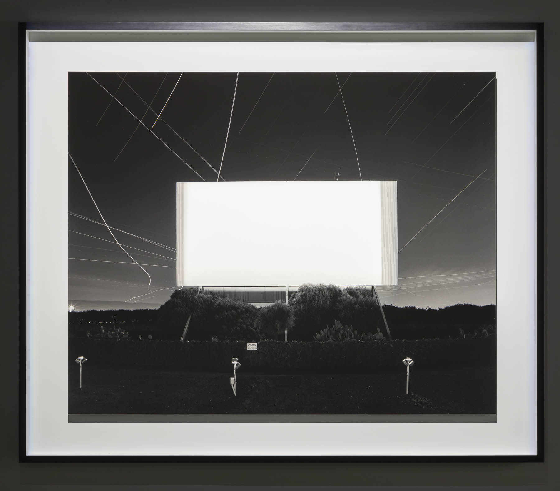
 'Union City Drive-in, Union City' 1993")


 'Bay of Sagami, Atami' 1997")


 'Chrysler Building' 1997")
 'World Trade Center' 1997")
 'Eiffel Tower' 1998")


' 1995")
 'Sea of Buddha 049 (Triptych)' 1995")


 'The Electric Chair' 1994")


 'Anne Boleyn' 1999")

 'Queen Victoria' 1999")
 'Salvador Dali' 1999")
 'Oscar Wilde' 1999")


 'Diana, Princess of Wales' 1999")


 'Lightning Fields 225' 2009")


 'Mathematical Model 002 Dini's Surface' 2005")


 'Conceptual Form Surface 0001 Helicoid: Minimal Surface' 2004")

![Frederick Evans (British, 1853-1943) 'Aubrey Beardsley [with hands]' 1893 from the exhibition 'Aubrey Beardsley' at Tate Britain, London, March - May, 2020](https://artblart.com/wp-content/uploads/2020/04/frederick-evans-portrait-of-aubrey-beardsley.jpg "Frederick Evans (British, 1853-1943) 'Aubrey Beardsley [with hands]' 1893 from the exhibition 'Aubrey Beardsley' at Tate Britain, London, March - May, 2020")
 'Withered Spring' 1891 from the exhibition 'Aubrey Beardsley' at Tate Britain, London, March - May, 2020")
 'Incipit Vita Nova' 1892")
 'Self-portrait' 1892")

 'The Finding of Medusa; The Death of Medusa (The Birth of Pegasus and Chrysaor); Perseus Pursued by the Gorgons' 1875-1876")
 'The Finding of Medusa' 1875-1876")
 'The Death of Medusa (The Birth of Pegasus and Chrysaor)' 1875-1876")
 'Perseus Pursued by the Gorgons' 1875-1876")
 'The Litany of Mary Magdalen' 1891")
 'The Entombment of Christ' c. 1465-1475")
 'Tannhäuser' 1891")
 'Die Götterdämmerung' 1892")
 'The Achieving of the Sangreal' 1892")
 'How Morgan Le Fay Gave a Shield to Sir Tristram' 1893")
 'How la Beale Isoud Wrote to Sir Tristram' c. 1893")
 'How Sir Tristram Drank of the Love Drink' 1893")
 'How La Beale Isoud Nursed Sir Tristram' 1893")
 'How King Arthur saw the Questing Beast, and thereof had great marvel' 1893")
 Design for a Frontispiece to 'Virgilius the Sorcerer' c. 1893")
 'The Kiss of Judas' 1893")
 'The Climax' 1893")
 'The Dancer’s Reward' 1893")
 'The Toilette of Salome' (second version) 1893")
 'The Stomach Dance' 1893")
 'The Eyes of Herod' 1893")
 'Enter Herodias' 1893")
 'John and Salome' 1893")
 'The Black Cape' 1893")
 'The Peacock Skirt' 1893")
 'J’ai baisé ta bouche Iokanaan' 1892-1893")
")
 Divan Japonais 1892")
 'The Pseudonym and Autonym Libraries' 1894")
 'Isolde' Printed 1899")
 'A Comedy of Sighs' 1894")
 'Professor Fred Brown' 1892")
 'Charles Conder' 1904")
 'Aubrey Beardsley' 1895")
 'Aubrey Beardsley' 1894")
 'W.B. Yeats' 1908")
 'Robbie Ross' 1895-1930")
 'John Gray' c. 1896-1897")
 'Cover Design for 'The Yellow Book'' Vol.I 1894")
 'The Yellow Book' Volume I 1894")
 'The Slippers of Cinderella' 1894")
 'La Dame aux Camélias' 1894")
 'The Black Cat' 1894-1895")
 'Frontispiece to Chopin’s Third Ballade' 1895")
 'The Fat Woman' 1894")
 Title page to 'The Story of Venus and Tannhäuser' 1895")
 'The Mirror of Love' 1895")
 'Venus between Terminal Gods' 1895")
 'Caprice' c. 1894")
 'Masked Woman with a White Mouse' c. 1894")
 'The Savoy', Number 1 1896")
 'Third Tableau of Das Rheingold' c. 1896")
 'The Savoy', Number 2 1896")
 'Ave Atque Vale' 1896")
 'The Dream' 1896")


 'The Cave of Spleen' 1896")
 'The Battle of the Beaux and the Belles' c. 1896")
 'Mademoiselle de Maupin' 1898")
 'The Lady with the Rose' 1897")
 'Lysistrata Shielding her Coynte' 1896")
 'Two Athenian Women in Distress' 1896")
 'Cinesias Entreating Myrrhina to Coition' 1896")
 'The Examination of the Herald' 1896")
 'The Lacedaemonian Ambassadors' 1896")
 'The Impatient Adulterer' 1896-1897")
 'Messalina and her Companion' 1895")
 'Aubrey Beardsley' 1897")
 'Volpone Adoring his Treasure' 1898")

 'Ali Baba' 1897")
 'Poster for ‘The Glasgow Institute of Fine Arts’' 1894-1896")
 'The Hindu Maid' 1916")
 '‘Music! Music’ cried the Emperor. ‘You little precious golden bird, sing!’' 1916")
 ''I know what you want,' said the Sea Witch' 1916")

 in the middle of the room")
 in the middle of the room")
 'Sappho and Erinna in a Garden at Mytilene' 1864 from the exhibition 'Queer British Art 1861-1967' at Tate Britain, London, April - October, 2017")
 'The Bride, Bridegroom and Sad Love' 1865 from the exhibition 'Queer British Art 1861-1967' at Tate Britain, London, April - October, 2017")
 'Bacchus' 1867")
 'The Moon and Sleep' 1894")
 c. 1850s")
 'Hope Comforting Love in Bondage' Exhibited 1901")

 'Daedalus and Icarus' Exhibited 1869")

 'A Bathing Group' 1914")
 'The Critics' 1927")

 'Henry Havelock Ellis' 1890s")
 'Charles Ricketts and Charles Shannon as Medieval Saints' 1920")
 'Radclyffe Hall' 1918 (installation view)")


 'Oscar Wilde' c. 1881 (installation view)")
 'Cecil Beaton and his Friends' 1927")

' 1910s")
 'Sir Robert Murray Helpmann' 1950")
 'Danny La Rue' 1968")
 'Glen Byam Shaw as 'Laertes'' 1934-1935")
 'Oliver Messel' 1945")
 'Douglas Byng' 1934")

 'Decoration: The Excursion of Nausicaa' 1920")


 'Bathing' 1911")
 'Bathers by the Pond' 1920-1921 (installation view)")
 'Paul Roche Reclining' c. 1946 (installation view)")


 'Tea with Sickert' c. 1911-1912")
 'John Gielgud's Room' 1933")

 (British, 1895-1978) 'Self-Portrait' 1942")
 (British, 1895-1978) 'Lilac and Guelder Rose' 1932-1937")
 'Henry Thomas' 1934-1935 (installation view)")
 'Portrait of Pat Nelson' 1930s (installation view)")
 'Man with a Gun' 1933 (installation view)")
 'Man with a Gun' 1933")

 'Dame Edith Sitwell' 1916")


 'Lady with a Red Hat' 1918")
 'Self-portrait' 1913")
 'Rest Time in the Life Class' 1923")
 'Untitled' 1936")
 'Untitled' 1936")

 'Nude Boy in a Bedroom' 1930")
 'Soldiers at Rye' 1941")
 'Head of a Cretan Sailor' 1946")


 'Summer Eclogue No. 1: Cyclists' 1950")

 'Kouros' 1960")
 'Three Figures' 1960-1961 (installation view)")
 'Bather: August 4th 1961' 1961")
 'Drawing of two men kissing' 1958-1973")
 'Lascar, a story of the Maritime Boulevard' Nd")
 and Kenneth Halliwell (British, 1951-1967) 'The Secret Chimneys by Agatha Christie'")
 and Kenneth Halliwell (British, 1951-1967) 'Queen's Favourite'")

 'Untitled' 1967 (installation view)")

 'Quentin Crisp' 1941")
 'Colin' c. 1950s (installation view)")
 'The Two Roberts Asleep - Colquhoun and MacBryde' c. 1953")
 'Photograph album' Nd (installation view)")
 'Two Figures in a Landscape' 1956 (installation view)")
 'Seated Figure' 1961")

 'Life Painting for a Diploma' 1962")
 'Going to be a Queen for Tonight' 1960")
 'Wrestlers' 1965 (installation view)")


 'Times Square, New York City' 1952-1954 from the National Gallery of Art and the Corcoran Gallery of Art' at the National Gallery of Art, Washington, May 2016 - Jan 2017")

 'Horses. Running. Phyrne L. No. 40, from The Attitudes of Animals in Motion' 1879 from the National Gallery of Art and the Corcoran Gallery of Art' at the National Gallery of Art, Washington, May 2016 - Jan 2017")
 'Internegative for Horses. Trotting. Abe Edgington. No. 28, from The Attitudes of Animals in Motion' 1878")
 'Chronophotograph of a Man on a Bicycle' c. 1885-1890")
 'The Boulevards of Paris' 1843")
 and Robert Adamson (Scottish, 1821-1848) 'Colinton Manse and weir, with part of the old mill on the right' 1843-1847")
 'Old Vennel, Off High Street' 1868-1871")
 'Old Vennel, Off High Street' 1868-1871 (detail)")
 'Going to the Post, Morris Park' 1904")
 'Wes Fesler Kicking a Football' 1934")
 'Untitled from \"Ballet\" series' 1938")
 'Detroit' 1943")
 'Camera Movement on Neon Lights at Night' 1946")
 'Paris, Gare Saint-Lazare' 1959")
 'Goalie, Street Football, Brindley Road' 1956")
 'Rush Hour, Tokyo' 1981 (detail)")

 'From My Window at An American Place, Southwest' March 1932")
 'From My Window at An American Place, Southwest' April 1932")
 'Water Tower and Radio City, New York' 1933")
 'Every Building on Sunset Strip' 1966")
 'Every Building on Sunset Strip' 1966")
 'Every Building on Sunset Strip' 1966")
 'Step Piece' 1970")

 'Judith Being Carted from Oaklawn to the Hill. The Way Art Moves' 1920")
 'Homes for America' 1966-1967")
 'Thanksgiving Turkey' 1985")
 'Business Page' from the series 'Pictures from Home' 1985")
 'Mulackstrasse 32: Slide Projections of Former Jewish Residents and Hebrew Reading Room, 1932, Berlin' 1992")
 'Relapse/Detox Grid' 1998-2000")
 'Relapse/Detox Grid' 1998-2000 (detail)")
 'Watergate' 2000")

 (French, 1820-1910) 'Self-Portrait with Wife Ernestine in a Balloon Gondola' c. 1865")
 'Self-portrait' 1907, printed 1930")
 '291 – Picasso-Braque Exhibition' 1915")
 'Sisters' 1926")
 'Silence Series #7' 1965-1968")
 'Double Rembrandt with Steps' 1987-1991")
 'Cleaning the Drapes', from the series, 'House Beautiful: Bringing the War Home' 1967-1972")
 'Self-Portrait' 1974")
 'Untitled (from the series Hitler Moves East)' 1975")
 'Oscar Wilde' 1999")
 'Oscar Wilde' 1999 (detail)")
 'Alfred Stieglitz (from the series Pictures of Ink)' 2000")

 (Polish, 1885-1939) 'Self-Portrait (Collapse by the Lamp/Kolaps przy lampie)' c. 1913")
 'The Bricklayer' 1929")
 'Photographer's Display Window, Birmingham, Alabama' 1936")
 'Triplets in their Bedroom, N.J.,' 1963")
 'Untitled (Two Necklines)' 1989")
 'And One' 2011")
 'Haymaker with Rake' c. 1888, published 1890 from the exhibition 'Painting with Light: Art and Photography from the Pre-Raphaelites to the Modern Age' at Tate Britain, London, May - Sept, 2016")
 'The Woodman's Daughter' 1850-1851 from the exhibition 'Painting with Light: Art and Photography from the Pre-Raphaelites to the Modern Age' at Tate Britain, London, May - Sept, 2016")
 'Decorative Study' c. 1906")
 'Proserpine' 1874")
 'The Odor of Pomegranates' 1899")
 'Chatterton' 1856")

")
 'Beata Beatrix' c. 1864-1870")
 'Call, I Follow, I Follow, Let Me Die!' 1867")
 'Call, I Follow, I Follow, Let Me Die!' 1867")
 'Glacier of Rosenlaui' 1856")
 'The Bowder Stone in Our English Lakes, Mountains and Waterfalls as seen by William Wordsworth by A.W. Bennett' Published 1864")
 'Bowder Stone, Borrowdale' c. 1863-1868")
 'Whisper of the Muse' 1865")
 'Mariana' 1870")
 'Peggy in the Garden' 1909, printed 2016")
 'Carnation, Lily, Lily, Rose' 1885-1886")

")
 'The Hay Field' 1869")
 'Three Figures Pink and Grey' 1868-1878")
 'The Japanese Parasol' c. 1906")
 'Winter Work' 1883-1884")
 and Peter Henry Emerson (British, 1856-1936) 'Setting the Bow-Net, in Life and Landscape on the Norfolk Broads' 1885, published 1887")
 'The Bow Net' 1886")
 'The Water Carrier' 1858")
, R.A. 'The Song of the Nubian Slave' 1863")
 'Regent's Canal' c. 1904-1905, published 1909")
 'A Wet Night at Piccadilly Circus' 1910")
 'Leicester Square (The Old Empire Theatre)' 1908, published 1909")
 'Ethel Warwick, Camera Club, 2 August 1900'")
 'Hardau, Zürich' 1962")
 'Knabenschiessen, Albisgütli, Zürich' 1961")
 'Fisherman with Hat, Sicily' c. 1960")
 'Drei zusammen (three together)' c. 1965")
 'Untitled, Zürich' c. 1962")
 'Untitled, Zurich' c. 1962")
 'Untitled, Zurich' c. 1962")
 'Untitled, Zurich' c. 1962")
 'Untitled' c. 1969")
 'Untitled' c. 1961")
 'Untitled' c. 1960")
 'The Jets, Basel' 1962")
 'The Lions, Basel' c. 1962")
 'Zürich am Limmatquai' 1962")
 'Milchbuck, Zürich' c. 1962")
 'Adler Gang, Zurich' c. 1966")
 'Lone Star Camp, Gossau' 1967")

You must be logged in to post a comment.