Exhibition dates: 5th September – 29th September 2012
Jenny Reddin (Australian) Caught in an Effervescent Breeze 2012 Oil on canvas
122 x 122cm
“Each epoch dreams the one to follow, creates it in dreaming”
Jules Michelet
“Each epoch dreams of itself as annihilated by catastrophes”
Theodor Adorno
A star is born
The origin of the word catastrophe is Greek (kata + strophein) and its literal meaning was “overturn”. According to its definition, it is an event that causes trauma due to its capacity to destroy most of a community. Catastrophes are extreme events that affect a large number of victims in the affected community, and are easily identified as events that cause physical suffering.1 The use of words such as disaster (origin in the Italian word disastro (dis + astro, “bad star”)) and catastrophe create the idea of a “disaster taxonomy,” one which is based on the principle that there are variable emotional responses that depend on the type of disaster, the degree of personal impact, the size of the group affected, and the geographical and temporal range of the event.2 These pure words define the event itself and the havoc they wreak without incorporating the perceptions of the victims; in other words they are an objective reflection on the subjective performativity of the act itself.
Catastrophes fascinate humans as they clearly show them the limits of their own existence. The dystopian catastrophe challenges the temporal linearity of a utopian dreaming in which the darkness of the lived moment is illuminated by the anticipatory daydreams of the “not-yet-conscious” future. What catastrophe codes is a dialectical relation to Utopianism, a rejection of the holistic vision of an anticipatory consciousness of a utopian future. As Matthew Charles observes,
“The catastrophic signifies the dialectical intrusion of the whole of history (including the present in which it is represented) into the construction epoch, and by extension the whole of the epoch into the life of the artist, and the whole life of the artist into a particular work. Benjamin’s messianic account of the experience of truth imposes the theological concepts of the infinite, fulfilled and perfected state of the world into the immanence of finite, particular, existing phenomenon. In this way, the intrusion of the historical Absolute contributes to the catastrophic ruination of the work.”3
As can be seen in the Jenny Reddin’s artist statement, the whole of the artist’s history is bound up in the creation of the work. The infinite possibilities of a subjective understanding of truth are bound together with the immanence of finite, particular, existing phenomenon, that of the art of catastrophe, the objective presentation of ruination, in the art itself. Reddin’s anticipatory daydreams become an anticipatory illumination as an image, a constellation, a configuration tied closely to the idea of the concrete / fluid utopic / dystopic landscapes of the body and the earth. Reddin’s paintings work at both a macro and micro level, a phenomenon that is cross-disciplinary like the phenomenon of catastrophe itself. The work reminds me of cellular structures at the micro level (cross-sections of diseased kidneys, the veins of the heart or scientific slides of blood cells) and of aerial views of the earth at the macro level (alluvial deltas and views of open cast mines). They balance beauty with serendipity, the manipulation of the “flow” of paint (from one point in time to many points) that captures light, the light of the cosmos and of the subconscious. These magnificent works of art have emerged from the artist’s life – much as Immanuel Velikovsky argued that the planet Venus is a former “comet” which was ejected from Jupiter – in an act of catastrophic creation. They are dreaming of the future and yet also dreaming of catastrophe.
Running with these ideas you might argue that these dream images are both an act of emergence and an emergency, a catastrophe. For some thinkers the sociology of emergences aims to identify and enlarge the signs of possible future experiences, under the guise of tendencies and latencies, that are actively ignored by hegemonic rationality and knowledge. For Ernst Bloch the concept of The Not Yet, “is the way in which the future is inscribed in the present. It is not an indeterminate or infinite future, rather a concrete possibility and a capacity that neither exists in a vacuum nor are completely predetermined. Subjectively, the Not Yet is anticipatory consciousness, a form of consciousness that is extremely important in people’s lives. Objectively, the Not Yet is, on the one hand, capacity (potency) and, on the other, possibility (potentiality).”4
Here the field of possibility has a dimension of darkness (disaster) as it originates in the lived moment whilst the sociology of emergences inquires into the alternatives that are contained in the horizon of concrete, utopian possibilities in order to identify therein the tendencies of the future (the Not Yet): the light of the future. Hence these images contain both emergency (of the catastrophe, of the lived moment) and an emergence (into the future). A (bad) star is born. I also believe that in this artist another star has been born, one that will shine strongly in future dreamings.
Many thankx to Anita Traverso Gallery for allowing me to publish the photographs of the paintings in the posting. Please click on the photographs for a larger version of the image.
Jenny Reddin (Australian)
Ms. Broadhurst’s Poppy 2012
Oil on canvas
122 x 122cm
Jenny Reddin (Australian) A Shifting Reality
2012
Mixes media on linen
137 x 122cm
At the heart of a catastrophe there is a massive burst of energy. Jenny Reddin’s works seek to capture that energy in an alchemic process that involves the dissolving of pigments in various solutions and pouring the viscous mixes onto prepared structures. Due to the varying specific gravities the pigments drop out at different rates offering alternately dry, textured or smooth, mirror-like fields. This series presents works inspired by the natural phenomenon and the interaction of the human form, capturing the juxtaposition of the beauty of the Australian country with the ongoing cycle of natural catastrophe.
Text from the gallery website
I have been painting for around 14 years. At a time when I should have been at Art School, I was studying for a bachelor of business. When I should have been exhibiting my work, I was running a consulting practice and managing people. It wasn’t until my husband and I adopted a little girl from India that I was able to take the time to explore my creative side. I have been painting ever since.
Catastrophe plays an important role in my life. I am an idea, act, plan person in everything I do. It’s how I live my life and it’s how I paint. I had to make a decision early on in my painting career that I either learned to celebrate the spontaneous nature of catastrophes or go mad trying to paint in a conventional manner. I found also that it was becoming increasingly important for me to find my own style and form of expression. I would cringe when people would compliment me by telling me that a work looked just like a Fred Williams or a John Olsen.
To a large extent, I have had to learn to paint from the subconscious. The more deliberate and planned I am at the commencement of a work, the less spontaneous and evocative the result. I go through what feels like long periods where the works are muddy and unsatisfying and I have to rip off the canvas and start again. I usually find when I take the time to analyse why, I have been trying to force an outcome and then all of a sudden, as my consciousness steps back and my subconscious takes over, they work.
Catastrophe is a piece that was painted early this year. It is a good example of the elements that I am looking for in my work, drama and light. The dramatic effect is created by dissolving pigments in viscous solvent solutions and then pouring them onto prepared canvas supports. I often pour two and three colours together so that they bump into each other creating riverlets and craters as the pigments drop out of solution at different rates. Light is captured by manipulating the flow of paint to trap sections of blank, white canvas which to my eye increase the sense of drama and luminance of the work.
It’s hard to say who inspires my work because I am unaware of anyone else painting in quite the same way. What I take from other artists would be honesty and integrity from artists such as Andy Goldsworthy; simplicity of form from the likes of Anthony Gormley and Antonio Tapies; the love of limited palette from Godwin Bradbeer; the beauty of gesture and rhythm from Yvonne Audette and Susan Rothenburg.
Jenny Reddin’s opening speech at the exhibition The Art of Catastrophe
Jenny Reddin Space within space within space
2012
Oil in linen
122 x 122cm
Jenny Reddin Amillaria
2012
Oil on canvas
120 x 100cm
Jenny Reddin Suspended Journey
2012
Oil on linen
138 x 97cm
Anita Traverso Gallery
PO Box 7001, Hawthorn North 3122 Phone: 0408 534 034
This is pure indulgence. These paintings are so delicious I couldn’t resist a posting. Just imagine having ANY of them (especially the Hartigan, de Kooning or the Soulanges) on your wall at home… oh my!
Marcus
Many thankx to the Guggenheim Museum for allowing me to publish the pictures in the posting. Please click on the pictures to see a larger version of the image.
Art of Another Kind: International Abstraction and the Guggenheim, 1949-1960
Curators Tracey Bashkoff and Megan Fontanella discuss the initial apprehensions toward and eventual return to international exchange and experimentalism that defined the postwar art world.
In 1943 Alberto Burri, a doctor in the Italian army, was captured by the British and sat out the remainder of World War II in a Texas POW camp. He began to paint there, covering his stretchers with burlap when other materials were unavailable. Upon his return to Italy in 1946 Burri renounced his original profession and dedicated himself to making art.
Composition is one of his Sacchi (sacks), a group of collage constructions made from burlap bags mounted on stretchers, which the artist began making in 1949. One of Burri’s first series employing nontraditional mediums, the Sacchi were initially considered assaults against the established aesthetic canon. His use of the humble bags may be seen as a declaration of the inherent beauty of natural, ephemeral materials, in contradistinction to traditional “high” art mediums, which are respected for their ostentation and permanence. Early commentators suggested that the patchwork surfaces of the Sacchi metaphorically signified living flesh violated during warfare – the stitching was linked to the artist’s practice as a physician. Others suggested that the hardships of life in postwar Italy predicated the artist’s redeployment of the sacks in which relief supplies were sent to the country.
Yet Burri maintained that his use of materials was determined purely by the formal demands of his constructions. “If I don’t have one material, I use another. It is all the same,” he said in 1976. “I choose to use poor materials to prove that they could still be useful. The poorness of a medium is not a symbol: it is a device for painting.” The title Composition emphasises the artist’s professed concern with issues of construction, not metaphor. Underlying the work is a rigorous compositional structure that belies the mundane impermanence of his chosen mediums and points to art-historical influences. The Sacchi rely on lessons learned from the Cubist- and Dada-inspired constructions of Kurt Schwitters.
Despite Burri’s cool public stance, the Sacchi are examples of the Expressionism widely practiced in postwar Europe, where such work was called Art Informel (in the U.S. it was called Abstract Expressionism). Artists used powerfully rendered gestures and accommodated chance occurrences to express the existential angst characteristic of the period.
In the years after World War II, both Europe and America saw the rise of predominantly abstract painting concerned with materials and the expression of gesture and marking. New Yorkers dubbed the development in the United States Abstract Expressionism, while the French named the pan-European phenomenon of gestural painting Art Informel. A variety of the latter was Tachisme, from the French word tache, meaning blot or stain. Antoni Tàpies was among the artists to receive the label Tachiste because of the rich texture and pooled colour that seemed to occur accidentally on his canvases.
Tàpies reevaluated humble materials, things of the earth such as sand – which he used in Great Painting (Gran pintura, 1958) – and straw as well as the refuse of humanity such as string and bits of fabric. By calling attention to this seemingly inconsequential matter, he suggested that beauty can be found in unlikely places. Tàpies saw his works as objects of meditation that every viewer will interpret according to personal experience; he sought to inspire a contemplative reaction to reality through the integration of materials unexpected in fine art.
These images often resemble walls that have been scuffed and marred by human intervention and the passage of time. In Great Painting, an ocher skin appears to hang off the surface of the canvas; violence is suggested by the gouge and puncture marks in the dense stratum. These markings recall the scribbling of graffiti, perhaps referring to the public walls covered with slogans and images of protest that the artist saw as a youth in Catalonia – a region in Spain that experienced the harshest repression under dictator Francisco Franco. Tàpies called walls the “witnesses of the martyrdoms and inhuman sufferings inflicted on our people.”1 Great Painting suggests the artist’s poetic memorial to those who have perished and those who have endured.
Jennifer Blessing
1/ Antoni Tàpies, La pratique de l’art (Paris: Gallimard, 1974), p. 59.
After Kenzo Okada relocated from Tokyo to New York in 1950, his work came to represent a melding of Japanese traditions and American abstract trends. Rather than striving for pure abstraction, his work from the 1950s could be called “semi-abstract,” evoking the natural world through carefully composed form and a decidedly muted palette. These works are subtle, quiet, and poetic – more meditative in nature than the energetic gestural abstractions of some of his American-born counterparts. The composition of Decision (1956) is also organised to suggest natural topography. Blocky, softly defined shapes organically arrange the canvas into rough horizontal registers, creating a panoramic quality reminiscent of landscape painting. Meanwhile, small, irregular shapes hover and tumble rhythmically across the stable ground. Okada thus seeks a balance between heavy and delicate, tangible and abstract.
Kumi Sugaï lived and worked in Paris from 1952 until his death. Revered both in his native Japan and France, he used his early fascination with modern typography and his knowledge of East Asian calligraphy in his work. Combining and reinventing traditional aesthetics and contemporary forms, Sugaï reveals his syncretic approach to abstract painting in Shiro (June 1957). Here, his palette is restricted essentially to black, white, and blue, and the composition is at once spare and dynamic. The painting’s title is a reference to its central black form, the ideogram shiro, which means white. He has enlarged the character to occupy the entire composition and placed this abstract form on a white ground, both evoking and distorting its original calligraphic source.
A decisive shift in Giuseppe Capogrossi’s career took place in 1949, when he moved away from figurative, tonal painting and experimented with an abstract geometric style that led to the development of a vocabulary of irregular comb- or fork-shaped signs. With no allegorical, psychological, or symbolic meaning, these structural elements could be assembled and connected in countless variations. Intricate and insistent, Capogrossi’s signs determined the construction of the pictorial surface. Similar to mysterious lists or sequences, his paintings were immediate in their appeal yet remained hard to decode, a quality he shared with other Art Informel practitioners. These abstract comb-sign paintings, known simply as Surfaces (Superficies, 1949-1972), were first exhibited at the Galleria del secolo, Rome, in 1950. The comb sign dominated his oeuvre until the end of his career.
In his native Japan, Takeo Yamaguchi was a pioneer of modern abstract painting. This focus led him to spend time in France, where he was much influenced by the work of Cubist practitioners in Paris, until he returned to Japan in 1931. In the 1950s, Yamaguchi began executing works consisting of simple, geometric forms – largely yellow, ochre, or russet in color – painted on a black background. His thick pigments added texture to the monochromatic compositions, and as seen in Work – Yellow (Unstable Square [Fuantei shikaku], 1958), Yamaguchi’s abstract shapes increasingly dominated the canvas. It is noteworthy that the painting was prominently displayed on the ground floor of the Guggenheim’s rotunda during the 1959 inaugural exhibition, attesting to then-director James Johnson Sweeney’s keen interest in Yamaguchi’s work.
Pierre Soulages, a leading proponent of Tachisme (from the French word tache, meaning blot or stain), maintained that he decided to become a painter while inside the church of Sainte-Foy in Conques-en-Rouergue, near his birthplace in the South of France. The impressions of monumentality, stability, primitive force, and clearly organised volumes characteristic of the Romanesque style, as well as the mystery and sobriety of dark church interiors, were metaphorically transmitted in his mature style. Early on he was also drawn to the work of Claude Lorraine and Rembrandt van Rijn, whose rendering of light had an impact on his development. In 1938 he moved to Paris to prepare for the entrance exam to the École nationale supérieure des beaux-arts, but he soon abandoned his traditional studies at the school as a result of seeing exhibitions of the work of Paul Cézanne and Pablo Picasso and visiting the Louvre.
In his earliest work Soulages took leafless winter trees as his point of departure. Their essential, reduced network of branches – which Soulages regarded as abstract sculpture – provided him with an ideal vehicle for the exploration of structure and variation. During the German occupation of France, he met Sonia Delaunay, who introduced him to abstract art and set him on a new path. By the mid 1950s, Soulages had switched from a small brush, with which he had painted abstract calligraphic patterns, to palette knives, straightedges, and large house-painting brushes. These tools afforded him a greater range of motion in his wrist, allowing him to produce bold, dynamic strokes that resulted in a more gestural surface. Throughout his career, Soulages painted in a predominately black palette in order to explore the contrasts of light and shade, which endowed his paintings both an architectonic and a sculptural quality. In Painting, November 20, 1956 (Peinture, 20 novembre 1956, 1956), Soulages divided his canvas into three horizontal registers, articulating each with a repetition of slab-like black shapes that reveal a variety of red and brown nuances, as well as a certain luminosity.
Text from the Guggenheim website
From June 8 to September 12, 2012, the Solomon R. Guggenheim Museum presents Art of Another Kind: International Abstraction and the Guggenheim, 1949-1960. Comprising approximately 100 works by nearly 70 artists, the exhibition explores international trends in abstraction in the decade before the Guggenheim’s iconic Frank Lloyd Wright-designed building opened in October 1959, when vanguard artists working in the United States and Europe pioneered such influential art forms as Abstract Expressionism, Cobra, and Art Informel. In the 1950s, many countries ended their postwar isolationism and entered a phase of cultural openness and internationalism. The prominent French art critic Michel Tapié declared the existence of un art autre (art of another kind), a term embracing a mosaic of styles, but essentially signifying an avant-garde art that rejected a connection with any tradition or past idiom. With works by Karel Appel, Louise Bourgeois, Alberto Burri, Eduardo Chillida, Lucio Fontana, Grace Hartigan, Asger Jorn, Yves Klein, Willem de Kooning, Georges Mathieu, Isamu Noguchi, Kenzo Okada, Jackson Pollock, Pierre Soulages, Antoni Tàpies, Maria Helena Vieira da Silva, Takeo Yamaguchi, and Zao Wou-Ki, among others, the exhibition considers the artistic developments of the post-World War II period and draws greater attention to lesser-known artists in the museum?s collection alongside those long since canonised.
Abstract Expressionism encompasses a diverse range of postwar American painting that challenged the tradition of vertical easel painting. Beginning in the late 1940s, Pollock placed his canvases on the floor to pour, drip, and splatter paint onto them. This gestural act, with variations practiced by William Baziotes, De Kooning, Adolph Gottlieb, and others, was termed “Action painting” by American critic Harold Rosenberg, who considered it a product of the artist’s unconscious outpouring or the enactment of some personal drama. The New York school, as these artists were called due to the city’s postwar transformation into an international nexus for vanguard art, expanded in the 1950s with the unique contributions of such painters as James Brooks and Hartigan, as well as energetic collagist-assemblers Conrad Marca-Relli and Robert Rauschenberg. Other painters eliminated the gestural stroke altogether. Mark Rothko used large planes of colour, often to express universal human emotions and inspire a sense of awe for a secular world. Welder-sculptors such as Herbert Ferber and Theodore Roszak are also counted among the decade’s pioneering artists.
The postwar European avant-garde in many ways paralleled the expressive tendencies and untraditional methods of their transatlantic counterparts, though their cultural contexts differed. For artists in Spain, abstract art signified political liberation. Dissenting Italian artists correspondingly turned to abstraction against the renewed popularity of politicised realism. French artist Jean Dubuffet’s spontaneous approach, Art Brut (Raw art), retained figurative elements but radically opposed official culture, instead favouring the spontaneous and direct works of untrained individuals. His work influenced the Cobra group (1948-1951), which was founded by Appel, Jorn, and other artists from Copenhagen, Brussels, and Amsterdam. The Cobra artists preferred thickly painted surfaces that married realism to lively colour and expressive line in a new form of primitivism.
Eventually taking root in France, Germany, Italy, Japan, and Spain, Art Informel refers to the anti-geometric, anti-naturalistic, and nonfigurative formal preoccupations of many European avant-garde artists, and their pursuit of spontaneity, looseness of form, and the irrational. Art Informel is alternatively known by several French terms: Abstraction lyrique (Lyrical Abstraction), Art autre (Art of another kind), matiérisme (matter art), and Tachisme (from tache, meaning blot or stain). The movement includes the work of Burri and Tàpies, who employed unorthodox materials like burlap or sand and focused on the transformative qualities of matter. Asian émigré artists Kumi Sugaï and Zao were likewise central to the postwar École de Paris (School of Paris) and melded their native traditions with modern painting styles. By the end of the 1950s, artists such as Lucio Fontana, Klein, and Piero Manzoni were exploring scientific, objective, and interactive approaches, and introduced pure monochrome surfaces. Other abstractionists engaged viewers’ senses and explored dematerialisation, focusing on optical transformations as opposed to the art object itself, and investigating the effects of motion, light, and colour.
Through the presentation of these varied styles and innovative developments in the post-World War II years, Art of Another Kind especially highlights paintings and sculptures that entered the Guggenheim collection under James Johnson Sweeney, the museum’s second director (1952-1960). Following Solomon R. Guggenheim’s death in 1949 and the end of founding director and curator Hilla Rebay’s tenure in 1952, Sweeney championed emerging avant-garde artists and augmented the museum’s existing modern holdings with new works. Sweeney had stated, “I do not believe in the so-called ‘tastemakers,’ … but in what I would call ‘tastebreakers,’ the people who break open and enlarge our artistic frontiers.” His program of exhibitions and acquisitions considerably broadened the museum’s scope, and his vision included reconsidering the founding collection assembled by Solomon and Irene Guggenheim under Rebay’s guidance by uniting the abstract works by Vasily Kandinsky and other modernists with rarely seen representational works for a more complex perspective of the avant-garde in the first half of the twentieth century. Recently, the Guggenheim Museum highlighted his contributions to the institution in The Sweeney Decade: Acquisitions at the 1959 Inaugural, an exhibition featuring a selection of works that were first unveiled at the 1959 show in the museum’s new Wright building. On view in 2009 as part of the museum’s 50th-anniversary celebrations, The Sweeney Decade featured 24 paintings and sculptures from the 1950s collected under his leadership. Art of Another Kind offers a more comprehensive elaboration of his vision along with works that were added to the collection after his tenure.
Exhibition installation
While the exhibition explores individual styles, diversity within abstraction, and artists often working independently of established groups or affiliations, works are loosely organised according to artists’ locus of activity and stylistic trends: New York school; Art Brut and Cobra; School of Paris; Spanish and Italian Informalism; Kinetic art; and, finally, late 1950s experiments with matiérisme, performance-based painting, and the monochrome. Highlights within the installation include Outburst (Éclatement, 1956) by Judit Reigl, newly acquired in 2012, and Alexander Calder’s Red Lily Pads (Nénuphars rouges, 1956), suspended in the upper ramps and visible from the rotunda floor below. The exhibition also includes the work of 11 living artists.
Visitors will have the opportunity to browse through historic exhibition catalogues produced by the first full-time publications department established during Sweeney’s tenure. Designed by the Swiss-born typographer and designer Herbert Matter, catalogues from the era helped shape the museum’s visual identity and chronicle the development of the art championed by the Guggenheim under Sweeney in the 1950s. Selected books will be available in the museum at iPad stations and online at https://www.guggenheim.org/publications
Extensive content related to the exhibition will be available on the Guggenheim’s website, which features a selection of supporting materials from the museum’s archives, including letters between artists and director James Johnson Sweeney, invitations to exhibitions, and historic photos of Guggenheim exhibitions. In addition, 20 works and several exhibition themes will be explored through short texts. Multimedia content including video footage and interviews with the curators will be added to the site once the exhibition opens to the public.
In the decades following World War II, a new artistic vanguard emerged, particularly in New York, that introduced radical new directions in art. The war and its aftermath were at the underpinnings of the movement that became known as Abstract Expressionism. These artists, anxiously aware of human irrationality and vulnerability, expressed their concerns in an abstract art that chronicled the ardor and exigencies of modern life. Their heroic aspirations are most evident in Jackson Pollock’s innovative “drip” paintings that forever altered the course of American art.
Arriving in New York in 1930 from the West Coast, Pollock began working with figuration of both human and imaginary beings. Most of this imagery was connected to that of American Indian sand painting and the Mexican muralists he saw as a youth and that reemerged through psychoanalysis to treat his lifelong alcoholism. His first fully mature works – dating between 1942 and 1947 – use an idiosyncratic iconography he developed in part as a response to Surrealism, popular in New York with its numerous European exiles from World War II. Employing mythical subject matter, calligraphic markings, and a vibrant and distinctive colour palette, Pollock produced emotionally charged works that retain figurative subject matter yet emphasise abstract qualities. Arising from this confluence of abstraction and figuration are Pollock’s breakthrough works, commonly perceived as pure abstraction and made over the course of an explosive period between late 1947 and 1950 as represented by Untitled (Green Silver). At the time, he also broke free from the standard use of implements, usually abandoning their direct contact with the surface. Working from above the picture plane, he dripped and poured enamel paints on canvases and papers, a method that more precisely controlled the application of line. His preference for the technique of fluid paint spilling from the can or drizzling from the tips of sticks or trowels was heralded by critic Harold Rosenberg as “action painting.” These unconventional working methods and his own physical presence while creating these works have assumed epic proportions. In the last four years of his life – he died in an automobile accident on August 11, 1956 – he produced significantly fewer works, with each further refining his pouring method. Compositionally, they hark back to his earlier style through the reintroduction of figurative elements as in Ocean Greyness, which also addresses his allover abstract technique. Its dramatic, swirling forms set against a dark ground recall Pollock’s Eyes in the Heat (1946).
Emilio Vedova produced art in response to contemporary social upheavals, however his political position was contrary to that of his early modern counterparts, the Italian Futurists, who coalesced as a group in the years preceding World War I. While the Futurists romantically celebrated the aggressive energies inherent in societal conflict and technological advancement, Vedova’s feverish, violent canvases convey – in abstract terms – his horror and moral protestation in the face of man’s assault on his own kind.
Vedova expressed a political consciousness in his work for the first time during the late 1930s, when his works were inspired by the Spanish Civil War. His continuing commitment to social issues gave rise to series such as Cycle of Protest (Ciclo della protesta, 1956) and Image of Time (Immagine del tempo, 1946-1959). Although the motivation behind Image of Time (Barrier) (Sbarramento) is political, its formal preoccupations parallel those of the American Abstract Expressionists, namely Franz Kline. The drama of the angular, graphic slashes of black on white is heightened with accents of orange-red. Occupying a shallow space, pictorial elements are locked together in formal combat and emotional turmoil.
A key figure of the postwar art scene in Paris as well as a champion – and competitor – of the burgeoning movement of Abstract Expressionist painters in New York, Georges Mathieu practiced a mode of gestural abstraction that was decidedly calligraphic. His paintings were executed with controlled force, resulting in a matrix of lines bursting from a single point and thrusting outward in every direction, as seen in Painting (Peinture, 1952). The artist often squeezed paint directly from tubes onto the canvas and emphasised the necessity of rapid application in order to harness an intuitive expression. Mathieu also occasionally introduced a performative dimension to his painting in the 1950s, executing large canvases before audiences. This merger of painting and performance anticipated the work of Yves Klein and others in the late 1950s and 1960s.
The critical debate that surrounded Abstract Expressionism during the late 1940s was embodied in the work of Jackson Pollock. Clement Greenberg, a leading critic and Pollock’s champion, professed that each discrete art form should, above all else, aspire to a demonstration of its own intrinsic properties and not encroach on the domains of other art forms. A successful painting, he believed, affirmed its inherent two-dimensionality and aimed toward complete abstraction. At the same time, however, the critic Harold Rosenberg was extolling the subjective quality of art; fervent brushstrokes were construed as expressions of an artist’s inner self, and the abstract canvas became a gestural theater of private passions. Pollock’s art – from the early, Surrealist-inspired figurative canvases and those invoking “primitive” archetypes to the later labyrinthine webs of poured paint – elicited both readings. Pollock’s reluctance to discuss his subject matter and his emphasis on the immediacy of the visual image contributed to shifting and, ultimately, dialectic views of his work.
In 1951, at the height of the artist’s career, Vogue magazine published fashion photographs by Cecil Beaton of models posing in front of Pollock’s drip paintings. Although this commercial recognition signalled public acceptance – and was symptomatic of mass culture’s inevitable expropriation of the avant-garde – Pollock continuously questioned the direction and reception of his art. His ambivalence about abstract painting, marked by a fear of being considered merely a “decorative” artist, was exacerbated, and it was around this time that he reintroduced to his paintings the quasi-figurative elements that he had abandoned when concentrating on the poured canvases. Ocean Greyness, one of Pollock’s last great works, depicts several disembodied eyes hidden within the swirling coloured fragments that materialise from the dense, scumbled gray ground. “When you are painting out of your unconscious,” he claimed, “figures are bound to emerge.” Manifest in this painting is a dynamic tension between representation and abstraction that, finally, constitutes the core of Pollock’s multileveled oeuvre.
Although often cited as the originator of Action Painting, an abstract, purely formal and intuitive means of expression, Willem de Kooning most often worked from observable reality, primarily from figures and the landscape. From 1950 to 1955, de Kooning completed his famous Women series, integrating the human form with the aggressive paint application, bold colours, and sweeping strokes of Abstract Expressionism. These female “portraits” provoked not only with their vulgar carnality and garish colours, but also because of their embrace of figural representation, a choice deemed regressive by many of de Kooning’s Abstract Expressionist contemporaries, but one to which he consistently returned for many decades.
Composition serves as a bridge between the Women and de Kooning’s next series of work, classified by critic Thomas Hess as the Abstract Urban Landscapes (1955-1958). According to the artist, “the landscape is in the Woman and there is Woman in the landscapes.” Indeed, Composition reads as a Woman obfuscated by de Kooning’s agitated brushwork, clashing colours, and allover composition with no fixed viewpoint. Completed while the artist had a studio in downtown New York, Composition’s energised dashes of red, turquoise, and chrome yellow suggest the frenetic pace of city life, without representing any identifiable urban inhabitants or forms.
Painted 20 years later, after de Kooning moved to East Hampton, New York, seeking to work in greater peace and isolation, … Whose Name Was Writ in Water takes nature as its theme. Water was a favourite subject of the artist, and he devised a rapid, slippery technique of broad impasto strokes with frayed edges, speckled with drips, to convey its fluidity and breaking movement. The title, taken from an epigraph on Keats’s tomb, which de Kooning had seen on a trip to Rome in 1960, is, according to critic Harold Rosenberg, “the closest de Kooning can come to saluting overtly the impermanence of existence, and things in a state of disappearance.” Always aiming to reinforce the content of his work with his technique, de Kooning reworked his canvases over and over again, making each painting a composite of evanescent visual traces. The scrambled pictorial vocabulary and condensed space of the urban landscapes was gradually diffused in de Kooning’s later work. More open compositions, a less cluttered palette, and looser, liquid brushstrokes reveal a painter relieved of the nervous, claustrophobic atmosphere of city life and newly at peace with his rural surroundings.
Pierre Alechinsky was a central figure in Cobra, a European artists’ group that emphasised material and its spontaneous application. The abstract and concrete often merge in his work; in Vanish (Disparaître, 1959), Alechinsky focused on the appearance and disappearance of a female figure in the centre of the canvas. This emergent shape and the background coalesce into a vigorously brushed surface that is distinguished by thickly impastoed white pigment and a network of predominantly blue lines. There are still traces of the allover patterning that characterises the artist’s watercolours and earlier canvases such as The Ant Hill (La fourmilière, 1954). His work likewise exhibits a fluidity and vitality that points to the artist’s fascination with Japanese calligraphy, which he observed during his travels to Japan in 1955.
In Jean Dubuffet’s Matériologies series (1959-1960), of which The Substance of Stars (Substance d’astre, December 1959) is an example, form is subverted by an emphasis on materials, meant to stimulate mental responses and associations in the viewer. Far from being an abstraction in the usual sense, this and other such works suggest concern with topographical reality – the earth, water and sky, and the stars. These elements are not conveyed through descriptive images or through the use of materials identical with a natural substance, but through evocative effects of their artificial counterparts, here black, gray, and silver metal foil. Nature, although closely observed, is thus rendered through artifice, and reality conjured up through elaborate illusion.
Karel Appel, like Asger Jorn, was a member of the Cobra group, which emphasised material and its spontaneous application. Although the group was short-lived, its concerns have endured in his work. The single standing figures of humans or animals he developed during the 1950s are rendered in a deliberately awkward, naive way, with no attempt at modelling or perspectival illusionism. Thus, the crocodile in this painting is presented as a flat and immobile form, contoured with heavy black lines in the manner of a child’s drawing.
Appel’s paint handling activates a frenzy of rhythmic movement in The Crying Crocodile Tries to Catch the Sun (1956), despite the static monumentality of the subject. Drips and smears are interspersed with veritable stalactites of brilliant, unmodulated colour that buckle, ooze, slash, wither, and thread their way over the surface. The physicality of the impasto and its topographic variety allow it to reflect light and cast shadows dramatically, increasing the emotional intensity of violent colour contrasts. In 1956 Appel summarised the genesis of his work: “I never try to make a painting; it is a howl, it is naked, it is like a child, it is a caged tiger… My tube is like a rocket writing its own space.”1
Lucy Flint
1/ Karel Appel, quoted in Alfred Frankenstein, ed., Karel Appel (New York: Harry N. Abrams, 1980), p. 52.
Asger Jorn’s career began in 1936 when he ventured from Copenhagen to Paris with the goal of apprenticing under the legendary painter Vasily Kandinsky. On his arrival, however, Jorn promptly learned that Kandinsky did not operate his own academy. Instead, the young artist enrolled in Fernand Léger’s Académie contemporaine and worked with Le Corbusier on his Pavillon des temps nouveaux at the World Exhibition of 1937, experiencing firsthand the formal restraint and balance that characterised the art and architecture of Le Corbusier’s Purism – a movement dedicated to highly rationalised geometric forms.
But Jorn preferred methods rooted in spontaneity and would ultimately reject the techniques of his teachers in favour of a life of art, writing, and activism that amounted to an assault on rationality in all its guises – painterly, architectural, and social. In 1948 Jorn and others, including Karel Appel, founded Cobra, an international collection of like-minded experimental artists. Indebted to the style of Jorn’s friend Jean Dubuffet – whose Art Brut looked to traditions of art making commonly considered debased or vulgar by the art establishment – Cobra art combined Surrealist automatism with the materiality of gestural mark making. Many of Jorn’s early paintings exist on the boundary between abstraction and figuration, aligning his practice with that of American contemporaries including Willem de Kooning and Jackson Pollock.
In 1957 Jorn merged his anti-Bauhaus group, the Mouvement internationale pour un Bauhaus imaginiste (International movement for an imaginist Bauhaus, founded in 1954), with Guy Debord’s Lettrist International, to form the Internationale Situationiste (Situationist International, SI), a Marxist, activist group of writers, artists, and theorists who sought to destabilise societal practices and structures ranging from urban planning to the art establishment. Jorn continued to exhibit an anarchic spirit even after he left the SI in 1961. As an act of rebellion against the concept of art prizes, for instance, he refused to accept the Guggenheim Museum’s 1964 International Award for his painting Dead Drunk Danes (Døddrukne Danskere, 1960), stating in a telegram that he wanted no part of the museum’s “ridiculous game.”
During his SI period Jorn focused great effort on a series of “modification” paintings, which utilised other paintings as pre-existing supports on which to produce new images or marks, but he also continued to work within his Cobra aesthetic, making paintings such as A Soul for Sale (Ausverkauf einer Seele, 1958-59). In both its use of expressive brushwork and its collapsing of foreground and background, figuration and abstraction, A Soul for Sale articulates some of Jorn’s most significant interrogations of the precepts of geometric abstraction and rationalised art making. Barely discernible amid a field of gestural marks, the work’s central figure – demarcated by fragmented contour lines that seem to merge with the abstract ground even as they define the figure’s form – appears on the verge of disappearing. Jorn seems to deny his subject even as he represents it. In a similar fashion, rational strategies of delineating form or representing depth, seen in the contour drawing or in the crosshatching at the top right of the painting, are overcome by strikingly crude or naive methods of mark making, such as scattered soil or paint smudges – techniques Jorn first developed early on as a Cobra artist.
Text from the Guggenheim website
Yves Klein (French, 1928-1962) Large Blue Anthropometry (ANT 105) [La Grande Anthropométrie Bleue (ANT 105)]
c. 1960
Blue pigment and synthetic resin on paper on canvas
280 x 428cm
Guggenheim Museum Bilbao
Yves Klein’s first passion in life was judo. In 1952 he moved to Tokyo and studied at the Ko-do-kan Judo Institute, where he earned a black belt. When he returned to Paris in 1955 and discovered to his dismay that the Fédération Française de Judo did not extol him as a star, he shifted his attentions and pursued a secondary interest – a career in the arts. During the ensuing seven years Klein assembled a multifarious and critically complex body of work ranging from monochrome canvases and wall reliefs to paintings made with fire. He is renowned for his almost exclusive use of a strikingly resonant, powdery ultramarine pigment, which he patented under the name “International Klein Blue,” claiming that it represented the physical manifestation of cosmic energy that, otherwise invisible, floats freely in the air. In addition to monochrome paintings, Klein applied this pigment to sponges, which he attached to canvases as relief elements or positioned on wire stands to create biomorphic or anthropomorphic sculptures. First exhibited in Paris in 1959, the sponge sculptures – all essentially alike, yet ultimately all different – formed a forest of discrete objects surrounding the gallery visitors. About these works Klein explained, “Thanks to the sponges – raw living matter – I was going to be able to make portraits of the observers of my monochromes, who … after having voyaged in the blue of my pictures, return totally impregnated in sensibility, as are the sponges.”1
For his Anthropométries series, Klein famously used nude female models drenched in paint as “brushes.” His system of pressing bodies against the paper support (which was later mounted on canvas) rejected any illusion of a third dimension in the pictorial space. In these works, the subject, object, and medium become confused with one another to produce a trace of the body’s presence. Klein’s unconventional activities also included releasing thousands of blue balloons into the sky, and exhibiting an empty, white-walled room and then selling portions of the interior air, which he called “zones” of “immaterial pictorial sensibility.” His intentions remain perplexing thirty years after his sudden death. Whether Klein truly believed in the mystical capacity of the artist to capture cosmic particles in paint and to create aesthetic experiences out of thin air and then apportion them at whim is difficult to determine. The argument has also been made that he was essentially a parodist who mocked the metaphysical inclinations of many modern painters, while making a travesty of the art market.
Nancy Spector
1/ Yves Klein, “Remarques sur quelques oeuvres exposées chez Colette ‘Allendy’,” 1958, Klein archive, quoted in Nan Rosenthal, “Assisted Levitation: The Art of Yves Klein,” in Yves Klein 1928-1962: A Retrospective, exh. cat. (Houston: Institute for the Arts, Rice University, 1982), p. 111.
Text from the Guggenheim website
Solomon R. Guggenheim Museum
1071 5th Avenue (at 89th Street)
New York
Exhibition dates: 16th June 2012 – 9th September 2012
Many thankx to the Moderna Museet Malmö for allowing me to publish the photographs in the posting. Please click on the photographs for a larger version of the image.
“A good photograph is one that communicates a fact, touches the heart, and leaves the viewer a changed person for having seen it; it is in one word, effective.”
Irving Penn
For the first time in the Öresund region, a rich selection of Irving Penn’s photographs from some of his most famous serial photography are being presented. His innovative fashion features, portraits and still-lifes made Irving Penn one of the leading photographers of our time. Spanning more than 60 years, his career is characterised by a cool, minimalist approach to the medium. With a selection of nearly 90 works and samples from his assignments for numerous publications, the exhibition at Moderna Museet Malmö covers a broad spectrum of Irving Penn’s oeuvre.
Irving Penn (1917-2009) is regarded as one of the leading photographers of our time. He was active in both the commercial and artistic fields. In 1985, he won the prestigious Hasselblad Award. In his terse serial works, Irving Penn developed a style that is distinguished by its sharpness, detail, meticulousness and minimalist imagery. The exhibition Diverse Worlds presents photographs from his most famous series and spans more than half a century. Most of these works were donated to Moderna Museet in 1995 by Penn himself, in memory of his wife, Swedish-born Lisa Fonssagrives-Penn.
Diverse Worlds is a broad resumé of Irving Penn’s oeuvre, revealing clearly the consistent style that is characteristic of his photographs. His output is typically imbued with an inquisitive eye and attention to detail, whatever the subject matter. A discussion of the commercial-artistic dichotomy seems rather pointless in the case of Irving Penn, who balanced constantly between the two, allowing one to benefit the other. His experience and background as a painter, for instance, came in handy when he was commissioned by established fashion houses to create their advertisements for publications such as Vogue – a magazine Penn worked for throughout most of his career.
In post-war New York, many cultural celebrities visited Irving Penn’s studio. The turmoil that prevailed after the Second World War was illustrated by portraying these ostensibly immortal icons trapped in a narrow corner. Penn has also related how this corner was created in his studio to counteract his own feelings of inferiority in relation to the celebs he portrayed. The less famed were also captured by Irving Penn’s camera, including small tradesmen in London and Paris, and members of Hell’s Angels in San Francisco. Life’s transience is distinctly visualised in many of the still-lifes Penn made in his career – often commissioned by fashion houses but also as part of his own projects.
Despite the variation in these pictorial series, Irving Penn’s oeuvre, and the presentation in Diverse Worlds, reveals a consistent curiosity and desire, and a wish to depict the divergent subjects in the same sensitive and detailed way. He achieved this by placing them all in the same setting. Different image worlds meet and are literally constructed in the same neutral space – Irving Penn’s studio.
Press release from the Moderna Museet Malmö website
Moderna Museet Malmö is located in the city centre of Malmö. Ten minutes walk from the Central station, five minutes walk from Gustav Adolfs torg and Stortorget.
Installation view of the exhibition Painting in Photography. Strategies of Appropriation at the Städel Museum, Frankfurt showing Victor Burgin’s Office at Night (Red), 1985 (below)
“To understand the production of art at the end of tradition, which in our lifetime means art at the end of modernism, requires, as the postmodern debate has shown, a careful consideration of the idea of history and the notion of ending. Rather than just thinking ending as the arrival of the finality of a fixed chronological moment, it can also be thought as a slow and indecisive process of internal decomposition that leaves in place numerous deposits of us, in us and with us – all with a considerable and complex afterlife. In this context all figuration is prefigured. This is to say that the design element of the production of a work of art, the compositional, now exists prior to the management of form of, and on, the picture plane. Techniques of assemblage, like montage and collage – which not only juxtaposed different aesthetics but also different historical moments, were the precursors of what is now the general condition of production.”
“Art Byting the Dust” Tony Fry 1990 1
They said that photography would be the death of painting. It never happened. Recently they thought that digital photography would be the death of analogue photography. It hasn’t happened for there are people who care enough about analogue photography to keep it going, no matter what. As the quotation astutely observes, the digital age has changed the conditions of production updating the techniques of montage and collage for the 21st century. Now through assemblage the composition may be prefigured but that does not mean that there are not echoes, traces and deposits of other technologies, other processes that are not evidenced in contemporary photography.
As photography influenced painting when it first appeared and vice versa (photography went through a period known as Pictorialism where where it imitated Impressionist painting), this exhibition highlights the influence of painting on later photography. Whatever process it takes photography has always been about painting with light – through a pinhole, through a microscope, through a camera lens; using light directly onto photographic paper, using the light of the scanner or the computer screen. As Paul Virilio observes, no longer is there a horizon line but the horizon square of the computer screen, still a picture plane that evidences the history of art and life. Vestiges of time and technology are somehow always present not matter what medium an artist chooses. They always have a complex afterlife and afterimage.
Dr Marcus Bunyan
PS. I really don’t think it is a decomposition, more like a re/composition or reanimation.
PPS. Notice how Otto Steinert’s Luminogramm (1952, below), is eerily similar to some of Pierre Soulages paintings.
1/ Fry, Tony. “Art Byting the Dust,” in Hayward, Phillip. Culture, Technology and Creativity in the Late Twentieth Century. London: John Libbey and Company, 1990, pp. 169-170
Many thankx to the Städel Musuem for allowing me to publish the photographs in the posting. Please click on the photographs for a larger version of the image.
Victor Burgin (British, b. 1941) Office at Night (Red)
1985
In a conceptual, analytical visual language, Burgin, who originally started out as a painter, refers to Edward Hopper’s painting “Office at Night” from 1940. It shows a New York office at night, in which the boss and secretary are still at work and alone. Burgin’s picture is part of a series about this depiction of a couple by Hopper (and the special role of the female motif in his work). Burgin’s picture consists of three panels, each of which uses a fictional register: letters (word), color (red is traditionally the color for lust and love) and photographic image (secretary).
Installation view of the exhibition Painting in Photography. Strategies of Appropriation at the Städel Museum, Frankfurt showing at left, Thomas Ruff’s Substrat 10 (2002, below)
Installation view of the exhibition Painting in Photography. Strategies of Appropriation at the Städel Museum, Frankfurt showing at centre, Wolfgang Tillmans Paper drop (window) (2006, below)
From 27 June to 23 September 2012, the Städel Museum will show the exhibition “Painting in Photography. Strategies of Appropriation.” The comprehensive presentation will highlight the influence of painting on the imagery produced by contemporary photographic art. Based on the museum’s own collection and including important loans from the DZ Bank Kunstsammlung as well as international private collections and galleries, the exhibition at the Städel will centre on about 60 examples, among them major works by László Moholy-Nagy, Hiroshi Sugimoto, Wolfgang Tillmans, Thomas Ruff, Jeff Wall, and Amelie von Wulffen. Whereas the influence of the medium of photography on the “classic genres of art” has already been the subject of analysis in numerous exhibitions and publications, less attention has been paid to the impact of painting on contemporary photography to date. The show at the Städel explores the reflection of painting in the photographic image by pursuing various artistic strategies of appropriation which have one thing in common: they reject the general expectation held about photography that it will document reality in an authentic way.
The key significance of photography within contemporary art and its incorporation into the collection of the Städel Museum offer an occasion to fathom the relationship between painting and photography in an exhibition. While painting dealt with the use of photography in the mass media in the 1960s, today’s photographic art shows itself seriously concerned with the conditions of painting. Again and again, photography reflects, thematises, or represents the traditional pictorial medium, maintaining an ambivalent relationship between appropriation and detachment.
Numerous works presented in the Städel’s exhibition return to the painterly abstractions of the prewar and postwar avant-gardes, translate them into the medium of photography, and thus avoid a reproduction of reality. Early examples for the adaption of techniques of painting in photography are László Moholy-Nagy’s (1895-1946) photograms dating from the 1920s. For his photographs shot without a camera, the Hungarian artist and Bauhaus teacher arranged objects on a sensitised paper; these objects left concrete marks as supposedly abstract forms under the influence of direct sunlight. In Otto Steinert’s (1915-1978) non-representational light drawings or “luminigrams,” the photographer’s movement inscribed itself directly into the sensitised film. The pictures correlate with the gestural painting of Jackson Pollock’s Abstract Expressionism. A product of random operations during the exposure and development of the photographic paper, Wolfgang Tillmans’ (b. 1968) work “Freischwimmer 54” (2004) is equally far from representing the external world. It is the pictures’ fictitious depth, transparency, and dynamics that lend Thomas Ruff’s photographic series “Substrat” its extraordinary painterly quality recalling colour field paintings or Informel works. For his series “Seascapes” the Japanese artist Hiroshi Sugimoto (b. 1948) seems to have “emptied” the motif through a long exposure time: the sublime pictures of the surface of the sea and the sky – which either blur or are set off against each other – seem to transcend time and space.
In addition to the photographs mentioned, the exhibition “Painting in Photography” includes works by artists who directly draw on the history of painting in their choice of motifs. The mise-en-scène piece “Picture for Women” (1979) by the Canadian photo artist Jeff Wall (b. 1946), which relates to Édouard Manet’s famous painting “Un Bar aux Folies-Bergère” from 1882, may be cited as an example for this approach. The camera positioned in the centre of the picture reveals the mirrored scene and turns into the eye of the beholder. The fictitious landscape pictures by Beate Gütschow (b. 1970), which consist of digitally assembled fragments, recall ideal Arcadian sceneries of the seventeenth and eighteenth centuries. The photographs taken by Italian Luigi Ghirri (1943-1992) in the studio of Giorgio Morandi (1890-1964) “copy” Morandi’s still lifes by representing the real objects in the painter’s studio instead of his paintings.
Another appropriative strategy sees the artist actually becoming active as a painter, transforming either the object he has photographed or its photographic representation. Oliver Boberg’s, Richard Hamilton’s, Georges Rousse’s and Amelie von Wulffen’s works rank in this category. For her series “Stadtcollagen” (1998-1999) Amelie von Wulffen (b. 1966) assembled drawing, photography, and painting to arrive at the montage of a new reality. The artist’s recollections merge with imaginary spaces offering the viewer’s fantasy an opportunity for his or her own associations.
The exhibition also encompasses positions of photography for which painting is the object represented in the picture. The most prominent examples in this section come from Sherrie Levine (b. 1947) and Louise Lawler (b. 1947), both representatives of US Appropriation Art. From the late 1970s on, Levine and Lawler have photographically appropriated originals from art history. Levine uses reproductions of paintings from a catalogue published in the 1920s: she photographs them and makes lithographs of her pictures. Lawler photographs works of art in private rooms, museums, and galleries and thus rather elucidates the works’ art world context than the works as such.
Beate Gütschow (German, b. 1970) PN #1
2000
C-Print, mounted on aluminium dibond
Acquired in 2013, property of Städelscher Museums-Verein e.V.
Städel Museum, Frankfurt am Main, Eigentum des Städelschen Museums-Vereins e.V.
… these images do not evoke a sense of the sublime. On closer inspection, not only is the virginity of nature lost forever, but the innocence of perception is also denied. The natural realms presented here are simply too beautiful to be true. The beauty, wildness, and potentially threatening aspects of nature have been skillfully merged into a decorative whole, as they were in landscape painting from the 17th through to the 19th century. Beate Gütschow’s photographic works reproduce traditional patterns of depiction, incorporating landscape elements that recall compositions by Nicolas Poussin (1594-1665), Jacob van Ruisdael (1628-1682), Claude Lorrain (1600-1682), John Constable (1776-1837), and Philipp Otto Runge (1777-1810). The subjects portrayed by these landscape painters were based on an idealised worldview, the construction of which reflected the dominant philosophical ethos of their time. The artists themselves, however, presented this ideal in a manner bordering on the absolute. …
Beate Gütschow photographs landscapes with a medium-format analog camera, then converts the images into digital files. From this archived material she then constructs new landscapes in Photoshop, basing their spatial arrangements and compositional structures on the principles of landscape painting. As part of this subsequent editing process, she adjusts the light and colours in the images, applying lighting techniques from the realm of painting to her photographs. Because Gütschow uses only the retouching tool and other traditional darkroom techniques offered by Photoshop, not its painting tools, the photographic surface is preserved and the joins between the component parts are not immediately visible. These digital tools make it possible to employ a painterly method without the resulting picture being a painting. The viewer is given the impression that this is a completely normal photograph. When, however, an ideal landscape is presented in the form of a photograph, it appears more unnatural than the painted version of the same view. In this way, Gütschow’s work explores concepts of representation, colour, and light – the formal attributes of painting and photography – as well as the distinctions between documentation and staging.
Extract from Gebbers, Anna-Catharina. “Larger than Life,” in Beate Gütschow: ZISLS. Heidelberg, 2016, pp. 8-17. Translated by Jacqueline Todd [Online] Cited 23/08/2022
Luigi Ghirri (Italian, 1943-1992) L’atelier de Giorgio Morandi, Bologne
1989
Luigi Ghirri (5 January 1943 – 14 February 1992) was an Italian artist and photographer who gained a far-reaching reputation as a pioneer and master of contemporary photography, with particular reference to its relationship between fiction and reality.
Amelie von Wulffen (German, b. 1966) Untitled (City Collages, VIII)
1998
Oil paint, photographs on paper
42 x 59.7cm
Acquired in 2009 with funds from the Städelkomitee 21. Jahrhundert, property of Städelscher Museums-Verein e.V.
Städel Museum, Frankfurt am Main, Eigentum des Städelschen Museums-Vereins e.V.
The starting point for Amelie von Wulffen’s city collages is the urban architecture which she has photographed herself. These photographs are affixed to a surface and then processed pictorially: the artist alienates the perspective, adds abstract patterns and confronts the scene with quirky objects. The painted forms and unreal connections intervene in the relationship to reality of the supposedly objective photograph. The combination of photograph and painting is accompanied by a reflection on the characteristics of the medium concerned. The photographic reproduction of a situation which has been experienced may adequately record the place but not necessarily the memory. With this in mind, the artist sees painting as a suitable medium to equip photography with an authentic means of expression. During the chemical process of photography, real objects are registered on the light-sensitive material, just as the mood of the place and the memory of the artist are translated into the painting process. With regard to form, Wulffen reveals a wealth of references to Constructivism, Surrealism and Dadaism.
In our “Art after 1945” series, artists introduce their artworks in the Städel collection. In this episode Amelie von Wulffen explains her series “Stadtcollagen”.
Jeff Wall (Canadian, b. 1946) Picture for Women
1979
Cibachrome transparency in lightbox
204.5 × 142.5cm (80.5 in × 56.1 in)
Picture for Women is a photographic work by Canadian artist Jeff Wall. Produced in 1979, Picture for Women is a key early work in Wall’s career and exemplifies a number of conceptual, material and visual concerns found in his art throughout the 1980s and 1990s. An influential photographic work, Picture for Women is a response to Édouard Manet’s Un bar aux Folies Bergère and is a key photograph in the shift from small-scale black and white photographs to large-scale colour that took place in the 1980s in art photography and museum exhibitions. …
Picture for Women is a 142.5 by 204.5 cm Cibachrome transparency mounted on a lightbox. Along with The Destroyed Room (1978), Wall considers Picture for Women to be his first success in challenging photographic tradition. According to Tate Modern, this success allows Wall to reference “both popular culture (the illuminated signs of cinema and advertising hoardings) and the sense of scale he admires in classical painting. As three-dimensional objects, the lightboxes take on a sculptural presence, impacting on the viewer’s physical sense of orientation in relationship to the work.”
Ooh, ooh, ooh, I’m in love with the design and the photograph of the Gosplan Garage! The garage survived the Second World War but, like the Cathedral Sagrada Familia in Barcelona, it is now hemmed in and surrounded by cars and apartments (see the YouTube video GosPlan Garage (1934-1936) by Konstantin Melnikov). Looking at early photographs of both buildings – in the basement of the Sagrada Familia if you go, the Cathedral surrounded by green fields and cows – you realise what wonderful space they had to breathe, to exist in the world. Unfortunately, no more!
Dr Marcus Bunyan
Many thankx to Martin-Gropius-Bau for allowing me to publish the photographs in the posting. Please click on the photographs for a larger version of the image.
Born on the outskirts of Moscow into a poor family of peasant origin, Melnikov served a short apprenticeship as an icon painter and was then apprenticed to an engineering firm, one of whose owners noticed his talent for drawing and sent him to the Moscow Institute for Painting, Sculpture and Architecture. He graduated initially in painting and then in 1917 in architecture. From 1918 he worked in a Mossovet architectural studio under Aleksei Schusev and Ivan Zholtovskii but his early projects for housing schemes show him abandoning the Classicism of his teachers. In his pavilion for the Makhorka tobacco firm at the 1923 All-Union Agricultural Exhibition Melnikov developed this exuberant angularity by giving different parts of the pavilion different heights and setting the sloping roofs at right angles to each other. Irregular fenestration and an external staircase – crowded with visitors in some photographs – add to the sense of animation. The construction is entirely of timber, the first evidence of Melnikov’s abiding interest in combining traditional materials with avant-garde design. His Soviet Pavilion for the 1925 Exposition Internationale des Arts Décoratifs et Industriels Modernes in Paris would also feature timber construction, an animated roofscape and an external staircase. However, it achieved a more logical design by simplifying the plan into a rectangle bisected by stairs rising and descending across its centre. During the second half of the 1920s Melnikov completed five workers’ clubs in the Moscow region for the Rusakov (1927), Frunze, Kauchuk, Pravda and Burevestnik trades unions. He favoured interiors with large flexible spaces, sometimes using movable panels, and opposed the Functionalist tendency to create a large number of highly specialised areas. This gave him the freedom to mould bold internal volumes and create dramatic exteriors. His own house, consisting of two interlocking cylinders, was designed on the same principles (1927-1931). His garages – Bahkmetevskaia, Novo Ryanskaia and Gosplan (1936) – on the other hand, though still characterised by dramatic exteriors, are based on a careful analysis of vehicular movement. Despite being briefly associated with ASNOVA, Melnikov appears a rather solitary figure, his beliefs about the design process differing from the main groupings of 1920s architects. Heavily criticised in the 1930s for his ‘Formalism’, he was largely excluded from employment and teaching and no significant buildings were constructed to his design during the last 40 years of his life.
Liubov Popova (Russian-Soviet, 1889-1924) Painterly Architectonics
1918-1919
Oil on canvas
73.1 x 48.1cm
State Museum of Contemporary Art – G. Costakis Collection, Thessaloniki, Greece
The DneproGES Dam and Hydroelectric Power Station (designed with Nikolai Kolli, Georgii Orlov and Sergei Andrievskii, 1927-32) represents not only Vesnin’s first important industrial project but also a major achievement of Stalin’s First Five Year Plan.
In 1931 the engineer Georgii Marsakov designed a mass-production bakery in Moscow and the Narvskii Factory Kitchen opened in St Petersburg to provide communal eating facilities for local residents. Rapid expansion of motorised transport called for a significant reappraisal of the garage, for which Konstantin Melnikov produced four highly innovative designs in Moscow.
The exhibition Building the Revolution sheds light on an area of the Soviet avant-garde that has remained relatively unknown in Europe and beyond: architecture. Even in Russia and the other successor states of the former Soviet Union the names of most of the architects have been largely forgotten. Their structures have not become part of the collective cultural memory to the extent that the “New Building” movement in the West has.
The exhibition presents this impressive chapter in the history of the avant-garde in an unusual way in that it binds together three thematic strands. Selected works of the early avant-garde, such as those of El Lissitzky, Gustav Klutsis, Liubov Popova, Alexander Rodchenko or Vladimir Tatlin, show the artists’ intense preoccupation from 1915 onwards with questions of form, space and texture. After the Revolution they were active in the various bodies concerned with the implementation of these ideals, such as the Commission for the Synthesis of Painting, Sculpture and Architecture (1919-1920). It was there that the architects Nikolai Ladovskii, Vladimir Krinsky and the painter Rodchenko created the first designs for town planning and communal housing. In 1919 Tatlin produced his famous design for a “Monument to the Third International” – a complex engineering structure with moving spaces. Although never built, its visionary potential, and dynamic formal language influenced the later architecture of Constructivism. Whereas the impressive pictures and drawings of the Costakis Collection in Thessaloniki make clear what a role was played by architectural themes in the early artistic designs, vintage prints from the Shchusev State Museum of Architecture in Moscow give an idea of the unleashing of architectural energies which took place a few years later. The historical photographs show that the new structures embodied a new age, not only in a typological sense, but in terms of scale. They towered above the old urban buildings and acted as a torch signalling the coming industrialisation and transformation of the country. The photographs of the renowned British architectural photographer, Richard Pare, on the other hand, lead the viewer back to the present. Pare had begun to rediscover this lost avant-garde in 1993. In the course of several trips to Moscow and St. Petersburg, as well as to the former Soviet republics, he documented what remained of the buildings. His shots bring out their beauty and the inventiveness of their creators while at the same time tracing the course of their decay. In that sense they draw a picture of a post-Soviet society that is unaware of its extraordinary heritage.
What was new about this architecture was not only the formal idiom, but also the tasks it was supposed to perform. With the building of the new society workers’ clubs, trade union houses, communal apartments, sanatoria for the workers, state-owned department stores, party and administrative buildings, as well as power stations and industrial plants to modernise the country.
The first important structure to be erected after the Revolution was Vladimir Shukhov’s Shabolovka Radio Tower, built in the years 1919-1922 and consisting of six hyperboloids mounted on top of one another. At 150 metres it was the tallest tower in the world of its kind at the time. Its elegant filigree structure became a symbol of how all that was old and ponderous could be surmounted. Rodchenko’s well-known photos of the radio tower – today seen as icons of avant-garde photography – stress the dynamics from above and below. Pare’s shots of the tower focus more on details, thus emphasising the construction techniques of the time.
The achievements of Russian engineers like Shukhov, with their novel technical designs, influenced the development of an architecture that used clear, geometrical forms that were in keeping with its functions. In the course of the 1920s there arose two clearly defined tendencies in architecture: Rationalism and Constructivism. In 1923 representatives of the first founded the Association of New Architects (ASNOVA), whose leading light was Ladovskii. Among the Constructivists Alexander Vesnin and Moisei Ginzburg played major roles. In 1925 the Constructivist architects of Moscow joined together to form the Society of Contemporary Architects (OSA). There were also other tendencies as well as outstanding individualists, such as Konstantin Melnikov. Despite polemical squabbles among the tendencies a modern style of building had consolidated itself by the end of the 1920s.
In the course of the industrialisation of the country under the first Five-Year Plan (1928-1932) the building of new towns proceeded apace. This gave rise to questions concerning the concept of the city, for which various solutions were proposed, such as the “horizontal skyscrapers” for Moscow or Ladovskii’s “parabola” as the basic pattern of urban development. Quite a few of the buildings photographed by Pare were developed for communal living. The Narkomfin (People’s Commissariat for Finance) residential block built in Moscow in 1930 by Ginzburg and Ignati Milinis was one of the most experimental projects of that era. In addition to two floors of apartments it contained a communal canteen, a crèche, a gymnasium and a scullery. Other types of construction designed to promote the collectivist way of life were canteen kitchens, three of which were built in what was then Leningrad by a group associated with Iosif Meerzon and representing Rationalism. Workers’ clubs and palaces of culture offered numerous educational opportunities, symbolising with their dynamic forms the role of the new class in the urban environment.
When in the mid-1930s the political climate in the Soviet Union underwent a fundamental change, and a monumental style of architecture based on Classical models found favour with the powers that be, this exciting chapter of avant-gardism came to an end and sank into oblivion.
There was also the exchange with the Europeans. Le Corbusier came to Moscow and met and shared ideas with a number of architects including Moisei Ginzburg, the founder of the Constructivist movement and its chief theoretician. His 1924 treatise Style and Epoch was the most influential document of the Constructivist movement. Because he was Jewish, he was prevented from undertaking his architectural training in Russia and went to the École des Beaux-Arts in Paris and the Accademia di Belle Arti in Milan. Aleksandr Rodchenko travelled to Paris with Melnikov, who built the Soviet Pavilion at the 1925 Exposition Internationale des Arts Décoratifs et Industriels Modernes in Paris. They were all very well versed in European culture of the time. Ginzburg’s Style and Epoch responds to Le Corbusier’s Vers une architecture of the previous year, but Ginzburg takes the warship and the communal house rather than the luxury liner and the private villa as his examples.
The Rusakov Workers’ Club (Russian: Дом культуры имени И.В.Русакова (рабочий клуб)) in Moscow is a notable example of constructivist architecture. Designed by Konstantin Melnikov, it was constructed in 1927–28. The club is built on a fan-shaped plan, with three cantilevered concrete seating areas rising above the base. Each of these volumes can be used as a separate auditorium, and combined they result in a capacity of over 1,000 people. At the rear of the building are more conventional offices. The only visible materials used in its construction are concrete, brick and glass. The function of the building is to some extent expressed in the exterior, which Melnikov described as a “tensed muscle”.
The Shukhov Radio Tower (Russian: Шуховская башня), also known as the Shabolovka Tower (Шаболовская башня), is a broadcasting tower deriving from the Russian avant-garde in Moscow designed by Vladimir Shukhov. The 160-metre-high (520 ft) free-standing steel diagrid structure was built between 1920 and 1922, during the Russian Civil War.
List of artists represented: Peter Alexander, John Altoon, Chuck Arnoldi, John Baldessari, Larry Bell, Billy Al Bengston, Karl Benjamin, Ed Bereal, Tony Berlant, Wallace Berman, Marjorie Cameron, Cameron, Vija Celmins, Judy Chicago, Mary Corse, Ronald Davis, Richard Diebenkorn, Laddie John Dill, Melvin Edwards, Frederick Eversley, Lorser Feitelson, Llyn Foulkes, Sam Francis, Joe Goode, Robert Graham, Frederick Hammersley, George Herms, David Hockney, Stephan von Huene, Craig Kauffman, Edward Kienholz, Helen Lundeberg, John Mason, Allan McCollum, John McLaughlin, Ron Miyashiro, Ed Moses, Lee Mullican, Bruce Nauman, Helen Pashgian, Ken Price, Noah Purifoy, Ed Ruscha, Betye Saar, Henry Takemoto, DeWain Valentine, Gordon Wagner, Norman Zammitt.
Ed Ruscha (American, b. 1937) Standard Station, Amarillo, Texas 1963 Oil on Canvas
Hood Museum of Art, Dartmouth College, Hanover, New Hampshire
Gift of James Meeker, Class of 1958, in memory of Lee English, Class of 1958, scholar, poet, athlete and friend to all
What a bumper posting – so much to enjoy and something for everyone!
Marcus
Many thankx to Martin-Gropuis-Bau for allowing me to publish the artwork in the posting. Please click on the photographs for a larger version of the image.
Karl Benjamin (American, 1925-2012) Stage II
1959
Oil on canvas
50 x 70 inches; 127 x 177.8cm
Karl Stanley Benjamin (December 29, 1925 – July 26, 2012[1]) was an American painter of vibrant geometric abstractions, who rose to fame in 1959 as one of four Los Angeles–based Abstract Classicists and subsequently produced a critically acclaimed body of work that explores a vast array of color relationships. Working quietly at his home in Claremont, California, he developed a rich vocabulary of colors and hard-edge shapes in masterful compositions of tightly balanced repose or high-spirited energy. At once intuitive and systematic, the artist was, in the words of critic Christopher Knight, “a colorist of great wit and inventiveness.”
Judy Chicago (American, b. 1939) Car Hood
1964
Sprayed acrylic and lacquer on car hood
109 x 125 x 11cm
Betye Saar (African-American, b. 1926) The Phrenologer’s Window
1966 Assemblage of two panel wood frame with print and collage
Private Collection; courtesy of Michael Rosenfeld Gallery, LLC, New York, NY
Lee Mullican (American, 1919-1998) Untitled (Venice)
1967
Oil on canvas
Ronald Davis (American, b. 1937) Vector
1968
Polyester Resin and Fiberglass
60 1/2 x 132 inches (shaped)
Tate Gallery, London
Ronald “Ron” Davis (born 1937) is an American painter whose work is associated with geometric abstraction, abstract illusionism, lyrical abstraction, hard-edge painting, shaped canvas painting, color field painting, and 3D computer graphics. He is a veteran of nearly seventy solo exhibitions and hundreds of group exhibitions.
Wallace Berman (American, 1926-1976) Semina Cover with Wife (Photograph of Shirley Berman)
1959 Halftone reproduction on cardstock
Getty Research Institute, Los Angeles, CA
The exhibition project Pacific Standard Time – Art in Los Angeles, 1950-1980 traces the development of the Los Angeles art scene during the post-war period, when the city on the Pacific hosted an impressively varied and versatile art scene, thus proving that it was more than Hollywood and a sprawling metropolis in the land of sunshine and palm trees. Pacific Standard Time features such internationally esteemed artists as John Baldessari, David Hockney, Edward Kienholz or Ed Ruscha as well as protagonists that are yet to be discovered like the abstract painters Helen Lundeberg and Karl Benjamin, the ceramicists Ken Price and John Mason, and sculptors such as De Wain Valentine.
The mega show – over 60 institutions and galleries in Los Angeles were involved – is taking the two main core exhibitions of the Getty Museum and the Getty Research Institute to Europe. The sole European venue is the Martin-Gropius-Bau in Berlin. The section of the exhibition that was to be seen in Los Angeles’ Getty Museum under the title of Crosscurrents in L.A. – Painting and Sculpture, 1950-1970, presents painting and sculpture. In the second part that was to be seen in Los Angeles under the title of Greetings from L.A. – Artists and Publics, 1950-1980, posters, artists’ catalogues, postcards, invitation cards and other memorabilia are shown which offer a deeper insight into the networks of the Los Angeles art scene at that time. For Berlin the show has been supplemented to include photographs by Julius Shulman, whose architectural shots defined the image of the Californian lifestyle in the 1950s. His incomparable sensibility and intuitive feel for composition and the ‘critical moment’ established him as a master of his craft.
Part One: Crosscurrents
The first part of the Berlin show brings together more than 70 works by over 50 artists and traces the rise of the Southern Californian art scene between 1945 and 1980. The list of names reads like a Who’s Who of today’s internationally esteemed artists, as people like John Baldessari, David Hockney, Edward Kienholz, Bruce Nauman or Ed Ruscha began their careers here.
The entrée into Pacific Standard Time begins with British artist David Hockney’s iconic painting A Bigger Splash from the year 1967. It is one of the key pictures of the exhibition and stands for the hedonistic life under palm trees with permanent sunshine and never-ending parties.
The exhibition is structured both chronologically and thematically, comprising six sections that reflect the entire spectrum of the art trends that sprang up simultaneously in Los Angeles. Abstract works – ceramic sculptures and paintings of bleak clarity – are to be seen in the first section. The second section shows assemblage sculptures and collages by artists like George Herms, Wallace Berman and Ed Bereal, who paved the way for this artistic approach in the 1950s, and their successors, including many African-American artists. The third section documents the rise of Los Angeles to become an important art centre, while the fourth shows paintings by internationally recognised Los Angeles artists as Richard Diebenkorn, David Hockney and Ed Ruscha. It becomes clear that Southern California was one of the leading centres for large-format pop art and abstract painting in the 1960s. The fifth section examines how, at a time when painting was growing in significance on the Atlantic Coast of the USA, artists on the West Coast were beginning to extend their notions of traditional painting and sculpture, with perceptual phenomena and the material processes of artistic production coming to the fore. Here we find works that have arisen out of a collision between art and technology, such as a sculpture by De Wain Valentine, who uses industrial materials like polyester casting resin, or a canvas by Mary Corse, into which the smallest, high-grade reflecting glass microspheres have been worked. We are also introduced to a group of artists whose works show traces of their creation, such as those of Joe Goode, Allan McCollum, Ed Moses and Peter Alexander.
Berlin is supplementing the Getty exhibition by devoting a special room to the early international perception of art in Los Angeles. It will feature the works Berlin Red by Sam Francis, a 8 x 12 metre painting that was commissioned by Berlin’s Neue Nationalgalerie in 1969, and Volksempfängers (People’s Wireless) by Edward Kienholz. As a DAAD scholar Kienholz often lived in Berlin from 1973 on.
Another distinctive feature of the exhibition are the various room installations, including Stuck Red and Stuck Blue by James Turrell and Four Corner Piece by Bruce Nauman. In 1966 Turrell began working on his Light Room installations. In the work displayed in the Martin-Gropius-Bau that he designed in 1970, he uses light to dissolve the borders of spatial structures and transform them. In his Four Corner Piece from 1971 Bruce Nauman creates a particular spatial experience through the interplay of physical information vs. visual information.
Part Two: Greetings from L. A.
In the second part of the exhibition, elaborated by the Getty Research Institute, the Martin-Gropius-Bau shows over 200 objects – photographs, artists’ catalogues, books, posters, postcards, invitations, letters and artworks, of which many are on public view for the first time. We are given a sense of how Californian artists, through the involvement of a wide audience, brought art into contact with the general public. We also see how intensely the international networks linking groups of artists functioned.
Greetings from L.A. begins with Making the Scene and describes the gallery scene in Los Angeles from the 1950s to the 1970s. We are introduced to art dealers and collectors of the kind who congregated at La Cienega Boulevard – Rolf Nelson, Riko Mizuno and Betty Asher. On this gallery-lined boulevard, which crosses the Sunset Boulevard immortalised by Ed Ruscha, the reputation of Los Angeles as a city of modern and contemporary art was made.
Public Disturbances, the second section of the show, is devoted to three important exhibitions which drew fierce criticism and even led to arrests. Wallace Berman’s 1957 exhibition in the Ferus Gallery was closed down by the police. Violent controversies were triggered by the War Babies exhibition (1961) in the Huysman Gallery. There were also strong differences of opinion between the Los Angeles County Museum of Art (LACMA) and the Los Angeles County Board of Supervisors over the inclusion of Kienholz’s installation Back Seat Dodge ’38 (1964) in his grand retrospective of 1966.
The Private Assembly section of the exhibition focuses on the works created by Wallace Berman, George Herms, Charles Brittin and their circle in the 1950s and 1960s. The intimacy of these objects is explained not only by the unmistakable traces of artistic authorship they bear, but also by the fact that they were only accessible to a select, non-public audience. Mainly active outside the commercial gallery scene, this group of assemblage artists concentrated their energies on private artworks, which they handed over personally or sent by mail as a token of friendship.
The fourth section, Mass Media, introduces artists who selected the mass media as a model for their own art. Ed Ruscha, Allen Ruppersberg and Chris Burden occupied themselves with popular culture and mass production as alternative means of production and distribution. They used impersonal forms, such as those of objects or advertising materials commercially produced and sold as consumer goods. By avoiding conventional exhibition rooms, these artists reached a new public. They often exhibited anonymously, thus making the identity of artist and work secondary.
Art School as Audience, the fifth section of the exhibition, sheds light on the important role of art schools in the development of contemporary art forms. They served as the static pole, because in them artists constituted the audience of other fellow artists. The California Institute of the Arts, commonly known as CalArts, and its predecessor, the Chouinard Art Institute, were key venues for important groups of artists, as can be seen from the works of such students as Ed Ruscha and Joe Goode, and such teachers as John Baldessari, Miriam Schapiro and Judy Chicago. Other important forums were the new art faculties that came into existence at the universities and other higher education facilities in Los Angeles County. At the campuses of Irvine or San Diego in particular there was a stimulating audience for the experiments of such artists as Martha Rosler, Barbara Smith and Eleanor Antin.
The last section, The Art of Protest, examines how social and political developments mobilised artists to display their works in the street. In the 1960s Los Angeles became the scene of the first protests led by artists against the Vietnam War. This gave rise in 1966 to the construction of a Peace Tower at the corner of La Cienega and Sunset Boulevards. In the following decade it was feminism that moved many artists to become social activists, as can be seen from the work of Suzanne Lacy and Leslie Labowitz-Starus In Mourning and in Rage 1977, a highly esteemed protest performed on the steps of City Hall.
Greetings from L.A. offers a new look at art in Southern California by showing how the artists of this region changed the conventional relations between art and public and developed alternatives for a public role of art and its place in society.
The exhibition affords glimpses into some recently acquired archives, like those of Betty Asher, Hal Glicksman, George Herms, Wolfgang Stoerchle, High Performance magazine, the galleries of Rolf Nelson, Mizuno and Jan Baum as well as of the papers of Charles Brittin and Edmund Teske. These are supplemented by material from archives not normally associated with Southern California, such as the papers of the critics Irving Sandler, Barbara Rose and Lawrence Alloway of New York; of Marcia Tucker, the founder and curator of New York’s New Museum of Contemporary Art; and of the Kasmin Gallery, London.
Part Three: Julius Shulman
The last part of the Berlin exhibition shows over 50 photographs by Julius Shulman – the most important American photographer of architecture in the post-war period. For more than thirty years he photographed Modernist houses – built by Richard Neutra, Frank Lloyd Wright, or Frank Gehry – thus making many of them into architectural icons. The exhibition shows some of his key works.
Jacqui Stockdale (Australian, b. 1968) Rama-Jaara the Royal Shepherdess
2012
Type C Print
100 x 78cm
After a slow start to the season there has be a veritable feast of excellent photography exhibitions in Melbourne over the last month or so, including John Gollings and Jane Brown at Edmund Pearce Gallery, the Fred Kruger and Light Worksexhibitions (at NGVA and NGVI respectively), Littoral by Kristian Laemmle-Ruff at Colour Factory (the next local review after this one) and this exhibition, The Quiet Wild by Jacqui Stockdale at Helen Gory Galerie.
This is a very strong exhibition by Jacqui Stockdale, the metre tall colour prints (printed by the Colour Factory) displaying magnificently in the large gallery at Helen Gory. The photographs remind me of a perverse take on the ethnographic Cartes de visite that were produced during the colonial Victorian era in Australia, images of native peoples taken in studios with painted backdrops together with their cultural artefacts (which, coincidentally, can be seen in great detail and sadness in the Fred Kruger exhibition at NGVA). Drawing on personal places and stories, Mexican carnival and wrestlers masks, Indian masks, Aboriginal names and locations, Velasquez’s Las Meninas, the ghost of Frida Kahlo, rituals, gods (such as Rama) and deities, Australian scenery, performance (the process of painting the models and the outcome of this interaction), Stockdale creates a wonderful melange of archetypal characters that subvert traditional identities and narratives. Her creations “shape-shift” and frustrate attempts at categorization and assimilation.
Stockdale’s performative tactics and multiple modes of address, her polyvocal subject if you like, may be said to be an effect of textuality: “a conscious recognition and pursuit of an altogether different set of values and historical and cultural trajectories.”1 Undeniably this performative act (this “ritual spectacle”2) has links to the Bakhtin’s idea of the carnivalesque and the carnival paradigm, which accords to certain patterns of play. Stockdale inverts cultural stereotypes (which embody elements of fixity, repetition, and ambivalence) located within the realms of the fetish, the scopic, and the Imaginary in order to subvert the collective memory of viewers that have been inscribed with a stereotypical collective vernacular: her work transgresses the fantasy that plays a formative role in colonial exercises of power.3
“Bakhtin likens the carnivalesque in literature to the type of activity that often takes place in the carnivals of popular culture. In the carnival… social hierarchies of everyday life – their solemnities and pieties and etiquettes, as well as all ready-made truths – are profaned and overturned by normally suppressed voices and energies. Thus, fools become wise, kings become beggars; opposites are mingled (fact and fantasy, heaven and hell).”4
In Stockdale’s world, a “world upside-down” (quite appropriate for Australia), “Each new identity is one of inversion; man becomes woman, child becomes adult, animals transform into humans and vice-versa. Another example of this inversion can be seen in the “branding” of her photographs. In colonial Cartes de visite the sitter is, more often than not, unknown – unless it is an important person. It is the photographer’s name which is printed on the front and back of the card. In these photographs the photographers name is an illegible signature at bottom left, while the title of the person in the photograph is stamped into the work at bottom right. Here Stockdale again inverts traditional textual readings, the titles of her “photographic portraits that embody a world of mystical characters in masquerade” indecipherable to the uninitiated: a coded language of identity and place – Lagunta Man, El Gato, Les Jumeaux, Dogboy of Gondwanan, Infanta Shamanta and Rama Jaara, The Royal Shepherdess. ‘Lagunta’ is Aboriginal for Tasmanian Tiger and ‘Leeawuleena’ for the land around Cradle Mountain. ‘El Gato’ is the cat, ‘Jaara’ being the Aboriginal name for the Long Gully region and ‘Gondwanan’ the name for the southernmost of two supercontinents (the other being Laurasia) before the world split apart into the structure that we known today.
These are incredibly humorous, magical and symbolic photographs. A thought came into my mind when I was in the gallery surrounded by the work: for me they represented a vision of the Major Arcana of the Tarot (for example Jaguar Hombre could be seen as an inverted version of the Hanged Man with his foot in a figure four, the Hanged Man symbolising the need to just be in the world, yielding his mind and body to the Universal flow). The Major Arcana deal with the human condition, each card representing the joys and sorrows every man and woman can experience in a lifetime. In a way Stockdale offers us her own set of subversive Major Arcana, images that transgress the boundaries of the colonial vernacular, offering the viewer a chance to explore the heart of the quiet wild.
Dr Marcus Bunyan
1/ Fisher, Jean. “Witness for the Prosecution: The Writings of Coco Fusco,” in Fusco, Coco. The Bodies That Were Not Ours. London: Routledge, 2001, pp. 227-228
2/ Bakhtin, Mikhail. Rabelais and His World (trans. Helene Iswolsky). Cambridge: MIT Press, 1968, p. 5
3/ “According to Bhabha, stereotypes are located within the realms of the fetish, the scopic, and the Imaginary. He suggests that fantasy plays a formative role in colonial exercises of power. Bhabha describes the mechanism of cultural stereotypes as embodying elements of fixity, repetition, fantasy, and ambivalence, and suggests that if certain types of images are constantly presented in a range of different contexts, they will become imprinted onto the collective memory of viewers and inscribed within a collective vernacular.” Vercoe, Caroline. “Agency and Ambivalence: A Reading of Works by Coco Fusco,” in Fusco, Coco. The Bodies That Were Not Ours. London: Routledge, 2001, p. 240
4/ Anon. “Carnivalesque,” on Wikipedia. [Online] Cited 13/05/2012
Many thankx to Helen Gory Galerie for allowing me to publish the photographs in the posting. Please click on the photographs for a larger version of the image.
Jacqui Stockdale (Australian, b. 1968) Les Jumeaux
2012
Type C Print
100 x 78cm
Jacqui Stockdale (Australian, b. 1968) Crudellia de Mon Botanica
2012
Type C Print
100 x 78cm
Jacqui Stockdale (Australian, b. 1968) Carnivale of the Night
2012
Type C Print
100 x 78cm
In this modern world of distractions there is a wild nature that stirs inside of us. A desire for transcendence, to become someone else, dance part naked and chant our lost songs so that they can be heard above the sounds of cities and mobile ring tones.
The Quiet Wild is a series of photographic portraits that embodies a world of mystical characters in masquerade set against hand-painted landscapes. The portraits playfully mimic the genre of exotic postcards and historical paintings where a fanciful subject is formally positioned within a make-believe landscape. The hand-painted settings in my photographs feature Australian scenery from places around Australia that have meaning to me including my mother’s property in Bendigo, the Melbourne Botanical Gardens and Lake Saint Claire in Tasmania.
I paint the models bodies and combine costumes and props including my own collection of rare masks originally used in dances of Mexican Carnival. This new work responds to established portrayals of human identity and masquerade informed by my research into different aspects of folk Carnivals where the masquerades are a fusion of clandestine voodoo, ancestral memory and personal revelation ritual and performance. Performance also plays a part in my photographic process where I interact with the models and allow the process to greatly determine the outcome. Each new identity is one of inversion; man becomes woman, child becomes adult, animals transform into humans and vice-versa.
The difference between painting the human subject and taking their portrait with a camera it is that during a photo shoot there is more of an element of performance. The subject, over a period of many hours often becomes a new character, extending a side of them that is not prevalent in daily life or invents a new identity. This is brought about by what I dress them in and how I direct them, provoking certain ideas, strengths about an animal power or super natural deity. I begin with an idea of character and a selection of costumes and them work intuitively as though in the dark or with eyes part open. I rarely end up with what I first imagined and revel in the surprise or discovery of a combined effort.
The inspiration for this series of work has come from a unique, rich and beautiful form of human expression that is found in the ritual side of folk art in the cultures around the world but mostly in Mexico. The traditional dances of Mexican Carnival provide an opportunity to revive the primeval gods from the depths of our communal memory, since dance constitutes our remotest language and most primitive sacred offering. The masks I have used in this series are from these types of ritual dance. They are recontextualised and worn in the works Lagunta Man and El Gato, Les Jumeaux, Dogboy of Gonwanan, Infanta Shamanta and Carnival of the Night. Other influences come from images of Exotic Postcards, regarding the formal presentation of the models, the constructed settings and the borders and way of labelling the image. Luchadora Botanica was influenced by a Goya Painting, Negro Returno – I wanted to bring one of my recent collages to life, See ‘to return’.
What I have done is imagined my own family as part ritualistic characters, setting in them in a landscape that I have visited.”
Artist statement by Jacqui Stockdale 2012
Jacqui Stockdale (Australian, b. 1968) Jaguar Hombre
2012
Type C Print
100 x 78cm
Jacqui Stockdale (Australian, b. 1968) Lagunta Man, Leeawuleena
2012
Type C Print
100 x 78cm
Jacqui Stockdale (Australian, b. 1968) El Gato, Leeawuleena
2012
Type C Print
100 x 78cm
Jacqui Stockdale (Australian, b. 1968) Araneus
2012
Type C Print
100 x 78cm
Jacqui Stockdale (Australian, b. 1968) Princess Eucalypt
2012
Type C Print
100 x 78cm
Jacqui Stockdale (Australian, b. 1968) Infanta Shamanta
2012
Type C Print
100 x 78cm
The ghost of Frida Kahlo is a haunting one that permeates many artists consciousness bringing with it not just a tragic story but intoxicating aromas of Mexican exotic, masks, Voo-Doo, bloody Mayan rituals and Catholicism gone troppo.
This is clearly evidenced in Jacqui Stockdale’s latest exhibition at Helen Gory Galerie in works such as Negro-Returno, Long Gully. The white lacy heart-shaped overlay of ghostly trees conceals a part-portrait of Frida here depicted in front of Long Gully Bendigo, the Stockdale property, after the Black Saturday bush fire three years ago. This haunting shadowy backdrop appears again in Rama Jaara, The Royal Shepherdess, ‘Jaara’ being the Aboriginal name for the Long Gully region. It is a personal aside of something that obviously touched this artist deeply, one to which she has bought her troupe of tableau vivant players to. Here, a Mauritian girl called Mimi, standing at attention, arms akimbo, dressed in remnants of regal colonial attire. The pose reminiscent of that of the Infanta Margarita in Velasquez’s Las Meninas. The dog has moved from bottom right to bottom left, here a small spotted Chinese Joss paper effigy made for the journey to the afterlife, rather than a great bounding Spanish mastiff. Our young self-possessed Mimi stares directly out of the picture space not as an Infanta, but as one of nature’s children, a shepherdess, her hairstyle resembling a ram’s head, informing that part of the title, ‘Rama’ a play on words.
Both the artists brothers are also players in this tableau: the younger as Lagunta Man, Leeawuleena and the artist’s twin as El Gato, van Diemonia. ‘Lagunta’ is Aboriginal for Tasmanian Tiger and ‘Leeawuleena’ for the land around Cradle Mountain. ‘El Gato’ is the cat, and both carrying a filmic reference to the recent movie The Hunter, filmed around Cradle Mt in Northern Tasmania. While the compositional phrasing has more than a nostalgic whiff of 19th century still studio photography, seen here such staged manners marry well to popular cinematic culture.
As this exhibition unfolds certain characterising concerns appear and reappear. Decapitation, and cross-cultural iconography make this a lavish art dining at the high table of pictorial fusion cuisine. Mexican masks, Joss paper, skulls, rites of passage tit-bits mix it with popular culture on the shag pile to produce a totally new hybrid. Folk memories merge with diaristic experiences, found objects flirt with finely painted trompe-oeil effects in an almost self-regulating metamorphosis.
In this Stockdale becomes a sort of gatekeeper, a ring master choreographer who will both mystify and amaze you with her family carnivale. Picture by picture, costume by costume, the staged imagined and the real, combine into a most fascinating enticement I find impossible to resist.
Catalogue essay by Jeff Makin, 2012
Jacqui Stockdale (Australian, b. 1968) Bala Opuntia
2012
Type C Print
100 x 78cm
Jacqui Stockdale (Australian, b. 1968) Dogboy of Gondwanan
2012
Type C Print
100 x 78cm
Jacqui Stockdale (Australian, b. 1968) Negro Returno, Long Gully
2012
Type C Print
100 x 78cm
Jacqui Stockdale (Australian, b. 1968) Luchadora Botanica
2012
Type C Print
100 x 78cm
Many thankx to The Warhol Museum for allowing me to publish the photographs of the art in the posting. Please click on the photographs for a larger version of the image.
I think of myself as an American artist; I like it here. I think it’s so great. I feel I represent the U.S. in my art but I’m not a social critic: I just paint those objects in my paintings because those are the things I know best… I’ve heard it said that my paintings are as much a part of the fashionable world as clothes and cars.
Andy Warhol (American, 1928-1987) BMW M1 Art Race Car
1979
Andy Warhol (American, 1928-1987) BMW M1 Art Race Car (detail)
1979
Warhol and Cars: American Icons is the first exhibition to examine Warhol’s enduring fascination with automotive vehicles as products of American consumer society. This exhibition features more than forty drawings, paintings, photographs, and related archival material spanning from 1946 to 1986. As one of the most iconic and influential artists of the 20th century, Andy Warhol has helped to define America. His signature images of such American products and celebrities as Campbell’s soup cans, Coca-Cola bottles, Marilyn Monroe, and Elizabeth Taylor have become instantly recognisable. The majority of the work in the exhibition is from The Andy Warhol Museum’s collection.
The exhibition, organised by the Montclair Art Museum in New Jersey, traces the development of Warhol’s work with cars throughout his career. Warhol and Cars highlights include drawing created in the 1940s; works on paper of the 1950s, as well as paintings and prints from the 60s, 70s and 80s. The exhibition is organised chronologically and thematically, tracing the development of Warhol’s work with cars throughout his career. Exhibition highlights include a rare, spontaneous drawing of the 1940s featuring a produce truck operated by Warhol’s brother Paul; works on paper of the 1950s, dating from the era of Warhol’s commercial magazine illustration; and paintings and prints from his important and poignant Car Crash series.
A key work is Twelve Cadillacs, part of a group of nine Warhol car paintings published in the November 1962 issue of Harper’s Bazaar, which commissioned Warhol to make a visual commentary on the phenomenon of the iconic American motor car. The repetition and grid organisation became a central feature of Warhol’s work. For the first time, Twelve Cadillacs will be juxtaposed with potential source images, as well as the related Seven Cadillacs and the hand-painted Lincoln Continental, both of which were also part of the Harper’s Bazaar commission. Also on view will be a related drawing and car model of Cadillacs from the Jean S. and Frederic A. Sharf Collection of American Automobile Art.
Warhol’s continued engagement with the theme of the automobile is seen in prints and paintings of the 1970s and 1980s based on Volkswagen advertisements, as well as in multiple photographs of European and American cars sewn together with thread into a format evocative of Warhol’s characteristic assembly-line aesthetic. An original BMW M-1 racing car that was hand-painted by Warhol will be on display in the entrance gallery. A film of Warhol painting a BMW in 1979 as part of the BMW Art Race Car Projects introduced by French race car driver Herve Poulin will be on view during the exhibition. The car is part of the BMW Museum’s collection in Munich and was last displayed in the United States at Grand Central Terminal in New York City in 2009.
Press release from The Warhol Museum website
Andy Warhol (American, 1928-1987) 1978 BMW 320i Art Car Maquette 1978
“In a certain sense, Twombly operates like the Pictorialists: his photographs look almost like paintings in which light is captured in brushstrokes.”
Text from the press release
Many thankx to the Centre for Fine Arts, Brussels for allowing me to publish the photographs in the posting. Please click on the photographs for a larger version of the image.
Cy Twombly (American, 1928-2011) Untitled (Rome)
1966
Oil, wall paint, grease crayon on canvas
190 x 200cm
Sammlung Lambrecht-Schadeberg / Rubenspreisträger der Stadt Siegen im Museum für Gegenwartskunst
As a tribute to the recently deceased artist, the Centre for Fine Arts is turning the spotlight on a less familiar aspect of his oeuvre. The exhibition includes more than 100 dryprint Polaroid photographs (selected by Twombly himself), along with a selection of other works by Twombly and a film portrait by Tacita Dean.
Cy Twombly (who was born in Lexington in 1928 and died in Rome in 2011) was one of the most important US artists of his generation. He made his name with large-scale abstract paintings whose free form and spontaneous dynamism recall calligraphy and graffiti. In his work Twombly often referred to the myths of Classical Greek and Roman Antiquity, to literature and to art history.
The exhibition focuses on a less familiar aspect of Twombly’s oeuvre: his photographic work. The photographs are an addition to the artist’s creative world and throw new light on it. At the request of the publishers Schirmer / Mosel, Twombly selected more than 100 never previously published Polaroid photographs for a catalogue that was published just before his death on 5 July 2011. This selection is the subject of a travelling exhibition that has already been seen in Germany at the Museum Brandhorst (in Munich) and the Museum für Gegenwartskunst (in Siegen). At the Centre for Fine Arts the exhibition is being expanded, in collaboration with Dr. Hubertus von Amelunxen, who wrote an essay for the Twombly catalogue and who has made a selection for BOZAR of drawings and paintings by Twombly that reveal in greater depth the interplay of lines and light in his work. In addition, the exhibition is complemented by the screening of Tacita Dean’s intimate film portrait “Edwin Parker” (which takes its name from Twombly’s official given names).
Twombly and photography
Twombly took up photography back in his student days in the 1950s and continued to take photographs throughout his career. It was only in the 1990s, however, that he went public with his photographic work in gallery exhibitions and publications.
All the photographs in the exhibition were taken with a Polaroid camera, enlarged, printed using a special kind of dryprint, and reproduced in limited editions. This procedure, developed by Twombly himself, gives the photographs a hazy glow and a coarse grain. Twombly further reinforced this impression of blurring by playing with light and shade, by overexposure and sophisticated colour saturation, and by employing extreme close-ups. The lack of definition gives his photographs a certain indefinable quality and a poetic dimension. Our attention is no longer drawn to the subject, but to the texture of the picture. In a certain sense, Twombly operates like the Pictorialists: his photographs look almost like paintings in which light is captured in brushstrokes.
The subjects of his Polaroid photographs are extremely diverse. There are traditional still lifes with tulips, lemon leaves, and angel trumpets, alongside photographs of temples and atmospheric landscapes. Twombly surprises the viewer with intimate images of everyday objects such as his slippers, a detail from a painting, his brushes, a snapshot of his studio, etc.
The photographs are fascinating because they throw new light on Twombly’s creative spirit and visual language. These intangible, fragile images are permeated by the same themes that inspired the artist’s paintings, drawings, sculptures, and graphic art. The atmospheric colours and diffuse motifs of his photographs are an unexpected addition to his creative universe. Twombly’s oeuvre, moreover, is all about light – and is photography not the medium of light par excellence?
Tacita Dean
In the course of the exhibition circuit visitors can see an intimate film portrait of Twombly, Edwin Parker by the British artist Tacita Dean. The film takes its title from Twombly’s official given names (“Cy” is a traditional nickname in his family). The publicity-shy Twombly had become a mythical figure in the world of contemporary art. Dean’s film offers a rare insight into the artist’s life. The camera follows Twombly as he looks at his pictures in his studio, reads letters, looks through the louvres at the traffic in the city of his birth, or sits around a table with old friends and orders a meal. Tacita Dean is a British contemporary artist, known above all for her films. Her latest work to date is FILM, a 35 mm film continuously projected on a 13-metre-high monolith, which can be seen in the Turbine Hall at Tate Modern until 11 March 2012.
Press release from the Centre for Fine Arts website

 'Caught in an Effervescent Breeze' 2012")
 'Ms. Broadhurst’s Poppy' 2012")
 'A Shifting Reality' 2012")
 'Space within space within space' 2012")
 'Amillaria' 2012")
 'Suspended Journey' 2012")

'Ireland' 1958")
 'Composition' 1953")
 'Great Painting' 1958")
 'Decision' 1956")
 'Signs and Portents' 1956")
 'Shiro' June 1957")
 'Surface 210' 1957")
![Takeo Yamaguchi
(Japanese, 1902-1983)
'Work – Yellow (Unstable Square [Fuantei shikaku])' 1958](https://artblart.com/wp-content/uploads/2012/08/takeo-yamaguchi-web.jpg "Takeo Yamaguchi
(Japanese, 1902-1983)
'Work – Yellow (Unstable Square [Fuantei shikaku])' 1958")

'Painting, November 20, 1956 (Peinture, 20 novembre 1956)' 1956")

'Untitled (Violet, Black, Orange, Yellow on White and Red)' 1949")
 'Untitled (Green Silver)' c. 1949")
 'Image of Time (Barrier)' 1951")
 'Painting' 1952")
 'Ocean Greyness' 1953")
 'Composition' 1955")
 'Vanish' 1959")
 'The Substance of Stars' December 1959")
 'The Crying Crocodile Tries to Catch the Sun' 1956")
 'A Soul for Sale (Ausverkauf einer Seele)' 1958-1959")
![Yves Klein (French, 1928-1962) 'Large Blue Anthropometry (ANT 105) [La Grande Anthropométrie Bleue (ANT 105)]' c. 1960](https://artblart.com/wp-content/uploads/2012/09/klein-large-blue.jpg "Yves Klein (French, 1928-1962) 'Large Blue Anthropometry (ANT 105) [La Grande Anthropométrie Bleue (ANT 105)]' c. 1960")
 'Balenciaga Little Great Coat (Lisa Fonssagrives-Penn), Paris, 1950' 1950")
 'Truman Capote (1 of 2)' New York, 1965")
 'Ingmar Bergman (1 of 4), Stockholm, 1964' 1964")
 'Nude No. 72' 1949-50, printed 1949-1950")
 'Large Sleeve (Sunny Harnett), New York' 1951, printed 1984")

 'Cat Woman, New Guinea, 1970' 1970")
 'Mud Glove, New York' 1975")
 'Bird Bones, (Sweden)' 1980")
 'Frozen Foods with String Beans, New York, 1977' 1977")
 'Mouth (for L'Oréal), New York' 1986")
' 1985")
 'Office at Night (Red)' 1985")
")
 'Substrat 10' 2002")
' (2006)")
 'Paper drop (window)' 2006")
 'Ein-Fuß-Gänger' 1950")
 'Photogram' c. 1923-1925")
 '10-80-C-17 (NYC)' 1980")
 'Sam Eric, Pennsylvania' 1978")
 'Luminogramm' 1952")
 'After Edgar Degas' 1987 (detail)")
 'PN #1' 2000")
 'L'atelier de Giorgio Morandi, Bologne' 1989")
 'Untitled (City Collages, VIII)' 1998")
 'Picture for Women' 1979")
 'It Could Be Elvis' 1994")
![Oliver Boberg (German, b. 1965) 'Unterführung' [Underpass] 1997](https://artblart.com/wp-content/uploads/2012/07/r_p_oliver-boberg-unterfuehrungdruckbar-web.jpg "Oliver Boberg (German, b. 1965) 'Unterführung' [Underpass] 1997")
 'Eight-Self-Portraits' 1994 (detail)")
 'Freischwimmer 54' 2004")
 'Sketch for Proun 6B' 1919-1921")

 'Painterly Architectonics' 1918-1919")
 'Spatial Force Construction' 1921")
 'Maquette for City of the Future' 1921")


 'Linearism' 1920")
 'Monument to Rosa Luxemburg' 1919-1921")
 'Design for Loudspeaker No.7' 1922")
 'Narkomfin Communal House: corner detail of residential block' 1931")
 'Melnikov House: entrance façade' 1931")
 'Rusakov Workers' Club: general view showing the three auditorium segments' 1995")
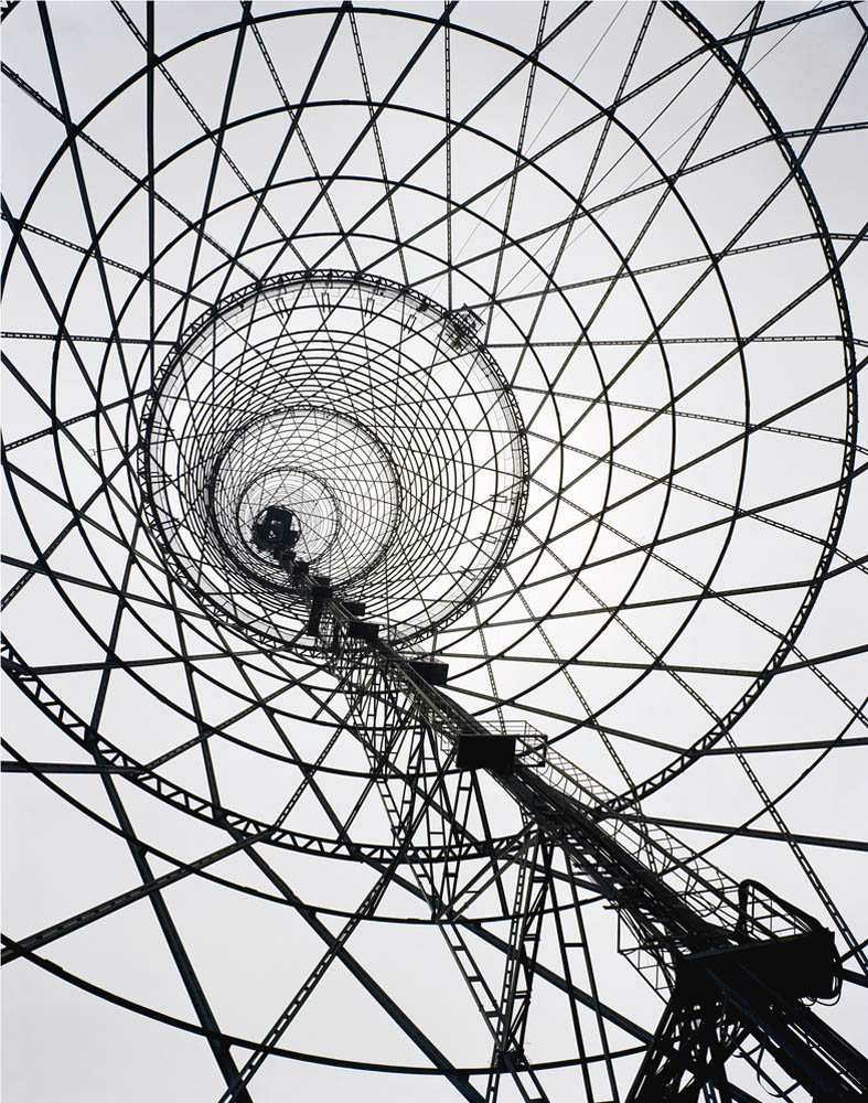
 'Standard Station, Amarillo, Texas' 1963")
 'Stage II' 1959")
 'Car Hood' 1964")
 'The Phrenologer's Window' 1966")
 'Untitled (Venice)' 1967")
 'Vector' 1968")
 '100 BOOTS Move On' 1971-1973")
 'Berlin Red' 1969-1970")
 'Semina Cover with Wife (Photograph of Shirley Berman)' 1959")
 'Malin Residence, \"Chemosphere”' 1960")
 'Case Study House #22' 1960")
 'Peace Tower' 1966")
 'Cloud Box (Large)' 1966")
 'Ed Bereal in His Studio' c. 1961")
 'A Bigger Splash' 1967")
 'Untitled (Verifax Collage)' 1969")


 'Crudellia de Mon Botanica' 2012")
 'Carnivale of the Night' 2012")


 'El Gato, Leeawuleena' 2012")
 'Araneus' 2012")
 'Princess Eucalypt' 2012")
 'Infanta Shamanta' 2012")
 'Bala Opuntia' 2012")


 'Car' 1950s")
 'Female Fashion Figure' 1950s")
 '5 Deaths' 1963")
 'BMW M1 Art Race Car' 1979")
 'BMW M1 Art Race Car' 1979 (detail)")
 '1978 BMW 320i Art Car Maquette' 1978")
 'Police Car' 1983")
 'European License Plate, 1976-1986' 1986")
 'Truck' 1985")
 'Seven Cadillacs' 1962")
 'Foundry, Rome' 2000")
 'Untitled (Rome)' 1966")
 'Yard Sale, Lexington' 2008")
 'Untitled, Lexington' 2008")
 'The Artist's Shoes, Lexington' 2005")
 'Brushes, Lexington' 2005")
 'Tulips, Rome' 1985")
 'Cabbages, Gaeta' 1998")
 'Painting detail of Roses, Gaeta' 2009")
 'Sunset, Gaeta' 2009")
 'Painting Detail and \"By the Ionian Sea\" Sculpture, Bassano in Teverina' 1992")
 'Interior, Rome' 1980")

You must be logged in to post a comment.