
December 2014

One of the few dedicated commercial photography galleries in Melbourne has decided to close its doors. Such a pity “that the depth and breadth of the Australian market is not sufficient to sustain a commercial space dedicated to photography.”
Many thankx to Tim Bruce and Jason McQuoid for their stirling efforts over the last three years… we will miss you !!
Dr Marcus Bunyan
Edmund Pearce to close Flinders Lane gallery space. After three years of operation the directors of Edmund Pearce have decided to close their gallery space in Flinders Lane following the final exhibition of 2014.
Dedicated to the appreciation and understanding of photography, Edmund Pearce has hosted over 100 exhibitions and special projects since February of 2012. The gallery has taken immense pleasure in supporting and promoting the work of both emerging and established artists. This has added to critical discourse and lifted the standards of contemporary photo-media practice here in Australia.
The decision to close has not come easily for the directors; most importantly due to the impact it will have on its artists and loyal patrons. Despite the strength and diversity of the gallery’s programme, it has become clearly evident that the depth and breadth of the Australian market is not sufficient to sustain a commercial space dedicated to photography.
Edmund Pearce expresses its gratitude to all of the exhibiting artists, collectors, curators, writers, interns, volunteers and patrons who have made the gallery such a well-respected and exciting venture. Directors Tim Bruce and Jason McQuoid are proud of the cultural impact the gallery has achieved in such a short period of time and will continue to be passionate advocates of Melbourne’s vibrant cultural landscape.
Artists: Andrew Blythe, Kellie Greaves, Julian Martin, Jack Napthine, Lisa Reid, Martin Thompson and Terry Williams
Curator: Joanna Bosse
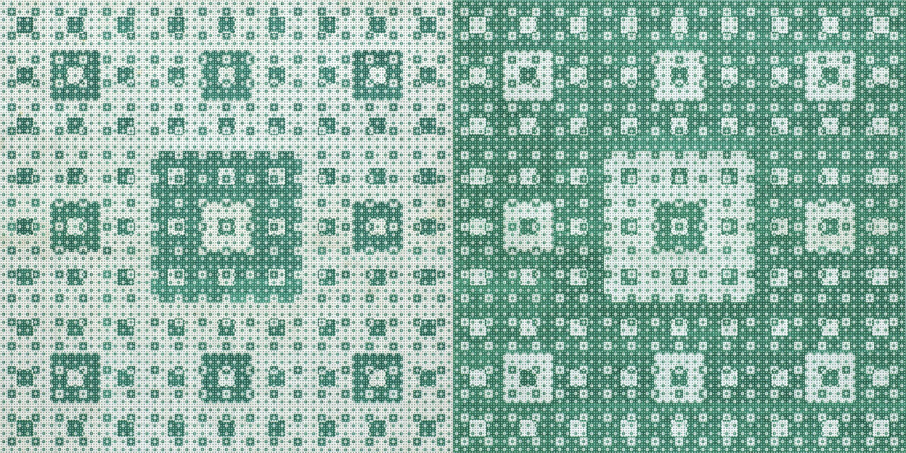
Martin Thompson (New Zealand, b. 1956)
Untitled
2014
Ink on paper
52.5 x 105cm
Courtesy the artist and Brett McDowell Gallery, Dunedin
This is a gorgeous exhibition at The Ian Potter Museum of Art. Walking through the show you can’t help but have a smile on your face, because the work is so inventive, so fresh, with no pretension to be anything other than, well, art.
There are big preconceptions about ‘Outsider art’, originally art that was made by institutionalised mentally ill people, but now more generally understood as art that is made by anyone outside the mainstream of art production – “artworks made by folk artists and those who are self-taught, disabled, or on the edges of society” who are disenfranchised in some way or other, either by their own choice or through circumstance or context.
Outsider art promotes contemporary art while still ‘tagging’ the artists as “Outsider” – just as you ‘tag’ a blog posting so that a search engine can find a specific item if it is searched for online. It is a classification I have never liked (in fact I abhor it!) for it defines what you are without ever understanding who you are and who you can become – as an artist and as a human being. One of the good things about this exhibition is that it challenges the presumptions of this label (unfortunately, while still using it).
As Joanna Bosse notes in her catalogue essay, “Most attempts to define the category of Outsider art include caveats about the elasticity of borders and the impact of evolving societal and cultural attitudes… The oppositional dialectic of inside/outside is increasingly acknowledged as redundant and, in a world marked by cultural pluralism, many question the validity of the category.”1 Bosse goes on to suggest that, with its origins in the term art brut (the raw and unmediated nature of art made by the mentally ill), Outsider art reinforces the link between creativity, marginality and mental illness, proffering “the notion of a pure form of creativity that expresses an artist’s psychological state [which] is a prevailing view that traverses the divergent range of creative practice that falls under the label.”2
The ambiguities of art are always threatened by a label, never more so than in the case of “Outsider art”. For example, how many readers who visited the Melbourne Now exhibition at NGV International and saw the magnificent ceramic cameras by Alan Constable would know that the artist is intellectually disabled, deaf and nearly blind. Alan holds photographs of cameras three inches away from his eyes and scans the images, then constructs his cameras by feel with his hands, fires them and glazes them. The casual viewer would know nothing of this backstory and just accepts the work on merit. Good art is good art no matter where it comes from. It is only when you enquire about the history of the artist – whether mainstream or outsider – that their condition of becoming (an artist) might affect how you contextualise a work or body of work.
Bosse makes comment about the rationale for the exhibition: “The decision to focus on artists’ engagement with the exterior, everyday world was to counter one of the common assumptions about artists in this category – that they are disconnected from society and that their work is solely expressionistic, in that it relates almost exclusively to the self and the expression of the artist’s emotional inner life.”3 Bosse agrees with the position that to simply eliminate the designation would be a different kind of marginalisation – “one where the unique world view and specific challenges the individual faces would become lost in a misguided attempt at egalitarianism.”4
As chair of a panel session at the international conference Contemporary Outsider Art: The Global Context, 23-26th October at The University of Melbourne, curator Lynne Cooke also sees the classification “Outsider” as valuable, for “Outsider art is the condition that contemporary art wants to be” – that is imaginative, free, intuitive, visceral and living on the edge. She sees contemporary art as having run up the white flag leaving Outsider art – however you define that (not the white, middle class male establishment, and belonging to the right galleries) – to be the vanguard, the new avant-garde.5 The exhibition catalogue concludes with her observation that, while current curatorial strategies breakdown the distinctions between ‘inside’ and ‘outside’ – making significant headway concerning stigmatisation – these might have the effect of loosing what she describes as the “‘unique and crucial agency’ that this art has to challenge the ‘monocultural frame’.”6 These artists positions as ‘circuit breakers’, holding counter culture positions, may be threatened as their work is made ready for market, especially if they have little knowledge of it themselves.
And there’s the rub, right there. On the one hand Outsider art wants to be taken seriously, the people promoting it (seldom the artists) want it to be shown in mainstream galleries like the National Gallery of Victoria, and so it should be. Good art is good art not matter what. But they also want to have their cake and eat it too; they want to stand both inside and outside the frame of reference.7 In other words, they promote Outsider art within a mainstream context while still claiming “marginal” status, leveraging funding, philanthropy, international conferences and standing in the community as evidence of their good work. And they do it very successfully. Where would we be without fantastic organisations such as Arts Project Australia and Arts Access Victoria to help people with a disability make art? Can you imagine the Melbourne Art Fair without one of the best stands of the entire proceedings, the Arts Project Australia stand? While I support them 100% I am playing devil’s advocate here, for I believe it’s time that the label “Outsider art” was permanently retired. Surely, if we live in a postmodern, post-human society where there is no centre and no periphery, then ‘other’ can occupy both the centre and the margins at one and the same time WITHOUT BEING NAMED AS SUCH!
[Of course, naming “Outsider art” is also a way of controlling it, to have agency and power over it – the power to delineate, classify and ring fence such art, power to promote such artists as the organisations own and bring that work to market.]
Getting rid of the term Outsider art is not a misguided attempt at egalitarianism as Joanna Bosse proposes, for there will always be a narrative to the work, a narrative to the artist. The viewer just has to read and enquire to find out. Personally, what I find most inspiring when looking at this art is that you are made aware of your interaction with the artist. The work is so immediate and fresh and you can feel the flowering of creativity within these souls jumping off the page.
For any artist, for any work, what we must do is talk about the specific in relation to each individual artist, in relation to the world, in relation to reality and resist the temptation to apply any label, resist the fetishisation of the object (and artist) through that label, absolutely. This is the way forward for any art. May the nomenclature “outsider” and its discrimination be gone forever.
Dr Marcus Bunyan
1/ Bosse, Joanna. Everyday imagining: new perspectives on Outsider art. Catalogue essay. The Ian Potter Museum of Modern Art.
2/ Ibid.,
3/ Ibid.,
4/ Ibid.,
5/ Cooke, Lynne. Senior Curator, Special Projects in Modern Art, National Gallery of Art, Washington, DC. My notes from the panel session “Outsider Art in the Centre: Museums and Contemporary Art,” at Contemporary Outsider Art: The Global Context, 23-26th October at The University of Melbourne.
6/ Cooke, Lynne. “Orthodoxies undermined,” in Great and mighty things: Outsider art from the Jill and Sheldon Bonovitz collection. Philadelphia Museum of Art, 2013, p. 213 quote in Bosse, Joanna, op. cit.,
7/ An example of this can be seen in the launch of the new magazine artsider – “Arts Access Victoria in Partnership with Writers Victoria invites you to the Launch of artsider, a magazine devoted to outsider art and writing.” What a clumsy title that seeks to have a foot in both camps. Email received from Arts Access Victoria 19/11/2014.
Many thankx to The Ian Potter Museum of Art for allowing me to publish the photographs in the posting. Please click on the photographs for a larger version of the image.
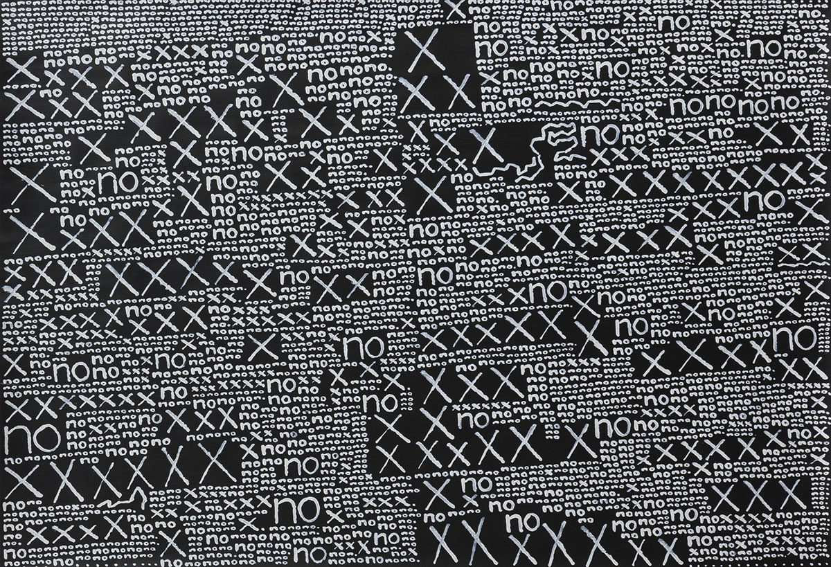
Andrew Blythe (New Zealand, b. 1962)
Untitled
2012
Synthetic polymer paint on paper
88 x 116cm
Courtesy the artist and Tim Melville Gallery, Auckland

Terry Williams (Australian, b. 1952)
Stereo
2011
Vinyl fabric, cotton, stuffing and fibre-tipped pen
21 x 43 x 14cm
Private collection, Melbourne. Courtesy the artist and Arts Project Australia, Melbourne

Terry Williams (Australian, b. 1952)
Telephone
2011
Fabric, cotton, stuffing and fibre-tipped pen
18 x 13 x 20cm
Private collection, Melbourne. Courtesy the artist and Arts Project Australia, Melbourne
An exhibition of Australian and New Zealand ‘Outsider’ artists which challenges a key existing interpretation of the genre will be presented at the Potter Museum of Art at The University of Melbourne, from 1 October 2014 to 15 January 2015. Everyday imagining: new perspectives on Outsider art, features the work of artists Andrew Blythe, Kellie Greaves, Julian Martin, Jack Napthine, Lisa Reid, Martin Thompson and Terry Williams.
The term ‘Outsider art’ was coined by British art historian Roger Cardinal in 1972 expanding on the 1940s French concept of art brut – predominantly artworks made by the institutionalised mentally ill – to include artworks made by folk artists and those who are self-taught, disabled, or on the edges of society. The work of Outsider artists is often interpreted as expressing a unique inner vision unsullied by social or cultural influences. Everyday imagining: new perspectives on Outsider art counters this view by presenting contemporary Outsider artists whose works reveal their proactive engagement with the everyday world through artworks that focus on day-to-day experiences.
Curator Joanna Bosse says the exhibition questions a key interpretive bias of Outsider art that is a legacy of its origins in art brut.
“The association with an interior psychological reality that is unsullied by social or cultural influences remains deeply embedded within the interpretations of Outsider art today, and can lead audiences to misinterpret the agency and intention of the artist. Everyday imagining: new perspectives on Outsider art questions this key interpretive bias, and presents the work of Australian and New Zealander outsider artists that demonstrate a clear and proactive engagement with the world. The work of artists Andrew Blythe, Kellie Greaves, Julian Martin, Jack Napthine, Lisa Reid, Martin Thompson and Terry Williams reveals their blatant interest in the here and now,” Ms Bosse said.
Terry Williams’ soft fabric sculptures of everyday items such as fridges, cameras and clocks convey his keen observation of the world and urgent impulse to replicate what is meaningful through familiarity or fascination. Kellie Greaves’ paintings are based on book cover illustrations with the addition of her own compositional elements and complementary tonal colour combinations. The traditional discipline of life-drawing provides Lisa Reid with a structure to pursue her interest in recording the human figure. Her pen and ink drawings are carefully observed yet intuitive renderings.
Jack Napthine produces drawn recollections of his past and present daily life in the form of visual diaries. Light fittings from remembered environments feature prominently as do doors with multiple and varied locks. Napthine’s work has a bold economy of means; he uses thick texta pen to depict simplified designs accompanied by text detail that often records the names of friends and family.
The work of Martin Thompson and Andrew Blythe also displays a similarly indexical approach. Both artists produce detailed repetitive patterns that are borne out of a desire for order and control. Thompson uses large-scale grid paper to create meticulous and intricate geometric designs whereas Blythe uses select motifs – the word ‘no’ and the symbol ‘x’ – to fill the pictorial plane with dense yet orderly markings that result in graphic and rhythmic patterns.
“In the last decade in particular there has been much debate about the term ‘outsider art’: who does it define? What are the prerequisite conditions for its production? What is it outside of, and who decides? This exhibition doesn’t seek to resolve these ambiguities or establish boundaries, but looks beyond definitions to challenge a key assumption underlying contemporary interpretations of outsider art,” Ms Bosse said.
Everyday imagining: new perspectives on Outsider art is held in conjunction with the international conference Contemporary Outsider art: the global context, presented Art Projects Australia and The University of Melbourne and held 23-26 October at The University of Melbourne. The conference proposes an inter-disciplinary exploration of the field, drawing on the experience and knowledge of Australian and international artists, collectors, curators and scholars.
Press release from The Ian Potter Museum of Art

Julian Martin (Australian, b. 1969)
Untitled
2011
Pastel on paper
38 x 28cm
Courtesy the artist and Arts Project Australia, Melbourne
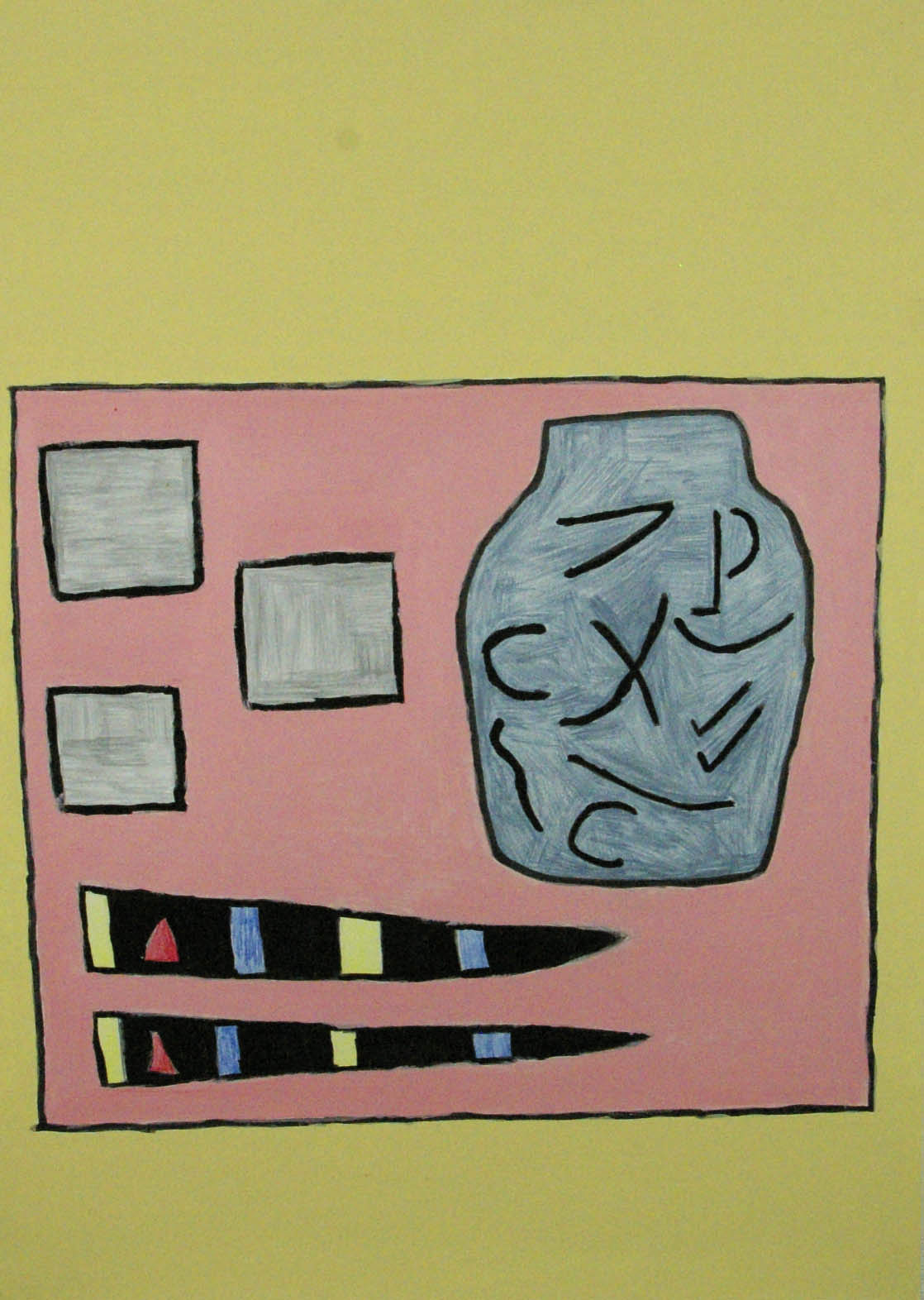
Kelly Greaves
My little Japan
2010
Synthetic polymer paint on paper
59.4 x 42cm
Courtesy the artist and Art Unlimited, Geelong

Jack Napthine (Australian, b. 1975)
Untitled
2013
Fibre-tipped pen on paper
59.4 x 42cm
Courtesy the artist and Art Unlimited, Geelong

Jack Napthine (Australian, b. 1975)
Untitled
2013
Fibre-tipped pen on paper
42 x 59.4cm
Courtesy the artist and Art Unlimited, Geelong
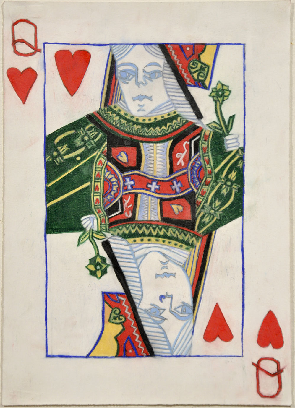
Lisa Reid (Australian, b. 1975)
Queen of hearts
2010
Pencil on paper
35 x 25cm
Courtesy the artist and Arts Project Australia, Melbourne
The Ian Potter Museum of Art
The University of Melbourne,
Corner Swanston Street and Masson Road
Parkville, Victoria 3010
Opening hours: Tuesday – Saturday 11am – 5pm
Artists: Micky Allan, Pat Brassington, Virginia Coventry, Sandy Edwards, Anne Ferran, Sue Ford, Christine Godden, Helen Grace, Janina Green, Fiona Hall, Ponch Hawkes, Carol Jerrems, Merryle Johnson, Ruth Maddison, Julie Rrap, Robyn Stacey.
Curator: Shaune Lakin

Christine Godden (Australian, b. 1947)
Joanie pregnant
1972
From the series Family
Gelatin silver print
15.3 x 22.6cm
Courtesy of the artist
With the National Gallery of Victoria’s photography exhibition program sliding into oblivion – the apparent demise of its only dedicated photography exhibition space on the 3rd floor of NGV International; the lack of exhibitions showcasing ANY Australian artists from any era; and the exhibition of perfunctory overseas exhibitions of mediocre quality (such as the high gloss, centimetre deep Alex Prager exhibition on show at the moment at NGV International) – it is encouraging that Monash Gallery of Art consistently puts on some of the best photography exhibitions in this city. This cracker of an exhibition, the last show curated by Shaune Lakin before his move to the National Gallery of Australia (and his passionate curatorial concept), is no exception. It is one of the best photography exhibitions I have seen all year in Melbourne.
Most of the welcome, usual suspects are here… but seeing them all together is a feast for the eyes and the intellect. While most are social documentary based photographers what I like about this exhibition is that there is little pretension here. The artists use photography as both a means and an end, to tell their story – of mothers, of workers, of dancers, of lovers – and to depict a revolution in social consciousness. What we must remember is the period in which this early work appeared. In the 1970s in Australia there were no formal photography programs at university and photography programs in techs and colleges were only just beginning: Photography Studies College (1973) in South Melbourne, Prahran College of Advanced Education (Paul Cox, John Cato, 1974) and Preston Tech (c. 1973, later Phillip Institute) were all set up in the early 1970s. The National Gallery of Victoria photography department was only set up in 1969 (the third ever in the world) with Jenny Boddington, Assistant Curator of Photography, was appointed in 1972 (later to become the first full time photography curator). There were three commercial photography galleries showing Australian and international work in Melbourne: Brummels (Rennie Ellis), Church Street Photographic Centre (Joyce Evans) and The Photographers Gallery (Paul Cox, John Williams, William Heimerman and Ian Lobb). While some of the artists attended these schools and others were self taught, few had their own darkroom. It was not uncommon for people to develop their negatives and print in bathrooms, toilets, backyard sheds and alike – and the advise was to switch on the shower before printing to clear the dust out of the air, advise in workshops that people did no bat an eyelid at.
What these women did, as Julie Millowick (another photographer who should have been in this exhibition, along with Elizabeth Gertsakis and Ingeborg Tyssen for example) observes of the teaching of John Cato, was “bring to the work knowledge that extended far beyond picking up a camera or going into a darkroom. He [Cato] believed that you must bring to every image you create a wide depth of insight across social, cultural and historical concerns. John was passionate in his belief that an understanding of humanity and society was crucial to our growth as individuals, and ultimately our success as photographers.”1 And so it is with these artists. Never has there been a time in Australian photography when so much social change has been documented by so few for such great advantage. In all its earthiness and connection, the work of these artists is ground breaking. It speaks from the heart for the abused, for the disenfranchised and downtrodden. The work is not only for women by women, as Ponch Hawkes states, but also points the way towards a more enlightened society by opening the eyes of the viewer to multiple points of view, multiple perspectives.
There are few “iconic” images among the exhibition and, as Robert Nelson notes in his review in The Age, little pretension to greatness. One of the surprising elements of the exhibition is how the four photographs by Carol Jerrems (including the famous Vale Street, 1975), seem to loose a lot of their power in this company. They are out muscled in terms of their presence by some of the more essential and earthy series – such as Women at work by Helen Grace and Our mums and us by Ponch Hawkes – and out done in terms of their sensuality by the work of Christine Godden. These were my two favourite bodies of work: Our mums and us and Christine Godden’s sequence of 44 images and the series Family.
Hawkes’ objective series of mother/daughter relationships are deceptively simple in their formal structure (mother and daughter positioned in family homes usually looking directly at the camera), until you start to analyse them. Their unpretentious nature is made up of the interaction that Hawkes elicits from the pairing and the objet trouvé that are worn (the cowgirl boots in Ponch and Ida, 1976) or surround them (the carpet, the table, the plant and the painting in Mimi and Dany, 1976). This relationship adds to the power of the assemblage, juxtaposition of energy and form being a guiding principle in the construction of the image. While the environment might be ‘natural’ it is very much constructed, both physically and psychologically, by the artist.
The work of Christine Godden was a revelation to me. These small, intense images have a powerful magnetism and I kept returning to look at them again and again. There is sensitivity to subject matter, but more importantly a sensuality in the print that is quite overwhelming. Couple this with the feeling of light, space, form and texture and these sometimes fragmentary photographs are a knockout. Just look at the sensitivity of the hands in Untitled, c. 1976. To see that, to capture it, to reveal it to the world – I was almost in tears looking at this photograph. The humanity of that gesture is something that I will treasure.
The only criticism of the exhibition is the lack of a book that addresses one of the most challenging times in Australian photographic history. This important work deserves a fully researched, scholarly publication that includes ALL the players in the story, not just those represented here. It’s about time. As a good friend of mine recently said, “Circles must expand as history moves away from a generation and cohort and, hopefully, the future will ask its own questions” … and I would add, without putting the blinkers on and creating more ideology.
Dr Marcus Bunyan
1/ Julie Millowick and Christopher Atkins. “Dr John Cato – Educator,” in Paul Cox and Bryan Gracey (eds.,). John Cato Retrospective. Melbourne: Wilkinson Publishing, 2013.
Many thankx to the Monash Gallery of Art for allowing me to publish the photographs in the posting. Please click on the photographs for a larger version of the image. All installation photographs © Marcus Bunyan and Monash Gallery of Art
“As feminism took off among intellectuals of both sexes, art history would sometimes be interrogated to account for the reasons why there were relatively few great female artists.
While art historians would create reasonable apologies and impute the deficit to centuries of disadvantage to women, it was left to women artists to construct a view of art that redefined the stakes.
They sought a vision that didn’t see art as line-honours in transcendent inventions but a conversation that furthered the sympathy and consciousness of the community”
Robert Nelson The Age Wednesday November 5, 2014
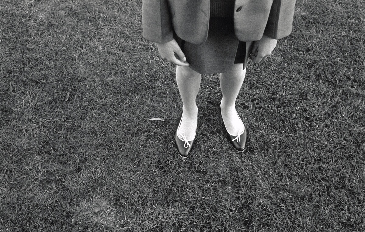
Pat Brassington (Australian, b. 1942)
Untitled
1984 (1)
From the series 1 + 1 = 3
Gelatin silver print
18 x 28cm
Monash Gallery of Art, City of Monash Collection
Courtesy of the artist, ARC ONE Gallery (Melbourne), Stills Gallery (Sydney) and Bett Gallery (Hobart)
Pat Brassington‘s photographs have often made use of the artist’s home and family life as subject matter. The photographs included in this exhibition were taken during the early 1980s and, with their tight cropping and diagonal obliques, suggest that family life is an anxious and ambivalent place. Erotically charged body parts – whether partner’s or offspring – are left to hang, like fetish objects drifting through a dream. Brassington is consciously mining the clichés of psychoanalysis, with her focus on shoes, panties and an ominous father figure, but she reworks this symbolism with a comical lightness that is closer to a teen horror film than the analyst’s couch.

Helen Grace
Women at work, Newcastle
1976
From the series Series 1
Gelatin silver prints
17.5 x 11.6cm (each)
Courtesy of the artist

Helen Grace
Women at work, Newcastle
1976
From the series Series 2
Gelatin silver prints
11.6 x 17.5cm (each)
Courtesy of the artist

Helen Grace
Women at work, Newcastle (detail)
1976
From the series Series 2
Gelatin silver prints
11.6 x 17.5cm (each)
Courtesy of the artist
Helen Grace was a member of the Sydney-based feminist collective Blatant Image (which also included Sandy Edwards), which formed around the Tin Sheds at Sydney University. The collective was interested in examining and reconfiguring the representation of women in popular culture, and also in developing alternative venues for socially conscious art and film. The photographs displayed here point to the two interconnected preoccupations of Grace’s work at this time: the social and cultural construction of motherhood and femininity (and the way that each of these categories are produced by and through consumerism and popular culture), and the documentation of women’s labour. An active member of Sydney’s labour movement, Grace photographed women working in a range of workplaces (including factories and hospitals) for both the historical record and as promotional aids for activist organisations.
Grace’s Women seem to adapt to repetitive-type tasks was widely shown in Sydney and Melbourne, including the exhibition The lovely motherhood show (1981). This work of seven panoramas depicting a string of nappies on a washing line at once points towards the inexorable tediousness of motherhood, and at the same time attempts to demystify the romantic myths of motherhood found in contemporary advertising and popular culture. Grace’s photographs were also widely used in posters produced by trade union and women’s groups. During the 1970s and 1980s screen printing was a cheap and effective way to incorporate photographic imagery into posters. Community groups also embraced screen printing because its aesthetic stood in opposition to commercial advertising, and the process lent itself to a do-it-yourself work ethic.

Merryle Johnson (Australian, b. 1949)
Outside the big top
1979-1980
From the series Circus
Hand coloured gelatin silver prints
Monash Gallery of Art, City of Monash Collection
Donated by Merryle Johnson, 2014
Merryle Johnson‘s photographic feminism sits alongside her contemporaries Micky Allan and Ruth Maddison. In the first instance, it is expressed in the autobiographical nature of her images, which often refer to her family history. And like Allan and Maddison, Johnson also used hand-colouring to reinvigorate documentary photography and to bring a decidedly female perspective to the medium. Johnson’s contribution to feminist photography in Australia is also reflected in her use of photographic sequences – multiple images printed on the same sheet. In these works, the single, perfectly realised photographic image of Modernist photography was replaced with a series of images that draw attention to the fragmentary, contingent and inconclusive nature of photography. The serialisation of photographs also engages a more embodied, spatialised and assertive experience than single pictures alone.

Christine Godden (Australian, b. 1947)
Joanie and baby Jade, Larkspur
1973
From the series Family
Gelatin silver print
8.4 x 13.8cm
Courtesy of the artist

Christine Godden (Australian, b. 1947)
Untitled
c. 1976
Gelatin silver print
15.3 x 22.8cm
Courtesy of the artist

Christine Godden (Australian, b. 1947)
Untitled
c. 1976
Gelatin silver print
15.2 x 22.7cm
Courtesy of the artist

Christine Godden (Australian, b. 1947)
Untitled
c. 1976
Gelatin silver print
15.2 x 22.8cm
Courtesy of the artist
Christine Godden‘s Untitled c. 1976 is part of a sequence of 44 images that represented fragments and textures that combine tenderness and formal rigour in a way that evokes a sense of poetry. The series Family c. 1973 details the domestic environment and experience of young families in the American West.
As well as presenting subjects that engaged a ‘feminine’ subject, Godden’s photographs critically interrogate many of the claims for a distinctly ‘feminine sensibility’ being made by and for women artists at this time. The ‘Untitled’ prints on display here were originally exhibited in 1976 at George Paton Gallery, Melbourne and the Australian Centre for Photography in Sydney. These pictures were originally shown as part of a tightly organised sequence of 44 photographs intended to show ‘how women see [and] how women think’. The tightly cropped glimpses of bodies and textures combine tenderness and formal rigour in a way that evokes a sense of visual poetry.
Christine Godden’s Family series comprises a large number of images detailing the domestic environment and experience of young families living in the American west. Godden was at this time a student at the San Francisco Art Institute and was very active in feminist networks, including the Advocates for Women organisation, for whom she photographed events and actions. Godden’s Family series documents her experience of the counter-cultural families of America’s west coast, who provided and celebrated a new model of family life and women’s work.

Installation view of Photography Meets Feminism at the Monash Gallery of Art with, at right, Anne Ferran’s Scenes on the death of nature, scene I and II (1980-1986)
Photo: Marcus Bunyan

Anne Ferran (Australian, b. 1949)
Scenes on the death of nature, scene I
1980-1986
Gelatin silver print
122 x 162cm
Monash Gallery of Art, City of Monash Collection
Courtesy the artist and Sutton Gallery (Melbourne)
Anne Ferran‘s series Scenes on the death of nature presents five tableau-like scenes showing the artist’s daughter and her friends in classical dress. When they were first exhibited, commentators noted the enigmatic quality of the images, and how they resisted clear meaning, narrative and any attribute of personal style. To many, they represented a significant shift away from documentary photography. This might well be the ‘death’ to which the titles refer. For the critic Adrian Martin, the pictures appeared to evoke myth, while also being ambivalent about a photograph’s capacity to point to or allude to anything outside of itself; in this way, they can be seen to exemplify a certain post-modern approach to photography.
All the same, it is possible to see these important pictures as signposts for another kind of death. The photographs allude to some of the ways that the subject of girl/woman has been produced through visual culture, whether the monumental friezes of classical or Victorian architecture, or Pre-Raphaelite tableaux. In this way, they evoke the idea of ‘femininity’ as a source of meaning. Rather than rejoicing in, resisting or critiquing ‘femininity’ as earlier feminist photographers might have done, Ferran’s pictures remain steadfastly, even ‘passively’ ambivalent. As the artist wrote at the time, the works reveal ‘very little of a personal vision or private sensibility’.
Wall text

Installation view of four Carol Jerrems photographs with Vale Street (1975) at left and Lynn (1976) at right in the exhibition Photography Meets Feminism at the Monash Gallery of Art
Photo: Marcus Bunyan
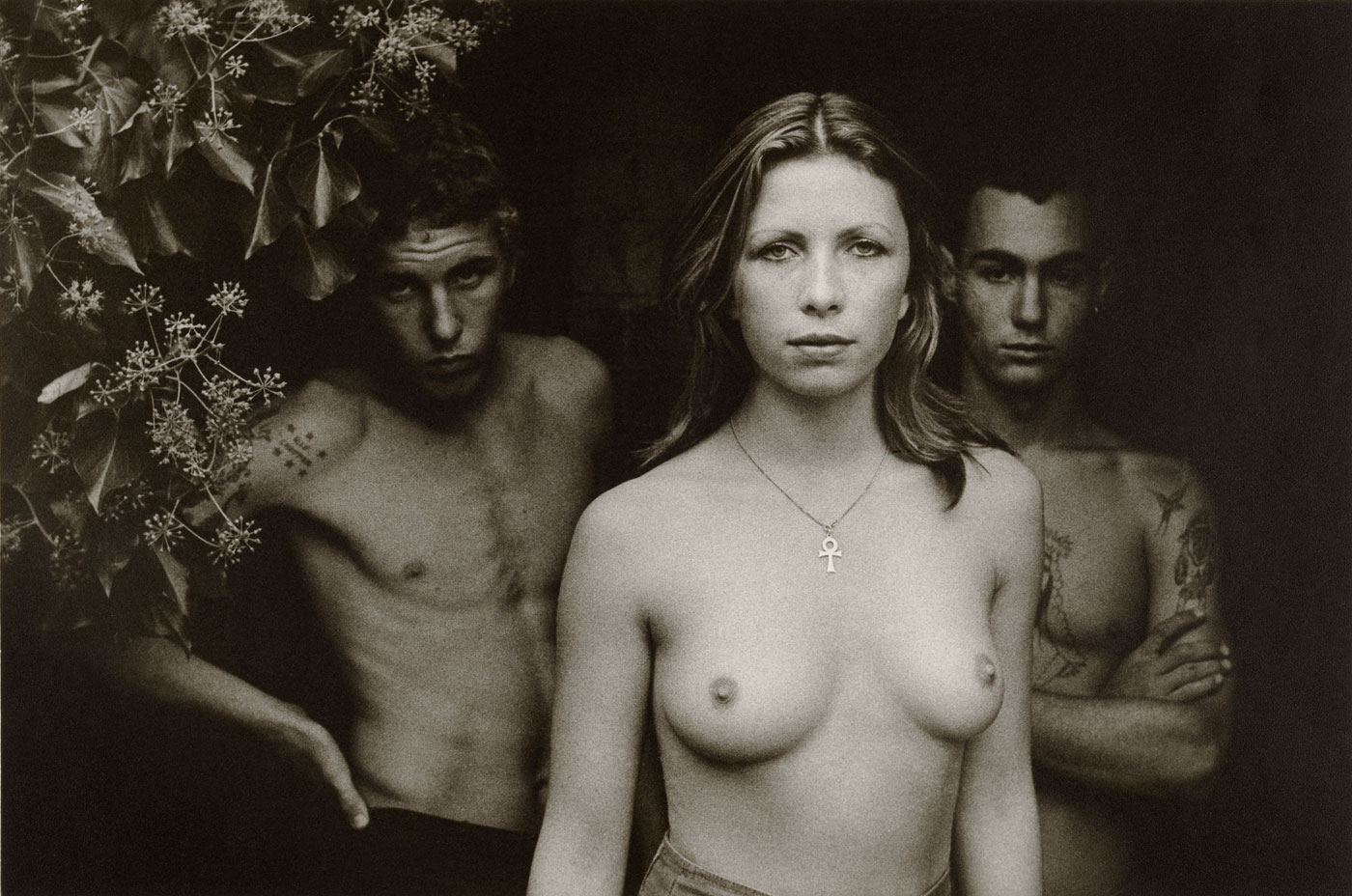
Carol Jerrems (Australian, 1949-1980)
Vale Street
1975
Gelatin silver photograph
National Gallery of Australia, Canberra
Purchased 1976
© Ken Jerrems and the Estate of Lance Jerrems

Carol Jerrems (Australian, 1949-1980)
Lynn
1976
Gelatin silver photograph
National Gallery of Australia, Canberra
© Ken Jerrems and the Estate of Lance Jerrems
Carol Jerrems was one of a number of Australian women whose work during the 1970s challenged the dominant ideas of what a photographer was and how they worked. She adopted a collaborative approach to making photographs, which often featured friends and associates, and sought a photographic practice that would bring about social change. For Jerrems, as for many of her contemporaries, the photograph was an agent of social change, a means of both bringing people together and creating active and engaged social relationships. As she stated:
“I really like people … I try to reveal something about people, because they are so separate, so isolated; maybe it’s a way of bringing people together … I care about [people], I’d like to help them if I could, through my photographs…”
The iconic Vale Street shows Jerrems’s friend Catriona Brown standing in front of Mark Lean and Jon Bourke, teenage boys from Heidelberg Technical School where Jerrems was teaching at the time. The photograph was taken at a house in Vale Street, St Kilda. Although it is unclear if Jerrems conceived of this image as a feminist gesture, the subject’s assertive, bare-chested pose and Venus symbol led to this photograph being interpreted as a statement of feminist power.


Installation views of Photography Meets Feminism at the Monash Gallery of Art
Photos: Marcus Bunyan

Installation view of Ponch Hawkes series Our mums and us at the exhibition Photography Meets Feminism. Her photographs were made by women, of women, for women
Photo: Marcus Bunyan

Ponch Hawkes (Australian, b. 1946)
Ponch and Ida
1976
From the series Our mums and us
Gelatin silver print
17.7 x 12.7cm
Monash Gallery of Art, City of Monash Collection
Donated through the Australian Government’s Cultural Gifts Program by Ian Bracegirdle 2012
Courtesy of the artist

Ponch Hawkes (Australian, b. 1946)
Lorna and Mary
1976
From the series Our mums and us
Gelatin silver print
17.7 x 12.7cm
Monash Gallery of Art, City of Monash Collection
Donated through the Australian Government’s Cultural Gifts Program by Ian Bracegirdle 2012
Courtesy of the artist

Ponch Hawkes (Australian, b. 1946)
Mimi and Dany
1976
From the series Our mums and us
Gelatin silver print
17.7 x 12.7cm
Monash Gallery of Art, City of Monash Collection
Donated through the Australian Government’s Cultural Gifts Program by Ian Bracegirdle 2012
Courtesy of the artist
Ponch Hawkes‘s best-known series Our mums and us documents a selection of the photographer’s contemporaries standing with their mothers. The photographs were taken at each subject’s family home and record generational shifts in personal style and domestic decor. Originally shown at Brummels Gallery of Photography in 1976, which was Hawkes’s first solo exhibition, Our mums and us has become one of the most celebrated examples of feminist photography in Australia.
The use of pronouns in the title suggests the series was made by women, of women and for women; it is a defiant and celebratory feminist gesture, which foregrounds women as at once independent and connected to each other. Reflecting on the series, Hawkes explains that ‘feminism helped me to understand that my mother was actually a woman too, and not just a mother, and Our mums and us came out of that realisation.’


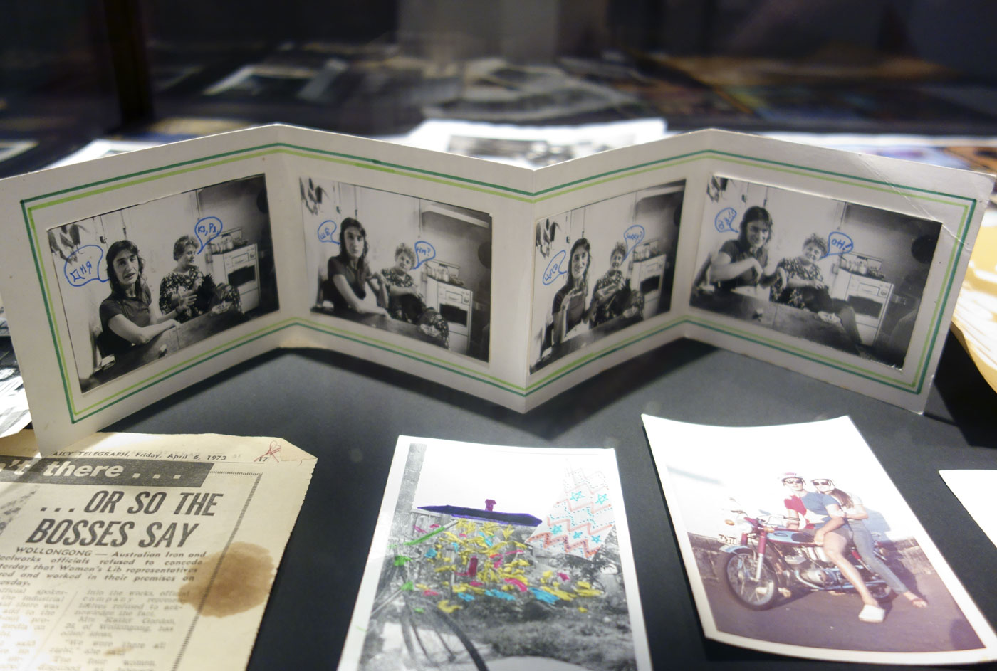

Ephemera and books from Ponch Hawkes personal collection, including the cover of the seminal book A Book About Australian Women by Carol Jerrems and Virginia Fraser (Melbourne, 1974)
Photos: Marcus Bunyan

Ruth Maddison (Australian, b. 1945)
Vehicle Builders Union Ball, Collingwood Town Hall, Melbourne
1979
From the series Let’s dance
Gelatin silver print
27.0 x 18.0cm
Collection of the artist
Courtesy of the artist

Ruth Maddison (Australian, b. 1945)
Women’s dance, St Kilda Town Hall, Melbourne
1985
Gelatin silver print
36.5 x 24.5cm
Courtesy of the artist
Ruth Maddison photographed the social spaces that had been important to activist communities but which were in the process of passing away. These were mainly commissioned projects for labour and social movements, otherwise these histories would have been lost.
Dancing and entertainment were features of Ruth Maddison’s work throughout the 1980s. These photographs reflected Maddison’s own social life, which often revolved around Melbourne’s pubs and nightclubs. But there was also a classical documentary function to her photographs of trade union dances and the annual women’s dance at St Kilda Town Hall. These pictures reflected social spaces that had been important to activist communities, but which by the mid-1980s were in the process of passing away; as women’s groups began to fragment, and as the membership of labour organisations changed. The photographs shown here of the Vehicle Builders’ Union Ball at Collingwood Town Hall were part of a commission. Like many photographers in this exhibition (including Helen Grace, Sandy Edwards and Ponch Hawkes), political affiliation and professional practice often came together in commissioned projects for labour and social movements.

Virginia Coventry (Australian, b. 1942)
Miss World televised
1974
Gelatin silver print
15.5 x 13.5cm (each)
Courtesy of the artist
Miss World televised is typical of Virginia Coventry‘s photographic work from this period, which tended to revolve around tightly organised sequences of pictures of the same subject (swimming pools in a Queensland town; the spaces between houses) or an event (a car moving through a carwash; a receding flood).
At the time, Coventry shared a house with Micky Allan. One night, while watching Allan’s black-and-white television, she saw footage of the 1974 Miss World pageant on the news. Immediately taken by the way the poor reception distorted the bodies of the contestants, Coventry began to photograph the footage. Once she developed the film, she realised the visual ‘disruption’ caused by the incongruity of the telecast process and the camera’s shutter speed obscured the figures and the beauty of the contestants, without necessarily deriding or critiquing the women themselves. As Coventry has written of the pictures: “I remember discussions with other women at the time about the way that the distortions offered a protection to the integrity of the actual person in the photo-images. Because of the radical slippage between reportage and reception, the individual is no longer the subject. The title operates to focus attention on Miss World telecast as a quite abstract construction – as do the black-and-white, grainy, prints.”
PHOTOGRAPHY MEETS FEMINISM: Australian women photographers 1970s-80s looks at the vital relationship of photography and feminism in Australia during the 1970s and ’80s.
Given the vitality of both feminist politics and art photography during the 1970s, it is not surprising that they entered into a lively exchange that extended into the 1980s. On the one hand, feminists used the highly informative and accessible medium of photography to raise awareness of critical social issues.
On the other hand, photographic artists embraced feminist themes as a way of making their practice less esoteric and more engaged with contemporary life. This productive intersection of feminism and photography fostered a range of technical innovations and critical frameworks that made a significant contribution to the direction of visual culture in Australia.
PHOTOGRAPHY MEETS FEMINISM: Australian women photographers 1970s-80s will feature vintage prints of important photographs, many of which have not been seen for decades.
MGA Interim Director, Stephen Zagala states, “We are proud to present this exhibition, which provides an as-yet untold account of Australian photography and draws heavily on MGA’s nationally significant collection of Australian photography.”
Press release from the Monash Gallery of Art
This exhibition explores the encounter between photography and feminist politics during the 1970s and into the 1980s.
Both photography and feminism thrived during this period. Feminist politics of the 1970s expanded on its earlier fight for equal rights by illuminating discrimination against women in various contexts. This included addressing domestic violence, inequality in the workplace, sexism in the media, and the economics of parenting. Alongside this expanded critique of patriarchy, feminist politics also celebrated ‘sisterhood’ by drawing attention to the undervalued achievements of women and by taking pride in distinctly female perspectives on the world.
Photographic practice also expanded its parameters during the 1970s. Together with other art forms such as painting and sculpture, photography became more experimental and irreverent. Most photographic artists rejected the tradition of highbrow fine art photography and invested the medium with personal sentiment and everyday content. The camera also became a useful tool for a generation of artists more interested in social engagement than aesthetic finesse.
Given the vitality of both feminist politics and art photography during the 1970s, it is not surprising that they entered into a lively exchange that extended into the 1980s. On the one hand, feminists used the highly informative and accessible medium of photography to raise awareness of critical social issues. On the other hand, photographic artists embraced feminist themes as a way of making their practice less esoteric and more engaged with contemporary life. This productive intersection of feminism and photography fostered a range of technical innovations and critical frameworks that made a significant contribution to the direction of visual culture in Australia.
Text from the Monash Gallery of Art website

Sue Ford (Australian, 1943-2009)
Untitled
1969-1971
From the series The Tide Recedes
Selenium toned gelatin silver print

Sue Ford (Australian, 1943-2009)
Untitled
1969-1971
From the series The Tide Recedes
Selenium toned gelatin silver print
Sue Ford‘s series The Tide Recedes 1969-1971 was made for her first solo exhibition at the Hawthorn City Art Gallery in 1971. People were becoming more removed from nature but Ford felt that woman share a particular biological and cultural affinity with nature. The contrasty black and white photographs of bodies melding with rocks in montage prints that are as rough as guts work magnificently.
These prints were made as preparation for Sue Ford’s ambitious series The tide recedes, shown as part of Ford’s first solo exhibition at the Hawthorn City Art Gallery in 1971. Throughout this body of work, images of naked women and of men and women embracing merge with a marine landscape. The series expresses Ford’s concern that people were becoming too removed from nature, and allude to the idea that women share a particular biological and cultural affinity with nature. It also draws on a technique that was central to feminist photographic practice – montage, where two disparate fragments are brought together to produce new and often unexpected meanings. While this reflects Ford’s work as a film maker, where montage is often used in storytelling, this strategy also embeds her pictures in the field of activist art. With montage, it is the viewer who ultimately makes sense of a work, as they find and see connections between disparate fragments.
While the prints presented in the 1971 exhibition were ambitious in scale and resolution, Ford preferred prints that were – in her terms – ‘rough as guts’. Prints such as those shown here represented an explicit rejection of the maleness of both the camera as a technological instrument and the arcane knowledge of the darkroom.

Robyn Stacey (Australian, b. 1952)
Queensland out west
1982
Hand-coloured gelatin silver prints
9.2 x 15.2cm (each)
Courtesy of the artist and Stills Gallery (Sydney)


Robyn Stacey (Australian, b. 1952)
Queensland out west (details)
1982
Hand-coloured gelatin silver prints
9.2 x 15.2cm (each)
Courtesy of the artist and Stills Gallery (Sydney)

Robyn Stacey (Australian, b. 1952)
Untitled (Geoff in Bondi)
1981
From the series Modified myths 1938-1988
Hand-coloured gelatin silver print
39.0 x 38.3cm
Courtesy of the artist and Stills Gallery (Sydney)

Robyn Stacey (Australian, b. 1952)
Untitled (Picnic)
1981
From the series Modified myths 1938-1988
Hand-coloured gelatin silver print
39.0 x 38.3cm
Courtesy of the artist and Stills Gallery (Sydney)
Robyn Stacey established a reputation for her hand- coloured prints in the late 1970s and early ’80s. Introduced to the process by Micky Allan, Stacey’s early hand-coloured prints examined the life and culture of Australia, especially her native Queensland. Stacey hand-coloured her photographs so as to invest them with personal attributes: “At the time I was interested in hand colouring [because it was] a technique associated with women’s work and craft. This approach seemed a good way to visually re-enforce the personal and intimate quality of the prints.”
Among Stacey’s most important contributions to the feminist tradition of hand colouring photographs are her pictures of Queensland architecture, taken during a road trip to western Queensland made with her mother. These images refer to an heroic subject in Australian culture – the stoicism of the outback and the people who populate it. But Stacey revises these myths, by presenting the images as intimate and personal.

Robyn Stacey (Australian, b. 1952)
Ice
1989
From the series Redline 7000
Silver dye bleach print
104.0 x 175.3cm
Monash Gallery of Art, City of Monash Collection
Donated through the Australian Government’s Cultural Gifts Program 2012
Courtesy of the artist and Stills Gallery (Sydney)

Robyn Stacey (Australian, b. 1952)
Jet
1989
From the series Redline 7000
Silver dye bleach print
164 x 103cm
Monash Gallery of Art, City of Monash Collection
Donated through the Australian Government’s Cultural Gifts Program 2012
Courtesy of the artist and Stills Gallery (Sydney)
In the late 80s, Stacey began to hand colour her transparencies rather than the print, thereby incorporating an aspect of reproducibility to the images. In this way the work shifted from the unique print, with its references to nostalgia and the careful rendering of places and times, to something resembling the glossy images found in 1980s’ mass media, especially Hollywood cinema.

Julie Rrap (Australian, b. 1950)
Persona and shadow: Madonna
1984
Silver dye bleach print
203.0 x 126.5cm
Monash Gallery of Art, City of Monash Collection acquired 1997
Courtesy of the artist and Arc One Gallery (Melbourne) and Roslyn Oxley9 Gallery (Sydney)
This photograph is from the series of nine works titled Persona and shadow. Julie Rrap produced this series after visiting a major survey of contemporary art in Berlin (Zeitgeist, 1982) which only included one woman among the 45 artists participating in the exhibition. Rrap responded to this curatorial sexism with a series of self-portraits in which she mimics stereotypical images of women painted by the Norwegian artist Edvard Munch (1863-1944). Each pose refers to a female stereotype employed by Munch: the innocent girl, the mother, the whore, the Madonna, the sister, and so on.
Appropriating the work of other artists is one of the strategies that characterises the work of so-called ‘postmodern’ artists active during the 1980s. The practice of borrowing, quoting and mimicking famous artworks was employed as a way of questioning notions of authenticity. Feminist artists tended to use appropriation to specifically question the authenticity of male representations of females. In more straightforward terms, Rrap reclaims Munch’s clichéd images of women and makes them her own. Rrap ultimately becomes an imposter, stealing her way into these masterpieces of art history, but the remarkable thing about these works is the way that the artist foregrounds the process of reappropriation itself. The procedure of restaging, collage, overpainting, and rephotographing becomes part of the final image, testifying to a do-it-herself politic.
Wall text
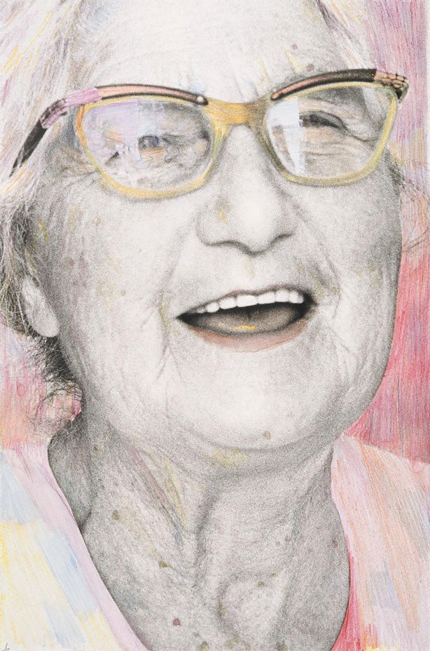
Micky Allan (Australian, b. 1944)
Old age
1978
From the series Old age
Gelatin silver photograph, hand coloured with watercolour and pencil
18.2 x 12.0cm
© Micky Allan

Micky Allan (Australian, b. 1944)
Old age
1978
From the series Old age
Gelatin silver photograph, hand coloured with watercolour and pencil
18.2 x 12.0cm
© Micky Allan

Micky Allan (Australian, b. 1944)
Old age
1978
From the series Old age
Gelatin silver photograph, hand coloured with watercolour and pencil
18.2 x 12.0cm
© Micky Allan
Micky Allan’s two series Babies and Old age were shown in Melbourne and Sydney around 1976-1977; their reception revealed much about the anxieties that informed photographic criticism and practice at the time, with critics dismissing the works as ‘slight’ and ‘feminine photographs par excellence’. Across a series of exhibitions between 1976 and 1980, Allan challenged many of the established conventions of fine art photography, in both technique and subject. Allan overpainted the black-and-white print with watercolour, gouache and pencil to the extent of both acknowledging the under recognised history of women’s photographic work – historically, women were employed by studios to hand-paint or tone photographic prints – and transgressing the smooth surface of photographic prints that was prized by traditional art photographers.
For Allan, overpainting rejected the technical sameness of modern photography and introduced an emotional warmth. Allan’s hand-colouring also interrupted the myth of photographic transparency – the notion of the photograph as a ‘disinterested’ window onto the world. Overpainted, the photograph became subjective, contingent and fallible. The lightness of many of Allan’s interventions enhances this sense of fallibility.
Wall text
With a body of work ranging across painting, photography and performance, investigations of subjectivity have been central to Micky Allan’s practice. Allan has consistently drawn on feminist strategies which emphasise the personal and autobiographical. In the early 1970s she became involved with the experimental performance and collective activities based at The Pram Factory in Melbourne, working there as both a set designer and a photographer, documenting early feminist work. Of this time Allan has said that she saw “photography as a form of social encounter … that in comparison with painting it [was] much more integrated to what was going on.”1
Allan has acknowledged social documentary as the basis of her photographic work. For a short period she recorded political figures and the surrounding social changes in which she was both a participant and an observer. Old age, the second of three series whose focus is lifecycles (the other two being Babies 1976 and The prime of life 1979-1980), comprises 40 hand-coloured individual portraits. Allan introduced the technique of hand-colouring in her work in 1976, a technique taken up by many women photographers at that time to counter the then dominant modes of masculine production. While there is stylistic variation across the series, each portrait, close-up in viewpoint, is meticulously rendered in pastel colours. The images do not capture a simple moment but rather work together to poignantly symbolise a rich regard for age. Of this Allan has said: “Altogether they are an attempt to familiarise and personalise “age”, in a society which tends to ignore or stereotype the old.”2
1/ ‘On paper – survey 12’, National Gallery of Victoria, Melbourne, 21 Jun ‘ 20 Jul 1980, as quoted in 1987, Micky Allan: perspective 1975-1987, Monash University Gallery, Clayton p. 4
2/ Ibid p. 19
© Art Gallery of New South Wales Photography Collection Handbook, 2007
Micky Allan (b. Australia 1944) studied Fine Art at the University of Melbourne, and painting at the National Gallery School in the 1960s. Allan began taking photographs in 1974 after joining the loosely formed feminist collective at Melbourne’s experimental arts and theatre space the Pram Factory. During this time Allan was part of a vibrant community of feminist artists that included Virginia Coventry, who taught her how to take and print photographs. Allan returned to painting as her primary medium in the early 1980s.
Pat Brassington (b. Australia 1942) is a Hobart-based artist who studied printmaking and photography at the Tasmanian School of Art, graduating with a Master of Fine Arts in 1985. Brassington draws on a personal archive of visual material to compose her images. This archive includes both photographic and non-photographic material, which has either been found or produced by Brassington. Her work takes inspiration from surrealist photography, with its recurring interest in fetish objects and uncanny domestic scenes. Brassington typically employs digital collage to manufacture disjointed compositions, and she exhibits her work in elliptical series that suggest dream-like narratives.
Virginia Coventry (b. Australia 1942) studied painting at the Royal Melbourne Institute of Technology during the early 1960s, before undertaking postgraduate studies at the Slade School of Fine Art, University College, London. While painting and drawing have been constant features of Coventry’s practice, she started taking photographs during the mid-1960s and developed a significant reputation for her photo-based work during the 1970s. Her photographic work typically engages with socio-political issues and often incorporates textual elements that give it a discursive form.
Sandy Edwards (b. New Zealand 1948 arr. Australia 1961) has been an important figure in Australian photography as both a maker and advocate since the 1970s. Edwards’s practice has paid particular attention to women and their relationship with the media of photography and film. Most of her work is documentary in nature but her photographic prints are often presented in sequences that elaborate conceptual points. Edwards has also been a prolific curator of exhibitions promoting the work of contemporary photographers, especially in Sydney.
Anne Ferran (b. Australia 1949) is a Sydney-based photographer and academic. She studied humanities and teaching before training in photography at Sydney College of the Arts. She began exhibiting her work in the mid-1980s and has become one of Australia’s most critically acclaimed photographers. Ferran’s practice is largely concerned with using photography to reclaim forgotten pasts, with a specific interest in the histories of women and children in colonial Australia. In pursuing this interest, Ferran often develops her projects through archival research and fieldwork.
Sue Ford (Australia 1943-2009) studied photography at RMIT and was the first Australian photographer to be given a solo exhibition at the National Gallery of Victoria in 1974. Over the course of her artistic career Ford worked with still photography and moving images, beginning with traditional analogue film and then embracing the possibilities offered by photomedia and digital technologies. In this respect, Ford is a key figure in the history of avant-garde photographic experimentation. Ford’s artworks are also remarkable for their critical engagement with contemporary social issues, while also expressing deeply personal perspectives on the world.
Christine Godden (b. Australia 1947) has played a significant role in Australian photography as a maker, curator and advocate. After studying in Melbourne, Godden completed a Bachelor of Fine Arts at the San Francisco Art Institute in 1975 and a Master of Fine Arts at the Visual Studies Workshop in Rochester, New York in 1980. On her return to Australia, she became director of the Australian Centre for Photography, Sydney, and was consequently a prominent spokesperson for Australian photography during the 1980s. Her own photography is couched in a highly personal and poetic form of documentary practice.
Helen Grace (b. Australia 1949) is a self-taught artist who began making work as an active member of feminist and labour organisations in Sydney during the mid-1970s. Often straight-forwardly documentary in style, Grace’s approach to photography is closely aligned with political consciousness raising. Her work for the labour and women’s movements was widely circulated around the time of its production, both in the pages of publications and in posters produced by trade unions and women’s groups. Grace’s writing on photography and film, history and politics have also made a significant contribution to the critical discussion that surrounds feminist practice in Australia.
Janina Green (b. Germany 1944 arr. Australia 1949) studied Fine Arts at Melbourne University and Victoria College before training as a printmaker at RMIT. In the 1980s she taught herself photography and subsequently specialised in this medium. Green held her first solo exhibition of photography in 1986 and has exhibited regularly since then, participating in over 30 group exhibitions and producing over 20 solo shows. Green’s photographs are distinguished by their sophisticated and often sensuous surfaces, which testify to her early training in printmaking. In her role as a teacher in the photography department at the Victorian College of the Arts, Green has also played a significant role as a mentor for younger photographers.
Fiona Hall (b. Australia 1953) initially trained as a painter, and has ultimately become a celebrated sculptor, but photography was her primary medium in the late 1970s and early 1980s. Hall developed an interest in photography at art school and worked as an assistant to the well-known landscape photographer Fay Godwin while she lived in London between 1977-78. Hall subsequently studied photography at the Visual Studies Workshop in New York during 1982. Hall’s photographic practice demonstrates a fascination with decoration and style, which is informed by a critical interest in the premise of a ‘feminine’ sensibility.
Ponch Hawkes (b. Australia 1946) took up photography in 1972 while working as a journalist for the counter-cultural magazines Digger and Rolling Stone. Her early photography was informed by her role as a commentator on alternative social issues, and she has often used her images to engage with contemporary critical debates. During the 1970s Hawkes was part of a loosely formed feminist collective based at Melbourne’s experimental arts and theatre space the Pram Factory. Since that time she has continued to work closely with community groups around Australia and remains a key figure in contemporary photographic practice.
Carol Jerrems (Australia 1949-80) was born in Melbourne and studied photography at Prahran Technical College under Paul Cox and Athol Shmith between 1967 and 1970. Although she practised as an artist for only a decade, Jerrems has acquired a celebrated place in the annals of Australian photography. Her reputation is based on her compassionate, formally striking pictures, her intimate connection with the people involved in social movements of the day, and her role in the promotion of ‘art photography’ in this country.
Merryle Johnson (b. Australia 1949) graduated from Bendigo College of Advanced Education in 1969 with a major in painting. She took up photography in 1970 and it subsequently became central to her professional life, both as an arts educator and an exhibiting artist. Johnson’s approach to photography is informed by her broader training as an artist. This is particularly evident in her use of hand-colouring and sequencing. While the subject matter of her images is largely drawn from everyday life, she employs artistic devices to bring a sense of drama and fantasy to documentary photography.
Ruth Maddison (b. Australia 1945) is a self-taught photographer and artist. Maddison began working as a professional photographer in 1976, and she has been regularly exhibiting her work since 1979. Photography has been her primary medium, but in later years her artistic practice has expanded to include moving-image, textiles and sculpture. An interest in personal biography and the celebration of everyday existence informs her artistic practice. She is most well-known for her hand-coloured photographs of domestic life. In 1996 Maddison relocated from Melbourne to Eden, on the south coast of NSW.
Julie Rrap (b. Australia 1950) studied humanities at the University of Queensland (1969-71) before establishing her career as an exhibiting artist in Sydney during the 1980s. Rrap’s involvement with performance art and avant-garde politics during the 1970s laid the foundations for her later work in photography, painting, sculpture and video, which is largely concerned with the representation and experience of women’s bodies. The photographic objectification of female bodies is a persistent theme in Rrap’s work, but her highly expressive self-portraits invest the medium with a subjective intensity that affronts the clinical quality of voyeurism.
Robyn Stacey (b. Australia 1952) is a Sydney-based photographer who has been exhibiting since the mid-1980s. During the 1980s Stacey produced staged or ‘directorial’ photographs that drew on the visual language of cinema and television. Through the 1990s Stacey engaged in further training and study, and experimented extensively with new media including digital photography and lenticular prints. In 2000 Stacey began working with natural history collections in Australia and overseas, using photography to bring the contents of these archives to life. Throughout her career, Stacey has been interested in photography as an expressive medium that can be used to reiterate, remix and reanimate visual information.
Monash Gallery of Art
860 Ferntree Gully Road, Wheelers Hill
Victoria 3150 Australia
Phone: + 61 3 8544 0500
Opening hours:
Tue – Fri: 10am – 5pm
Sat – Sun: 10pm – 4pm
Mon/public holidays: closed
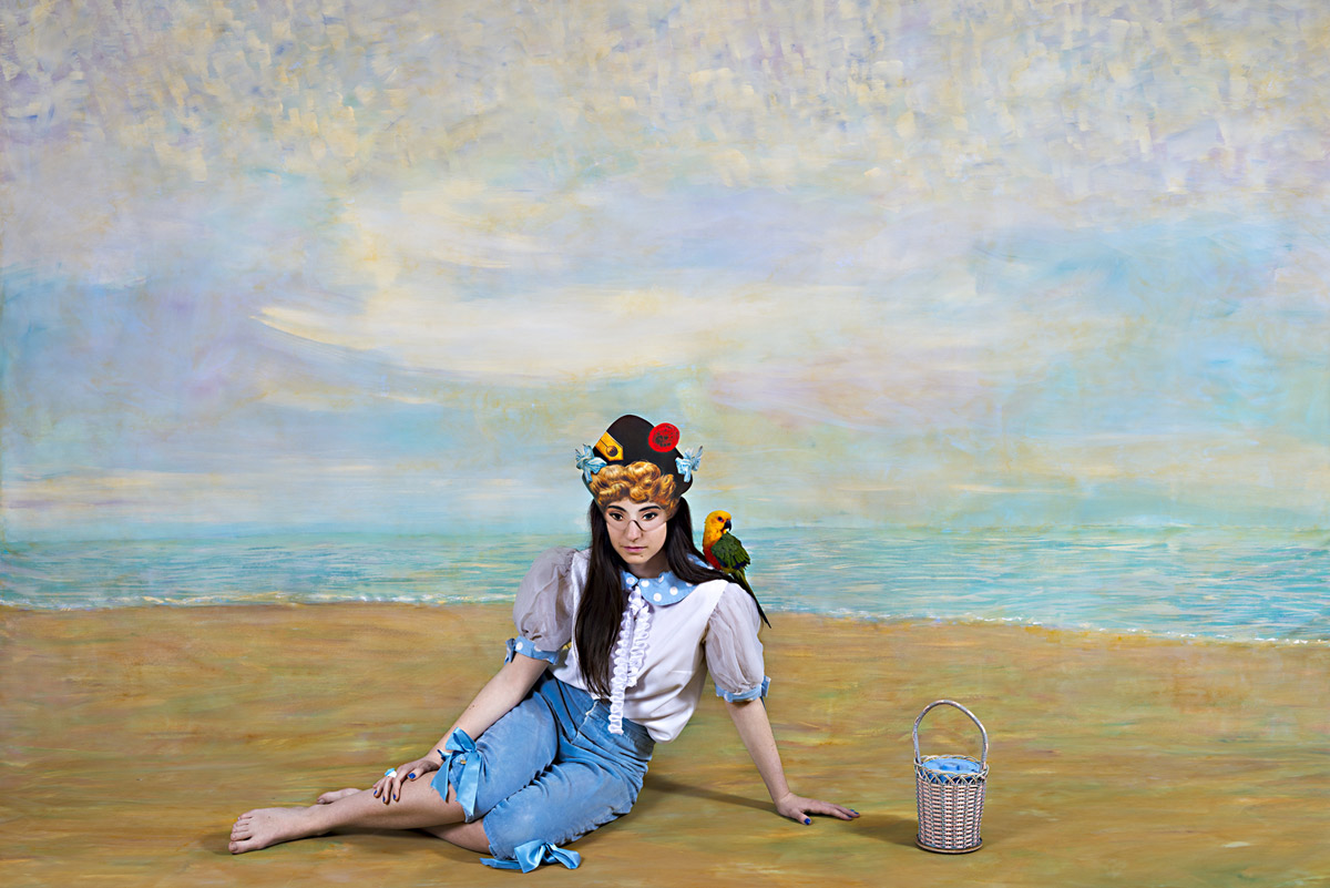
Polixeni Papapetrou (Australian, 1960-2018)
The Day Dreamer
2014
Pigment print
100 x 150cm
“Art does not reproduce the visible; rather, it makes visible.”
Paul Klee. Creative Credo [Schöpferische Konfession] 1920
When “facing” adversity, it is a measure of a person’s character how they hold themselves, what face they show to the world, and how their art represents them in that world. So it is with Polixeni Papapetrou. The courage of this artist, her consistency of vision and insightful commentary on life even while life itself is in the balance, are inspiring to all those that know her.
Papapetrou has always created her own language, integrating the temporal dissemination of the historical “case” into a two-dimensional space of simultaneity and tabulation (the various archetypes and ancient characters), into an outline against a ground of Cartesian coordinates.1 In her construction, in her observation and under her act of surveillance, Papapetrou moves towards a well-made description of the states of the body in the tables and classification of the psychological landscape. Her tableaux (the French tableau signifies painting and scene (as in tableau vivant), but also table (as in a table used to organise data)) are a classification and tabulation that is an exact “portrait” of “the” illness, the lost psyche of the title. Her images lay out, in a very visible way, the double makeover: of the outer and inner landscape.
These narratives are above all self-portraits. The idea that image, archetype and artist might somehow be one and the same is a potent idea in Papapetrou’s work. What is “rendered” visible in her art is her own spirit, for these visionary works are nothing less than concise, intimate, focused self-portraits. They speak through the mask of the commedia dell’ arte of a face half turned to the world, half immersed in imaginary worlds. The double skin (as though human soul, the psyche, is erupting from within, forcing a face-off) and triple skin (evidenced in the lack of depth of field of the landscape tableaux) propose an opening up, a revealing of self in which the anatomy (anatemnein: to tear, to open a body, to dissect) of the living is revealed. The images become an autopsy on the living and the dead: “a series of images, that would crystallize and memorize for everyone the whole time of an inquiry and, beyond that, the time of a history.”2
Papapetrou’s images become the “true retina” of seeing, close to a scientific description of a character placed on a two dimensional background (notice how the stylised clouds in The Antiquarian, 2014 match the fur hat trim). In the sense of evidence, the artist’s archetypes proffer a Type that is balanced on the edge of longing, poetry, desire and death, one that the objectivity of photography seeks to fix and stabilise. These images serve the fantasy of a memory: of a masked archetype in a made over landscape captured “exact and sincere” by the apparatus of the camera. A faithful memory of a tableau in which Type is condensed into a unique image: the visage fixed to the regime of representation,3 the universal become singular. This Type is named through the incorporated Text, the Legend: I am Day Dreamer, Immigrant, Merchant, Poet, Storyteller.
But even as these photographs seek to fix the Type, “even as the object of knowledge is photographically detained for observation, fixed to objectivity,”4 the paradox is that this kind of knowledge slips away from itself, because photography is always an uncertain technique, unstable and chaotic, as ever the psyche. In the cutting-up of bodies, cutting-up on stage, a staging aimed at knowledge – the facticity of the masked, obscured, erupting face; the corporeal surface of the body, landscape, photograph – the image makes visible something of the movements of the soul. In these heterotopic images, sites that relate to more stable sites, “but in such a way as to suspect, neutralise, or invert the set of relations that they happen to designate, mirror or reflect,”5 Papapetrou’s psyche, “creates the chain of tradition which passes a happening on from generation to generation.”6 In her commedia dell’ arte, an improvised comedy of craft, of artisans (a worker in a skilled trade), the artist fashions the raw material of experience in a unique way.7 We, the audience, intuitively recognise the type of person being represented in the story, through their half masks, their clothing and context and through the skilful dissemination of collective memory and experience.
Through her storytelling Papapetrou moves towards a social and spiritual transformation, one that unhinges the lost psyche. Her landscape narratives are a narrative of a recognisable, challenging, unstable non-linear art, an art practice that embraces “the speculative mystery of ancient roles… They’re all souls with divided emotions, torn between dream and reality, who like us, converge on the collective stage that is the world.” They are archetype as self-portrait: portraits of a searching, erupting, questioning soul, brave and courageous in a time of peril. And the work is for the children (of the world), for without art and family, extinction.
Dr Marcus Bunyan
1/ Adapted from Didi-Huberman, Georges. Invention of Hysteria: Charcot and the Photographic Iconography of the Salpetriere (trans. Alisa Hartz). Cambridge, Mass.: MIT Press, 2003, p. 24-25. I am indebted to the ideas of Georges Didi-Huberman for his analysis of the ‘facies’ and the experiments of Jean-Martin Charcot on hysteria at the Hôpital Salpêtrière in Paris in the 1880s.
2/ Ibid., p. 48
3/ Ibid., p. 49
4/ Ibid., p. 59
5/ Foucault, Michel. “Of Other Spaces,” in Diacritics Spring 1986, p. 24 quoted in Fisher, Jean. “Witness for the Prosecution: The Writings of Coco Fusco,” in Fusco, Coco. The Bodies That Were Not Ours. London: Routledge, 2001, pp. 226-227
6/ Fisher, Ibid., p. 227-228
7/ “One can go on and ask oneself whether the relationship of the storyteller to his material, human life, is not in itself a craftsman’s relationship, whether it is not his very task to fashion the raw material of experience, his own and that of others, in a solid, useful, and unique way.”
Benjamin, Walter. Illuminations (trans. by Harry Zohn; edited by Hannah Arendt). New York: Schocken Books, 1968 (2007), p. 108
Many thankx to Polixeni Papapetrou and Stills Gallery for allowing me to publish the photographs in the posting. Please click on the photographs for a larger version of the image. All images copyright of the artist.
“For her, history indicates a view of culture that is more congruent with mortality, with the biological swell of great things arising and perishing, brilliant and melancholy, august and yet brittle. Without judgement, she reorients history as phenomenology: it contains a bracing dimension of loss which is congruent with that fatal sentiment lodged in our unconscious, that our very being – our psyche – is ultimately lost…
Lost Psyche is always about lost cultural innocence, where culture gets too smart and ends by messing with an earlier equilibrium. Papapetrou identifies these moments not to promote gloom but to recognise all the parallels that make for redemption. Parts of the psyche are undoubtedly lost; but Papapetrou proposes and proves that they can still be poetically contacted.”
Robert Nelson 2014
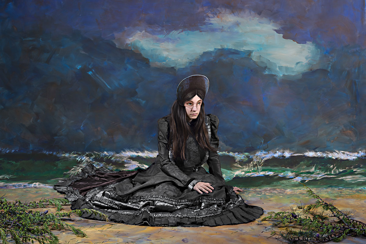
Polixeni Papapetrou (Australian, 1960-2018)
The Immigrant
2014
Pigment print
100 x 150cm
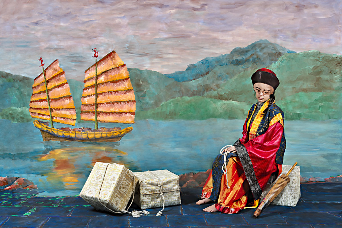
Polixeni Papapetrou (Australian, 1960-2018)
The Merchant
2014
Pigment print
100 x 150cm
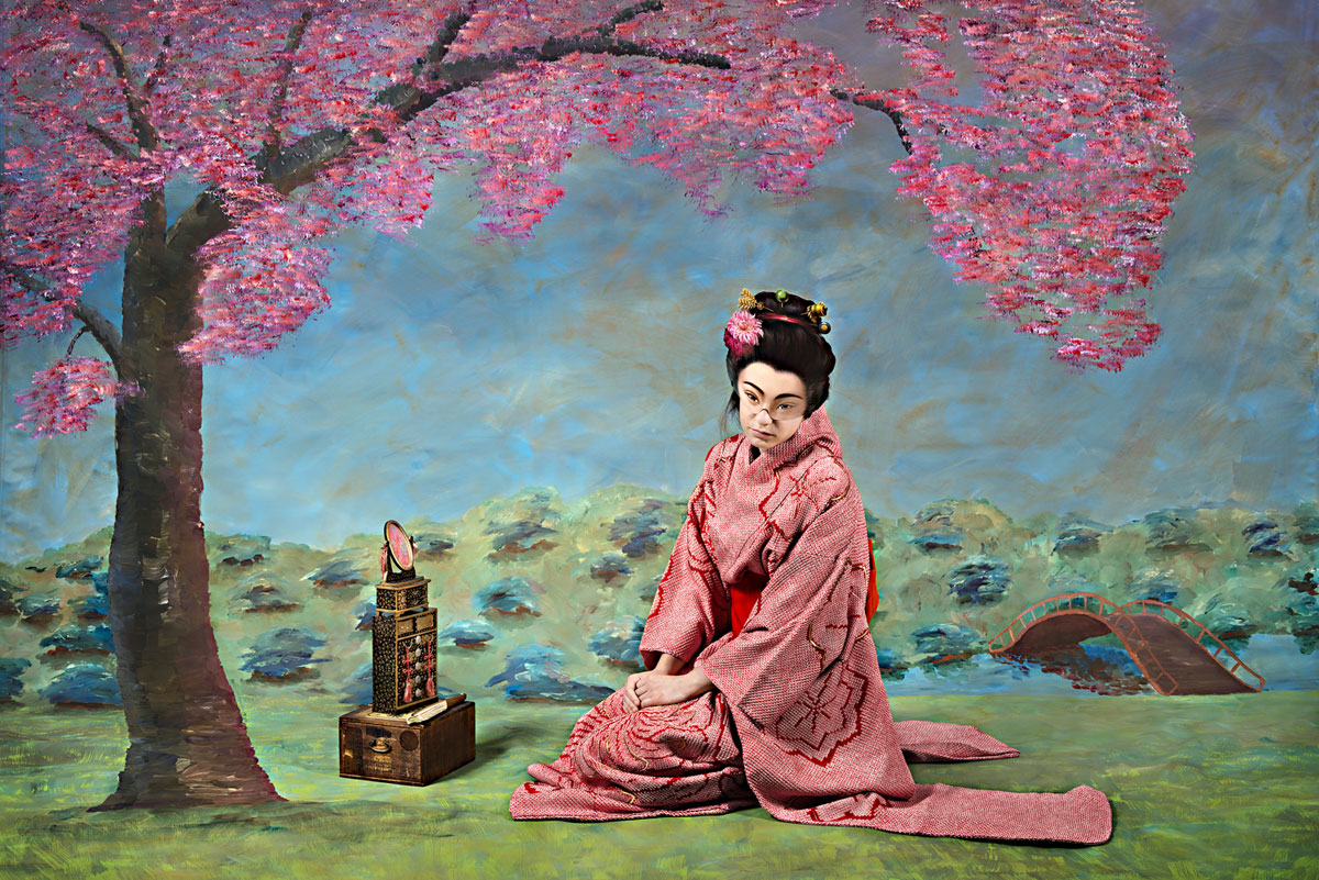
Polixeni Papapetrou (Australian, 1960-2018)
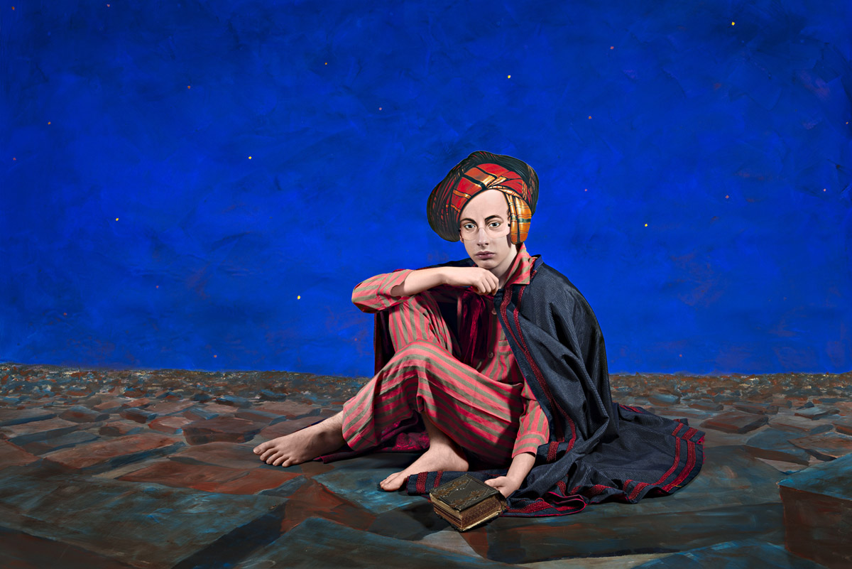
The Orientalist
2014
Pigment print
100 x 150cm
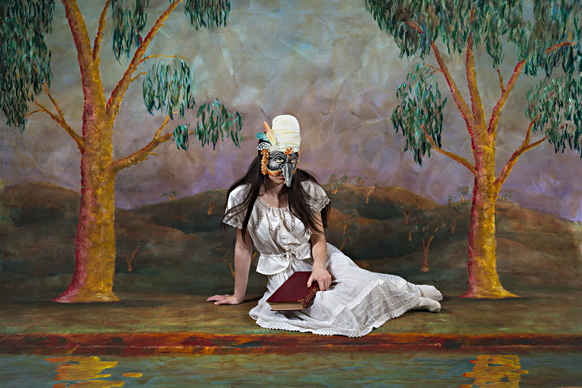
Polixeni Papapetrou (Australian, 1960-2018)
The Poet
2014
Pigment print
100 x 150cm
Polixeni Papapetrou (Australian, 1960-2018)
The Storyteller
2014
Pigment print
100 x 150cm
In Lost Psyche, Polixeni Papapetrou portrays emblematic figures that have come to the end of their tradition, their rationale, their place in the world. These intriguing and charismatic characters – the poet, the tourist, the immigrant, among others – bring to life antique Victorian paper masks. Yet, despite being cast beyond our immediate reality, their costumes harking back to earlier times, their settings to fantastical places, these archetypal figures live on in the cultural imagination.
Internationally celebrated for an oeuvre that has consistently tested the boundaries of performance and photography, reality and fantasy, childhood and adulthood, Lost Psyche marks a significant return for Papapetrou. Having extensively explored the Australian landscape as a stage for her photographic fictions, and working in response to the natural and historical dramas of our country, this series takes us back into her studio and the expansive scope of imaginary worlds.
Expressive, luscious and knowingly naïve, the painted backdrops bring to mind the simple seduction of children’s storybooks. At the same time, they reference the painting heavyweights and photographic forerunners that are celebrated within art history. Papapetrou’s image The Duchess, for instance, echoes Goya’s commanding oil painting of the Duchess of Alba (1797). Yet, in this newly imagined version, the ‘role’ of Duchess is playfully acted not endured, and like the melodrama of theatre, the dark sky and downcast actor are softened to become illustrative and symbolic – a scene in a universal story. So too, The Orientalist evokes Felix Beato’s 19th Century photographic forays in Japan, recalling his hand-colouring techniques and depictions of social ‘types’.
Consciously foregrounding this ever-present potential for art to present stereotyped representations, Papapetrou reminds us how these social roles and ‘masks’ play out within our souls and psyche’s just as they do on the cultural stage. As a metaphor for the loss of childhood, a time in which we openly switch between characters, identities and roles, this work evokes the persistence of that imagination, as it lives on within the adult world.
In Lost Psyche, the speculative mystery of ancient roles enjoys a fantastical and touching afterlife. In the contemporary world we may also entertain the inner poet, the storyteller, the clown, the connoisseur, the courtesan, the day dreamer or the dispossessed. They’re all souls with divided emotions, torn between dream and reality, who like us, converge on the collective stage that is the world.
Polixeni Papapetrou is an internationally acclaimed artist. Her works feature in significant curated exhibitions, including recently the 13th Dong Gang International Photo Festival, Korea, the TarraWarra Biennale, VIC, Remain in Light, Museum of Contemporary Art, and Melbourne Now, National Gallery of Victoria. She exhibits worldwide, including in Paris, New York, Tokyo, Seoul, Athens and Berlin. Recent solo exhibitions include Under My Skin, Northern Centre for Contemporary Art, 2014, Between Worlds in Fotogràfica Bogotá, 2013, and A Performative Paradox, Centre for Contemporary Photography, 2013. Her work is held in numerous institutional collections, including the National Gallery of Australia, National Gallery of Victoria, Museum of Contemporary Art Australia, Monash Gallery of Art, Artbank, Fotomuseo, Colombia, and the Museum of Fine Arts, Florida, USA.
Press release from Stills Gallery
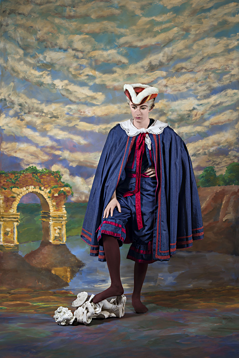
Polixeni Papapetrou (Australian, 1960-2018)
The Antiquarian
2014
Pigment print
150 x 100cm

Polixeni Papapetrou (Australian, 1960-2018)
The Duchess
2014
Pigment print
150 x 100cm
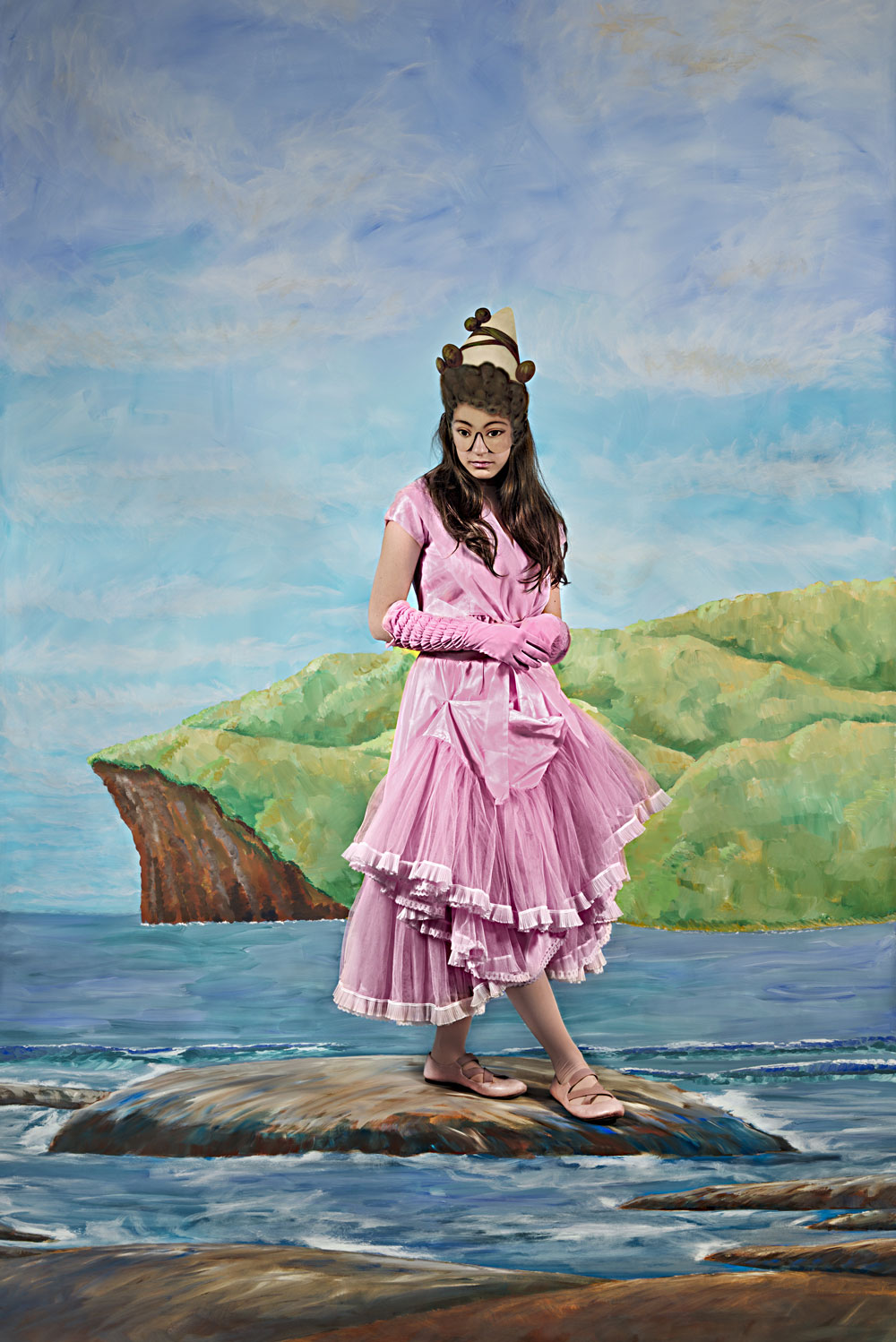
Polixeni Papapetrou (Australian, 1960-2018)
The Summer Clown
2014
Pigment print
150 x 100cm
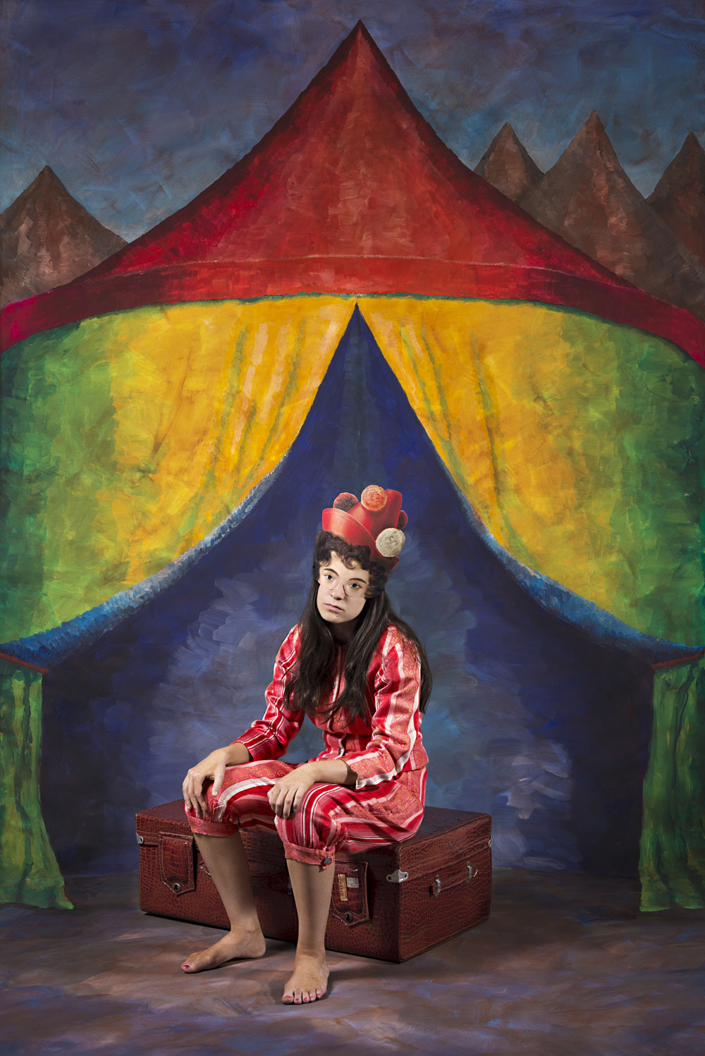
Polixeni Papapetrou (Australian, 1960-2018)
The Troubadour
2014
Pigment print
150 x 100cm
Stills Gallery
This gallery has now closed.
C0-curators: Anaïs Lellouche (lead curator), working alongside Tim Fisher (co-curator and editor of the exhibition)
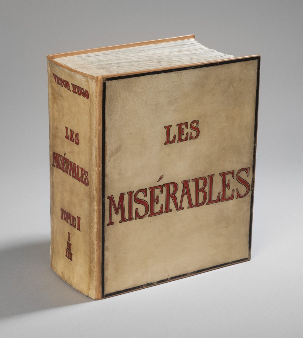
Victor Hugo (French, 1802-1885)
Les Misérables vol. 1
1845-1862
Autograph manuscript
Bibliothèque nationale de France
This is an exhibition in two galleries. In the first you are not allowed to take photographs but in the second you can take as many as you want. You are told this as you enter the exhibition but the import of this incantation only becomes apparent much later in your visit.
The first gallery is a profound experience: manuscripts, letters, photographs, paintings, and posters that all relate to the great man and his work Les Misérables. The Charles Marville photographs are sublime (as always) with the width of the vertical prints being the element that I noticed most on this viewing. The space that Marville manages to capture in these vertical images makes them seem almost as wide as they are high giving them an almost panoramic feel, as though the space of the image goes on forever, from side to side and into the distance. There is a wonderful sense of volume in the atmosphere, tones and textures of these images. One juxtaposition is particularly tantalising, the pairing of Marville’s Rue Tirechape (1865) with engravings such as the demolition work for constructing the Boulevard St. Germain by Maxine Lalanne (1827-1886). The illusion that one could be the other is enlightening, and there is an established association (especially in Pictorialist photography) between representation in etching and photography.1
As Philip Ebury observes,
“It has often been said that Pictorial photographs resemble works in other media. The analogy with etchings is especially striking and the comparison is more than physical. Between 1890 and the late 1920s, etching and Pictorial photography had a shared history and many similar aims. Parallels between the two disciplines in Australia had their antecedents in England. In the late nineteenth century many photographers in that country were consciously promoting artistic, as opposed to documentary work. At the same time, printmakers were reviving the art of original etching as an expressive rather than a reproductive medium.”2
But the Charles Marville photographs are not the star of the show, oh no. That is left to five things:
a) An album of which you can see only one leaf in the exhibition, Les Proscrits (‘The Exiles’) (1856, below), but that one leaf is enough. The enigma, light and intimacy of this one page is just magnificent.
b) Equally impressive are the very small intense portraits of Victor Hugo such as the silver gelatin photograph attributed to Arsène Garnier (1820-1909) – dark, atmospheric with Neo-classical sculptures and chandeliers reflected in expansive mirrors, VH propped up by a favourite chair; or Charles Hugo’s salted paper print from a collodion negative of his father in Jersey leaning on the back of a chair (1853-1855). The intensity of these portraits is remarkable.
c) Victor Hugo’s own paintings, usually pen and brown ink wash on paper, are also very powerful. In images such as Ma destinée (My destiny) (1867, below) where VH wrote in direct conversation with the ocean and The bowels of the Leviathan (1866) – dark, dank labyrinthine Parisian sewers – Hugo draws you into a world of the disenfranchised, the poor, the destitute and their (and his) destiny.
d) The beautiful theatre posters (1880s-1910s) worth the price of admission on their own
e) Leaving the best till last, the autographed manuscript Volume 1 of Les Misérables in all its glory (the first time it has ever left France), complete with revisions, crossings out and the final version in red, resting innocuously in a glass display cabinet. The psychological weight of the volume is immense. This is getting as close to the ‘source’ as you can possibly get without touching it. I remember once holding a first edition of Oscar Wilde’s The Ballad of Reading Gaol in my hand. This had that same spine tingling effect.
The first gallery assembles this incredible story and builds a glorious intensity of experience. I was on such an elevated level it was great.
And then, in literally two minutes, it was gone… No, no, no, no!
The second gallery is such a let down. It features costumes, posters, pamphlets and video in an exploration of the musical ‘phenomena’ this is the (Disney-fied) Les Misérables. A stage set from the musical with cut our heads so people can have their photo taken, and for performances; very poor quality black and white images of the sets of the theatrical productions of Les Misérables; a cardboard cut-out two-wheeled cart that is the worst thing that you could possibly see; and videos of workshops with men explaining how they are using a bandsaw to create the stage for the musical (as if I want to see that after what has gone before!). From the sublime to the ridiculous. I’m sure the kids might like it but after seeing such an amazing first half of the exhibition, for me this was like being tied with a ball and chain and dropped over the side to sink like a stone. Why do curators insist on doing this. Do they think that they always have to have a “popular” space for the family and the kids these days. That more is really more?
In this case it quite ruined what was up till then an incredible experience. So visit the exhibition for the main course (and don’t take any photos), but if I were you I would turn around after the first gallery and walk out the way I came in, thinking to myself ‘less is more!
Dr Marcus Bunyan
1/ See Ebury, Frances. “Engravers and Etchers, Pictorialists and Photographers,” Part 2, Chapter 2 in Making Pictures: Australian Pictorial Photography as Art 1897 – 1957 Volume 1. Phd thesis, The University of Melbourne, 2001, p. 73.
2/ Ibid.,
Many thankx to the State Library of Victoria for allowing me to publish the photographs in the posting. Please click on the photographs for a larger version of the image.
“As long as social damnation exists, through laws and customs, artificially creating hell at the heart of civilization and muddying a destiny that is divine with human calamity; as long as the three problems of the century – man’s debasement through the proletariat, woman’s demoralisation through hunger, the wasting of the child through darkness – are not resolved … as long as ignorance and misery exist in this world, books like the one you are about to read are, perhaps, not entirely useless.”
Victor Hugo, Hauteville House, 1 January 1862
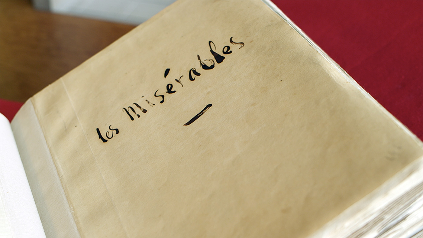
Victor Hugo (French, 1802-1885)
Title page ofLes Misérables vol. 1
1845-1862
Autograph manuscript
Bibliothèque nationale de France
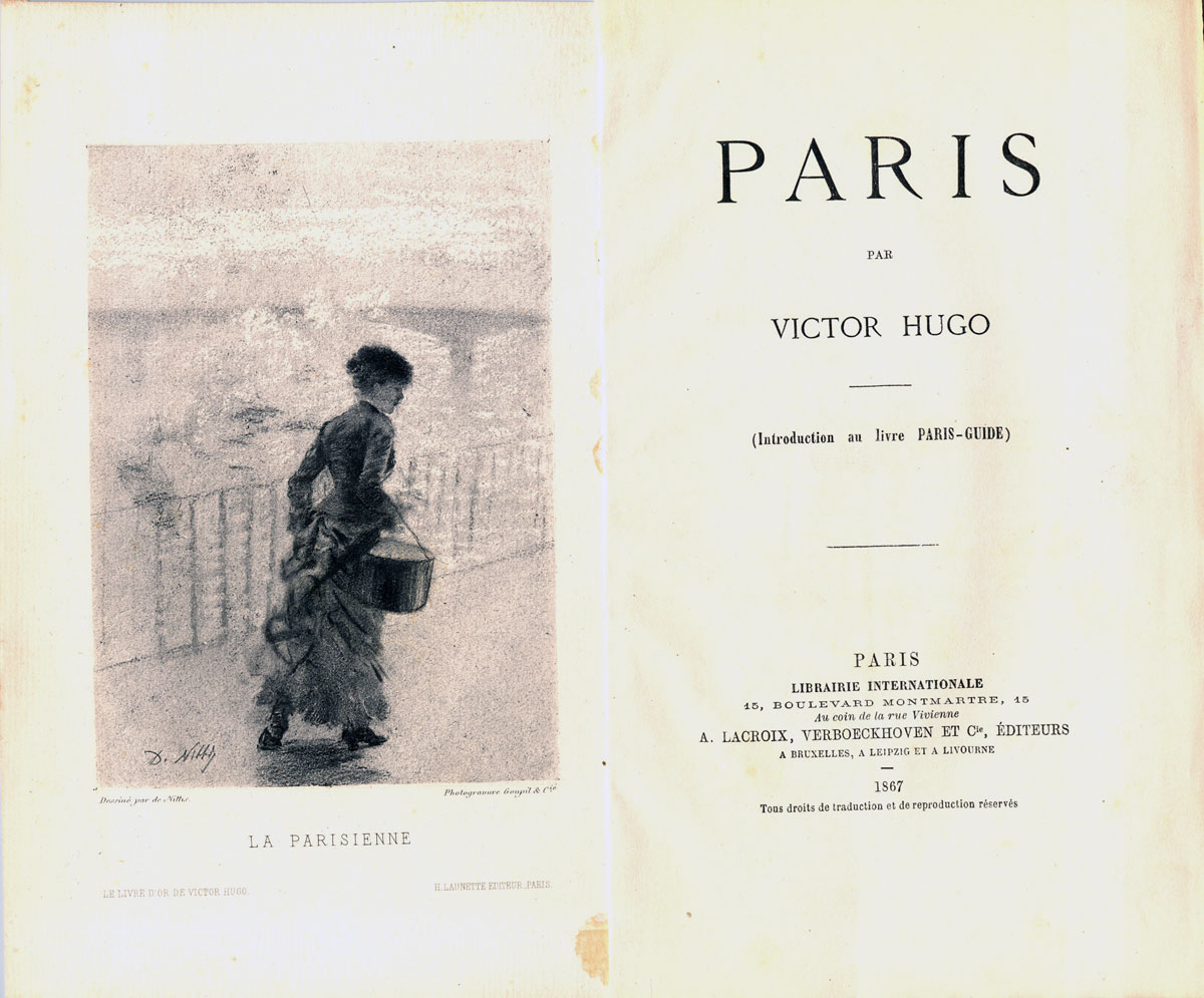
Victor Hugo (French, 1802-1885)
Paris
Paris, 1867
Maison Littéraire de Victor Hugo
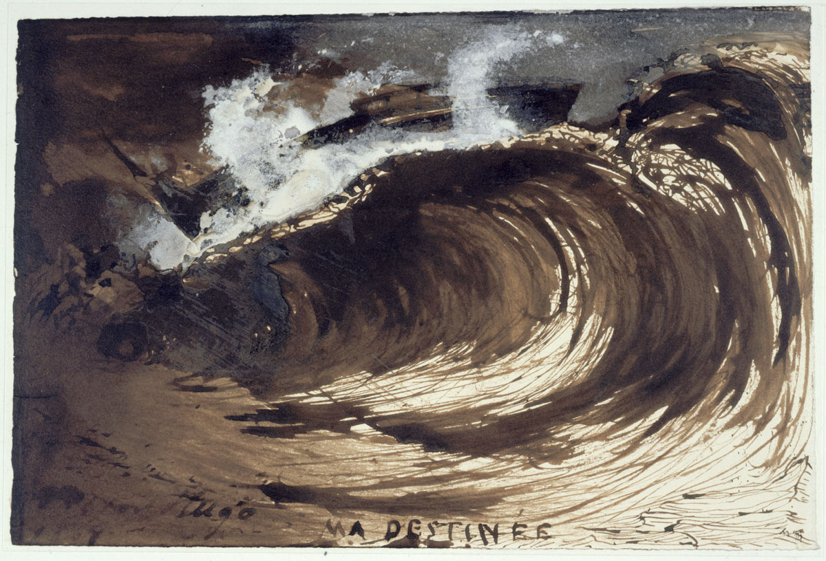
Victor Hugo (French, 1802-1885)
Ma destinée (My destiny)
1867
Ink and brown-ink wash
© Maisons de Victor Hugo / Roger-Viollet
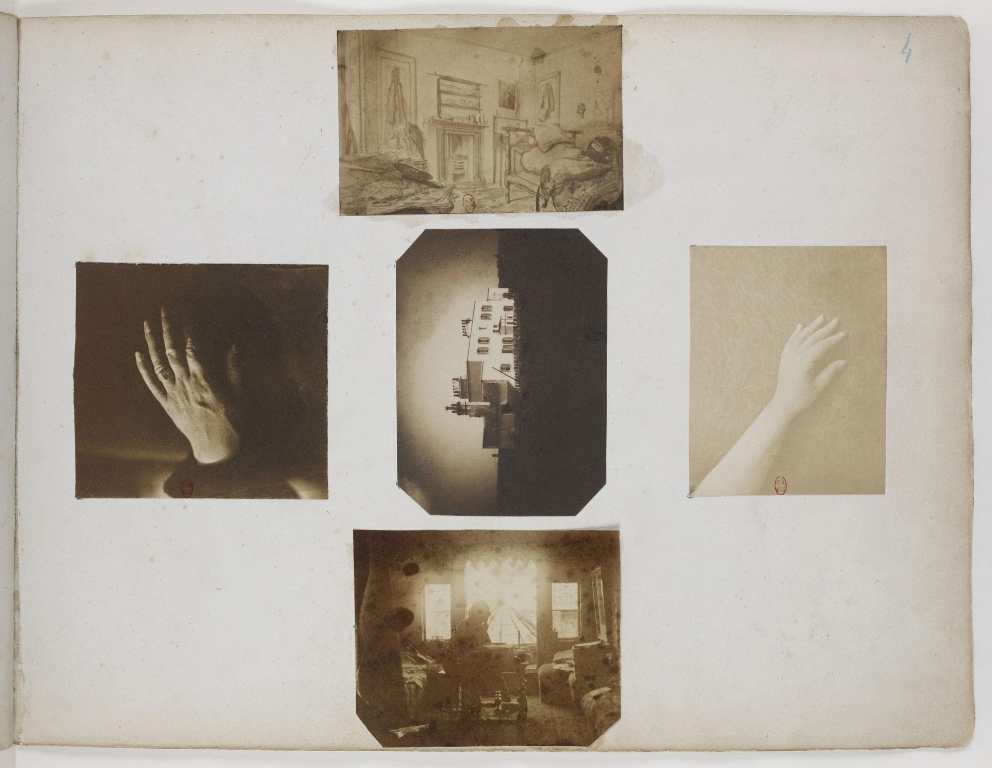
Les Proscrits (‘The Exiles’)
1856
Album of photographs
Bibliothèque nationale de France
Album The Exiles – Victor Hugo and his circle of friends in exile started in Guernsey on the 1st January 1856. The album creates an allegorical portrait of VH. His family is represented by Victor Hugo’s hand (left), Adele’s hand (right), Marine Terrace their home in Jersey 1852-1856 (centre) and VH posing at his desk in his study at Hauterville House, Guernsey, where he completed Les Misérables surrounded by sunlight. The page appears in the posting the correct way up, as it appears in the album.
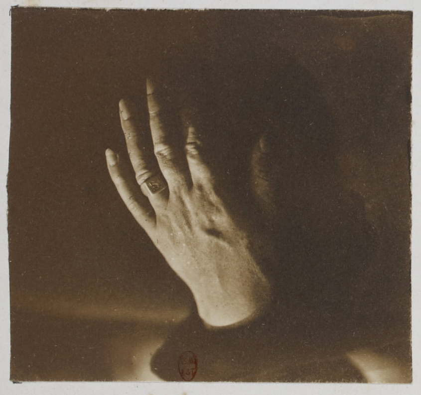
Victor Hugo’s hand
From the albumLes Proscrits (‘The Exiles’) (detail of page)
1856
Album of photographs
Bibliothèque nationale de France
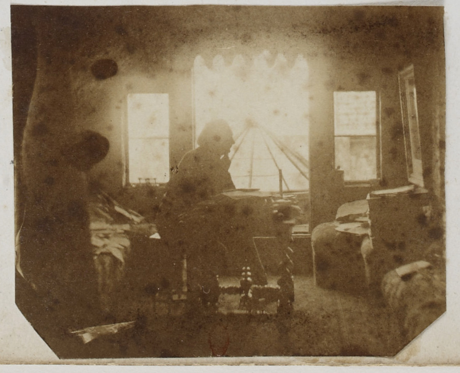
Victor Hugo posing at his desk in his study at Hauterville House, Guernsey
From the albumLes Proscrits (‘The Exiles’) (detail of page)
1856
Album of photographs
Bibliothèque nationale de France
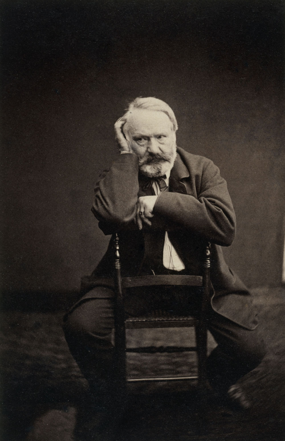
Edmond Bacot (French, 1814-1875)
Victor Hugo en 1862 (Victor Hugo in 1862)
1862
Maison de Victor Hugo
Image © Edmond Bacot / Maisons de Victor Hugo / Roger-Viollet
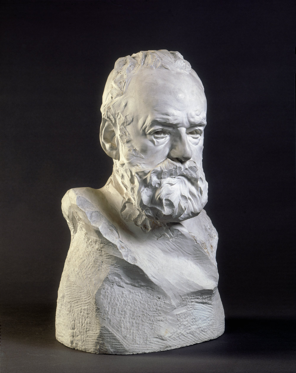
Auguste Rodin (French, 1840-1917)
Victor Hugo, buste dit À l’Illustre Maître (Victor Hugo, bust known as ‘To the illustrious master’)
1883
Musée Rodin
Rodin states that Hugo would not pose. “I worked out on the veranda. I observed him swiftly, but carefully as he refused to pose. He accepted to be looked at, from all angles, but he would not pose. And so I looked at his conscience. And this is how I was able to capture the real Hugo.”
When the first two volumes of Les Misérables arrived in Paris in April 1862, all 6000 copies sold in a day. Public readings were organised when copies sold out. Everyone was reading it, from the literary intelligentsia to the common people. It was also quickly translated into nine languages to reach a global audience. After only three months, 100,000 authorised copies (and countless editions on the black market) had been sold worldwide, making the novel into an unprecedented literary bestseller of western literature. In 1870 after the fall of Napoleon III, Hugo returned to France and was hailed a national hero.
Victor Hugo’s legacy and the iconic story of Les Misérables endure to this day with various adaptations being created around the world. There have been at least 48 films, 14 animated films or TV series, radio plays, 12 television miniseries, numerous comic books, and at least 286 editions of Les Misérables published, sung and spoken. The stage musical of Boublil and Schönberg’s Les Misérables is in itself a worldwide phenomenon. It is the longest running theatre performance in London and has been seen by over 65 million people in 43 countries and in 21 languages. It returns to Melbourne in June 2014.
Victor Hugo is considered one of the most important and influential authors of the 19th century. Through his transformative literary works and political activism, French society’s most vulnerable were given a voice in a nation ruled by those with power and privilege. Best known for his novels Les Misérables and The Hunchback of Notre Dame Hugo is also acclaimed for his theatre, essays, drawings and poetry.
Born in Besançon, France in 1802, Hugo was the son of an atheist and anti-monarchist French General and a Catholic pro-monarchist mother. A precocious talent, Hugo’s first work was published at the age of 15. His debut as a professional writer soon followed with the release of his first volume of romantic poems; Ode et poésies diverses in 1822. Many of his early romantic works drew inspiration from his childhood sweetheart and wife Adele Foucher, with whom he had four children. Another powerful female influence on Hugo’s writings was his mistress of more than fifty years, Juliette Drouet.
As Hugo’s career progressed, his aptitude and fondness for romantic literature was matched by his passion for addressing themes of disadvantage and poverty. Hugo’s first major masterpiece The Hunchback of Notre Dame published in 1831 reflected his interest in highlighting such prejudices. However, it was his greatest masterpiece, Les Misérables, that first challenged and then changed the social and political understanding of poverty, disadvantage and inherited privilege in society. In Les Misérables Hugo casts an ex-convict, Jean Valjean, as the revered protagonist and paints a villain of the character representing authority and privilege, Inspector Javert.
Hugo dedicated 17 years of his life to plan and write the epic three part story beginning in the early 1840s and finally publishing the novel in 1862. In addition to his social and political sympathies, Hugo drew from many of his own personal experiences and professional turmoil to inform the characters and themes in Les Misérables. These included the tragic drowning of his eldest daughter, Leopoldine, in a boating accident in 1843, and Hugo’s exile from France by Louis Napoleon III in 1851 – a result of his public opposition to the increasingly authoritarian rule of the self-declared emperor.
From his exile on the Channel Islands of Jersey and Guernsey where he lived for 19 years, Hugo maintained his trenchent opposition to the political status quo and the death penalty, while also publishing widely and spending three years finishing his magnum opus Les Misérables. When Les Misérables finally hit the stands in Paris in 1862 the response by the public was explosive. All 6000 copies sold out in a day, and three months later the book was an international best seller and had been translated into nine languages. Following the success of Les Misérables Hugo returned to France in 1870 after the fall of Napoleon III and was hailed a national hero. He continued to work until he died on 22 May 1885. At his state funeral it was estimated that close to two million people attended. Hugo’s wish to be buried in a pauper’s coffin was granted and his body lay in state under the Arc de Triomphe until he was interred in the Panthéon.
Today Victor Hugo’s extraordinary legacy continues. Les Misérables has been published in at least 250 editions since 1862, 48 films have been made of the story and the Boublil and Schönberg Les Misérables musical has been seen by over 65 million people worldwide in 42 countries and 22 languages, and is one of the most popular musicals of all time. Victor Hugo is remembered as an international literary giant and a French national hero.
The possibility that the condemned can rise above poverty and degradation to become good and honourable, and perhaps above all to fight for freedom of body and soul.
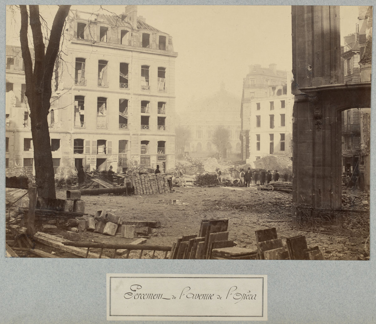
Charles Marville (French, 1813-1879)
Percement de l’avenue de l’Opéra (Clearing of the Avenue de l’Opéra)
c. 1876
State Library of Victoria
![Charles Marville (French, 1813-1879) 'Rue Soufflot (pendant la démolition)' (Rue Soufflot [during demolition]) c. 1876-1877](https://artblart.com/wp-content/uploads/2014/10/210_slv_marville_rue-soufflot-web.jpg "Charles Marville (French, 1813-1879) 'Rue Soufflot (pendant la démolition)' (Rue Soufflot [during demolition]) c. 1876-1877")
Charles Marville (French, 1813-1879)
Rue Soufflot (pendant la démolition) (Rue Soufflot [during demolition])
c. 1876-1877
State Library of Victoria
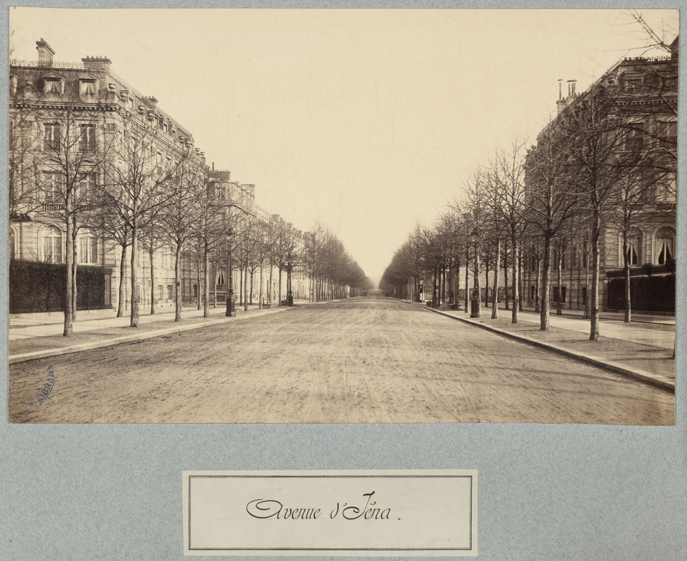
Charles Marville (French, 1813-1879)
Avenue d’Iéna
c. 1877
State Library of Victoria
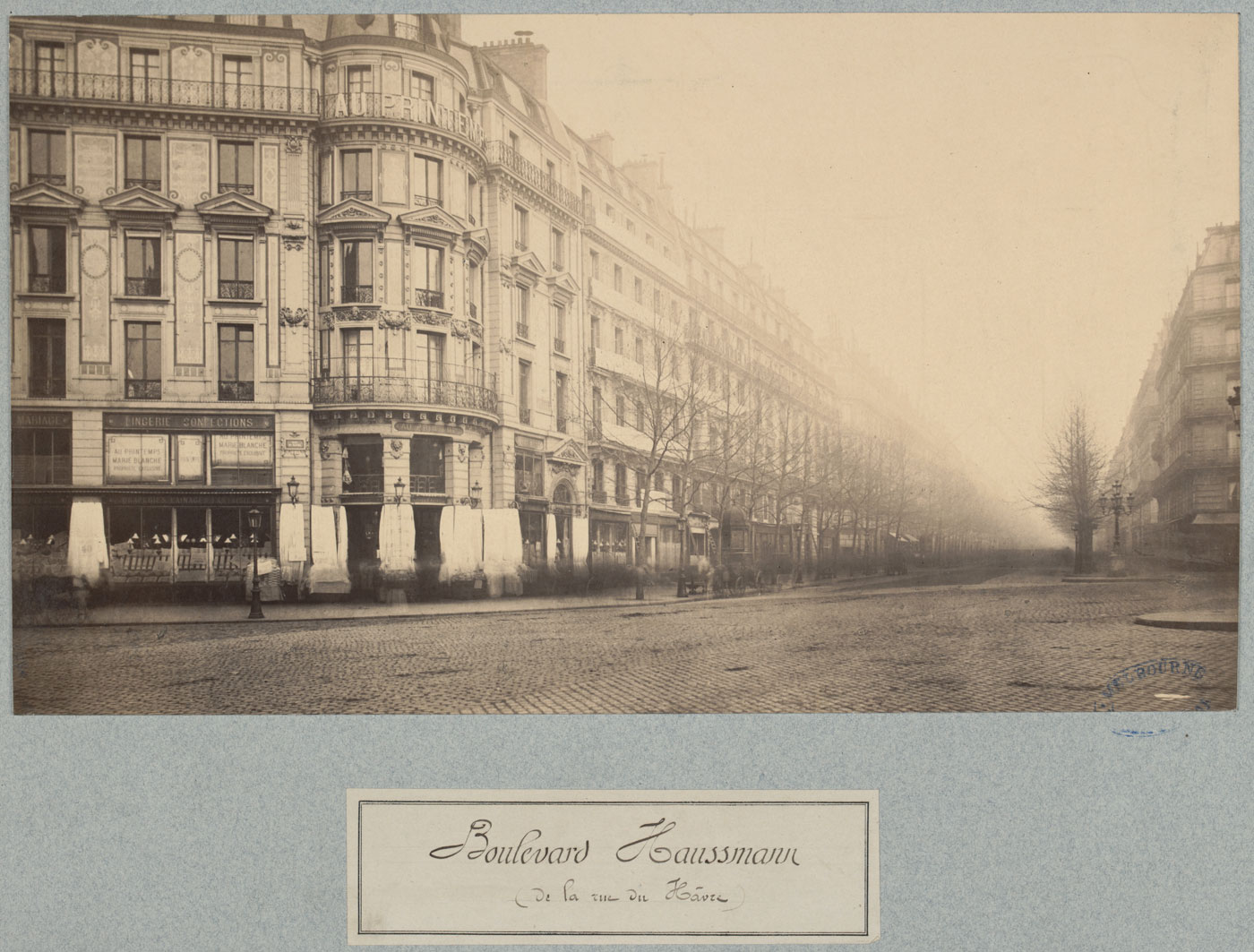
Charles Marville (French, 1813-1879)
Boulevard Haussmann
c. 1877
State Library of Victoria
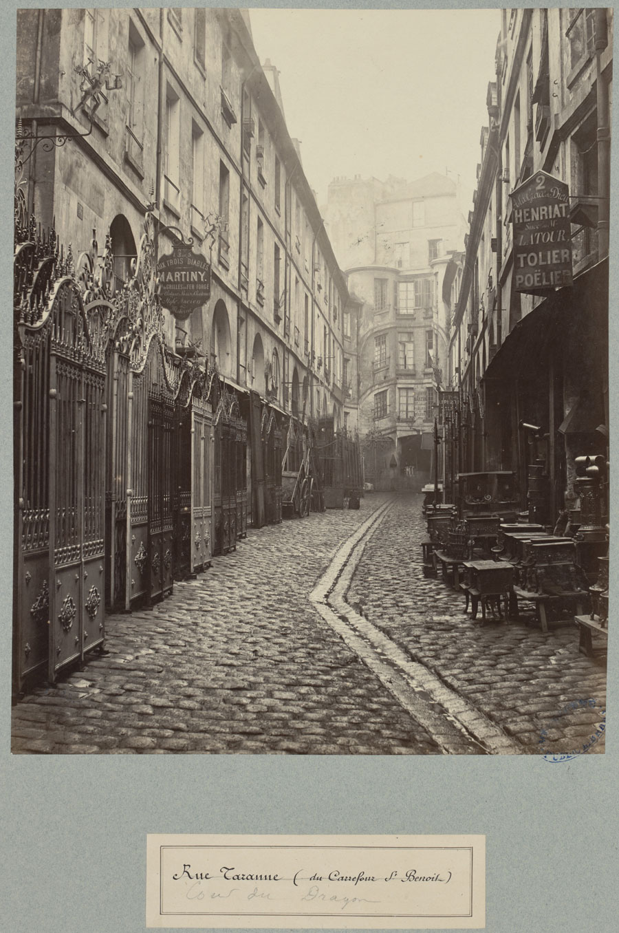
Charles Marville (French, 1813-1879)
Cour du Dragon, Rue de Taranne
c. 1863-1869
State Library of Victoria
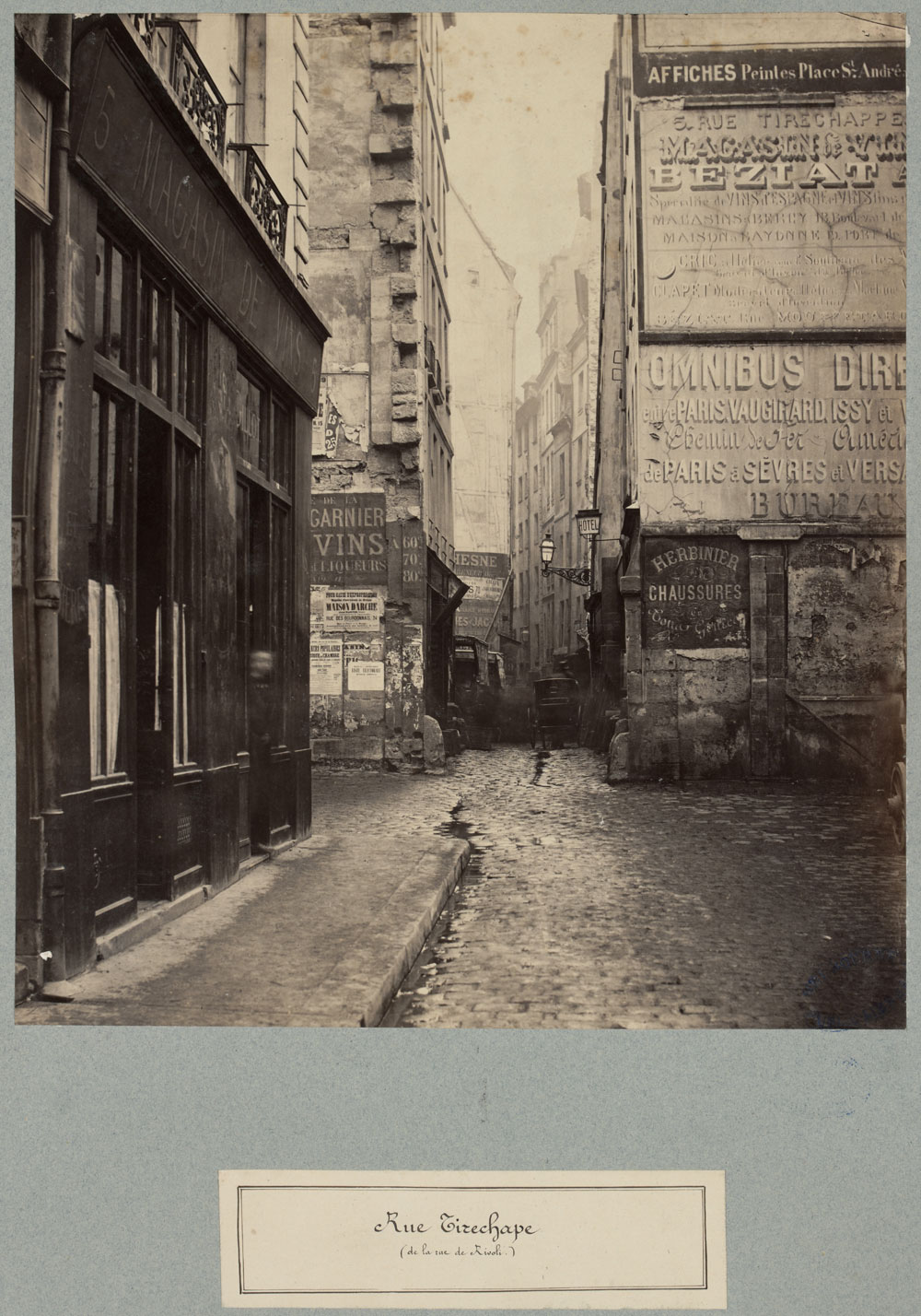
Charles Marville (French, 1813-1879)
Rue Tirechape
c. 1863-1869
State Library of Victoria
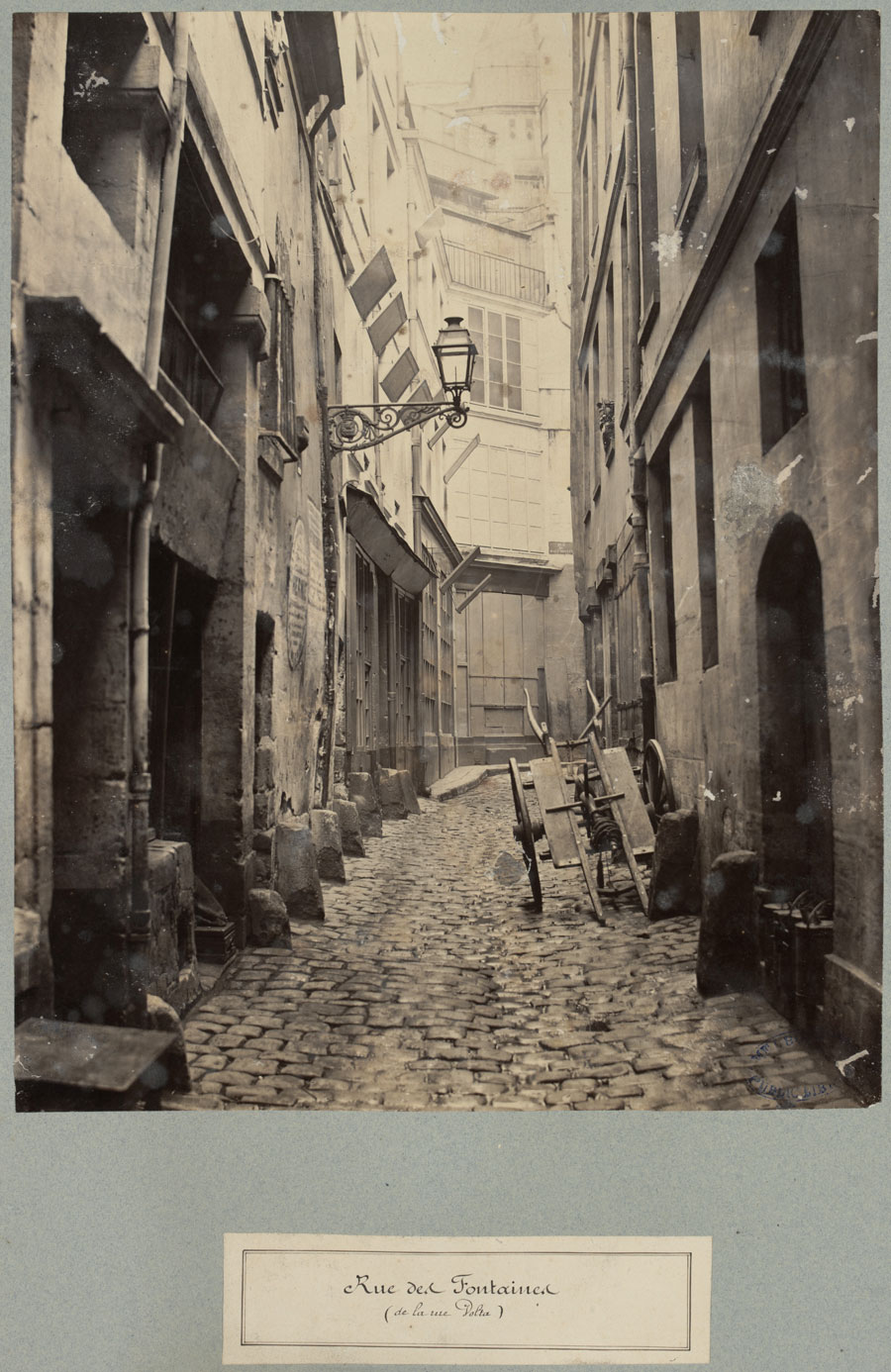
Charles Marville (French, 1813-1879)
Rue de Fontaines
c. 1863-1869
State Library of Victoria
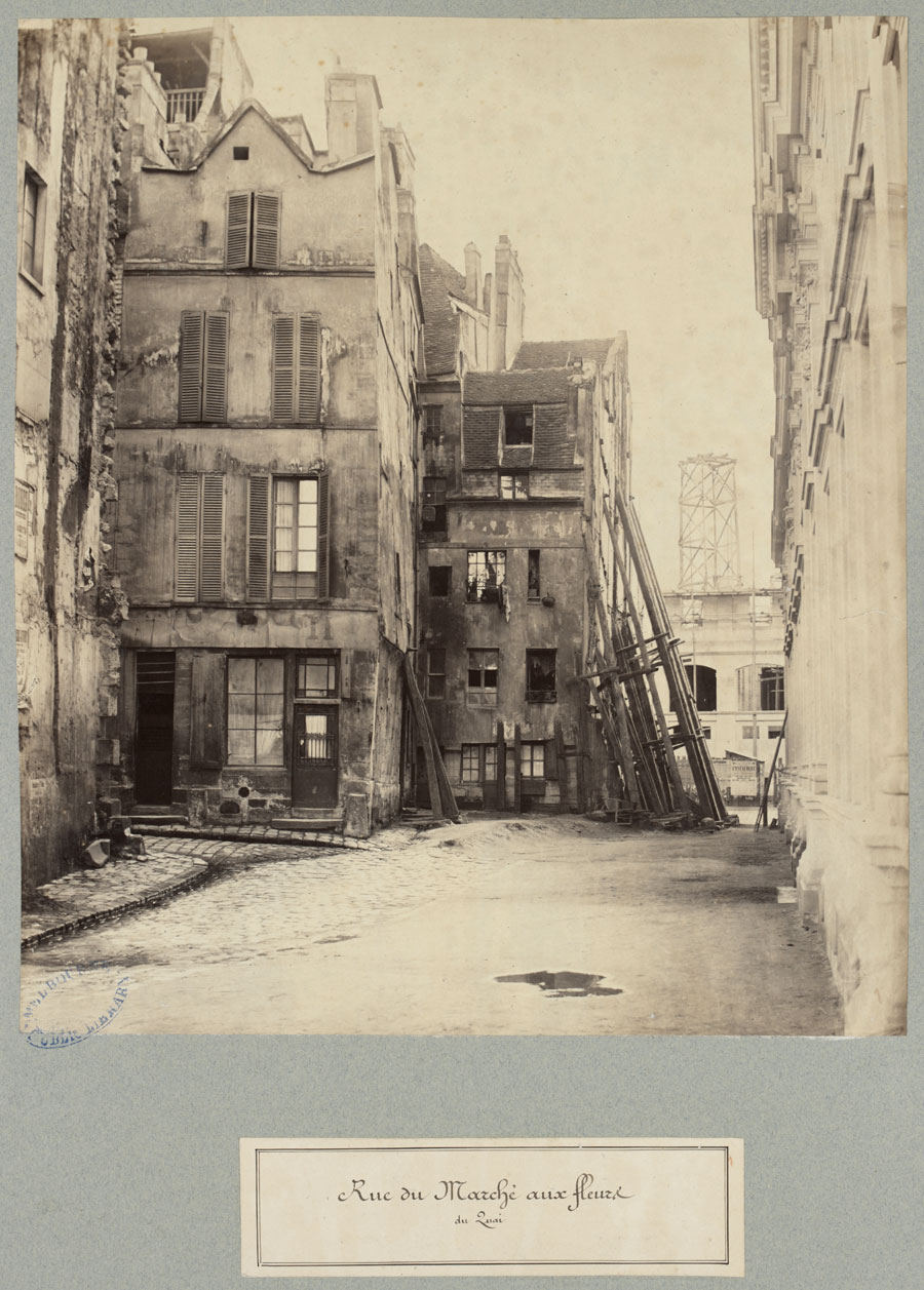
Charles Marville (French, 1813-1879)
Rue du Marche aux fleurs
c. 1863-1869
State Library of Victoria
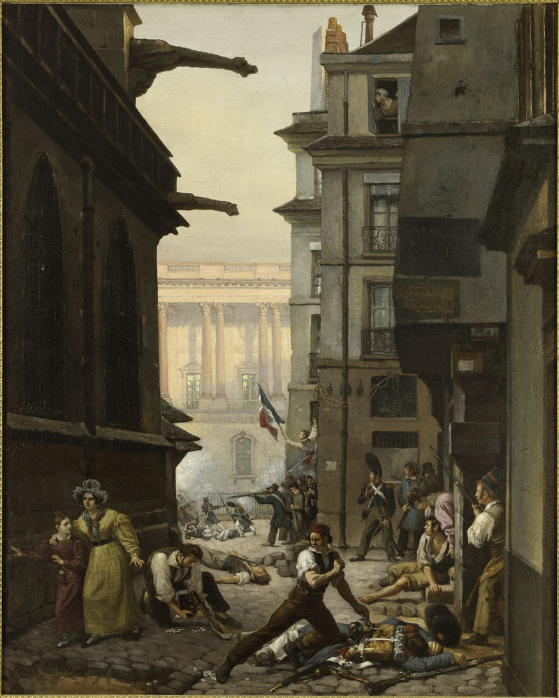
Paul Carpentier (French, 1787-1877)
Episode du 29 juillet 1830, rue Chilperic, face á la colonnade du Louvre (Event of 29 July 1830, rue Chilperic, before the colonnade of the Louvre)
1830
© Musée Carnavalet / Roger-Viollet
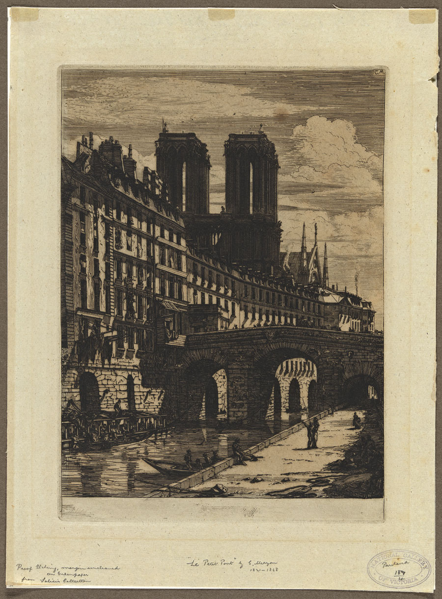
Charles Méryon (French, 1821-1868)
Le petit pont (The little bridge)
1850
National Gallery of Victoria, purchased 1891
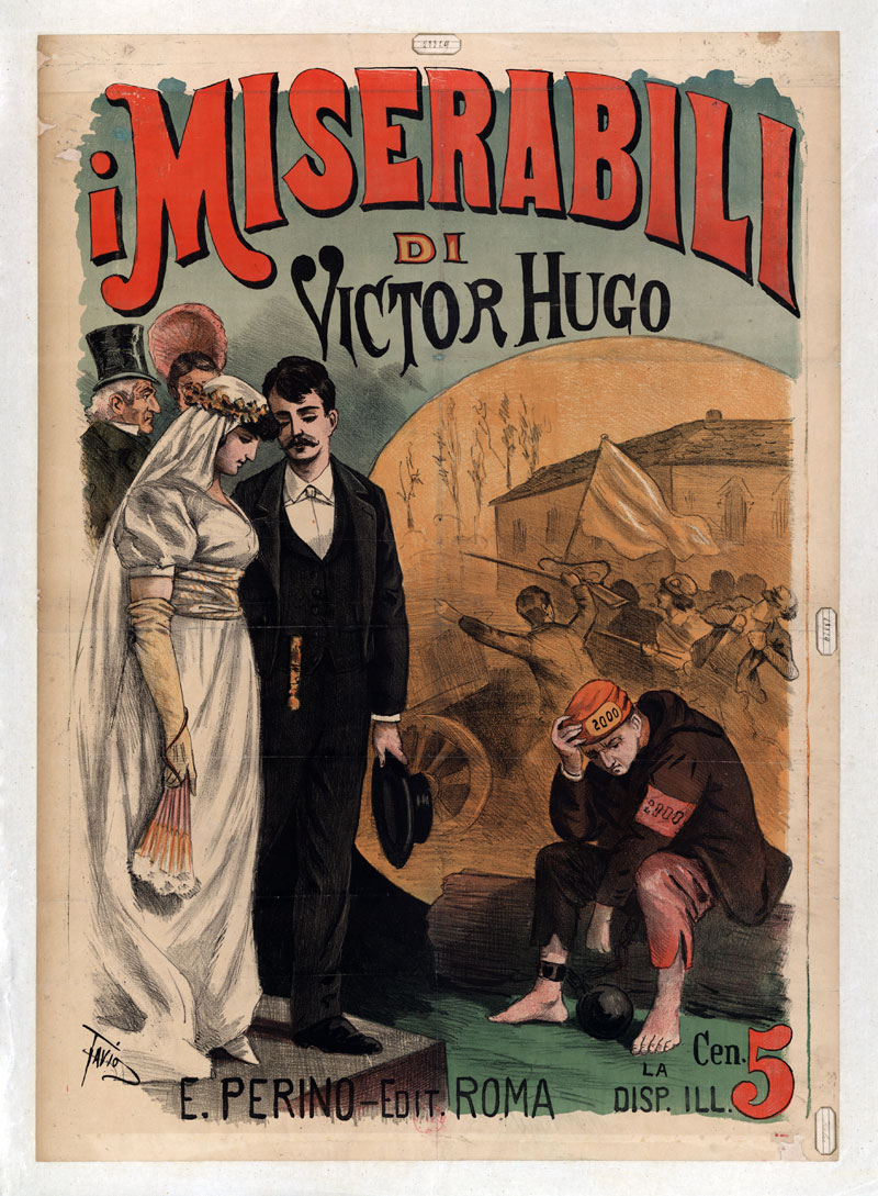
Ottavio Rodella Tavio (Italian, 1864-1910)
Poster for I Miserabili di Victor Hugo (Les Misérables by Victor Hugo)
1890
Bibliothèque nationale de France
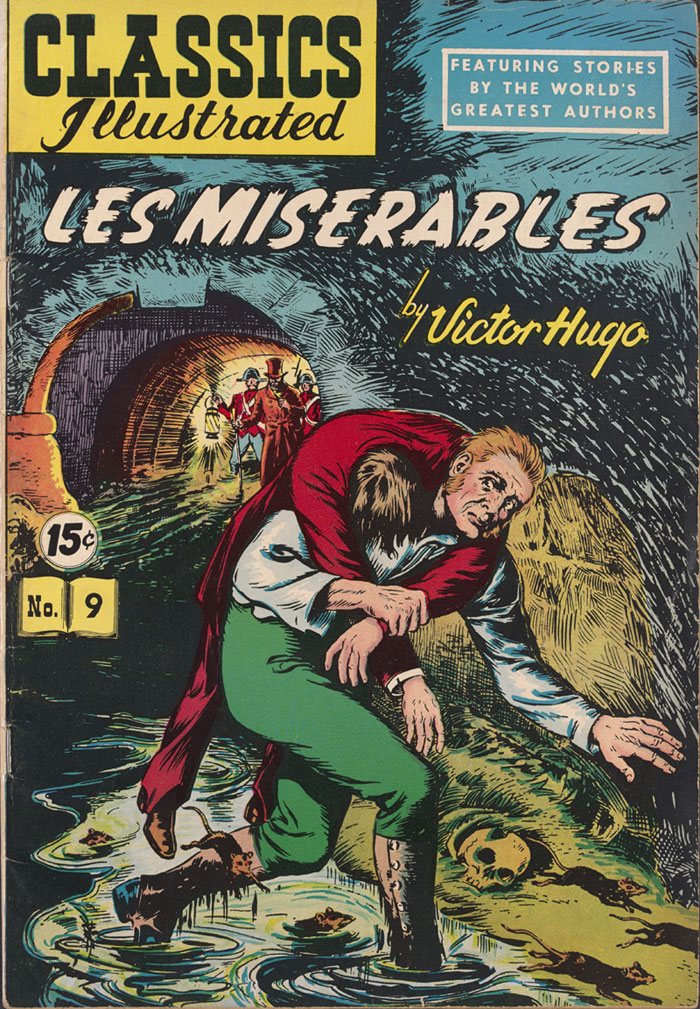
Les Misérables by Victor Hugo
New York, Classics Illustrated no. 9
1950
State Library of Victoria
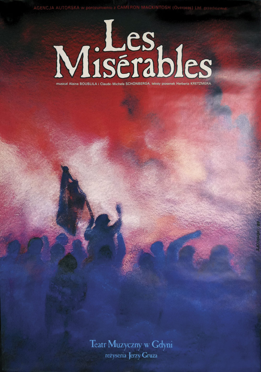
Design bySlawomir Kitowski
Les Misérables poster
1989-2000
Teatr Muzyczny, Gdynia, Poland
Courtesy Cameron Mackintosh Ltd
State Library of Victoria
328 Swanston St,
Melbourne VIC 3000
Phone: (03) 8664 7000
Opening hours:
10am – 6pm daily
This was a most beautiful and refined exhibition. Despite the ferocity of the samurai, their armour is exquisite.
Curator: Wayne Crothers, Curator of Asian Art at the NGV

Japanese
Saddle and stirrups with crane and turtle design
Edo period 1665 Japan
Lacquer on wood (maki-e), gold foil, silver, pigment, plant fibre (cord), dyes, metal, leather, (other materials)
28.2 x 41.0 x 39.0cm (saddle)
Acquired, 1889
This is a most beautiful and refined exhibition. Despite the ferocity of the samurai, their armour is exquisite. The golden screens, the horse trappings, the swords and the pistols are all fabulously detailed. Walking into the darkened exhibition space is like entering another world. A must see exhibition before it closes!
Marcus
Many thankx to the National Gallery of Victoria for allowing me to publish the photographs in the posting. Please click on the photographs for a larger version of the image.

Utagawa Yoshitsuya (Japanese, 1822-1866)
The death of Kusunoki Masatsura
19th century
Colour woodblock (triptych)
(a-c) 35.9 x 74.0cm (image) (overall) (a-c) 36.4 x 74.0cm (sheet) (overall)
National Gallery of Victoria, Melbourne
Purchased, 1993

Utagawa Yoshitsuya (Japanese, 1822-1866)
The death of Kusunoki Masatsura (detail)
19th century
Colour woodblock (triptych)
(a-c) 35.9 x 74.0cm (image) (overall) (a-c) 36.4 x 74.0cm (sheet) (overall)
National Gallery of Victoria, Melbourne
Purchased, 1993

Felice Beato (Italian-British, 1809-1909) (attributed to)
No title (Samurai warrior)
1860s-1870s
Albumen silver photograph, colour dyes
24.2 x 19.6cm (image and sheet)
National Gallery of Victoria, Melbourne
Presented through the NGV Foundation by Thomas Dixon, Member, 2001
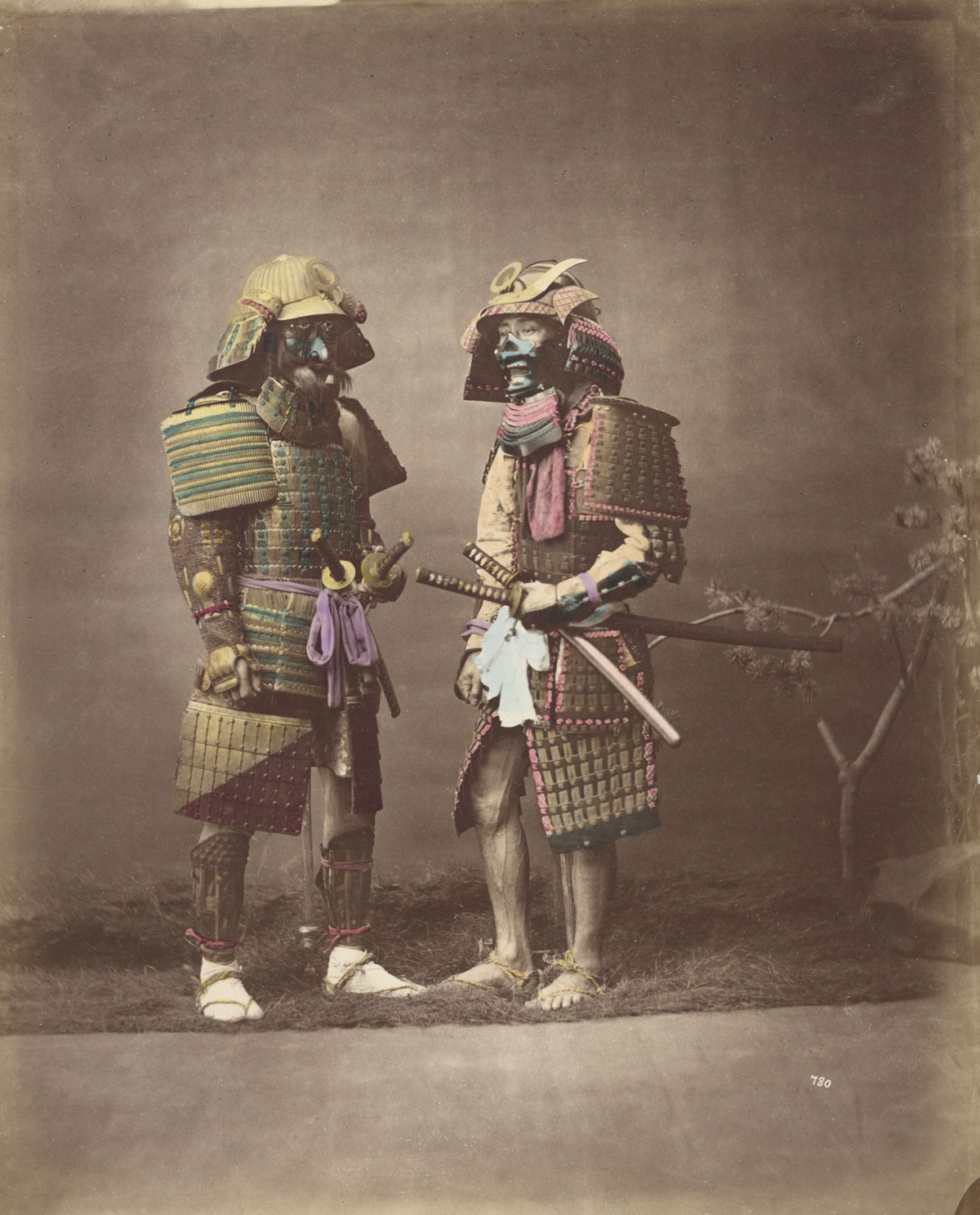
Baron Raimund von Stillfried (Austrian, 1839-1911)
No title (Samurai in armour)
c. 1875; (c. 1877-1880) (printed)
Albumen silver photograph, colour dyes
24.4 x 19.6cm (image and sheet)
National Gallery of Victoria, Melbourne
Purchased through the NGV Foundation with the assistance of The Herald & Weekly Times Limited, Fellow, 2001
Exquisite 300-year-old battle armour will bring the epic tales of Japanese history to life in a new exhibition at the National Gallery of Victoria, Bushido: Way of the Samurai, which explores the fascinating world of the samurai; the warriors, rulers and aristocratic elite of Japanese society for more than 800 years.
The exhibition brings together over 200 objects from the NGV and Australian collections including many rediscovered and rarely seen treasures that were acquired by the NGV in the 1880s and 1920s, such as beautifully crafted armour, helmets, lacquered saddles and a full set of horse trappings. An exquisite group of 16th Century matchlock guns – weaponry used on the battlefield which irrevocably changed warfare and the ethics of the samurai in battle – and an elaborate suit of armour that has no record of being exhibited since its acquisition in 1889 will take centre stage in the exhibition.
Wayne Crothers, Curator, Asian Art, NGV said that Japanese armour, swords and guns are celebrated as refined artworks and are appreciated for their unsurpassed craftsmanship and beauty. “Such dramatic and visually foreboding attire worn by a fierce sword wielding warrior thundering into battle on horseback must have created an image of heart stopping ferocity embodying the spirit and the age of the samurai. It is extraordinary that we have these pieces from key historical periods in Japanese history to share today,” Mr Crothers said.
Bushido: Way of the Samurai also includes three golden screens that would adorn the villas and castles of the samurai elite, one of which is a magnificent seven metre panoramic view of the twelfth century battle of Ichinotani, and a group of dramatic woodblock prints depicting stories of legendary samurai and their super human feats of bravery.
The art and culture of the samurai encompasses over 800 years of Japan’s history and creative past. From the twelfth century through to the modernisation of Japan in 1868, the Shogun, or the military elite, ruled the country and lived to a rigorous code of ethics. This military aristocracy aspired to a life of spiritual harmony that not only perfected the art of war, but also embodied an appreciation of the fine arts that established their life as an art form itself. The refined cultural pursuits of the samurai are exhibited in the form of exquisite Noh theatre costumes and dramatic Noh masks, tea ceremony utensils, lacquered personal items, formal clothing and studio photographs from the 1860s-1870s that capture these noble warriors during the closing years of feudal Japan.
“Samurai virtues of honesty, courage, benevolence, respect, self-sacrifice, self-control, duty, and loyalty combined with a cultivated lifestyle established social stability and a legacy of art and culture in Japanese society that continues to this day,” Mr Crothers said.”
Press release from the NGV
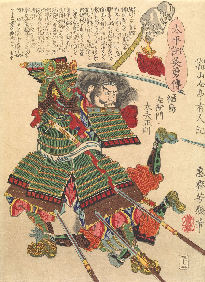
Utagawa Yoshiiku (Japanese, 1833-1904)
Fukushima Masanori, from the Heroic stories of the Taiheiki
Edo period 1867 Japan
Colour woodblock
25.5 x 19.0cm (image and sheet)
Purchased, NGV Supporters of Asian Art, 2014

Utagawa Yoshiiku (Japanese, 1833-1904)
Gamō Ujisato, from the Heroic stories of the Taiheiki
Edo period 1867 Japan
Colour woodblock
25.5 x 19.0cm (image and sheet)
Purchased, NGV Supporters of Asian Art, 2014
Japanese
Ceremonial helmet with octopus and Genji cart wheel crest
19th century
Edo period 1600-15-1868 Japan
Lacquer on (leather) (maki-e), wood, gold, pigment, glass, metal (nails), silk and cotton (thread), (other materials)
28.0 x 35.5 x 38.0cm
Felton Bequest, 1927

Japanese
Armour
18th century
Metal, wood, pigment, lacquer, gold paint, silk, cotton, leather, metal thread
(a-k) 136.0 x 56.0 x 45.0cm (overall) (installation)
National Gallery of Victoria, Melbourne
Gift of Mrs Henry Darlot, 1888
Japanese
Armour
Edo period 1600-15-1868 Japan
Lacquer, leather, metal, silk, cotton, hemp, gold pigment, coloured dyes
144.0 x 71.0 x 53.0cm (overall) (installation)
National Gallery of Victoria, Melbourne
Acquired, 1889

Japanese
Armour
Edo period 1600-15-1868 Japan
Lacquer, leather, metal, silk, cotton, hemp, gold pigment, coloured dyes
144.0 x 71.0 x 53.0cm (overall) (installation)
National Gallery of Victoria, Melbourne
Acquired, 1889
NGV International
180 St Kilda Road
Opening hours
Open daily 10am – 5pm
Artists: Cherine Fahd, Vivian Maier, Gabriella Mangano and Silvana Mangano, Debra Phillips, Patrick Pound, Clare Rae, Simone Slee, David Wadelton And Kellie Wells and Vivian Maier.
Curators: Naomi Cass, Louise Neri and Karra Rees
Vivian Maier (American, 1926-2009)
East 108th Street. September 28, 1959, New York, NY
1959
Gelatin silver print
30.5 x 30.5cm
Vivian Maier/Maloof Collection, courtesy of Howard Greenberg Gallery
Apologies to the wonderful and hard working Director of the CCP Naomi Cass for what I am about to say, but this is one of the most disappointing photographic exhibitions in Melbourne this year.
Let’s start with the Australian work. There is nothing at all wrong with any of the Australian work. Some of it is very strong, such as the found images of Patrick Pound and the social documentary work of David Wadelton. The problem comes with the lack of connection to the photographs of Vivian Maier. For work that is supposed to be “crossing paths” conceptually with the images of Maier many of the connections are so esoteric as to be almost indistinguishable, so obtuse (as Tim Robbins would say in the Shawshank Redemption) as to be almost unintelligible to the uninitiated.
Where the work is conceptualised around the performative context of identity and the occupation of space(s), such as in Claire Rae’s digital colour lightbox images of people jumping in the air stopped in suspended animation or the beautiful reinscription of the body in the almost dance like video work of Gabriella Mangano and Silvana Mangano, then the juxtaposition simply does not work. The ties that bind one to another simply are not strong enough to sustain the inquiry of the viewer.
More interesting would have been the investigation of the concept of an artist taking photographs in her own time, hidden, secretive, and then being discovered later after she had died – which brings up issues of visibility (the cameras and her gendered own), celebrity, posthumous recreation of identity, the fame of the artist after death, and how the self-portraits fit into this theme etc…
The photographs by Vivian Maier printed by ? are far more disappointing.
Touted as the NEXT BIG THING by curators who are always looking for the next big thing and people out to make a healthy buck or two, VM is a person who has been “posthumously invented” and her work, which was largely unprinted during her lifetime, has been brought to market in a commercial process. As Abigail Solomon-Godeau notes at the end of her excellent essay “Inventing Vivian Maier” on the Jeu de Paume website:
“Here one can see how the terms of an “aesthetic” discourse within the world of contemporary photography, turning on the individual author and her work, and the far less lofty realities of market and marketing, property relations, public relations, media relations and all the other apparatuses, illuminate one another, or even collide. “Her big project,” remarks Michael Williams, “was her life,” but perhaps the even larger project is her posthumous invention.”
Abigail Solomon-Godeau. “Inventing Vivian Maier,” on the Jeu de Paume website, 16th September 2013 [Online] Cited 26/06/2021. No longer available online
With this invention in mind (and the product that you want to sell being paramount), you would have thought that the people who now control her archive would have got a damn good black and white printer to print the work. But no. Some of the prints are appalling, so flat that there is little if any true black in them at all. As for the content of the images, they look better in reproduction than they do in real life.
Maier, as I have said elsewhere, is a competent photographer – but she will never be a great photographer. Periodically (and I use the word my female friend supplied) she is very good, but too often she lapses into cliche. There are lots of low depth of field photographs but the construction of the images is cold and stilted, there is little engagement it would seem but for the snap of the shutter as she wanders around city after city, keeping the resulting negatives securely hidden.
There is also little mystery in her photographs which is probably why they don’t rise to that next level: look at the photograph of the two men staring at a length of hose on the ground on a rainy street in NY. The hose just sits there, the men are caught mid-gesture… and that’s it. Lots of her photographs are like this. And there also seem to be some anger towards the world as well. If you compare the photograph of the two boys, Undated, Canada (below) with that of the twins by Diane Arbus, there seems to be a darkness and malevolence to VM’s photograph that contrasts with the mystery and joy in that of Arbus – not so much in the subject matter but in the feeling that the photographer projects towards what she is photographing.
There is a coldness when you see the prints in the flesh (like the wind whistling off Lake Michigan onto the Chicago streets), an ice chill, a lack of humour, something that is a little creepy and screwy (if you will pardon the colloquialism) about the work. She wants us to know she is there in the photograph, even when she is not physically present, as in the image September 18, 1962 (below) where the viewer understands that the photographer is down on one knee to get the shot.
There is also a healthy dose of narcissism in the photographs: the self-portraits with this serious woman peering back at us, one who’s eyes hardly ever smile (you can tell a lot from a person’s eyes!) are not psychological investigations like the self-portraits of Rembrandt as he ages throughout the years – portraits in which Rembrandt explores what it is to be him – they are something more obsessive which VM then hides under a bushel. The use of fragmentation and shadows in the two self-portraits that I have put together (New York City, September 10, 1955 and Self-Portrait; October 18, 1953, New York, NY, below) speak of a schism inside the person, one who exposes herself through photography and then possesses but disclaims the results.
People have been flocking to see the film with sold out sessions all over the city, and they were flocking into the CCP to see the exhibition last Saturday when we were there. People love the back story as it has been sold to them by “marketing, property relations, public relations, media relations and all the other apparatuses” and there has been a veritable feeding frenzy about this work: THE DISCOVERY OF KING TUT’S TOMB WITH 100,000 NEGATIVES AND ASSORTED ARTEFACTS!
Kudos to the CCP for getting these images to Australia and exhibiting them and its great to see so many people in the gallery but please, let’s understand the hype and then really look at the work. The ART in FACT is that these are not well printed images, and most of them are pretty prosaic in composition and feeling. There are maybe four really good images, but that is about it. As always, go and see for yourself and keep my words in mind.
Dr Marcus Bunyan
Many thankx to the CCP for allowing me to publish the photographs in the posting. Please click on the photographs for a larger version of the image.
Vivian Maier (American, 1926-2009)
August 1960. Chicago, IL
1960
Gelatin silver print
30.5 x 30.5cm
Vivian Maier/Maloof Collection, courtesy of Howard Greenberg Gallery
Vivian Maier (American, 1926-2009)
Undated, Canada
Nd
Gelatin silver print
30.5 x 30.5cm
Vivian Maier/Maloof Collection, courtesy of Howard Greenberg Gallery

Diane Arbus (American, 1923-1971)
Identical twins, Roselle, N.J. 1967
1967
© The Estate of Diane Arbus
Vivian Maier (American, 1926-2009)
Self-Portrait, 1950ies
c. 1950s
Gelatin silver print
30.5 x 30.5cm
Vivian Maier/Maloof Collection, courtesy of Howard Greenberg Gallery
Vivian Maier (American, 1926-2009)
Armenian woman fighting on East 86th Street, September, 1956, New York, NY
1956
Gelatin silver print
30.5 x 30.5cm
Vivian Maier/Maloof Collection, courtesy of Howard Greenberg Gallery
Vivian Maier (American, 1926-2009)
April 7, 1960. Florida
1960
Gelatin silver print
30.5 x 30.5cm
Vivian Maier/Maloof Collection, courtesy of Howard Greenberg Gallery
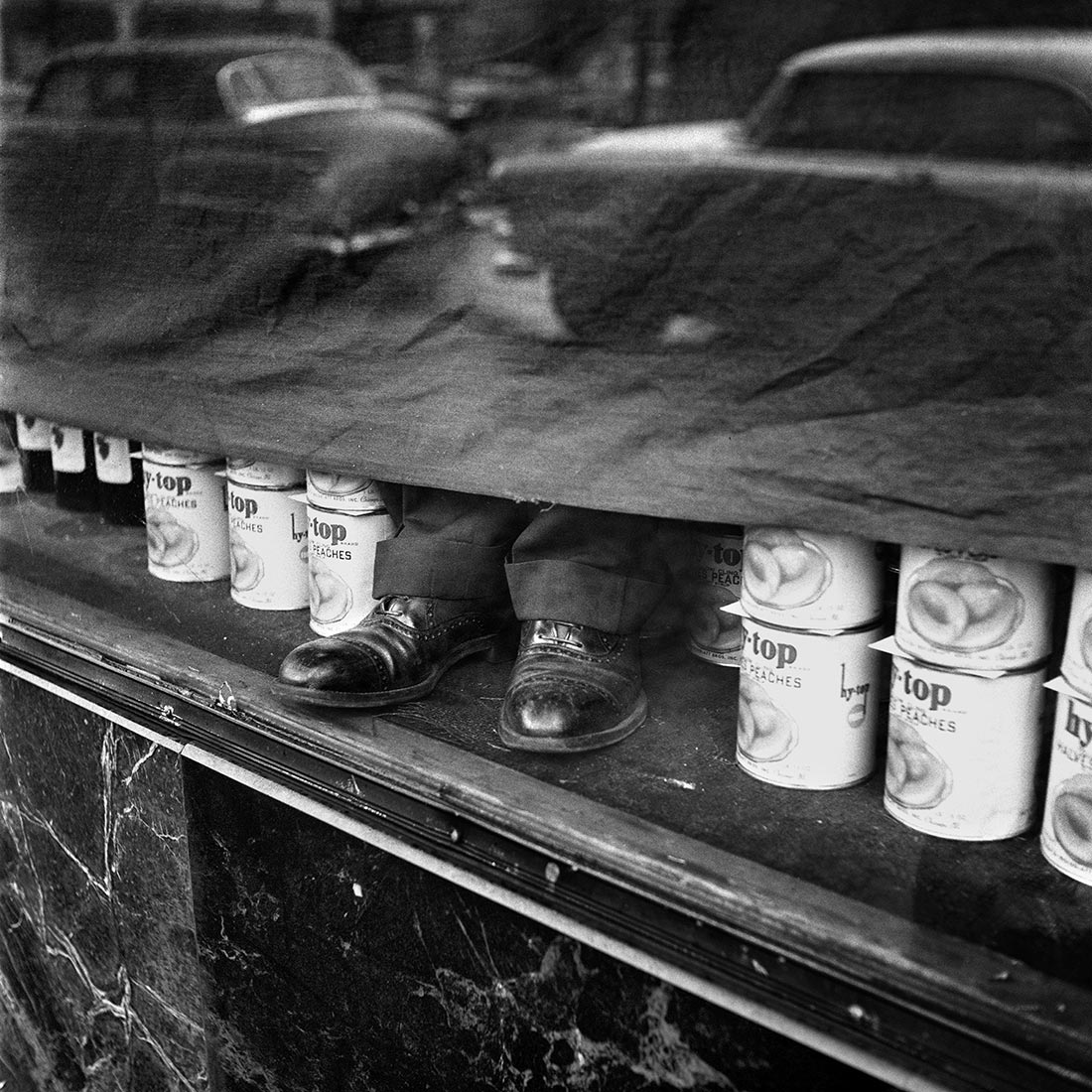
Vivian Maier (American, 1926-2009)
January 1956
1956
Gelatin silver print
30.5 x 30.5cm
Vivian Maier/Maloof Collection, courtesy of Howard Greenberg Gallery
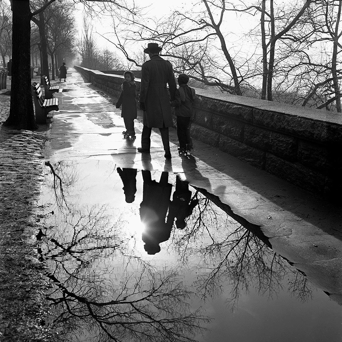
Vivian Maier (American, 1926-2009)
January, 1953, New York, NY
1953
Gelatin silver print
30.5 x 30.5cm
Vivian Maier/Maloof Collection, courtesy of Howard Greenberg Gallery
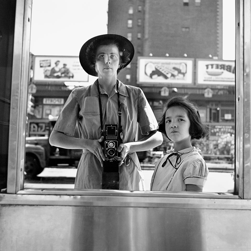
Vivian Maier (American, 1926-2009)
Self-Portrait, 1953
1953
Gelatin silver print
30.5 x 30.5cm
Vivian Maier/Maloof Collection, courtesy of Howard Greenberg Gallery
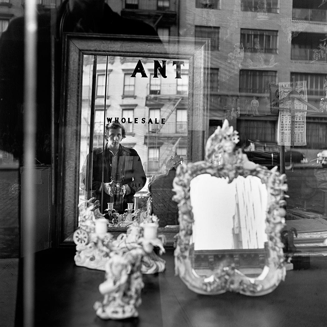
Vivian Maier (American, 1926-2009)
Self-Portrait, 1953
1953
Gelatin silver print
30.5 x 30.5cm
Vivian Maier/Maloof Collection, courtesy of Howard Greenberg Gallery
Vivian Maier (American, 1926-2009)
Undated, Canada
Nd
Gelatin silver print
30.5 x 30.5cm
Vivian Maier/Maloof Collection, courtesy of Howard Greenberg Gallery
Vivian Maier (American, 1926-2009)
July 1957. Chicago Suburb, I
1957
Gelatin silver print
30.5 x 30.5cm
Vivian Maier/Maloof Collection, courtesy of Howard Greenberg Gallery
Vivian Maier (American, 1926-2009)
January 9, 1957, Florida
1957
Gelatin silver print
30.5 x 30.5cm
Vivian Maier/Maloof Collection, courtesy of Howard Greenberg Gallery
One of the most atmospheric and mysterious of Maier’s photographs.
Vivian Maier (American, 1926-2009)
Self-Portrait, New York, February 3, 1955
1955
Gelatin silver print
30.5 x 30.5cm
Vivian Maier/Maloof Collection, courtesy of Howard Greenberg Gallery
Vivian Maier (American, 1926-2009)
March 1954, New York, NY
1954
Gelatin silver print
30.5 x 30.5cm
Vivian Maier/Maloof Collection, courtesy of Howard Greenberg Gallery
Vivian Maier (American, 1926-2009)
May 16, 1957. Chicago, IL
1957
Gelatin silver print
30.5 x 30.5cm
Vivian Maier/Maloof Collection, courtesy of Howard Greenberg Gallery
Vivian Maier (American, 1926-2009)
June 1963. Chicago, IL
1963
Gelatin silver print
30.5 x 30.5cm
Vivian Maier/Maloof Collection, courtesy of Howard Greenberg Gallery
During her lifetime, Vivian Maier (1926-2009) produced more than 100,000 photographic images, which remained largely undiscovered until after her death. CCP celebrates this reluctant artist’s timely relevance, juxtaposing her work with contemporary Australian photography, performance and video.
Maier’s prolific body of work recording both herself and the world around her – predominately with a distinctive medium format Rolleiflex twin-lens reflex camera – is a precursor to our age of compulsive photographic documentation via smart phones and digital media. The posthumous construction of her identity is almost as compelling as her images and her ability to determine and frame a gripping moment with poignancy and beauty. Time has been Maier’s collaborator, where nostalgia plays a significant role in the popularity of her archive.
In Crossing Paths with Vivian Maier, Maier’s photography – printed well after her death – is presented with contemporary Australian artists working in still, moving and found photography and who also document the street and themselves in an equally obsessive manner.
Against the gritty street life captured by her probing lens, Patrick Pound responds with second-hand images gleaned from junk shops and the Internet, while Debra Phillips and David Wadelton make an inventory of the city and its quirky features. Maier’s self-portraits reverberate with Australian women artists who turn the camera on themselves in performative ways, in the work of Cherine Fahd, Gabriella Mangano and Silvana Mangano, Clare Rae, Simone Slee and Kellie Wells.
Text from the CCP website
Vivian Maier (American, 1926-2009)
May 27, 1970. Chicago, IL
1970
Gelatin silver print
30.5 x 30.5cm
Vivian Maier/Maloof Collection, courtesy of Howard Greenberg Gallery
Vivian Maier (American, 1926-2009)
May 28, 1954, New York, NY
1954
Gelatin silver print
30.5 x 30.5cm
Vivian Maier/Maloof Collection, courtesy of Howard Greenberg Gallery
Vivian Maier (American, 1926-2009)
New York City, September 10, 1955
1955
Gelatin silver print
30.5 x 30.5cm
Vivian Maier/Maloof Collection, courtesy of Howard Greenberg Gallery
Vivian Maier (American, 1926-2009)
Self-Portrait; October 18, 1953, New York, NY
1953
Gelatin silver print
30.5 x 30.5cm
Vivian Maier/Maloof Collection, courtesy of Howard Greenberg Gallery
Vivian Maier (American, 1926-2009)
Undated, New York, NY
Nd
Gelatin silver print
30.5 x 30.5cm
Vivian Maier/Maloof Collection, courtesy of Howard Greenberg Gallery
Vivian Maier (American, 1926-2009)
Undated, New York, NY
Nd
Gelatin silver print
30.5 x 30.5cm
Vivian Maier/Maloof Collection, courtesy of Howard Greenberg Gallery
Vivian Maier (American, 1926-2009)
Undated, New York, NY
Nd
Gelatin silver print
30.5 x 30.5cm
Vivian Maier/Maloof Collection, courtesy of Howard Greenberg Gallery
Vivian Maier (American, 1926-2009)
Undated, New York, NY
Nd
Gelatin silver print
30.5 x 30.5cm
Vivian Maier/Maloof Collection, courtesy of Howard Greenberg Gallery
Vivian Maier (American, 1926-2009)
Undated, New York, NY
Nd
Gelatin silver print
30.5 x 30.5cm
Vivian Maier/Maloof Collection, courtesy of Howard Greenberg Gallery
Vivian Maier (American, 1926-2009)
New York, NY
1954
Gelatin silver print
30.5 x 30.5cm
Vivian Maier/Maloof Collection, courtesy of Howard Greenberg Gallery
Vivian Maier (American, 1926-2009)
Self-Portrait, 1959
1959
Gelatin silver print
30.5 x 30.5cm
Vivian Maier/Maloof Collection, courtesy of Howard Greenberg Gallery
Vivian Maier (American, 1926-2009)
Undated, New York, NY
Nd
Gelatin silver print
30.5 x 30.5cm
Vivian Maier/Maloof Collection, courtesy of Howard Greenberg Gallery
Vivian Maier (American, 1926-2009)
October 31, 1954. New York, NY
1954
Gelatin silver print
30.5 x 30.5cm
Vivian Maier/Maloof Collection, courtesy of Howard Greenberg Gallery
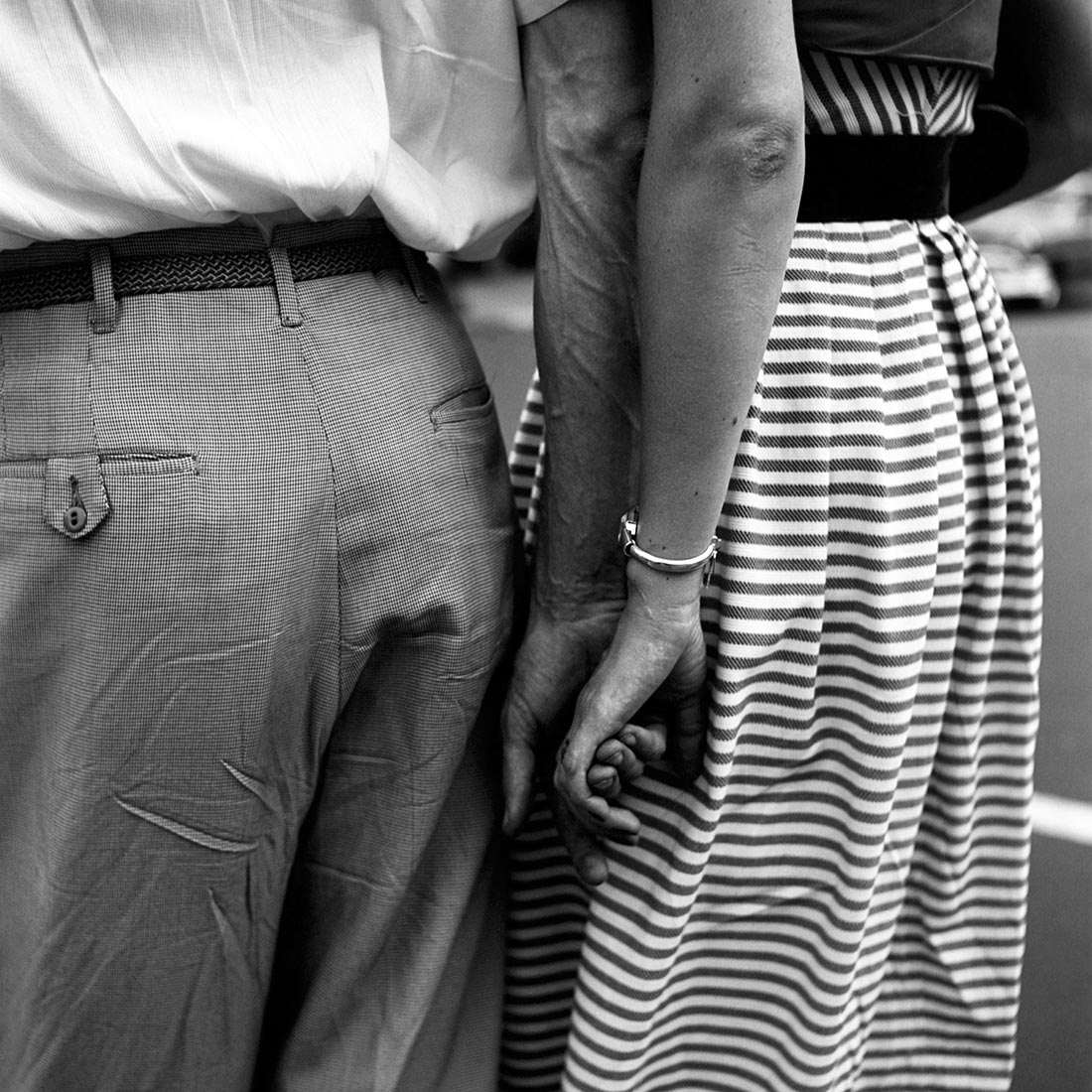
Vivian Maier (American, 1926-2009)
July 27, 1954. New York, NY
1954
Gelatin silver print
30.5 x 30.5cm
Vivian Maier/Maloof Collection, courtesy of Howard Greenberg Gallery
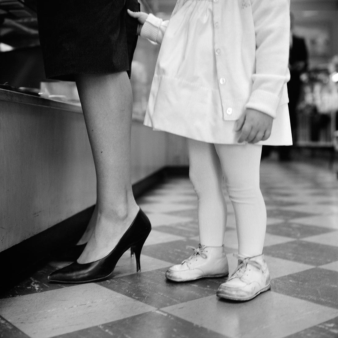
Vivian Maier (American, 1926-2009)
September 18, 1962
1962
Gelatin silver print
30.5 x 30.5cm
Vivian Maier/Maloof Collection, courtesy of Howard Greenberg Gallery
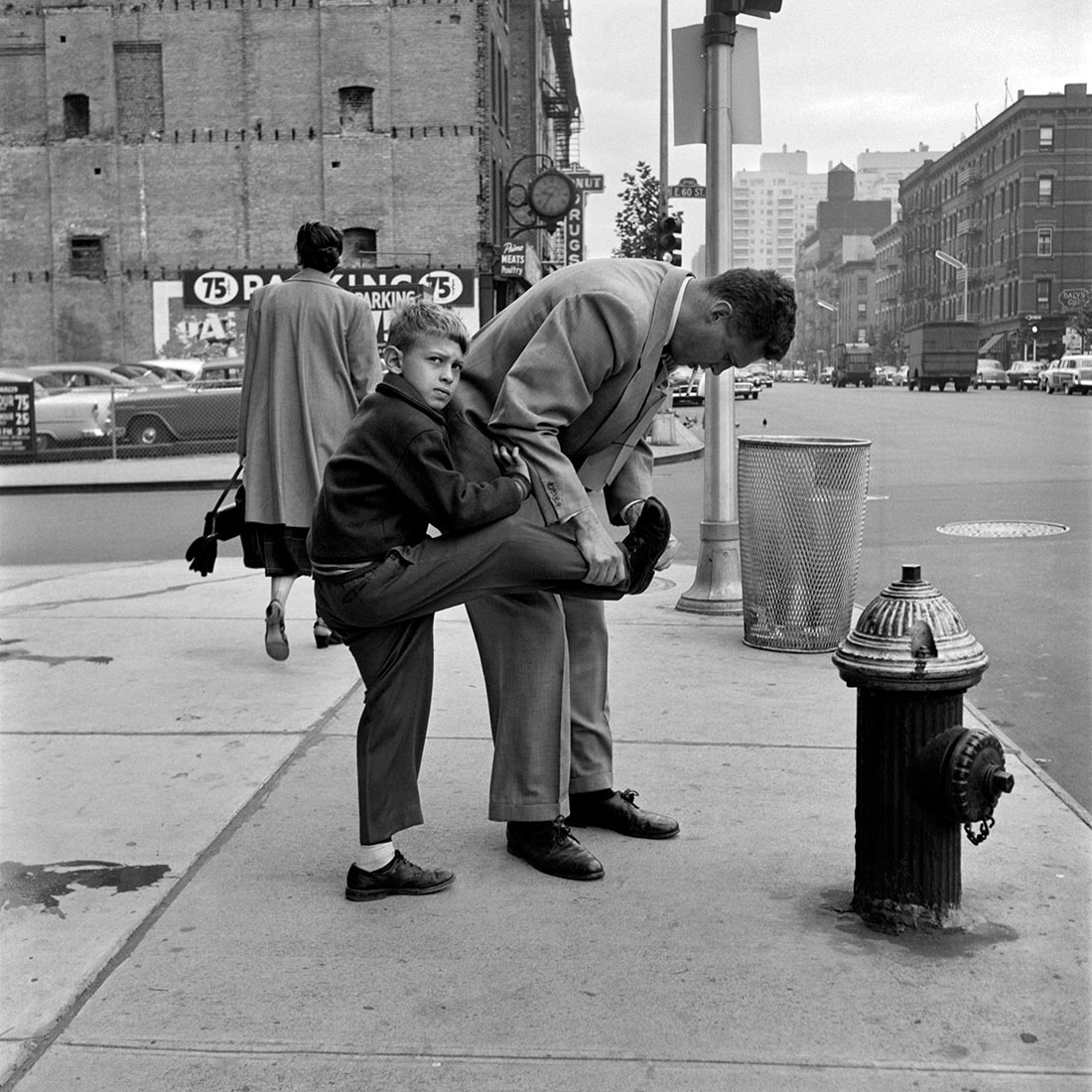
Vivian Maier (American, 1926-2009)
September 1956, New York, NY
1956
Gelatin silver print
30.5 x 30.5cm
Vivian Maier/Maloof Collection, courtesy of Howard Greenberg Gallery
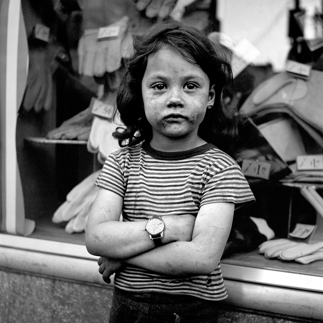
Vivian Maier (American, 1926-2009)
Untitled, Undated
Nd
Gelatin silver print
30.5 x 30.5cm
Vivian Maier/Maloof Collection, courtesy of Howard Greenberg Gallery
Vivian Maier (American, 1926-2009)
Untitled, Undated
Nd
Gelatin silver print
30.5 x 30.5cm
Vivian Maier/Maloof Collection, courtesy of Howard Greenberg Gallery
Love this one, with feeling
~ The balloons for a celebration
~ The exit sign
~ How he looks distractedly off camera into the distance
~ How her hands are clenched anxiously together
~ How she looks sad and lonely, looking off camera
Vivian Maier (American, 1926-2009)
Untitled, Undated
Nd
Gelatin silver print
30.5 x 30.5cm
Vivian Maier/Maloof Collection, courtesy of Howard Greenberg Gallery
Vivian Maier (American, 1926-2009)
Undated, Vancouver, Canada
Nd
Gelatin silver print
30.5 x 30.5cm
Vivian Maier/Maloof Collection, courtesy of Howard Greenberg Gallery
Vivian Maier (American, 1926-2009)
Untitled, Undated
Nd
Gelatin silver print
30.5 x 30.5cm
Vivian Maier/Maloof Collection, courtesy of Howard Greenberg Gallery
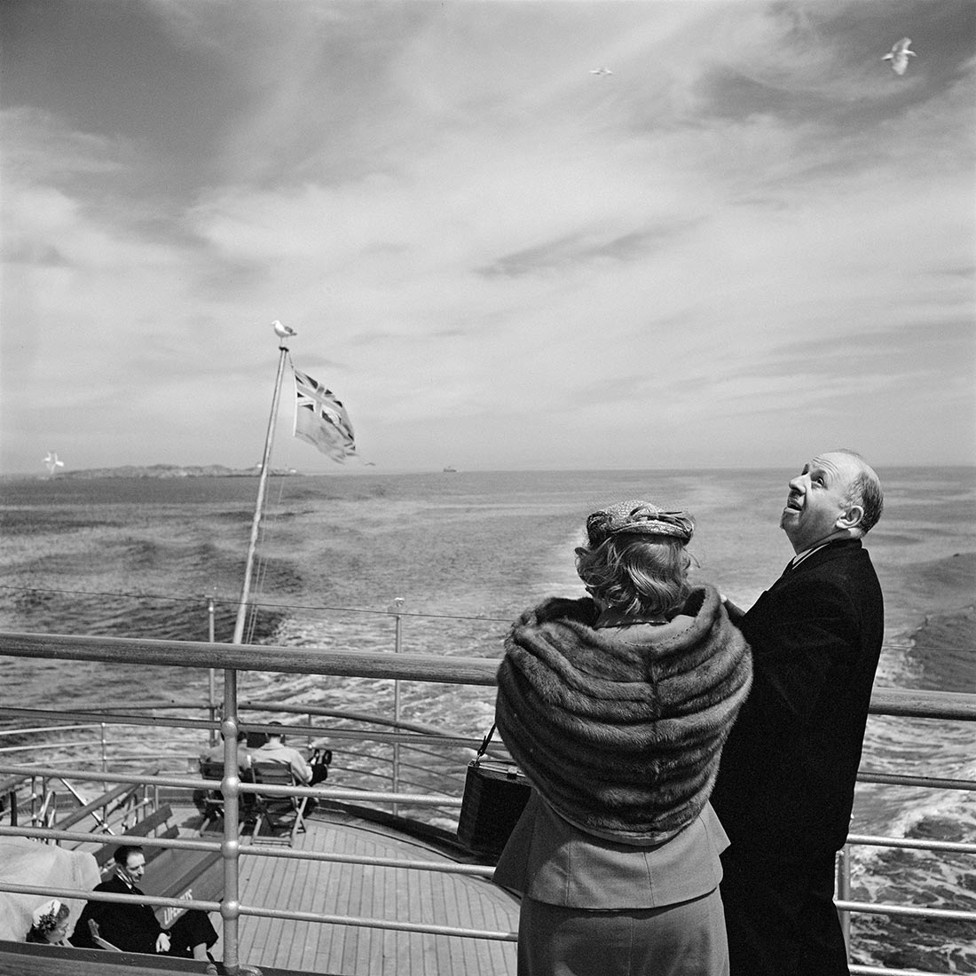
Vivian Maier (American, 1926-2009)
Untitled, Undated
Nd
Gelatin silver print
30.5 x 30.5cm
Vivian Maier/Maloof Collection, courtesy of Howard Greenberg Gallery
Centre for Contemporary Photography
No permanent exhibition space at the moment
I started the archive 6 years ago with 11 people a day reading it. Today the archive averages between 3-4,000 people a day and has over 3,000 Likes on Facebook.
Reproduced below are a couple of postings from the archive on its very first day 13/11/2008 – just text please note, no images – and a mandala image of the Sahasrãra or Crown Chakra (for creativity) to celebrate the milestone.
Namaste
Marcus
“The artist does not turn time into money, the artist turns time into energy, time into intensity, time into vision. The exchange that art offers is an exchange in kind; energy for energy, intensity for intensity, vision for vision… Can we afford to live imaginatively, contemplatively?”
Winterson, Jeanette. Art Objects. London: Vintage, 1996, p. 139.
“And on the other end of the spectrum, there is the AFTER LIGHT, a light of the past, which are echoes from past experiences so intense that they sometimes appear in front of us in the form of unexpected shadows. They hide on clear days under the roofs of houses. It is believed to be the same light seen by people we knew many years ago that survives like a message in a bottle, but always in a precarious way and often vanishes into thin air.”
Helguera, Pablo. “How to Understand the Light on a Landscape,” in Patt, Lise (ed.,). Searching for Sebald: Photography After W. G. Sebald. Los Angeles: The Institute of Cultural Inquiry, 2007, p. 119.

“That for which they seek is that which searches.”
Saint Francis of Assissi
The Crown Chakra is known as the Thousand Petal Lotus. The number 1000, adds up and reduces to the number 1 in numerology. The number one represents strong leadership and will power, a courageous person who is goal oriented and driven. A number one person is a pioneer who is independent and individualistic and approaches issues from a unique perspective. A number one is original and sometimes unconventional. They possess tremendous potential for success in life.
Throughout history it has been depicted in paintings of Jesus the Christ, Buddha, Saints, Angels and other highly evolved beings as a golden white halo around their heads.
The Crown Chakra is associated with the colour violet. Some references link it to the colour white as well. Violet is the highest colour in the light spectrum. It represents the spiritual or higher self, wisdom, vitality, intuitive awareness, passion and dignity. White is purity and the colour of the Divine light. Red, which is the lowest colour on our physical perceptual light spectrum, and just above infrared light, rules the Root Chakra. Conversely, violet, the highest colour on our physical perceptual light spectrum, and just below ultra-violet light, rules the Crown Chakra.
Our multidimensional and extrasensory senses are ruled by the seventh chakra. Once this chakra is opened, our sense of empathy and unity expands. When we raise our consciousness, we experience another person, place or object as if we are inside of them or as if we are “being” them. It is important, then, that we remember that with this power comes responsibility. We should activate these senses only to provide help or healing – NEVER for mere curiosity or with any malicious intent.
Compassion is the main sense that develops as our Crown Chakra opens. We have two kinds of compassion: Crown Compassion, which is more about perception and communication, and Heart Compassion, which is more about emotions and empathy.
The element of this Chakra is the Cosmic Energy, which is often experienced as an inner light emanating from the deepest part of our being. This Cosmic Energy, which rules the higher kingdoms and stems from the Source, feels like an ultimate intelligence and a sense of all-knowing. When our Crown Chakra opens we can also experience the complete isolation and blackness of the Great Void. This Void, which resonates just below the fifth dimension, represents the raw potential for all that can, or will be. The total darkness is representative of the centre of a seed before it opens into the light of manifestation. when we can perceive from our Crown Chakra, we can identify both extremes of all polarities.
The opening of the Crown Chakra expands our perception into the fifth dimension where there are NO polarities. Therefore, there are many paradoxes associated with this Chakra as it represents the “end of all paradox.” As we travel through the higher dimensions, it is important that we release all judgments associated with the polarities of light and dark. We must instead consult our own inner knowing and higher consciousness to navigate us through our inner worlds. Eventually, we will all be aware of our fifth dimensional selves; they know no judgment and hold no fear. For what is judgment, if not a form of fear?
Since our Crown Chakra represents our multidimensional consciousness, as we open this Chakra our reality will no longer be limited to the third and fourth dimension. When our Brow Chakra, the sixth Chakra, opens we begin to travel into the higher sub planes of the fourth dimension. With the opening of our seventh Chakra, and the subsequent activation of our Third Eye, our consciousness can now enter the fifth dimension. It is then that the many realities around and within us gradually become consciously apparent to us.
The process of our awakening begins with expanding the consciousness of our physical selves and working to clear our etheric bodies. Then the astral, the mental, the causal and the spiritual I AM consciousness can align themselves in preparation to ascend into the fifth dimension. Until we reach the fifth dimension we can “work” towards enlightenment, but from the fifth dimension on, we must simply “BE”. “Doing” is not important then; consciousness alone is important. And finally, in the sixth and seventh dimensions even consciousness is not important as there is only the “Isness”, the “Nowness” and the “Hereness.”
Source: www.chakras.net
Artists: Jane Brown, Cameron Clarke, Zoë Croggon, Therese Keogh, Phuong Ngo, Meredith Turnbull, Wolfgang Sievers
Curators: Naomi Cass and Kyla McFarlane

Jane Brown (Australian, b. 1967)
Triptych. The Paper Mill (former Amcor and APM site), Fairfield
2014
3 panels of 9, 6 and 6 selenium toned, fibre-based, gelatin silver prints
Curated by CCP Director Naomi Cass and Kyla McFarlane, this intelligent exhibition features the work of six early career artists who respond in diverse ways to renowned Australian photographer Wolfgang Sievers (1913-2007). It was a joy to see again the large vintage silver gelatin, almost clinically composed photographs by Sievers. The light, tonality and stillness of the images make them seem mythic, modern and monumental.
Each artist offers a unique “take” on Sievers influence on Australian photography and design, including his interest in refugees and human rights issues and the representation of the dignity of labour (although the machine is more often represented in Sievers work with a distinct lack of human presence and the act of work itself).
My personal favourites were Phuong Ngo’s intimate silver gelatin photographs in four groups of sweat shop workers in Vietnam, people on boats coming to Australia, photographs of textile workers in Australia and photographs of his mother. Phuong Ngo’s shared stories of young Vietnamese refugees and the journeys taken by their mothers told through photographs is very moving, but only after you are told what the four bodies of images are about. Positioned in the small Gallery Four it was also difficult to associate this installation with the rest of the exhibition. Initially I thought it was a separate exhibition until the linkages were told, the light dawned, and the connections were made.
While Cameron Clarke’s photographs of Ford factory workers and machinery are meticulously lit and digitally observed, producing a strong body of work, it is Jane Brown’s gridded analogue triptych which steals the show (see photographs above and below). These are superbly rich and textured photographs, beautifully seen and resolved within the shifting mise-en-scène. Brown’s images kinetically flow from one image to another even as they are self contained within a modernist grid. In some instances the artist has used the same photograph within the triptych but cropped in a different manner, which pushes and pulls the viewer into a different perspective on the subject matter. This is highly intelligent art making that observes the self contained nature and monumentality of Sievers work and reworks it, lucidly commenting on the dis/integration of these spaces and industries in the present day.
This series of work is the best sequence of photographs I have seen this year and any institution worthy of their salt should snap up these works for their collection.
Dr Marcus Bunyan
Many thankx to the Director Naomi Cass and the CCP for allowing me to publish the text and photographs in the posting. Please click on the photographs for a larger version of the image. All installation photographs © Marcus Bunyan 2014


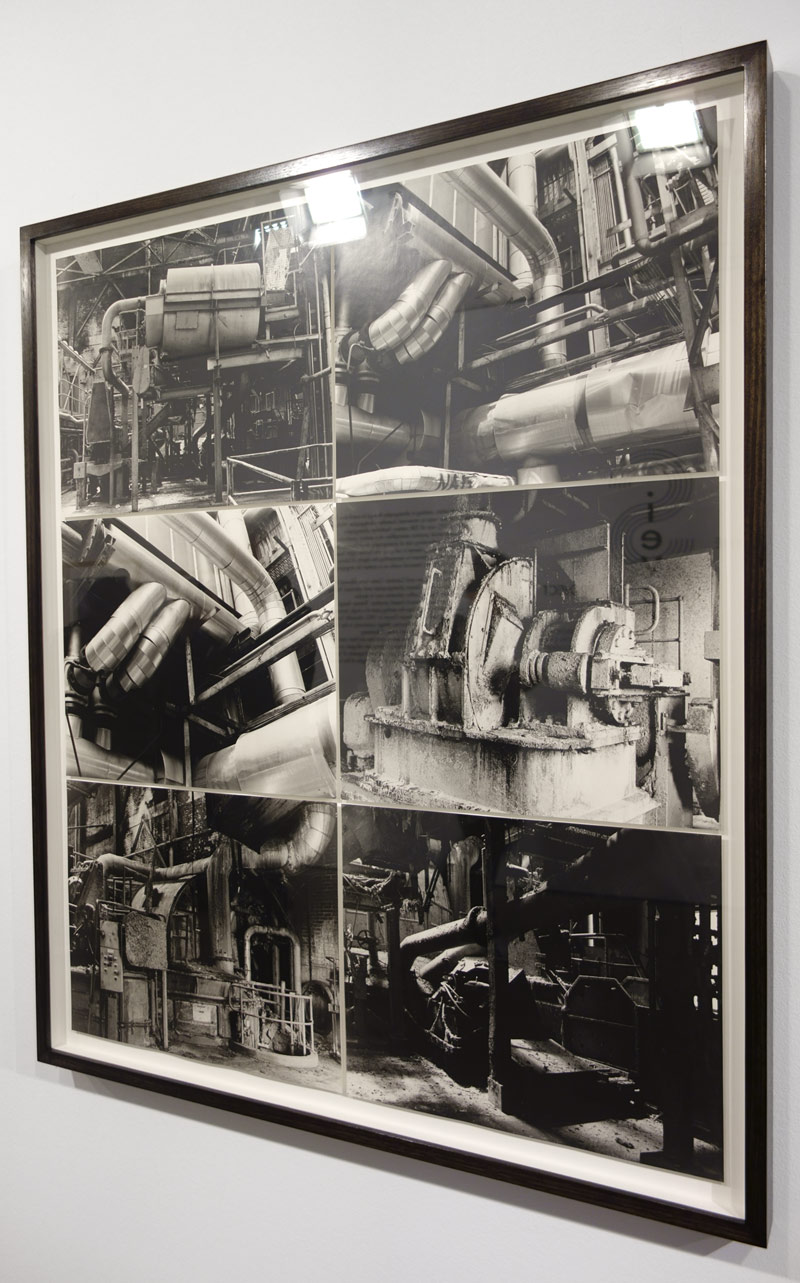
Installation photographs of Jane Brown Triptych. The Paper Mill (former Amcor and APM site), Fairfield 2014 (details) at the exhibition The Sievers Project at the Centre for Contemporary Photography (CCP)

Jane Brown (Australian, b. 1967)
Staircase. The Paper Mill (former Amcor and APM site), Fairfield, 2014
2014
Fibre-based, gelatin silver print

Jane Brown (Australian, b. 1967)
Mining machinery, Line of Lode Miners Memorial Complex, Broken Hill 2014-06-10
2014
Brown toned, fibre-based, gelatin silver print
Courtesy the artist

Installation photograph of Jane Brown’s work at the exhibition The Sievers Project at the Centre for Contemporary Photography (CCP)

Wolfgang Sievers (Australian born Germany, 1913-2007)
Gears for the Mining Industry, Vickers Ruwolt, Burnley, Victoria, 1967
1967
Gelatin silver photograph
49.6 x 39.3cm
National Library of Australia, Wolfgang Sievers Photographic Archive

Wolfgang Sievers (Australian born Germany, 1913-2007)
Sulphuric Acid Plant Electrolytic Zinc, Risoon, Tasmania, 1959
1959
Gelatin silver photograph

Installation photograph of the work of Meredith Turnbull (foreground) and Zoë Croggon (rear wall) at the exhibition The Sievers Project at the Centre for Contemporary Photography (CCP)

Zoë Croggon (Australian, b. 1989)
John Holland Constructions, Ginninderra Bridge (after Wolfgang Sievers)
2014
Photocollage
70 cm x 86cm
Courtesy the artist and Daine Singer, Melbourne
![Zoë Croggon (Australian, b. 1989) 'Comalco Aluminium Used in the Construction of the National Gallery of Victoria [7] (after Wolfgang Sievers)' 2014](https://artblart.com/wp-content/uploads/2014/08/installation-h.jpg "Zoë Croggon (Australian, b. 1989) 'Comalco Aluminium Used in the Construction of the National Gallery of Victoria [7] (after Wolfgang Sievers)' 2014")
Zoë Croggon (Australian, b. 1989)
Comalco Aluminium Used in the Construction of the National Gallery of Victoria [7] (after Wolfgang Sievers)
2014
Photocollage
Courtesy the artist and Daine Singer, Melbourne
![Zoë Croggon (Australian, b. 1989) 'Comalco Aluminium Used in the Construction of the National Gallery of Victoria [18] (after Wolfgang Sievers)' 2014](https://artblart.com/wp-content/uploads/2014/08/installation-i.jpg "Zoë Croggon (Australian, b. 1989) 'Comalco Aluminium Used in the Construction of the National Gallery of Victoria [18] (after Wolfgang Sievers)' 2014")
Zoë Croggon (Australian, b. 1989)
Comalco Aluminium Used in the Construction of the National Gallery of Victoria [18] (after Wolfgang Sievers)
2014
Photocollage
Courtesy the artist and Daine Singer, Melbourne
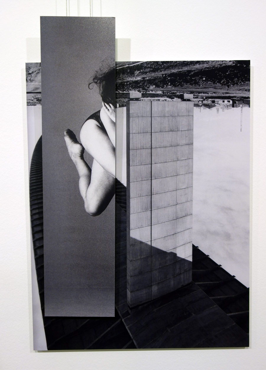
Zoë Croggon (Australian, b. 1989)
Westgate Bridge (after Wolfgang Sievers)
2014
Photocollage
Courtesy the artist and Daine Singer, Melbourne
“Six early career artists, working in photography through to installation, have responded in diverse ways to renowned Australian photographer Wolfgang Sievers (1913-2007), icon of 20th century Australian photography. Sievers’ commercial practice exemplifies mid-century positivism and modernity, and the myth-making role of photography. As a German Jewish immigrant, he had a strong interest in refugees and human rights issues as well as an expressed commitment to representing the dignity of labour. The Sievers Project presents key historical works as a context for engaging the past through the present.
Photographers Jane Brown and Cameron Clarke have followed in his footsteps to industrial clients Sievers photographed and valorised, finding sites that are visually dynamic within industries now in decline. Through her intrepid, research-based practice, Therese Keogh has developed a materially-rich work from the starting point of a single, anomalous photograph Sievers took at the Roman Forum in 1953. Meredith Turnbull draws on his connections with Melbourne’s design community in the 1950s and 60s, including Gerard Herbst and Frederick Romberg. In Sievers’ photographs of industrial sewing machines and their machinists, Phuong Ngo finds shared stories of young Vietnamese refugees and the journeys taken by their mothers. Zoë Croggon positions fragments of Sievers’ iconic architectural photographs against found photographs of the human body in movement.”
Text from the CCP website
The Sievers Project follows a number of exhibitions over the last five years where CCP has opened up a vista on contemporary practice by exhibiting early work by living artists such as Bill Henson, Kohei Yoshiyuki and Robert Rooney, as well as historical photography, alongside contemporary work. As a commissioning exhibition we have titled this a ‘project’ to point towards the year-long research period integral to the exhibition, capturing the curatorial gesture of inviting early career artists to engage with the past.
The Sievers Project represents a significant curatorial endeavour for CCP, the tale of which is recounted in the Introduction. It would simply not have taken place were it not for the willingness and generosity of Julian Burnside AO QC to participate, through allowing the artists research access to his Wolfgang Sievers collection and lending work from it for the exhibition, as well as contributing an essay for this catalogue.
I acknowledge the artists for setting out on this project and for returning with thoughtful and excellent work. It has been a pleasure to both engage with and exhibit the work of Jane Brown, Cameron Clarke, Zoë Croggon, Therese Keogh, Phuong Ngo and Meredith Turnbull.
The Sievers Project has been dignified by contributions by a number of experts and I wish to acknowledge Professor Helen Ennis, Australian National University School of Art who has also contributed a catalogue essay; Madeleine Say, Picture Librarian, Eve Sainsbury, Exhibitions Curator and Clare Williamson, Senior Exhibitions Curator, State Library of Victoria; Maggie Finch, Curator of Photography, National Gallery of Victoria and Professor Harriet Edquist and Kaye Ashton, Senior Coordinator, RMIT Design Archives, who all took time to speak about Sievers and share his work with the artists.
Opportunities to commission artists are relatively rare and funding through the inaugural Early Career Artist Commissions Grant from the Australia Council has enabled the project. CCP is pleased to acknowledge this recognition and support. We are delighted that Lovell Chen Architects & Heritage Consultants have provided further critical support to realise the project, for which we are grateful. We see a germane link between Lovell Chen and the premise of The Sievers Project.
The Besen Family Foundation are champions for enabling CCP to produce catalogues for selected exhibitions. I acknowledge the Foundation for their long-standing and generous engagement with CCP. We thank the National Library of Australia for providing permission to reproduce Sievers’ work in this catalogue.
The Sievers Project has provided a welcome opportunity for CCP to engage with colleagues in the fi eld of architecture and we are delighted to acknowledge a partnership with the Robin Boyd Foundation to present public programs. We are grateful to Tony Lee from the Foundation for his interest in the project.
Without doubt CCP’s ability to both present contemporary art well and look after artists is greatly enhanced through the longstanding and generous support of Tint Design and Sofi tel Melbourne on Collins. CCP is pleased to present a parallel exhibition of The Sievers Project at the 2014 Melbourne Art Fair and we thank the Melbourne Art Foundation for enabling CCP to bring the exhibition to broad new audiences. For the Art Fair exhibition we are also indebted to Christine Downer, previous CCP Board member and current supporter, for the loan of a major Sievers work.
The Sievers Project has been ably assisted by Philippa Brumby, curatorial intern. Co-curator Dr Kyla McFarlane and I thank Philippa for her wide-ranging skills over a substantial period of time. Lastly, I acknowledge Kyla for her excellent curatorial work and for the pleasure of collaborating with such a playful, dedicated and steely intellect.
Naomi Cass, Director, CCP
A response to this necessarily combines elements of certitude and speculation. Sievers himself was totally committed to ensuring his legacy as a photographer. He spent years meticulously cataloguing and documenting his work and was assiduous in placing as much of it as he could in major photography collections around the country – art galleries and libraries. The bulk of his archive, a staggering 65,000 negatives and prints, was acquired by the National Library where it has been digitised and is available online to users in perpetuity. But there is another aspect to his preoccupation with legacy that has troubled me over the years – his desire to control the readings of his work, to ensure that he ‘owned’ the contextualisation and interpretation of it. As I see it, some of the framing narratives he constructed were retrospective and are misleading because they are not borne out by the evidence, that is, by the photographs themselves. This is especially apparent in his insistence that the relationship between ‘man and machine’ was central to his industrial photography. In my assessment of his enormous archive, images that extol this interaction are actually relatively few in number. They are outweighed by thousands and thousands of other industrial scenes in which the worker is locked into the dreary, repetitive tasks associated with mass production, or is not present at all having been displaced by machines that are far more efficient than humans will ever be. In other words, the bulk of Sievers’ own photographs contradict his central tenet of the dignity of labour in the modern machine era. The most important aspect of his legacy is undoubtedly his photographs and the astonishingly vast, high quality body of architectural and industrial work he produced between 1938 and the early 1970s. My view is that his black and white photography is the best although he did not agree with me, arguing that his colour photography, with its expressive and dramatic qualities, was equally fine. For me, it is his black and white images that are visionary, their precision, clarity and drama embodying the belief in progress that underpinned modernity. I would also suggest Sievers’ legacy isn’t confined to his photography. As a man he cared deeply about the world and wanted it to be better. He was closely involved in the restoration of Karl Friedrich Schinkel’s buildings in Berlin in the 1990s and in the re-evaluation of his own father’s reputation (Professor Johannes Sievers was an expert on Schinkel and had used his young son’s photographs in his books on the architect in the 1930s). Wolfgang donated his photographs to fund-raising campaigns for human rights and remained a passionate antiwar activist until his death.
I suspect that he would have been thrilled to know that his contribution to Australian life and photography is the touchstone for the six photographers involved in the project and that his work continues to be appreciated.
Professor Helen Ennis is Director of the Centre for Art History and Art Theory at ANU School of Art, Canberra.


Installation photographs of the exhibition The Sievers Project at the Centre for Contemporary Photography (CCP)

Installation photograph of the work of Therese Keogh (detail) in the exhibition The Sievers Project at the Centre for Contemporary Photography (CCP)

Installation photograph of the work of Meredith Turnbull (detail) in the exhibition The Sievers Project at the Centre for Contemporary Photography (CCP)

Therese Keogh
In the Forum Romanum (after Sievers) (installation view)
2013
Graphite on paper
Courtesy the artist

Cameron Clarke
Loui Nedeski, Ford Motor Company, Geelong
2014
Archival inkjet print
50 x 63cm
Courtesy the artist

Cameron Clarke
Küsters Washer, Bruck Textiles, Wangaratta (detail)
2014
Archival inkjet print

Cameron Clarke
Theis Dye Jets, Bruck Textiles, Wangaratta (detail)
2014
Archival inkjet print

Phuong Ngo (Australian, b. 1983)
Untitled
2014
from the Mother Vietnam series
Inkjet print
Courtesy the artist
Centre for Contemporary Photography
No permanent exhibition space at the moment


You must be logged in to post a comment.