Curator: Bruce Johnson McLean, Curator of Indigenous Australian Art at QAGOMA
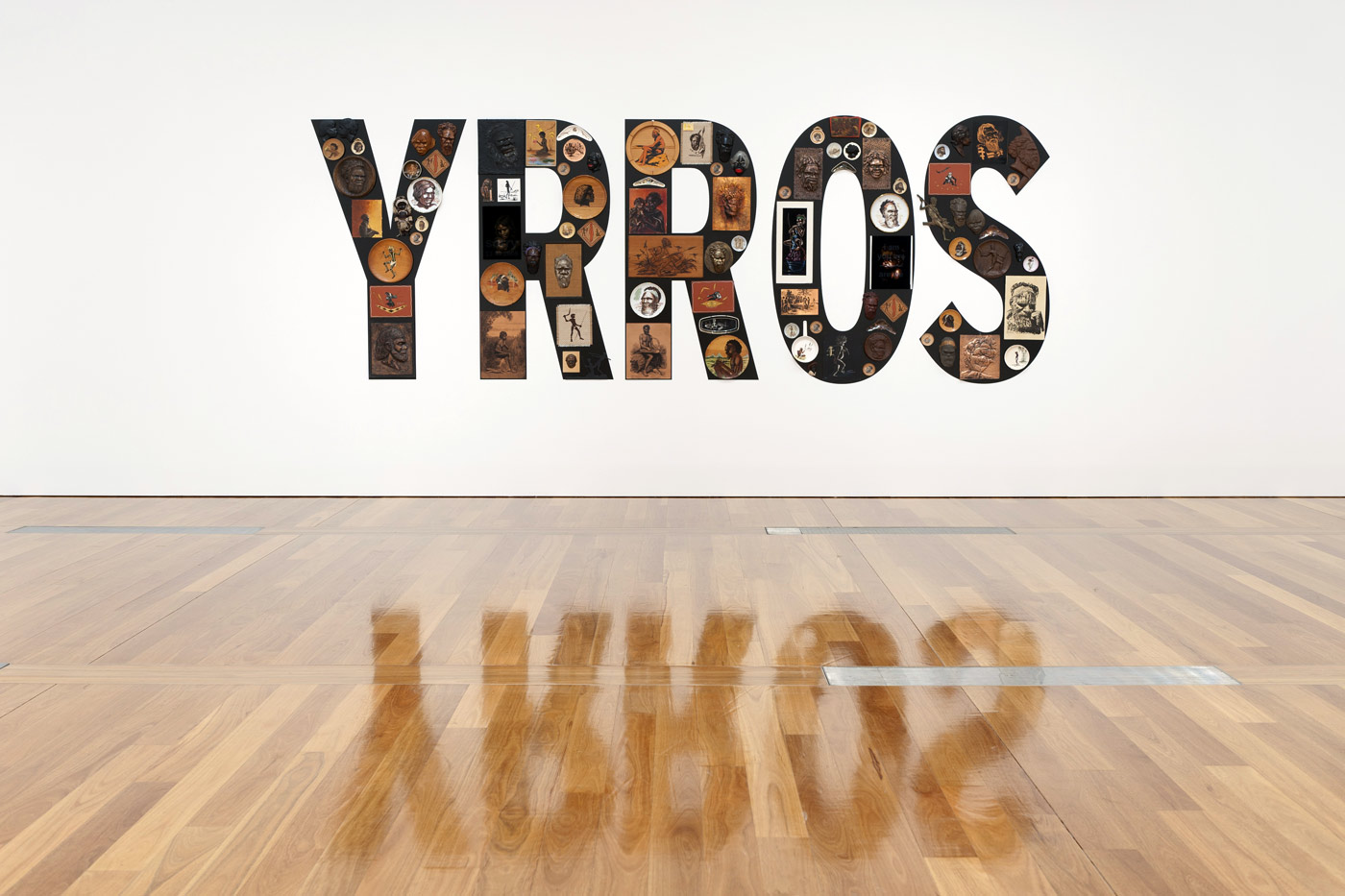
Tony Albert (Australia, Queensland b. 1981) Girramay people Sorry 2008 Found kitsch objects applied to vinyl letters The James C Sourris, AM, Collection. Purchased 2008 with funds from James C Sourris through the Queensland Art Gallery Foundation Collection: Queensland Art Gallery
R U SORRY?
Do you feel FORGIVEN?
What do I have to feel sorry for
I only arrived here yesterday
I FORGIVE you for all the SADNESS and SORROW that COLONISATION has CAUSED
You gutless wonder
GUILT, GUILTY, GUILTLESS, GUILELESS, GUTLESS
The persistence of memory – how the past lingers and subverts
MEMORY – inflicting more DAMAGE on the already DAMAGED
Dr Marcus Bunyan
Many thankx to the The Gallery of Modern Art (GOMA) for allowing me to publish the photographs in the posting. Please click on the photographs for a larger version of the image.
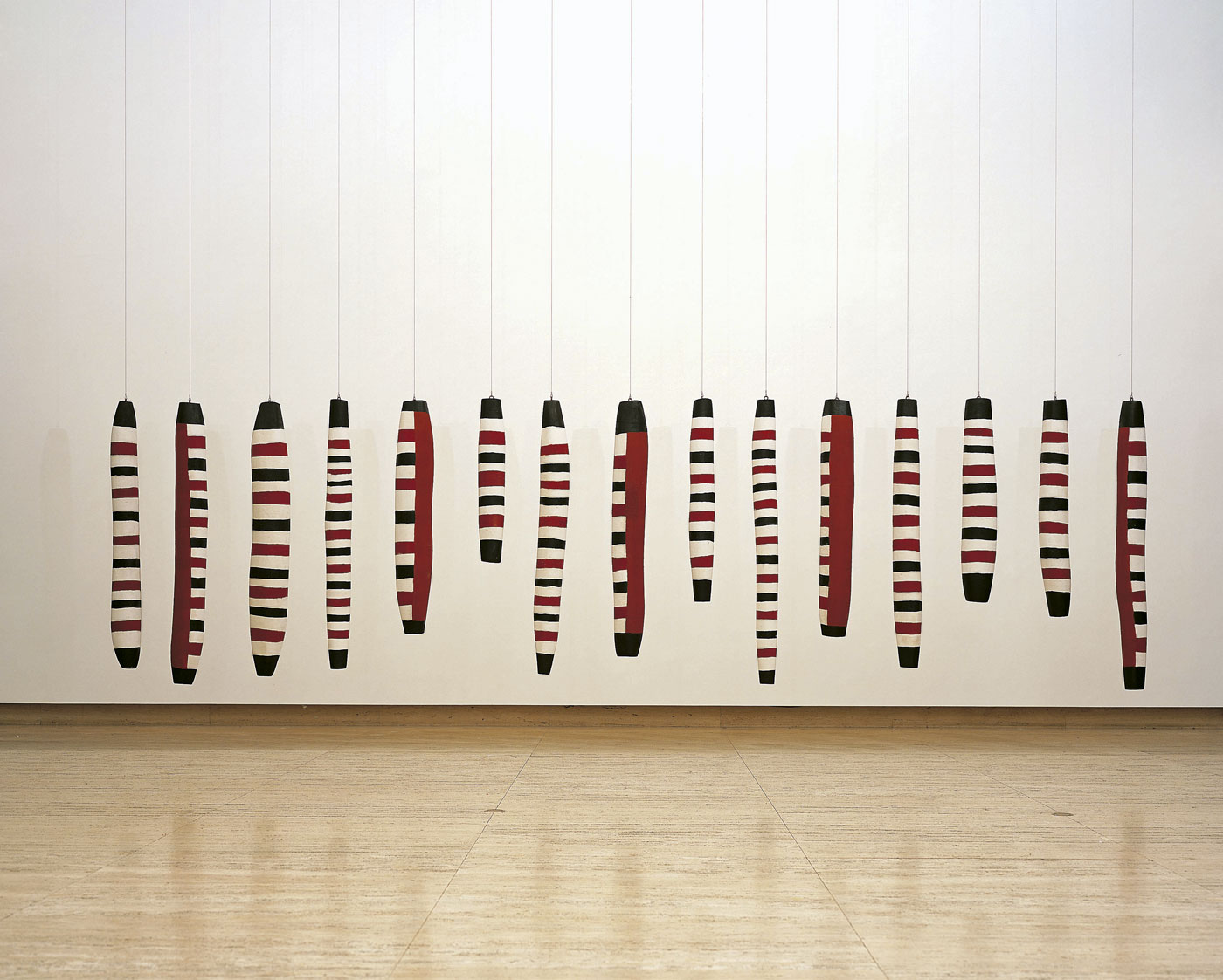
Arthur Koo-ekka Pambegan Jr (Australian, Queensland 1936-2010) Wik-Mungkan people Flying Fox Story Place 2002-2003 Carved milkwood (Alstonia muellerana) with synthetic polymer paint and natural pigments Commissioned 2002 with funds from the Queensland Art Gallery Foundation Grant Collection: Queensland Art Gallery
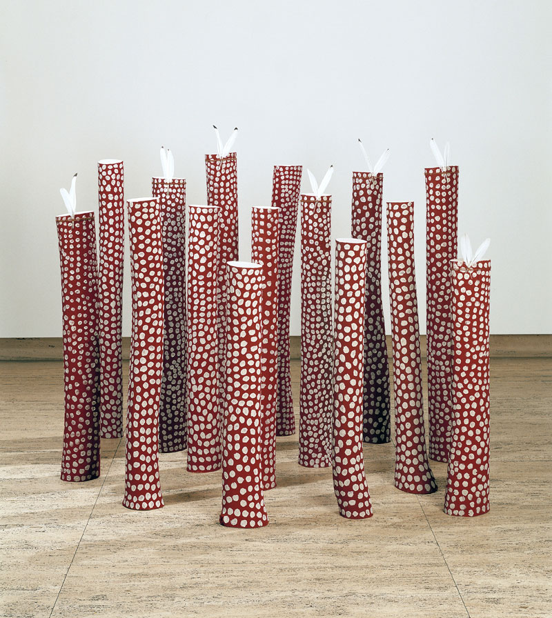
Ron Yunkaporta (Australian, Queensland b. 1956) Wik-Ngathan people Thuuth thaa’ munth (Law poles) 2002-2003 Cottontree wood (Hibiscus tiliaceus), ibis feathers, bush string with natural pigments Commissioned 2002 with funds from the Queensland Art Gallery Foundation Grant Collection: Queensland Art Gallery
Jennifer Mye Jr. (Australian, Queensland b. 1984) Meriam Mir people Basket with short handles 2011 Woven polypropylene tape (blue with Australian flag motif) Purchased 2011 with funds from Thomas Bradley through the Queensland Art Gallery Foundation
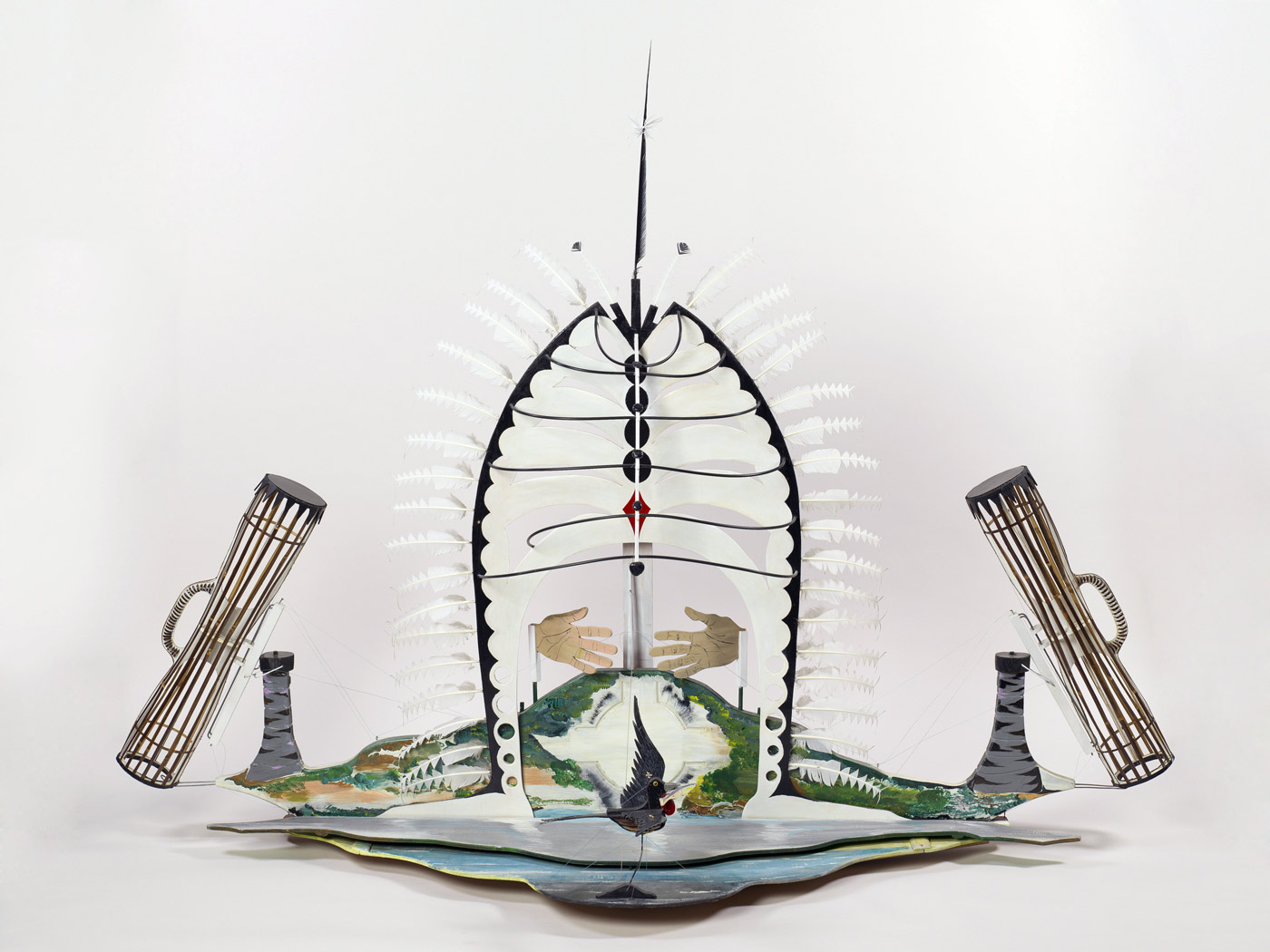
Ken Thaiday Sr (Australian, Queensland b. 1950) Meriam Mir people Symbol of the Torres Strait 2003 Plywood, synthetic polymer paint, feathers, black bamboo, plastic tubing, fishing line Purchased 2004 with funds from Corrs Chambers Westgarth through the Queensland Art Gallery Foundation Collection: Queensland Art Gallery
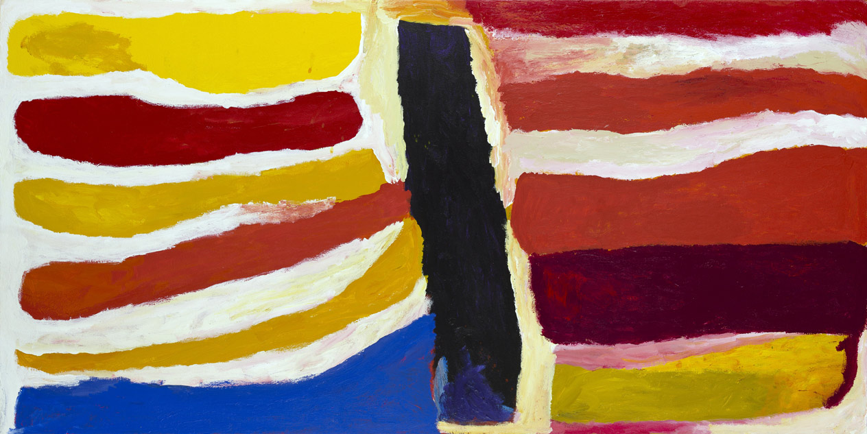
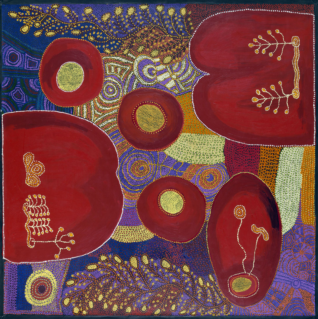
Dinny McDinny (Australian, Northern Territory c. 1927-2003) Marnbaliya people, Balyarrinji skin group Kalajangu – Rainbow Dreaming came through Marnbaliya Country 2003 Synthetic polymer paint on canvas Purchased 2004 Queensland Art Gallery Foundation Collection: Queensland Art Gallery
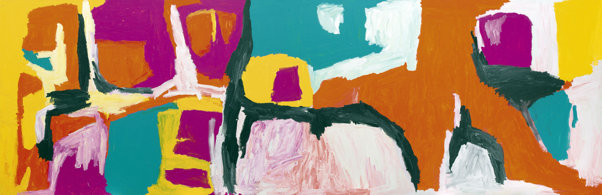
Gabori created a body of work, which expressed sensations of life and cultural memory in diaspora, and differed from other known forms of Aboriginal painting, which focused on story-telling. Most of Gabori’s works represent places on Bentinck Island of deep personal significance to the artist: her husband’s place, Dibirdibi Country, her father’s place, Thundi, her own Country, Mirdidingki, and the first outstation, Nyinyilki.
Gabori lived on Bentinck Island in accordance with custom, developing knowledge of Kaiadilt cartography and cosmology, until the entire population was removed to Mornington Island mission by European settlers in 1948.
“When I paint, I think about my country and where I have been travelling across that couontry. I paint from here (points to head-thinking about country) and here (points to breasts, collarbone and shoulder blades which is reference to body painting). I think abut my people the old people and what they told me, I think about jumangkarni (Dreamtime). Nobody taught me how to paint, I put down my own ideas, I saw these palces for my self, I went there with the old people. I paint jiji (sand hills), jumu (soak water), jila (spring), jiwari (rock hole), pamarr (hills and rock country), I think about mangarri (vegetable food) and kuyu (game) from my country and when I was there. Whe I paint I am thinking about law from a long time ago, I am thinking about the country, my country. When I first painted we didn’t get money, nothing. I like painting, its good, I get pamarr (word for rock, stone money) for it, I can buy my food, tyres, fix my car, I give some money to family and I keep some for me.”
~ Wakartu Cory Surprise
Ruby Tjangawa Williamson (Australian, South Australia b. 1940) Pitjantjatjara people Nita Williamson (Australian, South Australia b. 1963) Suzanne Armstrong (Australian, South Australia b. 1980) Pitjantjatjara people (Collaborating artists) Ngayuku ngura (My country) Puli murpu (Mountain range) 2012 Synthetic polymer paint on linen Purchased 2012 with funds from Margaret Mittelheuser, AM, and Cathryn Mittelheuser, AM, through the Queensland Art Gallery Foundation Collection: Queensland Art Gallery
Ruby Tjangawa Williamson is a senior law woman committed to fostering traditional culture. She began painting in 2000. Her distinctive works are acclaimed and she is regarded as one of Amata’s most significant artists. Williamson also weaves tjanpi (desert grass) baskets and makes punu (wood carvings) with pokerwork designs.
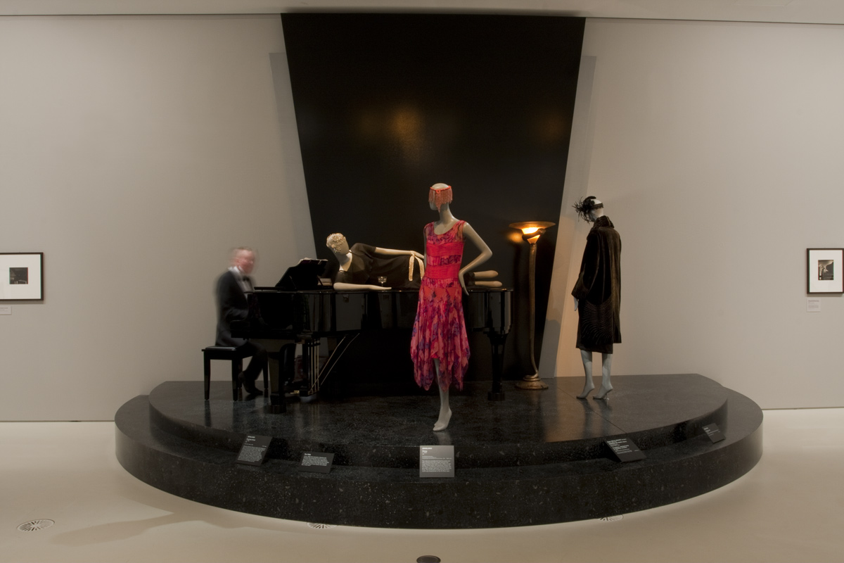
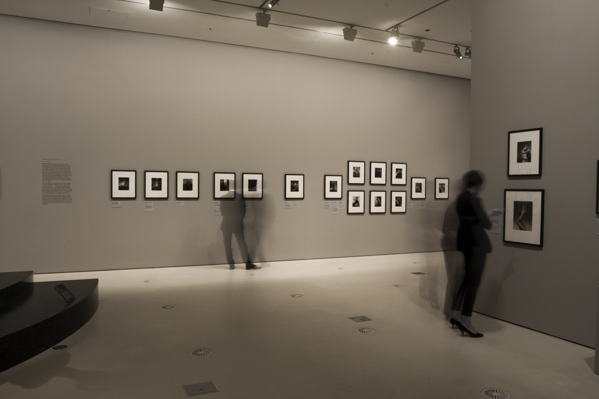
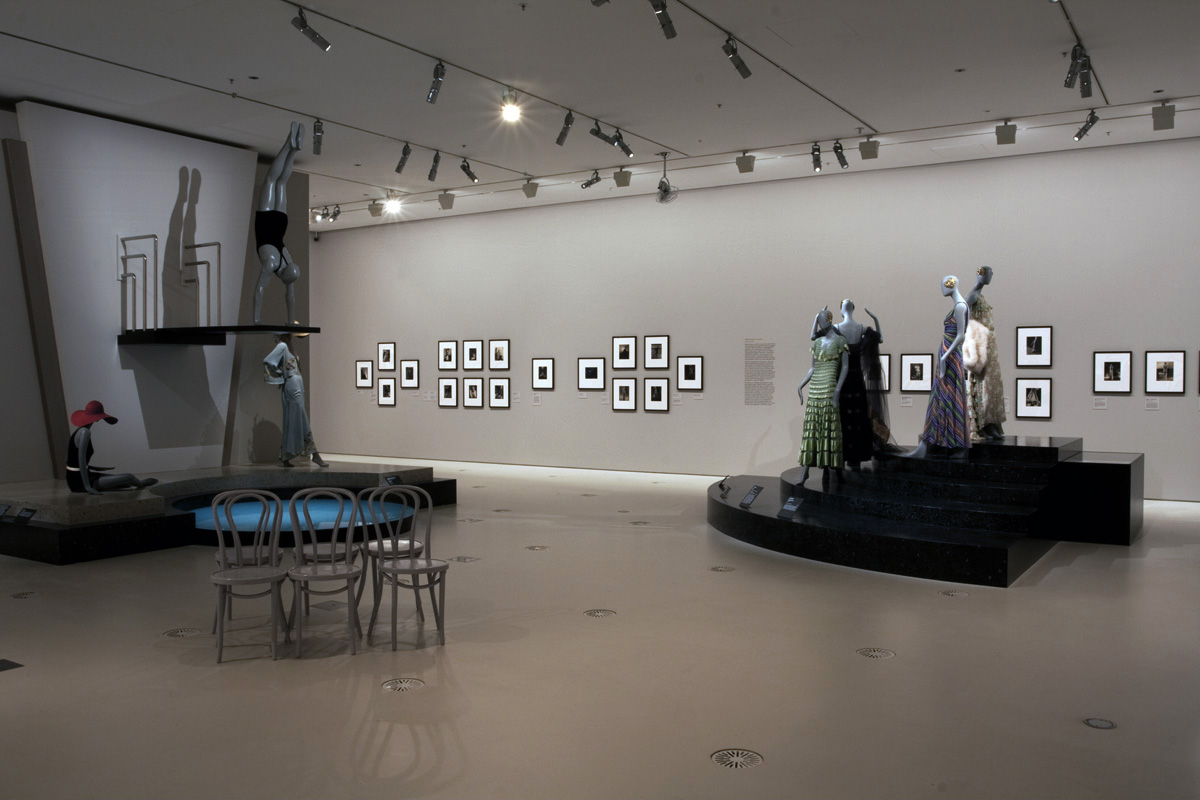
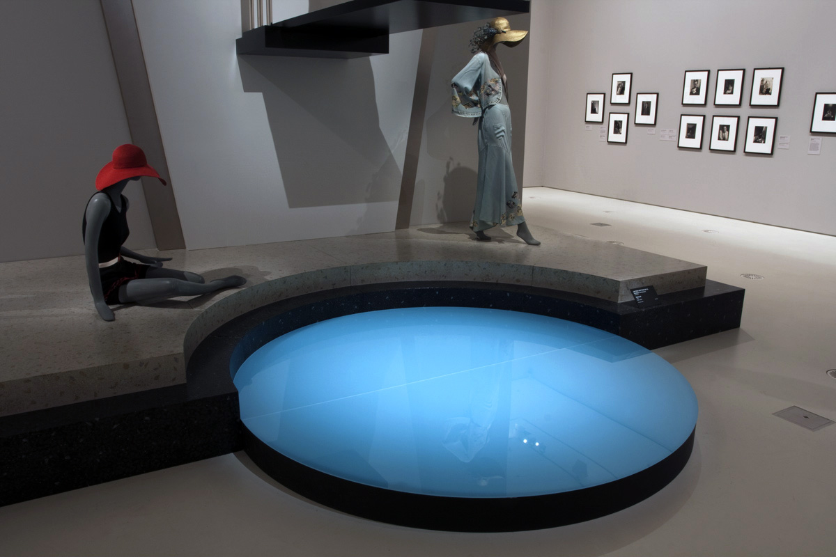
My Country, I Still Call Australia Home: Contemporary Art from Black Australia is the Gallery’s largest exhibition of contemporary art by Aboriginal and Torres Strait Islander artists to date. The exhibition examines the strengths of the Gallery’s holdings and explores three central themes – presenting Indigenous views of history (My history), responding to contemporary politics and experiences (My life), and illustrating connections to place (My country).
From paintings and sculptures about ancestral epicentres to photographs and moving-image works that interrogate and challenge the established history of Australia, to installations responding to political and social situations affecting all Australians, the thread that binds these artists is their collective desire to share their experiences and tell their stories.
“Drawing on three decades of research, collaboration and Collection development, My Country, I Still Call Australia Home highlights the connection Aboriginal and Torres Strait Islander artists have with country as both ‘land’ and ‘nation’, and features over 300 works by 116 artists from every state and territory,” Mr Saines said.
“Curated by Bruce McLean, a Wirri / Birri-Gubba man with heritage from the central coast of Qoeensland and the Gallery’s Curator of Indigenous Australian Art, the exhibition gives voice to artists who investigate historical and contemporary political and social issues. Many of these issues and works are confronting and controversial, and we are proud of the role our Gallery plays as a forum for discussion, debate and education.”
Mr Saines said the exhibition was divided in to three broad thematic strands that explore how Aboriginal and Torres Strait Islander artists depict the stories of their communities and highlight contemporary Indigenous experiences in Australia.
Press release from the Gallery of Modern Art (GOMA) website
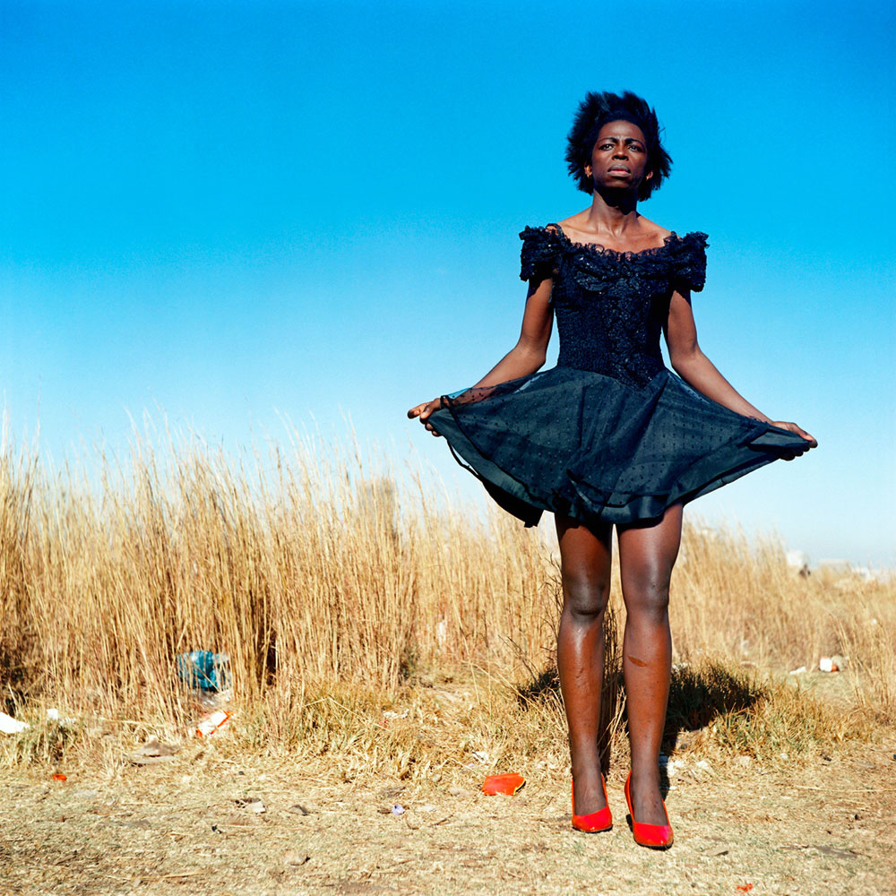
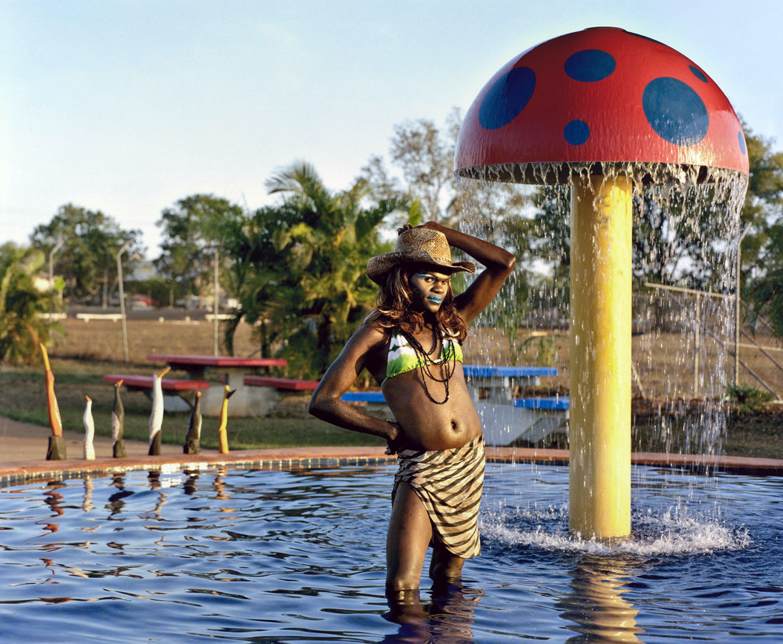
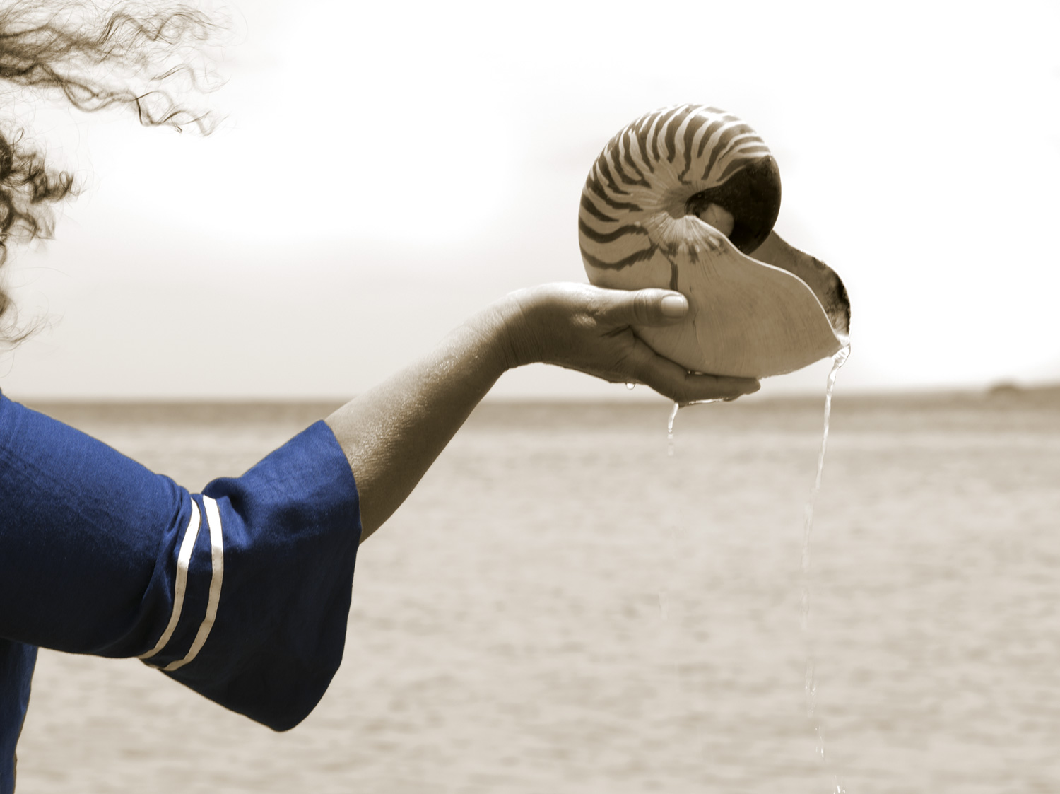
Michael Cook’s works depict an ethereal dreamworld, a timeless place that traverses both the colonial and contemporary worlds and is sustained on ‘what ifs’ and hypotheticals. It is a place of Cook’s own modern Dreaming. His central question is quite simple: what if the British, instead of dismissing Aboriginal society, had taken a more open approach to their culture and knowledge systems? This all-Aboriginal world is a sort of utopia where questions can be posed and answered without the complication of race – there is no black and white, no right or wrong. The figures within them are both conquerors and conquered. Through the use of images of Aboriginal people, often in roles opposite to the stereotypical, Cook ensures that an Aboriginal voice is ever-present.
Fiona Foley (Australian, Queensland/New South Wales b. 1964) Badtjala people, Wondunna clan, Fraser Island The Oyster Fishermen #1 2011 Inkjet print on Hahnemühle paper Purchased 2012 Queensland Art Gallery Foundation Collection: Queensland Art Gallery
Vernon Ah Kee (Australian, Queensland b. 1967) Kuku Yalanji/Waanyi/Yidinyji/GuuguYimithirr people Tall Man (still) 2010 Four-channel digital video installation from DVD Purchased 2012 Queensland Art Gallery Collection: Queensland Art Gallery
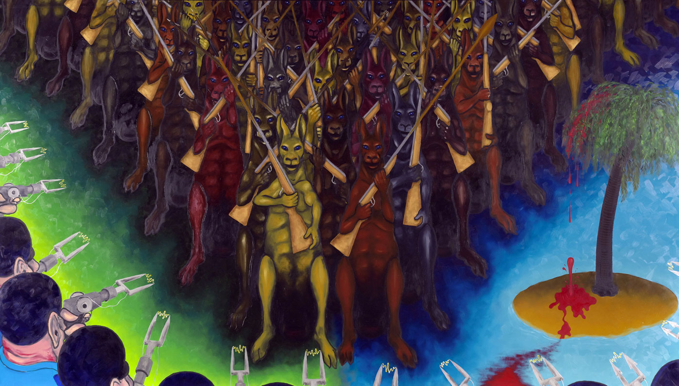
Gordon Hookey (Australian, Queensland/New South Wales b. 1961) Waanyi people Blood on the wattle, blood on the palm 2009 Oil on linen The James C Sourris, AM, Collection Gift of James C Sourris, AM, through the Queensland Art Gallery Foundation 2012 Donated through the Australian Government’s Cultural Gifts Program Collection: Queensland Art Gallery
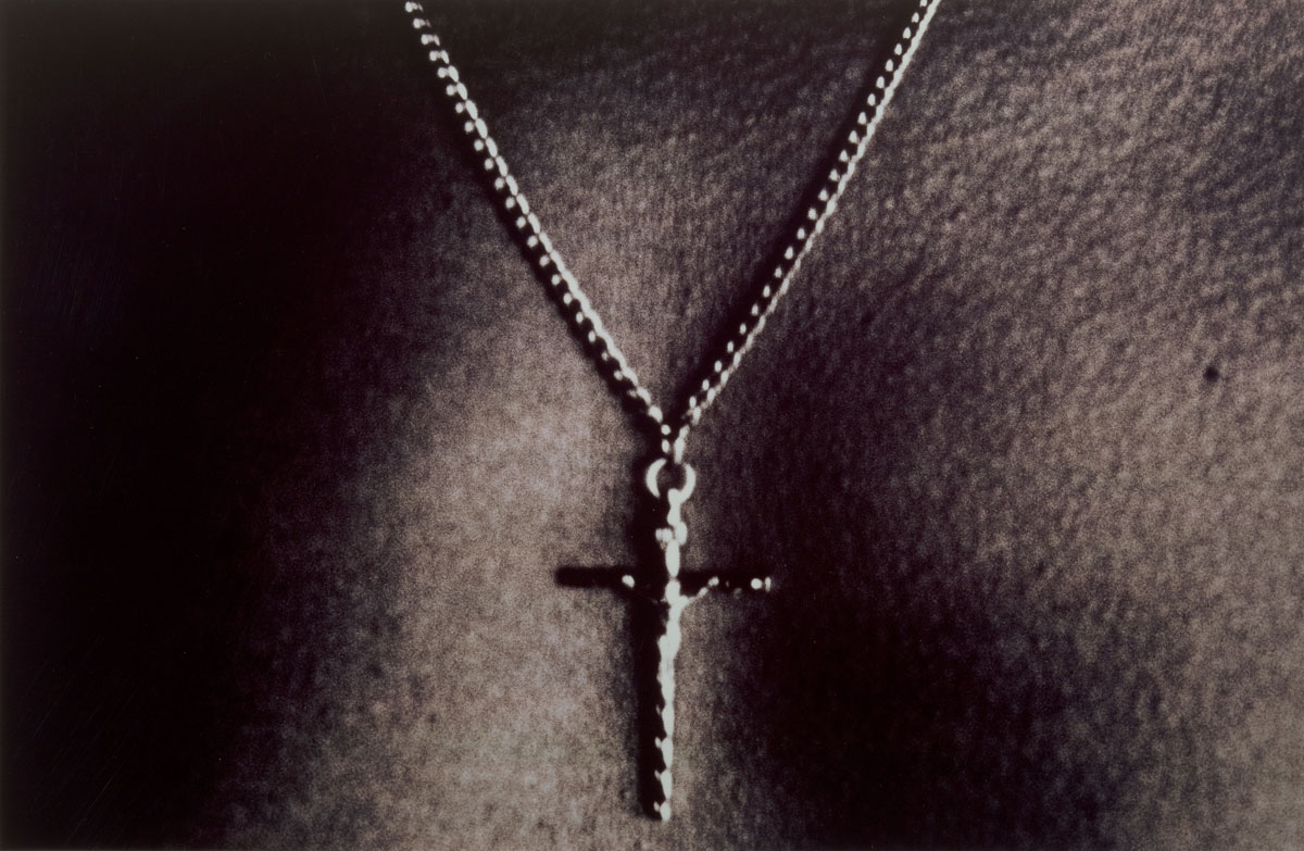
Michael Riley (Australian, New South Wales 1960-2004) Kamilaroi/Wiradjuri people Sacrifice (portfolio) (detail) 1993 Colour cibachrome photograph Purchased 2002 Collection: Queensland Art Gallery
Christian Thompson (Australian, Queensland/New South Wales/Victoria b. 1978) Bidjarra/Kunja people Black Gum 2 (from Australian Graffiti series) 2008 Type C photograph Purchased 2008 The Queensland Art Gallery Foundation Grant Collection: Queensland Art Gallery
The Queensland Art Gallery (QAG) and Gallery of Modern Art (GOMA) are located 150 metres from each other, on the south bank of the Brisbane River. Entrance to both buildings is possible from Stanley Place, and the river front entrance to the Queensland Art Gallery is on Melbourne Street. The Galleries are within easy walking distance to the city centre and South Bank Parklands.
This is a patchy exhibition by Michael Corridore at Edmund Pearce Gallery.
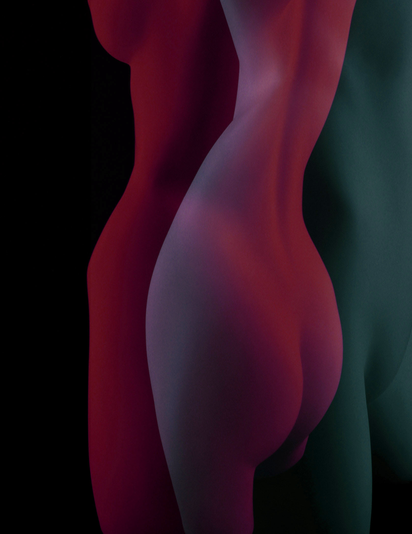
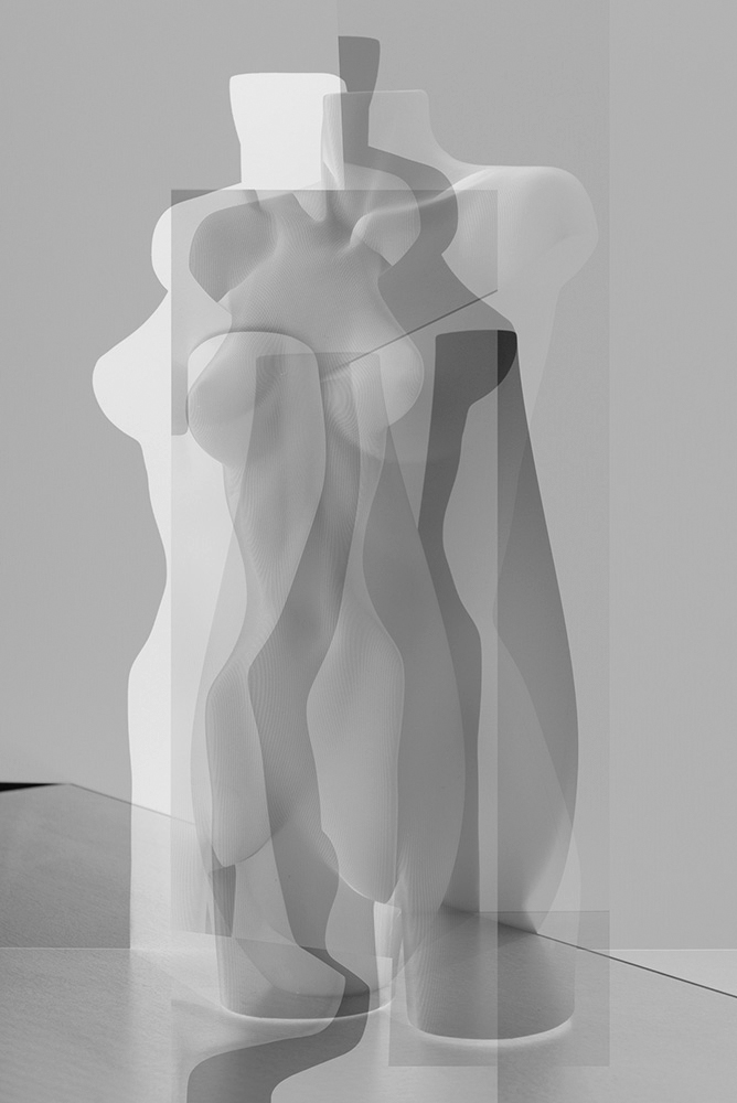
The four small images from the initial foray into digital collage (the photograph above and the top three photographs below, all 2001) are the most striking and effective works in the exhibition. Lucid in their Duchampian layering and movement, these beautiful photographs most clearly express the conceptual ideas behind the collages. The four pieces literally stopped me in my tracks when I saw them in the gallery space. The colours are bold, the overlapping and movement refined and the effect on this viewer was profound, so intense was the visualisation of the work.
The new photographs possess a different order of being. Subtle and requiring greater contemplation there were only five images that impinged on my consciousness in the rest of the exhibition (the first five photographs after the press release below, all 2013). Even the best of them seem more an exercise in the formal qualities of digital collage rather than the élan vital of the earlier work. While Corridore re-interprets “what we see from differing perspectives and synthesise[s] those components of our observations and memory information into a two-dimensional image,” what he produces are images that are not that memorable. Interesting exercises, perhaps, in the topography of being, but not that memorable or emotive as images.
The rest of the new photographs simply did not work for me. Either there was not enough for this viewer to hang his hat on (visually speaking) or the image was so subtle and occluded behind the glass of the frame that the viewer gets no feeling, no presence from the image at all. (Of course, this is the perennial difficulty of framing dark or subtle work in a gallery environment, the ability of the viewer to actually see the work if glass or perspex is placed in front of it. Either you pin the work to the wall, or frame it without glass, or mount on aluminium – unfortunately all but the latter precludes the easy sale to customers who want an artwork ready to purchase off the gallery wall). Tangentially speaking, it is as if the train of thought of the artist has wandered as he seeks other pathways to creation, pathways that fail to interestingly develop the initial topic of conversation.
It is all very well to go off at a tangent (defined as a line, curve, or surface meeting another line, curve, or surface at a common point and sharing a common tangent line or tangent plane at that point; a sudden digression or change of course), but the meeting point between artist’s intentions and the viewer’s reception have to at some point possess some common ground of interest and understanding. As it stands, I will always, always remember Corridore’s initial ‘fictional realities’ for their intensity and beauty but the later work will seep from my mind as easily as thought placed it there.
Dr Marcus Bunyan
Many thankx to Edmund Pearce Gallery for allowing me to publish the photographs in the posting. Please click on the photographs for a larger version of the image.
Although a departure from the Angry Black Snake series and ongoing landscape work, Tangents reflects Michael’s deep artistic practise and an ability to experiment confidently with different techniques and styles. Such strong technique reflects this photographer’s mastery of his craft.
Michael Corridore’s primary interest in his fine-art and commercial photography has been in inventing new narratives. Whether it is spectators shrouded in the smoke of burning rubber, his unique portraits of the famous and not so famous, capturing empty urban everyday spaces, or external landscapes that are at times exceptionally beautiful or beautifully strange and mysterious, you cannot help but be drawn in by Corridore’s ‘fictional realities’.
In this new series, Tangents,Corridore uses references to Cubism and art history, redefining such ideas in a modern photographic context. This project was commenced in 2000 and now in 2013 it has been fully realised by the artist due to advances in digital capture technology. Vibrant and subtle colour can now be fully preserved in the collage process.
“In this series of collages, I have returned to a series that I had started in 2000. The original series resulted in about a dozen or so photographs. My first attempts at collage were through printing negatives onto black and white Lithographic film and layering multiple sheets of those films onto a light box and photographing the assembled sheets as collages.
From there I decided to experiment with digital capture of the original components and assemble the layers in photoshop so that I could preserve colour, which was lost in the lithographic printing process. This was my first foray into working with digital capture technology.
In the past year I began to explore this collage process again photographing various forms working with life models, mannequins and various household objects which offered me the opportunity to explore both malleable and solid forms and shapes that could be layered together in the assembled collages.
This exploration in collage stems from my interest in the Cubists approach to re-interpreting what we see from differing perspectives and synthesise those components of our observations and memory information into a two-dimensional image.”
Many thankx to the Santa Barbara Museum of Art for allowing me to publish the photographs in the posting. Please click on the photographs for a larger version of the image.
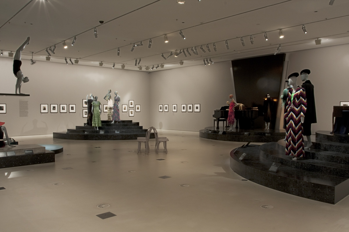
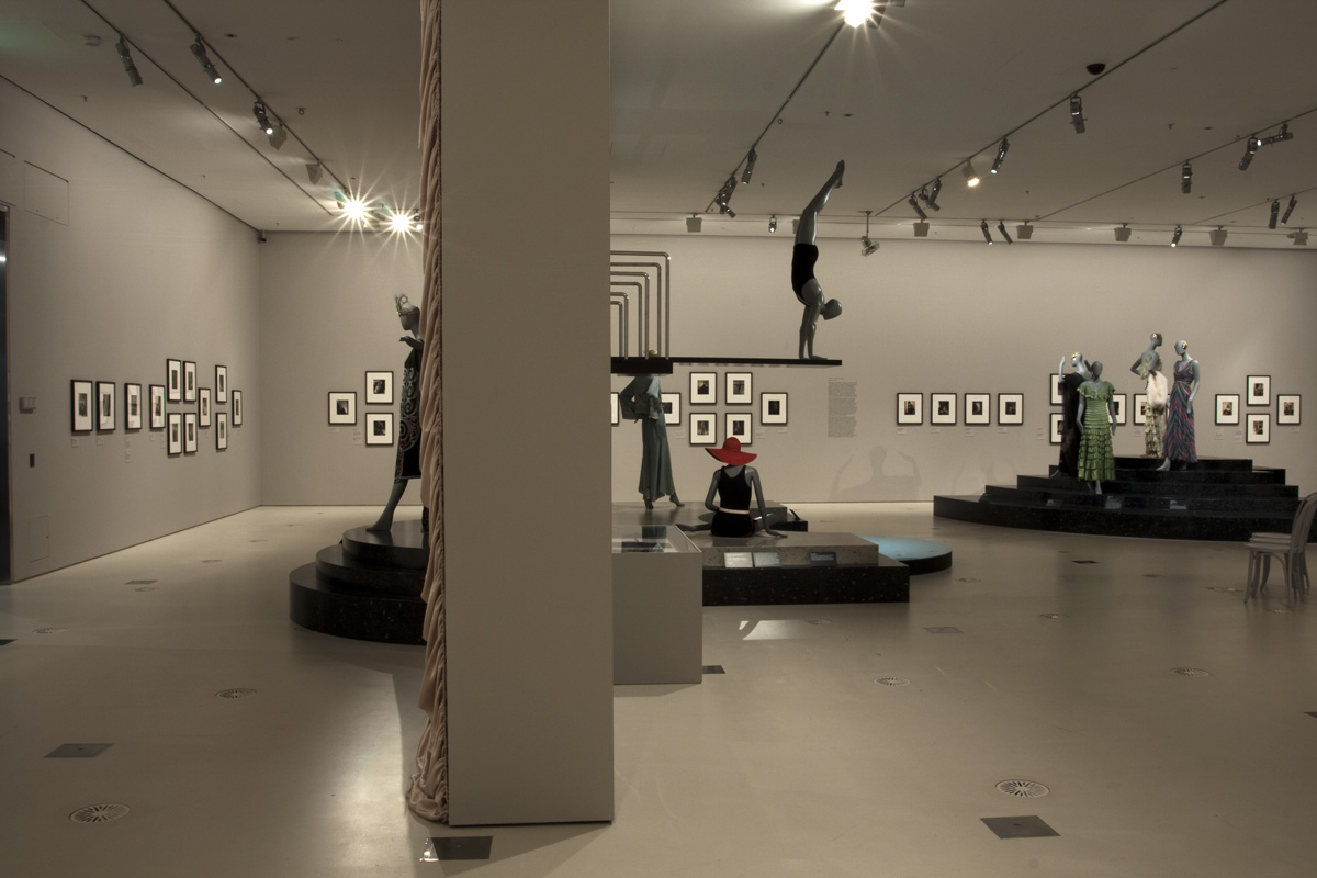
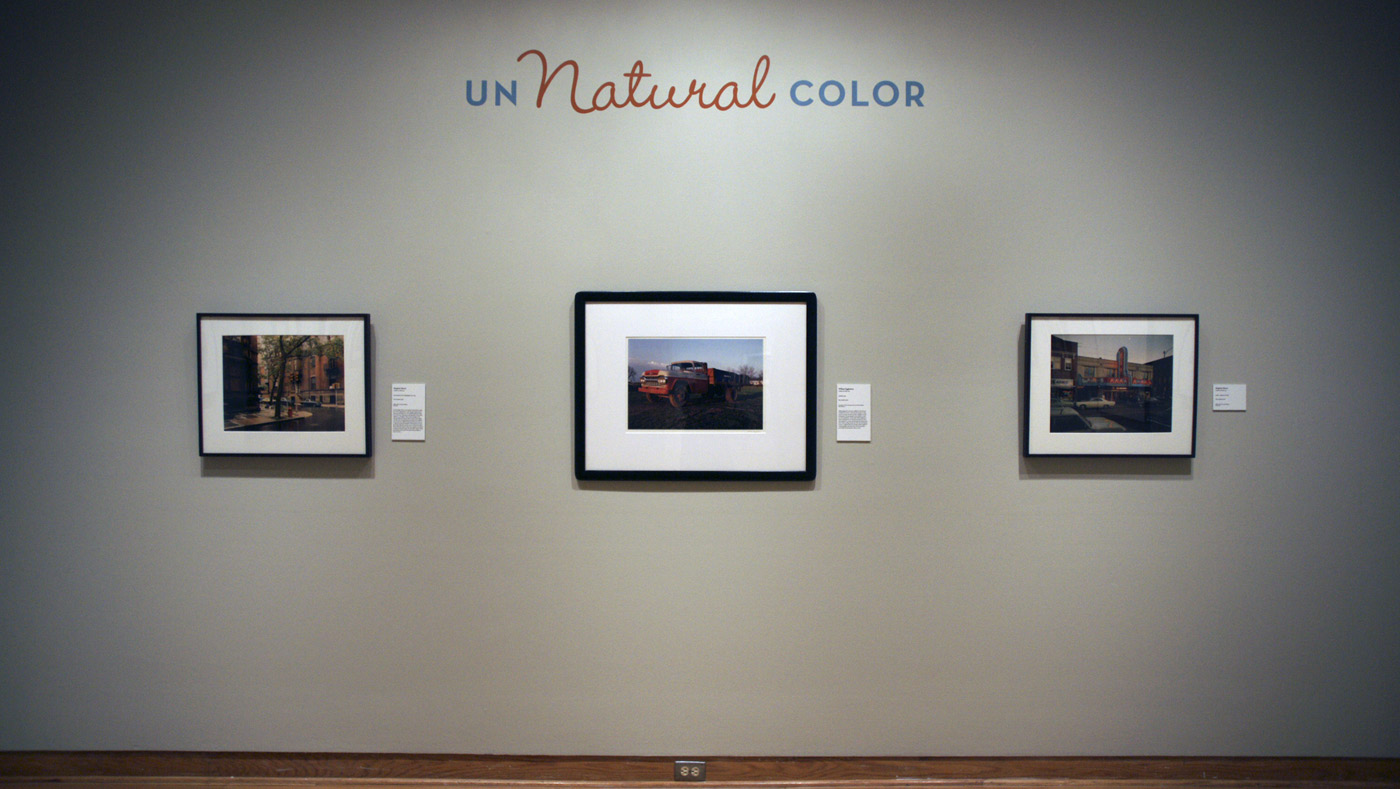
Installation photographs of the exhibition Un/Natural Color at the Santa Barbara Museum of Art
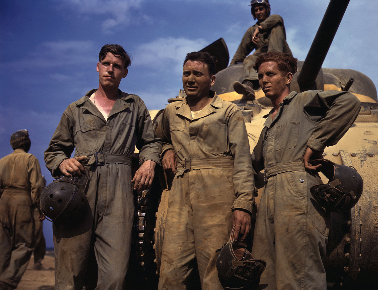
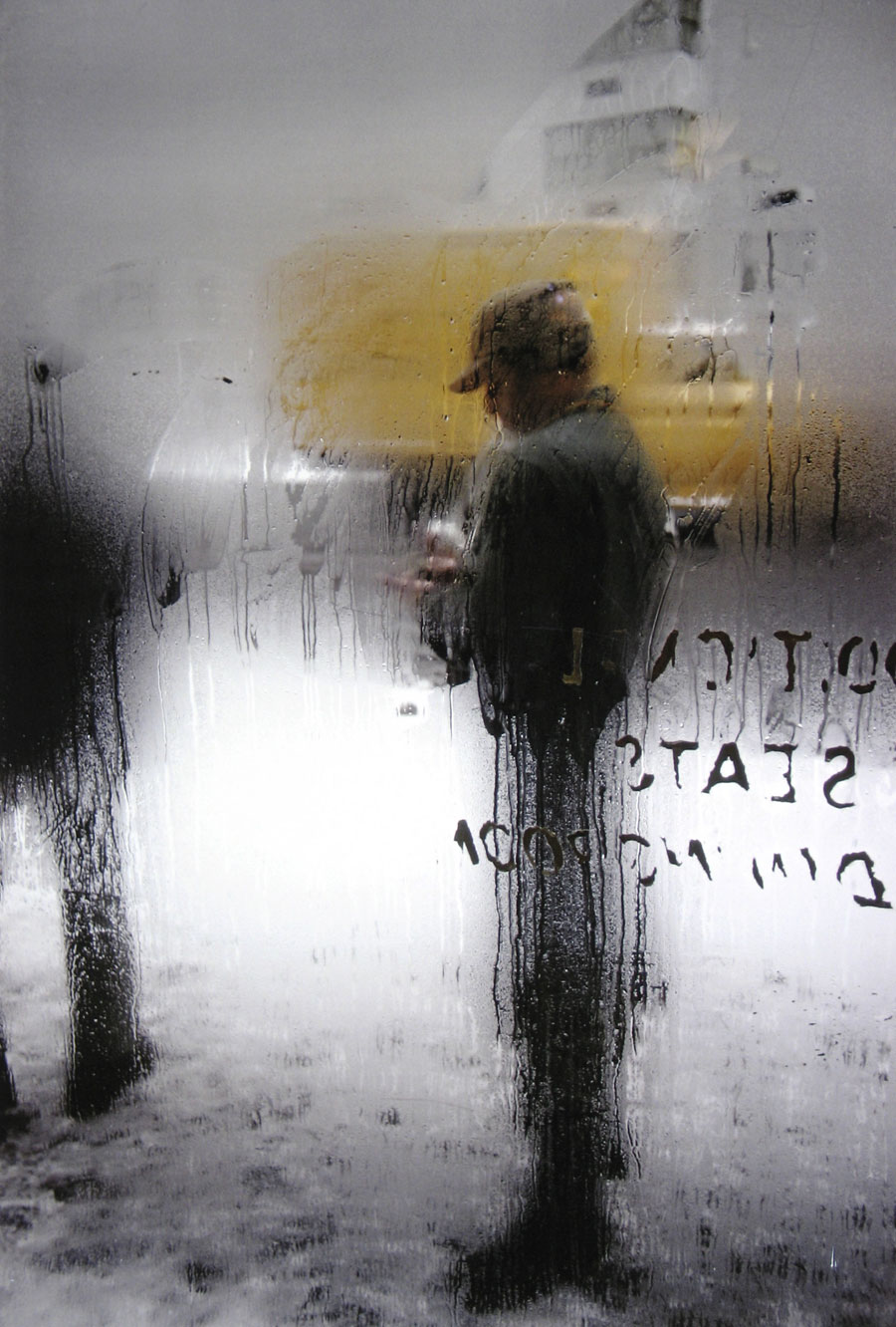
This exhibition looks at the powerful relationship between colour and memory by considering photographs and the ways in which their unique colour palettes evoke specific moments of the historical past. From the pastel hues of 19th-century hand-painted portraits, to the vibrant colours of late-1930s Kodachrome transparencies, and the faded, shifted tones of snapshots from the 1970s, different kinds of colour reproduction are closely associated with the time periods that they most frequently represent. Each experiment in colour photography was originally meant to convey a sense of the natural hues of the world, but as our expectations for realistic representation have evolved, these earlier technologies for representing colour have also taken on new meaning. Today, the distinctive colours found in many vintage photographs speak as loudly to contemporary viewers about the period in which they were made as the content that they render visible. The exhibition suggests that the aesthetics of colour are closely related to the evolution of photographic technology over the past 100 years, and encourages visitors to rethink the significance of colour in contemporary photography through the lens of its multi-coloured past. This exhibition was organised by Kim Beil, an art historian who teaches at the University of California, Santa Cruz.
Text from the Santa Barbara Museum of Art website
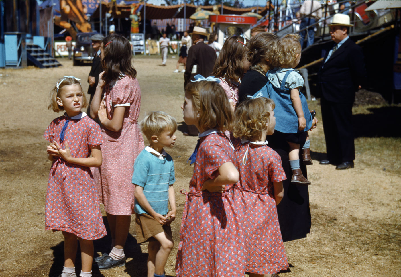
Jack Delano (American, 1914-1997) Barker at the Grounds of the Vermont State Fair, Rutland 1941, printed 1983 Dye transfer print Santa Barbara Museum of Art, Gift of the Bruce Berman and Nancy Goliger Berman Collection
Jack Delano (American, 1914-1997) At the Vermont State Fair, Rutland 1941, printed 1985 Dye transfer print Santa Barbara Museum of Art, Gift of the Bruce Berman and Nancy Goliger Berman Collection
William Eggleston (American, b. 1939) Farm truck, Memphis, Tennessee 1972 Dye-transfer print
Leroy Grannis (American, 1917-2011) Greg Noll Surf Team at Duke Kahanamoku Invitational, Sunset Beach 1966, printed 2005 C-print, ed. 1/9 Santa Barbara Museum of Art, Museum purchase with funds provided by Janet and Michael G. Wilson
LeRoy “Granny” Grannis (August 12, 1917 – February 3, 2011) was a veteran photographer. His portfolio of photography of surfing and related sea images from the 1960s enjoys a reputation that led The New York Times to dub him “the godfather of surfphotography.”
Un/Natural Color, an exhibition of colour photography from the Santa Barbara Museum of Art’s (SBMA) permanent collection, illustrates the history of colour photography since the 19th century and examines how the shifted or faded colours of old photographs can evoke moments in the historical past. Responding to the widespread use of nostalgic filters in popular photography and social media apps, such as Instagram and Twitter, this presentation enables visitors to see first-hand the historical processes that inspired the aesthetics of these digital manipulations. Despite their reputation for preserving memories and stopping time, photographs themselves are susceptible to material changes over time. These changes are often most visible in the radical colour shifts seen in old photographs, from the characteristic pink hue of snapshots from the 1950s to the yellowed borders and cool cast of prints from the 1970s. These changes also serve to complicate any simple belief in the ability of photography to faithfully represent the natural colours of the world.
While the exhibition includes a number of experimental early processes, including the chromolithographically-derived Photochrom process as well as an early Autochrome, the bulk of the imagery is drawn from the decades following the pivotal invention of Kodachrome, the first colour slide film, which was made commercially available in 1936. Because this film, as well as Kodacolor negative film (1942), was sent back to Eastman-Kodak for processing, photographers’ control over their imagery was greatly reduced, leading many art photographers to resist the transition to colour until decades later.
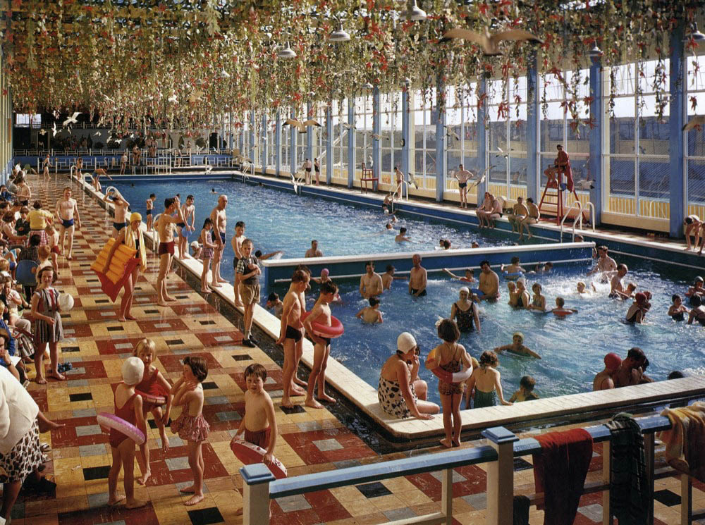
Un/Natural Color includes rarely-seen colour work by two notable documentary photographers of the Depression era, Jack Delano and Marion Post Wolcott. Both worked for the Farm Security Administration (a government program associated with the New Deal) and made limited use of colour film while on assignment documenting the effects of the Great Depression on rural American. Very few (if any) of these images were reproduced in the popular press, however, owing to the difficulty and cost of reproducing colour photographs, and to colour photography’s overwhelming association with commercial advertising at this time (as in Elmar Ludwig and Edmund Nägele’s image of the popular resort chain, Butlin’s).
The art establishment at large expressed little interest in colour photography until the mid-1970s, following the inclusion of colour work in two groundbreaking exhibitions: Stephen Shore’s vernacular landscapes in New Topographics: Photographs of a Man-Altered Landscape at the George Eastman House in Rochester, NY (1975) and the solo exhibition of William Eggleston’s colour photography at the Museum of Modern Art, NY (1976). Both of these important photographers are represented in Un/Natural Color, as well as work by photographers exploring similar uses of colour to record everyday American scenes, including Jeff Brouws, Jim Dow, and Joel Meyerowitz.
Prior to the 1970s, some tentative forays into colour photography were made by art photographers primarily known for their work in black-and-white (notably Harry Callahan), but colour was more often derided for its populist associations and was typically allied with either snapshot photography or advertising and Hollywood. The negative connotation that colour photography had acquired over the years in the art world was critical to its adoption by photographers like Shore and Eggleston, who used it to challenge conventional expectations for photographic art and to force viewers to look with new eyes at the familiar world around them.
An image such as Greg Noll Surf Team at Duke Kahanamoku Invitational, Sunset Beach by Leroy Grannis highlights the powerful ability of colour photography to summon a unique historical moment. It is not just the classic haircut and short surf trunks sported by the surf legend, Greg Noll, that situates this photograph in the 1960s. Colour photography at this time typically recorded colour in a highly saturated, though fairly uniform manner, leaving some aspects of this photograph looking flat, rather than mimicking the subtle modulation of tone that is more commonly associated with the perception of depth by human vision.
The characteristic manner by which different colour processes represent the colours of the world, as well as the changes that such colour photographs suffer over time, are powerful indicators of the photograph’s history. When we look at colour photographs, all of these markers are brought to bear on our interpretation of their subjects, leading us to question: what is natural colour anyway?
Press release from the Santa Barbara Museum of Art website
Roman Freulich (American born Poland, 1898-1974) Gloria Swanson Nd Dye transfer print Santa Barbara Museum of Art, Gift of Judith Caditz, Allan M. Caditz, Ellen Joan Abramson and Norman Abramson
Roman Freulich (1898-1974) was a photographer in the United States known for his movie stills and glamour shots. He immigrated from Poland.
William Edwin Gledhill (Canadian, 1888-1976) Amanda Duff 1935 Dye transfer print Santa Barbara Museum of Art, Gift of Keith Gledhill
In 1907, the recently married Carolyn and Edwin Gledhill opened their first portrait studio on Chapala Street [Santa Barbara], one block from the luxurious oceanfront Potter Hotel, a destination for wealthy and prominent visitors at the time. During an era of extensive industrial growth and expansion for many burgeoning California cities, Santa Barbarans instead made the collective choice to focus on the city’s architecture, civic value and pageantry, making it an ideal haven for a diverse and growing community of artists and professionals. This unique social climate allowed the Gledhills access to the cultural elite, both visitors and residents alike, from which they chose the subjects of their portraits.
The Gledhills were fairly radical for their time, which was reflected both in their craft and in their personal life. At the time of their marriage, Edwin was only 19, while Carolyn was already in her 30s. This age disparity, which might be viewed as unorthodox today, was borderline scandalous in the early 20th century.
Carolyn Gledhill also showed a propensity for early feminism in her work. Before her untimely death in 1935, she would pose many of her female subjects in subtly defiant ways, reflecting the fundamental shift in the paradigm of women’s roles in America during the 1920s.
Following Carolyn’s death, Edwin continued his work as a photographer and preservationist of Santa Barbara’s historic resources; he even served for many years as the executive director of the Santa Barbara Historical Museum, helping build it into the cultural institution it is today.
Elmar Ludwig (German, b. 1935) and Edmund Nägele (German, b. 1942) The Indoor-Heated Pool, Butlin’s Mosney Nd
Elmar Ludwig (born 1935) is a German photographer. Ludwig was born in Halle in 1935. In 1961, John Hinde recruited two German photographers, Ludwig (as head of photographic department) and Edmund Nägele, and one British, David Noble to expand his eponymous postcard business. Ludwig travelled the world for John Hinde, before establishing his own Munich studio at the end of the 1960s, focused on architecture, product and advertising photography.
Edmund Nägele FRPS is a German photographer. Nägele started his career in a Munich advertising studio, before relocating to Ireland. In 1962, John Hinde recruited two German photographers, Elmar Ludwig and Edmund Nägele and one British, David Noble to expand his eponymous postcard business. John Hinde Ltd. sent Nägele to Cyprus around 1969, where he recorded the life and scenery of this beautiful island. Large format film was used to produce postcard subjects, with colour separation and other post-processing being done in Milan – this included removing telegraph poles, television aerials and adding bright colours to vehicles and peoples clothing. Nägele is remembered for his elaborately staged, colour-saturated images of Butlin’s holiday camps taken in the 1960s.
Exhibition dates: 9th April – 29th September, 2013
Co-curators: Virginia Heckert, curator in the Department of Photographs at the J. Paul Getty Museum, and John Tain, assistant curator for Collection Development at the Getty Research Institute
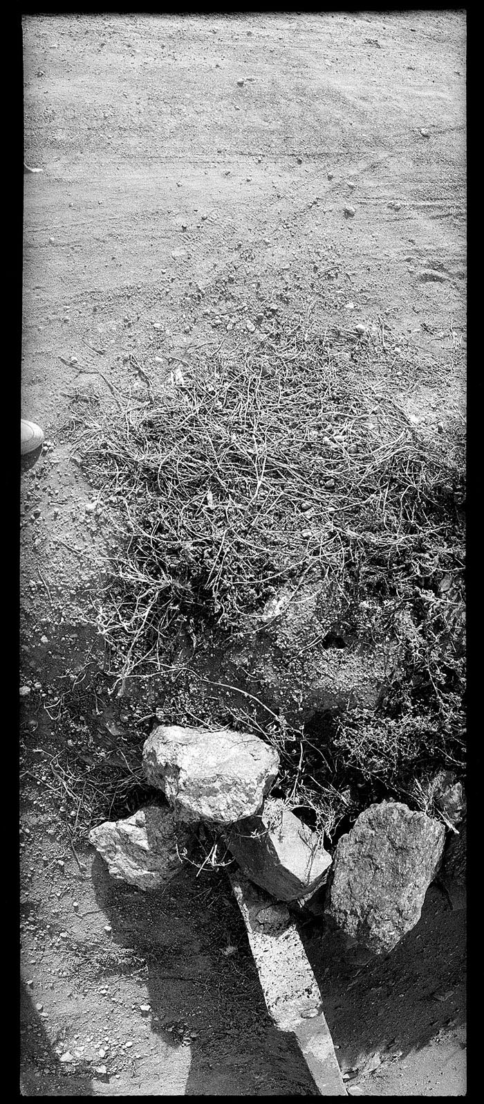
“Yes, there’s a certain power to a photograph. The camera has a way of disorienting a person, if it wants to and, for me, when it disorients, it’s got real value.”
“My pictures are not that interesting, nor the subject matter. They are simply a collection of “facts”; my book is more like a collection of “Ready-mades”.”
Ed Ruscha
Cultural curiosities. A language of the street.
Dr Marcus Bunyan
Many thankx to the J. Paul Getty Museum for allowing me to publish some of the photographs in the posting. The rest I sourced from the internet (and spent hours cleaning) to make a better posting about the exhibition. Please click on the photographs for a larger version of the image.
In Focus: Ed Ruscha, on view at the J. Paul Getty Museum, at the Getty Center, April 9 – September 29, 2013, offers a concentrated look at Ruscha’s deep engagement with Los Angeles’s vernacular architecture and the urban landscape. The exhibition is part of Pacific Standard Time Presents: Modern Architecture in Los Angeles, and opens simultaneously with Overdrive: L.A. Constructs the Future, 1940-1990, another exhibition presented at the Getty Museum as part of this regional initiative. The Overdrive exhibition also contains images by Ruscha.
One of the most influential American artists working today, Ed Ruscha moved to Los Angeles in 1956 and continues to live and work in the city, incorporating local architecture, streets, and even the city’s attitude into paintings, prints, drawings, and photographs that are known for their graphic directness. Beginning in the 1960s, he began publishing photo books and using photographs to document thoroughfares in the Los Angeles area.
“Throughout his career, photography has played an important role in Ruscha’s exploration of the vernacular architecture, urban landscape, and car culture of Los Angeles,” commented Timothy Potts, director of the J. Paul Getty Museum. “By bringing together photographs from our collection and archival materials from the Getty Research Institute, we have been able to present a much richer understanding of Ruscha’s work and process.”
Highlighting an important joint acquisition of the artist’s work by the J. Paul Getty Museum and the Getty Research Institute in 2011, this exhibition features a selection of vintage prints related to Twentysix Gasoline Stations (1963) and Some Los Angeles Apartments (1965), the original camera-ready maquettes for Every Building on the Sunset Strip (1966), and contact sheets from this documentation of the Pacific Coast Highway (1974). The exhibition is co-curated by Virginia Heckert, curator in the Department of Photographs at the Getty Museum, and John Tain, assistant curator in Collection Development at the Getty Research Institute.
“Gas stations and apartment buildings are among the quintessentially Southern Californian motifs that feature in Ruscha’s work,” says Heckert. “The Getty Museum’s acquisition of photographs made in conjunction with his photo books of the early 1960s gives us the opportunity to share his enthusiasm for the logos, signage, and language that enliven even the most banal architecture.”
Adds Tain, “What’s exciting about the photography that came out of Ruscha’s documentation of the Sunset Strip is that it really altered the sense of what was possible with street photography, which had always been from the viewpoint of the pedestrian. Today we have the Google Maps roving fleet of camera cars, but Ruscha was doing this kind of photography more than forty years ago.”
The exhibition gives visitors the opportunity to appreciate Ruscha’s photographs not as halftone reproductions in modest, mass-produced books, but as prints of the period. One of the best known images included in the exhibition is Standard, Amarillo, Texas (1962), which Ruscha used as the basis for his iconic oil painting Standard Station, Amarillo, Texas (1963). Other unpublished images from the iconic series of gasoline stations will be on view as well. Also included are the original camera-ready maquettes and press pulls for Every Building on the Sunset Strip, Ruscha’s fourth and arguably best-known photo book. Due to light sensitive annotations, each panel will be on view for eight weeks. The complete set of three maquettes will be on view during the first week of the exhibition only, April 9-14.
On display for the first time is a selection of contact sheets of the Pacific Coast Highway, representing a small sample of this monumental undertaking. Ruscha’s documentation captures the dramatically different landscapes of both the view west toward the Pacific Ocean and the view east toward the cliffs. The Pacific Coast Highway is just one of several streets that Ruscha has photographed over the past four and a half decades, beginning in 1965 with Sunset Boulevard. These contact sheets are part of Ruscha’s Streets of Los Angeles archive, including thousands of photographic negatives, proof sheets, contact prints, and related documents and ephemera, which was acquired by the Getty Research Institute in 2011. Nearly sixty photographs were acquired by the Getty Museum at the same time, making the Getty a preeminent resource for understanding the role of photography in Ruscha’s practice.
In Focus: Ed Ruscha is co-organised by the J. Paul Getty Museum and the Getty Research Institute, and features 50 works from both collections.
Press release from the J. Paul Getty Museum website
“The pity is that Jerrems died so young for what this exhibition brought home to me was that here was an artist still defining, refining her subject matter.” Dr Marcus Bunyan
Exhibition dates: 6th July – 30th September, 2013
A National Gallery of Australia exhibition
Curator: Gael Newton and Anne O’Hehir
PLEASE NOTE: THIS POSTING CONTAINS ART PHOTOGRAPHS OF FEMALE NUDITY – IF YOU DO NOT LIKE PLEASE DO NOT LOOK, FAIR WARNING HAS BEEN GIVEN
Carol Jerrems (Australian, 1949-1980) A poem (installation view)
1970
Gelatin silver photographs, letterpress, installed at Monash Gallery of Art Photograph: Katie Tremschnig
The one and only…
This is a fascinating National Gallery of Australia exhibition about the work of Australian photographer Carol Jerrems at Monash Gallery of Art, Wheelers Hill – in part both memorable, intimate, informative, beautiful, uplifting and disappointing. Let me explain what I mean.
The first section of the exhibition is devoted to Jerrems student work, notably her experiments with overlapping bodies, depth of field, movement and the layering of space and time that can be seen in her vibrant photo boooks and concertina books (see installation photographs below), accompanied by her own poems. This early work, which I had never seen, provides a wonderful insight into how the later images came to be: the shooting down hallways into the light, the pairing and tripling of bodies one behind the other, and how she constructed narrative in her later set piece photographs. This is the informative part of the exhibition.
As the exhibition moves on to the main body of Jerrems work there, in all their glory, are the famous images: Evonne Goolagong, Melbourne (1973), Flying dog (1973), Vale Street (1975), Mark and Flappers (1975), Mark Lean: rape game (1975), Mozart Street (1975), Butterfly behind glass [Red Symons from Skyhooks] (1975), Lyn (1976), Lyn and the Buick (1976), Dusan and Esben, Cronulla (1977), the self portraits and the lads with their car down by the river bank. These are memorable, intimate images, at the top of tree in terms of their importance as some of the greatest images taken by any Australian photographer of all time. They are right up there with the very best and there is no denying this. But what else is there? Take away the top dozen images of any photographer and look at the next twenty images. Now, what do you see? In Jerrems case, the results (as evidenced by this exhibition) are a little disappointing. Of course, this is not unusual with any artist.
In her low key, diaristic documentary style, Jerrems focuses on life before her lens. She finds joy, intimacy, love, danger, transgression and rape; she portrays women and gay liberation, youth on the streets, sharpies and the Indigenous population. As Christopher Allen notes, sexuality and its darker side was never far from the surface in Jerrems work and there was a “mix of defiance, erotic assertiveness and vulnerability of that time… [an] intimate closeness to the subject and the direct and unmodified transcription of the world before her.”1 Her intelligent imaging of everyday subject matter “produced a body of photographs that symbolised the hopes and aspirations of the counter-culture in Australia in the 1970s,” but this investigation did not produce particularly memorable photographs. Outside the top group of images I am struggling to remember her other images.
But what we must remember is that this Australia was another time and place. Art photography books had only just arrived in Melbourne in 1970 and Jerrems was one of the first women to point her camera at other women (producing with Virginia Fraser the book A Book About Australian Women in 1974) and people of the revolution. These are socially important documents in terms of Australian (photographic) history. I believe that she said to herself – I know who I am, but I want to know what other people are like – and she transcribed how she was thinking about the world to the people around her through her photographs. Building on the legacy of artists like Henri Cartier-Bresson, André Kertész and Robert Frank, her photographs are like an after-image of some other place, some other Australia that is only forty five years ago but now seems eons away in time and space.
What we take for granted, in terms of sexual liberation, freedom of action and speech, she had to fight for. She had to fight for photographic, conceptual and technical knowledge to arm herself as an intelligent women (for that is what she was), so that she could image / imagine the world. She had to fight damn hard for these things – and then she upped the ante and pushed even harder, even further. These are dangerous photos, for women and gay men were vulnerable and threatened, marginalised and they were a target. Even in the act of photographing, her going into these places (brothels for example), she would have been a target. Does this make for memorable photographs? Not necessarily, and you can see this in the unevenness of the results of her investigation. But socially, these are very important images.
The pity is that she died so young for what this exhibition brought home to me was that here was an artist still defining, refining her subject matter. She never had to time to develop a mature style, a mature narrative as an artist (1975-1976 seems to be the high point as far as this exhibition goes). This is the great regret about the work of Carol Jerrems.
Yes, there is some mediocre work in this exhibition, stuff that really doesn’t work at all (such as the brothel photographs), experimental work, individual and collective images that really don’t impinge on your consciousness. But there are also the miraculous photographs (and for a young photographer she had a lot of those), the ones that stay with you forever. The right up there, knock you out of the ball park photographs and those you cannot simply take away from the world. They live on in the world forever.
Does Jerrems deserve to be promoted as a legend of Australian photography as some people are doing? Not on the evidence of this exhibition, but my god, those top dozen or so images are something truly special to behold. Their ‘presence’ alone – their physicality in the world, their impact on you as you stand before them – guarantees that Jerrems will forever remain in the very top echelons of Australian photographers of all time not as a legend, but as a women of incredible strength, intelligence, passion, determination and vision.
Dr Marcus Bunyan
1/ Allen, Christopher. “Between suburbia and radicalism,” in The Australian newspaper, October 20th, 2012 [Online] Cited 20/09/2013 no longer available online.
Many thankx to Mark Hislop for his help and Monash Gallery of Art for allowing me to publish the photographs in the posting. Please click on the photographs for a larger version of the image.
Carol Jerrems (Australian, 1949-1980) A poem 1970 Gelatin silver photographs, letterpress, installed at Monash Gallery of Art Photo: Katie Tremschnig
Carol Jerrems (Australian, 1949-1980) Jim Fields, a portrait (installation view) 1970 Gelatin silver photographs, letterpress, installed at Monash Gallery of Art Photo: Katie Tremschnig
Carol Jerrems (Australian, 1949-1980) The Royal Melbourne Show…1968, an essay (L) and Movement with Zara (R) 1968 Gelatin silver photographs, letterpress, installed at Monash Gallery of Art Photo: Katie Tremschnig
Living in the seventies
Carol Jerrems’s gritty, poetic and elusive images show people trying to find a new way of life and action in the 1970s. Her images have come to define a decade in Australia’s history. In contrast to an earlier generation of internationally renowned magazine photojournalists such as David Moore, the new generation did not seek commissioned commercial or magazine work and took instead a low key intimate approach with a diaristic personal-documentary style of imagery focussed on themselves and their own, mostly urban, environments. Jerrems put her camera where the counter culture suggested; women’s liberation, social inclusiveness for street youths and Indigenous people in the cities who were campaigning for justice and land rights.
Carol Jerrems was the first contemporary Australian woman photographer to have work acquired by a number of museums including the National Gallery of Australia. The National Gallery holds an extensive archive of Jerrems photographs and film work gifted by the artist’s mother Joy Jerrems in 1983. The current exhibition concentrates on prints signed or formally exhibited, by Carol Jerrems in her lifetime dating from 1968-1978. MGA is the only Victorian venue to host the National Gallery of Australia’s major new exhibition Carol Jerrems: photographic artist. This extraordinary exhibition tells the story of Jerrems’ complex and highly influential practice. Drawn from the National Gallery of Australia’s massive holdings of the artist’s work, Carol Jerrems: photographic artist features more than 100 works, most of which have not been seen in Melbourne since Jerrems lived here during the late ’60s and ’70s.
Jerrems was born in Melbourne in 1949 and studied photography at Prahran Technical College under Paul Cox and Athol Shmith. Although she practised as an artist for only a decade, Jerrems has acquired a celebrated place in the annals of Australian photography. Her reputation is based on her intensely compassionate, formally striking pictures, her intimate connection with the people involved in social movements of the day, and her role in the promotion of ‘art photography’ in this country.
Jerrems was one of several Australian women whose work during the 1970s challenged the dominant ideas of what a photographer was and how they worked. She adopted a collaborative approach to making photographs, often featuring friends and associates, and sought a photographic practice that would bring about social change. Her gritty, poetic and elusive images show people trying to find a new way of life in the 1970s. Her images have come to define Melbourne in a decade of great social and political upheaval.
Carol Jerrems: photographic artist pays tribute to this important period in recent Australian history, showing how Jerrems participated in and helped to define Melbourne’s subculture and style in the 1970s. MGA Director Shaune Lakin said Jerrems’ vision would particularly resonate with Melbourne audiences, especially as her vision was revealed across the full breadth of her work. “Carol Jerrems: photographic artist is a perfect story for MGA to tell, as it is also the story of Melbourne in the 1970s. Jerrems captured Melbourne’s sub-cultures – sharpies, mods, hippies, feminists and gay liberationists – with powerful images that engage the viewer intimately with her subjects.”
As Dr Lakin notes, this is a rare chance to see the works Jerrems intended for exhibition: “Carol Jerrems: photographic artist concentrates on prints signed or formally exhibited by Jerrems in her lifetime, most returning to Melbourne for the first time. In addition to many of the images for which Jerrems is rightly famous, visitors to MGA can see Jerrems’ early work, including her extraordinary concertina books and other photo books,” Lakin said.”
Press release from the Monash Gallery of Art website
From the outset, Jerrems was interested in the expressive possibilities of the photographic medium, declaring that she was ‘an artist whose tool of expression is the camera’. She concentrated on photographing people; her subjects included her students, and her friends and acquaintances. Her first photographs were documentary in style, but by the mid-1970s the scenes she photographed were often contrived. She used a non-exploitative approach, based on the consent of her subjects. For Jerrems, photography had a crucial social role: ‘the society is sick and I must help change it’. Her photographs were a means of ‘bringing people together’ and offered affirmative views of certain aspects of contemporary life. With Virginia Fraser, she published A Book About Australian Women (Melbourne, 1974), to which she contributed the photographs…
Although one critic regarded her work as uneven – ‘she took a casual approach’ – Jerrems’s talents as a photographer were widely recognised. With her camera ‘firmly pointed at the heart of things’, she produced a body of photographs that symbolised the hopes and aspirations of the counter-culture in Australia in the 1970s.
Exhibition dates: 27th August – 21st September, 2013
Curator: Marcus Bunyan
Andrew Follows (Australian, d. 2019) Number 31, Eltham 2013 Digital photograph on archival cotton rag 130 cm x 86.5cm
Only 2 days to go before the ending of Andrew Follows’ exhibition Density at Anita Traverso Gallery, 7 Albert Street Richmond.
You have to see these images in person, they are impressively immersive!
Dr Marcus Bunyan
PS. Preview all the images in the exhibition and read the catalogue essay at this previous posting. Please click on the photographs for a larger version of the image.
Curators: Daniel Birnbaum, Lena Essling, Gunnar B. Kvaran, and Hanne Beate Ueland in collaboration with the artist
Cindy Sherman (American, b. 1954) Untitled #92 1981 Chromogenic colour print 61 x 121.9cm The National Museum of Art, Architecture and Design, Oslo
Like a mouthful of cinders.
Dr Marcus Bunyan
Many thankx to the Astrup Fearnley Museet for allowing me to publish the photographs in the posting. Please click on the photographs for a larger version of the image.
Cindy Sherman (American, b. 1954) Untitled #167 1985 Chromogenic colour print 150 x 225cm Astrup Fearnley Collection
Cindy Sherman (American, b. 1954) Untitled Film Still #32 1979 Gelatin silver print 69.5 x 87.2cm Astrup Fearnley Collection
Cindy Sherman (American, b. 1954) Untitled #150 1985 Chromogenic colour print 121 x 163.8cm Collection of Cynthia and Abe Steinberger
Cindy Sherman (American, b. 1954) Untitled Film Still #56 1980 Gelatin silver print 15.5 x 22.8cm Moderna Museet Donation from The American Friends of the Moderna Museet, Inc., 2010
Cindy Sherman (born 1954) is one of the leading and most influential artists of our time. She belongs to a generation of postmodern artists who redefined the photograph and its place in an ever more visually oriented culture. Taking female roles in photographic representations as her starting point, Sherman creates recognisable pictures that mirror the human condition in its many nuances. Sherman’s pictures became key works in a time of turbulence for the very concept of art, and continue to challenge concepts of representation, identity and portrait.
Cindy Sherman’s allegorical pictures reflect our own conception of the world and open up for new interpretations of familiar phenomena. She uses herself as a model and equally portrays film stars and pin-up girls, as well as abnormal monsters from fantasy worlds. Sherman’s assertive use of masks, wigs and prosthetics has a disturbing effect, which is further reinforced in pictures where the human presence is gradually reduced in favour of posed dolls or traces of waste and decay.
The exhibition Cindy Sherman – Untitled Horrors has been composed to emphasise the disturbing, grotesque and disquieting sides of Sherman’s pictures. These are aspects that are visible in her exploration of well-established photographic genres such as film stills, fashion photography or classic portraits, as well as in series with titles such as Fairy Tales, Disasters, Sex Pictures, Civil War and Horror & Surrealist. This exhibition seeks to highlight these key aspects in her artistry and to examine their relevance through a dedicated selection of works from the beginning of her career in the mid-1970s up to the present day.
In conjunction with the exhibition, a richly illustrated catalogue is being published in cooperation with art publishers Hatje Cantz Verlag. The idea behind the catalogue is to explore and examine the more disquieting sides of Sherman’s art by inviting contributions from authors who have touched on similar themes in their own works. Contributors are well-known artists, dramatists and authors including Lars Norén, Miranda July, Sibylle Berg, Sjón, Sara Stridsberg, Karl Ove Knausgård and Kathy Acker.
Press release from the Astrup Fearnley Museet website
Cindy Sherman (American, b. 1954) Untitled #402 2000 Chromogenic colour print 88 x 60cm Astrup Fearnley Samlingen / Collection
Cindy Sherman (American, b. 1954) Untitled #132 1984 Chromogenic colour print 176.3 x 119.2cm Kunsthaus Zürich
Cindy Sherman (American, b. 1954) Untitled #199-A 1989 Chromogenic colour print 63.3 x 45.7cm Astrup Fearnley Collection
Cindy Sherman (American, b. 1954) Untitled #152 1985 Chromogenic colour print 184.2 x 125.4cm Astrup Fearnley Samlingen/ Collection
Cindy Sherman (American, b. 1954) Untitled #470 2008 Chromogenic colour print 216.5 x 147.5cm Acquired with founding from The American Friends of the Moderna Museet Inc.,
Many thankx to the Delaware Art Museum for allowing me to publish the photographs in the posting. Please click on the photographs for a larger version of the image.
In the early 20th century, between the two world wars, Paris saw a fervour of change. From 1910 to 1940, the city became a creative epicentre for artistic exploration, attracting international avant-garde artists – including photographers experimenting with Surrealism, Modernism, and the new reportage. French Twist: Masterworks of Photography from Atget to Man Ray, on view at the Delaware Art Museum from June 29, 2013 through September 15, 2013, features 100 vintage prints from this golden age of French photography and explores the variety and inventiveness of native and immigrant photographers working in France in the early 20th century.
This exhibition presents a number of themes that capture the flavour and nightlife of Paris at this exciting moment. “Life of the Streets,” “Diversions,” and “Paris by Night” are just some of the topics that these masterful photographs explore. Visitors will experience Eugène Atget‘s lyrical views of Paris streets and gardens, Man Ray‘s surrealist experiments, and Henri Cartier-Bresson‘s pioneering photojournalism, as well as works by Ilse Bing, Brassaï, Jacques-Henri Lartigue, André Kertész, and Dora Maar. Many of these artists settled in France for life, while others, fleeing the Nazis, brought their Paris‐trained sensibilities and influences to America.
Eugène Atget
The exhibition opens with one of the most significant figures in the history of photography, Eugène Atget, whose work influenced a range of artists from Surrealists to documentary photographers. This selection encompasses pictures of city streets, architectural details, and the gardens at Versailles and includes one of his most famous photographs, Boulevard de Strasbourg, Corsets (1912).
La vie de la rue (Life of the Street)
This section includes images of the streets and buildings of Paris – of the bustling Champ-de-Mars and the deserted Avenue du Maine – and features a large selection of photographs by Ilse Bing. In her modernist views of urban architecture, Bing provides a modern take on the old city through unexpected angles and dramatic cropping.
Divertissement (Diversions)
Divertissement focuses on the myriad amusements available in the City of Lights. Lartigue provides an insider’s view of upper-class life in the Belle Epoque, while Bing and Brassaï chronicle the attractions of the dance hall, the theatre, and the street.
Henri Cartier-Bresson
The master of the “decisive moment” and one of the most significant photojournalists of the 20th century, Henri Cartier-Bresson is featured along with 17 famous photographs from his travels around the world. This section includes his stellar images of the Spanish Second Republic and his iconic view of the coronation of George VI in London.
Les basses classes (The Lower Classes)
Between the wars, photographers from Ilse Bing to Andre Kertész to Brassaï chronicled lives of poor Parisians, often bringing a Modernist sensibility, rather than a reformer’s eye, to scenes of urban poverty.
Paris de nuit (Paris by Night)
In 1933 Brassaï released his photo book Paris by Night, which chronicled the city’s streets and amusements after dark. The book became an immediate success and Brassaï became famous as the foremost photographer of the city’s bars and brothels, performers, and prostitutes.
L’art pour l’art (Art for Art’s Sake)
This section focuses on the technical experimentation and virtuoso technique of photographers including Pierre Dubreuil, Edward Steichen, and Pal Funk Angelo. It features examples of unusual techniques like cliché-verre, solarisation, and oil printing.
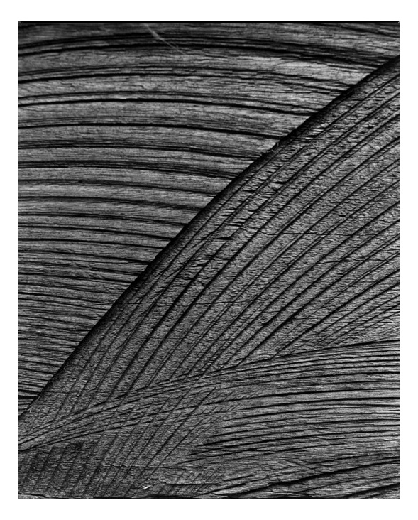
Cliché verre is a combination of art and photography. In brief, it is a method of either etching, painting or drawing on a transparent surface, such as glass, thin paper or film and printing the resulting image on a light sensitive paper in a photographic darkroom. It is a process first practiced by a number of French painters during the early 19th century. The French landscape painter Jean-Baptiste-Camille Corot was the best known of these. Some contemporary artists have developed techniques for achieving a variety of line, tone, texture and colour by experimenting with film, frosted Mylar, paint and inks and a wide assortment of tools for painting, etching, scratching, rubbing and daubing.
Andre Kertész, Dora Maar, Man Ray
These three important photographers – all immigrants to Paris between the Wars and all involved in Surrealist movement – are featured in individual sections that highlight their most famous works. Kertész is represented by his photographs of the painter Piet Mondrian’s studio. Maar’s Surrealist street photographs capture her dark humor, and a full complement of Man Ray’s experimental and psychologically charged images summarize his photographic interests.
La figure (Portraits and Nudes)
La Figure showcases experimental approaches to the classic subject of the female nude, including a cameraless photograph and a solarisation by Man Ray and a distortion created with fun-house-type mirrors by Kertész.
Ilse Bing (German, 1899-1998), nicknamed the “Queen of the Leica” after her camera of choice, moved to Paris in 1930 and immersed herself in its cultural milieu, interacting with painters like Pavel Tchelitchev and fashionistas Elsa Schiaparelli and Carmel Snow. The decade she spent in France is considered the high point of her artistic career.
Dora Maar (French, 1907-1997) created startlingly imaginative Surrealist photographs under the tutelage of Man Ray. However, she is best known as Picasso’s lover, muse, and “Weeping Woman” from 1936 to 1943. Her photographs documenting Picasso’s creation of Guernicahang alongside the painting in the Reina Sofía museum in Madrid.
Jacques‐Henri Lartigue (French, 1894-1986), considered by many to be a child prodigy, received his first camera as a gift when he was six years old and immediately set to work documenting the activities of his energetic family and circle of friends. Lartigue’s light‐hearted snapshots capture the essence of France’s Belle Époque, the halcyon period before World War I when it seemed that modernity would bring nothing but progress and delight.
Text from the Delaware Art Museum
Eugène Atget (French, 1857-1927) Boulevard de Strasbourg Corsets 1912 Printing-out paper 8 3/4 x 7 inches Collection of Michael Mattis and Judith Hochberg
Eugène Atget (French, 1857-1927) Rue Egynard 1901 Albumen print 8 1/4 × 7 in. (21 × 17.8cm) Collection of Michael Mattis and Judith Hochberg
Edward Steichen (American, 1879-1973) Three Pears and an Apple, Voulangis, France 1921 Gelatin silver print 14 x 11 inches Collection of Michael Mattis and Judith Hochberg
Some of these cars are just ravishing (my favourite is the Hispano-Suiza H6B Dubonnet “Xenia” Coupe, 1938) and the elegant photographs, including some wonderfully framed detail shots, highlight the sensuousness of these objects of desire.
Notice the almost negligible rear view windows in most of the cars.
What happened to this kind of style detail in today’s cars?
Dr Marcus Bunyan
Many thankx to The Frist Center for the Visual Arts for allowing me to publish the photographs in the posting. Please click on the photographs for a larger version of the image.
Ettore Bugatti lived on a baronial estate in Alsace-Lorraine in eastern France. His father Carlo created elegant, Art Deco style furniture. His younger brother Rembrandt was an accomplished sculptor of animals. Although he was trained as an apprentice engineer, Ettore possessed the dreamy soul of an artist. From 1911 to 1939, he built hand-crafted automobiles of sporting competence, which, thanks to the styling talents of Ettore’s young son Jean, were also hauntingly beautiful.
Working with factory designer Joseph Walter, Jean Bugatti initially designed an Art Deco Superprofile coupe with rakish, valance-free fenders, a steeply canted windscreen, a roof with a perfect radius, and dramatic sweep panels. This has been called by Paul Kestler, author of Bugatti: Evolution of Style, “one of the landmarks in coach building history, made at the moment when classic lines were yielding to something more aerodynamic.” Only a few Superprofile coupes were built. One original survives in the Louwman Collection, Netherlands.
Inspired by the earlier Superprofile design, Walter and Bugatti’s Semi-profile coupes like the one in this exhibition had a more practical and equally attractive notchback rear treatment and twin exposed spare wheels. The chassis of this Bugatti Type 46 was made in 1929 and bodied in 1934 in Czechoslovakia by coach builder Oldřich Ulik. Originally a two-door sedan, it was re-bodied by Barry Price, with period-perfect coachwork in the exact style of Jean Bugatti’s Semi-profile coupe. The interior is elephant hide leather. In Bugatti circles, a magnificent re-creation like this one is welcomed, when it is done so beautifully.
valance-free fenders: this type of motor vehicle wheel covering did not make use of the then popular valance, a piece of metal added to the side of the fender that prevented splashing along the body
Errett Lobban Cord rose to national prominence after rescuing the Auburn Automobile Company of Auburn, Indiana, in 1928. Seeing an opportunity for a uniquely engineered luxury automotive brand, Cord encouraged Fred and August Duesenberg to build what he envisioned as America’s finest motorcar.
Noted race car constructor Harry A. Miller and his associates were retained by Cord to engineer a radical front-drive chassis. The innovative and luxurious L-29 Cord, unfortunately introduced just as the New York Stock Market crashed, combined its engine, transaxle, and clutch into one co-located assembly, eliminating a conventional driveshaft. This permitted a 10-inch lower chassis and necessitated a lengthy hood that appeared even longer because the designer, Al Leamy, surrounded the radiator with an integrated sheet-metal assembly, finished to match the car’s colour.
The lowslung Cord’s bodylines were exquisite. Features include an Art Deco styled transaxle cover, an elegant streamlined grille that evoked the styling of Harry Miller’s racing cars, sweeping clamshell fenders, sleek body side reveals which accentuated the car’s length, and a low roofline. These are embellished by myriad Art Deco styled details ranging from accented fender trim, tapered headlamp shapes, etched door-handle detailing and tiny, but exquisite instrument panel dials.
The L-29 Cord’s art moderne styling and engineering prowess attracted buyers of taste and style who were not afraid to try something different. Owners included the era’s most prominent and controversial architect, Frank Lloyd Wright, who bought a new L-29 Convertible Phaeton in 1929 and drove it for many years. This stunning cabriolet, was purchased in the 1950s by the Frank Lloyd Wright Foundation, Wright’s legal caretaker until his death in 1959. Wright had many of his cars painted in a bright hue called Taliesin orange. The finish of this Cord is a close approximation.
With its 1,200-cc, 40-brake horsepower, in-line four-cylinder engine, the 1930 Henderson Model KJ Streamline could exceed 100 mph. In an era when streamlining was used sparingly in motorcycle design, American Orley Ray Courtney’s enclosed bodywork was virtually unknown on production two-wheelers (except for a few racing machines), making the KJ an unusual and beautiful example of Art Deco design.
Courtney believed that the motorcycle industry failed to provide weather protection and luxury for its riders. His radically streamlined KJ body shell was unlike anything ever done on two wheels. The sleek vehicle had a curved, vertical-bar grille, reminiscent of the Chrysler Airflow, and the rear resembled an Auburn boat-tail speedster. The panels were hand-formed of steel with a power hammer.
Stunningly beautiful but impractical and hard to ride, the Streamline’s complex curved body was heavy and was difficult to make. In 1941, Courtney filed for a patent for a second motorcycle design with fully enclosed fenders. Perhaps he was influenced by the fact that the Indian Motocycle Company had introduced its partially skirted fenders in 1940, and that motorcyclists were becoming more accepting of this trend.*
* In 1923, Indian Motorcycle Company became Indian Motocycle Company and retained that name until the company closed in 1953.
Edsel B. Ford, President of Ford Motor Company of Dearborn, Michigan, asked his styling chief, Eugene T. “Bob” Gregorie, to build a “continental” roadster that could have limited production potential. Gregorie sketched alternatives and then built a 1/25th scale model that he tested in a small wind tunnel. Because of its 1934 Ford (also known as Model 40) origins, the roadster became known as the Model 40 Special Speedster.
Assisted by Ford Aircraft personnel, Gregorie’s team fabricated a taper-tailed aluminium body, mounted over a custom welded tubular structural framework. This car resembles the 1935 Miller-Ford Indianapolis 500 two-man race cars, but it was designed and built prior to their construction. This car’s long, low proportions were unlike anything Ford Motor Company had ever built. The Speedster weighs about 2,100 pounds. Its engine is now a 100-brake horsepower Mercury flathead V-8.
This Model 40 was one of Edsel Ford’s personal vehicles. After his death in 1943, the Speedster passed through several owners. Bill Warner, founder of Florida’s Amelia Island Concours d’Elegance, read an article that mentioned that the Model 40 Special Speedster was owned by a fellow Floridian. Warner tracked the Speedster down, bought it, and later sold it to Texas mega-collector John O’Quinn. After O’Quinn died in 2009, Edsel Ford II arranged for the speedster’s purchase. In August 2010, this car was restored by RM Restorations, Blenheim, Ontario, Canada.
Sensuous Steel: Art Deco Automobiles is an exhibition of Art Deco automobiles from some of the most renowned car collections in the United States. Inspired by the Frist Center’s historic Art Deco building, this exhibition features spectacular automobiles and motorcycles from the 1930s and ’40s that exemplify the classic elegance, luxurious materials, and iconography of motion that characterises vehicles influenced by the Art Deco style.
Fascination with automobiles transcends age, gender, and environment. While today automotive manufacturers often strive for economy and efficiency, there was a time when elegance reigned. Influenced by the Art Deco movement that began in Paris in the early 1920s and propelled to prominence with the success of the International Exposition of Modern Decorative and Industrial Arts in 1925, automakers embraced the sleek new streamlined forms and aircraft-inspired materials, creating memorable automobiles that still thrill all who see them. The exhibition features 18 automobiles and two motorcycles from some of the most important collectors and collections in the United States.
While today automotive manufacturers often strive for economy and efficiency, there was a time when elegance reigned. Like the Frist Center’s historic building, the automobiles included in Sensuous Steel display the classic grace and modern luxury of Art Deco design. An eclectic, machine-inspired decorative style that thrived between the two World Wars, Art Deco combined craft motifs with industrial materials and lavish embellishments. The movement began in Paris in the early 1920s and was propelled to prominence in with the success of the International Exhibition of Modern Decorative and Industrial Arts in 1925. Automakers embraced the sleek iconography of motion and aircraft-inspired materials connotative of Art Deco, creating memorable automobiles that still thrill all who see them.
“Sensuous Steel is the first major museum auto exhibition devoted entirely to Art Deco automobiles, and there could be no more fitting a venue than the Frist Center’s landmark historic Art Deco building, which was completed in 1934,” notes Frist Center Executive Director Dr. Susan H. Edwards. “Art Deco styling influenced everything from architecture to sleek passenger trains and luxury liners, furniture, appliances, jewellery, objets d’art, signage, fashionable clothing and, of course, automobiles. The works in this exhibition convey the breadth, diversity, and stunning artistry of cars designed in the Art Deco style.”
“Rapidly changing and ever-evolving, the automobile became the perfect metal canvas upon which industrial designers expressed the vital spirit of the interwar period,” explains Guest Curator Ken Gross. “To give the illusion of dramatic movement and forward thrust, cars of the 1930s and ’40s merged gentle curves with angular edges. These automobiles were made from the finest materials and sported beautifully crafted ornamentation, geometric grillwork, and the elegant miniature statuary of hood ornaments. The classic cars of the Art Deco age remain today as among the most visually exciting, iconic and refined designs of the twentieth century.”
Press release from The Frist Center for the Visual Arts website
Pioneer French aeronautical expert Gabriel Voisin was an eccentric visionary whose aircraft greatly benefited his country during World War I. He later became an automobile manufacturer, achieving, in the words of designer Robert Cumberford, “sometimes… amazing results.”
Voisin’s chief designer, André “Noël-Noël” Telmont, who was trained as an architect, based the style of this Type C27 Aérosport after the earlier Voisin Aérodyne’s radical new look. Telmont was inspired by aviation and architecture, whereas other French coach builders such as Joseph Figoni turned to the female form and imitated its soft curves. Gabriel Voisin unveiled the Aérosport at the 1935 Madrid Auto Salon. With the Aérosport, Telmont presented wonderfully balanced Art Deco coachwork that featured new, modern, and aerodynamic themes. The Aérosport’s profile outlined the cross-section of an imaginary wing. The semi-circular roof line traced the contours of a cockpit, and the larger surfaces simulated a fuselage.
A lack of funds meant the factory was unable to fully develop this model. Telmont sold the car to Moïse Kisling, a leading European artist. After a front-end crash, the coupe was kept in a disassembled state at the Saliot garage near Paris for years. With the information provided by period photos of the Type C27, this renovated body was built in France to match the original in every detail. The car has its original chassis, a correct Voisin engine and transmission parts, and accessories from one of the two original Type C27s.
With its dignified advertising, elegant styling, and respectable dealers, Buffalo, New York-based Pierce-Arrow rivalled Packard for prestige. The staunchly conservative Pierce-Arrow clung to six-cylinders long after Packard and Cadillac introduced V-8s. Facing tough competition, sales slumped and Pierce merged with Studebaker in 1926.
In 1932, Phillip O. Wright designed a streamlined fastback coupe on the Pierce-Arrow V-12 chassis. He moved to Studebaker headquarters in South Bend, Indiana, where his rakish design evolved into a sporty sedan with a low roofline, envelope front and skirted rear fenders, and faired-in headlamp nacelles. With its 175-brake horsepower V-12, a Silver Arrow could top 115 mph. In a sea of boxy sedans, the sleek Pierce-Arrow show car was the height of modernity. Five hand-built Silver Arrows toured 1933 auto shows, where they caused a sensation. At the Chicago Century of Progress, the Silver Arrow upstaged Cadillac’s Aero-Dynamic coupe, Duesenberg’s “Twenty Grand,” and Packard’s “Car of the Dome,” with its audacious, aircraft-like shape.
Priced at a then-expensive $10,000, the Silver Arrow was one of thirty-eight different 1933 Pierce-Arrow models. Sales slipped to just 2,152 units in total. After succumbing in mid-1938, Pierce-Arrow is best remembered for its magnificent Silver Arrow. This is one of three survivors.
faired-in headlamp nacelles: a fairing, primarily found on aircraft, is a streamlined structure used to create a more aerodynamic outline; a nacelle refers to any streamlined housing or enclosure; in this instance, the forward facing headlamps are enclosed within a housing and placed with a fairing that does not extend beyond the curvilinear profile of the overall design
This stunning Delahaye was one of French coach builders Joseph Figoni and Ovidio Falaschi’s first aerodynamic coupe designs. With its dramatic enclosed fenders and hand-crafted aluminium body, it was built on one of the fifty short chassis designed by the Delahaye Company for sporty two-seater models. It was equipped with a four-speed competition-style manual transmission, appropriate to a sporty coupe intended for rally competition. The dashboard included a Jaeger rally clock, and the trunk had only enough room to carry a spare tire. The engine was a highly reliable 4-litre Delahaye six with three downdraft Solex carburettors.
The coupe’s striking design emphasised flowing lines with teardrop-shaped chrome accents on the hood and the front and rear fenders. The door handles and headlights were flush with the body. The dashboard was made of rich, golden wood, a Figoni & Falaschi signature. A sliding metal sunroof and a windshield that opened outward at the bottom afforded ventilation.
A French racing driver named Albert Perrot commissioned this coupe. The Comtesse de la Saint Amour de Chanaz displayed it at a concours d’elegance in Cannes. It was successfully hidden from the Germans during World War II. After the war, it reportedly belonged to actress Dolores del Rio, a well-known owner of exotic cars who lived in Mexico City and Los Angeles.
After several more owners, Don Williams, of the Blackhawk Collection, purchased the coupe in the late 1990s. Some time earlier, the Delahaye’s original engine had broken down; it was replaced with a postwar model, and the old engine was retained. In 2004, the Delahaye became the property of Mr. James Patterson, who re-installed the original engine and had the car beautifully restored.
American aeronautical designer William Bushnell Stout modelled this sturdy Ford Tri-Motor after his own 3-AT aircraft. The futuristic Scarab (named for the Egyptian symbol based on a beetle) has a smooth and startling shape, with a tubular frame covered with aluminium panels surrounding a rear-mounted Ford flathead V-8. The Scarab’s passenger compartment is positioned within the car’s wheelbase. Access to the interior is through a central door on the right side, and there is a narrow front door on the left for the driver. This unusual configuration anticipated the first minivan.
The “turtle-shell” styling celebrated the Art Deco influence, beginning with decorative “moustaches” below the split windshield. It continues to be evident in the headlamps covered with thin grilles, and culminates in fan-shaped vertical fluting, framing the elegant cooling grilles. The Scarab’s design was even more radically different than other cars of the era like the ill-fated Chrysler Airflow. At $5,000, it was very expensive, and the Depression-wracked buying public did not recognise its many advantages.
Stout’s investors, like William K. Wrigley, the chewing gum magnate, and Willard Dow of Dow Chemical, purchased Scarabs, as did tire company owner Harvey Firestone and Robert Stranahan of Champion Spark Plug. At least six cars were built; some sources say nine. Scarab number five was shipped to France for the editor of Le Temps, a Paris newspaper. In the early 1950s, this Scarab was offered for sale on a Parisian used car lot and returned to America.
Parisian coach builders Joseph Figoni and Ovidio Falaschi produced this very special Delahaye 135MS Roadster for the 1937 Paris Auto Salon. Instead of conventional pontoon fenders that protruded from the car’s body, Figoni incorporated them into the body, heightening the impression of a singular, flowing form. Using Art Deco ornamentation, he punctuated the car’s hood with scalloped chrome trim that accentuated the curves of the fenders. Its all-aluminium body is built on a short 2.70-meter competition chassis. The dark red leather interior and matching carpets were provided by Hermès, a French company begun in the eighteenth century and known for its fine carriage building.
This low, sleek car appears to be moving when it is standing still. The avant-garde design caused a sensation at the Paris Auto Salon, and its completion provided Figoni & Falaschi with the opportunity to file four new patents: for the aerodynamic design that stabilised the front fenders; for the disappearing front windshield; for the special lightweight competition tubular seats; and for the disappearing convertible top. The original design also featured a central light mounted in the front grille. The door handles were mounted flush to the body surface, augmenting the roadster’s modern, clean look. In early 1938, this roadster returned to the Figoni & Falaschi shop, where the central headlight was removed, and front and rear bumpers were installed to protect the car from daily driving hazards.
André Dubonnet was France’s aperitif baron as well as an amateur racing driver and inventor. Dubonnet worked with engineer Antoine-Marie Chedru to develop and patent an independent front-suspension system in 1927 that was used by General Motors and Alfa Romeo. Following the 1932 Paris Auto Salon, Dubonnet acquired a French built Hispano-Suiza chassis, which he used to create a rolling showcase for his ideas. This car was designed by Jean Andreau, known for avant-garde streamlined aircraft and automotive creations, and hand-built in the coach building shop of Jacques Saoutchik.
The body resembled an airplane fuselage. Curved glass was used, including a panoramic windscreen (not seen again until General Motors cars of the 1950s), and Plexiglas side windows that opened upward in gullwing fashion. The side doors, suspended on large hinges, opened rearward in “suicide” fashion. A tapered fastback was crowned with a triangular rear window. The car featured Dubonnet’s hyperflex independent front suspension system.
The original Hispano-Suiza chassis sat high off the ground, and the “Xenia” – named for Dubonnet’s deceased wife, Xenia Johnson – was built atop the frame, so while its overall appearance is sleek and elegant, it is a comparatively tall and heavy car. Dramatically different from its contemporaries, the “Xenia” appears far more modern than almost any other 1930s-era automotive design.
The sporting Talbot-Lago T-150-C chassis inspired the design of many open roadsters and closed cars, most notably a series of curvaceous custom coupes. Sensational in their heyday, the French-produced Talbot-Lagos remain highly valued today. Streamlined, sleek, and light enough to race competitively, they were called Goutte d’Eau (drop of water), and, in English, they quickly became known as the Teardrop Talbots. Famed Parisian coach builders Joseph Figoni and Ovidio Falaschi patented the car’s distinctive aerodynamic shape.
Figoni & Falaschi built twelve “New York-style” Talbot-Lago coupes between 1937 and 1939, so-called because the first was introduced at the 1937 New York Auto Show at the Grand Central Palace. Five more cars, built in a notchback Teardrop style, were named “Jeancart” after a wealthy French patron. It took Figoni & Falaschi craftsmen 2,100 hours to complete a body. No two Teardrop coupes were exactly alike.
Talbot’s president, Antony Lago, offered a top-of-the-line SS (Super Sport) version with independent front suspension. The competition engine, a 4-litre six cylinder topped with a hemi head, could be fitted with three carburettors for 170-brake horsepower. Some cars were equipped with an innovative Wilson pre-selector gearbox, with a fingertip actuated lever that permitted instant shifts without the driver having to take his hand off the steering wheel. In 1938, a racing model T-150C-SS Coupe finished third at the 24 Hours of Le Mans.
This car was the first “New York-style” Teardrop coupe. Its first owner was Freddie McEvoy, an Australian member of the 1936 British Olympic bobsled team. A prominent player on the Hollywood scene, McEvoy’s ready access to celebrities made him an ideal concessionaire for luxurious automobiles.
hemi head: an internal combustion engine that is designed with hemispherically shaped chambers that optimised combustion and permitted larger valves for more efficiency
pre-selector gearbox: a type of manual gearbox or transmission that allows a driver to use levers to “pre-select” the next gear to be used, and with a separate foot pedal control, engage the gear in one single operation
One of the most advanced designs of the pre-World War II era came from Czechoslovakia. Czech-based Koprivnicka vozovka evolved into Nesseldorfer Waggonfabrik and was renamed Tatra in 1927 after the country’s prominent mountain range. Tatra vehicles became known for innovative engineering and high quality. The engineer largely responsible was Hans Ledwinka, who had worked under automotive and aircraft pioneer Edmund Rumpler. Ledwinka was an early proponent of air-cooled engines, a rigid backbone chassis, and independent suspension.
The Tatra was a perfect platform for the new emphasis on streamlining being pioneered by aircraft and Zeppelin designer Paul Jaray. A short front end flowed to a curved roofline that gracefully sloped into a long fastback tail. When integrated fenders and a full undertray were added, wind resistance was dramatically reduced. A prominent rear dorsal fin ensured high-speed stability.
Tatra was arguably the first production car to take advantage of effective streamlining. The T97 used a horizontally opposed, rear-mounted, four cylinder engine with a rigid backbone chassis, four-wheel independent suspension and hydraulic drum brakes. Four were built in 1937, followed by 237 in 1938, and 269 in 1939. Top speed was 80.78 mph, which was truly remarkable for a 40-hp car at the time.
According to automobile designer Raffi Minasian, “The Tatra T97 was one of the most interesting and well-developed engineering and design intersections of the Deco period.” It may have lacked the usual flamboyance of the traditional French coach builders of the period, but it manifested the expression of Art Deco design as a merger of science and industry where form was dictated by function.
The Great Depression was slow to impact France, due to that country’s high tariffs and restricted trade, but by the early 1930s, sales of luxury automobiles dwindled. Ettore Bugatti and his brilliant son Jean understood that a special model was imperative to help their company survive. The resulting new Type 57’s styling was at once contemporary and affordable, with custom coachwork available for the very wealthy.
For racing, a normally-aspirated, 3.3-litre straight 8-powered Type 57, on an ultra-low “S” chassis, was fitted with streamlined open coachwork. The factory successes included averaging 135.45 mph for one hour, 123.8 mph for 2,000 miles, and 124.6 mph for 4,000 kilometres. An avid horseman, “Le Patron,” as Bugatti was known, was convinced automobile competition improved the breed, as it did with thoroughbred racing.
The greatest coach builders of France: Gangloff, Saoutchik, Letourneur & Marchand, and Vanvooren, as well as Britain’s Corsica, and Graber of Switzerland, all built custom coachwork on the Type 57 chassis. This special Type 57C was the property of Mohammed Reza Pahlavi, Prince of Persia and future Shah of Iran.
When Pahlavi married Egypt’s Princess Fawzia, many nations sent extravagant wedding presents. A gift from France, this cabriolet’s drophead coachwork – a study in sweeping lines and fluid Art Deco ornamentation – was constructed by coach builder Vanvooren of Paris, in the style of Figoni & Falaschi. The windscreen can be lowered into the cowl for an even racier appearance.
La Belle Voiture Francaise: The Beautiful French Car. Coined by the French public to describe the automobiles created by Louis Delage, these words became the slogan for one of France’s oldest and most renowned automobile companies. Coach builders favoured the Delage chassis to showcase their designs, winning numerous concours d’legance.
The Delage D8-120S, a new model for 1938, offered a lowered chassis, (“S” stood for Surbaisse) and the 3.5-litre straight 8’s output was increased. The bare chassis could be purchased for 105,000 French francs. The custom coachwork is estimated to have cost an additional 45,000 French francs, making the D8-120S one of France’s most expensive luxury cars. This car was commissioned for the 1939 Paris Auto Salon by the French government, which was promoting French cars in Europe and the United States. Jacques Saoutchik, one of France’s premier coach builders, created its coachwork, which includes patented sliding parallel doors that opened outward with a pantograph mechanism, then slid rearward, permitting easy access.
The completed cabriolet was hidden away by the workshop prior to the German invasion of France. After World War II, the D8-120S was used by the Provisional Government of the French Republic for official duties. It was sold in 1949 and the buyer installed faired-in headlights and a postwar Delage grille. The D8-120S passed through several more owners before it was restored to its original condition, with the exception of its modern faired-in headlights.
Detroit-based carmaker Chrysler touted the Thunderbolt and its companion, the Newport Phaeton, as cars of the future. With its aerodynamic body shell, hidden headlights, enclosed wheels, and a retractable one-piece metal hardtop, the sensational Thunderbolt conveyed the message that tomorrow’s Chryslers would leave more prosaic rivals in the dust.
Following the design of Chief Designer Ralph Roberts, both the Thunderbolt and the Phaeton models were built by LeBaron, an American coach building company. Associate designer Alex Tremulis suggested these cars be promoted as “new milestones in Airflow design,” hinting that without the 1934 Airflows, Chrysler styling might not have evolved so far. The Thunderbolt’s full-width hood, which flowed uninterrupted from the base of the windshield to the slender front bumper, and its broad decklid, were made of steel, as was the folding top, a feature designed and patented by Roberts not previously seen on an American car. Fluted, anodised aluminium lower body side trim ran continuously from front to rear. Removable fender skirts covered the wheels, which were inset in front, so they could turn.
Priced at $8,250, eight Thunderbolts were planned, but only five were built, of which four survive. World War II’s interruption meant that while a few features found their way onto production Chryslers, these unique cars were not replicated when hostilities ceased.
It is disappointing when you invite friends from Melbourne and interstate to an opening and one of them turns to you and says, “Well, what was all the fuss about?” The trick is to go with no expectation and you will never be disappointed and may even be pleasantly surprised. Unfortunately, not in this case.
Despite all the years, not to mention money, that have gone into the Crewdson-esque production of this small body of work, what emerges in my mind at least are three interesting and beautiful images (a ying / yang black circle / white circle and a red painted house) and not much else. The three images are outstanding in their psychological excoriation of suburban belonging. Through use of colour and form the images interrogate a sense of home, place, identity and ‘fitting in’ that suburbia promotes, though under the surface there bubbles away the heart of the malcontent (the film American Beauty is a perfect example of this paradigm). In their Zen-like intensity these are incisive, insightful images.
And that’s it. The rest of the exhibition is stocking-filled with a couple more images that don’t really work, a series of stills of a house being set on fire from a film of the same thing. The photos and film of the house being set on fire mean nothing, take me nowhere.* In a word this exhibition is ‘THIN’ to say the least.
While the NGV is to be congratulated for promoting contemporary art, including street art, there has to be at least some basis of depth to an artist’s work, not just the fact that they are”now a noted contemporary artist with a developing international standing.” This is not enough. When you really look at this work it is obvious it needs more matter, more substance.
Like a house of cards its foundation is built on shifting sands, foundations that need time to develop and solidify, thoughts that needed greater time to be delineated and teased out. There is no rush with this kind of investigation and that’s what it feels like here – an interesting idea, painted over, over produced and not fully developed to the point where it becomes unmissable, unmistakable.
Dr Marcus Bunyan
* Look no further than Gregory Crewdson’s Untitled (House Fire)from the series Beneath the Roses (2004), for the use of a burning building to create an interesting narrative about hope and despair in suburbia.
The remarkable work of New York-based Australian artist Ian Strange will take centre stage at NGV Studio from 27 July. Suburban is the culmination of Strange travelling for two and a half years through neighbourhoods in the US. Working on a massive scale across key cities, Strange painted directly on to the surfaces and facades of suburban homes, and in some cases burnt them to the ground, to create a moving statement around Western ideas of home.
These unique interventions staged across the cities of Ohio, Detroit, Alabama, New Jersey, New York and New Hampshire were documented with a film crew and volunteers and will be shared at NGV Studio as part of Strange’s multifaceted photographic, film and installation work.
Cinematic in both tone and scale, Suburban investigates the iconography surrounding the family home and its place in the current economic climate. Through the work, Strange articulates his own conflicted relationship with suburbia he experienced growing up in the Australian suburbs, juxtaposed with living in New York City and the United States. Strange’s exploration of suburban experience articulates a distinctively Australian sensibility to a global audience.
David Hurlston, Curator of Australian Art, NGV, said that Strange was fast becoming recognised, both locally and internationally, for his distinctive practice and, in particular, for this new and unique body of work.
“We are excited to be able to present this ground-breaking exhibition of work by Ian Strange. From his early work as a street artist in Australia he is now a noted contemporary artist with a developing international standing. Strange is one of the most exciting young artists to have emerged from the street art genre in recent times,” Mr Hurlston said.
Suburban considers the status of the family home in the United States and Australia through nine large-scale photographic works and a dramatic multi-channel, surround sound video installation. Carefully selected fragments of the original houses will also be on display in the exhibition as both sculptural objects and social artefacts. Exhibiting artist Ian Strange said that Suburban was a culmination of more than two years’ work.
“This project has been all consuming for the past two and a half years of my life. I wanted to create a body of work that reacted to the icon of the suburban home and to the suburbs as a whole. The suburbs have played an important role in shaping who I am as a person and an artist. The suburbs have always been home, but I have always found suburbia isolating. Suburban is my reaction to that,” Mr Strange said.
Strange’s early artistic career evolved as a teenager growing up in the suburbs of Perth. Here he took on the name Kid-Zoom and from the late 1990s played an active role in Australia’s street art movement. After relocating to New York in 2010 under the mentorship of Ron English, he participated in the now legendary underground exhibition The Underbelly Project, before his first solo exhibition and pop-up show in the Meatpacking district, This City Will Eat Me Alive, which generated critical acclaim and attention from the art world. Now an internationally recognised artist living between the United States and Australia, Strange has more recently been exploring the notion of home and identity and exhibited in the inaugural Outpost Street Art Festival on Sydney Harbour’s Cockatoo Island with his work Home, a full-scale replication of his childhood house installed in the Turbine Hall.
Press release from the National Gallery of Victoria
On location in Detroit, July 2012 Photo: Jedda Andrews
Graffiti crosses the picket line
Dan Rule
Indeed, the works that populate the exhibition hardly fit the stylised representational or textual archetypes that have come to typify graffiti and street art. In this series, average suburban homes are immersed in monochrome-painted gestures and motifs or, in one case, flames. But while they bear a resemblance to impulse vandalism, their effect is allegorical rather than literal. In one work, a home in a Detroit street bears a bold, blood-red “X”, which could be read as a metaphor for the wave of loan foreclosures and socio-economic turmoil that has supplanted the city’s suburban dream. Another residence is coated in black paint but for an unpainted circular vacuum, a window into the psychological and emotional underpinnings behind the ideal of the weatherboard home on the spacious block.
And that’s precisely the level on which Strange sees the work operating. “There are some very strong political implications for this work … and I definitely acknowledge that,” he says. “But I was really careful not to make works that were just about these broken-down suburbs and this ‘ruin porn’ thing. I know that in Detroit they’re really sensitive about that kind of thing, and we were really aware of keeping this project focused on the idea of being a reaction to the icon of the house in the suburbs, rather than a reaction to some of those socio-economic factors.”
Dan Rule. “Graffiti crosses the picket line,” on The Age website July 20, 2013 [Online] Cited 05/09/2013. Used under fair use conditions for the purposes of education and research
You must be logged in to post a comment.