Florence Henri is rapidly becoming one of my favourite photographers, an artist who emerged during one of the golden periods of photography, the avant-garde of the 1920s-30s. While we have seen some of these photographs before in a previous posting, there are some new and delightful images to enjoy here.
If you believe the text by Priscilla Frank, “Meet Florence Henri, The Under-Acknowledged Queen Of Surrealist Photography,” on the Huffington Post website [02/20/2015], you could be forgiven for thinking that her photography is based on Surrealist themes. Nothing could be farther from the truth. There is nothing about Henri’s photographs to suggest that they are based on the creative potential of the unconscious mind exemplified by the irrational juxtaposition of images. Henri’s photographs are quite logical and ordered, being an investigation into space, time and object using the “extension of the formal and structural aesthetics of Cubism, Purism and Constructivism.”
Her geometric abstractions “exploited the dialogue between realism and abstraction… and she explored spatial extension and fragmentation in her utter modern vocabulary. Her still life and abstract compositions achieved by balancing abstraction with a pure and essential subject were created in the spirit of the machine age. She viewed space as if it were elastic, distorting figure and ground and altering planes through the use of mirrors and lenses.”
Through attention and attentiveness to subject, Henri achieved her results by using created space to investigate the fragmentation and distortion of the world. Her art is not about the production of phenomena (the spectacle), but about the creation of volumes that are in an of space itself. As Donald Judd’s observes of his created volumes in 1981: “… familiar objects, objects as we habitually perceive them, assume physical neutrality because they and their environment are deactivated: “They are points in space, and space is an empty surround. Instead, what is needed is a created space, space made by someone, space that is formed as a solid, the two the same, with the space and the solid defining each other.” Objects in and of space, the two the same: this was the crux. Judd did more than set new solids into existing voids. He formed solids and their correlative spaces as an integrated operation, as if he were establishing an architecture from the ground up, creating the entire environment, intensifying it, saturating it with its own sensation.”1
In a photographic sense, Henri can be seen as a precursor to Judd’s volumes, creating her own worlds from the ground up, creating the entire environment where the space and the object are one and the same thing… only to then record and flatten that space into the essential nature of the photograph, its physicality. Her sensory affects “remain fixed in the concatenation of materials, structure and placement that generates it. They are the lived equivalent of those conditions, experienced as continuous in time – hence, timeless – remaining wholly the same until interrupted.”2 How appropriate for Henri’s photographs for they do indeed have a timeless “air”, a transcendence of the time and place they were taken, a transcendence of the space which her volumes inhabit. Objects in and of space, the two the same.
As Judd observes, “Time and space don’t exist [as idealised abstractions]; they are made by events and positions. Time and space can be made and don’t have to be found like stars in the sky or rocks on a hillside.” Time and space are grounded in being human: they exist when someone experiences them.”3 Here is the nub of the matter, for it matters that we experience Henri’s photographs each in its definite time and space. Henri’s being is immersed in these volumes and they hold our interest because the created environments are saturated with her own sensations.
Dr Marcus Bunyan
Footnotes
1/ Donald Judd quoted in Richard Shiff. “Sensous Thoughts,” in Marianne Stockebrand (ed.,). Donald Judd. The Multicolored Works. Yale University Press, 2014, p. 106
2/ Ibid.,
3/ Ibid., p. 107.
Many thankx to the Jeu de Paume for allowing me to publish the photographs in the posting. Please click on the photographs for a larger version of the image.
“With photography, what I really want to do is compose the image, as I do in painting. The volumes, lines, shadows and light should submit to my will and say what I would like them to say. All of this under the strict control of the composition, because I do not claim to be able to explain the world or to explain my own thoughts.”
Florence Henri in an interview with Attilio Colombo, “Specchio, essenzialità, geometría,” in ‘Florence Henri’ (Milan: Gruppo Editoriale Fabbri, 1983)
“Henri soon recognised the medium’s capacity as a pictorial language and outlet for creative expression. Upon returning to France [from the Bauhaus], Henri began to develop a large body of photographic work based upon her Bauhaus experience and an extension of the formal and structural aesthetics of Cubism, Purism and Constructivism. These non-objective principles forged an alternative to the then-dominant French art movement Surrealism. Henri transcended the avant-garde of one art form to that of another…
Henri’s greatest experimentation with geometric abstraction occurred during the period between 1929-1930… In the photographic work, Florence Henri exploited the dialogue between realism and abstraction, but always maintained a recognisable subject. She was concerned with transparency and movement, and she explored spatial extension and fragmentation in her utter modern vocabulary.
Her still life and abstract compositions achieved by balancing abstraction with a pure and essential subject were created in the spirit of the machine age. She viewed space as if it were elastic, distorting figure and ground and altering planes through the use of mirrors and lenses.”
Lynne Warren. ‘Encyclopedia of Twentieth-Century Photography’, 3-Volume set. Routledge, 2005, p. 691.
Florence Henri. Mirror of the avantgarde illustrates the desire of the Jeu de Paume to highlight the important role played by women photographers from the 1920s to the 1950s, and follows on from previous exhibitions devoted to Claude Cahun, Kati Horna, Eva Besnyö, Berenice Abbott, Lisette Model, Laure Albin Guillot and indeed, Lee Miller.
The exhibition brings together, for the first time in France, over 130 vintage prints by Florence Henri, as well as rare documents and publications, revealing the artist’s photographic production. Influenced by Constructivism, Cubism and Surrealism, Florence Henri’s work is part of the exciting creative tenor of the period, during which, photography, like cinema or architecture, embodied a spirit of innovation and progress, as well as a certain unconventionality in terms of the dominant visual order.
Familiar with Bauhaus, Florence Henri was one of the figures of the European artistic intelligentsia of the time. Her friendship with Fernand Léger, the Delaunays, Hans Arp, László Moholy-Nagy and Theo van Doesburg would have a profound influence on her work. In 1929, Florence Henri opened a photography studio in Paris. It soon rivalled that of Man Ray’s. Her classes were very well-attended and her talents as a portrait photographer were quickly recognised.
It is not so much the image alone as the constant research that brings Florence Henri’s work to life. Lines and geometric compositions are recurring elements in her photographs. Over the years, she made her compositions increasingly complex through the use of mirrors, industrial and natural objects, or through collage and superposition. The exhibition attempts to both decipher and highlight the work of Florence Henri in terms of reflections, perspective, the depth of field and photomontage – key technical experimentations in the history of modern photography.
“All that I know, and how I know this, is primarily made up of abstract elements: spheres, planes, and grids whose parallel lines provide numerous opportunities, without taking into account the mirrors I use, to present the same object from several different angles within a single photograph, in order to yield, in the same way, different visions that complement and complete each other, and which when taken as a whole, are better able to explain it. Essentially, all of this is much more difficult to explain than to do.”
Florence Henri in an interview with Attilio Colombo, “Specchio, essenzialità, geometría,” in ‘Florence Henri’ (Milan: Gruppo Editoriale Fabbri, 1983)
Florence Henri (New York 1893 – Compiègne (France) 1982) was a multi-faceted artist, who was first known for her paintings before making a name for herself as a major figure in avant-garde photography between the end of the 1920s and the beginning of the 1940s. She lived in Silesia, Munich, Vienna, Rome and above all Berlin, before finally settling in Paris in 1924 and devoting herself to photography. This medium enabled her to experiment new relationships with space, in particular by the use of mirrors and other objects in her compositions.
The Jeu de Paume is presenting a vast panorama of Florence Henri’s photographic production from 1927 to 1940, including her self-portraits, abstract compositions, portraits of artists, nudes, photomontages, photocollages, as well as documentary photos taken in Rome, Paris and Brittany. The exhibition comprises vintage prints, various documents and published material.
When she was young, Florence Henri studied music and painting in England and Germany. In 1919, when she was a student at the Berlin Academy of Arts, she made the acquaintance of writer and art historian Carl Einstein and became friends with several figures of the avant-garde, including Hans Arp, Adrian Ludwig Richter, John Heartfield and Lázló Moholy-Nagy. She took classes with Paul Klee and Vassily Kandinsky at the Bauhaus in Weimar. In 1924 she moved to Paris, where she followed classes at the Académie Montparnasse, whose director was André Lhote, then at the Académie moderne (founded by Fernand Léger and Amédée Ozenfant). In 1927, after a visit to Bauhaus in Dessau, she abandoned painting in favour of photography. It was at this time that she produced her famous self-portraits in mirrors and her still lifes; the result of her first steps in the spatial research that she would carry out through the medium of photography.
Between the end of the 1920s and the beginning of the 1930s, three mythical exhibitions in terms of the history of European photography took place in Germany: “Fotografie der Gegenwart” at the Folkwang Museum in Essen (1929); “Film ind Foto” (Fifo) organised the same year by the Deutscher Werkbund in Stuttgart and “Das Lichtbild” held in Munich (1931). These exhibitions bore witness to the rapid expansion of new photographic concepts and a rupture with tradition. Fifo marked the zenith of the Neues Sehen (New Vision) movement of which László Moholy-Nagy was an exponent and “Das Lichtbild” marked the triumph of Neue Sachlichkeit (New Objectivity), whose leading representative was Albert Renger-Patzsch.
Florence Henri was invited to show an important number of prints at these three exhibitions in recognition of her photographic production during this fundamental period that saw the photography used to free our vision and open out onto new experiences.
Florence Henri’s studio rivalled that of Man Ray, even if she had also opened a school of photography where Lisette Model and Gisèle Freund, amongst others, would enrol. In fact, despite the central position that her oeuvre occupied in avant-garde photography at the end of the 1920s, her reputation as a portraitist in Paris, and the fact that her photos had been published in many of the period’s illustrated magazines such as Arts et Métiers and Lilliput etc, Florence Henri’s body of work remains largely unknown.
László Moholy-Nagy’s* comments are a perfect illustration of Florence Henri’s position: “With Florence Henri’s photos, photographic practice enters a new phase, the scope of which would have been unimaginable before today. Above and beyond the precise and exact documentary composition of these highly defined photos, research into the effects of light is tackled not only through abstract photograms, but also in photos of real-life subjects. The entire problem of manual painting is taken onboard by the photographic process and is manifestly given a whole new depth thanks to this new optical instrument. Reflections and spatial relationships, superposition and intersections are just some of the areas explored from a totally new perspective and viewpoint.”
*László Moholy-Nagy, “Zu den Fotografien von Florence Henri”, i10, No 17-18, Amsterdam, December 20, 1928.
Her most well-known work is a self-portrait, in which Henri sits before a mirror, dolled up almost as if in drag. Two silver balls lay reflected up against the mirror, equivocal symbols of both testicles and breasts. Henri, influential in both her artistic style and personal styles, toyed with gender binaries, using her personal appearance to emphasise the performative nature of gender. The artist was married to a Swiss house servant, but went on to have other relationships with both men and women, including a longtime affair with artist and model Margarete Schall.
Henri established herself as a formidable photographer, and remained consistent in her work up until World War II. Then her work declined considerably, both due to lack of materials and the prohibitions imposed under the Nazi occupation. Henri briefly returned to painting, but her central period of output remained in the 1920s and 1930s. Her compositions, simultaneously warm, playful, clever and inquisitive, set the stage for future explorations into the limits of photography, or lack thereof.
Her earliest compositions introduce an element that would be fundamental for her artistic investigations, namely the mirror. Using a very limited number of elements, Henri created extremely complex images characterised by the fragmentation of space and the use of multiple viewpoints. They include one of her best-known works, the self-portrait looking in the mirror with two metal spheres, which may be said to embody the spirit of freedom typical of that period, conveying the image of a modern and emancipated female artist, one who failed to conform to the societal status traditionally assigned to women.
Multiple exposure
Florence Henri uses methods such as multiple exposures when shooting, or a combination of several negatives, some inverted, to obtain abstract images, in which she manages to bestow static objects with a sense of dynamism. Florence Henri’s output during this early phase can be described as a perfect synthesis between abstract geometrical painting and the innovations of New Vision photography.
“Florence Henri’s work lured me to come to Paris in 1929. I wanted to live in a place where images were made that coincided with my own concepts.”
~ Ilse Bing, quoted in Gisèle Freund’s preface to Ilse Bing 1929/1955: Femmes de l’enfance à la vieillesse
Advertising photography
In the field of professional photography, Florence Henri stands out for her very personal approach to advertising photography. Indeed, her images are the natural extension of her photographic experimentation and investigations using objects and mirrors.
Collages
She quickly substitutes industrial objects with natural elements in her compositions. In addition, she introduces a new tool in her work: collage. She makes them with fragments of prints, and then reproduces them to create the final print. She also introduces a new technique into her work – collage – thereby underlining her interest in autonomous images that move away from a simple reproduction of reality, all the while emphasising the conceptual work of the artist.
Shadows
Her quest for experimentation leads Florence Henri to work on the shadows passing vertically through the frame, creating a dark gap that interrupts and fragments the continuity of the image.
Nu composition
Their aesthetic characteristics clearly place the works grouped under the title Nu composition as part of the formal research Florence Henri carried out from the early 1930s, where the mastery of the composition obviously remains the central concern of her work.
Here, the camera is positioned at a slight distance in order to capture the sensuality of the female form, while natural objects – hyacinths and shells – or other more enigmatic elements, such as a comb or cards, also appear in the frame.
Rome
In late 1931 and early 1932, Florence Henri visits Rome where she takes a series of photographs, notably at the Roman Forum, but also at Saint Peter’s Square, which she uses, upon her return to Paris, as material for numerous collages, developing the technique she had already used in certain of her still lifes.
Portrait composition
The series Portrait Composition, is characterised by the tight framing of the central figurer – though some are models, most are her friends, including Grete Willers, Sonia Delaunay, Woty Werner, Kurt Wilhelm-Kästner, Fernand Léger, and Tulia Kaiser. The artist often makes use of harsh lighting, which marks the traits or make-up of her subjects with a diagonal composition or even distorts the image.
Brittany
The photographs taken in Brittany, which at first glance could be seen as purely documentary, reveal a very carefully considered attention to structure. In some of the more general shots, Florence Henri inserts a blurred, graphic element between the lens and the landscape, thereby going against the idea of photography as merely capturing reality, and once again, reinforcing the notion of composition.
Store windows
When Florence Henri strolls through Paris with her camera, her images reveal a very different preoccupation to that of other photographers. Faithful to her attention to structure, in the reflections of store windows she finds the same spirit that brings life to her studio compositions using mirrors. In 1936, Florence Henri moves to the Rue Saint-Romain in Montparnasse, where she makes use of the terrace to work in natural light, and to pursue her study of the fragmentation of the image through the use of shadows and reflections. She also returns to her self-portrait work.
Frank Stella was an American artist best known for his use of geometric patterns and shapes in creating both paintings and sculptures. Arguably one of the most influential living American artists, Stella’s works utilise the formal properties of shape, colour, and composition to explore non-literary narratives… “Abstraction didn’t have to be limited to a kind of rectilinear geometry or even a simple curve geometry. It could have a geometry that had a narrative impact. In other words, you could tell a story with the shapes,” he explained. “It wouldn’t be a literal story, but the shapes and the interaction of the shapes and colours would give you a narrative sense. You could have a sense of an abstract piece flowing along and being part of an action or activity.”
Text from the Artnet website
Think about the big 4 colours: Red Green Blue Yellow – and then there are the browns, the purples, magenta, cyan etc etc… Then have a look at the Gerhard Richter (Abstract Painting (613-3), 1986 below) in that light. A great colourist – but very reliant on the big four. Now compare him to Helen Frankenthaler (Belfry, 1979 below) – with this artist it’s a sort of a green, a sort of a red. And she used that palette in her watercolours as well.
They are both certainly aware of the presence of something else. I don’t know if Helen Frankenthaler would say that, and Gerhard Richter certainlywouldn’t, but there is an energy that is not human in the work of both of these artists. My benchmark in photography has always been the first Paul Caponigro exhibition which was called “In the presence of …” : hardly the vibrancy or thezeitgeist of Frankenthaler and Richter, but he had it right in front of his camera.
Dr Marcus Bunyan
Many thankx to the Princeton University Art Museum for allowing me to publish the art work in the posting. Please click on the art work for a larger version of the image.
Study for Homage to the Square reveals a great deal about the series that has done more than any other to establish Josef Albers’s reputation in the United States. More than one thousand Homages to the Square exist, some paintings, others prints. Launched in 1950, the series forecasts many of the key concerns of the 1960s, including seriality and repetition. In its predilection for regular shapes and methodical compositions, as well as spatial and chromatic illusionism, Homage to the Square also lays the foundation for that decade’s romance with geometric abstraction. Importantly, Homages to the Square are rooted in interwar Constructivism. Albers spent more than ten years at the Bauhaus, from 1920 to 1933, experimenting with glass, typography, furniture design, photography, printmaking, and painting. There he was weaned on the insights of artists like Piet Mondrian and fellow teachers Laslo Moholy-Nagy and Walter Gropius. Albers also played an important role in transmitting European modernism to a younger generation of American artists, first at Black Mountain College, where he taught between 1933 and 1949, and then at Yale, where he was an instructor from 1950 to 1958.1
Each work in the Homage to the Square series conforms to one of four formats, all based on nested squares. What distinguishes one format from another is the mathematical ratio governing the intervals between the squares.2 Within this standardised program, however, Albers extracts incredible variety. The squares are rendered in a range of hues that vary in their degree of brightness and saturation, creating “optical reversals” that cause some squares to project and others to recede. Albers once described the Homage to the Square series as a stage on which colour might “act.”3 While individual works experiment with different “colour climates,” the cycle in its entirety explores the “relational” character of colour.4 Colour, Albers believed, is one of the most mutable, contingent, even deceptive phenomena in the world: any one colour is invariably affected by the colours around it, altering its identity and manipulating perception in the process.5 What we see is never what we see in the Homage to the Square cycle. The paint handling in Study is much looser than in other works from the series, whose smooth, fastidious surfaces are free of what Albers called “hand-writing,” by which he meant texture, impasto, and visual incident.6 However, the very informality of this smaller piece underscores an often overlooked feature of the series as a whole: the gentle, imprecise edges separating one square from another. In finessing the boundaries between shapes, Albers also finessed the boundaries between colours, investing his works with maximum visual intensity.
Kelly Baum
1/ Richard Anuszkiewicz studied with Albers at Yale between 1953 and 1955. 2/ See Werner Spies, Josef Albers (New York: Abrams, 1970), pp. 48-50. 3/ See Sewell Sillman, Josef Albers: Paintings, Prints, Projects (New York: Clarke and Way / Associates in Fine Arts, 1956), p. 36. 4/ See Spies, Josef Albers, 44. In 1963, Albers published the important Interaction of Color. 5/ In this respect, Albers sought to exploit the “discrepancy” between “physical fact” and “psychic effect.” See Hal Foster, “The Bauhaus Idea in America,” in Albers and Moholy-Nagy: From the Bauhaus to the New World, ed. Achim Borchardt-Hume (New Haven, CT: Yale University Press, 2006), p. 99. 6/ Kynaston L. McShine, Josef Albers: Homage to the Square (New York: Museum of Modern Art, 1964), n.p. In the same publication, Albers describes his painting technique, which involved applying paint directly from the tube with a palette knife in one thin, even coat to create a “homogenous” “paint film.”
Woman II and Untitled (Woman) attest to de Kooning’s pursuit of fluidity and irresolution. Over the course of the 1960s, he altered his materials so as to facilitate his protracted editing process and increase the speed, vitality, and fluency of his brushwork – smooth supports reduced drag while safflower oil and kerosene slowed the drying time of his paints. As de Kooning said in 1960, “I was never interested … [in] how to make a good,” as in a perfect, finished “painting.” “I didn’t want to pin it down at all.”
An intriguing paradox lies at the heart of Helen Frankenthaler’s work. In 1952 the artist started to create paintings that were gestural in appearance but not in fact. Thanks to a novel technique called staining, in which paint is poured onto canvas, Frankenthaler made marks that mimicked the sweeping strokes of Abstract Expressionism but indexed neither her hand nor her distinctive personality. Insofar as she minimised the role of will, choice, and subjectivity, Frankenthaler heralded a paradigm shift in postwar painting, breaking with Abstract Expressionism and planting a wedge between gesture and hand, art and artist. Frankenthaler’s technique, which evolved over time to include implements as unconventional as rags, mops, basters, sponges, squeegees, and windshield wipers,1 also has bearing on the equally paradoxical space of her paintings. In one respect, Frankenthaler strove to acknowledge, through the very act of painting, the feature that distinguishes painting from every other medium – flatness.2 This she did by thinning her paint and applying it to unprimed canvas, allowing the paint to penetrate the fabric. What results is not only a flat surface that reiterates the flat support on which it resides but also an image that is identified exactly with its ground. At the same time,
Frankenthaler’s work generates undoubtedly atmospheric effects. As the artist said in 1971, “Pictures are flat and part of the nuance and often the beauty or the drama that makes a work, or gives it life … is that it presents such an ambiguous situation of an undeniably flat surface, but on it and within it an intense play and drama of space, movements, light, illusion, [and] different perspectives.”3 Belfry and February’s Turn, both from the midpoint of Frankenthaler’s career, rely on just such an ambiguous sensation of space and depth. In their case, however, this ambiguity is exacerbated by the intrusion of marks that contradict the illusion of “aerated” flatness.4 Take the anomalous, almost gratuitous brushstroke in the centre right of Belfry, for instance, or the beige clump and the area of black impasto in February’s Turn, all of which lie obstinately on the surface of otherwise dyed canvases.
These marks very clearly qualify as painterly touches. As such, they introduce a degree of materiality to Frankenthaler’s mostly disembodied paintings and recall traditional Abstract Expressionism. Belfry and February’s Turn likewise exemplify a theme that concerned Frankenthaler from the very beginning of her career: landscape. Although abstract, these paintings evoke, through format, palette, and composition, the environments in which the artist lived and traveled, including the waterfront property she bought in Connecticut in 1978 and the arid, sunburned deserts of Arizona, which she visited in 1976 and 1977.
Kelly Baum
1/ Susan Cross, “The Emergence of a Painter,” (New York: Guggenheim Museum, 1998), p. 41. 2/ See, for instance, Clement Greenberg’s, “Modernist Painting [1960-65],” in Art in Theory, 1900-1990: An Anthology of Changing Ideas, ed. Charles Harrison and Paul Wood (Oxford, UK: Blackwell, 1993), pp. 754-60. 3/ Cindy Nemser, “Interview with Helen Frankenthaler,” Arts Magazine 46 (November 1971), p. 54. 4/ John Elderfield, Frankenthaler (New York: Abrams, 1989), 66, 255. See also E. A. Carmean, “On Five Paintings by Helen Frankenthaler,” Art International 22, No. 4 (1978): pp. 28-32; and Karen Wilkin, Frankenthaler: The Darker Palette (Savannah, GA: Savannah College of Art and Design), 1998.
Paul Caponigro (American, 1932-2024) Monument Valley, Utah 1970 From Portfolio II Gelatin silver print
Paul Caponigro (American, 1932-2024) Rock Wall, Connecticut 1959 Gelatin silver print
Few artists have tackled the subject of painting with more self-consciousness, with greater sensitivity to the history, dilemmas, and possibilities of the medium, than Gerhard Richter. For the last five decades, Richter has explored the very nature of painting with and in paint, making his an especially reflexive enterprise. In many ways, contradiction defines his prolific body of work, as does diversity, whether of mode, style, technique, or content. A student of two very different art academies, one in Dresden and the other in Düsseldorf, where he trained with Joseph Beuys, Richter was weaned on Eastern European Social Realism as well as Western Pop and Fluxus. His earliest mature canvases, from the early 1960s, consist of blurry renditions of mostly ready-made photographs representing subjects both banal and chilling, from automobiles and Nazi officials to military aircraft and aerial cityscapes. By 1966, Richter had begun to experiment with abstraction. To this day, he still alternates between objective and nonobjective painting.
The groundwork for pieces like Abstract Painting (613-3) was laid in the early 1970s, when Richter began a series of nonrepresentational paintings based on photographic enlargements of brushstrokes.1 Because they depict, in a highly illusionistic manner, reproductions of otherwise abstract marks, such paintings confuse the handmade and the technological, the original and the copy. Richter continued to duplicate brushstrokes until 1980, when he started to make actual abstract paintings, albeit in unconventional ways.2 Abstract Painting (613-3) exemplifies the technique for which Richter is recognised today, one in which editing, subtraction, and cancellation play crucial roles.3 Here as elsewhere, the artist fleshed out a preliminary composition with ordinary brushes. As it was drying, he covered the hard edge of a squeegee with paint and dragged it across the surface of the canvas, an action that blended some layers but removed others, thereby revealing what was previously concealed.4 The resulting works are tapestries of abrasions and palimpsests, heterogeneous fields of visual incident. Discontinuity is particularly evident in Abstract Painting (613-3), due to variations in the directionality of paint, the combination of cool and warm hues, and the presence of a vertical seam near the middle of the canvas. To the extent that it cedes some control to chance and introduces the spectre of mechanicity, Richter’s process “muffles singular signs of personal expression”5 and trades existential drama for moderation, unlike the gestural, virtuosic canvases his paintings superficially resemble. As with many of his abstractions after 1980, Abstract Painting (613-3)‘s palette is bright and sumptuous in appearance but not necessarily in tone.6 For Richter, colour does not signify “happiness,” he once said, but instead a “tense” or “artificial” “cheeriness” associated with “gritted teeth.”7
Kelly Baum
1/ See Robert Storr, Gerhard Richter: Forty Years of Painting (New York: Museum of Modern Art, 2002), 53, pp. 68-69. 2/ These new abstractions coincided with a revival of Expressionism, called Neo-Expressionism, in the United States and Europe, a tradition from which Richter felt alienated and to which his works stand in pointed contrast. See “MoMA Interview with Robert Storr, 2002,” in Gerhard Richter: Writings, 1961-2007, ed. Dietmar Elger and Hans Ulrich Obrist (New York: D.A.P., 2009), p. 428. 3/ See ibid., pp. 71–74. 4/ Richter’s squeegees are essentially long pieces of rectangular plastic, often as wide as his canvases, to which handles are attached. While abrading a surface with the squeegee, Richter will sometimes use a brush or a knife to further blend and scrape. See Gerhard Richter Painting, directed by Corinna Belz (Berlin: Zero One Film, 2011), dvd. 5/ Hal Foster, “Semblance According to Gerhard Richter,” Raritan 22 (Winter 2003): 160. See also Benjamin H. D. Buchloh, Gerhard Richter: Abstract Paintings 2009 (Cologne: Walther Kônig, 2009), 89, 95. Richter does not always agree with this reading of his work. See “Interview with Benjamin H. D. Buchloh, 1986,” in Gerhard Richter: Writings, p. 180. 6/ The stringent quality of this and other abstractions by Richter is due as much to his predilection for bright, sharply contrasting colours as it is to his avoidance of earth tones. 7/ See “Interview with Benjamin H. D. Buchloh, 2004,” p. 489.
The paintings in Rothko to Richter narrate a history of postwar art whose greatest points of tension and most important moments of breakthrough revolve around facture, from the Latin facere, meaning “to make.”3 Together they demonstrate a fundamental fact: when painting’s prerogatives change, so too do its procedures. Focusing on select works from the Haskell Collection, this essay explores the nature of marks and mark-making in abstract painting after World War II. In the case of the artists seen here, mark-making was an activity of incredible consequence. The success or failure of any one painting might rest on something as elementary as the choice between oil paint and acrylic paint or a brush and a palette knife. It might depend on the difference between staining and smearing, between choppy strokes and fluid swipes, or between painting dry-on-dry and wet-on-wet.
With this in mind, my essay examines how and what marks signify within a single artist’s work as well as in postwar painting as a whole. How do shifts in the way marks are made signal broader shifts in artistic practice? What are the different, often competing logics of mark-making at any given moment? How do marks reflect or, alternately, disavow the impact of mass media, technology, and photomechanical reproduction in the mid- to late twentieth century? Such an investigation is premised on a particular understanding of the word “mark.” First and foremost, “mark” is a product as well as a process – more specifically, it is an end that cannot be separated from its means. Marks are also structural – as well as vocal – components of any given painting. Not only do they reveal a great deal about a painting’s meaning, they also shape that meaning, give it form and substance, for the viewer. For the purposes of this essay, then, I consider the mechanics of mark-making to be socially, physically, symbolically, and historically important.
Marks are the constituent feature, the backbone, of painting. A painting may be comprised of hundreds, if not thousands, of marks. In most cases, these marks are made in paint, on a support, by the hands of an artist. Even when those hands wield an implement – a brush or palette knife, for example – a physical connection still obtains between artist and mark.4 (What are implements like these, after all, but prostheses that extend the hand’s reach and capability?) Many of the artists in Rothko to Richter exploit this very character of the mark. In their paintings, a direct, transparent relationship exists between mark and method, a one-to-one correspondence between every stroke of paint and every movement of the artist’s hand. Here mark and method are tautological: the former records the latter. However, not every artist in Rothko to Richter subscribes to this approach. Several developed techniques designed to depersonalise the act of mark-making, to literally divorce the mark from the artist’s hand. Some even went so far as to erase the traces their tools left behind, effacing marks as soon as they were created. Instead of flaunting the process by which their paintings were produced, these artists dissimulated.
Dominating the Haskell Collection are Abstract Expressionist painters and their counterparts in Europe, including Appel, de Kooning, Goldberg, Kline, Riopelle, Rothko, and Tworkov.5 To varying degrees, these artists prized immediacy, virtuosity, and expression. Autographic gestures play a key role in their paintings.6 Such marks constitute a kind of painterly handwriting that indexes the artist’s distinct will, personality, and psychological state – his or her very self.
Etymologically, “gesture” derives from the Medieval Latin gestura, meaning “to carry.” In its original form, gesture denoted bearing – that is, the manner in which human beings deport themselves physically. It was also affiliated with rhetoric: in the past, gesture delineated a set of “bodily movements, attitudes, expression of countenance” intended to “giv[e] effect to oratory.”7 Gesture was a supplement to speech, a kind of accent or embellishment, in other words. All such connotations are relevant to the Expressionist canvases in the Haskell Collection: for artists like Goldberg and Kline, gestures were overtures, forms of communication that served to address viewers directly and invite them to participate in a subjective exchange. Gesturing involved gesticulating in the sense we understand that word today. In Appel’s Dans la Tempête (1960) or de Kooning’s Woman II (1961), for instance, the artist’s hand, wrist, and arm – sometimes his entire body – are marshalled so as to externalise otherwise private impulses, instincts, and passions. The affective power of such gestures was in direct proportion to their muscularity, fluidity, and dynamism, traits enthusiastically embraced by American and European Expressionists, who equated intensity of spirit with intensity of brushwork.
As art historian Meyer Schapiro astutely argued in 1957, the new emphasis on gesture among abstract painters of the postwar generation precipitated concomitant changes in technique. “The consciousness of the personal and spontaneous” in painting, Schapiro wrote, “stimulates the artist to invent devices of handling, processing, surfacing, which confer to the utmost degree the aspect of the freely made. Hence the great importance of the mark, the stroke, the brush, the drip, the quality of the substance of paint itself, and the surface of the canvas as a texture and field of operation.”8 This holds true of Appel’s Dans la Tempête (1960), de Kooning’s Untitled (Woman) (1965), Goldberg’s The Keep (1958), and Kline’s Untitled (1960), among other works, whose richly impastoed surfaces and bold, impetuous brushwork register not only heightened emotion but also the presence of the artist.
If Schapiro championed these paintings as enthusiastically as he did, it was because they represented, in his view, the “last hand-made personal objects within our culture.”9 Insofar as Rothko’s and de Kooning’s canvases preserved increasingly obsolete methods of fabrication, privileging manual over industrial forms of production, they “affirmed the individual in opposition to the contrary qualities of the ordinary experience of working and doing.”10 For Schapiro, the importance of painters like Goldberg and Tworkov lay precisely in their efforts to humanise art at a moment when the subject was under assault from the dehumanising forces of science, technology, and mass media. In his view, Abstract Expressionism represented the last bastion of freedom and individuality in an increasingly homogenous, mechanised world, a bulwark against the intrusion of standardisation into every walk of life.
However, by the late 1950s, when Schapiro made this claim, a sea change was already well under way in the world of art. Even then, a younger generation of artists, represented by Rauschenberg and Stella, was beginning to embrace at the level of technique the very shifts in society and subjectivity that Schapiro and the Abstract Expressionists decried. As the 1950s gave way to the 1960s, increasing numbers of artists would cease to identify either physically or emotionally with their canvases. Simultaneously, they began to align painting with fabrication, deriving insight from the fields of design and engineering. Gradually, the taste for “the machine-made, the impersonal, and reproducible,” likewise “an air of coolness and mechanical control,” would infiltrate art, heralding a break with Abstract Expressionism.11
3/ Sometimes reduced to “texture,” facture designates the way a work of art has been made and the manner in which its material components have been manipulated. 4/ As much as possible, I have tried to avoid falling into the all-too-common trap of fetishising the painted mark. Although much can be learned about a painting by deciphering the marks that comprise it, the mark is often conflated with something more problematic, the artist’s touch, a supposed symbol of singularity and authenticity that is inextricably related to the work’s exchange value and its status as a commodity on the market. 5/ For more information on Expressionism in Europe, see Serge Guilbaut, “Disdain for the Stain: Abstract Expressionism and Tachisme,” in Abstract Expressionism: The International Context, ed. Joan Marter (New Brunswick, NJ: Rutgers University Press, 2007). 6/ As Michael Leja argues, this was a historically, culturally, and ideologically specific self that invested great importance in “irrationality” and reflected new knowledge about the human mind, psyche, and condition. See his Reframing Abstract Expressionism: Subjectivity and Painting in the 1940s (New Haven, CT: Yale University Press, 1993), pp. 2-9, pp. 36-41. See also Ann Eden Gibson, Abstract Expressionism: Other Politics (New Haven, CT: Yale University Press, 1997). 7/ Oxford English Dictionary Online, s.v. “Gesture,” http://www.oed.com/search?searchType=dictionary&q=gesture&_searchBtn=Search. 8/ Meyer Schapiro, “Recent Abstract Painting (1957),” in Modern Art: 19th and 20th Centuries (New York: George Braziller, 1978), p. 218. 9/ Ibid., p. 217. 10/ Ibid., p. 218. 11/ Ibid., p. 219. As Schapiro notes, if science and engineering were “distasteful” to the Abstract Expressionists, it was due largely to the role they played in World War II and the Holocaust.
Hans Hofmann is generally associated with the New York School, but he actually belongs to an earlier generation of artists based in Europe. Indeed, Hofmann witnessed firsthand the invention of abstraction while living in Paris from 1904 to 1914. Between 1933 and 1958, he would impart the lessons of Henri Matisse and Pablo Picasso as well as those of Wassily Kandinsky and Piet Mondrian to the students who attended his art schools in New York and Provincetown, Massachusetts.1 Later in life, after the works in the Haskell Collection were made, Hofmann helped broker the transition from Abstract Expressionism to Minimalism, a movement that shared his more recent predilection for restraint, objectivity, and pictorial problem-solving.2
Hofmann was never wedded to any one approach to painting. Indeed, “diversity” was in many respects his signature style. Before the late 1940s, he produced paintings of abstracted interiors, still lifes, landscapes, and figure studies, all of which bear the imprint of Cubism and Fauvism. By 1950, however, his paintings were reliably abstract: no, or almost no, recognisable content remained. Characterised by radiant luminosity, brilliant colour contrasts, and tactile surfaces, Composition #3 and Midday were created just a few years before the artist closed his two schools, a moment that coincided with his critical recognition as a painter. Colour serves a structural role in both paintings, generating form and defining space. In Composition #3, paint is added and subtracted, sometimes ferociously, with implements ranging from fingertips and spatulas to thick brushes and sharp paintbrush handles, all of which register clearly on the canvas. Clement Greenberg could have been describing this work when he wrote, “Klee and Soutine were perhaps the first to address the picture surface consciously as a responsive rather than inert object, and painting itself as an affair of prodding and pushing, scoring and marking, rather than of simply inscribing or covering. Hofmann has taken this approach further, and made it do even more.”3 For its part, Midday exemplifies Hofmann’s distinctive brand of “grandiose Pointillism,” a manner adopted around 1954.4 Covered in a dense crust of paint, the work is made of staccato brush marks that extend from edge to edge, resulting in an atomised, decomposed surface whose impasto projects into space.5 Midday‘s resemblance to a mosaic is more than coincidental: in 1950 and 1956, Hofmann received commissions to create monumental mosaics for public spaces.
Kelly Baum
1/ On the ways in which Hofmann divests the tradition of abstraction embodied by Mondrian and Kandinsky of its social and utopian aspirations, see Sam Hunter, “Introduction,” in Hans Hofmann, ed. James Yohe (New York: Rizzoli, 2002), pp. 15-16. 2/ Like many of his contemporaries in Europe and the United States, Hofmann often linked the creation of art to spirituality, on the one hand, and to the artist’s personal temperament, on the other. However, these priorities were far less pronounced in his work than in that of artists such as Mondrian and Rothko. Hofmann’s concern was more for the mechanics – the grammar – of art. Ibid., p. 16, 20. 3/ “Hans Hofmann [1958],” in Art and Culture: Critical Essays (Boston: Beacon Press, 1961), p. 195. 4/ Hunter, “Introduction,” p. 29. 5/ On the art historical importance of Hoffmann’s “fat” surfaces, which contribute to the perception of his pictures as “objects,” see Clement Greenberg, Hofmann (Paris: G. Fall, 1961), p. 32, 34.
IN THE WAKE OF ABSTRACT EXPRESSIONISM by Hal Foster
This selection from the Haskell Collection focuses on Abstract Expressionism and its aftermath and, as such, provides an occasion to reflect on the fate of these two terms, abstraction and expression, in the advanced painting of this period. I want to do so briefly here, one term at a time.
In Western painting at least since Rembrandt, we look for expression, first and foremost, in brushwork, especially brushwork that exceeds the task of representation, brushwork that appears as gesture. Gesture in excess of representation tends to be read as the mark of the artist, not only of his distinctive touch but of that touch at a particular moment. We thus take gesture to be singular, original, authentic, in a word, individual – an indication, perhaps, of the very subjectivity of the artist at that instant in time. Now, what happens to this set of associations when we jump two hundred and fifty years, from Rembrandt to Van Gogh (to stay on a Dutch axis), and then move fifty years further, from Van Gogh to Willem de Kooning (who is represented in the Haskell Collection by two oil studies for his great Woman paintings)? In what ways do these associations, these conventions (for that is what they are), come under pressure?
Pitched in this way, the question is too general; so consider the works in the Haskell Collection produced by 1960 or so by Karel Appel, Michael Goldberg, Hans Hofmann, Franz Kline, Jean-Paul Riopelle, and Jack Tworkov. Can we agree that, in each case, the artist appears to believe in his gesture as defined above, that is, as a bearer of a uniquely subjective touch? All of these pieces, even when not large, conceive the picture as an “arena” for “action” (per the famous account of Abstract Expressionism given by the critic Harold Rosenberg in 1952).1 At the same time, this action is always qualified by calculation: note, for example, how Hofmann minds the edges of his canvases; and this gesture is sometimes wilful: note, for instance, how Goldberg seems a little forced in his painterly attack.
Once reiterated, a gesture, whether within one painting or from one painting to another, becomes a performance (not simply an action) as well as a sign (not simply an expression), and in this way it becomes divided from the very presence that it appeared to register in the first place. Jackson Pollock struggled with this conundrum – it was one factor that led to his partial return to figuration as early as 1951 – and we can sense this struggle in some of the works in the Haskell Collection, too (I see it in the Riopelle, among others). This problem of the reiteration of gesture is compounded by the greater difficulty of the repetition of style, that is, the repetition of the set of conventions that is Expressionism. For if de Kooning, Pollock, and friends worked in the wake of German Expressionism, so their followers laboured in the aftermath of Abstract Expressionism; thus they were belated Expressionists, in effect, twice over. As gesture came under existential pressure and Expressionism under art historical pressure, they could not help but see that the former might not be as singular, nor the latter as original, as they had once thought.2
Note what occurs after 1960, in part in response to this predicament, in the Color Field painting of Helen Frankenthaler, Paul Jenkins, and Morris Louis: gesture becomes muted, and the paint is loosened from the brush. Letting paint flow is what Frankenthaler learned from the drip paintings of Pollock, and what Louis and others learned from Frankenthaler (they exploited the new fluidity of acrylics here). And yet, however liberated, this paint speaks less of the expressive presence of the painter than of the material conditions of the painting – the fact that acrylic paint runs, mixes, responds to gravity, and stains the canvas (if it is not gessoed) in such a way that its weave becomes apparent and its flatness is foregrounded. “Flatness and the delimitation of flatness”: according to the critic Clement Greenberg, these are, respectively, the essential attribute of painting in general and the distinctive capability of abstract painting in particular.3 In this respect, see how Louis, in the 1962 painting in the Haskell Collection, lets his long bands of paint develop in a way that declares not only the vertical hang of the painting but also its flat surface; here the physical characteristics of paint, colour, and canvas are the sole subjects. Indeed, the painting seems to be produced as though by gravity alone, as though it were almost automatic; in comparison with Abstract Expressionism, the expressivity of the artist is here suppressed.
Such is the lesson that Frank Stella took from Louis in paintings like Double Scramble (1978) – a late example of work initiated in the mid-1960s. The critic Michael Fried termed such compositions “deductive structures” because they seemed to derive strictly from the rectangle of the support and the width of the stretcher, that is, they were deduced from the given structure of the painting alone.4 Here we are even further from the expressivity of Abstract Expressionism than we were with Louis: the composition seems to draw itself. Expressivity appears to return in the abstractions of Gerhard Richter, who is also represented in the Haskell Collection, yet the victory is a Pyrrhic one: like his canvases, his gestures are so numerous and so reiterative that they seem to cancel one another out and so to nullify as much as to register any expressive self.
Like expression, abstraction also comes under pressure during the period surveyed by the Haskell Collection. Although presented in transcendental terms by pioneers of abstract painting such as Wassily Kandinsky in the 1910s, it was largely drained of this metaphysics by the 1960s, to the point where Stella could describe his work in the most positivist of terms: “What you see is what you see.”5 At the same time, abstraction was still endowed with great consequence for art history in general. In 1936, when the curator Alfred H. Barr Jr. presented his famous diagram of “Cubism and Abstract Art” for his show of that title at the new Museum of Modern Art in New York, abstraction served as the through-line of twentieth-century art, one that Greenberg made not only coherent but also ineluctable through his narrative of the progressive self-refinement of “modernist painting.” This story provided continuity as well as goal to twentieth-century art: “I cannot insist enough,” Greenberg wrote in “Modernist Painting” (1961), “that Modernism has never meant, and does not mean now, anything like a break with the past.”6
However, this story soon hit a large bump in the road. As abstract painting focused evermore on its own materiality, its status as an object became impossible to avoid; clearly the next step, it seemed to some avant-gardists, was to dispense with paintings altogether and to produce objects instead. Greenberg already glimpsed this heretical possibility with Stella, and this is why he never included Stella in his canon. Even if Fried still regarded Stella as the exemplar of “modernist painting,” for others, such as his close friend Carl Andre, Stella was on the other side, their side, the side of the Minimalist object as defined by the artist-critic Donald Judd. At this point, then, a “deductive structure” by Stella could be read – was read – as pure painting by some and as specific object by others.
This ambiguous status of abstract painting – as both transcendental force and mere thing, as both full and null – was already glimpsed in its first years. For example, for Kazimir Malevich, the monochrome, in its ideality, pointed to a world beyond this one; for his compatriot Aleksandr Rodchenko, however, the monochrome, in its materiality, underscored that this world was the only one we have. (At times these poles switched their charge: for some artists, transcendental abstraction suggested an emptying out of painting, a sort of Zen nullity of its own, while for others, mundane abstraction suggested a thingly presence, a fullness of its own, but the ambiguous status remained constant.) The paradox of abstraction as both full and null returns in the period surveyed by the Haskell Collection: the canvases by Robert Motherwell, Mark Rothko, and others clearly hold to the metaphysical power of abstract painting, whereas the paintings by Richter, Stella, and others manifestly do not.
Abstract painting was challenged by more than its own objecthood; it also faced an external threat, one that was even more grave. This problem runs back to its early days too, for abstraction emerged, circa 1912-1913, along with two other avant-garde inventions, the collage and the readymade, which brought the mass-media image and the mass-produced object into the frame of high art. For many artists and critics, abstract painting was all the more important for the stout resistance it offered to these troublesome incursions (this is certainly what Greenberg believed), yet it could not fend off such mediation forever, and in the 1950s and 1960s it mostly gave up.7 De Kooning, for example, used bits of collage in his Woman series, and Robert Rauschenberg, who is also represented in the Haskell Collection, added massive amounts of mediated images to his paintings.8 By the time of Richter, such mediation is fully folded into painting: almost from the start of his career, he has moved back and forth between abstract paintings and figurative ones based on photographs (both appropriated and his own); moreover, as suggested above, his abstract paintings appear mediated in their own ways. And this always-already mediated condition is the very point of departure of the spectacular paintings by Jack Goldstein in the Haskell Collection: however abstract they appear, they are worked up entirely from appropriated images. At this point the categories of abstraction and expression are transformed beyond recognition.9
1/ Harold Rosenberg, “The American Action Painters,” Art News 51 (December 1952). 2/ As represented in the Haskell Collection, some artists, such as Sam Francis and Joan Mitchell, carried on as if these problems didn’t matter much. 3/ Clement Greenberg, “After Abstract Expressionism,” Art International 25 (October 1962), p. 30. 4/ Michael Fried, Three American Painters: Kenneth Noland, Jules Olitski, Frank Stella (Cambridge, MA: Fogg Art Museum, 1965). 5/ Frank Stella, quoted in Bruce Glaser, “Questions to Stella and Judd,” Art News 65 (September 1966), p. 59. 6/ Clement Greenberg, “Modernist Painting,” Arts Yearbook 4 (1961), p. 108. 7/ It is not clear how opposed abstraction was to these other forms in the first place. For example, a monochrome or a grid painting is already a kind of readymade, and as soon as paint comes from an industrial tube, it is a sort of readymade too. 8/ De Kooning was rarely fully abstract; Greenberg comments on his “homeless representation” in “After Abstract Expressionism,” p. 25. 9/ These complications continue in the current work of Wade Guyton, Amy Sillman, Christopher Wool, and many others; indeed, they are largely what sustain advanced painting in the present.
“We live always in a tremendous chaos,” Karel Appel stated to an interviewer in 1986, “and who can make the chaos positive anymore? Only the artist.”1 Registering, but also redeeming, social, political, and psychic conflict was an ethical imperative for Appel, who came of age as an artist in the 1940s. Appel witnessed firsthand the brutalisation of human beings by war, prejudice, deprivation, and occupation, and he sought to visualise these experiences through art. His canvases are ravaged, quite literally, by brushes, palette knives, and fingers. Choked by thick layers of impasto, their surfaces are as agitated as the animals and figures the paintings depict. Form, colour, content, and technique all serve as corollaries to the period of profound turmoil in which Appel worked. Importantly, the artist’s approach to historical trauma was dialectical. The devastation of pre- and postwar Europe, he believed, was a tabula rasa making possible the rebirth of both art and human beings.2
Appel was a founding member of Cobra (1948-1951), a group of Expressionist painters from Amsterdam, Brussels, and Copenhagen. Appel shared with other Cobra artists an appreciation for the art of the untutored, including children and the mentally ill, whose supposed alienation from Western, classical tradition granted them privileged access to the wellsprings of creativity: fantasy, passion, and instinct.3 Believing that society had been betrayed by logic and science, Appel turned to the irrational for inspiration. His predilection for the primal aligned him with Jean Dubuffet and Art Brut, an association formalised by his appearance in French critic Michel Tapié’s 1952 exhibition Un Art autre.Dans la Tempête was painted in 1960, three years after Appel relocated temporarily to New York, where he socialised with Abstract Expressionists such as Willem de Kooning and Franz Kline. Upon arriving in Manhattan, Appel was struck not only by the spontaneous, improvisatory spirit of jazz but also by the city’s “unfinished quality.”4 He subsequently sought to translate this contingency into paintings like Dans la Tempête. Trapped in a state of arrested development, this work also demonstrates Appel’s longstanding fascination with the “creaturely,” that is, with the reduction of humans to the condition of animals.5 Here as elsewhere, the artist elides the one and the other, manufacturing from their cross-pollination a grotesque bestiary of mutants whose anatomical deformations evoke distress. Much as Appel blends pigment by painting wet-on-wet, so too does he blur the boundaries between things and the grounds they inhabit: permeability trumps both spatial and physical integrity, as seen in Dans la Tempête, where a yellow zoomorphic shape at the left and a barely legible demi-human at the right thrash amongst swirls of paint.6
Kelly Baum
1/ Sam Hunter, “Karel Appel in the Spirit of Our Time,” Arts Magazine 62 (January 1988), p. 60. 2/ Hal Foster, “Creaturely, Cobra,” October 141 (Summer 2013), p. 7. 3/ See Karel Appel, Psychopathological Notebook: Drawings and Gouaches, 1948-1950 (Bern: Gachnang and Springer, 1999). 4/ Hunter, “Karel Appel,” p. 62. 5/ Foster, “Creaturely, Cobra,” pp. 6-8. 6/ Appel described his work from 1955 to 1960 as “nightscapes” that merge “paysage” and “visage.” Helena Kontova and Giancarlo Politi, “Karel Appel,” Flash Art, no. 134 (May 1987), p. 53.
Modularity, seriality, and repetition – three of his main concerns here – ground us firmly in modernity, in the realm of synthetics and industrial production. Importantly, the title of the series, Mires, has both televisual and physiological connotations: it is French for “test pattern” (a signal used to calibrate television sets), but it also means “sight” as well as “aim,” as in “the sense of focusing sight on a point in an unlimited continuum.” Instead of the visionary, then, the Mires address vision itself. As the artist once wrote, the Mires “represent the spectacles that are offered to our eyes,” by which he meant the myriad optical enticements that bombard viewers in the form of signs, displays, and advertisements. Following from this, we might say that Dubuffet sought in works like Mire G119 to fashion an artistic equivalent for the “mobile,” “dynamic,” “impulsive,” and wholly mediated character of vision in the late twentieth century.
Although his paintings seem to share a great deal with those of Morris Louis and Helen Frankenthaler, Paul Jenkins never counted himself a member of the Color Field school – or indeed, of any school at all. Jenkins moved to New York in 1948, during the heyday of Abstract Expressionism, but relocated to Paris just five years later, joining an artistic community that included Joan Mitchell, Jean-Paul Riopelle, Michel Tapiés, and Wols. Throughout the 1950s and 1960s, Jenkins absorbed a dizzying array of writing on matters ranging from art and magic to psychoanalysis and Zen Buddhism.1 From this heady brew, he developed a distinctly mystical art that sought to make the invisible visible. The role of the artist, Jenkins believed, was to serve as a conduit, or “medium,” through which memories, emotions, and experiences passed directly onto canvas.2
In 1959-1960, Jenkins’s work took a dramatic turn: after visiting a small port on the northeast coast of Spain, near the Cap de Creus, he began to prioritise fluidity as both a style and a concept, a decision that led him to experiment with water-based acrylic. Method played a crucial role in creating the effect of flux that Jenkins sought. In Phenomena Spanish Cape paint is poured directly onto the canvas from a can or watering pot, allowing for continuous, uninterrupted shapes to emerge.3 The downward flow of paint was hastened by gravity but controlled by the artist, who tilted the support right and left, up and down, to encourage the medium in one direction or another. Jenkins used water to mute or lighten tones and ivory knives, which left no discernible trace on the canvas, to spread the paint as it pooled.4 The result is a paradox: a painting born of the artist but from which all evidence of his hand – his labor – has been effaced. Phenomena Spanish Cape suggests expansion, radiation, and suspension. Evoking eddies, clouds, and tides, the sheets of colour seem to swell and drift like the natural events whose appearances they distill.5 We might also recognise in the work’s composition – with its veils of colour that project out from a dominant red mass into areas of white-primed canvas – an aerial view of a peninsula, perhaps the Spanish cape referenced in the title. In all of Jenkins’s paintings after 1960, the title of the work is prefaced by the word “phenomena,” meaning an event of spiritual and subjective import, a snapshot of “ever-changing reality” objectified on canvas.6
Kelly Baum
1/ For more on Jenkins’s spiritual and intellectual background, see Albert Elsen, Paul Jenkins (New York: Harry N. Abrams, 1973), pp. 20-21, p. 35, 46, 67. 2/ Ibid., p. 19. 3/ Ibid., p. 56. Jenkins first experimented with pouring paint in 1953-54. 4/ For more on the artist’s technique and materials, which he honed, quite literally, to a science, see ibid., pp. 65-76. 5/ On the role of nature in his work, see Jean Cassou, Jenkins (New York: Harry N. Abrams, 1963), pp. 13-14. 6/ Ibid., p. 6.
Princeton University Art Museum McCormick Hall, Princeton, NJ Phone: (609) 258-3788
The Museum is located on the Princeton University campus, a short walk from Nassau Street in downtown Princeton. Once on campus, simply follow the lamppost Museum banners.
Just to have one in your home would be like wishing upon a star… to contemplate, to observe, to understand these inherently tactile sculptures. What a joy.
The Los Angeles County Museum of Art (LACMA) presents Calder and Abstraction: From Avant-Garde to Iconic, the first monographic presentation of Alexander Calder’s work in a Los Angeles museum. Taking as its compass the large-scale sculpture Three Quintains (Hello Girls),a site-specific fountain commissioned by LACMA’s Art Museum Council in 1964 for the opening of LACMA’s Hancock Park campus, Calder and Abstractionbrings together a range of nearly fifty abstract sculptures, including mobiles, stabiles, and maquettes for larger outdoor works, that span more than four decades of the artist’s career. The exhibition at LACMA is organised by LACMA’s senior curator of modern art Stephanie Barron and designed by Gehry Partners, LLP.
Barron remarks, “Calder is recognised as one of the greatest pioneers of modernist sculpture, but his contribution to the development of abstract modern sculpture – steeped in beauty and humour – has long been underestimated by critics. Calder was considered a full-fledged member of the European avant-garde, becoming friendly with André Breton, Marcel Duchamp, Joan Miró, and Piet Mondrian, and exhibited alongside Jean Arp, Wassily Kandinsky, Fernand Léger, and many of the Surrealists. His radical inventions move easily between seeming opposites: the avant-garde and the iconic, the geometric and the organic, art and science – an anarchic upending of the sculptural paradigm.”
“Calder and Abstraction offers a window into the remarkably original thinking of this distinguished artist and elucidates his revolutionary and pivotal contribution to the development of modern sculpture,” says Michael Govan, CEO and Wallis Annenberg Director of LACMA. “Three Quintains (Hello Girls) at LACMA has for decades been seen as an emblem of the museum. Following in the footsteps of its legacy, our campus continues to be enhanced by large-scale, public art – most recently with the inclusion of Chris Burden’s Urban Light (2008) and Michael Heizer’s Levitated Mass (2012).”
Exhibition overview
Calder and Abstraction traces the evolution of abstraction in the artist’s sculptural practice. The exhibition, arranged in loose chronological order, presents highlights of Calder’s oeuvre from his earliest abstract works to the crescendo of his career in the late 1940s to his later public sculptural commissions. While he is considered one of the most popular artists of his time, his work also shares sensibilities with less immediately accessible artists, including the Surrealists and the champions of pure abstraction that made up the Abstraction-Création group, such as Robert Delaunay, Theo van Doesburg, and Kurt Schwitters, among others.
From 1926 to 1933, Pennsylvania-born Calder lived primarily in Paris and was a prevalent figure of the European avant-garde along with peers Marcel Duchamp, Joan Miró, Piet Mondrian, Jean Hélion, Wassily Kandinsky, Fernand Léger, Alberto Giacometti, fellow American Man Ray, and many of the Surrealists. At the time, Paris was the epicentre of creative production, and Surrealism was the most significant artistic movement in France. A number of his works from the 1930s referenced astronomy, a preoccupation shared by a number of avant-garde artists. In Gibraltar two off-kilter rods thrust upward from a plane encircling a wood base, suggesting a personal solar system. Calder was fascinated with representing the natural world and the cosmos as potent and brimming with energy: “When I have used spheres and discs … they should represent more than what they just are. … [T]he earth is a sphere but also has some miles of gas about it, volcanoes upon it, and the moon making circles around it. … A ball of wood or a disc of metal is rather a dull object without this sense of something emanating from it.”
A crucial encounter for Calder occurred in 1930 upon visiting artist Piet Mondrian’s studio. Calder credited Mondrian with opening his eyes to the term “abstract,” providing the catalyst to a new phase in his practice. Calder later described this visit as pivotal in his move towards abstraction: “The visit gave me a shock. … Though I had heard the word ‘modern’ before, I did not consciously know or feel the term ‘abstract.’ So now, at thirty-two, I wanted to paint and work in the abstract.”
Calder appropriated Surrealism’s affinity to curvilinear, biomorphic forms into his sculptures, and when he met Miró in 1928, the two men discovered a mutual admiration for each other’s work and developed a close friendship. As Calder stated, “Well, the archaeologists will tell you there’s a little bit of Miró in Calder and a little bit of Calder in Miró.”
The decade after he met Miró and Mondrian proved to be the most radical of Calder’s career. He embraced the Surrealist notion of integrating chance into his works in addition to the Constructivist idea that painting and sculpture should be freed from their standard constraints, such as gravity and traditional sculptural mass. He consequently developed his two signature typologies: the mobile, a term coined by Marcel Duchamp after a visit to Calder’s home and studio in 1931; and the stabile, named by Jean Arp in 1932.
Calder’s mobiles are hanging, kinetic sculptures made of discrete movable parts stirred by air currents, creating sinuous and delicate drawings in space. Either suspended or freestanding, these often large constructions consist of flat pieces of painted metal connected by wire veins and stems. Eucalyptus (1940), one of Calder’s first mature mobiles, was created during World War II. The piece can be seen as a composition of violent, tortured biomorphic shapes that suggest gaping mouths, body parts, sexual organs, and sinister weapons.
Stabiles, which were developed alongside Calder’s mobiles but came to full maturity later in his career, are stationary abstract sculptures, often with mobiles attached to them (standing mobiles). In several of Calder’s works from the 1940s – the most prolific decade of his sculptural production – he effectively blended the mobile and stabile forms, as seen in Laocoön (1947), in which the stabile supports graceful, arcing branches that cut a broad swath as they rotate at an irregular rhythm.
In the mid-1950s, Calder began working with quarter-inch steel (thicker than the aluminium he had used during the 1940s), which enabled him to construct larger, more durable, and more ambitious sculptures and posed him as an ideal collaborator with architects to create works for public spaces. With commissions from the city of Spoleto, Italy (1962), Montreal’s Expo (1967) and Grand Rapids, Michigan (1969) – represented in the exhibition by La Grande vitesse (intermediate maquette) – Calder began a virtually non-stop output of public sculpture until his death in 1976.
Calder’s public sculpture evolved at a time when communities were becoming increasingly proud of public sculpture, although his resolutely bold abstract forms, though hard to imagine now, were initially met with some controversy. Today encountering Calder’s iconic sculpture in the centre of a city, in front of a courthouse, in the midst of the Senate Office Building, or in front of a museum is a hallmark of postwar public sculpture that he helped to invent.
Exhibition design and installation
Calder was constantly in conversation and collaborated with other artists and architects in his lifetime, but a major architect has not designed a Calder show since the 1980s. Frank O. Gehry’s design for LACMA’s exhibition allows for quiet areas of contemplation, unexpected juxtapositions of related works, and opportunities for both intimate and panoramic views of the works. Gehry’s gently curved walls frame the sculptures and recall the harmony between art and architecture, emphasising the organic nature of Calder’s works. Gehry’s own method of developing architectural forms is inherently tactile, sharing some of the same hands-on techniques of a sculptor.
With the assistance of technology and effective planning, Calder and Abstraction at LACMA features a selection of sculptures that are animated throughout the course of the day.
Exhibition dates: 7th September, 2013 – 12th January 2014
Curator: Susanne Meyer-Büser
Many thankx to the Kunstsammlung Nordrhein-Westfalen for allowing me to publish the photographs in the posting. Please click on the photographs for a larger version of the image.
“These hesitations and resumptions, gropings and fumblings, sudden decisions and, most especially, marvellous swan-like nobility make Calder’s mobiles strange creatures, mid-way between matter and life.”
Jean-Paul Sartre, 1946
For the first time in 20 years, a German museum is presenting a major selection of works by the American sculptor Alexander Calder (1898-1976). With the exhibition Alexander Calder: Avant-Garde in Motion, the Kunstsammlung Nordrhein-Westfalen invites art lovers to reevaluate Calder as an astonishingly multifaceted member of the twentieth century avant-garde. Never before has the artistic oeuvre of this pioneer of Kineticism been presented in its surprising proximity and intimate interplay with the experimental film and music of its time. This approach highlights the intellectual universality of an artist whose mobiles are familiar worldwide today.
The focus of the exhibition at the K20 Grabbeplatz is the 1930s and 1940s, documenting Calder’s path toward abstraction and his lifelong friendships with members of the European avant-garde. On view in two exhibition halls are approximately 70 works, ranging from small-scale works in wood and sheet metal to the monumental steel stabile Le Tamanoir (1963), weighing 2300 kilograms, on loan from Rotterdam. A special architectural feature of this presentation is the long, accessible catwalk in the Kleehalle, which will offer visitors unexpected perspectives of the suspended mobiles.
For the Düsseldorf exhibition, Calder’s first solo show of abstract works at the Galerie Percier in Paris in 1931, has been partially documented as a crucial station on the path toward his singular formal language. His artistic friendships during his time in Paris are highlighted by important individual paintings by Piet Mondrian, Joan Miró, and Hans Arp that are found today in the collection of the Kunstsammlung Nordrhein-Westfalen. The impulse that initiated this major exhibition project was modest in proportions: in 2008, the sculpture Untitled, dating from 1936, was acquired by the Federal State of North-Rhine Westphalia, and hence and came into the possession of the Kunstsammlung. This work is among Calder’s relatively unknown “noise-mobiles,” which generate sound through the gentle pendular movement of a ball that hangs from a wire. A complex work, Untitled connects various phases of Calder’s career, pointing toward the beginning of the wire sculptures of the 1920s and also the “sonorous” mobiles of the later period, which are set in motion by air currents. The forms of the individual elements signal Calder’s turn toward abstraction, but also resemble the organic language typical of the works of Arp and Miró.
Like no other American artist, and in a way comparable only with his friend Man Ray, Calder was a consistent member of Parisian avant-garde circles between 1926 and 1933. He was recognised by the main representatives of a range of artistic tendencies, yet never allowed himself to be drawn into the rivalry between abstraction and Surrealism. During these years, Calder moved uninhibitedly between various orientations, positioning his work in the field of tension residing between Mondrian’s cool geometric compositional structures and the biomorphic, playful abstractions of Miró and Arp. The exhibition features in particular the abstract works Calder produced after a legendary and pivotal experience in Paris: in the fall of 1930, he visited Mondrian’s studio and was deeply impressed by the space’s total composition, in particular by the black-and-white structuring of a wall on which coloured rectangles were mounted for study purposes. In his autobiography, Calder characterises his visit to this environment as a “shock” that prompted him to reevaluate his artistic production to date.
During the ensuing weeks, he produced abstract paintings exclusively – a brief intermezzo. Subsequently, he developed his first nonobjective, spatial wire constructions. In the autumn of 1931, the influences of the preceding years found a more distinct expression in Calder’s art when he produced the first moving sculptures by a system of motors or cranks. Marcel Duchamp gave them the name “mobile,” a word that means both “motion” and “motive” in French. The mechanics were abandoned as Calder developed hanging kinetic sculptures, which are linked together by wires and joints and held in a state of equilibrium; through the principle of contingent and dynamic rotation, the individual parts continually form new and unanticipated constellations. As a counterpart to the mobiles, Calder developed immobile constructions, which Hans Arp dubbed “stabiles” in 1932.
Contributing to our understanding of Calder’s works are experimental films, likely seen by Calder during his time in Paris, in which movement and rotation are thematised in their most various facets. During the 1920s, many artists in Calder’s intimate circle were preoccupied with the medium of cinema and the moving image, for example Fernand Léger with Ballet Mechanique (1924), Marcel Duchamp with Anémic Cinéma (1926), and Man Ray with Le Retour à la Raison (1923). In the exhibition, these experimental films will be screened as part of the broader context of Calder’s studies of movement and space. Indispensable to a comprehensive presentation of Calder’s involvement in the historic avant-garde is a consideration of the experimental music of the time: Calder cultivated friendships with the composers Edgard Varèse, Virgil Thomson, and John Cage, among others. Calder was intensively preoccupied with contemporary music, which is also incorporated into the exhibition. And it seems likely that it also exerted an influence on the “noise-mobiles,” for which the randomness of sound events plays an important role.”
Alexander Calder: Avant-Garde in Motion is on show at the Kunstsammlung Nordrhein-Westfalen, in two large exhibition halls at the K20 Grabbeplatz in Düsseldorf. In the Klee Hall the visitor will experience Calder’s early sculptures – set against works by trend-setting fellow artists, such as Mondrian, Miró and Arp, as well as artistic and documentary films. In the high Grabbehall, by contrast, the large mobiles and stabiles will be exhibited to impressive effect by allowing the individual shapes to move freely. Here the visitor can experience how the artist makes playful use of space and proportions. At various points throughout the exhibition, Calder’s mobiles enter into a dialogue with experimental music dating from the 1920s onwards, ranging from compositions by Edgar Varèse to those of John Cage. This illustrates how Calder constantly sought inspiration from other branches of the arts and broadened his own horizons.
Press release from the Kunstsammlung Nordrhein-Westfalen website
“Seeing is a neglected enterprise,” Mr. Leiter often said.
“I am not immersed in self-admiration,” he said. “When I am listening to Vivaldi or Japanese music or making spaghetti at 3 in the morning and realise that I don’t have the proper sauce for it, fame is of no use.”
“He broke all the rules when it came to composing a photograph,” said Mr. Leiter’s assistant, Margit Erb, who confirmed his death, at his home. “He put things into the abstract, he paid attention to colour, he threw foregrounds out of focus, which made the photographs feel very voyeuristic. He applied a painterly mentality that the photography world had not seen.”
His art was enough.
Dr Marcus Bunyan
Saul Leiter (American, 1923-2013) Taxi 1956
“”In order to build a career and to be successful, one has to be determined,” Mr. Leiter said in an interview for a monograph published in Germany in 2008. “One has to be ambitious. I much prefer to drink coffee, listen to music and to paint when I feel like it.” …
Unplanned and unstaged, Mr. Leiter’s photographs are slices fleetingly glimpsed by a walker in the city. People are often in soft focus, shown only in part or absent altogether, though their presence is keenly implied. Sensitive to the city’s found geometry, he shot by design around the edges of things: vistas are often seen through rain, snow or misted windows.
“A window covered with raindrops interests me more than a photograph of a famous person,” Mr. Leiter says in [the film] “In No Great Hurry.””
Exhibition:‘Saul Leiter’ at Kunst Haus Wien, Vienna, January – May 2013 Exhibition:‘Saul Leiter Retrospective’ at The House of Photography at Deichtorhallen Hamburg, February – April 2012 Exhibition:‘Saul Leiter: New York Reflections’ at the Jewish Historical Museum, Amsterdam, October 2011 – March 2012
I don’t often say this about an artist but OMG, I am in love!
Five years before Wassily Kandinsky (he of the book Concerning the Spiritual In Art1910), before Piet Mondrian and Kazimir Malevich, the images of Carl Jung (The Red Book) and Rudolf Steiner (Blackboard Drawings 1919-1924) – who dismissed her ideas as wrong – was this revolutionary artist and abstractionist, Hilma af Klint, possibly the first purely abstract painter to produced non-objective works in the early 1900’s. While her more conventional painting became the source of her financial income her ‘life’s work’ remained a quite separate practice and hidden from view. She worked in isolation with little knowledge of the Avant-garde movement in Europe and requested that her complex and articulate paintings not be shown until 20 years after her death.
“Through her work with the group “the Five” af Klint created experimental automatic drawing as early as 1896, leading her towards an inventive geometric visual language capable of conceptualising invisible forces both of the inner and outer worlds. Quite apart from their diagrammatic purpose the paintings have a freshness and a modern aesthetic of tentative line and hastily captured image: a segmented circle, a helix bisected and divided into a spectrum of lightly painted colours. She continued prolifically to add to the body of work amounting to over 1000 pieces until 1941. She requested that it should not be shown until 20 years after the end of her life. In 1970 her paintings were offered as a gift to Moderna Museet in Stockholm, which declined the donation.” (Text from Wikipedia)
Ironic then is it not, that this first major exhibition of Hilma af Klint’s life’s work is at Moderna Museet in Stockholm, the gallery that refused the entire collection of her work when her family offered it as a gift in 1970. How times and attitudes change.
And yes, I have ordered the catalogue…
Dr Marcus Bunyan
Many thankx to Moderna Museet for allowing me to publish the artwork in the posting. Please click on the photographs for a larger version of the image.
Photographer unknown Portrait of Hilma af Klint Nd
“Negotiating around the masculine domain of art making by working through automatism and spiritual séances, Hilma af Klint appears to allow herself more freedom and reverence by working directly through ‘High Masters’ in their masculine form; through instructed spiritualist experience. Influenced heavily by the infamous Madame Blavatsky, the co-founder of The Theosophical Society and writer of ‘The Secret Doctrine’, af Klint’s ‘High Masters’ guided her hand in an attempt to gain spiritual knowledge of the self and of the universe…
Her occult diaries containing symbols of crosses, mystical vowels, dead sea scrolls, astral and metaphysical planes, mystical initials, strange vowels cross over to the larger works, continuing to make the viewer work hard at understanding what message is being sent. It is then that you notice the rest of the space with painting after painting hung mainly in series, working their way with fluidity around the many walls contained within the exhibiting space. Cubicles of watercolours denoting The Tree of Life, Studies of world religions, paintings for the temple, they are all there. It is clear that af Klint was prolific in her secretive world but it is hard to imagine how she managed to keep all these vast works hidden from view.
It is clear that Klint has some understanding of scientific breakthroughs in her time however her occult physics, chemistry and mathematical understanding appears ahead of its time. Her provocative nature appears to ask questions of sexuality, suggests male and female equality and is probably through this enquiry, still seen as revolutionary. In light of this, af Klint experienced continuous dismissal of her working practices and ideas linked to the scientific and mathematical study of spiritual knowledge. Her friends describe her work as ‘inappropriate’ and her contemporary Rudolph Steiner, founder of The Anthroposophical Society dismissed her ideas as wrong when asked by personal invitation to view them, claiming that she couldn’t have contact with spirits in that way although he doesn’t appear to state clearly for what reason.”
Open College for the Arts tutor Hayley Lock on the We Are OCA website [Online] Cited 20/05/2013. Used under fair use conditions for the purposes of education and research
Hilma af Klint – A Pioneer of Abstraction | Introduction
In the spring of 2013, the Moderna Museet is showing Hilma af Klint (1862-1944) in a large format with many works that have never been shown before. This retrospective exhibition presents Hilma af Klint as one of the greatest Swedish artists.
Hilma af Klint was a pioneer in abstract art, as early as 1906 she left a representational painting behind. Between 1906 and 1915, nearly 200 abstract paintings of partly monumental formats were added. Similar to Wassily Kandinsky, Piet Mondrian and Kazimir Malevich, who until now have been regarded as the foreground figures of abstraction, Hilma af Klint was interested in spiritual currents of her time such as spiritualism, theosophy and later anthroposophy. Hilma af Klint’s art is about the consciousness of a spiritual dimension, something that was marginalized in an increasingly materialistically oriented world.
Moderna Museet’s retrospective exhibition presents Hilma af Klint’s most important abstract works as well as paintings and works on paper that have never been shown before.
In Spring 2013 Moderna Museet is dedicating a major exhibition to Hilma af Klint (1862-1944), featuring many works that have never before been shown in public. This retrospective exhibition of a Swedish pioneer of abstract art is Moderna Museet’s tribute to Hilma af Klint as one of the greatest Swedish artists. A woman artist whose work is still far too unknown to a wider public, Hilma af Klint eschewed representational painting as early as 1906. Between 1906 and 1915, she produced nearly 200 abstract paintings, some of which are in monumental formats.
Like Vassily Kandinsky, Piet Mondrian and Kazimir Malevich, who have previously been regarded as the main protagonists of abstract art, Hilma af Klint was influenced by contemporary spiritual movements, such as spiritism, theosophy and, later, anthroposophy. Hilma af Klint’s oeuvre builds on the awareness of a spiritual dimension of consciousness, an aspect that was being marginalised in an increasingly materialistic world. When she painted, she believed that a higher consciousness was speaking through her. In her astonishing works she combines geometric shapes and symbols with ornamentation. Her multifaceted imagery strives to give insights into the different dimensions of existence, where microcosm and macrocosm reflect one another.
Hilma af Klint’s groundbreaking images were created in the early years of the 20th century – before the dawn of abstract art in Russia and Europe. Her works are not concerned with abstraction of colour and shapes for its own sake, but are an attempt to portray that which is not visible. Kandinsky, Malevich and Mondrian also explored a spiritual dimension. Kandinsky moved away from Expressionism and gradually left visible reality behind. He had a great interest in the occult and published On the Spiritual in Art in 1911. Malevich arrived via Cubism and Futurism at his suprematist, abstract and exceedingly spiritual images. Mondrian successively turned his back on figurative portrayals of that which the eye can see, reducing his compositions to a play of vertical and horizontal lines, and to the primary colours red, yellow and blue, with white and black. As a theosophist, he was striving for a purely spiritual expression of the eternal ideas beyond the visible world. Spiritual searching was thus an essential element to many of the modernists who moved towards an abstract imagery. Unlike Hilma af Klint, Kandinsky, Malevich and Mondrian did not claim to be acting as mediums in their creative process. This was an experience, however, that she had in common with artists such as the artists František Kupka (1871-1957), Emma Kunz (1892-1963) and the writer Victor Hugo (1802-1885).
Hilma af Klint left more than 1,000 paintings, watercolours and sketches. Although she exhibited her early, representational works, she refused to show her abstract paintings during her lifetime. In her will, she stipulated that these groundbreaking works must not be shown publicly until 20 years after her death. She was convinced that only then would the world be fully and completely ready to understand their significance.
Moderna Museet’s retrospective exhibition presents Hilma af Klint’s most important abstract works, as well as paintings and works on paper that have never before been presented publicly, enhancing our understanding of her oeuvre. Her extensive diaries and notebooks have been included in the research for this exhibition, which comprises some 200 paintings and works on paper and will tour internationally in 2013-2015.
About the artist
Hilma af Klint (1862-1944) was a pioneer of art that turned away from visible reality. By 1906, she had developed an abstract imagery. This was several years before Wassily Kandinsky (1866-1944), Piet Mondrian (1872-1944) and Kazimir Malevich (1878-1935), who are still regarded as the pioneers of abstract 20th-century art. Hilma af Klint assumed that there was a spiritual dimension to life and aimed at visualising contexts beyond what the eye can see. When painting, she believed that she was in contact with a higher consciousness that spoke and conveyed messages through her. Like many of her contemporaries, she was influenced by spiritual movements, especially spiritualism, theosophy and later anthroposophy. Through her paintings, she sought to understand and communicate the various dimensions of human existence.
In her will, Hilma af Klint wrote that her abstract works must not be made accessible to the public until at least twenty years after her death. She was convinced that their full meaning could not be understood until then. One hundred years ago, Hilma af Klint painted pictures for the future.
A Woman Artist at the Turn of the Century
Hilma af Klint began her art studies at Tekniska Skolan in Stockholm and also had lessons in portrait painting. Between 1882 and 1887, she was a student at the Royal Academy of the Fine Arts. After graduating and until 1908, she had a studio at Kungsträdgården in central Stockholm. She painted and exhibited portraits and landscapes in a naturalist style. In the late 1870s, Hilma af Klint attended séances, where a medium contacted the dead. There was a great fascination for invisible phenomena at the time. This can be seen in relation to scientific discoveries, such as x-rays that could reveal internal human organs, and electromagnetic waves that led to the development of radio and telephony.
In 1896, Hilma af Klint and four other women formed the group “De Fem” [The Five]. They made contact with “high masters” from another dimension, and made meticulous notes on their séances. This led to a definite change in Hilma af Klint’s art. She began practising automatic writing, which involves writing without consciously guiding the movement of the pen on the paper. She developed a form of automatic drawing, predating the surrealists by decades. Gradually, she eschewed her naturalist imagery, in an effort to free herself from her academic training. She embarked on an inward journey, into a world that is hidden from most people.
Hilma af Klint’s imagery is full of symbols, letters and words. Symbols are like doors into another dimension. For Hilma af Klint, her entire work was about conveying the messages she received, and to shed light on the great existential issues.
It would be pointless to translate the symbols and letters in Hilma af Klint’s works into definite, unambiguous terms. They must always be seen in relation to the entire context. In her notebook Symboler, Bokstäver och Ord tillhörande Hilma af Klints målningar [Notes on Letters and Words pertaining to Works by Hilma af Klint] she attempts to clarify the complex meanings of the various signs. Here are a few general explanations:
The snail or spiral represents development or evolution. The eyelet and the hook, blue and yellow, and the lily and the rose represent femininity and masculinity respectively. W stands for matter, while U stands for spirit. The almond shape arising when two circles overlap is called the vesica piscis and is an ancient symbol for the development towards unity and completion. The swan represents the ethereal in many mythologies and religions and stands for completion in the alchemical tradition. In Christianity, the dove represents the holy spirit and love.
Terminology
Esoteric and occult denote “the science of the hidden dimensions”. Western esotericism is a mixture of Neoplatonism, Hermeticism, Jewish kabbalah and the three occult “sciences” of astrology, magic and alchemy.
Spiritualism shares the conviction that it is possible to make contact with the spirits of the deceased. Modern spiritism was spread thanks to the Fox sisters in the USA in 1848.
Theosophy is a general doctrine incorporating inspiration from various religions and spiritism. The religions are regarded as different expressions of one fundamental truth. Theosophy teaches that the origin of everything, divinity, is inherent in every being. The Theosophical Society was founded in New York in 1875 by Helena Blavatsky and others. There is also an older form of theosophy that is significantly different to the newer version.
Anthroposophy is a life philosophy that originated in theosophy. Rudolf Steiner, who was the leader of the German branch of the Theosophical Society, left theosophy in 1913 to set up the anthroposophical movement. The two philosophies have a great deal in common, but anthroposophy in general has a stronger Christian element.
According to legend, the Rosicrucians were an esoteric society in Germany who engaged in alchemy in the early 17th century. Today, there are many secret orders that claim to uphold the Rosicrucian traditions.
Hilma af Klint (Swedish, 1862-1944) Tree of Knowledge 1913
Moderna Museet is ten minutes away from Kungsträdgården, and twenty minutes from T-Centralen or Gamla Stan. Walk past Grand Hotel and Nationalmuseum on Blasieholmen, opposite the Royal Palace. After crossing the bridge to Skeppsholmen, continue up the hill. The entrance to Moderna Museet and Arkitekturmuseet is on the left-hand side.
“I like it when one is not certain of what one sees. We don’t know why the photographer has taken such a picture. If we look and look, we begin to see and are still left with the pleasure of uncertainty.”
“It is not where it is or what it is that matters, but how you see it.”
“After the age of 75 you should not be photographed. You should be painted by Rembrandt or Hals, but not by Caravaggio.”
Saul Leiter
How brave was the photographer occluding most of the colour image in darkness, something that had never been done before, rarely seen since. Look at the last three photographs in this posting to understand what I mean.
Considering that Saul Leiter’s colour photography predates William Eggleston and Stephen Shore by a couple of decades, it can truly be said that he is one of the early masters of colour photography. As the curator Ingo Taubhorn comments, “The older aesthetic views on the hegemony of black-and-white photography and the historical dating of the first artistic use of colour photography to the early 1970s need to be critically reviewed. Saul Leiter’s oeuvre essentially rewrites the history of photography.”
Well said.
Dr Marcus Bunyan
Many thankx to the Kunst Haus Wein for allowing me to publish the photographs in the posting. Please click on the photographs for a larger version of the image.
KUNST HAUS WIEN is devoting a major retrospective to the oeuvre of the 89-year-old photographer and painter Saul Leiter. The exhibition, which was developed in cooperation with House of Photography / Deichtorhallen Hamburg, presents the wide range of this versatile artist’s works, including early black-and-white and colour photographs, fashion images, painted photographs of nudes, paintings and a number of his sketchbooks. One section of the exhibition is devoted to Saul Leiter’s most recent photographs, which he continues to take on the streets of New York’s East Village.
It is only in the last few years that Saul Leiter has received due recognition for his role as one of the pioneers of colour photography. As early as 1946, and thus well before the representatives of the so-called “new colour” photography in the 1970s, such as William Eggleston and Stephen Shore, he was one of the first to use colour photography for artistic shots, despite its being frowned upon by other artists of the day. “The older aesthetic views on the hegemony of black-and-white photography and the historical dating of the first artistic use of colour photography to the early 1970s need to be critically reviewed. Saul Leiter’s oeuvre essentially rewrites the history of photography,” comments curator Ingo Taubhorn.
Saul Leiter has always considered himself both a painter and a photographer. In his painting and in his photographs he clearly tends towards abstraction and two-dimensionality. One often finds large deep-black areas, produced by shadows, taking up as much as three quarters of his photographs. Passers-by are not presented as individuals, but as blurred clouds of colour, filtered through misty panes of glass or wedged in between walls of buildings and traffic signs. The boundaries between the abstract and the representational in his paintings and photographs are virtually fluid. Saul Leiter’s street photography – a genre in which his work is matchless – is, in essence, painting metamorphosed into photography.
In Leiter’s works, the genres of street photography, portraiture, still life, fashion photography and architectural photography coalesce. He finds his motifs, such as shop windows, passers-by, cars, signs and – time and again – umbrellas, in the direct vicinity of his apartment in New York, where he has now lived for almost 60 years. The indeterminateness of detail, the blurring of movement and reduced depth of field, the use of shadows or deliberate avoidance of the necessary light, as well as the alienation caused by photographing through windows or as reflections, all combine to create the muted colour vocabulary of a semi-real, semiabstract urban space. These are the works of an as yet almost undiscovered modern master of colour photography.
About Saul Leiter
Saul Leiter discovered his passion for art at an early age and started painting as a teenager at the end of the 1940s. His family did not support him in his artistic endeavours; his father, a renowned Talmudic rabbi and scholar, had always hoped his son Saul would one day follow him in the family tradition and become a rabbi. Leiter was self-taught, but by no means uneducated. He read and learned a great deal about art, so that his knowledge and understanding constantly grew. In this way, he made sure that his own ideas and artistic works were duly related to the historical context.
In 1946, shortly after he had moved to New York, Leiter became acquainted with Richard Poussette-Dart, who introduced him to photography, a medium that appealed to Leiter very much and that he quickly made his own. Leiter soon resolved to use photography not only as a means of making art but as a way of earning a living. He started taking fashion photographs, and thanks to his good eye, his playful sense of humour, and his pronounced sense of elegance, swiftly emerged as an extraordinary fashion photographer. In the 1950s, Life magazine published photo spreads of Saul Leiter’s first black-and-white series. He took part in exhibitions, for example “Always the Young Strangers” (1953) curated by Edward Steichen at the Museum of Modern Art. From 1958 to 1967, Leiter worked for Harper’s Bazaar. Altogether he spent some 20 years photographing for various classic magazines as well as more recent ones: after Esquire and Harper’s he also worked for Show, Elle, British Vogue, Queen and Nova.
Although his photographic oeuvre has dominated his image as an artist, Saul Leiter sees himself first and foremost as a painter. He began his artistic career as a painter, and while working as a photographer he never stopped painting and drawing. Leiter’s passion for art began when he was just a child, even though his ambitions received no support from his family. As a teenager he spent many hours in libraries studying art books. He found inspiration in the paintings of such artists as Vermeer, Bonnard, Vuillard and Picasso, as well as in Japanese graphic art. Leiter, who was self-taught, painted his first pictures in 1940. Most of them were lyrical, abstract compositions that reflected his admiration for the new American avant-garde. His ardent feeling for colour is recognisable even in these early paintings, as is his lifelong predilection for painting small format pastels and watercolours on paper.
After moving to New York in 1946, he sometimes presented his works together with abstract expressionist painters such as Willem de Kooning and Philip Guston. His studio was located on 10th Street in the East Village, which at that time was a neighbourhood very popular with avant-garde artists. Leiter shared these artists’ interest in abstraction and the use of colour, gesture and the element of chance, but he chose a radically different format for his works. Whereas many of his contemporaries, such as Jasper Johns or Franz Kline, painted wall-sized paintings that physically filled the beholder’s entire field of vision, Leiter worked in an intimate, small format. His works were also exhibited at the Tanager Gallery, one of the most important artist-run cooperatives in the East Village at that time. After switching the main focus of his work to photography in the late 1940s, however, Leiter stopped exhibiting his paintings.
Figurative Painting
Saul Leiter’s abstract painting frequently unites qualities of intimacy and familiarity with a sense of space reminiscent of an open landscape. Occasionally he also makes figurative sketches. Often these give mere intimations of a face or a body, perhaps a pointed nose, eyes and a mouth. Some of his male figures wear hats, similar to those worn by the religious Jews that peopled Leiter’s world in his youth. Most of these works focus on a single figure; only occasionally do we see a couple, or several figures grouped together. The quality of the line and the subtle suggestion of figures or heads in these paintings are reminiscent of paintings by Édouard Vuillard and Pierre Bonnard, in which facial features are hinted at through lines and fine shadings of colour rather than being defined by careful modelling.
Street Photography
When, in 1947, Saul Leiter attended an exhibition of works by the French photographer Henri Cartier-Bresson, he became convinced of the creative potential of this medium. He bought himself a 35mm Leica camera at a bargain and began, without any previous training, to take photographs on the streets of New York. At first he used only black-and-white film, but in 1948 he also started using colour film. His black-and-white photographs exhibit some elements of documentary photography but are nevertheless far removed from a photojournalistic style. Rather, they are subjective observations, often concentrating on a single individual in the big city. Leiter’s complex, multilayered works evoke feelings of alienation, melancholy and tension. Leiter underscores this impression by experimenting with strong contrasts, light and shadow, and asymmetrical compositions containing large areas in which the images are blurred.
Thematically and stylistically, there are great similarities between Leiter’s works and the works of other representatives of New York street photography of the same era, for example Ted Croner, Leon Levinstein, Louis Faurer and later Robert Frank and William Klein, today generally known as the New York School. Their radical new, subjective photography had a psychological component that revealed an unusual sensitivity to social turbulences and the uncertainty felt by many Americans during the years following the Second World War.
Colour Photography
Until well into the 1970s, colour photography was used almost exclusively for advertising and fashion magazines. Many photographers considered the vivid colours unsuitable for artistic expression. Moreover, they were unable to develop their colour film themselves, which made it a very expensive undertaking. It was not until 1976 that the Museum of Modern Art in New York gave its first exhibition devoted to colour photography, when it presented “Photographs by William Eggleston”.
Saul Leiter was one of the few photographers who did not reject colour photography. As a painter, he took a particular interest in street photography as a genre in which to experiment with colour film. As early as 1948, at the beginning of his career, he bought his first roles of 35mm Kodachrome colour slide film, which had been on the market since 1936. In order to save money, he often used film that had passed its sell-by date. Leiter particularly liked the resulting pictures with their delicate, muted colours.
The innumerable early colour photographs that Leiter took between 1948 and 1960 are of a unique painterly and narrative quality. They stand in contrast to the works of other photographers, in which colour is often the defining element of the composition. This circumstance, coupled with Leiter’s tendency towards abstraction, links Leiter’s photography with his painting. But in contrast to his painting (and his black-and-white photographs), his colour photographs are highly structured. It is the incomparable beauty of these works that has brought Leiter recognition as one of the masters of 20th-century photography.
Fashion Photography
In the late 1950s, Saul Leiter worked successfully in the fields of fashion photography and advertising. From the very first, his style was unmistakeable. His images were multilayered and complex, characterised by soft, impressionistic qualities and cubist changes of perspective. He was given his first commercial assignment in 1958 by Henry Wolf, at that time the new Art Director of Harper’s Bazaar, with whom Leiter became friends. Harper’s Bazaar was one of the leading American fashion magazines, presenting trail-blazing fashion series by photographers such as Richard Avedon or Lillian Bassman.
Subsequently, Leiter was given more and more prestigious assignments, and over the years began to spend almost all his time doing commercial work. Apart from Harper’s Bazaar, his fashion and advertising photos appeared in Elle and Show, in British Vogue and Queen and also in Nova. The amazing thing is that during this period, Leiter managed to retain his own narrative, stylised aesthetic, whereas other fashion photographers favoured a rather brittle, graphic style. In the 1970s, partly due to his own dwindling interest in commercial photography, Leiter received fewer and fewer assignments. In 1981 he gave up his studio on Fifth Avenue and in the following years led a quiet life far from the public eye.
“I spent a great deal of my life being ignored. I was always very happy that way. Being ignored is a great privilege. That is how I think I learnt to see what others do not see and to react to situations differently. I simply looked at the world, not really prepared for anything.”
Saul Leiter
Art critic Roberta Smith wrote in 2005: “Mr. Leiter was a photographer less of people than of perception itself. His painter’s instincts served him well in his emphasis on surface, spatial ambiguity and a lush, carefully calibrated palette. But the abstract allure of his work doesn’t rely on soft focus, a persistent, often irritating photographic ploy, or the stark isolation of details, in the manner of Aaron Siskind or early Harry Callahan. Instead, Mr. Leiter captured the passing illusions of everyday life with a precision that might almost seem scientific, if it weren’t so poetically resonant and visually layered.”
Text from the Lens Culture website [Online] Cited 15/05/2013 no longer available online
Many thankx to the Martin-Gropius-Bau, Berlin for allowing me to publish the photographs in the posting. Please click on the photographs for a larger version of the image.
Pierre Soulages is one of the world’s foremost abstract painters of recent decades. On the occasion of his 90th birthday he is being honoured by a retrospective in the Centre Pompidou in Paris. Starting on 2 October 2010 Berlin’s Martin-Gropius-Bau will be showing this exhibition in an altered form.
Over 70 pictures of all his creative periods, from the works with walnut stain (1947 to 1949) to the radically black paintings of recent years measuring up three metres high, are being shown, many of them for the first time in Germany. They illustrate the dynamic artistic development of this most famous of contemporary French artists.
Born on 24 December 1919 in Rodez, a small town located to the north of and roughly equidistant from Toulouse und Montpellier, Pierre Soulages refused to train at the “Ecole nationale superieure des beaux arts” in Paris, being out of sympathy with what he saw as that institution’s retrograde approach to art. Instead he spent the year 1939 visiting exhibitions and familiarising himself with the works of Picasso and Cézanne. But that same year he left Paris and headed south to Montpellier to attend the “Ecole des beaux arts” there. At that time he made the acquaintance of Sonia Delaunay, who showed him catalogues containing what those in power at that time considered to be “degenerate art”. For Soulages this was the justification for working as an abstract artist. After the war he moved to Paris, where he successfully exhibited in the Salon of the Surindépendants. His acquaintanceship with Francis Picabia and Hans Hartung in 1947, and his familiarity with the American scene as represented by such artists as Marc Rothko, Robert Motherwell and Wilhelm de Kooning, show how rapidly he was gaining an international reputation. In 1948, three years after the end of the Second World War, he took part in the then pioneering exhibition “French Abstract Painting”, which was shown in Stuttgart, Hamburg and Düsseldorf. He was the youngest of a group of masters of abstract art, including such names as Kupka, Doméla and Herbin. His participation in Documenta I, II and III brought him recognition in artistic and critical circles.
His wayward style, and more specifically his almost exclusive reliance on the colour black, give him a unique place in the world of art, although the American Robert Motherwell produced similar results in some of his works. But only Soulages consistently dedicated his works to the colour black over a period of decades, before finally turning to light.
His “outrenoir”, a term coined by Soulages for the use of black in his work, swallows up light, especially in his works on paper, achieving a particular sense of depth. “Outrenoir”, which may be translated as “the other side of black”, or “beyond black”, does not exclude, but draws the observer into the picture, inducing him to make a close and precise examination of the work by holding his gaze.
Like many painters, Pierre Soulages is fascinated by the phenomenon of light. He seeks obsessively for ways of letting light operate in the colour black. Works in which black is accompanied by a second colour such as blue or red remain the exception.
His individual style, characterised by strong bold lines and occasional calligraphic elements, is an important organising principle in his works. “I found small brushes only for the exact work, as was necessary and important in the art of the 19th century and earlier – Picasso himself worked with fine brushes in his early works. But for me there was no question of that. I wanted to try something quite different, so I went into a paint shop in Paris and bought myself broad brushes and rollers of the kind used for house-painting.” By using this technique in combination with a dark walnut stain known as “de noix” he created his first masterpieces, one of which was bought by the Museum of Modern Art in New York as early as 1948.
His paintings are to be found in the collections of over 100 museums worldwide, such as the Solomon R. Guggenheim Museum, New York; the Australian National Gallery, Canberra; the Hermitage, St. Petersburg; the Musée national d’Art moderne, Paris; the Staatsgalerie Stuttgart; the Instituto Valenciano de Arte Moderno, Valencia; the Museum of Modern Art, Toyama; the Tate Gallery, London; the Museum of Fine Arts, Houston; and the Musée d’Art contemporain, Montréal, to name but a few.
Press release from the Martin-Gropius-Bau website [Online] Cited 11/01/2011 no longer available online
Georgia O’Keeffe (American, 1887-1986) Grey Blue & Black – Pink Circle 1929 Oil on canvas 36 x 48 in. (91.4 x 121.9cm) Dallas Museum of Art Gift of The Georgia O’Keeffe Foundation
Many thankx to Shira Pinsker and The Phillips Collection for allowing me to reproduce the images in the posting. Please click on the photographs for a larger version of the image.
“It is surprising to me to see how many people separate the objective from the abstract. Objective painting is not good painting unless it is good in the abstract sense. A hill or tree cannot make a good painting just because it is a hill or a tree. It is lines and colours put together so that they say something. For me that is the very basis of painting. The abstraction is often the most definite form for the intangible thing in myself that I can only clarify in paint.”
“I long ago came to the conclusion that even if I could put down accurately the thing that I saw and enjoyed, it would not give the observer the kind of feeling it gave me. I had to create an equivalent for what I felt about what I was looking at – not copy it.”
Georgia O’Keeffe (American, 1887-1986) Jack-in-the-Pulpit No. IV 1930 Oil on canvas 40 x 30 in. National Gallery of Art, Washington, D.C. Alfred Stieglitz Collection, Bequest of Georgia O’Keeffe Image courtesy of the Board of Trustees, National Gallery of Art, Washington
Georgia O’Keeffe (1887-1986) is fixed in the public imagination as a painter of places and things. She has long been recognised for her still lifes of flowers, leaves, animal bones and shells, her images of Manhattan skyscrapers, and her Lake George and New Mexico landscapes. Yet it was with abstraction that O’Keeffe entered the art world and first became celebrated as an artist. In the spring of 1916, she burst onto the New York art scene with a group of abstract charcoal drawings that were among the most radical works produced in the United States in the early twentieth century. As she expanded her repertoire in the years that followed to include watercolour and oil, she retained the fluid space and dynamic, organic motifs of these early charcoals.
Abstraction dominated O’Keeffe’s output in the early part of her career and remained a fundamental language for her thereafter. Some of her abstractions have no recognisable source in the natural world; others distill visible reality into elemental, simplified forms. For O’Keeffe, abstraction offered a way to portray what she called the “unknown” – intense thoughts and feelings she could not express in words and did not rationally understand. Her abstractions recorded an array of emotions and responses to people and places. At the heart of her practice was an affinity for the flux and sinuous rhythms of nature. Through swelling forms and sumptuous colour, O’Keeffe depicted the experience of being in nature – so enveloped by its sublime mystery and beauty that awareness of all else is suspended.
The artistic achievement of Georgia O’Keeffe is examined from a fresh perspective in Georgia O’Keeffe: Abstraction, a landmark exhibition debuting this winter at The Phillips Collection. While O’Keeffe (1887-1986) has long been recognised as one of the central figures in 20th-century art, the radical abstract work she created throughout her long career has remained less well-known than her representational art. By surveying her abstractions, Georgia O’Keeffe: Abstraction repositions O’Keeffe as one of America’s first and most daring abstract artists. The exhibition, one of the largest of O’Keeffe’s work ever assembled, goes on view February 6 – May 9, 2010.
Including more than 125 paintings, drawings, watercolours, and sculptures by O’Keeffe as well as selected examples of Alfred Stieglitz’s famous photographic portrait series of O’Keeffe, the exhibition has been many years in the making.
While it is true that O’Keeffe has entered the public imagination as a painter of sensual, feminine subjects, she is nevertheless viewed first and foremost as a painter of places and things. When one thinks of her work it is usually of her magnified images of open flowers and her iconic depictions of animal bones, her Lake George landscapes, her images of stark New Mexican cliffs, and her still lifes of fruit, leaves, shells, rocks, and bones. Even O’Keeffe’s canvasses of architecture, from the skyscrapers of Manhattan to the adobe structures of Abiquiu, come to mind more readily than the numerous works – made throughout her career – that she termed abstract.
This exhibition is the first to examine O’Keeffe’s achievement as an abstract artist. In 1915, O’Keeffe leaped into the forefront of American modernism with a group of abstract charcoal drawings that were among the most radical creations produced in the United States at that time. A year later, she added colour to her repertoire; by 1918, she was expressing the union of abstract form and colour in paint. First exhibited in 1923, O’Keeffe’s psychologically charged, brilliantly coloured abstract oils garnered immediate critical and public acclaim. For the next decade, abstraction would dominate her attention. Even after 1930, when O’Keeffe’s focus turned increasingly to representational subjects, she never abandoned abstraction, which remained the guiding principle of her art. She returned to abstraction in the mid 1940s with a new, planar vocabulary that provided a precedent for a younger generation of abstractionists.
Abstraction and representation for O’Keeffe were neither binary nor oppositional. She moved freely from one to the other, cognisant that all art is rooted in an underlying abstract formal invention. For O’Keeffe, abstraction offered a way to communicate ineffable thoughts and sensations. As she said in 1976, “The abstraction is often the most definite form for the intangible thing in myself that I can only clarify in paint.” Through her personal language of abstraction, she sought to give visual form (as she confided in a 1916 letter to Alfred Stieglitz) to “things I feel and want to say – [but] havent [sic] words for.” Abstraction allowed her to express intangible experience – be it a quality of light, colour, sound, or response to a person or place. As O’Keeffe defined it in 1923, her goal as a painter was to “make the unknown – known. By unknown I mean the thing that means so much to the person that he wants to put it down – clarify something he feels but does not clearly understand.”
This exhibition and catalogue chronicle the trajectory of O’Keeffe’s career as an abstract artist and examine the forces impacting the changes in her subject matter and style. From the beginning of her career, she was, as critic Henry McBride remarked, “a newspaper personality.” Interpretations of her art were shaped almost exclusively by Alfred Stieglitz, artist, charismatic impresario, dealer, editor, and O’Keeffe’s eventual husband, who presented her work from 1916 to 1946 at the groundbreaking galleries “291”, the Anderson Galleries, the Intimate Gallery, and An American Place. Stieglitz’s public and private statements about O’Keeffe’s early abstractions and the photographs he took of her, partially clothed or nude, led critics to interpret her work – to her great dismay – as Freudian-tinged, psychological expressions of her sexuality.
Cognisant of the public’s lack of sympathy for abstraction and seeking to direct the critics away from sexualised readings of her work, O’Keeffe self-consciously began to introduce more recognisable images into her repertoire in the mid-1920s. As she wrote to the writer Sherwood Anderson in 1924, “I suppose the reason I got down to an effort to be objective is that I didn’t like the interpretations of my other things [abstractions].” O’Keeffe’s increasing shift to representational subjects, coupled with Stieglitz’s penchant for favouring the exhibition of new, previously unseen work, meant that O’Keeffe’s abstractions rarely figured in the exhibitions Stieglitz mounted of her work after 1930, with the result that her first forays into abstraction virtually disappeared from public view.”
Georgia O’Keeffe (American, 1887-1986) Series I, No. 4 1918 Oil on canvas 20 x 16 in. (50.8 x 40.6cm) Städtische Galerie im Lenbachhaus, Munich Gift of The Georgia O’Keeffe Foundation
Many thankx to the Palazzo delle Esposizioni for allowing me to publish the photographs in the posting. Please click on the photographs for a larger version of the image.
Marcus
Installation view of the exhibition Calder: Sculptor of Air at the Palazzo delle Esposizioni, Rome, October 2009 – February 2010 showing at centre, Calder’s The Spider 1940 (below) Photograph by Claudio Abate
Alexander Calder (American, 1898-1976) The Spider 1940 Sheet metal, wire, and paint 95″ × 99″ × 73″ Nasher Sculpture Center, Dallas
Alexander Calder (American, 1898-1976) Little Spider c. 1940 Media Sheet metal, rod, wire, and paint 55″ × 50″ National Gallery of Art, Washington, D.C. Gift of Mr. & Mrs. Klaus G. Perls, 1996
Alexander Calder (American, 1898-1976) Gibraltar 1936 Wood, wire, and paint Dimensions 51 7⁄8″ × 24 1⁄4″ × 11 3⁄8″ The Museum of Modern Art, New York; Gift of the Artist
Alexander Calder (American, 1898-1976) Cascading Flowers 1949
The City of Rome is to devote its first ever major exhibition to Alexander Calder. The exhibition is being organised by the Azienda Speciale Palaexpo to celebrate the famous US artist born in Lawnton, Pennsylvania, in 1898 and who died in New York in 1976. His Mobiles are some of the modern era’s most celebrated icons. Exuberance, happiness, vigour and a strong and lively sense of humour are features James J. Sweeney already attributed to Calder in the catalogue of a retrospective held at the Museum of Modern Art in New York in 1943. This was the exhibition that raised Calder to the level of one of the leading artists of the day. After majoring in engineering, being awarded a diploma at the Art Students’ League in New York and immersing himself fully in the Parisian Avant-Garde movement in the twenties, Calder went on in the following decade to produce his first Mobiles, as Marcel Duchamp was to christen them. In these sculptures, which were to become enormously popular, the artist harmonically fused shape, colour and movement into an essential whole, which he himself saw as a “universe” where “each element can move, shift and oscillate back and forth in a changing relationship with each of the other elements.”
The exhibition at the Palazzo delle Esposizioni – over 100 works from major public and private collections and the Calder Foundation itself – is set out in the form of a chronological journey designed to explore the artist’s entire creative cycle starting in the twenties. A large selection of his most important works will be on display, including some of the sculptures that were shown at the 1943 exhibition at the MoMa. The exhibition will also be taking a look at some of the lesser known aspects of his work, with groups of works that are rarely on display to the general public. The exhibition opens with his wire sculptures of acrobats, animals and portraits, most of which were created in Paris in the twenties. They include his first attempts to portray movement in a playful and wryly ironic mood.
A lesser known series of small bronze figures produced in 1930 showing contortionists and acrobats will allow the visitor to see how the artist resorted to different techniques to experiment in expressing the notion of movement. An important selection of works also illustrates the way in which Calder wholeheartedly embraced the Abstract movement after paying a visit to Mondrian’s studio in Paris. The visitor will also be able to track Calder’s surrealist vein and his interest in biomorphic shapes through a series of masterpieces produced in the mid-thirties including: Gibraltar, Tightrope, Yellow Panel and Orange Panel, all completed in 1936 (see images above).
The exhibition will be built around the Mobiles that the artist produced throughout his career, working industrial metal plates using a craftsman’s technique. Throughout the exhibition, visitors will be able to admire a selection of the most representative pieces from different periods: Arc of Petals, 1941 (see image below); Cascading Flowers, 1949 (see image above); Le 31 Janvier, 1950; and The Y, 1960 (see image below). The exhibition will also be hosting a significant selection of Stabiles, free-standing sculptures that were given their name by Hans Arp. The Stabiles on display will range from those produced in the mid-thirties, such as Black Beast and Hollow Egg (dated 1939), right up to the more recent Cactus, dated 1959, and La Grande Vitesse created in 1969 (see image below). The exhibition will also be exploring the chronological development of Calder’s painting, a branch of his art in which the artist resorted principally to the agile and dynamic method of gouache on paper. The exhibition will be accompanied by a catalogue published by Motta, with contributions from Alexander S. C. Rower and Giovanni Carandente as well as a broad anthology of texts by the artist himself and other authors, many of whose works will be appearing in Italian translation for the first time.
Press release from the Palazzo delle Esposizioni website [Online] Cited 01/09/2010. No longer available online
Alexander Calder (American, 1898-1976) Helen Wills 1927
Helen Newington Wills (October 6, 1905 – January 1, 1998), also known as Helen Wills Moody and Helen Wills Roark, was an American tennis player. She became famous around the world for holding the top position in women’s tennis for a total of nine years: 1927-33, 1935 and 1938. She won 31 Grand Slam tournament titles (singles, women’s doubles, and mixed doubles) during her career, including 19 singles titles.
Wills was the first American woman athlete to become a global celebrity, making friends with royalty and film stars despite her preference for staying out of the limelight. She was admired for her graceful physique and for her fluid motion. She was part of a new tennis fashion, playing in knee-length pleated skirts rather than the longer ones of her predecessors. Unusually, she practiced against men to hone her craft, and she played a relentless game, wearing down her female opponents with power and accuracy. In 1933 she beat the 8th-ranked US male player in an exhibition match.
Her record of eight wins at Wimbledon was not surpassed until 1990 when Martina Navratilova won nine. She was said to be “arguably the most dominant tennis player of the 20th century”, and has been called by some (including Jack Kramer, Harry Hopman, Mercer Beasley, Don Budge, and AP News) the greatest female player in history.
Alexander Calder (American, 1898-1976) Parasite 1947 Sheet metal, wire, and paint 41″ × 68″ × 28″ Calder Foundation, New York
Installation view of the exhibition Calder: Sculptor of Air at the Palazzo delle Esposizioni, Rome, October 2009 – February 2010 showing at left, Calder’s Mobile (Arc of Petals) 1941 (below) Photograph by Claudio Abate
Alexander Calder (American, 1898-1976) Mobile (Arc of Petals) 1941 Sheet metal, wire, rivets, and paint 94 1⁄2″ × 86 5⁄8″ × 35 7⁄16″ Solomon R. Guggenheim Foundation Peggy Guggenheim Collection, Venice, 1976
Alexander Calder (American, 1898-1976) The Y 1960 Sheet metal, rod, and paint Dimensions 98 13⁄16″ × 14’6 1⁄2″ × 66 3⁄8″ Collection The Menil Collection, Houston
Installation view of the exhibition Calder: Sculptor of Air at the Palazzo delle Esposizioni, Rome, October 2009 – February 2010 showing at centre, Calder’s La Grande vitesse (1:5 intermediate maquette) 1969 (below) Photograph by Claudio Abate
Alexander Calder (American, 1898-1976) La Grande vitesse (1:5 intermediate maquette) 1969 Sheet metal, bolts, and paint 8’6″ × 11’3″ × 93″ Calder Foundation, New York
Alexander Calder (American, 1898-1976) La Grande Vitesse 1969
Palazzo delle Esposizioni, Rome Via Nazionale, 194, and Via Milano, 9

 'Composition' 1928 from the exhibition 'Florence Henri. Mirror of the avant-garde 1927-1940' at Jeu de Paume, Paris, February - May, 2015")
 'Composition' 1928 from the exhibition 'Florence Henri. Mirror of the avant-garde 1927-1940' at Jeu de Paume, Paris, February - May, 2015")
![Florence Henri (New York 1893 - Compiègne 1982) 'Composition abstraite [Still-life composition]' 1929](https://artblart.com/wp-content/uploads/2015/03/florencehenri_08_compositionabstraite-web.jpg "Florence Henri (New York 1893 - Compiègne 1982) 'Composition abstraite [Still-life composition]' 1929")
 'Portrait Composition, Tulia Kaiser' c. 1930")
![Florence Henri (New York 1893 - Compiègne 1982) 'Mannequin de tailleur [Tailor's mannequin]' 1930-1931](https://artblart.com/wp-content/uploads/2015/03/florencehenri_05__mannequindetailleur-web.jpg "Florence Henri (New York 1893 - Compiègne 1982) 'Mannequin de tailleur [Tailor's mannequin]' 1930-1931")
![Florence Henri (New York 1893 - Compiègne 1982) 'Composition Nature morte [Still-life composition]' 1931](https://artblart.com/wp-content/uploads/2015/03/florencehenri_10_compositionnaturemorte-web.jpg "Florence Henri (New York 1893 - Compiègne 1982) 'Composition Nature morte [Still-life composition]' 1931")
![Florence Henri (New York 1893 - Compiègne 1982) 'Pont [Bridge]' 1930-1935](https://artblart.com/wp-content/uploads/2015/03/florencehenri_21_pont-web.jpg "Florence Henri (New York 1893 - Compiègne 1982) 'Pont [Bridge]' 1930-1935")
 'Composition, The Glory that was Greece' c. 1933")
 'Double portrait' 1927-1928")
![Florence Henri (New York 1893 - Compiègne 1982) 'Autoportrait [Self-portrait]' 1928](https://artblart.com/wp-content/uploads/2015/03/florencehenri_01_autoportrait-web.jpg "Florence Henri (New York 1893 - Compiègne 1982) 'Autoportrait [Self-portrait]' 1928")
![Florence Henri (New York 1893 - Compiègne 1982) 'Femme aux cartes [Woman with cards]' 1930](https://artblart.com/wp-content/uploads/2015/03/florencehenri_11_femmeauxcartes-web.jpg "Florence Henri (New York 1893 - Compiègne 1982) 'Femme aux cartes [Woman with cards]' 1930")
 'Portrait Composition, Cora' 1931")
 'Fernand Léger' 1934")
![Florence Henri (New York 1893 - Compiègne 1982) 'Fenêtre [Window]' 1929](https://artblart.com/wp-content/uploads/2015/03/florencehenri_06_fenetre-web.jpg "Florence Henri (New York 1893 - Compiègne 1982) 'Fenêtre [Window]' 1929")
 'Jeanne Lanvin' 1929")
![Florence Henri (New York 1893 - Compiègne 1982) 'Composition Nature morte [Still-life composition]' 1931](https://artblart.com/wp-content/uploads/2015/03/florencehenri_09_compositionnaturemorte-web.jpg "Florence Henri (New York 1893 - Compiègne 1982) 'Composition Nature morte [Still-life composition]' 1931")
![Florence Henri (New York 1893 - Compiègne 1982) 'Composition Nature morte [Still-life composition]' c. 1933](https://artblart.com/wp-content/uploads/2015/03/florencehenri_17_compositionnaturemorte-web.jpg "Florence Henri (New York 1893 - Compiègne 1982) 'Composition Nature morte [Still-life composition]' c. 1933")
 'Robert Delaunay' c. 1935")
![Florence Henri (New York 1893 - Compiègne 1982) 'Robert Delaunay' c. 1935 'Bretagne [Brittany]' 1937-1940](https://artblart.com/wp-content/uploads/2015/03/florencehenri_19_bretagne-web.jpg "Florence Henri (New York 1893 - Compiègne 1982) 'Robert Delaunay' c. 1935 'Bretagne [Brittany]' 1937-1940")
![Florence Henri (New York 1893 - Compiègne 1982) 'Structure (intérieur du Palais de l'Air, Paris, Exposition Universelle) [Structure (Interior of the Palais de l'Air, Paris, World's Fair)]' 1937](https://artblart.com/wp-content/uploads/2015/03/florencehenri_20_structure-web.jpg "Florence Henri (New York 1893 - Compiègne 1982) 'Structure (intérieur du Palais de l'Air, Paris, Exposition Universelle) [Structure (Interior of the Palais de l'Air, Paris, World's Fair)]' 1937")
![Florence Henri (New York 1893 - Compiègne 1982) 'Autoportrait [Self-portrait]' 1938](https://artblart.com/wp-content/uploads/2015/03/florencehenri_18_autoportrait-web.jpg "Florence Henri (New York 1893 - Compiègne 1982) 'Autoportrait [Self-portrait]' 1938")
 'Double Scramble' 1978 from the exhibition 'Rothko to Richter: Mark Making in Abstract Painting from the Collection of Preston H. Haskell', Class of 1960 at the Princeton University Art Museum, May - October, 2014")
 'Study for Homage to the Square' 1964 from the exhibition 'Rothko to Richter: Mark Making in Abstract Painting from the Collection of Preston H. Haskell', Class of 1960 at the Princeton University Art Museum, May - October, 2014")
 'Untitled (red)' 1972")
 'Untitled (Woman)' 1965")
 'Untitled (Woman)' 1965 (detail)")
 'February's Turn' 1979")
 'Belfry' 1979")
 'Monument Valley, Utah' 1970")
 'Rock Wall, Connecticut' 1959")
 'Abstract Painting (613-3) 1986")
 'Abstract Painting (613-3)' 1986 (detail)")
 'Untitled' 1960")
 'Composition #3' 1952")
 'Midday' 1956")
 'Midday' 1956 (detail)")
 'Dans la Tempête' 1960")
 'Dans la Tempête' 1960 (detail)")
 'Bond' 1960")
 'Bond' 1960 (detail)")
 'Mire G119' 1983")
 'Untitled (Ocean Park)' 1983")
 'Phenomena Spanish Cape' 1975")
 'Untitled' 1968")
 'Untitled' 1968 (detail)")
 'Blue Feather' c. 1948")
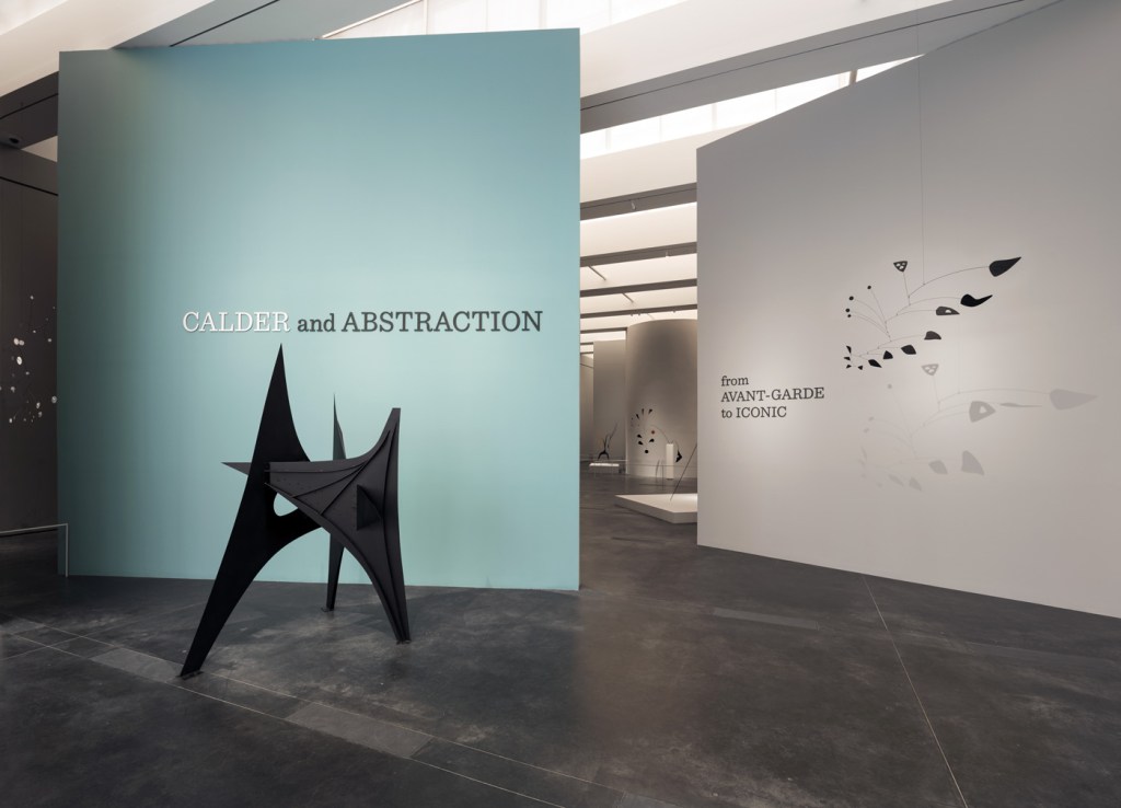
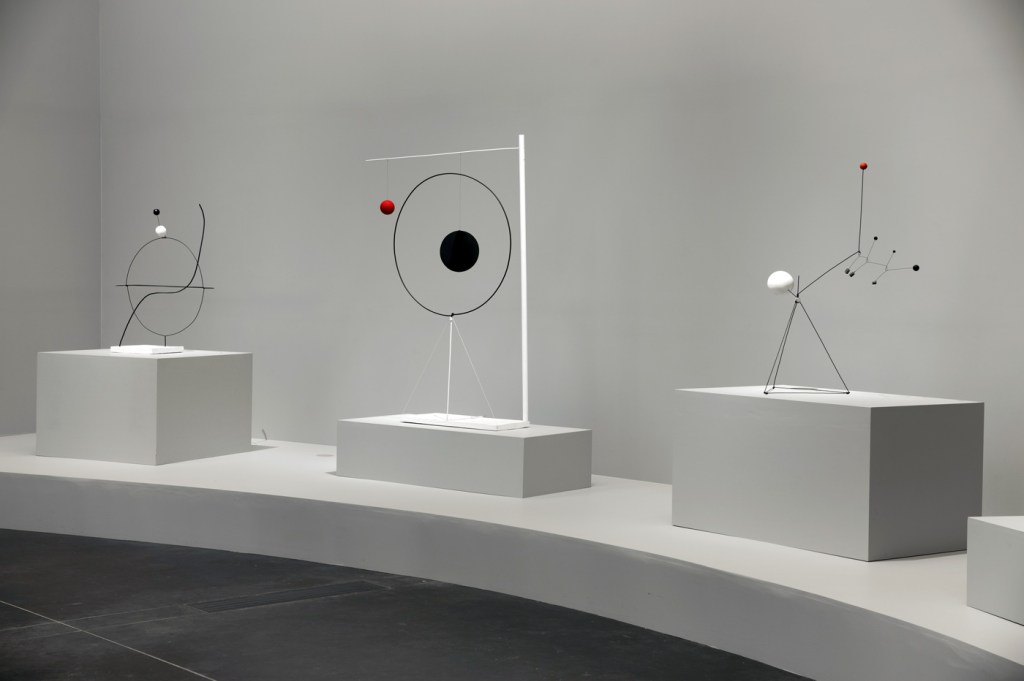
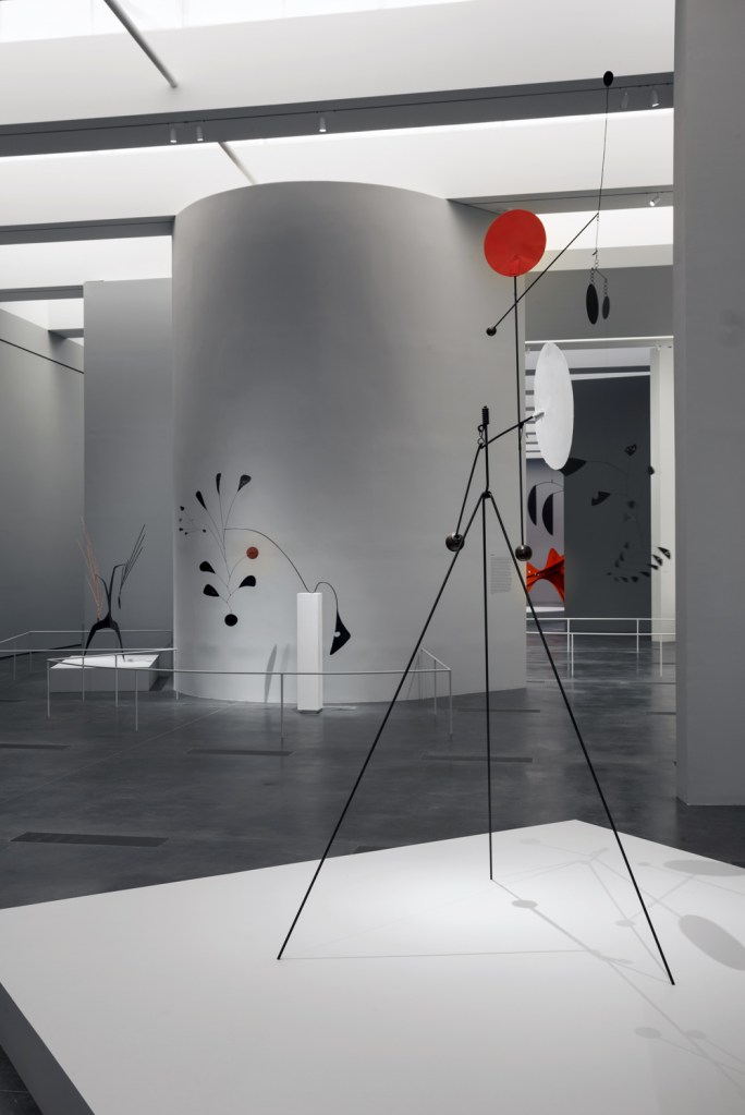
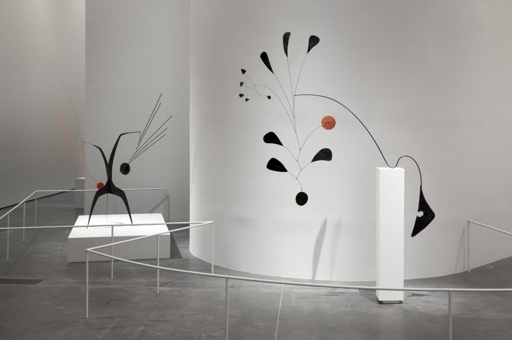
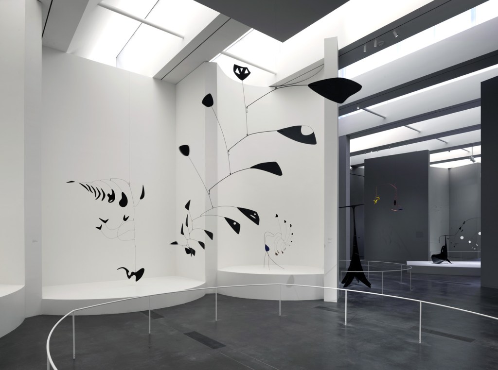
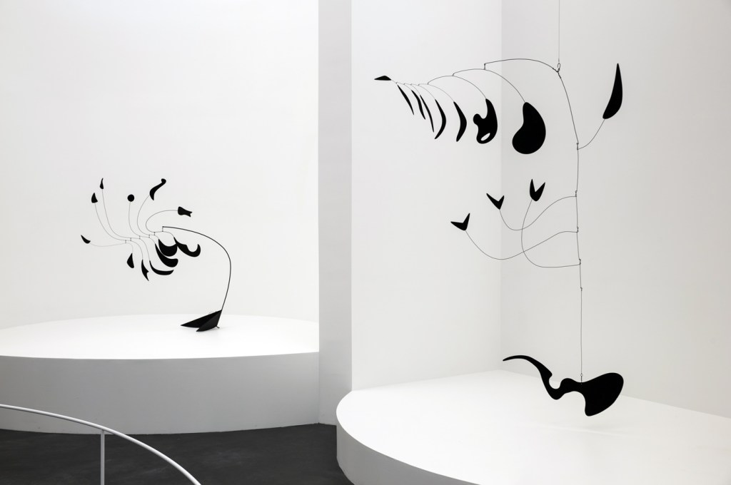
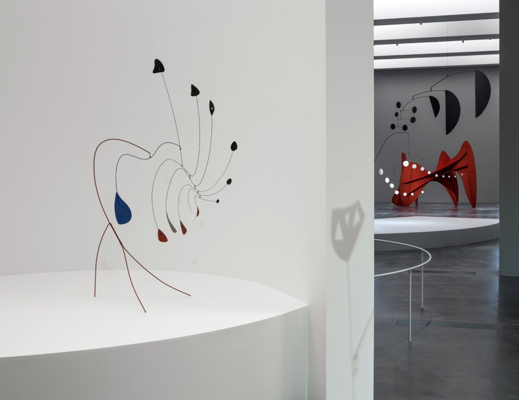
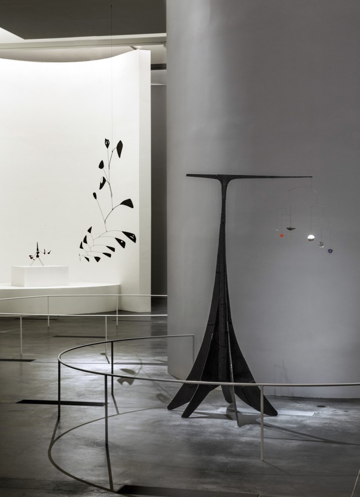
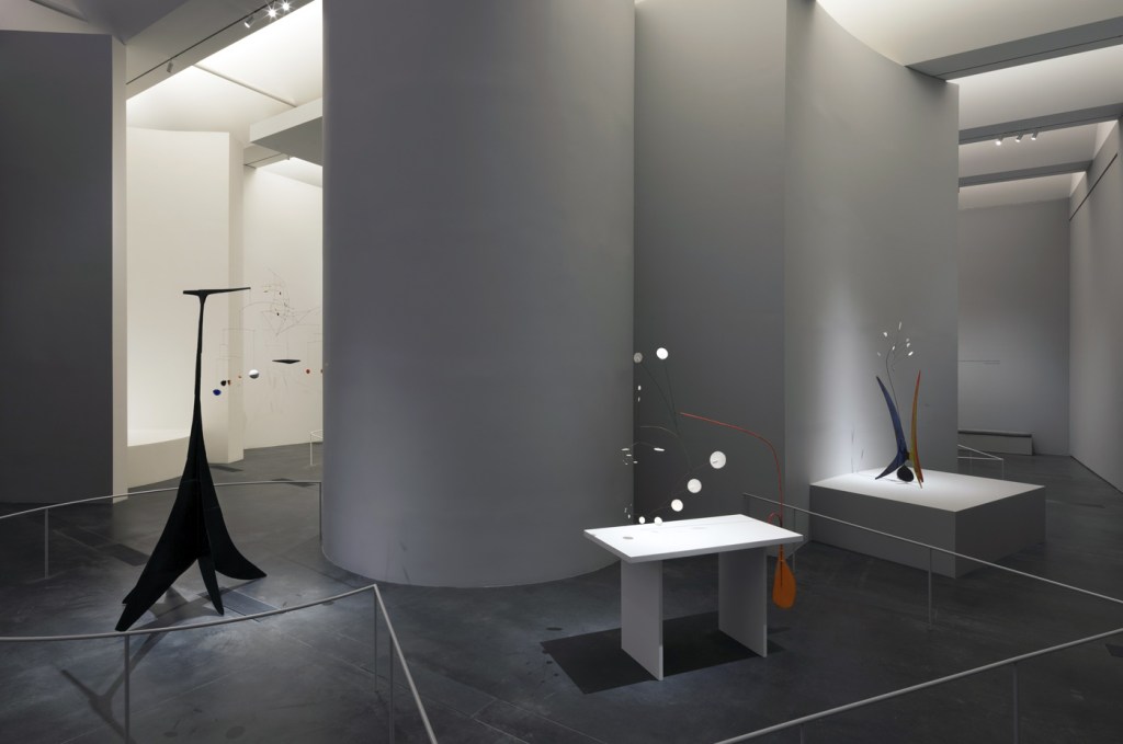
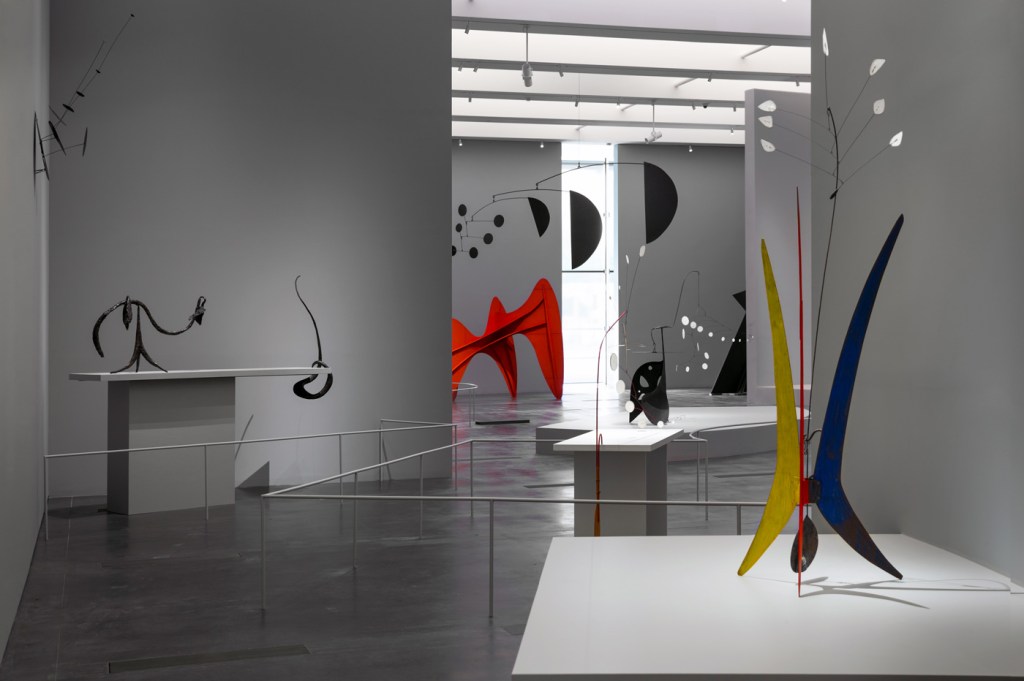
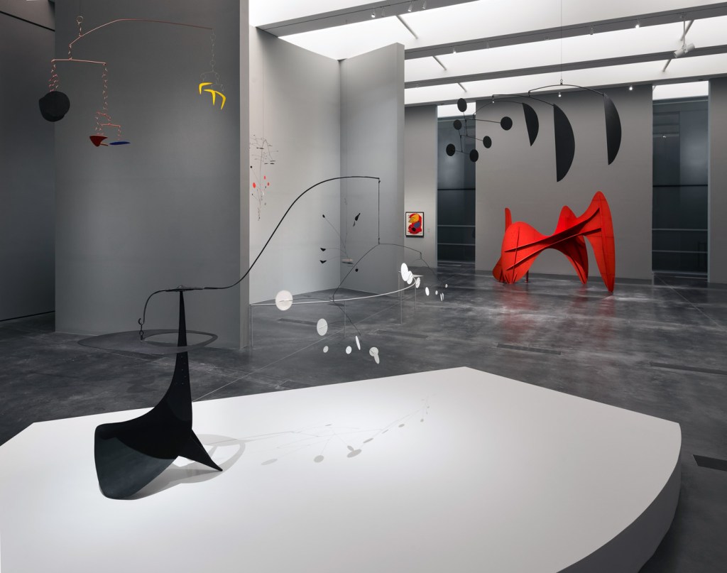
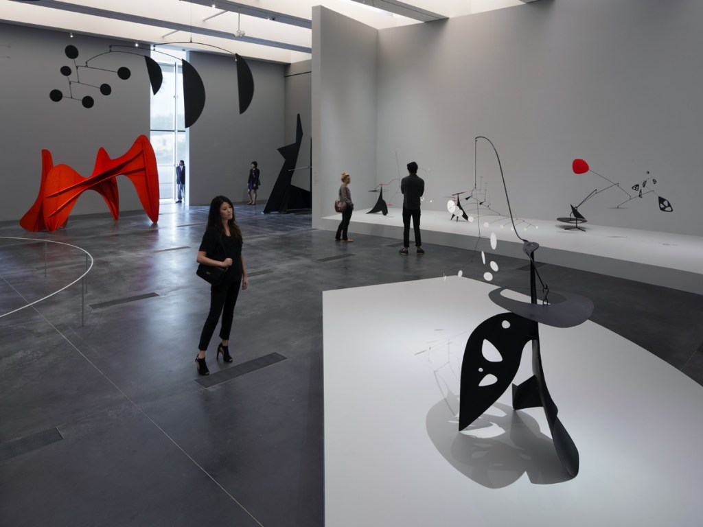
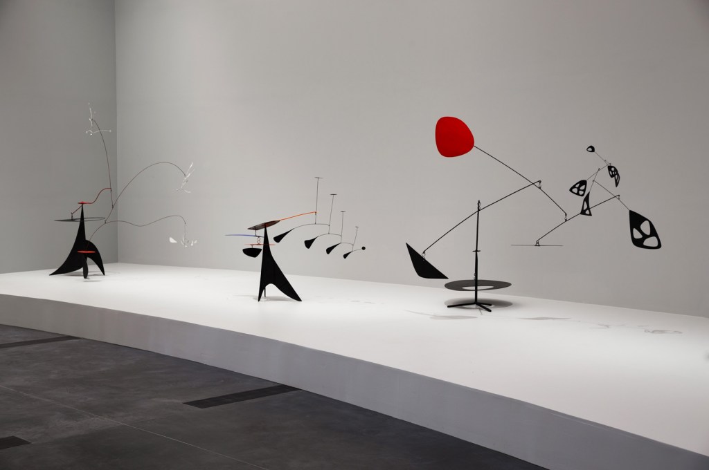
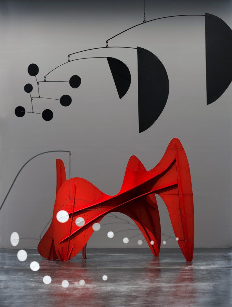
")
")
")
")
")
")
")
")
")
")
")
")
")
")
 'Three Quintains (Hello Girls)' 1964")
 'Little Face' 1962")
 'Laocoön' 1947")
 'Yucca' 1941")
 'Un effet du japonais' 1941")
 'Gibraltar' 1936")
 'Constellation Mobile' 1943")
 'Bougainvillier' 1947")
 'Le Demoiselle' 1939")
 'Red Disc' 1947")
 'Untitled' 1947")
 'Trois Pics (intermediate maquette)' 1967")


 'Quatre systèmes rouges' (mobile) 1960 from the exhibition 'Alexander Calder: Avant-Garde in Motion' at the Kunstsammlung Nordrhein-Westfalen, Düsseldorf, September 2013 - January 2014")
 'Araignée d'oignon' (Onion peeler) c. 1940")
 'Constellation with Red Object' 1943 from the exhibition 'Alexander Calder: Avant-Garde in Motion' at the Kunstsammlung Nordrhein-Westfalen, Düsseldorf, September 2013 - January 2014")
 'Little Spider' c. 1940")
 'Performing Seal' 1950")
 'Portrait of a Man' c. 1928")
 'Upstanding T' 1944")
 'Ohne Titel' (Untitled) 1936")
 'Untitled' c. 1934")
 'Cello on a spindle' 1936")
 'Foot on El' 1954")
 'Taxi' 1956")
 'Untitled' Nd from the exhibition 'Hilma af Klint – A Pioneer of Abstraction' at Moderna Museet, Stockholm, February - May, 2013")


 'From A Work on Flowers, Mosses and Lichen, July 2 1919' 1919")
 'Evolution, No. 7, Group VI, The WUS/Seven-Pointed Star Series' 1908")
 'The Swan, No. 17, Group IX/SUW, The SUW/UW Series' 1915")
 'The Swan, No. 1, Group IX/SUW, The SUW/UW Series' 1915")
 'The Swan' 1914")
 'Tree of Knowledge' 1913")
 'Primordial Chaos, No. 16, Group I, The WU/Rose Series' 1906-1907")
 'The Large Figure Paintings, No. 5, Group III, The Key to All Works to Date, The WU/Rose Series' 1907")
 'The Ten Largest, No. 3, Youth, Group IV' 1907")
 'The Ten Largest, No. 1' 1907")
 'The Dove, No. 3, Group IX/ UW, The SUW/UW Series' 1915")
 'Altarpiece, No. 1, Group X, Altarpiece Series' 1915")
 'From the El' c. 1955 from the exhibition Saul Leiter' at Kunst Haus Wien, Vienna, January - May, 2013")
 'Nude' 1970s")
 'Taxi' c. 1957 from the exhibition Saul Leiter' at Kunst Haus Wien, Vienna, January - May, 2013")
 'New York' 1950s")
 'Sign Painter' 1954")
 'Graffiti Heads' 1950")
 'Shirt' 1948")
 'Harlem' 1960")
 'Hat' 1956")
 'Street Scene' 1957")
 'Carol Brown, 'Harper's Bazaar'' c. 1958")
 'Soames Bantry, 'Nova'' 1960")
 'Walking' 1956")
 'Reflection' 1958")
 'Shopping' c. 1953")
 'Kutztown' 1948")
 'Pizza, Patterson' 1952")
 'Brou de noix sur papier' 1946 from the exhibition 'Pierre Soulages' at the Martin-Gropius-Bau, Berlin")
 'Peinture 324 x 181 cm, 17 novembre 2008' from the exhibition 'Pierre Soulages' at the Martin-Gropius-Bau, Berlin")
 'Peinture; 243 x 181 cm; 26 juin 1999' from the exhibition 'Pierre Soulages' at the Martin-Gropius-Bau, Berlin")
 'Peinture; 260 x 202 cm; 19 juin 1963' from the exhibition 'Pierre Soulages' at the Martin-Gropius-Bau, Berlin")
 'Peinture; 324 x 362 cm; 1985' from the exhibition 'Pierre Soulages' at the Martin-Gropius-Bau, Berlin")
 'Peinture 202 x 327 cm, 17 janvier 1970' from the exhibition 'Pierre Soulages' at the Martin-Gropius-Bau, Berlin")
 'Peinture 220 x 366 cm, 14 mai 1968' from the exhibition 'Pierre Soulages' at the Martin-Gropius-Bau, Berlin")
 'Peinture 222 x 314 cm, 24 février 2008' from the exhibition 'Pierre Soulages' at the Martin-Gropius-Bau, Berlin")
 'Grey Blue & Black - Pink Circle' 1929 from the exhibition 'Georgia O'Keeffe: Abstraction' at The Phillips Collection, Washington D.C., February - May, 2010")
 'Flower Abstraction' 1924 from the exhibition 'Georgia O'Keeffe: Abstraction' at The Phillips Collection, Washington D.C., February - May, 2010")
 'Jack-in-the-Pulpit No. IV' 1930 from the exhibition 'Georgia O'Keeffe: Abstraction' at The Phillips Collection, Washington D.C., February - May, 2010")
 'Early Abstraction' 1915")
 'Blue II' 1916")
 'Untitled (Abstraction/Portrait of Paul Strand)' 1917")
 'Music, Pink and Blue No. 2' 1918")
 'Series I - No. 3' 1918")
 'Series I, No. 4' 1918")
 'Abstraction White Rose' 1927")
 'Black Place II' 1944")

 'The Spider' 1940")
 'Little Spider' c. 1940")
 'Gibraltar' 1936 from the exhibition 'Calder: Sculptor of Air' at the Palazzo delle Esposizioni, Rome, October 2009 - February 2010")
 'Cascading Flowers' 1949 from the exhibition 'Calder: Sculptor of Air' at the Palazzo delle Esposizioni, Rome, October 2009 - February 2010")
 'Helen Wills' 1927")
 'Parasite' 1947")
' 1941")
 'Mobile (Arc of Petals)' 1941")
 'The Y' 1960")

 'La Grande vitesse (1:5 intermediate maquette)' 1969")
 'La Grande Vitesse' 1969")

You must be logged in to post a comment.