Installation view of LE MONDE v. DER MOND by Matthew Hale at The Narrows, Melbourne with n.n. (2008) centre bottom, andPage 93 of MIRIAM DIVORCEE (2008) centre right
Below is the only text I could find on the work – some of which was displayed in London earlier this year.
DER MOND v LE MONDE is Mathew Hale’s first solo exhibition in London for five years. It consists of five works: one two-projector and one three-projector slide piece; a constructed painting (that could equally be described as a wall-mounted sculpture); and two large collage works …
Hale’s work has many possible points of departure: a found photograph, a scrap of paper, a page torn from an instructive and obscure book, a bit of out-moded pornography, some anachronistic advertising from the 1970s or 1980s and so forth. Once plucked from a huge collection of such material amassed in his domestic studio space, the work evolves like an unplanned journey – both moving away and turning back on itself … The path of discovery in Hale’s work is the subject of his work, providing it with narrative and process.
With its roots in the collage traditions of political photomontage, dadaist assemblage and free associative surrealism, Hale’s work prioritises process over methodology or style. It activates a complex web of references that takes in history, politics, literature, and philosophy, as much as it does sex, religion, art, architecture and popular culture. To engage with the work is to become carried along by clues that lead to other clues and then circuitously lead somewhere else unexpected yet somehow familiar. Sometimes the clues are visual, sometimes they are language based, often they are both. Even when the work is finished and exhibited it is in a state of flux, the meaning is not fixed. Hale likes slippage of meaning and this constant state of ambiguity and openness for (mis)interpretation or confusion. He explains the title of the show as follows: ‘[in German] … and strikingly weirdly, “der Mond” means “The Moon” and, as we all know, “Le Monde” means “The Earth”. How can a word flip so totally by crossing a border? I am making a work for the show which hinges on their being apparently identical (almost) and yet meaning precisely the opposite – I wonder how it happened.’
Text from the London exhibition of this work (note with title reversed!), on the Peer website [Online] Cited 23/06/2009. No longer available online
Matthew Hale (British, b. 1962) Page 93 of MIRIAM DIVORCEE 2008 Paper collage 69 x 103cm
Matthew Hale (British, b. 1962) Page 150 of MIRIAM DIVORCEE (detail) 2008 Paper collage
Matthew Hale (British, b. 1962) n.n. 2008 Rifle, paper collage 69 x 153cm
Matthew Hale (British, b. 1962) Page 145 of MRS. GILLRAY 2009 Paper collage
Matthew Hale (British, b. 1962) Page 48 of DIE NEUE MIRIAM 2008 Paper collage
Review in Art Monthly, June 2009 from the Peer website [Online] Cited 23/06/2009. No longer available online
Shining brightly in the firmament the star of the show is, undoubtedly, the supremely talented Francesca Woodman. What an artist – both photographer and subject, here and there, enigmatic, sensual, psychotic, beautiful, playful, and desperate. Who is she; who are we.
Baldly put, “Francesca Woodman’s photographs explore issues of gender and self, looking at the representation of the body in relation to its surroundings… Found objects and suggestive props are carefully placed to create unsettling, surreal or claustrophobic scenarios. Her photographs are produced in thematic series’, relating to specific props, places or situations. In combining performance, play and self-exposure, Woodman’s photographs create extreme and often disturbing psychological states.”
Her photographs are so much more. They promote in the attentive viewer a ghostly insistence that you could be her – in vulnerability, in presence, in fear of suffering, for our death. Who are we that is represented, what is our place in this lonely world, how do we interact with our shadow? “In concealing or encrypting her subjects she reminds the viewer that photographs flatten and distort, never offering the whole truth about a subject.” No. This is no truth.
It is that they offer glimpses of another world, not flattened or distorted, but a lens to focus on the microcosm of the infinite spirit. The personal as universal truth.
Dr Marcus Bunyan
Many thankx to the Scottish National Gallery of Modern Art for allowing me to publish the photographs in the posting. Please click on the photographs for a larger version of the image.
Throughout 2009, 18 museums and galleries across the UK will be showing over 30 ARTIST ROOMS from the collection created by the dealer and collector, Anthony d’Offay, and acquired by Tate and the National Galleries of Scotland in February 2008. This is the first time a national collection has been shared and shown simultaneously across the UK, and has only been made possible through the exceptional generosity of independent charity The Art Fund and, in Scotland, of the Scottish Government.
The opening displays at the Scottish National Gallery of Modern Art in Edinburgh this spring will include the work of Vija Celmins, Ellen Gallagher, Damien Hirst, Alex Katz, Andy Warhol, and Francesca Woodman. Highlights will include Celmins’ beautiful, delicate images of seas, deserts and the night sky, a complete series of landscape and portrait paintings by the American painter Alex Katz and Francesca Woodman’s intimate, surrealist-influenced photographs. Damien Hirst, the most prominent British artist of today, will feature in an expanded display across several rooms. This will bring together works from ARTIST ROOMS – such as the iconic Away from the Flock (an early example of Hirst’s animals in formaldehyde) and a recent butterfly painting – with additional loans from further collections.
The ARTIST ROOMS display at the Gallery of Modern Art is dedicated to Vija Celmins’ ethereal images of seas, deserts and the night sky, a complete series of landscape and portrait paintings by Alex Katz, and Francesca Woodman’s intimate, surrealist-influenced photographs. Photographs by Warhol and paintings by Ellen Gallagher will also be included. Damien Hirst will feature in an expanded display, which will bring together works from ARTIST ROOMS – such as the iconic Away from the Flock and a recent butterfly painting – with additional loans from further collections.
American artist Vija Celmins makes paintings, drawings and prints. Using charcoal, graphite and erasers she produces delicate images based on photographs of the sea, deserts, the night sky and other natural phenomena.
The ARTIST ROOMS collection comprises 24 works on paper by Celmins, including three unique drawings. Web #1 is typical of her fragile images and is the first of nine works on the theme of the spider’s web. It is accompanied by a series of four ‘web’ prints which echo the web-like construction of the universe. Other works in the collection include an important series from the entitled Concentric Bearings which explores different images of turning space.
Celmins works focus on something small and individual in the context of vastness. The images they depict seem fragile because they record a specific human glimpse through a telescope or camera which is temporary and frozen in time. …
Damien Hirst is the most prominent artist to have emerged from the British art scene in the 1990s. Hirst’s work forces viewers to question their understanding of issues such as the fragility of life, our reluctance to confront death and decay and other dilemmas of human existence.
He is best known for his Natural History works – large-scale sculptures featuring dead animals floating in Minimalist looking vitrines – but also for his mirrored pharmacy cabinets lined with shelves full of evenly spaced drug bottles, pills, sea shells or cigarette butts, and his paintings, which he produces in series.
An example of these, included in ARTIST ROOMS, is the early Controlled Substances Key Painting (Spot 4a). Also included in ARTIST ROOMS is the key work Away from the Flock, featuring a sheep floating in formaldehyde. The large butterfly diptych Monument to the Living and the Dead, 2006 was made specifically for ARTIST ROOMS. …
American photographer Francesca Woodman has eighteen rare vintage black and white photographs in ARTIST ROOMS. They have a timeless unique quality. The artist began taking photographs at the age of thirteen and though she was only twenty two when she took her own life, she left behind a substantial body of work.
Francesca Woodman’s photographs explore issues of gender and self, looking at the representation of the body in relation to its surroundings. She puts herself in the frame most often, although these are not conventional self-portraits as she is either partially hidden, or concealed by slow exposures that blur her moving figure into a ghostly presence.
Found objects and suggestive props are carefully placed to create unsettling, surreal or claustrophobic scenarios. Her photographs are produced in thematic series’, relating to specific props, places or situations. In combining performance, play and self-exposure, Woodman’s photographs create extreme and often disturbing psychological states.
Andy Warhol is one of the most influential American artists to emerge in the post-war period. ARTIST ROOMS includes an impressive selection of 232 works which span the artist’s entire work. This display focuses on a group of stitched photographs from the collection.
After graduating and moving to New York in 1949, Warhol quickly became established as one of the city’s most sought after commercial illustrators, working for magazines such as Glamour and Harper’s Bazaar. However, it was in the early-sixties that he began to produce the work for which he is most celebrated.
As the most famous proponent of Pop Art, his earliest ‘pop’ works depict consumer goods and images from the press. This evolved to reveal his enduring fascination with celebrity and mortality, with many of his most powerful images touching on these themes.
ARTIST ROOMS comprises a superb array of important works representing all phases of Warhol’s career and a cross-section of media. Warhol explored the medium of photography extensively and began producing stitched photographs in 1986. Returning to his earlier predilection for repetition, Warhol used multiple prints of the same photographs that he then had sewn together to form a composite work of art. By repeating the same image, Warhol could extend the abstract design to the whole work and emphasise the broader significance of what might seem to be peculiarly singular and oddball.”
Text from the Scottish National Gallery of Modern Art website [Online] Cited 25/06/2009. No longer available online
Celmins’s intense monochromatic images, based on photographs, focus on small and individual marks in the context of vastness. The images seem fragile because they record a specific human glimpse through a camera which is ephemeral and frozen in time. Celmins’s serial exploration of her subjects, including spider webs, allows the artist to exploit the distinct characteristics of the variety of media she uses. This meticulous, translucent web is typical of her apparently fragile, ephemeral images. These images echo the web-like construction of the universe, a further preoccupation of the artist. Celmins has explained: “Maybe I identify with the spider. I’m the kind of person who works on something forever and then works on the same image again the next day.”
Damien Hirst (English, b. 1965) Controlled Substances Key Painting (Spot 4a) 1994 Acrylic paint on canvas Support: 1220 x 1224 x 40 mm Frame: 1307 x 1303 x 81 mm Acquired jointly with the Tate through The d’Offay Donation with assistance from the National Heritage Memorial Fund and the Art Fund 2008
This canvas is constructed using a grid of dots of different colours, accompanied by letters in alphabetical order that seem to dissect and reorganise the very matter of painting into cells. Hirst has said that he only painted five of his spot paintings himself, since he found them so boring to paint and could not do them as well as his assistants. But the key thing about these works is their conceptual clarity – the potentiality of making an infinite number and variety of paintings, based on size and colour of the dots and size and shape of the canvases. Like Andy Warhol, whom Hirst greatly admires, Hirst has set up a sort of factory with assistants to help him make his works of arts. Like Warhol, Hirst retains central control of what and how it is produced.
Woodman lies naked, in a vulnerable state, the curve of her body echoing the curved form of the eel. She has printed several similar versions of this image with her body on either side of the eel. While Woodman was studying in Rome between 1977 and 1978 she came into contact with the Symbolist work of Max Klinger, whose influence can be seen in this series. The image is sexually charged, yet in placing herself on both sides of the camera Woodman hovers between being in control and being defenceless, exploring the ways in which femininity can be portrayed. The photograph is not a self-portrait in the conventional sense, as it explores the possibilities of representation, instead of revealing the artist’s identity.
Crouched against a dilapidated interior, Woodman conceals her face with her hand. The combination between the vintage pattern of her dress and the peeling wall behind her create an antique, romantic air. Woodman’s photographs exhibit many influences, from Symbolism and Surrealism to fashion photography and Baroque painting. She explores issues of gender and self, looking at the representation of the body in relation to its surroundings. Woodman usually puts herself in the frame, although these are not conventional self-portraits, since as she is either partially hidden, or concealed by slow exposures that blur her moving figure into a ghostly presence. This underlying fragility is emphasised by the small and intimate format of the photographs.
ARTISTS ROOMS Essay
American photographer Francesca Woodman has eighteen rare vintage black and white photographs in ARTIST ROOMS, acquired from a collection once owned by the artist’s boyfriend. Woodman’s photographs exhibit many influences, from symbolism and surrealism to fashion photography and Baroque painting. They have a timeless quality that is ethereal and unique.
The artist began taking photographs at the age of thirteen, and though she was only twenty two when she took her own life, she left behind a substantial body of work. Francesca Woodman’s photographs explore issues of gender and self, looking at the representation of the body in relation to its surroundings.
She puts herself in the frame most often, although these are not conventional self-portraits as she is either partially hidden, or concealed by slow exposures that blur her moving figure into a ghostly presence. This underlying vulnerability is further emphasised by the small and intimate format of the photographs. We often see her in otherwise deserted interior spaces, where her body seems to merge with its surroundings, covered by sections of peeling wallpaper, half hidden behind the flat plane of a door, or crouching over a mirror. Found objects and suggestive props are carefully placed to create unsettling, surreal or claustrophobic scenarios.
Her photographs are produced in thematic series, relating to specific props, places or situations. Woodman was exposed to the symbolic work of Max Klinger whilst studying in Rome from 1977-78 and his influence can clearly be seen in many photographic series, such as Eel Series, Roma and Angel Series, Roma.
In combining performance, play and self-exposure, Woodman’s photographs create extreme and often disturbing psychological states. In concealing or encrypting her subjects she reminds the viewer that photographs flatten and distort, never offering the whole truth about a subject.
Text from the Scottish National Gallery of Modern Art website [Online] Cited 05/03/2019
Andy Warhol (American, 1928-1987) Trash cans 1986 4 photographs, gelatin silver print on paper and thread Support: 698 x 543 mm Acquired jointly with the Tate through The d’Offay Donation with assistance from the National Heritage Memorial Fund and the Art Fund 2008
Warhol’s stitched photographs depict a wide range of subjects including signs, objects, celebrities, nude models and buildings. Trash Cans is one of many that focus on everyday and ordinary objects and can be related to some of Warhol’s best-known pop works, in which common objects and consumer goods (for example Brillo boxes, Coca-Cola bottles, and Campbell’s soup cans) are isolated from their everyday context so as to foreground their individual aesthetic value. Many of Warhol’s pop works are also composed of repetitious images, for example his screenprints in which identical images are repeated numerous times across a canvas, such as Marilyn Diptych 1962 (Tate T03093). It is thus useful to compare Trash Cans with Warhol’s screenprints featuring multiple images of Campbell’s soup cans – especially given the similarities between the shapes of the different receptacles.
Text from the Tate website
Andy Warhol (American, 1928-1987) I am blind 1976-1986 9 photographs, gelatin silver print on paper Frame: 1315 x 1066 x 26 mm Acquired jointly with the Tate through The d’Offay Donation with assistance from the National Heritage Memorial Fund and the Art Fund 2008
Andy Warhol (American, 1928-1987) Venus in Shell 1976-1986 4 photographs, gelatin silver print on paper and thread 700 x 542 mm Acquired jointly with the Tate through The d’Offay Donation with assistance from the National Heritage Memorial Fund and the Art Fund 2008
Scottish National Gallery of Modern Art 75 Belford Road, Edinburgh, EH4 3DR
Opening hours: Open daily, 10am – 5pm Admission free
Kay Westhues (American) CSX railroad building, Walkerton 2005
I really like this work. An insightful eye, sensitive, tapped into the community that the artist is documenting. Attuned to its inflections and incongruities, the isolation and loneliness of a particular culture in time and place. There are further strong photographs from the series on the Kay Westhues website. It’s well worth your time looking through these excellent photographs. And observing the wonderful light!
Kay Westhues (American) Man with patriotic cast, Original Famous Fish of Stroh 2005
Kay Westhues (American) Knox laundromat 2005
The Snite Museum of Art announces the opening of the exhibition: Fourteen Places to Eat: a Narrative: Photographing Rural Culture in the Midwest, opening on Sunday, May 31,2009.
Kay Westhues is a photographer who is interested in documenting the ways in which rural tradition and history are interpreted and transformed in the present day. Kay shares her intention for this series of work:
“For the past five years I have been working on a series of photographs depicting rural culture in Indiana and the Midwest. This project was inspired by my memories of growing up on a farm in Walkerton, Indiana, and observing first hand the shifting cultural identity that has occurred over time and through changing economic development. I moved back to Walkerton in order to help care for my ageing parents in 2001.
These photos mirror my personal history, but I am also capturing a people’s history grounded in a sense of place. My intention is to celebrate rural life, without idealising it.
The overall theme since the project’s inception is the effect of the demise of local economies that have historically sustained rural communities. Many of my images contain the remains of an earlier time, when locally owned stores and family farms were the norm. Today chain stores and agribusiness are prevalent in rural communities. These communities are struggling to thrive in the global economy, and my images reflect that reality.
Most recently I have focused on the complex relationship between farmers and domesticated animals. I make many of my images at Animal Swap Meets and sale barns, places where animals are bought and sold. Family farms are quickly being replaced by large-scale food production, and these events still draw smaller farmers and the local people who support them.”
Why fourteen places to eat?
“One of my biggest complaints after moving to Walkerton was that there were not enough places to eat out. Or, rather, practically no places to eat out. So I was happy when news arrived that a new restaurant was opening there. Imagine my surprise when I read a letter to the editor in the local paper against the new restaurant. The letter stated we already had enough places to eat in this town. The writer counted a total of fourteen places to eat, which included four restaurants, three gas stations, four bars, a truck stop, a convenience mart, and a bowling alley.”
Ms. Westhues studied photography at Rhode Island School of Design and Indiana University, Bloomington. She has a BS degree in Photography and Ethnocentrism from the Indiana University Individualised Major Program (1994), and an MS in Instructional Systems Technology at Indiana University (1998). She currently lives in Elkhart, Indiana, and is completing a five-year project photographing rural culture in the Midwest. This series is a visual exploration of the ways rural identity is defined in contemporary society.
Press release from the Snite Museum of Art Cited 20/06/2009. No longer available online
Kay Westhues (American) Chicken bingo, Francesville Fall Festival 2005
Kay Westhues (American) Patriotic hammers ($3.00) 2005
Kay Westhues (American) Parked trailer, Ligonier 2006
Kay Westhues (American) Lunch at the Crockpot, Walkerton (The Young and the Restless) 2007
Kay Westhues (American) Momence Speed Wash, Momence IL 2007
Kay Westhues (American) Mary Ann Rubio, Family Cafe, Knox 2007
The Snite Museum of Art at University of Notre Dame, Notre Dame, Indiana
Berenice Abbott (American, 1898-1991) Untitled (New York City) 1929-1933 Gelatin silver print 6 1/2 x 4 7/16 inches Philadelphia Museum of Art The Lynne and Harold Honickman Gift of the Julien Levy Collection, 2001
What a fantastic exhibition! Thank you to the Philadelphia Museum of Art for allowing me to reproduce the wonderful photographs below, many from photographers that I have never heard of before.
Lloyd Ullberg (American, 1904-1996) PSFS Building, Philadelphia c. 1932-1933 Gelatin silver print Image and sheet: 10 x 7 3/8 inches Philadelphia Museum of Art Purchased with the Lola Downin Peck Fund, 1999
At the turn of the 20th century when they first began to appear, skyscrapers were seen as symbols of modernity and testaments to human achievement. Stretching the limits of popular imagination, they captured the attention of visual artists working in a variety of mediums. This summer the Philadelphia Museum of Art presents Skyscrapers: Prints, Drawings, and Photographs of the Early Twentieth Century, an exhibition that traces the rise of the American skyscraper as an iconic image. The exhibition will feature more than 50 works from the Museum’s collection, dating from 1908 to 1941, which demonstrate the many ways artists chose to portray the new giants in their landscape.
Skyscrapers includes prints by John Marin and Charles Sheeler, photographs by Berenice Abbott and Alfred Stieglitz, and drawings by Earl Horter and Abraham Walkowitz. The works in Skyscrapers reflect a wide range of styles and practices, from Walkowitz’s loosely drawn “New York Improvisations” (1910) to Abbott’s luminous photograph “New York at Night” (c. 1932), which captures the dazzling allure of the city’s glowing evening skyline. The combination of mediums included in the show allows the viewer to consider the relationship between drawing, printmaking, and photography in this dynamic period.
“The visual impact of skyscrapers on the modern urban landscape is unmistakable, and for more than a century artists have been engaging with this theme,” John Vick, The Margaret R. Mainwaring Curatorial Fellow in the Department of Prints, Drawings, and Photographs and the exhibition’s organiser, said, noting that the Museum’s collection includes well over 500 works related to skyscrapers. Vick added that “their distinctive contours and exaggerated scale offered artists both a chance to experiment with modernist aesthetics and a subject on which to project personal or collective ideas and emotions.”
The exhibition also offers a view into the interaction of architecture and urban development with art’s role as a form of documentation. Among the famous buildings featured are Chicago’s gothic-ornamented Tribune Tower, New York City’s Art Deco Empire State Building, and Philadelphia’s modernist PSFS Building. An atmospheric etching of a rainy nighttime scene at One Broad Street in Philadelphia by artist Allan Randall Freelon (American, 1895-1960) shows how this important intersection at the heart of the city would have appeared in the 1930s.
The towering, occasionally menacing, physical presence of these structures is a frequent visual theme in the works – whether in Howard Norton Cook’s woodcut “Skyscraper” (1929, below) or Sherril Schell’s photograph “Window Reflection – French Building” dating from 1930-1932. Horter’s graphite drawing “Manhattan Skyline” (1916) shows a row of newly-built towers thrusting skyward in strong, vertical lines and overshadowing the residential rooftops in the foreground, an image that suggests the city’s emergence as a financial and commercial giant.
Other works take a more abstract approach, exploring the visual exciting patterns created by these massive new structures. Such works include Marin’s 1913 and 1917 prints of the Woolworth Building and Herbert Johnson’s aerial photograph of building rooftops from c. 1930-1932.
Philadelphia Museum of Art press release [Online] Cited 19/06/2009. No longer available online
Earl Horter (American, 1880-1940) Manhattan Skyline c. 1916 Graphite on cream wove paper Sheet: 11 7/16 x 8 3/4 inches (29.1 x 22.2cm) Philadelphia Museum of Art Gift of Carl Zigrosser, 1953
Like many of the drawings and etchings of New York made by Horter while he lived in the city during the first two decades of this century, this view of the Manhattan skyline was shown in his first one-man exhibition at the New York gallery of Frederick Keppel and Company in 1916. It was organised by Carl Zigrosser, research librarian at Keppel, who later became this Museum’s first curator of prints and drawings. Zigrosser bought the drawing from the exhibition and donated it to the Philadelphia Museum of Art thirty-seven years later.
Wendell MacRae (American, 1896-1980) Summer c. 1930-1932 Gelatin silver print Image and sheet: 6 9/16 x 4 5/8 inches Philadelphia Museum of Art The Lynne and Harold Honickman Gift of the Julien Levy Collection, 2001
Stella Simon (American, 1878-1973) 6th Avenue c. 1930-1932 Gelatin silver print Image and sheet: 9 1/2 x 7 3/16 inches Philadelphia Museum of Art The Lynne and Harold Honickman Gift of the Julien Levy Collection, 2001
Allan Randall Freelon (American, 1895-1960) Number One Broad Street c. 1934 Aquatint with roulette and burnishing Plate: 11 7/8 × 9 13/16 inches (30.2 × 24.9cm) Sheet: 15 1/8 × 12 1/16 inches (38.4 × 30.6cm) Philadelphia Museum of Art Purchased with the Thomas Skelton Harrison Fund, 1943
Sherril Schell (American, 1877-1964) Buildings on West 35th Street c. 1930-1932 Gelatin silver print Image and sheet: 8 x 6 5/16 inches Philadelphia Museum of Art The Lynne and Harold Honickman Gift of the Julien Levy Collection, 2001
Howard Norton Cook (American, 1901-1980) Skyscraper 1929 Woodcut Image: 17 15/16 x 8 5/8 inches (45.6 x 21.9cm) Sheet: 19 1/16 x 9 3/4 inches (48.4 x 24.8cm) Philadelphia Museum of Art Gift of Carl Zigrosser, 1960
Sherril Schell (American, 1877-1964) Window Reflection – French Building c. 1930-1932 Gelatin silver print Image and sheet: 7 15/16 x 6 1/8 inches Philadelphia Museum of Art The Lynne and Harold Honickman Gift of the Julien Levy Collection, 2001
Ralph Steiner (American, 1899-1986) Untitled (New York City) 1931 Gelatin silver print Image/Sheet/Mount (With Black Border from Negative): 9 15/16 x 7 15/16 inches Philadelphia Museum of Art The Lynne and Harold Honickman Gift of the Julien Levy Collection, 2001
Berenice Abbott (American, 1898-1991) New York at Night c. 1932 Gelatin silver print Image and sheet: 13 3/8 x 10 5/8 inches Philadelphia Museum of Art Gift of Theodore T. Newbold in memory of Lee Witkin, 1984
Philadelphia Museum of Art 26th Street and the Benjamin Franklin Parkway Philadelphia, PA 19130
Scott McFarland (Canadian, b. 1975) Fallen Oak Tree 2008 From the series Hampstead Inkjet print 27 x 24 inches (68.6 x 61cm) Edition of 5
Variations on a theme
Whether McFarland’s photographs are “straight” or composites, there always seems to an unnerving feel to them, a formal frontality that empowers the viewer into trying to unlock the photographs secret, like an enigmatic puzzle. Everything is presented front on, square to the camera, no oblique angles, relying in the straight photographs on the scale of the accumulated blocks of information, and in the composites, in the very unlikely, even theatrical, staging of the people within the mise en scène.
These are very cinematic photographs, some, literally, with their panoramic aesthetic, others built by assembling their scudding skies and stiff, neatly placed people. Too neatly placed in my opinion but that’s McFarland’s hook, his aesthetic cough which prompts the viewer to question the veracity of the image, its link to the photographs indexical reality. His multiple exposures push the boundaries of truth or dare, hyperreal solutions to a disengaged world. Personally, I prefer his straight photographs which are built on a fabulous eye, a masterful understanding of pictorial space (monumental elements held in balance) and wonderful previsualisation. You don’t need anything more.
Dr Marcus Bunyan
Many thankx to Regen Projects for allowing me to publish the photographs in the posting. Please click on the photographs for a larger version of the image.
Scott McFarland (Canadian, b. 1975) The Admiral’s House as seen from the Upper Garden at Fenton House 2006 From the series Hampstead Inkjet print Edition of 5
“Regen Projects is pleased to announce an exhibition of new work by Canadian artist Scott McFarland. This exhibition will feature new photographs including 3 large panorama works, smaller works from the “Hampstead” series, and introduce the new “Niagara” series.
Scott McFarland’s photography reconsiders the traditional concept of a photograph as the depiction of a single captured moment in time. Through digital means he is able to manipulate composition, colour, light, space, shape, and form. McFarland’s photographs combine multiple negatives to represent simultaneous temporalities and interweave selected elements into a cohesive whole. Several different moments are packed into what appears to be one densely constructed instant. The photographs are meticulously crafted illusions created within the formal language of documentary photography.
McFarland’s consideration of photography and the built picture was brought about by the artist’s own understanding of the artificial “nature” found in built environments such as gardens and zoos. Taking the relationship of the constructed space/constructed image one step further, McFarland has photographed a modernist architectural landmark: the Berthold Lubetkin designed penguin pool at the London zoo. Through two very distinct works, McFarland investigates the elliptical structure of the famous penguin pool vis-à-vis the elliptical / arcing motion of his camera rotating on a tripod. One photograph is an objective colour rendering where the camera has been left level while rotating; the other is a larger black and white version where the camera arcs along a non-level plane distorting and altering the curve of the structure from right to left.
The new square format photographs from McFarland’s “Niagara” series have a rough unfinished quality unlike any photographs he has taken to date. These softer focus images with odd shifts in light and glare are location studies for the large panorama A Horse Drawn Hearse, Queens Royal Tours, 174 Anne, Niagara on the Lake, Ontario (2009, below). This work depicts an old carriage business and its surroundings during the dead of Canadian winter. In this visually captivating work, a black funeral carriage contrasts against the white snow. The acreage, surrounded by newer suburban homes, evokes the question of how long can this structure resist the modern urban pressures it faces. These straight photographs presented alongside his precise digitally mastered compositions illustrate how the photographic process and the history of art and photography have always informed McFarland’s work.
“Over the last decade, Scott McFarland has produced bodies of work that engage with different aspects of photography … McFarland’s approach is both descriptive and metaphoric … The images, rich in cultural significance, express the complementary workings of conceptual and aesthetic factors all the while holding various characteristics of art and photography in ambiguous relation.”
Andrea Kunard. Scott McFarland: A Cultivated View, published by the National Gallery of Canada, Ottawa, 2009, p. 12.
Text from the Regen Projects press release [Online] Cited 16/06/2009. No longer available online.
Scott McFarland (Canadian, b. 1975) A Horse Drawn Hearse, Queens Royal Tours, 174 Anne, Niagara on the Lake, Ontario 2009 From the series Niagara Inkjet print 59.5 x 124 inches (151.1 x 315cm) Edition of 5
Scott McFarland (Canadian, b. 1975) Boathouse with Moonlight 2002 From the series Boathouse Digital C-print 71 x 91 inches (180 x 231cm) Edition of 5, 2 AP
“Boathouse with Moonlight” is an exploration of the technical advancements afforded by digital photography, created by assembling multiple exposures taken over the space of two hours under the light of a full moon. Unlike traditional photography, this image does not represent one specific moment captured at a particular site; rather, it shows an accumulation of moments that have been manipulated and layered to create a revised version of the boathouse and its surroundings. McFarland’s use of multiple exposures to produce the final image emphasises not only the duration of the photographic act, but also the many facets of the boathouse’s character. This type of building on British Columbia’s “Sunshine Coast” is disappearing with the construction of new, suburban-style retirement housing.
Text from the National Gallery of Canada website [Online] Cited 02/03/2019
Scott McFarland (Canadian, b. 1975) Gorse and Broom, West Heath, Hampstead 2006 From the series Hampstead Inkjet print Edition of 5
Scott McFarland (Canadian, b. 1975) Women Drying Laundry on the Gorse, Vale of Health, Hampstead Heath 2007 From the series Hampstead Inkjet print 29 x 45 inches (73.7 x 114.3cm) Edition of 5
Scott McFarland (Canadian, b. 1975) Inspecting, Allan O’connor Searches for Botrytis cinerea 2003 From the series Gardens Digital C-print 40 x 48 inches (102 x 122cm) Edition of 7
Scott McFarland (Canadian, b. 1975) Orchard View with the Effects of Seasons (Variation #1) 2003-2006 From the series Gardens Digital C-print 42 x 122 inches (106.7 x 309.9cm) Edition of 3
Scott McFarland (Canadian, b. 1975) [Huntington Botanical Gardens in San Marino, Calif] 2005 From the series Empire Inkjet print
Scott McFarland (Canadian, b. 1975) Echinocactus grusonii [Huntington Botanical Gardens in San Marino, Calif] 2006 From the series Empire Inkjet print 24.5 x 27.5 inches (62 x 70cm) Edition of 3 Private collection/Vancouver Art Gallery
This picture comes from Empire, a series on desert vegetation shot in the Huntington Botanical Gardens in San Marino, Calif. Henry E. Huntington, an art collector who made his fortune building railroads, founded the garden in 1919.
“The plantings [of the garden] are dense, and the soil is mostly hidden beneath the thriving vegetation,” writes Grant Arnold in a catalogue essay for the exhibition, “the fullness of the planting continually reminding the visitor of Huntington’s beneficence.” To many gallery visitors, however, these images of lush desert vegetation will simply be appealing to the eye.
Scott McFarland (Canadian, b. 1975) The Granite Bowl in the Berlin Lust Garden 2006 Inkjet print 43 x 62 inches (109.2 x 157.5cm) Edition of 5
At first the photograph appeared to be a simple scene, one of no importance. The two young children, obviously related based on their similar physical features, seemed a bit awkward and posed, but otherwise, I thought it to be a snapshot, much like the one I took of the bowl while in Berlin. Upon learning how McFarland created this and many of his other photographs, I learned how complex of a scene this really is. McFarland uses multiple negatives, often taken over a matter of days, weeks, and even months, and combines them digitally into a seamless print. His interest is in breaking through the concept of a photograph being an image of a single instant in time and space.
A fuller narrative is created as well. With just one negative, there may only be one or two people depicted. We may just have the dog with his owner half shown, or even only half of the brother-sister group. But by overlapping the various negatives, Mr McFarland manipulates his work into a greater piece. We can now ask ourselves, why are the brother and sister so psychologically distant? Or, who is the small girl with the accordion and where is her mother? Is her mother the woman with the baby carriage? How long has that man been sleeping under the bowl? These are all questions that can be asked together because the negatives are combined that couldn’t be asked if we had just the single frame.
Scott McFarland (Canadian, b. 1975) View of Vale of Health, looking towards Hampstead 2007 From the series Hampstead Inkjet print 27 x 42.5 inches (68.6 x 108 cm) Edition of 5
With the stiff figures of a historical painting, Scott McFarland’s View of Vale of Health, Looking Towards Hampstead muddles ideas of what’s real and what’s not.
From the get-go, painting and photography have been inextricably bound together. The Pictorialists tried to make their photographs look like paintings. The Futurists, in their paintings, mimicked the blurred and segmented movement found in Etienne-Jules Marey’s chronophotographs. The photorealists created paintings whose subject was the photograph itself. And in his large-scale, backlit photo-transparencies, Jeff Wall has alluded to paintings by Nicolas Poussin, Edouard Manet, and Paul Cézanne, among others. The digital age has done nothing to diminish each medium’s obsession with the other.
This continued entwining of art forms is evident in Scott McFarland’s computer-montaged photographs, on view at the Vancouver Art Gallery. So is the parallel entanglement of nature and culture. Both conditions are conspicuous in his 2006 series, “Hampstead”, inspired by the landscapes of the early-19th-century English painter John Constable. McFarland’s colour photos, shot in various locations around London’s immense Hampstead Heath, pay homage to Constable’s attraction to the same place. They also play variations on that painter’s rendering of multiple versions of the same scene, and on his open-air studies of the changing effects of light and weather. …
Over the past decade, McFarland’s working methods have changed from straightforward analog photography to the creation of highly manipulated images in which he digitally splices together multiple segments of the same landscape or structure, shot over a period of days, weeks, or even months. In both variations of Orchard View With the Effects of the Seasons, for instance, the blossoms and foliage of spring, summer, and fall are contained within the same seamless panorama.
The digital assist means that there are no constraints of time, space, or documentary veracity in McFarland’s work: he can build whatever impossible pictures he wants and they will look “real”. At least until they’re closely scrutinised, revealing incongruities of light, shadow, time, and figuration. In this sense, his art challenges our understanding of the nature of the photograph and its relationship with the truth. There’s nothing really new about this project – as long as photography’s been around, it’s been manipulated by its practitioners. Photoshop, however, has added a vast digital dimension to the darkroom antics of earlier photo artists.
Opening night crowd with the artist Gareth Sansom third from right
A very busy opening at John Buckley Gallery in Richmond for the paintings of Gareth Sansom. Nice to meet the artist and catch up with artist Gavin Brown and manager of Abbotsford Convent Brenton Geyer. A big thank you to Daniel for allowing me to take the photographs!
Josephine Kuperholz presents a beautifully engineered set of photographs in her exhibition Blight at Gallery 101, Melbourne. Featuring hand coloured silver gelatin photographs of endangered Australian insects sourced from the Entomology collection of the Victoria Museum, Kuperholz literally weaves multiple narratives into the photographs. The execution (an apt word for the circumstances of extinction facing these insects) of these images is fastidious, the weaving superlative, almost clinical.
The layering of the photographs disrupts their surface tension. There is a disjunction between the dead specimen and the singular photograph of it, a disruption of the smooth surface of the photograph by the hand colouring and a further fragmentation of the original photograph by cutting and weaving. Through these processes the photographs become intertextual in their construction, assemblages, creating new tissues of past citations: animal, colour, silver, artist, text, photograph, environment. At their best the work subverts the concept of the text as self-sufficient and hermetically sealed, blurring the outlines of the fixed image, “dispersing its image of totality into an unbounded, illimitable tissue of connections and associations, paraphrases and fragments, texts and con-texts.”1
Kuperholz’s mutations, ‘differance’ in Derrida’s terminology, produce spaces that are both fluid and fixed at one and the same time; neither her nor there.Though the original specimens and photographs are already narrativised, already textualised, Kuperholz disrupts this marking, the continual reiteration of norms, by weaving a lack of fixity into her objects; in her reconceptualisations of space and matter Kuperholz redefines the significations of the body of the animal in the fold of inscription, through a process of materialisation. Kuperholz attempts to ground these re-inscriptions through the naming of these disrupted surfaces, equating the images back to the scientific labels for the original specimen, Trapezites eliena for example (see below), and through the box frames surrounding the work that are much like museum cases. Unfortunately I found the constant reference to the habitat of the insect, it’s Latin name inscribed in pencil under the images and the use of plain brown box frames somewhat irritating. These tropes are not necessary for the work is strong enough to stand on it’s own without having to tell the viewer what to think.
The singular beetles (as seen above) are beautiful images and the multiple images where the weaving intermingles, the self decentred and multiple, fluttering and vibrating like the strobing of a time lapse photograph caught in three-dimensional space, are fantastic. Other photographs are less successful: the reflected beetles are a little passe, while the grid photographs of insects lack presence and intensity (see bottom installation photograph below). Where the concept works it is pushed hard, the fragmentation and interweaving causes an anxiety of identity and a meditation on the problematic nature of existence, revealing the changing sizes, shapes and rhythms of space and structure.
Perhaps a loosening of the rigid structure surrounding the works (the text, the frame, the incantations) would have let the photographs ascend into the ether, further releasing the work from the constraints of author, text and earth. It will be interesting to see future developments of this work. Perhaps the incorporation of gentle, subtle physical elements into the photographs (through the sowing of patterns, through the sowing of objects directly onto the photograph?), will elevate these already beautiful photographs to an-other plane of existence.
Dr Marcus Bunyan
Many thankx to Gallery 101 for allowing me to publish the photographs in the posting. Please click on the photographs for a larger version of the image.
Josephine Kuperholz (Australian) Trapezites eliena 2008 Common name – Eliena Skipper Woven hand coloured silver gelatin photographic image
Josephine Kuperholz (Australian) Dryococelus australis 2008 Common name – Lord Howe Island Phasmid Woven hand coloured silver gelatin photographic image
Josephine Kuperholz Blight exhibition, Gallery 101 website text
Josephine Kuperholz Blight exhibition installation views at Gallery 101, Melbourne Photos: Marcus Bunyan
Karen Halverson (American, b. 1941) Hite Crossing, Lake Powell, Utah from the Downstream series 1994-1995
As clear as a bell!
Marcus
Many thankx to the Huntington Library for allowing me to publish the photographs in the posting. Please click on the photographs for a larger version of the image.
Karen Halverson (American, b. 1941) Lodore Canyon, Dinosaur National Monument from the Downstream series 1994-1995
Karen Halverson (American, b. 1941) Boulder Beach, Lake Mead, Nevada from the Downstream series 1994-1995
Karen Halverson (American, b. 1941) Wahweap Pool, Lake Powell, Arizona from the Downstream series 1994-1995
To celebrate the expansion and reinstallation of the Virginia Steele Scott Galleries of American Art, The Huntington Library, Art Collections, and Botanical Gardens presents an exhibition of works from American photographer Karen Halverson’s Colorado River series, on view May 30 through Sept. 28, 2009. Downstream: Colorado River Photographs of Karen Halverson will be on display in the Scott Galleries’ Susan and Stephen Chandler Wing, inaugurating a new changing exhibition space that will highlight photography and works on paper that, because of the fragile nature of the medium, cannot be placed on permanent display.
The exhibition will feature 26 works from Halverson’s Downstream series as well as a sampling of images from The Huntington’s historic holdings related to the Colorado River region, including photographs from John Wesley Powell’s pioneering expedition down the Colorado in 1871 and a snapshot album compiled in 1940 by Mildred Baker, one of the first women to successfully navigate the river from Green River, Wyo., to Boulder (now Hoover) Dam.
Halverson (b. 1941) says she woke one wintry morning in 1994 convinced that she needed to photograph the Colorado River. An accomplished landscape photographer who had already spent 20 years exploring the American West, she embarked on a two-year encounter with the vast terrain along the river’s serpentine route.
The desire to explain, understand, and experience the 1,700-mile river – which originates in Wyoming and Colorado before converging in Utah toward its terminus in Mexico – has exerted a powerful influence on a long line of explorers, scientists, thrill seekers, writers, artists, and photographers. Once largely wild, the modern river has been tamed by dams built to slake the American West’s thirst for water and power. Today the river’s reservoirs supply 30 million people.
“In her resonant imagery, Halverson speaks both to this immutable, rugged past while confronting the river’s complicated and often contested present,” says Jennifer Watts, curator of photographs at The Huntington.
Lush green riverbanks frame a seemingly remote Colorado River in Shafer Trail, Near Moab, Utah – a dramatic departure from the river-turned-lake in Wahweap Marina, Lake Powell, Arizona, in which the setting sun illuminates a satellite dish, a trio of passersby, and a jumble of houseboats set against distant rock outcroppings. Davis Gulch, Lake Powell, Utah captures Halverson’s voice especially succinctly: the power of nature in the form of a gigantic sandstone wall dwarfing a tiny group of plastic lawn chairs, lined up along the river bank, with not a soul in sight.
“In my travels along the Colorado,” says Halverson, “sometimes I find beauty, sometimes desecration, often a perplexing and absurd combination.”
Halverson’s large-format colour photography references the 19th-century era of exploration when the United States, still reeling from the Civil War, saw photographers fan across the West to make pictures for scientific and commercial ends. Many of these iconic views by William H. Bell, John K. Hillers, Timothy O’Sullivan and others form the core of The Huntington’s superlative photography collection. Halverson consulted these works in preparation for her own trips.
The two years Halverson spent hiking, driving, and rafting along the Colorado brought her to a more profound understanding of the river and her relationship to it. During her travels, Halverson wrote, “I feel my place, small and finite in relation to space and time: I feel my self, expansive and trusting.”
Text from The Huntington Library website [Online] Cited 12/06/2009. No longer available online
Karen Halverson (American, b. 1941) Big River, California from the Downstream series 1994-1995
Karen Halverson (American, b. 1941) Davis Gulch, Lake Powell from the Downstream series 1994-1995
“In my travels along the Colorado, sometimes I find beauty, sometimes desecration, often a perplexing and absurd combination.”
Karen Halverson
One wintry morning in1994, Karen Halverson (b. 1941) awoke convinced she needed to photograph the Colorado River. An accomplished artist who had already spent 20 years exploring the American West, she set off on a two-year encounter with the vast, breathtaking terrain along the river’s serpentine route. “The impulse to photograph the Colorado River came to me out of the blue,” she writes, “but I acted on it as if it were my destiny.” Personal destiny and the Colorado River have long been linked in the lives of the explorers, scientists, writers, artists, and thrill seekers who have sought to understand and experience this remarkable river.
“Nature appears to have been partial to this stream,” noted “Captain” Samuel Adams, who described the river in 1869. The Colorado and its major tributary, the Green River, run 1,700 miles from headwaters in the Rocky Mountains and Wyoming’s Wind River Range to a terminus in Mexico. Sheer size helps explain the river’s enduring allure; the Colorado’s gargantuan watershed covers a quarter of a million miles and runs through seven states. The Colorado is the riparian centre and symbol of the American West. Once wild, the river has been tamed by dams built to slake the arid West’s demand for water and power; 30 million people are dependent on it today.
Halverson’s large-format colour photography alludes to a 19th-century era of exploration when photographers fanned out across the West to make pictures for scientific and commercial ends. Iconic views by William H. Bell (1830-1910), John K. Hillers (1843-1925), Timothy O’Sullivan (c. 1840-1882), and others captured timeless landscapes of fierce, often forbidding, beauty. Halverson looked at these works in preparation for her trips, viewing them as documentary and visual points of departure for her own image making. Beyond the debt she owes these photographic pioneers, Halverson is firmly rooted in a late 20th-century aesthetic that comments on humanity’s use, and misuse, of the environment.
Beginning in the 1970s, a group of photographers, almost all of them men – who are now sometimes called the “New Topographers” – used their cameras to criticise the effects of rampant urban and suburban growth on western lands. Sprawling cities like Los Angeles, Phoenix, and Las Vegas owe their existence almost entirely to the importation of water from the Colorado River. As Halverson rightly claims, today the river is a “water delivery system,” with its dozens of reservoirs, dams, and diversions ensuring the allocation of virtually every drop for human needs.
Yet Downstream is no visual jeremiad railing against environmental abuse. Nor is it a dispassionate travelogue of the two years Halverson spent hiking, driving, and rafting along the Colorado. The wild terrain that flabbergasted early explorers is still here in the Paleozoic strata of gigantic rock outcroppings, the ancient calm of ghostly canyons, the dizzying heights overlooking a ribbon of water far below. And the colours – ochre, cerulean blue, deep red, electric green – are all intensified against the palette of a dammed river running colder and deeper than if it flowed freely. A modern-day beauty even finds itself inscribed in steel and concrete, whether in the sleek form of a pipeline or the still surface of an irrigation canal.
But it is in the bizarre, sometimes humorous, intersections of past and present that Downstream gains its potency. Cheap plastic lawn chairs, sitting vacant, look puny and ridiculous against a looming canyon wall. Weekend revellers pump fists skyward on the shores of Lake Mead, a giant reservoir held in place by Hoover Dam. A garden hose waters a scrawny palm tree in a desert oasis populated by rows of RVs.
What is gained and what is lost by controlling the Colorado River? And what are the river’s limits? Halverson’s Downstream series asks the viewer to contemplate these questions in a time when the arid West’s thirsty population threatens to overwhelm technological as well as natural resources, and when our well-watered urban lives remain utterly disconnected from riparian realities. Through her resonant imagery, Halverson speaks to the immutability of the river’s past while confronting its complex, contested present and future.
Jennifer A. Watts, Curator of Photographs from “Colorado River Photographs of Karen Halverson,” The Huntington Library Halverson Gallery guide [Online] Cited 28/02/2019. No longer available online
Karen Halverson (American, b. 1941) Near Palo Verde, California from the Downstream series 1994-1995
Karen Halverson (American, b. 1941) Imperial Dam, near Yuma, Arizona from the Downstream series 1994-1995
Karen Halverson (American, b. 1941) Flaming Gorge Reservoir, Wyoming from the Downstream series 1994-1995
Karen Halverson (American, b. 1941) Shafer Trail, Near Moab, Utah from the Downstream series 1994-1995
The Huntington Library The Huntington Library, Art Collections, and Botanical Gardens 1151 Oxford Road San Marino, CA 91108
Installation view of the interior forecourt of the National Gallery of Victoria showing banners for the exhibition Salvador Dalí: Liquid Desire Photo: Marcus Bunyan
Installation photographs from the latest Winter Masterpieces blockbuster Salvador Dalí: Liquid Desire from the media preview on the day the exhibition opened at NGV International, Melbourne. Thank you to Jemma Altmeier, Media and Public Affairs Administrator at the NGV for the invitation. Photographs were taken using a digital camera, tripod and available light.
Fantastic to see my friend and curator of the exhibition, Dr Ted Gott, at the opening. Congratulations on a wonderful show!
Photographs proceed from the beginning to the end of the exhibition in chronological order.
Many thankx to the National Gallery of Victoria for allowing me to publish the photographs in the posting. Please click on the photographs for a larger version of the image.
Entrance to the Salvador Dalí: Liquid Desire Winter Masterpieces exhibition at the National Gallery of Victoria, Melbourne Photo: Marcus Bunyan
3 panel video installation of the Catalan countryside where Salvador Dali lived. 13 minutes duration from the exhibition Salvador Dalí: Liquid Desire Winter Masterpieces at the National Gallery of Victoria, Melbourne Photo: Marcus Bunyan
Early work from the Salvador Dalí: Liquid Desire Winter Masterpieces exhibition at the National Gallery of Victoria, Melbourne Photo: Marcus Bunyan
To the left View of the Cadaques from the Creus Tower 1923; to the right Table in front of the Sea. Homage to Eric Satie 1926 from the Salvador Dalí: Liquid Desire Winter Masterpieces exhibition at the National Gallery of Victoria, Melbourne Photos: Marcus Bunyan
In the centre The First Days of Spring 1929; to the right Surrealist composition 1928 from the Salvador Dalí: Liquid Desire Winter Masterpieces exhibition at the National Gallery of Victoria, Melbourne Photo: Marcus Bunyan
Installation view with The Age art critic Associate Professor Robert Nelson at centre right and The hand. The remorse of conscience 1930 at far right, from the Salvador Dalí: Liquid Desire Winter Masterpieces exhibition at the National Gallery of Victoria, Melbourne Photo: Marcus Bunyan
Installation view with Memory of the child-woman 1932 at right from the Salvador Dalí: Liquid Desire Winter Masterpieces exhibition at the National Gallery of Victoria, Melbourne Photo: Marcus Bunyan
Salvador Dalí (Spanish 1904-1989, worked in United States 1940-1948) Lobster Telephone (installation view) 1936 Photo: Marcus Bunyan
Jewellery gallery at the Salvador Dalí: Liquid Desire Winter Masterpieces exhibition at the National Gallery of Victoria, Melbourne Photos: Marcus Bunyan
Televisions with film installation from the Salvador Dalí: Liquid Desire Winter Masterpieces exhibition at the National Gallery of Victoria, Melbourne Photo: Marcus Bunyan
Installation of black and white photography from the exhibition Salvador Dalí: Liquid Desire Winter Masterpieces exhibition at the National Gallery of Victoria, Melbourne with Dr Ted Gott, curator of the exhibition, with back to camera at centre Photo: Marcus Bunyan
Reproduction of Gala foot. Stereoscopic paintings 1975-1976 in an installation using mirrors that would have been originally used to obtain the stereoscopic effect Photo: Marcus Bunyan
Final exhibition space from the Salvador Dalí: Liquid Desire Winter Masterpieces exhibition at the National Gallery of Victoria, Melbourne Photo: Marcus Bunyan
Final gallery space from the Salvador Dalí: Liquid Desire Winter Masterpieces exhibition at the National Gallery of Victoria, Melbourne featuring The Ecumenical Council 1960 Photos: Marcus Bunyan
National Gallery of Victoria (International) 180 St Kilda Road, Melbourne
Opening hours: Salvador Dalí: Liquid Desire is open 7 days a week and until 9pm every Wednesday from 17 June
Tickets Adult: $23 Concession: $18 Child: $11 (ages 5-15) Family (2 adults + 3 children): $60 NGV Member Adult: $16 NGV Member Family: $40
Roy de Maistre (Australian, 1894-1968) Colour Composition derived from three bars of music in the Key of Green 1935 Oil and pencil on composition board Private Collection
Despite some interesting highlight pieces this is a patchy, thin, incoherent exhibition assembled by the Powerhouse Museum, Sydney now showing at Heide Museum of Modern Art, Melbourne. Featuring a hotchpotch of work ranging across fields such as drawing, architecture, photography, painting, film, graphic design, craft, advertising, Australiana and aboriginal works the exhibition attempts to tell the untold story of Modernism in Australia to little effect. Within the exhibition there is no attempt to define exactly what ‘Modernism’ is and therefore an investigation into Modernism in Australia is all the more confusing for the visitor as there seems to be no stable basis on which to build that investigation. Perhaps reading the catalogue would give a greater overview of the development of Modernism in Australia but for the average visitor to the exhibition there seems to be no holistic rationale for the inclusion of elements within the exhibition which, much like Modernism itself, seems eclectically gathered from all walks of life with little regard for narrative structure.
With work spanning five decades from 1917-1967 we are presented with, variously, Robert Klippel’s kitsch Boomerang table from 1955, Robin Boyd’s ‘House of Tomorrow’ from 1949, Wolfgang Sievers ‘new objective’ photographs, Berlei’s scientific system for calculating beauty in woman in use till the 1960s, swimsuits from the 1920s-1940s, Featherston chairs from the Australian pavilion at the 1967 Expo, a recreation of Australian architect Harry Seidler’s office (the most interesting part of this being the books he had in his office library: Frank Lloyd Wright, Mies van de Rohe and Concerning Town Planning by Le Corbusier) and the wind tunnel test model of the Sydney Opera House in wood from 1960. Etcetera, etcetera, etcetera …
Highlight pieces include the above mentioned test model of the Sydney Opera House which is stunning in its scale and woodenness, in it’s simplicity of shape and form. Other highlight pieces are the colour music compositions of Roy de Maistre which were the tour de force of the show for me, true revelations in their rhythmic synchronic Moebius-like construction with layered planes of colour swirling in purples, greens and yellows. The large vintage photographic print of Sunbaker (1934) by Max Dupain was also a revelation with it’s earthy brown tones, the blending of the atmospheric out of focus foreground with the clouds behind, the architectural nature of the outline of the body almost like the outline of Uluru, the darkness of the head with the sensuality of the head and shoulders framed against the largeness of the hand resting on the sand. Lastly the two paintings and one rug by French artist Sonia Delaunay are a knockout. It says something about an exhibition when the best work in the show are two paintings by a French artist seemingly plucked at random to show external influences on Australian artists and designers.
While the exhibition does attempt to portray the breadth of the development of Modernism in Australia ultimately it falls well short in this endeavour. The most striking example of this shortcoming is the true star of the exhibition – the building that is Heide II itself. Commissioned by John and Sunday Reed and designed by the Victorian architect David McGlashan of the architectural firm McGlashan and Eversit in 1963 the building epitomises everything that is good about architectural Modernism and it’s form overshadows the exhibition itself. In this building we have beautiful spaces and volumes, an amazing staircase down into the lower area, suspended decking overlooking gardens, the blending of inside and outside areas, large expanses of glass to view the landscape, nooks and studies for privacy and the simplicity and eloquence of form that is Modernist design. With money one can indulge in the best of elitist Modernism. With position, position, position one can side steep the alienation of the city and the spread of surburbia where the dream of Australians owning a home of their own still continues in the vast, tasteless expanses of McMansion estates.
Robert Nelson in his review of this exhibition sees the car as creating the suburbs and Modernism as the emptying of the city after 6pm, the lessening of community and the devaluing of space he insists that there is little difference between a Californian bungalow in the suburbs and a utopian geometric neo-Corbusian box by Harry Seidler because they were equally shackled to motor transport.1 This is to miss the point.
Although Modernism in its basic form influenced most walks of life in Australia from swimsuit design to milk bars, from cinema to naturism, from bodies to advertising the most effective expressions of Modernism are architectural (as evidenced by Heide II) and were only open to those with money, power and position. Although Le Corbusier’s concept of public housing was a space ‘for the people’ the most interesting of his houses were the private commissions for wealthy clients. And so it proves here. One can imagine the parties on the deck at Heide II in the 1960s with men in their tuxedo and bow ties and woman in their gowns, or the relaxation of the Reed’s sitting in front of their fire in the submerged lounge. For the ordinary working class person Modernism brought a sense of alienation from the aspirational things one cannot buy in the world, an alienation that continues to this day; for the privileged few Modernism offered the exclusivity of elitism (or is it the elitism of exclusivity!) and an aspirational alienation of a different kind – that of the separation from the masses.
Go to Heide for the glorious gardens, the wonders of Heide II but don’t go to this exhibition expecting grand insights into the basis of Australian Modernism for that story, as Robert Nelson rightly notes, remains as yet untold.
Dr Marcus Bunyan
Many thankx to Heide Museum of Modern Art for allowing me to publish the art work in the posting. Please click on the photographs for a larger version of the image.
An excellent review of the exhibition by Jill Julius Matthews, “Modern times: The untold story of modernism in Australia,” (reCollections Volume 4 number 1) can be found on the Journal of the National Museum of Australia website [Online] Cited 20/02/2019
1/ “Emanating from Sydney’s Powerhouse Museum, Modern Times“explores how modernism transformed Australian culture from 1917 to 1967.” But something is missing. The overwhelming modern development in these 50 years was the proliferation of automotive transport, which redefined the layout and function of Australian cities.The cars created the suburbs; and as the individual bungalow drew out the vast dormitories of Sydney and Melbourne, the city centre was spiritually drained, dedicated to bureaucratic and commercial premises.The story at Heide emphasises the gradual triumph of the tall buildings of the CBD. It doesn’t really reflect how these abstract monuments didn’t contain a soul after 6pm.Although the project makes such a big deal of being interdisciplinary, the social history doesn’t have a robust geographical basis. And because of this, the exhibition and book fail to handle the new alienation that modernism brings: the evacuation of the city and the insularity of suburban people in bungalows with little street life and roads increasingly deemed unsafe for children.
What does it really matter if a house looks like a Californian bungalow or a utopian geometric neo-Corbusian box by Harry Seidler? In social terms, they’re structurally the same, equally retracting from a sense of community and equally shackled to motor transport. In this sense, the styles are immaterial, except that one of them gives you a feeling of intimacy while the other has a bit more light and is easily wiped with a sponge.
At the end of the chosen period, the folly of the dominant suburban pattern came to be understood in its dire ecological consequences. Alas, it was too late. The modernist devaluation of space had already occurred, and our whole society had been reorganised around petrol.”
Robert Nelson. The Age. Wednesday 6th May, 2009
Roy de Maistre (Australian, 1894-1968) Arrested Movement from a Trio 1934 Oil and pencil on composition board 72.3 × 98.8cm National Gallery of Victoria, Melbourne
In late 1918, Roy de Maistre collaborated with fellow artist Roland Wakelin in exploring the relationship between art and music. Their experiments produced Australia’s first abstract paintings, characterised by high-key colour, large areas of flat paint and simplified forms. The works received critical acclaim, but modernist developments were largely derided by the conservative establishment.
This painting exemplifies de Maistre’s theory of colour harmonisation based on analogies between colours of the spectrum and notes of the musical scale. It is also aligned with de Maistre’s search for spiritual meaning through abstraction, akin to other artists such as Kandinsky who were interested in the ideas of the theosophy and anthroposophy movements, spiritualism and the occult.
Text from the Art Gallery of New South Wales website
Sonia Delaunay (Ukraine, b. 1885 moved Paris 1905-1979) Rhythm 1938 Oil on canvas
Wolfgang Sievers (Australian born Germany, 1913-2007) “House of Tomorrow” exhibition at Exhibition Building, Melbourne 1949 Gelatin silver print National Library of Australia
Stanislaus Ostoja-Kotkowski (Australian born Poland, 1922-1994) Nymphex 1966 Gelatin silver photograph from electronic image 50.6 x 60.8cm Gift of Dr George Berger 1978 Art Gallery of New South Wales @ Estate of Stanislaus Ostoja-Kotkowski
Rayner Hoff (Australian born United Kingdom, 1894-1937) Decorative portrait – Len Lye 1925 Marble 30.5 x 22.5 x 16.5cm Purchased 1938 Art Gallery of New South Wales
Cossington Smith captures the drama of a crowd in Rushing, which depicts commuters clamouring down to the ferries of Circular Quay to get home after work. The flying scarf and fallen hat emphasise the speed at which the travellers are moving and the peril and claustrophobia of a, mostly faceless, city crowd. The steep gangplank and diagonal composition accentuates the dynamism of the painting.
A brilliant colourist, Cossington Smith’s work of the early 1920s adopts a darker palette than the vivid colours she is usually associated with. Inspired by a visit to Sydney in 1920 by the tonalist painter and teacher Max Meldrum, her paintings became studies in tone, rather than colour, a practice she had abandoned by 1925.
Text from the Art Gallery of New South Wales website
Robert Klippel (Australian, 1920-2001) Boomerang coffee table 1955
The Powerhouse Museum travelling exhibition Modern times: the untold story of modernism in Australia explores how modernism transformed Australian culture from 1917 to 1967, a period of great social, economic, political and technological change. From the ideals of abstraction and functionalism to the romance of high-rise cities, new leisure activities and the healthy body, modernism encapsulated the possibilities of the twentieth century. This exhibition is the first interdisciplinary survey of the impact of modernism in Australia, spanning art, design, architecture, advertising, photography, film and fashion.
Modern times is presented at Heide across all four of the Museum’s gallery spaces. It unfolds in thematic sections highlighting key stories about international exchange, the modern body, modernist ‘primitivism’, the city, modern pools, and the Space Age. Comprising over 300 objects and artworks, it showcases works by major artists including Sidney Nolan, Margaret Preston, Albert Tucker, Grace Cossington Smith, Max Dupain, Wolfgang Sievers, and Clement Meadmore, key architects Robin Boyd, Roy Grounds and Harry Seidler, and designers Fred Ward and Grant and Mary Featherston. An installation, Cannibal Tours, by Madrid-based Australian artist Narelle Jubelin is a contemporary adjunct to the exhibition.
Inspired by the futurist visions of various European avant-gardes, modernist ideas were often controversial and shaped by many competing positions. Modern times reveals how these ideas were circulated and took hold in Australia, via émigrés, expatriates, exhibitions, films and publications. Australian contact with significant international modernist sources, such as the Bauhaus school in Germany, occurred through figures such as influential artist and teacher Ludwig Hirschfeld-Mack, who taught Bauhaus principles at Geelong Grammar, and renowned architect Harry Seidler, who played a central role in shaping the modern city in Australia. Hirschfeld-Mack’s extraordinary film Colour Light Play of 1923 is shown for the first time in Australia, and Seidler’s 1948 studio, designed on his arrival from New York, has been re-created for the exhibition.
While modernism was international in character, an ‘Australian modernism’ was first championed in the 1920s by artist Margaret Preston, whose promotion of Aboriginal forms and motifs was important to the understanding of their artistic value. Preston’s designs, Len Lye’s stunning animation Tusalava (1929), Robert Klippel’s boomerang table (c. 1955) and other works show the development of a vernacular modernism.
Other highlights of Modern times include works from the visionary experiment in colour theory by Roy de Maistre and Roland Wakelin in 1919, a model of Robin Boyd’s innovative House of Tomorrow (1949), the iconic Featherston wing sound chairs from the Australian pavilion at the 1967 Montreal Expo, and a large wooden model for Jørn Utzon’s Sydney Opera House.
Text from the Heide Museum of Art website [Online] Cited 06/06/2009. No longer available online
Athlete and movie-star Annette Kellerman’s Modern Kellerman Bathing Suit for Women which became commercially available by the mid-1920s. The one-piece bathing suit became Kellermans trademark Gift of Dennis Wolanski Library, Sydney Opera House, 2000 Photo: Powerhouse Museum
On hot summer days cool off with Tooth’s KB Lager About 1940 Advertising poster Colour and process lithograph, artist name “Parker” in image lower right 100.4 x 75.4cm Sydney Living Museums
Grant Featherston (Australian, 1922-1995) and Mary Featherston (Australian, b. London 1943, migrated to Australia 1952) Expo mark II sound chair 1967 Aristoc Industries Polystyrene, polyurethane foam, Dunlopillo foam rubber, Pirelli webbing, fibreglass, hardwood, sound equipment, upholstery fabric Powerhouse Collection
The Expo Mark II sound chair, adapted for the Australian domestic market after Expo 67 in Montreal.
A cloth-covered high back winged chair with a circular base. The chair has a circular orange cloth covered cushion in the base and an integral full-width headrest. Two 125mm diameter inserts are pressed into the top of the back of the chair where speakers are fitted inside it. There is a cylindrical knob on the side of the chair.
National Archives of Australia A modernist vision of Australia: Grant and Mary Featherston’s wing sound chairs were a feature of the Australian Pavilion, designed by architect James Maccormick with exhibits selected by Robin Boyd, at Expo 67 in Montreal, 1967 1967
In 1967 Australia participated in the International and Universal Exposition held in Montreal, Canada. Australia’s Expo ’67 theme was the ‘Spirit of Adventure’. In the 30,000 square feet glass-walled Australian Pavilion, developed by the Australian Government and designed by Robin Boyd, exhibits explored Australian science, arts, people and development. The pavilion was designed as a ‘haven’ of ‘space and tranquillity’ floating above an Australian bushland setting. Inside, 240 innovative sound chairs offered ‘foot-weary Expo visitors’ the chance to hear the voices of famous Australians describing the exhibits, in French as well as English. The Great Barrier Reef was re-created in a lagoon beneath the pavilion while wallabies and kangaroos could be viewed in a sunken enclosure.
Text from the National Museum of Australia website [Online] Cited 20/02/2019
James Birrell (Australian, 1928-2019) View of the elevated restaurant, Centenary Pool, Brisbane Nd Powerhouse Museum
“A major exhibition opening for Sydney Design 08 in August, Modern times looks closely at the transformation of modern city life. The advent of cars, freeways, skyscrapers and new entertainment such as cinemas, milk bars, swimming pools, cafes and pubs are all legacies of modernism as revealed through the exhibition. The exhibition spans five decades from 1917 to 1967 – a tumultuous period marked by global wars, economic depression, a technological revolution and major social changes – out of which a modern cosmopolitan culture was shaped.
“The modernist movement was inspired by various European avant-gardes that projected visions of a better future, shaped by many competing positions. It was through émigrés, expatriates, exhibitions and publications that modernism become known in Australia,” Ann Stephen said. Encompassing art, design and architecture, Modern times focuses on seven themes: 1. the human body, image and health; 2. international influences and exchanges; 3. Indigenous art and modernism; 4. Interdisciplinary projects with retailers; 5. city landscapes and urban life; 6. public pools and milk bars; and 7. the space age.
Several great modern public pools were designed in Australia initially as part of an international swimming boom in the 1930s and boosted by the 1956 Melbourne Olympics. These will be shown on a large, immersive, panoramic audio visual screen celebrating the most Australian of past-times, being poolside. The earliest 1920s swimming costumes by silent film star Annette Kellerman, several decades of Australian icon ‘Speedo’ cossies and an early bikini will also be on display.
The much-loved corner milk bar from the 1930s will also be recreated in the exhibition for visitors to enter, complete with lolly jars, milkshakes and a juke box.
Other story highlights in the exhibition include Robin Boyd’s ‘House of Tomorrow’ that featured at the 1949 Modern Home Exhibition in Melbourne; and Boyd’s memorable Australian pavilion at the 1967 Montreal Expo that showcased Australian design including the iconic Featherston wing sound chairs and hostess uniforms designed by Zara Holt, wife of then prime minister Harold Holt.
Modernism also inspired new forms of public art and design like the abstract fountains by Tom Bass on Sydney’s former P&O building and Robert Woodward’s El Alamein Memorial Fountain, a popular tourist site in Sydney’s Kings Cross. Modernism shaped an exultant explosion of experiment as part of the Space Age informing such spectacular architectural feats as Roy Grounds’ dome for the Australian Academy of Science in Canberra and Jørn Utzon’s internationally-acclaimed Sydney Opera House, both featured in the exhibition.”
Ruzan Haruriunyan, “Modern Times: Untold Story Of Modernism In Australia,” on the Huliq News website [Online] Cited 20/02/2019
Hedie II photographs by Rory Hyde. More photos of Heide are on his Flickr photoset
Heide II – commissioned by John and Sunday Reed 1963, designed 1964, constructed 1964-1967
Designed by Melbourne architect David McGlashan of McGlashan Everist, it was intended as “a gallery to be lived in” and served as the Reeds’ residence between 1967 and 1980. The building is considered one of the best examples of modernist architecture in Victoria and awarded the Royal Institute of Architects (Victorian Chapter) Bronze Medal – the highest award for residential architecture in the State – in 1968. It is currently used to display works from the Heide Collection and on occasion projects by contemporary artists.
Max Dupain (Australian, 1911-1992) Australia Square: a keyhole to the future [Australia Square Tower] 1968 Gelatin silver print 49.9 × 39.2cm Courtesy of Max Dupain and Associates
Jeff Carter (Australian, 1928-2010) At the Pasha Nightclub, Cooma c. 1957-1959 Gelatin silver print
Modern Times: The Untold Story of Modernism in Australia, edited by Ann Stephen, Philip Goad and Andrew McNamara, Powerhouse Publishing, 2008 (paperback).
Heide Museum of Modern Art 7 Templestowe Road, Bulleen, Victoria 3105
Opening hours: Tuesday – Sunday Public holidays 10am – 5pm



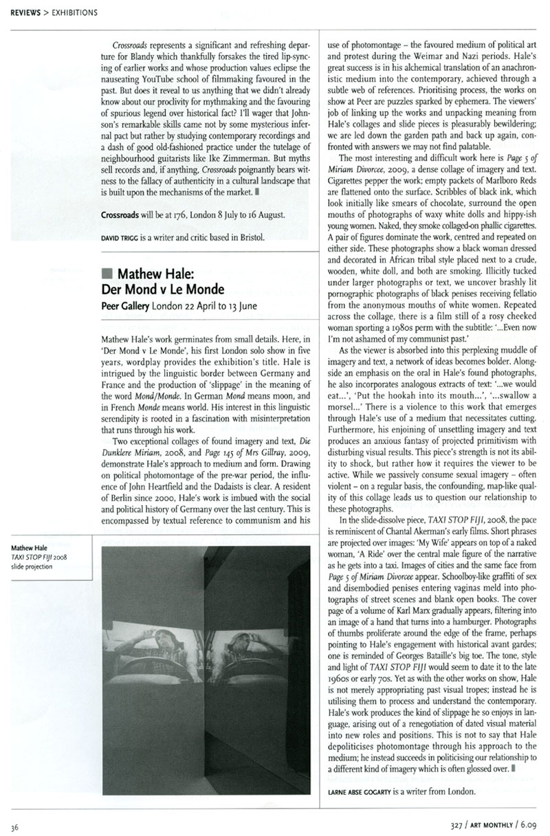
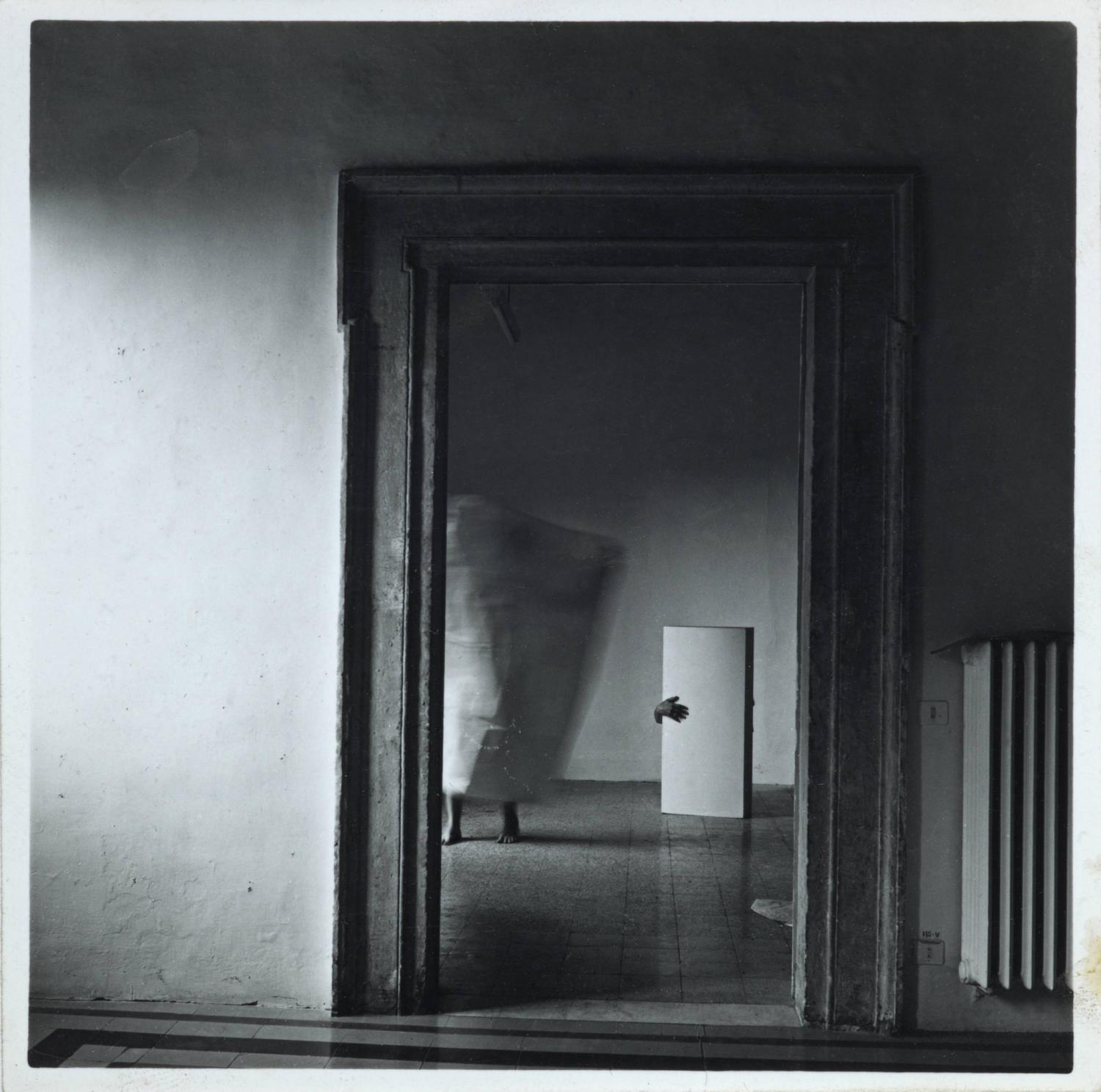
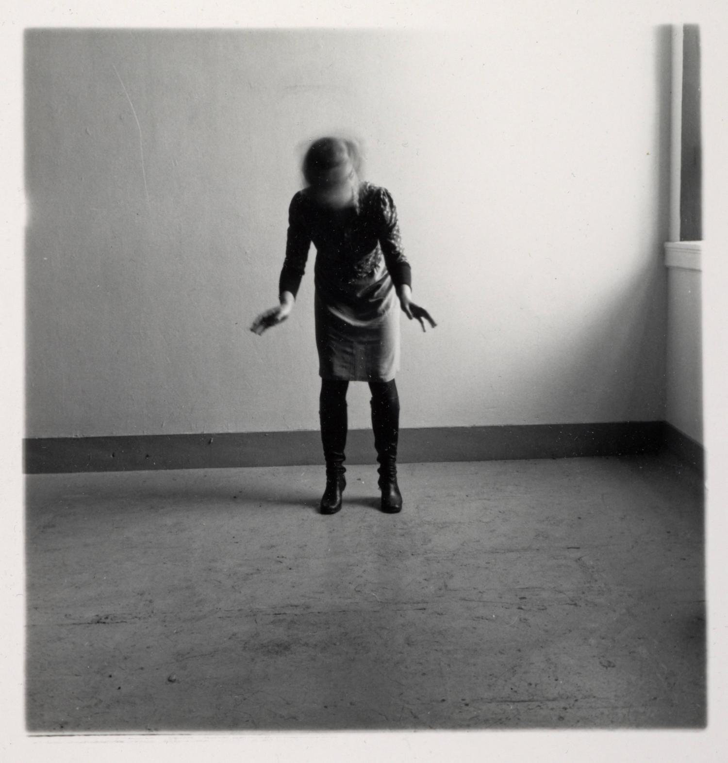
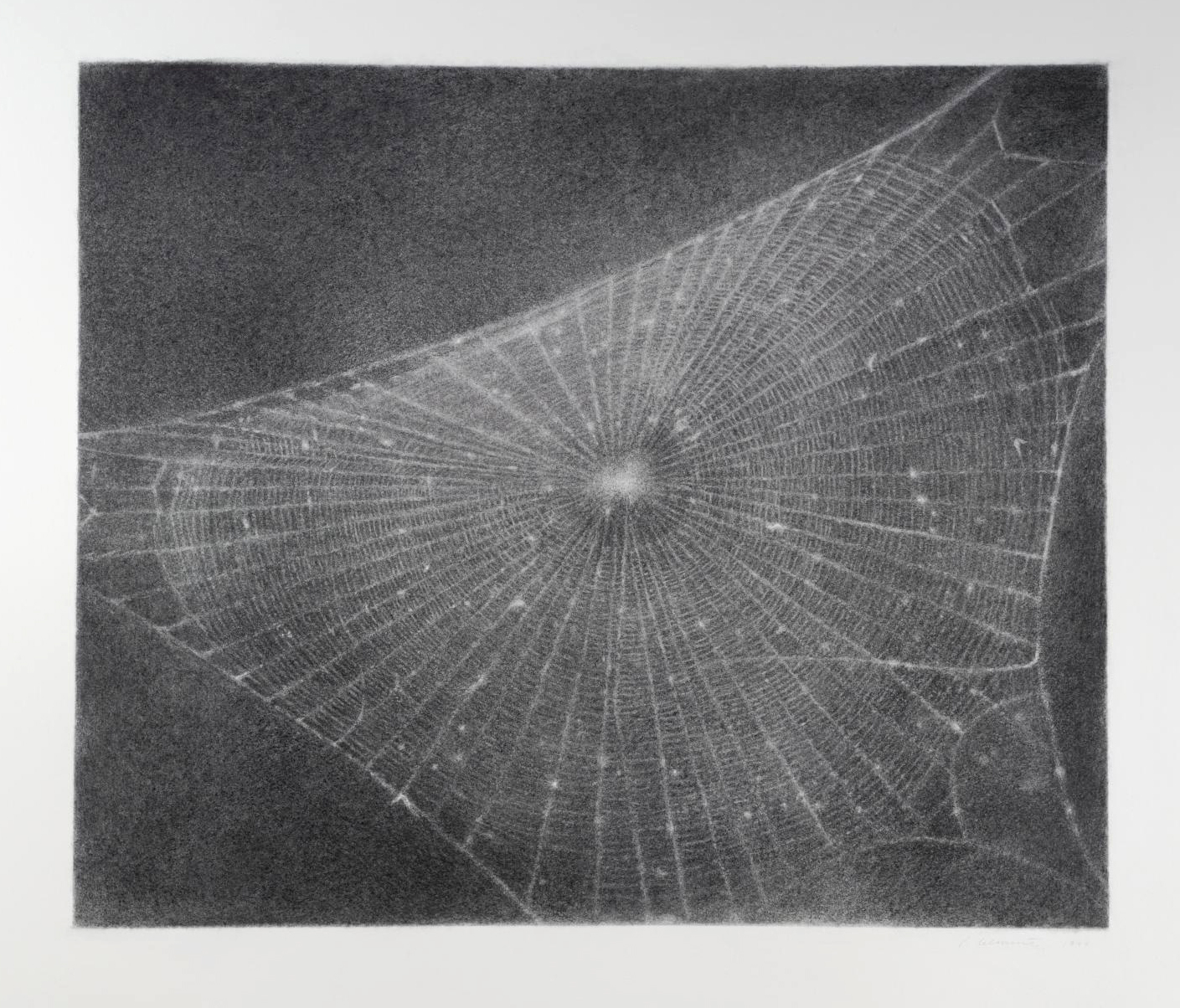
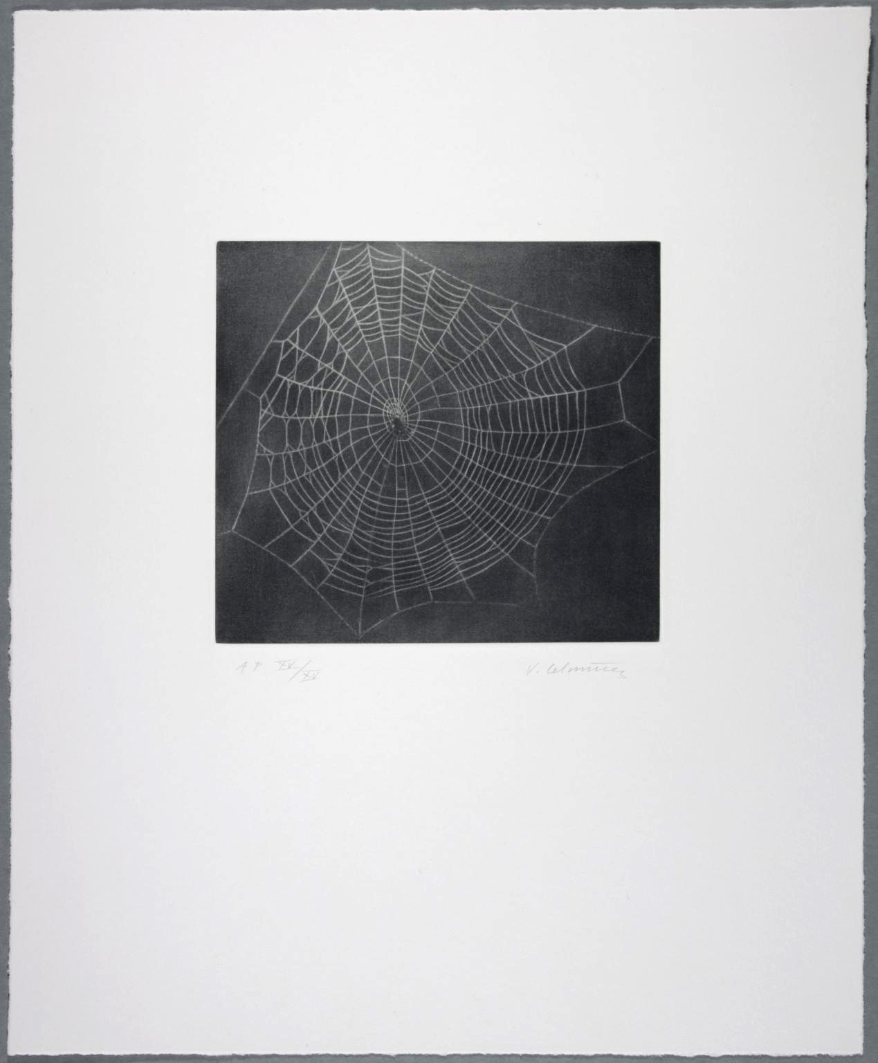
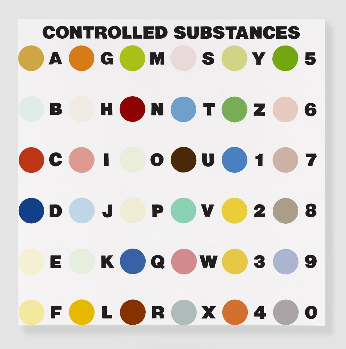
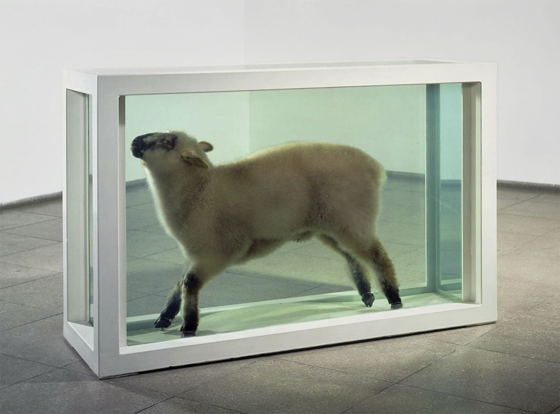
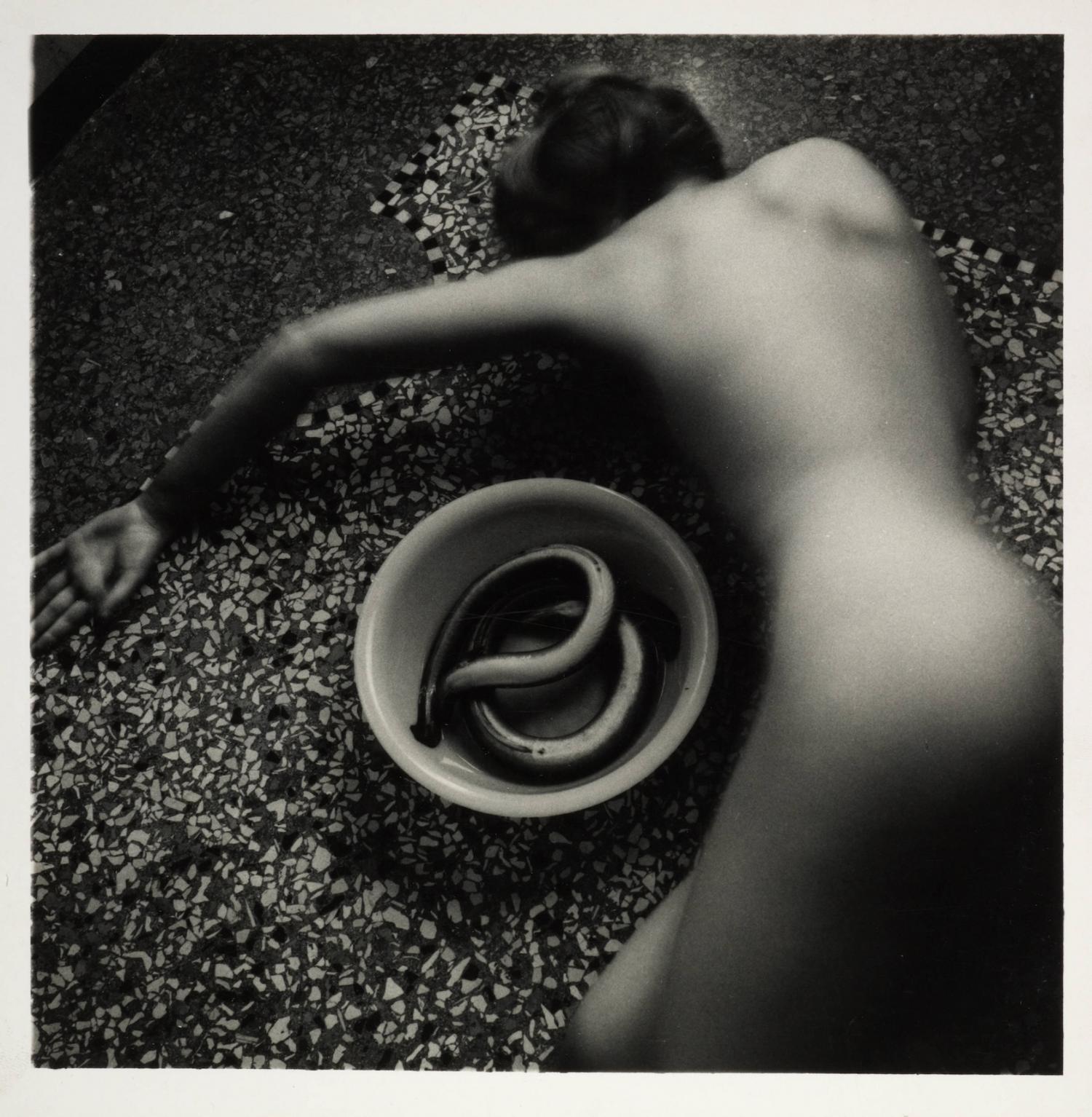
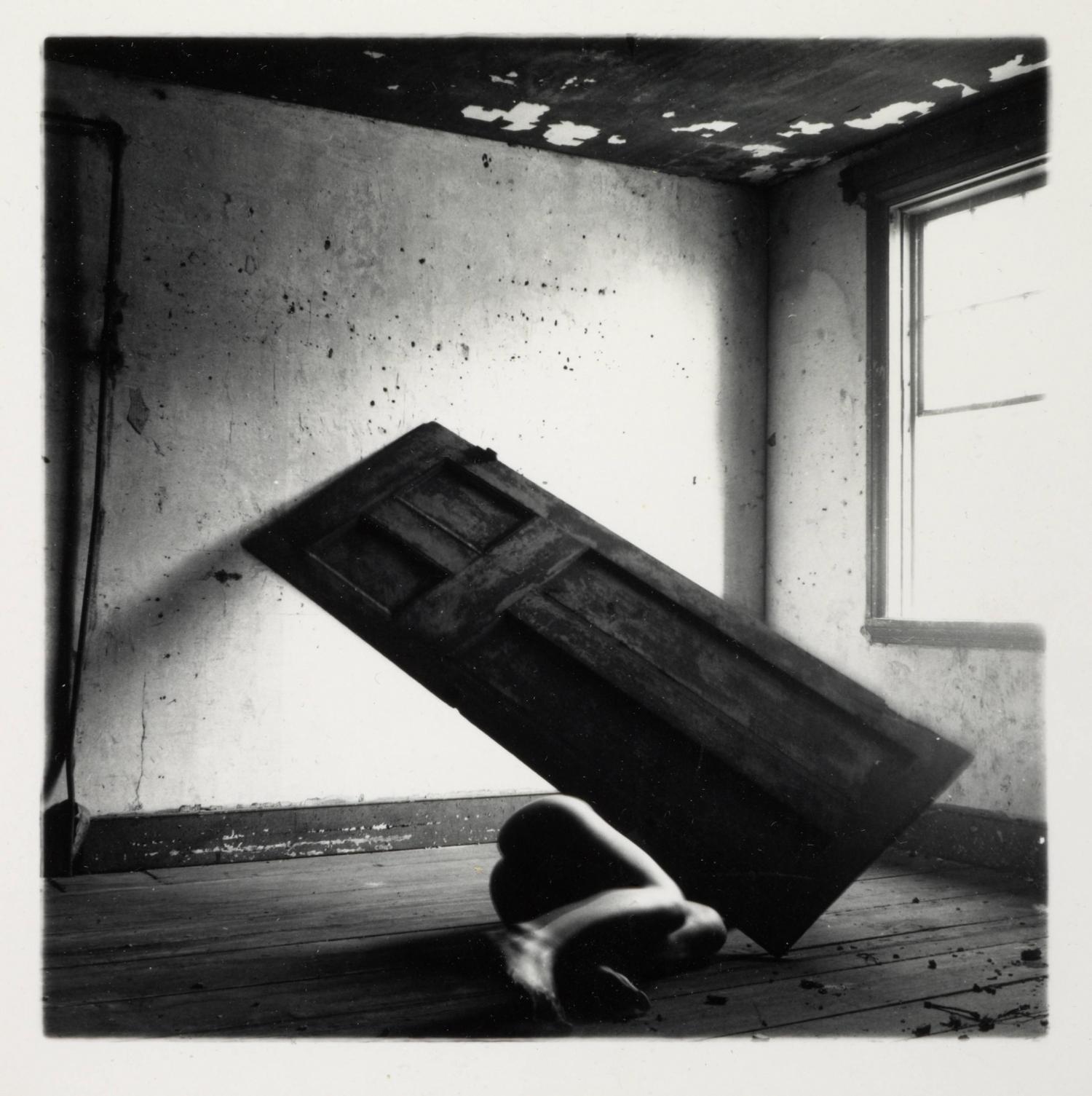
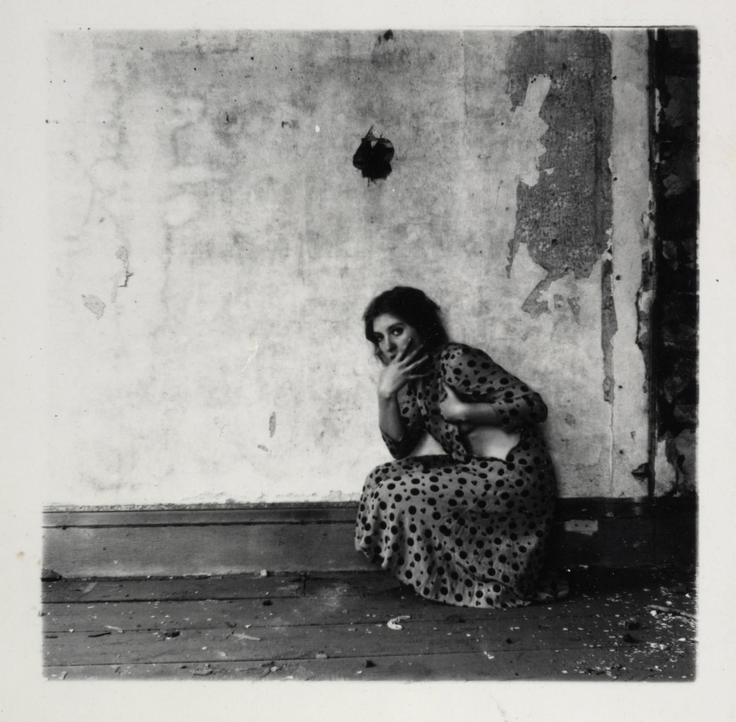
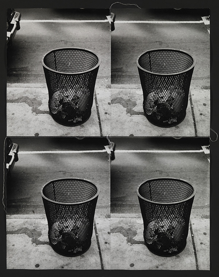
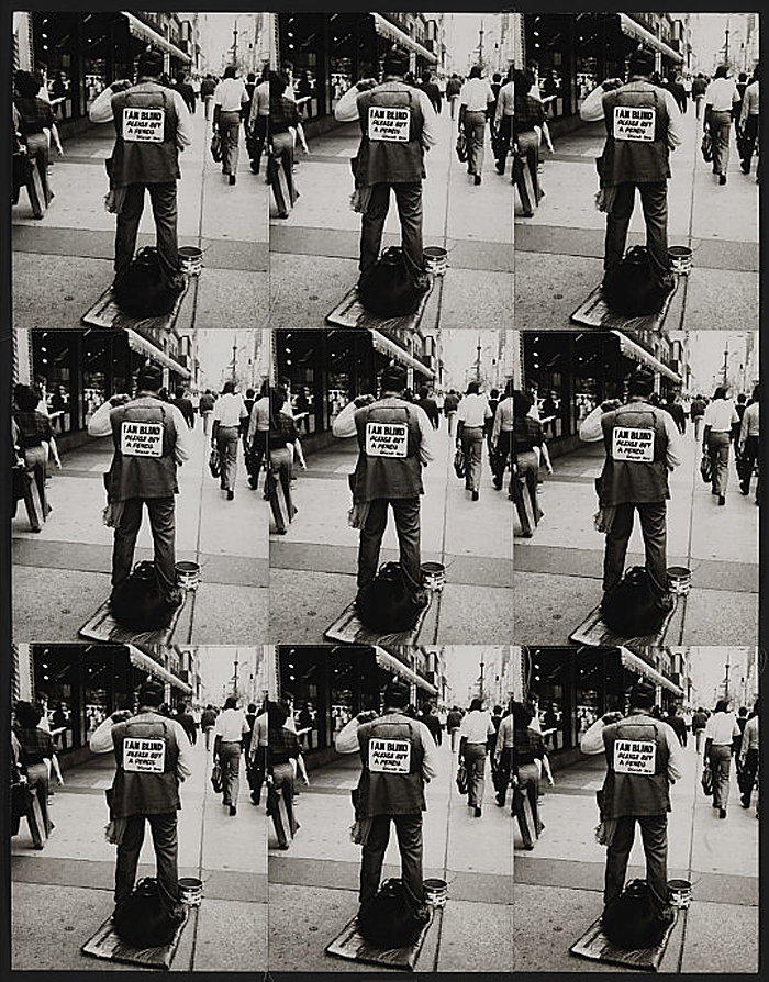
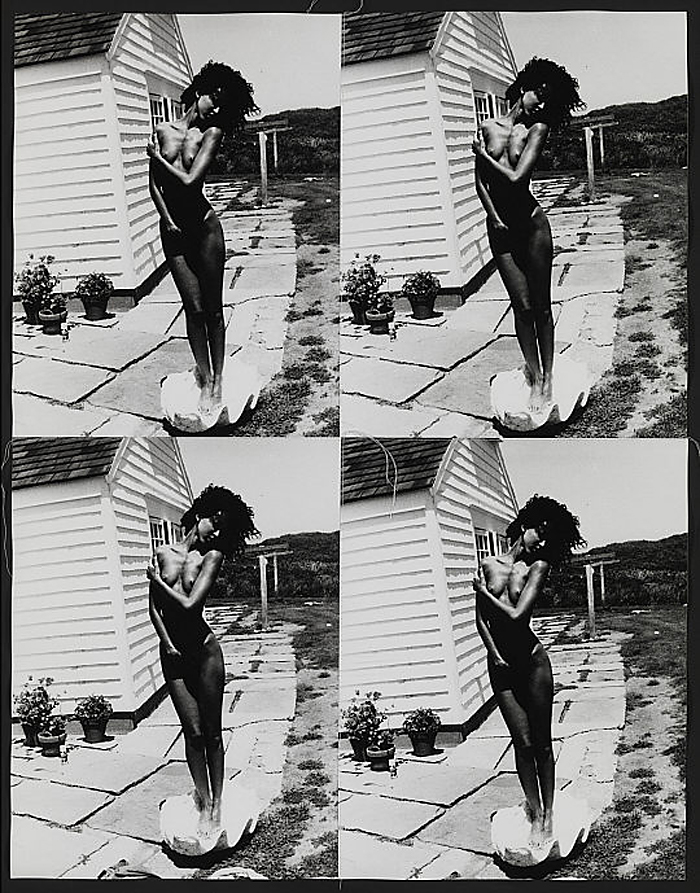
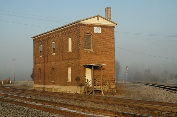
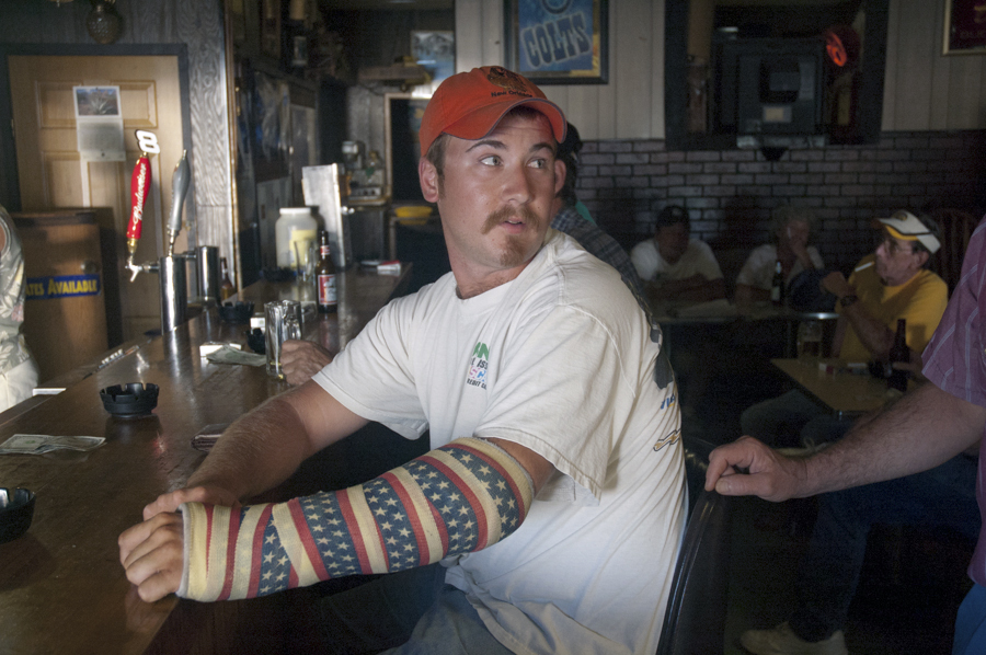
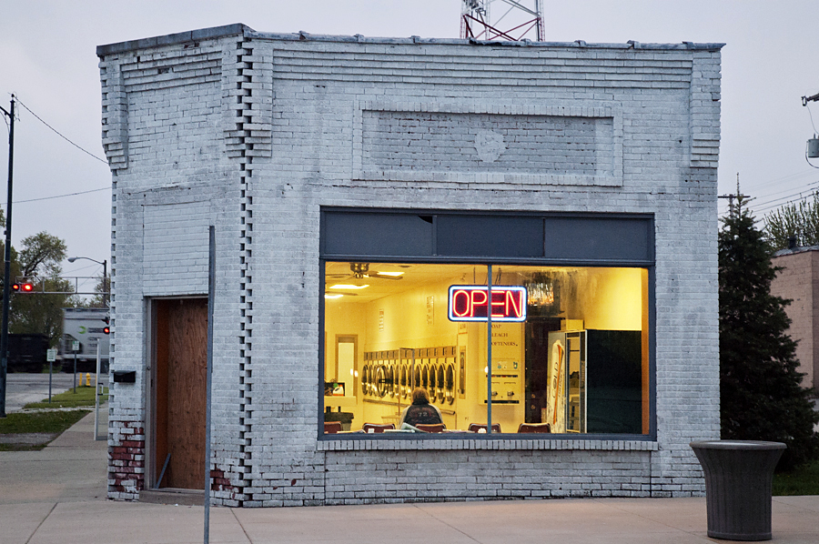
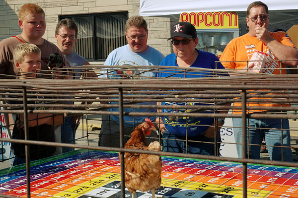
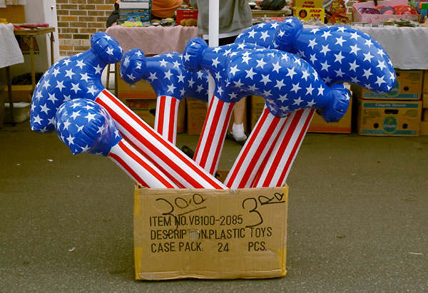
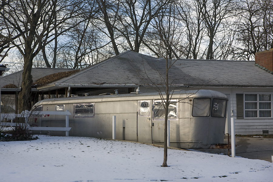
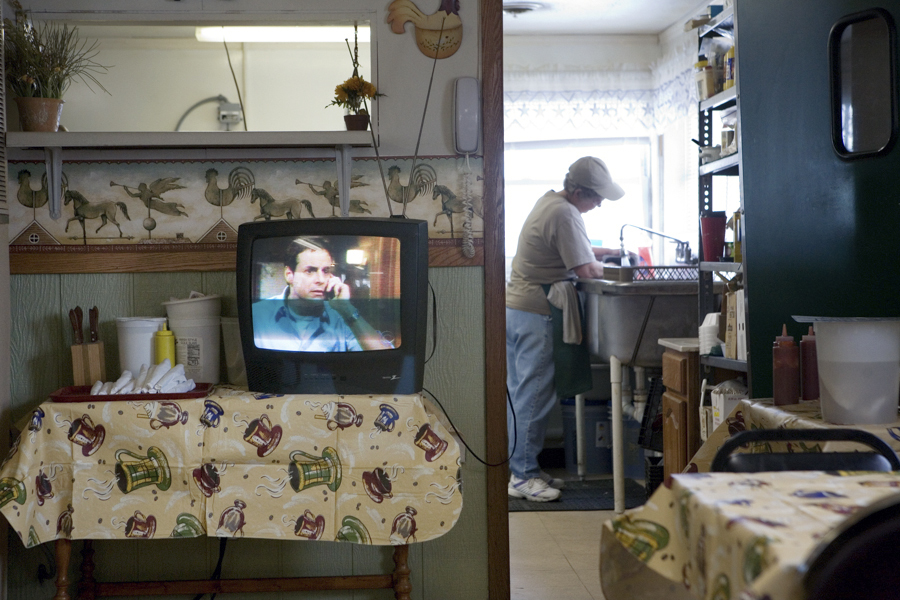
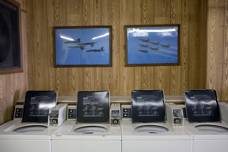
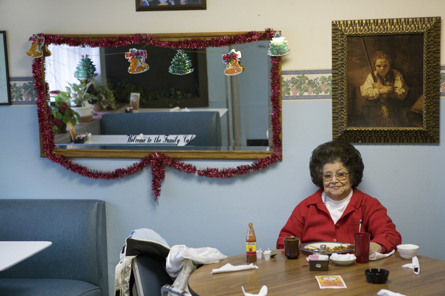
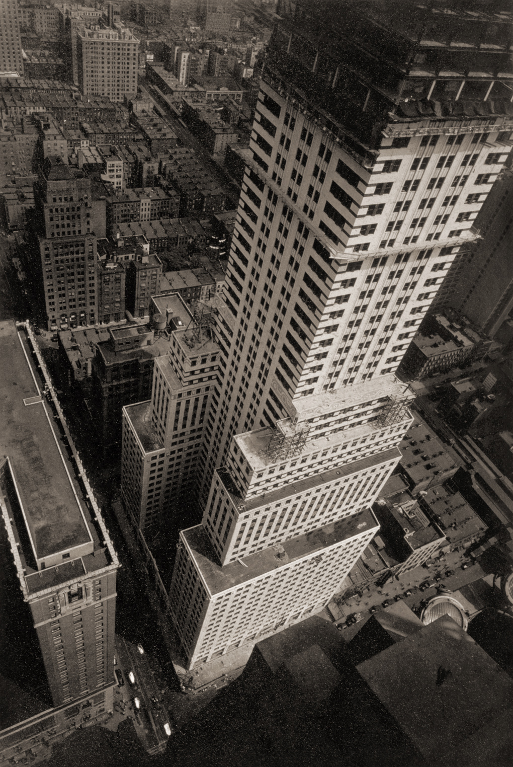
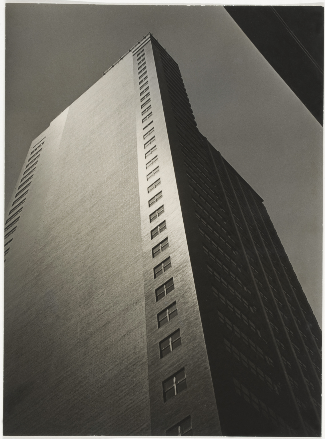
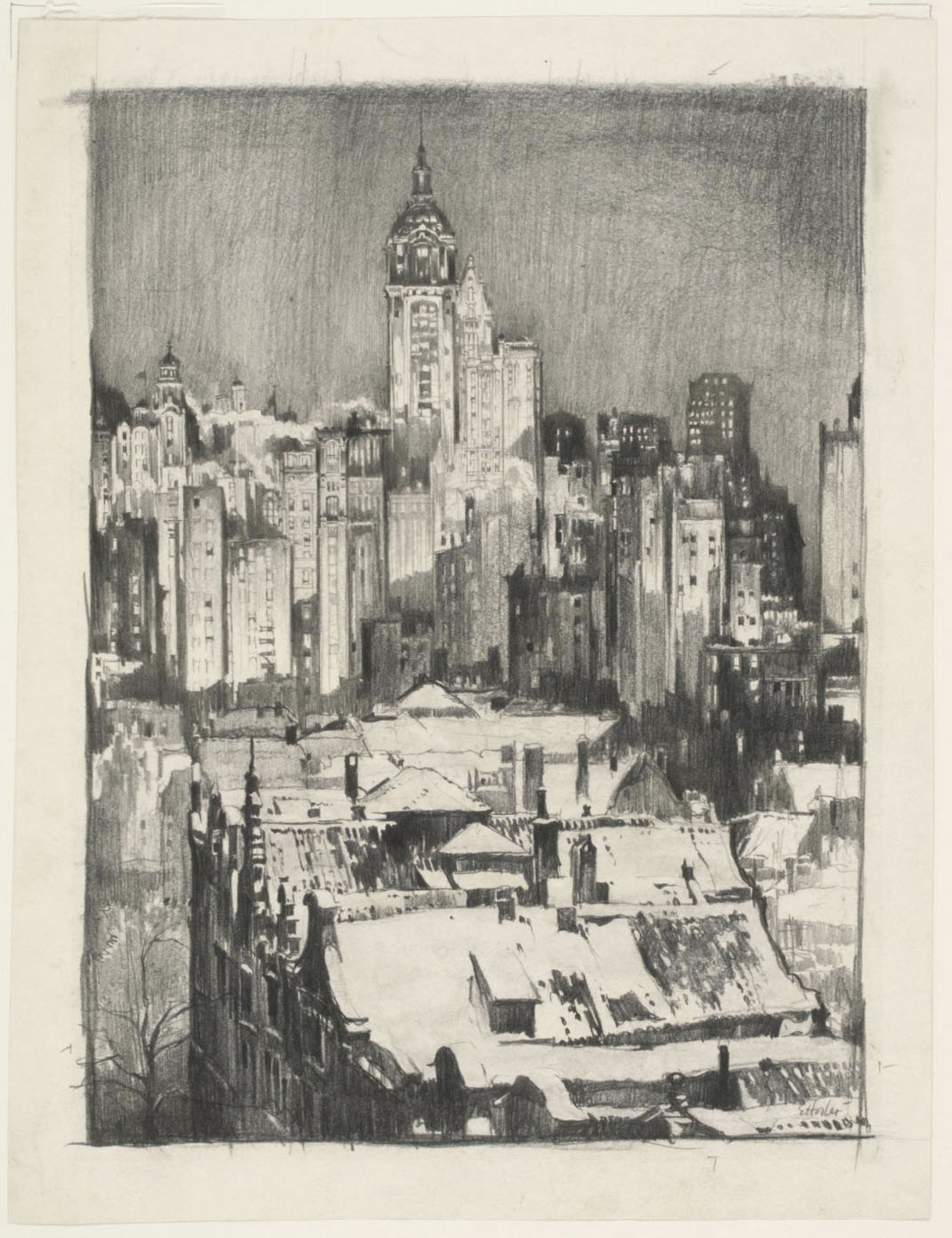
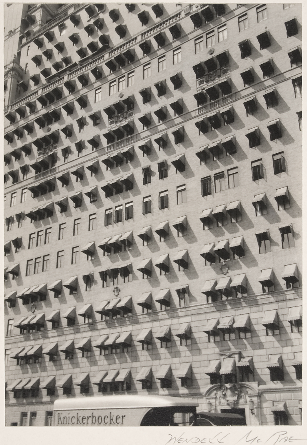
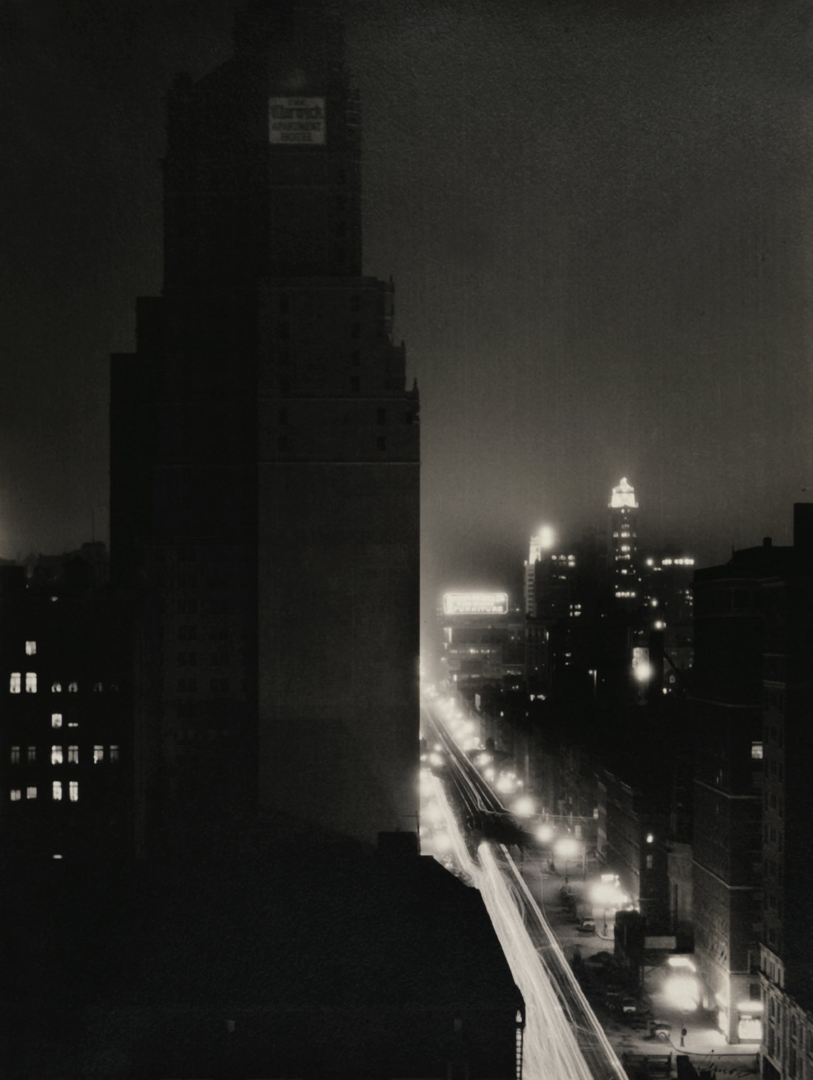
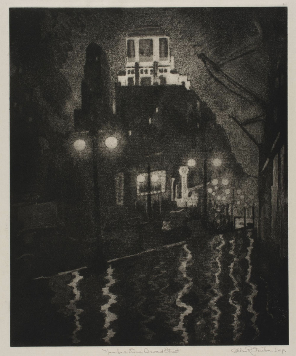
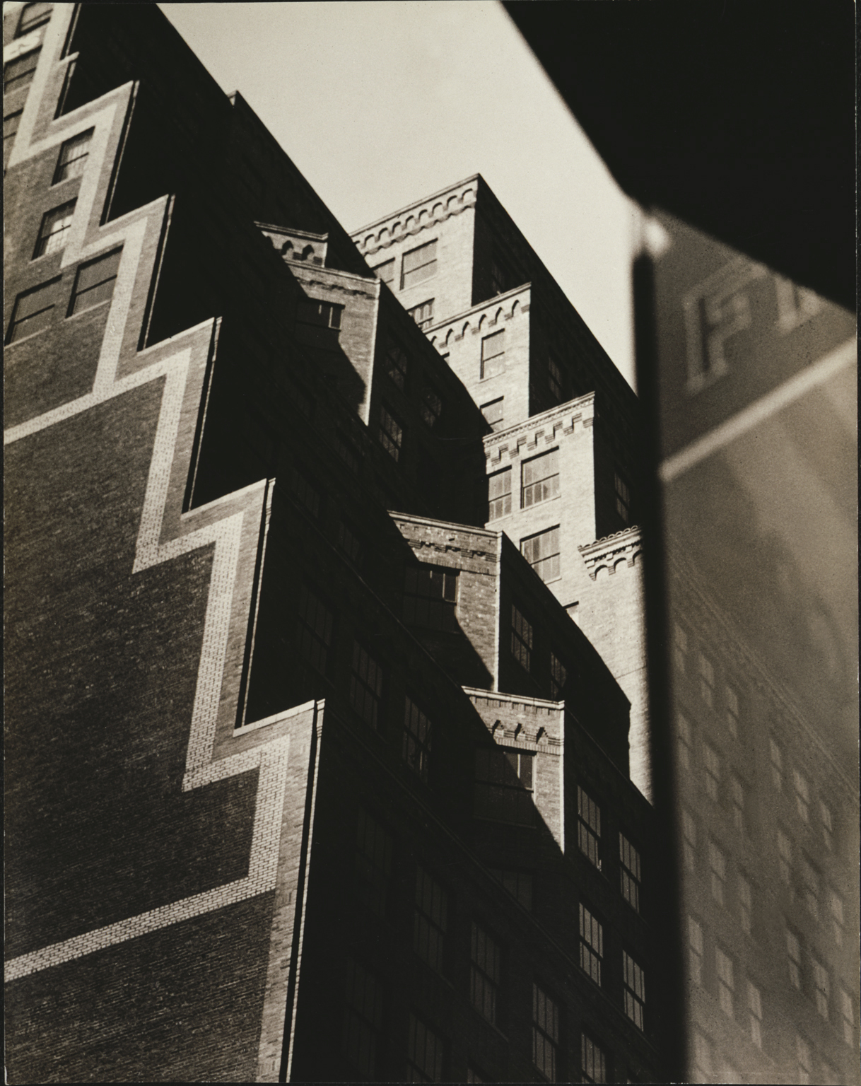
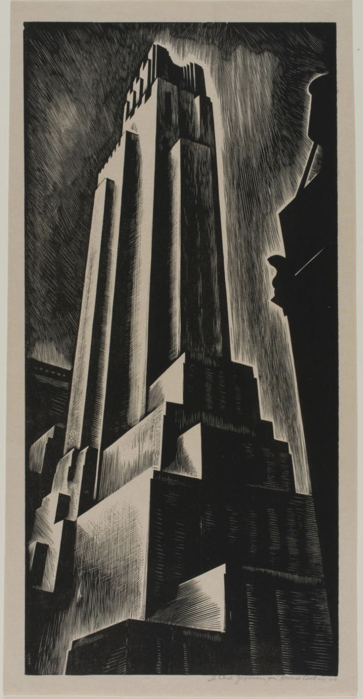
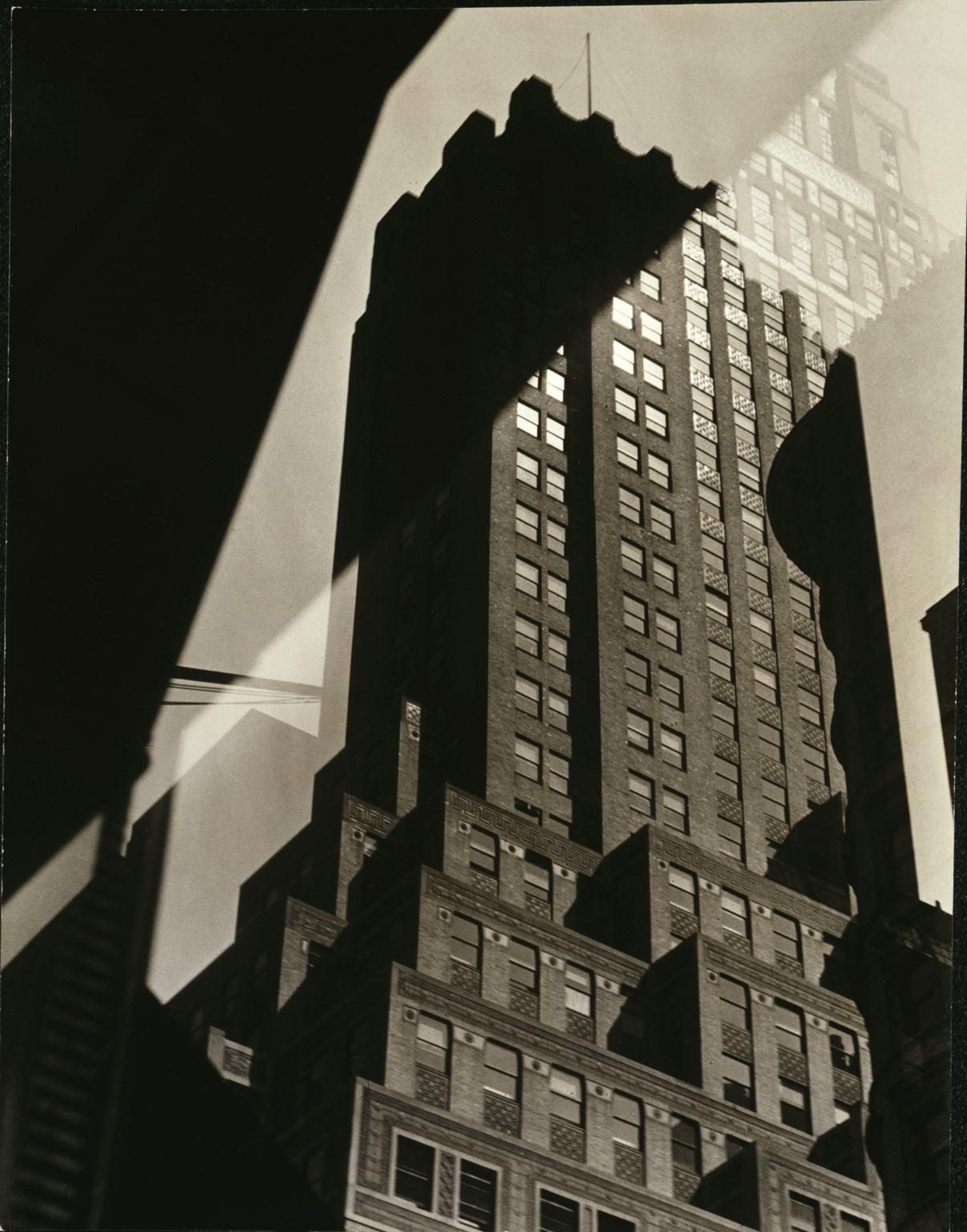
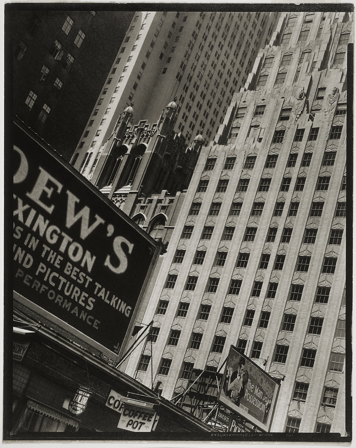
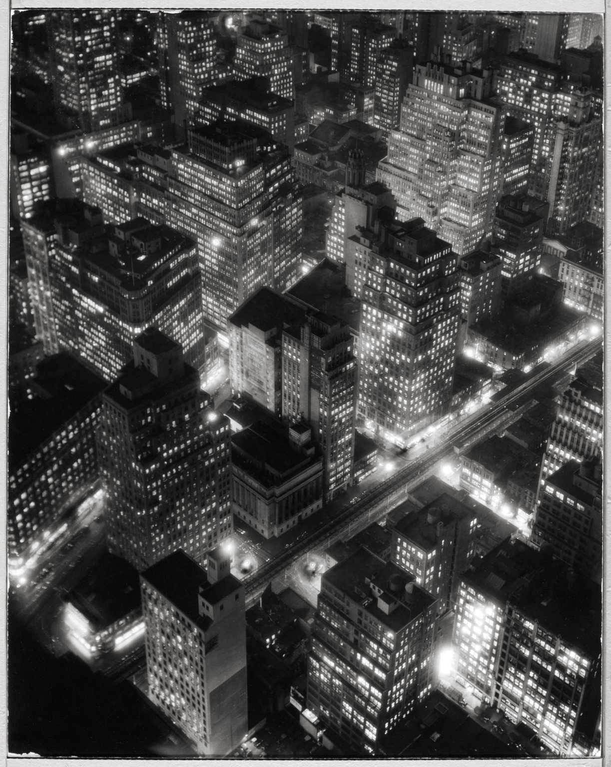

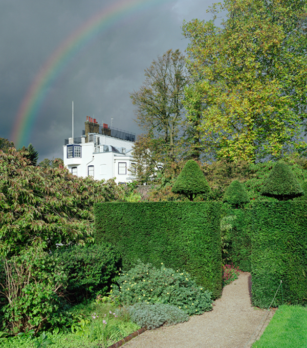


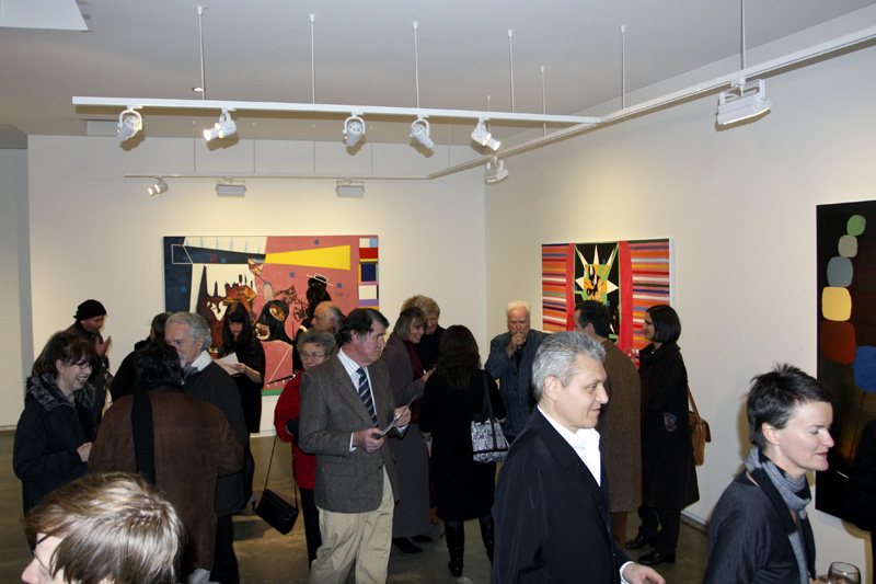
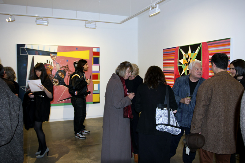
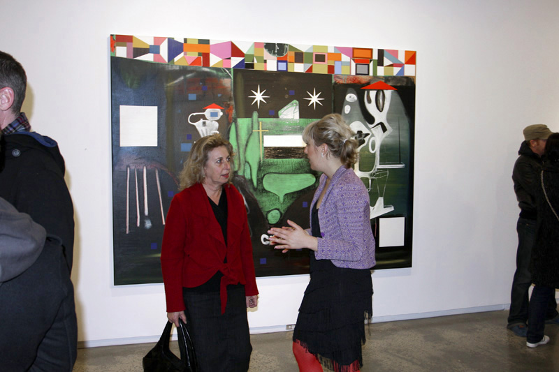
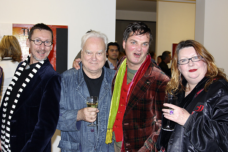
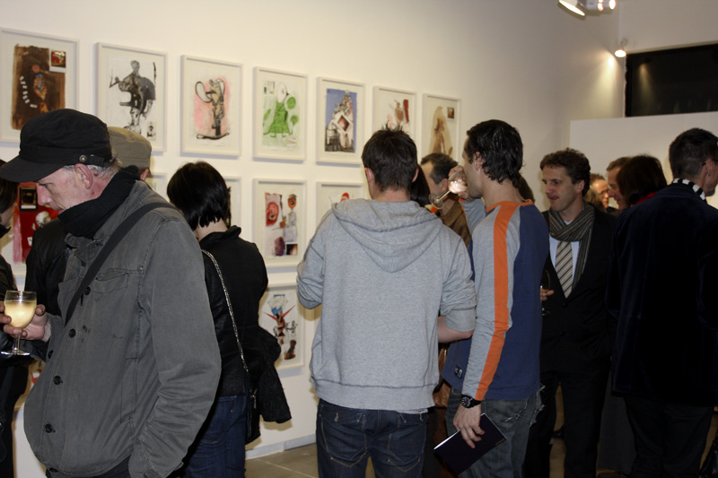
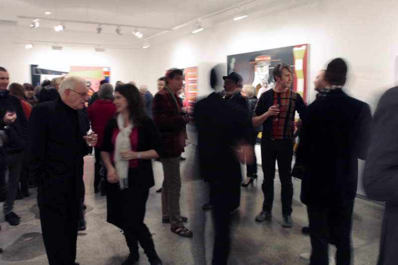

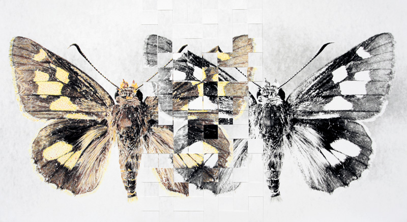
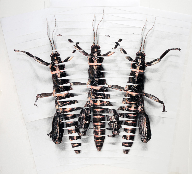
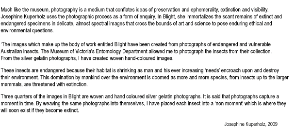
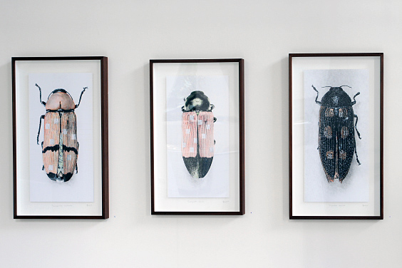
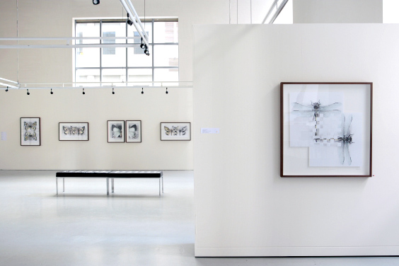
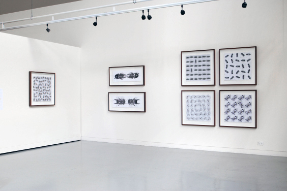
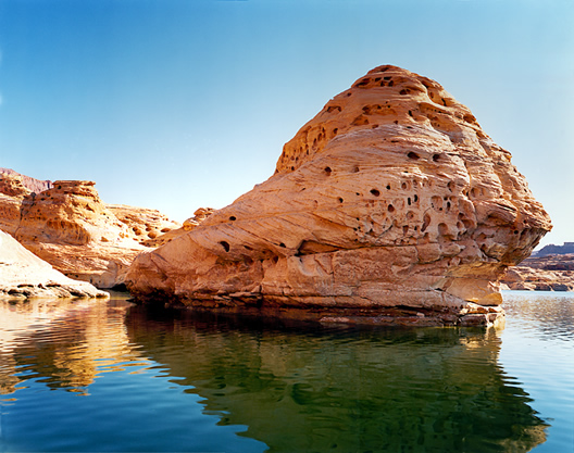

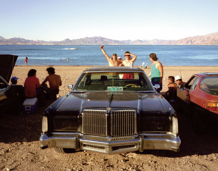
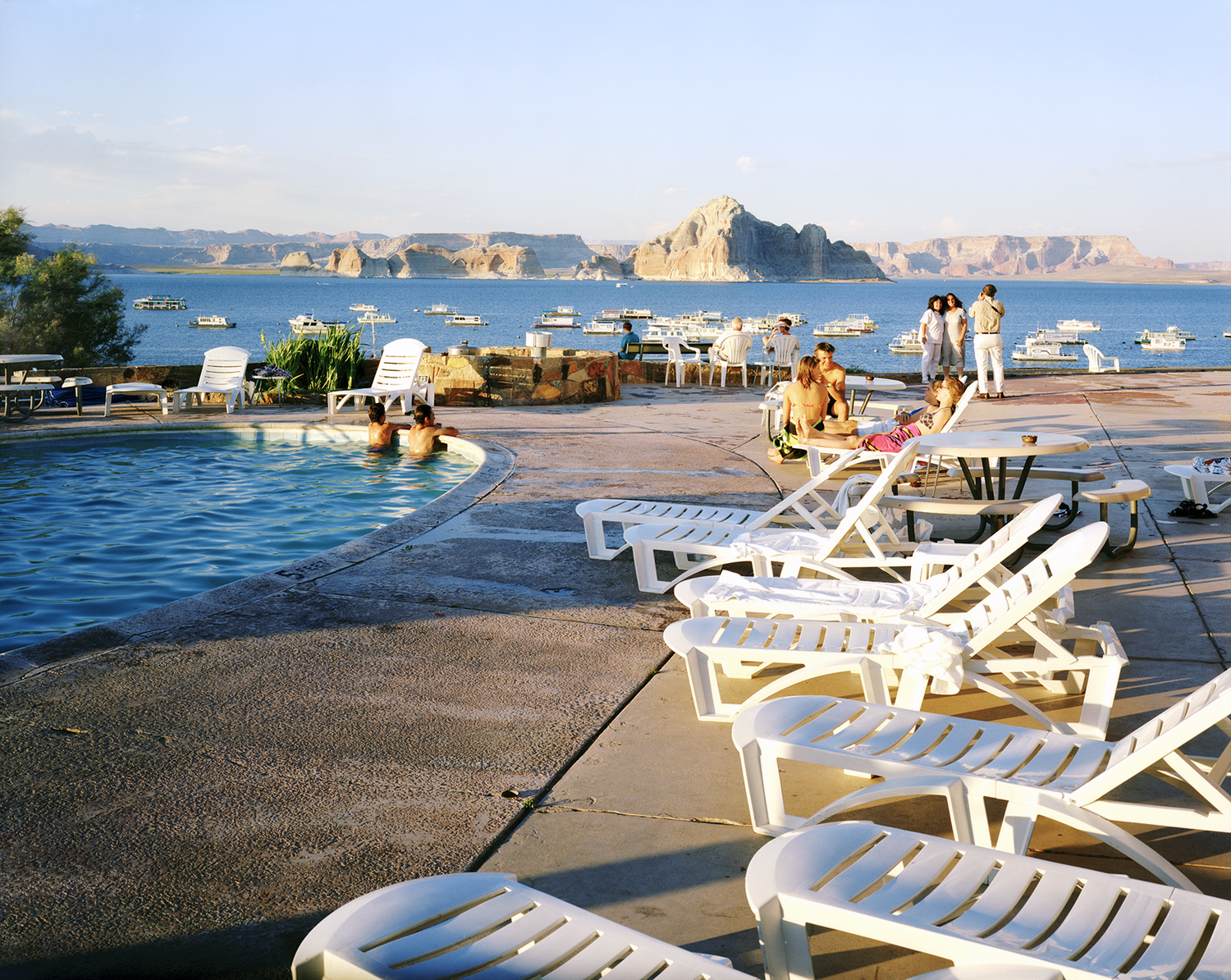
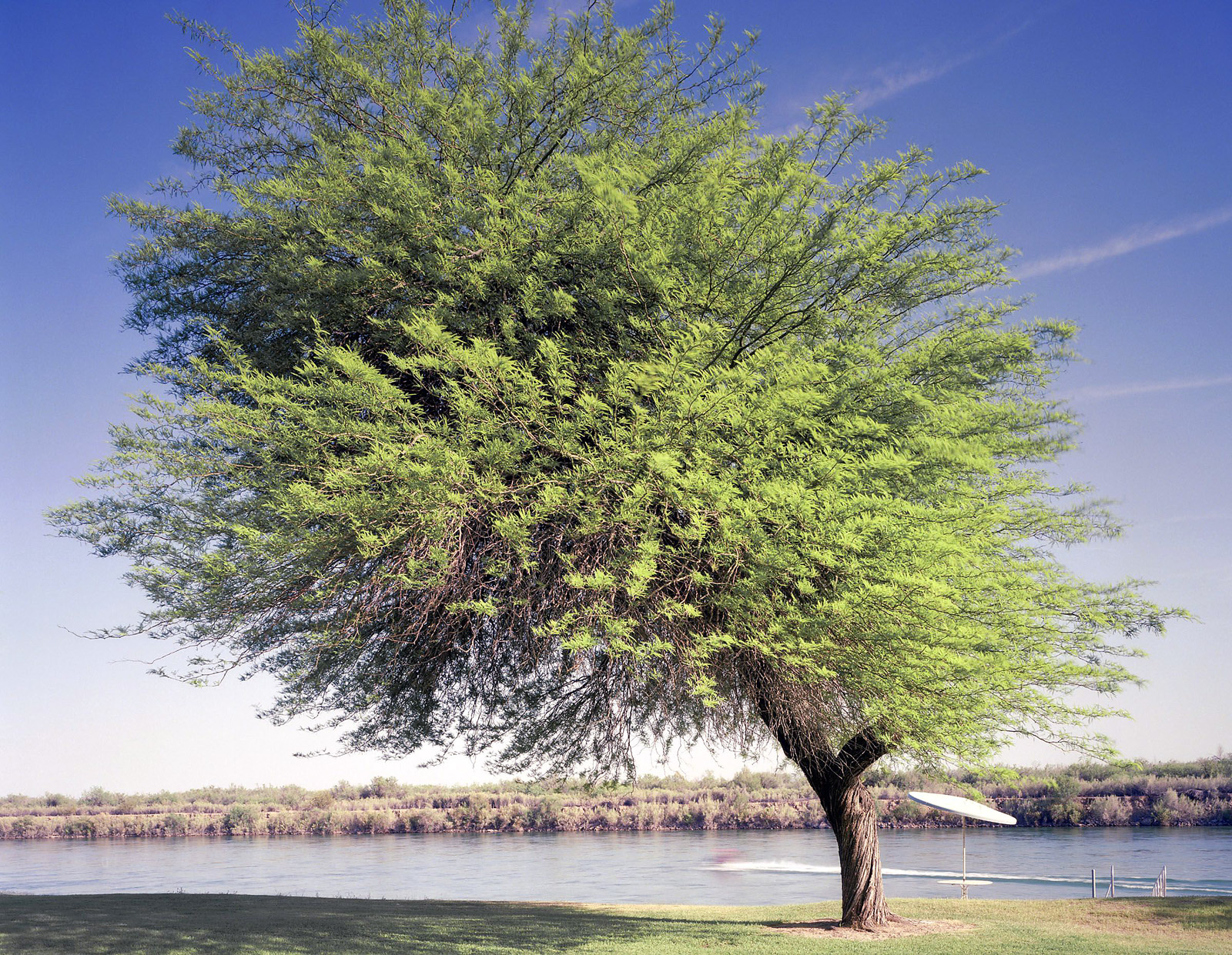

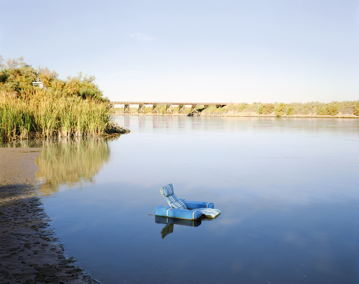
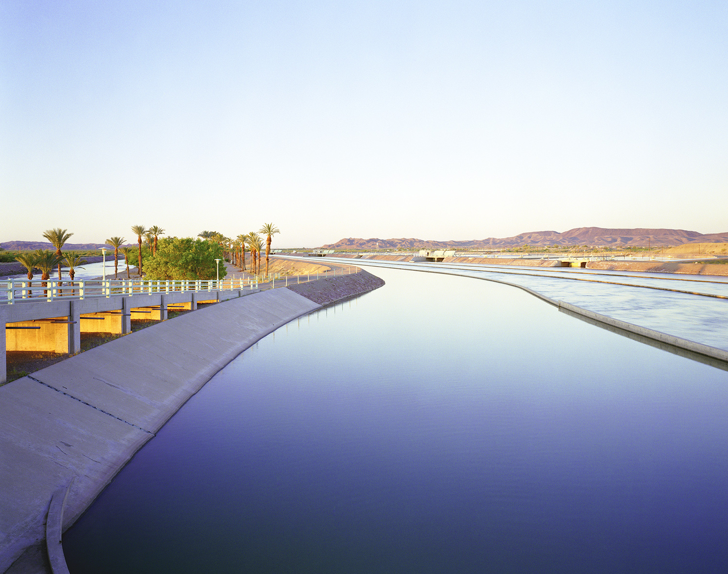
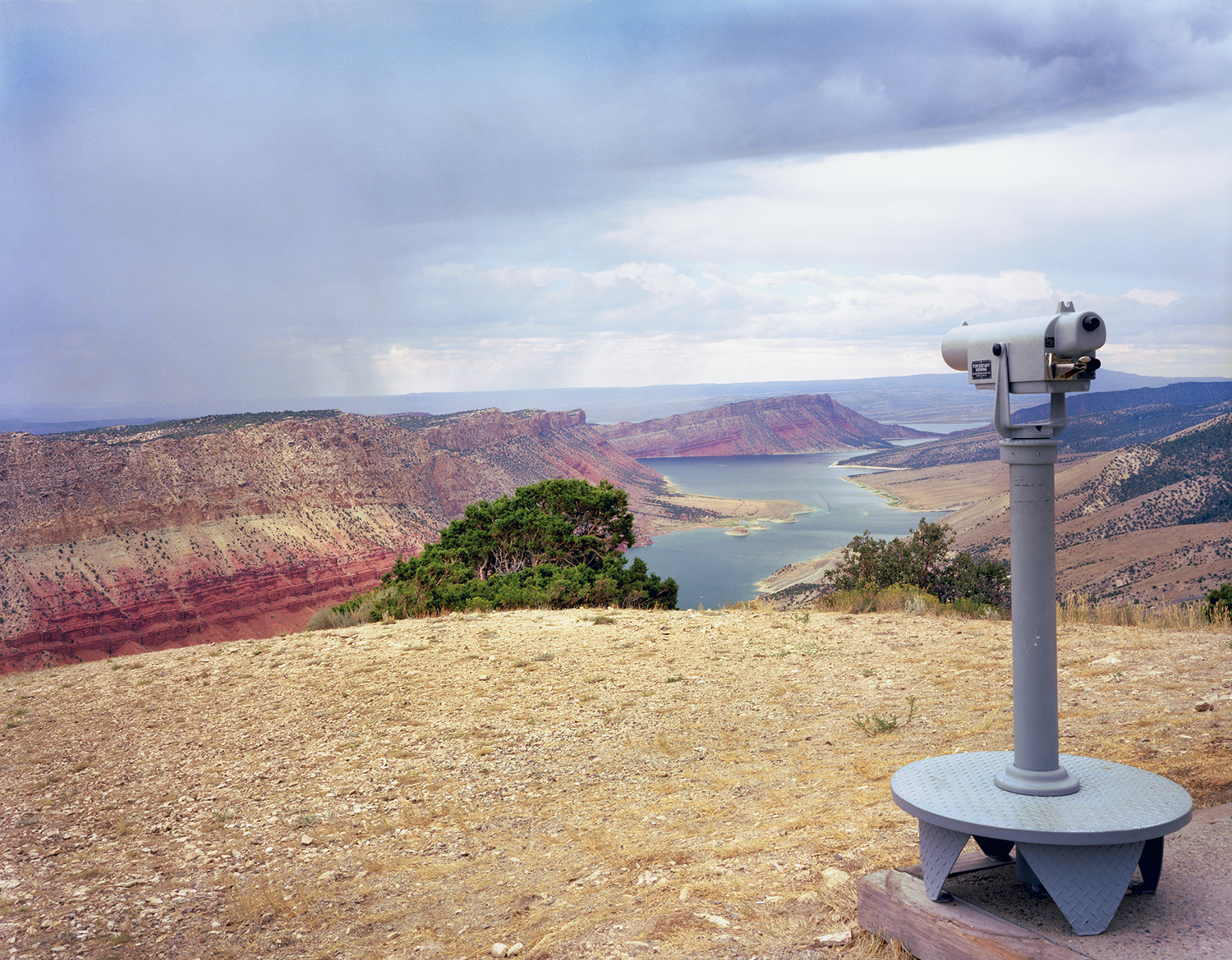
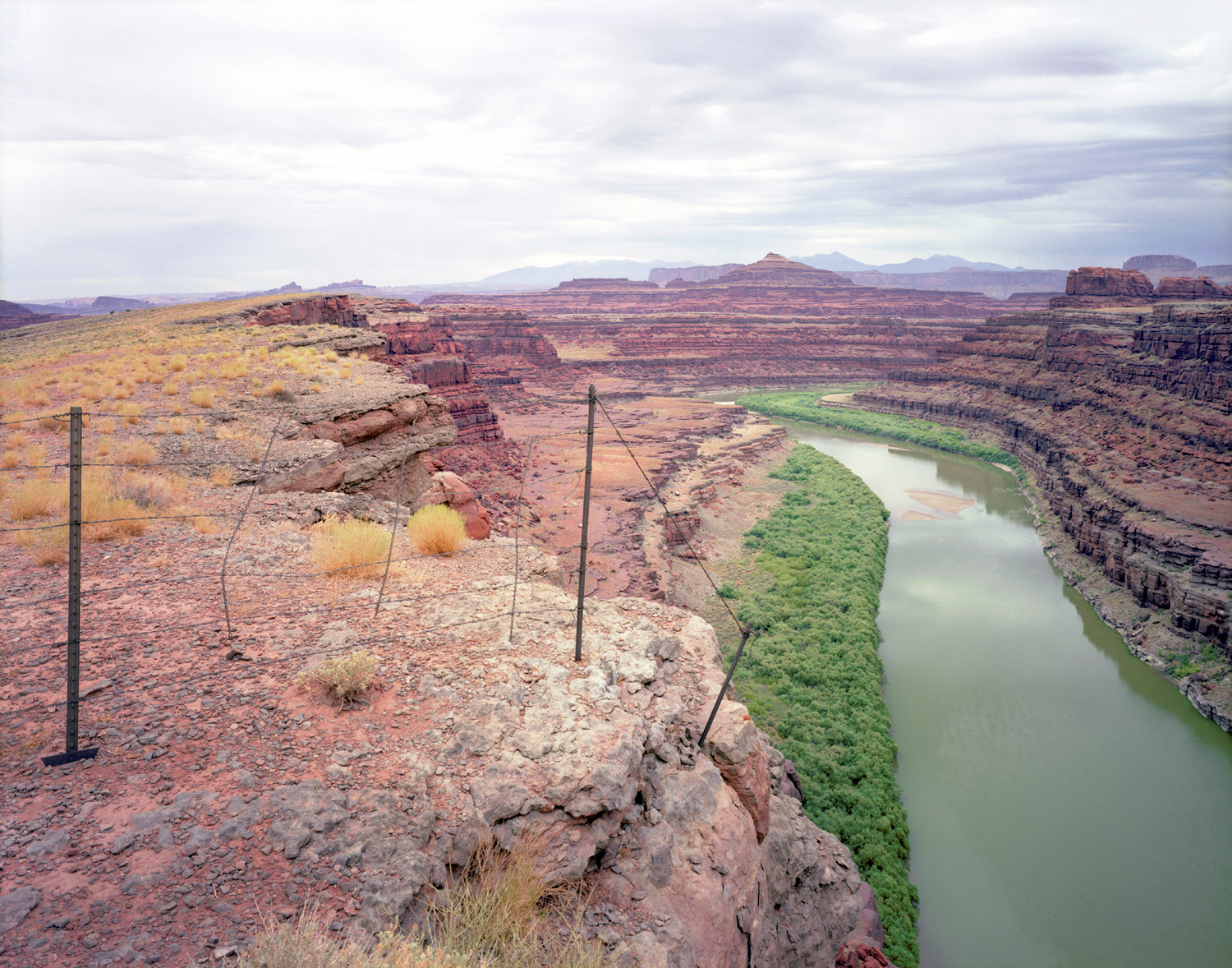
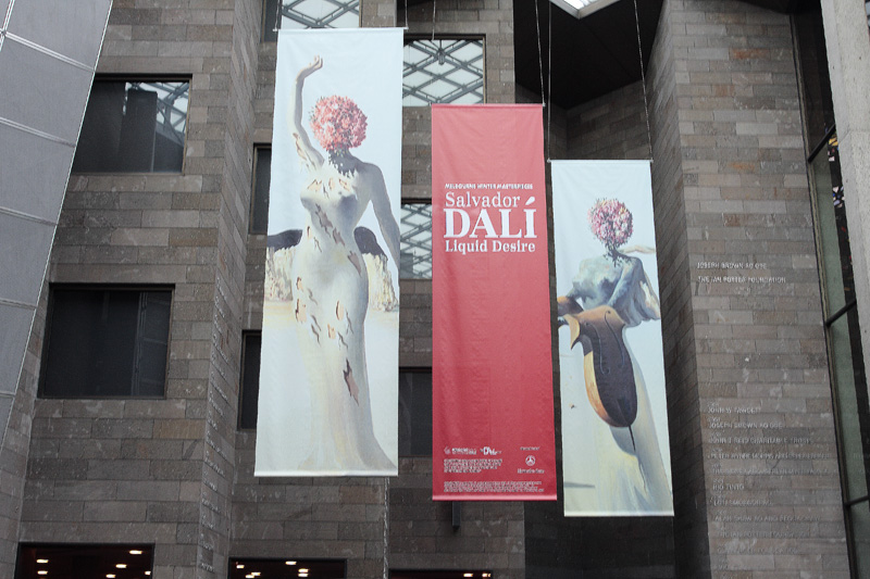
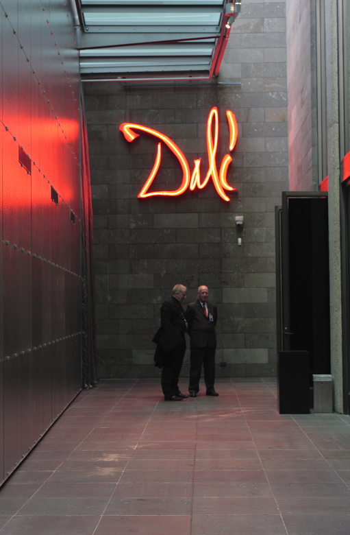
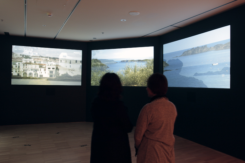
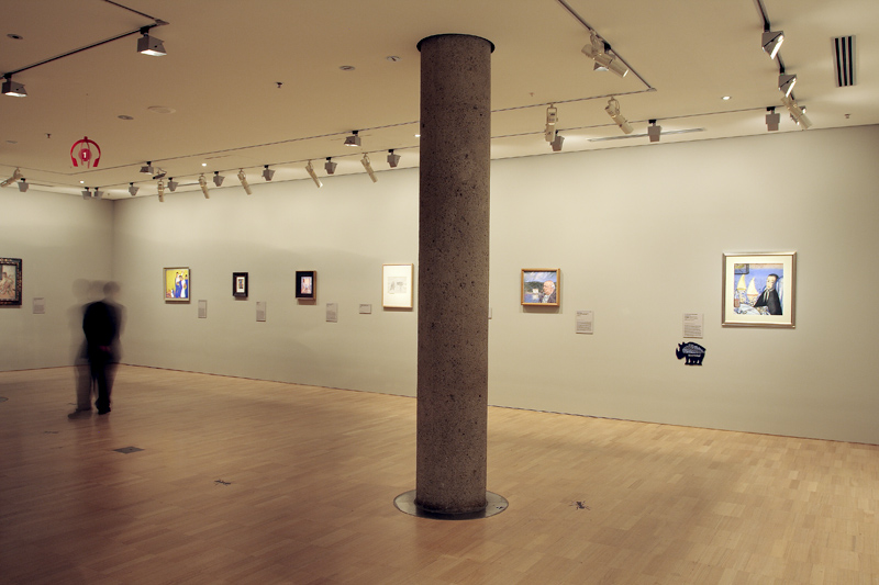


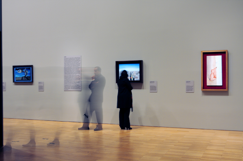
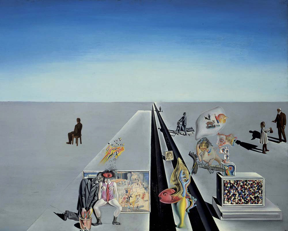
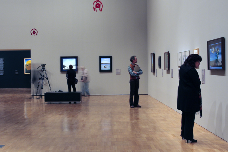
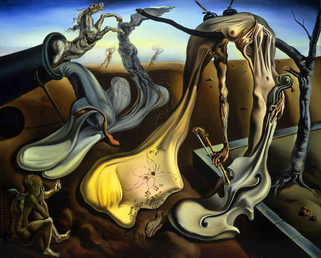
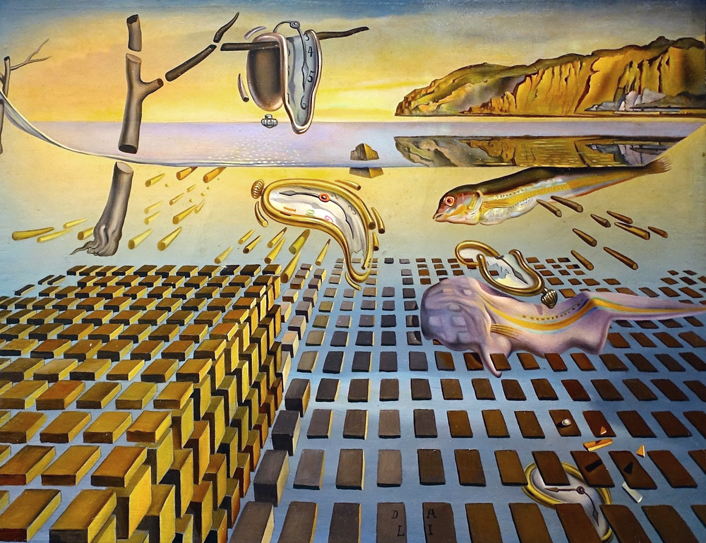
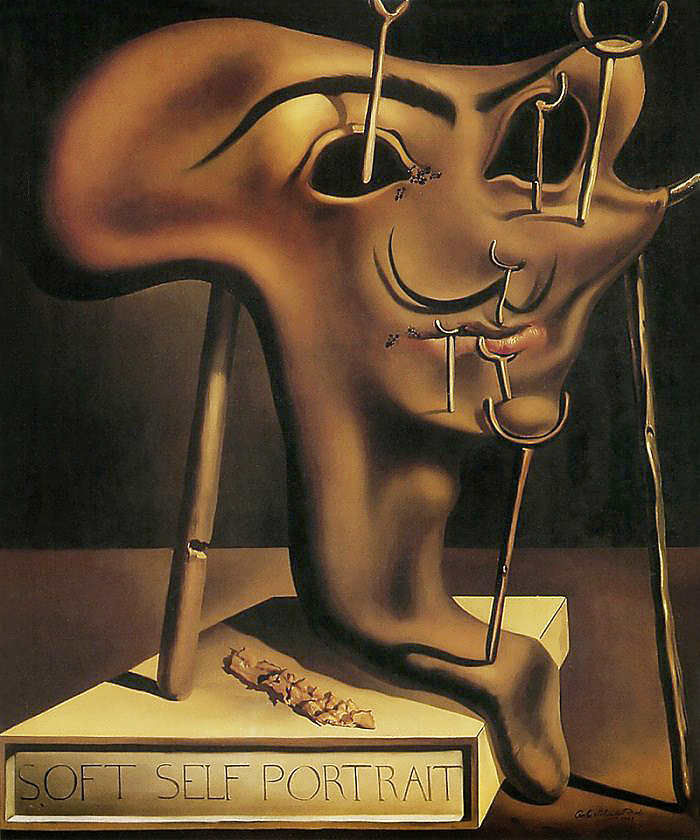
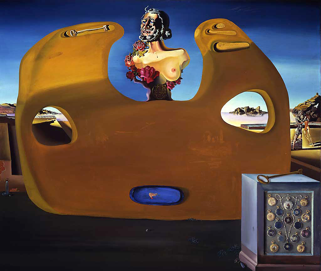
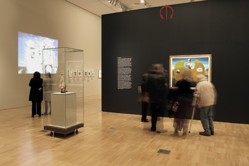
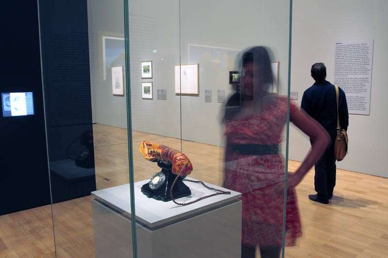
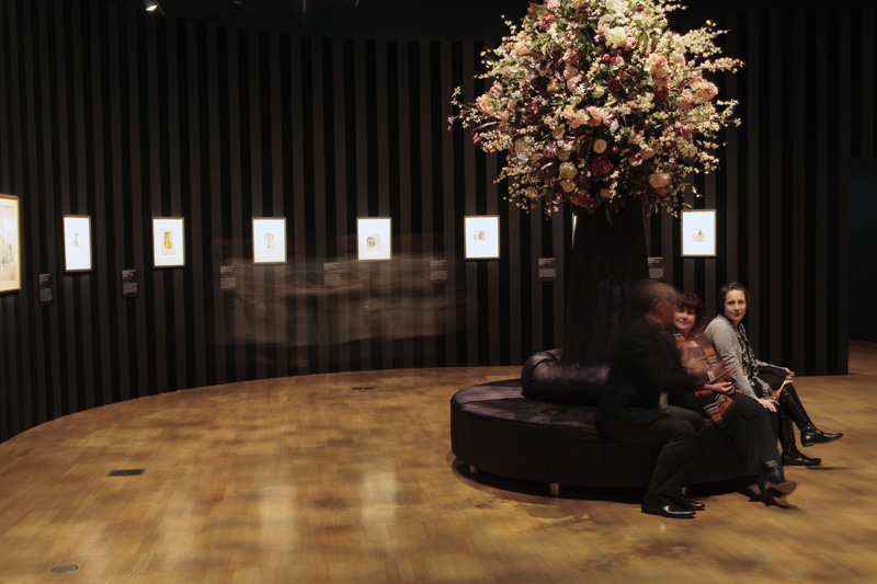
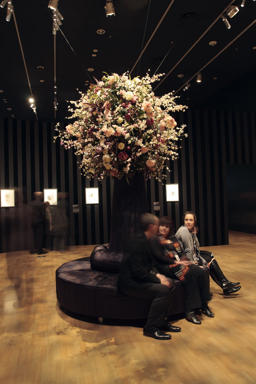
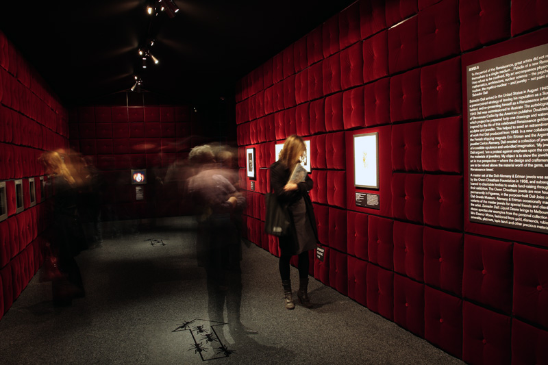

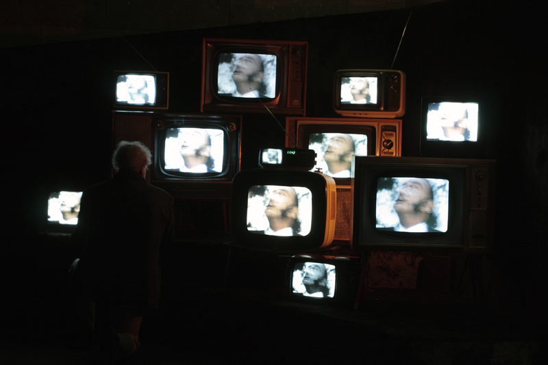
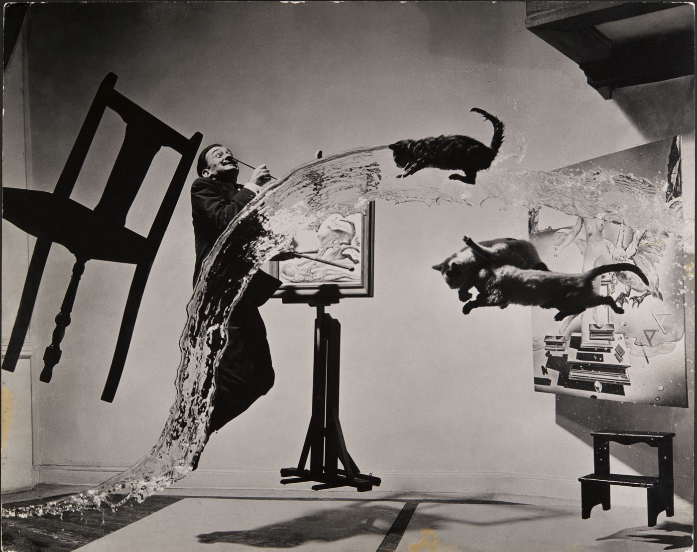
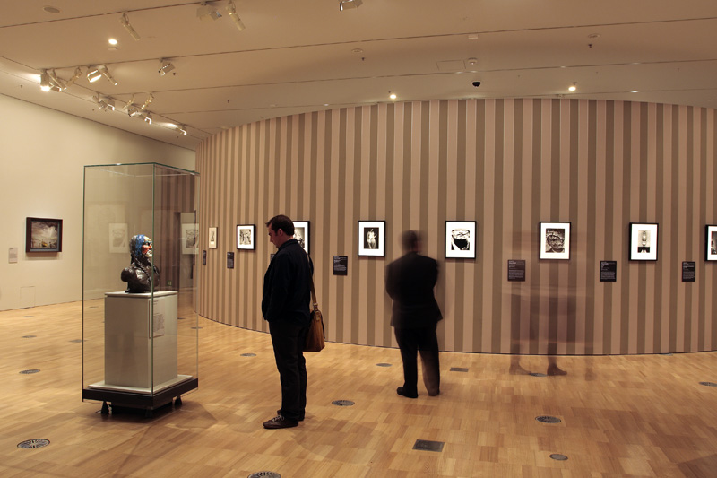
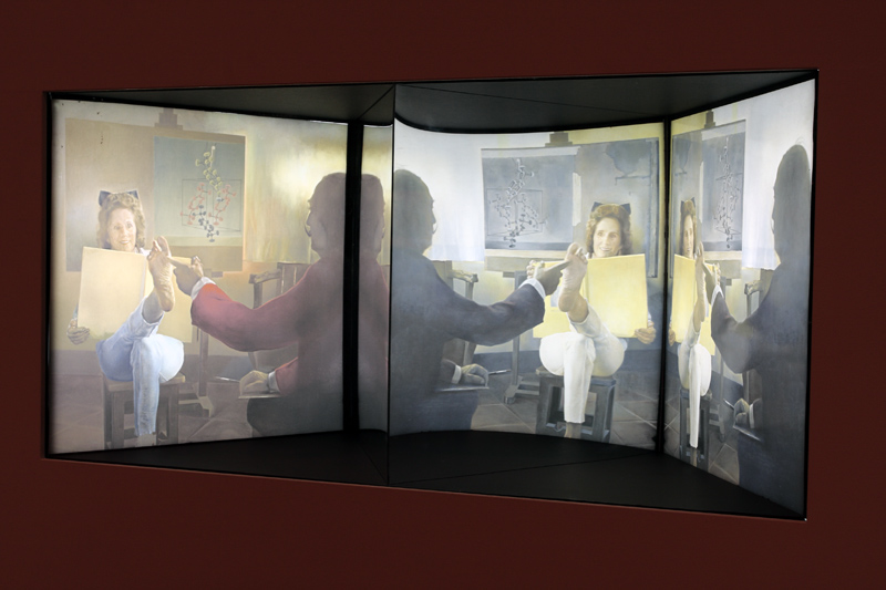
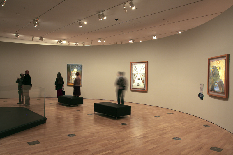
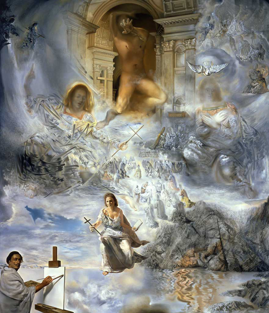
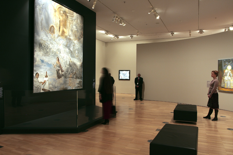
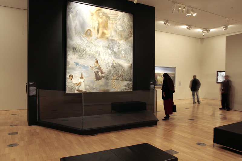


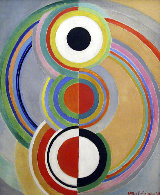
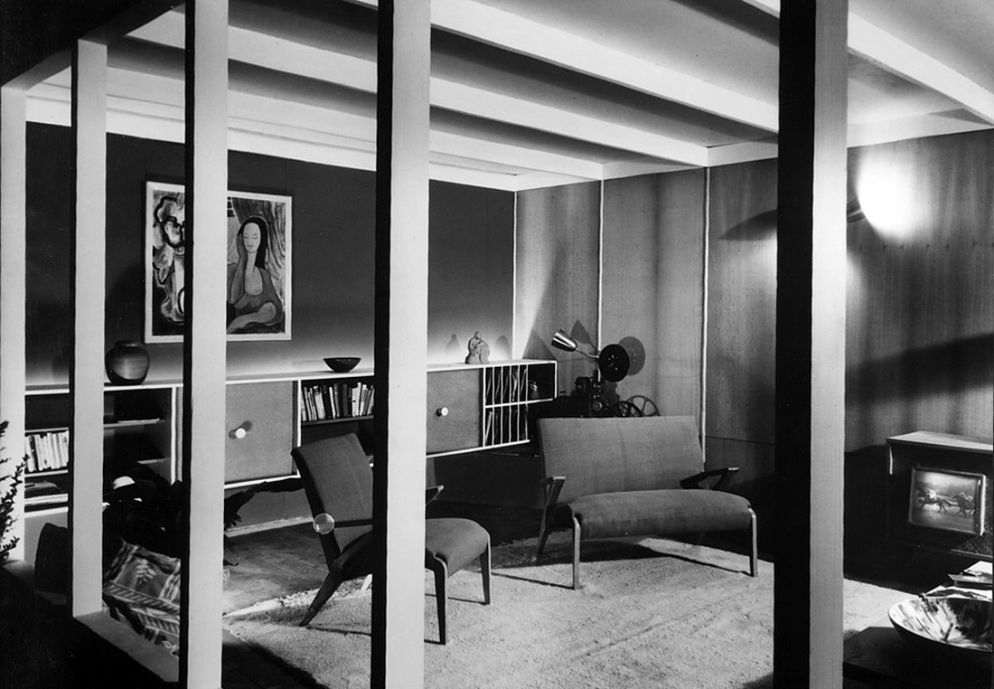
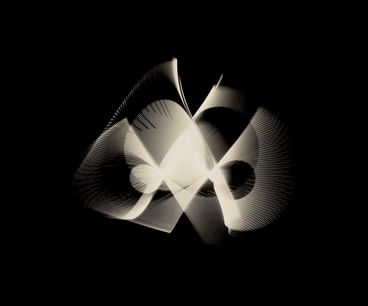


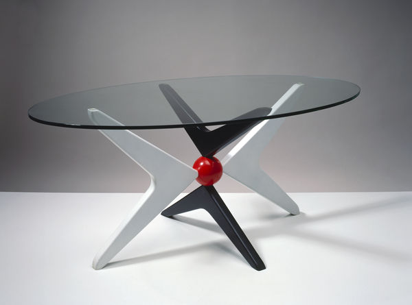
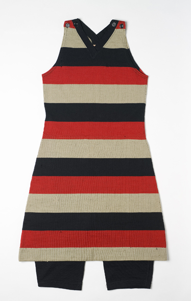


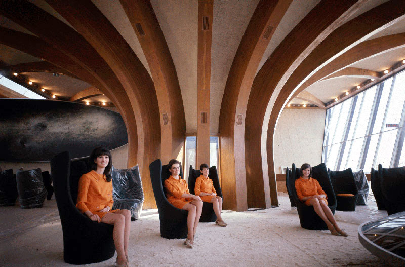


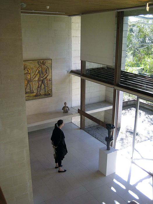
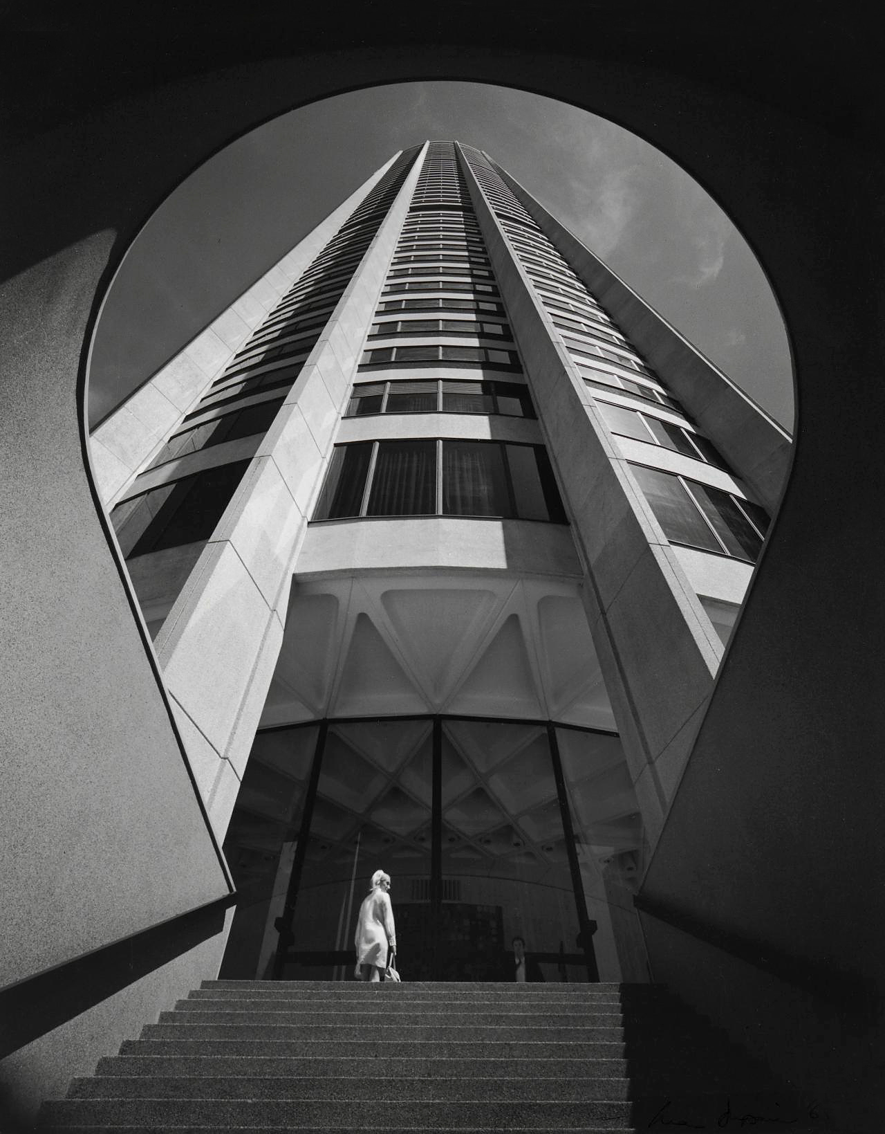

 Art Blart _ art and cultural memory archive
You must be logged in to post a comment.