FINALLY… two postings on consecutive days by conceptual artists who use photography to document their staging, performance, sculpture, body, earth-body, action art, found art, land art – WORK THAT I REALLY LIKE AND CAN REALLY CARE ABOUT.
I care about both artists work not so much because of the quality of the photography but because of their passion, insight, ideas and general human nous, their need to understand humans and the worlds we inhabit: that INTELLIGENCE necessary for understanding what is true or real, using their intuition to root out, to dig down into the human psyche.
In this posting Divola eloquently investigates the mysterious process of creation through imagination (only for the original “model” then to be destroyed); the notion of photographic authenticity and an interrogation of the human impulse to master the natural world; photography at its most deceptively naturalistic revealing hidden, dead animals; and the landscape altered by human presence and staged to serve as a theatre for creative activity through the “captured” act of running away.
Dr Marcus Bunyan
Many thankx to the Los Angeles County Museum of Art (LACMA) for allowing me to publish the photographs in the posting. Please click on the photographs for a larger version of the image.
In Divola’s words, the Polaroids feature “The photograph as an object has an relationship to that which it represents, something like the relationship the snake skin has to the snake that sheds it. The relationship of something dead to something living.” The Polapan prints especially lend themselves to this associate with skin. Their plasticity and their alchemical marks bear witness to a mysterious process of creation; their subject matter conjured up, and then discarded. Divola’s “studio constructions,” as he called them, were temporary structures made solely for the purpose of photographic depiction, including funnels, human and animal figures, and expressively painted backdrops. Divola’s photographs are themselves echo chambers: they replicate and reverberate light from objects that have long since vanished.
Divola’s process has important photo-conceptual precedents: Richard Long’s photographic records of lines made by walking, Jan Dibbets’ play with optical illusion through the camera’s lens, or Robert Smithson’s Yucatan Mirror Displacements. Divola’s work, though, is equally in conversation with the work of Jasper Johns. Johns, known for his paintings of numbers, flags, maps, and targets, focused on flat subjects as a means to conjoining the surface of subject matter with a painting’s flat picture plane. Divola has transmuted the achievements and medium-specificity of high modern painting into images that explore photography’s mimetic qualities and its sheer surface. These are images are about a recognisable reality we cannot access, dim echoes of a familiar world, yet one that has vanished.
Anonymous. “JOHN DIVOLA – Echo Chamber” on the Gallery Luisotti website [Online] Cited 01/07/2014. No longer available online. Used under fair use conditions for the purposes of education and research
Across the gallery is a series of found photographs, “Artificial Nature” (2002), made up of continuity stills (the photographs taken on film sets to make ensure uniformity from scene to scene) from mid-century films. The photographs show fabricated landscapes created in studio backlots. The images zero in on the notion of photographic truth – the idea that when you look at a photograph, what you’re seeing is an accurate representation of the world – by presenting a false natural landscape. Without outside knowledge, upon first glance, the photographs look like ordinary landscapes.
Maxwell Williams. “John Divola’s SoCal Moment,” on the Art in America website [Online] Cited 01/07/2014. No longer available online. Used under fair use conditions for the purposes of education and research
“Artificial Nature” (2002) stands out, and as with many of Divola’s series, the bluntness of the title belies the delicacy and actual locus of interest. Composed of thirty-six “continuity stills”, these black and white prints have been repurposed from movie studio archives, framed and hung in a tight grid. Ranging in provenance from the 1930s to the 1960s, each picture documents a movie set dressed as a lush, natural landscape. A clapperboard sign planted in the foreground might identify the scene as “wooded hillside” or “the beach.” At once romantic and businesslike, the series opens a delicious gap between intention and effect. To view these pictures only through the lens of nature vs. artifice would be reductive and superficial at best. Treat them instead as a peek into the cabinetry of early pop mechanics, or evidence of a peculiar temporality where worlds should be fixed with a sign because they so routinely congeal and vanish.
Kristin Posehn. “John Divola: As Far As I Could Get,” on The Miami Rail website [Online] Cited 01/07/2014. Used under fair use conditions for the purposes of education and research
With a career compromising four decades, John Divola is as distinctive for his commitment to the photographic community as for his thought-provoking work, Divola’s influence within the field of photography is widely recognised by curators, critics, scholars and photographers throughout the country; yet, his work has remained largely uncelebrated. Many of his former students have achieved illustrious careers and far more recognition, even as Divola continues to mentor and inspire both undergraduate and graduate students in contemporary practice.
As Far As I Could Get is the first over-arching presentation of Divola’s work and is a collaborative project led by the Santa Barbara Museum of Art (SBMA), shown simultaneously at SBMA, the Los Angeles County Museum of Art (LACMA), and the Pomona College Museum of Art (PCMA) in the fall of 2013. Though Divola’s photographic series are diverse in subject matter, this approach as one exhibition among three Southern California venues emphasises the consistent conceptual and performative threads that run through Divola’s entire body of work.
Divola was born in Los Angeles in 1949. After graduating with a BA from California State University, Northridge, he entered the MFA program at the University of California Los Angeles. There, under the tutelage of Robert Heineken, the artist began to develop his own unique photographic practice, one that merges photography, painting, and conceptual art. In addition to his own studio practice, he teaches contemporary art in the underserved California inland empire and writes on current photographic practice for a national audience.
John Divola’s photos of photographs range widely but the intellectual rigour from which they spring is unvarying. Whether testing the visual limits of photography by vandalising abandoned houses, interrogating the iconography of the divine through paint, flour, and film, or emphasising the distance between image and reality through the blurred figure of a running dog, Divola’s work is simultaneously fun and philosophical, visually appealing as well as intellectually stimulating.
LACMA On view: Four series of John Divola’s work in the Ahmanson Building, 2nd Floor
The series 20 x 24 Polaroids is Divola’s earliest work exhibited at LACMA, shot between 1987 and 1989. Hastily fabricated sculptures created out of impermanent materials attempt, on one level, to approximate actual physical objects in the world – branches, a rabbit, the moon, etc. At the same time, the roughly-hewn surfaces and ticky-tacky backdrops insist on the artificiality of what is depicted. These works express Divola’s ambivalence to the idea of photography as a descriptive medium with a one-to-one relationship to the real. Photography, in this case, is not employed in the service of documentary truth, but instead is held up as a crucial interlocutor in a creative exercise.
Artificial Nature (2002) offers a clear example of Divola’s interrogation of the human impulse to master the natural world. The work is a collection of 36 continuity stills from films made between the 1930s and the 1960s. These photographs, taken on film sets to establish consistency across multiple cuts (to ensure that the placement of objects remains constant from take to take), document fabricated landscapes contained within the artificial space of the film studio. Representing the diversity of natural topographies add weather patterns, the images also include accessories such as signage and clapperboards, highlighting the distance between ourselves and the natural world – a distance that is only accentuated by cinematic representation.
Seven Songbirds and a Rabbit (1995) is a series of details from the Keystone Mast collection of stereographic negatives housed at the California Museum of Photography, University of California Riverside. Stereoscopy, a three-dimensional imaging technology popular from the mid 19th to the early 20th century, exemplifies photography at its most deceptively naturalistic. When Divola began to examine the original glass-plate negatives in the Keystone collection, he found a wealth of detail, such as the birds and rabbit nestled amidst the foliage that gave the series its title.
The series As Far As I Could Get(1996-2010), five works of which are included in the LACMA exhibition, has Divola once again engaging with the natural environment, but this time in a more performative vein. Divola positioned his camera on a tripod, set the timer for ten seconds, and then ran straight into the established frame. At one level, this was a completely dispassionate endeavour. On another level, because the resulting pictures depict a man in a landscape, not in a controlled experimental setting, the viewer cannot suppress a frisson of physical and emotional tension. The works engage the viewer with the natural landscape – a landscape altered by human presence and staged to serve as a theatre for creative activity.
“Divola is a photographer who works in distinct conceptual series that span and stretch the reaches of photography as art. For instance, at LACMA, the works include a series called “As Far As I Could Get” (1996-2010), where Divola sets a 10-second timer and sprints as far from the camera as he can. It’s performative, simple, amusing and alienating – a tiny body in full physical exertion, far off in the landscape.”
Maxwell Williams. “John Divola’s SoCal Moment,” on the Art in America website [Online] Cited 01/07/2014. No longer available online.
Artists: Marcus Bunyan, Penny Byrne, Ray Cook, Deborah Kelly, Peter Lambropoulos, Salote Tawale Curated by: Angela Bailey and Nick Henderson
Nite Art Melbourne: Wednesday 23rd July 6 – 11pm
Short and sharp – on the hour, every hour – featuring artists and curator talks, music and performance. As part of the Nite Art CBD program Blindside is one of many galleries staying open late.
Queering the Archive panel discussion: Saturday 12th July 2.30 – 4pm
A panel discussion on GLBTQI representation in collections and its interpretations with: Susan Long (Artist and SLV Librarian); Nick Henderson (Archivist, AQuA Committee Member); Peter Lambropoulos (Vital Signs Artist). All welcome.
Penny Byrne (Australian) Badge of Honour (installation view detail) 2014
Vital Signs presents a unique opportunity for contemporary artists to engage with and creatively interpret the collection of the Australian Queer Archives (AQuA). Each of the artists have a rich art practise that considers social justice, activism and GLBTQI cultures and will engage with different aspects of the collection to inform their work.
The Archives (until 2020 the Australian Gay and Lesbian Archives) were established in 1978 and for the last 35 years has actively collected and preserved GLBTQI material from across Australia and actively sought to educate a wider audience about Australian GLBTQI history. The Archives is a community-orientated organisation committed to preserving and sharing the rich and diverse histories of the GLBTQI communities for future generations. The exhibition is presented as part of the Cultural Program of the 2014 20th International AIDS Conference in Melbourne and considers the shared histories of the GLBTQI and HIV communities in a contemporary representation.
Press release from the Blindside website. Please click on the photographs for a larger version of the image.
Peter Lambropoulos (Australian) Side A (video still) 2014 Duration 31 minutes Digital video on iPad (continuous loop)
Peter Lambropoulos (Australian) Side A, Side B and Master (still) 2014 Digital video on iPad (continuous loop)
Salote Tawale (Australian born Fiji) Pocari Sweat (video still) 2014 Video
Ray Cook (Australian, b. 1962) Arm 2009 Photograph 80 x 80cm Image courtesy the artist
Ray Cook (Australian, b. 1962) Untitled from the series Conversations with Ancestors 2014 (Lottie, Melbourne 1960’s from the ALGA collection) Digital photograph
Deborah Kelly (Australian, b. 1962) Acting up (in memory of the Floral Clock action, 1991) 2014 Paper collage on Stonehenge cotton paper with pigment ink 56 x 76.5cm
Marcus Bunyan(Australian, b. 1958) Untitled from the series Deep Water 2014 Digital photograph on archival rag paper 70 x 97cm
Marcus Bunyan (Australian, b. 1958) Untitled from the series Deep Water 2014 Digital photograph on archival rag paper 70 x 97cm
Blindside Level 7, Room 14, Nicholas Building 37 Swanston Street, Melbourne VIC 3000 Australia Phone: (+61 3) 9650 0093
Opening hours: Wednesday to Saturday, 12 – 6pm (during exhibition program) Closed on public holidays
Artists: Laurence Aberhart (NZ), Jananne al-Ani (IRQ/UK), Kader Attia (DEU/DZA), Saskia Doherty (AUS), Fabien Giraud & Raphaël Siboni (FRA), Igor Grubić (CRO), Carlos Irijalba (ESP), Nicholas Mangan (AUS), Rä di Martino (ITY), Ricky Maynard (AUS), Callum Morton (AUS), Tom Nicholson (AUS), Jamie North (AUS), Justin Trendall (AUS) and James Tylor (AUS)
Igor Grubic(Croatia, b. 1969) Monument 2014 Video still Courtesy of the artist
While not as strong as previous exhibitions such as NETWORKS (cells & silos) (2011) and Reinventing the Wheel: the Readymade Century(2013), this exhilarating show at the Monash University Museum of Art (MUMA) confirms that this is the premier public gallery in Melbourne staging intellectually stimulating group exhibitions on specific ideas, concepts and themes.
There are some really interesting works here and I easily spent an hour and a half on each visit pondering, looking, thinking and inquiring. Some of the work is a little overexposed, such as Tom Nicholson’s Comparative monument (Palestine) (2012) – seen in Melbourne Now; Nicholas Mangan’s Some kinds of duration (2011), Ricky Maynard’s photographs and even more Callum Morton after his appearance in the Reinventing the Wheel exhibition. It’s about time some other local artists were given a go.
Justin Trendall’s white Lego buildings are stunning; Laurence Aberhart’s war memorials are printed too dark and seemed to be neither a record nor a feeling (they looked so much better in the recently published book); James Tylor’s photographs are adaptive as they seek to place traditional Indigenous dwellings back into the landscape but the base photographs from which he is working are not up to much; Rä di Martino’s Star Wars ruins are just too cute; and Carlos Irijalba’s drilling/tides are fascinating, but only if you know the context from which the work emanates. Video art was the highlight of the exhibition, and I don’t get to make that statement too often. Igor Grubic’s film Monument (2014, below) was mesmerising, as was Jananne al-Ani’sShadow sites II (2011, below) – two of the best pieces of video art I have seen in a long time.
Monument features a series of meditative ‘portraits’ of the massive concrete memorials called ‘Spomenik’ built by the former Yugoslav communist state. Grubic abstracts these huge, cathedral-like memorials to various battles (usually of the Second World War) and events, instead focusing on textures, environments and seasons. He photographs the monuments in mist and accompanies the images with ambient soundscapes that are haunting and evocative. The film holds the viewer in the palm of its hand and you are unable to look away, as the artist’s camera scours the surface of concrete and steel, intercut with branches and leaves, angles and vistas, pulling back and pushing forward. Usually video art doesn’t hold my attention for all but a few minutes but this film you can’t take your eyes from. The screen flickers and crackles, fades to orange and back again – its almost like a failure of transmission, as though the signal is not strong enough to support these interstitial spaces.
In Jananne al-Ani’s immersive film Shadow sites II, the viewer sits in a darkened room and the screen is full width of the space. Here, we are constantly moving forward and the camera never pulls back from the image. The film offers a sequence of aerial views in sepia tones; second by second our perspective nears the ground – but we never arrive. Accompanied by a David Sylvian style ambient soundtrack, the images are absolutely beautiful and intriguing as they morph one to another. Are you looking at the earth, the ground or a closeup of the surface of concrete, such as the patterns in Man Ray’s Dust Breeding (1920), which documents Duchamp’s The Large Glass after it had collected a year’s worth of dust while he was in New York? You are never quite sure…
The other thing to note with this exhibition is that, like many contemporary exhibitions, there are no wall notes or even a hand-out at the beginning that would enable the casual visitor to gain insight into the nature and meaning of the works. If I had not read the press release and done my own research I would have had no idea about the origins of some of the concepts for the work. This really is not good enough for the casual visitor to the gallery, any gallery. Are visitors expected to spend hours before they arrive, researching what the work is about so that they might actually understand what is going on? I took a friend to the gallery and luckily I was on hand to explain to her the ‘how’ and ‘why’ of the works concepts and origins. For example, if you read the wall label for Monuments you would have no idea that these were in Yugoslavia and that they had mostly been built to honour the dead from World War II; similarly, if you read the wall label to Carlos Irijalba’s High Tides (drilling) (2012) you would gain only the vaguest idea that the soil drilling sample was taken from under the tarmac of a former weapons factory in the Urdaibai or Guernica Estuary, Basque Country. Guernica – that place of horror bombed in the Spanish Civil War and most notably memorialised in the painting by Picasso of the same name. We, the viewer, need to know these things… not as an addendum after hours of reading, or on getting home and reading the catalogue essay – but while we are at the gallery!
While artists hint at the meaning of a work, leaving interpretation open ended and up to the viewer’s imagination and what life history they bring to the work, it may be useful and indeed I think desirable to provide the viewer with some tangible clues. Not much, just a paragraph that they can take with them to help with interpretation. It’s not much to ask, is it?
Dr Marcus Bunyan
Many thankx to MUMA for allowing me to publish the photographs in the posting. Please click on the photographs for a larger version of the image.
“Concrete is an interesting metaphor in the sense that it’s an aggregate that’s then bonded together. In some ways, that might represent this positive idea of pluralism, or it could be this completely hideous idea of homogeneity. Many of the works deal with samples of time and cycles violence and trauma and how we go about representing that history.”
Geraldine Kirrihi Barlow
Igor Grubic (Croatia, b. 1969) Monument 2014 Video still Courtesy of the artist
Igor Grubic (Croatia, b. 1969) Monument (work in progress) Installation view, Monash University Museum of Art,2014 2014 Video projection, colour, sound 53 minutes Photo: Christian Capurro
Born in Zagreb, Croatia, 1969. Lives and works in Zagreb
In the film Monument Zagreb-based artist Igor Grubic offers a series of meditative ‘portraits’ of the massive concrete memorials built by the former Yugoslav state. With the rise of neo-fascism these mysterious sentinel forms, originally intended to honour World War II victims of fascism, are increasingly subject to neglect, even attack.
Emphasising the unexpected fragility of these monumental structures, Grubic sets human attempts to fix meaning, memory and the experience of loss against a backdrop of seasonal change. In a landscape which has witnessed so many cycles of trauma and upheaval, this work mirrors the rise and fall of many monuments built to preserve the memory of events which might otherwise be forgotten. Can such forms ever communicate a stable message through time?
“The work is void of explanation or commentary, instead concentrating on the surfaces of the monuments, their surrounding environments and the shifting seasons. We are left with little but their looming presence. “When we were filming, I was trying to read them without ideological background or context, but at the same time I couldn’t help but feel the fact that lots of people died and suffered at these sites – I could feel a real sense of spirituality. I began seeing them as new cathedrals in a way.””
Text from the Sydney Morning Herald website. Used under fair used conditions for the purposes of education and research
Jananne al-Ani (Iraq, b. 1966) Shadow sites II 2011 Video still Courtesy of the artist
Born in Kirkuk, Iraq, 1966. Lives and works in London
Jananne al-Ani’s film Shadow sites II offers a sequence of aerial views in sepia tones; second by second our perspective nears the ground. Our appreciation of the formal beauty of these images co-exists with our unease as we try to determine what it is we are looking at. Are these archaeological sites, or housing compounds damaged by missile or drone strikes? Iraqi-born al-Ani notes as inspiration the ‘strange beauty’ of Edward Steichen’s 1918 photographs of the Western Front taken whilst he was a member of the US Aerial Expeditionary Force.
“UK-based Iraqi artist Jananne al-Ani’s striking video work saw her film archaeological sites in the Middle East from high up in a fixed-wing airplane, the shadows of the early morning and late evening revealing former buildings, structures and sites of significance in extraordinary resolution. While al-Ani’s work evokes the nightmarish recent histories of drone strikes and bombing campaigns, it also digs deep into the past.”
Text from the Sydney Morning Herald website. Used under fair used conditions for the purposes of education and research
Extracts from Jananne al-Ani’s filmShadow sites II 2011
James Tylor (Australia, b. 1986) (Deleted scenes) From an untouched landscape #3 2013 Inkjet print on Hahemuhle paper with hole removed to a black velvet void, ed. 4/5 Photo: Christian Capurro
James Tylor (Australia, b. 1986) (Deleted scenes) From an untouched landscape #1 2013 Inkjet print on Hahemuhle paper with hole removed to a black velvet void, ed. 4/5 Photo: Christian Capurro
James Tylor (Australia, b. 1986) Un-resettling (stone footing for dome hut) 2013 Hand coloured archival inkjet prints Courtesy of the artist
Born in Mildura, Victoria. Lives and works in Adelaide, South Australia
Australian cities and communities feature a wide array of memorials, however the long history of Indigenous Australia is almost entirely absent from such solid forms of public acknowledgement. In Un-resettling James Tylor presents the beginnings of a formal typology of Indigenous dwellings, a number of which relate to his own personal heritage. Tylor states, “Un-resettling seeks to place traditional Indigenous dwellings back into the landscape as a public reminder that they once appeared throughout the area.” Tylor’s photographs remind us of the invisible histories of this land, for instance the fertile volcanic plains west of Melbourne with remnants of stone dwellings and larger ceremonial sites of which there is little public knowledge.
Kader Attia (French Algerian, b. 1970) Rochers carrés [Square rocks] 2008 Courtesy of the artist and Galerie Nagel Draxler, Berlin and Cologne
Concrete installation view, Monash University Museum of Art, 2014 Justin Trendall (at right), Tom Nicholson (on floor, see below), James Tylor (back wall middle, see above), Kader Attia (back wall left, see above) Photo: Christian Capurro
Concrete installation view, Monash University Museum of Art, 2014 Justin Trendall (back left), Tom Nicholson (on floor, see below), Rä di Martino (back wall right, see below) Photo: Marcus Bunyan
Rä di Martino (Italian, b. 1975) No More Stars (Abandoned Movie Set, Star Wars) 33°50’34 N 7°46’44 E Chot El-Gharsa, Tunisia 01 September 2010 (detail) 2010 Series of 9 photographs, unique edition, lambda prints, wooden frame 30cm x 30cm each
No More Stars (Abandoned Movie Set, Star Wars) 33°50’34 N 7°46’44 E Chot El-Gharsa, Tunisia 01 September 2010 is a series of photographs taken in the abandoned movie sets of the film saga Star Wars, filmed through the years in different locations in the south of Tunisia. Unexpectedly those sets have been left on the locations so after years have now mostly become ruins, almost as some sort strange archeological sites. The particular hot and dry climate has helped maintain intact many parts of the sets, or buried under the sand just sections of it. (Artist statement)
In September 2010, New York-based visual artist and filmmaker Rä di Martino set out on a quest to photograph and document old abandoned film sets in the North African deserts of Tunisia. The project had started when she discovered that it was common practice to abandon these sets without tearing them down, leaving them fully intact and crumbling over time, like archeological ruins. Martino spent that month traveling around Chott el Djerid in Tunisia, finding and photographing three Star Wars sets in all for her photo series No More Stars and Every World’s a Stage.
“I think is very interesting the amazing poetic potential of those ruins, being ruins of something that was the future in our imagination,” Martino explained in an email to The Huffington Post. “It’s bewildering to see the biological decay of those cheap materials, which once built perfect images of our past and future.”
Tom Nicholson (Australian, b. 1973) Comparative monument (Palestine) 2012 9 stacks of 1000 two-sided off-set printed posters 50 x 50cm each
Proposition for a monument, articulated as 9 stacks of 1000 two-sided off-set printed posters, each 50 x 50cm, for visitors to take away, and also pasted up around Ramallah.
Comparative monument (Palestine) is a proposition for a future monument, which takes the form of nine stacks of posters, from which the audience is free to take a poster. The project began with a search for war monuments bearing the name ‘Palestine’ erected in and around Melbourne in the early 1920s to commemorate the presence of Australian troops in Palestine during WW1. This project rethinks possibilities for the monument and suggests new forms of connection between different parts of the world and their histories.
Throughout Australia, war monuments bear the name “Palestine” to commemorate the presence of Australian troops in Palestine during World War I and, in particular, Australian involvement in the 1917 British capture of Beersheba (in turn a critical city in the events of 1948 and the Nakba). These monuments also reflect the realities of the 1920s (when they were erected) and the era of the British Mandate, when the name Palestine implicitly invoked the shared position of Australia and Palestine within British imperialism. Comparative monument (Palestine) begins with a complete photographic record of these monuments bearing the name “Palestine” in and around Melbourne. Figuring this material into a Palestinian context – both a kind of “homecoming” and exile for these Australian monumental forms – becomes a way to reanimate these linkages between Australia and Palestine. In these forms dedicated to 1917, Nicholson implicates the events and repercussions of 1948 with their echoes of Australian Aboriginal experiences of dispossession and colonial violence. Comparative monument (Palestine) is an attempt to rethink the possibilities of the monument in the face of these histories of dispossession and the acts of imagination and solidarity these histories demand.
Nicholas Mangan (Australian, b. 1979) Some kinds of duration (detail) 2011 Installation view, Monash University Museum of Art,2014 Photo: Marcus Bunyan
Nicholas Mangan (Australian, b. 1979) Some kinds of duration 2011 Installation view, Monash University Museum of Art,2014 Photo: Christian Capurro
MUMA’s second exhibition for 2014, Concrete brings together the work of twelve artists, both Australian and international. The exhibition explores the concrete, or the solid and its counter: change, the flow of time. As we prepare to mark the centenary of the First World War, the exhibition considers the impact of time upon built and monumental form, reading between materiality and emotion, form and memory.
Monuments reflect a desire for commemoration, truth, honour and justice. Equally, they may function to consolidate political power and national identity. Works in the exhibition locate the monumental in relation to longer cycles of construction, displacement and erasure; archaeology, geology and palaeontology; the shifting politics of memory and ways to describe a history of place.
“Concrete explores the human desire to mark our presence as a complex drive for memory – as well as the need for a blank or negative, a placeholder for the unknowable, the unsayable, the missing.”
Exhibition curator, Geraldine Kirrihi Barlow:
“Concrete introduces a number of artists to Australian audiences for the very first time. Continuing MUMA’s highly regarded series of thematic and discursive exhibitions, and presenting a broad range of significant projects, Concrete considers the function of monuments and ruins from poetic, material and political perspectives.”
Director, Charlotte Day
Text from the MUMA press release
Carlos Irijalba (Spanish, b. 1979) High Tides (drilling) (installation view) 2012 Installation view Courtesy of the artist
Carlos Irijalba (Spanish, b. 1979) High Tides (drilling) (installation view detail) 2012 Photo: Marcus Bunyan
Born in Pamplona, Spain, 1979. Lives and works in Amsterdam, Netherlands
High Tides (drilling) by Carlos Irijalba presents a 17 metre drilling core from the site of a former weapons factory in the Urdaibai or Guernica Estuary, Basque Country. Beneath an asphalt ‘cap’, layers of soil, clay, limestone and the sedimentary rock Marga are evident. The bombing of Guernica is remembered for its devastating impact upon the civilian population and was the subject of an iconic painting by Pablo Picasso. Irijalba offers a window into the history of this place, as well as longer geological measures of time and materiality.
Tides I, II and III 2012 is a series of three photographs of converging layers of asphalt from which the sample has been taken. Together, these images detail a common surface so ubiquitous we cannot value it as rare or particular. And yet these images record a very specific piece of ‘ground’ or earth, just as they also suggest a vast aerial view, perhaps the meeting of two oceans.
Concrete installation view, Monash University Museum of Art, 2014 Laurence Aberhart (left), Jamie North (doorway), Carlos Irijalba (right) Photo: Christian Capurro
Laurence Aberhart (New Zealand, b. 1949) Auroa Taranaki 1991 Silver gelatin photograph
Laurence Aberhart (New Zealand, b. 1949) Matakana, North Auckland 1994 Silver gelatin photograph
Born in New Zealand, 1949. Lives and works in Russell, Northland, New Zealand
Photographer Laurence Aberhart is drawn to the edge of dominant historical narratives, creating archives of built and monumental forms particular to certain places and periods of time. He returns to these chosen subjects repeatedly. His photographs of the ANZAC memorials of Australia and New Zealand have been taken over the past thirty years. Familiar across both countries, the memorials were built after the First World War to commemorate those who served with the Australia and New Zealand Army Corps. Very few families were able to visit the graves of those who died, and so these monuments served the bereaved as well as larger national concerns. As we approach the centenary of the war, these memorials are the focus of greater attention, yet what they mean is difficult to lock down. In these images the single figure on each column is a fixed point against landscapes in states of constant change.
Saskia Doherty Footfalls 2013-2014 Cast concrete and printed paper Installation view, Monash University Museum of Art,2014 Photo: Christian Capurro
Saskia Doherty poetically references the Samuel Beckett play Footfalls, expanding on an image of famed American palaeontologist Dr Barnum Brown discovering a dinosaur footprint with texts and concrete sculptural gestures, describing the footprint as “a vastly preserved index of a life”.
Jamie North (Australian, b. 1971) Tropic cascade #1 and #2 2014 Cement, blast furnace slag, coal ash, galvanised steel, Australian native plants Installation view, Monash University Museum of Art, 2014 Photo: Christian Capurro
Jamie North (Australian, b. 1971) Tropic cascade #2 (installation view detail) 2014 Cement, blast furnace slag, coal ash, galvanised steel, Australian native plants Installation view, Monash University Museum of Art, 2014 Photo: Marcus Bunyan
Monash University Museum of Art (MUMA) Ground Floor, Building F. Monash University Caulfield campus 900 Dandenong Road Caulfield East, VIC 3145 Phone: 61 3 9905 4217
~ Photography by Ian Berry, Ernest Cole, David Goldblatt, Terry Kurgan, Sabelo Mlangeni, Santu Mofokeng, Billy Monk, Zanele Muholi, Lindeka Qampi, Jo Ractliffe, and Mikhael Subotzky and Patrick Waterhouse
~ Video works by William Kentridge, Donna Kukama, Anthea Moys, and Berni Searle
~ Painting and sculpture by Nicholas Hlobo and Penny Siopis
~ Puppetry by Handspring Puppet Company
~ Publications, prints, graphic works, and public interventions by Chimurenga, ijusi (Garth Walker), Anton Kannemeyer, and Cameron Platter
~ Performances by Athi-Patra Ruga, Kemang Wa Lehulere, and Sello Pesa and Vaughn Sadie with Ntsoana Contemporary Dance Theatre
Continuing my fascination with South African art and photography, here is another exhilarating collection of work from an exhibition jointly arranged between SFMOMA and the Yerba Buena Center for the Arts, San Francisco. This art has so much joy, life, movement and “colour”. I particularly like The Future White Women of Azania series by Athi-Patra Ruga, who presented his work at the 55th Venice Biennale in the African pavilion. Thank god not another rehashed colonial image, even though he is working with the tropes of myth and the history of Africa as a contemporary response to the post-apartheid era.
Dr Marcus Bunyan
Many thankx to SFMOMA and Yerba Buena Center for the Arts for allowing me to publish the installation photographs in the posting. Most of the other photographs were gathered from the internet. Please click on the photographs for a larger version of the image.
“Disrupting expected images of South Africa, the 25 contemporary artists and collectives featured in Public Intimacy eloquently explore the poetics and politics of the everyday. This collaboration with Yerba Buena Center for the Arts presents pictures from SFMOMA’s collection of South African photography alongside works in a broad range of media, including video, painting, sculpture, performance, and publications – most made in the last five years, and many on view for the first time on the West Coast. Coinciding with the 20th anniversary of democracy in South Africa, Public Intimacy reveals the nuances of human interaction in a country still undergoing significant change, vividly showing public life there in a more complex light.”
These images, by the South African photographer Santu Mofokeng, ostensibly depict scenes of segregated transport during apartheid. Yet in their composition they evoke something more: the rhythms and textures of everyday life. Taken from within and among a crowd of commuters, the pictures seem to sway with the velocity of the train carriage. Shards of light blur the edges of figures, interplaying with shifting shadows as passengers move in unison. Titled “Train Church,” Mofokeng’s series was made during a few weeks in 1986, and in South Africa it became veritably synonymous with his name. Mofokeng, who died in January, at the age of sixty-three, was a photographer whose body of work – both images and text – waded through themes of history and land, memory and spirituality, and helped shape the course of South African photography.
Oluremi C. Onabanjo. “How Santu Mofokeng Shaped South African Photography,” on The New Yorker website February 24, 2020 [Online] Cited 10/04/2021. Used under fair use conditions for the purposes of education and research
Ian Berry (British, b. 1934) Guests at a ‘moffie’drag party Cape Town, South Africa, 1960 Silver gelatin photograph
Ian Berry (British, b. 1934)
Ian Berry was born in Lancashire, England. He made his reputation in South Africa, where he worked for the Daily Mail and later for Drum magazine. He was the only photographer to document the massacre at Sharpeville in 1960, and his photographs were used in the trial to prove the victims’ innocence.
He moved to South Africa in 1952, where he soon taught himself photography. He worked under the tutelage of Roger Madden, a South African photographer who had been an assistant to Ansel Adams. After some time as an amateur photographer, Berry began photographing communities and weddings. During this period he met Jürgen Schadeberg, also a European immigrant and photographer. Schadeberg was offered a position with the new African Sunday newspaper eGoli but declined, suggesting Berry apply for the position instead. After working there only 10 months, the newspaper closed, and Berry began working for the Benoni City Times, but he soon became more interested in freelance work.
Berry returned to Great Britain and traveled for some time but returned to South Africa in the early 1960s and worked for the Daily Mail. Later Tom Hopkinson, previously editor of the British Picture Post, hired Berry to work for Drum magazine. He was in Sharpeville on 21 March 1960, when a peaceful protest turned violent, leading to the deaths of 69 people and the wounding of 178 others by police. There were no other photographs documenting the events, and Berry’s were entered into evidence in the court proceedings proving that the victims had done nothing wrong. Berry was invited by Henri Cartier-Bresson to join Magnum Photos in 1962 when he was based in Paris; five years later he became a full member. In 1964 he moved to London and began working for Observer Magazine. He has since traveled the globe, documenting social and political strife in China, Republic of Congo, Czechoslovakia, Ethiopia, Israel, Ireland, Vietnam, and the former Soviet Union. He has contributed to publications including Esquire, Fortune, Geo, Life, National Geographic, Paris-Match, and Stern.
William John Monk (died 31 July 1982) was a South African, known for his photographs of a Cape Town nightclub between 1967 and 1969, during apartheid. In 2012 a posthumous book was published, Billy Monk: Nightclub Photographs. …
When Monk’s work as a bouncer did not work out he took up photography. Still working in The Catacombs, he began to make his living taking pictures of the diverse clientele in a seedy bar. He used a Pentax camera, with a 35 mm focal-length lens, a small flash and Ilford FP4 film. Monk stopped taking pictures in 1969. His photographs show a variety of the underbelly of Cape Town life at the time – ranging from old men with young wives and gay couples, to midgets and mixed race relationships, he shows a side of life under apartheid that is rarely seen elsewhere.
Discovery of his work
Monk’s work was discovered in 1979 by Jac de Villiers, when he moved into Monk’s old studio. Not only were they already well constructed by the photographer, they were also impeccably annotated with dates and names, which made curation a simple and enjoyable process. The first exhibition of Monk’s work took place at the Market Gallery in Johannesburg in 1982 – and although Monk could not attend the event it was subject to much critical acclaim.
Apartheid
Monk was working during apartheid in South Africa – a time when the colour of your skin was indicative of where you could live, work, who you could marry, and where you could drink. The underground lifestyle of The Catacombs allowed for dissent. Monk chose to take pictures originally as a way of making money, by selling them to his clients.
His photographs reveal a variety of clientele. Some are sloppy, some are neat and put together. Many of the women are heavily made up with short dresses, and almost all the photographs are highly sexually charged. The photographs reveal much of what was not allowed under apartheid rule – specifically a variety of same sex and mixed race couples.
Muholi’s work addresses the reality of what it is to be LGBT (lesbian, gay, bisexual, transgender) in South Africa. She identifies herself as a visual activist, dealing with issues of violation, violence and prejudice that she and her community face, despite South Africa’s progressive constitution.
In Faces and Phases, she sets out to give visibility to black lesbians and to celebrate the distinctiveness of individuals through the traditional genre of portraiture. The portraits are taken outdoors with a hand-held camera to retain spontaneity and often shown in a grid to highlight difference and diversity. In the series Beulahs, she shows young gay men, wearing Zulu beads and other accessories usually worn by women, who invert normative gender codes in both costume and pose. At the same time her photographs evoke tourist postcards and recycled stereotypes of Africans and recall traditional anthropological and ethnographic iconography.
“Faces and Phases, is a group of black and white portraits that I have been working on from 2006 until now – it has become a lifetime project. The project is about me, the community that I’m part of. I was born in the township: I grew up in that space. Most of us grew up in a household where heterosexuality was the norm. When you grow up, you think that the only thing that you have to become as a maturing girl or woman is to be with a man; you have to have children, and also you need to have lobola or “bride price” paid for you. For young men, the expectation for them is to be with women and have wives and procreate: that’s the kind of space which most of us come from. We are seen as something else by society – we are seen as deviants. We’re not going to be here forever, and I wanted to make sure that we leave a history that is tangible to people who come after us.”
Zanele Muholi, interviewed by Tamar Garb, South Africa, 2010. Text from the V&A website
David Goldblatt HonFRPS (29 November 1930 – 25 June 2018) was a South African photographer noted for his portrayal of South Africa during the period of apartheid. After apartheid had ended he concentrated more on the country’s landscapes. What differentiates Goldblatt’s body of work from those of other anti-apartheid artists is that he photographed issues that went beyond the violent events of apartheid and reflected the conditions that led up to them. His forms of protest have a subtlety that traditional documentary photographs may lack: “[M]y dispassion was an attitude in which I tried to avoid easy judgments. … This resulted in a photography that appeared to be disengaged and apolitical, but which was in fact the opposite.”
Jointly organised by the San Francisco Museum of Modern Art (SFMOMA) and Yerba Buena Center for the Arts (YBCA), Public Intimacy: Art and Other Ordinary Acts in South Africa brings together 25 artists and collectives who disrupt expected images of a country known through its apartheid history. The exhibition features an arc of artists who look to the intimate encounters of daily life to express the poetics and politics of the “ordinary act,” with work primarily from the last five years as well as photographic works that figure as historical precedents. On view at YBCA February 21 through June 29, 2014, Public Intimacy presents more than 200 works in a wide range of mediums, many of them making U.S. or West Coast debuts.
The exhibition joins SFMOMA’s important and growing collection of South African photography with YBCA’s multidisciplinary purview and continued exploration of the Global South. Significant documentary photography is paired with new photographs and work in other mediums, including video, painting, sculpture, performance, and publications, to reveal the multifaceted nuances of everyday life in a country still undergoing significant change. Coinciding with the 20th anniversary of democracy in South Africa, Public Intimacy looks at the way artists imagine present and future possibilities in South Africa. A new orientation emerges through close-up views of street interactions, portraiture, fashion and costume, unfamiliar public actions, and human imprints on the landscape.
The exhibition’s three curators – Betti-Sue Hertz, director of visual arts at YBCA; Frank Smigiel, associate curator of public programs at SFMOMA; and Dominic Willsdon, Leanne and George Roberts Curator of Education and Public Programs at SFMOMA – developed the show after visits to South Africa, where they met with artists, curators, and critics. The exhibition – and a companion publication to be published in fall 2014 – grew out of this research.
“Although South Africa’s political history remains vital to these artists and is important for understanding their work, Public Intimacy offers a more subtle view of the country through personal moments,” said Hertz. “It goes against expectations in order to reveal the smaller gestures and illuminate how social context has affected artists and how they work.”
“The familiar image of contemporary South Africa as a place of turmoil is, of course, not the whole story,” added Willsdon. “The art in this exhibition restages how those violent incidents fit in the broader realm of human interactions – a way of showing public life there in a more complex light.”
“Another central aspect of the exhibition is live performance,” said Smigiel. “Three major live works will unfold both in and outside the gallery context, offering a way to situate and reframe San Francisco through the lens of what artists are producing in South Africa.”
Public Intimacy is part of SFMOMA’s collaborative museum exhibitions and extensive off-site programming taking place while its building is temporarily closed for expansion construction through early 2016. As neighbours across Third Street in San Francisco, YBCA and SFMOMA have partnered in the past on various performance and exhibition projects, but Public Intimacy represents the deepest collaboration of shared interests to date between the two institutions. It also brings together SFMOMA’s approach to curating live art and YBCA’s multidisciplinary interest in exhibitions, social practice, and performances.
Exhibition highlights
While the exhibition explores new approaches to daily life in post-apartheid South Africa, it also makes visible the continued commitment of artists to activism and contemporary politics. Beginning with photographs from the late 1950s and after, the exhibition includes vital moments in the country’s documentary photography – from Ian Berry’s inside look at an underground drag ball to Billy Monk’s raucous nightclub photos – each capturing a moment of celebration within different social strata of South African society. Ernest Cole’s photographs of miners’ hostels and bars and Santu Mofokeng’s stirring photographs of mobile churches on commuter trains reveal everyday moments both tender and harsh.
David Goldblatt’s photographs depict the human landscape in apartheid and after, providing the genesis of the idea of “public intimacy.” Over decades of photographs in urban, suburban, and rural locations, Goldblatt has chronicled the changing nature of interpersonal engagement in South Africa. At the same time, they provide a historical backdrop and visual precedent for other artists in the exhibition, including Zanele Muholi and Sabelo Mlangeni.
Muholi has won several awards for her powerful photographic portraits as well as her activism on behalf of black lesbians in South Africa. Although best known for her photographs – in particular her Faces and Phases series – Muholi continuously experiments with an expanded practice including documentary film, beadwork, text, and her social-action organisation Inkanyiso, which gives visibility to conditions facing lesbians of colour in her country. “Sexual politics has been looked at less than racial politics in South Africa, but in many ways, the two have always been intertwined,” said Willsdon.
Mikhael Subotzky and Patrick Waterhouse bring another perspective to the upheavals of life in the city of Johannesburg with works from their Ponte City (2008-2010) series, comprised of photographs, video, and a publication offering various views of this centrally located and iconic 54-story building. The works illustrate the struggles facing many native and immigrant South Africans in the years following the dissolution of apartheid, including stalled economic growth and social opportunities.
In contrast to the daily realities pictured in photographic works in the exhibition, Athi-Patra Ruga’s ongoing performance series The Future White Women of Azania (2010-present) features fantastical characters – usually played by the artist – whose upper bodies sprout colourful balloons while their lower bodies pose or process in stockings and high heels. Ruga’s Azania is a changing utopia, and Smigiel notes the shift: “The balloons are filled with liquid, and as the figure moves through the streets, they start popping, so the character dissolves and reveals a performer, and the liquid spills out and into a rather sloppy line drawing.” A new iteration of the series, The Elder of Azania, will premiere in the YBCA Forum during the exhibition’s opening weekend.
Chimurenga, an editorial collective working at the intersection of pan-African culture, art, and politics produces publications, events, and installations. Founded in 2002 by Ntone Edjabe, the collective has created the Chimurenga Library, an online archiving project that profiles independent pan-African paper periodicals from around the world. Expanding upon this concept, their presence in Public Intimacy will have two elements: a text and media resource space in YBCA’s galleries and an intervention at the San Francisco Public Library main branch that will explore the history of pan-African culture in the Bay Area, scheduled to open in late May.
Providing one of the most personally vulnerable moments in the exhibition, Penny Siopis’s series of 90 small paintings on enamel, Shame (2002), provokes a visceral reaction. With red paint reminiscent of blood and bruises, Siopis mixes colour and text in an attempt to convey emotion rather than narrative. While she is interested in the guilt and embarrassment most frequently associated with shame, she also looks at the possibility for empathy that emerges from traumatic experiences.
In all of these works, explains Hertz, “We are looking at how art and activism align, but we’re also interested in how politics is embedded in less obviously political practices, such as Sabelo Mlangeni’s photographs of mining workers’ hostels, Penny Siopis’s powerful painting series about human vulnerability, or Nicholas Hlobo’s large-scale, organically shaped sculptures made primarily of rubber.
Anton Kannemeyer (born 1967) is a South African comics artist, who sometimes goes by the pseudonym Joe Dog.
Anton Kannemeyer was born in Cape Town. He studied graphic design and illustration at the University of Stellenbosch, and did a Master of Arts degree in illustration after graduating. Together with Conrad Botes, he co-founded the magazine Bitterkomix in 1992 and has become revered for its subversive stance and dark humour. He has been criticised for making use of “offensive, racist imagery”. Kannemeyer himself said that he gets “lots of hate mail from white Afrikaners”.
His works challenge the rigid image of Afrikaners promoted under Apartheid, and depict Afrikaners having nasty sex and mangling their Afrikaans. “X is for Xenophobia”, part of his “Alphabet of Democracy”, depicts Ernesto Nhamwavane, a Mozambican immigrant who was burnt alive in Johannesburg in 2008. Some of Kannemeyer’s works deal with the issues of race relations and colonialism, by appropriating the style of Hergé’s comics, namely from Tintin in the Congo. In “Pappa in Afrika”, Tintin becomes a white African, depicted either as a white liberal or as a racist white imperialist in Africa. In this stereotyped satire, the whites are superior, literate and civilised, and the blacks are savage and dumb. In “Peekaboo”, a large acrylic work, the white African is jumping up in alarm as a black man figure pokes his head out of the jungle shouting an innocuous ‘peekaboo!’ A cartoon called “The Liberals” has been interpreted as an attack on white fear, bigotry and political correctness: a group of anonymous black people (who look like golliwogs) are about to rape a white lady, who calls her attackers “historically disadvantaged men”.
Siopis established herself as one of the most talented and challenging artists in South Africa and beyond, by working across painting, installation and film, bringing together diverse references and materials in ways that disturb disciplinary boundaries and binaries.
Concepts of time run through all her work often manifesting in the actual physical changes of her materials; in her early cake paintings oil paint is made to be unnaturally affected by gravity, age and decay; in her films using archival footage time is marked as much by the effects of age on the celluloid as by the historical period caught in the sweep of the camera; in her accumulations of found objects in her installations, ideas of the heirloom come to the fore with her ongoing conceptual work Will (1997- ) – in which she bequeaths objects to beneficiaries – being the ultimate time piece only becoming complete on her death; her glue and ink paintings index flux as they record the material transformation that happens when viscous glue matter reacts with pigment, gravity, the artist’s bodily gestures, and the drying effects of the air.
Siopis sees her art practice as ‘open form’, operating as an intimate model in which the physical changes of her materials can be extrapolated into a larger ethics of personal and political transformation. According to Achille Mbembe this quality marks her interest in process as a perpetual state of becoming and entails “the crafting of an unstable relation between form and formlessness, in the understanding that the process of becoming proceeds in ways that are almost always unpredictable and at times accidental.”
Shame paintings
Siopis began the Shame paintings in 2002 and they became a key feature of her exhibition Three Essays on Shame (2005), an intervention in the museum of Sigmund Freud, once his house, in London. It was part of a project that marked the centenary of Freud’s groundbreaking publication Three Essays on the Theory of Sexuality. Responding to Freud, Siopis’ installation consisted of three parts located in Freud’s study (with the famous couch), dining room and bedroom and titled Voice, Gesture and Memory. The small paintings shown in a grid in this room were presented as a frieze in the Memory section of the original exhibition. The artist invokes this exhibition here through the arrangement of some of the objects from the installation on a table reminiscent of that in Freud’s dining room, where she had placed Baubo, one of Freud’s objects from his collection of antiquities. Baubo is a small terracotta figurine who gestures to her genitalia in a provocative way, an act some have interpreted as a show of shame that speaks of both vulnerability and empowerment.
In the installation Siopis also evoked a complex dialogue between Freud’s ideas and her personal experiences by inserting references (voice recordings and objects) to the traumatic proceedings of the South African Truth and Reconciliation Commission and colonial and apartheid history. Once again she was interested in binding the traces of human vulnerability and the dramatic effects of sweeping historical narratives.
In this body of work Siopis manipulates thick and gooey lacquer gel paint, used in home-craft to create stained glass and coloured mirror effects on surfaces. For her it is a physical process that moulds anxiety into form. It translates the result of childhood trauma that we know as shame onto a painted surface. Through the reflective qualities of the medium Siopis blends the bodily sensation with the experience of being looked at, both of which define shame. The use of language in the form of ready-made rubber stamped clichés that clash with the raw power of this familiar emotion further underscores the ‘unspeakable’ character of the experience.
Athi-Patra Ruga (South Africa, b. 1984) The Future White Women of Azania 2012 Performed as part of Performa Obscura in collaboration with Mikhael Subotzky Commissioned for the exhibition Making Way, Grahamstown, South Africa Photo: Ruth Simbao, courtesy Athi-Patra Ruga and WHATIFTHEWORLD / GALLERY
Athi-Patra Ruga (South Africa, b. 1984) The Future White Women of Azania 2012 Performed as part of Performa Obscura in collaboration with Mikhael Subotzky Commissioned for the exhibition Making Way, Grahamstown, South Africa Photo: Ruth Simbao, courtesy Athi-Patra Ruga and WHATIFTHEWORLD / GALLERY
Athi-Patra Ruga (South Africa, b. 1984)
Athi-Patra Ruga (born in 1984) is a South African artist who uses performance, photography, video, textiles, and printmaking to explore notions of utopia and dystopia, material and memory. His work explores the body in relation to sensuality, culture, and ideology, often creating cultural hybrids. Themes such as sexuality, HIV/AIDS, African culture, and the place of queerness within post-apartheid South Africa also permeate his work. …
Future White Women of Azania (FWWoA, 2010-2016)
FWWoA consists of several works, including performance, tapestry, sculpture, video, and photography creating a saga. FWWoA is an allegory of post apartheid nationalism, where Ruga then becomes the “elder” or historian. Creating this constellationary history, drawing references from pre Xhosa history and post apartheid South Africa, tells the history of the non-dynastic line of queens who rule the lands of Azania. Ruga’s works are attentive to the demands for justice for his ancestors and the need for radical transformation in the future, to shatter the ideologies of “rainbowism”. By using Azania as the framework for a critical history of South Africa, FWWoA reveals the silencing of black voices that extends back to the first moments of colonial contact, while also addressing the impossible and unrealized ideologies of forgiveness, reconciliation and redemption practiced in a post apartheid South African.
Azania’s allegorical capacity derives from its status as a symbol of a liberated South Africa during the anti-apartheid struggle. However, the term has a specific history that complicates such dreams. The place name ‘Azania’ first appears in The Periplus of the Erythraean Sea (40 AD) to refer to the lands of southern and eastern Africa. By designating the lands of Africa as ‘Azania’, Ruga understands the label as one example in a long history of constructing Africa as uninhabited until European colonial contact.
Ruga’s tapestries in the FWWoA saga chronicles allegorical depictions of queens, maps, and other iconography of Azania. The struggles of the non-dynastic line of queens depicting signifiers of an Azanian national identity: national seal, crest, flower, maps, while also including Ruga’s long standing interest in popular culture. Taking inspirations from Gustave Eiffel’s ‘Statue of Liberty’ or Eugene Delacroix’s ‘Liberty Leading the People’, Ruga brings about the idea of objectifying the woman’s body as the conflict, but in his own work creates them as powerful but passive. In his work ‘The Lands of Azania’, Ruga reworks the map of Eastern Africa. Insetting a national animal, the saber-tooth zebra, the Azanian flag, and giving several countries new names. Throughout the geography of Azania he further explores the overlaps of exile and diaspora in the African and Jewish communities.
A narrative with five characters, a national flower, crest and animal including the rainbow coloured balloon characters. One of Ahti-Patra’s goals was to make a myth accessible even for children. A cute figure that has the capacity to be festive, create fanfare yet become disquieting when it violently pops and bleeds.
Athi-Patra Ruga (South Africa, b. 1984) The Night of the Long Knives I 2013 Archival inkjet Print on Photorag Baryta 202 x 157cm
The Future White Woman of Azania is an ongoing series of performances first conceived in 2010 and evolving to engage new definitions of nationhood in relation to the autonomous body. In the enactment of the site-specific work commissioned for the 55th Venice Biennale, the performance takes the form of an absurdist funerary procession. The participants are the ABODADE – the sisterhood order of Azania and the central protagonist – The Future White Woman.
“Azania, as a geographic location, is first described in 1stCentury Greek records of navigation and trade, The Peryplus of the Erythrean Sea and is thought to refer to a portion of the East and Southern African coast. The word Azania itself is thought to have been derived from an Arabic word referring to the ‘dark-skinned inhabitants of Africa.’
Azania is then eulogised in the black consciousness movement as a pre-colonial utopian black homeland – this Promised Land, referenced in struggle songs, political sermons and African Nationalist speeches. In Cold War pop culture, Marvel Comics used Azania as a fictional backdrop to a Liberation story that bares a close resemblance to the situation that was Apartheid in Old South Africa… so it is at once a mythical and faintly factual place/state that this performance unfolds… Who are the Azanians for what it’s worth? It is in this liminal state that the performance unfolds…”
Seeking to radically reimage the potential of Azania and its inhabitants, the performance questions the mythical place that we mourn for and asks who its future inhabitants may be. Using the “Nation-Finding language of pomp and procession,” Ruga proposes a bold and iconoclastic break with the past Utopian promise of the elders and instead presents us with a new potential and hybridity.
Text from the Athi-Patra Ruga blog March 17, 2015 [Online] Cited 08/04/2021. Used under fair use conditions for the purposes of education and research
Athi-Patra Ruga (South Africa, b. 1984) Uzuko 2013 Wool, thread and artificial flowers on tapestry canvas 200 x 180 cm
Athi-Patra Ruga is one of a handful of artists, working in South Africa today, who has adopted the tropes of myth as a contemporary response to the post-apartheid era. Ruga has always worked with creating alternative identities that sublimate marginalised experience into something strangely identifiable.
In The Future White Women of Azania he is turning his attention to an idea intimately linked to the apartheid era’s fiction of Azania – a Southern African decolonialised arcadia. It is a myth that perhaps seems almost less attainable now than when the Pan Africanist Congress (PAC) appropriated the name in 1965 as the signifier of an ideal future South Africa – then at least was a time to dream more optimistically largely because the idea seemed so infinitely remote.
But Ruga, in his imaginings of Azania, has stuck closer to the original myth, situating it in Eastern Africa as the Roman, Pliny the Elder, did in the first written record of the name. Here Ruga in his map The Lands of Azania (2014-2094) has created lands suggestive of sin, of decadence and current politics. Countries named Palestine, Sodom, Kuntistan, Zwartheid and Nunubia are lands that reference pre-colonial, colonial and biblical regions with all their negative and politically disquieting associations. However, in what seems like something of a response to the ‘politically’ embroidered maps of the Italian artist Alighiero e Boetti, Ruga infers that the politicisation of words are in a sense prior to the constructed ideology of the nation state.
What is more Azania is a region of tropical chromatic colours, which is populated with characters whose identities are in a state of transformation. At the centre of the panoply of these figures stands The Future White Woman whose racial metamorphosis, amongst a cocoon of multi-coloured balloons, suggests something disturbing, something that questions the processes of a problematic cultural assimilation. And it is here that the veracity of the myth of a future arcadia is being disputed if not entirely rejected.
To be sure, unlike Barthes’ suggestion in his essay ‘Myth Today’, Ruga is not creating myth in an act that depoliticises, simplifying form in order to perpetuate the idea of an erroneous future ‘good society’. Instead, placing himself in amongst the characters in a lavish self portrait Ruga imagines himself into the space of the clown or jester (much like the Rococo painter Watteau did in his painting ‘Giles’), into the space of interpreter as well as a cultural product of the forces outside of his own control.
Ruga’s Azania is a world of confusing transformations whose references are Rococo and its more modern derivative Pop. But whatever future this myth is foreshadowing, with its wealth, its tropical backdrop, its complicated and confusing identities, it is not a place of peaceful harmony – or at least not one that is easily recognisable. As Ruga adumbrated at a recent studio visit, his generation’s artistic approach of creating myths or alternative realities is in some ways an attempt to situate the traumas of the last 200 years in a place of detachment. That is to say at a farsighted distance where their wounds can be contemplated outside of the usual personalised grief and subjective defensiveness.
Statement from WHATIFTHEWORLD.com on the Empty Kingdom website [Online] Cited 20/06/2014. No longer available online. Used under fair use conditions for the purposes of education and research
Originally intended as a nuclear point in the upwardly mobile social cartography of Johannesburg’s Hillbrow, the 173 meter-high cylindrical apartment building Ponte City became an urban legend, and an essential part of visual renderings of the city. It was the conflicted spectacle of Ponte City that drew South African photographer, Mikhael Subotzky and Patrick Waterhouse, a British artist, to look more closely in rather than at the tower.
Mikhael Subotzky and Patrick Waterhouse Lift Portrait 2, Ponte City, Johannesburg (0328) 2008 C-print mounted on Dibond 124 cm x 151.5cm
Yerba Buena Center for the Arts 701 Mission Street San Francisco, CA 94103
Opening hours: Sunday and Wednesday noon – 6.00pm Thursday – Saturday noon – 8.00pm Free First Tuesday of the month noon – 8.00pm
Curators: the exhibition was curated by the prize jury, which included Kate Bush (curator), Jitka Hanzlová (artist), Thomas Seelig (Fotomuseum Winterthur), and Anne-Marie Beckmann (Art Collection Deutsche Börse).
Richard Mosse (Ireland, b. 1980) Man-size, North Kivu, eastern Congo 2012 Digital C print 72 x 90 inches
Men are bastards. War is bastardry.
Bastardry: the unpleasant behaviour of a bastard (objectionable person).
“Beauty is effective, the sharpest tool in the box. If you can seduce the viewer and you can make them feel aesthetic pleasure regarding a landscape in which human rights violations happen all the time, then you can put them into a very problematic place for themselves – they feel ethically compromised and they feel angry with themselves and the photographer for making them feel that. That moment of self awareness is a very powerful thing.”
Richard Mosse
“Ultimately, Mosse’s photographs are about what we cannot see, what is not seen, what is not acknowledged by documentary photography. What I find so striking about this work is that it not only challenges the conventions of war photography, but that everything daring is translated into the colour of the resultant image. Where war photography is usually done by journalists and photographers used to bullets whistling past their ears, who scurry around with the soldiers, Mosse’s are made together with rebels who have no visible enemy, rebels who actually perform for the camera, creating the drama in their poses where it is otherwise invisible to the eye. And in turn, Mosse’s images visually penetrate and make manifest the insidious spread of disease, war and violence, all of which is begun by greed.
Frances Guerin. “Richard Moss, The Enclave,” on the Fx Reflects blog Wednesday, June 18, 2014 [Online] Cited 05/04/2021.
Richard Mosse: The Impossible Image
Artist and photographer Richard Mosse reveals the stories behind the making of his latest film, The Enclave (2013), in the Democratic Republic of Congo. The film was shown in the Irish Pavilion at the 55th Venice Biennale and was the 2014 winner of the Deutsche Börse Photography Prize.
Mosse documents a haunting landscape touched by appalling human tragedy in eastern Democratic Republic of Congo (DRC), where 5.4 million people have died of war related causes since 1998. Shot on discontinued military surveillance film, the resulting imagery registers an invisible spectrum of infrared light, and renders the jungle warzone in disorienting psychedelic hues. At the project’s heart are the points of failure of documentary photography, and its inability to adequately communicate this complex and horrific cycle of violence, “through six monumental double-sided screens ‘forcing’ the viewer to interact from an array of different viewpoints.”
Biennale Arte 2013 – Ireland
This desperate situation echoes the barbarity of the Belgian occupation of the Congo that provided the backdrop for Joseph Conrad’s Heart of Darkness (1899) … Mosse had Conrad’s allusiveness in mind when he chose to employ a type of infrared film called Aerochrome, developed during the Cold War by Kodak in consultation with the United States government…
Mosse renders the viewer’s point-of-view identical with that of the camera, immersing us in these scenes, while Frost’s score leaves a buzzing, ringing sound in our ears. Occasionally we stumble across a body lying on the ground in a village, or by the side of a road like a dead animal. It would be gruesome, perhaps unbearable, if it weren’t for the views of the tropical landscape and the ubiquitous pink that gives the action such an unearthly touch.
Even as we feel the looming violence of this place the pink backdrop transforms each segment into a stage set, in a deliberate refusal of the ‘realism’ claimed by conventional photojournalism. Instead of the black-and-white certainties of a world in which good and evil are easily identified, we are plunged into a bright pink nightmare, our every move fraught with danger.
Mosse is seeking to engage the senses, not simply the intellect, but that flood of pink sends mixed messages. It’s an ingratiating colour – a colour that tries too hard, lapsing into camp and kitsch. Such impressions are difficult to reconcile with the subject matter of this installation but Mosse makes no attempt to ease our disorientation. The work is his response to a bewildering, intractable conflict that doesn’t recognise anybody’s rules.”
Extract from John McDonald. “Richard Mosse & William Kentridge,” on the John McDonald website May 10, 2014 [Online] Cited 29/10/2022. Used under fair use conditions for the purposes of education and research
Jonh Kelly meet Richard Mosse, an artist whose beautiful, provocative film installations and photographs are challenging the accepted norms of war photography.
Richard Mosse (Ireland, b. 1980) Safe From Harm, North Kivu, Eastern Congo 2012 Digital C print 48 x 60 inches
The uniqueness of the military film stock is its register of an invisible spectrum of infrared light, turning green landscape into an array of glaring colours… The result is that Mosse’s landscapes appear cancerous, we notice that life is extinct, that something deadly has swept through an otherwise idyllic world…
The Congolese National Army, rebel militia, and warring tribes fight over ownership of the land, their violence extending to rape of women, murdering civilian populations, all in the interests of staking a claim to the land. A struggle that is never actually seen in Mosse’s photographs is nevertheless made undeniable by the aesthetic struggle of unnatural colours in what might otherwise be an untouched world. These hills are blanketed in violence and corruption…
Mosse’s images visually penetrate and make manifest the insidious spread of disease, war and violence, all of which is begun by greed.”
Frances Guerin. “Richard Moss, The Enclave,” on the Fx Reflects blog Wednesday, June 18, 2014 [Online] Cited 05/04/2021. Used under fair use conditions for the purposes of education and research
Richard Mosse (Ireland, b. 1980) Platon, North Kivu, Eastern Congo 2012 Digital C print
Richard Mosse (Ireland, b. 1980) Men of Good Fortune, North Kivu, Eastern Congo 2011 Digital C print
Richard Mosse (Ireland, b. 1980) Nowhere To Run, South Kivu, Eastern Congo 2010 Digital C print
The photograph I was initially drawn to in the exhibition, Men of Good Fortune (2011), is a picturesque composition of gentle grassy slopes, pastoral figures and trees that might have been artfully placed by a Capability Brown. These hills were originally inhabited by Congolese tribes who grew crops and hunted for bush meat, until they were driven out by pastoralists who cut down the forest for grazing. Richard Mosse’s camera renders this landscape’s history of intimidation and human rights abuses in shocking pink, like superficially healthy teeth subjected to a plaque disclosing tablet. Nowhere to Run (2010) shows another vista of unearthly pink hills, which seem to have undergone the kind of transformation J. G. Ballard described in The Crystal World. This rose quartz-coloured terrain is, according to the caption, ‘rich in rare earth minerals like gold, cassiterite and coltan, which are extracted by artisanal miners who must pay taxes to the rebels.’
Of course one question these photographs raise is whether the aesthetic pleasure they provide is a distraction from what is really happening in The Enclave.
Andrew Ray. “The Enclave” on the Some Landscapes blog Tuesday June 17, 2014 [Online] Cited 05/04/2021. Used under fair use conditions for the purposes of education and research
Richard Mosse (Ireland, b. 1980) Ruby Tuesday, North Kivu, Eastern Congo 2011 Digital C print
Richard Mosse (Ireland, b. 1980) Of Lillies and Remains 2012 Digital C print
Richard Mosse (Ireland, b. 1980) Suspicious Minds 2012 Digital C print
Richard Mosse (Ireland, b. 1980) A Dream That Can Last 2012 Digital C print
Richard Mosse (Ireland, b. 1980) We Hate It When Our Friends Become Successful, North Kivu, Eastern Congo 2010 Digital C print
Richard Mosse (Ireland, b. 1980) Even Better Than The Real Thing, North Kivu, Eastern Congo 2011 Digital C print
Richard Mosse (Ireland, b. 1980) Only Love Can Break Your Heart 2012 Digital C print
Richard Mosse (Ireland, b. 1980) Madonna and Child, North Kivu, Eastern Congo 2012 Digital C print 35 x 28 inches
The Photographers’ Gallery 16-18 Ramillies Street London W1F 7LW
Curators: Professor Hubertus Gaßner and Luisa Pauline Fink
Installation view of Feuerbach’s Muses – Lagerfeld’s Models at Hamburger Kunsthalle
Don’t give up your day job
From the sublime (Feuerbach) to the downright awful (Lagerfeld).
From gorgeous, sensitive portrait paintings of women, full of detail and texture, colour and stillness to what I would term soft-cock porn. Fashion influenced, hyper airbrushed faces; Saint Sebastian poses referencing classical ideals of male beauty (done so much more authentically and grittily by Baron Wilhelm von Gloeden), all staged in sylvan settings. Then printed onto silver- and gold-coloured fabric. Can’t wait to see that…
Not absolutely fabulous, just absolutely hideous.
Dr Marcus Bunyan
Many thankx to Hamburger Kunsthalle for allowing me to publish the art work and photographs in the posting. Please click on the photographs for a larger version of the image.
Installation views of Feuerbach’s Muses – Lagerfeld’s Models at Hamburger Kunsthalle
Iphigenia (Greek mythology) the daughter of Clytemnestra and Agamemnon; Agamemnon was obliged to offer her as a sacrifice to Artemis when the Greek fleet was becalmed on its way to Troy; Artemis rescued her and she later became a priestess.
From February 2014 the Hamburger Kunsthalle is presenting an unusual double exhibition on beauty, eroticism and the adoration of muses and models that brings together paintings by Anselm Feuerbach and hit her to unseen photographs by Karl Lagerfeld. In a similar way both Feuerbach and Lagerfeld seek an actualisation of an ideal of timeless beauty founded in the ancient world. The exhibition examines the cult of beauty, which stylises the model to an icon. Over forty works by Feuerbach, most of them from the years 1860-70, will be on show. They are loans from the Feuerbachhaus Speyer and from numerous German, Swiss and Austrian museums ad private collections. Karl Lagerfeld has created a series of around sixty black-and-white photographs specially for the exhibition. Mostly in large formats, they have been printed in a complex procedure onto silver- and gold-coloured fabric.
Anselm Feuerbach (1829-80) one of the most important German painters of the late nineteenth century, lived in Rome from 1856 onwards. The city, with its magnificent architecture and heroic surrounding landscape, was a place of yearning that seemed eligible like no other to revive the classical ideal of ancient times. Feuerbach devoted himself to antique subject matter, which he filled with imagination and personal feeling. This is most excitingly shown in the series of unique portraits, begun in 1860, which portray Feuerbach’s model and muse, Anna Risi, known as Nanna. Feuerbach painted Nana in a wide variety of roles and sensitively staged settings that reveal an almost cultic veneration for his model. When Nanna left Feuerbach in 1865, she was followed by Lucia Brunacci. Similarly to Nanna she matched the classical ideal of beauty of the time, with her Greek profile and thick dark hair. Lucia inspired Feuerbach to impressive portrayals of mythological themes that form the highpoint of his ouevre.
‘Happy is he whom the muses love’, wrote the Greek poet Hesiod, and so the muses are a symbol of the higher power that is needed, according to the ancients, to be creative. The photographic series Modern Mythology (2013) by Karl Lagerfeld, explores the love story of Daphnis and Chloe, and shows models such as Baptiste Giabiconi and Bianca Balti, who have accompanied Lagerfeld in his work for several years. The story, by the poet Longus, tells of a boy and a girl who grow up without parents among shepherds and over the years develop a strong affection for one another. The narration has been taken up many times since the Renaissance. Lagerfeld’s photographs belong to a series of works by Pierre Bonnard, François Boucher or Aristide Maillol which present the ancient text as a symbol of the idyllic life. Karl Lagerfeld’s stagings were shot against the picturesque natural background of the South of France, and are the actualisation of an ancient theme.
The exhibition is accompanied by two publications: the catalogue on Anselm Feuerbach is published jointly with the Museum Wiesbaden and introduces Feuerbach’s paintings and drawings from an art-historical perspective; the second book combines Karl Lagerfeld’s photographs and Longus’s mythological narrative of Daphnis and Chloe in a bibliophile volume that will be elaborately produced by the publisher Gerhard Steidl.
Curators: Professor Hubertus Gaßner and Luisa Pauline Fink
Press release from the Hamburger Kunsthalle website
Artists: David Goldblatt met Paul Alberts, Pieter Hugo, Santu Mofokeng, Sabelo Mlangeni, Zanele Muholi, Jo Ractliffe, Michael Subotzky, Guy Tillim, Graeme Williams and others, and the Market Photo Workshop in Johannesburg
Santu Mofokeng (South African, 1956-2020) Sunflowers harvest, Vaalrand farm, Bloemhof 1988 From the Bloemhof Series, 1988-1989, 1994
A raft of exhibitions finishing on the 8th June 2014 means a lot of postings over the next few days. This posting continues my fascination with African photography. The two excellent photographs by David Goldblatt are the stand out here, along with the portrait by Mikhael Subotzky.
Dr Marcus Bunyan
Many thankx to Huis Marseille for allowing me to publish the photographs in the posting. Please click on the photographs for a larger version of the image.
Santu Mofokeng (South African, 1956-2020) Windmill, Vaalrand 1988 From the Bloemhof Series, 1988-1989, 1994
Jo Ractliffe (South African, b. 1961) Military watchtower in a domestic garden, Riemvasmaak 2013 From The Borderlands (2011-2013)
Jo Ractliffe (South African, b. 1961) Playing soccer with marbles, Platfontein 2012 From The Borderlands (2011-2013)
Graeme Williams (South African, b. 1958) Kempton Park Nd From Previously Important Places series 1990s -2013
The Emperors Palace Casino and Chariots Entertainment World was build on the site [ in… add please date and place… ]? were the negotiations leading up to the Convention for a Democratic South Africa (CODESA) took place. Now, at the very same place a statue of the Roman Emperor Caesar Augustus greets visitors at the entrance of the afore mentioned entertainment centre.
Pieter Hugo (South African, b. 1976) In Sipho Ntsibande’s Home, Soweto 2013 From the series Kin, 2013
Guy Tillim (South African, b. 1962) Neri James, Petros Village, Malawi 2006 From the series Petros Village, 2006
“The scars left in South Africa’s collective memory by its apartheid regime were also inscribed visually on its collective retina. There is less consensus, however, on the period of ‘truth and reconciliation’ after political apartheid came to an end in South Africa in 1990. The exhibition Apartheid and After addresses the question: where did photographers whose earlier work had opposed the apartheid regime point their cameras after 1980?
They include David Goldblatt, for instance, now an éminence grise of South African photography whose exhibition Cross Sections hung in Huis Marseille and others. Has South African democracy been given a face? Where is the real development happening? And where are the scars? Has South African national identity got stuck on a runaway merry-go-round, as the South African visual artist William Kentridge has suggested? One thing is clear: after apartheid, most South African photographers continued to make their own country their work domain, and in doing so they have gained a considerable international reputation.”
“It is astonishing to think that until the beginning of the 1990s, merely two decades ago, modern and contemporary African photography was largely in the shadows.”
Okwui Enwezor in Events of the Self: Portraiture and Social Identity: Contemporary African Photography from the Walther Collection, Steidl, 2013, p. 23.
David Goldblatt (South African, 1930-2018) Child minder, Joubert Park, Johannesburg, 1975 (no.11) 1975 From the series Particulars, 2003 (publishing date)
David Goldblatt (South African, 1930-2018) Man on a beach, Joubert Park, Johannesburg, 1975 (no. 2) 1975 From the series Particulars, 2003 (publishing date)
Sabelo Mlangeni (South African, b. 1980) Coming to Johannesburg I, January, 2011 2011
Sabelo Mlangeni (South African, b. 1980) Coming to Johannesburg I, January, 2011 2011
Daniel Naudé (South African, b. 1984) Africanis 23. Richmond, Northern Cape, 298 January 2009 2009
Mikhael Subotzky (South African, b. 1981) Joseph Dlamini (Eye test), Matsho Tsmombeni squatter camp 2012 From the series Retinal Shift
Graeme Williams (South African, b. 1958) Nelson Mandela speaks at CODESA, 199..? Nd From Previously Important Places series 1990s-2013
Zanele Muholi (South African, b. 1972) Being (T)here (Amsterdam) 2009
Paul Alberts (South African, 1946-2010) The portraits of the applicants 1994 Gelatin silver prints
As the 1994 election approached in South-Africa many blacks living in small towns and rural areas had never been officially identified. In order to speed up these otherwise slow procedures, Charmaine and Paul Alberts set up an official, but temporary office and studio to process applications. The portraits of the applicants were taken before a paper back drop in the community hall of Majwemasweu. Each person held a slate with a number that corresponded to the number of the film and exposure, plus their name and place where they lived.
Huis Marseille – Museum for Photography Keizersgracht 401 1016 EK Amsterdam
Traveller Homes, a film about Dave Fawcett made by Tom Hunter and Robin Christian in France in 2013.
“Sadly a large part of this activity has become transformed into a nostalgic archive for a lifestyle that has largely disappeared from the highways & byways of England.” (Dave Fawcett, 2013)
Dave Fawcett’s archive of converted buses and trucks is a unique photographic record which formed the basis for his Traveller Homes website. His topographic studies record a segment of English social history, which still struggles to survive.
Since graduating from Leicester University in 1984 ‘Traveller’ Dave Fawcett has embraced the bender lifestyle. His first ‘mobile home’ was an ex-British Telecom Bedford TK. In 1992 he bought a 1966 Albion Chieftain furniture lorry and drove it on a one-way trip to Europe. He survives as a fruit picker during the summer months and still lives on his bus.
A selection from Dave Fawcett’s ‘Traveller Homes’ series is showing in Life on the Road, a Photography and the Archive Research Centre (PARC) project, made in partnership with London College of Communication as part of Green Week, 2014.
The exhibition features photography by Tom Hunter and Dave Fawcett and films by Andrew Gaston, at London College of Communication from 6 – 26 February 2014.
The premise, spelt out in the intelligent and articulate catalogue essay by Laura Skerlj (below), is the holistic connection between an Aboriginal stone circle of the Western Victorian Volcanic Plains used for astronomy > the moles on the artists back as lexias or nodal points of energy > and the energy of celestial bodies in the cosmic sky, arranged by humans into pictures.
Evans precariously suspends pieces of rock (taken from near the site of the Aboriginal stone circle) in the air on the end of long poles in the position of the moles on her back – and then maps out the energy lines between them, connecting them with translucent Sellotape on the gallery wall. These lines become a trans/figured form of ley line, those lines of energy that exist within the earth that link spiritual places together. The lines could also be linked to reflexology, chakras, the positioning of stones on the body in reiki healing and Kundalini: a form of feminine shakti or “corporeal energy”, an unconscious, instinctive or libidinal force.
As the press release notes, “Standing Stone encompasses both the geographic and the corporeal time scales in order to examine the latent histories of these materials – that traverse the mineral to organic, the human and geologic, the infinite to the micro. At once personal and universal, Standing Stone opens up compelling new dialogues about the body and materiality.”
The work traverses both time and space, macro and micro. It undermines dichotomies and makes liminal connections which allows the viewer to embrace a quality of ambiguity or disorientation. Ultimately this lets them see the world and the cosmos from different, multiple perspectives via new associations and energies.
There are a couple of missed steps. The colour pink (associated with the flesh of the body) on the poles did not really work for me. It was too didactic. Better some translucent perspex rods that would have continued the theme of the Sellotape and would have made the rocks seem to float in the air more, made the balancing more ambiguous. Both the press release (“the raw materials of photography, such as unprocessed photographic paper exposed to ambient light”) and the catalogue essay (“Flesh-pink geometric shapes, made from unprocessed (and still-processing) photographic paper, provide platforms for rock-relics: two materials accumulating time at vastly different rates”) make reference to elements that were not in the exhibition. Flesh pink geometric shapes were to be placed under rocks on the ground and this would have made the flesh pink rods seem more logical and tied the exhibition together… but they were not necessary. While the installation of such a work is always going to be a fluid process, and the pared down version is ultimately a lot better, it is unfortunate that the catalogue had been printed and the press release not amended to reflect the changes. Such is energy and life.
The other element that envisioned a jarring note was the image of the bruise on the thigh of the artist (which I initially thought was an elbow). A beautifully ambiguous image in its own right I can see why Catherine included it in the exhibition (as it links specifically to the energy of the moles on her back), but it brought to my mind issues of domestic violence, control and power, and I don’t know whether these additional thoughts needed to be placed in the mind of the viewer. I loved the image, I liked some of its energies but others, not so much.
Having said all that, this is a fascinating, intelligent, thoughtful and beautiful installation. Like the artist herself, it has great energy and presence. I really enjoyed spending time with both.
Dr Marcus Bunyan
Many thankx to Catherine Evans for allowing me to publish the photographs in the posting and to Laura Skerlj for allowing me to publish the catalogue essay. Please click on the photographs for a larger version of the image. All artworks courtesy of the artist, installation documentation by Matthew Stanton, 2014
Standing Stone is an exhibition of photographs and sculpture that transposes the marks on our own bodies into a large-scale map using basalt boulders, sticky tape and the raw materials of photography, such as unprocessed photographic paper exposed to ambient light.
In this exhibition the artist will create a large-scale constellation where precariously suspended volcanic rocks collected from the Western Victorian Volcanic Plains mark the positions of moles on the artist’s own back. With reference to the Indigenous stone arrangement, Wurdi Youang,* that is situated on these plains, Standing Stone encompasses both the geographic and the corporeal time scales in order to examine the latent histories of these materials – that traverse the mineral to organic, the human and geologic, the infinite to the micro. At once personal and universal, Standing Stone opens up compelling new dialogues about the body and materiality.
This exhibition is the outcome of a mentorship with artist Susan Jacobs, supported by the Victorian College of the Arts and Arts Victoria through its Graduate Mentorship program. Accompanying the exhibition will be an essay by Laura Skerlj.
About the artist
Catherine Evans is a Melbourne-based artist who incorporates photography, video and sculpture to explore the latent history of materials. Often working with volcanic rocks and the raw materials of photography, she juxtaposes and isolates them against images of the body, testing the limits of scale and gravity.
Since completing first class Honours at the Victorian College of the Arts in 2011, Catherine has participated in many group and solo exhibitions. She is a current recipient of the inaugural VCA Graduate Mentorship (2013-2014) and was selected as a finalist in the Substation Contemporary Art Prize (2013 and 2011). Grants include an Australia Council ArtStart grant (2012) and a National Gallery of Victoria Trustee Award (2010).
Press release from Blindside
This exhibition and research took place on the lands of both the Wurundjeri and Wathaurong people who have been the traditional custodians of these lands for thousands of years, and whose sovereignty was never ceded. This exhibition is supported by the Victorian College of the Arts and Arts Victoria through its Graduate Mentorship program.
*The Wurdi Youang stone arrangement in Victoria was built by the Wathaurung people before European settlement, but all records of its use have now disappeared. This egg-shaped ring of stones, about 50m in diameter, has its major axis almost exactly East-West. In a paper published in May 2013 in Rock Art Research, Ray Norris and his colleagues confirm a suggestion (originally made by John Morieson) that some outlying stones seem to indicate the setting positions of the Sun at the equinoxes and solstices, and have shown that these same astronomically significant directions are built into the shape of the main ring. They also show, using a Monte Carlo statistical test, that this is unlikely to have occurred by chance, but instead the builders of this stone ring intentionally aligned it on the setting Sun on these astronomically significant dates.
We have long looked skyward, consumed by a desire to arrange celestial bodies into pictures. Sometimes these formations are difficult to see amid the city’s night-haze of light and pollution. Yet, on a drive out of town, these cosmic arrangements come into view. Constellations describe a visual relationship between groups of stars, which, over time, become culturally recognisable. To make a constellation, a dreamer must draw a line from one bright body to the next: the stars implicated in this formation need not be close to one another in reality, but merely form a visual engagement when viewed from an Earthly vantage point. For millennia, ancient cultures have made these connections, constructing apparitions in the ether that recall existential stories. However, these cosmic sketches have also served as insightful gauges of time.
In the volcanic plains of Western Victoria – the third largest of its kind in the world – lies a geological constellation. It is an Indigenous ‘map’ made of ancient stones, named by the Wathaurong people as Wurdi Youang. This egg-shaped arrangement is relatively humble in size, and up until recently was thought to be an initiation site. However, Wurdi Youang is now being considered a geological record of equinoxes and solstices, with each stone set at a considered angle, marking the movements of the sun over time.1 For artist Catherine Evans, this cosmic calendar held within it a latent agency that was both intimate and expansive. Through its very construction, the Indigenous peoples of the area had used a prehistoric material to articulate a schema that connected themselves, and their activities, with the unreachable workings of the universe: “I find the contrast in time scales at this site fascinating – that on the one hand we have an ancient time scale of the land (geologic), and on the other the human time scale, which in comparison is only a blip.”2
In Evans’ current exhibition, Standing Stone, the artist has used rocks from the plains nearby Wurdi Youang to recreate a constellation of markings found on her own body. The layout for these marks was initially realised on an inverted black and white photograph Evans took of her back: in this image, her usually pale skin appears darker than its illuminated blemishes. Using a biro and ruler, moles and freckles were connected with diagrammatic lines, just as planets, stars and dark nebula are drawn to one another in astronomical illustrations. In the exhibition, this exact configuration of blemishes is re-presented using volcanic rocks in a sculptural installation. Across the walls and floor, each point is connected with a gleaming line of transparent cello-tape.
Here, two seemingly opposing containers of time – the body and the universe – are depicted as insulated, yet reflexive, systems. Just as skin imperfections are reminders of age, trauma, exposure and adaptation, the individual rocks at Wurdi Youang are conscious notations of the sun’s movements in the sky. Each rock or blemish represents a passed event that, in conjunction, forms the schema for a cosmos. Although more commonly understood as the extraterrestrial zone outside the Earth’s atmosphere (and therefore, outside of ourselves), the etymology of ‘cosmos’ is derived from the less-boastful ‘ornament’: a sphere seen as ultimately expansive is reined into a handheld trinket. This oscillation becomes an underlying consideration in Evans’ new work, as temporality swings between what is known, even embodied, and what is all encompassing.
In understanding these holistic systems, we can draw on biosemiotician Jakob von Uexküll’s concept of ‘umwelt’. Umwelt describes the ‘phenomenal world’ or ‘self world’ of an animal, as shaped by a series of functions necessary for survival. These sets of functions are programmed to suit each specific organism, creating a harmonious motion, or pattern, for existence. In consequence, all animals, from the simplest to the most complex, are fitted into their unique worlds with equal completeness: “A simple world corresponds to a simple animal, a well-articulated world to a complex one.”3 From this theory, both the humble body and the celestial sphere could be seen to exist within an umwelt, or environment, tuned to its innate processes.
In Evans’ work, it is the configuration of a constellation that represents these sets of motions as markers on a temporal scale. For example, the blemishes found on our bodies, or the rocks moved by Indigenous people at Wurdi Youang thousands of years ago, exist in perfect accord with each organism, or system’s, relative lifespan. That could be a sunspot the artist developed one summer, 17 years into her life, or the fusion of gases that combined to form a star 13 billion years ago in the Milky Way’s galactic halo. As Uexküll explains, the animal or subject creates time through its own set of harmonious processes, no matter how simple or complex: “Instead of saying… that without time, there can be no living subject, we shall now have to say that without a living subject, there can be no time.”4
The visualisation of these essential movements is euphonious. Feminist and cultural theorist Elizabeth Grosz articulated Uexküll’s umwelt as nature set to counterpoint.5 In her interpretation, the environment works in a similar way to a musical melody, following a set of instructions that can be syncopated with another. She recalls one of Uexküll’s most examined specimens, the tick, describing the way in which it “lives in a simplified world, a harmonic world of its own rhythms and melody.”6 This melody, according to Grosz, is composed of the animal’s umwelt, as the conjunction of its three most vital processes: moving up a twig following the warmth of the sun; smelling the butyric acid expelled from the sweat of an animal; dropping onto the animal to suck its blood. In turn, the tick becomes what she describes as “a connective, an instrument.”7
This musicality is innate within Evans’ new work. Here, rocks intonate the room, propped at varied heights like notes on musical score, while reflective tape connects the specimens to one another in directional locomotion. Flesh-pink geometric shapes, made from unprocessed (and still-processing) photographic paper, provide platforms for rock-relics: two materials accumulating time at vastly different rates. Just as the vision of celestial space seen at night expands our image of the natural world, the constellation found on the artist’s back is magnified out into the gallery as an assemblage that connects ancient time with personal time. It is within this singular temporal frame that the intimate (that nebula-birthmark on your wrist) is a reflection of the processes that, even now, evade us (tangible stars imagined into dream shapes).
Consequently, Standing Stone envisions landscape as a phenomenological site, where the body and the universe share the same harmonic processes. As British archaeologist Chris Tilley explains, to perceive landscape as phenomenological resists any precise topographical boundary: as we have seen, landscape in its holistic form – as a cosmos – can transcend terrestrial limitations. Instead, he perceives landscape as “embodied sets of relationships between places, a structure of human feeling, emotion, dwelling, movement and practical activity.”8 In this way, Evans presents a landscape that is both intimate and expansive. Just as the celestial exterior looks down upon us, it shifts into us, reflecting back the documents we make. These documents are many, printed on our bodies and arranged in sophisticated groupings in the environment. The constellation, therefore, flips and folds, not just across a horizontal plane, but vertically, between what is cast in the night sky and its earthen recollection.”
Laura Skerlj is a Melbourne-based artist and writer
Australian vernacular photography. Such a large subject. Such a small exhibition.
With only 27 photographs from various artists (18 of which are shown in this posting), this exhibition can only ever be seen as the runt of the litter. I would have thought such a large area of photographic investigation needed a more expansive exposition than is offered here. There are no photobook, photo booth, Aboriginal, anonymous, authorless, family, gay or marginalised cultural photographs / snapshots. There are no light leaks, blur, fingers obstructing lenses, double exposures – all examples of serendipity and happenstance which could enter into an aesthetic arena.
Vernacular photography1 can be defined as the “creation of photographs, usually by amateur or unknown photographers both professional and amateur, who take everyday life and common things as subjects… Examples of vernacular photographs include travel and vacation photos, family snapshots, photos of friends, class portraits, identification photographs, and photo-booth images. Vernacular photographs are types of accidental art, in that they often are unintentionally artistic.”2 ‘Found photography’ is the recovery of a lost, unclaimed, or discarded vernacular photograph or snapshot.
While all of the photographs in the exhibition are unique images, some are definitely not vernacular in their construction – they are planned and staged photographs, what I would call planned happenstance (after John Krumboltz’s theory of career development). A perfect example of this are the photographs by Sue Ford (Sue Pike, 1963, printed 1988, below), Anne Zahalka (The girls #2, Cronulla beach, 2007, below) and Fiona Hall (Bondi Beach, Sydney, Australia, October 1975, below) which have an air of ceremonial seriousness that belies their classification as part of this exhibition. My favourites are the fantastic images by Glen Sloggett – witty, colourful, humorous with the photographer “acutely aware of the photographer and photograph’s role in pointedly constructing a narrative around Australian identity and history” – they are nevertheless self-deprecating enough that this does not impact on their innate “found” quality, as though the artist had just wandered along and captured the shot.
The route that the AGNSW has taken is similar to that of MoMA. Residing in the collection and shot by artists, these “vernacular” photographs are placed in a high art context. Their status as amateur or “authorless” photographs is undermined. This exhibit does not present vernacular photographs as just that. As the article on the One Street blog notes, what is being exhibited is as much about what has been collected by the AGNSW, its methodical and historicising classification, as it is about vernacular photographic form: chance, mistake and miscalculation. It is about creating a cliché from which to describe an ideal Australian identity, be it the beach, larrikinism, or the ANZAC / sporting “warrior”, and not about a true emotional resonance in the image that is created by, or come upon by, chance.
Dr Marcus Bunyan
Many thankx to the Art Gallery of New South Wales for allowing me to publish the photographs in the posting. Please click on the photographs for a larger version of the image.
1/ “What is vernacular photography? Too broad to be understood as a genre per se, it can encompass anonymous snapshots, industrial photography, scientific photography, “authorless” photography, advertising, smut, as well as work that might be perceived as “other” than any of this random list. It could be understood as an oppositional photography – outside technical or artistic histories, yet, especially with the snapshot, it could also be entirely conventionalised, a manifestation of visual banalities, or an image so enigmatic that its meaning or genesis is entirely obscured. It is mistakes & failures as much as it may not be, & how we understand the images may or may not be separate from their initial intents. Is this a category we are making up?
The idea of the vernacular in photography is also an indication of photography as a medium informing the everyday, prevalent, “naturalised.””
One Way Street. “Vernacular photography,” on One Way Street blog 20th October 2007 [Online] Cited 11/05/2014
2/ Szarkowski, John. “INTERVIEW: “Eyes Wide Open: Interview with John Szarkowski” (2006)” by Mark Durden, Art in America, May, 2006, cited in “Vernacular photography,” on the Wikipedia website [Online] Cited 11/05/2014. No longer available online. Used under fair use conditions for the purposes of education and research
Words and Photos: Geoffrey Batchen’s Writing About Vernacular Photography
“At first, I was simply interested in bringing attention to a diverse range of photographic objects and practices that had not been much written about. But I soon recognised that these objects represented a significant challenge to the predominant history of photography. This history, dominated by the values and tropes of art history, was not well-equipped to talk about photographs that were openly commercial, hybrid and mundane. Ie: the history of photography ignores most types of photography. My interest, therefore, has become more methodological and theoretical, in an effort to establish new ways to think of photography that could address the medium as a whole. I suggest that any substantial inclusion of vernacular photographs into a general history of photography will require a total transformation of the character of that history…
I suggest that any inclusion of vernacular photography in the larger story, will require a complete transformation of the character of that story; it will require a new kind of history altogether. My writings may have encouraged this idea, but I am just one of many scholars who have been pursuing this goal. Indeed, I would say that this idea is now the norm. The next step is to look beyond this and engage other parts of the history of photography that have been similarly neglected. For example, there are many researchers at the moment that are examining the photographs produced outside Europe and the United States, such as China, Indonesia, and Africa…
Snapshots are complicated objects. They are unique to each maker and almost always completely generic. They happily adopt the visual economy that mediates most photographic practices: same but different. You might say that every snapshot is an authentic copy of a prescribed set of middle-class values and familiar pictorial clichés. That does not make them any less fascinating, especially for people who treasure them. But it does make them difficult to write about…
It is certainly possible to recognise the existence of regional practices of photography. I wrote, for example, about the making of fotoescultura in Mexico, and about a specific form of ambrotype in Japan. No doubt one could claim to see some regional aspects of snapshots made in the United States that distinguish them from ones made in Australia or, say, Indonesia. But the more challenging task is to talk about those things that can’t be seen. For example, snapshots made in Australia and China may look exactly the same to my eye, but it stands to reason that they don’t mean the same thing (after all, access to the camera for personal photos is a fairly recent phenomenon in China). We must learn how to write these kind of differences.”
Interview by LG. “Words and Photos: Geoffrey Batchen’s Writing About Vernacular Photography,” on the LesPHOTOGRAPHES.com website Nd (translated from the French) [Online] Cited 04/05/2014. No longer available online. Used under fair use conditions for the purposes of education and research
After relocating from USA to Australia in 1973, Ed Douglas spent a few years living in the country prior to taking on a teaching position at Sydney College for the Arts in 1976. The series City-spaces was commenced in Sydney and then developed further when Douglas moved to Adelaide in 1977. Having been schooled in the formal traditions of American documentary photography, Douglas’s images appear like notations of an urban explorer attempting to locate himself in a new country. Seemingly fragmentary, they look at the specificities of the mundane and the ordinary. Close acquaintances such as photographers Ingeborg Tyssen and John F. Williams appear in City spaces #29 and City spaces #28, indicating the personal nature of the series.
Intimately scaled and tonally rich, the black and white images exalt the formal beauty which can be found in the random textures of daily existence. They are also permeated with gentle humour and a sense of quiet drama that unfolds in the strangely misplaced confluences of objects, figures and spaces. Douglas’s interest in the formal and emotional qualities of topography was emblematic of new approaches in documentary photography of the time. His 1983 series of colour photographs depicting the gypsum mine on Kangaroo Island (collection of AGNSW) developed this trajectory further by fusing the aesthetics of abstraction and objective documentation.
Gerrit Fokkema’s photographs of everyday Sydney and Canberra in the early 1980s are examples of Australian photography becoming more self-aware. These decisive snapshots of suburban life reveal an irony and conjure Fokkema’s own history growing up in Queanbeyan. Though captured in seemingly banal settings, the images intrigue, pointing to issues beyond what is represented in the frame. The housewife watering the road and a young tattooed man in front of a car are both depicted alone within a sprawling suburban landscape, suggesting the isolation and boredom in the Australian dream of home ownership. The sense of strangeness in these images is consciously sought by Fokkema, aided by his embrace of the glaring and unforgiving ‘natural’ Australian light.
Gerrit Fokkema’s Woman hosing, Canberra is an affectionate and gently ironic portrait of suburban life in Canberra. Fokkema was familiar with his subject matter, raised as he was in the nearby township of Queanbeyan. After studying photography at Canberra Technical College 1974-77 he became the staff photographer for the Canberra Times in 1975. He held his first exhibition in the same year at the Australian Centre for Photography, Sydney. His career as a photo-journalist lead him to work with the Sydney Morning Herald in 1980 and participation with several international Day in the life of…. projects between 1986 and 1989.
Fokkema uses the ‘decisive moment’ of photo-journalism to reveal the incidental quirks of ordinary life in this image. The bland uniformity of the streetscape, with its identical archways and mundanely shuttered doors, is punctuated by the absurd proposition of a woman watering the street rather than the adjacent grass. Her presence is the only sign of life in an otherwise inanimate scene, and her actions suggest a kind of strangeness that lies within the normality of suburbia. Many of Fokkema’s images play with such chance incidences and odd juxtapositions, revealing his interest in surrealism and the notion of automatism. Indeed, the repeated archways and the lone figure inhabiting otherwise empty urban space of Woman hosing, Canberra recall the proto-typical surrealist painting, Mystery and melancholy of a street 1914, by Giorgio de Chirico. Fokkema’s image is, however, very much a product of Australia – of its bright ‘available’ light and of the dream of home-ownership. Fokkema has continued to document the Australian way of life. In 1986 he left newspapers to freelance as a commercial photographer and published Wilcannia, portrait of an Australian town. He has since exhibited works based on tender observations of his family members and of family life.
The work of Gerrit Fokkema exhibits a particular sensitivity to the uneasiness of people in Australian landscapes, both urban and rural. Fokkema was born in New Guinea in 1954, but raised in Canberra and worked as a press photographer before freelancing from 1986. Although his photographs demonstrate an interest in the formal qualities of landscape, the sense of rhythm his compositions generate also evoke the monotony of Australian space – sweeping terracotta roofs and long straight paths. This monotony is only interrupted by the presence of the human figure, usually isolated, alone and awkwardly out of place. In Blacktown Man 1983, the flat image of the man appears dramatically superimposed on the land and sky of the suburban street. By reminding us of our sometimes uncomfortable relationship with the spaces we inhabit, Fokkema’s work rejects any attempt to romanticise Australian life.
Australian vernacular photography traces developments in photographic practice from the postwar period through to the present day, with images ranging from documentary or ‘straight’ photography (where the subjects are usually unaware of the camera), through to those that look self-reflexively at the constructed nature of the medium.
The increasing role of photography in the latter part of the 20th century attests to the rising need Australians felt to apprehend the nation, personal identity and society through images. Many of these photographs offer frank perspectives on Australian culture without the romanticising tendencies of earlier photographers. Photographing the everyday became a way of understanding how Australia saw (and sees) itself, with recurrent themes such as beach culture, suburbia, race relations, protest and the role of women among the central concerns of image-makers then and now.
By the 1960s Australian photographers were comparing their work with international peers, thanks to photographic publications and the watershed 1959 tour of The family of man exhibition organised by the Museum of Modern Art, New York. Institutional support for photography didn’t come until the 1970s; however those committed to the medium forged on, intent on capturing their visions of Australia photographically. The family of man exhibition toured Australia in 1959 and was enormously influential, with its themes of birth, love and death common to all humanity. However, possibilities for Australian photographers to be noticed were rare until the 1970s due to the lack of institutional support. Nonetheless, photographers from David Moore and Robert McFarlane to the young Sue Ford forged on, trying to find their own vision of Australian life and how it could be represented photographically. This exhibition looks at some of the photographers from then as well as those working more recently – such as Anne Zahalka, Trent Parke and Glenn Sloggett – to consider their various approaches to the depiction of modern Australian life.
In the Australian Photography Annual of 1947, photographer and director of the Art Gallery of NSW Hal Missingham wrote: “In a country supposedly occupied by people indulging in a vigorous outdoor life, where are the [photographic] records of beach and sport… where are the photographs of the four millions of people who live and work in our cities? What are they like – what do they do – what do they wear, and think?”
“I don’t regard photography as an art form, although I know it can be for others… To me the camera is simply an unrivalled reporter’s tool. It is an aid to getting the story “properly true,”” Jeff Carter said in 2006. Working mainly as a photojournalist, Carter wanted to make images that depicted social reality. He aimed to show the ‘unknown’, those people who are rarely seen. His approach resulted in frank, arguably even unflattering, images of Australian life, such as this of a beach-goer in the 1960s, heralding the changing social mores of the time.
Sydney photographer, lecturer and historian John F. Williams has a long and personal interest in the ramifications of the Allies’ commitment to and sacrifice in the First World War which he later explored in his 1985 series From the flatlands. Williams became an amateur street photographer, inspired by Henri Cartier-Bresson and the photojournalist W. Eugene Smith. He read The family of man catalogue and saw the exhibition in 1959 but he rejected its “saccharine humanism and deliberate ahistoricism” choosing instead to socially document the raw character of Australia.1
When interviewed in 1994 Williams said: “After the [First World War] you had a range of societies which were pretty much exhausted, and they tended to turn inwards. In a society like Australia which had a poorly formed image of itself, where there was no intellectual underpinning, the image of the soldier replaced everything else as a national identity.”2
Sydney expresses the ‘Anzac spirit’ born in the battlefields of Gallipoli, the Somme and Flanders, a character study of an independent, introspective soldier. With an air of grit, determinedly smoking and wearing his badge, ribbons and rosemary as remembrance, Sydney stands apart from the crowd, not marching with his regiment. Williams embraced the ‘element of chance’ or the ‘decisive moment’ as he documented the soldier in a public place observing the procession. Taken from a low angle and very close up the man is unaware of the photographer at the moment the shot was taken, apparently lost in his own memories. The old soldier represents a generation now lost to history but portraits such as these continue to reinforce the myth of national identity.
1/ Jolly, M. “Faith sustained,” in Art Monthly, September 1989, pp. 18-19
2/ “John Williams – photographer and historian: profile,” in Sirius, winter, Macquarie University, Sydney, 1994, p. 5
Photographer and former Art Gallery of NSW director, Hal Missingham wrote in the 1947 Australian Photography annual: “In a country supposedly occupied by people indulging in a vigorous outdoor life, where are the [photographic] records of beach and sport…? Where are the photographs of the four millions of people who live and work in our cities? What are they like – What do they do – What do they wear, and think?” This image points to Missingham’s own attempts to answer that question. An interesting counterpoint to the images taken at Cronulla around 40 years later, here Missingham shows a group of young women standing behind a fence watching as young men train to be lifesavers.
Hal Missingham often holidayed at his beach house at Garie in the Royal National Park south of Sydney, not far from Cronulla. In 1970 he published Close focus a book of photographic details of rocks, pools, sand and driftwood. As a beachcomber and observer of beach culture Missingham delighted in his immediate environment. Surf carnival, Cronulla is a quintessential Australian scene, one that frames an important aspect of national identity and culture. As passive observers, the 1960s was a time when many girls were still ‘minding the towels’ for the boys who surfed or competed in carnivals. Barricaded from the beach and its male activity the young women in bikinis are oblivious to the photographer who has foregrounded their relaxed tanned bodies behind the wire as they in turn observe and discuss the surf lifesavers in formation at the water’s edge. Although a beach is accessible for the majority of Australians and is now an accepted egalitarian space where women bodysurf, ride surfboards and compete along with beachgoers from diverse ethnic backgrounds, Surf carnival, Cronulla suggests a specific demography.
Australian vernacular photography considers how photographers have used their cameras to depict Australian life, and how ideas of the nation have been constructed through photographic images.
Sixteen Australian photographers are represented by some 27 photographs taken from the 1960s to the 2000s. The photographs range from the more conventionally photo-documentary through to later works by photographers positioned more consciously in an art context. A selection of photography books of the period are also on display.
Artists include: Jeff Carter, Ed Douglas, Peter Elliston, Gerrit Fokkema, Sue Ford, Fiona Hall, Robert McFarlane, Hal Missingham, David Moore, Trent Parke, Roger Scott, Glenn Sloggett, Ingeborg Tyssen, John F Williams, William Yang and Anne Zahalka. Each of these artists in their own way interweave personal, documentary and fictional aspects through their images.
The works in Australian vernacular photography expose the sense of humour or larrikinism often seen as typical to Australia through showing aspects of beach and urban culture that hadn’t been imaged so bluntly before the 1960s. The characters that emerge range from leathery sunbathers, beer-drinking blokes and hippies, to beach babes, student protesters and suburban housewives, shedding light on the sense of liberation and self-recognition that arose during this period.
As photography struggled to gain recognition as an art form in the mid 20th century, the influence of exhibitions such as the Museum of Modern Art, New York’s Family of Man, which toured Australia in 1959, was vital in allowing Australian photographers to compare their work to that of their international peers.
Throughout the 1960s and ’70s, photographers such as Jeff Carter, Sue Ford, David Moore, Roger Scott and John F Williams worked in a photo-documentary mode that was less about staging a shot or creating formal harmony within the frame than about capturing a moment of lived reality. To this end, such photographs involved minimal intervention from the photographer, both before and after the shutter release. Subjects were often unaware of being photographed and extensive darkroom manipulation was frowned upon, the rawness of prints was supposed to signal authenticity.
This approach resulted in images that seemed to offer a frank perspective on Australian culture, without the romanticising tendencies of earlier photography, which had sought to construct ideals rather than document what was actually there. As artists began to realise what they could do with the camera, so too did the images evolve. By the 1980s and ’90s photographers were making images that showed the subject’s awareness of being photographed, as with Gerrit Fokkema, or presented a harsh, even aggressive perspective on the depicted situations by removing people altogether, as with Peter Elliston. This signalled the increasingly self-conscious role of photographers themselves in the equation, suggesting the influence of post-modern theories of subjectivity and their effect on the images produced.
By the time we reach the 2000s, artists such as William Yang, Anne Zahalka and Trent Parke are acutely aware of the photographer and photograph’s role in pointedly constructing a narrative around Australian identity and history. The exhibition maps out this history and offers unexpected insight into the construction of a particularly Australian vernacular within photographic practice.
Sue Ford’s photograph of her friend Sue Pike blow-drying her hair in the kitchen captures the young woman preparing for a night out. Ford often photographed those close to her as well as continually making self-portraits throughout her career. The photograph is domestic and intimate, showing a common aspect of life for young women in the 1960s. It suggests the procedure of preening necessary to go out and find ‘marriage and children’, while the alcohol and cigarette indicates the emerging movement for women’s liberation.
“My earliest “studio portraits” … were of my friends from school … These photo sessions were approached with a ceremonial seriousness, My friends usually brought different clothes with them and during the sessions we would change clothes and hairstyles.” Sue Ford 1987 1
Sue Ford took the majority of her photographs at this time with the camera set on a 1/60th of a second at f/11, a ‘recipe’ she wrote which had more chance of success. Poetic, fragmentary text relating to Ford’s 1961 photo-essay in “A sixtieth of a second: portraits of women 1961-1981” identify the young women’s recipe for flirtatious endeavour – ‘gossamer hairspray’, ‘peroxide’, ‘plucked eyebrows’, ‘big hair rollers to achieve “La Bouffant”‘, ‘Saturday nite’ and ‘Jive’. Sue Pike exemplifies the era of girls preparing for a night out with the boys in their ‘FJ Holdens and Hot Rods’. Staged in the kitchen, probably on a Saturday afternoon, Sue Pike, in a padded brunch coat with hair in rollers plugged into a portable hair dryer, will be a part of the action, the gossip and camaraderie. A further portrait taken in the same year shows Sue Pike metamorphosed as a beautiful bride, carefully coifed ash blonde hair under a white net veil, eyes momentarily shut, traditionally decorated with pearls and posy. Ford suggests in her prose and portraits that there are choices to be made – ‘marriage and children’ or mini-skirts and the Pill, as her old school friends go in different directions.
1/ Ford. S. “A sixtieth of a second: portraits of women 1961-1981,” Experimental Art Foundation, Adelaide, 1987, p. 4
As part of a generation of Australian women artists who came to the fore in the early 1980s, Anne Zahalka’s practice has always been concerned with questioning dominant myths and cultural constructs. The broad sweep of Zahalka’s oeuvre has often been underpinned by a common strategy: the world in her images appears as theatre where place, gender and national identity are questioned.
Many of Zahalka’s more recent works are located outside the studio though the natural environment can be seen to be equally constructed. In The girls #2, Cronulla beach, the photographer has returned to the seaside, which was the setting for one of her most iconic series, Bondi: playground of the Pacific 1989. The girls was made as a response to the Cronulla riots and after an introduction to Aheda Zanetti, the designer of the burqini. Zahalka “also knew of a documentary film being made following the recruiting of Lebanese men and women into the lifesaving club. It seemed like there was change adrift on the beachfront.”1 The permutations and post-modern anxiety about what constitutes Australian identity seen in the Bondi… series, have spilled out into the real world. But the image of these young Muslim women lifeguards seems to celebrate the potential to transgress accepted value systems.
Anne Zahalka said in 1995: “I am primarily concerned with… representations to do with place, identity and culture. Through the appropriation and reworking of familiar icons and styles I seek to question (and understand) their influence, meaning and value.” Twelve years later, Zahalka continues this line of inquiry with the series Scenes from the Shire. In this image, three Muslim girls wearing Burqinis (swimwear made for Muslim women conceived by Lebanese-Australian designer Aheda Zanetti) are standing cross-armed on Cronulla beach, a lifesaving raft is in the background. Zahalka made this work in response to the Cronulla riots of 2005. The image juxtaposes Muslim tradition with the Australian icon of the lifesaver, suggesting cultural overlap and changing national identity.
1/ A. Zahalka et al, “Hall of mirrors: Anne Zahalka portraits 1987-2007,” Australian centre of photography, Sydney 2007, p. 43
William Yang was born in North Queensland, a third generation Chinese-Australian. He is known both as a photographer and for his monologues with slides which he has presented around the world to great acclaim. One of these, Sadness 1992, was adapted for the screen by Tony Ayres and won AWGIEs amongst other awards. A major retrospective of Yang’s work, Diaries, was held at the State Library of NSW in 1998. Through April 24 – June 1, 2003 Yang presented all his monologues at Belvoir St Theatre, Sydney.
Yang has documented various subcultures over the last 30 years and this is reflected in his photographs as well as his monologues. A remarkable storyteller with a unique style, his current work is a synthesis of his ongoing concerns. While these concerns spring very much from his experiences growing up with a Chinese background in far north Queensland, through to his exploration of the gay community in Sydney, the work transcends the personal and becomes a meditation on the subtleties of the ordinary and everyday.
This series of images reflects Yang’s current life of travel and contact with his far flung friends and extended family. Though the subject, at its most superficial, is food, where, when and who is there at the time is of equal importance. Consequently each photograph in the series presents a web of connections and is underpinned with similar intentions to Yang’s other work, regardless of the subject.
“I don’t think I have a great technical attitude but I am interested in people,” William Yang said in 1998. Yang is known for his candid photographs of friends and situations he encounters. The images are usually accompanied by a story about his life, sometimes handwritten on the print itself, sometimes spoken aloud in performative contexts. He uses narrative as a way of locating his images in a particular moment in his personal history as well as social history at large. Yang explores themes around Australian and gay identity in a way that is frank and sometimes confronting. In this work, from a series about food, a chunk of kangaroo meat sits casually atop a laminate bench; other Australian icons such as Wonder White and Weet-Bix are also visible. The work allows for a multiplicity of signs to coexist: the slaughtered Australian mascot, the drab generic kitchen, the processed ‘white’ bread, with the Chinese-Australian photographer observing it all.
Based in Melbourne, Glen Sloggett has exhibited extensively across Australia, including a touring exhibition with the Australian Centre for Photography, New Australiana 2001. Internationally, his work was included in the 11th Asian Art Biennale in Bangladesh, 2004 and the 9th Mois de la Photo ‘Image and Imagination’ in Montreal 2005.
Sloggett’s work depicts scenes from Australian suburbia with a startling mix of warmth and melancholy. Devoid of people, his photographs reflect the isolation and abandonment that afflicts the fringes of Australian urban centres. His images don’t flinch from the ugly, kitsch, and bleak. Sloggett says, “No matter where I go, I always find places and environments that are in the process of falling down. These are the images of Australia that resonate most strongly for me as an artist. I want to capture the last signs of optimism before inevitable disrepair.” (Glen Sloggett, quoted in A. Foster. Cheaper and deeper, ex. Bro. ACP 2005) His images of disrepair are infused with black humour and at the same time, affection for Australian suburbia.
From dumpy derelict flats to pavements graffitied with the words ‘mum killers’, Sloggett’s photographs capture an atmosphere of neglect. One classic image depicts a pink hearse, with the slogan Budget burials cheaper & deeper!! stencilled in vinyl on the side window. Another image shows an industrial barrel, on which is scrawled the evocative word ‘Empty’. In a third image, a dog rests on the pavement outside ‘Kong’s 1 hour dry cleaning’ – the bold red and yellow lettering on its window in stark contrast to the cracked paint of the exterior wall, and half-clean sheet that forms a makeshift curtain. These images have a profundity that is at once touching and surprising; as Alasdair Foster has commented, “In a world of rabid materialism and shallow sentiment, Sloggett’s photographs show us that life really is much cheaper and deeper.”
These five works by Glenn Sloggett serve as forms of photographic black humour. Devoid of people and always in colour, his photographs often take mundane elements from the world and make us notice their tragicomedy. This group is rooted in a play with text, where the tension between what is written and what we see is paramount. Sloggett makes comment on Australian life and culture, showing how the fringes of towns and the paraphernalia of the everyday give insight into the Australian psyche.

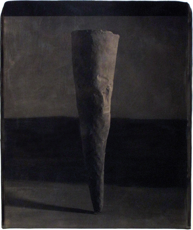
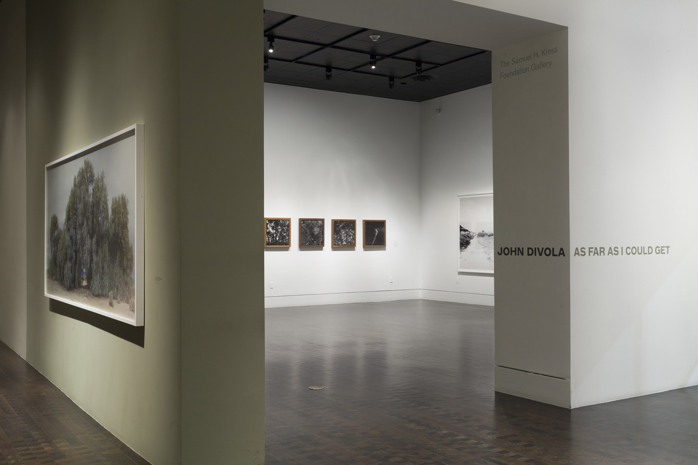
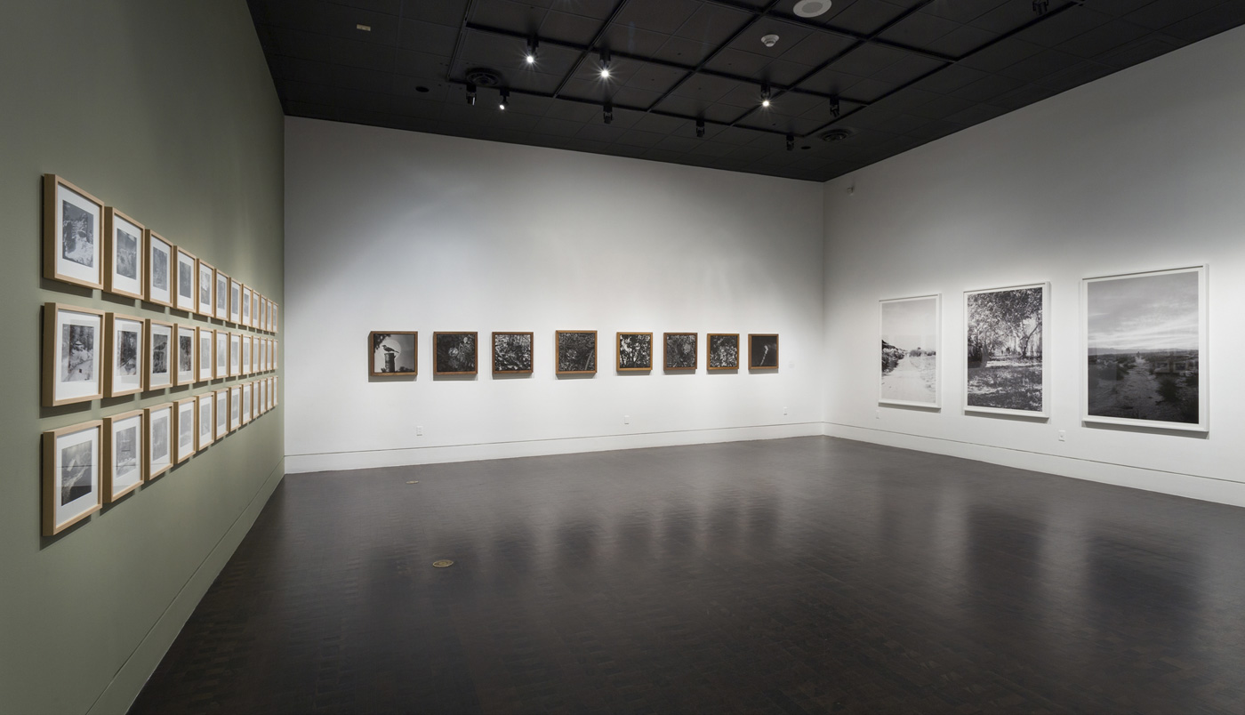
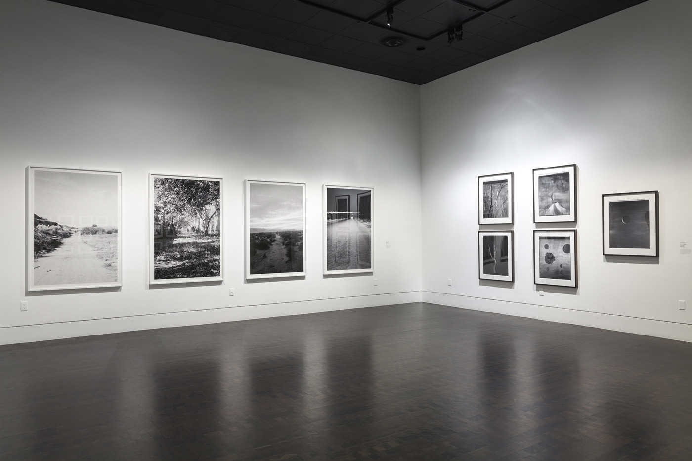
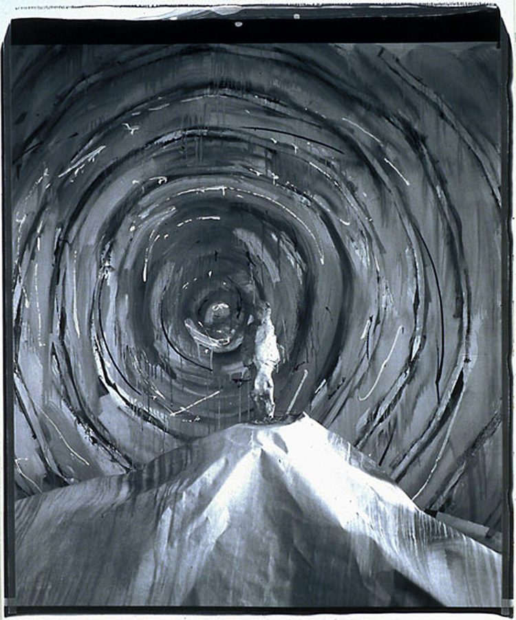
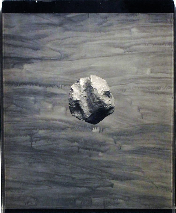
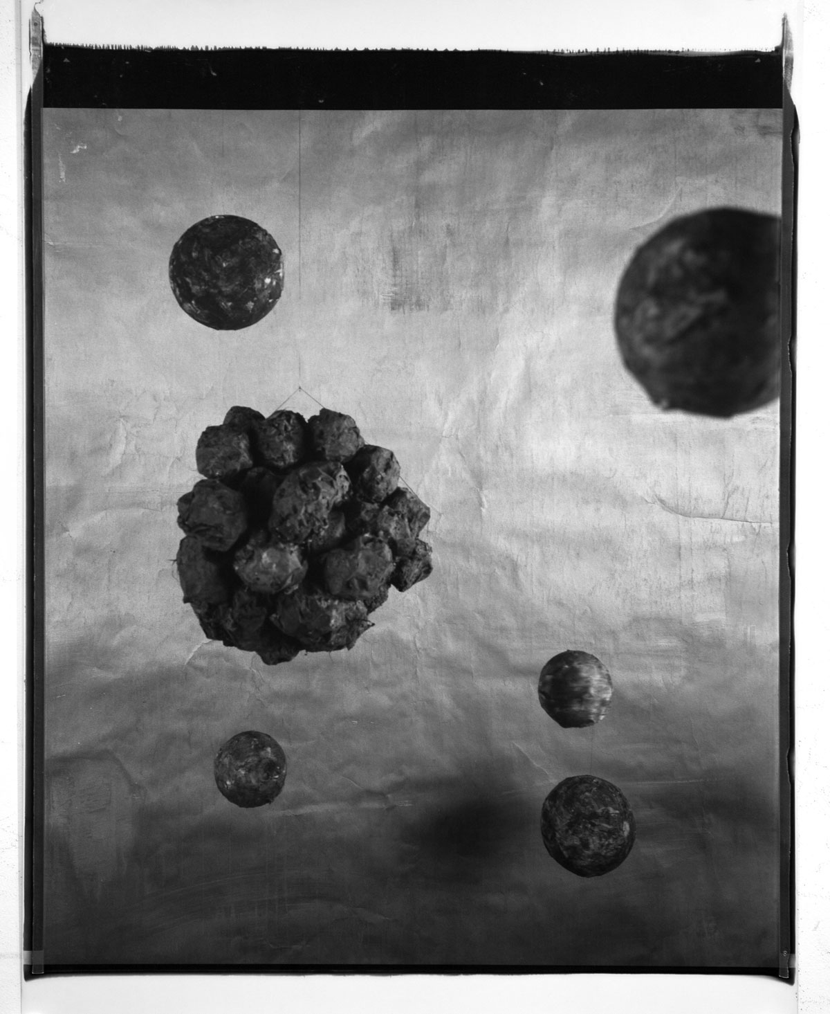
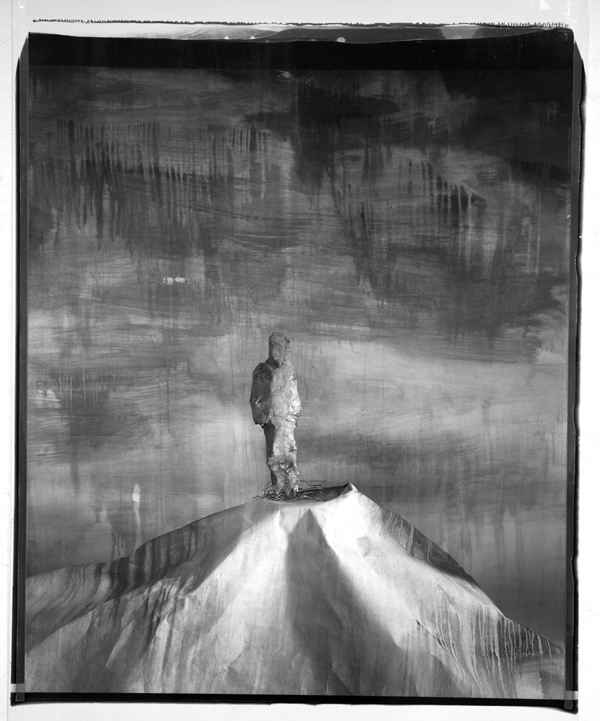
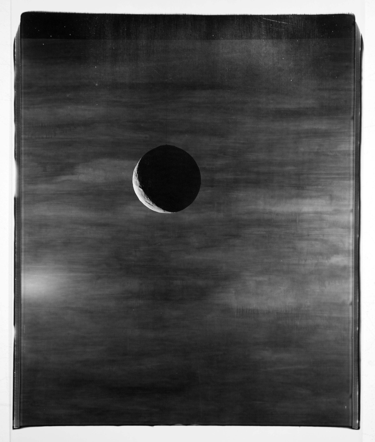
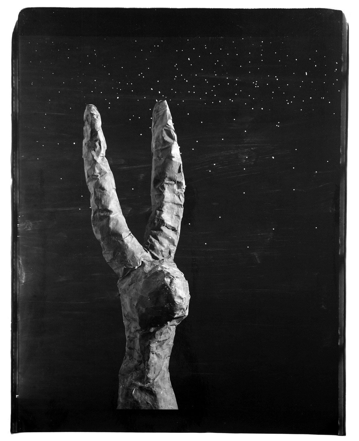
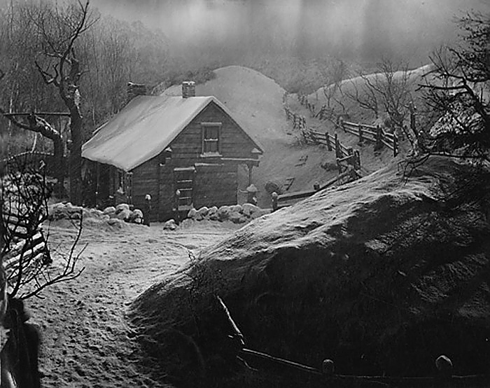
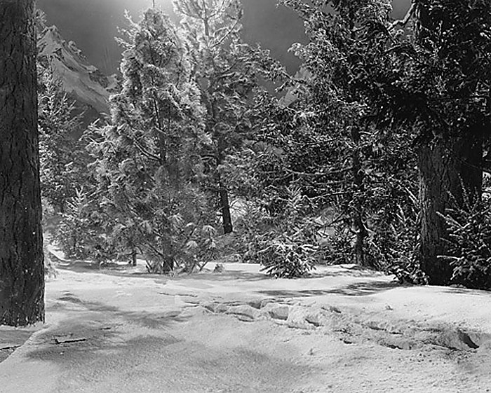
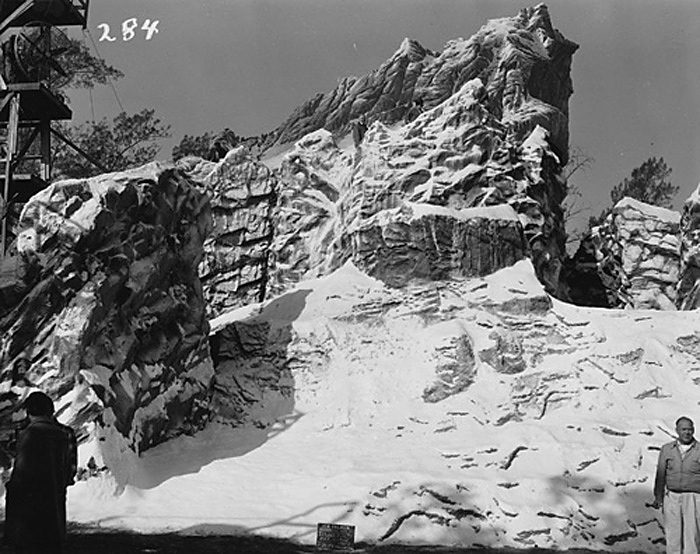
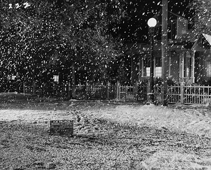

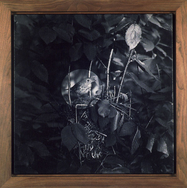
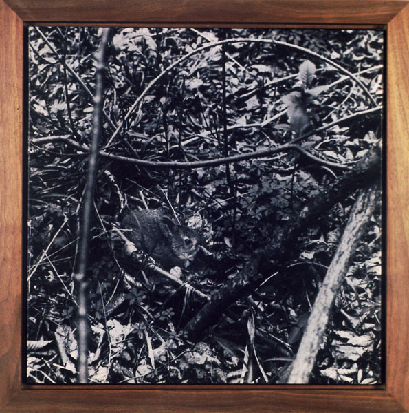
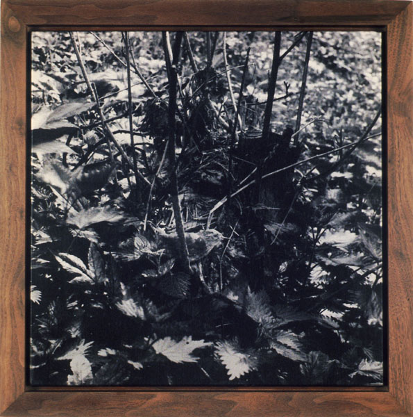
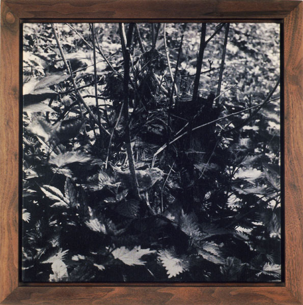
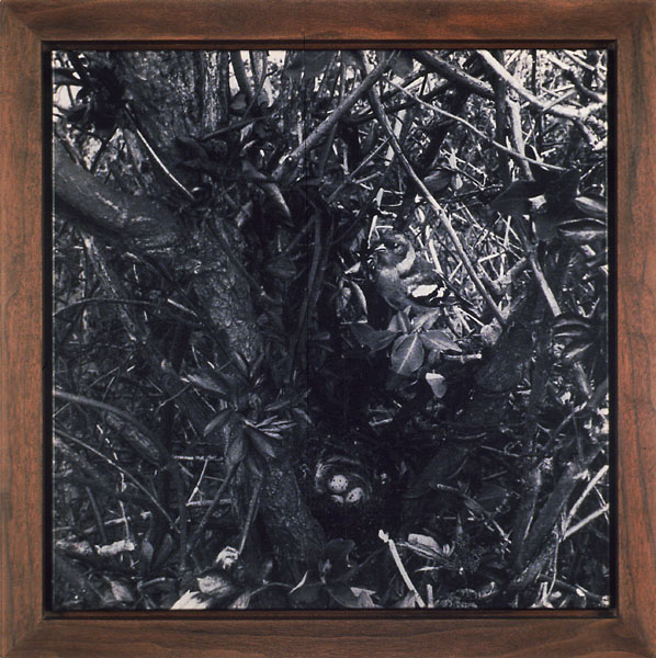
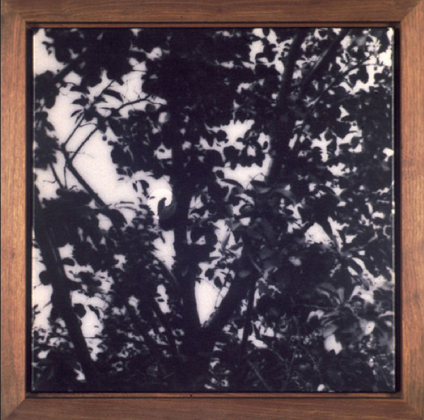
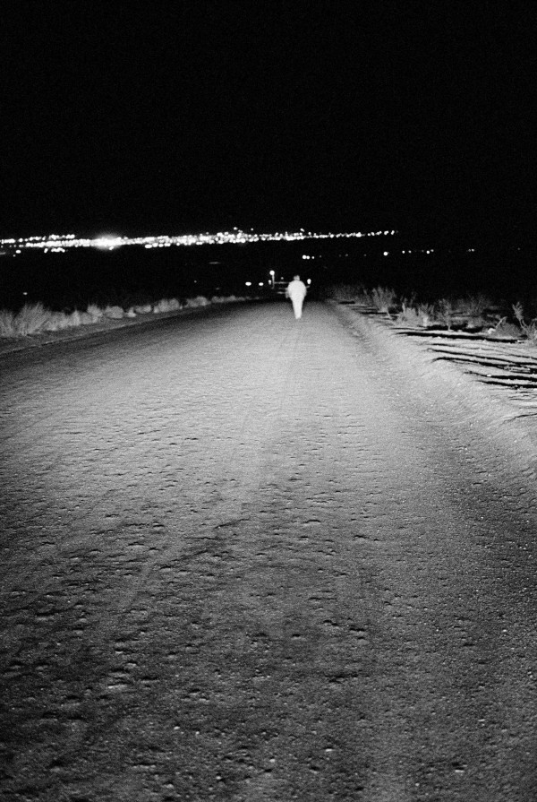
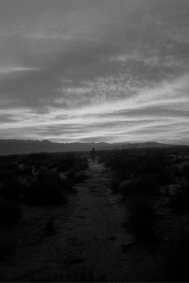
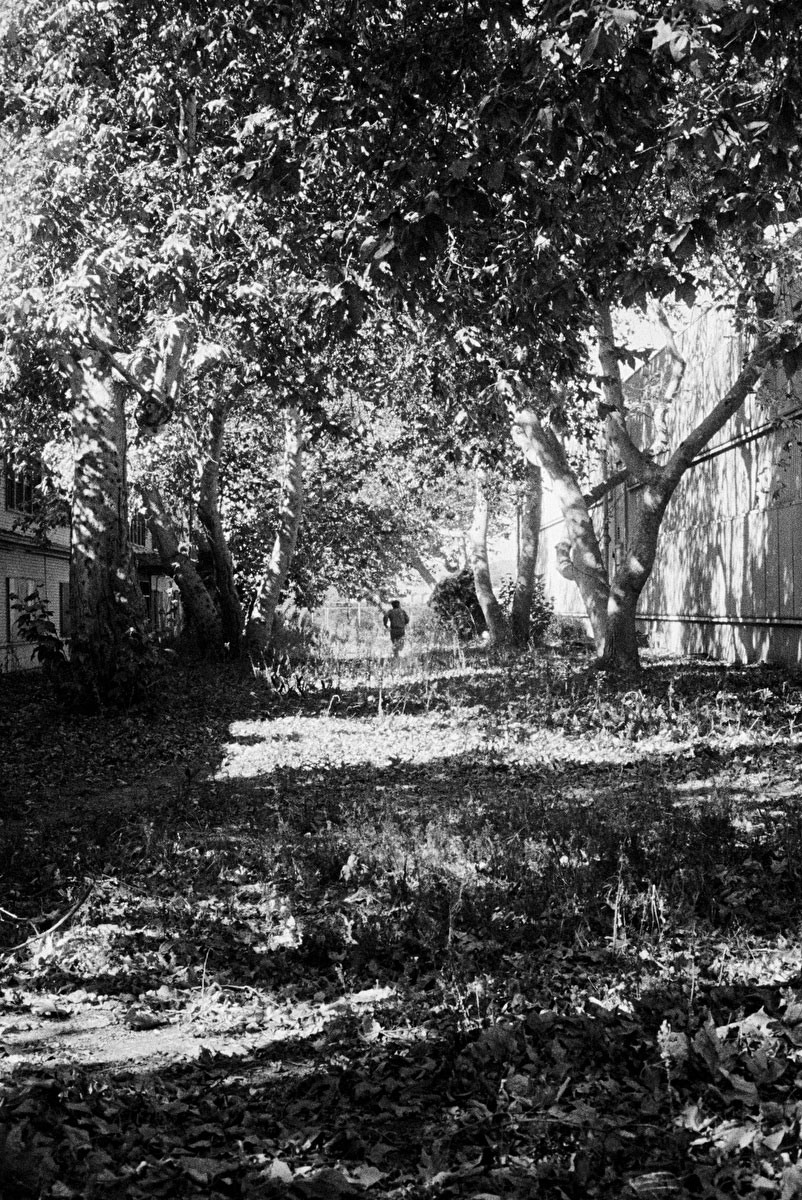
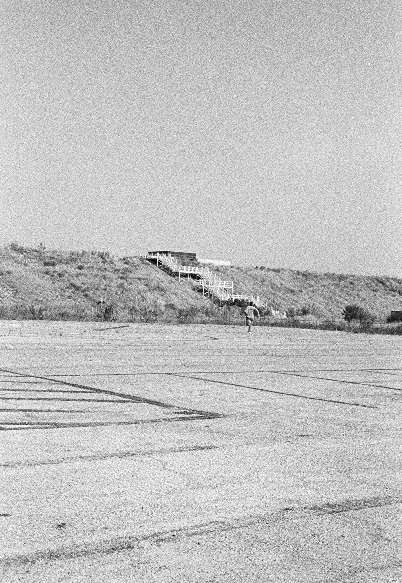
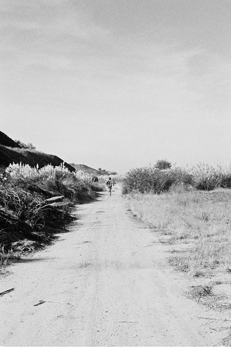
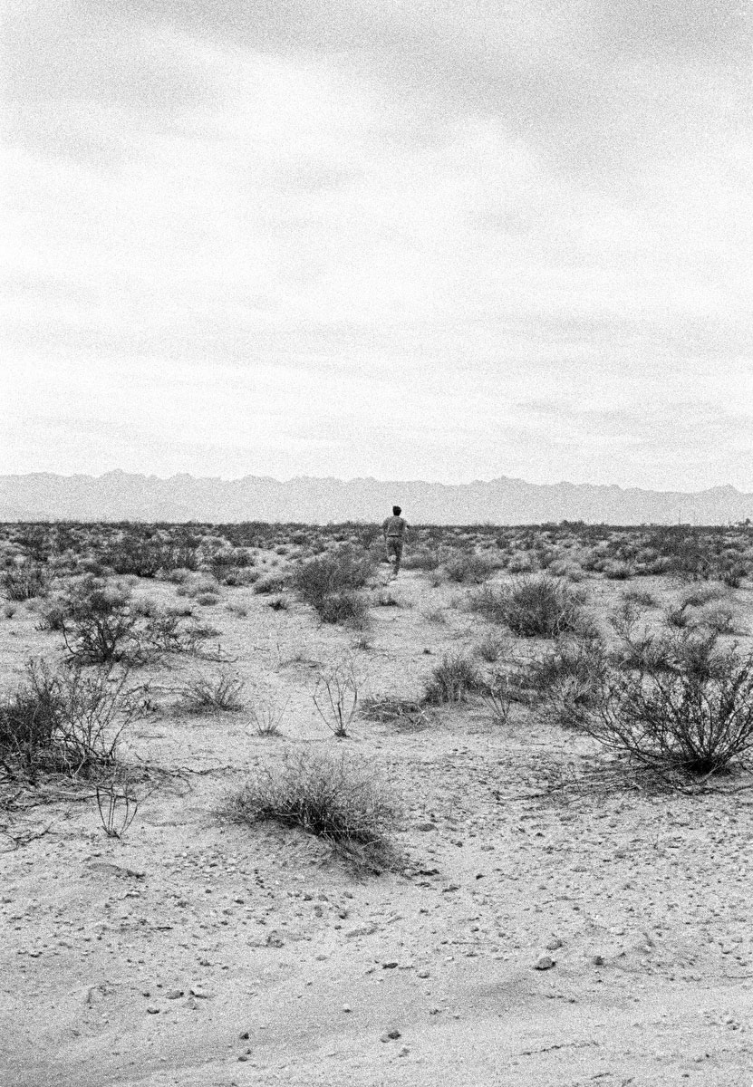
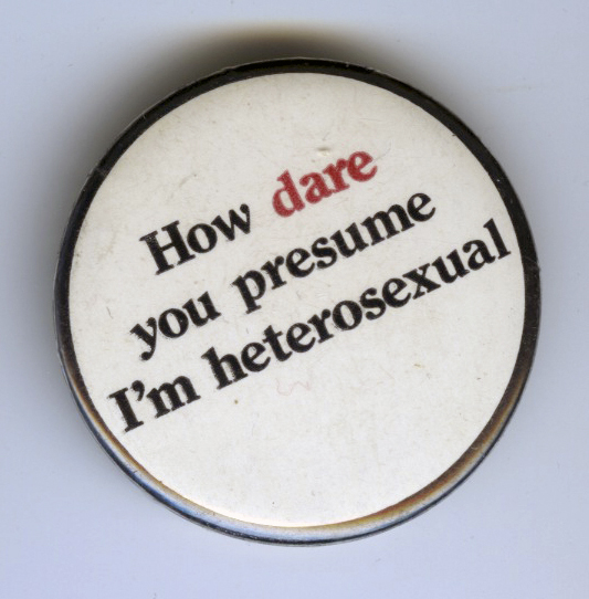
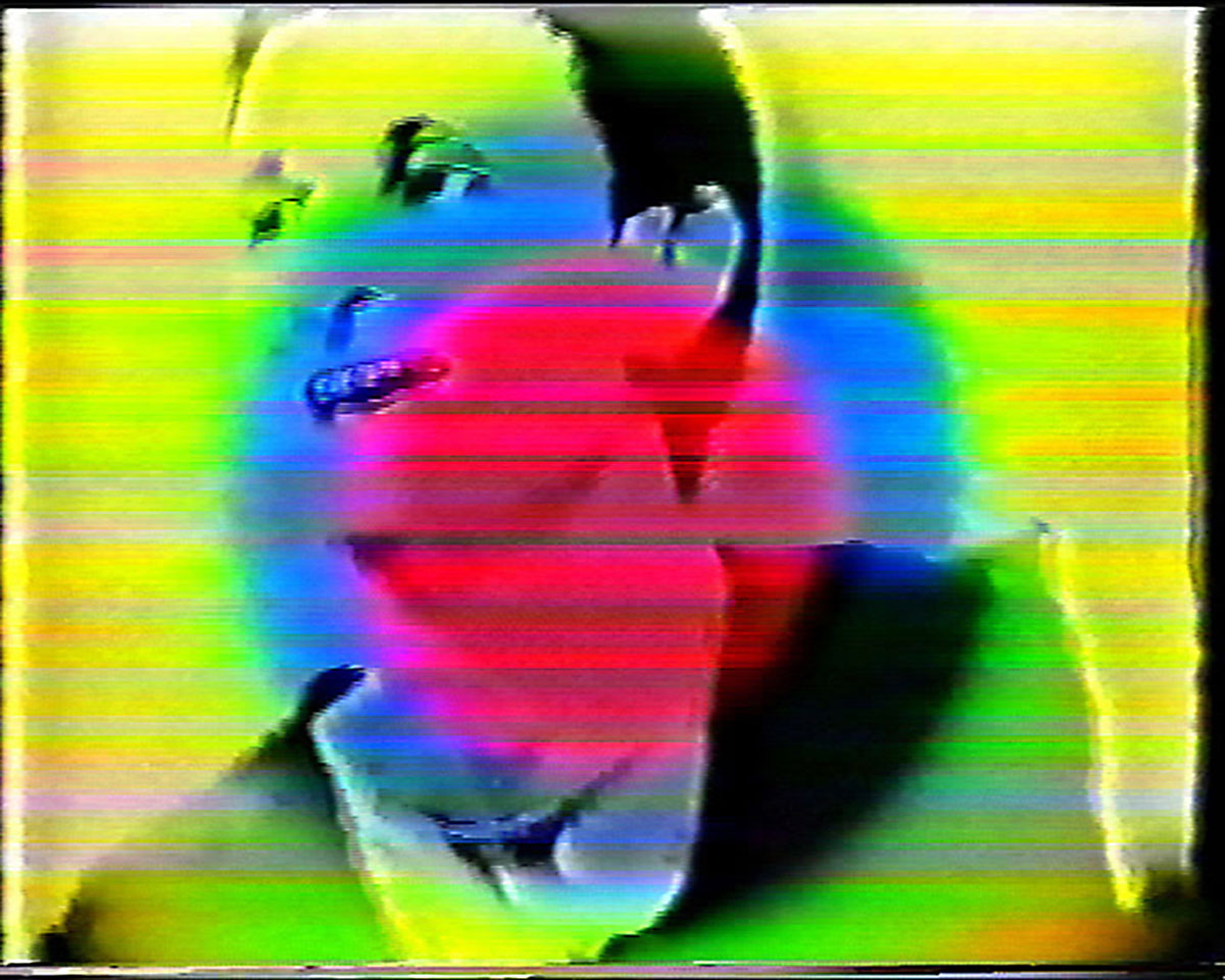


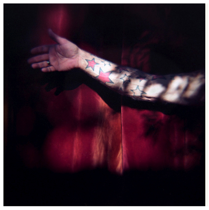
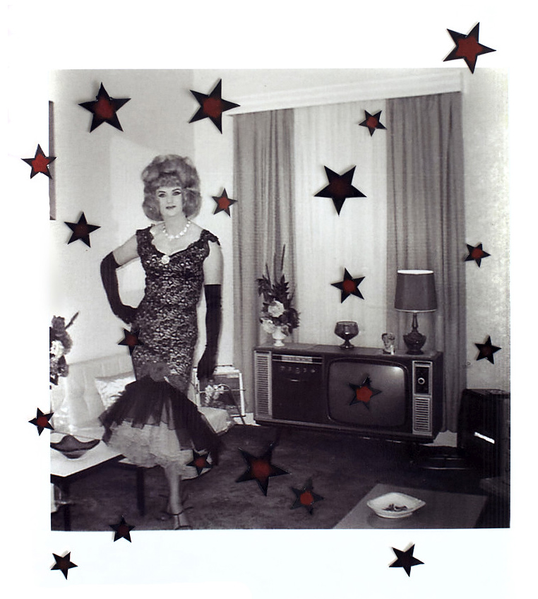
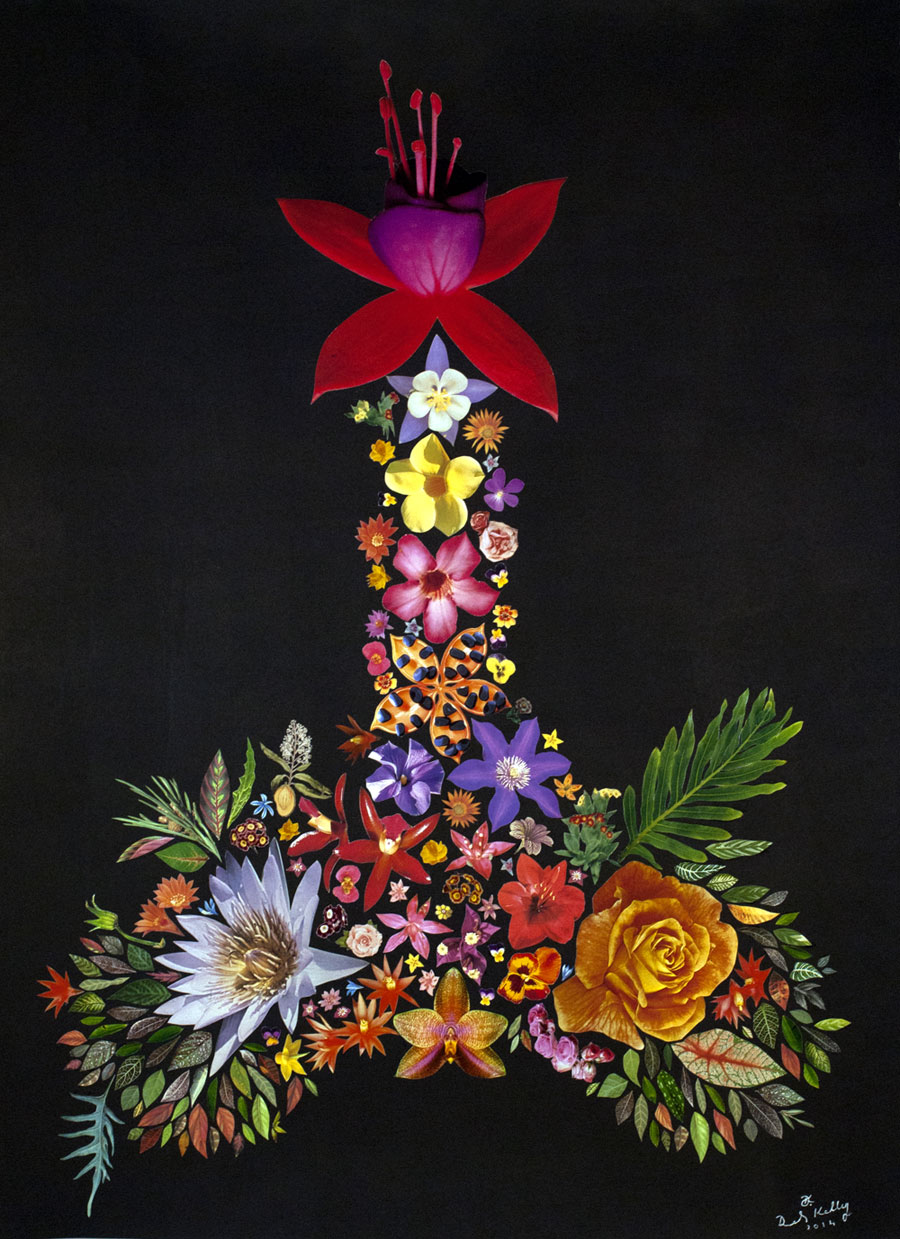
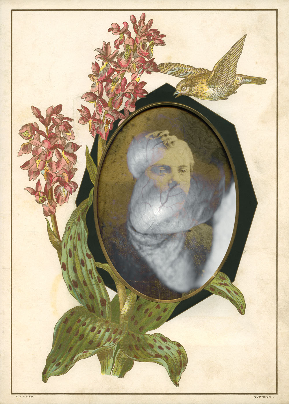






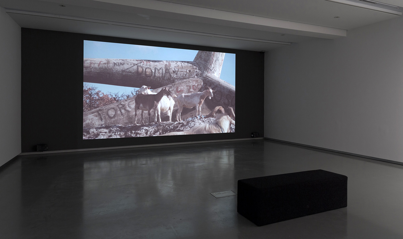


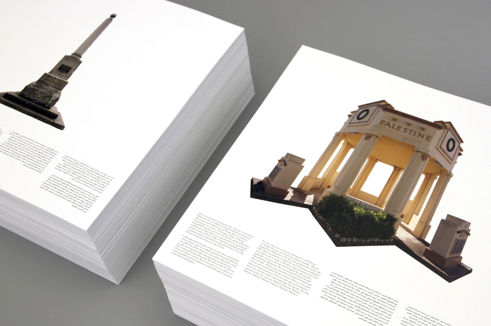
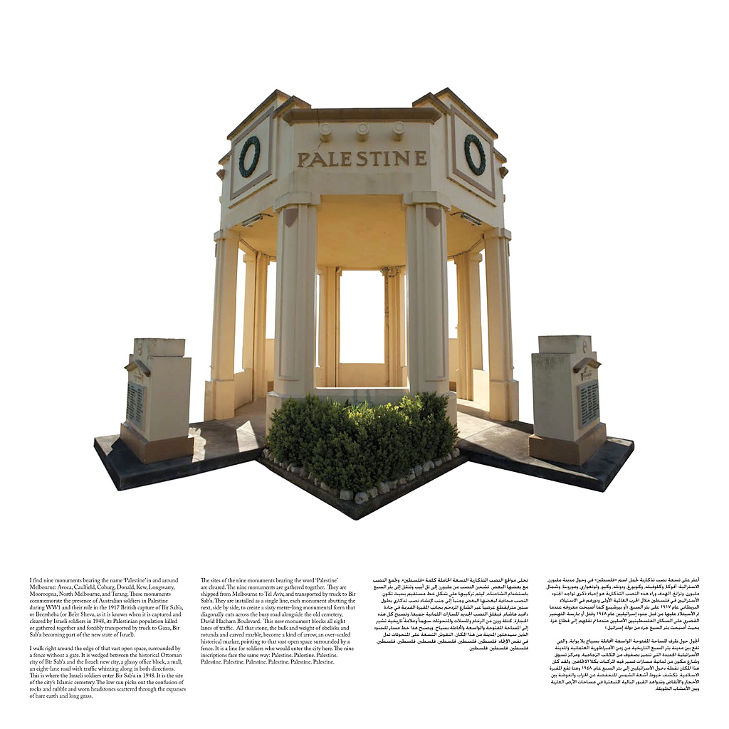


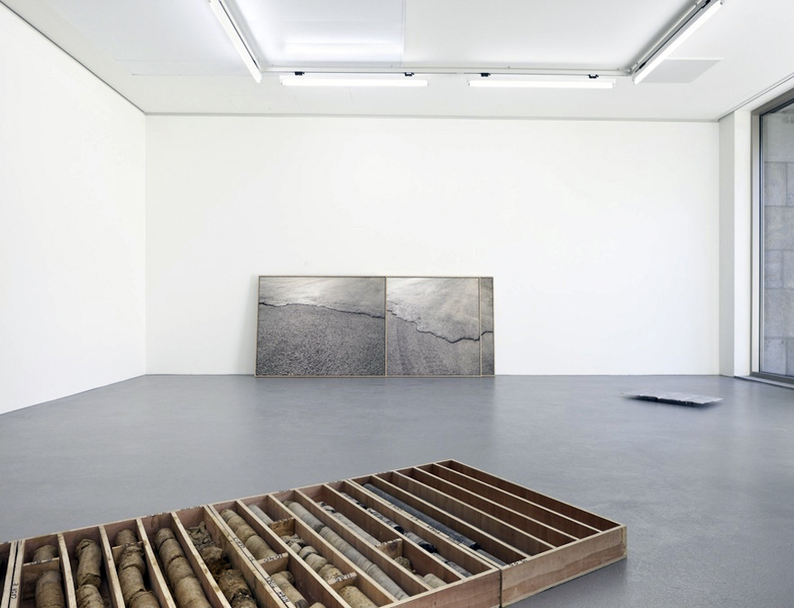


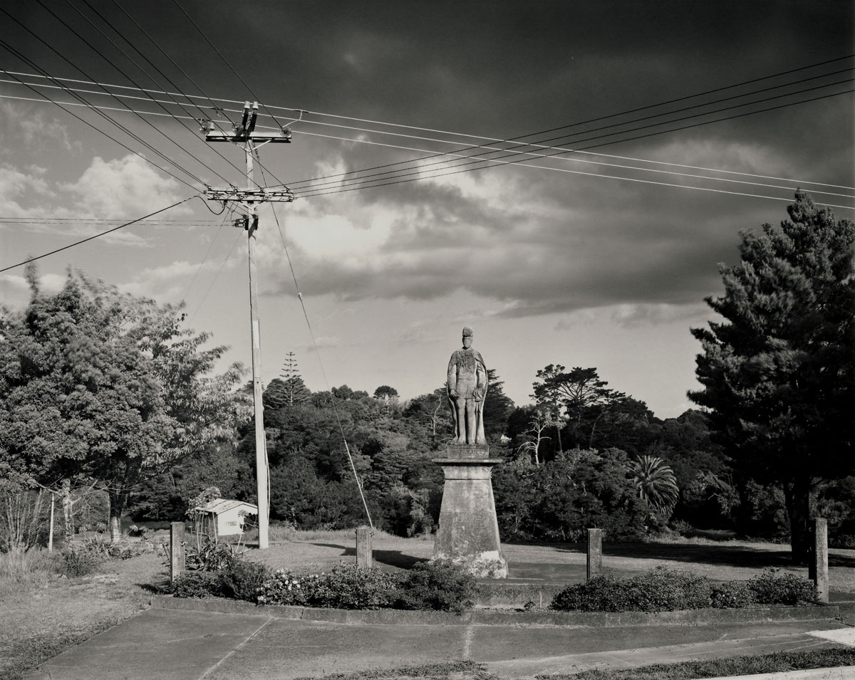


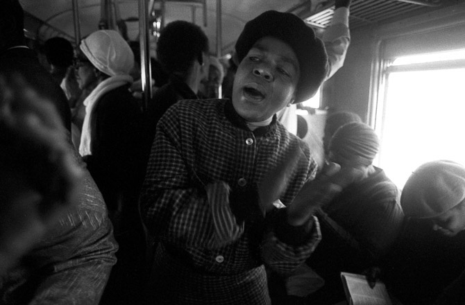
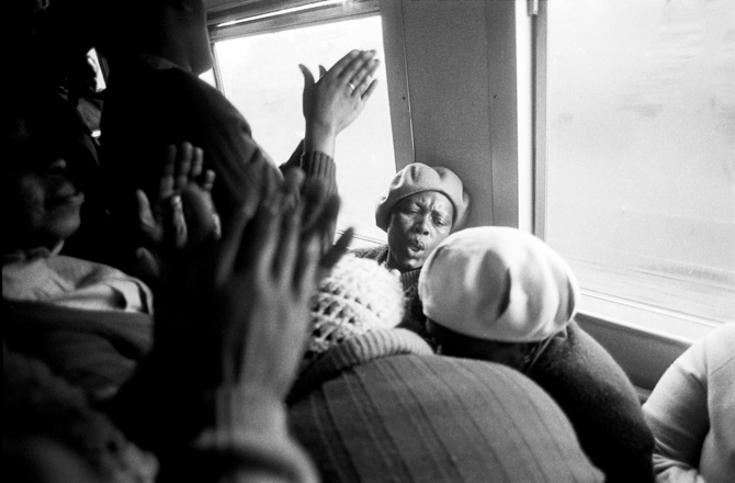
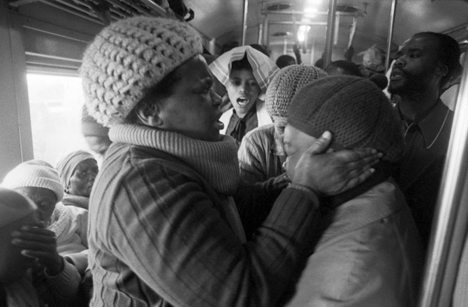
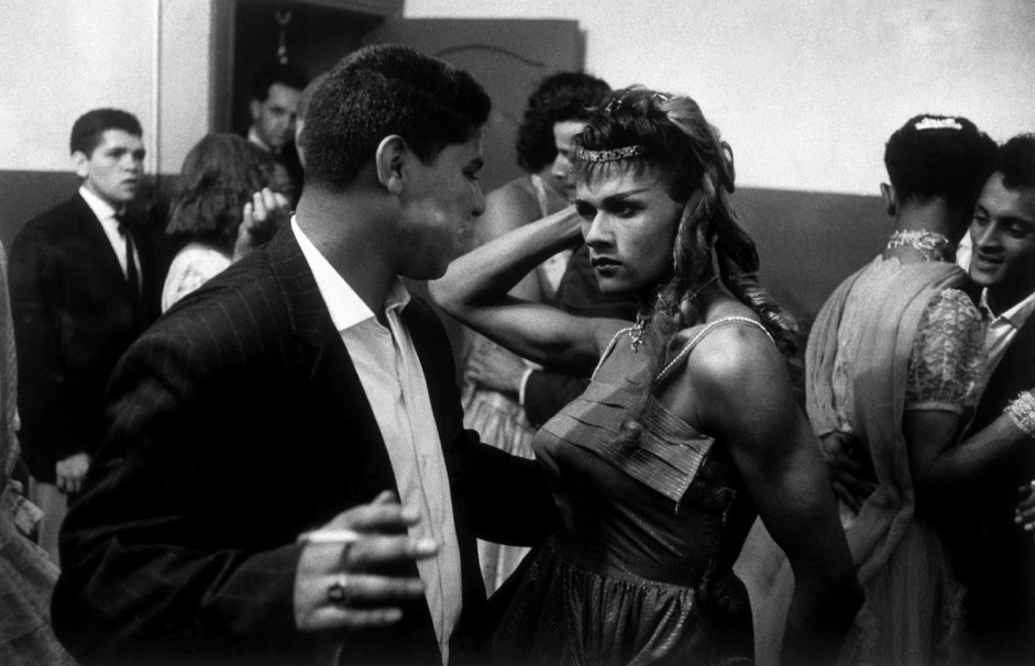
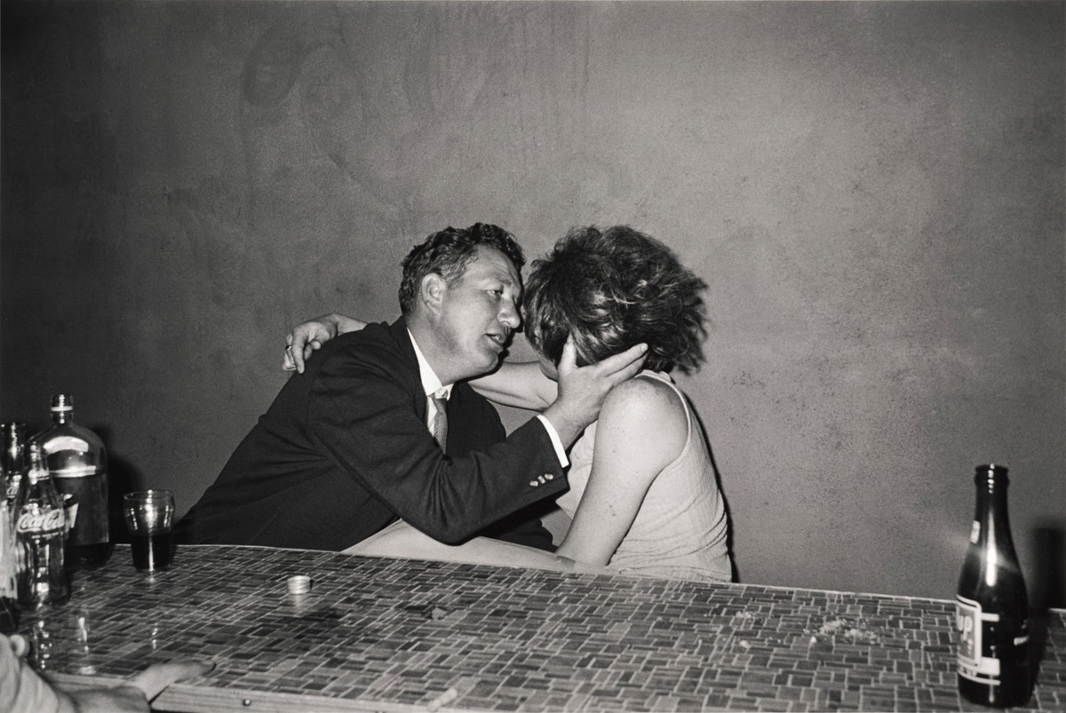
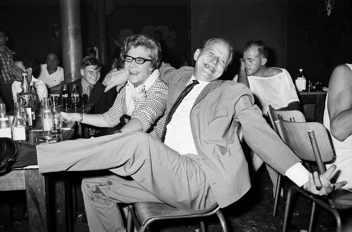
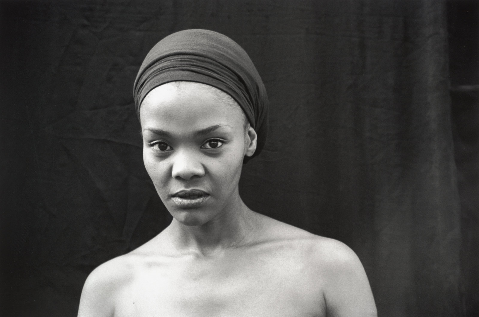
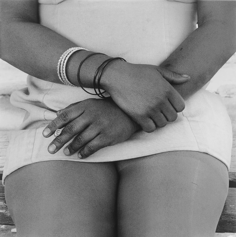
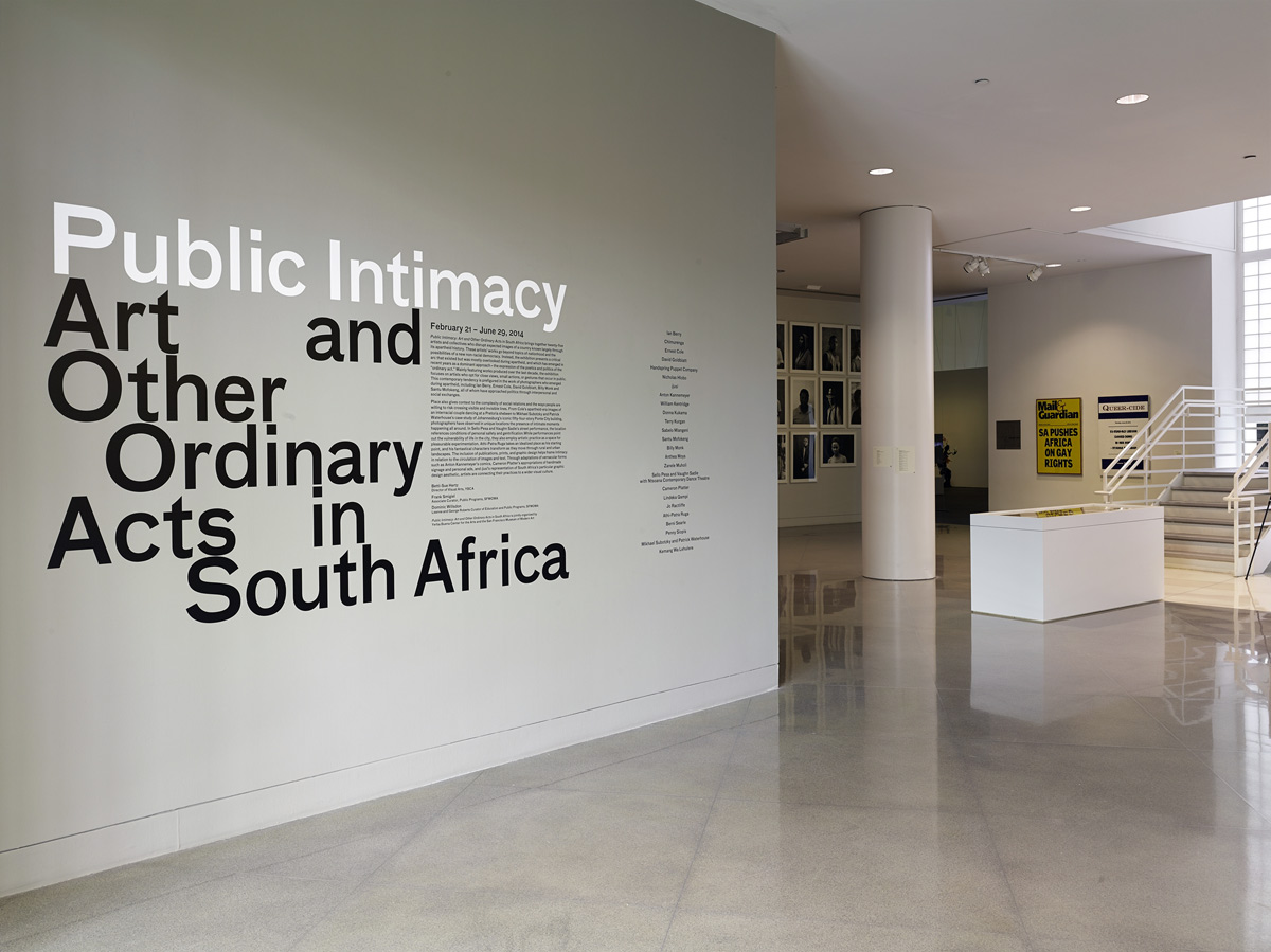
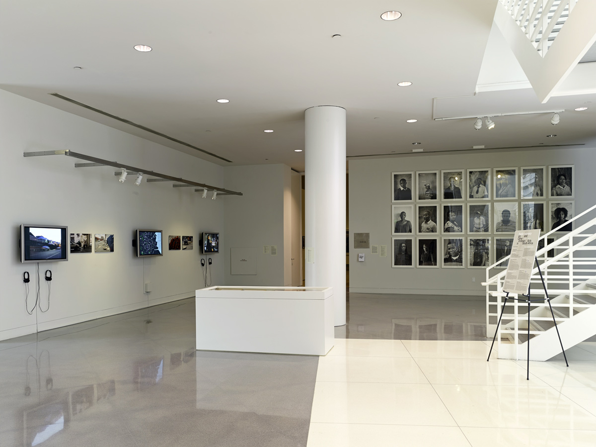
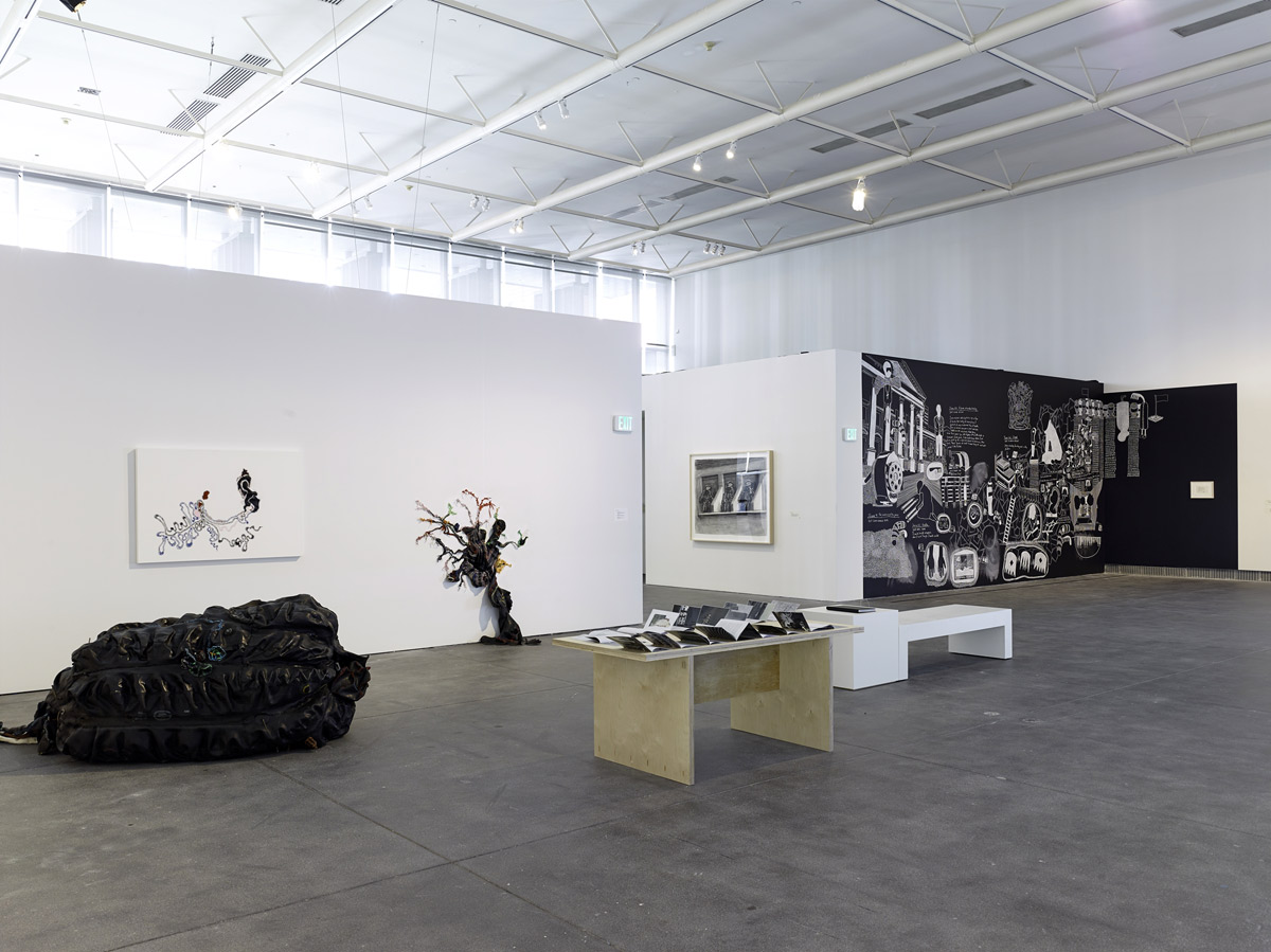
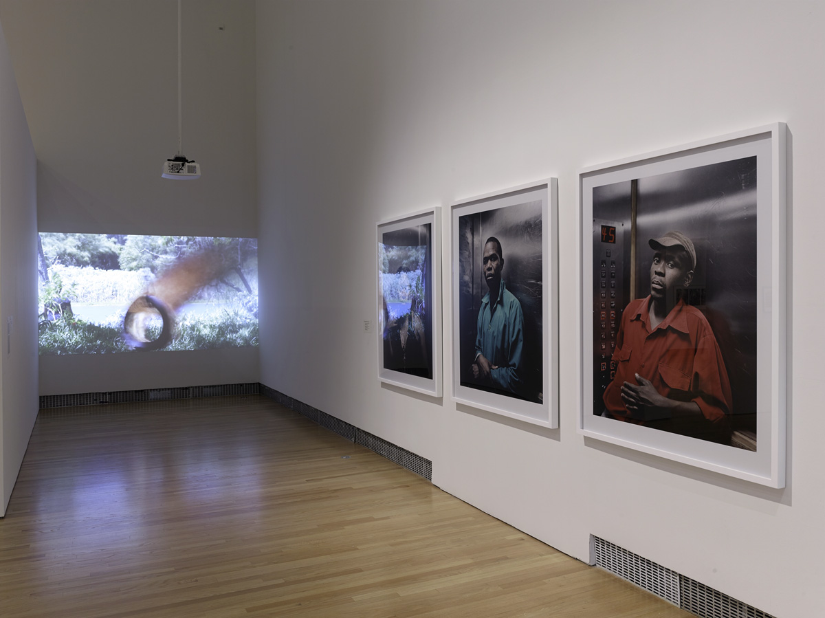
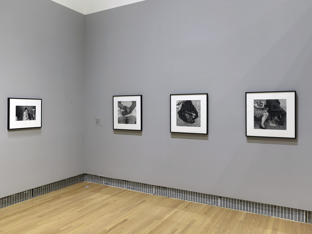
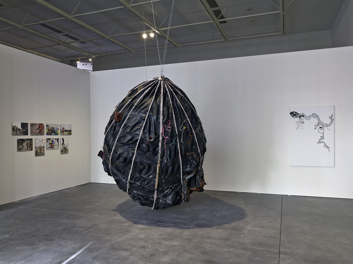
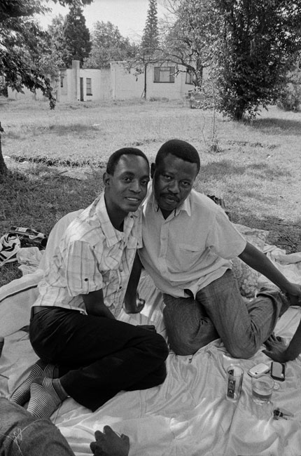
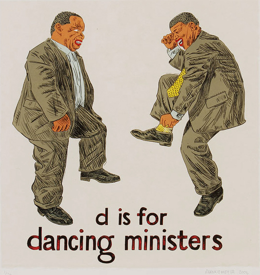
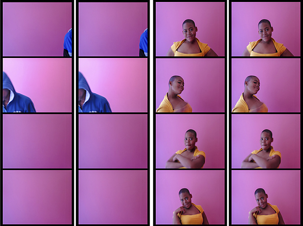
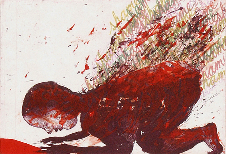
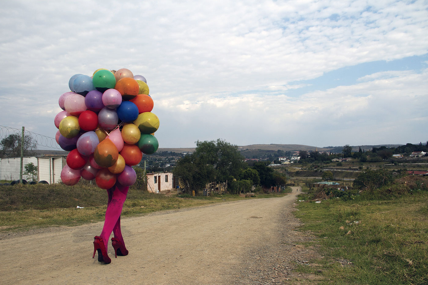
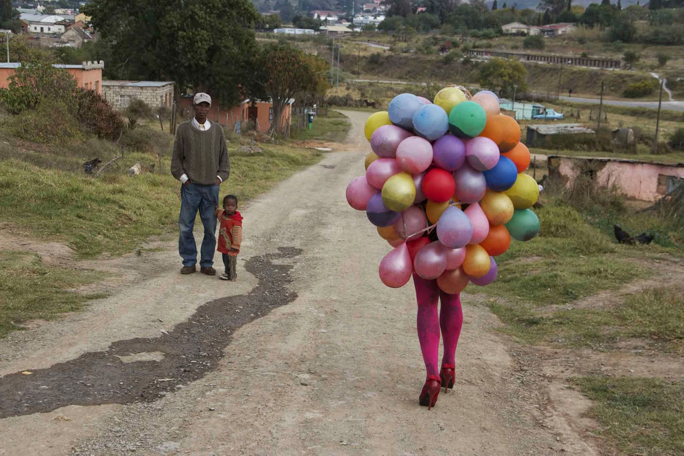
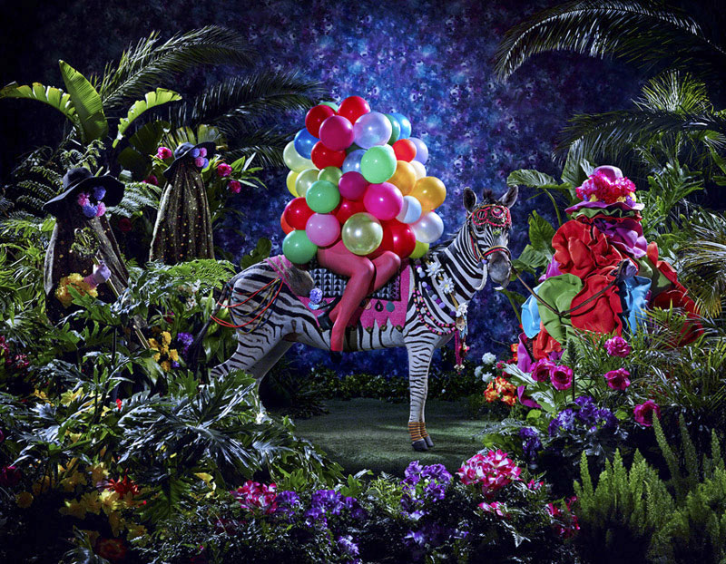
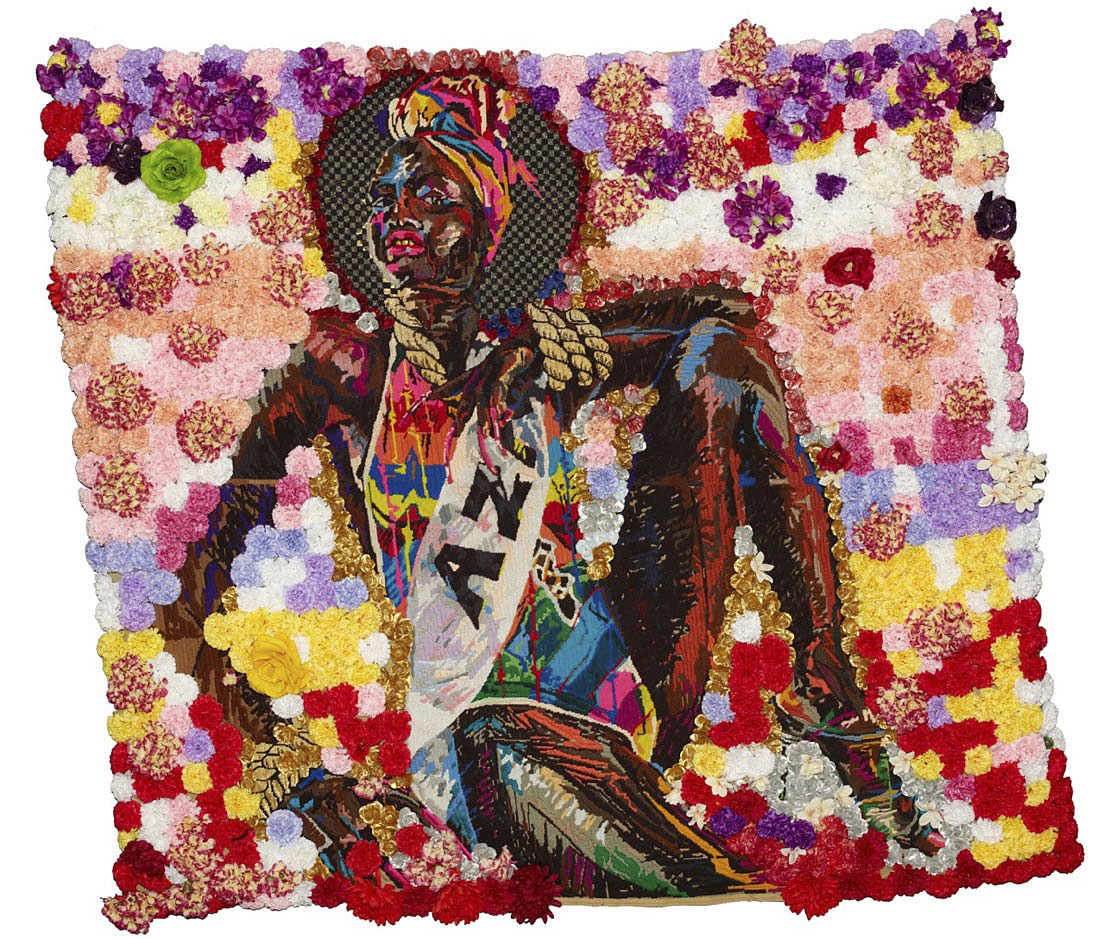
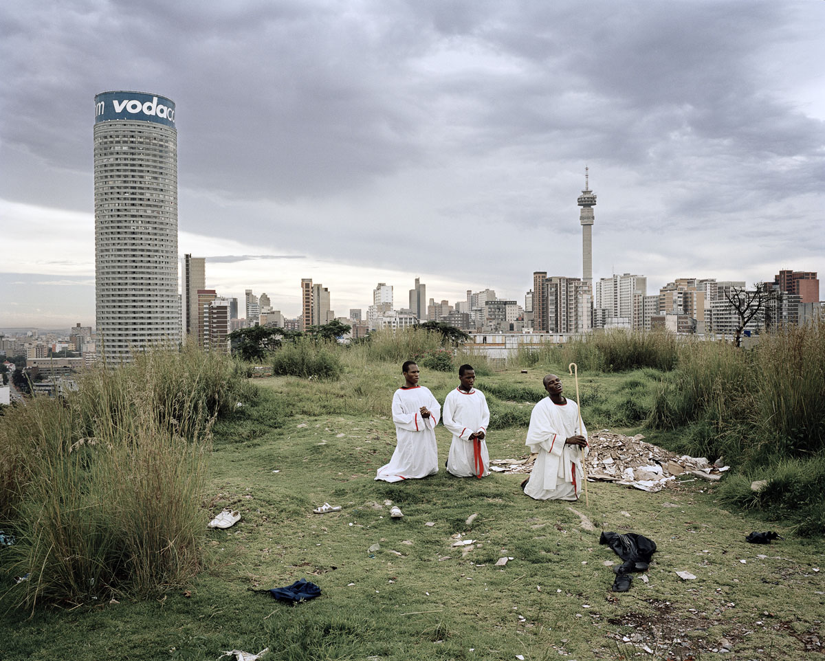
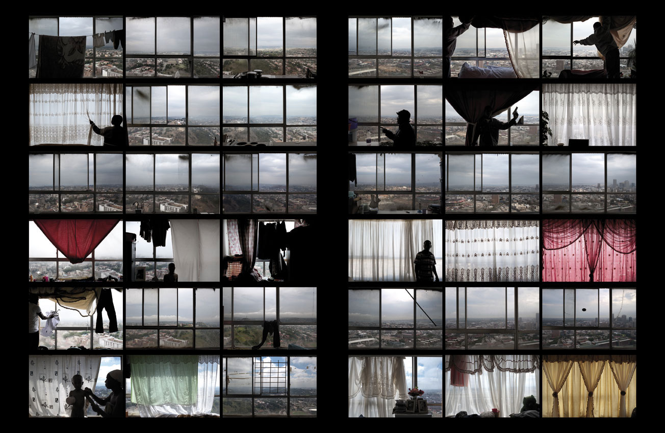
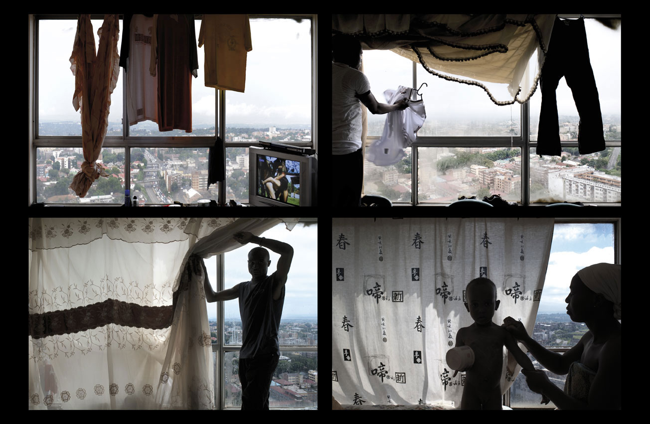
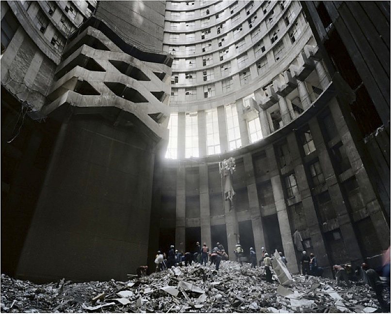
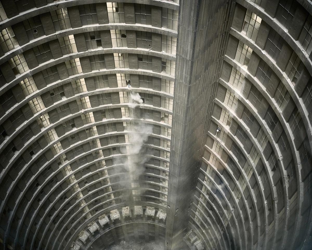
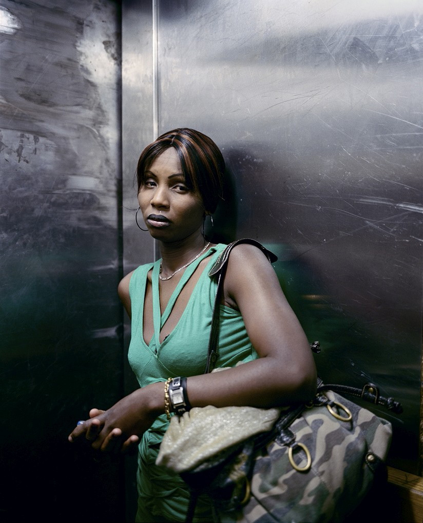


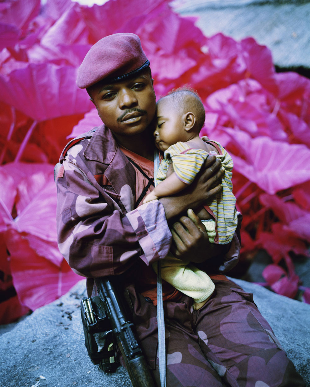
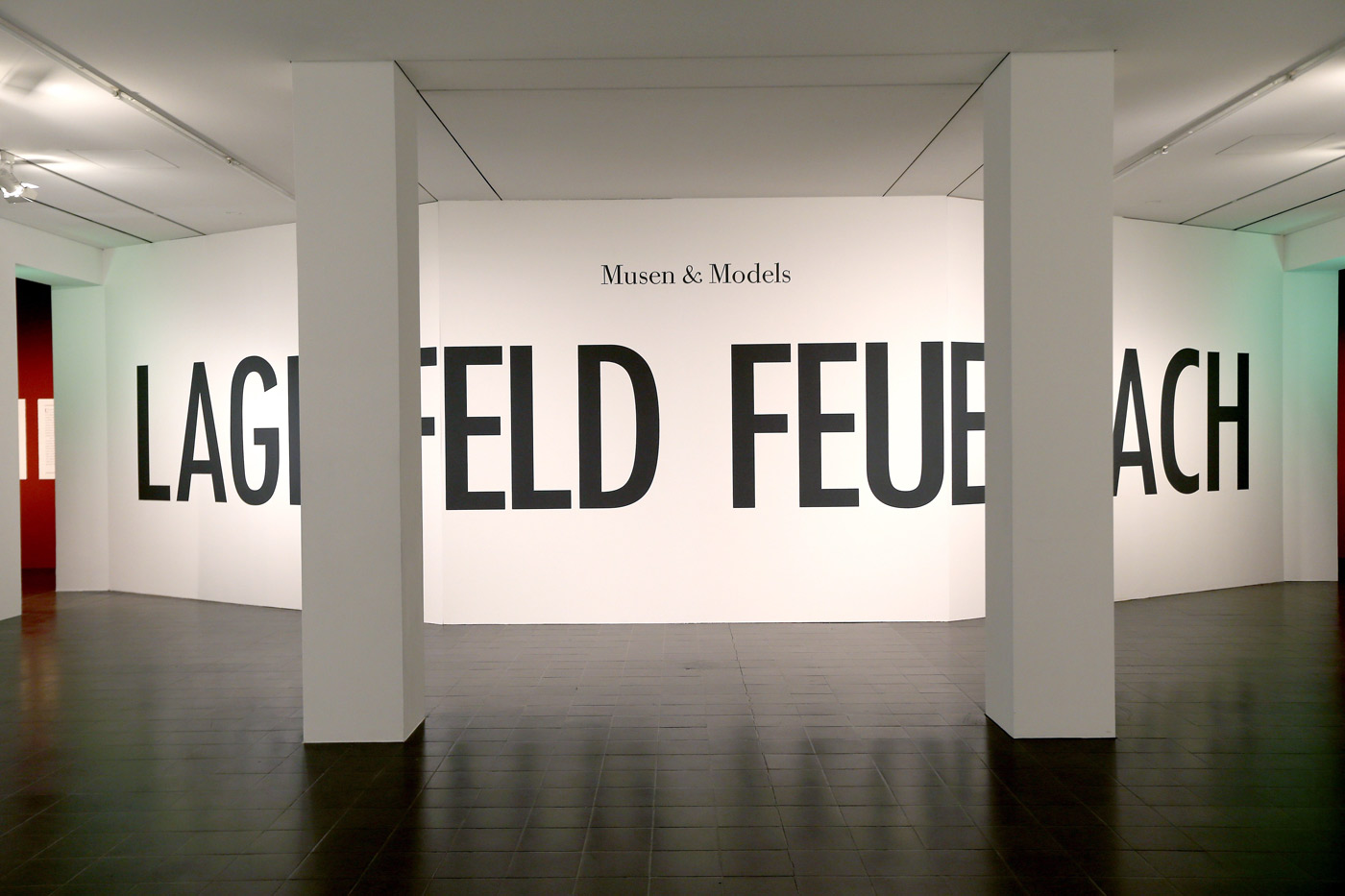
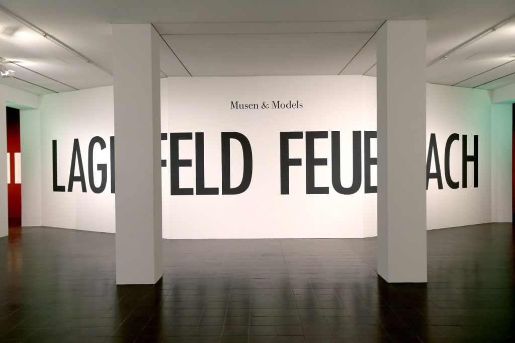
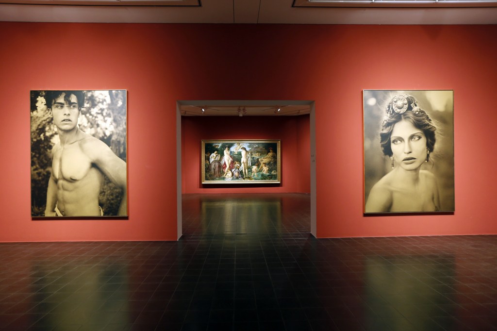
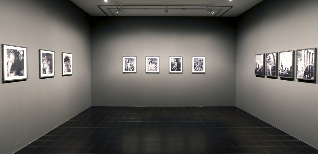
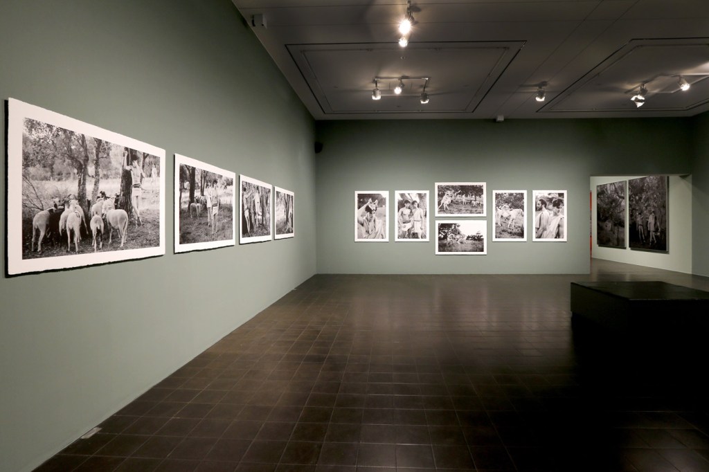
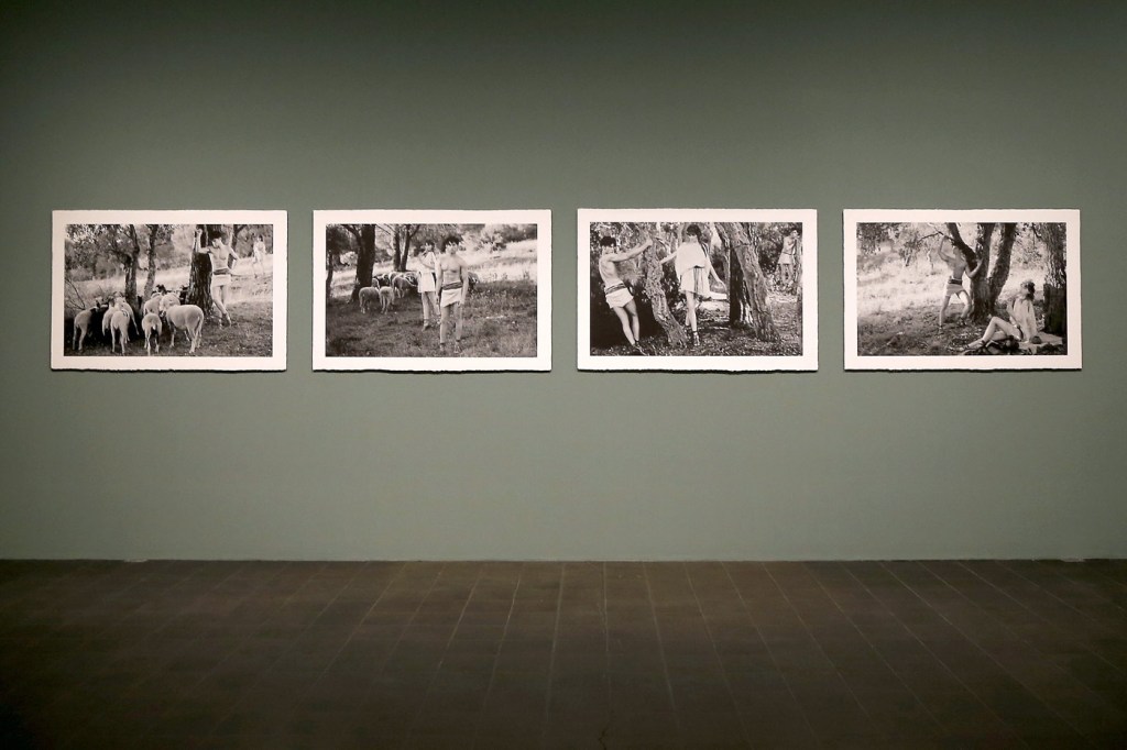
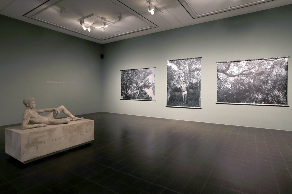

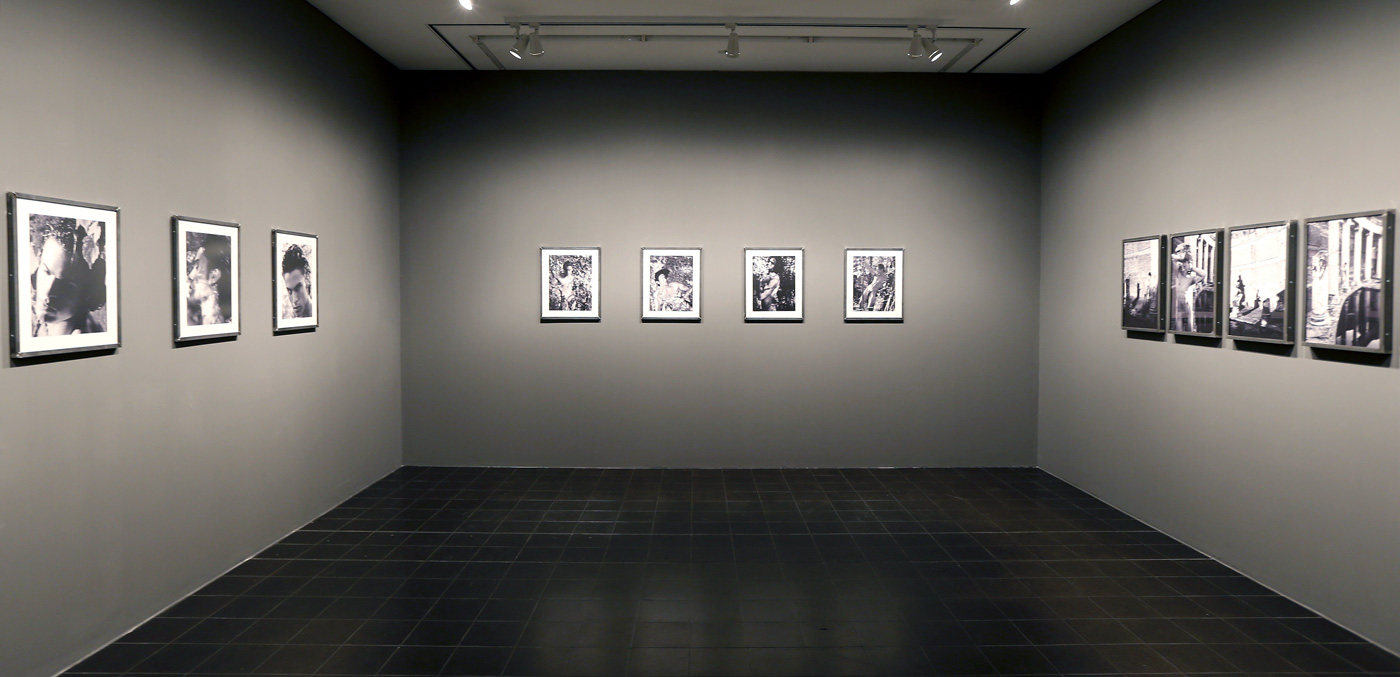

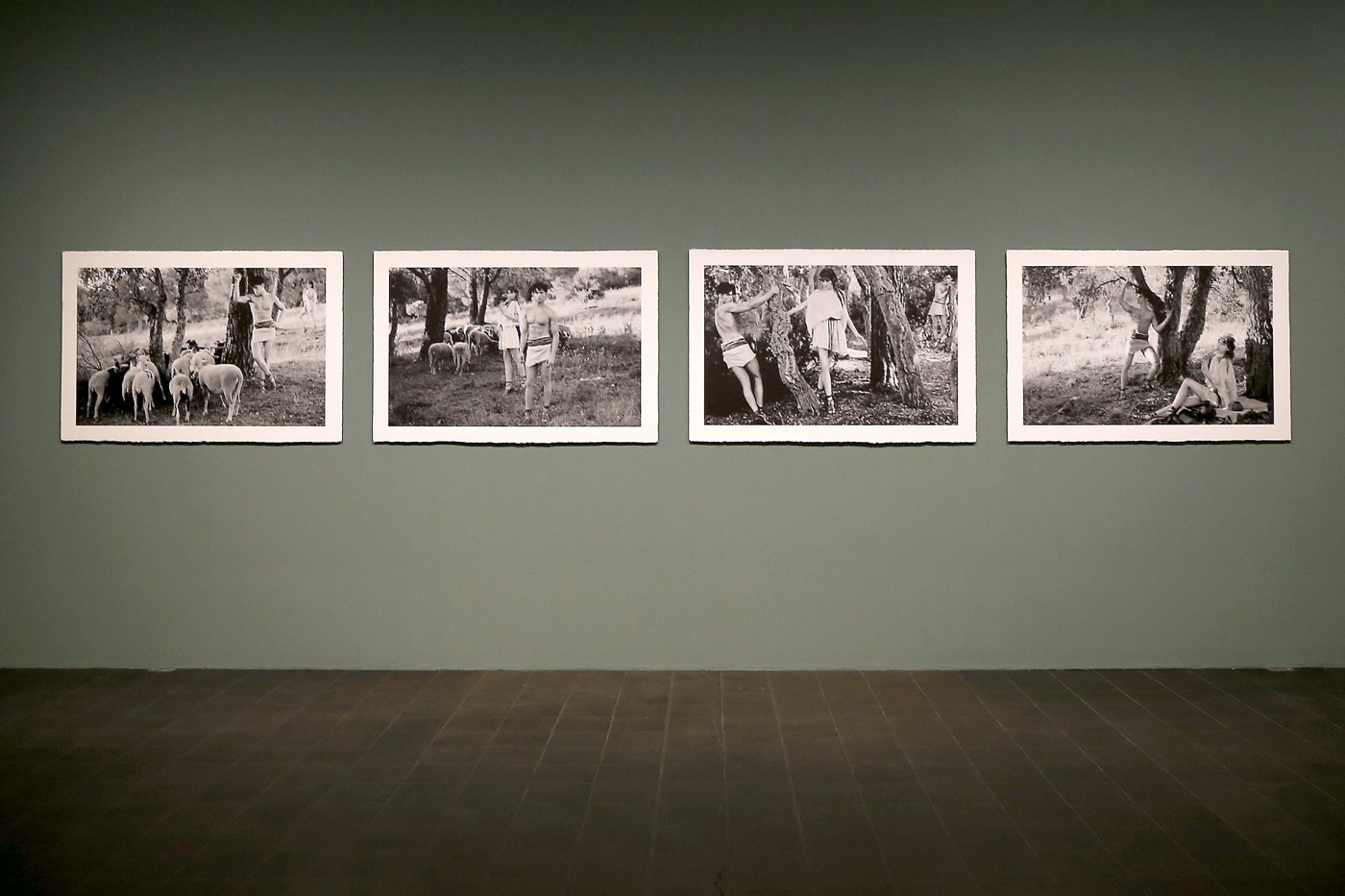


![Anselm Feuerbach (German, 1829-1880) 'Studienkopf zur Stuttgarter Iphigenie [Study of a Head for Stuttgart Iphigenia]' 1870](https://artblart.com/wp-content/uploads/2014/05/feuerbach_studienkopf-web.jpg "Anselm Feuerbach (German, 1829-1880) 'Studienkopf zur Stuttgarter Iphigenie [Study of a Head for Stuttgart Iphigenia]' 1870")
![Anselm Feuerbach (German, 1829-1880) 'Poesie, Zweite Fassung [Poetry, Second Version]' 1863](https://artblart.com/wp-content/uploads/2014/05/feuerbach_poesie-web.jpg "Anselm Feuerbach (German, 1829-1880) 'Poesie, Zweite Fassung [Poetry, Second Version]' 1863")
![Anselm Feuerbach (German, 1829-1880) 'Lucrezia Borgia, Bildnis einer Römerin in weißer Tunika und rotem Mantel [Lucrezia Borgia, Portrait of a roman in white tunic and red cloak]' 1864/1865](https://artblart.com/wp-content/uploads/2014/05/feuerbach_borgia-web.jpg "Anselm Feuerbach (German, 1829-1880) 'Lucrezia Borgia, Bildnis einer Römerin in weißer Tunika und rotem Mantel [Lucrezia Borgia, Portrait of a roman in white tunic and red cloak]' 1864/1865")

![Anselm Feuerbach (German, 1829-1880) 'Das Urteil des Paris [The Judgement of Paris]' 1870](https://artblart.com/wp-content/uploads/2014/05/feuerbach_paris-web.jpg "Anselm Feuerbach (German, 1829-1880) 'Das Urteil des Paris [The Judgement of Paris]' 1870")
![Anselm Feuerbach (German, 1829-1880) 'Ruhende Nymphe [Resting Nymph]' 1870](https://artblart.com/wp-content/uploads/2014/05/feuerbach_nymphe-web.jpg "Anselm Feuerbach (German, 1829-1880) 'Ruhende Nymphe [Resting Nymph]' 1870")
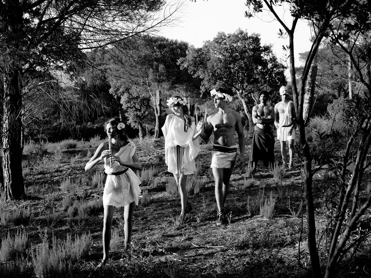
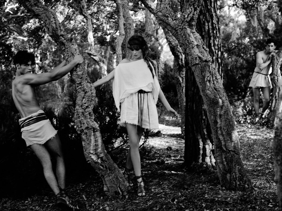
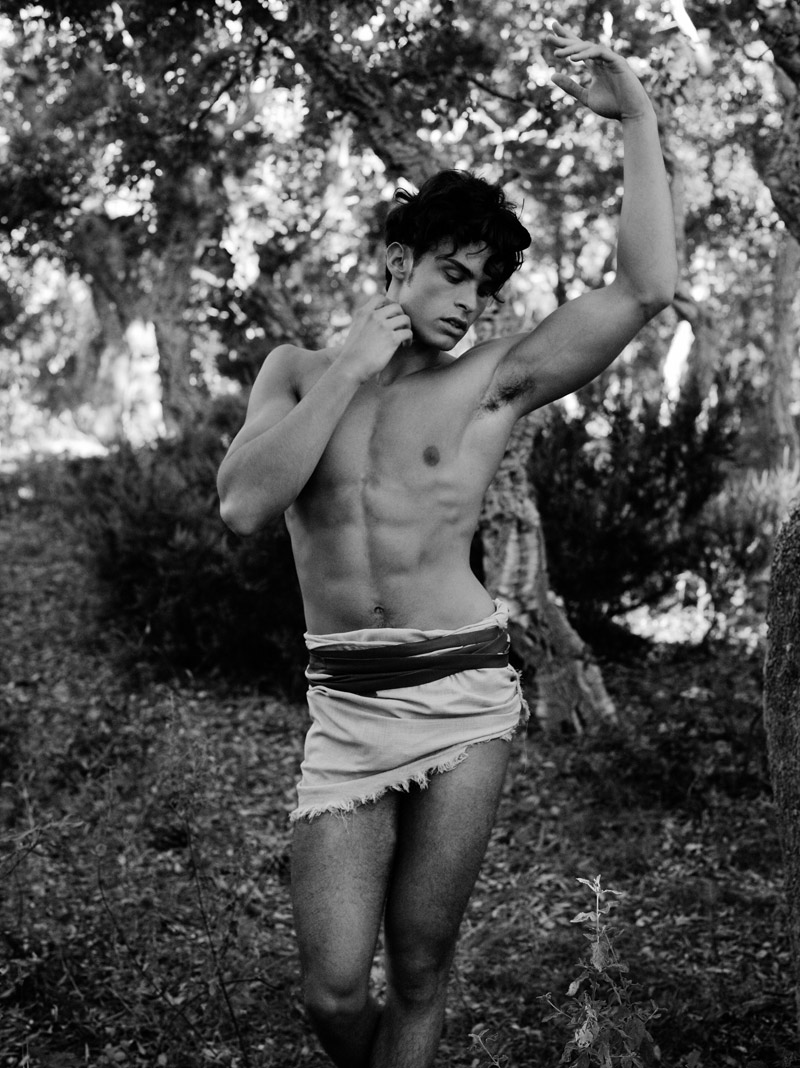

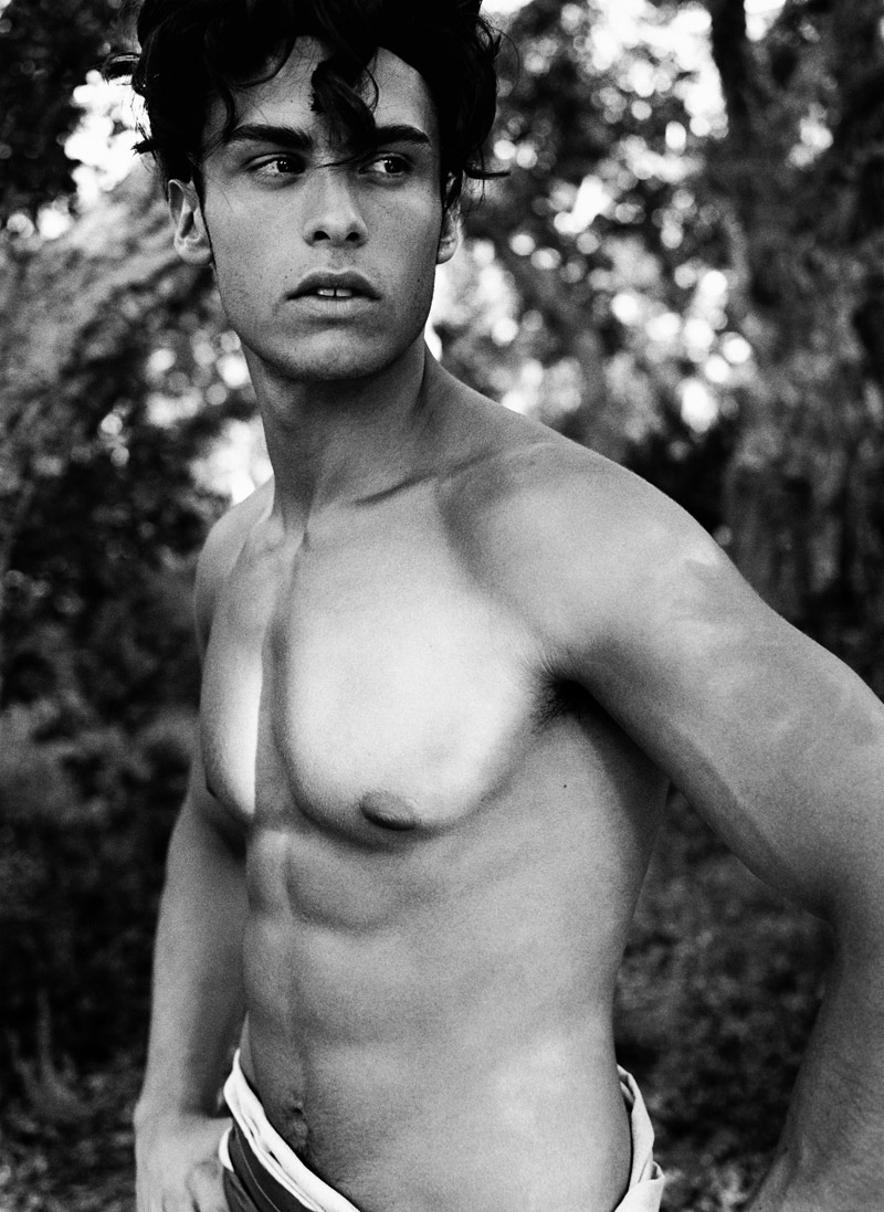

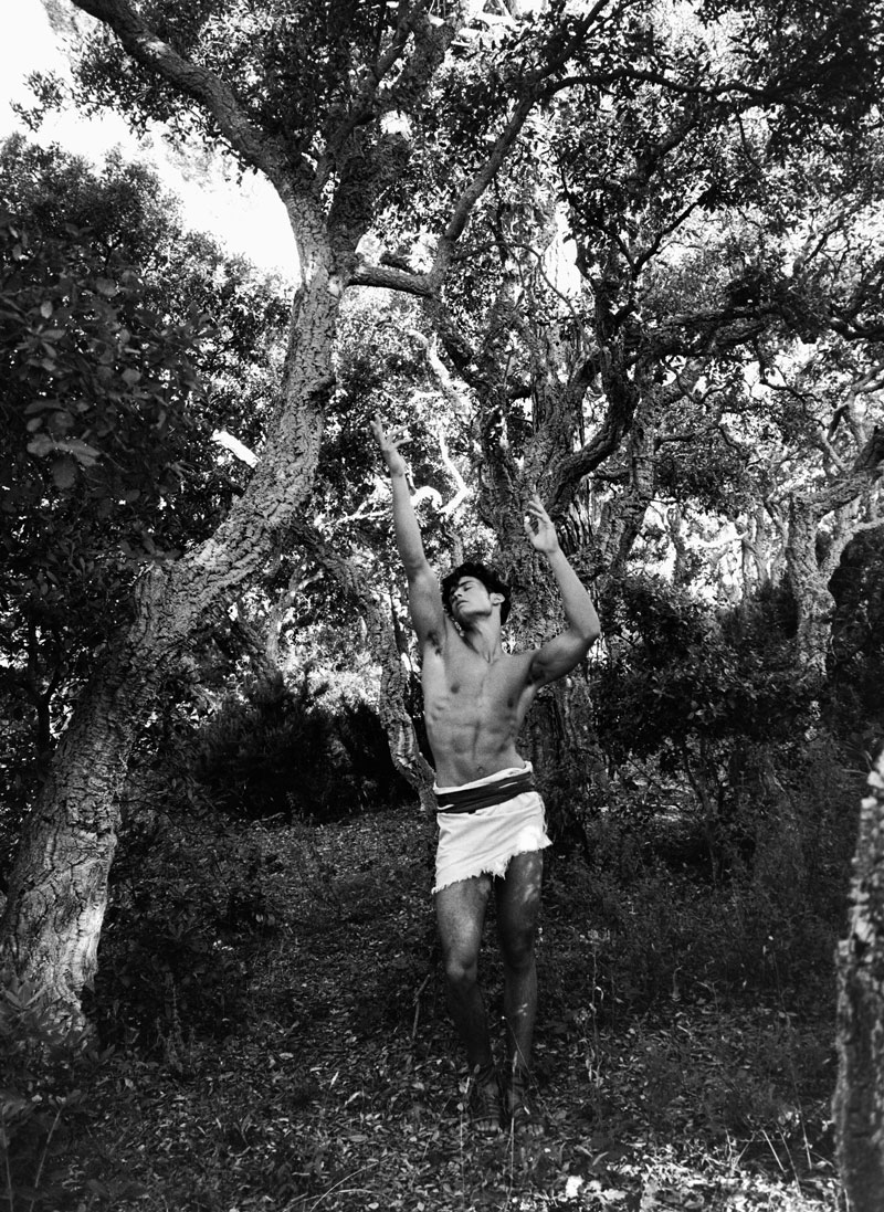




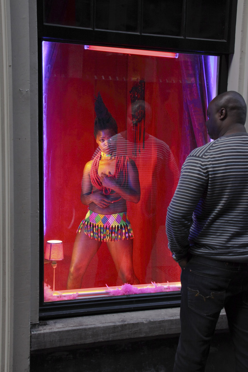


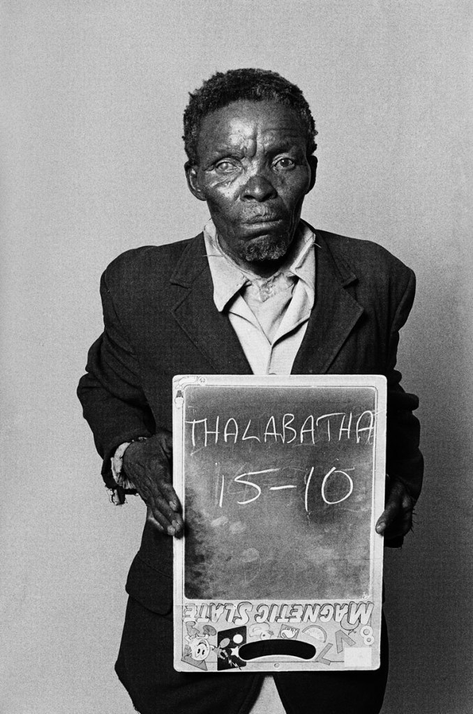
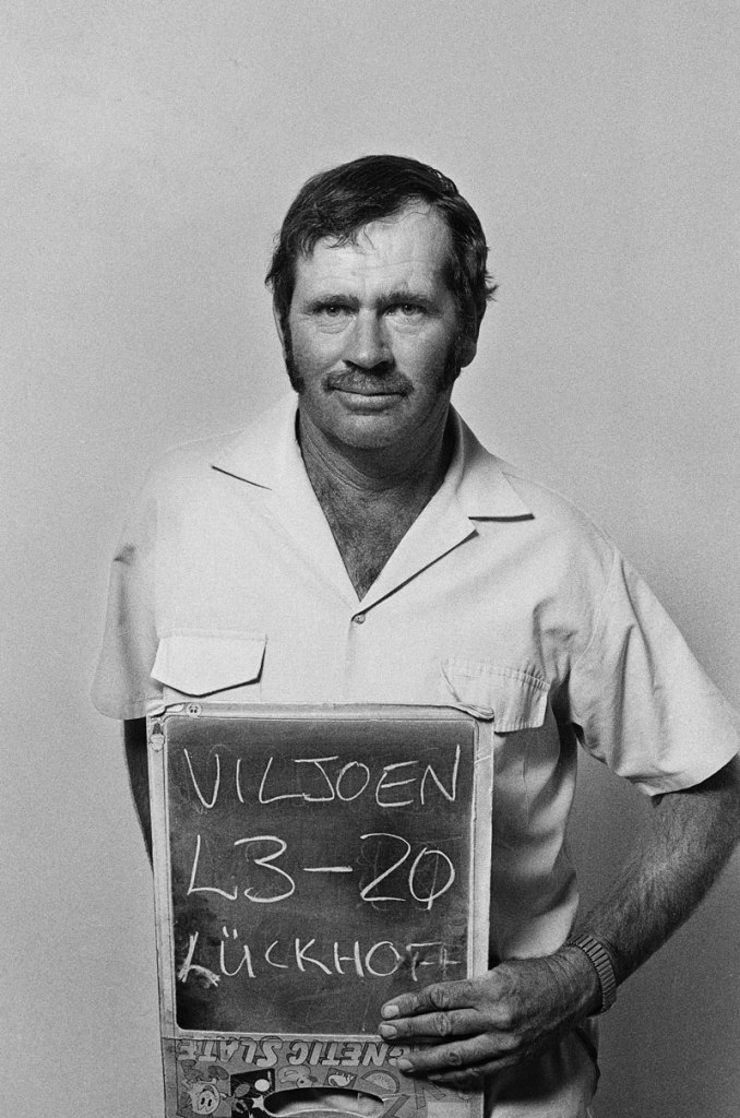

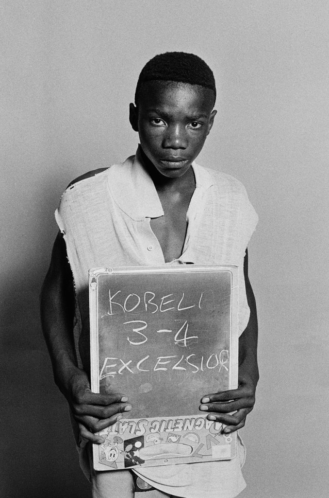

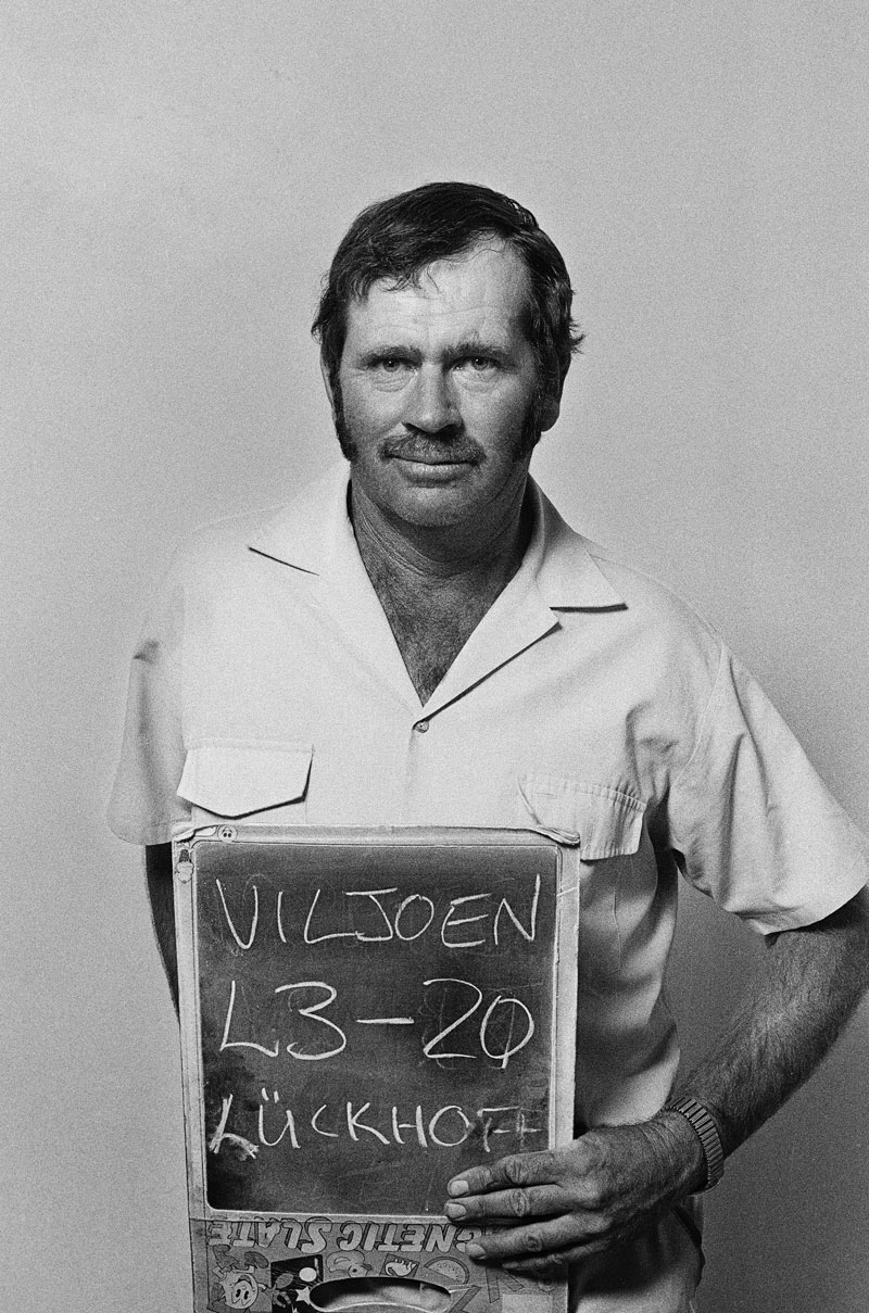


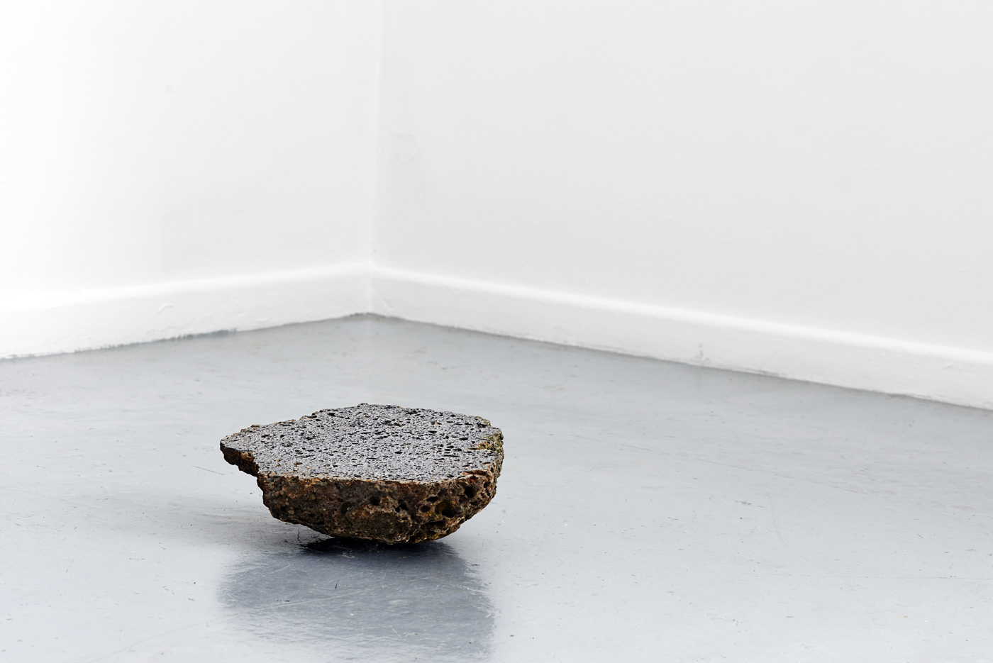
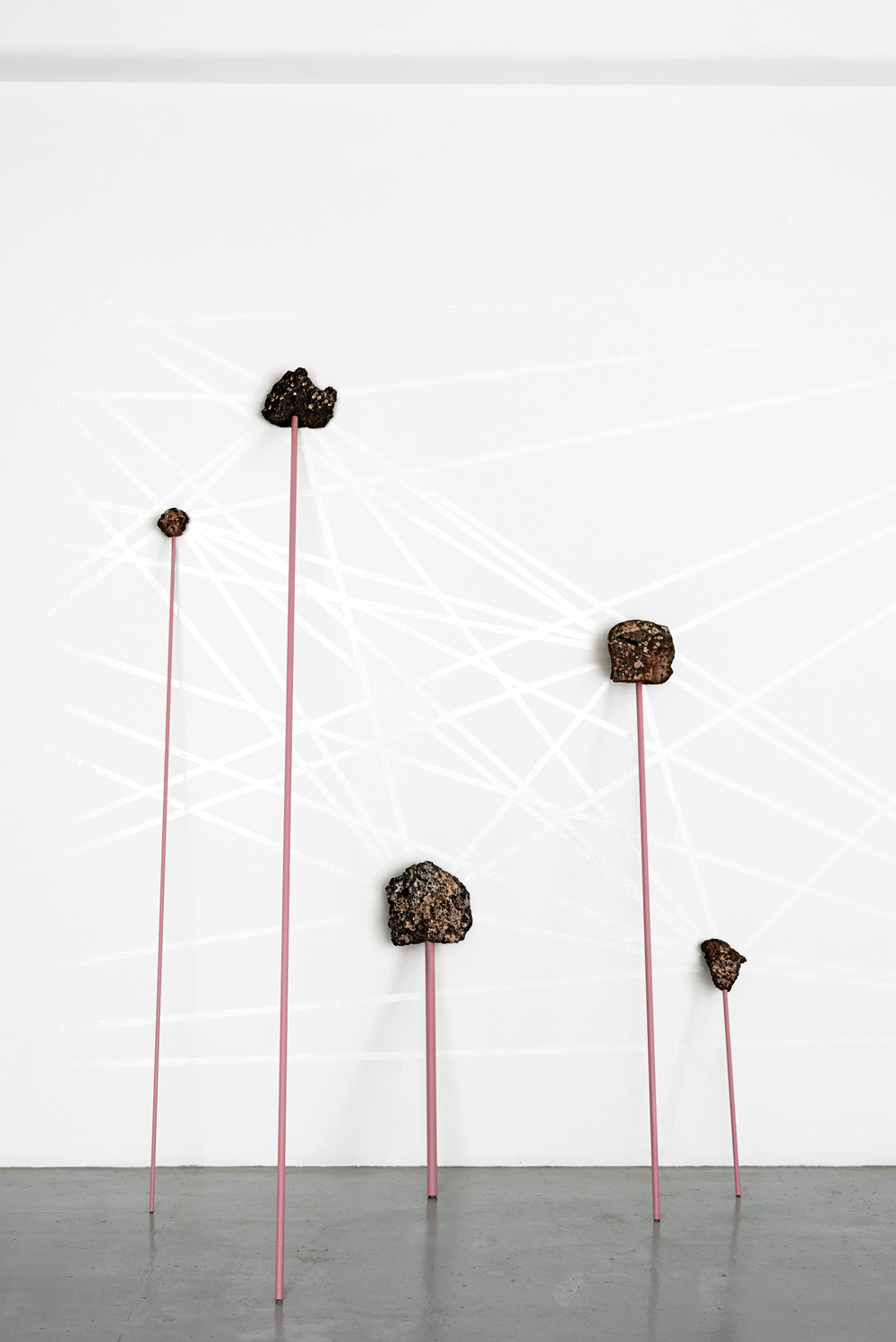
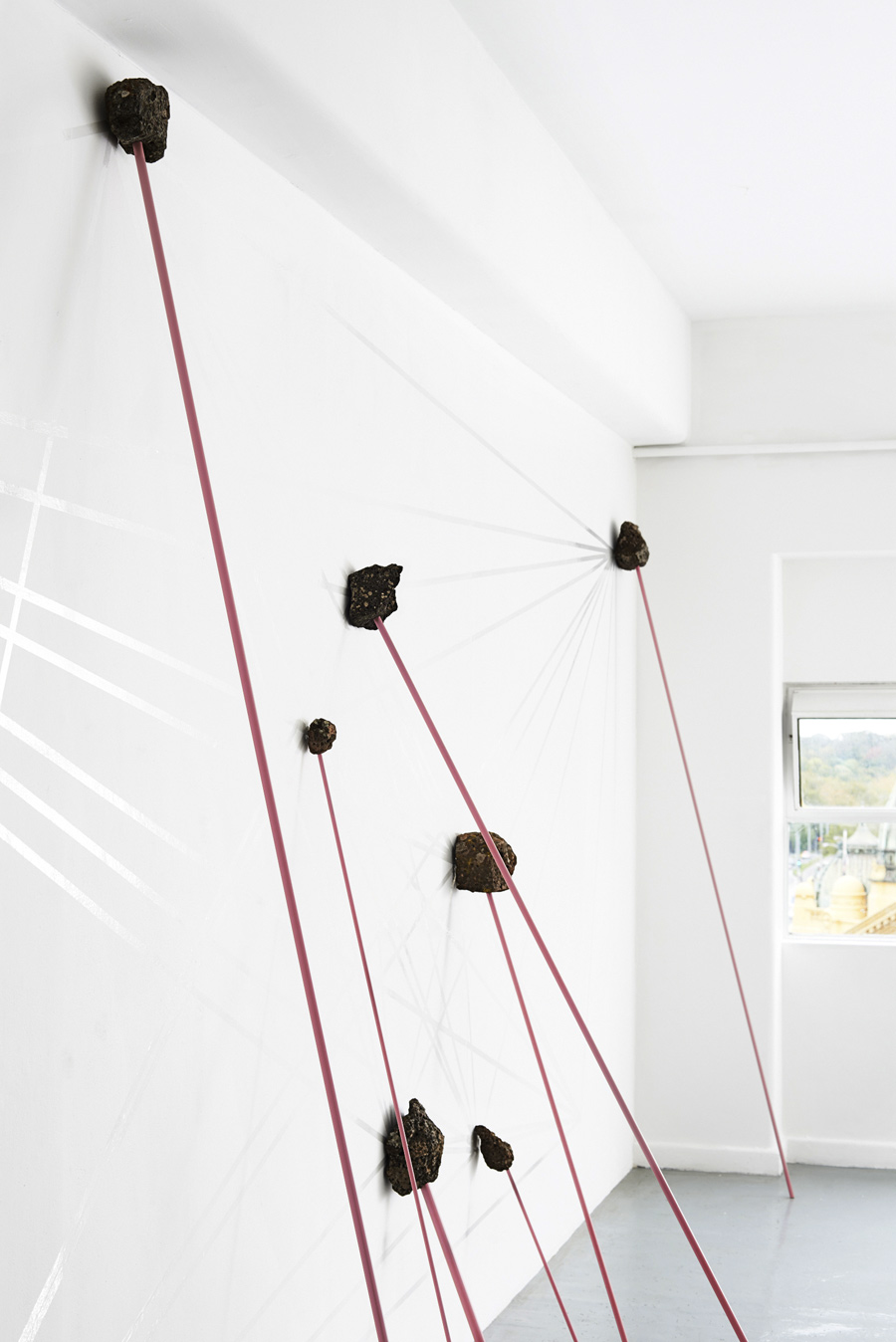


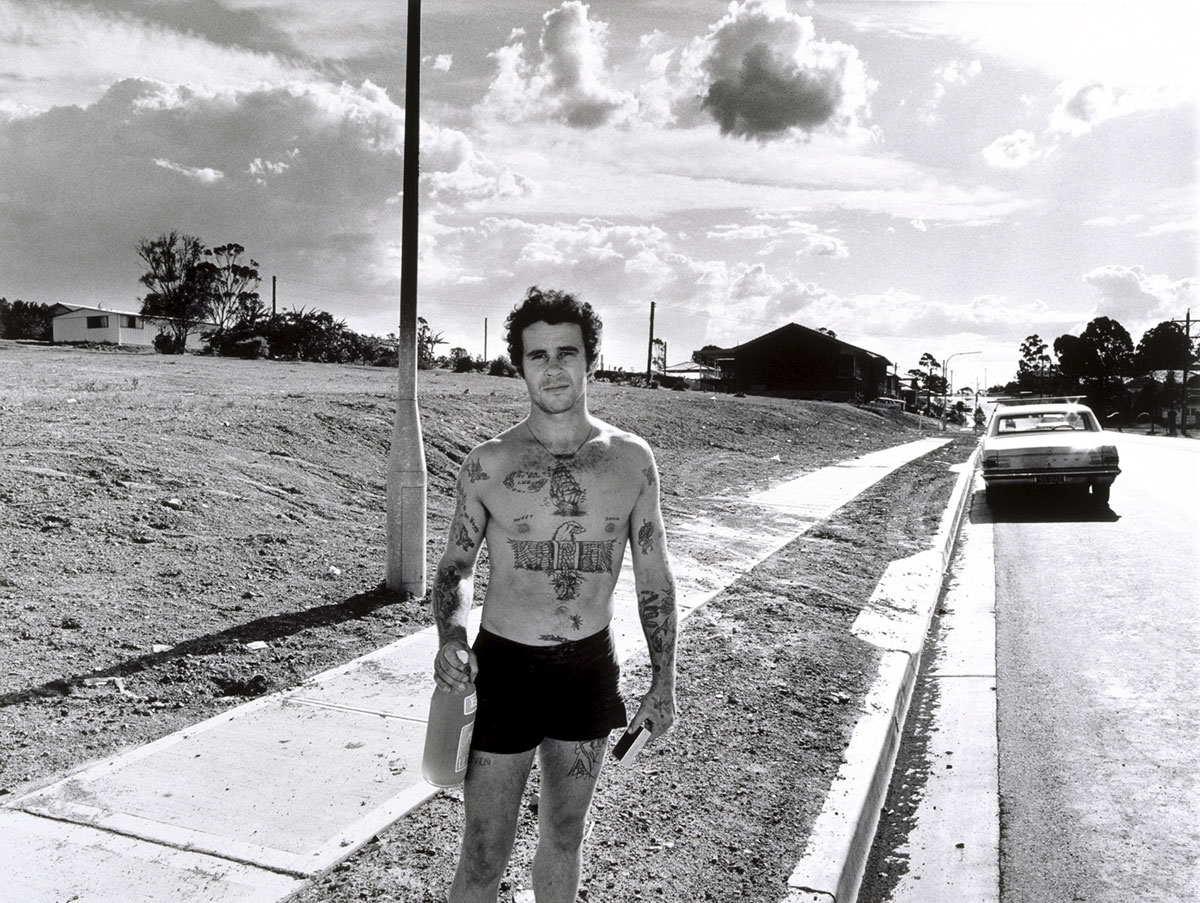


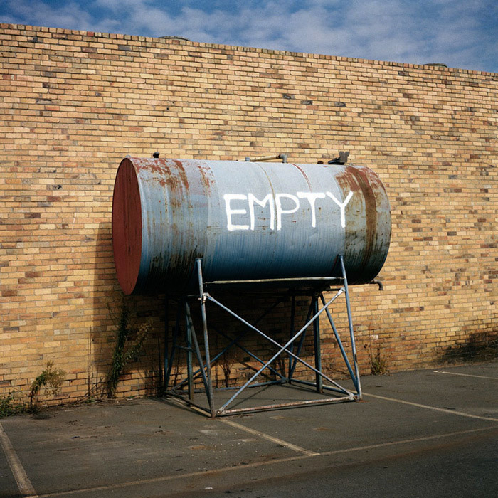
 Art Blart _ art and cultural memory archive
You must be logged in to post a comment.