Curator: Gail Stavitsky, chief curator at the Montclair Art Museum
Many thankx to The Warhol Museum for allowing me to publish the photographs of the art in the posting. Please click on the photographs for a larger version of the image.
I think of myself as an American artist; I like it here. I think it’s so great. I feel I represent the U.S. in my art but I’m not a social critic: I just paint those objects in my paintings because those are the things I know best… I’ve heard it said that my paintings are as much a part of the fashionable world as clothes and cars.
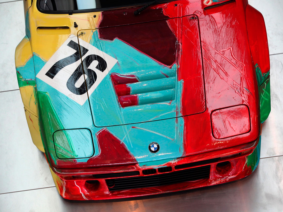
Andy Warhol (American, 1928-1987) BMW M1 Art Race Car 1979
Andy Warhol (American, 1928-1987) BMW M1 Art Race Car (detail) 1979
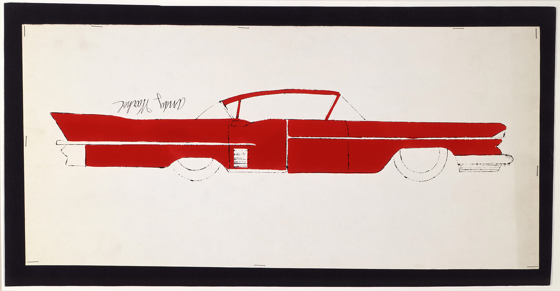
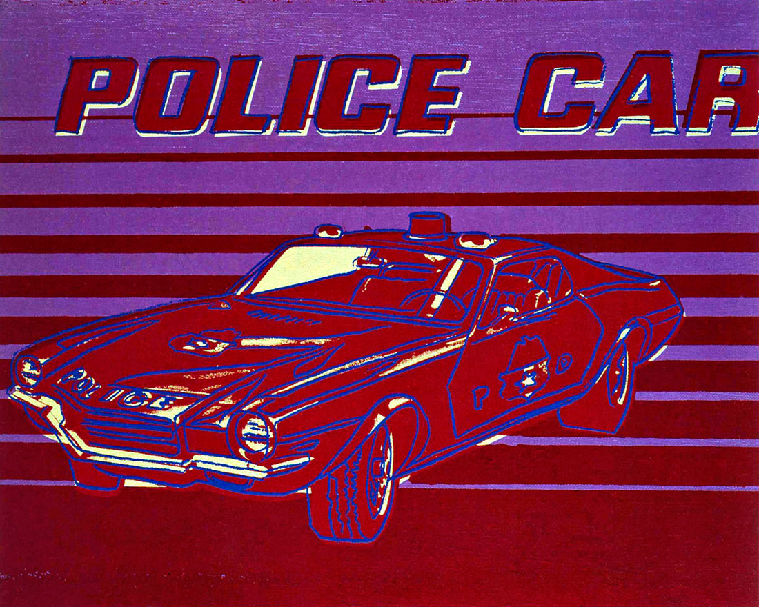
Warhol and Cars: American Icons is the first exhibition to examine Warhol’s enduring fascination with automotive vehicles as products of American consumer society. This exhibition features more than forty drawings, paintings, photographs, and related archival material spanning from 1946 to 1986. As one of the most iconic and influential artists of the 20th century, Andy Warhol has helped to define America. His signature images of such American products and celebrities as Campbell’s soup cans, Coca-Cola bottles, Marilyn Monroe, and Elizabeth Taylor have become instantly recognisable. The majority of the work in the exhibition is from The Andy Warhol Museum’s collection.
The exhibition, organised by the Montclair Art Museum in New Jersey, traces the development of Warhol’s work with cars throughout his career. Warhol and Cars highlights include drawing created in the 1940s; works on paper of the 1950s, as well as paintings and prints from the 60s, 70s and 80s. The exhibition is organised chronologically and thematically, tracing the development of Warhol’s work with cars throughout his career. Exhibition highlights include a rare, spontaneous drawing of the 1940s featuring a produce truck operated by Warhol’s brother Paul; works on paper of the 1950s, dating from the era of Warhol’s commercial magazine illustration; and paintings and prints from his important and poignant Car Crash series.
A key work is Twelve Cadillacs, part of a group of nine Warhol car paintings published in the November 1962 issue of Harper’s Bazaar, which commissioned Warhol to make a visual commentary on the phenomenon of the iconic American motor car. The repetition and grid organisation became a central feature of Warhol’s work. For the first time, Twelve Cadillacs will be juxtaposed with potential source images, as well as the related Seven Cadillacs and the hand-painted Lincoln Continental, both of which were also part of the Harper’s Bazaar commission. Also on view will be a related drawing and car model of Cadillacs from the Jean S. and Frederic A. Sharf Collection of American Automobile Art.
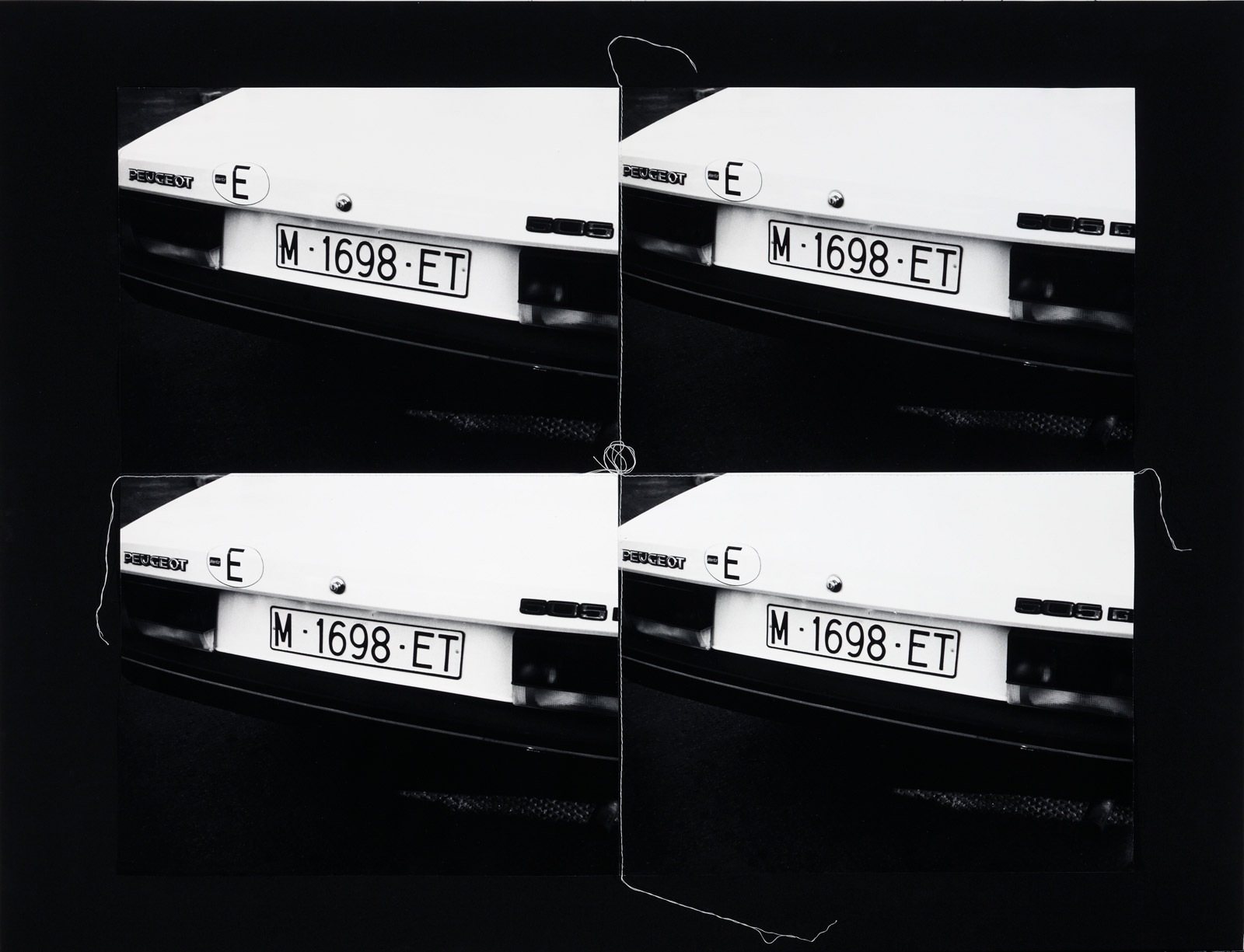
Warhol’s continued engagement with the theme of the automobile is seen in prints and paintings of the 1970s and 1980s based on Volkswagen advertisements, as well as in multiple photographs of European and American cars sewn together with thread into a format evocative of Warhol’s characteristic assembly-line aesthetic. An original BMW M-1 racing car that was hand-painted by Warhol will be on display in the entrance gallery. A film of Warhol painting a BMW in 1979 as part of the BMW Art Race Car Projects introduced by French race car driver Herve Poulin will be on view during the exhibition. The car is part of the BMW Museum’s collection in Munich and was last displayed in the United States at Grand Central Terminal in New York City in 2009.
Press release from The Warhol Museum website
Andy Warhol (American, 1928-1987) 1978 BMW 320i Art Car Maquette 1978
Curator: Dr. Susan Cohn for the Design Museum, London
Installation photograph of the exhibition Unexpected Pleasures at the National Gallery of Victoria Photo: Dr Marcus Bunyan
An elegant, refined exhibition of contemporary jewellery at the National Gallery of Victoria’s newly redeveloped Contemporary Exhibitions space. The most striking and beautiful pieces are the neck ornaments. I am a very much over some of the relatively unstructured jewellery made out of found objects. It really has been done to death.
Trying to take photographs of jewellery in cases with reflections and extraneous light is very difficult but I hope my photographs below give you an idea of the design, installation and some specific pieces in the exhibition.
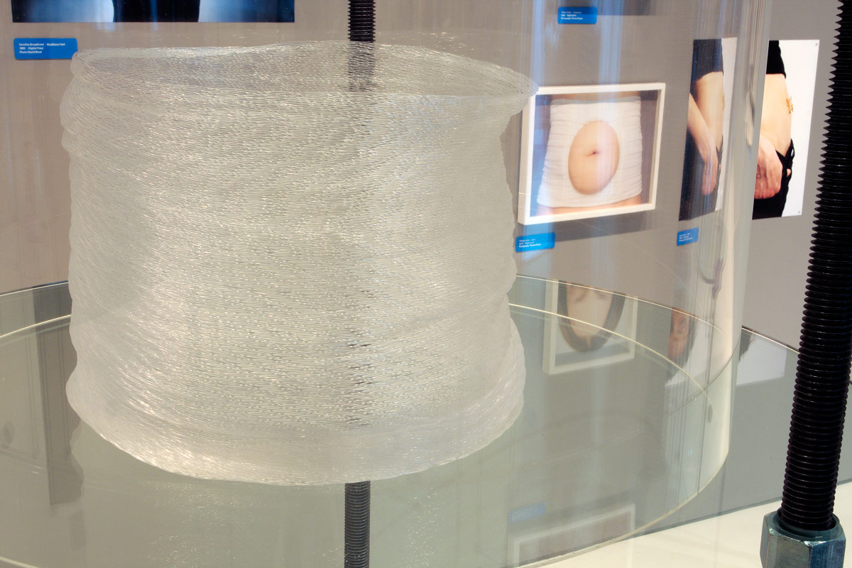
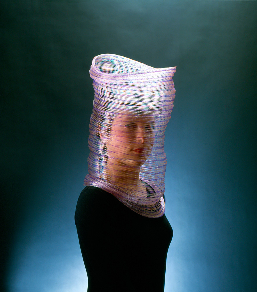
Susanne Klemm (Swiss, b. 1965) Frozen (installation view) 2007 Polyolefin Courtesy of Anna Schwartz Gallery Photo: Dr Marcus Bunyan
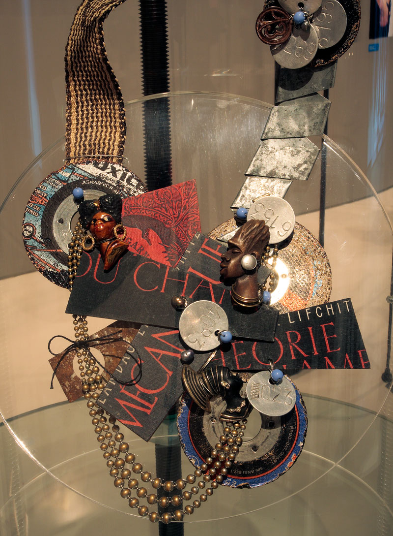
Lisa Walker (New Zealand, b. 1967) Necklace (installation view) 2009 Plastic, thread Photo: Dr Marcus Bunyan
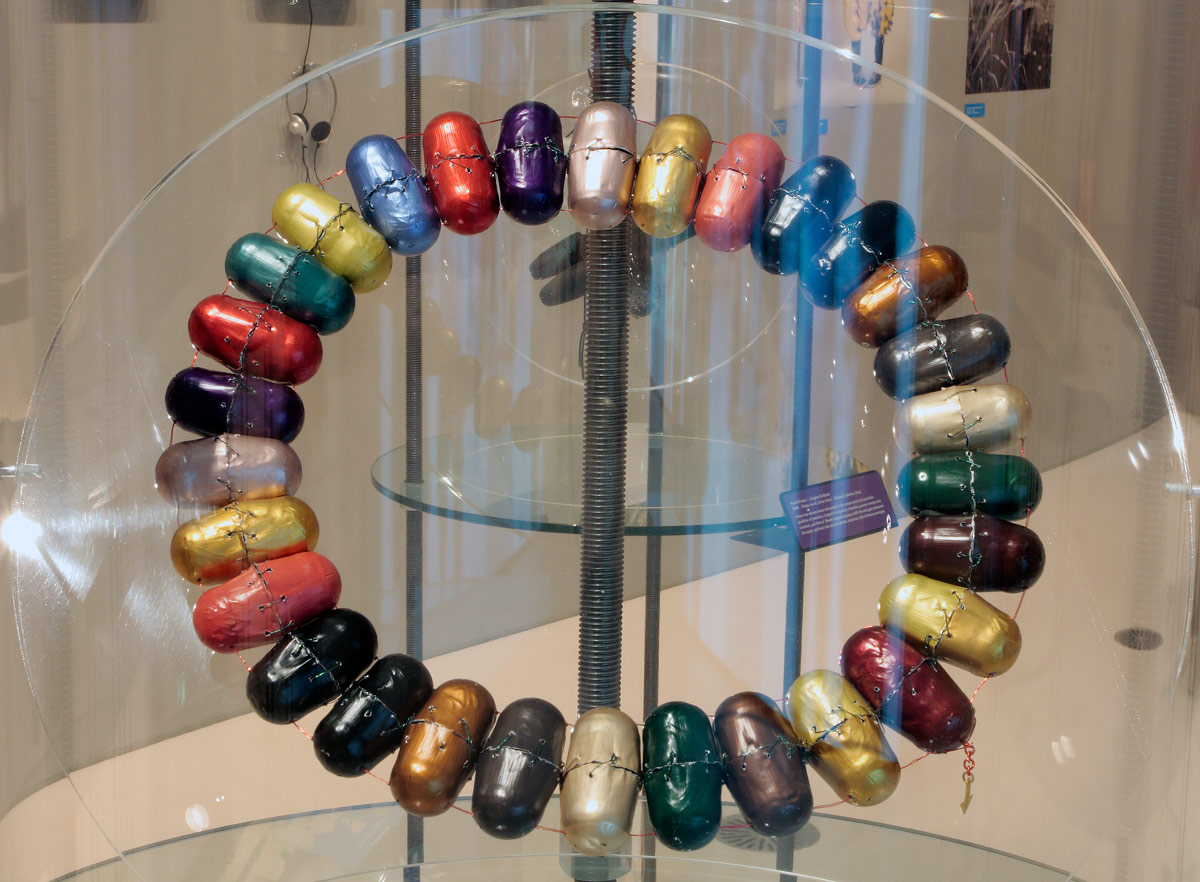
Beverley Price Nespresso Collier (installation view) 2012 Anodised aluminium, plastic coated wire, fine gold Photo: Dr Marcus Bunyan
Gijs Bakker (Dutch, b. 1942) Shoulder piece (installation view) 1967 Anodised aluminium Photo: Dr Marcus Bunyan
Unexpected Pleasures: The Art and Design of Contemporary Jewellery displays over 200 works by important Australian and international contemporary jewellers who have pushed conceptual and material boundaries within their practices. This Design Museum, London exhibition is curated by Guest Curator and Melbourne jeweller Susan Cohn, and is complemented by a selection of NGV Collection works and private loans.
Unexpected Pleasures looks at what we mean by jewellery from a number of different perspectives. Taking as its starting point the radical experiments of the Contemporary Jewellery Movement that challenged a conventional understanding of the language of personal adornment, and looking instead at the essential meanings of jewellery, the exhibition brings together important work from around the world, and looks at it from the point of view of the wearer as well as the maker. Contemporary Jewellery in this sense is at the intersection of art and design.
Dr Gerard Vaughan, Director, NGV said: “This is a remarkable and exciting exhibition, brilliantly installed in the Gallery’s newly redeveloped Contemporary Exhibitions space at NGV International.”
The exhibition explores the essential meanings of jewellery, bypassing traditional perceptions and instead tracing the radical experiments of contemporary jewellers who have challenged the conventions of jewellery design. The exhibition is curated through a number of themes: Worn Out – celebrating the experience of wearing jewellery; Linking Links – looking at the ways in which ‘meaning’ and narratives are invested and expressed through sub-themes such as Social Expressions and Creative Systems, and; A Fine Line – offering insight into the origins of contemporary jewellery today, highlighting key instigators of the Contemporary Jewellery Movement that started in the late 1970s.
Each theme within the exhibition provides an outline of current thinking and offers a unique view on how people use and interact with objects, through which design and production processes come to light. Photography in this context becomes a vital instrument for expressing the ‘wearability’ and the performative aspects of jewellery, and a selection of photographic works are also included in the exhibition.
New techniques and experimentation continue to question the relevance of preciousness, highlighting the shifting values from material worth to the personal associations that jewellery holds. The exhibition celebrates jewellery from the point of view of both the maker and the wearer. It considers the pleasures of wearing jewellery and the many meanings associated with jewellery which are at times unpredictable and, in turn, unexpected.
Press release from the NGV website
Otto Künzli (German, b. 1948) Wallpaper brooches (installation view) 1982 Wallpaper, synthetic polymer core, steel Photo: Dr Marcus Bunyan
Dimensions: 9’9″ (H) x 28’3” x 19’2” (D) (297 cm x 862 cm x 584 cm)
Media:
3 1/2 hp DC motors with motor controllers
1,100 custom-manufactured die-cast cars
13 HO-scale train sets with controllers and tracks
Steel, aluminium, shielded copper wire, copper sheet, brass, various plastics, assorted woods and manufactured wood products, Legos, Lincoln Logs, Dado Cubes, glass, ceramic and natural stone tiles, acrylic and oil-based paints, rubber, sundry adhesives
Poetic, historic, amazing, fantastic, incredible, indescribable (the words of an eight year old, comment on the website). Great video as well. Take your ear plugs!
Dr Marcus Bunyan
Many thankx to LACMA for allowing me to publish the video and the photographs in the posting. Please click on the photographs for a larger version of the image.
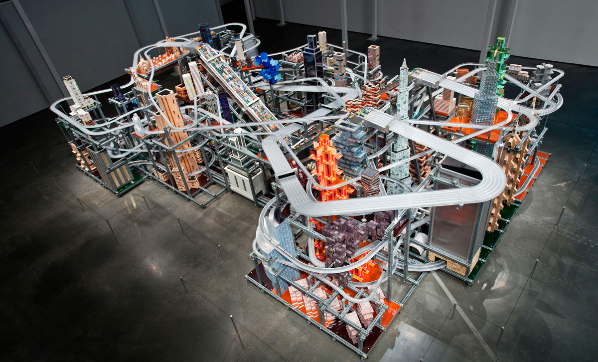
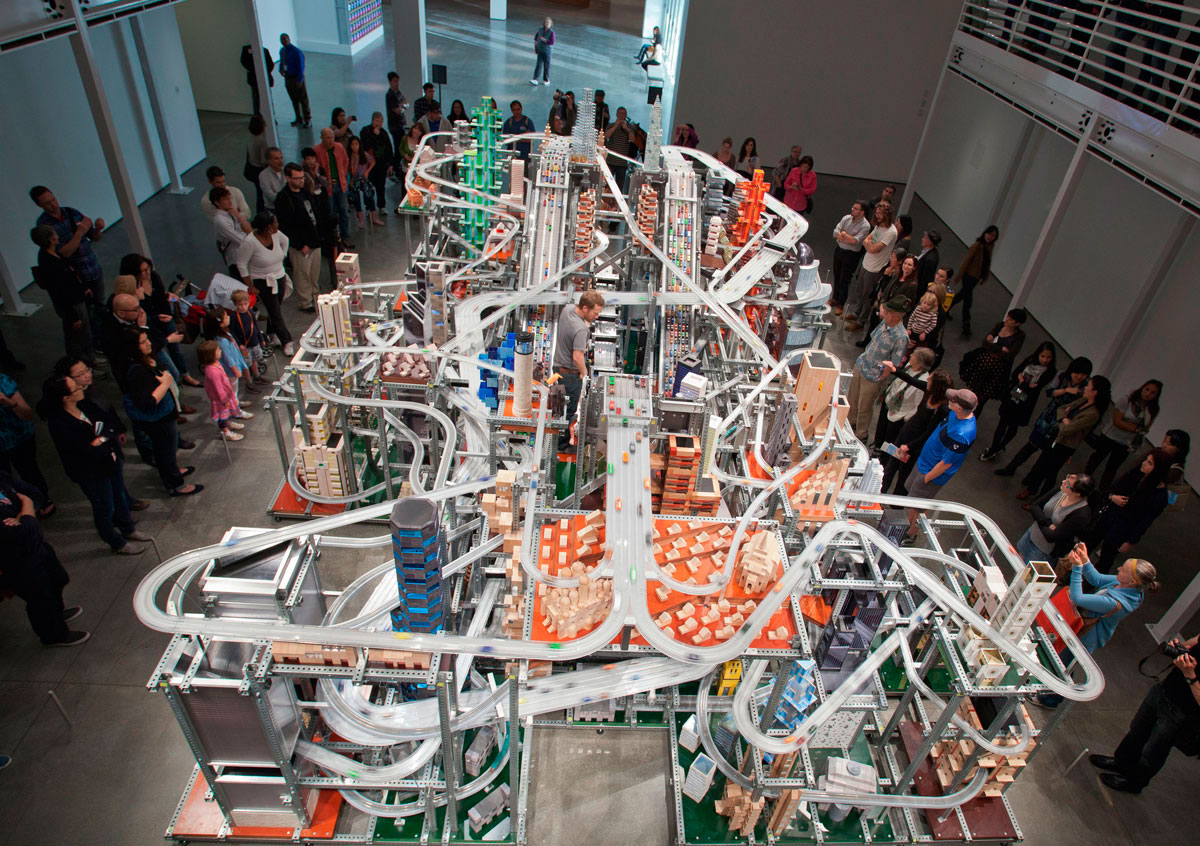
Created by artist Chris Burden, Metropolis II(2010) is a complex, large-scale kinetic sculpture modelled after a fast-paced modern city. The armature of the piece is constructed of steel beams, forming an eclectic grid interwoven with an elaborate system of eighteen roadways, including a six-lane freeway, train tracks, and hundreds of buildings. 1,100 miniature toy cars speed through the city at 240 scale miles per hour on the specially designed plastic roadways. Every hour, the equivalent of approximately 100,000 cars circulates through the sculpture. “The noise, the continuous flow of the trains, and the speeding toy cars, produces in the viewer the stress of living in a dynamic, active and bustling 21st Century city.”
Situated in the centre of the grid are three electrically powered conveyor belts, each studded with magnets at regular intervals. The magnets on the conveyor belt and those on the toy cars attract, enabling the cars to travel to the top of the sculpture without physical contact between the belt and cars. At the top, the cars are released one at a time and race down the roadways, weaving in and out of the structure, simulating rapid traffic and congestion.
Metropolis II is on long-term loan to LACMA, thanks to the generosity of LACMA Trustee Nicolas Berggruen. Beginning January 14, 2012, the work will be on view on the first floor of the Broad Contemporary Art Museum (BCAM) and run on weekends during the scheduled times below.
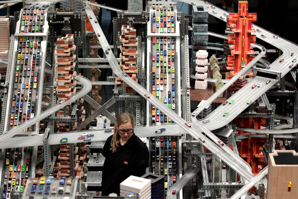
~ The cars are attached by a small magnet to the conveyor belt that brings them to the crest ~ The only motorisation of the cars is the conveyor belt to the top ~ Once the cars cross over the crest and head downward, their entire movement is by gravity ~ They travel at a scale speed of 240 mph, plus or minus ~ The tracks they take are Teflon coated to reduce friction ~ The tracks are beveled at 7 degrees to give added torque for speed when they come through corners and curves
Operator Alison Walker watches miniature cars move along the roads in Chris Burden’s latest kinetic sculpture, Metropolis II, at the Los Angeles County Museum of Art (LACMA) in Los Angeles, Wednesday, Jan. 11, 2012. The sculpture does more than just imitate life. The colorful display of roads, cars, trains and buildings is art imitating what the artist foresees life being like in five or 10 years.
Los Angeles County Museum of Art (LACMA) 5905 Wilshire Boulevard (at Fairfax Avenue) Los Angeles, CA, 90036 Phone: 323 857-6000
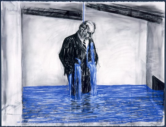
A munificence of Minor White and the revelation of the object through contemplation could be found in the lecture by William Kentridge. As an artist you must keep repeating and constructively playing and something else, some new idea, some new way of looking at the world may emerge. As a glimpse into the working methodology of one of the world’s great artists the lecture was fascinating stuff!
“At four in the morning there are no lack of branches for the crow of doubt to land upon.”
On Memory
“Memory – both memory and the forgetting of memory. For example, the building of monuments [monuments to the Holocaust, to wars] takes the responsibility of remembering away.”
On Play
“We absolutely want to make sense of the world in that way. That’s one of the principles of play – that however much you distort and break things apart, in the end we will try to reconstruct them in some way to make sense of the world. I think that every child does it. It’s fundamental.”
On Looking
“It’s the capacity for recognition that makes a difference between order and disorder in looking at visual images. And it’s the vocabulary of recognisable images that we have inside us, which is completely vital to what it is to see. I don’t really buy the idea that order and disorder are the same.”
William Kentridge
First History of the Cinema
Performances of Transformation
~ Cinema
~ Shadow dancing
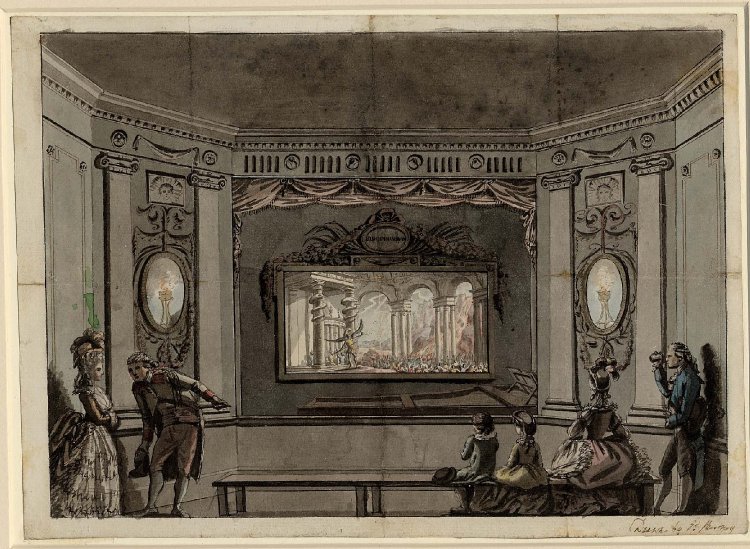
~ Eidophusikon (The Eidophusikon was a piece of art, no longer extant, created by 18th century English painter Philip James de Loutherbourg. It opened in Leicester Square in February 1781.Described by the media of his day as “Moving Pictures, representing Phenomena of Nature,” the Eidophusikon can be considered an early form of movie making. The effect was achieved by mirrors and pulleys.
~ Quick change artist
~ Stage magicians
All work against the time of the audience e.g. the quick change artist may take 3 seconds, the sunset in a Georges Méliès film may take 2 minutes instead of 2 hours. The technology / scrims / screens happen at different speeds but the different times become one in the finished film. There is an elision of time: appearances / disappearances. Stopping time [changing a scene, changing clothing etc…], starting time again.
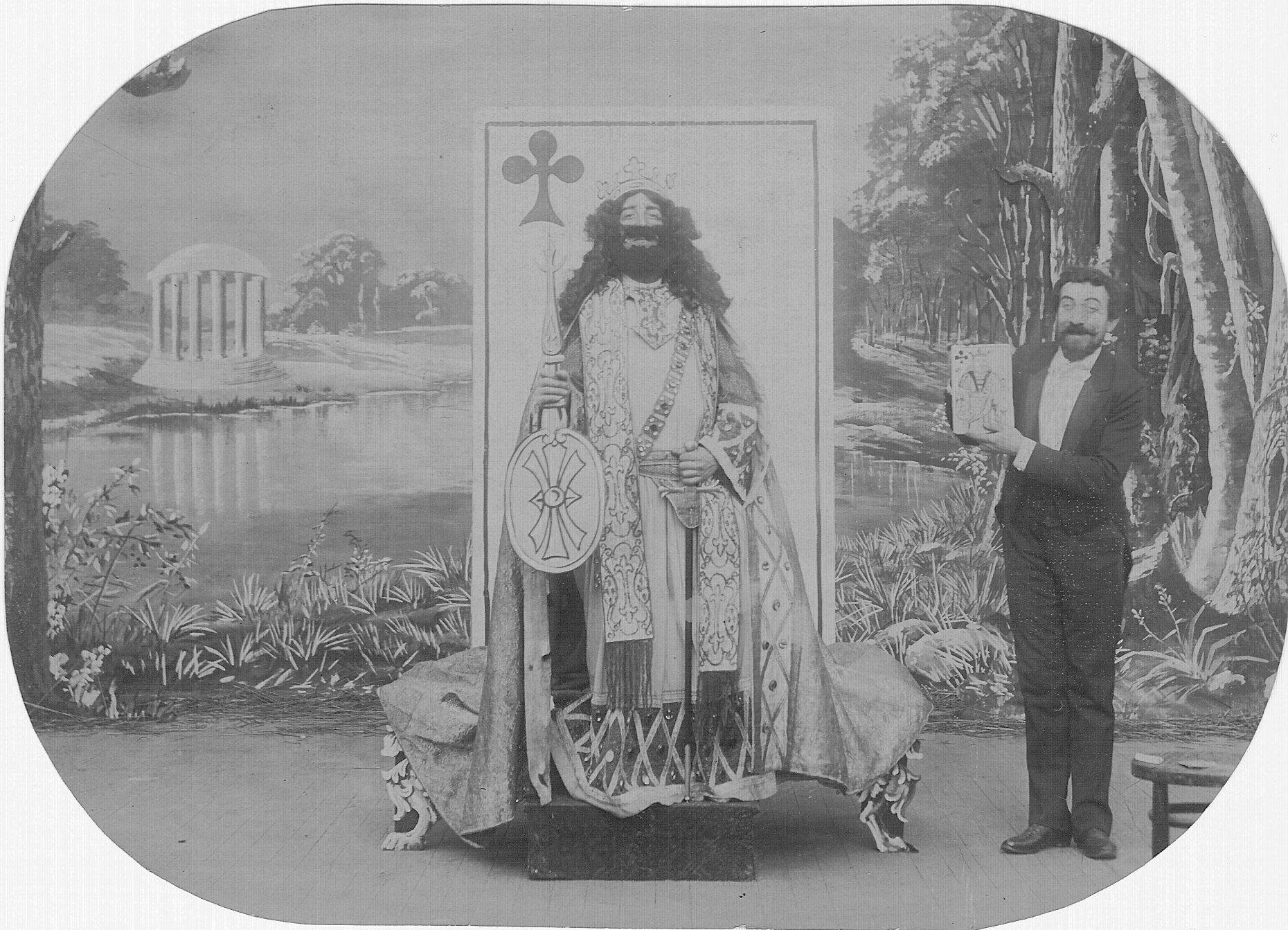
George Méliès starring in The Living Playing Cards (1904)
Second History of the Cinema
The sedimented gaze of the early camera. The slow chemicals meant that the object had to wait under the camera’s gaze for minutes. People were held in place by stiff neck braces to capture the trace of their likeness. Congealed time.
On the other hand, in cinema, a tear forward becomes a repair in reverse.
By rolling the film in reverse there is a REVERSAL of time, a REMAKING of the world – the power to be more than you are – by reversing to perfection. You throw a book or smash a plate: in reverse they become perfect again, a utopian world.
YOU MUST GIVE YOURSELF OVER TO PLAY!
Giving yourself over to what the medium suggests, you follow the metaphor back to the surface. Following the activity [of play] back to its root. Projecting forwards, projecting backwards. There is endless rehearsal, constant repetition, then discovering the nature of the final shot or drawing to be made. New ideas get thrown around: leaning into the experience, the experiment, the repetition, the rehearsal.
Four elements
1/ something to be seen
2/ the utopian perfection: perfectibility
3/ the grammar of learning that action
4/ Greater ideas, further ideas and thoughts; potentiality and its LOSS
Further meanings arise
How is this achieved?
Rehearsal, repetition
New thoughts will arise being led by the body in the studio NOT in the mind. Not conceptual but the feeling of the body walking in the studio.
The physical action as the starting point not the concept.
Six different degrees of tension
1/ Least tension in the body possible: slumped
2/ Relaxed
3/ Neutral
4/ Purpose: an impulse to make things happen – desire
5/ Insistence: listen to me, this is very important
What the body suggests is the construction of an image.
There are different degrees of tension in these performances. What do they suggest? This reverse osmosis from one state to another?
Third History of Cinema
Technologies of Looking
Pre-cinematic devices – a process of seeing in the world, of looking. Produces a reconfigured seeing, the invisible made [moving] visible.
Stereoscope
3D world made into a 2D image put back into 3D by our brains. The nature of binocularity, of depth perception. We see an illusion of depth, a construction by the eyes. Our brain is a muscle combining the two images. Depth of Field (DOF): focusing at different distances, we are inside the field of the image. Peripheral vision is blanked off; we look through a magnifying glass. A machine for demonstrating seeing.
There are erotics built into the language of the etching, but there is also a logic built into the machine used for etching. The Proof print, arriving at the first state. Going on the journey from artist as maker to artist as viewer through the mechanism of the etching press.
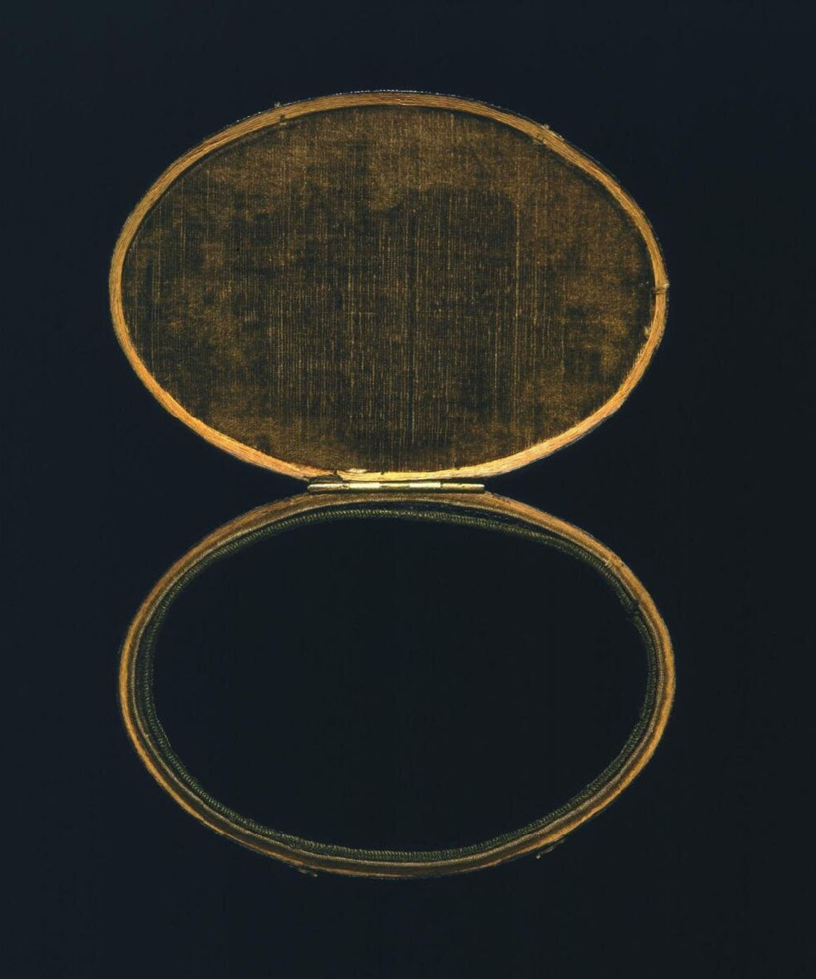
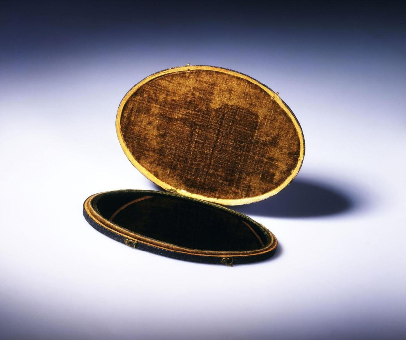
Artist/Maker unknown Claude Glass, manufactured in England 18th century V & A
Claude Glass
“A Claude glass (or black mirror) is a small mirror, slightly convex in shape, with its surface tinted a dark colour. Bound up like a pocket-book or in a carrying case, black mirrors were used by artists, travellers and connoisseurs of landscape and landscape painting. Black Mirrors have the effect of abstracting the subject reflected in it from its surroundings, reducing and simplifying the colour and tonal range of scenes and scenery to give them a painterly quality).”
The Claude glass was standard equipment for Picturesque tourists, producing instant tonal images that supposedly resembled works by Claude. “The person using it ought always to turn his back to the object that he views,” Thomas West explained in his Guide to the Lakes. “It should be suspended by the upper part of the case… holding it a little to the right or the left (as the position of the parts to be viewed require) and the face screened from the sun.”
Object Type
A Claude Glass – essentially a small, treated mirror contained in a box – is a portable drawing and painting aid that was widely used in the later 18th century by amateur artists on sketching tours. The reflections in it of surrounding scenery were supposed to resemble some of the characteristics of Italian landscapes by the famous 17th-century painter and sketcher Claude Lorrain, hence the name.
Materials & Use
The ‘glass’ consists of a slightly convex blackened mirror, which was carried in the hand and held up to the eye. The image thus seen was the scenery behind – rather than in front of – the user. The mirror’s convexity reduced extensive views to the dimensions of a small drawing. The use of a blackened rather than an ordinary silvered mirror resulted in a somewhat weakened reflection, which stressed the prominent features in the landscape at the expense of detail. It also lowered the colour key. A larger version of this device is said on occasion to have been fixed to the windows of horse-drawn carriages in order to reflect the passing scenery.
Artist / Maker unknown Claude Glass, manufactured in England 18th century V & A
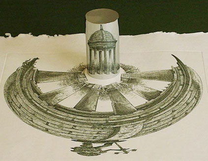
Anamorphic Mirror
A counter intuitive way of drawing; turning 2D into 3D. The landscape has no edge, like a carrousel.
A LINK TO THE ENDLESS CIRCLING AND WALKING AROUND THE STUDIO!
Anamorphic drawing and cone shaped mirror
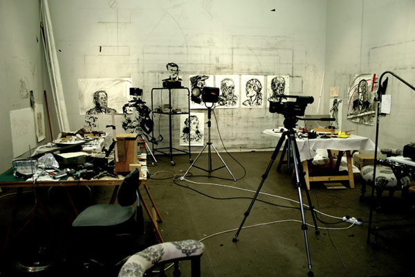
William Kentridge studio Photo by John Hodgkiss Art Tatler
The Studio
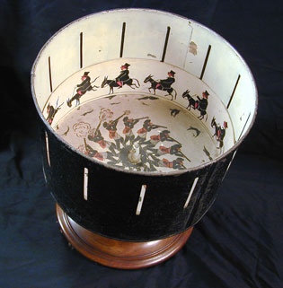
In the studio you gather the pieces together like a kind of Zoetrope. You may arrive at a new idea, a new starting point. Repetition, going around and around your head (at four in the morning!). There must be a truce between the artist as maker and the artist as viewer. As in earlier times, you walk the cloisters, you promenade.
You find the walk that is the prehistory of the drawing, that is the prehistory to the work.
A multiple, fragmented, layered performance of walking. You are trying to find the grammar of the studio – the necessary stupidity. Making a space for uncertainty. The conscious suppression of rationality. At some point, emerging, escaping the Zoetrope, from the physical making, something will be revealed. The spaces open up by the stupidities. Something new emerges.
THIS IS THE SPACE OF THE STUDIO.
Australian Centre for the Moving Image (ACMI) Federation Square, Melbourne, Australia
William Kentridge: Five Themes
Thursday 8 March – Sunday 27 May 2012 Exhibition open daily 10am – 6pm
Curator: Peter Pfrunder, director of the institution, in cooperation with Martin Gasser and Sabine Münzenmaier
Many thankx to Fotostiftung Schweiz for allowing me to publish the photographs in the posting. Please click on the photographs for a larger version of the image.
Albert Steiner (Swiss, 1877-1965) Schnee, Winter, Sonne Rotapfel-Verlag, Zurich-Erlenbach/Leipzig 1930
Albert Steiner was one of the finest Swiss photographers of the twentieth century. Like Ansel Adams, he favoured imposing natural phenomena, landscapes with what might be called good bone structure, (in his case the Alps, in Adams’s comparable work, the American West), and he printed his vision of them in black-and-white, revealing nature in all its majesty. His impressive scenic work has fundamentally shaped the world’s perception of Switzerland as an alpine country of timeless beauty. It spans the period from before World War I – an era of pictorially inspired images that look like oil paintings – to the straightforward and elegantly modern photography of the 1930s. Unlike many other photographers of the same generation active in the same area, Steiner saw photography as a completely appropriate means of creating works of art, and considered himself an artist.
Eduard Spelterini (Swiss, 1852-1931) Über den Wolken (cover) Brunner & Co. A.G., Zurich 1928
Eduard Spelterini(Swiss, 1852-1931)
Swiss balloonist Eduard Spelterini (1852-1931) lived an extraordinary life. Born the son of an innkeeper and beer brewer in a remote village in the Toggenburg area of Switzerland, Spelterini achieved international fame when he became the first aeronaut to fly over the Swiss Alps in 1898. Over the next two decades, Spelterini navigated his balloon through the skies of Europe, Africa, and Asia, and over such sites as the Great Pyramid of Giza and the gold mines of South Africa. Spelterini remains an important figure today because of his achievements in aerial photography. Seeking images to illustrate his lectures, he began taking a camera along with him on his expeditions in 1893, and his breathtaking photographs quickly became the talk of Europe.
Known as the “King of the Air,” the Swiss balloonist Eduard Spelterini enchanted the imaginations of European royalty, military generals, wealthy patrons, and the public alike with his mastery of the most whimsical mode of travel ever invented – the gas balloon. During the course of his storied aviation career, Spelterini flew his balloons over the Swiss Alps, across the Egyptian pyramids, and past the ziggurats of the Middle East, taking breathtaking photographs of landscapes and cities from the sky.
On Spelterini’s first ballooning ventures, he ferried aristocrats between Vienna, Bucharest, Athens, and other European capitals, on flights that became so famous that they were soon jam-packed with an international press corps looking for the next sensational story. Later in his life, Spelterini was the first aeronaut to succeed in the hazardous passage over the Swiss Alps, a trip then thought impossible. Eventually, he decided to bring his camera on every voyage in order to document the full panorama of international vistas he encountered.
Eduard Spelterini – Photographs of a Pioneer Balloonist. Verlag Scheidegger and Spiess; Bilingual edition December 30, 2007 is the first book after 80 years to present these images of his journeys, reproduced directly from the artist’s original glass negatives. Contextualized by essays that explore both Spelterini’s life and his photographic work, the photographs featured in this volume capture the heady mix of danger and discovery that defined the early years of international air travel when balloons ruled the skies.
Eduard Spelterini (Swiss, 1852-1931) Über den Wolken Brunner & Co. A.G., Zurich 1928
Walter Mittelholzer (Swiss, 1894-1937) Alpenflug (cover) Orell Füssli, Zurich/Leipzig 1928
The Swiss Foundation for Photography (Fotostiftung Schweiz) is marking its fortieth anniversary by presenting a fresh view of Swiss photography – a tour d’horizon covering a range of illuminating photobooks in which not only the great themes of photography are reflected but also the development of photographic styles and modes of expression. Since the late 1920s the book has repeatedly proved itself to be an ideal platform for the presentation of photographic works. Books have not only contributed to the dissemination and transmission of photography but also facilitated the integration of the individual image into a meaningful context.
In the history of photography the photobook plays a major role not only in publicising photographs, but also as an independent means of expression. The significance of many photographers’ works only emerges when presented in book form, in the coherent sequence or series of images. Content, design and printing quality combine to produce an intricate architectural whole.
This jubilee exhibition marking the 40th anniversary of the Fotostiftung Schweiz focuses on a selection of photobooks that have influenced photography in Switzerland since the late 1920s. At that time, technical advances made the reproduction of top quality photographic images possible and promptly gave rise to a first boom in illustrated books that placed greater emphasis on the photographs than on the texts. Since then, Swiss photobooks have continued to develop in various directions and have repeatedly attracted considerable attention at international level as well.
With the help of seven thematic areas – homeland, portraiture, mountain photography, the world of work, aerial photography, contemporary history, travel – this exhibition aims at a kind of typology of the Swiss photobook which draws attention to the potential interplay between book and photograph, while also revealing the extent to which modes of expression have altered over the course of time. Concise excerpts from these books exhibited on the walls highlight the basic principle of each photobook – a photograph positioned on a double page still remains an integral part of a larger sequence. The concept, design and reception of photobooks are examined more closely in display cases. A large wall installation is devoted to photobook covers. The photobook is also presented as an object in film form: “reading” illustrated photography books is not just an intellectual but also a sensual act.
Press release from the Fotostiftung Schweiz website
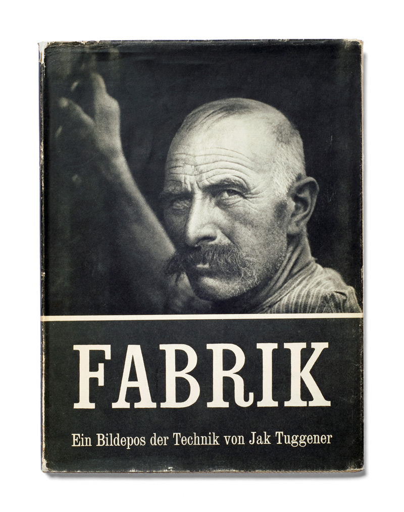
Jakob Tuggener (Swiss, 1904-1988) Fabrik (cover) Rotapfel Verlag, Erlenbach-Zurich 1943
Jakob Tuggener (Swiss, 1904-1988) Fabrik Rotapfel Verlag, Erlenbach-Zurich 1943
Jakob Tuggener’s Fabrik, published in Zurich in 1943, is a milestone in the history of the photography book. Its 72 images, in the expressionist aesthetic of a silent movie, impart a skeptical view of technological progress: at the time the Swiss military industry was producing weapons for World War II. Tuggener, who was born in 1904, had an uncompromisingly critical view of the military-industrial complex that did not suit his era. His images of rural life and high-society parties had been easy to sell, but Fabrik found no publisher. And when the book did come out, it was not a commercial success. Copies were sold at a loss and some are believed to have been pulped. Now this seminal work, which has since become a sought-after classic, is being reissued with a contemporary afterword. In his lifetime, Tuggener’s work appeared – at Robert Frank’s suggestion – in Edward Steichen’s Post-War European Photography and in The Museum of Modern Art’s seminal exhibition, The Family of Man, in whose catalogue it remains in print. Tuggener’s death in 1988 left an immense catalogue of his life’s work, much of which has yet to be shown: more than 60 maquettes, thousands of photographs, drawings, watercolors, oil paintings and silent films.The Family of Man,
Book description on Amazon. The book has been republished by Steidl in January, 2012. The classics never go out of fashion!
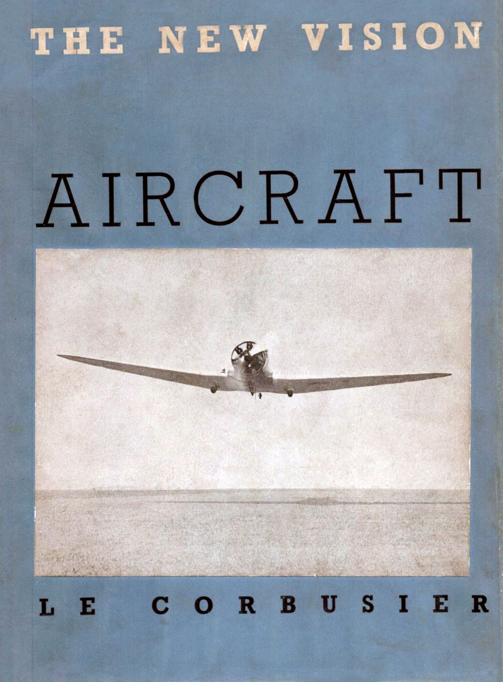
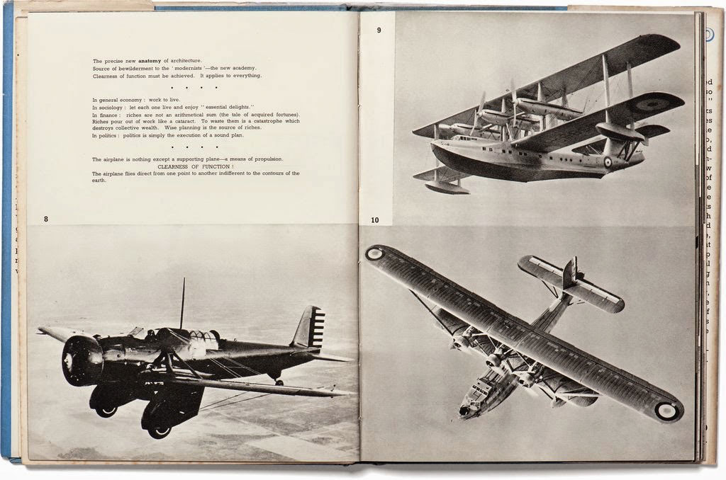
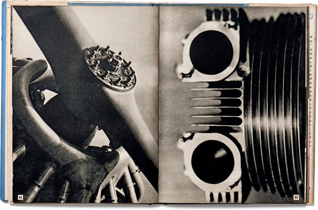
Le Corbusier (Swiss-French, 1887-1965) Aircraft The Studio, London/New York 1935
Le Corbusier (Swiss-French, 1887-1965) Aircraft The Studio, London/New York 1935
Robert Frank (Swiss-American, 1924-2019) The Americans Grove Press, New York 1958/1959
Werner Bischof (Swiss, 1916-1954) Japan Manesse, Zurich c. 1955
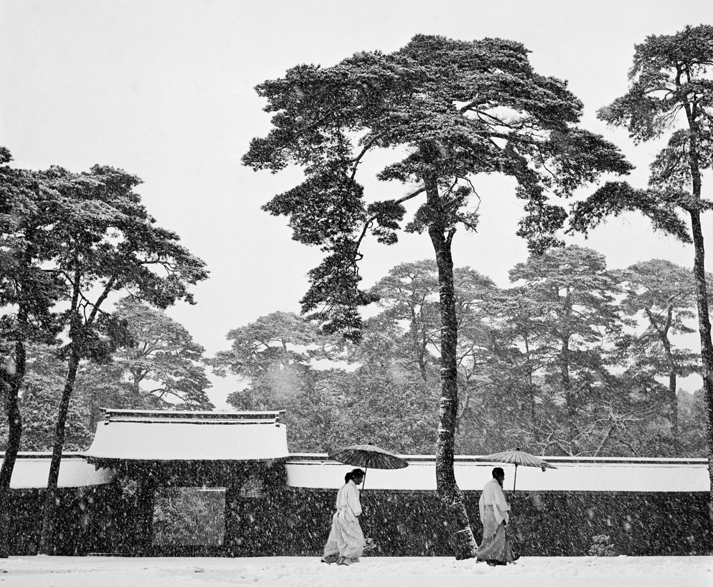
Werner Bischof (Swiss, 1916-1954) Courtyard of the Meiji shrine in Tokyo, Japan 1951 Gelatin silver print
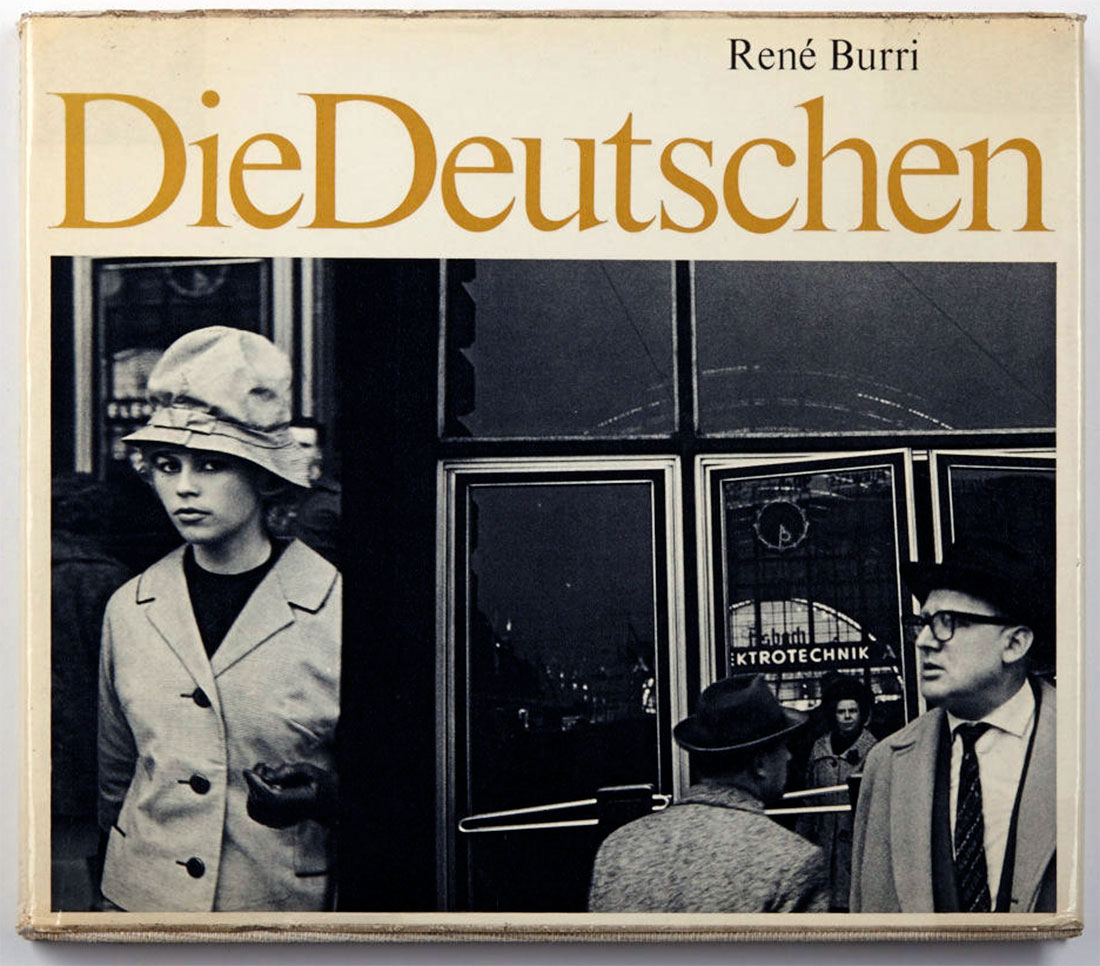
René Burri (Swiss, 1933-2014) Die Deutschen Fretz & Wasmuth Verlag, Zurich 1962
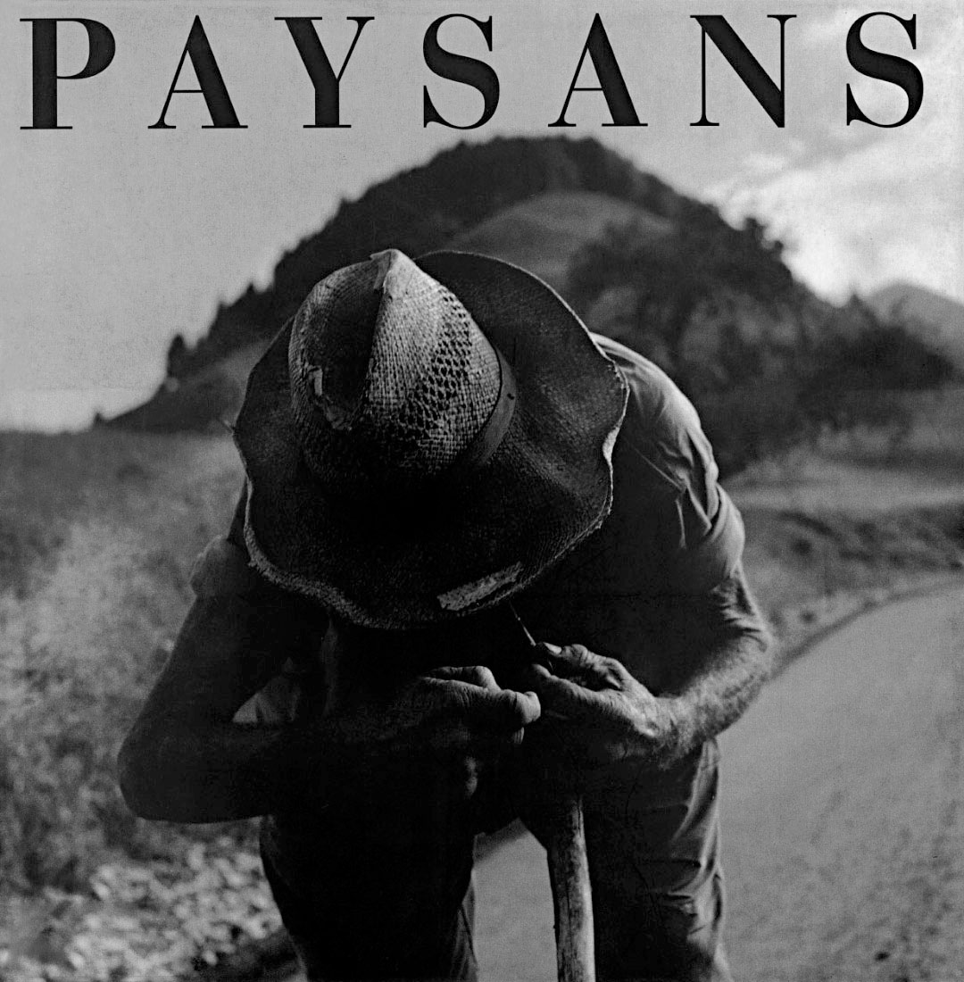
Hugues de Wurstemberger (Swiss, b. 1955) Paysans Editions de la Sarine, Fribourg 1996
Andri Pol (Swiss, b. 1961) Grüezi Kontrast Verlag, Zurich 2006
Many thankx to the Museum für Kunst und Gewerbe Hamburg for allowing me to publish the photographs in the posting. Please click on the photographs for a larger version of the image.
Apple Macintosh Classic 1990 Museum für Kunst und Gewerbe Hamburg Photo: Roman Raacke
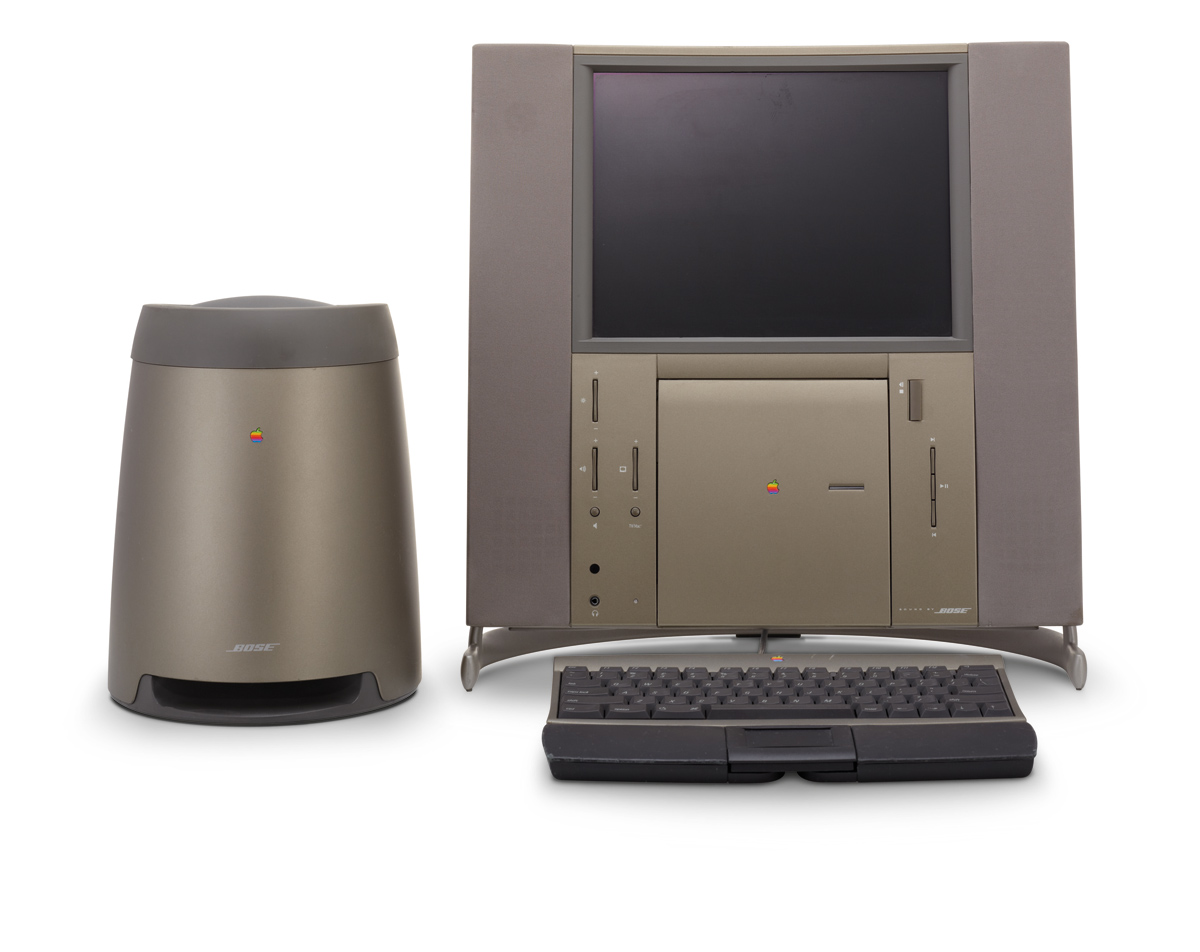
Apple 20th Anniversary Macintosh 1997 Museum für Kunst und Gewerbe Hamburg Photo: Roman Raacke
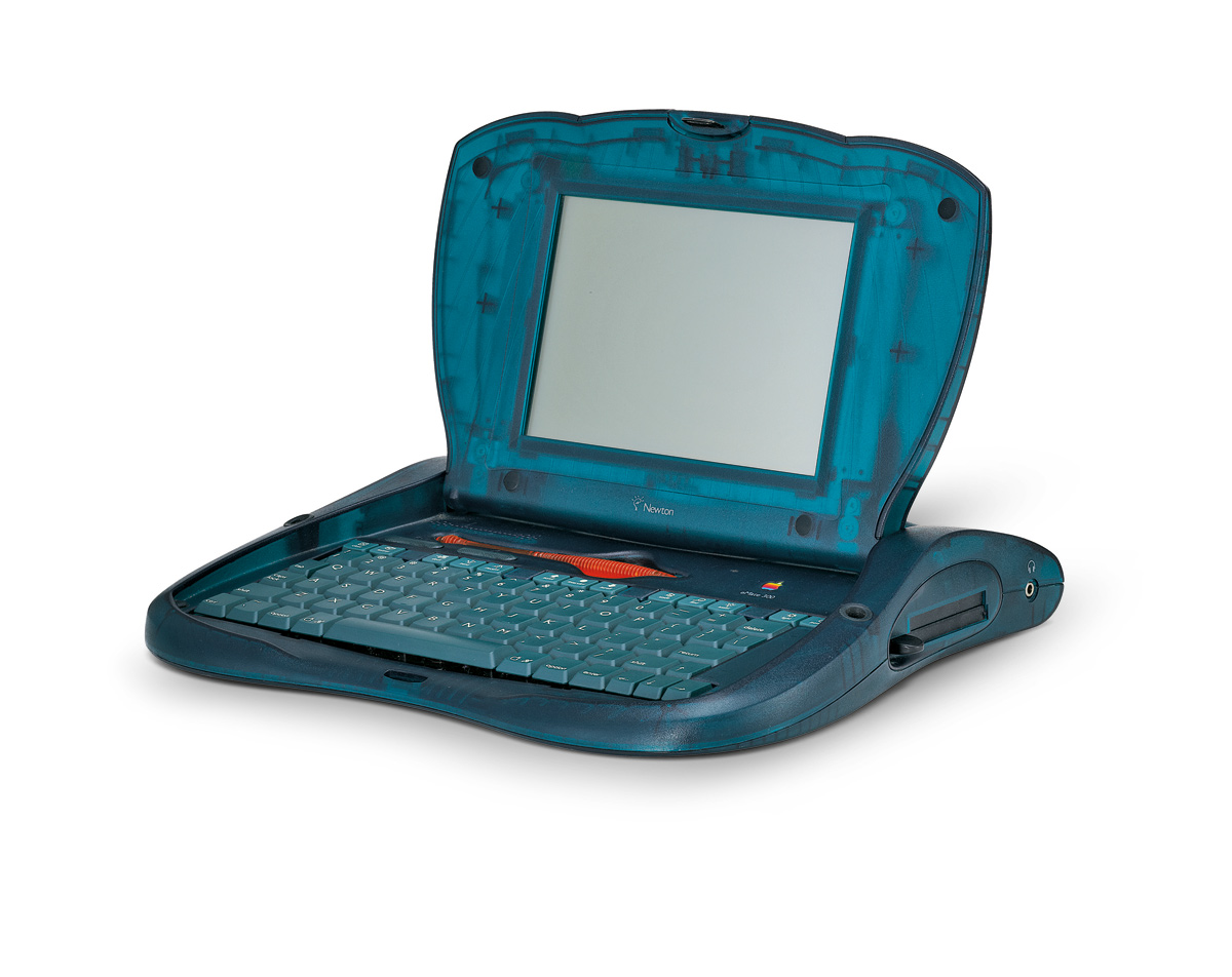
Apple eMate 300 1997 Museum für Kunst und Gewerbe Hamburg Photo: Roman Raacke
Apple iMac Bondi Blue 1998 Museum für Kunst und Gewerbe Hamburg Photo: Roman Raacke
The Museum für Kunst und Gewerbe Hamburg is showing the exhibition Stylectrical – On Electro-Design That Makes History from 26th August 2011 until 15th January 2012. The exhibition takes a look at the complex process of industrial product design in the context of cultural studies. Once again the Museum is taking up a highly topical and socially relevant subject. The focus is on the design of Jonathan Ive (b. 1967), Senior Vice President of Industrial Design at Apple, and responsible for creating all of the devices of the California based company. His products are of incomparable popularity on account of their extremely consistent and recognisable design. A quarter of the approximately 400 exhibits are products by Apple, which are shown for the first time in a comprehensive overview.
The exhibition traces a retrospective of works as well as of the company’s internal development of design, and provides a comprehensive insight into research questions of design history by means of this popular design. Along with the products designed by Jonathan Ive, numerous exhibits from the collection of the Museum für Kunst und Gewerbe Hamburg will be shown, among them works by Herbert Hirche, Hans Gugelot, Dieter Rams, Peter Raacke, Michele De Lucchi, Hadi Teherani and Tobias Grau. The economic and environmental significance of design will be examined in cooperation with the red dot institute and the Environmental Protection Encouragement Agency (EPEA).
To give a product its shape goes well beyond Luis Sullivan’s often-quoted phrase “form follows function”. Various demands such as material, form, aesthetics, function, handling and usage must be taken into account during the design process and combined. Stylectrical reveals the complex steps and procedures of product design on the basis of the collected works of Jonathan Ive, it thus grants an insight into important discourses on the subject and points to new perspectives on modern design.
The exhibition is the first to show all products that were created since Ive is in charge of design at Apple. Among the exhibits are rarely seen devices such as the eMate300, a laptop from 1997 designed to be used in schools, the iMac Blue Dalmatian, and the company’s first flat screen. New products such as the iPhone 4, the MacBook Air, and the iPad 2 will also be shown. The exhibition lets the visitor trace the company’s design process of the past 14 years. Moreover, by means of these innovative products, it opens a discussion on questions of design theory about form, about use of material and about the manufacturing process. One excursus is devoted to the history of the company’s product development since its founding, with the intention to highlight the working method and special position of the design team within the company. Exhibits of the designers Hartmut Esslinger and Robert Brunner will be shown in this context, and the so-called “Snow White Design Language” will be discussed.
After the return of company founder Steve Jobs in 1997, Apple was restructured and the young designer Jonathan Ive became Senior Vice President of Industrial Design. Before long, Ive and his team caused a stir with their innovative iMac, the iBook and the Power Macintosh G3, which were all milestones of a modernised electronics design in the late 1990’s. Ive’s team turned its back on the established, uniform grey beige as a colour for computers of the past decades, and developed a colourful design made of translucent plastics.
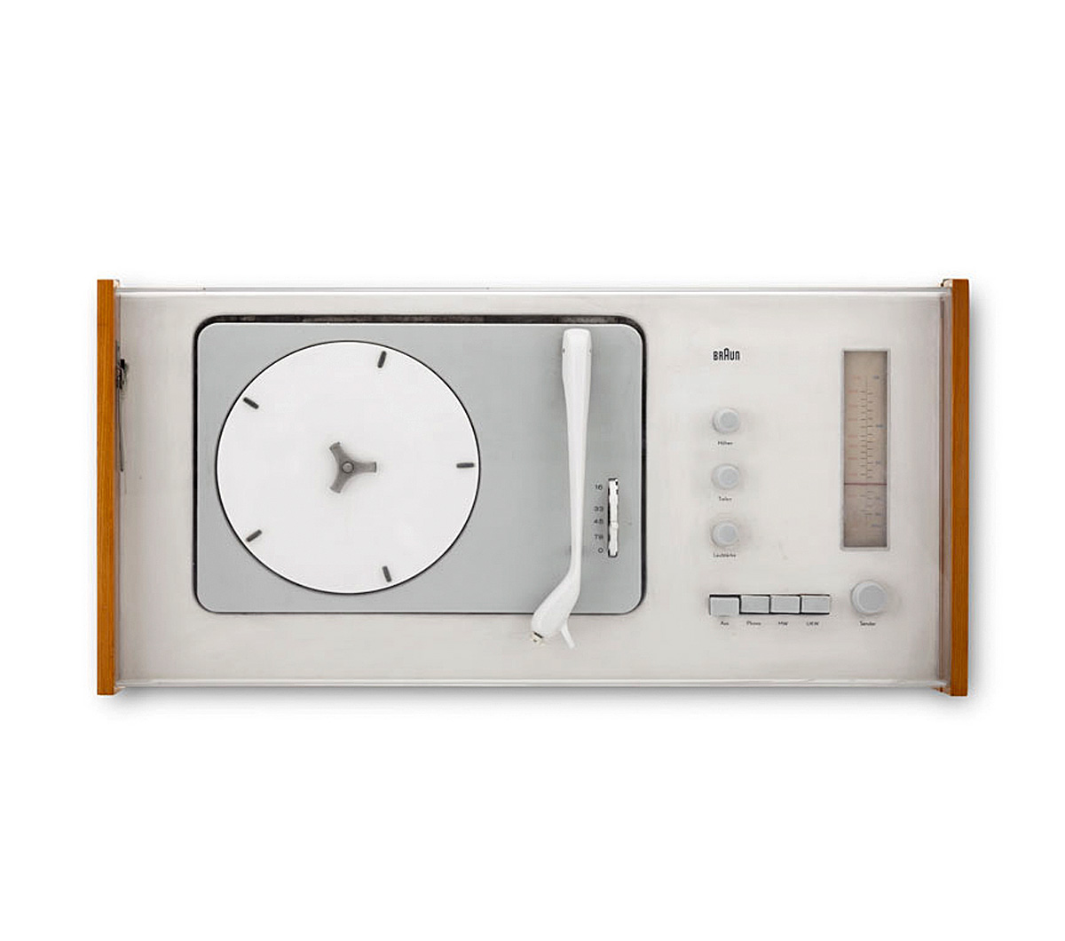
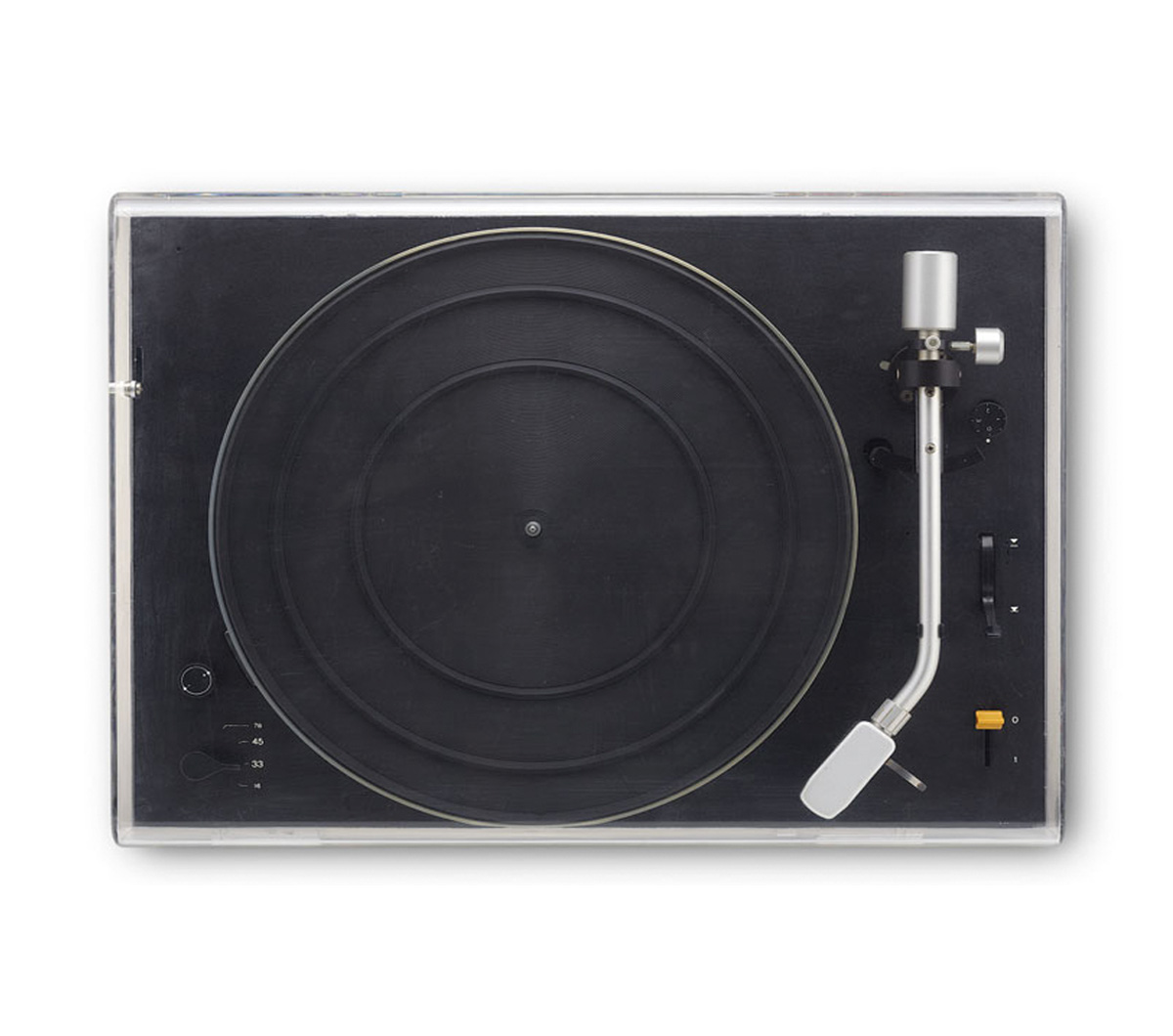
Stylectrical shows the formal links between Jonathan Ive’s design and the works of leading creators of electronics’ design history, and it thoroughly addresses the close relation to products of the German company Braun. In this context the Museum für Kunst und Gewerbe Hamburg will be showing some first-rate items from its own comprehensive collection of post-war industrial design. Early works of the designers Hans Gugelot, Herbert Hirche and Dieter Rams, but also works from recent decades by Michele De Lucchi and Tobias Grau will be on display. After the evolution of design in Germany had come to a near halt during the Second World War, there were various attempts in the 1950s to pick up again where the programmatic developments of the Weimar period had left off. The probably most significant initiative was called into life in 1953 by the founders of the Ulm School of Design. Otl Aicher, Inge Aicher-Scholl and Max Bill adopted for this school the approach of the Bauhaus, which had been closed by the National Socialists. When Max Bill left the institution in 1957, the so-called “Ulm-Model” took the place of the original concept of the school. It had three relevant criteria: a new and systematic methodology of design, the promotion of interdisciplinary teamwork, and a close cooperation with the industry. Important approaches evolved during this time, which are being pursued to this day. Amongst others, the Ulm school worked for electronics’ manufacturers. The cooperation with the Kronberg-based company Braun is especially relevant; the designers from Ulm developed important guidelines that influenced the design of Braun until the 1990s, when Dieter Rams was the chief designer.
The significance of Jonathan Ive’s and his team’s ideas for the history of American industrial design, as well as their influence on all industrial products, are another focus of the exhibition. By means of the outstanding example of Apple it is possible to show how consistent design can sustainably determine the image of a company and contribute significantly to its economic success, as well as influence 21st century society and culture.
Press release from the Museum für Kunst und Gewerbe Hamburg
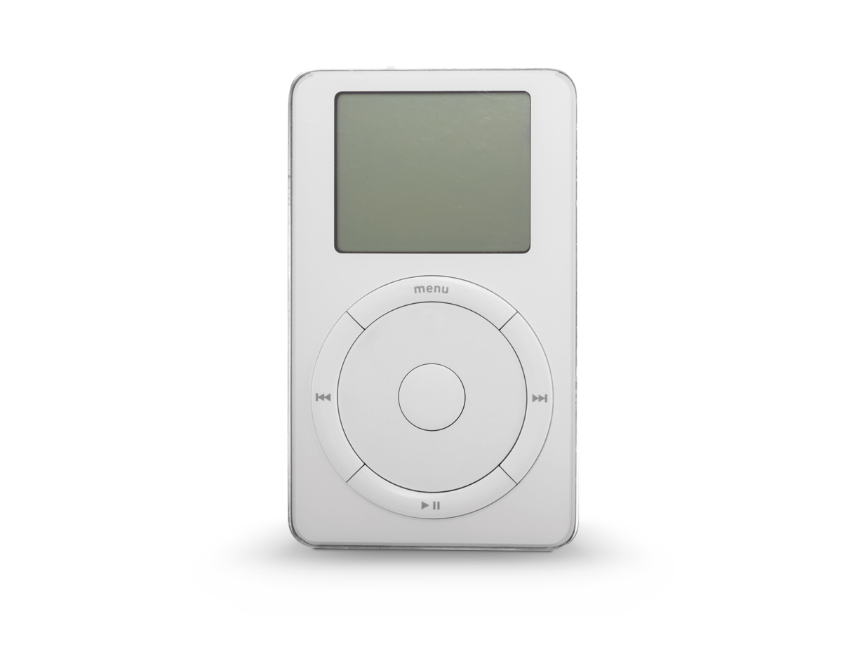
Apple iPod 2001 Museum für Kunst und Gewerbe Hamburg Photo: Roman Raacke
Apple Power Mac 2003 Museum für Kunst und Gewerbe Hamburg Photo: Roman Raacke
Braun Radio-phone combination SK4 1956 Museum für Kunst und Gewerbe Hamburg Photo: Roman Raacke
Braun Television set HF 1 1958 Museum für Kunst und Gewerbe Hamburg Photo: Roman Raacke
Nintendo Portable game console Gameboy 1995 Museum für Kunst und Gewerbe Hamburg Photo: Roman Raacke
Sony Walkman TPS-L2 1979 Museum für Kunst und Gewerbe Hamburg Photo: Roman Raacke
Braun Transistor radio T3 1958 Museum für Kunst und Gewerbe Hamburg Photo: Roman Raacke
Braun Record player PS1000 1956 Museum für Kunst und Gewerbe Hamburg Photo: Roman Raacke
Museum für Kunst und Gewerbe Hamburg Steintorplatz, 20099 Hamburg
Exhibition venues: NGV International (St Kilda Road) 11th March – 30th October, 2011; NGV Australia (Federation Square) 11th March – 27th November, 2011
Co-curators: fashion and textile curators Roger Leong, Katie Somerville, and Laura Jocic
Dr Marcus Bunyan at the opening of Manstyle in front of a two-piece Simpsons of Picadilly, London blue pin-stripped suit c. 1949 and Van Heusen 1940’s tie loaned from his collection for the exhibition. Photograph courtesy of the National Gallery of Victoria.
The joy of this exhibition, spread across two NGV locations, is the creativity of local contemporary designers such Gavin Brown, Leigh Bowery, Peter Tully, Michael Glover and Sarah Thorn – a match for anything the international contingent has to offer. Another positive is the wonderful catalogue with its luscious colour plates, insightful essays and interviews with people such as Benny Castles, Luke Sales, Rick Owens and Walter Van Beirendonck.
Less enamouring is the prosaic way that the male attire is displayed – either hermetically sealed behind glass (look, but don’t touch!) or assembled in serried ranks on mannequins that make the clothes look two-dimensional. The display of these historical objects takes all the fun out of their being visually alive garments; it takes all the fun out of men “dressing up.”
While acknowledging the conservation issues inherent when displaying such costume the display, the performance, the spectacle of male attire could have been better conveyed to the viewing public. Moving images, placing the work in context both locally and internationally, would have helped.
Continuing with these thoughts, what we wear can be seen as a spectacular, hypertextual construction. This construction comprises the designer (author) of individual pieces – for example, jacket, trousers, shirt – which are lexias, or nodal points, complimented by the wearer (reader). The wearer appropriates and recasts individual garments, partially re-constructing the outfit through active choice, through a dissolution of the author-reader binary, through a very public characterisation of form: look at me, look at my style!
Fashion, then, can be seen as a “set of interconnecting and competing discourses than can never result in a single articulation,”1 discourses that generate and dissolve meaning. Men now use these discourses to enact the ‘performing self’, as it is known, which places greater emphasis on appearance. “Within consumer culture … the new conception of self which has emerged, which we shall refer to as the ‘performing self’, places greater emphasis upon appearance, display and the management of impressions.”2
Appearance is critical to an understanding of self-concept. This self-concept consists of:
a/ the actual self (how a person perceives him/herself),
b/ the ideal self (how a person would like to perceive him/herself), and
c/ the social self (how a person presents him/herself to others).3
As Sproles and Burns observe, “Appearance is an extremely important part of the self-concept. Through personal appearance – dress, cosmetics, fashion expressions, body movements – an individual presents personal identity, attitudes, moods, and value or self-worth. In addition, individuals receive positive or negative evaluations from others with regard to appearance. Hence, appearance is one of the most prominent ways to display and reinforce a self-concept.”4
Appearance and the textuality of representation (stressing that representations are presentations entailing the use of codes and conventions of the available cultural forms of presentation),5 are continually being subverted throughout the history of fashion. In postmodernist fashion imitation and integration of an eclectic mixture of styles and periods into a new discourse (or montage, or collage, or bricolage)6 is critical to the constant regeneration of self using appearance as the embodiment of self-concept.
Why this exhibition is so crucial is that it shows that men are becoming more and more adept at manipulating their aesthetic style, not as something to be afraid of, not as something that they have to conform to, but as an expression of personal freedom. Which makes it all the more disappointing that the display of the male attire is so staid and reserved. The aesthetic display of these garments did not match up to the clothes exuberance.
Small things also irritated.
At the opening a great deal was made of the multimedia element where local designers and celebrities talked about male style. In several of these videos, the men being interviewed mentioned how the shoe was always the basis for a good outfit. Fast forward to the exhibition and what do we find – photostated paper cut-outs of shoes on the mannequins instead of the real thing! Apparently the multimedia was shot after the design of the exhibition was finalised. Surely, if several people mention the basis of a good outfit is the shoe, and you promote the videos heavily, then you need to follow through on this concept. It is like putting the cart before the horse.
The fragmentary dis/locating mix and match eclecticism of contemporary male fashion needed more of a run in this exhibition, but as it stands it gives the viewer a solid overview of male attire throughout the centuries.
Dr Marcus Bunyan
Many thankx to the National Gallery of Victoria for allowing me to publish the photographs in the posting. Please click on the photographs for a larger version of the image.
Endnotes
1/ Johnson-Eilola cited in Mason, J.S. From Text To Hypertext [Online] Cited 28th May, 2003. No longer available online
2/ Lasch, C. The Culture of Narcissism. New York: Norton, 1979, quoted in Featherstone, Mike. “The Body in Consumer Culture,” in Featherstone, Mike; Hepworth, Mike and Turner, Bryan (eds.). The Body. London: Sage Publications, 1991, p. 187
3/ Sproles, George and Burns, Leslie Davis. Changing Appearances: Understanding Dress in Contemporary Society. New York: Fairchild Publications, 1994, pp. 208-209
4/ Ibid.,
5/ Dyer, Richard. The Matter of Images: Essays on Representations. London: Routledge, 1993, pp. 2-3
6/ Tseëlon, E. The Masque of Femininity: The Representation of Women in Everyday Life. London: Sage, 1995, pp. 132-133
H. Lehmann, Aldershot (tailor) (active in England c. 1900) Royal Gloucester Hussar’s uniform c. 1900 Wool, cotton, metal (a) 51cm (centre back), 64cm (sleeve length) (jacket) (b) 48cm (centre back), 44cm (width) (waistcoat) National Gallery of Victoria, Melbourne Gift of the Stone Family, 1963
England Coat 1740s Silk, wood, wool, linen 102cm (centre back), 65cm (sleeve length) National Gallery of Victoria, Melbourne Purchased, 1970
England Coat (detail) 1740s Silk, wood, wool, linen 102cm (centre back), 65cm (sleeve length) National Gallery of Victoria, Melbourne Purchased, 1970
France Coat c. 1810 Wool, silk, wood 105.8cm (centre back), 70.5cm (sleeve length) National Gallery of Victoria, Melbourne Purchased, 1975
England Waistcoat c. 1850 Silk, cotton, leather, metal 65.5cm (centre back), 51.5cm (waist, flat) National Gallery of Victoria, Melbourne Gift of Mrs A. Butler, 1954
Nutters, London (tailor) (est. 1968) Tommy Nutter (designer)(Wales, b. 1943, lived in England c. 1952- ) Suit and tie 1971 (detail) Wool, silk, cotton, acetate (lining), metal (a) 77cm (centre back), 58cm (sleeve length) (jacket) (b) 52cm (centre back), 40.4cm (waist, flat) (vest) (c) 103cm (outer leg), 37cm (waist, flat) (trousers) (d) 142 x 10.5cm (tie) National Gallery of Victoria, Melbourne Gift of Roger Evans, 1998
This March, the National Gallery of Victoria will showcase the first exhibition in Australia to focus on men’s fashion from the 18th century to the present day. Drawn largely from the NGV Collection, ManStyle will feature over 80 works including outfits and a selection of paintings exploring influential ideas in menswear over the past three centuries.
Charting a course between flamboyant display and absolute restraint, the exhibition begins in the 18th century with the evolution of the modern suit and concludes with contemporary outfits from today’s menswear designers. ManStyle will explore the elegantly honed lines and details of the dandy in the 19th century, a period which heralded the rise of tailoring with its focus on perfect cut and fit.
This exhibition will include recent works by contemporary designers such as Hedi Slimane for Dior Homme who have drawn upon this legacy of exacting tailoring for a new generation of young men. Roger Leong, Curator, International Fashion and Textiles, NGV said: “Men’s fashion is often seen as bound by tradition when, in fact, it has undergone a number of profound changes that reflect the shifting attitudes to class, sexuality, work and leisure over the past three centuries.
From the beginnings of the modern suit in the 18th century to 20th century sportswear, sub-cultural attire and street wear, men’s fashion has continued to transform in style and function to the present day,” said Mr Leong.
The most dramatic changes to men’s fashion occurred during the 1960s when designers such as Pierre Cardin challenged convention by creating streamlined Space-Age style outfits. Likewise, the ‘peacock revolution’ of this era reintroduced the phenomenon of the decorated man, adorned with colour, pattern and texture. Katie Somerville, Curator, Australian Fashion and Textiles, NGV said the House of Merivale was Australia’s answer to this new, colourful trend.
“Embodying the Carnaby Street look and style of bands like The Beatles, design houses such as Biba and the House of Merivale dressed men in flamboyant, body-hugging suits with wide flared trousers and shirts of contrasting patterns.
During this period, men ‘dressed up’, preened and flaunted their bodies in a new display of ostentatious masculine style.”
By the late 1970s, men’s style had fractured into a heady mix of alternatives. ManStyle features works by Vivienne Westwood and Malcolm McLaren, who defined the punk era with their ripped and distressed clothes plastered with offensive and anarchic slogans and symbols. This exhibition also captures the intense mood of the 1980s; which witnessed an outpouring of creativity across the spectrum of art, music and fashion, unleashing ideas from underground club cultures that reconfigured ideas about men’s sexuality.
“Today, new and traditional modes of dressing are continually merging to challenge our view of masculinity and contemporary style. ManStyle, it seems, offers greater possibilities than ever before,” said Ms Somerville.
Gerard Vaughan, NGV Director said: “By defining these periods in men’s fashion, visitors will be able to discover the contrasting identities men have experimented with over the past three centuries.
Visitors will be mesmerised and surprised by the richness of works in this Australia-first exhibition, showcasing the NGV’s magnificent Collection of this otherwise under-documented genre.”
ManStyle will be on display at the National Gallery of Victoria’s two locations. NGV Australia will look at transformations in the history of tailoring beginning with the notion of the dandy – a gallant man who put a lot of effort into a flawless appearance. The most famous dandy was Beau Brummell (1778-1840) who was always immaculately dressed, seeking to reflect an aristocratic style of life. The display at NGV International will focus on the peacock male, tracing a history of sartorial decoration and display that has its roots in the Renaissance and Tudor eras, and which was spectacularly revived during the 1960s when plain dark suits were discarded in favour of colour, cravats and frilled collars. Ever since then, the peacock phenomenon continues to surface with vivid intensity.
This exhibition will feature works by Vivienne Westwood, Jean Paul Gaultier, Morrissey & Edmiston, Leigh Bowery, Walter Van Beirendonck, Romance Was Born, Bernhard Willhelm, Rick Owens, Pierre Cardin, Biba and many more.
Press release from the National Gallery of Victoria website
WORLD, Auckland (fashion house) (est. 1989) Denise L’Estrange-Corbet (designer)(New Zealand, b. 1964) Percy shops at WORLD 1999 Wool, acetate, raffia, leather, velcro, brass (a) 68.1cm (centre back), 60cm (sleeve length) (jumper) (b) 90 x 40cm (corset) (c) 59.4cm (outer leg), 35.5cm (waist, flat) (knickerbockers) (d) 120 x 4cm (e-f) 40 x 11cm (each) (socks) (g-h) 27 x 15 x 12cm (each) (sandals) (i) 85cm (outer circumference), 22cm (height), 25.9cm (width) (hat) National Gallery of Victoria, Melbourne Purchased, 1999
Plain Jane, Melbourne (fashion house) (Australia 1984-1987) Gavin Brown (designer)(Australia, b. 1964) Indian snakes and ladders outfit 1985 Screenprinted cotton, metal, plastic, wood (a) 109cm (centre back), 61cm (sleeve length) (frock shirt) (b) 114cm (outer leg), 41cm (waist, flat) (pants) (c) 52 x 20.5 x 4.5cm (necklace) National Gallery of Victoria, Melbourne Purchased NGV Foundation, 2009
Leigh Bowery (Australia 1961-1994, worked in England 1981-1994) Pregnant tutu head 1992 Cotton, rayon, polyester, nylon, foam, leather (a) 87cm (centre back), 25cm (sleeve length) (top) (b) 130cm (length), 92cm (inner leg) (tights) (c) 45cm (height), 130cm (outer circumference) (headpiece) (d-e) 54 x 14cm irreg. (each) (gloves) (f-g) 35 x 29.5 x 50cm (each) (shoes) National Gallery of Victoria, Melbourne Gift of Nicola Bateman Bowery, 1999
I work with you every day Steve. You have enriched my life; my many Macs have become stalwart friends. I truly thank you and send you good wishes on your journey…
Many thankx to The Arts Décoratifs Museum for allowing me to publish the photographs in the posting. Please click on the images for a larger version of the image.
The notion of line in a car echoes that of the perfectly harmonious line of trajectory. The design is never far from this line, even in those coachworks designed without drawing boards, of which some of the most marvellous examples are seen here. It is interesting to see that in the French language at least, cars have taken on board the concept of ligne (or “line”), a word with many meanings. Yet the term ligne, taken in the sense that it is used nowadays in reference to coachwork, is classified by French lexicographer Littré within the sphere of fine art, and defined by him as: “the general effect produced by the coming together and combination of different parties of either a natural object or a composition.” The natural development of language thus shows us the relationship between cars and fine art.
Excerpt from the catalog, Editions Les Arts Décoratifs, Paris 2011
In 1970, Les Arts Décoratifs presented a selection of competition cars, “Bolides Design.” To compile the exhibition, a special jury was assembled, featuring designers Joe Colombo, Roger Tallon and Pio Manzu, and the artists Jean-Paul Riopelle, Jean Tinguely and Victor Vasarely, as well as Robert Delpire and François Mathey. The jury chose the models with the idea of the car as a design object, a work of art, showing that “art and technique, each at their own level, are the expression of man and his relationship with design.”
The Ralph Lauren collection can be seen from the same perspective. Patiently assembled over several decades by the fashion designer in a quest for speed and performance, it includes some of the most extraordinary jewels in the crown of European automobile history, with beauty as its common denominator.
Within the collection are some of the most elegant and innovative cars in automotive history, from the “Blower” Bentley (1929), the Ferrari 250 GTO (1962), the famous Mercedes 300 SL (1955) and the unforgettable Jaguar “D type,” whose shark fin blazed a triumphant trail at Le Mans in 1955, 1956 and 1957. But the grand tourer, the Bugatti Atlantic (1938) of which only four models were produced, represents the ultimate in luxury while showcasing the evolution of styles and techniques on the road. Each of these exceptional vehicles was designed as a masterpiece blending technological innovation and boldness of style.
For its first presentation in Europe, the Ralph Lauren collection will be put on display by Jean-Michel Wilmotte, who has opted for an intimate visual approach as these vehicles stand out both for their overall design and detail, as well as for bodywork, chassis and engines.
The kinetic and sound of the vehicles will be reproduced by means of several films and recordings. A seminar on automobile design will also be held during the exhibition.
Press release from The Arts Décoratifs Museum website
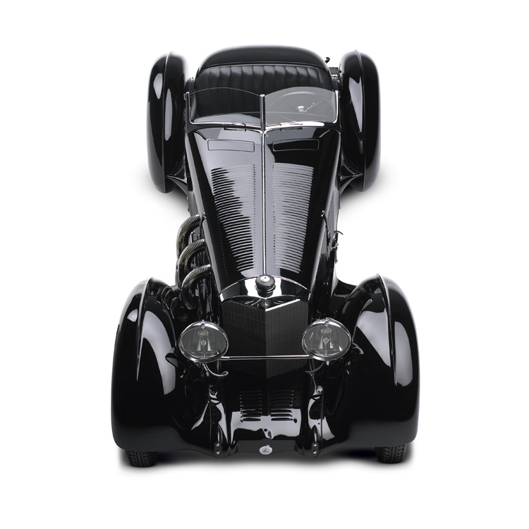
Chassis number SSK 36038, currently owned by Ralph Lauren, remained unsold by the Mercedes-Benz factory in 1928, but was then sent out to Japan in 1930, before being brought back to Europe. This car was put together by the young British coach builder, Willy White, based on a design suggested by its aristocratic owner-cum-industrialist, Count Carlo Felice Trossi, himself a racing driver. The SSK, the archetypal Mercedes of the 1920s, built on a short chassis, is dominated by a colossal hood with a trio of exhaust pipes emerging from each side – a hood encompassing over half the car’s length with a radiator projecting out front as a windbreak. Its flamboyant rear end, dramatically tapered, adds a touch of civility to this extraordinary model, contrasting with the hieratic image of its front end. The supercharging gives the Mercedes SSK its fiery temperament, as well as the legendary noise of its seven litre straight 6 cylinder engine producing 300 CV and enabling a flat-out speed of 235kph!
According to Paul Bracq, “the Atlantic is a monument in the history of French coach building! More than any other car, it expresses a French-Italian look. An incredible sense of lightness is given off by this sculpture.” Powered by a straight 8 cylinder engine fitted with twin overhead camshafts and a compressor, this beauty is also incredibly fast, capable of reaching 200 kph. As the aluminium alloy used for the coachwork did not lend itself to shaping and soldering, Jean Bugatti was obliged to make the wings and roof in two parts and then assemble them with rivets. His talent lay precisely in the art of transforming this inconvenient technique into a stylistic advantage. Power and speed are suggested by the doors which are cut out of the roof and the ellipsoidal windows reminiscent of airplanes. Chassis number 57591 was the last of the four examples originally produced, a masterpiece embodying sport and luxury at their height – in short, the automobile exception.
This racing model fitted out with a straight 8 cylinder 2.9 litre engine with twin overhead camshafts supercharged by two compressors is equipped with fully independent suspension and a four speed rear transaxle. The whole thing is perfectly balanced, resulting in the most extraordinary roadholding. The hydraulic brakes are an additional bonus, enabling it to outclass its rivals at over 185 kph. The Turin factory called upon Carrozzeria Touring to design a small series of four two-seater roadsters intended to take part in the 1938 Mille Miglia, the first example of which is the car exhibited here. Driven by the Pintacuda-Mambelli team, the car came in an incredible second under the number 142. The tear drop shaped wings add the final touch to this extraordinary car which is considered to be one of the most prestigious pre-War Grand Touring Alfa Romeos.
The Ferrari known as the 375 Plus was an extrapolation of the Type 375 MM, a model powered by a V12 engine with three carburettors, a gearbox with four speeds plus reverse that increased its engine size to nearly 5 litres, giving it more power and enabling it to reach 340 CV, and attain 250 kph. Because Ferrari did not have its own design department, the 375 Plus, an absolute masterpiece, was created by highly qualified, talented artisans under the guidance of Pinin Farina, Ferrari’s official coach builder. Only five examples of the Type 375 Plus were made, including a spyder version which won the Le Mans 24 Hours in 1954. Ralph Lauren’s car, chassis number 0398 AM – the last of the series – left the factory in 1954 and had a relatively illustrious career in Argentina, often driven by Valiente.
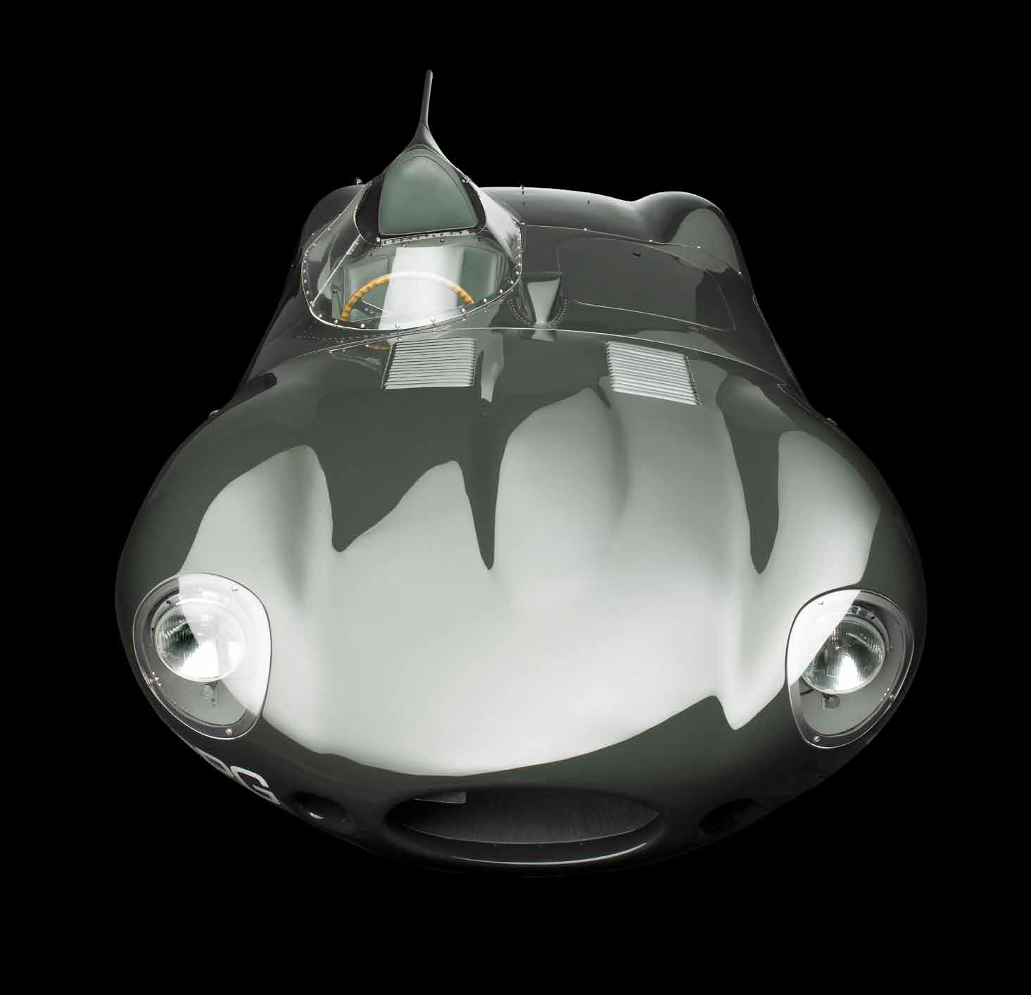
In order to find a worthy successor to the brilliant Jaguar Type XKC, winner on two occasions of the Le Mans 24 Hours, the aeronautic aerodynamicist Malcolm Sayer came up with a non-conformist vehicle. The D-Type has a long hood with no radiator grille, opening away from the block and a slender, extremely graceful rear, easily recognisable thanks to the highly original fin that extends the driver’s head-rest, providing greater stability at high speeds. With the classic straight 6 cylinder 3.4 litre engine, the D-Type, built on a monocoque structure, also has disk brakes. The “long-nosed” version (only 10 examples of which left the factory, including Ralph Lauren’s 505/601) gained an additional 15 kph at maximum speed, pushing it to 260 kph. No other car from the 1950s embodies speed better than this Jaguar D, with three consecutive victories in the Le Mans 24 Hours between 1955 and 1957 and another at Nurburgring in 1956. It was the most successful racing car of its generation.
Following on from Jaguar’s magnificent victories in the 1955 and 1956 Le Mans 24 Hours, demand from its enthusiastic clients was such that the company decided to make a road version of the XKD (straight 6 cylinder 3.4 litre engine with a 250 CV output capable of propelling the car to nearly 250 kph) which was named the XKSS. Principally aimed at the American market, it differed from the racing model in having a windscreen, a convertible roof, bumpers and a more civilised interior, and the famous fin was removed. Only 16 examples were constructed between January and February 1957, and a further two examples of the D-Type were transformed by the factory in 1958. Ralph Lauren’s car is one of these, created from the XKD 533 in 1956. It participated in the Six Heures du Forez in 1957, driven by Monnoyeur and Dupuy, finishing 7th, behind a fleet of Jaguar Ds which took the three first places.
The 250 Testa Rossa (red head) owes its name to the red camshaft covers of its V12 3 litre engine. Made by Carrozzeria Scaglietti, adapted from a design by Pinin Farina introducing a torpedo shaped body, the car had a headrest that stuck out above the bodywork and integrated headlights behind protruding Plexiglas protection. The very particular line of this vehicle proved to be primarily functional, rather than aesthetic. Indeed, the originality of the pontoon fenders enabled the wheels to remain partially uncovered, to allow for a sufficient supply of cold air to the drum brakes. Equipped with a light body that allowed it to attain 270 kph, its 300 CV engine carried it to victory on numerous occasions, including in the Le Mans 24 Hours in 1958, 1960 and 1961. Ralph Lauren’s car is the 14th of 34 similar examples produced by Ferrari.
While the name 250 GT appeared in the Maranello catalog in 1955, the 1959 Paris Motor Show presented a short chassis Berlinetta version, with a wheelbase 20 cms shorter than other versions of the line – a thoroughbred equipped for the road, with aluminium coachwork designed by Pinin Farina and made in the Scaglietti workshops in Modena. Compared to the grand tourer version, intended for road use, the racing version was devoid of all luxury interior trimmings and bumpers, but equipped with disk brakes and a 280 CV engine that enabled this flagship model to masterfully dominate the legendary Tour de France automobile for three consecutive seasons (1960-1962) and the GT category of the Le Mans 24 Hours. Its sensual line, unequalled handling and performance (250kph), and list of victories, all combined to make the short chassis 250 GT Berlinetta one of Ferrari’s most popular models. Ralph Lauren’s car was the 31st example to leave the factory out of the 165 produced.
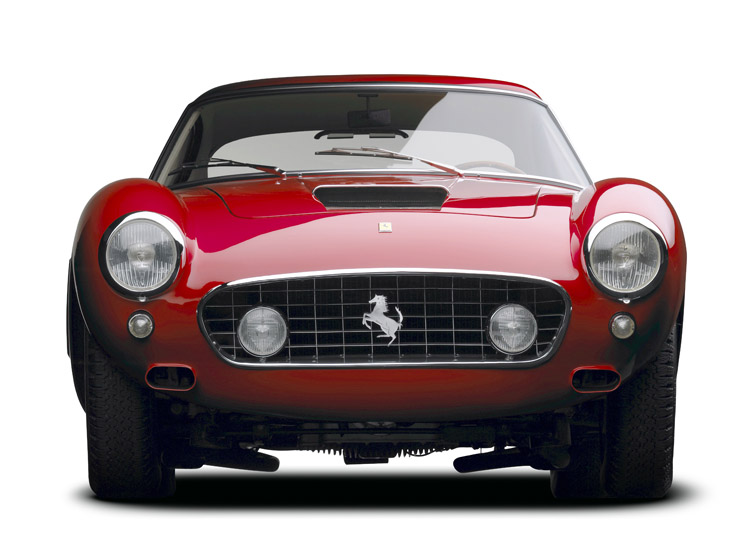
Designed in the utmost secrecy, the 250 GTO is considered by aficionados today to be the quintessential vintage Ferrari model, both technically and aesthetically, embodying one of the most famous and most expensive sports cars of all time. This Grand Tourer, of which only 39 examples were produced, clocked up an impressive list of victories, including the International Championship for GT Manufacturers in 1962, 1963 and 1964, thanks to its V12 300 CV engine situated up front, but also because of the lightness of its aluminium body, enabling it to attain 280 kph flat out! With its Scaglietti coachwork and its long hood, stocky cockpit and truncated rear, it symbolised the Grand Tourer par excellence. Ralph Lauren’s car was the 21st out of 36 Series I GTOs produced, and won many races driven by Pedro and Ricardo Rodriguez, Roger Penske, Augie Pabst and Richie Ginther.
The Arts Décoratifs Museum 107 rue de Rivoli
75001 Paris Phone: +33 01 44 55 57 50
Many thankx to Fotomuseum Winterthur for allowing me to publish the photographs in the posting. Please click on the photographs for a larger version of the image.
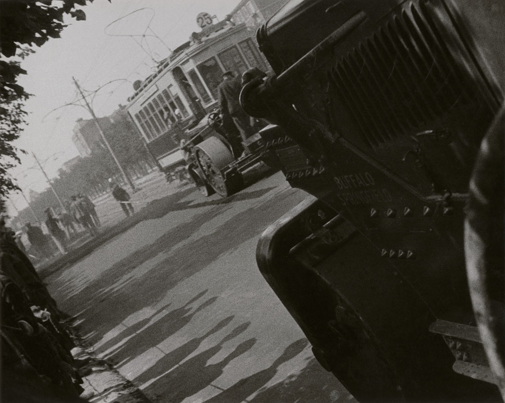
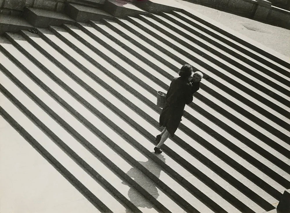
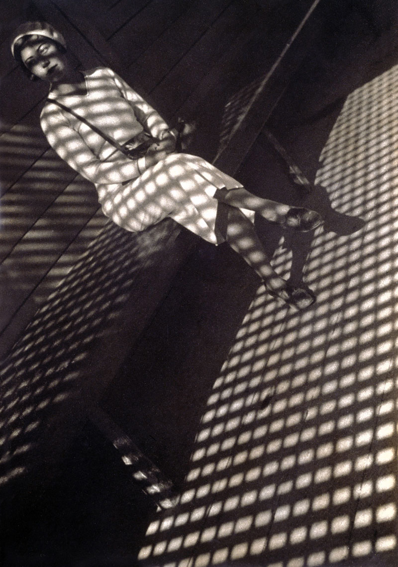
Modernism made photography what it is. It gave it self-confidence and made it trust itself. Self confident because photography in the 1920s recognised and developed its own possibilities and qualities: a probing vision of the world, an investigation of the visible reality from various perspectives, direct, clear, from above, below, behind, from the front, but without references to the pool of art history. Russian Constructivism is an important part of this great shift. In 1924, Alexander Rodchenko (1891-1956), already known as a painter, sculptor, and designer, conquered traditional photography with the slogan “Our duty is to experiment!” This resulted in a reconsideration of the concept and role of photography. Conceptual work entered the stage. Instead of being an illustration of reality, photography became a means to visually represent intellectual constructs, and the artist became an “artist-engineer”.
Yet Rodchenko was much more than a dynamic image maker. He wrote manifestos to accompany almost every one of his picture series, tirelessly promoting his concept of Russian Constructivism to the world. Destabilising diagonals, harsh contrasts, tilted views, and picture and text collages are design elements found in his photographs. To this day they form, together with his texts, a unique document of the indefatigable artistic energy that is also manifest in Alexander Rodchenko’s posters, invitation cards, and publications.
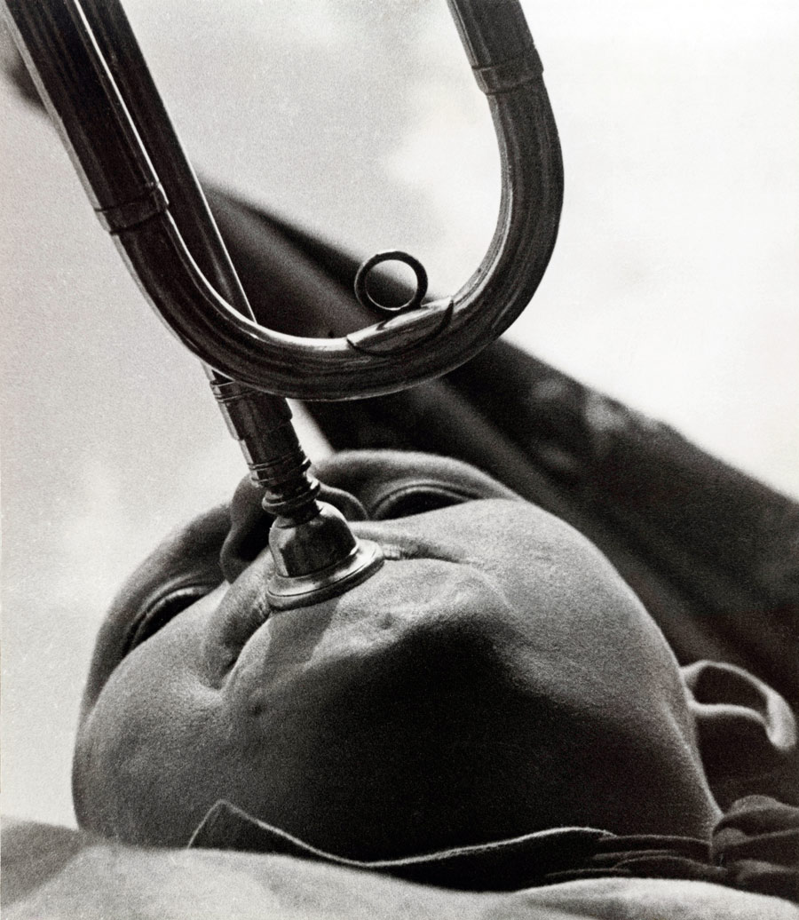
At the beginning of the 1920s, Rodchenko worked together with his friend the poet Vladimir Mayakovsky on bold, photographic illustrations for Mayakovsky’s volume of poems Pro Eto. Rodchenko soon became coeditor, with Mayakovsky, of the magazine LEV (Left Front of the Arts), and was responsible for its cover designs in the years 1923-24. He designed posters for Sergei Eisenstein’s film Battleship Potemkin and was commissioned to design the Soviet pavilion to the world exhibition in Paris in 1925. The experimental and innovative “new vision” was celebrated across Europe. Rodchencko took part in the pioneering exhibition Film und Foto (Film and Photo) of the Stuttgart Werkbund in 1929. Yet already at the beginning of the 1930s, the mood had shifted in Russia; photography was increasingly being instrumentalised by the state in the interests of socialism. Rodchenko was repeatedly forced to defend himself against accusations of formalism made over his photograph Pioneer with Trumpet, and, in the end, he was expelled from the October artists group, which he himself had cofounded in 1928, for refusing to adapt his style of working to the new times.
Press release from the Fotomuseum Winterthur website
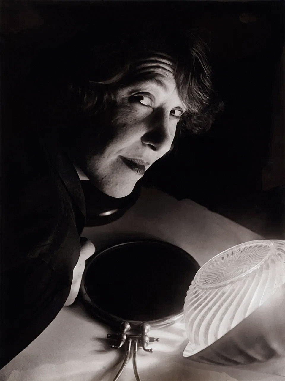
Varvara Fyodorovna Stepanova (1894-1958) was a Russian artist. With her husband Alexander Rodchenko, she was associated with the Constructivist branch of the Russian avant-garde, which rejected aesthetic values in favour of revolutionary ones. Her activities extended into propaganda, poetry, stage scenery and textile designs.










 x 19’2” (D) (297 cm x 862 cm x 584 cm)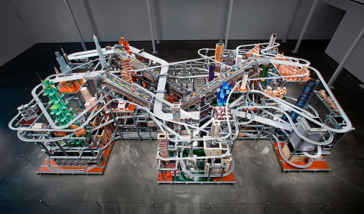
































You must be logged in to post a comment.