Review: ‘Mark Strizic: Melbourne – A City in Transition (Rare Silver Gelatin Photographs)’ at Gallery 101, Melbourne

Exhibition dates: 8th April – 2nd May, 2009


Mark Strizic (Australian, 1908-2012) 'Eastern Market Destruction - 1' 1960 from the exhibition 'Mark Strizic: Melbourne – A City in Transition (Rare Silver Gelatin Photographs)' at Gallery 101, Melbourne, April - May, 2009


Mark Strizic (Australian, 1908-2012)
Eastern Market Destruction – 1
1960, printed 1996
Silver gelatin photograph
19 x 22.5cm


Social Fact and Urban Vision

This is an exhibition by the veteran Australian photographer Mark Strizic that plays like the coda at the end of a piece of music, the pensive full stop at the end of a well read book. There are some stunning highlight photographs among the 139 black and white silver gelatin prints on display, some good photographs and some fairly mundane images and prints. With some judicious editing of the photographs (perhaps by a third), the exhibition could have had a stronger artistic aesthetic and carried the voice of the photographer with greater projection. As it is the exhibition will be popular drawing in the crowds because of the photographs subject matter and their appeal to both an individual and collective nostalgia.

Examining Strizic’s photographs we note a traditional structure to the picture plane. Unlike the photographs of Eugene Atget who photographed Paris in the early 20th century there is little sublime spatial representation in Strizics photographs, that different angle of alignment that Atget achieved with the positioning of his camera. Further, we observe that unlike an immigrant to another country at around the same time, Robert Frank and America, the photographs follow traditional format: none of the revolutionary experimentation in handheld, grainy images of jukeboxes, cut up people or images of flags appear in this work. We can also say that unlike Helen Levitt’s early black and white images of New York from around the same period there is little ‘joie de vivre’, little engagement with the actual nitty gritty stuff of living in Strizic’s work. The quote below articulates what Strizic’s photographs both address and dismiss:

“To walk in the city is to experience the disjuncture of partial vision/partial consciousness. The narrativity of this walking is belied by a simultaneity we know and yet cannot experience. As we turn a corner, our object disappears around the next corner. The sides of the street conspire against us; each attention suppresses a field of possibilities. The discourse of the city is a syncretic discourse, political in its untranslatability. Hence the language of the state elides. Unable to speak all the city’s languages, unable to speak all at once, the state’s language become monumental, the silence of headquarters, the silence of the bank. In this transcendent and anonymous silence is the miming of corporate relations. Between the night workers and the day workers lies the interface of light; in the rotating shift, the disembodiment of lived time. The walkers of the city travel at different speeds, their steps like handwriting of a personal mobility. In the milling of the crowd is the choking of class relations, the interruption of speed, and the machine. Hence the barbarism of police on horses, the sudden terror of the risen animal.”1

We observe in the photographs an emphasis on surfaces, on a supreme understanding of light and shade coupled with a certain distance and emotional remoteness from the frenetic hubbub of city life. Empty streets and isolated people fall into shadow and their is little evidence of ‘play’ in the photographs. This is observation not interaction or integration as an immigrant observing Melbourne life. There is no up front presence of disembodied people as in Robert Franks photographs in The Americans. Here the alienation that pervades the photographs is the alienation of the photographer from the people as much as it is the alienation of the people from themselves. People are shot in silhouette against the sun or shop windows or peering in at unobtainable goods; desolate streets and working class suburbs all express the isolation of city life but at a structured distance from them.

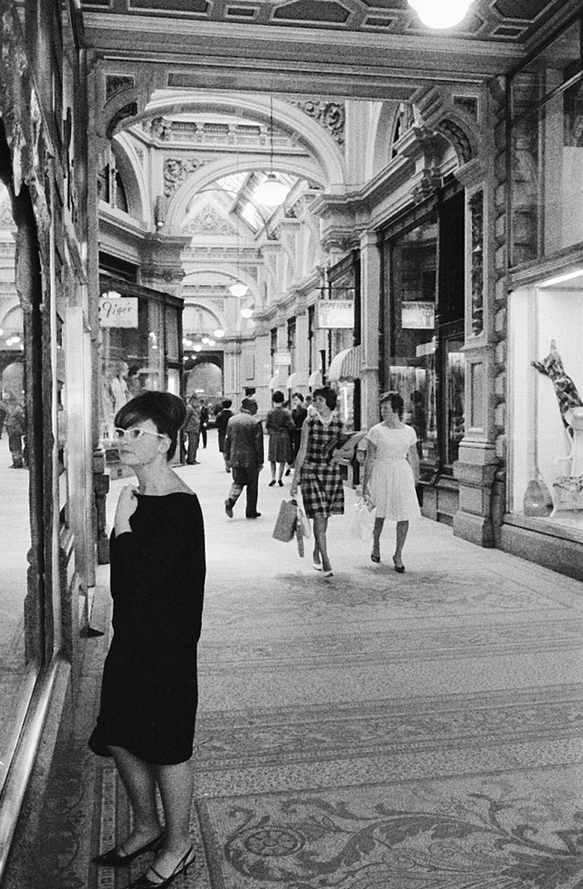
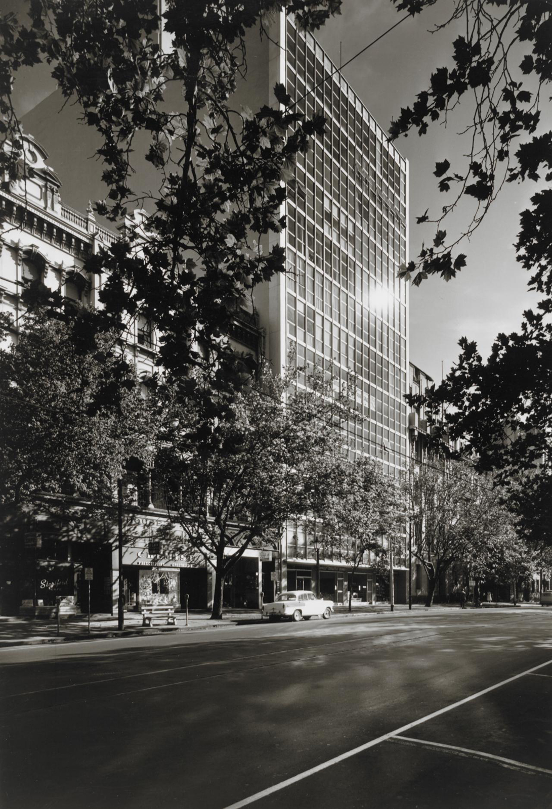
When Strizic’s photographs are good they are very good. His understanding of light is magnificent: light reflects off water, hazes and shimmers off city buildings. The mixing of shadows and sun and his use of the technique of ‘contre jour’ (shooting into the sun) the one thing Strizic does against traditional conventions works to good effect in some of the best photographs. His 1968 night time long exposure photograph of the old Gas and Fuel Building is rewarding for the black bulk of the end of the building looming over Flinders Street and the striations of car headlamps. The photograph Flinders Lane (1967, below) shows a delicate use of depth of field where the foreground of cars and person are out of focus, the light bouncing off the edges of the woman, the focus of the image in the far distance. The photograph McPhersons Building (1958, below) is one of my personal favourites in the exhibition and is a stunning photograph for the atmosphere the photographer has captured.

After a while the use of the ‘contre jour’ technique becomes tiresome. Other photographs simply document a city in transition. These photographs appeal both to an individual nostalgia (‘I used to work in that building’; ‘My grandmother used to live in that street’) and a collective nostalgia where people experience things collectively, “in the sense that [collective] nostalgia occurs when we are with others who shared the event(s) being recalled, and also in the sense that one’s nostalgia is often for the collective – the characteristics and activities of a group or institution in which the individual was a participant.”2

Collective nostalgia refers to that condition in which the symbolic objects are of a highly public, widely shared and familiar character, i.e. those symbolic resources from the past which can under proper conditions trigger off wave upon wave of nostalgic feeling in millions of persons at the same time3 and in this exhibition it is the photographs of a city in transition that trigger this nostalgia, a city now lost to the mists of time. Through these photographs we remember what Melbourne was like at this time collectively.

As Harper has observed

“Nostalgia combines bitterness and sweetness, the lost and the found, the far and near, the new and the familiar, absence and presence. The past which is over and gone, from which we have been or are being removed, by some magic becomes present again for a short while. But its realness seems even more familiar, because renewed, than it ever was, more enchanting and more lovely …”4

Does this collective nostalgia make the photographs good? This is a pertinent question.

Today, nostalgia has become a cultural phenomenon one centred on a longing for home (home is where you are happy to be!) in a collective sense and promoted through commercialisation and the realisation that nostalgia sells. The use of the value seeking word ‘rare’ in the exhibition title is instructive in this regard. Only about 25% of the photographs in this exhibition are “vintage” prints, in other words photographs printed within 3 years of the negative being taken. All other photographs have been printed within the last 15 years. Some are ‘Unique state’ gelatin photographs while others are not. What does this mean. Are they are unique state only in this size? What about the common or garden silver gelatin prints in the show? What does the status word “rare” imply for them?

I remember seeing an exhibition of the photographs of Henri Cartier-Bresson in Scotland about ten years ago. Three rooms had large prints of his work. One room just had vintage prints. The contrast was astounding. The room full of vintage prints had an intensity of vision, of his vision at the time he took the photographs evidenced in small jewel like photographs that the three other rooms photographs simply did not possess – through scale, printing and aesthetics. The same question, without any need for an answer, can be posed here. Only the word ‘rare’ demands that answer for the modern prints are just what they are and nothing more.

In conclusion this is a strong show by Strizic that could have been edited and focused in a more rewarding way. Strizic is one of Australia’s best photographers for understanding the significance of place. His use of light is superb but there always seems to be an emotional distance to his photographs. An element of collective nostalgia adds to their documentary appeal but the best photographs do not just record, they challenge and transcend the subject matter taking the work to an altogether different plane of existence.

Dr Marcus Bunyan


1/ Stewart, Susan. On Longing: Narratives of the Miniature, the Gigantic, the Souvenir, the Collection. Durham: Duke University Press, 1993, p. 2. Prologue

2/ Wilson, Janelle. “”Remember when …” a consideration of the concept of nostalgia,” in et Cetera. Concord: Fall 1999. Vol. 56, Iss. 3;  pg. 296, 9 pgs

3/ Davis, F. Yearning For Yesterday: A Sociology of Nostalgia. New York: The Free Press, 1979, p. 222

4/ Harper, R. Nostalgia: An Existential Exploration of Longing and Fulfilment in the Modern Age. The Press of Western Reserve University, 1966, p. 120 quoted in Wilson, Janelle. “”Remember when …” a consideration of the concept of nostalgia,” in et Cetera. Concord: Fall 1999. Vol. 56, Iss. 3;  pg. 296, 9 pgs


Many thankx to Gallery 101 for allowing me to publish the photographs in the posting. Please click on some of the photographs for a larger version of the image.


Installation view of the exhibition 'Mark Strizic: Melbourne - A City in Transition' exhibition at Gallery 101, Melbourne

Installation view of the exhibition 'Mark Strizic: Melbourne - A City in Transition' exhibition at Gallery 101, Melbourne

Installation view of the exhibition 'Mark Strizic: Melbourne - A City in Transition' exhibition at Gallery 101, Melbourne


Installation views of the exhibition Mark Strizic: Melbourne – A City in Transition exhibition at Gallery 101, Melbourne
Photos: Marcus Bunyan


Mark Strizic, one of Australia’s eminent photographic artists presents us with nostalgic views of Melbourne and the changing face of the city in rare silver gelatin photographs. The exhibition, Melbourne – A City in Transition will be held at Gallery 101 from 8th April – 2nd May. There will be an evening artist reception on Thursday 9th April to celebrate the opening of the exhibition. Strizic’s oeuvre represents a collection of iconic images of architecture and of life – a record of the changing face of a migrating society of new prosperity, youth and popular culture – taken with a sympathetic eye for humanistic detail.

The exhibition will coincide with the announcement of the forthcoming publication, Mark Strizic, Melbourne: Marvellous to Modern, published by Thames & Hudson in association with the State Library of Victoria. In 2007, the State Library of Victoria acquired Mark Strizic’s entire archive of approximately 5000 negatives, colour transparencies and slides. In addition, the Library holds a fine collection of Strizic photographs, including examples of all types of photographic print, from gelatin silver to digital, produced by the photographer during his long career.

Press release from Gallery 101


Mark Strizic photographs

Mark Strizic photographs

Mark Strizic photographs

Mark Strizic photographs

Mark Strizic photographs


“‘Melbourne – A City in Transition’ is a collection of iconic images of Melbourne city life taken with a sympathetic eye for humanist detail. Strizic accurately depicts the joys and hardships experienced in everyday life with a fresh and living memory. He successfully captures the vicarious essence of suburban life. His portrait of Melbourne includes the city, harbour and river banks – streets and trams, pavements, arcades and lanes, stations and bridges, billboards and facades and public sculpture. We see people going about their daily activities – commuting, shopping at leisure, trading, embracing, conversing, reading the newspaper and visiting the beach. Other works record the demolition and construction of building sites and the changing face of Melbourne, both in society and the urban landscape.”


Text from the exhibition flyer


“In these eloquent studies of light and shadow, Strizic finds beauty in the commonplace – Melbourne’s desolate lanes, street paving, derelict ferries – adopting interesting camera angles, viewpoints and cropping. Through his images, this visual humanist teaches us to observe, to see our surroundings, perhaps with the intention of stimulating us to a higher level of civilisation.”


Emma Matthews. Mark Strizic, Melbourne: Marvellous to Modern. Thames & Hudson in association with the State Library of Victoria, September, 2009.


“This magnificent collection of photographs arose from the creativity of a young photographer and his adoption of his new home town, Melbourne. His pictures were taken at a time when the Victorian elegance of the city once known as ‘Marvellous Melbourne’ was being punctuated by a wave of development and the modern architectural movement. Today Mark Strizic is renowned as a photographer. In the 1950s he was a young science student from Europe playing with the possibilities of the camera. As he gained work as a professional his commercial success was accompanied by the instincts and eye of an artist. His solid technicality was accompanied by the whimsy and wit that made him the ‘poet of the fleeting movement’. The versatility of his work shows us many aspects of Melbourne – its magnificent architectural heritage, its intimate and vibrant laneways, its grand arcades counter-posed against the sudden spaces of the wrecker, the brash intrusion of the glass and concrete skyscrapers, the poignancy of poverty in the rundown inner suburbs. We see the people, on grand occasions such as the 1954 Royal Visit, or just caught in their own world of travelling, shopping, resting, walking, working.”


Mark Strizic, Melbourne: Marvellous to Modern 
book cover


Mark Strizic (Australian, 1908-2012) 'From Princes Bridge' 1958


Mark Strizic (Australian, 1908-2012)
From Princes Bridge
1958, printed 2006
Silver gelatin photograph
58 x 39cm


Mark Strizic. 'Near Spencer Street - 1' 1950


Mark Strizic (Australian, 1908-2012)
Near Spencer Street – 1
1950
Silver gelatin photograph
27.5 x 38.5cm


Mark Strizic. 'At St. Pauls' 1954


Mark Strizic (Australian, 1908-2012)
At St. Pauls (St Paul’s Cathedral steps)
1954, printed 1999
Silver gelatin photograph
17.8 × 24.5cm


Mark Strizic (Australian, 1908-2012) 'St Paul's Cathedral steps' 1954


Mark Strizic (Australian, 1908-2012)
St Paul’s Cathedral steps
1954, printed 1999
Silver gelatin photograph
17.8 × 24.5cm


Mark Strizic (Australian, 1908-2012) 'Collins Street at Russell Street' 1957, printed 1997


Mark Strizic (Australian, 1908-2012)
Collins Street at Russell Street
1957, printed 1997
Unique silver gelatin photograph
39 x 56cm


Mark Strizic (Australian, 1908-2012) 'St Georges Road, Northcote at Summer Av.' 1958


Mark Strizic (Australian, 1908-2012)
St Georges Road, Northcote at Summer Av.
1958, printed 1998
Silver gelatin photograph


Mark Strizic (Australian, 1908-2012) 'St. Patrick's Cathedral' January 1967


Mark Strizic (Australian, 1908-2012)
St. Patrick’s Cathedral
January 1967, printed 1998
Unique silver gelatin photograph
27 x 41cm


Mark Strizic (Australian, 1908-2012) 'Bourke Street from the Parliament' 1967


Mark Strizic (Australian, 1908-2012)
Bourke Street from the Parliament – 2
1967, printed 1998
Silver gelatin photograph
38 x 27cm


Mark Strizic (Australian, 1908-2012) 'Russell Street Pawn Shop' 1958


Mark Strizic (Australian, 1908-2012)
Russell Street Pawn Shop
1958
Silver gelatin photograph


Mark Strizic (Australian, 1908-2012) 'Block Arcade' 1967


Mark Strizic (Australian, 1908-2012)
Block Arcade
1967, printed February 2008
Unique silver gelatin photograph
53.5 x 37cm


Mark Strizic (Australian, 1908-2012) 'From Princes Bridge' (Winter moorings from Princes Bridge) 1955


Mark Strizic (Australian, 1908-2012)
From Princes Bridge (Winter moorings from Princes Bridge)
1955, printed 2006
Silver gelatin photograph
58 x 39cm


Mark Strizic (Australian, 1908-2012) 'Flinders Lane' 1967


Mark Strizic (Australian, 1908-2012)
Flinders Lane
1967, printed 1998
Unique silver gelatin photograph
41 x 41cm


Mark Strizic (Australian, 1908-2012) 'Swan Street, Richmond, at Church Street' 1963


Mark Strizic (Australian, 1908-2012)
Swan Street, Richmond, at Church Street
1963
Silver gelatin photograph


Mark Strizic (Australian, 1908-2012) 'Queensberry Street at Errol Street, North Melbourne' 1963


Mark Strizic (Australian, 1908-2012)
Queensberry Street at Errol Street, North Melbourne
1963
Silver gelatin photograph


Mark Strizic (Australian, 1908-2012) 'Swan Street at Church Street' 1963


Mark Strizic (Australian, 1908-2012)
Swan Street at Church Street
1963, printed 1998
Silver gelatin photograph


Mark Strizic (Australian, 1908-2012) 'Coates Building' 1960


Mark Strizic (Australian, 1908-2012)
Coates Building
1960, printed 1961
Vintage silver gelatin photograph
23.5 x 15cm


Mark Strizic. 'Macphersons Building -1' 1958


Mark Strizic (Australian, 1908-2012)
Macphersons Building – 1
1958
Silver gelatin photograph


Mark Strizic. 'On Princes Bridge' 1959


Mark Strizic (Australian, 1908-2012)
On Princes Bridge
1959, printed 1996
Silver gelatin photograph
17 x 24cm


Gallery 101

This gallery is now closed.

LIKE ART BLART ON FACEBOOK

Back to top

Review: ‘New 09’ at Australian Centre for Contemporary Art (ACCA), Melbourne

Exhibition dates: 17th March – 17th May, 2009

Curator: Charlotte Day


ACCA’s annual commissions exhibition – this year curated by Charlotte Day with new works from eight contemporary Australian artists including Justine Khamara, Brodie Ellis, Marco Fusinato, Simon Yates, Matthew Griffin, Benjamin Armstrong and Pat Foster and Jen Berean.


Simon Yates (Australian, b. 1973) 'Rhabdomancy' 2009 from the exhibition 'New 09' at Australian Centre for Contemporary Art (ACCA), Melbourne, March - May, 2009


Simon Yates (Australian, b. 1973)
Rhabdomancy
Tissue paper, wood, fishing rods, tape, string, electrical components, helium balloons dimensions variable
2009
Photo: Marcus Bunyan


“That’s what art is, he said, the story of a life in all its particularity. It’s the only thing that really is particular and personal. It’s the expression and, at the same time, the fabric of the particular. And what do you mean by the fabric of the particular? I asked, supposing he would answer: Art. I was also thinking, indulgently, that we were pretty drunk already and that it was time to go home. But my friend said: What I mean is the secret story … The secret story is the one we’ll never know, although we’re living it from day to day, thinking we’re alive, thinking we’ve got it all under control and the stuff we overlook doesn’t matter. But every damn thing matters! It’s just that we don’t realise. We tell ourselves that art runs on one track and life, our lives, on another, we don’t even realise that’s a lie.”


From the story “Dentist” from the book ‘Last Evenings on Earth’ by Roberto Bolaño1


“A work of art reminds you of who you are now”


Kepesh from the film ‘Elegy’


The curator Charlotte Day has assembled an interesting selection of artists for New 09 at ACCA, Melbourne. It is an exhibition whose ‘presences’ challenge through dark and light, sound and light, contemplation and silence. The journey is one of here and now moments that transport the viewer to states of being that address the fabric of the particular: doubt, anxiety and enlightenment crowd every corner. The particularities of the experience (material, social, psychological and imaginative) impinge on the viewers interior states of being transcending the very physicality and symbolic realism of the works.2

On entering the gallery you are greeted by Simon Yates self-propelled figures that make up the work Rhabdomancy (2009, above). Suspended, tethered, floating just above the floor the figures move eerily about the entrance to the gallery, startling people who have not seen them move before. They stand silent witness, a simulation of self in tissue paper searching for meaning by using a dowsing rod. The word rhabdomancy has as one of it’s meanings ‘the art or gift of prophecy (or the pretence of prophecy) by supernatural means’. Here the figures are divining and divination rolled into one: grounded they seek release through the balloons but through augury they become an omen or portent from which the future is foretold.

“… cutting and slicing in order to see them better, willing them into three dimensions; an attempt to cheat death, or rather, to ward off forgetting of them as they are/were and as I was when the work was made.”

~ Justine Khamara

In the first gallery, a very minimal installation by Justine Khamara of two fractured faces stare out at you from the wall, my favourite work of the show. These are unsettling faces, protruding towards you like some topographical map, one eyes screwed shut the other beadily following you as you walk around the gallery space. Here the images of brother and sister presence anterior, already formed subjects not through memory (as photographs normally do) but through the insistence of the their multiple here and now planes of existence. Rather than ‘forgetting’ the images authenticate their identity through their ongoing presence in an ever renewing present.3 Their dissection of reality, the affirmation of their presence (not the photographic absence of a lost subject) embodies their secret story on the viewer told through psychological and imaginative processes: how do they make me feel – about my life, my death and being, here, now.

The pathos of the show is continued with the next work Noosphere (2008) by Brodie Ellis (the noosphere is best described as a sort of collective consciousness of human-beings).4 In this work a video above the clouds is projected onto a circular shape on the ceiling in a darkened room. The emotional and the imaginative impact of the message on the audience is again disorientating and immediate. The images look across the clouds to vistas of setting suns, look down on the clouds and the sea and land below. The images first move one way and then another, disorientating the viewer and changing their perspective of the earth; these are alien views of the earth accompanied by heart beat like ambient music. The perspective of the circle also changes depending on where the viewer stands like some anamorphic distortion of reality. On a stand a beaded yoke for a horse adds to the metaphorical allegory of the installation.

In the next gallery is the literal climax to the exhibition, Marco Fusinato’s Aetheric Plexus (2009). (Aether: medium through which light propagates; Plexus: in vertebrates, a plexus is an area where nerves branch and rejoin and is also a network of blood vessels).

Consisting of scaffolding that forms a cross and supports large numbers of silver spotlights with visible wiring and sound system the installation seems innocuous enough at first. Walking in front of the work produces no effect except to acknowledge the dull glow of red from the banks of dormant lights trained on the viewer. The interaction comes not in random fashion but when the viewer walks to the peripheries of the gallery corners triggering the work – suddenly you are are blasted with white light and the furious sound of white noise for about 15 seconds: I jumped half out of my skin! Totally disorientated as though one has been placed in a blast furnace or a heavenly irradiated crematorium one wonders what has just happened to you and it takes some time to reorientate oneself back in the afterlife of the here and now. Again the immediacy of the work, the particularities of the experience affect your interior states of being.

After a video installation by Matt Griffin you wander into the next gallery where two works by Benjamin Armstrong inhabit the floor of the gallery. And I do mean inhabit. Made of blown glass forms and wax coated tree branches the works have a strange affect on the psyche, to me seemingly emanations from the deep subconscious. Twin glass hemispheres of what look like a brain are surrounded by clasping synaptic nerve endings that support an egg like glass protrusion – a thought bubble? a spirit emanation? These are wonderful contemplative but slightly disturbing objects that have coalesced into shape only in another form to melt and disappear: molten glass and melted wax dissipating the very form of our existence.

Finally we come to the three part installation by Pat Foster and Jen Berean (below). On the right of the photograph you can see three aluminium and glass doors, closed, sealed leading to another gallery. What you can’t see in the photograph is the three pieces of gaffer tape stretched across the glass doors, like they do on the building sites of new homes. No entry here. Above your head is a suspended matrix of aluminium and glass with some of the glass planes smashed. Clean, clinical, safe but smashed, secure but threatening the matrix presses down on the viewer. It reminded me of the vertical standing shards of the World Trade Centre set horizontal suspended overhead. Only the steel cable seemed to ruin the illusion and seemed out of place with the work. It would have been more successful if the matrix was somehow suspended with fewer tethers to increase the sense of downward pressure. Finally you sit on the aluminium benches and contemplate in silence all that has come before and wonder what just hit you in a tidal wave of feelings, immediacies and emotions. The Doing and Undoing of Things.

An interesting journey then, one to provoke thought and emotion.
The fabric of the particular. The pathos of the art-iculate.

My only reservations are about the presence, the immediacy, the surface of it all. How persistent will these stories be? Will the work sustain pertinent inquiry above and beyond the here and now, the shock and awe. Or will it be like a meal one eats and then finds one is full but empty at the same time. A journey of smoke and mirrors.

Dr Marcus Bunyan


1/ Bolano, Robert. Last Evenings on Earth. New Directions, 2007. Available on Amazon.

2/ Blair, French. The Artist, The Body. [Online] Cited on 12/04/2009. No longer available online

3/ Ibid.,

4/ “For Teilhard, the noosphere is best described as a sort of ‘collective consciousness’ of human-beings. It emerges from the interaction of human minds. The noosphere has grown in step with the organisation of the human mass in relation to itself as it populates the earth. As mankind organizes itself in more complex social networks, the higher the noosphere will grow in awareness.” From the concept of Nooshpere on Wikipedia.


Many thankx to ACCA for allowing me to publish the photographs in the posting. All Images © Dr Marcus Bunyan and ACCA.


    Justine Khamara (Australian, b. 1971) 'Dilated Concentrations' 2009 from the exhibition 'New 09' at Australian Centre for Contemporary Art (ACCA), Melbourne, March - May, 2009

    Justine Khamara (Australian, b. 1971) 'Dilated Concentrations' 2009  (detail) from the exhibition 'New 09' at Australian Centre for Contemporary Art (ACCA), Melbourne, March - May, 2009

    Justine Khamara (Australian, b. 1971) 'Dilated Concentrations' 2009  (detail) from the exhibition 'New 09' at Australian Centre for Contemporary Art (ACCA), Melbourne, March - May, 2009

    Justine Khamara (Australian, b. 1971) 'Dilated Concentrations' 2009  (detail) from the exhibition 'New 09' at Australian Centre for Contemporary Art (ACCA), Melbourne, March - May, 2009


    Justine Khamara (Australian, b. 1971)
    Dilated Concentrations
    2009
    UV print on laser cut stainless steel
    Photos: Marcus Bunyan


    Benjamin Armstrong (Australian, b. 1975) 'Hold Everything Dear I' 2008


    Benjamin Armstrong (Australian, b. 1975)
    Hold Everything Dear I
    2008
    Photo: Marcus Bunyan


    Pat Foster (Australian, b. 1981) and Jen Berean (Canadian, b. 1981) 'Untitled’ from the series ‘The Doing and Undoing of Things’ 2009


    Pat Foster (Australian, b. 1981) and Jen Berean (Canadian, b. 1981)
    Untitled from the series The Doing and Undoing of Things
    2009
    Aluminium, safety glass, steel cable
    Photo: Marcus Bunyan


    Pat Foster (Australian, b. 1981) and Jen Berean (Canadian, b. 1981) 'Untitled’ from the series ‘The Doing and Undoing of Things’ 2009 (detail)


    Pat Foster (Australian, b. 1981) and Jen Berean (Canadian, b. 1981)
    Untitled from the series The Doing and Undoing of Things (detail)
    2009
    Aluminium, safety glass, steel cable
    Photo: Marcus Bunyan


    Australian Centre for Contemporary Art (ACCA)
    111 Sturt Street
    Southbank
    Victoria 3006
    Australia

    Opening hours:
    Tuesday – Friday 10am – 5pm
    Saturday – Sunday 11am – 5pm
    Closed Monday

    ACCA website

    LIKE ART BLART ON FACEBOOK

    Back to top

    Review: ‘En Plein Air’ photographs by Siri Hayes at Gallerysmith, Melbourne

    Exhibition dates: 12th March – 18th April, 2009


    Siri Hayes (Australian, b. 1977) 'Gunnai man land' 2008 from the exhibition 'En Plein Air' photographs by Siri Hayes at Gallerysmith, Melbourne, March - April, 2009


    Siri Hayes (Australian, b. 1977)
    Gunnai man land
    2008


    A handsome group of large photographs in crisp white frames is displayed in the large space of Gallerysmith, Melbourne. Undoubtably they are well taken and printed photographs but conceptually their thematic development is confused. The photographs purport to investigate how industrialisation has changed the Gippsland landscape since colonisation whilst referencing human interactions that ‘are sometimes’ associated with Western art.

    Gunnai land man (above) is very effective in this quest juxtaposing as it does an Indigenous Australian and fallen tree on a bare track with a smoke billowing power station (symbolic of the industrialisation of the area) looming in the background. Other photographs are less successful. What a man flying a kite has to do with the pre-colonial Gippsland landscape is beyond me and the juxtapositional incongruity sought by the artist simply does not work, despite the presence of the power station on the plains in the distance. The symbology has more to do with Japanese art than it has to do with Western art.

    The conceptual narrative of the photograph Moe Madonna (below) works only partially as well. The destruction of the landscape has been caused by pastoralisation not industrialisation. In the image that Hayes is referencing the Madonna is front and centre set in an idyllic landscape. In the work by Hayes the incongruity has to be explained, has to be verbalised in text for the association to be didactically made. The interpretation leaves no room for personal reflection and when I looked at this image, the mother and child were so small in the landscape, the placement so obviously constructed that there incongruity turned to disbelief: namely that I simply did not believe the mise en scène being created.

    Other narratives are equally confusing. In Paper bag lovers (below) I had to ask the gallery director what was going on in the photograph because the bodies where so small in the landscape (in fact it looks like one body) and you can’t really see the paper bags on their heads because the bodies are just an amorphous mass containing no detail at all (you can just see the body in the photograph below in the mid distance just below the large central tree). Why paper bags anyway? If something intentionally odd and incongruous is sought to be portrayed in the landscape perhaps Hayes should look at the work of Eugene Meatyard (see below) to see a real subversion of the body/landscape dichotomy.

    The one standout photograph of the exhibition is Plein air explorers (below). This is confirmed in the sales of the show as all six prints of this photograph have been sold. One can see why!

    The title is perfect, the construction of the image faultless. The naked white man stands proudly surveying his conquered domain, the land, whilst around him artists (reminding me of the dilettantes of the Victorian age going on day trips), hunker down into the ground with their easels oblivious to the desiccated trees around them. Here the photographer just observes, doesn’t construct, the incongruity of it all. The artists draw the white man based on direct observation of him and not on their conceptions or conventional images or memories of him while ignoring their surroundings. Here is the paradox, the ironic perfect storm that the artist was conceptually seeking: the representation of landscape based upon direct observation “in the open air” ignored for a perfect white arse while on the horizon smoke stacks of a power station stand in silent witness to the present and imminent destruction of the world. What a photograph! Can I have one now please?

    Dr Marcus Bunyan


    Many thankx to Gallerysmith for allowing me to publish the photographs in the posting. Please click on the photographs for a larger version of the image.


    Siri Hayes (Australian, b. 1977) 'Moe Madonna' 2008 from the exhibition 'En Plein Air' photographs by Siri Hayes at Gallerysmith, Melbourne, March - April, 2009


    Siri Hayes (Australian, b. 1977)
    Moe Madonna
    2008


    Siri Hayes (Australian, b. 1977) 'Kite' 2008


    Siri Hayes (Australian, b. 1977)
    Kite
    2008


    Raphael (Italian, 1483-1520) 'Madonna of the Goldfinch' 1505-1506


    Raphael (Italian, 1483-1520)
    Madonna of the Goldfinch
    1505-1506
    Oil on panel
    107 x 77cm
    Galleria degli Uffizi


    Siri Hayes (Australian, b. 1977) 'Paper Bag Lovers' 2008


    Siri Hayes (Australian, b. 1977)
    Paper Bag Lovers
    2008


    Eugene Meatyard (American, 1925-1972) 'Lucybelle Crater & her 15-year-old son's friend, Lucybelle Crater' 1970-1971


    Eugene Meatyard (American, 1925-1972)
    Lucybelle Crater & her 15-year-old son’s friend, Lucybelle Crater
    1970-1971


    I have predominantly focused on the parts of the Gippsland landscape that have been impacted by white settlement. I have composed various human interactions that are sometimes associated with Western art and its construction. For example, Moe Madonna references Raphael’s Goldfinch Madonna. The narratives are intentionally odd and incongruous with the surrounding location. My son and I seem out-of-place in a barren paddock while the autumn mist shrouds distant gum trees and electricity pylons. The soil here has been compacted beyond repair by cattle hooves – an inappropriate animal in Australia’s delicate ecosystems. As we sit on this barren plain, I read to Oliver from a European pre-schooler book titled Autumn, creating an interesting juxtaposition with the antipodean equivalent season.

    The work in this exhibition considers the pre-colonial Gippsland landscape and how industrial ‘progress’ has altered it. Hopefully it provides pause for thought.

    Siri Hayes exhibition notes. March 2009


    Siri Hayes (Australian, b. 1977) 'Plein air explorers' 2008


    Siri Hayes (Australian, b. 1977)
    Plein air explorers
    2008


    Gallerysmith
    170-174 Abbotsford St,
    North Melbourne,
    Victoria, 3051 Australia

    Opening hours:
    Tuesday to Saturday, 11am – 5pm

    Gallerysmith website

    Siri Hayes website

    LIKE ART BLART ON FACEBOOK

    Back to top

    Review: ‘reENLIGHTENMENT’ exhibition by Peter James Smith at Gallery 101, Melbourne

    Exhibition dates: 18th March – 4th April, 2009


    Peter James Smith. 'reENLIGHTENMENT' installation view 2009

    Peter James Smith. 'reENLIGHTENMENT' installation view 2009


    Peter James Smith (New Zealand, b. 1954)
    reENLIGHTENMENT installation views
    2009


    “Every passion borders on the chaotic, but the collector’s passion borders on the chaos of memories. More than that: the chance, the fate, that suffuse the past before my eyes are conspicuously present in the accustomed confusion of these books. For what else is this collection but a disorder to which habit has accommodated itself to such an extent that it can appear as order?”1


    “Thus the claim is that texts themselves can actually be intrinsically ‘genuine’, but that authenticity is a ‘social construct’. In other words, a certain kind of authenticity is created through the interaction of the users, situations and the texts.”2


    Peter James Smith links the culture of science and of human experience, bringing together mathematics and the power of nature in realist imagery that is balanced by strong mark making and text. Redolent still life and landscape images juxtapose with astronomical, poetic and historical observations in the painted images. Handwritten citations, notes, jottings, diagrams and erasures float on the loosely painted surfaces of stretched linen, paper collage and found pieces which bring a Beuysian sense of the charismatic object. A sunset, a violin, a book of verse, an installation of old bells or delicate Jasperware porcelain provide a resonant foil for the artist and viewer – and create a space for the imagination, for mathematical wonder and contemplation.

    “Beyond painting, in the current work there is a sense of history allowing us to privilege its objects, their collecting and their housing on walls, in vitrines, on shelves and on plinths. Like any true collector I am keen to bring them to an audience, to show them in a revelatory way. If they are inflected by hand markings it is to personalise the revelation. There are no plastic imitations: the Jasperware vases are authentic collected Wedgwood; the small Greek Pelike is indeed a c 300 BC vase; the Roman glass is a c 300 AD; the collected Wollemi pine needles are indeed from this prehistoric plant. These and other antiquities have a long museological tradition. The narratives of Wedgwood blue and white Jasperware designs are of Greek antiquity – the firing of the white clay over a cobalt blue base (in around) 1772 was a triumph of chemistry over alchemy. With these objects, it is not a postmodernist kitsch that is revealed, but rather the resuscitated fabric of authenticity. I am re-enlightened by their tactile physical presence that has a timeless beauty. To render such things as a painted image is to engage in a different act, with different rules referring to different histories.”

    Peter James Smith, 2009. Notes from the exhibition catalogue.

     
    Enlightenment, Romanticism, reason, authenticity, revelation.

    I am a collector like Peter James Smith. I display my collection of early 20th century English vases. I have a collection of 300 ties that span from the 1930s to the 1970s. I have eight rare 1940s suits, those suits that Humphrey Bogart used to wear with the wide wide lapels that nearly reach the seam of the sleeve.

    Rare, fragile, beautiful, genuine.

    In this exhibition Smith appeals not to the genuineness of the objects but to the authenticity of the objects he displays: “There are no plastic imitations … With these objects, it is not a postmodernist kitsch that is revealed, but rather the resuscitated fabric of authenticity.” He wants to show these objects in a revelatory way, for us to once more appreciate their authenticity. To make order out of disorder. But then Smith wants to personalise this revelation and overlays the objects with texts that re-order the taxonomy through a reinscription that is both a de-territorialization and re-territorialization of meaning, a loss of original meaning and the production of new meanings. This is the faint silver flicker of re-enlightenment the artist seeks. It is above all authentication as individual spectacle, as social construct.

    “Authenticity is an issue for us today because of a widespread sense that there is something inauthentic in the way we experience the modern world.”3

    In some of the works this process is effective and in other works it falls flat on it’s proverbial, intertextual backside. The process works well in the less cerebral works. The use of black paint in Paradise Lost IV (below) is particularly effective as the re-inscription of paint invades and threatens the motifs of the classical figures with the text and cross reinforcing the idea of a lost paradise. Cathedral (2009, below) is also a stunning installation of different bells hung at various heights within a locked cabinet, complicit in their silence as they would not be inside a cathedral. For me this was probably the best piece in the show for its simplicity of thought, eloquence of execution and understanding of how the installation re-enlightens the viewers socially constructed authenticity in a revelatory way. No double marking is needed – a zen balance is proposed and achieved in the quietness of the viewers mind.

    Other pieces are less successful. Amphora in grey teracotta Han Dynasty c 100BC (2008), the amphora inscribed with text sitting on a painted black video recorder is particularly unengaging and unappealing – there is no revelatory experience to be had here. The Greek Pileke (see below) inscribed with lines from John Keats Ode on a Grecian Urn seems an appropriate intervention but sometimes in this exhibition one just longs to appreciate the sanctity of the object, it’s presence, in silence without the personalising of the revelation by the hand of the artist. To see the object clearly for what it is.

    The large installation reELIGHTENMENT (2009 below, and installation photo at top) falls into darkness. The use of the doors as metaphor is clumsy, book covers have been more successfully used by other artists and the black paint is heavy and oppressive. More interesting are some of the paintings, for example The slow dance of an astronomical twighlight (2009, below) where the poem of William Wordsworth

    … a sense sublime
    Of something far more deeply interfused,
    Whose dwelling is the light of setting suns

    illuminates the poetry of the painting, adding an insightful double meaning to the universal revelation. A vibration of spirit is present both in the landscape and the markings upon the landscape. Unfortunately all too often in this exhibition access to the sublime is denied. Appeals to neo-authenticity fall on deaf ears. The motifs of this exhibition are universal, archetypal but the elements that go to make up this exhibition are too many and lack focus. Sometimes in art less in more and this exhibition is a classic example of this fact. There are some interesting elements but overall the whole is not the sum of its parts.

    As John Donne observed

    “All mankind is of one author, and is one volume; when one man dies, one chapter is not torn out of the book, but translated into a better language; and every chapter must be so translated … No man is an island, entire of itself; every man is a piece of the continent, a part of the main.”4

    Our authentic place in the world, our spiritual space, our re-enlightenment needed to be better defined, more lucidly enunciated in this exhibition NOT IN CAPITAL LETTERS but in the quietness of our hearts.

    Dr Marcus Bunyan


    1/ Benjamin, Walter. “Unpacking my Library: A Talk about Book Collecting,” in Illuminations. English translation. London: Fontana, 1982, pp. 59-60

    2/ Lee, W. “Authenticity revisited: text authenticity and learner authenticity,” in ELT Journal, 49(4). 1995, pp. 323-328 cited in Shomoossi, Nematullah and Ketabi, Saeed. “A Critical Look at the Concept of Authenticity,” in Electronic Journal of Foreign Language Teaching, 2007, Vol. 4, No. 1, pp. 149-155 [Online] cited on 29th March, 2009 at http://e-flt.nus.edu.sg/v4n12007/shomoossi.pdf

    3/ McClure, Christoper. The Concept of Authenticity in Charles Taylor and Martin Heidegger. [Online] cited on March 29th, 2009 (no longer available online)

    4/ Donne, John. Devotions Upon Emergent Occasions, Meditation XVII: Nunc Lento Sonitu Dicunt, Morieris. 1624.


    Variously

    Wedgwood Jasperware, Roman glass, Greek Pileke, books, doors, texts, paintings, bells, video, video machine, wooden boxes, black paint, crosses, albatross, Wollemi Pine needles, Paradise Lost, astronomy, linen, stars, photography, Chinese porcelain, collage, mathematical equations, mirrors, Amphora from the Han Dynasty, a violin, a sunset, a book of verse, notes, shelves, jottings, citations.

    Notes to myself

    ~ Golden ratio
    ~ The archive
    ~ Topographical markings, inscriptions and decodings
    ~ The ‘nature’ of authenticity
    ~ The ‘voice’ of revelation
    ~ Re-possession of clarity and logic
    ~ Re-production of mystery, tenderness and love
    ~ Reverence for the object itself
    ~ Referentiality between image and text
    ~ The colour black: transcendent, the depths of the night sky but also the closing in of darkness at the end of days
    ~ Never one truth but many truths
    ~ Less is more


    Many thankx to Gallery 101 for allowing me to publish the photographs in the posting. Please click on the photographs for a larger version of the image.


    Peter James Smith (New Zealand, b. 1954) 'The slow dance of an astronomical twighlight' 2009 from the exhibition 'reENLIGHTENMENT' exhibition by Peter James Smith at Gallery 101, Melbourne, March - April, 2009


    Peter James Smith (New Zealand, b. 1954)
    The slow dance of an astronomical twighlight
    2009


    Peter James Smith (New Zealand, b. 1954) 'Paradise Lost IV' 2008 from the exhibition 'reENLIGHTENMENT' exhibition by Peter James Smith at Gallery 101, Melbourne, March - April, 2009


    Peter James Smith (New Zealand, b. 1954)
    Paradise Lost IV
    2008


    Peter James Smith (New Zealand, b. 1954) 'Ode on a Grecian Urn' 2008


    Peter James Smith (New Zealand, b. 1954)
    Ode on a Grecian Urn
    2008


    Peter James Smith (New Zealand, b. 1954) 'Cathedral' 2009


    Peter James Smith (New Zealand, b. 1954)
    Cathedral
    2009


    Peter James Smith (New Zealand, b. 1954) 'reENLIGHTENMENT' 2009


    Peter James Smith (New Zealand, b. 1954)
    reENLIGHTENMENT
    2009


    Gallery 101

    This gallery is now closed.

    LIKE ART BLART ON FACEBOOK

    Back to top

    Review: ‘The Big Black Bubble’ exhibition by Dale Frank at Anna Schwartz Gallery, Melbourne

    Exhibition dates: 12th March – 11th April, 2009


    Dale Frank (Australian, b. 1959) 'The Big Black Bubble' installation view at Anna Schwartz Gallery, Melbourne 2009


    Dale Frank (Australian, b. 1959)
    The Big Black Bubble (installation view)
    Left to right: Timothy Oliphant (2008), Ryan Gosling (2008/2009) and Matthew Macfadyen (2008)
    2009


    This is a brilliant exhibition by Dale Frank, one of my favourites so far this year in Melbourne.

    Six large varnish on linen landscape paintings are presented in the beautiful Anna Schwartz gallery space in Melbourne. Photographs really do not do the paintings justice – they can only give an impression of the size and scale of the work but not of their intimacy or smell. The smell of varnish permeates the air. The serendipity of the natural convulsions of the varnish and the facilitations of the hand of the artist, his performance, have been caught like bugs in amber in the final molecular structure of the painting. Here are pendulous, globular goops of varnish, immersive heroic tone poems that form images in the mind of the viewer. Moving close to the paintings you are surrounded by flows and eddies, the macro and the micro; details become more apparent as you study the work.

    While disagreeing that these paintings are the viewers to create (the viewer as author) what I can say is that the artist offers the viewer the ability to generate their own resonances with the painting, to use the imagination of ‘equivalence’ to suggest what these paintings stand for – and also what else they stand for. States of being, of transformation, wonder and joy emerge in the playfulness of these works. Perhaps this is where the titles of the paintings come from, referencing film actors in the pop tradition, but this is the only thing that did not ring true with the work, their titles. The use of this trope seems to me a bit facile given the nature of the work.

    The hot pink painting Rupert Grint (2008/2009, above) is hotter and lighter than in the photograph below, the varnish more translucent, the effect altogether mesmeric. You are drawn into the work, the intensity of the colour, the thickness of the hanging varnish. Two cosmological galaxies (Timothy Oliphant (2008) and Matthew Macfadyen (2008)) surround the most complex painting in the exhibition, the darkness and light that is Ryan Gosling (2008/2009, below).

    This painting is a tour de force. With the poetic structure of an oil spill, the varnish forms intricate slick upon slick contours that are almost topographical in their mapping. The black oozes light, becomes ‘plastic’ black before your eyes, like the black of Rembrandt’s backgrounds, illusive, illuminative and hard to pin down – perpetually hanging there in two dripping rows, fixed but fluid at one and the same time (you can just see the suspensions in the photograph above).

    The painting reminds me of the black paintings of Mark Rothko that he undertook for The Rothko Chapel in Houston, Texas (see below). As with the Rothko paintings, this painting is not just black (physically there are swirls of purple as in the Rothko paintings), not about darkness at all. What both artists do is create a contemplative, transformative space – in Frank’s case for a world on the edge of oblivion. This is a post post-modern landscape: process and nature, performance and chance coalescing in the colour : black!

    This painting is one of the most overwhelming syntheses of art and nature, of universal forces that I have seen in recent contemporary art. This exhibition is an electric pulsating universe of life, landscape and transformation. Magnificent!

    Dr Marcus Bunyan


    Many thankx to Anna Schwartz Gallery for allowing me to publish the photographs in the posting. Please click on the photographs for a larger version of the image.


    Dale Frank (Australian, b. 1959) 'The Big Black Bubble' installation view at Anna Schwartz Gallery, Melbourne 2009


    Dale Frank (Australian, b. 1959)
    The Big Black Bubble (installation view)
    Left to right: Daniel Radcliffe (2008/2009), Khan Chittenden (2009) and Rupert Grint (2008/2009)
    2009


    The immersive scale of these new paintings at Anna Schwartz Gallery Melbourne allows us to experience their inner qualities of landscape and of transformation. This is painting at fundamental authenticity. The paint is its own agent; it is allowed to act, to behave. The artist is the facilitator of these phenomena of nature and natural forces, whose residue is a metaphor for nature itself.

    Black contains all colours, contours and depths. A pink monochrome is transformed by pure varnish into an expressionistic moment of process and performance. All colour is absent from elemental silver aluminium and form and gesture alone survive. New dynamics are possible through an innovative colouration: the emergence of colour through black, and its equivalent power.

    Dale Frank’s painting is one of poetry, performance and nature. It represents both the macro and micro. Huge universal forces pulsate with molecular, atomic activities. Imagination is gifted by the artist to the viewer. These are our paintings to create.

    Anonymous text from the exhibition flyer.


    Dale Frank (Australian, b. 1959) 'Ryan Gosling' 2008/2009


    Dale Frank (Australian, b. 1959)
    Ryan Gosling
    2008/2009


    The Rothko Chapel, Houston, Texas


    The Rothko Chapel
    Houston, Texas


    Anna Schwartz Gallery
    185 Flinders Lane
    Melbourne 3000
    Australia
    Phone: +61 3 9654 6131

    Opening hours:
    Tuesday – Friday 12 – 5pm
    Saturday 1 – 5pm

    Anna Schwartz Gallery website

    LIKE ART BLART ON FACEBOOK

    Back to top

    Review: ‘Order and disorder: archives and photography’ at the National Gallery of Victoria International, Melbourne

    Exhibition dates: 18th October, 2008 – 19th April, 2009


    Patrick Pound (New Zealander, b. 1962, worked in Australia 1989- ) 'Writing in a library' 1996 from the exhibition 'Order and disorder: archives and photography' at the National Gallery of Victoria International, Melbourne, October, 2008 - April, 2009


    Patrick Pound (New Zealander, b. 1962, worked in Australia 1989- )
    Writing in a library
    1996
    Photocopies, oil stick, card
    169.4 x 127.2cm (image); 180.2 x 137.2cm (sheet)
    National Gallery of Victoria, Melbourne
    Purchased, 1997
    © Patrick Pound  


    “These fragments I have shored against my ruins.”


    T.S. Eliot


    An interesting exhibition is presented in the [now closed] permanent third floor photography gallery at NGV International, Melbourne on a subject that deserved a much more rigorous investigation than could been undertaken in this small gallery space. Presenting single works by Ed Ruscha, Bernd and Hilla Becher, Patrick Pound, Robert Rooney, Simon Obarzanek, Penelope Davis, Candid Hofer, Linda Judge and Charles Green and Lyndell Brown the works seek to investigate the nature of the relationship between photography and the archive, between the semi-permanences of an archival memory and the spaces of a transgressive intertexuality marked by fragmentary, ironic counter-performances.

    As noted in the catalogue essay by NGV curator Maggie Finch the archive is a place for holding knowledge that contains elements of truth and error, order and disorder; archives are able to shape history and memory, depending on how, when and by whom the records are accessed. Any disruption of order, governance and authority can lead to alternative readings and interpretations as the arcane ‘mysteries’ of the methods of classification are overturned. Since Victorian times when the body came under the self-surveillance of the camera and was found wanting, photographs have documented the faces of criminals, the physiognomy of degeneration and the fever of war.

    As Yiannis Papatheodorou has observed when reviewing Jacques Derrida Mal d’Archive,

    “Derrida declares that since the dominant power of the archive derives from the economy of knowledge, it also provides the institutional responsibility of the interpretation. The localisation of the information transforms the inscription, provided by the function of the archive, into the impression of a memory’s trace, conscious or unconscious …

    The preservation of memory, the access to information, the “resources” of the sources and the working environment are not just the representation of a future memory. They are active practices and discourses that create hierarchies and exclusions. The archives are the languages of the past, activated however dialogically, according to scientific and social demands. The content of our choice is marked by the way we are seeking information. Far from being an abstract principle, our choice is an ideologically oriented negotiation closely related to the politics of interpretation.”1


    And there’s the rub. Not only is this exhibition a reordering of an unpublished memory (for that is what an archive is, a unique unpublished memory), it is also a reiteration of the authority of the gallery itself, the “institutional responsibility of the interpretation.”2 Deciding what was in this exhibition and what to leave out creates hierarchies of inclusion and exclusion – and in this case the inclusions are mainly ‘safe’ works, ones that challenge the ontology of existence, the cataloguing of reality in a slightly ironic way but oh – nothing too shocking! nothing too disordered! Nothing here then of the archive of images that substantiate the horrors of war, the trans/disfiguration of men in both World Wars for example. There are few images to haunt us, none to refresh our memories in a problematic way.

    The more successful pieces, the works that challenge the order of the archive (“what is no longer archived in the same way is no longer lived in the same way”)3, are the ones by Ed Ruscha, Penelope Davis and Simon Obarzaneck (all below).

    Ruscha’s vertical inverted cityscape is trapped in a display cabinet opened out on the horizontal plane in concertina format, like one of those optical illusion images in which you see an image looking from one direction and a different image from the other direction. Ruscha’s personal experience of driving down Sunset Strip in Los Angeles and his anthropological recording of the urban experience has been disseminated in a mass produced ‘artists’ book. No unique unpublished archive here. Beneath the facades of the shops other narratives emerge – images are stitched together, cars chopped off, people dismembered – all in a very linear, conceptual way; a journey from one point to another, one that is both subjective (the voice  and hand of the author) and objective (the en masse production of the book).

    As Chris Balaschak has noted, “The images, taken during the day, capture only the facades of the buildings. Ignorance is given to cars or people, both of which are often cut in half between separate exposures. The imperfections of matching the facades are cracks along Ruscha’s drive. Through these cracks we find Ruscha, not such an anonymous author after all. Splitting cars in two, and mismatching facades we become keenly aware of the passage of time. The facades of buildings may appear as stage sets but they are active points on other itineraries, anticipating future and past narratives.”4


    This is Ruscha’s trace through the city but also our intersection with his journey, our chance to make our own itineraries as Balaschak (in his insightful writing) rightly points out. The fragmentary dismembering becomes the space between, the disorder of the linear into a heterotopic space of remembering. We the viewer create our own narrative, flitting through the cracks in the archive of memory, the photographer, the author of our own journey.

    Penelope Davis photograms are luminous objects. She makes resin casts of the spine of discarded books and places the casts directly onto photographic paper and then exposes them to light. The books glow and hover in the blackness, the words on the spine reversed. Stripped of their context, of their memory, they become ethereal books, phantom texts, liminal images that hover between what is known and what is imagined. As Davis has said, “Most people assume that when they look at a photo that they are looking at the thing photographed – but they are not. They are looking at a photo. Books and photographic images and archives are enigmatic – you can’t be sure of a singular definition or meaning.”

    Davis is ‘messing around’ with the idea of veracity, the truth of photography and the ordering of the archive of our mind through the images we collate. We seek to grasp the original memory of an event, of the reading and ordering of our life through images and none is available to us, for as Foucault has observed memories are only ever fragmentary and distorted representations, partial truths a best. Like Jorge Luis Borges’ journey into the infinite universe of The Library of Babel, for Foucault the psyche is not an archive but a mirror, like the shining silver foil surface of the cover of the Ed Ruscha book:

    “The search for the self is a journey into a mental labyrinth that takes random courses and ultimately ends at impasses. The memory fragments recovered along the way cannot provide us with a basis for interpreting the overall meaning of the journey. The meanings that we derive from our memories are only partial truths, and their value is ephemeral. For Foucault, the psyche is not an archive but only a mirror. To search the psyche for the truth about ourselves is a futile task because the psyche can only reflect the images we have conjured up to describe ourselves. Looking into the psyche, therefore, is like looking into the mirror image of a mirror. One sees oneself reflected in an image of infinite regress. Our gaze is led not toward the substance of our beginnings but rather into the meaninglessness of previously discarded images of the self.”5


    This leads us nicely onto the images of Simon Obarzanek.

    In a fantastic series of photographs, the only ones of this exhibition that seemed to haunt me (as Susan Sontag says images do), Obarzanek photographs people in an ordered, almost scientific, manner. Photographed face on against a non-contextual background using a low depth of field, these repetitive, collective, unnamed people remind me of the images of Galton. But here the uniformity is overwhelmed by quirky differences – the placement of eyes and lips seem large offering a strange, surreal physiognomy. These images resonate, the challenge, they remain with you, they question the order of things as no other photograph in this exhibition does. From simplicity comes eloquence.

    To finish I must address the elephant in the room, in fact two elephants!

    There is not one digital photograph contained in the exhibition, the work being collage, Type C colour or black and white silver gelatin prints. There is no mention in the catalogue of the crisis of cultural memory that is now permeating our world. Some believe the ever expanding digital archive, the Internet, threatens our lived memories “amidst the process of the ‘digitisation of culture’ and the new possibilities of storing.”6 This vision entails the fear of loosing cultural contents, hitting the delete button so that  memory passes into forgetting. This is a vision to which I do not subscribe, but the issue needed to be addressed in this exhibition: how are digital technologies altering our re-assemblance of memory, altering photography’s ability inherent ability to record, store and organise visual images? What about the aura of the original or was there never such a thing?

    Furthermore, it would seem that with photographs becoming less and less a fixed essence; with the meaning of the photograph more and more divorced from its referent; with the spectators look the key to reading photographs; and the performance of the photograph a cut and paste reality… then perhaps we are left not with the two polar opposites of order and disorder but some orthogonal spaces in-between.

    The second elephant in the room in the gallery space itself.

    Whilst the curators of photography at the National Gallery of Victoria do an amazing job running large exhibitions such as the Andreas Gursky and Rennie Ellis shows that have starred this year, the NGV ‘International’ is shooting itself in the foot with the current permanent photography gallery space. Small, jaded and dour it seems an addendum to other larger spaces in the gallery and to be honest photography and Melbourne deserves better. Personally I feel more alive in the fashion gallery that is on the floor below and that, for an photographer, is a hard thing to say.

    As the theme for this exhibition deserved a greater in depth investigation so the gallery needs to expand it’s horizons and give the permanent photography gallery a redesign and overhaul. Where is the life and passion of contemporary photography displayed in a small space for all to see in a gallery that sees itself as ‘International’? In an occularcentric world the key word is intertexuality: the gallery space should reflect the electri-city, the mixing of a gallery design ethos with images to surround us in a space that makes us passionate about contemporary photography. Now that would really be a new order of things!

    Dr Marcus Bunyan


    1/ Papatheodorou, Yiannis. History in the promised land of memory. Review of  Jacques Derrida, Mal d’Archive, Paris, Éd. Galilée, 1995 [Online] Cited on 20th March 2009 (no longer available online)

    2/ “The archive is understood as collective reservoir of knowledge fulfilling diverse functions and conditioned by three main factors: conservation, selection and accessibility. How are contents stored and which media are used to conserve them? What is selected for storage and what is decided to be cleared out and thus forgotten? Who decides what is archived and who has access to the resources? All these questions paint the archive as a political space where relations of power cross aspects of culture and collective identity.”
    Assmann, A. (2003) Erinnerungsräume, Formen und Wandlungen des kulturellen Gedächtnis. [Memory Spaces, Forms and Transformations of Cultural Memory] Special paperback editon, 1st edition publ. 1999, München: Beck, p. 343-346

    3/ Derrida, Jacques. (1996) Archive Fever, A Freudian Impression. Transl. by E. Prenowitz, p. 18 orig. publ. as Mal d’Archive: une impression freudienne in 1995, Chicago, London: The University of Chicago Press

    4/ Balaschak, Chris. Itineraries [part 3] [Online] Cited on 20th March 2009 (no longer available online)

    5/ Hutton, Patrick. “Foucault, Freud, and the Technologies of the Self,” in Martin, Luther and Gutman, Huck and Hutton, Patrick (eds.,). Technologies of the Self: A Seminar with Michel Foucault. London: Tavistock Publications, 1988, p. 139

    6/ Featherstone, M. (2000) “Archiving Cultures,” in British Journal of Sociology, 51(1), pp. 161-184


    Many thankx to the National Gallery of Victoria for allowing me to publish the images in the posting. Please click on the photographs for a larger version of the image.


    Ed Ruscha (American, b. 1937) 'Every Building on Sunset Strip' 1966 from the exhibition 'Order and disorder: archives and photography' at the National Gallery of Victoria International, Melbourne, October, 2008 - April, 2009

    Ed Ruscha (American, b. 1937) 'Every Building on Sunset Strip' 1966 from the exhibition 'Order and disorder: archives and photography' at the National Gallery of Victoria International, Melbourne, October, 2008 - April, 2009

    Ed Ruscha (American, b. 1937) 'Every Building on Sunset Strip' 1966

    Ed Ruscha (American, b. 1937) 'Every Building on Sunset Strip' 1966


    Ed Ruscha (American, b. 1937)
    Every building on the Sunset Strip
    1966
    Artist book: photo-offset lithographs, letterpress, concertina, cardboard cover, silver-coated plastic-covered slipcase, 1st edition
    17.8 x 760.7cm (open); 17.8 x 14.4 x 0.8cm (closed); 18.6 x 14.6 x 1.4cm (slipcase)
    Private collection, Melbourne
    © Ed Ruscha, courtesy Gagosian Gallery, New York


    Penelope Davis (Australian, b. 1963) 'Shelf' 2008


    Penelope Davis (Australian, b. 1963)
    Shelf
    2008
    From the Fiction-Non-Fiction series 2007-2008
    Type C photograph
    90.0 x 70.0cm
    National Gallery of Victoria, Melbourne
    Purchased, Victorian Foundation for Living Australian Artists, 2008


    Archives contain elements of truth and error, order and disorder and are infinitely fascinating. As both collections of records and repositories of data, archives are able to shape history and memory depending on how, when and by whom the materials are accessed. Their vastness allows for multiple readings to be unravelled over time.

    Photography is naturally associated with archives because of its inherent ability to record, store and organise visual images. With this in mind, this exhibition brings together artists drawn largely from the permanent collection of the NGV who explore the idea of archives as complex, living and occasionally mysterious systems of knowledge. Several of the selected artists act as archivists, collecting and ordering their own unique bodies of photographs, while others create disorder by critiquing the ideas and systems of archives.

    Text from the NGV International website [Online] Cited 13/06/2022


    Simon Obarzanek (Israeli/Australian, b. 1968, worked in United States 1995-2001) '6 faces from 123 faces' 2000-2002


    Simon Obarzanek (Israeli/Australian, b. 1968, worked in United States 1995-2001)
    6 faces from 123 faces
    2000-2002
    Gelatin silver photographs
    (a) 33.1 x 25.4cm; (b) 33.4 x 25.4cm; (c) 33.2 x 25.3cm; (d) 33.4 x 25.4cm; (e) 33.4 x 25.4cm; (f) 33.4 x 25.4cm
    National Gallery of Victoria, Melbourne
    Purchased with funds arranged by Loti Smorgon for Contemporary Australian Photography, 2003
    © Simon Obarzanek


    Simon Obarzanek (Israeli/Australian 1968-, worked in United States 1995-2001) 'Box Hill girl' 2000-2002


    Simon Obarzanek (Israeli/Australian, b. 1968, worked in United States 1995-2001)
    Box Hill girl
    2000-2002
    Gelatin silver photograph
    33.4 × 25.4cm
    National Gallery of Victoria, Melbourne
    Purchased with funds arranged by Loti Smorgon for Contemporary Australian Photography, 2003
    © Simon Obarzanek


    Simon Obarzanek (Israeli/Australian 1968-, worked in United States 1995-2001) 'Boy with eyes' 2000-2002


    Simon Obarzanek (Israeli/Australian, b. 1968, worked in United States 1995-2001)
    Boy with eyes
    2000-2002
    Gelatin silver photograph
    33.4 × 25.4cm
    National Gallery of Victoria, Melbourne
    Purchased with funds arranged by Loti Smorgon for Contemporary Australian Photography, 2003
    © Simon Obarzanek


    Candida Höfer (German, b. 1944) 'Teylers Museum Haarlem II' 2003


    Candida Höfer (German, b. 1944)
    Teylers Museum Haarlem II
    2003
    Type C photograph
    150.0 x 120.0cm
    National Gallery of Victoria, Melbourne
    Purchased, 2004
    © Candida Höfer/VG Bild-Kunst, Bonn. Licensed by Copyright Agency, Australia


    Bernd and Hilla Becher (German, 1931-2007 and 1934-2015) 'Coal tipple, Goodspring, Pennsylvania' 1975


    Bernd and Hilla Becher (German, 1931-2007 and 1934-2015)
    Coal tipple, Goodspring, Pennsylvania
    1975
    From the Artists and photographs folio 1975
    Gelatin silver photographs
    24.0 × 33.9cm (image and sheet) 40.7 × 49.6cm (support)
    National Gallery of Victoria, Melbourne
    Purchased, 1976


    NGV International
    180 St Kilda Road

    Opening hours:
    10am – 5pm daily

    National Gallery of Victoria website

    LIKE ART BLART ON FACEBOOK

    Back to top

    Opening 3: Review: ‘Show Court 3’ and ‘Mood Bomb’ by Louise Paramor at Nellie Castan Gallery, Melbourne

    Exhibition dates: 5th March – 28th March, 2009

    Opening: Thursday 5th March, 2009


    Louise Paramor (Australian, b. 1964) 'Show Court 3 (II)' 2009


    Louise Paramor (Australian, b. 1964)
    Show Court 3 (II)
    2009


    Boarding a train at Flinders Street we emerge at South Yarra station to stroll down to River Street for our third opening of the night at Nellie Castan Gallery. We are greeted by the ever gracious Nellie Castan who has just returned from an overseas trip to Europe where she was soaking up the wonders of Rome amongst other places. For the latest exhibition in the gallery Louise Paramor is presenting two bodies of work: Show Court 3 and Mood Bomb (both 2009). Lets look at Show Court 3 first as this work has older origins.

    Originally exhibited in 2006 at Nellie Castan under the title Jam Session the sculptures from this exhibition and many more beside (75 in all) were then installed in 2007 on show court 3 at Melbourne & Olympic Parks, hence the title of the installation. In the smaller gallery in 2009 we have six Lambda photographic prints that are records of this installation plus a video of the installation and de-installation of the work.

    While interesting as documentary evidence of the installation these photographs are thrice removed from the actual sculptures – the sculptures themselves, the installation of the sculptures on court and then the photographs of the installation of the sculptures. The photographs lose something in this process – the presence or link back to the referentiality of the object itself. There is no tactile suggestiveness here, no fresh visual connections to be made with the materials, no human interaction. The intertextual nature of the objects, the jamming together of found pieces of bright plastic to make seductive anthropomorphic creatures that ‘play’ off of each other has been lost.

    What has been reinforced in the photographs is a phenomena that was observed in the actual installation.

    “The sculptures created a jarring visual disruption when placed in a location normally associated with play and movement. The stadium seating surrounding the tennis court incited an expectation of entertainment; a number of viewers sat looking at the sculptures, as though waiting for them to spin and jump around. But mostly, the exhibition reversed the usual role of visitors to place where one sits and watches others move; here the objects on the tennis court were static and the spectators moved around.” (2007)1

    In the photographs of these objects and in the installation itself what occurs is an inversion of perception, a concept noted by the urbanist Paul Virilio.2 Here the objects perceive us instead of us perceiving the object: they stare back with an oculocentric ‘suggestiveness’ which is advertising’s raison d’être (note the eye sculpture above). In particular this is what the photographs suggest – a high gloss surface, an advertising image that grabs our attention and forces us to look but is no longer a powerful image.

    In the main gallery was the most interesting work of the whole night – experiments of abstraction in colour “inspired by the very substance of paint itself.” Made by pouring paint onto glass and then exhibiting the smooth reverse side, these paintings are not so much about the texture of the surface (as is Dale Frank’s work below) but a more ephemeral thing: the dreamscapes of the mind that they promote in the viewer, the imaginative connections that ask the viewer to make. Simpler and perhaps more refined than Frank’s work (because of the smooth surface, the lack of the physicality of the layering technique? because of the pooling of amoebic shapes produced, not the varnish that accumulates and recedes?) paint oozes, bleeds, swirls, drips upwards and blooms with a sensuality of intense love. They are dream states that allow the viewer to create their own narrative with the title of the works offering gentle guides along the way: Girl with Flowers, Lovers, Mood Bomb, Emerald God, Mama, and Animal Dreaming to name just a few. To me they also had connotations of melted plastic, almost as if the sculptures of Show Court 3 had dissolved into the glassy surface of a transparent tennis court.

    These are wonderfully evocative paintings. I really enjoyed spending time with them.

    Dr Marcus Bunyan


    1/ O’Neill, Jane. Louise Paramor: Show Court 3. Melbourne: Nellie Castan Gallery, 2009

    2/ Virilio, Paul. The Vision Machine. (trans. Julie Rose). Bloomington: Indiana University Press, 1994, pp. 62-63


    Many thankx to Nellie Castan Gallery for allowing me to publish the photographs in the posting. Please click on the photographs for a larger version of the image.


    Louise Paramor (Australian, b. 1964) 'Show Court 3 (VI)' 2009


    Louise Paramor (Australian, b. 1964)
    Show Court 3 (VI)
    2009


    Louise Paramor (Australian, b. 1964) 'Show Court 3' 2009 (detail)


    Louise Paramor (Australian, b. 1964)
    Show Court 3 (detail)
    2009


    Louise Paramor (Australian, b. 1964) 'Show Court 3' 2009 (detail)


    Louise Paramor (Australian, b. 1964)
    Show Court 3 (detail)
    2009


    Louise Paramor (Australian, b. 1964) Opening night crowd in front of 'Sky Pilot' (left) and 'Mama' (right) 2009


    Louise Paramor (Australian, b. 1964)
    Opening night crowd in front of Sky Pilot (left) and Mama (right)
    2009
    Paint on glass


    Louise Paramor (Australian, b. 1964) Opening night crowd in front of 'Green Eyed Monster' (right) and 'Sky Pilot' (right) 2009


    Louise Paramor (Australian, b. 1964)
    Opening night crowd in front of Green Eyed Monster (right) and Sky Pilot (right)
    2009
    Paint on glass


    Louise Paramor (Australian, b. 1964) Opening night crowd in front of 'Pineapple Express' 2009


    Louise Paramor (Australian, b. 1964)
    Opening night crowd in front of Pineapple Express
    2009
    Paint on glass


    Louise Paramor (Australian, b. 1964) 'A Dog and His Master' 2009 (detail)


    Louise Paramor (Australian, b. 1964)
    A Dog and His Master (detail)
    2009
    Paint on glass


    Louise Paramor (Australian, b. 1964) 'Lovers' 2009


    Louise Paramor (Australian, b. 1964)
    Lovers
    2009
    Paint on glass


    Dale Frank (Australian, b. 1959) '2. One conversation gambit you hear these days: 'Do you rotate?' An interesting change of tack? No suck luck. 'Do you rotate?' simply fishes for information about the extent of your collection. Do you have enough paintings to hang a different one in your dining room every month?' 2005


    Dale Frank (Australian, b. 1959)
    2. One conversation gambit you hear these days: ‘Do you rotate?’ An interesting change of tack? No suck luck. ‘Do you rotate?’ simply fishes for information about the extent of your collection. Do you have enough paintings to hang a different one in your dining room every month?
    2005


    Louise Paramor (Australian, b. 1964) 'Mood Bomb' 2009


    Louise Paramor (Australian, b. 1964)
    Mood Bomb
    2009
    Paint on glass


    Louise Paramor (Australian, b. 1964) 'Slippery Slope' 2009 (detail)


    Louise Paramor (Australian, b. 1964)
    Slippery Slope (detail)
    2009
    Paint on glass


    Louise Paramor (Australian, b. 1964) 'Green Eyed Monster' 2009 (detail)


    Louise Paramor (Australian, b. 1964)
    Green Eyed Monster (detail)
    2009
    Paint on glass


    Nellie Castan Gallery, Melbourne

    This gallery closed in December 2013

    LIKE ART BLART ON FACEBOOK

    Back to top

    Opening 1: Review: ‘Continuous Moment: Bad Infinity’ by Damiano Bertoli at The Narrows, Melbourne

    Exhibition dates: 5th March – 28th March, 2009

    Opening: Thursday 5th March, 2009


    Damiano Bertoli (Australian, 1969-2021) 'Continuous Moment: Bad Infinity' 2009 video still

    Damiano Bertoli (Australian, 1969-2021) 'Continuous Moment: Bad Infinity' 2009 video still


    Damiano Bertoli (Australian, 1969-2021)
    Continuous Moment: Bad Infinity
    2009
    Video stills


    In a busy night of openings in Melbourne we arrive to watch, to be a spectator and voyeur at Damiano Bertoli’s new twin video installation at The Narrows on Flinders Lane, ensconced in the darkness of the gallery space. The looped installation features on the left scenes from the original Miami Vice TV series and on the right approximate scenes from the 2006 feature film of the same name. The synchronicity of the two splices of time moving in and out of register is uncanny. We have memories of these appearances, flickering signifiers embedded in our psyche which are called to presence in the space between screen and viewer as we add our own layer of temporal distortion to the unfolding events.

    In an erudite catalogue note Bertoli expounds on the nature of the performative and the question of authorship by analysing Glenn Gould’s two recordings of J. S. Bach’s Goldberg Variations, one recorded at the beginning of his career and one in the final year of his life. Bertoli posits that Gould used counterpoint “as a formal construct for its capacity to produce ‘an explosion of simultaneous idea’s’ … as a solution for his dissatisfaction with singularity and linear definition.”

    He notes that, “As an interpreter of others work, Gould occupied a position of equivalence – we are aware that we are listening to Bach and Gould – simultaneously … These co-existing yet distinct voices move in and out of synchronicity, as does the listener’s experience of Gould’s interpretation (actually an interpretation of an interpretation) as the latter version iterates and embodies the version which precedes it. We are constantly comparing the two, as is Gould.”

    This is quite true but I do not think the metaphor can be so literally applied to the video installation Bertoli has constructed. Firstly Gould’s interpretations and our recognition of them requires knowledge of the authoritative voice of the author as composer and the author as performer: Bach and Gould. Conversely in the videos the directors are unknown by most and the actors anonymous except by those with specific memory of appearances. There is no contrapuntal fugue like working of the sound or images in search of the purity of musical ideas – the dialogue talks over each other and splice cuts jump the scene from one location to another – forming a fractured hypertextual narrative driven by the spectacular gaze of the viewer, a simularcrum of the ‘real’. The simultaneity of being in three worlds at once is the world of simulacra not of equivalence.

    As Ron Burnett has observed

    “Video creates what I will describe as a logic of the present while simultaneously producing an image-event in the past. This generates a somewhat different temporal context than we are normally accustomed to – a mixture of present and past that is both, and neither, simultaneously. The disjuncture that results is part of the attraction but also part of what makes the electronic image so puzzling. It suggests that history has already been made while one continues to make it. It is this suppleness that allowed broadcasters for example to repeat the Rodney King beating in Los Angeles over and over again, as if each showing would somehow reconstitute the event, as if to prove that this was not a dramatisation, not a fiction. In order to gain control over the many disjunctures, repetition was used … But this only validates the contradictions, proposing that the disjunctures in time and place can be controlled, that there is some way of gaining authority over the impact of the event as image.”1


    I would argue that what Bertoli’s installation does offer is a release from inert rationalist geometries, a deterritorialization and reterritorialization of temporal time in a heterotopic space, juxtaposing in a single real place several spaces, several sites that are in themselves incompatible. These are layered images of hyper-performativity and hypermediacy, where the fragmented images become a process and a performance, where the spectator becomes the screen not the author.

    As Baudrillard has said, “Today we live in the imaginary world of the screen, of the interface and the reduplication of contiguity and networks. All our machines are screens. We too have become screens, and the interactivity of men has become the interactivity of screens. Nothing that appears on the screen is meant to be deciphered in depth, but actually to be explored instantaneously, in an abreaction immediate to meaning.”2

    Here is the immediacy of continuous time – the removal of psychological depth, the reduction of life to a series continuous presents and surface phenomena that repeat over and over again. Is this bad infinity? We will never know… as we can never have knowledge of infinity. It is a noumenal concept, an event known only to the imagination, independent of the senses.

    This is an interesting and fun installation. Well worth a visit.

    Dr Marcus Bunyan


    1/ Burnett, Ron. Cultures of Vision: Images, Media, & the Imaginary. Bloomington: Indiana University Press, 1995, p. 249

    2/ Baudrillard, Jean. Xerox and Infinity (trans. Agitac). Paris: Touchepas, 1988, p. 7


    Many thankx to The Narrows gallery for allowing me to publish the photographs in the posting. Please click on the photographs for a larger version of the image.


      Damiano Bertoli Continuous Moment: Bad Infinity (2009)


      Damiano Bertoli (Australian, 1969-2021) 'Continuous Moment: Bad Infinity' 2009 video still

      Damiano Bertoli (Australian, 1969-2021) 'Continuous Moment: Bad Infinity' 2009 video still

      Damiano Bertoli (Australian, 1969-2021) 'Continuous Moment: Bad Infinity' 2009 video still


      Damiano Bertoli (Australian, 1969-2021)
      Continuous Moment: Bad Infinity
      2009
      video stills


      Vale Damiano Bertoli (1969-2021)

      In September, artist Damiano Bertoli passed away unexpectedly at the age of 52. Bertoli was a staple in the Melbourne art community. He could be relied upon to regularly attend openings and see most exhibitions. Along the way, he would dish out wit, sarcasm and charm. Seeing him across a crowded room, he would go cross-eyed as a form of greeting, breaking the ice with humour. Bertoli had a rich and expansive artistic practice, spanning collage, film, sculpture, installation, even theatre, but he was equally known for his large personality. In preparation for this piece, I spoke to several of Bertoli’s closest friends who had many things to say about him, but some underlying themes proved unanimous. He possessed a great sense of curiosity and generosity; he loved sharing knowledge; he built rich relationships with others through engagement with art; and that he has left behind a massive legacy – albeit one that could have been much, much bigger.

      Read more about Damiano Bertoli’s legacy.  Amelia Winata. “Damiano Bertoli 1969-2021,” on the MeMO website 13 Oct 2021 [Online] Cited 12/06/2022


      Damiano Bertoli (Australian, 1969-2021) 'Continuous Moment: Bad Infinity' 2009 video still

      Damiano Bertoli. 'Continuous Moment: Bad Infinity' 2009 video still


      Damiano Bertoli (Australian, 1969-2021)
      Continuous Moment: Bad Infinity
      2009
      video stills


      The Narrows

      This gallery is now closed.

      LIKE ART BLART ON FACEBOOK

      Back to top

      Review: ‘all about … blooming’ exhibition by JUNKO GO at Gallery 101, Melbourne

      Exhibition dates: 25th February – 14th March, 2009


      Junko Go (Australian born Japan, b. 1955) 'Opium Poppy' 2008


      Junko Go (Australian born Japan, b. 1955)
      Opium Poppy
      2008


      “One person’s heaven is another’s nightmare. Seeing both sides to every story can be a blessing and a curse. Good and bad, right and wrong, purity and impurity are inextricably linked.”


      A delicate, refined but strong presence is felt in the work of Junko Go in the her new exhibition ‘all about … blooming’ at Gallery 101, Melbourne. Nominally landscape painting about flowers but featuring thoughts and ideas about the seed, the shoot, pollen and the breath of life the work addresses the essence of what it is to be human and live compassionately on this earth in an intelligent and profound way.

      Denying the nihilism of abstract expressionism each mark is fully considered by being attentive to the connection between brush, hand and meaning. Almost childlike in their use of charcoal and acrylic her dogs, crosses and flowers, jottings and dashes, rain and rivers, seeds and people show a Zen like contemplation in the marks she makes on the canvas – just so. A releasement towards things is proffered, a letting go of the ego to create an awareness of just being. There is genuine warmth and humility to this work.

      In Opium Poppy (2008, above) the darkness of the nightmare is represented by the black marks, ascending like Jacob’s ladder balanced by the mandala like poppies whose petals seem like feathers of a bird’s wing – a flight of fancy both good and bad. In Pollen (2009) bees swarm around a sunflower leaving traces of their presence, a bird flies close to a tiny blue cloud, the sun burst forth in a tiny patch of aqua colour, and people hug arm in arm. As Go says, “Bees in a flower bear pollen unawares and play a crucial roll for the plant to survive. Our love, kindness, warmth and wisdom affect one another unawares and play a crucial roll for our planet to survive.” In New Shoot (2008, below) the puzzle of our existence, the nature of our existential being is laid bare for all to see.

      In Seeds (2008) Go reminds us that rather than being focused on what we hoped for, we must make the most of whatever opportunities we are blessed with. This means being aware of the gifts one possesses, not the distance between ‘I’ and want, need and desire – now! The seed of our experience – the calm before the force that propelled us into existence – is already present within us.

      Go’s musings on the existential nature of our being are both full and empty at one and the same time and help us contemplate the link to the breath of the sublime. In the end Go’s paintings are about endings and beginnings, about being strong or not, about the infinity of the seed and about our responses to living in harmony on this planet. Through the seed, the shoot, the flower and the earth access may be granted to the sublime and this perfectly sums up the work of this artist, a reflection of her energy and radiance transferred to the canvas. I loved it.

      Dr Marcus Bunyan


      Many thankx to Gallery 101 for allowing me to publish the art work in the posting. Please click on the art work for a larger version of the image.


      Junko Go (Australian born Japan, b. 1955) 'New Shoot' 2008


      Junko Go (Australian born Japan, b. 1955)
      New Shoot
      2008


      “Each of us is born to fill a special place in this world. In the process, we sometimes have trouble finding our niche. Life is like a jigsaw puzzle in which we make every effort to find our own place that makes a right connection with others, with the world and even with the whole universe.”


      Junko Go (Australian born Japan, b. 1955) 'Red Hot Poker' 2009


      Junko Go (Australian born Japan, b. 1955)
      Red Hot Poker
      2009


      “Push and pull our inner strength. Sometimes, we need courage to take risks in confronting pain and loss in order to gain a deep and profound experience.”


      “We live in a world where high achievers are congratulated, yet true achievements are not related to what we can get done, but to how deeply we aware of how wonderful it is to be alive. In this exhibition, flowers are not only a predominant source of visual inspiration, looking at them also engenders a kind of appreciation and wonder. The fragile and ephemeral flower provokes in me an awareness of the human condition that reveals the true nature of our existence.

      My goal is to create images which are strong and soft, bold and precise, beautiful and ugly, figurative and abstract, all at once. My greatest challenge is to make art about what it is to be human … What really matters in art making to me is a kind of awareness – a being able to say, ‘I am as I am’.”

      Text from the artist statement


      Gallery 101

      Gallery 101 is no longer open.

      LIKE ART BLART ON FACEBOOK

      Back to top

      Review: ‘Rosalie Gascoigne’ at The Ian Potter Centre: NGV Australia, Melbourne

      Exhibition dates: 9th December, 2008 – 15th March, 2009


      Rosalie Gascoigne (Australian, 1917-1999) 'Forty acre block' 1977 from the exhibition 'Rosalie Gascoigne' at The Ian Potter Centre: NGV Australia, Melbourne, Dec 2008 - March 2009


      Rosalie Gascoigne (Australian, 1917-1999)
      Forty acre block
      1977
      Painted wood and metal, collage


      This exhibition is a relatively small, muscular yet poetic evocation of the life and work of one of my favourite Australian artists, Rosalie Gascoigne. Perhaps I have an affinity with this artist that goes beyond words: being English I have grown to love the Australian landscape but to see the way Gascoigne visions it is a truly moving experience. I have also admired artists that can successfully combine images and sculptural elements visually in their work, language and memory impinging on consciousness (hence my infatuation with the work of Joseph Cornell).

      As we enter the exhibition early constructions – wooden boxes – are presented dating from 1975-1984. These have a rough hewn, rustic charm to them, made as they are of weathered thick planks of wood. Less refined than the boxes of Joseph Cornell (see below) they nevertheless draw on the Australian vernacular in their use of objects. As with the Cornell boxes there is a strong element of childhood fun and games in these constructions. Dolly boxes (1976, below) for example contains innumerable plastic dollies of different sizes held inside wooden boxes; Black bird box (1976) is like a shooting gallery at a fun fair; other boxes feature birds and sea shells trapped in plastic bottles, printed images of moths, test tubes, candlesticks, metal teapots and children’s bicycle seats. Cloister (1977) below echoes the work of Joseph Cornell in it’s use of classical Renaissance imagery but with a rustic Australian charm. Unlike Cornell’s boxes which are enclosed dreamscapes that do not live in the world, Cascoigne’s boxes are made her own by being open and receptive to the landscape from which they merge, by being open to the world.

      Forty acre block (1977, above) is a play on the great Aussie dream of owning your own 1/4 acre block. Inside the crate like tableaux we find cardboard parrots perched menacingly on rusted cylindrical metal tubes, two cardboard cut out cows with their white faces turned towards the viewer and at the rear of the box a sun-bleached picture of an orchard and three cows with human heads: a surreal vision of the Aussie landscape. Continuing the playfulness Parrot morning (1976, below) extends the theme, the bicycle wheel almost having elements of Duchamp’s readymades but given an Australian twist with the perching parrots.

      Moving forward we find one of my favourite works, Feathered chairs (1978, below), a most beautiful evocation of technology and nature. Two red rusted 1950’s office chairs sit low on the floor, their seats, back and sides replaced by four rows of dark Commorant feathers held in place by wooden slats clamped together. Simple yet eloquent these surreal chairs have a poetic rhythm of place and space, speaking of the abandonment of  technology and it’s re-habitation by a trapped but beautiful nature. Other work becomes simpler, more focused around this time (and especially from 1984 onwards) as though the artist was finding her singular voice, was confident of the ‘less is more’ rhythms of the music she was creating. The essence appears: of the land, artefacts and spaces. In Swell (1984) for example two convex forms of corrugated iron (one horizontal, one vertical) play off of each other, forming an opposing flow of energies like the swelling of the sea. Nothing else is needed.

      In Step through (1980, below) fragments of floral linoleum floor are mounted on wooden blocks at differing heights allowing the viewer to visually wander across the space of the installation as their mind wanders to memories of the floors of Australian kitchens of the 1950’s – either seen in childhood or in photographs – their is a recognition from all ages, in all Australians. This theme is further developed in the gridded Inland sea (1986, below) patches of corrugated iron float above the ground like gently moving waves. Beautiful in it’s simplicity the colours, shapes and spaces evocatively reflect the undulating rise and fall of the landscape from which the iron has been rescued, the breath of air on the wind rippling the water.

      The use of regularised block and grids start to appear in wall mounted vistas: of loopholes, of lovers, the metropolis and the fall, of beach houses and far views, of grasslands and medusas. Promised land (1986) offers a vision resplendent of a far away country – the promised land abstracted to Tarax, Dales, Cottee’s, Blue Bow home deliveries of a Sparkling Fruity Flavour! box ends, the 32 Fl. Oz weight weighing the vision of the Australian landscape in the balance.

      The most effective work uses the yellow colour of Schweppes boxes. In Monaro (1989), one of my favourite works in the exhibition, the painted blocks of yellow wood with unreadable fragmented words on them become, from a distance, like the wafting waving dried grasses of the Monaro landscape around Gascoigne’s home. Liquid music of air and place.

      “I like the gold of the Schweppes boxes. I think that gold is one of the classical colours. I don’t care if it has got Schweppes written all over it, people seem to think I care. I don’t care! I just like the black and yellow. When I started I had lots of off-cuts, little pieces too good to throw away. So I started joining them up in a sort of way, walking around them, adding a few more. I soon had a 6 x 4 foot panel. In the end I realised that I needed to have four panels to say what I wanted to say. As it grew so did I. I kept thinking of the Monaro grasslands, and I thought of David Campbell saying ‘the Monaro rolls on to the sea’.” 

      ~ Graeme Sullivan, Seeing Australia – Views of artists and art writers, Piper Press, Annandale, New South Wales, 1994, p. 19.

       
      Summer swarm (1995) features small yellow blocks of wood an assemblage of yellow bees; Grassfest (1999, below) like a stand of yellow grass under the Australian sun; Metropolis (1999, below) collaged and patched road signs are worked together overlaying spaces and language. In Plenty (1986) yellow wood bricks mounted in panels are held in place with rusted metal nails. if you move close to the work the effect is immersive – every inflection of colour, grain of the wood, knot, nail hole, rub, scuff, daub of paint becomes evident. Every block is same but different, an almost transcendental experience.

      In this work there is a refining of the essence of her vision of the world, a paring back of all extraneous elements but conversely an expansion in the energy of the work. A mature artist at the peak of their power.

      In the ‘white’ work Star chart (1995) and Milky way (1995), heaven and earth reflect each other, the grids and patterns linked in a cosmic dance. But mostly air (1994-1995) the large installation that closes the exhibition confirms this dance, containing as it does white blocks of wood (invisible air) with a row of weathered wooden posts propped up against the gallery wall and animal spirits made of wooden blocks: faces with wings and ears, gasping for breath, white animals on a white background hovering between here and there, between heaven and earth.

      This is a wonderful exhibition. Gascoigne rightly commands a place in the pantheon of Australian stars. She has left us with a legacy of music that evokes the rhythms, the air, the spaces and colours of our country. As she herself said,

      “Look at what we have: Space, skies. You can never have too much of nothing.”

      Nothing more, nothing less.

      Dr Marcus Bunyan


      Many thankx to the NGV for allowing me to publish the photographs in the posting. Please click on the photographs for a larger version of the image.


      Rosalie Gascoigne (Australian, 1917-1999) 'Study: dolly boxes A&B' 1976 from the exhibition 'Rosalie Gascoigne' at The Ian Potter Centre: NGV Australia, Melbourne, Dec 2008 - March 2009


      Rosalie Gascoigne (Australian, 1917-1999)
      Study: dolly boxes A&B
      1976
      Wood, plastic
      © Rosalie Gascoigne Estate


      Rosalie Gascoigne (Australian, 1917-1999) 'Cloister' 1977


      Rosalie Gascoigne (Australian, 1917-1999)
      Cloister
      1977
      Painted wood and collage
      61.1 × 34.8 × 15.5cm
      National Gallery of Victoria, Melbourne
      Gift of James Mollison, AO, 1999
      © Rosalie Gascoigne Estate


      Joseph Cornell (American, 1903-1972) 'Medici Princess' 1948


      Joseph Cornell (American, 1903-1972)
      Medici Princess
      1948
      Mixed media


      Rosalie Gascoigne is one of Australia’s most acclaimed and respected visual artists. Her distinctive style is characterised by her recognition of beauty in the most humble of objects such as soft drink crates, linoleum, retro-reflective road signs, dried grasses and feathers. Collecting and arranging these items, often rescued from rubbish dumps, and scarred and faded by the ravages of weather, is an integral part of her practice. Like a magician she transforms these discarded materials into sculptures, wall pieces and assemblages, which create evocative visual poetry, capturing the essence of things or an experience rather than conveying a literal representation.

      Gascoigne like Picasso realised later in life that one is not made an artist, one is born an artist. Some of her fondest memories as a child are of collecting shells on summer holidays at the beach, and the yellow china her grandmother owned. At the age of ten she won first prize for her entry in a table decoration competition that included yellow flowers, an unusual Indian brass vase and Indian brass bowls.

      Her journey to becoming a professional artist was highly unconventional. She received no formal art education, openly declared that she could neither draw nor paint and was not officially recognised as part of the Australian art scene until she held her first critically acclaimed exhibition at the age of fifty-seven.

      Gascoigne was born in New Zealand in 1917. She studied for a Bachelor of Arts degree, specialising in English and Latin, at the University of Auckland. During this time she got to know her future husband Ben Gascoigne. In 1943, following a short teaching career, she moved to Australia to marry Ben. They lived as part of a small isolated scientific community around Mt Stromlo Observatory outside Canberra, where Ben had taken up a position. The transition from the gentle, green landscape of her home to the hard, unforgiving, dry slopes of Mount Stromlo, bounded by seemingly endless space, was initially a tough and lonely experience. She didn’t fit into the mould of the happy domesticated wife expected of this era. The lack of stimulating conversation with the other wives on the establishment made her feel particularly alone. She befriended nature instead and as she brought up three children in these alien conditions she remembers:

      “I’d push the children’s prams around that lonely mountain until I knew the shape of every stone and tree, the texture of every patch of dirt and grass, the colour of every leaf and weed. I’d gaze down at the valley below, a vastness of dry blond grass and grubby sheep and the sky used to hang, from there to there.”

      Janet Hawley ‘A late developer’, Sydney Morning Herald, Good Weekend, 15 November 1997, p. 40.


      She acclimatised to this new terrain and began to gather unusual natural forms. She displayed these found objects in her home, much to the bemusement of the conventional local community. Gascoigne began creating distinctive flower arrangements in the 1950s and won prizes for them in horticultural shows. When the family moved from Mount Stromlo to the Canberra suburb of Deakin in 1960, she studied ikebana, the Japanese art of flower arranging, under Norman Sparnon, a master of the Sogetsu School. Gascoigne appreciated the strict discipline of this form of arranging, which imposed a sense of order on her collected found objects. The emphasis on line, form and sculptural properties was to become a key part of her later practice.

      When Gascoigne’s three children had grown up, she had increasing freedom to pursue her growing interest in art. She visited art galleries more often, looked at art books and met people in the art world who were to shape her future career, including James Mollison, who became the inaugural director of the Australian National Gallery (now National Gallery of Australia). Her discussions with those in the arts community taught her much about looking and thinking about art, and confirmed her sense of identity as an artist.

      In the mid-1960s she began making assemblages of rusted iron, which were followed, from 1973, by assemblages in boxes. These miniature surreal and often humorous worlds, such as The colonel’s lady, 1976, employed rich patterning and repetition through the arrangement of man-made objects, including advertising symbols used on the packaging of products.

      The eclectic mix of objects and surfaces in these early works gave way to her later wall-based works that were elegant compositions limited to one or two materials, and subtly evoke culture, nature, language and the landscape, particularly the country around Canberra, which she came to love. Scrub country, 1982, and Monaro, 1989, epitomise these works. They are made from soft-drink crates – weathered by the sun, rain, wind and time – dismantled, sawn into strips and reassembled.

      Gascoigne reached meteoric heights in her career which spanned over two decades until her death in 1999 at the age of eighty-two. She was given a major survey show at the National Gallery of Victoria (NGV) in 1978, only four years after her first solo exhibition at Macquarie Galleries, Canberra. In 1982 she represented Australia with artist Peter Booth at the Venice Biennale. Her work is included in major public, corporate and private collections.

      Text from the NGV Rosalie Gascoigne Education Kit


      Rosalie Gascoigne (Australian, 1917-1999) 'Parrot morning' 1976


      Rosalie Gascoigne (Australian, 1917-1999)
      Parrot morning
      1976
      Painted metal, wood and paper
      71.9 × 66.6 × 59.7cm
      National Gallery of Victoria, Melbourne
      Michell Endowment, 1976 Transferred to the Permanent Collection, 1996
      © Rosalie Gascoigne Estate


      Rosalie Gascoigne (Australian, 1917-1999) 'Feathered chairs' 1978


      Rosalie Gascoigne (Australian, 1917-1999)
      Feathered chairs
      1978


      Despite their unusual appearance, this set of feathered chairs is not a departure from Rosalie Gascoigne’s usual practice. This work does not record, despite the reference to furniture in the title, a move to decorative arts – this feathered pair were never intended to function as seating – they are sculptures, conceived to fascinate the eye rather than conform to anyone’s behind.

      Gascoigne collected the feathers for the chairs on the shores of Lake George, located about 35 kilometres from Canberra, on the road to Sydney.

      “And then I came to this place,” she recalled in 1982, “where there were all these… black birds, you know, cormorants. And a shattering of black beautiful glossy [feathers] as if the birds had just undressed. … They’re beautiful feathers. They’re like the underside of mushrooms. You know… the quill.”


      The feathers were assembled in racks similar to those used in Gasgoigne’s Feathered Fence 1979 (NGA Collection, Canberra) which used swan feathers also found at Lake George. Racks of feathers were displayed on two reddish metal chairs that she had found at the dump. Gascoigne aimed to create poetic, rather than literal interpretations of her work, aiming for a succinct ‘plastic metaphor’, where a melding of disparate objects and textures might produce unexpected allusions and tangential meanings. Nonetheless, the claw foot of the chair suggests the foot of a bird and the splayed feathers conjure up the pose of a cormorant with its spread wings drying off in the sun. Or did the sun-basking bird with its arm rest wings suggest a throne? Gascoigne was not an artist to routinely create figurative works and it’s just as likely that in this work she sought a tension between the earthbound weight of the metal and the airy, windborne feathers. She had a longtime fascination with birds and the Feathered Chairs suggest an evocation of flight and freedom; a joyous ability to see and read the story of our ancient land. Elated by exploration and discovery, Gascoigne willingly shares her delight with the armchair traveller.

      Extract from Michael Desmond. “Rosalie Gascoigne,” on the Menzies website [Online] Cited 19/12/2018. No longer available online


      Rosalie Gascoigne (Australian, 1917-1999) 'The tea party' 1980


      Rosalie Gascoigne (Australian, 1917-1999)
      The tea party
      1980
      Painted wood, celluloid, plastic, enamelled metal, feathers
      82.0 x 35.0 x 190.0cm
      Gascoigne Family Collection, Canberra
      © Rosalie Gascoigne Estate


      After first exhibiting her work at the age of 57, Rosalie Gascoigne rapidly established a reputation as one of Australia’s foremost contemporary artists. Following her first exhibition in 1974, Gascoigne subsequently developed an impressive exhibition history that included her being honoured, in 1982, as the first female artist to represent Australia at the Venice Biennale.

      This major exhibition of Rosalie Gascoigne’s work ranges from the boxlike assemblages of her early career through to large scale installations and her creation of master works constructed from Schweppes soft drink crates and retro-reflective road signs. The exhibition investigates the artist’s ability to draw creative inspiration from the discarded; her intrinsic response to her chosen materials, and her unique ability to evocatively convey the essence of nature and the transitory and captivating effects of light, air and space.

      Rosalie Gascoigne is the first major retrospective exhibition of Gascoigne’s work to be seen in Melbourne and is accompanied by a comprehensive exhibition catalogue.

      Text from the NGV website


      Rosalie Gascoigne (Australian, 1917-1999) 'Step through' 1980


      Rosalie Gascoigne (Australian, 1917-1999)
      Step through
      1980
      Linoleum and wood
      28.0 h x 93.0 w x 370.0 d cm
      © Rosalie Gascoigne Estate


      Extract from A Formal Focus – Art Elements and Principles

      In Inland sea, 1986 (below), sixteen large sheets of corrugated tin hover above the floor in a loose grid arrangement. The grid format unifies the separate parts of the composition, and also enhances the expressive power of different visual elements through repetition. The shapes and lines repeated across the buckling sheets of tin create a powerful sense of the gentle movement of wind or water.

      The strong visual rhythms and movement evident in Gascoigne’s compositions are often achieved through the repetition of different visual elements. Step through, 1980 (above), is made from fifteen separate parts, each made from a torn piece of brightly coloured, floral patterned linoleum mounted on a block of wood. The blocks sit at different angles creating different levels within the installation. The spaces between the different parts create a meandering path for the viewer to explore, highlighting the importance of movement through and across space in Gascoigne’s work.

      “I was thinking about the unkempt empty blocks in built up city areas … usually covered in rank grasses and flowering weeds … rubble, old tins and bottles. One steps through them gingerly and, with possible snakes in mind, lifts one’s knees high.”

      ~ Vici MacDonald, Rosalie Gascoigne, Regaro Pty Ltd, Sydney, 1998, p. 48

      Colour assumed a vital presence in Gascoigne’s work. In an overview of her work, as in the exhibition Rosalie Gascoigne (2008), the importance of particular colours is revealed in swathes and groupings of yellow, red, orange and white artworks, culminating in the grey, brown and ochre hues of the Earth series (1999), which were the artist’s last works. Individually, each work reveals something of the beauty of colour and its ability to suggest meaning; from sun-baked, muted yellows that remind us of vistas of dry grass, to soft pale greys and whites that murmur quietly of the open air and cloud.

      Gascoigne was often drawn to particular materials because of the beauty of their colour and texture, and the associations or moods these suggested. The visual qualities and associations found in the textures of humble and / or discarded materials are clearly revealed in Gascoigne’s work – from the flaky layers of faded paint on weathered tin or wood that speak of both rural life and work, and the forces and seasons of nature, to the staccato flash of retro-reflective road signs that remind us of driving through the landscape.

      Text from the NGV Rosalie Gascoigne Education Kit


      Rosalie Gascoigne (Australian, 1917-1999) 'Inland sea' 1986


      Rosalie Gascoigne (Australian, 1917-1999)
      Inland sea
      1986
      Weathered painted corrugated iron, wire
      39.1 × 325.0 × 355.5cm (variable)
      National Gallery of Victoria, Melbourne
      Purchased, 1993
      © Rosalie Gascoigne Estate


      Extract from Poetry and Words

      Rosalie Gascoigne’s work is often referred to as visual poetry. Her training in literature and fascination for words infuse her work. She had a particular love of poetry. This included the modern Australian poets such as Peter Porter and David Campbell, who also evoked in his writing the landscape around Canberra. Just as a poet distils the essence of their subject with carefully chosen evocative words and phrases, so Gascoigne captures the spirit of a place, or the core of an idea with sensitive arrangements of visual elements. Instead of literary allusions, Gascoigne creates visual metaphors with materials such as corrugated iron in Inland sea, 1986, which evokes movement of air, while slivers of discarded, weathered timber in Monaro, 1989 suggest dried grassland. Repetition, ordering, fragmenting and editing out unnecessary materials are also part of her practice which echo the creation of poetry.

      Gascoigne admired the English Romantic poets of the late eighteenth and early nineteenth centuries and often quoted William Wordsworth’s idea that: ‘Poetry is the spontaneous overflow of powerful feelings: it takes its origin from emotion recollected in tranquillity.’ She believed passionately that her work was intricately woven with glimpses of her past feelings and experiences. …

      Other works studded with random words are more elusive and hark back to the poetry of Andre Bréton and the Surrealists, who scattered and re-arranged words cut from a newspaper.

      Gascoigne frequently described her works as ‘stammering concrete poetry’ (Gregory O’Brien, 2004, p. 42), a reference to a style of poetry originating in the 1950s where the visual arrangement of words or letters suggests something about the subject of the poem. In All that jazz, 1989, for example, the artist has conjured up the pulsating chopped up rhythms of jazz with wooden strips of dazzling colour highlighted by splinters of black lettering. In contrast, the broken and fractured nature of the yellow and black road signs in Skylight, 1993, interspersed with ill-fitting patches of well-worn linoleum, sets up a tension that hints at both the tragedy of drought and the beauty of the Australian light in summer.

      The evocative titles of Gascoigne’s works, which are selected after their completion and only after much contemplation, are chosen to be allusive and poetic rather than descriptive. They reveal an entry point but allow the viewer to experience their own intuitive response to the work.

      Text from the NGV Rosalie Gascoigne Education Kit


      Rosalie Gascoigne’s art comes from, is inspired by, and in turn reflects the spare countryside of the southern tablelands and the Monaro district, a unique natural environment that lies relatively close to Canberra, the artist’s home of more than fifty years. Gascoigne’s transformation and re-investment in her work of battered and weathered materials sourced in the landscape surrounding Canberra also highlights the importance of collecting to her oeuvre, as different materials appear in works from across the decades …

      Gascoigne’s knowledge and love of language and of Romantic poetry is evident in many of her works as she aspired to make art that achieved ‘allusive and illusive’ qualities that she experienced in this form. Through the artist’s skill in making poetry of the commonplace and her intrinsic response to both her chosen materials and the particularities of the Australian landscape, we are able to witness her unique ability to evocatively capture and convey the essence of nature and the transitory and captivating effects of light, air and space.

      Wall text from the exhibition


      Rosalie Gascoigne (Australian, 1917-1999) 'Scrub country' 1982


      Rosalie Gascoigne (Australian, 1917-1999)
      Scrub country
      1982
      Weathered painted wood (1-9)
      144.0 x 376.0cm (overall)
      Private collection, Brisbane
      © Rosalie Gascoigne Estate


      Rosalie Gascoigne (Australian, 1917-1999) 'Scrub country' 1982 (detail)


      Rosalie Gascoigne (Australian, 1917-1999)
      Scrub country (detail)
      1982
      Weathered painted wood (1-9)
      144.0 x 376.0cm (overall)
      Private collection, Brisbane
      © Rosalie Gascoigne Estate


      Extract from Landscape – Place, Memory, Experience

      The art of Rosalie Gascoigne has a unique place in the rich landscape tradition in Australian art. While painting has been the dominant artform in this tradition, Gascoigne worked in assemblage and installation, using natural and man-made materials collected from the landscape. Unlike many earlier artists, she was not interested in describing the visual reality, picturesque beauty or stories of the Australian landscape. Gascoigne’s artworks capture the essence of the landscape’s topography, space, air, vegetation; and the daily and seasonal natural rhythms of nature, in compositions that are often startling in their refined simplicity. …

      In Scrub country, 1982 wooden slats from old soft-drink crates are arranged methodically in rows and columns, but their faded colours, worn surfaces and uneven edges reveal the impact of prolonged use and many hot summers. The medley of faded yellows and greens, and nearly naked wooden surfaces in Scrub country is punctuated by flashes of turquoise blues, evoking the patterns of dappled light and colour often found in the Australian bush.

      “I called it Scrub country because to me it had the randomness and relaxed air and the quality of colour which I think is much more typical of the Australia I know than any of those ochres and oranges so often used. I have let air through because we see a lot of filtered light, random pattern and carelessness in the Australian landscape.”

      ~ Public Programs Department, Art Gallery of New South Wales Education Kit, Material as Landscape – Rosalie Gascoigne Education Kit, 1997


      While a palette of ‘blue and gold’ colours was strongly associated with the paintings of the famous Australian landscape painter Arthur Streeton (1867-1943), Scrub country clearly breaks with the landscape conventions associated with Streeton and his generation. The repetition and ordering of elements in distinct rows and columns creates a strong formal structure and a flattened space that avoids literal landscape references. Sensations and moods more associated with memory and experience of the landscape are emphasised. Gascoigne’s focus on the formal qualities suggests some affinity between her landscape inspired artworks and those of her contemporary, Australian artist Fred Williams (1927-1982), who also broke with convention in representing the landscape.

      Text from the NGV Rosalie Gascoigne Education Kit


      Rosalie Gascoigne (Australian, 1917-1999) 'Sweet lovers' 1990


      Rosalie Gascoigne (Australian, 1917-1999)
      Sweet lovers
      1990
      Reflective synthetic polymer film on plywood
      105.0 x 79.5cm
      Collection of Christopher Hodges and Helen Eager, Sydney
      Photo: Christian Markel
      © Rosalie Gascoigne Estate


      Rosalie Gascoigne (Australian, 1917-1999) 'Grassfest' 1999


      Rosalie Gascoigne (Australian, 1917-1999)
      Grassfest
      1999
      Weathered painted wood on composition board
      106.5 x 101.0cm
      Queensland University of Technology Art Collection, Brisbane
      Purchased, 1999
      © Rosalie Gascoigne Estate


      Gascoigne worked intuitively with no preliminary drawings or plans. Her ideas, and the processes used to make each artwork, were inspired and determined by the look and feel of particular materials, and the visual and emotional associations they suggested. Depending on the materials used, many hundreds of hours would be spent on the labour intensive work of cutting, tearing, bending, scrubbing, sorting, grouping, arranging until the ‘right’ idea and visual effect crystallised. The process of transforming found materials into artworks was one of making the mood, experience and sensation of landscape visible.


      Rosalie Gascoigne (Australian, 1917-1999) 'Metropolis' 1999


      Rosalie Gascoigne (Australian, 1917-1999)
      Metropolis
      1999
      © Rosalie Gascoigne Estate


      Quotations

      “Your art has to come out of your daily life. I really believe that if anyone is born an artist they’ve only got to look at what’s round their feet and what’s available to them. They don’t have to be clever, they don’t have to go to art school, they don’t have to get the exotic stuff – make it with what’s there. People think art’s like you strike it lucky and you’re famous tomorrow, but it isn’t like that, it’s a search for honesty on your own terms. The journey to self-recognition took me decades.”

      Vici MacDonald, Rosalie Gascoigne, Regaro Pty Ltd, Sydney, 1998, p. 9


      “I look for the eternal truths in nature, the rhythms, cycles, seasons, shapes, regeneration, restorative powers, spirit. I’m showing what I believe to be interesting and beautiful.”

      Janet Hawley. “A late developer”, Sydney Morning Herald, Good Weekend, 15 November 1997, p. 44


      “I was hopeless at painting and drawing, and had no skills at making craftwork. At school, I envied people who could draw a perfect basket of apples. I regarded myself as totally non-artistic. My big love was, and remains, poetry; I always visualised every line of a poem as I read it.”

      Janet Hawley. “A late developer”, Sydney Morning Herald, Good Weekend, 15 November 1997, p. 42


      “My concerns are as much with my materials as with the work I make of it. They both have to satisfy me … I look for things that have been somewhere, done something. Second-hand materials aren’t deliberate; they have had sun and wind on them …”

      Public Programs Department, Art Gallery of New South Wales, Material as Landscape, Rosalie Gascoigne Education Kit, 1997


      “Once I’d started on my art journey I was in it with a vengeance. I needed it so badly. At last life was full of possibilities.”

      Janet Hawley. “A late developer”, Sydney Morning Herald, Good Weekend, 15 November 1997, p. 41


      “I have a real need to express elation at how interesting and beautiful things are and to see them arranged … I work with things I rather like and move them about until they recall the feeling of an actual moment in the landscape; then I’ve won.”

      Rosalie Gascoigne interviewed by James Mollison and Steven Heath in Rosalie Gascoigne: Material as landscape (exh. cat), Deborah Edwards (ed.), Art Gallery of New South Wales, Sydney, 1997, p. 7


      “My pieces can be looked at in many different ways. I try to provide a starting point from which people can let their imagination wander – what they will discover will be a product of their own experience as much as mine. My aim is to be allusive and elusive.”

      Bob Weis, Judi Stack and Robert Lindsay, Survey 2 – Rosalie Gascoigne, video, colour, sound, 16 mins 50 secs, produced by the Media Resource Centre for the NGV, 1978


      Rosalie Gascoigne (Australian, 1917-1999) 'White city' 1993


      Rosalie Gascoigne (Australian, 1917-1999)
      White city
      1993
      © Rosalie Gascoigne Estate


      Rosalie Gascoigne (Australian, 1917-1999) 'Star Chart' 1995


      Rosalie Gascoigne (Australian, 1917-1999)
      Star Chart
      1995
      Synthetic polymer paint on sawn wood on composition board
      © Rosalie Gascoigne Estate


      The Ian Potter Centre: NGV Australia
      Federation Square
      Corner of Russell and 
Flinders Streets, Melbourne

      Opening hours:
      Daily 10am – 5pm

      National Gallery of Victoria website

      LIKE ART BLART ON FACEBOOK

      Back to top