
Exhibition dates: 12th February – 12th May 2013
Many thankx to the Harry Ransom Center for allowing me to publish the photographs in the posting. Please click on the photographs for a larger version of the image.
Arnold Newman Masterclass


Installation views of Arnold Newman: Masterclass at the Harry Ransom Center, The University of Texas at Austin
Photos by Pete Smith
Images courtesy of Harry Ransom Center
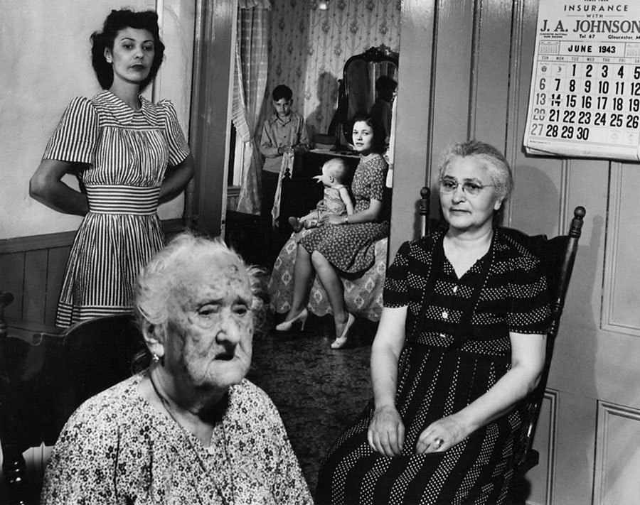
 'Dr. Edwin H. Land with group of Polaroid Employees, Polaroid warehouse in Needham, Mass.,' 1977")
Arnold Newman (American, 1918-2006)
Dr. Edwin H. Land with group of Polaroid Employees, Polaroid warehouse in Needham, Mass.,
1977
Gelatin silver print
© 1977 Arnold Newman / Getty Images
 'Truman Capote, writer, New York' 1977")
Arnold Newman (American, 1918-2006)
Truman Capote, writer, New York
1977
Gelatin silver print
© Arnold Newman / Getty Images
“The thing is, with Penn or Avedon, they control totally the situation in the studio, and I’m always taking a chance, wherever I go.”
“What’s the truth in a portrait? Who do you believe? Sometimes you cannot determine this in just one picture… The only way to determine whether you believe it or not is to look at my other pictures.”
“Form, feeling … structure and detail … technique and sensibility: it must all come together.”
Arnold Newman
Arnold Newman: Masterclass, the first posthumous retrospective of Arnold Newman (1918-2006), explores the career of one of the finest portrait photographers of the 20th century. The Harry Ransom Center, which holds the Arnold Newman archive, hosts the exhibition’s first U.S. showing February 12 – May 12, 2013.
The show, curated by FEP’s William Ewing, highlights 200 framed vintage prints covering Newman’s career, selected from the Arnold and Augusta Newman Foundation and the collections of major American museums and private collectors. Twenty-eight photographs from the Ransom Center’s Newman archive are featured in the exhibition.
“This retrospective is a real occasion for a reappraisal,” said Todd Brandow, founding director of FEP. “Newman was a great teacher, and he loved sharing his knowledge. It was these ‘lessons’ that led us to the concept of ‘Masterclass,’ the idea that, even posthumously, Newman could go on teaching all of us – whether connoisseurs or neophytes – a great deal.”
A bold modernist with a superb sense of compositional geometry, Newman, called the father of ‘environmental portraiture,’ is known for a crisp, spare style that placed his subjects in the context of their work environments. The exhibition includes work prints, prints with crop marks, rough prints with printing instructions and variants that reveal Newman’s process and attention to detail. “For me the professional studio is a sterile world,” said Newman in a 1991 interview. “I need to get out: Be with people where they’re at home. I can’t photograph ‘the soul,’ but I can show and tell you something fundamental about them.”
“Newman was never comfortable with the environmental term, and the backgrounds of Newman’s portraits would never be secondary aspects of his compositions,” said Ewing. “He had a masterful command of both sitter and setting.”
His subjects included world leaders, authors, artists, musicians and scientists – Pablo Picasso in his studio; Igor Stravinsky sitting at the piano; Truman Capote lounging on his sofa; and Otto Frank, father of Anne Frank, in the attic where his family hid from the Nazis for more than two years.
The exhibition takes stock of the entire range of Newman’s photographic art, showing many fine prints for the first time. The exhibition also includes Newman’s lesser-known and rarely exhibited still lifes, architectural studies, cityscapes and earliest portraits. While at the Ransom Center, the exhibition will be supplemented with holdings from the Center’s Newman archive, which contains all of Newman’s negatives, slides and colour transparencies, all of his original contact sheets and more than 2,000 prints, including examples of colour and collage work. The collection also includes Newman’s original sittings books, correspondence and business files, early sketchbooks and photographic albums.
Press release from the Harry Ransom Center website
 'Violin shop : patterns on table, Philadelphia, Pennsylvania' 1941")
Arnold Newman (American, 1918-2006)
Violin shop: patterns on table, Philadelphia, Pennsylvania
1941
Gelatin silver print
© 1941 Arnold Newman / Getty Images
 'Igor Stravinsky' 1945")
Arnold Newman (American, 1918-2006)
Igor Stravinsky
1945
Contact sheet of four negatives with Newman’s marks and cropping lines
Image courtesy of Harry Ransom Center
Cropping was also a practice Newman valued highly. His edges were determined with minute precision. Trained as a painter, Newman never had doubts about the virtues of cropping. His famed Stravinsky portrait would not have a fraction of its power without the stringent crop. As for printing, Newman was equally meticulous. He trusted few assistants, and those he did trust found that he would not accept a final print unless it was flawless in execution. (Wall text)
“Oh, people set up these nonsensical rules and regulations. You can’t crop, you can’t dodge your print, etc, etc., … But the great photographers that these people admire all did that!”
Wall text from the exhibition
 'Twyla Tharp, dancer and filmmaker, New York' 1987")
Arnold Newman (American, 1918-2006)
Twyla Tharp, dancer and filmmaker, New York
1987
Gelatin silver print
© Arnold Newman / Getty Images
Sensibilities
Many of Newman’s photographs show confident people, posing proudly before their accomplishments, directly engaging the viewer. But many betray a certain réticence – fragility, a hint of vulnerability, or doubt. Newman was aware that a successful artist’s career was not all roses – thorns were encountered along the path. He also regarded the act of portraiture was necessarily collaborative, or transactional; each side had their own kind of power – the sitter could resist the control of the photographer, the photographer could expose the sitter in an unflattering light. A successful portrait had to negotiate this psychological uncertainty. Sometimes Newman wanted to show supreme confidence as the mark of the man; at other times he wanted to show chinks in the armour.
“You show a certain kind of empathy with the subject – I don’t want to use the word ‘sympathy’, but you sort of let them know you’re on their side.”
Wall text from the exhibition
 'Larry Rivers, painter, South Hampton, New York' 1975")
Arnold Newman (American, 1918-2006)
Larry Rivers, painter, South Hampton, New York
1975
Gelatin silver print
© 1975 Arnold Newman / Getty Images
During the second half of the 20th Century, there was no portrait photographer as productive, creative and successful as Arnold Newman. For almost seven decades Newman applied himself to his art and craft, never for a moment losing his zest for experimentation. His work was published in the most influential magazines of the day, and he was much interviewed, much quoted, and much respected. Several major solo exhibitions paid homage to his achievements during his lifetime, and his work can be found in many of the world’s most prestigious photography collections. No historical overview of portraiture would be complete without one or two Newman masterpieces, nor could any general history of the medium safely leave out his superb Stravinsky, Mondrian or Graham.
Surprisingly, many of Newman’s superb portraits have never been shown or published. This, his first posthumous retrospective, features a wide variety of such photographs. Moreover, it includes cityscapes, documentary photographs and still lifes that have rarely if even been exhibited. Even people already familiar with Newman’s work will find scores of unexpected images, rivalling the work the ‘icons’ they admire. Newman was never happy with the label, often applied, of ‘father of environmental portraiture’. He argued that his portraits were much more than simple records showing artists posing in their studios; there was a symbolic aspect too, and an emotional / psychological element, both fundamental to his approach. He asked critics to ignore all labels, and judge his portraits simply as they would any photographs.
Newman was also a great teacher, and he loved to share his knowledge and skills with aspiring photographers. As with all great artists, the pictures he made seem effortless, natural, but in fact they were the result of careful prior planning. Newman applied the same rigour to selecting the best of his ‘takes’, cropping them precisely, and then printing them with supreme skill. Highly self-critical, he admitted: “I was always my own worst art director.”
With Masterclass, we have endeavoured to give viewers some insights into Newman’s approach. Work prints, prints with crop marks, rough prints with printing instructions, and variants reveal Newman’s great attention to detail and careful consideration of every aspect of the photographic art.
William A. Ewing
Curator
 'Salvador Dalí, painter, New York' 1951")
Arnold Newman (American, 1918-2006)
Salvador Dalí, painter, New York
1951
Gelatin silver print
© Arnold Newman / Getty Images
Signatures
One of Newman’s favourite strategies was to place the sitters in front of his or her own work. They seem to be saying: ‘Here is my work. This is what I do’. Architects pose beside buildings and models, a test pilot beside his jet, a photographer in front of his prints, a furniture designer in his chair, scientists in front of their equations… At first glance, the pictures appear natural, giving the impression that Newman had surprised his subjects at work, but in fact the set-ups were meticulous.
In the hands of a lesser talent, such a technique could have developed into a routine uniformity, but Newman’s curiosity and genuine interest in his subjects’ work guaranteed a freshness to his portraiture, year after year. To maintain freshness, Newman advised aspiring portrait photographers to do what he did: read up about the subject beforehand, know what he or she has achieved. You will then quickly spot which elements in the environment will be useful.
Wall text from the exhibition
![Arnold Newman (American, 1918-2006) 'Notes on Artist's' [sic] series c. 1942](https://artblart.com/wp-content/uploads/2013/04/notes-on-artists-web.jpg "Arnold Newman (American, 1918-2006) 'Notes on Artist's' [sic] series c. 1942")
Arnold Newman (American, 1918-2006)
Notes on Artist’s [sic] series
c. 1942
Image courtesy of Harry Ransom Center
Newman writes about his encounters with artists in New York City, describing his first meeting with Alfred Stieglitz.
 'Alfred Stieglitz in his An American Place Gallery, 1944' 1944")
Arnold Newman (American, 1918-2006)
Alfred Stieglitz in his An American Place Gallery, 1944
1944
Contact print
Image courtesy of Harry Ransom Center
Lumens
Newman preferred natural light, with ‘all its delightful, infinite varieties, indoors and out’. However, he felt that restricting oneself only to natural light had become a religion for many photographers, and artificial light was a taboo. Newman was pragmatic: if there wasn’t enough light to take the picture, he argued, it should be augmented; if it wasn’t the ‘right’ kind of light for the interpretation he desired, artificial lighting should be added. It was never a question of either/or. Newman often used spots and reflectors, but felt that strobes should be used only when absolutely necessary. Lighting effects in a Newman portrait are often subtle and sometimes dramatic. But they are always appropriate, and never excessive.
Wall text from the exhibition
 'Pablo Picasso, painter, sculptor and printmaker, Vallauris, France' 1954")
Arnold Newman (American, 1918-2006)
Pablo Picasso, painter, sculptor and printmaker, Vallauris, France
1954
Gelatin silver print
© Arnold Newman / Getty Images
Choices
Newman might take 10, 20, 30 and in special cases even more than 50 individual photographs of a sitter, making minor adjustments each time. Sometimes the differences between the frames would be minuscule, though highly significant. We see this in two frames of Picasso: in Frame 54 (note that this one was used in several publications in error), we see that the artist seems distracted – his eyes are not focused, while his mouth is pinched, and his hand is placed awkwardly. In Frame 57, all these deficiencies have been corrected.
Wall text from the exhibition
 'Piet Mondrian, painter, New York' 1942")
Arnold Newman (American, 1918-2006)
Piet Mondrian, painter, New York
1942
Gelatin silver print
© Arnold Newman / Getty Images
Habitats
Newman never liked to work in a studio, preferring to see where and how his subjects worked and lived. Dance studios, home libraries, classrooms, offices, living rooms, gardens, the street, and even, on occasion, a vast urban panorama were settings he employed. Particularly close to painters in spirit, he was stimulated by the raw materials, the paintings or sculptures in progress, and even the general clutter he found in their studios. He liked the challenge of having to make quick decisions based on what he saw around him, and argued that this spontaneous approach was much harder – and riskier – than working in his own studio, where everything was familiar and tested. By focusing on a sitter’s habitat, Newman felt that he was providing more than a striking likeness – he was revealing personality and character not through physiognomy (the principle of classic portraiture) but through the things artists gathered around them.
“For me the professional studio is a sterile world. I need to get out; be with people where they’re at home. I can’t photograph ‘the soul’ but I can show tell you something fundamental about them.”
Wall text from the exhibition
 'Alexander Calder, sculptor, New York' 1943")
Arnold Newman (American, 1918-2006)
Alexander Calder, sculptor, New York
1943
Gelatin silver print
© Arnold Newman / Getty Images
 'Palm Beach, Florida' 1986")
Arnold Newman (American, 1918-2006)
Palm Beach, Florida
1986
Gelatin silver print
© 1986 Arnold Newman / Getty Images
Geometries
From his earliest days with the camera, Newman loved the geometry of space – with or without people. He never tired of photographing architecture that appealed to him. The linear and the curvilinear; contrasting blocks of black and white; ovals, triangles rectangles, strong diagonals… it was never just a question of making a pleasing background – like a kind of geometrically-patterned wallpaper – but rather the creation of a harmonious, dynamic whole in which the sitter was an integral part. It was Newman’s consummate skill that prevented the sitter from being merely an adjunct to the design.
“Successful portraiture is like a three-legged stool. Kick out one leg and the whole thing collapses. In other words, visual ideas combined with technological control combined with personal interpretation equals photography. Each must hold it’s own.”
Wall text from the exhibition
The Harry Ransom Center
21st and Guadalupe Streets
Austin, Texas 78712
Phone: 512-471-8944
Exhibition galleries opening hours:
Tuesday – Friday 10am – 5pm
Saturday and Sunday Noon – 5pm
Closed Mondays
Library Reading/Viewing Rooms opening hours:
Monday – Saturday 9am – 5pm
Closed Sundays


")
. 'He Lost His Head' Nd")
 'Fading Away' 1858")
 'She Never Told Her Love' 1857")


'The Pond – Moonrise' 1904")
 'Max Ernst' 1946")
 and Josiah Johnson Hawes (American, 1808-1901) 'Seated man with Brattle Street Church seen through window' 1850s")

![Unknown (American) '[Decapitated Man with Head on a Platter]' c. 1865](https://artblart.com/wp-content/uploads/2013/02/unknown-american-decapitated-man-with-head-on-a-platter-c-1865.jpg "Unknown (American) '[Decapitated Man with Head on a Platter]' c. 1865")
 'Susan M. Davis' 1865")
 'Cape Horn, Columbia River, Oregon' 1867")
 'Cape Horn, Columbia River, Oregon' 1867")
 'Man in bottle' c. 1888")
 'Ein kräftiger Zusammenstoss (A Powerfull Collision)' 1914")
 'The Simulator' 1936")
 'London (Multiple Exposure Nude)' 1956")
 'Times Square, New York' 1952-1959")
 'Untitled' 1976")
 'The Other Series (After Kertész)' 1989-90")
 'Herring for the traditional third meal of Shabbath, Mukachevo' 1937-1938")
![Roman Vishniac (Russian-American, 1897-1990) 'Untitled [Jewish schoolchildren, Mukacevo]' c. 1935-1938](https://artblart.com/wp-content/uploads/2013/04/vishniac_jewish-school-children-web.jpg "Roman Vishniac (Russian-American, 1897-1990) 'Untitled [Jewish schoolchildren, Mukacevo]' c. 1935-1938")
![Roman Vishniac (Russian-American, 1897-1990) '[Boys admiring a motorcycle, Brandenburg, outskirts of Berlin]' 1929 - early 1930s (printed 2012)](https://artblart.com/wp-content/uploads/2014/08/vishniac-boys-admiring-a-motorbike.jpg "Roman Vishniac (Russian-American, 1897-1990) '[Boys admiring a motorcycle, Brandenburg, outskirts of Berlin]' 1929 - early 1930s (printed 2012)")
![Roman Vishniac (Russian-American, 1897-1990) 'Untitled [Boy with kindling in basement dwelling, Krochmalna Street, Warsaw]' c. 1935-1938](https://artblart.com/wp-content/uploads/2013/04/vishniac_boy-with-kindling-in-basement-dwelling-web.jpg "Roman Vishniac (Russian-American, 1897-1990) 'Untitled [Boy with kindling in basement dwelling, Krochmalna Street, Warsaw]' c. 1935-1938")
![Roman Vishniac (Russian-American, 1897-1990) 'Untitled [Interior of the Anhalter Bahnhof, a railway terminus near Potsdamer Platz, Berlin]' late 1920s - early 1930s](https://artblart.com/wp-content/uploads/2013/04/vishniac_interior-of-the-anhalter-bahnhof-web.jpg "Roman Vishniac (Russian-American, 1897-1990) 'Untitled [Interior of the Anhalter Bahnhof, a railway terminus near Potsdamer Platz, Berlin]' late 1920s - early 1930s")
![Roman Vishniac (Russian-American, 1897-1990) 'Untitled [Street scene with swastika flag in background, Berlin]' c. 1935-36](https://artblart.com/wp-content/uploads/2013/04/vishniac_street-scene-with-swastika-flag-in-background-web.jpg "Roman Vishniac (Russian-American, 1897-1990) 'Untitled [Street scene with swastika flag in background, Berlin]' c. 1935-36")
![Roman Vishniac (Russian-American, 1897-1990) 'Untitled [Nazi Storm Troopers marching next to the Arsenal in front of the Berlin Cathedral]' c. 1935](https://artblart.com/wp-content/uploads/2013/04/vishniac_nazi-storm-troopers-web.jpg "Roman Vishniac (Russian-American, 1897-1990) 'Untitled [Nazi Storm Troopers marching next to the Arsenal in front of the Berlin Cathedral]' c. 1935")
![Roman Vishniac (Russian-American, 1897-1990) 'Untitled [Beach dwellers in the afternoon, Nice, France]' c. 1939](https://artblart.com/wp-content/uploads/2013/04/vishniac_beach-dwellers-web.jpg "Roman Vishniac (Russian-American, 1897-1990) 'Untitled [Beach dwellers in the afternoon, Nice, France]' c. 1939")
 'People behind bars, Berlin Zoo' early 1930s")
![Roman Vishniac (Russian-American, 1897-1990) 'Untitled [Zionist youth building a school and foundry while learning construction techniques, Werkdorp Nieuwesluis, Wieringermeer, The Netherlands]' 1939](https://artblart.com/wp-content/uploads/2013/04/vishniac_zionist-youth-building-a-school-web.jpg "Roman Vishniac (Russian-American, 1897-1990) 'Untitled [Zionist youth building a school and foundry while learning construction techniques, Werkdorp Nieuwesluis, Wieringermeer, The Netherlands]' 1939")
 'Recalcitrance' Berlin, 1926")
 'Father taking his son to the first day of cheder' 1937-1938")
![Roman Vishniac (Russian-American, 1897-1990) '[Vishniac's daughter Mara posing in front of an election poster for Hindenburg and Hitler that reads "The Marshal and the Corporal: Fight with Us for Peace and Equal Rights," Wilmersdorf, Berlin]' 1933](https://artblart.com/wp-content/uploads/2014/08/icp_vishniac_pressimage_3-web.jpg "Roman Vishniac (Russian-American, 1897-1990) '[Vishniac's daughter Mara posing in front of an election poster for Hindenburg and Hitler that reads \"The Marshal and the Corporal: Fight with Us for Peace and Equal Rights,\" Wilmersdorf, Berlin]' 1933")
 'Children playing on a street lined with swastika flags' mid-1930s")
 'Window washer balancing on a ladder, Berlin' mid-1930s")
 'Cross section of a pine needle' Early 1950s - late 1970s")
 'Marli Heimann, Alle während 1 Stunde (Marli Heimann, All During an Hour)' 1931")
 'Rayograph' 1922")
 'Sovetskoe foto (Soviet Photo)' No. 10 October 1927")
 'Das rechte Auge meiner Tochter Sigrid (The Right Eye of My Daughter Sigrid)' 1928")
 'Untitled' c. 1928")
 'Chelovek s kinoapparatom (Man with a Movie Camera)' (still) 1929")
 'Untitled' February 1931")
![Georges Hugnet (French, 1906-1974) 'Untitled [Surrealist beach collage]' c. 1935](https://artblart.com/wp-content/uploads/2013/04/georges-hugnet-untitled-surrealist-beach-collage.jpg "Georges Hugnet (French, 1906-1974) 'Untitled [Surrealist beach collage]' c. 1935")
 No. 1 from the series 'Sueños' (Dreams) 1949")
 'Portrait of the Artist as a Young Woman' Negative c. 1930/Distortion c. 1950")
 'Gun, Gun, Gun, New York' 1955")
 'Red Stripe Kitchen' 1967-1972")
 '100 Boots' 1971-1973")
 '100 Boots' 1971-1973")
 '100 Boots' 1971-1973")

 'Hands Up / Makeup' 1967-1972")
 'Projects: Helen Levitt in Color' 1971-1974 (detail)")
 'Projects: Helen Levitt in Color' 1971-1974 (detail)")
 'I Got Up At...' 1974-1975")
 'Untitled (Mariette Althaus)' c. 1975")
 'Einkreisung (Encirclement)' 1976")
 'Recto/Verso #2' 1988")
 'Marilyn; 28 Years Old; Las Vegas, Nevada; $30' 1990-1992")
")
 'Ondria Tanner and Her Grandmother Window-shopping, Mobile, Alabama' 1956")
 'At Segregated Drinking Fountain, Mobile, Alabama' 1956")
 'Department Store, Mobile, Alabama' 1956")
 'Mother and Children, Mobile, Alabama' 1956")
 'Mr. and Mrs. Albert Thornton, Mobile, Alabama' 1956")
 'Drugstore Cowboys, Turner Valley, Canada' 1945")
 'Untitled' 1950")
 'Tenement Dwellers, Chicago, Illinois' 1950")
 'Mysticism, Harlem, New York' 1952")
 'Harlem Neighborhood, Harlem, New York' 1952")
 'The Invisible Man, Harlem, New York' 1952")
 'Muhammad Ali' 1966")
 'Ellen's Feet, Harlem, New York' 1967")
 'Norman Fontenelle, Sr., Harlem, New York' 1967")
 'Bessie and Little Richard the Morning After She Scalded Her Husband, Harlem, New York, 1968' 1968")
 'Catholic youth escaping a CS gas assault in the Bogside, Londonderry, Northern Ireland' 1971")
 'American soldiers, Checkpoint Charlie, West Berlin' August 1961")
 'American Troops Looking across the Wall, Berlin' 1961")
 'Protester, Cuban missile crisis, Whitehall, London' 1962")
 'Turkish defender leaving the side-entrance of a cinema, Limassol, Cyprus' 1964")
 'Turkish woman mourning the death of her husband killed by Greek forces during the Civil War, Limassol, Cyprus' 1964")
 'Fishermen playing during their lunch break, Scarborough, Yorkshire' 1967")
 'US marine throwing grenade, Tet Offensive, Hué, South Vietnam' February 1968")
 'U.S. Marines with wounded soldier, the Citadel, Hue' 1968")
 'The Bogside, Northern Ireland, Londonderry' 1971")
 'Two local boys in Bradford / No Nazis in Bradford, England' 1972")
 'The Guvnors, Finsbury Park, London' 1958")
 'At a café in Finsbury Park, London' 1958")
 'Old Vietnamese man, Tet Offensive, Hué, South Vietnam' February 1968")
 'Homeless Irishman, Aldgate, East End, London' 1970")
 'Jean, a homeless woman, Aldgate, East End, London' 1984, printed c. 1985")
 'Along the Ganges during the Sonepur Mela festival, Bihar, India' 1993")
 'Galleria Degli Antichi Sabbioneta I 2010' 2010")
 'Palazzo Ducale Mantova I' 2011")
 'Teatro Comunale di Carpi I' 2011")
 'Teatro La Fenice di Venezia III' 2011")
 'Teatro La Fenice di Venezia V 2011' 2011")
 'Teatro Olimpico Vicenza II' 2010")
 'Teatro Scientifico Bibiena Mantova I' 2010")
 'Museo Civico Di Palazzo Te Mantova IV' 2010")
 'Teatro Olimpico Vicenza III' 2010")
 'Biblioteca Teresiana Mantova I' 2010")
 'Palazzo Ducale Mantova III' 2011")
 'Palazzo Ducale Mantova V' 2011")
 'Palazzo Ducale Mantova IV' 2011")
 'Group of Persons Selling Fruit and Flowers' 1845")
 'Confucius, Canton, April 1860 April' 1860")
 'Harbor II, (Osterville), Cape Cod' 1930s")
 'Dunes, Oceano' 1936")
 'Living Room Corner Arranged by Mr. and Mrs. Burton Tremaine, Sr.,' 1984")
 'Pink Lightning, Salton Sea' 1985")
 'Room of Nightmares #1' 2005")
 'Rue des Prêtres Saint-Étienne, de la rue Descartes' c. 1865")
 'Marquise Casati' 1922")
 'Alfred Stieglitz IX, New York' 1933")
 'New York from the Shelton' 1935")
 'Jehovah's Witness. Los Angeles' 1955")
' 1970-1971")

You must be logged in to post a comment.