A photographer I knew very little about before assembling this posting. The undoubted influence of Henri Cartier-Bresson can be seen in many images (such as Vendeurs de pain, Athènes 1958 and Village moderne de pêcheurs 1954, both below), while other images are redolent of Josef Koudelka (Marriage gitan, 1953) and Paul Strand (Jeune mineur, 1955).
Weiss strikes one as a solid photographer in the humanist, Family of Man tradition who doesn’t push the boundaries of the medium or the genre, nor generate a recognisable signature style.
Dr Marcus Bunyan
Many thankx to Jeu de Paume for allowing me to publish the photographs in the posting. Please click on the photographs for a larger version of the image.
Sabine Weiss – Jeu de Paume Château de Tours
“Sabine Weiss”: exhibition at Jeu de Paume Château de Tours from 18 June 2016 until 30 October 2016.
Sabine Weiss is the last representative of the French humanist school of photography, which includes photographers like Robert Doisneau, Willy Ronis, Édouard Boubat, Brassaï and Izis.
Still active at over 90 years of age, she has accepted for the first time to present her personal archives, thereby providing a privileged insight into her life and career as a photographer. The exhibition at the Château de Tours will showcase just a few milestones from her long career.
Through almost 130 prints, as well as numerous period documents – many of which are being shown for the first time – this exhibition provides visitors with an overview of the multiple facets of this prolific artist, for whom photography was first and foremost, a fascinating occupation.
Sabine Weiss is the last representative of the French humanist school of photography, which includes photographers like Robert Doisneau, Willy Ronis, Édouard Boubat, Brassaï and Izis.
Still active at over 90 years of age, she has accepted for the first time to present her personal archives, thereby providing a privileged insight into her life and career as a photographer. The exhibition at the Château de Tours will showcase just a few milestones from her long career. Through almost 130 prints, as well as numerous period documents – many of which are being shown for the first time – this exhibition provides visitors with an overview of the multiple facets of this prolific artist, for whom photography was first and foremost, a fascinating occupation.
Née Weber in Switzerland in 1924, Sabine Weiss was drawn to photography from a very early age and did her apprenticeship at Paul Boissonnas’ studio, a dynasty of photographers practising in Geneva since the late nineteenth century. In 1946, she left Geneva for Paris and became the assistant of Willy Maywald, a German photographer living in the French capital, specialising in fashion photography and portraits. She married the American painter Hugh Weiss in 1950, and at this time embarked upon a career as an independent photographer. She moved into a small Parisian studio with her husband – where she continues to live today – and socialised in the artistic circles of the post-war period. This allowed her to photograph Georges Braque, Joan Miró, Alberto Giacometti, André Breton and Ossip Zadkine, and later numerous musicians, writers and actors.
Circa 1952, Sabine Weiss joined the Rapho Agency thanks to Robert Doisneau’s recommendation. Her personal work met with immediate critical acclaim in the United States with exhibitions at the Museum of Modern Art in New York, the Art Institute of Chicago, the Walker Art Institute in Minneapolis and the Limelight Gallery, New York. Three of her photographs were shown as part of the famous exhibition “The Family of Man”, organised by Edward Steichen in 1955, and Sabine obtained long-lasting contracts with The New York Times Magazine, Life, Newsweek, Vogue, Point de vue-Images du monde, Paris Match, Esquire, and Holiday. From that time and up until the 2000s, Sabine Weiss continued to work for the international illustrated press, as well as for numerous institutions and brands, seamlessly passing from reportage to fashion features, and from advertising to portraits of celebrities or social issues.
In the late 1970s, her work returned to the spotlight thanks to a growing revival of interest in so-called humanist photography on behalf of festivals and institutions. This interest encouraged Sabine to return to black and white photography. At over sixty years of age, she began a new body of personal work, punctuated by her travels in France, Egypt, India, Reunion Island, Bulgaria and Burma, and in which a more sentimental melody may be heard, centred on the pensive and solitary moments of human existence. At the same time, Sabine became the focus of a growing number of tributes, all of which has contributed to her reputation as an independent and dynamic photographer, with a great humanist sensibility and an eye for the detail of everyday life.
To be frank, this handsomely installed exhibition of the work of Australian fashion photographer Henry Talbot is a bit of a let down. The images look terribly dated, and while historically they have some significance in terms of the time and context from which they emerged – the movement towards en plein air photography, taking the model from the studio to the street – most of the photographs are not very good. The prints are either commercial vintage prints with all their faults (dust, scratches, poor printing, over exposure, lack of burning in etc.) evidencing a lack of care and attention to detail, or modern inkjet reproductions from original negatives and even then some of the printing is poor: for example, the hair of the model in Fashion illustration for Blunden Wool, models Joan Crellin and Bruce Anderson (1961, below) is completely blown out with no detail retained in the highlights. Some of the angles in his images (the positioning of the figure) are just off, the cropping of the negatives (the space above and below the figure) often does not work and framing of the prints is also less than exemplary. But we must remember Talbot was a commercial photographer from the 1960s and that’s just what these photographs are: commercial fashion photographs that fulfil a client brief.
Talbot was no experimenter. Too often his images are really basic, a basic visualisation, and he has a fixed idea for a shot and goes with that idea and variations of it, even when it is evident that the photograph is not working. Any photographer worth their salt would recognise such a situation and be flexible enough to change it up but with Talbot this does not happen. Positioning his model centrally, he usually uses low depth of field so that everything falls out of focus behind. In this sense he still seems to possess a studio mindset. While professing his love of free-moving fashion, his photographs seem stilted and conformist, even as they are taken out of doors. His proof sheets are evidence of a “team” oriented focus in order to fulfil a client brief, but in these very proof sheets we see uneven exposures and severe cropping into the frame to get the final image. And while he was more romantic than the hard edged Helmut Newton, his photographs only ever project a surface and rarely show any true emotion. Without doubt his best two photographs are Fashion illustration for Fibremakers, model Maggi Eckardt (1966, below) taken at the Altona Petrochemical Company. The photographs are a symphony of form, movement and light. They possess a “feeling” a lot of his other photographs simply cannot, and do not, contain.
There is no catalogue to the exhibition so this posting will have to serve historically to document the exhibition and Talbot’s work. Thus, there is an in depth interview included with Australian curator, artist and photography collector Joyce Evans who ran Church Street Photographic Centre in Melbourne from 1976 and who showed Talbot’s work in her gallery. It is all very well that I have an opinion on the work but what I write needs to be an informed opinion, and the interview with Joyce provides valuable background with regard to the people, the era and the context from which these photographs emerged. One thing noted in the conversation is that Talbot photographed strong, independent women like Janice Wakeley and Maggie Taberer… something that is not mentioned at all in the wall text and press release that accompanies the exhibition. I would have thought it vital that a curator would have linked the presence of these independent women in fashion photography to the work of art photographers such as Australian artist Carol Jerrems who published her seminal book A Book About Australian Women in 1975.
Another insight into the times is provided by a friend Ian Lobb who knew Talbot:
“People said he was good, and he charged enough, but he just thought he was having fun, fun with a certain quality. I don’t think he had any grand ideas about his talent, but he was quite prepared to sell a print or sell his time if someone wanted to pay. Henry knew the fun he was having wasn’t going to last beyond his life. And now, it is weird and very country town that his work should be regurgitated. His work looks poor because people are making him into something he wasn’t.
There is a seminal incident that can help with the context of the Henry Talbot, Athol Shmith and Helmut Newton generation. Athol Shmith was giving a print critique at Prahran, and someone had left a glass of fixer on the shelf of the room. Athol finished his critique and drank it. Rushed to hospital of course. But think of that from all its angles. The world in which these photographers worked and the stories from those times reveal a world that was flying by the seat of its pants – just.”
Talbot is a solid photographer, no more. While the exhibition gives some sense of depth to the quality of work that was coming out of Melbourne at that time, perhaps it would have been best to let sleeping dogs lie.
In conversation with Australian curator, artist and photography collector Joyce Evans about the Australian photographer Henry Talbot
17/07/2016
MB: Just before we started this conversation you said to me Joyce that Talbot was a gentle man. Can you explain what you meant by that please?
JE: I use the word gentle in comparison to his one-time partner Helmut Newton, who I found to be an aggressive man.
MB: So they were in partnership together before Newton left for Europe
JE: Yes
MB: So Talbot was intelligent, he knew his field and understood the history of the genre that he was working in, he could speak well, and was well liked both by clients, models and the society in which he worked.
JE: Well, he was not a superficial person. When he spoke he researched things properly, he had the depth of knowledge which came from a sort of European intellect. This intellect was broadly read, and he was also a person that listened.
MB: And he was also a good teacher as well…
JE: In his commercial work, Henry photographed his women (as far as I could see), with the idea of having a client, and he was displaying clothes on the women, which was part of the old tradition. In an environment where, if you wanted to make a living, that’s what you had to do. If he had been, however, in a place like New York – which was avant-garde as compared to Melbourne, which was not avant-garde – he may well have gone the same way as Helmut Newton. The very big difference, though, is in the personality of the two men.
Helmut Newton went out and he was an aggressive man. He had charm, but it was an aggressive charm, it wasn’t a gentle charm. He had intelligence and he knew how to handle his women so that he got aggression out of his women, that’s what he wanted.
MB: Whereas Talbot was doing it for a job?
JE: Talbot A was doing it for a job and B, he had a gentle nature. He was not an aggressive man and actually if you look at those photographs you can see that he liked the women that he photographed and he lived in an environment where fashion was still, fairly soft, in many ways. You can see in things like the swimwear industry and the sports industry there was quite a lot of Australian independence, but he, combined with Athol Shmith in Melbourne, took his models out into the street, they interacted with the environment, and he did not depend on the studio.
MB: When I look at his photographs they are quite modernist, they are quite clean, but his vision seems to me to be quite limited… in the sense that he uses a central female figure (sometimes two central figures), low depth of field, out of focus background. And then you look at the proof sheets and you can see that he is not an experimenter. From shot to shot there is a slight change in angle of a hand or the tilt of a head but he really doesn’t push the boundaries of what he is trying to say with the image. He has his set idea (for the shot, for the location) and then he does slight variants in the proof sheet towards that idea. Very rarely do you get a feeling, a sense of atmosphere in his images – of the outdoors in the sense of the outdoors enveloping the model. The models seem to be isolated within their environment…
JE: But who does what is asked of him, at that time? You can compare him to Avedon or Athol Shmith, but you cannot compare him to today. You cannot ask someone to work outside of his own time. You can ask him to lead in his own time and the leading that occurred at that time, by both Shmith and Talbot, was that they took models out into the city and the environment and away from the studio. This was something that Avedon did and these two photographers did also. The big argument is, did Talbot do it effectively? Who chose his proofs? Which ones got published?
MB: But also, a quite organised and restricted view of the world, even though he was pushing the boundaries by taking fashion photography outdoors, he still seems to be in a studio mindset when he was outside.
JE: What you did in those days, is that you would do the shoot, you would come in with your proof sheets, and the art director would go over it with the red crayon with the team – it tended often to be team work. So he’s working to a brief …. and you are the instrument of the team. The art director sets everything up and you do the shoot. Now, when you get a name like Talbot had, you could start to begin to influence what the art director was doing. Now, how much and when and at what time and what effect – I really don’t know.
MB: Did he photograph strong women? You mentioned Maggie Taberer and Janice Wakeley.
JE: Maggie Taberer and Janice Wakeley – both educated women, well read women – Talbot would have chosen his own models and they were two of his favourites. Or been offered models, depending on the control of the art director and what they desired.
MB: Today, all we can do is try and understand the history of these photographs, and the time and context from which they emerged. From today’s standpoint they look rather dated and stilted.
JE: You have to see them from a decade earlier, looking at fashion photography in Australia from the 1930s and 1940s to see what was happening. The 1930s fashion stuff was very very largely in the studio. Very little of it was en plein air.
MB: But that doesn’t negate his aesthetic choices to shoot with so low a depth of field that the context of the outdoors becomes more or less irrelevant. Yes, you have the images of the oil refinery behind with the movement of the women, in my opinion some of his best photographs, that are more romantic in feel… and these tend to work better than other more prosaic shots.
JE: He was more of a romantic than Newton was. Newton was very hard edged and he managed to get that extra particular something out of his women…
MB: Even in his Melbourne images?
JE: Well, we don’t know Newton’s Melbourne images, because he has denied them all.
MB: Yes exactly, that’s the thing.
JE: Thinking about Talbot, he was part of a movement. He wasn’t the leader of it or the only one, but he was part of the early evolution of the movement.
MB: Does that mean his photographs stand up to scrutiny today?
JE: I have this feeling that when you only look at the top of the cake, you don’t know what the cake is all about. I don’t know whether I would put him as the fairy on top of the cake or one of the really nice pieces of icing. I think that Athol Shmith is a stronger photographer.
MB: What about the Australian photographer Bruno Benini? I find him incredibly strong in terms of his style, his lighting.
JE: My understanding of Bruno is that he is a decade younger that Talbot…
MB: So 1950s?
JE: Yes I think so
MB: So he has a more classical influence…
JE: It’s not that, he’s like John Eaton is to Pictorialism, he’s a very good photographer – but he’s not a groundbreaker, he’s not of the beginning of Pictorialism. I think Benini is a very good fashion photographer and I think he is working on other people’s shoulders. I think Athol Shmith is stronger and if I had a choice about having to show one, but I like the fact that we have shown Talbot, because it gives some sense of depth to the quality of work that was coming out of Melbourne. Places like Sportscraft were exceptionally good at encouraging talent, both in design and in photography.
MB: All I can do is understand the history and the context and what was going on at the time and then, as I was thinking the other day, all I can write is what I see.
JE: Compare this… Athol Shmith had Bambi. Bambi was the most exquisite women you would ever find in your whole life. I remember her when I was a teenager, me and my girlfriend were both sitting in a room and she was there, both in our late teens / early 20s, and I remember saying to my friend that I feel as though I have ten feet – and I am so clumsy when I look at her. She is so beautiful. Now Janice Wakeley was also a stunning looking women as was Maggie Taberer. But the number one model with Athol was Bambi and then there were really other top people that he had. And he, I think, had a much broader base to work with – not only his models, but his clientele was broader. Talbot was predominantly clothing as compared to Shmith who did a whole stack of things other than fashion. His love of music, he did a lot of musicians, he did some amazing portraiture. Shmith did H.G. Wells etc…
MB: His breadth was greater than Talbot. My concern with Talbot is 1/ the dating of the images, and 2/ his aesthetic choices when taking those photographs which may be a team decision but, the fact that he didn’t experiment that much. When looking at his proof sheets there are only slight changes to the positioning of the model…
JE: He’s got an idea and he goes for it.
MB: And that just really shows a lack of flexibility in his vision.
JE: No, I don’t think so I just think that it shows that he knows what he wants and that’s it.
MB: I think that is where we differ.
JE: He is very professional. How many shots of a person do you make at a time?
MB: I work on a ratio of 10 to 1, so if you take 10 shots you will get one, possibly two excellent shots. Talbot must have been thinking I need one good shot and he kept shooting and shooting, even though some of his exposures are poor, even though he radically crops the full frame image to get the final shot. It shows he was not as confident as you think about getting the shot, because he is hedging his bets with his in camera framing, relying on cropping later.
JE: He knows he wants her getting this feeling, and he goes bang, bang, bang, head turned slightly, arm down slightly and that’s it… and he knew what he wanted at the beginning and then he just saw the variations to fine tune it. And that’s what every photographer tends to do.
MB: And that’s where I really think there is a problem with his photography. Most of his images don’t really work – and yet he never recognised that fact at the time, when he was taking or setting up the shot, that it was not working. Any good photographer worth his salt, worth his previsualisation of the shot, must know how to adapt and be flexible enough to change on the run. He didn’t recognise that they weren’t working and change the idea. That’s the problem I have with him. It shows a fixed mindset in terms of not being able to see through the viewfinder when a shot is not working.
JE: That’s another story…
MB: Let’s leave it there. Thank you Joyce so very much for your thoughts.
“Well man, this is 1966 and in this game you have to be open to, and live, contemporary influences to a certain degree. The younger generation is very strong in fashion – very much in command. They’re spending a great deal of money in the garment industry, so fashion is geared to the young. There is, of course, in this “with it” idea itself, certain conformity to non-conformity, to a non-conformity standard. But, as a photographer, you must accept this idea as far as you can and that probably reflects to some extent in your own behaviour and dress.”
Henry Talbot, 1966
“I always tried to show models in a free-moving fashion. I avoided stiff poses and I tried to keep up with what the great fashion photographers overseas were doing”
Henry Talbot (Germany 1920 – Australia 1999, Australia from 1940) No title (Fashion illustration for Blunden Wool, models Joan Crellin and Bruce Anderson) (installation view) 1961, printed 2016 Photographed on location at the National Gallery of Victoria Inkjet print Henry Talbot Fashion Photography Archive
Henry Talbot (Germany 1920 – Australia 1999, Australia from 1940) No title (Fashion illustration for Blunden Wool, models Joan Crellin and Bruce Anderson) (installation view) 1961, printed 2016 Photographed on location at the National Gallery of Victoria Inkjet print Henry Talbot Fashion Photography Archive
Henry Talbot (Germany 1920 – Australia 1999, Australia from 1940) No title (Fashion illustration for Blunden Wool, models Joan Crellin and Bruce Anderson) (installation view) 1961, printed 2016 Photographed on location at the National Gallery of Victoria Inkjet print Henry Talbot Fashion Photography Archive
Henry Talbot (Germany 1920 – Australia 1999, Australia from 1940) No title (Fashion illustration for Watersun ski wear) (installation view) 1970, printed 2016 Inkjet print Henry Talbot Fashion Photography Archive
Henry Talbot (Germany 1920 – Australia 1999, Australia from 1940) No title (Fashion illustration for Watersun ski wear) (installation view) 1970, printed 2016 Inkjet print Henry Talbot Fashion Photography Archive
Henry Talbot (Germany 1920 – Australia 1999, Australia from 1940) No title (Fashion illustration for Watersun ski wear) (installation view) 1970, printed 2016 Inkjet print Henry Talbot Fashion Photography Archive
“There is little an Australian fashion photographer can do that has not been done overseas, and often better. But one thing they do not have is our Australian environment. I use it a great deal because the idea makes it possible to come up with something uniquely different.”
Henry Talbot 1966
“The striking and youthful fashion of 1960s Melbourne is the starring subject of more than eighty photographs by fashion photographer Henry Talbot, many of which have never been exhibited before. Showcasing the shifting face of fashion from a time that has captured popular imagination, many of the images have never been seen since their original publication 50 years ago and offer an insight into the styles and attitudes of the 1960s. The photographs on display have been carefully selected from an extraordinary archive of 35,000 negatives that Talbot gifted to the NGV in the 1980s.
“Henry Talbot’s photography captures the exuberance and changing times of a generation. His modern photographs depict an emerging youth culture and offer an insider’s look into a thriving cultural scene during the 1960s,” said Tony Ellwood, Director, NGV.
A European émigré artist from Germany, Talbot brought an invigorating internationalism to Australian photography and partnered with Helmut Newton. Their Flinders Lane studio was very successful enterprise and secured major clients including the Australian Wool Board and Sportscraft. It was during the 1960s that Talbot established his place as a dynamic force in Australian fashion photography and his work was regularly published in Australian Vogue.
The exhibition includes some of Talbot’s beautiful fashion spreads from 1960s Australian Vogue, providing a visual history that chronicles the magazine’s first decade in Australia. The photographs will be presented alongside a display of early edition Australian Vogue magazines, including those in which Talbot’s photographs originally appeared, offering an insight into the aspirational fashion and lifestyle choices of Australians living in this era. Talbot’s photography also highlights the public’s affinity with uniquely Australian brands, such as Qantas and Holden. Fast cars and air travel were aspirational luxury experiences in the 1960s and, as a result, airports, planes and brand new cars were the glamorous setting for many of Talbot’s photographs, demonstrating his astute understanding of current trends and consumer culture.
From an outback sheep station, to lamp-lit streets of Melbourne, Australian cityscapes and landscapes also provided the backdrop to some of Talbot’s most arresting photographs. Shot on location around Melbourne, these photographs showcase Talbot’s adventurous style and ability to transform 1960s Melbourne into scenes that looked like Paris, London, New York – a testament to his ‘international eye’. A photographer with an astute vision, Talbot also ingeniously transformed Altona Petrochemical Company into an intergalactic, futuristic setting that captured the public’s fascination with space travel during the ‘space race’ of the 1960s. This exciting suite of images demonstrates the ways in which space travel permeated popular culture, including space-age fashion trends.
The exhibition will open during the NGV’s landmark 200 Years of Australian Fashion exhibition and together, these two exhibitions will offer a comprehensive and fresh new look at Australian fashion in the 1960s.”
Press release from the National Gallery of Victoria
Henry Talbot (Australian born Germany, 1920-1999)
Henry Talbot was born in Germany in 1920. As a young man he studied graphic design and photography in Berlin and Birmingham. After leaving Germany in 1939, he arrived in Australia in 1940. Following a period of internment, Talbot then served in the Australian army. In the postwar years he left Australia, travelling to South America and Europe, before returning to Melbourne in 1950. At the time Melbourne was the most important centre of fashion in Australia because of the abundance of textile and garment manufacturing in Flinders Lane; boutiques in the Paris End of Collins Street, and major department stores around the city.
Talbot worked in some of the leading Melbourne photographic studios and quickly established a reputation as a major fashion photographer in Melbourne. In 1956 he was invited to go into partnership with Helmut Newton. Newton was already renowned for his innovate fashion images and this partnership offered Talbot recognition for his talent in this field. In 1973 Talbot closed his studio, and ten years later presented the NGV with what is now known as the Henry Talbot Fashion Photography Archive. Works in this exhibition at taken from this remarkable collection, comprising 35,000 black-and-white negatives, photographs and contact prints.
Wall text
Installation view of the National Gallery of Victoria’s Henry Talbot: 1960s Fashion Photographer exhibition at NGV Australia at Federation Square with at left, No title (Fashion illustration, model Janice Wakely) (1961, below) (installation view) Photo: Brooke Holm
Working with the right model was as important to the success of Talbot’s images as choosing the right location. Like most photographers he had his favourite models, and often worked with Janice Wakely, Maggie Tabberer, Helen Homewood, Maggi Eckardt and Margot McKendry.
Talbot’s philosophy was simple, as he explained it in 1995: “I’ve always held that if you can establish a definite emotional rapport with a model you’re halfway toward producing good photographs. My own favourite method of fashion working is to explain roughly what I am after then leave the model more or less free to interpret the garment she’s to show. A good model will absorb and become part of what she is wearing almost completely. Whilst shooting away I may suggest minor changes, the model senses what I’m after, and then really good shots happen.”
‘Forsaking city airs for cool country breezes, she previews the three day event at Oaklands Hunt Club which will finish the Melbourne Cup season, wearing a three-quarter oat of palest blue pearl lamb.’
Descriptive caption, 1966
Installation view of the National Gallery of Victoria’s Henry Talbot: 1960s Fashion Photographer exhibition at NGV Australia at Federation Square
The locations used by Talbot were an important aspect of his image making; they played a significant role in the implicit narratives he constructed in his fashion photography. Talbot’s work, like most fashion photographs, presents an aspirational ideal. In his case a picture of the modern woman – at an opening night; arriving at the airport; on the streets of London; visiting an art gallery; or in a beatnik coffee bar – who looks effortlessly up to date and glamorous because she has bought the perfect garment.
Despite Talbot’s assertion that using Australian settings gave his work an edge, some of his most successful photographs artfully disguise the familiar streets of Melbourne. The streets of the city are transformed in Talbot’s photographs to look like Fifth Avenue, New York or Hyde Park in London.
The 1960s was a period of social turbulence, when youth-led movements changed the world. In Australia it was a time of prosperity: employment rates were high and, for many, the opportunities seemed boundless. The fashions of the day, including mini skirts and hipster pants, reflected the “youthquake” that was shaking up the status quo. Photography studios made the transition to the 1960s by creating images with a fresh, contemporary edge, and increasingly worked on location rather than in the studio.
Henry Talbot began to work in fashion photography in the 1950s, but it was in the 1960s that he established himself as a leading force in Melbourne’s fashion industry. He worked for designers and manufacturers, department stores and boutiques, as well as on the job for the Australian Wool Bureau, taking photographs that showed Australian fashion to the world.
‘The magic carpet revisited: Classweave takes to the air. Classweave deny weaving the magic carpet, but [the] chic three disagree, find Classweave fabrics magic. Feel like flying,and choose Qantas.’
Advertising copy, Australian Vogue, 1963
Installation view of the National Gallery of Victoria’s Henry Talbot: 1960s Fashion Photographer exhibition at NGV Australia at Federation Square Photo: Brooke Holm
‘They’re going places, the Pelaco Pair – and riding the crest all the way. They live their life with a style and carefree assurance that many envy. They know and demand the best this modern world has to offer, a personal formula for success that shows in everything they do. You can see it in the clothes they wear (he doesn’t own a shirt that isn’t Pelaco; she collects Lady Pelaco, secretly feels they were created especially for her). You can see it in the cars they drive – always, a trim, taut, terrific Falcon.’
Advertising copy, Vogue Australia, April/May 1963
Murray Rose (Australian, 1939-2012)
Iain Murray Rose, AM (6 January 1939 – 15 April 2012) was an Australian swimmer, actor, sports commentator and marketing executive. He was a six-time Olympic medalist (four gold, one silver, one bronze), and at one time held the world records in the 400-metre, 800-metre, and 1500-metre freestyle (long course). He made his Olympic debut at the 1956 Summer Olympics as a 17-year-old and won three Olympic medals, all gold. Four years later, as a 21-year-old, he won three Olympic medals (one gold, one silver, one bronze) at the 1960 Summer Olympics.
At the age of 17, Rose participated in the 1956 Summer Olympics in Melbourne. He won the 400-metre and 1500-metre freestyle races and was a member of the winning team in the 4×200-metre freestyle relay. Winning three gold medals in his home country immediately made him a national hero. He was the youngest Olympian to be awarded three gold medals in one Olympic Games. Afterwards, Rose moved to the United States to accept an athletic scholarship at the University of Southern California where he received a Bachelor of Arts degree in Business/Communications.
He continued competing while at USC, and graduated in 1962. At the 1960 Summer Olympics in Rome, Italy, Rose again won an Olympic gold medal in the 400m freestyle, as well as a silver in the 1500m freestyle and a bronze in the 4 x 200m freestyle relay, bringing his haul to six Olympic medals. In addition to his Olympic medals, he won four gold medals at the 1962 Commonwealth Games in Perth, Australia. He eventually set 15 world records, including the world record in the 800-metre freestyle in 1962, which was not broken until Semyon Belits-Geiman set a new record in 1966. Rose continued to compete as a masters swimmer. During the 1960s, he also pursued an acting career, starring in two Hollywood films and making guest appearances on television shows.
In addition, Rose worked as an Australian sports commentator for the Nine Network, plus each of the major US networks, participating in seven consecutive Olympic Games.
Installation views of the National Gallery of Victoria’s Henry Talbot: 1960s Fashion Photographer exhibition at NGV Australia at Federation Square Photos: Brooke Holm
Maggie Tabberer AM (also known as Maggie T; born 11 December 1936 – died 6 December 2024) is a dual Gold Logie-winning Australian fashion, publishing and media / television personality. Maggie’s first modelling job was a one-off assignment at the age of 14, after a photographer spotted her at her sister’s wedding. She attended a modelling school in her early twenties, and at the age of 23 was discovered by photographer Helmut Newton, who mentored her and launched a highly successful modelling career. While living in Melbourne in 1960, she won ‘Model of the Year’, and moved to Sydney to take advantage of the modelling opportunities there, but she chose to end her modelling career at the age of 25 after she began to lose her slim figure.
Tabberer stayed well connected to the fashion industry, however. In 1967 she started a public relations company, Maggie Tabberer & Associates, which took on many fashion-related clients and assignments. In 1981, she launched a plus-size clothing label called Maggie T. A portrait of her by Australian artist Paul Newton was a finalist in the 1999 Archibald Prize.
Publishing work
Tabberer began working in publishing when she wrote a fashion column, “Maggie Says”, for Sydney’s Daily Mirror newspaper in 1963. She remained with the paper for sixteen years, until billionaire Kerry Packer asked her to become fashion editor of Australian Women’s Weekly magazine in 1981, and she soon became the public face of the magazine, frequently appearing on its cover and television advertising. Tabberer stayed with Women’s Weekly for fifteen years until 1996.
Television work
Tabberer began appearing on television in 1964, as the “beauty” on panel talk show Beauty and the Beast (the “beast” being the show’s host: Eric Baume until 1965, and then Stuart Wagstaff). Tabberer’s appearances on Beauty and the Beast made her a household name, and she began hosting her own daily chat show, Maggie, for which she won two consecutive Gold Logies, in 1970 and 1971. She was the first person to win back-to-back awards, although Graham Kennedy had already won three non-consecutive Gold Logies by 1970.
Since 2005, she has hosted her own television interview show, Maggie… At Home With on Australian pay TV channel Bio. (formerly The Biography Channel). On her show she “visits the homes of various Australian celebrities and elites to discuss their lives, careers, tragedies, and triumphs.”
“Fibres for fashions future. Its theme was fibres for the present and the future … pictures taken by Melbourne photographer Henry Talbot – a man who is as sophisticated as James Bond and always a jump ahead of ‘now’. The visiting ‘Venusians’ in Mr Talbot’s photographs (Maggi Eckardt and Jackie Holme) are gyrating at the Altona Petrochemical Company in Victoria.”
Maggi had been brought up on Sydney’s northern beaches and went to a ladies’ college in Manly. She had the proud, sultry looks of a flamenco dancer. Her distinctive appearance limited her potential in Australian modelling but she was heaven-sent for elegant Parisian designers such as Balenciaga and Givenchy and was transformed through the worshipping lens of American photographer Richard Avedon into an international icon. After seven years overseas, Maggi returned to Sydney in 1972 to be embraced as a TV personality and high-profile fashion adviser to David Jones.
Text from Gerald Stone. “The six wives of Singo,” on The Sydney Morning Herald website July 27, 2002 [Online] Cited 09/10/2021
During the 1960s Maggi Eckhardt was one of the world’s most sought after models. Her modelling career began in 1958 when she was selected to model for celebrated British designer Norman Hartnell. He offered her a job in his London salon and she never looked back. The brunette beauty rapidly shot to international fame modelling top designer brands including Dior and Balenciaga. She posed for a string of famous photographers such as Richard Avedon and Helmut Newton and graced the covers of Australian and French Vogue.
Text from “Australia’s 25 top models named” on the News.com.au website [Online] Cited 17/08/2016. No longer available online
Henry Talbot (Germany 1920 – Australia 1999, Australia from 1940) No title (Fashion illustration for Blunden Wool, models Joan Crellin and Bruce Anderson) (installation view) 1961, printed 2016 Photographed on location at the National Gallery of Victoria Inkjet print Henry Talbot Fashion Photography Archive
Henry Talbot (Germany 1920 – Australia 1999, Australia from 1940) No title (Fashion illustration for Blunden Wool, models Joan Crellin and Bruce Anderson) (installation view) 1961, printed 2016 Photographed on location at the National Gallery of Victoria Inkjet print Henry Talbot Fashion Photography Archive
Henry Talbot (Germany 1920 – Australia 1999, Australia from 1940) No title (Fashion illustration for Blunden Wool, models Joan Crellin and Bruce Anderson) (installation view) 1961, printed 2016 Photographed on location at the National Gallery of Victoria Inkjet print Henry Talbot Fashion Photography Archive
‘Discovering the hidden charms of New Guinea in the obvious attributes of Swiss cotton… she wears a cropped top and lean slack in sunny yellow, embroidered in diamond panels of white.’ Descriptive caption, 1966
‘Town and country, sport and travel are words enough to place this American style coat in the all-purpose group, and its colour is the outstanding feature – honey bamboo saddle stitched with white. Loose and casual it has fly-away cuffs on sleeves, hip, and breast pockets, and a tailored revere collar. By Stella Ricks.’ Descriptive caption, 1960s
Janice Wakely, fashion model and photographer, graduated from Sydney’s Mannequin Academy in 1952 and began her modelling career in Melbourne two years later. Dismissed as ‘too thin’ by various Australian agencies after working on a Department of Trade-sponsored fashion tour to New Zealand in 1956, she decamped for London. Within ten days, Wakely snared a shoot with Marie Claire in Paris and St Tropez; soon, she was dubbed ‘The Girl of the Moment’ with ‘The Look of 1958’.
The Australian Women’s Weekly reported that, in the competitive English market, her “fragile but tough and oh, so carefully casual” look had set her apart – for the time being – from “the thousands from Commonwealth countries who invade Britain each year to see something of the world before they settle down to marriage and the building of a home and family.”
Returning to Australia in 1958, Wakely commandeered the camera herself, proceeding to capture photographers such as Helmut Newton, Athol Shmith and Henry Talbot while they worked with models on location. During this time, Wakely maintained a strong presence in front of the camera. Photographed by Terence Donovan in London in 1960, in 1961 and 1962, she starred in the All-Australian Fashion Parades, was featured on the cover of The Women’s Weekly, was Model of the Year and wore the Gown of the Year.
Then, in 1963, she stepped down from the catwalk, establishing the Penthouse modelling agency and photographic studio in Flinders Lane, Melbourne with co-model Helen Homewood. After an overseas tour in 1965, Wakely returned to Melbourne and set up a studio with fashion photographer Bruno Benini, who, according to People magazine, had “given many other girls a helping hand up the ladder to success”.
Wakely commented in 1968 that “the Australian sense of fashion is appalling”.
Extract from “Treasure Trove: Janice Wakely, fashion icon,” on the ABC Canberra website 11 October, 2012 [Online] Cited 30/07/2016. No longer available online
The Ian Potter Centre: NGV Australia Federation Square Corner of Russell and Flinders Streets, Melbourne
The Perfect Moment, The Perfect Medium and … Mapplethorpe, that seminal exhibition for Australia that I saw at the Museum of Contemporary Art (MCA) in Sydney in 1995.
The technical brilliance, ravishing platinum prints (even though he never printed them himself), formalism, beauty, sensuality and, dare I say it – morality of his work fair bowled me over. His was an eye with a innate sensibility: “a quick sense of the right and wrong, in all human actions. And other objects considered in every view of morality and taste.”
I have never forgotten that exhibition, yet until recently there was hardly a sentence online about Mapplethorpe at the MCA. Now, thankfully, there are a some installation photographs and four paragraphs of text up on the MCA website.
The lack of information about this exhibition was one of the driving forces behind the setting up of Art Blart. Museums spend inordinate amounts of money putting on these exhibitions and after they are finished and the art work packed up, the catalogue shelved in a bookcase, that’s it. I wanted this website to be a form of cultural memory where I could record the exhibition objects, installation photos and my thoughts about them so that they could live on, online.
I had great fun sequencing these images from the Getty (part of a double exhibition with the Los Angeles County Museum of Art (LACMA) second posting to follow): self-portraits in chronological order; portraits of the body as flesh and stone spliced by sculptural grapes; Lily and Lisa Lyon’s leg; the cross-over between tulips and white curtain; the sinuousness of Poppy and fabric of Lisa Lyon’s gown; Hermes / Moody / Sherman; and the blindness of all three men – the perfect Ken Moody, the darker (in both psychological and bodily sense) Ajitto, and the roughest, Jim, Sausalito.
I doubt that Mapplethorpe would have ever have sequenced them thus, but I hope it gives insight and a different perspective into his work.
Dr Marcus Bunyan
Many thankx to the J. Paul Getty Museum for allowing me to publish the photographs in the posting. Please click on the photographs for a larger version of the image.
“I don’t understand the way my pictures are. It’s all about the relationship I have with the subject that’s unique to me. Taking a picture and sexuality are parallels. They’re both unknowns. And that’s what excites me most.”
Since his death in 1989, Robert Mapplethorpe (American, 1946-1989) has become recognised as one of the most significant artists of the late 20th century. He is best known for his perfectly composed photographs that explore gender, race, and sexuality, which became hallmarks of the period and exerted a powerful influence on his contemporaries. The J. Paul Getty Museum will present one half of Robert Mapplethorpe: The Perfect Medium, a major retrospective exhibition of Mapplethorpe’s work, on view March 15-July 31, 2016 at the Getty Center. The Los Angeles County Museum of Art (LACMA) will host the other half of the exhibition March 20-July 31, 2016. The two exhibitions are drawn from the landmark joint acquisition and gift of art and archival materials made in 2011 by the J. Paul Getty Trust and LACMA from the Robert Mapplethorpe Foundation.
“The historic acquisition of Mapplethorpe’s art and archival materials in 2011 has enabled our institutions’ curators and other scholars to study and assess Mapplethorpe’s achievement in greater depth than ever before,” says Timothy Potts, director of the J. Paul Getty Museum. “The rich photographic holdings in the Getty Museum and LACMA, together with the artist’s archive housed at the Getty Research Institute, make Los Angeles an essential destination for anyone with a serious interest in the late 20th-century photography scene in New York. These exhibitions will provide the most comprehensive and intimate survey of Mapplethorpe’s work ever seen.”
The Getty’s exhibition features the full range of Mapplethorpe’s photographs from his portraits, self-portraits, and figure studies to his floral still lifes. It includes some of Mapplethorpe’s best-known images alongside work that has been seldom exhibited. Key themes include Mapplethorpe’s studio practice, the controversy provoked by the inclusion of his sexually explicit pictures in the 1988-90 retrospective exhibition The Perfect Moment, and the legacy he left behind after his death from AIDS-related complications in 1989.
The exhibition begins with a survey of some of Mapplethorpe’s most familiar portraits, including those of his long-time benefactor and lover Samuel J. Wagstaff Jr., poet-musician Patti Smith, and fashion designer Carolina Herrera, among others. It also includes a number of intimate self-portraits, images of artists, and a rarely exhibited series of portraits of the eleven dealers who dominated the downtown New York City art scene during the late 1970s.
Mapplethorpe searched for well-proportioned models and underscored their powerful physical presence through obsessive attention to detail, the precision of their statuesque poses, and sophisticated lighting. This interest becomes evident in examples of the sculptural bodies he enlisted as subjects through the years. In particular, Mapplethorpe was attracted to the colour of black skin (he liked to refer to it as “bronze”), and the exhibition includes a number of photographs of African-American models such as Ajitto and Thomas, whom he frequently used to evoke classical themes.
Mapplethorpe’s Ken and Lydia and Tyler (1985) suggests the ancient trope of the Three Graces through three models of different racial backgrounds, while select photographs of model Lydia Cheng were further idealised through the application of a shimmering bronze powder on her skin.
One of Mapplethorpe’s frequent subjects was Lisa Lyon, a bodybuilding champion who considered herself a performance artist or sculptor whose body was her medium. After meeting Lyon at a party in 1979, Mapplethorpe and his new model embarked on a six-year collaboration that resulted in 184 editioned portraits. A selection of these images in the exhibition shows her dressed, undressed, and in various guises, ranging from ingénue to dominatrix. In his art Mapplethorpe was a perfectionist who preferred to make photographs in the highly controlled environment of his New York City studio loft. His style was predominately directorial – during a shoot he used short verbal commands and gestures to communicate the poses he wanted his models to strike. Afterwards, he would spend hours reviewing his contact sheets and hired master printer Tom Baril to make finely crafted gelatin silver prints.
“Mapplethorpe was more sophisticated than most people realise,” says Paul Martineau, associate curator of photographs at the J. Paul Getty Museum and curator of the exhibition. “He was an artist who understood the value of his own intuition and eye, who taught himself the history of photography, how to network, how to run a studio, and how to keep the public interested in him.”
The exhibition includes a selection of Mapplethorpe’s floral still lifes, which further demonstrate his skill in the studio. In these photographs he imbued orchids, calla lilies, poppies, and irises with an erotic charge through carefully orchestrated compositions and meticulous lighting. The Getty’s installation also features Mapplethorpe’s X Portfolio, which depicts the gay s&m community of which he was not just an observer, but a participant. It comprises 13 photographs of sex acts that Mapplethorpe staged for the camera with particular attention to the harmonious arrangement of forms. The careful selection, sizing, sequencing, and packaging of these prints in a luxurious portfolio case wrapped in black silk help to blur the line between fine art and pornography.
The exhibition directly addresses Robert Mapplethorpe: The Perfect Moment, a retrospective exhibition that opened in 1988 at the Institute of Contemporary Art at the University of Pennsylvania in Philadelphia before beginning an eight-venue tour. After the exhibition caught the attention of conservative politicians, it was canceled at the Corcoran Gallery of Art in Washington, D.C., two weeks before its scheduled opening. When it was later shown at the Contemporary Arts Center in Cincinnati, director Dennis Barrie was arrested and charged with pandering obscenity – a charge of which he was acquitted. The exhibition also traveled to the Washington Project for the Arts (WPA), where it had record-breaking attendance. The Getty exhibition documents the media uproar surrounding The Perfect Moment through items that include a 1989 cover of ArtForum International featuring a protest that took place outside the Corcoran, exhibition catalogues that include images that were considered “obscene,” by some and Mapplethorpe’s photograph of an American flag.
“When planning this exhibition, I wanted the focus to be on Mapplethorpe’s work and not on the sensationalism that accompanied The Perfect Moment. I’ve included it in a small way because that exhibition not only represents a highpoint in Mapplethorpe’s career, but the controversy it engendered puts his sex pictures in a historical context,” says Paul Martineau. “I’m afraid that the first thing that comes to people’s minds when they think of Mapplethorpe is that controversy. There is so much more to discover about Mapplethorpe and his work than that. He continues to have an enormous impact on the photographic scene.”
The exhibition also emphasises the care that Mapplethorpe took to craft his legacy. After being diagnosed with AIDS in 1986, Mapplethorpe continued to work more ardently than ever. In 1988 he established the Robert Mapplethorpe Foundation to steward his own work into the future, provide support for photography at the institutional level, and help fund AIDS research. A 1988 self-portrait on view shows Mapplethorpe’s face revealing signs of illness, his hand gripping a skull-topped cane, a symbol of his impending death. The simple composition and brutal honesty combine to make this photograph one of his most visually and psychologically powerful images.
The two complementary presentations at the Getty and LACMA highlight different aspects of the artist’s complex personality. LACMA’s exhibition underscores the artist’s relationship to New York’s underground, as well as his experimentation with a variety of media. Following its Los Angeles debut, the exhibition will go on an international tour, traveling to the Montreal Museum of Fine Arts in Montreal, Canada (8/29/16 – 1/22/17), the Art Gallery of New South Wales in Sydney, Australia (10/28/17 – 2/4/18), and another international venue. The Getty and LACMA will be the exhibition’s sole U.S. venues, and the exhibitions will be combined and toured as one for the international locations. The LACMA exhibition is curated by Britt Salvesen, Department Head and Curator, Wallis Annenberg Photography Department and the Department of Prints and Drawings at LACMA.
Two books will be published in conjunction with the Mapplethorpe exhibition: Robert Mapplethorpe: The Photographs by Paul Martineau and Britt Salvesen with an essay by Eugenia Parry and an introduction by Weston Naef, and Robert Mapplethorpe: The Archive by Frances Terpak and Michelle Brunnick, with essays by Patti Smith and Jonathan Weinberg.
Robert Mapplethorpe (American, 1946-1989) Patrice, N.Y.C. 1977 from The X Portfolio Selenium toned gelatin silver print mounted on black board 19.5 x 19.5cm (7 11/16 x 7 11/16 in.) Jointly acquired by the J. Paul Getty Trust and the Los Angeles County Museum of Art; partial gift of The Robert Mapplethorpe Foundation; partial purchase with funds provided by the J. Paul Getty Trust and the David Geffen Foundation Robert Mapplethorpe Foundation
The J. Paul Getty Museum 1200 Getty Center Drive Los Angeles, California 90049
To be honest, Robert Capa was not the most natural colour photographer, especially when you compare him to the likes of Paul Outerbridge and Saul Leiter who were working at around the same time. Even the official text from Jeu de Paume that accompanies the exhibition is littered with descriptions like “uninspired”, “the color photographs lack focus”, or worse, “Fleur Cowles at Look and Len Spooner at Illustrated were disappointed with the color images.”
His work in this medium is what I would call “observational” colour photography. The images are best when the subject is intimate, human and ‘on set’, preferably using a limited palette with splashes of subdued colour – such as in the gorgeous Model wearing Dior on the banks of the Seine, Paris, France (1948), the delicate Woman on the beach, Biarritz, France (1951), and the simpatico duo of Humphrey Bogart and Peter Lorre on the set of ‘Beat the Devil’, Ravello, Italy (April 1953) and Truman Capote and Jennifer Jones on the set of ‘Beat the Devil’, Ravello, Italy (April 1953). The photographs of Ava Gardner on set are also cracking images for their vitality and overall balance, as is the almost monochromatic Gen X girl, Colette Laurent, at the Chantilly racetrack, France (1952). Other ensemble tableaux might as well have been shot in black and white, such as Spectators at the Longchamp Racecourse, Paris, France (c. 1952).
Capa too often resorts to one or two strong primary colours for effect, as in Capucine, French model and actress, on a balcony, Rome, Italy (August 1951), Rambaugh Family Circus, Indiana, USA (1949) or American Judith Stanton, Zermatt, Switzerland (1950). In the the former two images the composition doesn’t work with the colour; only in the latter does it become a vigorous and joyous structural element.
Sometimes I think that Capa didn’t exactly know what to do with colour – Woman at an ice bar, Zürs, Austria (1949-1950) and Party, Rome, Italy (August 1951) are not very good at all – but here we must acknowledge an artist experimenting with a relatively new commercial medium, even as he seeks to sell these images to his clients.
Capa in Color is at his best when he employs subtlety, constructing strong human compositions with nuanced placement of shades and hues.
One of the most complex images in the posting is Anna Magnani on the set of Luchino Visconti’s ‘Bellissima’ (Rome, 1951-1952). Just look at this image: your eye plays over the surface, investigating every nook and cranny, every modular plane. The blue of the skirt, the brown of the top, the patterns of the two bikinis and the earthiness of tree and earth. I am reminded of the paintings of Paul Cézanne.
Dr Marcus Bunyan
Many thankx to Jeu de Paume for allowing me to publish the photographs in the posting. Please click on the photographs for a larger version of the image.
The first exhibition dedicated to Capa’s fourteen years of color photographs, Capa in Color has an ambition to evaluate and place these photographs in the timeline of his career and of their period. Capa in Color shows how color photography renewed his vision and how his work gained from a new sensibility after the war, by readapting his compositions in colour, but also to a public attracted to entertainment and to the discovery of new types of images.
Recently presented at the International Center of Photography and now available for travel, Capa in Color presents Robert Capa’s colour photographs to the European public for the first time. Although he is recognised almost exclusively as a master of black-and-white photography, Capa began working regularly with colour film in 1941 and used it until his death in 1954. While some of this work was published in the magazines of the day, the majority of these images have never been printed or seen in any form.
Capa in Color includes over 150 contemporary colour prints by Capa, as well as personal papers and tear sheets from the magazines in which the images originally appeared. Organised by Cynthia Young, curator of Capa Collections at ICP, the exhibition presents an unexpected aspect of Capa’s career that has been previously edited out of posthumous books and exhibitions, and show how he embraced colour photography and integrated it into his work as a photojournalist in the 1940s and 1950s.
Robert Capa’s (1913-1954) reputation as one of history’s most notable photojournalists is well established. Born Endre Ernö Friedmann in Budapest and naturalised as a U.S. citizen in 1946, he was deemed “The Greatest War Photographer in the World” by Picture Post in a late 1938 publication of his Spanish Civil War photographs. During World War II, he worked for such magazines as Collier’s and Life, extensively portraying preparation for war as well as its devastating aftermath. His best-known images symbolised for many the brutality and valour of war and changed the public perception of, and set new standards for, war photography.
July 27, 1938, while in China for eight months covering the Sino-Japanese war, Robert Capa wrote to a friend at his New York agency, “… send 12 rolls of Kodachrome with all instructions; … Send it “Via Clipper” because I have an idea for Life“. Although no colour film from China survives except for four prints published in the October 17, 1938, issue of Life, Capa was clearly interested in working with colour photography even before it was widely used by many other photojournalists.
In 1941, he photographed Ernest Hemingway at his home in Sun Valley, Idaho, in colour, and used colour for a story about crossing the Atlantic on a freighter with an Allied convoy, published in the Saturday Evening Post. While Capa is best known for the black-and-white images of D-Day, he also used colour film sporadically during World War II, most notably to photograph American troops and the French Camel Corps in Tunisia in 1943.
Capa’s use of colour film exploded in his postwar stories for magazines such as Holiday (USA ), Ladies’ Home Journal (USA ), Illustrated (UK), and Epoca (Italy). These photographs, which until now have been seen only in magazine spreads, brought the lives of ordinary and exotic people from around the world to American and European readers alike, and were markedly different from the war reportage that had dominated Capa’s early career. Capa’s technical ability coupled with his engagement with human emotion in his prewar black-and-white stories enabled him to move back and forth between black and white and colour film and integrate colour to complement the subjects he photographed. These early stories include photographs of Moscow’s Red Square from a 1947 trip to the USS R with writer John Steinbeck and refugees and the lives of new settlers in Israel in 1949-50. For the Generation X project, Capa traveled to Oslo and northern Norway, Essen, and Paris to capture the lives and dreams of youth born before the war.
Capa’s photographs also provided readers a glimpse into more glamorous lifestyles that depended on the allure and seduction of colour photography. In 1950, he covered fashionable ski resorts in the Swiss, Austrian, and French Alps, and the stylish French resorts of Biarritz and Deauville for the burgeoning travel market capitalised on by Holiday magazine. He even tried fashion photography by the banks of the Seine and on the Place Vendôme. Capa also photographed actors and directors on European film sets, including Ingrid Bergman in Roberto Rossellini’s Viaggio in Italia, Orson Welles in Black Rose, and John Huston’s Moulin Rouge. Additional portraiture in this period included striking images of Picasso, on the beach near Vallauris, France with his young son Claude.
Capa carried at least two cameras for all of his postwar stories: one with black-and-white film and one with colour, using a combination of 35mm and 4 x 5 Kodachrome and medium-format Ektachrome film, emphasising the importance of this new medium in his development as a photographer. He continued to work with colour until the end of his life, including in Indochina, where he was killed in May 1954. His colour photographs of Indochina presage the colour images that dominated the coverage from Vietnam in the 1960s.
Capa in Color is the first museum exhibition to explore Capa’s fourteen-year engagement with colour photography and to assess this work in relation to his career and period in which he worked. His talent with black-and-white composition was prodigious, and using colour film halfway through his career required a new discipline. Capa in Color explores how he started to see anew with colour film and how his work adapted to a new postwar sensibility. The new medium required him to readjust to colour compositions, but also to a postwar audience, interested in being entertained and transported to new places.
It is surprising, even shocking to some, that famous photojournalist Robert Capa (born Budapest 1913, died Indochina 1954) photographed in colour, and not just occasionally, but regularly after 1941. His coloured work is essentially unknown. Capa is considered a master of black-and-white war photography, a man who documented some of the most important political events of Western Europe in the mid-twentieth century. His photographs of 1930s Paris, the Spanish Civil War, World War II, postwar Europe, and his last images in Indochina are known to us in black-and-white. None of the posthumous retrospective projects of his work have included colour, with a few rare exceptions..
Capa first experimented with colour in 1938, two years after Kodak developed Kodachrome, the first colour roll film. While in China covering the Sino-Japanese War, he wrote to a friend at his New York agency, Pix, “Please immediately send 12 rolls of Kodachrome with all instructions; whether special filters are needed, etc. – in short, all I should know. Send it ‘Via Clipper’, because I have an idea for Life“. Only four colour images from China were published, but Capa’s enthusiasm for colour was born. He photographed with colour film again in 1941 and for the next two years he fought hard to persuade editors to buy his colour images in addition to the black-and-white. After the war, the magazines were eager to include colour and his colour assignments increased. For the rest of his life, he almost always carried at least two cameras: one for black-and-white and one for colour film.
Jay F. Shelley, Sr., 88, of Yuma,formerly of Scottsdale, Arizona, entered Eternity on June 6, 2004. Jay was born May 16, 1916, in Long Beach, California. He was a decorated B-17 Bomber Pilot during WWII and flew 54 combat missions. He received a degree in business administration with a major in accounting from University of Montana. Jay worked as an accountant until 1979 when he retired with his wife to Scottsdale, Arizona. Capt. Jay F Shelleywas assigned to the 301st BG 32nd Squadron.
In 1941, Capa produced his first colour film story for the Saturday Evening Post, about crossing the Atlantic from New York on a convoy. Once in England, he was also able to sell these images to the English magazine Illustrated, because the two magazines did not have the same readerships.
He made the crossing again the next year, carrying a larger format camera that made bigger, more spectacular portraits of the ship’s crew. The turnaround time for Kodachrome film was several weeks. As Kodak maintained secrecy surrounding the formula, the undeveloped film had to go to a special Kodak processing plant and then returned to the photographer. It was not ideal for timely news. The magazines published few of Capa’s colour images from the UK, but he persisted in using it. In 1943, he entered the battlefields of World War II in North Africa, first traveling on a troop ship from England to Casablanca. His last colour images from the war were taken on a boat from Tunisia to Sicily in July 1943, where he debarked and moved up to Naples with America soldiers over the following months. It appears that for the rest of the war he did not use colour film, apparently discouraged by a combination of the slow shutter speed of the film, long processing times, and the uneven commitment to his colour images by the magazines.
Soon after his return from England, in the fall of 1941, Capa traveled to Sun Valley, Idaho, to do a story for life on his friends, the writers Ernest Hemingway and Martha Gellhorn, whom he had met during the Spanish Civil War. After World War II, Capa sought out new relationships with magazines and holiday became one of his most important supporters.
A glamorous travel magazine that featured New Yorker – caliber writers, Holiday was launched in 1946 by the Philadelphia-based Curtis Publishing Company, which also carried The Saturday Evening Post and Ladies’ Home Journal. Born in full colour, it was a peacetime publication catering to an ideal of American postwar prosperity. Holiday covered American cities, but immediately assigned stories on stylish international hot spots, places readers could dream of visiting with the advent in 1947 of nonstop transatlantic flights. In 1950, Holiday sent Capa to Indianapolis, and while his pictures of a nuclear family of five exploring the city are uninspired, he also photographed a family-run traveling circus. Despite Capa’s lukewarm attitude toward American culture, the colour images present a strong vision of American small-town life.
The year 1947 was a turning point in Capa’s life. He founded Magnum, the photographers cooperative agency he had dreamed of since 1938. The same year, he traveled to the Soviet Union, a trip that he had wanted to make in 1937 and then in 1941, both times unable to obtain a visa or magazine support for the trip.
He teamed up with writer John Steinbeck to report on the lives and opinions of ordinary Russians in opposition to Cold War rhetoric. Their adventures were published in the book A Russian Journal the following year and syndicated in newspapers and international picture magazines. Although the colour images were well represented in the magazines and on the cover of Illustrated for a special issue, Capa did not shoot much colour film in the Soviet Union, and no colour was included in A Russian Journal, except for the cover. Either he deemed only a few places worthy of the new medium format Ektachrome colour film that did not require special processing – chiefly Moscow and collective farms in the Ukraine and Georgia – or he had only a limited amount of film and used it sparingly. The images of Red Square take full advantage of colour film.
Some of Capa’s colour works were considerably less successful than his black-and-white photographs. This was the case with his 1948 feature on Picasso, originally sold to look as a story about the artist’s pottery, but as Capa failed to take pictures of the pottery, it became a story about Picasso and his family.
He instructed his Magnum colleague Maria Eisner: “Look gave me a definite assignment but no price so you have to insist on $200 pro black and white and $300 pro coloured page, and $250 for expenses. If they are not willing to pay a reasonable sum, you can withdraw, but Madame Fleurs Cowles was so positive on this matter and the pictures are so exclusive that I could be very surprise[d] if this doesn’t work”. Both Fleur Cowles at Look and Len Spooner at Illustrated were disappointed with the colour images, although delighted with the story, which included Capa’s now famous picture of Picasso holding a sun umbrella over his ravishing young artist girlfriend, Françoise Gilot, parading on the beach.
Hungary
In 1948, Holiday sent Capa to his native Budapest and commissioned him to write the accompanying article. Capa had been widely praised for the hilarious and self-deprecating 1947 book about his wartime exploits, slightly out of focus, so the editors were hardly taking risk by asking him to write a long article.
Holiday used four colour images in the November 1949 issue. Unlike the glamorous destinations the magazine usually covered or that Capa would later cover for them, the images and accompanying article, one of the strongest texts he wrote about a place, functioned more as a letter from Budapest. He observes with fascination and humour the clashing end of one empire with the start of another, bittersweet against the reality of what his childhood city had become. While he seemed to have had more colour film on this assignment than in Russia, it was expensive to buy and process, so he still conserved, and there are many more black-and-white negatives of similar scenes than in colour.
Morocco
Capa’s 1949 trip to Morocco was one of the few postwar stories he made concerning a political subject, but it was a complicated sell and failed as an international news story.
The assignment was muddled from the start, as it combined Moroccan politics, lead mines, and the filming of The Black Rose with Orson Welles. Paris Match first published some of the pictures in a piece about the annual tour of the country by the Moroccan leader Sultan Sidi Mohammed. Illustrated published a story with only black-and-white images about the strange effects of the Marshall Plan, in which as a French colony Morocco received American aid through France, although the French General was not recognised as the leader in charge by the U.S. State Department. Some of the best images are portraits of the Moroccan people.
Capa’s big geopolitical assignment of the late 1940s took him to Israel. He first traveled there in 1948 to cover the Arab-Israeli war, then returned in 1949, for Holiday and Illustrated, with writer Irwin Shaw.
He came back in 1950 to continue photographing the new nation in transition, focusing on the influx of refugees arriving from Europe and neighbouring Arab countries, the ongoing repair of the physical destruction, portraits of immigrants, agricultural work, kibbutzim, and various Jewish festivities. While there is only one colour image from the 1948 trip, of the Altalena ship burning in the water off the beach in Tel Aviv – a result of the conflict between extreme right-wing Irgunists and the Israeli government – by the time Capa arrived in 1949, he seemed to have all the colour film he needed. His Israel stories were picked up by all the major international picture news magazines, spurred by the 1950 publication Report on Israel, with text by Shaw and photos by Capa.
Following the success of his skiing story, Capa proposed a piece on French seaside resorts. In the summer of 1950, he traveled to Deauville in Normandy, with its racetrack and casino, photographing only in black-and-white (all that appeared in Illustrated).
He knew he could do more with the story and pitched it to Holiday as a double feature with Biarritz, in Basque Country. A year later, he returned to Deauville with colour film to photograph the scene, capturing the mix of social classes at the horse races. He then traveled to Biarritz, covering the beach, nightlife, and traditional folklore. For this story, the black-and-white and colour images complement each other – the colour adding details to the black-and-white, which set the stage. The layout, not published until September 1953, balances the colour and black-and-white with Capa’s humorous, self-deprecating text about his time in each resort.
Capucine (6 January 1928 – 17 March 1990) was a French fashion model and actress known for her comedic roles in The Pink Panther (1963) and What’s New Pussycat? (1965). She appeared in 36 films and 17 television productions between 1948 and 1990. At age 17, while riding in a carriage in Paris, she was noticed by a commercial photographer. She became a fashion model, working for fashion houses Givenchy and Christian Dior.She adopted the name, “Capucine” (French for nasturtium). She met Audrey Hepburn while modelling for Givenchy in Paris. The two would remain close friends for the rest of Capucine’s life.
In 1957, film producer Charles K. Feldman spotted Capucine while she was modelling in New York City. Feldman brought her to Hollywood to learn English and study acting under Gregory Ratoff. She was signed to a contract with Columbia Pictures in 1958 and landed her first English-speaking role in the film Song Without End (1960) for which she was nominated for a Golden Globe Award. Over the next few years, Capucine made six more major motion pictures. They included North to Alaska (1960), a comedy, as a prostitute who becomes the love interest of John Wayne, and Walk on the Wild Side (1962), in which she portrayed a redeemed hooker, before moving to Switzerland in 1962.
Much of 1963’s hit film The Pink Panther was shot in Europe. A crime comedy that led to a number of sequels, the film starred David Niven and Peter Sellers along with Capucine. The risqué comedy What’s New Pussycat? (1965), which co-starred Sellers and Peter O’Toole, was filmed entirely in France. She continued making films in Europe until her death.
In his article on Norway for Holiday, Capa wrote: “I have revisited Budapest because i happen to have been born there, and because the place offered only a short season for revisiting. I even got to Moscow, which usually offers no revisiting at all. I kept on revisiting Paris because I used to live there before the war; London, because I lived there during the war; and Rome, because I was sorry that I had never lived there at all.”
Capa traveled to Rome for Holiday in 1951 and his pictures were published in April 1952, with a text authored by Alan Moorehead. A writer for The New Yorker at the time of the Rome assignment, Moorehead had been a correspondent for the Daily Express of London during World War II, and he and Capa had been together in North Africa, Sicily, and Normandy. Capa’s accompanying colour photographs pursued a glamorous city filled with beautiful people engaged in endless partying, reflecting a Rome removed from postwar destruction and entering the period of La Dolce Vita.
Skiing was one of Capa’s favourite pastimes and he vacationed annually in Klosters, Switzerland, to relax and recuperate. In 1948, he and a Magnum colleague were trying to drum up a story on Megève, France, a popular ski resort for Parisians, on its “dual personality … simple peasant life and gay, café society set.”
Capa photographed in Zürs, Austria, in early 1949, for a Life story, although the magazine ultimately killed it. Holiday pulled in after Life dropped out and, in late 1949, signed on to a feature about the great skiing resorts of Austria, Switzerland, and France, which would become one of Capa’s most joyous and successful colour stories. In fact, it was arguably better in colour, which provided the additional elements of glitter and humour that black-and-white often missed. For two months, he traveled from the Austrian resorts of Kitzbühel, St. Anton, Zürs, and Lech, to the Swiss towns of Davos, Klosters, and Zermatt, then over the French border to Val d’Isère. In each place, he found a glamorous circle to depict: director Billy Wilder and writer Peter Viertel from Hollywood, young international ski champions, and current and ex-European royalty, including the Queen and Prince of Holland. Everyone was healthy and the mood festive. Capa found a relaxed, casual confidence in his subjects.
Paris was Capa’s de facto home from 1933 to 1939 and then as his postwar base, usually in a back room of the elegant Hotel Lancaster off the Champs-Élysées, where he was friend with the owner.
Holiday‘s editor Ted Patrick commissioned Capa to provide photographs for a special issue on Paris in 1952, and Capa brought in other Magnum colleagues – Henri Cartier-Bresson, Chim, and the young Dennis Stock. The magazine included texts by Irwin Shaw, Paul Bowles, Ludwig Bemelmans, Art Buchwald, and Colette, among others, and is a romantic paean to the city, almost a stage set for romance, gastronomy, and history. Some of Capa’s best images from this story are the quirkiest ones and play with the contrasts that he seemed to revel in, between the young and old, human and animal, high-life and low-life, particularly at the horse races, about which he noted: “The sport of kings is also the sport of concierges”. For his photographs of plein air painters, Capa wrote: “Place du Tertre is a painter’s paradise. A few stops from Sacré Coeur we find an old gentleman in beard and beret looking like an American movie producer’s idea of the kind of French painter found in Montmartre”.
Capa developed Generation X, also known as Gen X, for Magnum on the mark of the half century in late 1949. McCall’s was originally behind the project, but had pulled out by 1951, when Capa insisted on injecting more political content.
Holiday filled the void and supported the project all the way to a three-part series published in early 1953. Capa observed, “it was one of those projects, of which many are born in the minds of people who have big ideas and little money. The funny thing about this project is that it was accomplished.” He assigned the photographers, including Chim, Cartier-Bresson, and Eve Arnold, to each create a portrait of a boy and/or girl in countries where they were already working or had worked. Each subject answered a detailed questionnaire about his or her life, family, personal beliefs, and goals. The project eventually included twenty-four individuals in fourteen countries on five continents. Capa photographed all his subjects – a French girl, a German boy, and Norwegian boy and girl – in colour and black-and-white, but only the Norwegian photos were published in colour. Capa’s biographer Richard Whelan suggested that Capa’s depiction of the French girl, Colette Laurent, was an oblique portrait of himself at the time: “Her life is superficial, artificial on the surface and holds none of the good things except the material ones.”
Capa was friends with a number of movie stars and directors and incorporated them into his professional work. He met John Huston in Naples in 1944, while Huston was making films for the Army Signal Corps, and Ingrid Bergman in 1945 when she was filming in Paris, before beginning a one-year love affair.
As part of his 1948 trip to Morocco, he included a story on The Black Rose and its star Orson Welles. He photographed the set of Huston’s Beat the Devil, written by Truman Capote and filmed in the hillside town of Ravello, Italy. The cast visited the set of Viaggio in Italia in nearby Almalfi with Bergman, Roberto Rossellini, and George Sanders and Capa also dipped down to Paestum with his friend Martha Gellhorn, casting her as a caryatid in the ancient ruins. Capa covered another Huston film, Moulin Rouge, about the life of painter Toulouse Lautrec, shot in Paris and at Shepparton Studios near London. Capa’s colour portraits of the actors eschew traditional head shots and capture the varied pace and playful moments on the set.
In 1953, Capa traveled to London to cover the coronation of the young Elizabeth II with friends Humphrey Bogart and John Huston. His colour images of crowds waiting for the parade of guests before the coronation, for which he used 35mm Kodachrome, suggest a new interest in colour for colour’s sake.
In 1954, he received an invitation from Mainichi Press to travel to Japan for six weeks with Japanese cameras and an unrestricted amount of film to shoot what he liked in return for images they could publish. The trip was an easy one, but the colour photographs lack focus. He wandered around markets, documented foreign signs, watched people visiting temples and shrines, and photographed Children’s Day in Osaka, but they are little better than tourist snaps. Only a few images of a May Day workers’ celebration in Tokyo, in bright colours, show some engagement, reminiscent of his 1930s images of workers in France and Spain.
In 1953, Capa expressed his readiness “to get back to real work, and soon. What and where I do not know, but the Deauville and Biarritz and motley movie period is over.”
In the same letter, he writes of his desire to go to “Indochina, or any other proposition which would get me back to reporting on my own type of territory”. While in Japan the next year, Capa received a cable from Life asking him to cover for their photographer in Indochina. The assignment was only for a few weeks and would bring in some needed money. He reached Hanoi on May 9 and on May 25, with Time reporter John Mecklin and Scripps-Howard correspondent John Lucas, left Mandihn with two cameras, a Contax with black-and-white film, and a Nikon with colour film. Their convoy traveled along a dirt road lined by rice paddies. Moving toward Thaibinh, Capa left the convoy and walked on by himself. He photographed the soldiers advancing through the fields, and as he climbed the dike along the road, he stepped on a land mine and was killed. While the colour images are some of the strongest war pictures he made, none were used in the press at the time, probably in part because of the extra time required to process the colour film.
Jeu de Paume – Château de Tours 25 avenue André Malraux 37000 Tours
Opening hours: Tuesday to Sunday: 2pm – 6pm Closed Mondays
Curators: Matthieu Rivallin, collections officer, Médiathèque de l’architecture et du patrimoine, Paris, and Pia Viewing, curator – researcher at the Jeu de Paume, Paris.
François Kollar is a magnificent photographer. He produced strong images that possess few histrionics, even less ego. They simply just are.
People quoted in this posting comment that in his photographs “human measure is omnipresent”; that you never loose the sense of scale; that there are “frequent contrasts between near and far, the intimate and the monumental”; that his photographs are “an anthropological investigation into the behaviour, gestures and postures of people at work”; that “Men and women and their functions and roles in the production process are recurrent elements.”
All these statements are true.
Further, his images are sensitive, beautiful, show no traces of any social movements, and little sign of emotion. As Dominique Vautrin observes, “François Kollar is a photographer who resembles his images: somewhat mysterious, beautiful, and discreet…” And as the text from Jeu de Paume states, “He revealed himself to be a temperate photographer, somewhere between the barebones modernism of Bauhaus and a humanist approach to photography.” Other photographers who could fit into this playlist could be Bill Brandt in England, Walker Evans in America and Wolfgang Sievers in Australia.
But what a splendid description – a “temperate photographer”. Showing moderation and self-restraint… there is far too little of that in contemporary photography. A humanist with an avant-garde edge, a photographer whose vision was clear and consistent throughout his oeuvre, who could turn his hand to anything: advertising, fashion, avant-garde, double exposures, solarisation, photomontage, documentary reportage, surrealism, constructivism, modernism.
Joseph Nechvatal comments that Kollar’s work is poignant. This is an incorrect word to describe the work, for the photographs never evoke a keen sense of sadness or regret. They are of a different order altogether. Let me explain.
There is a wonderful stoicism about the people who Kollar chooses to photograph, who inhabit his world of work. The endurance of work without the display of feelings and without complaint. Labour is not represented in any glorified way, not as a noble undertaking, and certainly not heroic (although the worker can be represented as intimate and monumental). The workers are represented as an adjunct to the machine but not in a cyborg fashion. In his photographs there is a distinctness about the worker which sets the human apart from the machine, even as he is “deeply embedded within their functions and roles in the production process.” I don’t believe that people understand this separation, preferring instead to comment on the embedding of the human within machine processes. But something was bothering me when I looked at these images and I have pondered long and hard over how to interpret them. There was something I could not put my finger on and it is this…
In the work of Lewis Hine, the workers are in the present looking to the future. In the work of François Kollar there is no justification for the work it is just work… being there in the present. No ego, no elevation of experience or emotion, and the photographs are just so. Just being in the world. The thing itself. Nothing more, nothing less. It seems simple when you say it like that, but the concept is very complex – to allow the photograph to materialise from consciousness, as a sort of previsualisation of experience – of being a poor, working class immigrant (which Kollar was) picturing his own.
That he achieved such photographs “with his 5 x 7 large-format camera and cumbersome lighting equipment” is a testament to the dedication to his craft, to his work, and to his roots – a connection to the working man and woman. These are honest and forthright photographs of what most humans do for most of their life: work at a job they may not like – to pay the bills, to put food on the table. The lighting is superb, the compositions eloquent, the characters in his images unforgettable (Kollar particularly likes portraits of men shot from below with their arms folded) but it is the balance between the subjective and objective which is so finely honed in his work. The dispassionate nature of humans when at work is balanced by the aesthetics of the artist and the humanity of the individual.
Dr Marcus Bunyan
Many thankx to Jeu de Paume for allowing me to publish the photographs in the posting. Please click on the photographs for a larger version of the image. View an interesting video of the exhibition and the work of François Kollar on Vimeo.
This retrospective features an ensemble of 130 vintage prints, some of which are previously unseen, as well as others from the photographer’s family’s bequest to the state. It puts Kollar’s work in the spotlight and shows how he managed to lift the veil on the working world in the 20th century. As visitors discover the documentary, artistic and historical qualities of the material on show, they will be able to observe how individuals found their place in society by the means of their occupation and realise the profound changes that took place in industry between the 1930s and the 1960s.
François Kollar. Courtesy Jeu de Paume
“Without falling into hammy Socialist Realism style, Kollar rendered French working class heroes in beautiful, discreet, lush black-and-white tones. These images of the working person endow them with qualities of excellence, nobility, and respect, and evoked in me mixed sensations of hard materialistic capability and human tenderness. These images of men and women, such as “Nettoyage des lampes. Société des mines de Lens, Lens (Pas-de-Calais)” [1931-34, below], show people deeply embedded within their functions and roles in the production process. In that sense, they contrast with Dorothea Lange’s famous and beautiful Migrant Mother series and the uninhabited, rigorously stark industrial scenes photographed by Bernd and Hilla Becher…
Kollar’s distinctive aesthetic provides a strong, sweet spot amid the sour struggles for employment taking place today in economies shaped by histories of slavery, colonialism, union-busting, sexual exploitation, and corporate capitalism. His artistic style, one that colorlessly abstracts, unifies, and embeds the worker within his or her technological environment, broadens the social politics of employment beyond the heroic human. Rather, he depicts through his unifying, ashen tones the conjunction of laborer and machine. In these photographs, the human worker is bound up with non-human apparatuses in cyborg fashion, depicting a complex technological laborer who is no less real and worthy of our aesthetic delectation.”
François Kollar (French born Slovakia, 1904-1979) Construction des grands paquebots, Rivetage de tôles d’un pont de navire, chantier et ateliers de Saint-Nazaire à Penhoët Construction of large ships, riveting the sheets of a ships deck, site workshops of Saint Nazaire Penhoët 1931-1932 Vintage silver gelatin photograph 28.9 x 23.5cm Donation François Kollar, Médiathèque de l’architecture et du patrimoine
François Kollar: “A Working Eye” from 09 February 2016 until 22 May 2016 at Jeu de Paume, Paris
François Kollar (French born Slovakia, 1904-1979) Dans le port, à bord. Super Ile de France: cisaillage au chalumeau oxhydrique. Société des chantiers et ateliers de Saint-Nazaire à Penhoët In port, on board. Super Ile de France: cutting using the welding torch. Company building sites and workshops of Saint Nazaire Penhoët 1931 Vintage silver gelatin photograph
François Kollar (French born Slovakia, 1904-1979) Dans le port, à bord. Champlain: grattage du pont. Société des chantiers et ateliers de Saint-Nazaire à Penhoët In port, on board. Champlain: scraping the bridge. Company building sites and workshops of Saint Nazaire Penhoët 1931 Vintage silver gelatin photograph
François Kollar (French born Slovakia, 1904-1979) Dans le port, à bord. “Negre” soutier, Bordeaux (Gironde) In port, on board. “Negro” help, Bordeaux (Gironde) 1931 Vintage silver gelatin photograph
François Kollar was born in Szenc, Hungary in 1904 (now the Slovakian town of Senec) and died in Créteil, France in 1979. He was first employed on the railways in his native country and then worked as a lathe operator at Renault’s Boulogne-Billancourt factory, before becoming a professional photographer at the age of 24 after gaining solid experience as a studio manager at the Parisian printer’s, Draeger. His in-depth knowledge of the world of work, in sectors as diverse as advertising, fashion, industry, handicrafts and agriculture, allowed him to portray tools, materials and gestures with exceptional professional expertise.
This retrospective features an ensemble of 130 vintage prints, some of which are previously unseen, as well as others from the photographer’s family’s bequest to the state. It puts Kollar’s work in the spotlight and shows how he managed to lift the veil on the working world in the 20th century. As visitors discover the documentary, artistic and historical qualities of the material on show, they will be able to observe how individuals found their place in society by the means of their occupation and realise the profound changes that took place in industry between the 1930s and the 1960s.
In 1930 Kollar got married and set up his own studio in Paris. His wife, who was his first model, worked faithfully by his side throughout his life. He worked for advertising agencies and famous luxury brands and excelled in showcasing the qualities of his models, forms and fabrics thanks to his feeling for light and texture. François Kollar worked with several fashion magazines, notably Harper’s Bazaar for which, over the course of more than fifteen years, he produced many photographic series, particularly images shot on location. Whether he was photographing the period’s fashion celebrities (Coco Chanel, Elsa Schiaparelli, Pierre Balmain) or models and adverts for the major fashion houses (Hermès, Molyneux, Oméga, Christofle and Worth et Coty perfumes…), he experimented with a wide variety of modern photographic techniques, freely creating original compositions using backlighting, double exposures, overprinting and solarisation…
In 1930, after exhibiting at “Das Lichtbild”, an international photography exhibition in Munich alongside Florence Henri, André Kertész, Germaine Krull and Ergy Landau, François Kollar received a major commission from a publishing company, Horizons de France entitled La France travail (1931-1934) that would establish his reputation as one of the period’s greatest industrial reporters. During the war he refused to collaborate with the powers that be during the German occupation and left the public eye, moving with his wife and three children to the Poitou-Charentes region and only returning to photography in 1945 on his return to Paris. In the 1950s and 1960s, Kollar covered numerous industrial subjects in France and abroad.
Text from the Jeu de Paume website
François Kollar (French born Slovakia, 1904-1979) La Tour Eiffel (The Eiffel Tower) 1930 Montage of a negative and interpositive, period photomontage 18 x 24cm Donation François Kollar, Médiathèque de l’architecture et du patrimoine
François Kollar (French born Slovakia, 1904-1979) Bouche du tunnel Sainte-Catherine, Sotteville-lés-Rouen St. Catherine tunnel mouth, Sotteville-lés-Rouen 1931-1932 Vintage silver gelatin photograph Donation François Kollar, Médiathèque de l’architecture et du patrimoine
François Kollar (French born Slovakia, 1904-1979) Étude publicitaire pour Magic Phono, portrait de Marie Bell en photomontage Advertising study for Magic Photo, Marie Bell portrait photomontage 1930 Vintage silver gelatin photograph Donation François Kollar, Médiathèque de l’architecture et du patrimoine
François Kollar (French born Slovakia, 1904-1979) Publicité pour machine à écrire Hermès Advertising for the Hermes typewriter 1930 Vintage silver gelatin photograph 30.1 x 23.7cm Donation François Kollar, Médiathèque de l’architecture et du patrimoine
François Kollar (French born Slovakia, 1904-1979) Escalier chez Chanel Staircase at Chanel 1937 Vintage silver gelatin photograph Donation François Kollar, Médiathèque de l’architecture et du patrimoine
François Kollar (French born Slovakia, 1904-1979) Gabrielle Chanel 1938 Silver gelatin photograph
François Kollar (French born Slovakia, 1904-1979) Le mannequin Muth, Balenciaga The model Muth, Balenciaga 1930 Vintage silver gelatin photograph Donation François Kollar, Médiathèque de l’architecture et du patrimoine
François Kollar (French born Slovakia, 1904-1979) Haute couturière Elsa Schiaparelli in a window of her showroom at 21 Place Vendôme in Paris 1938 Vintage silver gelatin photograph Courtesy Jeu de Paume
The design of the three large exhibition halls, which sometimes suffers from inadequate lighting, is completed by numerous documents (leaflets, magazines, personal albums) and an extensive slide show. The rooms are color-coded: white, blue-grey, and light beige, corresponding to the curators’ pedagogical intention. The beige in the last room is particularly interesting because it nearly blends in with the wooden frames, thereby intensifying the magical black-and-white tones in François Kollar’s work.
In addition to the documentary dimension of his work, the power of this photographer lies in his evocation of a “journey”: hence the exhibition walls are brimming with gems such as Les enseignes lumineuses (“Illuminated signs”, above), La bouche du tunnel (“The entrance of the tunnel”, above), or La fabrique à papier (“Paper factory”), advertisements for Hermès or Chanel (above), and many other photographs which, I have no doubt, will resonate with the visitor.
François Kollar is a photographer who resembles his images: somewhat mysterious, beautiful, and discreet, such as his small picture of a river outside the city of Abidjan. A Working Eye which conveys the nobility of men who, one day, had to travel far from home to earn their living.
François Kollar was commissioned by the publishers Horizons de France for a major documentary investigation into the world of work. He took a large number of photos, a part of which were published in a work that has since become famous: La France travaille. This ensemble comprises the main part of the exhibition. The photographer criss-crossed the whole of France, observing the country through the prism of work. Kollar delivered more than 2,000 images covering agricultural and industrial activity in twenty regions of France, including Paris and its suburbs. Horizons de France published La France travaille between 1932 and 1934 in the form of fifteen separate booklets, which are presented in the exhibition in relation to a selection of around sixty prints. The images are organised by theme. Each theme corresponds to a type of raw material used in industry: coal, iron, products of the sea, glass, textiles etc. Slideshows are used to underline the extent of this archive and the variety of photos it contains, as well as analysing it from a contemporary point of view.
The fifteen booklets that comprise La France Travaille constitute “an anthropological investigation into the behaviour, gestures and postures of people at work” (Jean-François Chevrier, ‘La France travaille: les vertus de l’illustration’, Jeu de Paume, Editions de La Martinière). These fifteen volumes touch on the revolutions taking place across the country – factories, hydroelectric installations etc – as well as the place of the workers in these infrastructures. Apart from the recognition that he had earned in the world of fashion and luxury products, it was through his work to fulfil this commission, the most important in France in the 1930s, that Kollar distinguished himself as a photographer and an ‘industrial reporter’.
From 1931 to 1934, just before the major protests led by the Popular Front, François Kollar (1904-1979) traveled across France meeting its working population. This wide-ranging survey of the working world, which featured 1400 illustrations, was published in 1934 in booklets entitled La France Travaille (France at Work). With his 5 x 7 large-format camera and cumbersome lighting equipment, this Slovak immigrant of humble origins convinced miners, winemakers, boatmen and railroad men to pose for him during their daily routines. The images from La France Travaille, negatives and positives, are preserved at the Bibliothèque Forney and distributed exclusively by the Agence Roger-Viollet.
François Kollar’s body of work covers two major periods in photographic history and the history of the 20th century: the 1930s and the 1950s-1960s. This retrospective at the Jeu de Paume is part of a cycle of exhibitions devoted to the emblematic photographers of the period, such as Laure Albin Guillot, André Kertész, Claude Cahun and Germaine Krull. The exhibition gives pride of place to the photographer’s three children’s bequest of negatives, prints, magazines, press cuttings and advertising pamphlets that was accepted by the French state in 1987.
The exhibition is organised chronologically following the photographer’s life and career, starting with his experimentations in the 1930s (self-portraits and photomontages) with his wife and close collaborator, Fernande. Right from the start of his photographic work in the field of advertising and fashion, François Kollar asserted his talent with photo shoots for Oméga, Christofle, Hermès and Worth et Coty perfumes. For many years he worked with such magazines as Harper’s Bazaar, L’Illustration, VU, Voilà, Le Figaro Illustré and Plaisir de France. Following his coverage of the transformation of the working world in the 1930s, during the 1950s and 60s industrial reports in French West Africa and in France set the tempo for the later years of his career.
Thanks to his experience as a manual worker in Renault, François Kollar’s photography demonstrates his awareness of the world of industry and industrial spaces. ‘Un ouvrier du regard’ bears witness to his high level of technical expertise, both in the studio and on location and his deep-seated interest for industrial trades. It highlights the wide variety of subjects photographed by François Kollar throughout his career, a variety that is mirrored in the techniques he used, as well as the evolutions in the working world as it transitioned from handicrafts and cottage industries to industrial production.
The central part of the exhibition is devoted to the high point of François Kollar’s career, La France travaille. This commission from the publishing company Horizons de France comprises some fifteen booklets produced between 1931 and 1934. The reports, indexed by sector – from agriculture to the steel industry, including the maritime industry and electricity production – were produced with the aim of showcasing France’s leading companies and the figure of the working man, contributing in this way to idealising the image of men and women at work. Taken as a whole, these reports constitute a unique chronicle in images of the world of work and French society from the beginning of the 1930s up until the 1960s. During this entire period, François Kollar endeavoured to photograph the mechanised world of serial production, standardisation and the rationalisation of production.
Through a play with light, transparency and chiaroscuro effects, as well as compositions that highlighted different textures, François Kollar managed to reveal a sensitive side to industrial landscapes. He revealed himself to be a temperate photographer, somewhere between the barebones modernism of Bauhaus and a humanist approach to photography. At the beginning of his career, François Kollar had immortalised dresses, jewellery and objets d’art for Harper‘s Bazaar in a manner that demonstrated his attention to the gesture and the ‘intelligence of the hand’. Kollar’s work is characterised by an approach that is simultaneously sensitive and distant: sensitive to shape and light in the situations in which objects and human bodies are portrayed; distant because of this lens between him and the general population. The camera’s lens distanced him from the ordinary men and women and their demands, which explains why his work shows no traces of any social movements, although they were frequent at the time (1929 and 1931-1936).
The retrospective provides the means to fully-apprehend the diversity of a photographer who was himself a ‘worker’ (ouvrier) at the service of his clients – whether advertising companies, clients from the world of fashion and the media, or industrialists – but who nevertheless managed to preserve a strong photographic identity and a unique view on his times. Throughout his body of work, François Kollar bears witness to the ideology of progress that drives the capitalist economy, whilst preserving his characteristic objectivity.
First part
The first part of the exhibition features Kollar’s experimental period including self-portraits taken in his Parisian studio, as well as his work for advertising firms and the fashion industry. This section is made up of photos that reflect the spirit of the modern world he lived in and bear witness to Kollar’s desire to develop an experimental and expressive style of photography through an almost playful approach to his models, objects, lighting and composition. Detailed documentary resources enable visitors to understand the context of his advertising work and the photos for the blossoming illustrated magazine sector, which were published in L’Illustration, Vu, Voilà, Art et Médecine and Plaisir de France, amongst others.
Second part
The central part of the exhibition, devoted to La France travaille (1931-1934), features vintage prints and slideshows, as well as archives and publications. This photographic commission constitutes a unique record of the world of work in the 1930s. Kollar photographed every sector of activity: industry, agriculture, aviation, handicrafts, as well as the automobile, maritime and railway industries. Men and women and their functions and roles in the production process are recurrent elements in François Kollar’s images. Published in the form of fifteen themed booklets, printed in photogravure by Editions Horizons de France, Kollar’s photographs were used to illustrate texts by popular authors from the period (Paul Valéry, Pierre Hamp, Lucien Favre…) dealing with the main professions in French industry.
Third part
The third part of the exhibition presents works by Kollar from the period following on from La France travaille, notably fashion photography and commissions for industrial reporting assignments. Thanks to his reputation as a talented advertising photographer, François Kollar was much in demand for portrait work and he notably photographed Coco Chanel, Elisa Schiaparelli and the Duchess of Windsor. Although his collaboration with Harper’s Bazaar came to an end in 1955, Kollar continued to enjoy a successful career in industrial photography. Amongst his numerous photographic series, the Jeu de Paume has chosen to show in particular the 1951 commission from the French State for a report on French West Africa (now Burkina Faso, Ivory Coast, Mali and Senegal), as well as a series of photos showing the workshops of the Union Aéromaritime de Transport. In this way, the exhibition highlights the transformations in the world of work during the 20th century and the place occupied by men and women at a time when the world was in a state of upheaval because of global conflicts, as well as in the midst of rebuilding itself.
Text from Jeu de Paume
François Kollar (French born Slovakia, 1904-1979) Untitled 1930
François Kollar (French born Slovakia, 1904-1979) Untitled 1930
François Kollar (French born Slovakia, 1904-1979) Fleur d’ail (Garlic flower) 1930 Vintage silver gelatin photograph 29.4 x 22.6cm Donation François Kollar, Médiathèque de l’architecture et du patrimoine
FRENCH WEST AFRICA (A.O.F.) COMMISSION ED BY THE FRENCH STATE, 1951
When France invested massively in the 1950s in the construction of infrastructures in French West Africa, Kollar went to document this milestone in the relationship between France and its colonies, notably today’s Burkina Faso, Ivory Coast, Mali and Senegal. His photos were published in the magazines of French West Africa to portray France’s initiatives in a positive light. Continuing to play his part in the ‘manufacture’ of consensual, positive images, Kollar continued his career by taking photos of men and women at work in factories, building roads or on ships plying their trade… “What François Kollar wants to portray is a sort of gradual disengagement of the colonial power, (…) but also how behind the ‘modernity’ (which is the subject of his remit) lies a form of tradition, rather as if he wanted to show how the two aspects are in contradiction with each other” (Pascal Blanchard, ‘Francois Kollar. Afrique 50. Dans l’oeil de la propagande’, Jeu de Paume, Editions de La Martinière).
Text from Jeu de Paume
INDUSTRIAL REPORTS 1950-1960
Back in Paris in 1945, François Kollar re-established his contacts and started receiving commissions from French industry once more. His photos powerfully document the relationship between the human body, the machine and the working environment. “In Kollar’s images, the human measure is omnipresent; one almost never loses the sense of scale […] with frequent contrasts between near and far, the intimate and the monumental”. (Jean-François Chevrier, ‘La France travaille: les vertus de l’illustration’, Jeu de Paume, Editions de La Martinière). Indeed the design of new industrial buildings took the question of ergonomics into account, which went hand-in-hand with the evolutions in the roles and tasks of factory workers. Amongst others, François Kollar worked for the Union Aéromaritime de Transport, (an airline that mainly served Africa, and French West Africa in particular, later to become UTA); the potash mines of Alsace; Moulinex; Christofle; and Poliet-et-Chausson. Kollar, who learnt how to use colour photography techniques early on, used this new medium for some of these reports.
Text from Jeu de Paume
François Kollar (French born Slovakia, 1904-1979) Chaussures Bata, Rufisque, Senegal Bata Shoes, Rufisque, Senegal 1951 Vintage silver gelatin photograph 22.6 x 24.8cm Donation François Kollar, Médiathèque de l’architecture et du patrimoine
François Kollar (French born Slovakia, 1904-1979) Poliet et Chausson, Gargenville 1957-1958 Vintage silver gelatin photograph 29.7 x 21.6cm Donation François Kollar, Médiathèque de l’architecture et du patrimoine
François Kollar (French born Slovakia, 1904-1979) Untitled [Emplacement de traverses, usine Cima, Croix] [Replacement of sleepers, Cima factory, Croix] c. 1954 Vintage silver gelatin photograph 29.7 x 21.6cm Donation François Kollar, Médiathèque de l’architecture et du patrimoine
François Kollar (French born Slovakia, 1904-1979) Type de laiterie dans une ferme Normande Type of dairy farm in Normandy 1950 Vintage silver gelatin photograph 15.5 x 11.5cm Donation François Kollar, Médiathèque de l’architecture et du patrimoine
François Kollar (French born Slovakia, 1904-1979) Fabrication de corps de chauffe de chauffe-eau, usine Brandt, France Manufacturing water heater, heater factory Brandt, France 1950 Vintage silver gelatin photograph 13.6 x 8.9cm Donation François Kollar, Médiathèque de l’architecture et du patrimoine
François Kollar (French born Slovakia, 1904-1979) Untitled [Fabrication des moulins à légumes, usine Moulinex, Alençon] [Production of vegetable mills, Moulinex factory, Alençon] 1950 Vintage silver gelatin photograph 29.6 x 21.6cm Donation François Kollar, Médiathèque de l’architecture et du patrimoine
François Kollar (French born Slovakia, 1904-1979) Untitled [Emboutissage des couverts, Christofle, France] [Stamping cutlery, Christofle, France] 1957-1958 Vintage silver gelatin photograph 30 x 21.6cm Donation François Kollar, Médiathèque de l’architecture et du patrimoine
Other François Kollar photographs
François Kollar (French born Slovakia, 1904-1979) Untitled 1931 Silver gelatin photograph
François Kollar (French born Slovakia, 1904-1979) Untitled 1936 Silver gelatin photograph
François Kollar (French born Slovakia, 1904-1979) Construction 1936 Silver gelatin photograph
Jeu de Paume 1, Place de la Concorde 75008 Paris métro Concorde Phone: 01 47 03 12 50
After seven years of curating Art Blart, finally I can talk about an exhibition on one of my favourite humanist/social documentary photographers. This fact alone shows how rare it is to get to see his photographs in an exhibition, let alone display them online, such is the control that agencies have over the artist’s work.
Personally, I prefer the earlier, more avant-garde work around the time of the Second World War which has more bite, more of a cutting edge. But then again how can you argue against the sheer beauty and formalism of Harbour of Kowloon (1952, below) or the “atmosphere” of that wondrous photograph Courtyard of the Meiji shrine (below) where the snow has been falling since 1951. I remember starting out as an artist, seeing this image and staring in disbelief at this vision.
Perhaps that is a good metaphor for Bischof’s work: that of a visionary, for you never sense the presence of the photographer in his work (unless he wants you to!) but always know that it is a Bischof photograph. The photographs are almost ego-less, which is one reason I suppose that they are so damn good. The artist gets physically close to the subject matter (as in Stallion Remus, 1944 and On the road to Cuzco, 1954) and then lets the subject reveal itself. This is such an art, to be present and absent in the work at the same time.
It is a great sadness that Bischof died so young (at age 38, when the jeep in which he was travelling plunged off a cliff in the area of Peña de Águila, in the Peruvian Andes) and that the work of such a sympathetic photographer is not as well known as the work of that other Swiss photographer, Robert Frank. Bischof’s work lives and breathes in the top echelons of photography but somehow, you never hear of him. In my humble opinion, one of the great photographers of all time.
Dr Marcus Bunyan
Many thankx to the Musée de l’Elysée for allowing me to publish the photographs in the posting. Please click on the photographs for a larger version of the image.
Werner Bischof, Point de vue et Helvetica
An Era Defined by Exile Korean War Photos by Werner Bischof
To mark the centenary of the birth of Swiss photographer Werner Bischof (1916-1954), the Musée de l’Elysée is presenting a retrospective of his work entitled Point of View, produced by Magnum Photos (Paris). The exhibition offers almost 200 original and sometimes unpublished prints selected from the Werner Bischof Estate (Zurich). The exhibition will also display contact sheets, books, magazines and private letters. Several projections will give a contemporary approach to his work. The exhibition will present his work in Switzerland (1934-1944), Europe (1945-1950), Asia (1951-1952), and North and South America (1953-1954).
A second exhibition, produced by the Musée de l’Elysée and entitled Helvetica focuses exclusively on Bischof’s Swiss years, the period of training, studio work fashion and advertising and then the war years in Switzerland during which he became a press photographer working for the magazine DU. The exhibition Helvetica is the subject of the first publication of the “Collection – Musée de l’Elysée”.
Text from the Musée de l’Elysée website
“The Swiss genius is an exceptional photographer possessing tremendous technical knowledge and experience for his age (he’s only 32 years old), being able to make great pictures, both inside studio (a sphere in which she gets superb results thanks to his lighting mastery, the control on the depth of field, etc) and with persons in outdoor assignments, where by means of his great humanistic sensitiveness, intuition, precision in the timing on pressing the release shutter button of his cameras, outstanding grasping to capture the most representative moments and passion for his trade, also creates very powerful and meaningful images once and again, taking care of the most minute details, even when working under the most extreme contexts, since he’s a great perfectionist… Throughout all of his career as a professional photographer, Bischof proved to be an accomplished master of medium format made using a 2 1/4 x 2 1/4 (6 x 6 cm) Rolleiflex medium format cameras. He also used a rangefinder 35 mm Leica IIIc camera with Leitz Elmar 5 cm f/3.5 lens with which he likewise got great photographs.”
“Another timeless photographic icon in which stands out the lavish level of detail in the garment of the boy and his typical hat, along with the intricate texture of the sack he is wearing on his back, the impression of volume of his right hand, the fibrous musculature in his calves, the soft bokeh in the mountainous area which can be seen in the background and above all a millenary synergy between man and nature that Werner Bischof realised was endangered.”
“Bischof creates a kind of living landscape highlighted by its unmatched formal and compositive precision, masterfully using the natural light, obtaining plentiful details and exceedingly delicate transitions and hues of grey scales, exploiting the capacities of square medium format to the utmost. The very pure whites of the snow on the ground, the temple roof and the tree tops are likewise worth being mentioned.”
Curators: Malcolm Rogers, Director of the Museum of Fine Arts, Boston working with curatorial research associate James Leighton, and other curators including Karen Haas, Anne E. Havinga, and Kristen Gresh
Another artist lost too soon to HIV/AIDS. At least we have these fine classics to remember him by. The portrait of Nelson Mandela is especially powerful – tightly cropped, the photographer portrays a man of immense strength and intensity through the hand and the finger, but above all the single eye which contains ageless wisdom.
Dr Marcus Bunyan
Many thankx to the Museum of Fine Arts Boston for allowing me to publish the photographs in the posting. Please click on the photographs for a larger version of the image.
The Museum of Fine Arts, Boston (MFA), flashes back to the ’90s this spring with an evocative exhibition dedicated to the photography of Herb Ritts (1952-2002). Known for his beautifully printed, formally bold and sensual black-and-white images of celebrities and supermodels such as Cindy Crawford and Naomi Campbell, his works often blurred the line between art and commerce. Throughout the ’90s, his photography was inescapable in popular culture – appearing everywhere from magazine covers to music videos and commercials. This exhibition revisits the artist, whose groundbreaking 1996 retrospective at the MFA, Herb Ritts: WORK, remains one of the most highly attended exhibitions in Museum history. Nearly 20 years later, the MFA is taking a second look at his career, which was cut short in 2002 with his death from complications related to AIDS. Along with a selection of music videos and commercials, the exhibition features 52 black-and-white photographs that celebrate the sculpted body and the variable beauty of the human face. Ritts’ expert use of natural light results in dramatic images full of high-contrast lights and darks, as well as softer effects, such as light reflecting off water. Of the works on view, 15 are from a recent gift from the Herb Ritts Foundation – acquired by the MFA in December in honor of Malcolm Rogers, Ann and Graham Gund Director at the MFA. This, and previous gifts from Ritts and the Foundation dating back to 2000, allow the Museum to tell the full story of Ritts’ career, and comprise the largest museum holdings of Ritts photographs in the world (248 in total). The exhibition is on view in the MFA gallery named in honour of a gift from the Ritts Foundation – the Museum’s first dedicated solely to photography – and the adjacent Clementine Brown Gallery…
The exhibition explores every aspect of the photographer’s career, and is divided into two sections: one dedicated to the human body and one dedicated to his photographs of celebrity personalities. His approach to the nude pushed the confines of convention. Ritts captured not only beautiful bodies, but also the environment and elements surrounding his set: the Pacific Ocean, desert landscapes, and mountains. Whether photographing a Versace dress, a basketball star, or interpreting classical sculpture through dried, cracked clay on skin – as in Tony with Black Face, Profile, Los Angeles (1986) – Ritts and his photography embody the era. The predominant aesthetic in Ritts’s images is one of strong lines, bold contours and striking shadows. Today, his work appears in museum exhibitions around the globe.
Preferring to shoot during the golden hours of the day – when the sun is at a low angle – Ritts created works that demonstrate not only an expert use of natural light, but the ability to immortalise the subjects in front of his camera. In addition to photography, he also directed 13 music videos and more than 50 commercials throughout his career. Exploration of the human figure in its idealised form is a recurring theme in his video work, a selection of which is also included in the exhibition on three video screens. Lent by the Herb Ritts Foundation are videos of Madonna’s Cherish (1989), Chris Isaak’s Wicked Game (1991) and commercials dating from 1990-2002. A special MFA playlist on Spotify allows visitors to listen to music as they explore the gallery, and a case of archival materials includes a marked-up contact sheet and magazine spread that shed light on Ritts’ process.
During his career, Ritts forged strong connections with his subjects, many of whom became close friends. Throughout the exhibition visitors can find quotes from some of his sitters, including Cindy Crawford, who said of the artist: “There was something magical about when you stepped in front of his camera and what happened then. This give-and-take, and that’s what makes it fun. I’ve had the opportunity to work with Helmut Newton to Avedon to Penn but probably the images that are the most timeless of me, most of them, were shot by Herb and are some of my favourite images of myself.”
Crawford appears in one of Ritts’ most famous images, Stephanie, Cindy, Christy, Tatjana, Naomi, Hollywood (1989). Taken at the end of a long day photographing a fashion editorial assignment for Rolling Stone, the image also includes Stephanie Seymour, Tatjana Patitz, Naomi Campbell and Christy Turlington. Ritts also worked with Turlington on a Gianni Versace advertising campaign, which took them to the dry Mojave Desert lakebed known as El Mirage, where the vast open space gave him a sense of creative freedom. He used the gusts of a rising storm to coax a swath of fabric into an arch over the model’s head in Versace Dress, Back View, El Mirage (1990). Ritts’ photographs of celebrities and models appeared on magazine covers including Vanity Fair, Vogue, Interview, Playboy, TIME, Rolling Stone, and Allure.
Ritts had a particular affinity for photographing actors, musicians and cultural icons. The artist that he collaborated with most frequently was Madonna, whose whimsical Madonna, Tokyo (1987) was taken in her hotel when the Who’s That Girl World Tour opened in Japan. Generally, Ritts preferred to capture his subjects in spontaneous, playful moments such as these. “I think that with her, and with other people as well, the big word is trust,” Ritts said. “A person feels they can trust you because they know your reputation and what you’re about. Or they can feel it because over the years a tight relationship develops, as it did with Madonna. You work together and it clicks; you evolve.
Press release from the Museum of Fine Arts Boston website
The text Reflections on David: In a galaxy all of his own (below) was written for a special LGBTQI themed edition of the peer reviewed journal Fashion, Style and Popular Culture. At short notice, the co-editor asked me to write, and I quote, “a queer focused review of the Bowie exhibition at ACMI.” When I delivered the piece below, it was rejected as not being academic enough!
Apparently they wanted a deconstruction of the exhibition, its layout, construction, themes, lighting, and good and bad points. No mention of LGBTQI+ issues mind you.
What the kind of review they wanted has to do with a LGBTQI+ themed issue I have absolutely no idea. If they had known anything about my writing, they would have known they would not get academic speak, but something a little more interesting. Their loss, our gain.
The text focuses on Bowie’s impact on me at the time, as a gay man. Bowie is tight. Singing my all time favourite track of his, Young Americans, Bowie is a vocalist like no other. What a voice. Team that with charisma, soul, style, and all the moves … hands on hips, guitar slung backwards, padded shoulders to die for, cheekbones that you could cut with a knife and a presence that is just luminous. No wonder I loved him as an adolescent, he was my Hero. As someone commented on the YouTube live performance of the song (below), “ain’t there 1 goddam song that can make me breakdown + cry*”
This is a flawed but mesmerising exhibition. Allow three to fours hours at least. If you are a Bowie fan it’s a 100% must see; and if you are an aficionado of contemporary culture, you will be amazed at the sources Bowie draws from to create his art, his personas. It did no harm, either, that Bowie had access to some of the most creative designers in the world for his costumes and sets, but he was the inventive force. What a man, what an artist, not just a man who fell to earth, but a man who changed the world.
Dr Marcus Bunyan
Many thankx to ACMI for allowing me to publish the art work in the posting. Please click on the photographs for a larger version of the image. Download the text Reflections on David: In a galaxy all of his own(1.6Mb pdf)
David Bowie – Young Americans
Bowie performing live on the Dick Cavett Show (4th December 1974)
Reflections on David: In a galaxy all of his own
The year was 1975. In London, six years after that seminal event of early gay liberation, the Stonewall Riots, six years after the landing on the moon, and six years after the release of David Bowie’s single, Space Oddity, I came out as a gay man age 17. At the time I felt a bit of a space oddity myself, troubled by my hidden identity and the double life I was leading. My first act of rebellion was to walk into a newsagent at Notting Hill Gate underground station, pick up a copy of Gay Times, fling the money at the store attendant and run from the place as red as a beetroot. I was so embarrassed.
Things quickly changed. I had been listening to Bowie’s music since my early days in boarding school – The Man Who Sold the World, Hunky Dory, Ziggy Stardust, Aladdin Sane – and now, after outing myself, I rocked up to the Royal College of Music with silver hair, wearing the most outrageous satin pink and white bomber jacket, with rings on every finger. I walked down St. Albans high street on a Saturday morning through the market in fake white fur coat and eye shadow. It’s only now, forty years later, that I realise I was channeling my inner Bowie.
This was the era of Campaign for Homosexual Equality (CHE) in England, where we had to gather in people’s lounge rooms to meet other gay men, or once a month at a disco in country Hertfordshire. Or we went to the Pan Club in Luton where drag queens peered imperiously down at us through a grill before they allowed us through the door. The best thing was going to Scandals or Adams night clubs in London, where we danced on illuminated glass dance floors (like in Saturday Night Fever) and wore our army uniforms. We could be whoever we wanted to be. And this was all influenced by the multiple persona of Bowie.
Like an intelligent bower bird, Bowie constructed his different personae through bricolage, building them from cultural signifiers such as German Expressionism, Marlene Dietrich, Sonia Delaunay, Metropolis, Hollywood, Japanese film, JG Ballard and Clockwork Orange, to name just a few. My gay friends and I did much the same. Like Bowie, for us it wasn’t so much about sexuality but about androgyny and the public play of gender (although the two are obviously interlinked). We adored David, a self-educated lad from a poor working class family, initially a Mod, who created his own universe of creatures and characters. Glam yes, but so much more than just putting on a costume like Kiss, David lived and breathed his worlds and we, his fans, believed in him. Not so much gender bender as cultural gender blender.
Critical to this time in my life was the period that followed Ziggy: Young Americans and the Thin White Duke. I got heavily into soul music, going to a basement nightclub behind Bang on Tottenham Court Road, where they played reggae, Barry White and the Love Unlimited Orchestra… and David Bowie. I used to pretend to be one of the back up singers on the song Young Americans: “Young American, young American, she wants the young American.” Bowie is tight. Singing my all time favourite track of his, Young Americans, Bowie is a vocalist like no other. What a voice. Team that with charisma, soul, style, and all the moves … hands on hips, guitar slung backwards, padded shoulders to die for, cheekbones that you could cut with a knife and a presence that is just luminous. No wonder I loved him as an adolescent, he was my Hero. As someone commented on the YouTube live performance of the song, “ain’t there 1 goddam song that can make me breakdown + cry*”. From talking to other gay men, I know that the Young Americans album was also critical for them – all cinched waist, high cheekbones, eye shadow, padded shoulders, flaming hair and soul music.
Australian disc jockey Stephen Allkins observed the same phenomena in Sydney. In a recent interview with me he commented, “My first introduction to the world of David Bowie was in 1975 when I was a 14 year old gay boy hanging out with my gay cousin, coming out unknowingly together. Young Americans was so damn funky and classy and totally different to anything that was happening in the white music world at the time. I couldn’t quite get my head around the way Bowie had gone from Ziggy and Aladdin Sane to the Thin White Duke and funk in one swoop, but I loved it. It’s hard to put into words how, as everyone else was glamming up, Bowie starting wearing suits and playing with the hottest funk band on the planet. No one else at that time moved or evolved with such speed and ease and he made me believe every look and note. He didn’t copy or just follow a trend to get noticed, he created and influenced several generations of people with his music and visual ideas. I say ideas because what he created visually was more than mere fashion, it became art. Looking back on all he’s done now, all that he did was art – musically, visually and sensually.”
Which leads me on to David Bowie is, an exhibition at the Australian Centre for the Moving Image (ACMI) in Melbourne. This is a fascinating but flawed exploration of the life of one of the world’s great artists. To see his early life, influences, and upbringing, and to have access to his personal archives – especially the wonderful sketches and storyboards showing his creative process – is invaluable. One of the strongest elements of the performance is how the exhibition links his art to the many cultural signifiers he used to construct it: from collage to construction. The costumes are magnificent including the additional Australian content, like the Pierrot costume from Ashes to Ashes. To see artefacts such as the original handwritten stanzas of Ziggy Stardust and Fame is as close as many of us will get to the source of greatness.
Much less successful was the thematic layout of the exhibition. Sections on film stars, 1930s, and Berlin cabaret (to name but a few), in non-chronological order, made it difficult to comprehend the development of each character and their place in the flow of time and space. While this assemblage of ideas might mimic how Bowie actually constructed his characters, quickly moving from one to another, and then reviving the same character many years later (for example, Space Oddity‘s Major Tom of 1969 and then creating a sequel in Ashes to Ashes in 1980), the imitative representation, or mimesis, of Bowie’s process in the layout of the exhibition simply did not work. Knowing how important Young Americans was to my own gay history, I searched for about 15 minutes with a guide from the exhibition looking for references to Young Americans and the influence of soul music on Bowie. We eventually found just two Thin White Duke suits tucked away right at the end of the show. In the bowels of the dark, subterranean bunker that is ACMI too many artefacts were crammed into too small a location. The artefacts, the ideas and the art have little room to breathe.
Having said that, this is still a mesmerising exhibition. Allow three to fours hours at least. If you are a Bowie fan it’s a 100% must see; and if you are an aficionado of contemporary culture, you will be amazed at the sources Bowie draws from to create his art, his personas. It did no harm, either, that Bowie had access to some of the most creative designers in the world for his costumes and sets, but he was the inventive force. What a man, what an artist, not just a man who feel to earth, but a man who changed the world. He was REAL, his personae were REAL, his art was REAL. He was an astronaut of inner space and when he looked down the barrel of the lens he spoke to young rebels in an authentic voice. He was our hero and no one else’s. As the singer Sylvester would later say: “You make me feel mighty real.” Chimerical, pansexual David, we love you!
David or ‘Davie’ Jones, as he was then known, became heavily involved in London’s burgeoning music scene at a young age. Before leaving school at the age of 16, he had already joined the band The Kon-rads, playing saxophone and singing vocals. Demonstrating the experimental energy that has driven his solo career, Bowie spent the 1960s trying out different musical, artistic and sartorial styles and performing with several different bands. In 1965 he changed his stage name to David Bowie. The exhibition features several objects from Bowie’s early career including sketches of set, costume and poster designs created for his first bands and footage of early performances.
On 6 July 1972 David Bowie performed Starman, the first single from his album The Rise and Fall of Ziggy Stardust and the Spiders from Mars, on BBC One’s Top of the Pops. This pivotal performance was crucial in making Bowie a music star and is acclaimed as a watershed moment which changed rock music and youth culture forever. Appearing on national television with flame-orange hair, make-up, multi-coloured clothing and red patent boots, Ziggy’s otherworldly look and sexual ambiguity created a seismic shift in pop culture. The exhibition features the original suit and boots created by Freddie Burretti and designed in collaboration with Bowie, who took inspiration from the costumes worn by the ‘droogs’ street gang in Stanley Kubrick’s film adaptation of A Clockwork Orange (1971).
Ziggy Stardust | David Bowie
Footage taken from BBC 4’s documentary, The Story of Ziggy Stardust
Bowie first saw the work of Japanese fashion designer Kansai Yamamoto at the exhibition Kansai in London in 1971. He could not afford the original designs so copied the look instead, recruiting friends such as Natasha Korniloff and Freddie Burretti to create cheaper versions of Yamamoto’s signature bodysuits and platform boots. After the success of Ziggy Stardust, Bowie approached Yamamoto and commissioned a set of even more flamboyant stage costumes for the Aladdin Sane tour in 1973. These outfits, inspired by the style of Japanese samurai and kabuki actors, are outrageous, sculptural and eye-catching. The exhibition features several Kansai Yamamoto costumes including the black and white striped bodysuit and a white cloak with Japanese kanji lettering spelling out ‘David Bowie’. A flamboyant suit from Yamamoto’s 1971 exhibition which he gifted to the V&A at the time is also on display.
The Australian Centre for the Moving Image (ACMI) today launched the critically acclaimed exhibition celebrating one of the most influential artists in music, film and video, fashion and performance. David Bowie is comes to ACMI from London’s Victoria and Albert Museum (V&A) for a strictly limited season from 16 July 2015 as part of the Victorian Government’s Melbourne Winter Masterpieces series.
Seen by over 1 million people worldwide at sell-out shows in London, Chicago, Sao Paolo, Paris, and Berlin, David Bowie is was conceived by the prestigious V&A in London, where it premiered in March 2013 before quickly becoming V&A’s fastest selling show. This once-in-a-lifetime experience, now in its only Australasian season, is set to take Melbourne by storm.
Drawing upon unprecedented access to objects from the David Bowie Archive, the exhibition charts the extraordinary career of the boy from London who became an iconic artist and cultural innovator. David Bowie is features over 50 legendary costumes, original stage set designs, handwritten lyric sheets, album artwork, rare film, video and photographs, and interviews with key collaborators. Special displays explore the artistic chameleon’s continuing influences as a musician, stage performer, writer and actor.
ACMI Director and CEO, Katrina Sedgwick, says the groundbreaking exhibition is testament to Bowie’s profound and everlasting impact as a true pioneer in music, fashion and culture. “We are thrilled to be hosting the Australian incarnation of David Bowie is… It is an exhibition that not only illuminates the extraordinary breadth of Bowie’s creative genius and his enormous impact over the decades – but it is also a beautifully curated and staged experience that will delight the many thousands of people who will see it in the coming weeks and months.”
The V&A’s curators, Victoria Broackes and Geoffrey Marsh, from the Museum’s Department of Theatre and Performance, selected more than 300 objects and films for the show. Of the exhibition they said; “We are absolutely delighted to see David Bowie is travel to ACMI. Bowie himself has a long-standing relationship with Australia, including creating the music videos for Let’s Dance and China Girl there. We hope that the exhibition meets the expectations of his extensive Australian fan base.”
The exhibition offers insight into Bowie’s early years and his first steps musical greatness. The creative aspiration of the young David Robert Jones are showcased by early photographs and Bowie’s sketches for stage sets and costumes created for his bands The Kon-rads and The Delta Lemons in the 1960s. Bowie’s first major hit Space Oddity (1969) and the introduction of the fictional character Major Tom inspired by Stanley Kubrick’s 1968 film 2001: A Space Odyssey granted him critical and commercial success as an established solo artist. His cinematic influences abound with his elaborate storyboards and set design for the Diamond Dogs tour (1974) inspired by Fritz Lang’s film Metropolis (1927).
Excerpts and props from Bowie’s on-screen performance in films including The Man Who Fell to Earth (1976), Labyrinth (1986), Basquiat (1996) and The Prestige (2006) show how Bowie has continually explored different notions of character and drawn together the numerous cultural influences that feed into his work. On display is the original multi-coloured suit worn for the pivotal performance of Starman on Top of the Pops in July 1972. An interactive audio-visual display presents some of Bowie’s most ambitious music videos including DJ (1979) and The Hearts Filthy Lesson (1995). Immersive, large-scale projections show recently uncovered footage of Bowie performing Jean Genie on Top of the Pops in 1973 and excerpts from D. A. Pennebaker’s film Ziggy Stardust and the Spiders from Mars: The Motion Picture (1973).
Bowie’s collaborations with artists and designers in the fields of fashion, sound, graphics, theatre, art and film are explored throughout the exhibition. On display are more than 50 stage costumes including Ziggy Stardust bodysuits (1972) designed by Freddie Burretti, Kansai Yamamoto’s flamboyant creations for the Aladdin Sane tour (1973), and the Union Jack coat designed by Bowie and Alexander McQueen for the Earthling album cover (1997). An area has been dedicated to the monochrome theatricality of Bowie’s Berlin period and the creation of the Thin White Duke persona identified with the Station to Station album and tour (1976). It also investigates the series of experimental records he produced between 1977 and 1979 whilst living in Germany, known as the Berlin Trilogy.
More personal items such as never-before-seen storyboards, handwritten set lists and lyrics are also featured in the exhibition as well as some of Bowie’s own sketches, musical scores and diary entries, revealing the evolution of his creative ideas. ACMI is the exclusive Australasian venue for a strictly limited season of David Bowie is. The ACMI season includes a curated program of talks and special events, late night programs, film screenings and live performances.
Press release from ACMI
Ziggy Stardust jumpsuit designed by Freddie Burretti (1972)
Alexander McQueen Union Jack coat designed in collaboration with David Bowie for the Earthling album cover
David Bowie (English, 1947-2016) and Freddie Burretti (British, b. 1952) (designer) Bodysuit with graphic print (replica) ‘Ziggy Stardust’ tour and album cover 1972
Kansai Yamamoto striped bodysuit for the Aladdin Sane tour (1973)
Installation photographs of the exhibition David Bowie is at the Australian Centre for the Moving Image, Melbourne Photographer: Mark Gambino
Exhibition overview
The exhibition offers insight into Bowie’s early years and his first steps towards musical success. Tracing the creative aspirations of the young David Robert Jones (born 1947 in Brixton, London), it shows how he was inspired by innovations in art, theatre, music, technology and youth culture in Britain during the aftermath of the Second World War. Pursuing a professional career in music and acting, he officially adopted the stage name ‘David Bowie’ in 1965 and went through a series of self-styled changes from Mod to mime artist and folk singer to R&B musician in anticipation of the shifting nature of his future career. On display are early photographs and Bowie’s sketches for stage sets and costumes created for his bands The Kon-rads and The Delta Lemons in the 1960s.
This opening section concludes with a focus on Bowie’s first major hit Space Oddity (1969) and the introduction of the fictional character Major Tom, who would be revisited by Bowie in both Ashes to Ashes (1980) and Hallo Spaceboy (1995). Inspired by Stanley Kubrick’s 1968 film 2001: A Space Odyssey, the single was released to coincide with the first moon landing and was Bowie’s breakthrough moment, granting him critical and commercial success as an established solo artist.
The exhibition moves on to examine Bowie’s creative processes from song writing, recording and producing to his collaborations on costume designs, stage sets and album artwork. Showing how Bowie works within both established art forms and new artistic movements, this section reveals the scope of his inspirations and cultural references from Surrealism, Brechtian theatre and avant-garde mime to West End musicals, German Expressionism and Japanese Kabuki performance. This section traces the influence of these movements on Bowie’s own work, including the evolution of the lavishly produced Diamond Dogs tour (1974), the design of which was inspired by Fritz Lang’s film Metropolis (1927) and George Orwell’s novel Nineteen Eighty-Four (1949). The tour combined exuberant choreography and a colossal set design, taking the combination of rock music and theatre to new heights. On display are previously unseen storyboards for the proposed musical that Bowie would eventually transform into the Diamond Dogs album and touring show.
In addition, this section chronicles Bowie’s innovative approach to creating albums and touring shows around fictionalised stage personas and narratives. 1972 marked the birth of his most famous creation; Ziggy Stardust, a human manifestation of an alien being. Ziggy’s daringly androgynous and otherworldly appearance has had a powerful and continuous influence on pop culture, signalling a challenge of social conventions and inspiring people to shape their own identities. On display is the original multi-coloured suit worn for the pivotal performance of Starman on Top of the Pops in July 1972, as well as outfits designed for stage characters Aladdin Sane and The Thin White Duke. Costumes from The 1980 Floor Show (1973), album cover sleeves for The Man Who Sold the World (1970) and Hunky Dory (1971), alongside fan material, highlight Bowie’s fluid stylistic transformations and his impact on social mobility and gay liberation.
Excerpts from Bowie’s on-screen performances in films including The Man Who Fell to Earth (1976), Labyrinth (1986), Basquiat (1996) and The Prestige (2006) show how Bowie has continually explored different notions of character and drawn together the numerous cultural influences that feed into his work. Footage and photography of recording sessions for Outside (1995) and ‘Hours…’ (1999) as well as handwritten lyrics and word collages inspired by William Burroughs’ ‘cut up’ method of writing that have never previously been publicly displayed, reveal Bowie’s working processes from writing to recording.
This expansive retrospective also celebrates David Bowie as a pioneering performer concentrating on key performances throughout his career. An interactive audio-visual display presents some of Bowie’s most ambitious music videos including DJ (1979) and The Hearts Filthy Lesson (1995). Immersive, large-scale projections show recently uncovered footage of Bowie performing Jean Genie on Top of the Pops in 1973 and excerpts from D. A. Pennebaker’s film Ziggy Stardust and the Spiders from Mars: The Motion Picture (1973).
An area has been dedicated to the monochrome theatricality of Bowie’s Berlin period and the creation of the stylish Thin White Duke persona identified with the Station to Station album and tour (1976). It also investigates the series of experimental and pioneering records he produced between 1977 and 1979 whilst living in Germany, known as the Berlin Trilogy. Finally, David Bowie is features a display of striking performance and fashion photography taken by photographers including Helmut Newton, Herb Ritts and John Rowlands. These professional portraits are juxtaposed with a collage of visual projections illustrating Bowie’s immense creative influence and ubiquitous presence in music, fashion and contemporary visual and virtual culture.
Press release from the Australian Centre for the Moving Image website
Curators: curated at Tate Modern by Juliet Bingham, Curator International Art, with Juliette Rizzi, Assistant Curator.
The EY Exhibition: Sonia Delaunay at Tate Modern
One of my favourite female artists of all time. Up there with Georgia O’Keeffe, Lee Krasner, Agnes Martin and Louise Bourgeois.
The early portrait paintings are a revelation. And then, how avant-garde are her Electric Prisms paintings, fashion designs, theatre costumes, embroidering poetry onto fabric, turning her apartment into a three-dimensional collage… the very epitome of a “progressive woman synonymous with modernity.”
I have always loved her creativity, vibrancy, colours and asymmetric, musical rhythm – her photogeneity, in the sense of her works producing or emitting light, like an organism does. They seem to grab you, like a jolt of electricity, saying “Wake up!” and “Look at me!”
Perhaps I’m a little bit in love with this very wonderful women.
Dr Marcus Bunyan
Many thankx to the Tate Modern for allowing me to publish the art work in the posting. Please click on the photographs for a larger version of the image.
“In this case, the pram in the hall was not the enemy of promise. (In any case, surely poverty is the more likely candidate.) It is still rare, however, for a cradle cover to be given gallery space and acknowledged as an important artwork. The little blanket Sonia stitched for her son, Charles, in 1911 [see image below] is to be exhibited, and it seems to have been a breakthrough piece which moved her from figurative work to abstract. The coverlet is a patchwork medley of pinks, creams and greens with hints of maroon and black. It shows how Sonia melded Russian folk-craft with Parisian avant garde, and anticipated the experiments with colour and shape that would become the Delaunay hallmark style, simultané.
As well as the baby quilt, there is on display the child’s painted toy box, and the outfit Sonia made in the same manner, the one in the photograph mentioned above: by 1913 the Delaunays had found a babysitter and were setting off to the dancehall, the Bal Bullier. As well as making clothing for herself and her friends, Sonia still painted. Next to the dress, which is composed of swatches of fabric in different textures, is her large canvas ‘Bal Bullier’. A flow of colour and rhythm, it shows several couples (or one couple twirling) under a new Parisian sensation: coloured electric lights.”
Unknown photographer Sonia Delaunay (right) and two friends in Robert Delaunay’s studio, rue des Grands-Augustins, Paris 1924 Image courtesy of Bibliothèque nationale de France, Paris
Sonia Delaunay (French, 1885-1979) was a key figure in the Parisian avant-garde, whose vivid and colourful work spanned painting, fashion and design. Tate Modern presents the first UK retrospective to assess the breadth of her vibrant artistic career, from her early figurative painting in the 1900s to her energetic abstract work in the 1960s. This exhibition offers a radical reassessment of Delaunay’s importance as an artist, showcasing her originality and creativity across the twentieth century.
Born in Odessaand trained in Germany, Sonia Delaunay (née Stern, then Terk) came to Parisin 1906 to join the emerging avant-garde. She met and married the artist Robert Delaunay, with whom she developed ‘Simultaneism’ – abstract compositions of dynamic contrasting colours and shapes. Many iconic examples of these works are brought together at Tate Modern, including Bal Bullier 1913 and Electric Prisms 1914. Her work expressed the energy of modern urban life, celebrating the birth of electric street lighting and the excitement of contemporary ballets and ballrooms.
The EY Exhibition: Sonia Delaunay shows how the artist dedicated her life to experimenting with colour and abstraction, bringing her ideas off the canvas and into the world through tapestry, textiles, mosaic and fashion. Delaunay premiered her first ‘simultaneous dress’ of bright patchwork colours in 1913 and opened a boutique in Madrid in 1918. Her Atelier Simultané in Paris went on to produce radical and progressive designs for scarves, umbrellas, hats, shoes and swimming costumes throughout the 1920s and 1930s. Clients included the Hollywood star Gloria Swanson and the architect Erno Goldfinger, as well department stores like Metz & Co and Liberty. The exhibition reveals how Delaunay’s designs presented her as a progressive woman synonymous with modernity: embroidering poetry onto fabric, turning her apartment into a three-dimensional collage, and creating daring costumes for Diaghilev’s Ballets Russes.
The diverse inspirations behind Delaunay’s work are also explored, from the highly personal approach to colour which harked back to her childhood in Russia, to the impact of her years in Spain and Portugal where she painted The Orange Seller 1915 and Flamenco Singers 1915-1916. The show also reveals the inspiration provided by modern technology throughout Delaunay’s career, from the Trans-Siberian Railway to the aeroplane, and from the Eiffel Tower to the electric light bulb. It also includes her vast seven-metre murals Motor, Dashboard and Propeller, created for the 1937 International Exposition in Paris and never before shown in the UK.
Following her husband’s death in 1941, Sonia Delaunay’s work took on more formal freedom, including rhythmic compositions in angular forms and harlequin colours, which in turn inspired geometric tapestries, carpets and mosaics. Delaunay continued to experiment with abstraction in the post-war era, just as she had done since its birth in the 1910s, becoming a champion for a new generation of artists and an inspiring figure for creative practitioners to this day.
The EY Exhibition: Sonia Delaunayis curated at Tate Modern by Juliet Bingham, Curator International Art, with Juliette Rizzi, Assistant Curator. It was organised by the Musée d’Art Moderne de la Ville de Paris, Paris-Musées and Tate Modern, and was realised with the exceptional help of Bibliothèque nationale de France and Musée national d’art moderne, Centre Pompidou.
Sonia Delaunay was a multi-disciplinary abstract artist and key figure in the Parisian avant-garde. Alongside her husband, Robert Delaunay, she pioneered the movement Simultanism. Her exploration of the interaction between colours has created a sense of depth and movement throughout her oeuvre.
What is her background?
She was born Sonia Illinitchna Stern to a Jewish Ukrainian family. At the age of seven she went to live with her comparatively wealthy uncle Henri Terk and his wife, Anna, in St Petersburg, Russia. The Terk’s offered her a privileged and cultured upbringing in St Petersburg. Nevertheless, her childhood memories of Ukraine remained with her and she often referred back to the ‘pure’ colour and bright costumes of the Ukrainian peasant weddings.
How did she start her career as an abstract artist?
“About 1911 I had the idea of making for my son, who had just been born, a blanket composed of bits of fabric like those I had seen in the houses of Russian peasants. When it was finished, the arrangement of the pieces of material seemed to me to evoke cubist conceptions and we then tried to apply the same process to other objects and paintings.”
What does she do?
“I always changed everything around me… I made my first white walls so our paintings would look better. I designed my furniture; I have done everything. I have lived my art.”
Delaunay’s creativity expanded beyond painting to include many other outlets such as Casa Sonia, an interiors and fashion boutique that she set up 1918; The entire set and costume design of Tristan Tzara’s 1923 play Le Cœur à Gaz; An illustration for the cover of Vogue in 1926; Costumes for the films Le Vertige directed by Marcel L’Herbier and Le p’tit Parigot, directed by René Le Somptier; Furniture for the set of the 1929 film Parce que je t’aime; And her textiles label Tissus Delaunay, which sold her designs worldwide.
What is Orphism?
Orphism is a term originating from 1912 when French poet and art critic Guillaume Appollinaire identified the new style of Cubist painting. Appollinaire was inspired by the work of František Kupka and the Delaunays, who, although channelling the Cubist vision, prioritised colour in their work. Appollinaire felt this use of colour brought movement, light and musical qualities to the artwork and therefore referenced the legendary poet and singer of ancient Greek mythology, Orpheus, when naming the movement.
What is Simultanism?
Simultanism is the strand of Orphism practised by the Delaunays. The name comes from the work of French scientist Michel Eugène Chevreul who identified the phenomenon of ‘simultaneous contrast’, in which colours look different depending on the colours around them. For example, a grey will look lighter on a dark background than it does on a light one. The Delaunays dispensed with form and aimed to created rhythm, motion and depth through overlapping patches of vibrant hues.
What are her key artworks?
Prismes électriques (Electric Prisms), 1914, displays Delaunay’s trademark concentric circles at their best. Interpreted as an ode to modernity, Delaunay refracts the lights and bustle of Boulevard Saint Michel into almost complete abstraction. Everything disintegrates into colour except two figures, which remain discernible in the lower centre of the piece.
Nu jaune, 1908, juxtaposes the models’ warm yellow skin against lashings of cool emerald. This is one of Delaunay’s most striking uses of tone. The bright colours are frequently offset by black marks. These create a bold and heavy outline which is primitivist in its intention. The face of the model is mask like, suggesting melancholy. Delaunay makes no attempt to depict her as attractive, giving the artwork a brusque, modern feel.
What are her thoughts on colour?
Colour is the skin of the world.
Colour was the hue of number.
One who knows how to appreciate colour relationships, the influence of one colour on another, their contrasts and dissonances, is promised an infinitely diverse imagery.
Unknown photographer Sonia Delaunay in Simultaneous dress c. 1913
Unknown photographer Bathing suits designed by Delaunay c. 1920s
It was extremely inspiring to see a woman working with different disciplines – design, painting, textiles. Her reach was enviable. She was part of a tradition of Russian artists such as Liubov Popova and Varvara Stepanova who combined their knowledge of artisanal techniques with their beaux arts training as a way into the world of fashion. And her designs were outstanding. Look at her marvellous knitted bathing suit or patterned overcoat. If you were to walk into an exhibition and saw a woman dressed in that overcoat, she would steal the show.
Of course in Paris there were other powerful women designers, such as Madame Grès and Coco Chanel. The former’s designs were very sinuous, and Chanel was cutting back to the bone, whereas Sonia seemed to work on a frontal level. I like the powerful geometry of her designs – encasing a curvilinear body, contained and boxed-in like a walking cubist form. They were definitely not cute; they were harsh designs for husky women. I would have loved to see Gertrude Stein dressed in Sonia Delaunay’s clothes.
I admire her early paintings, especially Yellow Nude from 1908. You can’t really tell if the reclining figure that she has painted is male or female. It is coy, seductive, androgynous, as if she didn’t seem to care whether it was either. And if you read her biography, you find that she had a rather open attitude to sexuality – her first marriage was to a homosexual, and later to Robert. It was probably part of her shrewdness too – in making things work for her.
Has her work influenced mine? I came out of the Josef Albers camp, where colour was more magical and less obvious than Delaunay. I tend to go for unexpected nuanced colour combinations. So I would say not, but her workaholic attitude and willingness to experiment and try out things in different ways has. She was fearless, so why shouldn’t we be fearless. And I am very influenced by her teamwork – the big mural paintings she did for Palais de l’Air in 1937. I love those. She would have had teams of people working on them. They are such powerful works, so present and timeless. They send out a strong message – pronouncing a new world. They are not domestic works done at the easel. They are out in space. They are universal.
It takes some time to form an opinion as to the merit of Lee Miller’s work, given the amount of photographs available online, including the ones available on the Lee Miller Archives website. It is also difficult to separate the muse / socialite from the artist, the icon from the person.
Certainly there are unforgettable photographs, such as the haunting SS Guard in Canal, Dachau, Germany (1945, below). Once seen, never forgotten. But then there are the usual fashion photographs for Vogue that are no different from anyone else, a lot of pretty average social documentary photographs, some excellent and not so excellent portraits of friends and artists, and some surreal offerings that sometimes hit the mark.
Only occasionally do her photographs raise themselves above the mundane. This is not the fault of Lee Miller, but the fault of people claiming that someone is more than they are. The fault of people in control of her image. And that all comes down to money and power.
Instead of limiting access to her photographs, if her work was just left to breathe – just letting Lee Miller be nothing, in a Zenian sense – just let the work be what it is … then she and the work might attain more credibility than it has at the moment.
If Lee Miller was not set up as this icon, if she just is, then the work would be all the better for it. Icon and artist need to be separated. Let’s see more of the work freely available, for only then can we truly understand, believe.
Dr Marcus Bunyan
Many thankx to the Albertina for allowing me to publish the photographs in the posting. Please click on the photographs for a larger version of the image.
Lee Miller (1907-1977) is considered one of the most fascinating artists of the 20th century. In only 16 years, she produced a body of photographic work of a range that remains unparalleled, and that unites the most divergent genres. Miller’s oeuvre extends from surrealistic images to photography in the fields of fashion, travelling, portraiture and even war correspondence; the Albertina presents a survey of the work in its breadth and depth, with the aid of 100 selected pieces.
Lee Miller began her artistic career as a surrealist photographer in the Paris of 1929. She alienated motifs by using narrow image frames and applying experimental techniques like solarisation, so that it would be possible to see paradox reality. Travel photography, in which she translated the landscape into modernistic and ambiguous shapes, originated in Egypt in 1934.
As one of just a handful of female photojournalists, she began to photograph the disastrous consequences of the Second World War back in 1940. Lee Miller photographed the attack on London by the German Luftwaffe (“the Blitz”), as well as the eventual liberation of Paris. Her reporting led her to Vienna via Salzburg in 1945 where she photographed a cityscape destroyed by war, as well as the hardships in the children’s hospitals. In this exhibit, the focus is specifically placed on the vast bulk of this unpublished group of works.
Irmgard Seefried (9 October 1919 – 24 November 1988) was a distinguished German soprano who sang opera, sacred music, and lieder.
One of the outstanding singers to emerge immediately after the Second World War, she was noted for her Mozart and Richard Strauss roles. But she also sang in other composers’ operas; the title role in Puccini’s Madama Butterfly, Marie in Alban Berg’s Wozzeck, Eva in Meistersinger, Blanche in Poulenc’s Dialogues des Carmélites, and the title role in Janáček’s Káťa Kabanová. She was also a noted lieder singer, and a number of her Salzburg Festival recitals were recorded. She left many recordings of oratorio and sacred music by Bach, Mozart, Haydn (including at least four different renditions of the Archangel Gabriel in Die Schöpfung), Brahms, Fauré, Beethoven, Dvořák, Verdi and Stravinsky.
Although she was a high soprano, she performed, and recorded, both the trouser roles of the Composer and Octavian in Richard Strauss’s Ariadne auf Naxos and Der Rosenkavalier, respectively. These roles are usually associated with weightier voices, and today are usually sung by mezzo-sopranos.
She often sang with Elisabeth Schwarzkopf, who said in interview that Seefried was naturally able to achieve results effortlessly which other singers, including Schwarzkopf herself, had to work hard to produce.

 'Cheval, Porte de Vanves' Paris, 1952 from the exhibition 'Sabine Weiss' at Jeu de Paume – Château de Tours, June - Oct, 2016")
 'Vendeurs de pain' Athènes Grèce, 1958 from the exhibition 'Sabine Weiss' at Jeu de Paume – Château de Tours, June - Oct, 2016")
 'Village moderne de pêcheurs, Olhão, Algarve' Portugal, 1954")
 'I Am A Horse, Spain' 1954")
 'Times Square, New York' États-Unis, 1955")
 'Feux de Bengale, Naples' Italie, 1955")
 'André Breton chez lui, 42, rue Fontaine' Paris, 1956")
 'Françoise Sagan chez elle, lors de la sortie de son premier roman Bonjour tristesse' Paris, 1954")
 'Enfant perdu dans un grand magasin, New York' États-Unis, 1955")
 'Vieille dame et enfant' Guadeloupe 1990")
 'La Petite Égyptienne' 1983")
 'Petit matin brumeux, Lyon, France' 1950")
 'Marchande de frites' Paris, 1952")
 'L'homme qui court' Paris 1953")
 'Vitrine, Paris' 1955")
 'Prêtre devant une trattoria, Rome' Italie, 1957")
 'Terrain vague, Porte de Saint-Cloud' Paris, 1950")
 'Enfants prenant de l’eau à la fontaine, rue des Terres-au-Curé' Paris, 1954")
 'Mariage gitan' Tarascon, 1953")
![Sabine Weiss (Swiss-French, 1924-2021) 'Enfants jouant, rue Edmond-Flamand' [Children playing, rue Edmond-Flamand] Paris, 1952](https://artblart.com/wp-content/uploads/2016/10/weiss-children-playing-web.jpg "Sabine Weiss (Swiss-French, 1924-2021) 'Enfants jouant, rue Edmond-Flamand' [Children playing, rue Edmond-Flamand] Paris, 1952")
 'Jeune mineur, Lens' 1955")
 'Mendiant, Tolède' Espagne, 1949")
 'Portraits multiples, procédé Polyfoto' Genève, 1937")
 'Chez Dior, Paris' 1958")
![Sabine Weiss (Swiss-French, 1924-2021) 'Anna Karina pour la marque Korrigan' [Anna Karina for the brand Korrigan] 1958](https://artblart.com/wp-content/uploads/2016/10/weiss-karina-web.jpg "Sabine Weiss (Swiss-French, 1924-2021) 'Anna Karina pour la marque Korrigan' [Anna Karina for the brand Korrigan] 1958")

 'No title (Fashion illustration for Lisal of Melbourne)' 1971, printed 2016 (installation view)")


 'Collection of proof sheets 1958-1972'")
 'Collection of proof sheets 1958-1972'")
 'Collection of proof sheets 1958-1972'")
 'Collection of proof sheets 1958-1972' (installation view)")
 'No title (Fashion illustration for Blunden Wool, models Joan Crellin and Bruce Anderson)' 1961, printed 2016 (installation view)")
 'No title (Fashion illustration for Watersun ski wear)' 1970, printed 2016 (installation view)")
 'No title (Fashion illustration for the Australian Wool Board) (installation photo)' 1968, printed 2016 (installation view)")
' (1961) (installation view)")
 'No title (Fashion illustration, model Janice Wakely)' 1961 from the exhibition 'Henry Talbot: 1960s Fashion Photographer' at The Ian Potter Centre: NGV Australia, Melbourne, May - August, 2016")
 'No title (Fashion illustration for Sportscraft on location Yarra River near Princes Bridge)' 1961 from the exhibition 'Henry Talbot: 1960s Fashion Photographer' at The Ian Potter Centre: NGV Australia, Melbourne, May - August, 2016")
 'No title (Fashion illustration model wearing long feather dress)' 1961-1966")
 'No title (Fashion illustration model wearing a three-quarter length coat)' 1961-1966")
' 1963 (installation view)")
 'No title (Fashion illustration)' 1963, printed 2016")
 'No title (Fashion illustration)' 1963, printed 2016")
 'No title (Fashion illustration)' 1963, printed 2016")
 'No title (Fashion illustration for Classweave Fabric, models Uschi Huber, Ellen Neudal and Heather Ceembruger)' 1963, printed 2016")

 'No title (Fashion illustration for Pelaco shirts and Ford Falcon, models Margot McKendry and Murray Rose)' 1963, printed 2016")


 'No title (Fashion illustration, model Maggie Tabberer)' (1960s), printed 2016")
 'No title (Fashion illustration for Fibremakers, model Maggi Eckardt)' 1966, printed 2016")
 'No title (Fashion illustration for Fibremakers, model Maggi Eckardt)' 1966, printed 2016")
 'No title (Fashion illustration for Fibremakers, model Maggi Eckardt)' 1966, printed 2016")
 'No title (Fashion illustration for Sportscraft)' 1967, printed 2016 (installation view)")
 'Swimwear model' 1968 (installation view)")
 'No title (Fashion illustration for Blunden Wool, models Joan Crellin and Bruce Anderson)' 1961, printed 2016 (installation view)")
 'No title (Fashion illustration, model wearing cotton capri pants and cropped sleeveless top on location in Papua New Guinea)' 1961-1966")
 'No title (Fashion illustration model wearing cropped pants and jacket, Papua New Guinea)' 1961-1966")
 'No title (Fashion illustration for Stella Ricks, model wearing coat and hat)' 1960s")
 'No title (Fashion illustration model wearing plaid kilt style skirt, Spring Street, Melbourne)' 1956-1960")
 'No title (Fashion illustration model wearing hip length fur jacket, photographed at the National Gallery of Victoria)' 1960s")
 'No title (Fashion illustration, model Maggie Tabberer wearing ocelot coat)' 1961-1966")
 'No title (Fashion illustration, model Janice Wakely standing in front of wool bale)' 1961-1966")
 'No title (Fashion illustration for Sportscraft, Treasury Gardens, Melbourne)' 1960-1961")
 'No title (Fashion illustration, model Maggie Tabberer)' 1960")
 'No title (Fashion illustration for Sportscaft, model Janice Wakely)' 1956-1961")
 'Self-portrait of Robert Mapplethorpe with trip cable in hand' 1974 from the exhibition 'Robert Mapplethorpe: The Perfect Medium' at the J. Paul Getty Museum, Los Angeles, March - July, 2016")
 'Self-Portrait' 1975 from the exhibition 'Robert Mapplethorpe: The Perfect Medium' at the J. Paul Getty Museum, Los Angeles, March - July, 2016")
 'Self-Portrait' 1980")
 'Self-Portrait' 1985")
 'Self-Portrait' 1988")
 'Sam Wagstaff' 1977")
 'Andy Warhol' 1983")
 'Wrestler' 1988")
 'Derrick Cross' 1983")
 'Grapes' 1985")
 'Lydia Cheng' 1987")
 'Melody (Shoe)' 1987")
 'Orchid' 1987")
 'Calla Lily' 1988")
 'Lisa Lyon' 1981")
 'Tulips' 1988")
 'Phillip Prioleau' 1982")
 'Tulips' 1978")
 'Flower Arrangement' 1986")
 'Flower With Knife' 1985")
 'Poppy' 1988")
 'Lisa Lyon' 1982")
 'Lisa Lyon' 1982")
 'Calla Lily' 1986")
 'Thomas' 1987")
 'Ken and Lydia and Tyler' 1985")
 'Ken Moody and Robert Sherman' 1984")
 'Hermes' 1988")
 'Ken Moody' 1983")
 'Ajitto' 1981")
 'Jim, Sausalito' 1977")
 'Patrice, N.Y.C.' 1977")
 'American crewmen stand in front of a B-17 bomber' England 1942 from the exhibition 'Capa in Color' at Jeu de Paume – Château de Tours, Nov 2015 - May 2016")
 'Regata, Lofoten Island, Hankoe' Norway, 1951 from the exhibition 'Capa in Color' at Jeu de Paume – Château de Tours, Nov 2015 - May 2016")
 'A crewman signals another ship of an Allied convoy across the Atlantic from the US to England' 1942")
 'American Captain Jay F. Shelley stands in front of \"The Goon,\" a B-17 bomber, before a raid over Italy, Tunisia, 1943' 1943")
 'Damaged plane hosed down with chemicals after landing on belly following a raid over Occupied France, England, July 1941' 1941")
 'An American B-17 gunner awaits take off from a Royal Air Force base for a daylight bombing raid over occupied France' England, 1942")
 'Rambaugh Family Circus, Indiana, USA' 1949")
 'Young visitors waiting to see Lenin's Tomb at Red Square' Moscow 1947")
 'Pablo Picasso playing in the water with his son Claude, near Vallauris, France' 1948")
 'Construction of the new settlements for workers, Neguev Desert, outside Be'er Sheva, Israel' 1949-1950")
 'Former shop near Jaffa gate, Jerusalem, Israel' 1949")
 'Jetty, Socoa, near Saint-Jean-de-Luz, France' August 1951")
 'Woman on the beach, Biarritz, France' August 1951")
 'Capucine, French model and actress, on a balcony, Rome, Italy' August 1951")
 'Party, Rome, Italy' August 1951")
 'American Judith Stanton, Zermatt, Switzerland' 1950")
 'Woman at an ice bar, Zürs, Austria' 1949-1950")
 'Spectators at the Longchamp Racecourse, Paris, France' c. 1952")
 'Model wearing Dior on the banks of the Seine, Paris, France' 1948")
 'Gen X girl, Colette Laurent, at the Chantilly racetrack, France' 1952")
 'Ava Gardner on the set of 'The Barefoot Contessa', Tivoli, Italy' 1954")
 'Ava Gardner on the set of The Barefoot Contessa, Tivoli, Italy' 1954")
 'Humphrey Bogart and Peter Lorre on the set of Beat the Devil, Ravello, Italy' April 1953")
 'Truman Capote and Jennifer Jones on the set of Beat the Devil, Ravello, Italy' April 1953")
 'Jeffrey Hunter on the set of 'Single-Handed (Sailor of the King)'' Malta, 1952")
 'John Huston at the café Les Deux Magots during the filming of 'Moulin Rouge'' Paris, 1952")
 'Anna Magnani on the set of Luchino Visconti's 'Bellissima'' Rome, 1951-1952")
 'Ingrid Bergman and George Sanders on the set of 'Viaggio in Italia'' Naples, April 1953")
 'Spectators along the procession route in Piccadilly Circus before the coronation of Queen Elizabeth II, London, England' February 6, 1953")
 'On the road from Namdinh to Thaibinh, Indochina (Vietnam)' May 1954")
 'West of Namdinh, Indochina (Vietnam)' May 1954")
 'Nettoyage des lampes. Société des mines de Lens. Lens (Pas-de-Calais)' 1931-1934 from the exhibition Exhibition: 'François Kollar. A Working Eye' at Jeu de Paume, Paris, Feb - May, 2016")

 'Porteur de rails. Arles' 1933 from the exhibition Exhibition: 'François Kollar. A Working Eye' at Jeu de Paume, Paris, Feb - May, 2016")
 'Construction des grands paquebots, Rivetage de tôles d‘un pont de navire, chantier et ateliers de Saint-Nazaire à Penhoët' (Construction of large ships, riveting the sheets of a ships deck, site workshops of Saint Nazaire Penhoët) 1931-1932")
 'Dans le port, à bord. Super Ile de France: cisaillage au chalumeau oxhydrique' (In port, on board. Super Ile de France: cutting using the welding torch. Company building sites and workshops of Saint Nazaire Penhoët) 1931")
 'Dans le port, à bord. Champlain : grattage du pont' (In port, on board. Champlain: scraping the bridge. Company building sites and workshops of Saint Nazaire Penhoët) 1931")
 'Dans le port, à bord. \"Negre\" soutier, Bordeaux (Gironde)' (In port, on board. \"Negro\" help, Bordeaux (Gironde)) 1931")
 'La Tour Eiffel' (The Eiffel Tower) 1930")
 'Aux sources de l'énergie. Enseignes lumineuses. Paris' (The sources of energy. Neon signs. Paris) 1931")
 'Bouche du tunnel Sainte-Catherine, Sotteville-lés-Rouen' (St. Catherine tunnel mouth, Sotteville-lés-Rouen) 1931-1932")
 'Étude publicitaire pour Magic Phono, portrait de Marie Bell en photomontage' (Advertising study for Magic Photo, Marie Bell portrait photomontage) 1930")
 'Publicité pour machine à écrire Hermès' (Advertising for the Hermes typewriter) 1930")
 'Escalier chez Chanel' (Staircase at Chanel) 1937")
 'Gabrielle Chanel' 1938")
 'Le mannequin Muth, Balenciaga' (The model Muth, Balenciaga) 1930")
 'Haute couturière Elsa Schiaparelli in a window of her showroom at 21 Place Vendôme in Paris' 1938")
 'Alsthom: assemblage des volants alternateurs de Kembs. Société Alsthom. Belfort (Territoire de Belfort)' (Alsthom: assembly of alternator flywheels at Kembs. Société Alsthom. Belfort) 1931-1934")
 'Automobiles Renault. D'une main l'ouvrier fait tomber le sable. Billancourt (Hauts-de-Seine)' (Renault automobiles. Using his hand the worker brings down the sand. Billancourt (Hauts-de-Seine)) 1931-1934")
 'Untitled' 1931-1934")
 'La trieuse reste coquette. Lens, Pas-de-Calais. Société des mines de Lens' (The sorter remains coquette. Lens, Pas-de-Calais. Mining company of Lens) 1931-1934")
![François Kollar (French born Slovakia, 1904-1979) 'Untitled [mine worker]' 1931-1934](https://artblart.com/wp-content/uploads/2016/05/kollar-worker-web.jpg "François Kollar (French born Slovakia, 1904-1979) 'Untitled [mine worker]' 1931-1934")
 'Pêcheurs. Femme de pêcheurs, Sardinier Breton. Audiernes' (Fishermen. Woman fishing, sardine canner Breton. Audiernes) 1931")
 'Le bâtiment. Pose des ardoises. Paris. Entreprise Ch. Lavillauguet' (Building. Laying slate. Paris. Company Ch. Lavillaugouet) 1931")
 'Vignerons. Porteurs de bénatons. Bourgogne, Morey-Saint-Denis (Côte- d'Or)' (Winemakers. Carriers of grapes. Burgundy Morey-Saint-Denis (Côte- d'Or)) 1931")
 'Untitled' 1930")
 'Untitled' 1930")
 'Ciel' 1931")
 'Fleur d'ail' (Garlic flower) 1930")
 'Untitled' Nd")
 'Untitled' Nd")

 'Chaussures Bata, Rufisque, Senegal' (Bata Shoes, Rufisque, Senegal) 1951")
 'Poliet et Chausson, Gargenville' 1957-1958")
![François Kollar (French born Slovakia, 1904-1979) Untitled [Emplacement de traverses, usine Cima, Croix]' [Replacement of sleepers, Cima factory, Croix] c. 1954](https://artblart.com/wp-content/uploads/2016/05/kollar_18-web.jpg "François Kollar (French born Slovakia, 1904-1979) Untitled [Emplacement de traverses, usine Cima, Croix]' [Replacement of sleepers, Cima factory, Croix] c. 1954")
 'Type de laiterie dans une ferme Normande' (Type of dairy farm in Normandy) 1950")
 'Fabrication de corps de chauffe de chauffe-eau, usine Brandt, France' (Manufacturing water heater, heater factory Brandt, France) 1950")
![François Kollar (French born Slovakia, 1904-1979) 'Untitled [Fabrication des moulins à légumes, usine Moulinex, Alençon]' [Production of vegetable mills, Moulinex factory, Alençon] 1950](https://artblart.com/wp-content/uploads/2016/05/kollar_16-web.jpg "François Kollar (French born Slovakia, 1904-1979) 'Untitled [Fabrication des moulins à légumes, usine Moulinex, Alençon]' [Production of vegetable mills, Moulinex factory, Alençon] 1950")
![François Kollar (French born Slovakia, 1904-1979) 'Untitled [Emboutissage des couverts, Christofle, France]' [Stamping cutlery, Christofle, France] 1957-1958](https://artblart.com/wp-content/uploads/2016/05/kollar_15-web.jpg "François Kollar (French born Slovakia, 1904-1979) 'Untitled [Emboutissage des couverts, Christofle, France]' [Stamping cutlery, Christofle, France] 1957-1958")
 'Untitled' 1931")
 'Untitled' 1936")
 'Construction' 1936")
 'Plants' Zürich c. 1941 from the exhibition 'Werner Bischof: Point of View' and 'Helvetica' at the Musée de l'Elysée, Lausanne, Jan - May, 2016")


 'Oak Tree' Switzerland, c. 1941 from the exhibition 'Werner Bischof: Point of View' and 'Helvetica' at the Musée de l'Elysée, Lausanne, Jan - May, 2016")
 'Demonstration on the Piazza del Duomo' Milan, Italy, 1946 from the exhibition 'Werner Bischof: Point of View' and 'Helvetica' at the Musée de l'Elysée, Lausanne, Jan - May, 2016")
 'Enfants des rues (Street children)' Naples, Italy 1946")
 'The Swiss Worker at the steelworks of Winterthur' 1943")
 'Stallion Remus' Avenches, Switzerland 1944")
 'Ruins of the Reichstag' 1946")
 'Brandenburg Gate' Berlin 1946")
 'Streams (darkroom drawing)' 1941")
 'Zebra Woman' 1942")
 'Breast with grid' Zurich, Switzerland 1941")
 'Army Boot' Zürich, Switzerland c. 1941")
 'Americana, USA' 1954")
 'Aerial view of New York City' 1953")
 'Cruising at night' New York 1953")
 'S Beckenstein' New York 1953")
 'Reflecting house, New York' 1953")
 'Subway signal, New York' 1953")
 'Pedestrian, New York' 1952")
 'Car in snowfall, New York' 1953")
 'Bus commute, New York' 1953")
 'Rushing cars, New York' 1953")
 'Two nuns, New York' 1953")
 'Penguins of Edinburgh Zoo on a walk' 1950")
 'Harbour of Kowloon' Hong Kong, China 1952")
 'On the road to Cuzco' Valle Sagrado, Peru 1954")
 'A pleasant sleeping' Island of Kau Sai 1952")
 'Courtyard of the Meiji shrine' Tokyo, Japan 1951")
 'Famine stricken area' State of Bihar, India, April 1951")
 'Mount Fuji, Japan' 1951")
 'Stephanie, Cindy, Christy, Tatjana, Naomi, Hollywood' 1989 from the exhibition 'Herb Ritts' at the Museum of Fine Arts, Boston, March - Nov, 2015")
 'Sylvester Stallone and Brigitte Nielsen, Long Island' 1987 from the exhibition 'Herb Ritts' at the Museum of Fine Arts, Boston, March - Nov, 2015")
 'Madonna, Tokyo' 1987")
 'Versace Veiled Dress, El Mirage' 1990")
 'Versace Dress, Back View, El Mirage' 1990")
 'Tatjana Veiled Head, Tight View, Joshua Tree' 1988")
 'Backflip, Paradise Cove' 1987")
 'Pants (Back View), Los Angeles' 1988")
 'Richard Gere, San Bernardino' 1987")
 'Michael Jordan, Chicago' 1993")
 'Tony with Black Face, Profile, Los Angeles' 1986")
 'Claudia Schiffer, Palmdale' 1992")
 'Christy Turlington, Hollywood' 1988")
 'Mick Jagger, London' 1987")
 'Wrapped Torso, Los Angeles' 1989")
 'Naomi Campbell, Face in Hand, Hollywood' 1990")
 'Dizzy Gillespie, Paris' 1989")
 'Nelson Mandela, Johannesburg' 1994")
 'Bruce Springsteen (Detail II), New York' 1992")
 (photographer) 'David Bowie' 1973 from the exhibition 'David Bowie is' at the Australian Centre for the Moving Image (ACMI), Melbourne, July - Nov, 2015")
, Melbourne, July - Nov, 2015")
 (designer) 'Quilted two‐piece suit' 1972")
 (designer) Masayoshi Sukita (Japanese, b. 1938) (photographer) 'Striped bodysuit for the Aladdin Sane tour' 1973")

 (designer) 'Metallic bodysuit' 1973")
 'Album cover shoot for Aladdin Sane' 1973")
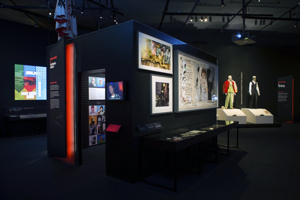
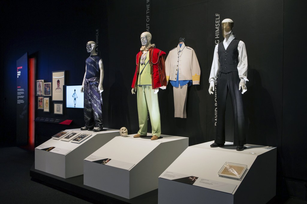

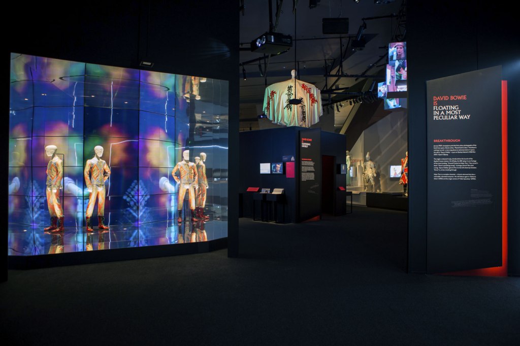


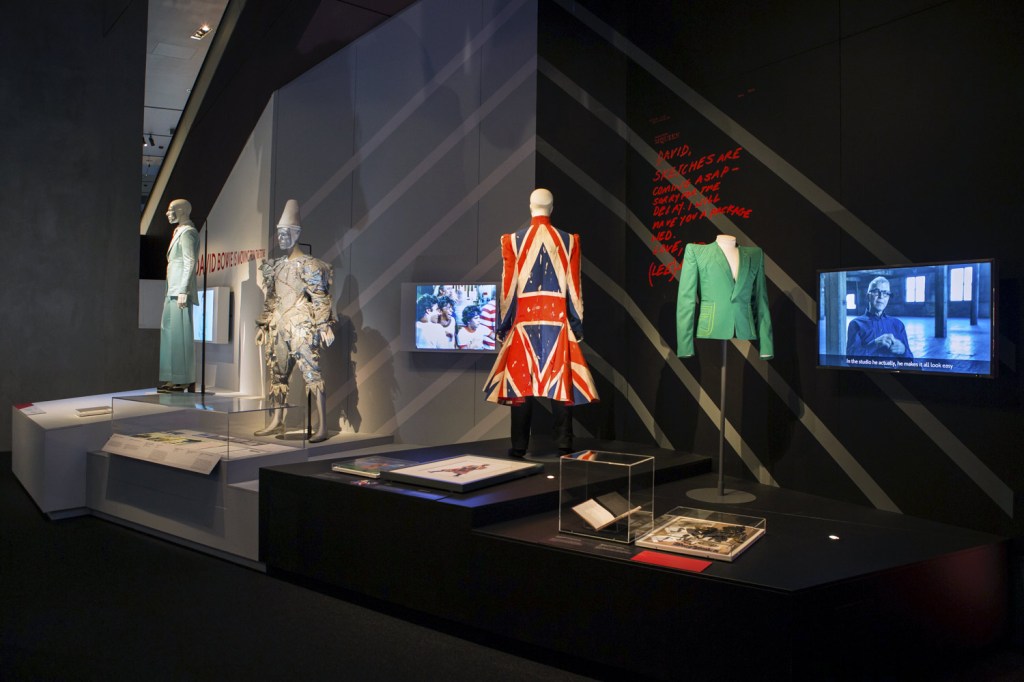


 and Freddie Burretti (British, b. 1952) (designer) 'Bodysuit with graphic print (replica)' 'Ziggy Stardust' tour and album cover 1972")
")

 (designer) 'Ice-blue suit' 1972")
 (designer) 'Asymmetric knitted bodysuit' 1973")
 'David Bowie with William Burroughs, February 1974' 1974")

 'Photo-collage by David Bowie of manipulated film stills from The Man Who Fell to Earth' 1975-1976")


 'David Bowie during the filming of the 'Ashes to Ashes' video' 1980")


 'Quilt cover' 1911")
 'Syncopated rhythm, so-called The Black Snake' 1967")
 'Propeller (Air Pavilion)' 1937")
 'Propeller (Air Pavilion)' 1937 (detail)")
 'Rhythm Colour no. 1076' 1939")
 'Court shoes' 1925")
 and two friends in Robert Delaunay’s studio, rue des Grands-Augustins, Paris' 1924")
 'Finnish woman' 1908")
 'Yellow Nude' 1908")
 'Sleeping girl' 1907")
 'Philomene' 1907")
 'Electric Prisms' 1913")
 'Electric Prisms' 1913-1914")
 'Prismes electrique' 1914")
 'Prismes electrique' 1914 (detail)")


 'Sonia Delaunay in her studio at boulevard Malesherbes, Paris, France' 1925")


 'Illustration for cover of 'Vogue'' 1926")
 'Simultané playing cards' 1964")
 'Coat made for Gloria Swanson' 1923-1924")
 'Simultaneous Dresses (The three women)' 1925")
 'Rythme' 1938")
 'Rythme' 1945")
 'Floating Head (Mary Taylor), New York Studio, New York, USA' 1933 from the exhibition 'Lee Miller' at the Albertina, Vienna, May - August, 2015")
 'Portrait of Lee Miller, Paris, France' 1929 from the exhibition 'Lee Miller' at the Albertina, Vienna, May - August, 2015")
 'Untitled (Exploding Hand), Paris, France' c. 1930")
 'Self Portrait, New York Studio, New York, USA' 1932")
 'Paris' 1944")
 'Picnic, Ile Sainte Marguerite, France' 1937")
 'Nude bent forward' 1930")


 'Fire Masks, London, England' 1941")
 'Irmgard Seefried, Opera Singer, Singing an Aria from Madame Butterfly, Vienna Opera House, Vienna, Austria' 1945")
 with David E. Scherman (American, 1916-1997) 'Lee Miller in Hitler's Bathtub, Munich, Germany' 1945")
 'Luxembourg' 1944")
 'SS Guard in Canal, Dachau, Germany' 1945")
 'Scharnhorst Boy, Vienna, Austria' 1945")
 'The latest hat model, Vogue Studios, London, April 1942' 1942")
 'Solarised Portrait of Lee Miller' c. 1929")
 'Solarized Portrait of an unknown model' 1930")
 and Lee Miller (American, 1907-1977) 'Neck (Portrait of Lee Miller), Paris, France' c. 1930")

You must be logged in to post a comment.