“Maier doesn’t have a partner to dance with. She sees something well enough, whereas Lee Friedlander expects something. If there is an idea out there in the ether she grabs onto it in a slightly derivative way. Maier states that these things happened with this subject matter but with Arbus, for example, she meets something extra/ordinary and alien – and goes beyond, beyond, beyond.”
Dr Marcus Bunyan May 2014
The next best thing
The photographs of Vivian Maier. Unknown in her lifetime (nanny as secretive photographer), her negatives discovered at an auction after her death – some developed, all scanned, in some cases cropped, the medium format images then printed. The latest “must have” for any self respecting photography collection, be it private or public. But are they really that good?
To be unequivocal about it, they are good – but, in most cases, they are not “great”. Maier is a very good photographer but she will never be a great photographer. This might come as a surprise to the legions of fans on Facebook (and the thousands of ‘Likes’ for each image), those who think that she is the best thing since sliced bread. But let’s look at the evidence – the work itself.
The photographs can seen on the Vivian Maier Official website and I have spent quite a lot of time looking at them. As with any artist, there are some strong images and some not so strong ones but few reach ‘master’ status. The lighting is good, the use of low depth of field, the location and the presence of the people she photographed are all there, as are the influences that you recite in your mind as to the people her photographs remind you of: Lewis Hine, Berenice Abbott, Lisette Model, Diane Arbus, Helen Levitt, Lee Friedlander et al.
Somehow through all this she makes the photographs she takes her own for she has a “rare sense of photographic vision” as Edward Petrosky expressed it on my LinkedIn page, but ultimately they don’t really take you anywhere. It’s like she has an addiction to taking photographs (a la Gary Winogrand), but no way of advancing her art to the next level.
Vivien Maier’s photographs stand out because she hasn’t withheld enough within them. What do I mean by that? Let’s look at some examples to explain what I mean…
Included in the postings are two comparisons: Vivian Maier, June 19, 1961, Chicago IL, 1961 / Lee Friedlander, Stony Point, New York, 1966; and Vivian Maier, New York, Nd 1966 / Berenice Abbott, New York at Night, 1932. As with most of Maier’s photography, she relies on intuition when taking a photograph and a bloody good intuition it is too. This intuition usually stands her in good stead and she almost always gets the shot, but there is an underlying lack of structure to her images. Here I am talking as much about psychological structure as physical structure, for both go hand in hand.
If we compare the Maier with the Friedlander we can say that, if we look at the windows in the Friedlander, every one is a masterpiece! From the mother and son at left with the white-coated marchers, to the central window with the miniature house, dog and tree, to the dark-suited marchers at right. Everything feels compelling, intricate weavings of a narrative that the viewer has to try and make sense of. Each part of the Friedlander image is absolutely necessary for that picture… whereas there are so many things in the Vivien Maier that belong in other pictures ie. a good picture but a lot that doesn’t belong in that picture. Things that should have been held back, by making another image somewhere else. Her narrative is confusing and thus the eye is also confused.
A similar scenario can be observed when comparing the photographs of New York at night by Abbott and Maier. Abbott’s photograph is a tight, orchestrated and muscular rendition of the city which seethes with energy and form. Maier’s interpretation fades off into nothingness, the main arterials of the city leading the eye up to the horizon line and then [nothing]. It is a pleasant but wishy-washy photograph, with all the energy of the city draining away in the mind and in the eye.
One of Maier’s photographs that most resonates with me is September 1953, New York, NY (1953, below). This IS a masterpiece. There is a conciseness of vision here, reminiscent of Weston’s Nude of 1938 with its link to the anamorphic structure of his photographs of peppers. There is nothing auxiliary to the purpose of the photograph, yet there is that indefinable something that takes it out of itself. The dirt of the clothes, under the fingers, the ring on the hand, the shape that no human should be in and its descent onto the pavement, the despair of that descent captured in the angle of the camera looking down on the victim. The photograph has empathy, promotes understanding and empathy in the viewer. Most of us have been there. Other photographs that approach a higher perspective are Maier’s self-portraits, in which there is a conscious exploration of her reflection in/of the world: a slightly dour, serious figure reflected back from the world into the lens of the camera – a refracted identity, the phenomenon of self as light passing obliquely through the interface between one medium and another, between living, the camera and memory.
But too often Maier’s photographs are just so… obvious. Did she wait long enough for the composition to reveal itself to her more, god what’s the word, more ambiguously. Maier doesn’t have a partner to dance with. She sees something well enough, whereas Lee Friedlander expects something. If there is an idea out there in the ether she grabs onto it in a slightly derivative way. Maier states that these things happened with this subject matter but with Arbus, for example, she meets something extra/ordinary and alien – and goes beyond, beyond, beyond.
What we can say is that Maier’s vision is very good, her intuition excellent, but there is, critically, not that indefinable something that takes her images from good to great. This is the key thing – everything is usually thrown at the image, she withholds nothing, and this invariably stops them taking that step to the next level. This is a mighty difficult step for any artist to take, let alone one taking photographs in the shadows.
Personally I don’t believe that these images are a “photographic revelation” in the spirit of Minor White. What is a revelation is how eagerly they have been embraced around the world as great images without people really looking deeply at the work; how masterfully they have been promoted through films, books, websites and exhibitions; how Maier’s privacy has been expunged in the quest for dollars; and how we know very little about her vision for the negatives as there are no extant prints of the work.
Dr Marcus Bunyan
Many thankx to the Château de Tours for allowing me to publish the photographs in the posting. Please click on the photographs for a larger version of the image.
Edward Weston (American, 1886-1958) Nude 1936 Gelatin silver print
Vivian Maier was the archetypal self-taught photographer with a keen sense of observation and an eye for composition. She was born in New York in 1926, but spent part of her childhood in France before returning to New York in 1951 when she started taking photos. In 1956, she moved to Chicago, where she lived until her death in 2009.
Her talent is comparable with that of the major figures of American street photography such as Lisette Model, Helen Levitt, Diane Arbus and Garry Winogrand. The exhibition presented at the Château de Tours by the Jeu de Paume, in partnership with the Municipality of Tours and diChroma photography, is the largest ever exhibition in France devoted to Vivian Maier. It includes 120 black and white and colour gelatin silver prints from the original slides and negatives, as well as extracts from Super 8 films she made in the 60s and 70s. This project, which is sourced from John Maloof’s collection, with the valuable assistance of Howard Greenberg Gallery in New York, reveals a poetic vision that is imbued with humanity.
John Maloof discovered Vivian Maier’s astonishing photos completely by chance in 2007 at an auction in Chicago. At the time, this young collector was looking for historical documentation about a specific neighbourhood of the city and he bought a sizeable lot of prints, negatives and slides (of which a major part had not even been developed) as well as some Super 8 films by an unknown and enigmatic photographer, Vivian Maier. By all accounts, Vivian Maier was a discreet person and somewhat of a loner. She took more than 120,000 photos over a period of thirty years and only showed this consequential body of work to a mere handful of people during her lifetime.
Vivian Maier earned her living as a governess, but all her free time and every day off was spent walking through the streets of New York, then later Chicago, with a camera slung around her neck (first of all box or folding cameras, later a Leica) taking photos. The children she looked after describe her as a cultivated and open-minded woman, generous but not very warm. Her images on the other hand bear witness to her curiosity for everyday life and the attention she paid to those passers – by who caught her eye: facial features, bearing, outfits and fashion accessories for the well-to-do and the telltale signs of poverty for those who were less fortunate.
While some photos are obviously furtively taken snapshots, others bear witness to a real encounter between the photographer and her models, who are photographed face-on and from close up. Her photos of homeless people and people living on the fringe of society demonstrate the depth of her empathy as she painted a somewhat disturbing portrait of an America whose economic boom was leaving many by the wayside.
Vivian Maier remained totally unknown until her death in April 2009. She had been taken in by the Gensburgs, for whom she had worked for almost seventeen years, and many of her possessions as well as her entire photographic output had been placed in storage. It was seized and sold in 2007 to settle unpaid bills.
Her biography has now been reconstructed, at least in part, thanks to a wealth of research and interviews carried out by John Maloof and Jeffrey Goldstein after the death of Vivian Maier. Jeffrey Goldstein is another collector who purchased a large part of her work. According to official documents, Vivian Maier was of Austro-Hungarian and French origin and her various trips to Europe, in particular to France (in the Alpine valley of Champsaur where she spent part of her childhood) have been clearly identified and documented. However, the circumstances that led her to take an interest in photography and her life as an artist remain veiled in mystery.
Photography seemed to be much more than a passion: her photographic activity was the result of a deeply felt need, almost an obsession. Each time she changed employers and had to move house, all her boxes and boxes of films (that she hadn’t had developed for want of money), as well as her archives comprising books and press cuttings about various stories in the news, came along too.
Vivian Maier’s body of work highlights those seemingly insignificant details that she came across during her long walks through the city streets: odd gestures, strange figures and graphic arrangements of figures in space. She also produced a series of captivating self-portraits from her reflection in mirrors and shop windows.
Curators: Organised by Barry Bergdoll (Acting Chief Curator of Architecture and Design, MoMA) and Carole Ann Fabian (Director, Avery Architectural and Fine Arts Library), with Janet Parks (Curator of Drawings & Archives, Avery) and Phoebe Springstubb (Curatorial Assistant, MoMA)
Frank Lloyd Wright (American, 1867-1959) Grouped Towers, Chicago Project 1930 Perspective Pencil on tracing paper 19 x 28 1/4″ (48.3 x 71.8cm) The Frank Lloyd Wright Foundation Archives (The Museum of Modern Art | Avery Architectural & Fine Arts Library, Columbia University, New York)
A change of pace now… some exquisite drawings in this posting about the work of Frank Lloyd Wright. It’s a pity they can’t build a skyscraper such as the beautiful Mile High in Melbourne, instead of all the non-descript towers that are going up all over the place. At least we would then have a masterpiece on our hands.
Dr Marcus Bunyan
Many thankx to MoMA for allowing me to publish the art work and photographs in the posting. Please click on the photographs for a larger version of the image.
Frank Lloyd Wright (American, 1867-1959) Grouped Towers, Chicago Project 1930 Plan of the five towers and shared pedestal Pencil on tracing paper 13 3/4 x 35 3/8″ (34.9 x 89.9cm) The Frank Lloyd Wright Foundation Archives (The Museum of Modern Art | Avery Architectural & Fine Arts Library, Columbia University, New York)
Frank Lloyd Wright (American, 1867-1959) Broadacre City Project 1934-1935 Study for a plan of a highway interchange Pencil and coloured pencil on tracing paper 22 x 35″ (55.9 x 88.9cm) The Frank Lloyd Wright Foundation Archives (The Museum of Modern Art | Avery Architectural & Fine Arts Library, Columbia University, New York)
Frank Lloyd Wright and the City: Density vs. Dispersal celebrates the recent joint acquisition of Frank Lloyd Wright’s extensive archive by MoMA and Columbia University’s Avery Architectural and Fine Arts Library. Through an initial selection of drawings, films, and large-scale architectural models, the exhibition examines the tension in Wright’s thinking about the growing American city in the 1920s and 1930s, when he worked simultaneously on radical new forms for the skyscraper and on a comprehensive plan for the urbanisation of the American landscape titled “Broadacre City.” Visitors encounter the spectacular 12-foot-by-12-foot model of this plan, which merges one of the earliest schemes for a highway flyover with an expansive, agrarian domain.
Promoted and updated throughout Wright’s life, the model toured the country for several years in the 1930s, beginning with a display at Rockefeller Center. This dispersed vision is paired with Wright’s innovative structural experiments for building the vertical city. Projects, from the early San Francisco Call Building (1912), to Manhattan’s St. Mark’s-in-the-Bouwerie Towers (1927-1931), to a polemical mile-high skyscraper, engage questions of urban density and seek to bring light and landscape to the tall building. Highlighting Wright’s complex relationship to the city, the material reveals Wright as a compelling theorist of both its horizontal and vertical aspects. His work, in this way, is not only of historic importance but of remarkable relevance to current debates on urban concentration.
Text from the MoMA website
Frank Lloyd Wright and his assistant Eugene Masselink installing the exhibition Frank Lloyd Wright: American Architect at The Museum of Modern Art, November 13, 1940 – January 5, 1941. Photographic Archive. The Museum of Modern Art Archives, New York Photo: Soichi Sunami
Frank Lloyd Wright (American, 1867-1959) Broadacre City Project 1934-1935 Model under construction in Chandler, Arizona, 1935 Gelatin silver print on paper 4 1/4 x 6 5/8″ (10.8 x 16.8cm) The Frank Lloyd Wright Foundation Archives (The Museum of Modern Art | Avery Architectural & Fine Arts Library, Columbia University, New York) Photo: Roy E. Peterson
Frank Lloyd Wright (American, 1867-1959) Broadacre City Project 1934-1935 Taliesin fellows working on the model. Chandler, Arizona, 1935 Gelatin silver print on paper 9 9/16 x 7″ (24.3 x 17.8cm) The Frank Lloyd Wright Foundation Archives (The Museum of Modern Art | Avery Architectural & Fine Arts Library, Columbia University, New York)
Frank Lloyd Wright (American, 1867-1959) Broadacre City Project 1934-1935 Model in four sections Painted wood, cardboard, and paper 152 x 152″ (386.1 x 386.1cm) The Frank Lloyd Wright Foundation Archives (The Museum of Modern Art | Avery Architectural & Fine Arts Library, Columbia University, New York)
Frank Lloyd Wright (American, 1867-1959) H. C. Price Company Tower, Bartlesville, Oklahoma 1952-1956 Apprentices working on the model in the Taliesin drafting room. Spring Green, Wisconsin, c. 1952 Gelatin silver print on paper 7 3/4 x 9 1/2″ (19.7 x 24.1cm) The Frank Lloyd Wright Foundation Archives (The Museum of Modern Art | Avery Architectural & Fine Arts Library, Columbia University, New York)
The Museum of Modern Art presents Frank Lloyd Wright and the City: Density vs. Dispersal, which celebrates the recent joint acquisition of Frank Lloyd Wright’s extensive archive by MoMA and Columbia University’s Avery Architectural and Fine Arts Library, on view from February 1 to June 1, 2014. Frank Lloyd Wright (1867- 1959) – perhaps the most influential American architect of the 20th century – was deeply ambivalent about cities. For decades, Wright was seen as the prophet of America’s post–World War II suburban sprawl, yet the dispersed cities that he envisaged were also carefully planned – quite distinct from the disorganised landscapes that often developed instead. Paradoxically, Wright was also a lifelong prophet of the race for height that has played out around the world. Through an initial selection of drawings, films, and large-scale architectural models, the exhibition examines the tension in Wright’s thinking about the growing American city from the 1920s to the 1950s, when he worked simultaneously on radical new forms for the skyscraper and on a comprehensive plan for the urbanisation of the American landscape titled “Broadacre City.” The exhibition is organised by Barry Bergdoll, Acting Chief Curator of Architecture and Design, MoMA, and Carole Ann Fabian, Director, Avery Architectural and Fine Arts Library, with Janet Parks, Curator of Drawings & Archives, Avery Architectural and Fine Arts Library, and Phoebe Springstubb, Curatorial Assistant, Department of Architecture and Design, MoMA.
On view is Wright’s 1934-35 manifesto project, for what he called “Broadacre City,” which embodied his quest for a city of private houses set in nature and spread across the countryside. He believed that advances in technology had rendered obsolete the dense cities created by industry and immigration in the late 19th and early 20th centuries. Distributed along a rectilinear grid, these one-acre homesteads were to be combined with small-scale manufacturing, community centers, and local farming, and interspersed with parklands to form a carpet-like pattern of urbanisation. Visitors encounter the spectacular 12-foot-by-12-foot model of this plan, which merges one of the earliest schemes for a highway flyover with an expansive, agrarian domain. Promoted and updated throughout Wright’s life, the model toured the country for several years in the 1930s, beginning with a display at New York City’s Rockefeller Center. It is juxtaposed with the monumental models and drawings produced of his skyscraper visions: the six-foot tall model of his 1913 San Francisco Call Building; the model of his only built residential tower, the Price Tower, in Bartlesville, Oklahoma of 1952-56; and the eight-foot drawings of the Mile High tower project.
This dispersed vision is paired with Wright’s innovative structural experiments for building the vertical city, which engaged questions of urban density and sought to bring light and landscape settings to tall buildings. His ambitions grew from a 24-story design for the offices of the San Francisco Call newspaper (1913) to the 548-story, mile-high tower he envisioned in Chicago (1956) – a building large enough to house the entire population of Broadacre City. Wright’s proposal for the San Francisco Call Building celebrates verticality: repeated piers emphasise the height, drawing the eye up to a startlingly cantilevered cornice pierced with slots that frame the sky and allow daylight to wash the facades for dramatic effect. His design for the National Life Insurance Company Building (1924-1925) features a tower clad entirely in glass, setting aside the load-bearing frame of the Call Building to experiment with the curtain wall and other new building technologies. The project reveals Wright as a key participant in international debates on the possibility of cladding a tall building with a transparent glass facade, rather than cladding it in ornamental masonry for decorative effect.
An unregulated building boom in the 1920s in New York and Chicago resulted in an unprecedented urban density that Wright described as “congestion.” In response, he devised the Skyscraper Regulation – a set of design rules governing the lateral and vertical growth of American cities. By regulating the location and height of tall buildings, Wright sought to optimise light and views and to minimise the effects of closely spaced tall buildings that were turning urban streets into shadowy canyons. Wright’s Skyscraper Regulation was his last attempt to address the inherited city. He would turn instead to devising a set of regulations for an entirely new and dispersed urban fabric (Broadacre City), in which the unit of the city block was exchanged for the farmed acre.
In 1927, Wright’s design for the financially troubled Church of St. Mark’s-in-the-Bowery dramatically transformed the building by having the floors project outward from a single central core plunged deep into the ground. The concrete floors tapered toward the periphery, which he compared to the structural concept of the “taproot” of a tree. This “taproot” structure was finally tested in built form in the S.C. Johnson & Son Research Laboratory Tower (1943-1950) in Racine, Wisconsin. In 1956, Wright unveiled a 26-foot-tall rendering of a gleaming, vertiginously tapered skyscraper – which he said would house 100,000 employees of the state of Illinois. The mile-high tower adopts the “taproot” structure he had articulated 30 years before, in which a skyscraper’s vertical ascent is stabilised by a foundation plunged deep into the ground. Both a polemic and a rationalised proposal for the future of tall buildings, the Mile High marks the definitive return of Wright’s tower to the city. The Mile High embodies Wright’s paradoxical attitude toward the American city: meant to condense the experience of urban life and work within a single telescoping form, freeing the ground for the realisation of Broadacre, holding in tension two idealized images of the city – its extraordinary vertical reach and its extreme horizontal extension.
Press release from the MoMA website
Frank Lloyd Wright (American, 1867-1959) National Life Insurance Company Building, Chicago Project 1924-1925 Axonometric view Coloured pencil on tracing paper 40 x 24″ (101.6 x 61cm) The Frank Lloyd Wright Foundation Archives (The Museum of Modern Art | Avery Architectural & Fine Arts Library, Columbia University, New York)
Frank Lloyd Wright (American, 1867-1959) S.C. Johnson & Son Inc. Research Laboratory Tower, Racine, Wisconsin 1943-1950 Section Pencil, coloured pencil, and ink on tracing paper 35 1/8 x 20″ (89.2 x 50.8cm) The Frank Lloyd Wright Foundation Archives (The Museum of Modern Art | Avery Architectural & Fine Arts Library, Columbia University, New York)
Frank Lloyd Wright (American, 1867-1959) St. Mark’s-in-the-Bouwerie Towers, New York Project 1927-1931 Aerial perspective Pencil and coloured pencil on tracing paper 23 3/4 x 15″ (60.3 x 38.1cm) The Museum of Modern Art, New York. Jeffrey P. Klein Purchase Fund, Barbara Pine Purchase Fund, and Frederieke Taylor Purchase Fund
Frank Lloyd Wright (American, 1867-1959) St. Mark’s-in-the-Bouwerie Tower, New York Project 1927-1931 Perspective, 1928 Pencil and coloured pencil on tracing paper 28 1/4 x 10 1/8″ (71.8 x 25.7cm) The Frank Lloyd Wright Foundation Archives (The Museum of Modern Art | Avery Architectural & Fine Arts Library, Columbia University, New York)
Frank Lloyd Wright (American, 1867-1959) St. Mark’s-in-the-Bouwerie Tower, New York Project 1927-1931 Section and perspective cutaway of a duplex apartment with balcony and living-room floor plans, 1929 Ink, pencil, and coloured pencil on linen window shade 47 x 35″ (119.4 x 88.9cm) The Frank Lloyd Wright Foundation Archives (The Museum of Modern Art | Avery Architectural & Fine Arts Library, Columbia University, New York)
Frank Lloyd Wright (American, 1867-1959) The San Francisco Call Building Project 1913 Preliminary perspective Pencil, coloured pencil, and cut-and-pasted tracing paper on paper 47 3/4 x 23 7/8″ (121.3 x 60.6cm) The Frank Lloyd Wright Foundation Archives (The Museum of Modern Art | Avery Architectural & Fine Arts Library, Columbia University, New York)
Frank Lloyd Wright (American, 1867-1959) The Mile High Illinois, Chicago Project 1956 Perspective with Wright’s Golden Beacon Apartment Building project (1956-1957) Pencil, coloured pencil, ink, and gold ink on tracing paper 105 x 30″ (266.7 x 76.2cm) The Frank Lloyd Wright Foundation Archives (The Museum of Modern Art | Avery Architectural & Fine Arts Library, Columbia University, New York)
The Museum of Modern Art 11 West 53 Street New York, NY 10019 Phone: (212) 708-9400
Opening hours: 10.30 am – 5.30 pm Open seven days a week
In researching photographs for the upcoming exhibition Out of the closets, onto the streets: Gay Liberation photography 1971-73I came across this photograph taken by Ponch Hawkes of the Gay Liberation march that was part of Gay Pride week in 1973. Ponch had never seen this image before until I scanned the negative. And there, front and centre as always, is Rennie Ellis capturing the action… What a special find and a wonderful photograph by Ponch!
We Are Family
This is FAB, one of the best experiences I have had this year at an exhibition in Melbourne. You know you are having a good time when you laugh out loud at so many photographs, sharing the experience of the artist as though you had been there. As indeed I had, for in many cases the clubs pictured in Rennie Ellis’ photographs are the ones I went to.
I remember: Wednesday nights at Inflation in the late 80s, where to satisfy licensing restrictions you had to be served a “meal” so that you could drink alcohol (Dining Out, Inflation, 1980 below). The famous Razor Club (1986-1992), based at the Light Car Club of Australia’s clubrooms on the corner of Queens Road and Roy Street, opposite the Albert Park Lake and golf course. “It was Melbourne’s version of Studio 54, the hedonistic, off-the-wall New York disco of the late ’70s – both places notoriously hard to get into but once inside a wonderland of celebrities, freaks, transvestites and fantastic music free from the tyranny of genre.” Once on a big party night the gang of us tried to get in but the queue was so long it was impossible – so I went down the side, climbed up the drain pipes past the ladies loo, and up to the first floor balcony where someone pulled me over – completely off my face, just to get my friends in. Zu Zu’s, Cadillac Bar, 397, Commerce Club, Tasty, Freakazoid, Dome, Baseline, Hardware Club, The Peel and so many parties you could poke a stick at – what a time we had!
There to capture it all – affectionately, non-judgementally – was Rennie Ellis. He wasn’t like Diane Arbus, who thrust her camera as an outsider at people, waiting for a reaction. He was always part of the action because he was part of the family. He was a humanist photographer in the true sense of the word, for he loved photographing human beings, their social relations and their habitats, whatever that might be – sunning, partying, boozing, smoking, picking up. He referred to himself as a “people perv.”
Ellis had an eloquently “clumsy” eye, and for the type of baroque photographs he took this is a great thing. No perfect framing, no perfect tension points within the image, no regular alignment of horizontals, verticals or diagonals – just instinctual images taken in a split second, with his own particular brand of humour embedded in them. And always with this slight eccentricity in his vision. Look at the image of Dancing People, Razor Club (1991, below) and notice the odd hand poking in at the left hand side and the attitude of the dancers, or Fully equipped, Albert Park Beach (c. 1981, below), with the angle of the three cigarettes, the drink and the bottle of sun tan lotion strapped to the hip – FIERCE!
But he was not averse to understanding the structure of his images either, as can be seen by my comparison between the tight, formal structure of Paul Strand’s The Family, Luzzara, Italy (1953, below) and the looser, more natural gathering in Ellis’ The Gang, Windsor (1976, below); or the influence of other artists on his work, for example Norman Lindsay in his My Bare Lady, The Ritz, St Kilda (1977, below). Ellis also liked to push and pull at the pictorial plane; he liked to use pairs of people; he was not afraid of out of focus elements in the foreground of his images; he used chiaroscuro; and his use of light is always excellent. Above all, there is a consistency to his vision that never falters – a concatenation of images that is his style?
This is not just nostalgia. These are bloody good images, and Ellis takes these insightful type of images over and over again – the excesses of hedonism, the influences of wealth, the see-and-be-seen syndrome, things erotic and bizarre and, most importantly, enduring friendships. He photographs what he sees with a love and affection for his subject matter. None of this “staged” vernacular photography that I recently featured in an exhibition at the Art Gallery of New South Wales. This is the real deal. A friend said to me recently, “Ah, but you know, he never did in depth photo-essays like Mary Ellen Mark did of the circus, for example.” To which I have a one word reply: BULLSHIT.
His whole oeuvre is a huge photo-essay on the human race, specifically the construction of Australian identity as evidenced in sections like portraits, gangs, sharpies, Aboriginals, Kings Cross, Social Documentary, Decadence, Graffiti, Life’s a Parade, Life’s a Beach etc…
When you look at his photography it would seem to me that his images dissolve the barriers between image / subject / viewer. It’s a strange phenomena to feel so connected to a person’s work. It’s the journey that he takes us on, that we went on too – not so much the destination but the rejoicing in this journey… of company, of environment, friends, places – the joy of being human. He was allowed entry into these public/private spaces because he earned our trust. He lived with the people, and they allowed him to take a bit of their life with him – as a photographic memory, to be retold and relived in the present, allowing us all to relive those times and places. It’s the love, trust, humour and anticipation of the journey that make Ellis’ images truly unique in the history of Australian photography.
Dr Marcus Bunyan
Many thankx to Manuela Furci, Rennie Ellis Photographic Archive and the Monash Gallery of Art for allowing me to publish the photographs in the posting. Please click on the photographs for a larger version of the image.
Rennie Ellis (Australian, 1940-2003) Dancing People, Razor Club 1991 Selenium-toned gelatin silver print 26.7 x 40.7cm Courtesy of the Rennie Ellis Photographic Archive
Robyn Dean (Australian) Marcus dancing at an unknown club, Melbourne c. 1991-1992
Rennie Ellis (Australian, 1940-2003) Dining Out, Inflation 1980 Selenium-toned gelatin silver print 26.7 x 40.7cm Courtesy of the Rennie Ellis Photographic Archive
Sister Sledge – We Are Family (1979) Official Video
Rennie Ellis (Australian, 1940-2003) Fitzroy extrovert 1974 Selenium-toned gelatin silver print 40.5 x 50.8cm Courtesy of the Rennie Ellis Photographic Archive
Rennie Ellis (Australian, 1940-2003) Dino Ferrari, Toorak Road 1976 Selenium-toned gelatin silver print 26.7 x 40.7cm Courtesy of the Rennie Ellis Photographic Archive
Rennie Ellis (Australian, 1940-2003) Bon Scott and Angus Young, Atlanta, Georgia 1978 Selenium-toned gelatin silver print 26.7 x 40.7cm Courtesy of the Rennie Ellis Photographic Archive
Ronald Belford “Bon” Scott (9 July 1946 – 19 February 1980) was a Scottish-born Australian rock musician, best known for being the lead singer and lyricist of Australian hard rock band AC/DC from 1974 until his death in 1980.
Angus McKinnon Young (born 31 March 1955) is a Scottish-born Australian guitarist best known as a co-founder, lead guitarist, and songwriter of the Australian hard rock band, AC/DC. Known for his energetic performances, schoolboy-uniform stage outfits, and popularisation of Chuck Berry’s duckwalk, Rolling Stone magazine ranked Young as the 24th greatest guitarist of all time.
AC/DC’s popularity grew throughout the 1970s, initially in Australia, and then internationally. Their 1979 album Highway to Hell reached the top twenty in the United States, and the band seemed on the verge of a commercial breakthrough. However, on 19 February 1980, Scott died after a night out in London. AC/DC briefly considered disbanding, but the group quickly recruited vocalist Brian Johnsonof the British glam rock band Geordie. AC/DC’s subsequent album, Back in Black, was released only five months later, and was a tribute to Scott.
Rennie Ellis (Australian, 1940-2003) At the Pub, Brisbane 1982 Selenium-toned gelatin silver print 26.7 x 40.7cm Courtesy of the Rennie Ellis Photographic Archive
Rennie Ellis (Australian, 1940-2003) The Gang, Windsor 1976 Selenium-toned gelatin silver print 26.7 x 40.7cm Courtesy of the Rennie Ellis Photographic Archive
Paul Strand (American, 1890-1976) The Family, Luzzara, Italy 1953 Silver gelatin photograph
The photographer Rennie Ellis (1940-2003) is a key figure in Australian visual culture. Ellis is best remembered for his effervescent observations of Australian life during the 1970s-90s, including his now iconic book Life is a beach. Although invariably inflected with his own personality and wit, the thousands of social documentary photographs taken by Ellis during this period now form an important historical record.
The Rennie Ellis Show highlights some of the defining images of Australian life from the 1970s and ’80s. This is the period of Gough Whitlam and Malcolm Fraser, Paul Keating and Bob Hawke; AC/DC and punk rock; cheap petrol and coconut oil; Hare Krishnas and Hookers and Deviant balls.
This exhibition of over 100 photographs provides a personal account of what Ellis termed ‘a great period of change’. Photographs explore the cultures and subcultures of the period, and provide a strong sense of a place that now seems worlds away, a world free of risk, of affordable inner city housing, of social protest, of disco and pub rock, of youth and exuberance.
Text from the MGA website
Rennie Ellis (Australian, 1940-2003) My son Josh learns to swim 1972 Selenium-toned gelatin silver print 26.7 x 40.7cm Courtesy of the Rennie Ellis Photographic Archive
Rennie Ellis (Australian, 1940-2003) My Bare Lady, The Ritz, St Kilda 1977 Digital C Type photograph Fuji Crystal Archive print Courtesy of the Rennie Ellis Photographic Archive
Norman Lindsay (Australian, 1879-1969) The Olympians Nd Oil on canvas Collection of Hamilton Art Gallery
Rennie Ellis (Australian, 1940-2003) Mr Muscleman, Albert Park Beach c. 1986 Chromogenic print 26.7 x 40.7cm Courtesy of the Rennie Ellis Photographic Archive
Rennie Ellis (Australian, 1940-2003) Fully equipped, Albert Park Beach c. 1981 Digital C Type photograph Fuji Crystal Archive print Courtesy of the Rennie Ellis Photographic Archive
Rennie Ellis (Australian, 1940-2003) Don and Patrizia, St Kilda Beach 1985 Chromogenic print 40.5 x 50.8cm Courtesy of the Rennie Ellis Photographic Archive
Rennie Ellis (Australian, 1940-2003) Berlin Party, Inflation, Melbourne 1980 Digital C Type photograph Fuji Crystal Archive print Courtesy of the Rennie Ellis Photographic Archive
Rennie Ellis book covers:Decade: 1970-1980 (left) and Decadent: 1980-2000 (right)
Decade: 1970-1980 is a photography book showcasing Rennie Ellis’ (1940-2003) contribution to photography and social history. With an introduction by film maker and Rennie contemporary Paul Cox and an essay by academic Susan Van Wyk, Decade highlights Ellis as one of Australia’s most important chroniclers of the 1970s. The photographs, predominantly black and white, are drawn from a core selection originally made by Rennie from his own unpublished book, supplemented by other significant and iconic images from 1970 to 1980 drawn from the Rennie Ellis Photographic Archive and the State Library of Victoria Rennie Ellis collection. Many of the photographs are accompanied by extended captions written by Rennie himself, published here for the first time. Decade explores the cultures and sub-cultures of the seventies: the political upheavals, alternative lifestyles and counter culture, the women’s movement, gay liberation, the new religions and cults, pop festivals, Vietnam and other protests, massage parlours, the disco scene, the blossoming of Australia’s film industry, the new sexual freedom, Aboriginal rights, street festivals, the new theatre, fashion, drugs and the emergence of a decadent and hedonistic society that would later characterise the 1980s.
Decadent: 1980-2000 is a photography book showcasing Rennie Ellis’ (1940-2003) contribution to photography and social history. It is a fascinating snapshot of the wild, opulent, sometimes tacky and always decadent 1980s in Australia by a true original. With an introduction by photographer and Rennie contemporary William Yang and an essay by photographer and art critic Robert McFarlane, Decadent highlights Ellis as one of Australia’s most important chroniclers of the 1980s. The photographs, both colour and black and white, are drawn from the Rennie Ellis Photographic Archive and the State Library of Victoria Rennie Ellis collection. Decadent explores the rise of the hedonism that we now associate with the 1980s. Ellis’ boundary-pushing, racy and sometimes voyeuristic works capture a society that seems to be revelling in its abandonment of the politically charged 1970s documented in Decade.
About the Author
No other photographer has documented – in such depth – the life and times in Australia, throughout the 1970s until his death in 2003, with such insight into the human condition as Rennie Ellis. His non-judgmental approach was his ‘access-to-all-areas’ pass. Ellis used his camera as a key to open the doors to the social arenas of the rich and famous and to enter the underbelly of the nightclubs, bearing witness to the indulgences and excesses. In today’s post-[Bill] Henson era, these captured moments offer an intimate access to an Australia tantalisingly, but sadly, now almost out of reach.
Rennie Ellis (Australian, 1940-2003) Richmond fans, Grand Final, MCG 1974 Chromogenic print 40.5 x 50.8 cm Courtesy of the Rennie Ellis Photographic Archive
Interesting to note that Ellis must have been shooting both black and white and colour film during the VFL Grand Final of 1974. He must have had two cameras with him (this is more likely than swapping between films in the same 35mm camera) to shoot the photograph above in colour and the black and white image of Robbie McGhie (1974, below).
Rennie Ellis (Australian, 1940-2003) Robert McGhie, Grand Final, MCG 1974 Selenium-toned gelatin silver print 50.8 x 40.5cm Courtesy of the Rennie Ellis Photographic Archive
Robert ‘Robbie’ McGhie is a former Australian rules football player who played in the VFL between 1969 and 1972 and again in 1979 for the Footscray Football Club, from 1973 to 1978 for the Richmond Football Club and in 1980 and 1981 for the South Melbourne Football Club. His height was 192 cm and he weighed 85.5 kg. He played 46 games for Footscray, 80 games for Richmond and 16 games for South Melbourne. He was a Richmond Premiership Player 1973, 1974 (the year this photograph by Rennie Ellis was taken at the Grand Final).
Rennie Ellis (Australian, 1940-2003) Property of Hells Angels, Kings Cross 1970-1971 Selenium-toned gelatin silver print 50.8 x 40.5cm Courtesy of the Rennie Ellis Photographic Archive
Invitation to The Rennie Ellis Show at the Monash Gallery of Art
Monash Gallery of Art 860 Ferntree Gully Road, Wheelers Hill Victoria 3150 Australia Phone: + 61 3 8544 0500
Traveller Homes, a film about Dave Fawcett made by Tom Hunter and Robin Christian in France in 2013.
“Sadly a large part of this activity has become transformed into a nostalgic archive for a lifestyle that has largely disappeared from the highways & byways of England.” (Dave Fawcett, 2013)
Dave Fawcett’s archive of converted buses and trucks is a unique photographic record which formed the basis for his Traveller Homes website. His topographic studies record a segment of English social history, which still struggles to survive.
Since graduating from Leicester University in 1984 ‘Traveller’ Dave Fawcett has embraced the bender lifestyle. His first ‘mobile home’ was an ex-British Telecom Bedford TK. In 1992 he bought a 1966 Albion Chieftain furniture lorry and drove it on a one-way trip to Europe. He survives as a fruit picker during the summer months and still lives on his bus.
A selection from Dave Fawcett’s ‘Traveller Homes’ series is showing in Life on the Road, a Photography and the Archive Research Centre (PARC) project, made in partnership with London College of Communication as part of Green Week, 2014.
The exhibition features photography by Tom Hunter and Dave Fawcett and films by Andrew Gaston, at London College of Communication from 6 – 26 February 2014.
The Chanel Legend exhibition dates: 28th February – 18th May, 2014 New Women exhibition dates: 28th February – 27th July, 2014
Yva (German, 1900-1944) Silk stockings Nd Silver gelatin print Museum für Kunst und Gewerbe Hamburg
Yva (26 January 1900 – 31 December 1944) was the professional pseudonym of Else Ernestine Neuländer-Simon who was a German Jewish photographer renowned for her dreamlike, multiple exposed images. She became a leading photographer in Berlin during the Weimar Republic. When the Nazi Party came to power, she was forced into working as a radiographer. She was deported by the Gestapo in 1942 and murdered, probably in the Majdanek concentration camp during World War II.
Do you feel like a new woman?
Do you feel like a god?
You, in the oft mentioned (ten times in the accompanying texts) LBD (Little Black Dress) or Chanel Suit (ten times as well)
It’s like the ten commandments.
And ~ on we go… say after me,
“Sashay! Shantay!”
PS some of the photos ain’t half bad tho!
Dr Marcus Bunyan
Many thankx to the Museum für Kunst und Gewerbe Hamburg for allowing me to publish the photographs in the posting. Please click on the photographs for a larger version of the image.
‘Sleeping with the Enemy, Coco Chanel and the Secret War’ written by Hal Vaughan further solidifies the consistencies of the French intelligence documents released by describing Coco as a “vicious anti-Semite” who praised Hitler.
World War II, specifically the Nazi seizure of all Jewish-owned property and business enterprises, provided Chanel with the opportunity to gain the full monetary fortune generated by Parfums Chanel and its most profitable product, Chanel No. 5. The directors of Parfums Chanel, the Wertheimers, were Jewish. Chanel used her position as an “Aryan” to petition German officials to legalise her claim to sole ownership.
“On 5 May 1941, she wrote to the government administrator charged with ruling on the disposition of Jewish financial assets. Her grounds for proprietary ownership were based on the claim that Parfums Chanel “is still the property of Jews” and had been legally “abandoned” by the owners”. …
Chanel was not aware that the Wertheimers, anticipating the forthcoming Nazi mandates against Jews had, in May 1940, legally turned control of Parfums Chanel over to Félix Amiot, a Christian French businessman and industrialist. At war’s end, Amiot returned “Parfums Chanel” to the hands of the Wertheimers.
During the period directly following the end of World War II, the business world watched with interest and some apprehension the ongoing legal wrestle for control of Parfums Chanel. Interested parties in the proceedings were cognisant that Chanel’s Nazi affiliations during wartime, if made public knowledge, would seriously threaten the reputation and status of the Chanel brand. Forbes magazine summarised the dilemma faced by the Wertheimers: [it is Pierre Wertheimer’s worry] how “a legal fight might illuminate Chanel’s wartime activities and wreck her image – and his business.”
Aenne Biermann (German, 1898-1933) Self-Portrait with silver ball 1931 Silver gelatin print Museum für Kunst und Gewerbe, Hamburg
Aenne Biermann (German, 1898-1933)
Aenne Biermann (March 8, 1898 – January 14, 1933), born Anna Sibilla Sternfeld, was a German photographer of Ashkenazi origin. She was one of the major proponents of New Objectivity, a significant art movement that developed in Germany in the 1920s.
Major exhibitions of her work include the Munich Kunstkabinett, the Deutscher Werkbund and the exhibition of Folkwang Museum in 1929. Other important exhibitions include the exhibition entitled Das Lichtbild held in Munich in 1930 and the 1931 exhibition at the Palace of Fine Arts (French: Palais des Beaux Arts) in Brussels.
Horst P. Horst (German-American, 1906-1999) Coco Chanel 1937 Silver gelatin print Museum für Kunst und Gewerbe Hamburg
Horst P. Horst(German-American, 1906-1999)
Horst Paul Albert Bohrmann (August 14, 1906 – November 18, 1999), who chose to be known as Horst P. Horst, was a German-American fashion photographer. …
Horst is best known for his photographs of women and fashion, but is also recognised for his photographs of interior architecture, still lifes, especially ones including plants, and environmental portraits. One of the great iconic photos of the Twentieth-Century is “The Mainbocher Corset” with its erotically charged mystery, captured by Horst in Vogue‘s Paris studio in 1939. Designers like Donna Karan continue to use the timeless beauty of “The Mainbocher Corset” as an inspiration for their outerwear collections today. His work frequently reflects his interest in surrealism and his regard of the ancient Greek ideal of physical beauty.
His method of work typically entailed careful preparation for the shoot, with the lighting and studio props (of which he used many) arranged in advance. His instructions to models are remembered as being brief and to the point. His published work uses lighting to pick out the subject; he frequently used four spotlights, often one of them pointing down from the ceiling. Only rarely do his photos include shadows falling on the background of the set. Horst rarely, if ever, used filters. While most of his work is in black & white, much of his colour photography includes largely monochromatic settings to set off a colourful fashion. Horst’s colour photography did include documentation of society interior design, well noted in the volume Horst Interiors. He photographed a number of interiors designed by Robert Denning and Vincent Fourcade of Denning & Fourcade and often visited their homes in Manhattan and Long Island. After making the photograph, Horst generally left it up to others to develop, print, crop, and edit his work.
One of his most famous portraits is of Marlene Dietrich, taken in 1942. She protested the lighting that he had selected and arranged, but he used it anyway. Dietrich liked the results and subsequently used a photo from the session in her own publicity.
Boris Lipnitzki (1887-1971) was a Ukrainian-born French photographer of the arts; ballet, fashion, cinema, visual art, writing and music.
Haim Efime Boris Lipnitzki (or Lipnitzky) was born into a Jewish family in Oster, in Chernihiv Province of the Russian Empire (now Ukraine) on 4 February 1887. He died in Paris on 6 July 1971, aged 84, and is buried in Pere Lachaise cemetery.
Lipnitzki first worked for a photographer in Odessa, then opened his own studio in Pultusk. He arrived in Paris in the early 1920s. There, he established a studio at 40 rue du Colisée, where he photographed many of the artistic personalities of the 20th century from the 1920s-1960s, as well as picturing them in their own surroundings. His friendship with fashion designer Paul Poiret, with whom he would stay to photograph in Biarritz, provided an entrée into these circles.
His subjects included Maurice Ravel, René Hubert, Albert Camus, Blaise Cendrars, Jean Cocteau, Otto Preminger, Igor Strawinsky, Arthur Honegger, Leonid Massine, Serge Lifar, Paul Poiret, Coco Chanel, Olga Spessivtseva, Nyota Inyoka, Tamara Karsavina, Serge Gainsbourg, Les Six, Marc Chagall, Pablo Picasso, as well as Josephine Baker of whom in 1926 he made a famous series of nude photographs.
In the 1920s Coco Chanel chiefly influenced the type of the “new woman”. She established skirts that reached just below the knee, encouraged women to wear trousers and represents functional ladies wear. In the photographs by among others Yva, Franz Roth, Lotte Jacobi and Hein Gorny presented here, women show legs in silk stockings, wear cropped hair, drive motorbikes or automobiles and play tennis or go into baths. In this period women begin to take charge of their lives. Being a photographer offered the opportunity to express this new notion of the self in images and in life. The special display of the Photography Department coincides with the exhibition The Chanel Legend.
The Chanel Legend
Coco Chanel (1883-1971) is one of the most eminent couturières of the twentieth century. She already appears as an advocate of simple, comfortable clothes in the years just after 1910, thus helping to pave the way for a style which has retained its major importance in the fashion world till today. Such outstanding fashion classics as the “little black dress”, the Chanel Suit and the Chanel handbag are inseparably linked with her person. Since her start-up in 1913, Chanel has built up an international and, till the present day, astoundingly successful fashion empire. It is not until 1983, in the shape of Karl Lagerfeld, that a personality with anything like her charisma and influence becomes her successor. Coco – her real name was Gabrielle – Chanel launched her perfume Chanel N° 5, whose overwhelming commercial success guaranteed her a financial independence which was to last all her life, at the beginning of the 1920s. She combined fashion jewellery and genuine gemstones with surefooted confidence and had herself portraited by celebrity photographers such as Man Ray or Horst P. Horst.
The Chanel Legend investigates why it is that the person of Coco Chanel and the brand she established have attracted such huge attention up to and including the present. It will turn the spotlight both on the fashion designer’s biography and the image which she created for herself, as well as the brilliant achievement of Karl Lagerfeld (b. 1933) in combining this legacy with the fluctuating currents of contemporary taste since 1983. The exhibition shows a total of more than 200 objects from eminent collections, including women’s suits, accessoires, jewellery, advertising graphic, historical photographs and over 75 fashion magazines spanning a period from 1920 to1971. Besides more than 54 original garments, among them 38 created by Coco Chanel, and some 50 jewellery creations, over 35 adaptions of the Chanel classics can be seen for the first time, which in their own individual way give us a new appreciation of the “Chanel Legend”.
The exhibition approaches the “Chanel Legend” in three chapters. The first documents, with 38 original garments, accessoires and more than 50 items of fashion jewellery from the period between 1925 and 1971 the fashion designer’s oeuvre. Designs for evening and day wear and the perfume Chanel N° 5, of which an original flacon is on show, belong to Chanel’s pre-Second World War creative phase. After her return to Paris in 1954, Chanel continued to lead her firm up to her death in 1971. The exhibition shows, among other items from this period, some 10 garments which Chanel designed for the actress and singer Marlene Dietrich, including day wear and garments for representative occasions. On top of this, a large quantity of pieces of fashion jewellery can be seen, supplemented by original photographs.
The second chapter throws light on the Chanel classics, which have retained their fascination till today. Thus historical original examples of the Chanel Suit are juxtaposed with some 20 different adaptations of it, including models from other fashion houses, unknown ateliers and garment manufacturers. The procession of “lookalikes” and “distant cousins” by no means comes to an end with Chanel’s lifetime, but integrates aspects of contemporary fashion. A selection of the endless variations on the theme of the “little black dress” from the 1920s till the present will also be on show, some of them by designers such as Yves Saint Laurent, Max Heyman and Issey Miyake or Nina Ricci. They should by no means be seen as just copies of Chanel models. The short black dress was in keeping with the modern, dynamic lifestyle of the 1920s. Later the “little black dress” is an indispensable requisite in every woman’s wardrobe and, in the Fifties and Sixties, the epitome of Parisian chic.
In the third section, the focus is on Karl Lagerfeld’s creations for the House of Chanel. He succeeded in modernising the brand without sacrificing the features which were typical for it. The exhibition shows in particular items which quote the Chanel classics, or pay homage to his revered predecessor in some of their details. This selection, too, is complemented by fashion jewellery. The development comes full circle here, since Lagerfeld’s present winter collection for 2013-14 playfully quotes references to Coco Chanel’s legendary initial phase in the 1920s. More than 100 historical fashion magazines spanning a period from 1920 to 1971 can also be seen in the exhibition, including an issue of the American Vogue dated 1st October 1926 in which the “little black dress” is shown. Magazines were the most important medium for the propagation and reception of Chanel’s fashion. Visitors can leaf through them on the tablet computers provided.
Press release from the Museum für Kunst und Gewerbe Hamburg website
Aenne Biermann (German, 1898-1933) Portrait of Anneliese Schiesser 1929 Silver gelatin print Museum für Kunst und Gewerbe, Hamburg
Hein Gorny (German, 1904-1967) Portrait of a Woman c. 1930/1972 Silver gelatin print, Reprint ofHeinrich Riebesehl Museum für Kunst und Gewerbe, Hamburg
Hein Gorny (German, 1904-1967)
Hein Gorny (1904-1967) was a highly versatile photographer. Self-taught, he had extensive, in-depth knowledge of photographic techniques and was specialised both in photographic and darkroom processes. He photographed a broad range of subject matter, including portraits, architecture, and animals as well as images used in industrial, commercial, and illustrational contexts. In addition he created experimental photographs, primarily working with macrophotography. Advertising photography was the field in which Hein Gorny carried out numerous commissions and was most well-known. He was primarily active in Hanover and Berlin. Hein Gorny is described by Heinrich Riebesehl as a “pioneer of modern commercial photography” in a catalogue published in conjunction with the Spectrum Photogalerie’s inaugural exhibition of 1972. He was masterful in his groundbreaking ability to fuse the photographic spirit of his time with the demands of advertising photography.
“Especially in his early work, the joy of experimentation and the openness to everything new and unusual is clearly visible. His positive attitude towards life, his carefree, almost exuberant way of using the medium of photography made him – consciously or unconsciously – adopt the taste of the times.”
~ Heinrich Riebeseh
Atelier Benda/d’Ora The actress Marlene Dietrich with beret 1927 Silver gelatin print Museum für Kunst und Gewerbe Hamburg
Madame D’Ora / Dora Philippine Kallmus (Austrian, 1881-1963) The fashion designer Coco Chanel About 1927 Silver gelatin print Museum für Kunst und Gewerbe Hamburg
Dora Philippine Kallmus (Austrian, 1881-1963)
Dora Philippine Kallmus (20 March 1881 – 28 October 1963), also known as Madame D’Ora or Madame d’Ora, was an Austrian fashion and portrait photographer.
She became interested in the photography field while assisting the son of the painter Hans Makart, and in 1905 she was the first woman to be admitted to theory courses at the Graphische Lehr- und Versuchsanstalt (Graphic Training Institute). That same year she became a member of the Association of Austrian photographers. At that time she was also the first woman allowed to study theory at the Graphischen Lehr- und Versuchsanstalt, which in 1908 granted women access to other courses in photography.
In 1907, she established her own studio with Arthur Benda in Vienna called the Atelier d’Ora or Madame D’Ora-Benda. The name was based on the pseudonym “Madame d’Ora”, which she used professionally. D’ora and Benda operated a summer studio from 1921 to 1926 in Karlsbad, Germany, and opened another gallery in Paris in 1925. She was represented by Schostal Photo Agency (Agentur Schostal) and it was her intervention that saved the agency’s owner after his arrest by the Nazis, enabling him to flee to Paris from Vienna.
Her subjects included Josephine Baker, Coco Chanel, Tamara de Lempicka, Alban Berg, Maurice Chevalier, Colette, and other dancers, actors, painters, and writers.
Roger Schall was a photographer during the interwar period, a contemporary of Brassaï. He excelled in photojournalism, in which he was one of the pioneers, as well as in the photographic disciplines of fashion and portraits. In the early 30s, the “revolution” Leica and Rolleiflex allowed him to fulfill his passion for images taken on the spot. Paris was his main exploration ground, where the night allowed him to capture and expose with strength and delicacy the particular shapes of a city made of diversities.
Text from the Artsper website [Online] Cited 25/03/2021. Used under fair use conditions for the purposes of education and research
During World War II, Schall secretly documented the Nazi occupation of Paris. He also produced fashion photography for the fetish clothing company Diana Slip.
Gabrielle Chanel, who grew up in humble circumstances, opened her first Couture Salon in Paris in 1913, after she had already set up in business in 1908 as a modiste. In 1919 she moved to the Rue Cambon 31, which is still the address of the House of Chanel today. Coco Chanel’s first creative phase ended with the outbreak of war in 1939. Her fashion house stayed shut for 15 years before she dared a comeback in 1954, at the age of 70. The exhibition shows creations by Chanel from both periods. The “little black dress” becomes her trademark. Further models of day and evening wear show to what extent the fashion designer had her finger on the pulse of her time, and at the same time bear witness to the high quality of her models both in design and execution. In the 1950s and 1960s it is her women’s suits which cause a furore, first and foremost the “Chanel Suit”, which she first presented at a fashion show in 1957. Her celebrated quilted handbag, launched in February 1955 and called, simply, “2.55”, has long since attained the status of a classic and is a must in every collection of the luxury label. Her collections were always supplemented by matching fashion jewellery. Till today, Coco Chanel appears as an enigmatic and fascinating personality, and has been the theme of many films and books. Fierce controversy also surrounds her links to decision-makers of the Third Reich too, however, up to the present day.
The “little black dress” and suits by Chanel – their reception
he reception of Coco Chanel’s fashion and her style is already very widespread in her lifetime. A comparison with other contemporary couturiers reveals that Coco Chanel operated a very tolerant policy as regards the copyright for her models: The fashion designer allowed her models to be copied up to a certain point with her consent. For her, it was an acknowledgement of her eminence if women all over the world dressed in her style – an aspect whose influence on the “Chanel Legend” should not be underestimated, and which is investigated in this exhibition for the first time. In October 1926, the American Vogue magazine described a short black dress by Chanel as “The Chanel Ford – the frock that all the world will wear”. This drew a parallel between Chanel’s dress in its universality and modernity and one of the most important inventions of the time and prophesied a great future for it.
This is the birth of the “little black dress”. And although Chanel was not the first couturier to design simple black dresses for day wear it nevertheless remains inseparably linked with her name. Even the perhaps most celebrated “little black dress”, that worn by Audrey Hepburn in the film classic “Breakfast at Tiffany’s”, is often wrongly attributed to Chanel. The exhibition traces the development of the fashion classic from the 1920s till today. Another model which has gone down as an icon in fashion history is the “Chanel Suit” with its boxy, collarless jacket and often contrasting braided edgings. The term “Chanel Suit” is even quoted as a reference in the Duden. The exhibition shown here also document the fact that Coco Chanel produced a whole range of women’s suits which were adapted by other fashion houses or even home dressmakers. It is mostly no longer possible today to reconstruct whether individual models were made under licence or whether they were freely interpreted or simply copied. Irrespective of this, however, it is certain that all these models also made their contribution to the “Chanel Legend”.
Press release from the Museum für Kunst und Gewerbe Hamburg website
Australian vernacular photography. Such a large subject. Such a small exhibition.
With only 27 photographs from various artists (18 of which are shown in this posting), this exhibition can only ever be seen as the runt of the litter. I would have thought such a large area of photographic investigation needed a more expansive exposition than is offered here. There are no photobook, photo booth, Aboriginal, anonymous, authorless, family, gay or marginalised cultural photographs / snapshots. There are no light leaks, blur, fingers obstructing lenses, double exposures – all examples of serendipity and happenstance which could enter into an aesthetic arena.
Vernacular photography1 can be defined as the “creation of photographs, usually by amateur or unknown photographers both professional and amateur, who take everyday life and common things as subjects… Examples of vernacular photographs include travel and vacation photos, family snapshots, photos of friends, class portraits, identification photographs, and photo-booth images. Vernacular photographs are types of accidental art, in that they often are unintentionally artistic.”2 ‘Found photography’ is the recovery of a lost, unclaimed, or discarded vernacular photograph or snapshot.
While all of the photographs in the exhibition are unique images, some are definitely not vernacular in their construction – they are planned and staged photographs, what I would call planned happenstance (after John Krumboltz’s theory of career development). A perfect example of this are the photographs by Sue Ford (Sue Pike, 1963, printed 1988, below), Anne Zahalka (The girls #2, Cronulla beach, 2007, below) and Fiona Hall (Bondi Beach, Sydney, Australia, October 1975, below) which have an air of ceremonial seriousness that belies their classification as part of this exhibition. My favourites are the fantastic images by Glen Sloggett – witty, colourful, humorous with the photographer “acutely aware of the photographer and photograph’s role in pointedly constructing a narrative around Australian identity and history” – they are nevertheless self-deprecating enough that this does not impact on their innate “found” quality, as though the artist had just wandered along and captured the shot.
The route that the AGNSW has taken is similar to that of MoMA. Residing in the collection and shot by artists, these “vernacular” photographs are placed in a high art context. Their status as amateur or “authorless” photographs is undermined. This exhibit does not present vernacular photographs as just that. As the article on the One Street blog notes, what is being exhibited is as much about what has been collected by the AGNSW, its methodical and historicising classification, as it is about vernacular photographic form: chance, mistake and miscalculation. It is about creating a cliché from which to describe an ideal Australian identity, be it the beach, larrikinism, or the ANZAC / sporting “warrior”, and not about a true emotional resonance in the image that is created by, or come upon by, chance.
Dr Marcus Bunyan
Many thankx to the Art Gallery of New South Wales for allowing me to publish the photographs in the posting. Please click on the photographs for a larger version of the image.
1/ “What is vernacular photography? Too broad to be understood as a genre per se, it can encompass anonymous snapshots, industrial photography, scientific photography, “authorless” photography, advertising, smut, as well as work that might be perceived as “other” than any of this random list. It could be understood as an oppositional photography – outside technical or artistic histories, yet, especially with the snapshot, it could also be entirely conventionalised, a manifestation of visual banalities, or an image so enigmatic that its meaning or genesis is entirely obscured. It is mistakes & failures as much as it may not be, & how we understand the images may or may not be separate from their initial intents. Is this a category we are making up?
The idea of the vernacular in photography is also an indication of photography as a medium informing the everyday, prevalent, “naturalised.””
One Way Street. “Vernacular photography,” on One Way Street blog 20th October 2007 [Online] Cited 11/05/2014
2/ Szarkowski, John. “INTERVIEW: “Eyes Wide Open: Interview with John Szarkowski” (2006)” by Mark Durden, Art in America, May, 2006, cited in “Vernacular photography,” on the Wikipedia website [Online] Cited 11/05/2014. No longer available online. Used under fair use conditions for the purposes of education and research
Words and Photos: Geoffrey Batchen’s Writing About Vernacular Photography
“At first, I was simply interested in bringing attention to a diverse range of photographic objects and practices that had not been much written about. But I soon recognised that these objects represented a significant challenge to the predominant history of photography. This history, dominated by the values and tropes of art history, was not well-equipped to talk about photographs that were openly commercial, hybrid and mundane. Ie: the history of photography ignores most types of photography. My interest, therefore, has become more methodological and theoretical, in an effort to establish new ways to think of photography that could address the medium as a whole. I suggest that any substantial inclusion of vernacular photographs into a general history of photography will require a total transformation of the character of that history…
I suggest that any inclusion of vernacular photography in the larger story, will require a complete transformation of the character of that story; it will require a new kind of history altogether. My writings may have encouraged this idea, but I am just one of many scholars who have been pursuing this goal. Indeed, I would say that this idea is now the norm. The next step is to look beyond this and engage other parts of the history of photography that have been similarly neglected. For example, there are many researchers at the moment that are examining the photographs produced outside Europe and the United States, such as China, Indonesia, and Africa…
Snapshots are complicated objects. They are unique to each maker and almost always completely generic. They happily adopt the visual economy that mediates most photographic practices: same but different. You might say that every snapshot is an authentic copy of a prescribed set of middle-class values and familiar pictorial clichés. That does not make them any less fascinating, especially for people who treasure them. But it does make them difficult to write about…
It is certainly possible to recognise the existence of regional practices of photography. I wrote, for example, about the making of fotoescultura in Mexico, and about a specific form of ambrotype in Japan. No doubt one could claim to see some regional aspects of snapshots made in the United States that distinguish them from ones made in Australia or, say, Indonesia. But the more challenging task is to talk about those things that can’t be seen. For example, snapshots made in Australia and China may look exactly the same to my eye, but it stands to reason that they don’t mean the same thing (after all, access to the camera for personal photos is a fairly recent phenomenon in China). We must learn how to write these kind of differences.”
Interview by LG. “Words and Photos: Geoffrey Batchen’s Writing About Vernacular Photography,” on the LesPHOTOGRAPHES.com website Nd (translated from the French) [Online] Cited 04/05/2014. No longer available online. Used under fair use conditions for the purposes of education and research
After relocating from USA to Australia in 1973, Ed Douglas spent a few years living in the country prior to taking on a teaching position at Sydney College for the Arts in 1976. The series City-spaces was commenced in Sydney and then developed further when Douglas moved to Adelaide in 1977. Having been schooled in the formal traditions of American documentary photography, Douglas’s images appear like notations of an urban explorer attempting to locate himself in a new country. Seemingly fragmentary, they look at the specificities of the mundane and the ordinary. Close acquaintances such as photographers Ingeborg Tyssen and John F. Williams appear in City spaces #29 and City spaces #28, indicating the personal nature of the series.
Intimately scaled and tonally rich, the black and white images exalt the formal beauty which can be found in the random textures of daily existence. They are also permeated with gentle humour and a sense of quiet drama that unfolds in the strangely misplaced confluences of objects, figures and spaces. Douglas’s interest in the formal and emotional qualities of topography was emblematic of new approaches in documentary photography of the time. His 1983 series of colour photographs depicting the gypsum mine on Kangaroo Island (collection of AGNSW) developed this trajectory further by fusing the aesthetics of abstraction and objective documentation.
Gerrit Fokkema’s photographs of everyday Sydney and Canberra in the early 1980s are examples of Australian photography becoming more self-aware. These decisive snapshots of suburban life reveal an irony and conjure Fokkema’s own history growing up in Queanbeyan. Though captured in seemingly banal settings, the images intrigue, pointing to issues beyond what is represented in the frame. The housewife watering the road and a young tattooed man in front of a car are both depicted alone within a sprawling suburban landscape, suggesting the isolation and boredom in the Australian dream of home ownership. The sense of strangeness in these images is consciously sought by Fokkema, aided by his embrace of the glaring and unforgiving ‘natural’ Australian light.
Gerrit Fokkema’s Woman hosing, Canberra is an affectionate and gently ironic portrait of suburban life in Canberra. Fokkema was familiar with his subject matter, raised as he was in the nearby township of Queanbeyan. After studying photography at Canberra Technical College 1974-77 he became the staff photographer for the Canberra Times in 1975. He held his first exhibition in the same year at the Australian Centre for Photography, Sydney. His career as a photo-journalist lead him to work with the Sydney Morning Herald in 1980 and participation with several international Day in the life of…. projects between 1986 and 1989.
Fokkema uses the ‘decisive moment’ of photo-journalism to reveal the incidental quirks of ordinary life in this image. The bland uniformity of the streetscape, with its identical archways and mundanely shuttered doors, is punctuated by the absurd proposition of a woman watering the street rather than the adjacent grass. Her presence is the only sign of life in an otherwise inanimate scene, and her actions suggest a kind of strangeness that lies within the normality of suburbia. Many of Fokkema’s images play with such chance incidences and odd juxtapositions, revealing his interest in surrealism and the notion of automatism. Indeed, the repeated archways and the lone figure inhabiting otherwise empty urban space of Woman hosing, Canberra recall the proto-typical surrealist painting, Mystery and melancholy of a street 1914, by Giorgio de Chirico. Fokkema’s image is, however, very much a product of Australia – of its bright ‘available’ light and of the dream of home-ownership. Fokkema has continued to document the Australian way of life. In 1986 he left newspapers to freelance as a commercial photographer and published Wilcannia, portrait of an Australian town. He has since exhibited works based on tender observations of his family members and of family life.
The work of Gerrit Fokkema exhibits a particular sensitivity to the uneasiness of people in Australian landscapes, both urban and rural. Fokkema was born in New Guinea in 1954, but raised in Canberra and worked as a press photographer before freelancing from 1986. Although his photographs demonstrate an interest in the formal qualities of landscape, the sense of rhythm his compositions generate also evoke the monotony of Australian space – sweeping terracotta roofs and long straight paths. This monotony is only interrupted by the presence of the human figure, usually isolated, alone and awkwardly out of place. In Blacktown Man 1983, the flat image of the man appears dramatically superimposed on the land and sky of the suburban street. By reminding us of our sometimes uncomfortable relationship with the spaces we inhabit, Fokkema’s work rejects any attempt to romanticise Australian life.
Australian vernacular photography traces developments in photographic practice from the postwar period through to the present day, with images ranging from documentary or ‘straight’ photography (where the subjects are usually unaware of the camera), through to those that look self-reflexively at the constructed nature of the medium.
The increasing role of photography in the latter part of the 20th century attests to the rising need Australians felt to apprehend the nation, personal identity and society through images. Many of these photographs offer frank perspectives on Australian culture without the romanticising tendencies of earlier photographers. Photographing the everyday became a way of understanding how Australia saw (and sees) itself, with recurrent themes such as beach culture, suburbia, race relations, protest and the role of women among the central concerns of image-makers then and now.
By the 1960s Australian photographers were comparing their work with international peers, thanks to photographic publications and the watershed 1959 tour of The family of man exhibition organised by the Museum of Modern Art, New York. Institutional support for photography didn’t come until the 1970s; however those committed to the medium forged on, intent on capturing their visions of Australia photographically. The family of man exhibition toured Australia in 1959 and was enormously influential, with its themes of birth, love and death common to all humanity. However, possibilities for Australian photographers to be noticed were rare until the 1970s due to the lack of institutional support. Nonetheless, photographers from David Moore and Robert McFarlane to the young Sue Ford forged on, trying to find their own vision of Australian life and how it could be represented photographically. This exhibition looks at some of the photographers from then as well as those working more recently – such as Anne Zahalka, Trent Parke and Glenn Sloggett – to consider their various approaches to the depiction of modern Australian life.
In the Australian Photography Annual of 1947, photographer and director of the Art Gallery of NSW Hal Missingham wrote: “In a country supposedly occupied by people indulging in a vigorous outdoor life, where are the [photographic] records of beach and sport… where are the photographs of the four millions of people who live and work in our cities? What are they like – what do they do – what do they wear, and think?”
“I don’t regard photography as an art form, although I know it can be for others… To me the camera is simply an unrivalled reporter’s tool. It is an aid to getting the story “properly true,”” Jeff Carter said in 2006. Working mainly as a photojournalist, Carter wanted to make images that depicted social reality. He aimed to show the ‘unknown’, those people who are rarely seen. His approach resulted in frank, arguably even unflattering, images of Australian life, such as this of a beach-goer in the 1960s, heralding the changing social mores of the time.
Sydney photographer, lecturer and historian John F. Williams has a long and personal interest in the ramifications of the Allies’ commitment to and sacrifice in the First World War which he later explored in his 1985 series From the flatlands. Williams became an amateur street photographer, inspired by Henri Cartier-Bresson and the photojournalist W. Eugene Smith. He read The family of man catalogue and saw the exhibition in 1959 but he rejected its “saccharine humanism and deliberate ahistoricism” choosing instead to socially document the raw character of Australia.1
When interviewed in 1994 Williams said: “After the [First World War] you had a range of societies which were pretty much exhausted, and they tended to turn inwards. In a society like Australia which had a poorly formed image of itself, where there was no intellectual underpinning, the image of the soldier replaced everything else as a national identity.”2
Sydney expresses the ‘Anzac spirit’ born in the battlefields of Gallipoli, the Somme and Flanders, a character study of an independent, introspective soldier. With an air of grit, determinedly smoking and wearing his badge, ribbons and rosemary as remembrance, Sydney stands apart from the crowd, not marching with his regiment. Williams embraced the ‘element of chance’ or the ‘decisive moment’ as he documented the soldier in a public place observing the procession. Taken from a low angle and very close up the man is unaware of the photographer at the moment the shot was taken, apparently lost in his own memories. The old soldier represents a generation now lost to history but portraits such as these continue to reinforce the myth of national identity.
1/ Jolly, M. “Faith sustained,” in Art Monthly, September 1989, pp. 18-19
2/ “John Williams – photographer and historian: profile,” in Sirius, winter, Macquarie University, Sydney, 1994, p. 5
Photographer and former Art Gallery of NSW director, Hal Missingham wrote in the 1947 Australian Photography annual: “In a country supposedly occupied by people indulging in a vigorous outdoor life, where are the [photographic] records of beach and sport…? Where are the photographs of the four millions of people who live and work in our cities? What are they like – What do they do – What do they wear, and think?” This image points to Missingham’s own attempts to answer that question. An interesting counterpoint to the images taken at Cronulla around 40 years later, here Missingham shows a group of young women standing behind a fence watching as young men train to be lifesavers.
Hal Missingham often holidayed at his beach house at Garie in the Royal National Park south of Sydney, not far from Cronulla. In 1970 he published Close focus a book of photographic details of rocks, pools, sand and driftwood. As a beachcomber and observer of beach culture Missingham delighted in his immediate environment. Surf carnival, Cronulla is a quintessential Australian scene, one that frames an important aspect of national identity and culture. As passive observers, the 1960s was a time when many girls were still ‘minding the towels’ for the boys who surfed or competed in carnivals. Barricaded from the beach and its male activity the young women in bikinis are oblivious to the photographer who has foregrounded their relaxed tanned bodies behind the wire as they in turn observe and discuss the surf lifesavers in formation at the water’s edge. Although a beach is accessible for the majority of Australians and is now an accepted egalitarian space where women bodysurf, ride surfboards and compete along with beachgoers from diverse ethnic backgrounds, Surf carnival, Cronulla suggests a specific demography.
Australian vernacular photography considers how photographers have used their cameras to depict Australian life, and how ideas of the nation have been constructed through photographic images.
Sixteen Australian photographers are represented by some 27 photographs taken from the 1960s to the 2000s. The photographs range from the more conventionally photo-documentary through to later works by photographers positioned more consciously in an art context. A selection of photography books of the period are also on display.
Artists include: Jeff Carter, Ed Douglas, Peter Elliston, Gerrit Fokkema, Sue Ford, Fiona Hall, Robert McFarlane, Hal Missingham, David Moore, Trent Parke, Roger Scott, Glenn Sloggett, Ingeborg Tyssen, John F Williams, William Yang and Anne Zahalka. Each of these artists in their own way interweave personal, documentary and fictional aspects through their images.
The works in Australian vernacular photography expose the sense of humour or larrikinism often seen as typical to Australia through showing aspects of beach and urban culture that hadn’t been imaged so bluntly before the 1960s. The characters that emerge range from leathery sunbathers, beer-drinking blokes and hippies, to beach babes, student protesters and suburban housewives, shedding light on the sense of liberation and self-recognition that arose during this period.
As photography struggled to gain recognition as an art form in the mid 20th century, the influence of exhibitions such as the Museum of Modern Art, New York’s Family of Man, which toured Australia in 1959, was vital in allowing Australian photographers to compare their work to that of their international peers.
Throughout the 1960s and ’70s, photographers such as Jeff Carter, Sue Ford, David Moore, Roger Scott and John F Williams worked in a photo-documentary mode that was less about staging a shot or creating formal harmony within the frame than about capturing a moment of lived reality. To this end, such photographs involved minimal intervention from the photographer, both before and after the shutter release. Subjects were often unaware of being photographed and extensive darkroom manipulation was frowned upon, the rawness of prints was supposed to signal authenticity.
This approach resulted in images that seemed to offer a frank perspective on Australian culture, without the romanticising tendencies of earlier photography, which had sought to construct ideals rather than document what was actually there. As artists began to realise what they could do with the camera, so too did the images evolve. By the 1980s and ’90s photographers were making images that showed the subject’s awareness of being photographed, as with Gerrit Fokkema, or presented a harsh, even aggressive perspective on the depicted situations by removing people altogether, as with Peter Elliston. This signalled the increasingly self-conscious role of photographers themselves in the equation, suggesting the influence of post-modern theories of subjectivity and their effect on the images produced.
By the time we reach the 2000s, artists such as William Yang, Anne Zahalka and Trent Parke are acutely aware of the photographer and photograph’s role in pointedly constructing a narrative around Australian identity and history. The exhibition maps out this history and offers unexpected insight into the construction of a particularly Australian vernacular within photographic practice.
Sue Ford’s photograph of her friend Sue Pike blow-drying her hair in the kitchen captures the young woman preparing for a night out. Ford often photographed those close to her as well as continually making self-portraits throughout her career. The photograph is domestic and intimate, showing a common aspect of life for young women in the 1960s. It suggests the procedure of preening necessary to go out and find ‘marriage and children’, while the alcohol and cigarette indicates the emerging movement for women’s liberation.
“My earliest “studio portraits” … were of my friends from school … These photo sessions were approached with a ceremonial seriousness, My friends usually brought different clothes with them and during the sessions we would change clothes and hairstyles.” Sue Ford 1987 1
Sue Ford took the majority of her photographs at this time with the camera set on a 1/60th of a second at f/11, a ‘recipe’ she wrote which had more chance of success. Poetic, fragmentary text relating to Ford’s 1961 photo-essay in “A sixtieth of a second: portraits of women 1961-1981” identify the young women’s recipe for flirtatious endeavour – ‘gossamer hairspray’, ‘peroxide’, ‘plucked eyebrows’, ‘big hair rollers to achieve “La Bouffant”‘, ‘Saturday nite’ and ‘Jive’. Sue Pike exemplifies the era of girls preparing for a night out with the boys in their ‘FJ Holdens and Hot Rods’. Staged in the kitchen, probably on a Saturday afternoon, Sue Pike, in a padded brunch coat with hair in rollers plugged into a portable hair dryer, will be a part of the action, the gossip and camaraderie. A further portrait taken in the same year shows Sue Pike metamorphosed as a beautiful bride, carefully coifed ash blonde hair under a white net veil, eyes momentarily shut, traditionally decorated with pearls and posy. Ford suggests in her prose and portraits that there are choices to be made – ‘marriage and children’ or mini-skirts and the Pill, as her old school friends go in different directions.
1/ Ford. S. “A sixtieth of a second: portraits of women 1961-1981,” Experimental Art Foundation, Adelaide, 1987, p. 4
As part of a generation of Australian women artists who came to the fore in the early 1980s, Anne Zahalka’s practice has always been concerned with questioning dominant myths and cultural constructs. The broad sweep of Zahalka’s oeuvre has often been underpinned by a common strategy: the world in her images appears as theatre where place, gender and national identity are questioned.
Many of Zahalka’s more recent works are located outside the studio though the natural environment can be seen to be equally constructed. In The girls #2, Cronulla beach, the photographer has returned to the seaside, which was the setting for one of her most iconic series, Bondi: playground of the Pacific 1989. The girls was made as a response to the Cronulla riots and after an introduction to Aheda Zanetti, the designer of the burqini. Zahalka “also knew of a documentary film being made following the recruiting of Lebanese men and women into the lifesaving club. It seemed like there was change adrift on the beachfront.”1 The permutations and post-modern anxiety about what constitutes Australian identity seen in the Bondi… series, have spilled out into the real world. But the image of these young Muslim women lifeguards seems to celebrate the potential to transgress accepted value systems.
Anne Zahalka said in 1995: “I am primarily concerned with… representations to do with place, identity and culture. Through the appropriation and reworking of familiar icons and styles I seek to question (and understand) their influence, meaning and value.” Twelve years later, Zahalka continues this line of inquiry with the series Scenes from the Shire. In this image, three Muslim girls wearing Burqinis (swimwear made for Muslim women conceived by Lebanese-Australian designer Aheda Zanetti) are standing cross-armed on Cronulla beach, a lifesaving raft is in the background. Zahalka made this work in response to the Cronulla riots of 2005. The image juxtaposes Muslim tradition with the Australian icon of the lifesaver, suggesting cultural overlap and changing national identity.
1/ A. Zahalka et al, “Hall of mirrors: Anne Zahalka portraits 1987-2007,” Australian centre of photography, Sydney 2007, p. 43
William Yang was born in North Queensland, a third generation Chinese-Australian. He is known both as a photographer and for his monologues with slides which he has presented around the world to great acclaim. One of these, Sadness 1992, was adapted for the screen by Tony Ayres and won AWGIEs amongst other awards. A major retrospective of Yang’s work, Diaries, was held at the State Library of NSW in 1998. Through April 24 – June 1, 2003 Yang presented all his monologues at Belvoir St Theatre, Sydney.
Yang has documented various subcultures over the last 30 years and this is reflected in his photographs as well as his monologues. A remarkable storyteller with a unique style, his current work is a synthesis of his ongoing concerns. While these concerns spring very much from his experiences growing up with a Chinese background in far north Queensland, through to his exploration of the gay community in Sydney, the work transcends the personal and becomes a meditation on the subtleties of the ordinary and everyday.
This series of images reflects Yang’s current life of travel and contact with his far flung friends and extended family. Though the subject, at its most superficial, is food, where, when and who is there at the time is of equal importance. Consequently each photograph in the series presents a web of connections and is underpinned with similar intentions to Yang’s other work, regardless of the subject.
“I don’t think I have a great technical attitude but I am interested in people,” William Yang said in 1998. Yang is known for his candid photographs of friends and situations he encounters. The images are usually accompanied by a story about his life, sometimes handwritten on the print itself, sometimes spoken aloud in performative contexts. He uses narrative as a way of locating his images in a particular moment in his personal history as well as social history at large. Yang explores themes around Australian and gay identity in a way that is frank and sometimes confronting. In this work, from a series about food, a chunk of kangaroo meat sits casually atop a laminate bench; other Australian icons such as Wonder White and Weet-Bix are also visible. The work allows for a multiplicity of signs to coexist: the slaughtered Australian mascot, the drab generic kitchen, the processed ‘white’ bread, with the Chinese-Australian photographer observing it all.
Based in Melbourne, Glen Sloggett has exhibited extensively across Australia, including a touring exhibition with the Australian Centre for Photography, New Australiana 2001. Internationally, his work was included in the 11th Asian Art Biennale in Bangladesh, 2004 and the 9th Mois de la Photo ‘Image and Imagination’ in Montreal 2005.
Sloggett’s work depicts scenes from Australian suburbia with a startling mix of warmth and melancholy. Devoid of people, his photographs reflect the isolation and abandonment that afflicts the fringes of Australian urban centres. His images don’t flinch from the ugly, kitsch, and bleak. Sloggett says, “No matter where I go, I always find places and environments that are in the process of falling down. These are the images of Australia that resonate most strongly for me as an artist. I want to capture the last signs of optimism before inevitable disrepair.” (Glen Sloggett, quoted in A. Foster. Cheaper and deeper, ex. Bro. ACP 2005) His images of disrepair are infused with black humour and at the same time, affection for Australian suburbia.
From dumpy derelict flats to pavements graffitied with the words ‘mum killers’, Sloggett’s photographs capture an atmosphere of neglect. One classic image depicts a pink hearse, with the slogan Budget burials cheaper & deeper!! stencilled in vinyl on the side window. Another image shows an industrial barrel, on which is scrawled the evocative word ‘Empty’. In a third image, a dog rests on the pavement outside ‘Kong’s 1 hour dry cleaning’ – the bold red and yellow lettering on its window in stark contrast to the cracked paint of the exterior wall, and half-clean sheet that forms a makeshift curtain. These images have a profundity that is at once touching and surprising; as Alasdair Foster has commented, “In a world of rabid materialism and shallow sentiment, Sloggett’s photographs show us that life really is much cheaper and deeper.”
These five works by Glenn Sloggett serve as forms of photographic black humour. Devoid of people and always in colour, his photographs often take mundane elements from the world and make us notice their tragicomedy. This group is rooted in a play with text, where the tension between what is written and what we see is paramount. Sloggett makes comment on Australian life and culture, showing how the fringes of towns and the paraphernalia of the everyday give insight into the Australian psyche.
Curator: Anna Tellgren, curator of photography, Moderna Museet
Featured photographers: Yngve Baum, Martin Bogren, Stina Brockman, Anna Clarén, Dawid, Ann Christine Eek, Agneta Ekman, JH Engström, Nan Goldin, Neil Goldstein, Catharina Gotby, Denise Grünstein, Kenneth Gustavsson, Walter Hirsch, Gerry Johansson, Rune Jonsson, Eva Klasson, Nina Korhonen, Tuija Lindström, Anders Petersen, Håkan Pieniowski, Marco Plüss, Inta Ruka, Ulf Simonsson, Gunnar Smoliansky, Christer Strömholm, Lars Tunbjörk, Odd Uhrbom, John S. Webb.
Gustavsson’s photographs are characterised by a strong personal expression. With tireless consistency, he sought his inner visions in urban environments such as New York, Berlin and Paris. His exceptional talent for creating everyday magic makes him timeless and always topical. The eighties were Gustavsson’s most creative period. His photographs from Belfast are an extraordinary visual interpretation of conditions in a city wracked by terror and violence.
Kenneth Gustavsson grew up in a suburb north west of Stockholm. Between 1964 and 1967 he studied photography at the Fotoskolan in Stockholm, where the photographer Christer Strömholm was head, at the same time as Anders Petersen. After graduation in 1967, he and Petersen co-founded the Saftra photo agency (Saftra Reportage Fotografi).
The Swedish photo magazine Foto published Gustavsson’s work in the 1960s. Together with Anders Petersen, Gustavsson portrayed the Stockholm slums in an exhibition at the Stockholm City Museum in 1969. After not working in photography for most of the 1970s, a feature in ETC magazine in 1983 revived Gustavsson’s career and he went on to complete assignments in Belfast, Chicago, Reykjavik and New York for ETC. In 1984 he was awarded FOTO magazine’s Photographer’s Price.
The critic Gerry Badger has said of Gustavsson’s work that “it certainly is very post-war, deeply existential and luminously poetic. And, like most good photography, it is a beguiling exploration of the human condition and our relationship with the world.”
Another posting on an eclectic subject that this archive likes to promote, this time on Swedish photography… a subject that I knew very little about.
Dr Marcus Bunyan
Many thanks to the Moderna Museet Malmö for allowing me to publish the photographs in the posting. Please click on the photographs for a larger version of the image.
Tuija Lindström belongs to the great legends of Swedish photography. Her images gained great recognition when exhibited in a group show at Camera Obscura. Lindström’s work was at this time centred on a narrative with focus on a female experience where the male gaze and patriarchal structures were investigated. This theme also characterised the photographic series ‘The Girls at Bull’s Pond’ (1991), which can be counted as Tuija Lindstrom’s real breakthrough. Other subject matters in her work revolves around memories and recollections, time and social issues.
Tuija Lindström’s work is characterised by material experiments inherent to the medium and the darkroom becomes a place for meditative, alchemical operations. Here the presences of the darkroom functions as a kind of performance art. A place of evasion where the craftsmanship evoke the sometimes coarse images soft shades, deep blacks and contrasts.
In 1992 Lindström was appointed professor at the Photo Academy, now the School of Photography at the Academy of Fine Arts in Gothenburg, where she came to teach until 2002. As the first woman on record Tuija Lindström is significant for the introduction of a more artistic and theoretical photography where philosophy and art history were incorporated in the training. An achievement that meant a step away from the documentary tradition that for a long time had characterised Swedish photography.
Text from the Female Artists in History Facebook page [Online] Cited 19/03/2021. Used under fair use conditions for the purposes of education and research
In the 1990s, Martin Bogren developed a personal approach of documentary photography by following Swedish musicians and artists on stage, tour, and studio. His first book “The Cardigans – Been It”, published at the top of the group’s success in 1996 , reveals his work and launches his career. Martin Bogren however aims at going beyond assignments and music field : he focuses on more personal photographic work.
Travels encounters, (Notes, 2008, Italia, 2016), joy of first discoveries (Ocean, 2008), or teenage spleen (Lowlands, 2011, Tractors boys, 2013, Embraces, 2014) : his works reveal a vivid desire to avoid boredom and to reach an elsewhere. He gets in contact with his subjects as a silent witness, as a subtle and caring observer. Through grainy black-and-white and highly grey nuanced photographs, he succeeds in combining a documentary approach with a sensitive affirmation of his subjective vision.
Martin Bogren “manages not to disrupt the world into which he immerses himself, with decency, with attention and acuity, and with respect, without judging – holding his breath (…) One thinks, of course, of all those photographers who – from Robert Franck onwards, from Anders Petersen to Michael Ackerman – have known how to give us the gift of their way of looking, telling us that they wanted to show nothing more than what they needed to show and to say.” (Christian Caujolle, Foreword to Tractor Boys, 2013)
Text from the Vu website [Online] Cited 19/03/2021. Used under fair use conditions for the purposes of education and research
Christer Strömholm (1918-2002) is a predominant figure of Nordic photography and has inspired generations of young photographers. His images of the transsexuals of Place Blanche in Paris is some of his most known work. Included in the exhibition are photographers that have followed in the footsteps of Strömholm. Works, taken from the Moderna Museet collection, by photographers such as Yngve Baum, Agneta Ekman, Ann Christine Eek, Gunnar Smoliansky and not least Anders Petersen, who has most prominently carried on the Strömholm legacy.
“This is an exciting exhibition not only due to its extensive selection but also because we are experimenting with intersecting three separate exhibitions into one entirety,” says John Peter Nilsson, Director, Moderna Museet Malmö. The exhibition also highlights three contemporary photographers. J.H. Engström (b. 1969) has been seen as a successor to Christer Strömholm and Anders Petersen, his Tout va bien is the newest series to be featured. Anna Clarén (b. 1972) is just like Engström part of a generation of photographers that emerged in the late 1990’s. In her bright colour photos we meet people and spaces close to the photographer. Martin Bogren (b. 1967) is the third contemporary photographer, he is active in Limhamn and his series Lowlands (2011) tells a personal tale, in black and white, about a small village in the Skåne countryside.
“It’s fantastic to be able to show an important part of Swedish modern photography history using the Moderna Museet collection. Martin Bogren, Anna Clarén and J. H. Engström are all three contemporary photographers that are good examples of how strong and exciting the Nordic photography scene is right now,” says Anna Tellgren, curator of the exhibition.
The title of the exhibition comes from a quote taken from a lecture by Christer Strömholm. He explains that “… for me, working with photographic images is a way of life. When I think of it, and when I look carefully at my images, all of them, each in its particular way, are nothing but self-portraits, a part of my life.” That approach has shaped all photographers represented in the exhibition. Several self-portraits, portraits of friends and some portraits of Christer Strömholm can be found in the selection.
Press release from the Moderna Museet Malmö website
This work might be regarded as a diary documenting my life during a period when I took pictures 24/7, even in the night I let the shutter be wide open, exposing while I was asleep. The people in the pictures are persons that are close to me; parents, my sister, my closest friends, my self and also some people I only met by accident on the street.
In this work I use external, concrete attributes, things and events to describe interior associations, an imaginary reality. A reality which for me is entirely real.
The title of the book is a term derived from psychiatry, which means that each and every child should be entitled to a loving and caring environment by her or his parents. This child will enter life with the feeling of being held. Held by her parents, her self and by life itself.
The one child that for any reason grows up in a family where this love is not possible, will, as an adult, constantly find herself in an endless, desperate search for holding. And in some cases will experience a feeling of falling.
The search for somewhere to hold on to will express itself in various ways; symbiotic love affairs, destructiveness, escaping, a constant feeling of alienation, of being outside.
The book’s story is, in many ways, a self portrait, but deep down inside, human beings are very alike. In our searching, the questions, confusions, we may find a universal strand of humanity; the difference between us lies often in the answers. And therefore, this work is a self portrait with universally human questions / stories.
Anna Clarén. “Holding,” on the Josef Chladek website [Online] Cited 19/03/2021. Used under fair use conditions for the purposes of education and research
Christer Strömholm is one of the great personalities of Swedish photography. Born in Stockholm, he discovered photography via graphic art in the late 1940s. His photographs from this period are hard black-and-white compositions featuring walls, shadows and minimalist settings. During his sojourns in Paris in the 1950s and 60s, he developed a style reminiscent of street photography, and this is also where he produced his famous portraits of transsexuals at Place Blanche. Strömholm also went on numerous photographic expeditions to places around the globe in the early 1960s, including Spain, Japan, India and the USA. Early in his career, he began teaching at Kursverksamheten in Stockholm, and his classes eventually became the legendary Fotoskolan, from which some 1,200 students graduated between 1962 and 1974. Strömholm’s photographs and methods have inspired many generations of Swedish photographers, but he did not become known to the broader public until 1986, with the major exhibition 9 Seconds in My Life at Moderna Museet.
Text from the Lens Culture website [Online] Cited 19/03/2021. Used under fair use conditions for the purposes of education and research
Swedish artist JH Engström (born 1969) is an inveterate bookmaker. Most recently, his published works have explored ideas of place and home, including “Sketch of Paris” (Aperture, 2013), “La Résidence” (2010), “From Back Home” (2009) and “CDG/JHE” (2008). After more than a decade of such thematic projects, “Tout Va Bien” returns to the looser, more associative approach of Engström’s critically acclaimed volume “Trying to Dance” (2003). The source for these photographs is nevertheless strongly autobiographical, as well as vividly metaphorical; a reemphasis of the artist’s belief in photography’s potential as visual poetry. The sequencing is highly charged with contrasts: black-and-white images mix with colour; the gentle beauty of coastal rocks clashes with a flash-lit image of the bright, blood-red placentas from the birth of his twins. The book leaves it to the viewer to map his or her own network of meaning from image to image, page to page.
Text from the Aperture website [Online] Cited 19/03/2021. Used under fair use conditions for the purposes of education and research
Moderna Museet Malmö is located in the city centre of Malmö. Ten minutes walk from the Central station, five minutes walk from Gustav Adolfs torg and Stortorget.
A busy time with postings on the archive over the next week with a lot of exhibitions finishing on the 18th May 2014. The posting about this artist is one of the best of them. I have been wanting to show this artist on this site since it started, nearly 6 years ago. Finally, I get my chance!
I ask the question:
Who are the interesting photographers anywhere who are alive now?
That is – by looking at the ideas that are present in poetry, music, philosophy or even politics – who is there that is truly taking these ideas forward (or ideas that are as interesting). Or, who is arranging images with the elegance of a Sommer or an Atget or the dynamics of Arbus.
In other words whose acts am I hanging upon, so that I am waiting with great anticipation to see what they are going to do next?
Which living photographers would I walk over broken glass to see their work? = some
If I was being essential (and if you were walking over glass you would be), the list would be very short:
What both these image makers – for they are not photographers in the traditional sense – do, is problematise and reconfigure narration and visualisation in the conceptualisation of subject. Tillmans experiments with a sensory experiential backdrop against and within which the photographs are produced. Modes of perception and the regimes of emotion are inducted into the aesthetics of production and meaning so that, “the pictures communicate with each other in a way that is not bound to the pattern of a closed narrative or any particular line of argument.” The mobilisation and reversal of value and meaning are central strategies in Tillmans’ praxis, where realistic and abstract elements are never intentionally separated from each other, and where the physicality and space of the photographs is also acknowledged in the installation of the work.
A similar sensory experience can be observed in the work of Carrie Mae Weems, only this artist invites contemplation of issues surrounding race, gender, and class inequality – bringing to light the voices of marginalised and oppressed people and histories – through a multidimensional picture of history and humanity, intended to spur greater cultural awareness and compassion. As the press release observes, “Although her subjects are often African American, Weems wants “people of color to stand for the human multitudes” and for her art to resonate with audiences of all backgrounds… Weems often appropriates words and images, re-presenting them to viewers as biting reminders of the persistence of bigoted attitudes in the United States.”
This is the power of both artists work, the creation of open ended narratives, multidimensional pictures of history and humanity which allows the viewer to create a space beyond the art works.
Using ekphrasis – the structuring patterns of language, in Weems’ case emphasising the role of both spoken and written narrative – to vividly represent a wide range of perceptual experiences, she creates a complementary space outside of the art work in the reader’s mind. The author creates links, “designating the paths along which the reader may travel, and thus, in a much freer manner than modernist authors, structures the network of allusions, parallelisms, and juxtapositions that contribute to the sense of textual space.”1 This allows the viewer to create a language of personal associations and engages in them an autonomy of experience, one encouraged by the products, the texts and images that these authors create.
These thoughts come to mind. Some things we interpret and then remember that interpretation, but we are no longer involved in the actual act of interpretation – and there are other, probably fewer things that continue to involve us – where we never finish the first way of looking at them, we are always coming to them and not arriving. Unfortunately, I find a lot of things in the first group, and as much as theoreticians try to inspire me to re-interpret, the work they have done often only works as an adjunct to something that has settled.
The art of Weems and Tillmans resides, lives and breathes of the second category, for we can never be sure of the pattern of narrative, the form of aesthetic and thematic interaction and the specificity of the marginalised histories they examine. These histories apply to all of us.
Many thankx to The Solomon R. Guggenheim Museum for allowing me to publish the photographs in the posting. Please click on the photographs for a larger version of the image.
“Over the past thirty years, Carrie Mae Weems has yearned to insert marginalized peoples into the historical record. She does this not only to bring ignored or erased experiences to light but to provide a more multidimensional picture of humanity as a whole, a picture that ultimately will spur greater awareness and compassion. Weems believes deeply that “my responsibility as an artist is to … make art. beautiful and powerful, that adds and reveals; to beautify the mess of a messy world, to heal the sick and feed the helpless; to shout bravely from the roof-tops and storm barricaded doors and voice the specifics of our historic moment.””
Carrie Mae Weems quoted in Kathryn E. Delmez. “Introduction,” from Kathryn E. Delmez (ed.,). Carrie Mae Weems: Three Decades of Photography and Video. Yale University Press 2012, p. 1.
“Weems [work] exist at the intersection of photography and race, image and text.”
John Pultz
“Belying the myth that conceptual artists disdain the old-fashioned notion of aesthetics, Weems has long been consumed and galvanized by the idea of beauty. The notion of beauty encompasses and reaches beyond aesthetics. It is not a simple concept, as often there are unspoken political implications in her use. Beauty is a powerful adjective in her hands and an important tool in her work. Her work is always about beauty and purposely so. She seduces the viewer through the very process of creating luscious prints, or beautiful images, without ever using beauty purely to seduce. But no matter what one encounters within the text or within one’s own revelations about what the texts ultimately say, the religion of beauty always undergirds Weem’s vision and informs her work.”
Thelma Golden. “Some Thoughts on Carrie Mae Weems,” in Golden, T. and Piché Jr., T. Carrie Mae Weems: Recent Work, 1992-1998. New York: George Braziller, 1998, p. 32 quoted in Deborah Willis. “Photographing between the Lines: Beauty, Politics, and the Poetic Vision of Carrie Mae Weems,” in Kathryn E. Delmez (ed.,). Carrie Mae Weems: Three Decades of Photography and Video. Yale University Press 2012, p. 33.
The Solomon R. Guggenheim Museum presents Carrie Mae Weems: Three Decades of Photography and Video, the first major New York museum retrospective devoted to this socially motivated artist. Weems has long been acclaimed as one of the most eloquent and respected interpreters of African American experiences, and she continues to be an important influence for many young artists today. Featuring more than 120 works – primarily photographs, but also texts, videos, and an audio recording – as well as a range of related educational programs, this comprehensive survey offers an opportunity to experience the full breadth of the artist’s oeuvre and gain new insight into her practice.
Carrie Mae Weems: Three Decades of Photography and Video is organised by the Frist Center for the Visual Arts, Nashville, Tennessee. The exhibition has been curated by Kathryn Delmez, the Frist Center, where it opened in September 2012. The Solomon R. Guggenheim Museum presentation is organised by Jennifer Blessing, Senior Curator, Photography, with Susan Thompson, Assistant Curator. This exhibition is supported in part by The Robert Mapplethorpe Foundation. The Leadership Committee for Carrie Mae Weems: Three Decades of Photography and Video is also gratefully acknowledged for its support, including Jo Carole and Ronald S. Lauder, Robert Menschel Vital Projects, and Jack Shainman Gallery, as well as Henry Buhl, Crystal R. McCrary and Raymond J. McGuire, Beth Rudin DeWoody, Rhona Hoffman Gallery, Toby Devan Lewis, Louise and Gerald W. Puschel, and Miyoung Lee and Neil Simpkins. Additional funding is provided by the William Talbott Hillman Foundation and the New York State Council on the Arts.
The work of Carrie Mae Weems (b. 1953, Portland, Oregon) invites contemplation of issues surrounding race, gender, and class inequality. Over the past thirty years, Weems has used her art to bring to light the ignored or erased experiences of marginalised people. Her work proposes a multidimensional picture of history and humanity, intended to spur greater cultural awareness and compassion. Although her subjects are often African American, Weems wants “people of colour to stand for the human multitudes” and for her art to resonate with audiences of all backgrounds.
Organised in a loosely chronological order throughout two of the museum’s Annex Levels, the exhibition begins on Level 2 with the series Family Pictures and Stories (1978-1984). This series, like many of Weems’s early works, explores matters relating to contemporary black identity, highlighting individuals in social contexts – including in this case her own kin. Her landmark Kitchen Table Series (1990) employs text and photography to explore the range of women’s roles within a community, pointedly situating the photographs’ subject within a domestic setting. Selections from Weems’s Sea Islands Series (1991-1992), Africa (1993), and Slave Coast (1993) demonstrate her ongoing interest in language and storytelling. These works, made during the artist’s travels to the titular locales, pair images with evocative vernacular texts or etymological investigations that trace English words to African roots. The artist’s practice emphasises the role of both spoken and written narrative, reflecting her graduate studies in folklore.
Weems often appropriates words and images, re-presenting them to viewers as biting reminders of the persistence of bigoted attitudes in the United States. Her renowned series From Here I Saw What Happened and I Cried (1995-1996), presented on Annex Level 4, layers new text over found historical imagery to critique and lament prejudiced attitudes toward African Americans throughout the nineteenth and twentieth centuries. A yearning to investigate the underlying causes and effects of racism, slavery, and imperialism has spurred Weems to travel widely throughout the United States, Africa, Europe, and the Caribbean. During extended visits to these places, depicted in series such as Dreaming in Cuba (2002), The Louisiana Project (2003), and Roaming (2006), all represented in the exhibition, she looks to the surrounding land and architecture in order to foster communion with inhabitants past and present.
Video is a natural extension of Weems’s narrative photographic practice, also providing an opportunity for the artist to include music in her work. Although she worked in film during her undergraduate years at the California Institute of the Arts, Weems’s first major endeavour in the medium came in 2003-2004 with Coming Up for Air, a work comprised of series of poetic vignettes that will be screened in the New Media Theater in the Guggenheim’s Sackler Center for Arts Education. Other video works, including Italian Dreams (2006), Afro Chic (2009), and Constructing History: A Requiem to Mark the Moment (2008) will be integrated into the exhibition near related photographs.
Press release from The Solomon R. Guggenheim Museum website
Curators: Francesco Stocchi and Peter van der Coelen
Installation photograph of the exhibition Brancusi, Rosso, Man Ray – Framing Sculpture Museum Boijmans Van Beuningen, 2014 Foto / Photo: Gert-Jan de Rooij, Amsterdam
What a magnificent exhibition. We all know Brancusi and Man Ray but it is the work of Medardo Rosso that surprises and delights here, an artist I admit I knew nothing about before this posting. What a revelation, both his sculptures and photographs. I must try and do a whole posting just on his photographs!
The two self-portraits of the artists in the studio are telling… Rosso, pensive, brooding, with a stack of chopped wood surrounding him, face wreathed in shadow, head titled slightly down and hands stuffed in pockets; Brancusi, seated on a plinth, legs crossed, swarthy arms folded replete with large hands, staring directly at the camera and surrounded by his work. Rosso in malleable darkness, Brancusi in towering light. The photographs reflect their respective personalities and inform the art which represents them.
Dr Marcus Bunyan
Many thankx to Museum Boijmans Van Beuningen for allowing me to publish the art work in the posting. Please click on the image for a larger version of the art.
Alessio delli Castelliconsiders the Italian sculptor’s photographic legacy.
“Medardo Rosso was born in Turin in 1858 and died in Milan 1928. However, he spent most of his life away from Italy, in Paris especially, from where he travelled to all the major European capitals. It was in Paris that, towards the close of the 19th century, he emerged alongside Auguste Rodin as a serious contender for the title of father of modern sculpture. Yet it was Rodin who achieved universal recognition. In spite of Rosso’s influence on sculptors such as Constantin Brancusi – whose Sleeping Muse (1909-10), with its radically abstracted features of a female head, is strongly reminiscent of Rosso’s Madame X (1896) – he was long held hostage by a provincial criticism which saw his practice confined, chronologically, thematically and formally, to the 19th century. Although it is true that Rosso only created two original sculptural works in the 20th century, to claim that he was no longer a practicing artist would be to overlook the variations he made of his sculptures, and the copies from antiquity. More importantly, it would be to dismiss his photographic work of that period merely as images of sculptures that already existed. This would mean ignoring the fact that his photography showed all the signs of rigorous artistic investigation – and was not, as critics in the 20th century often declared, indicative of either an accident that injured his leg and made him weak or a more general creative block.
It is only in recent years that Rosso’s photographs have acquired the status of art objects in and of themselves…”
Installation photographs of the exhibition Brancusi, Rosso, Man Ray – Framing Sculpture Museum Boijmans Van Beuningen, 2014 Foto / Photos: Gert-Jan de Rooij, Amsterdam
In mythology, Leda is a girl who is seduced by Zeus who turns her into a swan. In the Brancusi sculpture, Leda (foreground, above) is that metamorphosis. The swan is an animal whose body is often associated with a hybrid identity between male and female. His neck is close to a phallic shape while her body has feminine attributes. The bird and woman, male and female mingle in the same sculptural movement. This transfiguration is reflected in the complex forms of sculpture, asymmetrical contours, the offset top shape intersecting with the lower form, giving rise to multiple passages and perceptions.
In 1932, Brancusi sculpture adds a large polished steel disc which suggests the presence of water and Leda is reflected in the mirror which changes its shape. Modifications qu’accentuera still provide a motor and a ball bearing arranged in the circular plate. Within the workshop, the body of Leda is in a state of constant metamorphosis. The shimmer of light on the surface of polished bronze sculpture blends with its reflection in the steel circle and absorbs its environment. Leda becomes a pure luminous presence. Weight and lightness, balance and imbalance are the same event within a continuous time duration in the sculptures of Constantin Brancusi.
Translated from the French on the Constantin Brancusi web page of the Centre Pompidou website [Online] Cited 05/05/2014. No longer available online. Used under fair use conditions for the purposes of education and research
Installation photograph of the exhibition Brancusi, Rosso, Man Ray – Framing Sculpture Museum Boijmans Van Beuningen, 2014 Foto / Photo: Gert-Jan de Rooij, Amsterdam
In the spring of 2014 Museum Boijmans Van Beuningen brings together works from all over the world by three artists who were decisive for the development of modern art. This is the first exhibition to combine sculptures by Brancusi, Rosso and Man Ray together with their photographs, affording a unique insight into the artists’ working methods.
Masterpieces that have rarely or never been seen in the Netherlands will be lent by important museums such as the Centre Pompidou, MoMA and Tate. Museum Boijmans Van Beuningen will show more than 40 sculptures and hundred photographs by Constantin Brancusi (Hobita 1876 – Paris 1957), Medardo Rosso (Turin 1858 – Milan 1928) and Man Ray (Philadelphia 1890 – Paris 1976). The exhibition will feature sculptures such as Brancusi’s Princesse X (1915-1916) and Rosso’s Ecce Puer (1906) alongside works by Man Ray from the museum’s collection, including the sculpture L’Énigme d’Isidore Ducasse (1920 / 1971). Presenting the sculptures together with the artists’ photographs of their sculptures reveals their often-surprising perspectives on their own works.
Framing Sculpture
Brancusi, Rosso and Man Ray employed photography not so much as a means of recording their work. The photographs show how they interpreted their sculptures and how they wanted them to be seen by others. Brancusi is considered the father of modern sculpture with his highly simplified sculptures of people and animals. In his photographs he experimented with light and reflection so that his sculptures absorb their environment and appear to come to life. Rosso is the artist who introduced impressionism in sculpture. The indistinct contours of his apparently quickly modelled figures in plaster and wax make them appear to fuse with their surroundings. Rosso cut up the soft-focus photographs of his work, made them into collages and reworked them with ink so that the sculptures appear even flatter and more contourless. Man Ray is best known as a photographer but was also a painter and sculptor. His choice of materials was unconventional: he combined existing objects to create new works, comparable to the ‘readymades’ of his friend Marcel Duchamp. Man Ray’s experimental use of photography led him to make photographs without the use of a camera. He made these so-called ‘rayographs’ by placing objects directly on photographic paper and exposing them briefly to light, leaving behind a ghostly impression.
Press release from the Museum Boijmans Van Beuningen
Medardo Rosso (Italian, 1858-1928) Enfant à la Bouchée de pain (Child in the soup kitchen) 1897 (1892-1893) Wax over plaster 46 x 49 x 37cm Galleria Nazionale d’Arte Moderna e Contemporanea, Rome
Medardo Rosso (Italian, 1858-1928) Enfant à la Bouchée de pain in the Cézanne room at the Salon d’Automne 1904 Felatin silver print 12.3 x 15.5cm Private collection
The Italian sculptor Medardo Rosso (1858-1928) is the oldest and most traditional of the three artists. He stands in the Impressionist tradition of French sculptor August Rodin. Rosso has made many portraits of children, which he adored. They were one of his favourite subjects. Rosso kept working on the same pieces throughout his career, making changes to their titles, shapes or materials. Sometimes he combined materials or poured another substance over the original. A work of plaster then became a wax sculpture. Other times he made two different versions of the same image, using different materials…
Rosso… used his camera to present his art in the way he preferred. By taking pictures and displaying them next to the actual sculptures he could show the audience what was, in his opinion, the right angle to look at his piece. Of course, everyone is free to walk around the sculpture, but the photographs show what the artist had in mind when he created it. Many times he would cut up his pictures, tear away corners or colour them with ink. This way he even reinterpreted his interpretations. Together the sculptures, photographs and collages give a complete picture of the work by Medardo Rosso. Never before have there been so many of his works on display in the Netherlands.
Text by Evita Bookelmann on the Kunstpedia website [Online] Cited 05/05/2014. No longer available online. Used under fair use conditions for the purposes of education and research
Constantin Brancusi (Romanian, 1876-1957) Tête d’enfant endormi (Head of a Sleeping Child) 1906-1907 Plaster, coloured dark brown 10.8 x 13.6 x 15.2cm Private collection
A previously unknown sculpture by Constantin Brancusi (1876-1957) can be seen in Brancusi, Rosso, Man Ray – Framing Sculpture, the exhibition opening at Museum Boijmans Van Beuningen on Saturday. The museum is especially delighted by the arrival of Tête d’enfant endormie (Head of a Sleeping Child, 1906-07). This early sculpture is an important key work in Brancusi’s development of his famous ‘ovoid’.
The exhibition, which features more than forty sculptures by Constantin Brancusi, Medardo Rosso and Man Ray and a hundred vintage photographs taken by them, runs in Museum Boijmans Van Beuningen for three months from 8 February. The plaster sculpture was purchased at a sale by a French private collector. Leading expert Friedrich Teja Bach has recently confirmed that it is a version of the ‘head of a sleeping child’. Curators Francesco Stocchi and Peter van der Coelen remarked, “It is unusual for a previously unknown work by Brancusi to turn up at a sale. Works by Brancusi are rare and almost all of them are in prominent museum collections like those of the Centre Pompidou, the Tate and MoMA.”
The Road to Abstraction
The child’s head with natural features is in the tradition of the contemporary Impressionists Auguste Rodin and Medardo Rosso. At the same time, this early work is a starting point in Brancusi’s journey towards a more abstract style, which culminated in an entirely smooth oval form, devoid of any facial features. This process can also be seen in the photographs taken by Brancusi himself, in which he pictured Tête d’enfant endormie in his studio with Le Nouveau-Ne II, a work he made ten years later. The exhibition in Rotterdam examines the artistic practices and development of Brancusi, Rosso and Man Ray by showing the sculptures alongside the photographs they took of them.
Painted Bronze
Brancusi’s oeuvre contains a number of recurring subjects, which the artist executed in a variety of materials, including plaster, marble and bronze. This allowed Brancusi to explore various effects, such as the reflection of light. The signed Tête d’enfant endormie is an early version in the series. It is unusual that Brancusi painted the plaster, making it look like bronze.
Press release from the Museum Boijmans Van Beuningen
Man Ray’s Noire et blanche is a photograph exemplary of Surrealist art. The striking faces of the pale model and the dark mask have a doubling effect. This repetition is a reminder that a photograph is a double of what it represents, namely, a sign or an index of reality. In Surrealism the act of doubling indicates that we are all divided subjects made up of the conscious and unconscious. In reading this photograph as typical of primitivism, the woman can be understood as European civilisation and the mask as “primitive” Africa. The image draws a parallel between the two faces presenting them as related to each another. The title “black and white” is a word play because the order is reversed when reading the image left to right. The artist also printed a negative version of this image. The photograph was first published in Vogue. It is a portrait of Kiki of Montparnasse, Man Ray’s lover and model at the time the photograph was taken.
Text from the Stedelijk Museum Amsterdam website [Online] Cited 05/05/2014. No longer available online. Used under fair use conditions for the purposes of education and research
Medardo Rosso (Italian, 1858-1928) Enfant malade (Ziek kind) c. 1909 Aristotype 7.9 x 6.3cm Private collection
Medardo Rosso (Italian, 1858-1928) Enfant malade (Ziek kind) 1895 (1903-1904) Bronze 25.5 x 14.5 x 16.5cm Collectie Galleria d’Arte Moderna, Milan
Con una coerenza assoluta, insensibile alle polemiche e alle controversie che la sua arte suscitava, e più ancora al disprezzo oltraggioso di cui lo faceva segno la cultura ufficiale, il Rosso deduceva alle estreme conseguenze le premesse fondamentali della sua visione. Davanti ai nostri occhi una sgomentante superficie d’ombra da cui emerge la lama trepida e vibrante di un essere vivente, che contesta al nulla misterioso che lo incalza e in cui in un soffio si dissolverà, il suo diritto alla luce, cioè all’essenza vitale. Le premesse letterarie, le suggestioni filosofiche o vagamente esoteriche sono totalmente assorbite nella suprema qualità stilistica: lo scultore modula ed assottiglia la materia al limite del possibile, sull’orlo dell’astrazione assoluta, ricercandone spasmodicamente ogni vibrazione musicale; l’equazione scultura-luce-pittura poteva dirsi verificata.”
“With absolute consistency, insensitive to the controversies and disputes that his art aroused, and even more outrageous contempt of which he did hold official culture, Rosso deduced to the extreme the basic premises of his vision. Before our eyes a daunting shadow surface which shows the blade trembling and vibrating of a living being, which criticises the mysterious anything that presses him and when you blow in a dissolver, its right in the light, that all ‘vital’ essence. The premises literary, philosophical or vaguely esoteric suggestions are totally absorbed in the supreme quality of style: the sculptor modulation and tapering the matter to the extent possible, the absolute brink of abstraction, seeking spasmodically every musical vibration; the equation of light-sculpture-painting could be said to be verified.
Terrible translation by Google translate of an anonymous text = but so beautiful at the same time!
Princess X is a sculptured rendering of the French princess, Marie Bonaparte, by the artist Constantin Brâncusi. Princess Bonaparte was the great-grand niece of the emperor Napoleon Bonaparte…
According to the Philadelphia Museum of Art, Brâncusi had been “at the center of two of modern arts most notorious scandals.” One of the scandals being that the Salon des Indépendants, in Paris where Brâncusi practiced his trade, discontinued the display of Princess X from its establishment for its apparent obscene content, as some thought it looked like a penis. After having his art taken off display, Brâncusi was shocked. He declared the incident a misunderstanding. He had created Princess X not as a sculpture depicting a more masculine subject, but the object of feminine desire and vanity.
After much accusation, Brâncuși insisted the sculpture had been his rendition of Marie Bonaparte. Brâncusi discussed the comparison of the bronze figure to the princess. He described his detest of Marie, as a “vain woman.” He claimed she went as far as placing a hand mirror on the table at mealtimes, so she could gaze upon herself. The sculpture’s C-like form reveals a woman looking over and gazing down, as if looking into an object. The large anchors of the sculpture resemble the “beautiful bust” which she possessed. Without knowing the context, to a viewer Princess X could look like an erect penis. Brâncusi allows the princess to gaze upon herself in an eternal loop locked in the bronze sculpture.
The style of Brâncusi is one that “was largely fuelled by myths, folklore, and primitive culture,” this combined with the modern materials and tools Brâncuși used to sculpt, “formed a unique contrast… resulting in a distinctive kind of modernity and timelessness.” The technique Brâncusi was known for and used on Princess X could be mistaken for a penis, but in fact it was the simple form of a woman.
“What my art is aiming at, is above all realism; pursue the inner hidden reality, the very essence of objects in their own intrinsic fundamental nature: this is my only preoccupation.” – Constantine Brâncusi.
According to Constantin Brancusi’s own testimony, his preoccupation with the image of the bird as a plastic form began as early as 1910. With the theme of the Maiastra (1910-18), he initiated a series of about thirty sculptures of birds.
The word maïastra means “master” or “chief” in Brancusi’s native Romanian, but the title refers specifically to a magically beneficent, dazzlingly plumed bird in Romanian folklore. Brancusi’s mystical inclinations and his deeply rooted interest in peasant superstition make the motif an apt one. The golden plumage of the Maiastra is expressed in the reflective surface of the bronze; the bird’s restorative song seems to issue from within the monumental puffed chest, through the arched neck, out of the open beak. The heraldic, geometric aspect of the figure contrasts with details such as the inconsistent size of the eyes, the distortion of the beak aperture, and the cocking of the head slightly to one side. The elevation of the bird on a saw-tooth base lends it the illusion of perching. The subtle tapering of form, the relationship of curved to hard-edge surfaces, and the changes of axis tune the sculpture so finely that the slightest alteration from version to version reflects a crucial decision in Brancusi’s development of the theme.
Seven other versions of Maiastra have been identified and located: three are marble and four bronze…
Extract from Lucy Flint. “Constantin Brancusi: Maiastra,” on the Guggenheim website [Online] Cited 17/03/2021. Used under fair use conditions for the purposes of education and research
Medardo Rosso (Italian, 1858-1928) Self-portrait in the studio c. 1906 Modern contact print of the original glass negative 12.7 x 13cm Private collection
Brancusi, Rosso, Man Ray – Framing Sculpture exhibition poster
Following further discussions my research can now take place. As you may recall the research question is, did the Charles Marville photographs that were exhibited at the Melbourne International Exhibition in 1880 influence the work of Melbourne photographers – Charles Nettleton, JW Lindt and Nicholas Caire.
The plan is that I research the photographs of Marville, Nettleton, Lindt and Caire online and then visit the Library to view the original prints. The Library have very helpfully sent me records of the visitors book to the 1880 exhibition and noted that Caire, Lindt and Nettleton exhibited photographs and won awards at the 1880-1881 exhibition.
Further, here are some more glorious images from the touring Charles Marville exhibition, this time at The Metropolitan Museum of Art, New York. The tonality of the prints is incredible, as is the subtle placement of the camera to obtain a unique perspective of the city. The almost modernist take on the lamppost as sculptural object, with the dead centre placement allowing the surrounding environment to flow around the verticality of the post, is breathtaking.
Dr Marcus Bunyan
Many thankx to The Metropolitan Museum of Art for allowing me to publish the photographs in the posting. Please click on the photographs for a larger version of the image.
Charles Marville (French, 1813-1879) Rue de Constantine (Fourth Arrondissement) 1866 Albumen silver print from glass negative 27.3 x 36.8cm (10 3/4 x 14 1/2 in.) The Horace W. Goldsmith Foundation Gift, through Joyce and Robert Menschel, 1986 The Metropolitan Museum of Art, New York
Charles Marville (French, 1813-1879) Passage Saint-Guillaume toward the rue Richilieu (First Arrondissement) 1863-1865 Albumen silver print from glass negative 31.91 x 27.62cm (12 9/16 x 10 7/8 in.) Joy of Giving Something, Inc.
Widely acknowledged as one of the most talented photographers of the 19th century, Charles Marville (French, 1813-1879) was commissioned by the city of Paris to document both the picturesque, medieval streets of old Paris and the broad boulevards and grand public structures that Baron Georges-Eugène Haussmann built in their place for Emperor Napoleon III. Charles Marville: Photographer of Paris at The Metropolitan Museum of Art presents a selection of around 100 of his photographs.
Marville achieved moderate success as an illustrator of books and magazines early in his career. It was not until 1850 that he shifted course and took up photography – a medium that had been introduced just 11 years earlier. His poetic urban views, detailed architectural studies, and picturesque landscapes quickly garnered praise. Although he made photographs throughout France, Germany, and Italy, it was his native city – especially its monuments, churches, bridges, and gardens – that provided the artist with his greatest and most enduring source of inspiration.
By the end of the 1850s, Marville had established a reputation as an accomplished and versatile photographer. From 1862, as official photographer for the city of Paris, he documented aspects of the radical modernisation program that had been launched by Emperor Napoleon III and his chief urban planner, Baron Georges-Eugène Haussmann. In this capacity, Marville photographed the city’s oldest quarters, and especially the narrow, winding streets slated for demolition. Even as he recorded the disappearance of Old Paris, Marville turned his camera on the new city that had begun to emerge. Many of his photographs celebrate its glamour and comforts, while other views of the city’s desolate outskirts attest to the unsettling social and physical changes wrought by rapid modernisation.
Haussmann not only redrew the map of Paris, he transformed the urban experience by commissioning and installing tens of thousands of pieces of street furniture, kiosks, Morris columns for posting advertisements, pissoirs, garden gates, and, above all, some twenty thousand gas lamps. By the time he stepped down as prefect in 1870, Paris was no longer a place where residents dared to go out at night only if accompanied by armed men carrying lanterns. Taken as a whole, Marville’s photographs of Paris stand as one of the earliest and most powerful explorations of urban transformation on a grand scale.
By the time of his death, Marville had fallen into relative obscurity, with much of his work stored in municipal or state archives. This exhibition, which marks the bicentennial of Marville’s birth, explores the full trajectory of the artist’s photographic career and brings to light the extraordinary beauty and historical significance of his art.
Related Installation
Concurrent with Charles Marville: Photographer of Paris, a related installation in the adjacent Howard Gilman Gallery will be on view at the Metropolitan Museum. Paris as Muse: Photography, 1840s-1930s (January 27-May 4, 2014) celebrates the first 100 years of photography in Paris and features some 40 photographs, all drawn from the Museum’s collection. The installation focuses primarily on architectural views, street scenes, and interiors. It explores the physical shape and texture of Paris and how artists have found poetic ways to record through the camera its essential qualities.
Press release from The Metropolitan Museum of Art
Charles Marville (French, 1813-1879) Arts et Métiers (Ancien Modèle) 1864 Albumen silver print from glass negative 36.6 x 24.1cm (14 7/16 x 9 1/2 in.) Purchase, Alfred Stieglitz Society Gifts, 2007 The Metropolitan Museum of Art, New York
Charles Marville (French, 1813-1879) Hôtel de la Marine 1864-1870 Albumen silver print from glass negative 36.2 x 23.5cm (14 1/4 x 9 1/4 in.) National Gallery of Art, Washington, Diana and Mallory Walker Fund
Charles Marville (French, 1813-1879) Lamppost, Entrance to the École des Beaux-Arts c. 1870 Albumen silver print from glass negative 35.6 x 25.4cm (14 x 10 in.) Collection W. Bruce and Delaney H. Lundberg
Charles Marville (French, 1813-1879) Spire of Notre Dame, Viollet-le-Duc, Architect 1859-1860 Albumen silver print from glass negative 49.5 x 36.5cm (19 1/2 x 14 3/8 in.) The AIA/AAF Collection, Prints and Photographs Division, Library of Congress, Washington D.C.
Charles Marville (French, 1813-1879) Rue Estienne from the rue Boucher (First Arrondissement) 1862-1865 Albumen silver print from glass negative 34.3 x 27.1cm (13 1/2 x 10 11/16 in.) Gilman Collection, Purchase, Mr. and Mrs. Henry R. Kravis Gift, 2005 The Metropolitan Museum of Art, New York
Charles Marville (French, 1813-1879) Rue de la Bûcherie from the cul de sac Saint-Ambroise (Fifth Arrondissement) 1866-1868 Albumen silver print from glass negative 32 x 27.1cm (12 5/8 x 10 11/16 in.) National Gallery of Art, Washington, Horace W. Goldsmith Foundation through Robert and Joyce Menschel
Charles Marville (French, 1813-1879) Cour Saint-Guillaume (Ninth Arrondissement) 1866-1867 Albumen silver print from glass negative 34.2 x 27.2cm (13 7/16 x 10 11/16 in.) Gilman Collection, Purchase, Alfred Stieglitz Society Gifts, 2005 The Metropolitan Museum of Art, New York
Charles Marville (French, 1813-1879) Man Reclining beneath a Chestnut Tree c. 1853 Salted paper print from paper negative 20.9 x 16.2cm (8 1/4 x 6 3/8 in.) Harris Brisbane Dick Fund, 1946 The Metropolitan Museum of Art, New York
The Metropolitan Museum of Art 1000 Fifth Avenue at 82nd Street New York, New York 10028-0198 Phone: 212-535-7710
Opening hours: Sunday – Tuesday and Thursday: 10am – 5pm Friday and Saturday: 10am – 9pm Closed Wednesday

 'Untitled' 1954")
 'Nude' 1936")
 'September 1953, New York, NY' 1953")
 'June 19, 1961, Chicago IL' 1961")
 'Stony Point, New York, 1966' 1966")
 'New York' Nd")
 'New York at Night' 1932")
 'New York, NY, 18 Octobre 1953' 1953")
 'New York, NY' c. 1953")
 'St East nº108, New York , NY, September 28, 1959' 1959")
 'New York, NY' 1954")
 'Self-portrait' Nd")
 'Chicago' Nd")
 'Florida, 9 January 1957' 1957")
 'Untitled' 1954")
 'Chicago, IL, January, 1956' 1956")
 'Chicago, August 22, 1956' 1956")
 'Grouped Towers, Chicago Project' 1930 from the exhibition 'Frank Lloyd Wright and the City: Density vs. Dispersal' at The Museum of Modern Art, February - June, 2014")
 'Grouped Towers, Chicago Project' 1930")
 'Broadacre City Project' 1934-1935")


 'Broadacre City Project' 1934-1935 from the exhibition 'Frank Lloyd Wright and the City: Density vs. Dispersal' at The Museum of Modern Art, February - June, 2014")
 'Broadacre City Project' 1934-1935")
 'Broadacre City Project' 1934-1935")
 'H. C. Price Company Tower, Bartlesville, Oklahoma' 1952-1956")
 'National Life Insurance Company Building, Chicago Project' 1924-1925")
 'S.C. Johnson & Son Inc. Research Laboratory Tower, Racine, Wisconsin' 1943-1950")
 'St. Mark’s-in-the-Bouwerie Towers, New York Project' 1927-1931")
 'St. Mark's-in-the-Bouwerie Tower, New York Project' 1927-1931")
 'The San Francisco Call Building Project' 1913")
 'The Mile High Illinois, Chicago Project' 1956")
 'Rennie Ellis photographing at the Gay Liberation march, Elizabeth Street, Melbourne, 1973' 1973")
 'Dancing People, Razor Club' 1991")
 'Marcus dancing at an unknown club, Melbourne' c. 1991-1992")
 'Dining Out, Inflation' 1980")
 'Fitzroy extrovert' 1974")
 'Dino Ferrari, Toorak Road' 1976")
 'Bon Scott and Angus Young, Atlanta, Georgia' 1978")
 'At the Pub, Brisbane' 1982")
 'The Gang, Windsor' 1976")
 'The Family, Luzzara, Italy' 1953")
 'My son Josh learns to swim' 1972")
 'My Bare Lady, The Ritz, St Kilda' 1977")
 'The Olympians' Nd")
 'Mr Muscleman, Albert Park Beach' c. 1986")
 'Fully equipped, Albert Park Beach' c. 1981")
 'Don and Patrizia, St Kilda Beach' 1985")
 'Berlin Party, Inflation, Melbourne' 1980")
 and 'Decadent, 1980-2000' (right)")
 'Richmond fans, Grand Final, MCG' 1974")
 'Robert McGhie, Grand Final, MCG' 1974")
 'Property of Hells Angels, Kings Cross' 1970-1971")

 'Silk stockings' Nd from the exhibition New Women' at Museum für Kunst und Gewerbe Hamburg, February - May, 2014")
 'Self-Portrait with silver ball' 1931 from the exhibition New Women' at Museum für Kunst und Gewerbe Hamburg, February - May, 2014")
 'Coco Chanel' 1937 from the exhibition 'The Chanel Legend' at Museum für Kunst und Gewerbe Hamburg, February - July, 2014")
 'Coco Chanel' 1937 from the exhibition 'The Chanel Legend' at Museum für Kunst und Gewerbe Hamburg, February - July, 2014")
 'Portrait of Anneliese Schiesser' 1929")
 'Portrait of a Woman' c. 1930/1972")

 'The fashion designer Coco Chanel' about 1927")

 'Chanel with cigarette' 1935")
 'Ritz Apartment' Nd")
 'Chanel im Atelier' (Chanel in the studio) 1962")
 'Ensemble' 1960s")
 'Tageskleid/Day Dress' 1960-62")
 'Costume, C. H. Kuehne & Zn' Autumn / Winter 1966/67, licensed by Chanel")
 'Costume, Chanel Boutique' Autumn/Winter 1989/90")
 'Costume, Chanel Boutique' Spring/Summer 1986")
 'The Rocks, Sydney' 1973 from the exhibition 'Australian vernacular photography' at the Art Gallery of New South Wales (AGNSW), Sydney, February - May, 2014")
 'City-spaces #28, (John Williams), Sydney' 1976 printed 2012 from the exhibition 'Australian vernacular photography' at the Art Gallery of New South Wales (AGNSW), Sydney, February - May, 2014")
 'City-spaces #40, Sydney' 1976 printed 2012")
 'Woman hosing, Canberra' 1979 from the exhibition 'Australian vernacular photography' at the Art Gallery of New South Wales (AGNSW), Sydney, February - May, 2014")
 'Blacktown man' 1983")
 'Backyard swing set, QLD' 2003")
 'The Sunbather' 1966")
 'Sydney' 1964, printed later")
 'Happening Centennial Park, Sydney' c. 1968")
 'Surf carnival, Cronulla' 1968, printed 1978")
 'Bondi Beach, Sydney, Australia, October 1975' 1975")
 'Sue Pike' 1963, printed 1988")
 'The girls #2, Cronulla beach' 2007")
 'Ruby's kitchen Enngonia' 2000, printed 2002")
 'Cheaper & deeper' 1996")
 'Hope Street' 2000")
 'Empty' 2000")
 'Kong's 1 hour dry cleaning' 1998")
 'Berlin' 1983 from the exhibition 'A Way of Life – Swedish Photography from Christer Strömholm until Today' at Moderna Museet Malmö, Sweden, February - May, 2014")
 'Pia' 1983")
 'No title'. From the series 'Lowlands' 2011")
 'No title'. From the series 'Lowlands' 2011")
 'No title'. From the series 'Holding' 2006")
 'No title'. From the series 'Holding' 2006")
 'Hotel Central, Paris' 1951/1981 from the exhibition 'A Way of Life – Swedish Photography from Christer Strömholm until Today' at Moderna Museet Malmö, Sweden, February - May, 2014")
 'Hotel Central, Paris (Self-portrait)' 1951/1981")
 'No title' 1963/c. 1985")
 'Marlene' from the series 'Café Lehmitz' 1967-1970/1986")
 'No title' from the series 'Tout va bien' 2014")
 'No title' from the series 'Tout va bien' 2014")


 'Blue Black Boy (from 'Colored People')' 1989-1990 from the exhibition 'Carrie Mae Weems: Three Decades of Photography and Video' at The Solomon R. Guggenheim Museum, New York, January - May, 2014")
 'An Anthropological Debate' (from 'From Here I Saw What Happened and I Cried') 1995-1996 from the exhibition 'Carrie Mae Weems: Three Decades of Photography and Video' at The Solomon R. Guggenheim Museum, New York, January - May, 2014")
 'Afro-Chic' 2010")
 'Family Reunion' (from 'Family Pictures and Stories') 1978-84")
 'Untitled (Man and mirror)' (from 'Kitchen Table Series') 1990")
 'Untitled (Woman and daughter with makeup)' (from 'Kitchen Table Series') 1990")
 'A Broad and Expansive Sky - Ancient Rome' (from 'Roaming') 2006")
 'Listening for the Sounds of Revolution' (from 'Dreaming in Cuba') 2002")
' (from 'Sea Islands Series') 1991-92")
 'Untitled (Colored People Grid)' 2009-2010")


 'L'Énigme d'Isidore Ducasse' (The Riddle of Isidore Ducasse) 1920 (1971)")
 'L'Énigme d'Isidore Ducasse' (The Riddle of Isidore Ducasse) 1920 (1975)")
 'Enfant à la Bouchée de pain' (Child in the soup kitchen) 1897 (1892-1893)")
 ''Enfant à la Bouchée de pain' in the Cézanne room at the Salon d'Automne' 1904")
 'Tête d’enfant endormi' (Head of a Sleeping Child) 1906-1907")
 'La Muse endormie' (Sleeping muse) 1910")
 'Noire et blanche (Black and white)' 1926")
 'Enfant malade (Ziek kind)' c. 1909")
 'Enfant malade (Ziek kind) 1895 (1903-1904)")
 'Madame X' 1896")
 'Princesse X' (Princess X) c. 1930")
 'Princesse X (Princess X)' 1915-1916")
 'View of the Studio with Maïastra' 1917")
 'Self-portrait in the studio' c. 1934")
 'Rayographie' (Rayograph) 1925")
 'Le Violon d'Ingres' (Ingres's Violin or The Hobby) 1924")
 'Self-portrait with the lamp' 1934")
 'Self-portrait in the studio' c. 1906")

 'Top of the rue Champlain, View to the Right (Twentieth Arrondissement)' 1877-1878 from the exhibition 'Charles Marville: Photographer of Paris' at The Metropolitan Museum of Art, New York, January - May, 2014")
 'Banks of the Bièvre River at the Bottom of the rue des Gobelins (Fifth Arrondissement)' c. 1862 from the exhibition 'Charles Marville: Photographer of Paris' at The Metropolitan Museum of Art, New York, January - May, 2014")
 'Urinal, Jennings System, plateau de l'Ambigu' 1876")
 'Rue de Constantine (Fourth Arrondissement)' 1866")
 'Passage Saint-Guillaume toward the rue Richilieu (First Arrondissement)' 1863-1865")
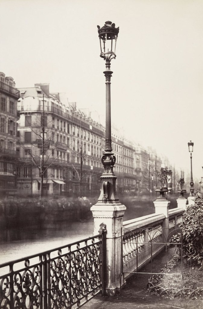
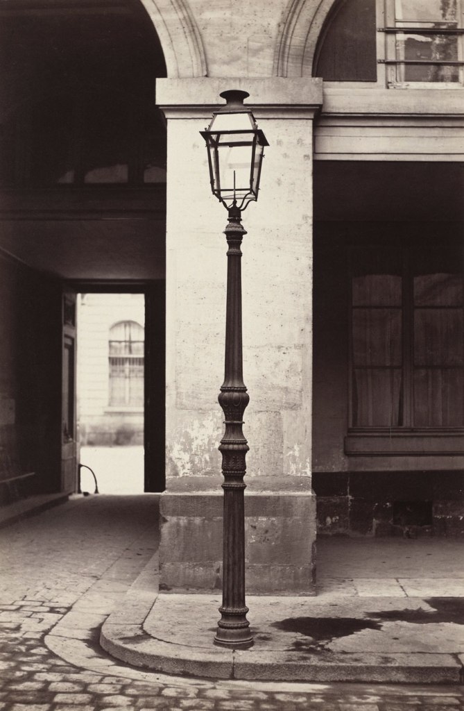
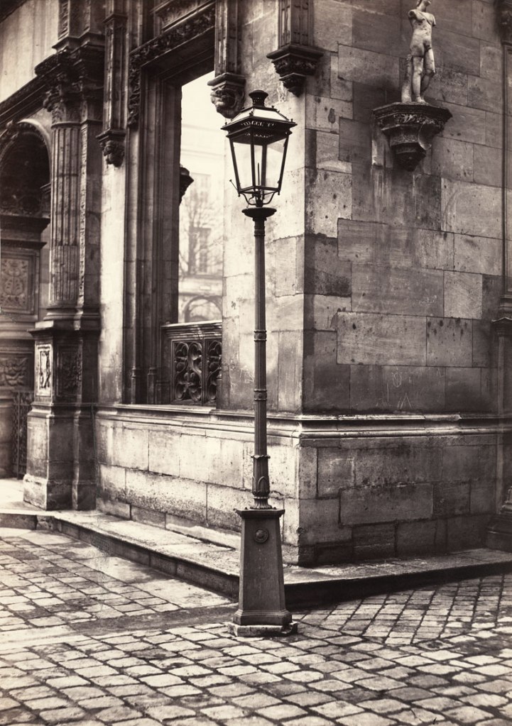
 'Arts et Métiers (Ancien Modèle)' 1864")
 'Hôtel de la Marine' 1864-1870")
 'Lamppost, Entrance to the École des Beaux-Arts' c. 1870")
 'Spire of Notre Dame, Viollet-le-Duc, Architect' 1859-1860")
 'Rue Estienne from the rue Boucher (First Arrondissement)' 1862-1865")
 'Rue de la Bûcherie from the cul de sac Saint-Ambroise (Fifth Arrondissement)' 1866-1868")
 'Cour Saint-Guillaume (Ninth Arrondissement)' 1866-1867")
 'Passage Saint-Benoît (Sixth Arrondissement)' 1864-1867")
 'Impasse de la Bouteille from the rue Montorgeuil (Second Arrondissement)' 1865-1868")
 'Man Reclining beneath a Chestnut Tree' c. 1853")

You must be logged in to post a comment.