Curator: conceived and curated by Leipzig-based curator and artist Helmut Völter
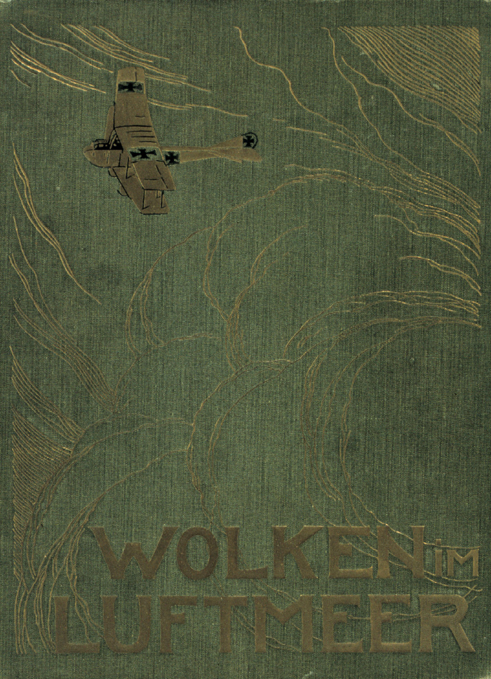
Wolken im Luftmeer (Clouds in a sea of air) (cover) 1917
I desire (I feel that is the correct word) to own a copy of the above book. Has anyone got a one for sale?
Please let me know as I would love to own one!
Update: I now own a copy of Wolken im Luftmeer purchased from a lovely person in Germany 🙂
Dr Marcus Bunyan
Many thankx to the Fotomuseum Winterthur, Zurich for allowing me to publish the photographs in the posting. Please click on the photographs for a larger version of the image.
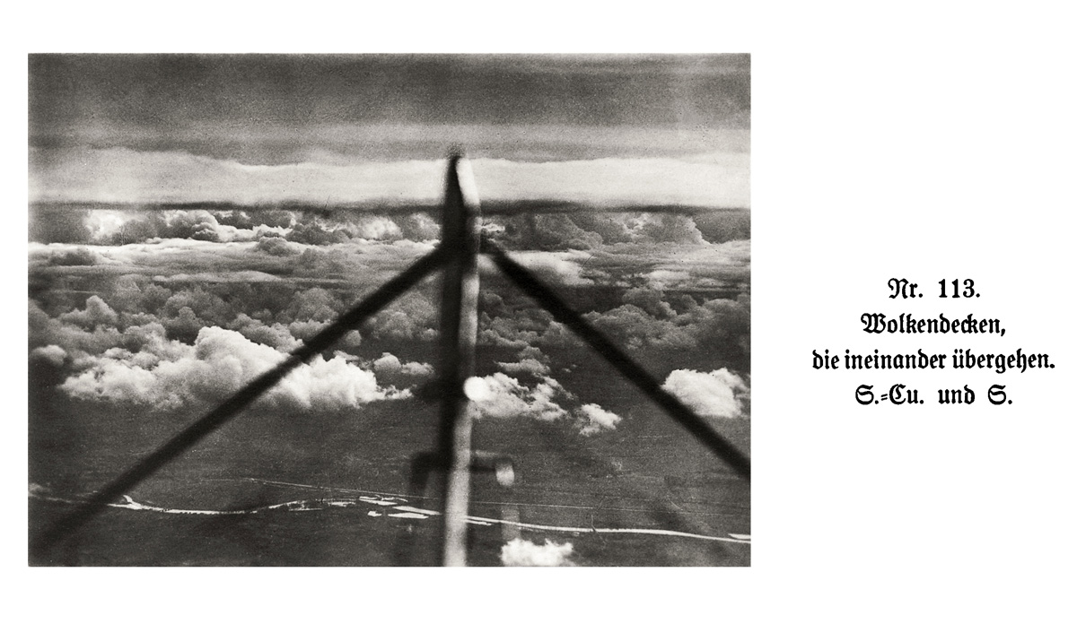
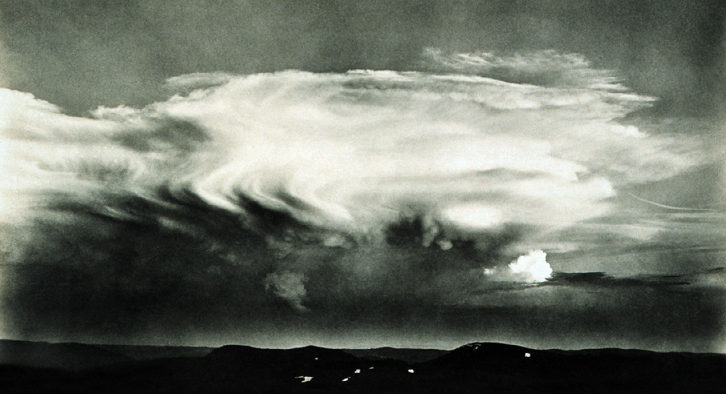
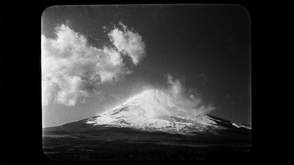
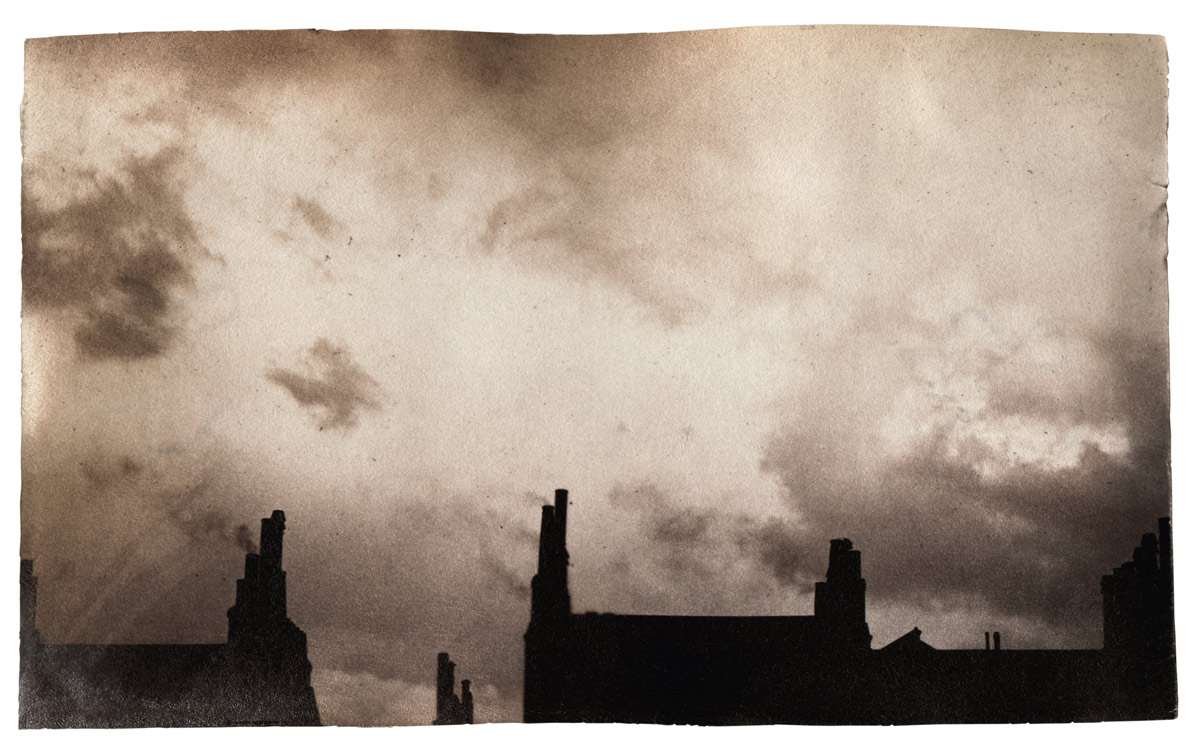
Unknown photographer Wolkendecken, die ineinander übergehen. S.-Cu. und S., from: Wolken im Luftmeer (Merging cloud covers. S.-Cu. and S., from: Clouds in a sea of air) Photographs taken by German fighter pilots during WW1, Berlin, 1917
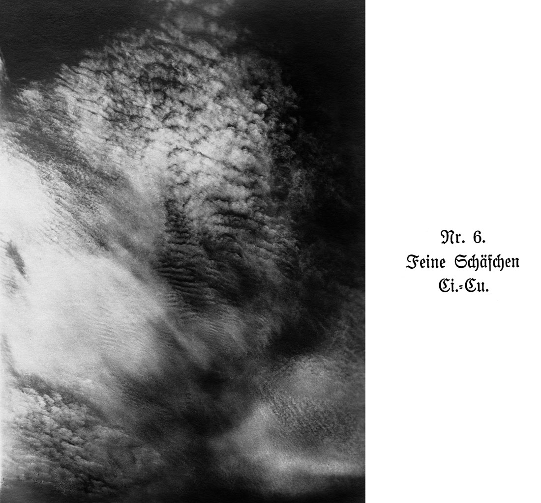
Unknown photographer Feine Schäfchen. Ci.-Cu, from: Wolken im Luftmeer (Delicate fluffy clouds. Ci.-Cu, from: Clouds in a sea of air) Photographs taken by German fighter pilots during WW1, Berlin, 1917
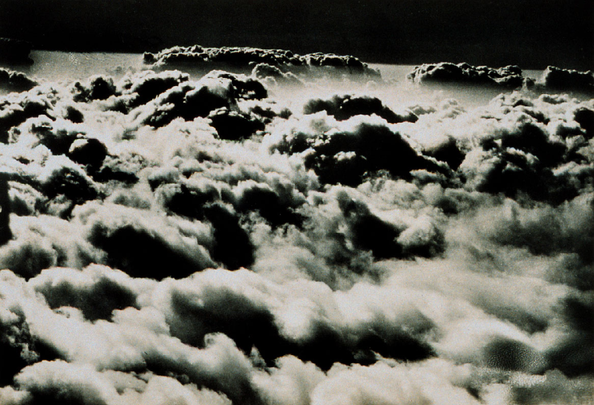
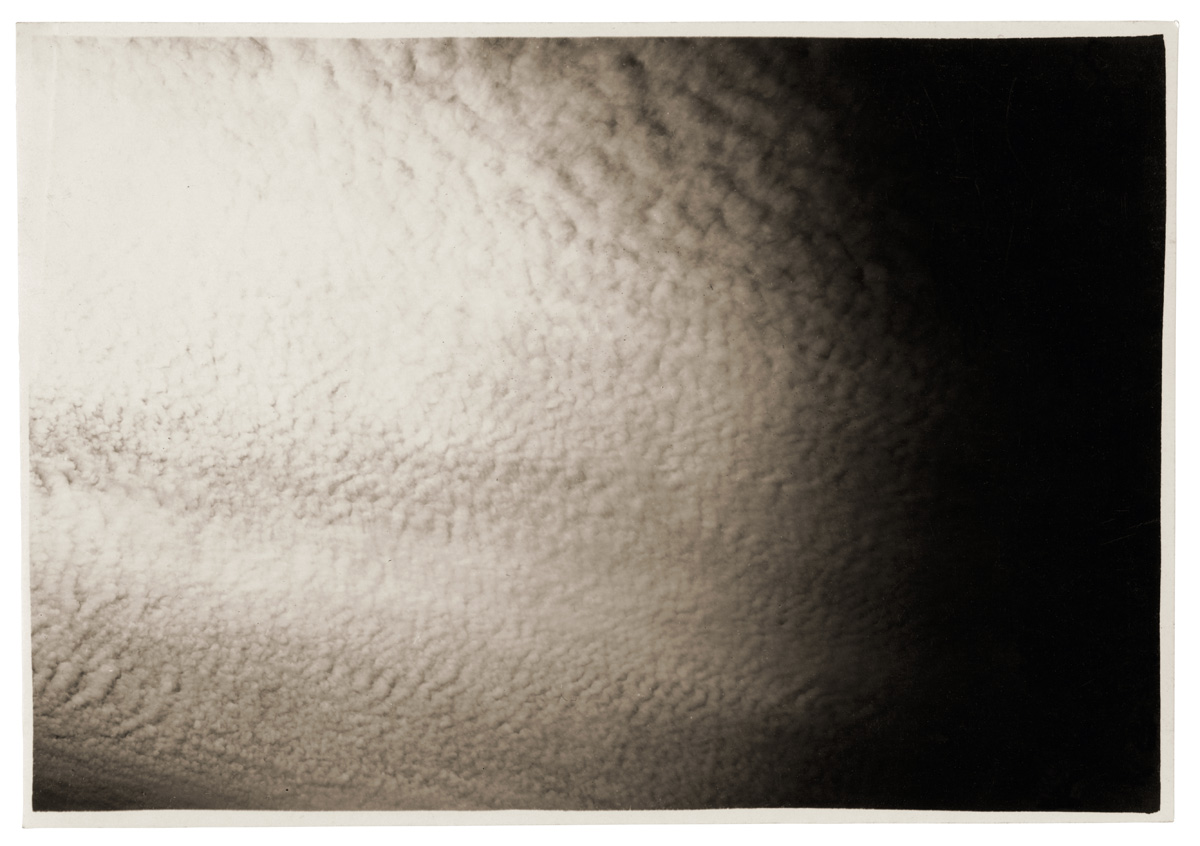
Unknown photographer Flying above a sea of clouds – altostratus from an aircraft (Plate Nr. 103 from: Wolken im Luftmeer / Clouds in a sea of air) Photographs taken by German fighter pilots during WW1, Berlin, 1917
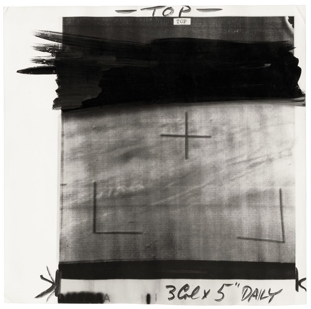
Unknown photographer (Plate Nr. 90 from: Wolken im Luftmeer / Clouds in a sea of air) Photographs taken by German fighter pilots during WW1, Berlin, 1917
The English pharmacist and meteorologist Luke Howard wrote in 1802 in the preface to his manuscript On the Modification of Clouds: “Clouds are subject to certain distinct modifications, produced by the general causes which affect all the variations of the atmosphere; they are commonly as good visible indicators of the operation of these causes, as is the countenance of the state of a person’s mind or body.” Eighty years later, meteorologists had still not reached a consensus on how to classify, label, and read the forms of clouds. It was during this time that scientists first began using photography to record and measure clouds. With its help, they attempted to gain precise and accurate images that would provide insight on the interplay between clouds and the atmosphere and which could be used to create and convey a classification of cloud forms.
The exhibition CLOUD STUDIES – The Scientific View of the Sky presents six stages of meteorological cloud photography, from its infancy in the 1880s – in Switzerland with the first images by Albert Riggenbach photographed from Mount Säntis – up to the newspaper images in the United States that were captured by the first weather satellites in the 1960s. At the beginning of the 20th century, cloud formations and cloud systems were investigated foremost by the military and led to fundamental insights into interrelated weather situations.
CLOUD STUDIES – The Scientific View of the Sky is a rich collection of photographs, notes, records and atlases from diverse research sources and depicts the origins of contemporary weather forecasting. Each of the six parts of the exhibition represents a different scientific and photographic view of clouds while reflecting on the “history of the gaze” as well as the history of the medium with its various photographic mechanisms and reproductive technologies.
An additional theme running throughout the exhibition is the development of science and its varying ideas about clouds. The protagonists and working methods change over time – from the ambitious, wealthy amateur Ralph Abercromby to the anonymous teams of weather satellite technicians. Whereas Riggenbach still wished to capture images of ideal cloud types, the view of the cloud constellations and their chaotic systems expands with the introduction of film, at the latest, and with the constant recording and measuring capacities of digital cameras, which transmit images to earth, where they are evaluated and publicised.
Conceived by curator Helmut Völter (Leipzig), the exhibition CLOUD STUDIES – The Scientific View of the Sky explores the question as to how all these changes influenced the intentions, concepts, and technical developments associated with images of the clouds. It shows how similar or dissimilar photographs of clouds can be, when photographed according to individual specifications. Ultimately it is left to the viewer to decide if and how scientific cloud photography differs from related and frequently published motifs from the history of art and photography.
Press release from the Fotomuseum Winterthur, Zurich website
Many thankx to the Art Gallery of New South Wales for allowing me to publish the photographs in the posting. Please click on the photographs for a larger version of the image.
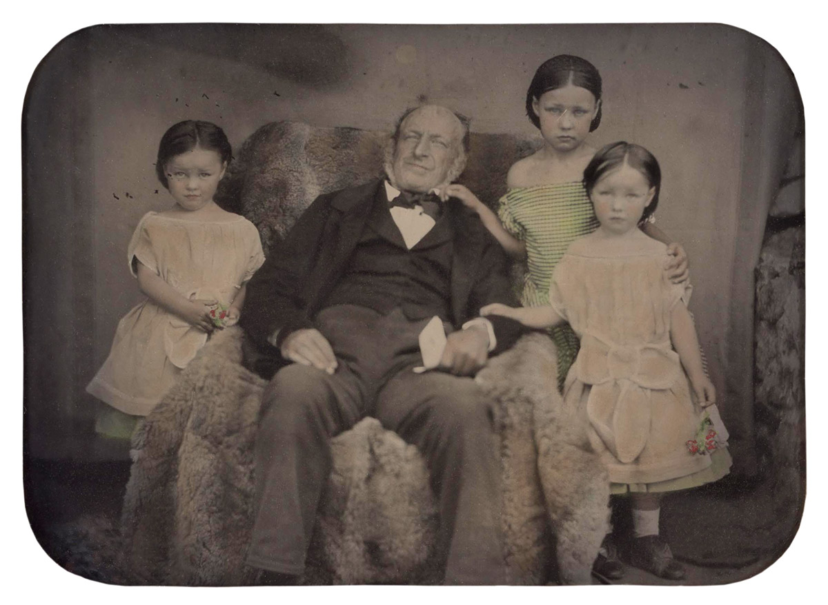
Glaister studio (Australian, 1855-1870) Untitled (portrait of a man and three girls) 1855-1870 Ambrotype, colour dyes 6.5 x 9cm sight; 9.3 x 11.9cm case Purchased 1989
This charming ambrotype was thought to have been produced by one of Australia’s most important early photographers, Thomas Glaister, owning to the presence of the Glaister stamp on the case. However, superb varnish was one of Glaister’s hallmarks and this ambrotype is not varnished. In addition, the hand-colouring is not considered to be to Glaister’s standard. As such, it is possible that the ambrotype was inserted into this case at a later date, not least because there is no form of blackening behind the image. This was standard practice to prevent the viewer seeing through to the inside of the case. The Eichmeyer ‘book’ case, patented in 1855 by Henry A Eichmeyer of Philadelphia, were made of fine leather and beautifully put together. Glaister certainly used these but the ambrotype is probably not his specifically and could have been made by one of his sons in the 1860s when they worked as travelling photographers. Regardless of who took the image, it is a charming colonial portrait which in size is typical of the period – it can easily be held in the hand.
Ambrotypes were developed in the 1850s. They were faster and cheaper to make than daguerreotypes, yet were still unique objects.
1/ 1989, ‘Masterpieces of Australian photography’, Josef Lebovic Gallery, Sydney p. 25
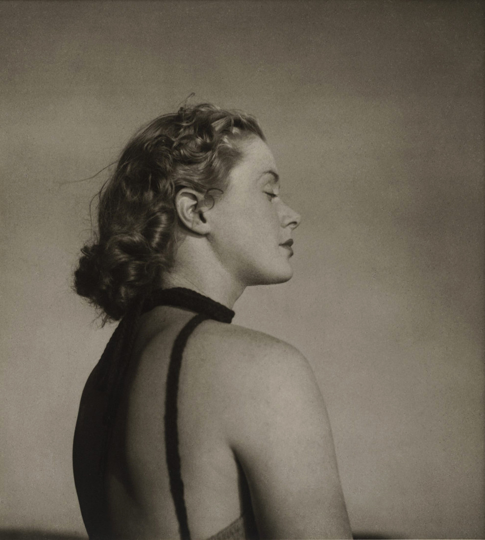
Olive Cotton (Australian, 1911-2003) Only to taste the warmth, the light, the wind c. 1939 Gelatin silver print Image/sheet: 33.2 x 30.0cm Purchased with funds provided by John Armati 2006 Art Gallery of NSW Collection
Only to taste the warmth, the light, the wind appears to have been the only print Cotton made of this image. It was found in the late 1990s and has been shown only once, in an exhibition at the AGNSW in 2000 where it was also used on the catalogue cover. It was unusual for Cotton to print so large, yet it is entirely fitting that this monumental head and shoulder shot of a beautiful young woman should be presented in this way. The subject was a model on a fashion shoot at which Cotton was probably assisting. Cotton often took her own photographs while on such shoots and used them for her private portfolio. The photograph transcends portraiture, fashion and time to become a remarkable image of harmony with the elements.
Cotton took the title for this photograph from an 1895 poem by English poet Laurence Binyon, ‘O summer sun’:
O summer sun, O moving trees! O cheerful human noise, O busy glittering street! What hour shall Fate in all the future find, Or what delights, ever to equal these: Only to taste the warmth, the light, the wind, Only to be alive, and feel that life is sweet?1
A photographer whose work straddles pictorialism, modernism and documentary, Cotton maintained an independent vision throughout her working life, based on the close observation of nature. Her understanding of the medium of photography was not to do with capture, but rather ‘drawing with light’.
1/ 1915, ‘Poems of today’, English Association, London p. 96.
Deacon is widely recognised for her staged photographs which employ various props, including souvenirs and kitsch, in satirical tableaus that critique notions of Aboriginality. Initially, in 1991, she employed dolls and since then they have become a signature motif. This use of non-living models informed her practice when she began to photograph people. As Deacon states, ‘I’ve never been one for “live action” shots… I’ve got to rule the roost. It’s no different dealing with inanimate objects or people, except with people I’m more terrified.’1
This method can be seen in Deacon’s Portrait: Janet Burchill & Jennifer McCamley, artists 1998. Burchill and McCamley, Melbourne and Mildura based collaborative artists, have been arranged in a re-enactment of Henri Matisse’s Conversation 1908-1912. The photograph echoes the deep blue background of the original painting. The two artists hold the stiff positions of Matisse and his seated wife gazing across at each other. This is one of a number of Deacon’s works that feature Australian writers, artists and other notable figures re-enacting iconic paintings. Other examples include artist Fiona Hall in a 2004 retake of Grace Cossington-Smith’s The sock knitter 1915 and a portrait of Gary Foley inspired by William Dobell’s The boy at the basin 1932.
1/ Destiny Deacon, ‘Interview with Virginia Fraser’ in Destiny Deacon: walk & don’t look blak, Museum of Contemporary Art, Sydney, 2004, p. 109.
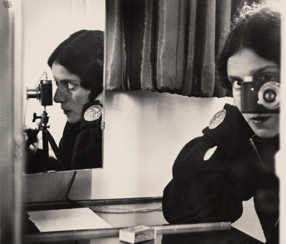
Self portrait with Leica is a complex image in which the artist has photographed herself and her trademark Leica in one mirror, while the profile of both is reflected in another. The large button on her cuff disturbs the play between full face and profile, while the objects at the bottom of the frame lend a certain informality to an otherwise highly contrived set-up. The soft velvety curtain behind introduces a further element of rich tactility. The play between black, white and shades of grey softens and enriches the overall image.
Although Bing avoided becoming part of any specific movement of the 1920s or 1930s – for example, constructivism, the Bauhaus or surrealism, describing herself as being ‘on the edge of the periphery of the Bauhaus’ only – she was fully cognisant of the range of experimentation which was taking place across Europe. She forged her own path, combining an abiding belief in the importance of intuition and poetry with rigorous composition and superb technical skills.
Inspired by the work of Florence Henri, and with increasing confidence in her ability to marry naturalism with geometric formalism, Bing worked extensively as a press, fashion, portrait and documentary photographer in Paris until she was interned as an enemy alien in 1940. Late in her life Bing wrote:
‘I didn’t choose photography; it chose me. I didn’t know it at the time. An artist doesn’t think first and then do it, he [sic] is driven. Now over fifty years later, I can look back and explain it. In a way, it was the trend of the time; it was the time when you started to see differently … And the camera, that was, in a way, the beginning of the mechanical device penetrating into the field of art.’1
1/ Barrett N C 1985, Ilse Bing: three decades of photography, New Orleans Museum of Art, New Orleans pp. 13-14.
The four portraits in the Art Gallery of New South Wales collection reflect a particular period in Australian art, when the now established artists were beginning their careers. They depict members of the contemporary art scene of the late 1970s to mid 1980s associated with Art + Text, an Australian art magazine published from 1981-2000.
Philip Brophy formed the experimental group Tsk Tsk Tsk in 1977. The group produced experimental music, films, videos, and live theatrical performances. Brophy involved his friends in the group, including partner Maria Kozic on synthesiser. Kozic was also producing her own multimedia work. In this photograph, Kozic and Brophy are standing in a suburban backyard complete with Hills Hoist. This is reflective of Tsk Tsk Tsk’s suburban beginnings, based as it was at Clifton Hill’s Community Music Centre. After the group’s dissolution in the early 1980s, Brophy made several experimental films and curated numerous programs for the Melbourne international film festival as well as exhibitions such as Tezuka: the marvel of manga for the National Gallery of Victoria. Kozic moved to New York where she continued her artistic career. Her work has been exhibited widely throughout Australia and overseas and been collected by many museums including the Art Gallery of New South Wales.
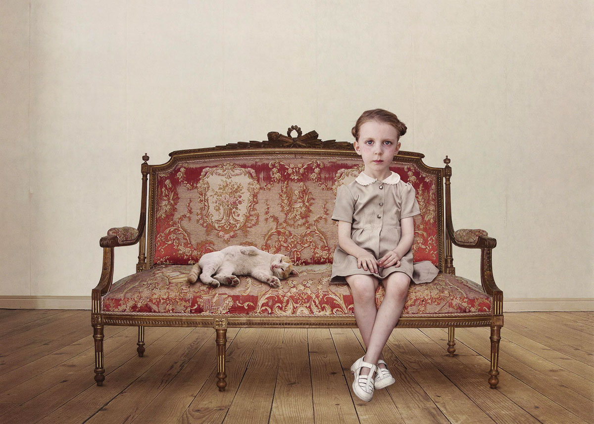
Lux’s portraits are by no means traditional, ‘I call them imaginary portraits. They are not really about the children that I photographed’, commented the artist in interview with Wim van Sinderen (Loretta Lux: new work 2004). In relation to The waiting girl, Lux has said: ‘It’s a picture about time, and timelessness. For me they are sitting on the sofa as if they are waiting for eternity.’ (The Guardian 23 November 06)
Through subtle digital manipulation of the body and facial features of her subjects, Lux creates eerie doll-like creatures with glazed eyes, porcelain smooth skin and subtly ill-proportioned forms. The resulting portraits contain an uncanny blend of mute childish innocence and the self-contained stoicism of adulthood.
Lux’s images of children recall those of the old masters, such as Veláquez, Runge and Bronzino whom she cites as main inspirations alongside German photographer August Sander. Lux has stated in an interview with Louise Baring for the Telegraph (UK) that she uses children ‘as a metaphor for a lost paradise’. Dressing her young models in past fashions (often of the era of her own childhood) suggests the child’s game of ‘dress ups’ in order to be an adult yet somehow played out in reverse. That is, Lux’s children do not seem like children at all, but rather like serious world-weary adults manifested in childish forms.
Spanning over a century, What’s in a face? aspects of portrait photography is an exhibition of 45 photographs from the Art Gallery of NSW collection. The exhibition focuses on crucial points in the history of photographic depictions of the human face ranging from studio portraiture in the late 19th century to contemporary practices today.
Works by Australian photographers, such as Paul Foelsche, Olive Cotton, Max Dupain, Carol Jerrems, Destiny Deacon, Patrina Hicks, Darren Sylvester and others, are placed in an international context, represented by Man Ray, Edward Weston, Iwao Yamawaki, Nan Goldin, Ben Cauchi and Loretta Lux, amongst others.
All portraits reveal something of the sitter, the photographer and also of us as viewers, but none reveal a whole and complete being. This is part of the enduring fascination with the photographic portrait which purports to be an exact likeness but operates more accurately as a metaphor for the self and how that self might exist in the world at a particular point in time.
Judy Annear, senior curator photographs, Art Gallery of NSW
Using photography to depict the face and figure was initially a time-consuming and expensive business. However, the drive to document all things in the world, and rapid technological advances, meant that by the 1880s most people, willing or not and regardless of the photographer’s or their own desires, were documented in some way.
Spurious 19th century ideas to do with what a face could represent exploded in the early 20th century when identity came to be seen as a psychological rather than social phenomenon. Theatricality and performing for the camera, which had existed in photography since its inception, also became much more evident in this period.
In the post-WWII era representations of the face and the body quickly acquired a political and socially aware edge. More recently the face has tended to stand less as an expression of personal experience and more a statement that may signify a set of ideas, whether about the individual, the group or the society at large. Many of these highly constructed images acknowledge and play upon the problematics of the photographic portrait.”
Text from the AGNSW website
Petrina Hicks (Australian, b. 1972) Shenae and Jade 2005 From the series Untitled 2005 Lightjet print 85.5 x 80cm Courtesy the artist and Michael Reid Gallery
Shenae and Jade is typical of Hicks’ unconventional portraits. The young model holds the budgie’s head in her mouth. It’s the kind of slightly dangerous behaviour which can be unnerving to observe. The freckled nose of the model is in tension with her smooth pale temples, heavily lashed closed eyes and soft white top. The luminescent background and generally pale colouration throw the headless body of the brightly coloured budgie into high relief.
Informed by the slick stylistic conventions of high-end consumer images, Darren Sylvester’s body of work suggests the existential dilemma of living in an overtly consumerist society – one that promises fulfilment but fails to truly satisfy even the most ardent consumer. Perpetually tantalised with glossy images of affluence, ‘must-have’ products and brochure living, our ‘real’ lives can at times seem unfulfilling by comparison, sometimes painful and often a little pathetic. Sylvester’s work seems to suggest that even in our most personal heartfelt moments, our lives are just like everybody else’s, not so special or unique. Our lives could equally be a series of advertising moments.
Yet the nature of this work is resolutely ambiguous, alternately offering intimacy and emotion with cool detachment. Photo-shopped clean of incidental detail and anomaly, and featuring youthful agency models, Sylvester’s evenly lit, tightly focused images still tap a nerve despite their polished finish. Perhaps this is because they are precisely ‘generic’ (and emotive) experiences to which we can all relate. The same principles underpin a good pop song and in Sylvester’s work this is no coincidence – he strives to produce images that carry the same directness and lasting impact. Commenting on the music of the Carpenters, ‘their lyrics were always sad and about emotional relationships but sealed beneath glossy west coast melodies’, Sylvester reveals the pop-music strategies he employs in his work.1
Based on short stories written by the artist prior to composing the scene, his images carry their own inherent narrative. Yet we don’t need to read Sylvester’s story to understand the drama, nor do we need to hear the tune to recognise the song – it’s an old one, and a shared one, that each of us remembers well.
1/ Colless, E 2006, ‘Darren Sylvester: the right stuff’, Australian Art Collector, no 36, Apr-Jun p. 102.
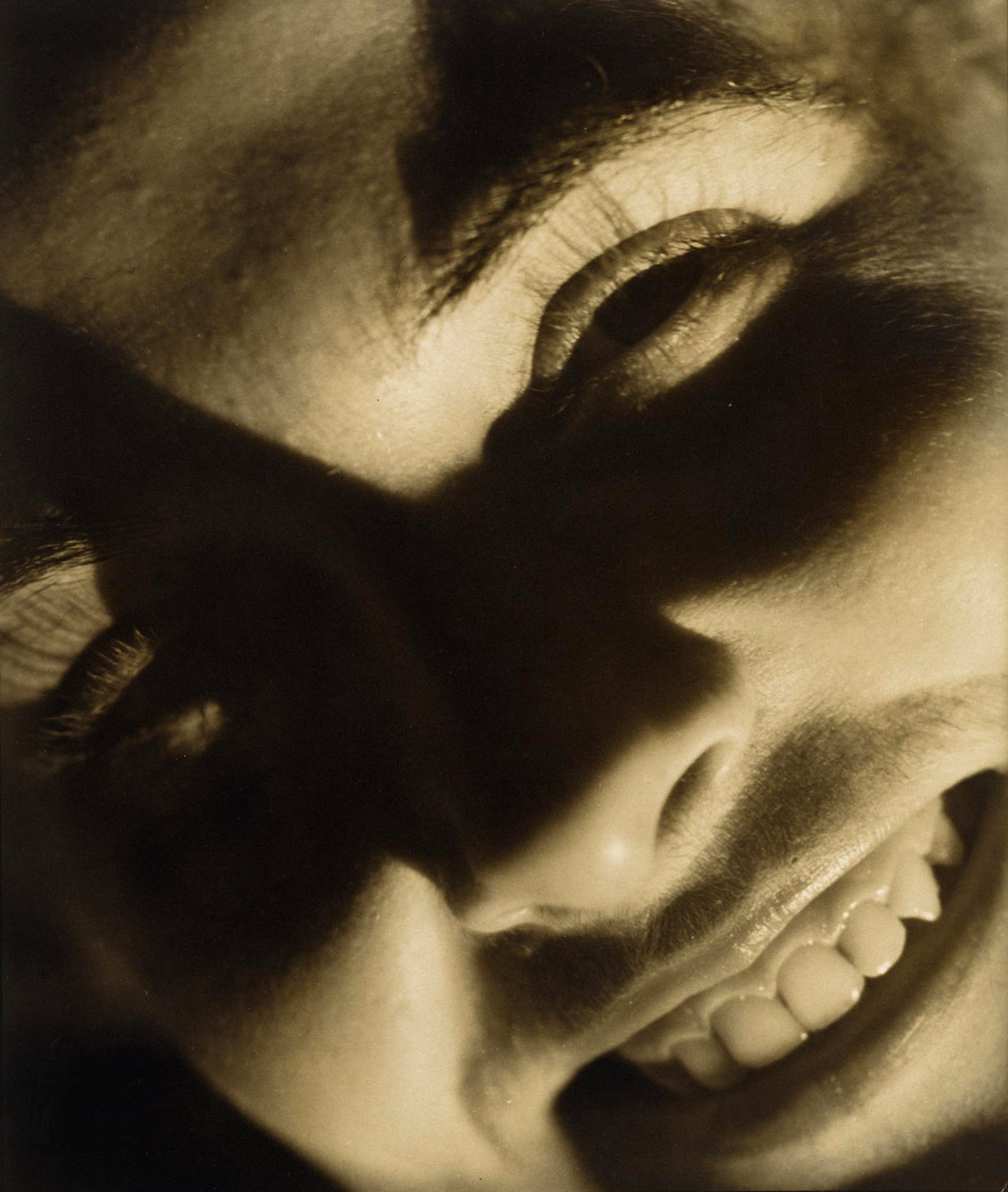
Hans Hasenpflug (Australia/Germany 1907-1977) Untitled (head of a woman) 1940-1941 Gelatin silver photograph Image: 28.8 x 24.3cm Gift of Mr Christopher Hamilton, the artist’s son 1984
Hans Hasenpflug arrived in Australia in 1927 aged 20. He had been born into an educated Stuttgart family but it does not appear that he became involved in photography until 1932 when he was employed by Leica Photo Service, Sydney. Hasenpflug went on to work for prominent photographer Russell Roberts from 1935 to 1937 before moving to Melbourne and working with Athol Shmith and other Melbourne studios from 1937 to 1942. As an enemy alien Hasenpflug was not allowed to work on industrial assignments during World War Two but he was not interned and was naturalised in 1945. Hasenpflug exhibited in photography salons in the 1930s and his work appeared in the Sydney Morning Herald, Australian Woman’s Weekly and the Sunday Telegraph.
Hasenpflug was a versatile advertising photographer. He specialised in fashion and product advertising and some portraiture. Despite his apparent lack of photographic training until the 1930s, he seems to be have been strongly influenced by the European avant-garde. Many of his photographs, regardless of genre or subject matter, depend on diagonals through the picture plane and on raking light.
This is true of Untitled. Strong light has created deep shadows across the subject, a closely cropped image of a woman’s face. This, combined with the oblique camera angle, creates a vivid and disconcerting image. The woman is staring directly into the camera, yet a band of strong shadow across the centre of the image creates a blank eyed effect. The pupil free eyes seem inhuman; mask-like or alien. This is in stark contrast to the woman’s open smile that dominates the bottom of the work. The strong, full light on this area highlights her lips, gums and teeth to an almost hyper real extent. These contradictions create an image that on the surface seems friendly and intimate, yet contains an undertone of threat. The inherent strangeness of the image makes it unlikely that this was a commissioned photograph, but rather the artist’s experiment with his medium, and indeed is probably a portrait of his fiancee, Elizabeth Hamilton Crouch.
Edward Weston’s Mexican years were of great importance to him and allowed for the maturing of his vision in relation to photography. Accompanied by Tina Modotti, whose own work developed at this time, Weston experimented with pure form through monumental portraits (of which Guadalupe de Rivera, Mexico is a classic example), images of landscapes and buildings, still-lifes and nudes.
Weston’s portraits of those he encountered in Mexico are uniformly compelling. Often taken with a hand-held camera against a plain background and with strong lighting, these images emphasise individuality, modernity and dynamism.
Guadalupe de Rivera was Diego Rivera’s wife at the time and both were among the group of people Weston and Modotti associated with. Weston described Guadalupe in his ‘Daybooks’ as ‘tall, proud of bearing, almost haughty; her walk like a panther’s, her complexion almost green, with eyes to match’.1 As he worked on the portrait, Weston wrote: ‘I am finishing the portrait of Lupe. It is a heroic head, the best I have done in Mexico; with the Graflex, in direct sunlight I caught her, mouth open, talking, and what could be more characteristic of Lupe! Singing or talking I must always remember her’.2
This later print by Weston emphasises, through the dramatic effect of light and shade, the strong lines of the face. The shape of the open mouth is echoed by the shadowed eye above and the jawline below. The diagonal of jaw to ear which runs in parallel to the nose also adds to the dynamism of this image. Outdoors, with the sun shining on her hair, this is a portrait of a remarkable woman.
1/ Newhall, N (ed) 1981, ‘The daybooks of Edward Weston 1 Mexico’, Aperture, New York p. 26. 2/ Ibid p. 42.
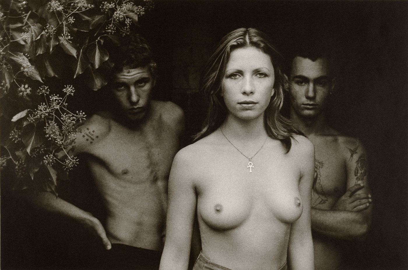
A quintessential image of the 1970s, Vale Street has lost none of its capacity to enchant and disturb in the intervening years. In one sense it can be read as a sociological document; in another as a wholly subjective work of art. Like the mediumistic spirit-photographs of the nineteenth century, Jerrems’s photo seems to disclose the very souls of its subjects. As they respond, each in their individual fashion, to the regarding presence of the camera lens, the figures compose themselves, without theatrics, into telling attitudes. The prominence and bodily confidence of the open-faced young woman is set against the reticence of her boyish companions. As a portrait of relationships as well as individuals, Vale Street speaks of gender relations, adolescent sexuality, suburban mores and the photographer’s own subtly partisan demeanour in regard to these themes.
Max Dupain (Australia, 1911-1992) Untitled (self portrait) 1930s Gelatin silver photograph 19.3 x 14cm Art Gallery of NSW Collection
This engaging self-portrait by Max Dupain was kept by the artist in an album of photographs from the 1930s. The album was possibly a workbook which would enable Dupain and his clients to review his career as a young modernist photographer. Dupain had opened his own studio in 1934 at the age of 23 having previously been apprenticed to Cecil Bostock and studying painting and drawing at the Julian Ashton Art School in Sydney. In his teens, through the Photographic Society of New South Wales, Dupain had also had contact with Harold Cazneaux whom he later described as ‘the father of modern Australian photography’.1 Both Cazneaux and Bostock provided Dupain with a solid technical and aesthetic base from which to work.
The young working photographer has chosen to depict himself in Untitled (self portrait) with rolled-up sleeves and a furrowed brow. The image is bisected into light in the upper half and dark below with the photographer’s right hand pressing the cable release. Looking away, in three-quarter profile, Dupain is engaged with something out of the frame. The dynamism of the image is further enhanced by the bent arms and the strong shadow of Dupain’s profile.
The 1930s was a period of intense experimentation for Dupain as he applied the lessons learned from Bostock and Cazneaux and absorbed the material in international publications. He mastered solarisation, montage, portraiture, interiors and advertising photography. His interest in form and composition matured. His dedication to his work is manifested in this image.
1/ Dupain M 1978, Cazneaux: photographs by Harold Cazneaux 1878-1953, National Library of Australia, Canberra p. xi.
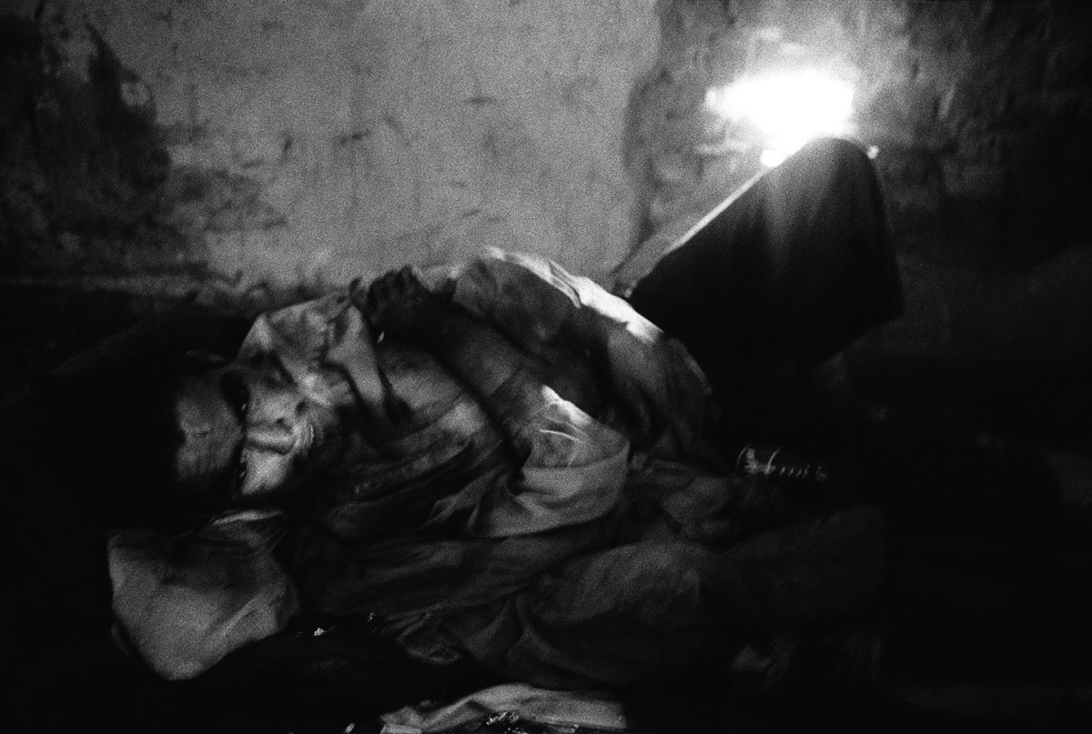
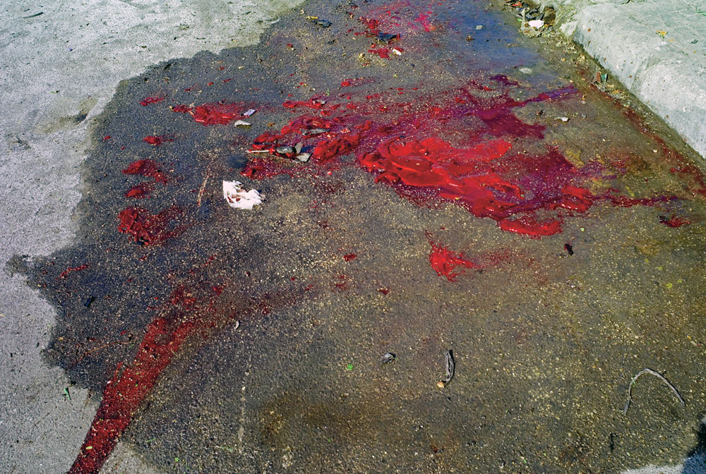
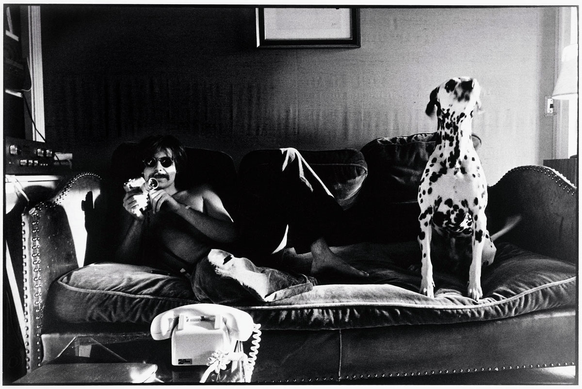
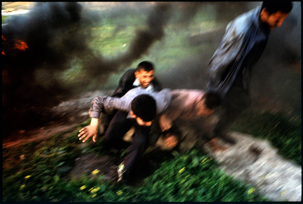
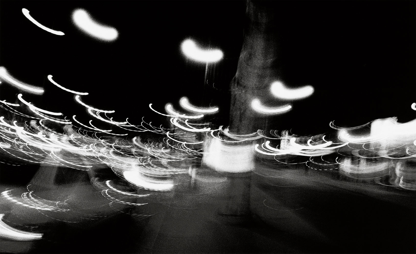
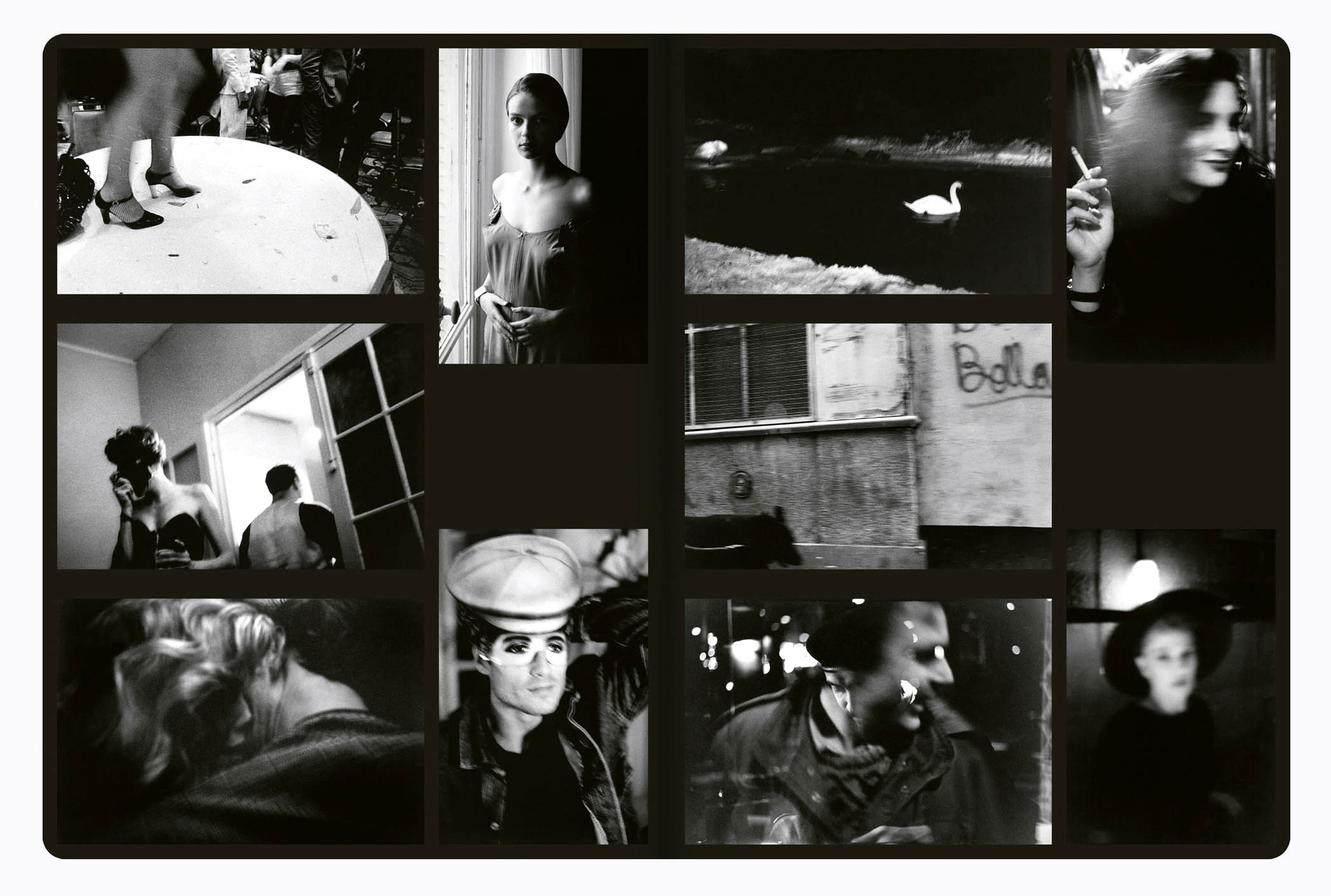
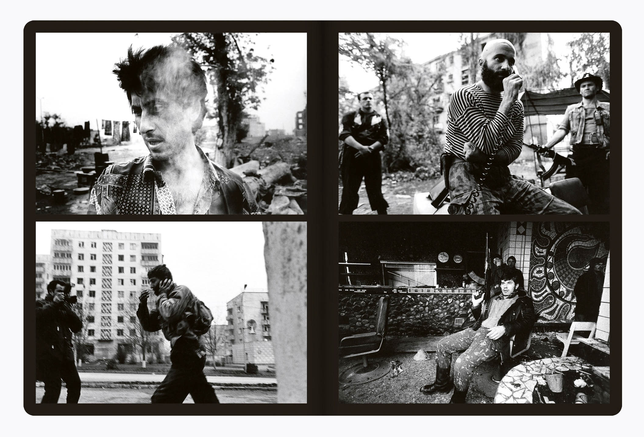
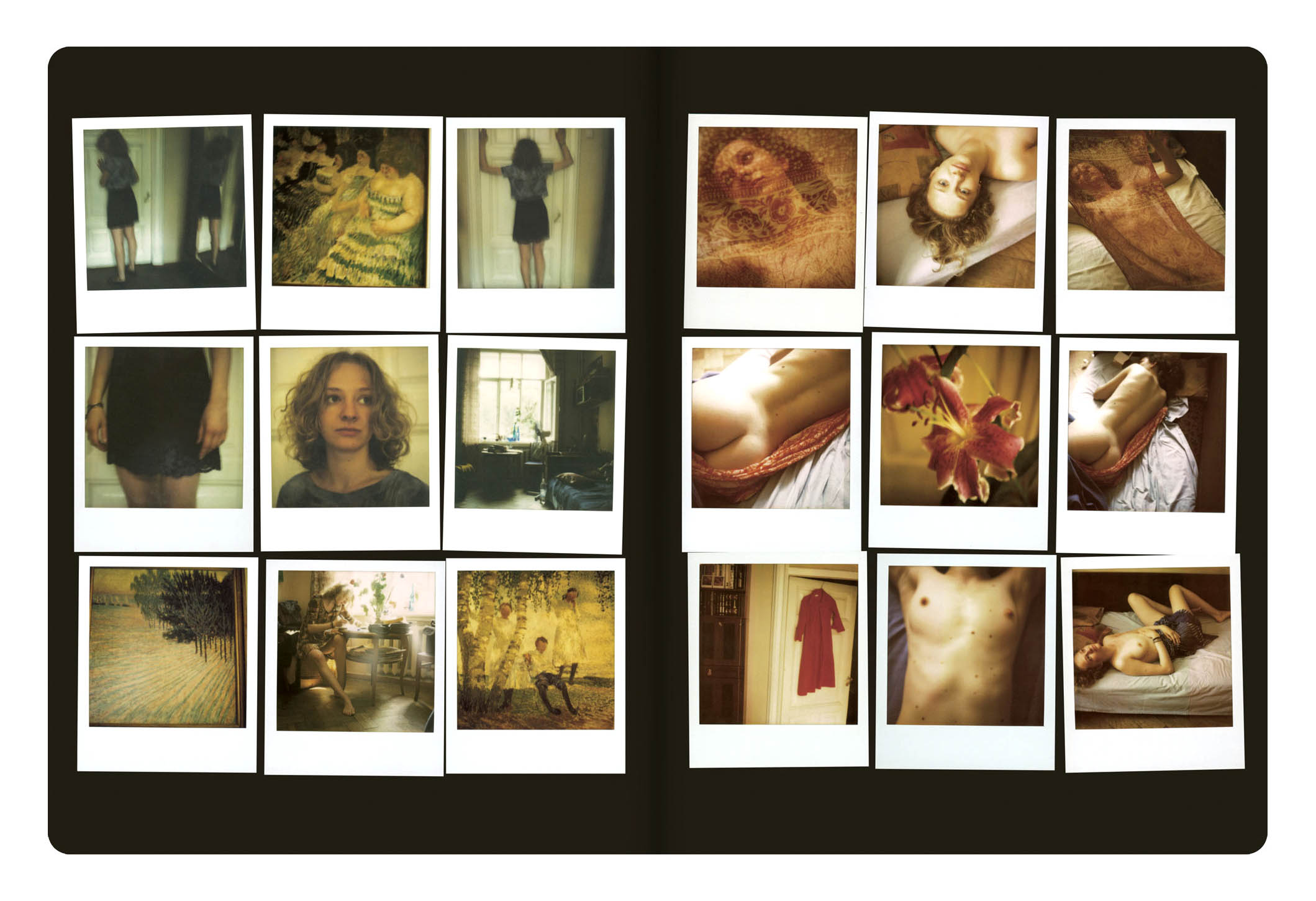
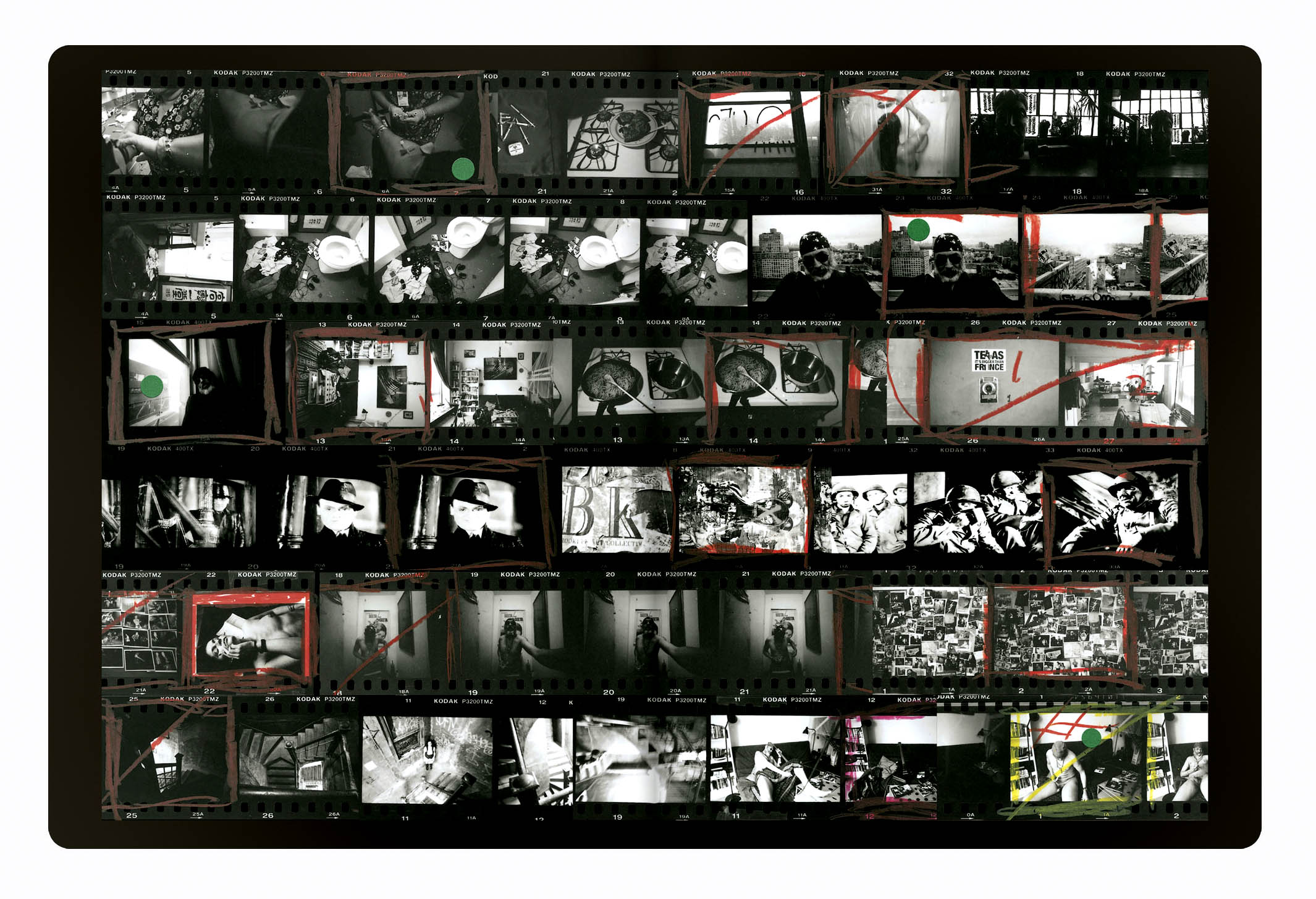
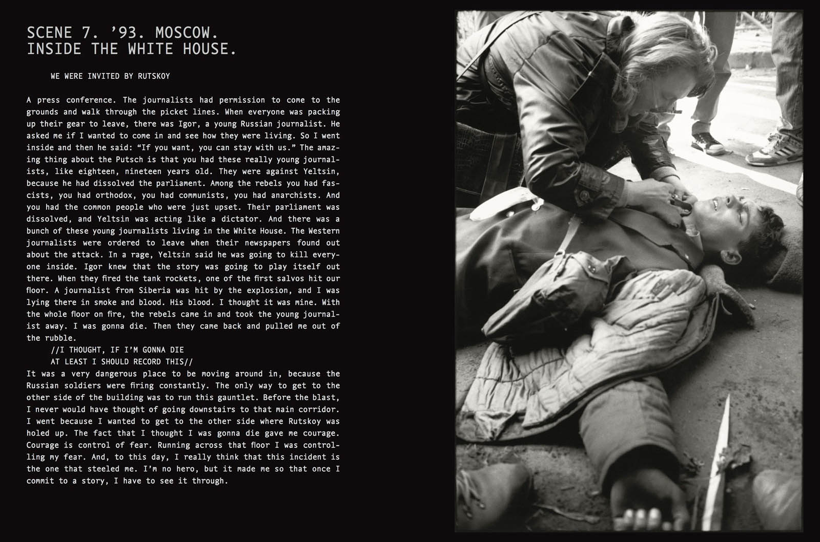
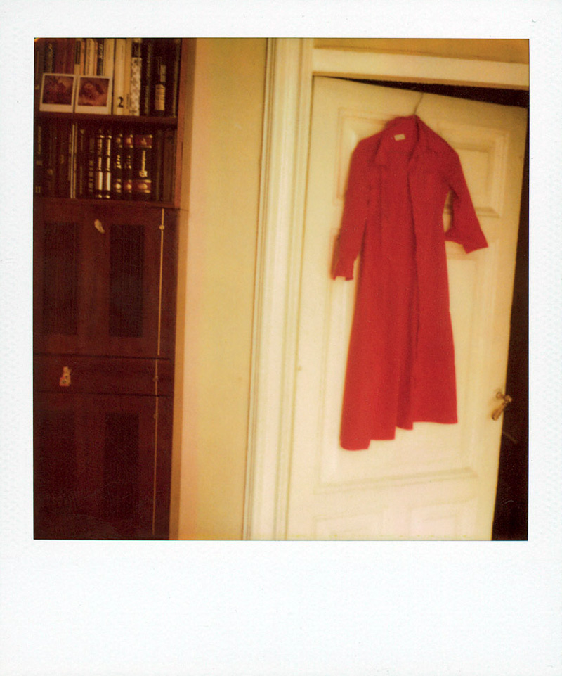
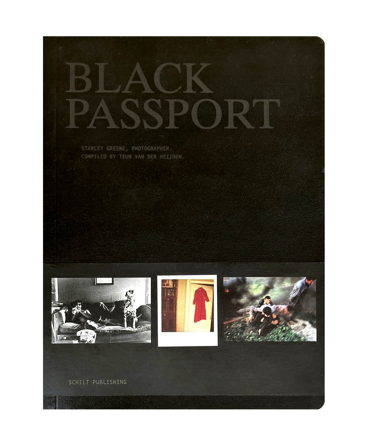
Foam presents Black Passport, a project by and about the American conflict photographer Stanley Greene (New York, 1949-2017). Black Passport shows photos of conflicts and disasters combined with photos of Greene’s private life. The result is a revealing portrait of a photographer who is addicted to the adrenaline rush of being on the move, but at the same time realises the sacrifices he makes in his personal life. Stanley Greene has photographed in regions such as Chechnya, Iraq, Rwanda and Sudan and is one of the founders of the international photo agency NOOR.
Every day, newspapers and magazines are filled with photos of war, oppression and violence. The photographer that enables us to watch what is happening in the rest of the world from the safety of our own homes, however, usually remains invisible. This is not the case in Black Passport, the biography of war photographer Stanley Greene, which appeared in book form in 2009 and will be exhibited in Foam starting on 16 December. Photos of conflict and disaster regions such as Rwanda, Sudan, Chechnya and Iraq are alternated with photos from the private life of Stanley Greene: photos of Paris and many women. Slide shows will also be presented, interspersed with texts from the book. Greene’s voice resounds through the exhibition space – he is disconcertingly frank: ‘I think you can only keep positive for eight years. If you stay at it longer than that, you turn. And not into a beautiful butterfly.’
Just as Stanley Greene, visitors to the exhibition are poised between the safety of Western life and the horrors of foreign wars. And it is precisely this juxtaposition that causes these photos to stir us more than the stream of bad-news images that inundate us daily. In addition, Black Passport is a fascinating story about what it is like to be a war photographer. Why does someone choose to be continually confronted with death and misery? Is it an escape from everyday reality and a craving for adventure?
Short Biography
Stanley Greene has photographed in the former Soviet Union, Central America, Asia and the Middle East. His work has appeared in publications including Newsweek, The New York Times Magazine, Stern and Paris Match. He has won various World Press Awards and in 2004 the W. Eugene Smith Award. Open Wound: Chechnya 1994-2003 was published in 2004 and his book Black Passport in 2009. Greene is one of the founders of the Amsterdam-based international photo agency NOOR.
“I think you can only do this for eight years. For eight years you can still keep the positive. If you stay at it longer than eight years, you turn. And not into a beautiful butterfly. You really turn. I see it in myself, I see it in all my friends and colleagues. I mean they are all victims of post trauma. We’re not the beautiful butterflies anymore. We become moths. We’re like moths flying to the flame.You know, sometimes your wings get singed or you just burn up. Get killed. Or you burn up inside.The drugs and the alcohol and the party and all of this is to push it away, push it away.”
“I’m an observer, I’m not an objective observer though, but I’m an observer. I feel it’s very important for journalists to go to these hell holes and photograph or write or do radio or whatever because I still believe that the public wants to know.”
Stanley Greene
Stanley Greene(American, 1949-2017)
Stanley Greene (February 14, 1949 – May 19, 2017) was an American photojournalist.
Greene was born to middle class parents in Brooklyn. Both his parents were actors. His father, who was born in Harlem, was a union organiser, one of the first African Americans elected as an officer in the Screen Actors Guild,and belonged to the Harlem Renaissance movement. Greene’s father was blacklisted as a Communist in the 1950s and forced to take uncredited parts in movies. Greene’s parents gave him his first camera when he was eleven years old.
Greene began his art career as a painter, but started taking photos as a means of cataloging material for his paintings. In 1971, when Greene was a member of the anti-Vietnam War movement and the Black Panther Party, his friend photographer W. Eugene Smith offered him space in his studio and encouraged him to study photography at the School of Visual Arts in New York and the San Francisco Art Institute.
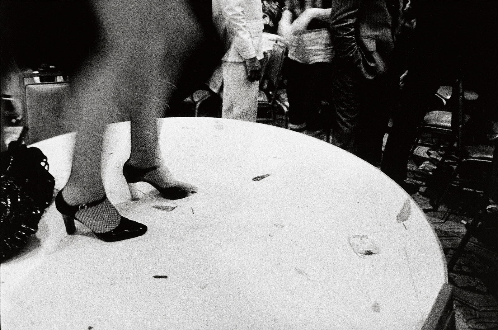
Greene held various jobs as a photographer, including taking pictures of rock bands and working at Newsday. In 1986, he shot fashion photographs in Paris. He called himself a “dilettante, sitting in cafes, taking pictures of girls and doing heroin”. After a friend died of AIDS, Greene kicked his drug habit and began to seriously pursue a photography career.
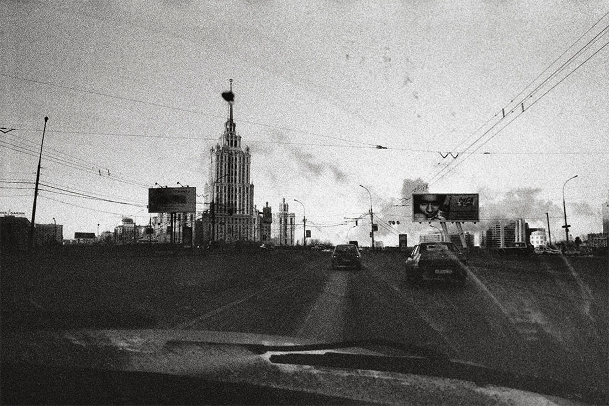
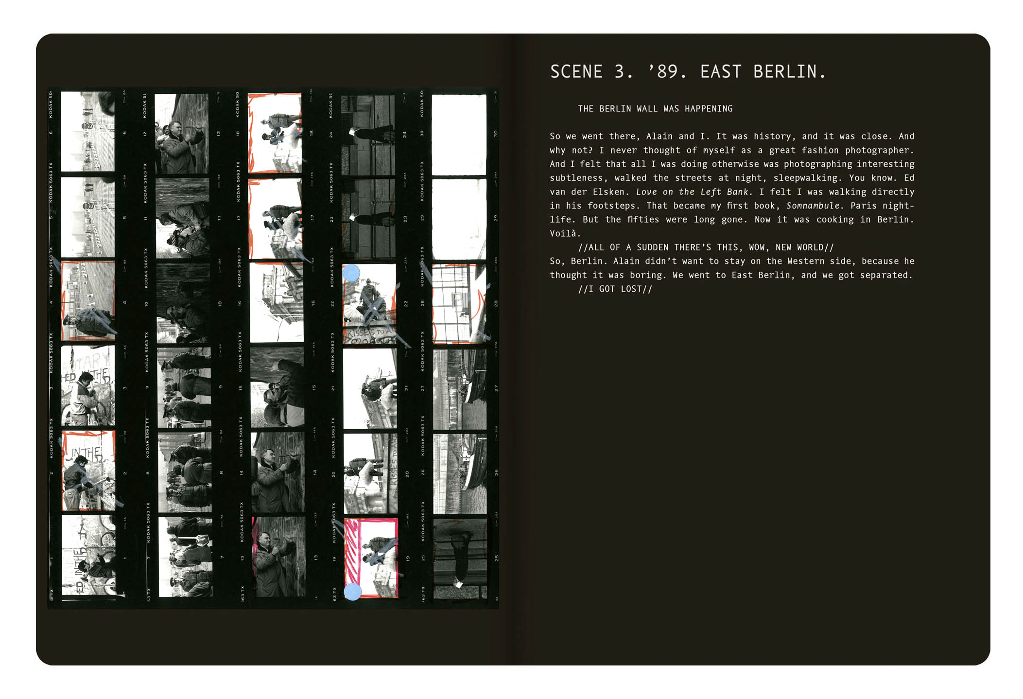
He began photojournalism in 1989, when his image (“Kisses to All, Berlin Wall”) of a tutu-clad girl with a champagne bottle became a symbol of the fall of the Berlin Wall. While working for the Paris-based photo agency Agence Vu in October 1993, Greene was trapped and almost killed in the White House in Moscow during a stand-off between President Boris Yeltsin and the parliament. He covered the war-torn countries Azerbaijan, Bosnia and Herzegovina, Georgia, Iraq, Somalia, Croatia, Kashmir, and Lebanon. He took pictures of the genocide in Rwanda in 1994 and the US Gulf Coast in the aftermath of Hurricane Katrina in 2005.
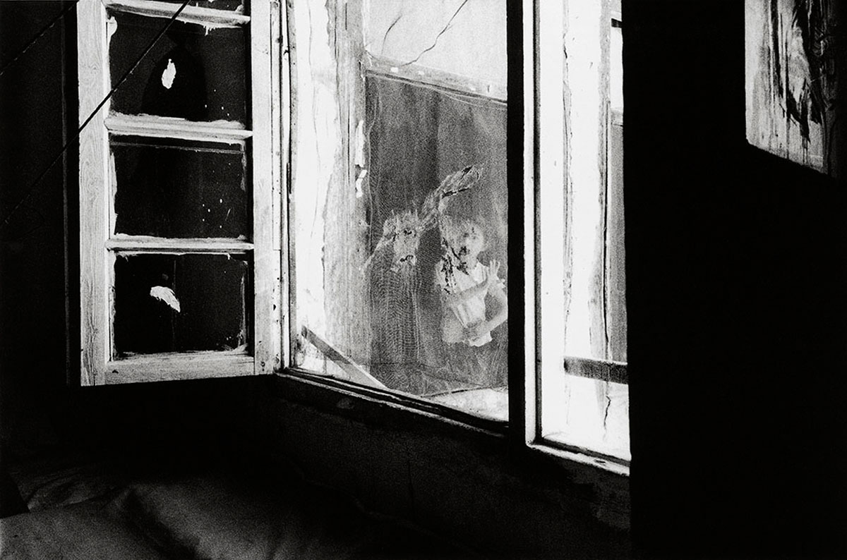
After 1994, Greene was best known for his documentation of the conflict in Chechnya, between rebels and the Russian Armed Forces, which was compiled in his 2004 book, Open Wound. These photos drew attention to the “suffering that has marked the latest surge in Chechnya’s centuries-long struggle for independence from Russia”.
In 2008, Greene revealed that he had hepatitis C, which he believed he had contracted from a contaminated razor while working in Chad in 2007. After controlling the disease with medication, he traveled to Afghanistan and photographed a story about “the crisis of drug abuse and infectious disease”.
Stanley Greene co-founded NOOR Agency with Kadir van Lohuizen in 2007. They launched their agency with their colleagues on the 7th of September 2007 at Visa Pour L’Image. Greene died in Paris, at the age of 68. He had been undergoing treatment for liver cancer.
Black Passport is the biography of war photographer Stanley Greene, compiled out of hours of interviews by Teun van der Heijden. It shows Stanley’s war images alternated with private images.
Teun van der Heijden: “Black Passport started as any other photo book project. At the beginning Stanley did let me know that he was up for ‘something completely different’. While working on the project we had a lot of conversations in which I discovered that there were a lot of similarities between Stanley and me. What is it then that one person becomes a designer, living happily with the same woman for 25 years, being a father of two daughters and the other person becomes a war photographer. This question was the beginning of a series of interviews. Out of the interviews came Black Passport. Black Passport is nominated several times. Some people believe it is the most important photo book of 2010.
A fabulous posting, with memorable thoughts and photographs!
These archetypal images have become deeply embedded in the collective conscience where conscience is pre-eminently the organ of sentiments and representations. The snap, snap, snap of the shutter evinces the flaws of human nature, reveals the presence of a quality or feeling to which we can all relate.
As Arbus states, the subject of the picture is always more important than the picture. And more complicated. That is why these photographs always capture our attention – because we become, we inhabit, we are the subject.
Dr Marcus Bunyan
Many thankx to Jeu de Paume for allowing me to publish the photographs in the posting. Please click on the photographs for a larger version of the image.
“There are and have been and will be an infinite number of things on earth. Individuals all different, all wanting different things, all knowing different things, all loving different things, all looking different. Everything that has been on earth has been different from any other thing. That is what I love: the differentness, the uniqueness of all things and the importance of life… I see something that seems wonderful; I see the divineness in ordinary things.”
Diane Arbus. Paper on Plato, senior English seminar, Fieldston School, November 28, 1939
“I want to photograph the considerable ceremonies of our present because we tend while living here and now to perceive only what is random and barren and formless about it. While we regret that the present is not like the past and despair of its ever becoming the future, its innumerable inscrutable habits lie in wait for their meaning. I want to gather them, like somebody’s grandmother putting up preserves, because they will have been so beautiful.
There are the Ceremonies of Celebration (the Pageants, the Festivals, the Feasts, the Conventions) and the Ceremonies of Competition (Contests, Games, Sports), the Ceremonies of Buying and Selling, of Gambling, of the Law and the Show; the Ceremonies of Fame in which the Winners Win and the Lucky are Chosen or Family Ceremonies or Gatherings (the Schools, the Clubs, the Meetings). Then they are Ceremonial Places (The Beauty Parlor, The Funeral Parlor or, simply The Parlor) and Ceremonial Costumes (what waitresses wear, or Wrestlers), Ceremonies of the Rich, like the Dog Show, and of the Middle Class, like the Bridge Game. Or, for example: the Dancing Lesson, the Graduation, the Testimonial Dinner, the Séance, the Gymnasium and the Picnic, and perhaps the Waiting Room, the Factory, the Masquerade, the Rehearsal, the Initiation, the Hotel Lobby and the Birthday Party. The etcetera.
I will write whatever is necessary for the further description and elucidation of these Rites and I will go wherever I can to find them.
These are our symptoms and our monuments. I want simply to save them, for what is ceremonious and curious and commonplace will be legendary.”
Diane Arbus. “American Rites, Manners and Customs,” Plan for a Photographic Project, Guggenheim proposal
“They are the proof that something was there and no longer is. Like a stain. And the stillness of them is boggling. You can turn away but when you come back they’ll still be there looking at you.”
Diane Arbus in response to request for a brief statement about photographs, March 15, 1971
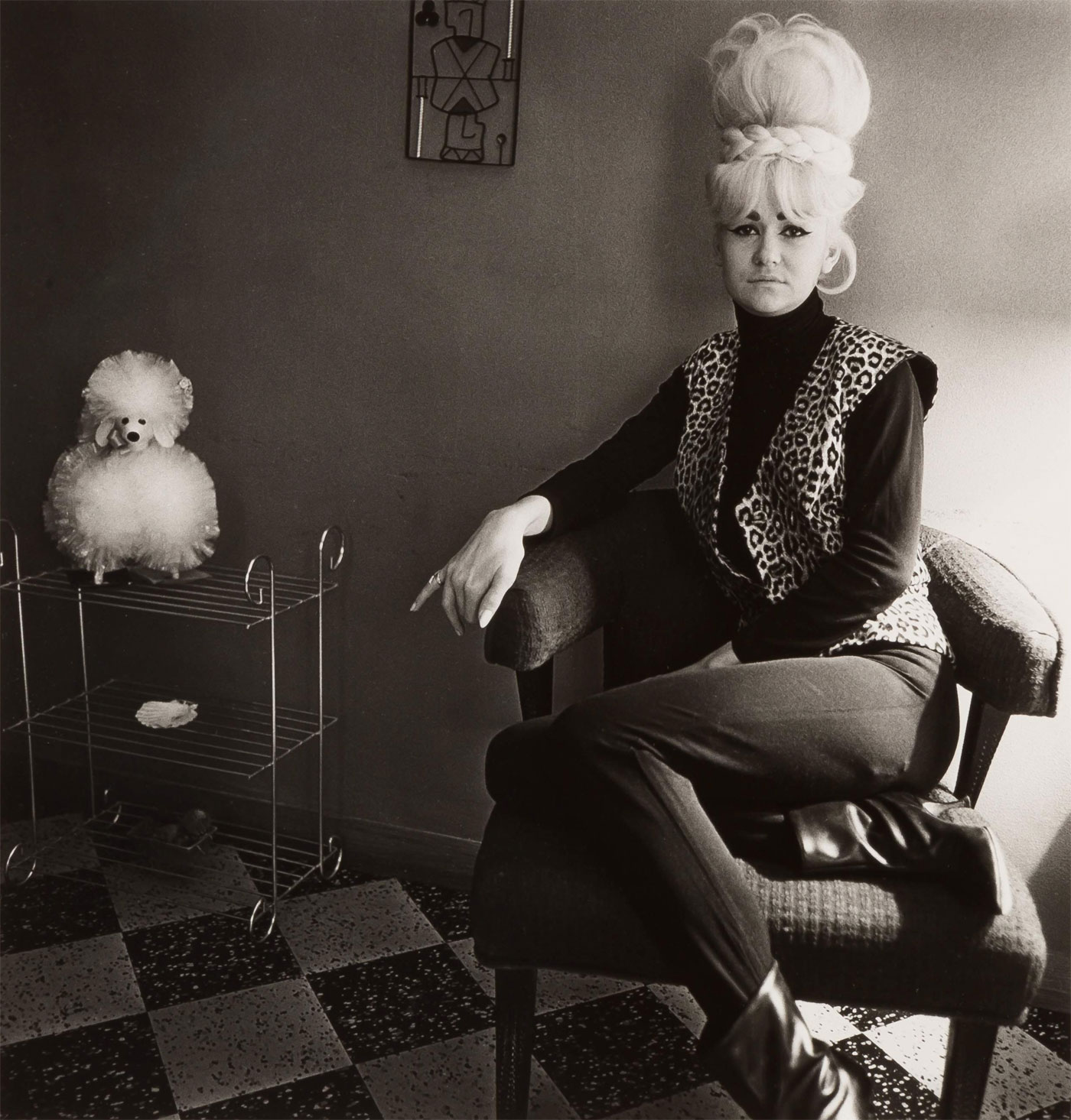
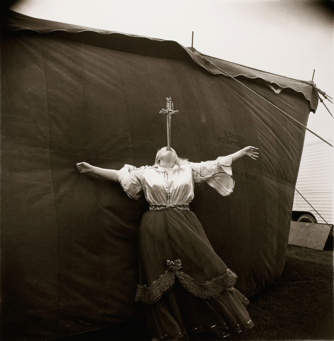
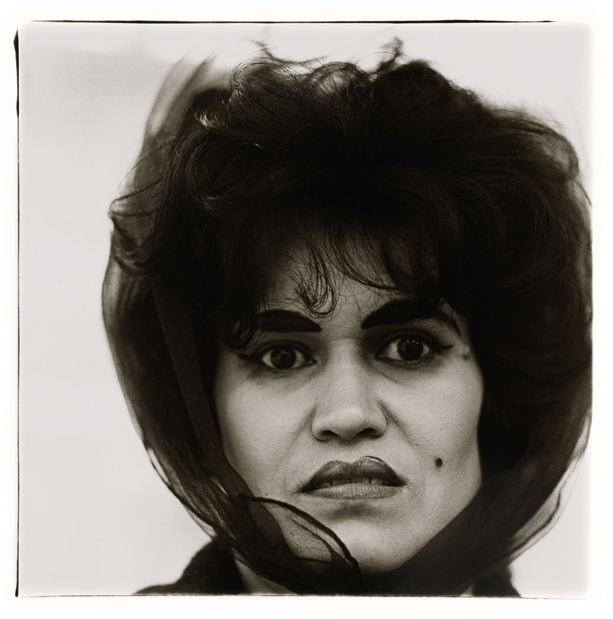
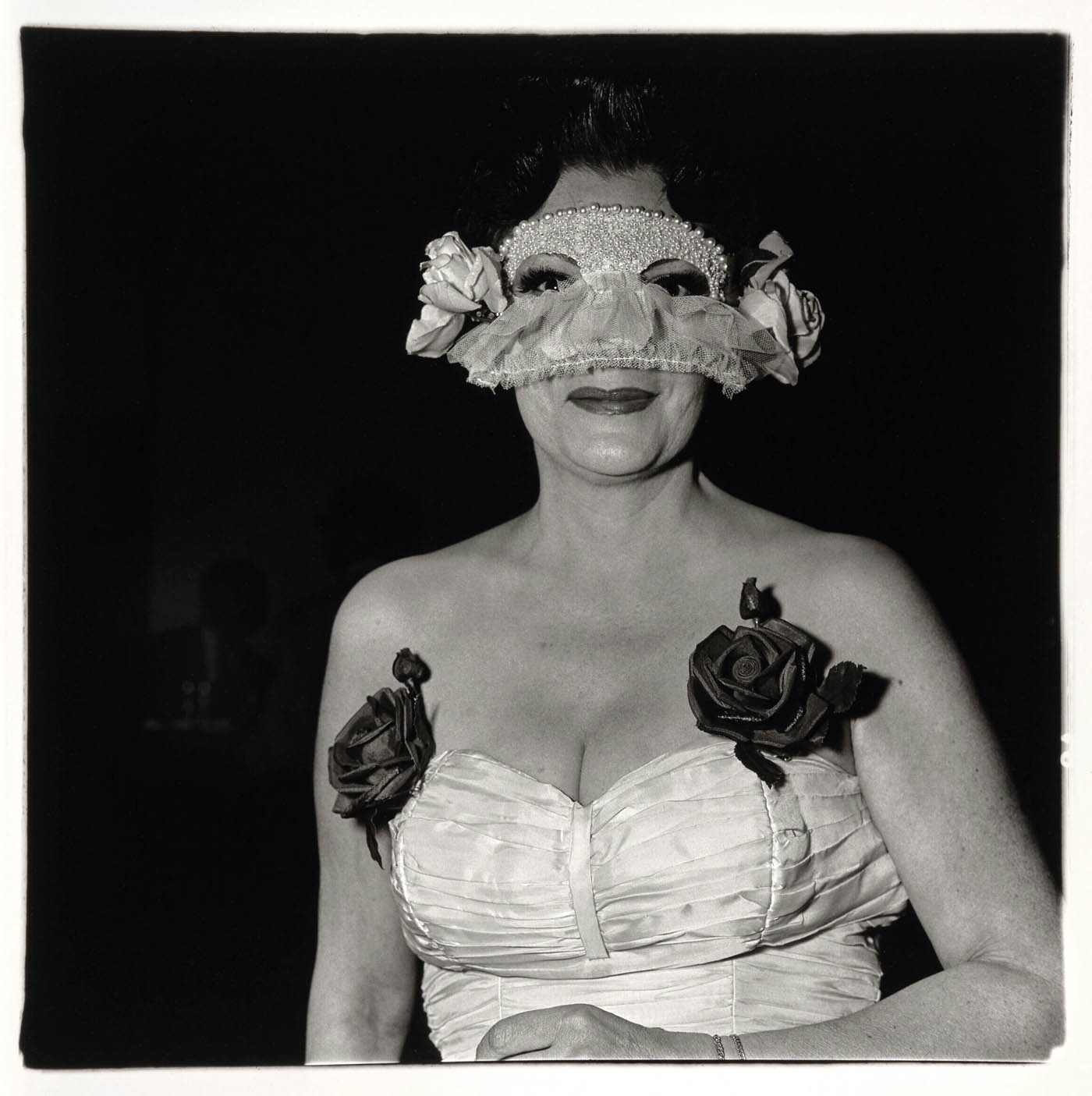
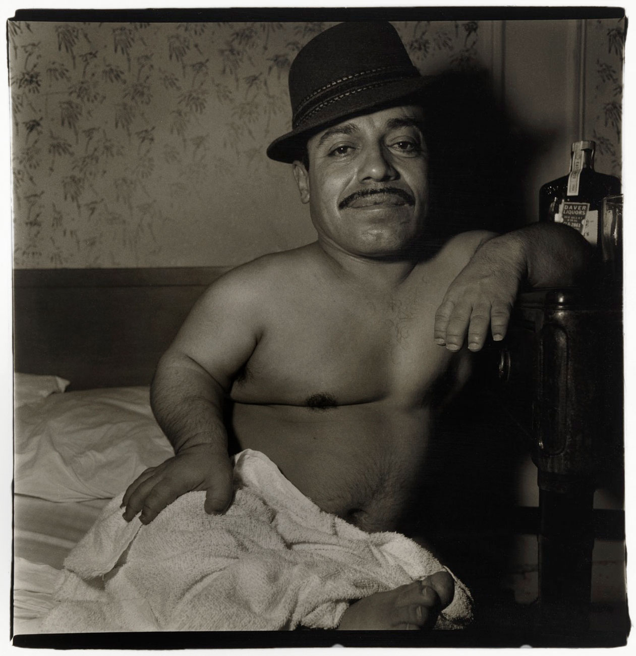
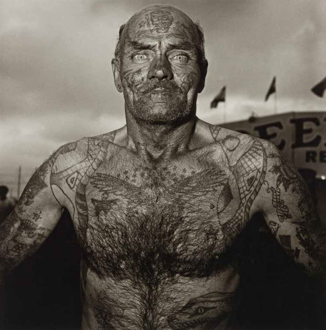
Diane Arbus (New York, 1923-1971) revolutionised the art she practiced. Her bold subject matter and photographic approach produced a body of work that is often shocking in its purity, in its steadfast celebration of things as they are. Her gift for rendering strange those things we consider most familiar, and for uncovering the familiar within the exotic, enlarges our understanding of ourselves.
Arbus found most of her subjects in New York City, a place that she explored as both a known geography and as a foreign land, photographing people she discovered during the 1950s and 1960s. She was committed to photography as a medium that tangles with the facts. Her contemporary anthropology – portraits of couples, children, carnival performers, nudists, middle-class families, transvestites, zealots, eccentrics, and celebrities – stands as an allegory of the human experience, an exploration of the relationship between appearance and identity, illusion and belief, theatre and reality.
In this first major retrospective in France, Jeu de Paume presents a selection of two hundred photographs that affords an opportunity to explore the origins, scope, and aspirations of a wholly original force in photography. It includes all of the artist’s iconic photographs as well as many that have never been publicly exhibited. Even the earliest examples of her work demonstrate Arbus’s distinctive sensibility through the expression on a face, someone’s posture, the character of the light, and the personal implications of objects in a room or landscape. These elements, animated by the singular relationship between the photographer and her subject, conspire to implicate the viewer with the force of a personal encounter.
Biography
Diane Arbus was born in New York City on March 14, 1923, and attended the Ethical Culture and Fieldston Schools. At the age of eighteen she married Allan Arbus. Although she first started taking pictures in the early 1940s and studied photography with Alexey Brodovitch in 1954, it was not until 1955-1957, while enrolled in courses taught by Lisette Model, that she began to seriously pursue the work for which she has come to be known.
Her first published photographs appeared in Esquire in 1960 under the title The Vertical Journey. From that point on she continued to work intermittently as a free-lance photographer for Esquire, Harper’s Bazaar, Show, The London Sunday Times, and a number of other magazines, doing portraits on assignment as well as photographic essays, for several of which she wrote accompanying articles.
During the 1950s, like most of her contemporaries, she had been using a 35mm camera, but in 1962 she began working with a 6×6 Rolleiflex. She once said, in accounting for the shift, that she had grown impatient with the grain and wanted to be able to decipher in her pictures the actual texture of things. The 6×6 format contributed to the refinement of a deceptively simple, formal, classical style that has since been recognised as one of the distinctive features of her work.
She received Guggenheim Fellowships in 1963 and 1966 for projects on “American Rites, Manners and Customs” and spent several summers during that period traveling across the United States, photographing contests, festivals, public and private gatherings, people in the costumes of their professions or avocations, the hotel lobbies, dressing rooms and living rooms she had described as part of “the considerable ceremonies of our present.” “These are our symptoms and our monuments,” she wrote in her original application. “I want simply to save them, for what is ceremonious and curious and commonplace will be legendary.”
The photographs she produced in those years attracted a great deal of attention when a selected group of them were exhibited, along with the work of two other photographers, in the 1967 “New Documents” show at the Museum of Modern Art. Nonetheless, although several institutions subsequently purchased examples of her work for their permanent collections, her photographs appeared in only two other major exhibitions during her lifetime, both of them group shows.
In the late 1960s she taught photography courses at Parsons School of Design, the Rhode Island School of Design and Cooper Union and in 1971 gave a master class at Westbeth, the artists cooperative in New York City where she then lived. During the same period she initiated the concept and did the basic research for the Museum of Modern Art’s 1973 exhibition on news photography, “From the Picture Press.”
She made a portfolio of ten photographs in 1970, printed, signed and annotated by her, which was to be the first of a series of limited editions of her work. She committed suicide on July 26, 1971 at the age of forty-eight. The following year the ten photographs in her portfolio became the first work of an American photographer to be exhibited at the Venice Biennale.
In the course of a career that may be said to have lasted little more than fifteen years, she produced a body of work whose style and content have secured her a place as one of the most significant and influential photographers of our time. The major retrospective mounted by the Museum of Modern Art in 1972 was attended by more than a quarter of a million people in New York before it began its tour of the United States and Canada. The Aperture monograph Diane Arbus, published in conjunction with the show has sold over 300,000 copies. Beginning in 2003, Diane Arbus Revelations, an international retrospective organised by The San Francisco Museum of Modern Art travelled to museums throughout the United States and Europe between 2003 and 2006. Major exhibitions devoted exclusively to her work have toured much of the world including, Australia, Germany, Italy, Japan, the Netherlands, New Zealand, Spain, and the United Kingdom.
“There’s a quality of legend about freaks. Like a person in a fairy tale who stops you and demands that you answer a riddle. Most people go through life dreading they’ll go through a traumatic experience. Freaks were born with their trauma. They’ve already passed their test in life. They’re aristocrats.”
“If you’ve ever talked to somebody with two heads you know they know something you don’t.”
The Gap between Attention and Affect
“You see someone on the street and essentially what you notice about them is the flaw. It’s just extraordinary that we should have been given these peculiarities. And, not content with what we were given, we create a whole other set. Our whole guise is like giving a sign to the world to think of us in a certain way but there’s a point between what you want people to know about you and what you can’t help people knowing about you. And that has to do with what I’ve always called the gap between intention and effect. I mean if you scrutinise reality closely enough, if in some way you really, really get to it, it becomes fantastic.”
Other Thoughts
“The thing that’s important to know is that you never know. You’re always sort of feeling your way.”
“Nothing is ever the same as they said it was. It’s what I’ve never seen before that I recognise.”
“A photograph is a secret about a secret. The more it tells you the less you know.”
“For me the subject of the picture is always more important than the picture. And more complicated. I do have a feeling for the print but I don’t have a holy feeling for it. I really think what it is, is what it’s about. I mean it has to be of something. And what it’s of it always more remarkable than what it is.”
“I really believe there are things which nobody would see unless I photographed them.”
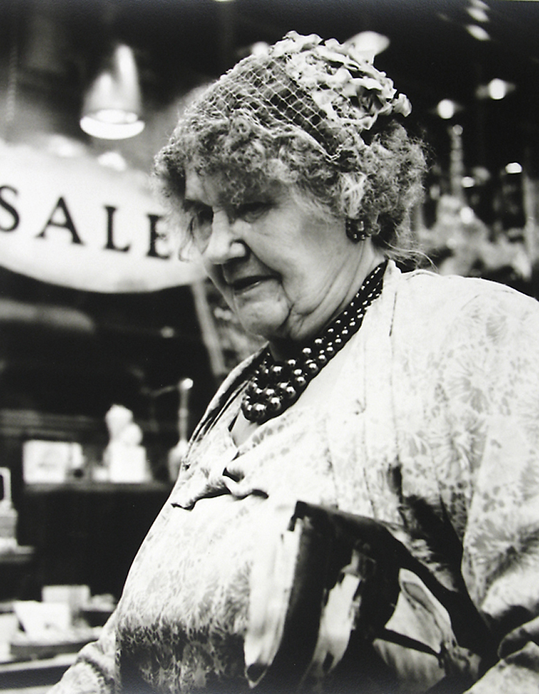
Another photographer who is getting more recognition. Out of the work I have seen the portraits are the strongest. Some of them feel like precursors to the confronting portraits of women made by Diane Arbus while others offer a more reflective, contemplative examination of human presence.
Dr Marcus Bunyan
Many thankx to Alicia Colen for her help and to the Howard Greenberg Gallery for allowing me to publish the photographs in the posting.
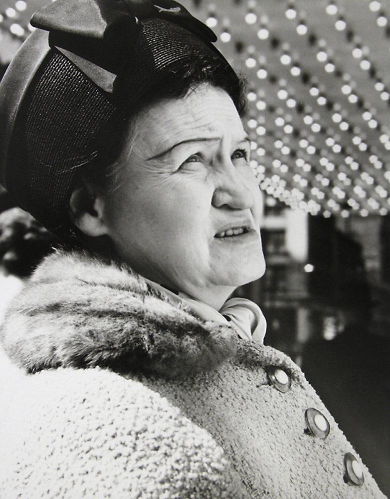
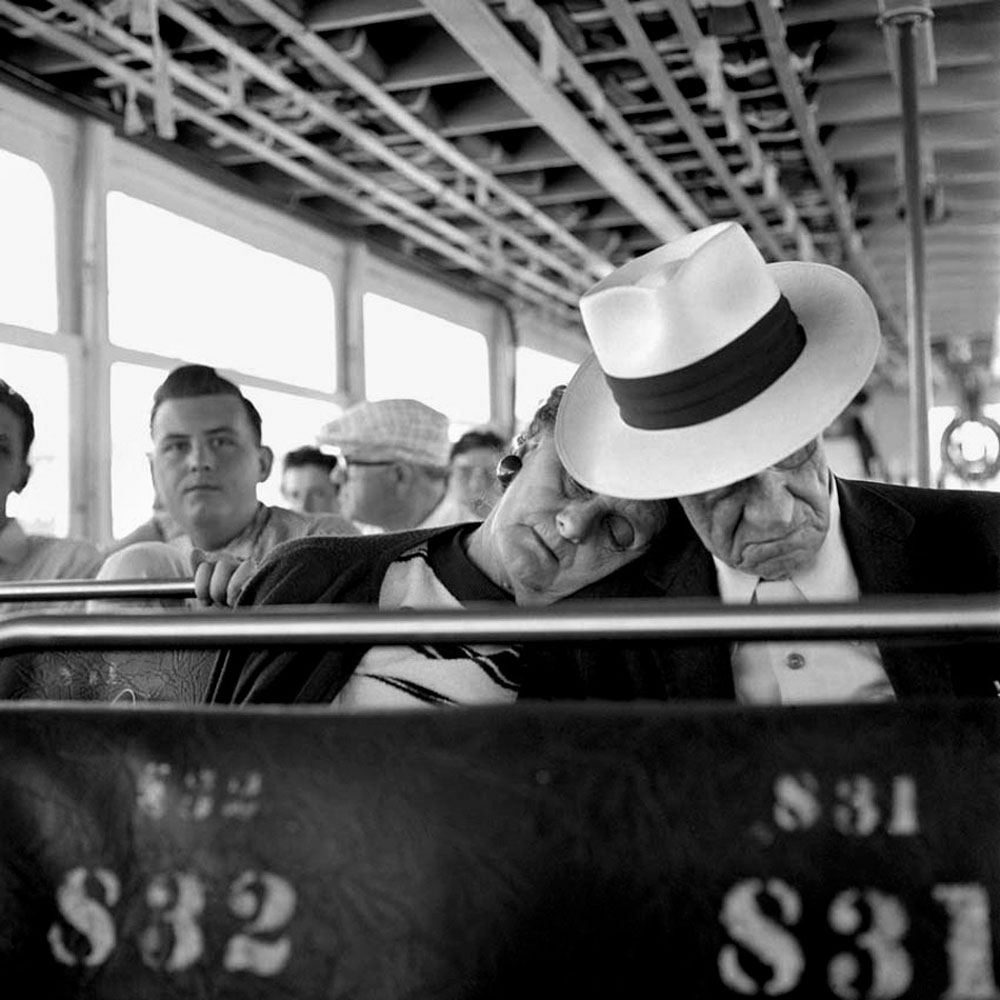
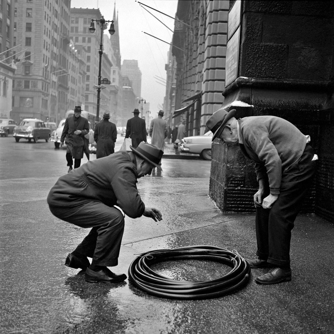
Howard Greenberg Gallery is proud to present the recently discovered work of street photographer, Vivian Maier (1926-2009), from the Maloof Collection.
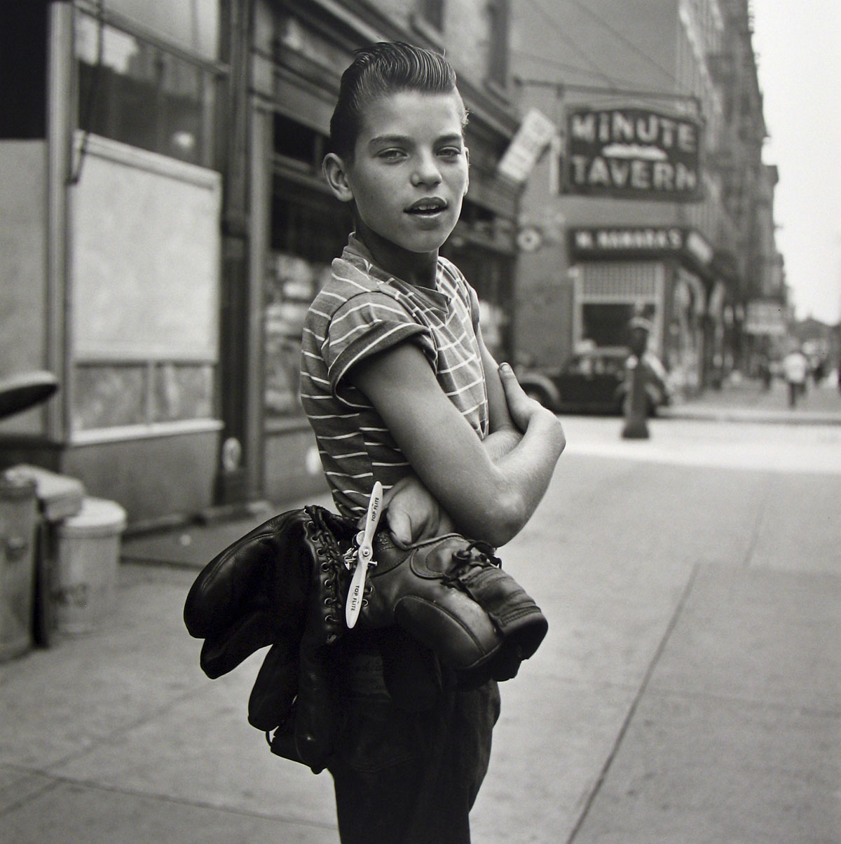
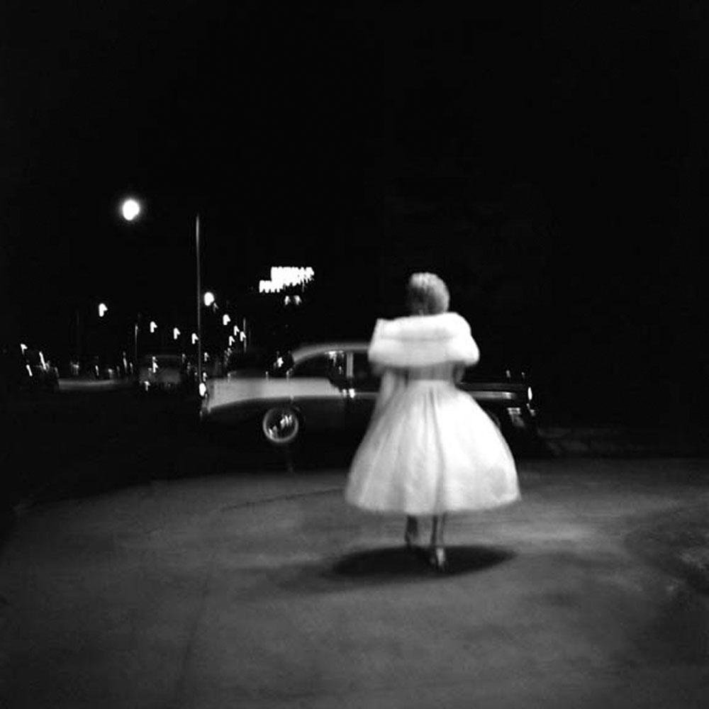
A nanny by trade, Vivian Maier’s street and travel photography was discovered by John Maloof in 2007 at a local auction house in Chicago. Always with a Rolleiflex around her neck, she managed to amass more than 2,000 rolls of films, 3,000 prints and more than 100,000 negative which were shared with virtually no one in her lifetime. Her black and white photographs-mostly from the 50s and 60s-are indelible images of the architecture and street life of Chicago and New York. She rarely took more than one frame of each image and concentrated on children, women, the elderly, and indigent. The breadth of Maier’s work also reveals a series of striking self-portraits as well as prints from her travels to Egypt, Bangkok, Italy, and the American Southwest, among dozens of other international cities.
“My fascination with her story has only grown, as has my involvement with her photographs. It is such an unusual story with no resolution. At first her images are extremely well seen, quality photographs of life on the street, in New York City and Chicago. But as one looks at the body of her work, she reveals her deeper interests. Then one tries to imagine who she was, what motivated her, her personality. It is not everyday that one becomes so involved and even obsessed with a particular photographer,” comments Howard Greenberg.
What little is known about Maier’s life is the result of John Maloof’s extensive research. He discovered her obituary on line in 2009 which was just the beginning of his investigative work. An American of French and Austro-Hungarian extraction, Maier split her time between Europe and the US, returning to NY in 1951. In 1956, she ultimately settled in Chicago where she worked as nanny for more than forty years. For a brief period in the 1970s she worked as a nanny to journalist, Phil Donahue’s children. Towards the end of her life, Maier was supported by the children she had cared for in the early 50s. Unbeknownst to them, one of Maier’s storage lockers (containing her massive group of negatives) was auctioned off due to delinquent payments.
After purchasing the first collection of Maier photographs in 2007, Maloof acquired more from another buyer at the same auction. He has since established the Maloof Collection to promote the work of Vivian Maier and to safeguard the archive for future generations. The archive consists of approximately 100,000 to 150,000 negatives; over 3,000 prints; hundreds of rolls of film; home movies; audio tape interviews, and other items representing roughly 90% of Maier’s work. Through Maloof’s efforts, Vivian Maier’s photographs have been exhibited internationally and have received significant critical attention. In November, Powerhouse Books will publish Vivian Maier: Street Photographer, edited by Maloof with a foreword by Geoff Dyer. John Maloof is also co-producing a documentary about Vivian Maier.
Marcus Bunyan (Australian, b. 1958) Self-portrait in Punk Jacket 1991-1992 Silver gelatin print
I am scanning my negatives made during the years 1991-1997 to preserve them in the form of an online archive as a process of active memory, so that the images are not lost forever. These photographs were images of my life and imagination at the time of their making, the ideas I was thinking about and the people and things that surrounded me.
Photographs are available from this series for purchase. As a guide, a vintage 8″ x 10″ silver gelatin print costs $700 plus tracked and insured shipping. For more information please see my Store web page.
Marcus Bunyan (Australian, b. 1958) Marcus Sucking His Thumb 1991-1992 Silver gelatin print
Marcus Bunyan (Australian, b. 1958) Marcus in his Punk Jacket, Punt Road, South Yarra 1991-1992 Silver gelatin print
Marcus Bunyan (Australian, b. 1958) Marcus as The Fool (posing for the sculptor Fredrick White) 1991-1992 Silver gelatin print
Marcus Bunyan (Australian, b. 1958) Nude, in the Flat, Rear of Derelict House, 455, Punt Road, South Yarra 1992 Silver gelatin print
Marcus Bunyan (Australian, b. 1958) Self-portrait, nude with the mural ‘Two boys on a car’ 1992 Silver gelatin print
Marcus Bunyan (Australian, b. 1958) Nude on Floor (with Clifford Last) 1992 Silver gelatin print
Marcus Bunyan (Australian, b. 1958) Nude on Couch, Punt Road, South Yarra 1992 Silver gelatin print
Marcus Bunyan (Australian, b. 1958) Nude on Couch, Punt Road, South Yarra 1992 Silver gelatin print
Curator: Michal Raz-Russo, museum exhibition coordinator and associate curator
Many thankx to The Art Institute of Chicago for allowing me to publish the photographs in the posting. Please click on the photographs for a larger version of the image.
Artist unknown (American) [Three women] c. 1930s Gelatin silver print 8.9 x 14.7cm The Art Institute of Chicago, Gift of Peter J. Cohen
Artist unknown (American) The Three Graces c. 1930s Gelatin silver print The Art Institute of Chicago, Gift of Peter J. Cohen
Artist unknown (American) Look Pleasant c. 1910s Gelatin silver print 8.9 x 8.6cm The Art Institute of Chicago, Gift of Peter J. Cohen
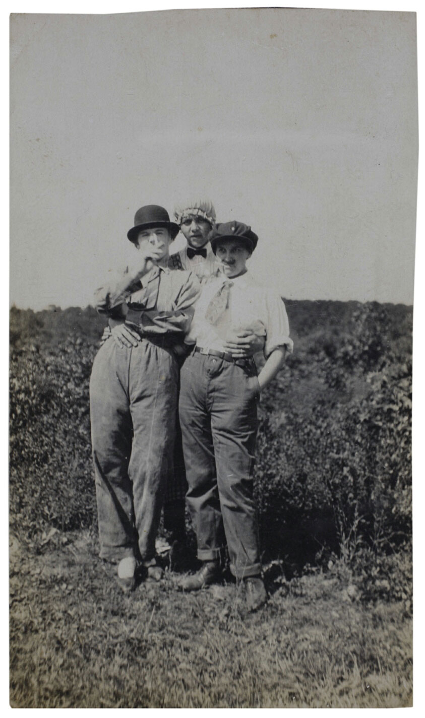
Artist unknown (American) [Three women] c. 1910s Gelatin silver print 11.6 x 6.8cm The Art Institute of Chicago, Gift of Peter J. Cohen
Artist unknown (American) Untitled 1910/1940 Image: 7.7 x 5.2cm (3 1/16 x 2 1/16 in.) Paper: 8.6 x 6.1 cm (3 7/16 x 2 7/16 in.) The Art Institute of Chicago, Gift of Peter J. Cohen
After George Eastman introduced the handheld Kodak #1 camera in 1888, amateurs made millions of snapshots depicting friends and family, travels, and festive occasions such as weddings. Even while solidifying such thoroughly conventional behaviours, amateur photography developed a new pictorial language that privileged immediacy, spontaneity, and accident. Career photographers and art historians – but also antiques vendors and flea-market shoppers – have long recognised the value of the “snapshot aesthetic.” The rise of social media and smartphones in recent years has effectively ended the era of the snapshot as both a printed photograph and an image for a private audience.
Text from the Art Institute of Chicago website
Artist unknown (American) Untitled (Summer, Aug, 1920) 1920 Gelatin silver print 13.9 x 8.3cm (5 1/2 x 3 5/16 in.) The Art Institute of Chicago, Gift of Peter J. Cohen
Artist unknown (American) Untitled c. 1920-1929 Gelatin silver print 13.7 x 8.5cm (5 7/16 x 3 3/8 in.) The Art Institute of Chicago, Gift of Peter J. Cohen
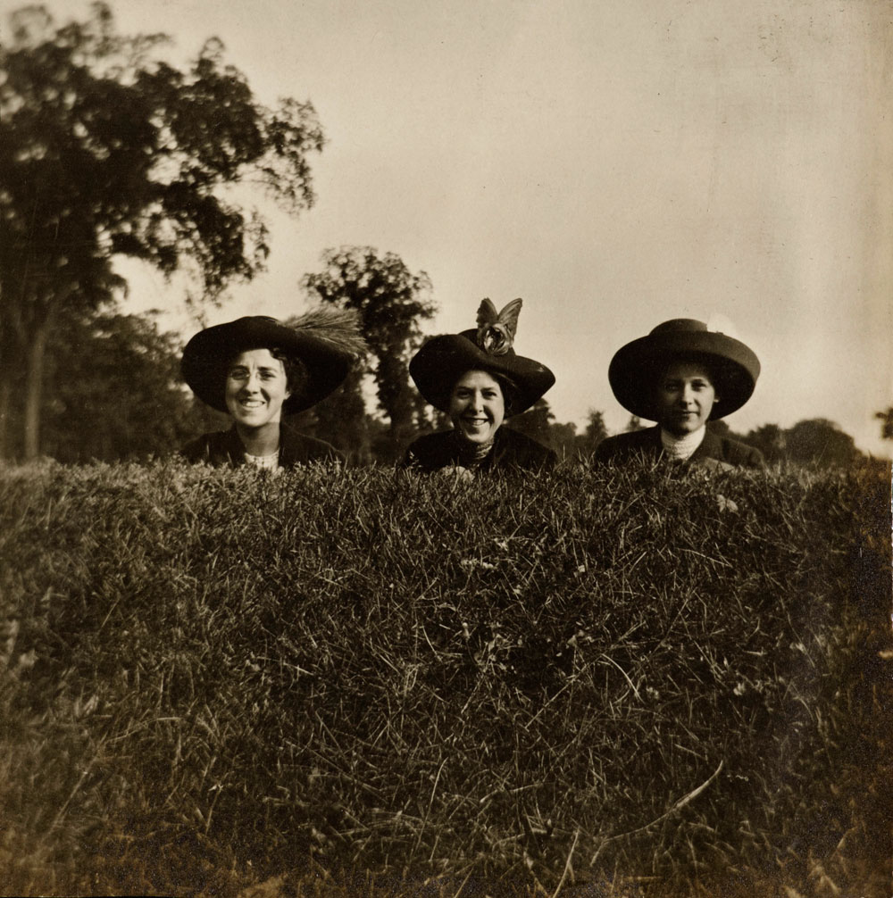
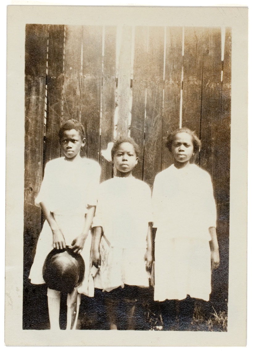
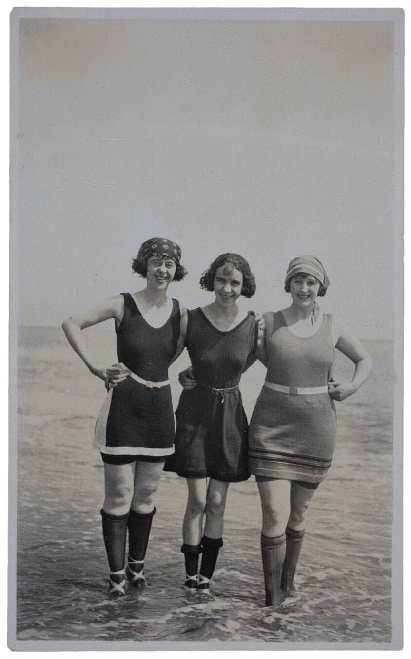
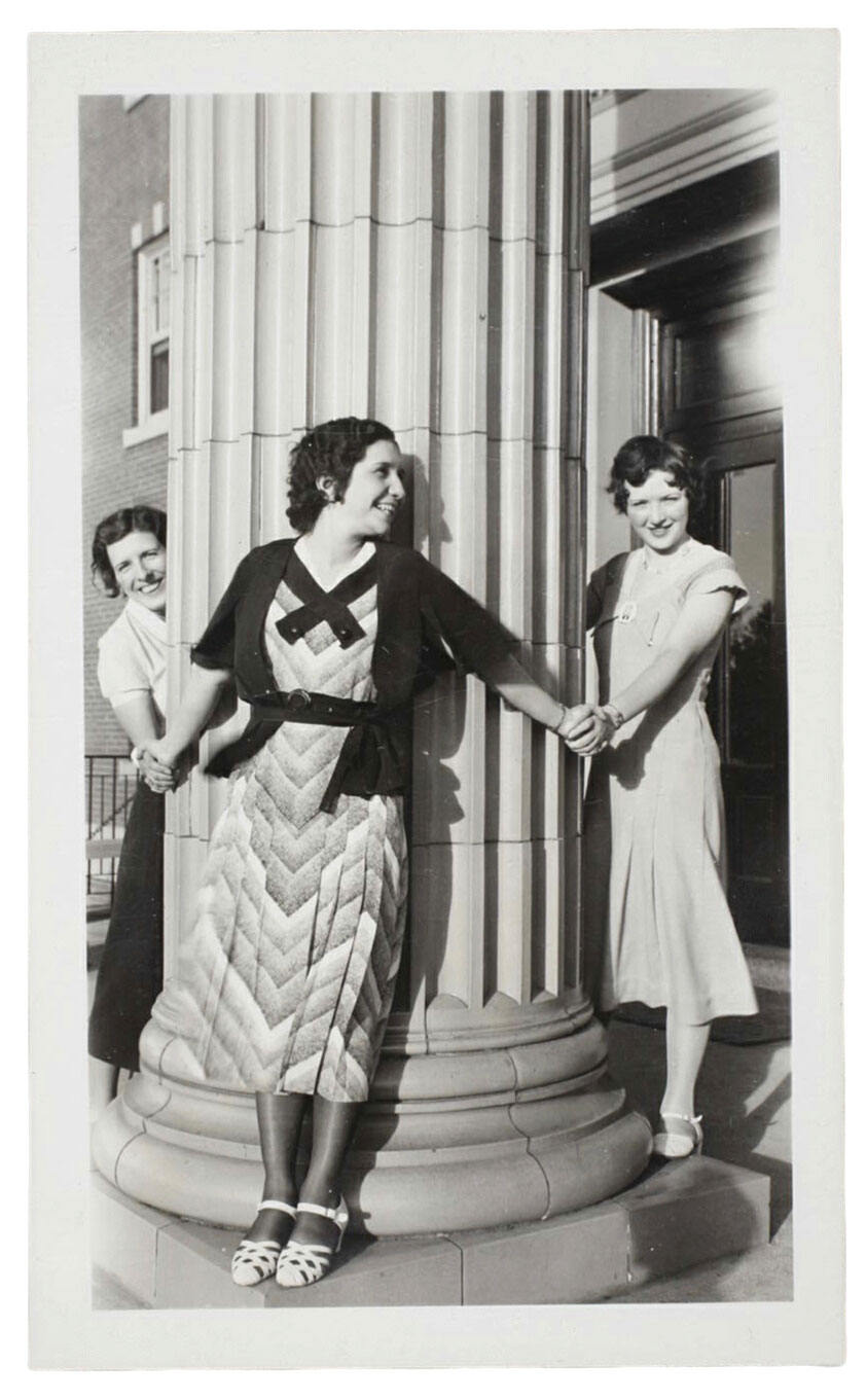
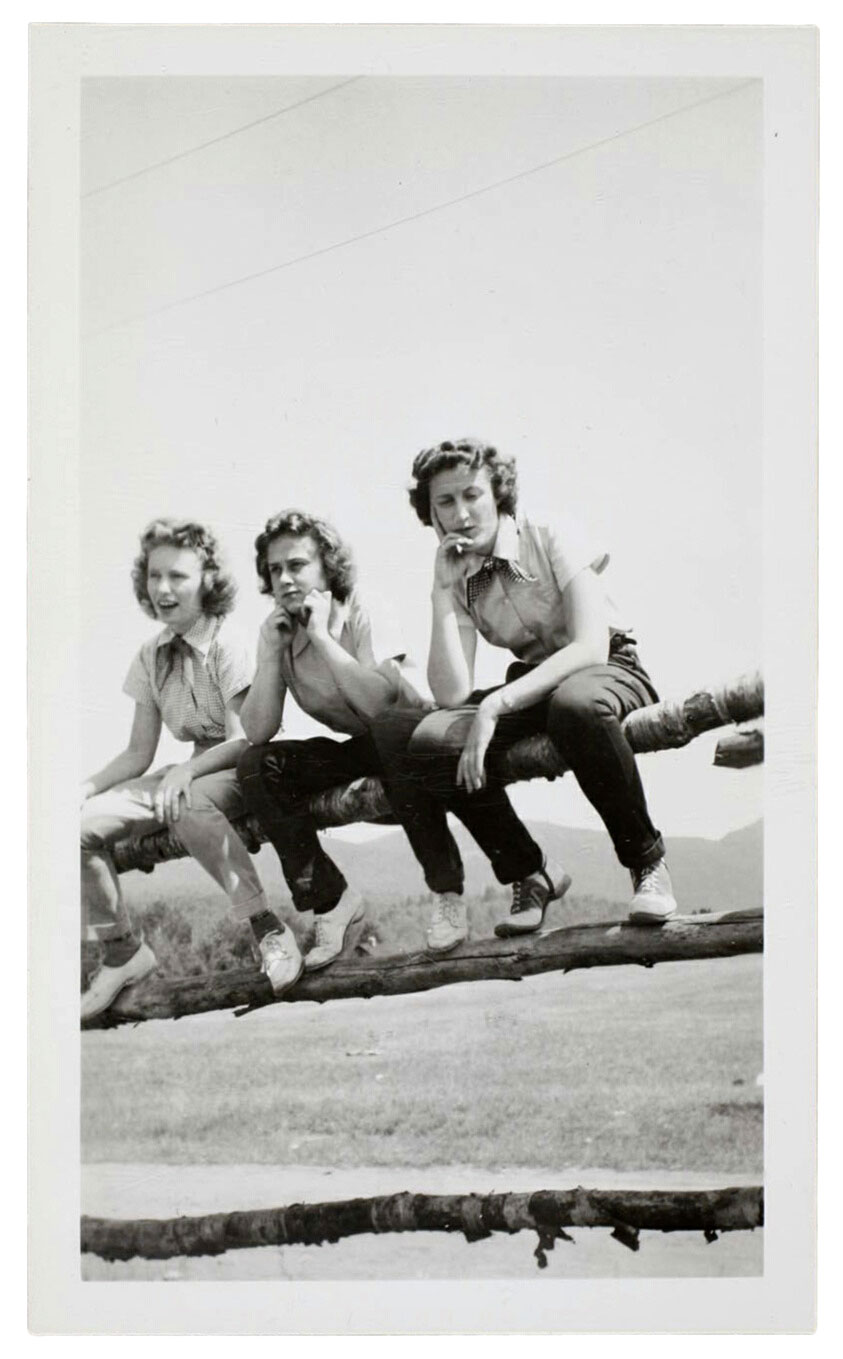
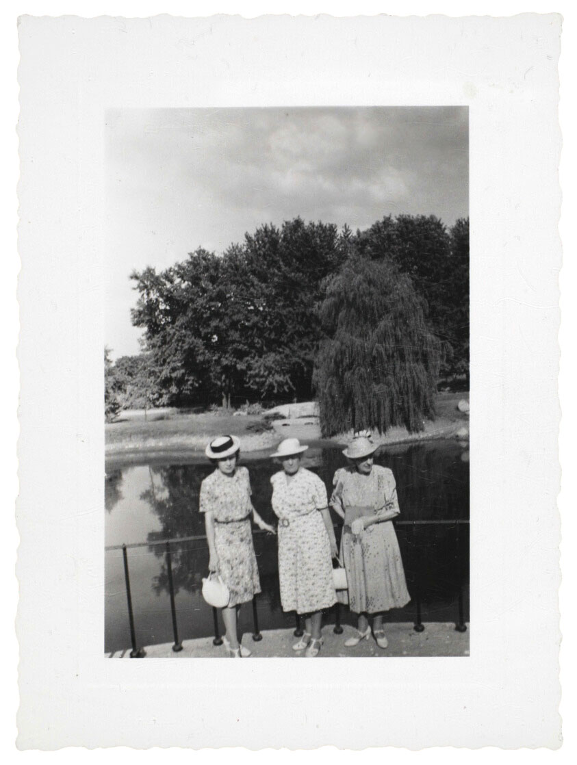
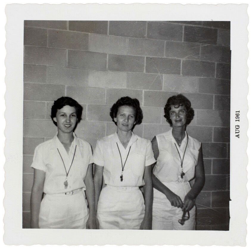
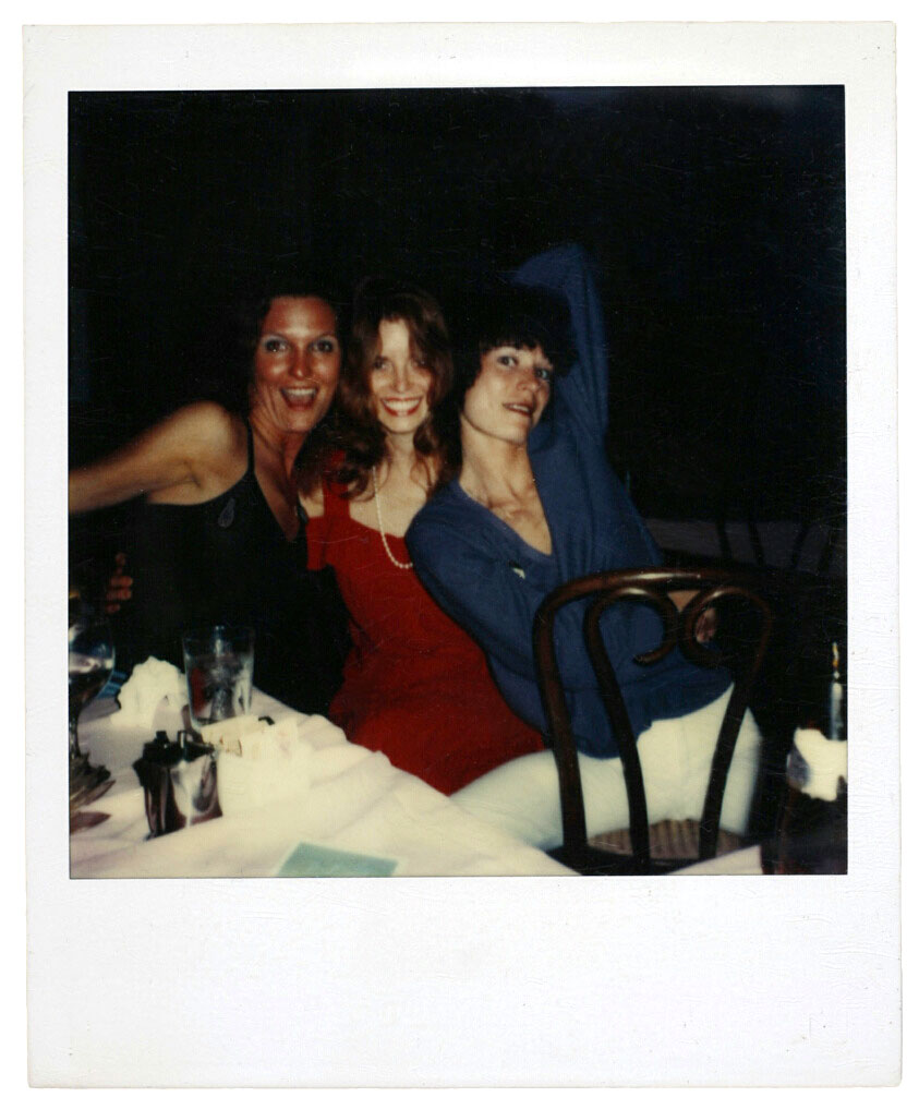
This exhibition explores the early years of vernacular photography through graceful snapshots of female trios. Displaying more than 500 “found” images the exhibition features photographs of celebrations, vacations, and gatherings of family and friends are taken and kept with the aim of preserving moments in life for future generations. What happens, however, when a snapshot becomes an image “type” – transferred into the hands of a collector and folded into a broader cultural history?
This subject is explored in the Art Institute of Chicago’s The Three Graces – on view October 29, 2011, through January 22, 2012, in the museum’s Photography Galleries 3 and 4. The exhibition, featuring a private collection of more than 500 anonymous images depicting female trios, spans nearly a century of female role-playing for the camera. These mostly American “found” photographs, spanning from the 1890s to the 1970s, collectively reveal a great deal about the evolving ritual of women’s self-presentation, a theme already idealised in Classical culture with depictions of “The Three Graces.”
New York collector Peter J. Cohen, who has spent decades scouring flea markets, shops, and galleries in search of rare amateur photographs, amassed this image collection and gave it its title. Cohen was struck by the frequency of images featuring female trios, and had the wit to identify in them a playful echo of the Greek muses Aglaia, Euphrosyne, and Thalia, who are said to personify beauty, charm, and grace in both nature and humanity. Cohen owns some 20,000 anonymous snapshots spanning from the late 19th century until the 1970s. He has organised his mountainous holdings according to many classifications, among them “Double Exposures,” “Up on The Roof,” and “Dangerous Women.”
For Art Institute exhibition coordinator Michal Raz-Russo, who also authored the accompanying book, the “three graces” theme serves as a frame through which to chart shifts and continuities in women’s self-understanding across nearly a century. The 1888 introduction of the Kodak #1 camera and the 1900 debut of the Kodak Brownie made photography immensely popular, with much of the marketing was directed at women. Modern life and leisure in the 1920s coincided with the arrival of smaller cameras, faster film speeds, and automatic exposures; women of the expanding middle class became practiced at self-portraiture while vacationing or camping on their own. Later, in the mid-20th century, a clear convergence can be seen between women’s self-portraits and ideals of womanhood promulgated in films and glossy magazines. Throughout this history, men are clearly at work too, convincing women to participate in erotic poses according to another set of visual models. While the varieties of picturing and self-picturing are complex, The Three Graces demonstrates that women worked to define themselves as social beings through photography.
Visitors to the exhibition can find information on individual snapshots – gleaned from inscriptions and the clues provided by clothing and setting – at a special computer kiosk located in the gallery.
Press release from The Art Institute of Chicago website
Artist unknown (American) [Three Women] c. 1920s Gelatin silver print 13.5 x 8.3cm The Art Institute of Chicago, Gift of Peter J. Cohen
Unknown Maker (American) Untitled (Stamped Clyde Banks Photo Services, Crystal Sheer, Aug 5 1932) 1930-1939 Gelatin silver print Paper: 11.7 x 7.1cm (4 5/8 x 2 13/16 in.) The Art Institute of Chicago, Gift of Peter J. Cohen
Unknown Maker (American) Untitled (Stony Creek Dude Ranch, July 1939, stamped Certified, Master Photo Finishers of America, Fountain Photo Service, May 15 1940) Made 1939 Gelatin silver print Paper: 11.6 x 7cm (4 5/8 x 2 13/16 in.) The Art Institute of Chicago, Gift of Peter J. Cohen
Unknown Maker (American) Untitled (Stamped Master Photo Finishers of America, Service and Quality, Kay Tone 10 Point Process, Certified Reg. U.S. Pat Off., Caton Photo Co., Detroit, Michigan, Sep 11 1939) Printed 1939 Gelatin silver print Paper: 10.7 x 7.9cm (4 1/4 x 3 1/8 in.) The Art Institute of Chicago, Gift of Peter J. Cohen
Artist unknown (American) [Three Women] c. 1940s Gelatin silver print 11.7 x 7cm The Art Institute of Chicago, Gift of Peter J. Cohen
Artist unknown (American) [Three Women and a photographer] c. 1940s Gelatin silver print 12.2 x 7.6cm The Art Institute of Chicago, Gift of Peter J. Cohen
Unknown Maker (American) Untitled (Gym Teachers Linda “Sissy” House, Sarah Beth Jordan, Seanne Livingston, 9th Grade) Printed 1961 Gelatin silver print Paper: 9 x 9 cm (3 9/16 x 3 9/16 in.) The Art Institute of Chicago, Gift of Peter J. Cohen
Unknown Maker (American) Untitled 1960-1969 Internal dye diffusion transfer print Paper: 10.8 x 8.9cm (4 5/16 x 3 9/16 in.) The Art Institute of Chicago, Gift of Peter J. Cohen
Martin M. Homburger (American, active mid-20th century) Untitled [Three women] 1967 Chromogenic print Image: 11.7 x 9.2cm (4 5/8 x 3 5/8 in.) Paper: 12.7 x 10.2cm (5 x 4 1/16 in.) The Art Institute of Chicago, Gift of Peter J. Cohen
Unknown Maker (American) Untitled Printed 1968 Chromogenic print Paper: 9 x 8.6cm (3 9/16 x 3 7/16 in.) The Art Institute of Chicago, Gift of Peter J. Cohen
Artist unknown (American) [Three Women] c. 1930s Gelatin silver print 14.5 x 8.7cm The Art Institute of Chicago, Gift of Peter J. Cohen
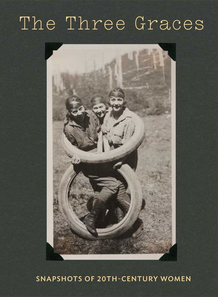
The Three Graces: Snapshots of Twentieth-Century Women book cover Hardcover – November 29, 2011
Featuring an amazing treasure trove of unpublished images, this intriguing and entertaining book looks at how women explored their identity through popular photography in the 20th century
Snapshots preserve more than individual likeness and memory. Photographs of celebrations, vacations, and gatherings of family and friends are collected with the aim of constructing and preserving a personal identity for future generations. What happens, however, when a snapshot is subsequently discarded or displaced and becomes merely an “anonymous” image? This and many other questions are discussed in this fascinating selection of anonymous images depicting three women. Presumably all taken by nonprofessionals, these snapshots were acquired over time by a private collector interested in their eclectic yet familiar details, who named the grouping after the iconic Greco-Roman motif.
In traditional western iconography, the Three Graces personify beauty, charm, and grace in both nature and humanity. In the 150 snapshots assembled here, the remarkable consistency of confidence and poise projected by the trios of women – in varied settings, in various states of dress/undress, and over a period of more than fifty years – reveals the formal and behavioral conventions that evolved as photography’s popularity skyrocketed among amateurs. To this end, the iconography of The Three Graces provides a framework for understanding the generational differences and cultural influences that shaped women’s self-presentation in front of the camera in the first half of the 20th century.
Exhibition dates: 15th November, 2011 – 15th April, 2012
Curator: in-house touring exhibition by the National Archives of Australia
Many thankx to The Victorian Archives Centre for allowing me to publish the photographs in the posting. Please click on the photographs for a larger version of the image.
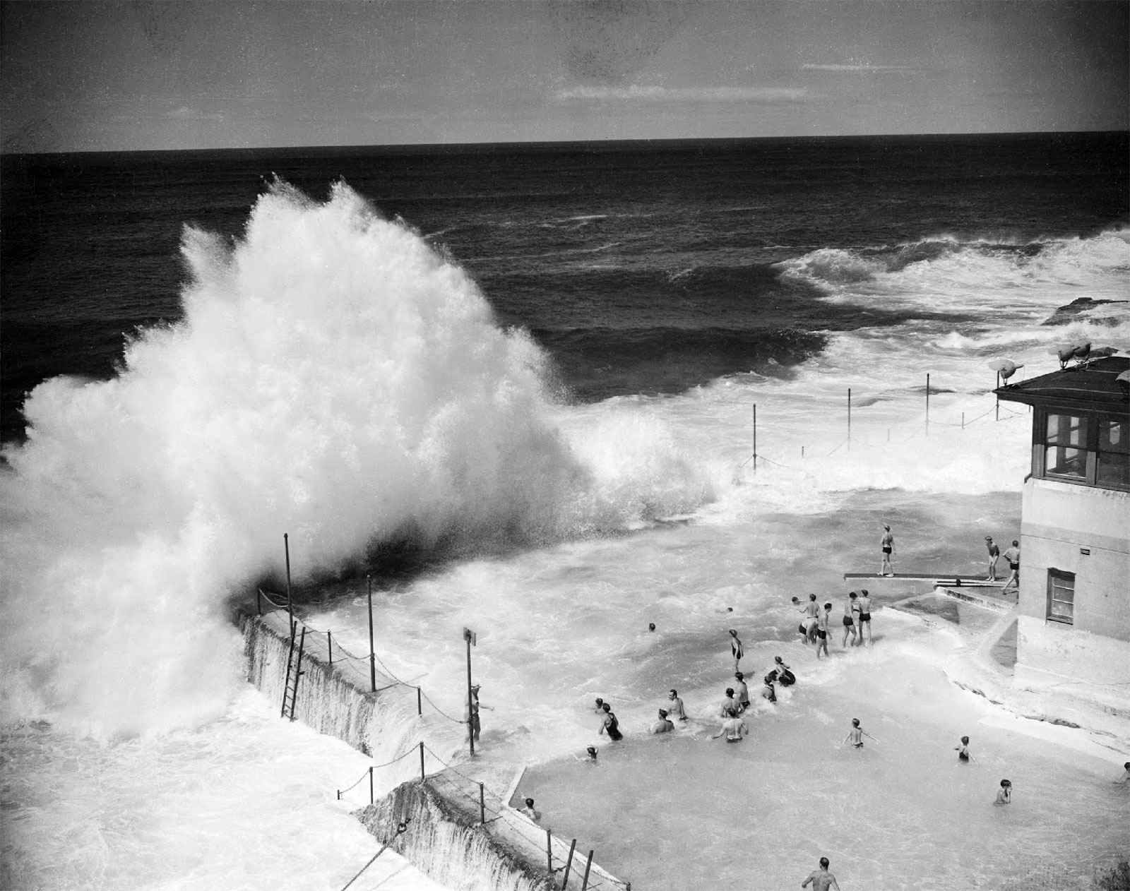
Unknown photographer (Australian) Waves breaking into the pool 1945 Australian News and Information Bureau collection National Archives of Australia
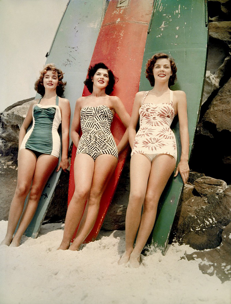
Anonymous photographer (Australian) 1952 Miss Pacific finalists Mary Clifton, Pamela Jansen and Judy Worrad, stand in front of surfboards on Bondi Beach, Sydney 1952 National Archives of Australia
Anonymous photographer (Australian) Sunbathing, Sydney Beach, NSW c. 1955 National Archives of Australia
Cossies, togs and bathers
Until the 1940s, Australian women wore decidedly modest, albeit colourful, one-piece swimsuits. But the bikini was already in vogue overseas and by the early 1950s Australian women were daring to wear it. Discover the many fashion statements that could be made by wearing a favourite pair of cossies, togs or bathers!
Anonymous photographer (Australian) Christmas party on Bondi Beach, Sydney 1959 National Archives of Australia
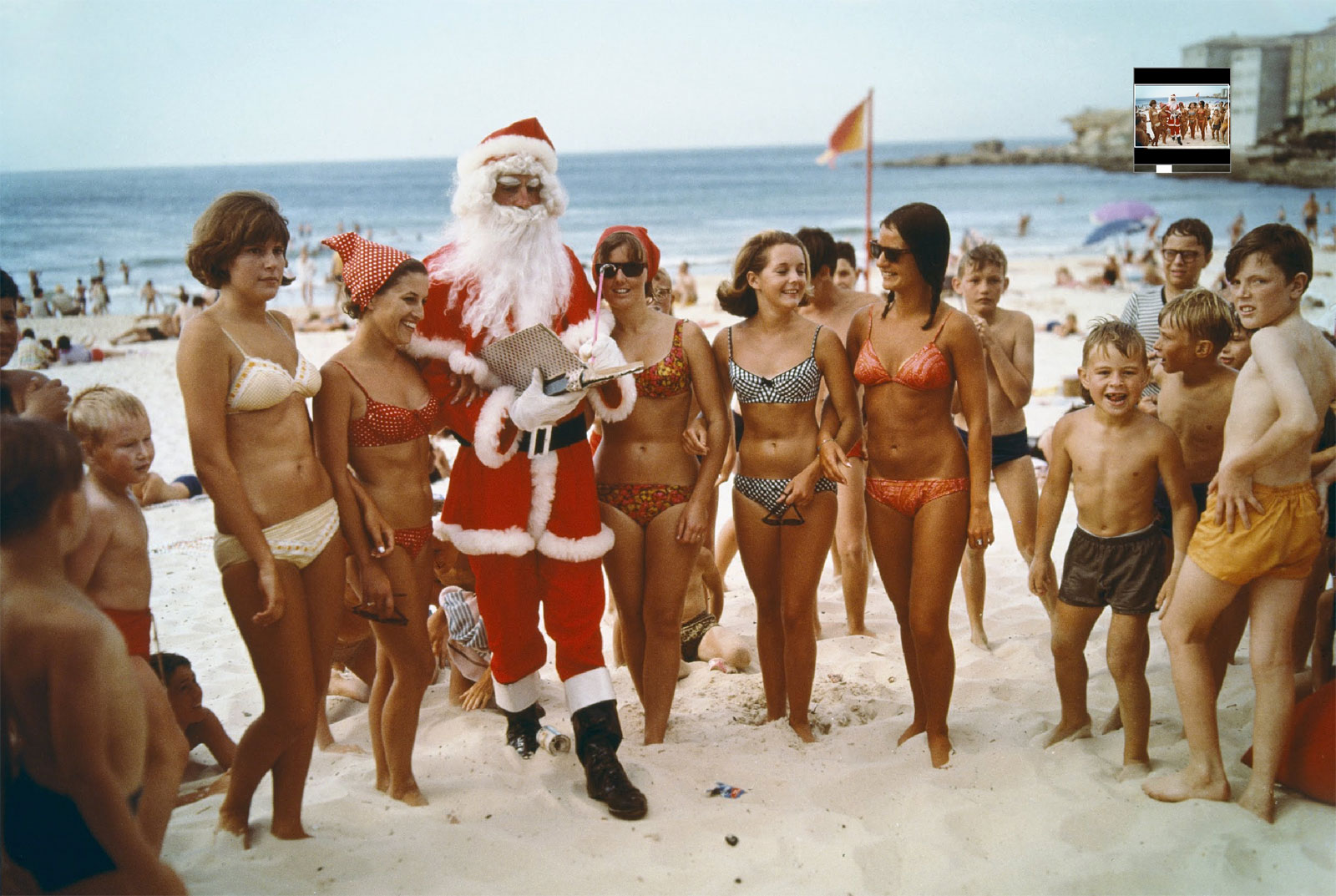
Anonymous photographer (Australian) Santa Claus visits a Sydney beach 1969 Australian News and Information Bureau collection National Archives of Australia
At the beach
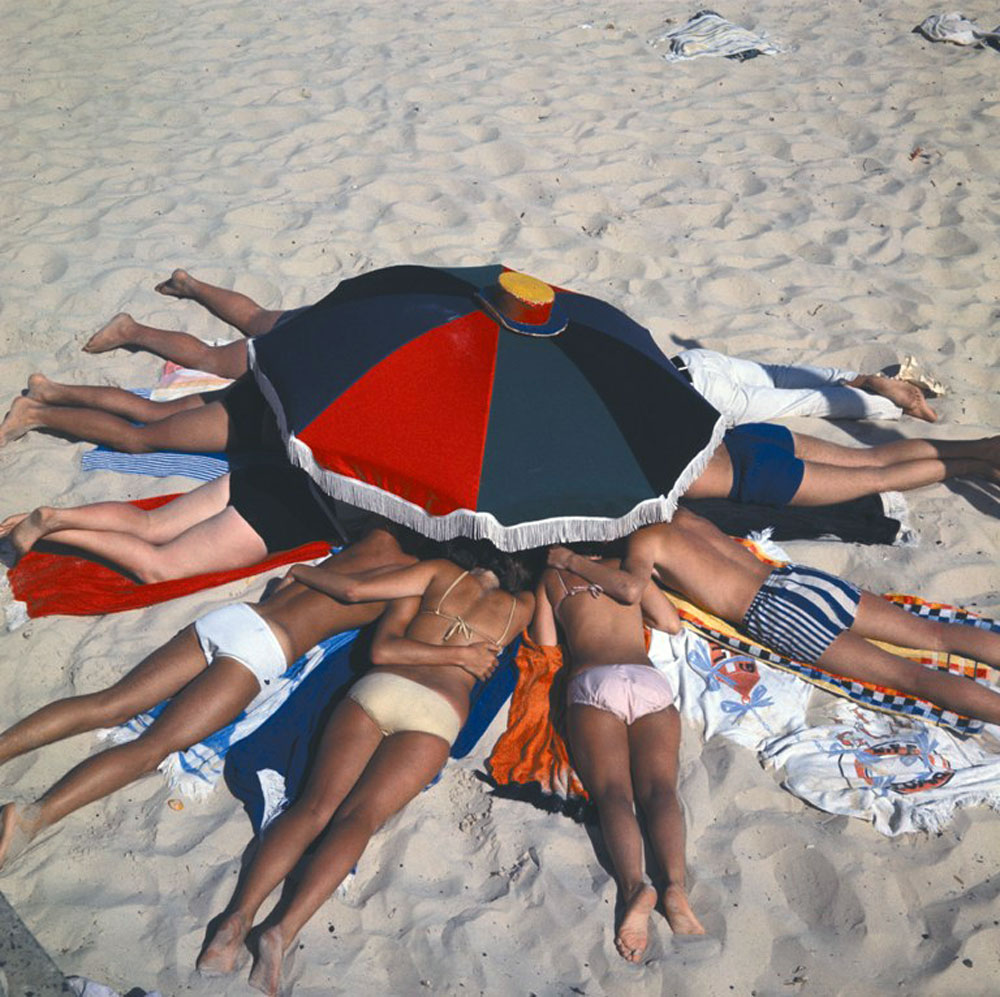
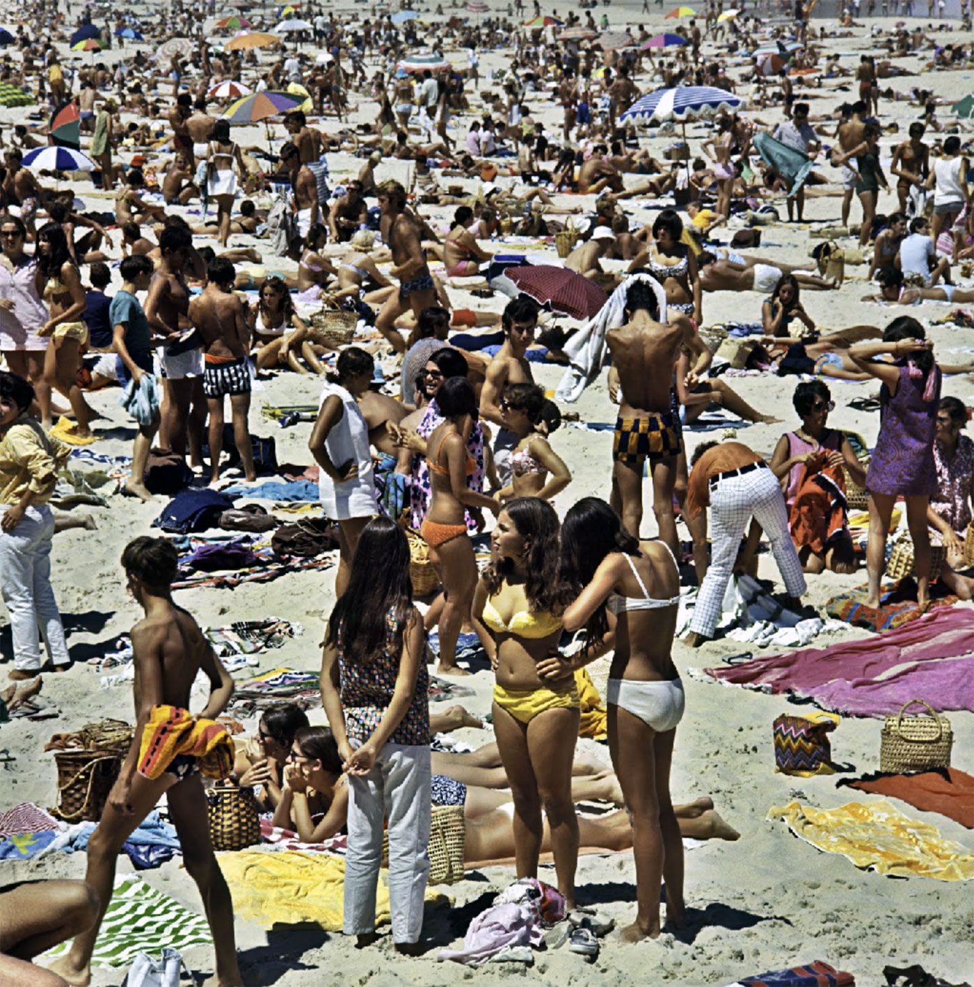
In the 1950s and 1960s, Christmas heralded the start of annual summer holidays for many Australian families. Those who didn’t already live near the coast usually headed towards it, mostly in Holdens and sometimes hauling a caravan. They made tracks to seaside places such as the Gold Coast, Manly, Byron Bay and Sorrento, plonking their bodies on the warm sand, transistors to their ears, to bake in the summer sun. Back then most people seemed unconcerned about sunburn and, as the images show, even beach umbrellas were in short supply.
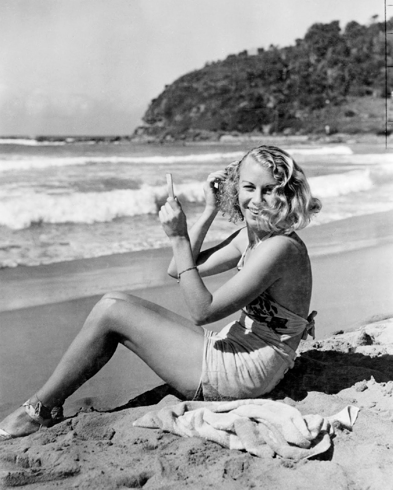
Anonymous photographer (Australian) Bathing beauty 1955 Australian Travel Industry Association collection National Archives of Australia
This image comes from the Australian Travel Industry Association collection, now held in the National Archives. This series consists of black and white prints and negatives of photographs used in publications, notably Walkabout magazine, produced by the Australian National Travel Association (ANTA).
The Victorian Archives Centre plays host to regular displays of original records from our collection as well as touring exhibitions about Victorian stories. Over Summer, the Victorian Archives Centre will present Summers Past: Golden Days in the Sun 1950-1970, a fascinating photographic exhibition highlighting Australia’s fascination with the sun and sea.
Summers Past will explore our enduring love affair of all things summer, invoking memories of carefree sunny days at the beach in the 1950s, 1960s and 1970s. This is your last chance to view this exhibition before it returns to the National Archives of Australian in April 2012.
So slip on your cossie, slop on the sunscreen and head down to the Victorian Archives Centre this summer!
Summers Past: Golden Days in the Sun 1950-1970 will be on display until April 2012. Entry is free.
Anonymous photographer (Australian) Sunbathers relax under a low umbrella at Bondi, NSW 1956 National Archives of Australia
Anonymous photographer (Australian) Sydney beach scene 1969 Australian News and Information Bureau collection National Archives of Australia
Anonymous photographer (Australian) Surfer and bikini girl on the sand 1969 National Archives of Australia
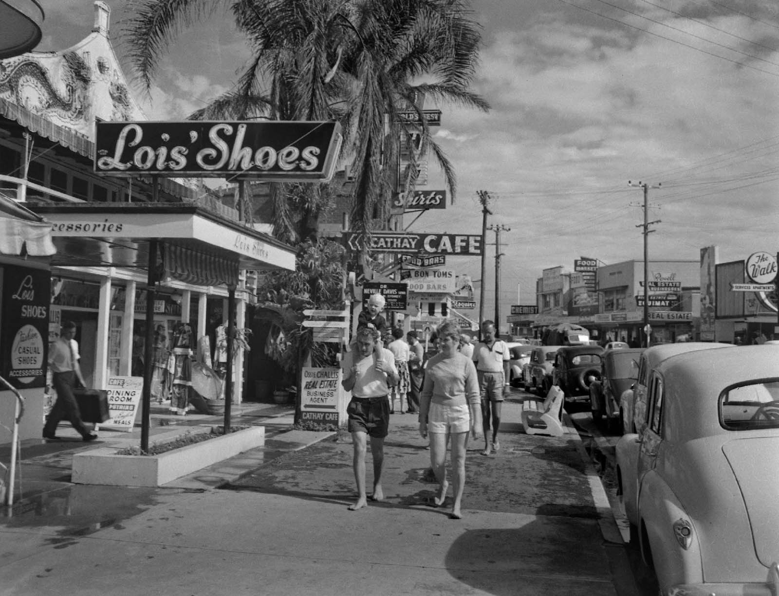
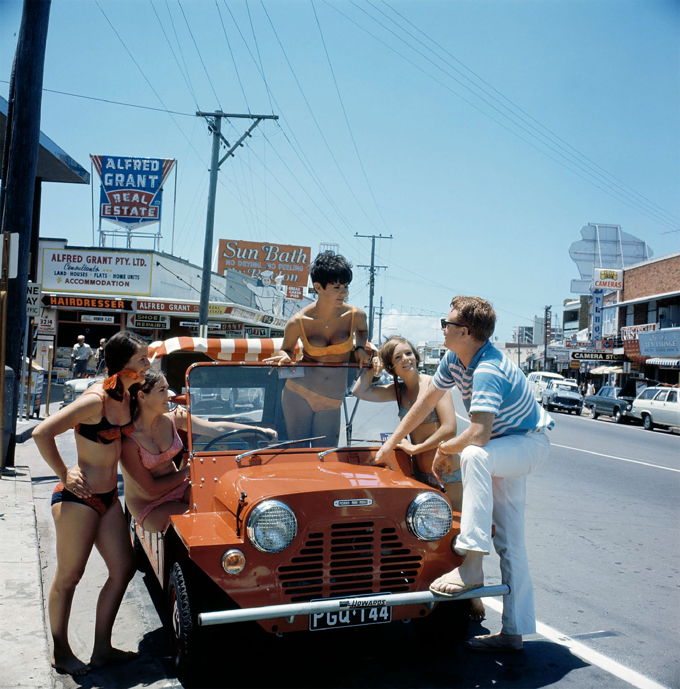
Anonymous photographer (Australian) Holiday makers at Surfers Paradise 1959 Australian News and Information Bureau collection National Archives of Australia
Anonymous photographer (Australian) Snack bar, Surfers Paradise, QLD 1971 National Archives of Australia
Out and about
Australians have always been fairly laid back and never more so than in summer. Looking at these images from the 1950s and 1960s, it’s plain that sophistication was seldom a consideration when choosing what to wear. On holidays, most people preferred to be comfortable rather than trendy, and bare feet were common on coastal streets, as were unbuttoned shirts and even swimwear.
Anonymous photographer (Australian) Holiday makers gather around a car on a hot summer’s day 1964 Australian News and Information Bureau collection National Archives of Australia
Anonymous photographer (Australian) Surf lifesaving, Bondi Beach 1960 National Archives of Australia
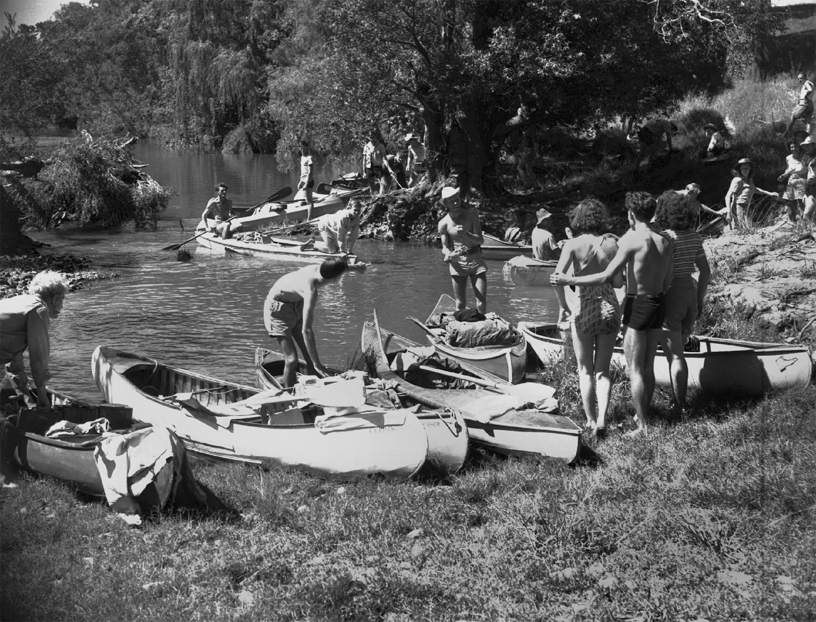
Cliff Bottomley (Australian, c. 1907-1981) Preparing canoes 1948 Australian News and Information Bureau collection National Archives of Australia
This image comes from the Australian News and Information Bureau collection, now held in the National Archives. This vast archival resource is the legacy of nearly half a century’s work by Bureau photographers who captured hundreds of thousands of photographs of Australians at work and play.
Cooling off
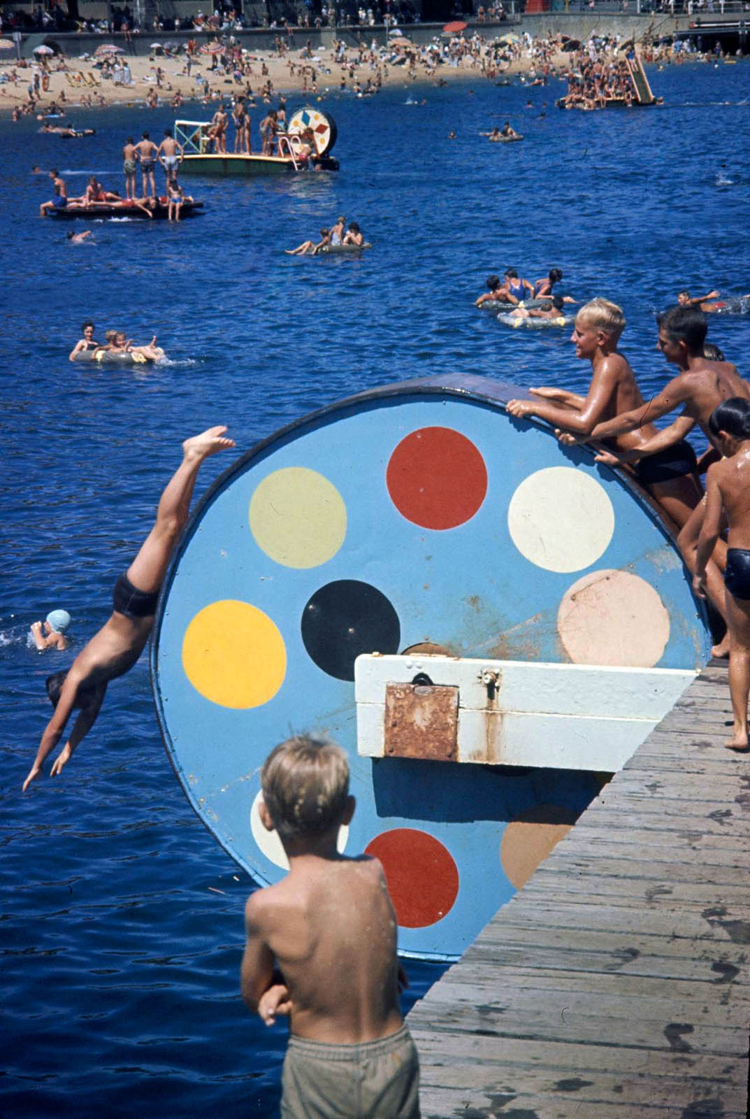
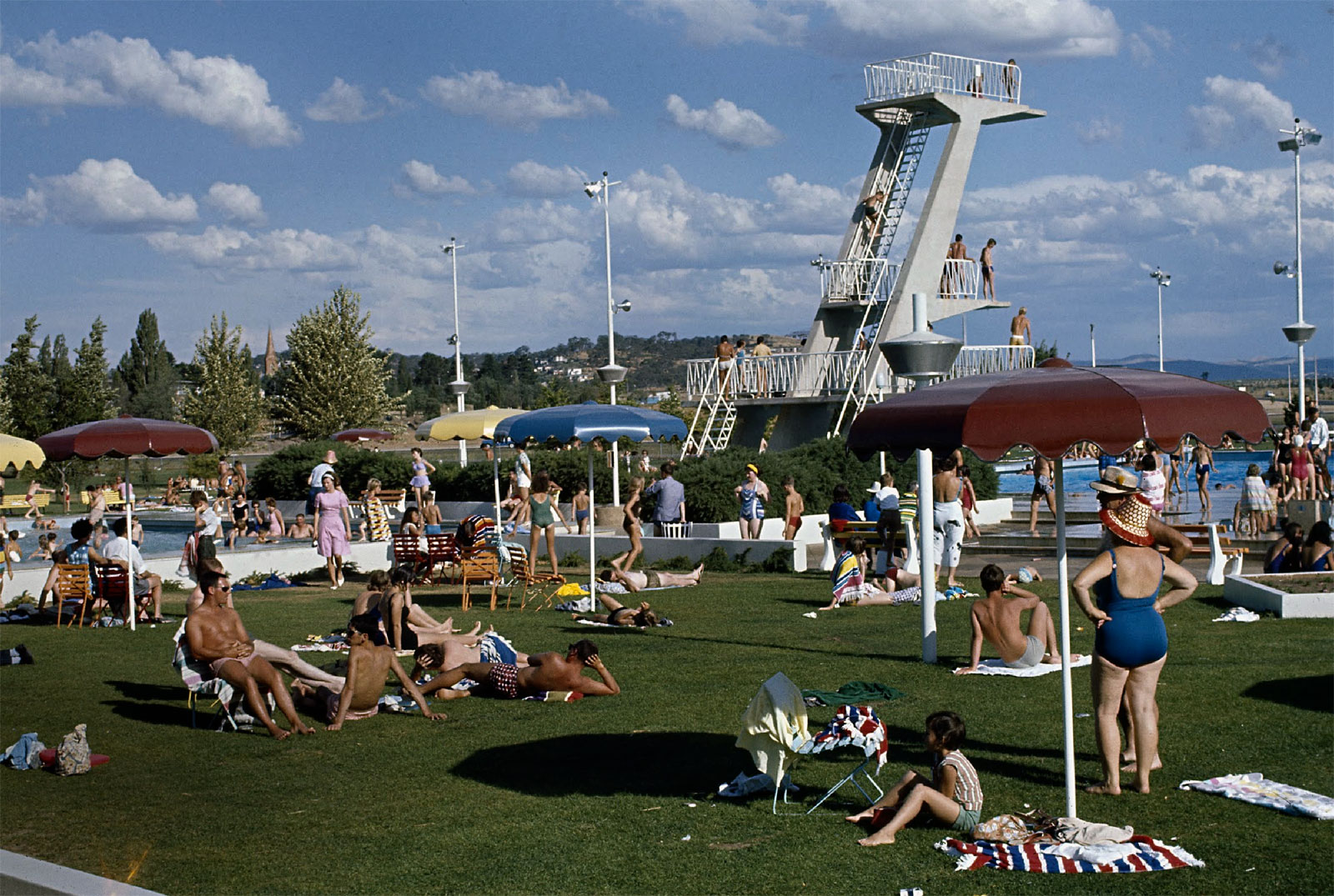
It’s no secret that Australia can be very hot, especially in summer. As the song says, we are girt by sea, and for 85 per cent of Australians a blissful dip in the ocean has always been less that two hours’ drive away. For those living further inland, sanctuary was found in a nearby river or lake, or the town’s public swimming pool.
Anonymous photographer (Australian) Harbour swimming pool, Manly, New South Wales 1960 Australian News and Information Bureau collection National Archives of Australia
This image comes from the Australian News and Information Bureau collection, now held in the National Archives. This vast archival resource is the legacy of nearly half a century’s work by Bureau photographers who captured hundreds of thousands of photographs of Australians at work and play.
Anonymous photographer (Australian) Sunbathers relax on the lawn at the Olympic Pool, Canberra, Australian Capital Territory 1966 Australian News and Information Bureau collection National Archives of Australia
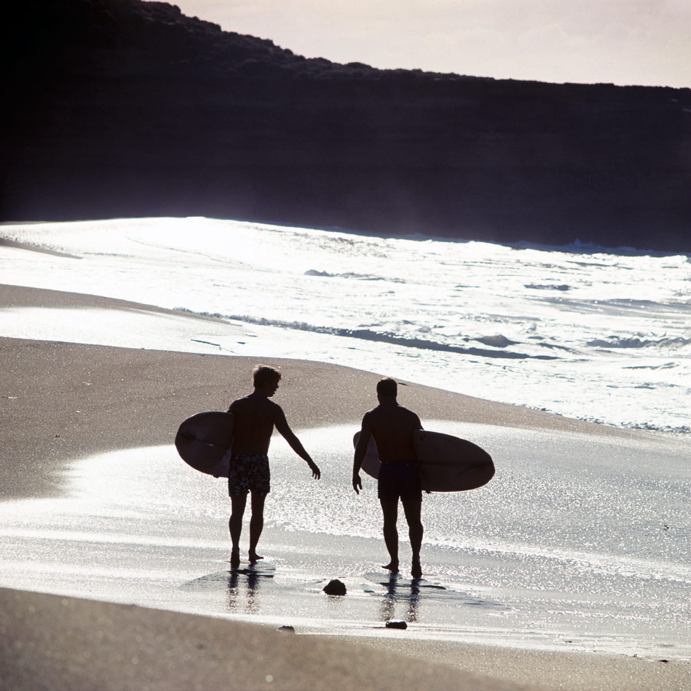
Anonymous photographer (Australian) Surf board riders, Torquay, VIC 1967 National Archives of Australia
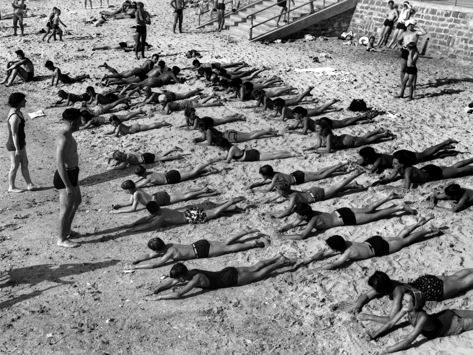
Anonymous photographer (Australian) Children learning to swim 1945 Australian News and Information Bureau collection National Archives of Australia
Nice one, sport!
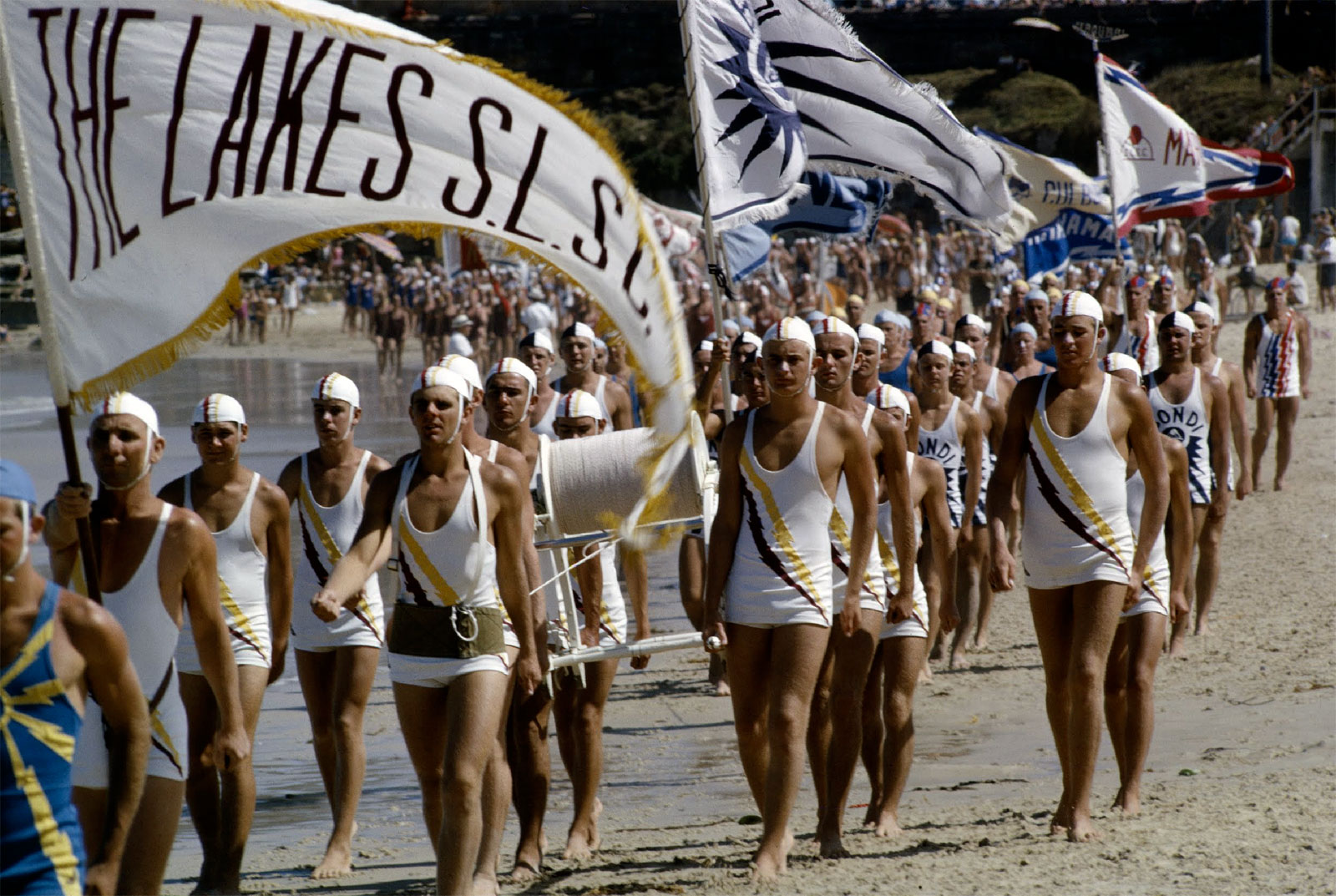
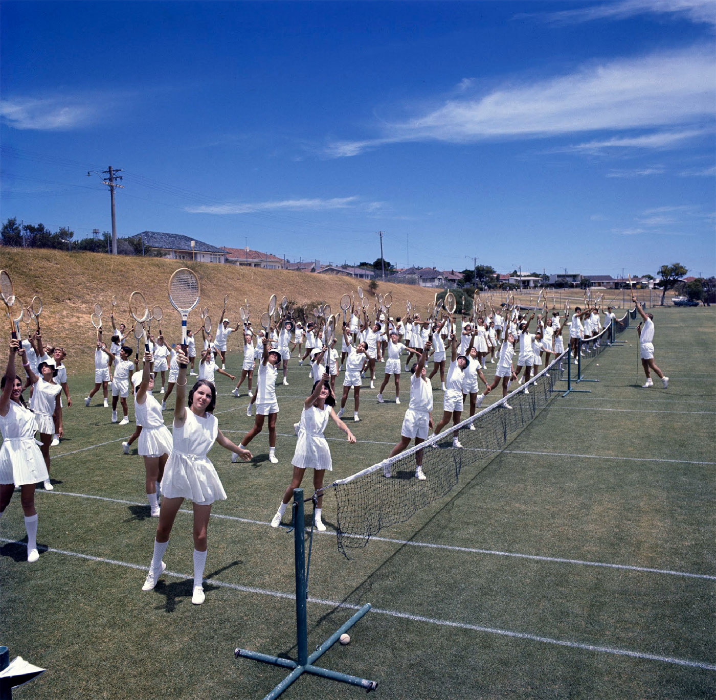
Between 1950 and 1970, Australia was triumphant in all the sports we loved. We dominated in the pool, won the Davis Cup a remarkable 15 times, and boasted an impressive record against every Test cricket nation. As these images show, Australian youngsters were keen to play the game, and on most summer Saturdays all around the country, boys and girls would play tennis or cricket, or swim like champions.
Anonymous photographer (Australian) Boys with kites 1965 Australian News and Information Bureau collection National Archives of Australia
Anonymous photographer (Australian) Surf carnival 1966 Australian News and Information Bureau collection National Archives of Australia
Anonymous photographer (Australian) Mass tennis class 1967 Australian News and Information Bureau collection National Archives of Australia
The Victorian Archives Centre 99 Shiel Street North Melbourne, Victoria 3051 Australia
Many thankx to the Museum für Kunst und Gewerbe Hamburg for allowing me to publish the photographs in the posting. Please click on the photographs for a larger version of the image.
Apple Macintosh Classic 1990 Museum für Kunst und Gewerbe Hamburg Photo: Roman Raacke
Apple 20th Anniversary Macintosh 1997 Museum für Kunst und Gewerbe Hamburg Photo: Roman Raacke
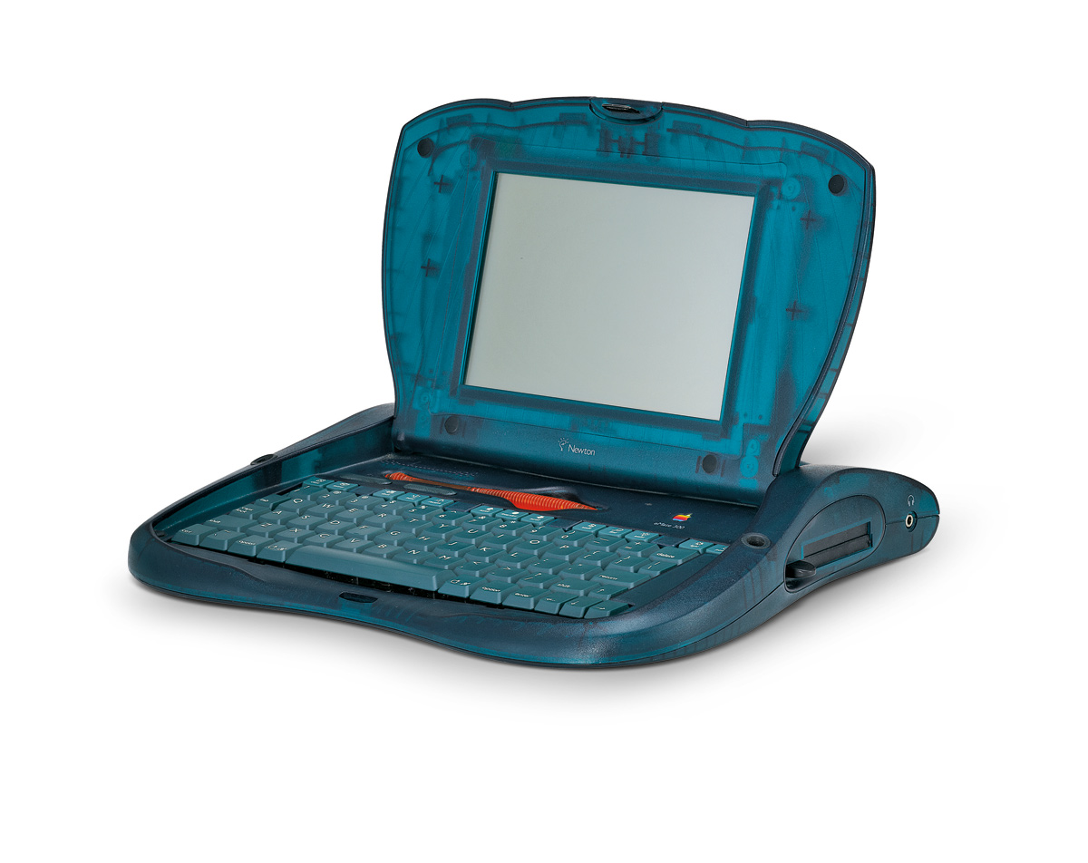
Apple eMate 300 1997 Museum für Kunst und Gewerbe Hamburg Photo: Roman Raacke
Apple iMac Bondi Blue 1998 Museum für Kunst und Gewerbe Hamburg Photo: Roman Raacke
The Museum für Kunst und Gewerbe Hamburg is showing the exhibition Stylectrical – On Electro-Design That Makes History from 26th August 2011 until 15th January 2012. The exhibition takes a look at the complex process of industrial product design in the context of cultural studies. Once again the Museum is taking up a highly topical and socially relevant subject. The focus is on the design of Jonathan Ive (b. 1967), Senior Vice President of Industrial Design at Apple, and responsible for creating all of the devices of the California based company. His products are of incomparable popularity on account of their extremely consistent and recognisable design. A quarter of the approximately 400 exhibits are products by Apple, which are shown for the first time in a comprehensive overview.
The exhibition traces a retrospective of works as well as of the company’s internal development of design, and provides a comprehensive insight into research questions of design history by means of this popular design. Along with the products designed by Jonathan Ive, numerous exhibits from the collection of the Museum für Kunst und Gewerbe Hamburg will be shown, among them works by Herbert Hirche, Hans Gugelot, Dieter Rams, Peter Raacke, Michele De Lucchi, Hadi Teherani and Tobias Grau. The economic and environmental significance of design will be examined in cooperation with the red dot institute and the Environmental Protection Encouragement Agency (EPEA).
To give a product its shape goes well beyond Luis Sullivan’s often-quoted phrase “form follows function”. Various demands such as material, form, aesthetics, function, handling and usage must be taken into account during the design process and combined. Stylectrical reveals the complex steps and procedures of product design on the basis of the collected works of Jonathan Ive, it thus grants an insight into important discourses on the subject and points to new perspectives on modern design.
The exhibition is the first to show all products that were created since Ive is in charge of design at Apple. Among the exhibits are rarely seen devices such as the eMate300, a laptop from 1997 designed to be used in schools, the iMac Blue Dalmatian, and the company’s first flat screen. New products such as the iPhone 4, the MacBook Air, and the iPad 2 will also be shown. The exhibition lets the visitor trace the company’s design process of the past 14 years. Moreover, by means of these innovative products, it opens a discussion on questions of design theory about form, about use of material and about the manufacturing process. One excursus is devoted to the history of the company’s product development since its founding, with the intention to highlight the working method and special position of the design team within the company. Exhibits of the designers Hartmut Esslinger and Robert Brunner will be shown in this context, and the so-called “Snow White Design Language” will be discussed.
After the return of company founder Steve Jobs in 1997, Apple was restructured and the young designer Jonathan Ive became Senior Vice President of Industrial Design. Before long, Ive and his team caused a stir with their innovative iMac, the iBook and the Power Macintosh G3, which were all milestones of a modernised electronics design in the late 1990’s. Ive’s team turned its back on the established, uniform grey beige as a colour for computers of the past decades, and developed a colourful design made of translucent plastics.
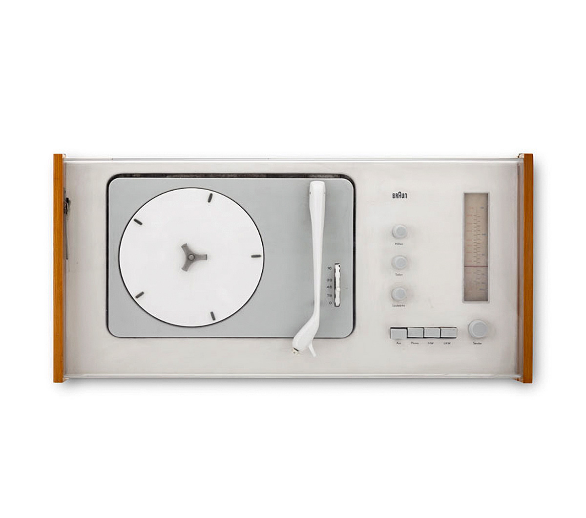
Stylectrical shows the formal links between Jonathan Ive’s design and the works of leading creators of electronics’ design history, and it thoroughly addresses the close relation to products of the German company Braun. In this context the Museum für Kunst und Gewerbe Hamburg will be showing some first-rate items from its own comprehensive collection of post-war industrial design. Early works of the designers Hans Gugelot, Herbert Hirche and Dieter Rams, but also works from recent decades by Michele De Lucchi and Tobias Grau will be on display. After the evolution of design in Germany had come to a near halt during the Second World War, there were various attempts in the 1950s to pick up again where the programmatic developments of the Weimar period had left off. The probably most significant initiative was called into life in 1953 by the founders of the Ulm School of Design. Otl Aicher, Inge Aicher-Scholl and Max Bill adopted for this school the approach of the Bauhaus, which had been closed by the National Socialists. When Max Bill left the institution in 1957, the so-called “Ulm-Model” took the place of the original concept of the school. It had three relevant criteria: a new and systematic methodology of design, the promotion of interdisciplinary teamwork, and a close cooperation with the industry. Important approaches evolved during this time, which are being pursued to this day. Amongst others, the Ulm school worked for electronics’ manufacturers. The cooperation with the Kronberg-based company Braun is especially relevant; the designers from Ulm developed important guidelines that influenced the design of Braun until the 1990s, when Dieter Rams was the chief designer.
The significance of Jonathan Ive’s and his team’s ideas for the history of American industrial design, as well as their influence on all industrial products, are another focus of the exhibition. By means of the outstanding example of Apple it is possible to show how consistent design can sustainably determine the image of a company and contribute significantly to its economic success, as well as influence 21st century society and culture.
Press release from the Museum für Kunst und Gewerbe Hamburg
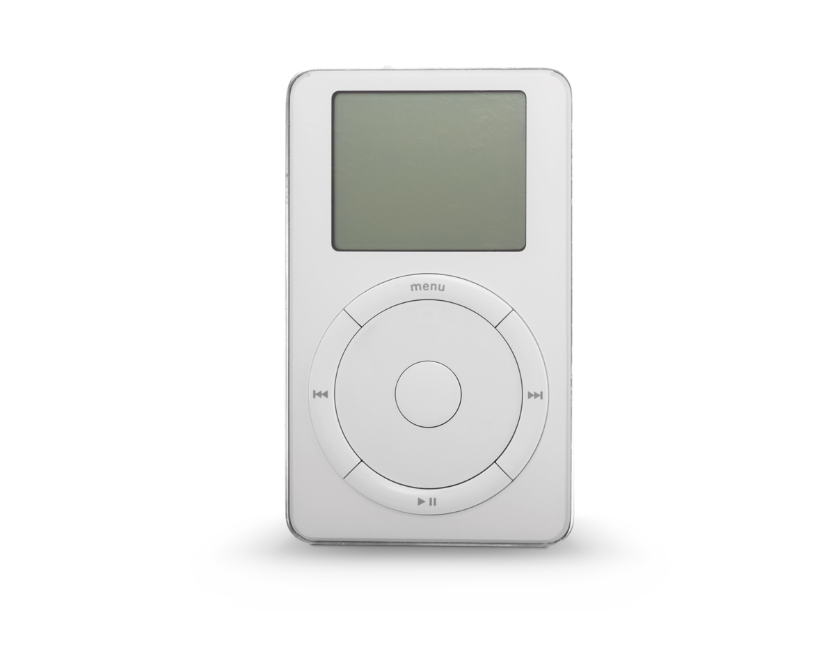
Apple iPod 2001 Museum für Kunst und Gewerbe Hamburg Photo: Roman Raacke
Apple Power Mac 2003 Museum für Kunst und Gewerbe Hamburg Photo: Roman Raacke
Braun Radio-phone combination SK4 1956 Museum für Kunst und Gewerbe Hamburg Photo: Roman Raacke
Braun Television set HF 1 1958 Museum für Kunst und Gewerbe Hamburg Photo: Roman Raacke
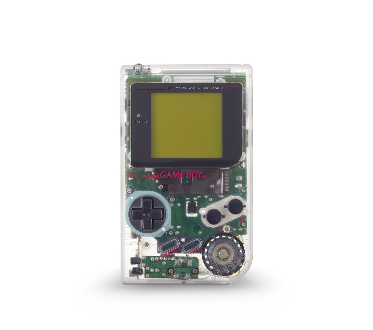
Nintendo Portable game console Gameboy 1995 Museum für Kunst und Gewerbe Hamburg Photo: Roman Raacke
Sony Walkman TPS-L2 1979 Museum für Kunst und Gewerbe Hamburg Photo: Roman Raacke
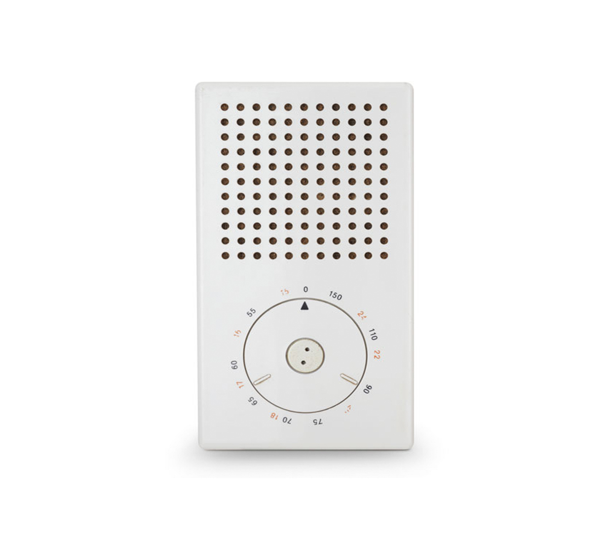
Braun Transistor radio T3 1958 Museum für Kunst und Gewerbe Hamburg Photo: Roman Raacke
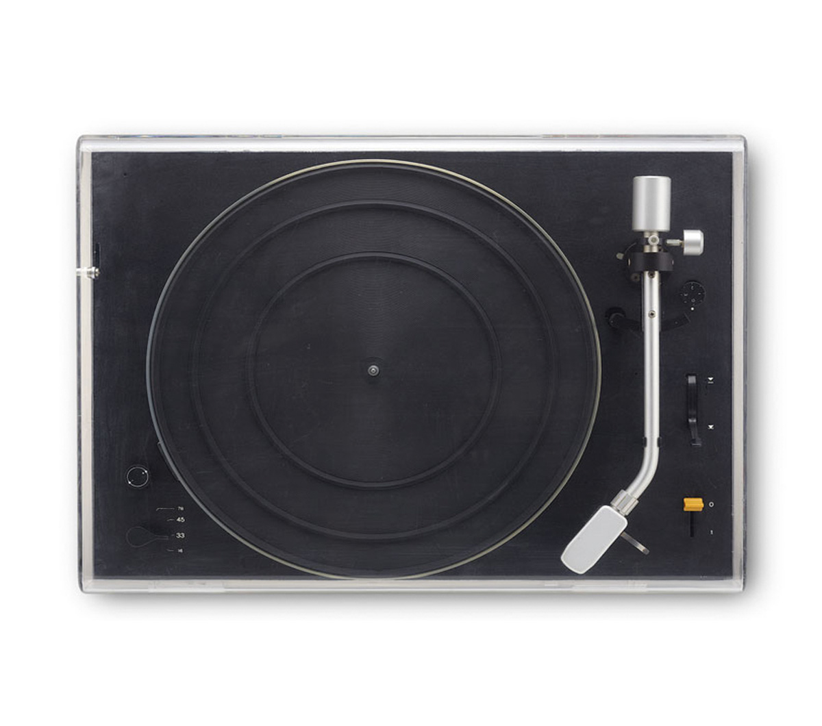
Braun Record player PS1000 1956 Museum für Kunst und Gewerbe Hamburg Photo: Roman Raacke
Museum für Kunst und Gewerbe Hamburg Steintorplatz, 20099 Hamburg
























![Artist unknown (American) '[Three women]' c. 1930s from the exhibition 'The Three Graces' at The Art Institute of Chicago, October 2011 - January 2012](https://artblart.com/wp-content/uploads/2012/01/artist-unknown-c.-1930s.jpg "Artist unknown (American) '[Three women]' c. 1930s from the exhibition 'The Three Graces' at The Art Institute of Chicago, October 2011 - January 2012")

![Artist unknown (American). '[Three women]' c. 1910s](https://artblart.com/wp-content/uploads/2012/01/artist-unknown-c.-1910s.jpg "Artist unknown (American). '[Three women]' c. 1910s")
![Artist unknown (American). '[Three Women]' c. 1920s](https://artblart.com/wp-content/uploads/2012/01/artist-unknown-c.-1920s.jpg "Artist unknown (American). '[Three Women]' c. 1920s")
![Artist unknown (American). '[Three Women]' c. 1940s](https://artblart.com/wp-content/uploads/2012/01/artist-unknown-c.-1940s.jpg "Artist unknown (American). '[Three Women]' c. 1940s")
![Artist unknown (American). '[Three Women and a photographer]' c. 1940s](https://artblart.com/wp-content/uploads/2012/01/artist-unknown-c.-1940s-b.jpg "Artist unknown (American). '[Three Women and a photographer]' c. 1940s")
![Martin M. Homburger (American, active mid-20th century) 'Untitled [Three women]' 1967](https://artblart.com/wp-content/uploads/2012/01/homburger-three-women.jpg "Martin M. Homburger (American, active mid-20th century) 'Untitled [Three women]' 1967")

![Artist unknown (American). '[Three Women]' c. 1930s](https://artblart.com/wp-content/uploads/2012/01/artist-unknown-c.-1930s-b.jpg "Artist unknown (American). '[Three Women]' c. 1930s")












 Art Blart _ art and cultural memory archive
You must be logged in to post a comment.